TYPE DESIGN INFORMATION PAGE last updated on Sat May 16 07:59:29 EDT 2026
FONT RECOGNITION VIA FONT MOOSE

|
|
|
|
|
Futurism | ||
|
|
|
|

SWITCH TO INDEX FILE
Aan Kurniawan
| |
Aaron Chiffers
| |
Abdul Malik Wisnu
| |
Abto Creative
| Bandung, Indonesia-based designer of the glitchy futuristic typeface Hyperizo (2020) and the free connected outline typeface Fortrack (2015). [Google] [MyFonts] [More] ⦿ |
During his studies at LPU Cavite, A.D. Veras (Naic, Philippines) designed the triangulated futuristic typeface Space Rover (2018). [Google] [More] ⦿ | |
Adorae Types
| Argentinian designer of Artifex Regina (2022: a tall hand-crafted font family with sketched textures), Neon Summer (2021: a condensed handcrafted monolinear font family), Cookie Time (2021: script), Arkhania (2020: a vampire script for Halloween), Aeonian (2020: a 12-style retro futuristic sans), Nature Boy (2018, a display type that is almost art nouveau). [Google] [MyFonts] [More] ⦿ |
Agus Muhammad
| |
Ahmad Ramzi Fahruddin
| |
Ahmad Syarif Afandi
| |
Ahmad Zulfikar Ali
| |
AK Desain (or: Bangun Studio)
|
Typefaces from 2018: The Shift (a modular monoline sans), Irisan, Boya (minimalist rounded sans), Lonjong, Akur, Tebal, Lhove, Bunga, Grand Pix (art deco), Balle (thin sans), Tulisan (signature font). Typefaces from 2019: Be Signature, Rama dan Karim (an arabic emulation font). [Google] [More] ⦿ |
Albert Filatov
| |
Typefaces from 2014: Brava, Otrebla, Naula, Aghila, Wex, Malk, Fulgura, Dawner, Hebe, Mulago, Wako, Senzi, Awelita, Serpi, Connexion (circuit typeface), Caramelo, Matcha, Pazuzu, Rustika (art nouveau). Typefaces from 2015: Drabe, Respingo, Keyla, Greenstone, Linu (bilined). Typefaces from 2016: Molona (brush script), Zem (a futuristic typeface), Uglygraphy, Glabori, Campana (vector font), Grobb, Xtravagant, Wouliane, Kuasar. Aka Albertako. Dafont link. Creative Market link. [Google] [More] ⦿ | |
In 2016, he designed the squarish Flat Four typeface family. In 2018, he published the speed-themed techno typeface Hachiroku86, the pixel / video game font Gridner AB, the industrial futuristic typeface Karbonis, and the modular monoline typeface Shampoo AB. Typefaces from 2019: Spectrum (wavy, techno). Typefaces from 2020: Auratium (a tall slab serif), Epyon Mech (a mechanical or futuristic typeface), Initium (a glitch font family), Exolus (futuristic), Bear Hunt (a national park font), Undertow (squarish), Luna Parc (rounded, techno), Classic Retro. Typefaces from 2021: Shampoo, Supply, Vecktor (futuristic and octagonal). Devian tart link. Behance link. Another Behance link. [Google] [More] ⦿ | |
Alex Rosario
| |
Alex Rosario Type
| Alex Rosario (b. New York City) revived Roc Mitchell's retro-futuristic phototype Corporate as Corporatus (2018). As Neologix on FontStruct, he made these pixelish or modular typefaces: Harpoon Art (2016, loosely based on Dan X. Solo's Lampoon), Negesis (2014-2017, after the Sega Genesis logotype), New Era Software (2014-2017), Trigger (2011-2018: a pure pixel family). Alex explains: Descended from the classic Chicago font, Trigger Bold is a recreation of the original dialogue font from the award-winning game, Chrono Trigger. Other typefaces include Ensconce Sans (2017; free demo): Taking inspiration from the Univers family of typefaces, Ensconce is a project undertaken to recreate in a digital format the work originally performed by Girvin Design for the English branding of the Super Nintendo Entertainment System. Taking great measures to retain the design choices of the original logotype, Ensconce has been successfully used to recreate the SNES logo currently in use on Wikipedia. [Google] [MyFonts] [More] ⦿ |
Alex Traian Munteanu
| |
Alexander Shimanov
| |
Student-designer in Montreux, Switzerland, who created the free futuristic display typeface Lombok in 2014. [Google] [More] ⦿ | |
| |
Zaporozhchyne, Ukraine-based designer of these custom (logo) typefaces in 2016: Sage (modular), Sport (techno), Space (futuristic)Shark (techno), Get Better, Juno (multiline headline face), Impossible (sans), Vintage, Faster Stronger (techno), Sheriff (Western), Airborn. [Google] [More] ⦿ | |
Alexey Popov
| |
Alfi Design
| In 2018, Albert Filatov (Saint Petersburg, Russia) published Citifont, a Latin / Cyrillic serif typeface with a robust outlook, that according to him was made for navigation in the city of Saint Petersburg, Russia. In 2018, he designed the futuristic / sci-fi / LED font Space for Latin and Cyrillic, and the wide display sans typeface Muha. Port Anchor (2018) is a decorative typeface. Typefaces from 2019: Raster (a free blocky constructivist font). [Google] [More] ⦿ |
Aka Logo Labs. Tangerang, Indonesia-based designer of the signage typeface Ready For Fashion (2016), the handwriting font Marseille (2018), Swag Marker (2017), and the futuristic / techno typeface Hermes (2017). In 2018, he designed the free script typeface Billie Harley and the signature font family Sam & Sally. Typefaces from 2020: Marmoreal (calligraphic), Herschel (font duo), Gorga, Diandra (a signature font), Fringland (calligraphic), Chasmophile (calligraphic), Behofeel (calligraphic), Candelion (calligraphic), Avital, Bandakala (script), Andamar (sans), Andamar Script (a signage script), Anaximander (a display serif), Almerian (a monoline script), Jansky (a signage script), Raya (vintage), Milestone (a signage script), Malbrouck (a penmanship script). [Google] [More] ⦿ | |
Madrid-based designer of the futuristic typeface Cyborg (2015). [Google] [More] ⦿ | |
Ali Sifak Muftari
| |
Alien Valley
| Romanian graphic designer. Creator of of Romagna (2022), an 8-style sans family with futuristic traits. [Google] [MyFonts] [More] ⦿ |
Lawrence, KS-based designer of the dot matrix / pixel typeface family Pixillusion (2017). In 2015, she designed the retro futuristic typeface MidCentury. [Google] [More] ⦿ | |
For a school project, Allie Welch (Lawrence, KS) created an octagonal futusistic typeface in 2013 called Spacegirl. [Google] [More] ⦿ | |
Almarkha Type
|
Typefaces from 2020: Banana Juice, Bella Sweety, Bubble Bobble (a bubblegum font), Dear Sunshine, Oatlander (retro baseball script), Sweet Purple, Monieta (an inky and creamy rabbit ear script), Orange Milk (a playful handcrafted typeface), Rockbitz (a children's book font), Seathera, Avocado Creamy, Bolyvina, Charlie Angela (an inky calligraphic script), Lovemy, Chadelova (an enhanced script), Grumbear, The Mezirane, Charlotte Amalie, Crash Soul (a dry brush script), Costiera (a dry brush script), Handestonie (a monoline script), Mentality (a signage script), Technovier (a monolinear squarish sans), Antiquesta (a dry brush script), Belgium Catherine, Cronisse (a display serif), Pronave (an all caps display typeface), Uniser (condensed all caps sans), Westack (a display serif), Avone (a stencil serif), The Roletta (a dry brush script), Waluxe (a fashion mag all caps sans with flared stems), Dear Sunshine, Mikalotta (poster script), Walker Knight (a vintage all caps typeface), Towards (stencil), Cronisse (a decorative serif), Avaneonz (a neon font), The Heista Killer (a dry brush horror font), Someone (a dry brush font), Vicenza (an all caps skyline font), Bristone (a wide sans in six styles; perhaps for car tire ads), Shutterlocks (a dry brush script), Romantics (a creamy script), Revoxa, Yippie Yeah, Wonderful Day (calligraphic), Girly (a girly script), Kamelitta (a wild curvy script), Roadstore (a spurred vintage all caps typeface), Springloved (a paper cutout typeface and a a fine inline poster font), Saturated, Choxr, Blackheat (a super condensed all caps sans), Retrohols, Alibabe, Lordcorps (an octagonal sports or military font; with a stencil style), Headcorps (a sports shirt or military stencil font), Pineforest (with soft spurs), Airborne 86 (a military stencil), Orchide (a dry brush script), Beneficha (wild calligraphy), Radens (a retro bold signage script), Brokenz (a heavy condensed sans), Delninoys (a playful sans), Lorenza (sans), Elcatraz (Mexican simulation font), Hubby Bunny, Rosadetta (script), Swingsnug, Chickens Lovers, Rollinkland, Grumbear, Bubble Bobble (a bubblegum font), Blackheat (a heavy ultra condensed typeface), Brokenz (a muscular display sans), Lorenza (a fashion mag sans), Belgium Catherine (a signature script), Amazed Breath (script), Rockmore (a brush script), Empirez (an octagonal slab serif sports font), Amazed Breath. Typefaces from 2021: Neurock (pure sci-fi), The Cheelaved (spurred, Victorian), Headbears (a sports font), The Antique (a vintage typeface), Vespalogy (a vintage display font), Bestorika (a decorative serif by Abdul Malik Wisnu and Rivo Adriansyah), Quakerhack (a rough brush font), Balietta (a flowing script), Brothery (a retro signage script), Beauticella (a signature script), Glamorez (a luxurious serif), Reloaded (a military stencil font), Austragen (a bold sharp-edged display typeface), Bearetta (script), Keawneta (a display font), Racerz (a speed font), Stangith (a decorative serif co-designed with Rivo Adriansyah), Quick Letter (a wide signature script), Arcinoll (a graffiti font), Charlie Brocklin (a thin signature script), Retrolight (a multiline neon sign typeface), Mokalatte (a wild script), Thugolatz (an all caps typeface with many interlocking ligatures), Author Think (a signature script), Bionetha (calligraphic), Bouncyland (a stylish wild script), Little Knight (a scrapbook typeface), The Brushentica (a beautiful dry brush script), The Soulmate (a dry brush script), Bettawork (a dry brush script), Philips Dutcher (a signature script), Recons (a techno font), Heezpiero (futuristic), Milky Quaker (a playful supermarket font), Rostemary (a fat finger font), Therestone (a Flintstone font), The Checkmate, Chick Chack (a heavy rushed script), Retroman (an Italian Western font), Brown House (a national park font), Emeralde Chamerions (a serif and script duo), Redzein (an octagonal slab serif), Rostera (a bold script), Sketchup (a sketched font), Thealiens (a condensed all caps sans), Williesh (a meaty display serif), Amazing Sweety (a scrapbook font), Heellaaz (an all caps children's book font), Almeira, Americans Classy, The Corps 86 (a military stencil), Brexo (a techno font with solid and stencil versions), Romeline (a scrapbook font), Yippie Yeah (a rounded monolinear marker pen font), Avaneonz (a neon or paperclip font), Sangira (a stylish serif), The Blackheads (a bold script), Kandaline, Marinaga (a creamy brush script), Mochalosta (script), Morning Sweety, Rockmore (a bold script), Deloire (a 4-style all caps sans), Montelova (script), Quinger (a monolinear decorative serif), Wonderella, Wonderful Sunset, Bellachia (a scrapbook script), Choxr (a very condensed all caps sans), Keepsmile (a rounded children's book font), Lovely Sweetie (a scrapbook font), Melanista (a wild script), Rollinkland (a brush font), Bellamona (a monolinear script), Bettanesia (handwriting), Bonalisha (script), Overwave (wavy), Beautimy (a wild script), Melatie (a wild script), Memorita (a wild script), The Handnature (a Treefrog script), Heinch (a 5-style all caps sans), Sweetie Banana (a scrapbook script), Sweetie Moment (a wild calligraphic script), The Dear (a retro script), Winterline (a wild script), Young Evaline (a signature script), Salt + Pepper, Sindenetta (a signature script), Autumnilla, Bella Ciao, Rosadetta (a wild calligraphic script), Saturated (a wild calligraphic script), Wondiletta, Bubblez, Lovely Orange, Milkalotta, Luxoorea (a stylish fashion-model-skinny all caps typeface), Momotako (a paper cutout font), Neonblitz (a neon font), Unione Force (an octagonal sports or military font; with a stencil style), Westman (a Western font), Delamoore (an all caps high-contrast display serif), Delaproza (an all caps display serif), Kinglead (a cartoonish font), Modesfa (an all caps display serif), Hexore (a slab serif), Deluxes (a stylish display sans), Kenzomaru (an oriental brush font), Lumbero (wooden plank font), Pineforest (a Victorian label or sign painting font), Beneficha (a wild calligraphic script), Brokenz (a bold condensed sans), Orchide (a dry brush script), Revoxa (a 4-style sans), Romantics (script), Schein (a sans and slab serif pair), Someone (a dry brush script), Towards (a minimalist stencil font), Averox (a futuristic all caps sans), Chicken Lovers (a playful informal font), Hubby Bunny (a cute display sans), Swingsnug (an informal monolinear sans). As Typotypea">Typotypea, he published the script typeface Manthoels (2020) and the roman all caps typeface Stinker (2020). Typefaces from 2022: Signattimes (a signature script), Thematheka (a constructivist font published on the day Putin invaded Ukraine), Overbillions (a dry brush script), Brolachess (a stylish all caps semi-serif), Suntage (a wide vintage all caps font). Typefaces from 2021 published by Gassstype but made by Abdul Malik Wisnu: Ruthless (a heavy dry brush font), Timeless Nature (script), Unranked (a rough mural font). Creative Fabrica link. [Google] [MyFonts] [More] ⦿ |
Indonesia-based designer of display, scrapbook and handcrafted typefaces. In 2021, he published these fonts: Aesthetic, Angelic Smiles, Another (architectural lettering), Asgerion (stencil), Baby Mermaid, Baby Sparkle, Barley, Bathiora, Beacon (futuristic), Beauty Hearts, Best Valentine, Bigdino Park, Blackout (futuristic), Boost Display, Claresta, Clatterson, Committing, Creamy Buttermilk, Darling, Devany, Felicity, Gelato, Getting Better, Gia Cristine, Giordan (calligraphic), Golang, Grandia, Halmera, Haster, Hazelnuts, Hello Snowy, Hello Viktoria, Hunting, Katracy, Kingham, Kingston Signature, Komon, Latterday, Life Hacks, Love&Thunder, Magderyna, Magretta, Memphis, Merkisa, Midnight Shadows, Mighty Kingdom, Modena, Momy & Marsa, Northing, Perky Dream, Pumpkin Party, Radiants, Ralynda, Rastella, Ratcliffer, Replay Time, Spider Homes, Sweet Puppy, Thom Rodger, Wakanda, Western. [Google] [More] ⦿ | |
Torino, Italy-based designer of the retro futuristic typeface Future Banco (2018). [Google] [More] ⦿ | |
Designer and illustrator in Buenos Aires. Creator of the futuristic serifed caps typeface Futuroni Serif (2011). Behance link. [Google] [More] ⦿ | |
Photographer in Singapore who created the futuristic typeface Dystopia (2015). [Google] [More] ⦿ | |
Andrew & Emily Beauman
| |
Andrew Young
| |
Antenah Studio
|
He designed the free minimalist all caps monoline sans typeface Rosarina and the free hipster typeface Spacer in 2016. Typefaces from 2017: Mold (a geometric vector font), Bulky (blocky). In 2018, he published the free art deco typeface Rousseau Deco, the free pixel font Game Over (made with FontStruct), the outline color font Mold, the free font MD Tall 2. Typefaces from 2019: Disket Mono, NY Bricks (free: blackboard bold style). Typefaces from 2020: Lkdown (a free all caps COVID 19-inspired typeface published by Rostype; Cyrillic characters by Denis Ignatov), Catallina (a free all caps art deco sans typeface published by Rostype; Cyrillic characters by Denis Ignatov). Typefaces from 2021: Adversal (a futuristic (all caps) display font inspired by the work of Wim Crouwel and the experimentation with grids). Behance link for Mariano Diez. Behance link for Antenah Studio. [Google] [More] ⦿ |
Anthonie Van Hayu
| |
Antitype
| German designer of the retro futuristic typeface family Taranto (2020). [Google] [MyFonts] [More] ⦿ |
| |
Arctype
|
|
Ardyan Permana
| |
Ari Juanda
| |
Ari Sandi
| |
Aring Typeface
|
View Mans Grebäck's typefaces. Abstract Fonts link. Fontspace link. MyFonts link. Another URL. Dafont link. Klingspor link. Buy fonts directly from Måns Grebäck. Old URL. [Google] [MyFonts] [More] ⦿ |
Arterfak Project
|
Typefaces from 2016: Anehena (a beveled ornamental typeface), Bongoknian (spurred), Sebasengan (sketched, arched, stitched, textured, eroded and embossed substyles), Sekatoon (Victorian), Bekelakar (Victorian), Sambeltigo, Wayawaya (free bilined art deco), Geroboktuo, Bedengkang, Ringam, Cindo Kato (spurred Victorian typeface), Ngopi Doken (a layered handcrafted typeface family), Bedesau (Victorian), Temenyut (spurred Victorian style), Sirugino (a spurred tattoo / blackletter type), Buyanbengak (spurred), Geradakan (dry brush type). Typefaces from 2017: Martinez (Tuscan), Hughoney, Rockrace, Monabelia (Victorian), Philosophiya, Love Quake, Childwood, Circulat Decorative Frames, Dakmodal, Yasaman, Bsakoja, Meringam, Besigetz (Victorian), Bedempank, Ngamboel (a modern inline), Jemahok (an inline typeface), Sirunian (decorative blackletter), Belinjangan (brush style), Cerudikan, Kanjian (Victorian deco). Typefaces from 2018: Mirandah (monoline, vintage), Subversia (Victorian), Bertha (a free display family that includes Shadow Line, Sans and Spurred substyles), Quickers, Marchelle (art deco), Lourena, Mellynda, Leophard (octagonal), Wishteria, Slashback, Katheryna, Febiolla, Tropicane, Maretha (a monoline script). Typefaces from 2019: Requeiro (a spurred inline vintage font), Mourich (an all caps display typeface), Newston (a tall condensed news headline typeface family), The Black Sugare (blackletter-inspired), Magnies (an elegant stencil), Hermona (a spurred vintage label font), Bronzier (a sports font), Mayhena (a monoline script), Amnestia (a vintage all caps typeface), Highrush (font duo), Humeira (for children's books), Montheim (retro signage font), Hodgeson (a slab serif family), Delaroca, (a spurred black metal band font) Banda Niera, Bargers Distressed (spurred, Victorian), The Realita, Newston (a compressed skyline-style font), Ariestha Script, The Black Square, Requiem (Victorian or rococo inline caps), Invasible, Ferguson (an almost monoline slab serif family), Mirenath (a rounded vintage monoline typeface), Afolkalips (a tribal painted font inspired by the Papuan culture), Mellandry, Masterson (a slab serif western font), Marsheila (art deco), Kanjian, Belinjangan, Sirunian (a decorative spurred typeface), Quickers, Marcheile (slightly art nouveau), Marcheile, Monabelia, Nourishe (a fashion mag sans). Typefaces from 2020: Trashbone, Burgery (a monolinear all caps children's book font), The Brande and Lotaline (a decorative serif), Rimba Andalas (a tribal font), Bronela (a decorative serif), Wonder Night (a beatnik font), Malinsha (a signage script), Marones (spurred, vintage, all caps), Katenila (a fat finger font), Meliana Script (a brush script), Romelio (sans / script pair), Bondrians (a vintage label font), Black Ravens (a dry brush font), Shinkoya (vernacular lettering), Brothership, Novante (stylish caps), Almatine Script (a flat pen calligraphic script, with perhaps a touch of Arabic script emulation), Almatine Sans, Wargate (a military stencil font family), Bragley (a cartoon font), Varino (a rounded unicase sans family), Ranille (a bold display serif), Neilvard (a vintage label font family), Nagietha, Khodijah (an Arabic emulation font), Sometimes Rough, Savaneta (a vintage all caps typeface), Valmera (a Peignotian sans), Hargalia (classic calligraphy), Cherione (a unicase font), Revans (a display sans). Typefaces from 2021: Larantuka (an informal font with a dancing baseline), Bolandes (a weathered monoline sans), Delauney (a formal art deco typeface), Chieezy Burger (grungy, vernacular), Ranmor (a vintage slab serif), Andalia (a signage script), Insiders (a dry brush script), Granesta (a dry brush font), Abigral (a Peignotian serif), Suzanstein (a dripping blood font), Broken Console (a retro video game pixel font), Naluka (a tiki or nature park font), Lovatine (a scrapbook script), Rushen (vintage caps in curvy, regular, distressed, stencil and shadow versions), Siegra (futuristic), Komersie (a bold supermarket font), Borensa (a reverse stress font), Rashavine (a dry brush font), Blankone (a brush font), Montagna (a monolinear script), Hadnich (a heavy signage script), Sallomae (a scrapbook font), Vankours (a dry brush font), Wonderful Melanesia (a decorative serif), Albertson (a Tuscan font), Rantika (a bold brush script), Rusthack (a stylish brush typeface), Mustopha (an upright typeface in arabesque style), Marviona (a marker pen font), Marviona (a marker pen font), Niquitta Mirzani (script), Shikamaru (emulating a Japanese brush), Mortend (a 5-style expanded all caps sans), Barlock (an all caps and spurred varsity font), Northash (stencil), Motteka (a beatnik font), Sharely (a brush font), Rompies (a condensed titling sans), Beardsons (a vintage label font), Broken Crush (dry brush). Typefaces from 2022: Bradrock (a vintage semi-Tuscan Western font), Market Written (a fat finger font), Almalik (Arabic emulation), Vanitha (a brush script), Rambors (prismatic caps with four parallel lines), The Last Shuriken (emulating Japanese), Warzone (an all caps echno / sci-fi font), Kalidony (calligraphic with heart-themed tittles), Lemands (a stocky condensed display typeface). Dafont link. Creative Market link. Behance link. Graphicriver link. Creative Fabrica link. [Google] [MyFonts] [More] ⦿ |
ARToni
|
Typefaces from 2020: Finto (a techno typeface inspired by jet airplanes), Nellyana Script (monoline). Typefaces from 2021: Yesslyn (a tall upright script), Kindheart (a monolinear signature script), Ratched (an inky script), Stitka (a rhythmic signature script with tall ascenders), Fionetta (a graceful calligraphic script), Heartway Signature (an upright signature script with personality), Safiya (a semi-formal calligraphic script), Olimate (a molecular typeface), Quakeland (a display font), Khaleefa (a calligraphic font that emulates Arabic), Syafiqa (an informal monolinear typeface), Maghfirah (calligraphic), Maghfirah Two (a bold calligraphic typeface), Hidayatullah (Arabic emulation), Cruisader II (a casual font), Cruisader (a speed font), Aeroblades (futuristic; or for emulating speed), Sketter (a speed font). Typefaces from 2022: Azteria (a retro blackletter-inspired script), Nearly Brush (a creamy brush script), Lillyberry (a scrapbook script). [Google] [MyFonts] [More] ⦿ |
Artyway
| Ukrainian designer in 2020 of the squarish typeface Researcher (a futuristic or sci-fi typeface) and Delivery. In 2021, he released Contourism (a minimalist futuristic font in regular and color versions), Geommaze (a labyrynthine font), Angled (a sports shirt font), Steel Race (a techno typeface), Alro (a simple monoplinear Bauhaus-inspired sans typeface), the futuristic typefaces Futurism and Xspace, and the speed or sports fonts Designer and Speed. Catalog in 2022: Alro Headline, Argo Bauhaus, Audio Logo, Bamboo Headline, Bestseller, Bold Geometric, Car, Childish Kids, Childrens Headline, Contour Architecture, Cropped Logo, Cyrillic Modern Sport, Digitally Headline, Futurism Headline, Futuristic Mars, GYM, Geometric Cut Angles, Geometric High, Geometric Maze, Headline Blade, Headline Design, Headline Speed, Headline Steel, Kids, Kids Headline, Lorean, Negative Space, Researcher, Robot Love, Rocket Movement, Rounded Modern, Scandia Headline, Simple Maze, Space, Sphinx (techno, stencil), Sport, Sport Style, Stencil Headline, Terminator Headline, Turbo Sport, X-Space. [Google] [MyFonts] [More] ⦿ |
Asenbayu
|
Typefaces from 2021: Alternox (2021: a 6-style futuristic typeface family), Westiva (a meaty display serif), Julitho (a decorative serif), Gellaby (a chubby display type). Typefaces from 2022: Korsen (a 5-style display serif that embeds some elemnts of slab serif), Chevalon (a 7-style display serif). [Google] [MyFonts] [More] ⦿ |
Futuristic fashion accessory and costume designer in Madrid. Behance link. Creator of Asho (2011). [Google] [More] ⦿ | |
Astigmatic One Eye
|
Fontsquirrel link. Dafont link. Fontspace link. A partial list of the AOE fonts made in 2011: Engagement (2011, a free brush script at Google Web Fonts), Fascinate (2011, an art deco typeface at Google Web Fonts; +Inline), Original Surfer (2011, a free Google Web Font inspired by a vintage advertisement for the "California Cliffs Caravan Park"), Smokum (2011, a Western / Italian face), Yellowtail (2011, signage face), Redressed (2011), Special Elite (2010, a free old typewriter face), Aclonica (2011). Typefaces from 2008 or before: Horseplay AOE (2008, Western style), Cake and Sodomy AOE (2008), Good Eatin AOE (2008), Paradiso AOE (2008, inspired by logotype of the Paris Resort and Casino in Las Vegas), Montelago AOE (2007, a script inspired by the logotype of the Mirage Resort and Casino in Las Vegas), Jack Chain AOE (2007), Henhouse (2007), Schnitzle (2007), Luxurian AOE (2007, inspired by the logo of the Luxor Hotel&Casino in Las Vegas), Digital Disco AOE (2007), Mighty Tuxedo AOE (2007), Makeshift AOE (2007), Clarity AOE (2007, slab serif headline; + grungy version), Red Pigtails AOE (2007), Run Tron 1983 (2002), Eyeliner AOE (2006, Tekton-like), Mother Hen (2007), Gloversville (2007, comic book style), Mighty Tuxedo AOE (2007, condensed sans), Quick Handle AOE (2007), Surfing Bird (2007), Hydrogen (2004), Hardliner (2004, fifties diner style), Big Ruckus (2004), SS Antique No. 5 (2004), Europa Twin (2003), EuroMachina (2003, techno), Lord Rat (2003: papercut sans), Love Anxiety (2003), BuzzSaw (2003), Skullbearer (2003, skull dingbats), Beatnick Blue (2002), Geisha Boy (2002), Mardi Party (2002), Midcrime (2002), Ocovilla (2002), Ruthless (2002), Saltie Doggie (2002), Whiskers (2002), Royal Gothic, Family, Eggit, Jericho, Wild Monkeys (2002), 5FingeredGothSW, AlienArgonautAOE, AlphaMackAOE, AmphibiPrint, AngiomaAOE, AntiChristSuperstar, AntiChristSuperstarSW, AstigmaSolid, BigLimboAOE, BigLimbodOutAOE, BoneRollAOE, BoneRollAOEBold, BoundAOE, BrailleAOE, BulletBallsAOE, ButterflyChromosome, ButterflyChromosomeAOE, ButtonButton, ButtonButtonAOE, CType, CTypeAOE, CelticLionAOE-Bold, CelticLionAOE-BoldItalic, CelticLionAOE-Italic, CelticLionAOE, CharailleAOE, ChickenScratch, ChickenScratchAOE, ClunkerAOE, ClunkerAOE-Bold, CropBats, CropBatsAOE, CropBatsIIAOE, DarkNightAOE, DeadGrit, DeliveryMatrixAOE, DetourAOE, DigitalDiscoAOE, DigitalDiscoAOEOblique, DingleBerries, DoggyPrintAOE, DraxLumaAOE, DungeonKeeperII, DungeonKeeperIIBold, DungeonKeeperIIItalic, EggItAOE, EggitAOE-Italic, EggitOutlineAOE, ElectricHermes, ElectricHermesAOE, ElectricHermesAOECharge, FearAOE, FilthAOE, FishyPrintAOEOne, FishyPrintOneAOE, FishyPrintTwoAOE, FutharkAOE, FutharkAOEInline, FutharkAOEInline, GateKeeperAOE, Ghoulish Fright AOE (2006), GlagoliticAOE (1999, grungy glagolitic), GorgonCocoonAOE, Gotik, GreyAlienSW, HAL9000AOE, HAL9000AOEBold, HAL9000AOEBoldItalic, HAL9000AOEItalic, HandageAOE, HandageAOEBold, HauntAOE, HybridLCDAOE, IDSupernovaSW, IslanderAOE, JokerWildAOE, KillMeCraig, KillMeCraigAOE, Kinderfeld, KittyPrint, KittyPrintAOE, Kornucopia, KornucopiaAOE, LinusFace, LinusFaceAOE, LinusPlayAOE, LinusPlaySW, Lochen, LovesickAOE, Manson, MasterPlan, Mervale Script Pro (2012: a brushy script based on the 1940's Fawcett Publications Mary Marvel comic), Microbe, MooCowSW, MotherlodeLoadedAOE-Italic, MotherlodeLoadedAOE, MotherlodeStrippedAOE-Italic, MotherlodeStrippedAOE, MysterioSWTrial, NightmareAOE, OrnaMental, Pantera, PapaManoAOE, PenicillinAOE (described as a bacterial stencil typeface), PixelGantryAOE, PixelGantryAOEBold, PixelGantryAOEBoldItalic, PixelGantryAOEHeavy, PixelGantryAOEHeavyItalic, PixelGantryAOEItalic, PixelGantryHiliteAOE, PixelGantryHiliteAOEItalic, PoppyAOE, PoseidonAOE, Prick, QuiltedAOE, QuiltedAOEBlack, QuiltedTrial, RippleCrumb, RippleCrumbUltraCon, ROCKY, ROCKYAOE, RustedMachineSW, SSExpAntiqueAOE, Schizm, Schrill, SchrillAOE, SchrillAOEOblique, Scrawn, ScrawnAOE, ScrawnCyrAOE, ScrawnKOI8AOE, ScrewedAOE, ScrewedAOEOblique, ScrewedSW, SeaweedFireAOE, SenthAOE, ShampooSW, ShottyTransferTrial, SkinnerAOE, SlurCrumb, SpatCrumb, SpikeCrumbGeiger, SpikeCrumbSwizzle, SpikeCrumbSwollen, SteelcapRubbingTrial, StruckSW, StrutterAOE, SunspotsAOE, SurferComicTrial, TRANSHUMANALPHABET10, TRANSHUMANKATAKANA20, TannarinAOE, TannarinAOEOblique, TibetanBeefgardenAOE, TibetanBeefgardenAOE, TouristTrapAOE, TransponderAOE, TransponderGridAOE, UglyStickAOE, VanguardIIIAOE-Bold, VanguardIIIAOE-BoldOblique, VanguardIIIAOE-Oblique, VanguardIIIAOE, Ventilate, VentilateAOE, Y2KPopMuzikAOE, Y2KPopMuzikOutlineAOE, YoungItchAOE, ZeichensSW, ZenoPotionAOE, Zombie, BeatnikBlueAOE, BeatnikBlueFillAOE, GeishaBoyAOE, MardiPartyAOE, MindCrimeAOE, OcovillaAOE, PolynesianTouristAOE, RuthlessAOE, SaltyDoggieAOE, SpruceAOE, WhiskersAOE-Oblique, WhiskersAOE, WhiskersAltCapsAOE-Oblique, WhiskersAltCapsAOE (2002), Habitual, Automatic (techno), Bitrux, Filth (an eerie brush script), Cake&Sodomy, Gulag, Bad Comp, Detour, Alien Argonaut, Dark Night, GateKeeper (Halloween font), Gargamel Smurf, Invocation, Neuntotter, Geisha Boy, Saratoga Slim, Gobe, Stingwire, Lavatype, Tapehead, Islander, Clunker, Digelectric, Gargamel, Krulo-Tag, Krelesanta, SurferComic, Bound, Culture Vulture, Intruder, Cavalier, Anoxia, Synchrounous (IBM logo style lettering), Luna, Data Error, Lunokhod, Jericho. There are many techno and gothic fonts. Kill Me Craig is the first 26 death scene dingbat font (scenes by Craig Dowsett). KittyPrint takes the LinusFace font concept to more realistic cat head dingbats. Krelesanta (not free) is a funky font inspired by the band Kreamy Electric Santa. The free ButtonButton is useful for making buttons. Lovesick AOE is a scrawly, lovelorn typeface, i's dotted with hearts. Strutter AOE is based on the KISS logo. Senth AOR is a runic font. Charaille is one of the many dot matrix fonts. Cavalero is inspired by the logotype of the Chevy Cavalier. At Bitstream in 2001, AOE published Cavalero, Stingwire and Tannarin. And in 2002, he published the comic book font Big Limbo, Euro Machina BT and Islander there. Bio at Bitstream. In 2005, Bonislawsky and Sandler realeased 500 fonts, via Bitstream and MyFonts, under the label Breaking The Norm. In 2006, Astigmatic published their typewriter collection, which includes Military Document, Bank Statement, State Evidence Small Caps, State Evidence, Urgent telegram, Library Report, Overdrawn Account, Customs Paperwork, Incoming Fax and Office Memorandum. From the bio and various pieces of information, one is led to believe that Brian was born in Poland, and now lives in Miami, but that may be wrong. In 2010, he placed a free font at the Google Directory, Syncopate. Along the same lines, we find the derived square serif typeface Stint Ultra Condensed (2011, Google Web Fonts) and Stint Ultra Expanded (2012). In 2011, several other typefaces followed there, like Ultra (fat didone), Maiden Orange, Special Elite (2010, a free old typewriter face), Just Another Hand, Crushed, Luckiest Guy (comic book face), Aclonica, Redressed, Montezuma (a curly connected upright script), Devonshire (brush script), Fondamento (calligraphic lettering), Yellowatil (connected retro script), Righteous (free at Google Web Fonts: inspired by the all capitals letterforms from the deco posters of Hungarian artist Robert Berény for Modiano), Ribeye and Ribeye Marrow> (cartoon and/or tattoo style lettering---free at Google Web Fonts), Spicy Rice (2011, free festive display typeface at Google Web Fonts). Contributions in 2012: Marcellus (2012, Trajan, flared roman, at Google Fonts and CTAN), Eagle Lake (a free calligraphic font at Google Web Fonts), Uncial Antiqua, Jim Nightshade (2012, free at Google web fonts), Dynalight (2012, a retro script inspired by a vintage luggage tag for the Southern Pacific 4449 Daylight steam locomotive), Yesteryear (a retro script loosely based on the title screen from the 1942 film The Palm Beach Story), Parisienne (Google Web Fonts: casual connected script based on a 1960s ad for bras), Shojumaru (Google Web Fonts: an oriental simulation typeface inspired by a poster for the Marlon Brando movie Sayonara), Berkshire Swash (Google Web Fonts), Audiowide (Google Web Fonts), Romanesco (Google Web Fonts: a narrow calligraphic style), Galindo (Google Web Fonts), Oregano (Google Web Fonts: based on cartoon style lettering of calligrapher and logo designer Rand Holub. This style of hand lettering adorned many retro brochures and advertisements of the late 40's through the 1960's), Peralta (Google Web Fonts: an Egyptian comic book face), Eagle Lake (Google Web Fonts: calligraphic), McLaren (Google Web Fonts: comic book style alphabet), Freckle Face, Hanalei Fill, Hanalei [Polynesian bamboo or tiki lettering], Purple Purse, Margarine, Risque, Clicker Script [image], Stalemate [a gracious script, by Jim Lyles for AOE], Mouse Memoirs, Quintessential [Google Web Fonts: chancery hand], Bigelow Rules, Englebert [Google Web Fonts: from the title screen of the 1930's film titled Der blue Engel, starring Marlene Dietrich], Sacramento [Google Web Fonts: connected script]. Typefaces from 2013: Freckle Face (grunge), Grand Hotel, Purple Purse (Purple Purse draws its inspiration from a vintage Ivory Soap ad from the 1950's. Somewhat of a cross between Bodoni and Pixie, this font finds that it never truly takes itself seriously). Stiggy & Sands is the American type foundry of Brian Bonislawsky and Jim Lyles, est. 2013. Their first commercial typefaces, all jointly designed, are Luckiest Guy Pro (a fat comic book font based on vintage 1950s ads) and Marcellus Pro (a flared roman inscriptional typeface with both upper and lower case, originally published in 2012 by Astigmatic). Typefaces from 2014: Franken Jr AOE Pro (inspired by the title screen from the 1966 Hanna Barbera cartoon Frankenstein Jr), Good Eatin Pro AOE (inspired by the title screen from the 1942 Warner Bros. cartoon Dog Tired), Ghostkid AOE Pro (comic letter style). Typefaces from 2015: Shanks Antique 5 AOE (after the newspaper typeface Memorial (1865, Stevens, Shanks & Sons)), Reliquaire AOE (a somber blackletter typeface inspired by Memorial (1881, Boston Type Foundry)). Typefaces from 2016: Mailuna Pro AOE (a gothic sans), Kentish AOE Pro (art deco). Reardon AOE (a digitization of a film typeface called Joyce Black by LetterGraphics), Berkmire AOE (1970s style robot-inspired techno font), Blackheath Pro AOE (this typeface started as a digitization of a film typeface called Roberts Square by LetterGraphics), Delaware Pro AOE (art deco), Rutland AOE (a futuristic font that is a digitization of a film typeface called Maccaro by LetterGraphics). In 2016, Brian J. Bonislawasky and Jim Lyles published the rugged octagonal mega typeface family Tradesman at Grype. In 2017, they added the art deco typeface Cowling Sans AOE (which is based on alphabet from "Lettering for Commercial Purposes" by Wm. Hugh Gordon). In 2018, they published the letterpress emulation typeface Prison Pro, Pink Sangria (50s style movie font), Manic Tambourine, Motenacity (a Martian cartoon font), the old typewriter font Office Memorandum Pro, and the Flintstone font Strongman. Typefaces from 2021: Klutz AOE Pro (a condensed all caps beatnik font), Data Error AOE Pro (based on early dot matrix printers), Customs Paperwork AOE Pro (based on the NuMode Type No. 61 vintage typewriter), Rinzler AOE Pro (a great stencil font that revives LetterGraphics' Caren), Restraining Order AOE Pro (an old typewriter font), Brazarri AOE Pro (an Aztec emulation font based on MacKeller, Smiths and Jordan's Bizarre from 1884). View Astigmatic's typeface library. View the typefaces made by Brian Bonislawsky. Fontsquirrel link. Dafont link. Fontspace link. Creative Market link. [Google] [MyFonts] [More] ⦿ |
While at the National Institute of Fashion Technology, Bangalore-based graphic designer Aswin Menon created the free ball terminal-laden Latin display typeface Mysore (2015). In 2018, he published the Latin / Sanskrit fusion font Yuga, and the squarish futuristic and dystopian cyberpunk typeface Neototem. [Google] [More] ⦿ | |
Asyan Design
|
Typefaces from 2020: Sharifa (script), Emyrla (2020: a minimalist futuristic sans), Samosan (2020: titling sans), and Marrowish (titling serif). Creative Fabrica link. [Google] [More] ⦿ |
ATK Studio
|
|
Japanese designer of the futuristic (Latin) typeface Utopia (2019). [Google] [More] ⦿ | |
Philadelphia, PA-based designer of the modular futuristic typeface Beams (2016). Behance link. Dafont link. [Google] [More] ⦿ | |
Aviv Studio
|
|
Typefaces from 2017: The handcrafted typefaces Aardwork, Jackrabbit, Goodwill Script, and the supermarket signage typeface Signface. Typefaces from 2018: Toote Sweet, Paperboy (a playful hand-drawn serif), Madfish. Typefaces from 2019: Message in a Bottle, Destined (a brushed font and a signature script), Diamonds & Pearls (a signature script), Cake & Cutie, Think Cosmic (script), Polytones, Qliché (a thick monoline script), Modern Society (a monolinear rounded display sans), Bisquit, Ever After, Bellissimi (script). Typefaces from 2020: Metaphysica (a futuristic typeface with purposeful glitches), Coquillette, Radian (an information design sans), Ink Tonic (an SVG brush font), Easy Notes (a fat finger font), The Twenties, Wildcard. Typefaces from 2021: Hydrella (a sans with sharp terminals; includes a variable font), Verstyle (a 6-style sans), Verstyle (a 6-style sans). Typefaces from 2022: Prose Sans (an 8-style wide display sans and variable font family), Gardo Grotesk (a grotesk display typeface with serious ink traps). [Google] [MyFonts] [More] ⦿ | |
Badspark
| Kalamazoo and/or East Lansing, MI-based designers of the tattoo typeface Mancer (2016), the space age / futuristic typeface Wilhelm (2017), and the 1980s-inspired sans headline typeface Barkleigh (2017). Creative Market link. [Google] [More] ⦿ |
Bagerich Type Foundry (was: Zealab Fonts Division, Zea Fonts, Zea Lab, Zeaspace)
|
Typefaces from 2021: Neima (a decorative serif), Nagoda, Chuten (a display typeface), Ephidona (a decorative serif), Claycozoa (an intestinal typeface), Elgista (incised and hipsterish, with mostly trapezoidal stems), Amovand (a decorative serif), Willton, Olieva, Waffold, Bogam (a great free black display font), Voca (brutalist, in their view), Gover (a gaspipe sans, +stencil), Agne (a decorative serif). Typefaces from 2022: Vifellia (an experimental condensed display serif, in which the left side serif is curved and the right side serif is straight). Type Department link for Zealab. Type Department link for Bagerich Type Foundry. Typefaces from 2022: Guffonia (a hyper-decorative hipster typeface), Baunk (futuristic). [Google] [MyFonts] [More] ⦿ |
Balevgraph Studio
| Known as Iqbal Paj and Iqbal Pauji. Winong, Indonesia-based designer of predominantly script typefaces. His catalog as of 2021: Astara, Astevy, Avotte (sans), Befano (a thin condensed organic sans), Bellanda (a fat finger script), Bellanov, Bellina (a monolinear script), Beristan (script), Betrand (script), Bettasand, Beyllan, Bodine, Brittney Westone (a monolinear script), Brittwey (script), Bulgatty Signature, Bullaina (a monolinear script), Dejuno, Dellimun (a brush script), Fanteo (a futuristic stencil typeface), Farwell (a script font), Frichilla, Ganbate Script, Geminy, Gerillas, Hargetus (a stencil font), Helina (a flowing signature script), Helliya Signature (a monolinear signature font), Hevana, Heyosan (a round hand-crafted slab serif), Jellahy (script), Kanttelaz, Lenolove (bilined), Maron Rose (a luxury serif), Martend (a calligraphic sans), Montey, Nesthy, Pelytta, Prebuga Signature (a monoline signature script), Rachetty (script), Rahella (a signature script), Rallynda (script), Renytta, Rethobie, Rolland, Rookey, Samdwoz (a tape font), Satreva (a thin all caps sans), Satreva Neue (a monolinear titling sans), Serona (a 5-style caps typeface for logos or displays), Serona Signature, Southampton (a tall brush script), Southwell (a monoline script), Suttiq, Swelly, Swesty, The Ground (a monolinear geometric sans), The Ruttmey (an art deco sans), Tuned Rompies (a retro display typeface), Wyllona. Typefaces from 2022: Pareson (a distinguished single-weight all caps sans). [Google] [MyFonts] [More] ⦿ |
Baps Patil
| Banagalore, India-based designer of the futuristic typeface Endurant (2021). [Google] [MyFonts] [More] ⦿ |
Bapusaheb Patil
| |
In 2016, he created the squarish futuristic Renegade. In 2017, he designed New Bosozoku and Tropic. Behance link. [Google] [More] ⦿ | |
Bartosz Panek
| |
Graphic designer and illustrator in Buenos Aires who created Astro Zombies (2013). Behance link. [Google] [More] ⦿ | |
Bayu Noor Witarsa
| |
Reims, France-based creator of Weilai (2017), a futuristic typeface that emulates Japanese. Behance link. [Google] [More] ⦿ | |
During her studies, Gloucester, UK-based Bethany Nash designed the futuristic typeface The Future Is (2017) and the experimental teardrop stencil typeface Personality (2017). [Google] [More] ⦿ | |
Biliktu Foundry
|
|
Bob Hemphill
| |
Bobarama
| Spring Hill, TN-based designer of Atomic DooDads RJH (2017), a set of space age dingbats in retro futuristic style. [Google] [MyFonts] [More] ⦿ |
Brada
| Branding design studio in Queretaro, Mexico, and also co-located in Canada. His typefaces include De Valencia (2018), Fabat (2018), Xochi (2018: a pixel typeface) and Riviera (2018). Typefaces from 2019 include the futuristic Silba. [Google] [More] ⦿ |
Bramaji Dipa Manggala
| |
Brian Hermelijn
| |
Brian J. Bonislawsky
| |
Graphic designer and illustrator in Lisbon. In 2014, Bruno Simão created Next Century, a futuristic techno take on New Century Schoolbook. [Google] [More] ⦿ | |
Presidente Prudente, Brazil-based designer of a futuristic typeface in 2016, during his studies at UNOESTE. [Google] [More] ⦿ | |
| |
Candra Hamdani
| |
Designers of the futuristic typeface Novatny (2015) and of Trendy Bicycle (2015, signage script), Adorable Casual (2015, script), and Designer Font (2015). [Google] [More] ⦿ | |
During her studies at the University of South Wales, Atrium, Cerys Wilcox (Cardiff) designed the experimental typeface Space (2017), the handcrafted Eilwen (2017) and the scary spiky The Freaks of Fairytales (2015). [Google] [More] ⦿ | |
Chris Corrado
| |
Buffalo, NY-based designer of the futuristic typeface Futur (2016). Behance link. [Google] [More] ⦿ | |
Art director in Lyon, France, who designed the textured futuristic Moon Font in 2017. [Google] [More] ⦿ | |
He published the books "Projet Tipográfico" (Ed. Rosari), "Trajan e Franklin Gothic" (Ed. Rosari), and "Tipografia Comparada" (Ed. Rosari). Claudio now lives in Treviso, Italy, from where he launched the type magazine Tipoitalia in 2009. FontShop link. Klingspor link. [Google] [MyFonts] [More] ⦿ | |
Coert De Decker
| |
Tumblr link. Behance link. Old URL. Typeface catalog [PDF]. [Google] [More] ⦿ | |
The handwriting of Lord Byron led Pancini to develop the brush script typeface Byron (2013, Zetafonts). MyFonts credits him with the rounded avant garde sans family Antipasto (2007), but elswhere we read that this typeface is made by Matteo di Iorio, so there is some confusion. It was extended in 2017 by Pancini as Antipasto Pro. In 2014, Cosimo Lorenzo Pancini and Francesco Canovaro co-designed Amazing Grotesk (+Ultra). He also designed the calm bold geometric rounded sans typeface Cocogoose (2014; replaced by Cocogoose Pro in 2017) and the stylish deco font Offensive Behaviour. Cocogoose Letterpress is free. Cocogoose is part of the Coco Gothic family, a collection of twelve typefaces each inspired by the fashion mood of every decade of last century, named after fashion icon Coco Chanel. Cocogoose is Coco Gothic for the 1940s. See also Coco Gothic Pro (2021). In 2015, Pancini published the grand family Coco Gothic. This Latin / Greek / Cyrillic typeface family features a small x-height and sligghtly rounded corners to make the avant garde and geometric sans typefaces in vogue in the 1970s come alive again, ready for 21st century fashion magazines. It comes with substyles that recreate many moods, including art nouveau and arts and crafts (Cocotte), Italian propaganda style and Italian deco (Cocosignum), hipster style (CocoBikeR), or Bauhaus (Cocomat). Coco Gothic was initially developed as a corporate font for Lucca Comics & Games Festival 2013. The rounded geometric sans family Cocomat (by Cosimo Lorenzo Pancini, Deborah Manetti and Francesco Canovaro) was inspired by the style of the twenties and the visions of Italian futurists like Fortunato Depero, Giacomo Balla and Antonio Sant'Elia. Updated in 2019 as Cocomat Pro. Still in 2015, Cosimo and Zetafonts published the connected creamy baseball script Bulletto, the grungy handvetica Neue, and the calligraphic wedding typeface Hello Script. In 2015, at Zetafonts, Cosimo Lorenzo Pancini designed CocoBikeR (2015) to celebrate the hipster and bike cultures. CocoBikeR (for Latin, Greek and Cyrillic) is part of the successful Coco Gothic typeface family. In 2017, Pancini designed the 1930s Italian art deco typeface families Cocosignum Maiuscoletto and Cocosignum Corsivo Italico. In 2021, he published the 48-style (+variable) font family Coco Gothic Pro. This is a redrawn and expanded set of fonts: Inspired by a biography of Coco Chanel and trying to capture the quintessential mood of classical fashion elegance, Cosimo Lorenzo Pancini designed Coco Gothic looking for the effect that the first geometric sans typefaces (like Futura, Kabel or the italian eponyms like Semplicita) had when printed on paper. The crisp modernist shapes acquired in printing charme and warmth through a slight rounding of the corners that is translated digitally in the design of Coco Gothic. [...] A distinguishing feature of Coco Gothic Pro is the inclusion of ten alternate historical sets that allow you to use the typeface as a true typographic time machine, selecting period letterforms that range from art deco and nouveau, to modernism and to eighties' minimalism. Equipped with such an array of historical variants, Coco Gothic Pro becomes an encyclopedia of styles from the last century. There is also attention to Darkmode and there is coverage of Cyrillic and Greek. Typefaces from 2016: Adlery (a curly brush script), Kitten (Fat, Swash, Swash Monoline, Slant, Bold: signage script family), Adlibitum (a blackletter typeface by Cosimo Lorenzo Pancini and Francesco Canovaro), Morbodoni (a display didone by Cosimo Lorenzo Pancini and Francesco Canovaro). In 2016, Cosimo Lorenzo Pancini, Andrea Tartarelli, Giulia Ursenna Dorati and Andrea Gaspari co-designed the 1940s vintage brush script typeface Banana Yeti, which is based on an example by Ross George shown in George's Speedball 1947 Textbook Manual. The Zetafonts team extended the original design to six styles and multilingual coverage. The ExtraBold is free. Still in 2016, Pancini designed Calligraphunk, an experimental typeface that mimicks polyrythmic calligraphy, by alternating two sets of lowercase letters to emulate handwriting. In 2016, Cosimo Lorenzo Pancini, Matteo Chiti, Luca Chiti and Andrea Tartarelli co-designed the retro connected brush script font family Advertising Script, which is based on an example from Ross George's Speedball 1947 Textbook Manual. Beatrix Antiqua (2016, by Francesco Canovaro, Cosimo Lorenzo Pancini and Andrea Tartarelli). This humanist sans-serif typeface is part of the Beatrix family (Beatrix Nova, etc.) that takes its inspiration from the classic Roman monumental capital model. Its capitals are directly derived from the stone carvings in Florence's Santa Croce Cathedral. Beatrix keeps a subtle lapidary swelling at the terminals suggesting a glyphic serif, similar to Hermann Zapf's treatment in Optima. Amazing Grotesk (2016) is based on a logo designed by Francesco Canovaro. Studio Gothic (2017, by Francesco Canovaro, Cosimo Lorenzo Pancini and Andrea Tartarelli) is an 8-style geometric sans family based on Alessandro Butti's geometric sans classic, Semplicita. Hello Script and Hello Sans can be used for layering and coloring. The Christmas-themed version is Hello Christmas. Pancini designed the 64-strong typeface family Body Grotesque and Body Text in 2017-2018, together with Andrea Tartarelli. It was conceived as a contemporary alternative to modernist super-families like Univers or Helvetica. In 2017, Cosimo Lorenzo Pancini and Andrea Tartarelli co-designed the sans typeface family Kabrio, which gives users four different corner treatment options. Anaphora (2018). Anaphora is a contemporary serif typeface designed by Francesco Canovaro (roman), Cosimo Lorenzo Pancini (italic) and Andrea Tartarelli. It features a wedge serif design with nine weights from thin to heavy. Its wide counters and low x-height make it pleasant and readable at text sizes while the uncommon shapes make it strong and recognizable when used in display size. Anaphora covers Latin, Greek and Cyrillic. Canovaro's Arista served as a basis for the 29-style monolinear rounded sans typeface family Aristotelica (2018) by Cosimo Lorenzo Pancini and Andrea Tartarelli. See also Aristotelica Pro (2020). In 2018, he designed the italics for Cosimo Lorenzo Pancini's Domotika typeface family. Between 2018 and 2021, Cosimo Lorenzo Pancini and Andrea Tartarelli developed the 8-weight humanist sans typeface Domotika for Latin, Cyrillic and Greek, further into the 18-style Domotika Pro (2021). In 2018, he published Radcliffe, with Andrea Tartarelli, a Clarendon revival with Text and Casual subfamilies. Radcliffe (a Clarendon revival by Cosimo Lorenzo Pancini and Andrea Tartarelli), and added the layerable condensed Cocogoose Narrows to the Cocogoose family. Codec (2018) by Cosimo Lorenzo Pancini, Francesco Canovaro and Andrea Tartarelli is a geometric sans typeface family in which all terminal cuts are horiontal or vertical. See also Codec Pro (2019). His Double Bass (2018) is a jazzy 4-style typeface family that pays tribute to Saul Bass's iconic hand lettering for Otto Preminger's The Man with the Golden Arm film title sequence and other movies, Bass's vibrating, almost brutal cut-out aestethics, and the cartoonish lettering and jazzy graphics of the fifties. In 2018, he published the sharp wedge serif typeface Blacker to pay homage to the 1970s. In 2019, that was followed by Blacker Pro (Cosimo Lorenzo Pancini and Andrea Tartarelli, who write: Blacker Pro is the revised and extended version of the original wedge serif type family designed by Cosimo Lorenzo Pancini and Andrea Tartarelli in 2017. Blacker was developed as a take on the style that Jeremiah Shoaf has defined as the "evil serif" genre: typefaces with high contrast, oldstyle or modern serif proportions and sharp, blade-like triangular serifs). Still in 2018, he designed the swooping polyrhythmic calligraphic typeface Calligraphunk. In 2018, Cosimo Lorenzo Pancini and Andrea Tartarelli designed Holden, a very Latin cursive sans typeface with pointed brush aesthetics and fluid rhythmic lines. In 2019, Cosimo Lorenzo Pancini, Francesco Canovaro and Andrea Tartarelli published the monolinear geometric rounded corner amputated "e" sans typeface family Cocogoose Classic, the sans family Aquawax Pro, and the condensed rounded monoline techno sans typeface family Iconic. In 2019, Cosimo Lorenzo Pancini, Andrea Tartarelli and Maria Chiara Fantini at Zetafonts published a slightly calligraphic Elzevir typeface, Lovelace. In 2019, the lapidary typeface family Beatrix Antiqua (Francesco Canovaro) was reworked by Cosimo Lorenzo Pancini together with Andrea Tartarelli and Maria Chiara Fantini into a 50-style type system called Monterchi that includes Text, Serif and Sans subfamilies. Monterchi is a custom font for an identity project for a famous fresco in Monterchi, developed under the art directorship of Riccardo Falcinelli. Tarif (2019) is a typeface family inspired by the multicultural utopia of convivencia---the peaceful coexistence of Muslims, Christians and Jews in tenth century Andalusia that played an important role in bringing to Europe the classics of Greek philosophy, together with Muslim culture and aesthetics. It is a slab serif typeface with a humanist skeleton and inverted contrast, subtly mixing Latin zest, calligraphic details, extreme inktraps, and postmodern unorthodox reinvention of traditional grotesque letter shapes. The exuberant design, perfect for titling, logo and display use, is complemented by a wide range of seven weights allowing for solid editorial use and great readability in body text. Matching italics have been designed with the help of Maria Chiara Fantini and Cosimo Lorenzo Pancini, while Rania Azmi has collaborated on the design of the arabic version of Tarif, where the humanist shapes and inverted contrast of the Latin letters find a natural connection with modern arabic letterforms. Late in 2019, Cosimo Lorenzo Pancini released the fun typeface family Hagrid at Zetafonts, which writes: Crypto-typography---the passion for unknown, weird and unusual character shapes---is a disease commonly affecting type designers. Cosimo Lorenzo Pancini has celebrated it in this typeface family, aptly named Hagrid after the half-blood giant with a passion for cryptozoology described by R. K. Rowling in her Harry Potter books. Extreme optical corrections, calligraphic counter-spaces, inverted contrast, over-the-top overshoots: all the inventions that abound in vernacular and experimental typography have been lovingly collected in this mongrel sans serif family, carefully balancing quirky solutions and solid grotesque design. In 2020, Pancini released Stinger (2020, a 42-style reverse contrast family by Francesco Canovaro, Cosimo Pancini, Andrea Tartarelli and Maria Chiara Fantini) and Boring Sans (a typeface family designed along two variable axis: weight and weirdness). As part of the free font set Quarantype (2020), Cosimo Lorenzo Pancini designed Quarantype Embrace, Quarantype Hangout, Quarantype Hopscotch, Quarantype Joyride, Quarantype Sackrace, and Quarantype Uplift (with Maria Chiara Fantini). In 2020, Cosimo Lorenzo Pancini and Mario De Libero revived Nebiolo's Carioli (1928) as Cairoli Classic and Cairoli Now at Italian Type / Zetafonts. They extended the original weight and width range and developing both a faithful Classic version and a Now variant. The Cairoli Classic family keeps the original low x-height range, very display-oriented, and normalizes the design while emphasizing the original peculiarities like the hook cuts in curved letters, the high-waisted uppercase R and the squared ovals of the letterforms. Cairoli Now is developed with an higher x-height, more suited for text and digital use, and adds to the original design deeper inktraps and round punctuation, while slightly correcting the curves for a more contemporary look. Cairoli Variable has a weight and width axis. In 2020, Cosimo Lorenzo Pancini and Mariachiara Fantini---with the help of Solenn Bordeau---released Erotique at Zetafonts. Erotique evolved from Lovelace, an earlier Zetafonts typeface. Zetafonts describe this evil serif as follows: it challenges its romantic curves with the glitchy and fluid aestethic of transmodern neo-brutalist typography. Late in 2020, they added Erotique Sans, the sans version of Erotique, also designed by Cosimo Pancini and Maria Chiara Fantini. Late in 2020, he co-designed the 46-style font family Eastman Grotesque together with Francesco Canovaro and Andrea Tartarelli. This monolinear sans with a tall x-height comprises an interesting Eastman Grotesque Alternate subfamily with daring and in-your-face glyphs. The typeface evolved from Zetafonts' earlier Bauhaus-inspired typeface Eastman (2020). Later fonts in this family include Eastman Condensed (2021, by Francesco Canovaro, Cosimo Pancini and Andrea Tartarelli). In 2020, Cosimo Pancini, Andrea Tartarelli and Mario De Libero drew the 60-style Cocogoose Pro Narrows family, which features many compressed typefaces as well as grungy letterpress versions. Sunshine Pro (2020, Zetafonts) was designed by Cosimo Lorenzo Pancini and Solenn Bordeau expanding the original Sunshine design by Francesco Canovaro, part of the Quarantype collection (2020), which in turn was designed as a typeface for good vibes against Covid-19. Sunshine Pro is an experimental Clarendon-style font with variable contrast along the weight axis---contrast is reversed in light weight, minimized in the regular weight and peaks in the bold and heavy weights. Coco Sharp (2021) is a 62-style sans feast, with two variable fonts with variable x-height, by Francesco Canovaro, Cosimo Pancini and Andrea Tartarelli. Co-designer of Heading Now (2021), a 160-strong titling font (+2 variable fonts) by Francesco Canovaro, Cosimo Pancini, Andrea Tartarelli and Mario De Libero that provides an enormous range of widths. Keratine (2021, Cosimo Pancini, Andrea Tartarelli and Mario De Libero). A German expressionist typeface that exists in a space between these two traditions, mixing the proportions of humanistic typefaces with the strong slabs and fractured handwriting of blackletter calligraphy. Pancini, its main designer, writes that it explores the impossible territory between antiqua and blackletter. Geppetto (2021) is a frivolous Tuscan font that started out as a revival of a condensed Tuscan wood type family appearing in the 1903 Tubbs Wood Type catalog and which was probably derived from an 1859 typeface by William Hamilton Page. Pancini built a variable font on top of it and calls it a font for fake news. In 2021, Pancini added Coco Tardis as a variable font with a time travel slider to the Coco Gothic family. Millard Grotesque (2021) is a true "grot" in the Akzidenz Grotesque sense of the word. This typeface family was designed by Cosimo Lorenzo Pancini and Andrea Tartarelli. Pancini's Descript (2021) is a variable script font with two axes, slant and speed of writing. Milligram (2021) is a very tightly set grot by Cosimo Pancini and Andrea Tartarelli. [Google] [MyFonts] [More] ⦿ | |
Cozy Fonts Foundry
|
Creator of the Arabic simulation typeface Aladdin (2012), Skratchbook (2012), Toms Finger (2013, hand-printed cartoon typeface, +Toms Pinky, +Toms Thumb), Noodlerz (2013), Posterface (2014, +Sans; modular poster font family), Speener (hand-printed), Victory Script (2015), Archiva (2016: a useful rounded yet squarish condensed typeface family, +Stencil, +Dropline), Slenderz (2016: a handcrafted sans family), and Ds Hand (2016, based on the hand of Danielle Nikosey). Typefaces from 2017: Civic Sans (a 13-style sans family for billboards). Typefaces from 2018: Irongate. Typefaces from 2019: Flintlock. Typefaces from 2020: Planetype (futuristic, modular), Slatz (an ultra-condensed sans and serif family). Typefaces from 2021: CF Cozyscript (a monolinear retro school script), CF Nixt (a seven-style simple monolinear geometric sans in the mid-century American and Swiss traditions, perhaps leaning closest to Avenir). Typefaces from 2022: Neuliner (a 7-style metro-retro font). [Google] [MyFonts] [More] ⦿ |
Creative Corner
|
Typefaces from 2021: Camelia Sans, Canera, Kaelia, Levior, Lorena, Madson, Maquna, Monalesa, Origin, Polaris (futuristic), Serave (a rounded sans), Tsuki, Volgue (a fashion mag sans). [Google] [More] ⦿ |
Cristina Pagnotta
| |
Cristina Pi
|
|
Cubic Type
|
|
Daan de Krosse
| |
Dadan Sukma Nurdiansyah
| |
At KABK, supervised by Just van Rossum, Daniel Figueiredo (Sao Luis, Brazil) designed Modular Typeface (2016). [Google] [More] ⦿ | |
| |
Caracas, Venezuela-based designer of the futuristic typeface Oblivion (2018). [Google] [More] ⦿ | |
Designer in Sao Paulo, Brazil. During her studies at SENAC, she created the warm serif typeface Humbond Regular (2012) and the Victorian display typeface Deffugia (2012). In addition, she created Adventure Game Icons (2011) and Alien Pictogram Set (2011). [Google] [More] ⦿ | |
Danny Englander
| |
His early typefaces: Mushman (2012) is a techno-sans typeface inspired by the adventurous spirit of actor Steve McQueen, who raced motorcycles under the false name "Harvey Mushman." His second typeface, Bronson (2012, free if you ask), is a display type inspired by Danny "Tunnel King" Lewinski, Charles Bronson's character in The Great Escape. In 2013, he created the elegant (free) futuristic typeface Astroman. In 2014, Darren designed the free hipster typeface Skandi, which was inspired by Nordic runes. Behance link. [Google] [More] ⦿ | |
Dasukreation
| Indonesian logo designer, b. 1994. Creator of these sci-fi typefaces in 2020: Nevan (an all caps logo font), Steronite, Dirga, Gorva. He also designed the script typeface Myrtale (2020). [Google] [MyFonts] [More] ⦿ |
Dave Rowland
| |
Dave Rowland Type (was: Eclectotype, Schizotype)
|
He created these fonts in 2009: Quesadilla (signage type, Mexican simulation face), Quesadilla Shadow, Schizotype Scrolls, Quiff, Toothpaste, Astroboy (connected script), Decolletage (art deco), Kazumi Sans, Acid Haus, Dr. Black, Dr. Eric, Soyo Gogo, BMX radical (brush), Team, Miami Hopper, and Tubularis (multiline face), Sickle, Klique (futuristic display face), Uncle Eric (a cartoon face), Praline Smooth (connected script in the style of Mistral), Kwaktur, (blackletter typeface based on the logo of Belgium's Kwak beer), Blackball (another blackletter) and Modulogue (a modular display family). Additions in 2010: Christmas Tuscan (a modular Tuscan), Masonic Lodge, Mook (a retro, unicase, bubble font), Toothpaste 2, Gaden Sans (organic monoline typeface that includes a hairline weight), Sizemore (all caps slab headline face), Quickscript (signage face), New Wave. Fonts designed in 2011: Brag Pro (like Brag, a Cooper Black alternative), Brag Stencil Pro, Chestnut (curly, hand-printed), Brag (a fat round face in Cooper Black style), Gelato Script (a connected signage face), Brag Stencil (2011), Streetscript (2011, brushy signage face). In 2011, he created a quaint text family, Vulpa, with quirky foxtail terminals. Typefaces from 2012: Margot (a rounded slab serif described as a lovechild of American Typewriter and Cooper Black), Range Serif (an angular typeface), Pastiche Brush (a brushy connected script inspired by the titles of the 1959 movie Imitation of Life (Wayne Fitzgerald)), Quayside (a bulbous baseball or signage script). Typefaces from 2013: Alight Slab (hairline slab), Anultra Slab (a heavy bold slab serif), Ollie (a connected baseball or signage script), Urge Text (an extensive modern text family with ample language support and plenty of mathematical symbols, and large ball terminals). Typefaces from 2014: Range Sans (a grotesque sans family with the quirky angular cutouts inherited from Range Serif), Samui Script (upright connected script), Streetscript Redux (signage script), Price Didone (created for setting elegant price tags). Typefaces from 2015: Oldskool Script (a connected signage script; one of many quite different commercial fonts with the same name), Hazel Script (a great flowing calligraphic script designed around the time of the birth of his first child, Hazel; the name may create confusion as there is a famous BB&S metal font with the same name), Mastadoni (a fat didone for headlines and fashion mags), Kake (a great creamy sign-painting font), Bali Script (creamy signage script), Flat Sans. Typefaces from 2016: Cinema Script (retro movie script), Chill Script (a retro non-brush signage script), Blanket (a soft cursive font, ideal for children's books), Schizotype Grotesk (a very original angry geometric grotesk, with bucketloads of pizzazz), Astrid Grotesk, Asterisk Sans Pro (a versatile humanist sans family for Latin, Greek, and Cyrillic), Strelka Ultra (a retro space age typeface), Revla Serif (beatnik style, emulating randomly positioned handlettering). Typefaces from 2017: Duckie (a bubblegum or creamy signage script), Tusque (a layered decorative Tuscan typeface), Ekamai (a tight non-connected creamy signage script), Quinella (seventies script), Delfino Script (retro signage script), Tchig Mono (a special, almost hipster monospace typeface family), Revla Sans (beatnik style), Revla Sans Text, Eroika Slab (a robust wedge serif family). Typefaces from 2018: Aziga (descrived by Dave as a high (occasionally reversed) contrast, postmodern, deconstructed-reconstructed, serifless (mostly), fashion didone), Revla Slab (bouncy, beatnik), Galix (subdue futuristic sans family), Gelato Luxe (an update of his earlier Gelato Script), Engria (an angular brush-inspired text typeface). Typefaces from 2019: Gelato Fresco (a warm flowing script), Amica Pro (a stocky part humanist part geometric workhorse sans), Galix Mono, Backstroke, Gigantic (an exercise in ultra-fatness). Typefaces from 2020: Gelica (a 14-style retro soft serif family influenced by Cooper Black, Goudy Heavyface and Ludlow Black), Capsule (a reverse-stress high-contrast rounded sans-serif), Sausage (a friendly fat rounded typeface that is is unapologetically bold and bulbous. Influenced by magnetic fridge letters, hot dogs and 70s phototype fonts, it is retro, but not cloyingly so). Typefaces from 2021: Revla Round (a child-friendly version of Revla Sans), Megumi (a formal hairline fashion mag script), Yink (a bulbous psychedelic experiment). Showcase of Schizotype's typefaces at MyFonts. Fontspring link. MyFonts interview. [Google] [MyFonts] [More] ⦿ |
David Alexander Slaager
| |
David is Creative (was: Fonts of Chaos)
|
In 2012, he started Hand Drawn Font with cheap (ten dollar) quickie fonts. The initial offering in the Fall of 2012 includes Blackwood, Black 45, Royal Goblin, List of Faith, Gazoline, Natural Born Designer, Pulp Hill, Stylo Standard, Atlantic Avenue (a font made with paint brush on wood), Kancell (free) and Zombie Sunrise. Typefaces from 2013: Supernational 261/262, Signs of Faith, Hollywood 99, Hollywood69, National, Enfant du Chaos (gothic, dark), Brutaal (+XX, +VV: one weight of this dquarish typeface is free), Bliss Yeah, Traum-A (a hand-drawn poster font), Enfant du Kult (alchemic), Daryl is Parano. Typefaces from 2014: Koton, Supernational 264, Super Head Club (sketched typeface), Nina Ketchup (scratchy hand), Dead Meal, Opus Theorem (a condensed squarish typeface family), We Are Tom Jones (described as a disoriented typewriter font), Shay Man (an alchemic typeface), Hackney Night, Arizona Futur (pixel alphadings), Atuvuta (heavy metal band font). Typefaces from 2015: Hello Bravo (squarish), King Kong Street Propaganda. Typefaces from 2016: Cake Sans (octagonal), Jimgarr, Tokyo Sam (slabby poster typeface), Bambi Neue (brush font), Queens 68. Typefaces from 2019: Hello Walter. [Google] [MyFonts] [More] ⦿ |
David Jones
| |
| |
Based in Milan, Italy, Davide Piscitelli created the futuristic compass-and-ruler typeface Trnk in 2016. Behance link. [Google] [More] ⦿ | |
Dawn Studio (was: Frachmadi)
| Aka Dawn Creative, and Fajar Rachmadi Priyambada. Sidoarjo, Indonesia-based designer (b. 1992). Creator in 2018 of the display typefaces Glenmore and Gores Sans, and the script typefaces Chrystalic, Chrisyard Script and The Ninth Valley. Typefaces from 2019: Rara Sekar (an upright script), Brownies (script), Gayatri Script, Psychopath, Creepy Forest, Sigarette (a signature font), Rote, Black Castle, Berthalia, South Bali, Melyana, Sweet Letter, Kayana (an attractive script), Vasgas, Nex Time (futuristic), Valyrianth (script), Das Pattern (brush font), Digitizer (a pixel font), Bravani (script), dXplosive (octagonal). Typefaces from 2020: Deeney (a fat finger font), Vasgas (sans), Valyrianth (a signature script), Sigarette, Heywa (a curly typeface). [Google] [MyFonts] [More] ⦿ |
Arsenale White and ArsenaleBlue (2009) are children's hands, done by Cosimo Lorenzo Pancini, Francesco Canovaro, Andrea Mi, Debora Manetti, Katiuscia Mari and Jonathan Calugi. At Kmzero and Zetafonts, she designed the hand-printed Panforte family in 2011. Panforte Serif is free at Dafont. The rounded geometric sans family Cocomat (2015, Zetafonts, by Cosimo Lorenzo Pancini, Debora Manetti and Francesco Canovaro) was inspired by the style of the twenties and the visions of Italian futurists like Fortunato Depero, Giacomo Balla and Antonio Sant'Elia. Updated in 2019 as Cocomat Pro. She also co-designed the successful Cocogoose and Coco Gothic typefaces in 2015. Designer of Jamscript (2015). In 2018, Debora Manetti and Francesco Canovaro designed the brush handwriting font Freehand Brush. Behance link. Studio Kmzero link. Dafont link for downloading some of her fonts. [Google] [More] ⦿ | |
Dene Studios
| Known as James Dene or James Partington. Malaga, Spain-based designer of the handcrafted typefaces Rune (2018), Calx (2018), Calligraphy Rough (2018), Back to School (2018). In 2019, he published Barleycorn, Atomic, Lost in Space, Centuria (a clean modern sans), Nadir, Geneva, Control, Cosmic, Myrkheim (a Norse or hipster font), Perehilion (a paperclip font), Aphilion (stencil), Equinox (a connect-the-dots typeface), Revolve (hipster style), Ascension, Orion (circle-based), Nova (sci-fi), Voyager (stencil), Black Velvet, Quamir (a hipster sans), Norse Elder Futhark, Interlace (a multiline typeface), Exoplanet, Orson (a serif typeface), Dr Jekyll & Mr Hyde, Sterling, Queen, Horace, Amos (a fashion mag sans), Allegra (serif), Archibald (slab serif), Cuneiform, the medieval typeface Reznor, the blackletter typefaces Griffin, Edgar and Deimos, Matrix, Egyptian Hieroglyph, Elder Futhark and Detective (a fingerprint texture font). Typefaces from 2020: Horizon, Barleycorn, Ancient Language Package, Perihelion (a paperclip typeface), Maze, Lost in Space, Quick, Assassin, Constantine, Drastica, Grace, Orson, Alistair, Antoinette, Bernard, Edgar, Lila, Anastasia, Angelica, Annabelle, Black Velvet, Centuria, Jinx (handcrafted). [Google] [MyFonts] [More] ⦿ |
Device Fonts
|
FontShop link. Klingspor link. [Google] [MyFonts] [More] ⦿ |
Istanbul, Turkey-based designer of the futuristic typeface family The Jetsons (2018). [Google] [More] ⦿ | |
Din Studio (or: Doni, Ditatype)
|
Typefaces from 2019: Smooth Fantasy, Le Jour (font duo), Kafina, The Stranger (dry brush), Rolling Back, Marline, Blue Rose, Better Summer, Lemonday, Rottely (a decorative serif) (by Muhammad Romzul Khoir?), Monday Vacation (a dry brush or chalk font; +Sans), Brilliant Soulmate (a signature font), Perfect Redemption (dry brush), Redemption (dry brush), Andasia, Saturday Lovers, Pondspell (a free dry brush font), Sailing Heart (dry brush script), Calling Loves Script, Just Calling, Zingakon (a brush font), Anastik, Miracle Script, Camellia, Blueberry, Lovely, Gulali (a heavy monoline script), Boga Bogi, Bigtime (script). Typefaces from 2020: Bright Angels, Blaster Timers, Hawken (a sharp-edged display typeface), Lemonlove (squarish and interlocking), Darknight (a dystopian typeface), Kickout (a sports font), Vintage Melody (a vintage signage script), Anyva (a formal calligraphic script), White Pigeon (a heavy retro signage script), Ayalena, Gamerock (squarish, dystopian), Marrline (an upright monoline script), Black Bones, Westlake (a bold display serif), Anzilam (a regular script with a beheaded lower case f), Among (a condensed monolinear sans), Black Indie, Blue Rose, Kanetin (a sans), Menthol Signature, The Fox Tail (a lava lamp script), Willson (all caps, slightly flared), Kasdio, Lovely, Miftah, Shall Blossom (a dry brush script), Striker (squarish, modular and characterized by square counters), Waranty (a display serif), Aiytha (formal calligraphic), Blastine (a fine inky script), Sporten (squarish; a sports font), Vantely (a one-style monolinear sans), Atteron (a refined decorative all caps typeface), Carade (a decorative serif), Esporte (constructivist), Kafina (a decorative serif), Netraly (a condensed bold organic sans), Regular Brush (a dry brush script), Jafrine, Watterline, Redkits (a dry brush script), Feel Better (a dry brush font), Maraton (a blackboard bold font), Hellomind (a monoline script), Rodwick (a sports font), Norwill (a sports font), Kaithryn (an inky script), Ventralie (blackletter), Kingroad (a blackletter or tattoo font), Hunterlife (a blackletter font), Lovera (a display serif with tall x-height), Rankfine (a formal script), Slashmine (a calligraphic blackletter font), Blackside (a blackletter or tattoo font), Fiosthic (an inky script), Calvera (squarish), Revillia (a decorative serif), Aniyah (formal calligraphy), Better Saturday, Gacor (sans), Bright Rainbow, Dellons Signature, Le Jour, Mister Jacky (brush script), Panama (brush script), Roaster Brush (a dry brush script), Speedline, Sawah (a wide techno logo font), Finest Butter, Garetha (a decorative serif), Rithem (a dry brush script), Vintage Rotter (a monoline script), Amelliyo (a dry brush script), Okinawa (a dry brush script), Rostave (futuristic), Voyntea (calligraphic), Montheylin (a formal calligraphic script), Soage (all caps, mini-serifed), Avalors (a sci-fi font), Mister Sally, Razor Bland (all caps, a heavy razor-sharp sans), Request, Halvert (layered, all caps, vintage), Jasson Gillen (script), Mertalion (a vintage all caps mini-wedge serif), Black Bones (a dry brush script), Halleyo (a dry brush script), Pitchey Bloom, Rocklay (a smooth brush script), Black Arcade (Tuscan), Blaster Timers, Batteny, Bettermind Signature, Castrade (a thin architectural sans), Brown Sunflower, Slash Signature, Chyali, Rockel (squarish, techno, cybernetic), Best Quotes (a brush script), Sweet Fig, Remind (a heavy decorative serif), Stradas (spurred, Victorian), Neon Planet (a neon or paperclip font), Neon Planet Script, Malion (a display serif), Akserant, Akserant Display, Moderrat (a 7-style wide tuxedoed sans family), Pretty Queen, Cybero (a techno / cyberpunk typeface), Sisterhood (a dry brush script), Qeskile Voyage, Breathing (a dry brush script), Fogie (a ten-style display serif), Feeling Passionate, Bella Vista (a thin monoline script), Spring Sunday, Bogota (a display serif), Marcelo (an all caps train font), Montaseli (Sans, Script), March (a display mini-serif font family), Crowded (a vintage font), Grown, Gellatio (a dry brush font), The Poisoned Heart (an art nouveau style script), Costa Rica (script), Brightwall (a dry brush script). Typefaces from 2021: Valiety (an 8-style display serif), Lafayette (a dry brush script), Margita (an 8-style cultured sans), Steamy Miracles, Smiling Lovely (a dry brush script), Grandift (a squarish typeface), Writable Story (an inky script), Beach Vibes (a brush font), Bigruns Brush (a horror brush font), Blimps (a dry brush script), Yellow Palette (dry brush script), Hysteria Rollers (a brush script font duo), Wild Month (a chubby flared all caps typeface), Denlia, Mirava (an 8-style geometric sans, from hairline to bold), Medyan Script (a bold retro signage script), Morning Vintage (a heavy reverse stress retro script), Misslena (a decorative serif), Boldy Vintage (a bold retro signage script), Finest Vintage (a creamy retro signage script), Reverse Vintage (a reverse stress script), Brave Gates (a dry brush font), Retro Vibes (a signage script), Angella White (a dry brush script), Carloti (a stylish all caps sans), Fitriyah (a decorative, almost painted, serif), Stay Retro (a signage script), Arthur Keith (a brush script oozing personality), Beauty Satine (script), Handoyo Signature, Lost Monday (a heavy monoline script), Vintage Round (a vintage signage script), Vintage Lander (a fat script), Sending (a dry brush script), Sweet Moments (a dry brush script), Vilane (a 7-style geometric sans), Windey Signature (calligraphic), Wonderful Branding (a dry brush script), Glory Signature (upright), Basking (a decorative serif), Billie Sight (an inky script), Finding Beauty, Antique Heritage (a rounded monolinear upright script), Fancy Matter (a monoline script), Safira March (a display serif), Beauty Swing (a decorative serif), White Space (a decorative serif), Billion Miracles (a signature script), Kickoff (a squarish font), Skater Squad (a graffiti font), Streetbomber (graffiti), Streetfire (graffiti), Streetlife (graffiti), Bomber Dreams (graffiti), Bosskids (graffiti), Bostero (a graffiti font), Urban Blocker (a fine bulky graffiti font), Bomberboy (a graffiti font), Billionary (a 7-style slab serif), Magelo (a thin-slabbed serif; seven styles), Miguel (a tuxedoed mini-serif typeface in seven styles), Chicago Makers (a fine vintage decorative serif; eight styles), Feeling Steady (a dry brush script), Flatlion (a monolinear script), Javyer (a thin script), Romely (a 7-style fashionable Peignotian typeface), Billastim (a thin and wild script), Universe (futuristic, octagonal), Wertign (a thin and wild script), Boomber Rockstar (a graffiti font), Vintage Rovery (a plumpish decorative serif), Starstone (squarish, modular), Portaly (a rounded monolinear sans), Spaceline (a sci-fi font). Din Studio spun off Vintage Division in 2021, where it published their vintage fonts. The initial collection in 2021: Big Flask, Black Arcade, Blacktail, Boosters, Carlingthon, Cravery, Crowded, Dracolas, Fieldstone, Finest Vintage, Lastones (art deco), Lostcowboy, Medyan Script, Mertalion, Monoline Fighter, Morning Vintage, Mostlatest, Reverse Vintage, Royale Dreams, Stay Retro, Vintage Bridge, Vintage Feeling, Vintage Lander, Vintage Melody, Vintage Rotter, Vintage Round, Vintage Rovery, Western Brother. Typefaces from 2022: Stainger (a 16-style display sans), Rakeny (a 7-style sharp-edged display serif), Billstone Signature. [Google] [MyFonts] [More] ⦿ |
Disaster Fonts
| Manchester, UK-based designer of the game or computer console emulation fonts Mainframe (2017), Multivac (2017), Antar (2012) and Gamma 1500 (2006), and the futuristic typefaces Blazium (2003, MICR style), Futurespore, Supercomputer, Transistyr, Unicephalon, Lazenby Computer, Cilica and Membra (2007, circuit font). Even though they are free, these are some of the best fonts around in this genre. Dafont link. [Google] [More] ⦿ |
DM Founts
| DM Founts is Drew Maughan (b. London, 1982), an artist and web developer. He created the fat counterless modular mechanical typeface STKR (2009) and the squarish typeface DM Unarmed (2010). The pixelish Project D (2013) is a font inspired by the infamous graffiti atop the Heygate Estate in South London. In 2018, he designed MyCRFT as a custom headline typeface for his IhNohMinecraft project. Typefaces from 2019: DM PopCap (rounded, futuristic). Typefaces from 2020: Wisdom Teeth (a modern and personal take on the original Baby Teeth font by Milton Glaser, made in response to the large number of hideously bad clones of Baby Teeth). [Google] [MyFonts] [More] ⦿ |
Russian graphic designer who created the futuristic Cyrillic typeface Gorod in 2019. [Google] [More] ⦿ | |
Donis Miftahudin
| |
Dora Typefoundry
|
Typefaces from 2021: Sispany (a high-waisted decorative typeface), Miegha (a decorative serif), Stiepa (a sharp-edged display serif), Braston (an elegant fashion mag serif), Religan (a thorny almost hairline serif), Qolling (an artsy fartsy sans), Astonia (a fashion mag serif), Karlotte (a fashion mag typeface), Magiona Display (a vintage display serif), Stanger (a display typeface with large x-height), Helter Slab (a reverse stress slab serif), Himalia Callisto (a stylish decorative typeface), Chemre (a display sans influenced by the hipster trend), Savinder (an all caps display serif), Allogist (a fashionable display serif), Erotick (minimalist and futuristic), De Alandia. Typefaces from 2022: Bellabio (a stylish experimental serif), Cholleo (a play on inscriptional typefaces), Rhiffiral (a thin fashion mag serif). [Google] [MyFonts] [More] ⦿ |
Dhaka, Bangladesh-based outfit. Vendor of ripped-off typefaces (copied with a new name). The typefaces include Legacy (2018: a sans), Nayori (2018), Lemon Love (2018), Alita (2018), Adamant (2018), Ping Pong (2018, possibly a neon font), Scriptton (2018), Forest (2018), Latest Zig Zag (2018), Latest Shadow (2018), Latest Outline (2018), Latest Blur (2018), Latest Distort (2018), Latest Round (2018), Positive (2018), Victory (2018: script), Lider (2018: paperclip style), Victory (2017), Parachute (2017: monoline script), Glamour (2017: script), Simplesign (2017, brush script), Runway (2017, script), Skyline Script (2017), Legend (2017), Signtouch (2017, signature font), Dreamland Brush (2017), Signesign (2017), Crown (2017), Decor Brush Script (2017), Breeze (2017), Humorous Handwriting (2017), Divine Signature (2017), Captain Signature Brush (2017), Hunter (2017: gothic), Popular (2017), Amethyst (2017), Snow White (2017), Zaytun (2017), Blanket (2017), Piano (2017: a monoline script), Alpana (2017), Wizard (2017, script), Neptune (2016), Cloud Camp (2016), Benjamin (2016), Imagination (2016), Portfolio (2016), Miniver (2016: futuristic), Karikatur (2016), Gravity (2015), Revolution (2015), Arch (2015), California (2015, multi-lined; +AR, +AR Distressed), Sea Beach (2015), Neuron (2015: a sans and serif typeface family, +Outline), Butterfly (2015), Iron (2015), Dominion (2015), Dominion Style (2015), Electron (2015), Manama (2015), La Fontana (2015) and Valentine's Day Font (2015: an illegal copy of Calligri by Summit Type). Behance link. [Google] [More] ⦿ | |
Drew Maughan
| |
Dumadi Studios
|
Typefaces from 2020: Masquero, Sarttink Signature, Helga Brush (dry brush), Royal Mission (dry brush), Black Archer, B=derby Jookes, Flower Mager, Remover, White Allies, Bogarts Metal, Avaca Davra (a brush font), Brandon Bromley, Magic Broom (an all caps cartoon font; +Monogram), Cooper Jackson, Rofland, The Bambank Script, Ravella, The Mummy (like a glaz krak font), Hormath, Night Hunter, Common Rejection, Qadar (all caps, dry brush), Salty Candy, Uravika Classy (informal, comic book style), Derick Skone (a heavy all caps brush font), Ninja Fighter, Milton-Keynes, Relaxnes, Shatomi (a signature font), King of Monster, The Beauty, Moomy Craft, Lockdown, Baby Balloon, Andry, Kero Kero, Rostyana (a rhythmic signage script), Cracked Stone, Fros Bold (a layerable cartoon font), Boochain, Ghaisan (a signage script), Bimbey (a layerable font with shadow effects), Sikat (constructivist), Love Hunter, Anyfreak, Ruang Jenuh. Typefaces from 2021: Blotchy Bitter Texture (grungy textured caps), Breakiss (a dry brush script), Pastilaris (a monolinear display sans), Block Paper (a paper strip collage typeface), Bogie Bogie (a flat top logo font), Shibori (hand-crafted and preppy), Exercise (a display font with tiki or tribal influences), Untrouble (futuristic), Content Creator (a fat finger font), Homeville (a retro script), Saya Satpol (a bold sketched typeface), Walktimes (a squarish blcky typeface with stencilized glyphs at the lowercase positions), Faxnes (a brush script), Pisangkeju (a monolinear scrapbook font), Regorden (script), Strange Agent (a brush font), Holicya (a heavy retro signage script), Honey Pools (a fat finger font), Tomket Boys, Ambiguous (a brush script), Buco Nero (a dry brush font), Little Sooner, Swishine, Lonely Together, Milton Keynes (a creamy signage script), Shallow Thoughts (a fat finger font). Home page. [Google] [MyFonts] [More] ⦿ |
Dzulka Elfira
| |
Surabaya, Indonesia-based designer of the free futuristic all caps typeface EP Stellari (2021). [Google] [More] ⦿ | |
Malinau, East Kalimantan, Indonesia-based designer (b. 1996) of the modular futuristic typeface Breaked (2020) and Basteru (2020). [Google] [More] ⦿ | |
Element M
| Dutch designer of the modular futuristic typeface Element M One (2020). [Google] [MyFonts] [More] ⦿ |
Eleonora Petrova
| |
Emilia Adorno
| |
Graphic designer in Toulouse, France, who created the free hipster typeface Blanka (2014, see also here). In 2016, he designed the free futuristic typeface Anurati and the molecular typeface Kodein. In 2017, he designed the futuristic typeface Ykar and the bâtarde flamande typeface Figure. In 2018, he improved Anurati to Anurati Pro. [Google] [More] ⦿ | |
Ankara, Turkey-based designer of the sci-fi typeface Futuristic Side (2015). [Google] [More] ⦿ | |
Epoknot Design
| Willemstad, Curacao-based designer of the free thin techno typeface Futrista (2014) and its free companion Futrista Two (2015). In 2018, he published the free futuristic display typeface Mordak. [Google] [More] ⦿ |
Eric R. Mortensen is a graphic designer who is currently an MFA candidate at Maryland Institute College of Art in Baltimore, and a design intern at NASA, Goddard Space Flight Center, in Greenbelt, MD. Saturn V (2011, Lost Type) is a lower-case, space-aged slab-serif typeface conceived during a workshop with Tal Lemming of TypeSupply.com. [Google] [More] ⦿ | |
During her studies at Flagler College in Saint Augustine, FL, Erica Faith Lewis created the futuristic typeface Automaton (2015). [Google] [More] ⦿ | |
In 2020, Eugene released Kellion (a cyberpunk typeface), Hellebore (inspired by the logo and the game Mortal Shel), the dystopian typeface Dredger, the futuristic typeface Akrux, the retro-modern all caps sans typeface Inlow and Esm (a 6-style low contrast Swiss sans for Latin, Greek and Cyrillic). Typefaces from 2021: Interite (a modern typeface with didone elements), Covenante (a display serif), Tp1972 (futuristic), Cradock (a 10-style almost monospaced sans), Razorback (techno), Metal Morphosis (octagonal), Neuromancer (a glitch font), Monumentum (a squarish monumentalist typeface), Dissidia, Arkham (an all caps tattoo font), Transmetropolitan (a piano key typeface), Aurelac (a sharp-edged display font). Typefaces from 2022: Np1972 (a futuristic font that looks like a matrix), Robert Moore (a comic book typeface family). [Google] [MyFonts] [More] ⦿ | |
Graphic designer in Caracas, Venezuela, who created an experimental typeface called Futurista (2011). [Google] [More] ⦿ | |
Fachran Heit
| Ciamis, Indonesia-based designer (b. 1990) in 2019 of these fonts: Ducko, Koala Namu, Battle Road (inline), Dinotoons, Lion Teen (a cartoon font), Alien Invasion, Black Horse, Lovely Heart, Birdthopia, Zerohate, Gedeboog, Mons Terio. Typefaces from 2020: Great Hustle, Dragon Kids, Ducko, Fachranheit, Good Luck, Koala Namu, Marichan, Pirate Kids, Respection, Station of Race (a speed font), Summer Blaster, Choco Bear (a cartoon font), Baby Monsta (a cartoon font), Hey Alfred (a beatnik font), Love Roulette, The Creepy Hunter (a Halloween font), Quinthero (spurred), Frederico (script). Typefaces from 2021: Virtuality (futuristic), Dino Star, Estephany Script, Breaking Spwn (dry brush, sketched), Meow in Love (a scrapbook font), Chiby Lover, Qadishia, Thunder Black, Scary Dream, Havertize. [Google] [More] ⦿ |
Fachrul Rozi
| |
Fajar Rachmadi
| |
Faqih Sandri
| |
Fauzul Azmi
| |
Figuree Studio
|
Typefaces from 2019: Play Kidz, The Barethos (signage script), Monstorm (a vampire font), Mister Pumpkins Aged, Bratsy Script (a great fat signage script), Azkanio Script (calligraphic), Baby Boo, Ruckshack, Augustha, Nightfall Script, Rushing Nightshade (signage script), Rockidz, Unicorn Pop (a fat market signage font), The Gunslinger Waterdrop (a dripping paint font), Hello Spring, Rabbito (beatnik), Fontastique, Fontastique Carved, Kids Zone (cartoon font), John Austiney (a compact script), Viktoria Serif, Funkie Bunny, Alifia (monoline script), Forever Together (Script, Sans), Under The Snow (a monoline marker pen font). Typefaces from 2020: Moonliona, Morning Sunshine, Black Magnet (hairy), Robo Briant (octagonal), Pluton (sci-fi), Summer Sunshine, Komix Eighties, Midnight Workers, Cocobels (curly), High Beasty, Metro Beardy, Magic Dreams, The Rughton Script, Khaleiyfa, Kiddie Land, Perfect Love Carved, Ignazio (a bold all caps sans), Anarchy Brothers, Qubiko (squarish, yet playful), Gabrietha, Death Markers (a dripping blood font), Glitter Lovers, Headlight, Brotherside Signature. Typefaces from 2021: Midnight Workers (a potent display sans), Winter Dreams (a scrapbook script), Bombardies (a graffiti font), Eatboy (bold rounded supermarket font), Greatboyz (graffiti), Metro Beardy (a bold script), Realistic Theory (a brush script), Astroph (a vintage antiqued rounded slab serif), Rabbito (a children's book or cartoon typeface), Bigroads Script, Hardlighten (a signage script), The Baghtone Script (for signage), High Beasty (a powerful signage script), Ignazio (a bold all caps sans), Death Markers (a sign painting font), The Brother Hoops (a dry brush script), Run Child (a fat finger font). Typefaces from 2022: Magic Dreams (an all caps comic book font). Creative Fabrica link. [Google] [MyFonts] [More] ⦿ |
Flat-It
|
MyFonts link. Fontsquirrel link for their free fonts such as Bebas (2005, industrial sans), Boycott, Gesso, and Pusab. Typefaces from 2022: Senpai Coder, Madromit (a layerable futuristic font inspired by the early computer fonts), Tokyo Olive (art deco), Poipoi (a layerable 3d or bubblegum font). YWFT link. Bagel & Co. link. Klingspor link. Dafont link. Dafont link. View Ryoichi Tsunekawa's typefaces. Kernest link. Adobe link. [Google] [MyFonts] [More] ⦿ |
During her studies at HETIC, Paris-based Flora Michalon designed the futurist typeface Embas in 2017. [Google] [More] ⦿ | |
Fontsphere (or: Prestologo)
|
Typefaces from 2017: Cylinder (rounded, yet squarish), Sushi, Sushi Stroke. Typefaces from 2018: Film Poster, Cufel (futuristic all caps). Typefaces from 2019: LOGX-30, LOGX-20 (a squarish typeface), Streeters (brush-drawn), LOGX-10 (a squarish all caps typeface). Typefaces from 2020: Pixeloza 01, Film P2 (a tall film credit font), Prosty (squarish), Juby (a squarish techno font), Juby Rounded. Typefaces from 2021: Pixeloza 03, Pixeloza 02, Digot (pixelish). Typefaces from 2022: Film P3 (a 9-style condensed movie credit font family). Home page. Old link. Fontsquirre4l link. [Google] [MyFonts] [More] ⦿ |
Fontype
|
Typefaces from 2020: Oskal (a wedge serif in the pointy sendse of the word), Engin (a futuristic font for Latin and Cyrillic), Dulya (an experimental and delightfully irrational font), Krays (a hairline display typeface), Eskos, Drab, Koysan, Fluse (a thin squarish display sans; + Cyrillic). Typefaces from 2021: Quasar, Azest (a display sans). Type Department link. [Google] [MyFonts] [More] ⦿ |
Francesco Mistico Canovaro
| |
Francisco Arellano
| |
Frank Adebiaye
| |
| |
Fortaleza, Brazil-based designer of the futuristic Cybertype (2017). [Google] [More] ⦿ | |
As a student in Toronto, Genevieve Pizzale designed the typeface Dots (2016), which combines elements of Bauhaus, modernism and futurism. [Google] [More] ⦿ | |
Typefaces from 2017: Hibiscus, Blackye (a delicious black rounded sans for Latin, Greek and Cyrillic), Somma (geometric sans), Tryal (formal calligraphic), Love Moon, Urbanpolis (sans). Typefaces from 2019: Dynamo (a retro-futuristic typeface), Hellen (a revival of the flared classic Koch Antiqua from 1922). Typefaces from 2020: Auster (a serif family), Giovanna and Giovanna Sans (a luxurious roman caps typeface). Typefaces from 2021: Yacht (a ligature-themed display serif), Milagre (by Edileno Capistrano Filho and Genilson Santos; a free party font based on text seen on azulejos [tiles] at Fundação Casa de Jorge Amado in Largo do Pelourinho, Salvador, Brazil, with text by writer James Amado, lettering by artist Floriano Teixeira and engraving on the tiles by ceramist Udo Knoff in 1987), Arienne (a frivolous all caps font), Mirabela (a fashion mag serif), Serafina (a decorative serif). Typefaces from 2022: Kolbo (a pure wedge serif display typeface), Amabella (a sharp-edged serif). [Google] [More] ⦿ | |
Giuseppe Salerno
| |
Designers of the futuristic typeface Perseus Arm (2014). [Google] [More] ⦿ | |
Glyphobet (was: mattt's fonts)
|
Check out his Alphabet Soup Project, which randomly mixes glyphs from several languages. Ljubljana in particular (2007), with its Greek, Cyrillic and Latin glyphs, is stunning. In 2010, he set up shop at MyFonts as Glyphobet. His fonts there include the bewitched Zenith (2010), Ljubljana (2010), Haylurker (2010), and the experimental Breuckelen (2010). Anadolu (2010) was inspired by the distinct style of sign lettering in rural Turkey. Home page. Alternate URL. Dafont link. Klingspor link. Abstract Fonts link. [Google] [MyFonts] [More] ⦿ |
Greater Albion Typefounders (or: GATF)
|
Edwardian creations from 2008-2010: Ark Wright (traditional shop signage), Adantine, Goldbarre, Brosse, Crewekerne, Crewekerne Magna and Crewekerne Magister (arts and crafts face), Larchmont, Brissard, Brossard (slab serif), Bonavia, Bonavia Blanc, Clementhorpe, Veneribe, Chiara Script, Howlett, Svengali Roman, Bonning and Bonnington (1920's style families with ideas from University Roman), Absinette (2009, art nouveau), Bamberforth, Tumbletype, Vertrina, Bromwich, Great Bromwich, Fleete, Helenium. Chipping emulates the Edwardian 1920s. In 2012, he added the Bolton Commercial family (late Edwardian, early art nouveau). Art deco typefaces: Oakland (2011, multiline typeface gleaned from a 1930s French car ad), Zenia (2010, trilined), Plebe (Plebia, 2008: a grotesk emulating the 1930s), Whitehaven (2008, an extensive art deco family with several shadow weights), Merry Fleurons (2008, Christmas ornament dingbats), Braxia (2008), Keynsia (fifties style art deco family with Peignot influences). Other typefaces: Haymer is a large sans family made in 2010. Clunic (2008) is a blackletter face. Tectura (2008) is a handwriting font. Eldridge is a slab serif family. Aliqua (2009), Chipperly (2009) and Syondola (2008, Tuscan) are Wild West families. Terazza Tilings (2009) and Valentine's Fleurons (2009) are dingbat typefaces. Additions in 2009 include Lowndes (soft blackletter), Christmas Fleurons, Merry Snowmen, Cherritt (described as a Victorian era Courier), DoodleBirds, Halloween Fleurons, ButtonFaces, Sabio (neither slab nor sans), Daub (brush graffiti font), Sabinard (a modern swash face), Cullions (futuristic blackletter), Coronard (blackletter / roman hybrid), Easter Fleurons, Chapter Initials, Paveline (19th century calligraphic script), Mellin Sans and Open, Gildersleeve (evoking the 1920s Arts and Crafts movement), Stannard (a 1920's advertising inspired small caps face), Slattery (a horizontally shaded fun face), Slatterine (2009, more retro futurism), Spillsbury (2010, Victorian family), Cirflex (2010, geometric display typeface based on arcs of circles), Oxonia (2010, a classic roman family) and Vectis (classic Roman elegance, another small caps face). Creations in 2010: Windevere, Albion's White Christmas, Paragon (a great didone display family with a wood type feel), Compton (slab serif family), Mexborough, Morover (Schwabacher family), Anavio (a classical roman family), Corvone (3d-effect font), Granville (Victorian), Corton (Victorian), Wellingborough (Victorian), Worthing (Victorian), Ark Wright (traditional shop signage), Bonaventure (art nouveau), Federal Streamliner (1950s feel techno face), Deva (classical roman), Crucis Ornaments (crosses), Bronzino (a roman with Arts and Crafts roots), Bertoni (2010, a didone family), Pardon Me Boy (train dingbats), Woodruff (Open Face fonts with a wood type look), Jonquin (based on a WWI poster; +Incised), Luscombe (1920s display family; +Parva), Movella (futuristic from the 1950s), Magdalena Sans (2010: a clear monoline sans), Endymion (2010: Tuscan), Paget (a Tuscan experimental all caps face), Portello (Victorian). Typefaces made in 2011: Admiral (art nouveau), Tuscaloosa (Tuscan face), Eccles (bombastic Victorian), Wolverhampton (pre-Victorian), Doncaster (Victorian family), Metropole (art nouveau family), Corsham (stone engraved lettering family), Leibix (casual), Albia Nova (an elegant futuristic organic face), Flapper (art nouveau face), Bertolessi (curly Victorian), Tulk's Victorian Banner (all caps banner face), Fitzgerald (Victorian all caps face), Cleveden (Victorian headline family), Spargo (an extensive set of early 20th century-look engraved typefaces for official documents and securities), Bettendorf (2011, based on a 1900s masthead typeface), Wolvercote (2011, similar to Bettendorf), Pittsburgh (2011, a Western-style engraved face), Chubbly (2011), Portmeirion No. 6 (2011, a Victorian / circus design), Bronzetti (2011; images: i, ii, iii, iv, v, vi), Sophie J (hanprinted), Dem Bones (2011, glyphs made from bones), Stout (2011), Birmingham New Street (a Victorian family inspired by the hand lettered title on a 19th century railway map), Beckinslade (ornamental blackletter). Production in 2012: Alfere Sans Stripes, Albion's Americana (Western stars and stripes face), Tudor Perpendicular (blackletter), Amici (rounded headline face), Amie (rounded sans), Wolverton Text (Edwardian family), Vinea (10-style display family), Par Avion (retro futuristic), AstroBats (retro sci-fi dingbats), Beeching (+Shadowed), Gondolieri (didone meets Tuscan), Penrose Slabserif (an Escher-like trompe l'oeuil 3d face), Haldane (art nouveau, Arabic look), Solidarius (chubby, fat felt-tip pen font), Bluebottle (angular display face), Merrivale (Victorian), Future Runes (runic simulation), Coliseo, Alfrere Sans (inspired by a 1950s television caption style), Tectura II (Lloyd's answer to Comic Sans), Secombe (Edwardian caps family), Milligan, London Court (Tudor-era caps family). Typefaces from 2013: Speedblur, Belhampton (Edwardian), Merry Baubles (Christmas tree dings), Merry Bauble Letters (Christmas alphadings), Wroxeter (blackletter), Thurbrooke (+Banner, +Initials, +Black, +Reverso, all based on 19th century banner headings and engraved lettering), Bourne (a rounded type system), Henrician (a set of eight Tudor style display typefaces), Belle Jardin (art deco marquee face), Lavery (Edwardian), Baldione (a stylized didone), Chequers (a vintage poster face), Turvy Topsy (fat finger face), Merrivaux (faux medieval), Blout (German expressionist typeface), Easter Egg Letters, Isometrica (a banner typeface family), Valentine's Letters, Imperial Granum (roman titling face), Brollo (chunky display face). Typefaces from 2014: Albions Very Old Masthead, Albions Engraved Black, Albions Old Masthead, Albions Incised Masthead, Albions Black Holly, Zanderley (pure Victoriana, +Initials), Landsdowne Commercial, Friendly Shaded Sans, Trivette, Wellmere Sans, Uncia Black, Henry VII, Greene and Rollins (layered Victorian typeface), Barollo, Alfrine, Alfrere Banner (+Incised), Lugano, Lanvier (1930s-style caps typeface family), Bonlivet (a hyper-decorative capitals alphabet from the late Victoian or early art nouveau era), Ames Text (a didone family with rounded brackets), Ames Roman (related to didones but with wedge serifs), Ames Weathered, Ames Shadow, Ames Shaded, Amersham (vintage signage family, 2013-2014). Typefaces from 2015: Netherland Perpendicular (Victorian blackletter), Ledbury (Victorian), Ambergate (Edwardian poster face), Empyrean (futuristic, yet curvy), Flinscher (1920s script), Signwriter Standard, Display Hatched, Albions Marker No.1 (a charming outlined marker pen typeface inspired by Bembo and Caslon), Joyvrie, Kinver (Victorian), Nationale (Victorian), Doges Banner, Doges Darker (Victorian), Doges Delight (Victorian), Doges Venezia (Victorian). Typefaces from 2016: Buntisland, Elmcourt, Allorette, Albion Sharp Italic, Deco Metro (art deco), SpeedSwash (blackletterish), Stridere (blackletterish), SpeedSketch. Typefaces from 2017: Shervington, Cantebriggia 1207 (a weathered blackletter), Algreve, Alambart, Duquesne Dark Woodcut, Courtold Shadow, Athabasca (Wild West Tuscan), Fargo Tuscan, Millerstown (Western), Millerstown Races, Old Millerstown, Sasparillo (Tuscan), Sasparillo Fizz, Wylgate, Herald Banner. Typefaces from 2018: Garstang Engraved, Halliwell Casual, Portculliard, Rotham Industria, Sombrieul (Edwardian), Shervington Engraved (a shaded typeface that appears hand-engraved on copper-plate). Typefaces from 2019: Dewhirst Display, Rakia (retro futuristic), Eurobia (art nouveau style). Typefaces from 2020: Draughtsman Engraved, Draughtsman Label Hand (Victorian), Civic Triline. Typefaces from 2021: Albion Seventies, Portculliard Engraved (an engraved ultra-decorative blackletter). Type announcements. Behance link. Klingspor link. Abstract Fonts link. Font Squirrel link. Kernest link. Abstract Fonts link. Hellofont link. View all typefaces by Paul Lloyd. Images of Paul Lloyd's best-selling typefaces. Greater Albion Typefounders: typeface collection. View Paul Lloyd's Victorian typefaces. [Google] [MyFonts] [More] ⦿ |
Sydney, Australia-based designer of the futuristic font Aergon (2011, FontStruct). He also modified some glyphs in Raph Levien's open source typeface Inconsolata LGC. [Google] [More] ⦿ | |
New York City-based designer (b. 1996) of the free futuristic stencil typeface Quantum (2018). [Google] [More] ⦿ | |
Harrelle Ang
| |
Yogyakarta, Indonesia-based designer (b. 1996) of these typefaces in 2020: Blueflare (hand-printed), Betelguesse (a monoline rounded futuristic display sans), Wonderland (a monolinear script), High Summit (a signature font), Shift Pro (techno), Qasshim (script), Rossellia (a monolinear script), Vestype (script), Southampton (a signature script). [Google] [More] ⦿ | |
| |
| |
Heypen Type
| Indonesian designer aka sixdegrees, b. 1986, East Java. He is based in Batu / Surabaya. Anas created Hargloves Sans (an 18-style elliptical sans) (2022), Hunkster (an artsy stencilized font family with nine styles) (2021), Hansplatz Grotesk (9 styles in the Akzidenz Grotesk genre) (2021), Halfroy (2020), Hostilica (2020: a slightly flared display serif), the children's book font Hagen Kids (2020), Horush (2020: a typeface inspired by aerodynamics and speed), Hazelle (2019), the squarish typeface Helios (2011) and the futuristic / sci-fi / industrial stencil typeface AV Cosmos (2019). |
HTL Ryan
| |
As part of Typelab in France, Hugo Jourdan designed the futuristic typeface Ornamentum (2020). [Google] [More] ⦿ | |
London-based designer of some futuristic typefaces in 2014. [Google] [More] ⦿ | |
Ian Irwan Wismoyo
| |
| |
Icep Anwar Fadhil
| |
Igor Ovsyannykov
| |
Type Tomorrow link. [Google] [MyFonts] [More] ⦿ | |
Designer of the monolinear semi-futuristic sans typeface family Moongloss (2020). [Google] [More] ⦿ | |
Barcelona-based designer of the free modular futurustic typefaces Sideral (2015) and Sideral Contrast (2015). [Google] [More] ⦿ | |
Inspiration Feed
|
In 2016, he designed Architect. Creative Market link. Behance link. [Google] [More] ⦿ |
Ipanema Gráfica
|
Rubén Prol created the sans face Carme (2011), which is free at Google Font Directory. Ancient Galician stone inscriptions led Prol to design Uralita (2012, +Bold, 2013), which is also free. In 2016, he designed the soccer shirt lettering typeface Hibernia, and the multilined Starman. In 2014, he designed the custom soccer shirt typeface RCD Carme Condensed for the new (2014-2015) RC Deportivo kits. Typefaces from 2017: Chuca Mono, Lordela (an angular German expressionist typeface), Abisinia (a unicase poster font). Dafont link. Behance link. Old URL. Behance link for Ruben Prol. [Google] [MyFonts] [More] ⦿ |
Iqbal Paj
| |
Ismail Abdurrasyid
| |
Ixipcalli
|
In 2012, they published the commercial typefaces Bolta (monoline organic sans), Caronta (a monoline humanist sans with a large x-height), Tecpana, Naolica (a monoline, elliptical sans family), Auloe (a rounded contrast-laden sans family), Olpan (monoline sans family), Kaodai (monoline sans), Ocelca (a tribal organic type family), Qatana (a Peignotian sans family), Metrica (an organic elliptical sans family in 12 styles), Minimalista (monoline sans family with a hairline weight), and the elegant wide sans family Ekon. Typefaces from 2013: Ancora (high-contrast fashionable titling face), Binaria. Typefaces from 2014: Ipnea (a logotype sans), Gillca. Typefaces made in 2015: Minum Sans. Typefaces from 2020: Cairus (a futurist circle-themed font). Typefaces from 2021: Nahualli (a script inspired by the Mexican codex called Codice Mendoza / Mendocino). Dafont link. Aka Jef Triforce. Fontspring link. FontVila link. [Google] [MyFonts] [More] ⦿ |
J. Randall Harris
| |
In 2015, he created the sans typeface FOTR, the wide display typeface Fat Pleasure, and the urban art stick font Primitive. Typefaces from 2017: Circularis (organic sans based on the geometry of the circle), Circularis Alt. In 2019, with Koi and Ahmed Eraqi, he co-designed Hurringtown Script. Typefaces from 2020: Yeezus (conjuring up rave, rap, acid and futurism). [Google] [MyFonts] [More] ⦿ | |
Jakob Fischer
| |
Jamalodin
|
Typefaces from 2017: Melanie Script, Margetta Script, Shailena Script, Heartbeat Script, Maheisa Script (calligraphic). Typefaces from 2018 include the calligraphic fonts Boutinela Script, Amira Madison Script, Cathiy Betiey, Southernbelle Script, and Miracle Script. Typefaces from 2019: Brendisa (a calligraphic script), Dearly Rose, Gloretha, Datting Rose, Karliyna Script. Typefaces from 2021: Bertholina (a sweeping calligraphic script), Marithonia (a tall informal rabbit eared calligraphic script), Melissa Gweny (a calligraphic rabbit ear script), Merylanie Script (a tilted script). [Google] [MyFonts] [More] ⦿ |
Jamaluddin Jamaluddin
| |
James Partington
| |
Jarnawi Saja
| |
Singapore-based designer of the futuristic or hipstaer typeface Guardian (2017). Behance link. [Google] [More] ⦿ | |
Designer from Quezon City, The Philippines, b. 1993, who used FontStruct in 2009 to make Pointers and Pointersoft (pixel arrow fonts), Eleaves, AcidSpeed, Parallelofont (octagonal), Missing Block, Acid Square, The First Font, Danubee (organic), Thorns, ReilyBill Richkid, Tabloid, StillAliveForNow, StillAlive, and The Curve. In 2009, he added Unbranded, Nokia 6000, Quickening, Bump it up, Corte (3d shadow face), Unbranded, Piloton (techno; +Piloton G, 2012), Tahoma (pixel family), Raft, Paper Company (octagonal), Afro Style, Arko, 7th Service (stencil), Thorns, and Afro Superstar. In 2012, he created Afro Superstar, Malibata Neue, a modernized and simplified Baybayin/Alibata (ancient Filipino writing), Gumball. In 2014, he designed the free gravestone typeface Furgatorio and an ancient Filipino script font, Malibata (2014, FontStruct). In 2015, he added XOX, the futuristic Babayin typeface Maria Stellar, and the techno sans typefaces Dozer One and Dozer Two. In 2016, he designed the marker pen font Jeboy and the coffin font Furgatorio Sans. Typefaces from 2017: Alta (a fashion design sans). Typefaces from 2018: Matatas One (a free Baybayin typeface), Cubao (free; inspired by the signboards hanged on Jeepneys, SUVs, buses and other transport vehicles within and outside the Metro; in 2022, a variable font was added), Quiapo (handcrafted all caps sans), Alta Kratos (alchemic; with Jean Pierre Cruz). He explains the genesis of Quiapo which is based on signs hanging in jeepneys: Quiapo Free is a brush typeface dedicated to the Filipino sign makers, Jeepney drivers, and the daily commuters in the streets of Metro Manila and anywhere in the Philippines. Typefaces from 2019: Maria Stellar X (a futuristic font for Latin and Baybayin). Typefaces from 2020: Hayskul, Kawit (a brushed lava lamp font), Dangwa (brush script), HPB (a stylish all caps sans created for the Christian Fellowship Church founded in Plaridel, Bulacan, Philippines), and the Baybayin fonts Malibata Redux (prismatic), Titulo Tagalog, MKBYN Clara (cursive, pixelized), Malamaya. Typefaces from 2021: Goth Gothic (a free blackletter / tattoo font), Copula (a retro inline typeface). [Google] [More] ⦿ | |
Jetsmax (was: Riljs, or: Typograph Pro)
| Khairil Anwar Hussein (or Ril Anwar, b. 1996) is the Makassar, Indonesia-based founder of Jetsmax in 2018. Designer of these typefaces in 2020:
Typefaces as of 2021: Alternative Rock, Amulman, Balmonde Script, Carefour Signature, Cinematica, City Series, Coojertown, Craftsman Work, Creative Designer, Delmano Morelli, Erangel Field, Gellato, Halgonak, Hundred Wars, Hunian, Huntsville, Hynole, Javanesia (psychedelic), Just Bubble (a bubblegum typeface), Jx Tabe (a chamfered techno font in 54 styles), Kaidomaru, Kingdom Storia, Lagosi (a 15-style lava lamp typeface), Lylac, Malino Candy, Marcondensed, Markisa, Melt Fuji, My Leaf, Nimora, Nordille, Obstacle, Pixelated Display, Priska, Ryujin Attack, Sirukota, Stretch Pro, Studio Grotesk (a 5-style techno font), Summer Vacation, Taki, Veztro, Wanderism, Wedding Song. Creative Fabrica link. Jetsmax home. Fontsquirrel link. [Google] [MyFonts] [More] ⦿ |
Jim Parkinson
| |
Lucca (2013) is a flared humanist sans typeface that was inspired by Italian Renaissance fonts like Poliphilus, Blado, Centaur and Arrighi. Typefaces from 2015: Pleiad (seven interchangeable scripts published by URW++: Pleiad Alcyone, Pleiad Celeno, Pleiad Electra, Pleiad Maia, Pleiad Merope, Pleiad Sterope, Pleiad Taygete). Typefaces from 2017 at URW++: Meyling (emulating painted letters, or perhaps an oriental brush). Typefaces from 2020: Slazer (futuristic, sci-fi). Author of Elements of Manga Style. [Google] [MyFonts] [More] ⦿ | |
John Meister is based in Setubal, Portugal. He created Futur (2013), a futuristic typeface. The Closet (2013) is an organic monoline modular sans typeface. [Google] [More] ⦿ | |
John Roshell
| |
Graphic designer in Beaumont, TX, who created the futuristic typeface Astro (2014). Behance link. [Google] [More] ⦿ | |
French designer of the outlined 3d typeface The Future (2016). [Google] [More] ⦿ | |
Typefaces made in 2012: Metropolis (a superb bilined retro type family, ideal for posters---free download). Behance link. Hellofont link. [Google] [More] ⦿ | |
Jozef Peeters (b. Antwerp, Belgium, 1895, d. 1960) was a Belgian painter, engraver and modernist graphic artist. In 1918 he met Filippo Tommaso Marinetti, who convinced him to join the futurist movement. With Edmond Van Dooren and Jan Cockx, Jozef Peeters established the Modern Art group in September 1918. The group was able to establish international contacts with the "Der Sturm" Gallery in Germany. It also organized three art congresses with exhibitions. In 1920, Jozef Peeters presented his first abstract painting. With Karel Maes, he is considered one of the first Belgian abstract painters. In 1921, he published his first album with six linocuts. In April 1925, Jozef Peeters created "De Driehoek", a magazine that was into constructivist art. Digital typefaces based on his work:
| |
Juan Guillermo Navarro Barrios
| |
Just Font You
|
In 2014, he designed Amelian Script, Modiaro, Boneless, Helltown (spurred), Handoubt, Bowney Marowney (heavy brush face), Jackham, Abegnale (a weathered typeface), Scamfuk (brush) and Skumfuk (a brush typeface). Typefaces from 2015: Vissal (brush script), Loveton. Typefaces from 2016: The Glamz (dry brush style), Skinny Jeans, Don't Click Me (brush script). Typefaces from 2017: Battersweet (calligraphic script), Beyouty Script, Yellove, Aesthetik (monoline script), Sparkplugs Biker Rebel, Steady Bonanza (watercolor brush in Sans and Script), Keep Scrolling, Clickbait (dry brush script). Typefaces from 2018: Mittens, Abundant Script, Best Part (script), Always Love, Breakfast & Chill, Don't Click Me, Forefarmers, Aesthetik Script, SparkPlug, Bride Style (wedding script), Sweet Patterson (calligraphic). Typefaces from 2019: Quisas (handcrafted), Impulsa (a rough brush font). Typefaces from 2020: Brelie. Typefaces from 2021: Raitor, (sportsy; futuristic), Strippy (inpired by posters from the 1990s), Kabal (a bold display serif), Fontatonic (a bold display sans), Pomp Adore (a fashion mag sans). Typefaces from 2022: Grasond (art deco). Just Font You link. Fontspace link. Graphicriver link. [Google] [MyFonts] [More] ⦿ |
Just My Type
|
Typefaces from 2012: Happenstance (a lovely retro-futuristic script), Illuminations Woodcut, Yule Love It (Christmas time dingbats), Gawain (based on the hand of Gawain Douglas), Oaxaca (a Mexican look face), Boxy Code, Channel B (a rounded monoline sans), Curves, Puzzle, Dempsey (based on the writing of Tucson film teacher, media artist and programmer, Vikki Dempsey), Chilespice, Strata, Deco Donut, Jiminy (a comic book face), Invites (a roundish upright script that intends to recreate the 1920s spirit), Hunky Chunky (an obese poster face), the hand-printed typeface Carissa, Got Milk, Cutting Corners, Astro (retro-futurustic), Dix (2012: a slabby wood style typeface inspired by the poster for the 1929 film Redskin, and a desire to create a black Edwardian font with an offbeat serif), and the monoline rounded stripped-down sans typeface family Laszlo (2012: the name is an homage to Laszlo Moholy-Nagy of Bauhaus fame). Kolega (2012) is a constructivist typeface family that consists of Kolega, Kolega Tall, and Kolega Podrobska (fake comrade). Steampipe (2012) is an ironwork, Jules Verne, wrought iron and time machine font. Los Muertos (2012) is a Halloween font. Typefaces from 2013: Megatropolis (a stackable deco font system). In 2014, he created the art deco typeface HG Welles, which was originally designed for a privately-published luxury edition of The Time Machine. Behance link. J Randall Harris Design link. Home page. [Google] [MyFonts] [More] ⦿ |
Ilion, NY-based designer of the futuristic typeface Galactix (2017). [Google] [More] ⦿ | |
Keith Tricker
| |
Keristyper Studio (was: Tapa Type)
| Yogyakarta, Indonesia-based designer who set up Keristyper Studio in Bali. Creator of the futuristic typeface Astrobia (2018) and the script typeface Liberika Oblique (2018). Typefaces from 2019: Handikraf (a monoline script), Verola Lux (display sans), Stellaria (script). Typefaces from 2022: Gofinda (hand-crafted), Grillith (script), Killomint (an unconnected script), Taylor Johnson (a curvy informal typeface), Saint Pauline (a mini-serifed all caps display font), Billsheva (a bold script with tall ascenders). [Google] [MyFonts] [More] ⦿ |
Dafont link. Behance link. J&K Viscom link. [Google] [More] ⦿ | |
Khairil Anwar Husain
| |
Novosibirsk, Russia-based designer of the free futuristic missing-stroke-segment font Solarian (2018). [Google] [More] ⦿ | |
Typefaces from 2015: Marthas, Risoless Script, Elska (a thick warm watercolor brush script), The Chalker (crayon font), The Bride, The Groom (brush script), Wanderlove (brush script), Rumbell (handcrafted poster typeface). Typefaces from 2016: Easy Lullabye (Swash, Sans), Wiggle (brush script). Typefaces from 2017: Fathers (a vintage packaging script), Ride Slow (a handcrafted set of motorcycle culture fonts), Delight, Kehlin (retro poster style), Butter Love (dry brush), Fathers Script (vintage), Fili & Kyla (thin script), Husky Giggle (casual hand stroked brush font), Ruffle (dashing brush script), Dollyn Script, Halloween Rock, Love Hurts (ballpoint pen font), Moneyroll, Trakster, Trakster Serif, Noswatt, Noswatt Serif (copperplate style), Notstar, Rodenda, Hammet, Hastagirl (watercolor brush), Arzeti Script (informal monoline wedding script), Sicero (vintage display typeface by Abdilah), Sign Panthers Brush Script, Magle Sans, Magle Script. Typefaces from 2018: Millerstone (connected calligraphic script), Bad Taste, Conserta (Victorian), Grestal Script, Beclave, Double Aunofa (Script and Serif), Summer Classico, Ahoy Amigo (font duo), Aunofa Serif, Aunofa Script, Delphin Spring, Delight Lettering Script, Tropical Asian, Vedacity (calligraphic), Rothe (vintage), Bigger Love (script), First Choice (calligraphic), Love Hurts, Hall Of Fun, Casual Font Bundle (which includes Easy Monoline Script, Subber Sans, Sintix, Rebel Four, and Grotes Sans), Hemera II (a vintage Victorian matchbox typeface), Asian Skyline, Queen Waffle, Rosse, Harvest Barn (script), Oh Samantha, Simple Monologue (calligraphic), Sweet Getaway (handwriting). Typefaces from 2019: Vango (a sci-fi or speed font), Aghony (script), Conserta Royal (Victorian), Roast Serif, Mister Quenos (a fast food store signage font), Calisatt (an SVG brush font), Redstock Script, Suspiria Vampira (a Halloween font set), Hoffers (a children's book font), Closer (a Swiss sans), Hoffers (a marker pen font), Mackle (Script, Serif), Blante (Sans + Script), Millerstone, Kimball, Henave (flared sans), Valsday (Sans, Script). Typefaces from 2020: Destrokes, Kremato (+Script, +Short, +Tall), Krasher (a painted brush SVG font), Rebelton (a 12-style all caps sans), Koutura (a fashion mag font), Kalleco (a free hand-printed typeface), Citypop (1990s Japanese retro pop style, with subfamilies Main Display, Neon, Screen, Digital and Automotive), Urban Shock (ultra-condensed), Renin (a Western super-heavy slab serif), Jaksel (a bold squarish sans typeface), Alkaria (a retro display typeface). Typefaces from 2021: Kingsad (a 5-style wide flared display family), Ahoy Amigo (a type duo), Harvest Barn (script), Simple Monologue (a calligraphic script), Magle (a script typeface), The Sign Painters, Makalo (an African tribal font), Discopia (neo-futurist), Daguin (a fashionable display typeface inspired by the Middle Ages), Tropical Asian (a painted font), Fosty Blue, Kofje (a daring decorative serif). Typefaces from 2022: Vogatron (sci-fi), Hwaiting Handwriting (emulating Korean), Hwaiting Serif, Hwaiting Sans (an experimental Korean vibe font), Walanor (a pop art font). Tumblr link. Graphicriver link. Fontspace link. [Google] [MyFonts] [More] ⦿ | |
Turkish designer of the free futuristic typeface Dredd (2020). [Google] [More] ⦿ | |
In 2019, he published Thin Stroke, Alien, the kitchen tile typeface Blocks, the organic typeface Swan, the blocky typeface Bagur, the prismatic typeface Baton, the rounded stencil typeface Stencil, the experimental typeface Geometric, the piano key typeface Darling, and the techno typeface Aquarius. Creator of these display typefaces between 2015 and 2021: Aquarius, Black (piano key style), Blocky (kitchen tiles), Computer, Futuristic, Geometric (prismatic), Martian, Organic, Sliced, Stencil, Striped, StrokeLine, Thinline. [Google] [More] ⦿ | |
Typefaces created in 2012: Redcat, Wrong Ink (ink run face), Curlings (curly script). Typefaces from 2015: Differentiator (free rounded hexagonal typeface). Devian tart link. Klingspor link. Home page. [Google] [More] ⦿ | |
Kurnia Harahap
| |
Kustomtype
|
Coert started his career as an assistant type cutter and stone carver in 1983, and founded the Kustomtype foundry in 2011. In 2013, he published the frame family Label Pro XL, the stencil typeface family Bomber TV and the stencil typeface Crate Pro. The Far West poster style and circus font styles are recalled in the 19th century wood type revivals Wood Factory, Buffalo Western and Buffalo Circus. Typefaces from 2014: Atlantic Cruise (avant garde), Copperhead (a titling all-caps typeface influenced by Goudy's Copperplate), Biscuit Pro (monoline sans), Medoc (a didone titling face). Typefaces from 2015: Starbounder (stencil), Integra Chic, Chic Chalk, Romantico, Annexxus, Beatboy. Typefaces from 2018: Fontwax (inspired by 1960s sign painting), Luckystrikes (a heavy comic book style typeface that was inspired by 1950-style advertising of these well-known American cigarettes), America Line (based on posters from the 1930s for the Holland-America Line made by Dutch graphic designer Wim ten Broe), New York Line (based on the Holland America Line inscription at Hotel New York in Rotterdam), Comicblast (based on the style of several Belgian comic book artists), Steampunk (a slab serif inspired on sixties hand-lettered French movie poster of Charles Bronson). Typefaces from 2019: Newbeats (based on a poster of the film A Hard Day's Night starring the Beatles), Burlesk (Regular and Inline; based on the paper cutout letters in a 1950s Bollywood movie poster), Soundboy (a beatnik typeface that pays homage to Elvis Presley: it was drawn by hand from a number of images from Elvis's Blue Hawaii film), Poppin (a beatnik family), Sunbeam (a branding sans), Stonetype (an all caps for stonemasons, by an ex-stonemason), Initials BB (a hand-printed typefaces; BB stands for Brigitte Bardot). Typefaces from 2020: Doggybag, Strak (a squarish typeface family that celebrates the tight, precise lines in the work of Belgian comic strip artist Eddy Vermeulen), Deaffont (an experimental font specially designed for a music video and album concept by the metal band Deafcon), Mars Model (futuristic, sci-fi). [Google] [MyFonts] [More] ⦿ |
Graphic designer in Brixham, UK, aka Laura Pakora Design. For a University of Plymouth project, she was asked to design letterforms based on Gino Severini's work. She looked into Futurism, Cubism and Pointillism, and created the experimental typeface Eclectic (2010) by cutting up Helvetica Bold into angular pieces. Petallic (2010) is an experimental typeface based on the architecture and design of the Guggenheim, Bilbao. [Google] [More] ⦿ | |
Léon Hulst
| |
Lee Mounsey
| Lee Mounsey is a Brisbane, Australia-based designer, animator and typographer. Creator of the cyberpunk or futuristic typeface Dismedia (2020). [Google] [MyFonts] [More] ⦿ |
Lee Mounsey-Smith
| |
Letterafandi Studio (was: Letterafa Studio, Peterdraw, Delapan Studio)
|
Creator of the display typefaces Pistachio (2019), and Brewok (2019: a sans with hairy outlines), Glippy (2019: a glitch font), and Neon Desmon (2019), the fat finger fonts Granada (2019) and Macadamia (2019), the rounded handcrafted sans typefaces Maven (2019) and Dear Audrey (2019), and the script typefaces Attaya (2019), Sabrina (2019), La Petite (2019), Molita (2019), Geulis Stylish (2019), Gladyss (2019), Nina Ninut (2019), Lulla (2019), Dear Audrey Script (2019) and Camellia (2019). Typefaces from 2020: Sparkle (a connected script), Mischella (a signature script), Chia Seeds, Summer Pisces, Jerome (a condensed slab serif in three weights), Marylinda (script), New Interspeaker, Revnosa (a dry brush typeface), Chasy (script), Sherletta, Candela (a monoline script), Danyla, Grand Duke (a display serif), Sintya (a stylish script), Hey Monday, Chapillada, Butterfly, Good Vibes, Techno Space (futuristic), Oregano, Sabrina, Femme, Bilderberg (a display serif), Sagara (a vintage text typeface co-designed by Ahmad Syarif Afandi and Tri Kuncoro). Typefaces from 2021: Agathis, Allenisa (an open connected script), Beautiful Variella, Betteryou (a smooth script with contrast), Bitterlove (a curly script), Black Thunder (a fat finger font), Bunnyheart, Christhine (an elongated bean font), Christmas Craft (a blackboard bold font), Christmas Heart, Christmas Weather (script), Christmas Winter, Early Christmas (a scrapbook script), Easter Story, Evelyne, Febriella (a fine script), Firstlove (an upright script), Fishbone, Gabriella, Geollitta, Halloween Monoline, Hillarie, Holidate, Honey Love Bunny, Jaggielka, Kattsia, Lovebird, Nathilda (a calligraphic script), Phitaya (a hand-printed typeface with small x-height), Rabitta, Salminah (a monoline script), South Town (a monoline script), Spooky Hunter, Summer Beach (a playful font), Sweet Christmas, Thanks Mom (a scrapbook script), Violethe (a painter's font), Warilah, We Love Mom (a fat finger font), Wolfriend, Yattina (script). Old link for Peterdraw. Old link for Delapan. Typefaces from 2022: Angolla (a textured hand-crafted display font). [Google] [MyFonts] [More] ⦿ |
Lincoln, UK-based designer of the free multiline futuristic typeface Paralines (2015). [Google] [More] ⦿ | |
Liartgraphic
| Indonesian designer of the script typefaces Lendriyan (a breezy tall grass script), Nadiva (2020), Luciana (2020), Brother Samphen (2020), Aliya Jayner (2020) and Single Binghod (2020). He also made the display typeface Earlinos (2020). Typefaces from 2021: Janifera (script), Jhaneponto (a display sans). Typefaces from 2022: Banthara (a brush script), Bougenville (handwriting), Moleno (futuristic, octagonal), Boulogne (a lively fashion mag serif), Heselna (a modern sharp-edged sans), Rexagus (a modern display serif), Acharnes (a hybrid display typeface marrying straight with curvy), Montera (futuristic). [Google] [MyFonts] [More] ⦿ |
Light Weight (or: Litewait)
| Litewait is a UK based type design company. Its page requires shockwave, and will stop those without. Even with Shockwave installed, this site is a time-sink. Commercial typefaces: Adrenalin (Robert N. de Niet, 140 USD), and Alladin, Albert Speer, Astropogo, Beewing, Chemical Child, Concept Sans, Cool Iron, Cordial, Dedica, End of the Cat People, Flux, Generation, Harrass, Hyperion (1998), Issey, Light Bits, Lo-Fi, Lord Haw Haw, Must-Have-Her, Newq, Ovoid, Pan, People, Prince, Pyrex, Reform, Royalty, Rubber Nipple, Stitch Cross, Testface, Very. Robert de Niet is also the [T-26] designer of the futuristic fonts Lord Haw-Haw (1998), Hyperion (1998) and Adrenalin (1998). MyFonts spells his name de Neit. Other write de Niet. [Google] [MyFonts] [More] ⦿ |
Line Creative (or: Line Studio)
|
Typefaces from 2020: Shibe (a display font inspired by graffiti), Bogen (a techno or sports font), Igoe (squarish and monospaced), Masked Hero (a speed or techno logo font), Black Bison (squarish), Thuner (a chamfered chunky bold typeface), Kumachi (tall and hand-lettered), Silver Crown (an interlocking letter font), Bord (a thorny all caps futuristic display sans), Klone (an all caps vintage industrial slab serif), Kane (a slab serif), Amoba (a sledge hammer slab serif), Boysand, Agron (a decorative sans). Typefaces from 2021: Room Shambles (art deco), Blue Venom (decorative, multiline; for logos), Cyber City, Mexon (a futuristic typeface), Mightyline (a compressed rounded sans characterized by many interlocking pairs), Gumok (a minimalist all caps sans), Choir (a multiline maze-inspired sans), Phyco (caps), Mando (a Western typeface), Chicken Wings (a rounded sans for fast food wrappers), Black Mustang (a blocky poster typeface with constructivist elements), Sinyal (an oblique speed font), Qore (a sci-fi typeface). Typefaces from 2022: Black Home (a bold poster typeface), Shone (a massive chamfered slab serif), Nigo (a rounded blocky display typeface), Trace (sci-fi caps), Minio (squarish and blocky). [Google] [MyFonts] [More] ⦿ |
| |
She is co-author, with Steven Heller, of Italian Art Deco, British Modern, Dutch Moderne, Streamline, French Modern, Deco Type, Deco España, German Modern, Design Connoisseur, "Typology Type Design from the Victorian Era to the Digital Age" (Chronicle Books, San Francisco, 1999), Typology, Stylepedia, Euro Deco, Scripts, Shadow Type, Belles Lettres, Cover Story, and Stencil Type. Fili has also written Elegantissima, Grafica della Strada, Graphique de la Rue, The Cognoscenti's Guide to Florence, and Italianissimo. A member of the Art Directors Hall of Fame, she has received the medal for Lifetime Achievement from the AIGA and the Type Directors Club. Her book cover (done with Jessica Hische) won a design award at TDC 55. Fili was also honored with the 2018 SOTA Typography Award. In 2015, she made a futuristic counterless typeface, Mardell, which is named after retired Hamilton type cutter Mardell Doubek. It was published in 2016 as HWT Mardell in the HWT (Hamilton Wood Type) collection over at P22. In 2017, Louise Fili, Nicholas Misani and Rachel Michaud co-designed the art nouveau typeface Montecatini, which is inspired by Italian travel posters from that era. In 2019, Louise Fili, Nicholas Misani and Andy Anzollitto expanded this typeface to the 24-style Montecatini Pro. Marseille (2017) is co-designed with Nicholas Masani and Andy Anzollitto. It is an art deco-inspired letterform that is based on Louise Fili's cover design for the Marguerite Duras novel The Lover. Keynote speaker at TypeCon 2018 in Portland, OR. [Google] [MyFonts] [More] ⦿ | |
Lucas Franco
| |
During his studies at FADU, University of Buenos Aires, Lucas Vega designed the futuristic typeface Ginger (2020). [Google] [More] ⦿ | |
Coimbra, Portugal-based designer of the straight-edged futuristic display typeface Wize & Ope (2015). [Google] [More] ⦿ | |
Luis Miguel Torres
| |
Student-designer in San Salvador (El Salvador) of the molecular typeface Bambooryc (2015) and of the futuristic typeface Alliance 2030 (2015). [Google] [More] ⦿ | |
Caxias do Sul, Brazil-based designer of the futuristic typeface Space (2016). [Google] [More] ⦿ | |
Lukas Krakora
| |
Made Type
|
|
Pune, India-based designer who studied at Abhinav kala Mahavidyalaya. In 2017, he created the futuristic typeface Astra. Behance link. [Google] [More] ⦿ | |
| |
During his studies in Montreal, Marc-Alain Grenon designed the free futuristic typeface Evaa (2018) and the free experimental tilted typeface Meredith (2018). [Google] [More] ⦿ | |
Leskovac, Serbia-based designer of the futuristic typeface Orbits (2018) on the same day that Elon Musk launched his Heavy Falcon rocket into outer space. [Google] [More] ⦿ | |
Mariano Diez
| |
Måns Grebäck
| |
Mark Farris
| |
Australian designer (b. 1984) who is based in Sydney. He created the graffiti typeface Jo's Styles (2012), and Thick Bitch (2012). He also made the futuristic typefaces Grand Lethals (2012, for an album cover of this group) and Aliens Can Suck It (2012). [Google] [More] ⦿ | |
Creative Alliance designer of Planet Informal, Planet Sans and Planet Serif in 1998. Alternate URL. See also here. Planet is a futuristic Greek simulation face. [Google] [MyFonts] [More] ⦿ | |
Matt Chisholm
| |
Mattia Bonanomi
| |
During his studies at Saint-Luc in Liège, Belgium, Max Brolet designed the experimental typefaces Futumaliste (2016), Blocs (2016), Alphabet Pour Les Sourds (2016), and Deep Chocolate (2015). Behance link. [Google] [More] ⦿ | |
Max Infeld
| |
Maxim Schepin
| |
Mechanismatic
| American creator of the futuristic typeface Airstream Futuropolis, the octagonal typeface Future Not Found (2014) and Android Insomnia (2015, a sci-fi sans). Typefaces from 2018: Jabba The Font, Neck Romancer, Section 9 (squarish). Typefaces from 2019: Screaming Neon, Rachel's Requiem. Typefaces from 2020: The Devils Poetry (blackletter / tattoo font). Devian Tart link. [Google] [MyFonts] [More] ⦿ |
Mehmet Abaci
| |
| |
Melonaqua
| Type designer based in The Philippines. In 2020, she designed the hand-printed typeface Kiwiberri. Typefaces from 2021: Sunday Market (a blocky condensed sans), Galactica (a futuristic sans), Peach Plum (a heavy monolinear hand-drawn sans), Caramel Sky (hand-drawn). [Google] [MyFonts] [More] ⦿ |
Mevstory Studio (or: Mandeh Studio, or: Eleanor Studio, or: Mevricks Studio, or: Lettercorner Studio)
|
Behance link for Lettercorner Studio. [Google] [MyFonts] [More] ⦿ |
Illustrator and graphic designer in Buenos Aires. Designer of a straight-edged futuristic typeface (2016). [Google] [More] ⦿ | |
Michael W. Moss
| |
Mikalai Manyshau
| |
Yogyakarta, Indonesia-based designer of the squarish futuristic font Anselmo (2021). [Google] [More] ⦿ | |
Moonbandit
|
Typefaces from 2021: MBF Reanimatic (stencil), MBF Archita (techno, stencil), MBF Modifi (a chamfered typeface), MBF Moonlander (sci-fi), MBF Astronomus (a very wide sci-fi font), MBF Cafe Lumen (a fashion mag typeface), MBF Nanomaton (an organic circle-based monolinear sans), MBF Quadria (octagonal), MBF Alligra (an experimental psychotic font), MBF Kasa (a monospaced techno font), MBF Urban Poet (a flared display typeface), MBF Louna (a delicate and refined display typeface with calligraphic influences), MBF Alphamoon (an experimental sans without tittles on i and j), MBF Canno (a monolinear sans that is based on circular arcs), MBF Ergosia (all caps, display), Atom, Beyond, Beam, Carbon, Capacitor, Droid, Edge, Ergo, Greco, Kiddo, Lazer, MBF Astronomos, MBF Little Tooth, MBF Raveny, MBF Silver Night, MBF Thale, Minimal, Nautica, Necoma, Origin, Pulse, Prime, Raw, Royal, SpaceMiner, Ultima, Ultra, Virtu, Warp. Typefaces from 2022: MBF Modern Rebel (a glitch font), MBF Pexo (a pixel font), MBF Manata (sci-fi), MBF Ligione (an 18-style minimal futuristic sans). [Google] [MyFonts] [More] ⦿ |
| |
MTT
|
He writes about the elegant ten-style sans typeface family MTT Milano (2013): MTT Milano is a font inspired by the Milanese typographic heritage and the Futurist movement that developed it. Drawn from scratch, it features ascendants and descendants slightly taller than what can usually be found in similar typefaces, in order to improve its elegance. In 2016, MTT published MTT Roma, a humanist sans inspired by the Trajan capitals, as is apparent from the razor sharp terminals. It is designed to re-create the atmosphere of the city of Rome of the 21st century. In 2014, he set up Type Firm in Milan, and republished his successful MTT Milano and MTT Roma there in 2016. [Google] [MyFonts] [More] ⦿ |
Muhammad Afif Ersya
| |
Murathan Biliktu
| |
In the 1950s, the fashion was to draw the future in magazines and publications. Many of those illustrations and typefaces look slightly silly and naively charming today. The movement is called retro-futurism. [Google] [More] ⦿ | |
| |
Natasha Anisimova
| |
Nelson Borhek Press
| Nelson Borhek Press is located in Minneapolis, Minnesota. Its type designer, Steve Lenius, created these typefaces: Jetworld (2020: a retro-futuristic typeface). [Google] [MyFonts] [More] ⦿ |
Neoglyph Studio
| Tom Raaijmakers (b. 1982) is based in Eindhoven, The Netherlands. Creator of the marker fonts Twin Marker (2008) and TJC 82 Marker (2008), and the handwriting fonts Fist Writing (2009), Smudged Alphabet (2009) and Paul PC (2006), and the hand-printed Son of a Snitch (2009). In 2009, he created the dingbat typeface Artefekt. German Beauty (2010) is a comic book face. In 2011, he added Pin Me Needles. In 2021, he designed Batcave (a thorny-edged criminal cyberpunk typeface). Myspace link. Abstract Fonts link. [Google] [MyFonts] [More] ⦿ |
Nick Curtis
| |
Nick Curtis
| |
Nick Curtis: retro futuristic and techno typefaces
| Retro futurism and purely futuristic or techno typefaces by Nick Curtis include Aerovias Brasil NF (2011, based on a 1948 timetable by the airline), BulwarkNF (2003, free), CircuitBoredNF (based on this lettering by Rick Griffin), Drive-ThruNF (based on Leslie Cabarga's drive-in sign for "Betty Boop's Drive-In"), DriveThruCapital, Oo Boodlio Doo NF (2011, after Freeman Craw's 1961 face, Ad Lib), SpaceCadetNF, SpacePatrol ("a little bit of Jetsons"), and SpondulixNF (2003, based on this poster for an Erte exhibition---it is a 3d shadow face). [Google] [MyFonts] [More] ⦿ |
Nick Curtis: Typefaces from 2015
|
|
As a student at Parsons School of Design, New York, Nico Syjuco Siy (Richmond, BC) designed the futuristic typeface Interstellar (2016). [Google] [More] ⦿ | |
Pune, India-based designer of the futuristic Momentum Type (2017) and the display typeface Kulture (2017). [Google] [More] ⦿ | |
Creator of the free thin chisel font New Theory (2012), of the stick font SixSixSix (2013), and of the hand-drawn Dollar Lemonade (2013, yours for two dollars), Anke Sans (2014: a free geometric sans), Beeeer (2014, tweetware poster font), Giant (2014), California (2014), My Hand (2014), Raw Font (2014), and Composition (2014). In 2015, he made the watercolor brush script typefaces Arrows, Hawaii, Cafune Script, Karla Script, Michelle (free), Love Letter, Matilda, Natalie, Palapa, Heather and Wendy. Other typefaces from 2015 include Beeeer (poster type), Compass, Rustic (consisting of Things, Paper, Margot, Monsters, and Welcome Home), Akuma (heavy brush), Composition (hand-printed), Saints (a stick, or rune emulation font), Lorem Serif, Helena (watercolor brush script), Dakota (script), Convoy (handcrafted), Tomahawk (hand-drawn), Holga Script, and Emily (hand-drawn). Typefaces from 2016: Rapture (rough brush), Mono (futuristic), Big Sur (thin sans), Piedra & Stone, Tigers, Tiburon, Colorado, Super Normal, Brown Fox Script, Reading This, Frank, Nudos (script), Penny Handmade, Lula (brush style), Jamaica Script (brush font). Typefaces from 2017: Wild (dadaist), OK Regular, Ugo. Typefaces from 2018: Weekend, Destroyer (brush). Creative Market link. Behance link. Dafont link. Open Font Library link. [Google] [More] ⦿ | |
Now Type
|
|
Gold Coast, Australia-based designer of the free modular retro-futuristic typeface Space (2018). [Google] [More] ⦿ | |
| |
Omaikraf Studio
| Omaikraf was founded in 2013 by Denpasar, Bali-based designer Ardyan Permana (b. 1980). Creator of these typefaces in 2020: Adelaide Sky (a handcrafted display typeface), Merkurius (a retro diner or speed font), Chahna (handcrafted), Kaliquas (handcrafted), Tegal (all caps, bold sans), Phalang (futuristic), and Agni (a medieval font). Typefaces from 2021: Seminyak (script), Budapest Girl, Anger Styles, Wrath Styles, Rotterdam (a tall radio font), Surabaya (a decorative condensed ball terminal didone), Phalang. [Google] [MyFonts] [More] ⦿ |
Australian creators of a great set of futuristic caps called Future (2011). Organ Studio is based in Perth. [Google] [More] ⦿ | |
Tokyo, Japan-based designer of the sci-fi and futuristic typefaces Yojo (2019), Praxo IO (2019), Cejo (2019) and Gorx Sans (2019). [Google] [More] ⦿ | |
Pacific Modern Art
| Designer of the retro ornaments typeface Mid Century Modern Ornaments (or MCM Ornaments) (2018). [Google] [More] ⦿ |
Parkinson Type Design
|
MyFonts interview. FontShop link. More FontShop material on him. Klingspor link. View Jim Parkinson's typefaces. Obituary by Stephen Coles. [Google] [MyFonts] [More] ⦿ |
Pasternak
| Taras Pasternak is a Ukrainian logo designer. In 2021, he released Widy (an 18-style wide sans family), the futuristic typeface Fauna, the 6-style Fauna Pro, and Quarpa (a tall organic monolinear sans in six styles). [Google] [MyFonts] [More] ⦿ |
Patria Ari (was: Patria Std)
| Temanggung, Indonesia-based designer who graduated from Yogyakarta State University in 2015. Creator of the display typefaces Meizda (2020), Round Page, Zebudabi (2020), Ballsquash (a plumpish script) (2020), Bundhers (an informal brush font) (2020), Sabinka (a monolinear condensed children's book font) (2020), Plutonian (an aerospace font) (2020), Playcute (inline) (2020), Raccosetta (a modulated fashion mag sans) (2020), Rhiccus (a chunky display sans in nine styles) (2020), Slenco (a ten-style headline sans), Zaptron (2020: futuristic), Solander (2020), Rolhausen (2020: an automotive industry sans), Willynta (2020), Strandall (2020), Boldatin (2020: stylish, all caps), Bulluck (2020), Morington (2020) and Jalompo (2020), Malegroth (2020: blackletter), the monolinear playful children's book sans typeface Sundylle (2020), the signage script typeface Blankeny (2020), and the cursive typeface Chunky Wally (2020). Typefaces from 2021: Hundred Ligature (an all caps sans with many ligatures), Space Captain (a trekkie font), Zebudabi (hand-printed), Gampolins (a bubblegum font), Calinastiya (an upright rabbit ear script), Chunky Wally (a heavy cursive font), Wavy Lines, Shearlight, Chantego, Ringtrack, Chillgangs (a fat finger font), Jelantik (an upright script), Noyram (a fat dry brush script). [Google] [MyFonts] [More] ⦿ |
Patria Ari Wijonarko
| |
Patric King
| |
Paul James Lloyd
| |
Typefaces from 2016 include the sans typeface Andromeda (designed for his Masters Thesis at the School of Fine Arts of Porto). Behance link. Creatrio site run jointly with Tiago Fernandes. [Google] [More] ⦿ | |
Pedro González Jorquera
| |
PeGGO
|
Calligraphic works include L'Ecole d'Fine Arts (2009), Latinisiert Fraktur Neue (2014), Paradise Duck, Eclesiastes (based on "La Rueda" of Sheila Waters, 1981). Creative Market link. Behance link. MyFonts foundry link. Klingspor link. [Google] [MyFonts] [More] ⦿ |
Pixelwerk (was: Sobaka Pavlova)
|
|
PizzaDude
|
View Jakob Fischer's typefaces. View Pizzadude's typefaces. [Google] [MyFonts] [More] ⦿ |
Typefaces from 2020: Black Gold VP (a high contrast display font; with Vladimir Fedotov), Kompot (a condensed all caps decorative serif; co-designed with Vladimir Fedotov), Chalga VP (a decorative serif co-designed with Vladimir Fedotov), Ablation (a 6-style all caps geometric sans jointly done by Vladimir Fedotov and Plamen Petrov), Midnight Tales (vintage decorative caps jointly done by Vladimir Fedotov and Plamen Petrov), Akros (a fashion mag font by Vladimir Fedotov and Plamen Petrov), Daylight Dreams (a festive all caps typeface by Vladimir Fedotov and Plamen Petrov), Zink VP (a bold all caps sans by Vladimir Fedotov and Plamen Petrov), Billionaire Club (art deco caps; by Vladimir Fedotov and Plamen Petrov), Blackpaper (a negative space font by Vladimir Fedotov and Plamen Petrov), Metria Street (a monolinear condensed interlocking sans by Vladimir Fedotov and Plamen Petrov), Monday Boulevard (an all caps art deco typeface by Vladimir Fedotov and Plamen Petrov), Sombre (a negative space font by Vladimir Fedotov and Plamen Petrov), Bubbble Gum (a 9-style rounded monolinear sans by Vladimir Fedotov and Plamen Petrov), Equinox VP (a futuristic all caps font by Vladimir Fedotov and Plamen Petrov), Inertia (a logo font family, with Vladimir Fedotov), Inure (a ball terminal typeface, with Vladimir Fedotov), Papillon VP (with Vladimir Fedotov), Bungalow VP, Fika VP (a rounded and modular typeface by Vladimir Fedotov and Vladimir Fedotov), Kavo Serif (a 5-style all caps didone by Vladimir Fedotov and Plamen Petrov), Kavo Inline (with Vladimir Fedotov), Kavo Sans (with Vladimir Fedotov), Quilin (decorative and swashy; with Vladimir Fedotov), Silver Queen (a ball terminal typeface; with Vladimir Fedotov), and the weathered Greenth (2020; with Vladimir Fedotov). Typefaces from 2021: Aisling (a six-style ultra-compressed sans), Stolen Love (a 16-style fashion mag serif), Cruell (a high contrast ball terminal laden fashion headline typeface), Mother VP (a high-contrast fashion font with plenty of ball terminals), Magoa (a serif typeface with extreme contrast), Sorcha (a ball terminal display font by Vladimir Fedotov and Plamen Petrov) Christmas, French VP (an all caps glamour font adorned with gigantic ball terminals; with Vladimir Fedotov), Perfectly Splendid (a ball terminals all caps typeface; with Vladimir Fedotov), Italian VP (a 21-style tall slab serif in which the bold weight is still thin by international standards; with Vladimir Fedotov), Huova (a decorative all caps serif by Vladimir Fedotov and Plamen Petrov), Kompot Slab (by Vladimir Fedotov and Plamen Petrov), Unique VP (a fashion mag titling font with many ligatures and swashes), Chalga VPoutline (a classy outline font by Vladimir Fedotov and Plamen Petrov), Mila VP (a disturbing sans & serif hybrid), Kompot Sans (an all caps titling sans by Vlamen Petrov and Vladimir Fedotov), Kompot Display, Avoqado (a 6-style all caps sans with features of DIN; by Vladimir Fedotov and Plamen Petrov), Kuchek (a ligature-rich decorative serif, with Vladimir Fedotov). Typefaces from 2022: Forbidden Love (a condensed fashion mag serif), Vintage Mintage (a display serif), Lonely Moon VP (a delicate yet eerie typeface), Malinger VP (an elegnat display serif), Sign That (a wild script), Trixie Script, Enchanted Love (a 7-style display sans). [Google] [MyFonts] [More] ⦿ | |
Pojol Type
| Indonesia-born architect. Designer of Barranom (2020: rounded, octagonal), Cartoon Book (2020), Sketsa (2020: an architectural blueprint font), and the informal monolinear elliptical sans typeface Handhuel (2020). Typefaces from 2021: Blancos (a ligature-rich sans), Velove (a scrapbook script), Battafia (a calligraphic script), Bondtique (a heavy round monolinear sans), English1707 (bilined), Alfatih (a display typeface), Ceudah (futuristic, art deco). [Google] [MyFonts] [More] ⦿ |
Popskraft Lab
|
In 2018, he designed the spurless sans Alterhard and the plump script font AlPuzato. In 2019, he published the wide display sans typeface AlterGlam and Beebzz Rounded. Typefaces from 2020: Cattyfox, Alterglam (a wide and fashionbable geometric sans family, started in 2019), Neonlife (a multiline neon font). Typefaes from 2021: Arbus (a 9-style informal supermarket sans), Revolancer (letters turned ninety degrees; followed in 2022 by the 9-style display sans Revolancer ProBeaverist (a 9-style monolinear vernacular marker pen font), Exelancer (a 10-style futuristic typeface), Alterhard (a 9-style gaspipe sans) (a 9-style condensed spurless sans with large x-height, started in 2018). [Google] [MyFonts] [More] ⦿ |
Putra Cetol Studio
|
Typefaces from 2019, mainly calligraphic except if specified otherwise: Attaira (art deco and script), Arshaka (a great vampire blackletter font), Honey Berry, Vanetta, Safiar (font duo), Havina, Eurolite (a modular sans), Florita (font duo), Silky Candy, Ultimate Slayer (brush), Zahiya (a ronde), Networld (a mesh font), Stranger Creature, Amella, Grimscy, Visaka (a tall spurred wedge serif), Micayla, Rougher (brush), Slatter, Rygid (a straightened script), Mixy Missy (an oily script), Qunky (a formal script), Marceila (upright script), Glamoury (calligraphic), Thicxer, Madhen (script), Secret Darling, Keshia, Mahaputra (a spurred swashy Victorian typeface), Busther (brush style), Sherley, Shanela, Rotters (script), Sweety Lovers (script), Aliyah, Laureta, Tashia, Smash Wall (a glaz krak typeface), Delacruz (techno), Elvino (techno), Crava (a vintage display typeface), Bornena (curly script), Vintage Queens (for vintage signage), Kanaya, Yuanita, Daysha, Thickline, Maze Line (labyrinthine), The Doctor (a signature font), West Kingdom (fat signage script), Pixel Bit, Barstrip, Arjunka, Waffle Latte (monoline and connected), Strip Deco (Broadway style), Corlita Script, Fathur (signature script), Royal King (inline, vintage), Boldest (an oily fat font), High Mount (titling sans), Stasya, Ultimate Class (a thin monline script), Hai Eisya (geometric sans), Dirty Rock (grunge), Hello Eisya, Boldline, Dvorak (dry brush), Ayana, Bigdot, Ghaya, Scary Night, Keytip (Victorian), Melodious Script, Lusya, Nachelle. Typefaces from 2020: Techno Board (a circuit font), Happy Christmas Party, Roadstone (a signage script), Cavilay Script (wild calligraphy), Urban Sketart (a fine mural art font), Shecarea, Rose Thorns, Retroparty (a bold script), Lovely Couple, Macrosty (a bold script), Amarithe, The Bold Street (a fat graffiti font), Rahaely (script), Nightcrow (a fiery font), Vintage King (a grungy vintage signage script), Vintage Party (a signage script), Gayesha, Water Splash, Clarinta (a wide hairline calligraphic script), Kinghawk, Audrena (a monoline script), Royal Queen, Headbrush, Coldcoast (script), Mahacara, Goldenlife (an upright signage script), Lyodra (a monoline script), Mayla (wild inky calligraphy), Faylake (a fat finger font), Grandmora (monoline script), Qonitya, Clowney (an inky script), Shafiqa (a rabbit ear script), Spirly (curly, Victorian), Quentara, Roxer, The Excited (signature script), Street Road (modular), Rasputia (a calligraphic script), Retroking. Typefaces from 2021: Antique Vignette (a stylish script with extreme contrast), Love Paradise (a scrapbook font), Vintage Reclame (an upright retro advertizing script), Bulky Book (in the piano key genre), Scarf Bandana, Double Pineapple, Lychee Farmland, Single Tangelo (a cuddly casual typeface), Grandtown (a bold retro script), Dizzy Fence (a beatnik font), Cheesy Bread (a bold supermarket font), Roughpen, The Night Lamp (a horror brush font), Monokind Script (a monoline script), Cristaloak (a script with a weathered outline), Cute Love Story (a scrapbook font), My Love Letter (a monoline scrapbook script), Feldberg (a dynamic display typeface), Morrello (a rounded wide display serif), Quaker Ladies (Victorian), Spooky Monsta, Abstract Style (a geometric solid typeface), Ballsye (a fat finger font), Burning Hammer (a font with flaming letters), Falsetto Signature, Kharinniswa (a bold and wide serif typeface), Roshmary (a condensed monolinear sans), Unpredictable (a condensed display sans), Surprise Spring (script), Handaru (a wide script), Queen Veronica (a monolinear script), Strong Grandpa (a bold retro signage font), Rahardian (a signage script), Candrika (a vintage spurred typeface), Euphoria Party (a psychedelic font), Spookies Identity (this is what a font infected with pestilence or leprosy would look like), Alvarisky, Springate (script), The Knight (script), Hello Audrey (an upright script), Winslet (a bold script), Hello Audrey (an upright script), Winslet (a bold script), My Beautiful Story (an inky script), Romantic Dates (calligraphic), Blossom Heart (script), Happy New Year Party. Typefaces from 2022: Japanese Emperor (emulating Japanese), Binlay (script), Child Krafter, Fresh Spring (a scrapbook script), Our Infinity Love (a wonderful connected script with a warm rhythm), East Aurora (a bold slab serif), Heathfield (a bold vintage serif). Creative Fabrica link. [Google] [MyFonts] [More] ⦿ |
Putra Novembria Candra Kusuma
| |
Rabbit and Pencil
| Aka Ely Petrova, Travel Rabbit and Sunset Rabbit. Dumaguete, Philippines-based designer of the minimalist futuristic typeface Futare (2017), Chalkee (2017, a crayon font), the vector format Rope Alphabet (2017), and the handcrafted typeface Blacked Doodle (2017). She also designed several sets of icons, including a collection of cacti, Pretty Prickly (2017). In 2018, she released the brush typeface The Real Islander. In 2020, she designed Papercut (SVG format), the woolly handcrafted typeface Pinkment (for Latin and Cyrillic). Home page. Behance link. Home page. [Google] [More] ⦿ |
Rabeeca
| |
Graphic designer in Newcastle, UK. Creator of a futuristic all caps typeface. Behance link. [Google] [More] ⦿ | |
Radinal Riki
| |
FontStructor who made Hearth Perspect (2012, futuristic), Metald (2011), Metald Lite (2011), Marmor (2011, texture face), Grey State U (2010, athletic lettering), Nuts and Bolts and Wrenches (2010), SwordStruct (2010), Angulan (2010), LostMyGlasses (2009), WindStruct (2009), PixShadow (2009), Keychain (2009), and AlmostBold Tiny (2009). [Google] [More] ⦿ | |
| |
During their industrial design studies at Queensland University of Technology, Brisbane-based Rebecca Wickham and Lily Kwoh-Gain created the retro futuristic typeface Basix (2019). [Google] [More] ⦿ | |
Red Monkey
| Mikalai Manyshau (Red Monkey, Belarus) created the EPS-format 80s style metal rock band font Old School (2015). [Google] [More] ⦿ |
| |
Art director in Cachoeiro de Itapemirim and Vila Velha and Sao Paulo, Brazil. He designed the techno typefaces Kropp (2011) and Vosky (2011), and the weathered typeface Wrot (2011). In 2014, he designed the vernacular hand-drawn typeface Sabrazila and the curly typeface Vila. In 2015, he created the blocky futuristic typeface Apolo. In 2016, he designed the cursive typeface Married, and the teardrop-themed Amadeus. | |
Resistenza
|
In 2010, he made the circular multiline face Afrobeat (+Light), the fat counterless typeface Vito Sans (2010), Wonderwall (2010, like a skeletal construction), the high-contrast art deco typeface Zaza (2010), and the pure Italian vintage art deco face Luxx (futurism). Other work: an art deco poster. Direct links to his fonts: Zaza, Afrobeat, Vito Sans, Luxx, Wonder Wall, Afrobeat Light. Creations from 2011: Ratatan, Bodoni At Home (a handpainted Bodoni), Arcanotype (2011, delicate caps, individually drawn using Chinese ink on Japanese calligraphy paper), Babushka (2011), Dolce Caffe (2011), Adelaida (hand-printed poster face), Monella (octagonal). Production in 2012: Ampersanders (a font with many ampersands), BLAQ (an ornamental blackletter caps typeface inspired by Henry W. Troy), The Bay (hand-printed all caps poster face), Bratislove (an artsy hand-drawn typeface), Modernissimo (decorative modern art-inspired caps), Clementina (hand-printed caps), Afrobeat Gothic (angular multiline face). Typefaces from 2013: Glob (bubblegum face), Archivio (slab serif family with very open counters), Mina (connected script), Monster Hand (brush script), Berliner Fraktur (a flat brush fraktur inspired by Rudolf Koch), The Luxx (a redesign of the 2010 art deco sans typeface Luxx---a comparable typeface is Mostra Nuova by Mark Simonson), Starburst (calligraphic gestural light script), Caramello Script, Copperlove (copperplate script), Yma Italic (retro script), Sonica Brush. Typefaces from 2014: Stencil Creek, Elastica (handcrafted typeface family), Elastica (hand-drawn poster family), Nautica (copperplate script, extended in 2018 to Nautica Sottile and the monoline version Nautica Line), Ingles (copperplate script), Peperoncino Sans (a decorative sans serif font system designed with a marker), Attica RSZ (inspired by Caslon Italian and Novarese's Estro), Montana (poster family, +Icona), Superb (a yummy creamy script, co-designed with Paco Gonzalez), Dolce Caffe 3D, Coming Home (a hairline curly script based on a childish handwriting), Rachele (a monoline connected script with a large x-height), The Crashed Fonts (a glaz krak family), Newland (inspired by Rudolf Koch's Neuland), Two Fingers (a funky hand-drawn family that includes, e.g., Two Fingers Bodoni, Two Fingers Courier, Two Fingers Poster [blackboard bold] and Two Fingers Script). Typefaces from 2015: Modern Love (brush script), Mela (a gorgeous pointed brush / walnut ink typeface), Turquoise (a calligraphic serif type influenced by capitalis romana; not to be confused with Ahmet Altun's Turquoise typeface from 2011; co-designed with Paco Gonzalez, it was extended in 2019 in Turquoise Inline, and a new version was added in 2021, Turquoise Tuscan), Mina Chic (a wide connected calligraphic fashion mag script), Natura (connected fountain pen script, with accompanying Notebook, Icons and Stamps (initial caps) styles), Stencil Creek (inspired by Akzidenz Grotesk and influenced by street signs of the North West Pacific), Quaderno (monoline upright signage script). Typefaces from 2016: Xmas Wishes, Gianduja (2016, a chocolate box script typeface family co-designed with Andrea Tardivo and Paco Gonzalez). Apero (a handcrafted emulation of sans and slab styles; the sans serif was inspired by vintage local liquor labels), Respect (a brush script sign painting typeface), Mentha (a calligraphic connected script typeface). Typefaces from 2017: Peperoncino Vintage, Shabby Chic (wide signature script), Merendina (rounded sans family), Adore You (dry brush script), Quaderno Slanted (monolinear connected script), Love Wins (a collection of signage type phrases), Beach Please (watercolor brush), Timberline (dry brush script), Orbita (stencil shadow), Modern Love Slanted (brush style), Gessetto (a chalk lettering family). Typefaces from 2018: Pesto Fresco (a wonderful 28-font layerable font family for use in hand-lettered posters), Instamood (a casual script), Auster (an unconventional flared and reverse contrast sans; followed in 2019 by Auster Rounded by Paco Gonzalez and Giuseppe Salerno, and in 2020 by Auster Variable), Smoothy (brush script), Voguing (a multiline typeface inspired by the movement and glamour of the 80�s and New York ballrooms scene), Beach Please Vintage, La Bodeguita (calligraphic), Contigo (with Paco Gonzalez; see also Contigo Vintage ), Story Tales (folklore style, with many choices of textures and possibility of layering), DreamTeam (multilined). Typefaces from 2019 co-designed by Paco Gonzalez and Giuseppe Salerno: the brush typefaces Pando Script and Parkour, the Tuscan family Royale, the chalk font Dolce Caffe Chalk, the brush script Batticuore, the bry brush script typeface Blue Jeans, the layered handcrafted sans typeface Dolcissimo, and the font duo Sunday Morning. Typefaces from 2019 by Giuseppe Salerno: SmoothyPro (with Paco Gonzalez), Auster Slab (a reverse stress slab). Typefaces from 2020: Vermouth (a layerable font based on Italian signs from the 1960s), Big Mamma (a hand-printed slab serif by Giuseppe Salerno and Paco Gonzalez), Suerte (a reverse contrast display type, inspired by Aldo Novarese's Estro; with Paco Gonzalez), Norman (a fashion mag typeface by Paco Gonzalez and Giuseppe Salerno), Royale Italic (Tuscan; with Paco Gonzalez), Groupie (a psychedelic delight), Hello Fresh (with Paco Gonzalez), Nostalgia and Nostalgia Flowers (with Paco Gonzalez), Tresor (a romantic flared sans; with Paco Gonzalez), Pesto Fresco Italic (with Paco Gonzalez). Typefaces from 2021: Industria Serif (54 styles; by Giuseppe Salerno and Paco Gonzalez), Guess What (hand-printed), Little Boxes (a fat finger font), Notes (a notebook script family), Annuario (an 48-style sans initially created for a calendar), Norman Stencil, Norman Variable, Videomusic (script), Norman Fat (a decorative high-contrast razor-sharp serif). Typefaces from 2022: Oddity (a stylish calligraphic script). His type blog is called It's Not My Type. Behance link. Creative Market link. Klingspor link. Creattica link. [Google] [MyFonts] [More] ⦿ |
Reza Rasenda
| |
Rian Hughes
| |
Richard Postelnicu
| |
Robert N. de Niet
| |
Dallas-based foundry with commercial font families by Roc Mitchell such as Avian, Boreas, Caribbee, Dimeter, LogoText, Poetry, Psalmist, Svenska and Revelry. From 1970 until 1974, Roc Mitchell designed typefaces for Phil Martin's Alphabet Innovations. These include Arthur, Borealis, Celebration, Corporate (retro futuristic), Corporate Image, Dimensia Light, Dimensia, King Arthur Light w/Guinevere Alternates, King Arthur w/Guinevere Alternates, King Arthur Outline w/Guinevere Alternates, and Stanza. Alex Rosario situates his revival Corporatus (2018) as follows: Descended from Microgramma and originally designed to be the American competition to distant cousin Eurostile, Corporate is best known for being the typeface used by video game developer and publisher Nintendo for many NES-related media in the West, including its controllers, and by Colecovision for its logo. [Google] [MyFonts] [More] ⦿ | |
Rofiki Anas Maruf
| |
Graphic designer in Mumbai who designed Contrast (2013), a retro-futuristic poster typeface. [Google] [More] ⦿ | |
Rometheme
|
Typefaces from 2019: Robeck, Almahira, Cardust (a cartoon font), Chendolle (children's hand), Velguife Script, Brotherhood (brush). Creative Fabrica link. Typefaces from 2020: Halloweins, Monsterious, Craiyound (a crayon font), Diland, Veronica, Prizertiez, Darkspear (a brush font), Ghostbumps, Kinders (monolinear, circular arc-based, Wood Craft (a playful cartoon font), Zone Brown (a cartoon font massage with a bit of Saul Bass's oil), Andreash (condensed, all caps), Axeon (sci-fi), Brotherhod (an all caps brush font), Lovestrong (a calligraphic script), Night Forest (a vintage typeface), Thequilla (a monoline script), Roley Poley (a cartoon font), Big Dreams (a wild script), Dungeons (a grungy upright connected monolinear typeface), Brendria Signature, Danielle Signature, Blackpine (a dry brush script), Caendr (a dry brush font), Bhamious (a monoline script), Creslina (a dry brush script), Caress (a bold rounded monolinear sans for cartoons and children's books), Violet Watson (a fine wild script), Heart Quarter. [Google] [MyFonts] [More] ⦿ |
Ron Ruedisueli
| |
Designer and illustrator in Toronto, who created the super-plump semi-futuristic typeface Martian (2016). [Google] [More] ⦿ | |
Rubén Prol
| |
Ryoichi Tsunekawa
| |
American designer of the modular futuristic typeface Above Earth (2017). [Google] [More] ⦿ | |
Type designer who published at Photo-Lettering Inc. His creations include Boldsign, Germanic, Hallmark (connected script), Independent, Palette (a painter's font), and Studio Poptype (retro-futuristic). [Google] [More] ⦿ | |
Farnham, UK-based designer of the triangular modular typeface Nineninenine (2010). [Google] [More] ⦿ | |
San Studio
| Aka Enong03. Lombok, Indonesia-based designer of the handcrafted typefaces Dewandaru (2019), Debut (2019), Semanggi (2019) and Abacaga (2019), and the tall geometric sans typeface Ciplukan (2019). Typefaces from 2021: Lagoena (an all caps inline typeface), Benang Merah (a paperclip font), Tekanan (a bilined futuristic typeface). [Google] [MyFonts] [More] ⦿ |
Sarah Bachman
| |
[T-26] designer of the headline slightly blackletterish crusader typeface Archangel and the accompanying heraldic dingbat font Archangel Icon (1998), as well as the retro futuristic typeface ITC Astro (2004). Klingspor link. [Google] [MyFonts] [More] ⦿ | |
SB Type
| New York City-based designer. In 2021, she designed Z3non, a groovy retro-futuristic typeface that fits in square blocks. [Google] [MyFonts] [More] ⦿ |
Peterborough, UK-based web and graphic designer, b. 1970. Creator of Hand of Sean (2008), Hand of Sean Pro (2013), Seans Other Hand (a fat finger font) (2010), and Tidy Hand. His commercial typefaces include the futuristic hipster font Digital Therapy (2014). | |
Sed4 Type Foundry (or: Sed4tives)
|
FontStruct link. [Google] [More] ⦿ |
| |
At Dogus University, Seyda Seker (Istanbul, Turkey) designed the futuristic typeface saturned (2018). [Google] [More] ⦿ | |
Shimanov Types
|
Typefaces from 2022: ST Titan (retro futuristic). He released these Latin / Cyrillic typefaces in 2020 and 2021: Druzhba (a retro bold display font), Komsomol (stylish retro grotesque), Kooperativ (Soviet poster), Petrovica (Russian Emperor), ST-Bubblegum (ultracondensed), ST-Departament (80-90s sci-fi), ST-Druzhba (retro bold display), ST-Gaidar (cartoonish; a Flintstone or chiseled rock font), ST-Nizhegorodsky (Neo Cyrillic), ST-SimpleSquare (simple square), ST-Tokyo (oriental emulation), ST Saturn (retro futuristic), Stengazeta (retro grotesque). In 2019, he designed Meteoritika (a retro science font) and Agitaciya (Soviet propaganda). [Google] [MyFonts] [More] ⦿ |
Sloth Astronaut (or: Cosmic Store)
| Tanya Butskaya (Sloth Astronaut, Almaty, Kazakhstan) designed the Latin / Cyrillic wood print emulation typeface Wood Burn (2016), the poster typeface Snow On The Roof (2016), the grungy Disappear (2016), Waterfall (2016), and the handcrafted Ugly Alligator (2016). Typefaces from 2017: Love at First Bite (Latin and Cyrillic poster typeface). Typefaces from 2018: Lost in Space (a futuristic color SVG font), Bomond (a textured ink font), Into the Wild. |
Spidergraph (was: Grontype)
|
Typefaces from 2020: Buguri Slab Typefaces from 2021: Crypick (a frazzled typeface), Futurik (futuristic), Thurkle (a bold display font), Bitline (a display typeface with Victorian curls), Click Brother (a special script font), Killman (an informal typeface), Klick (a slabby typeface with top serifs that are looking left and right and see a coathanger lower case f in the distance), Keong (an inky hand-painted font), Kochire (a wonderful rounded squarish typeface), Mefista (a decorative serif). Typefaces from 2022: Saltstar (a retro display typeface), Banuk (paperclip style), Proach (a display typeface). [Google] [MyFonts] [More] ⦿ |
As a student in New York City, Stephanie Vera designed the futuristic typeface Modern Future (2015). [Google] [More] ⦿ | |
Steve Lenius
| |
Typefaces from 2022: Adoha, Albegos, Alishia Mekayla, Aloka Gikairo, Amegap, Aurora (a sharp-edged display serif with some Victorian spirals), Basdela (a decorative serif), Big Bang (Western), Captain Meredith, Charley (psychedelic), Danver Bridget, Goergiano (a vintage display serif), Gerald, Gibroma, Giorando, Grozery (a decorative serif), Hagista Melagon, Kara, Koaliba (a decorative serif), Letbrigor, Lost Castedral, Lumphong (slab serif), Magistan (a monolinear slab serif), Mahgin (a display serif), Maistro (a star-tittled display typeface), Mallory (a curvy display serif), Mechago (a ligature-rich serif), Megphis, Monster of Fantasy, Morfeta Gealmord (a display serif), Priko Star (retro futuristic), Quella, Rahgbok, Richard Samuels, Rilderta Hellgest, Sheal Thon Slab, Rondos (a poster typeface; caps only), Shomething, Submarine (spurred). [Google] [More] ⦿ | |
Studio K
|
His foundry is Studio K: The foundry specialises in display fonts designed primarily for advertising, publishing, product packaging and signage. He created the wavy typeface Calypso (2011), the techno typeface Charta (2011), the sturdy black typeface Anvil (2011), Jazz Age (2011, art deco), and the brush typeface Pagoda (2011). In 2012, he published Hollywood Hills, Pier Arcade, Graffix, Skeleton Slab, the art deco typeface Tea Dance, the art nouveau typeface Paris Metro, Oscar Bravo (a heavy octagonal typeface), Café de Paris (a stylish retro--futuristic fifties style typeface), Barrowboy, and the stylish Contessa family. Typefaces from 2013: Communiqué (rugged stencil face), Regency (influenced by Americana and Optima, it is a flared very humanist sans), Alma Mater (athletic lettering), Showbiz (inline typeface), Dynatron (retro sci-fi font), Mechanoid (elliptical techno sans), Canterbury (inspired by the shapes of the cathedral), Export Drive (a bold condensed cargo stencil), Soft Rock (bold condensed sans), Red Top, Colossus (an elliptical typeface that is a bit squarer than Microgramma), 4Square (elliptical), Aspidistra (art nouveau), Home Grown. Typefaces from 2014: Belvedere, Joe Cool (a bold masculine headline typeface in the genre of Impact), Gravitas (a Bauhaus / futurismo typeface), Rock Face (sticky tape typeface). Typefaces from 2015: Chenko (2015, a constructivist / brutalist typeface named after Rodchenko), Marazion (a rounded display sans), Castaway, Variety (ransom note font), Nightlife (an amoebic rounded stencil typeface that conjures up neon signs, DNA molecules and jelly beans), Rough Stuff (textured faded stencil typeface), Signpost (a drop shadow version of Red Top). Typefaces from 2016: Cambourne (a luxury goods font advertized as cutting edge retro), Capstan (slab serif), Alonquin (art deco: a typographical tribute to Dorothy Parker and the New Yorker crowd who haunted the Alonquin hotel in its 1920s heyday), Cadenza, Exotica (described by Keith as Old World elegance meets Levantine luxury), Oxbridge (vintage compact titling typeface). Typefaces from 2017: Vagabond (a weathered vintage railroad font), Brando (slab serif). Typefaces from 2018: Stamina (a sports font), Cybernaut. [Google] [MyFonts] [More] ⦿ |
Studio One Four
| Fort Loramie, OH-based designer of the sports font Dagger (2019), Gasoline (2019), Butcher (2019), Certified (2019), the octagonal typeface Diesel (2019), the sports font Gameday (2019), the sports font Flyer (2018), the athletics fonts Tribe (2018) and Lightning (2018), Lawson (2018), the Tuscan typeface Warsaw (2018), and the futuristic typeface Krypto (2018). [Google] [More] ⦿ |
Studio Typo
|
Creator of the elegantly plump rounded sans typeface Vinyl Cuts (2013), Samatya (2013, a unicase piano key typeface), Boldie (2013), Laundry Day (2013, alphadings), and the wood log typeface Timbers (2013). Typefaces from 2014: Smush, Slim Fir (athletic lettering), Typonome, Typo Slab, Neons, E-Square (sci-fi typeface), Screamer, Typoline (piano key typeface), Omniblack (flared display face), Papillons (flared caps), Typoster (a great fat geometric slab serif typeface family accompanied by an equally great shaded outline style), Typo Comica (a family drawn to compete with Comic Sans), Tipo Press, Manyeto (calligraphic), Quatroline (prismatic typeface), Wardoom, Cabold Comic, Digiform, Akaju (oily fat typeface with lighting effects), Almira, Bonebastic, Comic White Rabbit, Sinema (a bit of retro movie art deco), Sober, Cali Brush, Tiny Plate, College Player, Smart Kid, Barbed, Wideroy, Angella (+outline: a poster family), Megi Sans. Typefaces from 2015: Bro 4D (outlined 3d capitals), Typo GeoSlab, H&B Sketch (a gorgeous sketched didone), Mixiva (a six-style athletic lettering slab serif family), Typo Sketch (sketched font), Malter Sans, Parole Script, Degaws (a great sketch font), Typo Comics, Gribal, Gribal Shadow, Early Times (a sans family), Quizma (an elegant sans family), Super Seven (shaded), Typo Slab Inline, Type Slab Irregular, Geoma (hairline geometric sans), Double Bubble (bubblegum typeface), Mona Bella, Typo Grotesk, Typo Grotesk Rounded, The Matic, Typografix (avant garde sans), Move X (techno family), Savaro Stencil (in the geometric style that is characteristic of Futura Black), MindBlue (sans), A Space. Typefaces from 2016: Wox Striped (multiline typeface), Wox Modelist (organic sans), Aprikas (sans), Meltix (techno sans family), Widolte (sans family), Mayeka, The Wireframe, Typo College (athletic lettering), Halftone Poster, Chocolate Bar (oily and gleaming), Type Round (circle-based sans typeface family). Typefaces from 2017: Zelta Six (octagnal), Wida Round (round sans), Prestij (geometric sans), Typo Style, Naughty Squirrel (fat poster typeface family that includes hatched and shadow styles), Typo Quik, Ageta (bubblegum style), Rock On (glaz krak typeface), Typo Square, Typo Angular Rounded, Planetium-X (monoline, techno), Big Pixel (octagonal), White Festive, Watchword Hairline. Typefaces from 2018: At the Midday, Typo Hoop (rounded circle-based sans family), Typo Longest (tall condensed sans), Maccos (a multilined font family), Asectica, Magettas (rounded monoline sans), Bluefish, Bluefish Eroded, Bluefish Scratched, Quesat (rounded sans), Quesat Striped. Typefaces from 2019: Manti Slab College, Pesta Stencil, Type Draft (a drafting font), Pages Grotesque (a caps only geometric sans), Typo Cut-Out, Swera, Minalis (futuristic). Typefaces from 2020: Typo Cut-Out Shaky, Typo Oval, Typo Formal (a tall monolinear sans), Typo Ring (circle-based, monolinear), Manti Slab, Manti Sans (+Fixed), Geco Strong (a fat sans), Tually, Slabten (an inline typeface), Minalis Double (an inline typeface). Home page. Fontspace link. [Google] [More] ⦿ |
In 2014, Sunny published the scratchy typeface Bristle, the multilined typefaces Echo and Have A Nice Day, Denim, Broken (glaz krak), Creator, Euclidean, Medieval, Revelation, Supreme, Bravado, Origami, Grand Hand, Typeart, Redled, Techfont, Metallic, Because, Elegantia, Author, Rejoice, Mazematics, Serenity, Fruity, Inspired, Inbox, Stonehenge, Intense, the sharp-edged sans typeface Pleasant, the graceful script typeface Sprinter and the flowing script typeface Charcoal. Typefaces from 2015: Brave (futuristic), Increment, New Direction, Devils Hand, Oxygen, Cozy Sans, January, Ascent, Geometric, Fontana. Typefaces from 2016: Regards (connected handwriting font). Typefaces from 2017: Black Road, Select, Concept (connected retro diner script), Dependable (a great hand-printed script), Ready (signature font), Fresh Air, Mark (brush font), Gray River. Typefaces from 2018: Mustang (signature font), Horizontal (a signature or architectural lettering font), Keep On Shining. Purchase his fonts at Graphic River. [Google] [More] ⦿ | |
Swell Type
|
Typefaces from 2021: Beardstown (a gritty hardworking retro all caps font), Goodland (49 styles; inspired by painted signs on industrial buildings in the town of Goleta, California; +a variable font with width, weight and slant axes). Typefaces from 2022: Beachwood (an 81-style (+variable) chamfered font based on vintage street signs in Los Angeles, and named for Beachwood Drive which leads to the famous Hollywood sign), Beachwood (an 81-style (+variable) chamfered font based on vintage street signs in Los Angeles, and named for Beachwood Drive which leads to the famous Hollywood sign). Custom fonts, many of them done for Rovio: Angry Birds, AB Flock, AB Stella, Avatar, Bad Piggies, Clash Royale, Fairy Tale Twist, Looney Tunes Dash, Marvel Strike Force, Rovio Game. [Google] [MyFonts] [More] ⦿ |
Tamam Design Studio
| Indonesia-based designer of the futuristic typeface Rabeeca (2021). [Google] [More] ⦿ |
Tanya Butskaya
| |
Taras Pasternak
| |
Tebaltipis Studio (or: Tebaltipis Lab)
| Aceh Besar, Banda Aceh, Indonesia-based designer (b. 1991) of these script typefaces in 2020: Westline Script, Kelsey Script, Mollinda Script, Headmista (brush), Edwardsile Signature, Megidame, Rasthmon Brush (a quick brush script), Stylleda Brush (brush script), Hilmounte, Arilyam Script, Braylend Script (a brush script), Imestaviga Signature. Typefaces from 2021: Reusco Display (a flared display typeface), Hackie Script, Mergian Regular (a decorative and elegant serif), Honeypirls Regular (a bold display serif), Mockejoe Font (a chamfered futuristic typeface), Kedmote Script (a fat finger script), Medisonatyl Signature, Artukge Script (a script), Dartybe Script (for signage), Edhustem Signature, Hevojniwal Signature (a wild signature script), Edwarstile Signature (a signature font), Headmista Script, Hilmounte Signature, Karlostine Font (a fat finger font). Typefaces from 2022: Breasto Display (a decorative serif), Permola Display (a fashion mag serif), Pagers Display (a vintage mini-serif), Vriegbe Script. [Google] [MyFonts] [More] ⦿ |
New York City-based designer of the free futuristic typeface 23XX (2016). [Google] [More] ⦿ | |
Tezar Tantular
| |
For a school project, Thor Repstock Due (Denmark) designed the futuristic robotic typeface Cybernetic Entity (2017). [Google] [More] ⦿ | |
Toko Press
| Designer of commercial display typefaces. Typefaces from 2021: Avenida (art deco), Beach Vibe, Big Jano (a children's book font), Bozart, Burges, Casa Pinada, Caveman (a stone cut font), Claire Story, Comication (a children's book font), Corduroy (retro), Creampuff, Dudley, Girls Story, Hood Rulez (a graffiti font), Kinderplay, Larman, Mark Squad (a graffiti font), Marmalede (sic) (art deco), Mars Landing (futuristic), Maximum Profit, Morton (a techno / space font), Musandam (Arabic emulation), Overfield, Paint on the Wall, Paleo Kids (a children's book font), Planet 37 (sci-fi), Quick Blast (a graffiti font), Quickstarter, Raiden King, Rebelious (a graffiti font), Sheriff Bounce (a natural park font), Sound of Nature, Space Explorer, (sci-fi) Travel Journal, Victorius. [Google] [More] ⦿ |
Commercial fonts from 2020: Boho Lifestyle, Chuckle Some (a cartoon font), Fifth Grader, Gumdrop, Monstarize, Scary & Spicy, Sharp Shooter (a stencil font), Tricky Jimmy, Sgt John O (a military stencil), Tharwat (Arabic emulation), Rakhisa. Catalog as of 2021: Attack of Monster, Aye Matey, BLACK KNIGHT, BRAZIE, Big Shout Bob, Blobber (a children's book font), Boho Lifestyle, BoldenVan, Bowreghul, Bronson, CEDRIC, CHINGCHAY, CHUCKLESOME, Cartoo, Cartos, Chibold, Child Dream, Chubby and Groovy, Clint Marker, Cocola (a plump children's book font), Cotton Cloud, Crestone, Cute Dolphin, DJADOEL, Dale Adventure, Dankosaurus, EL PIRATOS, ENIGMATIC, ETHNIQUE, El Durango, FUZION, Feeling Good, Fifth Grader, Frisky Puppy, Fun Blob, GAMERIA, Girly Minnie, Green Tea, Gruesome, Gruvilicious (psychedelic), Guava Candy, HOT GRILL, Hakuno, Happy Hints, Hey June, JUGGLER, Jagatraya, Jungle Adventurer, Kartooni (a cartoon font), Kiddy Play, Knuckle Ball, LUPINES, La Pirata, Light and Airy, MALIBU, MAUIKEA, Military Kid (a military stencil for children's books), Miss Nelly, Monstarize, Mummified, Munsteria, Nordic Light, OKASHI, PAMPARAY, POPKORN, Party Kids, Phataya, Pitchfork, Pure Joy, Quirki Scandi, RAMONES, RETRO BADGER, Rakhisa (Arabic emulation), Rebel Nation, River Adventurer, Rock Boulder, Rocky Age (a 3d Flintstone font), SAIKYO, SGT. Jhon O, SHARKBIT, SOPHIA, STARBLASTER, SUNRIZE, Sasha Play, Scary And Spicy, Scary Feet, Scrubland, Sharpshooter, Shockwave, Skreeble, Smithsonian, Snowy Season, Southpaw, Spicy Tuna, Spotnik, Starlight, Street Ruler, Stupendous Jack, TRAVELNESIA, Terbaang, Tharwat, The Bomb Sound, The Flesh, The Hound (a black display typeface), The Outskirts (a double-width font), The Tide, Tingee, Tree D Wannabe, Tricky Jimmy, UNGAI, Vintagio Classico, White Pearl, Wizardry Night (beatnik), Wolfskin, Wooden Log, Woodpecker, Woody Wood, Your Doodle Font, Your Groovy Font, Zombified, Zoombieland. [Google] [More] ⦿ | |
Tom J.C. Raaijmakers
| |
Tom Nikosey
| |
| |
Tommy Suhartomo
| |
Toni Dzulham
| |
Tosca Digital
|
Typefaces from 2017: Precious, Gundala, Semangka (rounded sans), Doffy (rounded sans), Jones, Big Armi (heavy rouned sans), Tempe, Papua (rounded sans), Faldano, Flared, Solar (sans). Typefaces from 2019: Shaped Corner (a cartoon font), My Kids Handwritten, Gomgom, Kidshape (futuristic). Typefaces from 2020: Kurazan, Rolando (a minimalist sans). [Google] [More] ⦿ |
TypeFaith Fonts
|
Commercial fonts: ReadMyHand (1994, brush), Bombin, Fix, Cubi, Berkhout (handwriting), Miguel (sans family), Salamanca Caps, Ponsi Rounded (2011). Free fonts at TypeFaith, his place on the web, all made ca. 2008: AlbaJulia-ExpandedBold (techno), AlbaJulia-ExpandedBoldItalic, AlbaJulia-ExpandedRegular, AlbaJulia-ExpandedRegularItalic, Dilys-Bold (organic), Dilys-BoldItalic, Edding-Italic, Edding (brush), FixFlat-Italic, FixFlat, Flowmotion-Heavy (2010), LowFile-Bold (grunge), LowFile-BoldItalic, LowFile-WidthOblique, Mellow-Italic, Mellow (comic book family), PaloAlto-Italic, PaloAlto (sans), Per4m (dot matrix face), StitchCross. Creations from 2012: Ponsi Rounded Slab (the regular weight is free), Danze Script, Salamanca TF, Moonface Script (an elegant display serif typeface family). Typefaces from 2013: Lev Serif, Lev Black Distressed (2015, free). Typefaces from 2014: Picastro (retro signage script), Desierto, Frye Caps, Birchwood (hand-printed), Fix Fat Black, Seren Script, Planjer (art deco), Planjer Distressed. Typefaces from 2015: Jason Capitals (a revival of a woodblack capitals alphabet), Bakersville (Full, Line: hand-drawn, sketched), Lev Serif Grunge, Blackflower (brush face), Inkredible, Goldpicker (a layered Western typeface), Goldpicker Line (bilined; blackboard bold). Typefaces from 2016: Amilly Script (a heavy nibbed pen script), Rozy Cursive (based on Ella Cursief/Handels-Cursief by Sjoerd de Roos for Lettergieterij Amsterdam in 1915), Jason Distressed, Toxa Ink, Donker Caps (wood type emulation). Typefaces from 2017: Organa (a futuristic typeface family). Typefaces from 2018: Solente (art nouveau-inspired with Victorian decorations). Typefaces from 2019: Chaumin (hand-printed). Typefaces from 2020: Pinkhoff Caps (in Dutch deco style). Typefaces from 2022: Thirty Nine Stencil. Klingspor link. FontShop link. Behance link. Known as Misha at iFontMaker, he drew the outlined hand-printed Miff (2011). [Google] [MyFonts] [More] ⦿ |
Typemacz Studio
| Makassar, Indonesia-based designer (b. 1984) of the futuristic typeface Umbrellast (2018), the signature script Nur Syafina (2018), and the brush script typefaces The Travelista (2018) and Artdraws (2018). Typefaces from 2019: La Aladdins, Always (handcrafted). Behance link for Typemacz. [Google] [More] ⦿ |
Typewriterfonts.net
|
In 2012, he made the old typewriter typeface Albertsthal Typewriter. His typewriter typefaces of 2013 include Lucky Typewriter, Hollywood Starfire and Vera Type. In 2014, he made Hermes 1943 (old typewriter font), Susanne Nouveau, Modern Typewriter and Elegant Typewriter. Typefaces from 2017: Earth 2073 (rounded retro-futuristic), Dearborn Type, Oceanside Typewriter, Dresden Elektronik, 1938 Stempel, 1952 Rheinmetall (another old typewriter font). Typefaces from 2018: Prager Headlines. Typefaces from 2019: Speedwriter (an old typewriter font). Typefaces from 2020: Dogtown Typewriter, Victoria Typewriter, Orange Typewriter, Volkszeitung 21 (letterpress emulation). Typefaces from 2021: Mechonat Ktiva font (primarily a Hebrew typewriter font but it also contains basic Latin character set). Home page. Another link. Fontspace link. Abstract Fonts link. Dafont link. 1001 Fonts link. [Google] [More] ⦿ |
Typollery (was: Dri Zy)
|
Typefaces from 2017: Heimdal (futuristic), Alectro (sci-fi style, with elements of Sinaloa), Wakiki (layered typeface), Kauai, Maui Script, Mokoto (a layered TV glitch typeface), Anxiety (multiline font), Nemphis (neo deco), Andimia (a layered Victorian font family), Mr. Trumb (comic book style, what else?), Mr. Trumb Chalk. Typefaces from 2018: Orbit, Solo (a thin all caps avant-garde font), Midnight (horror font), Buick (ethnic, futuristic and bold), Astro, Amoux, Galatee, Love & Life. Typefaces from 2019: Naras, Buick (a tribal pattern font), Aloen, Galatee Script, Zesant (font duo), Syemox (brush), Ayuenda Shadow, Adine, Galatee Script, Aeros (brush script), Tulisan, Bomtur, Forever (a signature script), The Brawn (monoline script), Loka, Brack (rough brush), Orbit, Midnight. |
V. Sarela
| |
| |
Velvetyne Type Foundry (or: VTF)
|
Creator of some free (often experimental) fonts in 2010-2011. Cooperators include Sylvain Henri, Jérémy Landes-Nones, and Sébastien Hayez. Frank's typefaces:
Author of a book on the life and work of Fran+çois Boltana (2012, with Suzanne Cardinal). Behance link. Open Font Library link. Klingspor link. Home page. Future Fonts link. [Google] [More] ⦿ |
Viktor Pesotsky
| |
Vultype Co
| Jakarta, Indonesia-based designer of Grahamo (2019: a luxury script), Batisde (2019: a font duo), Haglos (2019: a signage script), Delpina (2019, a vintage monilinear sans; at Vultype), Quefira (2019: monoline script), The Bredan (2019: script), The Bredan Sans (2019), Handler (2019: an interlocking typeface), the monoline script typeface Hesland (2019: free demo) and the letterpress emulation font The Foregen (2019). Typefaces from 2020: Kroast funny, Hadrey (a signage script), Brushter (a brush script), Roullasse, Matt Rostine (a signature script), Dagtton, Mirande (a thin all caps fashion font), Hadrey, The Grenhil (a grungy vintage font), Suttimmos, Dagtton, Aliters, Austin, Battnise, Boldris, Butgone, Goodboom, Magnolia, Rubin Key, Stobils, Willdom, Ragila (a decorative serif), Betmo Romate Hood, Grahm Sans, Sartadi, Goshbe (brush), Aurelig (monoline script), Delfina, Bhortead (vintage, grungy), Hargael (monoline script; a free font duo), Cremona, Nathan (script), Old Bridges, Boilgo, Acelire Rosse, Sregale (brush script), Analisa, Melanox (stencil), Anamortee (free). Typefaces from 2021: Stange (futuristic), Kodaro (an all caps typeface adorned with intestinal curves), Grunberg (letterpress emulation), Kastel Voire (a display serif), Grahm (vintage, all caps). Creative Fabrica link. [Google] [MyFonts] [More] ⦿ |
Wahyu Aji Prasetyo
| |
WAP Type
| Banjarnegara, Indonesia-based type foundry, est. 2013. Their catalog in 2021: Adventure, B Racing, Be Bold, Blade, Brick 3D, Brusaha, Cyber Rock (brush script), Escape, Futuristic, Halloween, Ink Signature, Katana, Kid Ul , Light Paint, Line Art, Logo oblong (a circle-based logo font), MX, Mango (brush script), Merden, Milk, Modern Future, Ninja (oriental emulation), Ninja Display, Noodle Monoline (script), Oblong (a rounded circular sans), Out Line, Pixel, Pro Tech, Slim Pro (a thin minimalist sans), Sport, Stencil Army, Sticky Bold, Tecno, Wild Life, Yumna (inline). Typefaces from 2022: Hookline (an Escher style font), Barbar Shop (Victorian), Franklin Fracture (blackletter), MX Pro (a race car font), Doodle, Futuristic (a minimalist stencil typeface), Rustic (a syrupy script), Sport News (a chamfered sports font). [Google] [MyFonts] [More] ⦿ |
French designer of "Typograpie de l'an 3000" (2017), in which she hypothesizes about what type will look like in the year 3000. [Google] [More] ⦿ | |
Beijing-based designer of the futuristic typeface Phantom (2017). [Google] [More] ⦿ | |
Xerographer Fonts
|
Creations in 2012: Perspect (3d face), Nuevo Stencil, Dingus, Dirty Serif, Skinny Serif, Batt Marber, Hollavetica (2012, grunge), Stick Tickle, Carve Your Table (2012), Stripe Fest (2012, 3d, hand-printed), Craycray For You, Feed The Bears, Yummy Nubs, Yum Nub Extended, Sleeping in Lecture (2012, informal 3d face), Zombie Checklist (2012, hand-printed), Lisas First Class (2012, hand-printed), Stick Four, Two Stick, Spacetime, Drunk Tattoo, Bantum Caps (2012, hand-printed stencil face), Funny Zebra, Sick Future (2012, grungy), Fuzzy Handcuffs, Black Spiral, Happy Caps, Come Party, Hellawood, Chronic Gothic, Ice Cream Party, Grassevent (2012, texture face), Electrical (2012, letters cracked by lightning), Rockster, Strungout, Bubbletea (2012, bubblegum font), Yumernub, Nighthour, Pointy, Simplehand, Linerstencil, Stickchop, Tapetype, Rolling Deep (2012, based on arcs of circles), Pony Rides, Bambu, Stolen Script, Secret Sauce, Eighties, Negative, Turds, Identify (2012, a fingerprint font), Another Party, Mighty Roping, Copy Stand, Cloudstorm, Teardrops, Friends Forever, Delicious Applepie (texture face), Crackvetica, Stormtime (grungified face), Therp (2012: 3d face), Spookies, Freeline (3d engraved face), Super Serious, Robot Shadow (2012: 3d face), Great Arrows, Great Shadow (2012: textured face), Alien Fur, Graffical, Bent Out, Splatish, Seamonster, Thirds Hand (2012: 3d outline face), Particle Physics, Poster Script (2012: rough script), Badazzle (2012, texture face), Serifvetica, Make Impact (2012, a 3d headline typeface), Stenciltration, Naughty Pipe, Qrurl, FunHaus, Flame Time, Steller Script, Summer Festival (2012, grungy caps), Major Earthquake (2012, grungy outline text face), Hot Sweat (2012, texture face), Metal Crime (2012, a cracked marble typeface), Summer Blacktop, Great Farmer, an angular typeface, Lucky Scratcher, Future Moon (textured face), Shatter Web (2012, a glaz krak face), Power Play (2012, another glaz krak face), Magic Crystal (2012, yet another glaz krak typeface), Rough Cut, Rock Harder (2012, texture face), Shred Hard, Clock Work, Major Veins, Paint Scratch, Break Away, Quick Comic, Summer Scriptastic, Absolute Money, Brush Sand, Playhouse, Pleasure Wash, Meat Market (dripping blood font), Paper Folder, Scratchingly, Fresh Sticks, FunTrucks, Quick Rodeo, Poster Bold, Open Bars (horizontal stripes), Outline Twelve, Spot Event (grungy outline face), Final Slash (textured typeface), Munchies, Meltasstic, Some Bubbles, French Sugar (very curly script), Cream Cone, Zap Deal, Crack Snacks, High Method, Crack Bars, Wall Fresh, Star Wonder, CurlyQue, Summer Script, Happy Lines, Just Marker, Solid Marker, Straight Hand, Wurm Fun, Rave Time (sketched face), Graff Caps, Erect Angle (outlined and hand-printed), Circle Caps, Story Time, Upper Side, Lower Side, Tech Haus (sketched), Boneyard, Status Update, Eigth Grade (sic), Table Shank, Serial Lover, Freaky Night (blood drip font), Future Girlfriend, Summer Scare, Faster Stronger, Smoking Cracks (texture face), After School, Cutting Edge, Animal Cracker, Sticky Mad, Comic Chub, Right Way, RockLess, CleanFade, Exploded Capital, Size Matters, EightBite, Extra Dimension, Cap Scratched, FanCom, Optic Nerd, Spooky Stencil, Five Dozen, Great Mix, LowCase, Swirl Insertion, Lube Splash, Organic Vines, Fall Greetings, Plant Type, Fast Brush, Hair Bows, Limo Caps, Bold Shake, Path Check, PopCap, Angle Stroke, Scratch Point, China Town (oriental simulation), Gunky Ick, Super Fade (textured), Practical Script, Delicious Outline, Fourth Dimension, College Scribble (sketch font), Dirty Western, Freeky Typewriter, Creature Builder, Bang Time (a rough brush), Fall Harvest (sketch face), EuroParty, Fire Proof, Eye Scare, Empire Caps, Pleasure Castle (a great barbed face), Scribble Time (sketched font), Star Rising (poster font), Dottline, Euro Horror, Metal Show (metal band font), Fantastic Sunset, Toxic Waste, Alien Waffle (textured face), Rewind Forward, Stitchy Times, Snug Bum, Star Fishy, Ghost Clouds, Epic Slash, Childs Persprective, Thin Fine, Metal Event (chiseled face), Tight Box, Saber Husk, Major Scare, Terminal Event, Pirates Bay, Wicked Cockney, Great Splunk, Diamond Cut, Treehause Horror, Indie hand, Sweet Revenge, Chronical Script, Peaceful Violence, Basic Header, Hand Work, Ninja Turtle, AquaColor, Furry Sack, Mad Style, Alien Dot, Dirty Feature, Wine Basement (connected script), Pen War (scratchy script), Angelina, Skate Around, Wide Thin (brush face), Frisky Vampire, SuperBling, Chronic Harvest, Fur Handcuffs, Darth Fader (textured face), House Rave, Snow Frosting, Post News, Straight Baller (white on black poster face), Heavy Weight, Angry Nerds (brush face), Future Style (hand-printed 3d face), Liner34, Tweak Diner, Frosty Holiday, Zap Control, Kids Outline, Shock Treatment, Flesh Digster, Shredding Harder (grungy scratchy typeface), Metal Chakra (barbed wire face), Childs Funtime, Super Cut, Holy Scriptacular, Tangent Print, Chung Flew, Lucky Money, Oven Bread, Soda crack, Quick Dirty, Victory Cut, College Dropout (athletic lettering), Comic Shadow, Mystery Forest (sketched), Code Danger, Slash King, Phat Rave (sketched), Tiger Tails, Major Rules, Cloud Home, Flower Header (floriated caps), Tiny Friends, Tasty Sundae, Leaking Type, Saturday Evening, Agenda Clash, Tripple Dots, Plain Handline, Cutefold, Gift Exchange, Reaganald Script, Broadway Event (marquee face), Gotfaded (textured face), Disco Rush, Some Lines, Inside Flower, Scratch This, Alien Sweater (stitch font), Fantom Bantum, Stripe Fun, Thrift Store, Legit Outline, Country Gold, Chrome Fancy, Barnyard Massacre (Treefrog style), Holiday Event, Art Times, Flesh Shop, Heart Baller, Free Kittenz, CreamPuff, Outline Around, Quivering Noodle, Rocking Lines, Tugboat, Comic Bubble, Hand Shadow, Sans College, Winter Ice, Cutout Poster, Woodblock Cutter, Handy Stencil, Dirty Cursive. The following typefaces were designed by Matt Barber: Gateway Drug (2013), Crankdeal (2012, a hand-printed poster face), Mad Caps, Third Leg (multiline typeface), Late Nights, Sewn Tight (2012, stitch font), Black Widow (2012). The following typefaces were co-designed with Dylan Tellesen in 2012: Dingleberry (+Solid), Threed, Brushingtons, Excellent Stencil, Handrelief, Partyline, Basic Chrome, Spot Lights, Big Spit, Code Bars, Color Blind, Skullvetica, Diamond Plate, Blambu, Hounds, Knity (texture face), Eightballer, Another Line (a basic straight-edged monoline sans), Rocking Poster, Robotic Revolution, Organic Nature, Underground Event, Surf Shack, Greater Shadow, Razor Slice, Big Print (textured face), Scripty Caps. Typefaces made in 2013: Fresh Maker, Lucky Dogs, Quickly Write, Gourmet King (glaz krak font), Austin Lights, Pony Maker, Crystal House (grunge), Secret Event (textured face), Indian Tiger, Great Camp, Cowboy Would, Western Racing, Stripe Attack (textured font), Art Bang (grunge), Quick Scratch, Cold Brew, Fresh Twist, Nine Eight, Going Fast, Mega Riches, Taste Bomb (textured face), Brighten Days, Supergraf (a brushy graffiti face), Last Hand, Spring Ninja (brush face), Circuit City, Global Village, Yard Gnome, Lite Hand, Metal Block (Zero, Two, Three: scanbats), Indie Rock, Ancient Story, Super Drag, Slight Rocking, Over Scribble, Quickly Caps, Crack Deco, Victory Time (faded formal script), Futuristic Outline, Another Student, More Party, Brush Grunge, Zipper Fries, Diamond Lux, Splatter Funtime, Durh Shapes, Frosty Winter, Whole Space, BlockWood, Soda Water, Magic Scribble, Seaming Stitchy, Thrash Party, Line Fever, Great Bush, Right Price, Tight Carve, American Freedom, Jimbos Print, Quick Cut (faded face), Super Cracks (glaz krak face), More Party, Half Faded (textured face), Charcoal Script, Future Lines, Dot Outline, Half Tones, Shady Walk, Quick Slash, School Notes (sketched face), Block Party, Wonderful Party, Heart Stripe, Heart Beat, Heart Hole, Paint Balls, Golden Lights, Spring Party (texture face), Shockvetica (glaz krak face), Safe Paper, Sword Fighting, Camo Wear (textured face), Disco Night (art deco), Reverse Frick, Scratchy Fun (sketched), Fun Origami, Special Exit, Kid Print, an old typewriter collection (Dirty Olympia, Sterling Keys, SuperKeys, Quiet Type, Hermes Rocket, Double Studio, Light Fingers), Designer Pixels, Beauty Salon (Treefrog script), Headshot, Mega Bone, Fantastic Habits, Fridge Letters (textured), Kids Blocks (scanbats), Theater Event (grunge), Circle Pixels, Taste Bomb, Kite High, Run Away (3d) Dirty Coal (brushy), Dot Sticks, Twerk Fifty, Dance Lights (textured), Steam Rose (textured), Donkey Punch, Fold Line (origami), Tiger Nuts (textured), Fun Bear, Standard Header (letterpress, 3d), Marble Wasteland, Bender Lines, Magical Springtime, Open Hatch (hand-printed), Retro Tastic, Space Zombie (hand-printed), Mad Triangle (textured typeface), Sweaty Party (a fun sketched typeface), Freaky Manor (gothic typeface), Special Brand (texture face), Western Clown, Company Problem, Derp Icons, Pixel Hour (textured face), Basic Scratch, Indie Sellout, Next Level (textured face), Third Rail (grunge), Real Trap (athletic lettering), Bang Party, Title Solution (textured face), Special Third (textured face), Deal Maker (textured typeface), Liquor Bank (3d), Electrical Neue, Eighties Locker (grunge), Visual magnets (textured typeface), Final Relief (textured), Comic Tans, Bright Headline (hand-printed), Tiger Bawl, Cut Away (cutout letters), Kings Castle (textured face), Southern Riots (grunge), Slick Wave (textured face), Smash Break (texture face), Thin Simple, Super Rocket, Kids Game, Eighties Shades, Melt Factory, Pirate Zombie (grunge), Doktor Scratch, Mix Tape (textured face), City Tags, Gotcha (3d face), Wild Scratch (textured), Inter Fade (textured), Urban Labels (textured), Hot Tropics, Quantum Pixel (grungy), Minus Plus, Lower Scratch, Flying High, Broken Mustangs (script), Byte Shades (textured), Bolt Light (textured), Just Quick, Hotrocks, Total Event, Racing Flow, Energy Drink (textured), Inside Box (a wonderful metal-look textured typeface), Heat Wave (a wide poster face), Great Miami (arched typeface), Disco Midnight, Clean Scratch, Vegas Nights (textured and smudgy), Pirate Disco, Swift Chops, Zero Hype, Dot Tricks (grungy), Shaken (glaz krak font), Great Points (textured), High Level (textured), Break Time (textured), Circus Party, Crash Site (glaz krak face), Lower Resolution, Fifty Hours (script), For Sale (script), Broken Fixed (script), Hieroglyph Licks, Think Plan, Fancy Shadow, Forwards Backwards, High Sales, Slash Thirty (blood drip face), Universal Freaky, Event Shark, Bone King, Sharking, Magnetic, Paper Shreads, Summer Watermelon, Bubble Yums, Crazy Eyes, Danger Waffles (textured face), Early Scare, Farm Barns, Freckle Jackson, Greater Sales, Indian Summer, Mixed Thirty, Positive Warp, Reasonable Speculation, School Party, Scratching Matters, Lemonade Summer, High Style (textured face), Biology, Aweseome Style, Box Lines, Cloud Ahead, Going Around, Hot Flash, Major Stripe (sketched face), Pixel Draw, Summer Fire, SuperTack, Sure Real (Treefrog style), Totally Straight, Mega Gothic, Basic Hand, Chief Scare, Plain Slice, Sail Away, Gone Away, Chubby Muffin, Crack King, Dirty Jobs, Paris Label, Phone Home, Kids Party, Zombie Stitch, Moden Post, Rock Bait (Treefrog style script), Tent Sale (brush face), Event Maker, Quantum Ants, Cheap Horror, Extra String, Scratch Times, Snorkel Whisp, Dirty Looks, Bould, Window Crash (glaz krak face), California Harvest, Twerking Nasty, College Movie, Easy Horror, Brush Some, Autumn Two, Season Fourteen, Always Never, Fresh Bone, Scare Camp, Twinkle Fingers, Dirty Bandit, Metal Clash, Simple Folks, Sunrise Disco, Danger Zone, Swift Break, Dusty Salmon (textured face), Urban Poster, Tasty Drips (dripping paint font), HardLine (3d font), Technophilia, Zombie State, Come Inside, Popular Invite, Tough Horror, Wonderful Phonograph, Zombie Scratch, Thunder Crack, Fresh Riot, Metal Atlas, Grunge Shack, Gif Wrap, Punk Inside, Disco Break, Quantum Future, Major Black (textured), Stone Bird, Fantastic Party, Quick Money, Fast Time, Hecka Grunge, Electric Night, Tasty Swirl, Helping Stranger, Radical Llamas, Real Gold, Double Shadow, Space Cats, Space Fight, Furious Racing (textured typeface), Snow Flakes, Solid Event, First Place, Total Shock, Hairy Fun, Cats String, Dragons Breath, Stripe Disco, College Bytes, Late Club, Road Skin (textured), City Heights (textured), Easy Bricks, Insert Fun, Grunge Kids (textured), Solid Brand, Winter Decor (snow crystal font), Doctor Meow, Real Fast, Major Sketchy, Easy Romance, Globtastic, Noses, Strike King, Salty Would, First Contact, Extra Zero, Space Bang, First Avenue, Dirty Shocker, Delicious Candy, Drop Inside. Typefaces from 2014: Divide Conquer, Mad Pic Nic (textured), American Lights (dry brush), Chromest, Absolute Invite, Fancy Sauce (simulates an oriental typeface), Fair House, Gansta Walk (graffiti typeface), Spring Away (script), Heavy Load (fat brush), Amazing Sunshine, Club House, Magic Status, Big Party, Ocean Twelve, Lost Type, Spring Harder (textured), Escape Great, Fine Things, Cut Five, House Boat (textured), Splat Matrix, We Spring (gunge), Great Band (textured), Sky Limit, Four Six, Quick Sales (textured), Vegas Neon, Xero Typique, Ink Special, Bad Luck (glaz krak face), Handing Over, Megaphilia, Late Drank, Atlas Grunge, Right Track (textured), Square Deal, Great Party, Next Wave, Doges Walk, Dirty Locals, Boulder Scare, Clean Easy, Come Around, Fresh Holiday, Half Light (a condensed brush face), Light Curls, Lower Case, Magic Beauty, Much Funky, Plain Lines, Ten Fresh, Simply Fresh, Windy Metro, Play Along, East City (textured), Bernal Heights (grunge), Metalblock Delta (textured), French Disco (textured), City Magic (textured), Thunder Head, Lucky Diamonds, Great Storm, Neon Taste (textured), Night Hawk, Trap Music (a sketched typeface), Close Race, Major Label, Fresh Track (an all-caps brush typeface), Jack Trades, Cut Blox, Metal Block Theta (textured), Fired Bread, Angry Beavers (script face), Get Real, Lost Ray, Slot Machine, Animal Planet, Very Rich, Hawt Would, Above Ground, Grave Pain, Heaven Gate, Countrry Diamonds, Master Strike, Great Ending, Dreaming Pandas, Olden Times, String Tyme, Wrecking Ball, Great Nineties (sketch face), Lightning Blaze, Club Night, Certain Times, Clean Bubbles, Disco Party, Stoned Heights (glaz krak font), Can Opener, Metal Block Tango, Disco Fresca, Static Heights, Chronic Deal, Fire Block, Capital State, Burger Hut, Chicken Waffles, Bro Hugs, Indie Hype, Smoking Pistols, Mega Play, Light Break, Fadevetica, Metal Block Serif, Dream Stencil, String Piano (grunge), Binaty Waters (textured), Soth West, Magic Pens (fat finger font), Mega Bits (dot matrix), Zebra Disco, Luxury Import, Rapid Sloths (Treefrog-style handwriting), Spring Rage, Delicious Mocha (textured), Tropic Disco, Sprung Breakers, Urban Trails, Many Times (textured), Spring Headliner (textured), Party Lights (rounded stencil), Slick Ride (grungy), Burn Side (textured), City Stencil (grungy), Love Joy (textured), Neon Disco, Witches Brew (halftone texture), North Beach (textured), Metal Black Naked, Metal Block Ultra, Wet Razors, Cat Meow (sketchy face), Dance Away, Salty Beach (textured typeface), Great Horizons, American Western, Start Menu (halftone texture typeface), Zip Down, World Peace, Super Round, Spring Fruit, Open Lounge, Magic Kids, Fresh Candy, Four Stars, Gold Ring, Fun Time, Dark Box, Major Clue, Alert Notice, Love Riot, High Boat, Real Hard, Canada Mist (textured), Flavor Maker (textured), Spring Daisy, Great Springtime, Danish Crack (glaz krak), High Rating, Awesome Play, Flash Dance, Super Awesome, Paint Night, Pixel Drip, Ready Start, High Flight, House Music, Alternative Nineties, Technologic, Beaver Scratches, Spring Bump, Fancy Animal, Graph Master, Many Lines, Quality Control, Hot Discovery, Disco Trap, Ripe Dusk, Spring Dance, Electrical Storm, Electro House, North Cowboy, BiteTyme, BubLight, ChronicSales, ColdSpring, DeliciousFrosting, FloweringBuds, FrenchDance (white on black), Frequency, GetAround, GiftCards, LargeCrayon, MadSkilz, MetalShred, PeaceFight, ProximaFour, RightPlace, RockingTimes, ShwedyBawls, ThinkLight, WildThang, Make Out (crayon font), Clean Dirty (another crayon font), Digital River, Jaged Edge (sic), Loathing Fear (a great Treefrog style typeface), Metal Spectacular, Quit Work (crayon font), Special Delivery, Big Crump, High Fence (glaz krak face), Delicious would, Neon Tech, Right Brew, After Work, Pit Stop (textured), Strong Void, Love Scratch, Maiden Voyage, News Worthy, Mint Coin, Hipster Bike, Ready Made, Ten Dimensional, New Highs, Banlieue Disco (textured face), Punk Event, Soup Kitchen, Such Money, The Pulse, Thirdly (3d face), Train Station (a great ultra-fat rounded sans), Goldfinger (script), Neurotick, Hawt Comix, Talking Louder, Mind Storm, Astral Projections, AncientSprawl, BeautifulThangs, BoulderRough, ChronicMethodMB, CleanSimpleDT, DropKickMB, EasyDoughDT, FairBanks, FaultLineDT, FiftyShadowsDT, FrenchPirates, FuelControl, FunMeatsDT, GrandCircleDT, GreatFriendsDT, GreatSails, HawtFriend, JuicyCultureDT, JustWriteDT, LearningMachine, LearningMachineItalic, Marijuana, MegaLife, RedPanda, SecretTickleMB, SlickRoadsDT, SmokingParadise, StarDancing, StringTheory, StrongEventDT, ThinkingAcademicDT, ThugLoveDT, California Delights (connected script), Super Freak (textured), Extra Highs, Slime Bawls, Metal Witch, Grape Soda, Little Spooky, Such Frosting, Monster Slash, Burn Time (textured), Quick Fade (textured), Urban Animal, Prison Escape, Super Fear (dripping blood font), Final Days, Racing Numbers, Pirate Spider, Walking Dead, Hatch (textured), Strawberry Longcake (curly), Mad Zombies, More Dimension (3d), Popular Culture, Princess Cake, Wine Tasting (vampire script), Toxic Powers, Zombie Treats (rough brush), Total Eclipse (brush), Whisky Lickers, Brain Washers, CityVetica, Turn Up, Basic Sharpie, Electronic Voyage, Swingers, Heavy Loading, Solid Waste (textured typeface), Swingers, HighLines (sketched typeface), IceCold (textured), ManyGifts, OpenStore, PlaidEvent (textured), RustyNail, SickDream, WantedPirates, BreakingNews, FantasticSeasons, FantasyMachine, FluShots (rough brush), GreatWinter, HeavenlyWings (sketched), KentuckyBourbon, LoveBombs (rough brush), MicroBrew, Slashtacular, XmasLite, Golden Dabs (grunge), Urban Paints, Making Ideas, Just Brains. Typefaces from 2015: Extra Reaper (horror font), DigitalStream, EightyOne (sketched), GrandStencil, GrandZeroes, LightFuze, LiquidMagic, MetalReason, MiamiShades (shadow font), TakenBlack, TakenBlackItalic, TeaParty, WinterCrops, WonderInk (tattoo font), YoungRanger (connected script), Late Noise, Dark Papers (textured), College Thrash (sic), CrispyBones, DrawingMachine, JusticeWanted, KrampsHandso, PolarBears, SolutionFive, Shock Colours, Washer (textured), Dynamatics (textured font), Flowery Death, Pushing Sticks (dry brush font), Righty Marks (marker pen font), Baked Trains (graffiti font), Chronic Delivery (signage script), Intaglio Plains, Modern Reality (dry brush script), Nuevo Trenta, Rastaerize, World Shocker, Grape Blaster, Slate, Stencil Disco, Technocracy, Yarden Tawns, Flaunts (textured), Ringlead (textured), Freshly Thinking (script font), Plutonium (textured), Space (textured), Boulevard, Nuevo Disco, Stamp Ink, Educated, Krusty Signs, Quagent, Dusty Hotels, Cracked (glaz krak face), Amplitudes (techno sans), Frozen Rita, Beast Mode Suite (an avant garde family; +Disco), Epicenter (athletic lettering), Kitchen Cowboy (modular and spurred), Forest Lakes, Northern Montgomery, Biometric (techno family), Modernism, Higher Pixels, Grandious Vengeance (scratchy script), Second Avenue, Just Perforate, Grave Danger, California Designs, Natural Products, Boxing Chocolates, Beyond Space (textured), Asterisk, Katchy Markers (rough dry brush), Black Ties (sketched), Twenty Singles, Great Shake, Monster Energy (textured), Precious Moments (vampire script), Nuevo York (a vampire script), Faux Antique (another vampire script), Zero College, Fun Sized (drop shadow face), Blueberry Waffle, Stale Marker, 12 ounces, Raw Diet, Megadeal, Blklite (textured), Prison Break, More Candy, Fuel Tanks, Hot Bone, Break Point, Fresh Waters, Lower Haight, Carnal Devices, Juicy Boxes (sketched font), Special Case, Urban Life (dingbats), World Beings (dingbats), Twenty Something (textured), Many Fun, Expensive Solutions (brush), Dopeframes, Fun Lines, This Way (handcrafted arrows), Rinse Wash, Trap House (crayon font), Love Marks (dingbats), Viral Fun (scanbats), Grape Dragon (brush script), Juicy Rags, Pleasure Riot. Typefaces from 2016: Reinebow (a color SVG font), DecoRated (art deco), Recreational (3d, outlined), Tiny Shack (3d, outlined), Sugar Cakes, Regime Change, Treasure Hunt, Taco Fiesta (Mexican simulation font), Crystal Breath, Purple Drank, Denominator, Perceptual (art deco), Realismo (futuristic), Banquetier (a monoline deco typeface), Continents, Asperian, Fonderian, DeadTasty, Distinguished, DraftHouse, FreakyTwenties (white on black poster typeface), LuckyTricks, (outlined) MajorChronic, (outlined) Moulden (outlined), OldeBarnsby, (outlined) Marquez (crayon script), Hand Typist, Fauquier, Blockchain (3d style), Zombie Story, Private Fort, Spiral, Spherism, Swaingarm Yori, Solarium (outlined techno typeface), Tracksion, Hail Stormz (grunge), Paper Scraps, BombingStencil (textured), ExtraSprinkles (textured), MagneticFriends, PerfectChisle, PrizedStudy (sketched), RealPrizesItalic (tattoo script), RealPrizesVeryItalic, SketchyBuilder, Tragic Prequel, Twisty Pixel, Movie Nite, Gaslighter, BeautyScript, BlackSmith, Education (grungy athletic lettering), Kickstop (white on black), LemonadeHustler, PrinceCharming, SurfPoint, Wickers, BigTangle (triangulated), FlavoredCrayons, FreshCandies, RedlightDistrict, SingleOrigin, SnakeBite, SpringRaces (children's script), Valencia (dry brush script), BoldDrink (textured), BrandStruck (sketched), CarteBlanche, DarkStars (sketched), FreightCarts, HipsterFactory (sketched), HugeCrunch (textured), LateVaping, Masquerade, Neturality (white on black), Playgrounds, Prescriptivism, RockSolid, SewModern, SimpleLucky, TotalFreak, Transylvania, WasteFactory, WickedSeventies, WindowMarkers, Boards (sketched), BigSmoke, BrightSigns, ClubSport, DatBox (3d, white-on-black), EasyPeople (signage script), GouldenTreatise, Invertage (white-on-black), SpaceTransit, Above Stars, Band Stand, Market Crash (glaz krak typeface), Opiated Values, Stamped Envelopes, Higher Bounties, Gothic Friends (blackletter tattoo font). Typefaces from 2017: Abraxeous, Schwifty (outlined shadow font), Freaks (scary font), Musky Dawn, Tigerian (tiger-striped letters), Banqued (sketched), Basket of Candy, Bouquet (handcrafted blackboard bold), Percolation, Scrapbuckets, Guangzhou (oriental simulation), Budtender (outlined), Cryptographic, Moleculan (connect-the-dots style), Robustly Brewing, Wonder Age, Graphemic, Simulacre (bilined), Squanch (squarish), Wysterium (a hatched display typeface), Value Stamp, Discover Earth, Dreaming Castle, Metal Shard, Warm Showers, Ripe Apricots, Plenty of Metal, Spackler (dry brush), Falconers, Ephemerian, Brackish Pond, Lemon Shower, Delinquence, Couper Blaque, Pelanquier, Karpow, Graphisme, Martienso, Bacon Request, Corpsey, Cloudier (cloud-themed font), Draft Quick (draftsman font), Forgivable Sin, Manufactured Consent, Comedy Show (shaded), AvailableReservation, CandyDelish, ForgeMelt (textured), FreshSteaks, FunSpace (textured), Gouldage, StuckBrayers, Substrate, SunsetBreak (textured). Typefaces from 2018: Infinity Lights, Prescribe, Huge Party, Fun Play (a 3d shadow font), Clown Shoes, Astronmica (hipster style), Bronium, Mastum, Brisquet (bilined), Mega Dose, Space Melons, Retaillistic (stencil), Algorithma (bilined), Basket Fries (crayon font), Elusive, Splasher, Midcentury, Miswak, Parabolic, Xelita. Typefaces from 2019: Brewski, Trash Fort, Rough Path, Uncertainty, Scrizbels, Psychographia, Caustic, Zipties, Light Roast, Liquor Market, Boublies, Monolithic, Brick Roads, Blokqued, Chonkies, Brushings, Fugly Stick, Fresh Bagel, Scratchers, Fentanyl, Crypto Prices, Chonky, Mucho Fiesta, Leather Jackets (grungy), Peroxide (shattered letters), Postructure (sketched), Lubricants (brushed), Train Yard, Shipment (rough stencil), Action (halftone font), Bathing in Acid. Dafont link. Github link. [Google] [More] ⦿ |
XO Type (was: Pretty)
|
His typefaces:
Pretty's catalog. View Patric King's typefaces. Klingspor link. Behance link. Creative Market link. Fontsquirrel link. [Google] [MyFonts] [More] ⦿ |
Yahdi Kumala
| |
In 2014, Yai made the free decorative caps typeface Craft (for craftsmen), the Greek-inspired caps typeface Hera and Destroy (2014: futuristic ornamental initials. Free download). In 2014, Tano Veron and Yai Salinas co-designed the free vector format colored display typeface Carioca. In 2015, Yai Salinas created the hipster typeface Hera, the free blueprint font Craft Font, free vector font Helana (color, all caps) and the free decorative caps typeface Sea. Typefaces from 2016: The free experimental draftsman typeface Lieben, the free textured ink-saving Arial GTI and Times GTI, the high contrast didone-inspired free fashion mag typeface Ginebra (revitalized in 2022 as GinZwei), the free decorative blackletter typeface Ethelvina, and the free thin connect-the-dots typeface Fina (which was designed for Design Hooks). Typefaces from 2017: Gaia (floral caps), Aires (a free color font at Fontself), the free textured color typeface Electra, the free colorful all caps Ariel Black typeface. Typefaces from 2018: Mercurio SVG (+color), Iris SVG, Russia 2018 (color fonts), Portugal, Sppain, Germany, England, France, Argentina, Flux (a nicely textured all caps color slab serif), Agatha (a free tall condensed slab serif). Typefaces from 2019: Margo (floral initial caps), Renata (a text family), Flora (textured caps), Easter (textured caps), Antiça, Crack (decorative caps), Christmas, Itze (a colorful textured all caps typeface), Demeter, Regia (floriated caps), Venus (free). Typefaces from 2020: Kaliope (a delicate and daring fashion mag display typeface), Acelga (a warm text typeface), Mora, Cut & Paste (a ransom note font), Nagy (Memphis-style exuberant capital letters), Block (3d), Konga (a wonderful color font). Typefaces from 2021: Mood Font (colourful and festive), Cleo (decorative caps). Flickr page, where she goes under the name Dopamina. Behance link. Dafont link. Creative Market link. [Google] [More] ⦿ | |
Kiev, Ukraine-based creator of the free hipster typeface Nordic (2014), which was inspired by Norwegian runes. In 2015, while at the Kyiv National University of Construction and Architecture, she created the free techno sans typeface Build. In 2016, she finished the free futuristic typeface Quantum, and the free connected calligraphic typeface Luciano (2016). [Google] [More] ⦿ | |
Yautja
|
Typefaces from 2011: Teotihuacan (inspired by a Mexican poster), Micra (a monospaced OCR-A font), Fast Driving, Rendez-Vous (a condensed serif font inspired by the cover of "The Essential Jean Michel Jarre"), Carat Condensed, Carat, Wolfen (a copperplate style condensed face), Futuroid (sci-fi), Instrumenta (after Neville Brody's Industria), Modern Vision (based on the opening credits from The Terminator and The Running Man), Future Earth (futuristic: based on a typeface used in The Terminator logo which is also the base for the font "Earth"), Phatprogy (+Extra Phat). Typefaces from 2012: Modus Operandi, Ikonomi (squarish sans), Genera, Hexathrone, Liquid Crystal Serif, Wulthraesk (constructivist), Electionale, Major (a high contrast didone), Commandant (2012, like Futura Stencil), Comfutur (a beautiful stencil typeface with a bit of Futura Black), Qode (a retro-futuristic LED style typeface), Graphyto (a heavy slab face), Heavy Royale, Thiage (Thai simuation face), Bravis, Cirquetry, Solidis, Velocifero (bilined), Heavy Royale, Jet Set Groove, Reactor A1 (futuristic stencil), Polymoda (an abstract font), Lino II, Sequencer (+Condensed), Hertzace (square retro-futurist), Cifira (art deco), Saturation (monoline sans), Katana (+Bold, +Condensed), Countura (abstract and minimalist), Stripelane (horizontally striped), Vortexa (in the style of Data 70), In Nomine Matrix, Afterburner, Afterburner Phase II, High Rise (Western typeface), Sulaco, Polaroid, Tech Noir (a dot matrix typeface based on the nightclub sign from The Terminator), Slabbers II, Windician (art deco), Cryptocube, DMC 12, Ken Jp (oriental simulation typeface), PxlSQ, Scorpione, Monotronic, Advancer (dot matrix face), Avico, Discolyde, Film Sequence, Modern Vision (based on an unknown typeface which was used in the opening credits of The Terminator, The Running Man, Class of 1999, and also used on Robert A. Heinlein's book covers (there's a font called Heinlein which is similar)), Cromagnon, Gace, Midora Sans, Squarium (constructivist), Cheque Matte (octagonal; athletic lettering), Plusminus, Advancer Lite, Magnetofunk (retro-futuristic), Integrafia (piano key stencil face), Network9, Cechida, Rendez-Vous (condensed square slab face), Rendez-Vous II, Equantum, Karelian Stencil, Cryptocube, Neolexia, Ambiente, Stencilae (stencil), Linearis (horizontally striped), Contrafacia A and B (horizontally striped typefaces), Stereovision, Hypetron (based on the TRON logo), Degré (hexagonal), Typorabilis, Wunderkind (kitchen tile face), Kiova Captura, Biomehanika. Typefaces from 2013: Starast Maxi, Starast Next, Lugar, Siquid (dot matrix face), Devico (constructivist), Meco (based on Meco's logo), Confiant A, Confiant B, Zerusta, Carat, Combonaut, Jet Set Groove, Cifira, Gace, Condensbit, Synditon, Abciria, Vulthraesk, Rendez-Vous (+II), Instrumenta (based on Neville Brody's Industria), Saturation, RndEX, Rewinder, Power Electronics (an octagonal typeface based on the Captain Power logo), Obsidian Deco (a gorgeous fat piano key typeface), Electrone, Plusminus, Connector Module, Scorpione, Perficio, XOX Design, Da Capo (bold slab serif), Gradiator, Phatprogy, Genexus, Finica Sharp Script, Power Electronics (based on the Captain power logo), Aftertouch (a wide sans), Telecharger, Vicenti, Modicea, Submachine (based on Stanley Davis's Amelia), Genera Deux (a computer font), Genexe, Network 9 (connect-the-dots), Square Earth, Future Earth (trekkie font based on an old Terminator logo), Cechida, Supernature, Siberiada (a great Russian simulation typeface with a medieval touch), Defigma (bilined), Carat, Back to the future (based on the movie logo; called Rewinder on FontStruct), Vibrion (techno face), Connector Module, Wunderkind (a tiled typeface), Yaguar, Pacific Serif (slab serif), Aerogenes (wide techno font), Windician, Commandant (a wide art deco stencil face). Typefaces from 2014: Brigadier, Freelight (rounded stencil), Stencilae, Protocol Sans, Vicenti, Submachine, Dalecarian, Equantum, Twiphex, Waremann, Wolfen, Waltraud, Carat, Teotihuacan, Rendez-Vous (+II), Major (didone), Ambiente, Kiova Captura (based on the font used in Kiev camera manuals), Glissando, Vibrixean (sci-fi), Licoricette, Protagon (Greek simulation), Rewinder, Ardeus (futuristic, LED simulation), Techsyna (sci-fi), Rezonans (piano key style), Modern Vision, Trideko Display (multilined typeface), Xeometro (octagonal), Verbica, Megalith (a great black slab), Calibro. Typefaces from 2015: Coffee,-Juice,-Food-2, Electric-Blue, Karakteristika (blackletter tattoo font), Memogo (horizontally-lined font), Proximitro, Stratus, Super-Eurobeat, Verdisquo, HI-NRG, Modern Vision (based on a font used in the opening credits of The Terminator, The Running Man, Class of 1999), Workflow (stencil), Blackwing. Abstract Fonts link. Behance link. Dafont link. [Google] [More] ⦿ |
Yehor Lisnyi
| |
During her studies in Singapore, YuShan Clara designed the futuristic geometric typeface Callisto (2016). [Google] [More] ⦿ | |
Yusuf Sangdes
| |
Zahratul Laila
| |
Zainul Faozi
| |
Zenmurai
| Taipei, Taiwan-based type foundry run by HTL Ryan. In 2019, they published the all caps techno typeface Chaos and the organc minimalist typeface family Simpo Sans. Typefaces from 2020: Neo Phalanx (dystopian, Trumpian). [Google] [MyFonts] [More] ⦿ |
Zeppelin Graphics
| Bucharest, Romania-based designer of these typefaces in 2018: Forests (a layered decorative all caps typeface), Habanos Retro, Quentin (serif), Hydra (futuristic), Lapland (a script and Christmas icons), Galla (font duo), Berthe Script, Bella Script (monoline), Storyland, Two Adventures, Andy One. Typefaces from 2019: Arrogant, Hermannstadt, Hotel Royal (vintage, art deco), Celestar. Typefaces from 2020: Hotel Imperial (Victorian), Fantasya, Coodles (a 20-style hand-drawn collection), Avantgarde Sans, Berry (slab serif and tattoo font), Woodman (a rugged slab serif). [Google] [More] ⦿ |
Zet Design (or: Afredo.fk, or: Seventype)
|
Also, as there are perhaps two Zulfikar Ali's, the Aceh, Indonesia-based designer (b. 1990) of these script typefaces in 2017: Cumtbum (or Camtbum), Vathina Script (calligraphic), Alif Script. In 2018, he designed the signage script typefaces Dealova, Parent, Norty, Alongtime Script, and Alakita, as well as the decorative typeface Singel Parent Serif and the thin script Van Basten. In 2019, he designed the creamy brush scripts Insting, Camping and Wanita, the modular typeface Batavia Glamore, the wooden plank font Woodyssey, the horror brush script Realiztix, and the monoline scripts Daddy Doctor, Batavia Glamore Script and Dirgantara. Typefaces from 2020: Resolve, Khansa (an inky signature script), Hino Nagata, Roster, Estika (a brush script), Queen Mestalla (ornamental, Tuscan), Birthy (a decorative serif), Willgive (a display family), Alterous Display, Alterous Text (a bold, perhaps threatening, vintage typeface), Queenzy, The Brothers (exaggerated decorative), Funboo (a Halloween font), Restrick (a heavy decorative serif), Scratoon (a scratchy font), Pentoon, Doodletoon Pencil (3d, sketched), Aquaboy, Cartoonic (a bold monoline cartoonish font), Justheros (a bold display typeface), Quinlophe (a Valentine's Day font), Goodbees (a retro signage script), Radhistone (a florally decorated serif), Magnitudo (a signage script), Cute Frog, Kachong, Sakalangkong, Madina, Online. Typefaces from 2021: Wedef (a creamy signature script), Broost (a groovy script), Nugetto (a curly magic mushroom font), Quegos (a lava lamp font), Blastand (a techno typeface), Racesky (a speed font), Qoutiens (a signature script), Scratchman (a sketched font), Gerush (a fingerprint font), Grandix (a fat finger font). Typefaces from 2022: Stellafox (a stylish brush font). [Google] [MyFonts] [More] ⦿ |
Zetafonts (or: Studio Kmzero, or: ZeroFont)
|
Corporate typefaces were designed for Lucca Comics and Games, Digitalic Magazine, Kair, Unicoop, and Istituto Europeo di Design. Behance link. Zetafonts home page. View the Zetafonts library. Abstract Fonts link. I Love Typography link. MyFonts link. Type Department link. [Google] [MyFonts] [More] ⦿ |
Zilap (or: Mr. Zilap, or Zilap Estudio)
|
Typefaces from 2017: Zilap Sound (hipster style), Zilap Precolombino, Zilap Mystery, Zilap Combat, Zilap Africa, Zilap Monograma, Zilap Black Storm, Zilap Nitro (a racetrack font), Zilap Evolution, Zilap Deep Sleep. Typefaces from 2018: Zilap Sensitive, Zilap Russia (constructivist, Cyrillic simulation), Zilap Exclusive (pearled), Zilap Orion (futuristic). It is unclear if Juan Navarro is the same as Luis Jaramillo, because his fonts are published under Luis Jaramillo's label, LJ Design. Typefaces from 2019: Zilap Destiny. Typefaces from 2020: Zilap Romance. Fontspace link. Facebook link. Fontspace link. LJ Design Studios link. [Google] [More] ⦿ |
|

 [
[ [
[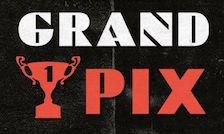 Makassar, Indonesia-based designer of these typefaces in 2017: Gaja Hidoep, Crashand, Blank (sci-fi), Fontolo (poster sans), Teratur (trekkie font), Hallows (pointy Halloween typeface), The Future, Legend, Asman Script, Trying Brush.
 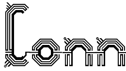 Alberto Villanueva (b. 1982) lives in L'Hospitalet de Llobregat near Barcelona. He designed the gothic display typefaces
  Alex Banks (AB Design; b. 1983) is based in Warrington, UK. Creator of the free octagonal font Sliced AB (2006) and the chunky Chukny (2013). In 2015, he made the
  Graduate of the Design Department of the National University of Art in Bucharest, Romania. He created these typefaces:
  [
[ Indonesian designer of the brush script
 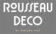 Mariano Diez ran Antenah Studio in Rosario, Argentina, and is now associated with the free font foundry
  Minsk, Belarus-based designer of the
  Falmouth, UK-based designer of
  [
[ Måns Grebäck (Aring Typeface, Örebro, Sweden) is a prolific Swedish designer (b. Lindesberg, Sweden, 1990), who lives in Borlänge, Sweden. Måns Grebäck has a bachelor's degree in graphic design from the University of Dalarna (2012). In 2010, he went commercial, and started selling fonts through
  Ahmad Ramzi Fahruddin (aka Ramzehhh and as Ramz Fahruddin, b. 1993) established Arterfak Project in 2015. He is the Palembang, Indonesia-based designer of the display typefaces Aidah (2015, spurred), Temenyut (2015, spurred), Basenglah (2015, a geometric solid typeface), Local Genius (2015), Oropitem (2015, blackletter), Cakmacak (2015), Maeninaja (2015), Yagitudeh (2015, a
  Kabaro, Soppeng and/or Labokong, Indonesia-based designer of the squarish typefaces Fino (2019),
  Bayu Noor Witarsa set up Asenbayu in Bandung, Indonesia, in 2020. In 2020, he designed
 Bantul, Indonesia-based designer of several icon sets (Ecommerce, Football, Bathroom, Moslem Worship), and handcrafted typefaces sucxh as Kinley (2019: monoline script), Layla Script (2019), Star Medina (2019: an Arabic simulation typeface), Zamalek (2019: a script typeface), Seggo Jagung (2019: a minimalist monoline sans), Jaguar (2019: squarish), Sinau (2019: a script typeface) and Modaz (2019: an all caps brush typeface for horror applications).
  Indonesian designer of these techno display typefaces:
  Aviv Studio in Monterrey and Mexico City consists of
  Istanbul, Turkey-based type designer. She releassed her first typeface, Newcraft Serif in 2016, and published Benedicte Script and Rawbrush later that year.
  Founded in Bandung, Indonesia in the middle of 2019 by graphic designers Reza Rasenda (b. 1993) and Riska Chandra Dewi, Zealab Fonts Division specializes in and is inspired by urban culture, luxurious brands and street posters. Reza Rasenda designed these typefaces in 2020: Crenzo (a
  Graduate of ECAL, class of 2015. Originally from Lyon, France, he presebtly is a designer in Evian Les Bains, France. Creator of the spectacular display typeface Bosozoku (2015), which is inspired by Japanese culture and NHRA in the USA. This work was declared Exhibition winner at Pangrame International Student Typeface Design, with a special Coup de coeur of Gerard Unger.
  Murathan Biliktu obtained a Masters degree in masters in Inclusive Design at OCAD University. Toronto-based designer of these typefaces in 2020: Seoul Rave (Korean techno), Erkin (futuristic), Costes (futuristic).
  [
[ [
[ Graphic design student at the University of Salford, Manchester, UK who made the futuristic typeface
  Cofounder of Now Type,
  [
[ Graphic design collective in Orchamps near Besançon, France, est. 2012, consisting of graduates in the Masters program of the École des Beaux-Arts de Besançon, i.e., Clément Moussard, Antonin Buchwalter, and Simon-Pierre Chapuis. Their typeface creations:
  Born in Firenze in 1969. Cofounder with Francesco Canovaro and Debora Manetti of the Italian design firm in Firenze called Studio Kmzero. He co-designed some typefaces there such as
  Type designer (b. 1951, New York) in New York City, who studied at Pratt. His type foundry, Cozy Fonts, is located in Bell Canyon, CA.
  Designer in 2020 of the all caps display typefaces Mavis (futuristic), Royale, Noma (modular), Carla Sans and Classy Taylor, and the decorative serif typeface Vickey.
  Italian art directore designer in London who created the futuristic typeface Space, the modern geometric sans typeface King Lear, and the
  Sheffield, UK-based designer of the MICR font
  Art director in Dublin, Ireland (was: Milan, Italy). In 2020, he designed the
  Graphic designer who started in Los Angeles, where he ran
  [
[ Type foundry in Sheffield, UK, first called Schizotype, and in 2021 renamed Eclectotype because this is not a foundry that likes to stick to trends or expectations. Its designer,
  [
[ Free and commercial font foundry by Zellik, Belgium-based
  American designer of the great school project typeface Electic (2019), which evokes computers, geometry and futurism. [
 Yogyakarta, Indonesia-based designer (b. 1990) of these script typefaces in 2018: Radicalis (script), Blacktail (layered, spurred, Western), Aniyah (formal calligraphic script),
  [
[ Indonesian designer of
  Known as Toni Dzulham and Dumadi Pangandaran. Pangandaran, Indonesia-based designer, b. 1991, of the casual monoline typeface Dumeng (2018) and the modular typeface Herison (2018). Typefaces from 2019: Marlina (script), Lucky Star (a fat brush script), Bllastt (brush script), Chickybom (a cartoon font), Babell (a heavy all caps sans), Mellows, Sarllett (signage script), Whoody (a cartoon font), Dumadi (a children's book font), Attasiyap, Comic Comoc (a fat comic book font), Hermazz (a comic book font), Multikultural (monoline script), Husaeni (squarish).
  Graphic designer based in Kyrgyzstan. In 2020, Eugene Bunin and Christine Beginskaya released the futuristic partly stencil typeface family
  [
[ Ciamis, Indonesia-based designer, b. 1989, of The Refano (2018), the bold sans Boldé (2018), Bolde Rough (2018),
  Japanese foundry in Nagoya that offers free and commercial Latin fonts made by
  Zimna Wodka / Lublin, Poland-based designer of the
  During his studies in Saint Petersburg, Russia, Viktor Pesotsky designed the
  [
[ [
[ [
[ German designer at URW++ of the wonderfully futuristic font
  Genilson Lima Santos is the Salvador, Brazil-based designer (b. 1985, Bahia) of Stilu (2015, sans), Jenelson (2006), the stroked font Styllo (2007), the brushy
  [
[ A type designer from Santa Cruz, CA (and now Oakland, CA), Matt Chisholm (Glyphobet; was: mattt's fonts) created mainly handwriting and display fonts. He obtained a BA in Mathematics from UC Santa Cruz. All his fonts were initially free---these included MRPHONE1, MRPHONE2, MRPHONE3, MRPHONE4, MRPHONEAlternates, CheckerHat, EverydayFont (Roland Berger, 1994),
 Blumenau, Brazil-based designer of the wide monospaced titing typeface Katherine (2016), which was inspired by the shape of a futuristic car. [
 Herman Coetzee (Blackboxgrafx), who is based in Vredesburg, South Africa, designed the futuristic, dystopian and sci-fi typefaces NuMono (2022), ArcType (2022), Quadra (2022), M Tech (2022), and Blackbox (2021). He also made a Cyberpunk Icons set in 2022. [
 [
[ During her studies at FADU / UBA in Buenos Aires, Iara Grinspun designed the futuristic typeface Astro (2015). [
 [
[ Also Ilya Naumov, b. Russia. Paris-based graphic and type designer, whose typefaces are fabulous. His typefaces:
  Warrenton, VA and Washington, DC-based designer in 2015 of Bitcraft, Tokyo Typeface (inspired by inkan seals), Pixel Patterns, Flight (dot matrix typeface), Hand Drawn Arrows, Hype (techno), Galaxy (techno/futuristic), Fluffy, Detective (typewriter font), Funky (hand-drawn font), Hacker (a cyber typeface), Yeti (handcrafted) and Game Over (video game font).
  Ruben Prol is based in A Coruña, Spain. He used to run
  [
[ JAF34 is an independent graphic designer in Prague. Creator of the thin experimental typeface
  [
[ Known as Jamaluddin Jamaluddin and Jamal Odin. Banda Aceh, Indonesia-based designer of the calligraphic script typefaces Sehia Script (2016), Shanhie Script (2016) and Wenny Script (2016), the signage typeface Brandon (2016), the vintage all caps typeface Greething (sic) Sans (2016). This 4-style family has two shadow versions. He also designed the futuristic typeface families Magneto (2016) and Electro Wave (2016).
  [
[ [
[ Ananindeua, Brazil-based creator (b. 1986, Brazil) of
  Josip Kelava (Jay Kreative, Australia and UK) is an art director and graphic designer. He has done typographic work for fashion mags and fashion-conscious ads such as for
  [
[ Jakarta, Indonesia-based designer (b. 1991) of the free typefaces Never Old (2013),
  Just My Type is a type foundry set up in 2012 by J. Randall (or Randy) Harris (b. 1947, Marion, IN) in Tucson, AZ. Harris is a graphic and type designer who has been making typefaces since 1997. He teaches at the Art Institute of Tucson. His typefaces from 2013:
  [
[ Art director in Singapore (b. 1982) who created the (free) bold condensed stencil typeface Kong (2014), the oriental ink art-inspired fashion mag titling typeface D'Lotus (2015), and the
  Commercial typeface foundry in Jakarta, Indonesia, run by "Ian" and "Abdilah". Its first typeface is Muffler (2014), which is inspired by retro brush signage for car races. Lacydes (2014) is a spurred advertizing typeface. Upjohn (2014) is a horror movie poster typeface. Curely (2014) is a
  Graphic designer in Budapest, Hungary. Graduate of Loughborough University, class of 2018 (with a bachelor's degree), and Moholy-Nagy University of Art and Design in Budapest in 2021 (with a master's degree). At Loughborough University (UK), Kornel Faludi designed a set of generative typefaces (2016), i.e., typefaces that are very modular and computer-generated to a large extent. His typographic oeuvre is quite experimental. Many of his fonts use just basic geometric structures such as circles, arcs and rectangles.
  Croatian designer (b. 1988) of the geometric art deco typeface
  Kustomtype is Coert De Decker's type foundry in Otegem, Belgium. Coert (b. 1966) created
  [
[ Yogyakarta, Indonesia-based designer (b. 1994) who started out as
  Banda Aceh, Indonesia-based designer, b. 1987, of display typefaces. In 2019, Line Creative released
  Designer of mostly display or techno or futuristic sans typefaces for Latin and Cyrillic. The list:
  Founded in 1989, Louise Fili Ltd is a graphic design studio specializing in brand development for food packaging and restaurants. Formerly senior designer for Herb Lubalin, Louise Fili was art director of Pantheon Books from 1978 to 1989, where she designed close to 2,000 book jackets. She has received Gold and Silver Medals from the Society of Illustrators and the New York Art Director's Club, the Premio Grafico from the Bologna Book Fair, and three James Beard award nominations. Fili has taught and lectured extensively, and her work is in the permanent collections of the Library of Congress, the Cooper Hewitt Museum, and the Bibliothèque Nationale.
 [
[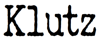 [
[ Maxim and Denis Schepin are the Krasnoyarsk, Russia-based designers of these fonts:
  Köln, Germany-based creator of these typefaces:
  [
[ [
[ [
[ [
[ [
[ [
[ Mehmet Reha Tugcu (Tugcu Design Company, Istanbul, Turkey) designed these typefaces:
  Padang, Indonesia-based studio and designer that changes its name almost monthly: Mevstory Studio, Mandeh Studio, Eleanor Studio, Mevricks Studio, Lettercorner Studio, Mhdafifersya, take your pick. Designer of these typefaces:
  Indonesian type designer specializing in techno, cyberpunk and futuristic typefaces. Typefaces from 2020: of Gardane, Modernis, Techbot,
  Parisian designer of fantastic futuristic lettering pieces, including one for Sophie Taeuber (2014) and one for an exhibition called Retrospective Albert Hollenstein (2014). [
 MTT is the commercial type foundry of Mattia Bonanomi (b. 1985, Brescia) in Milan, Italy, est. 2013. In 2010, Mattia graduated from Central Saint Martins College in London.
  Top futuristic fonts at MyFonts. [
 Type and graphic designer in Eger, Hungary. Her typefaces include Faglia (2021: a stunning (free) thorny display serif), Contras (2020: a modernist and futurist display typeface created at Karoly University's Visual Arts Institute in Eger under the supervision of Monika Rudics), and Star Spark (2020). [
 [
[ Typefaces made by Nick Curtis in 2015:
  Graphic designer in Monterrey, Mexico, b. 1990, whose company is called Handcrafted Types.
  Brazilian type foundry run by Lucas Franco (Italian Brazilian, b. 2001), his father Claudio Rocha (Italian Brazilian, b. 1957) and his mother, Milena Mainieri (Italian Brazilian, b. 1969), which is currently based in The Netherlands. Their typefaces:
  Minsk, Belarus-based designer of the futuristic Cyrillic typeface Android (2015). [
 Jim Parkinson's Parkinson Type Design was based in Oakland, CA. This prolific type designer was born in 1941 in Richmond, CA, and lived in Oakland, CA. After a long struggle with Alzheimer's, he died on June 26, 2025 at his home in Oakland. Originally, a letterer, he went digital in 1990. His Keester and
  [
[ [
[ Communication designer and musician from Portugal, who has I a BA in Communication Design from the School of Fine Arts of Porto. Together, Pedro Canario (Porto, Portugal) and Nuno Queiros (Porto, Portugal) designed the
  [
[ Type designer graphic designer, calligrapher and illustrator from Chile, who graduated in graphic design in 2005 from the Universidad del Bío-Bío., b. 1977, Santiago de Chile. Aka PeGGO, a
  Sochi and/or Moscow, Russia-based designer of Stuva (2018: futuristic), Geometric Pattern (2016), the fine poster typeface Tall Stripes (2016, for Latin) and the colored EPS format deco typeface Five Decor (2016). [
 The Great Dane from Copenhagen,
  Bulgarian designer of the tall slab serif
  Alexey Popov, or Alex Pop for short (Popskraft Lab, Buchardo, Argentina, and now New York City) designed the children's book / cartoon font family
  Karanganyar, Indonesia-based designer, b. 1989, of these typefaces in 2018:
  [
[ [
[ Canadian designer of the modular semi-stencil futuristic typeface Aura (2018). [
 Natal, Brazil-based designer of the experimental futuristic decorative typeface
  Giuseppe Salerno (aka
  [
[ [
[ Known as Yahdi Kumala and Yahdi Romelo. Pekanbaru, Indonesia-based founder of Rometheme in 2018 and
  [
[ [
[ [
[ Dutch professional music producer and audio engineer who founded his own record label. He also makes (mostly free) fonts. His work:
  Belize City, Belize and now New York City-based designer who specializes in high tech and futuristic type designs. He created Borgita (2021: a plump rounded display typeface), Cyberpunk (2021), Cyberto (2021: cyberpunk), Cyberia 3D (2021: a 3d customizable font), Spacegate (2020), the puffy or bubblegum font Funfood (2020), the calligraphic font Wayout (2020), the techno family Vortex (2020), the techno / paperclip font family Mazeline (2018), the signage script Lettercraft (2017), the robot and drone-inspired Robodron (2017), Gempire (2017), the rounded organic typeface Airy (2017), Radon (2017), the outline typeface Ply (2017), the paperclip typeface Garde (2017), the blackboard bold typeface Aberration (2016), the striped typeface Karma (2016), the logotype font Advio (2016), the ribbon or monogram font RibOne (2016), the tech font Line Tech (2016), the curly Wonderscript (2016), the prismatic typeface Lineat (2016, +Lineat III), the plump logotype Airy (2016), the bi-lined typeface Freeline (2016), the robot-inspired Stingo (2016), the display typeface Food Craft (2016), the bilined logo and monogram font Sentaline (2016), the script typefaces Curline (2016) and Article (2016), the children's font Happy Kids (2016), the futuristic font Digitalium (2016, +Condensed), the multiline titling typeface Sentagram (2015), Forest Line (2015, thin squarish headline sans), Sweet Ink (2015), and the ribbon typeface Sentaband (2015).
  Or Sisa Doenya. Bandaraya, Aceh, Indonesia-based designer, b. 1986, of the bilined typeface
 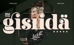 Kota Cirebon, Indonesia-based designer of these decorative serif or display typefaces in 2021: Abigate Desgo, Aftesto, Agata, Aimstesa, Akila, Aletriat, Alika, Amarta, Arolse Belmonteria, Avigea, Bagisko, Blue Ocean, Brow Volky, Bagola, Begika, Behila, Belianty Elesha, Belinda, Belisha, Bergante, Berossla, Bolinger, Bontias, Branding Aliskaje, Bulgeria, Chelon, Castle Begale, Diego, Dalime, Degila, Deraga, Devitta, Display, Elinga, Florals, Fogsta, Garges, Gento Dream, Gabriela Spark, Gisrida, Glamour Karlina, Heritage Dreams, Hagona, Hegam, Histeria, Hochagi, Kakuro, Kegisiko, Kivaera, Kolgimba, Lebagof, Literacy, Mariana, Melisa, Madela, Magistral Honesty, Magkon, Magofah, Masvis, Megasta Signateria, Megiska, Megistica Dreams, Megistica, Meglona, Meliska, Milgnite, Narifah, Negoka, Porto Qastelo, Qalisha, Qalisso, Qandile, Qegor, Qelista, Quihk, Ragasta, Raliha, Rebori, Relyagih, Relyagih, Richardo Flacky, Safira, The Historical Marliana The Mondela Catalisa, The Pablo Meganta, The Wobliy, Venezula, Vestovia, Viollen, Wagstaf (slab serif), Wakile, Yesterday.
  Keith Tricker (b. 1949) is the Creative Director of a UK advertising agency, and during his career has worked as both a copywriter and art director.
  Mehmet Abaci (b. 1978) is based in Istanbul. In 2014, he established Studio Typo, where one can buy his typefaces. Limited forms of the fonts can be downloaded fpr free from the Dafont site.
  Dhaka, Bangladesh-based designer, who created the cursive script typeface
 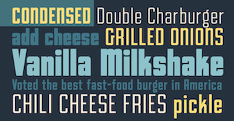 Type foundry set up in 2020 by Comicraft's John Roshell, who is based in California. In 2020, he released the squarish all caps family
  Malang, Indonesia-based designer of these free fonts in 2020: Jungle Adventurer, Fun Blob, Pure Joy, Saikyo (oriental simulation), Okashi (oriental emulation), Chubby and Groovy (psychedelic), Your Groovy Font (psychedelic), Flowerista, Sasha Play (beatnik), Quirky Scandi (beatnik), Happy Hints, Your Doodle Font, The Bomb Sound (octagonal), Black Knight (a horror font), Enigmatic (futuristic), Ethnique (patterned), Gameria (paper cutout), Karl Zone (modular), La Pirata, Monocoque (squarish), Organico, Quincy Jhons (brushed), Sunrize (oriental emulation), Ungai (oriental emulation), White Pearl (spurred), Woody Wood (a plank font).
  [
[ Koper, Slovenia-based designer of the
  [
[ Indonesian designer (b. 1987) of the hatched typeface Dodol (2016), the bold rounded sans typefaces Neptune (2016), Wincky (2016), Violin (2016), Picanto (2016), Quantum (2016) and Mimi (2016). He also designed the inline typeface Balado (2016), the squarish Pertamax (2016), the sharp-edged sans typeface Martabak (2016) and Outline K (2016).
  Leon Hulst (TypeFaith) was born in 1966. Typographer at
  Czech designer of the grunge monospace font Urania Czech (2006) and of the didone numbers-only font Stöhr Numbers (2006). In 2009, he made the old typewriter typeface
  Dri Zy, or Drizy, is Faqih Sandri, aka Faqih Fawaji. Bandung, Indonesia-based designer (b. 1991) of the layered techno typeface Trixie (2016), the brush typefaces Syelma Script (2016) and Syemox (2016), the gothic typeface Dark Widow (2016), the vintage lettering typefaces Overjoyed (2016, Western style) and Beatrixe (2016), the paperclip typeface Kuxu (2016), Dark Widow (2016), Brain Melt (2016: the ultimate Halloween / horror font), Mama Lian (2016), Copper (2016), Dust (2016), the brush script fonts Aeros (2016) and Rostoh (2016, brushy), the children's script typeface Roast (2016), the handcrafted Eastpine (2016), Nyam (2016, layered) and Monstahh (2016), the slimy Halloween typeface Brain Melt (2016), and the poster typeface family Ayuenda (2016).
  [
[ Velvetyne Type Foundry (or
  Max Infeld (b. 1981, aka Xerographer Fonts) from Chico, CA, makes free fonts and offers a free font-making service. He surged onto the font scene in 2012, and is currently located in Ojai, CA.
  A graduate of the University of Tennessee at Knoxville, Patric King began his career as a designer with Thirst in 1994, and helped to build Thirstype until 1999. All of Patric's typefaces moved with Thirstype to Village in 2001, then on to
  [
[ Graphic designer from Buenos Aires, Argentina, at some point located in Madrid, Spain, who made the
  This is one of the most talented FontStructors, but also an active musician. On
  Surabaya, Indonesia-based designer (b. 1988) of the brushed font Carocks (2019), the children's book font
  Italian design firm in Firenze consisting of three graphic designers,
  Juan Guillermo Navarro Barrios runs the design and illustration studio Zilap in Medellin, Colombia. In 2014, he created the hipster typeface Zilap Normal. In 2015, with the cooperation of
  Designer of these fonts in 2021: Ice-cream&Berries (handcrafted), Cookie, Rodriguez, Space Geometry (futuristic). [
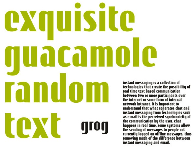
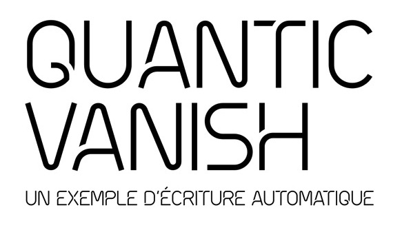
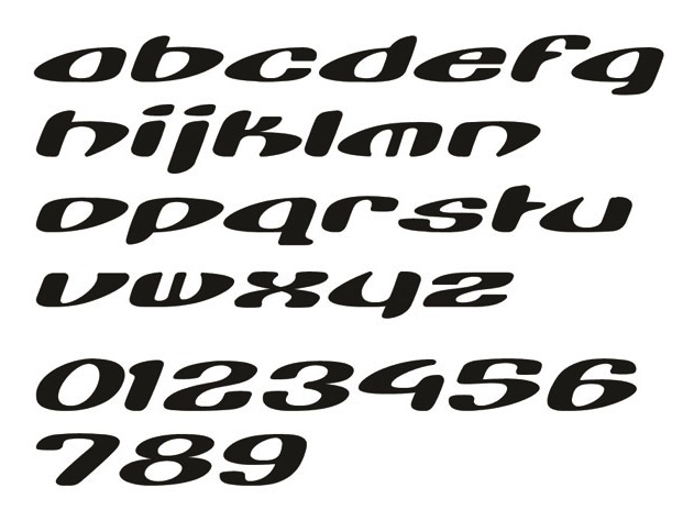
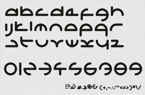
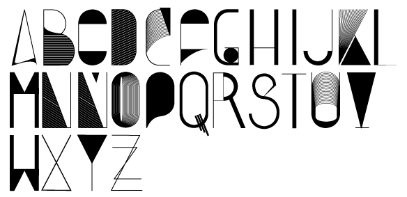
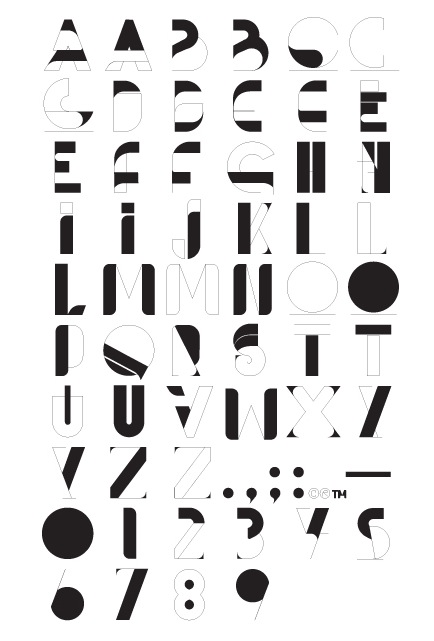
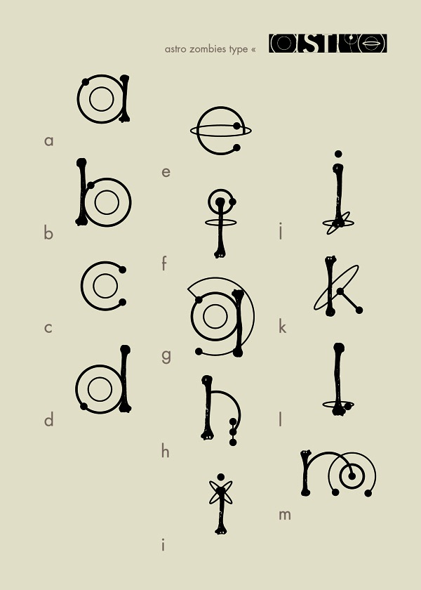
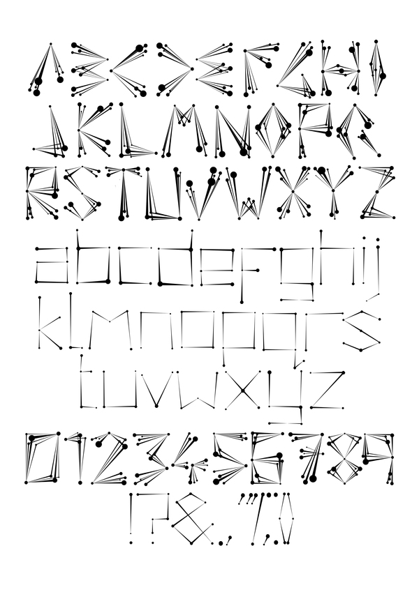
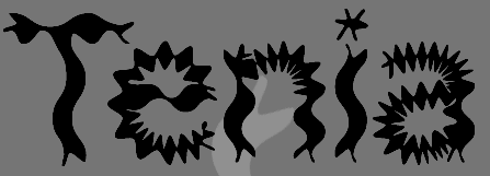
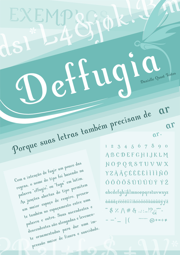
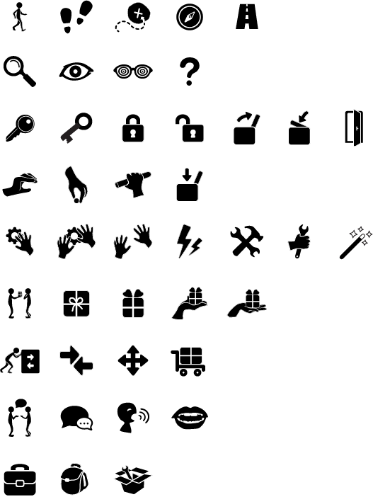
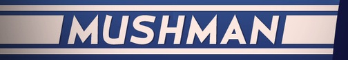
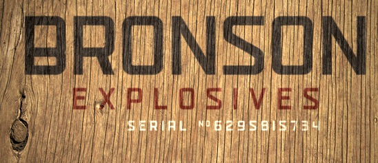
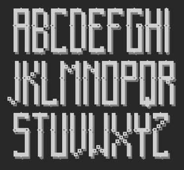
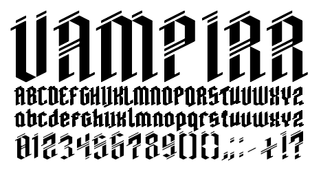
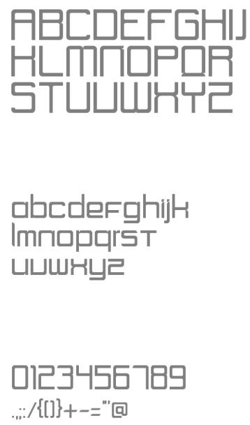
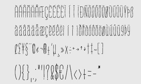
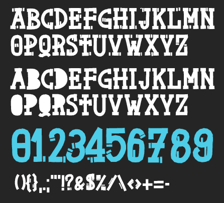
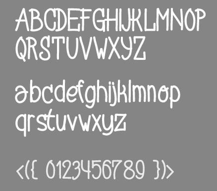
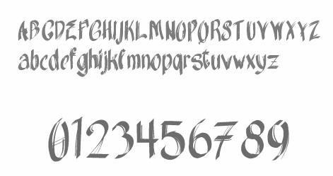
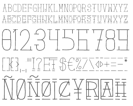
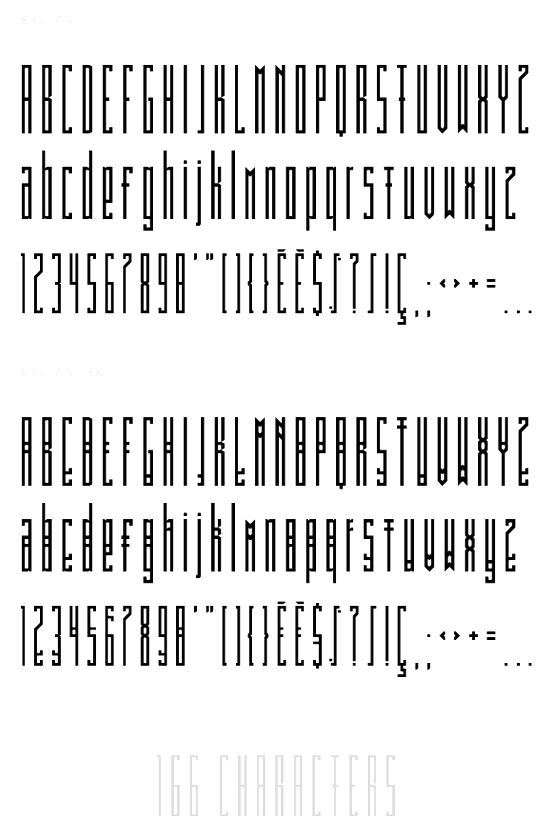
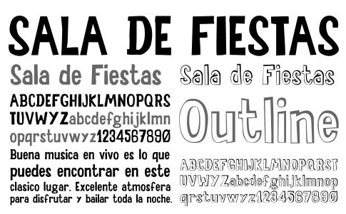
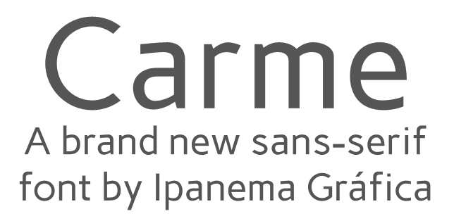
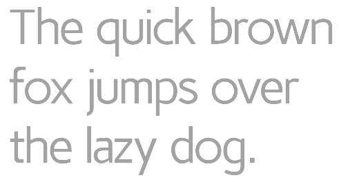
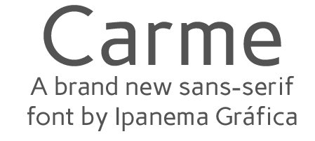
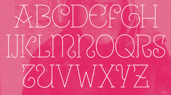
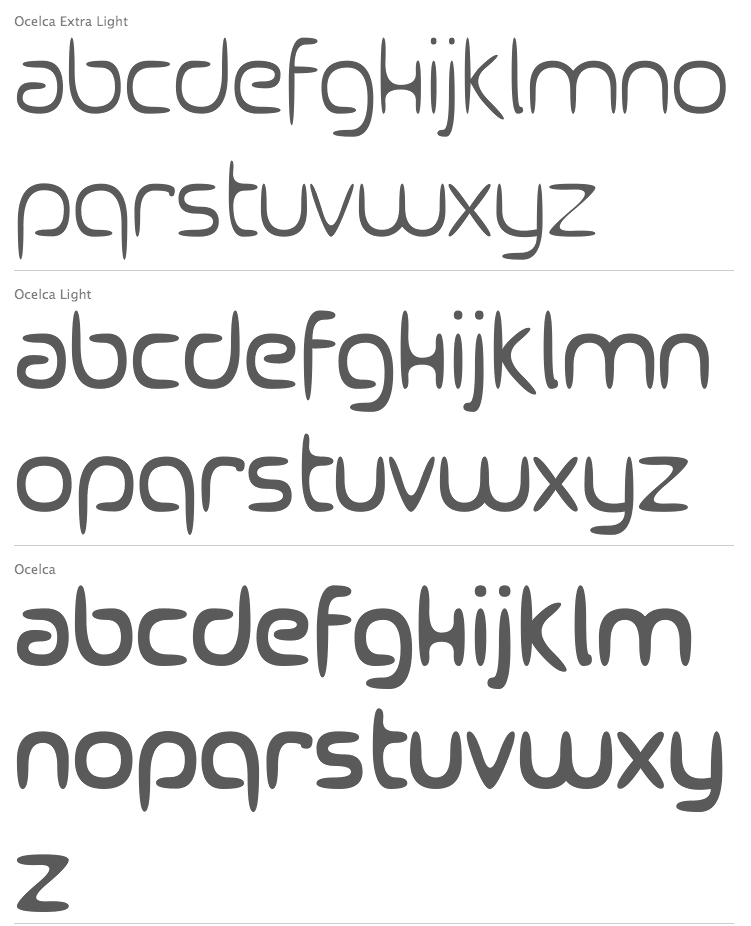
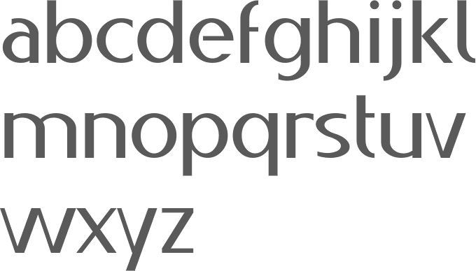
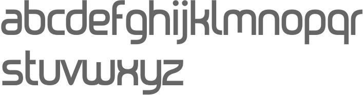
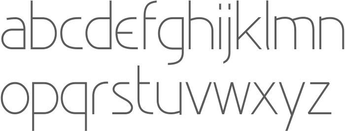
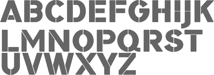
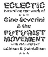
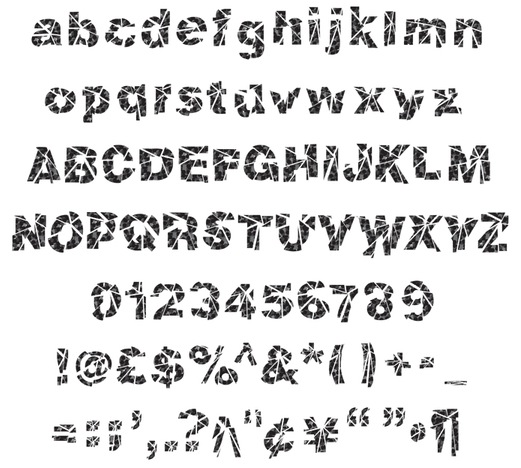
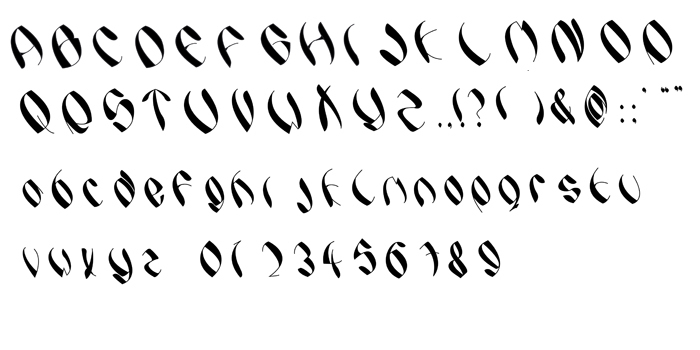
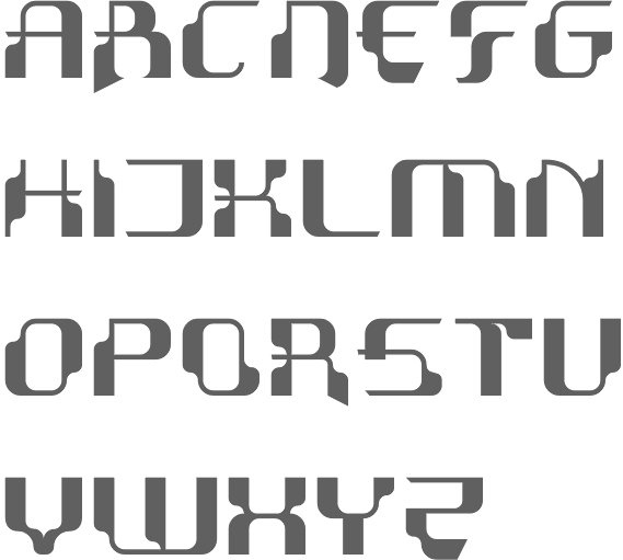
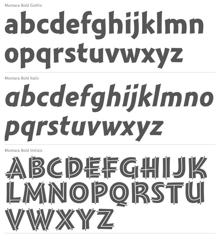
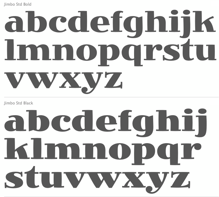
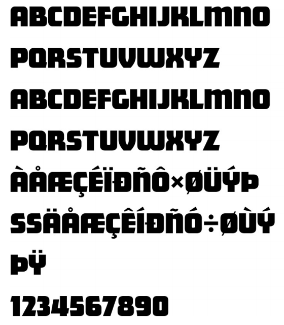
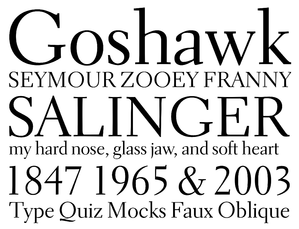
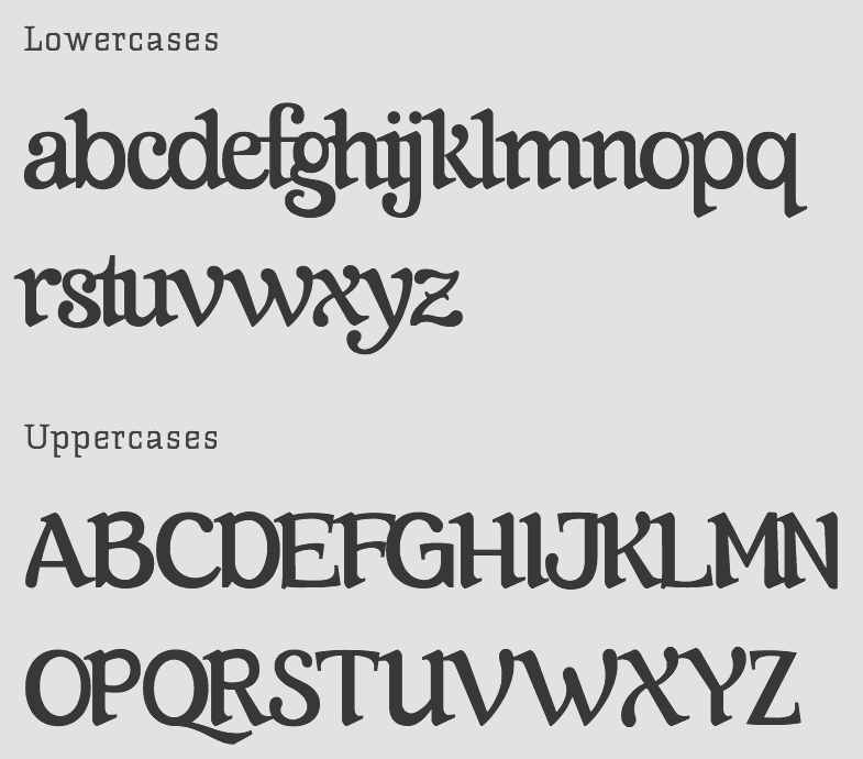
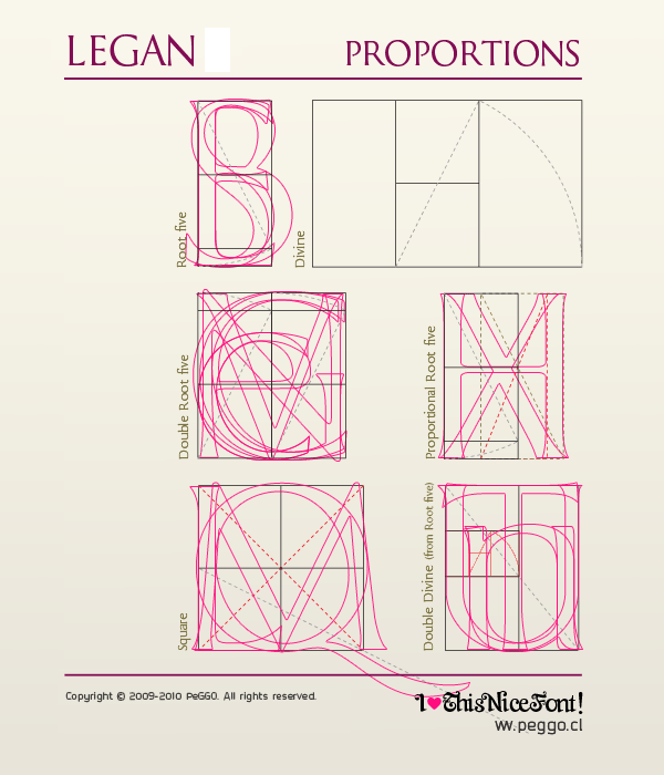
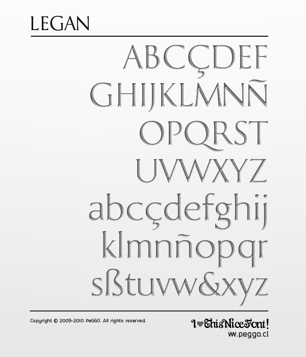
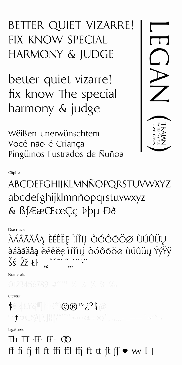
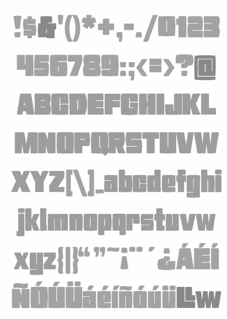
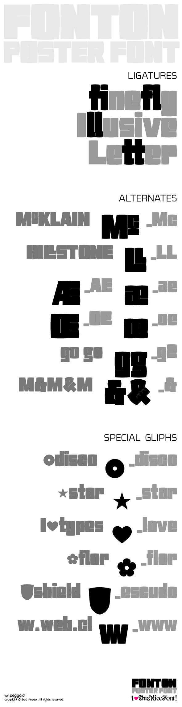
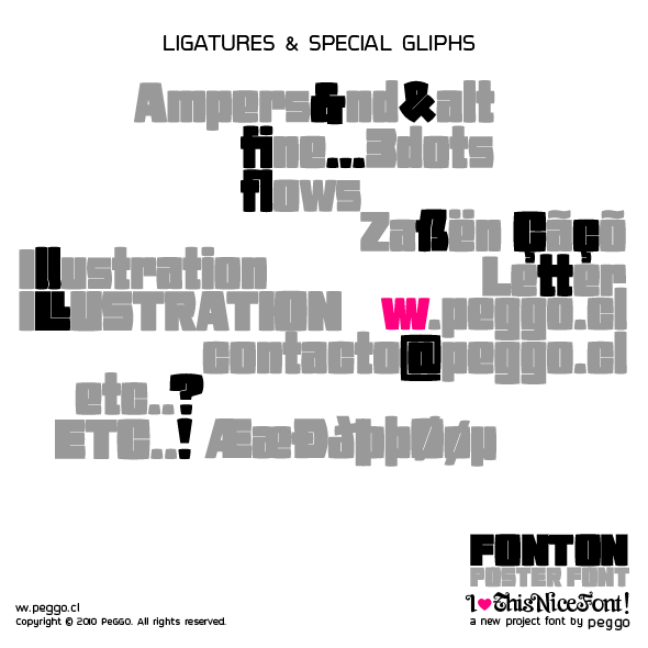
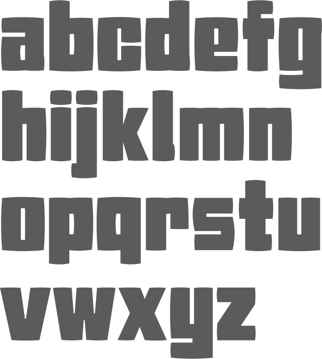
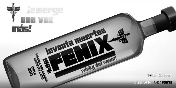
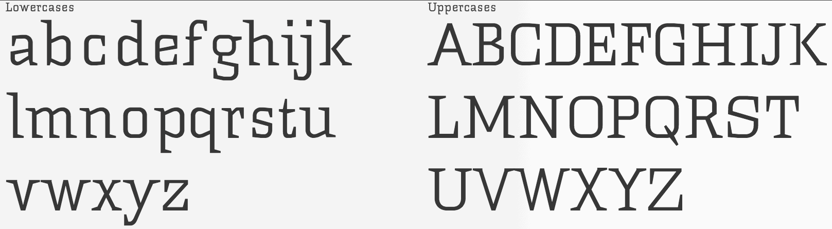
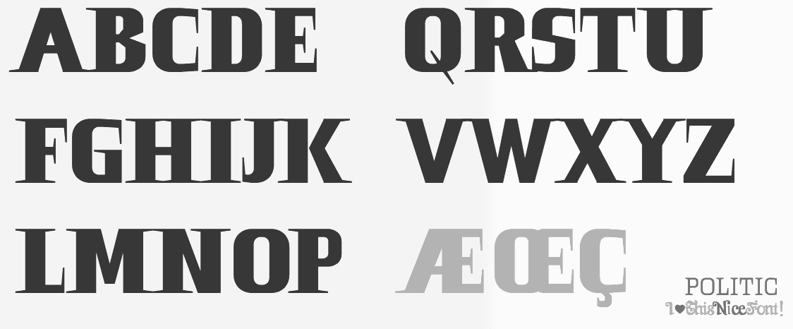
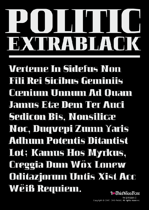
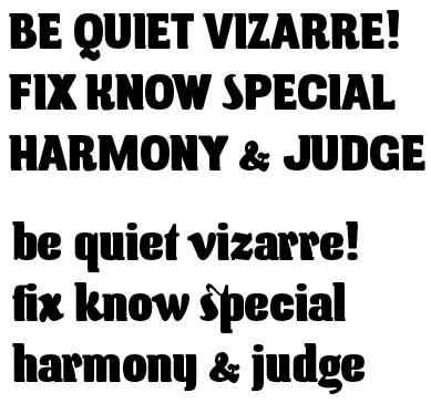
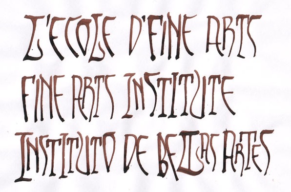
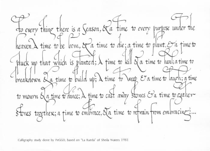
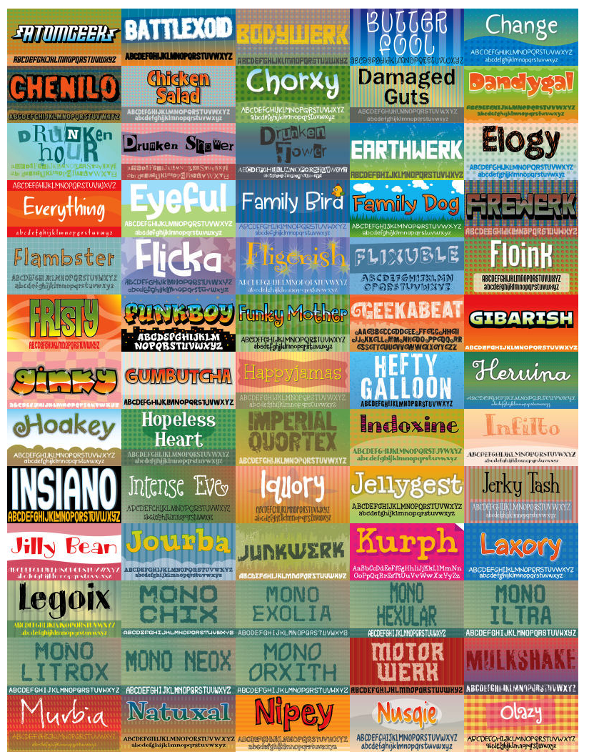
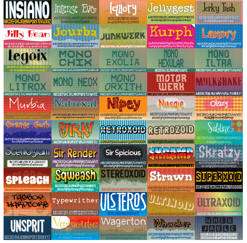
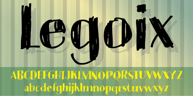
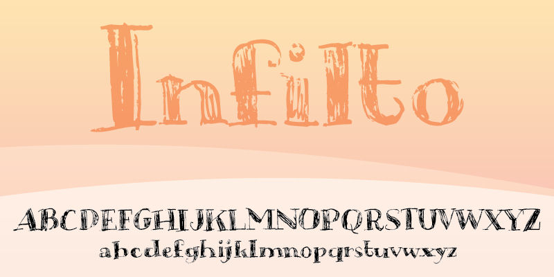
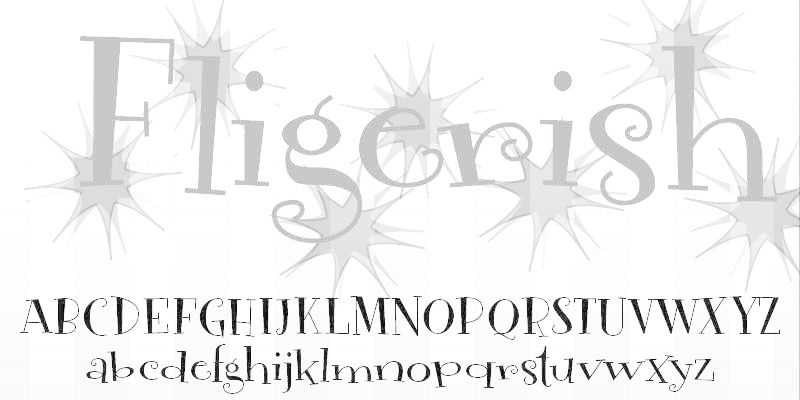
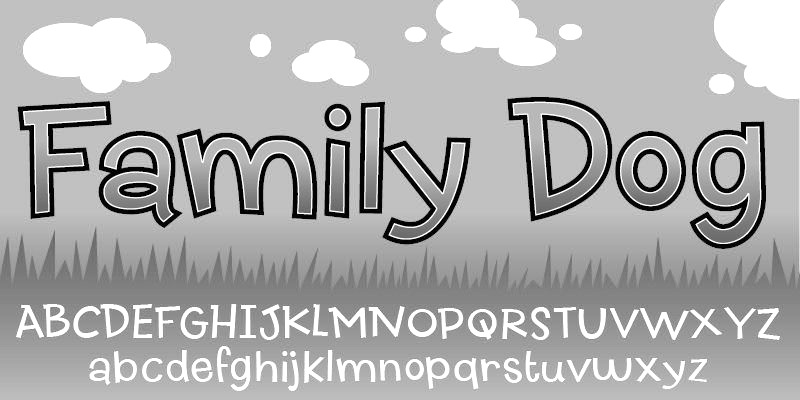
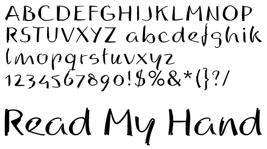
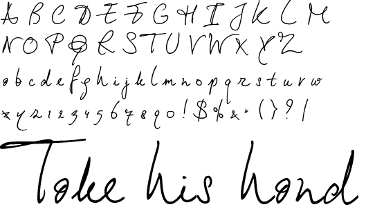
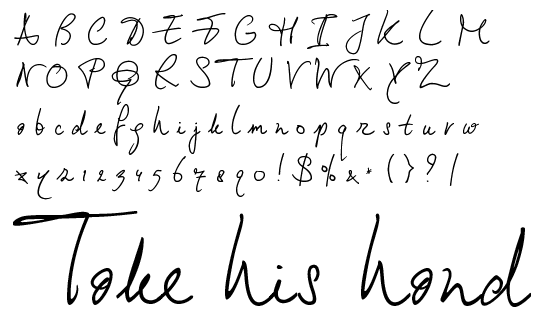
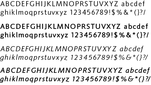
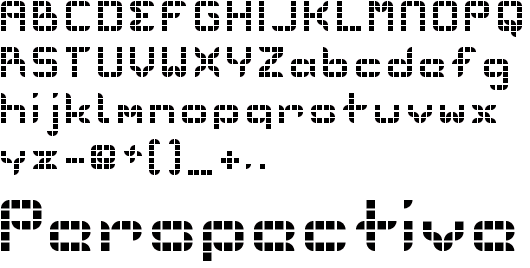
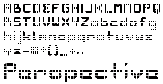
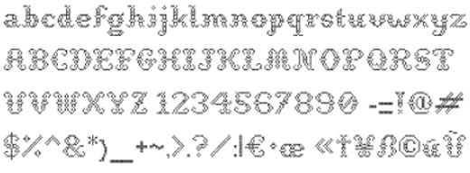
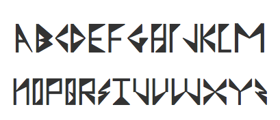
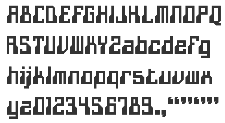
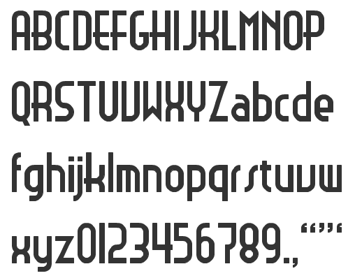
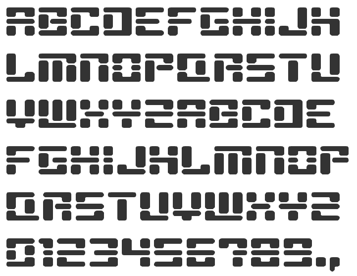
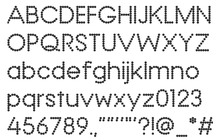
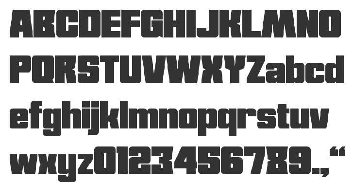
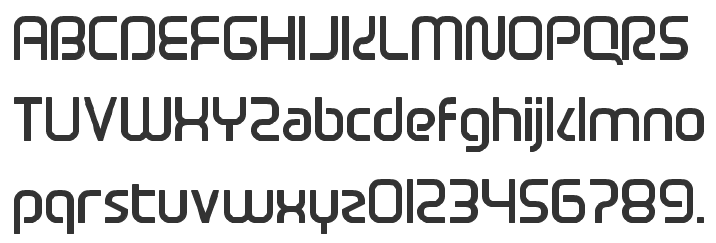
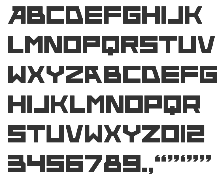
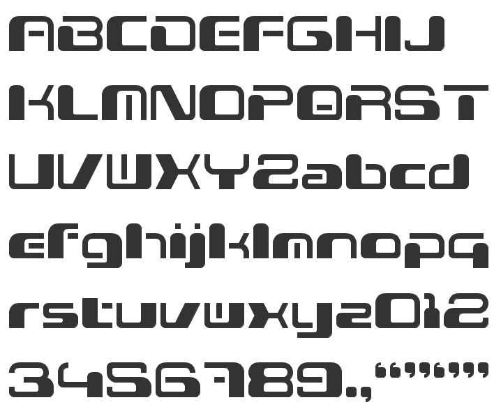
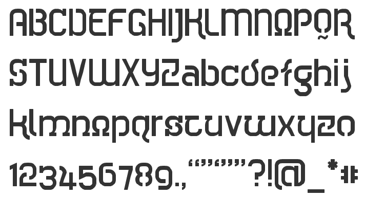
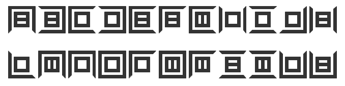
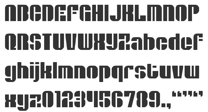
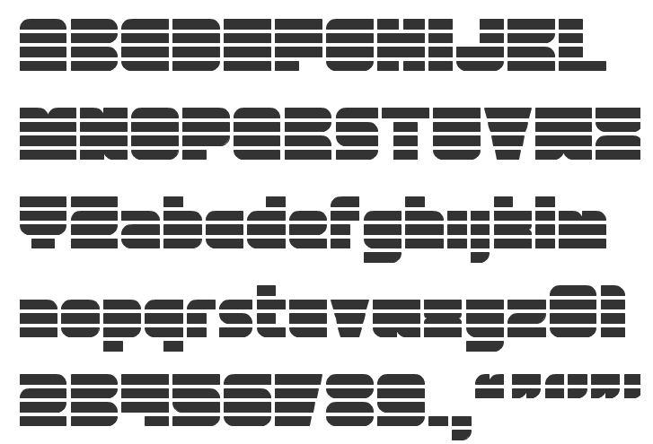
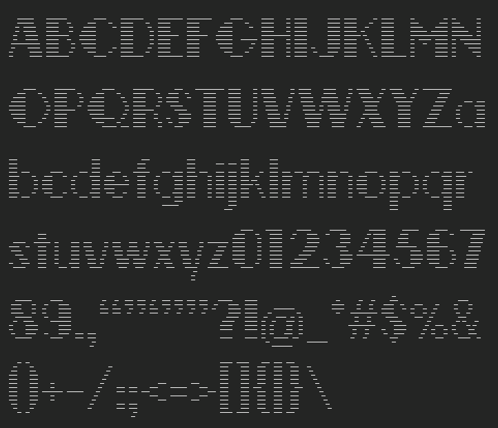
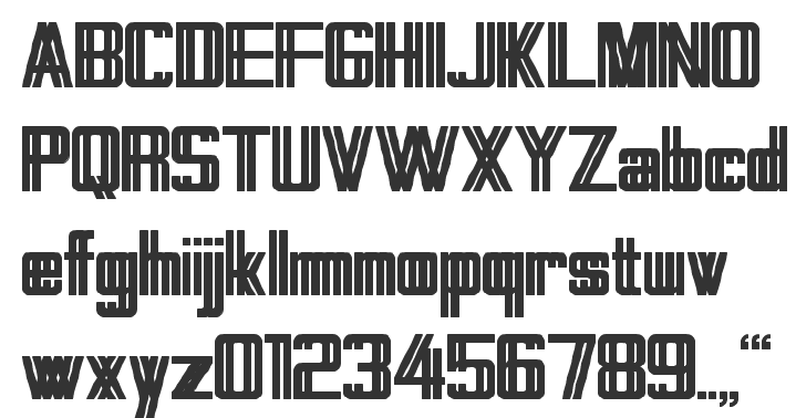
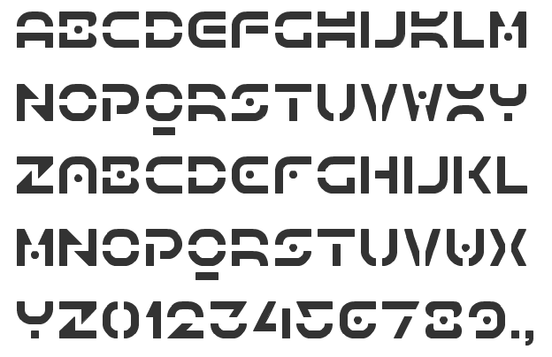
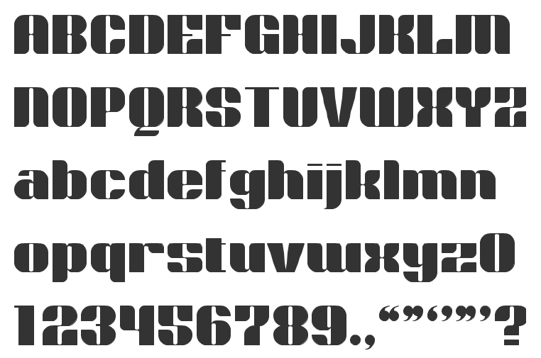
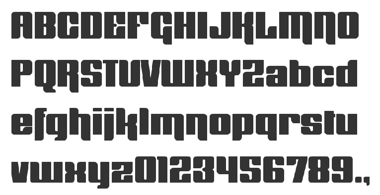
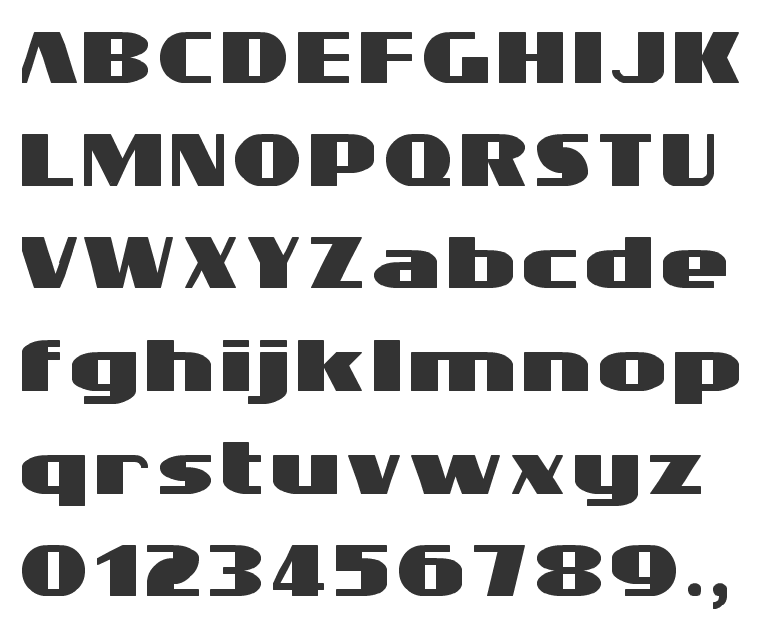
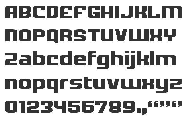
|
|
|
|