| | |
2000 Pyro
|
Makers of the Tomb Raider movie fonts in 2000: TRHeavy, TRIcon (dingbats), TRNormal. [Google]
[More] ⦿
|
A critique of existing typefaces for HDTV (EIA-708) captioning
[Joe Clark]
|
Joe Clark (Toronto) takes all the fonts proposed by Agfa/Monotype, Ascender and Bitstream for HDTV screen captioning apart. [Google]
[More] ⦿
|
Aardy R. DeVarque
[TSR and WotC Fonts]
|
[More] ⦿
|
Adrian Candela
|
 Valencia, Spain-based creator of the Bauhaus-inspired monoline geometric rounded sans typeface Bowhouse (2013, free), the retro futuristic typeface AC Brodie (2013, free), the free art deco typeface AC Mountain (2013), the 3d typeface AC Framed (2013), the film strip typeface AC Filmstrip (2013, free), Comic Runes (2013, rune simulation), Scribbled (2013), and the hexagonal typeface Bee Type (2013, +Filled, +outline).
 Newsense (2013) is an art deco typeface that extends Milton Glaser's Film Sense (1968). Romaji Mincho (2013) is a free Asian simulation font based on the style of the Mincho typeface. Rhyder (2013) is a great (free) geometric 1930s style sans typeface. Martell (2013) is a free general purpose slab serif family. AC Big Serif (2013) is a free rounded wedge serif typeface. AC Thermes (2013) is a sans display typeface. Typefaces from 2014: AC Wanita (hand-drawn). Typefaces from 2019: AC Guanche (a font based on the ancient scripts used by the Guanches, the aboriginal inhabitants of the Canary Islands). [Google]
[More] ⦿
|
Agent Tim
|
FontStructor who made these typefaces in 2012: Disconnected, Film (film strip pixel face), Pixels, Slim, Zigzagish. [Google]
[More] ⦿
|
Agustín Luis Bou
[Bou Fonts]
|
[More] ⦿
|
Ahmed Magdy
|
Giza, Egypt-based designer of the typographic poster Scream (2013) for the movie by the same name. [Google]
[More] ⦿
|
Alessandra Bautista
|
Student at the Rhode Island School of Design, class of 2013. New York City-based creator of Luc (2013), a geometric sans serif typeface inspired by Jean-Luc Godard's film titles. Behance link. [Google]
[More] ⦿
|
Alessandro Lamirata
|
Quito, Ecuador-based designer, b. 1989, of Golf Tools (2012), a golf-themed display typeface. Movie Soundtrack (2012) is a film strip-themed font. [Google]
[More] ⦿
|
Alex Dukal
|
 Patagonian illustrator (mostly for children) and designer in Puerto Madryn, Argentina. Creator of the free cinematic font AD Nautilus (2013). On his web page, we find various poster lettering typefaces such as Pupitre Type (2013).
 In 2014, he created the fantastic black brush poster font AD Bulky Note, the angular poster typeface AD Polaquita, Roberto Underground, Pasquin, and the fun (free) poster typeface AD Sura (a tribute to Czech graphic artist Jaroslav Sura). Blogspot link. Dafont link. Behance link. [Google]
[More] ⦿
|
Alex Frukta
[Nord Collective (or: Fontfirma)]
|
 [More] ⦿
|
Alex Moseley
[Crazy Diamond Design Historical Fonts]
|
[More] ⦿
|
Alexander Hartwell
|
Designer in Brooklyn, NY, who made some unnamed hand-drawn typefaces in 2012 during his studies at Pratt (class of 2015). [Google]
[More] ⦿
|
Alphabet&Type
[Paolo Vannucci]

|
 Paolo Vannucci (Alphabet&Type, b. 1969, Punta Marina Terme) created the curly handwritten Halloween typefaces Afterlife, Evernight (2009) and Evernight Stargazer (2009).
 He also has an interest in Startrekkery because he designed the typefaces Transformers Movie (2009) and Star Trek Future (2009). All these typefaces are free at Dafont and/or Fontspace. Alternate URL. In 2010, he did the free brush typeface Fronte del Porto, which is based on the Elia Kazan movie with Marlon Brando entitled On The Waterfront. There is also a commercial side of Alphabet&Type: In 2010, they published the angular family Antares, the bold organic typeface Minardi (+Collage), and the curly family Vannucci Antico. Metropolis (2010) is an angular typeface based on the titling of Fritz Lang's movie Capolavoro. Sabrina (2010) is taken directly from the Best movie by Billy Wilder, with Audrey Hepburn and Humphrey Bogart. An American in Paris (2010, or: UnAmericanoAParigi) is based on the font used in the movie by Vincente Minnelly, with Gene Kelly and Leslie Caron. Cleopatra (2011) is a chisel font with a Greek look, based on Cleopatra, the movie by Joseph L. Mankiewkz, starring Liz Taylor and Richard Burton. Il Grinta (2011) is the wedge serif titling font of True Grit, Henry Hathaway's movie starring John Wayne. The beautiful inline typeface Singapore (2011) after the titling in John Brahm's movie featuring Ava Gardner. Strade di Fuoco (2011) is based on the movie Streets of Fire by Walter Hill, with Diane Lane. Flash Gordon (2011) is based on the famous movie by Mike Hodges, starring Max Von Sydow. Amazing Spider Man (2011) is based on the Spiderman movie by Marc Web which featured Andrew Garfield. Captain America (2011) is based on the movie by Joe Johnston, with Chris Evans. Twilight New Moon (2009) is based on the Twilight movie. Electric Dreams (2011) is based on steve Barron's movie. Tintin (2011) is a comic book typeface based on Steven Spielberg's 2011 movie. Fantastic Four (2011) is a StarTrek style family that is based on the Tim Story movie. Faelorehn (2011) is a vampire script. Creations from 2012: Sherlock Holmes, Watson (based on Guy Ritchie's movie), Lucky Luke (after the successful Western comic book series by Morris and Goscinny), Danger Diabolik, Ghost Rider (based on the movie by Mark Steven Johnson, starring Nicolas Cage), Notorious (a brush font based on Notorious, a movie by Hitchcock starring Cary Grant and Ingrid Bergman), Cullen, Flower Header, Dorian Gray (from the movie by Oliver Parker starring Ben Barnes), Snow White (from Rupert Sanders's movie Snow White and The Huntsman). Typefaces made in 2013: Beastly (based on the David Barnz movie featuring Vanessa Hudgens), Top Gun (an octagonal typeface based on the movie with Tom Cruise), Manhattan (from Woody Allen's movie), Assassin (based on a Ubisoft video game). Typefaces from 2014: Dylan Dog (based on Kevin Munroe's movie starring Brandon Routh). [Google]
[MyFonts]
[More] ⦿
|
Alphan Typefaces
[Roberto Baldassari]
|
Roberto Baldassari shows and discusses the fonts used in Space: 1999, from Data 70 (Esselte, 1970), to Futura Black, Futura Medium, Microgramma, and Eurostile Bold Extended to Countdown (an LCD font by Esselte, 1965). [Google]
[More] ⦿
|
Amanda Bonnar
|
During her studies at Art Institute of Pittsburgh, Buzzards Bay, MA-based Amanda Bonnar designed the brush script typeface Roman Holiday (2016), which was inspired by the 1953 movie starring Audrey Hepburn and Gregory Peck. Behance link. [Google]
[More] ⦿
|
AMC Theaters
|
An orphaned font after the AMC Theaters logo. Created in 2015. [Google]
[More] ⦿
|
Ananda Kumar Maharjan
|
 Kathmandu-based designer (b. 1983) of a Nepali Devanagari font families called Ananda Kalpana (2012), Adhunik (2012), NepSerif Nepali Devanagari (2012), Ananda Lamcho (2012), Ananda Akchyar (2011), Gaijatra (2011), Ananda Ashlesha (2011), Ananda 1 Hv (2003), Ananda Kinara (2011), Ananda NepTouch (2011, free Latin face), Neptouch2 (2011), Ananda Namaste (2011, Indic simulation face), and Ananda Sansar (2011).
 In 2013, he made the free modular Latin typeface Bauchaomaicha (FontStruct) and the Indic simulation typeface Pasarocks. In 2014, at FontStruct, he created the Devanagari typefaces Ananda Thopla (dot matrix) and Ananada Devanagari Round. In 2015, he published the free monoline Devanagari font Ananda Ukaliorali, the Sanskrit-inspired Latin typeface Ananda Neptouch Caps and the Devanagari font Ananda Chautari. Typefaces from 2016: Ananda Devanagari (free), Ananda Fanko (a free brush Devanagari typeface specially made for the Nepali movie Fanko). Typefaces from 2017: Nepal Lipi. Typefaces from 2019: Ananda Hastakchyar (script). Behance link. Klingspor link. Hellofont link. Blogspot link. Devian tart link. Catalog. Another Hellofont link. Creative Market link. Behance link. Blogspot link. Speaker at ATypI 2019 in Tokyo. [Google]
[More] ⦿
|
André Sentieiro
|
 Lisbon, Portugal-based designer of Nova Classica (2015, +Condensed), an all caps vintage movie title and movie credit font family. Behance link. [Google]
[More] ⦿
Lisbon, Portugal-based designer of Nova Classica (2015, +Condensed), an all caps vintage movie title and movie credit font family. Behance link. [Google]
[More] ⦿
|
Andrew Galarza
[Andrew Galarza Foundry (was: Chance Type Co, and Krayon Ink, and before that, Jedi Serpent Fonts)]
|
[MyFonts]
[More] ⦿
|
Andrew Galarza Foundry (was: Chance Type Co, and Krayon Ink, and before that, Jedi Serpent Fonts)
[Andrew Galarza]
|
Chance Type Co evolved out of Krayon Ink (ex- Jedi Serpent). It has commercial fonts by American designer Andrew Galarza who lives in Miami, who started making type in 2001. These used to be shareware when the place was called Jedi Serpent Fonts. Galarza's early typefaces: Jeannette (2002), Display Swash, KY and an Urge, 65 Swash, Melfina, Redheads in Transit (beautiful handwriting), Butterfly Collection (dingbats), 5 Am Summer, Transit One, Superchalmers, Like Wind in The Summer, Delithium, Fane Serane, 5am Andrew (2005, handwriting), 5am Chance No 01, 5am Transit (handwriting), 5am Gender, Grey (2005), Melfina (2002, inspired by Emigre's Council), 5 AM Chance No. 1 (which used to be called Vespers), Vespers (2001, based on lettering for a Bjork album), NewTimesRomanHyper and CourierStrange (reworked Monotype fonts: the latter one has letters in brackets), 90Days, Blistel, Cancer, Freeware, Futura, Lode, Love-Quickie, Image Times, Stylus (modified Monotype font), Jenice, Element, Prozac Child, Codeca, Ginger, Ginger2, Boredom, Awitched, Mastillo, Mastillo2, PaperChase2blockedinside (reworked BadFilms by Ray Larabie), Screwupsuprock, Arialbullets39mmwideclear and Arialbullets4VerbRicochet (reworked Monotype Arial-Plain: letters in and on balls), Dots, VanishingBoy (modified Ray Larabie font; the best in the series I think), 1979 (fantastic avant-garde font), Agent 508 (equally great display font), Aloin, Bionic, Backspace, ChemicalTest, Click, Dragon, Eggman, Feelings, Flowery Text, Gallows, Gigayoda, Impression, Lavero, Lorent Roman, LoveJoy, Melody Metrics, Never, Noose, Numbers (hacker font), Opagan, Opus-sc, Panama, Poison Pill, Potheads, Rainy, RoamJapan, Room, Butterfly, Thinker, Veronica, Western Flick, Reterik, MisbehaviorTake23, Thinker, Paperchase2blockedinside, Children's Television Workshop (letters based on the Sesame Street TV show, 2002), KY and Urge, 65 Swash, Redheads in Transit, and I Love My Momma. On my last visit, there were just a few shareware fonts left (in OpenType format): 5AMButtercup, 5AMButterflyCollection, 5AMDelithium, 5AMLikeWindInTheSummer, 5AMSuperchalmersItalic, 5AMSuperchalmers. MyFonts sells some of his fonts: 5 AM Buttercup (Andrew Galarza), Grey (Andrew Galarza), 5 AM Gender (Andrew Galarza), 5 AM Chance No 01 (Andrew Galarza), 5 AM Andrew (Andrew Galarza), 5 AM Transit (Andrew Galarza), 5 AM Summer (Andrew Galarza), Melfina (Andrew Galarza), Childrens Television Workshop (Andrew Galarza), Vespers (Andrew Galarza). Jedi Serpent evolved into 510 ink and then Krayon Ink. In 2005, Krayon Ink was renamed Chance Type Co. Home page. Old MyFonts link. [Google]
[MyFonts]
[More] ⦿
|
Antonella Pagliarulo
|
 Freelance designer in Mendoza, Argentina. In 2015, inspired by Pedro Almodovar's movies, she made the paper-cut or dada typeface Almodovar. [Google]
[More] ⦿
Freelance designer in Mendoza, Argentina. In 2015, inspired by Pedro Almodovar's movies, she made the paper-cut or dada typeface Almodovar. [Google]
[More] ⦿
|
Arthur Maria
|
Designer in 2008 at FontStruct of the experimental typefaces Gearbox, Gotha (octagonal), Nippon Garden, Labyrinth, Nano (pixel), Machine Script, Plank stencil, Ballistix, San Andreas (recreation of the Grand Theft Auto font), Machina (a macho octagonal heavy face), Electro, Hiro (oriental look), Japanica (oriental look, based on Hiroshi), Mage, Silkscreen Alt (pixel, a modification of Jason Kottke's Silkscreen). [Google]
[More] ⦿
|
Arthur Ravenel
|
 During his studies in Lyon, France, Arthur Ravenel designed the great concentric circle typeface Typo Cinema (2018). [Google]
[More] ⦿
During his studies in Lyon, France, Arthur Ravenel designed the great concentric circle typeface Typo Cinema (2018). [Google]
[More] ⦿
|
Attila Zigó
[Bumbayo Font Fabrik]
|
 [More] ⦿
|
AXR Lettering
|
Indonesian studio and digital type foundry. Creators of the fantasy movie font Neverland (2015) in the style of the lettering used in Alice In Wonderland, Wizard Of OZ or Narnia. [Google]
[More] ⦿
|
Bartosz Panek
[Fontsphere (or: Prestologo)]
|
[MyFonts]
[More] ⦿
|
Ben Goddard
|
Temecula, CA-based designer of the handcrafted typeface Fargo (2016), which is based on the Coen Brothers classic Fargo. [Google]
[More] ⦿
|
Ben King
|
UK-based comic artist, b. 1985. Home page. Designer of GB Nametag (2006), based on the lettering of the Ghostbuster nametags. Ben King also made Ghostbusters Nametag (2006). [Google]
[More] ⦿
|
Bernd Volmer
|
 Bernd Volmer is a graphic and type designer from Germany. Before attending type and media, he graduated with a BA in 2011 from the ArtEZ in Arnhem. During this time he also did an internship at Atelier Carvalho Bernau and developed his knowledge and interest in type design and typography. After graduation he started as a freelancer.
 In 2013, he graduated from the Type & Media program at KABK, Den Haag. His graduation typeface, Curtis, is based on broad nib calligraphy, and manages in its palette of styles to cover the broad ground between powerful German expressionist display types and very readable text types. In my view, it is the best of the twelve typefaces of the graduation class. In 2010, Bernd Volmer and Ateleir Carvalho Bernau published the free typeface Jean-Luc, which is named after Jean-Luc Godard. Carvalho / Bernau write: We didn't find out who originally made the lettering for these two movies. Some speculate it could have been Godard himself---Godard's interest in graphic design and typography is clear, with many of his other films employing such strong typography-only titles and intertitles. They are almost a self-sufficient entity, another character in the movie, another comment. This style of lettering is so interesting to us because it is such a clear renunciation of the pretty, classical title screens that were common in that time more conservative films. It has a more vernacular and brutishly low-brow character; this lettering comes from the street. We can not prove this at all, but we think it may be derived from the stencil letters of the Plaque Découpée Universelle (or PDU), a lettering device invented in the 1870s by a certain Joseph A. David, and first seen in France at the 1878 Exposition Universelle, where it found broad appeal and rapid adoption. We think this style of lettering was absorbed into the public domain vernacular of French lettering, and that the 2 ou 3 choses titles are derived from these quotidien lettering style, as it would seem to fit Godard's obsession with vernacular typography. In 2019, he published the two-axis (weight and serifs) variable font Seraphs. Co-designer wit Hannes von Doehren of Palast (Text, Display, Poster; in 2021: 36 styles). Future Fonts link. [Google]
[More] ⦿
|
Bernie Diril
|
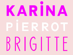 Graphic designer in Paris. In 2015, Perrine Winkler and Bernie Diril co-designed Brigitte, Karina and Pierrot, three typefaces based on the credits of Jean-Luc Godard's movies. The fonts are named after Brigitte Bardot, Anna Karina and Jean-Paul Belmondo (Pierrot Le Fou). [Google]
[More] ⦿
Graphic designer in Paris. In 2015, Perrine Winkler and Bernie Diril co-designed Brigitte, Karina and Pierrot, three typefaces based on the credits of Jean-Luc Godard's movies. The fonts are named after Brigitte Bardot, Anna Karina and Jean-Paul Belmondo (Pierrot Le Fou). [Google]
[More] ⦿
|
BG11 Design
[Boris Garic]
|
Brand identity designer in Subotica, Serbia, b. 1990, who created the bare bones free sans typeface Nikoleta (2016), which is based on Bebas Neue. In 2017, he designed Somber Sans (rounded sans), Chester Sans, Balmy Brush, Geometrica Sans, Bosk (a free handcrafted typeface), and Big Stem (free demo), which is a condensed movie credit sans. He also created the free brush script typeface Slopes (for Latin and Cyrillic). Graphicriver link. [Google]
[More] ⦿
|
Björk Fonts
|
Fonts related to Björk or her albums include Björk (1998, Startrek style), BjörkHandwriting (1997, made by Sandro Cerri), Rotis Semi Sans (1990), Pagan Poetry (2001, Paul Barnes under exclusive license to Show Studio). [Google]
[More] ⦿
|
Bob Sponge
|
An orphaned font after the Spongebob movie. Created in 2016. [Google]
[More] ⦿
|
Bolton Brothers
|
Designers of Beverly Hills Cop (2001), The GodFather (2001), Fiddums Family Font (2001). Fiddums is also here. [Google]
[More] ⦿
|
Boris Garic
[BG11 Design]
|
[More] ⦿
|
Borna Izadpanah
|
 At the London College of Communication in 2010, Borna Izadpanah (b. Iran) created a modular pair of typefaces, one for Latin and one for Farsi.
 In 2015, he graduated from the MATD program at the University of Reading. His graduation typeface, Lida, blends Latin and Perso-Arabic in a multi-font family that includes Lida Sans, Lida Serif, Lida Avestan (for the Avestan script), and various styles of Lida Arabic that produce beautiful yet readable Naskh calligraphic texts. If Lida is any indication, Borna is destined for greatness. In 2015, he designed the free Latin / Farsi typeface Lalezar: During the 1960s and 1970s a genre of filmmaking emerged in Iran, which was commonly known as FilmFarsi. The main focus of the films produced in this period was on popular subjects such as, sexual romances, musicals and unrealistic heroic characters. The movie posters designed to represent these films were also intended to exaggerate these elements by the use of provocative imagery and a particular type of display lettering. These bold and dynamic letterforms were so popular and widely used that perhaps one can consider them the most significant component of film posters in that period. Lalezar is an attempt to revive the appealing qualities in this genre of lettering and transform them into a modern Arabic display typeface and a Latin companion. Lalezar won an award at Granshan 2016 and in the TDC Typeface Design competition in 2017. In 2018, Borna Izadpanah, Fiona Ross and Florian Runge co-designed the free Google Font Markazi Text. They write: This typeface design was inspired by Tim Holloway's Markazi typeface, with his encouragement, and initiated by Gerry Leonidas as a joint University of Reading and Google project. The Arabic glyphs were designed by Borna Izadpanah and design directed by Fiona Ross, they feature a moderate contrast. It takes its cues from the award-winning Markazi typeface, affording a contemporary and highly readable typeface. The complementary Latin glyphs were designed by Florian Runge. It keeps in spirit with its Arabic counterpart, echoing key design characteristics while being rooted in established Latin traditions. It is an open and clear design with a compact stance and an evenly flowing rhythm. Four weights are advertized at Google, but only the Regular is available. Behance link. GitHub link. Speaker at ATypI 2018 in Antwerp. [Google]
[More] ⦿
|
Bou Fonts
[Agustín Luis Bou]
|
Hailing from Rosario, Argentina, this designer (b. 1992) created the free athletic lettering typefaces Bou Collegiate (2008) and Bou College (2008), the hand-printed Bou Handwriting (2009) and Handform (2009), the dot matrix typeface Score Board (2009), Squarefont (2011), Movie Letters (2011), and BOU Western (2011). [Google]
[More] ⦿
|
Bretagne Type Foundry
[Lucas Le Bihan]
|
French graphic and type designer who studied at Ecole Estienne, class of 2016. After graduation, he worked with Raphael Bastide and Large. A frequent contributor to Velvetyne, he set up Bretagne Type Foundry in 2016. Creator of the vintage typeface Nanook (2015, free at Open Font Library; see also Github). Nanook is based upon lettering of Robert Flahert's documentary, Nanook of The North. He also was involved in the creation of the transitional curveless typeface Avara Two (2013). Originally developed by Raphaël Bastide, it was later adjusted by Wei Huang and Lucas Le Bihan. In 2020, Lucas Le Bihan and Jean-Baptiste Morizot co-designed Karrik (Velvetyne), a vernacular sans. Typefaces at Bretagne Type Foundry: - The free contrast-rich sans typeface Sporting Grotesque (2015, Velvetyne link; Open Font Library link; Greek support by George Triantafyllakos). Updated in 2021.
- Happy Times At The IKOB (2016), Free at Open Font Library.
- Self Modern (2018). A thin text typeface.
- Cucina. A connected script typeface.
- Résidence (2016).
Fontsquirrel link. [Google]
[More] ⦿
|
Buildshape
[Mauro Paolozzi]
|
 Mauro Paolozzi (b. 1975) studied at Luzern School of Art and Design and graduated from the Royal Academy of Art in The Hague in 2000. After completing the postgraduate class Type & Media (2000-2001), he maintained a platform for audio and visual art in The Hague (2001-2006). He has also been teaching at Fachklasse Grafik in Luzern since 2001. At the Swiss type foundry Lineto, he was co-designer of both LL Prismaset A and LL Prismaset B, roughly between 2006 and 2019. LL Prismaset is based on Rudolf Koch's Prisma (Klingspor, 1930). Mauro has designed identities for cultural institutions such as Kulturbeiz Wohlen, Schloss Lenzburg, and the Swiss Federal Office of Culture. He ran Buildshape.
 In 2015, Raphael Koch and Mauro Paolozzi co-designed GT Cinetype at Grilli Type. This typeface has outlines consisting of many short straight line segments, thus mimicking the now obsolete pre-digital age technique of laser printing subtitles in movies. At small sizes, the font looks very smooth, but at larger sizes, the straight segments become apparent. His custom typefaces include Blindalley (2001), Backdoor (2001), Spins (200) and Panty Boy (2000), Scsibar (2000). [Google]
[More] ⦿
|
Bumbayo Font Fabrik
[Attila Zigó]
|
 Hungarian foundry with commercial and free fonts, est. 2005 by Attila Zigó. On Deviantart, they claim to be from Rwanda. They specialize in grunge type--some of the fonts are quite gorgeous indeed. Has a fontmaking service.
 - Free typefaces: Ruohomatto Sans (2018, what a font with leprosy would look like), Spirit Ginger (2017, grungy), Mentha Rapture (2017), Bad Skizoff (2017), Sad Kropotkin Laugh (2017), Tallierst Grustampa (2017), Baroness Kuffner (2017), FaggottPin Strada (grungy old typewriter), Crnagorszkij Buddah Orkesztar, El Tercer Hombre (2017, grungy letterpress), Burliweh Sans (2017, grunge), Wehryze Copiya (2017, grungy), Night Cola (2016), Slawterhouse Swinggang (2016), Drugstore Waltz (2016), Lost Lubbock Motels (2016, uber-grungy lettering), Amsterdrum Grotesk (2016), Bad Suabia Swing (2015, grunge), Zubajda (2014, grungy), Dioszeghiensis (2014, grungy blackletter), Mahrpedig Sans, Kinizsi Frakturetta (2012, blackletter), Ed Gein Gwilty and Ed Gein Ynnocent (2008), Miguel Sangotisch (2010, blackletter), Kopanyica Strasse (2010, grunge), Third Man (2010, grunge), Pahuenga Cass (2010, grunge), McKoy (2010, grunge), Eordeoghlakat (2010, grunge mechanical face), Santa Gravita (2010, grunge), Fibyngerowa (2010, grunge), Pahuenga Cass (2009, grunge), Liszthius-Alkimista (2008, a lovely 3d-look grunge face), Rueckwarzsalto (2008, grunge), Szorakatenusz (2008), Grymmoire (2008, grungy blackletter), Hrawolam (2008, children's hand), Certto Headline (2008, 3d outline grunge), Kopanyica Strasse (2008), Pokoljaro (2008, medieval look, rough outlines), Fibyngerowa (2008, splatter grunge), Conrad Veidt (2007), Baron Kuffner (2007, grunge inspired by B-movie posters), Karloff (2007), Deutschische (2006, blackletter), Egyptientto2 (2005, slab serif), Bumbayo (2006), Gepetto (2005), Gipsiero (2006, grunge), Lugosi (2005), Matejino (2005), Matejo (2005), McKoy (2005), Tuce (2005), 3rd Man (2007, grunge), Kyselak (2007), Latabár (2007, grunge).
- Commercial: Der Erlkoenig (2007), Otranto (2007), Schkorycza (2006), Dajcsise (2005), Engelfeuer (2005), Gomulka (2005), Haniltom Gothic (2005), Perfuct (2005, a great irregular printed typeface), Osiris Records (2007, grunge), Thelema (2007, medieval hand).
Klingspor link. Dafont link. Devian Tart link. [Google]
[More] ⦿
|
Burton's Nightmare
|
 A free orphaned typeface designed in 1993. It is an art nouveau typeface modeled after Timothy Walter "Tim" Burton's movie The Nightmare Before Christmas. [Google]
[More] ⦿
A free orphaned typeface designed in 1993. It is an art nouveau typeface modeled after Timothy Walter "Tim" Burton's movie The Nightmare Before Christmas. [Google]
[More] ⦿
|
Camila Basso Rubbo
|
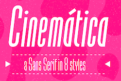 Born in Montevideo. After working as a designer at the Peluffo Giguens Foundation in 2016, she worked in 2018 as head of graphic communication at the Sodre National Auditorium. During her studies at ORT in Montevideo, Camila Basso Rubbo designed the condensed movie credit font family Cinematica (2018). [Google]
[MyFonts]
[More] ⦿
Born in Montevideo. After working as a designer at the Peluffo Giguens Foundation in 2016, she worked in 2018 as head of graphic communication at the Sodre National Auditorium. During her studies at ORT in Montevideo, Camila Basso Rubbo designed the condensed movie credit font family Cinematica (2018). [Google]
[MyFonts]
[More] ⦿
|
Camila Burgos
|
Bogota, Colombia-based designer of the stylish avant garde display typeface Geometrica (2016), which was inspired by Jacques Tati's movie Play Time (1973). [Google]
[More] ⦿
|
Candi Erwanto
[Mystical Type]
|
[MyFonts]
[More] ⦿
|
Carl Rylatt
|
 Brighton, UK-based creator of the copperplate caps typefaces Laudanum (2012, available from Ten Dollar Fonts) and Fuck Powerpoint (2012).
 Tenebrae (2013) is a spooky spurred display typeface. Tenebrae is inspired by the Giallo films of the 70s and other cult cinema film posters. It can be bought at Ten Dollar Fonts. Behance link. [Google]
[More] ⦿
|
Carmen Lopez Delgado
|
Malaga, Spain-based designer. In 2017, she made a folded movie film typeface . [Google]
[More] ⦿
|
Carol Twombly
[Trajan typeface]
|
 [More] ⦿
|
Carolina Parra Sanchez
|
During her studies at Universidad de los Andes in Bogota, Colombia, Carolina Parra Sanchez designed the handcrafted typefaces Miroir Brisé (2015) and Orfeo (2015), both based on the famous movie by Jean Cocteau. [Google]
[More] ⦿
|
Cass Wagner
|
American art student (b. 1983) who lives in Tampa, FL. Creator of Lion King Dings (2006). Direct download. Its characters are discussed here. [Google]
[More] ⦿
|
Chaplin
|
Typefaces that were used in movie credits of Charlie Chaplin movies. [Google]
[More] ⦿
|
Christian Annyas
[The Movie Title Stills Collection]
|
[More] ⦿
|
Christoph Windmueller
[Kix]
|
 [More] ⦿
|
Christopher King
[Wing's Art Studio]
|
 [MyFonts]
[More] ⦿
[MyFonts]
[More] ⦿
|
Christopher Newton
|
Montreal-based graphic designer. His work includes a typeface, Plateaux (2009, a hairline architectural drawing face)---clean as a whistle, it seems to have been used in some movie titles. [Google]
[More] ⦿
|
Christopher Perry
|
Swedish designer who made 35mm (2011, a movie strip font), Aviator (2011, techno), Bad Analogy (2011) and Well Mister (2011, octagonal). Behance link. [Google]
[More] ⦿
|
Cinderella Man
|
Joe Clark about a storefront sign in Cinderella Man, a 2005 movie set in New York in the 1920s: Why why, thats [ITC] Benguiat, circa 1978. [Google]
[More] ⦿
|
Cinematypographica
|
2300+ Film Title Captures in PDF format. [Google]
[More] ⦿
|
Cinepolis
|
A site that showcases various movie fonts. [Google]
[More] ⦿
|
Ciro Continisio
|
Italian designer (b. 1984) of Hobbit Script (2005), based on a font used in the Lord of the Rings movie trilogy. [Google]
[More] ⦿
|
Claude Melle Derieppe
[Ouvrez!!! Police!!!]
|
[More] ⦿
|
Clément Barbé
[Studio B (or: La Station B)]
|
 [MyFonts]
[More] ⦿
[MyFonts]
[More] ⦿
|
Coert De Decker
[Kustomtype]
|
 [MyFonts]
[More] ⦿
[MyFonts]
[More] ⦿
|
Constantin Groß
|
Constantin Groß (aka Connum) (b. Karlsruhe, Germany, 1987), who lives in Karlsruhe, designed the handwriting typefaces TSS Scrubs Logo (2006) and TSS Scrubs (2006). Alternate URL. [Google]
[More] ⦿
|
Copypaste
[Fredrick R. Brennan]
|
 Quezon City, The Philippines-based designer of the free font Some Time Later (2016), which is based on the beatnik lettering used in the credits of the SpongeBob Squarepants Nickelodeon show. He also made the free font LCD (2015) and the free blackletter typeface KJV 1611 (2018), which revives the typeface found in the 1611 King James Bible.
 Typefaces from 2019: TT2020 (an extensive multilingual typewriter family with about 7000 glyphs per font, released in 2020), Quaerite Regnum Dei (a libre rotunda font based on a Spanish rotunda hand found in the Misal rico de Cisneros (early 16th century) commissioned by cardinal Francisco Jimenez de Cisneros from Toledo), Open Baybayin (sharing some glyphs with Noto Tagalog), Chomsky (a free blackletter typeface in the style of the masthead of The New York Times). Github link. Typefaces from 2020: FRBCistercian. Github link. Open Font Library link. Fontsquirrel link. Github link. [Google]
[More] ⦿
|
Corien Bennink
[Corien's Handwritingfonts]
|
[MyFonts]
[More] ⦿
|
Corien's Handwritingfonts
[Corien Bennink]
|
Corien Bennink (Corien's Handwritingfonts) is a Dutch portrait photographer and pencil artist, b. 1980. She lives in Diever. Corien has been making custom handwriting fonts since 2005. Creator of the comic book / chalk board font Whiteboard (2007). She is the designer of Heroes Font (2006, hand-printed, made based on screenshots of the Heroes TV series; see also here) and House Whiteboard Font (2006). Commercial fonts include Spidery Elegance (2008), Dausby (2012, based on a secretary's hand from the 1850s), Ashby (2015, a Spencerian script), Concinnitas (2015, a neat upright handcrafted typeface), Deveren (2017, based on goosefeather writings from the late 1600s), Notetaker (2019) and Yarker (2019, a business hand of the late 19th century). She also offers a commercial handwriting font service (40 USD), and has some free handwriting demo fonts from 2005 and 2006: Angela, Bob-H., Escribiente, Heroes-font, Kendall-j, Krusoe, Nongtung, R.-Bruce, Whiteboard, richie. Alternate URL. Yet another URL. [Google]
[MyFonts]
[More] ⦿
|
Crazy Diamond Design Historical Fonts
[Alex Moseley]
|
 Wonderful 16-th century (commercial) fonts from this Manchester, UK-based foundry, including:
 - Bastard Secretary
- Black Cat Letter. A blackletter font used in the Harry Potter films.
- Chancery Hand
- Formal Text Hand
- Hand of the Court of the Common Pleas.
- Italic Hand
- Parchment Print & Italic. From the Harry potter films.
- Rustic Capitals (2005).
- Secretary Hand
- Seventeenth Century Print and Italic
- Uncial
- Wizard Runes and wizrdings. From the Harry Potter films.
- Written Square Caps (2005: roman inscriptional caps).
[Google]
[More] ⦿
|
Cristián Pasciani
|
Cristián graduated from Universidad Tecnológica Metropolitana de Santiago de Chile in 2007. For the type design course there, he created the ultra condensed fat display typeface Mafiosa, which was based on the logotype of the film El Padrino (The Godfather). [Google]
[More] ⦿
|
Cy King
|
London, UK-based illustrator (b. 1985). Blog on design. Creator of True Love's Kiss (2008), after the official logo of the Disney movie Enchanted. [Google]
[More] ⦿
|
Dahra Mia Kirchert
|
Graphic designer and illustrator in Aarhus, Denmark, who created the rough handcrafted typeface Into The Wild (2015), which was inspired by the movie. She also designed the anatomical Boney Letters (2015). [Google]
[More] ⦿
|
Dan M. Zadorozny
[Iconian Fonts]
|
 [More] ⦿
|
Daniel Alessandro
|
Designer, b. 1992, of the titling typeface Jupiter Ascending (2015). [Google]
[More] ⦿
|
Daniel Barcelles III
|
Corona, CA-based designer of the custom font Ichii (2014), which was inspired by the Japanese splatter film Ichi the Killer. The letters are made up of many chopped up body parts. [Google]
[More] ⦿
|
Daniel Comite
|
Boston-based designer of a nice imaginary Lord of the Flies movie poster (2011). [Google]
[More] ⦿
|
Daniel Doernemann
|
Executive Creative Director at loyalkaspar in New York City, who studied at Art Center College of Design. Designer of the Disney movie font XDRA. This font was digitized by Alan Greene. Free download. [Google]
[More] ⦿
|
Daniel Patrick Simmons
|
Sacramento, California-based designer of Vertigo (2014), a hobbly sans typeface that was inspired by Hitchcock's movie. Vertigo and a few hand-drawn fonts can be bought at Simmons's site. He also designed the hand-drawn poster typeface Strongman (2014). Behance link. [Google]
[More] ⦿
|
Daniel Reeve
|
Daniel Reeve is a freelance artist, cartographer, calligrapher and type designer from Titahi Bay, near Wellington, New Zealand. His handcrafted fonts allow users to emulate the calligraphic styles for which he has built up a reputation in the film world. For example, he did the lettering and maps in The Lord of the Rings films. He is creating handcrafted fonts of some of his writing styles, starting with the uncial typeface Kereru (2011). Foundry link. [Google]
[MyFonts]
[More] ⦿
|
Daniele Catalanotto
|
 Graphic designer in Sierre and Lausanne (Switzerland). During his studies at ECAL (Lausanne), he made a cinematographic signage typeface called Geraldine (2011, named after Geraldine Page). Baskervilaine (2013) is a tweaked version of Baskerville. Severine (2013) is an ornamental caps typeface. Le Moche (2012) is a grotesk typeface. Sugarnir (2013) is a rune font.
 In 2014, he designed the sans typeface Fryda (free beta version). Behance link. [Google]
[More] ⦿
|
Darren McArdel
|
 Graphic designer who started in Los Angeles, where he ran Beautiful Bastards. Subsequently, he is associated with Questus Inc and Big Country Labs, and was located in Costa Mesa, CA and Tustin, CA. He currently works in Seattle, WA.
 His early typefaces: Mushman (2012) is a techno-sans typeface inspired by the adventurous spirit of actor Steve McQueen, who raced motorcycles under the false name "Harvey Mushman." His second typeface, Bronson (2012, free if you ask), is a display type inspired by Danny "Tunnel King" Lewinski, Charles Bronson's character in The Great Escape. In 2013, he created the elegant (free) futuristic typeface Astroman. In 2014, Darren designed the free hipster typeface Skandi, which was inspired by Nordic runes. Behance link. [Google]
[More] ⦿
|
Dathan Boardman
[Open Window]
|
 [MyFonts]
[More] ⦿
[MyFonts]
[More] ⦿
|
Dave Rowland
[Dave Rowland Type (was: Eclectotype, Schizotype)]
|
 [MyFonts]
[More] ⦿
[MyFonts]
[More] ⦿
|
Dave Rowland Type (was: Eclectotype, Schizotype)
[Dave Rowland]
|
 Type foundry in Sheffield, UK, first called Schizotype, and in 2021 renamed Eclectotype because this is not a foundry that likes to stick to trends or expectations. Its designer, Dave Rowland (b. 1982, Chesterfield) grew up in Sheffield, UK, but was based in Japan, the Philippines, Liverpool, Surat Thani, Thailand, and Koh Samui, Thailand. MyFonts Interview. In 2021, he joined The Type Founders.
 He created these fonts in 2009: Quesadilla (signage type, Mexican simulation face), Quesadilla Shadow, Schizotype Scrolls, Quiff, Toothpaste, Astroboy (connected script), Decolletage (art deco), Kazumi Sans, Acid Haus, Dr. Black, Dr. Eric, Soyo Gogo, BMX radical (brush), Team, Miami Hopper, and Tubularis (multiline face), Sickle, Klique (futuristic display face), Uncle Eric (a cartoon face), Praline Smooth (connected script in the style of Mistral), Kwaktur, (blackletter typeface based on the logo of Belgium's Kwak beer), Blackball (another blackletter) and Modulogue (a modular display family). Additions in 2010: Christmas Tuscan (a modular Tuscan), Masonic Lodge, Mook (a retro, unicase, bubble font), Toothpaste 2, Gaden Sans (organic monoline typeface that includes a hairline weight), Sizemore (all caps slab headline face), Quickscript (signage face), New Wave. Fonts designed in 2011: Brag Pro (like Brag, a Cooper Black alternative), Brag Stencil Pro, Chestnut (curly, hand-printed), Brag (a fat round face in Cooper Black style), Gelato Script (a connected signage face), Brag Stencil (2011), Streetscript (2011, brushy signage face). In 2011, he created a quaint text family, Vulpa, with quirky foxtail terminals. Typefaces from 2012: Margot (a rounded slab serif described as a lovechild of American Typewriter and Cooper Black), Range Serif (an angular typeface), Pastiche Brush (a brushy connected script inspired by the titles of the 1959 movie Imitation of Life (Wayne Fitzgerald)), Quayside (a bulbous baseball or signage script). Typefaces from 2013: Alight Slab (hairline slab), Anultra Slab (a heavy bold slab serif), Ollie (a connected baseball or signage script), Urge Text (an extensive modern text family with ample language support and plenty of mathematical symbols, and large ball terminals). Typefaces from 2014: Range Sans (a grotesque sans family with the quirky angular cutouts inherited from Range Serif), Samui Script (upright connected script), Streetscript Redux (signage script), Price Didone (created for setting elegant price tags). Typefaces from 2015: Oldskool Script (a connected signage script; one of many quite different commercial fonts with the same name), Hazel Script (a great flowing calligraphic script designed around the time of the birth of his first child, Hazel; the name may create confusion as there is a famous BB&S metal font with the same name), Mastadoni (a fat didone for headlines and fashion mags), Kake (a great creamy sign-painting font), Bali Script (creamy signage script), Flat Sans. Typefaces from 2016: Cinema Script (retro movie script), Chill Script (a retro non-brush signage script), Blanket (a soft cursive font, ideal for children's books), Schizotype Grotesk (a very original angry geometric grotesk, with bucketloads of pizzazz), Astrid Grotesk, Asterisk Sans Pro (a versatile humanist sans family for Latin, Greek, and Cyrillic), Strelka Ultra (a retro space age typeface), Revla Serif (beatnik style, emulating randomly positioned handlettering). Typefaces from 2017: Duckie (a bubblegum or creamy signage script), Tusque (a layered decorative Tuscan typeface), Ekamai (a tight non-connected creamy signage script), Quinella (seventies script), Delfino Script (retro signage script), Tchig Mono (a special, almost hipster monospace typeface family), Revla Sans (beatnik style), Revla Sans Text, Eroika Slab (a robust wedge serif family). Typefaces from 2018: Aziga (descrived by Dave as a high (occasionally reversed) contrast, postmodern, deconstructed-reconstructed, serifless (mostly), fashion didone), Revla Slab (bouncy, beatnik), Galix (subdue futuristic sans family), Gelato Luxe (an update of his earlier Gelato Script), Engria (an angular brush-inspired text typeface). Typefaces from 2019: Gelato Fresco (a warm flowing script), Amica Pro (a stocky part humanist part geometric workhorse sans), Galix Mono, Backstroke, Gigantic (an exercise in ultra-fatness). Typefaces from 2020: Gelica (a 14-style retro soft serif family influenced by Cooper Black, Goudy Heavyface and Ludlow Black), Capsule (a reverse-stress high-contrast rounded sans-serif), Sausage (a friendly fat rounded typeface that is is unapologetically bold and bulbous. Influenced by magnetic fridge letters, hot dogs and 70s phototype fonts, it is retro, but not cloyingly so). Typefaces from 2021: Revla Round (a child-friendly version of Revla Sans), Megumi (a formal hairline fashion mag script), Yink (a bulbous psychedelic experiment). Klingspor link. Behance link. Showcase of Schizotype's typefaces at MyFonts. Fontspring link. MyFonts interview. [Google]
[MyFonts]
[More] ⦿
|
David A. Occhino
[David Occhino Design (was: Treehouse Graphic Design)]
|
[More] ⦿
|
David Fleming Nalle
[Scriptorium (Ragnarok Press, Fontcraft)]
|
 [MyFonts]
[More] ⦿
[MyFonts]
[More] ⦿
|
David Frangioso
[The Price is Right Font Archive]
|
[More] ⦿
|
David Martin
[David Pustansky (was: 24hourbauer.co.uk)]
|
 [More] ⦿
|
David Occhino Design (was: Treehouse Graphic Design)
[David A. Occhino]
|
Treehouse Graphic Design was David Occhino's font outlet. It is now called David Occhino Design. The Treehouse collection specialized in Startrek, futuristic, Disney and Indiana Jones style fonts, but has widened lately. Most fonts are commercial, but there are a few free ones: - Exclusive Designs: Tangaroa (2009, tiki font), TradeWind, Nautilus, Graviton, Voyager, Cinema, Firefly, Forest, Emblem.
- Signage typefaces: Craftsmen (2010), Craftsmen Ornaments (2010).
- Movie Fonts: Safari (1996, based on the famous Indiana Jones movie logo created by Mike Salisbury and David Willardson; version 2 in 2011), Venture, Astro, Galax-E, Time Travel, Iron Hero, Knight, Blade, Aeronaut (1997, avant-garde).
- Art Deco Fonts: Aeronaut (1997; Aeronaut 2.0 in 2011), Cinema, Pan-Pacific (2010: based on the classic 1940s lettering style that was used for the signage for the famous Pan-Pacific Auditorium).
- Theme Park Fonts: Kingdom (1996, blackletter), Mansion, Encounter, World.
- Sci-Fi Fonts: Astro SE, Basestar, Blade, Encounter, Galax-E, Graviton, Nautilus, Time Travel, Voyager.
- Halloween Fonts: Hocus Pocus, Nautilus, Mansion 3.0 (1996-2009), MansionCryptBats (2009, free).
- Education Fonts: School.
- Free Fonts: Aurebesh (for Star Wars, 1997), Forbidden Eye, Tangaroa Glyphs (Hawaiian petroglyphs, 2009), World Symbols, Big Thunder Dingbats (2009: Western dingbats).
- Western fonts: Big Thunder (2009).
- Fonts I can no longer find: Aurebesh, DNealianArrows, DNealianGuides, DNealianRegular, Starspeeder, StarspeederUpright, Pyramid's Venture, Victorian Mansion.
Abstract Fonts link. [Google]
[More] ⦿
|
David Pustansky (was: 24hourbauer.co.uk)
[David Martin]
|
 David Pustansky (b. 1985) is a UK-based type designer who was active in 2005-2006, when he operated as David Martin and his web site was called 24hourbauer.co.uk. He published many free fonts, but then became inactive ca. 2007. In 2014, he resurrected as David Pustansky.
 Creator of the picture-derived typefaces Eye Spy (2006), Batman The Dark Knight (2006, scanbats), Simpsons Mmmm...Font (2006), Pokemon Pixels (2006), Silent Hill Nightmares (2006), Mario and Luigi (2006), Final Fantasy Elements (2006), Lara Croft Tombraider (2006), Superman Last Son of Krypton (2005), The Ultimate Lance Hoyt font (2005), Harry Potter and the Dingbats (2005), TNA Bound for Glory (2005), tna wrestling (2005), Doctor Who 2006 (2005), Futurama Dingbats (2005), Red Dwarf Characters (2005), Evil Characters (2005), and 24hourbauer (2005, scanbats), Simpsons Treehouse of Horror (2007), Split Splat Splodge (2006, ink slpatter), Splish Splash Splosh (commercial), TNA Lockdown (2007), Splis (2007), Donkey Kong World (2006), SonicMegaFont (2006), Doodlebears (2006), Tetris Blocks (2006), twentyfour, WWE, residentevilcharacters, wrestlinglogos. In 2014, he created Garfield Hates Mondays Loves Fonts (scanbats), the retro typeface Shakespeare First Folio (after the lettering in the 1623 collection of Shakespeare's plays), Brush Stroke of Genius, Wilson (after the baseball in the movie), Eye Am Confused Optical Illusions, Game Logos, Retro Hasbro WWF Figures, Doom and Gloom, Nato Phonetic Alphabet, Shakespeare To Be Or Not To Be (ornamental caps), Super Street Fighter Hyper Fonting (scanbats)m), An Apple A Day Fruit Font, Secret Diary (hand-printed), Balls Balls and more Balls (scanbats), Legend of Zelda TriFont (scanbats), Crushed Candy (scanbats), A Work of Art (scanbats), Console Wars Console Yourself, Futurama All Hail the Hypnotoad, Family Guy Giggity (cartoon character font), and American Dad Good Morning USA (cartoon dingbats). In 2018, he designed the shaky handcrafted Jack The Ripper Dear Boss (inspired by the original "Dear Boss" letter sent to the police at Scotland Yard by Jack the Ripper). In 2019, he added the caricature font Guess Who at the scanbat typeface Metal Gear Solid The Phantom Font. Abstract Fonts link. Home page of David Pustansky. Fontspace link. [Google]
[More] ⦿
|
Deadlands
|
The official Deadlands fonts for the headings are Durango (Western font) and SnowWrite (1994, handwriting typeface by ImageLine). The main text typeface is ITC Leawood (1984, Leslie Usherwood). [Google]
[More] ⦿
|
Dean Tersigni
[Game Font Database]
|
[More] ⦿
|
Delírios de um cinemaníaco
[Samuel Leal]
|
Delírios de um cinemaníaco is the title of a 1957 movie that tells the story of painter and cineast José de Oliveira from Sao Carlos, b. 1930. Samuel Leal (Arvore Amarela Design, Rio de Janeiro) digitized the font used in that film and called it Jose de Oliveira (2013). Dafont link. [Google]
[More] ⦿
|
Dennis Ludlow
[Sharkshock]
|
 [MyFonts]
[More] ⦿
[MyFonts]
[More] ⦿
|
Design Tourist
[Henning Brehm]
|
 Calling himself a design tourist, German designer Henning Brehm makes fonts for films. His company in Berlin is also called Design Tourist. VLNL Agitka (2010-2020, 8 styles) contains Latin and Cyrillic characters, in a constructivist theme, and has a Neon sub-style that was used in the film Bourne Ultimatum. This family could originally be bought at Gestalten, but in 2020 the typeface was added to the Vette Letters collection.
 In 2010, he published Kraut, a round outline face, and Koffer (a screen font family). Pandorum (2012, a spaceship typeface, by Henning Brehm and Alejandro Lecuna) was especially designed for film sets in the science fiction movie Pandorum starring Ben Foster, Antje Traue and Denis Quaid. At Vette Letters, Henning Brehm created the squarish oriental simulation typeface VLNL Kimchi: The Kimchi font had its starting point in the making of the film Cloud Atlas, based on the novel by David Mitchell and directed by Lana & Andy Wachowski and Tom Tykwer. A first version of Kimchi was created for Papa Song---an underground fast food restaurant in a futuristic Neo Seoul in the year 2144. It was used for the menus, advertisement and packaging. In 2021, he released VLNL Gindicate at Vette Letters. He explains: The alcoholic beverage Gin is drunk around the world, as far back as the 13th century. Originally distilled as a medicine, it draws its main flavour from juniper berries. Gin is colourless itself but a major ingredient in a long list of famous colourful cocktails. Gimlet, Singapore Sling, Negroni, Charlie Chaplin, French 75, Vesper, Tom Collins, White Lady, Aviation, Monkey Gland, Southside, Gin Gin Mule and New Orleans Fizz are but a few of them. That made us decide it simply cannot be missing from the Vette Letters font collection. Vette Letters designer Henning Brehm originally designed VLNL Gindicate for the 2015 action movie Hitman: Agent 47. It was specifically used for the logo and signage of the maverick Syndicate International organisation in the film. It lay dormant in a folder for a while, when it was reworked into this flashy 5 weight family. [Google]
[MyFonts]
[More] ⦿
|
Digital Empires
[Stephen Tune]
|
Original display fonts by Orlando-based ex-Montrealer and ex-McGiller Stephen Tune: Men In Blue (1998), IronCladBolted (1997), IronClad (1997), Odishi (oriental simulation) (1997), Fantique Four (1997), Seafaring (1997), Spawned (1997) and Draft Gothic (1997). Type based on the logos of popular comic books and movies. Free demo samples only. Dead link. The web site closed its doors in 2003. Dafont link. Abstract Fonts link. [Google]
[More] ⦿
|
Din-Ara Design
|
TV and movie font archive. [Google]
[More] ⦿
|
Ding Bang
|
 Designer of the free sports logo or children's scanbat typefaces LFP (2014), NCAA The Americans (2014), NHL East (2014), MLS East (2014), NHL West (2014), MLS West (2014), MLB NL (2014), NFC (2014), Disney Family 1 (2014), NBA West (2014), NFL AFC (2014), MLB AL (2014), NBA East (2014), NCAA Big 10 (2014), Mosaic Sone (2014) and Black Hoops (2014). In 2014, he also made the dingbat fonts Shrek, Thanksgiving Day, Thanksgiving Turkey, MAC, C-USA, Christmas, New-year, Santa, Winter, Xmas-Gift, xmas-tree, Premier League, Calcio, SEC, Pac 12, NCAA ACC, Ligue 1, Disney Halloween, Halloween Logo, Autumn, Monster High, Bundes Liga, Big 12, Halloween Happy, Halloween, Finest, Pixar2, Pixar1, Shades of Grey [scanbats related to the movie 50 Shades of Grey], Princes and Summertime, and the dot matrix typefaces LED Bus and Black Ball.
 Typefaces from 2015: Famous Car 1, Brasileirao, World Cup Logos, Ancient Weapons, Guns 2, Helmets, Cowboy, Horses 1, Fast Food Logos, Guns, Olimpic Icons 1, Winter Sport, Peppa Pig, Mickey Vintage, Proton Style, Sun Belt, MWC, King Lion, Social Manual. Typefaces from 2016: Tender Puppies, Flags of Europe (1 and 2), Lucas Characters (scanbats). Typefaces from 2017: Men's Clothing, Computer Icons, Wifi, Cats. Typefaces from 2018: Christmas Ornaments. Typefaces from 2020: Justice League, Summer Pool, Sonico, Farm, Sapce, Pupies (sic). [Google]
[More] ⦿
|
Dingbat Dungeon
[Duane Richard Haut II]
|
Maze maker fonts from 1999 by Duane Richard Haut II from Lewisport, KY. Puzzler scanbat fonts based on art work by Lee Seed and Ingrid Neilson. The list: Maze Maker Inverted Level 1F, Maze Maker Dungeon Level 1F, Maze Maker Solid Level 1F, Maze Maker, Puzzler1, Puzzler2, Puzzler3, Puzzler4, MM Caver Regular (FW), Maze Maker Cavern Level 1F, Maze Maker Caverns Level 2F, MM Cavern Solid (FW), MM Cavern Solid Inverted (FW), MM Dungeon Regular (FW), MM Dungeon Regular Inverted (FW), Maze Maker Dungeon Level 2F, MM Dungeon Solid (FW), MM Dungeon Solid Inverted (FW), Maze Maker Solid Level 2F. He also made BlairCaps, after the Blair Witch Project movie. Fontspace link. Dafont link. [Google]
[More] ⦿
|
Disney Channel Nick City
|
Designer of Nickelodeon (2010, a fattish round typeface modeled after the Nickelodeon TV logo). [Google]
[More] ⦿
|
Disney Experience
|
Archive with Disney-look fonts. Direct link. Included are Tristan, waltograph, Denmark, Atlantean (1999, The Walt Disney Company), FFVortex (1998, Max Kisman), Industria SolidA (1998, Adobe), Mesquite (1999, Adobe), Rubber Stamp LET (1996), Senator Tall (1990, Emigre), Spumoni (1990, Garrett Boge), and TwyliteZone-Book (Oliver Conte). [Google]
[More] ⦿
|
Disney Fonts
|
A list of fonts commissioned by Disney: Atlantean (movie Atlantis: The Lost Empire), Hunnypot (for Winnie the Pooh branding), Kem Weber (art deco typeface used on signage at Walt Disney Studios and theme parks), Mara (Indiana Jones and the Temple of the Forbidden Eye), and World Bold (for use on Epcot signage and media). Fonts licensed for Disney software include - Disney Comic (rebranding of Snap) - various Disney Print Studio titles
- Disney Heroic - Hercules Print Studio
- Disney Print (rebranding of Apache) - various Disney Print Studio titles
- Disney Simple (aka Pooh) (rebranding of Fontoon) - various Disney Print Studio titles
- Donald - various Disney Print Studio titles
- Flik (rebranding of Zemke Hand) - A Bug's Life Print Studio, Incredibles Print Studio
- Flounder (rebranding of Clover) - Little Mermaid Print Studio, Incredibles Print Studio
- Hyena - Lion King Print Studio
- Jungle Fever - Lion King Print Studio
- Lucky (rebranding of Ad Lib) - 101 Dalmations Print Studio
- Mickey - various Disney Print Studio titles
- Mickey Shadow (rebranding of Bertram) - Incredibles Print Studio
- Minnie - various Disney Print Studio titles
- Mushu (rebranding of Arnova) - Mulan Print Studio, Incredibles Print Studio
- Perdy (spotted restyling of Sprocket Deluxe) - 101 Dalmations Print Studio
- Pongo (rebranding of Sprocket) - 101 Dalmations Print Studio
- Sebastian (rebranding of La Bamba) - Little Mermaid Print Studio, Incredibles Print Studio
- Tribal - Lion King Print Studio
- Wizzer (rebranding of Mister Earl) - 101 Dalmations Print Studio
Commercial fonts inspired by Disney designs include several fonts by David Occhino such as Aeronaut (The Rocketeer logotype), Big Thunder (Big Thunder Mountain Railroad logotype), Encounter (Alien Encounter signage), Galaxie (Wall E logotype), Mansion (Haunted Mansion signage---based on Rubens), and World (Epcot signage). Lettering Delights created LD Walt, LD Mick E). Jukebox Type designed Alpengeist (Matterhorn poster lettering), Baileywick (Mary Blair lettering/artwork; renamed from Blairesque), Fairytale (Sleeping Beauty poster lettering) and Peregroy (101 Dalmations). Parachute created PF Wonderland Pro (Alice in Wonderland 2010 logotype and titles). [Google]
[More] ⦿
|
Disney Junior Regular
|
Orphaned typeface family made in 2011. [Google]
[More] ⦿
|
Dr Who
|
Fonts used on the BBC's Doctor Who books and videos: AssiduousSmallCaps, Assiduous, DoctorWho2006, DellaRobbiaBT-Bold, DellaRobbiaBT-Roman, ExterminatePreview, ElementaryBold, EurostileRegular, FuturaBT-Medium, FuturaBT-ExtraBlack, PostAntiqua, ThetaSigmaRelease2, Westminster, Dr.-Who, EurostileBold, Haettenschweiler. [Google]
[More] ⦿
|
DreamWorks Animation
|
Designer of DWA Trolls Rounded Bold (2015). It can be downloaded here. [Google]
[More] ⦿
|
Drex Agency
|
Designer of the wooden plank-themed Jake Neverland Pirates Regular (2011) for Disney/ABC Television Group. Free download. [Google]
[More] ⦿
|
Duane Richard Haut II
[Dingbat Dungeon]
|
[More] ⦿
|
EIA-708 and fonts
|
EIA-708 is the standard for closed captioning for ATSC digital television streams in the United States and Canada. It was developed by the Electronic Industries Alliance. EIA-708 supports eight font tags: undefined, monospaced serif, proportional serif, monospaced sans serif, proportional sans serif, casual, cursive, small capitals. [Google]
[More] ⦿
|
Eleisha Pechey
|
British type designer at Stephenson Blake, 1831 (Bury St. Edmunds)-1902 (London). Designer of these typefaces: - Windsor at Stephenson Blake, cut by William Kirkwood in 1905. Question: How can Pechey have designed a font four years after passing away? I got the date 1906 from the Scangraphic site, but either that is wrong, or Myfonts.com erred--still researching this. A correspondent, Jennifer Lindsay, has a plausible explanation: Eleisha has to have designed Windsor somewhat earlier, Stephenson Blake may have bought the design, perhaps from his estate, and it was published by Monotype in 1903. Windsor Elongated used by Woody Allen appears to be an adaption by Stephenson Blake. Digital revivals of Windsor:
- Revival 801 and BT Windsor (Bitstream).
- Verona Serial or W730 Roman (Softmaker).
- Windsor by URW.
- WindsorSB by Scangraphic.
- OPTI Windsor by Castcraft.
- Windsor EF (Elsner & Flake).
- In 2009, Göran Söderström (Autodidakt) and Peter Bruhn (Fountain) published Trailering Heroine, which was inspired by Windsor.
- Christine Rudi's New Romanticism (2019, for a school project at FH Trier).
- In 2021, Miles Newlyn, Riccardo Olocco and Krista Radoeva co-designed New Spirit, a 10-style revival and extension of Windsor.
Windsor became very popular again between 2018 and 2021 in a love/hate relationship with the design community, as explained in Windsor: British ugly American, a critique by Bethany Heck. - Booklet Italic. Punches cut in 1904 by William Kirkwood. This typeface is used in the titles of many Woody Allen movies.
- Long Imperial Script. Punches cut in 1906 by Karl Gomer.
- Grotesque No 9 (1906).
- Charlemagne (1886, ornamental).
FontShop link. [Google]
[MyFonts]
[More] ⦿
|
Enric Jardi
|
 Born in Barcelona in 1964. Graphic design teacher at Elisava in Barcelona since 1988. Director of the Master on Advanced Typography at the Eina school of art and design, in collaboration with the Autonomous University of Barcelona. He also teaches a Master's course on art direction and advertising at Ramon Llull University. Author of Twenty-two tips on typography (that some designers will never reveal) and twenty-two things you should never do with typefaces (that some typographers will never tell you) (Actar).
 At type-o-tones in Barcelona, Enric Jardi created Neeskens (1991-2007), Retorica Buida (1995, blackboard bold), Retorica-Plena (1995), Deseada (1995, a blurred roman), Escher, Magothic, Mayayo (1991, great children's book display font in Inline, Holes and Black styles), Peter Sellers (2007), Poca (1995, pixelish), Radiorama (1995), Verdaguera (1995, a classical weathered typeface)), Wilma (1995-2007: a chromatic type system), Xiquets Forever (1995, dingbats). Interview by MyFonts. Klingspor link. Type-o-tones link. FontShop link. Type-o-tones link. [Google]
[MyFonts]
[More] ⦿
|
Estevan Gutierrez
|
 Los Angeles, CA-based designer of the movie title sequence typeface Clerks (2017) and the ultra fat display typeface Grand (2018). Typefaces from 2020: Abi (textured caps), Octubre, Magnolia Varsity, Grand (blocky letters), Arrested, Twenty-Five. [Google]
[More] ⦿
Los Angeles, CA-based designer of the movie title sequence typeface Clerks (2017) and the ultra fat display typeface Grand (2018). Typefaces from 2020: Abi (textured caps), Octubre, Magnolia Varsity, Grand (blocky letters), Arrested, Twenty-Five. [Google]
[More] ⦿
|
Estudio Mariscal
[Javier Mariscal]
|
Estudio Mariscal (Javier Mariscal) is a Barcelona-based design studio that experimented a lot with letters in designs. It created Hannover-Modern in 1996-1997 (for the World Exposition in 2000 in Hannover), available at type-o-tones. For Hannover Modern, Jose Manuel Uros developed one Egyptian style of this typeface. Chico (2020). Chico was by designed by Javier Mariscal and Josema Uros specifically for the final roll of credits in the animated film Chico y Rita. [Google]
[More] ⦿
|
Fabien Roché
[Solidarité 77]
|
[More] ⦿
|
Face Type
[Marcus Sterz]
|
 Austrian foundry located in Vienna, est. in 2008 by Marcus Sterz (b. 1971) and Andrej Waldegg. MyFonts link. Unless exlicitly mentioned, all typefaces are by Marcus Sterz. You Work For Them link.
 - Adria Grotesk (2013). This was followed by Adria Slab (2014).
- Aldrans (2009, minimal sans).
- Anymals (2008) is one of my favorites: it has dingbats of imaginary undersea monsters.
- Asimov (2009). What is this?
- Baustelle Thin (2009, hairline sans).
- Bikra (2010, Plain and Stencil).
- Blitzplakat (2009). A poster face, white on black.
- Darjeeling (2010) is a display family inspired by both Optima and Bodoni.
- Doll (2008), Dollbats (2008).
- Flint (2008). A hand-drawn squarish face.
- Gerber (2009, pixel face).
- Grafinc (2009). An ultra fat art deco. See also Grafinc Rounded.
- Hausbau (2009, experimental).
- Idrans Medium (2010). A poster face.
- With Georg Herold-Wildfellner, he created the Victorian family Ivory in 2009.
- Letterpress (2009) is an experimental grungy family in which he mixes glyphs of three classics, Jakob Erbar's Phosphor (Ludwig&Mayer Foundry, ca. 1923), Aurora (1912, Johannes Wagner Foundry) and Permanent Headline or simply Headline (Karlgeorg Hoefer).
- Lignette Script (2011) is an extensive loopy monoline script font.
- Loki (2009). A decorative pixel family.
- The Marlowe family (2010) is pure art deco elegance---a play on geometric forms and elegance. Subfamilies include Marlowe Cocktail and Marlowe Swirl.
- Moki (2011).
- Mono Lisa (2020) by Marcus Sterz, in collaboration with programming experts Andrey Okonetchnikov and Juho Vepsäläinen. A commercial programming font to compete with Fira Code, Source Code, and Jetbrains Mono.
- Motto (2009). An art deco typeface in the style of the Italian Futurismo of the 1920s, designed for using with two colors.
- Mouse (2008-2009, pixel), Mousedings (2008).
- Newcastle (2014).
- Notdef (2009). A strange experiment.
- The handwriting typeface Palma (2008).
- Pinback (2009, techno).
- Plaquette (2018). A collection of retro typefaces ranging from Victorian to Bauhaus to the sixties.
- Publica Sans (2016). A clean geometric sans typeface family. Publica Play (2016) is a playful, and even more organic, sans that exploits many OpenType features. Publica Slab (2017) and Publica Sans Round (2021) complete the collection.
- Scrap Outline (2008).
- Slug (2009). A geometric typeface made for bicoloring.
- Status (2009, super fat art deco).
- Strangelove Next and Strangelove Next Slab (2010). This beautiful typeface was inspired by Stanley Kubrick's movie Dr. Strangelove. The original titles were designed by Pablo Ferro, who is one of the most acclaimed film title designers, especially famous for his hand-drawn lettering. Dr. Strangelove is a hairline face.
- Substance (2013). A sans family.
- Wenzel (2009). Handprinted.
Facetype's typeface library. See also here. View Marcus Sterz's typefaces. Klingspor link. Behance link. Fontspring link. [Google]
[MyFonts]
[More] ⦿
|
Famous Fonts
|
German movie and TV font archive. [Google]
[More] ⦿
|
Fargoboy
[Paul Wilde L'Heureux]
|
Fargoboy is the foundry of Paul Wilde L'Heureux, who is based in New Brighton, MN. He studied at Savannah College of Art and design from 2004 until 2009. His creations include Pablo Skinny (2004), a lively condensed printed hand. Pablo Skinny was inspired by the film title work of Pablo Ferro. Alternate URL. Home page. [Google]
[More] ⦿
|
Fernando Haro
|
 Las Palmas de Gran Canaria, Ampuero and Laredo, Spain-based designer (b. 1971) who set up deFharo. Creator of the monoline sans typeface Depez (2011), Fabada (2011), and the free monoline geometric sans typeface La Chata (2011). La chatte, in French? Maybe not.
 In 2011, he made the monoline organic sans typeface Lerótica (free at OFL). In 2012, he created Nabatea (stone chisel typeface), V de Vacia (a grungy outline face), Sabática (organic), the straight-edged data style typeface Gabardina, the grotesk typeface A Bebedera, the shadow typeface B de Bonita, D Puntillas, and the deconstructed Qebrada. In 2013, he designed Yacarena Ultra, H.H. Agallas, Nacimiento (a dymo label font), J Airplane Swash (a psychedelic typeface named after Jefferson Airplane), CA Garrutas (grunge), CA Gatintas (grunge), I Am Telefono (the largest phone dingbat and scanbat typeface on earth), Wach Op-Art (kaleidoscopic icons), K.O. Activista, I Am Hueca, X Template (stencil), H.H.Samuel (rounded sans), U2 Metalona (a beautiful white-on-black display face), M F Plexus Italic, J.M. Nexus Grotesque (an "thin inline" fat grotesque), Wachinanga, Tabaquera, Pabellona (grunge), El Pececito (video game font), the poster typeface Hobby of Night (OFL), H2O Shadow (outline version of Fabada), Zabatana Poster (a didone-inspired poster font), Oaxaquena Tall, Yacimiento (wood style wedge serif), and Rabanera. Typefaces from 2014: Babalusa Cut, A Cuchillada, Sabandija (a plump round display typeface), F2 Tecnocratica, F1 Secuencia Quad (pixel face), La Pejina FFP (bilined), Tabaiba Wild, Gabachita (ultra-condensed rounded sans). Typefaces from 2015: Tabarra Pro (Swiss style sans family for Latin, Cyrillic and Greek), A Sogra Ruth (ultra-condensed art deco), Gaban (an outline version of Tabardo), Tabardo (a heavy blocky font), Wacamoler Caps (a Tuscan typeface inspired opening credits of the Western movie Winchester '73 directed by Anthony Mann in 1950), Ubicada (condensed geometric sans), Rabiosa (neurotic font), Zacatecas (condensed shaded sans), F3 Secuencia Round, La Babaca (a powerful black condensed sans in the style of Impact), Obcecada Sans + Serif (condensed with almost disappearing descenders), Eacologica Round Slab (a nice commercial font with an incomplete set of numerals), Palim Script (curly), Vacaciones (signage face), de La Cruz. Typefaces from 2016: Yugoslavia (calligraphic), Love Box (stencil), Cienfuegos (connected retro script named after the Cuban her Camilo Cienfuegos), Gaitera Ball (round fat script), The Black Box (a retro banner font), Durum Kebab (shadow sans), Jolgoria In Town (script), Yerbaluisa (signage script), Escobeta One (brush script), Posteratus Rex, Bastardilla (a cursive font), Rotulona Hand, The Juke Box (retro juke box lettering), Angelique Rose (connected monoline script), Promenades, Bucanera (a swashbuckle font), Lucemita, Panama Road (a casual calligraphic font), Deslucida, Disoluta, Sucesion Slab, Tabarra Pro Round, Qebab Pro Shadow, Monserga (white on black), Indulta SemiSerif. Typefaces from 2017: Partizano Serif (a retro poster font; free demo), Jack Stanislav (a great condensed movie poster font), Fontanero (rounded fat sans), Yonky (fat slab serif), Zigzageo, Libertatus (manual serif fonts based on a Czech poster from 1935), Libertatus Duas (slab serif), Flamante Sans, Flamante Serif, Flamante (Round, SemiSlab, Stencil, Seca, Cairo, Roma), Seisdedos Dead (rough stencil fonts), Neo Latina (stencil), Carta Magna (blackletter), La Sonnambula (signature script), Bola Ocho (an eightball font), Clandestina (textured, layered), Acratica (signage script), Penitencia Inline, Autarquica (outlined vernacular style), Caminata One (shaded signage typeface), Sin Razon (wedge serif), Glotona Black and White (a layered tattoo style font duo), Glotona Dots (the textured versions of Glotona), 6th Aniversario, Tribal Box (squarish sans, with tattoo ornaments and a great environment for borders), Candy Pop (bubblegum font), Sargento Gorila (army stencil font), Libertinas + co (a curly calligraphic script; the free version has no numerals). Typefaces from 2018: Gudariak (a free color SVG font: Vicente Ballester Marco (Valencia 1887-1980) was a graphic designer and Valencian poster artist affiliated with the CNT (Confederacion Nacional del Trabajo) who created political propaganda posters of clear modernist and post-cubist influence during the Spanish Civil War. The Gudariak typeface is inspired mainly by one of the posters he made for the Government of Euskadi and also in others where the author continues to explore this particular typographic style. ), Farisea Fraktur, Octuple Max (techno), Ordeal Eroded, Panfleta Stencil, Secuela (free), Fragua Pro (condensed sans family), Getho (a geometric semi-sans), Cowboya Tuscan (a curly Tuscan circus font), Txuleta Deco (a striped art deco typeface), Coltan Gea (slab serif), Getho Semi Sans, Cowboys (a Tuscan typeface), Drystick Geo Grotesk, Diezma, Grifa Slab, Coltan Gea (slab serif family), Paloseco (geometric and grotesk), Stoica (a color SVG font), Letrera Caps (a rounded square style layered and color font that pays homage to the sans serif inline genre), Enagol Math (a condensed rounded slab serif based on carefully applied mathematical ratios), Heptal, Velocista, Octagen Condensed, Octagen Black, Sextan Serif, Sextan Cyrillic, Quickat (signage script), Octagen (condensed sand with short descenders), Wolframia Script (flowing handwriting), Pentay Slab, Pentay Sans, Pentay Book, Cuatra, Judera (Flat and Ring: monospaced, unicase and totally sqaurish), Quotus (slab serif), Tripleta Grotesk (a 16-style geometric sans family). Typefaces from 2019: Pervitina Dex (sci-fi), Megalito Slab, Obesum Caps, Jane Roe (sans), Icons Opentype, Felona (stencil: a variable font), Neo Fobia, Bocartes Fritos (food icons), Red Thinker (a squarish monoline sans), Pena Caldaria (blackletter). Typefaces from 2020: Anoxic (a squarish monoline sans). Typefaces from 2021: Humato (a sturdy font for weightlifters), Probeta (a squarish techno sans family in 42 styles), Speeday (a speed emulation sans). Creative Market link. OFL link. Behance link. Dafont link. Devian tart link. Abstract Fonts link. Fontspace link. [Google]
[MyFonts]
[More] ⦿
|
Filmhimmel
[Jens R. Ziehn]
|
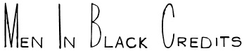 Jens Ziehn (Filmhimmel, aka Jay R. Zay or JRZ) designed fonts on the theme of films. Filmhimmel closed its web doors ca. 2007. The list: 007-GoldenEye, 13th-Ghostwrite-JRZ, 28-Days-Later, a-bug's-life---debugged, a-bug's-life, AVP, AVPyramid, Alien-Resurrection, Anatomie-2, Apocalypse-Now, Blade-2, Chocolate-Factory, Elektra, Goonies, Highlander, Insomnia, Jurassic-Park, Koyaanisqatsi, Mars-Attacks, Men-In-Black-Credits, Monster-AG, Nightmare-Before-Christmas (a German expressionist typeface), One-Flew-Over-The-Cuckoo's-Nest, Planet-of-the-Apes, Road-to-Perdition, Shaun-of-the-Dead, Sin-City, Sleepy-Hollow-3.0, The-Sixth-Sense, The-Thirteenth-Floor, Van-Helsing, Signs---Zeichen-2.0 (old typewriter font, and grungy zodiac sign emulation capitals), The-Incredibles, The-Ring (handwriting), Daredevil, Durchgeknallt, Findet-Nemo, Lost-Highway, Phone-Booth.
 He also created Hannibal Lecter, about which we learn this: Officially, Hannibal Lecter font does not exist because it is an exact copy of P22 Cezanne (that font is expensive). Some time ago, Mr. Ziehn had a legal issue with the designer who created Cezanne. After that, he had to remove HL from his site. But since HL was once claimed as free and there are no terms of use in the font file, it appears here and there for download until they get a warning from the P22 foundry. The website of Jens R. Ziehn seems to not exist anymore either. BTW, LD Fierro is also very similar to P22 Cezanne, but it is not a 100% copy and you can obtain it legal way. Dafont link. Alternate URL. Another URL. Still another URL. And another one. Old (dead) URL. Abstract Fonts link. [Google]
[More] ⦿
|
Font Mesa
[Michael Hagemann]
|
 Michael Hagemann's creations have a 1850-1920 style or at evoke the Wild West. Font Mesa was located in Naperville, IL, but is now based in Las Vegas, NV.
 Free fonts include Cactus Sandwich (Mexican simulation face), Timepiece (originally called Tax Cut), Timepiece 3D, Magic School One and Two (2004, two Harry Potter typefaces), Wild Ride, Corleone (2001: see also here), Corleone Due (2001), MightyRapids (2001: discontinued) and the Ferrari logo font FerroRosso (2002). Michael Hagemann's commercial fonts by year of production: - 2001: La Mesa (2001), Maverick's Luck (2001), Desperado (2001), Rio Mesa, Maverick's Luck (based on a bank document from 1876), La Macchina (2001, Lamborghini car lettering)
- 2002: Brewmaster Modern (lettering of Budweiser Racing), Saddlery and Saddlery Post (Western-style caps: a revival of Minaret by Ihlenberg in 1868; Solo calls it Trocadero), FerroRosso (lettering as in the Ferrari logo), Stampede (a family based on lettering used in document from the Chicago, Indiana&Eastern Railway Co. in 1902), Main Event (a Tuscan font, based on Tuscan Ornate, or Bracelet, fonts that date from before 1860; originally called Main Strike in 2003), Red Dog Saloon, Rough Riders (great Western-style caps), Draft Beer.
- 2003: OK Corral (revival of Caslon and Catherwood's Italian from 1821), OK Corral Lined (same as OK Corral with layers; called Italianate Barnum by Dan Solo), Gold Standard (a Tuscan font based on a few letters found on an old Gold Certificate from 1882), Rodeo Clown (based on Carnival), Taqueria, Cove.
- 2004: Bronc Stomper, Open Range, Saloon Girl (a spurred version, Tex Mex, appeared in 2021), Gillé Classic an exquisitily detailed family based on work by Joseph Gillé, 1820's, and implemented elsewhere under the names Circus, Roma and Madame; this was originally called Home Style; some say that the original goes back to Silvestre and not to Gillé; because of this, finally renamed Maison Luxe in 2017; the condensed versions, released in 2021, are Mi Casa and Mariachi), Miss Scarlett (Gone with the Wind poster lettering), Open Range, High Noon, Draft Beer Classic (2002-2005, connected 50s script), High Country, American West, West Wind, AmericanPop (Coca-Cola font).
- 2005: Buckhorn (a Tuscan style Western or circus font; renamed Circus Wagon in 2020), Rodeo Roundup (rope font; Solo called it Rope Initials), Algerian Mesa (32 fonts; extended to the gigantic font family Tavern in 2017, with further development in 2020 in Bay Tavern and Bayside Tavern; the original Algerian goes back to Stephenson and Blake), Conestoga (circus font), Rough Riders (a nice Western font based on the logo of the Beach Creek Railroad Company in the 1860s), Rough Riders Redux, Mesa Pointe (pointing hands, from 19th century sources), Black Pearl (an ornamental blackletter typeface based on an original from ca. 1860; it has two beautiful manicules; some say it is based on an 1860 font called Rimmed Black by West, published by Farmer&Little), Saloonkeeper (inspired by the Leinenkugels brewing label), Wanderer (inspired by the title logo of the TV show The Wild West), Lynchburg (inspired by the Jack Daniels Green Label Whiskey logo).
- 2006: Flatrock (a revival of Inverted Shaded by Julius Herriet, done at Conner in 1886; Solo calls it Big Cat; in 2020, Flat Rock was renamed Big Cat by Hagemann), Livery Stable (revival of GlypticShaded by Ihlenburg at MS&J, 1878. See also Glyptic and Glyptic No.2, 1878), Happy Holly Day, Main Street (a Tuscan typeface that revives Soutache by Julius Herriet and Bruce, 1873).
- 2007: Birdcage (2007, after a lettering sample in Rob Roy Kelly's American Wood Type book), Lonestar, Lonestar Western, Railhead (2007: 4 styles, a revival of an 1870s type style that was originally available from both Bruce's New York and James Conner's&Sons type foundries called English Two-Line Ornamented No.4; an earlier version was English, done in 1853 by Caslon, Austin, Woods and Sharwoods; and before that, the typeface was created by a German designer in 1849), Flying Dutchman (2007, a revival of a MacKellar, Smiths&Jordan Co Kanzlei-style font from 1876), and Western Sky (2007, a revival of a late 1800s Italian font known as Italian Slab Fancy or Dodge City: it is Italic Ornate from Smith, 1874, MS&J). Country Western (2007, 11 styles; plus versions called Country Western Script and Country Western Swing) is a revival of the classic William Page font known as Clarendon Ornamented originally designed in 1859 and again in 1877 by Vanderburgh&Wells. Abbiente (2007) is his first foray into the world of Bodoni and Didot. Buffalo Bill (2007) is a beautiful Western style font that revives a classic from James Conner's foundry from 1888 [Solo also calls it Buffalo Bill].
- 2008: Gold Rush and Gold Spur (2008) are further Wild West style families, based on typos from the Bruce Foundry, 1865. Silverland (2008, 8 styles; a revival of Ornamented No. 1490 by Ihlenberg, 1874, Bruce) and Belgian (2008, 5 styles; a revival of Ornamented No. 1515 by Julius Herriet, 1861, Bruce) are further revivals of typefaces from the Bruce Foundry.
- 2009: Spanish Main (revival of an old MacKellar Smiths&Jordan blackletter font named Sloping Black, 1896; others mention Witham and MS&J and give the date 1869), Spanish Rose, Black Rose (spiky blackletter based on BlackOrnamented No. 532, Ihlenberg, 1873, Bruce), Bella Rose (2009, blackletter), Broadgauge Ornate (revival of an 1869 Western poster typeface by Ihlenberg at MacKellar Smiths&Jordan). Apple Pie (2009) is some sort of Bodoni Ornate---it revives and extends a William Hagar Type Foundry face, ca. 1850 [MS&J added a lowercase in 1869]. This was followed immediately by Bodoni Ornamental. Hickory (2009) is an ornamental Western face, a revival of an old unnamed font dating back to 1852 and was sold through a few different type foundries including Bruce, MacKellar Smiths&Jordan and James Conner's Sons.
- 2010: Gunsmoke is a Far West font, a revival of a James Conner's Sons font that has been around the block under different names such as Extended Clarendon Shaded, Original Ornamented and Galena [Solo called it Galena]. Night Train is another Far West font.
- 2011: Gold is a multi-style slab serif font family based on the classic Gold Rush (1865, Bruce), with the shadows removed. Images: Gold Black, Gold Thin.
- Undated: Cowboy Serenade (based on Phidian by Ihlenberg, 1870, MS&J; Solo's names: Eureka, Shaded Phidian), Gold Fever (based on Caxtonian, 1878, MS&J), Old Thunder (based on a Tuscan typeface from the 1800s).
- 2013: Great Western, Cowboy Western, Cowboy Rodeo.
- 2014: Magnum Sans.
- 2015: Grillmaster (a basic sans family consisting of 128 fonts).
- 2016: Pitmaster.
- 2017: Ribfest (a Tuscan circus font), Texicali, Alta Mesa (Wild West wood type).
- 2019: Marlin Geo, a large sans typeface family---a modern geometric take on Helvetica. Michael writes on Creative Market: You may have noticed a new FontMesa font released on June 17th called Geovetica, Monotype has asked me to rename the font because it's too close to their best selling product. Marlin is the new name choice for our new font with the geometric version [Marlin Geo] being released first. Marlin Geo has many opentype features and comes with italics (at a 12 degree angle) and a slanted version (at a 6 degree angle). See also Marlin Soft (2019).
- Fried Chicken (2020). A 32-style slab serif family intended for supermarket or food product advertizing.
- Philadelphian (2020). A Western or billboard font family based on a MacKellar, Smiths & Jordan font from 1867 by the same name.
- Taco (2020). A multistyle Mexican party font.
- Tortilla (2021). A 24-style Tuscan typeface, a flat-sided version of Fontmesa's Saloon Girl and Tex Mex font families.
- Marzano (2021-2022). A 30-style blend of Futura, Helvetica and his own Marlin.
Klingspor link. Fontspace link. Dafont link. Creative Market link. MyFonts page. View Michael Hagemann's typefaces. Abstract Fonts link, [Google]
[MyFonts]
[More] ⦿
|
Fontmovie
[Franco Alejo Fernández]
|
 This Cordoba, Argentina-based cinephile is interested in movie posters. Known as FZ over at Fontspace, he offers these free "movie" fonts:
 - From 2010: Alicia Wonderland (vampire script), Rango Movie Font, TRON, Coraline AZ, HarryPotter7, Navidad (after A Christmas Carol with Jim Carrey), Lumos Latino (another Harry Potter font), TRON muestre Cine 1, TSalvacion (a Terminator font), HPPoster (Harry Potter titling font), Inportante Cita, FrancoFont2.
- From 2011: Horrible Jefe (based on the movie Quiero matar a mi jefe), Vampire, Hugo Cabret (after the movie Hugo in 3D).
- From 2012: FrankenweenieMoviePoster (after Tim Burton's movie).
- Typefaces from 2014: Upon a Dream Maleficent, Godzilla Moviefont, Boxtrolls.
- Typefaces from 2015: Spectre 007, Snoopy (after a 2011 font by Charles Schultz and Nate Piekos).
- Typefaces from 2016: Squad Font (a brush script; after Suicide Squad), The Huntsman, Bob Sponge (after a Spongebob movie), BFG Font, SuicideSquadFont, Cupcake Movie, DeadpoolMovie, Zootopia, AnimalesFantastic (after Fantastic Beasts and Where We Can Find Them), Ninja Turtles, Dr. Charmed (after the movie Doctor Strange).
- Typefaces from 2017: Wedding Garden (a scribbly font), A Cure For Wellness (based on the movie), Anderson's Cupcakes, Kong (based on Kong Skull Island), The Girl On The Train Font, A Monster Free (from A Monster Calls).
Blogspot link. Fontspace link. Behance link. Old URL. [Google]
[More] ⦿
|
Fontsphere (or: Prestologo)
[Bartosz Panek]
|
 Zimna Wodka / Lublin, Poland-based designer of the free circle-based typefaces Invectors (2015) and Invectors Band (2015). In 2016, he made the squarish pixelish typeface Bajt, which was followed in 2019 by BAJT Rounded.
 Typefaces from 2017: Cylinder (rounded, yet squarish), Sushi, Sushi Stroke. Typefaces from 2018: Film Poster, Cufel (futuristic all caps). Typefaces from 2019: LOGX-30, LOGX-20 (a squarish typeface), Streeters (brush-drawn), LOGX-10 (a squarish all caps typeface). Typefaces from 2020: Pixeloza 01, Film P2 (a tall film credit font), Prosty (squarish), Juby (a squarish techno font), Juby Rounded. Typefaces from 2021: Pixeloza 03, Pixeloza 02, Digot (pixelish). Typefaces from 2022: Film P3 (a 9-style condensed movie credit font family). Home page. Old link. Fontsquirre4l link. [Google]
[MyFonts]
[More] ⦿
|
Francesco Mistico Canovaro
[Zetafonts (or: Studio Kmzero, or: ZeroFont)]
|
 [MyFonts]
[More] ⦿
[MyFonts]
[More] ⦿
|
Franco Alejo Fernández
[Fontmovie]
|
 [More] ⦿
|
Franklin J. Sell
|
Creator of Jeannie (2003), after the titling of the Columbia Pictures show I Dream of Jeannie. Sell is at Virginia Tech. [Google]
[More] ⦿
|
Fredrick R. Brennan
[Copypaste]
|
 [More] ⦿
|
Free Movie Themed Fonts
[Tober Welsh]
|
Tober Welsh (a freelancer in Tacoma, WA) rounds up 50 free movie-themed fonts: 007 GoldenEye, 28 Days Later, Wolf's Bane (Wolverine Font), Squealer (AC DC Font, by Ray Larabie), Blade Runner Movie Font, Aurabesh (Star Wars Symbols Font), Han Solo (Star Wars Font), SF Fedora (Indiana Jones Font), Back To The Future 2002, Batman Forever, Due Date (COPS Font), CNN, Fight This (Fight Club Font), Friday13 (Friday the 13th Font), Grinched (How the Grinch Stole Christmas Font), Ringbearer (Lord of the Rings Font), Elvish Ring NFI (Lord of the Rings - Elvish), Aniron (Lord of the Rings - Alternative Font), Matrix, Nightmare Before Christmas, Planet of the Apes, The Ring, Sin City, Trek (Star Trek Font), Harry P (Harry Potter Font), Lumos (Harry Potter Book Font), SF TransRobotics (Transformers Font), Waltograph (Walt Disney Font), Final Fantasy, Halo3, Army of Darkness, Blade 2, Beynkales Demo (Corpse Bride Font), Trajan-Regular (The Movie Font), Red Right Hand (Hellboy Font), Homoarakhn (Spiderman and PS3 Font), Scream Real (Scream Font), An Unfortunate Event (Lemony Snicket's Font), Fiddums Family (Addams Family Font), Battlestar Galactica, Alien League (Alien Font), Adam Warren 0.2 (300 Font), AVP (Alien VS Predator Font), Timepiece (A Clockwork Orange Font), Metrolox (Enemy of the State Font), The Godfather, Impossible (Mission: Impossible Font), InvisibleKiller (Predator Font), Resident Evil, Terminator Real NFI (Terminator Font). [Google]
[More] ⦿
|
Galdino Otten
|
 Cartoonist from Recife, Brazil, b. 1966, whose sense of humor and artsistic prowess shine in his dingbat fonts. Dafont link. Fontsy link.
 Creator of the experimental Almost Sanskrit (2009), Zodiac Nice (2009, astrological symbols), Xilo in Zodiac (2009), Xilo-Cordel-Literature (2009, dingbats), Cordel Circo Mambembe (2010), Inside Issue (2009), Stretched Signature Flex (2009), Action of the time (2009, grunge), the dingbat typeface Ugly Cars (2010), the grunge typeface Capitão Galdino (2008), the grunge typeface Saltpeter-N-Fungus (2010), Texture Road (2010, more grunge), BSB DF 50 (2010, grunge), Fine Serif (2009), and the nice dingbat typeface Ochent Silibrina (2009). Fonts made in 2010: Sport 4 Ever (dingbats for Olympic Games), 60sPop (multiline face), DotSpot (dot matrix), IRON H METAL (tattoo, gothic), IngaStoneSigns (stone age glyphs), Ode2PasteUp (hand-printed), WideSquare (pixelish), ActionoftheTimeNewUL, BSBDF50, Haus-Sweet-Haus, INSIGHT-ISSUE-NEW, Movie Filmstrip, SquareChalk, Action Of The Time New (grunge), CordelValentine (dingbats), IngaStoneSigns (petroglyphs), SustainableAmazon, VeryDamaged (grunge), ParkTechCG (letters as in wired circuits), kidSWritten, Iron H MetallLight, LaceNice (knitted look), Ode2PasteUp, TextureRoad (grunge). Fonts from 2011: Booklet Cordel (sketched), Cordel Encarnado, Nuclear Accident (texture face), Noncircular (techno), Old Press (grunge), Old Typography (grunge). Fonts made in 2012: New Press (condensed sans family, +Eroded), Sketch Wall, Comic Gibi, Own Written, Comica BD (comic book shadow font), Cartoon Relief (a 3d cartoon typeface), Riscada Doodle (scratchy hand), Sketch Nice, Needlework Good (a stitching font), Biscuit Made, Just Skinny, Crazy Style, After Cheret (hand-drawn 3d shaded outline face), Spots in the mirror, TNT Xplosion, Escrita Toska (curly script), Cordel Movies (moviemaking dingbats), Fine N Tall, Cordel Groteska, From Street Art (free graffiti font), Sketch College (sketched athletic shirt font), Thin Press (grungy vernacular type), Sketch Serif, Relief BD, Maxxi Serif (very heavily slabbed serif face), Semi Cursive Gut, Sketch Coursive (sketch face), Salt Pet Non Eroded, Advanced Architecture, Very Fine Serif (a monoline Egyptian), Sketch Nothing, Freehand Nothing, Shark Attack (curly), Do Doodle, Maybe Pollock (dust texture face), Xilo Prosa (grunge), Thin Design, Amazon Palafita (hand-drawn 3d outline face), Snow Times, Snow Traces, USSR Army (rough army stencil with a Russian feel), Needlework US (stitch font), Old Scribe (Greek lapidary face), Nickel Bumpy, Soviet Style (stencil face), Top Modern (heavy slab serif), Lettering Set New, Carton East, Not Tuned TV (sketch font), Scar Bleed (scary font), Maxxi Dots (texture face, +Shadows), Dots Land Gotika (grungy blackletter), Stefanie Dots (textured letters), Karamuruh (textured caps), Broken Type (grunge: a glaz krak font), Touppeka (a Kafkaesque, tribal or painter's font), Old Dreams (grungy), Bad King (sketched typeface), False 3D (hand-printed 3d outline typeface), True2D, I Wrote All, Resistance Until The End. Typefaces from 2013: Serifa Comica (comic book slab), Press Style Serif (letterpress style), Press Style Large, Triatlhon In (sic: a Greek simulation face), Go 2 Old Western (grungy wood type), Old Serif Gut, Press Style (letterpress style typeface), Dust Serif, Thing Press, Thin Grotesk Serif, Before Collapse (glaz krak face), Stencil Style New (a military stencil), Damaged Serif, Press Serif Cool, Press Feeling, Sketch Toska, Link Parties, Almost Cartoon, Cartoon Toy, Toy Toy Toon, Fine Style (didone caps), Fine Sans (Peignotian), Beyond Blackboard, Forgotten Junk (grunge). Typefaces from 2014: Simply Rounded, Cartoon 2 Packages, Pain N Bleed, Yummy Lollipop, Hippie Movement, Rotunda Geo, Old Figaro Cursive, Cute Cartoon, Sketch Gothic School (sketched blackletter), Fine College (hatched athletic lettering face), Press Felling Eroded (letterpress emulation), School Book New (sketched), Stencil Cargo Army (military stencil), Fine Eroded, Grunge Poster, Education Is A Way, Cartoon Blocks, Cartoon Bones, Cursive Option, Odd Press (letterpress emulation), Cartoon Tunes, From Cartoon Blocks (3d), Hippie Movement, Yummy Lollipop, Needlework Perfect, Press Gutenberg (blackletter), Unic Calligraphy, Roundfed Eroded, Children's Book (outlined), Neon 2 News, Good Choice (shaded letterpress emulation), Cartoon 2 Us, O 10 Type, Dust West (grungy Western style), Comic Balloon, Caligraf 1435 (pirate era script), No Name Sans, Top Secret Stamp (grungy stencil), Fine Blackboard (blackboard bold, inline), Press Style Extra L (letterpress), Sounds Good (geometric sans), Sounds Eroded (shaded letterpress font), Cartoon Blocks Christmas, Street 2 Art (graffiti font). Typefaces from 2015: Snaps Taste (a grocery store or comic book font), Snaps Taste Christmas, Calligraphy Hand Made, Silly Aliens (dingbats), Sketch Match (3d, sketched), Cartoon 4 Sports (dingbats), Kids Book, Almost Japanese (oriental simulation font, +Comic, +Cartoon), Inga Stone Redesigned, Money Money Plus (engraved money font emulation), Thin Cool, Old N New Media (dingbats), Thinkers World (scanbats of famous intellectuals), Magical Cord, Quick Writing, Eroded 2 Much, Stencil Army WW I (military stencil), Stencil WW II (military stencil), D-Day Stencil (military stencil), Western Bang Bang (weathered Western font), Modern Serif, Modern Serif Eroded, Money Money (handcrafted engraved currency font), Almost Japanese Smooth (oriental simulation typeface), Write Righ, Ease Christmas (dingbats), Sketch Script Cool, Ficticcia College. Typefaces from 2016: Doodle Cafe Scents (dingbats), Christmas Cookies, Coffee Written, Soft Marshmallow, Niagra Faults, Sketch Toronto, Sketch Fine Serif, Sketch Handwriting, Typewriter Press, Typewriter Style, Sketch 3D, Maple 3 Cartoon (snow-covered letters). Typefaces from 2017: Crazy Krabs, Old Barbwire, Gregory Packaging, Ghost Army Stencil, Old Wise Sketch (sketched blackletter), Packaging Funny, Blackboard Restaurant, Kavernosa (bony typeface), Little Kid. Typefaces from 2018: 1927 Epoque, Cartoon Toy Turbo, Old Wise Lord (blackletter), Handmade Memories, Silly Cartoon, Old Press Original, Pet Shop, Cute Script, Dust West College (hatched), New Comic BD. Typefaces from 2019: Eco Bamboo (Cartoon, Fun), Karamuruh Turbo (all caps with a quilted texture), Cordel Junina, Cordel de Mangai (240 dingbats), Cordel Rustika. Typefaces from 2020: Beach Party Cartoon. [Google]
[More] ⦿
|
Game Font Database
[Dean Tersigni]
|
The (video, card, board) game font database, managed by Dean Tersigni, who designed many of the fonts himself. All fonts can be downloaded. Here we go: Total | Creator | Fonts | 24 | ShyWedge | SF Atarian System (8), SF Fortune Wheel (8), SF Intellivision (8) | 21 | Dean Tersigni | Abadox, Bionic Commando, Boulder Dash, Captain America and the Avengers, Castlevania III: Dracula's Curse, Commander Keen (Large), Commander Keen (Medium), Commander Keen (Small), Controller, Double Dragon II: The Revenge, Ghosts 'N Goblins, Joe&Mac, Kemco - Deja Vu, Kemco - Shadowgate, Kemco - Uninvited, Spy Hunter, Standard Galactic Alphabet (2), Trojan, Ultima: Exodus, Willow | 12 | Christian Künzer | Camels /ck!, Half-Life 1, Half-Life 2, Heretic II, Last Ninja, Last Ninja 3, Last Ninja 3 (8x8), Pirates, Quake1, Quake2, SIN, Stealth | 12 | Larabie Fonts | Astron Boy (4), Borg9, Crackman, Gypardy, Iomanoid, Joystix, namco regular, Orange Kid, Pricedown, Zrnic | 11 | codeman38 | DeluxeFont Regular, DPComic Regular, Kongtext Regular, Lunchtime Doubly So, Manaspace Regular, PC Senior Regular, Press Start K, Press Start Regular, Return of Ganon Regular, Senor Saturno, Yoster Island Regular | 9 | Aenigma Fonts | 8-bit Limit BRK (4), Kirby No Kira Kizzu BRK, Perfect Dark (BRK), Yoshi's Story, Zelda DX TT BRK (2) | 7 | Neale Davidson | Beast Wars, Colony Wars Normal, Neverwinter Normal, Pacmania, StarCraft, Turok Normal, Turtles Normal | 6 | Genshichi Yasui | G7_1943 TTF, G7 After Burner TTF, G7 Hopping Mappy TTF, G7 Kiki Kaikai TTF, G7 Silkroad TTF, Ninja Kid 2 | 5 | Anapan | Blaizing Tec Small, Castlevania Legends, Dracula X PCE, Princess Maker 2, Wizards&Warriors | 4 | Akihiro Oya | G.B.BOOT, R.P.G., R.P.G. Katakana, videobeast 80's | 4 | MuRdOiNk | Mortal Kombat 1, Mortal Kombat 2, Mortal Kombat Mythologies, MuRdOiNk MKDA | 4 | Trigon Dragon | UltimapDungeon, UltimapEntities, UltimapIntown, UltimapLetters, UltimapOutdoors | 3 | Br�derbund Software | Continuum (3) | 3 | Jens R. Ziehn | 007 GoldenEye, Blade 2, Resident Evil | 3 | SDFonts | Silent Hell of Cheryl (3) | 2 | Ben McAlpin | Chrono Trigger, Chrono Trigger Monospaced | 2 | Boba Fonts | Shadow of Xizor, TIE-Wing | 2 | DarkAngelGenesis | Blood Omen, Soul Reaver | 2 | Dennis Ludlow | Dark Crystal Outline, Dark Crystal Script | 2 | Font-a-licious | Arcade, PacFont | 2 | HarihariSonic | NiseSega, NiseZaxxon | 2 | Harold Lohner | Captain Howdy, Card Characters | 2 | House of Lime | Pokemon Kiddy Ding, Tyler's Pokemon | 2 | Iconian Fonts | Alien League, Andes | 2 | Jim Sorenson | Gargish, Ophidean Runes | 2 | Johannes Wagner | Aurora Condensed BT (2) | 2 | Jonathan Barnbrook | Exocet Heavy, Exocet Light | 2 | Kevin Wilson | Catwoman, Gremlins | 2 | Luteijn | martain, savage | 2 | Metamorphosis Professional | Cheq, Yukon Font | 2 | Peter Jonca | biohazard, Pithazard | 2 | Sega Enterprises | SEGA LOGO FONT, Sonic Title Font | 2 | Sivak Drac | Deus Ex Console (2) | 2 | Thomas W. Otto | Friday13, Terminator Real NFI | 2 | Valve | HalfLife, TF2 | 2 | Will Turnbow | HaloRegular (2) | 1 | Aaron Beck | Beckett Regular | 1 | Alejandro Conde L�pez | N-Gage | 1 | Allen R. Walden | Final Frontier Old Style | 1 | Andrew Durdin | SGA2 | 1 | Andr� Nossek | Robotron | 1 | Astigmatic One Eye | ROCKY AOE | 1 | atrax | RETURN TO CASTLE | 1 | Bitstream, Inc. | Mortal Kombat 3 | 1 | Boaz Arad | Facelift | 1 | Bolton Bros | Fiddums Family | 1 | Brian Powers | Plok | 1 | Byte-Sized Computing | Scramble | 1 | C.J. Ellsworth | Avatar | 1 | Caffeen Fonts | Chlorinap | 1 | Chris Brown | Monopolybats | 1 | Cyril Bourreau | Back to the future 2002 | 1 | DarkAngelX | Pretendo | 1 | Dave Howell | MagicMedieval | 1 | David Bradbury | Hoyle Playing Cards | 1 | David F. Nalle | T4C Beaulieux | 1 | Disney | Brother Bear | 1 | Duane Richard Haut II | Blair Caps | 1 | Font Company, The | MagicSymbols | 1 | Freaky Fonts | Vector Battle | 1 | Glitch | Arcade Classic | 1 | Infernus Animositas | Wonder Boy In Monster Land | 1 | Jenny Barck | Harry Potter | 1 | Jesse Fonts | Super Mario Bros. | 1 | JMD | KInifed | 1 | Joseph M. Pence | Shoryuken | 1 | Juan Pablo Reyes Altamirano | Final Fantasy | 1 | Julio Garay | NEC | 1 | Kodoichi | PsyType | 1 | Lauren Ashpole | Scooby Doo | 1 | Laurent Mouy | Nightmare Hero | 1 | Loic Normand | Omikron | 1 | Malvineous | SGA Rounded | 1 | Mark F. Heiman | Battlestar | 1 | Michael Bower | Riven: The Font (v3.0) | 1 | Micro Dragon | Ultima Runes | 1 | Midway | Mortal Kombat 4 | 1 | Mike "Gumby" Anderson | FarCry ExtraBold | 1 | Norwick | Britannian Runes | 1 | Origin | Ultima Normal | 1 | Paul Albers | TRON | 1 | Phil Steinschneider | Blade Runner Movie Font | 1 | Q Manning | GAMECUBEN DualSet | 1 | Rahdik | Rahdik | 1 | Rakesh | Hitman | 1 | Ray Larabie | Jigsaw Trouserdrop | 1 | Richard Walledge | Back to the Future | 1 | Richard William Mueller | Hoffmann Regular | 1 | Redge | X360 by Redge | 1 | Retodon8 | Standard Galatic Alphabet 8 | 1 | Retriever II | Paper Mario Dialog Redesigned | 1 | shigeki | BTSE + PS2 FONT | 1 | SML Designs | SimLLHP | 1 | Sun Design | invader | 1 | Super Mario Bros. Club | Mario&Luigi | 1 | The Claw | Run Coward | 1 | The Liquid Plumber | Super Mario Brothers | 1 | Tom C. Lai | SteelWolf Medium | 1 | Yuji Oshimoto | 04b_21 | 1 | WSI Fonts | Aladdin Regular | 1 | Zeh Fernando | Perfect DOS VGA 437 Win | 23 | Unknown | Alias, BatmanForeverAlternate, BatmanForeverOutline, Britannian Runes I, Britannian Runes II, Britannian Runes II Sans Serif, Burton's Nightmare, Diploma Regular, DooM, DooM (Old), Gaslight Regular, Gold Box Games, Homoarakhn, Hylian 64, Imagica, Mortal Kombat 5, Mr. Do Font, Pinball Fantasies, Pinball Dreams, Playing Cards, Pokemon Hallow Normal, Pokemon Solid Normal, QUAKE, QUAKE 2, Standard Galatic Alphabet, Triforce | Total | Creator | Fonts | 24 | ShyWedge | SF Atarian System (8), SF Fortune Wheel (8), SF Intellivision (8) | 9 | codeman38 | DeluxeFont Regular, DPComic Regular, Kongtext Regular, Lunchtime Doubly So, Press Start K, Press Start Regular, Return of Ganon Regular, Senor Saturno, Manaspace Regular | 8 | Larabie Fonts | Borg9, Crackman, Gypardy, Iomanoid, Joystix, namco regular, Orange Kid, Pricedown, Zrnic | 7 | Aenigma Fonts | 8-bit Limit BRK (4), Perfect Dark (BRK), Zelda DX TT BRK (2) | 6 | Genshichi Yasui | G7_1943 TTF, G7 After Burner TTF, G7 Hopping Mappy TTF, G7 Kiki Kaikai TTF, G7 Silkroad TTF, Ninja Kid 2 | 6 | Neale Davidson | Colony Wars Normal, Neverwinter Normal, Pacmania, StarCraft, Turok Normal, Turtles Normal | 4 | Akihiro Oya | G.B.BOOT, R.P.G., R.P.G. Katakana, videobeast 80's | 4 | MuRdOiNk | Mortal Kombat 1, Mortal Kombat 2, Mortal Kombat Mythologies, MuRdOiNk MKDA | 3 | Brøderbund Software | Continuum (3) | 3 | SDFonts | Silent Hell of Cheryl (3) | 2 | Boba Fonts | Shadow of Xizor, TIE-Wing | 2 | Dennis Ludlow | Dark Crystal Outline, Dark Crystal Script | 2 | Font-a-licious | Arcade, PacFont | 2 | Jens R. Ziehn | 007 GoldenEye, Resident Evil | 2 | Jonathan Barnbrook | Exocet Heavy, Exocet Light | 2 | Peter Jonca | biohazard, Pithazard | 2 | Thomas W. Otto | Friday13, Terminator Real NFI | 1 | Aaron Beck | Beckett Regular | 1 | André Nossek | Robotron | 1 | Atrax | RETURN TO CASTLE | 1 | Bitstream, Inc. | Mortal Kombat 3 | 1 | Boaz Arad | Facelift | 1 | Brian Powers | Plok | 1 | Byte-Sized Computing | Scramble | 1 | C.J. Ellsworth | Avatar | 1 | Chris Brown | Monopolybats | 1 | DarkAngelGenesis | Blood Omen | 1 | Dave Howell | MagicMedieval | 1 | David F. Nalle | T4C Beaulieux | 1 | Dean Tersigni | Controller | 1 | Font Company, The | MagicSymbols | 1 | Freaky Fonts | Vector Battle | 1 | Harold Lohner | Captain Howdy | 1 | High-Logic | Pretendo | 1 | Iconian Fonts | Alien League | 1 | Jenny Barck | Harry Potter | 1 | Jim Sorenson | Gargish | 1 | JMD | KInifed | 1 | Juan Pablo Reyes Altamirano | Final Fantasy | 1 | Julio Garay | NEC | 1 | Kevin Wilson | Gremlins | 1 | Lauren Ashpole | Scooby Doo | 1 | Metamorphosis Professional | Cheq | 1 | Midway | Mortal Kombat 4 | 1 | Norwick | Britannian Runes | 1 | Origin | Ultima Normal | 1 | Phil Steinschneider | Blade Runner Movie Font | 1 | Q Manning | GAMECUBEN DualSet | 1 | Rahdik | Rahdik | 1 | Rakesh | Hitman | 1 | Richard William Mueller | Hoffmann Regular | 1 | Redge | X360 by Redge | 1 | shigeki | BTSE + PS2 FONT | 1 | SML Designs | SimLLHP | 1 | Sun Design | invader | 1 | The Claw | Run Coward | 1 | WSI Fonts | Aladdin Regular | 26 | Unknown | 04b_21, Arcade Classic, Britannian Runes I, Britannian Runes II, Britannian Runes II Sans Serif, Diploma Regular, DooM, Gold Box Games, HaloRegular (2), Homoarakhn, Hylian 64, Mortal Kombat 5, Mr. Do Font, N-Gage, Omikron, Playing Cards, QUAKE, QUAKE 2, SEGA LOGO FONT, Standard Galatic Alphabet, Triforce, TRON, Ultima Runes, UltimapDungeon, UltimapEntities, UltimapIntown, UltimapLetters, UltimapOutdoors | [Google]
[More] ⦿
|
Game Show Fonts
|
An archive featuring fonts used in various TV game shows. [Google]
[More] ⦿
|
Gangs of New York
|
Mark Simonson discusses the anachronisms in the type choices for Scorsese's Gangs of New York (2002), set in the 1860's--they were even using Avenir! [Google]
[More] ⦿
|
Gatonegro (was: Bajo La Luna Producciones, or: Gatoenlaluna, or: Ekkiicat Design Studio)
[Luis Huacuja García]
|
Graphic designer (b. 1987). Creator of Narnia BLL (2006, after the Narnia Chronicles), SL Panzer Kardinal (2005, named after Pope Joseph Ratzinger, whose nickname after WW II was the "tank cardinal"), SL Drops of Moonlight (2005), SL Runaway Girl (2005, a cute handwriting face), Backslash (2005), Crawl (2005), Brawl (2005, futuristic), Dreaming of Lilian (2005), Emophonic (2005, futuristic), and SL Thank You For The Venom (2005). Alternate URL (not operational right now). And another URL. Fontspace link. Devian Tart link. [Google]
[More] ⦿
|
Gene Buban
|
 Gene Buban (aka geneus1) is the creative and prolific designer at FontStruct in 2008-2009 of these typefaces:
 - Aerologica (2009): 3-d headline face.
- Alphadings: DeTracks.
- Altitudinus (2010).
- Amplifica (+Carved, 2010).
- Arkham Bloodletters (2008).
- bay6
- Bauhaus style: Slink (2009) is a tribute to Josef Albers---one could also call it a piano key font. Codename Bauhaus (2010).
- Arc Brick 1:1 and 2:2 (2010).
- Bevelicious (2009): 3d shadow face.
- Bezziaiare (2010): an imitation of Futura.
- Brikd is a fantastic headline face.
- Bubble Lab EF (2008) and Bubble Lab Bang (2008): dingbat fonts.
- Calligraphique (2010).
- Candella (2013).
- ChequereBoard (2008): a 3d face.
- Christmas fonts: Kallosia Decorative (2009, blackletter), Snowflakes (2009).
- Clone War (2008).
- code2
- Codename Bauhaus (2010).
- Country Fried (Western style)
- Crossfyre (2010).
- Crystles (2014). He writes: In 1983, Atari released the Crystal Castles video game. You play Bentley Bear walking around castles and collecting gems. Trimetric instead of isometric. Interestingly enough, the initials of the highest scorer in the leaderboard is used to build the first castle. This font version is created using the same thin plated tiles that the player traverses through the castles.
- Decorata (stylized art deco)
- Didone fonts: Legality (2009, sharply serifed), Petrissage (2009).
- Digibubble (2014: pixelish face).
- Dingbats: DeTrayne (graffiti-clad trains), Happy Halloween (2009).
- Egalite (2010): a blackletter face.
- Direktype (2014: striped).
- Elektronika (2009) and Circularities (2015). Pixelish.
- ElSeeDee (2008, white on a black grid, inspired by the baggage claim LED scrolling message system at the Oakland Airport)
- Effleurage (2009).
- Eurostijl (2008)
- Exersia, Excursia
- Ferno (hell?)
- Filmstryp (2008)
- Flameon (2008) is a vertically striped athletic lettering font.
- Fluoralei (2008) and Fluoralyte (2008) are all caps floral-themed typefaces.
- Futuro (2008) and Futuro Extra Bold (2008).
- Futurity Watch (2009).
- Fragg (2014: a rounded stencil face).
- Framestore (2008).
- G1 Construx (2012). An arched textured typeface for "under construction" signage.
- G1 Stenzilla (2012). A piano key stencil face. G1 Twyne (2014: Celtic knots), G12 Brayed (2014: Celtic knots), G1 Explo (2014), G1 Fasttrax (2013).
- Gappy and Gappy LC (2010).
- Geolateral
- Glossierre (2009).
- Graffikki (2010): graffiti face.
- Hammerslab (2008) is a very thick heavy slab serif face.
- Happy Halloween (2008): Halloween dingbats.
- HellStruct (2008): flamed letters.
- hollo, holloback, holloblack
- HulkSmash has the look of cracked concrete blocks---has to be seen to be believed!
- HyperLynk (2010).
- Indiglo (2010).
- Interblok Cylindrome (2011) and Interblok Stroke (2009): labyrinthine / Celtic knot / texture typefaces.
- IronManic (2008, letters resemble armor steel plates with bolts)
- IsoMatrix 3D (2009, an Escher deception in 3D), Bevelluzian (2010, 3d beveled checkerboard illusion).
- Jaggs (2010): angular.
- Karuso 68 (2009).
- Leefer is a kitchen tile font.
- Legere (2010, a roman face).
- LegoManiax (2008).
- G1 Lovelines (2016). A multiline typeface with embedded hearts that won an award in the 2016 FontStruct competition on the theme of love.
- Lucid (2009).
- Lush Alienne Caps (2014).
- Microboto (2014).
- Modulus and Modulus Black, ultra fat fonts.
- Motternal (2011), a version of Othmar Motter's Motter Tektura.
- Mucro Bold, a heavy metal band font
- Multiverse Diagonality (2009).
- Nontroppo (2010).
- Outlier (2010).
- Paradoxx (2011). Peignotian.
- Periculum (2010): monoline sans.
- pixsle
- Pixsle (2010).
- Predatoric ad Predatoric2 (2010).
- Prikkle (2010): angular.
- Ray Type Alpha (2014). A game font based on Konami's 1981 game Scramble.
- Renovare S1 (2010) and Renovare S2 (2015). a slab serif.
- Requiemme Decorum (Sept. 14th, 2009): blackletter. He writes: Exactly one year ago two of my cousins, Chris and Cleofe, got into a dealer-loaned Lexus for a trip after their main car was being repaired. Cleofe's husband, a CHP officer, was driving and their teen daughter was along for the ride. While on the freeway, the accelerator became stuck and they lost control of the car. As the runaway vehicle sped up to over 100 mph, all four passengers were killed in a fiery crash in the San Diego River. The loss was unquantifiably devastating. This immensely tragic event led my aunt to testify before congress with damning evidence that would initiate the recall of millions of Toyota vehicles. Requiemme Decorum was created on the way down to southern California for the funeral services. For Chris, Cleofe, Mark, and Mahala, may you all rest in peace and love.
- Renovare (2010, +Renovare S1, S2): a slab serif.
- Roboscript (2008): an upright connected school script.
- Rubrix (2008): a Rubik cube dingbat font.
- Sanserity (2013).
- Scipio (2010).
- Scribble Not (2010) is a texture face.
- Sequencia (2010).
- sedagive
- Seriface and Seriface 2.0 (2010, a roman all-caps set).
- Sharp-serifed almost modern typefaces: Legality, Petrissage, Effleurage, Karuso68.
- Sinaloco (2014: in the style of Sinaloa).
- Sirkles (2015). a dot-matrix typeface.
- Sonorous (2010). Broadway-style art deco typeface.
- Spartan Tech (2010): inspired by the multiplayer game Halo3.
- Stanley Twobrick (pointy minimalist face)
- Startrek typefaces: Transformicon (2009).
- Stencilline (2014).
- Streamlyne (2010, squarish, outlined).
- Structurocca and Structurozza (2009): Horizontally stencilled black typefaces.
- Swizelle (2015). A lava lamp typeface.
- Tangience and Tangience Solid (2008) are fonts in which the glyphs are built up from circles glued together.
- Tetrisyde
- The Pax Man (2009): metallic whatever.
- Trelief and Trelief Rounded (2010): multilined 3d beveled typefaces.
- Tubric (2010): counterless.
- Upriteous and Upriteous Black, condensed protestant fonts.
- Victoriana (Victorian caps)
- Vindicta Dualine (2011: Blackboard bold).
- Wall-F: white squarish letters in black circles
- Waverly, with scary pointed barbs like on German WWI helmets.
- Weaver (Celtic knot-themed letters)
- Xerro (2010): like Helvetica.
- Yeomamuh, a fat look face.
- Wypeout (2010)
- Zorea (2014, inline font).
[Google]
[More] ⦿
|
Genesis Linares
|
During her graphic design studies in 2014, Genesis Linares (Caracas, Venezuela) created the decorative caps typeface Candy. [Google]
[More] ⦿
|
George Edward Purdy
[The Computer Graphics Site]
|
[More] ⦿
|
Geovanny Gavilanes
|
 At the Universidad de Cuenca, Ecuador Geovanny Gavilanes designed the free spurred and diamond-studded vintage typeface Caja (2016), Inglorious Basterd Icons (2015, based on Quentin Tarantino's movie) and the free SVG format Antique Weapons Icons. In 2016, he created the free orthogonal deco typeface Cortana. [Google]
[More] ⦿
At the Universidad de Cuenca, Ecuador Geovanny Gavilanes designed the free spurred and diamond-studded vintage typeface Caja (2016), Inglorious Basterd Icons (2015, based on Quentin Tarantino's movie) and the free SVG format Antique Weapons Icons. In 2016, he created the free orthogonal deco typeface Cortana. [Google]
[More] ⦿
|
Gilles Nuytens
|
Brussels-based designer of the free font Stargate Atlantis Glyphs (2007). He also has a Star Wars / Sci Fi font archive. [Google]
[More] ⦿
|
Gleb Guralnyk
|
 Dnipropetrovsk, Ukraine-based designer of these typefaces in 2015: Odd Times (a vintage blackletter typeface), Brandy Label (a layered Victorian signage font), Smoking (a great Western layered poster font), Traveller, Letterhead (steampunk, vintage, Victorian), Age, Nataly Temper, Vintage Auto (a retro chrome automobile font), Golden Dust (a lava lamp font), Rusty Phoenix, Phoenix, the Victorian signage typeface Whiskey, Spirals, Biker (spurred inline font), the oily signage font Pin Up.
 In 2016, he designed Far Kingdoms (Victorian), Brass Heart (steampunk / Victorian), Big City Light (a vintage movie theater typeface), Lostamp (a weathered vintage rough stencil script), Kexman (calligraphic script), Loftype (creamy brush script), Shoelaces (monoline script), Tobacco Box (Victorian), Humblest, Whiskey Label (a great vintage Victorian headline font), Insane Fear (spurred), Falchion Edge (Victorian display typeface), Inside The Box (techno), Amber Taste (a layered Victorian beer label font; see also Amber Taste Pro (2020)), One Thin Line (a paperclip font), Bald Eagle (Victorian), Autumn Feel (brush script), Dirty Cartoon, Magic Curls, Winery, Bite Hard (beveled caps), Lovebus (psychedelic style), Column (layered Victorian), Golden Brush, Marine Fairytale (Victorian), and Old Story (handcrafted). Typefaces from 2017: Goodwine, Daub (EPS format brush alphabet), Rusted Bevel, Dirty Cartoon (a layerable cartoon font), Bald Eagle (vintage), La Belman (Victorian; see also La Belman Pro in 2020), Bright (creamy calligraphic), Winery, Magic Curls, Black Queen (Victorian style), Little Mess (dry brush), Lovebus (psychedelic), Bite Hard, Fiver (prismatic style), Sweet Rum (vintage), The Freaky Circus (Western circus font), Biker New (spurred), Flex Wire, Agress (graffiti style), Old Story, Rusted Brushpen (dry brush), Mosaic Pool, Ranch (vintage style with layered textures), Golden Dust, Letter Head, Limber (dry brush script), Patina, Craft Beer (a layered beer label font), Droptune (Victorian), Chimera Tail, Hardwatt (dry brush), Megawatt (signage script), Jamish (a handcrafted blackboard bold typeface), Oak Lumber, Odd Times (blackletter), Gunshot (an art nouveau display typeface), Bootleggers (a vintage label typeface), Brandy Label (vintage layered font), Smoking Typeface (vintage Western style, with layering). Typefaces from 2018: Shining Night (a marquee font), Scratches, Candy Shop (a multiline titling typeface), Nataly Temper (a crayon font), Anise Seeds, Lostamp (a great stamp font), Hicksons (retro signage script), Loftype (creamy script), Far Kingdoms (spurred vintage typeface), Predators Cuspid, Sweet & Fresh, Frantic (a vintage car typeface), Affair (Victorian), Falchion Edge (spurred vintage style), Lost in Space, Traveler (an interlocking vintage Tuscan display typeface), True Black, Late Frost, Inside The Box (an interesting double-width font), Magic Garden (curly style), Skater Girl (retro script). Typefaces from 2019: True Black (Tuscan), Nature Force, Sweettooth (script: 2018-2019), Rusted Bevel, Rusted Bevel, Fishermans Knot (a vintage label font started in 2018), Skater Girl (a heavy upright script), Cidrella, Western Shooter, Little Mess (a dry brush calligraphic script), Spirit Board (pure Victoriana), Ranch Vintage (shadowed, textured, vintage), Forged Fence (an ironwork font), Long Ride (an octagonal license plate font), Chimera Tail Rough, Patina. Typefaces from 2020: Sweet Ponch, Natural Heap (letters in laurels), Street Rush, Cally (a decorative Tuscan typeface), Sunny Bay, Harietta (a retro monoline script), Cheer Inside (a vintage font), Frizzy (a vintage label font), Asia Impact (simulating an oriental brush calligraphy), Exa Metline (an inline font), Hallie (a curly display typeface), No Rules, Parallax, Golden Treasure (a vintage ironwork font), Squidink, Bushman (an organic sans), Florry (a display sans), Propeller, Spirit Board (a layered circus font family), Lord Grayson (Victorian), Grayson (a tall gloomy monoline sans), Grayson Rough, Kaipara (a patterned all caps font), Classic Heritage (a Victorian or steampunk signage typeface), Anise Seeds (vintage softly spurred Tuscan caps), Candy Shop (vintage trilined caps), Plop, Practish (an experimental slab serif family), Everleigh (a stylish thin typeface), Everleigh Duo, Love Affair (vintage, perhaps art nouveau), Lost in Space (sci-fi), Sweet and Fresh. Typefaces from 2021: Dusky Rough (a Western or saloon font), Dusky Pub (a Western typeface with Tuscan features), Dusky Slab (a reverse stress Western font), Humblest Pro (an all caps display sans), Giftbox (a vintage label font). Typefaces from 2022: Simply Royal (layerable vintage caps with an engraved money look), Go Pop (pop art). [Google]
[MyFonts]
[More] ⦿
|
Graham Meade
[Phoenix Phonts]
|
[More] ⦿
|
Greg Lindy
[Lux Typographics (was: Intersection Studio)]
|
 [MyFonts]
[More] ⦿
[MyFonts]
[More] ⦿
|
GSN: Band Fonts
|
Andy Forsberg's archive of fonts used by bands: 1979, 39Smooth, Abaddon, Aerosmith, Anywhere, Apollyon, Attic, AvalonQuestSWFTE, Avatar, AvatarBold, BDPlakatbau, BOOTLE, BadDogSCapsSSKBold, Baratz, BaseMonoWideReg, Beckett, Ben-Folds-Five, BerlinerRegularSwfte, BjorkFont, BonJovi, BonzCapsSSK, BrooklynKid, Burton'sNightmare, C39HrP24DlTt, CasablancaAntiquePlain, CasablancaAntiquePlain, Caterpillar, ChineseTakeaway, ClosetoMe, Cobb, Concielian, CopperplateGothic-Bold, Crack-Babies, CriminalItalic, Danzig, DeftoneStylus, Densmore, Die-Nasty, DirtyHeadline, Dream-Theater, Dust-Mites, Edition-Regular, EnyaPlain, Erasure, Escalido-Remixed, Europa, EuroseWideHeavy-Regular, EurostileRegular, Evanescent, Facelift, FakePlastic, FakeReceipt, FatboySlimBLTC(BRK), FelixTitlingMT, Floydian, FrancisGothicWideItalic, FranklinGothic-MediumCond, Gothicum, Haettenschweiler, HighVoltageRegularSWFTE, Hirosh, HoleWebMaster, HollywoodHills, HollywoodHillsBold, HollywoodHillsBoldItalic, HollywoodHillsCondensed, HollywoodHillsCondensedItalic, HollywoodHillsExpanded, HollywoodHillsExpandedItalic, HollywoodHillsItalic, Humanist521BT-Roman, IcedEarth, JeanSplice, JeanSpliceLoLeft, JeanSpliceLoRite, JeanSpliceUpLeft, JeanSpliceUpRite, KISSMyFont, Karate, Karloff, Kashmir, KissMeKissMeKissMe, KlingonBlade, Kornucopia, Kravitz, KyotoSong, LKPark, LaMent, LadyStarlight, Lansbury, Lemonheads, Limp-Bizkit, Linkin-Park, Mason-Regular, MeetJohnHenry, MegadethCryptic, Metal-Lord, MetallicA-NEW, Metrolox, MilleniumBT-BoldExtended, Misfit, Motley, MotrheadGrotesk, MotterFemD, MythologyNormal, NeuropolMedium, Nirvana-Roman, Nirvana, Oasis, Ogilvie, OldEnglish, Orgy, Pastor-ofMuppets, PlainOMatic, Polaroid22, PunchLabelRegular, Pyrite, RacewayMedium, Rammstein, ReznorBroken, SFChaerilidae-Bold, SFChaerilidae-BoldOblique, SFChaerilidae-Oblique, SFChaerilidae, SFChaerilidaeOutline-Oblique, SFChaerilidaeOutline, SFChaerilidaeShaded-Oblique, SFChaerilidaeShaded, Severed, Shredded, Sickness, Singothic, Smash, SpillMilk, Squealer (AC/DC, by Ray Larabie), SquealerEmbossed, SterlingPanic, StopD, SugarRay, Swiss721BT-BlackCondensed, Swiss721BT-Thin, TagsXtreme, Temple-Regular, TheAeroplaneFliesHighHeavy, ThinLizzyJailbreak, TibetanBeefgardenAOE, Treasure, TrixiePlain, TurbulenceRIPIkarus, Uptown, ValhallaNormal, Viking-Normal, VikingPlain, Violation, VulgarDisplayOfPower, WeezerFont (the typophiles are fuming about this rip-off), Westminster, WillRobinson, XBANDRough, ZZZTop, Zeppelin2, ZurichBT-ExtraCondensed, savatage. [Google]
[More] ⦿
|
Harold Lohner
[Harold's Fonts]
|
 [More] ⦿
|
Harold's Fonts
[Harold Lohner]
|
 Harold Lohner was born in upstate New York in 1958. He received an MFA in printmaking from the University at Albany and is Professor of Visual Arts at Sage College of Albany. He began making fonts in 1997 and starting distributing them the next year through Harold's Fonts. He lives in Albany, NY, with his partner, Al Martino. Originally, most of his typefaces were freeware or shareware, but gradually, he started selling most on his site or via FontBros. His typefaces:
 Link at Dafont. . Abstract Fonts link. [Google]
[More] ⦿
|
Harry Potter fonts
|
[More] ⦿
|
Henning Brehm
[Design Tourist]
|
[MyFonts]
[More] ⦿
|
Henri Avecunk
|
 Sollentuna, Sweden-based creator (b. 1973) of Parsley Path (2016), Ignoreland A (eroded style), Ombudsman Stencil (2016), Chateau de Garage (2016, a heavy slab serif), King of Rome (2016, heavy wedge serif), Backboard Outline (2016, athletic lettering), Jollysight Sans (2016), Horseback Slab (2016), Playoff (2016), Bellet (2016, Peignotian, caps only), Strejka (2016, grungy and handcrafted), Promenade de la Croisette (2016, a condensed all caps movie credit font), Fogle Hunter (2016, a tall-ascender antiqued treasure map typeface), Ground Control (2016, a techno typeface), Hello Euroboy (2016), I Am A Rock (2016), the condensed handcrafted typeface Tamales (2015), Discoteca Rounded (2016), Entschuldigung (2016, squarish sans), Discoteca (2016, rounded sans), Mouthpiece (2016), Jumping The Couch (extremely condensed film noir font), the Peignotian typeface Nizza (2016), the athletic lettering font Be True To Your School, and the narrow handcrafted Stem Panini (2016).
 Typefaces from 2017: Wermland Gothic, Fields of Cathay, Chrobot, Grenade Stencil (military stencil), Camargue Serif, Krechanstaud Gothic (grungy), Spettekaka Serif, Boulodrome (heavy rounded sans script). Typefaces from 2018: Les Champs, Backcountry, Manhandle Slab, Out of My League (sans). Typefaces from 2019: Budokan Rounded, Edsbacka Flare Serif, Bonard, Generalissimo, Airside Sans, Haute Corniche (art deco caps), Danderyd Gothic. Typefaces from 2020: Big Star (octagonal). [Google]
[More] ⦿
|
hisham4444
|
Designer who used FontStruct in 2008 to create I Love U Joined (letters in hearts), New Minimal, I Love U Black, I Love U BnW, I Love U 2 Seperated, I Love U 2, Marbles Light, I Love U, BATMANia (the Batman font), Traffic Light (billboard light font), Marbles Dark (dot matrix), the fat octagonal typeface Strong Simple and the stencil typeface Break It. Additions in 2009: Strong Simple, I Lov U 2, Recursive. Additions in 2010: Tiles. [Google]
[More] ⦿
|
Homebase 52
|
Small Danish font archive: dingbats, movie fonts, game fonts, fantasy fonts. [Google]
[More] ⦿
|
HomeDVD
|
French archive of truetype fonts associated with movies and television shows. [Google]
[More] ⦿
|
Homorakhn
|
Homorakhn (1997) is an anonymous font that is said to be the Spiderman movie font. Unknown designer. [Google]
[More] ⦿
|
Hugo Beyts
|
 UK-based creator (b. 1975) of the poster typeface Ice Station Awesome (2011), Bright Young Things (2011), and the scratchy hand Yellow Back Radio (2011). John Wayne Ford (2014) is a poster typeface based on the ads for The Train Robbers. Cinder (2014) is a poster typeface.
 Dafont link. [Google]
[More] ⦿
|
Iconian Fonts
[Dan M. Zadorozny]
|
 Born in Philadelphia and a resident of McKinney, Texas, Dan Zadorozny's creations at Iconian. He is a prolific type designer who specializes in techno and sci-fi typefaces. Dafont link. Fontsy link. Abstract Fonts link. Font Squirrel link. His fonts in alphabetical order:
 - #44 font (2002), 00Starmap (2001, pixel font), 1968 Odyssey (2016), 1st Cav (2008), 1st Enterprises (2017), 2-Tech, 21 Gun Salute (2013), 2nd Amendment (2007, guns), 2nd Amendment 2050 (2009, more gun silhouettes), 2Toon, 300 Trojans (2008, comic book family), 4114 Blaster (2008, futuristic), 5th Agent (2008, techno), 7th Service (2002), 8th Element (2013), 911Porscha, 98 Bottles of Beer (2016).
- Achilles, Action-Men (2008), Action Women (2008, female outlines), Aegis (2010, Greek simulation family), Aetherfox (2013), AirCobra (2002), Aircruiser (2011, trekkie family), AirForce (planes and copters), Airstrike (2013), Airstrip One (2003), Aldo's Moon, Aldo's Nova, Alexis (2001), Alien League, Alpha Century (2020), Alpha Men (2015), Alpha Sentry, Alpha Taurus (2007, octagonal, athletic lettering), Amalgam, American Kestrel (2019), Americorps (2012), Ampire (2019), Anakefka (2009, ultra-fat family), Annapolis (2016), Antietam (2015), Antikythera (2013, Greek simulation face), Antilles (2009, sans family), Arctic Guardian (2019), Argosy, Arilon (2008), Armed Lightning (2017), Army Rangers (2013, octagonal), Assassin Nation (2015, scary and perhaps referring to the "tradition" of school shootings in the USA), Astro Armada (2020: sci-fi), Astropolis (2009), Atlantia (2012, futuristic), Avenger (2008, futuristic).
- Babes&Bond (2009, erotic silhouettes), Babe-alicious (2002, erotic outlines), Bad Axe (2017), Bad Robot (2007, computer game look), Bal-Astaral (2016, octagonal), Bamf (2011, techno family), Banjin (2016), Banshee Pilot (2016), Barcade (2018), Battlefield, Battleworld (2016), Beam Rider, Beam Weapon (2015), Beastian (2011), Behemoth (2018), Ben Zion (2008, Hebrew simulation), Berserker (2008, grunge), Beta Biergärten (2008), Big Blue Bug (2021), Bio-disc, Bio-discSolid, Bio-discThin, Bionic Comic (2002), Bionic Type (2002), Birds of a Feather (2007, dingbats), Black Bishop (2015), Black Gunk (2016), Blade Singer (2021), Blizzard Shaft (2020), Block, Blood Crow (2009), Blood Drenched (2020), Bloodlust (2011, dripping blood face), Blue Cobra (2020), Blue July (2009), Body Swipers (2014, Halloween font), Bog Beast (2013), Bomber Escort (2020), Boomstick (2015), Borgsquad (2014, mechanical/octagonal), Bretton (2018), Brin Athyn (2008, uncial/Celtric), Broken Cyborg (2019), Bronic (2004), Bubble Butt (2014, bubblegum typeface), Buchanan (2016), Buddy Champion (2015), Bummer (2007, octagonal), Bushido (2008, oriental simulation), Butch and Sundance (2013), Buttons the Bear (2008, children's hand), Byte Police.
- Camp Justice (2018), Capella (2011, a wide techno family), Capricus (2018), Captain Canaveral (2019), Carnival Corpse (2016), CasperComics, Centaurus (2015), Chardin Doihle (2008), a useful informal handprinting family), Charlemagne, Charlie's Angles (2018: octagonal), Charmling (2019), Cheyenne Hand (2008), Chicago Express (2016), Christendom, Classic Cobra (2016), Clubber Lang (2013, grungy), Cobalt Alien (2015), C.O.D.E.R. (2012), Coffin Stone (2019: a stone age font), College Collage (2017), Colony Marines (2017), Colossus (2011, old chipped stone look), Combat Droid (2019), ComicBookCommando, ComicFX, Commonwealth, Concielian, Concielian Break (2015), Concielian Classic (2018), Concielien Jet (2015), Contour of Duty (2016), Corinthian, Count Suckula (2015, horror font), Covert Ops (2012, army stencil), Coyote Deco (2007, art deco), Crappity-Crap-Crap (2007), Crazy Ivan (2017: constructivist), Creepy Crawlers (2015, horror font), Crime Syndicate (2013), Crixus (2011, a squarish sans that includes an athletic lettering style), Cro-Magnum (2003), Cruiser Fortress (2016), CryUncial, Cyberdyne (2016), Cyberia (like Soviet: neat Russian imitation letters), Cyborg Rooster (2015), Cydonia Century (2017), Cyrus The Virus (2012, grungy, hand-printed).
- DS Man, Daedalus (2008), Daemonicus (2012), Dagger Dancer (2020), Dameron (2016), Dangerbot (2016), Danger Flight (2015), Dan Stargate (2008), Dan'sHand, Dark Alliance (2014), Dark Dominion (2019), Dark Hornet (2020: a great blocky mechanical typeface family), Dark Horse (nice brush font), Darklighter (2018), Darkwind, Dassault (2013), Deathblood (2014, Halloween font), Deathshead (2019: a metal band font), Deceptibots (2019: stencil), Defcon Zero (2016), Dekaranger (2015), Delta Phoenix (2019), Delta Ray, Demon Priest (2013), Department-K, DepartmentH, Deranian (2008), Devil's Tongue (2019), Detonator, Devil Summoner (2014), DiegoCon (2004), Digital Desolation (2014), Ding-o-saurs (2007), Direktor (2008, Cyrillic simulation techno), Dire Wolf (2013), Disco-Dork, Disco Deck (2005), Disco Duck, Discotechia (2015), Dodger, Dokter Monstro (2017: a great fat hand-painted typeface), Domino Jack (2016, an octagonal stencil typeface), Domino Mask Condensed (2016), Dotcom (2002), Drafting Board (2008), Drafting Table (2008), Dragon Order (oriental simulation), Dread Ringer (2015), Drid Herder (2002), Drive (2015, techno font), Droid-Lover (2008), Drone Tracker (2016), Drosselmeyer (my favorite), Dusk Demon (2020: grungy).
- Eagleclaw (2009), Eaglemania, Eagle Strike (2015), Early Warning (2021), Earth Orbiter (2016), Earthrealm (2013), Earthshake (2013), Earth's Mightiest (2002), East West (2015, constructivist), Echo Station (2017), Eco-files, Edge Racer (2917), Egg Roll (2016, oriental simulation), Elastic Lad (2020), Eldebaran (2012), Elder Magic (2009), Election Day (2009), Elephant Gun (2021), Elite Danger (2017), Emissary (2014, sci-fi), Empire Crown (2011, blackletter), Enduro, Ensign Flandry, Ephesian (2007), Eridanus (2015, octagonal / mechanical), Erin Go Bragh (2009, Celtic/uncial), Escape Artist (2015), Eskindar (2013), Eternal Knight (2013), Eurofighter (2015), Eva Fangoria (2018: a dripping blood font), EverettSteele'sHand, Excelerate, Excelsior, Excelsior Comics, Exedore (2008), Exoplanet (2013, techno), Extechchop (2005), Eyes Only (2018).
- Factor (2016), Falconhead, Falcon Punch (2015), Famous Spaceships (2007), Famous Spaceships 2 (2019), Fanfare Ticket (2018: dot matrix family), FantasticCreatures, Fantazian (2003), Fantom (2009, bad handwriting), Federal Blue (2019), Federal Escort (2014), Federal Service (2011), Federapolis (2008, octagonal techno face), Fedyral (2019), Fedyral-II (2019), Feldercarb (2003, octagonal font), Ferret Face (2013), Fiddler's Cove (2012), Fight Kid (2009), Final Front (2019), First Order (2001), Flash Rogers (2016), Flesh Eating Comic (2013, grunge), Flight Corps (2008, techno/pixelish), FlyingLetaherneck (2002), Force Commander (2019), Force Majeure (2016), Foreign Alien (2020), Foucault (2014, uncial), Fox on the Run (2018), Fox on the Run Academy (2018: athletic lettering), Frank-n-Plank (2013, a wooden plank font), Freakfinder (2014: Halloween font), Free-Agent (2008), Freedom Fighter (2013, stencil), From Bond With Love (2014: military stencil), Front Runner (2019), Frost Giant (2019), Frozen Crystal (2016, LED font), Funk Machine (2016, a great ultra-black techno family of typefaces), FunnyPages, Furiosa (2019), Future Forces (2015), Futurex Grunge (2005).
- Galactic Storm (2014), Galant, Galaxy-1 (2008), Galaxy Far Far Away (2009, futuristic dingbat font), Galaxy Force (2014), Galga (2008, futuristic), Gamma Sentry, Gemina (2011, sci-fi / techno family), Gemina2 (2013), Generation Nth, Gentleman Caller (2014), GeoBats (2007), Gearhead (2013, octagonal), Ghost Clan (2014), GI Incognito (2012), Global Dynamics (2014), Globe Trekker (2021), Goalie (2008, hockey mask alphading), Goblin Creek (2016: Halloween font), Gods of War, Gotharctica (2015, blackletter for horror flicks), Governor (2017), Graffiti Street (2019), Grand National (2015), Grand Sport (2015), Graymalkin (2011, trekky), Grease Gun (2012), Grendel's Mother, Grim Ghost (2013), Ghoulish Intent (2016: Halloween font), Grimlord (2009), Groovy Smoothie (2018), Guardian (2008), Guardian-Laser (2008), Guardian-Pro (2008), Guardian-Shadow (2008), Gunner Storm (2015), Gunrunner (2016: techno), Gunship, Gunship V2 (2002), Gypsy Killer (2013), Gyrfalcon.
- Hadriatic (2008, roman lettering), Half Elven (2013), Halfshell Hero (2013), Hall of Heroes (2007), Halo, Hanging Tree (2019: a wood print emulation font), Han Solo (2013), Hard Science (2019), Harrier (2002), Hawkmoon (2011), Head Human (2021), Heavy Copper (2020), Heavy Falcon (2019), Hello Copters (2013: helicopter dingbats), Hemogoblin (2017: spooky font), Heorot (2009, stone age fonts), Hermetic Spellbook (2017: alchemic), Heroes Assemble (2011), Heroes Assemble Dingbats (2014: all Avenger characters), Hero Worship (2021), Hexgon (2018), Hexkey (2020), Highrise Heaven (2007, city skyline dingbats), Hip Pocket (2014: psychedelic), Hitchblock (2017), Hollow Point (2015), Holly Dingle (2015), Holy Empire, Home Base (2020), Homemade-Robot, Holo Jacket (2016), Homebase (2020: heavy, octagonal), Homelander (2020), Homeworld (2003), Homeworld Translator (2003), Hong Kong Hustle (2015), Horroroid (2015), Horroween (2013, Halloween font), Hot Kiss (2017: paint splatter font), Howlin Mad (2017), Hula Hoop Girl (2019), Hulkbusters, Hydronaut (2019), Hydro Squad (2014), Hyper Vyper (2019: octagonal), Hypno Agent.
- Iapetus (2014, sci-fi), Icebox Art (2012), iChrono (2018), IWantMyTTR!, Iconian (2002), Iconified, iDroid (2020), Illuminati, Illumino (2016), Imaginary Forces (2008, mythical dingbats), Imperial Code (2003, Startrek style face), Imperium, Incubus, Incubus-Italic (2008), Incubus-Shadow (2008), Indigo Demon (2017), Infinity Formula (2003, super techno), Infobubble, Inhumanity (2014), I-House Edition (2014), Inspector General (2020), Instand Zen (2016: Halloween font), Inter Bureau (2019), Interceptor (2008), Interdiction (2012), Intergalactic (2017), International Super Hero (2002), Intrepid, Iron-Cobra (2008), Iron Forge (2012).
- Jack's Candlestick (2013), Jackson, Jannisaries, Jedi Special Forces (2012), Jeebra (2018), Jerusalem (1999, Hebrew font simulation)[see also here], Jetta, JettaTech, Jetway (2012, a stencil face), Johnny Torch (2012), Joy Shark (2018), Judge, Judge Hard, Jugger Rock (2018), Justice (2009), Jumpers (2017), Jumptroops (2003-2015), Justinian.
- Kahless, KameraDings (2009), Kangaroo Court (2018), KarateChop (2009), Kartoons (2008), Katana, Kaylon (2019), Kennebunkport (2013, script), Keystone (pixel font), Khazad-Dum (2011), Kid Cobalt (2008, comic book face), Kinex, King Commando (2011), King's Ransom, Kinnihuman (2020: dingbats), Knievel, KnightsTemplar, Kittrick (2019: a heavy octagonal type), Knock Furious (2003, dingbats), Kobold (2008, futuristic), Kondor (2013), Kountry Kodes (2008, international license plate lettering), Kovacs (2018), Kovacs-Spot (2016), Kreature Kombat (2018), Kreeture (2002), Kubrick (2008).
- Lamprey (2012, techno family), LandShark (2001), LandWhale (2001), Laredo Trail (2013, a Western face), Laser Corps (2020), Laserian, Laser Wolf (2018), Law and Order (2005, dingbats), League Wars (2013, sci-fi stencil), Leatherface (2013), LED Sled (2016, LED font), Left-Hand Luke (2016), Legacy Cyborg (2019), LegalTender, Legion, Legionnaires (2017: silhouettes), Legio Sabina (2017), Lethal (2014), Liberty Island (2013, sci-fi), Liberty Legion (2015), Lifeforce (2018), Light Brigade (2018), Lightsider (2011, Star Trekkish family), Lincoln Lode, Livewired (2015, sci-fi), Lionel (2009), Low Gun Screen (2008, a totally square screen type family), Lincoln Chain, Lionheart, Lobo-Tommy (2008), Lord of the Sith, Loveladies, Low Gun Screen (2008, screen face), Lux Contra Tenebras (2018: a fat Textura typeface).
- Machiavelli, Mad Marker, Magic Beans (2007), Major Force (2016), Mandalore (2019: squarish), Marathon-II, Marathon, Marsh Thing (2014, Halloween font), Masked Marvel (2002), Master Breaker (2017), Masterdom (2004), Merri Christina (2015, children's hand), Metal Storm 3D (2008), Metronauts (2013), Metroplex, MetroplexLaser, MetroplexShadow, Michaelmas, Michigan (2015), Milk Bar (2003), Micronian (2008, extensive pixel-based family), Military-RPG (2008), Mindless Brute (2015), Miracle Mercury (2017), Missile Man (2002, futuristic), Miss Amanda Jones (2004, brush style), Mister Twisted (2018), Mobile Infantry, Modi Thorson (2013, techno), Monsterama (2011, scary face), Monster Hunter (2017), Montroc (2015: squarish and varsity style), Moon Dart (2008), Moon Runner (2016), Morse Kode, MorseNK, Motorama (2018: car maker icons), Movie Gallery (2008, dingbats), Mrs. Monster (2013, Halloween brush font), Mystery Mobile (2015), Mystic Singler (2008, rough brush face).
- Nathan Brazil (2013, art deco), National Express (2003), Native Alien, Navy Cadet (2016), Nemesis Enforcer (2013), Neo-Geo (like the letters on the Neon cars), Neo Navy (2015), Neuralnomicon, Neuralnomicon (2018), Neutron Dance (2020), New Come Title (2016), New Mars (2015), New York Escape (2015), Nextwave (2014), NGC 292 (2020), Nick Turbo (2001), Nicomedia (2020), NifeFite, NifeFiter, NifeFites, Nightchilde (2013), Nightmare Alley (2016: Halloween font), Nightrunner (2008, sci-fi), Night Traveler (2020), Nightwraith (2011, techno family), Ninja Garden (2018), Ninjas (2002), Nobody's Home (2014: poster font), NoloContendre, Northstar (2014), Nostromo, Nuevo Passion (2013), Nyet (2002, Soviet letter simulation).
- Oberon, Oberon-Deux, Obsidian Blade (2020), Obsidiscs (2003, dingbats), Oceanic Drift (2013), October Guard (2013, Cyrillic simulation face), Odinson (2007, runes), Oh Mighty Isis (2014, Greek simulation family), Olympic Carrier (2017), Olympicons (2003), Omega 3 (2010, futuristic), Omega Flight (2020), Omega Force (2013, octagonal / mechanical), Omega Sentry, Omni Boy (2019), OmniGirl (2003, techno), Opilio (2012), Opus Magnus (2013, metal band font), Opus Mundi (2015), Oramac (2004), Ore Crusher (2013), Oubliette (2020), Outlands-Truetype (2001), Outrider (2013), Overstreet Bible (2014, hand-printed), Ozda (2011, a fat techno family with several horizontally striped styles), Ozymandias.
- Psyonic VII (2012), Paladins (2015), Pandemonious Puffery (2002), Parker's Hand (2002, handwriting), Peace & Houston (2019: squarish), Pepperland (2019), Perdition, Peregrine, Phantacon (2017), Phaser Bank (2008, techno), Philadelphia, Philly Dings (2003), Phoenicia (2015), Piper Pie (2007), Pistoleer (2011), Planet N (2016), Planet S, Planet X, Player 1 Up (2012: architectural family), Pocket Ball (2016, dot matrix style), Pocket Monster (2016), Police Cruiser (2013), Postmaster, Power Lord (2011), Predataur (2019), Presley-Press (2007), Press Darling (2012), Procyon, Prokofiev (2009, rounded and squarish), Promethean (2008), Protoplasm, Prowler (2013), Pseudo Saudi (1999, Arabic simulation), Psycho Butcher (2014, ransom note font), PuffAngel, Pulsar Class (2018), Pulsar Class Solid (2018), Pulse Rifle (2009), Punch (2020), Pyrabet.
- QTs (2013: erotic silhouettes), Quake-&-Shake, Quantum of Malice (2013), Quark Storm (2013), Quarrystone (2015), Quartermain (2002), Quasar Pacer (2018), Quasitron (2009, futuristic), Quatl (2002, an Inca font), Queen&Country (2009), Quest Knight (2009), Questlok, Quicken (2013, horizontal stencil), Quickening (2014), QuickGear (2019), Quickmark (2004), Quick Quick (2019), Quick Strike, QuickTech, Quill Sword (2016: soft blackletter style).
- RCMP, Racket Squad (2017), RadZad, Radio-Space, Raider Crusader (2016), Raise Your Flag (2013), Range Paladin (2018), Ranger Force (2020), Realpolitik, Rebecca, Rebel Command (2012, Star Trek family), Redcoat (2008, blackletter), Red Delicious (2019), Redline (2015), Red Rocket (2011, techno), Red Undead (2016: Halloween font), Regulators, Renegado (2014), Replicant, Repulsor (2013, pixelish), Rhalina (2011, a nice upright script), Rhinoclops (2019), Righteous Kill (2009), Right Hand Luke (2016), Robo Clone (2018), Robotaur (2008), Rocket Junk, Rocket Pop (2016), Rocket Type (2002), Rockledge (2019: an eroded stone look font), Rogue-Hero, Roid Rage (2003), Ro'Ki'Kier (2008), Rosicrucian (2009, stone age font), Royal Samurai (2018), Rubber Boy (2013, poster font family), Rumble Tumble (2020: a rough military stencil), Rune Slasher (2019).
- Sable Lion (2002), Sagan (2008, futuristic), Samurai Terrapin (2018: blocky), Scarab, ScarabScript, Sci-Fi (2008), SDF (2013), Sea-Dog, Searider-Falcon (2008), Secret Files (2011), Sever, Shablagoo (2015: thick creamy poster font), Shining Herald (2013), Shogunate (2019: a heavy octagonal typeface), Singapore Sling (2014), SisterEurope, Skirmisher (2014), Sky Cab (2017), Skyhawk (2014), Sky Marshal (2015), Sky Ridge (2020), Snubfighter (2009, sci-fi), Soldier (2011), Soloist (2018), Sound FX (2003), Soviet, Space Cruiser, Space Junker, Space Ranger (2013), Space Runner (2019), Spartaco (2016), Speed Phreak (2020), Speedwagon (2015), SPQR (2008, grunge roman), Spy Agency (2012), Spy Lord (2001), Starcruiser (2019), Starduster (2011), Star Eagle (2014), Star Fighter (2017), Star Guard (2019), Star Navy (2009: dingbats), Star Nursery (2018, fat stencil), Stranger Danger (2014: grunge), Strike Fighter (2017), Strikelord (2011, trekkie family), Stuntman, Subadai Baan (2013), Super Commando (2015), Super Soldier (2014, silhouettes), Super Submarine (2017: stencil), SuperUltra911, Superago (2002), Swordtooth (2017).
- Talkies (2008, dingbats), Tarrget (2013, based on the Tekken "Tag Tournament" logo), Taskforce (2008), Tauro (2012), Team America (2014), Team Galaxy (2020), Tele-Marines, Tempest Apache (2018), Terra Firma, Terran, Terror Babble (2017), Texas, Texas2, The Immortal (2019), TheRifleman, The Shire (2009), The Shooter (2012: gun dingbats), Texas Ranger (2014: Western font), Thundergod, Thundergod II (2013), Thunder-Hawk (2011, an aviation techno face), Thunderstrike (2016), Thunder Titan (2017), Thunder Trooper (2017: stencil), Tigershark (2013), Timberwolf (2011), Time Warriors (2007), Tokyo Drifter (2016), Tool (2012, dingbats of tools), Toon Town Industrial (2005, comic book font), Tower Ruins (2014: stencil), Tracer (2015), Trajia (2008, a techno/stencil/athletic lettering family), TransAmerica (2015), Traveler (2008), Travelicons (2009), Travesty (2003, scrawly handwriting), Trek Trooper (2008, Startrek font), Trigger Man (2013, octagonal and mechanical), Trireme (2011, Star trek family), Tristram (2008, uncial), Troopers (2011, futuristic), Trueheart (2009, Celtic), Turbo Charge (2016), Turtle Mode (2020: heavy octagonal), Tussle (2002), Typeecanoe (hand-printed), Typhoon (2013).
- Uberholme, Uberholme Lazar (2001), UFO Hunter (2009), Uglier Things (2018), Ultra 911, Ultramarines (2013), Underground Rose (2014, connect-the-dots), Union Gray (2015), Unisol, United Palanets (2014), UniversalJack, Uno Estado (2009, constructivist), Urban Defender (2019), U.S.A., US Angel (2017), USArmy, US Army II (2013), US Marshal (2012), US Navy (2007), U.S.S. Dallas (2008), Usuzi.
- Valerius (2009, uncial), Valiant Times (2021), Valkyrie (2008), Valley Forge (2008), Vampire Bride (2016: Halloween font), Vampire Games (2001), VariShapes (2001), Viceroy of Deacons (2016), Vicious Hunger (2014, grunge), Victory Comics (2017), VideoStar, Vigilante Notes (2003), Viking Squad (2015, stencil), Villain Team-Up (2020: a fat finger font), Vilmos Magyar, Vindicator (2012, techno), Virgin Hybrid (2014), voxBOX, Voortrekker Pro (2009: octagonal and athletic lettering family), Vorpal (2012: sci-fi stencil face), Vorvolaka (2013), Voyage Fantastique (2013), VX Rocket (2014, fat octagonal face), Vyper (2008, futuristic stencil).
- War Eagle (2009), Warlock's Ale (2014), War Machine, War Priest (2012), Warp Thruster (2013: military or Star Trek stencil), Warrior Nation (2011), Wars of Asgard (2009), Watchtower (2012), Weaponeer (2008, military lettering), Ween Dings (2918: Halloween dingbats), Were-Beast (2008), Westdelphia (2015, blackletter), Western Rail (2015), Wet Works (2013, grungy stencil), Whatafont, Ensign Flandry (2003), Whiskey Bravo (2003), Whovian (2015, scanbats of all Dr. Who characters owned by the British Broadcasting Corporation), Wiccan Ways (2020: alien writing), Wicker Man (2017), Wildcard (2011, Star trek family), Wimp Out (2004), Winter Solstice (2016), Wolf Brothers (2015), Wolf's Bane (+II, +Super-Extended, 2013), Woodgod (2013), Worldnet (great), Worm Cuisine (2016), Write Off, Writer's-Block, WyldStallyns.
- Xaphan (2003), XBones (2018), XCryption (1999, a hacker face), X-Fighters (2014), XPED, Xcelsion (2002), Xeno Demon (2017), Xenophobia, Xephyr, Xeppelin (2005, zeppelin dingbats), X-Grid (2008), Xiphos (2007), Xmas Xpress (2013), Xoxoxa, X-Racer (2012).
- Yahren, Yamagachi 2050 (2019), Yama Moto (2009: oriental simulation), Yankee Clipper (2011), Yay USA (2013), Year 2000, Year3000 (2001), Yellow Jacket (2002), Yeoman Jack (2021), Y-Files (2016), Yiroglyphics (2004), Yorstat (oriental simulation), Younger Brothers (2014), Younger Blood (2017), Young Frankenstein (2013), Young Patriot (2019: squarish), Youngtechs (2008, futuristic), Yukon Tech, Yummy Mummy (2018).
- Za's Vid (2001, pixel font), Zado (2002, dot-matrix font), Zakenstein (2011, caps only grunge), Zamboni Joe (2002, hand-printed)), Zealot (2008), Zee Lance, Zen Masters (2002, pixelish), Zero Prime (2019), Zeta Reticuli (2019), Zeta Sentry (2009, techno/futuristic), Zirconian (2021), Zollern (2013), Zombie Control (2013: a bloody paint drip face), Zone Rider, Zoologic (2009, animal dingbats), Zoomrunner (2016), Zounderkite (2017), Zyborgs, Zymbols.
[Google]
[More] ⦿
|
Ingrid Fraga
|
During her studies, Recife, Brazil-based Ingrid Fraga created Cine (2015), a counterless typeface inspired by 1920s movie theater lettering. [Google]
[More] ⦿
|
Iñes Ortega
|
 Located in Valladolid, Spain, Iñes Ortega designed the typeface Falcon (2014) based on the logo of the movie The Maltese Falcon (2014). He also created the elegant display typeface April (2014). [Google]
[More] ⦿
Located in Valladolid, Spain, Iñes Ortega designed the typeface Falcon (2014) based on the logo of the movie The Maltese Falcon (2014). He also created the elegant display typeface April (2014). [Google]
[More] ⦿
|
Inumocca Mocakaliyeh
|
 Indonesian designer.
 Creator of the spiky spurred tattoo typeface Inumocca (2012), Longhorn (2014), the spurred vintage typefaces Gedung State Art Deco (2014, a spurred Victorian typeface inspired by the Gedung building in Bandung), Lemonade (2014, signage script), Iorek Byrnison (2014, based on the movie The Golden Compass) and Empire Wars (2013), Morning Glory (2013, spurred Tuscan Victorian typeface), England (2013, spurred 19th century style), InuTattoo (2013), and InuMocca Belut Listrik (2013). Typefaces from 2015: Kathleen (handcrafted), Akiko (sans), Kiota (spurred sans), Day After End (pure Victoriana), Summers (handcrafted), Carters (spurred, steampunk style), House of Glory (a hand-lettered family with substyles called Kiota and Akiko), Oldiez, Yellow Orange, Flamboyan (vintage signage type). Typefaces from 2016: Bhejeuct Gash (sci-fi), Early Morning (signage script). Typefaces from 2017: Pumpkin's Brush, Urban Case (a glitch font), Rock Sands (decorative blackletter), Bouquet (signage script). Typefaces from 2019: Brother Wood, Bobber Bold, Ceuretas (an origami font), Crunchy Burn (handcrafted), Bertha Neckline (vintage blackletter), Landdeuh (layered), Iron Horse (Victorian), The Boiseries (Victorian). Typefaces from 2020: Paddingtoons (a comic book font), High Rise (a blackletter), Industrial Sans, Cuba Script (monolinear), Morning Sunshine, Sanekala, Oat Crackers (brush script), Rootking (blackletter), Bronco Speedway (a layered vintage serif), Work Space, Stronghold (brush), Morning Beach. Typefaces from 2021: Patinas Stencil (a pearl-studded, but not a stencil, typeface), Rullen (an all caps display font), Patinas Pointed (spurred), Howl Castel, Arunika Lavanaa (a script), Marry Gold, Mollucas Clove (a modern day Tuscan font), Cabo Blancco (a tiki font), Morning Sunshine (a display serif with monumental top slabs), Folkloric (a retro poster typeface), The Buckarooz (a reverse stress Western font), Adenium (a decorative serif), Cendrawasih (a tall rhythmic script), Gold Giggers (all caps, very Victorian), San Louis (a swashy decorative serif). Typefaces from 2022: Lusto (a display typeface with concave outlines borrowed from wood type), Showra (a very bold and wide display typeface), Urban Case (a font with glitches), Fatdudes (a hybrid between Western and Hebrew emulation styles). Behance link. Creative Market link. Dafont link. Graphicriver link. [Google]
[MyFonts]
[More] ⦿
|
Iryna Rud-Volha
|
Iryna Rud-Volha (Kiev, Ukraine) created the angular Latin / Cyrillic typeface Malanka (2013) for the documentary film Krasna Malanka. [Google]
[More] ⦿
|
Ivan Gladkikh
[TypeType]
|
 [MyFonts]
[More] ⦿
[MyFonts]
[More] ⦿
|
Jack Thompson
|
 Graduate of Glasgow College and Glasgow Caledonian University. Glasgow, Scotland-based designer of the titling sans typeface Alterner (2019). The typeface and presentation were influenced by the typographic work of Jean-Luc Godard.
 In 2015, he published the art deco typefaces Plaza (art gallery style) and Xthlx (dystopian). In 2016, he designed the hand-printed typefaces Spagwetti and Dragonfly. In 2019, he released his second dystopian (this time, origami-inspired) typeface, Origama, and the high-contrast film noir font Jean-Luc. [Google]
[More] ⦿
|
Jason Gilliland
[Nowheresburg]
|
[More] ⦿
|
Javier Mariscal
[Estudio Mariscal]
|
[More] ⦿
|
Javier Mateos
|
Monterrey, Mexico-based creator of Amaneze (a free grotesk headline typeface in .ai format), and Digit All (2012, a free circuit board-inspired typeface). His web presence is called Xplaye. Javier Mateos created TRON Legacy (2011) after the final credits of the successful 2010 movie. Free EPS format download. Behance link. Another Behance link. [Google]
[More] ⦿
|
Jay Lewis
|
Designer who has his fonts at "The Price is Right Font Archive": EggCrate (1999, dot matrix letters), RangeGame (1999), SportsType (1999, squarish letters), VaneI (1999, only LED-style numbers). [Google]
[More] ⦿
|
Jayvee D. Enaguas
[Moad Jameel]
|
Jayvee lives in Al-Khobar, Saudi Arabia, and was born in 1996. Known as Grand Chaos, he also calls himself Nippon Central Fontmaster, NipCen Hacks Incorporated, and SMWCNC, and uses the abbreviation NC in some of his fonts. Recently, he started posting as Moad Jameel from Jeddah, Saudi Arabia. Home page. Dafont link. Devian tart link. Another Devian Tart link. And yet another Devian Tart link. FontStruct link. In 2009, he made Reality Pursuit NC and Pixel Operator (2009-2018). In 2010, he created the hand-printed typefaces Retrieve NC, NipCen's Print, NipCen's Handwriting, CartoonicMassive, CartoonicMassive3D, CartoonicMassiveCollage, CartoonicMassiveWacky, Cartonsix NC, and Basic Comical (a take on Comic Sans). Other 2010 typefaces include Retroville NC (pixel), Matthan Sans (mechanical sans), Monkirta Pursuit NC (squarish face), AeromaticsSmallCapsNC (techno), DynoNC (octagonal, techno), MatrixComplex3DNC (dot matrix face), MatrixComplexNC, MatrixComplexWaveNC, SpotlightTypewriterNC, SuplexmentaryComicNC, Coyotris (hand-printed), SMWTextNC (pixel family), and AeromaticsNC (angular face). In 2011, he made Neon Teocho NC (a techno face), Burbin Casual (2011, a casual sans face), Curse Casual (2011), Squaren Daren NC (2011, constructivisit), Hauracherell NC (2011, a movie lettering font based on "Senorella and the Haurache", 1961), Burvetica (2011, grungy), Allegre Sans (2011), 8bitoperator JVE (2011, pixel typeface done at FontStruct), The 2K12 (2011, dot matrix face, FontStruct), and Big Bimbo (2011, hand-printed). Typefaces from 2012: Minercraftory, New Era Casual (based on Dom Casual, 1951), Splendid Plan 9 (headline all-caps sans face), Aeromatics (inspired by Plan 9 from Outer Space), Destroyed Aero, Aeromatics Stencil, That's Font Folks (after the famous That's All Folks of Looney Tunes fame, 1930s), Dyno Sans, Stanberry (hand-printed), Pixisma (techno), Ander Hedge (octagonal), Jengle Jungallery, Freedom, Freeroad, Receiptional Receipt (dot matrix), Dimbo, Capital Daren, Tepeno Sans, Kemco Smooth, Kemco Pixel, Slabby Pices (an Egyptian), Mattelit (pixel typeface based on a Mattel game font from 1979), Barthowheel (comic book font), Minecraftory (pixel face). Typefaces from 2013: Moder DOS 437 (pixel face), Telespania (pixel face: Telespania is a monospaced pixel font, based from Teletext 1.5 for TVE (Television Espanola) in Spain or other services in Austria, Germany and Portugal), Sanidana (squarish), Santitechtro (a sans), Sanitrixie, Soniano Sans (octagonal), Magzetician, Grand9K Pixel (pixel face), Deluxe16 (pixel face), Polentical Neon (octagonal), Nechao Sharp (octagonal face), Magzetician (alien writing simulation), Saniretro. Typefaces from 2014: Reality Hyper (octagonal). Typefaces from 2017: Strow (free). Typefaces from 2018: Generic Mobole System (a pixel font). Typefaces from 2019: Half Eighties (a pixel font), Aire Exterior (a geometric sans serif typeface based on the title screen of the 1959 film Plan 9 from Outer Space). [Google]
[More] ⦿
|
Jeff Bell
|
American multimedia artist. Designer of the cartoonish dingbat font Decanter (1999), the spindly gothic typeface Fiddums Family, the fat typeface Casper, and of Godfather (2001, after the film). In 2010, he created TR2N, a futuristic typeface based upon the poster text for the TRON LEGACY movie. Dafont link. Klingspor link. Home page. Devian tart link. [Google]
[More] ⦿
|
Jeff Kahn
|
Jeff Kahn is a professional designer with expertise in brand identity, logo and logotype design, and packaging design. Some of his clients include Landor & Associates, Proctor & Gamble, Sierra Club, Revlon, Purina, Hewlett Packard, IBM, TaylorMade, and Hyatt Hotels. Jeff graduated from Art Center College of Design with a BFA, where Doyald Young was his teacher. He is located in Santee, CA. In 2012, he created Touch Tone Extra Condensed Light, and wrote: Touch Tone introduces a condensed lowercase and oblique italics to the uppercase font inspired by the Dr. Strangelove movie titles designed by Pablo Ferro. Touch Tone's naive hand-drawn strokes rely on a quirky variable width-brush. They are looser, more textured, tactile, more informal, with quirky nervous lines. Typefaces from 2013: Sedona. In 2014, Jeff published the rounded organic sans typeface Cushy (2014). In 2017, he published Hot Tamale. In 2018, he added Clarendon Rough. [Google]
[MyFonts]
[More] ⦿
|
Jeff Levine
[Jeff Levine: Stencil typefaces]
|
 [MyFonts]
[More] ⦿
[MyFonts]
[More] ⦿
|
Jeff Levine
[Jeff Levine: Art Deco Typefaces]
|
 [MyFonts]
[More] ⦿
[MyFonts]
[More] ⦿
|
Jeff Levine
[Jeff Levine: Additional typefaces]
|
 [MyFonts]
[More] ⦿
[MyFonts]
[More] ⦿
|
Jeff Levine: Additional typefaces
[Jeff Levine]
|
 This is a list of fonts by Jeff Levine not categorized anywhere else on my pages.
 - A: Adelanto JNL (2009), Adhesive Letters JNL (2011), Adhesive Serif Letters JNL (2015), Adventure Film JNL (2021: a casual sans based on the titles and credits for Texas Across the River, 1966), Afternoon Edition JNL (2015), Air Circus JNL, Aisle Seats JNL (2006, based on letters cut by the Redikut Letter Company of Hawthorne, CA), Album Cover JNL (2008), Alleway JNL (2012, a condensed sans), Allograph JNL (2007), Alphacal JNL (2008, outlined, and like Juneway JNL, based on water-applied decals once made by the Duro Decal Company (now Duro Art Industries) of Chicago), Alton JNL (2010: a bold display sans), Amateur Printer JNL (2007, grunge), Ampersorts JNL (2011: ampersands), And So Forth JNL (2011), Anecdote JNL (2009), Announcement Board JNL (2018: white-on-black), Antique Packaging JNL (2019: Victorian), Antique Price Tags JNL (2019), Arcaro JNL (2013, a calligraphic typeface based on the movie credits of the ABC TV series Naked City, 1958-1963, starring detective Frank Arcaro), Antique Show Card JNL (2018: based on an alphabet from the first Speedball Lettering Book in 1915), Arch Creek JNL (2010, an all caps revival of Beton), Ardball (2006), Arrevederci JNL (2018), Arrow Callouts JNL (2021: an arrow-themed alphading font), Art Deco Monograms JNL (2015), Arte Critique JNL (2009), Artist Colony JNL (2009), Arts District JNL (2014), Art Student JNL (2010), Art Techno JNL (2017), Astrospy JNL (2008: techno), Awkward Gothic JNL (2008), Axelby JNL (2013).
- B: Backpage Article JNL (2010), Bal Harbour JNL (2008), Balcony Seats JNL (2007, narrow retro sans), Ball Game JNL (2018), Bandmaster JNL (2021: based on the opening movie titles from the 1940 musical comedy Strike up the Band starring Judy Garland and Mickey Rooney), Barricade (2011, a great shadowed caps face), Bayview JNL (2008, based on Inland Type Foundry's Studley), Best Bet JNL (2014, a slab serif redesign of Beton), Bike Decals JNL (2008), Billing and Shipping JNL (2010), Bingo Player JNL (2010), Birch Beer JNL (2008), Bitmap Typewriter JNL (2017), Bit Part JNL (2017: extra condensed), Bit Player JNL (extra-condensed tall poster font) (2015), Bloktor Mosaik JNL (2007), Blue Parrot (2006), Bluesman JNL (2014: based on the lettering of the blues album "I'm Jimmy Reed" released on the legendary Vee-Jay label out of Chicago), Bold Display Sans JNL (2016: based on an imge in a Speedball book), Bonehead JNL (2013, bones), Bookkeeper JNL (2019: based on R. Hunter Middleton's slab serif, Karnak), Bookkeeping JNL (2019, like an extra bold version of R. Hunter Middleton's slab serif Karnak (1936)), Boss Jock JNL (2021: an informal font based on the title and credits from the 1965 film Strange Bedfellows), Box Lunch JNL, Brass Rail JNL (2015), Brazil Nut JNL (2015), British Cinema JNL (2021, based on the hand lettered titles and credits from the 1945 British film The Way to the Stars), British Vehicle JNL (2020; based on the UK license plate font created by Charles Wright in 1935; with Ahmed Eraqi), Broadcast JNL (2015), Broadletter JNL (2009), Brochure Sans JNL (2022: based on Sans Serif No.7 from the 1921 Miller & Richard type specimen book), Brogado (2006), Brookside JNL (2016), Brushmark JNL (2011), Brush Off JNL (2017), Bulk Weight JNL (2017), Bum Steer JNL (2015), Burger Joint (2006), Burger Royale JNL (2007), Burlesk Queen JNL (2020: blocked letters), Business Helpers JNL (2014), Business Letter JNL (2021: based on the squarish typeface Geometric in the 1894 catalog of the John Ryan Foundry in Baltimore, MD).
- C: Calendar Blocks JNL (2009), Calling Card JNL (2010), Callouts JNL (2011, in Circle and Square styles; white letters on black background), Canby (2006, a squarish caps face), Candle Wax JNL (2014, based on the movie poster for Bell, Book and Candle starring James Stewart), Cast And Crew JNL (2015, condensed monoline), Cast Shadow JNL (2010), Casual Lunch JNL (2009), Casual Friday JNL (2008, roman lettering), Casual Tune JNL (2015), Catalog Serif JNL (2015), Catalog Sheet JNL (2022: based on an extra condensed serif typeface from the 1892 MacKellar, Smiths & Jordan type foundry specimen book), Catch Words JNL (2009), Channel Tuning JNL (1999), Channel Surfing JNL (2010), Charlies Bar BQ JNL (2008, heavy slab serif), Charmer JNL (2014), Chive Turkey JNL (2007), Chunky Nouveau JNL (2020), Circuletter JNL (2016), Ciribiribin JNL (2014), Classification JNL (2015), Classroom JNL (2009), Cling Vinyl JNL (2009), Coal Train (2004), Cocktail Hour JNL (2016, a beatnik typeface based on the opening title for the 1962 Blake Edwards film Days of Wine and Roses starring Jack Lemmon and Lee Remick), Coffee Bar JNL (2021: a squarish typeface), Coldfield JNL (2008), College Nouveau JNL (2018), Colmar JNL (2018), Columnist JNL (2020, after Morris Fuller Benton's News Gothic, 1908, ATF), Commentary JNL (2010, almost typewriter type---easy on the eye), Composer JNL (2017), Concierge JNL (2014), Conscription JNL (2017), Corkboard JNL (2010: a rounded all caps family), Cornfield JNL (2008), Crepe Paper JNL (2018), Criminal Intent JNL (2018: based on the trailer of the 1942 movie Mr. and Mrs. North), Crown Heights JNL (2007, slab serif caps), Cruise Director JNL (2021: an inline typeface based on a hand-lettered title on the poster for the 1933 musical comedy film Melody Cruise), Courtship JNL (2018), Cover Letter JNL (2019), Curtain Up JNL (2018), Cyberglass (2010, techno), Cybrox JNL (2012, grunge).
- D: Dance Hall JNL (2011), Dance Lesson JNL (2015, a wedge serif in the style of Latin Wide), Rotisserie Menu JNL (2021: based on a 1928 menu for the restaurant Rotisserie Du Cardinal), Dangits JNL (2009), Danish Script Initials JNL (2019, based on letters designed by Copenhagen-born industrial artist and letterer Gustav Boerge Jensen (1898-1954), Date Book JNL (2021; based on the credits of the movie The Awful Truth, 1937), Decal (2006), Decalcomania JNL (2017), Deco Of Tomorrow JNL (2014), Deconstructed JNL (2012), Decorative Panels JNL (2009), Deco Template JNL (2018: squarish), Deerfield JNL (2006, Bank Gothic style), Department Store JNL (2019), Desk Jockey JNL (2008), Deskplate JNL (2011: an all caps copperplate font), Desk Job JNL (2018), Detective Client JNL (2021: based on the cast credits of the 1941 film, The Maltese Falcon), Detention JNL (2007, hand-printed), Diamond Callouts JNL (2019, letters in triangles), Diamond Jim (2010), Diamondwood JNL (2015, rhombic), Dip Pen JNL (2017, rounded, handcrafted), Disclaimer JNL (2010, condensed thin headline face), Display Board JNL (2020: based on Paul Renner's Futura Display from 1932), Display Inline JNL (2009), Displayced (2006, LED font), Display Roman JNL (2014), Doggone It JNL (2019: based on the movie posters for the 1962 film, Mono Cane), Do It Yourself JNL (2008), Doo Wop Initials JNL (2007), Doowop (2006), Dormitory Decals JNL (2009), Double Take JNL (2008), Drafting Class JNL (2021: based on an all caps alphabet in The Essentials of Lettering by Thomas E. French and Robert Meiklejohn (circa 1912)), Dreamy JNL (2017), Dual Line Roman JNL (2021: an inline titling typeface), Duonor JNL (2010), Durable JNL (2016, based on a 1940s cover of a catalog for the Duro Decal Company of Chicago).
- E: Eastport JNL (2019: an interpretation of Morris Fuller Benton's 1931 classic, Stymie Extra Bold), Eat More Fruit JNL (2016), Eccentric Sans JNL (2018), Edessa JNL (2009: chiseled stone look, faux Greek), Editorial Comment JNL (2009, grotesk caps-only headline face), Edits and Credits JNL (2008), Egg Farm JNL (2021: based on the opening titles and credits of the 1947 film comedy The Egg and I), Electric Newspaper JNL (2021: a dot matrix font based on the moving message board electric newspaper from 1931 installed by the Los Angeles Times---in partnership with the Richfield Oil Company---on its building), Electrostatic JNL (2017, textured), Elite Resort JNL (2017, slab serif), Elsinor (2006), Endless Journey JNL (2009), Ensemble Inline JNL (2014), Entitled JNL (2007, squarish as in Bank Gothic), Evening Edition JNL (2009), Evening Event JNL (2021; based on hand lettering from the title credits for the 1950 film All about Eve), Evening Paper JNL (2015), Evening Walk JNL (2018), Expressions (smilies).
- F: Factual JNL (2010,headline face), Fairgrounds (2006), Fancy Free JNL (2016: decorative caps), Fancy Show Card JNL (2021), Farragut JNL (2008, hairline geometric), Fastenating JNL (2012, paper clip font), Federal Agent JNL (2021: a condensed typeface based on the opening title of the 1959 premiere season of The Untouchables), Feltboard JNL (2008), Fence Post JNL (2012), Festival Nights (fancy letters), File Clerk JNL (2020, Jeff Levine: based on Cushing (1897)), File Folder JNL (2010, Bank Gothic style family), Film Crew JNL (2009), Fincastle JNL (2011, all caps sans titling face), First Responder JNL (2017: a left-slanted version of Catalog JNL), Flagstaff JNL (2010), Flatbush Beanery (2006), Flipboard JNL (2011), Flivver (2006, a slab-serif display font), Floor Tiles JNL (2009), Florida (2006, retro), Food Vendor JNL (2011), Fordham JNL (2011, all caps slab serif), Formal Invite JNL (2021: thin, condensed serif lettering found in a 1937 magazine ad for Chris Craft boats), Formal Notice JNL (2020: a revival of an alphabet by Samuel Welo in Studio Handbook for Artists and Advertisers), Frankly Plain JNL and Franky Ornate JNL (2010, all caps typefaces after Franklin Gothic), Frantic Pace JNL (2016, a bouncy retro party font), Free Form Retro JNL (2021: an all caps sans based on the titles and credits from the 1960 French film Le Passage Du Rhin), French Calligraphic JNL (2019), French Cinema JNL, French Serif Moderne JNL (2009), French Slab Serif JNL (2018: based on the 1934 French lettering instruction book L'Art du Tracé Rationnel de la Lettre), French Song JNL (2021: a whimsical typeface based on the titles and credits of the 1952 British comedy Song of Paris), Freunlaven JNL (2006, psychedelic), Front Row JNL (2017: a tall condensed typeface that reinterprets Morris Fuller Benton's Empire from 1937), Fruit Juice JNL (2020), Fun and Games (2011, a casual retro typeface redrawn from the lettering found on the cover of a 1935 Speedball Lettering Pen book).
- G: Gene Condensed JNL (2014), Generic Sans JNL (2022: modeled after Condensed Blair from the 1907 specimen book of the Inland Type Foundry), Generic Gothic JNL (2013: an interpretation of Franklin Gothic Condensed), Genesee JNL (2010), Gift List JNL (2016), Gift Wrap JNL (2014), Gilbert JNL (2011, after Eric Gill's sans), Go Home JNL (2017), Good Sport JNL (2019), Goose Creek JNL (2021: based on hand lettered credits from the 1942 British film comedy The Goose Steps Out), Go To Town JNL (casual inline type style) (2015), Gothic Grotesk JNL (2020; a revival of Royal Gothic (1930s, Stevens, Shanks & Sons), which in turn was based on Charter Oak (1899, Keystone Foundry)), Greenwich Village JNL (2014), Groovy 3D Caps JNL, Groovy Happening JNL (2005, psychedelic, in the style of Action Is), Groovy Summer (2006, a casual sans), Guadalajara JNL (2014, a Mexican party font), GummedAlphabet JNL (2011), Gummed Letters JNL (2010).
- H: Halavah Twist JNL (2007; see also its extension Zydeco JNL in 2009), Hallandale (2006), Halliday JNL (2013: an outlined typeface based on Beton Open Condensed), Handbills And Posters JNL (2015), Handmade Caslon JNL (2015), Handmade Dropshadow JNL (2010), Handmade Gothic JNL (2011, inspired by lettering samples in a 1941 Speedball Lettering Pen instructional booklet), Handmade Headline JNL (2018: a 1940s style typeface), Handmade Roman JNL (2011), Hand Stamped JNL (2006, rubber stamp look), Hanford (2010, a sans headline family), Hash and Beans JNL (2007), Headstone Roman JNL (2015), Hectonoid JL (2008), Heller Sans JNL (2019: after an experimental alphabet by Steven Heller), Highbrow Cafetorium JNL (2009), Hippie Comics JNL (2021: based on poster lettering in the 1920 edition of How to Paint Signs and Sho Cards by E. C. Matthews), Home Address JNL (2019), Home Economics JNL (2018), Home Room JNL (2009), Horse Puckey JNL (2008), Hotel Suite JNL (2017), Hoxie JNL (2008).
- I-J: Impecunious JNL (2017), Impressionable JNL (2012, based on a rubber stamp set), Incarceration JNL (2020), Industriality JNL (2015), Informational Gothic (2013: The Wood-Regan Instruments Company (Wrico) of New Jersey manufactured for decades a line of lettering kits called the Wrico Sign Maker. With only special ink pens, plastic templates and a template guide anyone could letter clean, clear signs, posters and notices. This typeface is based on one of those kits), Informational Sans JNL (2021: squarish, caps only), Initial Seals JNL (2012), Inkpad Letters JNL (2011), Inline Lettering JNL (2011, inspired by the opening title of a classic 1940s horror film, The Invisible Man's Revenge), Inlet JNL (2017), Inline Square JNL (2017), Innerspring JNL (2015), Intermediate JNL (2019: based on a home movie titling kit from circa the 1950s or 1960s called the Magna Tech Titler Number 312, modeled after Futura Bold), Interoffice Memo (2011), Intrigue JNL (2014, based on the hand-lettered movie titles from one of the William Powell / Myrna Loy Thin Man series of films), Island Time JNL (2015), Jalopy (2014), Jive Jump (2006), Jobseeker JNL (2011: hand-printed), Juneway (2006, modeled after a set of water-applied decals made by the Duro Decal Company of Chicago), Jungle Drums JNL (2017, African theme), Junior Printer JNL (2015), Just Great JNL (2016: angular display typeface).
- K-L: Katydid JNL (2015, a connect-the-dots typeface), Katz Pajamas JNL (2017), Keyden Drop Caps JNL (2021: a set of slab serif framed capitals based on John Alden Initials, shown in the 1906 edition of the Keystone Type Foundry specimen book), Key Largo JNL (2011, all caps slab serif), Lakeland JNL (2013), Kiddie Blokz JNL (2010), Kids Activities JNL (2017, handcrafted), Lamp Post JNL (2012, an interpretation of Post Old Style, ca. 1901), Last Date JNL (2018), Lasting Impression JNL (2008), Late Breaking News JNL (2016, headline sans), Late Hours JNL (2021: inspired by the hand lettered titles for the 1961 film The Children's Hour), Lecture Hall JNL (2012), Lefferts (2006, squarish display face), Legal Brief JNL (2021), Legal Eagle JNL (2017, with engraved lines), Les Folies JNL (2009, Victorian), Lettering Lesson JNL (2021: a bold serif typeface based on the 1922 instructional booklet from the St. Louis Show Card School), Lettering Pen JNL (2015, handcrafted), Library Book Initials JNL (2018: Library Book Initials JNL was modeled from examples of Sidney Gaunt's Publicity Initials; originally sold in metal type by Barnhart Brothers and Spindler as a companion to the Publicity Gothic typeface), Liebestraum JNL (2014, a decorative caps font), Limited Appeal JNL (2016), Linem Up (2010), Lobby Card JNL (2010), Local News JNL (2021: a condensed sans based on the hand lettered title for the 1954 film Power of the Press), Location JNL (2017), Longbranch Initials (2006, for decorative monograms), Longacre JNL (2013, fat rounded sans), Long And Thin Initials JNL (2015), Loose Leaf JNL (2010), Love Notes JNL (2011: alphadings), Luminum JNL (2007).
- M: Made in Japan (2014), Mailbox Letters JNL (2008), Main Feature JNL (2017, a marquee sans), Mainline JNL (2014), Manual Typewriter JNL (2017: allegedly after a 1933 example by Morris Fuller Benton), Manufactory JNL (2019, a wedge serif not unlike the ones used in advertizing in the late 19th century), Manufacturer JNL (2020: a reinterpretation of the Extra Bold Extended weight of Bauersche's Venus Grotesk (ca. 1907)), Marble Cutter JNL (2015, based on dies used for stamping text into marble headstones or other monuments manufactured by The Vermont Marble Company (Vermarco), which operated from the 1880s until 1976), Marching Band JNL (2019), Margate JNL (2013, based on water-applied decals manufactured in 1962 by the American Decalcomania Company for Goodyear), Marketing Strategy JNL (2017), Marking Device JNL (2014), Maryland JNL (2014), Matchbook JNL (2014: based on lettering on a matchbook from the Carrousel Restaurant in Miami Beach), Mayville JNL (2009), McCadden JNL (2013, inspired by the hand-lettered credits for the George Burns and Gracie Allen Show [1950-1958]), Meal Ticket JNL (2008, squarish), Merchandiser JNL (2010), Merchandising JNL (2014, brush signage script), Merchant Trade JNL (2020, after the Matthews Series by Inland Type Foundry, 1901), Merrymakers JNL (2020), Midnite Movie JNL (2017, inspired by the hand lettered title credits from the 1961 Hammer Pictures film Curse of the Werewolf), Millport (2006, squarish display face), Mimeograph Template JNL (2019: based on a plastic lettering guide manufactured by the Albert Blake Dick Company of Chicago), Misdirection JNL (2009), Mixed Messages JNL (2007, ransom note), Mocombo JNL (2010, an African look typeface that is a slightly modified version of one of the numerous alphabets created by the late Alf R. Becker for Signs of the Times Magazine during the period of the 1930s through the 1950s), Model Railroad JNL (2015), Moderator JNL (2013), Modern Appliances JNL (2014), Monoline Rounded JNL (2014), Monster Movies JNL (2018: a Halloween font), Monthly Meeting JNL (2013), Monthly Newsletter JNL (2011), Monthly Statement JNL (2018: based on the 1934 French lettering instruction book L'Art du Tracé Rationnel de la Lettre), Morning Edition JNL (2021), Morning Paper JNL (2015), Morningside Heights JNL (2015), Morningstar JNL (2012, named after Jeff's friend, Estella Dawn Roberts of Stella Roberts Fonts), Movieland JNL (2008), Movie Night JNL (2011), Movie Set JNL (2021: an all caps wedge serif based on a 1911 movie poster for the film How Bella Was Won), Movie Show JNL (2021: an all caps wedge serif based on a 1911 movie poster for the film How Bella Was Won), Moving Message JNL (2015, dot matrix typeface), Musical Arrangements JNL (2014), Musical Comedy JNL (2021: hand-printed), Musical Score JNL (2015), Music Course (2019), Mystery Show JNL (2018: modeled after the hand lettered titles found on various early episodes of the 1950s TV suspense program Alfred Hitchcock Presents).
- N: Naroid Initials JNL (2010, one of the most ultra-compressed sets of initials available in digital type), Narrow Minded JNL (2014), National Spirit JNL (2009), Newark JNL (2014: a strong slab serif), New Car Tag JNL (2020: based on the new license plates in Florida, which were introduced in 2018), Newsbreak JNL (2008), Newsbreaker JNL (2016; a vintage newspaper titling typeface), News Crew JNL (2017), Newshawk JNL (2007, a condensed sans), Newspaper Publisher JNL (2021: based on a headline in the 1917 edition of Logansport, Indiana Pharos-Observer), Newsprint JNL (2011), Newsreel Caps JNL (2014), Newsreel Text JNL (2021), News Ticker JNL (2021: based on the New York Times Square ticker operational in the 1930s), Newsworthy JNL (2011: a condensed headline sans), New Thin Roman JNL (2019, based on an alphabet called Compressed Roman in Essentials of Lettering, 1912), Nightcap JNL (2011), Nighthawk JNL (2009, a retro headline sans), No Entry JNL (2021: a bold blocky slab serif based on the hand lettered titles and credits from the 1958 war film The Young Lions), Nondescript JNL (2012), Nouveau Date JNL (2021: arts and crafts style), Nouveau Fashion JNL (2018), Nouveau Spur JNL (2019: neither art nouveau nor spurred), Nouveau Standard JNL (2018), Nouveau Handlettered JNL (2017), Nouveau Lettering JNL (2019, based on a 1916 slab serif alphabet by Thomas Wood Stevens), Nouveau Romance JNL (2017), Nouveau Roundcorner JNL (2015), Nouveau Square JNL (2017, squarish), Nouveau Standard JNL (2018), Nouveau Work JNL (2018), Nouveau Years JNL (2019), Nouveau Yorke JNL (2015), Novelty Nouveau JNL (2021), Now Playing JNL (2010).
- O: Oblogram JNL (2008, techno), Occidental Tourist JNL (2009), Odditype JNL (2006, computer simulation), Off Duty JNL (2021: based on the hand lettering from the titles and credits of the 1964 French film comedy Le Gendarme de Saint-Tropez), Office Staff JNL (2021: a version [with serifs added] of Popularity JNL---a condensed art deco design based on a popular typeface known as Radiant), Office Space JNL (2021: based on Condensed Edina from the 1921 Miller & Richard type specimen book), Office Work JNL (2021: a squarish typeface based on the title and credits of the 1965 film Mirage), Off The Wall JNL (2008). Old Bodoni Wide JNL (2016), Old Songs JNL (2018), Old Tijuana JNL (2018: in the serape style of pseudo-Mexican lettering found on ad designs of the 1930s and 1940s), Order Form JNL (2021: after MacKellar, Smiths & Jordan's Lining Gothic Extended from their 1892 catalog), Ordinary Gothic JNL (2017: gaspipe style), Outline Sans JNL (2018), Overnight JNL (2017), Oversimplified JNL (2019), Overton JNL (2017, based on early letter designs of Rudolf Wolf).
- P-Q: Pacific Atoll JNL (2021: a stylized slab serif type design based on the movie title lettering for the 1942 wartime film Pacific Rendezvous), Pacific Island JNL (2017: a tiki font based on the sheet music cover for the title song from the 1957 Marlon Brando movie Sayonara), Packaged Cookies JNL (2021; based on the first Oreo Sandwich package from 1923), Packaged Goods JNL (2016), Park Slope JNL (2014), Parfum de Paris JNL (2014), Paint Store JNL (2006), Parking Lot Sale JNL (2021: a flag font), Parkitechture (2006), Part and Parcel JNL (2009), Partial Eclipse JNL (2012), Patriotica JNL (2011, American flag face), Pavement JNL (2010, based on the extra-condensed lettering used on roadway information signs as revised by the U.S. Government in 2000), Pendraw Roman (2006), Pen Elegant JNL (2018, after an alphabet from a 1918 lettering instruction book by William Hugh Gordon), Pen Gothic JNL (2017: a rounded sans), Penmanshift JNL (2006, ronde style), Pen Nib Square JNL (2019), Penny Wise JNL (2017), Pen Sans Rounded (2019: based on a Speedball book from 1940), People Talk JNL (2021; a squarish all caps typeface based on a title card with cast credits for the 1935 movie The Whole Town Talking starring Edward G. Robinson and Jean Arthur), Performer JNL (2014, re-drawn from condensed hand lettering found on a piece of vintage sheet music), Personal Invitation JNL, Personalization (2019: a squarish typeface), Personal Note JNL (2011), Photo Developer JNL (2021), Picz JNL (2009), Pillow Puff JNL (2008, fluffy and cloud-like lettering), Pistol Twelve JNL (2008), Pitkin JNL (2006, a hand-lettered sans), Plastic Display JNL (2010, sketched from photo examples in an old sales promotion sheet for the Movitex Do-It-Yourself Plastic Sign Kit by Pryor Marking Products of Chicago), Plastic Template JNL (2011), Pleasantville JNL (2012, a condensed slab serif), Pocket Initials JNL (2008), Podunk JNL (2007), Political Poster JNL (2021: a condensed casual sans inspired by the hand lettering on a 1940 campaign poster for Franklin Delano Roosevelt), Pool Deck JNL (2015), Popstix JNL (2013), Pop Tune JNL (2014), Popularity JNL (2014, after Radiant), Port Of Call JNL (2015), Postal JNL (2009, white on black, as on stamps), Poster Contoured JNL (2018), Poster Pen JNL (2017), Poster Inline JNL (2014), Poster Plain JNL (2012), Poster Project JNL (2020), Post Production JNL (2021: a slab serif modeled after title card of the 1950 Humphrey Bogart and Gloria Grahame drama In a Lonely Place), Prehysteric JNL (2010), Presentation JNL (2011, a slabby family), Press Run JNL (2015, a reinterpretation of the classic typeface Cheltenham Condensed), Pricing Labels JNL (2010), Printed Letters (2006, made from stamped impressions made by a 1940s childrens sign making set), Printing Set JNL (2006, based on a rubber stamp alphabet), Printing Sorts JNL (2009), Prismatiq JNL (2009, shadow face), Privilege Sign JNL (2021: based on above-the-store signage for many newspaper stands, soda shops, candy stores, luncheonettes and pharmacies of the 1950s and early 1960s), Privilege Sign Two JNL (2021: based on decorative signage for many drive-ins, motels, food stores and other businesses of the 1940s), Promotional Copy JNL (2012), Proofreader JNL (2011, a rounded slab serif face), Prospect Heights JNL (2015), Public Notice JNL (2009), Public Transportation JNL (2008), Public Utility JNL (2012), Public Works JNL (2007: emulates the hand-cut lettering silk screened onto metal), Publication JNL (2010, a revival of DeVinne, 1890), Punch Tape JNL (2016, dot matrix font), Quick Meal (2019: a hand lettered interpretation of Morris Fuller Benton's 1905 design Miehle Extra Condensed Title), Quick Poster JNL (2019), Quick Response JNL (2015, based on QR codes), Quick Titling JNL (2019), Quorfid JNL (2010).
- R: Raccoon Coat JNL (2014), Radio Interference (2019: grungy), Radio Show JNL (2019: based on a logo from the TV show Car 54 Where Are You?), Rail Bum JNL (2016, basically Morris Fuller Benton's Hobo with slab serifs added), Railway Station (2019: a spurred wedge serif), Recording Artist JNL (2019), Record Jacket JNL, Recreation JNL (2013, outlined shadow face), Red Border Labels JNL (2015), Rendering (2011, architectural draftman's lettering), Reprint JNL (2013), Restaurant And Lounge JNL (2015, handcrafted), Retail Merchant (2006), Retail Monoline JNL (2021: a stylish thin headline typeface), Retail Packaging JNL (2019), Recruitment JNL, Retail Price JNL (2021, +Inline; for catchy price cards), Retail Shop JNL (2018: based on vintage New York City neon signage), Retirement JNL (2021: a flared headline typeface based on the hand lettered film credits for the 1937 movie Make Way for Tomorrow), Retro Packaging JNL (2018), Retro Resort JNL (2011), Reveler JNL (2019), Reverberation JNL (2011, horizontally striped face), Reverse Calendar Blocks JNL (2011), Rhineland Roman JNL (2017), Ritz Slab Serif JNL (2018), Road Picture JNL (2021: modeled after the hand lettered title and credits for the 1940 Bob Hope-Bing Crosby semi-musical comedy Road to Singapore), Roadside Diner JNL (2021: a signpainting font in the style of pre-war Miami), Rockaway JNL (2006, titling sans), Rock Concert JNL (2021; an all caps curly Victorian typeface inspired by the opening title and credits for the 1964 motion picture comedy Send Me No Flowers starring Rock Hudson, Doris Day, and Tony Randall), Roma Initial Caps JNL (2009), Rotisserie Menu JNL (2021: based on a 1928 menu for the restaurant Rotisserie Du Cardinal), Rough Print JNL (2012, rubber stamp lettering), Roundpoint Pen JNL (2011, based on instructional lettering found in an old Speedball Pen textbook), Roughshod (2006), Running Board JNL (2017, monoline, pen-lettered), Rural Route JNL (2010), Rustic Inn JNL (2014).
- S: Salad Bar JNL (2013), Sales Convention JNL (2021: a squarish typeface based on a menu printed in 1937 for the Starlight Room of the Waldorf-Astoria in New York City), Sales Pitch JNL (2014), Sales Slip JNL (2013), Sandcastle JNL (2011), Sans Poster Bold + 3D, Savings And Loan JNL (2014), Scandals JNL (2017), School Project JNL (2015, based on self-adhesive poster board letters once made by the E-Z Letter Stencil Company and sold under the name Quik Stik), Schoolroom JNL (2020: a school font based on the type style used for the Superior Sign and Chart Printer No. 929), School Age (2019: based on Trixy Toy Educator, a 1930s-era set of letters and numbers for teaching children, manufactured by the Durrel Company of Gardner, MA), Schoolyard Blues JNL (2018), Sea Cruise JNL (2015), Scoreboard JNL (2014: dot matrix typeface), Screentext JNL (2010, pixel), Screenwriter JNL (2021; based on the all caps hand lettered credits from the 1950 Humphrey Bogart film In a Lonely Place), Second Guess JNL (2017), Second Impression JNL (2008), Sennetarium JNL (2008, after lettering in a Charlie Chaplin movie), Semi Calligraphic JNL (2018), Sentzoff Coupon (2006, stitched), Series A Signage JNL (2018: this is based on Highway Gothic, also known as FHWA, by the United States Federal Highway Administration; the widths varied from A (condensed) to F (wide), but A was discontinued, hence the motivation to create Series A Signage), Serif Callouts JNL (2017), Sew What JNL (2010, stitching face), Shareholder JNL (2015), Shelf Numbers JNL (2008), Shelf Tags JNL (2017), Shicken Zoop JNL (2008, Hebrew), Shipping Carton JNL (2012), Sign and Poster JNL (2009, die-cut letters), Sign and Display JNL (2019: a companion of Sign and Poster), Shopkeeper JNL (2010, after a a vintage rubber stamp sign and chart printing set), Shopping Guide (2019), Short Subject JNL (2016, based on some hand-lettered title cards from various vintage Columbia Pictures two-reel comedies), Show Card Freehand JNL 2021; based on the title and credits for the 1951 Dick Powell and Rhonda Fleming film Cry Danger), Show Card Pen JNL (2021: based on an alphabet in the 1920 edition of How to Paint Signs and Sho Cards by E. C. Matthews), Show Card Sans JNL (2021: based on an alphabet in the 1922 book Modern Show Card Writing), Showmanship JNL (2017), Show Poster JNL (2021: A vernacular typeface based on a design from the 1960 edition of Samuel Welo's Studio Handbook for Artists and Advertisers), Shutterbug JNL (2021: a blocky typeface based on the signage of Jerry Lewis's Camera Exchange on Vine Street in Hollywood in 1950), Sightseeing Boat JNL (2021: based on the titles and credits for the 1966 romantic comedy The Glass Bottom Boat), Sign Expert JNL (2021: based on an alphabet in The Expert Sign Painter, 1922), Sign Studio JNL (2019: a multiline typeface modeled after an alphabet found in Martin Meijer's Album de Lettres Arti (1949)), Sign Template JNL (2015, based on one of the many plastic lettering guides manufactured by the now-defunct Wright-Regan Instrument Company also known as Wrico), Silent Film JNL (2021: a display slab serif used by the Uptown Theater in Wichita, Kansas, in 1928), Silent Movies JNL (2021; a rounded monolinear sans of the interbellum period), Silly Behavior (2019: a shaded bouncy letter font that revives a 1930 alphabet from 100 Alphabets Publicitaires dessinés par M. Moullet), Simplicity JNL (2014), Simply Grotesk JNL (2012, Peignotian), Simply Nouveau JNL (2017), Slab Compact JNL (2019), Sleuth JNL (2013, after the trailer for the 1936 movie After The Thin Man), Slim Chance JNL (2015, an ultra-narrow font based on an image of vintage packaging for Aquapruf Ear Drum Protectors), Slim Nouveau JNL (2017), Snack Shop JNL (2007, the retro diner look in a bold outline face), Snorkel JNL (2014), Snow Job JNL (2017, inspired by the hand-lettered titles for the 1964 Rankin-Bass animated holiday classic Rudolph the Red Nosed Reindeer), Socialite JNL (2009), Soda Fountain JNL (2015, bilined), Solid Serif JNL (2014), Songbook JNL (2014), Song Composer JNL (2017), Song Merchant JNL (2017), Song Plugger JNL (2014), Song Publisher JNL (2015), Song Stylist JNL (2016), Song Vendor JNL (2017), So Unusual JNL (2021: based on the hand lettered credits for the 1942 film comedy I Married a Witch), Southwest Serenade JNL (2015), Special Edition JNL (2021: based on a newspaper headline font used in 1924), Specimen Book JNL (2020: based on Lining Antique (1889. Illinois Type Foundry) and Central Lining Antique (1892, Central Type Foundry)), SplintersJL (2004), Sporting Event JNL (2021: a slab serif based on the title and credits of a British boxing film from 1953 called The Square Ring), Sportsboard JNL (2020: a flipboard font), Sport Shaded JNL (2009), Spring Fashion JNL (2010), Spring Season JNL (2020: textured caps), Spur Handlettered JNL (2008), Squarity JNL (2008), Stage Production JNL (2020), Stage Show JNL (2021: based on the movie credits for 9 Garcons...Un Coeur starring Edith Piaf), Stamp of Approval JNL (2007), Stamped Metal JNL (2012, beveled), Starlight Sans, Stationer JNL (2018), Stellator JNL (2006, a high-tech modular font), Stenographer JNL (2021: close to Bank Gothic Condensed), Stickball JNL (2017), Stonecut JNL (2014), Store Clerk JNL (2020: outlined), Store Tags JNL (2011), Streetcar JNL (2019: a vintage railroad wagon lettering font), Streeter JNL (2013, based on Beton Bold Condensed), Stylish Title JNL (2021: based on the cover title of the July 1935 issue of Harper's Bazaar), Subscription JNL (2018), Summer Holiday JNL (2021; based on the hand lettered production credits for the 1930 film Holiday), Summertime Breeze JNL (2021: based on the opening title sequence for the 1958 film The Long, Hot Summer), Sunlight JNL, Sunny South JNL (2015), Sunshine Susie JNL (2018), Supporting Cast JNL (2011), Surf Bum (2019), Swing Band JNL (2013: inspired by the title lettering from "Hi-De-Ho", a 1930s all-black cast film starring legendary bandleader Cab Calloway), Swing Vote JNL (2020: a beatnik font).
- T: Tabloid Edition JNL (2021: based on a headline newspaper font from UK's Daily Mail in 1918), Tabloid News (2019: an all caps condensed slab serif), Tabloid Press JNL (2015), Take Charge JNL (2016, based on the opening title card for the 1936 film The Charge of the Light Brigade starring Errol Flynn, Olivia de Havilland, Donald Crisp and David Niven), Tallahassee Chassis JNL (2007, modeled from a toy rubber stamp set imported from Japan), Tall And Narrow JNL (2015), Tamiami JNL (2009, Victorian, known as "Cuba"), Tea Bag JNL (2013), Tea Time JNL (2014), Technerd JNL (2011, a thin technical/mechanical face), Technopen JNL (2013: a rounded techno sans from a 1929 instructional booklet for the Esterbrook Drawlet Pens), Teenagers JNL (2021: a beatnik font that was inspired by the hand lettered opening credits for The Many Loves of Dobie Gillis, a teen-oriented television comedy that ran from 1959 to 1963 on CBS), Teen Years JNL (2021: a blocky sans inspired by the hand lettered name for the Joyce Records label (circa 1956)), Template Basic JNL (2021: a simple sans), Template Sans (2019: based on a lettering template by the Wright-Regan Instrument Company (Wrico)), Template Shadow (2019), Tenement JNL (2020: based on a Cooper Black style alphabet by Harry Lawrence Gage that was shown in Thomas Woods Stevens's book Lettering (1916)), Terrace JNL (2015), Terror JNL, That Stuff JNL (2009), Theater Lights JNL (2014), Theater Tickets JNL (2021: Based on the marquee signage for Detroit's Majestic Theater built in 1934), Theatrics JNL (2009, 3d face), Thin Mint JNL (2011), Thinly Disguised JNL (2016), Three Day Pass JNL (2009), Tiler JNL (2012, a gridded face), Title Block Sans JNL (2011, an avant-garde titling face), Too Much Information JNL (2007), Top Billing JNL (2008, dot matrix), Top Forty (2019: handcrafted), Topographic Sans JNL (2018: a mapmaking sans featured in a U.S. Army Corps of Engineers topographic drafting manual), Toucan Tango JNL (2007, multiline face), Tough Guy (2006, shaded titling face), Tough Stuff JNL (2008), Toy Decals JNL (2018), Toy Letters JNL (2018: based on die-cut letters and number by Village Toys (circa 1930s or 1940s)), Toyprint JNL (2009, grunge), Trade Journal JNL (2010), Trade Printer JNL (2007, Victorian-era sans emulation), Train Car JNL (2021: based on the hand-lettered opening credits of Alfred Hitchcock's Strangers on a Train (1951)), Transactive JNL (2007, dot matrix), Transcendental JNL (2017), Tribal Council JNL (2011, jungle lettering with a linocut look), Trilium JNL (2010, triline face), Tropicano JNL (2013, a wavy typeface), Tunesmith JNL (2014, Victorian), Twelve Oaks (2006), Two Cents Plain JNL (2012), Two Reeler JNL (2006; see also its follow-up typeface Positive Vibe JNL, 2007, both modeled after title cards of an early Charlie Chaplin movie), Two Step Nouveau JNL (2018), Type Catalog (2011, bilined all caps face), Typemonger JNL (2022: based on Two Line Sans Serif from the British type specimen book of Vincent Figgins (circa 1860)), Typesetter JNL (2011), Type Vendor JNL (2012), Typewriter Sans JNL (2015), Type Wronger JNL (2013, old typewriter typeface).
- U-V: Unpretentious JNL (2014), Urmeba JNL (2012, named after amoebas and co-designed with Ray Larabie; a barf font), Used Cars (2012), Utica JNL (2010, squarish all caps face), Vacation Resort JNL (2021: based on the hand lettered cast and production credits for the 1942 musicl comedy Holiday Inn starring Bing Crosby and Fred Astaire), Vaudevillian JNL (2017), Utility Signage JNL (2017), Vehicle JNL (2010, a condensed block font as for car plates), Vendor JNL (2010, Victorian era ribbon face), Vertical Roundpoint JNL (2011, found in a 1941 edition of the Speedball Lettering Pen instruction book and re-drawn digitally by Jeff Levine), Victorian Typewriter JNL (2020), Vintage Designs JNL (2009, dingbat which has some fists), Vintage Price Tags JNL (2015), Vododeo JNL (2014).
- W: Washington Heights JNL (2016), Wavely (2010), Weekend Date JNL (2020), Weeneez JNL (2011, wiener-shaped glyhs), Welcome Home JNL (2009), Werble JNL (2010), What A Night JNL (2018), Whoosh JNL (2007), Wild About Myself JNL (2015), Willoughby JNL (2006, based on 1950s toothpaste lettering), Window Sign JNL (2013), Wine Cellar JNL (2014), Winery JNL (2012: a soft-serifed caps face), Winkle Picker JNL (2021: a cut paper font based on the 1963 movie poster for an Italian documentary called Sexy Nudo), Winter Garden JNL (2017), Wireline JNL (2021: a paperclip font), Wire Mesh JNL (2009), Work Force JNL (2011), Wynwood JNL (2009).
- X-Y: Yankee Doodle Boy JNL (2017), Yard Sale JNL (2013), Yargo JNL (2009, hand-printed), Yayazout JNL (2008, fun titling face), Yorso Square JNL (2007).
- Z: Zera JNL (2007, intersecting rings), Zodor JNL (2010), Zoning Department JNL (2012), Zydeco JNL (2009).
[Google]
[MyFonts]
[More] ⦿
|
Jeff Levine: Art Deco Typefaces
[Jeff Levine]
|
 Art deco is another style that appeals to Jeff Levine. He has created some beauties:
 - Acceptable JNL (2014).
- Afterword JNL (2021). An art deco typeface based on a card shown in the 1931 gangster film The Public Enemy.
- Aircheck (2006, retro CBS font).
- Airliner JNL (2008, all caps, based on a promotional postcard for Kitty Davis' Airliner - a popular Miami Beach night spot of the 1940s).
- Allerton (2019).
- Aparcero JNL (2015).
- Apparel JNL (2020). An art deco stencil.
- Artistry JNL (2017).
- Art Class JNL (2014). Art Class JNL was re-created from the titling of a lettering booklet called Drawlet Portfolio, published by the Esterbrook Pen Company in the 1930s. Drawlet pens were Esterbrook's answer to the popular Speedball lettering pens, and the booklet was an instructional manual on hand lettering with the pen nibs.
- Art Event JNL (2021). Based on a 1930s WPA (Works Progress Administration) poster advertising an exhibit of New Jersey area posters. It had its main lettering rendered in a very condensed hand lettered interpretation of Futura Black.
- Art Lover JNL (2007, based on an art deco typeface from a Dan Solo book).
- Art Materials JNL (2021). Based on the cover of the 1930s-era Catalog of Artists' Materials from Ernst H. Friedrichs, Inc. in New York.
- Art Museum JNL (2016).
- Artwork Stencil JNL (2018, based on an art deco stencil alphabet by Georges Léculier, 1939).
- Autumn Song JNL (2019).
- Bandleader JNL (2014).
- Bandshell JNL (2020).
- Bargain Shopping (2019). Based on an old storefront sign of F.W. Woolworth.
- Barn Dance JNL (2018).
- Bay Ridge JNL (2015).
- Beachfront Hotel JNL (2018).
- Bed And Bath JNL (2016, from the hand-lettered name on a 1930s-era tin for Cadet condoms).
- Belmont JNL.
- Bensonhurst JNL (2016).
- Big Band JNL (2011) is a brash typeface that is based on a lettering example found in a 1941 Speedball Lettering Pen instruction book.
- Bill of Fare JNL (2021). A stylish art deco serif based on a 1942 menu cover for the restaurant at the Biltmore Hotel in Los Angeles.
- Blue Orchid JNL (2015).
- Borough Park JNL (2014).
- Brand X JNL (2013),
- Brookhurst (2006, compressed art deco font).
- Cabana Club (2006, Miami Deco inspired font with a razor-thin double outline).
- Cafe Society JNL and Cafe Society Monoline JNL (2014).
- California Bound JNL (2015). Based on the hand lettering found on the side of the old California Zephyr passenger trains.
- Canarsie JNL (2006, a hand-lettered art deco face), Canarsie Slab JNL (2001).
- Casting Call JNL (2015).
- Casual Deco JNL (2019).
- Catalog JNL (2012). A blocky headline typeface.
- Central Park JNL (2014).
- Changing Times JNL (2017).
- Chanson De Paris JNL (2018).
- Chinese Song JNL (2019).
- Chocolate Bar JNL (2016).
- Clean Deco JNL (2020).
- Cleveland Neon JNL (2016, based on the art deco neon sign for the iconic Clevelander Hotel located in the Art Deco district of Miami Beach).
- Club Lunch JNL (2016).
- Common Area JNL (2015).
- Contintental Gothic (2006).
- Cortland JNL (2009): modeled [in part] from lettering spotted in the opening credits of Columbia Pictures 1945 Batman serial.
- Counter Servive JNL (2021).
- Courtroom JNL (2021). Based on the hand lettered opening title for the 1935 Perry Mason movie, The Case of the Lucky Legs.
- Cover Art JNL (2016). Based on a cover of an art deco era Portuguese magazine called Illustracao.
- Cover Charge JNL.
- Crestview Six JNL (2010). And its outline and shadow versions called Gramercy Eight JNL (2010).
- Cut Stencil JNL (2011).
- Dance and Sing JNL (2021). An art deco stencil based on a 1932 fan magazine from Spain entitled Films Selectos.
- Dance Band JNL (2017).
- Dance Moderne JNL (2020). An art deco typeface based on an alphabet in Portfolio of Alphabet Designs for Artists, Architects, Designers & Craftsmen (1938, Irene K. Ames).
- Dance Number JNL (2015).
- Dance Partner JNL (2015). Based a movie poster for the 1935 RKO picture "Roberta" starring Fred Astaire and Ginger Rogers, which in turn was based on the hit 1933 stage play that introduced the song Smoke Gets in Your Eyes. The play itself was based on the Alice Duer Miller novel Gowns by Roberta.
- Dance Routine (2019).
- Dance Time JNL (2021). Based on an appearance poster from 1936 for the Benny Goodman orchestra.
- Dancing Girl JNL (2021). An art deco font based on a poster for the 1930 film Show Girl in Hollywood.
- Dancing Marathon JNL (2021). An art deco font based on the cover of the 1932 sheet music for Dancing Marathon.
- Date Night JNL (2016, based on the opening title card for the 1931s pre-code movie drama Other Men's Women starring Mary Astor, Regis Toomey, James Cagney and Joan Blondell.
- Deco Days JNL (2018).
- Deco Design JNL (2020).
- Deco Diva JNL (2020).
- Deco Drop Caps JNL (2018). Based on an alphabet shown in Modèles de lettres modernes par Georges Léculier (1925).
- Deco Eccentrique JNL (2018) and Deco Multiline JNL (2018).
- Deco Banner JNL (2016), Deco Edition JNL (2017), Deco Moderne JNL (2017), Deco Nights JNL (2017), Deco Pen JNL (2017), Deco Redux JNL (2020: an all caps counterless art deco typeface), Deco Revisited JNL (2020).
- Deco Romance JNL (2020).
- Deco Roundpoint JNL (2018), Deco Semi Serif JNL (2017).
- Deco Signage JNL (2021).
- Deco Sketch JNL (2020).
- Deco Spot Initials JNL (2020). A set of rounded art deco initials set inside circular borders, after Georges Léculier's Modèles de Lettres Modernes.
- Deco Hotel JNL (2015). A hairline deco typeface.
- Deco Geometric Stencil JNL (2015).
- Deco Style JNL (2018).
- Deco Paragraph Initials JNL (2015).
- Deco Pennant Initials JNL (2013).
- Deco Elongated JNL (2013).
- Deco Triline JNL (2017).
- Deco Wide JNL (2020). Based on an alphabet in Georges Léculier's Models of Modern Letters.
- Delancey JNL (2014). Inline and squarish.
- Design District (2006, art deco inspired design elements).
- Desk Clerk JNL (2010).
- Dine and Dance JNL (2015). Supper club deco, multilined.
- Dining Out JNL (2021). An art deco sans based on a 1940s ad flier for the Los Angeles restaurant Lucca Paris Inn.
- Direkta JNL (2012).
- Dip Pen Deco JNL (2019). Made with a round nib pen.
- Discotheque JNL (2018).
- Double Bill JNL (2013). Inspired by the promotional movie trailer for 1938 gangster comedy A Slight Case of Murder starring Edward G. Robinson.
- Double Line Deco JNL (2015).
- Drawing Tablet JNL (2011).
- Dress Shirt JNL (2018).
- Drexel JNL (2018).
- Dual Line Deco JNL (2017).
- Dutch Deco JNL (2020). Based on Anton Kurvers's hand lettering on the front cover of the 1927 magazine Het Vlaamsche Volstooneel.
- East Village JNL (2016).
- East To West JNL (2014).
- Easy Living JNL (2015).
- Easy Money JNL (2014).
- Erratic JNL (2014).
- Estella JNL (2008, starry art deco version of Farragut JNL). Jeff writes: Her father named her Estella Dawn, or morning star. She truly shines bright, for as the owner of Stella Roberts Fonts, she has dedicated part of her net profits to helping her siblings pay for their medication; they both suffer from Cystic Fibrosis and diabetes. Calm in spirit, loyal to friends and family, nurturing and caring, Stella has been a friend of Jeff Levine's for years. His Estella JNL font was dedicated to her, as is this other namesake font, Morningstar JNL.
- Eckhardt Showcard JNL (2008).
- Evening Gown JNL (2015). Based on an ad for the 1935 musical "Roberta" starring Fred Astaire and Ginger Rogers.
- Evening Initials JNL (2015).
- Evening Out JNL (2018).
- Evening Wear JNL (2014).
- Family Deco JNL (2021). Inspired by the bold art deco hand lettering of the movie credits for the 1936 Laurel and Hardy comedy Our Relations.
- Fancy Dancing JNL (2015). Based on sheet music titling for the 1938 movie musical "Carefree" starring Fred Astaire and Ginger Rogers.
- Fancy Deco JNL (2018: based on the 1934 French lettering book L'Art du Tracé Rationnel de la Lettre by D. Duvillé).
- Fancy Roman JNL (2018).
- Fashionable JNL (2016, art deco: based on print ads for the Hickok Jewelry Company).
- Fashion Statement JNL (2018).
- Faux Decaux (2007, fat art deco).
- Favorite Hangout JNL (2009).
- Film Noir (2010). A counterless art deco typeface based on Alf R. Becker's examples.
- Fine And Dandy JNL (2018, curly art deco).
- Fine Dining JNL (2016: inspired by the opening titles for the 1940 Barbara Stanwyck-Fred MacMurray film Remember the Night).
- Fine Food (2019).
- Finery JNL (2014).
- Flirtation Walk JNL (2018).
- Floorwalker JNL (2013). Based on stencils made in 1926 by Display Material Company of St. Paul, MN.
- Flower Shop JNL (2021).
- Foreign Film JNL (2021). An art deco typeface based on opening credits for the 1936 French drama La Belle Equipe.
- Formal Dance JNL (2018, Dutch deco).
- Formal Event JNL (2021). Based on hand lettered actors' credits on a title card from the 1937 film Shall We Dance.
- Free Form Deco (2019).
- French Bistro JNL (2018, based on the 1934 French lettering instruction book L'Art du Tracé Rationnel de la Lettre).
- French Deco JNL (2018).
- French Geometric JNL (2018, based on an art deco alphabet by Georges Léculier, 1939).
- French Pastry JNL (2015).
- French Wine JNL (2018).
- Frisco Bay JNL (2007, a nice art deco).
- Funny Business JNL (2018).
- Funny Papers JNL (2017).
- Gambling Resort JNL (2014).
- Gidley (2007).
- Golden Beach JNL (2015).
- Golden Moment JNL (2021). An art deco font based on the hand lettered cast credits for the 1939 film Golden Boy starring Barbara Stanwyck, Adolphe Menjou, William Holden and Lee J. Cobb.
- Golden Opportunity JNL (2015).
- Golden Years JNL (2021).
- Graduating Class JNL (2017).
- Grand Central JNL (2010): multi-line Art Deco font is reminiscent of all of the glitz and glamour associated with Manhattan in the 1930s and 1940s.
- Hatchery JNL (2016).
- Hollenbeck JNL (2008).
- Hollywood Revue JNL (2015). Inspired by a movie poster for The Hollywood Revue of 1929.
- Home Movies JNL (2012). Based on 1950s cling vinyl letters made by the Clingtite Letters Company of Chicago.
- Horse Drawn Carriage JNL (2016. Based on the title card for a 1935 Bette Davis feature entitled The Girl from 10th Avenue.
- Hotel District JNL (2016).
- Huntington (2006, an art deco typeface inspired by the opening titles of the film Casablanca).
- Hybrid Deco JNL (2020).
- Industrial Arts JNL (2017). An interpretation of Morris Fuller Benton's Phenix American, 1935.
- Informational Sign JNL (2016).
- Inline Retro JNL (2019).
- Jams And Jellies JNL (2016).
- Jazz Guitar JNL (2020).
- Jazz Trumpeter JNL (2021; an art deco typeface modeled after the title card for the 1945 movie comedy The Horn Blows at Midnight starring Jack Benny).
- Juke Joint JNL (2014).
- Junior Clerk JNL (2017).
- Kiddie Show JNL (2017).
- Last Tango JNL (2021).
- Lauderdale JNL (2013).
- Light Line Deco JNL (2018).
- Limousine JNL (2010, counterless, caps only).
- Lobby Poster JNL (2021). Based on hand lettered cast credits for the 1932 George Arliss film The Man Who Played God.
- Local Jeweler JNL (2021). Thin art deco caps.
- Love Song JNL (2014).
- Malagueña Stencil JNL (2015).
- Mantequilla JNL (2021). Pure art deco lettering modeled after the cover of the 1924 edition of Joaquin Belda's novel, La Hora del Abandono.
- Maplehurst JNL (2010): a beautiful rounded ultra-fat face.
- Market JNL (2009).
- Metalworker JNL (2009), and its star-spangled derived face, NationalSpiritJNL (2009).
- Metalet Modern JNL (2008, based on the letters found within the Metalet Movie Titling Set manufactured by the Modern Display Advertising Company of Hollywood, California circa the 1940s. Each stamped metal letter would be affixed to the background surface via the use of miniature magnets. Once in place, titles for home movies or slides could be photographed, the letters then returned to their storage area in their box.).
- Midtown JNL (2010) and its serifed version, Crosstown JNL (2010).
- Millbrae JNL (2015). Named after the old Millbrae Theater in Millbrae City, CA.
- Modular Deco JNL (2018). Based on an alphabet shown in Modèles de lettres modernes par Georges Léculier (1925).
- Monoline Deco JNL (2014).
- Monthly Adventures JNL (2012).
- Moonlit Night JNL (2017).
- Moonlit Walk JNL (2017).
- More Deco Lettering JNL (2015).
- Movie Classic JNL (2021). Based on hand lettered title card from the 1935 melodrama Magnificent Obsession.
- Movie House JNL (2013). A trilined typeface.
- Movie Matinee JNL (2021). A marquee font based on a 1926 trade ad for the silent comedy The Nut-Cracker starring Edward Everett Horton.
- Movie Musical JNL (2021).
- Movie Screen JNL (2020). An art deco typeface based on the hand-lettered opening titles from the 1944 Laurel and Hardy comedy The Big Noise.
- Movie Set JNL (2021). Based on the hand lettered title on the poster for the 1929 film comedy Why Leave Home?.
- Mulholland JNL (2015).
- Musical Number JNL (2015) and Musical Prelude JNL (2017), Music Lesson JNL (2020).
- Nameplate JNL (2016).
- Narrow Deco JNL (2019).
- Nice and Easy JNL (2021). Based on art deco hand lettered title and credits for the 1937 film Easy Living starring Jean Arthur and Edward Arnold.
- Night Life JNL (2012).
- Nightspot JNL (2011). A bilined headline typeface based on lettering by Alf R. Becker.
- Nightowl JNL (2011): a headline font encased in rectangles inspired by an Art Deco hand-lettered alphabet found in a 1941 edition of the Speedball Lettering Pen instruction book.
- Nouveau Poster JNL (2011). based on an alphabet found in Modern Pen Lettering (1915, C. Howard Hunt pen company).
- Nyack (2010, Inline, Solid, Monoline): tall, caps only.
- Paducah JNL (2021). Based on hand lettered screen credits for the 1940 film The Proud Valley.
- Parisian Playboy JNL (2017).
- Parkitecture JNL (2006): counterless and fat.
- Park West JNL (2020). An art deco slab serif.
- Party Invite JNL (2016).
- Passenger Train JNL (2021). Based on a 1940s travel poster for the Florida East Coast Railway.
- Pencil Pusher JNL (2014).
- Pen Lettering Sans JNL (2017, handcrafted art deco).
- Pen Work JNL (2017).
- Penwrite JNL (2017).
- Performing Arts JNL (2018).
- Perfume Counter JNL (2017).
- Periodical JNL (2016). Based on a cover of a 1920s Spanish magazine called Nuevo Mundo.
- Period Piece JNL (2015).
- Piano Lesson JNL (2015).
- Piano Solo JNL (2015).
- Pin Spotter JNL (2021: art deco).
- Oceanfront Property JNL (2017).
- Office Visit JNL (2021).
- Playwright JNL (2010): Levine's version of Broadway.
- Old Miami Beach JNL (2012). Based on signs of the Roney Plaza hotel in South Miami Beach.
- On The Town JNL (2016).
- Opening Night JNL (2013).
- Ormond JNL (2011) and Ormond Inline JNL (2011). The latter is a blackboard bold style face.
- Pocatello JNL (2016. Based on the cast and crew credits for Presenting Lily Mars (1943), (starring Judy Garland and Van Heflin.
- Pocomoke JNL (2015).
- Ornate Deco (2019). Based on an alphabet by Martin Meijer in Album de Lettres Arti (1949).
- Postmodern Moderne (2019). Based on an alphabet by Paul Carlyle and Guy Oring in their 1935 book, Letters and Lettering.
- Poultry And Fish JNL (2016).
- Presswork JNL (2020).
- Private Eye JNL (2019). Based on signage seen in 77 Sunset Strip, an ABC series that ran from 1958 until 1964.
- Prospect Park JNL (2015).
- Quite Animated JNL (2016).
- Radio Singer JNL (2017).
- Rail Service JNL (2021). Based on extra bold, squared art deco sans hand lettering found on a 1940s travel poster for the Pennsylvania Railroad.
- Rail Travel JNL (2021). Based on a hand lettered 1930s travel poster from the Pennsylvania Railroad.
- Railway Depot JNL (2018: based on the 1934 French lettering instruction book L'Art du Tracé Rationnel de la Lettre).
- Regal Suite (2006, display art deco).
- Retail Establishment JNL (2021). Based on the 1935 catalog for Vitrolite. LI>Revelry Deco JNL (2021). Based on the dust jacket for the 1926 book Revelry.
- Rhythmic Revue JNL (2018).
- Ridgewood JNL (2012).
- Ritz Stencil JNL (2011).
- Riverside JNL (2017).
- Romance Song JNL (2021). An art deco sans serif lettering used for the opening titles of the 1941 melodrama Penny Serenade starring Cary Grant.
- Roney JNL (2008, a stylized version of his own art deco typeface Metalet Modern).
- Screen Star JNL (2020). A rounded monolinear art deco typeface.
- Seahawk JNL (2019).
- Screenplay JNL (2010): modeled after the signage seen in an old photo of the RKO movie studios building circa the 1930s.
- Service Deluxe JNL (2015).
- Sheet Music JNL (2011).
- Shopping Spree JNL (2016). Inspired by the hand lettering on the title card for the 1938 film Fast Company starring Melvyn Douglas and Florence Rice.
- Show Biz JNL (2013).
- Show Card Deco JNL (2017).
- Showgirl JNL (2011). Based on the neon letters of a 1940s marquee.
- Showpiece JNL (2014).
- Signage JNL (2013). A stencil in the style of Futura Stencil.
- Silver Screen Deco JNL (2020).
- Sleuth JNL (2013, after the trailer for the 1936 movie After The Thin Man).
- Social Gathering JNL (2016).
- Society Column JNL (2016. Based on the title card for the 1938 screwball comedy Four's a Crowd starring Errol Flynn, Olivia de Havilland and Rosalind Russell.
- Solid Deco JNL (2016).
- Song Album JNL (2016).
- Song And Dance JNL (2014).
- Song Sheet JNL (2014).
- Deco Drop Caps JNL (2018). Based on an alphabet shown in Modèles de lettres modernes par Georges Léculier (1925).
- Space Deco JNL.
- Stage Play JNL (2015).
- Summerhaven JNL (2009).
- Social Club JNL (2021). Based on a movie poster for the 1934 comedy/crime drama Jimmy the Gent starring James Cagney.
- Society Dame JNL (2008).
- Solitude JNL (2015).
- Song Folio JNL.
- Stationery Department JNL (2015).
- Streamlined Stencil JNL (2015).
- Striptease JNL (2012). A 1930s burlesque show marquee typeface.
- Stagehand JNL (2014).
- Stocks and Bonds JNL (2021). Based on the hand lettered opening title for the 1935 movie Thanks a Million.
- Structural Glass JNL (2020). An art deco typeface based on a 6-letter example from a 1931 Vitrolite catalog.
- Student Council JNL (2021). Based on a lithographed cardboard sign (circa 1930s) for Spizz Sparkling Water, a bottled seltzer from the Dr. Pepper Bottling Company of Lexington, Kentucky.
- Stuffed Shirt JNL (2013).
- Stylette JNL (2007, an art deco typeface after Stylor JNL).
- Stylor JNL (2006, hairline art deco).
- Suggestion Box JNL (2015).
- Supper Club JNL (2007).
- Swing Era JNL (2015).
- Table Fortu JNL (2007, art deco stencil).
- Tall Order JNL (2015, a revival of Raleigh).
- Tanawonda JNL (2010).
- Tarpon Springs JNL (2021).
- Theater Bar JNL (2021).
- Thoroughfare JNL (2014).
- Ticket Booth JNL (2016). Based on the opening title card for 1940's Two Girls on Broadway.
- Tin Pan Alley JNL (2014).
- Top Hat JNL (after Art Lover JNL).
- Totally Deco JNL (2017).
- Town And Country JNL (2014).
- Transit Station JNL (2021). Based on a neon sign above the Greyhound bus terminal entrance in a 1930s New York City photo.
- Travel Brochure JNL (2016, based on a vintage booklet from the Japan Tourist Bureau entitled How to See Matsushima and Environs).
- Travel Plans JNL (2021). An art deco typeface based on a 1930s travel poster from American Airlines.
- Triborough JNL (2008).
- Tropical Tourist (2011). A 1934 advertisement for the Roney Plaza Hotel at 23rd Street and Collins Avenue on Miami Beach yielded the inspiration for Tropical Tourist JNL.
- Type Uncommon JNL (2015).
- Upscale JNL (2014, based on a 1939 alphabet by Sanford Ink Company).
- Uptown JNL (2013). Based on the book Sixty Alphabets (1944).
- Tap Water JNL (2016).
- Thin Line Deco JNL (2016).
- Throughway JNL (2020). A revival of an art deco alphabet from A Portfolio of Alphabet Designs for Artists, Architects, Designers & Craftsmen (Irene K. Ames, 1938).
- Top Tune JNL (2018).
- Torrid Tango JNL (2018).
- Uptown Line JNL (2015), Uptown Residence JNL (2015), and Uptown Review JNL (2017).
- Van Wyck JNL (2008).
- Variety Store JNL (2015).
- Vaudeville JNL (2012).
- Vocalist JNL (2014).
- Weekend Plans JNL (2020).
- Westbrook JNL (2012, a monoline all-caps typeface).
- Western Suburbs JNL (2021). An art deco typeface based on the cover of a 1932 edition of Sunset Magazine.
- Window Dressing JNL (2012).
- Window Treatment JNL (2013). A Broadway style marquee face.
- Wingate JNL (2006, a narrow monolinear art deco type).
- Wonderful JNL (2014).
- Words And Music JNL (2014). Based on the 1934 sheet music for I'll String Along with You from the Dick Powell-Ginger Rogers musical 20 Million Sweethearts.
- World Travel JNL (2021: inspired by the hand lettering found on a 1930s travel poster promoting visits to India).
[Google]
[MyFonts]
[More] ⦿
|
Jeff Levine: Stencil typefaces
[Jeff Levine]
|
 Jeff Levine may well be the most prolific stencil font designer alive today. His passion for this nook of type design is clear from his writings. The stencil typefaces made by Jeff Levine include Adverse Stencil JNL, Advertising Stencil JNL (2019), Amateur Stencil JNL (2010), Amusement Ride Stencil JNL (2016), Art Event JNL (2021: a Futura Black typeface see on a a 1930s WPA (Works Progress Administration) poster advertising), Artwork Stencil JNL (2018, based on an art deco stencil alphabet by Georges Léculier, 1939), Aussie Stencil JNL (2020), Back Lot Stencil JNL (2021: a hand lettered slab serif stencil design based on the titles and credits from the 1954 film Human Desire), Baggage Claim JNL (2021), Basic Stencil JNL (2018: based on a stencil sold by Dymo ca. 1968), Belle Epoque Stencil JNL (2019: based on an old ad for Cointreau Triple Sec Liquor), Bold Metal Stencil JNL (2017), Book Report (2006), Another Stencil JNL (2014), Antique Stencils JNL (2013), Antique Stencil Borders JNL (2018), Antique Stencil Borders Two JNL (2020), Aussie Stencil JNL (2020), Boot Camp JNL (2012, army stencil based on a set of vintage brass interlocking stencils made by the Stafford Manufacturing Company), Brass Stencil (2011, an army stencil face), Brassmark Stencil JNL (2015), Brattleboro Stencil JNL (2015, after a stencil punch die manufactured by S.M. Spencer & Co. of Brattleboro, VT, circa 1868), British Stencil JNL (2010), Cardboard Cutouts JNL (2007), Cartage Stencil JNL (2018), Carton Stencil JNL (2013), Case Closed (2011), Casemark Stencil JNL (2019: after an image of a hand made antique shipping stencil used by the Bridgeport Brass Company of Bridgeport, CT), Casual Stencil JNL (2013), Censorship JNL (2011), Clarenwood Stencil JNL (2015), Class Project (2006), Claim Check JNL (2009), Classroom Stencil JNL (2016), Cold Case JNL, Common Stencil JNL (2016, a grungy military stencil), Condensed Stencil JNL (2011), Confirmation JNL (2008), Corporal JNL (2009), Craft Project (2006, stencil design dingbats), Crude Stencil JNL (2016), Customs Agent JNL (2021: based on a hand lettered, condensed stencil title on a movie poster for the 1950 film Customs Agent), Cut Paper Stencil JNL (2011), Czech Stencil JNL (2015, modeled after Patrona Grotesk (1930, Czechoslovakia)), Deco Revisited JNL (2020), Delivered JNL (2005), Detective Bureau JNL (2016, based on the hand-lettered title card for 1951's Detective Story directed by William Wyler), De Vinne Stencil JNL (2010), Dijon Stencil JNL (2018), Dive Gear Stencil JNL (2015), Dual Line Stencil JNL (2020), Dry Goods Stencil JNL (2019), Duffle Bag JNL (2008: military stencil), Easy Stencil JNL (2021: based on a hand lettered example from the 1922 publication Modern Show Card Writing), Educator JNL (2010), Etched Stencil JNL (2020), Euro Stencil JNL (2021), Eutaw Stencil JNL (2021: based on the cover of the folio for the Stenso School Set, ca. 1940), Evidence JNL (2009), Excess Baggage JNL (2009), Farming Stencil JNL (2014), Favorite Stencil JNL (2015, modeled after Ludlow Stencil), Federal Case JNL (2008), Flatsider JNL (2012, a blocky stencil), Flocking Stencil JNL (2020), Folk Singer JNL, Franklin Stencil JNL (2017), Freightyard Stencil JNL (2019), French Shipping Stencil JNL (2019), French Stencil JNL (2010), French Stencil Moderne JNL (2019), French Stencil Sans JNL (2015), French Stencil Serif JNL (2019), Garment Bag Stencil JNL (2019), Grounds Crew Stencil JNL (an octagonal military stencil typeface) (2021), Hand Cut Stencil JNL (2016), Handmade Stencil JNL (2021: inspired by the hand lettered opening credits of the 1954 film Human Desire), Hitchcock Stencil JNL (2016, based on on the movie poster for Alfred Hitchcock's 1955 dark comedy-thriller The Trouble with Harry), Import Stencil JNL (2019), Industrial Stencil JNL (2019), In Shipment JNL (army stencil), Interboro JNL (2010), Investigator JNL (2010), Jailbreak JNL (2010, a stencil version of his wood typeface Hoosegow), Kashigata Stencils JNL (2012: based on round Japanese stencils), Kiddie Stencil JNL (2019: based on Letters and Numbers Stencil Book by Hampton Publishing Company of New York, ca. 1948), Lancashire Stencil JNL (2021: based on a 1950 stencil by The Butterfly Brand in the UK), Lettering Guide JNL (2007), Lumberyard Stencil JNL (2016), Maintenance Stencil JNL (2021: as seen in the 1938 Three Stooges comedy Tassels in the Air), Maitre d Stencil JNL (2019, based on an alphabet by Martin Meijer from 1949), Malagueña Stencil JNL (2015, art deco), Marketing Stencil (2019), Marking Stencil JNL (2014), Mechanical Stencil JNL (2014), Mess Hall JNL (2007), Metalmark Stencil JNL (2015), Metal Stencil JNL (2011, white on black), Meter Room JNL (2015), Midwest Railway JNL (2020), Mondawmin JNL (2010), More Antique Stencils JNL (2013: dingbats), Municipal Pool JNL (2021: a geometric solid font based on cement block lettering used by the Lowell Municipal Pool in Boise, Idaho), Mystery Stencil JNL (2010), Mystery Writer JNL (2021: based on the hand lettered title from the cover of a 1947 issue of Ellery Queen's Mystery Magazine), Nameplate Stencil JNL (2021), Narrow Roman Stencil JNL (2015), Narrow Stencil JNL (2011), Nature Stencils JNL (2013), Nouveau Semi Stencil JNL (2017), Nouveau Stencil JNL (2017), Nouveau Stencil Ornate JNL (2019), No Parking JNL (2011), North End Stencil JNL (2019), Nottingham Stencil JNL (2011), Odd Stencil JNL (2018), Oil Barrel JNL (2011), Old Brass Stencil JNL (2021), Old Chisholm JNL (2012, an old brass ornamental stencil), Old Spur Stencil JNL (2020), Old Trail JNL (2022: based on an antique metal marking Western style stencil [circa late 1890s or early 1900s] manufactured by Wolfe Brothers, Cumberland, MD), On Your Mark JNL (2021: a stencil font based on a vintage sign for J. Yormark Shoes), Open Case JNL (2016: like Cold Case JNL (2009), it is based based on sets of lettering stencils designed and manufactured by the Huntington Oil Cured Stencil Company (originally of Huntington, New York and later of Delray Beach, Florida)), Packed JNL (2005), Paris Stencil JNL (2017), Pekoe JNL (2020: a revival of Tea Chest (1939, Robert Harling, Stephenson Blake type foundry)), Pendleton JNL (2011, an octagonal stencil typeface created from some scant images found on military machinery housed at the Marine Corps Mechanized Museum at Camp Pendleton, CA), Picturesque Stencil JNL (2019), Print Shop Stencil JNL (2013), Railyard Stencil JNL (2009), Paper Stencil JNL (2010), Parking Lot Stencil JNL (2013), Patrol Car Stencil JNL (2019), Play Day Stencil JNL (2019), Raider Stencil JNL (2016, based on the dust jacket for the 1929 Western novel The Raider by Charles Alden Seltzer), Rail Route Stencil JNL (2015), Ramshackle JNL (2010), Record Promotion JNL (2011), Refinery Stencil JNL (2018), Reform School JNL (2020), Retail Stencil JNL (2015), Ritz Stencil JNL (2011, art deco style), Road Repair JNL (2021: based on the opening credits from the 1954 film Drive a Crooked Road), Roman Stencil JNL (2016), Rubbish JNL (2007, grunge stencil), (2013), Sandwell Stencil JNL (2020), Saskatoon Stencil JNL (2015), Saw Mill Stencil JNL (2016), Schoolmarm (2006), Schoolyard Stencil JNL (2017), Science Fair (2006, a filled stencil font), Secret File JNL (2021: based on stenciled hand lettering in the credits for the 1965 Michael Caine spy thriller The Ipcress File), Shipped JNL (2005), Show Card Stencil JNL (2018), Signage JNL (2013, Futura Stencil style typeface), Sign Stencil JNL (2013), Simple Stencil JNL (2014), Sixties Stencil JNL (2014), Sloppy Stencil (2010, grunge stencil similar to Packed JNL), Soldier Stencil JNL (2018), Solid Stencil JNL (2021: after a stencil font by Robert Libauer of the Stenso Lettering Company, 1962), Spur Stencil JNL (2015), Stamped Brass Stencil JNL (2015), Steel Stencil JNL (2012), StencilBoard JNL (2010), Stencil Box JNL (2014), Stencil Chamfer JNL (2020), Stencil Cutter JNL (2019), Stencil Deco (2008, a modification of Cardboard Cutouts JNL), Stencil Decor JNL (2019), Stencil Designs JNL (2012, vintage dingbats), Stencil Edition JNL (2021: based on the cover title for a 1950s British glamour magazine called Beauty Parade), Stencil Extras (2013), Stencil Gothic, Stencil Machine JNL (2013), Stencil Maker JNL (2013), Stencil Mark JNL (2011, based on a stencil by Meyer and Wenthe from Chicago), Stencil Modernistic JNL (art deco), Stencilbats JNL (2005), Stencil Monograms JNL (2011), Stencil Package JNL (2015, after a 1955 example by the Stencil-It company), Stencil Piece JNL (2016), Stencil Plate JNL (2013), Stencil Press JNL (2011, based on just a few existing sample punches from a 1920s stencil machine made by the Diagraph-Bradley company), Stencil Product JNL (2018), Stencil Project JNL (2013, stencil ornaments), Stencil Set JNL (2013), Stencil Sheet JNL (2013), Stencilvania JNL (2006), Stencil Work JNL (2014), Stenson (2006, a stencil seen in rubber stamp shops), Storage (2006), Stovepipe Stencil JNL (2017), Streamlined Stencil JNL (2015), Strong Stencil JNL (2013), Study Hall (2006), Supplier Stencil JNL (2019), Surface Stencil JNL (2016), Sussex Semi Stencil JNL (2019), Sutton Place JNL (2016), Table Fortu JNL (2008, a stunning art deco stencil), Talent Stencil (2019), Tanker Stencil JNL (2016), Teacher JNL (2009), Template Moderne JNL (2020: a stencil style in the Futura Black genre based on an etched wax stencil by the mimeograph duplicating machine manufacturer A.B. Dick), Templit JNL, Term Paper (2006), Theatrical Stencil JNL (2016), Tin Lizzie JNL (2013, stencil-style automobile logos), Tin Stencil JNL (2015), Titling Stencil JNL (2019), Tote Bag JNL (2006), Trade Stencil (2019), Tramp Steamer JNL (2007), Trencher JNL (2011, based on hand-cut stencils spray-painted onto a vintage 1947 Cleveland Trencher acquired by the Marine Corps Mechanized Museum at Camp Pendleton, CA), Trocadero JNL (2009, inspired by an early 1950s photo showing the signage for the Trocadero Restaurant located on Liberty Avenue and 23rd Street in Miami Beach), Trooper JNL (2009), JNL Turntable Stencil (2019), Tuxedo Stencil JNL (2018), Ultra Thin Stencil JNL (2012), Van Alt (2006, described as a geostencil, Futura Blacular kind of setup but from way before that style got Rennerized), Western Adventure (2006, classic stencil from the 1950s), Wine Vat Stencil JNL (2018), Wood Stencil (2019), Work Crew Stencil JNL (2015), Xmas Stencils JNL (2007, stencil dingbats). [Google]
[MyFonts]
[More] ⦿
Jeff Levine may well be the most prolific stencil font designer alive today. His passion for this nook of type design is clear from his writings. The stencil typefaces made by Jeff Levine include Adverse Stencil JNL, Advertising Stencil JNL (2019), Amateur Stencil JNL (2010), Amusement Ride Stencil JNL (2016), Art Event JNL (2021: a Futura Black typeface see on a a 1930s WPA (Works Progress Administration) poster advertising), Artwork Stencil JNL (2018, based on an art deco stencil alphabet by Georges Léculier, 1939), Aussie Stencil JNL (2020), Back Lot Stencil JNL (2021: a hand lettered slab serif stencil design based on the titles and credits from the 1954 film Human Desire), Baggage Claim JNL (2021), Basic Stencil JNL (2018: based on a stencil sold by Dymo ca. 1968), Belle Epoque Stencil JNL (2019: based on an old ad for Cointreau Triple Sec Liquor), Bold Metal Stencil JNL (2017), Book Report (2006), Another Stencil JNL (2014), Antique Stencils JNL (2013), Antique Stencil Borders JNL (2018), Antique Stencil Borders Two JNL (2020), Aussie Stencil JNL (2020), Boot Camp JNL (2012, army stencil based on a set of vintage brass interlocking stencils made by the Stafford Manufacturing Company), Brass Stencil (2011, an army stencil face), Brassmark Stencil JNL (2015), Brattleboro Stencil JNL (2015, after a stencil punch die manufactured by S.M. Spencer & Co. of Brattleboro, VT, circa 1868), British Stencil JNL (2010), Cardboard Cutouts JNL (2007), Cartage Stencil JNL (2018), Carton Stencil JNL (2013), Case Closed (2011), Casemark Stencil JNL (2019: after an image of a hand made antique shipping stencil used by the Bridgeport Brass Company of Bridgeport, CT), Casual Stencil JNL (2013), Censorship JNL (2011), Clarenwood Stencil JNL (2015), Class Project (2006), Claim Check JNL (2009), Classroom Stencil JNL (2016), Cold Case JNL, Common Stencil JNL (2016, a grungy military stencil), Condensed Stencil JNL (2011), Confirmation JNL (2008), Corporal JNL (2009), Craft Project (2006, stencil design dingbats), Crude Stencil JNL (2016), Customs Agent JNL (2021: based on a hand lettered, condensed stencil title on a movie poster for the 1950 film Customs Agent), Cut Paper Stencil JNL (2011), Czech Stencil JNL (2015, modeled after Patrona Grotesk (1930, Czechoslovakia)), Deco Revisited JNL (2020), Delivered JNL (2005), Detective Bureau JNL (2016, based on the hand-lettered title card for 1951's Detective Story directed by William Wyler), De Vinne Stencil JNL (2010), Dijon Stencil JNL (2018), Dive Gear Stencil JNL (2015), Dual Line Stencil JNL (2020), Dry Goods Stencil JNL (2019), Duffle Bag JNL (2008: military stencil), Easy Stencil JNL (2021: based on a hand lettered example from the 1922 publication Modern Show Card Writing), Educator JNL (2010), Etched Stencil JNL (2020), Euro Stencil JNL (2021), Eutaw Stencil JNL (2021: based on the cover of the folio for the Stenso School Set, ca. 1940), Evidence JNL (2009), Excess Baggage JNL (2009), Farming Stencil JNL (2014), Favorite Stencil JNL (2015, modeled after Ludlow Stencil), Federal Case JNL (2008), Flatsider JNL (2012, a blocky stencil), Flocking Stencil JNL (2020), Folk Singer JNL, Franklin Stencil JNL (2017), Freightyard Stencil JNL (2019), French Shipping Stencil JNL (2019), French Stencil JNL (2010), French Stencil Moderne JNL (2019), French Stencil Sans JNL (2015), French Stencil Serif JNL (2019), Garment Bag Stencil JNL (2019), Grounds Crew Stencil JNL (an octagonal military stencil typeface) (2021), Hand Cut Stencil JNL (2016), Handmade Stencil JNL (2021: inspired by the hand lettered opening credits of the 1954 film Human Desire), Hitchcock Stencil JNL (2016, based on on the movie poster for Alfred Hitchcock's 1955 dark comedy-thriller The Trouble with Harry), Import Stencil JNL (2019), Industrial Stencil JNL (2019), In Shipment JNL (army stencil), Interboro JNL (2010), Investigator JNL (2010), Jailbreak JNL (2010, a stencil version of his wood typeface Hoosegow), Kashigata Stencils JNL (2012: based on round Japanese stencils), Kiddie Stencil JNL (2019: based on Letters and Numbers Stencil Book by Hampton Publishing Company of New York, ca. 1948), Lancashire Stencil JNL (2021: based on a 1950 stencil by The Butterfly Brand in the UK), Lettering Guide JNL (2007), Lumberyard Stencil JNL (2016), Maintenance Stencil JNL (2021: as seen in the 1938 Three Stooges comedy Tassels in the Air), Maitre d Stencil JNL (2019, based on an alphabet by Martin Meijer from 1949), Malagueña Stencil JNL (2015, art deco), Marketing Stencil (2019), Marking Stencil JNL (2014), Mechanical Stencil JNL (2014), Mess Hall JNL (2007), Metalmark Stencil JNL (2015), Metal Stencil JNL (2011, white on black), Meter Room JNL (2015), Midwest Railway JNL (2020), Mondawmin JNL (2010), More Antique Stencils JNL (2013: dingbats), Municipal Pool JNL (2021: a geometric solid font based on cement block lettering used by the Lowell Municipal Pool in Boise, Idaho), Mystery Stencil JNL (2010), Mystery Writer JNL (2021: based on the hand lettered title from the cover of a 1947 issue of Ellery Queen's Mystery Magazine), Nameplate Stencil JNL (2021), Narrow Roman Stencil JNL (2015), Narrow Stencil JNL (2011), Nature Stencils JNL (2013), Nouveau Semi Stencil JNL (2017), Nouveau Stencil JNL (2017), Nouveau Stencil Ornate JNL (2019), No Parking JNL (2011), North End Stencil JNL (2019), Nottingham Stencil JNL (2011), Odd Stencil JNL (2018), Oil Barrel JNL (2011), Old Brass Stencil JNL (2021), Old Chisholm JNL (2012, an old brass ornamental stencil), Old Spur Stencil JNL (2020), Old Trail JNL (2022: based on an antique metal marking Western style stencil [circa late 1890s or early 1900s] manufactured by Wolfe Brothers, Cumberland, MD), On Your Mark JNL (2021: a stencil font based on a vintage sign for J. Yormark Shoes), Open Case JNL (2016: like Cold Case JNL (2009), it is based based on sets of lettering stencils designed and manufactured by the Huntington Oil Cured Stencil Company (originally of Huntington, New York and later of Delray Beach, Florida)), Packed JNL (2005), Paris Stencil JNL (2017), Pekoe JNL (2020: a revival of Tea Chest (1939, Robert Harling, Stephenson Blake type foundry)), Pendleton JNL (2011, an octagonal stencil typeface created from some scant images found on military machinery housed at the Marine Corps Mechanized Museum at Camp Pendleton, CA), Picturesque Stencil JNL (2019), Print Shop Stencil JNL (2013), Railyard Stencil JNL (2009), Paper Stencil JNL (2010), Parking Lot Stencil JNL (2013), Patrol Car Stencil JNL (2019), Play Day Stencil JNL (2019), Raider Stencil JNL (2016, based on the dust jacket for the 1929 Western novel The Raider by Charles Alden Seltzer), Rail Route Stencil JNL (2015), Ramshackle JNL (2010), Record Promotion JNL (2011), Refinery Stencil JNL (2018), Reform School JNL (2020), Retail Stencil JNL (2015), Ritz Stencil JNL (2011, art deco style), Road Repair JNL (2021: based on the opening credits from the 1954 film Drive a Crooked Road), Roman Stencil JNL (2016), Rubbish JNL (2007, grunge stencil), (2013), Sandwell Stencil JNL (2020), Saskatoon Stencil JNL (2015), Saw Mill Stencil JNL (2016), Schoolmarm (2006), Schoolyard Stencil JNL (2017), Science Fair (2006, a filled stencil font), Secret File JNL (2021: based on stenciled hand lettering in the credits for the 1965 Michael Caine spy thriller The Ipcress File), Shipped JNL (2005), Show Card Stencil JNL (2018), Signage JNL (2013, Futura Stencil style typeface), Sign Stencil JNL (2013), Simple Stencil JNL (2014), Sixties Stencil JNL (2014), Sloppy Stencil (2010, grunge stencil similar to Packed JNL), Soldier Stencil JNL (2018), Solid Stencil JNL (2021: after a stencil font by Robert Libauer of the Stenso Lettering Company, 1962), Spur Stencil JNL (2015), Stamped Brass Stencil JNL (2015), Steel Stencil JNL (2012), StencilBoard JNL (2010), Stencil Box JNL (2014), Stencil Chamfer JNL (2020), Stencil Cutter JNL (2019), Stencil Deco (2008, a modification of Cardboard Cutouts JNL), Stencil Decor JNL (2019), Stencil Designs JNL (2012, vintage dingbats), Stencil Edition JNL (2021: based on the cover title for a 1950s British glamour magazine called Beauty Parade), Stencil Extras (2013), Stencil Gothic, Stencil Machine JNL (2013), Stencil Maker JNL (2013), Stencil Mark JNL (2011, based on a stencil by Meyer and Wenthe from Chicago), Stencil Modernistic JNL (art deco), Stencilbats JNL (2005), Stencil Monograms JNL (2011), Stencil Package JNL (2015, after a 1955 example by the Stencil-It company), Stencil Piece JNL (2016), Stencil Plate JNL (2013), Stencil Press JNL (2011, based on just a few existing sample punches from a 1920s stencil machine made by the Diagraph-Bradley company), Stencil Product JNL (2018), Stencil Project JNL (2013, stencil ornaments), Stencil Set JNL (2013), Stencil Sheet JNL (2013), Stencilvania JNL (2006), Stencil Work JNL (2014), Stenson (2006, a stencil seen in rubber stamp shops), Storage (2006), Stovepipe Stencil JNL (2017), Streamlined Stencil JNL (2015), Strong Stencil JNL (2013), Study Hall (2006), Supplier Stencil JNL (2019), Surface Stencil JNL (2016), Sussex Semi Stencil JNL (2019), Sutton Place JNL (2016), Table Fortu JNL (2008, a stunning art deco stencil), Talent Stencil (2019), Tanker Stencil JNL (2016), Teacher JNL (2009), Template Moderne JNL (2020: a stencil style in the Futura Black genre based on an etched wax stencil by the mimeograph duplicating machine manufacturer A.B. Dick), Templit JNL, Term Paper (2006), Theatrical Stencil JNL (2016), Tin Lizzie JNL (2013, stencil-style automobile logos), Tin Stencil JNL (2015), Titling Stencil JNL (2019), Tote Bag JNL (2006), Trade Stencil (2019), Tramp Steamer JNL (2007), Trencher JNL (2011, based on hand-cut stencils spray-painted onto a vintage 1947 Cleveland Trencher acquired by the Marine Corps Mechanized Museum at Camp Pendleton, CA), Trocadero JNL (2009, inspired by an early 1950s photo showing the signage for the Trocadero Restaurant located on Liberty Avenue and 23rd Street in Miami Beach), Trooper JNL (2009), JNL Turntable Stencil (2019), Tuxedo Stencil JNL (2018), Ultra Thin Stencil JNL (2012), Van Alt (2006, described as a geostencil, Futura Blacular kind of setup but from way before that style got Rennerized), Western Adventure (2006, classic stencil from the 1950s), Wine Vat Stencil JNL (2018), Wood Stencil (2019), Work Crew Stencil JNL (2015), Xmas Stencils JNL (2007, stencil dingbats). [Google]
[MyFonts]
[More] ⦿
|
Jens R. Ziehn
[Filmhimmel]
|
[More] ⦿
|
Jessica Barbero
|
Aka Lady Frambuesa, this Spanish designer is one of the co-founders of the type foundry Comando Cran. At Comnado Cran, she published Flaminga (2012, an offbeat beauty in the style of the Pink Panther movie credits). She is no longer an active member of Comando Cran. [Google]
[More] ⦿
|
Jim Lyles
[Stiggy & Sands]
|
 [MyFonts]
[More] ⦿
[MyFonts]
[More] ⦿
|
Jim Lyles
|
 Type designer (b. 1955, Indiana) who lives in Michigan City, IN. While living in NYC, he began working for Mergenthaler Linotype, learning the craft of letter drawing and typeface design. For the next 32 years, Jim worked in the Type group at both Linotype and Bitstream. When Monotype acquired Bitstream early 2011, Jim chose to go solo by founding Stiggy & Sands together with Brian Bonislawsky. He is also a partner at BluHead Studio, where he digitizes old photo fonts by Joseph Churchward. Jim is also active in Stuart Sandler's Filmotype project, where he has resurrected several typefaces, including Filmotype Reef and Filmotype Jade.
 At Bitstream, he did in-house work, and had his signature on Candy Bits (1996, an M&M simulation font), Prima Sans (1998), Prima Serif (1998), Prima Sans Monospace (Bitstream, with Sue Zafarana, 1998) and Bitstream Vera (2003). According to Lyles, Bitstream Vera is actually a detuned Bitstream Prima. Gnome asked that we modify some of the characters in the monospace, particularly for coding legibility. We added a center dot to the zero and modified the lcase l to distinquish it from the figure one. Although I designed Vera (Prima), it was actually Sue Zafarana who adapted it to a mono version, at times a very challenging task. The Vera fonts are also here. Vera Sans is at the basis of Menlo (2009), a Snow Leopard system font, about which Apple writes: Apple's Menlo is based upon the Open Source font Bitstream Vera and the public domain font Deja Vu. He revived some Filmotype fonts from the 1950s: Filmotype Jade (2012, based on an original connected script typeface from 1955), Filmotype Reef (2011), Filmotype MacBeth (2007), and Filmotype Austin (2009, brush face). In 2012, he created a gracious upright script face, Stalemate, which can be downloaded from Google Web Fonts. The upright connected script Grand Hotel (2012, Google Web Fonts, with Brian Bonislawsky for Astigmatic) finds its inspiration from the title screen of the 1937 film "Cafe Metropole" starring Tyrone Power. The free Rum Raisin was published at Astigmatic One Eye. Stiggy & Sands is the American type foundry of Brian Bonislawsky and Jim Lyles, est. 2013. Their first commercial typefaces, all jointly designed, are Luckiest Guy Pro (a fat comic book font based on vintage 1950s ads) and Marcellus Pro (a flared roman inscriptional typeface with both upper and lower case, originally published in 2012 by Astigmatic; CTAN link). At Hamilton Wood Type, he designed HWT Roman Extended Fatface (2014), which is based on 19th century didone wood styles. In 2016, Brian J. Bonislawasky and Jim Lyles published the rugged octagonal mega typeface family Tradesman and the techno typeface Offroad at Grype. In 2018, he published the connected script typeface Michiana Pro at BluHead Studio. Another MyFonts link. Klingspor link. P22 link. [Google]
[MyFonts]
[More] ⦿
|
Jim Pingle
|
Jim Pingle was born and raised in Fort Wayne, Indiana, then moved to Paoli, IN, and finally to Orleans, IN. Creator of Interdimensional, the Sliders font (of TV fame). The font is freely downloadable. Alternate site. Dafont link. Abstract Fonts link. [Google]
[More] ⦿
|
Jim Steck
|
 American designer of the Western typeface Old Lemonade (2010, Sideshow, with Stuart Sandler) and of the Hollywood film font Cinemascope (2012, with Stuart Sandler at Sideshow).
 In 2013, he published the informal frame font Artsy Fartsies. His Littleheads dingbat series (Kids, Women, Men: nine fonts in all) is hilarious---it was co-designed with Stuart Sandlaer at Sideshow. View Jim Steck's typefaces. [Google]
[MyFonts]
[More] ⦿
|
J-ME
|
J-ME 2K (sic) is the designer of the angular font [F500] (2000). It was used in the movie wip3out. [Google]
[More] ⦿
|
Jósef Bottlik
|
Hungarian poster artist, whose lettering on this Hungarian movie poster from 1927 inspired Nick Curtis to make Metropolis NF. [Google]
[More] ⦿
|
Joana Leal
|
Joana Leal (Lisbon) created the display typeface Cinefont in 2013. [Google]
[More] ⦿
|
Joe Clark
[A critique of existing typefaces for HDTV (EIA-708) captioning]
|
[More] ⦿
|
Joe Clark
[Tiresias: Critique by Joe Clark]
|
[More] ⦿
|
Joe Clark
[Screenfont.ca]
|
[More] ⦿
|
John August
|
 John August is a movie director, author and screenwriter. His company is called Quote Unquote Apps. In 2012, he contacted type designer Alan Dague-Greene to come up with a new typeface that matched the metrics of Courier [thus protecting line breaks and page counts in screenplays] while addressing some of its weak spots. The result, Courier Prime, is crisper and a bit heavier, and has true italics. It was tested and retested on a gaggle of active screenwriters until they finally agreed that it was better than the standard Mac Courier and than Courier Final Draft [named after the Courier used in the Final Draft screenwriter software]. It is free and has a generous license. Radio interview. [Google]
[More] ⦿
John August is a movie director, author and screenwriter. His company is called Quote Unquote Apps. In 2012, he contacted type designer Alan Dague-Greene to come up with a new typeface that matched the metrics of Courier [thus protecting line breaks and page counts in screenplays] while addressing some of its weak spots. The result, Courier Prime, is crisper and a bit heavier, and has true italics. It was tested and retested on a gaggle of active screenwriters until they finally agreed that it was better than the standard Mac Courier and than Courier Final Draft [named after the Courier used in the Final Draft screenwriter software]. It is free and has a generous license. Radio interview. [Google]
[More] ⦿
|
John Smith
|
British recreator of the Saw movie font (grunge, ransom) s'AWesome (2007). [Google]
[More] ⦿
|
Jon Bernhardt
|
From the author, Jon Bernhardt: Springbats Deluxe combines Springbats with Mugshots along with my own Binky, Akbar&Jeffs. His Akbar font is a 1996-2000 adaptation of the 1991 font by Cowan Design Associates, which in turn was based on the famous handwriting of Matt Groening, the creator of The Simpsons and the comic Life in Hell. In 1996, he created SimpsonFont (from The Simpsons). Dafont link. Abstract Fonts link. [Google]
[More] ⦿
|
Jon Olav Rolfsnes
|
 Norwegian designer whi hails a small island in Norway called Bømlo and went to Bergen to study graphic design for two years. He created Overlook Black (2011, octagonal face) and Wells Serif (2011, based on the type used in the control panel of the machine in the movie The Time Machine, 1960). Sailor Slant (2011) is based on the same type used on the back of the boat called Orca in the movie, Jaws. He aslo created the octagonal typeface The Artisan (2011). [Google]
[More] ⦿
Norwegian designer whi hails a small island in Norway called Bømlo and went to Bergen to study graphic design for two years. He created Overlook Black (2011, octagonal face) and Wells Serif (2011, based on the type used in the control panel of the machine in the movie The Time Machine, 1960). Sailor Slant (2011) is based on the same type used on the back of the boat called Orca in the movie, Jaws. He aslo created the octagonal typeface The Artisan (2011). [Google]
[More] ⦿
|
Jonas Hecksher
|
 Jonas Hecksher holds a degree from The Royal Danish Academy of Fine Arts and The School of Design and Ecole supérieure d'arts graphiques et d'architecture in Paris, where he specialized in graphic design and typography design. Heckscher is Partner and Creative Director at design agency e-Types which he co-founded in 1997 and co-founder of type foundry and type design brand Playtype. He is a 5-time recipient of the Danish Design Award, a winner of two gold Creative Circle awards, a silver award winner at the Britsh D&AD, a winner in 2014 of the Knud V. Engelhardt Memorial Award, and the recipient of a certificate of excellence in type design from Type Directors Club N.Y. Playtype is currently based in Vesterbro, Denmark.
 He designed fonts such as Movie (2001, a very black condensed movie generics sans), iD:00 (2001, a large sans and serif family), Fletch Text (1998, a sans), DeLuca (Bodoni-like, 2001), NinetySix K (2001, a serif), Underton (1998), Point Sans (1999), Point Serif (1999), Cendia (1997), DenmarkSerif (1998), Mega (1999), Olic (1999), Arch Sans (2003), Arch Serif (2003), Arch Stencil (2003), Arch Pattern (2003). In the 2011 Playtype on-line catalog, it seems that several of his early designs have been renamed, and many others have been added. So here is the on-line list of his fonts there as of February 2011: AbidaleBook, AcademySans, AcademySerif, BingoSans, BingoSerif, DeArchie (didone), DeArchieDisplay, FletchText, FruOlsen (1998: a condensed display serif inspired by the old streets signs of Copenhagen, featuring tall x-heights, shaped drops and curved numbers), Geometric, Hall, HomeDisplay, Hazelwood, HermesBaby (old typewriter), Hill (2005: grotesque), HomeText, ID00 Sans (large family), ID00 Serif, ItalianPlate, JPSpecial Sans, JPSpecial Serif, JazzHouse (2007: a neo-grotesque), Mari (2006: a monolinear modern sans serif with a sense of nordic simplicity), MoviePlaytype, New Press, Noir Text, Nord Dingbats (circled letters), Norwegian, Play (2011, a minimalistic sans serif typeface, free at Google Fonts; CTAN TeX support), PrimoSerif (2000), Republic, SymphonyDisplay, TheWave, Trood, VentiQuattro (didone), Vertigo, Willumsen, ZettaSans. Later in 2011, he published the modern sans family Metro. In 2010, Hecksher created the 21-weight custom typeface family Berlingske for the newspaper by that name. It was extended over the years to a whopping 227 weights / 2100 glyphs-per-font in 2014, the year in which it was released as a regular retail font at Playtype, with Sans, Serif and Slab versions. Typefaces from 2013 include the large sans typeface family Nationale (Playtype) done for the National Museum of Denmark. See here. In 2014, an earlier typeface by e-types, Italian Plate, was releases in two monoline sans subfamilies, Italian Plate No. 1 and No. 2, and two serif versions, No. 3 and No. 4. In 2015, he published the extensive sans typeface family DuNord at Playtype. Typefaces from 2016: Hafnia Sans, La Fontaine. Typefaces from 2018: The Wave (sans). Typefaces from 2019: Melanzine (sans). Typefaces from 2020: Royal Theatre Serif (a didone), Royal Theatre Sans. Klingspor link. Google Plus link. [Google]
[More] ⦿
|
Jonathan Hill
[The Northern Block (TNB)]
|
 [MyFonts]
[More] ⦿
[MyFonts]
[More] ⦿
|
Jonny Trousseau
|
 Portland, OR-based designer of the decorative caps typeface Pod (2014), which is inspired by Stanley Kubrick's movie 2001 A Space Odyssey. Behance link. [Google]
[More] ⦿
Portland, OR-based designer of the decorative caps typeface Pod (2014), which is inspired by Stanley Kubrick's movie 2001 A Space Odyssey. Behance link. [Google]
[More] ⦿
|
Jordi Manero Pascual
[Woodcutter Manero]
|
 [More] ⦿
|
Joseph M. Pence
|
 Exclusive fonts by Joseph M. Pence at Fontasia International: Paranoid Android (1998, grungy), Shoryuken Streetfighter, and Tecmo Rounded Caps, Clive Barker (2005, an inky script face: A cramped, claustrophobic handwritten font based on the chapter and title illustrations from Clive Barker's "Thief of Always.").
 In 2013, he published Mad Somnambulist: Mad Somnambulist is a choppy, abstract script font based on the hand-etched playbills from the stylized Expressionist silent classic, "The Cabinet of Dr. Caligari." Ascension Day (203) is an intricate handwritten font based on the liner notes of the Talk Talk album "Laughing Stock." Dafont link. [Google]
[More] ⦿
|
Juan Casco
[Sharp & Type]
|
[More] ⦿
|
Juan Casco
|
 Designer from from Puyo, Ecuador, b. 1991, known as Darko Juan. He made numerous free fonts.
 Creator of these typefaces: - Amazonica (2009) is a curlified roman face.
- Artesanias (2011).
- Básica (2010, an organic octagonal sans done with FontStruct) and Básica Unicode (2010).
- Black Audio (2010): gridded.
- Bohemia (2010): grunge face.
- Borracho (2009).
- Bosque Encantado (2010).
- Cabaret (2011).
- Chave (2010) and Gato (2010) are hand-printed typefaces.
- Colonial (2010).
- Cuneiforme (2010): cuneiform simulation face.
- The scary gothic typefaces La Flama y La Espina, Pasión Acústica (2009), Dark Pix (2010, FontStruct), Goth Stencil (2009, blackletter stencil), Goth Stencil Premium (2009), Ming Imperial (2009) and Ming Gothic (2009, was Chino Gotico before that). The latter two typefaces have an Asian look. Pasion Gotica (2010, FontStruct).
- Fam Fuerte (2011, grungy).
- Furia&Venganza (2011). A tattoo face.
- Hangul Love2 (2010).
- La Rosa Muerta (2010).
- Lejana (2010): a curly script.
- Linexter (2013). A vintage typeface.
- Luismi Murder (2009).
- Magical Dreams (2011).
- Mobile Sans (2015).
- Narn Font (2011). Inspired by The Chronicles of Narnia.
- Ninja Turtles (2014) and Guardians of the Galaxy (2014). Sci-fi typefaces.
- No Hubo Tiempo (2009) is a timid handwriting face.
- PercanceFatal (2009).
- Pixel typefaces: Code 7x5 (2015) and Code 8x8 (2016), Trium (2010), DarkPix (2009, done with FontStruct).
- The blackletter typefaces Por Siempre Gótica (2011), Artesanias (2011), Fraktura (2011), Neue Goth (2011), Estilographica (2011).
- The curly scribbly typefaces One Wild Line (2012), Romance Fatal 2.0 and 3.0 (2009, based on his own hand), Romance Fatal Pix (2010), Romance Fatal (2009, +Serif), Romance Fatal Goth (2009), Romance Fatal Sans (2011), Romance Fatal Serif Pro (2017).
- Rounded Sans (2014).
- Scars Before Christmas (2010).
- Schindler's Font (2011). Inspired by the movie.
- Sucker Font (2011). A metal band face.
- Tatida Versal (2009), Tatida Rocking (2009).
- Tattoo Sailor (2010).
- A custom font for Teller Of Tales: A Fib Fit For A King, a 2011 movie by Woody Lindsey.
- The Fire Regular (2011).
- Tipófila (2010).
- Valle Lejano (2010, FontStruct).
- Verde Amazonico (2011).
- Versal-Gothic (2009).
- Xefora (2011). A spindly blackletter.
- Schindler's Font (2011). Based on the movie sequence.
- Frozen Font (2014) is also movie-inspired.
- Viaje Script (2015).
- The Marauders (2015). A pirate typeface.
- Camomila (2015). A feminine script.
- Jupiter Serif (2015). Based on the titling of the movie Jupiter Ascending.
- Symphony Script (2015).
- Erie Roman (2014). A roman caps typeface.
- Ancient War (2015). Inspired by the movie War Craft.
- Guayaba Sans (2016).
- Letra Hipster (2016). A signage script.
- Slim Chef (2016).
- Verde Sans Neue (2017).
- Legends of Tomorrow (2017) and Legends Sans (2017). Sci-fi style.
- Ragnarok Serif (2017).
- Ecuador Handscript (2018).
- Herradura (2021).
Behance link. Devian tart link. Home page. Dafont link. Old home page. Fontspace link. Abstract Fonts link. Creative Market link. [Google]
[More] ⦿
|
Juanita Henao
|
During her graphic design studies in 2014, Juanita Henao (Medellin, Colombia) created the octagonal typeface Knout Slab, which was inspired by movies such as THX1138, Fahrenheit 451 and 1984. [Google]
[More] ⦿
|
Justin Callaghan
[Mickey Avenue]
|
[More] ⦿
|
Kaiser Zhar Khan
|
 Kaiser Zhar Khan (b. 1980, Chile), aka Zanatilja, used to run a new defunct archive called True Type Fonts. He also designed many typefaces himself. The most famous among these is his free African-themed typeface South Afirkas 2100 (2009), which is downloadable from Dafont.
 In 2012, he made Stickerman Bad Times, Rock X Start TFB, Aespiro TFB, Perspectivo TFB (3d face), Desgarvuda (textured face), Estancofida TFB (textured face), LEDisplay TFB, Restroom Signs TFB, Chinese Cally TFB, Discontinuo, Suast Ornad TFB (a textured face), Scoolar TFB (3d face), Katakana TFB, Hiragana TFB, Dragons TFB, Arrows TFB, Old Retro Keys TFB, Pycuaf, Pycuafodi, Dragon Ball TFB, Escaned (texture face), Chess TFB, Seagram TFB, Army Weapons TFB, Stamp Seal TFB, Logos TFB, Scripto TFB, Another Ornaments TFB, Vintage Auto Cars TFB, Simple (a monoline sans), Travesia TFB (information design dings), Music TFB (dingbats), Xmas Cartoon, Wings of Wind TFB, Mickey M TFB, Pincel Handwrite, Jigsaw Pieces TFB, Valentines Day TFB (heart dingbats), Proportional TFB (squarish sans), Stars TFB, Working Signs TFB, Signs Language TFB, Ornaments Labels and Frames, Snowflakes TFB, Christmas Nativity TFB, Chinese Zodiac TFB, Zodiac TFB, Only Skulls, Calendar Note TFB, Sports TFB (sports silhouettes), Old Retro Labels TFB, 11 Vator TFB, Xmas TFB (Christmas dings), Trees TFB, Clothing Logos TFB, Dirty Sweb, Can Dog TFB, Ornaments, Finger Print, Kitty Kats TFB, Batman Logo Evolution TFB, Light TFB (avant garde sans), Digital Display TFB (LED face), Skullx (dingbats), Tribal Tattoo (dingbats), Klingon, The Meme Font (dingbats), Rongorongo (a system of glyphs discovered in the 19th century on Easter Island), Strangferfixcs, Hotel Transilvania and Frankenwine. Typefaces made in 2013: Pudahuel Sans, Variada TFB (simple circle-and-arc-based sans), Estorea TFB, New LED Board TFB, Rayada TFB (textured face), New Barcode Font TFB, Estrellas TFB (stars), Estrellass (sic) TFB, Spirits Dots Drinks, Mero Ornad TFB (fishnet textured), Toolz TFB, New Stencil TFB, Logocarsbats TFB, Caritons TFB (smilies), Illustrations TFB (scanbats), Edgebat TFB (knives), Crossbats TFB (crosses), Abstrec TFB (organic sans), Frames TFB, BitxMap Font TFB, Austera Simple TFB, Traffic Signs TFB, Extranger Sol TFB, Rifle Bats TFB, New X Digital TFB (LED typeface family), Dasgastada TFB, El Alambre TFB, Punk Not Dead TFB, Triangled TFB, Noxtrey Auf TFB, Cross LED TFB (+Bold), Cursi Extra TFB, Hearts Shapes TFB, Ornamentsss TFB, Eggfaces TFB, Orniste TFB, Shadded TFB (sic) (shadow face), Spoghetti Western (sic) (Italian Far West face), Groovy Font (shaded), Fireguns TFB (dingbats), Only Revolver TFB (dingbats), Aeg Flyon Now (condensed sans), Espinuda TFB, T1 Logoso TFB, Social Logos TFB, Hearts and Flowers for valentines, Astrology Astrological TFB, Ornametss TFB, Astrology TFB, Old Ornaments, Old Foundry Prints TFB, Old seals TFB, English Two Line TFB (pearly alphabet from 1796), Amame TFB (dot matrix face), Fontesda TFB (sketched face), Flowers Dots Bats TFB, Queen Destroy TFB, Bicycle TFB (dingbats), Stone Army, Ancient Weapons TFB, Numismatic Bats TFB, Elizabethan Initials TFB, Anome Ibul, Big Daddy LED, Mavole Sinpo TFB (spurred), Dowted Remix TFB (dot matrix face), QR Font TFB, Another Barcode, Display Free TFB (LED face), Cadabra Debilex, Initials TFB, Music Logos TFB, Toxic Waste TFB, Ornad Dentro TFB, Logos and Logos TFB, Amore Mio, Hearts Shapes TFB, Another X Display TFB (dot matrix), Pro Display TFB (dot matrix), Juino Net, Quiwo Luse TFB, Aliencons Two, Cargante TFB, News Board TFB, Aliencons TFB, Barcode TFB, Birthday Balon TFB, Birds TFB (silhouettes), Le Fish (fish silhouettes), Motos TFB, Love You Too TFB (Valentine's day font), LED LCD 123, Noteame (fat sans), Badopus TFB (monoline script), Estrellado TFB, Love You TFB (Valentine's Day font), Cubs LED TFB (LED / dot matrix typeface), Text Inside TFB (textured face), Kuwa Ronmcie Q (circle-based face), Zebra TFB, Distrogrunge TFB, Carillas TFB (smilies). Another URL. [Google]
[More] ⦿
|
Kenza Mezouar
|
 Paris-based co-designer, with Magali Castel and Leila Yüce, of the typeface family Movietone (2018), which contains Serif, Sans and Condensed subfamilies. [Google]
[More] ⦿
Paris-based co-designer, with Magali Castel and Leila Yüce, of the typeface family Movietone (2018), which contains Serif, Sans and Condensed subfamilies. [Google]
[More] ⦿
|
Kevin Wilson
[The Flea Pit]
|
[More] ⦿
|
Kira McGarrity
|
Downingtown, PA-based designer of the vintage art nouveau script typeface Hocus Pocus (2015), which was created for the movie Hocus Pocus. [Google]
[More] ⦿
|
Kix
[Christoph Windmueller]
|
 German designer in Recklinghausen, Germany of First Strike (2008, FontStruct) and First Strike Spaced, a grid-overlay of First Strike. Other FontStruct fonts from 2008: Aria Penci Roman (sketched font), Canned Heat (dingbats), Guttermouth (slab serif), Guttermouth Spaced (dashed version), Guttermouth Bold, Bloc Party Outline Shadowed, BabyBaby (toy blocks), Possibly Winged Polepieces, Skylines, Canned Heat, Simplicity, Stadium, Brussels (inspired by the Atomium), Cardboarder (nice 3d face), Crazytown (a Western font, an hommage to Maurice de Bevere, creator of Lucky Luke, 1923-2001), Itallica, Orica*cut, Orica, Pavement, Moduli, Tinka, Tinka Filled, Moduli, Loreylane, FS United One, (gorgeous sketched letters), babybaby, bellevue, bloc-party-outline-shaded, brussels-contourized, elceedee, eurofiction, horrorhouse, plenum, scratch-me-if-you-can, simplicity, skylines, sophia---superlight (hairline), stadium, werkshalle (Ferrari lettering font?), schachmatt (stitching font).
 In 2009, he added Terence Kill (blackletter), Cellophone, Amanerd (texture face), Drenama, Poster Classic, Midnight Diner, Sunburst, Signo, Multiverse (Basic, Striped, Alaska, Couch), Pointless Task, Broadway (dotted outline), Mostly, Terence Kill (blackletter), Pole Position (dot matrix), Antares 37 (Startrek font), Figure Collection Part 1 (dingbats), and College Pornmag. In 2010, he made Motown Motel, Olympic Spirit (dot matrix outlined), Cyclobe Pro (octagonal), Gappy, Burtonesque. In 2011, he FontStructed the gorgeous typeface Vuvuzela, Dance (dancing men), and Zapotek (elliptical face), Asgardian, Legendary (eleven movie stars). In 2012, he created CMND (outline face) and Equinoxe. In 2013, Christoph made the crayon font Grungarian and Histamic. Typefaces from 2014: FS Dark Shogun, FS Galaxy Epsilon (3d font), FS Tigerwood (striped font), FS Orica Stencil, FS Moduli, FS Underworld (blackletter), FS Pointless Task (dot matrix font), FS Horrorhouse, FS Werkshalle (one of my favorite fonts in this collection), FS Brussels (connect-the-dots typeface inspired by the Atomium), FS Skylines, FS Signo, FGS Orica, FS Plenum, FSAntares37, FS Old Brewhouse, FS Commander. Dafont link. [Google]
[More] ⦿
|
Krabby Patty font
|
The designer of the Krabby Patty typeface in 2012 writes about her free font: The SpongeBob SquarePants Font is finished. I call it "Krabby Patty". Unlike Tartarsauce or SpongeFont SquareType, this font has characters that look almost identical to the original font, including upper/lower case letters. It is based on the beatnik style credits of the classic SpongeBob Squarepants movie. [Google]
[More] ⦿
|
Kristi
|
Kristi, or Sandy87, is a Houston-based designer, b. 1987, who created the experimental techno font Get Ed Progress City (2007, based on "Get Ed", Red Rover Studios and Disney. 2005). [Google]
[More] ⦿
|
Kung Fu Panda
|
A free orphaned movie font from 2007 made for the film Kung Fu Panda. [Google]
[More] ⦿
|
Kustomtype
[Coert De Decker]
|
 Kustomtype is Coert De Decker's type foundry in Otegem, Belgium. Coert (b. 1966) created KTF Roadbrush (2014) and KTF Roadstar (2012, a retro connected script).
 Coert started his career as an assistant type cutter and stone carver in 1983, and founded the Kustomtype foundry in 2011. In 2013, he published the frame family Label Pro XL, the stencil typeface family Bomber TV and the stencil typeface Crate Pro. The Far West poster style and circus font styles are recalled in the 19th century wood type revivals Wood Factory, Buffalo Western and Buffalo Circus. Typefaces from 2014: Atlantic Cruise (avant garde), Copperhead (a titling all-caps typeface influenced by Goudy's Copperplate), Biscuit Pro (monoline sans), Medoc (a didone titling face). Typefaces from 2015: Starbounder (stencil), Integra Chic, Chic Chalk, Romantico, Annexxus, Beatboy. Typefaces from 2018: Fontwax (inspired by 1960s sign painting), Luckystrikes (a heavy comic book style typeface that was inspired by 1950-style advertising of these well-known American cigarettes), America Line (based on posters from the 1930s for the Holland-America Line made by Dutch graphic designer Wim ten Broe), New York Line (based on the Holland America Line inscription at Hotel New York in Rotterdam), Comicblast (based on the style of several Belgian comic book artists), Steampunk (a slab serif inspired on sixties hand-lettered French movie poster of Charles Bronson). Typefaces from 2019: Newbeats (based on a poster of the film A Hard Day's Night starring the Beatles), Burlesk (Regular and Inline; based on the paper cutout letters in a 1950s Bollywood movie poster), Soundboy (a beatnik typeface that pays homage to Elvis Presley: it was drawn by hand from a number of images from Elvis's Blue Hawaii film), Poppin (a beatnik family), Sunbeam (a branding sans), Stonetype (an all caps for stonemasons, by an ex-stonemason), Initials BB (a hand-printed typefaces; BB stands for Brigitte Bardot). Typefaces from 2020: Doggybag, Strak (a squarish typeface family that celebrates the tight, precise lines in the work of Belgian comic strip artist Eddy Vermeulen), Deaffont (an experimental font specially designed for a music video and album concept by the metal band Deafcon), Mars Model (futuristic, sci-fi). [Google]
[MyFonts]
[More] ⦿
|
Lasko Dzurovski
[Totem Design]
|
 [MyFonts]
[More] ⦿
[MyFonts]
[More] ⦿
|
Lauren Hart
|
 Lauren E. Hart is an art director and graphic designer in San Francisco. At Type West 2019, she designed the soulful sans typeface family Apatow in Condensed, Text and Black styles, with many references to movie poster design, in particular comedy blockbuster posters. [Google]
[More] ⦿
Lauren E. Hart is an art director and graphic designer in San Francisco. At Type West 2019, she designed the soulful sans typeface family Apatow in Condensed, Text and Black styles, with many references to movie poster design, in particular comedy blockbuster posters. [Google]
[More] ⦿
|
Laurent Savoie
|
 Laurent Savoie (Paint Black Editions) is the French creator of the 3d paint emulation font Paint Black (2009), of the alphading pkSLD (2010), of the ultra grunge typefaces Jeremiah (2010, after the 1972 Sydney Pollack film Jeremiah Johnson), Outsider (2010), Mika Teuf (2010: done by Tristan Savoie) and Guignol's Band (2010), of the 3d outline typeface Dead Wallace (2010), OE RMX, OE dans l'O (2009), Yo La Tengo (2009), Anti-Folk PK (2009), PK&Co (2010, brush), Mekano (2010), Do It Yourself (or DIY) (2010), D The Hero (2010, grunge).
 Faces from 2011: Monotaure, Shady Lane (3d, hand-printed), The Quick Monkey (ransom note face), Cool Hand PK, Figure Writing (Treefrog-style hand), Black Cobra (fat brush face), PK Cobra (chalk font). Creations from 2012: PK Shaman (bilined font), Trout (a circle-based typeface), Cruel Sun, Dragonfly, Manta Ray (grunge). Typefaces from 2013: PK Captain (a wonderful rough army stencil), Burnout (grunge), Fake Smiths, Yo Lobi (hand-printed), Viperine (circle-based sans), Cyclope, Elephant, No Color (counterless), Out of Tune (sketched face), For Winter (speckled grunge font). Typefaces from 2014: Konstructa Humana Stencil, Crystal Lake, Caligula, Bad Caligula (grunge version). Typefaces from 2017: Silure. Typefaces from 2018: 3 Snopes, Major Snopes, PK Like Guston, Deluge (a script on drugs), Albertine. Typefaces from 2019: Print Ogresse. Dafont link. Fontsy link. Fontspace link. Paint Black Editions. Blogspot link. [Google]
[More] ⦿
|
Leandro Pardini
|
Leandro Pardini (Argentina) updated Darrell Johnson's Futurama family: Futurama-Bold-Font (1999, extended by Leandro Pardini, 2002), Futurama-Alien-Alphabet-One (1999, numbers by Leandro Pardini, 2002), Futurama-Alien-Alphabet-Two (Leandro Pardini, 2002), Futurama-Title-Font (1999, rebuilt by Leandro Pardini, 2002). Dafont link. The Dafont page says that Leandro Pardini is Ruby D from Perth, Australia, and that he is a she, and was born in 1997. Help! [Google]
[More] ⦿
|
Leo Weisz
|
Creator of typefaces at VGC, such as Lee (1974). Lee Bold is the typeface used in Charlie's Angels (the credits for both the TV show and the movie, as well as in the VHS logo) and in the film "Whose life is it anyway?". There are other weights such as Lee Regular and Lee Italic. [Google]
[More] ⦿
|
Leonardo McClaren
|
Melbourne, Australia-based designer of a Cyrillic constructivist alphabet in 2018, as well as a custom typeface for the festival of short cuts (also in 2018). [Google]
[More] ⦿
|
Les 83 machines
|
Munich, Germany-based designers of the tweetware font Kino 40 (2014), which models the handcrafted style in old movies. Behance link. [Google]
[More] ⦿
|
Lex Kominek
|
 Calgary-based designer of Naranja (2005), an experimental typeface built up of quarter circles and L-brackets. Its dingbats are inspired by Clockwork Orange. Faces made with FontStruct in 2008: Robot Builder (Solid, Shaded and Open: squarish typefaces), Polygonal Lasso (Far West type: 938 glyphs for Latin, Latin Extended A & B, Greek, Cyrillic, and Katakana), Marshmallow Script (based on Einhorn, Eclat, Deftone Stylus, and Magneto, all connected diner scripts), Crazy Eights (deck of cards), Ficus Stencil (+Compressed, +Condensed, +Extended, +Regular, +Zebra, +StencilOpen), Big Fat (+Vibrate, +Solid, +Shaded), Negatron (Regular, Solid and Fill), Tuscan Radar, Nuclear Depot Americum (495 glyphs consisting of stars), Nuclear Depot (Radioum, Neptunium, Plutonium, Uranium: a futuristic family that covers Cyrillic), Am I see are you pee see, eh? (a font that combines MICR with UPC-A). The links: big_fat_shaded, crazy_eights, ficus_stencil_compressed, ficus_stencil_condensed, marshmallow_script, negatron_fill, negatron_regular, negatron_solid, serpent_like_bold, tuscan_radar.
 2009 creations: Haemophobe (pixel), Star Wreck, Mouthcaster (a bilined typeface based on the lettering on the front of the 1978 edition of the Scoutmaster's Handbook), Pasta (white on black), Medical Station Alpha (techno), Disco Stud (Chrome, Solid, Chrome Oblique, Solid Oblique), Affix, Infix (experimental and minimalist), Pinball Blizzard, Tears in Rain (a simplistic textura), Five Minute Hair Colour (slab serif), Seg Sixteen (LED face), Trajedy (pixel), Nobody 8 Italic (pixel), Home Sweet Home (a cross-stitch font), Wotan, Tiki Deaky, Writetyper, Chromatose (shadow family), Chocobot (an octagonal family containing Dark, Stacked (multilined), Milk, White), Big Fat (Shaded, Vibrate, Solid). 2010 creations: Fungal Sharp, Fungal Rounded (described by himself as a unicase stovepipe sans), Elliptical Lasso (Western ornamental caps), Astral Projection (a dot matrix typeface that updates Astra, a Letraset font designed by François Robert and Natacha Falda in 1973), Brick-block tops (3d effect), Knots, Spacerock (an extensive arc-based geometric family), Telephone (counterless), Pixular, StarWreck the Next Generation, Hockey Club, Brick-Block Tops, Bubblemania, Ziabelle Remix (outline, 3d, shaded), Hextone, Falcone (robotic face), but I didn't Trap the Deputy (Egyptian), Dinosaur Gothic. Fonts from 2011: Apé'ritif (bilined), Csillagok (a futuristic face based on a Hungarian Star Wars poster), Valhalla (faux runic), Birodalom, Haboruja, Piezo, Felix (black art deco face). Typefaces from 2013: Portafina, Portofino. Typefaces from 2014: Hanz and Franz, McRasky (a MICR font), Apricpt, Classic Spacerock, Five Minute Hair Colour. Typefaces from 2015: Big Fat Shaded Neue, Rampy, Managrom (monogram font), Spagett (connected cursive script). [Google]
[More] ⦿
|
Lisa Shillan
|
 Australian graphic and type designer. Her creations include the hairline script typeface Squirrel (2012) and The Marriage Plot (2012). Behance link.
 She writes: Process and final design for a revamped cover of Jeffrey Eugenides' latest novel, The Marriage Plot. The typeface was created based on the hand-made typography used in the original posters for Fellini's Amarcord. [Google]
[More] ⦿
|
Lucas Le Bihan
[Bretagne Type Foundry]
|
[More] ⦿
|
LucasArt
|
Fonts for and from LucasArt and LucasFilm Games: Dango, CaslonAntique, AdventureNormal, DayOfTheTentacle, SecretofMonkeyIslandNormal. [Google]
[More] ⦿
|
Luis Huacuja García
[Gatonegro (was: Bajo La Luna Producciones, or: Gatoenlaluna, or: Ekkiicat Design Studio)]
|
[More] ⦿
|
Lux Typographics (was: Intersection Studio)
[Greg Lindy]
|
 Lux Typographics (Los Angeles, CA) was established in 1996 by Greg Lindy and Michael Rey. It is mainly involved in custom typography. Greg Lindy is the sole type designer for Lux Typographics and is a founding member, along with Michael Rey, of Intersection Studio in Venice, CA. Greg Lindy is the founder and creative director of Lux Typographic + Design, which he launched in 2009. Greg lives and works in Los Angeles, and teaches type design at The Otis College of Art and Design.
 Typefaces, first available via Thirstype, include Lux Sans (2003), Section (2003, a sans family), Omega (a connected display face), Crank8 (2005, with Henk Elenga, as seen in Esquire Magazine; designed specifically as the font for Elenga's retrospective show and catalog), Autoknit (knitting font), Carinho (for Johnson & Johnson), Forge (for an Alaskan seafood company), SH Grotesk (for Simply Hired), Splenda, GDT Gothic (for the identity of the film The Girl with the Dragon Tattoo), Gustan (+Gustan Display, Gustan Densa, Gustan Forma and Gustan Signa), Resource Grotesk (for Resource Decor), and Nova (2003). Lux Typographics joined the type coop Village in 2005. In 2012, Lindy published the rounded sans family Colette. In 2016, Monica Maccaux and Greg Lindy joined forces for the creation of the cursive school script font ABC Mouse Cursive. Still in 2016, he designed the sans typeface family Fabriga with exclusively horizontal and vertical terminals. Typefaces from 2017: Cahuenga. Klingspor link. Village link. Defunct Thirstype URL. [Google]
[MyFonts]
[More] ⦿
|
Made Mo1
|
An orphaned neon tube font that one can download at abfonts. The font's readme says: This font is based on screen capture of the opening title sequence of the 1972 movie Made. The missing letters and numerals were created in the style of existing letters. Alpha-numeric characters were digitized and/or created by C. The alternate numeral 8 in the asterisk key created by T. It is T's fault if you do not like how the font was kerned. [Google]
[More] ⦿
|
Madonna Online
|
Archive of fonts used by Madonna on her albums: Aldine721BT-Roman, AmericanLife, Astronaut, BDBrick, BellBottom, Bodoni-Regular, BookmanOldStyle, BudEasyMedium, CenturyGothic, Cornet, CottagePlain, DirtyEgo, EngraversGothicBT-Regular, FrenchScriptMT, FuddRegular, GEZodiac, Gigi-Regular, GlaserSteD, Halcyonia-Superwide, HanzelNormal, HorndonD, IceAgeD, Impact, KissMeKissMeKissMe, LovelyCapsules, Mouser, NevisonCasD, NormandeBT-Roman, OCRAExtended, Opulent-Normal, PabloLetPlain, PenguinPlain, RageItalic, ReservoirGrunge, SFAutomatonCondensed, SFHollywoodHills, Swiss721BT-BlackExtended, Swiss721BT-Thin, ThunderbirdBT-Regular, Toto692GHV2, TrebuchetMS, URWWoodTypD, WantedPosterSSiBlack, WarnerLogoFontNine, Young-Love-ES. [Google]
[More] ⦿
|
Manali Jain
|
Jaipur, India-based designer of the decorative Latin typeface Banana in 2016. It is based on the characters in the movie Minions. [Google]
[More] ⦿
|
Manuel Fernandez del Campo Garcia
|
Queretaro, Mexico-based designer of the free condensed headline typeface De Valencia (2016). This monospaced minimalist typeface was designed for the Mexican short film "A solas" produced by Justo Matias Valencia. Behance link. [Google]
[More] ⦿
|
Marc Janet Martinsz
|
 Marc Janet's (mostly free) fonts include a number of pixel typefaces in FON format, and a grungy typeface called Orwell (2008). In 2012, he published the grungy typefaces aRape Softular and aRape Angular, and the mechanical typeface MSU1.
 Metropolische (2012) is a font inspired by the French poster for Fritz Lang's Metropolis. Zentropa (2012) is based on the typography of Lars von Trier's film Europa. Mondo Cane (2012) is a sans typeface inspired by Mondo Cane (A Dog's World, 1962), a documentary written and directed by Italian filmmakers Paolo Cavara, Franco Prosperi and Gualtiero Jacopetti. Big Brother (2013, letterpress style) is inspired by the Big Brother poster typography from Michael Anderson's adaptation of George Orwell's "1984". Dafont link. Born in 1991, Marc Janet lives in Santiago, Chile. [Google]
[More] ⦿
|
Marcus Sterz
[Face Type]
|
 [MyFonts]
[More] ⦿
[MyFonts]
[More] ⦿
|
Mark F. Heiman
|
 Mark F. Heiman made Battlestar (1996), GalacticaBats (1997), Galactican, and Village [1994; about which he says: This font was designed to closely resemble that used in the cult TV classic "The Prisoner," created by and starring Patrick McGoohan. The letterforms are mostly based on the Albertus typeface, with a few exceptions].
 Another URL. Dafont link. [Google]
[More] ⦿
|
Mark M. Riddle
|
 Based in North Hills, CA (was: Spring Valley, Canoga Park, Van Nuys, or San Diego, all in California), b. ca. 1968. Designer of Gilligan's Island (1995), after the font used in the famous television series.
 Dafont link. [Google]
[More] ⦿
|
Markus Schröppel
|
 German designer, b. 1965. Currently, he teaches typography at the University of Lapland in Rovaniemi, Finland, but maintains a home in Wuppertal, Germany. His typefaces:
 - Claus (2019). A typeface with a shaky outline.
- The dingbat typefaces LL Sami Signs (2016) and LL Hullu Poro (2016).
- LL Mystic (2016). A pixel or embroidery typeface.
- LL DCL (2016) and LL Miral (2019). Dot matrix typefaces.
- LL Disco (2016).
- LL Colon (2016).
- LL Mountain (2015). Mountain scene dingbats.
- LL Calligraphy (2014).
- LL Paladin (2014). Medieval calligraphic typeface.
- LL Liberte (2013). a rough stencil typeface based on railway stencils seen in Arles, France.
- LL Lisa (2013). A Cyrillic sans.
- LL Faces (2013).
- LL Rounded (2012).
- LL Charlotte
- LLChina (2009): a grunge stencil face.
- LLTippa (2009): old typewriter.
- LL Pochoir (2007, grunge).
- The dingbats font LL Hulu Poro (verrucktes Renntier) presented at FUSE95.
- LL Faktotum (1995, grunge). Download here.
- LL Humboldt (2012). A grungy signposting or poster face.
- LL Record (2002-2006): music dingbats.
- LL Medien (2004): extra-wide rounded techno face.
- Free typefaces: LL Nitro (2002, grunge), LL Mirai (2018), LL Futur (2013), LL Pearl (2013), LL Pixel, LL Pikseli (2009, dotted face, done with Rovaniemen Yliopisto), LL Rubber Grotesque (grunge, letterpress simulation, and/or rubber stamp font originally done in 1997), LL Regular (grunge), LL Cooper (2009, sketched typeface based on Cooper Black) and LL Alarm (roughened stencil face). LL Rubber Grotesque has been used in the Harry Potter films since 2005: see here.
- The typefaces for the interior of Smart cars (Smart Roadster) and the exterior of the Smart 4-4 and 4-2 (see here).
- LL Textur (2014, a calligraphically constructed Textura face).
- LL Xmas (2012, stitching font) and LL Dot (2012, dot matrix face).
In October 2007, he organized a Type Workshop in Rovaniemi. At that workshop, his students made a number of typefaces: Väinö Klemola, Siru Lämsä, Mika Junna, Merja Lahti, Lena Raeuchle, Kalle-Pekka Alare, Jussi-Pekka Koivisto, Heidi Ettanen, Hanna Piekkola, Hanna Kauppinen, Esa-Pekka Niemi, Elisa Niemelä, Elina Virtanen, Emile Uggla, Antti Huhtala. This was followed by similar workshops in 2008 and 2009. Type glossary. Old download link. Abstract Fonts link. [Google]
[More] ⦿
|
Marta Veludo
|
Barcelona-based illustrator and designer. Behance link. Her illustrative caps typeface The No Name Horses (2011) was made on commission for an independent film by Lorena Medina. [Google]
[More] ⦿
|
Martijn Reemst
|
Designer of Calvin and Hobbes (1999). See also here. [Google]
[More] ⦿
|
Mary Petropoulou
|
Graphic design student in Nafplion, Greece, who created Film Font (2014). [Google]
[More] ⦿
|
Matt Terich
|
 Type designer and poster artist who digitized Hitchcock (1997), a font based on the movie poster lettering of the famous New York-born type designer and film director Saul Bass. Hitchcock (1997) is an irregular font (2002), based on lettering by Saul Bass. Nick Shinn mentions that Bass didn't do the actual lettering and Robert Trogman adds that Dave Nagata did most of the drawings.
 Poster art by Terich. Stephen Coles mentions these fonts in the same vein as Hitchcock: [Google]
[More] ⦿
|
Mauro Paolozzi
[Buildshape]
|
 [More] ⦿
|
Max Privalov
[Prive Studios (was: Government Studios, or: GVMNT)]
|
 [MyFonts]
[More] ⦿
[MyFonts]
[More] ⦿
|
Maxime Vanbrugghe
|
 Illustrator from Paris, Toulouse and/or Pau, France. He created the prison wall writing font Délivrance (2012) for a DVD cover for the film Seven. In 2013, Maxime created the angular German expressionist typeface family Red Bone.
 Behance link. [Google]
[More] ⦿
|
Mehmet Abaci
[Studio Typo]
|
 [More] ⦿
|
Meuhh LeVeau
|
Designer of American Life (2003). See here for a download. This font was used on Madonna's CD by the same name. [Google]
[More] ⦿
|
Micha Mazaheri
|
French creator of Le Corniaud (2005, after the 1965 movie by Gérard Oury). Dafont link. [Google]
[More] ⦿
|
Michael Hagemann
[Font Mesa]
|
 [MyFonts]
[More] ⦿
[MyFonts]
[More] ⦿
|
Mickey Avenue
[Justin Callaghan]
|
Movie font archive site run by James Callaghan from Florida who made the free Walt Disney Script font WDScript (2000), the exquisite display family Seized (2001), Bradley (2005, a revival of a blackletter typeface, Bradley, an 1895 typeface credited to Joseph Warren Phinney, which was based on lettering by Henry William Bradley for a Christmas cover of Harper's Bazaar magazine), Prototype, Prototype Community, Prototype Pavilion (EPCOT font, 2001), Waltograph (2000-2004; free at Open Font Library), Decotech (2001, based on designs by Daniel Pelavin and Neville Brody), SpaceAge, Ravenscroft (copyright TombSweetTomb.com, 2001), and Seized v2 (2002). His Florida Project (2003, with Spencer Parks), is an original font family based on the logotype for Walt Disney World circa 1971-1995. List of fonts seen at Disney. Subpage on pirate fonts. Dafont link. Alternate URL. Abstract Fonts link. [Google]
[More] ⦿
|
Mike Gaines
[Mondo Graphix from Mike Gaines]
|
 [More] ⦿
|
Mindofone Fonts
|
 Dallas, TX-based creator of the free art deco stencil typeface Glas Deco (2012), which is based on a specimen found in Hoffmanns Schriftatlas: Das Schriftschaffen der Gegenwart in Alphabeten und Anwendungen, Stuttgart 1930. Another download site. View the original.
 Creator of Mexico 86 (2011), a bilined headline typeface that was modeled after the Mexico 1986 World Cup logo font, which in turn was based on Avant Garde Extra Light. Free download at abfonts. Creator of Twin Mo 1 (2012, bilined). In 2013, he/she created Hadley Numerals (based on the numbers originally generated by Gunter Gerhard Lange for his Derby typeface), and Hadley Stencil (based on the letters originally generated by Gret Mengelt-Mergenthaler and Walter Ballmer for their Swiss typeface TEXPO). Free download. North Dallas Forty (2012, free) is based on the custom letters in the original 1979 movie posters and marketing materials for the film North Dallas Forty. In 2011-2012, Dick Pape created a number of free fonts based on designs pointed out to him by Mindofone, and he calls them his Mindofone collection, 86 files strong. They include French Alphabets (FA) and French Advertising Alphabets (FAA). The French Advertising Alphabets were designed by M. Moullet in Brussels in 1946. The FAA series: FAA3DLettresEnRelief, FAAAllongees, FAAAllongeesBold, FAAAntiqueAllongee, FAAAntiqueGrasse, FAAAntiques, FAAAntiquesGrasses, FAABaroque3DInitiales, FAABlockLettresEnRelief, FAACameoHollow, FAACaracteresdeFantaisie, FAAChevauchantes, FAACubiques, FAAEcossaises, FAAEcritureGrasseEmoussee, FAAEgyptienneGrasse, FAAEgyptiennesEmoussees, FAAFantaisie, FAAFantaisieBlaireau, FAAFantaisieHardi, FAAFantaisieHaut, FAAFantasio, FAAFloralGothiqueInitiales, FAAFrenchMecane, FAAItalianHeavySlab, FAALettresAuCrayonItalic, FAALiberty, FAANormandes, FAANormandesAllongees, FAAOmbreeEnRelief, FAAOnciale, FAAOrientales, FAAPochoir, FAARomainClassique, FAARomainTypographique, FAScenesPaysannes, FAASerifEgyptienne, FAAVetteFantasieAntieke. The FA series consists first of all of digitizations that are from a booklet by signpainter Roumond entitled 32 Alphabets Modernes, published in Paris by A. Charayron and Léon Duran, some time in the 1930s. Pape's 32 fonts are FAModerne0369, FAModerne0562a, FAModerne0562b, FAModerne0946aBold, FAModerne0946bBold, FAModerne1367a, FAModerne1367b, FAModerne2021a, FAModerne2021b, FAModerne2491a, FAModerne2491b, FAModerne2491c, FAModerne2491d, FAModerne4441, FAModerne5204, FAModerne5204a, FAModerne5204b, FAModerne5204c, FAModerne6183a, FAModerne6183b, FAModerne6518a, FAModerne6518b, FAModerne6518c, FAModerne6518d, FAModerne7287a, FAModerne7287b, FAModerne7666, FAModerne7798, FAModerne9002a, FAModerne9002b, FAModerne9321a, FAModerne9321b. The other fonts in the FA series are FAAntique2748, FAAntiqueShaded, FACondensedGothic, FACondensedReversedGothic, FAGillSignWritersGuide, FAGothicInitials, FAHerrickSignWriters, FAJeuSubstantoBold, FAPutti, FARoundSans4901, FAThin3394, FATransportReversed4858, FAUltraLight, FAVineInitials, FAWildFlowers. Further typefaces by Dick Pape: Cathedral (2011, a sketched expressionist face, based on Martin Wait), ColorLinesFont (2010, based on work by Anton Gridz), ColorOutLinesFont, FuroreMexicoCameo, FuroreMexicoNormal, FuroreMexicoPlain, FuroreMexicoWide. The Furore series was made in 2011 based on Furore No. 11 The Mexico Issue (Piet Schreuders, Amsterdam, 1978). Dick Pape font download page. [Google]
[More] ⦿
|
Mintywhite
|
Nicely organized archives with downloads of stylish fonts, brand name fonts, movie fonts, graffiti fonts, outline fonts, retro fonts, TV show fobts, display fonts, more display fonts, grunge fonts, more grunge fonts, and others. More direct link. [Google]
[More] ⦿
|
Missy Miller
|
Designer of the handwriting Harry Potter font "Hagrid2" (2002). Mark Simonson makes a stink about this typeface, as he claims that it is an imitation of his Felt Tip Roman, a commercial face. I think that is an exaggeration, as the letters are quite differently shaped and positioned (examples: t, R, p, and so on). [Google]
[More] ⦿
|
Moad Jameel
[Jayvee D. Enaguas]
|
[More] ⦿
|
Mondo Graphix from Mike Gaines
[Mike Gaines]
|
 Mike Gaines is the Corvallis, Oregon-based designer of mainly scanbat typefaces such as Monster Party (1997), Udeman (1998), Sunnydale (2001), Tabloid One, Tabloid Two, Thundercats Ho, TNGcast, ForcedReentry (2000), Conan, Jay Leno, Rosie O, Quotidian (1998, a TV series actor scanbat font), Xcast, Herc/xena, Tcatsho, JCdux, Phlegmy Kilmister, PrimeDetective (StarTrek dingbats), and Sankavyn (1998). The place to go for drawings of celebrities, especially female movie and TV stars (Sankavyn) and male movie stars and celebrities (U de Man).
 In 2013, he designed the scanbat typeface Sunnydale and the mini-stencil typeface Lou Gramm (based on the logotype of the band Foreigner). Dafont link. Fontreactor link. [Google]
[More] ⦿
|
Monica Maccaux
|
 Graphic designer, who has an MFA in Graphic Design at Otis College of Art & Design (Los Angeles) in 2012. She currently teaches graphic design at the University of Nevada, Las Vegas and is Creative Director at Blue Taco Design in Las Vegas. Monica created a few experimental typefaces in 2012, such as String Theory, Weird (a unicase typeface done with Sybille Hagmann; some initial work was done using FontStruct), Spoked (designed for a web site to promote bicycle awareness), and Triathlon (an organic typeface for triathletes, developed for her thesis project at Otis), and Weird (2011, experimental).
 In 2013, she designed Kryptonian Script for Warner Bros' Man of Steel. In 2015, she created a typeface based on strings, Two Pencil Typeface, as well as the experimental typeface Motorix (released by the Psy/Ops type foundry in San Francisco). In 2016, Monica Maccaux and Greg Lindy joined forces for the creation of the cursive school script font ABC Mouse Cursive. Behance link. Blue Taco Design. [Google]
[More] ⦿
|
Movie, television fonts @ 1001 fonts.com
|
Movie and TV font archive. [Google]
[More] ⦿
|
Movie Trailers on VHS
|
Movie fonts archive. [Google]
[More] ⦿
|
Msumme3552
|
FontStructor who made the perky art deco (movie titling?) typeface Cinema (2011). [Google]
[More] ⦿
|
Mugglenet
|
Small archive with fonts used in the Harry Potter books. Original fonts by the staff include ES Mugglenet (2002) and ES Potter (2000). Other fonts in the archive: Hagrid2, HarryP, HogwartsWizard, Lumos, Magdeburg, Magik, Moonstar, ParryHotter, Parseltongue. [Google]
[More] ⦿
|
Mustafa Hayit
|
Designer of the free tall condensed squarish typeface Movie Title (2016). [Google]
[More] ⦿
|
MWC Fonts
|
Kiwi creator of the Bundy-Yellow stencil font family, in hollow and solid versions, modeled after the Married With Children lettering. [Google]
[More] ⦿
|
MyFonts: B-Movie typefaces
|
A few commercial digital typefaces that are tagged by their creators as B-movie fonts. [Google]
[More] ⦿
|
MyFonts: Captions
|
Fonts that are appropriate for captions are showcased at MyFonts. See also here, here, here and here. [Google]
[More] ⦿
|
MyFonts: Disney typefaces
|
Typefaces related to Disney movies and Disneyworld. See also here for Disney's parks and attractions. [Google]
[More] ⦿
|
MyFonts: Film noir typefaces
|
Film noir, the middle of the 20th century, mystery movies, expressionism, depression, thrillers, Hitchcock, Goddard. [Google]
[More] ⦿
|
MyFonts: Typefaces for movie credits
|
All typefaces at MyFonts tagged as suitable for or used in movie credits. See also here and here. [Google]
[More] ⦿
|
Mystical Type
[Candi Erwanto]
|
 Called Candi Erwanto or Nemo Erwanto. Indramayu, Indonesia-based designer, b. 1992, of these handcrafted typefaces in 2018: Beranak, Gloucester Brush, Clarisca (font duo), Islant, Hilya, Guards Spirit (brush). Candi also designed the slab serif Space Rock (2018).
 Typefaces from 2019: Nata (a super condensed all caps sans family), Yoda (a super-compressed sans family), Freya (a condensed sans), Reeford (a 3d Escher-style typeface), Khalisa, Athaar (an inline sports font), Alardo (a spurred straight-edged typeface for sports branding), Westie (sans), Heulwen, Ashaal (brush), Delvin (brush), The Moon Falls (Treefrog script), Khaina (script), Leander (a Peignotian all caps typeface), Ghea Adasta (a heavy signage script). Typefaces from 2020: Aristeo (a condensed sports font family, with some Escher trompe-l'oeil styles), Rolf (an extra-condensed tall x-height sans, perhaps for movie credits). Typefaces from 2021: Slavia Carolina (a very heavy decorative serif), Safford (octagonal, in 18 styles), MT Crisiant (an 18-style tall condensed (movie credit) typeface). [Google]
[MyFonts]
[More] ⦿
|
Nari Park
|
Designer in New York City who created the grungy typeface Metropolis (2013), which was inspired by Fritz Lang's movie Metropolis. Behance link. [Google]
[More] ⦿
|
Nathan Gale
|
Portland, OR-based designer of Stanwyck (2013), a successfully executed display typeface that is based on film noir movie titles of the '40s and '50s. Behance link. [Google]
[More] ⦿
|
nazlfrag
|
 FontStructor who made many fonts, including the unicase typeface Nerug (2010, based on the futuristic logo of the TV show Gruen Transfer), the Stringbead family (2010), Silicon Neon Straight (2010), Therlea (2010, an angular fat didone face), Globus (white on black), Miagan (pixel face), Mertinal (2010: a graph theory face), Xharon (2010: a techno stencil), Deebee Dee (2010: like Futura Black), Logoremix (kitchen tile face), Logoremix Thin, Ragett, Ells Split Peas, Barowin, Desert Bean (floral face), Tonkted (knotted face), Belumt, Plink (blocky futuristic face).
 Typefaces from 2011: Recused, Recused 3x3, Trec Funch (an artsy stencil face), Tied Lance, Curdevic. [Google]
[More] ⦿
|
Nerd Corps Entertainment
|
Designer of the free movie cartoon font Slugterra International (2013), which was used in the titling of BajoTerra. [Google]
[More] ⦿
|
Nick Oeffling
|
Nick Oeffling (b. Santa Monica, CA) designed the zebra-textured fingerprint-inspired typeface Touch in 2016 during his studies at Chapman University in Los Angeles. It was created to celebrate the fifteen year anniversary of the film noir thriller Memeno. [Google]
[More] ⦿
|
Nick Smale
|
Manchester-based creator of the free font Assiduous (1999, +SmallCaps), after an original design by Peter Blake, who in turn mimicked the look of the typeface used by the BBC on its range of Doctor Who books and videos. He also made ThetaSigma (1999, a dingbats font which features three variations of the Doctor Who logo). Fontspace link for Peter Blake. Fontspace link for Nick Smale. [Google]
[More] ⦿
|
Nord Collective (or: Fontfirma)
[Alex Frukta]
|
 A joint venture by Alex Frukta (Moscow; b. 1992, Saint Petersburg) and Vladimir Tomin in New York City, est. 2014. Their first typeface is Nord (2014, free). Together, they they created all the (constructivist style) graphics and typography for a Russian documentary called Kronshtadt (2014).
 In 2015, they published the great free Latin / Cyrillic headline sans typeface Kolikö. Typefaces from 2016: Bonecrusher, Turum (free). Typefaces from 2017: Kankin (a free Hitchcock era movie font). In 2018, he designed the free font Kirke. Typefaces from 2019: Kengo (handcrafted). Typefaces from 2020: Oko (pixelish), Accent, Skepta (a spurred horror font family). Typefaces from 2021: Ioto Animation (Alex Frukta). Earlier typefaces by Alex Frukta added to the collection: Kaori (2010: floral caps), Silverfake (2012). [Google]
[More] ⦿
|
Norfok Incredible Font Design (or NFI; was: The Horror Movie Font Dungeon, and also: The Font Dungeon)
[Thomas W. Otto]
|
This is one of the main horror font sites on the planet. It has commercial and free original bloody fonts made in 1998-2003 by Thomas W. Otto, Norfok Inc: Hellbound, Friday 13, Hellraiser Blood, HellraiserSC, Hellraiser3-Shadow, Hellraiser3, IStillKnow, Massacre, Nugsoth, Scream Real, Texas Chain Massacre, Maniac, Stairs People, Wishmaster, Reanimator, Waxwork, Schlafwandler, Friday 13 Bloody, Bleeding Freaks, Bloodsucking Freaks, BleedingFreaks, BloodsuckingNFI, BloodyBirdNFI, BloodyValentineNFI, BoogeymansfxNFI, BruiserNFI, Bullskrit NFI (designed in 2002 by Tom Sullivan), Children Shouldnt Play With Dead Things, CSNPWDTNFI, CreepshowNFI, DaywalkerNFI, nKnightTaglineNFI, Dunwich NFI, ElvishRingNFI, EvilDead2NFI, EvilDead3, FrankenfleshNFI, Friday13BonusNFI, Friday13bloody, HalloweenReal, HannibalLecterNFI, Hellbound NFI, Hellraiser (family), IStillKnow (1999), LastHouseOnTheLeftNFI, LeatherfaceNFI, LivingDead2, LivingDead3, Maniac, Massacre (1999), MatrixCodeNFI, NightbreedNFI, NightmareNFI, Nusgoth NFI, Pumpkinhead, Reanimator, ResidentNFI, ResurrectedNFI, ScarecrowsNFI, SchlafwandlerNFI, Scream Real, ShiningNFI, Slaughterhouse, SleepawayNFI, StairsPeople, StreetTrashNFI, TanzDerTeufelNFI, TerminatorRealNFI, ThingNFI, WishmasterCredits, Young Dracula NFI (2005), ZombiesNFI, ZreaksNFI, waxwork, Hellraiser Box Ornaments (dingbats). Alternate site. Fontspace link. Commercial fonts include the handwriting typeface Otectpray (2008), Channard NFI (2008), Dunwich NFI, and Boogeyman (2008). Dafont link. [Google]
[More] ⦿
|
Nowheresburg
[Jason Gilliland]
|
 Jason Gilliland (Nowheresburg, Edmonton, Alberta) created the sharp-edged display typeface Marvis in 2015. It was followed in 2016 by NWB Marvis Display Pro (free demo).
 Typefaces from 2017: NWB Ultra Violent (an 8 weight geometric sans-serif display typeface inspired by the poster type of A Clockwork Orange. It's design combines the aesthetics of Futura and the complex ligature structures of Avant Garde and other type designs of Herb Lubalin; free demo). Creative Market link. Behance link. [Google]
[More] ⦿
|
Olivia Feathers
|
During her studies at the University of Kansas in Lawrence, KS, Olivia Feathers designed the modular typeface Forest (2017), Jaws Movie Icons (2018) and Handsome (2018). [Google]
[More] ⦿
|
Open Window
[Dathan Boardman]
|
 Dathan Boardman (Open Window) is an American type designer who lives in Eau Claire, WI, and was born in 1979. He went to UW Stout to get his BFA in Graphic Design.
 Fontspace link. Klingspor link. Fontsquirrel link. Google Plus link. His typefaces: - Afternoon Tea (2010), an art deco typeface that is inspired by a lettering specimen featured in Letters and Lettering by Paul Carlyle and Guy Oring published in 1938.
- Art Club (2013) and Art Club Roman (2014).
- Backlash (2015, Molly Jacques Erickson and Dathan Boardman). The next step in gonzo splatter lettering scripts.
- Baseline Script (2013). A thin-lined upright script.
- Caesar Dressing Pro (2011). A Greek simulation / stone chisel face.
- Calla Script (2017). By Molly Jacques and Dathan Boardman.
- Calligraffitti (2010). Free at Google Fonts.
- Clarendon Paint (2010).
- College Dropout (2010): a sketch typeface based on athletic lettering glyphs.
- Coming Soon and Calligraffiti (2010): free fonts at the Google Font Directory. The Pro versions are commercial.
- Cowboy Stories (2013).
- Deco and Deco Hatched (2010): art deco headline typefaces.
- Distinction (2020). A script released by Great Lakes Lettering.
- Doriss Girls (2013). A marquee typeface family.
- Farm Girl (2011). A hand-printed face.
- Gold Diggin (2011) hearkens back to posters from the Gold Rush Era.
- Grannys Greenhouse (2019). A beatnik font by David Cohen and Dathan Boardman).
- Hand of Joy (2011) is a thin connected script face.
- Headbanger (2012). A heavy metal album cover font.
- Jacky Hand. Based on the handwriting of a 6-year old child.
- Liquor Store (2019).
- Metal Mania (2012). A spurred heavy metal band font, free at Google Web Fonts.
- Miniver Pro (2011) and Miniver Air Raid Pro (2012) are based on the titling for the 1942 movie Mrs. Miniver.
- Pen Swan (2016).
- Raindrop (2017). A flirty handcrafted typeface family for editorial illustration.
- Rifleman (2012) is a painted wide-slabbed typeface.
- Shag Script (2011). Was this renamed Shrag Script?
- Sketchura (2011) is a sketch face.
- Skyline Hotel (2014).
- Some Assembly (2012). A rounded organic sans family.
- Spur Rust (2011) is a disheveled take on the spicy classic Hellenic Wide.
- Undercoat (2011). A painted version of Helvetica.
- Velvet Hammer (2014). A calligraphic script co-designed with Jen Maton.
- Wide Noise (2010) is grungy.
Great Lakes Lettering in Eau Claire, WI, showcases the type designs of Dathan Boardman and Molly Jacques Erickson. They jointly designed the illustrative handwriting font Frosted in 2012. In 2013, they co-designed the hand-drawn typefaces Saint Agnes and Icing, and the script typeface Kailey (2013). View Dathan Boardman's typefaces. Dafont link. Creative Market link. [Google]
[MyFonts]
[More] ⦿
|
Ouvrez!!! Police!!!
[Claude Melle Derieppe]
|
From Lille, France, Claude (Chloe) Derieppe's (now Madame Claude Bernollin-Derieppe) wonderful archive with many fonts displayed in an artistic manner. Specializing in music group, movie and animal theme fonts and dingbats. Go here for her own (free) creations: AbcdaireEnfantin, AgendaduDirecteur, AlphaBones, AlphaClouds, AlphaFitness (2005), AlphaGraphics, AlphaMusicMan (2004, letters with instruments built in), AlphaNails, AlphaRunning, Alpha Sports (2004, letters made of athletes), Crazy Zoo (2004, alphadings with animals), Woman Hair (2004), Elephant and Alpha Elfin (2004), Good Fellow (2005, caps typeface made from people), AlphaSmoke, AlphaTrees, Amadeus, AmericanDream, Arbitre, BeMyValentine, Bouhbouh, CDCrossword, CafeduMatin, ChatBada, ChausettesdeNoel, CountryButton, Cuicui, Elles, FirstAid, FleursdeLiane, Georges, GoodFellow, GrazingOnGrass, HalloweenBats, HalloweenSpider, JackO, JoeDiMaggio, Lucky-Font, MixedGrill, MovingCarton, PaquetCadeaux, TheFontWithNoName, Touchdown, Tourbillon, ValentineRibbon, WhiteChristmas, WienerGentilToutou, Zazou, Alpha Unplugged, Patchwork Angel, Alpha Topiary, Alpha Elfin, Alpha Paint, Wiener Gentil Toutou, Grazing On Grass, Hungry Frog, Amadeus, AmericanDream, Aquarium, Arbitre, AStarisBorn, BasicFont, Bestioles, Beurk, Bouhbouh, BrokenGlass, BzzzBee, CanadianAutumn, ChausettesdeNoel, ChloeConfetti, CheeseandMouse, CouteauSuisse, CrazyZoo, DaddyTie, DowntheDrain, DecoStamp, Boum-Boum, ExtravaDance, FleursdeLiane (1999, caps font with branches), Halloween Spider (1999), JoeDiMaggio, LotusPaws, Lucky-Font, MapleLeafRag, Mariposa, MissingPiece, Once-uponatime, PatchworkLetter, Georges, PanierdePaques, PetitsBateaux, RoseNote, RubanExtravaganza, ScaryMonsters, SpottyFont, StrictoSensu, SavageSausage, TavernDoors, Touchdown, Tomate, Zippo (2000), HobbyHeadline, ryp_snata1, PapaNoel, PoleNord, Three Little Pink Pigs, LuckyFont, MixedGrill, Explosif, Abcdaire Enfantin, AgendaduDirecteur, BasicFont, BzzzBee, CafeduMatin, CrackBoum, EroticaCD, FirstAid, MovingCarton, PersonaNonGrata, TacoBox (Mexican simulation face), WalkingAround. Her site featured an erotic font archive with Big Breast Font (Lions Den), Condom Font (Lions Den), Koksure (Les Rowe), StripLetter, Martini Olive (Solar*Sister Fonts/Isabelle Trolio), SexFont (Lions Den), Marlboro (WSI), ScripteaseLetPlain (Letraset), DongCasual (Chank Diesel), Hole (Dieter Schumacher), Pigpen (Thomas Rogerstam), Pornhut (Fontalicious), MargueritaLetPlain (Letraset), and Groupsex (Fish Dicks). Plus links. Many music theme fonts. Warning: Someone reported to me that visiting this site will infect your computer with a nasty script (I could not verify this as this seems to apply to PC users only). Alternate URL. Dafont link. Dafont link. Fontspace link. [Google]
[More] ⦿
|
Pablo Ferro
|
Famous American movie title designer, b. 1935, Antilla, Oriente Province, Cuba, d. 2018. Pablo Ferro was raised on a remote farm before emigrating to New York with his family as a teenager. Ferro taught himself animation from a book by Preston Blair. In the mid fifties, he began freelancing in the New York animation industry for Academy Pictures and Elektra Studios. He met former Disney animator William Tytla, who became his mentor. Another peer was Stan Lee, the editor of Marvel Comics, with whom he created a series of science fiction adventure comics. In 1961 he became one of the partners to form Ferro, Mogubgub and Schwartz with animation stylist Fred Mogubgub and comics artist Lew Schwartz, and in 1964 he formed Pablo Ferro Films. Ferro worked on films such as Stanley Kubrick's Dr. Strangelove and The Thomas Crown Affair. Wikipedia: Ferro has won over 70 national and international awards, among them numerous CLIOs, a DGA Excellence in Film Award, and several Lifetime Achievement awards. He has also received nominations from such highly regarded institutions as the Smithsonian Cooper-Hewitt. In 1999 Pablo was awarded the prestigious DaimlerChrysler Design Award, and in 2000 Pablo was inducted into the Art Directors Hall of Fame. His beautiful and quirky movie titling inspired many typefaces: [Google]
[More] ⦿
|
Pablo Lizardo
|
3d Artist, b. 1983, Rio Grande, Argentina. Pablo Lizardo Lives in Buenos Aires and works on animated films and other commercial projects. Kirifont (2013) by Pablo Lizardo is a typeface designed for the brand and design elements of the Kiribati Movie. This all caps cartoon typeface was created with Inkscape and Font Forge, it was released by OFL in 2013. [Google]
[More] ⦿
|
Palma Allan
|
Fontstructor who made Filmstrip (2011). [Google]
[More] ⦿
|
Paolo Vannucci
[Alphabet&Type]
|
 [MyFonts]
[More] ⦿
[MyFonts]
[More] ⦿
|
Patrick Seymour
|
 Super-talented Montreal-based illustrator and digital artist. Home page. He created several modular typefaces in 2011.
 In 2012, he created Muse, Gotham Streets (a prismatic typeface), Slinky, Stencil, Tulipe (counterless), Bad Billy (multilined, art deco), The Great Carnival (beveled caps), Web Font (prismatic), Jump Jump Font (octagonal), Fashion (a horizontally striped typeface), OK (prismatic), The Aviator (horizontally striped poster face), La Bonne Aventure (prismatic and slightly art deco), the rope-themed typeface Noeud Marin, the shaded boat name typeface Bleu Marine, the multiline caps typeface Origami, the moustache-inspired caps typeface Mous Type (ornamental moustache-shaped capitals), the multilined display typeface Empire, the hand-drawn Une Typo Faite A La Main, and the prismatic typeface Anabelypster. After a bout of salmonella, he created Intestino, still in 2012. In Motion (2012) is an awesome prismatic art deco typeface. Images of his stunning work from 2011: i, ii, ii, iv, v, vi, vii, viii, ix, x. His Cathédrale project (2011) starts from a squarish face and transforms it gradually into one that contains the features of a cathedral. Creations in 2013: Shapes (geometric font), Gold Deco, Dentelle, Twist, Sleek (a thin slab serif), Say Say Say (multiline, prismatic, hypnotic), Metrick (a gridded typeface), Film Noir (an overlay type system), Tam Tam, Diner (a striped all caps typeface), Spot Light Font (prismatic), Flora, Bright Diamond, Incandescent, XVII (multilined display face), Konga (a multiline script), Shiny Diamond, Splash (paint font), Chicago (prismatic neon tube face), Taxi (a wonderful multiline typeface), Papale (religious symbology alphabet made to mock the papal system), Empreinte (pure op-art), Broken Arrow Font (multiline caps face), Liquid Paper Font, Sunset (prismatic), Boogie (Broadway-style art deco family), New Art Deco (prismatic art deco face), Poule de Luxe, Burnout (a prismatic typeface), Marble Maze Font, M Gagnon (ornamental caps influenced by the design work of Denis Gagnon). FontStruct fonts: Test3 (2012), Jump Jump 2 (2012). Typefaces made in 2014: Moiré, Decora, Magnetic, Noise (TV noise emulation), Yes (multilined font), Broderie (braided letters), SAS (multilined), Full House, Heart Font (prismatic), 1976 (inspired by the 1976 Olympic Games in Montreal), Gold (prismatic art deco typeface), Lace, Bike. Typefaces from 2015: Detour, Allie X, Grad Font, Duct Tape, Mint Julep (bilined art deco beauty), Hourglass, Stuntman (prismatic), La Dame de Coeur (playing card font), Fog. Typefaces from 2016: Road Free (a free prismatic font), Solitaire (card font), Joliette, Denis (named after Montreal's mayor, Denis Coderre), Montreal (a prismatic typeface based on the logo of the city of Montreal), Cherry Cola Font, Bro & Co (multilined art deco beauty), Macramee (multilined). Typefaces from 2017: The Simple Font (sans), Le Cabinet (multilined neo deco). Typefaces from 2018: Atrium (a sublime multiline art deco beauty), Pride (a color font to support the LGBT community). Typefaces from 2019: Columbarium (a beveled typeface), The Invisible Font, The Usual Font, Recettes d'Ici (handcrafted style for menu design), Vinyl (multiline), Gasoline (a gasoline spill textured font), Reflet, Mint Soda (a fashion mag extravaganza), Glamarrr (a sailor or pirate font). Typefaces from 2020: Siren (a wonderful mermaid-themed initial caps font, half Engravers MT and half mermaid), Homa (decorative caps), Luna (blocky caps), Chicken Bone, Happier (an all caps 3d color font), Dollara (a polygonal typeface), Stay Home, Mundo Disko (prismatic). Typefaces from 2021: Deliria, The National Bank Open font (created for a tennis tournament). Behance link. Hellofont link (for buying his fonts). Typefaces from 2022: Trumpets (deco caps). [Google]
[More] ⦿
|
Paul Gatedove
|
Paolo Cancello Tortora (or Paul Gatedove) is the Italian creator of the logo font Movies and Games (2012). [Google]
[More] ⦿
|
Paul Wilde L'Heureux
[Fargoboy]
|
[More] ⦿
|
Paulo Goode
|
 English designer in West Cork, Ireland. In 2014, he designed the classical roman caps typeface Carrig---not Trajan, but still influenced by stone carving. He also created the similar typefaces Carrig Roman (2015), Carrig Italic (2015), Carrig Refined (2015), Carrig Rough (2016), Carrigeen (2014), and Carrig Pro (2017). Woodford Bourne (2015, 8 weights for 16 fonts in all, from Hairline to Black) is a 19th century grotesque typeface that pays homage to the historic stone cast type in the building façades of the former Woodford, Bourne & Co. in Cork City, Ireland. It was imprioved and extended in 2016 as Woodford Bourne Pro. Arundel (2015) is a beveled medieval typeface.
 Typefaces from 2016: Didonesque (didone headline typeface characterized by a large x-height and slightly curved v, w and y), Fnord (a serif family designed with a mischievous streak), Fnord Display (in Engraved, Inline and Woodcut styles), Eponymous (an experiment with chunky serifs), Pseudonym (a subtly falred sans with interlocking and unicase features). Typefaces from 2017: Didonesque Ghost (a stylish very contrasted didone typeface family), Banjax (humanist sans, followed in 2018 by Banjax Notched), Faded Grandeur (inspired by stone engravings that have withered and decayed over time), Torus (a rounded monoline organic sans; see also Torus Variations (2018): Torus Notched, Torus Inline, Torus Outline and Torus Biline), Meccanica (an intoxicating nuts and bolts-style engineering typeface). Typefaces from 2018: Eurocine (this is in the wide elliptical sans genre: This typeface attempts to capture the mood of movie credits from European Cinema in the 1970s, with a focus on Giallo films in particular. In terms of style, Eurocine sits somewhere between Walter Baum and Konrad Friedrich Bauer's Folio, and Aldo Novarese's Eurostile), Polyphonic (a 60-font slab serif family), Majesty (flared, incised), Verbatim (a 60-font sans family that was inspired by the best (and worst) of 1970s science fiction TV shows and movies, and aims to extract the essence of futuristic type from that era). Typefaces from 2019: Didonesque Script, Modica (an 18-style geometric sans that came from Technica), Technica (a more conservative rounded geometric sans / techno family than his earlier Meccanica), Rhetoric (a semi-cursive typeface), Quorthon (blackletter, in Black, Dark and Grey substyles), Yolk (a sans family based on the shape of an egg yolk), Transcend (an all caps titling typeface), Ergonomique (a humanist sans in 18 styles), Eloquence (a renaissance font family), Didonesque Stencil. Typefaces from 2020: Rodia (an 18-style oddball (sic) geometric typeface inspired by the iconic RADIO signage that was once in place at 5041, Pico Boulevard, Los Angeles in 1985), Arise (an 18-style text typeface family characterized by hooked terminals), Slabber (a slab serif inspired by 19th century wood type), Audacious (a 20-style decorative serif), Cream (a warm text family, with the heavier weights leaning towards Cooper Black), Sqwared, Logik (sci-fi). Typefaces from 2021: Evoque (a 36-style contrast-rich text typeface; followed in 2022 by the 16-style family Evoque Text which includes two variable fonts), Sienna (14 styles and two variable fonts; a warm soft serif with some angular design elements that make it a great choice as a text typeface), Torus Pro, Harmonique (a 32-style incised serif). Creative Market link. MyFonts link. Fontsquirrel link. [Google]
[MyFonts]
[More] ⦿
|
Pedro Cruz
|
 Pedro Cruz (PCZ Design) is an art director in Porto, Portugal. He made the avant garde techno typeface click-ec (2011) for a client. Zentzua (2013) is an octagonal custom typeface. Polis (2014) is a hairline sans typeface made for the short film Polis. Epiq (2015) is a two-width typeface made for the fashion brand Epiq of Africa. Behance link. Old URL. [Google]
[More] ⦿
Pedro Cruz (PCZ Design) is an art director in Porto, Portugal. He made the avant garde techno typeface click-ec (2011) for a client. Zentzua (2013) is an octagonal custom typeface. Polis (2014) is a hairline sans typeface made for the short film Polis. Epiq (2015) is a two-width typeface made for the fashion brand Epiq of Africa. Behance link. Old URL. [Google]
[More] ⦿
|
Pedro Javier Arbelaez
|
Medellin, Colombia-based designer of Vinnie Six Rounds (2013), a Western typeface based on the movie Pulp Fiction and co-designed with Daniel Hernandez and Jorge Arias Flores. [Google]
[More] ⦿
|
Perrine Winkler
|
During her studies at ESAG Penninghen, Paris, Perrine Winkler created the typefaces Cat Power (lachrymal style) and New Folk (2013). In 2015, Perrine Winkler and Bernie Diril co-designed Brigitte, Karina and Pierrot, three typefaces based on the credits of Jean-Luc Godard's movies. The fonts are named after Brigitte Bardot, Anna Karina and Jean Paul Belmondo (Pierrot Le fou). Behance link. [Google]
[More] ⦿
|
Pete Shinners
|
Creator of Dango (1998) for Land of the Dead, which can be downloaded here. The font was created based on the text in the main title of the Grim Fandango game (LucasArts Entertainment). [Google]
[More] ⦿
|
Peter Klassen
|
Pete "The Hutt" Klassen (Germany) created the "Lord of the Rings" movie logo font, Ringbearer Medium (2002), as well as Aniron (2004, Latin & Cyrillic), an uncial typeface that was used in the credits of the same movie. See also here and here and here. There is also a small rune archive. The all caps Three Point Six Roentgen font (2019) is inspired by HBO/Sky's TV miniseries Chernobyl. Alternate URL. [Google]
[More] ⦿
|
Peter S. Bryant
|
Designer of Rickshaw (1991), Andromeda, Flintstone (1988), LEDFont (1994), and LRegular. [Google]
[More] ⦿
|
Phil Bracco
[Pink Broccoli]
|
 [MyFonts]
[More] ⦿
[MyFonts]
[More] ⦿
|
Phil Steinschneider
|
 Designer of the Blade Runner movie font (free futuristic face, 1998). The font is also here. He also made Spinner (1999, pixel face).
 Dafont link. [Google]
[More] ⦿
|
Phoenix Phonts
[Graham Meade]
|
Australian creator of Harry P (a free Harry Potter font). [Google]
[More] ⦿
|
Pink Broccoli
[Phil Bracco]
|
 Foundry located in Westbury, NY, and run by Phil Bracco (b. 1981, Big Horn, MT), a graduate of the Pratt Institute. Creator of the festive signage fonts Charming Charlie PB (2009), Hip Hopper PB (2008, inspired by the lettering on an art poster by Patrick Owsley for the cartoon character Hoppity Hooper), Fat Rhino PB (2008) and Pink Broccoli PB (2008). Hideaway (2008) is a light-hearted comic flare serif typeface inspired by a 1964 Speedy Gonzalez cartoon title. More comedy in Chop Phooey (2008), Astronaut Jones (2008), Lil Rhino PB (2008), Houseguest PB (2008), Spidertoes PB (2009) and Tiny Butler (2008). Chorizo PB (2008) is inspired by some of the wild lettering of comic creator Paul Coker, Jr. Houndcats PB (2008) is a comic book sans based on a 1972 cartoon called Houndcats. Manic Mood PB (2008), Kid Captain PB (2009), Bear Club PB (2009), Hot Streak PB (2009) and Suited Horse PB (2008) have more comic book lettering. Suited Horse PB (2009) is a chalkboard font inspired by the title screen of a 1968 Walt Disney film titled, The Horse in the Gray Flannel Suit. Monster Fiesta PB (2009) is a curly display typeface. Chop Chop PB (2009) is an oriental brush simulation face. Fathoms BB (2009) is a crazy sans serif font based on the titling from one of ABC's Movie of the Week series from 1969 called Daughter of the Mind. Dead Rite PB (2011) and Whipsnapper (2013) are oddball cartoon typefaces.
 In 2012, Bracco published Mister Rii PB. In 2013, Phil Bracco designed Screwby (offbeat retro style that started out as a digitization of the film typeface Surf by Lettergraphics) and Contraption (an octagonal typeface family that started out as a digitization of a film typeface called Intrigue by Lettergraphics). Typefaces from 2014: Wonderbear PB (a cartoon typeface based on the title screens and comic books of the Hair Bear Bunch), Sackem PB (Bracco explains: Sackem started as a digitization of a singular film typeface called Benman Jumbo by Lettergraphics. From there, this mechanical typeface was expanded into a giant family of playful widths and obliques: from the condensed Slim style to the original Jumbo style). Typefaces from 2015: Beaucoup PB (Beaucoup started as a digitization of a film typeface called Bippie by Facsimile Fonts), Luckmeister PB (offbeat, retro and cartoonish, from the vintage record cover, Music from MR. Lucky, composed and conducted by Henry Mancini), Good Grief PB (which started out as a digitization of a film typeface called Carmel by Letter Graphics), MardiKrewe PB (funky psychedelic letters, described by Phil as delightfully insane; it started as a digitization of a film typeface called MardiGras by Lettergraphics). Typefaces from 2016: Cat Burglar PB (inspired by the titling of a 1961 Looney Tunes cartoon called "The Pied Piper of Guadalupe"), Birthday Wish PB (beatnik style), Flawless Flygirl PB (beatnik style), Jus Hangin PB (children's script inspired by the lettering on the cover of the 1999 Counting Crows album "This Desert Life"). Typefaces from 2017: Roadie PB. Typefaces from 2018: Roadie PB, Chilidog PB, Cattleprod PB, Varmint PB (an offbeat flared serif font inspired by the titling of the early 1970s Yosemite Sam & Bugs Bunny comics from Gold Key), Nudity PB (a revivo the film font Ad Shadow by LetterGraphics as a layerable font), Wintermint (a revival and extension of the flared almost psychedelic typeface Lori by LetterGraphics). Nudity PB, Wintermint, Patsy PB (beatnik style). Typefaces from 2019: Ridiculous PB (beatnik), Troubled PB, Blackhole PB (a digitization of a bullethole psycjedelic film typeface known as Circue Solid by LetterGraphics), Stacked Deck PB (a retro font), Mushmouth PB (based on Lettergraphics' cartoon font Albert), Rackem PB (a beatnik font that started as a digitization of a film typeface known as Eightball by LetterGraphics). Typefaces from 2020: Jughead PB (inspired by Cooper Black and Archie Comics). Typefaces from 2021: Uncanny Cat PB (a beatnik font), Goondocks PB (octagonal; a faithful recreation of the titling font from 1985 film, The Goonies), Friday Freak PB (a beatnik all caps typeface inspired by the 1976 Disney movie Freaky Friday), Soulfinger PB (a psychedelic and beatnik hybrid). View Phil Bracco's typefaces. [Google]
[MyFonts]
[More] ⦿
|
Potch Auacherdkul
|
 Type and graphic designer based in Bangkok. Before obtaining an MFA in Graphic Design from Maryland Institute College of Art (MICA), he worked as a graphic designer in Thailand, and completed the Type@Cooper Extended Program. In 2020, he joined Positype Flourish. His typefaces:
 - Spacehal (2017). A retro-futuristic typeface based on Stanley Kubrick's 1968 movie 2001 A Space Odyssey.
- Midtown Academy (2017).
- The 12-style informal supermarket sans families Huai and Huai Thai (2020, Positype Flourish).
[Google]
[MyFonts]
[More] ⦿
|
Prive Studios (was: Government Studios, or: GVMNT)
[Max Privalov]
|
 Max Privalov's foundry, Government Studios (was: GVMNT), was based in Los Angeles. Government Studios was originally a film studio, designing fonts for future film projects.
 Typefaces from 2012: the bamboo cut-tipped caps typeface Envy Races (with possible use in fashion mags), the Peignotian typeface Counterfeit Black, and the wide wedge-serifed slightly engraved high-contrast titling typeface Black Feud. In 2014, Government Studios designed the spiky all-caps typeface Spotlight and the flared typeface Opium (which was designed using the herbarium specimens of Papaver somniferum). In 2016, the Government Studios label was replaced by Prive Studios, and Max Privalov became Max Prive. As Max Prive, he designed the sans typefaces Skin in 2016 and Muguet in 2017. Typefaces from 2018: Merrant (a 3-style geometric grotesk straight from the Futura era). HypeForType link. [Google]
[MyFonts]
[More] ⦿
|
RAF Web Designs (was: ARRF Designs and RA Fonts)
[Randy Ford]
|
Randy Ford (Sarasota, FL) has been designing typefaces since 1997. His (free) creations: Angelized, Cool Dots (this face, also called Desiree's-CoolDots, was inspired by randy's niece, Desiree Chubb), Digital Surf, Flakes, Showtime (1998, art deco), CreepyGraves, Tilez (for scrabble), Lizzard (2008, inspired by his son, Ryan), Squaresville, the magnificently beautiful HypnOtik, YearbookMess, Molecular (2008), Barcoding, Futured, Christmas. In 2012, he created Sporedom. Fontspace link. Fontsy link. Dafont link. Abstract Fonts link. MyFonts link. Fontm link. Old URL. [Google]
[MyFonts]
[More] ⦿
|
Rafael Koch
[Raphael Koch]
|
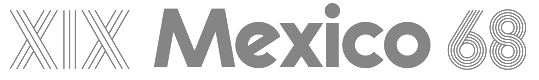 [More] ⦿
|
Ramón Delgado Ramírez
|
 Designer (b. 1991) of Metropolana (2011) who lives in Tampico, Mexico. This ultra-condensed font was modeled after the 1926 movie Metropolis. He also made a typeface after the Canon logo, called Canon (2011). Roja (2011) is pure constructivism. Nuevo Vago (2011) is hand-printed.
 Dafont link. Autoportrait. Calls himself Pepe Legba. [Google]
[More] ⦿
|
Randy Ford
[RAF Web Designs (was: ARRF Designs and RA Fonts)]
|
[MyFonts]
[More] ⦿
|
Raphael Koch
[Rafael Koch]
|
Raphael Koch or Rafael Koch, b. 1976. Raphael Koch (Blokes.ch, Switzerland) graduated in 1999 from Schule für Gestaltung Luzern, Switzerland. His Diploma work there, Transport, involved the development of several typefaces, and was part of a team effort by Urs Lehni, Peter Körner, Markus Wohlhüter and Rafael Koch. Koch co-designed the very original multiline / prismatic typeface family LL Prismaset A (2006-2013, Lineto, with James Goggin, Alex Rich, and Mauro Paolozzi) which is rooted in Rudolf Koch's Prisma (1930). LL Prismaset B (2017-2019) is a later extension. He co-designed Lego in 1999 at Lineto with Urs and Juerg Lehni. In 2015, Raphael Koch and Mauro Paolozzi co-designed GT Cinetype at Grilli Type. This typeface has outlines consisting of many short straight line segments, thus mimicking the now obsolete pre-digital age technique of laser printing subtitles in movies. At small sizes, the font looks very smooth, but at larger sizes, the straight segments become apparent. Koch co-founded Zurich based design agency Noir Associates in 2016. Since 2001, Rafael has been teaching at Fachklasse Grafik. [Google]
[More] ⦿
|
Ray Larabie
[Typodermic]
|
 [MyFonts]
[More] ⦿
[MyFonts]
[More] ⦿
|
Renae Hill
|
Graphic designer in Ellicott City, MD, who graduated from Monmouth University. Caligari (2011) is an angular typeface that was inspired by the 1920 silent German film, The Cabinet of Dr. Caligari (Das Cabinet des Dr. Caligari). [Google]
[More] ⦿
|
Rey Silva
|
Sao Paulo-based designer who created the scanbat typeface Cinebat (2013). Rey graduated from Senac in 2012. [Google]
[More] ⦿
|
Robert Nava
|
Freelance artist from Perris, CA, who designed these fonts at Disney Experience: Gracey's Curse (2003) and Started by a Mouse (2003). Alternate URL. This site also has a Disney font archive which carries Anna, Atlantean, BedrockPlain, DecoTech, DecoTechTL, Denmark, FFVortex, IndustriaSolidA, JSL-Ancient, JupiterPlain, Manzanita, Mara, Mesquite, PSBluegumForest, PrototypeCommunity, Queensland, Ravenscroft, RubberStampLetPlain, SeizedFuture, SeizedFutureA, SeizedX-S, SenatorTall, SerpentineD-BoldItal, Skellingtonbats, SpaceAge, Spumoni, TRON, Tristan, TwyliteZone-Book, WaltDisneyScriptv4.1. [Google]
[More] ⦿
|
Roberto Baldassari
[Alphan Typefaces]
|
[More] ⦿
|
Rodrigo Aguadé
|
 Madrid-based creator of the beveled and drop shadow typeface family Smoking Club (2013), which was inspired by titling in black and white movies. Buy the typeface at MATOI Design lab. Ogle it here.
 Typophile link. [Google]
[More] ⦿
|
Rodrigo Gonzalez
[Southype]
|
[More] ⦿
|
Roman
|
Moscovite who made the retro font Director in 2010. Having Latin and Cyrillic characters, it was designed for movie credits and titles. [Google]
[More] ⦿
|
Roman Yarosh
|
A Moscovite who created a retro font for movie titles called Retrostylefont (2011). Another URL. [Google]
[More] ⦿
|
Ronald Andhrad
|
Ronald Andhrad (Rio de Janeiro, Brazil) was inspired by Kubrick's Clockwork Orange and a building in Rio in the design of his art deco / Futura-style stencil typeface Clockwork Orange (2011). [Google]
[More] ⦿
|
Roxy Coppen
|
Australian creator of the quaint gothic typeface Rather Unfortunate (2012), which is based on the movie A Series of Unfortunate Events. Aka Roxanne Michael. [Google]
[More] ⦿
|
Ruan Augus
|
During his studies at Universidade Estadual Paulista Julio de Mesquita Filho in Sao Pualo, Brazil, Ruan Augus (Bauru, Brazil) designed the modular condensed movie titling typeface Nostra (2016). [Google]
[More] ⦿
|
Russell
|
Wisconsin-based designer (b. 1982) of Crow Graffiti (2004, based on the letters used in The Crow: City of Angels). [Google]
[More] ⦿
|
Ryan Cassidy
|
Los Angeles-based designer of Pliny (2018), a typeface that is based on the beer label for Pliny the Elder from Russian River Brewing. He also designed the octagonal mechanical typeface Mascot (2018) and the experimental Mash (2018). In 2019, he published East Bay (garffiti-inspired, constructivist), Lightning, Lost Boy, Horror, Roar, Group Therapy, Uncle Fuzz, Feeding The Streets and Old Horror Movie Style Font. [Google]
[More] ⦿
|
Ryland Sanders
|
Creator of Cell 63 (2008). He writes: It's based on the hand-lettered credit and title cards in the movie Forbidden Zone (1980). The lettering was done by animator John Muto. In creating this font, I tried to make a clean and readable typeface, but still retain the quirkiness and charm of Muto's hand lettering. [Google]
[More] ⦿
|
Sailordude97
|
Fontstructor who made Inception (2011), a display sans typeface based on the movie by the same name starring Leonardo Dicaprio. [Google]
[More] ⦿
|
Salma Hisham Aggour
|
Salma Hisham Aggour (Cairo, Egypt) created the Latin typeface Punk Plan and Movie Genre Pictograms during her graphic design studies in 2013 under the supervision of Sabine Schwarz at the German University in Cairo. [Google]
[More] ⦿
|
Samuel Leal
[Delírios de um cinemaníaco]
|
[More] ⦿
|
Sascha Timplan
[Stereotypes.de]
|
 [MyFonts]
[More] ⦿
[MyFonts]
[More] ⦿
|
Saul Bass
|
 American graphic designer and Oscar-winning filmmaker, best known for his design of motion-picture title sequences, film posters, and corporate logos. Born in the Bronx, NY, in 1920, he died in Los Angeles in 1996. Bass worked for some of Hollywood's most prominent filmmakers, including Alfred Hitchcock, Otto Preminger, Billy Wilder, Stanley Kubrick and Martin Scorsese. Among his best known title sequences are the animated paper cut-out of a heroin addict's arm for Preminger's The Man with the Golden Arm, the credits racing up and down what eventually becomes a high-angle shot of a skyscraper in Hitchcock's North by Northwest, and the disjointed text that races together and apart in Psycho. Bass designed some of the most iconic corporate logos in North America, including the Bell System logo in 1969, as well as AT&T's globe logo in 1983 after the breakup of the Bell System. He also designed Continental Airlines' 1968 jet stream logo and United Airlines' 1974 tulip logo, which became some of the most recognized airline industry logos of the era.
 Type design came as a by-product of his famous logos or movie posters. He designed the artsy Rainbow Bass (1982), as well as a gaspipe-style logo typeface for Alcoa (1963) to accompany his logo for Alcoa. Revivals and descendants of Bass's work: - Alumi (Michael Hernan). Based on the Alcoa typeface.
- Hitchcock (Matt Terich). A free font. This is strictly speaking not a Bass revival, because Dave Nagata did most of the drawings. The style, however, is one hundred percent vintage Bass. According to Keith Morris, the lettering artist who did the lettering for the Saul Bass titles was Art Goodman. Not soi according to Jill Bell: Art Goodman did not do the lettering for Saul Bass. Rather Saul utilized a number of different lettering artists through out his career. Harold Adler did most of the Hitchcock/Preminger titles, Maury Nemoy did some (St. Joan).
- Chank Diesel's Hitchcock (1997).
- Rainbow Bass, a vertically striped disco style design, was remade by Nick Curtis as Backstage Pass (2008), Kymmera Deco NF (2011), and High Five and High Five Jive.
- Harold Lohner's Alumino (2008) was inspired by Saul Bass's design for the aluminum company Alcoa.
- Saul (Laura French, 2011) is based on the cut-out letter movie titling style used by Bass in some movies.
- In 2015, Robin Lassalle created Saul Bass Font to honor Saul's genre.
- Zetafonts pays tribute to Bass in their Double Bass (2018, by Cosimo Lorenzo Pancini).
Jennifer Bass (his daughter) and Pat Kirkham published Saul Bass: A Life in Film&Design (2011). The book's blurb: This is the first book to be published on one of the greatest American designers of the 20th Century, who was as famous for his work in film as for his corporate identity and graphic work. With more than 1,400 illustrations, many of them never published before and written by the leading design historian Pat Kirkham, this is the definitive study that design and film enthusiasts have been eagerly anticipating. Saul Bass (1920-1996) created some of the most compelling images of American post-war visual culture. Having extended the remit of graphic design to include film titles, he went on to transform the genre. His best known works include a series of unforgettable posters and title sequences for films such as Alfred Hitchcock's Vertigo and Otto Preminger's The Man With The Golden Arm and Anatomy of a Murder. He also created some of the most famous logos and corporate identity campaigns of the century, including those for major companies such as AT&T, Quaker Oats, United Airlines and Minolta. His wife and collaborator, Elaine, joined the Bass office in the late 1950s. Together they created an impressive series of award-winning short films, including the Oscar-winning Why Man Creates, as well as an equally impressive series of film titles, ranging from Stanley Kubrick s Spartacus in the early 1960s to Martin Scorsese s Cape Fear and Casino in the 1990s. Designed by Jennifer Bass, Saul Bass's daughter and written by distinguished design historian Pat Kirkham who knew Saul Bass personally, this book is full of images from the Bass archive, providing an in depth account of one of the leading graphic artists of the 20th century. Wikipedia page. [Google]
[MyFonts]
[More] ⦿
|
Screenfont.ca
[Joe Clark]
|
Joe Clark (Toronto) is developing special fonts for captioning and subtitling for TV and film. Joe's motto is Watching TV is bad enough. Reading TV shouldn't be worse. Two interesting sub-pages: Here he explains the difference between captioning and subtitling. Captions are basically for the deaf, and are manually turned on. They not only describe what is said or heard but also mention or show things about the intonation, style, language, or nature of the voices or sounds. Subtitling is mostly used to translate. It is generally automatically turned on, and shown at the bottom of the screen. On this page, Joe lists the main issues with captioning and subtitling and lists the many problems with popular subtitling typefaces such as Bitstream's Tiresias or Monotype's Arial. Speaker at ATypI 2007 in Brighton. [Google]
[More] ⦿
|
Scriptorium (Ragnarok Press, Fontcraft)
[David Fleming Nalle]
|
 Dave Nalle was born in Beirut on March 19, 1959, and died on February 13, 2021 from COVID in his home town of Manor, Texas. From his wiki page: Dave Nalle is a political writer, game author and font designer who was active in the early history of the development of the internet. Nalle was at one time Chairman of the Republican Liberty Caucus, a group that promotes libertarianism within the Republican Party, Senior Politics Editor at Blogcritics online magazine, and was the CEO of Scriptorium Fonts. Obituary [PDF] by Steve Jackson at the Daily Illuminator. Obituary by Shannon Appelcline at RGG Net. Obituary [PDF] at Dungeon Master Magazine.
 A creative and prolific designer, he has made hundreds of beautiful (often historic) fonts. His outfit, Scriptorium (based near Austin, TX, est. 1989), also does custom font and logo design. At some points, Scriptorium was also known as Ragnarok Press and Fontcraft. It specializes in artsy and ancient typefaces. Some subset of the fonts is made by Michael Scarpitti. Free font demos. Images of his best selling fonts. Special subpages: - Three free fonts: Onuava (a mini-serifed hybrid fixed-width font), Divona (sans), Sirona (based on Lombardic calligraphy).
- Lombardic: Aneirin, Benevento (8th century Lombardic), Cymbeline, Fabliaux, Formidable, Locksley.
- Decorative initials such as the 20th century sign lettering initials set Pencraft Initials (2009), New Saxon Initials (2016, based on work by F.G. Delamotte), Delamotte Initials One (2016), Delamotte Initials Two (2016), Holly Initials (2010, based on Real PenWork (1880s, Knowles and Maxim), Vyones (2010), Vergennes (2001), Cascade (2009), Bergling (2010; based on initials by John M. Bergling).
- Steampunk typefaces: Clockwork, Gearhead, Gears, Verne, Draughtwork, Belgravia, Boetia, Blackthorn, Linthicum, Good-fellow, Necromantic, Mephisto.
- Wild West fonts: Academy, Alcalde, Atkinson Boomtown (2009, after the lettering of Frank Atkinson), Atkinson Eccentric (2009), BigIron, Cibola, Del Norte, Lachesis, Perdido, Plowright, Primer, Riudoso, Niederwald, San Lorenzo (2011, with a Mexican and Tuscan look), Stonehouse, Manquo, Rochambeau, Purcell, Vaquero.
- Arabic simulation fonts: Samaritan is based on the poster lettering of Alphons Mucha from his poster for the play La Samaritan. Serendib and Waziri are based on the hand lettering of René Bull from his edition of the Arabian Nights. Caliph (1993) is derived from Ernst Schneidler's classic Legende font, with variant characters based on his original lettering. Also: Satampra, Jerash, Samarkand, Isfahan.
- Celtic fonts: the fonts include Constance, Durrow (1993, traditional rendering of Insular Minuscule calligraphy), Malvern, Glendower (based on the most common lettering in the Book of Kells), Knotwork (caps based on Celtic knots), Alba Text (modernized text font based on Celtic uncial lettering), Lindisfarne (based on a square uncial style), Stonecross (1997, derived from Celtic cross and gravestone inscriptions), Celtic Spirals (dingbats), Celtic Borders font (lets you combine key strokes to form decorative borders; many frames and borders are original Celtic designs by Arts&Crafts period artists like Evelyn Paul and Louis Rhead), Spiral Initials, Brigida (based on Rudolph Koch's interpretation of a squared uncial), Macteris Uncial, Coverack (heavy non-traditional uncial), Dahaut (modernized uncial), Dunsany, Glendower, Morgow (1999, spiral uncial), Teyrnon (elaborate spurred uncial), Padstow (heavy uncial), Vafthrudnir (2011, uncial), Sualtim and Columba (decorative initials based on characters found in the Book of Kells), Albemarle (2001).
- Oriental simulation fonts: Yoshitoshi (2003, based on the 1900-style writing by Yoshi Toshi.
- Gothic fonts, including Alt Gothic, Koch Gothic, Barnabas (2011), Sternhagen (2014), Montgisard (2010, roman capitals with blackletter lower case), Serenissima, Gelderland, Alcuin, Monumental, Goldwork, Waldeck, Roncesvalles, Montressor (2010, ornamental blackletter capitals), T4C Beaulieux (1998, a free copy here), Bastarda (2011), Burgundian, Cadeaulx, Collins Old English, Courtrai, Descant, Ereshkigal, Faustus, Franconian (1993, a Schwabacher), Froissart (2000), Ghost Gothic, Katisha, Koch Gothic, Ligeia, Magdeburg, Magdelena, Melusine, Pyle Gothic, Rheingold, Sanctum, Stuttgart Gothic (2010), Textura, Theodoric, Yngling (2002).
- German expressionist: Dromon.
- Renaissance fonts: Monumental Gothic, Caswallon (a Caslon family), humanist cursive (Palmieri, Castiglione and Hanes Italic), quirky Italian cursives (Fiorenza and Alleghieri), a Roman style hand-lettered font (Rudolfo and Rudolfo Swash), a Trajan-style Roman lettering (Hadrianus), a classic flourished cursive (Trinculo) and a set of floral intials from the Quattrocento (Fraticelli).
- Modern poster fonts: Ascelon, Bilitis, Cosmic Dude, Dromon, Ducatus Rough, Eglantine (after Central Type Foundry's Quaint Roman), Ekberg (2002, based on Samuel Welo's posters), Fortinbras, Hamilton, Jambon, Oblivion, Posada (2008, based on the poster lettering of Mexican artist José Guadalupe Posada), Squiffy, Suspicion, Magnin (2003).
- Mapmaker fonts: building elements are available in Basilica; Ortelius is a map dingbat font; Queensland (based on lettering by artist and calligrapher Eric Sloane), is bold, hand-drawn and reminiscent of medieval writing on maps. There are also Brandywine, Daresiel, Hesperides, Longhorne, Windlass (1996), and Cityscape. Orford (2008) is based on samples of hand lettering from a 1693 manuscript collected by Lewis Day in his classic book on historical paleography, Alphabets Old and New.
- Calligraphic fonts: Albemarle (2001), Azariel, Moncrief (2011, based on the calligraphy of J.M. Bergling), Pavane, Rasael (2009), Abdiel (2005), Roncesvalles, Gazardiel (2003, connected script), Spoonbill (2003, arts and crafts), Macteris (Roman uncial font), Antioch Uncial (Roman uncial font), Burgundian (Classic black letter font), Franconian (993, a classic black letter font), Castiglione (Attractive Renaissance lettering), Cicero (Roman Rustica font), Formidable (1993, very bold late medieval / Lombardic style), Collins Old English (Classic Old English style gothic), Corbei Uncial (Roman uncial font), Cymbeline (late medieval lettering), Durrow (Standard insular minuscule uncial font), Theodoric (Classic black letter font), Gazardiel, Ghost Gothic (Unusual gothic font), Glendower (Uncial font based on Book of Kells), Gloriana (Interesting hand lettering style), Folkard (from the hand-lettering of Charles Folkard), Offenbach Chancery, Ranegund Merovingian Courthand, Benevento (8th century Lombardic), Hesperides.
- Art deco typefaces: Imperatore (2018: based on a hand lettered design from California art deco master designer Pedro de Lemos in the 1920s), Speakeasy (2018), Gates of the West (2018), Lyceum (2014), Borealis (2009), Criterion (2011), Illuminata, Madding (2009, a bold poster font that grew out of Aventine), Alexandrine (2009), art Deco Stencil (2009, based on samples of Art Deco stencil lettering by Pedro Lemos), Falmouth.
- Art nouveau typefaces: Acadian, Agravain (2009), Amphitryon (2009), Ariosto, Asphodel, Averoigne, Beaumains (2011, based on J.M. Bergling's lettering), Beauvoir, Belgravia (based on J.M. Bergling), Bernhardt (based upon the lettering of the Czech art-nouveau artist Alphonse Mucha), Bentham, Berenicia, Boetia (2003, based on J.M. Bergling's lettering), Bruges, Bucephalus (1993), Burd Ellen (2009), Butterfield (1993; in Alfred Roller's style), Cafe Society (2018), Curetana, Damariscotta, Elsene (2011, based on lettering by early 20th century illustrator Clara Elsene Peck), Elysian, Exotique, Flaubert, Gaheris, Ganelon, Gehenna, Goodfellow, Grammophon (2019: a bold Jugendstil poster font), Harbinger, Huyot (2016, after Georges Auriol's types), Jugendstil Kunsthand (2003), Lysander, Maginot (1993; after Peter Schnorr, 1898), Munich (after the Munchner Jugend magazine), Norumbega, Odeon, Ormandine (2010), Pantagruel, Phaeton, Reggio, Rochmbeau, Rockne (2009), Rudolfo, Setebos, Sprite, Summerisle, Sylphide (2005), Undine, Valentin (2008), Vambrace (2010), Walhal, Wendingen (2016), Wormwood (2018), Zeitschrift (2016, based on the Ver Sacrum magazine).
- Modern poster fonts: Field Day (2003), Ascelon, Bilitis, Cosmic Dude, Dromon, Ducatus Rough, Eglantine (after Central Type Foundry's Quaint Roman), Ekberg (2002, based on Samuel Welo's posters), Fortinbras, Hamilton, Jambon, Oblivion, Squiffy.
- Constructivist fonts: Krasny Mir (2009), Vrubel, Structura (1997).
- Futuristic fonts: Alecto, Angelus, Circuit, Culdrose, Gearhead, Ironclaw, Parika, Sanhedrin, Semiramis (1997), Slither, Structuro, Yazata, Adastra (dings).
- Borders and ornaments. These include New Arets and Crafts Borders (20912, based on The Calendar of Golden Thoughts (Barse and Hopkins Publ, 1911).
- Boneyard fonts: Undertaker (2014), Antrobus (2010), Sepultura (2002), Halloweenies, Dementia, Boneyard, Skull and Bones, Malagua (1999-2013), Paleos (2002, from titling of B movies in the cave girl genre), Carmilla, Abaddon, Black Cow (1998), Valdemar, Cuede, Ligeia, Mayhem, Mephisto, Golgotha, Sanguinary, Ironworks, Moravia, Gehenna, Nosegrind (2005, graffiti), Corpus, Ghostly.
- School fonts: Schoolhand (2010).
- Arts and Crafts movement (late Victorian period, 19th century), based on work and lettering by Walter Crane, William Morris, Charles Rennie Mackintosh and Elbert Hubbard. The Arts&Crafts movement was enormously influential on the works of designers, artists and architects of the 20th century, and inspired the Art Nouveau and Art Deco movements. Fonts include William Morris' Kelmscott (based on Morris' Troy type), and True Golden, fonts from the Glasgow branch of the movement like Chelsea Studio (1997), which is based on Charles Rennie Mackintosh's lettering, fonts from the Roycrofters of New York like Semiramis and Ganelon, fonts based on Walter Crane's work such as Crane Gothic, Pencraft Initials (2009) and Walter Crane, and even fonts from the California Arts&Crafts period of the early 1900s like Coloma. Other typefaces: Jesse M. King (refreshed in 2015, and based on hand lettering from a frontispiece design by Glasgow-based Jessie King who was known for her lavish book covers), Aylward, Palmyra (based on work by the Roycrofters, a design community founded by Elbert Hubbard), Aylward (2010, Victorian), Hyacinth Initials, Spoonbill, Adresack (1996: inspired by the arts and crafts lettering styles of designers like Charles Rennie MacKintosh and Jessie M. King), Brandywine, Changeling (2009, based on lettering by fairy artist Fanny Railton), Goddard, and Advertising Gothic (2003), Valentin, Gaheris, Agravain (2009). Delaguerra (2001-2009) is based on a lettering style originating in the California Arts&Crafts period commonly associated with Mission Style. It is still in common usage in signage at historical sites in California.
- Victorian: Beaumarchais, Berenicia, Bilibin, Brandywine, Brigidis, Curetana, Durendal, Elphinstone, Flaubert, Folkard, Gjallarhorn, Gloriana, Hermia, Ironclaw, Magnus.
- Typewriter: Fontcraft Courier.
- Anthroposophic: Ekberg (2002, based on a sample of poster lettering by Samuel Welo).
- Medieval fonts of Scriptorium, critiqued by Marc Smith, page 65: Batwynge is based on lettre gffe by Geofroy Tory (1529), and not on an illuminated manuscript of the tenth century as claimed by Scriptorium. Perigord (1993) is based on a Carolingian alphabet drawn by Ernst Bentele in 1952. Allencon is a calligraphic font based on an interpretation of 6th century Ostrogothic Italian calligraphy.
Some selected fonts: Finchley (psychedelic), Captain Kidd (2012, an original font design based on the title lettering from the classic pirate movie starring Charles Laughton), Aerobrush (2011), Fondry Ornament (2009), Atkinson Egyptian (2008, after the lettering of Frank Atkinson), Verne (2008: remade in 2020 into Covid19), Goldwork (almost blackletter), BigBlok (2010), LetterpressGothic (2010), Plymouth (2010, in the style of Cooper Bold), Broadley (2008, an architecturally inspired script based on lettering by British architect and designer C.F.A. Voysey), Locksley (2004, medieval lettering), Tuscarora (curly lettering), Fiorenza (Renaissance calligraphy), Hesperides (old colonial calligraphic script), Angelus (beautifully printed monospaced script), Esperanza (1996, connected medieval handwriting), Ithuriel (2002), Alleghieri (2002), Hamilton (2002), Spiral Initials, Zothique (great font, based on hand lettering from a map of Clark Ashton Smith's fantasy world of Zothique), Reynard (semi-Celtic), Daresiel (elegant script), Caliph (1992, Arabic simulation), Bassackwards, Rosalinde (1999, handwriting), Arakne (2000, connected handwriting), Falconis (by Michael Scarpitti), Asrafel (semi-Celtic), Swithin (2004), Tyrfing (Art Nouveau/Fraktur, 1999), Waldeck (2008, blackletter), Woburn Initials, Stampwork, Draughtwork, Roughwork (a codex font derived from Nalle's own True Golden which is based on a=n earlier typeface by arts and crafts master William Morris), Melusine (gothic calligraphy), Corbei (uncial), Niederwald (hand lettering), Gjallarhorn (great uncial), Gaiseric (early medieval uncial), Taranis (1987, an uncial first drawn as a font for the cover of the old Ysgarth roleplaying system), De Bellis (roman era, by Michael Scarpitti), Engravers Gothic, Monimental Initials, Sanhedrin (Enemy of the State font), Vespasiano (roman capitals, by Michael Scarpitti), Bilitis, Hendrix (2002), Collins OE (old English), Samedi, Praitor, Evadare (1993, based on a character set which was hand calligraphed by Rudolf Koch), Koch Fantasie (1993), Black Cow (1998). Zothique, Ruritania, Mariner (2004, based on hand lettering originally done by Willy Pogany), Trinculo (a swinging cursive font), Texas Star (2002), Octavian (antique demi-serif font), Ruffian (antique type font), Ascelon (thin sans serif font), Munich (title lettering from Munchner Jugend magazine), Necromantic (bizarre bold titling font), Titania (romantic decorative lettering font), Oberon (bold romantic font), Knotwork, Guede (1993), Pullman, Purcell (Victorian circus poster style font), Allegheny, Carmilla, Malagua (1999-2013), Ardenwood, Platthand, Buccaneer, Cochin Archaic (2010), Boswell (1994), Guilford (based on lettering by artist and calligrapher Eric Sloane), Death Ray (2012, constructivist), Alecto (futuristic), Candlemas (2003), Bridgeport (2003, based on lettering by artist and calligrapher Eric Sloane), Medieval Tiles (2003), Linthicum (2003), Draughtwork (2003), Yngling (Fraktur, 2003), Rheingold (elaborate Fraktur: Music Hall Text elsewhere; see also Teuton Text, Cincinnati Type Foundry, 1877), Kidd (2003), Belgravia (2004), Peck Shields (2004), Scrawlies (2000, handcrafted), Albrecht Durer Gothic (2004), Orpheus (2004), InduXtrial (2004, a grunge face), Yoshitoshi (2003), Veronique (2004), Veneto (2006), Vidilex (1993, monospaced), Abelarde (2006), John Speed (1993: a mapmaker font), Furbelow (2006), Estoril (2006), Tangle, Aventine (sans), Texas Star (2002), Groningen (Bauhaus design), Nevins Hand, Scrapple (2011, Victorian, ornamental), Leodegar (2011, based on samples of 7th century Frankish hand lettering), Candlemass (2012). Fonts from 2013: Doge (a Venetian font based on a J.M. Bergling revival), Original Django (after the titling font in Quentin Tarantino's movie Django Unchained). Fonts from 2014: Highball, Carillon (based on a typeface by Samuel Welo), Edifice (based on lettering by J.M. Bergling). Fonts from 2015: Gods of Mars (an inline sci-fi typeface), Rykov (based on a 1930s Ukrainian constructivist style; Latin and Cyrillic), Vie Moderne (French art deco), Dahlgren, Grand Concours (art deco), Tantalus, Power Tie (art deco), Marquis Greeking. Fonts from 2016: Ekberg Modern (based on lettering samples by Samuel Welo from poster designs of the 1920s), Knuckleduster, Tzaphkiel, Sarandiel, Primrose Initials, Elizabethan Script (chancery style), Zeitschrift (an art nouveau font based on the Ver Sacrum magazine), Wendingen (Dutch deco), Memento Mori (Tuscan), Rounders (art deco). Fonts from 2017: Buzzmill (wooden plank font), Pumpkin Patch Initials, Talinn, Reliquary, Nopalito, Scattershot (script). Typefaces from 2018: Marionettas (a Mexican horror movie poster font), Fascination, Architextura, Santa Sangre, Glyphos. Typefaces from 2019: Cafe Corso (art nouveau), Comic Classix. Fnts released in 2020: Epigramatic (based on lettering by Dard Hunter for the Roycroft Press in the early 1900s), Cryptos (graffiti). Klingspor link. Abstract Fonts link. Dafont link. View David Nalle's typefaces. Scriptorium's library. [Google]
[MyFonts]
[More] ⦿
|
Sergio Mateo
|
Designer in Madrid, Spain, who created the ancient movie theater marquee font Cinerama (2015). [Google]
[More] ⦿
|
Sharkshock
[Dennis Ludlow]
|
 Dennis Ludlow (Sharkshock Productions, Raleigh, NC) started making mostly free fonts in 1999. On August 28, 2001, Dennis announced that he would stop producing fonts, forever. To prove himself wrong, he became more prolific trhan ever, and ultimately started designing retail fonts as well.
 His early typefaces include Hot Pizza (2001), Hawaiian Punk, Royal Acidbath, Little Caesar, Subway, Holiday India, Mobsters, Dallas Cowboys (Western look, 2004), Dark Crystal, Queen of Camelot (2015), Green Eggs and Spam (2015), Ludlow Strong Ale (2015, German beer label font), Space Angel (2014), Electrox, Cowboys, Dolphins, Viking Stencil, Lexust (2002), Padaloma (2002), Fujita Ray (2002), Willy Wonka, Hursheys, Grinched (a Halloween or beatnik font), Honda, Busch Gardenz, Holiday India (2000), Simpsons, Blockbusted, IHOP, Chicken Fool A, Playtoy (2000: like the masthead of Playboy), Cowboys (2001), Dreamscar (2001, has a Cyrillic version), Mr. Goodbaur, Dr. Peppers, Oreos, Air Millhouse, Fruitopia, Raiders, TGI Friday, Jolly-Raunchy, Mouser, Pirate-Keg, Fujita Ray (2015), Modeccio (2015, art deco), Wendyville (2015, Western), Vonique 64 (2015, avant-garde style), Your Royal Majesty (2015, a unique blackletter-inspired vampire script), Hackney Block (2015), Thunder Lord (2015, an outlined variant of Raiderfont), Republica Minor (2015), News of the World (2015: a news headline font), TH3 Machine (2015), Funkrocker (2015, inky, grungy), Tiki Tropic (2015: a tiki font), TypoGraphica (2015, a strong geometric sans), Vonique 92 (2015, circle-based fashion sans), Reisenberg (2015, a black titling sans; v2.0 dates from 2018). There is also a medium-sized categorized archive, with subsections such as cartoon fonts and movie fonts. Typefaces from 2016: Twiddlestix, Konigsberg (rounded sans), Wicked Mouse (looney tunes typeface), Heathergreen (a tall condensed sans), Wonderbar (psychedelic), College Block (athletic lettering), Death Star, Ring of Kerry (uncial style), Blockletter (octagonal), Café Françoise, Cronus (round monoline sans), Suissnord (a wide sans display typeface), Grinched 2.0 (an update of Grinched), Red Seven (futuristic), Enchanted Land (derived from the blackletter genre), Freakshow (ornamental ransom note font), Deutschlander (a condensed sans for movie credits and similar applications). Typefaces from 2017: Lemonade Stand, Dark & Black, Hennigar (a heavy compact sans in the spirit of Impact), Durango Western, Banbury (a heavy display didone), United Kingdom (techno), Goldoni, Kingsmen. Typefaces from 2018: Bloomsburg (a 6-style organic sans; +Cyrillic), Stupid Meeting (an all caps display typeface), Medusa Gothic, Carson (tall grotesque), Collegeblock 2 (an octagonal varsity font), Medusa Gothic, Royal Crescent (sans), Praetoria, Papaya Sunrise, Helmswald Post (blackletter). Typefaces from 2019: Deutschlander 2.0 (an organic monoline sans, with coverage of Cyrillic and Greek), Zanzabar (a genie lamp or Arabic emulation typeface), Vonique 43 (an organic fashion mag sans), Delacorso Outlines (tall decorative caps), Kwixter Sketch (for Latin and Cyrillic). Typefaces from 2020: Stupid Meeting (an all caps sans with a comic book feel, appropriately named to describe most COVID era Zoom work sessions), Toyster (a plumpish typeface), Wonderbar 2 (psychedelic, all caps), Boldstrom (a tightly spaced heavy industrial sans), Reisenberg, Snicker Snack, Crosshatcher (a sketched font), Czesko (a skyline font), Storybook Ending (a mix of uncial and Tuscan), Toyster (a bubblegum font). Typefaces from 2021: Kamryn (a display serif), Mouser (an organic geometric sans in six styles), Dottingham (a Victorian typeface), Tempestua (a sharp bold display sans), Lemonade Stand, Brontoburger (a vernacular typeface). Typefaces from 2022: Jumbalo (a bubblegum font). Abstract Fonts link. Creative Fabrica link. [Google]
[MyFonts]
[More] ⦿
|
Sharp & Type
[Juan Casco]
|
Type foundry set up by Juan Casco (Puyo, Ecuador) in 2013. Its typefaces as of 2014 include Jeniffer Script (a vampire script), Darkshire JZ (by Jeniffer Zuñiga), Frozen Script (by Juan Casco), Tramonta, Elrie Roman, Linexter (by Juan Casco), Refugiatta Bold, Ninja Turtles (modular and squarish), Frozen Roman, Guardians of the Galaxy (octagonal sci-fi face). In 2015, Juan designed Huntsman, Funpool / Deadpool (movie titling font), Antman (based on the movie), Daredevil, Iron Tech (octagonal, techno), Limon Script (signage script), Viaje Script, Camomila (script), and The Marauders (a pirate typeface). Typefaces from 2016: Silabario Waodani, Lemon Hipster (sign painting font), Slim Chef (narrow, handcrafted), Atemporal (blackboard bold style), Symphony Script (calligraphic). Behance link. Home page. Creative Market link. Klingspor link. Fontspace link. Abstract Fonts link. [Google]
[More] ⦿
|
Shaun Hately
|
Designer of the free font Homo Novis (1999), based on the lettering that appears in the opening credits of the 1992-1995 series The Tomorrow People. Dafont link. [Google]
[More] ⦿
|
Sierra Kamatchus
|
 Sierra Kamatchus is a Minnesota-based designer and alumna of University of Minnesota Duluth. In 2014, she co-designed the vintage silent film typeface Good Bad Man with Chank Diesel. She explains: This historic revival font was created especially for use in the preservation and restoration of the 1914 silent film "The Good Bad Man," starring Douglas Fairbanks. There is only one copy of the original film print in existence, and when the film was restored for a screening at the San Francisco Film Festival in 2014 the new font was created to best recreate the intent of the original lettering in the film. It is a smooth and pleasant vintage lettering style, original designed for use on silver screens, now fully rendered in OpenType and ready for you to use in your designs or web pages today. Read about this story here. [Google]
[MyFonts]
[More] ⦿
Sierra Kamatchus is a Minnesota-based designer and alumna of University of Minnesota Duluth. In 2014, she co-designed the vintage silent film typeface Good Bad Man with Chank Diesel. She explains: This historic revival font was created especially for use in the preservation and restoration of the 1914 silent film "The Good Bad Man," starring Douglas Fairbanks. There is only one copy of the original film print in existence, and when the film was restored for a screening at the San Francisco Film Festival in 2014 the new font was created to best recreate the intent of the original lettering in the film. It is a smooth and pleasant vintage lettering style, original designed for use on silver screens, now fully rendered in OpenType and ready for you to use in your designs or web pages today. Read about this story here. [Google]
[MyFonts]
[More] ⦿
|
Simon Stratford
|
 London-based creator of the free shaded caps font Airbag (2013), which imitates the successful genre of Trend (Latinotype). Before Breakfast (2013) is a free hand-printed typeface. Packt (2013) started out from watercolor lettering. Distractor (2013) is a tweetware grungy slab serif reminiscent of letterpress---it is partially based on Bevan. In Limbo is a free vernacular typeface. Typefaces from 2014: Type Old Writer, Before Breakfast, Hitchcut (paper cutout inspired by Saul Bass's poster for Hitchcock's movie Vertigo), Separator (octagonal), Dirty Slab (letterpress emulation), Enfold (hand-drawn).
 Typefaces from 2015: Neon, Buckley, Buckley Serif, Bold Riley (a handcrafted serif), Balham to Brooklyn (fifties script), Petit Jardin, Gently Script, Troupe (an inline Tuscan typeface), Mr. Blue Sky (an inline typeface), Moorgate (fat brush font), Sunshine, Dogtown (grunge), Gods Own Junkyard (neon sign font, named after Chris Bracey's neon sign store in London), Teardrop (watercolor brush with dripping ink), Western Grit (spurred), In The Wood, Gallow Tree (free brush font), Thirsty Dog (scratchy brush), Dear Prudence. Typefaces from 2016: Get Lucky, Take Me To The River, Lawless (vintage display typeface), Not My Type (old typewriter font), Roadhouse Blues, Just Like Heaven, Resize, Atomic Dustbin, Mind The Gap (stencil family), Munky (a fun children's book typeface), Hunky Dory (a handcrafted children's book typeface), Little Wonder (brush script), Mister Rooster, Whippin Piccadilly (handcrafted), Bangers & Mash, Mr. Chumley. Typefaces from 2017: Hunky Dory, Circus Freak, Fake Empire, Gilly Script, Banoffee (a kooky handcrafted typeface), Tuck Shop (a chalk font), Fake Empire (grunge), Mu-Th-Ur (a free octagonal typeface inspired by the film Prometheus). Typefaces from 2018: Be More Human (for Reebok), Higgs Boson Blues (SVG font), Fierce (dry brush SVG font), Yeah Foil Balloon (color font), Wild Irish Rose (brush script). Typefaces from 2021: Beautiful Freak, Neon. Behance link. Another Behance link. Envato link. [Google]
[More] ⦿
|
smallbar
|
FontStructor who made Tolkien Dwarvish (2010), Regality (2011, kitchen tile face), Regal (2011), Bit Trip (2011, from the Bit Trip series of games), TRON Legacy (2010, +Full, +UC: futuristic, after the movie), Negative UC (2010), Razorback UC (2010). [Google]
[More] ⦿
|
Solidarité 77
[Fabien Roché]
|
 Solidarité 77 is an intertwined paperclip-style typeface created in 2016 by Fabien and Vincent Roché for the Association Solidarité Femmes Le Relais 77 which helps women that were victims of domestic violence. Behance link for Fabien Roché. Home page of Fabien Roché. [Google]
[More] ⦿
Solidarité 77 is an intertwined paperclip-style typeface created in 2016 by Fabien and Vincent Roché for the Association Solidarité Femmes Le Relais 77 which helps women that were victims of domestic violence. Behance link for Fabien Roché. Home page of Fabien Roché. [Google]
[More] ⦿
|
Sos
|
Australian, b. 1992. He created the serif display typeface Torchwood (2009), which was based on the TV show Torchwood: Children of Earth. [Google]
[More] ⦿
|
Southype
[Rodrigo Gonzalez]
|
Chilean designer of the Easter dingbat fonts Easter Eggs ST (2014) and UnTaRot ST (2014). Other free typefaces from 2014 include Shapes St, Stupenda ST, Grafeno (connect-the-dots), Puente Estrecho (hairline), Tipo Capital, Cuadrada (dot matrix style), Apurado Royitto (arched typeface), Brillante, Novation Box, Rudasteria, Presidiario (horizontally striped typeface), Puente Nuevo, Rockmia ST (a glaz krak face), Boceto ST (outlined typeface), Puente Bueno ST, Open 24 Display ST (LED font), Iniciales ST, Floreada ST, Concadenado ST, Phantom ST, Santiago Sans ST, Es La Dura WN ST, Ledsitex ST, Imnova ST, Cinema ST, Cathedral ST, And Run ST (textured caps typeface), Older ST (textured face), Asrelurio ST, Hearts ST, Other Display ST (LED font), Salpicado ST, Adornada ST, Extragna Rara ST, Fichas ST, LED Simple ST (dot matrix font), Dominos ST, News Papers, Our Display ST (LED emulation), Lineal Simples ST, Cuadradex Simple ST (hexagonal face), Edournida ST (a textured typeface), Tripleled ST (dot matrix), Bicolors ST, Absolutamente Rou ST, Flowers ST, Leders (dot matrix), Old Computer ST, Rounded Display ST, Lediz (dot matrix face), Alien Faces ST, Westranga (textured), Rostros y Emociones (smilies), Filligrees and Ornaments ST, Demionatibu and Cube Face ST. Typefaces from 2015: Shapes ST (kaleidoscopic ornaments), Questra Extra ST. Typefaces from 2016: Viexa Barbuda, Justo St, Mala Vida St, Hypnossia St (textured), Boulding Work St (textured), Hand Faces St, Astronomic Signs St, Alien Bats St, Snowflakes St, The Misty South, Discotheque St (trilined), Qualentaro Wallmapu St (textured), New Russia 2108 St (Cyrillic emulation typeface), Comics of South, Puntiyisca (textured), Calendulia (textured), The LED Display dot matrix style), My Older Life St, Xmasbats St, Merry Xmas St (alphadings), The Guns Smoke St, Cubox 3D St, Mr Techly St, Coming Soon St (movie font), Old Burlesque St, The Neckbreaker St, Big Daddy St, Chinese Wok Food St (oriental simulation type), Extra Gro St (3d, outlined), Halloween Scare St, Humongous of Eternity St, La Que Cuelga St, Litle Simple St, Metalo Of South St, Mostera St, My Valentine Now St, Panda Power St, Pumpkin Halloween St (pumpkin alphadings), Shadded of South, Sheriff of South St, The Flaggy St, Big Daddy St, Digital Play Hollow St, Digital Play Italic St (LED font), Digital Play St (LED font), Happy Balloon St (alphadings), Humongous of Eternity St, Notarized Openly Script Oblique, Notarized Openly Script St (comic book style), Panda Power St, Sheriff of South St, Antique Quest St, Blockys St (3d blocks), Comely St, Data Cards St, Don Moise St, Jackdaws Love St, Maxter Board St (dot matrix), Moderna Disco St, Pointed Laid St (dot matrix), Recoleta Sans St, SS Barracuda St (a great grungy style), Score Board St (dot matrix), Second Flowers St, The Drunked Man St, The Flowers St, The Inbox St, The Outbox St, Thempo New St, And Love st, Another Faces St, DhonJako St, DoubLe CoLor St, EasterFont St, Granite Rock St, Monster oF South Hollow St, Monster oF South St Italic, Monster oF South St, Satanyc Demoniac St, Tenebrous St, The South Flag St, UltraLED St, Halloween Party St, The Display St (LED font), Good Idea St (alphadings), Mi Nuevo Display St (dot matric), Otra Mas Stf, Fantasmytas St (alphadings), Urban Tribal STF, Foontastica St, Del Recuerdo St, Cuadritos St, I Love St (Valentine's Day alphadings), Eskimporce VSF (textured). Typefaces from 2017: The Quick Frog St, Shadded South St (shadow font), Consequad St, Warmerous St, The Bad Times St, The Jack Brown St (multilined), Alphin Merytous St, News Board St, Eat at Joe's St (marquee font), Any Meritous St, The Quick South St, Kasquiwane St, Jux Kadabra St, Flowered, It's Scary Now, Cooler South, Icons South, Glass & Bottles (dingbats), Squarex (octagonal). Typefaces from 2018: Scarythin St, New Led Display St, My Display St (LED font), Petroleum St (grunge), Blade Gunner 2049 St. Typefaces from 2019: Zodiac. [Google]
[More] ⦿
|
SpaceStation (also: hmeneses)
|
Mexican designer of Spiderman (1997), made after the 1979 movie by that name. He also designed the futuristic CloneWars (2003). He uses the nickname Hmeneses, and copyrights his fonts to "SpaceStation". Another font is Underworld, based on the movie Underworld Evolution (2006), as an alternative to Jim Marcus's commercial typeface T26 Eremaeus. [Google]
[More] ⦿
|
Squared B-Movie Fonts
|
Choices suggested by the typophiles: Turista Gorda NF (Nick Curtis), WPA Gothic (Stephen Coles), FF Moderne Gothics (Jim Parkinson), Elephantmen (John Roshell), Gibbons Gazette (John Roshell and Dave Gibbons), Molot (Roman Yershov), Kimberley (Ray Larabie), Morgan Poster Black (Mario Feliciano). [Google]
[More] ⦿
|
StarWars-Union.de
|
Star Wars font archive. [Google]
[More] ⦿
|
Stefan Huebsch
[Typocalypse Types]
|
 [MyFonts]
[More] ⦿
[MyFonts]
[More] ⦿
|
Stephen Tune
[Digital Empires]
|
[More] ⦿
|
Stereotypes.de
[Sascha Timplan]
|
 Stereotypes is Sascha Timplan, a German type and graphic designer from Trier, b. 1979, who studied Communication Design at FH Trier.
 He created these typefaces: - 2009: St Substance, St Booka Shade (purely geometric), ST Moviehead, an ultra-condensed family (Dafont), St. Atmosphere (fat, rounded), St Transmission (free), St Shadowplay, St-Lorie (connected upright script), St Notorious (after the titling font in Hitchcock's Notorious---a beautiful high-legged serif face), St Technique, St Atmos (a commercial ink trap plaything), St Mika, Apfelstücke (a hookish face).
- 2010: St Marie (a nice free typewriter typeface), St Ryde, Fridge (casual sans family), St Frika, Friska.
- 2011: Elsa (sans), Villa Didot (this layered font family was created for the posters of the club VillaWuller).
- 2012: Florence (a swashy poster typeface that was also influenced by VillaWuller), St Transmission (industrial sans), Flenja (a narrow retro didone family), Christmas Numerals.
- 2013: Sarre (sans), Prism (prismatic, multiline typeface, influenced by Rudolf Koch's Prisma and Herb Lubalin's Avant garde).
- 2014: Timplan published a large antiqua family with wedge serifs in the heavier weights, Christel Text excepted, partitioned into three subfamilies, Christel Text, Christel Display, and Christel Poster. His main contribution in 2014 is the great Stereotesque (a grotesque family). Together with Lukas Bischoff, he created the athletic lettering typeface family Atletico.
- In 2016, Sascha Timplan and Lukas Bischoff published the handsome sans typeface family Golden Sans [no relationship with Tarin Yuangtrakul's Golden Sans from 2010 or Heitor Latosinski's Golden Sans from 2013]. Free Golden Sans Light demo.
Behance link. Blog. Klingspor link. Dafont link. Abstract Fonts link. Interview by MyFonts in 2014. Showcase of Sascha Timplan's fonts. [Google]
[MyFonts]
[More] ⦿
|
Steve Bevis
[UK Britney]
|
[More] ⦿
|
Steve Ferrera
|
Designer of Tango (2010), King Luau (2007, oriental brush face), Sunshine State (2011), Reno Casino (2010), Christmas Mouse (2009, dingbats that include snow crystals), Buka Bird (2009, inspired by the characters seen on "Lilo&Stitch" movie and "Stitch's Great Escape" attraction at Walt Disney World), Mouse Tags (2009: inspired by icons seen at Disneyland and Walt Disney World), Haunted Mouse (2009, Halloween font), Space Encounter (2008, inspired by the font seen at WDW Stitch's Great Escape), Space Encounter (2008, inspired by the font seen at WDW Stitch's Great Escape), Spaceship Bullet (2008, inspired by the font seen at WDW Stitch's Great Escape), Kringle Castle (2007), Kringle Castle Night (2007), Empire State Deco (2006), Pieces of Eight (2006, a degraded pirate era font, inspired by the characters on the attraction poster "Pirates of the Caribbean"), Frosty's Winterland (2006), TS Curly (2006), Dharma Initiative Logos (2006), TS Block (2006), Market Deco (2006, sans in the style of Neutraface), Star Trek Annual Magazine (2006), Aero Font One (2006, psychedelic), Mouse Deco (2006, geometric sans), Island of Misfit Toys (2006), Airline Logos Past (2006), Wrestling Logos (2006), AndersonTheMysterons (2006), AndersonTheSecretService (2006), Anderson-Four-Feather-Falls (2006), AndersonSpace1999Dings (2006), AndersonUFO (2006), FederationStarfleetHull23rd (2006), AndersonStingray (2006), AndersonThunderbirdsAreGO! (2006: Western), AndersonTorchyTheBatteryBoy (2006), Anderson Fireball XL5 (2006, brush face), Anderson Supercar (2006, display sans), Anderson Captain Scarlet (2005), Jonny Quest Classic (2005, connected 50s script seen in the Hanna-Barbera cartoons from 1964) and Anderson Dings 1, 2 and 3 (2005-2006). Anderson refers to Gerry Anderson's Supermarionation. The full list of fonts: Aero Font One Swash, Aero Font One, Airline Logos, Anderson Dings 1, Anderson Dings 2 v2, Anderson Dings 3 (v2), Anderson Fireball XL5, Anderson Four Feather Falls, Anderson Space1999 Dings, Anderson Stingray, Anderson Supercar (v3.1), Anderson The Mysterons, Anderson The Secret Service, Anderson Thunderbirds Are GO!, Anderson Torchy The Battery Boy, Anderson UFO Ding, Anderson_Captain_Scarlet, Anderson_Fireball_XL5_Shadow, Buka Bird, Christmas Mouse, Dharma Initiative Logos, Empire State Deco, Federation_Starfleet_Hull_23rd, Haunted Mouse Alt, Haunted Mouse Shadow Alt, Haunted Mouse Shadow, Haunted Mouse, Island of Misfit Toys Alt, Island of Misfit Toys, Jonny_Quest_Classic, King Luau, Kringle Castle Night, Kringle Castle, Market_Deco, Mouse Tags, Mouse_Deco, Pieces of Eight Alt, Pieces of Eight, Pro_Wrestling_Logos, Reno Casino, Space Encounter , Spaceship Bullet, Sunshine State, TS Block Bold, TS Curly, Tango Chips, Tango Regular, Trek Disruptor Blast. Aka Supercarguy. Fontsy link. [Google]
[More] ⦿
|
Stiggy & Sands
[Jim Lyles]
|
 Stiggy & Sands is the Arvada, CO-based type foundry of Brian "Stiggy" Bonislawsky and Jim "Sands" Lyles, est. 2013. Their first commercial typefaces, all jointly designed, are Sante Pro (2013, a tall upright connected script), Rum Raisin (2013, inspired by the lettering from a vintage Kellogg's Raisin Bran cereal box), Maiden Orange (2013), Luckiest Softie Pro (2013, a rounded comic book typeface that was inspired by hand-lettered vintage 1950s advertisement), Smokum Pro (2013, a Western typeface), Carioca Script Pro (2013, inspired by the lettering on the RCA Records Stereo Action Series in the 1960s), Uncial Antiqua Pro (2013), Spicy Rice Pro (2013: psychedelic or disco), Ultra Pro (2013: a Clarendon or wood style slab serif), Quintessential Pro (2013: calligraphic), Bruno Ace Pro (a techno/automoive font, followed in 2018 by Bruno Ace Pro Rounded), Aclonica Pro (2013), Special Elite Pro (grungy typewriter), Audiowide Pro (2013: organic techno face), Peralta Pro (2013: a bouncy cartoon font), Englebert (2013: inspired by the title screen of the 1930s film Der Blaue Engel starring Marlene Dietrich), McLaren Pro (2013: comic book style), Galindo (2013: a comic book typeface with square counters), Margarine Pro (2013), Righteous Pro (2013), Mouse Memoirs Pro (2013, cartoonish), Risque Pro (2013, funky style), Luckiest Guy Pro (a fat comic book font based on vintage 1950s ads), Original Surfer Pro (2013, an an offbeat sans serif font bursting at the seams with lively personality. Inspired by a vintage advertisement for the California Cliffs Caravan Park, this font exudes all of the fun of a summer vacation anytime of the year), and Marcellus Pro (a flared roman inscriptional typeface with both upper and lower case, originally published in 2012 by Astigmatic; CTAN page).
 Typefaces from 2014: Purple Purse Pro (an offbeat didone based on a vintage Ivory Soap ad from the fifties). Typefaces from 2015: Shojumaru (an oriental simulation font inspired by a movie poster for the 1957 film titled Sayonara, starring Marlon Brando), Sacramento (connected script), Bazaruto (a decorative set of typefaces inspired by wrought iron, Letters and Lettering by Carlyle and Oring, and didones), Maiden Orange Inline Pro. Typefaces from 2016: Syncopate Pro (unicase), Kapture (a great romantic script), Stint Pro (slab serif spanning condensed to expanded widths), Grand Hotel Pro (upright connected script), Ribeye Pro, Shojumaru Pro (oriental style), Freckle Face Pro. Typefaces from 2017: Dear Sans (rounded sans family), Glorious Song (a display serif typestyle that was inspired by the poster lettering for the 1948 movie Words and Music), Montez Pro. Typefaces from 2018: Croft (a revival of Lewis Buddy III's ATF classic, Roycroft, 1912), Navarone (a Greek simulation font inspired by the titling sequence of the 1962 movie "The Guns of Navarone"), Distressed Telegraph (based on the typewriter font Large Elite Type No. 44), Gimbel Script (a tall monolinear upright vintage script), Bigelow Rules Pro (a beatnik font), Eagle Lake Pro, Husk (a digitization and extension of a film typeface called Maile by LetterGraphics), Boilermaker (a digitization and extension of a film typeface from LetterGraphics dubbed Flair G100), Eagle Lake (calligraphic), Bruno Ace. Typefaces from 2019: Fascinate Pro (a soft-shelled art deco typeface), Artisinal (an art deco typeface that revives John W. Zimmerman's Cubist Bold from 1928). Modulate (a blocky modular typeface), Lorette (based on the film font Laurel from LetterGraphics), Quandor (based on the Lettergraphics film font Impacta), Magnate (a digitization of the film typeface Wilshire from LetterGraphics), Toastie (based on the film font Flair 312 by Lettergraphics), Latitude Sans (a heavy sans based on Lettergraphics' Free). Typefaces from 2020: Bugleboy (this font family revives and expands the film font Wood Grotesk by LetterGraphics), Berkshire Pro (a plump display typeface), Mervale Script Pro (a brush script originally done in 2012 at astigmatic One Eye). Typefaces from 2021: Huerto (a geometric angular sans), Pennyroyal Pro (an elephant feet font with irregular outlines), Pennyroyal (an elephant foot almost cutout font). Typefaces from 2022: Pardner (a hand-painted spaghetti Western font). MyFonts link. [Google]
[MyFonts]
[More] ⦿
|
Studio B (or: La Station B)
[Clément Barbé]
|
 Paris-based graduate of ESAG Penninghen (where he took courses from, e.g., Muriel Paris) who made a custom typeface for the Housse de Racket band in 2012. Dinosaur (2012) can be bought at Ten Dollar Fonts. He also designed the thin display family Muerte (2012), the alchemic typeface Pharaon (2012, inspired by the Spielberg movie Indiana Jones : Raiders of the Lost Ark), the display typeface Tennis (2012), the volcano-shape-inspired Volcano (2012), and the wavy Sailor (2012).
 In 2013, he made the alhemic typeface Black. Hellofont link, where his fonts can be bought. In 2019, he set up Studio B and promptly released the icon set Tropical (2019) and the great art deco bold poster and display typeface Coquette (2020). In 2020, he designed the art deco typefaces Yangi, Helite and Richart, and the unicase display typeface Boala. Behance link for Clément Barbé. [Google]
[MyFonts]
[More] ⦿
|
Studio Typo
[Mehmet Abaci]
|
 Mehmet Abaci (b. 1978) is based in Istanbul. In 2014, he established Studio Typo, where one can buy his typefaces. Limited forms of the fonts can be downloaded fpr free from the Dafont site.
 Creator of the elegantly plump rounded sans typeface Vinyl Cuts (2013), Samatya (2013, a unicase piano key typeface), Boldie (2013), Laundry Day (2013, alphadings), and the wood log typeface Timbers (2013). Typefaces from 2014: Smush, Slim Fir (athletic lettering), Typonome, Typo Slab, Neons, E-Square (sci-fi typeface), Screamer, Typoline (piano key typeface), Omniblack (flared display face), Papillons (flared caps), Typoster (a great fat geometric slab serif typeface family accompanied by an equally great shaded outline style), Typo Comica (a family drawn to compete with Comic Sans), Tipo Press, Manyeto (calligraphic), Quatroline (prismatic typeface), Wardoom, Cabold Comic, Digiform, Akaju (oily fat typeface with lighting effects), Almira, Bonebastic, Comic White Rabbit, Sinema (a bit of retro movie art deco), Sober, Cali Brush, Tiny Plate, College Player, Smart Kid, Barbed, Wideroy, Angella (+outline: a poster family), Megi Sans. Typefaces from 2015: Bro 4D (outlined 3d capitals), Typo GeoSlab, H&B Sketch (a gorgeous sketched didone), Mixiva (a six-style athletic lettering slab serif family), Typo Sketch (sketched font), Malter Sans, Parole Script, Degaws (a great sketch font), Typo Comics, Gribal, Gribal Shadow, Early Times (a sans family), Quizma (an elegant sans family), Super Seven (shaded), Typo Slab Inline, Type Slab Irregular, Geoma (hairline geometric sans), Double Bubble (bubblegum typeface), Mona Bella, Typo Grotesk, Typo Grotesk Rounded, The Matic, Typografix (avant garde sans), Move X (techno family), Savaro Stencil (in the geometric style that is characteristic of Futura Black), MindBlue (sans), A Space. Typefaces from 2016: Wox Striped (multiline typeface), Wox Modelist (organic sans), Aprikas (sans), Meltix (techno sans family), Widolte (sans family), Mayeka, The Wireframe, Typo College (athletic lettering), Halftone Poster, Chocolate Bar (oily and gleaming), Type Round (circle-based sans typeface family). Typefaces from 2017: Zelta Six (octagnal), Wida Round (round sans), Prestij (geometric sans), Typo Style, Naughty Squirrel (fat poster typeface family that includes hatched and shadow styles), Typo Quik, Ageta (bubblegum style), Rock On (glaz krak typeface), Typo Square, Typo Angular Rounded, Planetium-X (monoline, techno), Big Pixel (octagonal), White Festive, Watchword Hairline. Typefaces from 2018: At the Midday, Typo Hoop (rounded circle-based sans family), Typo Longest (tall condensed sans), Maccos (a multilined font family), Asectica, Magettas (rounded monoline sans), Bluefish, Bluefish Eroded, Bluefish Scratched, Quesat (rounded sans), Quesat Striped. Typefaces from 2019: Manti Slab College, Pesta Stencil, Type Draft (a drafting font), Pages Grotesque (a caps only geometric sans), Typo Cut-Out, Swera, Minalis (futuristic). Typefaces from 2020: Typo Cut-Out Shaky, Typo Oval, Typo Formal (a tall monolinear sans), Typo Ring (circle-based, monolinear), Manti Slab, Manti Sans (+Fixed), Geco Strong (a fat sans), Tually, Slabten (an inline typeface), Minalis Double (an inline typeface). Home page. Fontspace link. [Google]
[More] ⦿
|
subway24
|
Designer at FontStruct in 2008 of the film strip typeface Letter Squares, and Letter Circles. [Google]
[More] ⦿
|
Susan Young
|
During her studies at Art Institute of Pittsburgh Online, Susan Young created the handcrafted poster typeface Schindler's List (2015), which is based on the titling in the ads for Steven Spielberg's movie. [Google]
[More] ⦿
|
TDC INTRO 012: TDC Title Design
|
International competition which recognizes excellence in movie title design. Type design for commercials and corporate videos are eligible subcategories. [Google]
[More] ⦿
|
Tfd
|
French designer of Ed Wood TFD (2019), which is based on the titling of the movies of film director Edward Davis Wood (1924-1978), [Google]
[More] ⦿
|
Thank You For Smoking
|
The fantastic opening scene of Thank You For Smoking (2006) features a dozen packs of cigarettes. The fonts are identified by Stephen Coles. [Google]
[More] ⦿
|
The Computer Graphics Site
[George Edward Purdy]
|
Two futuristic fonts by George Edward Purdy, Cyberspace (based on the font used in the 1998 MTV awards) and Robotech (from the TV series by that name), Cartoonist Kookie, as well as Emoticons (2000). Fontspace link. Dafont link. Abstract Fonts link. [Google]
[More] ⦿
|
The Flea Pit
[Kevin Wilson]
|
UK-based Kevin Wilson (The Flea Pit) designed these free fonts: Wonka Bar, Catwoman, Shrek. All made in 2005. In 2004, he created The Goonies, Gremlins, Ghostbusters, Hey You Guys and Unfortunate Events. It also has a movie font database. [Google]
[More] ⦿
|
The Movie Title Stills Collection
[Christian Annyas]
|
A large data base of movie title images collected by Christian Annyas (Amsterdam). [Google]
[More] ⦿
|
The Northern Block (TNB)
[Jonathan Hill]
|
 The Northern Block (TNB) is Jonathan Hill's foundry based in Leeds and/or Sheffield and/or Newcastle, UK, est. 2006. The designer and funder is Jonathan Hill (b. Sheffield, 1971) who lives in Newcastle-upon-Tyne, UK. Maria Pigoulevskaya joined The Northern Block as type designer in 2012. Home page. Free fonts by Jonathan Hill can be found at Dafont and Fontspace.
 Another Dafont link. MyFonts link. Hellofont link. Behance link. Klingspor link. Abstract Fonts link. Alternate URL. In 2010, he started FontStructing typefaces. His first was the grungy wooden plank typeface Timber Remnants. Also in this category is Laser Disco (2008, futuristic). Typefaces from 2006 until 2008: Sylar (2008, a techno family in 16 styles), Geta Robo (2008, a mechanical typeface influenced by Japanese animation), Arctic Patrol (angular family), Dokter Bryce (2008, octagonal and severe), Orange Royale (2008, 8 styles of fat techno and stencil fonts), CorTen (2008, octagonal ultra-fat stencil), QueueBrick (2008, LED simulation), Center Forward (2008, futuristic), Platform One (2008, a futuristic family), Line Wire (2008, octagonal, influenced by the work of Dutch designer #Wim Crouwel), StealWerks (2006, LED-inspired stencil face; published at T-26) and Blockout (2007, 5 weights of a futuristic blocky type family). In 2008, these were followed by more computer-related typefaces such as VideoTech (futuristic), JoyRider and AstroNaut (octagonal+futuristic, now at T-26). WerkHaus (2008) is a 5-style family inspired by the minimal sans typefaces of Herbert Bayer and the Bauhaus movement. Typefaces from 2009: Scriber (2009, octagonal techno family), Get A Robo (2009, a 10-weight mechanical family influenced by Japanese animation (Anime)), Ten Gu (2009, paperclip font remastered from the 1970's Letragraphica font Tangui), Orange Royal (2009, rounded stencil), VideoTech (2009, inspired by computer games for the Commodore 64), SkyWing (2009, rounded typeface inspired by Japanese computer console games, such as Captain Tsubasa created by Yoichi Takahashi), VanBerger (2009, an octagonal family influenced by the De Stijl movement), Logan Five (2009, techno family inspired by the 1976 sci-fi film Logan's Run), Zaius (2009, a bold sans family that includes a stencil style, all based on Ed Benguiat's work for the 1968 movie poster for Planet of the Apes), Oric Neo (2009, a free octagonal techno family; +Stencil), VanBerger Stencil (2009, a free geometric sans influenced by Theo Van Doesburg and the De Stijl movement), Aldo (2009, +Open: a bold stylized type typeface re-worked from the original 1970s movie poster The Battle For The Planet Of The Apes), Sylar Stencil. Typefaces from 2010: Intropol (2010; image), Arcle (a monoline organic sans), Hoxton (humanist sans family), Lintel (monoline sans family with a large x-height), Knul (monoline sans), Dohrma (a machismo geometric face; +Inline), Planer (a technical writing family), Otomo (a Japanese techno family that includes a stencil), Yodo (a geometric experimental family in 3 weights), Nu Order (a sans family that includes a very thin weight), PyeMan (2009, a piano key font named after the PacMan game), ProtoFet, DraftWerk (a minimal rounded typeface inspired by architecture and furniture detail drawings), DyeLine (a geometric face with a great hairline weight), Cobol (2010, great octagonal monowidth face), Draftwerk (architectural lettering), Olympik (a gorgeous multiline family based on Letraset's Optex, 1970), Kaine (a slab family inspired by 1960s spaghetti westerns: +Stencil, +Outline, +Italic +Block; Hill says that The grid template is based on Welt Extra Bold from Letraset with detailed changes, additional characters and new style variations.), Brion (a modernization and extension of A. Mailay's rounded sans font Arpad (1971, VGC); Kaine Block, the counterless version, is free at Dafont). Mekon (2010) is a fat sans display typeface with a free horizontally striped style. It revives and extends Peter Steiner's phototype Black Body (1973). MarkusLow (2010) is a revival and extension of Basilea (1965, Markus Low, VGC). Teletex (2010; +Ultra Light, +Light, +Medium) is a typewriter style slab serif whose design was influenced by Rockwell.  Typefaces from 2011: Dekal (nice fat multiline family, +Inline), Norpeth (2011, a humanist neutral sans family), Bosko (+Stencil, +Block), Bosko Block (2011, free), Woolworth (sans family), NeoGram (sans family), Juhl (an organic/ geometric sans family with the bowls of b, c, d. p and q modeled after chairs). Millar (2011) is a simple monoline sans family. Tondu (2011) is a strong sans poster face---its early version, Tondu Beta (2011), is free. Gelder Sans (2011) is a clean modern sans serif typeface. Brokman (2011) is a contemporary 10-style sans family. Vitro (2011) is a monoline geometric sans family. Beval (2011) is a humanist sans family. Nurom (2011), Monsal (2011), Tadao (2011) and Kuro (2011) are additional sans families. Heltar (2011) is a revamping, TNB style, of Helvetica. Regan Slab is a readable slab family. It was followed in 2012 by Regan (the sans version) and Regan Alt. Typefaces from 2011: Dekal (nice fat multiline family, +Inline), Norpeth (2011, a humanist neutral sans family), Bosko (+Stencil, +Block), Bosko Block (2011, free), Woolworth (sans family), NeoGram (sans family), Juhl (an organic/ geometric sans family with the bowls of b, c, d. p and q modeled after chairs). Millar (2011) is a simple monoline sans family. Tondu (2011) is a strong sans poster face---its early version, Tondu Beta (2011), is free. Gelder Sans (2011) is a clean modern sans serif typeface. Brokman (2011) is a contemporary 10-style sans family. Vitro (2011) is a monoline geometric sans family. Beval (2011) is a humanist sans family. Nurom (2011), Monsal (2011), Tadao (2011) and Kuro (2011) are additional sans families. Heltar (2011) is a revamping, TNB style, of Helvetica. Regan Slab is a readable slab family. It was followed in 2012 by Regan (the sans version) and Regan Alt.
Jonathan Hill's most popular typefaces. Type designs done in 2012: Hackman (elliptical sans), Borda (octagonal), Savile (humanist sans), Metrik (a nice geometric---borderline organic---sans family), Metral (rounded octagonal typeface), Uniman, Kobern (a strong sans), Reznik (techno sans). Type designs from 2013 by Jonathan Hill: Nauman (a humanist sans family with attention paid to the triple (1, i, j)), Gunar, Nuber (followed in 2018 by Nuber Next), Eund (a modulated sans), Corbert (Bauhaus-inspired sans), Corbert Condensed. Typefaces from 2014: Byker (geometric sans), Schar (humanist sans), Loew (geometric information design sans; extended in 2018 by him and Donna Wearmouth to Loew Next (for Latin and Cyrillic) and Loew Next Arabic), Bitner (spurless organic sans named after bitcoins), Modum, Modum. Typefaces from 2015: Facto (a simple sans family with large x-height), Halcom (influenced by Futura), Scharf, Itoya. Typefaces from 2016: Syke Mono (a stylish monospaced typeface family), Oyko (an octagonal industrial typeface family), Kylo Sans, Syke (a sans typeface family), Hoxton North (a condensed humanist, very British, sans), Celdum (geometric sans). Typefaces from 2017: Tomarik, Typold. Typefaces from 2018: Paradroid, Sprout (a low-contrast 6-weight sans). Typefaces from 2019: Roag (an industrial geometric sans paying homage to mechanical designs of the 1930s), Syke (14-style sans), Scharf (a sturdy sans family), Mynor (a modern squarish sans inspired by machine-readable typefaces of the 1950s including OCR-A and B). Typefaces from 2020: Corbert Wide, Blom (a humanist sans family). Typefaces from 2021: Waldo (a 4-style bold, stencil-focused display typeface loosely based on a 1973 science fiction movie poster for The Battle For The Planet of The Apes), Nauman Neue (a 60-style humanist sans), Kopik (a comic book typeface with rounded forms; it was inspired by the 1960's architectural handwriting style practised by draftsmen), Duran (a 14-style geometric sans with built-in strength). Creative Fabrica link. View Jonathan Hill's typefaces. Another list of Jonathan Hill's fonts. Interview in 2014. [Google]
[MyFonts]
[More] ⦿
|
The Price is Right Font Archive
[David Frangioso]
|
The Price is Right Font Archive is an archive of fonts also used on TV game shows. There are also original fonts, specially created for the site: from David Frangioso, we have 3Strikes, AnyNumber (LED style face), BuyorSell, DiceGame, FlippyFloppy, HiLo (stencil), Optional, Pathfinder, Plinko2000 (2004), Punchboard, SecretX, ThatsTooMuch. These were all made in 2003, except where indicated. We also find these fonts by Jay Lewis, made in 1999: EggCrate, RangeGame, SportsType, VaneI. The full list in the archive: 3Strikes, ATROX-normal, AntiqueOliNorP-Regu, AnyNumber, Arcane, AuroraBT-RomanCondensed, Banco, BroadwayBT-Regular, BudmoJiggler, BudmoJigglerBold, Businko, BuyorSell, CACLaskoEvenWeight, City-Bold-Bold, Clarendon, ClassicLuckySevenNumbers, Collegiate-Norm, Compstyle, Cookie, CooperBT-Black, CooperBT-BlackItalic, Cupertino, DavidaBoldBT-Regular, DiceGame, Digiface, Dolphins, DomCasual, EggCrate, EurostileTBlack, EyeDrops, FlamencoD, FlippyFloppy, FrankfurterD, Fusion, Glopentine-Bold-Bold, GoudyHandtooledD, HiLo, HotTamale, Impact, Incised901BT-Black, KaufmannBT-Bold, Logger-Regular, LowWe-Regular, Marlboro, OcrA-Regular, OldTowneNo536D, Olympia-HeavyIta, Optional, Ottoman-Bold, PT-BananaSplit, Pathfinder, Plinko2000, Pricedown, Punchboard, Pythagoras, RangeGame, RodeoRegular, SavedByZero, SecretX, Signature-Regular, Slicker, SportsType, Stilla, Swiss721BT-BoldCondensedOutline, Swiss721BT-Roman, Swiss721BT-RomanCondensed, ThatsTooMuch, Tonight, Traffic, Tudor-Semi-Lite, VAGRoundedBT-Regular, VaneI. [Google]
[More] ⦿
|
The Snitch
|
Harry Potter font archive: HarryP (Phoenix Phonts & GeM), HogwartsWizard (2000, created for Warner Brothers by Hallmark Cards, Inc. All rights reserved. Based on style by Connie Smiley. Font Developer: Bud Braman), Inkpot (2000, created for Warner Brothers by Hallmark Cards, Inc. All rights reserved. Designed by Calvert Guthrie), Lumos (Carpe Saponem Fonts), Parry Hotter (Anke Art), Parseltongue (2000, Carpe Saponem Fonts). [Google]
[More] ⦿
|
Thomas Hirter
|
 Graduate of Biel's School of Design, and now based in Bern, Switzerland. Designer of Lunica (2014, Die Gestalten), a monoline serif font available in four styles, plus italics: thin, light, regular and medium. Inspired by the basic letterforms of the cinema subtitles during his years in Stockholm, Thomas Hirter was compelled to add serifs to reflect the charm of the Swedish language. The serifs are abstracted with a geometric quarter circle leading to a highly individual typeface with poetic character. Home page. [Google]
[More] ⦿
Graduate of Biel's School of Design, and now based in Bern, Switzerland. Designer of Lunica (2014, Die Gestalten), a monoline serif font available in four styles, plus italics: thin, light, regular and medium. Inspired by the basic letterforms of the cinema subtitles during his years in Stockholm, Thomas Hirter was compelled to add serifs to reflect the charm of the Swedish language. The serifs are abstracted with a geometric quarter circle leading to a highly individual typeface with poetic character. Home page. [Google]
[More] ⦿
|
Thomas R. Gabrielli
|
Designer of CHANL, a TV channel logo font. See also here and here. [Google]
[More] ⦿
|
Thomas W. Otto
[Norfok Incredible Font Design (or NFI; was: The Horror Movie Font Dungeon, and also: The Font Dungeon)]
|
[More] ⦿
|
Tiresias: Critique by Joe Clark
[Joe Clark]
|
Joe Clark (Toronto) deflates the balloon blown up by Bitstream regarding John Gill's Tiresias, which was specially developed for screen captioning. His main points: - It was tested on only a few dozen people, but is marketed as a font for everyone.
- Some of the tests for this claimed caption and subtitle font used printouts, not captions or subtitles.
- It is claimed to be superior to typefaces like Times, even though what were talking about are screenfonts, not print fonts.
- It costs up to $17,500, but it does not even have an italic.
- Its researchers admit to little expertise in typography, yet the researchers parent organization receives 40% of the retail price.
- It is claimed to be a better solution to a specific problem than a generic typeface would be, but it has itself turned into a generic typeface that is misapplied to specific problems.
- The ingenious, unique typeface has already been partially cloned, via a competing knockoff typeface with a different design and identical widths.
- It is ugly by design.
[Google]
[More] ⦿
|
Tober Welsh
[Free Movie Themed Fonts]
|
[More] ⦿
|
Tom Smile
|
During his graphic design studies at Les Gobelins in Paris, Tom Smile created the mechanical bicycle-inspired font Velodroom Meka (2015). This typeface was made for a short film about bicycles in French and Dutch movies. [Google]
[More] ⦿
|
Tombraider
|
TR film (2003) is the text font used in the Tombraider movie. Unknown designer. [Google]
[More] ⦿
|
Too much Trajan
|
A movement to retire Trajan sprung up in 2007. Check Kirby Ferguson's video clip on the ubiquity of Carol Twombly's Trajan on movie posters and movie title sequences. And the tedium. Almost simultaneously, Arjen Noordeman published a blog entirely dedicated to the overuse of Trajan in movies. [Google]
[More] ⦿
|
Totem Design
[Lasko Dzurovski]
|
 Based in Skopje, Lasko and Tomi Dzurovski are the designers of Tomidium (T-26, 2001), Isidium (T-26, 2001), and Sanos (2001, a fat elliptical typeface done at T-26).
 They are in Skopje, Macedonia and run Totem Design. One of their fonts is TF Bista (2009). They are working on Revolt (2009). The Macedonian Government has licensed (for free download by the general public) Stobi Sans and Stobi Serif, which were created by Lasko Dzurovski in 2009. In 2011, Lasko designed the TF Debel display family, in Solid, Open, Script and Glow styles. Lasco (2013) is a free comic book / cartoon font. Advertized as better than Comic Sans. Skola Sans (2009) is a free 20-style sans family. Mamut (2015)---not to be confused with Francesco Loschiavo's Mamut from 2012) is a headline and logo unicase typeface. Lara Soft is a free typeface that shows infliences of ITC American Typewriter. During Typeclinic 11th International Type Design Workshop, he created the typeface Elegant Sans (2015). At Rosetta Type in 2015: Clone: The lovechild of cyber-culture and genetic font modification takes inspiration from coding, technology and architecture. Typefaces from 2016: Skorid (a multilingual octagonal typeface started in 2013). Typefaces from 2017: Decoral (art deco). Typefaces from 2018: Kino (a free movie font), Decoral Soft. Klingspor link. Behance link. [Google]
[MyFonts]
[More] ⦿
|
Tracey Wallace
|
During her studies, Murrieta, CA-based Tracey Wallace designed the free French, feminine, dreamy, whimsical, and playful typeface Amélie (2017), which is named after the 2001 movie. [Google]
[More] ⦿
|
Trajan typeface
[Carol Twombly]
|
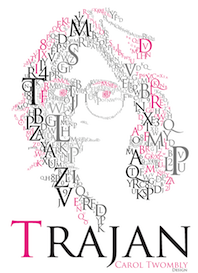 Wikipedia: Trajan is an old style serif typeface designed in 1989 by Carol Twombly for Adobe. The design is based on the letterforms of capitalis monumentalis or Roman square capitals, as used for the inscription at the base of Trajan's Column from which the typeface takes its name. Since the inscription and its writing form manifests in only one case, Trajan is an all-capitals typeface. Instead, small caps are commonly used, and a more complete set of glyphs contained in Trajan Pro (a 2001 update of the original typeface) includes a lower case of small caps. Although Twombly was the first to do a very literal translation of the Trajan inscription into type, a number of interpretations (with added lowercase alphabets) predate Twombly's, particularly Emil Rudolf Weiss' "Weiss" of 1926, Frederic Goudy's 1930 "Goudy Trajan," while Warren Chappell's Trajanus of 1939, while having similar forms for capitals has a markedly medieval lowercase. There are also numerous prominent typefaces that are not revivals, but owe a very clear debt to the Trajan letterforms, most notably Hermann Zapf's 1955 Optima.
 We learn also that Trajan is the font used on the Trojan brand of condoms. It is not a surprise, then, to see that it was adopted as the official font of Columbia University, Rice University, the University of Bologna, the University of the District of Columbia, the University of Kansas and the University of Rhode Island. It is also ubiquitous in the movie industry. John Berry discusses Trajan Pro 3 (a 2011 extension of Twombly's Trajan) and Trajan Sans (1989). Poster by Jorge Martinez (2013). [Google]
[More] ⦿
|
TSR and WotC Fonts
[Aardy R. DeVarque]
|
Aardy R. DeVarque's list of fonts used in TSR and WotC. No downloads, just identifications. [Google]
[More] ⦿
|
Twister
|
Font for the movie Twister, remade in 2007 by Kayleigh. Download here. Inside the font, we find the name Jens Ziehn, so maybe Kayleigh copied this font from Ziehn. [Google]
[More] ⦿
|
TypeType
[Ivan Gladkikh]
|
 Prolific Russian designer (b. 1986) whose real name is Ivan Gladkikh and working alias is Jovanny Lemonad . Jovanny lives in St. Petersburg. From 2003 until 2008, he studied audovisual engineering at The Bonch-Bruevich Saint-Petersburg State University of Telecommunications. In the early part of his career, most of his typefaces were free. In 2013, he set up the commercial type foundry TypeType. Most of his typefaces cover both Latin and Cyrillic.
 His typefaces include Scada Sans Two (2009), Furore (2009, octagonal), Fontin Sans Cyr (2009, the Cyrillic version of Jos Buivenga's Fontin Sans), Metro (2009, constructivist), Dited (2009, dot matrix: free), Days and Days One (2009, sans), and the attractive display typefaces Otscookie (2009, geometric and experimental), 20db (2008, high-contrast titling with didone features), Cuprum (2006-2012: a free sans family) and Molot (2008, with Roman Yershov). In 2008, he added to this list the grunge or handwriting typefaces FFUPuzzle, London (designed with Olga Kozlova) and Neucha (hand-printed), as well as the modern black display typeface 20db. Together with Eric Lebedco, he created the organic typeface Philosopher (2008). In 2006, he cooperated on the rounded Cyrillic typeface ZopaCyr. With Oleg Zhuravlev, he created the octagonal family Bender (2009, award winner at Paratype K2009). Creator of the corporate type family Ice and Flame (2009), an organic typeface based on Philosopher. CDMA (2010) is a rounded sans for corporate use. Nixie One (2011) is a free thin typewriter style face. Yeseva One (2011, as in "yes, Eva, bring me another beer") is a free ornamental serif face. Numans (2011) is a free wide sans face. https://fonts.google.com/specimen/Numans">Google download. Creations from 2012 include the frees typeface Oranienbaum (an antiqua created with Oleg Pospelov). He produced the free font Prosto (2012), which was designed by Pavel Emelyanov [see also Google Web Fonts]. Russo One (2012, Google Web Fonts) is a macho sans. Stalin One (2012) is a constructivist typeface co-designed with Alexey Maslov---it is free at Google Web Fonts. Typefaces from 2013: Imperial One (a free constructivist font based on the corporate font for the game role playing game The Mandate), Underdog (angular), Supermolot (an extension of his 2008 typeface Molot, a modern techie square grotesk with elements of Soviet style; extended in 2015 to TT Supermolot (by Olexa Volochay), in 2016 to TT Supermolot Condensed, and in 2018 to TT Supermolot Neue, by Roman Ershov, Marina Khodak, Nadezhda Polomoshnova, Ivan Gladkikh and the TypeType Team). In 2014, TypeType published TT Slabs (followed in 2015 by Olexa Volochay's TT Slabs Condensed), TT Drugs (by Nadyr Rakhimov, Phill Nurullin and Olexa Volochay: followed in 2015 by TT Drugs Condensed), TT Souses (hand-drawn sans family geared towards children's books and village design applications), TT Prosto Sans (followed in 2016 by Olexa Volochay's TT Prosto Sans Condensed), TT Rounds (a basic rounded sans typeface family by Olexa Volochay and Nadyr Rakhimov), TT Days Sans (TypeType: a pro version of his free font Days), TT Squares (an octagonal typeface family; see also TT Squares Condensed, 2016, by Olexa Volochay), TT Russo Sans), and TT Rounds Black. Typefaces from 2015: Free Ride, TT Compotes (a series of handcrafted typefaces), Hitch Hike (handcrafted typeface co-designed with Annastasia Samsonova), Accuratist (a hisper font by Jovanny Lemonad and Elena Shkerdina), Dita Sweet (a free art deco typeface co-designed by Ksenia Semirova and Jovanny Lemonad), TT Marks (a sign painting typeface family), TT Firs (a Scandinavian cold sans family, expanded in 2018 as TT Firs Neue by Philipp Nurullin and Ivan Gladkikh), Eleventh Square (art deco by Evgeny Tarasenko), TT Rounds Condensed, TT Books Script (a fifties style script), TT Crimsons (for short and emotional inscriptions), TT Masters (signage type), TT Inters (a great rhythmic script font), Frenchpress, TT Chocolates (a geometric grotesque with art deco hints), TT Bluescreens (30-style condensed sans family for movie trailers), TT Directors (designed for movie titling and trailers). Typefaces from 2016: TT Lovelies Script, TT Chocolates Condensed (by Olexa Volochay), TT Bells (an old style typeface family based om broad nib pens; by Nadyr Rakhimov and Olexa Volochay), TT Walls (a wall menu script family), TT Lakes (54 fonts in all; by Olia Leykina and Olexa Volochay), TT Corals (with Olexa Volochay: humanist sans typeface family), Bristol (children's hand), TT Octas (octagonal style, by Olexa Volochay), TT Teds (a narrow geometric sans family), TT Blushes (brush script), Romochka (handcrafted), TT Coats (a handcrafted antiqua), Bully (with Aigul Gilmutdinova), TT Rabbits (ten handcrafted typefaces for children's books, with substyles April, Bro, Chilli, Dummy, Elf, Fatso, Goody, Hyper, Idol, Junior), Suwikisu (free African-themed typeface based on a design by Egor Myznik), TT Moons (a condensed serif family), TT Cottons, Matias (by Vitaliy Tsygankov and Jovanny Lemonad), TT Pines (a sans based on paper cutouts). Typefaces from 2017: TT Backwards (an experimental script and grotesque font family inspired by the typographic scenery in the USSR in the late 70s and early 80s; by Tanya Cherkiz, Sergey Kotelnikov, Philipp Nurullin and the TypeType Team), TT Knickerbockers, TT Polls (modern modular slab serif inspired by American sports graphics; by Olexa Volochay, Tanya Cherkiz and Nadyr Rakhimov, TT Norms (by Nadyr Rakhimov and Olexa Volochay), TT Berlinerins (Script, Sans: based on vernacular type in Berlin, the sans emulates wood type), TT Milks, TT Pubs (didone; +Stencil), TT Limes (23 handcrafted typefaces, from Sans, to Slab and Dingbats), TT Hazelnuts (display sans). He also has a lively type blog (in Russian). Typefaces from 2018: Ivan Gladkikh and Pavel Emelyanov, with the technical assistance of Marina Khodak, Vika Usmanova and Nadyr Rakhimov, designed TT Commons. TT Commons is a universal sans family originally created for the branding and in-house use of TypeType, but it was finally released due to many requests. In 2018, Sofia Yasenkova, Philipp Nurullin, and Vika Usmanova designed the modern serif TT Tricks at TypeType. TT Tricks has many stencil styles. Still in 2018, Ivan Gladkikh, Alexander Kirillov, Philipp Nurullin, Vika Usmanova, Marina Khodak, and Nadyr Rakhimov published TT Severs. The TT Rounds family was reworked in 2018 into TT Rounds Neue by Ivan Gladkikh, Philipp Nurullin and the TypeType Team. At the end of 2018, TypeType published TT Supermolot Neue (Roman Ershov, Marina Khodak, Nadezhda Polomoshnova, Ivan Gladkikh and the TypeType Team). In 2019, Pavel Emelyanov and Ivan Gladkikh released the 20-style geometric sans typeface TT Hoves, which is intended for use in architecture, design, industry, science, astronomy, drawing, high tech, research, space and statistics. Typefaces from 2021: TT Commons Classic (a 24-style geometric sans by Ivan Gladkikh, the TypeType Team, Pavel Emelyanov and Marina Khodak; it includes two variable fonts). Alternate URL. Behance link---on Behance, he uses the name Ivan Gladkikh. Fontsquirrel link. Google font directory link. Klingspor link. Dafont link. Abstract Fonts link. Old home page. [Google]
[MyFonts]
[More] ⦿
|
Typocalypse Types
[Stefan Huebsch]
|
 Typocalypse Types was founded in 2009 by two students of communication design from the University of Applied Science in Trier: Kai Merker and Stefan Huebsch (b. 1981, Saarbrucken; Stefan Huebsch lives in Heusweiler / Saarbrücken in Saarland, Germany). Sven Fuchs joined some time later.
 Huebsch's first font, made in 2009, is Black No. 7---it was inspired by the Jack Daniel's Black Label Whiskey logo from 1866. Black No. 7 Vintage (2009) is a grungy version. In 2011, he created Lith, a hand-drawn headline typeface inspired by Alice In Wonderland and the Brothers Grimm fairy tales. In 2014, he published a spectacular 11-style font family, Lichtspiele, that takes inspiration from early 20th century movies, and more specifically, the film noir genre. In this series, Lichtspiele Neon 3D is of particular interest. Lichtspielhaus (2014) is an ultra-condensed version. Lichtspielhaus Handmade (2014) is the handwritten version---it was influenced by the hand-painted signs on cinema facades of the early cinema days. In 2015, we were treated to Lichtspielhaus Slab (ultra-condensed), and in 2016 to Lichtspiele Reklame (the ultra-condensed version). In 2017, Stefan Huebsch and Daniela Spinelli co-designed Konkret (a sharp-edged all-caps secret service sans with some left-leaning Kontra italics). Behance link. Creative Market link. [Google]
[MyFonts]
[More] ⦿
|
Typodermic
[Ray Larabie]
|
 Ray Larabie (b. 1970, Ottawa, Canada) ran Typodermic in Mississauga, ON, which opened in the Fall of 2001. In 2006, it moved to Vancouver, BC, and in 2009 it moved on to Nagoya, Japan. Dafont page. Ray Larabie has been making fonts since 1996, but those early fonts were freeware. His pre 2001 fonts are grouped under the label Larabie Fonts. In 2001, he set up Typodermic. Latest additions.
 The Typodermic fonts: - 2022: Biphoton (a monospaced sans with the same proporions as Letter Gothic 12), Valve (an industrial muffler shop font), Deception (a sub-pixel typeface with ten captivating effects---Deception Array (wide blocks), Deception Bars (text viewed through lenticular glass), Deception Blocks (as in heavy JPEG degradation), Deception Diamonds, Deception Lines (for a grayscale effect), Deception Particles, Deception Plusses, Deception Process (simulates grayscale LCD text or a thermal printer on the fritz), Deception Scanline (television picture tube text rendering), Deception System (1-bit dithering gone haywire)), Monofonto (a monospaced sans), Encercle Draft (permitting users to create numbers in borders), Encercle Sans, Heavy Heap (a groovy psychedelic typeface with a scorching look, reminiscent of 1960s hot-rod culture and die-cast toy vehicles), Ggx89 (a 48-style tightly spaced Swiss style sans family).
- 2021: Quadrillion (a 12-style rounded monoline sci-fi family), Mochon (a wall writing or chalk font based on the lettering of Donald Mochon, dean of the RPI School of Architecture until 1966; the Mochon samples were provided by an ex-student of Mochon, Karl A. Petersen), Steelfish Hammer (a subtly rustic version of Larabie's most popular typeface, Steelfish), Wavetable (sci-fi), Xyzai (an LED emulation font, described by Ray Larabie as a hardcore, Y2K-style techno typeface), Geoparody (a 12-style squarish typeface inspired by a late 1960s font called Anonymous), Typewriter Spool (122 fonts, modeled after the Underwood No. 5 typewriter font).
- 2020: Gravtrac (a 56-style condensed to crushed slab serif family inspired by mid-twentieth century classics like Univers 59 Ultra-Condensed, Helvetica Inserat and Compacta; +Greek, +Cyrillic), Vinque Antique (a rustic handcrafted blackletter in eight styles).
- 2019: Dealerplate (17 license plate styles for various states and provinces in the USA and Canada, current as of 2019; included are California, New York, New Jersey, Ohio, Illinois, Pennsylvania, Florida, Maryland, Michigan, Wisconsin, Massachusetts, Missouri, Washington, North Carolina, Virginia, Quebec, and Ontario), Kenyan Coffee Stencil, Good Timing, Steelfish Rounded, Bitcrusher (a consumer electronics / techno font), Galderglynn 1884 (a nineteenth-century style sans-serif typeface that exp[ands his Galderglynn Esquire).
- 2018: Cybermontage, Crack Man (a pac man font), Propaniac (a 1980s-style postmodern typeface inspired by a Pointer Sisters record sleeve which was designed by Shoot That Tiger Creative Services), Zelega Zenega, Spectrashell.
- 2017: Minicomputer (MICR style), Squirty, PCTL9600, PCTL4800 (retro techno), Ultraproxi (semi-monospaced and influenced by the high speed computer printers from the 1950s to 1970s), Toxigenesis (techno sans), Venus Rising, Vanchrome (a compact sans-serif headliner with chromatic layers), Krait (a layered geometric typeface designed for architectural display), Xylito (a layered font for chromatic or 3d effects).
- 2016: Refuel (octagonal, based on military aircraft markings), Expressway Soft (a sans-serif font family inspired by the U.S. Department of Transportation's FHWA Series of Standard Alphabets, also known as Highway Gothic), Conthrax (squarish, techno), Cornpile (cartoonish), Electric, Evensong (art deco), Fledgling (a very tall typeface), Gymkhana (sans), Remissis (sans), Sunday Evening (a reverse contrast typeface), Meloche (Meloche is a unique grotesque sans-serif typeface influenced by hand-painted French signs of the late nineteenth century. It's available in 7 weights and obliques).
- 2015: Canada 150 (a custom font for the Canadian government; see here, here, this coverage regarding the Inuktitut part of the font, and this reaction by the curmudgeons in Toronto who complain that Ray did this work for free), Autoradiographic (sans family), Built Titling (for compact headlines), Chickweed Titling (cartoon titling font), Cardigan Titling (flared headline face), Bench Grinder Titling, Kleptocracy Titling, Palamecia Titling (rounded black comic book typeface), Quasix Titling, Galderglynn Titling (all caps sans family from hairline to black), Mixolydian Titling, Stormfaze (a sci-fi font started in 1996 and finished in 2015), NK57 Monospace (a 60-style programmer typeface), Gargle, Athabasca (a sans family designed for the rugged Canadian oil patch).
- 2014: Mesmerize (a large free sans family), Kingsbridge (a large slab serif family with sharp points on the A, M, N, V and W), Manbow (a layered geometric art deco display font which includes solid, clear, stripe, polka-dot and screen patterns), Breamcatcher (an all caps art deco font inspired by the piano sheet music for With Every Breath I Take which was featured in the Bing Crosby/Kitty Carlisle musical comedy film, Here is my Heart), Kilsonburg (Dutch deco based on an old Vogue magazine cover), Uchiyama (poster typeface), Goldsaber (art deco design), Vexler Slip (unicase), Rakesly, Dacquoise, Pretender, Rimouski (a rounded geometric font family), Nulshock (techno), Recharge (techno/industrial font), Interrogator Stencil, Strange Alphabets (arts and cratfs font), Angerpoise Lampshade (free).
- 2013: Numbers With Rings, Shookup (funky cartoon font), Pastrami on Rye (cutout comic book style), Chickweed, Built (a condensed headline sans), Fluctuation (a softly rounded elliptical sans family), Astrochemistry (sci-fi, techno with rounded edges), Snasm (sci-fi).
- 2012: Engebrechtre (2000-2012), Die Nasty (1999-2012: free), Strasua (1999-2012), Planet Benson (1997-2012), Husky Stash (1998-2012), Barbatrick (1999-2012: a speed emulation font), Zero Hour (1997-2012), Urkelian (1998-2012: very condensed), Zolasixx (inspired by the video game Zaxxon), Ampacity (neon font), Chromakey (a space deco headline font inspired by box art classic video games including Matrix Marauders and Magical Chase), Disassembler (1980s style bitmap font), Zerbydoo (a dot matrix family), Superego (a geometric-techno font inspired by the cabinet graphics for the 1981 Stargate arcade game), Rukyltronic (a set of dot matrix typefaces), Nerdropol (pixel family), Gulkave (rounded pixel font), Cyclopentane, Palamecia (a fat finger poster face), Gameness (a 1990 retro industrial deco font), Camulogen (headline face), Color Basic (a pixel typeface inspired the by TRS-80 Color Computer), Triac Seventy One (a funky face), Acroyear (retro all-caps headline font), Troll Bait, Strenuous (unicase), Permanence (a retro=futuristic font based on Alvin Toffler's cover of Future Shok, 1970), Clockpunk (octagonal and quaint), Battlemaze (trekkie face), Mixolydian (industrial sans).
- 2011: Ugocranis (a brutalist typeface), Clipwave, Wheaton (MICR-inspired), Mango Scribble, TRS Million (dot matrix face), Ugogranis (constructivist), Gomoku (paper cut face), From The Internet.
- 2010: Cranberry Gin (2010, octagonal), Restore (all caps, geometric sans), From The Stars (an elliptical techno family done with Chikako Larabie), Thrusters (space age face), Dream Orphanage, Dream Orphans (2000-2012), Kengwin (rounded slab serif), Gleaming The Cube (Greek simulation face), Vectipede (a slab serif family), Great Escape (an elliptical sans family), Subrocs (connected script), Hackensack (with Chikako Larabie), Polarband (bilined stackable headline face), Naked Power, Special Forces (a great macho slab serif headline face---watch for awards to roll in), Warugaki (handpainted), Warmer, Honfleur (art deco; with Chikako Larabi), Voivode (a headline typeface done with Chikako Larabie), Hachimitsu (Asian look face, done with Chikako Larabie), Kadeworth (rounded retro look sans, done with Chikako Larabie), Gnuolane Jump (2010, with Chikako Larabie), Markerfield (brush), Board of Directors (Bank Gothic style family, done with Chikako Larabie), GGX88 (a Swiss sans family), Body Goat, Reversal, Gord (techno), Computechnodigitronic (LED, LCD geek-look font), Bench Grinder, Inklea (a bubbly face), Skygirls (retro brush script), Gloss (a paint brush typeface based on Champion, 1957, G.G. Lange), Galderglynn Esquire.
- 2009: Maqui (an industrial headline sans family), Zingende (art deco family: caps only), Misadventures, Gaz (large retro sans family), Acrylic Brush, Enamel Brush (a digitization of Catalina, 1955, Emil J. Klumpp), DDT (neutral sans), Thump (fat, casual), Desperate Glamour, Pricedown (an update of his free 1990s font, patterned after the lettering on The Price Is Right show), Mitigate (monoline and slabbed; has some typewriter styles), Catwing, Walken (slab serif stencil), Silicone (soft rounded sans family), Movatif (sans), Gunplay (a stencil family inspired by the poster for the 1972 Steve McQueen/Ali MacGraw film The Getaway), Fragile Bombers (octagonal), Forgotten Futurist (techno sans, 19 styles), Bullpen (slab serif), Coolvetica (35 styles), Duality, Good Times, Strenuous, Shlop (paint-drip style), Dirty Baker's Dozen (stencil), Junequil (VAG Rounded style), Owned (graffiti), Domyouji, Threefourtysixbvarrel (stencil), Enacti, Uniwars (futuristic, 16 styles).
- 2008: Madawaska (a rugged slab serif), Ebenezer (grunge), Gnuolane Stencil, Raincoat, Report School (avant garde sans), Jesaya, Carouselambra (art nouveau), Debusen (rounded), Barge (military font), Renju (2008, potato or rubber stamp print face), Otoboke (handlettered), Hit (informal hand), R6 D8 (futuristic sans family), Rexlia (an octagonal machinistic family), Hybrea (a display sans with TV screen rounding), Sweater School, Tussilago (2008, a neutral sans family), Presicav (extended sans), Hover Unit, Addlethorpe (grunge), Scheme (rounded sans), Usurp (bouncy poster lettering), Negotiate (technical sans family), Divulge, Sewn, Gnoulane (condensed sans), Moja, Teeshirt (old typewriter face), Pound (art deco marries grunge), Graveblade (heavy metal font), Synthemesc (psychedelic anti-Starbucks font), Chysotile (white on black grunge), Cardigan (sans), Gurkner (balloon style), Reagan (grunge).
- 2007: Tight (a copy of Dean Morris's 1976 Letraset chrome font Quicksilver), Headlight, Meloche (a 3-style grotesk), Octin Spraypaint (grunge stencil), Octin Vintage (grunge), Bouffant (script), Octin Prison (stencil), Octin Sports (octagonal), Octin College (octagonal, for sports jerseys), Octin Stencil (free octagonal font family), Burnaby Stencil (stencil), Superclarendon, Conceal, Ohitashi, Stud (grunge), Bristles (grunge), Skirt, Cotton (grunge), Kelvingrove (a bit of copperplate gothic, rounded and shaved), Augustine, Containment, Snowa, Veriox, Scrubby, Transmute, Sheaff, Injekuta (techno), Rinse (grunge), Polyflec, Domyouji (square sans), Winthorpe (old style), Cutiful (script), Flyswim (grunge), Dirtstorm (spray-painted stencil), Shnixgun (grunge), Neuzon (grunge), Oxeran (old typewriter), PRINTF (grunge all caps monospaced), Akazan (sans), Nyxali (a metal tag face), Nesobrite (25 styles of Bank Gothic lookalikes), Meloriac (a heavy headline sans inspired by Futura), Walnut (graffiti face), Gnuolane (a narrow superelliptical sans), Edifact (a damaged computer font), Darkheart, Stampoo (squarish), Raymond (rough script), Hayate (oriental look), Telephoto. The entire Octin series is free at DaFont.
- 2006: Octynaz (grunge), Paltime (ornamented), Jolie Ecriture Desard (children's hand), Mango (comic book face), Desard (child's hand), Bulltoad, Lerku (eroded serif), Charbroiled (also eroded), Ceroxa (eroded stencil), Nagomi (a chiseled-look Asian font based on calligraphy of Chikako Suzuki from Nagoya), Whiterock, Yellande, Chilopod (a futuristic typeface inspired by the logo from the 1980s videogame, Atari Centipede), Order, Goldburg (based on a typeface by George Bowditch, 1957), Laserjerks (2006, brutalist), Milibus (futuristic), Bonobo (serifed), Ohitashi, Sarasori (TV-tube shaped typeface in the style of Oban), Structia (an octagonal family), Betaphid (octagonal), Gendouki (futuristic stencil), Slugger (athletic lettering), Marianas (a gorgeous art deco face), Lineavec (octagonal), Corzinair (serif family), Buxotic (a great caps face), Cinecav X (for closed caption TV and DVD), Salsbury (comic book face), Lonsdale (loosely based on a font called Parkway Script, which was designed by Emil Hirt in 1964), Alepholon (futuristic), Kwokwi, Mikadan (a tribute to Stephenson Blake's Verona from 1948, which was in turn based on William Dana Orcutt's Humanistic from 1904), Marion (2012: a beautiful transitional family adopted as a standard Mac OS X font), Quasix (hookish), Skraype (grunge stencil), Bleeker (casual lettering), Linefeed (monospaced line printer font), Draculon (a casual typeface inspired by the letterforms of William Orcutt's humanist font from 1904 which was in turn based on an Italian manuscript from 1485), Mahavishnu (a mix between 1970s psychedelics and art nouveau), Doradani (a corporate identity sans family), Korotaki (futuristic).
- 2005: Beat My Guest, Kadonk (a Halloween face), Report (a VAG-Rounded style face), Croteau (a poster face), Heroid (ook face), Barrista (informal script), Wyvern (sans serif), Wubble (like puddles of water), Caryn (casual script), Folder (a rigid sans family), Venacti (a futuristic family), Xenara (a keyboard lettering family), Emory (a destructionist sans family), Ligurino (neat sans&serif family), Biondi (update of Copperplate Gothic; followed in 2010 by Biondi Sans; these copperplate style typefaces are in the style of AT Sackers), Byington (Trajan column lettering), Sayso Chic, Expressway (28 weights, a highway signage family), Algol (pixel type), Meposa (fat display face), Tandelle (condensed), Vigo, Maychurch, Mecheria, Vactic (dot matrix), Zosma, Topstitch, Windpower, Llandru, Soap (a creative extension of Cooper Black, with dingbats), Kleptocracy (1999-2005), Owned, Rimouski (sans), Burnstown Dam (2005, a wooden plank font), Sinzano (sans with opentype ligatures galore; compare, e.g., House Ed Interlock), Zamora.
- 2004: Affluent, Threefortysixbarrel (stencil face), Tank, Telidon (dot matrix face), Funboy, Neuropol X, Neuropol Nova, Mufferaw (comic book face), Larabiefont, Zekton (techno), Strenuous 3D, Silentina (advertised as "a silent movie font"), Amienne (brush script), Fenwick Outline (free), Betsy Flanagan (1998, a keyboard face), Boopee (children's handwriting), Pirulen (in the general Bank Gothic style), Zalderdash.
- 2003: Zupiter, Blue Highway.
- Before 2002: the dot matrix family Telidon, Telidon Ink, Butter Belly, Almonte (1999), the architectural font Jillican (octagonal), Snowgoose, Bomr, Pakenham, Neuropol, Nasalization, Fenwick, Kleptocracy DLX, Sui Generis, Dirty Bakers Dozen (faded stencil), Minya Nouvelle, Asterisp, Chinese Rocks, Jillsville (great artsy Courier), Ulian, Wevli (including Wevli Dingbats), Sappy Mugs (funny mugshots), Sofachrome (1999, inspired by Pontiac car emblems), Eden Mills (1999).
MyFonts interview. Fontspace link. Fontspring link. Catalog of the typefaces in the Larabie Fonts collection. Klingspor link. Catalog of the Typodermic library in decreasing order of popularity. Extensive (large page warning) Typodermic catalog. Font Squirrel link. Creative Fabrica link. Fontsquirrel link. Fontdaily link. [Google]
[MyFonts]
[More] ⦿
|
UK Britney
[Steve Bevis]
|
Designer (Steve Bevis?) of "In the Zone Dingbats". Elswhere you can download Britney Jean Spears Dingbats (2005, Jennifer Paige). [Google]
[More] ⦿
|
V. Sarela
[Yautja]
|
 [More] ⦿
|
Víctor García
|
 Argentinian graphic and type designer (b. 1948) based in Buenos Aires. He was creative director, art director and graphic designer at several advertising agencies in Buenos Aires, which led to various exhibits such as at the Biennale of Brno and the Japan Design Foundation in Osaka. His type presentation won an award at the XIV-th. International Computer Art competition. He is an occasional contributor to design publications and has been a correspondent of the Munich magazine novum since 2002. His works have been published in Argentina, Japan, Germany, Great Britain, Spain, and the United States. '
 His type designs include: - MotionBats (2009).
- GarciaToons (2008): GarciaToons Bunny, GarciaToons Cat, and GarciaToons Mouse are the styles. Garcia Toons won an award at Tipos Latinos 2010.
- Ole Flamenco-Ole Torero (2004). Ole Flamenco-Ole Torero won the tpG Prize at Letras Latinas, 2nd Latin American Type Biennial (2006). The dingbat typefaces Ole Flamenco and Ole Torero were both published by Neufville Digital.
- Bix Bats (2003). The styles are called Arrow, Funny, Shiny and Wired. The family was published as part of the Linotype Taketype 5 collection.
- Tangomaniacs (2002). As part of Taketype 4 at Linotype, he made the extratangordinary superpassodoble dingbat fonts Linotype Tangomaniacs Day and Tangomaniacs Night (2002).
- Bix Plain (2000, Linotype).
- Zootype (1997-1999): 2nd Prize at the 2nd International Type Design Contest, Linotype Library (1997). In this ingenious font, animals appear out of nowhere in the characters. Stylish, classy, and above all, perfect. At Linotype, we can find Zootype Air, Land and Water (1999). Dedicated web page.
For other work, see a design done in 2001 for the Japan Design Foundation. MyFonts link. FontShop link. Klingspor link. Behance link. View Victor Garcia's typefaces. [Google]
[MyFonts]
[More] ⦿
|
Van Helsing
|
Van Helsing is a 2004 American horror film written and directed by Stephen Sommers. It stars Hugh Jackman as vigilante monster hunter Van Helsing, and Kate Beckinsale as Anna Valerious. The eponymous character was inspired by the Dutch vampire hunter Abraham Van Helsing from Irish author Bram Stoker's novel Dracula. Typefaces based on or inspired by the Van Helsing character and movie include Van Helsing (2005, Jens R. Ziehn), Helsing (2014, Great Lakes Lettering), Helsing (Magic Hand Studio) and Van Helsing (2002, Nate Piekos). [Google]
[More] ⦿
|
Vanielle
|
 Designer at FontStruct in 2008 of the dingbats Kitchen Floor and We Like Sheep, and of Film (a film strip font), Candy Kane (diagonally striped glyphs) and Empire Line (octagonal and geometric).
 In 2009, she made Simple Jane (blackboard bold) and Toy Blocks (3d). In 2010, she added the texture typeface Simply Stitching. [Google]
[More] ⦿
|
Viacom
|
Viacom Internet Services Inc holds the copyright of The Survivor Font (2000). They also made Blue's Clues (1999). [Google]
[More] ⦿
|
Vincent Nespoulous
|
Vincent Nespoulous (b. 1980) created the display typeface Beetlejuice (2013) during his studies in Chambéry, France. It was inspired by the Beetlejuice movie. In 2017, located in Aix-les-Bains, France, he designed the geometric solid typeface Alfred Geo. [Google]
[More] ⦿
|
Vit Condak
|
Ostrava, Czechia-based designer of these free fonts: Gunny Handwriting (2003), Tincushion (2003-2014), Hieroglyphic (2002, paperclip font), Fashionism, Milanotica (2012), Gunny Rewritten (2014), Blrrpix Strict (2014, pixel face), Kvantita (2014, script), Simply City (2014, organic sans). Typefaces from 2015: Jack Brusher (brush font), Gunny Manual, Gomes Strikes Agaian, Octagonal, Fashionism (thin sans), Bublina The Dog (comic book face), Quality of Life. Typefaces from 2016: Residualni (brush calligraphy), Ales&Hegar Raw (outlined party present font; inspired by the book "Mladezi" by Mikolas Ales (1852-1913). Its cover was designed by Milan Hegar who tried to imitate Ales's ornamental upper case letters from the original 1910s magazines). Typefaces froom 2017: Vitkova Pisanka (handwriting type loosely based on what was taught in Czech elementary schools in the 1980s), Ruffiano & Loseri, Eighties Monster (outlined and textured sans). Typefaces from 2018: Bublina The Mongrel (comic book script), Whatacolor (a watercolor brush font), Indiana Jones (his take on the font from the Indiana Jones logo), Pixlashed, Krasomila (hand-drawn letters used in credits of the movie Pysna princezna (The Proud Princess) (1952)). [Google]
[More] ⦿
|
Vladimir Nikolic
|
 Belgrade, Serbia-based designer (b. 1981) of these typefaces:
 - The dingbat fonts Canavarlar (2020: funny men), Haircut (2020: women's hairdos), Ornament Borders (2020), Gourdy (2020: birds), Lizards (2020), Mantra (2020), All Star (2020), Speel (2020), Soavely (horses) (2020), Forma (2020), Hell Beasts (2020), Mistresses (2020), Paraiso (2020), Crow (2020), Traverser (2020: crosses), Cats (2020), Dogs (2020), Negative-Heads (2020), Otu (2020), Wakazi (2020), Risk (2020), Wurm (2020), Beard Man (2020), Hoder (2020), Damen (2018), Damen 2 (2020), Foliga (2020), Solo Drinker (2020), Congress (2020), Farmacy (2020), Elections (2020), Emergency (2020), VN Arrows (2020), Hexagonos (2020), Automobiles (2020), Cars (2020), Emoji Boom (2020), Bestia (2020), Aliens (2020), Insect (2020), Bytost (2020), Monstero (2020), Aveto (2020), Dancing Cat (2020), Atradimas (2020), Womanhood (2020), Figur (2020: an alien insect font), Halfwits (2020), Silly Donkey (2020), Crazy Monkey (2020), Round Masks (2020), The Quick Dog (2020), Flying Birds (2020), Maskid (2020), Monstra (2020), Bull Skulls (2020), War Items (2020), Public Transport (2020), Loomad (2020), Mokhabiso (2020: African patterns), Record (2020), Mulher (2020), Heroez (2020), Bulls (2020), Madarak (2020: birds), Bold People (2020), Munari (2019: a collection of drawings based on Bruno Munari's book "Artista e designer" from 1966), Screws (2019), White Mouse (2019), Schepselen (2019), Glatze (2019), Crosses (2019), Chefs (2019), Diamond Blocks (2019), Hexagons (2019), Maumbo (2019), Circles (2019), Enfeite (2019), Pigs (2019), Mythos (2019), Kreaturen (2019), Baby Alien (2019), Body Moving (2019), Various Boys (2019), Lines and Objects (2019), Mouvman (2019), Watch (2019), Credit Card (2019), Cycles (2019), Devil Emoji (2019), Fare (2019), Mund (2019), Labbra (2019), Circular Ornaments (2019), Cranium (2019), Ugok (2019), Ansigter (2019), Tsim (2019), Schmetterlinge (2019), Jungfrau Maria (2019: religious icons), Knights Helmets (2019), Kinderskizzen (2019), Wolves (2019), Various Cats (2019), Owls (2019), Spiral Object 3D (2019), Zodiac Signs (2019), Cyborg (2019), Duck (2019), Cat 3D (2019), Object 3D (2019), Circle and Line (2019), Various Girls (2019), Dulcet (2019), Erotic Symbols (2019), Frauen (2019), Pierre the Vampire (2019), Robotter (2019), Middle Finger (2019), Claudio The Cat (2019), Medusa (2019), Veggie (2019), Pablo (2019), Fishes (2019), Dream of Picasso (2019), Stam (2019), Animality (2019), Ink Drops (2019), Faces (2019), Bayan (2019), Froggy (2019), Senhoras (2019), Diamondo (2019), Skallen (2019: skulls), Swimmers (2019), Churches (2019), Easter Icons (2019), Lippen (2019), Gullar (2019), Bankwesen (2019), Creatures with Horns (2019), Vehicles (2019), Various Hands (2019), 3D Animals (2019), Abantu (2019), Herr (2019), Menge (2019), Funny Aliens (2019), Mustachos (2019), Kids Drawings (2019), Tierfarm (2019), Troep (2018), Women Heads (2018), Cats and Dogs (2018), Wanita (2018), Eyez (2018), Animales (2018), Peoples (2018), Mobile Icons (2018), Controllers (2018), Womano (2018), Lost in Space (2018), Blumen (2018: flowers), Tetriso (2018), Snowflake (2018), Meine (2018: masks), Horoscopicus (2018), Esoterica (2018), Astrologicus (2018, astrolical symbols), Abbild (2018: African masks), Being (2018: monsters), Gebell (2018), Headed (2018), Falter (2018), Filling (2018), Anichka (2018), Cyclopia (2018), Buggus (2018), Opa (2018), Messe (2017), Head of Idol (2018), Diavolo Nero (2017: funny silhouettes).
- The boxed or encircled alphabets Audience Capitals (2020), Galileo (2020), Compare (2020), Compare-Light (2020), Hexagonas (2020), Select (2020), Before (2020), Before-Dark (2020), Boxes (2020), Boxes-Extravagant (2020), Boxes-Fancy (2020), Calf-Negative (2020), Capital-Relationship (2020), Pyxidas (2020), Capitalica (2020), Tundra (2020), Ordinary Capitals (2020), Broadway Capitals (2020), Browser Capitals (2020), Capitalismo (2019), Schwarzenberg Capitals (2019), Retrospective Capitals (2019), Official Capitals (2020), Impression (2020), Oriental (2020), and Letters in Circles (2018).
- Shadowed caps: Cleopatra (2021), Farmers Market (2021), Erkekler (2021), Assignation (2021), Greek Tragedy (2021), Distorted (2021), Lightshow (2021), Credenza (2021), Ragusa (2021), Comunismo (2021), Scordia (2021), Gazelle (2021), Organ (2021), Strizhi (2021), Umoya (2021), Ninja Justice (2021), Unlimited (2021), Unicorns (2021), Labyrinth (2021), True Artisans (2021), Poker (2021), Donald (2021), Ferrari (2021), Booster (2021), Madness (2021), Favorita (2021), Vitamin (2021), Robot (2021), Robust (2021), Engine (2021), Whether (2021), Nucleus (2021), Trunk (2021), Ombre (2021), Viscosus (2021), Jewelry (2021), Verge (2021), Pursue (2021), Keener (2021), Visor (2021), Korvo (2021), Squash (2021), Scum (2021), Darker (2021), Education (2021), Cimice (2021), Tomb (2021), Bambola (2021), Calla (2021), Rump (2021), Complex (2021), Razor (2021), Driveller (2021), Karambol (2021), Princino (2021), Berger (2021), Adopted (2021), Bugbear (2021), Samara (2021), Talisman (2021), Waterway (2021), Megabus (2021: a marquee font), Roller (2021), Numerica (2020), Bond (2020), Gloom (2020: a marquee font), Chalkboard (2020: sketched), Unboxing (2020: techno), Antennas (2020), Secca (2020), Umfo (2020), Sabbia (2020), Squirrel (2020), Byzan (2020), Debtor (2020), Bridge (2020), Familie (2020), Lake (2020), Roma (2020), Tissue (2020), Bombay (2020), Osteology (2020), Restroom (2020), Speaker (2020), Bebika (2020), Center (2020), Gismo (2020), Fierce (2020), Gambler (2020), Afterparty (2020), Birdbrain (2020), Boner (2020), Divine (2020), Gelatin (2020), Lost (2020), Marshland (2020), Quadri (2020), Shadow (2020), Stairs (2020), Superba (2020), Techno (2020), Underman Book (2020), Wired Capitals (2020), Fineliner (2020), Fictive Kinship (2020), Exotica (2020), Ural (2020), Devianza (2020), Kultur (2020), Unmute (2020), Antiqua (2020), Chains (2020), Scheme (2020), Stumble (2020), Aroma (2020), Beans 2 (2020), Cover (2020), Cronica (2020), Fundament (2020), Horna (2020), Loce (2020), Mademoiselle (2020: art nouveau), Melodia (2020), Penny (2020), Taikun (2020), Assault (2020), Athletica (2020), Baraka (2020), Brassica (2020), Builder (2020), Chancellery (2020), Gwara (2020), Pliez (2020), Recinzione (2020), Right (2020), Rimes (2020), Seal (2020), Service (2020), Scorpions (2020), Terraces (2020: American flag font), Wedding Cabbage (2020), Wild Girl (2020), Tragedy (2020), Indos (2020), Starfish (2020), Vintage (2020), Adriatica (2020), Funeral (with American flag texture) (2020), Voleur (2020), Calzino (2020), Peshkop (2020), Metzger (2020), Asshole (2020), Puppet (2020), Broeksel (2020), Hals (2020), Escort (2020), Vortex (2020), Dades (2020), Boild Hedgehog (2020), Mermer (2020), Grower (2020), Rainbow (sketched) (2020), Baise (2020), Necklace (2020), Angels (2020), Smuggler (2020), Dommage (grungy) (2020), Squalor (2020), Fusto (2020), Course (2020), Fisheye (2020), Baiser (2020), Banda (2020), Cantaloupe (2020), Canto (2020), Begriff (2020), Trapeze (2020), Arabeska (2020), Silver (2020), Wasco (2020), Kosaken (2020), Triangle (2020), Banquet (2020), Demode Capitals (2020), Cultus Capitals (2020), Idiot Capitals (2020), Granary Capitals (2020), Liberta (2020), Montblanc (2020), Granary (2020), Blanket (2020), Tuyaux (2020), Wolf (2020), Comeback (2020), Oliba (2020), Idiot (2020), Trailer (2020), Bricks (2020), Toys (2020), Luxury (2020), Hertz (2020), Signal (2020), Serenada (2020), Kurven (2020), Schnecke (2020), Mona (2020), Sierra (2020), Search (2020), Tranchante (2020), Eccentric (2020), Fast (2020), Mosquito (2020), Speed-of-Light (2020), Thanks (2020), Album (2020), Boyhood (2020), Ending (2020), Trend (2020), Universal-Serial-Bus (2020), Fixed (2020), Kings (2020), Holiday (2020), Range (2020), Numbers (2020), Shipman (2020), Officer (2020), Video (2020), Order (2020), Route (2020), Cosa-Nostra (2020), Clowns (2020), Unique (2020), Voyeur (2020), Shape (2020), Brigadier (2020), Allora (2020), Spartacus (2020), Advisor (2020), Ambis (2020), Cables (2020), Genesa (2020), Horse (2020), Laptop (2020), Pork (2020), Mafioza (2020), Mucho (2020), Athens (2020), Audience (2020), Rotor (2020), Mundo (2020), Olympus (2020), Border (2020), Scale (2020), Survival (2020), Trouble (2020), Turnabout (2020), Catharsis (2020), Parade (2020), Discoteque (2020), Rude (2020), Fame (2020), Safran (2020), Ausweis (2020), Mechanica (2020), Moscowian-Party (2020), Beers (2020), Strengthen (2020), Tempo (2020), Unreal (2020), Poetico (2020), Bach (2020), Bach-Fat (2020), Energy (2020), Alexandra (2020), Basket (2020), Cushion (2020), Model (2020), Organiser (2020), White (2020), Anabela (2020), Cannibal (2020), Casablanca (2020), Castle (2020), Control (2020), Crazy (2020), Crazy-Gradient (2020), Emotion (2020), Honey-Bunny (2020), Knockout (2020), Linearo (2020), Murmure (2020), Polished (2020), Reon (2020), Sparrow (2020), Storms (2020), Street-Stars (2020), Franchise (2020), Pencil (2020), Ruanda (2020), Pepito (2020), Megalomania (2020), Rouleaux (2020), Frozen (2020), Together (2020), Saldo (2020), Museum (2020), Network (2020), Hunk (2020), Cultus (2020), Creator (2020), Flow (2020), Blocchi (2020), Possession (2020), Bad Germans (2020), Discounted (2020), Traversal (2020), Mangalica (2020), Murmansk (2019), Summer Candy (2019), Question (2019), Second Channel (2019), 3D Models (2019), Memory (2019), Computer (2019), Diversity (2019), Elastic Letters (2019), Businessman (2019), Kuchen (2019), Demode (2019), Objective (2019), Medication (2019), Nonsense (2019), Plagiat (2019), Toledo (2019), Tricks (2019), Common (2019: a trompe-l'oeil font), Mafia (2019), Releases (2019), Extradition (2019), Shoot To Kill (2019), Groowing (2019), Enough (2019), President (2019), Silence (2019), Dressed (2019), Already (2019), Hocus Pocus (2019), Password (2019), Ready (2018) and Messages (2017).
- The ornamental caps typefaces Mahal (2021), Stamp (2021), Hell Door (2021), Tangram (2021), Custom (2021), Remake (2021), Studio (2021), Adagio (2021), Oxidizer (2021), Mondial (2021), Paraglide (2021), Tattoo (2021), Developer (2021), Dama (2021), Lobby (2021), Gabaritos (2021), Sence (2021), Ombre (2021), Cresa (2021), Anniversary (2021), Wire (2021), Triton (2021), Lamina 92021), Hangup (2021), Years (2020), Dowry (2020), Sephora (2020), Jewels (2020), Straightforward (2020), Dance (2020), Necklace (2020), Maria (2020), Taxi2 (2020), Outlaw (2020), Combat (2020), Chewed (2020), Fantasy (2020), Observation (2020), Cure (2020), Pioneer (2020), Near (2020), Kleid (2020), Unitas (2020), Tomato (2020), Blader (2020), Canal (2020), Baked Snails (2019), Alcoholic (2019), Bonjour (2019), Zylinder (2019), Phenomenal (2019), Surfaces (2019), Success (2019: as in De Stijl), Retailer (2019: multilined), Havana (2019: multilined), Mechanismo (2019) and Pencil Letters (2019).
- The display typefaces Trader (2020), Oysters (2020), Furious Ride (2020), Portfolio (2019), Pontos (2019), Swordsman (2019), Regular (2019), Andrey (2019), Retrive (2019), Connected (2019), Locator (2018), Tracking (2018), Iceberg (2018: snow-capped letters), New Amsterdam (2018), Ana (2018), Enemy (2018), New Yorkers (2018), Happy Day at School (2018), Focused (2018), Modish (2018), Beholder (2018) and Principality (2017).
- The alphadings Birthdays and Parties (2021), Bahanalia (2020), Icecreams (2020), Brailler (2020), Night Dreams (2020), Flower Capitals (2020), Jingle Bells (2020), Neuron Capitals (2020), Easter Time (2020), Hearts and Arrows (2018), Penguins (2018), Kitties (2018), Doggy (2018), Teddy Bears (2018), International Capitals (2018), Aafia Capitals (2018), Answer Capitals (2018), Beholder Capitals (2018).
- The circuit font Simple Repairs (2021).
- The 3d typefaces Sharp (2021), Edited (2021), Three Dimensions (2020), Rental (2020), Shiny Blocks (2020), Turbulence (2020), Labor (2020), Worship (2020), Fantasy-3D (2020), Zucker (2020: stacked blocks) Perfetto (2020), Rude-3D (2020), Lover (2020), Kasten (2020), 3D Models (2019), Tricks (2019) and Metallic (2019).
- The multiline typefaces Yiphi (2021), Porker (2020), Formula (2020), Laguna (2020), Hypochondria (2020), Majestic (2020), Vibes (2020), Tubes (2020), Yogurt (2020), Turkish (2020), Question (2019), Pancake (2019), Remained (2017), Liquidrom (2018), Second Channel (2019), 3D Models (2019), However (2019), Confarreatio (2018) and Fudged (2018).
- The textured typefaces Incompetent (2021), Autumn (2021), Sangria (2021), Studio (2021), Kino (2021), Elixir (2021), Espace (2020), Mistress (2020), Heritage (2020), Silicone (2020), Hornettio (2018), Ignorant (2018), Americans (2020: the American flag embedded into the glyphs), Pollution (2020), Jakob (2019), Diversity (2019), Townscape (2019), Patriotic (2019: American flag theme), Meshes (2018), Complained (2019), Duration (2018) and its solid counterpart, Duration Book (2018).
- The Slavonic emulation typeface Russian Land (2017) and the Cyrillic emulation typefaces Monarch (2021), Cold War (2021), Beograd (2020), Ukrainian Princess (2019), Territory (2019), Kalinka (2019), Rubles (2018), Maniac (2018), Jurij (2018), Kachusha (2018), Soviet Program (2018), Armenia (2017), Fontograd (2018) and Russian Spring (2017).
- The constructivist typefaces Tokarev (2017), Russiano (2018), Suggested (2018), Hungaria (2018) and Schwachsinn (2018).
- Art deco typefaces: Cavalier (2021), Performer (2021), Angelica (2019), Protocol (2019), Retrospective (2019), Leculier (2018, after an alphabet in Georges Leculier's art deco lettering book from ca. 1930), Better (2018), Critical (2017).
- Art deco caps: Reverse (2020), Bathroom (2019), Idiotism (2019).
- The chess fonts Schach (2020) and Wisdom Chess (2020).
- The weather icon font Weather Symbols (2020).
- The decorative sans typefaces Shock (2021), Energia (2021), Pitviper (2021), Nemesis (2021), Addiction (2021), Nehad (2021), Chewer (2021), Nightfall (2021), Gourmet (2021), Flipside (2021), Layered Letters (2019), Imbecile (2019), Answer (2018), Hours (2018), Abandoned (2018), Sea Gardens (2017), Forvertz (2018), Yeysk (2018) and Closeness (2018).
- Sans: Wollicht (2021), Ministro (2021), Lonely (2021), Noix (2021), Messina (2021), Samara (2021), Rickrack (2021), Broadcaster (2021), Catamaran (2021), Official (2019).
- Comic book fonts: Reset (2021).
- Artsy fonts: Hornstick (2021), Kikundi (2021), Shanghai (2021), Skewed (2021), Company (2021), China (2020).
- The headline sans typefaces Finance (2020), Marija (2020), Fashion (2020), Magazine (2020), Policemen (2020), Impressum (2019), Educated Deers (2019), Hindenburg (2019) and Fixation (2018).
- The rounded organic sans typefaces Hofmann (2020), Adelino (2020), Available (2018) and Biysk (2018).
- The handcrafted typefaces Diana (2020), Flood In London (2019), Milord (2018), Sex and Breakfast (2018), Sweet Handwrite (2018), Industrial Revolution (2018), Oh Maria (2017), Sofija (2017) and Travelling (2017).
- The bubblegum typefaces Roller (2020), Jellies (2020), Designero (2019), Bubblicious (2019) and Icecreamer (2017), and its oily companions Gummy (2018) and Liquid (2018).
- The heavy deco typefaces Guest (2019), Bigger (2018), Hours (2018), Intransitive (2018: Dutch deco), Theatrical (2017) and Consequences (2017).
- The beveled fonts Iron (2020), Rising (2020), Novgorod (2020), Troy (2020), Fake Hope (2019), Diamond Ring (2019), Playback (2018) and Member (2018).
- The starred caps typefaces Farmers Market (2021), Donald (2021), Citizen (2021), Wizard (2021), Adrenaline (2021), Diabolo (2021).
- The stencil fonts Browser (2019), Serbia (2019), Belgrado (2019), Further (2019), Generals (2018), Mayor (2018) and Olga (2018).
- The semi-stencil all caps typefaces Restaurant Menu (2019), Queen Dea (2019), Latest (2019) and Large (2019).
- The fat rounded sans typefaces Guest (2019) and Subscribe (2019).
- The Western fonts Newlywed (2020) , Tombola (2019), Permission (2019), Alexander (2019), Retrosonic (2019), Kasplysk (2019).
- The experimental typeface Typo Layer (2019).
- The German expressionist outline typeface Robert (2018).
- Current Moment (2019): a digitized "Zuccini" plate by Frits Jonker.
- The LED fonts Remaster (2021), Ringing (2022), Gigabytes (2020), Error (2020) and Technology (2018).
- The octagonal athletic lettering fonts Academy (2021), Junk (2020), Barbara (2019), Soccer (2020), and Soccer League (2018) and the outlined athletic font Onderneming (2018).
- Leculier (2018). After an alphabet in Georges Leculier's art deco lettering book from ca. 1930.
- The speed fonts Live News (2020) and Speed Racing (2019).
- Essere (2018).
- The squarish typefaces Archipelago (2021), Haine (2020), Augsburg (2020), Legionary (2020), Cyber Princess (2019), Professor (2019), Layers (2018) and Cataclysmo (2017).
- Driving Around (2018).
- The decorative floral caps typefaces Floral Capitals (2018) and Narcissus (2018).
- Gradientico (2018). A textured didone.
- The Greek simulation font Meteora (2018).
- Griddy Blocks (2018) and Blocky Letters (2018).
- Decorattio (2018).
- Ordinary (2018) and Mina is Gone (2018).
- The trilined typeface Trio (2017).
- The connected handwriting typeface Eric's (2016).
- The military typefaces Login (2018), Commanders (2017) and Hunt (2017, after an alphabet by the Hunt Brothers in their 1930s book Lettering of Today).
- The neon typeface Bubble 3D (2017), and the neon and shadow font family Magia (2019).
- Schaeffer (2017). A revival of the famous multiline typeface Fatima (1933, Karl Hermann Schaefer).
- The grungy typefaces Horizont (2020), Cosmas (2020), Drunk Millionaire (2019), Leave No Fingerprints (2018), Haziness (2017) and Victorious (2017).
- The molecular typeface Neuron (2019).
- The inline caps typefaces Panther (2021), Africa (2021), Look (2019) and Speed (2019).
- The inline typefaces Green (2020), Bernard (2020), and Games (2017).
- The display serif typefaces Kandinsky (2021), Funia (2021), Army Guys (2021), Hoodie (2019).
- The marquee typefaces Squad (2021), Grotto (2021), Megabus (2021), Plagiat (2019), Dropped (2019), Casino (2018) and Chicago (2018).
- The layerable marquee font Rockefeller (2018).
- Movie fonts: Film Letters (2018).
- The outlined typeface Important (2018).
- The white-on-black typeface Circusant (2019).
- The didone typeface Vogue (2018).
- The geometric solid typeface family Ivan (2019).
- The geometric sans typeface Occupied (2017).
- Rise of Kingdom (2017).
- Cartoonish (2017).
- Hesitation (2017). A rounded handcrafted poster font.
- Leben and Leben Shadow (2018).
- Braillenum (2018).
- The condensed grotesks Around (2020), Heinrich (2019) and Schwarzenberg (2019).
- Schreibmaschine (2017). A dusty old typewriter font.
- The vintage initial caps typefaces Nautiica 3d (2018), Fantasy Capitals (2018) and Herne Capitals (2018).
- The Arabic emulation typefaces Bayram (2020) and Sinbad (2018).
- Herne (2018).
- Passage (2018).
- Knotty (2018).
- The Mexican style font Mexicanera (2018), Dilemma (2018: Mexican Calavera skulls), and Mexican Tequila (2018).
- The techno typefaces Flight 21 (2019), Cyber Princess (2019), Passionate Relationship (2019), Neighbor (2018), Bombardment (2018) and Leprosy (2018).
- The avant-garde typeface Typolino (2018).
- Regensburg (2018).
- The ultra-fat typefaces Crime (2020), Owners (2018) and Housebreak (2019).
- The prismatic typefaces Jumble (2020), Boogie Woogie (2019), Running (2019), Bigger Italic (2018; based on Bigger Book), Linerine (2018) and Cosmology (2018).
- Failed (2018).
- The codex typefaces Grille (2020), Compass (2020) and Measurements (2018).
- Damages (2018).
- The circle-themed fonts Sparks (2020) and Condition (2018).
- The textured typefaces Mitesser (2020), Object (a meshed font) (2020), Noisy Walk (2020), Brightness (2020), Mistress (2020), Heritage (2020), Silicone (2020), Hornettio (2018) and Ignorant (2018).
- The oriental simulation fonts Dasvidaniya Book (2020), Pearl Harbor (2020), Chinese Dragon (2019), Sudoku (2019), Hiroshima (2019) and Kamikaze (2018).
- Monograms: Quintete (2020), Formogram (2020), Diamond Monogram (2020), Ribbon-Monogram (2020), Bulged Monogram (2020), Monogramus (2019), Blocky Monogram (2018) and Monograma (2018).
- Blackletter: Bramble Princess (2021), Drunks (2021), Cosmopolite (2020).
- Fists: The-Point (2020).
- Scanbats: Retro-People (2020), Vladimir (2019: Putin scanbats), Portraits de Femmes (2019: scanbats), Notre Dame and Notre Dame de Paris (2019: scanbats), Hollywood Actors (2019: scanbats), European Leaders (2018: scanbats), Trumpolina (2018: Trump scanbats).
- Word fonts: Black-Lives-Matter (2020).
- Plank fonts: Wooden Planks (2020).
- The outlined typefaces Carwash (2020), Hypno (2020), George (2020), 3D Letters (2018), Milk & Chocolate (2018: trilined), Czar (2018), Classica (2018) and Created (2018).
- The glitch fonts Elderberry (2021), Sparkle (2021), Eclairages (2021), Nectar (2021), Check Your Connection (2020), Horizons (2020) and Searching For Signal (2019).
- The glaz krak font Smashed (2018).
- The circus font Amigo (2020).
- The kitchen tile font New Message (2020).
- The 3d dingbats typefaces Basic Objects (2020: geometric shapes) and Jigsaw Puzzles 3D (2018).
- The modular typefaces Orenburg (2018), Broadway (2018) and Assyrian (2018).
- Escher style: Illusion (2019), Vologda (2019).
- Slinky typefaces: Rings (2020), Zylinder (2019), Pipes (2019).
- Lombardic caps: Moher (2020), Dublin (2020), Moderno (2020).
- Ransom note caps: Today (2020).
- Artistic font: Meute (2020).
- Halftone fonts: Tourner (2020), Cinquecento (2020), Devotion (2020), Gulliver (2020), Bamboo (2020).
- Ornaments: Adornos (2020).
- Antique caps: Grandes (2020), Reveler (2020: from Draughtsman's Alphabets (1877) by Hermann Esser)).
- Funny faces: Isitolo (2020).
- Angular caps: Milk (2020), Strike (2020), Worldwide (2020).
- Tall sans caps: Bungler (2020), Shakeout (2020).
- Mecano typefaces: Shakers (2020).
- Titling sans: Steinberg (2020).
- Titling serif: Love (2020).
- Break (2020).
- China (2020).
Creative Fabrica link. [Google]
[More] ⦿
|
Votum Sanguinis
|
Los Angeles-based outfit with many Mexican influences. Alternate page. In 2010, they designed a number of gothic (blackletter or horror) fonts, including Fontorror, Pakalian, Posada Diablo, Llorona, Nican Mopohua Regular (grungy), Kansas Rainbow (based on the lettering in the 1939 Wizard of Oz movie), Otto Regular (in Saul Bass's movie style), and Federico Fellini Amarcord (art deco--after the movie). Infante, Pendleton Demibold, Volturi, Barathion, Schindler Active (inspired by the style of Austrian and later American architect Rudolph Schindler (1887-1953)), and Captiva were created in 2011, Nutcracker Script was designed in 2012, and Boxeo, John Carpenter Halloween Movie Font, Mimiloco (influenced by the Mexican and Korean cultures dominating the Los Angeles scene) and Cinderella Slipper Font in 2013. Personal web page. [Google]
[More] ⦿
|
Walter
|
Free movie titling and logo font archive. The fonts include ABFlockPoster, AMCTheaters, AkzidenzGroteskBQ-MdCndAlt, BobSponge, BubbleWitchSaga, CCTheStorySoFar-Regular, Cinemax Gotham Titling Italic (by Hoefler & Frere-Jones, 2001-2015), CNNSansDisplayW04-Bold, CNNSansDisplayW04-Italic, CNNSansDisplayW04-LightIt, CNNSansDisplayW04-Light, CNNSansDisplayW04-Regular, CopaAmerica, DWATrollsRounded-Bold, DisneyJuniorBoldV, DisneyJuniorLightV, DisneyJuniorRegularV, DushaV5-Regular, DushaV5-Regular, FOX, FontasticBeast-Regular, Google2015, JakeNeverlandPirates, KungFuPandaL, ModiThorson3DItalic, ModiThorson3D, ModiThorsonAcademyItalic, ModiThorsonAcademy, ModiThorsonBoldItalic, ModiThorsonBold, ModiThorsonCondensedItalic, ModiThorsonCondensed, ModiThorsonExpandedItalic, ModiThorsonExpanded, ModiThorsonGradientItalic, ModiThorsonGradient, ModiThorsonItalic, ModiThorsonLeftalic, ModiThorson, AmpleSoft-Medium, AmpleSoft-Medium, PepsiLight, BebasNeue, XD-Boogie, XDRAHeavy, XDRAMedium. [Google]
[More] ⦿
|
Wing's Art Studio
[Christopher King]
|
 Wells, Somerset, England-based designer of the condensed sans typeface Due Credit (2019), which was intended for movie trailers.
 Typefaces from 2020: Comic Sidekick (a heavy cartoon font), Nightmare Street (a horror font), Last Dance, Zombie Punks, WA Flat Brush (a handcrafted bold sans), Long Rider (a very compressed tall font, perhaps for credits in Western movies), Night Light (a neon font family), Legal Obligation Sans Serif, Legal Obligation Serif (a movie credit font), Long Rider (an extra tall font). Typefaces from 2021: Them Bones (glyphs made up of bones), Shock Block (a Halloween font), Hot Pursuit (a speed font), Outright Horror, Street Punks (graffiti scripts in Marker and Paint versions), Endless Sunrise (a wild brush script), Endless Sunrise (a wild brush script), ReRun Stencil (a military stencil family), Fast Rewind (a bold script), Phantom Isles (a textured font). Typefaces from 2022: Disco Rendezvous (a neon script font), Rockabilly Romance (a painted script). [Google]
[MyFonts]
[More] ⦿
|
Woodcutter Manero
[Jordi Manero Pascual]
|
 Prolific Barcelona-based type designer. He started out by creating the counterless hand-printed typefaces Woodcutter Dripping Nightmare (2012) and Woodcutter MMXII (2012).
 In 2013, he created Gothic Winter (snow-capped blackletter), Woodcutter Anonymous (ransom note font; +part2, 2014), The Shining (movie scanbats), Woodcutter Optical Army (op-art), Viking Runes Shields, Fresh Blood, Pig Rules, Pole Dance, Music+Party, Asian Food, Deers (sic), Woodcutter Amor de Madre (curly tattoo font), Tattoo Vieja Escuela 1, 2 and 3, Origami (animal dingbats), Vintage Motorcycle Club (scanbats), Vintage Christmas (dingbats), Terry Richardson World (scanbats), Woodcutter Wire Fence, Woodcutter Points (textured face), Made in Spain 4, I Love 80s (dings), Drugs (drug paraphernalia dings), Barber Shop (dingbats), Woodcutter del Reves, Adventure Time, New York New York (1 and 2), Woodcutter Dripping Classic, Woodcutter Tinta China (ink splatter font), Woodcutter Cross, Nightmare on Social Media, Breaking Bad (scanbats), Fight Club (boxing scanbats), Boligrafo (sketched font), Robots, Luxury Brands, Woodcutter Buena Lettra, Barcelona (scanbats), Devoto (religious dingbats), Joker (dingbats), Woodcutter Typewritter (sic), Banksy (scanbats), Made in Spain 1, 2 and 3 (company logos), Animal City (funny dingbats), LSD Junior (a scary alphading font), Woodcutter Army (army stencil), Woodcutter El Día De Todos Los Santos (Mexican dingbats), Woodcutter Summer Shadows, and the monster dingbat typeface Woodcutter El Dia del Juicio. Still in 2013, he designed Woodcutter Black Square, DaPunk, Woodcutter Pollita Alegre (a penis font), Woodcutter Hungry Pig, and Woodcutter Hand Light. Typefaces from 2014: Hospital Icons, Woodcutter Rare Drawings, Headache, Irresistible (rounded sans), Doctor Garcia (textured), Violence, Hipster Icons, Saint Valentine's Day, Mister Manson, Casino (dingbats), Christian Icons, Christmas Icons, Hermes Manero, Beauty (dingbats), Art Icons & Tools, Clouds Mix, Malamadre (grunge), Offset Punk, Manos de Cerdo, Hotel Oriental, Basic Trip, Popeye (scanbats), Viva la Fiesta (flag alphadings), Street Stencil, Supermarket, Ebola Font, Vintage Halloween, Motel Imperial, Clothes, The Second World War (army stencil), Tahs On A Rope, Penis (dingbats), Regular Show (dingbats), Parkinsonism, The 70 Greatest Directors of All Time (scanbats), Smartphone (alphadings), Dripping, Chaos in Wisconsin, Saturno, Gym (dingbats), Angie, Antique Book, Black Rodeo, Gutierrez+, Matias-Font, Viejo-Oeste, Woodcutter-Prison-Tattoo, old+sailor, Italian Revolution, Kid Nightmare, Anderson (rough stencil), Manero (scratchy script), Tecno-Chaos (dot matrix font), Neverland, Martian Font, Radical Block, Woodcutter Delicada, Bon Appetit, Termica, Kandinsky, Hotel Paradiso, Seven Arts, Street Icons, Militaria (dingbats), Undergramo (poster font), Woodcutter Avispa, Fuego Fatuo, Other Space, Electrica Sals, Woodcutter Dramatica, Cocinitas (cooking dingbats), Bad Mother Fucker, Quentin Tarantino (scanbats), El Extraño, Fine Disorder, Woodcutter BCN Style (dripping blood font), Woodcutter Virus, Efectiva, Mogambo (fat brush), Duck Tape, Warriors, Cutre Glam, Woodcutter Sutill Shadow, Woodcutter Future, Rage, Woodcutter Negative, Manolo, Vegetables, Woodcutter Storm (lightning texture), Woodcutter Rare Drawings, Rustic Heavy Metal, Grass, Virgin Mary (scanbats), Laurus Nobilis (wreaths), Mister Bambu, Woodcutter Barcode, Conquest, Multimedia Icons, Preschool, Cursors, Woodcutter Kaos, Woodcutter Lines, Ukraine (constructivist), Meccano, Woodcutter Simple Font, Crux (crucifixes), Dolores (3d), Eyes, MoneyMoneyMoney, Made in Spain 5, Barcelona Mon Amour, New Society (a 3d shadow face), Federico (a hand-printed shadow typeface), Aranea (spider dings), Fifth Avenue (art deco), Beware of Pitbull, Dictators (scanbats), Woodcutter Vintage Cartoon, The American (textured face), Woodcutter Mixed Icons, Apple Japanese Keyboard, Vintage Classics Disney, Carnage College (blood splatter font), Vintage Porn (scanbats), Woodcutter Fontana (textured caps), Woodcutter Mixed Icons, Woodcutter Jet Set, Woodcutter Gothic Drama (blackletter), Woodcutter Relieve, Mixed Icons Vol. 1, Woodcutter Electric, Woodcutter Cloth, Street Style (graffiti font), Gothic Punk, Human Body Parts, Dirty Harry, Woodcutter Fine Sketch, Woodcutter Invisible, Miley Cyrus (scanbats), Old Guard, Circus and Fair, Comic Cover, Woodcutter Gigantismo, Clockwork Orange (scanbats), Dosmilcatorce, The Walking Dead (scanbats). Typefaces from 2015: Rude High School, Imprenta Gonzales (white on black), Estrategia (textured style), Monkey Business, Venganza (dripping blood font), Woodcutter Executive, Left Hand Comic (textured), Dirty News, Gorilla BCN (a great handcrafted athletic lettering typeface), Neo Protein (bio-grunge), Barrio-Santo (graffiti style), Periodic-Table-of-Elements, TerrorToons, Vanilla-Candy, Baseball-Icons, Boots, Fine-Homage, Jesus-Christ (religious icons), Lock, Meredith (texturted typeface), Neo-Victorian, Old-Europe (soft blackletter), White-Army (military stencil), HeadWear, Oil-Icons, Pollito-Peligroso (white-on-black letters), Taxi, The-Dentist, Planeta Zero (white-on-black letters), Cronenberg, Hell Bar, Horror Poster, Big Gipsy Bro, Peccatum (bloo drip font), Tempus Fugit (grunge), Indiana State (a great shaded titling face), DJ Icons, Gentleman Icons, Dope Crisis (textured), Bad Quality, Love and Hate, Smoking (dingbats), Phantom of the Opera (dripping blood font), Video Games (dingbats), Beauty Initials, Knife, Ciudad Capital, System Error (dot matrix font), Rejilla (gridded font), Punk Survival, Watches, Barrio Chino (grungy typeface), Delayed (dot matrix font), Impertinencia, Ecology, Anchor, Comic Sandchez, Beard, Globe Icons, Jalisco Company (handcrafted 3d typeface), Summer Icons, New Art Deco (textured art nouveau typeface), Gordita Alegre, Banned World, Pixel Chaos, Dirty Grunge, Metal Curvy, Jazz Club, One Percent, Profile, Scoreboard, Sentencia, The Octopus (silhouettes of octopi), New Sailor (tattoo script), Cleaner, Bear Icons, Woodcutter Trama, Manolete (wavy font), Skully (alphadings), Big Designer, Vintage Punk (white on black), Streets of Fire (textured), Nordica, Belle Epoque (art deco), Bakery, The Worlds Best Logos, Special Unit (textured typeface), Manifesto, Shooter, Woodcutter Carnage, Black Rain (sketched), Soft Addiction, Digital Camera Symbols, Surf, Tailoring, Palo Santo, Morbida (rounded athletic letters), Fine Shadows, The Woodcutter (dings), Experimento (textured typeface), Seven Sisters, Senior Citizen (dingbats), Hotel California, Woodcutter Hand 2015, Fire Department (scanbats), Dolor de Muelas [toothache], Hamburger, Vintage Mixed Vol 1 and 2, Torremolinos, Ol Torero (bullfight scanbats), Formula 1 (scanbats), Presidents of the United States of America, Furure Blood (dripping blood typeface), Wild West Icons, Maravillosos, Territorio (textured display face), Forced Flowers, Black Hole, The Death, Extra Fat (comic book font), Cristobal, Cirilico, Fuck Off (a very useful raised middle finger font), Mexican Skull (the best Mexican skull font anywhere), Old Nuremberg, Maria Dolores, China, Street College, Rodriguez, Tourism, Community, Oklahoma (varsity font), Smartphone Icons, Science Icons, Horse, Greek Mythology, Persiana (a Venetian blind font), Alcohol, Whatsap Emoticons, Library (possibly the best library icon font today), Candelita, Remember Me, Flamenco, Universidad 2015 (athletic lettering), Sneakers, Fire, Industrial Worker, Europe, Abstemious, Police, School, Paris, Savage Empire, Nautical (dingbats), Crusader (dingbats), Woodcutter MMXV, Rats, Monster Mash, 5th Avenue Stencil, Baby Icons, New Space, City Icons, Diamonds, Punkland, Temblores, Puttana Antique, Human Anatomy (dingbats), Guerra Santa, Winter Icons, Farm, NeoWriter, Russia. Typefaces from 2016: Woodcutter People Faces, Ear, Codociosa (grungy), Viking Hell, Simple Myopia (textured, halftone style), Bulbs, Emblem, Vegan Icons, Fleur de Lis, Pregnancy, Harley Davidson, Window, Owl, Native American Indians, The Toy Castle, Aristogramos Chernow, Mediogramo (monogram font), Yes Darling, Dilema Emocional (white on black), Original 301 (draftsman style), Emperador Oscuro (scribbly), Vespa (scanbats), Fine-Sheriff, Hard-Western, Olivia-Garcia (brush script), Woodcutter-Rude-Press (a great handcrafted poster typeface), Printing, Disabled Icons, Golf Icons, Electric Guitar Icons, Airport-Icons, Prudencia (pixel style), Rude-Basic, Stencil-Guerrilla, Tramita-club, Drone, Garden Icons, Feminine Hygiene, Psycho Dad, Intransigencia (textured), Fat Food Icons, Torrebruno, Home Appliances, La Pecosa (textured), Gyn Toons, Insect Icons, Bomb, Special Forces, Business, Irish, Female Underwear, Zombie Salad, Isometric Love, Dinastia (textured), Fireworks, Happy Birthday, Snake Mix, US Election, Spectrum, Extreme Simple, Drunk Sailor (tattoo font), Mountain (dingbats), Cafe Madrid (white on black), Celebration, Rabbit, Rude College, Words, Wingding Review, Transilvania (blood drip font), Tattoo Museum, El Arropeiro (dry brush font), TV (scanbats), Western Dead, Star Wuarras, File Types, Industrial Poison (grunge), Future War, Masacre Digital, Senor Domingo (grungy), Workout Routine (dingbats), Gipsy Bar, Finegrams (ornamental caps, monogram font), Diving (dingbats), Extupida, Dictadura, Euro Estilazo, Cul de Sac, Lions, Woodcutter Olla Barrejada, Cocaine, Monogramos, Gobierno (rounded sans), Maldita Comebolsas, Macho (spurred style), Eagle (great eagle-themed dingbats for East European coup d'etats ca. 1880), Fuck Love, Woodcutter Rocks (white on black), England (dingbats), Mechanic (garage mechanic dingbats), Rodaja (script), Le Petit Chaos, Old Deutschland (blackletter), Mister George, Cloud Candy, Ceporro, Old School Toons, Big Drama (fat poster style), Serial Font, Hotel Madriz, Lady Fiesta, Punk Army, Enfermo Rules, The Laguna, Casa Camaron, Mister Muerte (dripping blood font). Typefaces from 2017: Sea Life, Sushi Sushi, Destruccion, The Barrio Caps (blackletter for gangs), Prehistoric Paintings, Sumo, Hot Air Balloons, Woodcutter Self-Portraits, Manero Universe (grune), Digital Dark Sister (LED font), New Watch (LED style), Free Biker (spurred tattoo font), The King, Canada, Super Hero, Target Shooting, Smokeland, Rabia Absoluta, Infringement, Gifts Icons, Sprinkled (textured), Miopia Internacional, Chupapollas, Orientalismus (oriental emulation), Technopollas, Doctor Punk (ransom note font), Global Terror, Bananas Social Club, Wedding, Coffee Icons, Archeology, Graffiti Tags, Maquina de Escribir (old typewriter font), Little Candy Shop, Madre Superiora (script), Territorial, Diogenes, Cyber Tittle, Pain Explosion, Panchito Style, Lightning Bolt, Pixeland, Club Seven Espadas, Chandelier, Computer Mouse, Restroom, Wash Care, Hell Circus, Extraterrestre, Pix Punk, Lamp, Pizza, Pirate Style, Vacaciones, Hecatombe, Fuente Manerismo, La Cucaracha (white on black), Plastic Surgery, Mafia Mix, Dirty Classic Machine (old typewriter), Woodcutter Noise, Cokelines, Simple Cream, Vintage Poison, Lighter Icons, Pacific Break, Maldito Gringo, Bazar Costa, Doctor Satan (dripping blood font), Caja Fuerte (textured stencil typeface), Saint Peter (brush script), Bela-Lisboa, Ear, Future-Socialism (constructivist), Poop, Retro-Toons, Tattoo-Pro-Icons, Victorian-Gang, Woodcutter-Justice, Writing, Amusement-Park, Linoleum, Funny Barber (shaded), Decadence, Victorian Gang, Depalma (spurred sans), Bela Lisboa. Typefaces from 2018: La Gilda, Portugal Vintage, Call to Huesi, Wood Xmas, Black Empire (a fancy blackletter), Benedicto (a textured all caps typeface), Pixel Icons, Hysterical, Cadalso 74 (grunge), Gramitos, Negroni Chaos, Carajillo de Anis, Hail Disney, Pen Icons, Neo Spain (a glitch font), Adolfito, Anesthesia, Don Pasquale, The Imperial, Juanita Banana, Sovereignty, Bloody Winter (dripping blood font), Drunk College, Sunset Boulevard (shadow font), Miss Order (3d effect font), Burning Manero, Dirty War (a grungy military stencil), Press Division (a shadow font), Fight Team 18, Time To Dead (grunge), Woodcutter Clasica, La Nueva Vieja Escuela (a paint drip font), Woodcutter Animal Faces, Crochet (a softly spurred typeface), Marshal Manero, Nou Barris Bcn, Bad Things (a dripping blood font), Biker Vamp, Insuperable, Pain Shop, El Monstruo del Raval, Arabesque Ornaments, Fans, Tarraco City, Woodcutter Basic Viking (rune simulation), The Hurraca Company, Broken Press, Carnage 1974 (a dripping blood font), Manicomio Woodcutter (a very funny comic book style dingbat font), Amor (spurred), Rompetechos, Electric Punk, Happy Square, Bad Signal (a glitch font), Funny Death, Fresh Nieve (paint drip font), Rota en mil Pedazos (a glitch font), Perra Gorda, Goma de Mascar (a bubblegum font), Mister Love, La Deco Klan, Glitchland, Hackerchaos, Vicious Stencil, Hippie (dings), Skate (dingbats), Dinosaur Icons, Mastodontus, Alphaletras, Torito Style (a woven font), Problems in Wisconsin, Alarma Social, Rue Mademoiselle, Tree Icons, Go Go Sports, Rage Against Mom, Hell Kitchen, Black Order, Black Trident, Sale, War Times (dingbats), Ice Cream Icons, Bastardo, Titi Yayo Rules, Jailbreak, Britannia (blackletter), Venenosa (grungy letterpress), The Gallery (3d, sketched), El Puto Amo, Finolis, Lovegramos (monogram font), Smartwatch, Interferencias (glitch font), Hostage (ransom note font), Miss Antonia (grungy caps), Bocadilla de Mortelada, Bitcoin, Car Parts, Celtic Knots, Cock (rooster dingbats), Dubious Reputation, Funny Chaos, Garage Imperio (shaded, vintage), Geometriarquia (archeological stone font), Good Morning, Graphic Design (dings), Hard Core, HoldFast (spurred), MacizoCompany, Milk, New Gang (garage dingbats), Ninja and Samurai, PhayaThai (Thai emulation), Robotic Arm, Rotunda, Social Media Circled, Stone Block, Unicorn, Victorious (Victorian), Gypsyland, Modernist Chaos, Rata Negra, MMA Champ, Love Initials, Doctor Glitch, Mad College, E-Commerce (dingbats), Sheriff (dingbats), Outline Mix, Stencil Icons, Fairy Tales (dingbats), Alfabetizacion, Night Fever Again, Jodido & Noble, Woodcutter Oligarquia, Screwdriver, Baroque Explosion, Seville Kid, Huesitos, Hanging Party, Brave Grams, Tower of London (outlined, Tuscan), Quintanar de la Orden, Punk West, El Forastero, The Enemigo (ink splash font), El Camino, Finisterre (thin sans). Typefaces from 2019: Ho Chi Minh City, Retro Team, Brushland, Stamp Empire, The Drama Army (an irregular military stencil), Space Grunge, Disturbed (a glitch font), Dead Corporation, El Tito Adolfo (textured), Dirty Deco, Mister Black, Grunge Manifesto, Dark College, Indian casino (a striped Far West font), Heil West (Tuscan), Bonesitos (a bone font), Bad Santa Company, Felipe Segundo, Vanity Garden, Rough Blacky, Rough City (textured, weathered caps), California, Canarias, Chernobyl (weathered), Beauty Bee (an inky script), Chain Style (a bike chain font), Spaniard Soldier, The Matadero (a slimey font), Lapicero, The Minima, House Icons, La Distinguida, Fuente Jalisco, Cordoba, Extreme Glitch, Simulacro, Dies Irae Saloon, El Hispano (decorative Tuscan capitals), Senorita Esmeralda (Tuscan; white on black), Easy Listening, Cool Chaos, Guarrilla, Big Dealer (a grungy poster typeface), Lord British (decorative caps), Cantina Jalisco (Tuscan), Disco Paradiso (brush font), Dark Metal Institute, Asteroide, Bloody Office (dripping blood font), Los Chapters, Home Entertainment, Witch, Cemetery King (dripping blood font), Steel Soldier (a military stencil), Estreno (a dot matrix font), Cat Faces, Gears Icons, Flower Icons, Hardcore Poster, Northern Army (a military stencil), Casimiro, Pantano Gipsy (sic), Zodiac Mix, Insane Empire, Break Summer, Wood Hell Company, Merluza Company (a grungy typeface), Metalurgia Sexual, Aztec Icons, Cemetery Picnic, Pantano Thing, Falange Punk, Jupiter Team, Breakdance, Origaminator, Gothic Gotera, Friday 14, Wifi Icons, Parque del Buen Retiro, Bato Todo El Rato (a graffiti font), Neo Nacional (a shadow font), Capitan Morgan (a Tuscan pirate font), Habitacion 37, Santa Monica (a shadow font), Casino Bar (shaded font), El Boxeador, Attack the Block, Sister Ant, Hard Tree, Another Round, Charcuteria, Thor Gonzalez, Crappy Town (grungy), European War (eroded military stencil), Rock of Times (3d), Crazy Saigon (shaded), Diamondgrams (monograms), Humanoide 2014 (a dripping blood font), Cheddar Cheese (weathered type), Alberto ha Vuelto, Sweet Cake, Cortocircuito (a glitch font), Potorro Angular, Hijo Puta Peligroso (a 3d shadow font), Constitution, Mastodonte, Street Reich, Hispania Manero, Pureta, Pandora, Spray Letters, Roca de Escama, Fat Mom Rules, Thespian, Stencil Time, Isometria Club (3d), Meteoritox, Cinema Capitol, Barna Break, Scratch Night Team, The Estampada, Afterhours, B-Team, Caballito, Ampersand, Gothic Manus, Espana (spurred, Western), Circus Manerus (Tuscan circus font), Hood Army Stencil, Negative System, Positive System, Pagan Symbols, Andy Capp, American Sign Language, Tiki Idols, Greek Column, Maze, Euro Western, Speed Grams, Tiki Tako, Burgos City (waethered caps), The Company (inline caps), Waste Money (a striped money font), Speedy Retro (a circus font), La Rapidita (a speed emulation font), Chill-out Gang, Resistance (grunge), Normandy Squad (condensed military stencil), Last Round, Tecno Extrema, Madrid Grunge, Escabetxina, Face To Sun, Sailor Gonzalez (a tattoo font), Times Now (a codex font), Sergi Tete, Orgasm Co. Typefaces from 2020: Pocket Change, Basura Humana, Korean Icons, Construction Icons, Cowboy Manero (handcrafted, Western), National College, Big Junkie Joe, New World Order, Le Club Parisien, Hardcore Attitude (grungy), Orchestra Icons, Soccer Icons, Tennis, Billiard, Startup Icons, The Fortune, Imperator, La Ramera de Barcelona, The North Hell, Soccer Team, Traditional Punk (a ransom note font), Seismo Club (a glitch font), Ugly, Pistolas, Thailand Icons, Renderland (beveled), Traditional Tattoo Parlour, Retro Computer (halftone font), Vintage Glitch, Torquemada in da house, Louisiana Biker Shop, Le Casino Royale (vintage caps, almost Tuscan), Property of Thor, Los Angeles MMXX (a dripping blood blackletter), American Dreamer (a circus font), American Signs, Back To The Fantasy, Badass Draws, Ballooning, Barcelona Streets (a dripping paint font), Battle of Gettysburg, Bisturi Night Club (a marquee font), Born To be Strong (grungy), Bourbon Whiskey, Century Manero (blackletter), Crunch Motel, Decorative Stencil, Drunk Company, Fat Enterprise, Fellini Club, Gameboard, Gorilla Team, Grandma Rules (a stitching font), Grindcore Records (a scratchy font), Hygiene Icons, La Cebadita, Laia the Great Blondie, Latino Heart, Mass Hysteria, Neo Metropolis, Old Celtiberian (blackletter), Oscuro Club (a heavy grungy brush font), Pandemic&co, Poster Queen, Retro Killer (splattered blood font), Saint-Tropez, Sangre y Arena, Se Esta Lianado, Skate Brand (grungy), Spanish Nightmare (a glitch font), The Happy Bear, The Poster King (grungy), Trabello, Trapeze Artist, Western Samurai, City of Brussels, Daddy Ink (a dripping blood font), Conflictive, Albacete Team, Ornaments Salad, Strong Brain, Hand Shadows Icons, Hello Kitty, Bunker Lowercase (a blackletter), LSD Glitch, Rounder Dirty Team, Ole Torrero, Doctor Terror, Hello Chilly (a glitch font), Donuts Icons, Candy Icons, Holy Bible, Old Japanese, Gothic Notausgang, Adventure Magazine, Nordic Thunder, Black Metal, Franco Bros, Saigon Hotel, Piratas, English Bulldog, Mount Olympus (stone cut Greek emulation), Recreativos, Coronavirus, Dirty And Elegant (grungy), 18 Army (an army stencil), Dirty Streets (grungy), Dark Citizen (grungy), Wild Spain, Marbella, Woodcutter People Faces Vol2, Hawaiian Icons, Vietnam, Maps of USA, Comandante Glitch, Planets, Documenta (a shadow font), Ghetto Bros, Charnego (a wooden plank font), Westfalia (a blackletter), Oi!oi!oi! Party (a ransom note font), Bad Gringo (Tuscan), La Formalita, Sabandija Asquerosa, Woman Faces, Dark Tales, Model Woman Silhouettes, Super Impacto, Adolfo's Punk Restuarant, Virginia, Henry McCarty (a grungy western font), Neo Euskal Herria (a Basque font), Heartbreaking, Battery Icons, Space Rangers, Terremoto, La Distorsionada (a glitch font), New York Press (textured ultra fat caps). Typefaces from 2021: Retro Grunge West, The Bandido (spurred), Casino Madrid, Rosita's Dinner, Mom's Gang (a grungy slab serif), Las Brigadas (a military stencil), Typewriter Grunge, Fire Safety Icons, Zodiac Killer Code, Hearts Salad, American Offset (a halftone texture font) Schizoid Personality, Happy Ending (a dripping semen font), María Magdalen, Nuevo Orden Nacional, Future Shit, Carnage Movie Poster (brush), Big Holidays (counterless), San Judas Tadeo, The King Of Wall (a ransom note font), Graffiti City, Spanish College (a sports font), Campo De La Bota, History Icons, Gothic War, Rocking Bunny, White Storm, Police Department, Rebel Hero, Graphic Lady, La Casa Del Cementerio, Picapiedra (a 3d stone font), Barcelona Scared (a dripping blood font), Nightmare On Raval Streets, High Moon, The Lord of War, La Isla Tortuga (a pirate font), Carmen Polo Superstar (script), Napolitana, New Dimension (3d), Heavy Steel, Barna Hardcore, Fine Books (Initial caps), Descompensada (a ransom note font), Rifle Casual, Espana Imperial, Big Titles, La Costa Dorada is Spain, Brasil Icons, Indonesian Icons, Los Guripas (a grungy blackletter). [Google]
[More] ⦿
|
Woody Allen's typeface
|
Discussion of the Woody Allen titling typeface, Windsor-EF Elongated. [Google]
[More] ⦿
|
Yautja
[V. Sarela]
|
 This is one of the most talented FontStructors, but also an active musician. On Behance, he/she is listed as Van Saarland from Hameenlinna, Finland, and on FontStruct since 2014 as V. Sarela, from Oulu, Finland.
 Typefaces from 2011: Teotihuacan (inspired by a Mexican poster), Micra (a monospaced OCR-A font), Fast Driving, Rendez-Vous (a condensed serif font inspired by the cover of "The Essential Jean Michel Jarre"), Carat Condensed, Carat, Wolfen (a copperplate style condensed face), Futuroid (sci-fi), Instrumenta (after Neville Brody's Industria), Modern Vision (based on the opening credits from The Terminator and The Running Man), Future Earth (futuristic: based on a typeface used in The Terminator logo which is also the base for the font "Earth"), Phatprogy (+Extra Phat). Typefaces from 2012: Modus Operandi, Ikonomi (squarish sans), Genera, Hexathrone, Liquid Crystal Serif, Wulthraesk (constructivist), Electionale, Major (a high contrast didone), Commandant (2012, like Futura Stencil), Comfutur (a beautiful stencil typeface with a bit of Futura Black), Qode (a retro-futuristic LED style typeface), Graphyto (a heavy slab face), Heavy Royale, Thiage (Thai simuation face), Bravis, Cirquetry, Solidis, Velocifero (bilined), Heavy Royale, Jet Set Groove, Reactor A1 (futuristic stencil), Polymoda (an abstract font), Lino II, Sequencer (+Condensed), Hertzace (square retro-futurist), Cifira (art deco), Saturation (monoline sans), Katana (+Bold, +Condensed), Countura (abstract and minimalist), Stripelane (horizontally striped), Vortexa (in the style of Data 70), In Nomine Matrix, Afterburner, Afterburner Phase II, High Rise (Western typeface), Sulaco, Polaroid, Tech Noir (a dot matrix typeface based on the nightclub sign from The Terminator), Slabbers II, Windician (art deco), Cryptocube, DMC 12, Ken Jp (oriental simulation typeface), PxlSQ, Scorpione, Monotronic, Advancer (dot matrix face), Avico, Discolyde, Film Sequence, Modern Vision (based on an unknown typeface which was used in the opening credits of The Terminator, The Running Man, Class of 1999, and also used on Robert A. Heinlein's book covers (there's a font called Heinlein which is similar)), Cromagnon, Gace, Midora Sans, Squarium (constructivist), Cheque Matte (octagonal; athletic lettering), Plusminus, Advancer Lite, Magnetofunk (retro-futuristic), Integrafia (piano key stencil face), Network9, Cechida, Rendez-Vous (condensed square slab face), Rendez-Vous II, Equantum, Karelian Stencil, Cryptocube, Neolexia, Ambiente, Stencilae (stencil), Linearis (horizontally striped), Contrafacia A and B (horizontally striped typefaces), Stereovision, Hypetron (based on the TRON logo), Degré (hexagonal), Typorabilis, Wunderkind (kitchen tile face), Kiova Captura, Biomehanika. Typefaces from 2013: Starast Maxi, Starast Next, Lugar, Siquid (dot matrix face), Devico (constructivist), Meco (based on Meco's logo), Confiant A, Confiant B, Zerusta, Carat, Combonaut, Jet Set Groove, Cifira, Gace, Condensbit, Synditon, Abciria, Vulthraesk, Rendez-Vous (+II), Instrumenta (based on Neville Brody's Industria), Saturation, RndEX, Rewinder, Power Electronics (an octagonal typeface based on the Captain Power logo), Obsidian Deco (a gorgeous fat piano key typeface), Electrone, Plusminus, Connector Module, Scorpione, Perficio, XOX Design, Da Capo (bold slab serif), Gradiator, Phatprogy, Genexus, Finica Sharp Script, Power Electronics (based on the Captain power logo), Aftertouch (a wide sans), Telecharger, Vicenti, Modicea, Submachine (based on Stanley Davis's Amelia), Genera Deux (a computer font), Genexe, Network 9 (connect-the-dots), Square Earth, Future Earth (trekkie font based on an old Terminator logo), Cechida, Supernature, Siberiada (a great Russian simulation typeface with a medieval touch), Defigma (bilined), Carat, Back to the future (based on the movie logo; called Rewinder on FontStruct), Vibrion (techno face), Connector Module, Wunderkind (a tiled typeface), Yaguar, Pacific Serif (slab serif), Aerogenes (wide techno font), Windician, Commandant (a wide art deco stencil face). Typefaces from 2014: Brigadier, Freelight (rounded stencil), Stencilae, Protocol Sans, Vicenti, Submachine, Dalecarian, Equantum, Twiphex, Waremann, Wolfen, Waltraud, Carat, Teotihuacan, Rendez-Vous (+II), Major (didone), Ambiente, Kiova Captura (based on the font used in Kiev camera manuals), Glissando, Vibrixean (sci-fi), Licoricette, Protagon (Greek simulation), Rewinder, Ardeus (futuristic, LED simulation), Techsyna (sci-fi), Rezonans (piano key style), Modern Vision, Trideko Display (multilined typeface), Xeometro (octagonal), Verbica, Megalith (a great black slab), Calibro. Typefaces from 2015: Coffee,-Juice,-Food-2, Electric-Blue, Karakteristika (blackletter tattoo font), Memogo (horizontally-lined font), Proximitro, Stratus, Super-Eurobeat, Verdisquo, HI-NRG, Modern Vision (based on a font used in the opening credits of The Terminator, The Running Man, Class of 1999), Workflow (stencil), Blackwing. Abstract Fonts link. Behance link. Dafont link. [Google]
[More] ⦿
|
Yuanchen Jiang
|
 Yuanchen Jiang is a designer working in graphic design, motion, branding and storytelling, who is based in Los Angeles. He is a graduate of Yale University School of Art (MFA), class of 2015, and China Central Academy of Fine Art (BFA). Developer of a series of typefaces for The Jungle Book movie (2016). These cover Latin, Japanese, Chinese and Thai. In 2017, Jungle was published at MyFonts.
 He also designed the vintage high-contrast Latin typeface Antiqua Roman (2015) which is based on letters drawn by Fritz Helmuth Ehmcke in 1907. In 2018, Yuanchen designed Mary Roman and AI. [Google]
[MyFonts]
[More] ⦿
|
Zachary Jacques
|
During his studies at Flagler College in St. Augustine, FL, Zachary Jacques designed Film Noir (2018). [Google]
[More] ⦿
|
Zetafonts (or: Studio Kmzero, or: ZeroFont)
[Francesco Mistico Canovaro]
|
 Italian design firm in Firenze consisting of three graphic designers, Francesco Canovaro, Debora Manetti, and Cosimo Lorenzo Pancini. It has evolved into Italy's premier and most prolific type foundry. Canovaro's Behance link. Also called ZeroFont and Zetafonts, this type foundry exhales joy---in every design and presentation, the passion of the designers bubbles to the surface. Blending a delicious sense of humour and a great aesthetic taste, Zetafonts is a typographic delight. Their typefaces:
 - Adlibitum (2018). A textura blackletter typeface family.
- Anaphora (2018). Anaphora is a contemporary serif typeface designed by Francesco Canovaro (roman), Cosimo Lorenzo Pancini (italic) and Andrea Tartarelli. It features a wedge serif design with nine weights from thin to heavy. Its wide counters and low x-height make it pleasant and readable at text sizes while the uncommon shapes make it strong and recognizable when used in display size. Anaphora covers Latin, Greek and Cyrillic.
- Aliens and Cows (2016). An ultra-condensed all aps sans family by Canovaro.
- Arturo (2018), by Francesco Canovaro.
- Atlantica (2017). A signage script family.
- Lightstrike (2016). A thin (and free) brush font by Canovaro.
- Byom (2016). A tweetware organic sans typeface family by Francesco Canovaro.
- Adlery (2016, +Cyrillic). A brush script by Cosimo Lorenzo Pancini.
- Adlibitum (2016). A blackletter typeface by Cosimo Lorenzo Pancini and Francesco Canovaro.
- Morbodoni (2016). A display didone by Cosimo Lorenzo Pancini and Francesco Canovaro.
- Altair (2016). A display sans by by Francesco Canovaro based on Digitalino.
- Aquawax (2015). A sans family by Canovaro and the Zetafonts team. Extended in 2019 to Aquawax Pro by Francesco Canovaro, Cosimo Lorenzo Pancini and Andrea Tartarelli.
- Armonioso (2014). A creamy connected signage script.
- A Day Without Sun (2014, by Cosimo Lorenzo Pancini).
- Another Shabby (2014, a primitive script by Francesco Canovaro).
- Antipasto (2007, by Matteo Di Iorio). A clean elegant sans by Canovaro.
- Arista (2007) and Arista 2.0 (2010). A simple rounded bold sans typeface designed by Francesco Canovaro and Adolfo Monti. In 2017, Francesco Canovaro updated these to Arista Pro.
- Arsenale White and Arsenale Blue (2009). Children's hands, done by Cosimo Lorenzo Pancini, Francesco Canovaro, Andrea Mi, Debora Manetti, Katiuscia Mari, and Jonathan Calugi.
- Beatrix Antiqua (2016, by Francesco Canovaro, Cosimo Lorenzo Pancini and Andrea Tartarelli). This humanist sans-serif typeface is part of the Beatrix family (Beatrix Nova, etc.) that takes its inspiration from the classic Roman monumental capital model. Its capitals are directly derived from the stone carvings in Florence's Santa Croce Cathedral. Beatrix keeps a subtle lapidary swelling at the terminals suggesting a glyphic serif, similar to Hermann Zapf's treatment in Optima. Some weights are free.
- Bimbo >(2018). A child emulation handwriting font developed as an extension and redesign of the original Arsenale White typeface created with italian illustrator Jonathan Calugi.
- Bistecca (2005). A bellissima extra-condensed serif font created for ego[n] 5 and for the cover of ego[n] 4.
- Braciola (2006). Monospaced and octagonal, with stencil styles added.
- Brushstrike (2015). By Canovaro.
- Byron (2006). Handwriting.
- In 2010, Canovaro designed the plumpish bubblegum typefaces Bubblebody Fat and Bubbleboddy Extra Light. These fonts were discontinued in 2016 and replaced by Bubbleboddy Neue.
- Bulletto (2015). A retro baseball script.
- Cibreo. A basic sans typeface by Canovaro and Monti.
- Cinematografica (2017). An ultra condensed small caps movie typeface used in the advertising campaign for Lucca Comics 2017 Festival. This film noir family features eight weights from thin to heavy with open type alternate glyphs and some full word ligatures.
- The rounded geometric sans family Cocomat (2015, Zetafonts, by Cosimo Lorenzo Pancini, Debora Manetti and Francesco Canovaro) was inspired by the style of the twenties and the visions of Italian futurists like Fortunato Depero, Giacomo Balla and Antonio Sant'Elia. Updated in 2019 as Cocomat Pro.
- Cocosignum (2017). Cocosignum Corsivo Italico and Cocosignum Maiuscoletto are both based on Italian art deco styles.
- Codec (2018) by Cosimo Lorenzo Pancini, Francesco Canovaro and Andrea Tartarelli is a geometric sans typeface family in which all terminal cuts are horiontal or vertical. See also Codec Pro (2019).
- Delizioso (2008). Art deco.
- Digitalino (2013).
- Docporn (comic book style).
- Duepuntozero Pro (2006-2008). A condensed rounded sans famly by Adolfo Monti and Francesco Canovaro. The Pro version was released in 2019.
- Filetto (2009). A sans modeled after DIN 1451 done by Canovaro, Debora Manetti and Katiuscia Mari.
- Florentia (2017). An 18-style lapidary typeface family influenced by the renaissance and luxury.
- In 2018, Debora Manetti and Francesco Canovaro designed the brush handwriting font Freehand Brush.
- Handvetica (2005). Arched.
- Happy Frush Zero (2014). A random note font.
- Happy Funghetto (2015). Fifties style lettering.
- Heading Pro (2017). A condensed sans typeface by Francesco Canovaro. Followed in 2018 by Heading Pro Ultra Compressed, Heading Pro Extended, and Heading Pro Text.
- Hello Script (2015). Curly and calligraphic.
- Modulo3 (2008). An artsy beauty.
- New Romantic (curly grunge).
- Panforte (2013) and Panforte Serif (2013): hand-drawn typefaces. Panforte Pro followed in 2017.
- Prozak. Consists of zProzak-Bold, zProzak and zProzakLight (2006). A basic sans typeface by Canovaro and Monti.
- Sala de Fiestas (2005-2006). Free download at OFL.
- Square80 (2009).
- Studio Gothic (2017, by Francesco Canovaro, Cosimo Lorenzo Pancini and Andrea Tartarelli) is an 8-style geometric sans family based on Alessandro Butti's geometric sans classic, Semplicita.
- Sugo (2007). By Canovaro and Monti.
- Taller (2009, ultra-condensed), Taller Evolution (2009), Tallest (2009, ultra-condensed).
- Targa Monospace. Inspired by license plate lettering.
- Targa (2002), TargaMS (2002), TargaMSHand (2002). Cosimo Lorenzo Pancini, who developed Targa in 2002, based his design on the peculiar sans serif monospace typeface with slightly rounded corners and a geometric, condensed skeleton that Italy had been using for its license plates. In 2022, Francesco Canovaro redesigned this font into a versatile multi-weight typeface, Targa Pro, which includes Targa Pro Mono (which keeps the original monospace widths), Targa Pro Roman (with proportional widths), both in five weights plus italics, the handmade version Targa Hand, and Targa Pro Stencil.
- Tutor (2006). Rectangular, pixelish---what I call a piano key font.
- Zerocalcare is a typeface family created for the branding of Lucca Comics & Games Festival 2016. It is based on the digitised handwriting of italian comic artist Zerocalcare, and it uses open type substitutions to mimick the flow of real handwriting. Free at Dafont.
- Double Bass (2018): A jazzy 4-style typeface family that pays tribute to Saul Bass's iconic hand lettering for Otto Preminger's The Man with the Golden Arm film title sequence and other movies, Bass's vibrating, almost brutal cut-out aestethics, and the cartoonish lettering and jazzy graphics of the fifties.
- Another Shabby (2018) is a brush script typeface family designed by Francesco Canovaro for Zetafonts with Cyrillic letters designed by Alina Golovan.
- Sugo Pro (2018, Francesco Canovaro, Andrea Tartarelli). It was designed in 2006 by Francesco Canovaro in two weights (regular and extralight) and later used by Cosimo Lorenzo Pancini as base inspiration for the design of the successful Zetafonts' Cocogoose Pro typeface. In 2018 the family was completely redesigned by Andrea Tartarelli, expanding the original glyph set to include Cyrillic and Greek and adding three extra weights and italics. The restored and revamped version is named Sugo Pro Classic. In 2020, Cosimo Pancini, Andrea Tartarelli and Mario De Libero drew the 60-style Cocogoose Pro Narrows family, which features many compressed typefaces as well as grungy letterpress versions.
- Extenda (2018) is a thin-to-wide grotesque advertising or movie credit family with some of the DNA of Impact or Compacta. By Francesco Canovaro and Andrea Tartarelli.
- In 2019, Blacker Sans (Francesco Canovaro, Andrea Tartarelli) and Blacker Pro (Cosimo Lorenzo Pancini and Andrea Tartarelli) were released. The 63-strong fashion mag powerhouse Blacker Sans Pro (Francesco Canovaro, Andrea Tartarelli) followed in 2020. Zetafonts writes: Blacker Pro is the revised and extended version of the original wedge serif type family designed by Cosimo Lorenzo Pancini and Andrea Tartarelli in 2017. Blacker was developed as a take on the style that Jeremiah Shoaf has defined as the "evil serif" genre: typefaces with high contrast, oldstyle or modern serif proportions and sharp, blade-like triangular serifs.
- The extreme wedge serif and reverse stress typeface family Blackest (2018, Andrea Tartarelli and Francesco Canovaro).
- In 2019, Cosimo Lorenzo Pancini, Francesco Canovaro and Andrea Tartarelli published the monolinear geometric rounded corner amputated "e" sans typeface family Cocogoose Classic and the condensed rounded monoline techno sans typeface family Iconic.
- Klein (2019) is (in their words) Zetafonts' love letter to the grandmother of all geometric sans typefaces, Futura. Starting from a dialogue with Paul Renner's iconic letterforms and proportions, Francesco Canovaro and Andrea Tartarelli decided to depart from its distinctive modernist shapes with slight humanist touches and grotesque solutions---with some design choices evoking the softness of humanist sans serifs like Gill Sans. The end result is a workhorse superfamily of 54 fonts with full coverage of Latin, Cyrillic and Greek. The original display-oriented family, developed in nine weights with matching italics (from the hairline thin to the sturdy black), has been paired with a text version (with slightly higher x-height, better readability and maximum legibility at small point size) and with a condensed version, to be used for space-saving display solutions in editorial and advertising formats. With a name that is both a nod to its humble functionality and an homage to French nouveau realiste artist Yves Klein, this typeface aims to become your next trusted companion in all your adventures in print, digital and motion design.
- Kitsch (2019, Francesco Canovaro, Andrea Tartarelli and Maria Chiara Fantini) mixes angular medieval elements and old style letterforms. Thicker (2020, by Francesco Canovaro and Andrea Tartarelli). They write: A geometric sans typeface on steroids, it was first designed in the muscular extrablack weight with the aesthetics of high-power dynamic typefaces used in sports communication, and then developed in the lighter weights where the shapes show some vintage-inspired proportions and the slightly squared look that nods to Novarese famous Eurostile, eponymous with retro-futurism..
- Stinger (2020, a 42-style reverse contrast family by Francesco Canovaro, Cosimo Pancini, Andrea Tartarelli and Maria Chiara Fantini).
- As part of the free font set Quarantype (2020), Francesco Canovaro designed Quarantype Chillout and Quarantype Sunshine. Sunshine Pro (2020, Zetafonts) was designed by Cosimo Lorenzo Pancini and Solenn Bordeau expanding the original Quarantype Sunshine design by Francesco Canovaro, which in turn was designed as a typeface for good vibes against Covid-19. Sunshine Pro is an experimental Clarendon-style font with variable contrast along the weight axis---contrast is reversed in light weight, minimized in the regular weight and peaks in the bold and heavy weights.
- Eastman (2020, by Francesco Canovaro and Andrea Tartarelli with help from Solenn Bordeau) is a 178-font geometric sans workhorse family with Bauhaus genes developed for maximum versatility both in display and text use, with a wide weight range and a solid monolinear design featuring a tall x-height. It comes with a two axis variable font (weight, italic angle). It was followed by the 46-style font Eastman Grotesque (2020, by Francesco Canovaro, Cosimo Pancini and Andrea Tartarelli), which comprises an interesting Eastman Grotesque Alternate subfamily with daring and in-your-face glyphs, and the 88-style Eastman Condensed (2021, by Francesco Canovaro, Cosimo Pancini and Andrea Tartarelli).
- Garbata (2020). A round typeface loosely based on Windsor and Cooper Black, having a variable type option that offers many weights. Between sans and serif.
- Bogart (2020, Francesco Canovaro and Andrea Tartarelli). An homage to the low-contrast oldstyle fat faces, like Cooper Black (Oswald Bruce Cooper, 1922), Windsor and Goudy Heavy Face (Frederic W. Goudy and Sol Hess, 1925-1932), and more recently, Bookman.
- Stadio Now (2020). A revival by the Zetafonts team of Aldo Novarese's Stadio (1974), a reverse contrast sans that was published only as a rub-on transfer typeface. It comes with a multi-axis variable font that greatly enlarges the design space.
- Amazing Slab (2021). A 20-style typeface family designed by Francesco Canovaro, Mario de Libero (who did the inline versions), Sofia Bandini and Andrea Tartarelli, developed from the Amazing Grotesk family designed by Cosimo Lorenzo Pancini. Characterized by outward-pointing top serifs, this typeface is designed for use in athletic lettering, logos and titling. Zetafonts writes: Mixing an Egyptian serif, low contrast approach with the curved endings and open shapes of humanist sans grotesques, it was developed to embody the energetic and friendly nature of the startup scene---a feeling of innovation, information and energy, with a desire for simplicity and straightforward communication. The basic design shapes for the font come from the strong personality of the extrabold letterforms drawn by Francesco Canovaro for his StartupItalia logo, that informed the display design of the four darkest weights (from medium to black).
- Coco Sharp (2021). A 62-style sans feast, and two variable fonts with variable x-height, by Francesco Canovaro, Cosimo Pancini and Andrea Tartarelli.
- Arsenica (2021). A 43-style decorative serif by Francesco Canovaro for Zetafonts, and developed by a design team that included Mario De Libero, Andrea Tartarelli and Cosimo Lorenzo Pancini. It comprises two variable fonts and subfamilies Display, Text, Alternate and Antiqua.
- Asgard (2021). A 72-strong experimental display sans superfamily with a 3-axis (weight, width, slant) variable font, designed by Francesco Canovaro, Andrea Tartarelli ans Mario De Libero.
- Heading Now (2021). A 160-strong titling font (+2 variable fonts) by Francesco Canovaro, Cosimo Pancini, Andrea Tartarelli and Mario De Libero that provides an enormous range of widths.
- Salad and Salad Interlock (2021-2022). These typefacea are based on vernacular signpainting, extending Debora Manetti's Sala de Fiestas.
- Bakemono (2021). Canovaro writes: the design space of fixed vs. proportional width, mixing the lessons of mechanical typewriter technology with the intuitions of eastern brush calligraphy. The name of the typeface comes from the Japanese shape-shifter monsters that could change their form freely between human and animal, and aptly describes the metamorphic nature of this wide superfamily coming in proportional, monospace and intermediate subfamilies. bakemono supports Latin, Cyrillic, Aarabic and kana, and comes with a variable font option.
Corporate typefaces were designed for Lucca Comics and Games, Digitalic Magazine, Kair, Unicoop, and Istituto Europeo di Design. Behance link. Zetafonts home page. View the Zetafonts library. Abstract Fonts link. I Love Typography link. MyFonts link. Type Department link. [Google]
[MyFonts]
[More] ⦿
|

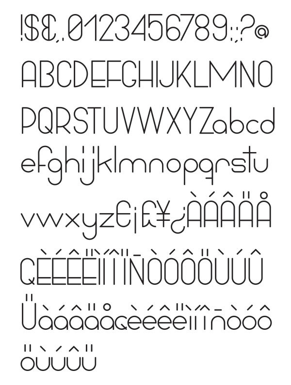
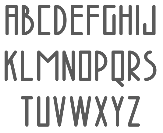
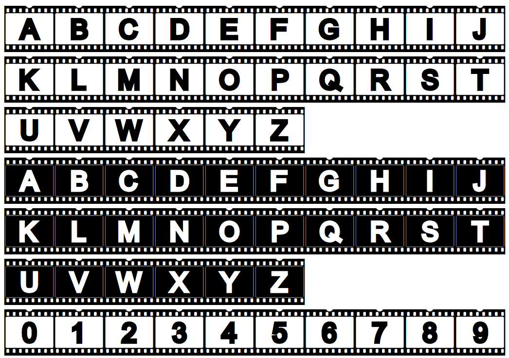
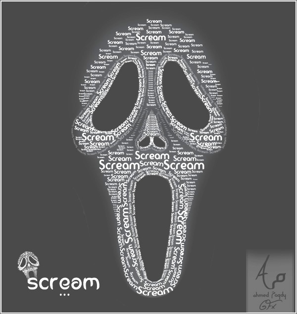
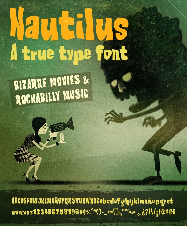
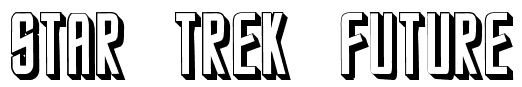
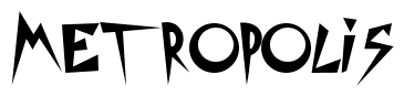
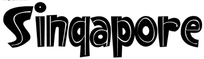
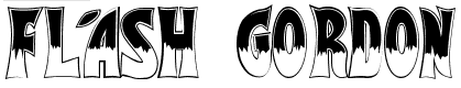
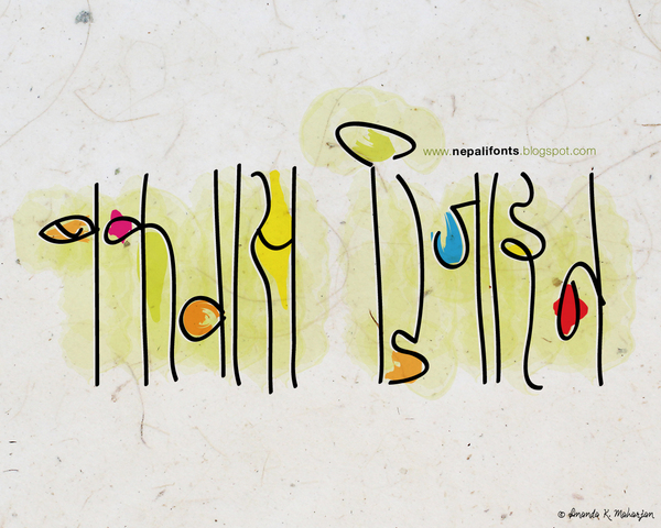
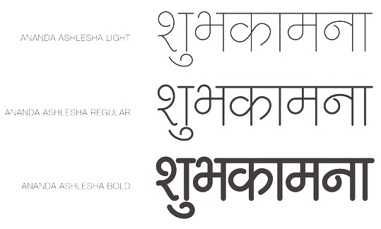
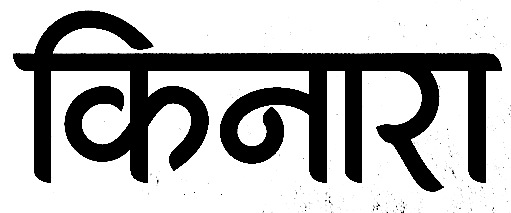
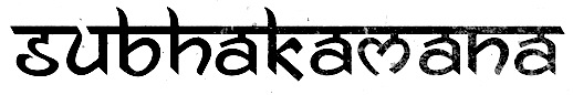
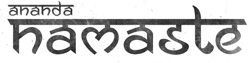
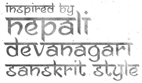
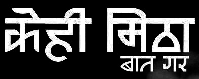
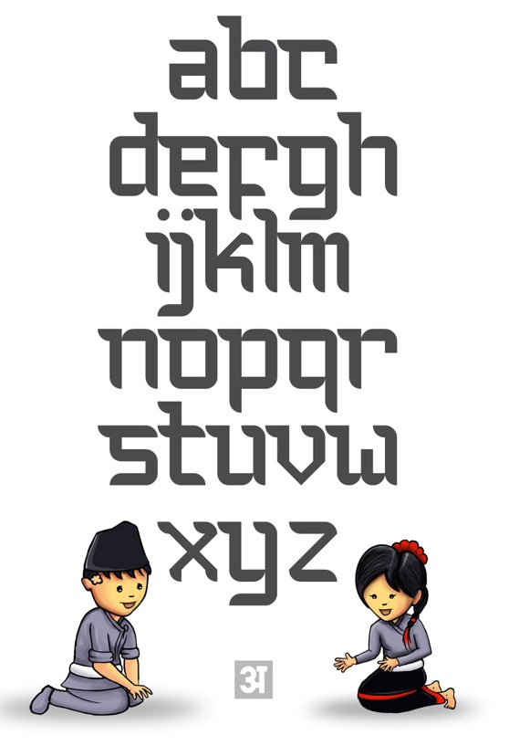
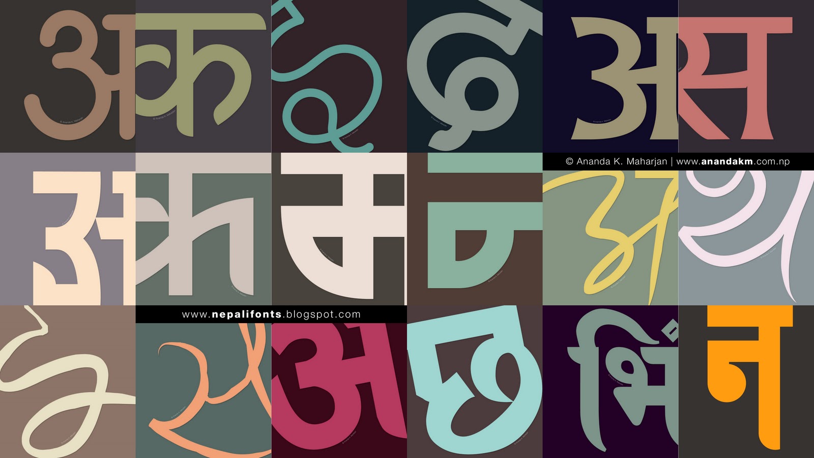
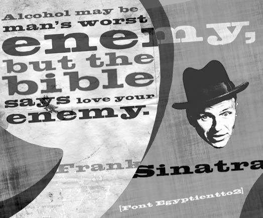
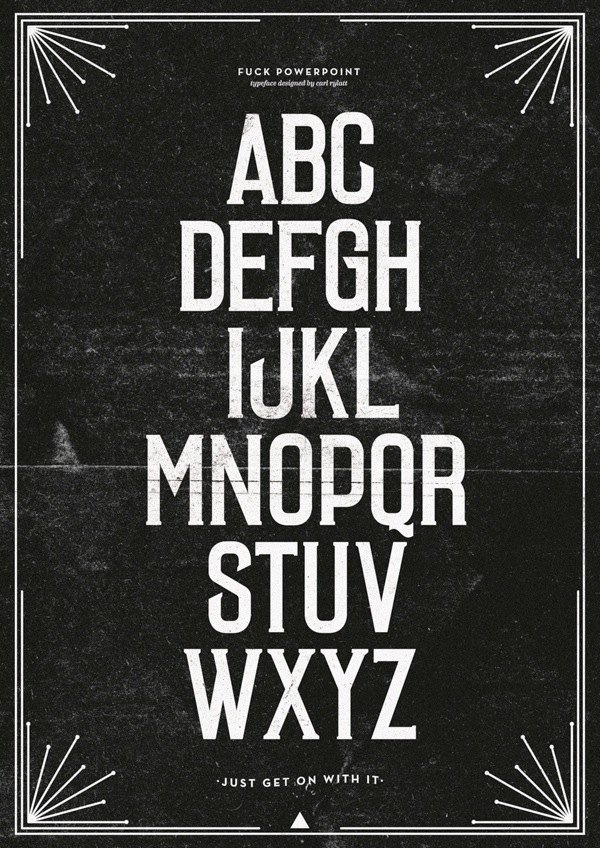
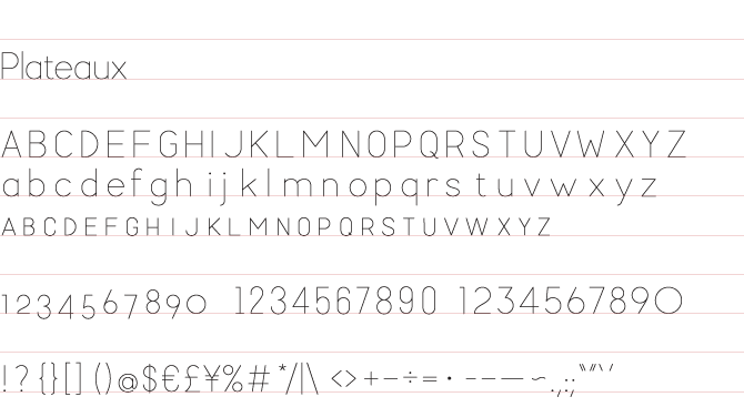
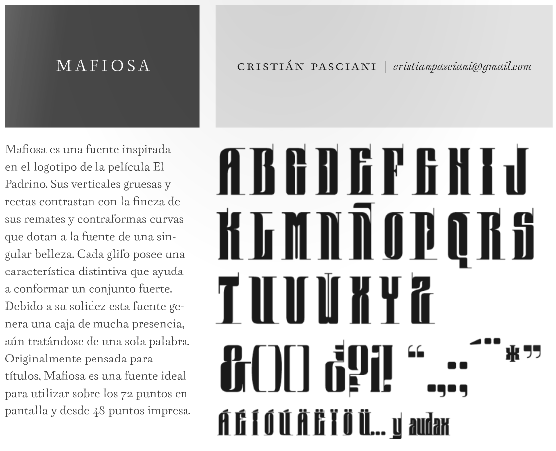
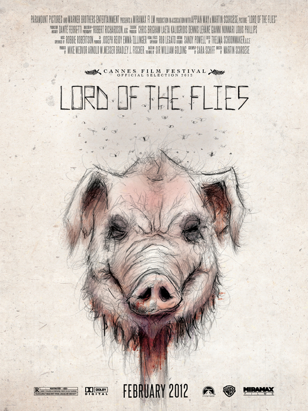
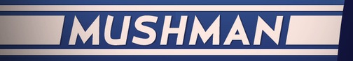
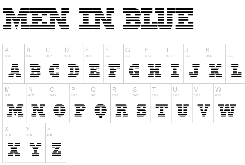
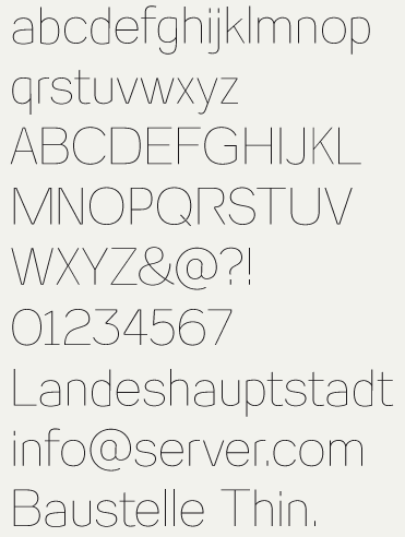
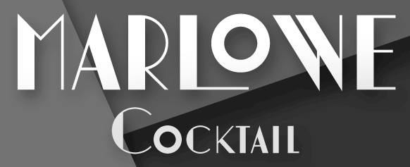
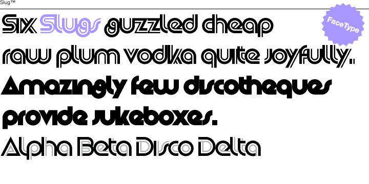
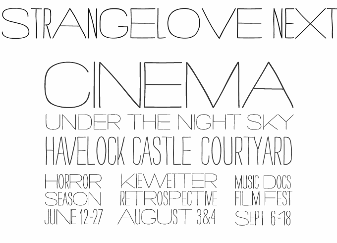
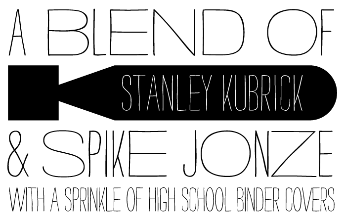
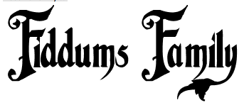
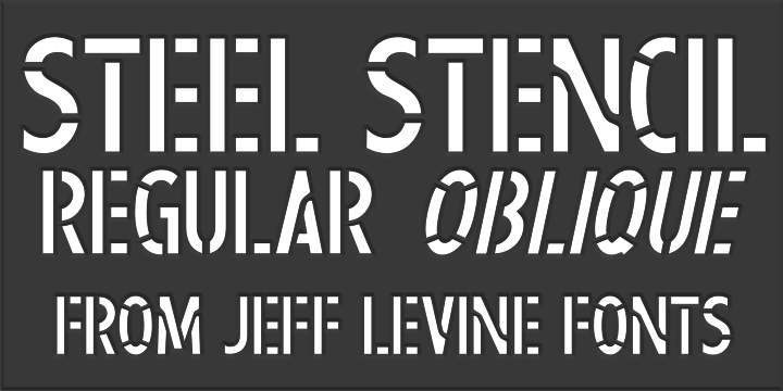
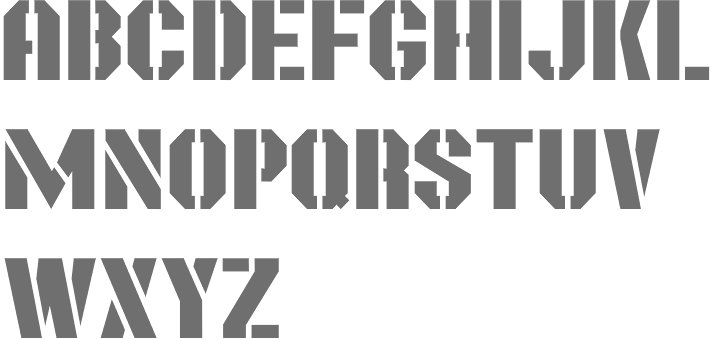
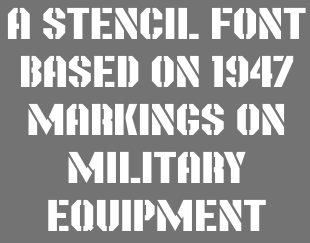
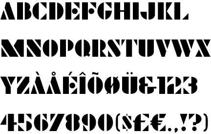
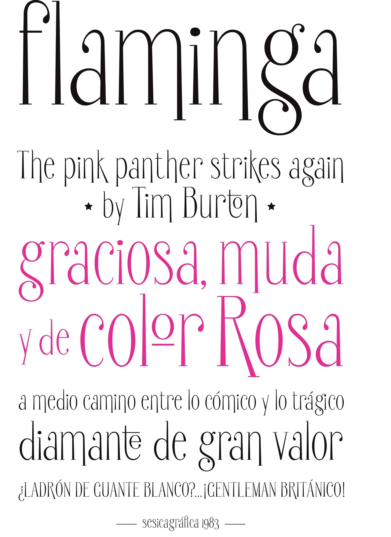
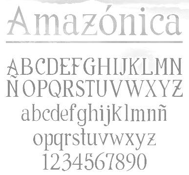
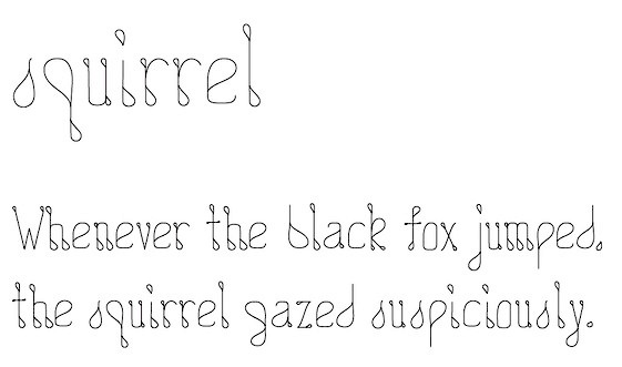
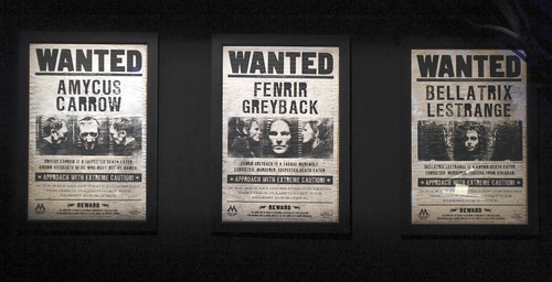
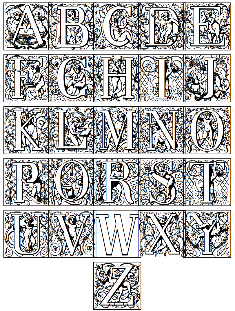
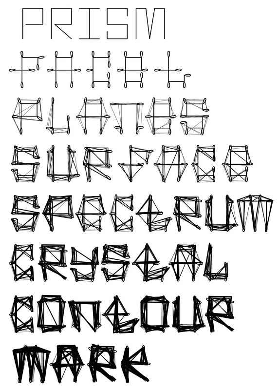
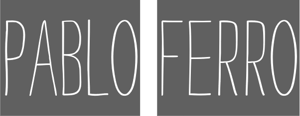
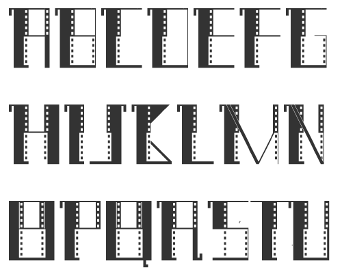
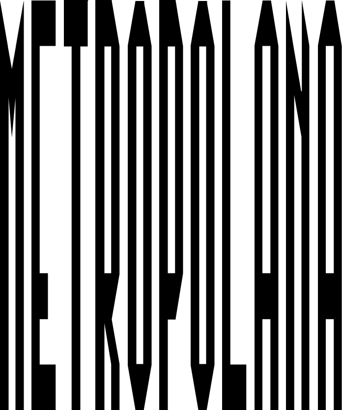
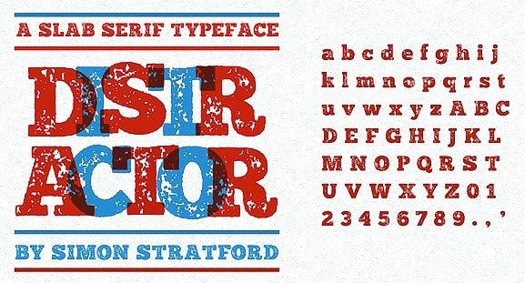
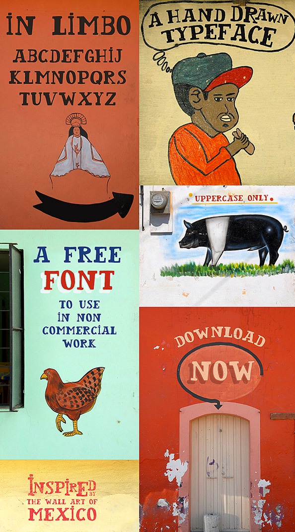
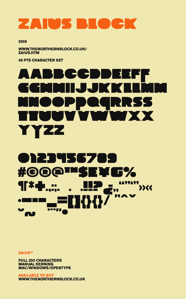
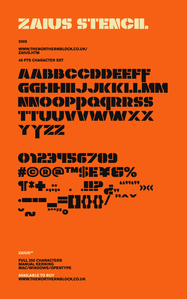
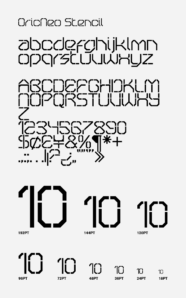
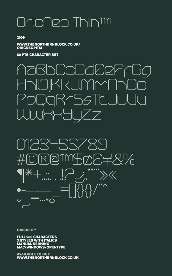
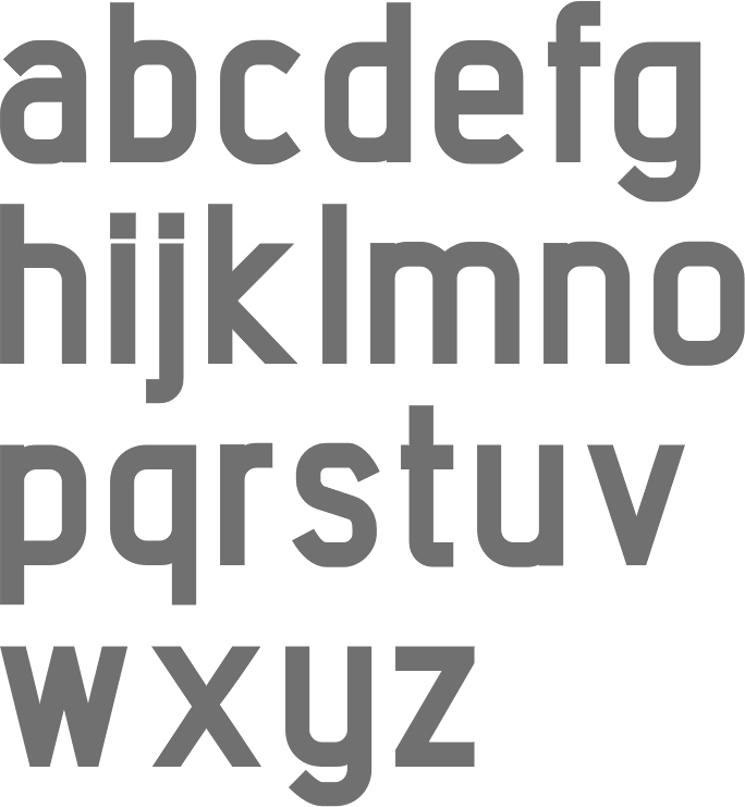
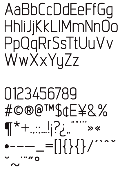
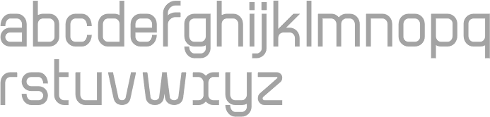
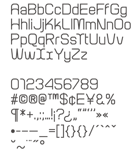
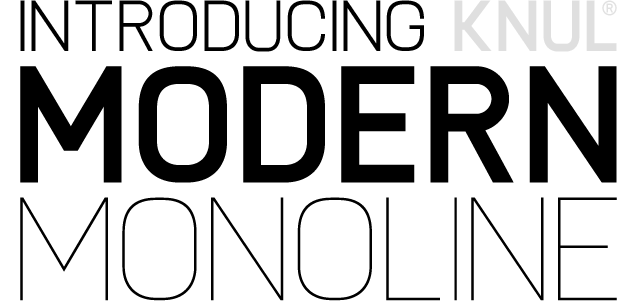
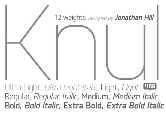
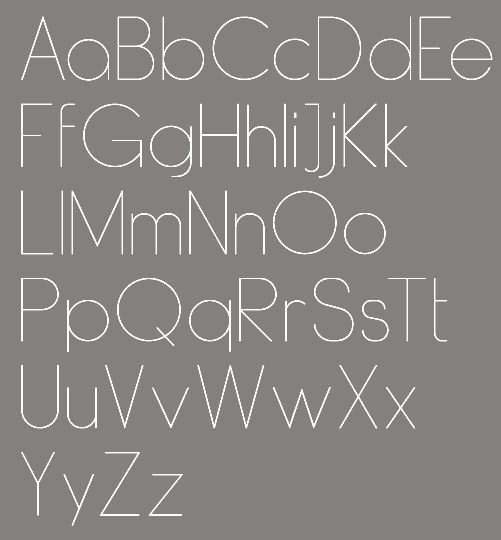
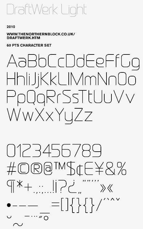
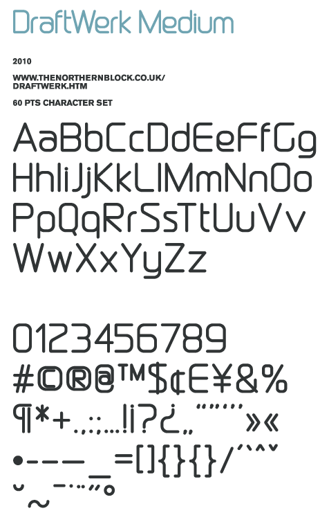
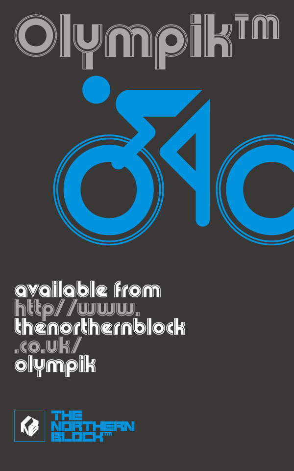
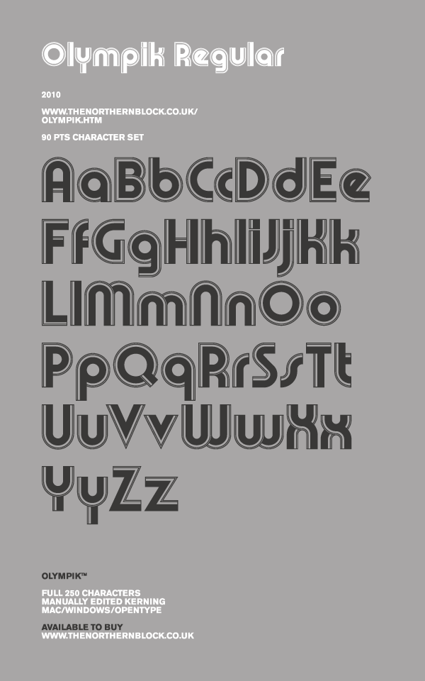
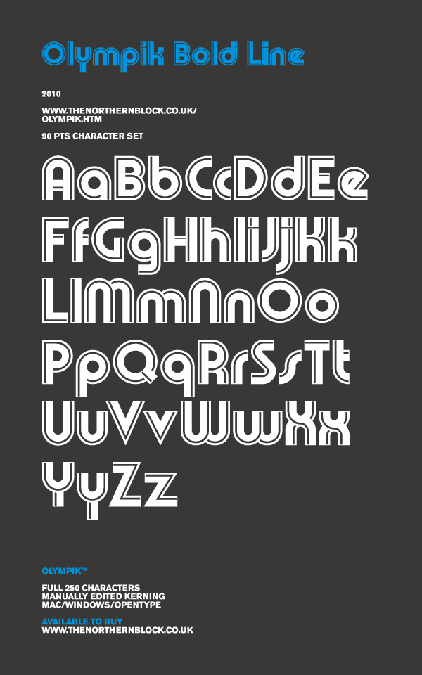
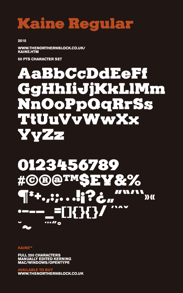
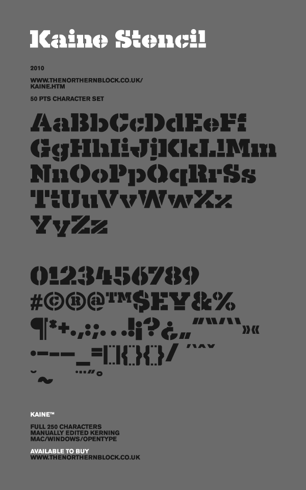
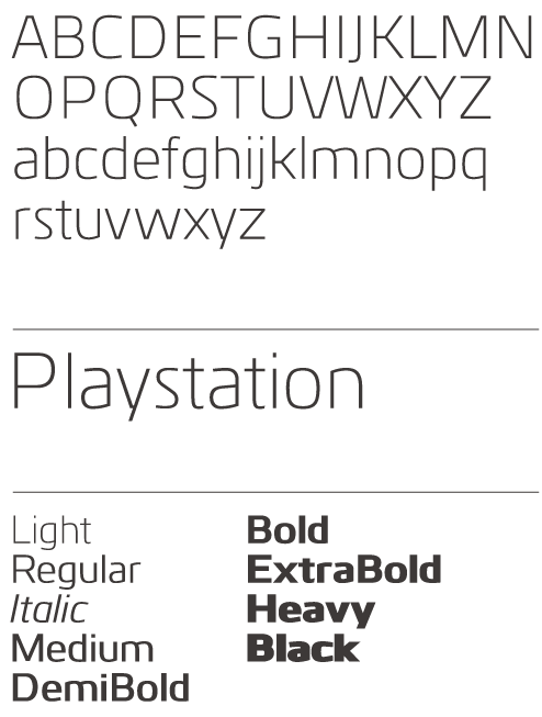
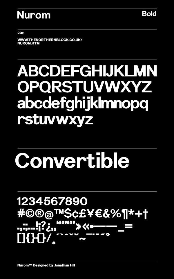
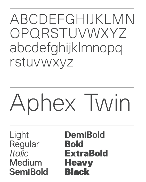