| | |
1871 Project
[Alex Joganic]

|
 Alex Joganic (1871 Project) is the Birmingham, AL-based designer of Matches (2016, an octagonal typeface), Ciclista (2016, a casual monoline typeface), Superior (2016, a handcrafted sans), The Victor (2016, handcrafted), Zara Elyse (2016: script), Fernweh (2016, a handcrafted typeface with a vintage wood type look) and Xander (2016, in Sans and Serif: 19th century all caps typeface family with a wood type look).
 Typefaces from 2017: Garment District (a free monoline script designed together with Jeremy Vessey), Crafter (a free vintage metal sign emulation font), Grandfather (brush script). Typefaces from 2018: Forward, America (a free brush script), Tradesmith (free), Grit & Caliber (vintage set), Nature Spirit, Messenger (a free vintage font). Typefaces from 2019: Kinder (a heavy fashion mag titling typeface), Moral Varnish (a vintage stencil typeface), Noble Company (a monoline script), Rowan Royal (+Brush: a free blackletter). Typefaces from 2020: Understock (vintage). Typefaces from 2021: Doric (a display typeface by Alex and Emma Joganic), Darker, Clever (a sharp-edged display typeface with negative angle and the coathanger lower case f that is de rigueur in 2021), Sonder (a decorative serif with diagonal stress). Typefaces from 2022: Roslyn Leigh (combining art nouveau with hipsterism). [Google]
[MyFonts]
[More] ⦿
|
2D Typo
[Lukyan Turetskyy]

|
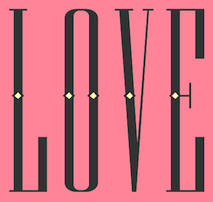 Lviv-based Ukrainian designer (b. 1979) of the octagonal stencil typeface Depot Trapharet (2006, brutalist), and of the free car rallye dingbat typeface Rallye Symbols (2008). Dafont link.
 In 2010, he went commercial as 2D Typo. The first typeface at 2D typo was the modular pixelish Pressure Drop 2D (2010). This was followed by Ornamental Deco 2D (2010, art deco ornaments), Rally Symbols 2D (2010), Mascaron2D (2010, by Iryna Korchuk), Depot Trapharet 2d (2010, a stencil based on the tram lettering in Lviv), Ascetic 2D (2005-2010), Hutsulyandiya (2010, extraordinary ornaments by Iryna Korchuk), Simeon (2010, calligraphic), Cranked Pipe 2D (2011), Tripyllia 2D (2011, ornaments of the neolithic Trypillya culture), and Ukrainian Barokko (2010, a calligraphic typeface by Genadij Zarechnjuk), Historism Border (2011, border ornaments), Moreske 2D (2012, ornaments), Geomanticus (2012, modular squarish sans). Typefaces from 2013: Bandelwerk (borders), Digital Stitch, Modern Wave (ornaments based on Alphonse Mucha), Hopferian (Roman caps after engravings by Daniel Hopfer (1470-1536)---typeface completed with help of Mariya Sokil), Simple Ribbon (art nouveau dingbats). In 2014, he created Angusto (an elegant narrow shaded display typeface family), Vindemiam (ornamental borders), Squamish (ornamental borders), UA Map (maps of Ukraine dingbats) and Bohemian Border. In 2014, Dmitry Rastvortsev, Lukyan Turetsky, and Henadij Zarechnjuk cooperated on the design of the free Latin / Cyrillic handwriting typeface Kobzar KS, which is based on the handwriting of Taras Shnvchenko, a famous Ukrainian poet, artist and philosopher. Typefaces from 2015: Finetitle (ornaments for headers), Gothic Herbarium (a floriated ornamental font based on the Gothic Revival ornaments developed by Augustus Pugin (1812-1852)), Old Depot (rough stencil), Francesca (decorative caps). Typefaces from 2016: Geometric Harmony (geometric ornaments), Dubster (which he describes as a technocratic modular font). Typefaces from 2017: Military Symbols. Typefaces from 2018: Strapwork (four ornamental typefaces with friezes, borders and motifs modeled after Balthasar Bos (1554) and 16th century mannerism). Typefaces from 2020: Lo Fi Copy (grungy and pixelish). Typefaces from 2021: Kolm Keltek (classical ornaments), Microdot (a dot matrix font). [Google]
[MyFonts]
[More] ⦿
|
A. R. van der Burg
|
Dutch type historian who collected many art nouveau type specimen, including some rare alphabets drawn by the Rotterdamse Schilderschool. Nadeem Muzaffar's Bibelot (2010, a custom typeface) is based on one of these alphabets. [Google]
[More] ⦿
|
ACME Fonts (or: CHK Design)
[Christian Küsters]

|
Started in 1996, by Christian Küsters and Andy Long (from South London), ACME Fonts is a London-based foundry, offering fonts by Küsters and these designers: Anthony Burrill, Gérard Paris-Clavel&Johannes Bergerhausen, Jean-Lou Désiré, Paul Farrington, Robert Green, Paul Kehra, Henrik Kubel, Simon Piehl, Alex Rich, Carsten Schwesig, Sandy Suffield, Dirk Wachowiak, Anne Wehebrink and Paul Wilson. Christian Küsters is an ex-student of Matthew Carter at Yale. Born in Germany, he now lives in Oberhausen. Buy the fonts at MyFonts. The company evolved, I guess, into CHK Design. MyFonts link. Interview. Klingspor link. The ACME font list: - By Christian Küsters: AF Angel (1998, based on an old woodblock typeface), AF Satellite, AFWendingen, Cashier 1 AF (1998, dot matrix), AF Champ Fleury (1996, a Codex-like face), AF Hybrid (1996), AF Hadrian Roman (1998, art nouveau), AF Interface One and Two (1998, grotesque sans), AF Retrospecta (1998, exaggerated wedge serif family), AF Track AF One and Two (1998, white on black dot matrix printing), Unzialis (1994), Zip Code AF 30, 40, 50 and 60 (2001, hairline squarish sans family). Christian had a nice connection at Plazm, where he published Hadrian (1996), Retrospecta (1994), Unzialis (1994), Hybrid (1996) and Interface One (1996).
- By Robert Green: AF PAN (1997, octagonal).
- By Henrik Kubel: 4590, AF-Battersea (1999, a grotesque family), AF-CENTERA, AF-Copenhagen, AF-Klampenborg (2000, grotesque sans), CPH-ArabicNumbers, CPH-Medium, Grot-25.
- By Sandy Suffield: CarPlatesCarPlates, AF Carplates (1998, squarish, including Carplates AF Bold Stencil).
- By Paul Wilson: AF Screen (1999).
- By Pete McCracken: INKy-black (1994).
- By Carsten Schwesig: Nicoteen 13 AF (1998, grunge), AF Syrup (1998, slab serif).
- By Paul Farrington: Camberwell AF One (1998, grotesque sans), AF Tasience (1998), Amateur 69 AF (1998, grunge).
- By Dirk Wachowiak: AF Diwa (2002, large squarish sans), AF Generation (2002, huge squarish sans families called A, A2, A2A, Z, and ZaZ).
- By Jean-Lou Désiré: Kub AF (2002, experimental).
- By Johannes Bergerhausen and Gerard Paris-Clavel: LeBuro AF (2003, grunge in weights called Breau, Crade, Louche, Extra Crade, Demi Beau).
- By Sylvia and Daniel Janssen: AF Nitro (2004, techno family in subfamilies called Intro, Riton, Trion).
- By Anne Wehebrink: Oneline AF (1998, squarish sans).
- By Paul Kehra: PostSoviet AF (2001, geometric sans family; with Cyrillic and Latin letters; weights called Culture, Free Latvian, Free Revolution, Ideology, Revolution).
- By Simon Piehl: Spin AF (1998, squarish sans).
- By Anthony Burrill: Video Wall AF (1998).
- By Christian Küsters, based on lettering of H.T. Wijdeveld: AF Wendingen (1998, LED simulation).
- Other: AFConstants (1998), Allen, Indy 500, Interface, AFLogotype (1998).
View ACME's typefaces. Acme's typeface library. Typefaces made by Christian Küsters. MyFonts selection for ACME. [Google]
[MyFonts]
[More] ⦿
|
Acmé-Paris
[Élodie Mandray]
|
 Acmé-Paris is a design studio in Paris run by Élodie Mandray and Caroline Aufort. Creators of New Gothic Textura (2009), Canevas (2010-2012, stitching font), Acme (2013), Tropique (2011, experimental), Minuscule (2012), Tribute (2012, children's hand), Juicy (2010), Eclipse, Thésard, the music-inspired Swing (2010), the heavy monoline sans typeface Acmé (2013), the titling sans typeface Le Creux (2013), and the stitching font Canevas (2013).
 Typefaces from 2015 include the multiline neon font Neo Neon. In 2016, Acmé Paris designed the copperplate style poster typeface Aylak, the titling sans Truck, the art nouveau typeface Bertand, the art deco typeface Beaumont, and the avant-garde typeface Cattolica. In 2017, they designed the artsy rounded sans typeface Kasha. Typefaces from 2022: Madrid (inspired by vintage posters from the Spanish Civil War). [Google]
[More] ⦿
|
A.D. Farmer
[Farmer, Little&Co.]

|
 [MyFonts]
[More] ⦿
|
Adam Fathony
[AF Studio]

|
 [MyFonts]
[More] ⦿
|
Adicto
|
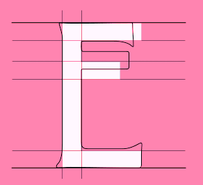 Adicto Multichannel Agency is a studio located in Sankt Gallen, Switzerland. For the new restaurant Werk 1 in a renovated industrial building built in 1900 Adicto created the new typeface Werk1 (2014). For this typeface, they used the art nouveau font Quaint as a model. The font was developed by Nicolas Duran, Pierre Lippuner and Christian Woelk. Behance link. [Google]
[More] ⦿
|
Adolf Böhm
|
Artist of the Viennese Secession, 1861-1927. [Google]
[More] ⦿
|
Adolphe Paul Giraldon
|
French type designer (1855-1933) who made Giraldon (Fonderie Deberny, 1900), an ornamental serif typeface undoubtedly influenced by Grasset and Auriol. [Google]
[More] ⦿
|
Adorae Types
[Emilia Adorno]

|
Argentinian designer of Artifex Regina (2022: a tall hand-crafted font family with sketched textures), Neon Summer (2021: a condensed handcrafted monolinear font family), Cookie Time (2021: script), Arkhania (2020: a vampire script for Halloween), Aeonian (2020: a 12-style retro futuristic sans), Nature Boy (2018, a display type that is almost art nouveau). [Google]
[MyFonts]
[More] ⦿
|
Aeolien
[J. Fürst Gardiner]
|
 Creator at FontStruct of Aeolien (2011, alphadings), Gazebo Line Aeo (2012), Chateau d'Air (2013, castles), Like Fabergé (2013, oval), Fold Line (2013, a sewing font), Toothache (2013), Linoleum (2013), Sandor Basic Stripes (2013), Compass Norden (2013, a dot matrix font), Sambuccus (2013), Abneuroniques (2013, neurotic typeface), Zebra (2013, horizontally striped), Amazed (2013, maze font), Card Reading (2013), 3paths (2013), Raidho (2013), Floraeolien (2013, flower dings), the Art of Square series (2013), and Ostara Egg Box (2013, ornamental caps for Easter).
 Typefaces from 2014: Ceques (op-art), Indentional, The Tunnels of Tralyoxx, ClickPop Beads, Blue Moon, Nurdal's Walk (LED font), Dumultix (techno, in De Stijl fashion, based on Mondrian), Wever Ding, My Unintended, Haltero, Linuta, Murexa, Abfahrt, Arrivee Mercredi, Mabon (vintage slab serif, art nouveau), Treat or Trick, Aerix Stencil Serify, Noba M, Plaque Emaille (white-on-black), Gleiteri, Strega nona, Kubetus (artsy), Kubetuffo, Pixiel, Werner, Free Masonry, Airy Brickwork, Aerix Stencil Sans, Sim Card, Kerbe, Fool's Beans, Gift Tag (alphadings), Tag Letters, Varsity Outline UC. Typefaces from 2015: 3Fino, S-chablo Sans (stencil), August, Shifted (op-art), Arroed, Apprentice Quill, Spitze, Melusine. Aka Jutta Gi. FontStruct link. [Google]
[More] ⦿
|
AF Studio
[Adam Fathony]

|
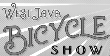 Adam Fathony (or Adam Fathoni Haris; AF Studio, Bandung, Indonesia) created the vintage typeface Grandesa (2014), the signage typeface Magnifika (2014) and the Victorian typeface Marema (2014).
 In 2015, he published the connected swashy script typeface Octavia Script, the brush scripts Carbonera and Shallom, the hand-lettered Vanilla Daisy Script and Mightype, the watercolor script Hollycakes, and the connected Brayden Script (and Sans). Typefaces from 2016: Drustic Daily, Karlberg Script, Ecosmith Script, Halosense Script (calligraphic), Lunar Cone (connected layered script), Clarkson Script, Salvador Script, Salvador Serif, Salvador Condensed, La Venice Script (retro signage lettering). Typefaces from 2017: Clarkson Script (brush lettering), Bignord Vintage (with Fauzan Rafhy), Douglas Collection (12 fonts: Aaronade Script, Ancaster Script, Burlington, Calgury, Montreal Rounded, Morphic 60s, Norwood Old, Ogdensburgh, Palmeira, Rutland Extended, Wolves Sans, Wolves Serif), Almost Lover, Rhythmic Dances (rough script), Sevastian (layered font set), Rustling Trees (dry brush), Little Karla Script. Typefaces from 2018: Figuera Variable (a late Victorian, early art nouveau typeface family; variable font format), Brignola (a calligraphic penmanship script), Eastside Brush (a brush signage script done with Angga Kristiandri), Marshfield (a retro cursive typeface by Adam Fathoni Haris and Renov Olivian), C'est La Vie (font duo), Chivels (a vintage typeface done with Angga Kristiandri at Abbassy Studio), Sevastian (a layered font family), Drustic Dialy (weathered; with Angga Kristiandri), Elli Bellie (calligraphic). Typefaces from 2019: Scottsdale Serif (at Typeverything), Scottsdale Desert (an opentype feature-laden display serif), Norfolk (Narrow, serif), Tiverton (Sans, Serif, Script: by Adam Fathony Haris and Angga Kristiandri), Havard (a layerable athletic lettering set of 12 fonts), Gorga Grotesque. Typefaces from 2020: Auvelle (a hairline sans), Windsore (a font trio), Howli (layerable, rounded; sans, serif and script), Genty (a creamy retro signage script typeface by Ilham Herry and Adam Fathoni Haris), Burnest (a vintage typeface by Adam Fathoni Haris and Renov Olivian), Glaw (a psychedelic font by Ilham Herry and Adam Fathoni Haris), Oliviar Sans (28 styles and a variable font), Budge (a layerable retro signage script by Ilham Herry and Adam Fathoni Haris), Stanlow, Muray House (a bold swashy bathroom towel typeface by Ilham Herry and Adam Fathoni Haris), Esteric (a playful tapered font by Ilham Herry and Adam Fathony). Typefaces from 2021: Alstera (an oblique serif), Monvar (a layerable Cooper Black style typeface by Ilham Herry and Adam Fathoni Haris), Rische (a 6-style display serif with huge counters and an enormous x-height; by Ilham Herry and Adam Fathoni Haris), Ottenthic (script and serif), Mionic (a reverse contrast slab serif by Adam Fathoni Haris and Angga Kristiandri), Matchbox Font Collections (a set of vintage fonts based on lettering on matchboxes; it includes substyles called Linea, Lettre, Deco, Scriptura, Ornato, and Graso). Typefaces from 2022: Balide (a 70s style display typeface), Norsy (a 21-style and variable flared font family). [Google]
[MyFonts]
[More] ⦿
|
Affolter und Gschwind AG
[Werner Affolter]
|
 Werner Affolter ran a phototype and printing company in Basel, Switzerland, called Affolter und Gschwind AG, Fotosatz&Reprotechnik. In 1981, Affolter published an extensive catalog entitled Letterama that showed over one thousand alphabets. Few of those were original, so I suspect he acted as a vendor of sorts, but at least a couple seemed original, or were claimed to be original or exclusive: Guigoz, Moby Dick. Moby Dick was revived in 2014 by Nick Curtis as Call Me Ishmael NF.
 Some examples of the types shown, in alphabetical order: Antique Wood MP363 (art nouveau), Antique Wood MP 364 (oriental simulation face) [the Antique Wood series is quite extensive, and is just numbered], B+T Classic (roman), Bernhard Fett, Beton Fine Line (typewriter), Burko (avant garde family), fonts starting with G, Gaston Fett (a squarish gothic typeface also called Gipsy), Gaston Halbfett (also called Grassy), Gemini Computer, Germanic Sans (more avant garde and Lubalin-style glyphs), Hollandse Mediaeval, Hollywood (a 3d decorative family), typefaces starting with K, Lineamarca (slabby), Linear (avant garde, geometric monoline), Melen (experimental, geometric), Meola Bookman swash (decorative), Metro (art nouveau, after the Metroploitaine font), Moraine (squarish), the Old Foundry sub-collection [another mysterious numbered collection; examples include some uncials, and some more art nouveau typefaces, some Victorian ornamental typefaces (F260 through F262), more art nouveau (MP418 through MP420) and blackletter typefaces (MP421)], Pierrot (psychedelic, groovy), Phydian (one of many Western style ornamental typefaces), Ronda, Roulette, Roulette Schattiert (=Rajah) (more Western fare), Ruby (shaded caps), Runic Small (condensed), Rustic (wood log look), typefaces starting with S, Spengler Gothik, St. Clair (ornamental), Zither (calligraphic script). [Google]
[More] ⦿
|
Agnieszka Ewa Olszewska

|
Warsaw, Poland-based designer of the decorative caps typeface Sweets (2015, Studio Filigran) and of the outlined all caps typeface Typek (2018, Studio Filigran). In 2020, she designed Cnabel, which is based on a Slovenian book illustration from the art nouveau period. In 2021, she released Binia (a hyper-decorative typeface) and Zania (a fat display typeface) at Studio Filigran. Type Department link. [Google]
[MyFonts]
[More] ⦿
|
Ahmad Ramzi Fahruddin
[Arterfak Project]

|
 [MyFonts]
[More] ⦿
|
Ahsya
|
Banda Aceh, Indonesia-based designer of Rollason (2017: script), Pilattez (2017: handwriting script), Rolly Wave Script (2016), Verbalio (2016, an art nouveau typeface), Verbalio Sans (2016), Sweetlove Script (2016), Aheads Brush Script (2016), Mahakam Script (2016), the free handcrafted psychedelic typeface Verona (2016) and the free script typeface Markona Script (2016). Typefaces from 2017: Hideline (a futuristic brush). Creative Market link. [Google]
[More] ⦿
|
Aileena Manja
|
German designer of all caps typefaces in 2019 that have art deco and art nouveau influences. [Google]
[More] ⦿
|
Aiyari
[Ricky Rinaldi]

|
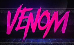 Bandung, Indonesia-based designer (b. 1988) of the modular display typeface Kurawal (2013) that is based on compositions of curly brackets. In 2015, he designed the angry brush typeface Violence, the connected creamy script Nurture (2015), the handcrafted sans typeface Imperiosa (2015), the connected Fabulous, and the watercolor brush script Sweetiest.
 Typefaces from 2016: Holiday (17-script family), Dreadful (a layered Halloween typeface family, with dingbats), Casual Brush, Lucidity (signage script), Euphoria (Victorian), The Painter, Minority (very condensed hand-lettered typeface), Thunderstorm. Typefaces from 2017: Tjikapoendoeng Script (formal calligraphic script by Ricky Rinaldi and Juru Aksara), Lovadelic (psychedelic), Neptunian (dry brush), The Moonlight (comic book script), Savath (a horror font), MacLaurent (tattoo font). Typefaces from 2018: Lucidity (an expansion of his 2016 version, including Psych, Expand, Extras: psychedelic / art nouveau trio), Winter Is Coming (a beatnik font), The Beardy, Dreadful (a layered horror movie font), Saturday Night (a great retro disco poster typeface family with a particularly striking interlocking style). Typefaces from 2019: Spooktacular (a Halloween font), Spooky Sans. Typefaces from 2020: Tropika Island (a great tiki font), Swettiest, Laguna Vintage. Typefaces from 2021: Ayr Blufy (a puffy supermarket signage script). Typefaces from 2022: Ayr Thrope (a weightlifter's font). Dafont link. Behance link. Graphicriver link. [Google]
[MyFonts]
[More] ⦿
|
AJPT
[Alan Jay Prescott]
|
 Pottstown (Philadelphia)-based designer and PostScript font hacker who ran Prescott Design and now Alan Jay Prescott Typography, but was also involved in other ventures such as the Black Walnut Winery. Originally from Greenfield, MA, he graduated from Saddleback College, and worked for some time as a typesetter in New York. He advertizes himself as a leader in PostScript Open Type Font development specializing in the revival of print-only letterforms into digital typographic materials. He operates as APT and more recently as AJPT. In 2019, he announced that he would stop making typefaces altogether. His work can be partitioned into time periods. For this reason, Prescott's oeuvre is split over several pages:
 - His late period (2017-2019). In these three years, he showcased his work on Facebook, and was mainly involved in reving 19th century typefaces, about half of which were from the Victorian era. The annotations in the list below are quoted from Prescott's pages.
- Absolution Cursive (2017). When I was a typesetter in New York City, I had one of the largest collections of typefaces from CompuGraphic's library available for setting. One of the faces I never used in two decades of work was a rather ungainly decorative font called Abel Cursive. Apparently it was designed by Bernie Abel (perhaps one of CompuGraphic's employees) and I'm not sure it got much use, since I don't recall seeing it anywhere except my type catalog. Before I sold my equipment and closed my business for good, I made a scan of every typeface at 72-point size that I owned for future development, if there ever came a time to work on something crazy like that. Most of those 2,000 scans were lost when I changed computers a long time ago, but Abel Cursive survived and I made a down-and-dirty mow-and-blow font back then. I have recently worked on it extensively to make it usable as a multilingual slightly redesigned font in OTF format. I would classify it is as neo-Victorian medium-contrast decorative italic. It is definitely an oddball and may never see use.
- Algol (2017). Based on a scan from Dan X. Solo, Algol is a vastly expanded character set for Algernon, a typeface that clearly presages Machine and other "octics." I don't have any source material for the original design, but it may have been a Dan Solo original.
- Aloysius and Aloysius Ornamented (2017). This is a digital revival of the original Algonquin, cut by J.F. Cumming in the late 1880s for the Dickinson Type Foundry in Boston. While this was not my most challenging project, it was a doozy.
- Alpenhorn Roman (2017). Another oddball typeface is revived here, renamed from the design called Alpine by Henry Schuenemann for the Cleveland Type Foundry in the 1880s. Buried in the "gingerbread" of this weird face is technically a Latin serif, but otherwise it is an entirely unique letterform for which I had a heart soft enough to revive here in digital form.
- Androgen Roman (2017). I know next to nothing about this ultra-geometric blackletter called Anderson that I found displayed in a Dan X. Solo catalog, but it is another oddball that is attractive and very simple to revive in digital format. It is one of those projects I would recommend to a beginning revivalist who wanted to cut his or her teeth on a moderate challenge after mastering some basic tools in font development software.
- Angolan Text (2017). I found Angular Text in a Solo catalog and revived it as a digital font with diacritics and other characters for expanded typesetting possibilities. It was designed by Herman Ihlenburg in 1884 for MacKellar, Smiths & Jordan, which information I found in a link from Tom Cruz for a fellow named Toto who revived the font as well; he has several glyphs I do not have and I like his showing better. Interesting to see what others have done with the exact same typeface and scan and some research for tantalizing missing glyphs...kudos.
- Antiochia Series (2017). This collection of typefaces represents a revival of several bold slab-serif wood types with the name Antique that are related. Their individual histories will follow at another time, but note that several here are useful derivatives that add to the variety of this letterform's impact.
- Azurine Roman (2017). Azurine is a digital revival of a typeface known as Aztec, drawn by an unknown designer for the Union Type Foundry before 1889.
- Beltane Roman (2017). The very complicated story behind the work on this revival is too long for this space (and perhaps too boring to most), but suffice it to say that this letterform started out in 1886 as drawn by the great Herman Ihlenburg as Artistic and assigned to MacKellar Smiths & Jordan. Dan Solo called this face Belmont but only showed caps and was suspect anyway. I was able to find specimens elsewhere and a motherlode of other interesting things in the Inland Printer. I developed my first full-featured OTF using this typeface and designed Greek and Cyrillic glyphs as well. I also fitted it out with a set of small caps to make a font that now has 4,000 glyphs for nearly every non-Asian language. To top it off, Robert Donona revived the decorative caps for this typeface, an excruciating task that I once considered for myself but was lucky enough to have this other crazy person take up. The number of hours dedicated between Robert and myself in reviving this complete series digitally is probably unprecedented.
- Bernhard Swirl (2019). This is a digital revival of the letterform of the same name. It is equipped only with the upper case, an ampersand, a spacer dingbat and the numerals. The numerals are quirky, not only in design, but the fact that they seem to have been intended as old-style figures with the exception for the 4 and 7. Lucian Bernhard is either the designer of this limited-use typeface or inspired a reworking of his "wobbly" poster typefaces for which he is known as an innovator. I have reworked the scanned samples I had used as templates and drew them with a little more consistency than the originals to improve color on the page.
- Bireme Roman (2017). Below is a digital revival of a typeface called Bijou. As I have come to understand, several people have revived this face already. It is similar to Flirt in many respects. I will update information as I come across it, but I wanted to post my version here for your appreciation.
- Blackguard (2018). This is a digital revival of a typeface known as Black Cap. William E. Loy writes that Black Cap was designed and cut by Charles H. Beeler Jr. for MacKellar, Smiths & Jordan. The earliest-known commercial specimen was advertised in the January 1891 edition of The Inland Printer, so he probably created it in 1890.
- Blackminster (2017). One of the more interesting treatments of blackletter forms in the 19th century is this beauty called Black No. 544 designed by Henry Brehmer in 1889, who assigned the rights to Bruce Type Foundry. Originally I was unable to locate certain key glyphs in this font, but they were graciously supplied by others in our crazy network of type geeks. More information on the people behind these projects will follow in other articles.
- Bleak (2017). Bleak is a series based closely on a typeface called Stark. As with nearly all typeface names, there are several unrelated fonts developed in recent years that bear no resemblance to this gorgeous sans serif.
- Brotherly Roman (2017). Among many "antiqued" letterforms developed in the late 19th century, Ben Franklin was offered by Keystone Type Foundry in Philadelphia. Several glyphs were missing from my best showing of the font, but I was luckily able to find them, as well as logotypes, two ornaments, several alternate characters and some punctuation. There had already been a digital revival of this typeface kicking around as shareware in the 1990s, but it was very poorly drawn and incomplete. I believe it has been rendered nicely and consistently here for posterity.
- Busker Contour (2017). Burlesque was the name given by Solo to a typeface originating through Caslon or Figgins around 1843 and shown in German specimens a couple of years later.
- Cane Gothic (2018). Cane Gothic was designed and cut by Edwin C. Ruthven c.1886; he patented it in March–April 1886 and assigned the rights to David Wolfe Bruce (son of George Bruce, holder of the first design patent in US history). The Bruce catalog number is unknown. The tradename Cane Gothic, an apt description of the caning patterned background, may have been assigned by Dan X. Solo, who had revived the face for his photo-lettering service, but it has previously been considered impossible for digitizing. Although the average character in this font contains something like 3,000 Bézier control points, it turned out to be doable once I figured out the original mathematics that Ruthven must have used to guide his design objectively. It is digitized for posterity and I thank Anna Allen once again for the patent specimen (No. 16,643) indicating, if extremely faintly, five missing glyphs from my otherwise excellent scan. Thus I've generated the border glyphs and a pound Sterling symbol to augment this letterform. As far as I can determine, this character set is complete, and I have generated three fonts in order to accommodate chromatic typesetting with very little effort.
- Cantini Casual (2019). This is a digital revival of the typeface of the same name (or at least that is the name Solo gave it in the type specimen book from which it was scanned). It is a great example of the exuberant fancy characters that came to ascendance during the 1960s and 1970s. It is a medium-weight Latin italic with unusual decorative details in addition to crazy swash choices. I do not have any information on the history of this trippy face, but it is likely it was revived at some time in the recent past. It includes a large number of alternate glyphs as well.
- Capulet (2017). This is a revival of a typeface called Caprice that was patented in 1888 by Arthur M. Barnhart and assigned to Barnhart Bros. & Spindler of Chicago. This letterform is a prime example of the explosion in design ideas occurring before the turn of the century, hundreds of which remain to be translated into digital format.
- Carmenite Roman (2017). This beautiful digital revival covers a letterform drawn by the Bauer Type Foundry of Stuttgart, Germany sometime before 1896. It was originally called Carmen and has been referred to as Carmencita in the Solo books.
- Centrum Text (2017). This is my digital revival of one of the more complex decorated blackletters, among my favorite and most difficult projects to work on and just finished today. It is identified as Celebration Text on p. 18 of Solo's "Gothic and Old English Alphabets." The lowercase for this letterform is also presented for two other typefaces, Testimonial Text and Innsbruck in his larger catalog, presenting some confusion. But I believe all three were drawn by the same designer, although I have no idea how old they are. The lowercase may simply have been used for all three decorated capitals, since they are a very good match. Intentional, who knows? It is a real beauty and I'm going to perhaps revive the other two in this triplet of great examples of decorated capitals.
- Chapterhouse Roman (2017). This is an interesting typeface known as Ecclesiastic from Caslon around 1870. It was also known as Albion and Chapel Text No. 30. Most of those names were applied to completely unrelated designs, adding to the confusion that permeates typographic development and history to this day (and only gets worse over time). There are probably more alternate characters out there, but this is the best showing I could make with the resources I have and it is now available from me as a digital font.
- Chapterhouse Roman (2017). This is an interesting typeface known as Ecclesiastic from Caslon around 1870. It was also known as Albion and Chapel Text No. 30. Most of those names were applied to completely unrelated designs, adding to the confusion that permeates typographic development and history to this day (and only gets worse over time). There are probably more alternate characters out there, but this is the best showing I could make with the resources I have and it is now available from me as a digital font.
- Clarence Roman and Dotted (2017). Clarence Roman is a revival of Clown Alley and Clarence Dotted that of Cooktent (also called No. 515). Wood typeface Cooktent comes from W.H. Page before 1890 and the other looks to be a back-formation from it.
- Commissioner Script (2017). The typeface known as Commercial Script was designed by Morris Fuller Benton in the early twentieth century and enjoyed widespread use for decades. There have been many variations from other foundries, varying mostly in contrast; but as far as I know there was ever only one rather bold weight produced. I have redesigned the letterforms for consistency on the way to producing the ten weights shown here. It is interesting to see the font in lighter weights that accentuate the beauty lurking in this standard, and the heavier weights to see that the design still holds up under even heavier lifting.
- Courtesan Roman (2017). Among the dozens of wood types I have revived digitally is Courier, here called Courtesan. Many of these letterforms have been revived by others, all slightly different in their interpretations. More information on wood types will follow in articles I plan to write in the future on various areas of interest in the field of revival in particular and typography in general.
- Cranston Ornamented (2017). This is one of the most difficult digital revivals I have worked on. It started as Crayon, another masterful design from the prolific Ihlenburg, available at MSJ in 1885. There are sister fonts in an Open and a Solid that differ slightly in design and will be available from me at some point in the future.
- Creekside Playful and Calligrapic (2018). These are two digital casual scripts of my own creation based loosely on hand-drawn types from the 1950's. One is a calligraphic interpretation and the other is a more mono weight design that is a bit more slanted, both available for multi-language setting.
- Criticism (2017). This is a digital revival of Critic, a typeface designed by William F. Capitain in the mid-1880s with rights assigned to Marder, Luse & Co. Several logotypes had been designed for this letterform and many alternate glyphs. I added a few of my own, as well as diacritic marks, for balance to this surprisingly modern face that can be rendered multilingually as well.
- Crosby Roman (2017). This is a digital revival of the typeface known as University Text, designed in 1862 and shown by MacKellar, Smiths & Jordan in 1869 as Crosier. It was also known much later as Morningside. It is a stylized Latin with great charm.
- Crossan Roman (2017). This is digital multilingual OTF revival of a typeface called Cross Gothic, another one of those unique, nearly unusable letterforms I adore. I got a million of 'em.
- Cullane Roman (2017). Cullane is a digital revival of Herman Ihlenburg's Culdee, patented in 1885 and offered through MSJ. Others helped me scour the literature for missing glyphs and no one is sure we've got them all, but this is a wonderful showing of what we think is available until something randomly shows up in the future.
- Currier (2018). J.B. Lieberman, Ph.D. identifies it as Deberny & Peignot Lettres Ombrés Ornés (ornamented shaded letters) and adds that it was originally cut by Gillé in 1820, thus making it one of the oldest typefaces I have revived digitally. It is an exuberantly decorated engraved shadowed heavy-weight Egyptian.
- Danuvius (2017). Danube is the original name for this letterform, again found in a Solo catalog, and its links with medieval letterforms is obvious despite the trends toward modernization at the time it was first produced. I otherwise have no information on this face.
- Devonian Roman (2017). This is a digital revival of a wood typeface known as DeVinne. More information updated later.
- Dorothy Series (2017). The original Doric Chromatic was designed as a wood typeface and made its appearance in the United States in the 1850s, though it probably got its start in France in the 1840s according to Rob Roy Kelly.
- Doughboy Roman (2017). This series of decorative caps is shown as Dodge City in Solo. I am not sure it is very old; it may very well have been a photographically slanted version of an older wood typeface in the Thunderbird category with flourishes added on at the same time. This has been revived before because of its simplicity, but I made my own version a little more consistent and they make attractive drop caps.
- Enclave Roman and Expanded (2017). These two related digital revivals represent Enchorial in two versions. The roman came out of the Caslon Type Foundry in 1884 and was extremely popular (sometimes known as London). Petzendorfer showed the expanded Enchorial around 1903.
- Esteban (2017). Esteban is an original design I developed around 2010, named after the recently deceased Esteban Arriaga, a leading seascape painter in the area of Málaga in Spain. It is a medium-contrast sans serif produced in nine weights plus italics. Currently it is available only for the Macintosh OS, but an OTF cross-platform font is anticipated.
- Euclid, Euclid Initials,Euclastic, Elberon, Astral, and Auroral (2018). Elberon existed by November 1886 from Cleveland Type Foundry in The Inland Printer. Euclid (a lighter version of Elberon with a few different glyphs) is an obvious derivative from Illinois Type Founding Co. in Chicago in August 1890. Euclid appears with several Euclid Initials, a full sample of which appears as "Grant Iniitials" from Minnesota Typographic Co. Auroral (basically a shaded form of Elberon) appears in January 1887 from Central type foundry. Astral, also from Central type foundry, (the almost exact shading concept) whose base form is a condensed, heavier form than Euclid) appears in December 1886. Euclastic is my name for a complete set of weights, from a Hairline at the extreme end of lightness, through Black at the other extreme, using redesigned examples of Euclid and Elberon.
- Farmerboy and Farmergirl (2017). Although these two typefaces have both been called Fargo in the past, they are distinctly not the same letterform despite sharing some characteristics. They are both probably late 1850s, early 1860s and some sources say they are German. In any case, two interesting oddballs with no usage in the last century-and-a-half are revived digitally by AJPT.
- Fastidious Series (2017). The typeface known as Fashion started out in 1876 and was patented by Andrew Little for A.D. Farmer & Son. There are a total of five related typefaces in the same design: the prototype, condensed, ornamented, antique and extra-condensed. It turned out that the samples I had available when I originally revived these two were rather suspect and I have to consider going back to these and try to figure out what the "real" glyphs are. I believe that the Solo ornamental showing was rather a hatchet job on the base font, so I consider these two on hold pending further research, but they are interesting to view how they are so far.
- Flare Serif Striped (2018). This is a digital revival of a face called Ornamented 1,079. This over-the-top candy-cane-with-curls design was created by Henry Brehmer, who patented it in December 1884–January 1885. The application was submitted and approved on the same days as Ornamented No. 1,077 (Hermann Ihlenburg), and the rights to both were assigned to David W. Bruce of the Bruce TF (New York) [USPTO D15748]. It was advertised in The Inland Printer of October 1885. Thanks again to Anna Allen Conroy for the background on Ornamented 1,079 and for the patent samples giving a good idea of the design of glyphs missing from the catalogs. I have produced AE and OE ligatures as well as a decent set of diacritical marks for setting in a few important languages, but it is not at OTF font at the moment and exists only as PostScript for Mac only.
- Flippant Roman (2017). This fun font is a revival of a typeface known as Flirt. Although it has that 1960s feel, like many fonts popular then, I believe it has a much older pedigree. I will supply more information as I come across it. (There is currently an unrelated script font called Flirt on the market now, designed in 2009.)
- Fusion (2017). i developed three weights (including small caps) for the popular typeface Futura, all of them lighter than the Futura Light that is widely available. You can never be too thin.
- Gallantry Roman (2017). The earliest known specimen of the original Gazelle is found in the 1893 catalog of ATF in Cleveland and designed by Henry Schuenemann. This digital revival has multilingual capabilities and is quite unusual, demonstrating again the almost limitless possibilities of type design over the centuries.
- Gamut (2017). The Gamut series of very condensed sans serifs is based on a wide range of typefaces that all began with the letter "G": Galaxy, Gable, Garfield, Giant, Gamma, etc. (Their italics began with the letter "E", perhaps to come at a later time). I produced these typefaces under the same name to keep them all in one place, all ten weights that are floating around somewhere undigitized until now. They are currently available from me as Mac-only fonts, but OTF may be developed over time. They are members of the large "family" of typefaces whose members can be difficult to separate, such as the Helveticas, Trade Gothics, Standard Gothics, etc. I believe this was a well-designed condensed face that has nice nuances.
- Gironde and Gironde Extended (2017). Giraffe is the original name for this digital revival. It has been difficult to find a complete character set for this typeface, as I'm sure whatever existed in the roman also existed for the extended version. I revived what I could find, but it is a rather simple design and other characters can be imagined that are congruent with what is seen here. I'm not sure how much use these two oddball typefaces got in their time, but they were designed by Charles Beeler, Jr. in 1891for MacKellar , Smiths & Jordan.
- Gothic Decorated (2018). This is my temporary name for the digital revival of a typeface once called Ornamented 1,078. In the past couple of weeks, I have revived the "ornamenteds" on either side of this number. I have no information on this other than that it appears in the Inland Printer of October 1885 from George Bruce's Son & Co. TF in New York City.
- Goudy Flare Extra Bold (2019). This is a digital revival of another typeface in the Goudy superfamily, titled originally as simply Goudy Flare. I don't know the provenance of this particular letterform, but it was found in a Solo publication and could very well be one of his own creations, since I have never seen it used in print. It turns out that this is a modification of Goudy Old Style Extra Bold, and so I was able to find a suitable digitized version that matched the base forms very closely and modified the existing characters to accommodate these rather simple swashes. A reader added: "Goudy Flair was created by Mr. Phil Martin of Alphabet Innovations, that is he took Goudy Extra Bold and added swashes to this."
- Goudy Long Fancy (2019). This is a digital revival of the typeface of the same name, again another addition to the large Goudy family. There is a tremendous selection of swashes and alternate characters in this font, especially the upper case. It is an extra bold italic Goudy whose slant is less steep than normal for this family. There are no figures or punctuation provided for this letterform; those provided in the scan from which I worked were incorrect, and possibly back-formations from a different Goudy, so they were not produced for this version.
- Goudy Swash Heavy Italic (2019). This is a digital revival of the typeface of the same name. There are literally hundreds of revivals of letterforms in the Goudy "family" of typefaces. Nearly every foundry has produced its own version of this popular form, with many nuances between them. There are many weights, italics, various alternate characters and swashes galore, but I haven't seen a revival of this particular set of gorgeous swashes and alternates. Thus, I worked on very good printed samples, perhaps from a photolettering catalog half a century ago.
- Goudytype Antique (2019). This is digital revival of a typeface designated as Goudytype in a Solo catalog, with a slight twist. There is no punctuation for this font, but several nice swash alternates, a dollar sign and an ampersand. I decided to draw this as an "antique," because the ink spread in the original lent itself to this sort of treatment. Although a bit tedious, it can be used in the same way as other faces, such as Packard, Benjamin Franklin, Caslon Antique, Papyrus (heaven forbid) and others. Although one would assume this is in the Goudy superfamily, there are some characteristics that set it apart. The stresses and some other features are rather reminiscent of Palatino. And the slant is so slight as to make it unlike both typefaces' italics.
- Gracile (2019). Gracile is based closely on Greyhound Script, but has been expanded and standardized to include weights on either side of the two available in Solo. It is a semi script, since not all characters can be joined, and thus has a more casual feel. It is a strictly monoweight letterform in all six stroke thicknesses, with several alternate glyphs. There are digital versions in two medium strokes available from others, but those I was able to locate are rather poorly realized despite having diacritical marks for foreign languages. They can readily be designed and added to my interpretations, but I have chosen to do this later if anyone requires them.
- Griego Wood Series (2017). Several typefaces classified as Grecian were produced in wood for large sizes. Here I show Full Faced (William Page, 1859); Condensed and X Condensed (Wells & Webb/L. Johnson, 1846); X Condensed Bold (probably handmade, Nebraska, before 1885), and XX Condensed (John Cooley, 1859). I had revived some of these digitally years ago, but I revisited them recently and gave them a real facelift. They have undoubtedly been revived before because of their relative simplicity.
- Grosgrain (2017). This is a revival of a typeface called Grotesque No. 120. The lineage of the most famous typeface in the world, Helvetica (and, sort of, Arial) is evident in the early "grotesques." Although there are distinct differences in many of the characters of this very light typeface designed for mostly display use with alternate flourished glyphs, its resemblance to the later sans serifs of the twentieth century is striking. Marder, Luse & Co. of Chicago shows this face in 1885. Another similar typeface from around the same time called Circular Gothic is even closer to the Helveticas and derivatives of today. The alternate characters are revived from the sister font called Grotesque Fancy.
- Grounded Series (2017). I have revived Abramesque again, this time in congruence with the series from which it originated, thus it is called Grounded Ornamented. The original types started with Gothic Rounded. There was a Roman, an Outline, an Open and an Ornamented. The story behind these beauties is (as usual) too long, but briefly, information from Anna Allen: Old Bowery and Abramesque were originally called Rounded Open and Rounded Ornamented and have led interesting lives. Nicolette Gray identifies them with Caslon c1844. As a teenager, Rounded Open visited the Bruce TF (c1854), where she was called Ornamented No. 1007. After a suspected Bruce facelift as Gothic Round Shaded (≤1869), she was reintroduced by ATF as Old Bowery in 1933. McGrew writes, “Old Bowery is an ATF revival, in 1933 and again in 1949, of Round Shade No. 2, originated by Bruce , one of its predecessor companies, about 1854, as Ornamented No. 1007.“ Only an ornamented version, different from Abramesque and not illustrated by Gray, is shown in Bruce 1856. At a recent Oak Knoll event, Nick Sherman shot a photo of the page in Caslon's 1844 catalog showing Rounded, the solid prototype of these faces (not documented by Gray) and shared it at flickr.com. Albert-Jan Pool (designer of DIN and keen historian of sans-serif faces) observed that the footer is dated “September 1836,” so it was reprinted (probably as a stereotyped page) from an earlier Caslon publication. Until then, the earliest specimen examined by THP is shown in Caslon 1841. All agree that, so far, it is the earliest-known rounded sans-serif face in history—and this pleasingly plump family of three is as appealing today as ever! Of a very similar wood-type face tradenamed Gothic Round, Kelly reports: “First shown by George Nesbitt in his 1838 specimens. … The Nesbitt design was an Outlined or Rimmed Gothic Round. The Caslon Foundry issued several Gothic Round designs, of which an ornamented one (Abramesque), in particular, came into general usage in America around mid-century.” George Nesbittt, a New York printer, distributed wood types produced by Edwin Allen (Windham, CT ). Sherman adds that “Miguel Sousa at Adobe is in the process of making a digital revival of this face (Gothic Round|Old Bowery) for the Hamilton Wood Type Foundry.”
- Heraldry Roman (2017). This is a digital revival of a typeface called Heraldic, patented by John K. Rogers in 1880, an agent of the Boston Type Foundry.
- Hinterland (2017). Attached is a revival of an exuberant, heavy sans serif called Hibernian in Solo's catalogs. I've included alternate glyphs that I know of, but there may be some floating out there somewhere. The origin of this typeface is obscure, but there is some evidence it may have been from Genzsch & Heyse around 1893 according to one knowledgeable source.
- Hopscotch Roman (2017). Hopscotch is a revival of a wood typeface known as Hopkins.
- Jackdaw (+Open) (2017). This is a revival of a wood typeface known as Jackpot in Solo's catalogs, but was originally named Tuscan Shade No. 1. I have also produced a derivative called Jackdaw Open. Otherwise, I have little information on this bizarre beauty.
- Jeffers Contour (2017). Another decorative cap discovered as Jeffrey in a Solo catalog has been digitally revived here.
- Jeremiad (2018). A digital revival of Jenson Old Style, a typeface cut by Hamilton with the permission of American Type Founders in 1906. It has undoubtedly been revived before, as many wood types already have, but this is my interpretation and has been given a measure of consistency without losing its charm. I post this now, but it was produced a couple of years ago and I overlooked posting
- Joshua Contour (2017). I found a rather odd display typeface called Joseph in a Solo catalog, and it seems not to have a history longer than that, so who knows?
- Juvenilia Roman (2018). Juvenilia is a revival of a semiserif medium-weight typeface called Jumbo. Anna Allen's description follows: This slick stylized sans serif was designed and patented by Ernst Lauschke in 1887; he assigned the rights to Arthur M. and Alson E.Barnhart. This letterform is very unusual in having the tops of the characters generally devoid of the expected serif. Overall the design has medium contrast, which would be expected of a serif face. Several characters reflect missal-style influences (e.g. T, M), which was common for the time, but they are sprinkled in with standard types. The ampersand is influenced by wood types of the era. It is a distinctly odd species, another Lauschke innovation and unique.
- Katy Beth (2017). I discovered in the Inland Printer typefaces called Katherine and Elizabeth that were identical to each other and I was able to piece together a complete set of glyphs between the two to make a full digital revival.
- Kodiak (2017). Kodiak is a revival of Komet, an exuberant calligraphic sans serif produced by Roos & Junge Type Foundry around 1902
- Latchkey Roman (2018). This is a digital revival of Lattice, a face designed by Carl/Charles E.Heyer (1841 Berlin–1897 Chicago). He patented it in October–December 1883 and assigned the rights to Arthur M. and Alson E. Barnhart by name (the firm was not yet incorporated). Among other things, his unique hooked C was probably inspired by the hint of a hook in Copley (a sign-painter face dated before or in 1877 and cut by J.F. Cumming in 1881-1884). As Heyer's talent flourished at BBS (Chicago, 1868–1929), he led his new employer from one loathed by traditional TFs for bartering stolen designs for newspaper advertising space to one at the forefront of truly innovative display types. In the history of this TF historically regarded as great, he conceived at least 50% of their designs. Thanks to Anna Allen for the background on Lattice. Thanks to Dan X. Solo for the complete specimen, which although inconsistent and ink-heavy for some characters, was complete as far as I know. I have substantially reworked this typeface to bring a consistency for modern-day typesetting, but it is entirely faithful to the original cutting. Several of the characters are adventurous for their time (the C and ampersand, for example).
- Latin Fancy (2018). The Latin Fancy Engraved Shade version of these three fonts (the two others are derivatives) started life as Ornamented No. 1,077. Thanks again to Anna for the research that follows and for a patent specimen that gave a very rough idea of glyphs that did not appear in the catalog showings. It has ben digitally revived for posterity and is available for now as Mac-only. It appeared in October 1885 in the Inland Printer. Herman Ihlenburg, usually associated with MacKellar, Smiths & Jordan (Philadelphia), designed and cut this sizzling all-caps Latin face for the Bruce TF (New York). The patent application, submitted and approved on the same days as the one for Ornamented No. 1,079 (Brehmer), was likewise assigned to David W. Bruce (New York) [USPTO D15752]. A caveat for purists out there: The "A" has been drawn to compensate for a cutting or design error that appears in all examined versions of the typeface. No alternate has been provided for the misdrawn A.
- Lipo Caps Series (2017). Lipo Caps is a typeface series whose members are related in the sense that they have never existed as digital fonts (as far as I know), they are hand-lettered (probably by the same person), they were unlikely ever to have been developed as typefaces at the time they were drawn, and they were found in the same publication of bizarre letterforms. I have given them consistency without sacrificing the hand-drawn qualities and produced two versions of each one that I found, five fonts altogether (with "undecorated" versions as the lower-case keystrokes in each case). It is interesting to see great drawing technique that nevertheless never resulted into typography until now.
- Livornese Roman (2018). This is a digital revival of Livonia, an art nouveau-inspired typeface for which I have no information. There is a full set of alphanumerics, but no punctuation. It is a monoweight bold condensed sans serif with minimal descenders and an x-height that is at the maximum allowed visual percentage of cap height. This is another example of a face I revived in the 1990s but has been tightened up considerably for consistency and professional typesetting.
- Lubricious (2018). This strictly monoweight rounded sans serif typeface was referred to as Lute Medium in a Dan X. Solo publication, but I otherwise have no information on this letterform. It is influenced by the Art Nouveau movement and I have drawn a plausible Light and Bold as well; it seems that either one or both must have existed if it was referred to as a medium and I have made a rough guess as to the stroke weight. I think this face is quite pretty and has several innovations that are not over the top.
- Luring Series (2017). Luring is a faithful rendition of MacKellar , Smiths & Jordan's Luray and patented by Charles H. Beeler around the mid-1880s. Because the lining work in each was different depending on the point size of the metal type used (in order to achieve the same visual "grayness" when printed), I have developed each of these in such a way that when the same size is selected for each font, the optimal relative size is actually produced. The same technique was used for the equally challenging typeface called Tinted.
- Luscious (2017). This is a revival of a typeface called Lulubelle found in Solo's catalogs. It has been rendered in 7 weights, several of which correspond to known weights of this interesting sans serif condensed Art Deco-influenced letterform.
- Maggie Tried (2018). This is my digital revival (there have been others) of a typeface called Margit. According to sources I believe to be reliable, it was designed in 1969 by Phil Martin. An inquiry from a follower of this page generated a look back at a face I had once revived in the 1990s, but it was not as well-rendered as it could have been. I started from scratch and brought it back to life in a way more congruent with my current skills. It is a lovely example of letterforms developed in the late 1960s and early 1970s.
- Maltic (2018). In the six original sizes advertised and an additional three sizes to fill the gaps: This is a revival of the typeface by the same name, since it may not have been patented or trademarked by anyone until further notice. This typeface may never have been used and certainly is rather odd, but it can be seen that it must be one of the oldest forerunners of typefaces that were built from discrete "pieces" into a dot pattern, presaging the use of pixelation on monitors a hundred years later, as well as many other examples of typefaces built from pixels, dots, rectangles, stars and numerous other doodads and dingbats. In this case, the strict grid is violated for diagonals and many other interesting work-arounds; there are actually three different shapes used to build this geometric sans serif letterform. Information by Anna Allen: "Maltic is an interesting sans-serif face built from geometric motifs, was shown by the Illinois Type Foundry in The Inland Printer edition of December 1886. The specimen is marked patented, but extensive THP research finds no verification of this claim. This typeface is a complete mystery to me, as is the Illinois TF [Chicago, 1872–1892]… Annenberg (who bewails the lack of history details) reports that it was originally a distributor for the BruceTF (New York) and no record exists of any types that were originated by the Illinois Type Foundry. A showing of ornamental borders in the August 1890 edition of The Inland Printer advertises that they were Western Agents for Conner (New York) types as well."
- Margarethe (2017). It is hard to believe, but the original typeface was shown by Eduard Haenel (Berlin) in 1847 and was later adopted by American type houses. Eventually it was called Marble Heart, but most samples show only the upper case. Eventually I was ably to put together a large character set for multilingual setting after a rare, complete lower case specimen was discovered. This digital revival also covers typefaces variously known as Ornamented No. 11, 13 and 33. It is an early forerunner of faces known as grotesques (sans serifs that resemble Helvetica, Standard Gothic, etc.) This is another very difficult drawing exercise, but made all the more enjoyable after valuable sleuthing for missing glyphs by Anna at Type Heritage Project.
- Minster (2018). Minster was yet another style ground-breaker by Herman Ihlenburg, who patented the design in May–June, 1878 with assignment to MacKellar, Smiths & Jordan. This rimmed dual-case ornamented Latin beauty was consistently shown by MSJ and by ATF as late as 1897. It was also distributed by the Franklin TF (Cincinnati) [aka Allison & Smith]. Charles H. Smith, foreman, was the son of Lawrence Johnson's former partner (Johnson & Smith, 1833–1843). It has been digitally revived for posterity and took about two weeks to produce the full set of glyphs. Thanks to J. Choi and Anna Allen for very good specimens of printed materials.
- Molto (Fiorito, Ombreggiato and Nero) (2018). Molto Fiorito is a digital revival of MoléFoliate, whose history below has been researched by Anna Allen. Ombreggiato is a derivative with just the shadow, and Nero is the central characters adapted for separate setting, Bodoni or Didone letterform with high contrast and thin slab serifs. It has been produced in multiple sub-fonts for a wide variety of pin-register multicolor setting. Researching the topic on Fonderie Générale (Paris, 1834–1912) raised some perplexing questions about the history of this famous ornamented Didone. Twentieth-century historians attribute the design to Joseph Moléin c1819. Indeed, the conservative styling is compatible with fonts intended for title pages of scholarly and literary books, mainstay of the publishing industry during this period. The 1835 catalog issued by Tarbé (Molés successor) states that text, titling and display faces are offered therein. Even so, none resembling MoléFoliate is shown by any Molésuccessor in five digital specimen books dated 1835–1896. On the contrary, surface ornamentation is limited almost exclusively to Tuscans and Egyptians. Jaspert et al. (2001) note the then-current letterpress font source as Stephenson Blake & Co. Ltd. (Sheffield). Millington explains that the face was "redrawn by S.L. Hartz from a design by the Parisian typefounder Molé". Sem L. Hartz was associated with the Enschedé TF (Haarlem). SB introduced it in 1958 as "An Exotic Display Type". Did Molétransfer rights to this design before Tarbé's acquisition in 1835? If so: to SB? Enschedé? Another TF in existence at the time? Did Moléhimself design the leafy ornamentation attributed to him today? Or… Did Hartz superimpose his own concept on the surface of a MoléDidone roman? An anonymous developer digitized free revivals of this font and a matching plain one in 1997. They are difficult to find now [and are poorly executed].
- Montrose Roman (2017). Montrose is a display typeface with many interesting features, an example of numerous "banner style" letterforms produced at the time, such as Stephen Ornate and Arboret. It was called Motto (a design claimed by John P. Rogers for the Boston Type Foundry in 1879) and I understand there is still a typesetter who has the original metal matrices. Mine was produced from rather poor scans, so some interpretation was necessary. It came out quite nicely, but not quite exacting enough for some standards. It is definitely of historical interest.
- Moocher Roman and Moocher Open (2018). These digital revivals are based on Moorish and Moorish Open as described below: Moorish was designed, cut and patented by German immigrants Julius Schmohl and Ernst Lauschke, who assigned the rights to Barnhart Brothers & Spindler in April–May 1891. Commercial specimens consistently showed Moorish Open on the same page or in a spread. As advertised, this handsome stylized Latin was meant for multi-color effects.
- Morton Roman (2017). It is plausible for reasons too long to explain here that Ludwig S. Ipsen of Boston designed the typeface known as Mother Hubbard sometime before 1886 when it was offered by Dickinson Type Foundry. There were numerous swashes and alternate characters for this typeface, and I'm certain some will never be discovered. (The unadorned caps of this font bear a close resemblance to Monopol from Petzendorfer in 1903 and I have heard a rumor that a lower case alphabet was designed in modern times. As with many typefaces, the stories behind the letters are sometimes fascinating to those who are interested to know more.)
- Muralla Text (2017). This is a digital revival of Music Hall text. I have no information about it except that it appears in one of Dan X. Solo's publications, but it is quite pretty. Robert Donona added: "This was called Teuton Text, shown in MacKellar, Smiths & Jordan type specimen books, it is also shown in the 1898 book entitled Shriftatlas by Ludwig Pfetzendorfer of German and also shown in some German Printing periodicals entitled Archiv für Buchdruckerkunst by Alexander Waldow, this publication ran from 1864 to the early 20th century."
- Mystica (2019). Mystica was found in a Dan Solo publication on swash alphabets. It consists of the upper and lower case only, but is a very pretty example of a slightly quirky calligraphic letterform that appears to have been hand-drawn. There are several features that I retained when digitizing, and there are others I standardized without sacrificing the overall feel. I'm not sure whether this was ever really a typeface; until now it probably would have been classified as ephemera.
- National Pride (2018). This is a digital revival of a typeface known as National or National Gothic that is surprisingly old, and more surprisingly, not digitized until now despite being a rather obvious project. It was completed a few weeks ago, but it required a little massaging to get a few parameters more in line with afterthoughts I had. Thanks to Anna again for research and some good specimens to go with mine. In his correspondence with William E. Lo , German immigrant Julius Herriet Sr. (then in his 80s, with a life-long career in type design/cutting) recalled producing this face during the few years he worked in Philadelphia. As was customary at the time, his boss, the "hyper-active" Lawrence Johnson, patented it in 1856 [USPTO D760]. Johnson's patent affidavit explains that the design was geared to chromatic separations for printing with blue and red inks with white paper as the third color. What a great idea 150+ years later! Incidentally… It is said that Mr. Johnson [1801-1860] "worked himself to death." In the process, he promoted three of his employees to partners and groomed them to succeed him: Thomas MacKellar, John F. Smith and Richard Smith (sons of his first partner, Johnson & Smith). Together with Peter A. Jordan (the CFO of his time), these men built on Johnson's foundation to become the "largest and most celebrated type foundry in the world."
- New Orange (2017). New Orange is a revival of a typeface called New Orleans but originally called Romantiques No. 3 in catalogs from the 19th century. The Decorated is the original design and the roman is one I created for special interest. Like many of these decorative typefaces from the 19th century, they can be produced as dual fonts for chromatic separations on special request.
- Nile (2017). Nile is an original work based loosely on typefaces called Egyptians, particularly that of VGC. I've greatly expanded the possibilities of this letterform by generating 8 weights with accompanying italics and small caps, suitable for a wide range of languages as well as English, both text and display.
- Nova Sandra Script (2017). Novelty Script has been revived as Nova Sandra. I've produced the typeface as an Extra Light, Light, Roman, Medium, Bold, Extra Bold and Black. (The Bold is a revival of the Novelty Script available from specimens.) The six other weights were added as an extra-special challenge. It is a beautiful connected script that has many unusual quirks unique to this design. There are several alternate characters and I have supplied a full set of “beginning forms” as well. I have also created a reasonable set of punctuation that did not exist in the original. It is a connected script, and therefore, one of the most difficult projects to undertake.
- Octic Latin Drop Shade (2018). This is my digital revival of a typeface that started out life around 1884 at Illinois Type-Founding as Octagon Shaded. Several typefaces over the years have had "Octagon" somewhere in their name, but this is really an octic Latin with distinctive features such as a certain curviness where one would expect linearity, so not a true octagon type, and it in any case has a Latin serif, which was itself applied differently in later Latin designs. It has a wonderful drop shade that gives it great depth. There is no known lowercase for this font and the showing in Inland Printer was nearly complete.
- Octuple (2017). This is a digital revival of a very old wood typeface called Octagon, which seems to have been first shown by George Nesbitt in specimens from 1838, believed to have its origins in France.
- Partisan Ornamented (2017). One of the most challenging projects I've undertaken in the digital preservation of antique letterforms is this remarkable typeface that started off as a reference to "French 1838" and what Figgins showed as Parisian in 1843. Johnson & Smith showed it as Ornamented in 1841, but it was also known elsewhere as Dandy and Ornate No. 6. The principal trouble (beyond the sheer work involved in reviving this monster) lies in assembling anything like a complete character set. Showings in catalogs for nearly all typefaces have been several letters and perhaps a figure or two, but it is often impossible to get enough glyphs from even a dozen showings; Q, X, Z, J are commonly not shown. I revived the letter N to see whether it was even feasible to start the project and estimated it would take two months to complete, even if the missing letters could be found. Beyond my wildest dreams, several people were able to track down every missing letter and even the numerals and the AE and OE ligatures, in varying degrees of resolution from ancient catalogs. I was able to generate this type over many enjoyable, hellish hours.
- Pattycake Condensed (2017). Attached is a digital revival of a lovely monoweight casual serif font called Pastel Condensed. I have seen revivals of this typeface, but I believe mine is a more complete and consistent version, and includes diacritical characters for setting in a wide variety of languages.
- Paymaster Roman (2017). This wood typeface was called Painter's Roman and cut by both Page and Wells, being made available in the 1870s. It was revived a while ago by a major font developer with many glyphs added, but my cut retains some of the quirkiness of the sample I had available from Rob Roy Kelly's masterpiece, American Wood Type 1828–1900. Its numerous specimens are the source of many of my wood type digitizations.
- Pencilings (2018). Pencilings has been digitally revived in three versions known to exist. Pencilings One was originally shown as Paragon Pencilings. Pencilings Two was originally shown as Paragon Pencilings No. 2 and uses the same caps as Pencilings with the lower case characters at 75% the size of No. 1 and with different cuts; both showings have several ligatures and alternates. Pencilings Three is a rendition of Solo's version, which was much heavier and was shown in "Grunge Alphabets" on page 65. The alphabet I scanned for One and Two is shown by Marder, Luse & Co., January 1885 in The Inland Printer. This is a lovely if somewhat inconsistent example of early explorations of typefaces that mimicked handwriting, particularly printing as opposed to calligraphy or penmanship. As such, these irregular examples are sometimes called casuals, a large group that includes brushes and bounces.
- Pisa Semiscript (2017). A seldom-used font available from Bitstream, Piranesi Italic is nevertheless a lovely letterform whose designer I do not know. I have discovered that there was also a bolder version at some time in the past, but have never seen it except in type catalogs existing before digital typography, so quite rare. Despite its being called an italic, there never was a "Piranesi Roman." I have produced nine weights, both lighter and heavier than the original, completely redrawn for consistency and available in OpenType PostScript multilingual cross-platform fonts.
- Precocious (2017). Preciosa was the original name for this little gem and it dates from around 1898 from Bauer & Co. in Stuttgart. It has been fonted before as freeware from Klaus Johansen of Svendborg, Denmark, but did not include lowercase. I'm not quite sure the lowercase I came across is the one designed for that face, as it comes from a Solo catalog, and occasionally he used lowercase alphabets from other faces to accompany his perhaps all-caps blackletter fonts, so who knows? More on that subject later as I revive a couple other drop-cap Gothic beauties whose lowercase characters are the same.
- Protagonist (2018). This series is a digital revival of a face known as Program. Thanks to Anna Allen for the following research as well as a few critical scans from materials I didn't have in my possession: According to William E. Loy, this typewriter-like Egyptian was designed and cut by William F. Capitain [1851–1915]. Carl Müler, an executive of Marder, Luse & Co. (Capitain's employer since November 1874), patented the design in November 1881–April 1882 and assigned the rights to [USPTO D13862]. Contrary to USPTO regulations effective in 1874, he got away with identifying the intended commercial tradename. It was advertised in The Inland Printer of April 1885. In February–May 1885, Capitain himself patented Inclined Program, a dual-case back-slant derivative [USPTO D161054]. Like Program, it was shown in the Marder, Luse catalogs issued in 1889 and 1890. Unlike Müler, he retained the rights.
- Rochelle (2017). This series is intended as an extension of Herb Lubalin's 1970 creation, Ronda. It has always been available in several weights, but I extended the utility of this face to some lighter forms as well as the inclusion of small caps (except in the bold).
- Rose Madder (2017). This is another example of reviving a letterform that may never have been a typeface. It was found unnamed in Carol Belanger Grafton's "Bizarre & Ornamental Alphabets" on pp. 96–97.
- Rosemary Series (2017). Rosemary is a revival of various Roman woods found in "100 Wood Type Alphabets," by Rob Roy Kelly. Ornamented (p. 230) first shown by George F. Nesbitt in 1838 specimens (Shadow and Expanded are derivatives); X Condensed (p. 234) same Nesbitt; Condensed (p. 233) same; Extended (p. 231) same; Roman (p. 232) first shown by Darius Wells 1828.
- Ruinous Titling (2018). This is a digital revival of a face called Parable that appears in one of Dan X. Solo's publications. It would be strange if no one has revived this face, and I do so solely as a demonstration of how it is that people get into doing the sort of work I do, even as an occasional hobby and nothing more. With the right software and a little determination to learn something new, the average person can produce a typeface in a few hours, albeit one this simple and lacking anything more than the capital letters. It whets a lot of folks' appetites for something more challenging, but rarely ending up where I am at a level of astonishing self-inflicted pain! The typeface was less than two hours from turning on the scanner, through drawing and spacing to a usable font.
- Rye Roman (2017). This is a digital revival of a typeface identified as Ryan Jackson on p. 85 of Solo's "Victorian Display Alphabets," but I have found no other reference so far as to its origins before that publication. Technically, it is a moderately decorated low-contrast Latin.
- Saluzzo font (2017)> Giambattista Bodoni, one of the first rockstars of typography and printing, flourished in the latter half of the eighteenth century in Parma, Italy. His fans included Benjamin Franklin, Napoleon and Pope Pius VII. The typeface we know as Bodoni has been developed by numerous foundries, particularly in the late twentieth century, no two of which are identical. It has generally been drawn as a high-contrast serif and was itself based on some of the transitional forms originating in Baskerville's studios at the time Bodoni ran his printing business. I have developed a unique Bodoni myself, slightly lower in contrast to render it more readable at smaller sizes. I have produced the letterform in Open Type PostScript format for cross-platform use in eleven different weights, italics and small caps (in the roman only), for a total of 33 multilingual fonts. Saluzzo is named for Bodoni's birthplace in Italy.
- Santa Claus (2018). This is a self-named digital revival of Santa Claus and Santa Claus Initials, both No. 1 and No. 2. This irresistible pair of fun faces was introduced by Central TF in the December 1885 edition of The Inland Printer. A patent pending notice was displayed in at least one commercial specimen; no such patent exists and none was claimed in the post-ATF catalog issued by the Central /Boston TFs in 1892. According to policies of the US Patent and Trademark Office in effect at the time, Santa Claus was positively new, novel and non-obvious and absolutely worthy of a design patent. No approved applications for design patents were filed by Central executives nor assigned by others after 1886. Apparently this notice was of the "beware of the (non-existent) dog" variety. The designer is unknown. William E. Loy does not account for Santa Claus in his biographies of Gustave F. Schroeder or Nicholas J. Werner, Central's staff type designers/punch-cutters until 1889, when they partnered an independent business. In 1891, Schroeder moved to California; he and Werner continued to contract design commissions from Central and other clients.
- Saprophyte Roman (2018). Saprophyte is a digital revival of a typeface that started out as Ornamented No. 1060. Thanks to Anna Allen for the commentary on its provenance. This Latin gingerbread face was designed and patented by Julius Herriet, Sr. in 1878–1879. He assigned the rights to David Wolfe Bruce , the last family member involved with the Bruce TF. After the USPTO established the trademark division in 1870–1874, the Bruce TF switched from naming its new faces to numbering them. Presumably, this expedient circumvented payment of additional attorney and registration fees. The name Safari may have been dubbed by Dan X. Solo. Those comparing my version with Solo's and the patent specimen will find there to be discrepancies with Solo. The patent specimen was poor but indicated significant changes that occurred by the time Solo had samples. I went as best I could by indications from the patent application of 1878 in regards to overall form and design and had to rely on Solo for only several details. It is my creation based on the information I have available and is nevertheless stunning and unique.
- Shifty Wide (2017). Shifty is a revival of a typeface identified as Shimmer Wide in Solo's "Victorian Display Alphabets," p. 88. I don't otherwise know the origin of this letterform, but because of its regularity I don't believe this was a wood type, or at least the version I'm seeing comes from a metal face that may have been based on a wood design. There is a resemblance to Antique Tuscan No. 1, a wood face from the 1850s.
- Snitch Script (2017). Based squarely on one of the most familiar scripts, Snell Roundhand, my version has several major design changes. Charles Snell developed this letterform many decades ago and it was translated by Matthew Carter into phototype in the mid-1960s with a total of three weights made available. I have developed a total of 12 weights of this very difficult connected script, all the way from a Hairline to an Extra Black, beyond the ranges previously available—keeping in mind that this form has some very different glyphs in place of the originals, and quite a bit of standardizing in ways the original designer would perhaps find offensive. But I love it, so there.
- Solomonic, Cliffhanger and Deerfield (2017). I revived Solar, Climax and Dearborn Initials consecutively, since they had been shown in many catalogs adjacent to one another and were offered by Barnhart Brothers & Spindler in the late 1880s. They are decidedly modern-looking display faces, and as I always say, all of our best ideas were stolen by designers of the past!
- Spiral Swash (2019). This is a digital revival of the typeface of the same name, found in one of Solo's publications. Technically it is a higher-contrast extra-bold, wide, extreme flare-serif with ball swashes. It is reminiscent of the Euclids I revived last year and would work well as drop caps with the entire range of undecorated forms from that revival. It is equipped with a very nice range of alternate characters, but there is no punctuation supplied. I don't know the designer of this face or the time period, but it looks to be something that would have appeared in a photolettering catalog in the late 1960s and early 1970s.
- Springfield Roman (2017). This is a revival of a previously undigitized typeface called Spangle in some catalogs but has been also named Uncle Sam, Carnet de Bal, Ornate No. 3, Ornamented No. 851 and Romantiques No. 1; which demonstrates with one font the tremendous problem in type identification. In any case, it's hard to believe this was designed in the 1830s by Laurent & de Berny of Paris, calling it Ornamented No. 1071.
- Sprinkle Roman (2017). Based on the original typeface called Spring, this is a display letterform that I digitized a few years ago from one of Dan X. Solo's catalogs. It is notable for containing a huge number of alternate characters that make it a lot of fun to work with for a distinctly retro feel. Also called Bonaparte by Photo-Lettering, and Radiant Flair by OptiFont.
- Stakeholder Roman (2017). This wood typeface was called Staccato by Solo, but was originally released as Tuscan Extended by W.H. Page before 1872. I suspect this is another letterform that has been revived by others.
- Stengel Roman (2018). This is a digital revival of Sterling. There have been other unrelated typefaces with the same name, but the history of Sterling follows. Again, thanks to Anna Allen for the sleuthing: A far cry from ATF Sterling (Morris F. Benton, 1917), this suave stylized Latin has just the right slinky curves! The designer, Charles E. Heyer, reprises his trend-setting hooked C and extends the style to the G with a new interpretation for this stunning all-caps alphabet [with two alternates, an E and an L]. His patent application was promptly approved in September–October 1890; rights were assigned to Barnhart Brothers & Spindler, his employer since 1878. It was shown by BBS until at least 1909. A few of my own comments on this letterform follow. For its time, it is certainly a departure from standard interpretations of alphabets. To begin with, we are finding terminals in some of the characters that are unexpected, swashes where we would expect traditional terminals. The A is square with a swash crossbar, echoed in the H, and the H itself is like the M and H in being bandy-legged. The W is practically an inverted M. The J and the U are very wide. All characters are quite a bit wider than usual, in line with Clipper, which it resembles in some respects; but the question mark is super-condensed. The A, B, E, F, H, P and R have compressed upper stories, giving the face a top-heavy look, which became very popular in the Art Nouveau craze. The curves are much thicker than expected, perhaps a bit outside acceptable for good color, so a high contrast in places where you would not expect. The serif is minimal and difficult to discern in my specimens, so I interpolated somewhat. Its modern sort-of-equivalent look is like Newtext, Americana or the modern Copperplates. I worked mostly from the patent specimen, because it was quite different from all the printed materials I examined.
- Stigmata (2018). Only rock-solid project management, determination and a tolerance for tedium will get a typographic revivalist though the gantlet in bringing back to life one of the most complex typefaces ever designed, Stipple. The history of this unique letterform is provided by Anna Allen as follows: The brilliant Herman Ihlenburg completed design of this masterpiece in 1889; in January–February 1890, he patented it and assigned the rights to MacKellar, Smiths & Jordan [USPTO D19660]. Concurrently, he patented a set of related ornaments for line finials and a semi-rectangular frame [USPTO D19659]. The earliest commercial specimen examined was shown in the June 1890 edition of The Inland Printer by Shniedewend & Lee Co., then MSJ's Chicago agent. Widely considered unvectorizable, it was thus a challenge I undertook because the number of good specimens was high enough to consider the challenge. The rest of the story of this revival is too long and technical to relate, so I will describe this is as a maximally decorated modified bold Latin banner typeface. Just one of these characters contains around 2,000 data points, close to the maximum possible to create a font that will not crash. Thanks to all and sundry for a few rare specimens and particularly the US Patent Office for its poor but complete specimen of the 48-point characters; and several others for the serendipitous discovery of a couple important 36-point characters. The bang, question, period, comma and colon were designed by me to make the font more usable. Stipple is now available for the first time in 130 years.
- Sundog (2019). This 9-weight series is a revival of a typeface shown as Sunningdale (in three weights from Dan X. Solo). It is a slab face Egyptian italic with very nice swashes, but there is no punctuation for this letterform. It contains a large range of alternate characters. Although I don't know the origin of this typeface, it is almost certainly the same designer as Whitley Sans, revived most recently by me. The lighter weights in this series are almost strictly monoweight, but there is an increase in contrast from Light through Heavy, as in the original forms.
- Sunnybrook Script (2019). This is a very light monoweight upright semiscript of my own design with a lot of features found in traditional scripts of 150 years ago. The exuberant swash capitals are very loosely based on Flemish Script but have been modified a great deal and standardized across several glyphs. It can be set in a wide variety of languages.
- Superior (2018). This is a digital revival of Superior, whose first showing I have as April 1886 from Great Western Type Foundry in Chicago. It is a slightly decorated extra-light condensed Latin existing only in caps as far as I can tell. There is a full set of numerals and minor punctuation. Superior is a rather simple revival in relative terms and requires only a few hours because of that simplicity and paucity of other glyphs. It has perhaps been revived by other developers, but I am not sure.
- Tanglewood (2017). This revival ranks in the top five of the most difficult projects I've undertaken, not only because of the sheer amount of work involved in drawing the characters but in addition because of the number of glyphs that happened to be available. The name of this face was originally offered as Conner Ornamented No. 43, patented by James M. Conner in 1881. My undying thanks must go to Robert Donona, who supplied an incredibly good specimen from Graphic Compositions, Inc.'s phototype specimen book wherein the typeface is called Tangier. Diacritical marks, superior and inferior characters and basically enough glyphs to complete a large OTF file were evident in the specimen. Specimens of such completeness are rare in the world of typography, but having them available for viewing makes the revival process a time-consuming, if satisfying, venture. It required an absolutely stupid amount of time to finish. Several people have said this is my magnum opus...so far at least!
- Tasty Gothic (2018). This is a digital revival of typefaces variously known as Tasso, Gotham and No. 205). 1890 (Tasso, Gotham), Barnhart Bros. & Spindler; 1895 (No. 205) George Bruce's Son. Some hunting around was necessary to find missing glyphs, but my version appears to contain everything that was originally designed for this very pleasant monoweight gothic.
- Tender Regard (2018). This is a digital revival of a graceful letterform originally known as Tendril. The design for Tendril was patented by Herman Ihlenburg [1843–1905] in 1878. Along with Camelot (Goudy-Phinney/ATF Boston 1900), his application was one of the fastest-approved in 19th-century history. Rights were awarded in less than three weeks during November and assigned to MacKellar, Smiths & Jordan [MSJ ] of Philadelphia.
- Thursday Roman (2017). Attached is my digital revival of Thurston, a letterform appearing in one of Dan Solo's numerous type specimen books. I don't have any information on the source of this form, but like other postings here, this will be updated at some point in the future for the curious. This face is strongly reminiscent of the Peignot types, sans serifs with relatively strong contrast, but in this case with quirky ornamentation.
- Tiberius (2017). Tiberius is a revival of a typeface called Tirolean. This is another strange letterform that has distinct Art Nouveau influences, but I'm not at all sure of the history of this face except that it was found in a Solo catalog.
- Tinting Series (2017). Tinting is a faithful rendition of MacKellar, Smiths & Jordan's Tinted and patented by Charles H. Beeler around 1885. Because the lining work in each was different depending on the point size of the metal type used (in order to achieve the same visual "grayness" when printed), I have developed each of these in such a way that when the same size is selected for each font, the optimal relative size is actually produced. The same technique was used for the equally challenging typeface called Luray.
- Trinitro (2018). This super-sophisticated stylized Latin (known originally as Trinal) was patented by British immigrant William F. Capitain [b1850] of Chicago in September–October 1888. The Marder Luse Type Foundry (a.k.a. Chicago Type Foundry ), his employer since 1874, advertised it in The Inland Printer edition of November 1888. It was shown by ATF until c1900. Trinal has been digitized, containing many of the variously decorated characters that make up a large font. I am not at all sure I found everything, and it took the sleuthing of several other fanatics to find anything like a final set of everything that may have been produced.
- Tunbridge Shadow Ornamented (2017). This is a revival of Tungsten, another oddball ornamented style probably originating in the late 19th century.
- Unitary Roman (2017). Unitary is a revival of a wood type published as Unique. I have no other information as to the provenance of this typeface except that it was taken from a Dan X. Solo publication.
- Valor Shade and Rimmed Shade (2017). These digital revivals started out in 1847 at V & J Figgins and there were several other variants in wood type at the time. Van Horn, Zebra and Tuscan Condensed Shade were other names used over the years, but the latter best describes the letterform. This is a moderately challenging revival that can be made available for chromatic separations, as many of these complicated characters were intended originally.
- Venetian Tulip Wood (2018). The story of this revival is unfolding, but to make it short, this was digitized from a very large point-size specimen of what purports to be wood type from Kelly's collection. But upon further investigation, it is unclear whether this sample was a drawing made from an impression (or printed specimens) or whether it is an actual impression of wood type itself. I suspect the former, but it is indeed a legitimate typeface (and an important early 19th-century face) that existed in several different decorated forms. It is unclear which came first, the metal or the wood letterform. Technically this is an exuberantly decorated drop-shadow concave Tuscan.
- Vicarage Initials (2017). This challenging revival took many hours to complete for digital font use, but well worth it. Vatican Initials was found in a Solo publication and much has been done here to achieve consistency of color and design without sacrificing the nuances of this rare beauty.
- Warpath (2017). Warpath is a revival of a wood typeface called Wampum in Dan Solo's publication; otherwise, I don't know the provenance of this letterform.
- Whitestone Sans (2019). This is a digital revival of a very unusual face called Whitely Sans, found in a Solo publication. It is a medium-weight sans serif italic with very nice swashes and an interesting treatment of shading. There is a wide variety of alternate glyphs, including rare "ending forms," several of which I produced on my own to make it a little more consistent with typefaces supplied with ending forms.
- Wood Types Numbers 154, 500, 506, 508 & 510 (2017). These are five unrelated wood types that were occasionally used in foundries setting metal type because of their availability in large sizes. No. 154 is a modified Tuscan; Nos. 508 and 510 are flared sans serifs; and Nos. 500 and 506 are Latins. Like most wood types, the character availability was usually quite limited.
- The free sans typeface families done in 2003: Clemente, Ultima, Passion Sans (a Peignotian family).
- His 19th century series, all made in 1995 or 1996: APT New Abramesque, APT New Alferata (psychedelic), APT New Armenian, APT New Belmont (Victorian), APT New Brenda, APT New Cabinet, APT New Caprice, APT New Dawson, APT New Euclid, APT New Linden, APT New Madison, APT New Moorish, APT New Mystic, APT New Rollo (Victorian), APT New Slapstick (wooden plank font), APT New Spiral, APT New Stephen Ornate, APT New Teahouse, APT New Viola, APT Novelty Script.
- The wood type collection of Alan Jay Prescott.
- APT Antique Wood Double Outline Shaded 1995, APT Antique Wood Extended 1996
- APT Caslon Wood w: Alts 1996
- APT Clarendon Wood Extended 1996
- APT Columbian Wood w: Alts 1996
- APT Courier Wood 1997
- APT Doric Wood 1995
- APT Gothic Wood (+Alts) 1997
- APT Grecian FullFaced Wood 1996
- APT Jenson Old Style Wood 1996
- APT Kurilian Wood w: Decorated Alts 1997
- APT Modified Gothic Wood Cond 1997
- APT New Venetian Wood 1996
- APT New Woodcut Shaded Initials 1995 (Houtsneeletter)
- APT Roman Wood 1994-1995
- APT Tuscan Antique Wood (+Alts) 1995-1996
- APT Tuscan Concave Wood 1996-1997
- APT Tuscan Contour Wood 1996
- APT Tuscan Gothic 1 Wood 1996, APT Tuscan Gothic 2 Wood Cond w: Alts 1996, APT Tuscan Gothic 3 Wood Cond w: Alts 1997, APT Tuscan Gothic Pointed Wood w: Alts 1997 (Ironwood)
- APT Tuscan Italian Wood 1997
- APT Unique Wood 1995
- APT Wood 1995-1997
- APT Wood No. 501 1996 (orig Wm.H. Page 1887), APT Wood No. 508 1997, APT Wood No. 51 1997, APT Wood No. 510 1997, APT Wood No. 515 1996
- Stencil typefaces designed in 1995 and 1996: APT Crystal Ship (1995), APT New Acapulco Light (1995; after the phototype Acapulco Light VGC), APT New Alpha Midnight (1996; after a typeface from 1969 sold by John Schaedler), APT New Beans w/ Alts (1996, after Beans by Dieter Zembsch, 1973), APT New Checkmate (1995---not a stencil type, really, but rather a modular typeface; after the film type Checkmate), APT New Zephyr (1996).
- Computer fonts designed in 1995 and 1996: APT Bugsy (1995), APT New Quote (1996: bilined).
- Art nouveau typefaces designed in 1995 and 1996: APT New Abbott (1995; after Joseph W. Phinneys' abbott Old Style, 1901), APT New Ambrosia (1995, after Peter Schnorr's 1898 Jugendstil typeface), APT New Baldur (1996; after Baldur by Schelter (1895) and Julius Klinkhardt (1903)), APT New Jagged w/ Alts (1996), APT New Jason (1996), APT New Livonia (1996), APT New Margit w/ Alts (1996), APT New Nightclub (1995), APT New Quaint (1995), APT New Quaint Open (1995).
- Decorative typefaces designed between 1995 and 1997: The Bizarre series (decorative caps), Advertisers Gothic PD (2010: a large family based on Robert Wiebking's ugly original from 1917), APT Antique, Crayon PDS (2013, a decorative Victorian family), APT Caslon 76 (1997, based on a Compugraphics original), APT Feinen Inline (1997, after Henry Mikiewicz, 1983), APT Millais (1995, unknown origin), APT New Abel Cursive (1996, a revival of Bernie Abel's Abel Cursive (Compugraphic, 1974)), APT New Artcraft (1996), APT New LSC Book (1996, after a 1970 original by Lubalin Smith Carnese), APT New Classic Rubber Stamp (1996: based on DeVinne by G.F. Schroeder, 1890; F.W. Goudy 1898), APT New Hearst (1995, based on an original from Inland Type Foundry, 1901, which was famously ripped off from Goudy; the Italic was by Carl Schraubstadter, 1904), APT New Ticonderoga (1995-1996), APT New Woolly West (1995), APT Horizon Initials (1995), APT New Gill Floriated (1995), Old Gothic Initials Plain (1995: Lombardic caps), Pfister Bible Gothic APT Cameo (1997, blackletter caps), APT Saint Nick (1995: snow-themed caps), APT Black Dog (1995), APT Blacksmith Heavy (1995), APT New Airedale (1995, after an original tattoo / poster from the 1930s), APT New Blade Display w/ Alts (1996), APT New Cugat (1995; a wedge serif letterpress emulation typeface), APT New Fieldstone (1995), APT New Static (1995), APT New Trump Gravur (1995; after Georg Trump, 1954), APT New Yagi Bold (1996), APT New Courtier Italic (1996, Vanity Fair), APT New Harlequin (1996), APT New June (1996, after Fournier le Jeune).
- Avant Garde typefaces: APT Avant Garde Alts and Display (1997), APT Lubalin Graph Alts (1997; to be used with BT Lubalin Graph, Ed Benguiat, 1974).
Local download of some of his fonts. [Google]
[More] ⦿
|
Aktiengesellschaft für Schriftgiesserei und Maschinenbau (or: AG für Schriftgiesserei)
|
 Foundry in Offenbach, Germany. Their main specimen book is Haupt-Probe über Schriftgiesserei-Erzeugnisse und Messing-Material (1911, Offenbach am Main). House typefaces include the blackletters Angelsächsisch, Archiv-Gotisch (1909), Asta (1902), Freigotisch, and Schöffer-Gotisch (ca. 1900). Heinrich (Heinz) König made the blackletter typeface Germania (1903). Eduard Brox designed Moderne Alt-Fraktur (1907; some give the date 1910). Albert Christian Auspurg created the blackletter typefaces Apart (1911) and Fraktur-Kursiv (1923). Their art nouveau typefaces include Apollo (ca. 1900), Inserat Kursiv, Neptun, Tedesca.
 For digital revivals, see Appeal DT (2007, Malcolm Wooden, a revival of Apollo) and RMU Neptun (2021, Ralph M. Unger). [Google]
[More] ⦿
|
Al Luce
|
Lyon, France-based designer of the art nouveau-lettered illustration Metadream (2014). [Google]
[More] ⦿
|
Alan Cairns
|
Designer of Nouveau (1992), a font based on the work of Charles Rennie Mackintosh in Glasgow at the turn of the century. [Google]
[More] ⦿
|
Alan Carr
|
Partial list of Alan Carr's fonts, made principally between 1992 and 2004: AdLib, AdLibEx, AdLibTh, AdLibWd, Algeria, Animals, Anwik, Arcitectura, BeeBopp, BeeBoppWide, Blast, BlueCard, BusinessIndustrial, BusinessIndustrialDingbats, Busorama, Carolus, CarrAnimalDingbats, CarrArrowsfilled, CarrArrowsoutline, CarrAstroDings, CarrBalloons, CarrDingbats1, CarrDingbats2, CarrDings, CarrElecDingbats, CarrElectronicDingbats, CarrGovernment, CarrKeys, CarrSpace, CarrXmasDingbats, Carrick-Regular, CarrickCaps-Caps:001.001, CaslonAntique, CaslonAntiqueItalic, CaslonAntiqueLefty, CharlemagneBold, Choc, ChocWd, Coco, ComicBook2, Croissant, CroissantEx, CroissantLefty, CroissantWd, Desoto, Electrik-Italic, Electrik, ElectrikCn, ElectrikEx, ElectrikWd, Empire, Enviro, EnviroCapsLefty, ErasContour-Italic, ErasContour, ErasContourEx, ErasContourLeftyWide, ErasContourTh, ErasContourWd, Fletcher-Gothic (art nouveau face, made famous by the TV show Murder She Wrote), Fountainpen, Fragola, Frankfurt, FrankfurtCn, FrankfurtExtended, FrankfurtLefty, GlypicItalic, Graphik, GraphikShadow, Halt, Hobo, HoboLeftified, KabelBook, KabelLeftieBook, Keypunch, KeypunchLeftie, Leigh, Lithos, MathSymbol, MtypeCursive, NewYorker, NewYorkerEngraved, Omnibus, Paintbrush-Italic, Paintbrush, PaintbrushCn, PaintbrushLeftified, PaintbrushWd, PaperClip-Bold, PaperClip-Italic, PaperClip, PaperClipCn-Italic, PaperClipEx-Italic, PaperClipWd, PaperClipsBentToTheLeft, Quadrille, QuickSilver, Revere, Roller, Squire, States, Stop, Tatum, TestFrogRemix, UnitedStates, Uptight-Italic, Uptight, UptightCn, UptightEx, UptightLefti, UptightTh, XmasDings, YankeeEngravedNormal. Dafont link. Fontsy link. Fontspace link. Abstract Fonts link. [Google]
[More] ⦿
|
Alan Jay Prescott
[AJPT]
|
 [More] ⦿
|
Alan Meeks

|
 Prolific type designer, b. London, 1951. Alan started working in 1970 for Graphic Systems as a lettering artist. In 1975, he joined Letraset as the Senior Type Designer and Studio Manager where he was responsible for all the artwork produced by the Letraset studio. During his tenure at Letraset, he designed over 40 popular typefaces, including Bramley, Candice, Bickley Script and Belwe. Most of these typefaces also showed up in the Scangraphic collection. Together with type director Colin Brignall, Alan contributed to the success of Letraset. All the original typographic artwork produced at Letraset was produced by hand cutting the fonts in Rubylith, a highly-skilled technique known as stencil cutting. Alan was responsible for training the entire Letraset studio in this art. Most of the original Letraset artwork has now been archived at St. Brides Printing Library, London. Today, Alan works independently, specializing in all facets of corporate identity including type design, typography, packaging, and development of logos and symbols.
 His oeuvre (sold via MyFonts) includes: - Letraset: Aardvark (with Colin Brignall, 1969). Also see Aargau (Softmaker).
- Font Factory: Chalfont (2003: similar to Antique Olive), Brigade (classic roman), Fairway (curly sans), Copacabana (italicized roman).
- Elsner&Flake fonts: Bramley, Cabaret, Candice, Chesterfield, Einhorn (1980, Scangraphic, a revival of a 1931 typeface by Heinrich Maehler called Salut), Frankfurter (1978-1981, with Nick Belshaw and Bob Newman; for digital versions, see Farnham by Infinitype and F821 Deco by SoftMaker), Galadriel (1975; specimen; another specimen), Glastonbury, Knightsbridge, Plaza, Princetown (athletic lettering font done in 1981 based on Princetown by Dick Jones at Letraset), Rialto, Shelley, Tarragon (1981, art nouveau).
- ITC fonts: Algerian Condensed, Ambrose, Belwe Mono, Bertie, Bickley Script, Burlington (1985), Cabaret, Campaign (stencil), Cancellaresca Script (1982), Champers, Claude Sans, Dynamo Shadow (1977), Fashion Compressed (1986, Letraset: a fashion mag didone typeface), Flamme (1993), Follies (1991), Frankfurter (1978-1981, with Nick Belshaw), Glastonbury (1979), Inscription, Jazz, Lightnin' (1994), Limehouse Script (1986), Locarno (1986), Malibu (1992), Plaza, Ragtime, Regatta Condensed, Savoye, Shelley, Tannhauser (1988), Varga (1991), Waterloo Bold (1987).
- Letraset fonts: Aachen, Ambrose (1985), Belwe Mono (1989), Bertie (1985, a Mexican simulation face), Bickley Script, Burlington (1985), Campaign, Champers, Claude Sans (1988), Fashion Compressed, Flamme, Follies, Inscription, Jazz (1992, art deco), Lightnin, Limehouse Script, Locarno, Malibu, Ragtime, Regatta Condensed, Savoye (1992), Tannhauser, Varga, Waterloo Bold.
- Linotype fonts: Aachen, Algerian, Belwe Mono, Bertie, Bickley Script (1986), Bramley, Burlington, Cabaret (1980), Campaign, Cancellaresca Script, Candice, Champers (1991), Chesterfield, Claude Sans, Dynamo, Einhorn, Fashion, Flamme (script), Follies, Frankfurter, Galadriel, Gill Display Compressed, Glastonbury, Inscription (1994), Jazz (1992), Kestrel (1985, a connected signage script at Letraset based on Commercial Script; Ralph Unger's 2011 typeface Faulkner Pro is based on Kestrel; see also Kestrel Script (2010), Meeks's own digital version, its informal version Falcon Script (2013), and Subflux's Ballpark Weiner), Knightsbridge, Lightnin, Limehouse Script, Locarno, Malibu, Plaza (1975), Plaza, Ragtime (1987), Regatta Condensed, Rialto, Savoye, Shelley, Tannhauser, Tarragon, Varga.
- Typefaces from 2011: Dublin (a Celtic typeface), Chalky.
- Typefaces from 2014: Pinot Grigio Modern (a modern rounded multi-style update of Peignot, originally designed in 1937 by A. M. Cassandre), Falcon Script.
- Typefaces from 2015: Park Lane (a classicitalic roman).
- Typefaces from 2017: British Empire (a colonial typeface).
- Typefaces from 2018: Arequipa (a titling font), Independence Script (a cursive script loosely based on the Declaration of Independence; co-designed with calligrapher Satwinder Sehmi), Witchcraft. A classic roman.
- Typefaces from 2019: Aquitania Script (calligraphic).
- Typefaces from 2020: Bodoni Elegant. An 8-style family in Bodoni's style with oh so slight curves thrown in.
- Typefaces from 2021: Pantomime (a heavy monolinear script).
- URW++ revivals: Glastonbury (2009).
- Allan Meeks collection (Cedars, PA): Astoria (2006, miniserifed family based on Gill Sans), Astoria Sans (2011), Astoria Classic (2016), Astoria Classic Sans (2017, with a Peignotian feel), Brigade (2003, serif family), Copacabana (2004, based on Goudy Old Style Italic), Vatican (2005, a calligraphic typeface characterized by the sharp edge style of Arthur Baker), Colosseum (2008, a sans based on Trajan roman and influenced by Friz Quadrata), Chalfont (2003, a News Gothic style typeface with thinned strokes near the bottom---strange and somewhat unattractive), Fairway (2003, a quirky sans), Chalfont Roman (2020), Spartacus (2014), Winterfell (2019).
- Custom type: Benson&Hedges, Lilt, The Woolmark Company, Somerfield, Tarmac, Clearstream.
Galadriel, Kornelia and Sparky are floating around freely in cyberspace. FontShop link. Linotype link. View Alan Meeks's typefaces. Yet another page with Alan Meeks's typefaces. Klingspor link. [Google]
[MyFonts]
[More] ⦿
|
Albert Boton
[BVS Boton]

|
 [MyFonts]
[More] ⦿
|
Albert Legault
|
In the book Divertimento (Editlivre, Paris), Albert Legault (UQAM, Montreal, Canada) published the decorative art nouveau caps alphabet Eugene Grasset (2015). PDF file for the Eugene Grasset alphabet [120MB]. [Google]
[More] ⦿
|
Alberto Pedro Di Santo

|
 Creator of these typefaces at the Spanish type foundry Eurotypo:
 - The rounded hexagonal typeface Klipa (2013).
- The chancery script typeface Alfina (2014). Its bold version is Alfina Notte (2016).
- The art nouveau typeface Oblonga.
- The chancery cursive script Donna Lena (2014).
- Vicentina (2014). The ductus of the gothic cursive calligraphic Vicentina has been derived from the documents redacted by Master Domenico Dominici from Vicenza, while most of the inspiration comes from books preserved in the archives of Orvieto Cathedral (Archivi dell'Opera del Duomo di Orvieto).
- Nova Caere (2015), an urban calligraphic typeface.
- Ottocento (2015, Eurotypo) is a crisp elegant chancery cursive, derived from XIXth century Italian calligraphic sources.
- Pieve (2015). A great calligraphic typeface.
- Andovai (2016, Eurotypo). A modern cursive typeface family.
[Google]
[MyFonts]
[More] ⦿
|
Alberto Villanueva
|
 Alberto Villanueva (b. 1982) lives in L'Hospitalet de Llobregat near Barcelona. He designed the gothic display typefaces Cintia (2013) and Scythe (2013).
 Typefaces from 2014: Brava, Otrebla, Naula, Aghila, Wex, Malk, Fulgura, Dawner, Hebe, Mulago, Wako, Senzi, Awelita, Serpi, Connexion (circuit typeface), Caramelo, Matcha, Pazuzu, Rustika (art nouveau). Typefaces from 2015: Drabe, Respingo, Keyla, Greenstone, Linu (bilined). Typefaces from 2016: Molona (brush script), Zem (a futuristic typeface), Uglygraphy, Glabori, Campana (vector font), Grobb, Xtravagant, Wouliane, Kuasar. Aka Albertako. Dafont link. Creative Market link. [Google]
[More] ⦿
|
Albion Room
|
Indonesian designer of the brush script typeface Carbella (2015), the art nouveau typeface Multazam (2015) and the cursive script typeface Callison (2015). In 2016, he designed Everlast. In 2017, he published the vintage monoline script typeface Poptis. [Google]
[More] ⦿
|
Alcode
[Sukjana Almunandar]

|
 Banda Aceh, Indonesia-based designer (b. 1993) who specializes and excels in formal calligraphic typefaces. Creator of the thin calligraphic typefaces Yesterday (2017: upright) and Jazzi Script (2017), and the swashy formal calligraphic typefaces Peaches (2017), and Sinday College (2017).
 Typefaces from 2018: Malikon, The Duality, Karmila Script (a signature font), William Duke (a great formal calligraphic script), Differenlight (Spencerian calligraphic), Stipa Willington (formal calligraphic), Gatlik Saphir (formal calligraphic), Lile Dahliya (formal penmanship calligraphy), Bulgattie (copperplate calligraphy). Typefaces from 2019: Laront Monoline, Claristy, Graceful (a thin Spencerian script), Beduga (a signature script), Desirable Calligraphy (Spencerian), Fantera (a baseball script). Typefaces from 2020: Colfige (a fashion mag typeface), Claristy, Dalgond Script (formal calligraphic), The Duality (a formal calligraphic script), Peaches (a penmanship script), Imagine (calligraphic), Willmaster Calligraphia (a Spencerian penmanship script), Quntas Script (a hairline calligraphic font), Kota Datoma (wild calligraphy). Typefaces from 2021: Betting Soker (a brush script), Tugafy (fashion mag font), Mole Display (a distorted font), Avole (a hipster fashion mag font), Qanthorely Castigra (a wild Tree Frog genre script), Bolgifam (a triptych of stylish typefaces including a formal copperplate calligraphic style), Matilost Wikly (script), Silta The Farming (a brush script), The Kaluge (a feminine display typeface), Silta The Farming (a brush script), Tylaco (an art nouveau typeface), Dofta (a high-contrast decorative typeface), Dofta (a high-contrast decorative typeface), Batick Rodist (a wild script in a font duo), Blosta (a fashion serif and a copperplate calligraphic script), Piguet Script, Migueto (a fashion mag typeface), AvOle Serif (a fashion mag typeface; identical to Migueto). Typefaces from 2022: Roti Brown (an elegant wild script). [Google]
[MyFonts]
[More] ⦿
|
Alejandra De La Torre
|
Morelia, Mexico-based designer and illustrator. Creator of Nouveautype (2015). [Google]
[More] ⦿
|
Alejandro Fauré
|
 Chilean illustrator and designer from the art nouveau era, 1865-1912. Check Alejandro Fauré Obre Gráfica (Mariana Muñoz and Fernanda Villalobos, 2009). [Google]
[More] ⦿
|
Aleksander Moskovskin
|
Moscow-based designer. During his studes there in 2016, he co-designed the free constructivist / art nouveau / pre-Petrine Latin / Cyrillic typeface Dobrozrachniy with Misha Panfilov (Russian Fonts). Behance link. [Google]
[More] ⦿
|
Alessandro Becagli
[Champagne Design]

|
[MyFonts]
[More] ⦿
|
Alex Joganic
[1871 Project]

|
[MyFonts]
[More] ⦿
|
Alex Sorin Marinescu
|
Iasi, Romania-based designer of the art nouveau typeface Zos (2018). [Google]
[More] ⦿
|
Alexander Bobrov
[Indian Summer Studio]

|
 [MyFonts]
[More] ⦿
|
Alexandra Karmirian
|
In 2011, Alexandra Karmirian (Rio de Janeiro, Brazil) created the art nouveau-inspired typeface Karmirian. [Google]
[More] ⦿
|
Alexandra Leopoldovna Gophmann
|
 Russian designer of typefaces who collaborates with Ivan Zeifert and specializes in revivals, cyrillizations and beautiful digitizations, some of them done with Anatole Gophmann. There have been complaints about her practice of borrowing fonts from type designers without asking. One typophile writes: I have cracked open fonts she claims as hers, Bolero, Bickham and others, she has copied and pasted glyphs, copyright data, added Cyrillic and changed the copyright string. As an example, Angelica is a copy of Alejandro Paul's Miss Fajardose. Alejandro has drawn the numerals in his font in 2004 to accompany the letters found in an old catalog of alphabets. There is no other source of the numerals, and Angelica has them. Michael Clark writes: I initiated a battle with the illustrious Alexandra "Bitch" from Russia who has renamed Pouty (FontBureau) and copyrighted [it as] Bolero. She and her partner Anatoly shithead. Available on Fonts101.com for anyone who wants it free. The ass's site, Jagdesh, is in Pakistan and we cannot touch him. 260+ viewings and 140+ downloads. Let's see that is 1400$ I will never see! Others have complained as well about her practice of taking and extending fonts without permission. Anyway, her "fonts" are:
 - A: Adine_Kirnberg (2005, the Cyrillic version), Advokat Modern (2008), Afisha, Afisha Cap, Agatha-Modern, AlexandraScript, Amadeus, American Text C, American-Retro (2008), Ametist [based on Lorelei] (2008), AmpirDeco, Andantino-script (2008), Andantinoscript, Anfisa Grotesk (2008), Angelica, Annabelle, Antikvar (2008), Antikvar Shadow (2008), Antonella Script (2008), Antonella Script X (2008), Antract, Aquarelle, Ariadnascript, Ariston-Normal, Arkadia (2008), Arkhive, Arlekino, Art-Decoretta (2008), Art-Decorina (2008), Art-Metropol, Art-Nouveau Initial (2008), Art-Nouveau1895, Art-Nouveau1895-Contour, Art-Nouveau1900, Art-Nouveau1910, Art-Victorian (2008), ArtNouveau-Bistro, ArtNouveau-Cafe, Artemis Deco (2008), Artemon (2008, psychedelic), Arthur Gothic, Artist-Modern, Astoria Deco (2008), Atlas Deco A (2008), Atlas Deco B (2008), Auction, Augusta One, Augusta Two, AvalonMedium.
- B: Ball-Point Pen, Bankir-Retro, Barocco Floral Initial (2008), Barocco Initial (2008), Baron Munchausen, Batik Deco (2008), Belukha, BelukhaCapital, BickhamScriptAltFour, BickhamScriptAltOne, BickhamScriptAltThree, BickhamScriptAltTwo, BickhamScriptOne, BickhamScriptThree, BickhamScriptTwo, Birusa (2008), Bodoni Initials (2008), Boleroscript, Bonapart-Modern, Briolin, Brokgauz&Efron, Brokgauz&Efron-Italic.
- C: Caberne, Cafe Paris C, Calligraph-Medium, Campanella (2008), Capitol Deco (2008), Carmen, Carolina, Casanova (art nouveau) (2008), Cassandra, Castileo (2008), Certificate of Birth (2008), Chocogirl (2008), ClassicDecor (ornaments), Classica-One (2008), Classica-Two (2008), Cleopatra (2008), Conkordia (2008), Cordeballet, Corinthia, Corleone, CorleoneDue.
- D: Dama Bubey (grunge) (2008), Debut (art deco in the style of Broadway) (2008), Decadance Cursiv (2007), Decor Initial (2009: decorative caps, a Cyrillic extension of a typeface by Pampa Type), Decor Line (2008), DeutschGothic (blackletter), Donaldina (2008).
- E: Edisson (blackletter), Egipet-Bold, Ekaterina_Velikaya_One (2005), Ekaterina_Velikaya_Two (2005), English Rose (2008), EnglishScript, EseninscriptOne, EseninscriptTwo, Evgenia Deco (2008).
- F: Fairy Tale (2008), Fantasia (2008), Fata Morgana, Favorit, Favorit Grotesk (2008), Flamingo (2008), Fortuna Gothic FlorishC (2009, blackletter).
- G: Geisha (2006), Gertruda Victoriana (2008), Globus (2006), Gloriascript, Goudy Decor InitialC (2009, ornamental caps), Goudy Decor ShodwnC, Goudy OrnateC, Graceful Mazurka (2008).
- H: HeatherScriptOne, HeatherScriptTwo, HeinrichText, Hogarth_script (2005).
- I: Isabella-Decor, Italy-A (2008), Italy-B (2008), Izis One (monoline sans), Izis Two.
- K: Kabriolet Decor (2009), Kamelia (2009, Victorian face), Kareta-A (2007), Kareta-B (2008), KarnacOne, KarnacTwo, Konkord-Retro, Konrad-Modern (2008), Konstrukto-Deco (2008) (2008), Kot Leopold (2008), Kumparsita.
- L: Lastochka (2008), Le Grand, Leokadia Deco (2008), Lombardia, Lombardina One, Lombardina Two, Lombardina-Initial-One (2008), Lombardina-Initial-Two (2008), Lombardina-One-Roman (2008), Lombardina-Two (2008), Ludvig_van_Bethoveen (sic) (2005).
- M: Majestic X-2, Majestic-, MajesticX, Malahit-Bold, Margaritascript, Marianna, MarkizdeSadscript, MartaDecor One and Two, MartaDecorTwo, Martina Script C, Masquerade (2008), Matilda, Matreshka, Maya (2008), Medieval English, Melange Nouveau (2008), Menuetscript, Metro Modern, Metro Retro B (2008), Metro Retro C (2008), Metro-Retro A (2008), ModernistNouveau, ModernistOne, ModernistThree, ModernistTwo, ModernoNouveau, ModernoOne, ModernoThree, ModernoTwo, Modestina (Victorian), Mon Amour Two (both jointly copyrighted with David Rakovsky) (2008), Mon Amoure One (2008), Monte-Carlo, Monte-Kristo, Monti-Decor A B, Moonlight, Moonstone, Moonstone Stars, Morpheus, Moulin Rouge (2008).
- N: Nocturne (2005), Nostalgia (2008).
- O: Old Comedy, OldBoutique, Olietta-script-BoldItalic (2008), Olietta-script-Lyrica-BoldItalic (2008), Olietta-script-Poesia-BoldItalic (2008), Orpheus, Ouverture Script (2004, calligraphic).
- P: Parisian, Picaresque One, Picaresque-Two (2008), Pilotka (2008), Plimouth, Port-Arthur (2008), Poste Retro (2008), Postmodern One, Postmodern Two, Promenad Deco (2008), Prospect-Deco (2008), Pudelina (2008), Pudelinka (2008).
- R: Red Sunset, Regina Kursiv (2008), Renaldo Modern, Rochester, RochesterLine, RockletterSimple, RockletterTransparent, Romantica Script, Romashka Deco (2008), Romashulka (2008), Rondo Ancient One (2008), Rondo Ancient Two (2008), Rondo Calligraphic (2008), Rondo Twin (2008), Rosa Marena, Rosalia (2008), RosamundaOne-Normal, RosamundaTwo, Rotterdam, Rubius, Rurintania (sic) (2005).
- S: Samba DecorC (2006), San Remo, Sapphire C (2008), Scriptorama (a clone of Scriptina), Secession-Afisha, Sevilla Decor X, SevillaDecor, Sladkoeshka (2008), Stereovolna (2008), Stereovolna Black (2008), Stradivari Script (2008), Stradivari Script [the Latin part copyrighted by Grosse Pointe Group] (2008), Stravinski Deco (2008).
- T: Taverna, Teddy Bear [Latin by House Industries] (2008), Telegraph, TelegraphLine, TelegraphShodwn, TelegraphSmall, Terpsichora (2008, psychedelic), Theater (2009, Victorian), Theater Afisha, Topaz, Trafaret Kit (2008), Trafaret Kit Hatched (2008), Trafaret Kit Transparent (stencil) (2008), Traktir-Modern, Traktir-Modern3-D, Traktir-ModernContour, Turandot.
- V: Valentina (2008), Variete (2008), VenskiSadTwo-Medium, VenskisadOne-Medium, Vera Crouz, VeronaGothic (blackletter), VeronaGothicFlourishe (blackletter), Veronica-script-One (2008), Veronica-script-Two (2008), Victorian-Gothic-One (2007), Victorian-Gothic-Two (2008), Victoriana, Vizit (2010, engraved face).
- W: Wolfgang Amadeus Mozart (2005), Wonderland (2008), Wonderland Star (2008).
- Z: ZanerianTwo, [Google]
[More] ⦿
|
Alfin Weniardi
[Lone Army]

|
[MyFonts]
[More] ⦿
|
Alfred Roller

|
 Austrian graphic designer, painter and lettering artist during the secessionist period, who lived from 1864 (b. Brünn, Mähren) until 1935 (d. Vienna). He was one of the founding members of the influential Vienna Secession for whom he designed numerous exhibition posters. He became president of the movement in 1902 and editor-in-chief of the Secessionist movement's magazine, Ver Sacrum (Sacred Spring). Roller also served as director at the Kunstgewereschule (School of Applied Arts) in Vienna.
 In 1903, Roller drew a great psychedelic calendar for Ver Sacrum, which can be seen today at Letterform archive. His style of lettering can best be described as squares of roughly even size, with curvy inner cuts placed to create the shape of letters. Matthijs Herzberg refers to it as Curvy Block Lettering. The secessionist movement dissolved in 1905, and Alfred Roller moved on to theater set design, a craft in which he flourished. His Curvy Block Lettering style resurfaces in the 1960s in the era of psychedelia, and in particular in the work of Wes Wilson. In 2015 Nick Curtis created the psychedelic / art nouveau typeface Versacrum NF, which is based on the hand-lettering of Alfred Roller for Ver Sacrum magazine in 1903. Other revivals include Roller Poster (2006, HiH), Libido (2021, Matthijs Herzberg), Viatge Quimic by Joan Mas and Preta (2017) by Maximiliano Sproviero. Wikipedia page. [Google]
[MyFonts]
[More] ⦿
|
Ali Calkan
|
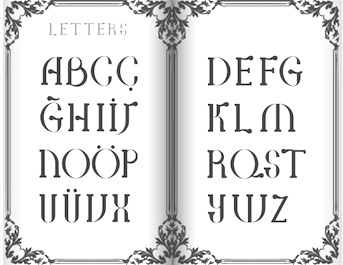 Student at Mimar Sinan University's Graphic Design Department. Istanbul-based designer of a high-contrast display typeface in 2012.
 In 2013, he designed the display typeface Pera, which was inspired by the architecture and art nouveau flair of Istanbul's Beyoglu district. [Google]
[More] ⦿
|
Alice Chau
|
 During Type Paris 18, Alice Chau designed Recette, a text typeface. Alice explains: Recette is a book-friendly slab serif. Inspired by a classic French cookbook from the 1920s (La Bonne Cuisine de Madame E. Saint-Ange), it retains just a hint of its art nouveau origins with slightly flared asymmetrical serifs and rounded features. It is intended to be a workhorse typeface for publishing, with a wide variety of weights, widths, numbers, and expert features. [Google]
[More] ⦿
|
Alicia García
|
Palma de Mallorca-based creator of a nice typographic collection of posters entitled Carteles Leo Bassi (2011), which mix the Western circus poster style and art nouveau elements. Typefaces created by er include the paper cut typeface Diplodocus (2011), and the octagonal typeface That Tune (2012). View her Y Modaba poster (2011). [Google]
[More] ⦿
|
Alit Design (or: Gurita Hitam)
[Alit Suarnegara]

|
 A graduate of Institut Seni Indonesia Denpasar Bali who is based in Denpasar, Bali, Alit Suarnegara (Gurita Hitam, b. 1986, Denpasar) created these typefaces:
 - 2022: Psychofun (psychedelic), Lhont Down (a bouncy baseline serif), Spidro Marley (a flared display serif), Bellyman (an art nouveau boutique serif), Hulahoy Typeface (a formal reverse stress script), Bulone (a display serif with curved stems and terminals), Mankey (glyphs with wavy kinks), April Blossom (a scrapbook script), Soka (a 28-style display sans), Mollyn (a 14-style casual sans), Mongek (a 13-style display serif with funky curves), Round Saetan (a ribbon typeface), Putrey (a 9-style display grotesk), Rosehot (a display serif), Maglony (a 9-style font with sharply cut edges and terminals), Nillota (a 13-style display serif), Romans Lovers (a 12-style decorative serif), Maboth Typeface (blackletter), Belong Faith (a spurred tattoo (?) blackletter), Hello Mytoys (a modernized blackletter), Belligoes (blackletter), Boiller (a 14-style Peignotian sans).
- 2021: Mybook Again (a great swashy calligraphic script meant for romantic events), Radja Lover (a calligraphic font with hairline connectors), Brohoney (a 13-style text family), Two Race (a race car font family), Piersob (a very wide display sans reminiscent of the old Porsche logo font), Black Mild (Victoriana), Decondor (a 14-style delicate mini-serif), Gathell (a 13-style fashion mag serif), Hero Beam (spurred, Victorian), Vaclice Script, Nokarin (a bold calligraphic script), Horseboy Boots (Western, with terminals that emulate hooves), Mokgech (blackletter), Sutray (a rather formal upright script), Mister Honey (Tuscan), Nandola (a fine calligraphic script), Bungker (a layerable hand-drawn slab serif), Brolimo (a 14-style Peignotian sans), Takashimura (a Japanese emulation font), Bunker (a layerable marquee font family), Dronefly, Miloner (a 14-style fashion mag serif), Mono and Friends (handcrafted and rounded), Roby Soho (a simple flared display sans in 12 styles), Saihat (emulating Arabic calligraphy), Gofienda (a calligraphic script), Rusty Store (Victoriana), Chalk and Friend (a sketched typeface), Grunge Decade (art nouveau), Kenoky Coffekan (a 15-style decorative sans and script duo), Botaky and Botaky Script (a wavy display font), Hidrofont (vintage), Roller Alika, Mistic (a decorative serif), Burgie (14 styles: an ink-trapped swashy and inky display serif), Hand Real (a thin monolinear script), Assox (a reverse contrast Tuscan typeface), Balian (a textured typeface that is based on Balinese carvings), Handy Quomte (calligraphic), Brohillo (a display serif).
- 2020: Karmila, Shary (a 52-style sci-fi sans font that could also be useful in sports), Brave Eighty One (techno, squarish), Mollas (a decorative serif), Crying, Milk and Balls (a 28-style display typeface with rhombic tittles, wedge serifs and razor blade edges---the connection with milk or balls will forever remain mysterious), Boiling, Mallent (brush script), Bemalla (script), Marons (a script/serif hybrid).
- 2019: Black Quality (inline, vintage), Caibojog (watercolor brush), Bonillo, Balimoon, Mofita, Nahye, Pintgram, Subscriber, Lovina Script , Bolehdong (script), Zamrack, Melloner, Melloner Fun, Beautiful Lovina, Localghost (a signature script).
- 2018: Controwell (a Victorian script and text collection), Raustila, Rollete Qaku (dry brush), Norffo, Nermola Scripcy Font, Braton Composer.
- 2017: the script typefaces Rumble Brave Script (as part of the vintage typeface Rumble Brave), Mellony (2017: dry brush script), Raph Lanok (brush style), Jandys, Jandys Dua, Billy Ohio (2017: dry brush), Localghost and Valledofas, and the vintage tattoo typeface Young Heart.
- 2016: the thin connected script typeface Mooglonk, the signage script Altoys, the decorative didone Florva, the connected script typefaces Asfrogas, Rofitaste (brush style), Qarvic (a sans), Qarvic Icon, Morva (a decorative didone), Young Heart (a free vintage typeface with spurs), and Brushgyo.
- 2015: Bromello (brush script), Vroffloow (in script and sans styles), Godfeem, Mooglonk, Floren (a display serif), Lawasth, Mooglonk Serif, the brush typeface The Faino, the tattoo font Alitide, the watercolor brush typefaces Roomfer and Norffo, the connect-the-dots typeface Circle Line, and Kemayu.
- 2014: the beveled typeface Piramid.
- 2013: the spurred signage typeface Starck.
Creative Market link. Another Creative Market link. Dafont link. Graphicrier link. [Google]
[MyFonts]
[More] ⦿
|
Alit Suarnegara
[Alit Design (or: Gurita Hitam)]

|
 [MyFonts]
[More] ⦿
|
Allen R. Walden
|
 Type designer. Not to be confused with "Walden Font", a commercial foundry run by Oliver Weiss. Dafont link. Full list of his work: African (1993, a jungle font), Amelia, Asimov, Beveled, CalculatorItalic, Checkbook (MICR-like font), CrystalItalic, FinalFrontier (1993), FinalFrontierOldStyle, FinalFrontierShipside, Goethe, Japan, Jurassic, Lansbury (1993), Neon Lights (1993, based on Quantum), NewYorker (after Rea Irvin's irvin Font for tThe NewYorker), OliviaBrush, StencilExport (1993: based on Gerhard Schwekendiek's Gesh Export, 1972), Terminator (techno).
 Lansbury is a free art nouveau typeface that mimics the font used in the TV series Murder She Wrote. The actual font used for the title of that series was URW's Art Gothic (specimen). Fletcher Gothic (1992, Casady&Greene) is another free version of it. [Google]
[More] ⦿
|
Alphonse Mucha

|
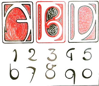 Born in Ivancice, Moravia (Czechia), in 1860, died in Prague in 1939. Famous for his sleek posters of women at the height of the art nouveau movement. In 1885 he studied at the Munich Academy of Art and then moved to the Academie Julian in Paris. In Paris, he took commissions for illustrations, portraits and decorative projects, but became most famous for his poster designs for plays, especially under the patronage of Sarah Bernhardt in the 1890s. The success of his posters led to a commercial career in decorative design for commercial and advertising products. Mucha also created jewelry designs, and briefly taught art in New York. In 1910, Mucha returned to Prague to work on nationalistic art, including murals, postage stamps, stained glass and bank notes.
 Digital fonts that were inspired by Mucha: - Scriptorium published fonts based on his lettering, such as Abaddon, Bernhardt, Slava, Moravia, Gehenna, Princess Hyacinth, Gismonda and Samaritan.
- Herbert Van Brink (aka Character) created a free font called Mucha French Capitals (2010).
- P22 Mucha (2001, P22): an art nouveau font inspired by Alfons Mucha, ca. 1900.
- Lukyan Turetskyy: Modern Wave (2013).
- Dave Ward: Mucha (1999).
- Kiwifrog: The free font Mucha Like (2009).
- Milos Kunst: Mucha (2011, art nouveau).
- Gryzor: Mucha Font.
CV. One of his alphabets. Viennese Secession link. View commercial fonts that descend from Mucha's work. [Google]
[MyFonts]
[More] ⦿
|
Amélie Dugon
|
Amélie Dugon graduated with a Bachelor en arts plastiques visuels et de l'espace from ESA Saint-Luc in Tournai, Belgium, class of 2016. Strasbourg, France-based designer of a typeface that was inspired by Frank Gehry's architectural style. Just called Gehry (2015), it has the wavy look of early art nouveau types. [Google]
[More] ⦿
|
Amit Botre
[Redfonts]
|
[More] ⦿
|
Amondo Szegi
[FONTana Typestudio]

|
[MyFonts]
[More] ⦿
|
Amy Bao
|
San Francisco-based designer of the handcrafted typefaces Shanghai (2017, brush font), Prague (2017, handcrafted in art nouveau style), Palm Springs (2017), Buenos Aires (2017). Creative Market link. [Google]
[More] ⦿
|
Ana Polezel
|
During her studies in Curitiba, Brazil, Ana Polezel created the art nouveau typeface Pink La Vie (2015). [Google]
[More] ⦿
|
Ana Quinelato
|
 During their studies at Rochester Institute of Technology /University of Espirito Santo, in Vitoria, Brazil, industrial design students Ana Quinelato, Brenno Mello, Cassio Ferreira, Filipe Motta and Myriam Fabris codeveloped UFES Sans (2014), a wayfinding sans typeface for the signage at their university, UFES. The team leader was Professor Ricardo Esteves Gomes.
 In 2014, Ana created the pre-art nouveau typeface Vida Capixaba. [Google]
[More] ⦿
|
Andrea Heikens
|
Czech-born designer, who made the great art nouveau type family Cafe Noir (2004, free at Chank's). [Google]
[More] ⦿
|
Andrea Meli
|
Graphic designer in San Gwann, Malta, where he studies at Malta's Institute of Art and Design. He created Sinus Novem (2012), a typeface that appears to use gothic arcs. He writes: Sinus Novem merges the elegant nature of Art Nouveau with the angular properties of Urban design. Characters in the Sinus Novem prototype typeface are built on one of the three vertical segments of the grid shown above. It is advertised as an urban art nouveau. [Google]
[More] ⦿
|
André Luis
|
Curitiba, Brazil-based designer of the flowing art nouveau titling typeface Bear (2016) which evolved from the logo of a short film. [Google]
[More] ⦿
|
Andreas Höfeld
[Fontgrube AH]
|
 [More] ⦿
|
Andreas Seidel
[astype.de (or: Astype)]

|
 [MyFonts]
[More] ⦿
|
Andreas Stötzner
[SIAS (or: Signographical Institute Andreas Stötzner)]

|
 [MyFonts]
[More] ⦿
|
Andres Maza
|
 Brooklyn, NY-based designer of the free vintage all caps typeface Vienna Marble (2014). Behance link. [Google]
[More] ⦿
|
Andreu Balius Planelles

|
 Born in Barcelona in 1962, Andreu Balius studied Sociology in the Universidad Autonoma de Barcelona (1980-1984), and graphic design at IDEP in Barcelona (1985-1989). He holds a PhD in Design from the University of Southampton (UK). He founded Garcia Fonts&Co in Barcelona in 1993 to show his experimental designs. He cofounded Typerware in 1996 with Joancarles P. Casasín. Typerware existed until 2001 and was based in Santa Maria de Martorelles, a village near Barcelona. He cofounded Type Republic (see also here), and ran Andreu Balius (tipo)graphic design. He is presently an associate professor at Pompeu Fabra University in Barcelona.
 Balius won a Bukvaraz 2001 award for Pradell. Pradell also won an award at the TDC2 Type Directors Club's Type Design Competition 2002. SuperVeloz (codesigned with Alex Trochut) won an award at the TDC2 2005 type competition. At ATypI 2005 in Helsinki, he spoke on Pradell and Super-Veloz. Speaker at ATypI 2006 in Lisbon. At ATypI 2009 in Mexico City, he spoke about the Imprenta Real. Coorganizer of ATypI 2014 in Barcelona. Author of Type at work. The use of Type in Editorial Design, published in English by BIS (Amsterdam, 2003). FontFont link. Linotype link. Behance link. His production: - Garcia/Typerware offers about 50 fonts, including some very artsy typefaces, such as Fabrique (Andreu Balius), Futuda, Garcia Bodoni (Typerware), Alkimia (Estudi Xarop), Ariadna (pixel font, 1988-1989), Garcia Bitmap (1993), Playtext (Andreu Balius, 1995), Matilde Script (Andreu Balius, 1994: an embroidery face), Fabrique (1993, Andreu Balius) and Dinamo (1993, Balius and Casasin at Typerware), Helvetica Fondue (1993-1994), Futuda (1993), Ozo Type (1994), Tiparracus (1994, dingbats), Mi mama Me Soba Script (1994), Parkinson (1994), Garcia Bodoni (1995), Garcia snack's (1993-1995), Juan Castillo Script (1995, irregular handwriting), and Vizente Fuster (1995), all by Andreu Balius and Joancarles Casasin, 1993-1995; Water Knife (Laudelino L.Q., 1995); Alquimia (Estudi Xarop, 1995); Jam Jamie (Malcolm Webb, 1996); Network (Alex Gifreu, 1996); Panxo-Pinxo (David Molins, 1996); Euroface 80 mph (Peter Bilak, 1996); Inmaculatta (Roberto Saenz Maguregui, 1997); Proceso Sans (by Argentinan Pablo Cosgaya, 1996); Afligidos deudos (Adria Gual, 1996); Route 66 (Francesc Vidal, 1997); Popular (Sergi Ibanez, 1997); Visible (handwriting by Fabrice Trovato, 1997); SoundFile (Reto Brunner, 1998); Ninja type (kana-lookalike alphabet by Charly Brown, 1995); Vertigo (Charly Brown, 1996); Loop UltraNormal (Franco and Sven, 1996); Inercia (Inigo Jerez, 1996).
- Fontshop: FF Fontsoup.
- ITC: ITC Temble (1996, a great subdued ghoulish face). With Joancarles P. Casasin, he created ITC Belter (1996) and ITC Belter Mega Outline (1996).
- Typerware: Czeska was developed from Vojtech Preissig's woodtype typefaces. Andreu Balius completed the design and included an italic version and a large variety of ligatures (both for regular and italic).
- Type Republic: Pradell, Trochut, SuperVeloz, SV Marfil Caps (2004), SV Fauno Caps. Pradell was freely inspired from punches cut by catalan punchcutter Eudald Pradell (1721-1788), and is considered to be Balius' main work. Trochut is based on specimens from the 1940s by Joan Trochut. SuperVeloz is a collection of the type modules designed by Joan Trochut and produced at José Iranzo foundry in the beginning of the 40's, in Barcelona. Digitized and recovered by Andreu Balius and Alex Trochut in 2004. Example of such composition of modules include the great art nouveau typefaces SV Fauno Caps and SV Marfil Caps. In 2007, he added Taüll, a blackletter type. Still in 2007, he did the revival Elizabeth ND, which was based on an old type of Elizabeth Friedlander.
- In 2008, he created the Vogue mag like family Carmen (Display, Fiesta, Regular), which are rooted in the didone style. Carmen, and its flirtatious companion Carmen Fiesta, were both reviewed by Typographica.
- Barna (2011) and Barna Stencil (2011).
- In 2012, Trochut was published as a free font family at Google Web Fonts. It was based on Joan Trochut-Blanchard's Bisonte.
- Lladro (2012) is a custom sans typeface done for the Lladro company.
- Rioja (2013) is a grotesque typeface that was custom-designed for Universidad de La Rioja.
[Google]
[MyFonts]
[More] ⦿
|
Andrew Buckle
|
Maidstone, United Kingdom-based programmer. Designer of the experimental typefaces Circula Track (2016) and GX Stretched Lines (2016), and the free grungy handcrafted typeface GX Ruff Stuff (2016). Behance link. [Google]
[More] ⦿
|
Andrew Lines Graphic Arts (or: Drewfont Foundry)
[Andrew Patrick Lines]

|
Andrew Patrick Lines (b. Lowestoft, Suffolk, UK, 1958) is a signage and logo specialist in Norfolk, UK. His fonts are sold through MyFonts. He started Drewfont Foundry (Great Yarmouth, UK) in August 2001 as part of Andrew Lines Graphic Arts. His typefaces: - Jester (2001).
- Seahorse (2004).
- Histry (2004).
- Nondy (2004).
- The Castles (2001). Includes Castle Nouveau and Castle squat. Inspired by the Victorian gothic revival and the work of Augustus Pugin.
- Celt (2001, Celtic).
- Gotheau (2001). This blackletter was developed for the logo of the Letterhead UK movement (an informal yearly gathering of sign based crafts people).
- Spaceboy (2001).
- Starman (2002).
[Google]
[MyFonts]
[More] ⦿
|
Andrew Little
|
Type designer from New York City, NY, who created an art nouveau typeface in 1886. [Google]
[More] ⦿
|
Andrew Patrick Lines
[Andrew Lines Graphic Arts (or: Drewfont Foundry)]

|
[MyFonts]
[More] ⦿
|
Andy Anzollitto

|
 In 2017, Louise Fili, Nicholas Misani and Rachel Michaud co-designed the art nouveau typeface Montecatini, which is inspired by Italian travel posters from that era. In 2019, Louise Fili, Nicholas Misani and Andy Anzollitto expanded this typeface to the 24-style Montecatini Pro.
 Marseille (2017) is co-designed by Louise Fili, Nicholas Masani and Andy Anzollitto. It is an art deco-inspired letterform that is based on Louise Fili's cover design for the Marguerite Duras novel The Lover. [Google]
[MyFonts]
[More] ⦿
|
Angel B. Lee
|
Freelance designer in New York City, who created the art nouveau typeface Mustache Gothic (2012). [Google]
[More] ⦿
|
Angel Koziupa

|
 Argentinian lettering artist who worked for 35 years for McCann Erikson and has produced freelance works for other major agencies like Interbrand, Futurebrand, and others. Veer wrote: The talented Angel Koziupa has been lettering, creating type and designing logos for the past 40 years. His handiwork is behind nearly every important packaging logotype in Argentina. He worked 35 years for McCann Erikson and has produced freelance works for other major agencies like Interbrand, Futurebrand, and others.
 Koziupa designed a number of alphabets in cooperation with Alejandro Paul of Sudtipos, who created digital typefaces out of them. His typefaces include Jugo Script (2014), Avellana Pro (2012), Bayoneta Pro (2012, an angular typeface), Machete Pro (2012, related to Bayoneta Pro), Aventura (2011), Coche (2011, a signage face), Aguafina Script (2009, free at Google Web Fonts and at OFL), Primavera (2008, a signage face), Angelus (2008), Felipe (2009), Amarinda (2004, Sudtipos), Argenta (2004), Biographer (2009, an upright almost connected script), Bravissima Script (2009), Bubblegum Sans Pro (2011), Cenizas (2008), Chocolate (2008, a market sign family in weights called Amargo, Caliente and Dulce), Condiment (free at Google Web Fonts), Cupcake (2010, a food signage face), Murga (2003), Tiza (2003), Galgo Script (2007, rough-edged calligraphic script), Kilo (2010, signage face), Koziupack (2008), Kozmetica Script (2011, a delicate wedding script or make-up brand script), HabanoST (2003), Argenta (2003), Malbeck (2003), Alma (2005), MobleySans (2003), Malambo, Oxida (2005), Inoxida (2009), Piedra (2010, grunge; free at Google Web Fonts), Pinguino (2005, condensed brush face), Platinus Script Pro (2012, a wedding font), Ricotta Script (2011, a true signage face), Romy (2007, graffiti script), Voyeur (2011), Almond Script (2007), Candombe (2007, a brushy script with an African theme---the Pro version is from 2013), Amorinda (2007), Cafelatte (2006, signage face), Matogrosso Script (2009), Uplink (2009, upright connected script), Aladin (2009, an art nouveau-meets-Arabic face; free at Google Web Fonts and at OFL), Delight Script (2011: a 1950s signage face, which won an award at Tipos Latinos 2012), Diplomatic (2009) and MobleySerif (2003) were created by Alejandro Paul based on his letters. They can be purchased at Umbrella Type. Also at Umbrella, Paul and Koziupa made the casual script typeface Brisa (2004; its grungified version is Viento, 2011), and the script typefaces Chocolate Caliente, Amargo and Dulce (2005), Felipe (2005), Cooked (2006, rough-edged), Chicle ST (2007, bubble gum wrapper type, free at Google Web Fonts), Lombriz (2005), Bakery Script (2006, for signs in stores), and the frizzy Cenizas (2005). Bilined deco scripts such as Festival Script Pro (2013: a winner at Tipos Latinos 2014), Tanguera (2007), Aranjuez (2012), Bellas Artes (2007, doubly-lined script), Heraldica Script (2013), and Evergreen (2014, a leafy script). Klingspor link. [Google]
[MyFonts]
[More] ⦿
|
Angela Bolliger
|
German-Swiss typographer. With Julien Saurin, she published the classic avant-gardist hand-drawn typeface Paris (2012, La Goupil). It comes with art nouveau ornaments called Paris Serif Ornaments. [Google]
[More] ⦿
|
Angela Gutierrez Garcia
|
During her studies in Sevilla, Spain, Angela Gutierrez Garcia designed the steampunk typeface Steampang (2016), the art nouveau typeface Natural Type (2017), and the stitching font Old Granny Cross (2017). [Google]
[More] ⦿
|
Angela Haglund
|
Nashville, TN-based Angela Haglund made Gatsby Caps and Nouveau Riche (1997, art nouveau). Nouveau Riche is based on a combination of 3 alphabets. The inspiration is a portfolio by two artists, J. Lehner and E. Mader, published early in the century in Vienna called Neue Schriften und Firmenschilder im Modernen stil: Serie I (New Alphabets and Business Signs in the Modern Style: Series I). [Google]
[More] ⦿
|
Anne Ulku

|
 Anne Ulku is an established designer based in Minneapolis, MN. She graduated from Minneapolis College of Art&Design in 2007. Her typefaces include Kazootie (2011, Chank Foundry), which was inspired by cut-paper shapes and named after the hand puppet character Rootie Kazootie in a 1950s children's television show. Together with Chank Diesel, she created an exclusive custom typeface design for the 2011 Target Halloween campaign---a complement to the cut-paper art designs of Andrea Deszö. She also made Vintage Noveau Italian (2012), the collage typeface Particulate (2012, free at Chank Diesel's place), Indian (2012, a retro motorcycle script font done with Chank Diesel), and the sewing machine font Stitch (2012).
 In 2015, she hooked up with Olson for a new typeface for Porsche. Anne writes: Porsche has always had a very clean and structured, well-known visual brand. Their custom headline font, Porsche Franklin Gothic, happens to be the exact same as Franklin Gothic. In order to create a refresh of the Porsche brand, while still maintaining the established look, there was opportunity for a new typeface. The core of the new typeface is based on the Porsche logo, as well as typeface Deutsches Institut für Normung 145---a precise, technical typeface; also the standard for German road signs. With a strong racing history, additional visual cues were also used in creating a truly unique, custom Porsche typeface. Dribble link. Twitter link. [Google]
[MyFonts]
[More] ⦿
|
Anonima Impressori: Art Nouveau
|
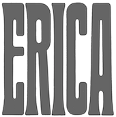 Some Italian wood types shown in Catalogo Caratteri in Piombo e Legno by Anonima Impressori (Bologna, Italy). The styles covered here represent the art nouveau era. They comprise Amalia, Aurora Arcaico, Barnum, Bastone Stretto Fiat, Cenisio, Desdemona, Iris, Libellula, Liberty, Titania, Uranio. [Google]
[More] ⦿
|
Anthony Bossard
|
French graphic designer, illustrator and type designer (b. 1982) who graduated from LISAA in 2006. His typefaces: Danoise (+Bold) (art nouveau influences, 2006), Station Debout (2006, sans), Krug (2006, irregular handwriting), Digitaline (2006), Forficula (2006, artsy). Bossard lives in Rennes, where LISAA is located. Dafont link where one can download Danoise. [Google]
[More] ⦿
|
Anthony Cerino
|
Creator of the free art nouveau typeface Italexico (2013). [Google]
[More] ⦿
|
Anthony Neil Dart
|
Graphic and motion graphics designer in Johannesburg, South Africa, where he worked as Ontwerp.tv (Idea currency) Pty Ltd. He is now located in Seattle, WA. He created several experimental alphabets, often of a geometric nature, such as Geometric Chic (2008-2009) and Beauty (2009). The Bends (2011) is a hairline curly-yet-straight display face. SansGoma (2011) is a hairline slab poster face. Nu Gothic (2011), Nu Modern (2011) and especially Vironica (2011) are fashion mag display typefaces. Neu Nouveau (2011) is a curly art nouveau face. Numera (2011) is an organic fashion mag face. Killoton (2011) is super-fat and beautiful. Creations in 2012: An art deco example in his Janelle 1945 work. Vorm Type, inspired by the work of Wim Crouwel, is a rounded blocky typeface that is monospaced in the x and y directions. Typefaces from 2013: Canada (alchemic). In 2015, he created a series of posters called Vignelliisms illustrating one-liners by Massimo Vignelli. Typefaces from 2017: Canada (I can't believe that he has trademarked the name Canada). Home page. Behance link. Ontwerp link. [Google]
[More] ⦿
|
Antoine Szczebanski
|
Designer in the art nouveau era. One on his alphabets, page 71 of the Solotype catalog, was digitized in 2010 by Claude Pelletier as Le Golf. [Google]
[More] ⦿
|
Anton Scholtz
[Scholtz Fonts]

|
 [MyFonts]
[More] ⦿
|
Antonio J. Morata

|
 Antonio J. Morata (Almeria, Spain, b. 1968) is a FontStructor (aka elmoyenique) who used FontStruct to make several modular typefaces starting in 2010. The typeface names start with z. We list them alphabetically:
 - Je suiz Charlie (2015).
- zabadoo eYe FS (2013, bilined), zadartopia eYeFS (2014), zadora-q-eYeFS (pixelized), Zaffron EyeFS (2013), zaftig eYe FS (2013), zage eYe FS (2013), zagreb-eYeFS (2009), zagzig eYe FS (2012), zagzig Linear eYe FS (2013), zahoree eYeFS (2012, dot matrix), Zakapunt eYeFS (2010), Zapatiesta EyeFS (2013, a cut paper font), Zakyra eYe-FS (2010, a western font modeled after Kyra 1 my Michel Troy), zalamera eYeFS (2011), zalooneYeFS (Western face), zamantha eYeFS (2012), zame-eYeFS, Zamzibar eYeFS (2012, octagonal), zandal eYe FS (2013, +2b), zandalo eYe FS (2014), zanexos eYe FS (2015, kitchen tile face), zanzibar-eYeFS, zancle-eYeFS, zancle-rev-eYeFS, zanadalo eYe FS (2014, Tuscan), Zangona eYe FS (2013), zanity eYe FS (2012), zanta eYe FS (2013), zapphire eYeFS (2012, kitchen tile face), zapristi-eYeFS (outlined and oblique), zarcs-eYeFS, zarina-eYeFS (2011, blackletter), zaturdaynote eYe FS (2014: dot matrix font), zaved eYeFS (2012), zaxet eYeFS (2014, Western), zayre-eYeFS, zaza eYeFS (2011).
- zblackmagic-eYeFS (2011, Based on the Tomeri Nu-No font by Nuria González and Noël Nanton), zbrickfont eYeFS.
- Zcare Myself EyeFS (2013), zcell-eYeFS (2010, fat counterless, and outlined), zcell rnd eYeFS (2012), zchwarze eYe FS (2014), zchwarze deco eYeFS (2014), zcloudy eYeFS (2012), zcout eYeFS (2010, a mini-stencilled art deco face), zcrackers eYe/FS (fa, counterless and starred), zcratched eYe FS (2014).
- zdurer (blackletter).
- zeagull eYe FS (2014), zebralbox eYeFS (2013), zebralkey EyeFS (2013), zeelandia-eYeFS (horizontally striped), zeenvoudige eYeFS (2011), zefaleas eYeFS (2013), zegovia eYeFS (2012), zelada eYeFS (2011), Zelectra eYeFS (2013), zelemin eYe FS (2013), zelfvolution eYeFS (stencil), zenda-eYeFS, zeneka eYe FS (2013), zenequalia eYe FS (2014), zenix-eYeFS (2011), zenoid eYe FS (2012), zenon eYeFS (2011, horizontal stripes), zenovia-eYeFS (2011), zentenial eYeFS (2015), Zenzilla EyeFS> (2013), zeres eYeFS (2011), zerone eYeFS (2011, a modular piano key face), Zertera eYeFS (2015, textured), zetentas-eYeFS (disco light face; +Light), zeventy-eYeFS (2011), zextile-eYeFS.
- zfraktur eYe FS (2011, blackletter).
- Zhadowlite eYeFS (2014), zhadows eYe/FS (shadow face), zhalloween eYe/FS (pixel face), zhapp3y-eYeFS (alphading), zhappy eYeFS (2011, fat art deco), zhappy5th eYeFS (2013), Zharkonada eYeFS (2014), zharona-eYeFS (2010).
- ziabelle-eYeFS (shadow face), ziberia eYeFS (2011: extended to a full-fledged commercial typeface, KD Ziberia, by Zhalgas Kassymkulov, in 2021), zibernia blk eYe/FS (2011), zibernia blk x thal eYe/FS (2011), zicrets eYeFS (2013), Zilken eYe FS (2013), zilverstone eYeFS (2011, blackletter), zimbawee-eYeFS, zimbelino eYeFS (2013), zimonart eYe FS (2014), zinabrium eYeFS (2013), zincline eYeFS (2014), zinders eYeFS (2012), zinergy-eYeFS (3d face), zinergy blk eYe/FS, zinfont eYeFS, zinnamon eYeFS (2011), zinus eYeFS (2013), zirconite eYeFS (2011, slab face), zircus eYeFS (2010), zirius eYeFS (2011).
- Zkalpel eYe FS, Zkalpelbar eYe FS (2014, blackletter), zkandia-eYeFS (stencil), zkinlight eYeFS (2013).
- zlabyrinths eYeFS (2011, improved by fanstruct1 in zlabyrinths eYeFS v2, 2012), zlash eYe FS (2011, a keyhole face), zloty eYeFS (2011, art deco face).
- zmorse xDad eYe FS (2011, a texture / African typeface based on morse code).
- znederland eYe FS (2012), znipped eYe FS (2012, heavy angular face).
- zpanish caravan eYe/FS (2011, a bullet hole face), zpeedo eYe FS (2013, race car font), zpido eYeFS (2012), zpixel eYeFS (2011), zporty eYeFS (2012, textured face).
- zquadrata eYeFS (2010), zquared-eYeFS.
- Zocratic EyeFS (2013, kitchen tile face), Zocraticrux eYeFS (2014), Zoftly 70 EyeFS (2013, LED font), Zombra eYeFS (2013, influenced by Orthmar Motter's Motter Ombra, 1973), zometimes eYeFS (2014), zonatta eYeFS (2013), zonora eYeFS (2011, a Far West face), zooctogonal eYeFS (2013), zoolphabet eYeFS (2010, animal dingbats), zorongo eYeFS (2014: inspired by the MuirMcneil poster lettering for Braun systems), Zoulsister Plus eYe FS (2016), zoutheast eYe FS (2012, Western), zouthwest eYe FS (2012, Western), zoutland eYeFS (2011, octagonal), zouvenir 2U eYeFS (2013), zovietztyle eYeFS (2013, constructivist), zozial-eYeFS, zozial-sqrd-eYeFS.
- Realta2 (2013), zreeways eYe FS (2014: multilined face), zround eYeFS (2010).
- Ztardust eYe FS (2014),
 ztarsky-eYeFS (+Round: art deco ultra black), ztainless eYe FS (2014), ztamina eYe FS (2014: shaded), ztator eYeFS (2012), ztay eYeFS (a condensed almost art nouveau face), Zteamboat EyeFS (2013), ztedelijk-Crouwel eYe/FS (2011, based on Wim Crouwel's stedelijk Museum poster), zteefunny eYe FS (2011, ultra fat keyhole face; + zteefunny dm eYeFS), ztencils eYeFS (2011, army stencil face), ztires-eYeFS (2011, texture face), ztoasts eYeFS (2013), ztonewall eYeFS (2013), ztorm eYeFS (2013, blackletter), ztrands eYeFS (2011), ztrange eYeFS (2010), ztrange blk eYeFS (2011), Ztrangelovedoc (2016), Ztratos eYe FS (2014), ztream eYeFS (2011), ztrong eYeFS (2013, sci-fi), ztrontiumdog eYe FS (2013, fat stencil), ztructures eYe FS (2012, crosshaired), zturdy-eYeFS (ultra-fat), ztylo eYeFS (2011, art deco). ztarsky-eYeFS (+Round: art deco ultra black), ztainless eYe FS (2014), ztamina eYe FS (2014: shaded), ztator eYeFS (2012), ztay eYeFS (a condensed almost art nouveau face), Zteamboat EyeFS (2013), ztedelijk-Crouwel eYe/FS (2011, based on Wim Crouwel's stedelijk Museum poster), zteefunny eYe FS (2011, ultra fat keyhole face; + zteefunny dm eYeFS), ztencils eYeFS (2011, army stencil face), ztires-eYeFS (2011, texture face), ztoasts eYeFS (2013), ztonewall eYeFS (2013), ztorm eYeFS (2013, blackletter), ztrands eYeFS (2011), ztrange eYeFS (2010), ztrange blk eYeFS (2011), Ztrangelovedoc (2016), Ztratos eYe FS (2014), ztream eYeFS (2011), ztrong eYeFS (2013, sci-fi), ztrontiumdog eYe FS (2013, fat stencil), ztructures eYe FS (2012, crosshaired), zturdy-eYeFS (ultra-fat), ztylo eYeFS (2011, art deco). - zumbaya eYeFS (2014), zummertime eYe FS (2012), zunivetica eYe FS (2013), zunset eYeFS (2012), Zuspiria eYe FS (2015), zuzanna eYeFS (2013, Western, Italian).
- zweater eYeFS (2011, knitted look), zweet eYeFS (2013), zwimming eYeFS (2011), zwire blk eYeFS (an LED face), zwiss-eYeFS.
- zybaris eYeFS (2012), zybona-eYeFS (athletic lettering), zychotropic eYeFS (2013, an Italian Western face), zydonia eYeFS (2012), zykedelia-eYeFS (2012), zylone-eYeFS (2011), zylvania eYeFS (2013, retro automotive script), zynopsis eYe FS (2013), zyrano eYeFS (2013), zyrens eYeFS (2013), Zyrup Eye FS (2013).
Dafont link. [Google]
[MyFonts]
[More] ⦿
|
Antraxja Fonts (or: Atrax)
[Rafal Brzezinski]
|
Antraxja Fonts (or: Atrax) is a (now defunct) Polish foundry which offered these free fonts made by Rafa Brzezinski in 2004: ARTUR, Antraxja Goth 1938 (blackletter), Art (art nouveau), Battlefield (war lettering face), BananaShow-Medium, CrashTest, CrashTestItalic, CrashTestShadow, Cybernetyka (futuristic family), CybernetykaItalic, CybernetykaNormal, CybernetykaOutline, DarkPalladin, History Brush, Kreskwka-Italic, Kreskwka (handwriting), Monster, MonsterShadow, Mortis, Orchidee, Reforma, Returntocastle (gothic), Speed+, Speed+2, Techno, Medusa (blocky lettering), Weronika, Bajareczka, Camilla, Cherif, Top Secret (stencil). Alternate URL. Fontspace link. [Google]
[More] ⦿
|
Applied Meta Projects (was: Tunera Type Foundry, Ariel Graphisme)
[Ariel Martin Perez]
|
 Born in the Canary Islands, Ariel Martín Pérez is a freelance art director and illustrator based in Paris. He set up Ariel Graphisme. In 2020, he founded Tunera Type Foundry with Anton Moglia. In 2021, he started Applied Meta Projects. Parisian designer of Nord Sud Boulenger (2015), a squarish all caps typeface based on the tiled letters used in the subway in Paris on the Nord-Sud line (now lines 12 and 13). It is named after the Boulenger tile factory, also known as the Choisy-Le-Roi tile factory.
 In 2018, he designed the display typeface CMT and the free typeface Ouroboros (at Velvetyne), a font for alchemists, witches, heretics and outsiders that has art nouveau elements. In 2021, he improved some curves and added some symbols suggested by artist Hélène Mourrier. Typefaces at Tunera: - Brassia (Ariel Martin Perez). A wavy typeface designed in 2019.
- Canarina (Ariel Martin Perez). Canarina (2020) is an angular font inspired by the Canary Islands, that celebrates its history and culture. Perez writes: Canarina is a fingerprint, a phonolitic stone, the leaf of a succulent plant, the silhouette of a volcanic rock against the sky, a feeling that is hard to translate.
- In 2020, with Sébastien Hayez, he released the free typeface Cantique at Velvetyne. Cantique was inspired by some hand-carved titles used in post-romantic French bookplates, both for their ornamental qualities and for their kind of medieval mood.
- Générale Station (Ariel Martin Perez). In 2017, he designed the free typeface families Générale Mono (octagonal, bi-width), NordSudA, NordSudB and NordSudC. Générale Mono was extended in 2019 to Générale Station.
- Kobata (Ariel Martin Perez). An experimental pixelish typeface from 2020.
- Manosque (Ariel Martin Perez). Manosque (2019) is a bulky rounded typeface inspired by lettering found in the train station of Manosque, a city in the south of France.
- Paysage (Anton Moglia). Paysage is a redesigned and extended version of Garcia Regular, a typeface started in 2016. This humanist sans released in 2020 was inspired by Roger Excoffon's Antique Olive.
Behance link. Open Font Library link. Old link to Ariel Graphisme. Ariel Martin Pérez at Velvetyne. [Google]
[More] ⦿
|
Archibald
|
An architectural writing font with art nouveau features, by Brendel (1994). [Google]
[More] ⦿
|
Architaraz Type (or: Kassymkulov Design)
[Zhalgas Kassymkulov]

|
 Architaraz Type (Kassymkulov Design) is located in Shanghai, China, and Taraz, Kazakhstan. Its type designer, Zhalgas Kassymkulov, was born in 1986 in Kazakhstan. His initial type designs were all done with the help of FontStruct. In 2013, he went commercial as Architaraz Type.
 He made a gridded modular typeface called Targeted (2011). Sliced (2011) is a counterless stencil face. Discostructed (sic) (2011) is a texture face. Mono Dot (2011) is a thin dot matrix face. Mono Hor (2011) is a horizontally striped version of it, Mono Ver (2011) a vertically striped version, and Mono Bold (2011) a bold version. Promo (2011) is purely geometric. Semiz (2011) and Semiz Light (experimental) are partly art deco. Audio (2011) is based on the logo of audiojelly. Arro (2011) has letters with arrowed terminals. Hexa (2011) is hexagonal. Happi (2011) is a fat finger face. Semiz Black (2011) is a free fat pixel face. Creations from 2012: Pearls of Margar, Korgan, Phunni, Carbo, Carbo ii, Lenta, Phunni, Jambul, Extraterrestrial (sci-fi), Rap My Hip-Hop, Armada 1991 (monospaced), Venus (white on black), Garage Garbage (bold avant-garde design), WHAQ, Extra Fontestrial, Algae, A Tasbaqa, Salem (rounded bold typeface), Thaiana Jones, Salem (fat rounded face), Audio 2012, Balapan, Dalmat, Bonn (an art nouveau army stencil face), Mgla, Teris (white on black), Degoratix (curly), Barney Stencil (a fantastic brushy stencil), Lentalicious, Blackway Str, Schengbers (a great piano key stencil family), Tramcar Typo, Mgia, Brushure (a fat curvy display face), Extralien, Serrific Terif, Missinger, Tolkyn, Murt, Twisture, Soliture, Threedure, Antillic, Garage Garbage, Arro, Happi, Schengbergs Hi. Typefaces from 2013: AT Dombra (psychedelic typeface after Motter Ombra), AT Hoppy (fat letters), AT Liniya (blackboard bold), AT Karagai, Hed Kandi (techno face), AT Traffa Stencil, AT Schema, Naation, AT Nayman, AT Roughin, AT Rooktura Stencil, AT Duba, AT Archistency, AT Liena, AT Bombarda (fat stencil face), AT Sulfur ii, AT Mad Pilot, AT Tasbaqa, Vaia Con Dios, Betaport, Mooltyashka, AT Stincel (a lively stencil font), Millio, Tamshy, Offelia, Jalgas (retro script: a winner in the FontStruct Connected Script Competition), Laffa (connected stencil script), Dlinalys, Diagona, Kitara (psychedelic), Archtitalic, Bonn (bony stencil), Teka 1, Teka 2, Unknownim, Khara (ultra-heavy slab face), Shlab (slab serif), Unknownim (slab serif), Archtalic, Argyn, Linea Runde, Mechatraps (+Plain), Eliksir, Drilliant, Katamaran (art deco), Lagman, Neurojet (experimental), Jazzure (bullet hole display face), Diagon, Aroth, Pharaoh's Delight (piano key / art deco typeface), Cocomi, AT Burshak, AT Sulfur, AT Taspa, AT Affina. Commercial typefaces done in 2013: KD William, William Shakespears, AT Archistency (piano key stencil face) AT Bombarda (piano key stencil face), AT Audio, AT Argyn. Typefaces from 2014: AT Sudoku (each letter is actually a sudoku puzzle!), AT Tactica (tic tac toe voard), AT Sudoku+, AT Pixtensans, AT Ayna, AT Kerey, AT Giveaway, AT Lagman, AT Asotika, AT Tugan, AT Yertegi, AT Nudgera, AT Diagona, AT Golovkin (stencil typeface named after middleweight boxer Gennady GGG Golovkin), AT Arachis (stencil), AT Tugan (fat rounded sans), AT Baktera, AT Jumpa Jumpa (stencil), AT Nudgera, AT Digitta, AT Archaus, AT Ladya (ball terminal stencil), AT Yin Yang, At Keste, AT Yazyk (rounded stencil), AT Sulfurian (techno stencil), AT Fasten Your Seatbelts (diagonally cut stencil), AT Buckle Up (like AT Fasten Your Seatbelts), AT Droppix, AT Knitka (knitting font), AT Sagat, AT Wild Archid (african theme font), AT Steglo. Typefaces from 2015: ATAday, ATArchistruct, ATAttache, ATBogomol, ATCastleryRock, ATChaperon, ATKitay (oriental simulation), ATQuba, ATRaushan, ATRoyal, ATShlanga, ATSkos, ATTrassa, AT Giveaway 4, AT Sherit, AT Ribborn. Typefaces from 2016: ATArchaus2, ATArchistructOutline, ATDornach, ATDrogo, ATEnschede, ATExtrema, ATGiveawayNo5, ATGiveawayNo6, ATHadamard, ATTwelve, Windows Icon Font. Typefaces from 2017: ATBals, ATBevelour, ATEsrever, ATHitchook, ATImagiro, ATLauda, ATMigdalia, ATRozalla, ATUniversiade, ATYangster, ATZabor, ATThinnetry. Typefaces from 2018: KD Eight, KD Tramcar, KD Algae Brush, Forza Juve (inspired by Juventus FC's logo), KD Hachure (a multiline typeface family), KD Half Arc, KD Space Band, KD Hachure (+Inline, +Outline), KDAnniversary, Armiya (army stencil), KD Baba Yaga (multiline). Typefaces from 2019: KD Para, KD Pempo (a multiline art deco font). Typefaces from 2021: KD Ziberia (based on Antonio J. Morata's Ziberia typeface from 2011), KD Dekorat (a modular labyrinthine or Maya genre set of capital letters). FontM link. Behance link. FontStruct link. [Google]
[MyFonts]
[More] ⦿
|
Ariel Blackman
|
During her studies, Ariel Blackman (Gilbert, AZ) designed the thin impressionist art nouveau script typeface Keats Imperfect (2015). [Google]
[More] ⦿
|
Ariel Martin Perez
[Applied Meta Projects (was: Tunera Type Foundry, Ariel Graphisme)]
|
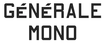 [More] ⦿
|
Aring Typeface
[Måns Grebäck]

|
 Måns Grebäck (Aring Typeface, Örebro, Sweden) is a prolific Swedish designer (b. Lindesberg, Sweden, 1990), who lives in Borlänge, Sweden. Måns Grebäck has a bachelor's degree in graphic design from the University of Dalarna (2012). In 2010, he went commercial, and started selling fonts through MyFonts. In 2011 he started Mawns Design. In 2013, that was renamed to Aring Typeface. In 2011 he already had over seven million downloads of his fonts, which were featured at websites such as Dafont and Myfonts. He also does custom type work. His typefaces, both free and commercial:
 - Acryle Script (2014).
- Actonia (2016). A monoline script.
- Adielle (2018).
- Aerofoil (2017). A vintage bottom-heavy script.
- Airways (2016). A signage script.
- Akayla Script (2018). Calligraphic.
- Aliey (2021). A 4-style Victorian copperplate serif.
- Aliment (2018). A sharp geometric sans.
- Amertha (2020). a fat finger font.
- Amplify (2013). A signage script.
- Angars Runes (2019: medieval, with gothic cathedral curves).
- Angilla Tattoo (2013). A connected spurred tattoo typeface. Followed by Angilla Script (2020).
- Antlers (2012). A calligraphic script.
- Aquate Script (2019).
- Arachnids (2011, graffiti face)
- Artely Inks (2016).
- Artisual Deco (2021). Pure art deco.
- Artographie (2020). An all caps art deco typeface family.
- Atelas (2015). Signage type, baseball script.
- Atures (2018). Futuristic and monoline.
- Autograf (2015) and Autografia (2021). Signature typefaces.
- Ave (2016) in styles called Ave Utan, Ave Betwan and Ave Fedan. A family of baseball scripts.
- Avelana. A connected script.
- Backpack (2014). A thick signage script typeface.
- Backyard (2016). A blackletter typeface.
- Barkants (2011, elegantly hand-printed family).
- Barley Script (2017). A signage script.
- Baystar Script (2021).
- Beautiful Trouble (2012). A rabbit-eared upright connected script.
- Beaked Tyrant (2014). A copperplate calligraphic script.
- Beckasin (2011, signage face)
- Before The Rain (2011, calligraphic) Before The Rain Arabic (2016).
- Belladio (2021). An urban script.
- Bellino (2018).
- Bezar (2020). A script.
- Billion Dreams (2020, by Mans Grebäck and Rangga Subekti). A heavy signage script.
- Billion Stars (2013). A tattoo script font.
- Bira (2012). A retro connected brush / signage script.
- Blaak (2019).
- Black Fox (2014). A sirupy brush face.
- Black Signature (2021). A bold signature font.
- Black Larch (2016) and Dark Larch (2016).
- Bloc Boy (2016). Like handwriting.
- Blockography (2011). A sketched typeface.)
- Block Talk (2011, with Zaydek Michels-Gualtieri)
- Blods (2011, a great blotty brush face)
- Blueberry Script (2017; with Noah Kinard).
- Botanink (2011)
- Bouncy (a cartoon font).
- Bourdos2022). A script typeface.
- Brannboll (2011, baseball signage face), Brannboll NY (2013), Brannboll Connect (2020), Brannboll Stencil (a baseball script) (2020).
- Bready (2011). A retro signage script with art nouveau aroma.
- Brev Script (2014). A connected secretary hand from the 19th century.
- Bronze Script (2014).
- Brother Tattoo (2012).
- Bumblebees (2012). A plump curvy script.
- Bunya (2016). A geometric slightly deco sans typeface family.
- Calendary Hands (2012).
- Caligraf (2020).
- Canela Bark (2015, co-designed with Luis Miguel).
- Caneletter Sans and Script (2013). Upright unconnected and connected scripts.
- Cantona Script (2019).
- Canyon (2021). A wide elliptical sans in 18 styles, featuring a coathanger lower case f.
- Capoon (2018). A ten-style sans family.
- Caprica Sans (2014) and Caprica Script. A plump script.
- Caravela (2020). A pirate map script.
- Casat Cap (2017). An all caps brush typeface family.
- Caster (2019). A heavy poster script.
- Castro Script (2012).
- Catchland (2021). A retro baseball script.
- Celebrater (sic) (2012). An oily font.
- Cellos Script (2013).
- Centeria Script (2012).
- Channel (2011, connected upright script)
- Chapel Script (216). For signage.
- Characteristic (2011).
- Chavenir (2011).
- Chinal (2018).
- Choko (2011, released in 2016). Chocolate and cream-themed decorative typeface.
- Christmas Miracle (2018), Christmas Reign (Tuscan, all caps) (2020), and Christmas Sparkle (2018).
- Chrysante (2020). A monoline flowing pen script.
- Clear Line (2012). A fat finger / signage typeface.
- Clipper Script (2011).
- Clothe (2017).
- Coneria Script (2012). A connected script.
- Conture Script (2018). Elegant, classical, and with exaggerated capitals.
- Crackin (2011).
- Crunchy (2016). An upright connected script.
- Cruz Quaste (2020). A handcrafted blackletter typeface.
- Cubest (2021). A squarish monospaced techno family.
- CutScript (2011, connected script).
- Danbury (2022). A speed-emulating sans.
- Dark Crow (2020). a dry brush script.
- Dollie Script (2013).
- Ebbing (2018).
- Echinos Park Script (2012).
- Ederson (2018). A vintage signage script.
- Ekologie Hand (2012).
- Ekorre 2021). Aa vintage decorative serif.
- Elaya Script (2019). A creamy signage script.
- Electronics (2017). A retro signage script.
- Elevate (2016).
- Emiral Script (2017). A baseball script.
- Encina Script (2016). A thin calligraphic typeface.
- Enlighten (2011)
- Delinquente (2012).
- Denigan (2011, hairline)
- Equal Sans (2012).
- Espesor Olas (2011, fine hand-printed calligraphic family)
- Esplanade Script (2015, by Mario Arturo).
- Ethernal (2017). A connected script.
- Europe Underground (2010, geometric sans with a hairline weight).
- Fabulous (2017) and Fabulous Gold (2017). Signage script.
- Falkin Sans (2016), Falkin Script (2016), Falkin Serif (2016).
- Faltura (2011, constructivist), Faltura Alien (grunge), Faltura Guerra (grunge)
- Faltura Animals (2011)
- Feathergraphy Decoration (2011, calligraphic).
- Duera (2016). A variable width sans typeface family.
- Fargo (2021). A cursive script.
- Fat Wandals (2018). A graffiti font.
- Feathergraphy Clean (2011).
- Fibography (2013). A caps typeface composed of fibers.
- Filbert Brush (2012), Filbert Color (2013, a soft brush font).
- Finition (2017). A connected brush script.
- Fireplace (2020). A connected script.
- Firstly (2020). A flowing calligraphic signature script.
- First Lyrics (2011).
- First Reign (2022). A medieval typeface. Second Reign (2022), Third Reign (2022) and Fourth Reign (2022) are further medieval typefaces.
- Flighter (2018). A retro airplane font.
- Fondy Script (2018).
- Frankentype (2013). An all-caps brush typeface for signage.
- From Skyler (2016).
- Funkygraphy (2011, fat and counterless).
- Gecko (2015, a fine creamy signage script).
- Geza Script (2017). A great angular almost Arabic-looking script.
- Ghang (2011, graffiti family).
- Gingo (2020). A script.
- Goatskin Brush (2015). A great brush typeface.
- Golden Hopes (2021). A signature script.
- Gonzi (an 31-style sans). Published in 2021.
- Graced Script (2016). A wide calligraphic connected brush script.
- Grandi (2016). A ten-style display sans.
- Gready (2021). A fat signage script.
- Greback Grotesque (2012). The Thin is very very thin.
- Gretoon (2011, cartoon family)
- Griphite (2018). A rough brush typeface.
- Guld Script (2015).
- Habanero (2016). A fat signage typeface.
- Handtalk (2010, silhouettes)
- Harbell (2013).
- Hard Block (2011, Western slab face).
- Hastafi (2022). An 8-style sharp-edged display serif.
- Haydon Brush (2016).
- Heavy Rain (2021). Decorative initials, and an all caps wedge serif.
- Hemicube (a wide squarish all caps sans) (2020).
- Hemmet (2013). A signage script.
- Hierograf (2016). A layered textured handcrafted poster typeface family.
- Hitalica (2011).
- Honeymoon (2017). A connected script.
- Housegrind (2013, connected script).
- House of the Dragon (blackletter). Published in 2021.
- Hoyle (2020). A slab serif.
- Hundred Miracles (a signage script). Published in 2021.
- Impregnable (2013). A connected script.
- Indiana Script (2017). A baseball script.
- Inked Bones (2019). a hand-painted blackletter font.
- Intrique Script (2013). A baseball script.
- Isle Body (2019), Isle Headline (2019).
- Jacked Eleven (2011), Jacked Eleven Highlight (2011), Jack Pirate (2020: a tattoo blackletter typeface), January Script (2013).
- Jaymont (2018). A sharp-edged wedge serif typeface family.
- Jengotan (2021). A dry brush script.
- Jumper (2021). A 13-style sans. Free download for personal use only.
- Kandira (2018). A sleek sans family.
- Kanvas (2020). A script typeface.
- Kerater (2011, sans)
- Lace 2.0 (2012). A thin connected script co-designed with Matteo Milazzo.
- Lacosta (2020). A signage script.
- Kompar (2018).
- Krinkes (2015, baseball script). A connected swashy signage script.
- Kurri Island (2020).
- Lakesight (2014). A connected script.
- Larch (2016). A crisp script typeface.
- Largelake (2021). A signage script.
- Las Enter (2013). A neon light script.
- Leaders (2020). A blackletter font.
- Ledare (2021). A 14-style bold and expressive sans.
- Letric (2021).
- Let Me Ride (2011)
- Levitee (2011, a lively connected script).
- Lighthouse (2013). A bold high-contrast script face.
- Lina Script (2012). A tattoo script done with Vicky Mardian.
- Lourino (2018).
- Low Casat (2017) and Low Casat Fat (2017).
- Lyrics Movement (2011, tall-ascendered hand).
- Lyster (2020).
- Mandoul Script (2021) and Mandoul Black (2021: a brush script).
- Mainland (2018). A sans family.
- Mainstream (2017). Graffiti style.
- Manofik (a 4-style warm retro serif with a coathanger lower case f; for Latin, Cyrillic and Arabic). Published in 2021.
- Martyric (2014, brush script),
- Masteries (2013). A connected formal script.
- Mastoc (2014).
- Mauritz Caps (brushed) and Mauritz (a great wild script family), both published in 2021. Followed by Mauritz Sans (a brush script with a strong personality and a cartoon vibe) in 2022.
- Mean Casat (2018).
- Medish Script (2018). A great calligraphic handwriting typeface.
- Together with Noah Kinard, he designed the calligraphic typeface Melay Script (2016).
- Middle Ages (2019). A Lomardic blackletter in Regular and Deco styles.
- Milasian Circa (2015) and Milasian. A connected script.
- Merry Christmas (2015). A retro script in Flake and Star styles. Followed in 2017 by the color script font Merry Christmas Color.
- Milkyway Hotel (art deco sans).
- Miraikato Hand (2022) and Miraikato Script (a rustic script) (2022).
- Mistuki (2015). An oriental brush simulation font.
- Mochary (2016). A signage or tattoo script.
- Molly Sans (2019). Caps only.
- Monsta Tag (2013): a graffiti font.
- Motion Picture (2013). A heavy connected retro script.
- Mount (2012).
- MAWNS Graffiti (2010) and MAWNS Serif (2010)
- MAWNS Handwriting (2010).
- Made With B (2011, sketched face).
- Mardian (2012). A calligraphic tattoo script done with Vicky Mardian.
- Markera (2011, marker pen family)
- Many Weatz (2011)
- Mawns Rock (2011)
- Monoment (2011). A fat upright connected script.
- Moneymachine (2022).
- Monosphere (2012-2016). A futuristic monospaced typeface.
- Murality (2022). A readable graffiti or mural typeface.
- Myteri Tattoo (2021) and Myteri Script (2021: a calligraphic script).
- Nacinth (2020). A script.
- Nino Script (2018). A tattoo font.
- Nobella (2021). A retro baseball script.
- Normale (2014). A set of distressed typewriter fonts.
- Notera (2014). A connected handwriting font. Followed by Notera 2 in 2018.
- Odenburgh (2020). A medieval calligraphic typeface.
- Optien (2011, techno face)
- Ordinatum (2011, a severe sans).
- Original Black (2021). A fat blackletter typeface.
- Ornamental Versals (2011, ornamental caps)
- Painter (2016). A sign painting script.
- Patched (2021).
- Pennybridge 1563 (2010, blackletter)
- Pharmount (2014). A calligraphic connected script.
- Phraell (2013). A great italic formal calligraphic script with optional swashes.
- Pigeon (2016).
- Pineapple (2012).
- Plates Napery (2015).
- Plicata (2016).
- Pligo (2016). A balloon or cartoon font.
- Preside (2017).
- Prime Script (2012).
- Prognostic (2011)
- Qaskin (2015). A semi-formal connected script typeface with Black and White (outlined) styles.
- Qhuman (2021). A 6-style Victorian serif.
- Qraxy (2016). Quache Variable (2020) and Quache (2020). A 28-style flexible sans family.
- Quanton (2022). An 8-style angular serif.
- Querino Sans (2019). A very bold sans. Followed by Querino Script (2019).
- Quickier Pro (2012). A swashy calligraphic script face.
- Quincho Script (2016).
- Quintal Script (2021). A retro signage font.
- R-2014 (2011, LED face).
- Rabento (2021). A 6-style condensed display slab serif.
- Race Fever Pro (2015, in Brush and Pen versions) and Race Fever Brush (2015).
- Radio 187.5 (2010, techno family)
- Rakoon (2014). A creamy ultra-fat upright script. Followed by Rough Rakoon in 2016.
- Rangly (2017-2018). A paint roll font.
- Raspberry Script (2017).
- Recorda Script (2013). A formal calligraphic script.
- Reditum (2014). A decorative script.
- Reeler (2014, with Noah Kinard).
- Remachine Script (2013). Retro signage script. In 2020, Mans added Remachine Script Arabic.
- Respective (2011, calligraphic script, +Swashes).
- Respondent (2021). A script.
- Rider (2011, a 30-style "versal" sans family)
- Ringer (circle and arc-based sans)
- Ristella (2017). A baseball script.
- Rivera 2022). A narrow sans in 10 styles.
- Rodrigues (2021). A script typeface.
- Roona Sans (2018: modernist and organic curves).
- Ropest (2018). A rope font.
- Roskrift (2011, calligraphic; + Roskrift Clean).
- Rougant (2021). An organic display font.
- Roughen (2020).
- Rurable (2015).
- Ruthless Wreckin (graffiti typefaces), Ruthless Drippin' (dripping paint family)
- Safir Script (2016). A fat baseball script.
- Saker Sans (2017).
- San Andre (2021) and San Andreas (2021), the free version. A baseball script.
- Santa Claus (2019). A blackletter typeface, accompanied by Santa Claus Deco, a snow crystal font.
- Scantype (2016).
- Sculptor's Hand (2011, connected chancery hand).
- Second Lesson (2022). A wide script.
- Second Lyrics (2011, Treefrog-style handwriting)
- Sequal (2020). Graffiti style.
- Sicret (2020) and Sicret Mono (2020). An all caps family.
- Servin' for Salute (2011)
- Shaded Larch (2016).
- Sharpe (2019). A sharp-edged high-contrast serif typeface family. See also Sharpe Variable (2020).
- Shenandoah (flowing signage script).
- Shimes (2015).
- Shipped Goods (2011). A copperplate calligraphic script.
- Shortbrush (2011)
- Signerica (2011, connected flowing hand)
- Sketchica (2011, sketchy face)
- Skyzhi (2016). An advertising headline typeface.
- Society Editor (2013, connected script).
- Snacker Comic (2013).
- Snowstreet (2013, an octagonal typeface) and Snowy (2013).
- Some Weatz (2011, calligraphic, copperplate; +Swashes)
- Sonika (2018).
- South African (2014). A movie poster brush typeface.
- Southern Aire (2013, connected script face).
- Specify (2016). A 40-style sans family. Download, free for personal use.
- Spoken (2019). A graffiti font.
- Sponger (2021). In the VAG Round genre.
- Square Worm (2011)
- Stackyard (2015). A script.
- Stainy (2013). A signage script.
- Starella Script (2019) and Starella Tattoo (2019).
- Starge (2019).
- Starkey (2020).
- Stormland (2021). A wide monoplinear sans.
- Stormline (2021). All caps, wide and outlined.
- Strawberry Script (2017).
- String Lines (2018).
- Stroke Dimension (2011). A 3d typeface.
- Struck Base (2021). A baseball script.
- Suecos Locos (2011---yummy!).
- Sultan Cafe (2014). An interlocking poster typeface.
- Sunny Sam (2020). A script typeface.
- Sverige Script (2012). Calligraphic wedding font.
- Tall Casat (2018).
- Tamoro Script (2014).
- Taylor Hand (2020). A signature script.
- Tevegraphy (2011, elliptical)
- The Hills (2017).
- The World is Yours (2011, quaint)
- Throwupz (2011)
- Toley Hand (2019).
- Tipbrush Script (2011).
- Tomino (2016).
- Top Comic (2013). A very fat cartoon bubble face.
- Treehouse (2011, upright connected script; +Snowhouse for a snow-covered version)
- Tusch Touch 1 (2011)
- Two and Three (2011: a tattoo parlor blackletter family)
- Typographic Onedalism (2011, graffiti simulation face).
- Undergone (2014). Decorative and calligraphic.
- Unthrift (2015). A pen script.
- Vacer Sans and Vacer Serif (2016). The latter is a slab serif.
- Validity Script (2020, with Misti Hammers).
- Ventography (2013). A bold signage script.
- Vinho De Amora (2021). A vintage all caps wedge serif and a stencil version.
- Waiter (2017).
- Walk Da Walk One
- Wandals (2018). A graffiti font.
- Wankstaberg Battles (2010, a tall fat script)
- White Dream (2021). A retro script.
- White Larch (2016). A connected script typeface.
- Wholecar (2021). An unerground train graffiti typeface family.
- Wild Growth (2011).
- Wildline (2021).
- Winfield Script (2019).
- World Series (2021). A baseball script.
- Xtreem (2012) and Xtreem2 (2014).
- Yanty, Yanty Big, Yanty Script, and Yanty Script Big (2012).
- Yaquote Script (2014).
- Yaty (2019).
- Yoghurt (2011).
- Zoney (2021).
View Mans Grebäck's typefaces. Abstract Fonts link. Fontspace link. MyFonts link. Another URL. Dafont link. Klingspor link. Buy fonts directly from Måns Grebäck. Old URL. [Google]
[MyFonts]
[More] ⦿
|
Arkandis Digital Foundry
[Hirwen Harendal]
|
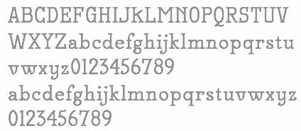 French foundry, est. 2007, which published many extensive free sans and sans serif families by Hirwen Harendal, who supports Open Source projects. The purpose of ADF is to provide a large number of high quality fonts (174 fonts as of the end of August 2007). Harendal has help from Clea F. Rees, most notably on the TeX part and the extensive Venturis family.
 His typefaces: - Accanthis (2009: an alternative for Galliard or Horley Oldstyle).
- AlbertisADF (from URW-A028), Albertis Titling.
- Ameris ADF (from URW n33012t).
- ArrosADF (from URW n021003L).
- AurelisADF (2009, almost art nouveau).
- Baskervald ADF (7 years of work according to Harendal: an alternative for New Baskerville).
- BerenisADF (2008, a didone family), BerenisNo2 (2008).
- BirkenADF (from URW-n033014t).
- ColonnadeADF (from URW-n033014t).
- EditorialisADF (from URW-n033014t).
- Electrum (like Eurostile and URW City).
- FenelrisADF (sans).
- FrontonADF Titling (from URW-n033014t).
- GaramondeADF (from URW-g043004t), GaramondNo8ADF (from URW g043024t).
- Gillius ADF and Gillius ADFN (from Vera Sans, an alternative for Gill Sans MT).
- HelvetisADF (from URW U001).
- Ikarius (2008, semi-serif; inspired by Hypatia Sans), IkariusNo2 (2008), Ikarius-Serie (2009).
- Irianis (2008; IrianisADFMath (2009) was made for the TeX math community).
- Keypad (2010). a dingbat face.
- LibrisADF (sans, patterned after Lydian).
- MekanusADF (2009, typewriter style).
- Mint Spirit (2012) and Mint Spirit No. 2 (2012). An original minimalist sans design. The truetype version is Mintysis (2012).
- NeoGothisADF (2009).
- OldaniaADF (2009, art nouveau).
- OrnementsADF (2009).
- PalladioADFStyle (a Palatino derived from URW g043023t).
- RomandeADF (with hints of Caslon, Times and Tiffany; CTAN download).
- Solothurn (2011). A family developed for Scribus, a free text preparation package that competes with Adobe's InDesign.
- SwitzeraADF (derived from Vera).
- SymbolADF (2008, bullets and arrows).
- Teknis: under development.
- TribunADF (2009, like Times New Roman).
- Universalis ADF (2008-2009, a take on Futura). Open Font Library link.
- VenturisADF, VenturisOldADF, VenturisTitlingADF and VenturisSansADF (2007: alternatives for Utopia).
- Verana Sans and Serif (from Bitstream Vera Sans and Serif).
Kernest link. [Google]
[More] ⦿
|
Arnold Boecklin
|
Jugendstil artist. The Jugendstil movement originated in the late 19th century in Bavaria around München and had artists like Boecklin. The driving force of the Jugendstil movement was the magazine Münchner Jugend which showcased the designs of German art nouveau artists. Scriptorium has a number of fonts based on the Jugendstil movement: Munich is derived from the hand-lettered title of the magazine, Jugend and Campobello are decorative initials designed for the magazine, and Phaeton is based on lettering from the period. Otto Weisert, who ran the Schriftgiesserei Otto Weisert in Stuttgart, designed the Jugendstil-style font Arnold Boecklin in 1904 (available at URW, Linotype, Adobe, Mecanorma, and others, and copied and modified tens of times)---it is that design that most typographers probably associate most with Arnold Boecklin. View some digital implementations of Arnold Boecklin. [Google]
[More] ⦿
|
Art Nouveau
|
 Quoting the wiki: Art Nouveau is an international movement and style of art, architecture and applied art-especially the decorative arts-that peaked in popularity at the turn of the 20th century (1890-1905). The name Art nouveau is French for new art. It is also known as Jugendstil, German for youth style, named after the magazine Jugend, which promoted it. A reaction to academic art of the 19th century, it is characterized by organic, especially floral and other plant-inspired motifs, as well as highly-stylized, flowing curvilinear forms. Art Nouveau is an approach to design according to which artists should work on everything from architecture to furniture, making art part of everyday life. Art Nouveau's fifteen-year peak was strongly felt throughout Europe-from Glasgow to Moscow to Spain-but its influence was global. Hence, it is known in various guises with frequent localized tendencies. In France, Hector Guimard's metro entrances shaped the landscape of Paris and Emile Gallé was at the center of the school of thought in Nancy. Victor Horta had a decisive impact on architecture in Belgium. Magazines like Jugend helped spread the style in Germany, especially as a graphic artform, while the Vienna Secessionists influenced art and architecture throughout Austria-Hungary. Art Nouveau was also a movement of distinct individuals such as Gustav Klimt, Charles Rennie Mackintosh, Alfons Mucha, René Lalique, Antoni Gaudí and Louis Comfort Tiffany, each of whom interpreted it in their own individual manner. Although Art Nouveau fell out of favor with the arrival of 20th-century modernist styles, it is seen today as an important bridge between the historicism of Neoclassicism and modernism. Furthermore, Art Nouveau monuments are now recognized by UNESCO on their World Heritage List as significant contributions to cultural heritage. The historic center of Riga, Latvia, with "the finest collection of art nouveau buildings in Europe", was inscribed on the list in 1997 in part because of the "quality and the quantity of its Art Nouveau/Jugendstil architecture", and four Brussels town houses by Victor Horta were included in 2000 as "works of human creative genius" that are "outstanding examples of Art Nouveau architecture brilliantly illustrating the transition from the 19th to the 20th century in art, thought, and society." It later influenced psychedelic art that flourished in the 1960s and 1970. [Google]
[More] ⦿
|
Art Nouveau fonts
|
Fred Showker discusses some art nouveau fonts: ParisMetro (David Rakowski, 1991), Sarah Caps, Gismonda and Isadora (all three by Sam Wang), Harquil Laser (Lisa Wade of Mentor Type), Rudelsberg (David Rakowski). [Google]
[More] ⦿
|
Art nouveau timeline
[Rachel Oke]
|
An art nouveau timeline drawn by Rachel Oke (Exeter, UK). [Google]
[More] ⦿
|
Art nouveau typefaces by Nick Curtis
[Nick Curtis]

|
 Art nouveau revivals by Nick Curtis include the following free typefaces.
 - Bala Cynwyd NF (2001, 2007) is an Arts&Crafts style poster typeface inspired by lettering of Dard Hunter.
- MadisonSquareIncised, MadisonSquareNF (2001, 2007).
- MunchausenNF (2003, 2007). Based on a poster for an exhibition by Ludwig Heinrich Jungnickel (1911). This is inbetween art deco and art nouveau.
- RivannaNF (2002, arts and crafts style): Rivanna NF revives Max Joseph Gradl's Gradl Zierschriften, an art nouveau typeface from 1903. Rivanna NF Pro was done in 2010 by CheapProFonts.
- Runy-Tunes, RunyTunesRevisited (1999, 2001, 2007).
- SmorgasbordNF (2003, 2007). Based on this poster by André C. de Takacs (1912).
- TobaccoRoadNF (2002, 2007). This is based on a poster for an art exhibition, designed by Eva Volkel in 1912. It is typical of style of the Austrian Secession school---combining medieval forms with late art nouveau styles.
- ValleyGrrrlNF (2003, 2007). ValleyGrrrlNF (Nick Curtis) is based on Johann Cissarz's poster lettering in Erste Hoehenluft Radfahr-Bahn (1897).
There are also commercial art nouveau typefaces: - Abbey Road NF. After Joseph W. Phinney's Abbey Old Stytle (1901).
- Aint Baroque NF (2009). An art nouveau/psychedelic-style variation on Milton Glaser's Baby Teeth Baroque from 1968.
- Deukalion NF (2006). A fun art nouveau headline face.
- Elefantasia NF (2012) is based on Elefanta, a font by the Karl Brendler & Söhne foundry in Vienna.
- Foxcroft and Foxcroft Shaded (2005). An art nouveau family based on Vassar (1887, Farmer, Little&Co).
- Graphic Stylin NF (2006). A script stencil typeface with an art nouveau feel.
- Half Full NF (2011). A bold weight of Glass Antiqua (Franz Paul Glass, 1912, Genzsch&Heyse).
- Hupp Antiqua NF (2006). A gorgeous display typeface pair first done in 1909 by Otto Hupp for Klingspor. This one has a Basque A.
- Inglenook Corner NF (2005). Based on the lettering of Laurence Schall, as presented in Lewis F. Day's 1910 classic, Alphabets Old and New.
- Jugendstil Borders NF (2011).
- Millrich Moravian NF (2010). A revival of Bohemian (1918, a jugendstil typeface by Miller&Richard). Millrich Olivian NF (2014) revives Olivian.
- One Good Urn NF (2005). Based on the art nouveau lettering of J. M. Bergling in Art Alphabets and Lettering (1914).
- Petrushka NF (2012): based on the art nouveau typeface Petrarka (1900, Schelter & Giesecke).
- Rough Cut NF (2006, linocut). A grunged up version of the art nouveau typeface Daphne.
- Schweimann Moderne NF (2014).
[Google]
[MyFonts]
[More] ⦿
|
Art nouveau typefaces: FontShop selection 2010
|
 FontShop compiled its list of art nouveau typefaces from its stable of fonts: P22 Mucha (Christina Torre), Karolla OT (Paratype), Herold OT (Paratype), Virile (ATF, then Agfa, and then Monotype), Absinthe (Rian Hughes), Artistik, ITC Croissant, Arnold Boecklin, Eckmann Com, Ortem (Mecanorma), Art Gothic (URW), Greeting Monotone, P22 Art Nouveau (Christina Torre), Boomerang (Tim Ryan), ITC Baylac (Gerard Mariscalchi), Metroplitaines P (URW), Metroploitain (Elsner+Flake), ITC Stoclet, Galicia (Rian Hughes), Neuseidler (Richard Yeend), Virgin Roman (David Farey), Kolo (Paul Shaw), ITC Noovo (Phill Grimshaw), Abacus (David Farey), Maigret (David Farey), Edda (Ralph M. Unger, URW), ITC Galadriel (Alan Meeks), Eccentric, Skjald, Cupid, Beatty Victoriana (Richard Beatty), Isabella (Hermann Ihlenburg), ITC Tarragon (Alan Meeks), Old Paris Nouveau (Nathan Williams), Auriol, FF Elegie (Albert Boton), Edwardian 1 and 2 (Colin Brignall), Cantoria (Ron Carpenter), Della Robbia (Bitstream), Meyer Two (Font Bureau), ITC Korinna (Antonio DiSpigna, Ed Benguiat), Lutahline (Judith Sutcliffe). Scans: i, ii, iii, iv, v. [Google]
[More] ⦿
|
Arterfak Project
[Ahmad Ramzi Fahruddin]

|
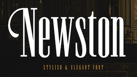 Ahmad Ramzi Fahruddin (aka Ramzehhh and as Ramz Fahruddin, b. 1993) established Arterfak Project in 2015. He is the Palembang, Indonesia-based designer of the display typefaces Aidah (2015, spurred), Temenyut (2015, spurred), Basenglah (2015, a geometric solid typeface), Local Genius (2015), Oropitem (2015, blackletter), Cakmacak (2015), Maeninaja (2015), Yagitudeh (2015, a free doodle font), Cagar (2015, free), Pletakrutuk (2015) and Beguyur (2015), the free experimental techno typeface Semravut (2015), the lava lamp typeface Cagar (2015) and the free spurred vintage typeface Outromoro (2015).
 Typefaces from 2016: Anehena (a beveled ornamental typeface), Bongoknian (spurred), Sebasengan (sketched, arched, stitched, textured, eroded and embossed substyles), Sekatoon (Victorian), Bekelakar (Victorian), Sambeltigo, Wayawaya (free bilined art deco), Geroboktuo, Bedengkang, Ringam, Cindo Kato (spurred Victorian typeface), Ngopi Doken (a layered handcrafted typeface family), Bedesau (Victorian), Temenyut (spurred Victorian style), Sirugino (a spurred tattoo / blackletter type), Buyanbengak (spurred), Geradakan (dry brush type). Typefaces from 2017: Martinez (Tuscan), Hughoney, Rockrace, Monabelia (Victorian), Philosophiya, Love Quake, Childwood, Circulat Decorative Frames, Dakmodal, Yasaman, Bsakoja, Meringam, Besigetz (Victorian), Bedempank, Ngamboel (a modern inline), Jemahok (an inline typeface), Sirunian (decorative blackletter), Belinjangan (brush style), Cerudikan, Kanjian (Victorian deco). Typefaces from 2018: Mirandah (monoline, vintage), Subversia (Victorian), Bertha (a free display family that includes Shadow Line, Sans and Spurred substyles), Quickers, Marchelle (art deco), Lourena, Mellynda, Leophard (octagonal), Wishteria, Slashback, Katheryna, Febiolla, Tropicane, Maretha (a monoline script). Typefaces from 2019: Requeiro (a spurred inline vintage font), Mourich (an all caps display typeface), Newston (a tall condensed news headline typeface family), The Black Sugare (blackletter-inspired), Magnies (an elegant stencil), Hermona (a spurred vintage label font), Bronzier (a sports font), Mayhena (a monoline script), Amnestia (a vintage all caps typeface), Highrush (font duo), Humeira (for children's books), Montheim (retro signage font), Hodgeson (a slab serif family), Delaroca, (a spurred black metal band font) Banda Niera, Bargers Distressed (spurred, Victorian), The Realita, Newston (a compressed skyline-style font), Ariestha Script, The Black Square, Requiem (Victorian or rococo inline caps), Invasible, Ferguson (an almost monoline slab serif family), Mirenath (a rounded vintage monoline typeface), Afolkalips (a tribal painted font inspired by the Papuan culture), Mellandry, Masterson (a slab serif western font), Marsheila (art deco), Kanjian, Belinjangan, Sirunian (a decorative spurred typeface), Quickers, Marcheile (slightly art nouveau), Marcheile, Monabelia, Nourishe (a fashion mag sans). Typefaces from 2020: Trashbone, Burgery (a monolinear all caps children's book font), The Brande and Lotaline (a decorative serif), Rimba Andalas (a tribal font), Bronela (a decorative serif), Wonder Night (a beatnik font), Malinsha (a signage script), Marones (spurred, vintage, all caps), Katenila (a fat finger font), Meliana Script (a brush script), Romelio (sans / script pair), Bondrians (a vintage label font), Black Ravens (a dry brush font), Shinkoya (vernacular lettering), Brothership, Novante (stylish caps), Almatine Script (a flat pen calligraphic script, with perhaps a touch of Arabic script emulation), Almatine Sans, Wargate (a military stencil font family), Bragley (a cartoon font), Varino (a rounded unicase sans family), Ranille (a bold display serif), Neilvard (a vintage label font family), Nagietha, Khodijah (an Arabic emulation font), Sometimes Rough, Savaneta (a vintage all caps typeface), Valmera (a Peignotian sans), Hargalia (classic calligraphy), Cherione (a unicase font), Revans (a display sans). Typefaces from 2021: Larantuka (an informal font with a dancing baseline), Bolandes (a weathered monoline sans), Delauney (a formal art deco typeface), Chieezy Burger (grungy, vernacular), Ranmor (a vintage slab serif), Andalia (a signage script), Insiders (a dry brush script), Granesta (a dry brush font), Abigral (a Peignotian serif), Suzanstein (a dripping blood font), Broken Console (a retro video game pixel font), Naluka (a tiki or nature park font), Lovatine (a scrapbook script), Rushen (vintage caps in curvy, regular, distressed, stencil and shadow versions), Siegra (futuristic), Komersie (a bold supermarket font), Borensa (a reverse stress font), Rashavine (a dry brush font), Blankone (a brush font), Montagna (a monolinear script), Hadnich (a heavy signage script), Sallomae (a scrapbook font), Vankours (a dry brush font), Wonderful Melanesia (a decorative serif), Albertson (a Tuscan font), Rantika (a bold brush script), Rusthack (a stylish brush typeface), Mustopha (an upright typeface in arabesque style), Marviona (a marker pen font), Marviona (a marker pen font), Niquitta Mirzani (script), Shikamaru (emulating a Japanese brush), Mortend (a 5-style expanded all caps sans), Barlock (an all caps and spurred varsity font), Northash (stencil), Motteka (a beatnik font), Sharely (a brush font), Rompies (a condensed titling sans), Beardsons (a vintage label font), Broken Crush (dry brush). Typefaces from 2022: Bradrock (a vintage semi-Tuscan Western font), Market Written (a fat finger font), Almalik (Arabic emulation), Vanitha (a brush script), Rambors (prismatic caps with four parallel lines), The Last Shuriken (emulating Japanese), Warzone (an all caps echno / sci-fi font), Kalidony (calligraphic with heart-themed tittles), Lemands (a stocky condensed display typeface). Dafont link. Creative Market link. Behance link. Graphicriver link. Creative Fabrica link. [Google]
[MyFonts]
[More] ⦿
|
Artistik
|
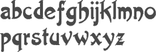 Artistik (an art nouveau brush face) was first a Berthold and Bauer typeface in the 19th century, and in the digital era, it became first an Agfa face, and finally a Monotype face. The brush has a slight oriental look. [Google]
[More] ⦿
|
Artsy Lady's Home Page
[Betty Cook]
|
Betty Cook (b. 1952) is the "Artsy Lady", a New Jersey designer who created ALBabyNewYearAH, ALCinderella (calligraphic caps), ALConscienceAH, ALCrossStitchHearts, ALPlaceSettingsDings (2001), ALPlaceSettingsLetters, ALPrincessJasmine, ALPrincessSnowWhite, ALSnowmen, BabyGeniuses, BabyGeniuses2Normal, CruiseLine, Dreidl (2000, art nouveau), KittyKatLove, LeprechaunHats, Patriot, PilgrimHats, Polywog, Tramp, Untitled2. Mostly alphadings. Fontspace link. [Google]
[More] ⦿
|
Ashley Madden
|
Saint Augustine, FL-based creator (b. 1992) of Nouveau (2013), an art nouveau caps typeface. Linkedin link. [Google]
[More] ⦿
|
Ashley Muir

|
 Type designer at Red Rooster, where she published Creighton (2009, a sans family done with Steve Jackaman), Carlingtown (2009, an almost art nouveau face), Glasgow Pro (2010; a refreshed version of Steve Jackaman's Glasgow grotesque family), Harry Pro (based on the original design by Marty Goldstein (and C.B. Smith) done at VGC in 1966), Karnak Pro (2009, a slab family based on the original design by Robert Hunter Middleton, ca. 1931-1942), and Ronsard Crystal (2009, based on a VGC photo display font in the 1950s, but also related to Industria Ronsard by Hermann Zehnpfundt, 1913), together with Red Rooster's boss, Steve Jackaman. About Creighton: It was our initial intention to develop a suitable lowercase for Les Usherwood's Elston typeface, based on a few characters from an old German typeface called Hermes Grotesque (Woellmer, Berlin). However, the new design quickly took on a life of its own, and we decided to call it Creighton. A crisper version of Creighton is Megaphone (2009).
 Typefaces from 2010, all with Steve Jackaman at Red Rooster: Shamus (uncial), Ryder Gothic Pro (a revival of Roslyn Gothic by Harry Winters, 1972), Pickworth Old Style Pro (rustic), Wurlitzer Pro (slab serif), Eden Pro (based on the original 1934 Ludlow drawings by Robert Hunter Middleton), Connemara Old Style (uncial), Overtime LCD Pro (LED simulation face), Phosphate Pro (Solid and Inline). Typefaces from 2011, still with Steve Jackaman at Red Rooster: Phoenix Pro (after the condensed artistic sans called Phenix by Morris Fuller Benton, 1935, ATF), Guildford Pro (+Light, +Medium, +Titling; after Stephenson Blake's Guildford Sans, which in turn was identical to the 1928-1929 typeface by Hans Möhring called Elegant Grotesque), Granby Elephant (after the fat grotesk typeface Granby by Stephenson Blake, 1930), Franklin Gothic Pro (after Morris Fuller Benton's original from 1903), Windlesham (2011, a basic sans family), Relish Pro (2011, another basic sans family), Rocklidge Pro (2011, with Ashley Muir; based on Jana (Richard D. Juenger, VGC, 1965), Packard New Style and Packard Old Style (2011, with Steve Jackaman, after Packard by Oswald Cooper (1913) and Morris Fuller Benton (1916, ATF). Klingspor link. Fontspace link. [Google]
[MyFonts]
[More] ⦿
|
astype.de (or: Astype)
[Andreas Seidel]

|
 Astype.de is a German foundry started in 2003 by illustrator and type designer Andreas Seidel (b. 1975, bad saarow, near Berlin, Germany). He lives in Cottbus, Germany. In 1998, he obtained a Masters degree in business administration. In 2007, he and Ingo Preuss set up The German Type Foundry. In 2017, he joined the initial crew at Fust & friends. The typefaces:
 - One of his first typefaces was Crayfish (originally a URW font, but withdrawn by Seidel from URW in 2002). Crayfish is a display type originally designed for an American Football club. The Crayfish typefaces are sold as Thunder Bold and Titan Bold.
- Check his nice weather symbols (not a font).
- He finished Ornaments Thanksgiving and the great ASTYPEOrnaments-WineGrape A (2004).
- He is working on 14th century initials (2003).
- He created Sattler (2003): Joseph Kaspar Sattler, one of the great German art nouveau artists created these nice initials in 1897 for the famous royal monumental book project Die Nibelunge for the Reichsdruckerei Berlin. Only 200 exclusive signed masterpieces were printed in four years from 1900 till 1904. Joseph Sattler was the art director, type designer and designer in one person. The Reichsdruckerei showed samples of the unfinished work in 1900 at the world exhibition in Paris to advertise the high craftsmanship of the German presses.
- He made Heraut (2003), an art nouveau lettering typeface based on a 1901 design of Hermann Hoffmann called Herold Reklameschrift.
- He created Sveva AS Versal (2003, art nouveau).
- About Missa Solemnis, he writes: Solemnis was designed by Günter Gerhard Lange and first cut in metal 1953 (this is the date he quotes himself, other sources mention 1950 or 1952). It seems to be one of his earliest typeface designs that he had done as a freelancer for H. Berthold AG in Berlin. [...] Missa Solemnis AS is a new, remastered and extended version of Mr Lange's typeface. The font is available in the OpenType format and comes in two styles: 1953 and 2003. The 1953 style contains all characters of the original metal type, as well as a few additions. [...] The 2003 cut is more delicate and makes extensive use of the OpenType format. It contains over 650 glyphs, covering Roman-based languages of Western and Central Europe. His Solemnis inspired Simeon AS (2003), a 650-glyph uncial style face.
- In 2004, he created Missale Incana, an interpretation of a typeface from Herbert Thannhaueser.
- Still in 2004, he created ASTYPE Ornaments Christmas A2 and ASTYPE Ornaments Christmas A. These were followed in 2005 by ASTYPE Ornaments Christmas B.
- He made Missale Lunea (2004). This has astroligical symbols, moon phases and medieval characters.
- In 2005, the exquisite calligraphic script typeface Gracia was added, consisting of Gracia No. 44, 45, 54 and 55 (graceful calligraphic script), and Gracia Solo.
- Paola is a redesigned, new interpretation of a brush typeface from Carl Rudolf Pohl.
- He made Adana (2005): The roots of Adana going back to the year 1930, to the Berlin-based German graphic designer Wilhelm Berg. His typeface can be interpreted as an answer to Lucian Bernhards Schönschrift. The Initials are nearly close to the original drawings but the Circular typeface was changed dramaticly. Excentric, unusual forms and loops were changed to fit todays needs. Due to the lack of a corresponding Roman letter form, the Regular version was designed including small caps, fitting the contrast and swinging shapes of Adana Circular. Both typefaces play well together in all kinds of adverts, as well with designs like Bodoni or Didot.
- Alea AS Initials (2005) is a floral faced based on the drawings of Maria Ballé.
- Taiko (2006). A revival of Otto Arpke's Arpke Antiqua (1928, copperplate).
- ASTYPE Ornaments Accolades A (2007), and ASTYPE Ornaments Accolades C (2011).
- GTF Toshna Std (2008, German Type Foundry) is a garaldic type family in three optical weights, after a 1955 family called Tschörtner-Antiqua by Hellmuth Tschörtner that was very popular in the DDR.
- Secca (2009, German Type Foundry) is a simple sans family rooted in early German grotesque type designs. See also Secca Soft (2014) and Secca Stencil (2015).
- Nepos (2010) is an experimental modular type kit consisting of ready-made typefaces and a set of special BUILD fonts to build your own letters and ornaments. These BUILD fonts can be used on layers with different colors and overprinting for special effects. The effects like Antiplex can be considered as kitchen tiles. There are also color inversions and stencil types.
- Secca Saloon (2011) is a versatile ornamental Western family.
- Popsil (2011) is a white-on-black hand-printed poster face.
- Ademo (2011) is a classic shaded layered 3d caps face, based on two typefaces designed by Carl Albert Fahrenwaldt that were published in 1931-1932 by Schriftguss AG.
- Wood Bonnet Antique No.7 (2012) is based on real vintage wood type blocks from Switzerland.
- VTG Stencil US No. 4 (2012) is based on plate US No. 4 from New York Stencil Works. This revolving stencil-plate was invented by Eugene L. Tarbox and patented in 1868. The military stencil fonts VTG Stencil US No. 2 (+Ornaments), VTG Stencil US No. 51, VTG Stencil UK No. 76, VTG Stencil Germany No. 101 (2014, modeled after historic blackletter stencil plates from Bavaria), and VTG Stencil US No. 72 followed in 2014. In 2016, he added Vtg Stencil DIN.
- VTG Stencil Germany No. 1 (2013) is a set of nicely executed didone stencil typefaces based on real models used in Germany from 1871-1918 and later. There is a Sketch style.
- Wood Poster Eight (2015) is a free wood type slab serif.
- Alea Initials (2017, floriated caps).
- Wood Bonnet Grotesque No 4 (2017).
- The Vtg Stencil France series (2017) in substyles Vtg Stencil France No1, Vtg Stencil France No3 and No. 5.
- The expressionist typeface Alarm (2017, Fust & Friends), which is based on an old design of Heinz König also called Alarm (1928, at Trennert).
- Presto (2017, Fust & Friends), a revival of a script by Helmut Matheis (1970).
- Vtg Stencil Italy No2 (2018).
- Rocaie (2018). Decorative caps base on antique rococo letters from a gilding workshop.
- Wood Heinz No.4 (2019). Wood Heinz No.4 offers up to four printed look variations of all the Latin base letters and figures. An OpenType letter rotator is programmed into the fonts to emulate the randomness of wood type printing. Also: Wood Heinz No.2 (2019).
- Missale Solis (2019). An uncial typeface that overhauls Missale Lunea (2004).
- Vtg Stencil UK No2 (2019).
- Vtg Stencil Marsh (2020). Based on one inch stencils, cut by a Marsh machine. Marsh was an American stencil machine maker in the 1920s.
- Bonnet Grotesque Narrow (2020). A condensed grotesque family.
Behance link. Creative Market link. Fust & Friends link. Klingspor link. Home page. See also here. View Andreas Seidel's typefaces. [Google]
[MyFonts]
[More] ⦿
|
ATF 1923 Catalog: Parsons
[Will Ransom]
|
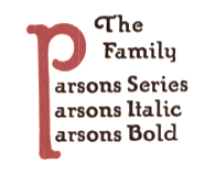 Showcasing the best pages from the Parsons Series in the ATF 1923 Catalog. This is an original ATF display typeface (via its acquisition of BB&S) with a hand-drawn almost art nouveau look. Created in 1918 by Will Ransom for Barnhart Brothers&Spindler, it was named after the artistic director of a Chicago-based department store.
 Mac McGrew: Parsons was designed for BB&S in 1917 by Will Ransom, Chicago artist based on the distinctive style of lettering he had been doing for advertisers in that city, and was named for I. R. Parsons, advertising manager of a Chicago department store. It is nearly monotone, but with a hand-lettered quality. It has unusual half-serifs and unique forms to a number of letters. The caps MNUY have a lowercase design, but at the insistence of users a more conventional form of M and N was added by the foundry, to the distress of the designer. Parsons Italic and Parsons Bold were added in 1918 by the same artist. Oversize ascenders and descenders are one of the most notable features of this type, but Ransom was reluctant to let the foundry cut them. At his insistence the foundry included with specimens a warning that generally only one such letter should be used in a line, and suggesting other restrictions. The type was a great success but the suggestions were commonly ignored, and advertising bristled with groves of tall letters. It is said that this display of bad taste in the use of his design dismayed Ransom so much that he abandoned the idea of designing other typefaces. Only Clearcut Shaded Capitals, in 1924, are later credited to him, aside from decorative material. Parsons is believed to be the first typeface to feature long characters of this sort although several artists had used them in distinctive hand-lettering. At least one typeface---Pencraft (q.v.)---had earlier supplied flourishes which could be added to special ascenders and descenders. Stymie Bold (q.v.) resurrected the idea later but less successfully. The Parsons long characters were included in all fonts; f-ligatures were made for all sizes of italic, but only up to 18-point in the roman and not at all for the bold. Monotype lists "Parson's Bold" in some of its literature; this is presumed to be the same typeface but no confirmation or specimen has been found. Parsons Swash Initials were designed by Sidney Gaunt; some of them were not approved by Ransom but were cast anyway. Digitizations include AIParsons (1994) by Inna Gertsberg and Susan Everett at Alphabets Inc. Nick Curtis' Parsnip family (2004) is based on Parsons. Jess Latham also digitized Parsons. See also OPTI Puritan Bold Flair in the Castcraft collection. Finally, Dieter Steffmann converted the Gertsberg / Everett revival in 1999 to truetype while keeping the name AI Parsons. [Google]
[More] ⦿
|
August E. Woerner
|
Punchcutter born in Frankfurt am Main (1844), who died in New York in 1896. He worked for some time at A.D. Farmer&Son in New York, as well as at Conner Type foundry, and at Bruce Type foundry after his emigration to the USA in 1868. In Germany, he was a punchcutter at Flinsch and from 1864-1868 at Haas in Basel. McGrew says: Merrymount was designed by Bertram G. Goodhue for Daniel B. Updike's Merrymount Press in Boston, and was cut only in 18-point. This was used in an impressive Altar Book, which established the reputation of Updike and his Press. Steve Watts says the typeface was cut by Mr. [August] Woerner of A. D. Farmer&Son Type Foundry in New York. The original punches and matrices are preserved by the Providence (Rhode Island) Public Library as part of its extensive Updike Collection, where a note with the mats says, "Cut by A. Woener (sic), June 21st, 1895." His typefaces: Bruce No. 11, No. 13 and No. 21 (Bruce Type foundry), German no.91 (1876, Bruce), Penman Script No.2053 (Bruce), Merrymount (1896, Merrymount Press), and the following typefaces published at Farmer, Little & Co: Card Gothic (1893), Gotham (ca. 1890), Lightface, Old Style No. 5 (ca. 1887), Old Style No. 5 Italic, and No. 6, 15, 17, 18, 20 21, 22 and 23. [Google]
[More] ⦿
|
Auguste Roubille
|
 French painter, designer, poster artist, book illustrator and caricaturist, b. Paris, 1872, d. Paris, 1955. His early work was influenced by the art nouveau movement. He drew some typographic silhouettes that represent that epoch. His most famous posters are Les Appareils photographiques Demaria frères, La Motocyclette Werner, Spratt's Patent, High Life Tailor, Le Bourgeon, Scala en Bombe, Au Smart Carmen and La Maison du Rire. [Google]
[More] ⦿
|
Aulia Akbar
[Raretracks (was: Monodark)]
|
[More] ⦿
|
Aure Font Design
[Aurora Isaac]

|
 Aurora Isaac (Aure Font Design, Issaqua, WA) is a California-born type designer. She created the uncial typeface Aure Westra LP (2011) and the Victorian family Aure Zeritha LP (2011).
 Typefaces from 2018: Aure Brash (an outline font that speaks with the cheeky inuendo of a sassy parrot), Aure Nox (semi-haunted; with modulated stems), Aure Teddy (art nouveau style), Aure Declare (a text typeface family accompanied by several sets of extraordinary and quite complete astrological symbols), Aure Sable (also with astrological symbols), Aure Wye, Aure Jane. Typefaces from 2019: Aure Zeritha. [Google]
[MyFonts]
[More] ⦿
|
Aurora Isaac
[Aure Font Design]

|
 [MyFonts]
[More] ⦿
|
A.V. Haight
[Inland Type Foundry]

|
 [MyFonts]
[More] ⦿
|
Bagerich Type Foundry (was: Zealab Fonts Division, Zea Fonts, Zea Lab, Zeaspace)
[Reza Rasenda]

|
 Founded in Bandung, Indonesia in the middle of 2019 by graphic designers Reza Rasenda (b. 1993) and Riska Chandra Dewi, Zealab Fonts Division specializes in and is inspired by urban culture, luxurious brands and street posters. Reza Rasenda designed these typefaces in 2020: Crenzo (a free sci-fi typeface), Pherome (a fashion-conscious display serif), Arguman (an aerodynamic or speed font), Oldblue (an interlocking retro font), Digitany (pixelized), Ethique, Brightfate (with Riska Candra Dewi; a sharp-edged typeface that conjures up images of a guillotine), Bagerich (an art nouveau genre display typeface by Reza Rasenda and Riska Candra Dewi), Digitany (pixelish), Rigeko (a refreshing display typeface), Chillion (in the heavy rounded serif genre), Anglestein (a sans inspired by retro car and amplifier lettering), Millik (a sturdy angular poster typeface), Bellinzo, Shirens, Roundlane, Oldblend (a 4-style circle-based sans family, possibly renamed Oldblue), Richson (a sans inspired by pop punk, rock, hardcore music and skateboarding), Airbolt (a futuristic racing font), Roseford (a display typeface), Qultiva (a display typeface), Ethique, Hochland (tall, condensed, urban), Rodenberg (a beer bottle font), Aveline (a display serif), Quilla, Monschone (a fashion mag sans in one style).
 Typefaces from 2021: Neima (a decorative serif), Nagoda, Chuten (a display typeface), Ephidona (a decorative serif), Claycozoa (an intestinal typeface), Elgista (incised and hipsterish, with mostly trapezoidal stems), Amovand (a decorative serif), Willton, Olieva, Waffold, Bogam (a great free black display font), Voca (brutalist, in their view), Gover (a gaspipe sans, +stencil), Agne (a decorative serif). Typefaces from 2022: Vifellia (an experimental condensed display serif, in which the left side serif is curved and the right side serif is straight). Type Department link for Zealab. Type Department link for Bagerich Type Foundry. Typefaces from 2022: Guffonia (a hyper-decorative hipster typeface), Baunk (futuristic). [Google]
[MyFonts]
[More] ⦿
|
Bailey Wells
|
During her graphic design studies at the University of Kansas in Lawrence, KS, Bailey Wells created the art nouveau caps typeface Lancet (2012). Behance link. Cargo collective link. [Google]
[More] ⦿
|
Bannigan Artworks
[Todd M. Hallock]

|
 Based in Perry, OK, Bannigan Artworks was founded in 1998 by Todd Hallock (b. 1969). His fonts include Arts&CraftsGS (2001, inspired by decorative lettering by Glaswegian illustrator Jessie Marion King (1876-1949) and by the Scottish style of Charles Rennie Mackintosh (1868-1928). This font was published by Jack Yan), Renaissance Caps (2005, floriated), Celtic Knots-BA (2002), Celtic BA (2003), Celtic Ornaments BA (2008), Christianity BA (2004, Christian symbols), and the futuristic font Hallock.
 Home page on Celtic Art. Agfa/Monotype sells Hallock, Celtic-BA and Celtic Knots. At MyFonts, we find the Keltic caps typeface Medieval Caps BA (2006), Left Hand BA (2007) and Art Nouveau 2 BA (2007). Archibald BA (2009) is inspired by the art nouveau lettering of Archibald Knox (1864-1933), a designer for Liberty&Co. from the Isle of Man. In 2014, he created Arts and Crafts Sans BA. In 2015, Todd published Circle BA. Klingspor link. View Todd Hallock's typefaces. [Google]
[MyFonts]
[More] ⦿
|
Barbara Visserini
|
Barbara Visserini is based in Sao Paulo, Brazil. She created an unnamed typeface in 2013 that has the curviness of art nouveau. [Google]
[More] ⦿
|
Barend Hendrik Kolkmeyer
|
Henk Kolkmeyer was a Dutch designer, 1901-1988. His poster from 1922 entitled Waarom Droeg Je Geen Muts Als Ik has some early art deco / late art nouveau lettering. In 2012, a free font was published by Koeiekat (John Wollring) entitled HK Display. It is a free interpretation of an art deco alphabet designed by Henk Kolkmeyer for a poster for the Veiligheids Museum in Amsterdam. [Google]
[More] ⦿
|
Barnhart Bros. Spindler Type Founders: Book of Type Specimens, 1907
|
 Trying to fit this 1000-page book into one web page, with discussion of many types. It's impossible, but I tried it. Download link for Book of type specimens: Comprising a large variety of superior copper-mixed types, rules, borders, galleys, printing presses, electric-welded chases, paper and card cutters, wood goods, book binding machinery etc., together with valuable information to the craft. Specimen book no.9. Another download link. [Google]
[More] ⦿
|
Bart Co Design
[Bartosz Wesolek]
|
 Or Bart Wesolek, b. 1986. Nowa Sol / Poznan, Poland-based graphic designer, who published the vintage typeface Rheiborn, the display typeface Onufry (based on lettering on vintage cycling posters), the poster typeface Molheim, the letterpress typeface Darmond, the squarish Garthram, the vintage typeface Martslock, the free squarish typeface Rheiborn Sans, the vintage Apothecary collection (Asplin, Garriger, Hagerman, Kimmell and Seidlitz), and the slabbed display typeface Kinshel in 2017.
 His vintage liqour collection (2017) includes - Arendt: A thin extended serif typeface (clean, rough)
- Groston: A squared sans font (clean, rough)
- Kloster: A lower case blackletter typeface (clean, rough)
- Othon: A bold sans typeface (beveled, clean, rough)
- Rozalyn: A western decorative typeface (clean, rough & free shadow version)
- Theobald: A condensed serif font (rough, rounded & free clean version)
- Wilhelm: A regular sans & slab display font (clean, rough)
Typefaces from 2018: the Print Press collection (Blutzen, Fratley, Garnet, Harold, Stilzkin Sans, Stilzkin Slab), Nimitz (a free retro all caps sans), Bosmark (a vintage sketched typeface), Monkstead (a block display family with several textures), Signist, Hartwood, and the Newsstand collection (which includes Presson, Stammark, Brookset, and Darmond). Typefaces from 2019: Pelagia (text typeface), Moorland (a fat face didone), Keller (an all caps sans), Mosley (a weathered letterpress emulation font), Madchen Sans (a free retro sans), Maurine (a retro script). Typefaces from 2020: Braden Sans, Paschal (serif), Dumont (sans). Typefaces from 2021: Frisco (a retro display serif), Landman (a retro font inspired by Murillo/Aldo Manutio typefaces designed by Schelter & Giesecke in 1897), Devon (art nouveau caps), Omnibus (a free art nouveau font), Urban Serif (a condensed slab serif), Irish Poem, Mesnage Slab Serif, The Moonshine Collection (Bastien (art nouveau), Dalton (squarish), Fribois (a monolinear school script), Guilmot, Liboury (a frilly decorative blackletter)). Typefaces from 2022: Vespucio (a classic serif), Blokhaus (a bold sans). [Google]
[More] ⦿
|
Bartosz Wesolek
[Bart Co Design]
|
 [More] ⦿
|
Baseline Fonts
[Nathan Williams]

|
 Foundry in Wichita, KS, founded in 1999 by Nathan Williams (b. Concordia, KS, 1973), formerly from the University of Kansas Art Museum Library. Its motto: The goal of the foundry is to provide uninterpreted revivals of type samples generated through disappearing printing methods, and create new fonts for dissemination in the type community. Order through MyFonts.Com or Union Fonts or Creative Market. FontShop link. Klingspor link.
 Fonts: - The Rodeo family of wood type fonts: 66 Rodeo, 57 Rodeo, 58 Rodeo (2003), Rodeo Rope, Rodeo Rope Superchunk.
- The Tuscan family: Tuscan (2003, a wild west face). To this group we can add the Tuscan typeface Circus KS (2006).
- Egyptians: Grit Gothic (2013), Grit Sans (2013), Heirloom Artcraft (2013), Worn Gothic (2013), Stately GG (2013), Grit Egyptienne (2005, grunge Egyptian family), Rough Egyptienne (2005).
- Grunge typefaces: Antimony (2005, grunge), Dryden (distressed handwritten face).
- Old typewriter fonts: Slab American Regular (old typewriter), Slab American Titling, Slab American Titling Heavy (2002). Slab American has 55 styles.
- Art nouveau typefaces: Old Paris Nouveau (2003).
- Pixelish typefaces: Base PXL7, 80s PXL Bold.
- Display Sans: Maxime (2004, having support for most European languages; Maxime Shadow is available at FontShop), Woodgrit Thin (based on 19th century American letterpress fonts), Woodgrit Medium, Woodgrit Heavy, Pippen (squarish).
- Calligraphic: Roundhand Regular.
- Victorian: Boback.
- The Grit family: Grit History (2003-2004), Grit Primer (2003), Grit Egyptienne, Grit Typesorts (2006, free).
- The Old Times American family (+Italic, +Titling).
- Pia Regular.
- Kandt: the handwriting of legendary designer and art director James Kandt; 4 styles.
- Chitchy.
- AVI Sans.
- Country Fang (2003, with Brian Miller).
- Craft Roman
- Licious Script.
- Luxe (2003, casual).
- Momentum (2002).
- George Gibson (handwriting from mid 1800s).
- Dingbats: Megaflakes 2010 (2010) and Megaflakes 2011 (2011).
- Sketchwriter (2011).
- Dusty Circus (2011) is a five-layer stacking display face designed to be infinitely morphed. It is a prototypical member of that old western circus font genre.
- Bobbi Bee (2013). A connected script.
[Google]
[MyFonts]
[More] ⦿
|
Bauersche Giesserei: Hauptprobe in gedrängter Form der Bauerschen Giesserei
|
 Type specimen book by Bauersche Giesserei published ca. 1915. Open Library link. Archive.org link. Local download. Local download, colored version [27MB].
 An earlier and more volumunous book of specimens is Hauptprobe der Bauerschen Giesserei in Frankfurt am main und Barcelona (Frankfurt am Main, 1907). [Google]
[More] ⦿
|
Bauersche Schriftgiesserei

|
 Frankfurt-based foundry started in 1837 by Johann Christian Bauer. At the end of the 19th century, the new owner was Georg Hartmann. On its staff, it had designers such as Konrad F. Bauer [Alpha (1954), Beta (1954), Folio (1956-63), Imprimatur (1952-55), Volta (1956), Verdi (1957), Impressum (1963), all made with Walter Baum], Lucian Bernhard [Bernhard Condensed, 1912], Hugo Steiner-Prag [Batarde, 1916], Julius Diez [vignetten, 1910-1912], Henri Wieynck [Trianon, 1906; Cursive Renaissance, 1912; Wieynck-Kursiv, 1912], Georg Hartmann, Paul Renner [Futura, 1937], Emil Rudolf Weiß [Weiß Fraktur, 1924], Berthold Wolpe [Handwerkerzeichen, 1936; Hyperion, 1931; Rundgotisch, 1938] and F.H. Ernst Scheidler [Legend, 1937]. In its glory period, Bauer's leader was Heinrich Jost (1889-1949), from 1922 until 1948, who with punchcutter Louis Hoell made a beautiful version of Bodoni, now known as Bauer Bodoni. A New York office was set up in 1927, but after the 1960s, the foundry declined and finally closed its doors in 1972. Its typefaces were passed on to its Barcelona branch, Fundición Tipográfica Neufville. See also here. Digitized typefaces include Futura ND (Paul Renner, redigitized by Marie-Therésè Koreman at Neufville in 1999), Edison Swirl SG (late 1800s, digitized by Spiece Graphics), Gable Antique Condensed SG (late 1800s, digitized by Spiece Graphics), Weiß (Bitstream, based on a family made in 1924-1931 by Emil Rudolf Weiss), Bauer Bodoni (1926, FT Bauer, made by Heinrich Jost and Louis Hoell), Bauer Bodoni (Adobe version), Candida (1936, now digitized at FT Bauer), Charme (1957, now available from FT Bauer), Impressum, Imprimatur, Venus (1907-1927, now at FT Bauer), Venus and Hermes (both available at Linotype; Venus is also at URW), Volta (1955), and Phyllis (1911, aka Wieynck Cursive). Other typefaces: Bernhard Cursive (1962), Constantia, Hellenic Wide (1962), Lucian (1962), Cantate (1962), Gillies Gothic (1962), Horizon (1962), Folio (1962), Bauer Beton (1962), Bauer Topic (1962), Bauer Classic (1962), Elizabeth (1962), Cartoon (1962), Trafton Script, Astoria, Lilith, Legend (1937), Fortune, Folio Kursiv, Folio Grotesk (1960), Cantate (1958), Papageno (1958), Verdi (1957), Amalthea (1957), Magic (1955), Steile Futura Kursiv (1955), Columna (1955), Maxim (1955), Tivolischmuck (1950), Symphonie (1938, by Imre Reiner, in 1945 called Stradivarius), Weiß Antiqua (1950), Legende (1950), Quick (1950), Ballé Initials (1940), Beton (1940), Corvinus (1934), Bernhard Roman (1930), Hyperion (1931), Volta Kursiv (1955), Rundgotisch (1938), Hoyer Fraktur (1935), Gotika (1934), Jubilaeums-Initialen (1902), Jubilaeums Antiqua (1902), Victoria Antiqua (1902), Künstler Grotesk, Lichte Futura (1931), Weiß Fraktur (1924), Reklameschrift Herkules, Herkules-Gotisch (1898), Enge Gotisch (ca. 1880: digital version by Gerhard Helzel), Ehmcke Antiqua (1921), Batarde (1916), Wieynck-Kursiv (1912), Zweifarbige Grotesk Kursiv, Cursive Renaissance (1912), Manuskript Gotisch (1899; after Wolfgang Hopyl, 1514), Graziosa (1914 or earlier, script face), Kleukens Antiqua (1910), Barlösius Schrift (1906-1907, H. Barlösius), Trianon (1906), Hohenzollern (1902, + Initialen), Telefunken (1959), Sinfonia (script), Amerikanische Alt-Gotisch (1903, influenced by Henry William Bradley's and Joseph Warren Phinney's 1895 art nouveau face, Bradley). Some of their vignettes were captured in Dieter Steffmann's Schluss Vignetten (2002). In house samples: AntiquaBrotschriften-IX-Garnitur, Einfache Kanzlei (ca. 1830), Enge halbfette Zeitungsfraktur, Fette Gotisch, Moderne halbfette Fraktur, Gotisch. [Google]
[MyFonts]
[More] ⦿
|
Beau MacDonald
|
 Creator of Belle Font Nouveau (2012, a tall-legged thin sans with art nouveau influences), which can be downloaded for free from Dafont. [Google]
[More] ⦿
|
Beckii Adel
|
Montreal-based designer. During her studies at Concordia University, she created the free floriated caps typeface Floralism (2013), a font whose glyphs are shaped like in Novecento, one of the "in" typefaces of early 2013. Its decoration is inspired by art nouveau and psychedelia from he 1960s. Behance link. [Google]
[More] ⦿
|
Belma Kapetanovic
|
Graphic designer and artist in Toronto. Creator of the free display typeface Eldora (2006), which is inspired by the Vienna Secession Movement. Dafont link. [Google]
[More] ⦿
|
Ben Sandstrom
|
Designer at Chank of Newveau (2002, a font with an Alphonse Mucha look to it), Dustbowl Clementine, Dictator and Blown Deadline (2002). Chank says that he is a student at St. Cloud State University. [Google]
[More] ⦿
|
Benjamin Krebs
[Benjamin Krebs]

|
 German foundry established in 1816 by Benjamin Krebs (1785-1858) and based in Frankfurt, which grew out of Schriftgießerey der Andreäischen Buchhandlung. Many of its shares were acquired by D. Stempel in 1933. A list of the typefaces:
 - By Franz Riedinger: Merian Fraktur (1910), Phänomen (1927), Riedingerschrift (1903), Riedinger Mediäval (1929), Riedinger Kursiv (1929), Ideal Schreibschrift (Franz Riedinger, 1927) Ideal I (Krebs staff, 1903), Brentano Fraktur Schmalfett (1917), Archiv Kursiv (1907), Altschwabacher (Werkschrift 1917, Schmalfett 1922, Mager 1923), Epoche (1912), Rohrfeder Fraktur (1909), Rediviva (1905-1907, blackletter in halbfett and schmalfett; also called Deutsche Werkschrift Rediviva), Altschwabacher Werkschrift (1918).
- By A. Auspurg: Brentano Fraktur (1916), Federzug Antiqua (1913), Nürnberger Kanzlei (1906), Schönbrunn (1928), Trajan Versalien (1928).
- By P.E. Lautenbach: Epoche (1912), Frankfurter Buchschrift (1906).
- By L. von Hohlwein: Hohlweinschrift (1907).
- By W. Grosz: Künstler Gotisch (1900).
- Hartwig Poppelbaum: Hartwig-Schrift (1928), Hartwig Werkschrift (1927).
- By the staff: Faksimile (1898 script face), Eureka, Oceana, Robusta, Ideal Schreibschrift (1903; kräftige, also called Ideal II, was added in 1909), Katalog Antiqua (1911), Komet (1907, an art nouveau typeface revived by Dimitriy Horoshkin in 2017 as DXKometa), Latina (1922: a heavy roman with tall ascenders; identical to ATF's Avil), Pompadour (1911), Reklame Elzevir (1896), Xylo (1924: for a digital version, see Xylo by ITC), Bureaukrat (1918), Buchschrift, Alte Schwabacher (1914), Karten-Gotisch (1903), Reform (1903), Viktoria Gotisch, Viktoria-Ornamente (1903), Archiv-Antiqua (+halbfette) (1908), Archiv-Kursiv (1908). [Reichardt attributes some of these to Riedinger]
Krebs published Handbuch der Buchdruckerkunst in 1827, a 830 page monster. Type specimen books started appearing in 1885 under the name Benjamin Krebs, Nachfolger (successor). An 1890 publication identifies this successor as Hartwig Poppelbaum. In 1916, Gustav Mori published a book on the foundry, Die Schriftgiesserei Benjamin Krebs Nachf., Frankfurt a.M. Ein Beitrag zur Geschichte des Frankfurter Schriftgiesser-Gewerbes. They were taken over by Ludwig&Mayer, and then Klingspor and finally Stempel (in 1933). Hans Reichardt's PDF file on Krebs. [Google]
[MyFonts]
[More] ⦿
|
Benjamin Krebs
[Benjamin Krebs]

|
 [MyFonts]
[More] ⦿
|
Bernardo Sar
|
Early 20th century designer of letters, such as this Heavy Brush Lettering with art nouveau influences. [Google]
[More] ⦿
|
Bernhard Pankok
|
German graphical artist, painter and printmaker, 1872-1943. He studied at the Düsseldorf and Berlin Art Academies. From 1892 Bernhard Pankok had a studio of his own in Munich. There he freelanced as an artist, graphic artist and illustrator for the journals "Pan" and "Jugend". Greatly impressed by the British Arts and Crafts movement, Bernhard Pankok joined Hermann Obrist, Richard Riemerschmid, and Bruno Paul in founding the Munich Vereinigte Werkstätten für Kunst im Handwerk. Afterwards, he also designed furniture, stage sets, interiors and buildings, and painted portraits. In 1907 Bernhard Pankok was a co-founder of the Deutscher Werkbund. [Google]
[More] ⦿
|
Bertold Löffler
|
Bertold Löffler (1874-1960) studied at the Kunstgewerbeschule in Vienna (1890-1900) under Carl Otto Czeschka. Working as a freelance illustrator from 1900, he contributed to the art journals Meggendorfer Blätter, Ver Sacrum, Die liebe Augustin, Lucifer, and Danauland. Together with Michael Powolny he founded the Wiener Keramik in 1906 and then joined the Wiener Werkstätte in 1907 after collaborating on the graphics and ceramic tiles for the Cafe Fledermaus. [Google]
[More] ⦿
|
Betty Cook
[Artsy Lady's Home Page]
|
[More] ⦿
|
Bill Tchakirides
[UTF Type Foundry]
|
[More] ⦿
|
Billy Jacobs
[Coffee Bin Fonts]

|
[MyFonts]
[More] ⦿
|
Brave Type (was: Brave Lion Fonts)
[Leonhard Katschner]

|
 Berlin, Germany-based designer, who is a member of a consortium called USE (or USE Mediengestaltung, or: Union Sozialer Einrichtungen GmbH). In 2019, he started his own commercial foundry, Brave Lion Fonts. His fonts include the sharp-edged all caps sans typeface Masculina (2019), the pixel typeface Block Rock (2018), Nasa 21 (2019), Reduza Infinity (2019: a minimalist monoline sans), Neue Jugend (2019: an all caps art nouveau typeface) and Versalis Ink (2019).
 Typefaces from 2020: Character Sans (a 5-style sans), Flatfoot (a display mini-serif), Hybridea (a display serif with high contrast). Typefaces from 2021: Knive (display serif), Easy Sans, Valkyrie (slab serif caps), Wayne (a Western style slab serif), Writing Icons, Travel Icons, Kosmon (an aerospace font). Typefaces from 2022: Mash, Moony (an 8-style all caps sans). Creative Fabrica link. [Google]
[MyFonts]
[More] ⦿
|
Brendan Ciecko
|
 Graphic and web designer in Boston who studied at Hampshire College 2006-2007). He wrote the Fontly app for finding and preserving the typographic culture all around us. In 2014, he founded of Cuseum, a company that powers mobile-first experiences that help museums engage their visitors. His software platform makes it easy for museums, cultural institutions, and public attractions to publish mobile apps, manage their collections, access visitor analytics, and generate new revenue opportunities. Brendan specialized for a couple of years in revivals of classical typefaces but seems to have left the domain of type design permanently:
 - Pani Deco (2013): an art deco typeface based on a poster designed in 1928 by Polish artist Anna Harland-Zajaczkowska.
- Secesja (2013): a typeface based on Polish "Mloda Polska" (Young Poland) Art Nouveau / Secession styles of the early 20th-century. It is based on a poster printed in 1908 by an unknown artist.
- Warszawa Deco (2013): an art deco typeface based on a document from 1939. This typeface is based on Polish Art Deco and modernism of the Interwar period.
- Galicja (2013): a typeface based on Polish "Mloda Polska" (Young Poland) Art Nouveau / Secession styles of the early 20th-century. It is based on a poster printed in 1911 by the Piller-Neumann printshop in Lwow (present day Lviv, Ukraine).
- Mekicki (2013). A typeface based on a poster designed in 1928 by Polish artist Rudolf Mekicki. It is part of a series inspired by the aesthetics of Poland between 1908 and 1939.
- Klimt (2013). A Peignotian typeface based on the handwriting of Gustav Klimt.
- Seebad Grado (2013). A typeface based on the a 1906 art nouveau poster by Austrian artist Josef Maria Auchentaller.
- Froika (2013). A spurred Victorian typeface based on lettering found on a poster designed in 1922 by Czech artist Antos Frolka.
Creative Market link. Behance link. Linkedin link. Obsolete link from 2013 where his fonts could be downloaded. [Google]
[More] ⦿
|
Brian J. Bonislawsky
[Monogram Fonts Co]

|
 [MyFonts]
[More] ⦿
|
Brianna Depue
|
During her studies at SJSU, Brianna Depue (Fremont, CA) designed the art nouveau typeface Mucha (2015). Behance link. [Google]
[More] ⦿
|
Briarly Collins
|
Brisbane, Australia-based designer of the witchcraft and Wiccan theology-inspired art nouveau typeface Coven (2015). [Google]
[More] ⦿
|
Brittany Thompson
|
 Cedar Rapids, IA-based designer of the art nouveau typeface Alphonse (2015), which is named after Czech art nouveau artist Alphonse Mucha. [Google]
[More] ⦿
|
Bruno Paul
|
 German architect, illustrator, interior designer, and furniture designer, 1874-1968. Illustrator for the art nouveau magazine Jugend (1896) and for the satirical magazine Simplicissimus (1897-1906). [Google]
[More] ⦿
|
Bruno Seuchter

|
 Art nouveau type designer, who created Die Fäche 1 (1900). Little is known, except that HiH stumbled on a 1902 publication by Seuchter called Die Fäche, in which he found the art nouveau face that they revived in 2008 as Seuchter Experimental. [Google]
[MyFonts]
[More] ⦿
|
Bryan Levay
[Thousand Type Works]

|
[MyFonts]
[More] ⦿
|
Buddha Graphix
[Jesper Birk]
|
Jesper Birk's FunkDaFont series. His cool shareware fonts include Funky Deco (Arnold Boecklin grungified), Bandit, Barmos, BlueRoom, ConnectionBad, Clockwork, DanzinLikeCrazy (a very curly pen-drawn face), See Your Point, and StageDive. Other URL. Fontspace link. Dafont link. [Google]
[More] ⦿
|
Burkhard Mangold
|
Swiss artist of the Viennese Secession era, 1873-1950. [Google]
[More] ⦿
|
Burntilldead
[Eric Kurniawan]

|
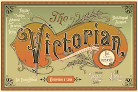 Eric Kurniawan (or Burntilldead, b. 1986) is located in Bali, Indonesia. He created the vintage script typeface The Goldsmith Vintage (2015).
 Typefaces from 2016: Lazarus (a brush font), Bestters Supply (signage script), The Wild Hammers, Ramblin Script, Ramblin Sans, Angeline Vintage (brush typeface), Victorian Deco (more Victoriana), Steelworks (letterpress), Angeline (swashy brush script), La Petitenget, Azarus (brush style), Victorian Parlor (Victorian). Typefaces from 2017: Dandeleon, American Whiskey, Vulturemotor (with Gusti Ngurah Widiantara), Sandglow (signage script). Typefaces from 2018: Renaissance Garden (vintage), Victorian Fonts Collection (which consists of King Edward (Edwardian) and Queen Victoria (Victorian)), Billyforges (weathered letterpress style; with Ade Meida and I Gusti Widiantara). Typefaces from 2019: Victorian Decade (18 fonts: +Gradient, +Outline, by Eric Kurniawan and Ade Meiada). Typefaces from 2020: Alocasia (Sans, Script and Serif), Victorian Supremacy (an 11-style ornate Victorian / blackletter typeface family), Galactus (sci-fi), Prestissimo Classy (Serif and Script: the Script features copperplate calligraphy), Historium and Historia (a weathered vintage typeface), Sportage (a squarish sports font). Typefaces from 2021: Mashbro, Barones (a vintage label font), Arterium (a vintage Victorian label font family), Veinline (a vintage script font), Bonitalia (script), Alota (funky and groovy 1970s font), Energize (techno), Metalsmith (a weathered all caps typeface), Bower (an early computer emulation font), Broto, Celestic (a decorative partly psychedelic serif), Dellucion (an art nouveau serif), Glitcher (a great art nouveau typeface), Greta, Lazarus, Racer Boy (a techno family), Silly Kids, The Sitcom (a retro script). Typefaces from 2022: Mooners (a spurred Victorian liqueur font), Morvem (an 18-style psychedelic typeface). [Google]
[MyFonts]
[More] ⦿
|
Burton's Nightmare
|
 A free orphaned typeface designed in 1993. It is an art nouveau typeface modeled after Timothy Walter "Tim" Burton's movie The Nightmare Before Christmas. [Google]
[More] ⦿
|
BVS Boton
[Albert Boton]

|
 Albert Boton is a Parisian type designer and teacher, born in 1932 in Paris. Boton died in 2023. In 1957 he started work at Deberny&Peignot under Adrian Frutiger. From 1958 to 1966 he helped create several typefaces for the Hollenstein phototype catalog. In 1968 he became the art director for Robert Delpire publishers, but continued designing typefaces for the Hollenstein collection and later for Mecanorma and Typogabor. From 1968 to 1997 he was a teacher of type design and calligraphy at the École nationale des arts décoratifs (ENSAD) in Paris. From 1988 to 1998 he taught type design at the Atelier National de Recherche Typographiques. In 1981 he became art director and head of type department at the design agency Carré Noir. Interview in the ENSAD Journal B. His company is called BVS Boton.
 He is the designer of Berthold's Boton family (1986), FF Bastille Display package (2002, consists of FF Aircraft, FF Aircraft TF, FF District Bold, FF District Bold TF, FF Studio, FF Studio TF, FF Zan), FF Elegie (2002, art nouveau, a take on Auriol), Agora (1990, Berthold: a lapidary typeface), Chadking (1958), Roc (1959), Brasilia (1960), Primavera (1963), Rialto (1964), Black Boton (1970), PL Brazilia (PhotoLettering, a sans family), Zan (1970), Pharaon (1971, a great fat slab, eventually digitized by Monotype), Pampam (1974), Hillman (1972, an Egyptian family at Mecanorma), Tzigane (1973, a condensed family at Mecanorma), Chinon (1973, Mecanorma), Hudson (1973), Boton and Navy Cut (1986, for Mecanorma), the Scherzo family (at the Agfa Creative Alliance), Carré Noir (1996, also at Agfa), Bellini, Praxitel, Albotoni Book (made in 1974 originally), Kit, FF Page (2003, in PageSans and PageSerif families). Since 1998, he distributes his own fonts through BVS Albert Boton: - Agora BQ (Berthold).
- Boton BE (Berthold), Boton BQ (Berthold), and Boton Pro (Berthold). Created in 1986. See also B790 Slab in the Softmaker collection.
- Carre Noir (Monotype).
- Chinon (Mecanorma Collection).
- FF Aircraft (FontFont).
- FF Cellini Pro (FontFont), FF Cellini Titling Pro (FontFont) and FF Cellini (2003, FontFont). Boton's take on Bodoni.
- FF District (2004, FontFont). A squarish sans family.
- FF Elegie (FontFont).
- FF Page Sans (FontFont) and FF Page Serif (FontFont).
- FF Studio (FontFont).
- FF Tibere (2004, FontFont). A classic roman family.
- FF Zan (FontFont).
- Hillman (Mecanorma Collection).
- ITC Elan (1985, ITC). A lapidary typeface.
- ITC Eras (1961-1976, ITC, Adobe). ITC Eras, a weird high x-height and open-bowled-a fashion victim of the 1970s, was copied by many---see, e.g., E820 Sans in the Softmaker collection.
- Linex Sans (Monotype) and Linex Sweet (Monotype). These fonts were first published by Agfa in 2003.
- Memo (Monotype).
- Pompei (1993, Monotype).
- Scherzo (Monotype).
- Tzigane (Mecanorma Collection).
Albotoni Book (made in 1974 originally), Kit, FF Page (2003, in PageSans and PageSerif families), FF Tibere (2003, a classic roman family), FF District (2004, a squarish sans family) are some his latest typefaces. Citroen's logo font at Delpire. Klingspor link. Bio at FontFont. Pictures of an exposition in 2003. Linotype link. FontShop link. MyFonts link. Aude Degrassat wrote a thesis on Boton in 2008 at Estienne. Picture. View Albert Boton's typefaces. Announcement of his death. [Google]
[MyFonts]
[More] ⦿
|
By Wahtung
[Vintage Font Lab]
|
[More] ⦿
|
CaballoMRK
|
Designer of Black Label (2010), a typeface created as a free version of TEFF's Burgundica. He also made Signmaker CaballoMRK (2010) as a reaction to LHFSignMaker, and Brushworks CaballoMRK as a free alternative to LHF Bushworks. [Google]
[More] ⦿
|
Caitlyn Cotter
|
Caitlyn Cotter is a graphic designer from Austin, TX. During her studies at St. Edward's University, she created a hand-drawn art nouveau typeface that was illustrated on a Toulouse Lautrec style poster (2013). [Google]
[More] ⦿
|
Camelot
|
 An art nouveau-era typeface made in 1896 by Frederic Goudy. D.J.R. Bruckner: This is the first tvpe attributed to Goudy based on letters he drew and sent to the Dickinson Tvpe Foundry. He made only the capitals, and the foundry men added a lower case.
 McGrew states: Camelot or Camelot Oldstyle was the first typeface designed by Frederic W. Goudy. He offered it to Dickinson Type Foundry (part of ATF) in Boston, which accepted it and sent him $10, twice what he had modestly asked for it. This was in 1896; it was apparently cut and released the following year as drawn, without lowercase. In February 1900 a design patent was issued in the names of Goudy and Joseph W. Phinney, and assigned to ATF. Phinney was a well-known designer for Dickinson-ATF, and apparently it was he who added the lowercase alphabet. Its success encouraged Goudy to make a distinguished career of type designing, and this typeface was included in ATF specimen books as late as 1941. Compare Canterbury. Digital typefaces: LTC Camelot (Lanston, 2007), Pettiford JNL (Jeff Levine, 2020). [Google]
[More] ⦿
|
Canada Type
[Rebecca Alaccari]

|
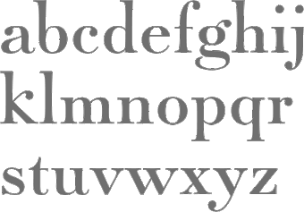 Foundry in Canada, est. 2004 by Rebecca Alaccari in Toronto, and run by her and Patrick Griffin. Interview with Rebecca. Her typefaces can be bought via MyFonts: Storyville (2015, a curly script), Centennial Script (2007, a revival of an 1874-1876 high-contrast calligraphic script by Hermann Ihlenburg), Valet (2006, superb art deco face), Freco (2006, an art deco typeface loosely based on designs and letters of Fré Cohen), Silk Script (2006, based on 1956 Helmut Matheis script called Primadonna), Dominion (2006, based on an early 1970s film type called Lampoon), Johnny (2006, an art nouveau poster typeface that revives the Harem/Margit typeface by Phil Martin, 1969), Guillotine (2007), Mayfair (2006, a calligraphic typeface based on Mayfair Cursive by Middleton, 1932), Happy Birthday (2006, script), Geronimo (2005, brush style poster font), Rostrum (2005, a revival and expansion of a type called Oleander, designed in 1938 by Julius Kirn for the Genzsch&Heyse foundry in Hamburg), Apricot (2005; based on A.R. Bosco's Romany for ATF, 1934, but a major extension with many ligatures), Heathen (2005), Cougar (2004, a digital version of Martin Wilke's 1968 handwriting typeface Konzept), Puma (2004, brush typeface based on Herbert Thannhaeuser's 1954 Kurier), Big Brush (brush), Diva (connected script), Odette (a high ascender display typeface after the Morris Fuller Benton 1918 American classic, Announcement Roman), Crucifix (2004, a severe octagonal face), Fore (2004, a bullethole face), Formula, Gamer (2004), Formula (2004), Kofi, Platoon (2004, a stencil face), Verso (2004), Secret Scrypt (2004, a handwriting face), Bluebeard (2004, blackletter by Patrick Griffin), Bolero (2004), Janice (2004, psychedelic), Jimi (2004, also psychedelic), Scroll (2004), Dominique (2004, upright script), Moxie (2004, a fat display family which includes a stencil), StockA (2004), StockB (2004, a fat stencil face), Stalker (2004, a destructionist face), Scroll (2004), Jonah (2005, a hippie typeface based on an early 1970s film type from Franklin Photolettering called Urban). MyFonts page. Phil Rutter and Patrick Griffin made Coffee Script (2004), the digital version of R. Middleton's Wave design for the Ludlow foundry, circa 1962. Phil Rutter and Rebecca Alaccari designed Almanac (2004), a script typeface based on Imre Reiner's London Script (1957) (and Rebecca did a subsequent redigitization in 2007 that led to Reiner Hand), Tiger Script (2004, based on Georg Trump's wild brush script Jaguar done in 1967 for C. E. Weber), and Ali Baba (2004), an Arabic simulation typeface originally designed by Georg Trump as Palomba (1955, C.E. Weber foundry). Patrick Griffin made Leather (2005, after Imre Reiner's 1933 blackletter face), Secret Scrypt (2005), Skullbats (2005), Slang (2004, a blood scratch face), Bluebeard (2004), Expo (2004, an octagonal family), and Dancebats (2004). Simone Wilkie designed Boyscout (2004) after the handwriting of her son. Helmut Matheis' Contact (1963, flowing script/brush) was digitized by Rebecca in 2004 as Bruschetta. Rebecca also made Steiner Special (2007, a revival of Swing, a film type by Peter Steiner, 1974), Genesis (2007, a digitization and extension of Grayda, a 1939 calligraphic script of Frank H. Riley at ATF), Evolver (2006, futuristic family), Redwood (2007, a calligraphic script based on Willard T. Sniffin's Raleigh Cursive (1929, ATF)), Orotund (2005, after the 1970s typeface Eight Ball; this was extended again in 2006 in her art nouveau typeface Huckleberry, which is a revival of the 1973 typeface of Gustav Jaeger called Mark Twain), Pendulum (2005, a fantastic flowing script based on Nebiolo's Americana, 1945), Jojo (2005, a flower child typeface after Spring, by Bernard Jacquet), Mascara (2004), Gala (2004, after Neon (1935, Giulio da Milano at Nebiolo)) and Bella Donna (2004, after a script made by Alessandro Butti in 1948, called Rondine).
 Typefaces made in 2005: Jazz Gothic (Patrick Griffin), Showboat, Hunter (a revival of Imre Reiner's brush script Mustang, 1956), Quanta (stencil), Quiller (a script typeface based on J.J. Sierke's 1964 typeface Privat), Rhino (revival of Mobil, a 1960 typeface by Helmut Matheis for Ludwig&Mayer), Dominique (donated to FontAid), Secret Scrypt (donated to FontAid), Jackpot (2005, Western typeface remotely based on Cooper Playbill which in turn is related to Cooper Black, but it also has hippy 1968 influences), Sincerely (handwriting typeface based on Karlgeorg Hoefer's 1968 Elegance), Fontella (a digitization of Novarese's calligraphic script Elite), Boondock (digitization of Imre Reiner's Bazaar from 1956), Gumball (digitization of Papageno, a 1958 bubblegum font by Richard Weber for Bauer), Runway, Gamer, Dominique (OpenType handwriting face), Sterling Script (2005, by Alaccari and Griffin: a 7-weight digitization and extension of Stephenson Blake's 1952 clean copperplate script Youthline Script), Vox (2007, a 24-style monoline sans family done with Patrick Griffin), Vox Round (2013, a softer version), Swan Song (2006: a calligraphic typeface based on the hand of Alexander Nesbitt. A later document states that it is based on work by British artist Rachel Yallop from 1986), Evolver (2006, a 9-style futuristic family), Ambassador Script (2007, an Alaccari-Griffin revival of the angle-reduced calligraphic script Juliet by Nebiolo, 1955). In 2005, Philip Bouwsma joined Canada Type, and designed a great calligraphic blackletter-inspired family, Torquemada. He designed many other typefaces for Canada Type in subsequent years. VIP (2007, Rebeca Alaccari) is a humanist sans serif uppercase (and figures) combined with a freshly redrawn revival of the classic VGC Constanze initials originally designed by Harry Brodjian in 1970, and even further back, the Constanze Initials by Joachim Romann (1954-1956, Stempel). Chopper (2007, by Rebecca Alaccari) is a revival of Venture (a 1972 typeface for VGC by Harry Villhardt). Walter (2007, Rebecca Alaccari) is a digitization of Heritage (1952, ATF, a calligraphic script by Walter H. McKay). Celebrity (2007, Rebecca Alaccari) revives and extends the retro/techno typeface Latus (Willy Wirtz, 1971). Sympathique (2008, Alaccari) is an ultra-thin and ultra-tall typeface in the mold of Bernhard Fashion and other era poster or film typefaces (they say that it is rooted in the film typefaces Hairstreak and Mossman). Mullen Hand (2008) is a revival of Repro Script (1953, Jerry Mullen, ATF). Filmotype Giant (2011, a condensed sans) and its italic counterpart, Filmotype Escort (2011) were both co-designed with Patrick Griffin. In 2020, they released the variable informal sans typeface Bananas: Bananas was sourced from multiple American film era faces, all from 1950s and 1960s, when the casual sans genre was at its popular peak. Headliners' Catalina and its very similar cousin, Letter Graphics' Carmel, served as initial study points. Catalog of its typefaces. Klingspor link. [Google]
[MyFonts]
[More] ⦿
|
Candice Ralph
|
 During her studies at Parsons in New York, Candice Ralph created an art nouveau-inspired typeface called Vienna Neue (2007). [Google]
[More] ⦿
|
Carl Otto Czeschka

|
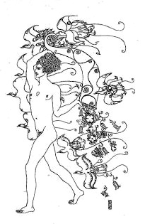 Type and graphic designer, b. 1878, Vienna, d. 1960, Hamburg. From 1894 until 1899, he studied at the Akademie der bildenden Künste in Vienna. He was a member of the Vienna Secession in 1900 and joined the Wiener Werkstätte in 1905 where he created his most famous illustrated book, Die Nibelungen (1909). He taught at the Kunstgewerbeschule in Vienna (1902-07) and at the Kunstgewerbeschule in Hamburg (1907).
 Czeschka designed Olympia (1914; Klingspor mentions 1929 for Olympia 1 and 1931 for Olympia 2), Czeschka Antiqua (1914: an art nouveau style face) and Czeschka (1914, a grotesk) at Genzsch&Heyse. In 2022, Alejandro Paul (Sudtipos) revived and expanded Olympia as Wienerin with the inclusion of numerous alternative signs and ligatures, and the addition of a variable font. [Google]
[MyFonts]
[More] ⦿
|
Carolina Cobarrubias
|
Santiago, Chile-based creator of the curly Victorian pre-art nouveau typeface Valencia (2013). [Google]
[More] ⦿
|
Carolina Takara
|
 During her studies in Sao Paulo, Carolina Takara created the initial caps alphabet Cat Nouveau (2014) and the decorative handcrafted typeface Ganache (2014). [Google]
[More] ⦿
|
Casady&Greene (Fluentlaserfonts)
[Terry Kunysz]
|
 Casady&Greene, Inc. started out as two separate little companies, CasadyWare and Greene, Inc. CasadyWare, which was founded by Robin Casady in August 1984, began producing Fluent Fonts, which were bitmapped typefaces for the Macintosh. The 1984 set of fonts have copyright lines that mention Richard A. Ware. As soon as PostScript fonts appeared, CasadyWare got hold of the first version of Fontographer and produced the first downloadable PostScript fonts, even beating Adobe, the originators of PostScript, to the punch. These were marketed as Fluent Laser Fonts (FLF) out of Carmel, CA.
 The FLF series includes Abilene (Western), Alexandria (1986, slab serif family), Black Knight (1991, blackletter), Bodoni FLF (1986), BodoniUltra (1986, a fat didone), Bonnard (art nouveau), ButtonHighlight, ButtonPlain, Calligraphy (1986), Campanile (a great didone face), Checkbox, Chicago FLF (free at OFL), Collegiate (1988, sports lettering), Coventry Script (calligraphic), Cutouts FLF (1992, cargo stencil), Desperado, Dorovar Carolus (1988, Carolingian; see also D790 at Softmaker and Carolingia (1991, William Boyd)), DryGulch, Epoque (art nouveau), FattiPatti, Fletcher Gothic (1992, art nouveau), Galileo (1987, didone), Gazelle (1988, calligraphic script), Gatsby (1986, pure art deco), Giotto, Gregorian (1986, English Gothic style blackletter), Harlequin FLF (1990), Highland Gothic (1992), Jott, Kasse (1992), Kells (modern round Gaelic font, 1988), KeyCaps, La Peruta, Meath (modern round Gaelic font, 1988), Michelle (1992, art deco, marquee face), Micro, MicroExtend FLF (1986, like Microgramma), Monterey (1986, Peignotian), Moulin Rouge (1992, an art nouveau typeface by Richard A. Ware), Nouveau (1990, art nouveau), Paladin (1988, blackletter), Pendragon (1991), Phoenix Script FLF (1990), Prelude (1986, connected script), Regency Script (1986, calligraphic copperplate script), Right Bank (1986, art deco), Ritz (1986, art deco in the style of Broadway), Rocko (1992, rounded like VAG Round), SansSerif FLF (1986, a large geometric sans family), Sedona Script (1990, connected, calligraphic, semi-psychedelic), Slender Gold (1992, script), Vertigo (1992, condensed monoline sans), VertigoPlus, Zephyr Script (1986, brush script). Many fonts were digitized by Richard Ware, and some were designed by Mike Wright. The contact was Terry Kunysz in Salinas, CA. On July 3, 2003, Casady&Greene closed it doors permanently. However, one of its designers, Mike Wright, writes: I believe that all the fonts that were developed by the company are now in the public domain. Robin Casady and I are thinking of putting up a site with free downloads of all of the old C&G public domain fonts--mainly as a way of attracting Mac users to see iData 2. Robin Casady in 2003: I founded Casady Company in 1984 to publish fonts for the new Macintosh. The name changed with incorporation to CasadyWare, Inc. Around this time I met Mike Greene who was looking for a software project to do after SpellsWell. I talked him into doing a program that became QuickDEX. Later CasadyWare, Inc. merged with Greene, Inc. and became Casady & Greene, Inc. Over the years, my role in management reduced as my interests in other areas developed. In the last ten years I have had no official management duties at C&G. About a year ago I removed myself from the Board of Directors. Some fonts could be found at TypOasis [defunct link]. Fontex link. Font Squirrel link. [Google]
[More] ⦿
|
Castle Type
[Jason Castle]

|
 Designs by Jason Castle from San Rafael, CA, who studied psychology at Dominican University of California. He does custom font design and sells commercial typefaces through MyFonts and FontShop. Blog. These include:
 - A: AfrikaBorders, Afrika Motifs, Agency Open (M. F. Benton, 1934, revival Jason Castle), Agency Gothic Inline, Ampersands, Azbuka (2005, a heavy slab serif).
- B: Brasileiro (2007, an art deco face).
- Carisma (2007, a clean geometric sans), Carlos (art deco inspired by Elektra), Castle Fleurons, Chinoise (2008, based on hand lettering that is reminiscent of a style of ancient Chinese square-cut ideograms), Cloister Black, Copperplate Script, Cradley (2015, a Caslon titling family with Greek and Cyrillic, named after the birthplace of William Caslon).
- D: Deko Initials (1993, discontinued in 2007; based on NADA0 drawn in 1972 by Marcia Loeb), Dionisio (2008, didone).
- E: Eden (Bold, Light; originally designed by Robert H. Middleton in 1934).
- F: Fat Freddie, Futura CT and Futura CT Inline (2007, based on Futura ND, but discontinued after only a few weeks).
- G: Goudy Lombardy (Lombardic), GoudyStout, Goudy Text, Goudy Trajan (1994-2010, free; +alternates).
- H: Handsome (2002, nice finger dingbats, aka fists).
- J: Jensen Arabique (left field art deco, based on work of Gustav Jensen, 1933).
- K: Koloss (art deco).
- L: Latin CT (2008, 6 styles), Latin Wide, Laureat, Lise Informal (2008, hand-printed), Lombardy.
- M: Maximilian CS (Rudolf Koch, 1917), Metropolis Bold and Shaded (based on the 1932 Stempel cut as designed by W. Schwerdtner), Minotaur (2008, an original monoline design based on an Oscan votive inscription from the second century BC; looks like simulated Greek).
- N: Norberto (2009, an all-caps Bodoni; +Stencil).
- O: Ogun (2008, inspired by an Egyptian-style Russian block alphabet and useful for athletic lettering; formerly named Azbuka).
- P: Plantain (2002, a digital version of Plantin Adweight, a 1913 typeface by F. H. Pierpont), Plantain Stencil (2009), Progreso (2010, a condensed, unicase, serif gothic type design inspired by the hand-lettering on Russian posters from the 1920s).
- R: Radiant, Radiant Extra Condensed CT (both Radiants are revivals of Roger Middleton's typeface by that name, 1940), Ransahoff (2002, ultra condensed didone), Rudolf (1992, based on Rudolf Koch's German expressionist work such as Neuland).
- S: Samira (2008, art nouveau style; based on Peter Schnorr's Schnorr Gestreckt, from 1898), Shango (1993, based on Schneidler Initials by F.H.E. Schneidler (1936), and including a digital version of Schneidler Cyrillic (1992); extended in 2007 to Shango Gothic and in 2008 to a 3-d shadow version, Shango Chiseled, and in 2009 to Shango Sans), Sculptura (2005, an all caps typeface based on Diethelm's Sculptura from 1957), Sencia (2008, based on Spanish art deco stock certificate lettering from 1941), Sonrisa (2009, art deco family---Sonrisa Thin is free), Standard CT (a neo-grotesque family), Standard CT Stencil (2012: free).
- Tambor (Light, Black, Inline, Adornado) (1992) (note: Jason claims that it was remotely based on Rudolf, which in turn was based on calligraphy of Rudolf Koch), Trio (an art deco sansserif), Trooper Roman (discontinued).
- V: Vincenzo (2008, a slabby didone), Warrior (2009, a 3d font based on Ogun; +Shaded).
- X: Xavier (art deco family based on Ashley Crawford by Ashley Havinden, 1930, revival by Jason Castle in 1992).
- Z: Zagora, Zamenhof (2011: an all caps poster face with constructivist ancestry, named after the inventor of Esperanto), Zuboni Stencil (2009, Latin and Cyrillic, constructivist and perhaps even military).
Klingspor link. Behance link. View Jason Castle's typefaces. [Google]
[MyFonts]
[More] ⦿
|
CAT Design Wolgast
[Peter Wiegel]
|
 Wolgast-based type designer Peter Wiegel (b. 1955) runs CAT Design Wolgast. Designer of these free fonts:
 - In 2019: Kufi Pattern.
- In 2018: Aurach Tri (a trilined typeface), Googee (monoline circle-themed sans), Gianna (medieval script), Hamburger Schwabacher.
- In 2017: Eyechart (heavy slab serif), Border Control (inline), Espresso Dolce (rounded sans), Gotisch Weiss, Halt (a dry brush typeface after Walter Hoehnisch's Stop from 1939), Kanzler, Llewie (rounded sans), Schulze Werbekraft (expressionist, after Arthur Schulze, 1926).
- In 2016: Ronaldson Gothic (after a MacKellar, Smiths & Jordan Co original), Vorgang (a great 1920s geometric sans), 5by7 (LED pixel font), BP 12-22 (industrial sans), u DIN 1451 Mittelschrift, Flubby, Gaeilge (Irish / uncial), Junior CAT (after Hans Heimbeck, 1936), CAT Liebing Gotisch (after Kurt Liebing), Tippa (an old typewriter font based on Adler Tippa 1).
- In 2015: Nuernberg (blackletter), CAT Schmalfette Thannhaeuser (blackletter), Offenbacher Reform (a revival of Offenbacher Reform, a blackletter typeface by Roos & Junge), Autobahn (blackletter), Barloesius Schrift (after Georg Barloesius's Barlösius Schrift, 1906), CAT-Franken-Deutsch (after Alfons Schneider, 1936), Fuckin Gwenhwyfar, CAT Kurier (a script after Herbert Thanhaeuser's Kurier from 1939), CAT Linz, CAT Rhythmus (a sharp-edged black grotesk after a Schriftguss AG original), DIN Schablonierschrift (DIN-based stencil), CAT North Licht, Feronia, Fette National Fraktur (after Walter Hoehnisch, 1934), Grobe-Plakat-Fraktur, CAT Childs (fifties style cursive typeface), Jena Gotisch (decorative caps), Kabinett Fraktur (after Johann Friedrich Unger, 1793-1794), Wattauchimma (heavy hipster sans), Friedolin (blackletter), Lorem Ipsum, Symphonie (a calligraphic script, reviving Imre Reiner's Symphonie (1938), also called Stradivarius (1945)), Power (a retro techno typeface), Krugmann Brush, Omega.
- In 2014: BernerBasisschrift1, BernerBasisschrift2 (school script), Berolina, Brausepulver (after Brause & Co., 1912), Fette Mikado (psychedelic style oriental look), Germanica, Gloria, HentimpsCirclet (blackletter), Hofstaetten (blackletter), Kleinsemmering, KuenstlerGotisch (blackletter), LacledeCAT (psychedelic), NeptunCAT, Neue Zier Schrift (a mischievous curly script), Pommern Gotisch, Reclame, CAT Report (retro brush script), Rueck-Italic, Rueck, RueckLeft, RueckLicht, RundschriftCAT (hairline ronde), Standard Graf (German expressionist and hexagonal typeface), Teutonic, VerzierteFavorite, VictoriaCAT, AdmiralCAT (a retro script), Dynamo (poster font), Des Malers Fraktur, Kanzleyrath (blackletter), Ober-Tuerkheim (art nouveau), PopplFrakturCAT (blackletter), Rundkursiv, Modeschrift (fifties script), Biedermeier Kursiv, Ehmcke Federfraktur (after a 1935 font by F.H. Ehmcke), Wernicke Schwabacher (after an original by Emmi Wernicke), Gotische Missalschrift, Hand Textur (after a 1935 font by F.H. Ehmcke), Renata (after a 1914 bastarda by Bauersche Giesserei), Rundgotisch Rauh (possibly after a Schelter & Giesecke design from 1903), Offenbacher Schwabacher (after Kurt Wanschura's bastarda from 1900), Incopins Clusters (multilined typeface), BadGong, Bernardo Moda (Bold, Semibold, Moda, Contrast: modeled after Lucian Bernhard's Bernhard fashion), CAT-Hohenzollern (after a 1902 art nouveau font by Bauersche), CATNorth, CATNorthLicht, CATNorthShadow, CAT Zentenaer Fraktur UNZ1 (a blackletter after a 1937 original by F.H.E. Schneidler), Coggers-Tariqa, EirikRaude, Fabrik (a geometric sans), Grobe Deutschmeister (German expressionist face), Harry Piel (or Piehl--a tattoo font), Kanalisirung, Klaber-Fraktur, Peter Obscure, Rumburak (a fat retro script), Flottflott (retro script), Indira K, Regent UNZ (a Schwabacher), Postamt, TGL 0-1451 Engschrift (a DIN-like font).
- In 2013: Spartakus (+Round), Cut Me Out (white on black sans), 5by9 (dot matrix face), Tartlers End (high-contrast ball terminal face), Alpha 54 (rounded flared script face), Chunk Five Ex (slab serif; he writes: With permission of Meredith Mandel, the original author of the ASCII-Font Chunk Five, I have extended Chunk Five Ex to a full featured unicode font with all figures used in Latin and Cyrillic writing), Simple Print (simple sans), Fette Bauersche Antiqua (a didone fat face), Manuskript Gothisch (after Manuskript Gotisch (1899, Bauersche), which was modeled after Wolfgang Hopyl's 1514 Textura), Quast (hairy font).
- Still in 2013, he published a number of school scripts, including Neue Rudelskopf, Deutsche Normalschrift, Imrans School, Rastenburg (German school font), and Bienchen.
- In 2012: Hardman (connected fifties script), Immermann (a quaint slab serif), Quast (grunge), Fundamental Brigade (sans family), DiffiKult (a bilined face), Men Nefer (a Memphis lookalike), Fette Unz Fraktur (like Fette Fraktur), Mutter Krause (for the reconstruction of the 1929 silent movie "Mutter Krausens Fahrt ins Glück", where it is used for intertitles, that where missing. The font is redrawn from the original intertitles), Youbilee (a font with laurels).
- In 2010: Alfabilder (dingbats), Gondrin (athletic lettering with a 3d effect), Helvetia Verbundene (making Helvetica into a school script? The original typeface was by Carl Albert Fahrenwaldt 1901), Proletarsk (a grotesk face), Vis-à-vis (great idea--a double-storied serif face), ApolloASM (Victorian), BertholdrMainzerFraktur, Doergon-Regular (license plate font), DoergonBackshift, DoergonShift, Eureka (Victorian, ornamental face), GoeschenFraktur (1880-style Fraktur used in Sammlung Göschen books), Makushka, MakushkaKontura, MakushkaQuadriga, MakushkaSecunda, Moderne3DSchwabacher, ModerneGekippteSchwabacher, StrassburgFraktur, TGL0-16 (same as DIN 16), TGL0-17 (same as DIN 17), TGL0-17Alt, Tank (emblems of gas companies), EricaType-Bold, EricaType-BoldItalic, EricaType-Italic, EricaType-Regular (typewriter), ErikaOrmig, Fibel Vienna (2012, a high-legged sans), GreifswalderTengwar-Regular, GreifswalerDeutscheSchrift (German Schreibschrift), Midroba-Regular (a strong mechanical octagonal face), MidrobaSchatten, MMX2010 (futuristic), Präsent60, Rotunda Pommerania (blackletter), TengwarOptime, TengwarOptimeDiagon, cbe-Bold, cbe-BoldItalic, cbe-Italic, cbe.
- In 2009: 18thCenturyInitials, 18thCenturyKurrent-Regular, 18thCenturyKurrentAlternates, German writing from the 18th century), CentreClaws, CentreClawsBeam1, CentreClawsSlant, Cöntgen Kanzley Regular (blackletter), Cöntgen Kanzley Aufrecht (2009), ElficCaslin, H1N1, Loxembourg1910Shadow (an art nouveau-influenced stencil face), Luxembourg1910, Tschichold, VarietScala (an art deco sans family), Varietee, VarieteeArtist, VarieteeCabaret, VarieteeCascadeur, VarieteeCasino, VarieteeCirque, VarieteeColege, VarieteeConferencier, VarieteeFolies, VarieteeIkarier, VarieteeJongleur, VarieteeMirage, VarieteeRevue, VarieteeTheatre, KochFetteDeutscheSchrift (blackletter), MoradoFelt-Regular (upright connected script), MoradoMarker (2009), MoradoNib, PreussischeVI9 (DIN-like family), PreussischeVI9Linie, PreussischeVI9Schatten-Linie, PreussischeVI9Schatten, SchatternvonPreussischeVI9, Stage (art deco), Ring Matrix (dot matrix), Nathan, Amptmann Script (2009, upright connected script), Cat Shop, Blankenburg (blackletter), Murrx (arched face), Schwaben Alt (1988, bastarda), Vrango, 14LED (Regular, Phattt-Heavy, Rised-Black), 24LED (+Bright, +Grid, +Modul), DIN1451fetteBreitschrift1936-Regular, FibelNord (basic sans family with an architectural twist), FibelSued (family), PaneuropaBankette, PaneuropaCrashbarrier-Black, PaneuropaFreeway, PaneuropaHighway, PaneuropaRoad, PaneuropaStreet, PaneuropaWrongWay, Quirkus (family), RingMatrix (dot matrix family), RingMatrix3D, RingMatrixTwo, DiscipuliBritannica (connected script), GruenewaldVA-Regular (connected school script), Rudelskopfdeutsch-Aufrecht, WiegelLatein (connected school script), WiegelLateinMedium (2009), Morado, Moebius Bicolor (art deco), Elbaris (sans), ElbarisOutline, Nomitais (multiline face), RostockKaligraph, Waschkueche, WaschkuecheGrob-Ultra, WiegelKurrent (traditional German school script), WiegelKurrentMedium, XAyax, XAyaxOutline (2009), Kaufhalle (squarish), Quimbie (art deco), CasaSans-Regular, Elb-Tunnel, MeyneTextur (blackletter), Yiggivoo, TGL 31034-1 (futuristic sans), Beroga (a simple organic sans).
- Before 2009: Xayax, PreussischeIV44Ausgabe3 (2006, a severe sans), Utusi Star (1989, very condensed all-caps face), Avocado (2006, script face), CbeNormal (2006, script face), Leipzig Fraktur (+Bold) (2006), Berlin Email (2006, a condensed sans family, followed in 2009 by Berlin Email Serif), MaassslicerItalic (2006, a futuristic typeface made for Rudolf Maass + Partner GmbH), Powerweld (a gorgeous avant-garde typeface made for OPTI Pumpen und Technik GmbH), WolgastScript (2005), WolgastTwo (2006, connected script), WolgastTwoBold, ZeichenDreihundert-Regular, ZeichenHundert-Regular, ZeichenVierhundert-Regular, ZeichenZweihundert-Regular (2006, traffic dingbats), Djerba simplified (Arabic font, Computer and Technologie, Hamburg, 1995; it can be downloaded here), Titus FrakturBaltic (1998), TITUS FrakturEast Normal (1998), and TITUS FrakturWest Normal (1998) [which used to be downloadable here; these fonts were retired and the Titus name dropped; most of the glyphs made it to Schwaben Alt].
Dafont link. One more URL. Fontspace link. Yet another URL. Font Squirrel link. Fontsy link. The list of his truetype and opentype typefaces as of 2011: 18thCenturyInitials, 18thCenturyKurrentStart, 18thCenturyKurrentText, Alfabilder, AlteDIN1451Mittelschrift, AlteDIN1451Mittelschriftgepraegt, AmptmannScript, ApolloASM, Avocado, Barnroof, BerlinEmail, BerlinEmail2, BerlinEmailBold, BerlinEmailBold, BerlinEmailHeavy, BerlinEmailHeavy, BerlinEmailOutline, BerlinEmailOutline, BerlinEmailSchaddow, BerlinEmailSchaddow, BerlinEmailSemibold-Bold, BerlinEmailSemibold-Bold, BerlinEmailSerif, BerlinEmailSerif, BerlinEmailSerifSemibold, BerlinEmailSerifSemibold, BerlinEmailSerifShadow, BerlinEmailWideSemibold, BerlinEmailWideSemibold, Beroga, Beroga, BerogaFettig-Bold, BerogaFettig-Bold, BertholdMainzerFrakturUNZ1A-Italic, BertholdMainzerFrakturUNZ1A, BertholdrMainzerFraktur, Blankenburg-Regular, BlankenburgUNZ1A-Italic, BlankenburgUNZ1A, CasaSans-Regular, CasaSans, CasaSansFettig-Bold, CatShop, CentreClaws, CentreClawsBeam1, CentreClawsSlant, ChunkFiveEx, CntgenKanzley-Regular, CntgenKanzleyAufrecht, DIN1451fetteBreitschrift1936-Regular, DiscipuliBritannica, DiscipuliBritannicaBold, Doergon-Regular, DoergonBackshift, DoergonShift, DoergonWave-Regular, Elb-Tunnel, Elb-TunnelSchatten, Elbaris, ElbarisOutline, ElficCaslin, EricaType-Bold, EricaType-BoldItalic, EricaType-Italic, EricaType-Regular, ErikaOrmig, Eureka, FibelNord-Bold, FibelNord-BoldItalic, FibelNord-Italic, FibelNord, FibelNordKontur, FibelSued-Bold, FibelSued-BoldItalic, FibelSued-Italic, FibelSued, FibelSuedKontur, GoeschenFraktur, GoeschenFrakturUNZ1A-Italic, GoeschenFrakturUNZ1A, Gondrin, GreifswalderTengwar-Regular, GreifswalerDeutscheSchrift, GruenewaldVA-Regular, GruenewaldVA1.Klasse, GruenewaldVA3.Klasse, H1N1, HelvetiaVerbundene, KochFetteDeutscheSchrift, KochFetteDeutscheSchriftUNZ1A-Italic, KochFetteDeutscheSchriftUNZ1A, LeipzigFrakturBold, LeipzigFrakturHeavy-ExtraBold, LeipzigFrakturLF-Bold, LeipzigFrakturLF-Normal, LeipzigFrakturNormal, LeipzigFrakturUNZ1A-Bold, LeipzigFrakturUNZ1A-BoldItalic, LeipzigFrakturUNZ1A-Italic, LeipzigFrakturUNZ1A, Luxembourg1910, Luxembourg1910Contur, Luxembourg1910Ombre, MMX2010-Regular, Maassslicer3D, Maassslicer3D, MaassslicerItalic, MaassslicerItalic, Makushka, MakushkaKontura, MakushkaQuadriga, MakushkaSecunda, MeyneTextur, MeyneTexturUNZ1A-Italic, MeyneTexturUNZ1A, Midroba-Regular, MidrobaSchatten, Moderne3DSchwabacher, ModerneFetteSchwabacher, ModerneFetteSchwabacherUNZ1A-Italic, ModerneFetteSchwabacherUNZ1A, ModerneGekippteSchwabacher, MoradoFelt-Regular, MoradoMarker, MoradoNib, MoradoSharp-Regular, Murrx, Nathan-CondensedRegular, Nathan-ExpandedRegular, Nathan-Semi-expandedRegular, Nathan, NathanAlternates-CondensedRegular, NathanAlternates-ExpandedRegular, NathanAlternates-Semi-expandedRegular, NathanAlternates, Nomitais, Nomitais, Numikki, Numukki-Italic, Numukki-Italic, Numukki, Powerweld, PreussischeIV44Ausgabe3, PreussischeIV44Ausgabe3, PreussischeVI9, PreussischeVI9Linie, PreussischeVI9Schatten-Linie, PreussischeVI9Schatten, Proletarsk, Prsent60, Quimbie, Quimbie3D, QuimbieShaddow, QuimbieUH, Quirkus-Bold, Quirkus-BoldItalic, Quirkus-Italic, Quirkus, QuirkusOut, QuirkusUpsideDown, RostockKaligraph, RotundaPommerania, RotundaPommeraniaUNZ1A-Italic, RotundaPommeraniaUNZ1A, Rudelskopfdeutsch-Aufrecht, SchatternvonPreussischeVI9, Schulfibel-Nord-Linie-2, SchwabenAlt-Bold, SchwabenAltUNZ1A-Italic, SchwabenAltUNZ1A, Stage, StrassburgFraktur-Regular, TGL0-16, TGL0-17, TGL0-17Alt, TGL31034-1, TGL31034-1, TGL31034-2, TGL31034-2, Tank, TengwarOptime, TengwarOptimeDiagon, TitilliumMaps29L-1wt, TitilliumMaps29L-400wt, TitilliumMaps29L-800wt, TitilliumMaps29L-999wt, TitilliumText22L-1wt, TitilliumText22L-250wt, TitilliumText22L-400wt, TitilliumText22L-600wt, TitilliumText22L-800wt, TitilliumText22L-999wt, TitilliumTitle20, UtusiStar-Bold, UtusiStar, VarietScala, Varietee, VarieteeArtist, VarieteeCabaret, VarieteeCascadeur, VarieteeCasino, VarieteeCirque, VarieteeColege, VarieteeConferencier, VarieteeFolies, VarieteeIkarier, VarieteeJongleur, VarieteeMirage, VarieteeRevue, VarieteeTheatre, Via-A-Vis, Vrng, Waschkueche, Waschkueche, WaschkuecheGrob-Ultra, WaschkuecheGrob-Ultra, WiegelKurrent, WiegelKurrent, WiegelKurrentMedium, WiegelKurrentMedium, WiegelLatein, WiegelLateinMedium, WolgastScript, WolgastScript, WolgastTwo, WolgastTwo, WolgastTwoBold, WolgastTwoBold, XAyax, XAyax, XAyaxOutline, XAyaxOutline, YiggivooUnicode-Italic, YiggivooUnicode-Italic, YiggivooUnicode, YiggivooUnicode, YiggivooUnicode3D-Italic, YiggivooUnicode3D-Italic, YiggivooUnicode3D, YiggivooUnicode3D, ZeichenDreihundert-Regular, ZeichenDreihundertAlt, ZeichenHundert-Regular, ZeichenHundertAlt, ZeichenVierhundert-Regular, ZeichenZweihundert-Regular, ZeichenZweihundertAlt, cbe-Bold, cbe-BoldItalic, cbe-Italic, cbe, kaufhalle, kaufhalle, kaufhalleblech, kaufhalleblech, moebius. His type 1 fonts as of 2011: Avocado, BerlinEmail, BerlinEmail2, BerlinEmailBold, BerlinEmailHeavy, BerlinEmailOutline, BerlinEmailSchaddow, BerlinEmailSemibold-Bold, BerlinEmailSerif, BerlinEmailSerifSemibold, BerlinEmailSerifShadow, BerlinEmailWideSemibold, Beroga, BerogaFettig-Bold, CasaSans, Elb-Tunnel, Elb-TunnelSchatten, Maassslicer3D, MaassslicerItalic, Numukki-Italic, Numukki, Powerweld, PreussischeIV44Ausgabe3, Quimbie, QuimbieUH, RostockKaligraph, TGL31034-1, TGL31034-2, UtusiStar-Bold, UtusiStar, Waschkueche, WaschkuecheGrob-Ultra, WolgastScript, WolgastTwo, WolgastTwoBold, YiggivooUnicode-Italic, YiggivooUnicode, YiggivooUnicode3D-Italic, YiggivooUnicode3D, cbe-Bold, cbe-BoldItalic, cbe-Italic, cbe, kaufhalle, kaufhalleblech. A list of typefaces in alphabetical order, with descriptive comments provided by Reynir Heidberg Stefansson from Iceland: 18th Century Kurrent (Kurrent-style handwriting, Wiegel-coded), Alfabilder (Alphabetic picture font for the German alphabet), Amptmann Script (Partly-connected, upright writing, used on Prussian Railways pattern drawings), ApolloASM (Jugendstil, vaguely resembling an ornate Bocklin), Avocado (Handwriting, broad-nib pen-style), Berlin Email (Narrow sans-serif, based on emailled signage; Wiegel-coded), Berlin Email Serif (Narrow serif, based on emailled signage; Wiegel-coded), Beroga (All-minuscule, rounded marker-style sans-serif with ca. 8° slope), Berthold Mainzer Fraktur (Fraktur in Wiegel (Regular only) and UNZ1(A) coding), Blankenburg (Semicondensed Tannenberg in Wiegel (Regular only) and UNZ1(A) coding), Casa Sans (Squarish, broad-nib pen-style block writing), CatShop (Serif, soft of an acid-washed didone), cbe Normal (Sans-serif, narrow, somewhat cuneiform), Centre Claws (Sans-serif, Art Deco display, a bit like Broadway), Cöntgen Kanzlei (Cöntgen Kanzley) (Fraktur-based calligraphy by Heinrich Hugo Cöntgen, Wiegel coding), DiffiKult (Sans-serif, display, no horizontal lines), DIN 1451 fette Breitschrift 1936 (The now-withdrawn Wide version of DIN 1451 traffic font), Discipuli Britannica (UK school handwriting), Doergon (Slab-serif, narrow-ish, all majuscule), CAT Eckmann, Elabris (Elbaris) (Sans-serif, caps/smallcaps, shades of DIN1451 Engschrift), Elb-Tunnel (Sans-serif, based on signage in the old Elbe tunnel in Hamburg), Elbic Caslon (Elfic Caslon, Elfic Caslin) (a Caslon for the Queen Galadriel), Erika Type (Erica Type) (Slab-serif, typewriter, comes from Wiegel's old Erika typewriter), Eureka (Serif, caps/smallcaps, Art Deco/Jugendstil), Fibel Nord (2009, sans-serif, based on German school primer), Fibel Sued (2009, sans-serif, based on German school primer), Fibel Vienna (Sans-serif, based on Austrian school primer), Fundamental Brigade (Sans-serif, geometric, some UNZ1 ligatures), Göschen Fraktur (Goeschen Fraktur) (Fraktur with a biblical feel, Wiegel (Rg only) and UNZ1 coding), Gondrini (Gondrin) (Sans-serif, geometric, display, shaded outlines, cookie-cutter), Greifswalder Deutsche Schrift (Handwriting, based on Rudolf Koch's Offenbacher Kurrent, Wiegel coding), Greifswalder Tengwar (Tengwar handwriting in Offenbach style), Gruenewald VA (Latin-style schoolhand, Wiegel coding), H1N1 (Heavy display typeface made of parallel wavetrains), Hardman (Heavy, wide, squarish logotype with connecting letters), Helvetia Verbundene (Swiss handwriting), Immermann (Display, resembles a seriffed Radio/Rundfunk, UNZ1 coding), Kaufhalle (Display, recreation of HO Kaufhalle logotype), Koch Fette Deutsche Schrift (Very plain fraktur, Wiegel (Rg only) and UNZ1 coding), Leipzig Fraktur (Fraktur for bread text, Wiegel coding), Leipzig Fraktur UNZ1A (Fraktur for bread text), Luxembourg 1910 (Sans-serif, Jugendstil display typeface from old spice drawers), Maass Slicer (Maassslicer) (Sans-serif, oblique display face, orig. logotype), Makushka (Sort-of an Elabris with minuscules, looks overlayable), Men Nefer (Slab-serif, geometric, UNZ1 coding), Midroba (Spur-serif, display, all-majuscule, heavy, octal), MMX2010 (Sans-serif, display, caps/smallcaps, TV game machine feel), Moderne Schwabacher (Heavily reworked, Wiegel coding), Moderne Fette Schwabacher UNZ1A (Heavily reworked, Wiegel coding), Möbius (moebius) (Sans-serif, display, bicolour (u/c = non-spacing fills, l/c = spacing outlines)), Morado (Connected handwriting with nib or marker pen), Murrx (Heavy display typeface made from ellipsoids on NE-SW axis), Mutter Krause (Serif, slanting, Jugendstil-feel), CAT Neuzeit and CAT Neuzeit Schatten (2012-2014), Nathan (Slab-serif, hand-drawn.), Nomatais (Nomitais) (Elabris with multiple levels of outlines), Numukki (Conlang, knotted-line, good for separators and scenebreaks), Powerweld (Sans-serif, Bauhaus style, all-minuscule), Präsent 60 (PI font with various East German logos), Preussische IV 44 (PreussischeIV44Ausgabe3) (Repro of Prussian Railways pattern type IV 44 version 3), Preussische VI 9 (Repro of Prussian Railways pattern type VI 9 version 2), Proletarsk (Sans-serif, monoline, doubled-up questionmark), Quast (Brush type, all-majuscule, very rough outline), Quimbie (Sans-serif, all-majuscule, resembles Amelia), Quirkus (Sans-serif), Ring Matrix (LED matrix with ring LEDs, solid LEDs and ring LEDs with shadow), Rostock Kaligraph (Very round calligraphy, resembles rotunda), Rotunda Pommerania (Rotunda style, Wiegel-code (Regular only) or UNZ1-coded), Rudelskopf deutsch (Sans-serif, based on Kurrent-style letterforms), Schwaben Alt (Schwabacher in Wiegel- (Rg only) or UNZ1-coding.), Stage (Sans-serif, narrow, Art Deco, fleeting taste of Broadway), Strassburg Fraktur (Handwritten fraktur, ornate majuscules, Wiegel-coding), Tank (PI font with (gas/petrol) tank station logos), TengwarOptime (Optima for Tengwar), TGL 0-16/0-17 (East German versions of DIN 16 and DIN 17 blueprint types), TGL 31034-1, TGL 31034-2 (East German versions of DIN 6776 / DIN EN ISO 3098 blueprint types), Utusi Star (Sans-serif, slight resemblance with Rundfunk), Varieté (Sans-serif, all-majuscule or caps/smallcaps), Vis-A-Vis (Serif, all-majuscule, split in middle), Volk Redis (Kurrent handwriting, anno 1930-1941), Vrångö (LED matrix type like Ring Matrix), Waschküche (Serif, resembles Antykwa Torunska), Wiegel Kurrent (Kurrent-style handwriting), Wiegel Latein (Latin-style handwriting), Wolgast Script (Sloppy-looking handwriting with a broad-nib pen), Wolgast Two (Latin/Cyrillic handwriting), XAyax (Serif, Jugendstil, narrow, all-majuscule), Yiggivoo Unicode (Sans-serif, wide, tall x, board game packaging feel), Youbilee (PI font with various jubilee laurels), Verkehrszeichen (Zeichen) (PI fonts with traffic signs (in layers)), Verkehrszeichen alt (Zeichen Alt) (PI fonts with old traffic signs (in layers)). Abstract Fonts link. Dafont link. Kernest link. Klingspor link. CAT Fonts link. Fontesk link. [Google]
[More] ⦿
|
Catherine Casalino
|
Catherine Casalino is an Art Director at Grand Central Publishing and a book cover designer in New York City. Creator of the art nouveau script typeface Mandalay (2012). Behance link. [Google]
[More] ⦿
|
Celebrity Fontz
[Jose Jimenez]

|
 Specializing in celebrity signature fonts, this Arcadia, CA-based foundry (est. 2008) is run by Jose Jimenez (b. Costa Mesa, CA, 1963). MyFonts link. It sells the following typefaces: Nursery Rhyme Initials (2004), Hire Me (2009), American Presidents (2008: a collection of all 44 U.S. Presidential signatures including Barack Obama), Signers of the Declaration of Independence (2008: a collection of all 56 signers of America's Declaration of Indepdendence).
 In 2009, they added Tough Dude (childish handwriting), Western Americana (famous signatures), and Coulant Classique (calligraphic). In 2010, he created a mix of calligraphy and brush in Classic Cool, as well as an ordinary hand-printed Wet Pussycat, and the all caps typefaces Snowflake Drop Caps, Crumpled Parchment (grunge), Mauro Poggi Ornamental Caps, and Flowery Drop Caps. Lil'Punk (2010) is a grungy hand-printed face. 20th Century German (2010), Maurice Dufrene Initials (2010, art nouveau) and Sassa Mixed (2010, inspired by Swiss art from 1939) are ornamental caps typefaces. First Ladies (2011) consists of signatures of first ladies. Parisian Ornamentals (2011) is an ornamental shadow caps typeface modeled after an alleged 1810 design by J. Gillé [ahem, Gillé died in 1789...]. Other 2011 designs: Landscape Alphabet, Hollywood Stars (signatures), American Revolution (signatures), American Authors. In 2012, he published Cartoon Characters Vol. 1, Medieval Times (illuminated caps), Pretzel Dough, Cats (alphadings), Bellflower (Victorian caps), Florid Renaissance (floriated caps), Victorian Ornamentals, Griffith Initials, Mother's Hand, Art Deco Flowery Initials (which are Victorian or art nouveau, and not really art deco in my view), Santerini Initials (inspired by Italian hand-etched designs dating back to 1839), 19th Century American Initials (art nouveau ornamental caps), Godfrey Sykes Initials (inspired by the decorations of Godfrey Sykes, whose work was greatly influenced by that of Raphael and Michelangelo), Alphabet of Death (a series of Northern-Renaissance-style woodcut letters based on the work of Hans Holbein the Younger), Lombardia Illuminata (Lombardic ornamental capitals), Straight Angles, Body Art (silhouettes), Italian Gothic (a full set of decorative initials inspired by 16th-century Italian calligrapher Giovanni Battista Palatino), Letters And Lace (ornamental caps), 26 Flowers (floriated drop caps), Brushwork (oriental brush face), Sfondo Fiorito (flourished caps). Typefaces from 2013: English Monarchs (signatures of British monarchs), Kitchen Utensils (ornamental caps), Devilish, Papillon Woodcuts (a digital revival of an ornate alphabet by French engraver Jean-Michel Papillon dating back to 1760). Typefaces from 2015: Kids at Play (ornamental caps). Klingspor link. [Google]
[MyFonts]
[More] ⦿
|
Celine Salameh
|
 Dubai (and before that, Beirut Lebanon)-based designer of Celina (2015), a charming typeface with a hint of art nouveau warmth. In 2015, she created the Arabic kufi-style typeface Kanater. Behance link. [Google]
[More] ⦿
|
Central Type Foundry

|
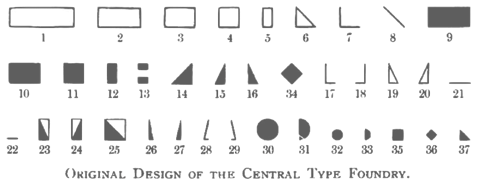 Foundry from St. Louis, est. 1872. It became "Central Division of ATF" in 1893. Discussion of its types by McGrew. Digitizations:
 - Spiral was the basis of the curly revival Hasta La Pasta (2005, Nick Curtis).
- Raphael (1885) was digitized at Linotype / Monotype. It is an art nouveau display typeface with lots of swashy flair. Check the Adobe version (1974-1995).
- Monument is a Solotype revival of a 1893 typeface by the Boston Type Foundry (which was also cast at the Central Type Foundry).
- Harpers was designed for the popular newsweekly of the same name. It was digitally revived in 2009 by Nick Curtis as Weekly Bazaar NF.
- Oh You Klid NF (2009, Nick Curtis) is based on the Victorian typeface Euclid from the 1880s.
- Multiform, created for coloring. No known digitization.
- Quaint Roman: a great hand-drawn alphabet. Khnown digitizations include Eglantine (David Nalle, Scriptorium), MiTica (2020, Rafael Ferran i Peralta), Bushwhacked NF (Nick Curtis) and Romanche (1992-1993, Thomas E. Harvey).
- An 1880 typeface was revived in 2011 by Claude Pelletier as Euclid CP (free download).
- Gloriosus NF (2014, Nick Curtis) revives Apollo.
- Chuck Mountain revived Othello (1892) as Chausson CF (2020).
[Google]
[MyFonts]
[More] ⦿
|
C.F. Meier
|
Darmstadt-based type designer who created the art nouveau font Meierschrift (1904-1908, Schelter&Giesecke). Revived by Oliver Weiss in 2020 as Meierschrift WF. [Google]
[More] ⦿
|
Champagne Design
[Alessandro Becagli]

|
Viareggio, Italy-based designer who has a degree in graphic arts from Accademia delle belle Arti Carrera, class of 2020, and attended IED Florence as well. In 2022, he released Tritone, an art nouveau font which was inspired by the facade of a bathing establishment. [Google]
[MyFonts]
[More] ⦿
|
Character
[Herbert F. Van Brink]
|
 Prolific Woodland Hills, CA-based typophile and type designer (1937-2013) whose portfolio consisted largely of revivals and who used the alias Character for his typographic work. The Los Angeles Times posted this obituary: Herb passed away after a brief fight against esophageal cancer. He was a 42 year resident of Woodland Hills CA. Son of the late Jean and Mary Van Brink, he was born in Manhattan, graduated from Stuyvesant High School (1952) and Queens College (1956) and always considered himself a New Yorker. He had a long career in Information Technology and retired from Arco. He loved traveling, bowling, genealogy, and was a bridge Life Master among his many interests. He was a trickster and a perfectionist. He leaves his wife, Paula, his son, David Van Brink and DIL Deb Culmer of Santa Cruz CA, his daughter Qarin Van Brink and SIL James Ray of Burien WA, grandchildren Amelia and Wilhelmina Ray Van Brink, brother and sister-in-law Jeffrey and Louise Van Brink of E. Northport NY and nephews Matthew and Jordan Van Brink.
 His typefaces: - Animal dingbat fonts: AbecedarianZoo (2003, created from an alphabet in Art Explosion 200,000), Turf&surf (2005).
- Alphadings: Jennifer's train (2011), ABCPlay (2005), DiddleTheMouse (2005), Silly Set (2005), Stone Carving (2005), Snow Persons (2005), Alaskan Ice (2005), Peppermin Canes (2005), USStarsNStripes (2003, first called USFlags), XmasTree (2002), XmasTree II (2004), Xmas Alpha (2005).
- Erotic alphabets: Flotner (2002, based on a scan of the human character alphabet by Peter Flötner (1534)), SilvestreBodies (2006, based on a figurative alphabet designed by Joseph Balthazar Silvestre in 1834, with engravings made by Girault), ErotiCaps Outline (2007), ErotiCaps Solid (2007), WeygelBodies (2006, adapted from Martin Weygel's 1560 interpretation of Peter Flotner's 1534 figurative alphabet).
- Stained glass themed fonts: ModernStainedGlass (2007), ModernStainedGlass2Tone (2007).
- Capital alphabets: Cameo Antique (2011, after Cameo Antique on page 17 of The Solotype Catalog of 4,147 Display Typefaces---a shaded outline version of the typeface called NightShade, on the same page of Dan Solo's book; the only known digitized fonts of NightShade are "Shadowed Serif" by James Fordyce (1994) and NigelSadeSH, from Soft Horizons (1993)), Modern French Capitals (2010, after a set of capitals drawn by Alphonse Mucha), Mucha French Capitals (2010, similar?), Marcel Caps (2007; based on "Crossroads" by August Will (1891)), WoodLook (2007, an improvement of 101's Wooden Alpha BlockZ), 3DAlphabet (2008, based on an alphabet coloring book designed by Jean Larcher, 1978), RomantiqueInitials (2007, based on work by Aridi), Blistered, BlisteredFramed, BlisteredReverse (2005, based on Marwan Aridi's Blister from the Initial Caps Vol I), ChiseledRound, Contemporary CH (2010), CourierInitials (2005, based on an alphabet by Johan)), Eclectica (2003, party-theme), FeathersInYourCaps (2002), FlowerSketches (2002), LACETRIM (2002), LeafyStencil (2003), QuiltedStippled (2004, based on an embroidery alphabet created by DesignsInStitches), RetroCapsBW (2004), RetroCapsWB (2004), Rope5 (2004, rope font), Rustic Black Shadow (2011. He explains: In the Solotype Catalog of 4,147 typefaces, RUSTIC is shown with a black shadow. RUSTIC WHITESHADOW has a white shadow. However, the Solotype digital font named RUSTIC has no shadow. Similar no-shadow fonts are also available as Pinewood (by Rick Mueller and one by Dieter Steffmann) and as Woody (by DincType). As of October, 2011, no digitized version of Rustic Whiteshadow is known. Character has produced a font named RusticBlackShadow, which matches the font named Rustic in the Solotype Catalog. Dick Pape had created an earlier version named Pepin Press Caps FA204, based on fonts contained in the Pepin Press book Fancy Alphabets. ), THINROPE (2002), VALENTINEHEARTS (2002), Printed Circuit (2005), SportsABC (2005), Feathered Flight (2005), Joe Clement (2007, Western pixel face), Ribbon Shadow (2007).
- Fonts based on scans from Awesome Alphabets (Mike Artell, 1999, Good Year): SketchBoards, SketchBones, SketchClothes, SketchLogs (2005), SketchPencils, SketchPipes, SketchTools, all done in 2005.
- Athletic lettering: Collegiate Heavy Outline (2006), Real Madrid 2011-2012 (2011, an expansion of a font by "Adriano"), The Football League (2011), Adidas Euro 2008 (2011), Puma World Cup 2010 (2010: based on Crepello, a custom-made font by Paul Barnes for Puma, that was used on the jersey of Italy, Switzerland and Uruguay during the 2010 FIFA World Cup), Adidas Unity (2010), LINKEB+Regular (2008) uses the lettering of the Geaux font used by LSU.
- Pixel or dot matrix style fonts: Dash It All (2007, based on Cooper Black), Even Hearted (2007, an improvement of CK More Hearts), Square 9x9 (2007).
- Brush typefaces: Skippingbrush (2006), GraffitiPaintBrush (2008).
- Dingbats: Being Sport Pictograms (2008).
- Scanbats: PilobusSilhouettes (2010) is based upon a human alphabet photographed by John Kane.
- Techno: BultacoDual (2010), Dr Who 42 (2007), London MMXII (2008), ArrowheadLake (2009, +Shadows, +Sunlit; based on the nearly blackletter typeface Arrowhead from the Solotype Catalog and alphabet books).
- Historic typefaces: Driftwood 67 (2011, Driftwood on page 67 of The Solotype Catalog of 4,147 Display Typefaces), ArrowheadLake and ArrowheadLakeShadows (2011, based on Solotype Catalog p.74), Cutin (2011, a simple rounded monoline sans called Cut-in Medium on page 163 of The Solotype Catalog of 4,147 Display Typefaces),Cutin (2011, a simple rounded monoline sans called Cut-in Medium on page 163 of The Solotype Catalog of 4,147 Display Typefaces), Pepin FA288 (2011, based on Matra, or Bifur, on page 54 of The Solotype Catalog of 4,147 Display Typefaces by Dan X. Solo), Varicka (2010, from "Decorative Condensed Alphabets", by Dan Solo, p. 94. It is similar to Red Rooster's Triple Gothic Condensed, but the Solo's font has different features), MaxfieldParrish140 (2007: From an incomplete (no "N") hand-drawn alphabet by Maxfield Parrish. See figure 140 of "Letters&Lettering" by Frank C. Brown, 1921. This is a different source than the P22 Parrish font family.), Ronde Antique (2009, based on page 110 of the Verlag Gerlach 1881 catalog).
- Other: Scramble Mixed (2006, scrabble face), Happy Fourth, Emperor AN (2009: this semi-art nouveau typeface is Emperor on page 42 of The Solotype Catalog of 4,147 Display Typefaces---not the same as Dan Solo's Emperor at MyFonts), Wood Gothic Caps (2011, blackletter), WoodWud (2011), Gallia Two (2010, based on a font found on page 55 of The Solotype Catalog of 4,147 Display Typefaces as Gallia No. 2), Charleston (2010, based on page 46 of The Solotype Catalog of 4,147 Display Typefaces), Azteca Regular (2010: based on Azteca Condensed by Dan X. Solo, page 74 of The Solotype Catalog of 4,147 Display Typefaces), Othello Fill and Solid (2011, derived from Othello on page 155 of The Solotype Catalog of 4,147 Display Typefaces), Sharons Shadows (2010, +Bold), Masked Menace (2012, based on Bodoni Poster).
Fontspace link. Dafont link. Fontspace link. And another one. See also at abfonts. Dafont link. [Google]
[More] ⦿
|
Charles E. Tiede
|
Codesigner at BBS in 1889 with Henry W. DeWitt of an early art nouveau typeface. [Google]
[More] ⦿
|
Charles Emil Heyer
|
Chicago-based punch-cutter, 1841 (Berlin, b. Carl Emil Heyer)-1897 (Chicago). His typefaces have late Victorian and early art nouveau elements: - At BBS: Armenian (+Extended) (1879), Calumet (1887), Castle (1888, a clean basic sans), Challenge Lightface (1888), Fair (1893), Fair Open (1891), Grant No. 2 (1892), Heyer, Jewel Script (1888), La Salle (1889), Lakeside Script (1883), Lyric (+Lightface Lyric, 1882; in 1925 renamed to Greeting Card (+Light)), Maltese (+Open) (1878), Mayo, Myrtle Script (1885), Occident (+Shaded) (1881), Opaque, Plate Script, Princess Script (1887), Princeton, Solar (1888), Sylvan Text.
- At Boston Type Foundry: Bank Note Italic Ornamented (1874 or 1875), Compressed Black (1875), Copperplate Italic (1875), Harlem (+Open, +Shade) (1875), Karnac (1874 [note: not sure this was done at Boston Type Foundry]), Mayence (1875), Nubian (1876), Rococo (1876), Vienna (1875).
- At Western Type Foundry: Circular Gothic No. 44 (1879). For a revival, see Foundation Sans Number 44 (Henrik Kubel, 2018).
List of patents taken on fonts, by date: 1879: Armenian extended, unnamed art nouveau face, unnamed BBS face. 1880: unnamed BBS face, unnamed BBS face. 1881: blackletter face, unnamed BBS face, unnamed BBS face, unnamed BBS face, unnamed BBS face. 1882: unnamed BBS face, unnamed BBS face, unnamed BBS face, unnamed BBS face. 1883: unnamed BBS face. 1884: unnamed art nouveau face, unnamed art nouveau face, unnamed art nouveau face, unnamed BBS face. 1886: unnamed BBS face, borders. 1887: School Script for BBS, unnamed BBS face, unnamed BBS face. 1888: unnamed BBS face, unnamed BBS face. 1891: ornaments for BBS. [Google]
[More] ⦿
|
Charles Farley
|
Early 20th century designer of letters, such as this Freehand Lettering with art nouveau influences. [Google]
[More] ⦿
|
Charles Gibbons
[Oddsorts]

|
 [MyFonts]
[More] ⦿
|
Charles J. Strong
|
Lettering teacher in Detroit in the early part of the 20th century. He contributed to art nouveau, and published Strongs Book of Design (1910). In 2010, one of his art nouveau alphabets was faithfully digitized by Ken Ray as Strongs 1917 Sharp. [Google]
[More] ⦿
|
Charles Rennie Mackintosh

|
 Lettering artist and architect in Glasgow (b. Glasgow, 1868, d. London, 1928). He was a designer in the Arts and Crafts movement and also the main exponent of Art Nouveau in the United Kingdom. Some speculate that he had Asperger's Syndrome. Typefaces based on his lettering include ITC Rennie Mackintosh (1996, by Phill Grimshaw), ITC Rennie Mackintosh Ornaments (also by Phill Grimshaw), ITC New Rennie Mackintosh (2017, by the Monotype design team), and Willow (by Tony Forster). Check the Glasgow School of Art, ITC and U&LC.
 The CRMFontCo headed by George R. Grant specialises in typefaces based upon the letterforms of Mackintosh. They published multiple styles of these fonts: Rennie Mackintosh (1993, the original by George R. Grant), Rennie Mackintosh Glasgow (2007, with lowercase letters added), and Rennie Mackintosh Artlover (1995: art deco dingbats by George Grant and Joanna McKnight). Later additions include The Classic Charles Rennie Mackintosh Font, The Charles Rennie Mackintosh Artlover Font, The Charles Rennie Mackintosh Stems Font, The Charles Rennie Mackintosh Glasgow Font, The Charles Rennie Mackintosh Renaissance Font, The Charles Rennie Mackintosh Hillhouse Font, The Charles Rennie Mackintosh Moonlight Font, The Charles Rennie Mackintosh Scotland St. Font, and The Charles Rennie Mackintosh Venezia Font<. Poster by Ryan Irven (2010). See also the free font Nouveau (1992) by Alan Cairns. CRM company link. View Charles Rennie Mackintosh's typefaces. [Google]
[MyFonts]
[More] ⦿
|
Charles Voegtle
[Webfoot]
|
[More] ⦿
|
Charlie Riley
|
FontStructor who made the painter's font Curveou (2012) taking inspiration from the art nouveau illustrations of Aubrey Beardsley. [Google]
[More] ⦿
|
Chew Loon Ng

|
 Designer of the baroque serif typeface Accolade (Fonts/Ingrama SA, 1979). Each of URW++, SoftMaker, Infinitype, Brendel, TypeShop, Design Studios, and Elsner&Flake carry versions with the same name. The Castcraft version is OPTI Acheron. Other fonts by him include Gazebo (art nouveau face).
 MyFonts link. FontShop link. [Google]
[MyFonts]
[More] ⦿
|
Chiachi Chao
|
Chiachi Chao (b. 1988) received a BFA in Communication Design from Shih-chien University in Taipei in 2013. He worked as an independent graphic designer in Taiwan and later joined an international tech company as a systems designer. From 2019 to 2021, he completed the MA program in Type Design at ECAL/Ecole cantonale d'art de Lausanne. While studying at ECAL (Lausanne, Switzerland), he designed the dynamic script typeface Hemon (2020), which was inspired by the abstract paintings of Dutch artist Sedje Hémon. In 2021, he published the art nouveau typeface Bezier at ECAL Typefaces. Chiachi's diploma project, the elegant modern typeface Kleisch, won a Swiss Design Award in 2023 and was released as a family of three static styles and a variable version at Lineto in late 2024. The quasi-Baroque letterforms are designed to match various Chinese/Japanese/Korean Ming typefaces in a number of features as well as visual parameters, reversing the usual process in Western type design that tries to fit other scripts to the presumed templates of the Latin alphabet. He redrew LL Le Corbusier, a family of four stencil fonts re-launched in spring 2024. [Google]
[More] ⦿
|
Chloé Vézole
|
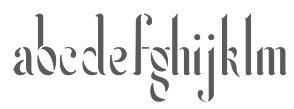 Parisian designer of the curvy art nouveau-ish Feu Sauvage (2015). Behance link. [Google]
[More] ⦿
|
Chloé Vézole
|
Chloé Vézole (Metz, France) created the tall partly art nouveau typeface Feu Sauvage (2014). Behance link. [Google]
[More] ⦿
|
Chris Butt
|
Creative director in London who created an art nouveau poster for a masquerade ball in 2013. Behance link. [Google]
[More] ⦿
|
Christian Küsters
[ACME Fonts (or: CHK Design)]

|
[MyFonts]
[More] ⦿
|
Christina Torre

|
 Co-designer with Richard Kegler of several fonts at P22 type foundry, which she joined in 2000. She graduated from the State University of New York at Buffalo with a BA in Communication Design. She worked at the Pushpin Group in NYC and at Dog Eat Dog Advertising, Inc. in Buffalo, NY. Her typefaces:
 - P22 Art Nouveau Bistro, P22 Art Nouveau Cafe, P22 Art Nouveau Extras (ornaments), all made in 2001-2002.
- P22 Dearest Script, P22 Dearest Swash: calligraphic in the style of medieval scribes, and a winner of an award at the TDC2 Type Directors Club's Type Design Competition 2002.
- P22 FLW Exhibition and P22 FLW Terracotta, both done in 2000: these are based on alphabets by Frank Lloyd Wright published in 1931 and in 1896-1897 (in his book The House Beautiful), respectively.
- Gothic Gothic (2001): a blackletter done with James Grieshaber.
- P22 Mucha (2001): an art nouveau font inspired by Alfons Mucha, ca. 1900.
- P22 Pan Am (1999, with Richard Kegler). Created for the centennial of the Pan-American exposition of 1901, held in Buffalo, NY.
- P22 Salon (2001): more art nouveau.
- P22 Victorian Gothic (2000, with Richard Kegler and Amy Greenan). Based on a type style called Atlanta, similar to Copperplate.
[Google]
[MyFonts]
[More] ⦿
|
Christopher Washer
|
Auckland-based designer of Shipwrecked (2005, bitmap face), Galathos (2005, typewriter-style face), Sophtware (2004, pixel face), Minque (2004, a bitmap typeface inspired by Garadot), Kernohan Sans (2004), this art nouveau face (2004) and Digitype (2004). [Google]
[More] ⦿
|
Chuck Davis
[Letterhead Fonts]

|
 [MyFonts]
[More] ⦿
|
Chuck Mountain
|
 Designer of free revival types:
 - The fat typeface Chistoso (2019). He writes: Chistoso (Spanish for amusing) is my digital revival (completely redrawn) of Majestic by Julius E. F. Gipkens (1883-1968). Its original metal type version was found in Hauptprobe in gedrängter Form der bauerschen Giesserei Frankfurt am Main. Majestic (1914) is in the tradition of Lucian Bernhard's typefaces, and Mountain's digital revival is the only one I know of to date.
- Quentell CF (2019). He writes: Quentell is my revival---completely redrawn---of Quentell, designed by William P. Quentell in 1895 for the American Type Founders Co. The original Quentell became the basis of Taylor Gothic (1897). Taylor Gothic was morphed in Globe Gothic by Morris Fuller Benton (1905) for the ATF. A cursory perusal will easily reveal their similarities.
- Cotrell CF (2019). Cotrell is a revival of Matthews, as seen in Inland Type Foundry's specimen book from 1902. He suppressed Cotrell's swashes and redeesigned the lower case f and g.
- Zuecos CF (2019). A Western / Italian typeface based on an Italian in Specimen of Leavenworth's Patent Wood Type Manufactured by J.M. Debow (Allentown, New Jersey, n.d., but probably 1840s).
- Auber CF (2019). A revival and extension of Bohemian, a metal type that can be seen in Printing Machinery and Material (Miller & Richard, 1902).
- Dukas CF (2019). A revival, completely redrawn, of Studley, a metal typeface in Specimen Book and Catalog (Inland Type Foundry, St. Louis, 1902).
- Massenet (2020). A revival of Old Style Grotesque Condensed as shown in Specimens of Printing Type (Miller & Richard, Edinburgh, c. 1920).
- Chausson CF (2020). A revival, completely redrawn, of Othello (shown in Popular Designs for Artistic Printers (Central Type Foundry, St. Louis, 1892), which in turrn seems to be based on an earlier wood type design.
- Murden CF (2020). Murden CF is a revival of Corbitt (Nicholas J. Werner in 1900 for Inland).
- Pettingill CF (2020). A revival of the art nouveau typeface Arlington Old Style, as seen in Pettingill Type Book (Pettingill & Co., 1901).
- Bruntsfield CF (2020), a revival of Bruntsfield, a metal typeface seen in Specimens of Printing Type (Miller & Richard, Edinburgh, (c. 1900)).
Fontsquirrel link. [Google]
[More] ⦿
|
Chung-Deh Tien
|
 American designer in Jackson Heights, NY (b. 1965), associated with the Cherokee Nation. He created the graffiti font Chase Zen Jackulator (2015), Chase Zen Jingletruck Karachi (2015), the tattoo font Chase Zen Holy Monkey (2015), the art nouveau typeface Chase Zen Paris (2014), Chase Zen Sprawl (2014), Chase Zen Blight (2014), Chase Zen Punjabi (2014), Chase Zen Basmati (2014), and Chase Zen Bangladesh (2014).
 Designer in 2011-2012 of the following free Latin / Cherokee fonts: Nikwasi, Tsiquilisda, Danisvdanvsgv, Alewisdodi, Gola Unole, Nvdaasdawadidohi, Atuyasdodi, Tsi yu gunsini (a copperplate design for Unicode Cherokee, named after a Cherokee chief called Dragging Canoe), Wilma Mankiller Old (2012, also for Cherokee), Gadaquali (flared face), Gageda (Cherokee font). Further typefaces: Grendel (2011), the tattoo fonts Maelstrom (2011) and Reign Sample (2010), the mechanical typeface Dans Hardware (2010), the graffiti typeface Stone Angel (2010), the Western typeface Mary's Cherry&Co (2010), the squarish typeface Dashboard Jesus (2010), the fat wood style typeface John Brown (2010), Dantone (2010), the fat roundish typeface Creamy (2010), Thermobaric (2011, Star trek face). Chung-deh Tien created a few Cherokee fonts including Nikwasi San (2012), Sequoya Bold (2012), Oconosota (2012), Kanagota (2012), and Tsalagi Ameliga (2010). Dafont link. Flickr link. Fontspace link. Another Fontspace link. [Google]
[More] ⦿
|
Chyrllene Albuquerque

|
 Aka Chyrllene K. Daughter of Iza W, who designed many typefaces at Intellecta Design starting in 2010. She studied applied mathematics and graphic design, and works as COO of Intellecta Design. In 2013, she wrote a thesis entitled Revival Tipografico at Faculdades Integradas Barros Melo, Brazil. Based in Recife, Brazil, she is credited with these typefaces:
 - Naive Ornaments (2012, with Iza W).
- Calligraphic Birds (2012, with Iza W).
- ABC Hand (2011). A sign language face.
- Pencraft (2010): a penmanship typeface with uppercase based on Swagger Capitals (Carl Stephen Junge, at Barnhart Brothers&Spindler), and lowercase based on Sidney Gaunt's Pencraft Oldstyle series (1914), as displayed in the BBS catalog from 1922.
- Eingraviert Dutch Capitals (2009). An engraved typeface.
- Vintage Hands (2012). A set of fists and penman's hands.
- Bonsai Paufo (2010): a dingbat face.
- Floreart (2012). With Iza W.
- Jugendstil Flowers (2011).
- Libertee Ornaments (2011): an elegant art nouveau typeface done with Paulo W.
- MesoAmerican (+Two) (2011): native Indian dingbat typefaces.
- Tribalism (2011): three typefaces with ornaments and fleurons, done together with Iza W and Paulo W.
- Cripto (2011). With Paulo W.
- Soft Garden (2012). With Iza W.
- Bruce 1065 Soft Serifs (2011). Very Victorian. With Iza W.
- Victorian Advertizing (2011).
- Gothic Revival Layered (2012). One of the first layered blackletter typefaces anywhere.
- Forte (2013) is a fee brush font in the style of Forte MT (1962, Carl Reissberger).
- Tribalism (2011). Three fonts with penmanship-style flourishes.
- Enchiridion (2012).
- Azalleia Ornaments (2012). With Iza W.
Behance link. [Google]
[MyFonts]
[More] ⦿
|
Clarence Pearson Hornung
[Dick Pape]
|
 Prolific author, b. 1899. His books include the typographically magnificent Handbook of Early Advertising Art, Mainly from American Sources (Dover, 2 volumes). The typeface Lexington is attributed to him, as Mac McGrew writes: Lexington is a font of shaded and decorated letters and figures, drawn for ATF by Wadsworth A. Parker in 1926, from a design by Clarence P. Hornung. It is an ornamental form of roman letter, with curly serifs, and tendrils at the ends of light strokes. It was recast in 1954, and copied in one size by Los Angeles Type.
 The book Early Advertising Alphabets, Initials and Typographic Ornaments (1956), edited by Clarence P. Hornung, led Dick Pape to creates these digital fonts in 2008: AltDeutsch, Amorette1889, ArabesqueDesign, BreiteEgyptienne (2008), BreiteverzierteClarendon, ChiswickPressGothicInitials, EarlyScrollAlphabet, EarlySignboards, EnglandInitials1880, ErhardDatdolt, FlorentineInitials, FlorentineInitialsReverse (2008), GothicChancery1880s, GothicClosedLetter (2009-2010, Lombardic), Hollandisch-Gothic (2010), JudendstilAlphabet (2009), LilyoftheValley, Papillon 1760 [First shown in Paris in 1760, and reprinted by Clarence P Hornung in Dover Pictorial Archive Series: Early Advertising Alphabets, Initials and Typographic Ornaments (1956, Dover Publications). Hornung's images inspired Pape's typeface], Phantasie (2009-2010), Romaine Midolline (2010), RomanPrintShaded (2010, ornamental roman caps), RusticAlphabet, SilhouetteInitials1880, TheTerrorsofNightLife, VerzierteAltGothic, VerzierteGothic, VictoriaGingerbread1890 (2007). Klingspor link. Download here. More direct link to Pape's digitizations. [Google]
[More] ⦿
|
Claude Fayette Bragdon
|
Claude Fayette Bragdon (b. Oberlin, OH, 1866-1946) was an American architect, writer, and stage designer based in Rochester, New York, up to World War I, and in New York City after that. He was known for his creative geometric ornaments. At some point, he proposed this modern American italic for architectural plans. Check also his set of modern small letters. This page shows his art nouveau art. [Google]
[More] ⦿
|
Claude Pelletier
|
 Quebec-based typographer and type designer (aka Diogene) who specializes mainly in revivals of obscure or old typefaces.
 Dafont link. Yet another URL. Abfonts carries many of his fonts. Fontspace link. His typefaces: - Aerolite C Pone (2013). A calligraphic connected copperplate script.
- Angelica CP (2011). After a Fotostar font, Angelica, ca. 1960.
- Banner Star (2012). An American flag-themed display typeface.
- Barrio CP (2011). An inline face based on a Neufville original.
- BeansCP (2010, after a font found on page 10 of Art Deco Display Alphabets: 100 Complete Fonts by Dan X. Solo).
- Bienetresocial (2003), BienetresocialBold (2003).
- Bizarre and Bizarrerie (2010; based on Edwards and Inland, both designed in 1895 by Nicholas J. Werner at the Inland Type Foundry; renamed in 1925 by BBS)
- Bloque Demo (2011). Experimental.
- Bold (2008)
- Bolina (2015). A copperplate calligraphic script after Dan X. Solo's alphabet shown on page 12 of Dan X Solo. Script and Cursive Alphabets (1987, Dover).
- Bonte Divine (2017).
- Carre (2009, athletic numerals).
- Caslon CP (2012, based on Caslon 223 Bold).
- Champignon (1999-2009, a formal calligraphic script)
- Chartrand (2010, Victorian)
- Chomage (2009)
- Chopin Script (1999-2010, calligraphic; after Polonaise by Phil Martin)
- Constanze Initials (2010). After Constanze Initials by Joachim Romann (1956).
- Crayonnette (2000-2001). Same as his earlier font Derniere (1999).
- DeClaude (2010, patterned and named after DeVinne)
- Dojo CP (2011)
- Dynamic CP (2010, based on page 48 of The Solotype Catalog of 4,147 Display Typefaces as Dynamic Deco)
- Ebony (2011). Based on a Marder&Luse design from 1890. Ebony is on page 38 of 100 Ornamental Alphabets by Dan X. Solo and also on page 43 of The Solotype Catalog of 4,147 Display Typefaces.
- Embrionic 85 (2012, +Swash Caps) and Embrionic 55 Swash (2012): an ink trap sans display family modeled after Robert Trogman's Embrionic in the FotoStar collection.
- Essai (2003)
- Euclid CP (2011): based on an 1880 typeface at Central Type Foundry.
- Fancy Text (2004, blackletter)
- Fantaisie1 (1999)
- Gourmandise (2013), an exquisite Normandian-style didone display typeface.
- Grandee CP (2014). Claude says that it is based on T.H. Grandee, but that is too cryptic for me...
- Haricot (2010, a fat modular typeface based on Beans in the Dan Solo catalog)
- Humeur (2001-2002, funny smilies)
- IEC5000 (2011). A symbol font with electrical and other icons.
- Initiales Medium (2011).
- Jeux Cache (2016). A boxed letter font.
- JohnHancockCP-Medium (2010, bold didone)
- Landi Echo (2011). A remake of Landi Echo by Alessandro Butti (1939-1943).
- La Tribune (2011). A newspaper type.
- Le Golf or Le Trou (2010, art nouveau typeface by Antoine Szczebanski, digitized by Claude Pelletier; also on page 71 of the Solotype catalog)
- Les Etoiles (2013): an inline typeface
- Les Tuyaux (2018). A great slinky font.
- Lionel CP (2010, a multiline typeface inspired by Letraset's 1973 typeface Stripes)
- Louisa CP (2015). A free calligraphic copperplate script. Louisa CP is Louisa on page 56 of Script and Cursive Alphabets: 100 Complete Fonts by Dan X. Solo.
- Malvern (1999)
- Manquis CP (2012). A roman typeface.
- Maratre (2013). A delicious connected copperplate calligraphic script that revives (or is almost identical to) François Boltana's Aurore (1993).
- Monterey Wide (2011). A Tuscan ornamental face, based on a showing on page 22 of The Solotype Catalog of 4,147 Display Typefaces.
- Motscroises (1997)
- Niaisage (2012). A lachrymal caps only typeface.
- Oxford CP (2010, a multiline face, based on the 1960s typeface by Christine Lord)
- Pasdecourbe (2003)
- Pasdenom (2001, no punctuation)
- Peak CP (2020). A revival of VGC's photo font Peak.
- Pepinot (2012), an art nouveau typeface based on Coral Inline on page 190 of The Solotype Catalog of 4,147 Display Typefaces.
- Pistilli Roman (2011, after the original by Pistilli)
- Postface (2012). A bold signage script face.
- Rita Smith (2012). After Primavera by Rita Major.
- Rogers, Rogers2 (1997). He says that it is not his font---that he just rearranged the glyphs. According to Claude, can be found in the book Treasury of Authentic Art Nouveau Alphabets, ed. Petzendorfer, Plate 23. It was made in 1902 by A.V. Haight for Inland Type foundry.
- Salamandre (2012). A tall 19-th century style slab typeface based on Iguana, a design of Sally-Ann Grover.
- Simplement (2011) is Cut-in Medium on page 163 of The Solotype Catalog of 4,147 Display Typefaces.
- Stylie Stymus (2012).
- Threshold (2014).
- TriangleETcircleShadow, TriangleETcircleShadowed (2010, 3d iron work style face)
- UptightC (2010, multiline face).
- Whitin Condensed Black (015). Whitin Condensed Black is Whitin Black Condensed on page 151 of The Solotype Catalog of 4,147 Display Typefaces.
- YagiUHFNo2 (2012).
- Zenith CP (2016). A free connected calligraphic (wedding) script typeface.
[Google]
[More] ⦿
|
Claudie Leger
|
 During her studies in Montreal, Claudie Leger was inspired by Alphonse Mucha when she designed the ornamental art nouveau typeface Freyja (2014). [Google]
[More] ⦿
|
Coffee Bin Fonts
[Billy Jacobs]

|
 Navarre, OH-based foundry run by artist/designer Billy Jacobs (b. 1958). His font creations are based on 19th century advertising type found in tradecards, catalogs and periodicals from that era.
 His 2006 designs: Drugstore, Horsfords, Hoyts German Cologne (art nouveau), Letterhead, Soap Box, The Youths Companion (+Shaded: Victorian). Klingspor link. MyFonts selection. [Google]
[MyFonts]
[More] ⦿
|
Cohezion Design
|
Frankfurt, Germany-based designer of the art nouveau typeface Juneau (2015). Behance link. [Google]
[More] ⦿
|
Colin Kahn

|
 Type designer from Buffalo, NY. His typefaces were mostly developed at P22. Klingspor link. A partial list of his fonts:
 - In 2008, he revived and extended Cigno, a 1950s script typeface by Aldo Novarese, and called it P22 Cigno.
- LTC Circled Caps.
- P22 Civilité is a joint effort of Colin Kahn, Richard Kegler and Milo Kowalski.
- P22 Curwen. P22 Curwen Poster is a digitized version of a rare wood type used by the Curwen Press in England in the early 20th Century for poster work. P22 Curwen Maxima is a new hyper-stylized re-interpretation of Curwen Poster.
- The great display/comic book font Ebin (and Ebin Outline).
- In 2006, he created the P22 Gauguin font family (Regular, Alternate, Brush and Extras), a script font set based on the writings and sketches of post-impressionist artist Paul Gauguin.
- Glamour (2006, P22/Lanston; also called LTC Glamour Grotesque) is based on the 1948 design by the same name done at Lanston Monotype, which in turn is based on Imre Reiner's Corvinus.
- P22 Goudy Aries (2004, P22, by Richard Kegler and Colin Kahn). This typeface revives Goudy's aries from 1926.
- Goudy Sans (2006, P22/Lanston, 6 styles): Goudy Sans Bold was originally designed by Frederic Goudy in 1922 as a less formal gothic and finished in 1929. The Light was designed in 1930 and the Light Italic in 1931. Colin Kahn digitized them in 2006 to make a 6-style Goudy Sans family, which includes a Goudy Sans Hairline.
- In 2008, he revisited Richard Kegler's P22 Platten, which was based on lettering found in German fountain pen practice books from the 1920s, and created the extended typeface P22 Platten Neu.
- Internship (2003), or St G Schrift. P22 swrites: St. G Schrift (2005, P22) is a font based on the type designs of German poet Stefan George. This sans-serif typeface features a few variations found in books published by George in Berlin. Includes P22 St. G Schrift One, P22 St. G Schrift Two and P22 St. G Italic (an art nouveau version of the roman, newly designed). The original font was cast in 1907 by a small foundry in Germany and was used primarily for the works of George as well as other books including a monumental edition of Dante's Divine Comedy. This may or may not contradict the fact that Marcus Behmer designed Stefan George-Schrift in 1904.
- P22 Tuscan Expanded is a digitization of the mid-19th century wood type font Antique Tuscan Expanded - Wells&Webb 1854.
- P22 Vale (2007, in Roman and Kings Fount styles) are based on types by Charles Ricketts that were used by the Vale Press (which in turn were based on Jenson). The Kings Fount is originally dated 1903.
- In 2007 still, he revived Zebra (P22), a font originally designed in 1963-1965 by Karlgeorg Hoefer.
View Colin Kahn's typefaces. [Google]
[MyFonts]
[More] ⦿
|
Collectif MBC (was: MBC Graph)
|
 Graphic design collective in Orchamps near Besançon, France, est. 2012, consisting of graduates in the Masters program of the École des Beaux-Arts de Besançon, i.e., Clément Moussard, Antonin Buchwalter, and Simon-Pierre Chapuis. Their typeface creations:
 - From 2013: Juliano (2013, rounded sans for the restaurant Gusti del Gusto).
- From 2014: Plumber (rounded slab serif), Esposito (rounded sans), Polaris (rounded sans), Juliano (2013, rounded sans for the restaurant Gusti del Gusto), Sept Nains (a seven style type system based on Fonderie Olive's Simplex Gras, 1937), Raymond (slab serif), Monolab (monospaced), Aftur (a sans caps typeface that is partly art deco and partly futuristic; influenced by Cassandre's Bifur), Antique Calque (a layered typeface system), Lazy Super (a pixel face) and the variable width and variable height experiment called Expendable.
- Typefaces from 2015: Gnome (a sans done for the Centre Régional du Livre Franche-Comté), Monocle (a sans typeface for Cyclop Jazz Action), Laborio, Ploum (an art nouveau stencil), MFB (an art deco poster typeface family named after Morris Fuller Benton).
- Typefaces from 2016: Saljan, Buck01.
Tumblr link. Behance link. Old URL. Typeface catalog [PDF]. [Google]
[More] ⦿
|
Comicraft (was: Active Images)
[Richard Starkings]

|
 Comicraft was founded by Richard Starkings and John Roshell in 1992. Located in Santa Monica and Los Angeles, they do lettering and design for the comic book industry and make comic book fonts. At one point they were also called Comic Book Fonts. The current presidents are Rita Simpson and Richard Starkings. Alternate URL. T-26 link. Creative Market link. Some fonts: Sanctum Sanctorum (2003), Grandguignol (2003), MagicalMysticalFour (2003), Smash (2003), Aztech, Joe Kubert, Gobbledygook, Meanwhile, Matinee Idol [Nick Curtis has a much nicer script font by the same name, sold by MyFonts], Manganese (Asian-lookalike by Richard Starkings), Altogether OOky (by John Roshell), AbsolutelyFabulous, Achtung Baby (1997, Richard Starkings: a brutalist typeface), Adamantium, Alchemite, AstroCity, AstroCity International, Bithead, BrontoBurger, CarryOnScreaming, Chills, ClobberinTime, Comicrazy, Destroyer, DivineRight, DoubleBack, DutchCourage (1995, an art deco family), Elsewhere (art nouveau), Flameon, Framistat (2000, JG), Frostbite, GrimlyFiendish, Hooky, Hellshock, IncyWincySpider, JimLee, JoeMad, KissAndTell, KissAndTell International (2000, JG), Meltdown, MonsterMash, PhasesOnStun, PulpFiction, ResistanceIs..., RunningWithScissors, SchoolsOut (1999, John Roshell), SezWho/SezYou, SpookyTooth, Spills, Splashdown, StandBy4Action, Stormtrooper, TheStorySoFar, ToBeContinued, Thrills, WildWords, WildWords International, YuleTideLog, Zoinks, ZAP Pack, Digital Delivery, Jeff Campbell (2000, by JG), Los Vampiros, DeadMansChest, Cutthroat International (2000), Rigor Mortis (2000, John Roshell), DangerGirl, Thingamajig, Red Star, Red Square, Drop Case, Too Much Coffee Man, NearMyth, Stonehenge, Golem and SwordsAndSorcerers (medieval or runes fonts). Their monster fonts collection includes MonsterMash, CarryOnScreaming, Chills, GooseBumps, CreepyCrawly, Grimly Fiendish, IncyWincySpider, SpookyTooth, Meltdown and TrickorTreat dingbats. In 2005, MyFonts started selling their collection. Fonts by Starkings include Achtung Baby, Carry On Screaming, Clobberin Time, Flame On, Goosebumps, Grimly Fiendish, Sez, Splashdown. The full font list: Absolutely Fabulous (1999), Achtung Baby (1997), Adam Kubert (2005), Adamantium (1999), Alchemite (1997), Altogether Ooky (1999, vampire script), Area51 (2005, an octagonal typeface with a military stencil)), Astro City (2005), Astronauts In Trouble (2005), Atomic Wedgie (2005), Aztech (2005), Battle Cry (2005), Battle Scarred (2005), Belly Laugh (2005), Biff Bam Boom (2005), Bithead (1997), Blah Blah Blah (2005), Bronto Burger (1996), Carry On Screaming (1996), Chatterbox (2005), Cheeky Monkey (2005), Cheese And Crackers (2005), Chills (1997), Clobberin Time (1995), Comicrazy (1995), Creepy Crawly (2005), Cutthroat (2005), Danger Girl (2005), Dave Gibbons (2005), Dead Mans (2005), Dear Diary (2005), Designer Genes (2005), Destroyer (1999), Digital Delivery (2005), Divine Right (1998), Doohickey (2005), Double Back (1998), Dreamland (2005), Drop Case (2005), Dutch Courage (1995), Elsewhere (1998), Euphoria (2005), Exterminate (1999), Face Front (2005), Flame On (1997), Forked Tongue (2005), Framistat (2005), Frostbite (1997), Girls Girls Girls (2005), Gobbledygook (2005), Golem (2005), Goosebumps (2005), Grande Guignol (2003), Grimly Fiendish (1998), Hedge Backwards (2005), Hellshock (1997), Hooky (1999), Hush Hush (2005), Hyperdrive (2005), Incy Wincy Spider (1996), Jeff Campbell (2005), Jeff Campbell Sketchbook (2005), Jim Lee (1998), Joe Kubert (2005), Joe Mad (1999), Kiss And Tell (1999), Ladronn (2005), Los Vampiros (1999), Manganese (1999), Matinee Idol (2005), Meanwhile (2005), Meltdown (1997), Mike Wieringo (2005), Monster Mash (1997), Near Myth (2005, a grunge face, since 2007 also at T26), Nuff Said (2005), Overbyte (2005), Paranoid Android (2005), Pascual Ferry (2005), Pass The Port (2005), Phases On Stun (1995), Primal Scream (2005), Pulp Fiction (1996), Red Square (2005), Red Star (2005), Resistance Is (1997), Rigor Mortis (2005), Rumble (1994), Running With Scissors (1997), Sanctum Sanctorum (1998), Santas Little Helpers (2005), Schools Out (1999), Sean Phillips (2005), Sentinel (2005), Sez (1998), Shannon Wheeler (2005), Shannon Wheeler (2005), Smash (2005), Snowmany Snowmen (2005), Soothsayer (2005), Spellcaster (2005), Spills (1997), Splashdown (1997), Spookytooth (2005), Stand By4 Action (1997), Stonehenge (2005), Stormtrooper (1997), Thats All Folks (2005), The Story So Far (1998), Thingamajig (2005), Thrills (1997), Tim Sale (1999), Tim Sale Brush (2005), Tim Sale Lower (2005), Timelord (2005), To Be Continued (2005), Too Much (2005), Tough Talk (2005), Treacherous (2005), Trick Or Treat (2005), Wall Scrawler (2005), Wiccan Sans (1999), Wiccan Serif (1999), Wiccan Special (1999, see also T-26), Wild And Crazy (1997), Wild Words (1995), Yada Yada Yada (2005), Yeah Baby (2005), Yuletide Log (1996), Zoinks (2005), Phil Yeh (2006), Zzzap (2006), Battle Damaged (2007), Speeding Bullet (2006), Foom (2007), Letterbot (2007), Timsale (2007), Cutthroat (2007), Framistat (2007), Area 51 (2007, techno, octagonal), CC Comicraft (2007), Ratatat (2008), Mad Scientist (2008), Monologous (2008, T-26), HolierThanThou (2008, T26), Elephantmen (2008, grunge typeface at T26), Storyline (2008, T-26), Primal Scream (2009, T-26), Spillproof (2009, T-26), Sign Language (2008), Moritat (2009, T-26, by John Roshell), Pass The Port (2009, T-26), Credit Crunch (2009), Elsewhere (2009, art nouveau), Code Monkey (2011, monospaced yet informal), Glitter Girl (2011, hand-printed), Rassum Frassum (2011, comic book face), Rocket Man (2011, a retro futuristic family), Spaghetti Western (2011, signage face), Sunrise Till Sunset (2012), Samaritan and Samaritan Tall (2013, with John Roshell).
 In 2014, John Roshell published the school font Dash To School. Typefaces from 2015: Samaritan Lower (by Richard Starkings and John Roshell), Dusk Till Dawn Buried (expressionist). Typefaces from 2016: Questionable Things (with John Roshell: a question mark font). Typefaces from 2017: Evil Schemes (by Richard Starkings and John Roshell), Regeneration, Obey Obey Obey (by Starkings and Roshell). Typefaces from 2018: Samaritan Tall Lower (by Starkings and Roshell), Blah Blah Upper (by John Roshell and Richard Starkings), Evil Doings (by Richard Starkings and John Roshell). Typefaces from 2020: Elektrakution (a Greek simulation font family by Richard Starkings and John Roshell), This Man This Monster (by John Roshell and Richard Starkings). Typefaces from 2021: Richard Starkings Brush (2021; a comic book typeface by Richard Starkings and John Roshell), Scoundrel (a comic book face by Richard Starkings and John Roshell). Creative Market link. View Comicraft's typefaces. Fontsquirrel link. [Google]
[MyFonts]
[More] ⦿
|
Cooper Black versus Robur
[Patrick Griffin]
|
 An excellent piece written by Patrick Griffin in 2010 when he and Kevin King published Robur at Canada Type, in which they explain the chronology of the machine age ad typefaces starting with Peignot. Reproduced here without Patrick's permission.
 It shouldn't be a surprise to anyone that these letter shapes are familiar. They have the unmistakable color and weight of Cooper Black, Oswald Cooper's most famous typeface from 1921. What should be a surprise is that these letters are actually from Georges Auriol's Robur Noir (or Robur Black), published in France circa 1909 by the Peignot foundry as a bolder, solid counterpart to its popular Auriol typeface (1901). This typeface precedes Cooper Black by a dozen of years and a whole Great War. Cooper Black has always been a bit of a strange typographical apparition to anyone who tried to explain its original purpose, instant popularity in the 1920s, and major revival in the late 1960s. BB&S and Oswald Cooper PR aside, it is quite evident that the majority of Cooper Black's forms did not evolve from Cooper Old Style, as its originators claimed. And the claim that it collected various Art Nouveau elements is of course too ambiguous to be questioned. But when compared with Robur Noir, the "elements" in question can hardly be debated. The chronology of this "machine age" ad typeface in metal is amusing and stands as somewhat of a general index of post-Great War global industrial competition: - 1901: Peignot releases Auriol, based on the handwriting of Georges Auriol (the "quintessential Art Nouveau designer," according to Steven Heller and Louise Fili), and it becomes very popular.
- 1909-1912: Peignot releases the Robur family of typefaces. The eight styles released are Robur Noir and its italic, a condensed version called Robur Noir Allongée (Elongated) and its italic, an outline version called Clair De Lune and its condensed/elongated, a lined/striped version called Robur Tigre, and its condensed/elongated counterpart.
- 1914 to 1918: World War One uses up economies on both sides of the Atlantic, claims Georges Peignot with a bullet to the forehead, and non-war industry stalls for 4 years.
- 1921: BB&S releases Cooper Black with a lot of hype to hungry publishing, manufacturing and advertising industries.
- 1924: Robert Middleton releases Ludlow Black.
- 1924: The Stevens Shanks foundry, the British successor to the Figgins legacy, releases its own exact copies of Robur Noir and Robur Noir Allongée, alongside a lined version called Royal Lining.
- 1925: Oswald Cooper releases his Cooper Black Condensed, with similar math to Robur Noir Allongé (20% reduction in width and vectical stroke).
- 1925: Monotype releases Frederick Goudy's Goudy Heavy, an "answer to Cooper Black". Type historians gravely note it as the "teacher steals from his student" scandal. Goudy Heavy Condensed follows a few years later.
- 1928: Linotype releases Chauncey Griffith's Pabst Extra Bold. The condensed counterpart is released in 1931.
When type production technologies changed and it was time to retool the old typefaces for the Typositor age, Cooper Black was a frontrunning candidate, while Robur Noir was all but erased from history. This was mostly due to its commercial revival by flourishing and media-driven music and advertising industries. By the late 1960s variations and spinoffs of Cooper Black were in every typesetting catalog. In the early- to mid-1970s, VGC, wanting to capitalize on the Art Nouveau onslaught, published an uncredited exact copy of Robur Black under the name Skylark. But that also went with the dust of history and PR when digital tech came around, and Cooper Black was once again a prime retooling candidate. The "old fellows stole all of our best ideas" indeed. So almost a hundred years after its initial fizz, Robur is here in digital form, to reclaim its rightful position as the inspiration for, and the best alternative to, Cooper Black. Given that its forms date back to the turn of the century, a time when foundry output had a closer relationship to calligraphic and humanist craft, its shapes are truer to brush strokes and much more idiosyncratic than Cooper Black in their totality's construct. [Google]
[More] ⦿
|
Cosimo Lorenzo Pancini

|
 Born in Firenze in 1969. Cofounder with Francesco Canovaro and Debora Manetti of the Italian design firm in Firenze called Studio Kmzero. He co-designed some typefaces there such as Arsenale White (2009). In 2002, Pancini developed Targa, TargaMS and TargaMSHand (for comic books?), basing his design on the peculiar sans serif monospace typeface with slightly rounded corners and a geometric, condensed skeleton that Italy had been using for its license plates. In 2022, Francesco Canovaro redesigned this font into a versatile multi-weight typeface, Targa Pro, which includes Targa Pro Mono (which keeps the original monospace widths), Targa Pro Roman (with proportional widths), both in five weights plus italics, the handmade version Targa Hand, and Targa Pro Stencil.
 The handwriting of Lord Byron led Pancini to develop the brush script typeface Byron (2013, Zetafonts). MyFonts credits him with the rounded avant garde sans family Antipasto (2007), but elswhere we read that this typeface is made by Matteo di Iorio, so there is some confusion. It was extended in 2017 by Pancini as Antipasto Pro. In 2014, Cosimo Lorenzo Pancini and Francesco Canovaro co-designed Amazing Grotesk (+Ultra). He also designed the calm bold geometric rounded sans typeface Cocogoose (2014; replaced by Cocogoose Pro in 2017) and the stylish deco font Offensive Behaviour. Cocogoose Letterpress is free. Cocogoose is part of the Coco Gothic family, a collection of twelve typefaces each inspired by the fashion mood of every decade of last century, named after fashion icon Coco Chanel. Cocogoose is Coco Gothic for the 1940s. See also Coco Gothic Pro (2021). In 2015, Pancini published the grand family Coco Gothic. This Latin / Greek / Cyrillic typeface family features a small x-height and sligghtly rounded corners to make the avant garde and geometric sans typefaces in vogue in the 1970s come alive again, ready for 21st century fashion magazines. It comes with substyles that recreate many moods, including art nouveau and arts and crafts (Cocotte), Italian propaganda style and Italian deco (Cocosignum), hipster style (CocoBikeR), or Bauhaus (Cocomat). Coco Gothic was initially developed as a corporate font for Lucca Comics & Games Festival 2013. The rounded geometric sans family Cocomat (by Cosimo Lorenzo Pancini, Deborah Manetti and Francesco Canovaro) was inspired by the style of the twenties and the visions of Italian futurists like Fortunato Depero, Giacomo Balla and Antonio Sant'Elia. Updated in 2019 as Cocomat Pro. Still in 2015, Cosimo and Zetafonts published the connected creamy baseball script Bulletto, the grungy handvetica Neue, and the calligraphic wedding typeface Hello Script. In 2015, at Zetafonts, Cosimo Lorenzo Pancini designed CocoBikeR (2015) to celebrate the hipster and bike cultures. CocoBikeR (for Latin, Greek and Cyrillic) is part of the successful Coco Gothic typeface family. In 2017, Pancini designed the 1930s Italian art deco typeface families Cocosignum Maiuscoletto and Cocosignum Corsivo Italico. In 2021, he published the 48-style (+variable) font family Coco Gothic Pro. This is a redrawn and expanded set of fonts: Inspired by a biography of Coco Chanel and trying to capture the quintessential mood of classical fashion elegance, Cosimo Lorenzo Pancini designed Coco Gothic looking for the effect that the first geometric sans typefaces (like Futura, Kabel or the italian eponyms like Semplicita) had when printed on paper. The crisp modernist shapes acquired in printing charme and warmth through a slight rounding of the corners that is translated digitally in the design of Coco Gothic. [...] A distinguishing feature of Coco Gothic Pro is the inclusion of ten alternate historical sets that allow you to use the typeface as a true typographic time machine, selecting period letterforms that range from art deco and nouveau, to modernism and to eighties' minimalism. Equipped with such an array of historical variants, Coco Gothic Pro becomes an encyclopedia of styles from the last century. There is also attention to Darkmode and there is coverage of Cyrillic and Greek. Typefaces from 2016: Adlery (a curly brush script), Kitten (Fat, Swash, Swash Monoline, Slant, Bold: signage script family), Adlibitum (a blackletter typeface by Cosimo Lorenzo Pancini and Francesco Canovaro), Morbodoni (a display didone by Cosimo Lorenzo Pancini and Francesco Canovaro). In 2016, Cosimo Lorenzo Pancini, Andrea Tartarelli, Giulia Ursenna Dorati and Andrea Gaspari co-designed the 1940s vintage brush script typeface Banana Yeti, which is based on an example by Ross George shown in George's Speedball 1947 Textbook Manual. The Zetafonts team extended the original design to six styles and multilingual coverage. The ExtraBold is free. Still in 2016, Pancini designed Calligraphunk, an experimental typeface that mimicks polyrythmic calligraphy, by alternating two sets of lowercase letters to emulate handwriting. In 2016, Cosimo Lorenzo Pancini, Matteo Chiti, Luca Chiti and Andrea Tartarelli co-designed the retro connected brush script font family Advertising Script, which is based on an example from Ross George's Speedball 1947 Textbook Manual. Beatrix Antiqua (2016, by Francesco Canovaro, Cosimo Lorenzo Pancini and Andrea Tartarelli). This humanist sans-serif typeface is part of the Beatrix family (Beatrix Nova, etc.) that takes its inspiration from the classic Roman monumental capital model. Its capitals are directly derived from the stone carvings in Florence's Santa Croce Cathedral. Beatrix keeps a subtle lapidary swelling at the terminals suggesting a glyphic serif, similar to Hermann Zapf's treatment in Optima. Amazing Grotesk (2016) is based on a logo designed by Francesco Canovaro. Studio Gothic (2017, by Francesco Canovaro, Cosimo Lorenzo Pancini and Andrea Tartarelli) is an 8-style geometric sans family based on Alessandro Butti's geometric sans classic, Semplicita. Hello Script and Hello Sans can be used for layering and coloring. The Christmas-themed version is Hello Christmas. Pancini designed the 64-strong typeface family Body Grotesque and Body Text in 2017-2018, together with Andrea Tartarelli. It was conceived as a contemporary alternative to modernist super-families like Univers or Helvetica. In 2017, Cosimo Lorenzo Pancini and Andrea Tartarelli co-designed the sans typeface family Kabrio, which gives users four different corner treatment options. Anaphora (2018). Anaphora is a contemporary serif typeface designed by Francesco Canovaro (roman), Cosimo Lorenzo Pancini (italic) and Andrea Tartarelli. It features a wedge serif design with nine weights from thin to heavy. Its wide counters and low x-height make it pleasant and readable at text sizes while the uncommon shapes make it strong and recognizable when used in display size. Anaphora covers Latin, Greek and Cyrillic. Canovaro's Arista served as a basis for the 29-style monolinear rounded sans typeface family Aristotelica (2018) by Cosimo Lorenzo Pancini and Andrea Tartarelli. See also Aristotelica Pro (2020). In 2018, he designed the italics for Cosimo Lorenzo Pancini's Domotika typeface family. Between 2018 and 2021, Cosimo Lorenzo Pancini and Andrea Tartarelli developed the 8-weight humanist sans typeface Domotika for Latin, Cyrillic and Greek, further into the 18-style Domotika Pro (2021). In 2018, he published Radcliffe, with Andrea Tartarelli, a Clarendon revival with Text and Casual subfamilies. Radcliffe (a Clarendon revival by Cosimo Lorenzo Pancini and Andrea Tartarelli), and added the layerable condensed Cocogoose Narrows to the Cocogoose family. Codec (2018) by Cosimo Lorenzo Pancini, Francesco Canovaro and Andrea Tartarelli is a geometric sans typeface family in which all terminal cuts are horiontal or vertical. See also Codec Pro (2019). His Double Bass (2018) is a jazzy 4-style typeface family that pays tribute to Saul Bass's iconic hand lettering for Otto Preminger's The Man with the Golden Arm film title sequence and other movies, Bass's vibrating, almost brutal cut-out aestethics, and the cartoonish lettering and jazzy graphics of the fifties. In 2018, he published the sharp wedge serif typeface Blacker to pay homage to the 1970s. In 2019, that was followed by Blacker Pro (Cosimo Lorenzo Pancini and Andrea Tartarelli, who write: Blacker Pro is the revised and extended version of the original wedge serif type family designed by Cosimo Lorenzo Pancini and Andrea Tartarelli in 2017. Blacker was developed as a take on the style that Jeremiah Shoaf has defined as the "evil serif" genre: typefaces with high contrast, oldstyle or modern serif proportions and sharp, blade-like triangular serifs). Still in 2018, he designed the swooping polyrhythmic calligraphic typeface Calligraphunk. In 2018, Cosimo Lorenzo Pancini and Andrea Tartarelli designed Holden, a very Latin cursive sans typeface with pointed brush aesthetics and fluid rhythmic lines. In 2019, Cosimo Lorenzo Pancini, Francesco Canovaro and Andrea Tartarelli published the monolinear geometric rounded corner amputated "e" sans typeface family Cocogoose Classic, the sans family Aquawax Pro, and the condensed rounded monoline techno sans typeface family Iconic. In 2019, Cosimo Lorenzo Pancini, Andrea Tartarelli and Maria Chiara Fantini at Zetafonts published a slightly calligraphic Elzevir typeface, Lovelace. In 2019, the lapidary typeface family Beatrix Antiqua (Francesco Canovaro) was reworked by Cosimo Lorenzo Pancini together with Andrea Tartarelli and Maria Chiara Fantini into a 50-style type system called Monterchi that includes Text, Serif and Sans subfamilies. Monterchi is a custom font for an identity project for a famous fresco in Monterchi, developed under the art directorship of Riccardo Falcinelli. Tarif (2019) is a typeface family inspired by the multicultural utopia of convivencia---the peaceful coexistence of Muslims, Christians and Jews in tenth century Andalusia that played an important role in bringing to Europe the classics of Greek philosophy, together with Muslim culture and aesthetics. It is a slab serif typeface with a humanist skeleton and inverted contrast, subtly mixing Latin zest, calligraphic details, extreme inktraps, and postmodern unorthodox reinvention of traditional grotesque letter shapes. The exuberant design, perfect for titling, logo and display use, is complemented by a wide range of seven weights allowing for solid editorial use and great readability in body text. Matching italics have been designed with the help of Maria Chiara Fantini and Cosimo Lorenzo Pancini, while Rania Azmi has collaborated on the design of the arabic version of Tarif, where the humanist shapes and inverted contrast of the Latin letters find a natural connection with modern arabic letterforms. Late in 2019, Cosimo Lorenzo Pancini released the fun typeface family Hagrid at Zetafonts, which writes: Crypto-typography---the passion for unknown, weird and unusual character shapes---is a disease commonly affecting type designers. Cosimo Lorenzo Pancini has celebrated it in this typeface family, aptly named Hagrid after the half-blood giant with a passion for cryptozoology described by R. K. Rowling in her Harry Potter books. Extreme optical corrections, calligraphic counter-spaces, inverted contrast, over-the-top overshoots: all the inventions that abound in vernacular and experimental typography have been lovingly collected in this mongrel sans serif family, carefully balancing quirky solutions and solid grotesque design. In 2020, Pancini released Stinger (2020, a 42-style reverse contrast family by Francesco Canovaro, Cosimo Pancini, Andrea Tartarelli and Maria Chiara Fantini) and Boring Sans (a typeface family designed along two variable axis: weight and weirdness). As part of the free font set Quarantype (2020), Cosimo Lorenzo Pancini designed Quarantype Embrace, Quarantype Hangout, Quarantype Hopscotch, Quarantype Joyride, Quarantype Sackrace, and Quarantype Uplift (with Maria Chiara Fantini). In 2020, Cosimo Lorenzo Pancini and Mario De Libero revived Nebiolo's Carioli (1928) as Cairoli Classic and Cairoli Now at Italian Type / Zetafonts. They extended the original weight and width range and developing both a faithful Classic version and a Now variant. The Cairoli Classic family keeps the original low x-height range, very display-oriented, and normalizes the design while emphasizing the original peculiarities like the hook cuts in curved letters, the high-waisted uppercase R and the squared ovals of the letterforms. Cairoli Now is developed with an higher x-height, more suited for text and digital use, and adds to the original design deeper inktraps and round punctuation, while slightly correcting the curves for a more contemporary look. Cairoli Variable has a weight and width axis. In 2020, Cosimo Lorenzo Pancini and Mariachiara Fantini---with the help of Solenn Bordeau---released Erotique at Zetafonts. Erotique evolved from Lovelace, an earlier Zetafonts typeface. Zetafonts describe this evil serif as follows: it challenges its romantic curves with the glitchy and fluid aestethic of transmodern neo-brutalist typography. Late in 2020, they added Erotique Sans, the sans version of Erotique, also designed by Cosimo Pancini and Maria Chiara Fantini. Late in 2020, he co-designed the 46-style font family Eastman Grotesque together with Francesco Canovaro and Andrea Tartarelli. This monolinear sans with a tall x-height comprises an interesting Eastman Grotesque Alternate subfamily with daring and in-your-face glyphs. The typeface evolved from Zetafonts' earlier Bauhaus-inspired typeface Eastman (2020). Later fonts in this family include Eastman Condensed (2021, by Francesco Canovaro, Cosimo Pancini and Andrea Tartarelli). In 2020, Cosimo Pancini, Andrea Tartarelli and Mario De Libero drew the 60-style Cocogoose Pro Narrows family, which features many compressed typefaces as well as grungy letterpress versions. Sunshine Pro (2020, Zetafonts) was designed by Cosimo Lorenzo Pancini and Solenn Bordeau expanding the original Sunshine design by Francesco Canovaro, part of the Quarantype collection (2020), which in turn was designed as a typeface for good vibes against Covid-19. Sunshine Pro is an experimental Clarendon-style font with variable contrast along the weight axis---contrast is reversed in light weight, minimized in the regular weight and peaks in the bold and heavy weights. Coco Sharp (2021) is a 62-style sans feast, with two variable fonts with variable x-height, by Francesco Canovaro, Cosimo Pancini and Andrea Tartarelli. Co-designer of Heading Now (2021), a 160-strong titling font (+2 variable fonts) by Francesco Canovaro, Cosimo Pancini, Andrea Tartarelli and Mario De Libero that provides an enormous range of widths. Keratine (2021, Cosimo Pancini, Andrea Tartarelli and Mario De Libero). A German expressionist typeface that exists in a space between these two traditions, mixing the proportions of humanistic typefaces with the strong slabs and fractured handwriting of blackletter calligraphy. Pancini, its main designer, writes that it explores the impossible territory between antiqua and blackletter. Geppetto (2021) is a frivolous Tuscan font that started out as a revival of a condensed Tuscan wood type family appearing in the 1903 Tubbs Wood Type catalog and which was probably derived from an 1859 typeface by William Hamilton Page. Pancini built a variable font on top of it and calls it a font for fake news. In 2021, Pancini added Coco Tardis as a variable font with a time travel slider to the Coco Gothic family. Millard Grotesque (2021) is a true "grot" in the Akzidenz Grotesque sense of the word. This typeface family was designed by Cosimo Lorenzo Pancini and Andrea Tartarelli. Pancini's Descript (2021) is a variable script font with two axes, slant and speed of writing. Milligram (2021) is a very tightly set grot by Cosimo Pancini and Andrea Tartarelli. [Google]
[MyFonts]
[More] ⦿
|
Crack-A-Jack Studios
[David Jackson]
|
Crack-A-Jack Studios is located in North Balwyn, Victoria, Australia, and run by David Jackson. Fonts subpage. Fonts came in packages such as the signage font pack Signer Can'O Fonts: Signer (Brush, Casual, Fancy, Latin, Italic, Sans, Serif, Script, Text, Title). He also has tattoo fonts such as Tattoo Black, Tattoo Regular, Tattoo Thin, Tattoo Gothic. The free Lemon Chicken font (2000) has some late art nouveau frivolity in it. Check also Yenotten. Fontsquirrel link. Klingspor link. Fontspace link. Another Fontspace link. [Google]
[More] ⦿
|
Custom Headings International
|
Chicago-based film type supplier active in the 1970s. One of its types, the curly art nouveau typeface Fantan, was revived and updated as Fantini in 2006 by Patrick Griffin (Canada Type). [Google]
[More] ⦿
|
CybaPeeCreations (or: Typoasis)
[Petra Heidorn]
|
 CybaPee is the nom de plume of Petra Heidorn who lives near Hamburg. She has created many typefaces (listed below) between 1997 and 2005 and has cooperated with several type designers on interesting projects. She is undoubtedly best known for her successful web site Typoasis (discontinued in 2016), where one could download her own creations, and those of her many friends. Petra was also heavily involved in several attempts to revive blackletter fonts, in cooperation with Manfred Klein, Dieter Steffmann, Paul Lloyd and others. She organized several revivals of the typefaces of Rudolf Koch and Ernst Schneidler. She also managed the extensive web presence of Manfred Klein.
 In 2016, she allowed me to host her fonts on my site. Download page. Download all her fonts in one zip file. Her typefaces: - AlphanatismConHeads (2001). Stamped style.
- ArabDancesMediumItalic (2002). An Arabic simulation typeface done with Manfred Klain's assistance.
- Azimech (1999).
- Bauernschrift (2004). After a 1911 typeface from Bauersche Giesserei.
- Bayreuth (2003). A nice scan-version of Bayreuth Fraktur by Ernst Schneidler for C.E. Weber in 1932.
- Bibelschrift (2004). Codesigned with Manfred Klein, Bibelschrift revives a Fraktur from 1926-1928 used by the Bremer Presse, est. 1911. The Bremer Presse was bombed by the Americans in 1944.
- BirthdayGreetz (1999).
- Brahms Gotisch (2005). A blackletter typeface co-designed with Manfred Klein. It is a revival of a 1937 Genzsch&Heyse typeface designed by Heinz Beck.
- Burte Fraktur (2003). After Christian Heinrich Kleukens for the Mainzer Presse, 1928.
- CalliBrush (1999).
- Camouflage (1999). Textured.
- Chaos-Theorie (2000). A Halloween or vampire font.
- Charon (1999). An angry and / or scary typeface.
- Crystopian.
- CursedKuerbis (1999).
- Cyclin (2000). An ironwork font.
- DecoCaps (1999). Ornamental caps.
- DeutscheDruckschrift (2004). A revival of Heinz König's 1888 blackletter typeface for Genzsch&Heyse.
- DeutscherSchmuck (2004). Codesigned with Manfred Klein, this ornamental dingbat font is a revival and extension of the Schmuck für Deutsche Druckschrift by Eduard Ege, Genzsch and Heyse, 1922.
- DiamondDreams (1999). A pearly all caps typeface.
- Ellipsoideogram (2000). An italic headline sans.
- Epitough (1999). A sans.
- Extemplary (1999).
- Funtastique (1999). An exagerrated, almost bubbkly, art nouveau typeface.
- Gondoliere (2000). A light-hearted poster typeface.
- Gotika (2005). After Reiner's 1933 blackletter typeface for Bauer.
- Greex (1999). A Greek emulation typeface.
- Hans Sachs Gotisch (2005). Based on a typeface by that name of Albert Auspurg, 1911, Genzsch&Heyse.
- Hartwig-Schrift (2005). A blackletter typeface that revives Hartwig Poppelbaum's Hartwig Schrift from 1927-1928.
- Hasenchartbreaker (1999). A handcrafted typeface.
- Heimat (2005). After Wilhelm Weimar's Heimat from 1917, Genzsch&Heyse.
- HelvAssim (1999). A naughty take on Helvetica to needle Linotype.
- Hohenzollern (2004). Based on Carl Albert Fahrenwaldt's blackletter typeface for Bauersche Giesserei, 1902.
- HollandGotisch (2005). Designed together with with Manfred Klein, this is a revival of the textura typeface Nederduits (aka Fleischmann Gotisch) by Johann Michael Fleischmann, ca. 1750.
- InkyDinky (1999).
- IsleOfTheDead (1999). An angular handcrafted typeface reminiscent of the movie titling of Dr. Caligari.
- Jaecker-Schrift (2005). Revival of the 1912 blackletter typeface by Wilhelm Jaecker for D. Stempel.
- Kleukens-Fraktur (2004). A Schwabacher based on a design by Friedrich Wilhelm Kleukens, 1910.
- KrasniFellows (1999). An old Slavonic emulation typeface.
- KuehneRevised (2003). A blackletter typeface.
- LadyIce-Italic, LadyIce-SmallCaps, LadyIce, LadyIceRevisited, LadyIceRevisitedUpper. An organic monoline sans typeface family developed together with Apostrophe.
- Leibniz-Fraktur (2003). A Schwabacher typeface based on a house font at Genzsch & Heyse, 1912.
- LeontineLoew. A warm and plump informal typeface.
- LightBats (1999). Dingbats.
- Lupinus (1999).
- Lurzing-Initials (1997). A decorative caps typeface based on a 1908 typeface by Karl Lürzing that depicts naked figures.
- Manuskript Gotisch (2004). A revival of a 1514 Textura typeface by Wolfgang Hopyl, which was a house typeface at the Bauersche Giesserei in 1899.
- ModerneSchwabacher (2005). After a ca. 1900 typeface by the Otto Weisert foundry called Moderne Halbfette Schwabacher.
- MonkeyHouseParty (2001).
- MothproofScript (1999). A calligraphic typeface. The name is a take on frostmoth, one of Petra Heidorn's early aliases.
- MuseAsis (2002). Artsy fartsy.
- Napapiiri (1999).
- Neudeutsch (2004). After a 1900 original by Otto Hupp for Genzsch&Heyse.
- NeueFraktur, NeueFrakturExtraBold (2004). Revivals of typefaces by Johannes Wagner Schriftgiesserei in 1927.
- NinjaLine (2000). An outlined graffiti typeface.
- Nordland (2005). Based on a typeface by Heinz Beck for Trennert&Sohn, 1935.
- Oetztype (1999). German expressionist. Named after the Tyrolian Iceman, Oetzi.
- Oktoberfest (1999).
- Pachyderm (1999). A nice ultra-fat typeface.
- PeesCelticItalic, PeesCelticPlain, PeesCelticOutline (1999). Ornamental Celtic caps.
- Pegypta, Pegyptienne (1999). Hieroglyph-inspired typewriter fonts.
- PostmoderneFraktur (1999).
- Rammstein (1999). A tall condensed typeface.
- ResPublica (2000).
- RoteFlora (1999). Garffiti style typeface.
- RoyalGothic (1999). A swashy set of initials.
- SadLisa. A kitchen tile font designed to support Lisa Jenkins in a copyright battle.
- Sagittarius (1999). An arrowed typeface.
- SailingJunco (1999). A stencil typeface.
- Scalper-Bold, Scalper, ScalperInk (2001). Grunge style.
- SchmalfetteGotisch (2004). Codesigned with Manfred Klein, this semi-Textura typeface is based on a type of Ernst Schneidler.
- SchneidlerInitialen (2004). After F.H.E. Schneidler.
- Schneidler Schwabacher (2004). After F.H.E. Schneidler.
- SchwabachDeko (2005). This is Verzierte Schwabacher by Carl Kloberg, Leipzig, 1891. In 2005, Petra co-designed a similar revival of Verzierte Schwabacher with James Arboghast, simply called Verzierte Schwabacher. Her SchwabachDeko attempted to be as close as possible to the original.
- Scoglietto (1999). A text typeface.
- SerpentisBlack (2004). Digitization of a typeface by E.W. Tieffenbach for Officina Serpentis, 1913. This in turn is based on a Gotico-Antiqua by Peter Schoeffers (Mainz, 1462) which was refined in the late 15th century by Creussner and Koberger.
- SlimlinerMicro (1999).
- Smoke-Rasterized-Medium (2001). Degraded and textured.
- SoftAutumn (1999).
- Stoertebeker (1999). A mediaeval typeface with a rough outline.
- SunnySide (2000).
- Symphonie (2005). A digitization of Imre Reiner's Symphonie from 1938 (renamed Stradivarius in 1945).
- TaraType (1999). A lapidary typeface named after Petra's friend, Sabine Taranowski.
- Teutonia (2004). Based on a typeface by Roos & Junge, ca. 1900.
- TipTop (2004). Based on a typeface from Schriftgiesserei Julius Klinkhardt, Leipzig, ca. 1900. Virtually identical to Teutonia.
- ToolTime (1999). Dingbats.
- TypesourceFanclub (2001). A heavy semi-slab serif.
- Urdeutsch (2004). A rounded blackletter typeface based on Urdeutsch (1924-1925, Adolf Heimberg for Genzsch&Heyse).
- Vogeler Caps (2002). Based on Heinrich Vogeler's decorative blackletter caps typeface Jugendstil Initialen (1905).
- Weiss-Gotisch (2004). A revival of E.R. Weiss's typeface by that name, published in 1936 at the Bauersche Giesserei.
- WelcomeY2K (2000). A casual typeface.
- XmasTerpiece, XmasTerpieceSwashes (2001). A Fraktur font based on Rhapsodie by Ilse Schuele.
Dafont link. Klingspor link. Fontspace link. [Google]
[More] ⦿
|
Daiana Tamanaha
|
 Buenos Aires, Argentina-based designer of the art nouveau style typeface Encanto (2017). She writes that it was inspired by vintage fantasy books, romanticism and surrealism. [Google]
[More] ⦿
|
Damelev Studio (was: Logo Labs, Tanziladd, Rawi Project)
[Nyapa Tanzil]

|
 Yogjakarta, Indonesia-based type foundry, est. 2016, whose designer is Nyapa Tanzil, who also used the alias Tanzil Adduha (b. 1991), who operated as Logo Labs before changing the name to Damelev Studio.
 Their first typefaces include Fadillah (2016, brush script), Raya (2016, spurred Victorian style), and Cabe Brush (2016). Typefaces from 2017: Candelion, Audrey Script, Mentkent (monoline connected script), Jansky Script (signage brush font), Bandalaka Script (connected brush script). In 2018, he designed Malbrock (or Malbrouck Script: a classic calligraphic penmanship script), Nayland Script, Avital (font duo), Windpeak Script, Andamar (Script, Serif), Montante (calligraphic), Adamantine, Caernarfon, Diandra (signature script) and Quinshawna. Typefaces from 2019: Behofeel (a gorgeous crisp calligraphic script), Marmoreal (formal calligraphic), Munchen Script (script font), Chasmophile (a formal calligraphic script). Typefaces from 2020: Daizen Script, Alqaisumah Script (formal calligraphy), Brandoneir Signature, Elika Gorica, Bornice (a decorative serif), Broger Display (hipster meets arabesque, The Herera (a baseball script), Roberston Display (intestinal style), Armies Display, Dalglish (a display serif with clean lines), Anaximander (a condensed swashy fashion mag wedge serif typeface), Herschel (font duo), Gorga, Fringland (calligraphic), Almerian (a monoline script), Milestone (a signage script). Typefaces from 2021: Naguboty (art nouveau), Bayanaka, Noeran (a dashing display serif with exaggerated ink traps), Avaunt, Merson, Claude, Rokurou, Reinhart Script, Monfem, Gunsan Serif and Script (an art nouveau-inspired font duo), Northway (a dramatic bold display typeface), Ardmore Display (psychedelic). [Google]
[MyFonts]
[More] ⦿
|
Dan X. Solo
[Solotype]

|
 [MyFonts]
[More] ⦿
|
Daniel H. Evans
|
Assistant Professor in the Department of Art & Art History, University of Utah, in Salt lake City. As Fugitiveglue at FontStruct, he made Allemande (2010), and Havre (2009, gridded), as well as the more experimental Luggage Lifter (2010), Root Canal (2010), Unexamined Zipper (2009) and Gawe (2010). Routeo (2010) is art nouveau, and Ampul (2010) simulates Arabic. Perforane is a heavy mechanical/octagonal unicase typeface, while Guasco (2012) is a curly high-contrast face. Perforance became the basis of a large family of fonts, like PERF Blur (textured face), PERF Glow, PERF Solid, PERF Solid 3D, PERF Knockout 3D, PERF Punch1 3D, PERF Punch3 3D, PERF Punch1, PERF Punch2, Cuevita (2012). Typefaces from 2013: Apocalipsis, Boot Liquor (a western face), Galactica Alphabetz, Clownstruct, Ball Chain (texture face; +Light). Typefaces from 2014: Sunday Clothes. [Google]
[More] ⦿
|
Daniel Pelavin

|
 American type designer, born in Detroit, who lives in New York City. His early typefaces include
 - ITC Kulukundis (1997).
- ITC Anna (1991). Pelavin's first typeface. The Cyrillic version of ITC Anna was done by Svetlana Yermolayeva, Vladimir Yefimov and Alexander Tarbeev in 1993. There is also a (rather poor) derived font from 1993 by Thomas E. Harvey called Tall Deco.
- Canton Market (1995). An oriental simulation font.
- Test (1996).
- The geometric patter fonts Sindbad, Circles, Triangles, and Squares.
Pelavin was Chairman of the Type Directors Club, 2002-2003. In 2009, he designed the 1940s art deco face Bokar. In 2010, he created Marquue Faceted and Marquee Solid (which can be layered to make a 3d effect), China Market (oriental simulation), Setsuko, an oriental simulation face, Rilke (an adaptation of the lettering used by Gustav Klimt on his poster for the 1st Vienna Secession exhibition in 1898 and is named for Klimt's contemporary the poet Rainer Maria Rilke: caps only), Tribeca Script, Monograph (as if written with a Speedball B pen), Book Country (crude octagonal folksy face), Bing (art nouveau), HiFi (retro script), Twentieth Century (an art deco headline sans), and Safety (1930s style). In 2011, he added Tiki (a pair of Hawaiian typefaces), Salty Dog. In 2012, he created the monoline uprigt connected script typeface Mimosa, which was inspired by the packaging for Moulinard Jeune, a line of French toiletries from the 1920s. Typefaces from 2013: Forgia (Pelavin writes: Forgia is a result of my fascination with the beauty I find in utilitarian industrial objects like the riveted stanchions in New York subway stations, decorative ironwork in Grand Central terminal and the eloquent construction details of the urban infrastructure of the 19th and early 20th century.) Perhaps the steampunk typeface Rivets (2016) is an outgrowth of Forgia. Typefaces from 2016: Oscar (tri-lined art deco typeface that pays trbute to the Acadmy Awards), Plot (brushed or lined wood style), Camp (a wooden log typeface), Rosa (art deco). Typefaces from 2017: Neroli (2017, formal art deco), Taos (2017, a cactus font). Typefaces from 2018: Trilight (trilined typeface). Typefaces from 2019: Noir et Blanc (a deco poster typeface). Typefaces from 2020: Molly Louie (a patterned decorative caps typeface). Typefaces from 2021: Bedazzle (a movie marquee font), Bankster (a spurred bank note or financial document font with various hatched and shadow styles). Typefaces from 2022: Mr Porter (a robust monolinear rounded slab serif rooted in 17th century England: rich and full-flavored with notes of coffee, licorice and molasses). [Google]
[MyFonts]
[More] ⦿
|
Daniel Wallberg
|
Designer of the curly display font Beardsley, inspired by the art of Aubrey Beardsley. [Google]
[More] ⦿
|
Daniela Goitia
|
As a student at FADU / UBA, Buenos Aires-based Daniela Goitia created the art nouveau and teardrop style typeface Carnaval in 2012. [Google]
[More] ⦿
|
Daniella Circelli
|
During her graphic design studies, Daniella Circelli (Bronx, NY) created an untitled art nouveau typeface (2015). [Google]
[More] ⦿
|
Danny Nelson Schweers
|
Danny Schweers (Schweers Typesetting) sells his own creations: Empire Caps (art deco), Broesche Venezia (roughed up version of the art nouveau font Venezia, based on work by Randy Broesche), Second Hand (Broesche's handwriting was the basis for this), and ST Dingbats (including many dingbats drawn by Laura Latimer; this font is free). [Google]
[More] ⦿
|
Dave Correll

|
 A graduate of Detroit Lakes Vocational Technical school, Dave has been making signs since 1983. He designs storefronts, dimensional signage, banners and logos at his Faribault, MN-based sign shop. His typefaces at Letterhead Fonts include Anna Banana (2004), LHF Basher (2004, brush style), Blacksmith, Brushwork, Coffee Shop, Divine (2007, blackletter), Flamingo Script, Lakeside, Marie Script (2006), Mister Muster, Mystery Font (2014, art nouveau), Orchard (2007), Packard Script, Piranha Script, Samster Script (2004, a signage face), Signkit Script, Signmaker, Spirit Script, and Stonecutter. [Google]
[MyFonts]
[More] ⦿
|
Dave Fabik
|
 From Portland, OR, Dave Fabik's free truetype fonts. Includes fonts such as Slipstream, Willow (1995, Rennie Mackintosh style lettering), DungeonBlocksFilled (1995), GrekoDeco (1992, based on El Greco Adornado by Fundicion Richard Gans), SableBrush, RoughBrush, Zoom, Quainte, DeRoos Caps (Lombardic).
 Dafont link. Abstract Fonts link. [Google]
[More] ⦿
|
Dave Ward
|
Dave Ward is the designer of Diovol, a Mac font posted on abf in December 1999. And of the freeware Mucha family, posted on abf on Nov 12, 2000. He writes: The Mucha font is based on a pencil study Mucha drew in 1901 for the portfolio "Documents Decoratifs." The study, which includes a complete lowercase alphabet and numerals can be found in a number of books, including "Drawings of Mucha: 70 Works by Alphonse Maria Mucha", Dover Publications Inc, New York, 1978. His Hemispheres handwriting font (2001) can be downloaded here. [Google]
[More] ⦿
|
David Berlow

|
 David Berlow (b. Boston, 1955) entered the type industry in 1978 as a letter designer for the Mergenthaler, Linotype, Stempel, and Haas typefoundries. He joined the newly formed digital type supplier, Bitstream, Inc. in 1982. After Berlow left Bitstream in 1989, he founded The Font Bureau, Inc. with Roger Black. Font Bureau has developed more than 300 new and revised type designs for The Chicago Tribune, The Wall Street Journal, Entertainment Weekly, Newsweek, Esquire, Rolling Stone, Hewlett Packard and others, with OEM work for Apple Computer Inc. and Microsoft Corporation. The Font Bureau Retail Library consists mostly of original designs and now includes over 1,000 typefaces. In a video made for Mike Parker's TDC medal in 2011, Mike Parker says that David Berlow is the most talented type designer he ever met. David lives in Martha's Vineyard.
 At ATypI 2004 in Prague, David spoke about Daily types. At ATypI 2009 in Mexico City, he spoke on The heart of my letter, (and the online version). Since that time he has been very active and vocal on the issue of high quality web fonts. Speaker at ATypI 2011 in Reykjavik and at ATypI 2014 in Barcelona. David Berlow Type Specimens (free pdf). Another type specimen booklet. Interview by A List Apart in 2009. Speaker at ATypI 2010 in Dublin. FontShop link. www.typovideo.de/david-berlow. David Berlow on web fonts. Interview by The Boston Globe. His typefaces: - Agency FB (1995). After Morris Fuller Benton's squarish typeface from 1932-1933 for American Typefounders.
- Amstelvar (2017). A variable (or parametric) font at Font Bureau. Contributors include David Berlow, Santiago Orozco, Alexandre Saumier Demers, and David Jonathan Ross. Open Font Library link, where one can download the font. Github link.
- Apres (2008, a sans with 40 styles). David Berlow and staff drew Apres as part of a series designed originally for the Palm Pre smart phone, for use both on the device and in print marketing. Simple, open letterforms and generous proportions provide a clear, comfortable, and inviting experience for navigation and readability.
- Belizio (1987-1988), a beautiful Clarendon-style slab serif modeled after the 1958 original slab serif by Aldo Novarese called Egizio Corsiva Nero. Claudio Piccinini would have liked Font Bureau to acknowledge Aldo Novarese's Egizio as the source of this family.
- Belucian (1990, by David Berlow and Kelly Ehrgott Milligan. Several weights exist, including Demi and Ultra.
- Berlin Sans (1997).
- Bureau Grotesque (1989). This 27-style family is now called Bureau Grot. Font Bureau's blurb: The current family was first developed by David Berlow in 1989 from original specimens of the grotesques released by Stephenson Blake in Sheffield. These met with immediate success at the Tribune Companies and Newsweek, who had commissioned custom versions at the behest of Roger Black. Further weights were designed by Berlow for the launches of Entertainment Weekly and the Madrid daily El Sol, bringing the total to twelve styles by 1993. Jill Pichotta, Christian Schwartz, and Richard Lipton expanded the styles further, at which point the family name was shortened to Bureau Grot.. Note: there is a custom version called M&C Saatchi Grotesque with truetype data created by dtpTypes in 1998.
- CalifornianFB.
- CheltenhamFB.
- Custer RE (2014), a typeface for small on screen use. The Font Bureau blurb: In 2009, a book from 1897 in the library of the University of Wisconsin caught David Berlow’s attention. It was set in a clear text face---a predecessor of Bookman---cast by the Western Type Foundry who called it Custer. Upon noting how well the typeface worked in point sizes of 6 and 7 points, Berlow developed it into a member of the Reading Edge series specifically designed for small text onscreen. Custer RE is a broad and approachable typeface drawn large on the body with a tall x-height to maximize its apparent size when set very small. The minimal stroke contrast and the hefty serifs let it stay exceptionally clear down to a font-size of 9px. Font Bureau.
- Decovar (2017). A variable font. Github link, where one can freely download the font family. See also Open Font Library.
- Desdemona (1992). An art nouveau face.
- Eagle (1889-1994). This art deco typeface Font Bureau Eagle was started in 1989 for Publish. David Berlow designed a lowercase, finished the character set, and in 1990 added Eagle Book for setting text. In 1994, Jonathan Corum added Eagle Light and Eagle Black to form a full series.
- Eldorado.
- Empire.
- Esperanto (1995).
- ITC Franklin Gothic (1991). In 2008, David Berlow added Condensed, Compressed and Extra Compressed widths to Vic Caruso's 1979 ITC Franklin interpretation (which had Light, Medium, Bold and Black), and Font Bureau sells a complete ITC Franklin now. In 2010, Berlow completed his definitive revision of ITC Franklin, a single new series of six weights in four widths for a total of 48 styles. Typeface review at Typographica.
- Giza (an Egyptian family.
- Hitech (1995).
- Juliana Text (2009), a rebirth of Sem Hartz's Juliana (1958, Linotype), a popular narrow legible paperback text face.
- Kis FB (2007): a revival of old style types by Nicholas Kis from ca. 1700.
- Letras Oldtsyle (1998). Letras Oldstyle was commissioned by Letras Libres, the reigning literary magazine published by Enrique Krauze in Mexico City. This garalde series was inspired by the earliest typefaces cut in the Americas in the early 1600s by printer Henrico Martinez. Proofs survive in the Biblioteca Nacional. Letras Oldstyle stands as the first typeface ever cut in the Americas, the root of American type design.
- Meyer Two (1994). Based on a 1926 type by L.B. Meyer.
- Millenium BT Bold Extended (1989, Bitstream). Also known by insiders as Starfleet Bold Extended, this font was used on federation starship hull markings until episode ten. MyFonts link.
- Moderno FB (1995): an exhibitionist didone in 32 styles, for Esquire Gentleman. In 1996 Berlow cut new styles with Richard Lipton for El Norte. In 1997, Roger Black ordered new weights for Tages Anzeiger. It grew further when the Baltimore Sun, with FB Ionic as text, was redesigned. The whole series was then revised for Louise Vincent, Montreal Gazette, with further styles added in 2005 for La Stampa. [It is my favorite type family at Font Bureau.]
- Momentum (2018). An in house variable font family for use on the Type Network web site.
- Nature (1995).
- Numskill (1990).
- Old Modern.
- Online Gothic (1995).
- Ornaments.
- Phaistos (1990-1991). A flared angular design done with Just van Rossum, and inspired by Rudolf Koch's Locarno.
- Poynter Agate.
- Reforma: Based on Giza.
- Rhode (1997).
- Roboto Flex (2017). A large free variable typeface family by David Berlow on commission for Google; based on Christian Robertson's original Roboto. Google Fonts link. Github link. Google redits Font Bureau, David Berlow, Santiago Orozco, Irene Vlachou, Ilya Ruderman, Yury Ostromentsky and Mikhail Strukov.
- Romeo.
- Scotch Roman (1993).
- Skia (1993, Apple). A Greek simulation sans, in the style of Twombly's Lithos, co-designed with Matthew Carter for Apple's QuickDraw GX project.
- Skyline.
- Titling Gothic FB (2005): Berlow spent 10 years developing FB Titling Gothic in seven weights of seven widths each for use as display and headline romans. It was inspired by the popular ATF Railroad Gothic and grew out of Berlow's own Rhode.
- Throhand: a classic family based on metal type found at the Plantin Moretus Museum in Antwerp.
- Truth FB (1995).
- Village.
- Vonness (2007): a newspaper sans family. Font Bureau: Vonness was designed by David Berlow working closely with Neville Brody on corporate redesign for Jim Von Ehre at Macromedia. Core weights are loosely based on Bauersche Giesserei's Venus, 1907-1910. Berlow expanded the ideas behind the series to 56 fonts.
- Yurnacular (1992, part of FUSE 4).
- Zenobia (1995).
View David Berlow's typefaces. Another catalog of David Berlow's fonts. Speaker at ATypI 2018 in Antwerp. [Google]
[MyFonts]
[More] ⦿
|
David Charles Randolph Rakowski

|
 Type designer and composer, born in St. Albans, VT, in 1958. He was one of the early free/shareware type designers, well-known for creating revivals of 19th century typefaces. He was the Walter W. Naumburg Professor of Composition at Brandeis University, and has previously taught at Harvard University, Columbia University, and Stanford University.
 List of Rakowski's fonts: 3-DWedgie, Aarcover, AdineKirnberg-Script, Ann-Stone, Beachman, Beffle (1991, after Fry's Ornamented No. 2 from Stephenson Blake), Bizarro, BrailleFont, BunnyEars, ChristensenCaps, Crackling, DaBigKeyCaps, DavysCrappyWriting, DavysDingbats, DavysKeyCaps, DavysNewOther, DavysOtherDingbats, DavysRibbons, DeBalme Initials, DieterCaps, Diner-Fatt, Diner-Obese, Diner-Regular, Diner-Skinny, Dobkin-Script, Dragonwick, Dubiel (1991), Dupuy-Light, DupuyBALloon, Eileen, EileenCaps, EileensMediumZodiac, Elizabeth-Ann, Elzevier, EraserDust, Firecat, Gallaudet (a sign language font), Garton (1993), Gessele-Script, GriffinOne, Harting (an old typewriter font), Headhunter, Holtzschue, Horst, Ian-Bent, Jeff-Nichols, Jumble, Kinigstein, Konanur, KoshgarianLight, Kramer, Lassus (1993), LeeCaps, Lemiesz (a free version of Publicity Gothic, 1916), Lilith-Heavy, Lilith-Initals, Lilith-Light, Lintsec, Logger, LowerEastSide, McGarey-Fractured, Multiform, Nauert, NixonInChina (oriental simulation), ParisMetro, Pixie, Pointage, Polo, Rechtman-Script, ReliefDeco, ReliefInReverse, Reynolds, Rockmaker, Rothman [note: poster by Lauren Buroker], Rounded, Rudelsberg (a Munch Jugendstil style font), Salter, Shotling, Showboat, Shrapnel, Starburst, TejaratchiCaps, TenderleafCaps, ToneAndDebs, Tribeca, Uechi, UpperEastSide (1990), UpperWestSide (lettering from the New Yorker magazine), VarahCaps, Wedgie, Wharmby, WhatA-Relief, Will-Harris, Zaleski, and Zallman-Caps. Some downloads: Uechi, Rothman, Tejaratchi, Eileen Caps and Elzevier Caps, Paris Metro, Davy's Dingbats (see also here). With Klaus Herrmann, of Intecsas in Düsseldorf, he started updating his fonts from 1992-1999. Those fonts can be bought at Will-Harris. Here is an interview with David. Download 120 of his fonts here. And finally, a text file with the names of most of his fonts. Mark Johansson explains the history of Rakowski's fonts. Dafont link. MyFonts page. Abstract Fonts link. Font Squirrel link. Fontspace link. Klingspor link. [Google]
[MyFonts]
[More] ⦿
|
David Farey

|
 Type designer who was born in London in 1943. Dave Farey runs Housestyle Graphics with Richard Dawson in London. He was well-known for running the successful auctions at many ATypI meetings. His typefaces for various foundries:
 - Panache Typography: the artsy typeface Cupid, Azbuka (sans family).
- ITC: ITC Beesknees (1991), the sans-serif family ITC Highlander (1993), ITC Ozwald (1992, a beautiful fat face), ITC Johnston, and ITC Golden Cockerel family (1996, with Richard Dawson, an Eric Gill revival). The former three are part of the Linotype library. ITC Beesknees has been remade and extended by Nick Curtis as Arbuckle Remix (2008). Another revival, by Thomas E. Harvey, is BeesWax (1992-1993).
- Agfa: Zemestro (2003, a 4-weight sans tapped as a typeface for television). His Creative Alliance typefaces: Abacus (art nouveau), Blackfriar, Bodoni Unique, Breadline Normal, Cachet, Cavalier, Classic, Cupid, Font Outline, Gabardine, ITC Golden Cockerel, Greyhound Script, ITC Johnston, Little Louis, Longfellow, Maigret (art nouveau), Revolution Normal, Stanley, Stellar, Virgin Roman Normal (art nouveau), Warlock.
- Galapagos: Ersatz (2002, with Richard Dawson, at Galapagos, originally done at Panache).
- HouseStyle Graphics: ClassicFranklin family (2000-2001).
- FontHaus: Aries (1995), a font designed by Eric Gill (1932).
- Monotype: Azbuka (2008-2009): a 20-style sans family by Richard Dawson and David Farey.
- Elsner&Flake: Caslon EF Black.
- OEM work: TimesClassic (2000-2001) for The London Times.
- P22: In 2021, he was part of a big effort by P22 to revive and extend Johnston's Underground to P22 Underground Pro [Richard Kegler (1997), Paul D. Hunt (2007), Dave Farey (2021), James Todd (2021) and Patrick Griffin (2021) contributed at various stages]. Farey's contribution was to the italics.
View David Farey's typefaces. FontShop link. Klingspor link. Biography at Agfa. [Google]
[MyFonts]
[More] ⦿
|
David Fleming Nalle
[Scriptorium (Ragnarok Press, Fontcraft)]

|
 [MyFonts]
[More] ⦿
|
David Jackson
[Crack-A-Jack Studios]
|
[More] ⦿
|
David Kerkhoff
[Hanoded]

|
 [MyFonts]
[More] ⦿
|
David Lance Goines
|
San Francisco-based poster artist and writer, b. 1945, d. 2023. Author of A Constructed Roman Alphabet, a Geometric Analysis of the Greek and Roman Capitals and of the Arabic Numerals (David R. Godine, Boston, 1982). Each character of his roman alphabet is described using compass and ruler in the style of the romain du roi. Wonderful! He also wrote An Introduction to the Elements of Calligraphy (3rd ed. 1968; reprint, Berkeley, California: Saint Heironymous Press, 1975). In 2017, he designed an art nouveau poster based on a 1921 poster by Jugendstil artist Leopold Forstner. Wikipedia page. [Google]
[More] ⦿
|
David Poullard
|
 Parisian type designer (b. 1972) who designed Métropolice (1998), Ordinaires (1999, inspired by names of Paris metro stations), Métropolitaine (a geometric industrial sans caps typeface) (2001, with Julien Gineste, commissioned by the RATP in the art nouveau style of Guimard), and a typeface for some tramways and the RER in Paris in 2004. Bio. [Google]
[More] ⦿
|
David Vivo
|
Valencia, Spain-based creator of the art nouveau cover for Jeffrey Euginides's The Virgin Suicides. [Google]
[More] ⦿
|
Davide Nerini
|
 Creator of the art nouveau outline typeface Café Norden (2009) and of Simon Script (2006, a hand-printed blackboard bold typeface). Home page. [Google]
[More] ⦿
|
D.C. Scarpelli
[The Ampersand Forest]

|
 [MyFonts]
[More] ⦿
|
Deduk Suandana
[Made Deduk]

|
 [MyFonts]
[More] ⦿
|
Denis Kegler

|
 American designer of the fonts P22 Bauhaus Extras, P22 Bauhaus Extras, P22 Bayer Shadow, P22 Bayer Universal, P22 Cage Extras, P22 Da Vinci, P22 Da Vinci Extras, P22 Escher, P22 Escher Extras, P22 Folk Art Extras, P22 Hopper Josephine, Koch Signs (astrological, Christian, medieval and runic iconography from Rudolf Koch's The Book of Signs), P22 Michelangelo, P22 Michelangelo Extras, P22 Hieroglyphic, P22 Petroglyphs, P22 Rodin, P22 Rodin Extras, P22 Vienna Extras, P22 Vienna (1997: art nouveau and expressionist style based on the Vienna Workshop), P22 Way Out West, P22 WayOutWest Critters. [Google]
[MyFonts]
[More] ⦿
|
Denise Clendenin
[Sassy Rose's Graphics Garden (or: Sassy Graphics)]
|
 [More] ⦿
|
Design Surplus Co
[Jade Newman]
|
 Freelance graphic designer from London, who lives (lived?) in Wellington, New Zealand. In 2014, she created Gentleman's Poison, and Taco&Tequila. In 2015, she designed the handcrafted typefaces Pilgrim, Chesapeake Script (a monoline script), Kodiak (+Icons: brushy wilderness font), Globe, Old Pine, Tiny Moose, Grayling and Hawk&Hunter.
 Typefaces from 2016: Wildbelle, Rawson, Stove, Shilling (handcrafted, almost art nouveau), Marling, Manitoba, Augusten Script, Hawthorne. Typefaces from 2017: Royal Elk (brush font made with Japanese ink). Typefaces from 2018: Pentacle (Gothic, Sans). Typefaces from 2019: Dashwood (script). Typefaces from 2020: Langston (Script, Sans: monolinear). Typefaces from 2021: Efficacy, Little Ardour (a doodle script). Creative Market link. Behance link. Home page. [Google]
[More] ⦿
|
Desmond Wong
|
 Desmond Wong studied at The Cooper Union (2011) and at Pratt Institute (2009-2013) before setting up shop in New York City. He designed some typefaces such as Mandelbrot (a Type@Cooper fractal emulation project from 2011 named after Benoit Mandelbrot), Bema (2013, a reinterpretation of a typeface originally created by Michael Freiburger, Martin Kranz, and Ulrich Gering for the first Bible printed in France---designed during Jesse Ragan's typeface design class at Pratt Institute), OM Steiner (designed at Other Means with direction from Gary Fogelson, Phil Lubliner, Ryan Waller and Vance Wellenstein for Yeasayer's Fragrant World), Export (2012, for Jesse Ragan), Vogue Sans (2013, a class project done with Kathleen Creighton), and four typefaces crated for his senior thesis project in 2013 jointly with Frank DeRose and Brendan Griffiths: Chinatown, Woodworm (with art nouveau stencil hints), Plant, Classified.
 In 2017, Christina Janus and Desmond Wong co-designed Authentic Sans. He won the People's Choice award for Untitled in 2016 at the Morisawa Type Design Competition 2016. Linkedin link. [Google]
[More] ⦿
|
Device Fonts
[Rian Hughes]

|
 Rian Hughes studied at the LCP in London before working for an advertising agency, i-D magazine, and a series of record sleeve design companies. Under the name Device he now provides design and illustration for the advertising, entertainment, publishing, and media industries. He works from Richmond, UK, as a comic book artist, letterer and typefounder---his foundry is called Device. He creates mostly display type. List of fonts. Interview. Review by Yves Peters. Monotype Imaging page. Interview by Die Gestalten. Various (overlapping) font listings, still unorganized.
 - Dingbats: Pic_Format, Mastertext Symbols, MacDings, RiansDingbats, Autofont.
- FontFont fonts: Identification (1993), Revolver, Rian's Dingbats, LustaOneSixtySans, Knobcheese, CrashBangWallop, and Outlander.
- [T-26] fonts: English Grotesque (1998), Data90 (2003; a free FontStruct typeface that is virtually identical to Data90 is Bitrate by Kummaeno (2010)), Flak Heavy (2003, stencil), Flak (2003, stencil), Freeman (2003), Klaxon (2003, kitchen tile font), Cordite, Substation (2003), September (2003), West Way (2003), Egret (2003), Paralucent Complete (2003), Paralucent Condensed, Paralucent Stencil (2003), Mercano Empire (2003), Iconics (2003), Cantaloupe (2003), Gravel (2003), Acton (blocky screen font, 2002), Ainsdale, Amorpheus, Anytime Now (alarm dingbats), Bingo, Blackcurrant (Blackcurrant Cameo (1997) is free), Bordello, Elektron, Haulage (U-Haul lettering, 2002), WexfordOakley, Telecast, Terrazzo, Transit, Untitled, Scrotnig, Skylab (2002), Silesia (1993), SlackCasual, Ritafurey, Reasonist-Medium, Regulator, GameOver, Novak, Quagmire, PicFormat, Jakita Wide (2000, techno font), Metropol-Noir, Motorcity, Mastertext, Mystique (2002), MacDings, Lusta, Laydeez, Sinclair, Paralucent (sans serif), Judgement, Bullroller, Zinger (a fifties font), Citrus (2002), Popgod (2003), Range (2000, a futuristic font), Hounslow, Jemima, Griffin, GranTurismo, Gargoyle, Foonky, DoomPlatoon, Darkside ("remixed" by FontStructor Kummaeno in his Ubangi (2011)), Kallisto (2010), Kallisto Lined (2010), Cyberdelic, Contour, and the very original Stadia Outline family (Stadia is a kitchen tile font).
- List of all fonts by Rian Hughes, as of 2004: Acton, Ainsdale, Amorpheus, Anytime Now, Bingo, Blackcurrant, Bordello, Bull Roller, Chascarillo, Contour, Cottingley (1992), FF CrashBangWallop, Cyberdelic, Darkside, Data90, Doom Platoon (1996), Elektron, English Grotesque, Flak, Foonky, Freeman, Game Over, Gargoyle, Gran Turismo, Griffin, Haulage, Hounslow, Iconics, FF Identification, Jakita, Jemima, Judgement, FF Knobcheese, Laydeez Nite, Lusta (big family), Mac Dings, Mastertext, Men Swear, Metropol Noir, Motorcity, Mystique, Novak, FF Outlander, Paralucent, Pic Format, Platinum, Quagmire, Range, Reasonist, Register (A and B), Regulator, FF Revolver, FF Rian's Dingbats, Ritafurey, Scrotnig, September, Silesia, Sinclair, Skylab, Slack Casual, Space Cadet, Stadia, Substation, Telecast, Terrazzo, Transmat, Untitled One, Vertex, Westway, Wexford Oakley, Why Two Kay, Zinger.
- At Veer, in 2005, these Device fonts were published: Gentry, Gridlocker, Valise Montreal, Custard, Box Office (moviemaking letters), Sparrowhawk, Monitor, Moonstone, Miserichordia, Yolanda (a great playful medieval text typeface in three styles: Duchess, Princess, Countess), Gusto, Dauphine, Rogue, Ritafurey, Dynasty, Radiogram, Xenotype, Roadkill (grunge), Payload (stencil family comprising Regular, Outline, Spraycan, Narrow, Narrow Outline, Wide, Wide Outline), Catseye, Electrasonic, Absinthe (psychedelic style), Straker, and Chantal (brush).
- In 2006, Veer added these: Profumo, Ironbridge, Cheapside, Battery Park (grunge), Forge, Shenzhen Industrial, Hawksmoor (grunge), Coldharbour Gothic, Wormwood Gothic (grunge), Chase (grunge), Diecast, Roadkill Heavy, Tinderbox (fuzzy blackletter), Dazzle (multiline face), Nightclubber (art deco), Klickclack (2005, comic book or cartoon caper typeface), Vanilla (art deco), Wear it's at (grunge), Diecast, Drexler, Box Office (movie icon font).
- Fonts from 2007: DF Conselheiro (2007, grunge), DF Glitterati (2007), Indy Italic (script), DF Apocrypha (2006, rough outline), DF Quartertone (2007), DF Lagos (2007, rough stencil), DF Pulp Action, DF Reliquary #17 (2006, grunge didone), DF Dukane (2007, octagonal grunge), DF Strand (2007, striped stencil), DF Rocketship from Infinity (2006, futuristic), DF Appointment with Danger (2006), DF Las Perdidas (2006, grunge stencil), DF Kelly Twenty (2007, grunge stencil), DF Heretic, DF Roadkill, DF Ironbridge, DF Forge, DF Shenzhen Industrial, DF Hawksmoor, DF Cheapside, DF Battery Park, DF Saintbride, DF Profumo, DF Coldharbour Gothic, DF Wormwood Gothic, DF Tinderbox, DF Flickclack, DF Vanilla (multiline art deco face), DF Chase, DF Nighclubber (art deco jazz club face), DF Diecast, DF Dazzla, DF Zond Diktat (grunge), DF Yellow Perforated, DF Mulgrave (grunge), DF Ministry B, DF Ministry A (with a hairline weight), DF Gridlocker, DF Gentry, DF Valise Montréal (grunge), DF Custard, DF Box Office, DF Roadkill, DF Payload Wide, DF Payload Narrow, DF Catseye Narrow, DF Catseye, DF Yolanda, DF Xenotype, DF Telstar, DF Straker, DF Sparrowhawk, DF Rogue Serif, DF Rogue Sans Extended, DF Rogue Sans Condensed, DF Rogue Sans, DF Ritafurey B, DF Ritafurey A, DF Radiogram, DF Pitshanger, DF Payload (stencil), DF Outlander Nova, DF Moonstone, DF Monitor, DF Miserichordia, DF Interceptor, DF Gusto, DF Glitterati, DF Galicia (2004), DF Galaxie, DF Electrasonic, DF Dynasty B, DF Dynasty A, DF Drexler, DF Dauphine, DF Chantal, DF Absinthe, DF Register Wide B, DF Register Wide A, DF Register B, DF Register A, DF Quagmire B, DF Cordoba (2007, grunge), Mellotron (2004, stencil), Seabright Monument (2007), Charger (2007, grunge).
- T-26 releases in 2007: Klickclack, Hawksmoor (grunge), Heretic, Ironbridge (old letter simulation), Battery Park (grunge), Chase (grunge), Cheapside (grunge), Dazzle (multiline art deco), Diecast (grunge), and Forge (grunge).
- T-26 releases in 2008: Automoto (fat multiline deco face), Straker (organic). Also from 2008: Mission Sinister (grunge), Gonzalez (grunge).
- FontBros release in 2009: Filmotype Modern. Other Filmotype series fonts include Filmotype Miner (2012), Filmotype Manchester (2012), Filmotype Meredith (2012), Filmotype Marlette (2012), Filmotype Mansfield (2012), Filmotype Power (2012) and Filmotype Major (2012: this is based on a typeface used as the titling font for the popular children's book by Dr. Seuss entitled One Fish Two Fish Red Fish Blue Fish, 1960). Other 2009 fonts: Degradation (grunge).
- Creations in 2010: Pod (2010, fat round stencil), Korolev (2010, a 20-style monoline sans family based on communist propaganda from 1937), DF Agent of the Uncanny (2010, brush face), DF Destination Unknown (2010, Kafkaesque brush), DF Maraschino Black (a sleek, sophisticated high-contrast swash capital font).
- Creations in 2011: DF Capitol Skyline, DF Capitol Skyline Underline and DF Capitol Skyline Capitals (a multi-weight all-caps pair that epitomizes Streamline Moderne), DF Korolev (a 20-weight sans serif family based on lettering by an anonymous Soviet graphic designer who did the propaganda displays at the Communist Red Square parade in 1937. Named in honor of Sergey Pavlovich Korolyov, or Korolev, considered to be the father of practical astronomics). In 2018, Korolev was expanded to Korolev Rounded and Korolev Rough.
- Typefaces from 2012: Ember (informal script), Kane (based on the Batman logo), Glimmer Glossy, Glimmer Mate, Galleria (avant-garde caps), Clique (flared sans).
- Typefaces from 2013: Wulf Utility (grungy), Charterhouse (an aggressive black sans), Filmotype Melon (after a 1959 original, this is an offbeat Googie era doo-wop typeface), Filmotype Melody (similar to Melon), Filmotype Mellow (also similar to Melon), Raw (worn wood type), Cadogan (a rhythmic connected script), Whiphand (brush face), Steed (heavy codensed masculine sans inspired by the titles of the Avengers TV show), State Stencil (Clean and Rough: in the style of Futura Black), Korolev Military Stencil (named after Sergei Korolev, father of Soviet astronautics, and based on signs from the Red Army parade of 1932), Armstrong (a 1950s automobile font).
- Typefaces from 2015: 112 Hours (numerals font).
- Typefaces from 2016: Typex (an angular yet rounded monospaced typewriter or OCR-style typeface based on the lettering used on Alan Turing's and Tutte's famous code-breaking machine at Bletchley Park, the Bombe, and the subsequent British answer to the German Enigma machine, the Typex), Serenity (a legible sans family).
- Typefaces from 2017: Pitch (a heavy block sans in chrome and solid variants), Shard (originally commissioned for Nickelodeon's 3D reboot of the Teenage Mutant Ninja Turtles franchise), Championship Inline, Mood (a great liquid deco font), Grange, Grange Rough, Dazzle Unicase, Urbane (sans), Urbane Rounded, Albiona (a modern take on Clarendon; includes Albiona Heavy Stencil), Albiona Soft (a rounded version of Albiona), Pact (a modular geometric font).
- Typefaces from 2018: Rutherford, Salvation (a potato cut font), Kano (inspired by the work of Dutch furniture designer and architect Gerrit Rietveld, one of the principal members of the Dutch artistic movement De Stijl), Rogue Sans Nova, Fairtrade (rough-edged font), Goddess (Victoriana), Neuropa (a five-weight semi-extended sans that projects a muscular corporate authority), Worthington Arcade (a caps-only lapidary typeface), Zeno (a piano key stencil typeface), Vektra (an experimental crosshatch-textured typeface), Recon (a quartz display font), Kinesis (Kinesis is inspired by the work of Dutch furniture designer and architect Gerrit Rietveld, one of the principal members of the Dutch artistic movement De Stijl. It is a modular headline font, constructed from white, black and grey overlapping rectangles), Freehouse (Freehouse is a reinterpretation of the well-remembered Watney's logo, a brewery and pub chain infamous for its poor quality beer and brutalist decor.), Zipline (a great multiline typeface), Argent Sans, Craska (a multiline font), Panther Black, Carilliantine (art nouveau with many interlocking letter pairs), Regulator Nova, Broadside, Bubblegum Pop, Heft (a heavy slab serif), Faction (stencil style), Metaluna (techno, engineering), Magnetron (futuristic), Urbane Rough, Urbane Adscript (a monoline semi-linking sans), Revolver (original from 1992), Albiona Inked (a Clarendon).
- Typefaces from 2019: Gerson Rand, Gravesend Sans (an all caps sans family based on the unique typeface used for the iconic grass-green signage for the now-defunct Southern Railway in England).
- Other: Customised Foonky Starred, Altoona, DfAncestorITC, DfAttitudesPlain, HotRod (2002).
- Typefaces from 2020: Breach (a display typeface with partitioned capital letters), Epiphany (stencil), Aurore Grotesque (an elegant geometric art deco sans family with small x-height), Faculty (a geometric sans with large x-height), Fathom (a flared serif typeface), Atomette (a stylized comic book typeface family), Conquera (a stylish extended caps-only font in five weights plus an inline), Dare (a tape font, that borrows a pinch of the hand-drawn swagger of Bauer's Cartoon (designed in 1936 by H. A. Trafton), used as Dan Dare's signature logo in the British boy's comic Eagle, and also the upward-pointing serifs of machine-moderne typefaces such as Dynamo (designed by K. Sommer for Ludwig & Mayer in 1930), Urbane Condensed.
- Typefaces from 2021: Maximum (a blocky techno or sports font), Paralucent Slab (a monolinear slab serif), Guildhall (a 10-style strong-willed mechanical font family), Broadside Text (14 styles), Cynosure (a 14-style elliptical sans), Valvolina (a geometric display typeface inspired by Italian Futurismo), Chassis (a sci-fi or computer game font), Fomalhaut (a space exploration font), Disclosure (a grungy font), Sheffield Fiesta (a squarish font based on the brutalist concrete landmark nightclub in Sheffield, now the Odeon Cinema), Grange Text (a 14-style sans), Wilko (a fat rounded poster typeface), Farthing (a 5-style wedge serif).
- Typefaces from 2022: Bradbury Five (a vernacular / bubblegum / supermarket / cartoon typeface in 18 styles), Tracker (an inline space-age disco font from the 1960s or 1970s, reminiscent of the Mexico City olympics font), Salient (a 12-style didone).
FontShop link. Klingspor link. [Google]
[MyFonts]
[More] ⦿
|
Diana Carballido
|
Graphic designer in Queretaro, Mexico, who created the handcrafted art nouveau style typeface Book (2015). [Google]
[More] ⦿
|
Dick Pape
[Dick Pape: February 2013]
|
 [More] ⦿
|
Dick Pape
[Golden Era Ornaments]
|
 [More] ⦿
|
Dick Pape
[Dick Pape: Dover Pictorial Series]
|
 [More] ⦿
|
Dick Pape
[Clarence Pearson Hornung]
|
 [More] ⦿
|
Dick Pape
[Dick Pape: Initials]
|
 [More] ⦿
|
Dick Pape
[Super Fonts]
|
[More] ⦿
|
Dick Pape
[Dick Pape: ornamental typefaces]
|
 [More] ⦿
|
Dick Pape: Dover Pictorial Series
[Dick Pape]
|
 The extensive Dover series by Dick Pape contains about 150 typefaces. The typefaces are numbered and carry these names:
 - Dover Ancient Egyptian Designs (2009).
- Dover Art Nouveau Motifs (2010), Dover Art Nouveau Frames (2010).
- Dover Chinese Folk Designs (2010).
- Dover Christmas Designs (2012). Based on Christmas Designs (Dover Publications, 1996).
- Dover Cowboy & Western Clips (2010).
- Dover Early American Motifs (2008). Based on Early American Design Motifs by Suzanne E. Chapman (1974, Dover Publications Inc).
- Dover Floral Motifs (2007-2009) and Dover Floral Designs (2010).
- Dover Japanese Art Deco (2010).
- Dover Japanese Crests (2007). Contains a selection of designs from Traditional Japanese Family Crests for Artists and Craftspeople by Isao Honda, published by Dover Publications.
- Dover Old Fashion Silhouettes (2008).
- Dover Old Time Cuts (2010). Based on Old Time Cuts. Flowered Corners, Ornaments and Things (2010, Dover).
- Dover Ornaments (2007). Mostly art nouveau ornaments, all based on 1517 Permission-Free Designs (1995, Dover).
- Dover Pictura - Art Nouveau (2011).
- Dover Publications, Clarence P. Hornung (2010). See elsewhere.
- Dover Quaint Cuts (2011). Based on In The Chap Book Style by Joseph Crawhall (Dover). Crawhall was active in the 1880s.
- Dover Silhouettes (2009).
- Nature Stencil Designs (2010), Dover Stencil Designs (2010). From Nature Stencil Designs. Animals, birds, flowers (Dover) and Stencil Designs. Flowers, Fish, Fairy Tales, Armadillos, & Other Animals (Dover).
- Dover Victorian Designs (2010). Based on Victorian Designs (Dover).
Download here. [Google]
[More] ⦿
|
Dick Pape: February 2013
[Dick Pape]
|
 In February 2013, Dick Pape published a number of typefaces grouped together here. Local download page. The typefaces:
 - Blok: A beautiful negative font originally designed by Jarrik Muller for Neo2 magazine in 2011.
- Bogart Heavy: An elegant fat round sans.
- Darabo: An avant-garde typeface.
- DarkHerald (2011): A collection of caps based on Stylus fonts.
- ElegantFloralDesigns:
- FancyRansomInitials (2011).
- GridDrops (2012): Black squares.
- HandDrawnIcons.
- IguanaMedium: A stiff thin slab serif.
- Kabel ABC: A paperclip font.
- Lettres Majuscules Fantasie, Lettres Minuscules Fantasie: Based on Modèles de Lettres D'Art Nouveau (E.A. Ducompex, Imp. Firmin Didot & Cie, Paris), where these caps are called Lettres incrustées dorées.
- Masks2.
- MatchBoxes: match boxes from Finland and Portugal.
- Noel's Thes: "The" refers to the word "The".
- PLM Posters: A beautiful set of travel posters from 1926 called Paris-Lyons-Mediterranée Travel Posters.
- Pre-Roman Carolingian Caps.
- Pre-Romanesque 031, Pre-Romanesque 032, Pre-Romanesque 033, Pre-Romanesque 034, Pre-Romanesque 035.
- Roman Rustic Capitals A, Roman Rustic Capitals B:
- Simple Block Stencil: A Bauhaus-style stencil.
- Speedy.
- Steamboat Shaded: A Western shadow font.
- Union Jack Rough, Union Jack Smooth.
[Google]
[More] ⦿
|
Dick Pape: Initials
[Dick Pape]
|
 Dick Pape revived hundreds of initial caps typefaces. Some came from collections. The unclassified ones include these fonts from 2009 (unless date specially mentioned): Antique Alphabet, Avante Light (2010, avant garde caps), Babylon Initials (2009), Bird Drawings Alphabet (2008), Boast Feder Bold (2010, horizontally-striped caps), Boast Plain Bold (2010), BoldCameo (2009), Clea Initials (2010, nudes), Command (2010), Dover Old Fashion Alphabet (2010, silhouettes), Fancy Nouveau (2010, art nouveau caps), Floral Initials (2010), Flotner Anthropomorphic (2010), Flower Panels Outline (2010), Flower Panels (2010), Flower Vines (2010), Flowery Alphabet (2010), Framed Alphabet (2010), Frankfurt Stempel-Series 52 (2011), Frankfurt Stempel-Series 55 (2011), Garden Nouveau Initials (2010: great art nouveau initials), Genteliza Hand (2011), Gothic Metal Initials (2008), Goudy Initials (2008), Haas'sche 1925 (2010), Humanistic Alphabet 107 (2011, uncial), Humanistic Alphabet 109 Swash (2011), Humanistic Alphabet 110 (2011), In Bloom Alpha (2010), Iniciales Greco (2010, after Richard Gans, 1922), Initialen Feder Grotesk (2010, after Jakob Erbar's 1908-1910 typeface at Ludwig & Mayer), Lichte Jonisch (2008), Light Me Up (2010), Madeleine (2010), Nelma (2011), New Music (2010), Rankin-Initialen (2010: Celtic), Rosart Initials (2010), Sacon Initials (2010: birds, beasts and flowers by Jacques Sacon, Lyon, 1519), Schmale Jonisch (2008), Schriftgiesserei Series 56 (2013: after D. Stempel, 1915), Victorine Embellished (2010).
 Download here. [Google]
[More] ⦿
|
Dick Pape: ornamental typefaces
[Dick Pape]
|
 Ornamental typefaces made in 2008-2010 by Dick Pape: 2 Cute 4 U (+Block), Abstract Alphabet (2009), Aged Ornaments (2009), Ancient Mortises (2008), Angel Alpha (2009), Angelica Alpha (2009), Ani-Red Jello Alpha (2009), Antique Alphabet (2009), Arabesque Design (2009), Art Deco Dingbat Images (2010), Art Deco Frames (2010), AlphabetArt, AndrewHolmesArtA, AndrewHolmesArtB, AndrewHolmesArtC, AndrewHolmesArtD, AndrewHolmesArtE, AndrewHolmesArtF, Angel Alpha, Angelica Alpha, Ani Red Jello Alpha (2009), AvonInitials, BritishAirwaysNumbers, CaFaitDur, CelticDesignDark, CelticDesigns-Light, Continnental, EckenFlowerBorders, GermanGothicManuscript, KafkaFlourishes, LaxtonCommonRevival, NiceOldAlphabet, Portent, RomanoAlphabet, Weissranken-Initialen, Babylon Initials (2009), Bird Drawings Alphabet (2008), Black Buttons (2010, +Bold), Bold Cameo (2009), Bubble Gum (2010, +Condensed, +Extended), Bultaco (2010, after the motorcycle brand), Cardio Black and White (2010, ECG-inspired), Charcoal family (2010, crayon typefaces), Checkerboard (2010), Chinese Flowers (2008), Chiswick Press (2007), Chocolate Type (2011), ChrisGreen (2010), Calligraphia Latina (2010), Dough (2011), Electronic Alphabet (2011), Elo (2010), EstupidoEspezial1, EstupidoEspezial2 (2010, based on the Hoefler Swash variant of OCR_A), TokoFont, Clip People (2010), Clothes Pin Font, Compass Rose (2008), Coptic Letters (2010), Cubes, Cups, Cute Lolo Animals, Dark Herald (2011, Celtic caps), Dave's Glyphs, Design Images, Digital Auto Sampler, Drinking Scenes, Drinking Utensils, DunHuang Art, Eating Signs, EcoLeaf, Eduardo Recife, Eggs And Milk, Eroding Alphabet Italic (2010), Extra Initials, Extra Ornaments, Fantasy Butterflies, Fantasy Dragon FX, Fantasy Monster Skulls, Far Away Places Images, Festival Books Borders, Festival Books Initials, Festival Books Ornaments, Fire Letters, Fire Letters Cameo, Fire Letters Monospaced, Fire Letters Monospaced, Floral Initials, Florentine Initials, Florentine Initials Reverse, Flower Panels, Flower Panels Outline, Flower Vines, Fresh Fish, Funky (2010), Funny Numbers, Furore Mexican (2011), Futorisugi Face, Garden Nouveau Initials, Gill Canterbury Capitals (2011), Give me a break, Gothic Metal Initials, Goudy Initials, Graph Glyphs (2010), Halbfette Egyptienne (2008), Hat Dance Alpha, Haunted Initials (2010), Hellenic Sketch (2010), Hollandisch-Gothic (2008), Holly Alpha, Hula Ribbon, Hula Ribbon 2, Hula Ribbon1, Humanistic Alphabet 106 Italic (2011), Humanistic Alphabet 108 (2011, uncial), India Designs, Irina Batkova HRG (2010, based on Giger's paintings), Japanese Design Parts, Japanese Design Templates A, Japanese Design Templates B, Jugendstil A, Jugendstil B, Kelt Ornaments 1, Kelt Ornaments 2, Kleft Bold (2011, dot matrix face), Lichte Jonisch, Madeleine Shaded (2010), Mayan Affixes A, Mayan Affixes B, Mayan Main Signs A, Mayan Main Signs B, Mayan Profiles, Mc Call's Magazine, Metal Branches (2010), Mimbres Pottery, Moderne-Zelda (2010, after a Dan X. Solo alphabet), Moderne-Zelda Black, More Drinkings Scenes, Mostly Fish, Moto Bykes, Mythological&Fantastic I, Mythological&Fantastic II, Mythological&Fantastic III, Mythological&Fantastic IV, Mythological&Fantastic V, Mythological&Fantastic VI, Mythological&Fantastic VII, Native Designs-Mexico&Peru 1, Native Designs-Mexico&Peru 2, Native Designs-Mexico&Peru 3, New Music, Objects of Nature, Old English Images, Ondawall Versal (2011, Celtic), Panels&Frames, Parapam (2010), Pinto Inline (2010, +Speckled), Random Doodles, RangeMurata, Rankin-Initialen, Really Black Alphabet (2010), Robu Bold (2010), Rons Old Patterns, Rons Old Patterns Bare, Rosart Initials, Rustic Alphabet, Sacon Inititals, Saks (2010, bilined), Schmale Jonisch, Sea Shells of Nature, Shuttershock Vector Demo, Simple Alphabet, Simple China Images, Simple Doodles, Snails&Slugs, Softsquare, Some Guitars, Soviet Founders, Soviet Life Posters I, Soviet Life Posters II, Soviet Life Posters III, Soviet Life Posters IV, Soviet Propaganda Posters, Splish-Splash (2009), Strange Black Blobs, Tauba Auerbach, The Goetia, Tribal Dividers, Tribal Flames, ViaFaceDon Black, ViaFaceDon Black Hats, ViaFaceDon Outline, ViaFaceDon Speckled, Victorine (2010, Tuscan typeface), Viking Design A, Viking Design B, White Buttons Bold (2010), Wood Type Cheltenham Bold (2010), ZEart Designs, Zelek, Zelek Black, Zelek Boldline, Zelek Shadline.
 From 2012: French Onion. Download here. [Google]
[More] ⦿
|
Die Brücke
|
 Die Brücke (The Bridge) was a group of German expressionist artists formed at the Königliche Technische Hochschule in Dresden in 1905, after which the Brücke Museum in Berlin was named. Founded by the Jugendstil architecture students Fritz Bleyl (1880-1966), Erich Heckel (1883-1970), Ernst Ludwig Kirchner (1880-1938) and Karl Schmidt-Rottluff (1884-1976), it later included members such as Emil Nolde (1867-1956), Max Pechstein (1881-1955) and Otto Mueller (1874-1930). It influenced the evolution of modern art and expressionism.
 Their drawings and paintings were often crude, even primitive. There was no hint of abstractness. Frequent use was made of woodblock printing. Robert Atkins in 1992 writes: The Die Brücke artists' emotionally agitated paintings of city streets and sexually charged events transpiring in country settings make their French counterparts, the Fauves, seem tame by comparison. Kirchner's home in particular became a venue which overthrew social conventions to allow casual love-making and frequent nudity. Group life-drawing sessions took place using models from the social circle, rather than professionals, and choosing quarter-hour poses to encourage spontaneity. The group disbanded ca. 1915. Several typefaces were inspired by the primitive lettering used in the manifesto and on paintings by type designers such as Richard Kegler (P22) and David Kerkhoff. [Google]
[More] ⦿
|
Dieter Steffmann
|
 FontShop was the name of Dieter Steffmann's foundry in Kreuztal, Germany (not to be confused with the FontShop foundry and font vendor). He made about 600 self-proclaimed "old-fashioned" fonts, and among these many Fraktur fonts. His site became too expensive to run, and was for about two decades hosted by Typoasis. His fonts can now de downloaded afrom 1001 Fonts. Alternate URL. Current list of fonts. See also here. New stuff. Fontspace link. A nice essay about Fraktur fonts accompanies the fonts. News. As Dieter puts it: I am not a designer but I add missing letters to public domain fonts in order to get a complete character set and I hint the fonts and create new weights (shadow, inline etc.) His Christbaumkugeln font, and how it was made. The font families:
 - Acorn Initialen (2000), Adine Kirnberg (2000, after David Rakowski's Adine Kirnberg Script, 1991), AI Parsons (1999: a simple conversion to truetype of AI Parsons (1994, Inna Gertsberg ans Susan Everett), which in turn revived Will Ransom's Parsons from the 1920s), Albert Text (2000), Alpine (2000), Altdeutsche Schrift (1998: a rotunda), Alte Caps (2000: white on black), Alte Schwabacher (2000, +Shadow), Ambrosia (2000), American Text (2000: a blackletter), Aneirin (2000: Lombardic), Angel (2000: an ironwork font), Anglican Text (2000: a frilly blackletter), Angular (1999: +Inline, +Shadow), Ann-Stone (2000: boxed art nouveau caps), Antique No. 14 (2000: fuzzy hand-crafted letters), Arabella (2000: script), ArabesqueInitialen (2002), Argos George (1999, an art nouveau font after Georges Lemmen's George-Lemmen-Schrift (1908); Steffmann added Argos Geirge Contour), Aristokrat Zierbuchstaben (2002, after a house font at Ludwig&Mayer, 1911), Ariston Script (2000: a formal calligraphic script), Art Nouveau Initialen (1999), Attic Antique, Augusta (2000: a rotunda; +Shadow).
- Baldur (2000: art nouveau; +Shadow, +RoughSliced; after a schelter typeface from 1895), Ballade Bold (2002, a Schwabacher font based on Ballade Halbfette designed by Paul Renner in 1937; +Contour, +Shadow), Barock Initialen (2002: an incomplete decorative initials typeface), Becker (1999; +Shadow, +Inline), Beckett-Kanzlei (2001), Behrens-Schrift (2002: an art nouveau-inspired blackletter typeface based on an original by Peter Behrens), Belshaw (2000: a Victorian decorative serif), Belwe (2002, after an original by Georg Belwe, 1913; Gotisch, Vignetten), Benjamin Franklin Antique (2000, after a warm wood type designed in 1991 by Walter Kafton-Minkel simply called Benjamin), Berlin Squiggle Condensed, Bernhard Schmalfett, Bier und Wein Vignetten (2002, based on drawings from the Bauersche Giesserei), Billboard, Bizzaro, Black Forest (2000, blackletter; +Text, +ExtraBold), Black Knight (1999: blackletter), Blackletter (2001; +ExtraBold, +Shadow), Blackwood Castle (2000: an almost Lombardic blackletter; +Shadow), Breitkopf Fraktur (2000), Bretagne Gaelic (1999), Brian James Bold (2000, +Contour), Bridgnorth, Broadcast Titling (2000, 3d caps), Broadway Poster, Brock Script (2000: formal calligraphic script).
- Cabaret (2000: all caps, +Contour, +Shadow), Campanile (2000: Victirian), Camp Fire (2000: wooden plank font), Canterbury Old English (2001: blackletter), Cardiff (2000: textured caps), Cardinal (2000: almost Lombardic; +Alternate, +Anglican), Carmen (1998: art nouveau style; +Shadow), Carrick Caps (2000), Caslon Antique, Caslon Fette Gotisch, Cavalier (2000), Celtic Frames (2000), Celtic Hand (2000), Challenge (2000; +Contour, +Shadow), Chelsea (2000: a serif), Chopin Script (2000, a formal penmanship script identical to Polonaise), Christbaumkugeln (1999: art nouveau alphadings consisting of Christmas ornaments), Chursächsische Fraktur, Cimbrian (2001: blackletter), Circus Ornate Caps (2001, a Western or circus font), Cloister Black Light (2001: blackletter), Coaster Black (2001, +Shadow), Coelnische Current Fraktur (2000), Colchester Black (2001: an ornamental blackletter), College, Courtrai (2000: a decorative blackletter), Coventry Garden, Cruickshank (2000: art nouveau caps).
- Damn Noisy Kids (2002: a heavy brush font), Davy's Dingbats, Debussy, Decorated Roman Initials (2003), Deutsch Gotisch (2002: an expressive blackletter font; +Dutesch Gotisch Heavy, +Outline, +Shadow), Deutsche Uncialis (+Shadow) (2000), Deutsche Zierschrift (2002, after Rudolf Koch, 1919-1921), Devinne Swash (2000), Digits (2000), Direction (2000: letters with embedded arrows), Dobkin Script (2000: after David Rakowski, 1992, Domino, Domo Arigato (1999: oriental emulation), Dover, Driftwood Caps (2000: a wooden plank font), Due Date (2000: a grungy stencil typeface), Duerer Gotisch (2001), Duo Dunkel (+Licht), Durwent (2001: a rotunda).
- Easter Bunny (after a 1994 font by Apropos Creations), Easter Egg (2001; after a 1994 font by Apropos Creations), Eckmann Initialen (2002, after the famous art nouveau typeface from 1900 by Otto Eckmann), Eckmann Plakatschrift (2002), Eckmann-Schrift (2002), Eckmann Titelschrift (2002), Eckmann Schmuck (2002), Egyptienne Zierinitialen (2002), Egyptienne Zierversalien (2002), Ehmcke-FrakturInitialen (2002), Ehmcke-Schwabacher Initialen (2002), Eichenlaub Initialen (2000), Eileen Caps (2000; after David Rakowski, 1992), Eisenbahn (2002, based on train vignettes at Bauersche Giesserei), Elzevier Caps (2000; after David Rakowski), Enge Holzschrift (2000; +Shadow), English Towne Medium (2000: a Fraktur), Epoque (1999; an art nouveau typeface; +Shadow, +Inline), Erbar Initialen, Estelle, Evil of Frankenstein, Express (1999).
- Faktos (1998; a rip-off of Cory Maylett's Faktos, 1992; +Striped, +Contour, +Shadow), Fabliaux (2000: Lombardic caps), Fancy Card Text (2000: a textura), Fat Freddie (2000: a fat all caps font; +Shadow, +Outline), Faustus (2000: a Schwabacher), Fenwick Woodtype (blackletter: 2001), Fette Caslon Gotisch (2001), Fette Deutsche Schrift (2002, a revival of a Rudolf Koch font from 1908), Fette Egyptienne, Fette Haenel Fraktur (2000), Fette Kanzlei (2002), Fette Mainzer Fraktur (2001), Fette Steinschrift (2002), Fette Thannhäuser (2002; after Herbert Thannhäuser, 1937-1938; +Schattiert), Fette Trump Deutsch (20002, after Georg Trump, 1936), Firecat, Flaemische Kanzleischrift (2000: calligraphic), Flowers Initials (2000: floriated caps), Forelle (2002: a retro script; +Shadow), Fraenkisch Spitze Buchkursive (2002; after Lorenz Reinhard Spitzenpfeil, 1906), Fraktur Coelnische Current (2000), Fraktur Schmuck (2001: ornaments), Fraktur Shadowed (2001), Fraktur Theuerdank (2000: a Schwabacher), Frederick Text (2001: a blackletter), Futura Script.
- Gabrielle (1999: a retro script), Ganz Grobe Gotisch (2000), Gebetbuch Fraktur (2000: a Schwabacher), Gebetsbuch Initialen (2001), Germania (2001, a revival of the 1903 blackletter typeface by Heinz König called Germania as well), Germania-Versalien, Gille Fils Zierinitialen (2002, after Gillé Fils, ca. 1820), Gingerbread Initials (Victorian initials, after an original from ca. 1890), Globus, Gloucester Initialen (2001), Gorilla Black (2000: rounded elephant feet font), Gotenburg A+B (2002, after Friedrich Heinrichsen), Gothenburg Fraktur (2000), Gotische Initialen (two different sets with the same name, one from 2000 and one from 2002), Gotisch Schmuck (2002, Fraktur), Goudy Initialen (2000), Goudy Medieval (2000), Goudy Thirty (2000), Grange (1999), GrenzschInitials (2001), Grusskarten Gotisch (2001), Gutenberg Textura (2000).
- Haenel Fraktur Fett, Hansa (1999: art nouveau), Hansa Gotisch (2001: a textura), Hansen (1998; +Contour, +Shadow), Happy Easter (1994, by Apropos Creations: art deco caps), Harrowgate (2001: a textura), Hazard Signs (2000), Headline Text (2001: a textura), Hercules (1999: art nouveau), Herkules (2004: art nouveau), Hermann-Gotisch (2002; after an original by Herbert Thannhaeuser, 1934), Herold (2002), Hippy Stamp (2000: after rubber stamps from the 1960s), Hoedown (2000; +Shadow), Holla (2001; after Rudolf Koch), Holidayfont, Holtzschue(2000: a circus font, after David Rakowski, 1992), Honey Script (2000: a retro script), Horror Dingbats (2000; after Letters from the Claw, 1998), Houtsneeletter, Humboldt Fraktur (2002-2005; after a Schwabacher font by Hiero Rhode, 1938; +Zier, +Initialen).
- Iglesia Light (2002), Iron Letters (2000), Isadora Original.
- Jan Brad, Journal Dingbats, Jahreskreis (seasonal dingbats, 2002), JSL Blackletter Antique (2000, by Jeffrey S. Lee), Jugendstil Fraktur (originally designed by Heinz Koenig, 1907-1910), Jugendstil Ornamente (2002, art nouveau ornaments, after Schelter & Giesecke).
- Kabinett Fraktur, Kaiserzeit Gotisch (2001), Kanzle (2001)i, Kanzlei Initialen (2002), Kalenderblatt Grotesk (2000), Kashmir (2001: an arts and crafts typeface), Kinder Vignetten (2002), KingsCross (2001: blackletter), Kinigstein Caps (2000: art nouveau initials after David Rakowski, 1990), Klarissa (2000), Kleist Fraktur + Zierbuchstaben (2002, after Walter Tiemann, 1928), Koch Antiqua (2002), Koch Antiqua Zierbuchstaben (2002), Koch Initialen (2000, after Rudolf Koch, 1922), Koenigsberger Gotisch (2001), Koenig-Type (2002; a Jugendstil Fraktur originally designed by Heinz Koenig, 1907-1910), Kohelet (2001), Koloss, Konanur Kaps (2000, after David Rakowski, 1991), Kramer, Krone Bold.
- La Negrita (2000, +Shadow), Latina (2001: script), Lautenbach (2001, +Zierversalien), Legrand (1999: art nouveau), Lemiesz (2000), Lettres ombrées ornées (2002, based on a typeface by Schriftgiesserei J. Gillé, 1820), Linolschrift (2000, +Heavy, a linocut font as in the Munch paintings), Lintsec (2000, a stencil typeface, after David Rakowski, 1992), Liturgisch + Zierbuchstaben (2002, after Otto Hupp, 1906), Logger (2000, after David Rakowski, 1991), Lohengrin Fraktur (2000), Long Island Antiqua, Louisianne (1998-2000: +Contour, +Shadow; a bold upright connected script), Ludlow Dingbats (2000, after Ludlow, 1930), Luthersche Fraktur (2000).
- Mainzer Fette Fraktur, Marker Felt (2001), Marketing Script (1999, +Shadow, +Inline), Marlboro (2000), Maximilian (2002, a Fraktur font and decorated caps based on Rudolf Koch, 1914; +Zier), Mayflower Antique (2000), Mediaeval Caps (2000), Medici Text (2002: an ornamental blackletter), Menuetto (1994, after K.R. Field), Messing Lettern (2000), Metropolitain (2000, an art nouveau font like the ine used for the Paris metro; +Contour, +Condensed), Middle Saxony Text (2001), Moderne Fraktur (1999), Monats-Vignetten (2002, based on drawings by Franz Franke for Bauersche Giesserei, 1920), Montague (2000), Monument (2002, after Oldrich Menhart, 1952), Mordred (2000), Morgan Twenty-Nine (1999: Victorian caps), Morris Roman Black (2002, after William Morris, 1893), Morris Initialen (2000, after William Morris).
- Napoli Initialen (2000), Neptun Gotisch (1999), Neugotische Initialen (2002, after an original from 1890), North Face (2000), Nougat (2000), Nougat Nouveau Drop Caps (2000), Nubian (after Walter T. Sniffin's font from 1928).
- Olde English, Old English Five (2000: blackletter), Old Town (2000: Western), Old London (2000: blackletter).
- Packard Antique (2000), Paganini Text (2000: blackletter), Pamela (2000: an ornamental blackletter), Paris Metro (1998; +Outline), Parsons Heavy (2000, after Bill Ransom, 1918), Paulus Franck Initialen (2002), Penelope (2000, Victorian), Peter Schlehmil (2002, after Walter Tiemann, 1918-1921), Peter Schlemihl Fraktur, Picture Alphabet (2000; after an original from 1834), Pilsen Plakatschrift (2000), Pinewood (2000, like wooden branches), Pinocchio (based on a psychedelic typeface by Gustav Jaeger, TypeShop, 1994), Plakat-Fraktur (2001), Plakat Antiqua, Plastisch (2002: ornamental caps), Plastische Plakat Antiqua (2002), Plum Script (2000: an upright script)), Pointage (2000; after David Rakowski, 1992), Polonaise (1999: a formal calligraphic script), Polo Semi (2000), Powell Antique (2000), Prince Valiant (1999: blackletter), Printer's Ornaments One (after Blake Haber, 1994), Prisma (2003, a four-line typeface inspired by Rudolf Koch's Prisma), Progressive Text (2001), Puritan (2000, +Swash).
- Quentin Caps (2001: Tuscan).
- Rediviva (2002), Rediviva Zierbuchstaben (2002: a Schwabacher font after a 1905 typeface at Benjamin Krebs designed by Franz Riedinger), Reeperbahn (1999; aka Rope), Regatta Relief, Reiner Script, Relief Grotesk (2003), Revue Decor, Reynold Art Deco (2000: arts and crafts; +Contour), Rheinische Fraktur (1999: after a 1905 Stempel font called Arminius Fraktur and Rheinische Fraktur), Rio Grande, Rockmaker (2000, after David Rakowski, 1992), Roland 92000. +Shadow, +Contour), Rolling No. 1 ExtraBold (2000), Roman Antique (+Italic) (2000), Romantik Initialen (2000), Romantiques (2002: ornamental caps, perhaps a circus font), Rondo, Rosemary Roman (2001: a great calligraphic script based on Rosemary Hall's Rosemary Roman), Roskell (1998: a poster font, +Bold, +Shadow), Roslyn Contour (2000), Rossano (2000, +Shadow), Rothenburg Decorative (2000: a frilly blackletter), Rothenburg Fraktur, Royal Initialen (1999), Roycroft Initials (2000), Rudelsberg (Schrift, Initialen, Schmuck: a typeface family in Munch Jugendstil style, based on Otto Eckmann's Eckmann from 1901).
- Saddlebag Black (2000: Western), Saloon ExtraBold, Saltino, Salto, Sans Plate Caps (2000), San Remo (2000: a Parisian art nouveau typeface), Sans Serif Shaded (2000, after a font by Stephenson Blake), Savings Bond, Schampel Black (2001: a blackletter), Schmalfette Fraktur (2000; +Schattiert), Schluss-Vignetten (2002, also from Bauersche Giesserei), Schmale Anzeigenschrift + Zierbuchstaben (2002, after Rudolf Koch's Deutsche Anzeigenschrift, 1916-1923), Schmuck Initialen (2001), Schwabacher (2002), Sebaldus-Gotisch (2002, a blackletter after H. Berthold's Sebaldus Gotisch from 1926), Sentinel (decorative caps from 2001), Sesame (2000, +Shadow), Shaded (2002, a take on Sans Serif Shaded by Stephenson, Blake & Co. Ltd., Sheffield), Sholom (1999: Hebrew emulation), Showboat Caps (2000), Shrapnel (2000: in the font, we find a reference to David Rakowski, 1992), Siegfried (2001, art nouveau, based on a typeface by Wilhelm Woellmer), Simplex, Sixties, Snowtop Caps (2001), Starburst (2000; after a 1990 font by David Rakowski), Steelplate Textura (2002), Stencil Display, Subway (2001: Black, Shadow), Supermarkt.
- Tanach (2003: Hebrew emulation), Tannenberg (Fette Gotisch, Fett, Umrandet, Schattiert: after Emil Meyer, 1933-1935), Thannhaeuser Fette Fraktur, Thannhäuser Zier (2002; original by Herbert Thannhauser, 1937/38), Theuerdank Fraktur (2000; after Schoensperger's Theuerdank, 1517), Thorne Shaded (2002, a shaded didone based on a Robert Thorne design of 1810), Tierkreiszeichen (2002, zodiac signs, based on drawings by Franz Franke for Bauersche Giesserei), Tintoretto (2000, after a Schelter & Giesecke original), Titania (2001; after Titania by Haas, 1906), Titling Roman Antique, Tobago Poster (2001; +Shadow), Tone And Debs (2002; after a 1991 snow capped font by D. Rakowski; identical to Snowtop Caps in 2001), Tonight (2002: a marquee font), Topic, Toskanische Egyptienne Initialen (2003: after a 1889 font by Schelter & Giesecke), Transport Pictorials, Tribeca (2001, after a David Rakowski original), Trocadero Caps, Trucker Style ExtraBlack, Turtles (2000; an extension of Turtles by Neale Davidson), Typographer Caps (2000), Typographer Fraktur (2002), Typographer Gotisch (2002), Typographer Holidayfont (2002: Christmas dingbats), Typographer Rotunda (2002), Typographer Subway (2011), Typographer Textur (2002, Fraktur), Typographer Uncial Gotisch (2002), Typographer Woodcut Initials (2002), Typographer's Schmuck-Initialen.
- Uechi Gotisch, Uncialis Deutsche, Unger Fraktur Zierbuchstaben (2002; after an ornamental caps typeface by Julius Nitsche done in 1908), Unicorn (2000).
- Vadstena Rundgotisch, Varah Caps, Ventura Bold (2000), Verve (+Shadow, 2000), Victorian Initials (2001), Victorian Text (2001), Viking (2000), Vivian (2000, +Shadow), Vogeler Initialen (2002, aka Vogeler Caps), Volute (1999: art nouveau caps).
- Walbaum Fraktur (after Justus Erich Walbaum, 1800), Wallau Deutsch, Wallau Rundgotisch, Wallau Unzial and Wallau Zierbuchstaben (2002; originals by Rudolf Koch 1925-1930), Walthari Text, Washington Text, Waterloo Relief, Wave, Weiß Initialen (2000), Weiss Lapidar (2002, revival of a typeface by Emil Rudolf Weiss), Weiss Rundgotisch (1998; Bold and Shadow), Werbedeutsch (2002, original by Herbert Thannhaeuser, 1934), Westminster Gotisch (2001: Lombardic), Wharmby (2000, a shadow font), White Bold (2003, a shadow font), Wieynk Fraktur (2002, +Initialen, + Caps Round; after a Schwabacher by Heinrich Wieynck, 1912), Wieynk Fraktur Vignetten (2001), Will-Harris Caps (2002, after David Rakowski, 1992), Woodcut.
- Yellow Submarine (1995; after Stanley Davis's Amelia, 1966), Yentus (2001: Hebrew emulation), Yonkers (2001: a Rundgotisch font), Yorktown (2000: a Western wood type emulation font).
- Zallman Caps (2000, after David Rakowski, 1991), Zentenar Fraktur (2003: after Friedrich Hermann Ernst Schneidler, 1937), Zentenar Zier (2002; after F.H.E. Schneidler, 1937), Zierinitialen 1 (2002, after an original from ca. 1800), Zierinitialen Two (2002; based on Deutsche Zierschrift by Rudolf Koch), Ziffern und Pfeile, Zither Script, Zodiac Pictorials.
A set of TeX service files for many of the decorative caps fonts was published by Maurizio Loreti from the University of Padova. The collection is now also available in OpenType. 1001Fonts link. Fontsquirrel link. Dafont link. Fontspace link. Abstract Fonts link. Home page. [Google]
[More] ⦿
|
Din Studio (or: Doni, Ditatype)
[Donis Miftahudin]

|
 Yogyakarta, Indonesia-based designer (b. 1990) of these script typefaces in 2018: Radicalis (script), Blacktail (layered, spurred, Western), Aniyah (formal calligraphic script), Angelina Script, White Star, Better Saturday, Volaroid, Gravity Handwritten, Wellington (Sans), Mister Froggie, Amadora (upright script), Brilliant, Portland, Adora Queen, Fox Tail, Deliciously (+Sans), Breaking Down (brush-lettered), Welcome Home.
 Typefaces from 2019: Smooth Fantasy, Le Jour (font duo), Kafina, The Stranger (dry brush), Rolling Back, Marline, Blue Rose, Better Summer, Lemonday, Rottely (a decorative serif) (by Muhammad Romzul Khoir?), Monday Vacation (a dry brush or chalk font; +Sans), Brilliant Soulmate (a signature font), Perfect Redemption (dry brush), Redemption (dry brush), Andasia, Saturday Lovers, Pondspell (a free dry brush font), Sailing Heart (dry brush script), Calling Loves Script, Just Calling, Zingakon (a brush font), Anastik, Miracle Script, Camellia, Blueberry, Lovely, Gulali (a heavy monoline script), Boga Bogi, Bigtime (script). Typefaces from 2020: Bright Angels, Blaster Timers, Hawken (a sharp-edged display typeface), Lemonlove (squarish and interlocking), Darknight (a dystopian typeface), Kickout (a sports font), Vintage Melody (a vintage signage script), Anyva (a formal calligraphic script), White Pigeon (a heavy retro signage script), Ayalena, Gamerock (squarish, dystopian), Marrline (an upright monoline script), Black Bones, Westlake (a bold display serif), Anzilam (a regular script with a beheaded lower case f), Among (a condensed monolinear sans), Black Indie, Blue Rose, Kanetin (a sans), Menthol Signature, The Fox Tail (a lava lamp script), Willson (all caps, slightly flared), Kasdio, Lovely, Miftah, Shall Blossom (a dry brush script), Striker (squarish, modular and characterized by square counters), Waranty (a display serif), Aiytha (formal calligraphic), Blastine (a fine inky script), Sporten (squarish; a sports font), Vantely (a one-style monolinear sans), Atteron (a refined decorative all caps typeface), Carade (a decorative serif), Esporte (constructivist), Kafina (a decorative serif), Netraly (a condensed bold organic sans), Regular Brush (a dry brush script), Jafrine, Watterline, Redkits (a dry brush script), Feel Better (a dry brush font), Maraton (a blackboard bold font), Hellomind (a monoline script), Rodwick (a sports font), Norwill (a sports font), Kaithryn (an inky script), Ventralie (blackletter), Kingroad (a blackletter or tattoo font), Hunterlife (a blackletter font), Lovera (a display serif with tall x-height), Rankfine (a formal script), Slashmine (a calligraphic blackletter font), Blackside (a blackletter or tattoo font), Fiosthic (an inky script), Calvera (squarish), Revillia (a decorative serif), Aniyah (formal calligraphy), Better Saturday, Gacor (sans), Bright Rainbow, Dellons Signature, Le Jour, Mister Jacky (brush script), Panama (brush script), Roaster Brush (a dry brush script), Speedline, Sawah (a wide techno logo font), Finest Butter, Garetha (a decorative serif), Rithem (a dry brush script), Vintage Rotter (a monoline script), Amelliyo (a dry brush script), Okinawa (a dry brush script), Rostave (futuristic), Voyntea (calligraphic), Montheylin (a formal calligraphic script), Soage (all caps, mini-serifed), Avalors (a sci-fi font), Mister Sally, Razor Bland (all caps, a heavy razor-sharp sans), Request, Halvert (layered, all caps, vintage), Jasson Gillen (script), Mertalion (a vintage all caps mini-wedge serif), Black Bones (a dry brush script), Halleyo (a dry brush script), Pitchey Bloom, Rocklay (a smooth brush script), Black Arcade (Tuscan), Blaster Timers, Batteny, Bettermind Signature, Castrade (a thin architectural sans), Brown Sunflower, Slash Signature, Chyali, Rockel (squarish, techno, cybernetic), Best Quotes (a brush script), Sweet Fig, Remind (a heavy decorative serif), Stradas (spurred, Victorian), Neon Planet (a neon or paperclip font), Neon Planet Script, Malion (a display serif), Akserant, Akserant Display, Moderrat (a 7-style wide tuxedoed sans family), Pretty Queen, Cybero (a techno / cyberpunk typeface), Sisterhood (a dry brush script), Qeskile Voyage, Breathing (a dry brush script), Fogie (a ten-style display serif), Feeling Passionate, Bella Vista (a thin monoline script), Spring Sunday, Bogota (a display serif), Marcelo (an all caps train font), Montaseli (Sans, Script), March (a display mini-serif font family), Crowded (a vintage font), Grown, Gellatio (a dry brush font), The Poisoned Heart (an art nouveau style script), Costa Rica (script), Brightwall (a dry brush script). Typefaces from 2021: Valiety (an 8-style display serif), Lafayette (a dry brush script), Margita (an 8-style cultured sans), Steamy Miracles, Smiling Lovely (a dry brush script), Grandift (a squarish typeface), Writable Story (an inky script), Beach Vibes (a brush font), Bigruns Brush (a horror brush font), Blimps (a dry brush script), Yellow Palette (dry brush script), Hysteria Rollers (a brush script font duo), Wild Month (a chubby flared all caps typeface), Denlia, Mirava (an 8-style geometric sans, from hairline to bold), Medyan Script (a bold retro signage script), Morning Vintage (a heavy reverse stress retro script), Misslena (a decorative serif), Boldy Vintage (a bold retro signage script), Finest Vintage (a creamy retro signage script), Reverse Vintage (a reverse stress script), Brave Gates (a dry brush font), Retro Vibes (a signage script), Angella White (a dry brush script), Carloti (a stylish all caps sans), Fitriyah (a decorative, almost painted, serif), Stay Retro (a signage script), Arthur Keith (a brush script oozing personality), Beauty Satine (script), Handoyo Signature, Lost Monday (a heavy monoline script), Vintage Round (a vintage signage script), Vintage Lander (a fat script), Sending (a dry brush script), Sweet Moments (a dry brush script), Vilane (a 7-style geometric sans), Windey Signature (calligraphic), Wonderful Branding (a dry brush script), Glory Signature (upright), Basking (a decorative serif), Billie Sight (an inky script), Finding Beauty, Antique Heritage (a rounded monolinear upright script), Fancy Matter (a monoline script), Safira March (a display serif), Beauty Swing (a decorative serif), White Space (a decorative serif), Billion Miracles (a signature script), Kickoff (a squarish font), Skater Squad (a graffiti font), Streetbomber (graffiti), Streetfire (graffiti), Streetlife (graffiti), Bomber Dreams (graffiti), Bosskids (graffiti), Bostero (a graffiti font), Urban Blocker (a fine bulky graffiti font), Bomberboy (a graffiti font), Billionary (a 7-style slab serif), Magelo (a thin-slabbed serif; seven styles), Miguel (a tuxedoed mini-serif typeface in seven styles), Chicago Makers (a fine vintage decorative serif; eight styles), Feeling Steady (a dry brush script), Flatlion (a monolinear script), Javyer (a thin script), Romely (a 7-style fashionable Peignotian typeface), Billastim (a thin and wild script), Universe (futuristic, octagonal), Wertign (a thin and wild script), Boomber Rockstar (a graffiti font), Vintage Rovery (a plumpish decorative serif), Starstone (squarish, modular), Portaly (a rounded monolinear sans), Spaceline (a sci-fi font). Din Studio spun off Vintage Division in 2021, where it published their vintage fonts. The initial collection in 2021: Big Flask, Black Arcade, Blacktail, Boosters, Carlingthon, Cravery, Crowded, Dracolas, Fieldstone, Finest Vintage, Lastones (art deco), Lostcowboy, Medyan Script, Mertalion, Monoline Fighter, Morning Vintage, Mostlatest, Reverse Vintage, Royale Dreams, Stay Retro, Vintage Bridge, Vintage Feeling, Vintage Lander, Vintage Melody, Vintage Rotter, Vintage Round, Vintage Rovery, Western Brother. Typefaces from 2022: Stainger (a 16-style display sans), Rakeny (a 7-style sharp-edged display serif), Billstone Signature. [Google]
[MyFonts]
[More] ⦿
|
Diogo Sousa
|
 Porto, Portugal-based designer of the mischievous art nouveau-inspired display typeface Gunther (2021). [Google]
[More] ⦿
|
Dixie's Delights
[Michelle Dixon]
|
 This used to be a wonderful page, but Michelle Dixon seems to have retired from the font making business. There used to be five shareware dingbats fonts: African Ornaments One, Cave Painting Dingbats One, Mayan Dingbats, Pre-Columbian Ornaments One, and Printers' Ornaments One (Mac PS), plus about 45 other original fonts (not shareware). In her wonderful collection, the following of Michelle Dixon's creations stand out: Arrighi Copybook, ItalianMosaicOrnaments, Beautiful, LondonHouse, Love Letter Typewriter, Gaudy Medium, Rusty Nail-Medium (the last four are all old typewriter fonts), and the display fonts Isla Bella (art nouveau), La Negrita, Arty Nouveau, Victorian, Art Nouveau Fonts, Bad Dog-Black, Berlin, Caslon Frenzy, Dixon's Vixens Caps, AntiqueMonoTW, DangerousTypoWriter, Elegant Nouveau Initial Caps, Fruitbasket, Matador, Manhattan, Modern Scribe, Ovid, Spillage, Tacos, Tolstoy, Typewriter, Love Letter, Basketcase, ChiliPepperDingbats, Postage Stamps, Garish Monde, Taco Modern, and Beautiful Ink. All fonts are between 5 and 30 dollars a piece, but often there are four fonts per face. In August 98, the absolutely gorgeous calligraphic font Beautiful Ink became available as a 10USD shareware font in Windows TrueType. Many designs are by Blake Haber, who is Michelle Dixon's husband. Located in Santa Barbara, CA.
 Dafont link. Alternate URL. [Google]
[More] ⦿
|
Diyos
[Yus Wardi]
|
 Yus Wardi (Diyos) is the Indonesian designer of these typefaces:
 - 2015: The script typefaces Eagle and Ashokaya.
- 2016: Shafia (or Shaphia: an über-curly script), Sielvie (calligraphic), Frizal (textured), Artika, Answer (an art nouveau style typeface), Nowela (script), Flora (floral font), and Hawana (handwriting font).
- 2017: Viona (conneced script), New Sofia (curly script).
Creative Market link. [Google]
[More] ⦿
|
D.M. Campana
|
Author of many art books, based in Chicago, IL, where he ran D.M. Campana Art Co. His books include Book of Monograms and Fancy Letters (1900) and The Artist and Decorator (1924, 1925). The latter is an art nouveau text influenced by Alphonse Mucha. [Google]
[More] ⦿
|
Dmitriy A. Horoshkin
[DX Type Foundry]

|
 [MyFonts]
[More] ⦿
|
Dnor
|
Designer of the art nouveau headline typeface Initial with Curls (2007). [Google]
[More] ⦿
|
Dolores Beliera
|
Designer in Buenos Aires who created the art nouveau typeface Cliché's (2013). [Google]
[More] ⦿
|
Domenico Barreto
|
 Lima, Peru-based designer of the ultra-black piano key typeface Evangelion (2020). Domenico writes: Evangelion is a sans serif display typeface inspired by the works of Wim Crouwel and the anime Evangelion.
 In 2021, he published Longinus (a tall condensed all uppercase display typeface also inspired by the anime Neon Genesis Evangelion), Tenebras, a sans serif display uppercase typeface inspired by art nouveau and Heinrich Heinz Heune's Edda (1900) [free trial], as well as the techno typeface Substance. [Google]
[More] ⦿
|
Donis Miftahudin
[Din Studio (or: Doni, Ditatype)]

|
 [MyFonts]
[More] ⦿
|
Douglas Vitkauskas
|
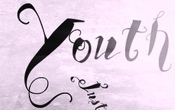 Brazilian resident who specializes in original grunge designs. His typefaces are mostly free. Some commercial typefaces are available via Creative Market.
 Typefaces from 2020: VTKS Beleza Pura (calligraphic script), Classical Hit, Lovecure, VTKS Smile (modular), VTKS Blocketo (a pixel font). Typefaces from 2019: VTKS Dracena (a dirty brush script), VTKS HyperBoldi (all caps, grungy), VTKS Amplexus (dancing letters), VTKS Dynamic (grunge), VTKS Unamour. Typefaces from 2018: Vtks Rockino v2, Vtks Bela Vista (a treefrog script), Vtks Core Reason, Vtks Hand Made, Vtks Blacqui Letter (a decorative inline blackletter), Vtks La Prensitcha, Vtks Brilhante, Vtks Beautizinea, Vtks The Dark, Vtks Lettering, Vtks Urbanizart, Vtks Textones, Vtks Autorized, Vtks BoldCool, Vtks Sportage, Vtks Relpius, Vtks Escape, Vtks Demolition (grunge), Vtks Challenge (weathered), Vtks Propriedade, Vtks Cafezito (coffee klatsch font), Vtks Propaganda (grunge), Vtks Lightness, Vtks Success. Typefaces from 2017: Carbo 753 (grunge), RokiyoSan, BlowUp (splashy brush), Madalena, Mural, Heavy Duty (grunge), Krueza, Azeitona, Mindfulness, Carruagem, VTKS Sal Grosso, VTKS Realm (grunge), Mercado, Dreamland 223, Dreamland 777. Typefaces from 2016: Vtks Colored Soul, Vtks Lombriga, Vtks Karmapolis, Vtks Katiassa, Peacemakers (art nouveau), Vtks Gran Moda (brush), Vtks Obscena (curly font), Vtks Zamioyn (childen's script), Vtks Long Time (painted letters), Vtks Solaris (hand-drawn), Vtks Zuadinha, Vtks Peace and Love, VTKS Shine (brush script), VTKS Kacilds (children's script), VTKS Friaka, VTKS MockUp, VTKS Amarelli, VTKS Perereca, VTKS Raladeira, VTKS Rough Col, VTKS Integral, VTKS Voluntario (brush script), Vtks Burning (curly and bewitched), Vtks Simplex Beauty (ornamental caps), Vtks Raladeira, VTKS Black Hair (a fun irregular brush script), VTKS Felicidade (script). Typefaces from 2015: VTKS Love U, VTKS Mockup, VTKS Academy, Family, Poster (grunge caps), Hunt, VTKS Articles (Treefrog-style script), VTKS Sonho (Treefrog), Lounge Set, Vacancy, Red Line, Old Mobile, Raining, Happiness Always, Good Day, Nicely, Desgaste (spurred), Basic Lines, Water Lily. Typefaces from 2014: VTKS Painel (brush), VTKS Motor (handcrafted), VTKS Super Funny, VTKS Tender Love (vampire script), Limpeza (signage script), Delicious, VTKS Hotel, Propolis (brushy script), VTKS Rash (irregular hand), Pedra Azul (vampire script), MRD 67 VTKS (grunge), VTKS Samanbaia (Treefrog-style script), VTKS Channels, VTKS Dreamer, VTKS Money, VTKS Belinha (inky script), VTKS University (striped typeface), VTKS Classicuda, VTKS Authentic, VTKS Burning, VTKS Modern Look, VTKS Beta, VTKS Bandoleones, VTKS Pedra Bruta (rough brush script), VTKS Recover MB 1, VTKS Simplex Beauty, VTKS Dirty Letters. Typefaces made in 2013: VTKS Rust, VTKS Easy Work, VTKS New One, VTKS Old Tee, VTKS Free Soul (Victorian), VTKS Have A Nice Day (grunge), VTKS University, VTKS Piscina, VTKS Divertida, VTKS Modern, VTKS Lovely, VTKS Back To Basics, VTKS Sujinha, VTKS Inked, VTKS Grungy, VTKS Thanks You, VTKS Love Is Everything (curly font), VTKS Dura 3D (showboat Western), VTKS Youth Spirit, VTKS Lightness, VTKS Premium, VTKS Authentic (a calligraphic brush script), VTKS Rafia, VTKS Have A Nice Day, VTKS Classical Hit, VTKS Lumina, VTKS Dirty 2, VTKS Good Day (Treefrog-style hand), VTKS Boutique, VTKS Storm 2 (grunge). Typefaces made in 2012: VTKS Street Vision (graffiti font), VTKS Show, VTKS Lounge Set, VTKS Total Flux Disturbed, VTKS Total Flex Clean, VTKS Love Love, VTKS Ballerina, VTKS Contrast, VTKS Friendly, VTKS Orbital, VTKS Exame (dirty stencil face), VTKS Future (stencil face), VTKS Fresh, VTKS Laundry, VTKS Curumin, VTKS Citrino (a spurred inline face), Vtks Squizita (grunge), Vtks Blank, VTKS Broadband, VTKS Logic (grungy texture typeface), VTKS Expert (grunge), VTKS Worker, VTKS Chalk 79 (chalk font), VTKS Vinte e Cinco, Good Vibration, VTKS Bagacao, VTKS Message, VTKS Keystorm (texture face), VTKS Scratch, VTKS Minus, VTKS Fail, VTKS Busseta (dymo label font), VTKS Assign, VTKS Carrier (grunge), VTKS Lovers Italic, VTKS Good Vibration 2, VTKS Encounter (grunge), VTKS Natural, VTKS Seven. Typefaces made in 2011: VTKS Message (grunge), VTKS Lovers (frilly), VTKS Carrier (grunge), VTKS Contact (texture typewriter face). Designs from 2010 include VTKSSIGNOFTIMES, VTKSSIGNOFTIMESbold, VTKS Unidade, VTKS Scream, VTKS Personal, VTKS Noise (texture face), VTKS Mint, VTKS Legal (Treefrog-style hand), VTKS Fresh Mint, VTKS Ink, VTKS Study (a sketch face), VTKS Morning Rain (+3D, +Bold), VTKSEMBROIDERY, VTKSLowRider, VTKSLowRiderBox, VTKSREVERSO, VTKSREVERSOOPTIONB, VTKSURBANTIME, VTKSURBANTIME3d, VTKSURBANTIMEbold, VtksBeautifulDreams, VtksVictory, vtksRudeMetalshadow, vtksarmy, vtksarmy3d, vtksshow, vtkssolution, vtkssolution3d, vtkssolutionbold, vtkssuper, vtkswhitepage3d, VTKSCOMIC, VTKSHIGHLIGHT (2010, a sketched face), VTKSHIGHLIGHT2, VTKSHIGHLIGHT3, VTKSXtra, vtkscrazytime, vtksmorningrain, vtksmorningrain3D, vtksmorningrainBOLD, VTKS Trunkset, VTKS Control, VTKSCURVE, VTKSDOWNTOWN (chalk or brush face), VTKSLOVEANDPEACE, VTKSSOLUOCRIATIVA, VTKSSOLUOCRIATIVADOIS. In 2009 he designed vtks Water cristals, vtksControl, vtkskeystorm, vtkstrunkset, VTKS Distress (grunge), VTKS Deja Vu, VTKS Giz, VTKS Sunny Day, VTKS Mercearia, VTKSRASURADA (grunge), VTKSSABONETE (grunge), Vtksespinhuda (grungy), and vtkssbadodechuva (grungy). In 2008, he created VTKSSKULLS, VTKS Focus (curly letters), vtksRascunhoErrado (hand-printed), vtksanimal2 (brush/paint), VTKSFLOWERSINOURSOUL, VtksRelaxingBlaze (double script), Quadrada e Gordinha, VTKS Velhos Tempos (great scratchy script face), Squizita, Mural, VTKS Revolt, VTKS General Use, VTKS Good Luck For You, VTKS-BEAUTY, VTKS-CHIP-SET, VTKS-CHOICE, VTKS-CORE, VTKS-No-Name, VTKS-SKULLZ-ME, VTKS-SummerLAnd, Vtks-Blank, Vtks-FININHA, Vtks-Hardness, Vtks-Noba, vtks-alcalina, vtks-caveirada, vtks-squares, vtks-syndicate, VtksCapsLoco (all caps), VtksEntulho (grunge), VtksSonho (elegant scratchy script), vtksalcalina, vtkscaveirada (grunge), vtkstrutagem (grunge), VTKS Encantar (grunge). In 2007, he designed VtksDesgaste, VtksWineLabel, VtksWineLabelTwo, VTKSBlackLabelNormal, VTKSBlackLabelNormalFilete, VtksBlack, VtksBlackLabel, VTKS Untitled (grunge), VTKS-News-Label, VTKS-ROCK-GARAGE-BAND, VTKS-SCRUBBED, vtks-REPORT-erRoR, VTKS Clean, VTKS Easy Way (informal outline lettering), VTKS Hardness (grunge), VTKS Mural (scratchy script), VTKS Alpes, VTKS No Name (ornamental caps), VTKS Beauty (ornamental caps), VTKS Refused (grunge), VTKS Gore, VTKS Estilosa, VTKS Bandana, VITKS Furious, VITK Colagem, VTKS36, VTKSDearLove (curly lettering), vtks38 (double-lined hand), vtksLemonDrop (comic book face). Fonts made in 2005 include D_OLD_MODERN, D_OLD_MODERN2, Scretch (scratchy face), Busseta, D Old Miner, Assign (handwriting), Fail (grunge) and Minus (scratchy face). Pay fonts include Beautiful Dreams, Black, Black Label, Bronze Age, Desgaste, Design Pencil, Embroidery, Funny Lines, Good Vibrations, Keep Your Mind Clean, Low Rider, Mixed Job, Natural Style, Number Zero, power Age, Sexy Lines, Shadow, Urban art, Victory, VTKS V2, Warrior, Wine Label, Xtra. FADU-UBA link. Fontspace link. Fontsy link. Dafont link. Abstract Fonts link. Old URL. Font Squirrel link. [Google]
[More] ⦿
|
Doxie Design
[Garrett Miller]
|
Cedar Rapids, MI-based designer of the art nouveau typeface Luzerne (2017) and the Western typeface Iron Range (2017). Creative Market link. [Google]
[More] ⦿
|
Duncan Long
|
 American creator of the constructivist typeface Back in the USSR (2009: created for issue 4 of Critica Grafica magazine) and the art nouveau typeface Doctor Fibes DEL (2013).
 Dafont link. [Google]
[More] ⦿
|
DX Type Foundry
[Dmitriy A. Horoshkin]

|
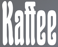 Russian type designer specializing in historical revivals of old Cyrillic typefaces. creator of these Latin / Cyrillic typefaces:
 - DX Akademisch Historisch (2017) and DX Akademisch Schmalfett (2017). Based on Academic narrow bold by the foundry of G. Berthold (St. Petersburg), which in turn is based on the bold, narrow type Sorbonne, 1905-1908 (H. Berthold, Berlin).
- DX Ampir Border.
- DX Angelus Mediaval (2017), which is a revival of Angelus Mediaval (H. Berthold, before 1904).
- DX Cicero (2016).
- DX Decoration and DX Decoration Two
- DX Doklad10M
- DX Egyptian Fett (2017). A revival of a Latin / Cyrillic slab serif typeface from ca. 1870.
- DX Egyptian Tight
- DX Elsevier Book
- DX Grazhdanskiy1710
- DX Halbfette Mediaval
- DX Kirillovskiy (2016). Based on font samples in the catalogs of the O.O. Gerbek foundry and the Imperial Academy of Sciences, 1852, 1870.
- DX Kometa (2017, after the art nouveau typeface Komet by Benjamin Krebs, 1907).
- DX Lateinisch and DX Lateinisch Book (2013-2015). Based on Lateinisch (1899, Peter Schnorr for H. Berthold, Berlin). The original Cyrillic version goes back to 1901 at Berthold in St. Petersburg.
- DX Malachite Ornament.
- DX Medieval Book
- DX Modern Grotesk (2016). Based on New Grotesque from the foundry of Otton Osipovich Gerbek, which is a Cyrillic version of the Mediaval-Steinschrift font, released in 1908 by J.G. Schelter & Giesecke, Leipzig.
- DX Old Standard Condensed, DX Old Standard Grotesk No2 (2020), DXOldStandard Condensed No2 (2020), DX Old Standard Revilion and DX Old Standard Wide.
- Ornament DX Classic Bold.
- DX Orpheus Ornament (2016).
- DX Palmyra (2014-2015). O.I. Lehman's Cyriilic font on which DX Palmyra is based was released in 1910 and is in turn based on Ingeborg-Antiqua (1909, Friedrich Kleukens for D. Stempel, Frankfurt).
- DX Poster
- DX Rossico Border (2016). Based on a design by O.I. Lehman from 1914.
- DX Rublenyi
- DX Russian 1812
- DX Sprigs Border.
- DX WolffElsevier (2016).
- DX Yunost
[Google]
[MyFonts]
[More] ⦿
|
Dyer
|
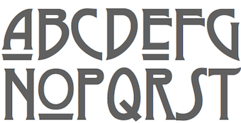 A mysterious free typeface created in 1997 in the style of the Glasgow School of Charles Rennie Mackintosh. Unknown designer. [Google]
[More] ⦿
|
E. Mulier

|
French art nouveau era artist who created, ca. 1894, a typical art nouveau typeface digitized in 2007 by HiH and called Mulier Moderne. [Google]
[MyFonts]
[More] ⦿
|
E. Victor-C
[EVCCo]

|
[MyFonts]
[More] ⦿
|
E.A. Ducompex
|
Author of Modèles de Lettres D'Art Nouveau (Imp. Firmin Didot & Cie, Paris). This book of art nouveau alphabets inspired several digital recreations, such as Dick Pape's Lettres Majuscules Fantasie and Lettres Minuscules Fantasie in 2013. Download Pape's fonts here. [Google]
[More] ⦿
|
Élodie Mandray
[Acmé-Paris]
|
 [More] ⦿
|
E&F Gyles
|
London-based foundry at the end of the 19th century. Creators of Quill Pen Script, an art nouveau signage face. [Google]
[More] ⦿
|
Eduard Scholz
|
 Typefounder in Vienna around 1900. His work includes the art nouveau post-Victorian typefaces Reklameschrift Secession and Zierschrift Monopol. [Google]
[More] ⦿
|
Edward Benguiat

|
 Born in New York in 1927, Ed grew up in Brooklyn. He died in 2020. Ed was once a very prominent jazz percussionist playing in several big bands with Stan Kenton and Woody Herman, among others. He has created a large number of typefaces between 1970 and 1995. About his career, he once said: I'm really a musician, a jazz percussionist. One day I went to the musician's union to pay dues and I saw all these old people who were playing bar mitzvahs and Greek weddings. It occurred to me that one day that's going to be me, so I decided to become an illustrator. He designed more than 400 typefaces for PhotoLettering. He played a critical role in establishing The International Typeface Corporation (or ITC) in the late '60s and early '70s. Founded in 1971 by designers Herb Lubalin, Aaron Burns, and Ed Ronthaler, ITC was formed to market type to the industry. Lubalin and Burns contacted Benguiat, whose first ITC project was working on Souvenir. Ed became a partner with Lubalin in the development of U&lc, ITC's famous magazine, and the creation of new typefaces such as Tiffany, Benguiat, Benguiat Gothic, Korinna, Panache, Modern No. 216, Bookman, Caslon No. 225, Barcelona, Avant Garde Condensed, and many more. With Herb Lubalin, Ed eventually became vice-president of ITC until its sale to Esselte Ltd.
 Ed Benguiat taught at SVA in New York for more than fifty years. Ed is a popular keynote speaker at major type meetings, including, e.g., at TypeCon 2011, where he entertained the crowd with quotes such as I do not think of type as something that should be readable. It should be beautiful. Screw readable. His typefaces---those from PhotoLettering excepted: - ITC Avant Garde Gothic (1971-1977, with Andre Gurtler, Tom Carnase, Christian Mengelt, and Erich Gschwind).
- ITC Modern No. 216 (1982: a didone text family). The Softmaker versions are called M791 Modern and Montpellier. Ed writes: It's a revival of the classic British Modern design. I tried to capture the dignity and grace of the original designs, but not make it look stuffy. Moderns were often numbered to distinguish different versions. 216 East 45th street was where I worked when I drew the ITC Modern No. 216 font.
- Modern No. 20, after the Stephenson Blake original from 1905. [Image by Kristen Cleghorn]
- ITC Barcelona (1981). Ed writes: I was one of the design consultants for the 1992 Olympics in Barcelona, Spain. What could be more appropriate then to design a typeface for the event? The design of the ITC Barcelona font family, with its soft triangular serifs set the mood for the soft-spoken Catalan people.
- ITC Bauhaus (1974-1975). ITC Bauhaus was co-designed with Victor Caruso. The Softmaker versions are called R790 Sans and Dessau. The Infinitype version is Dessau. The Bitstream version is Geometric 752.
- ITC Benguiat (1977) and ITC Benguiat Gothic (1977-1979). This eponymous comic book (or art nouveau style) typeface family appeared in the 1980s on the covers of Stephen King novels and Choose Your Own Adventure books, in the copyright notice at the beginning of all Paramount Pictures' VHS tapes and in title sequences for Quentin Tarantino's films, the Next Generation series of Star Trek films in the mid-to-late '90s, and the recent Netflix series Stranger Things. It was revived as Benjamin and Benjamin Gothic on the SoftMaker MegaFont XXL CD (2002). Softmaker also has fonts called B693 Roman and B691 Sans that are identical. Benguiat Pro ITC was published in 2008.
- Benguiat Roman (1960s).
- PL Bernhardt (Photo-Lettering, 1970), modeled after a 1930-1931 design by Lucian Bernhard.
- ITC Bookman (1975). See B791 Roman on the SoftMaker MegaFont XXL CD (2002).
- Calendar (1960s).
- ITC Caslon 224 (1983). In 1960, he added Benguiat Caslon Swash, and in 1970, Caslon 223 followed. See C790 Roman on the SoftMaker MegaFont XXL CD (2002), and Caslon CP (2012, Claude Pelletier). Christian Schwartz and Bas Smidt at House Industries digitized Benguiat Caslon.
- ITC Century Handtooled (1993).
- ITC Cheltenham Handtooled (1993).
- ITC Edwardian Script (1994).
- ITC Garamond Handtooled.
- ITC Korinna (1974): after a 1904 typeface called Korinna by Berthold. Michael Brady thinks it is very close to the Berthold original.
- Laurent (1960s).
- Lubalin Graph (1974, ITC). By Herb Lubalin, Ed Benguiat, Joe Sundwall, and Tony DiSpigna.
- ITC Panache (1987-1988). Ed writes: I put my heart, soul, sweat and tears into the design of the ITC Panache font family. I was striving to create an easy to read, legible typeface. I know in my heart that I accomplished what I set out to do. Not only is it easy to read, it's also sophisticated.
- Scorpio (1960s).
- ITC Souvenir. Kent Lew: Benguiat revived Benton's Souvenir for ITC in the '70s and that was well-received for a while. On the other hand, look what happened after that. Souvenir in the ATF 1923 catalog looks really nice, IMO. Souvenir in the '70s seems cliché now. Souvenir these days would be downright dorky. Souvenir was done by Benguiat in 1967 at PhotoLettering. Morris Fuller Benton's original model was from 1914. It was described by Simon Loxley as follows: Souvenir is a typeface that is intractably rooted in style to a particular era, although one a half-century after its creation. It is a quintessential late 1960s and 1970s typeface, informal, with full rounded character shapes and rounded serifs, a laid-back Cheltenham. The Bitstream version of ITC Souvenir was called Sovran.
- ITC Tiffany (1974), a fashion mag typeface family. Adobe says that it is a blend of Ronaldson, released in 1884 by the MacKellar Smiths&Jordan foundry, and Caxton, released in 1904 by American Type Founders.
- PL Torino (1960, Photo-Lettering), a blackboard bold didone-inspired typeface.
- In 2004, House Industries released five typefaces based on the lettering of Ed Benguiat: Ed Interlock (1400 ligatures---based on Ed's Interlock, Photolettering, 1960s), Ed Roman (animated bounce), Ed Script, Ed Gothic and Bengbats.
- He did logotypes for many companies, including Esquire, New York Times, Playboy, Reader's Digesn, Sports Illustrated, Look, Estée Lauder, AT&T, A&E, Planet of the Apes, Super Fly.
- Lesser known Photolettering typefaces include Benguiat Bounce, Benguiat Boutique, Benguiat Bravado, Benguiat Brush, Benguiat Buffalo (+Ornaments: a western wood type font), Benguiat Century, Benguiat Cinema, Benguiat Congressional, Benguiat Cooper Black, Benguiat Cracle, Benguiat Crisp, Benguiat Debbie, (Benguiat) Montage (a fat face didone revived in 2018 at House Industries by Jess Collins and Mitja Miklavic), Benguiat Roman. Scorpio, Laurent and Charisma, all done in the 1960s, are psychedelic types. In 2021, Donald Roos digitized Plinc Buffalo for House Industries.
Links: Linotype, CV by Elisa Halperin. Daylight Fonts link (in Japanese). Catalog by Daylight, part I, part II. Pics harvested from the web: Portrait With Ilene Strivzer at ATypI 1999. One more with Strivzer. With Jill Bell at ATypI 1999. In action. At TypeCon 2011 with Matthew Carter and Alejandro Paul. At the same meeting with Carole Wahler and with Roger Black. FontShop link. Klingspor link. View Ed Benguiat's typefaces. Ed Benguiat's fonts. [Google]
[MyFonts]
[More] ⦿
|
Edward Penfield
|
American illustrator, b. Brooklyn, 1866-1925, considered as the father of the American poster. Well-known for his art nouveau style posters, he created several alphabets. Penfield's posters inspired several digital typefaces. André Zottolo's AZ Harpers July was inspired by Edward Penfield's poster art. BU Penfield Deco by Michael Bosen (or Michael Bolen) is also based on Penfield's typography. [Google]
[More] ⦿
|
Egypto Type Co
[Tegar Hafizhal]

|
Indonesian illustrator specializing in Arabic calligraphy, graffiti, cartoons, anthropomorphism, and typography. In 2021, Tegar Hafizhal released Seamize (art nouveau caps for Latin). [Google]
[MyFonts]
[More] ⦿
|
Eleisha Pechey

|
British type designer at Stephenson Blake, 1831 (Bury St. Edmunds)-1902 (London). Designer of these typefaces: - Windsor at Stephenson Blake, cut by William Kirkwood in 1905. Question: How can Pechey have designed a font four years after passing away? I got the date 1906 from the Scangraphic site, but either that is wrong, or Myfonts.com erred--still researching this. A correspondent, Jennifer Lindsay, has a plausible explanation: Eleisha has to have designed Windsor somewhat earlier, Stephenson Blake may have bought the design, perhaps from his estate, and it was published by Monotype in 1903. Windsor Elongated used by Woody Allen appears to be an adaption by Stephenson Blake. Digital revivals of Windsor:
- Revival 801 and BT Windsor (Bitstream).
- Verona Serial or W730 Roman (Softmaker).
- Windsor by URW.
- WindsorSB by Scangraphic.
- OPTI Windsor by Castcraft.
- Windsor EF (Elsner & Flake).
- In 2009, Göran Söderström (Autodidakt) and Peter Bruhn (Fountain) published Trailering Heroine, which was inspired by Windsor.
- Christine Rudi's New Romanticism (2019, for a school project at FH Trier).
- In 2021, Miles Newlyn, Riccardo Olocco and Krista Radoeva co-designed New Spirit, a 10-style revival and extension of Windsor.
Windsor became very popular again between 2018 and 2021 in a love/hate relationship with the design community, as explained in Windsor: British ugly American, a critique by Bethany Heck. - Booklet Italic. Punches cut in 1904 by William Kirkwood. This typeface is used in the titles of many Woody Allen movies.
- Long Imperial Script. Punches cut in 1906 by Karl Gomer.
- Grotesque No 9 (1906).
- Charlemagne (1886, ornamental).
FontShop link. [Google]
[MyFonts]
[More] ⦿
|
Elena Balakhnova
|
 Graphic designer in Shenzhen, China. ArtMy (2010) is an ornamental art nouveau typeface that was based on letters hand-drawn by herself. [Google]
[More] ⦿
|
Elif Sener
|
Izmir, Turkey-based creator of Crooked Typeface (2014), which has the soft oriental roundness of art nouveau. [Google]
[More] ⦿
|
Elsner&Flake

|
 German type foundry in Hamburg established in 1986 by Veronika Elsner and Günther Flake. They offer original fonts as well as improved versions of classical fonts. There are many non-Latin fonts as well. In-house designers include Jessica Hoppe (Carpediem), Verena Gerlach (Aranea), Petra Beisse (Petras Script), Uwe Melichar, Manuela Frahm (Fritz Dittert), Ralf Borowiak, Lisa von Paczkowski, and Achaz Reuss.
 Additions in 2005 include the dingbat typefaces Beautilities EF Alpha, Ornamental Rules EF, Diavolo Rules EF, Squares EF (Alpha, Beta and Gamma), Topographicals EF Alpha, Typoflorals EF Alpha, Typographicals EF Alpha, Typomix EF Alpha, Typosigns EF Alpha, Typospecs EF Alpha and Beta (which have several fists), Typostuff EF Alpha, Diavolo EF, Schablone EF, Gigant EF, Maloni EF, OCRA EF, EF Unovis (a 16-weight family inspired by Quadrat). In the hand-printed category, let us mention Filzerhand. Their blackletter collection includes some bastardas (Alte Schwabacher, Lucida Blackletter), some frakturs (Fraktur, Fette Fraktur EF, Justus Fraktur, NeueLutherscheFraktur, Walbaum-Fraktur), some rotundas (Weiss-Rundgotisch), and some texturas (Gotisch, Old English). Commissioned fonts include Castrol Sans (2007). Selected additional typefaces: Garamond Rough Pro (2018), Bluset Now Mono (2018), Newspoint (2017, based on Morris Fuller Benton's News Gothic), Meier Kapitalis (2013, a lapidary typeface based on a 1994 sketch by Hans Eduard Meier in his book Die Schriftentwicklung), Gillies Gothic EF (after William S. Gillies's 1935 original), EF Medieva, Bank Sans Caps EF, Metropolitain (1985) (after a 1905 art nouveau typeface by Fonderie Berthier). Fonts4ever link (2008). Listing at Fontworks. Future events schedule. New fonts. List of their fonts. Catalog of their typefaces [large web page warning]. See also here. [Google]
[MyFonts]
[More] ⦿
|
Elwin Berlips
[FontMeister]

|
[MyFonts]
[More] ⦿
|
Emanuel Nicolas
|
Designer and digital artist in Buenos Aires, Argentina. His type designs include Lady Monster (2012: spiny, gothic), Parisien Hooker (2011, art nouveau face), and Schematic (2011, slab serif). [Google]
[More] ⦿
|
Emil Preetorius
|
German stage designer (b. 1872, Mainz, d. 1973). Preetorius studied law and art history in Giessen. In 1909 he cofounded a school of illustration and the book trade in München together with Paul Renner. In 1928 Preetorius became a professor at the München Hochschule für Bildende Künste. He set stages for Richard Wagner and others. From 1953 to 1968 Emil Preetorius was the president of the Bayerische Akademie der Schönen Künste in München. [Google]
[More] ⦿
|
Emilia Adorno
[Adorae Types]

|
[MyFonts]
[More] ⦿
|
Emilie Bardet
|
Graduate of the University of Toulouse, class of 2019. Toulouse, France-based designer of the art nouveau typeface Viaticus (2019). [Google]
[More] ⦿
|
Emma Kirby
|
American designer of the art nouveau typeface Hendrix Nouveau (2016). [Google]
[More] ⦿
|
Eric Kurniawan
[Burntilldead]

|
 [MyFonts]
[More] ⦿
|
Erica Jung

|
 Brazilian printmaker, graphic artist and illustrator, b. 1975. Her fonts are created together with Ricardo Marcin at Pintassilgo Prints (est. 2009). Pintassilgo relocated to Florianopolis at some point. Her fonts at PintassilgoPrints include Petulante (scratchy caps) (2021), Skaligari (eighties punk) (2021), Slotrip (2021), Soapy (foam-textured caps) (2021), Conversa (2021), Tenacious Brush (2021), Clarks (2021: a modular typeface based on the work of Lygia Clark, one of the giants of Brazilian postwar art), Cachalote (a poster typeface) (2021), Search (an all caps dry brush font) (2020), Grok (2020), Pickles (2020), Pain de Mie (2020), Outside (2020), Altogether (2020: a doodling beauty with eight choices for each glyph), Ars Nova (2019: art nouveau), Pind-O-Rama (2019), Pieches (2019: a linocut font inspired by the powerful political and social posters by Paul Peter Piech), Soundstar (2019), Clafoutis (2019), Pedrita (2018), Transmogrified (2018), Melodia (2018), Minute (2018), Mindset (2018), Salted (2018), Plunct Plact (2017: a children's script), Manihot, Brushtones (2017), Strange Times (2017), Mudstone (2017), Plumcake (2017), Cordelia (2017), Dunkelbunt (2016, inspired by the eccentric artist, architect and designer Friedensreich Hundertwasser), Chronic (2016, influenced by the work of HAP Grieshaber and Willem Sandberg; expanded in 2020 to Anachronic), Unboring (2016), Sunbeat (beatnik style), Hand It (2016, a childish script), Botanique (2016, after Lucian Bernhard's Schmalfette Bernhard Antiqua, 1912), Somehand (2015), Gumdrop, Granz (2015: retro lettering based on a Porgy & Bess album cover by David Stone Martin), Stabile and Stabile Toys (2015, handcrafted), Cluster (2015, a layered letterpress emulation typeface), Stick Around (2014), Marker Aid, Unpack, Felt Noisy (fat brush), Blueshift (2014), Daft Brush (2014, a vernacular brush), Tuesnight (2014, offbeat poster font), Periplus (2013), Marujo (2013: a decorative typeface inspired by paintings of Arthur Bispo do Rosário, a Brazilian artist who lived for 50 years in a psychiatric institution), Brush Up (2013: a rough brush script), Undersong (a stackable script system), Tremendous (2013: a retro poster typeface), Rockinstead (2013), Runcible (2013, +Cleft, its glaz krak version), Mamute (2013: a layered letterpress style type system), Sabotage (2013: squarish poster font inspired by the iconic Vertigo movie poster by Saul Bass), Sheldon (2013, based on posters by the Polish graphic artist Marian Stachurski; +Extras), Dranskof (2013, inspired by a page from a publication for children by Serbian writer, poet and journalist Dusko Radovic), Gentil (2012, an all caps poster font), Sundowners (retro poster face), Kokoschka (2012, based on the lettering on the poster of an expressionist play by Austrian painter, printmaker and writer Oskar Kokoschka in 1909), Monstrinhos (2012, dingbats), YWFT Duncan (2012), Card-o-mat (2012, bird dingbats), Soundtrack (2012), Monstro (2012, fat poster face), Attic (2012).
 Typefaces from 2011: Melkslijter (2011, a stylish art deco typeface based on a brochure by Dutch graphic artist Dirk Hart), Polyspring (2011, a Victorian typeface hand-drawn based on Italia Condensed, Keystone, 1906), Berimbau (2011), Populaire (2011, a hand-drawn poster caps typeface that was inspired by the electrifying posters from May 1968 by Atelier Populaire, and loaded with alternates to give a random effect), Manicuore (2011, a hand-drawn typeface inspired by Italian movie posters by the prolific movie poster artist Symeoni, aka Sandro Simeoni), Smashing (2011, a fat hand-printed poster face), Smashing (2011, a fat hand-printed poster face), Chancellor (2011), the eccentric poster face Polygraph (2011, based on lettering of the Polish poster artist Leszek Zebrowski. Images: i, ii, iii, iv, v, vi, vii, viii, ix, x), the vintage serif typeface Organically (2011), Transitore (2011: Transitore is a lively hand-drawn font with loads of alternates and ligatures which, managed by advanced OpenType features, help create a convincing handcrafted look), the poster display typeface Sforzando (2011; +Alto), the signage typeface Jongleur (2011). Typefaces from 2010: the Cuban poster typeface Transmogrifier (2010, based on lettering by Cuban poster artist Eduardo Muñoz Bachs), the ultra-fat art deco typeface Loudine (), Crocante (2010, comic book face), Love Birds Pattern (2010), Swung Note (2010), Amarelinha (2010, hand-printed), Cuadrifonte (2010, a fat hand-printed family including styles called Pics, Sketch (regular), Fill and Line), Xylo Sans (2010, wooden texture face), Ritornelos (2010, a curly all caps hand-printed face), Roadway (2010, based on wood Clarendons), Bandoliers (2010, an informal hand-printed sketched face, with 3D versions such as Beefy, High and Rocky), Changing (2010), Vitrines (2010, hand-printed), Prokaryotic (2010, a "bacterial attack" face), Football World (2010, soccer silhouettes), Singela (2010), Butterfly Effect (2010), Tonal (2010, ultra-fat with mini-counters), Dynatomic (2010, inspired by the hand-drawn lettering of a 1964 polish movie poster designed by Andrzej Krajewski), Lovebirds (2010, bird silhouettes), Somewhat (2010, hand-drawn), Oyster (2010, hand-drawn dingbats), Grante (2009, a lively poster face), Mondiale (2009), Nanquim (2009, sketched letters), Merceria Antique (2009) and Arca (2009, + Dashed). All have an informal and attractive look, and were co-designed with Ricardo Marcin. The prints of Horst Janssen had a characteristic uneven hand-printed lettering that led Erica Jung and Ricardo Marcin to design the multi-featured opentype typeface Horst (2010). Nova Horst followed in 2012. Creative Market link. Klingspor link. [Google]
[MyFonts]
[More] ⦿
|
Erik Hannink
|
 Erik lives in Zwolle, The Netherlands, and was born in 1964. He designed the splendid free handcrafted typefaces Eryx Rennie Macintosh (2015, Scottish arts and crafts typeface), Eryx Freeform (2015) and Eryx Cartoon (2015). Dafont link. [Google]
[More] ⦿
|
Ernst Johnston (Edward) Lauschke

|
 Nineteenth century engraver (b. Germany, 1872, d. 1944) in Chicago. He designed these typefaces:
 - Pekin (1888). This is an oriental simulation typeface first published in 1888 at the Great Western Foundry under the name Dormer. It was very novel at the time, and shows the mannerism of art nouveau. The name Pekin was given to it by BB&S after Great Western morphed into BB&S. The name Pekin was probably first given in 1923, but surely before 1925. McGrew says this: Pekin is one of many typefaces renamed by BB&S for their 1925 specimen book. Its original name was Dormer, patented by the Great Western foundry in 1888 and credited to Ernst Lauschke. It is a very novel face, basically a fine-line letter with most characters having a heavier accented portion in an unconventional place. Vertical strokes on some of the capitals extend downward like descenders. It was made only in two sizes, one of which was later plated by Type Founders of Phoenix, after ATF had recast it in 1954. For a digital revival of Pekin, see Pekin by Solotype.
- Handcraft Title and Handcraft Wide Title. Mac McGrew: Handcraft is renamed by BB&S for its 1925 specimen book. Handcraft Title was designed by Ernst Lauschke in 1887 as Spenser; this was followed by Wide Spenser which became Handcraft Wide Title. With lowercase added a few years later, Spenser became Southey, and later Handcraft.
- Brevet Normal (1887). A Victorian typeface revived in digital form by Dan Solo.
- Additional typefaces at BBS: In 1891, Julius Schmohl and Ernst Lauschke designed an art nouveau and a Victorian face for BBS. Unnamed BBS typeface from 1887.
[Google]
[MyFonts]
[More] ⦿
|
Erwin Poell

|
 Swiss type designer. As Canada Type puts it, Tuba started with a reconceptualization of a somewhat flawed '72 alphabet idea by Swiss graphic designer Erwin Poell. During the back-and-forth of the custom project, other ideas seeped into the design, mostly from other Canada Type fonts, like Fab, Jonah, Jojo and Teaspoon. The end result was what the client called a "sugar circuit trigger alphabet". This now is the retail version of that project. Tuba has art nouveau influences. [Google]
[MyFonts]
[More] ⦿
|
Erwin Puchinger
|
 Viennese painter, illustrator, industrial designer and graphic artist, b. 1875, d. 1944. Puchinger studied with the muralist and art professor Franz von Matsch (1861-1942), who worked on decorative art with Gustav Klimt. He worked in London, Prague and Paris as well as Vienna and collaborated with other major figures in Viennese art and design such as Ernst and Gustav Klimt and Otto Prutscher. At the end of his studies, he met Otto Wagner, Josef Hoffman, Joseph Maria Olbrich and Koloman Moser and joined the Vienna Secession. [Google]
[More] ⦿
|
Ethel Larcombe
|
 Ethel Larcombe (1879-1965, Britain) created this romantic art nouveau alphabet, ca. 1900. [Google]
[More] ⦿
|
Eugène Samuel Grasset
|
 Swiss decorative artist, poster designer of the art nouveau era, and type designer (b. Lausanne, 1841, d. Sceaux, 1917). Grasset worked in Paris during La Belle Epoque.
 He made Étrusque (Fonderie Gustave Peignot&fils, 1900), Grasset (Fonderie Gustave Peignot&fils, 1898-1899), Grasset Initialen (Peignot), Grasset Italiques (Peignot), Grasset Antiqua (1900, Genzsch&Heyse) and Römisch Grasset (1913, Genzsch&Heyse). McGrew: Grasset was designed by Eugène Grasset, French [note: McGrew is wrong...] decorative artist, in 1898 for Deberny&Peignot, French typefounders, and cut by ATF in 1904. It was advertised as a chic, up-to-date typeface of the day, but has mannerisms that later became quite dated. The Monotype cutting in 1912 was modified and reproportioned to fit the early restrictions of that machine, but retains the quaintness of the foundry originals. His ex libris. In 2012, Dick Pape created a few typefaces based on Grasset's alphabets. These include LFD Asian Stencilling 205 (original oriental-looking art nouveau drawings by E. Grasset and M. Verneil) and LFD French Printed Type 189 (this warm serif typeface was used in France for books). In the book Divertimento (Editlivre, Paris), Albert Legault (UQAM, Montreal, Canada) published the decorative art nouveau caps alphabet Eugene Grasset (2015). Klingspor link. [Google]
[More] ⦿
|
Eutypoce
|
Japanese designer(s) of the pixel typefaces Bwnsnw-Bitmap, Bwnsnw, Fanda-Black, Fanda-Egyptian, Fanda-Sans, Tdmex-Bitmap, and the display typefaces SukplenaPS (2004), Pruspic-Openface, Pruspic-Paint, and the art nouveau sans fonts Val-Blanc-Bold, and Val-Blanc. All typefaces are from 2001-2002, except where indicated. Fontspace link. [Google]
[More] ⦿
|
EVCCo
[E. Victor-C]

|
EVCCo is the foundry of London, Ontario-based type designer E Victor-C, est. 1980. EVCco has engaged in numerous acts of illustration, photography, and graphic design for clients representing fields as diverse as education, architecture, and the music industry. He created West Warp (2010), Evcial (2000, monoline geometric avant garde sans) and Chapeau (2010, experimental). In 2020, he released the art nouveau-inspired typeface Annadalea. [Google]
[MyFonts]
[More] ⦿
|
Exclamations (or: The Boutons)
[Gary David Bouton]
|
 Gary David Bouton and Barbara Bouton's site was called Exclamations. Gary has been writing books on computer graphics for over 20 years, inlcuding eight books on Corel Draw. In 2015, Gary went commercial as Gare.
 Their typefaces: International Symbols (2015, an icon font), Twooth (2015), Greek Diner Inline (2015, based on Carol Twombly's Lithos), BifurOverlay (2015, an overlay font based on Cassandre's Bifur (1929)), Bouton Kursiv (2008), Odissey (2008), Russel Write (2010), Elephants and Bears (dingbats), GreekDiner Inline, GeotypeTT (1997), WebKnobsTT (1997), Beacon (2008, a Schwabacher), BOUTON Nouveau Ornaments II (2009), BifurFoundation (2010), BifurOverlay (2010, after Cassandre's Bifur), Frankfurter Venetian (2008, fat rounded horizontally striped all caps face), Folks (medieval caps), Nouveau Rococo Deco Dings I (2008, art nouveau ornaments), Simulata (2006, geometric deco typeface with Bifur influences), Whimsy (comic book font), SymbolsTT (1998, charityware dingbat font). Exclamations link. Alternate URL. Dafont link. Creative Market link. [Google]
[More] ⦿
|
F. Schweimanns
|
 Independent type designer who created typefaces for D. Stempel when he lived in Hannover, Germany. His typefaces, all published by D. Stempel AG, include
 - Biedermeier Reklame (1906).
- Diana (1909) and Diana halbfett (1910).
- Frankfurt Serie I and Frankfurt Serie II (1905). Blackletter types.
- Graziella, Graziella fett and Graziella schmalfett (1905).
- Korso (1913). Cursive style.
- Künstlerschrift (1902) and Künstlerschrift halbfett (1901). Art nouveau.
- Maria Antoinette (1905).
- Moderne Reklame (1901). Art nouveau style.
- Propaganda (1901). Art nouveau style.
- Wodan schmalfett (1902) and Wodan licht (ca. 1905). Revived by Oliver Weiss in 2020 as WF Dahlia.
Fr. Ad. Becker and F. Schweimanns coauthored Die moderne Schrift. Camera (1936, Intertype) is described by McGrew as a novel cursive letter with light, monotone strokes suitable for use on personal stationery and announcements. The design is based on Korso (1913). Korso was revived in digital form by Coen Hofmann at URW++ in 2016 as Marli. It is a vintage script that feels a bit forced. [Google]
[More] ⦿
|
Fabrizio Schiavi
[Fabrizio Schiavi Design (or: FSD)]

|
 [MyFonts]
[More] ⦿
|
Fabrizio Schiavi Design (or: FSD)
[Fabrizio Schiavi]

|
 Fabrizio Schiavi was born in Ponte dell'Olio in the Piacenza province in 1971. FSD Fabrizio Schiavi Design in Piacenza was opened in 1998. With Alessio Leonardi, he co-founded Fontology. He also co-launched the experimental graphics magazine Climax in 1994.
 Bio at FontFont where he made FF Mode 01, FF 0069, FF GeabOil, FF9600, FF Trade 01, FF Steel Mix, FF Steel Ring, FF Steel Jones. [T-26] designer of D44 (1994), Lithium (1994, dingbats), Moore895 (1994), Moore899 (1994), Sidewalker (1994), Exit (1988). Many of his typefaces are grungy such as Washed (1994). Some are minimalist, such as Monica Due (1999), Monica (1999), and Eco (2001, developed from a logo in the 70s for Ageco). The latter three fonts are very geometric in nature. Other fonts: Washed (1994), Parakalein, Aurora Nintendo (1995), Aurora CW (1995), Mode01 (1995), GeabOil (1995), 9600/0069 (1995), Fontology (1995), CP Company (2000: a corporate sans), FSDItems (2001), FSDforMantraVibes (2001), Pragmata (2001, monospace, designed for programs), PragmataFlash (2002, a pixel font), Pragmata Pro (2011, still monospaced), Sys (2002), SysFlash (2002, a pixel font), Sys 2.0 (2012, a condensed sans designed for very small print), Virna (2003, a multiline typeface for Italian MTV, discussed here). The Pragmata and Sys series were optimized for screen usage. In addition, Sys has many ink traps, so it prints well at small sizes, and is more legible than Verdana. He does some custom typeface design, such as the innovative sans serif family called CP Company (2000). Other clients include Al Hamra Complex Kuwait, Nike, MTV, YU, Beretta, Abitare magazine, Ferrari and Philip Morris. In 2007, he produced a stencil and signage font, Siruca (see also here), for the Al Hamra Complex, one of highest skyscrapers in the world, located in Kuwait. Siruca Pictograms (2008) is free. In 2015, he followed that up by a non-stencil rounded sans called Sirucanorm: Designed using golden ratio formulas, it's inspired to DIN and Isonorm typeface. In 2013, he published Sys Falso, Abitare Sans (30 weights, originally commissioned by the group Rizzoli Corriere della Sera. Abitare is an Italian magazine). Typefaces from 2014: Nove (a German expressionist typeface inspired by B movie typography: Nove freshly reworks exploitation film era movie poster lettering, refitting the genre to a contemporary audience. The expressive typeface was done for a Nike Italy spoof campaign featuring 1970s cult film director Enzo Castellari and a recently found film reel from his archives, featuring several current Italian athletes and American basketball star Kobe Bryant). The rounded sans typeface Widiba Bank (2015) was co-designed with Jekyll & Hyde in 2015 for the brand identity of the new bank of Gruppo Monte dei Paschi di Siena. In 2016, he designed the custom corporate typeface R&M in art nouveau style. In 2020, he released the (variable) retail version of CP Company called oook. In 2021, he released Nure (a 54-style sans font family that includes a three-axis (weight, optical, width) variable font). At ATypI in Rome in 2002, he spoke about the need for more fonts. Hellofont link. FontShop link. Font Squirrel link. Showcase of Fabrizio Schiavi's typefaces. [Google]
[MyFonts]
[More] ⦿
|
Face Photosetting
|
Photo era foundry set up in the 1960s by John McConnell and Chris Dubber in London. I could only find Pluto Outline, the art nouveau typeface Desdemona (a digital version was created in 1992 by David Berlow at Font Bureau and in 1994 by Richard Beatty; Letraset showed Desdemona in its 1981 and 1986 catalogs; the original is from the late 19th century by Karl Brendler&Soehne, Vienna), Stack, and Oxford (a multiline face) on-line. Steve Jackaman worked in the studio in Newman Street and Hanway Place, and recalled El Paso (a Western/Mexican simulation face) when he created El Paso Pro (2011, Red Rooster). In 2017, Steve Jacakaman (Red Rooster) designed Lodestone Pro, which is based on Marvin (1969, by Michael Chave). According to Wes Wilson's web site, Face Photosetting led the way by launching a number of Art Nouveau revivals which were taken from Ludwig Petzendorfer's "A Treasury of Authentic Art Nouveau Alphabets". A selection of these, which included Arnold Böcklin, Edel Gotisch and Eckmann Schrift, were made more widely available when Letraset produced them for their dry transfer product. They published a number of books and catalogs, ca. 1976-1977: Face headline catalogue [1981/82] (1977), Specimens of Delittle's wood type, Face book of typefaces, Type catalogue (1976). Some of the typefaces were Cyrillicized, such as Bullion Shadow (1970; Cyrillic version by Victor Kharyk, 1978). Bully Pulpit Plain NF (2014, Nick Curtis) is a revival of Bullion Shadow. [Google]
[More] ⦿
|
Facsimile Fonts
[Robert Trogman]

|
Foundry which offers fonts by Robert Trogman, a graphic designer now living in Palm Springs, CA, where he runs Trogman Signs. His fonts include - Buxom (3d face). For a digital version, see Buxom SB (Scangraphic).
- Roberta (1962, FotoStar: an art nouveau face).
- Yagi Double (the CNN Logo). This was digitized in 1996 by Alan Jay Prescott as New Yagi Bold, 2008 as Miyagi (with a few twists) by Thinkdust, and as Yagitype and Axitype by John Wu (Archetype) in 2010.
- Binner (art deco).
- Blippo (display)
- Handel Gothic (sans).
Originally these were fonts made for phototypesetting---Handel Gothic and Blippo, e.g., were available at Fotostar. He says about himself: My career began in 1942 as an apprentice in the composing room. Because of WWII I was able to get several jobs; working at the College Press under the tutiledge of Richard Hoffman and a night job at LA Type casting the first arrival of Times Roman. Because of the pursuit of the alphabet it led to working with some of the best in the business: Saul Bass, Herb Rosenthal and Charles Eames. My commercial career began in the early 1960s with the revival of Jugenstill fonts and becoming an agent for Berthold. I was able to bring on the photolettering market many original designs under the name of Facsimile Fonts and later FotoStar International. In total, he made over five thousand film fonts under the name of Facsimile Fonts and FotoStar International. He writes for Recognition Review as Dr. Type and gives seminars on typographic design. A type consultant, he was at one point lecturer on typographic layout and design for California State University at Los Angeles. As Trogman explains to Harold Lohner about Roberta: I originally hand cut this font in 1962. It is based on a Belgian restaurant sign. I named it after my daughter Roberta. Many Mexican food companies used this font, but they didn't know it was from Europe. Dan Solo was going to digitize it for me, but he retired from the font business last year. Just give me credit for the design and it is all yours to do what you want. Trogman's picture. Roberta D was remade by Ralph M. Unger in 2003 for URW. Trogman, however, is upset with URW: URW++ has been warned by me to stop selling typefaces I originally licensed to Berthold Fototype, Stempel, Bitstream, Mecanorma and Letraset. They have never responded to my accusation of piracy. He is a graduate from the University of California at Santa Barbara. [Google]
[MyFonts]
[More] ⦿
|
Falko Grentrup
[Transfer Studio]

|
[MyFonts]
[More] ⦿
|
Farmer, Little&Co.
[A.D. Farmer]

|
 New York-based foundry, also called White's Type Foundry and A.D. Farmer Foundry. It was created in New York in 1862, and sold to ATF in 1892. Many of its typefaces were digitized in recent years, such as the art nouveau typeface Palm (1887), which resurfaced as Palmetto (2005, Solotype Foundry). Arbor was revived by Nick Curtis as Surely You Jest NF (2005). The slab serif (almost wood type) typefaces Antique No. 2 and Antique Light Extended live on in digital form as Old Mac Donald NF (2011, Nick Curtis) and Spade (2012, Canada Type). Monotype's Scotch Roman MT [link] is based on a typeface from A.D. Farmer. The art nouveau typeface Vassar (1887) was recreated in digital form as Foxcroft and Foxcroft Shaded (2005, Nick Curtis). Specimen book (1867) can be consulted freely on-line or here. From that book: ornament of a horse and cart.
 Catalogs published by Farmer include Specimens from the A. D. Farmer&Son Type Founding Co. Including Book, Newspaper and Jobbing Type, Brass Borders and Rules, with Complete Price List, &c, New York, 1897. Farmer and Little published The Reduced Price List and Latest Specimens of Printing Types Etc. (In an Abridged Form.) Cast by Farmer, Little&Co., Type Founders in New York in 1882. In 1900, A.D. Farmer & Son published Typographic specimens: illustrated catalogue. Farmer, firm, type-founders, New York, a 607-page catalog. Linotype link. [Google]
[MyFonts]
[More] ⦿
|
Feliciano Type Foundry
[Mário Feliciano]

|
 Feliciano Type was established in 2001 by Mario Feliciano. The foundry's main design studio in Lisbon, Portugal, with two additional offices, in Povoa de Varzim, Portugal, and in The Hague, Netherlands. Mário Feliciano (b. 1969, Caldas da Rainha, Portugal). Feliciano studied graphic design at IADE, Lisbon, and began working as a graphic designer at Surf Portugal magazine in 1993, where he stayed as art director until 2000. In 1994 he founded the design studio Secretonix in Lisbon. He has been heavily involved in type design since. In 2005, he joined the type coop Village. John Berry reviews Mario's oeuvre. His gorgeous creations include the following:
 - Escrita ([T-26], a great calligraphic font), Gazz (1997, in Regular, Paint and Stencil styles), MexSans (1997, [T-26]), Aurea Ultra (1997, [T-26]), Bronz (1997, [T-26]), Cepo, Tpac family (1996, [T-26], under the name Mariachi Fontexperience), Strumpf (1994, comic book font family at Adobe), Caligrafia Debula (1997, PsyOps).
- Geronimo (2010, Enschedé; not to be confused with an earlier 2005 font at Canada Type called Geronimo) was started in 1997. He says: Geronimo is a historical revival, a digital interpretation of the types cut by Geronimo Gil in Spain in the eighteenth century. In fact it is not only the first digital version, but as far as I can tell it is also the first typeface family ever designed using Gil's types as a model. Working in Madrid, Geronimo Gil produced an enormous collection of very interesting and idiosyncratic types that can be found in Muestras de los Nuevos Punzones y Matrices para la Letra de Imprenta executados por Orden de S.M. y de su Caudal destinado a la Dotacion de su Real Biblioteca, a specimen from 1787. It shows titling and text typefaces both in italic and roman styles. His typefaces are not only very Spanish but they are also very sophisticated when compared to the ones of contemporaries such as Eudald Pradell and Antonio Espinosa. Geronimo's typefaces have a sense of modernism but they are not modern in a Bodoni or Didot kind of way. Yet they are actually very old style---particularly the lowercase letters--but with reduced contrast and a generous x-height. Even in the bigger cuts, ascenders and descenders are not long but appear to be even shorter than in text sizes. This creates a kind of rolling effect while reading.
- He is working on Espinosa, and Eudaldo (a typeface in the style of and apparently predating the successful Pradell by Andreu Balius Planelles).
- MyFonts sells BsLandscope, BsMonofaked (octagonal), BsKombat (1998), BsLooper (stencil), BsArchae, BsRetchnov (constructivist), BsMandrax (octagonal).
- Stella (2001, a humanist sans family with 26 weights). FTF Stella 2 is a 2005 upgrade of this family.
- The 14-weight Rongel serif family (1998-2004, updated in 2005 as FTF Rongel V2) is his best work. Feliciano states: an interpretation of the types showed in eighteenth century's Spanish catalogue: "Muestras de los Punzones y Matrices de Letra que se funde en el Obrador de la Imprenta Real, Madrid, Ano de 1799", and titled with the name Rongel, whom I suppose, cut them. Another example of these types can be found in "Las Eroticas, y Traduccion de Boecio" by Villegas and printed by António de Sancha in Madrid, 1774.
- Atanasia. Based on a 1771 example by Antinio Espinosa. That same semi-calligraphic example was also used by Carlos Winkow in his famous Elzeviriano Ibarra at Richard Gans's foundry.
- Salustiana. Based on a 1772 type by Antonio Espinosa. Ibarra used that typeface to print Salustio in 1772.
- Monteros (1998-). Based on a 1799 type at Imprenta Real in Madrid.
- In 2003, he won an award for the extensive FTF Morgan family at the TDC2 2003 competition (subfamilies have suffixes Avec, Sans, Sans Condensed, Big, Poster, Poster Avec and Tower). Morgan Sans was originally developed in 2001 with 44 weights. Each version of Morgan has multiple weights as well---for example, Morgan Big (2001) is a 12-weight titling family. Avec denotes Slab Serif.
- FTF Grotzec Headline Condensed (1998, created for Surf Portugal magazine), Grotzec More.
- FTF Merlo (1998-2009): an interpretation of the 18th century Spanish types cut by Ismal Merlo.
- FTF Flama (2002, a neutral sans in 50 styles). Flama is used, along with Greta Text and Sunday Times Modern, by the Sunday Times.
- FTF Garda Titling (1998-2005): an exceptional caps only family with both serifed and sans inscriptional (Trajan) letters.
- Eudald News (1998-2009, Vllg).
- Sueca (2009): a new typeface for the Swedish newspaper Svenska Dagbladet, which writes: Sueca is a family of serif, slab, sans serif, text typeface and typeface for listing. The idea behind Sueca is to be able to talk with the same clear voice but be able to change the tone of voice in different section. During the work with developing Sueca, SvD had help from the design consultants Palmer Watson from Edinburgh, Scotland as the second opinion.
- Villeneuve (2010-2017).
- Marcin Antique and Marcin Typewriter (2017, Vllg). A slightly modulated contrasted, almost Peignotian, pair of typefaces, based on types shown in Gustave Mayeurs's 1894 and 1912 catalogs.
- Mazagan (2019, Vllg). Mazagan gets its inspiration from Marocaines, a novelty type reproduced in the Fonderie Mayeur Type Specimen (Paris, 1912). The face is also featured in other specimen books of the same period, including the FTF (Fonderie Typographique Française) specimens that show a narrower version.
- Crisol (2019). An art deco stencil influenced by Futura Black (1929) and Braggadocio (1930).
- Parnaso (2019), classified as neo-Elzevir.
- Optional (2020-2021). A contemporary elliptical high contrast sans serif available in five weights.
- Hiper Sans (2021). A wide sans in four styles.
- Korrodi (2020). A monolinear version of Otto Weisert's art nouveau typeface Arnold Böcklin (1904), named after Portuguese (Swiss-born) architect Ernesto Korrodi (1870-1944).
- Miletus Grotesk (2021). A contemporary grotesque inspired by Standard Gothic (Keystone Foundry, circa 1906).
- Parafina (2021). An art deco sans remotely inspired by a hand-lettered display-sized alphabet dating back to the mid-20th century by Spanish letterer Miguel Pedraza.
- Penina (2021). A single weight elegant and delicate serifed typeface that is based on some of the work of William Hugh Gordon (1860s-1920). Penina comes in three contrast grades: Small, Medium and High Contrast, plus a variable font.
- Rotep (2020; in Alvor and Bornes versions). A ten-style collection of all-caps typefaces inspired by the lettering used through the ROTEP (Roteiro Turistico e Economico de Portugal) map collection, a mid-century Portuguese map collection of almost 300 maps published for almost two decades.
- Grosa and Grosa Mono (2020-2021). A 12-style modernist sans serif designed originally as the main typeface for Feliciano's website.
- Sebenta (2020-2021). A take on bthe Clarendon genre.
Feliciano designed custom typefaces for the Portuguese weekly newspaper Expresso [a font called Expresso], for the Swedish newspaper Svenska Dagbladet [a font called Sueca], for the Spanish newspaper El Pais [a font called Majrit] and for Banco Espirito Santo [a font called BesSans]. Klingspor link. FontShop link. MyFonts interview. View Mario Feliciano's typefaces. [Google]
[MyFonts]
[More] ⦿
|
Flat-It
[Ryoichi Tsunekawa]

|
 Japanese foundry in Nagoya that offers free and commercial Latin fonts made by Ryoichi Tsunekawa, who also runs Bagel & Co, Dharma Type, HolidayType and Prop-A-Ganda. Most of his work was done at Flat-It. His typefaces:
 - 2021: Best Choice (a monospaced sans), Short Films (an art deco sans in twelve styles), Golden Decades (a 16-style sans that borrows from several sans genres).
- 2019: Mid Century Sans, Tamba Sans, Rama Gothic Rounded, Bio Sans Soft.
- 2018: Fairweather (clean sans), Kaneda Gothic (a basic severe condensed gothic), Vincente (a tall condensed display didone family).
- 2017: Calling Code (monospaced programming font), Commuters Sans (elegant wide sans), Mighty Slab, Rigid Square (octagonal), Taro.
- 2016: Bio Sans, Gomme Sans, Quiet Sans, Siro (sans).
- 2014: Pero (condensed rounded organic sans), Kiro (minimalist organic sans), Graphie (modern geometric sans), Compasse (semi-condensed sans), Como (rounded sans).
- 2013: Spoon (organic, rounded, monoline sans family), Antoinette Monogrammes (based on early 1900s embroideries by Janon Co; with frames), Clonoid (a sci-fi family that pays tribute to arcade game logos in 80s and 90s), All Round Gothic Demi (a sans based on perfect circles), Griffon (copperplate titling face), Antique Spenserian (based on Spencerian Script by Mackellar, Smiths and Jordan).
- 2012: Geom Graphic (a retro sci-fi family that can be considered as a squarish version of Eurostile), Sheepman (modular), House of Cards, Space Colony (a lovely monoline futuristic techno family), Rama Slab (an antiqued wood-style slab serif), Rama Gothic. An antiqued sans serif family that recalls the wood type era), Diamond Ring (an art deco typeface inspired by Japanese cosmetics-packaging designs and posters from the late 19th and early 20th centuries), Controller (techno meets organic in this rounded squaris sans family), Revolution Gothic (an extended version of PAG Revolucion), 2008, which was inspired by retro propaganda posters and wallpainting in Cuba from the 60s to 80s; Revolution Gothic P followed in 2014), Diamond Ring (art deco).
- 2011: Yummo (monoline organic sans), Sheepman (based on the wood type No. 506 of William Page), Onick (2011, an art deco neojaponist fat display face done for Wordshape), Shiva (2011, hairline sans), Mocha Mattari (2011, grunge), Dharma Slab (2011, inspired by 1800s-style wood type), Dharma Gothic (2011, +P), Rama Gothic (2011, also inspired by 1800s-style wood type), Dimensions (2011, squarish), Design System (2011, a large family based on 70s style techno typefaces), Speedometer (2011, condensed piano key face).
- 2010: Stereo Gothic (2010: an extended all caps slightly techno sans family), Behrensmeyer Vigesimals (2010, a pixel format connected script), Civilite Vigesimals (2010, pixelized Civilite), Flat10 Arts and Crafts (2010), Flat20 Hippies, Flat10 Segments (2010), Flat10 Antique (2010), Flat20 Gothic (2010), Flat20 Streamer (2009, pixelized ribbon font), Flat10 Fraktur, Flat10 holy, Flat10 Holly, Flat10 Stencil, Flat20 Headline, Flat10 Artdeco, Word From Radio (2008-2010). Cigarette (2007, Bauhaus/Peignot-style).
- 2009: African Elephant Trunk (2009), Concrete Script, Concrete Stencil (2009, a stencil calligraphic script), Perfect Magic (2009), HT Maison (2009, signage face), HT Farmacia (2009, connected school script), HT Espresso (2008, upright script), HT Cartoleria (2008, connected script), HT Cafe (2009), Sneaker Script (2009).
- 2007-2008: Bistro Mono (2007, an awkward monoline face), Thousands (2007), Balaghat (2008), Garash Script (2008, a Halloween face), Woodstamp (2008), Banana (2008, brush script), Rebel Train Goes (2007, a piano key font), Rouge (2007, an elegant lipstick-on-the-bathroom-mirror pair of typefaces), Yasashii (2007, a great geometric art deco Broadway-style family, famous for being used in Damien Chazelle's La La Land, the 2017 blockbuster movie), Lily Wang (calligraphic script), Nothing (2007), Garash (2007, Arabic simulation), Moon Star Soul (2007, Western saloon font), Grandes Vacances (+ Une, Deux) (2007), Pansy Bo (calligraphic), Dremie (2007, an art deco headline typeface with Open and Fill weights), Grandes Vacances (2007, based on 19th century billboard letters), Xesy (2007, a fantastic "ronde" high-contrast upright connected script), Deluta Black (2007, a soft blackletter), Cotoris (2007, a 4-style family that takes inspiration from Koch Antiqua and the art nouveau movement).
- 2006: Daisy Lau (calligraphic), Agedage Luxeuil (based on a monasteric script from the 8th century), Agedage Cancellaresca, Agedage Beneventan, Agedage Simple Versal (2006, Lombardic caps simplified), Amsterdam Modern (art nouveau influences), Flat10 [Holly, Holy, Stencil, Fraktur] (a set of pixel typefaces), Machiarge (a heavy connected brushed signage script), Chic Hand (connected script), Double Dagger (geometric stencil family), Fault (an art deco striped lettering face), Killernuts (headline serif typeface with brush stroke endings), Underconstructionism! (a rectangular look family with associated dingbats), Machia (decorative script), Kiwi (geometric hairline), Bagel (roundish comic book face), Jaguarundi (distressed), Boycott (distressed), Tokyotrail (futuristic techno family), Coconut (noisy outline face), Coconut Split, Fresh Tomato (LED simulation), El Piedra (letterpress emulation), Dried Tomato (LED simulation), Dutch Style, Mocha Harrar (great stencil face), 103 (experimental, Bank Gothic style), Airhead, ArealBlack, Awkward, BagelNew, BagelOld, Banbino, Bebas (2005, industrial sans), Bebas Kai (2014: free!), Bebas Neue (2010: free!), Bebas Neue Bold, Berlin89, Blackout (redesigned in 2011 as the ulta-narrow Dimensions), Boycott (grunge), Built-1970, Bunyan, Busted, Camera (2007), Canstop, Chiangmai (Thai simulation face), DBLline, Dijkstra, Dutchstyle, Fling, Graphite, Harcomaso, Hiexplosive, Hitech, Honeycomb, Junkmix, Kanatypo, KemikalHi, Machia (a calligraphic family), Meegoreng, Mikrob, Natsupopy, Overwork, Palsu, Plamo, Plasitico, REC001, REC002, REC003, Resistance, SQRT, STdigi (LED font), Shandy, Superstar, Tembaga, Tenaga, Tomodachi, Tragedia, Trucker, VRdigital, VRembroidery, Welcome2M, Workaholic, Zeebraa, plot-A, plot-K, Appendix 3, Gesso (grunge), Pusab (ultra round; one free weight), Sushitaro, Typewrong, Celtics Modern (a Celtic family of fonts). At T-26, he published CRZ (2006), Guppy, Ohana (octagonal), Picnica (2006), and Wearetrippin.
MyFonts link. Fontsquirrel link for their free fonts such as Bebas (2005, industrial sans), Boycott, Gesso, and Pusab. Typefaces from 2022: Senpai Coder, Madromit (a layerable futuristic font inspired by the early computer fonts), Tokyo Olive (art deco), Poipoi (a layerable 3d or bubblegum font). YWFT link. Bagel & Co. link. Klingspor link. Dafont link. Dafont link. Interview. View Ryoichi Tsunekawa's typefaces. Kernest link. Adobe link. [Google]
[MyFonts]
[More] ⦿
|
Flavia Zimbardi

|
 Flavia Zimbardi is a type designer and visual artist from Rio de Janeiro, based in Berlin. From 2005 to 2013 she worked for some of the leading magazines in Brazil. Flavia is a graduate of the Type@Cooper Extended Program at the Cooper Union, class of 2017. In 2018, she started Zimbardi Calomino together with Caetano Calomino, and in 2020 she co-founded Undercase Type with Phaedra Charles in Brooklyn, NY. Her typefaces:
 - Her graduation project, Lygia. It was awarded by the Type Directors Club and at Tipos Latinos 2018. Released in 2019 by Future Fonts, she writes: Lygia explores the duality of sharp and round forms with stylish cues and historical references from 16th-century masterpieces by Robert Granjon to the geometric approach of W.A. Dwiggins. An homage to Brazilian neo-concrete artist Lygia Clark, originally designed in 2017 as Flavia Zimbardi's degree project for the Type@Cooper extended program in New York. Lygia is a variable font with a weight axis. After Type@Cooper, Flavia settled in Berlin, Germany. In 2021, she released the companion typeface family Lygia Sans.
- The piano key typeface Joschmi (2018). An Adobe Originals font designed as part of an effort to revive Bauhaus treasures, and named after Joost Schmidt.
- In 2018, using a speed stroke technique, Caetano Calomino developed the signpainter font ZC Casual together with Flavia. It was re-released at Undercase in 2020.
- In 2020, Phaedra Charles and Flavia Zimbardi co-designed the free decorative text typeface Fraunces at Undercase Type. Google Fonts link for Fraunces.
- At Lost Type and Undercase Type, Phaedra Charles, Kelly Thorn, and Flavia Zimbardi published the chunky art nouveau typeface Regina Black (2020).
Future Fonts link. Older Future Fonts link. Note: MyFonts incorrectly calls her Flavia Zambardi. [Google]
[MyFonts]
[More] ⦿
|
Flor Antico
|
Buenos Aires-based designer of the great unconnected art nouveau handwriting typeface Postina (2015). [Google]
[More] ⦿
|
Fonderie S. Berthier
|
 Foundry in Paris, which made the celebrated art nouveau Paris subway font Metropolitaines in 1905. Also called Berthier&Durey. In 1882, Berthier & Cie published Spécimen de caractères. Petit Carnet. Local download.
 FontShop link. Digital versions of this typeface include Metropolitain EF (1985, Elsner&Flake) and Metropolitaines P (URW), both all caps typefaces. [Google]
[More] ⦿
|
Fonderie Turlot
|
 Big Paris-based foundry, with an extensive factory. Their work can be found in Caractères de labeurs de la fonderie A. Turlot (rue de Rennes, 128, Paris [ca.1896?]), Filets (Paris, 128, rue de Rennes, [ca.1898?]), Spécimen des caractères anciens de la fonderie Turlot (Paris, 1885; PDF file; see also this PDF file) and Réglure. Fonderie Ch. Derriey, A. Turlot, successeur (rue de Rennes, 142, Paris [1880]). See also "Caractères de labeurs de la fonderie A. Turlot" (1896).
 In 1880, they had acquired the Fonderie Charles Derriey. The major specimen book, Spécimen général de la fonderie Turlot, Henri Chaix, gendre, et cie successeurs (1910, 508 pages) [see also here] seems to indicate that the foundry was sold to Henri Chaix in 1910. The latter book is comprehensive. The "Néo-Didot" series mentions Fonderie J.-V. Éon, Turlot, successeur. Other niceties: "signes mathématiques", signes divers, the "Javanaises" (oriental simulation fonts, p. 103), the gorgeous vignettes (ex.: hibou, Japonaise, Nénuphar, Galvanos Modernes), and the hilarious "silhouettes reclames". This book has many illustrations of the start of the art nouveau style. Finally, in 1914, they published Spécimen Général (1914, Fonderie Turlot, Henri Chaix et cie, Paris: 454 pages). Scan of the caps typeface Lettrines Renaissance. Scans from the 1885 specimen book: Elzevir No. 3, Elzevir No. 3, Filets Elzeviriens, Gothiques blanches, Initiales Elzeviriens. [Google]
[More] ⦿
|
Fonderie Typographique Française

|
 Type foundry in Paris, founded in 1921 by the merger of the firms of Chaix, Marcou, Durey, Huart and Saling. There were several catalogs of their typefaces such as Fonderie Typographique Française Catalogue Général (ca 1925, 798 pages). This site shows many samples from this foundry. The typefaces shown include Amadis (blackletter), Apollo, Ascot, Atlas (1933, an art deco typeface by K.H. Schaefer), Bizerte (art deco), Blanches Saint Germain (pearly caps), Caravelle (1957, the French name of Folio, a Helvetica-like typeface by Konrad Bauer and Walter Baum), Clipper (1951, by Louis Ferrand), Deauville (a charmer that conjures up Les Vacences de Monsieur Hulot), Décor (pixelized and with mosaic effects), Ecriture parisienne (ronde), Editor (1937, Henri Chaix), Estienne, Excelsior FTF (art nouveau), Flash (1953, Enric Crous-Vidal), Garamond FTF, Hélios (a shaded titling face), Ile de France (by Enric Crous-Vidal), Marocaines FTF (revived in 2019 by mario Feliciano as Mazagan), Moscovites, Muriel (1950, a script typeface by Joan Trochut-Blanchard), Normandy, Paris (1953, Enric Crous-Vidal), Pittoresques FTF (1924, Japanese style art nouveau: revival of Pittoresques penchées by Yanick Blancho in 2015 as Koëlh), Psitt (1954, by René Ponot), Ramsès (a tall-legged Egyptian), Stylo (1935, connected script), Swing (art deco), Vulcain (art deco). Apollo is FTF's reply to Renner's Futura. [Google]
[MyFonts]
[More] ⦿
|
Fonderie typographique Van Loey-Nouri
[Henri Van Loey]
|
Fonderie typographique Van Loey-Nouri was Henri Van Loey's foundry in Brussels around 1900. They published Spécimen des caractères (1905). According to some sources, their other book, Spécimen de la Fonderie Van Loey-Nouri dates from ca. 1930. One of their art nouveau typefaces from 1900 was digitized by Dan X. Solo as Welcome 1 (Solotype). [Google]
[More] ⦿
|
FONTana Typestudio
[Amondo Szegi]

|
 FONTana is a font design studio in Szeged, Hungary, started in 1999. Free and commercial typefaces (39USD/piece) by Gabor Kóthay (La Danse, Luxury, Sehrgut (Fraktur), Faximile (1999), L&R (1999), Monsoon (1999)), and Amondó Szegi (Telegdi family, which is based on the worn typefaces used by Abbot Nicolaus Telegdi at the Vienna Jesuit press in the 16th Century; Velorex (1999)). Very beautiful web page, and fantastic fonts in all respects!
 Free typefaces: Zodiac (2000), Cards (Gyula Zsigri, 2001), Maldoror, Domino (Gabor Kóthay), Count, Csenge (a Hungarian rune font by Csaba Dávid), Qwerty (Gabor Kóthay, 2000), Y2K (Gabor Kóthay, 2000). Early commercial fonts: Woodini (caps), Sleeping Beauty (caps), Zimbalo (1999, Amondó Szegi), Pacalsone (1999, Amondó Szegi), Paradox (1999, Amondó Szegi), Construct (2001, Amondó Szegi), Binario (2000, Amondó Szegi), Bikewrench (2001, Amondó Szegi), Cabin (2001, Gábor Kóthay). At T-26, in 2001, Amondó Szegi published the commercial typefaces MuseFace (art nouveau), Glosso (2003), Xodus (2001, Regular, Italic, Forgotten), Kozma-Ornaments, all showing old Slavonic and/or Armenian influences in Latin letters. In 2000, he made Alian Ornaments (floral ornaments) for T-26. At T-26, Gábor Kóthay published Adagietto (2000), Minerva (2000), Archetype (2000). At PsyOps, Gábor Kóthay published the formal script Anglia (2001), Berill (2001), and Plexo (2001). Amondó Szegi's typefaces at T-26: Nexodus (2008, medieval style), Zenthes (2008), Alien Ornaments, Glosso, Iskola (2002, a Victorian typeface done with Silas Dilworth), Kozma (great ornaments), Melico, Melico Ornaments (2004, another great set), Xodus. At P22, Szegi designed the curly typeface Mantra (2005). Amondó Szegi's Telegdi family is since 2001 available from P22. At The Type Trust, he created the playful Gepetto (2006). Typefaces from 2013: Ma (avant-garde, constructivist, done as an hommage to Lajos Kassak), Overdose, Sorry (kitchen tile typeface), Atett (hommage to Lajos Kassak), Street Soul, Samizdat, Velorex (brush script), Zsir (fat octagonal face), Kedves (hipster font). Typefaces from 2014: Iseum, Pix Gotisch. Among their custom corporate identity jobs, the Losonczi Hair Salon work (2012) is quite outstanding. Dubstep (2012) is an experimental triangulated grid-based typeface. In 2013, Glosso Novum (2013, Fontana Type Foundry), a remastering of Glosso (2003), was published. Nexodus (2013) is a reworking of his 2001 typeface Xodus, with new ornaments and zodiac signs, and more weights. Xodus (2001, Regular, Italic, Forgotten) revives work by Miklós Kis Misztótfalusi (Nicholas Kis), who was one of the first designers of Armenian type: He prepared his first set of exotic types before September 1685 for the Armenian printing house in Amsterdam. It was the knowledgeable mayor of Amsterdam who requested that those types be founded. These types were used to print the mayor's (Nicolaes Witsen) work entitled Noord en Oost Tartarye. Misztótfalusi's name appears in the colophon of the book. Later, in 1687, he found Georgian types, which were, in many respects, similar to the Armenian set. Since there was no printing house in Georgia, he designed the types on the basis of some manuscripts. Unfortunately, as legend has it, the types never reached the Georgian court, which had commissioned Misztótfalusi to design them. They were either lost or stolen somewhere in Sweden. However, a sample sheet survived and was found in 1980 in Amsterdam. It may seem to make no sense to re-Latinise the types of Misztótfalus, who himself was a great master in founding Latin types, and for whom Armenian types meant the first step in a new direction. Typefaces from 2016: Crave Sans. Klingspor link. Fontspace link. Behance link. Dafont link. Creative Market link. [Google]
[MyFonts]
[More] ⦿
|
Fontfabric
[Svetoslav Simov]

|
 Fontfabric is the foundry of Svetoslav Simov, a visual designer who is located in Sofia, Bulgaria, b. 1984. They design highly innovative typefaces that have lots of style and flair. Most fonts cover both Latin and Cyrillic. Until 2022, their fonts were sold through MyFonts, but gradually they switched to their own independent shop.
 - Typefaces from 2008: Cubic (3d face), Clou (cloud-like letters), Colo (double-lined and geometric), Snail, Blou (very thick and counterless letters).
- Typefaces from 2009: Uni Sans (first called United Sans), Kare (psychedelic), File (fat face), Zag (7-style monoline sans with tear drop terminals; it include Zag Drps and Zag Deco), Clou (cloudy letters), Facet (Black and Ultra: paper fold typefaces), Noveu (psychedelic, art nouveau), Pastel (brush face), Rolka (round ultra-fat and curly lettering), Val (rounded fat), Kvant (severe and octagonal), Duplex (fat techno), Avatar (ultra fat black), Dovde (bubbly, co-designed by Maria Karkova), LOT (fat art deco), MOD (ultra-fat), Oval (rounded sans), Quad (octagonal outline), Portal Strips and Portal Black (hyper-experimental geometric typefaces), Prisma (more ultra-fat experimentation) and Wigan (Wigan Thin and Bold of this paperclip typeface appeared in 2014).
- Creations in 2010: Hero (free sans family), Null (ultra fat, free), Aston (a modern high-contrast rounded display face), DAN (free piano key font; Dan Pro is not free though), Solomon (headline sans family) [Images of Solomon: i, ii, iii, iv, v, vi, vii, viii], Dox (ultra fat geometric poster face), Sudoku (a geometric display family with several biline and triline styles, done with Fontan2), VAL Stencil (a stencil in which repeating letters makes them tilt the other way; free), Code (2010, a fantastic monoline sans family; images: i, ii, iii, iv, v), Dekar (techno), Clipdings Web, Clipdings Travel, Clipdings Graphic Arts, Babydings, Artdings, Reader (Light, Bold: avant garde sans), SAF2010 (comic book/signage: well, Jan Erasms, the designer in 2006 of Menyaka for FIFA WC 2010 is not happy, calling SAF a blatant imitation), Age Free (free fat organic face), GOTA (a free fat finger sans face).
- Typefaces from 2011: Gabriel Sans (grotesk family), La Boheme (signage face), Qero Mite (an organic monoline sans), Code Pro (caps only clean sans headline family), Solomon Sans (a headline monoline sans family).
- Typefaces made in 2012: Nexa (a geometric sans in 16 styles), Nexa, Rex (free octagonal family for Latin and Cyrillic), Hagin (free), Intro (26-style superfamily in the Futura style) and Intro Inline (free Futura-style family for Latin and Cyrillic). Intro Condensed was created in 2014.
- Typefaces from 2013: Nexa Slab, Nexa Slab XBold, Nexa Slab Bold, Nexa Slab Book, Nexa Slab Light. [Recognize the typeface by the a and the g (an 8 with a small piece missing).
- Typefaces from 2014: Nexa Rust (a weathered letterpress emulation family of 83 typefaces by Radomir Tinkov, Ani Petrova, Svetoslav Simov and Vasil Stanev).
- Typefaces from 2015: Bronn Rust, Bronn Script and Bronn Rust Extras is a handcrafted collection of 22 typefaces created on the coat tails of the hugely popular Nexa Rust and other typefaces in the grungy worn letterpress and layering vogue. The roundish tightly set broad-ranged sans typeface family Panton is sure to make waves for years to come---it is the typeface for mobile devices. Sensa (2015, Radomir Tinkov and Svetoslav Simov) is a handcrafted 21-style family divided into the subfamilies Sensa Brush, Sensa Pen, Sensa Wild, Sensa Sans, Sensa Serif and Sensa Goodies.
View Fontfabric's typefaces. In 2015, Ani Petrova, Svetoslav Simov and Radomir Tinkov co-designed the 214-style mammoth font system Intro Rust, a rough version of Fontfabric's Intro. The fonts are partitioned over Intro Rust, Intro Script, Intro Head and Intro Goodies. Still in 2015, we find Nexa Script. In 2017, Plamen Motev and Svetoslav Simov co-designed Uni Neue, a total remake of Fontfabric's earler typeface Uni Sans (2009). Svetoslav Simov, Plamen Motev and the Fontfabric team (Vladislav Jordanov, Stan Partalev, Mirela Belova, Jacklina Jekova, Nikolay Petroussenko) produced Zing Rust, Zing Sans Rust and Zing Script Rust in the same year: it consists of 521 handmade typefaces. In 2018, Mirela Belova and Svetoslav Simov co-designed the 20-style geometric sans typeface family Mont. Svet Simov and Svetlin Balezdrov co-designed the humanist sans family Squad, and Simov published the free all caps flared terminal font Colus in 2018. Gilam was designed in 2018 by Ivan Petrov, Plamen Motev and Svetoslav Simov---it is based on DIN, but is more geometric and has obliquely cut terminals. In 2019, Svet Simov, Radomir Tinkov and Stan Partalev designed the 72-strong Noah family of geometric sans typefaces, which is partitioned into four groups by x-height from small (Noah Grotesque) to medium (Noah and Noah Text) to large (Noah Head). Codesigner of Mozer (2019, by Svetoslav Simov, Ani Petrova, Mirela Belova and Nikolay Petrousenko: a condensed headline sans family that covers Latin, Greek and Cyrillic; Mozer SemiBold is free). In 2021, Svetoslav Simov and Vika Usmanova dusted off the 18-style update of Mont called Mont Blanc. It has very short descenders and medium-sized ascenders, two variable styles, and some redesigned glyphs. Its biggest problem will be the name---surely, the famous Swiss pen maker Mont Blanc will complain sooner or later about its trademark. I am puzzled about MyFonts, which did not catch this problem when they announced the typeface. In 2021, Simov also co-designed Code Next (a 20-style geometric sans by Svetoslav Simov, Mirela Belova and Stan Partalev; it includes two variable fonts). Fontsquirrel link. [Google]
[MyFonts]
[More] ⦿
|
Fontgrube AH
[Andreas Höfeld]
|
 At Fontgrube AH, Andreas Höfeld, a protestant pastor from Erbach/Odenwald, designed these typefaces:
 - A Charming Font (with Graham Meade).
- Adam's Family (based on Addams by John Roshell).
- Annifont FG (2002) is an improvement of Annie de la Vega's Annifont (1997).
- Auptimagh.
- Brinkmann (Fraktur font, 2000).
- Brubeck (2001).
- CD Numbers.
- Civitype (2013, a civilité font).
- Dragonwick.
- Fanjofey and Fanjofey Leoda (2002, Tolkien-like fonts that can also be viewed as Arabic simulation typefaces).
- Gabriele Bad and Gabriele Ribbon (2013). Old typewriter font families that are based on David Rakowski's Harting.
- Gapstown (2002, to replace Comic Sans, he says).
- Gismonda (2013, art nouveau).
- HermanDecanusAH (medieval handwriting based on the kanzleischrift of Dekan Hermann zu Soest, 1269).
- Hymnus FG (2015, notes of a 5-line staff).
- Invisible.
- Jorvik Informal.
- Lansbury (2013, art nouveau).
- MojacaloAH (2002) and Mojacalo Relief (2013).
- PaternosterAH (uncial).
- SeferAH (2001, Hebrew simulation).
- Slim Fast (2002-2013).
- SlotMachine (no longer there, only put here for historical reasons).
- Traditio (2013, blackletter).
- Trinigan (2013, art nouveau).
- He improved Jörgen Gedeon's Vurt and calls it Tusch FG (2002).
Dafont link. Abstract Fonts link. Klingspor link. Fontspace link. [Google]
[More] ⦿
|
FontMeister
[Elwin Berlips]

|
 FontMeister is the commercial foundry of Elwin Berlips in Almere, The Netherlands.
 In his first life, he ran a free font site called 11th Floor, where he made these free typefaces in 1999: Civilization (octagonal), Plastik-Film (grungy semi-stencil), Raw (grunge), Rocket-Fuel, Timeline, Greenlight (dot matrix), Interstatic (futuristic), Handsolo, Optimum, Roswell (handwritten), Jean-Pierre (handwriting), 11th Floor (gridded). At FontMeister, he published - FM Eva (2011). A hand-printed chalkboard or poster face.
- FM Bebel (2011). A monoline organic rounded sans family.
- FM Secessionist (2011). Inspired by the Vienna secessionist Joseph Maria Olbrich, as seen on his architectural drawings from the 1920s.
- FM Rossija (2011). A modular CD label face.
- FM Julie (2011). An architectural hand.
- FM Aloysius (2011). Also inspired by the Viennese secessionists.
- FM Monomo (2011) is a simple, all caps, monospaced font.
- FM Kaantaa (2011) is a bold typeface that draws inspiration from stencil and technical typefaces.
- FM Ted (2012) is a simple geometric sans typeface.
- FM Pointifax (2012) is a dot matrix typeface.
In a third life, now as Elmigo at Dafont, he published the circle-based font Modern Ringflash (2012). View Font Meister Elwin Berlips's typefaces. [Google]
[MyFonts]
[More] ⦿
|
Fontmenu.com
[Michel Bujardet]

|
Michel Bujardet (a Frenchman living in West Hollywood, CA) runs Matchfonts, and started Fontmenu.com in August 2001. Commercial fonts, and free demos in all formats. A partial list of fonts: - Square Text (old English).
- Block Letters (orthography for kids), Skryptaag (2001, educational).
- Boulons (letters made from nuts and bolts).
- Kindergarten (funny typefaces), Learning Handwriting (K2), Learning Cursive Handwriting (Grade 2-4), Japanese Hiragana-Katakana (Year 1).
- Morse code.
- Dictionary phonetic notation for pronunciation.
- The calligraphic fonts Chancellerie Moderne (1998, chancery hand), Oncial, Rodolphe, Willegha.
- The dingbat fonts Dinosotype, Matched Potato, Nahkt hieroglyphs, SilBooettes, Angelots, Sceaux, Seraphiques, Talismans.
- The monospaced fonts Bordofixed, Dactylographe (1997), Normafixed, Oloron fixed width screen font).
- The mathy fonts Oloron program, Hexalist and Numberslist.
- The handwriting fonts Charlotte, Louise, Mariette, Milko, Pierre, Quinze, Raoul, and Thibault.
- The pixel font 8-PinMatrix.
- The Bauhaus font BabyFace.
- The Chinese simulation font Chinoiseries.
- The LED fonts Diode, Cristolikid and Display.
- The Greek simulation font Grecques.
- The display fonts Zébrures (striped letters), Venitiennes, Ruban Dis-Moi, Parador, Osselets, Octogone, Metropolitain (art nouveau), Malabars, Halloween Match, Coulures, Chapou Relief, Candy Kane, Calebasse, Bujardet Freres and Big Bacon.
- The MICR font MICR E13B.
- The serif typefaces Baguad, Chap Clerk, Parlante, Presse, TSF&Co (art deco; +Heavy).
- The sans serif typefaces Bordini, Boum-Boum, Halotique (a sans family), Junien, and Normographe.
Alternate URL for his shareware typefaces. MyFonts link for his commercial typefaces. Alternate MyFonts link. Fontspace link. Dafont link. [Google]
[MyFonts]
[More] ⦿
|
Fontschmiede
[Frank Baranowski]

|
 Obsolete German foundry, est. 2010 by Michel M and Frank Baranowski (b. Altenmedingen, 1960), and located in Neuenkirchen, where he runs the graphic design studio Cylex. Baranowski studied Graphic Design at the Hochschule fuer Bildende Kuenste in Braunschweig, Germany. His fonts:
 - Alphabutts Initials (2004-2008). Letters to fit into circles.
- Clayborn (2004). A massive font.
- Concrete (2004-2010).
- Destroya (2005-2008).
- Dodgy Ultra (2009). A blocky font.
- Elemenz Initials (2004).
- Funtype (2008-2010). A handcrafted typeface.
- Journal74 (2012). A retro font family.
- Kaleido (2004).
- Karoline (2005). A backslanted script.
- Line44
- Monumental (2009).
- MrsBeasley+ (1995-2010). Psychedelic.
- Musical (2004).
- NewTelegraph (2011, +Arrows).
- Patchwork (2005). A beatnik font family.
- Phoenikia (1998). Greek emulation.
- Silverblade (2010). A decorative, perhaps medieval, family.
- Sputnik (2010). An oriental simulation face.
- Superia (2006-2010).
- Tambourine (2004-2010). Art nouveau.
- Und4.
Some of Baranowski' fonts are released under the label Transkrypt. Open Font Library link. [Google]
[MyFonts]
[More] ⦿
|
Fonty PL
[Grzegorz Klimczewski]
|
 Grzegorz Klimczewski, who runs Fonty PL, a commercial Polish foundry etablished in 1994 in Wroclaw, is the Polish designer of a commercial font that mimics the letters found on Polish traffic signs, called Tablica Drogowa (free: based on Marek Sigmund's 1975 font, Drogowskaz). He also made the commercial typefaces Tablica Samochodowa (2002: Polish license plate font), Naomi Sans (2004-2011), Rashel Serif (2012), Grawer (monoline with many hairline weights called SL Gingko, SL Helena, SL Switzer and SL Watch), Pismo Szkolne (upright script), OCR-A, OCR-B, eTerminal, and the monospaced/typewriter family EFN AgeMono (10 styles). Pixel fonts by him include include EFN Cena, EFN Elegants, EFN Screen Banners, EFN Impressive, EFN Machines.
 His Multifonty package contains these Cyrillic typefaces: Ailanthus, Eliza, Eukalyptus, Bravus, Bureau, Classic, Fagus (Victorian), Gilead, Gilead Condensed, Gingko Biloba, Flores, Olivea, Ritmo, Switzer, Switzer Condensed, Orient, tamar Alba, Tamar Nigra, Switzer Beveled. His Eurofonty package has Aerton (+Shaded, +Caps), Alphabet (blackletter), AlphaBook, Absolut, Bravus, Abigail, Ailanthus, Edelmann (art nouveau), Dorothy (various brush typefaces), Cornelius (grunge), Bureau, Credo Chalk, Eunice, EuroGaramond, Gilead, German, Gutenberg, Gaya, Gingko Biloba, Koenig, McGregor (art nouveau), Goldy, Greenfield, Grand Antique, Irbis, Morus, Olivea, Penny Lane (script), Straight, Platea, Pinus, Symeon Old, Random, Schrift, Orient, Switzer (+Condensed, +Round, +Scribbled), Watch, Watch The Line, Tabasco, Techniczne, Rutica, Troya, Flowers, Jasmin, Handy, Fagus, Black Puzzle, Binokle, Breeze, Decorator, Kredki, Daglesia (blackletter), Tablica (chalk font), Detlef, Blackout, Ketling, Etiopia, Eukalyptus, Xtras (fleurons), Rubber, Garage, Machine One (old typewriter face), Wymalowany (brush). In 2012, he placed the brush typeface Akronim on Google Web Fonts. Google Plus link. [Google]
[More] ⦿
|
Fortunes Co (was: Celcius Design)
[Ramandhani Nugraha]

|
 Cimahi / Bandung, Indonesia-based designer (b. 1986) of the hand-lettered alphabets Awesome (2015), Wonderwall (2015, a splash brush font), Valencia Sweetness (2015, brush script), Basik Rough (2015, brush), Innocents (2015), Againts (2014) (sic) and Leathery (2014).
 Other typefaces: Magenta Latte, Glamour Beauty (2016), Traveler (2016: dry brush style), Electric Vibe (2016: dry brush script), Nouvele Louisela (sic: this 2016 renaissance typeface was influenced by the chancery hand), Valencia Sans (2016, brush script), Burnts Marker (2015, a dry marker script), Celestial (2015, pure Victoriana), Borderland (2015). Typefaces from 2017: Beast (rough brush, SVG format), Mield Script, Fountain, Celestial, Postmark Typewriter (rough and textured), Pinkerton Script, Manhattan (brush script), Brighton (Victorian), Loveable Script, Camp Press, Campground (connected script; free after a complicated immigration procedure; see also Pixel Surplus). Typefaces from 2018: Minted Mood, Modular, Carlsons Script (a vintage lettering family), Milestone (baseball script), Maldina, Signatra, Block. Typefaces from 2019: Milles (an SVG format dry brush script), Miles Handwriting, Wincosin (free art nouveau caps), Hey Fonallia, Liondales. Typefaces from 2020: Futurama (octagonal), Bilestone (a retro signage script), Morning Violetta (a swirly creamy display typeface). Typefaces from 2021: Boldies Slab, Fd Catilde (a decorative serif with severely explicit ink traps), Fd Hallway (a retro signage or baseball script), Cutterlakes Script (a fat finger font). [Google]
[MyFonts]
[More] ⦿
|
FotoStar
[Robert Trogman]

|
 Los Angeles-based company that distributed a 5000+ library of two-inch film fonts for display typefaces, some of which were original, such as Yagi Double (the CNN logo font) and Yagi Link Double. It ceased operations in 1985. Trogman maintains a design studio in Palm Springs, California.
 The FotoStar collection includes Blippo (1970), Handel Gothic (by Robert Trogman), Buxom (a beveled 3-d athletic lettering typeface sold, e.g., by Elsner&Flake as Buxom SB, Scangraphic) and Embrionic (an ink-trapped typeface family revived by Claude Pelletier). Yagi Link Double was revived by Alex Haigh as Miyagi (2008, Thinkdust). Yagi Bold and Yagi Double were revived in 2010 by Gus Thessalos as Retro Mono Wide and Retro Stereo Wide, respectively. Gus Thessalos revived Yagi Link Double as Retro Stereo Thin. Nick Curtis revived Horse Tank as Feedbag NF (2015), Welling Black as Well Said Black NF (2014) and Angelica as Vauxhall NF (2014). Claude Pelletier too revived Angelica: see his free font Angelica CP (2011). In 2015, Harold Lohner revived Roberta, which Trogman cut based on an art nouveau sign in a Belgian restaurant in 1962. FontShop link. FotoStar is a small web page made by yours truly that showcases some typefaces in the FotoStar collection taken from their catalog, Film Font Digest FotoStar Graphic Supply. Images of some of his fonts. [Google]
[MyFonts]
[More] ⦿
|
François Thibaudeau
[Thibaudeau's classification]
|
[More] ⦿
|
Frank Baranowski
[Fontschmiede]

|
[MyFonts]
[More] ⦿
|
Frank H. Atkinson

|
 Sign painter from the art nouveau era, who lived in Chicago and worked mostly for Cadillac. His books Sign Painting (1908) and Artkinson's Sign Painting (1915) influenced hand lettering and signpainting for many years afterwards. The following digital fonts are based on his designs:
 - FHA Sign DeVinne (2015, Michael Gene Adkins, James L Stirling).
- FHA Tuscan Roman (2014, Michael Gene Adkins, James L Stirling).
- FHA Nicholson French (2012). An art nouveau typeface digitized by The Fontry.
- FHA Condensed French (2012, by Michael Gene Adkins and James L. Stirling) is based on Frank H. Atkinson's examples.
- FHA French Eccentric (2009), by Frank Smith and Michael Gene Adkins. FHA Eccentric French Normal (2008) is free at Dafont.
- FHA Modernized Ideal Classic (2011) by Michael Gene Adkins and James L. Stirling.
- Bulletin Stub (The Fontry).
- Book Poster (2010). A series of fonts at The Fontry.
- Beauvoir (1993, David Nalle).
- French Plug (2007, HiH).
- Payzant Pen NF (Nick Curtis) is based on an Atkinson design shown in A Show at Sho-Cards: Comprehensive, Complete, Concise (1918).
- Atkinson Eccenteric, Atkinson Boomtown and Atkinson Egyptian, all made by David Nalle at Scriptorium.
- Still by The Fontry: the Broken Poster family (2010). In 2013, Michael Gene Adkins and James Stirling followed this up with the layered system Broken Gothic, which is based on Book Poster as well.
- Dick Pape created these revival fonts in 2009: ArtNouveauSigns, FHA1908ClassicPlug, FHAAdvertisersThickThinPl, FHAAntiqueBlock, FHAAntiqueRoman, FHAArtNouveau, FHAArtNouveauSigns, FHABradley, FHABulletinPlug, FHABulletinRoman, FHAChicagoTuscan, FHAClassicBlock, FHACondensedFrench, FHAEccentricFrench, FHAEccentricRoman, FHAEngrossingText, FHAExtremeFrenchBold, FHAFrenchRoman, FHAFrenchRomanLight, FHAFullClassicRoman, FHAGunningSingleStroke, FHAHalfClassicRoman, FHAModernizedIdealClassic, FHAModifiedAntiqueTuscanRom, FHAModifiedPlug, FHANewYorkRoman, FHANicholsonFrench, FHAPosterBlock, FHARoundBlockThickThin, FHARoundFullBlock, FHAShowCardFrench, FHASignPaintersPlymouth, FHASingleStrokeBlock, FHASingleStrokeTuscan, FHASpikeSpurFrench, FHAStonehouseEgyptian, FHAWesternLightTuscan, FHAWesternRoman, FHAWesternSingleStroke. Download page. [Google]
[MyFonts]
[More] ⦿
|
Frank Hazenplug
|
 Born in the USA in 1873, he designed a few hundred book covers, illustrations or title page layouts for many publishers, and was influenced by the art nouveau movement. He also painted and is best known for his chap-book posters, done at the time of Will Bradley and Edward Penfield. His art is at the MOMA.
 Examples: the galloping dick poster, script, Modern American Capitals. [Google]
[More] ⦿
|
Franz Fiebiger
|
Austrian art nouveau era painter, 1880-1932, who took the Czech citizenship in 1919. His Viennese Secession poster for the Kaiserjubiläums Möbel Ausstellung (a furniture exhibition during the Kaiser's Jubilee) inspired David Kerkhoff to design Fiebiger Eins (2013) and Fiebiger Zwei (2013). Fiebiger has many traits of the arts & crafts movement. Biography at the University of Magdeburg. [Google]
[More] ⦿
|
Franz Paul Glass

|
 Franz Paul Glass (b. 1886, Munich, Germany, d. 1964) studied Industrial Design at the College of Arts and Crafts in Munich. Later, he became well-known for his poster designs. He created Glass Antiqua (1912-1913, Genzsch & Heyse), a typeface with a slight art nouveau influence (+Schraffierte Glass Antiqua). Nick Curtis made a bold digital typeface based on this called Half Full NF (2011). Denis Masharov made his digital font Glass Antiqua (2012) available for free at Google Web Fonts. Not to be outdone, Gert Wiescher added his Glass Light family in 2012 to the collection of revivals and extensions.
 Klingspor link. [Google]
[MyFonts]
[More] ⦿
|
Free Arts&Crafts Fonts
[John M. Murphy]
|
 Among the fonts in this small art nouveau style and arts and crafts archive, compiled by John M. Murphy in 2003, we find
 - By Anke Arnold: Fortunaschwein.
- By David Fabik: Willow (1995).
- By Steven J. Lundeen: Spanky's Bungalow (1997).
- By David Nalle (Scriptorium): Adresack (1996), Chelsea Studio (1997), Semiramis (1997).
- By Nick Curtis: Avignon (1999), Bala Cynwyd (2001, inspired by Dard Hunter), HobbyHorse (2000), Hut Sut Ralston (2001), Kelmscott Roman (2000, after a William Morris alphabet), Nickelodeon (1999: a silent movie font), Nickley (1997), Our Gang (1999), Runy Tunes Revisited, Grasshopper (2001), Rivanna (2002, art nouveau), Payzant Pen (2001, similar to Speedball), RaggMoppRegular (2000), Runy Tunes (1999; +Revisited, 2001), Shangri-La (2002), SouciSans (1999), Speedball No2 SW (2001), Speedball No3 (2001), Tanglewood Tales (2000).
- By David Siegel: Eaglefeather.
- By Sam Wang: Sarah Caps, EddaCaps (1993, pure art nouveau).
- Other fonts: Davys, Dyer, Eccentrical, Art Noveau Intitials (2001, House of Lime).
[Google]
[More] ⦿
|
Fresh Air Fonts
[Mike Freiman]

|
 Fresh Air Fonts is an American foundry, est. 2010 by Mike Freiman. In 2010, Mike created the caps-only art nouveau typeface Gradl Max, named after German art nouveau jewelry designer Max J. Gradl. [Google]
[MyFonts]
[More] ⦿
|
Fundicion Tipografica Richard Gans
[Richard Gans]
|
 The Richard Gans Foundry is a defunct Spanish foundry which existed from 1888-1975. Richard Gans was the son of a medic from Karlsbad, Austria. He emigrated to Spain in 1874, and died in 1925. Until 1936 the foundry was led by Mauricio Wiesenthal, but in 1936, his children, Ricardo, Manuel and Amalia Gans Gimeno, now adults, took over. Ricardo and Manuel were assassinated during the Civil War. The foundry was used to make ammunition, and after the war, Amalia Gans and then Reinaldo Leger Tittel started anew in run-down buildings. The foundry operated roughly from 1881-1975. Throughout its existence, types were designed by a number of people from within and outside the foundry. Designers included José Ausejo Matute (d. 1998), Antonio Bilbao (who created Escorial in 1960), the son Ricardo Gans, and Carl Winkow. In the post-war era, Reinaldo Leger and Amalia Garcia Gans made typographic decisions on which types to produce, and acted as typographic directors. Richard Gans' grandson, José Antonio Gans García, is still alive today. Manuel Lage informed me in 2017 that he has inherited the Richard Gans collection.
 Six specimen books were published with titles like Fundicion Richard Gans Muestrario Edicion V. The first and second editions, rare books indeed, were published between 1883 and 1903. Editions 3 through 6 appeared in the period 1903-1922. The 1922 edition is here in its entirety (thanks to J.R. Penela). See also here. In 1965, a small catalog was published under the name Tipos Gans. The National Library in Madrid has Muestrario de Richard Gans (Madrid, Richard Gans, 1903, 410 pages) and Catalogo provisional (Madrid, 1950). On the web, the most complete discussion of Richard Gans is in the PDF file Fundicion Tipografica Richard Gans Historia y Actividad 1888-1975 (2004) by Dimas García Moreno and José Ramón Penela. Catalog of font names. Fonts: Until 1925, there were basically no original types. Almost everything in the specimen books of that era is due to German foundries, principally those of Wilhelm Woellmer in Berlin and Edmund Koch in Magdeburg. Some of those typefaces in common with Koch include Grotesca Chupada Redonda, Ronda Universal. Early types in this category also include Escritura Selecta, Escritura Favorita, Escritura Luis XV (it is being digitally revived by Manuel Lage), Gótico Globo (blackletter), Gótico Uncial (blackletter), Nueva Titular Adornada, Tipos de Adorno, Latina Moderna, Grotesca Ancha, Grotesca and Grotesca Chupada. Many, if not most of these, saw the light at the end of the 19th century and survived until 1965. It is fashionable now to revive all the typefaces. Nick Curtis created a few (see below), and Paulo W (Intellecta Design, Brazil) did many more. Intellecta Designs revivals include Gans Tipo Adorno, Gans Lath Modern, Gans Titular Adornada, Gans Ibarra, Gans Antigua, Gans Antigua Manuscrito, Gans Fulgor, Gans Radio Lumina, Gans Carmem Adornada, Gans Animals, Gans Italiana, and Gans Titania. The original Gans types can be categorized as follows: - Aldine.
- Anchas Americanas.
- Antigua El Greco (+Adornada, Cursiva, Negro, Negro Cursiva, Seminegro, Seminegro Cursiva, Titular), aka El Greco Antique. Weights include Antigua El Greco (1924), El Greco Adornado Titular (with Mexican-style sawteeth). Greco was the inspiration for Melina BT (Nick Curtis, 2003). Curtis' Melina Fancy is based on Greco Adornado. For a free version of Adornado, see GrekoDeco (1992, Dave Fabik). Revived as Kifisia Antigua NF in 2005 by Nick Curtis.
- Antigua. See the digital family Gans Antigua (2006, Paulo W). The Antigua series includes weights like Esbelta, Estrecha, Heraldo, Heraldo Cursiva, I, I Cursiva, I Titular, Mercantil, Negra, Prolongada, Universal, Universal Cursiva, Universal Negra, Universal Negra Cursiva, Universal Negra Estrecha, Universal Seminegra, Veneciana, Veneciana Cursiva, Veneciana Cursiva Fantasia.
- Antigua Manuscrito: a semiscript typeface designed by Hermann Delitsch at the Royal Academy of Graphic Arts in Leipzig. Delitsch was Tschichold's teacher. Digitized as a family by Paulo W as Gans Antigua Manuscrito (2006).
- Antigua Progreso (1923) (+Cursiva, Negra): an interesting serif face. A digital version called Bellini was made by A. Pat Hickson, 1992. Linotype sells Greco (DsgnHaus, 1996) which really is Progreso.
- Arabe.
- Atlántida.
- Azures.
- Bodoni and Bodoni Redonda.
- Carmen, Carmen Adornada, Velázquez, Españolas Adornadas, Antigua Adornada, Utopian, Tipos de Adorno, Americanas (Tuscan style), Americanas-Titular, Elzevirianas Adornadas: Late 19-th century style display typefaces. Paulo W (Intellecta Design) created the beautiful digital family Gans Tipo Adorno (2006). He also made the family Gans Titular Adornada (2006).
- Cartel.
- Cursiva Comercial.
- Dalia (or Ibarra Vaciada): a two-line display face. Similar to Delphian Open Titling (Middleton, Ludlow, 1928).
- Decorativa. Digitally revived by Manuel Lage as Decorativa RGf in 2017 and Volvoreta RG LG in 2021.
- Egipcia in weights called Estrecha, Negra and Nueva, ca. 1923; Egipcia Progreso (1923). The serifs are Venetian, heavy and oblique in the lower case. The ascenders and descenders are short and the strokes have almost no contrast, giving the typeface a stocky appearance. The e has a diagonal Venetian stroke, while the tail of the g is open.
- Elzeviriano: Anchas, Adornado, B, B Cursiva, Chupado, Ibarra, Ibarra Cursiva, Ibarra Titular, Negro.
- Escorial: a display typeface with Koch Antiqua influences, designed ca. 1960 by Antonio Bilbao. Additional weights include Cursiva, Seminegra and Titular. It is being digitally revived by Manuel Lage.
- Escritura Juventud (1950, Joan Trochut Blanchard): a great script with lots of identity and swing. Other Escritura styles: Decorativa (Manuel Lage is working on a digital revival), Gloria reformada, Isabel, Luis XV, Selecta.
- Espanolas.
- Etienne Ancha.
- Filetes de Bronce, Filetes de Metal.
- Fulgor (1930): a connected script face.
- Gacela.
- Galeria Coruna. Revived by Manuel Lage in 2008 as Galeria Coruna LG. In 2017 Lage was working on a further refinement of this typeface.
- Gaviota.
- Gloria (already listed above under Escritura), Gloria Reformada (1930): a connected script family. Gloria was revived by Nick Curtis in 2005 as Pismo Clambake NF.
- Gótico Cervantes (1928): blackletter with regular and ornamental caps.
- Gótico Globo: art nouveau style with blackletter influences. Revived by Intellecta Design in 2007.
- Gótico Uncial (blackletter).
- Graciosa (+Gris).
- Griego.
- Grotesca Ancha (+Fina, Negra, Nueva, Vaciada).
- Grotesca Antigua.
- Grotesca Chupada and Grotesca Chupada Redonda: a rounded sans.
- Grotesca Colón.
- Grotesca Compacta.
- Grotesca Cursiva (+Seminegra).
- Grotesca Estrecha Hercules.
- Grotesca Mercantil, Grotesca Mercurio, Grotesca Negra Cursiva.
- Grotesca Ideal (Negra, Fina, Entrelina), Grotesca Favorita, Grotesca Reformada.
- Grotesca Radio: a geometric no-contrast sans. Styles: Editorial, Estrecha Fina, Estrecha Negra, Fina, Fina Cursiva, Negra, Negra Cursiva, Seminegra, Seminegra Cursiva. For a revival and reinterpretation, see Radar (2019) by Marta Sanchez Marco for Type-o-Tones.
- Helenica (+Ancha, Ancha Negra, Ancha Seminegra, Cursiva, Seminegra).
- Ibarra (1931) and Ibarra Cursiva: a tall ascender garalde family. Ibarra Negra, Ibarra Negra estrecha, Ibarra Vaciada, Ibarra Redonda. See also under Elzeviriano above. Iniciales Ibarra.
- Imán: a shadow headline all-caps face. This was digitally revived in an authoritative way by Manuel Lage in 2016 as Iman RG.
- Inglesa Excelsior.
- Italiana (Cursiva, Titular), 1951, a black caps face. Italienne (Chupada, Moderna).
- Luxor (+Cursiva, Negro, Negro Estrecho).
- Manos (manicules, fists).
- Maquina de Escrebir.
- Maruxa. Manuel Lage is working on a digital version of this script type.
- Normanda (Ancha Negra, estrecha Negra).
- Nueva Antigua No. 1 and No. 2. Nuevas Titulares Adornadas.
- Orlas de Linea.
- Preciosa: Showboat-style Western look.
- Primavera: a condensed sans. Paulo W digitized a condensed family called Gans Lath Modern (2006). See also the extension Primavera (2016, Manuel Lage).
- Radio Bicolor: a headline sans family.
- Radio Gris. Scans of the Radio catalog of 1930.
- Radio Lumina: a display sans. Digitized as Gans Radio Lumina (2006) by Paulo W at Intellecta Design.
- Regina (+Estrecha), Helios, Vulcano (1920s): art nouveau style. Ludlow's Vulcan Bold is based on Vulcano.
- Renacimiento Ancha.
- Romana I (+Cursiva, Egipcia, Estrecha, Negra).
- Royalty.
- Senefelder: engraved look all caps.
- Talla Dulce (+Cursiva).
- Tipo Sombreado, Tipos Adornados, Tipos de Texto.
- Titania (1933): an elegant two-line poster face. See the revival (2006, Nick Curtis).
- Veneziana Negra.
showcase-gans/">View the digital revivals of typefaces by Gans. [Google]
[More] ⦿
|
GalloFonts (was: Graphics by Gallo)
[Gerald Gallo]

|
 GalloFonts is part of Graphics by Gallo, founded in 1974 by Gerald Gallo (b. Lucernemines, PA, 1941), and based in Bethesda, MD. The fonts: Bullish (squarish), Display Brutal Rough (2015), Display Black Serif Rough (2015), Pristine Light (2014: caps only squarish sans family), Display Pump (2014), Display University (2005, athletic lettering), Angulatte Light, Angulatte Medium, Angulatte Bold, Anniversary Seals (2003), Basic Bullets, Blooming Ornaments (2008), Brashee Regular, Brashee Bold, Calendar Font One, Calendar Font Two, Calendar Font Three, Carved Initials, Chiseled Initials, Cleancut, Dexterous (2010, art nouveau), Diamond Monogram - 2 Characters, Diamond Monogram - 3 Characters, Display Black Serif (2010, angular), Display Dots Five (2010), Display Dots Six (2010), Display Grungy (2010), Display Robust (2010), Dooddle, Embossed Shallow, Embossed Medium, Embossed Deep, GG Casual Light (2002, was Gallo Casula: hand printing family), GG Casual Medium, GG Casual Bold, GG Dingbats (was Gallo Dingbats, like Zapf Dingbats), GG Serif (1993, was Gallo Serif), Geometric Arrows, Geometric Ornaments, Gnarlee, Greetings, Home Sweet Home, Isometric Initial Caps - Bird's Eye View (1994), Isometric Initial Caps - Worm's Eye View, Isometric Ornaments, Jackolantern Assortment (2002) Just Bugs, Kruede Light, Kruede Regular (handwriting), Kruede Bold, Leaf Assortment (1994), Leaves Falling, Logotype, Magnificent Ornaments (2006, Victorian era decorations), Make Tracks (2002, animal footprints), Number Ornaments, Numbers 0-99 Style One - Circle Negative, Numbers 0-99 Style One - Circle Positive, Numbers 0-99 Style One - Diamond Negative, Numbers 0-99 Style One - Diamond Positive, Numbers 0-99 Style One - Square Negative, Numbers 0-99 Style One - Square Positive, Numbers 0-99 Style Two - Circle Negative, Numbers 0-99 Style Two - Circle Positive, Numbers 0-99 Style Two - Diamond Negative, Numbers 0-99 Style Two - Diamond Positive, Numbers 0-99 Style Two - Square Negative, Numbers 0-99 Style Two - Square Positive, Numbers 0-99 Style Three - Circle Negative, Numbers 0-99 Style Three - Circle Positive, Numbers 0-99 Style Three - Diamond Negative, Numbers 0-99 Style Three - Diamond Positive, Numbers 0-99 Style Three - Square Negative, Numbers 0-99 Style Three - Square Positive, Ornate Initials - Style One (2002), Ornate Initials - Style Two, Ornate Initials - Style Three, Pleasant Hand Light (2002) Pleasant Hand Medium, Pleasant Hand Bold, Precision, Rolling Ball Cursive, Serene (1993), Slender, Smiling Faces, Snowflake Assortment (1994), Snowflakes Falling (2001), Sport Numbers, Star Assortment (2002), Stature (2010, compressed sans), Swiss Folk Ornaments - Critters&Things, Swiss Folk Ornaments - Floral, Swiss Folk Ornaments - Geometric, Time Clocks, Woozee, Display Prominent (2005), Ultimate Ornaments (2005), Cross Ornaments (2005), Heraldic Creatures (2006), Victorian Leaf Ornaments (2006: great!), Quilt Patterns One (2007), Holy Ornaments (2007), Oriental Ornaments (2007), Gothic Initials One through Six (2007-2008), Interlaced Ornaments (2007), Modest Ornaments (2008), Art Nouveau Flowers (2008), Art Nouveau Ornaments (2008), Quilt Patterns Two (2008), Display Gothic (2008, blackletter), Plant Assortment (2008), Birds Flying (2009), Happy Go Lucky (2009, Victorian), Fish Fresh (2009), Display Dots One (2009, dot matrix face), Display Art Two and Three (2009, art nouveau alphabets), Display Dots Two Serif and Sans (2009, dot matrix typefaces), Display Dots Three Serif and Sans (2009), Display Dots Four Serif and Sans (2009), Display Robust (2010), Quilt Patterns Three and Four (both 2009), Gothic Initials (Seven, Eight, Nine: 2009), Carefreed (2009, a Halloween script?), Glorita (2009, casual condensed sans), Fancy Flowers (2010), Rectilinear Ornaments (2010), Display Brutal (2010, grunge), Cross Stitch Graceful (2010), Cross Stitch Regal (2011), Cross Stitch Formal (2010), Cross Stitch Discreet (2010), Cross Stitch Classic (2010), Display Dots Seven (2011), Cross Stitch Majestic (2011), Cross Stitch Elaborate (2011), Cross Stitch Medieval (2011), Cross Stitch Ornaments (2013), Display Squares One and Two (2011, gridded or dot matrix typefaces), Display Digits One through Seven (2011), Display Crisp (2012, octagonal), Blue on Blue (2012, shadow face), Green on Green (2012, 3d shadow face), White on White (2012), Orange on Orange (2012, a 3d shadow face), Victorian Ornaments (2012), Printers Plant Ornaments (2012, a floral typeface), Simple Ornaments, Numbers Style Three Diamond Positiv Regular (2012), Charisma (2013, inspired by the hand lettering used by draftsmen and architects), Display Explicit (2013), Display Uncanny (2013, unicase), Display Carlos (2013, a piano key typeface), Mighty Oaks (2013, stylized oak leaves), Sweet Hand (2014), Fast Hand (2014), Medallion Ornaments (2016), Vigorous (2016, octagonal), Heavy Duty (2016, a bold condensed sans), Tight Hand (2016), Hasty Hand (2016), Neat Hand (2016), Bullish (2017), Impossible Ornaments (2018: based on Escher's ideas), Flair Hand (2018), Severe (2018: squarish).
 Typefaces from 2022: Flashie (technio caps), Illustrious (chamfered caps), Sturdie (condensed, squarish), Jubilant (squarish), Noteworthy, Sensuous (art deco), Loftie (chamfered caps), Pudgie, Brilliante (squarish), Fervent (an all caps condensed slab serif), Bevelle (a beveled chamfered slab serif), Lankie (a gas pipe font), Rotunde (a blocky sans), Rigide (a 6-style squarish sans). View Gerald Gallo's typefaces. [Google]
[MyFonts]
[More] ⦿
|
Garrett Miller
[Doxie Design]
|
[More] ⦿
|
Gary David Bouton
[Exclamations (or: The Boutons)]
|
 [More] ⦿
|
Geckodude (or: Sleepy Gecko)
[Steve Harrison]
|
 Steve "Gecko" Harrison of the Sleepy Gecko Chillout Bar on Cam Nam island off Hoi An, and also Danang, Vietnam, b. 1952, designed these typefaces:
 - Rocodecoco (2019). An art deco, Broadway style typeface based on a hybrid of Grock (1935) and Roco (1973).
- Motter Alustyle. After a 1972 font by Othmar Motter.
- Rabbit Moon (2019). Based on a few glyphs drawn by Kenneth Anger for an alternative film).
- In 2020, he did a proper revival of Gene Eidy's iconic oriental simulation typeface Sukiyaki (1968, Lettergraphics), which can be downloaded here.
- Together with Blair Massey, he designed the Victorian typeface Brand New Memorial (2020), which improves on Dan Solo's Memorial
- Razor Face (2020). A revival of the spurred film font Scott Gothic (Photolettering). Free download.
- Castaway (2020). A huge improvement and extension of Dan X. Solo's Stowaway, in Inline, Fill, Solid and Outline styles. Free download.
- Alpha Nouveau (2020). A free all caps art nouveau typeface based on old signage.
- Bergling Nouveau Display (2020). An ornamental art nouveau typeface based on an alphabet by John M. Bergling (1923). Download.
- Skedaddle (2020). An all caps sans. Download.
- Balsamic Display (2020). A tall all caps display serif. Download.
- Snicket Initials (2020). After an alphabet called Initial Letters by John O. Ohnimus (1906). Download.
- Typefaces modeled after Ross F. George: Doolally (2020; Ross F. George, 1938), Dawdling (2020; Ross F. George, 1935), Dawdling Snowflake (2020; Ross F. George, 1935), Bogeyed (2021: art deco), Faffinabout (2021).
- Seraphime (2017). Download.
- Skaliwag Display (2020). A decorative art nouveau typeface inspired by an alphabet in John M. Bergling's Art Alphabets and Lettering (1914, 1918, 1923). Download.
- Astrologos (2021). An exquisite zodiac symbol font.
- Cordwrangler (2021). A display typeface inspired by Kenneth Williams from the "Carry On" movies.
- Lettres Ornes Blonde, Lettres Ornes Noire and Lettres Ornes Lignes (2021). Three exquisite decorative caps typefaces modeled after Joseph Gillé's Lettres Ornées (1820).
- Ruffinit (2021). An alphabet for emulating mural signage.
- Floral Poppl (2021). Steve's attempt to decorate one of the Friedrich Poppl faces, making it all flowery.
- Odessa (2021). A joyous and prototypical art nouveau typeface.
- Hullabaloo (2021). A nearly art nouveau typeface from Dan X. Solo's treasure chest of oldies but goodies.
- Doubleback Display (2021). A revival and clean-up of a Letraset rub down lettering typeface.
- The prismatic typeface family Stripes (2021). This is an enormous expansion of the similarly named typeface Stripes (1972, Tony Wenman), which was made available by Letraset for dry-transfer lettering as part of Letragraphica 11 in 1973. It comprises eleven fonts from a nine-stripe version (note: Wenman had eight prismatic lines) down to a solid one-line version. Along the same lines, he created the prismatic typefaces Sixty Eight and Sixty Eight Plus (2021) based on Lance Wyman's lettering for the 1968 Mexico Olympics.
- Schlubert Rounded and Schlubert Round Stencil (2021). Two squarish typefaces.
- Vermin (2021). Based on an old typeface called Voodoo.
- Geometricfix Eighteen and GeometricfixThirtySix (2021). Textured typefaces based on geometric / techno designs by Brazilian designer Danilo Gusmão Silveira.
[Google]
[More] ⦿
|
Geoff Anderson
[Sparklefonts]
|
[More] ⦿
|
Geoff Nicholson
|
For Face Photosetting in London in 1971, Geoff Nicholson created the photo type art nouveau style font Gismonda. Face Photosetting ceased operations in the 1980s. There are modern digital clones, but none give proper credit. These include: - Gismonda (1992, Sam Wang).
- Saga (A&L)
- Templar (SWFTE)
- Machiavelli (Brendel)
- Goodman 10 (Cambridge Fontworks)
- Gismonda (Atech)
- Gismonda (Solotype)
- Gismonda (2013, Andreas Hoefeld, Fontgrube)
[Google]
[More] ⦿
|
Geoffrey Bunting
[The Ugly Tree]
|
[More] ⦿
|
Georg August Eduard Schiller

|
Imperial punchcutter at the Reichsdruckerei Berlin, engraver and medalist, b. 1858, Stuttgart, d. 1937, Ravensburg. Type designer at C.F. Rühl (Berthold), where he made these blackletter typefaces: Neuwerk-Type (1908), Rühlsche Fraktur (1909), Rü-Neudeutsch (1899), Elementar-Deutsch (1911), Diadem (1912). At Rühl in Leipzig, he also made the script typeface Esther (1913) and the flared sans typeface Caesar Schrift (1913). [The latter was digitally revived in 2011 by Ralph M. Unger as Caesar Pro (2011).] At Ludwig & Mayer, he designed the informal blackletter typeface Lyrisch (1907). Lyrisch was revived in 2014 by Ralph M. Unger as Lyrica. At Akademie für das Buchgewerbe in Leipzig, he made Akademie-Fraktur (1912). Around 1900, he designed the Jugendstil genre font Germania (Reichsdruckerei), and the blackletter font Borussia (Reichsdruckerei). Klingspor link. [Google]
[MyFonts]
[More] ⦿
|
Georg Belwe

|
Belwe is best known for his Belwe text family (1907, a somewhat unsuccessful art nouveau font). Based in Berlin, Georg Belwe lived from 1878 (b. Berlin) until 1954 (d. Ronneburg), and was for a long type head of the typography department at the Leipzig Academy for Art. After studies in Berlin, he set up the Steglitzer Werkstatt in 1900 with F.H. Ehmcke and F.W. Kleukens. He taught at the Kunstgewerbschule in Berlin. His typefaces: Belwe Antiqua (1913), Wieland (1926, a handwriting typeface done at J.G. Schelter&Giesecke), Schönschrift Mozart (1927), Belwe (1907, a somewhat unsuccessful art nouveau font that saw several additions in the period up to 1914 such as Belwe Kursiv (1914)). He designed the blackletter font Belwe Gotisch in 1912 at J.G. Schelter&Giesecke. Digitizations of his work include Nick Curtis's 2009 typeface Bellwether Antique NF and in the Scangraphic collection, Belwe SB and Belwe SH. Dieter Steffmann designed Belwe Gotisch and Belwe Vignetten in 2002. [Google]
[MyFonts]
[More] ⦿
|
George Auriol

|
 French lettering artist and type designer, b. Beauvais, 1863, d. Paris, 1938. His real name was Jean-Georges Huyot. He was an illustrator, and started his career at the famous Chat Noir as editorial secretary in 1885. He published his typefaces at Fonderie Gustave Peignot&fils:
 - Auriol (1901-1904). The ultimate art nouveau face. Auriol was the basis for the lettering used by Hector Guimard for the entrance signs to the Paris Metro. It is the signature typeface of the entire art nouveau movement. Auriol was re-released by Deberny&Peignot in 1979 with a new bold face, designed by Matthew Carter. It has been cloned tens of times, notably by Bitstream as Freeform 721, and by Linotype (Carter's family, which includes Auriol Flowers and Auriol Vignette Styles) and Monotype as Auriol. Free clones include Krondor. In 2014, Ivan Louette set out to improve Auriol to stay truer to the original, and created the beautiful free font Blobby Georg Gras. In 2015, that font was renamed George A Rebours.
- Auriol Champlevé (1904).
- Auriol Labeur (1904).
- Clair de Lune (1904-1911).
- Française Légère (1902; also called Française Légè, a precursor of Auriol).
- Robur (1904-1911). In Pâle, Tigré and Noir styles. Robur Noir was digitized and extended by Patrick Griffin and Kevin King at Canada Type in 2010. Castcraft versions include OPTI Cheers Five (Robur Fancy) and OPTI Dutch Oldstyle (Le Robur Noir).
- Many art nouveau style ornaments, lettrines, monograms, borders and vignettes such as the Vignettes Sylvie.
Linotype page. Web site dedicated to Auriol by Jean-Christophe Loubet del Bayle. Pic. FontShop link. [Google]
[MyFonts]
[More] ⦿
|
George Moore
|
Author of Moderni Maliri (Modern Painters, Prague 1909). The art nouveau title page was designed by Vladimir Zupansky. [Google]
[More] ⦿
|
George Ryan

|
 American designer, b. Rockville Centre, NY, 1950. George Ryan held senior positions at Linotype and Bitstream since 1979, where he has been involved in the production of over 2500 fonts. In 2004, Ryan joined Agfa Monotype, and is now a Monotype typeface designer. Creator of these typefaces:
 - The amazingly beautiful text font Kennedy GD (1995, Galapagos).
- Other Galapagos fonts: McLemore (2002), Geis (2002), Jorge (2002), Culpepper (2002, an extension and interpretation of Rudolf Koch's Neuland, 1923), the elegant formal script font Tiamaria (2002, connected script), the fat art nouveau font Robusto (2002, based on letters found in a book about Oswald Cooper), Prop Ten (2002).
- The hand-printed comic book style typeface ITC Kristen (1995).
- The legible Nikki New Roman GD (1996).
- The handwriting font MohawcsNote GD.
- The Bitstream font Oz Handicraft BT (1991). This was created by George Ryan in 1990 from a showing of Oswald Cooper's hand lettering found in The Book of Oz Cooper, published in 1949 by the Society of Typographic Arts in Chicago). A refresh was done in 2016.
- Migrate GD (now ITC Migrate).
- ITC Eborg.
- The fine dingbat font Web-O-Mints GD.
- The clean sans serif Wyle GD.
- Established in 2003 by George Ryan in Arlington, MA, Bilt Fonts (Aruban Font Foundry) sells revivals and original designs through MyFonts. Typefaces include Pietin, Geo Sans, Netto, Rescue, Jingle, Geo Tablet, Lottsa Lotta, Big Stuff, Rainman, Depth Charge, Sansand, Bulla Bulla, Kappa Nappa, Kappa Sappa, Sarabella (2004, calligraphic), Marcus Texus (fun informal), Marcus Displaeus, and Spio Beo.
- Semaphore (Bitstream, with Dave Robbins).
- In 2007, at Monotype, he made Givens Antiqua, named after Robert Givens, the co-founder and first president of Monotype Imaging---it is a soft and elegant serif family in 16 styles.
- In 2012, he published the comic book felt tip marker typeface Koorkin (Monotype).
- In 2013, he worked on an Ethiopic typeface at Monotype.
- In 2015, Monotype set out to remaster, expand and revitalize Eric Gill's body of work, with more weights, more characters and more languages to meet a wide range of design requirements. As part of that effort, George Ryan extended the popular Gill Sans from 18 to 43 fonts in his Gill Sans Nova (2015). Several new display fonts are available, including a suite of six inline weights, shadowed outline fonts that were never digitized and Gill Sans Nova Deco that was previously withdrawn from the Monotype library. Greek and Cyrillic coverage.
FontShop link. Klingspor link. View George Ryan's typefaces. [Google]
[MyFonts]
[More] ⦿
|
George Thomas
[Liberty Type Foundry]
|
[More] ⦿
|
George William Jones

|
 British printer and typographer (born 1860 in Upton-on-Severn, died 1942 in Worcestershire). From 1921 until his retirement in 1938, he was "printing adviser" to Linotype&Machinery Ltd in Britain. He was director of typography for the British Printer, and reached the acme of his career as Printer to the King and Queen of Belgium. All his typefaces except Venezia are Linotype typefaces. His typographic work includes these typefaces:
 - About 1913, when at the press "At the Sign of the Dolphin" located in Gough Square off Fleet Street, he developed Venezia, a new typeface exclusive to his press. He retained Edward Prince to cut the punches and based his design on a Jenson precedent found in Caesar's "Commentaries" printed around 1470. Jones had the matching italic designed by Frederic Goudy. He sold the punches and matrices to Stephenson Blake in 1927. MacMcGrew: Venezia was produced by Keystone Type Foundry and first shown in 1899. It appears to have been inspired by the same models as Jenson Oldstyle, but features more generously bracketed serifs and a generally more pleasing appearance. Except for the unusual link between the bowls of the g, it is very agreeable. For a later modification of this design, see Laureate.
- Granjon Old Face, first shown in the British trade press of December 1924. He based this on books produced by the Parisian printers Jacques Dupuys in 1554 and Jean Poupy in 1582 (according to Lawrence Wallis). Its roman is a true Garamond. Linotype states that it was based on the typeface sample of the Frankfurt font foundry Egenolff from the year 1592, with the romans by Claude Garamond and the italics by Robert Granjon. Linotype's Granjon gets a date of 1928, and is attributed jointly to George W. Jones and Chauncey H. Griffith. Image of Linotype Granjon. Berry, Johnson and Jaspert write: [Mergenthaler Linotype; Linotype (London) 1928-1931] Designed for Linotype under the supervision of George W. Jones. Although named after another French type designer, Robert Granjon, this roman is the best reproduction of the Garamond type we have. It was based on a sixteenth century Paris book printed in a roman which appears under the name Garamond on a specimen sheet of the Egenolff-Berner foundry at Frankfurt, 1592. The capitals are tall in comparison with Bembo, but sufficiently narrow and light to prevent their being too conspicuous. The middle strokes of the M are slightly overhanging, the bowl of the P is not closed, the R ends in a foot serif on the line. The lower-case Garamond g with a small bowl is well reproduced. The italic is less distinguished than the true old-face italics. The A is rather like CASLON. There is a straight shanked h and a number of swash capitals. The large bowl of the g differentiates this design from the Garamond, so-called, italics.
- Estienne (1928-1929, Linotype London and Mergenthaler Linotype). Berry, Johnson and Jaspert write: Another Garamond design due to G.W. Jones, named after the famous family of Paris printers. This roman differs from Granjon in the greater height of the ascenders and length of the descenders. It is also lighter in colour. Other distinguishing marks are, the R which tapers off and descends below the line, and the g with a larger bowl. The italic has less inclination than the Granjon. The Q has a tail after the Goudy model. In the lower case the serifs on the tops of ascenders are inclined; the curve of the bowl of the p continues beyond the main stroke. The Haas Estienne is an entirely different design. Mac McGrew: Estienne is a distinguished book typeface designed by George W. Jones, the eminent English printer, and released by Linotype in 1930. It is related to Garamond but more delicate, with longer ascenders and descenders. The roman makes a distinctive and very attractive appearance in text, but the italic is rather loosely fitted, necessitated by fitting the long ascenders and descenders to straight matrices. It is named for a distinguished sixteenth- century French printing family. Compare Granjon, Garamond.
- Drawings for Linotype Baskerville are dated 1930 and the first public showing occurred in The London Mercury of November 1931. Jones wanted this to be a true revival, as close to the original as possible. Also, see ITC New Baskerville.
- (Linotype) Georgian (1931-1932) goes back to 18th century type by Alexander Wilson in Scotland. It was probably never digitized. Berry, Johnson and Jaspert relate it to Stephenson Blake font, and write about it: A transitional roman dating from c. 1790, perhaps from the Fry Foundry, but its early history is obscure. The serif formation and differentiation of colour are approaching the modern face. The capitals, in larger sizes, are rather heavy. Descenders are short. The g has a curled ear. The italic supplied with Georgian seems to be an earlier design, a Fry copy of Caslon's italic. Cf. the slope of the A, the swash J and T. Linotype Georgian is similar to the Stephenson Blake design, but there are a number of small differences, e.g., the serif on the lower arc of the C and the straight serifs on the arms of the E.
- Early on in his career, he designed a number of decorative caps alphabets, including the art nouveau style Grange and Dorothy.
Adobe write-up. Bio by Lawrence Wallis. Klingspor link. View typefaces designed by George William Jones. [Google]
[MyFonts]
[More] ⦿
|
George Williams
|
 George Williams's site (now defunct) site was a discovery! George Williams (b. 1959) wrote spline-generating code and then went on to produce several fonts with his software between 1987 and 1998:
 - Art nouveau style: Carmen, Ambrosia (1989), Fantaisie Artistique, Baldur, Monopol, Parisian, Peignot, Bocklin, Edda.
- Lombardic: Lombardic.
- Victorian: Caprice, Ringlet.
- Uncial: Uncial Animals, Roman Uncial Modern.
- Ornamental caps: Versal, Decorative, Square Caps, Extravagant Capitals, Floral Caps, Morris, Andrade.
- Display typefaces: Crystal, Flash, Cupola, Santa Barbara Streets (2013-2014; after the street signs in Santa Barbara, CA).
- Blackletter: Rotunda (1998), Bastarda, Textura Modern, Fractur (a remake of Wittenbach).
- Art deco: Piccadilly, Mirage (1999, prismatic).
- Calligraphic: Humanistic.
- Text: Caslon.
- Slab: Monospace.
- Sans: Caliban.
- Bamboo Gothic (2007).
- TIS620-2529 (a Thai font).
George Williams writes: I have been slowly working to provide free unicode postscript fonts for the three major groupings of styles used by European (Latin, Greek and Cyrillic anyway) type designs: serif, sans-serif and typewriter (or Times, Helvetica and Courier). Monospace is my approximation to Courier. Close examination will reveal that it is a bad copy of courier. Caslon Roman (1992-2001) is a serif font (designed by William Caslon in 1734), it's not a bad copy of Times, it's a bad copy of something else. Caliban is a bad copy of Helvetica. If Microsoft can call their version of Helvetica Arial, then Caliban seems appropriate for mine. Yet another URL. George Williams is best known as the inventor and creator of FontForge, the biggest and best free font editor today. It made him the darling of the Open Software community. Interview with OSP. Fontspace link. Dafont link. Abstract Fonts link. [Google]
[More] ⦿
|
Georges Léculier
|
 French author of the art deco lettering book Modèles de lettres modernes par Georges Léculier (1925). Typefaces based on his alphabets include
 [Google]
[More] ⦿
|
Georges Lemmen
|
Belgian who worked with Henry Van de Velde. He was born in 1865 in Schaerbeek, and worked as a painter and designer. He died in 1916 in Ukkel. Creator of Argos (1908, W. Drugulin, an art nouveau alphabet). For a free digital version, see Rick Mueller's Argos or Dieter Steffmann's Argos George (1999). For a commercial digital version, see David Nalle's Bucephalus (1993). Dan Solo calls it Argos George. Berthold AG's phototype collection has it as Georges Lemon. However, the original name, according to Klingspor, is George-Lemmen-Schrift. [Google]
[More] ⦿
|
Georges Peignot

|
French type designer and typefounder, b. Paris, 1872, d. Souchez, 1915. His very original typefaces include Grasset, Auriol, Bellery-Desfontaines, Cochin, Garamont Peignot and Naudin. Son of Gustave Peignot (the founder of the Peignot foundry, which Georges took over upon Gustave's death in 1899), and father of Charles Peignot. Georges and his three brothers were killed in WWI. Biography, including the influence of Peignot on the art nouveau movement, by Jean-Luc Froissart, his grandson. Quoting Froissart:En criant a sa section: “En avant !”, le 28 septembre 1915, Georges Peignot a reçu une balle en plein front et s’est effondré pour un mois dans la glaise picarde du no man’s land. Dans ces étendues désolantes balayées par la mitraille et visitées la nuit par les détrousseurs de cadavres, on n’a pu identifier sa dépouille que le 27 octobre. Ses frères André (1914) et Rémy (1915) sont déjà morts. Le dernier, Lucien, devenu le plus intime, mourra en juin 1916. Les quatre frères qu’une profonde amitié unissait ont participé dans leur mort généreuse à la disparition des élites dynamiques de la France. Ils seront remplacés après guerre par les planqués, les couards, les mal venus, les profiteurs, qui se donneront d’autant plus d’importance qu’ils n’auront pas à lutter pour s’imposer faute de concurrence. En 16 ans de gérance, Georges Peignot a transformé une grosse fonderie de blancs en la première Fonderie de caractères de France. Grasset, Auriol, Bellery-Desfontaines, Cochin, Garamond, Naudin, il a créé sans relåche à une époque où les autres copiaient. En voulant toujours une typographie et non un alphabet il a imposé dans la création de caractères la notion d’ensemble typographique permettant les mises en pages harmonieuses (caractères complémentaires et ornements). Avec l’aide précieuse de François Thibaudeau il a lancé sur le marché commercial des caractères d’imprimerie un Specimen et des plaquettes d’une qualité artistique inégalée, forçant ainsi le respect pour la beauté de ses caractères. Assurance-maladie, caisse de retraites, congés payés, ce patron de droite aimait ses ouvriers qu’il savait enthousiasmer pour les causes qu’il leur confiait. Louis Barthou, ancien Président du Conseil, écrit en 1916 à propos de Georges Peignot : “apprécier son intelligence active et ouverte, impatiente d’initiatives, la droiture de son caractère ferme et loyal, sa passion frémissante et réfléchie pour le noble métier auquel il avait voué sa vie”. Georges Lecomte, directeur de l’École Estienne, dit en juin 1918 de Georges et Lucien : “Les frères Peignot avaient conquis l’affectueuse estime de tous les industriels du Livre, imprimeurs et éditeurs, des artisans et ouvriers de la profession, des amateurs de belles éditions, des écrivains attentifs à la manière dont on les imprime” Ils étaient venus en 1914 lui présenter les Cochins et il se souvient de : “leur ton de simplicité grave et de satisfaction très modeste, (…) d’une amabilité raffinée mais sans artifice”. Catalog of digital descendants. View the digital legacy of Georges Peignot. This includes Nicolas Cochin by URW. FontShop link. Linotype link. [Google]
[MyFonts]
[More] ⦿
|
Gerald Gallo
[GalloFonts (was: Graphics by Gallo)]

|
 [MyFonts]
[More] ⦿
|
Gert Wiescher
[Wiescher Design]

|
 [MyFonts]
[More] ⦿
|
GG Design
|
 Maryland-based graphic and type design company. Their typeface catalog in 2021 showed these fonts, most of which are ornaments or initial caps: Americana Ornaments, Angulatte, Art Nouveau Flowers, Art Nouveau Ornaments, Art Nouveau Ornaments, Birds Flying, Blooming Ornaments, Blue On Blue, Brashee, Bullish, Carefreed, Carved Initials, Charisma, Chiseled Initials, Cleancut, Cross Ornaments, Cross Stitch Basic, Cross Stitch Brazen, Cross Stitch Carefree, Cross Stitch Classic, Cross Stitch Coarse, Cross Stitch Cursive, Cross Stitch Delicate, Cross Stitch Diamond Monogram, Cross Stitch Discreet, Cross Stitch Display, Cross Stitch Elaborate, Cross Stitch Formal, Cross Stitch Gothic, Cross Stitch Graceful, Cross Stitch Majestic, Cross Stitch Medieval, Cross Stitch Monogram, Cross Stitch Noble, Cross Stitch Ornaments, Cross Stitch Regal, Cross Stitch Simple, Cross Stitch Solid, Cross Stitch Splendid, Dexterous, Diamond Monogram, Display Ardent, Display Art, Display Art One, Display Art Two, Display Black Serif, Display Brutal, Display Carlos, Display Chamfer, Display Crisp, Display Digits Eight, Display Digits Five, Display Digits Four, Display Digits Nine, Display Digits One, Display Digits Seven, Display Digits Six, Display Digits Ten, Display Digits Three, Display Digits Two, Display Dots & Squares, Display Dots Five, Display Dots Four Sans, Display Dots Four Serif, Display Dots One, Display Dots Seven, Display Dots Six, Display Dots Three Sans, Display Dots Three Serif, Display Dots Two Sans, Display Dots Two Serif, Display Explicit, Display Exquisite, Display, Display Gothic, Display Grungy, Display Haphazard, Display Intense, Display Plump, Display Prominent, Display Robust, Display Squares Two, Display Uncanny, Display University, Dooddle, Elegant Ornaments, Embossed Deep, Embossed Medium, Embossed Shallow, Fancy Flowers, Fast Hand, Fish Fresh, Flair Hand, Fleuron Ornaments, Floral Ornaments, Foliage Ornaments, Folk Art Flowers, GG Casual, GG Serif, Glorita, Gnarlee, Gothic Initials Eight, Gothic Initials Five, Gothic Initials, Gothic Initials Four, Gothic Initials Nine, Gothic Initials One, Gothic Initials Seven, Gothic Initials Six, Gothic Initials Three, Gothic Initials Two, Green On Green, Hand Lettered, HappyFont Hasty Hand, Heavy Duty, Heraldic Creatures, Holy Ornaments, Impossible Ornaments, Interlaced Ornaments, Isometric Initial Caps Bird's Eye, Isometric Initial Caps Worm's Eye, Isometric Ornaments, Just Bugs, Kruede, Leaf Assortment, Logotype, Magnificent Ornaments, Make Tracks, Mighty Oaks, Modest Ornaments, Neat Hand, Numbers Style One, Numbers Style Three, Numbers Style Two, Orange On Orange, Oriental Ornaments, Ornate Initials, Plant Assortment, Pleasant Hand, Precision, Printers Plant Ornaments, Pristine Light, Quilt Patterns Four, Quilt Patterns One, Quilt Patterns Three, Quilt Patterns Two, Rectilinear Ornaments, Rolling Ball Cursive, Rosette Ornaments, Serene, Shield Ornaments, Simple Serif, Slender, Smiling Faces, Snowflake Assortment, Spiral Ornaments, Sport Numbers, Star Assortment, Stature, Sweet Hand, Swiss Folk Ornaments Critters, Swiss Folk Ornaments Floral, Swiss Folk Ornaments -Geometric, Tight Hand, Time Clocks, Tree Assortment, Ultimate Ornaments, Veggie Fruit, Victorian Leaf Ornaments, Victorian Ornaments, Vigorous, White On White, Woozee. [Google]
[More] ⦿
|
Gibbs Mason

|
American designer of the art nouveau typeface Vanden Houten (1904, Keystone Foundry, Philadelphia). This font was remade by Dan X. Solo as Dutch Treat at Solotype. [Google]
[MyFonts]
[More] ⦿
|
Gilles Le Corre
[GLC --- Gilles Le Corre]

|
 [MyFonts]
[More] ⦿
|
Gisele Eiras
|
Rio de Janeiro, Brazil-based student at PUC Rio in 2017. Designer of the art nouveau typeface Conac Bisquit (2017). [Google]
[More] ⦿
|
GLC --- Gilles Le Corre
[Gilles Le Corre]

|
 French painter born in Nantes in 1950, who lives in Talmont St Hilaire. His fonts include 2010 Cancellaresca Recens (inspired by a chancery type of Francisco Lucas from the late 16th century), 2009 Handymade (comic book style), 2009 Lollipop (chancery style), 2009 GLC Plantin, 2009 Primitive (2009, a rough-edged roman script), 2008 Script 2 (2008), GLC Ornaments One (2008) and 2008 Xmas Fantasy (2008: blackletter). In 2008, he started GLC -- Gilles Le Corre and became commercial. Creative Market link. He is best known for his historic revivals:
 - 161 Vergilius (2010)
- 750 Latin Uncial (2010): inspired by the Latin script used in European monasteries from circa 5th to 8th, before the Carolingian style took over. The uppercases were mainly inspired by a 700's manuscript from Fécamp's abbey in France.
- 799 Insular (2010): inspired by the so-called insular style of Latin script that was used in Celtic monasteries from about 600 until 820.
- 825 Karolus (2009), and 825 Lettrines Karolus (2009).
- 1066 Hastings (2009).
- 1350 Primitive Russian (2012) was inspired by a Russian Cyrillic hand of Russkaja Pravda. It has rough-edged Latin charaters and many old Russian glyphs.
- 1420 Gothic Script (2008).
- 1431 Humane Niccoli (2010), after writings of Florence-based calligrapher Niccolo Niccoli (1364-1437).
- 1456 Gutenberg (2008, based on a scan of an old text). Followed by 1456 Gutenberg B42 Pro, which was based on the so called B42 character set used for the two Gutenberg Latin Bibles (42 and 36 lines).
- 1462 Bamberg (2008).
- 1467 Pannartz Latin (2009): inspired by the edition De Civitate Dei (by Sanctus Augustinus) printed in 1467 in Subiaco by Konrad Sweynheym and Arnold Pannartz, who was the punchcutter.
- 1470 Sorbonne (2010) was inspired by the first French cast font, for the Sorbonne University printing shop. The characters were drawn by Jean Heynlin, rector of the university based on examples by Pannartz. It is likely that the cutter was Adolf Rusch.
- 1470 Jenson-SemiBold (2008).
- 1475 BastardeManual (2008, inspired by the type called Bastarde Flamande, a book entitled Histoire Romaine (by Titus Livius), translated in French by Pierre Bersuire ca. 1475, was the main source for drawing the lower case characters).
- 1479 Caxton Initials (2009): inspired by the two blackletter fonts used by the famous William Caxton in Westminster (UK) in the late 1400s.
- 1483 Rotunda Lyon (2010): inspired by a Venetian rotunda found in a 1483 book called Eneide printed in Lyon by Barthélémy Buatier (from Lyon) and Guillaume Le Roy (from Liège, Belgium).
- 1484 Bastarda Loudeac (2008).
- 1470 Jenson Latin (2009), inspired by the pure Jenson set of fonts used in Venice to print De preparatio evangelica in 1470.
- 1491 Cancellarasca Normal and Formata (2009): inspired by the very well known humanist script called Cancellaresca. This variant, Formata, was used by many calligraphers in the late 1400s, especially by Tagliente, whose work was mainly used for this font.
- 1492 Quadrata (2008).
- 1495 Lombardes (2008): a redrawn set of Lombardic types, which were used in Lyon by printers such as Mathias Huss, Martin Havard or Jean Real, from the end of 14OOs to the middle of 1500s.
- 1495 Bastarde Lyon (2008, based on the font used in the "Conte de Griseldis" by Petrarque).
- 1499 Alde Manuce Pro (2010): inspired by the roman font used by Aldus Manutius in Venice (1499) to print Hypnerotomachia Poliphili, the well-known book attributed to Francesco Colonna. Francesco Griffo was the punchcutter. The Italic style, carved by Francesco Colonna, illustrates the so-called Aldine style.
- 1509 Leyden (2008; a Lombardic typeface inspired by the type used in Leyden by Jan Seversz to print Breviores elegantioresque epistolae).
- 1510 Nancy (2008, decorated initial letters was inspired by those used in 1510 in Nancy (France, Lorraine) for printing of Recueil ou croniques des hystoires des royaulmes d'Austrasie ou France orientale[...] by Symphorien Champion; unknown printer).
- 1512 Initials.
- 1514 Paris Verand (based on initial caps that Barthélémy Verand employed for the printing of Triumphus translatez de langage Tuscan en François.
- 1522 Vicentino (2011). Based on Ludovico Vicentino Arrighi's 1522 typeface published in La Operina.
- GLC 1523 Holbein (2010, after Hans Holbein's Alphabet of Death.
- GLC 1525 Durer Initials (2010). Sample R.
- 1529 Champ Fleury Pro and 1529 Champ Fleury Initials (2010): based on Geofroy Tory's original drawings and text face.
- 1532 Bastarde Lyon (2008, based on work by an anonymous printer in Lyon (France) to print the French popular novel Les Grandes et inestimables Chroniques du grand et enorme geant Gargantua).
- 1533 GLC Augereau Pro: inspired by one of Antoine Augereau's three roman typefaces: the Gros Romain size, used in 1533 to print Le miroir de l'&aciorc;me..., a poetic compilation by Marguerite de Navarre, sister of the French king François I.
- 1534 Fraktur (2009; inspired by the early Fraktur style font used circa 1530 by Jacob Otther, printer in Strasbourg (Alsace-France) for German language printed books).
- 1536 Civilité manual (2011). Based on a handwritten copy of Brief story of the second journey in Canada (1535) by French explorer Jacques Cartier.
- 1538 Schwabacher (2008, based on a font used by Georg Rhan in Wittemberg (Germany) to print Des Babsts Hercules [...], a German pamphlet against roman catholicism written by Johannes Kymeus).
- 1540 Mercator Script was inspired by an alphabet of Gerardus Mercator, who is known for his maps as well as his Literarum Latinarum, quas Italicas cursoriasque vocant, scribendarum ratio (1540).
- 1543 Humane Petreius (2012) was inspired by the typeface used in Nuremberg by Johannes Petreius for De Revolutionibus Orbium Coelestium, the well-known mathematical and astronomical essay by Nicolas Copernicus.
- 1543 German Deluxe (2009): a Schwabacher inspired by the sets of fonts used in 1543 by Michael Isengrin, printer in Basel, to print New Kreüterbuch, which is a book with numerous nice pictures, the masterpiece of Leonhart Fuchs, father of the modern botany.
- 1543 HumaneJenson-Bold (2008, after the typeface used in Vesalius' 1543 book De humani corporis fabrica).
- 1543 HumaneJenson-Normal (2008, same source).
- 1545 Faucheur (2011) is a rough garalde typeface that was inspired by the set of fonts used in Paris by Ponce Rosset, aka Faucheur, to print the story of the second travel to Canada by Jacques Cartier, first edition, printed in 1545.
- 1546 Poliphile (2009), inspired by the French edition of Hypnerotomachie de Poliphile ("The Strife of Love in a Dream") attributed to Francesco Colonna, 1467, and printed in 1546 in Paris by Jacques Kerver.
- 1550 Arabesques (2008, caps).
- 1557 Civilité Granjon (2010).
- 1557 Italique (2008, based on Italic type used by Jean de Tournes in Lyon to print La métamorphose d'Ovide figurée).
- 1565 Renaissance (2010), inspired by French renaissance decorated letters.
- 1565 Venetian Normal (2008, initial decorated letters that are entirely original, but were inspired by Italian renaissance engraver Vespasiano Amphiareo's patterns published in Venice ca. 1568).
- 1584 Rinceau (2008, a set of initial letters is an entirely original creation, inspired by French renaissance patterns used by Bordeaux printers circa 1580-1590).
- 1584 Pragmatica Lima (2011). Based on fonts used in 1584 by Antonio Ricardo to produce the first publication ever printed in Southern America.
- 1585 Flowery (2009): inspired by French renaissance decorated letters.
- 1589 Humane Bordeaux (2008, inspired by the Garamond fonts used by S. Millanges (imprimeur ordinaire du Roy) in Bordeaux ca. 1580-1590. The alphabets were used to reprint L'instruction des curés by Jean Gerson).
- 1590 Humane Warszawa is a rough-edged garalde typeface inspired by a font carved circa 1590 for a Polish editor.
- 1592 GLC Garamond (2008, inspired by the pure Garamond set of fonts used by Egenolff and Berner, German printers in Frankfurt, at the end of sixteen century. Considered the best and most complete set at the time. The italic style is Granjon's).
- 1610 Cancellaresca (2008, inspired by the Cancellaresca moderna type of 1610 by Francesco Periccioli who published it in Sienna).
- 1613 Basilius (2012) was based on the hand-drawn types used by Basilius Besler (Germany) for the carved plates of his botanical manual Hortus eystettensis.
- GLC 1619 Expédiée (2015). A grungy Civilté.
- 1621 GLC Pilgrims (2010).
- 1634 René Descartes (2009), based upon his handwriting in a letter to Mersenne.
- 1638 Civilité Manual (2010). Inspired by a French solicitor's document dated 1638.
- GLC 1648 Chancellerie (2011). Inspired by the hand-written 1648 Munster peace treaty signed by roi Louis XIV and Kaiser Ferdinand II.
- 1651 Alchemy (2010): a compilation created from a Garamond set in use in Paris circa 1651.
- GLC 1669 Elzevir (2011) was inspired by the font typefaces used in Amsterdam by Daniel Elzevir to print Tractatus de corde, the study of earth anatomy by Richard Lower, in 1669. The punchcutter was Kristoffel Van Dijk.
- GLC 1672 Isaac Newton (2012) is based on the hand of Isaac Newton.
- GLC Morden Map (2011). Based on an engraved typeface used on a pack of playing cards published by Sir Robert Morden in 1676.
- 1682 Writhed Hand: very irregular handwriting.
- 1689 GLC Garamond Pro (2010): inspired by Garamond fonts used in an edition of Remarques critiques sur les oeuvres d'Horace by DAEP, published in Paris by Deny Thierry and seprately by Claude Barbin.
- 1689 Almanach (2009): inspired by the eroded and tired fonts used by printers from the sixteenth century to the early years of twentieth for cheap or fleeting works, like almanacs, adverts, gazettes or popular novels.
- 1695 Captain Flynt.
- 16th Arabesques (2008, an exquisite ornamental caps scanfont).
- 1715 Jonathan Swift (2011). An example of the hand of Irish poet and novelist Jonathan Swift (1667-1745). It is a typical exemple of the British quill pen handwriting from about 1650-1720.
- GLC 1726 Real Espanola (2012). Based on the set of typefaces used by Francisco Del Hierro to print the first Spanish language Dictionary from the Spanish Royal Academy (Real Academia Española, Dictionario de Autoridades) in 1726. These transitional styles are said to have been the first set of official typefaces in Spain.
- 1741 Financiere (2009): inspired by the Fournier's font Financière. While it appears handwritten, it was in fact carved in 1741 by Pierre Simon Fournier le jeune and published in his Manuel Typographique in Paris (1764-1766).
- 1742 Frenchcivilite (2008).
- 1751 GLC Copperplate (2009), a 6-style family about which Gilles says: This family was inspired by an engraved plate from Diderot&Dalembert's Encyclopedia (1751), illustrating the chapter devoted to letter engraving techniques. The plate bears two engravers names: "Aubin" (may be one of the four St Aubin brothers?) and "Benard" (whose name is present below all plates of the Encyclopedia printed in Geneva). It seems to be a transitional type, but different from Fournier or Grandjean.
- 1756 Dutch (2011).
- 1776 Independence (inspired mainly from the font used by John Dunlap in the night of 1776 July 4th in Philadelphia to print the first 200 sheets of the Congress' Declaration of Independence establishing the United States of America).
- 1781 La Fayette (2010): a formal bâtarde coulée script with caitals inspired by Fournier (1781).
- 1785 GLC Baskerville (2011). Le Corre explains: The Baskerville's full collection was bought by the French editor and author Pierre-Augustin Caron de Beaumarchais who used it to print---in Switzerland---for the first time the complete work of Voltaire (best known as the Kehl edition, by the "Imprimerie de la société littéraire typographique"). We have used this edition, with exemplaries from 1785, to reconstruct this genuine historical two styles.
- 1786 GLC Fournier (2010), based on several books printed in Paris just before the Didot era set in. The Titling characters are based on hymns printed by Nicolas Chapart.
- 1790 Royal Printing (2009): inspired by various variants of Romain du Roy.
- 1791 Constitution (2011).
- 1792 La Marseillaise (2011). Based on the original manuscript of the French revolutionary song La Marseillaise which later became the French national hymn---it was composed in one night (April 25, 1792) by captain Rouget de Lisle.
- 1805 Austerlitz Script Light: a typical French handwriting style from that period, named after one of the few battles that Napoleon actually won.
- 1805 Jaeck Map (2011). Inspired by the engraved characters of a German map, edited in Berlin at the end of 1700s. The engraver was Carl Jaeck or Jaek (1763-1808).
- 1809 Homer (2011), a grungy typeface named after the "homer" message pigeons.
- 1815 Waterloo (2008): a handwriting typeface originating in Napoleon's government. Why do I feel that GLC is nostalgic for the era of Napoleon? Their own present dwarf-version of Napoleon is not exactly a huge success.
- 1820 Modern (2009) was inspired by a didone font used in Rennes by Cousin-Danelle, printers, for a Brittany travel guide.
- 1822 GLC Caslon (2010): inspired by a Caslon set used by an unknown Flemish printer from Bruges, in the beginning of 1800s, a little before the revival of the Caslon style in the 1840s.
- 1845 Mistress (2009): calligraphic script.
- 1848 Barricades Italic, a quill pen italic.
- 1859 Solferino (2009).
- 1863 Gettysburg (2008; inspired by a lot of autographs, notes and drafts, written by President Abraham Lincoln, mainly the Gettysburg address).
- 1864 GLC Monogram Initials (2011) was inspired by a French portfolio containing about two hundred examples of Chiffres---deux lettres, created for engravers and jewelers in Paris in 1864, and drawn by French engraver C. Demengeot.
- 1871 Victor Hugo (2011). Based on manuscripts from the final part of the life of Victor Hugo (1802-1885).
- 1871 Whitman Script (2008) and 1871 Dreamer Script (2008): inspired by manuscripts by American poet Walt Whitman. See also 1871 Dreamer 2 Pro (2012).
- 1880 Kurrentschrift (2010): German handwriting, based on late medieval cursive. It is also known as "Alte Deutsche schrift" ("Old German script"). This was taught in German schools until 1941.
- 1883 Fraktur (2009): inspired by fonts used by J. H. Geiger, printer in Lahr, Germany.
- 1885 Germinal: based on notes and drafts written by Émile Zola (1840-1902).
- GLC 1886 Romantic Initials (2012).
- 1890 Registers Script (2008): inspired by the French "ronde".
- 1890 Notice (2009): a fat didone family.
- 1902 Loïe Fuller (art nouveau face).
- 1906 Fantasio (2010): inspired by the hatched one used for the inner title and many headlines by the popular French satirical magazine Fantasio (1906-1948).
- 1906 French News: a weathered Clarendon-like family based on the fonts used by Le Petit Journal, a French newspaper that ran from 1863 until 1937.
- 1906 Fantasio Auriol (2010), inspired by the set of well known Auriol fonts used by the French popular satirical magazine Fantasio (1906-1948).
- 1906 Titrage (2009): a didone headline typeface from the same newspaper.
- Underwood 1913 (2007, an old typewriter font, whose commercial version is Typewriter 1913), and 1913 Typewriter Carbon (2008).
- 1920 French Script Pro (2010).
- 1920 My Toy Print Set, 1925 My Toy Print Deluxe Pro (2010): inspired by rubbert stamp toy print boxes called Le petoit imprimeur.
- 1968 GLC Graffiti (2009).
- 1917 Stencil (2009; with rough outlines).
- 2010 Dance of Death (2010): based on Hans Holbein's Alphabet of Death.
- 2009 Primitive (2016).
- 2009 GLC Plantin Pro (2016).
- 2010 Pipo Classic: a grungy typewriter slab serif family.
- 2010 Cancellaresca Recens (2016).
- 2011 Slimtype (2011, +Italic) and 2011 Slimtype Sans (2011): an old typewriter typeface.
Creative Market link. Fontspring link. [Google]
[MyFonts]
[More] ⦿
|
Gleb Guralnyk

|
 Dnipropetrovsk, Ukraine-based designer of these typefaces in 2015: Odd Times (a vintage blackletter typeface), Brandy Label (a layered Victorian signage font), Smoking (a great Western layered poster font), Traveller, Letterhead (steampunk, vintage, Victorian), Age, Nataly Temper, Vintage Auto (a retro chrome automobile font), Golden Dust (a lava lamp font), Rusty Phoenix, Phoenix, the Victorian signage typeface Whiskey, Spirals, Biker (spurred inline font), the oily signage font Pin Up.
 In 2016, he designed Far Kingdoms (Victorian), Brass Heart (steampunk / Victorian), Big City Light (a vintage movie theater typeface), Lostamp (a weathered vintage rough stencil script), Kexman (calligraphic script), Loftype (creamy brush script), Shoelaces (monoline script), Tobacco Box (Victorian), Humblest, Whiskey Label (a great vintage Victorian headline font), Insane Fear (spurred), Falchion Edge (Victorian display typeface), Inside The Box (techno), Amber Taste (a layered Victorian beer label font; see also Amber Taste Pro (2020)), One Thin Line (a paperclip font), Bald Eagle (Victorian), Autumn Feel (brush script), Dirty Cartoon, Magic Curls, Winery, Bite Hard (beveled caps), Lovebus (psychedelic style), Column (layered Victorian), Golden Brush, Marine Fairytale (Victorian), and Old Story (handcrafted). Typefaces from 2017: Goodwine, Daub (EPS format brush alphabet), Rusted Bevel, Dirty Cartoon (a layerable cartoon font), Bald Eagle (vintage), La Belman (Victorian; see also La Belman Pro in 2020), Bright (creamy calligraphic), Winery, Magic Curls, Black Queen (Victorian style), Little Mess (dry brush), Lovebus (psychedelic), Bite Hard, Fiver (prismatic style), Sweet Rum (vintage), The Freaky Circus (Western circus font), Biker New (spurred), Flex Wire, Agress (graffiti style), Old Story, Rusted Brushpen (dry brush), Mosaic Pool, Ranch (vintage style with layered textures), Golden Dust, Letter Head, Limber (dry brush script), Patina, Craft Beer (a layered beer label font), Droptune (Victorian), Chimera Tail, Hardwatt (dry brush), Megawatt (signage script), Jamish (a handcrafted blackboard bold typeface), Oak Lumber, Odd Times (blackletter), Gunshot (an art nouveau display typeface), Bootleggers (a vintage label typeface), Brandy Label (vintage layered font), Smoking Typeface (vintage Western style, with layering). Typefaces from 2018: Shining Night (a marquee font), Scratches, Candy Shop (a multiline titling typeface), Nataly Temper (a crayon font), Anise Seeds, Lostamp (a great stamp font), Hicksons (retro signage script), Loftype (creamy script), Far Kingdoms (spurred vintage typeface), Predators Cuspid, Sweet & Fresh, Frantic (a vintage car typeface), Affair (Victorian), Falchion Edge (spurred vintage style), Lost in Space, Traveler (an interlocking vintage Tuscan display typeface), True Black, Late Frost, Inside The Box (an interesting double-width font), Magic Garden (curly style), Skater Girl (retro script). Typefaces from 2019: True Black (Tuscan), Nature Force, Sweettooth (script: 2018-2019), Rusted Bevel, Rusted Bevel, Fishermans Knot (a vintage label font started in 2018), Skater Girl (a heavy upright script), Cidrella, Western Shooter, Little Mess (a dry brush calligraphic script), Spirit Board (pure Victoriana), Ranch Vintage (shadowed, textured, vintage), Forged Fence (an ironwork font), Long Ride (an octagonal license plate font), Chimera Tail Rough, Patina. Typefaces from 2020: Sweet Ponch, Natural Heap (letters in laurels), Street Rush, Cally (a decorative Tuscan typeface), Sunny Bay, Harietta (a retro monoline script), Cheer Inside (a vintage font), Frizzy (a vintage label font), Asia Impact (simulating an oriental brush calligraphy), Exa Metline (an inline font), Hallie (a curly display typeface), No Rules, Parallax, Golden Treasure (a vintage ironwork font), Squidink, Bushman (an organic sans), Florry (a display sans), Propeller, Spirit Board (a layered circus font family), Lord Grayson (Victorian), Grayson (a tall gloomy monoline sans), Grayson Rough, Kaipara (a patterned all caps font), Classic Heritage (a Victorian or steampunk signage typeface), Anise Seeds (vintage softly spurred Tuscan caps), Candy Shop (vintage trilined caps), Plop, Practish (an experimental slab serif family), Everleigh (a stylish thin typeface), Everleigh Duo, Love Affair (vintage, perhaps art nouveau), Lost in Space (sci-fi), Sweet and Fresh. Typefaces from 2021: Dusky Rough (a Western or saloon font), Dusky Pub (a Western typeface with Tuscan features), Dusky Slab (a reverse stress Western font), Humblest Pro (an all caps display sans), Giftbox (a vintage label font). Typefaces from 2022: Simply Royal (layerable vintage caps with an engraved money look), Go Pop (pop art). [Google]
[MyFonts]
[More] ⦿
|
Gloria Pike
|
Pencil artist from Norman, OK (b. 1984) who designed the curly typeface GloriaNumberOne (2004), the hand-printed typeface March Nouveau (2006), Descenders (2006, art nouveau face), April Nouveau (2006), Jaws of Life (2006, artsy billboard face), Konnectors (2006), Rebubbled (2006), Eggheadz (2006), Untitled Comic Font (2006, contains Cyrillic characters), Hexangular (2006), Gloriental (2006, oriental simulation), ApplePear (2009) and Gloria's Hand 1 (2005). Alternate URL. [Google]
[More] ⦿
|
Golden Era Ornaments
[Dick Pape]
|
 Under the heading of Golden Era Ornaments, Dick Pape created the following typefaces containing panels, borders, fists, fleurons and ornaments in 2010-2011: KatalogAmericana1, KatalogAmericana2, KatalogAmericana3, KatalogAmericanaCorners, KatalogAmericanaWords, LHF20SixPanels, LHFAmericanRibbons, LHFAmericanaOrnaments1, LHFBerglingPanels, LHFBroadwayPanels1, LHFBroadwayPanels2, LHFBroadwayPanels3, LHFBroadwayPanels4, LHFCentennialPanels1, LHFCentennialPanels2, LHFCentennialPanels3, LHFCentennialPanels4, LHFConfectionEssentials, LHFCornerSpecimens1, LHFCornerSpecimens2, LHFCornerSpecimens3, LHFEngraversOrnaments, LHFGoldenEraArtElements1, LHFGoldenEraArtElements2, LHFMainstreetOrnaments1, LHFMainstreetOrnaments2, LHFSaratogaOrnaments1, LHFSaratogaOrnaments2, LHFSaratogaPanels1, LHFSaratogaPanels2, LHFSaratogaPanels3, LHFSaratogaPanels4, Ornaments1-ArtNouveau, Ornaments2-Signs, Ornaments3-PanelsRibbons, Ornaments4-PanelsFrames, Ornaments5-Panels, Ornaments6-PrintingOrnaments, SignPainterOrnamentsA, SignPainterOrnamentsB.
 Download page. [Google]
[More] ⦿
|
Greater Albion Typefounders (or: GATF)
[Paul James Lloyd]

|
 Paul J. Lloyd's type foundry in Western Australia, est. 2008. Lloyd (b. UK) made over 100 free truetype fonts before that. He writes: What we will offer is new designs, replete with Edwardian Fun, Victorian distinction, or any other piece of elegance we can manage.
 Edwardian creations from 2008-2010: Ark Wright (traditional shop signage), Adantine, Goldbarre, Brosse, Crewekerne, Crewekerne Magna and Crewekerne Magister (arts and crafts face), Larchmont, Brissard, Brossard (slab serif), Bonavia, Bonavia Blanc, Clementhorpe, Veneribe, Chiara Script, Howlett, Svengali Roman, Bonning and Bonnington (1920's style families with ideas from University Roman), Absinette (2009, art nouveau), Bamberforth, Tumbletype, Vertrina, Bromwich, Great Bromwich, Fleete, Helenium. Chipping emulates the Edwardian 1920s. In 2012, he added the Bolton Commercial family (late Edwardian, early art nouveau). Art deco typefaces: Oakland (2011, multiline typeface gleaned from a 1930s French car ad), Zenia (2010, trilined), Plebe (Plebia, 2008: a grotesk emulating the 1930s), Whitehaven (2008, an extensive art deco family with several shadow weights), Merry Fleurons (2008, Christmas ornament dingbats), Braxia (2008), Keynsia (fifties style art deco family with Peignot influences). Other typefaces: Haymer is a large sans family made in 2010. Clunic (2008) is a blackletter face. Tectura (2008) is a handwriting font. Eldridge is a slab serif family. Aliqua (2009), Chipperly (2009) and Syondola (2008, Tuscan) are Wild West families. Terazza Tilings (2009) and Valentine's Fleurons (2009) are dingbat typefaces. Additions in 2009 include Lowndes (soft blackletter), Christmas Fleurons, Merry Snowmen, Cherritt (described as a Victorian era Courier), DoodleBirds, Halloween Fleurons, ButtonFaces, Sabio (neither slab nor sans), Daub (brush graffiti font), Sabinard (a modern swash face), Cullions (futuristic blackletter), Coronard (blackletter / roman hybrid), Easter Fleurons, Chapter Initials, Paveline (19th century calligraphic script), Mellin Sans and Open, Gildersleeve (evoking the 1920s Arts and Crafts movement), Stannard (a 1920's advertising inspired small caps face), Slattery (a horizontally shaded fun face), Slatterine (2009, more retro futurism), Spillsbury (2010, Victorian family), Cirflex (2010, geometric display typeface based on arcs of circles), Oxonia (2010, a classic roman family) and Vectis (classic Roman elegance, another small caps face). Creations in 2010: Windevere, Albion's White Christmas, Paragon (a great didone display family with a wood type feel), Compton (slab serif family), Mexborough, Morover (Schwabacher family), Anavio (a classical roman family), Corvone (3d-effect font), Granville (Victorian), Corton (Victorian), Wellingborough (Victorian), Worthing (Victorian), Ark Wright (traditional shop signage), Bonaventure (art nouveau), Federal Streamliner (1950s feel techno face), Deva (classical roman), Crucis Ornaments (crosses), Bronzino (a roman with Arts and Crafts roots), Bertoni (2010, a didone family), Pardon Me Boy (train dingbats), Woodruff (Open Face fonts with a wood type look), Jonquin (based on a WWI poster; +Incised), Luscombe (1920s display family; +Parva), Movella (futuristic from the 1950s), Magdalena Sans (2010: a clear monoline sans), Endymion (2010: Tuscan), Paget (a Tuscan experimental all caps face), Portello (Victorian). Typefaces made in 2011: Admiral (art nouveau), Tuscaloosa (Tuscan face), Eccles (bombastic Victorian), Wolverhampton (pre-Victorian), Doncaster (Victorian family), Metropole (art nouveau family), Corsham (stone engraved lettering family), Leibix (casual), Albia Nova (an elegant futuristic organic face), Flapper (art nouveau face), Bertolessi (curly Victorian), Tulk's Victorian Banner (all caps banner face), Fitzgerald (Victorian all caps face), Cleveden (Victorian headline family), Spargo (an extensive set of early 20th century-look engraved typefaces for official documents and securities), Bettendorf (2011, based on a 1900s masthead typeface), Wolvercote (2011, similar to Bettendorf), Pittsburgh (2011, a Western-style engraved face), Chubbly (2011), Portmeirion No. 6 (2011, a Victorian / circus design), Bronzetti (2011; images: i, ii, iii, iv, v, vi), Sophie J (hanprinted), Dem Bones (2011, glyphs made from bones), Stout (2011), Birmingham New Street (a Victorian family inspired by the hand lettered title on a 19th century railway map), Beckinslade (ornamental blackletter). Production in 2012: Alfere Sans Stripes, Albion's Americana (Western stars and stripes face), Tudor Perpendicular (blackletter), Amici (rounded headline face), Amie (rounded sans), Wolverton Text (Edwardian family), Vinea (10-style display family), Par Avion (retro futuristic), AstroBats (retro sci-fi dingbats), Beeching (+Shadowed), Gondolieri (didone meets Tuscan), Penrose Slabserif (an Escher-like trompe l'oeuil 3d face), Haldane (art nouveau, Arabic look), Solidarius (chubby, fat felt-tip pen font), Bluebottle (angular display face), Merrivale (Victorian), Future Runes (runic simulation), Coliseo, Alfrere Sans (inspired by a 1950s television caption style), Tectura II (Lloyd's answer to Comic Sans), Secombe (Edwardian caps family), Milligan, London Court (Tudor-era caps family). Typefaces from 2013: Speedblur, Belhampton (Edwardian), Merry Baubles (Christmas tree dings), Merry Bauble Letters (Christmas alphadings), Wroxeter (blackletter), Thurbrooke (+Banner, +Initials, +Black, +Reverso, all based on 19th century banner headings and engraved lettering), Bourne (a rounded type system), Henrician (a set of eight Tudor style display typefaces), Belle Jardin (art deco marquee face), Lavery (Edwardian), Baldione (a stylized didone), Chequers (a vintage poster face), Turvy Topsy (fat finger face), Merrivaux (faux medieval), Blout (German expressionist typeface), Easter Egg Letters, Isometrica (a banner typeface family), Valentine's Letters, Imperial Granum (roman titling face), Brollo (chunky display face). Typefaces from 2014: Albions Very Old Masthead, Albions Engraved Black, Albions Old Masthead, Albions Incised Masthead, Albions Black Holly, Zanderley (pure Victoriana, +Initials), Landsdowne Commercial, Friendly Shaded Sans, Trivette, Wellmere Sans, Uncia Black, Henry VII, Greene and Rollins (layered Victorian typeface), Barollo, Alfrine, Alfrere Banner (+Incised), Lugano, Lanvier (1930s-style caps typeface family), Bonlivet (a hyper-decorative capitals alphabet from the late Victoian or early art nouveau era), Ames Text (a didone family with rounded brackets), Ames Roman (related to didones but with wedge serifs), Ames Weathered, Ames Shadow, Ames Shaded, Amersham (vintage signage family, 2013-2014). Typefaces from 2015: Netherland Perpendicular (Victorian blackletter), Ledbury (Victorian), Ambergate (Edwardian poster face), Empyrean (futuristic, yet curvy), Flinscher (1920s script), Signwriter Standard, Display Hatched, Albions Marker No.1 (a charming outlined marker pen typeface inspired by Bembo and Caslon), Joyvrie, Kinver (Victorian), Nationale (Victorian), Doges Banner, Doges Darker (Victorian), Doges Delight (Victorian), Doges Venezia (Victorian). Typefaces from 2016: Buntisland, Elmcourt, Allorette, Albion Sharp Italic, Deco Metro (art deco), SpeedSwash (blackletterish), Stridere (blackletterish), SpeedSketch. Typefaces from 2017: Shervington, Cantebriggia 1207 (a weathered blackletter), Algreve, Alambart, Duquesne Dark Woodcut, Courtold Shadow, Athabasca (Wild West Tuscan), Fargo Tuscan, Millerstown (Western), Millerstown Races, Old Millerstown, Sasparillo (Tuscan), Sasparillo Fizz, Wylgate, Herald Banner. Typefaces from 2018: Garstang Engraved, Halliwell Casual, Portculliard, Rotham Industria, Sombrieul (Edwardian), Shervington Engraved (a shaded typeface that appears hand-engraved on copper-plate). Typefaces from 2019: Dewhirst Display, Rakia (retro futuristic), Eurobia (art nouveau style). Typefaces from 2020: Draughtsman Engraved, Draughtsman Label Hand (Victorian), Civic Triline. Typefaces from 2021: Albion Seventies, Portculliard Engraved (an engraved ultra-decorative blackletter). Type announcements. Behance link. Klingspor link. Abstract Fonts link. Font Squirrel link. Kernest link. Abstract Fonts link. Hellofont link. View all typefaces by Paul Lloyd. Images of Paul Lloyd's best-selling typefaces. Greater Albion Typefounders: typeface collection. View Paul Lloyd's Victorian typefaces. [Google]
[MyFonts]
[More] ⦿
|
Gryzor
|
 Unknown creator of Mucha Font, an art nouveau alphabet modeled after the hand of Alfonse Mucha. [Google]
[More] ⦿
|
Grzegorz Klimczewski
[Fonty PL]
|
 [More] ⦿
|
Guguh Gumantoro
[Letter Stock (was: Gumacreative)]

|
 [MyFonts]
[More] ⦿
|
Gustav Jaeger

|
 Designer (b. 1925) who studied at Werkkunstschule Offenbach and worked at Bauersche Giesserei. All his fonts were published at Berthold with the exceptions explicitly mentioned:
 - Aja (1981): a calligraphic font
- Becket LL (1980, Linotype).
- Bellevue (1986): a ball terminal script
- Catull (1982, Berthold): a modern typeface. Google logo was made by Ruth Kedar based on a slight modification of Catull.
- Chasseur (1988).
- Cornet (1989).
- Cosmos (1982).
- Jaeger Daily News (1976), or just Daily News BQ. Some sources mention the date 1982. The font has been used in Italy Daily, a supplement of the International Herald Tribune. See D650 Roman on the SoftMaker MegaFont XXL CD, 2002). A small design flaw: the capital O hovers above the baseline instead of dipping below it.
- Delta (1983).
- Donatus (1986).
- Epikur (1986).
- Jaeger-Antiqua (1984).
- Jersey (1985).
- Jumbo (1973). Not a Berthold font, I think.
- Komet (1976, Berthold AG).
- Mark Twain (1973): an art nouveau / psychedelic typeface created in reaction to VGC Eightball, and digitized in 2006 as Huckleberry by Canada Type. Not a Berthold font.
- Osiris (1984: see O830 Roman on Softmaker's XXL CD (2002).
- Pinocchio (1973, Berthold). A psychedelic typeface in the style of Alfred Roller and Wes Wilson. Revivals: P732 Deco (SoftMaker), Pinocchio (2012, SoftMaker), Pinocchio (Dieter Steffmann), OPTI Pulaski (Castcraft), Pinwheel (FontBank, 1990-1993) and Pinocchio (TypeShop, 1994).
- Prado (1990) and Prado Swash (1990).
- Sacher (1973, Berthold).
- Semin Antiqua (1976, Berthold).
- Seneca (1977). See S691 Roman on the SoftMaker MegaFont XXL CD, 2002.
Apparently, the former (now bankrupt) Berthold bankruptcy lawcourt administrator transferred in 1993 all Jaeger design rights from Berthold back to Gustav Jaeger. Thus, the "new" Berthold versions, sold by Linotype since 2008, are all rip-offs sold without Jaeger's consent. FontShop link. Klingspor PDF file. Linotype link. Pic. [Google]
[MyFonts]
[More] ⦿
|
Gustav Klimt
|
Celebrated painter (1862-1918) who cofounded the Viennese Secession and its flagship magazine, Ver Sacrum. He briefly worked for the Wiener Werkstätte. [Google]
[More] ⦿
|
Gustave F. Schroeder

|
 Punchcutter, b. 1861 (Berlin), who made many typefaces. He worked at the Central Type Foundry and then ATF in the late 1800s, and was living in St. Louis, MO, in 1891 and in Mill Valley, CA in 1892. The Inland Printer announced in 1895 that Schroeder had joined the Pacific States Type Foundry in San Francisco. His typefaces straddle the Victorian, arts and crafts and art nouveau eras.
 His typefaces include: - Victorian style typefaces at Central Type foundry, done early in his career: Apollo (1888), Atlanta (1885, based on a design of Andreas V. Haight), Harper (1882, curly), Hogarth (1883), Jeffderson (1890), Jupiter (1888), Lafayette (1885), Morning Glory (1884), Scribner (1883), Victoria (1886, with Nicholas J. Werner), Victoria Italic (1891), Washington (1886). Apollo was revived by Nick Curtis in 2014 as Gloriosus NF.
- At Marder, Luse and Co: French Old Style Extended.
- At Pacific States: Aldus Italic (before 1891), Sierra (before 1897).
- Arts and crafts typefaces at Central Type Foundry: Eccentric (1881, available in digital form at Monotype (Agfa), Solotype, Jeff Levine (2020: called Oddly Nouveau JNL), and Adobe. There is also a free version, Eccentrical, from an unknown designer.
- Art nouveau typefaces done at Central Type Foundry: Art Gothic (1885), Multiform No. 1 through No. 4 (1892).
- Othello (1886, Central Type Foundry). A black condensed rounded typeface that became very successful thanks to its revival (copy?) by Morris Fuller Benton. Digital versions include Bathysphere (2013, by Seymour Caprice) and Nick Curtis's Iago NF (2011).
- Geometric Condensed (1882, Central Type Foundry, with W.W. Jackson). Revived in 2014 under the same name by Robert Donona.
- For Barnhart Bros and Spindler: Era (1891) and Era Condensed No. 5 (1891). These typefaces were done with Nicholas J. Werner. Pastel was originally called Era.
- For ATF: Empire Initials (ca. 1898), McCullagh No. 2 (1897, a remarkable art deco typeface twenty years ahead of its time). Patent application for McCullagh.
- Geometric (+Italic, Condensed, Antique). Done in 1881 at Central Type Foundry. The Condensed and Antique are from 1883. For a digital version, see HWT Geometric (2013) by Hamilton Wood Type / James Grieshaber.
- DeVinne (1890-1896, Central Type Foundry). This design was sold to Stephenson Blake. Digital versions available at Bitstream and Wooden Type Fonts. Bitstream writes about its version: This revival of the Bruce Foundry's No. 11 is typical of the nineteenth century types derived from the work of Didot and Bodoni; the typeface remains popular with lawyers and government printers. In fact, Theodore Low De Vinne opposed this kind of design as hard to print and read; he had Century designed to replace it.
- Other typefaces at Central Type Foundry: Cushing Old Style (1890), Erebus (1889), Hades (1889), Johnston Gothic (1892, with Nicholas J. Werner), Laclede (1897), Novelty Script (ca. 1891), Old Style Bold (1886), Old Style Script (1887), Quaint Roman (1890 or 1895), Royal Script (1887), Typewriter (1884), University (1889). Mac McGrew on Royal Script: Royal Script originated with the Central Type Foundry branch of ATF in St. Louis in 1893. It is much like the later Typo Script, but wider. In spite of that similarity, it appeared in ATF specimen books as late as 1968. In the 24- and 30-point sizes there are normal and small versions of lowercase, caps being the same. Early specimens designated these large and small sizes as No.1 and No.2 respectively, later specimens as No. 551 and No. 552. Hansen's Newton Script is the same design.
- The angled serif font family Romana (1892). Digital versions by Linotype, Elsner & Flake (called EF Romana) and Bitstream. Bitstream puts this didone design in the proper context: The French interest in the revival of suitably edited Oldstyle romans as an alternative to a world of Modern typefaces started in 1846 when Louis Perrin cut the Lyons capitals. About 1860, as Phemister was cutting the Miller & Richard Old Style in Edinburgh, Theophile Beaudoire turned the idea of the Lyons capitals into a complete Oldstyle typeface, with similar overwhelming success; it was generally known as Elzevir in France and Roemisch, Romanisch, Romaans or Romana in Germany, Holland and Switzerland. In 1892, Gustav Schroeder, at the Central Division of ATF, expanded the series, adding a boldface under the name DeVinne. It was promptly copied, initially in Europe by Ludwig & Mayer, and spread rapidly throughout the US and Europe, becoming the best known member of the series. ATF made popular an ornamental form under the name De Vinne Ornamental.
- Patent applications: unnamed face for BBS (1891), another unnamed face (1893), an unnamed art nouveau face and another unnamed serif face (1893, for VJA Rey).
FontShop link. Google patent link. Typefaces by him at MyFonts. [Google]
[MyFonts]
[More] ⦿
|
H. Berthold AG

|
 H. Berthold Systeme AG was founded in 1858 in Berlin by Hermann Berthold. Also known as H. Berthold Messinglinienfabrik und Schriftgiesserei, the type foundry was the largest in the world by 1918, with offices in Stuttgart, St. Petersburg, Leipzig, Riga, Budapest and Vienna. It grew by acquisitions of many other foundries, see., e.g., here. A partial list:
 - 1897 Bauer&Co, Stuttgart, 100%, Germany
- 1898-1900 Branch St. Petersburg, 100%, Russia
- 1901 Georg Ross&Co. St. Petersburg + new Branch in Moscow, 100% Russia
- 1905 J. H. Rust&Co. Vienna, 100%, Austria
- 1907 A. Haase, Prague, 100%
- 1908 Ferdinand Theinhardt GmbH Berlin, 100%, Germany
- 1912 St. Petersbrug Branch of Flinsch (later Bauer), 100%, Russia
- 1917 Emil Gursch Berlin, 100%, Germany
- 1918 Gottfried Böttger, Leipzig, 100%, Germany
- 1918 A. Kahle, Weimar, 100%, Germany
- 1920 Julius Klinkhardt, Leipzig, 100%, Germany
- 1922 C. Kloberg, Leipzig, 100%, Germany
- 1926 Poppelbaum, Vienna, 50% - 50% to D. Stempel A.G., Austria
- 1926 First Hungarian Type Foundry, Budapest, 50% - 50% D. Stempel A.G, Hungary
- 1929 Genzsch&Heyse, Hamburg 33% - 33% Bauersische Gießerei (Bauer) - 33% D. Stempel A.G., Germany
Typesetting MPEG4 movie, ca. 1935. To complement its typesetting equipment business activities, Berthold developed the Berthold Exklusiv Collection, a collection of typefaces created solely for Berthold by distinguished designers. Günter Gerhard Lange began his association with Berthold in 1952, and was artistic director from 1961-1990. In March 1991, Adobe Systems and H. Berthold AG announced that Adobe was to produce PostScript versions of numerous Berthold Exklusiv ("BE") typefaces - these typefaces were later to be known as Adobe Berthold BE fonts. Until 1999, Adobe marketed its versions of 365 Berthold Exklusivs under agreements with H. Berthold AG, and later Berthold Types Limited. H. Berthold AG also produced its own digital versions of their entire library using the Ikarus system - some of these fonts are later to be known as Berthold BQ. In 1993 the company reported insolvency. A follow-up company, H. Berthold Systeme GmbH was formed, but it finally was dissolved in 1995. Shortly before dissolution, the Berlin-based H. Berthold company signed license agreements with and transferred certain rights and trademarks to a Chicago-based US company that later took the name Berthold Types Limited, now called Berthold Direct Inc. This company now offers digital versions of the "Exklusiv" Berthold typefaces. Some of its history is explained in this letter. Old blackletter typefaces from the metal era: Ballade (ca. 1927, Paul Renner), Berthold-Fraktur (1909), Bismarck-Fraktur (1860), Breda-Gotisch (1928, house font), Englische Schreibschrift (1972, version One, version Two; for digital versions elsewhere, see English 157 by Bitstream, or Elegant Script by SoftMaker), Deutschland (ca. 1934), Hansa Kursiv (ca. 1895: art nouveau style, the light version of Regina Kursiv), Schraffierte Gotisch (before 1900; aka Stella), Mainzer Fraktur (1901, Carl Albert Fahrenwaldt for Bauer and Berthold), Morris-Gotisch (before 1905, for Bauer and Berthold), Post Fraktur (1935, Herbert Post), Prinzeß Kupferstichschrift (1905, digitized by Ralph M. Unger as Prinzess Gravur in 2010), Regina Cursiv (ca. 1895: revivals include Carlsbad (2018, Ralph M. Unger), Regina Cursiv (2007, HiH), Toffee Script (2010, Tomi Haaparanta)), Sebaldus-Gotisch (1926: revival by Ralph M. Unger in 2019 as Sebaldus; see also the earlier revivals by Ingo Preuss and Dieter Steffmann, both called Sebaldus), Straßburg (1926, a blackletter face; the digital version by Delbanco is called DS Strassburg; see also Strasburg by Gerhard Helzel), Trump-Deutsch (1936, Georg Trump). House typefaces include Isolde (1912, script face), Augustea Kursiv (1906) and Augustea Fett. Hebrew fonts in their collection include Meruba, Stam, Mirjam and Frank Ruehl. Some of the Berthold collection can nowe be bought through Monotype Imaging and Linotype. [Google]
[MyFonts]
[More] ⦿
|
Hamie Robitaille
|
 Graphic designer in Montreal. At UQAM, for a course given by Étienne Aubert Bonn and Alexandre Saumier Demers, she designed an untitled but very beautiful Viennese Secession style typeface in 2014. Behance link. [Google]
[More] ⦿
|
Hanief Farandi
[Simetris (was: Hanief Studio, or: Hanzel Studio, or: Hanzel Space)]
|
 [More] ⦿
|
Hannes Siengalewicz
[PiS (was: Polenimschaufenster)]

|
 [MyFonts]
[More] ⦿
|
Hanoded
[David Kerkhoff]

|
 Hanoded is the foundry (est. 2010) of Dutch designer and photographer David Kerkhoff, b. Epe / Vaassen, 1969. In its first year, Hanoded was a free font outfit specializing in handwriting and hand-printed typefaces. Its creations could be seen at Dafont, Abstract Fonts and Fontspace. Fontspring link. Klingspor link.
 In 2011, he went partially commercial via MyFonts. His typefaces became more diversified and are quite stunning at times: - A: Aardvark Dreams (2016), Abeille (2016), Abelia (2015), Abysmal Gaze (2011. scratchy face), Aceituna (2018), Adagietto (2018), Aderyn (2012: a poster family), Adieu Mon Ami (2021: a crayon font), Aeronic (2015, based on a 1937 Japanese poster for Nikke Coat by Japanese print artist Gihachiro Okuyama (1907-1981)), Aficionado (2019), After Nightfall (2018: spooky), Aiguille (2018), Aint Nothing Fancy (2010). All Over Again (2010), All Over Again All Caps (2010), Allez Hop (2011), Ambleside (2018: a fun scratchy curly script), Ambrosine (2017), Americain (2012, constructivist), American Grunge (2015), Amoebica (2014), Andorra Script (2014), Another Monday (2020), Antisocial Behavior (2010), Antidote (2016, 3d and handcrafted), Apex Brush (2019), Appelstroop (2016), Arancello (2018, a connected didone), Artful Dodger (2012, a grungy Clarendon), AshesToAshes (2010), Ashtanga (2013, curly caps), Astromonkey (2016), Atonement (2018: a great irregular inky script), Attaboy (2016, dry brush), Attention Seeker (2017), Au Revoir (2012), Autumn Voyage (2017), Avontuur (2017), Awesome Sauce (2019).
- B: Background Echo (2021), Backyard Hero (2018), Badehaus (2015, an art npuveau typeface modeled after the lettering on the Thermal Badehaus in Bad Neuenahr, Germany), Bad Medicine (2017), BadPaintjob (2010), Bakeapple (2019), Balagan (2010), Bandolina (2014), Band Wagon (2018: Western), Baznat (2010), Beanstalker (2018), Bearskin (2019), BehindDirtyBlinds (2010), DK Bergelmir (2014), Bergie Seltzer (2019), Betula (2018), Bintang (2016), Bitterbrush (2018), Bitumen (2017: a sticky typeface), Blabbermouth (2018), Black Bamboo (2014), Black Cluster (2018), Black Mark (2012, a heavy brush face), Blackminster (2017: blackletter), Bladesmith (2018), Blauhaus (2015, a rounded organic monoline Bauhaus), Bloemgracht (2014, Dutch deco), Bloomer (2019), Blueberry Jam (2016), Boarding House (2017), Bocadillo (2016, brush script), Bodiam (2016, beatnik style), Bombay Blue (2014, handcrafted poster font), Blue Sheep (2016, comic book style), Bogeyman (2019), Boris Brush (2016), Borrowdale (2016, a crayon font), Bottle Brush (2017, dry brush), Bottle Shop Faded (2010), Bratislava (2015), Breadcrumbs (2019), Breakfast Noodles (2020), Brochette (2019), Bronwen (2018: a vampire or bewitched font), Brouwerij (2021), Brushcrazy (2019), Brush Crush (2016), Buckthorn (2017, grungy), Bugbear (2019: a cartoon font), Bunny Daydream (2020), Bupkis (2017), Breakfast Burrito (2015), Brooklyner (2013: an art deco caps typeface based on the typeface used for The Brooklynite, a magazine from the 1920's), Brouillard (2017), Brushzilla (2017), Bullet in your Head (2010), Bumper Sticker (2020), Bungehuis (2015, Dutch deco after the lettering on a building in Amsterdam, 1931), Buntaro, Burobu (a blobby typeface), Business As Usual (2011, scratchy), Buttered Toast (2015), Butterfly Ball (2014), Bygone (2017, brush font).
- C: Cadora Woods (2020), Caerphilly (2018), Caffe Lungo (2019), Camping Holiday (2018: comic book style), Canned Whale (2012, outlined and hand-printed), Canoodle (2016), Capricious (2020: a dry brush font), Carambola (art deco sans), Carbonara (2011, grungy typewriter), Carpe Noctem (2017, a haunted font), Carrot Juice (2017), Carte Blanche (2012, a gorgeous arched / sketched caps face), Castanea (2012, a painter's font), Castle On The Hill (2017), Castlerigg (2020), Catskin, Mon Petit Cahier (a children's handwriting emulation) (2021), Celluloid Bliss (2010), Cerulean Blue (2018), Chalkaholic (2018), Charons Obol (2011, scary brush face), Cheat Sheet (2013, handwritten), Checkout (2015, a basic supermarket script), Cherubina (2016, beatnik style), Chewy Caramel (2020), Chillerz (2020), Chilly Cherry (2018), China Syndrome (2019: a brush-lettered typeface), Chocolatte (2016), Chunky Chicken (2013), Cinnamon Swirl (2016, curly lettering), Cinnabar Brush (2016), DK Clair de Lune (2012, an exquisite curly poster font), Clochard (funky quirky lettering), Closet Skeleton (a scary font based on the cover of the 1946 book De Sprookjeshoorn by Anton Eijkens (1920-2012)), Clootie (2020), Coal Brush (2016), Coconut Punch (2018, dry brush), Codswallop (2011, fat hand-printed), DK Coliseu (2014, art deco), Colporteur (2017), Combustible (2017), Compagnon (2017), Concertina (2018), Cookie Crumble (2019: beatnik style), Cookie Supply (2019), DK Cool Crayon, Cool Daddy (2017, bubblegum font), Coquillage (2017), Corner Shop Chique (2010), Cortese (2016: an interlocking letter poster font based on a 1971 Italian movie poster for La Morte Cammina Con I Tacchi Alti directed by Luciano Ercoli), Cosmo Stitch (2015), Cosmic Turtle (2021: hand-crafted, in beatnik style), Couldnt be bothered (2010), Courant (2011, grungy blackletter), Cover Up (2017), Crayon Crumble (2011, chalk face), Crayon En Folie (2016, a crayon or chalk typeface), DK Crayonista (2012), Crayon Works (2021), Crimson Skyline (2019), Criss Cross (2011), Crocodile Feet (2018: beatnik style), Crowbar (2017), Crowd Pleaser (2021), Crowfeather (2018), Crowd Funded (2018), Crypt (2016), Cry Wolf (2017), Cubissimo (2013, a cubist geometric font inspired by a 1929 poster advertising a museum exhibition), Cul de Sac (2010, 3d outline face, hand-printed and sketched), Cut Along (2017: a paper cutout typeface), Cykelsmed (2018).
- D: Daft Script (2021), Daily Challenge (2021), Daitengu (2020), Dapplegrim (2018), Darker Marker (2016), Darkness Rising (2018), Deco Pimp (2011), Delivery Note (2019), Demagogue (2020), Die Bruecke (2013, a woodblock printing emulation typeface named after the Die Brücke movement), Dinosaur Cake (2018), Dirrrty (2016, a grungy brush font), DK Allez Hop (2011), Discolicious (2017), Display Patrol (2017), Dominant Type (2021), Donkeyman (2021), Don Quixote (2011. nice grunge calligraphic hand), DK Dortmunder Ecke (2015, inspired by cubism), Doubledecker (2019), Double Quick (2014), Douceur (2014, a blackboard bold / tattoo script), Downhill Dive (2019), Down The Wall (2017), Downward Fall (2014, a rough brush), Dragonblood (2015), Dragon Spell (2017, drawn with Chinese ink), Drawing Blood (2010), Dreadnought (2014, brush face), Dreamworld (2022: a comic book brush font), Drop Dead Gorgeous (an all caps brush typeface), Dubbel Zout.
- E: Early Morning Coffee (2012), Earworm (2018), Elbow Grease (2017), Element 120 (2018, a hand-drawn Ultra Bodoni), Endgame (2019), Entourage (2017), Ersatz Quality (2010), Erstwhile (2019), Evil Laughter (2019: a typewriter font with blood drips), Exit Strategy (2020: all caps, dry brush).
- F: Face Your Fears (2011), Face Your Fears II (2015), FairNSquare (2010), Fairy Godmother (2018), Fallout Font (2010), Fantastique (2012, a 3d hand-printed caps face), Fat Little Piggy (2010), Father Frost (2012), Fearsome (2018), Fictional Friend (2019), Fiebiger Eins (2013, an art nouveau / arts & crafts typeface after a 1908 poster by Franz Fiebiger), Fiebiger Zwei (2013), Fingerfood (2018), Flagellum Dei (2016, a rough brush script), Fleabitten (2019), Fledermaus (2012: Fledermaus ("bat") was a cabaret theater from Vienna. The original Jugendstil decor was designed by Josef Hoffman and several posters, advertising performances, were designed by other members of the Vienna Workshop. The Fledermaus font was based on a 1907 poster by Bertold Löffler.; the missing glyphs were created by Kerkhoff), Flying Saucer (2019), Follow The Light (2018), Food Truck (2016, vernacular style), Forgotten Dream (2020: a heavy brush typeface), DK Formosa (2012), Framboisier (2017), Frozen Memory (2017), Fruity Snack (2022), Full Blast (2017: dry brush), Full English (a handcrafted stencil) (2021), Fully Automatic (2022), Funky Flamingo (2018).
- G: Galangal (a phenomenal poster typeface that plays on thick and thin, in the style of Horst Caps), Gallows Hill (2019), Gamboge (2017), Garden Bed (2016, a fat brush font), Garden Gnome (2016), Genki Desu (2019: comic book style), Gerards Gold (2010, script face), Getaway Car (2019). Ghost Reverie (2010, a scratchy family), Gingerline (2018), Glitter Candy (2018), Gobsmacked (2019: dry brush style), Goodie Bag (2019), Grafiker (2013, a brush typeface loosely based on the work of designers Oskar Kokoschka (1886-1980) and Jean Carlu (1900-1997)), Gravitational Pull (2021: a fat finger font), Gravity Well (2021: a rough brush), Greyfriars (2017, a hand-drawn Baskerville), Griezelig (2019: eerie), Grigory (2017), Grindylow (2020), Gritstomper (2020), Grumpy Tiger (2017), Guerilla Handshake (2017), Guilty Pleasure (2019: a fat brush font), Gulag Decay (2010), Gumbo (2019), Gumboots (2020).
- H: Halewyn (2017), Halfway There (a fat finger font) (2021), Hangmans Delight (2016), Hanoded Hand (2010), Hanoded-Heavy (2010), Harajuku Script (2017), Harimau (2012, a rounded children's book font), Harimau Dua (2015), Harrumph (2011, a fat poster lettering family), Hasta Luego (2020), Hasty Tasty (2011), HaraldRunicDEMO (2010), Headlock (2017), Heartsome (2020), Heckel (2013, a German expressionist hand-drawn typeface based on the handwriting of Erich Heckel (1883-1970), a founding member of Die Brücke, a group of German expressionist), Hedgehog Hans (2012, comic book typeface), Henceforth (2017), Hex (2012), Hexenhammer (2017, a font for witches and vampires), Hey Comrade (2016: a messy script font made with a bamboo satay skewer), Hibagon (a rough dry brush font) (2021), Hieratic Numerals (2010), High Tea (2012), Himawari Script (2019), DK Himmelblau (2012, art nouveau font based on a poster from 1902 made by the Künstlerbund Hagen), Hjem (2019), Hobgoblin (2014), Hofstad (2014, after an art deco typeface used by poster designer John Lavies), Hokitika (2014, art deco), Home Education (2021), Homeward Bound (2017, a grungy slab serif), Honey Dew (2016), Honeyguide (2017), Huggin and Muninn (2012, script face), Hungry Zombie (2020), Hummus Chips Salat (2010), Hyggelig (2015), Hyldemoer (2018).
- I: Ice Cream Man (2018), Identity Check (2022: handprinted), Impending Distaster (2022), Inky Fingers (2013, a fat finger font), Innuendo (2015), Interstellar Erosion (2010), DK Insomniac (2015), Instant Harmony (2019), Irena (2016, a cubist/expressionist font inspired by Czech type designer Vojtech Preissig), Ishtar (2012: spooky brush font).
- J: Jalebi (2015), Jambo (2014, bouncy and funky), Joe Schmoe (2011, hand-printed), John Brown (2016), Jubileum (2013), Juicer (2021), Just Before Liposuction (2010).
- K: Kabouter (2019), Kaikoura (2014, art deco), Kandij (2020), Kapsalon (2019, +Pencil, +Brush), Katsudon (2020), Katzenjammer (2015), Kempoka (2014, brush script), Kerberos Fang (2011), Keswick (2013, a lipstick font created using a 6B pencil), Ketimun (2019), Kingsmead Script (2020), Fat Kitty Kat (2013), DK Koerier (2014, a 3d outlined typeface), Knockdown (2016, brush style), Knucklebones (2017), Kodama Forest (2017, Treefrog style), Kokomo (2012, 3d and outlined), Kolkata Hotelroom (2010), Komsomol (2014: was modeled on several Soviet propaganda posters and anmed after the youth division of the Communist Party of the Soviet Union, the Komsomol, or Kommunisticheskii Soyuz Molodyozhi), Konditorei (2018), Koshatnik (2011, all caps brush face), Kubikajiri (2011, an India ink brush face), DK Kundalini (2013, curly), Kunstschau (2012: a beautiful poster font that was modeled on a stamp, designed by Austrian artist Bertold Löffler, for the Kunstschau 1908 exhibition in Vienna), Kurkuma (2013, a wonderful poster caps face), Kuroneko (2019), Kusukusu (2011, hand-printed), Kwark (2013: a 3d poster font).
- L: Lachrymose (2021: a brush font), Lampion (2012, a condensed unicase hand-drawn face), Leakage (2010, ink splash face), Languedoc (2016), Larks Tongues (2017), Laser Vision (2022: a marker font), Lazy Morning (2020), Leftover Crayon (2017), Lemon Yellow Sun (2014), Lenox Avenue (2017, after Studio Handbook Letter And Design For Artists And Advertisers by Samuel Welo), Lille Snemand (2015), DK Limoen (2012, shadow outline face), Liquid Amber (2018), Liquid Embrace (2015, a brush font), Little Boy Blue (2016), Lokomotiv (2012, an art deco caps typeface based on poster for the 1930 Geneva Motor Show), Longreach (2018), DK Louise (2012, art deco, cubist: based on the art of Louise Marie (lou) Loeber, a Dutch painter), Lucky Goldfish, Lunisolar (2017).
- M: Maduki (2013), Majolica (2014, art deco), Magical Brush (2017), DK Mama Bear (2012), Mandarin Whispers (2017, a brush font actually made by a marker pen), Mandolin (2014), Mango Smoothie (2015), Mariken (2017), Market Square (2017, vernacular style; +Market Square Marker), Mary Ate a Little Lamb (2010), Matrijs (grungy, stencil) (2021), Mayblossom (2021: a fat finger font), Mayonaise (2011), Meshuggeneh (2013---crazy fool on Yiddish; a twisted 3d typeface), Midnight Chalker (2016, a chalk or crayon font), Midnight Hour (2011), Midnight Sun (2019), Mikan (a bold rounded handcrafted sans) (2020), Millefeuille (2017), Mind Boggle (2020), Minehead (2020), Modern Fantasy (2020), Moi Non Plus (2011), Minou (2018), Mission Accomplished (a fat finger font) (2021), Momotaro (2015, a fun rough brush script), DK Monsieur Le Chat (2012, curly face---can't wait for Madame La Chatte...), Montello (2018), Moonlight Serenade (2016), Moonlight Shadow (2010, a nice scribbly pair of fonts), More Or Less (2016), Morgenfrisk (2017), Mortal Coil (2020: a dry brush font), Mosca (2013), Mothman (2011, a spooky scratchy face), Motley Crew (2016), Mr Stickman (2015, funny dingbats), Mulhouse (2019), Mundbind NL (2021), Mysterious (2017).
- N: Nakata (2012, a great notebook style script), Nanuk (2013, an outlined 3d typeface), Nefarious (2019: a great Halloween font), Neuer Weltschmerz (2019: a rounded sans), Neues Bauen (2011), New Beginnings (2016), Nightbird (2011, blood drip face), Northumbria (2012: modeled on original 7th and 8th century monastic gospel books from Northern England), Notaris (2015, a bouncy typeface), Nouveau Crayon (2016), Numpty (2019), DK Nutnik (2012, a mural paint font), Nuuk (2018), Nyctophobia (2010, brush face).
- O: Obrigado (2012, rounded art deco face), Odaiba Script (2019), Oei (2010), Office Squeeze (2017, a sketched font made with a Japanese brush pen), Ogenblik (2020), Oomph (2010), Okiku (2014, a scratchy poster typeface), Oranjerie (2013, poster typeface), Orenji (2016), Original Quality (2019), Oslo Stitch (2020), Otago (2014: a classic all caps art deco typeface), Output Volume (2021), Overseas (2020: a dry brush font), DK Oyuki's Ghost (2013, scratchy scary typeface made with a steel pen and Chinese Ink---the name comes from a painting by Maruyama Okyo (1733-1795), which depicts his mistress who died young. Maruyama Okyo claimed she haunted him in his sleep).
- P: Palembang (2015, a Dutch art deco typeface), Pandanus (2014), Panettone (2018: upright script), Paradise Lost (2016, created using a broken bamboo satay skewer and Chinese ink), Pardesi (2013, a fat marker pen font), Party Pocket (2019), DK Pastis (2016, a lovely handcrafted typeface), Paviljoen (2014: Dutch art deco), Pawn Shop Pretty (2010), Peanut Crunch (2019), Peking Duck (2021), Perfect Day (2019), Petit Four (2015), Petit Oiseau (2013), Phantom Peach, Pigeon Post (2020), Pimpernel (2012), Pinda (2011), P.I. (2011), Pineapple Daydream (2018), Pingo (2012, display face), Pinkus (2013, a caps-only poster font), Pisang (2013, an all caps poster font), Plague Master (2016), Plakkaat (2011), Plastic Fantastic (2019: a comic book face designed to fight the overuse of plastic), Poison Ivy (2014, scratchy hand), Pondicherry (2014, a hand-sketched 3d typeface), Popty Ping (2018, beatnik style), Popular Vote (2021), Porcupine Pickle (2011), Power Breakfast (2021), Primordial (2017), Prince Frog (2015, a cartoon / children's book font), Printout (2018: a sketched font), ProjectX (2010), ProjectY (2010), ProjectZ (2010), Promedanenmischung (2010), Psycho Killer (2013), Public Secret (textured, handcrafted) (2021), Pumpkins Brush (2021), Pumpkin Soup (2013: a poster typeface), Pundak (2014, all caps 3d outlined typeface), DK Pusekatt (2013).
- Q: DK Qilin (2014: a great inky font), Quatrain (a hand-drawn didone), Quid Pro Quo (2011, scratchy calligraphic), Quilted Butterfly (2010), Quite Something (2018), QuoVadisQuasimodo (2010).
- R: Rabbit Escape (2016), Rabbit on the Moon (2011, children's typeface), Radical Brush (2019), Rainclouds (2020), Rainforest (2010), Ramkoers (2018), Raspberry Sherbet (2020), Rat Infested Mailbox (2010), Ravenheart (2017, Treefrog or Ralph Steadman style: scary and inky), Ravenstonedale (2018: based on a number of handwritten letters by English author D.H. Lawrence), Reality Check (2019), Rearview Mirror (2018), Redcurrant (2020), Reluctant Aviator (2020), Republica Banana (2019), Retch (2013, frightening scratchy script), Retrouvailles (2018), Return Policy (2018), Roskilde (2018), Rosy Lee (2016), Rotorua (2014, art deco), Roughcast (2020: an all caps brush typeface), Rough Patch (2017), Rough Therapy (2019), Route Du Soleil (2018), Ruby Red (2015, brush style), Rum Doodle (2013), Rumpelstiltskin (2011, comic book family), Runaround Kid (2018), Runic Series [Gunfjaun Runic (2010), Modraniht Runic (2010), Leakage (2010), Hyrrokkin Runic (2010), Harald Runic (2010). Gunnar Runic (2010), Nidhogg Runic (2010), Nippon Note (2016), Skraeling Runic (2010), Sleipnir Runic (2010), Tjelvar Runic (2010), Yggdrasil Runic (2010), Graip Runic (2010), Fenrir Runic (2010), Beowulf Runic (2010)], Running Hipster (2016), Rusty Cage (2011).
- S: Saffron Walden (great fattish inky brush script), Same Same but Different (2010), DK Samhain (2012, dry brush face), Sammy Boy (2011, fat poster face), Sanseki (2016, Chinese ink brush script named after Sanseki, a Japanese term used to describe three famous Heian period calligraphers: Yaseki, Gonseki and Saseki), Satsuma (2013, a poster face), Saturday Sunday Monday (2010), Scapegoat (2018), Scissor Madness (2021: cutout font), Scrawlerz (brush script), Scratch Up (2018), Scrawny Cat (2016, a brush and China ink typeface), Scribble Note (2020), Scribbler (2015), Scurvy Dog (2011, scratchy hand), Secret Diary (2013: hand-printed), Semarang (2015, an art deco sans), Senko Hanabi (2020), Sensory Overload (brushed typeface), Seven Seas (2018: a curly script), Shadowfield (2018), Shaken Not Stirred (2015), Sheepman (2012), Shesek (2011, a fat finger face), Shibby (2019), Shinano (2017, made using a Japanese brush), Shoganai (2019), Sibylle (2018: dry brush), Silent Echo (2018), Sing Along (2021; hand-printed), Single Malta (2010), Sirius B (2013, poster font), Skeletal Wish (2019: an inky brush script), Sketchy Smiley (2010, smilies), Sketchy Smiley II (2012), Skratch (2010, broken glass face), Skulduggery (2019), Sleepy Time (2013, hand-printed), Sleight of Hand (2010), Slipstream Sweetheart (2010), Slivowitz (2017), Smiling Cat (2017), Smooth Brushings (2016), Smurrie (2016), Snemand (2013, a poster titling typeface), Snippity Snap (2015, paper cut typeface), Sobriquet (2012: a wonderful antique poster face), Soerabaja (2017, all caps Dutch art deco), Sound Bubble (2020), Souplesse (2013), Southside Fizz (2017, handcrafted art deco), Southwark (2017: sketched), Spaghetti And Cheese (2017), Spandau (art deco), Spiced Pumpkin (2016), Spiderlegs (2011, Spinnenkop (2018: a curly vampire script), Spinwash (2019), Spiraling Down (2019), Splinterhand (2017), Spoonbread (2020), Spring Chicken (2019), Springwood (2019), Springwood Display (2019), Square Beat (2021), SquareOne (2010), SquareOneGrunge (2010), Squint (2013, squarish), Starboard (2021: a dry brush font), Starlight Lovers (2016), Statendam (2014, caps only Dutch art deco influenced by interbellum ads for the Holland America Line), Steamed (2021), Sticky Toffee (2017), Struffoli (2017), Studio Brush (2019), Subway Circle (2021: an informal typeface, perhaps for comic books), Suco de Laranja (2012), Sugarloaf (2018), Sumida Script (2019), Sunbird (2019), Summer Romance, SundayMonday (2010), Sugary Pancake (2016), Superbrush (2017, a Great Chinese ink brush font), Sushi Bar (2016, dry brush), Sweet Lemon (2018: paper cutout type), Sweet Steeffie (2010), Sibylle (2018: Japanese brush), Sunny Weather (2021), Symbolic Prophecy (2020: a dry brush typeface), Symptomatic (2018: brush script), Syphon Spritz (2010, a great curly script; a Pro version appeared in 2010 at CheapProFonts), System Overload (2020).
- T: Takeshi (2019), Tartufo (sketched font), Teacup (2017), Tequileria (2016), That Little Piggy (2010), Technojunk (2014, 3d squarish hand-drawn typeface), Tenterhooks (2019), The Cats Whiskers (2016), Terpentijn (2017, grungy), Thievery (2012, curly script), Third Time Lucky (2019), This Little Piggy (2010), Toadstool (2017), Tobu (2014), Tombouctou (2019), Tompouce (2017), Tokeh (2019), Tough Cookie (2018), Tournedos (2019), Toverheks (2016, a bewitched typeface), Traiectum (2017, a messy roman caps typeface based on Goudy Old Style), Treacle (2021), Treppenwitz (2018), Trashtype (2011, grungy), Trained Monkey (2017, a cartoon font), Tripping on Acid (2010), Trollslayer (2011, brush face), Troutbeck (2020), Twelve Weeks Pregnant (2010), Twirrewyn (2018), Twisted System (2018), Tzeva Tari (2010, grunge Hebrew).
- U: Udon Soup (2018), Ugh (2010), Utroligt (2021), Umbilical Noose (2014, a rough brush), Umbrella Man (2019: dry brush), Uncle Edward, Uncle Oscar (2016, a crayon font), Under My Umbrella (2018), Understory (2019), Utroligt (2021).
- V: Vegetability (2020), Ventana (2013, created using Chinese ink and a bamboo pen), Vermilion (2013, hand-printed poster face), DK Viareggio (2012, an art deco font Viareggio is based on the handlettering found on a 1931 poster, advertising the carnival of Viareggio), Vienna Workshop (2012, an art nouveau typeface based on some of the artwork produced by Vienna Workshop artists, in particular that of Koloman Moser), Visum (2014), Vlinder (2017), Vox Populi (2012, an ancient parchment look font).
- W: Waiting For My Girl (2019), Wandering Pencil (2020), Warpspeed (2010), Wayang (2013, influenced by Indonesian puppets), Wayland (2018), Weekend Warrior (2010), Weeping Willow (2018), Welt Schmerz (2012, a post-art nouveau typeface based on a 1910 poster from Austria), WetDream (2010), Whalebone (2020), Whale Song (2017), Whatnot (2013), Whynot (2014), Widdershins (2018), Wild Bunch (2015: Western font), WindshieldMassacre, Wintanceastre (2018: an uncial based on a 10th century Latin manuscript), Winterberry (2017: a messy script), With A Twist (2011), Woebegone (2018).
- X: Xanthine (2017, a messy brush type).
- Y: Yasuragi (2021), Yellow Balloon (2013, a fat poster face), Yuge (2020), Yuli (2014).
- Z: Zealand (2017, sketched), Zeebonk (2013, a tattoo font), Zesty Lime (2016, brush font), Zombie Starfish (2017), Zonnig (2011).
[Google]
[MyFonts]
[More] ⦿
|
Hans Christiansen
|
German artist, b. 1866, Flensburg, d. 1945, Wiesbaden. One of the Jugendstil leaders. From 1881 until 1885, he taught in Flensburg, and took up teaching in Hamberg after that. From 1896 until 1899, he studied in Paris at the Academie Julian Malerei. He worked at the Darmstädter Künstlerkolonie until 1902. After that, he was mainly a painter and type designer. His typefaces include Christiansenschrift (1909, D. Stempel AG). Margret Zimmermann-Degen published Hans Christiansen Leben und Werk eines Jugendstilk&7uml;nstlers, Königstein, 1985. [Google]
[More] ⦿
|
Harold Lohner
[Harold's Fonts]
|
 [More] ⦿
|
Harold's Fonts
[Harold Lohner]
|
 Harold Lohner was born in upstate New York in 1958. He received an MFA in printmaking from the University at Albany and is Professor of Visual Arts at Sage College of Albany. He began making fonts in 1997 and starting distributing them the next year through Harold's Fonts. He lives in Albany, NY, with his partner, Al Martino. Originally, most of his typefaces were freeware or shareware, but gradually, he started selling most on his site or via FontBros. His typefaces:
 Link at Dafont. . Abstract Fonts link. [Google]
[More] ⦿
|
Hartwig Poppelbaum
[K. u. K. Hof-Schriftgiesserei Poppelbaum]
|
 [More] ⦿
|
Hashtag Type
[Rebecca Hurst]

|
 Rebecca Armstrong / Rebecca Hurst (Redcar, UK) joined The Northern Block in 2013 as a type design apprentice while studying graphic design at Teesside University in the UK. In 2016 she also studied the TDi typeface design course at Reading University. In 2017, she set up her own type foundry, Hashtag Type. Her typefaces:
 - Grottel (2014): a modern grotesque sans typeface.
- The sans typeface family Veotec (2015): carefully crafted for web, screen and small text sizes.
- Luengo (2015): a modern geometric sans serif font family with rounded corners.
- Jotia (2015).
- Symbah (2015). A brush-drawn typeface.
- Kandin (2015). A modern geometric sans inspired by Scandinavian interiors.
- Quiroh (2016). A rounded sans typeface family with industrial roots, and an exceptionally beautiful Heavy weight.
- Arigola (2016). An art nouveau-inspired typeface.
- Makozin (2016). A stylish humanist sans typeface family.
- Rosina (2017). An elegant geometric art deco sans.
- Kamado (2019). A distinctive cursive typeface family.
. YWFT link. Home page. [Google]
[MyFonts]
[More] ⦿
|
Hasto Hst
[Sitintahitam]
|
[More] ⦿
|
Hector Guimard

|
 Hector Guimard (b. Lyon, 1867, d. New York, 1942) was an architect, who is widely considered today to be the most prominent representative of the French Art Nouveau movement (1890-1905). Designer in 1901 of the art nouveau font Metropolitaines used in the Paris metro (see here). His lettering was based on work done by Auriol for the Peignot foundry. Entrance of a metro station in Paris.
 Digital implementations of Metropolitaines: Site by Le Cercle Guimard. [Google]
[MyFonts]
[More] ⦿
|
Hederae Creative (or: Hederae Type Foundry)
[Valerio Dell'Edera]

|
 Talented visual designer in Bari, Italy. Creator of the handcrafted poster typefaces Neretto Sans (2015, thick and black), Organic Tobacco (2015) and Sensi Bold (2015), and the elegant rubber stamp-inspired Marinaio (2015).
 Typefaces from 2016: Pervinca (a sharp-edged tall-legged display typeface with wedge serifs that is influenced by didones), Chamfort (12-style sans), Carnot (a slightly rounded partially hipster grotesk titling typeface), Lorano (a typeface inspired by the rationalist and minimalist movements), Marinaio (a handcrafted poster typeface family inspired by rubber stamps), Fibon Neue (a 32-style modern sans family with Low contrast), Cuciniere (a fun handcrafted typeface with interlocking ligatures and food icons), Regime Grotesk (influenced by the fascist era in Italy), Scritto Sans, Monique (monospaced and monoline), Abside (a geometric sans), Esther (a handcrafted antiqua), Fibon Sans and Zenzero Grotesk (tribal and unexpected). Typefaces from 2017: Liber Text (a geometric sans with circular ink traps), Liber Grotesque (a futurismo sans influenced by Futura and Avenir). Typefaces from 2018: Montagna LTD (inspired by early twentieth century Italian Arte Nuova and Stile Liberty). [Google]
[MyFonts]
[More] ⦿
|
Heidi Kim
|
Brooklyn, NY-based student-designer of the modular typeface Veronica (2015), which was inspired by the curves of the art nouveau period. [Google]
[More] ⦿
|
Heinrich Flinsch
[Schriftgiesserei Flinsch]
|
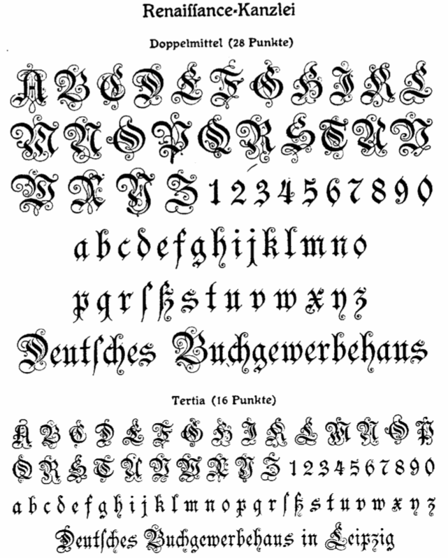 [More] ⦿
|
Heinrich (Heinz) Keune
|
 Heinz Keune (possibly Keune von Waldheim) was born in 1881 in Hannover, and died in 1946 in Berlin. He was a signpainter in Hannover and Leipzig and, from 1903 onwards, a freelance graphic designer in Weimar and Berlin. From 1908 until 1910, he studied in Leipzig under H. Steiner-Prag and H. Delitsch before returning to Hannover in 1911. In 1915 he became a professor at the Königlichen Kunstschule in Berlin. From 1918 until 1920, he taught at the Akademische Hochschule für bildende Künste at Berlin Charlottenburg. From 1920 on, he taught at the Kunstgewerbe und Handwerkerschule in Berlin-Ost.
 All his typefaces were designed at Schelter&Giesecke, between 1900 and 1909. He created Rosenzierat Serien 534 und 535 (1905), Mimosenzierat (1909), Edda (1900, late art nouveau style), Wallenstein (1904, art nouveau), Lichte Wallenstein (1904), Wittelsbach (1903, German expressionist face), Habsburg (1903, German expressionist face), Maria Theresia (1903), Ovid (1903, art nouveau), Rousseau (1905, a travel poster script face), and Wettin (1902, art nouveau). Digital revivals: Most revivals are by Oliver Weiss of WaldenFont: - WF Border Ver Sacrum: Based on borders by Heinz Keune for Schelter & Giesecke, 1901 (or earlier).
- WF Habsburg: After an original by Heinz Keune from 1903 for Schelter & Giesecke.
- WF Maria Theresia: After Maria-Theresia-Versalien (1903, Heinz Keune for Schelter & Giesecke).
- WF Ovid: After an original by Heinz Keune from 1903 for Schelter & Giesecke.
- WF Wallenstein: Based on an original by Heinz Keune (1904), who intended it as a heavy weight companion of Habsburg and Wittelsbach,
- WF Wittelsbach: After an original by Heinz Keune from 1903 for Schelter & Giesecke.
Edda has many revivals, including one by Ralph M. Unger (Edda Pro, 2008), and one by Michael Parson (Huggy, 2017). [Google]
[More] ⦿
|
Heinrich Vogeler

|
Heinrich Vogeler (b. 1872, Bremen, Germany) was an art nouveau era artist, designer, illustrator and teacher, known for his paintings and for his illustrations of fairy tales. He also did some work for the art nouveau magazine Pan. From 1894 on, he lived for some time in the artist colony at Worpswede, Germany. In 1908 he and his brother Franz founded the Worpsweder Werkst&aauml;tte, which produced household objects. He studied at the Kunstakademie Düsseldorf from 1890-1895. With sympathies for the working class, after the Great War, he became a pacifist and joined the Communist Party of Germany (KPD). The romanticism of his early art nouveau work gave way to proletarian content. In 1931, Vogeler and his second wife, Sonja Marchlewska, emigrated to Russia. Ironically, he was deported in 1941 to Kazakhstan by Soviet authorities, and died there in 1942. Jugendstil Initials (2007, HiH, Malcolm Wooden) is a commercial digital revival of Jugendstil Initialen (1905, Rudhardsche). Compare with Vogeler Caps (2002, Petra Heidorn, CybaPee Creations) and Vogeler Initialen (2002, Dieter Steffmann), both free revivals of a similar style face. Other typefaces by him include Vogeler Zierat (1904, Rudhardsche Giesserei), Kalender Bilder (1910, Klingspor). Vienna Secession link. Klingspor link. [Google]
[MyFonts]
[More] ⦿
|
Helen E. Hartford
|
Early 20th century designer of letters, such as Modern German capital letters and Art Nouveau Capitals. [Google]
[More] ⦿
|
Hendry Juanda
[Letterhend Studio (or: Magang Letterhend)]

|
 [MyFonts]
[More] ⦿
|
Henri Jules Ferdinand Bellery-Desfontaines
|
 French art nouveau era painter and illustrator, b. 1867 Paris, d. 1909 Les Petites Dalles. He designed a typeface and ornaments at the end of his life, which appeared posthumously in 1910 at Deberny&Peignot and was called Le Bellery-Desfontaines.
 Wikipedia link. More on his typeface. Another wikipedia link. [Google]
[More] ⦿
|
Henri Van Loey
[Fonderie typographique Van Loey-Nouri]
|
[More] ⦿
|
Henry Schuenemann
|
Born in 1866 in Cleveland, OH. Credited with the design of these typefaces: - Acadian No3 and No4 (1882, Cleveland Type Foundry). Victorian typefaces.
- Alpine (before 1885, Cleveland Type Foundry). Revived in 2017 by Alan Jay Prescott as Alpenhorn Roman. Presott writes: Another oddball typeface is revived here, renamed from the design called Alpine by Henry Schuenemann for the Cleveland Type Foundry in the 1880s. Buried in the "gingerbread" of this weird face is technically a Latin serif, but otherwise it is an entirely unique letterform for which I had a heart soft enough to revive here in digital form.
- Chic (1888, Cleveland Type Foundry). Art nouveau.
- Clifton (1889, Barnhart Bros. & Spindler). Victorian.
- DeVinne Extended (ca. 19896, Central Type Foundry).
- Euclid (1889, Cleveland Type Foundry). Victorian. Alan Jay Prescott did revivals of Euclid and several other typefaces, which he called Euclid, Euclid Initials, Euclastic, Elberon, Astral, and Auroral (2018). He explains Euclid's genesis differently: Elberon existed by November 1886 from Cleveland Type Foundry in The Inland Printer. Euclid (a lighter version of Elberon with a few different glyphs) is an obvious derivative from Illinois Type Founding Co. in Chicago in August 1890. Euclid appears with several Euclid Initials, a full sample of which appears as "Grant Iniitials" from Minnesota Typographic Co. Auroral (basically a shaded form of Elberon) appears in January 1887 from Central type foundry. Astral, also from Central type foundry, (the almost exact shading concept) whose base form is a condensed, heavier form than Euclid) appears in December 1886. Euclastic is my name for a complete set of weights, from a Hairline at the extreme end of lightness, through Black at the other extreme, using redesigned examples of Euclid and Elberon.
- French Old Style (Central Type Foundry).
- Gazelle (ca. 1893, Cleveland Type Foundry). Revived in 2017 by Alan Jay PrescottIllyrian (1883, Cleveland Type Foundry). A curly Victorian typeface that was revived as Illyrian by Dan X. Solo.
- Ivanhoe Series (1893, Cleveland Type Foundry).
- Mikado (1886, Cleveland Type Foundry). Imitating a child's hand?
- Oxford, Oxford No.2 and Oxford No.3 (1888, Cleveland Type Foundry). This includes ornamental caps. Oxford No2 was revived in 2013 by Brian J. Bonislawsky and Jim Lyles as MFC Damask.
- Walton (ca. 1885, Cleveland Type Foundry).
- Waverly Circular (before 1895, Cleveland Type Foundry).
[Google]
[More] ⦿
|
Henry W. DeWitt
|
Codesigner at BBS in 1889 with Charles E. Tiede of an early art nouveau typeface. [Google]
[More] ⦿
|
Herbert F. Van Brink
[Character]
|
[More] ⦿
|
Hermann Hoffmann

|
 German type designer, b. 1856, Hildesheim, d. 1926, Berlin. He settled in the 1890s in Berlin and founded Maschinenfabrik Heidenheim & Hoffmann. In 1895 he became head of H Berthold AG in Berlin. His designs:
 - Bloc (Berthold, 1908). Digitization and Cyrillization by Tafir Safayev, 1997 as Bloc (Paratype). See also Bloc Berthold at BertholdTypes, and FB Hermes (1995, Matthew Butterick at Font Bureau). FB Hermes was extended by Butterick in 2010. Bloc was similar to Hermes at Schriftguss and Woellmer. Bitstream's Gothic 821 (1990) is based on Bloc. The Softmaker version is called Boulder. Grauna (2018, Gabriel Figueiredo at Typeoca) revives Bloc Heavy, but has smoother outlines.
- Herold Reklameschrift (1901, Berthold (Berlin)). An art nouveau advertising typeface developed until 1907 with schmal, fett and Kontur substyles. Digitizations of this:
- Kaufhaus-Fraktur (1906, Berthold).
Books: Das Haus Berthold 1858-1921 (1921, Berlin) and Der Schriftgiesser (1927, Leipzig). FontShop page. Klingspor link. FontShop link. Oddity: The names Heinz Hoffmann and Hermann Hoffmann are used by two subcommunities. MyFonts, Font Bureau, etc. use Heinz, while Erik Spiekermann, Klingspor, and the German media use Hermann. [Google]
[MyFonts]
[More] ⦿
|
Hermann Ihlenburg

|
 German-American type designer (b. 1843, Berlin) who apprenticed at the Trowitzsch & Son type foundry in Berlin, and then worked as a punchcutter in Dresden and at the G. Haase & Sons foundry in Prague. After positions at the Flinsch foundry in Frankfurt, the Battenburg foundry in Paris, and the Fonderie Haas in Basel, Ihlenburg moved to the United States in 1866 to work for the L. Johnson & Company foundry in Philadelphia, which became MacKellar, Smiths & Jordan some time later. Specializing in ornamental (Victorian) fonts and borders, he designed over eighty typefaces for that Mackellar and a few more for American Type Founders after it purchased MacKellar, Smiths & Jordan in 1901. Ihlenburg became an American citizen in 1874, and died in Philadelphia in 1905. He will be remembered as the prototypical Victorian type designer.
 His typefaces at MacKellar: - American (1876), Angular Text (1884, a Victorian blackletter at MacKellar, Smiths & Jordan; digitally interpreted by Toto in his free font K22 Angular Text (2012) and by Alan Jay Prescott as Angolan Text (2017)), Arboret (1884), Arboret No. 2 (1885), Archaic (1888), Artistic (1886), Attic (1879). Artistic was revived by Alan Jay Prescott in 2017 as Beltane Roman. He wrote: this letterform started out in 1886 as drawn by the great Herman Ihlenburg as Artistic and assigned to MacKellar Smiths & Jordan. Dan Solo called this face Belmont but only showed caps and was suspect anyway. I was able to find specimens elsewhere and a motherlode of other interesting things in the Inland Printer. I developed my first full-featured OTF using this typeface and designed Greek and Cyrillic glyphs as well. I also fitted it out with a set of small caps to make a font that now has 4,000 glyphs for nearly every non-Asian language. To top it off, Robert Donona revived the decorative caps for this typeface, an excruciating task that I once considered for myself but was lucky enough to have this other crazy person take up. The number of hours dedicated between Robert and myself in reviving this complete series digitally is probably unprecedented.
- Bijou (1883: digital copies include Bangle (1990-1991, FontBank), Riccio Display Script by Southern Software (1994, SSi, SSK), Grebe (1994, by an anonymous designer) and Mexacali by Swfte), Black Ornamented (1873), Broadgauge Ornate (1868: a spurred Western typeface at MacKellar Smiths & Jordan; revived by Michael Hagemann), Byzantine (1868).
- Centennial Script (1874, a spectacular high-contrast script digitized in 2007 by Canada Type and in 2011 as a free font called Mortem Stylus by Stylus, and by Intellecta Design as Centennial Script), Chaucer (1883), Childs (1892, revived by R. Beatty, and by Ingo Preuss as Daring), Circular Black (1883), Columbian (1891), Columbus (1890: for metal recuts, see Victor Hugo by Nebiolo and Columbia (1909) by Urania); for digital revivals, see Cristoforo by Thomas Phinney, 2012, Cristoforo (2012) by SoftMaker, F37 Drago (2021, Rick Banks) and Colombo by Ingo Preuss), Columbus No.2, Columbus Outline (1892), Copperplate (1877), Crayon (1886), Culdee (1885).
- Dado (1882), Drapery Border (1876), Dynamo (1891).
- Elliptical Border (1878), Eureka Text (1870, blackletter), Eureka Shaded (1870).
- Ferdinand (1892, now at Dover), Filigree (1878), Fillet (1890), Flourish Ornaments (1884).
- Glyptic, Glyptic No. 2 and Glyptic Shaded (1878), Gothic Ornate (?), Greenback (1871), Grolier (1887), Gutenberg (1888).
- Houghton (ca. 1880). Same as Edison. Revived by Jim Spiece as Edison Swirl SG.
- Illuminated and Illuminated No. 2 (1876), Isabella (1892, a bastarda face; digital version at Agfa, Adobe, and Linotype, 2001), Italic Copperplate (1878).
- Japanesque and Japanesque No. 2 (1877, oriental simulation typefaces), Johnson (1892).
- Lady Text (1884, blackletter), Lippincott (before 1895).
- MediaevalText and Mediaeval Text Ornate (1870, blackletter), Minaret (1868), Minster (1878), Mortised and Mortised No. 2 (1884).
- Newfangle (1892, revived in 2015 by Nick Curtis as Newfangle NF), Nymphic (1889 [Ruffa says 1884], revived by Barmee in Secesja Pro (2013), and by Paul D. Hunt (2004), who published it as Kilkenny (2005, P22)).
- Obelisk (1881), Oxonian (1881). Digital revival of Obelisk in 2014 by Robert Donona.
- Pencraft (1885; digital revival in 2013 by Robert Donona), Pencraft No.2, Phidian (1870, redone by Dan X. Solo), Philadelphian (1867; digital revival by Michael Hagemann as Philadelphian in 2020), Pynson (1887).
- Quenn Bess Script (1882).
- Radiant (1876), Radiant Antique (1876: a money font), Radiated (1871), Relievo (1878), Relievo No. 2 (1879), Rimpled (1895), Ringlet (1882, the prototypical Victorian typeface; Dan X. Solo and George Williams made different digital versions in 1998 which are both also called Ringlet), Romanesque (1874).
- Sansom Script (1888), School Text (1876), Spiral (1890, revived by R. Beatty), Stipple (1890), Stylus and Stylus No. 2 (1883).
- Tendril (1878), Tilted (1886), Treasury (1874), Treasury Open (1875).
- Unique (1874), Unique No. 2 (1875).
- Zinco (1891, revived by Jim Spiece in 2002 as Zinc Italian SG).
At ATF: Taylor Gothic (1894), Schoeffer Old Style (1897: revived and extended by Alfonso Garcia in 2020 as Spirits), Roundhand Series (1902), Post Oldstyle Roman No. 2 (1901---possibly made by E.J. Kitson and/or Guernsey Moore), Post Oldstyle Italic (1901), Ihlenburg Series (1900?), Bradley Series (1895-1897, now at Dover), American Italic (1902). Ludlow offers a digital version of Hannibal. Comments on some typefaces by Mac McGrew: - American Italic is a heavy, novel design by Herman Ihlenburg introduced by ATF in 1902, as a companion to Columbus, which had been designed for ATF's MacKellar Smiths&Jordan branch in 1892. The italic survived its roman mate, being shown by itself in 1906, but was gone by 1912. It is essentially a nineteenth-century design.
- Bradley (or Bradley Text) was designed by Herman Ihlenburg-some sources credit it to Joseph W. Phinney--from lettering by Will H. Bradley for the Christmas cover of an Inland Printer magazine. It was produced by ATF in 1895, with Italic, Extended, and Outline versions appearing about three years later. It is a very heavy form of black-letter, based on ancient manuscripts, but with novel forms of many letters. Bradley and Bradley Outline, which were cut to register for two-color work, have the peculiarity of lower alignment for the caps than for the lowercase and figures, as may be seen in the specimens; Italic and Extended align normally. The same typeface with the addition of German characters (some of which are shown in the specimen of Bradley Extended) was sold as Ihlenburg, regular and Extended. Similar types, based on the same source and issued about the same time, were St. John by Inland Type Foundry, and Abbey Text by A. D. Farmer&Son. They were not as enduring as Bradley, which was resurrected for a while in 1954 by ATF. Also compare Washington Text.
- Round Hand was designed for ATF about 1900, and has been ascribed to Herman Ihlenburg. It has the appearance of handwriting with a broad pen, but letters are not quite connected.
- Schoeffer Old Style [No.2] was designed by Herman Ihlenburg for ATF in 1897. It is typical of a number of typefaces of the day-a plainly lettered roman with small, blunt serifs. Some references list Schoeffer Condensed, cut in 1902; this is probably the typeface shown a little later as Adver Condensed (q.v.). On Linotype, Schaeffer Oldstyle was called Elzevir No.2.
In 2021, Noah Bryant set out to revive many of Ihlenburg's Victorian typefaces. Ihlenburg at the Rochester Institute of Technology's Cary Graphic Arts Collection. [Google]
[MyFonts]
[More] ⦿
|
Herzberg Design
[Matthijs Herzberg]
|
 Aka BaronHerzberg. Illustrator, letterer and type designer, who was born in the Netherlands, moved to New Orleans in 2013, and set up Herzberg Design, a commercial type foundry, in 2019. His typefaces include:
 - Libido (2021). A funky unicase psychedelic typeface based upon Wes Wilson's style. It has a traditional smooth or curvy style, and a ragged style with only straight edges, and is designed in variable format with a width axis and an optical size axis.
- Bonkus (2020). A six-style geometric sans-serif typeface with a funky touch that was inspired by similar wide open organic typefaces from the 1970s such as Blippo and Ronda.
- Wanchy (2020). A psychedelic typeface.
- Yardbird (2020). A stencil typeface.
- Cloisterfuch (2019). A blocky modern blackletter.
- Psychblock (2020). A variable art nouveau font with two axes (width and optical size), inspired by the psychedelia of Wes Wilson. For Latin and Cyrillic.
[Google]
[More] ⦿
|
Heta Kasurinen
|
While studying at the University of Lapland, Finland, class of 2015, Heta Kasurinen designed the nature-inspired art nouveau typeface Meadow (2015-2016). [Google]
[More] ⦿
|
HiH (Hand in Hand)
[Tom Wallace]

|
 Tom Wallace's foundry, HiH (est. 2005), was first located in Woodbridge, CT. Subsequently, Tom Wallace (b. 1944) moved from Woodbridge to Naugatuck to Waterbury and finally in 2009 to New Britain, CT. His type designs are based on historical letterforms:
 - Augsburger Initialen and Augsburger Schrift (2001), an art nouveau pair found in Ludwig Petzendorfer's Treasury of authentic art nouveau alphabets, decorative initials, monograms, frames and ornaments (1984, Dover). Augsburger Schrift is originally due to Peter Schnorr (1901, Berthold). In 2007, Wallace added Augsburger Ornamente.
- Figgins Tuscan (2005) is based on the first metal Tuscan typeface by Figgins in 1817.
- Freak, based on Bamboo (1889, The Great Western Type Foundry). HiH explains: Great Western became Barnhart Brothers & Spindler in 1868. At some point, prior to 1925, Freak was renamed Bamboo by BB&S. It was delisted when BB&S was absorbed by ATF in 1929. Compare with Dan Solo's Bamboo (2004).
- Gradl Initialen (2005): based on caps designed by Max Joseph Gradl ca. 1900 for engraving on his art nouveau jewelry in Germany. Samples are in Petzendorfer.
- Huxley Alt (2005), an alternative to the ultra-condensed Lutherian church font Huxley Vertical (or Aldous Vertical) by Walter Huxley (ATF). Huxley Amore (2006) is a major extension of this, and Huxley Cyrillic (2008) adds Russian characters.
- Künstler Grotesk (2005): a simple blackletter caps typeface based on a design seen in Petzendorfer's book.
- Page No. 508 (2006): Page No. 508 was designed by William H. Page in 1887 as one of a series of designs for die-cut wood types for the firm of Page & Setchell of Norwich, CT. Page & Setchell was the successor to The William H. Page Wood Type Company and was sold to the Hamilton Manufacturing Company of Two Rivers, Wisconsin in 1891.
- Pekin (2005): first designed by Ernst Lauschke in 1888 at the Great Western Foundry under the name Dormer.
- Schnorr Dekorativ, Demi Bold and Initialen (2007), all due to Peter Schnorr (ca. 1900), as well as Schnorr Gestreckt (2006), an art nouveau typeface from 1898.
- Rundgotisch (2005): based on a design by Schelter and Giesecke, ca. 1900.
- Edison (2005) is based on Edison Swirl SG, a Spiece Graphics digitization of a late 18-th century design of the Bauersche Giesserei.
- Bethlehem Star (2005) is based on the typeface Accent with the permission of URW++: HiH only added stars to the glyphs.
- Antique Tuscan No. 9 (2006). One of the earlier wood-type designs by William Hamilton Page. It was first shown among the specimens produced in 1859, shortly after Page entered into a new partnership with Samuel Mowry, owner of the Mowry Axle Company. Antique Tuscan No.9 is an extra-condensed version of the tuscan style that had been released in moveable type by Vincent Figgins of London in 1817.
- Secession (2006): a sans family with art nouveau twists.
- French Plug (2007): A sign painters font based upon work of Frank H. Atkinson, a popular Art Nouveau sign painter in Chicago, who worked for Cadillac, and published Sign Painting in 1908.
- T-Hand Monoline (2007): a printed script family.
- Figgins Antique (2007): an all-caps black slab serif headline typeface based on Figgins, ca. 1815.
- Mulier Moderne (2007): Based on a font designed ca. 1894 by E. Mulier, a French art nouveau era artist.
- Regina Cursiv (2007): an art nouveau design that revives a typeface published by H. Berthold Messinglinienfabrik und Schriftgiesserei around 1895.
- Edelgotisch (2007): a bold Jugendstil design (with caps), based on a design released by Schelter & Giesecke of Leipzig, Germany about 1898 and is very similar to Eckmann-Schrift released by Rudhard'schen Giesserei (later Klingspor) during the same period.
- Teutonia (2007), a revival of Teutonia by Roos & Junge, a squarish art nouveau face. HiH writes: There are many quite similar attempts in the field of topography. In 1883, Baltimore Type Foundry released its Geometric series. In 1910, Geza Farago in Budapest used a similar letter design on a Tungsram light bulb poster. In 1919 Theo van Doesburg, a founder with Mondrian and others of the De Stijl movement, designed an alphabet using rectangles only -- no diagonals. In 1923, Joost Schmidt at Bauhaus in Weimar took the same approach for a Constructivist exhibit poster. The 1996 Agfatype Collection catalog lists a Geometric in light, bold and italic that is very close to the old Baltimore version. And in 2008, HiH itself published Baltimore Geometric.
- Austin Antique, based on Richard Austin's 1827 antique typeface.
- Morris Gothic, Morris Ornaments and Morris Initials One and Two (2007): The gothic that Morris designed was first used by his Kelmscott Press for the publication of the Historyes Of Troye in 1892. It was called Troy Type and was cut at 18 points by Edward Prince. It was also used for The Tale of Beowulf. The typeface was re-cut in at 12 points and called Chaucer Type for use in The Order of Chivalry and The Works of Geoffrey Chaucer. Morris' objective is designing his gothic was to preserve the color and presence of his sources, but to create letters that were more readable to the English eye. ATF copied Troy and called it Satanick. Not only was the ATF version popular in the United States; but, interestingly, sold very well in Germany. There was great interest in that country in finding a middle ground between blackletter and roman styles -- one that was comfortable for a wider readership. The Morris design was considered one of the more successful solutions.
- Larisch (2007): a hand-lettered design by the Austrian calligrapher and teacher, Rudolf von Larisch. The original was used for the title page of the 1903 edition of Beispiele Kunstlerischer Schrift Examples of Artistic Writing).
- Patent Reclame (2007): an art nouveau typeface first cast around 1895 by Schriftgeisserei Flinsch, and then by Stephenson Blake, ca. 1896.
- Jugendstil Initials (2007): an all caps decorative blackletter typeface designed by Heinrich Vogeler around 1905.
- Wedding (2007): a multi-style English blackletter family, based on a Morris Fuller Benton original called Wedding Text.
- Brass (2007): two blackletter typefaces from the early 1500s described by Alexander Nesbitt in his Decorative Alphabets And Initials (Mineola, NY, 1959) as initials and stop ornaments from brasses in Westminster Abbey.
- Auchentaller (2007), a monoline art nouveau typeface inspired by a travel poster by Josef Maria Auchentaller (b. Vienna, 1865, d. Grado, 1949; studied at the Vienna Academy, professor in Munich, member of the secession from 1898, artist) in 1906.
- Phinney Jenson (2007): a Venetian by Nicolas Jenson from the 15th century, about which Wallace writes: In 1890 a leader of the Arts & Crafts movement in England named William Morris founded Kelmscott Press. He was an admirer of Jensons Roman and drew his own somewhat darker version called Golden, which he used for the hand-printing of limited editions on homemade paper, initiating the revival of fine printing in England. Morris' efforts came to the attention of Joseph Warren Phinney, manager of the Dickinson Type Foundry of Boston. Phinney requested permission to issue a commercial version, but Morris was philosophically opposed and flatly refused. So Phinney designed a commercial variation of Golden type and released it in 1893 as Jenson Oldstyle. Phinney Jenson is our version of Phinneys version of Morris' version of Nicolas Jensons Roman.
- Advertisers Gothic (2008): based on Robert Wiebking's tasteless 1917 design for Western Type foundry. HiH writes: Advertisers Gothic is bold and brash, like the city it comes from, Chicago. It was designed by the accomplished German-American matrix engraver, Robert Wiebking, for the Western Type Foundry in 1917. As its name suggests, it was designed for commercial headliner work, much as Publicity Gothic by Sidney Gaunt for BB&S the year before. See our Publicity Headline.
- Publicity Headline (2006): an allcaps version of Sidney Gaunt's advertising typeface, Publicity Gothic (1916, Barnhart Brothers & Spindler). Its heavy weight and robust strength allows it to be used against complex backgrounds or reversed out on dark backgrounds without getting lost.
- Herold (2008): a revival of Berthold Herold Reklameschrift BQ (Hermann Hoffmann, 1901), an art nouveau advertising typeface.
- Yes Dear (2008) is a funny hyper-curly blackletter face.
- Besley Clarendon (2008) is the HiH version of the Clarendon registered by Robert Besley and the Fann Street Foundry in 1845. This condensed typeface was very popular in the 19th century, and was copied by most foundries of that era. It was followed by Gutta Percha (2008), a Clarendon in which the upper case letters are dropcaps.
- Waltari (2008): a revival of Walthari (1899, Heinz König for the Rudhardsche Giesserei), a Jugendstil type.
- Hispania Script (2008): revival of a pirate map script typeface called Sylphide by Schelter & Giesecke (1896) (and not Schelter & Giesecke's Hispania).
- Cloudy Day (2008), an alphading.
- HiH stumbled on a 1902 publication by Bruno Seuchter called Die Fäche, in which he found the art nouveau typeface that HiH revived in 2008 as Seuchter Experimental.
- Petrarka ML (2006). HiH writes: Petrarka may be described as a Condensed, Sans-Serif, Semi-Fatface Roman. Huh? Bear with me on this. The Fatface is a name given to the popular nineteenth-century romans that where characterized by an extremity of contrast between the thick and thin stroke. The earliest example that is generally familiar is Thorowgood, believed to have been designed by Robert Thorne and released by Thorowgood Foundry in 1820 as "Five-line Pica No. 5." Copied by many foundries, it became one of the more popular advertising types of the day. Later, in the period from about 1890 to 1950, you find a number of typeface designs with the thin stroke beefed up a bit, not quite so extreme. What you might call Semi-Fatfaced Romans begin to replace the extreme Fatfaces. Serifed designs like Bauer's Bernard Roman Extra Bold and ATF's Bold Antique appear. In addition, we see the development of semi-fatface lineals or Sans-Serif Semi-Fatfaces. Examples include Britannic (1906, Stephenson Blake), Chambord Bold (Olive), Koloss (Ludwig & Mayer), Matthews (ATF) and Radiant Heavy (Ludlow). Petrarka has much in common with this latter group, but is distinguished by two salient features: it is condensed and it shows a strong blackletter influence, as seen in the H particularly. See also Nick Curtis's Petrushka NF (2012). Footnote: Fonts in Use refer to the metal typeface Petrarka by Schelter & Giesecke (1900) and Milton (by Societa Augusta). The Solotype catalog has a related typeface, Ophelia.
- Haunted House (2008), Halloween-themed fonts.
- Gothic Tuscan One (2008) is an all-caps condensed gothic with round terminals and decorative Tuscan center spurs. It was first shown by William H. Page of Norwich, CT, among his wood type specimen pages of 1859.
- HiH Firmin Didot (2008) is a one-style didone based on an 1801 version of Didot. It led to a combined alphabet/stick people alphading called Gens de Baton (2008) after a lower case alphabet that appeared in the Almanach des Enfants pour 1886 (Paris, 1886) under the title Amusing Grammar Lessons.
- Shout (2008), a Compacta-like fat headline sans about which HiH writes: Its lineage includes the Haas Type Foundrys 19th century advertising font, Kompakte Grotesk, which Jan Tschichold (1902-1974) dryly described as extended sans serif and which graphic designer Roland Holst (1868-1938) would have disapprovingly referred to as a shout, as opposed to the quiet presentation of information that he believed was the proper function of advertising. In 1963 Letraset released what appears to be an updated variation in multiple weights designed by Frederick Lambert called Compacta. Shout draws heavily on Compacta, as well as other similar fonts of the 50s and 60s like Eurostile Bold Condensed and Permanent Headline. In weight, it falls about halfway between Compacta Bold and Compacta Black.
- The heavy art deco typefaces Guthschmidt and Guthschmidt Condensed (2008) are based on a 1924 KLM Royal Dutch Airline poster designed by Anthonius Guthschmidt. The poster draws on the imagery of the legend The Flying Dutchman.
- Cherub and Cherub Caps (2008) are based on Phinney Jenson. Not to be confused with the many fonts that already existed with that name, such as Cherub from House of Lime, Twopeas, Graph Edge Fonts, and Fuelfonts.
- HiH Large (2009) is a poster sans.
- Mira (2009) is an art nouveau / Victorian typeface patterned after a font by the Roos & Junge Foundry in Offenbach, ca. 1902.
- Thorowgood Sans (2009): A three-dimensional all-cap font for title use, Thorowgood Sans Shaded was released by the Fann Street Foundry of W. Thorowgood & Co. in 1839. Interestingly, it more closely resembles Figgins' Four-Line Emerald Sans-Serif Shaded of 1833 than Fann Street's own Grotesque Shaded of 1834 (with light and shadow reversed).
- Fantastic ML (2009): an art nouveau typeface originally released as "Modern Style" by Fonderie G. Peignot & Fils, Paris, France some time before 1903.
- Gundrada ML (2010): a medieval style typeface inspired by the lettering on the tomb of Gundrada de Warenne, who was buried at Southover Church at Lewes, Sussex, in the south of England in 1085.
- Wedge Gothic (2010). HiH writes: Wedge Gothic ML is the original name of this font released by Barnhart Bros. and Spindler of Chicago in 1893. [...] The typeface was dropped for awhile -- it does not appear in the 1907 catalog for example -- but reappeared in 1925 as Japanette. McGrew says that the new name was Japanet. It was recast by ATF in 1954.
- Norwich Aldine ML (2010) is an all caps typeface with enlarged serifs, designed and produced in wood by William H. Page of Norwich, CT in 1872.
- Rodchenko Constructed ML (2010) is constructivist (Latin and Cyrillic).
- Cruickshank ML (2012): a decorative typeface from the late Victorian period. The typeface was designed by William W. Jackson and released by MacKellar, Smiths and Jordan Type Foundry of Samson Street, Philadelphia, Pennsylvania in 1886.
- Habana Deco ML (2013).
- Chicago Ornaments (2015). a collection of decorative cuts cast by the Chicago Type Foundry of Marder, Luse & Co. of Monroe Street in Chicago, Illinois. This collection was shown in their 1890 catalog. Some of them were designed by William F. Capitain. Included in the font are a set of Victorian caps inspired by Ernst Lauschke's Dormer (or Pekin, 1888).
View Tom Wallace's fonts. View the typefaces designed by Tom Wallace. MyFonts link. [Google]
[MyFonts]
[More] ⦿
|
Hillary Alderdice
|
Toronto, Ontario-based designer of the lachrymal and perhaps sligtly art nouveau-ish typeface Wanderlust (2017). Behance link. [Google]
[More] ⦿
|
Hindra Permana
[ndroadv]
|
[More] ⦿
|
Hirwen Harendal
[Arkandis Digital Foundry]
|
 [More] ⦿
|
History of posters
|
Art nouveau poster page. [Google]
[More] ⦿
|
Hobo
[Peter Zelchenko]
|
 Peter Zelchenko, a master trade typographer in Chicago in the 1980s and 1990s, gave me permission to tell his story about the origins of Hobo---both the name and the typeface. He contradicts Mac McGrew, but his explanation is more likely than all others that have been proposed. So here we go (all text below by Peter).
 (Thanks to Boston’s Bill Ricker and Dick Miller for coaxing me to cough this story up finally. I originally mentioned it in comp.fonts about 20 years ago, but the “O” situation, recently discovered, offers incontrovertible proof of the theory.) As a master trade typographer in Chicago in the 1980’s and 1990’s, I was the last of the breed here before desktop publishing finally made our race extinct. I imagine there were only two or three of us in that generation. Among the very few others in Chicago were Adam Kallish and Jason Pickleman, who both were working for the irascible Harvey Hunt, a Berthold guy, when he closed down his Typographic Resource and moved to Mac. (Harvey and his wife inherited ownership of the Berthold font collection. For decades Berthold was a top-quality typesetting platform.) I was working upstairs from them during the storied heyday of InfoComm, a pioneering PostScript service bureau, at 213 W. Institute Pl., site of the early Schwinn bicycle factory. You can still see thousands of bicycle screws embedded in the wood floors of that building. We were young and, with proficiency in computers, were able to bridge old and new technologies easily. We were also font whores. Most kids in those days used to save their money up for model airplanes or blow it all on Twinkies. When we were children, my brother Greg and I used to haunt Chicago art stores, scraping up money for Zipatone dry-transfer, or “rub-down,” lettering. Our favorites were things like Calypso, Mistral, and others by Roger Excoffon, Herb Lubalin, Ed Benguiat, Rosmarie Tissi, and the many other designers of that prolific period. I also did a lot of calligraphy. I still do work with flat and pointed pen as well as flat and pointed brush (a devotee of Father Catich to the end). In later life I was briefly president of the Chicago Calligraphy Collective. Despite my skills and interest, I was never admitted into the higher church: East Coast: Ephram “Ed” Benguiat had me out for a tongue-lashing. The famous Jewish cigar-chomping dean of New York letters walked me around the labyrinth of Photo-Lettering, Inc., his huge Manhattan shop. Stopping at various stations to introduce me to his team, he would pointedly ask each guy how long they’d been working for him. “I’ve been on this very Staromat in this very darkroom for 25 years,” I remember one of them saying. (I was a VGC Typositor guy myself, thanks in part to the support of my beloved mentor, Al Blitz of Photofont.) Then he introduced me to the sub-basement, where I met Marco, an art student almost ten years younger than I. “You still wanna to work here?” Ed challenged me. “Marco’s my new right-hand.” And he stubbed out his cigar in one of the shop’s numerous overflowing ashtrays. Apparently this trip was just for him to show me that if I wanted to move to Manhattan to be his apprentice, I’d have to work in the basement for years, getting behind even young Marco, who after three years was still making $6 an hour touching up the edges of Ed’s drawings. West Coast: David Lemon of Adobe flew me out for a lavish two-day interview session with the type staff. I remember getting to know Linnea Lindquist, Bob Slimbach, Carol Twombly, and this really nice guy who had worked for the inimitable Dan X. Solo. I knew he and I would be best friends when I moved out there, but I never got the call. I think I was too crude for them, not an artist like most of them, just some schmuck without much flair, trained in the many nameless shops. Back home: The market was getting too tight. Dean of Chicago of lettering Charlie Hughes (designer of Indy and, coincidentally, of the Benton variant Century Nova) chose calligrapher Eliza Schulte over me as his apprentice. Holly Dickens, for her part, though I know she loves me dearly, was never the type to take on help. George Lee before he died told me that I already had too much experience to be anyone’s apprentice, but I knew I was also far too unsophisticated and too inept at business to forge out without first getting a leg up. It didn’t help that I was stranded in the Windy City (a bygone typographic center, former home of much that we can be proud of), circumstantially unable to move to one of the coasts, where the action really was. The best we had here by then was Castcraft, widely felt by respectable industry to be the worst font plagiarists in history. Anyone who is friendly with the Kreiter family would still never consider their shady world a place for a skilled young designer to hang one’s hat for a career. It would have been even more pathetic for me to take Boomie Kreiter up on his frequent offers than to wait for young Marco to free up his naugahyde seat in Benguiat’s dusty office. I would never get a job at Adobe or Font Bureau with that on my resume. Despite heading toward that dead end, I did become the guy in Chicago who knew fonts. I probably can’t tell Helvetica from Helios these days; it’s been 30 years since I’ve had to compare them. But wherever I worked, my reputation followed me. Every few days, at one or another type shop, someone would yell out: “Pete. Someone just called, wants you to identify a font.” Soon I’d see coming in on the fax machine a request from some designer, or from another mope at another harried River North type shop, asking me to identify some obscure font sample. For about 10 years, everyone in town apparently knew that if anyone could figure out which foundry and font they were trying to match, I could. There were times when I would do no more than glance at the sample, and then call them back: “It’s Stempel Garamond; you can tell by the cipher.” “Gosh, Pete. We really appreciate it. What do you want for this?” “Just send me a check with lots of Stempel Garamond zeroes. Better yet, buy me a drink at the Redhead Friday night. We’ve got a massive annual report to finish, but we may get off before midnight.” Other times I’d pore over a stack of thick books from VGC, Photo-Lettering Inc., and Castcraft before I finally found the match. But I could not easily be stumped. I could quickly tell a Benguiat brush script from knock-offs, and I knew when I’d have to pull out VGC’s or Castcraft’s massive tomes and start flipping pages for 15 or 20 minutes. And then there was the ponderous TypEncyclopedia, whose sheer weight could kill a grown man. This was the heyday of the proliferation of advertising design and numerous competing typographic platforms, each with a knock-off and variants of a popular font. This was the high-water mark in American typographic activity. There were dozens of foundries and tens of thousands of fonts. And it all came crashing down as quickly, and today I have no memory, and everything is all washed away, and I wonder how I could have wasted so much of my life on so profitless a pursuit. Nobody remembers me, and no one cares. Even in Chicago I was just a fax number to most famous designers, just someone somewhere who could help them make a quicker profit a few minutes sooner. And I always did it gratis. But in that day font substitution was done only as a last resort, so I had to do it. * * * In those days, to pass the time lovers of letters would walk up and down the streets of their cities and simply name fonts they saw in windows, sometimes self-righteously adding the designer’s name and perhaps the approximate year of the design. “You’re wrong, that’s not Helvetica Bold, it’s Vladimir Andrich’s Claro Bold.” In those days as ever, Hobo was everywhere. It is one of the two or three best-known and most-used display fonts in history, and it has long enjoyed a kind of cult following. But while one of the easiest of fonts to identify, no typophile will dispute that the mystery of its name is easily one of the most rampantly speculated typographic questions over the last century. A few years ago, my pal Kibo and I came up with the answer to this century-old mystery, as well as an insight into the design of this odd Art Deco font. Morris Fuller Benton was the contented son of Linn Boyd Benton, the latter one of the most influential figures of all time in the graphic arts, arguably ranking somewhere near the pantheon among Gutenberg and Bi Sheng. Through the 19th century, the Wyeths did painting, the Brontës did writing---and the Bentons did type. Every industry in every age has its salon powerhouses, those titans whose magic could rub off on you if you could only get near enough. But of course unless you actually were family, often nothing was bound to happen. Grandpa Benton, as it happens, owned the Milwaukee Daily News and also became a congressmen, and his father in turn was a prominent East Coast physician. In fact, Grandpa was under consideration as a presidential candidate but lost out to Stephen Douglas. Patricia Cost wrote a wonderful history about the Benton family that tells even more. But, nepotism aside, Morris Fuller became quite a prolific and celebrated type designer in his own right, surpassed by only a few others in the number of iconic font designs to his name.  The two main stories behind the naming of Hobo are both probably apocryphal. The first is that the bow-legged shape of the letters suggested the legs of a hobo. The second is more creative, but it too lacks much support. According to one writer, Emil Klumpp of ATF gave a talk at the APA Wayzgoose conference in 1977 and mentioned the origin of the name. In his 1993 book American Metal Typefaces of the Twentieth Century, historian Mac McGrew apparently summarizes Klumpp’s report: “One story is that it was drawn in the early 1900s [when Art Nouveau was still in fashion] and sent to the foundry without a name…but further work on it was continually pushed aside, until it became known as ‘that old hobo’ because it hung around so long without results.” * * * McGrew died a few years ago, as did Emil Klumpp, but I wish they were still alive so that we could debate these facts. Both were born long after the font. There is absolutely no evidence that the font’s design was begun earlier than 1910; that speculation may well owe itself only to its convenience to the story itself. Something just doesn’t seem to add up. We have, however, harder facts. The quintessential nerd, James “Kibo” Parry worked on the Atari 2600 design team. He became a household name on the early Internet by haunting Usenet newsgroups and contriving numerous online larks to amuse the digital populace, which at the time did not yet number 50,000 or so worldwide. Kibo once had a two-page feature all to himself in Wired magazine. He had a religion called Kibology named after himself, with a bizarrely popular online discussion group of thousands of subscribers. Kibo was even immortalized in the Geek Code, an early Internet fad that one would put in the signature of one’s e-mails and online posts to indicate level of geekiness and hence high-tech social status. There were several indicators, such as how well you knew the C language, or whether you were Unix (good) or MS-DOS (bad). The number of pluses after a letter code indicates the level of accomplishment. C is, predictably, C, and the Unix/Windows letter codes are U and w. There is even a flag for how close one is to Kibo. At the top end, it included: “K++++ I’ve met Kibo,” “K+++++ I’ve had sex with Kibo,” and “K++++++ I am Kibo.” At the bottom are several negative indicators, such as “K–” I dislike Kibo. I have the dubious distinction of being somewhere close to the K+++++ category, because technically I’ve, uh, slept with Kibo---well, at least I’ve shared his bedroom. Here is Kibo’s own e-mail signature which, although over 1,000 lines long, does not include a Geek Code. But it does give you an idea of the strange humor that is Kibo. Apart from all of this, Kibo is also a lover of type, and very knowledgeable about it. He and I were wandering around downtown Boston sometime around 1992, the morning after a rather snooty ATypI wine-tasting event hosted by David Berlow’s Font Bureau, celebrating Matthew Carter. Seeing the well-dressed and well-paid scions chatting and sipping red wine, it was impossible to picture us really fitting in there. And, of course, nobody paid the least attention to us. Another time, in 1994 in San Francisco, ATypI met, and the pushy, competitive nature of the nascent PostScript font industry took a more direct form. The Dutch youth, Erik van Blokland, Luc de Groot, and brothers Just and Guido van Rossum, had crossed the pond. There was a kind of technical mosh pit established as a playground for us 15 or so “youngsters” in which to create the show daily. This playground was billed as a social collaborative activity. But I recall the four Dutchmen muscling over this and other activities with equal, shall we say, zeal. A couple of less pushy participants raised a stink to the elders and yet the rebellion was discreetly put down. As is the case in such societies, most of us budding young craftsmen were hoping for some attention, but we were not nearly as forward about it as these tough Europeans. To be sure, they had talent. But we, at least, were aware that our eyes and minds and skills were as ready as theirs. I recall Luc de Groot simply drawing the nameplate for the publication, without any discussion from anyone else. An arguably enviable post that he had simply arrogated to himself. My recollection is that his skills were not much up to the task that day and I was pretty certain that I could have done better. Again, that year, nobody paid any attention to us.  [The shot of Kibo used for the Wired article – he’s not quite as exciting as all this, no red aura in real life.] Kibo and I were bored out of our skulls that morning after the Font Bureau affair in Boston, and probably a bit hung over and cynical. Presumably, we were already heading toward failure in the type world. Kibo lived right across from the Commons, in a cockroach-infested flat dotted with empty carry-out containers. I had slept on the floor. Walking somberly through the streets of old Boston, Kibo showed me how to pick locks with the metal bristle from a street-cleaning truck’s brushes, which bristles, to my amazement, can be found near the curb of almost any street in the world. We shared work horror stories. We sneered at the cult of personality that was the typographic design world in those high-flying days. Frankly, we were probably a bit jealous. And of course we showed off by pointing at signs and identifying many fonts. We also stopped in at several bookshops. At one particularly cozy little shop, I was flipping through a Russian poster art book, surveying a nice Art Nouveau poster for Duchess Tobacco. Kibo, looking over my shoulder, asked me what the poster said. I said it was for the “new and wonderful” Duchess Tobacco, 1/4 pound for 40 kopecks, from tobacconists Kolobova and Bobrova of St. Petersburg. I think Kibo said something like, “Huh. Why does it say ‘Hobo’ at the top? Those guys don’t look like hobos.” Indeed, the two characters pictured helping themselves to a box of the Eastern-style cigarettes known as papirosi were young Russian gentlemen. But I explained to Kibo that HOBO was the Cyrillic spelling of the word novo (“New!”). It was then that we both noticed that the poster was drawn in something very like the font Hobo. Of course, this was hand-lettered, but it was certainly in that Art Nouveau splayed style. That led to speculation that Benton could have seen this poster or one like it in a Russian neighborhood. Certainly the four-by-five–foot poster in a window of a Russian tobacco shop or grocer would have been amusing to non-Russians seeing the word “HOBO!” at the top, and it could very well have inspired any talented type designer to throw together a font in its honor.   The Russian word “Chudno” (above) means “wondrous.” What’s really wondrous is the unique similarity of Benton’s majuscule O and the one drawn at the poster’s extreme right. The shape of the letters in the word “HOBO!” don’t hurt the argument, and of course the name buttresses it. To me, the striking coincidence of this single “O” letterform crowns the argument and should lay to rest the mystery of Hobo. This evidence shows that Morris Fuller Benton must have seen this poster somewhere. Perhaps he was somehow reluctant to admit that the source of his inspiration came from outside his famously insecure mind? In fact, the “O” in the word “Чудно!” at the far right side of the poster looks as if it could have been traced by Benton as the model for his Hobo majuscule O. In fact, it is so close that it would arguably be more of a coincidence if this were not the case. The characters “HOBO” at the top of the poster, their general design formula, and the identical shape of that O, I feel, lay to rest the hundred-year mystery of the source of both the font’s name and design formula. There was also motive, method, and opportunity. This is far better substantiation than what we have from the two chief theories that have circulated all these decades. Moreover, what this suggests is that the original inspiration for Hobo probably was not Benton’s own mind, but the pen of an unknown graphic artist at the world-renowned Wefers lithographic press in St. Petersburg. It is not some great scandal that Benton failed to mention this, but it is true that Benton was famously insecure. Admitting that the source of the design of this font was something so pedestrian was not, and is still not, a common part of the ethical standard of the creative industry. It’s one thing for Carol Twombly (who once admitted to me that she didn’t know one end of a flat brush from the other) to acknowledge, even revere, the origins of Trajan. This is another thing entirely. In this case, you would think with such a cute origin, Benton would have been sharing the anecdotal pun with his pals at ATF. Perhaps he did and that history has been lost. Finally, if we believe the connection of the Hobo font to this Russian poster, then Benton’s naming of the font was very deliberately tied to Benton’s use of the poster as his exemplar. I bought the book and gave it to my uncle Boris and aunt Tanya in Boston, and they probably still have it. The poster included details on the date, but I recall it was around 1903 or 1905, and that agrees with the design style. As David Berlow has remarked, Morris Benton and his father often lived together and over the years would commute between home and the various locations of the ATF foundry in New York, later in Jersey City, and still later in Elizabeth. In fact, the northeastern New Jersey area where the Bentons lived, worked, and presumably played at the time had over 300,000 Russian Jews. We also know that at that time corner stores literally were at almost every street corner. ![]()
I don’t know for certain whether the Bentons’ travels went through any of the Russian neighborhoods. It seems that for the period in question they were probably living in Plainfield and commuting more than 20 miles, probably by car, to Jersey City. They may well have seen this poster at some point. Possibly they saw it in another place. Or perhaps Morris Fuller might have taken a trip to Russia around that time. That part is speculation. Perhaps Benton historian Patricia Cost could illuminate a bit. In any event, while the type snobs were sipping fine wine, slapping one another on the back, and tooling around Boston in their nice cars, all paid by typography, a couple of bums momentarily came from out of nowhere, and went nowhere in particular. While there, they quietly and unceremoniously found a plausible solution to a celebrated typographic mystery, that of the origin of the Hobo font. * * * I know it’s speculated that Morris Fuller Benton was controlled by his father. No one can actually say if he was truly contented or not, and it seems he may have been one poor sap. But clearly his family had a good deal to do with his success. My own father would have been 100 today, March 21, 2014. I recently turned half that. It would have been nice to have gotten a leg up. My father could do nothing for me; in general, he could do little for himself. Actually, he and I worked together in a small print shop once, one of the many odd jobs he had. He was rather skilled on the offset press. But he couldn’t even manage to get me through high school. My brother and I had to take care of both of our parents in our father’s last few years, and that put a big dent in our own midlife plans; we fought so bitterly over how to do it that we spent over a year in court on it. I am past my prime and am doing other things, having no further time for typography. I don’t even care that much about letterforms anymore. That work is chiefly for the quality children of quality people; over the years I have long been elbowed aside by such creatures. Whether employing ambition, birthright, or actual talent, the competition has been fiercer than one would expect for what was once a very humble craft. I will note that David Berlow’s son Sam, who really had nothing to do with type in his youth, is now in the stable at Font Bureau. Just sayin’. I suppose I may be one of Fred Warde’s typographically shipwrecked mariners. I have to hustle in the meantime on other business. Right now, I’m working 60 hours a week designing a 3D printer for mass production, for two young and impetuous entrepreneurs of some wealth. I really didn’t have time for this story. I do not know if I got much of it right, but in any event each of us should hope to make little contributions to our little worlds, and this is one of mine. [Google]
[More] ⦿
|
House of Lime
[Merethe Liljedahl]
|
 Defunct type foundry that had free original dingbats, alphadings and fonts, mostly from scanned art by Merethe Liljedahl (House of Lime) in Landskrona, Sweden.
 The font list: Abstract, Africa, African Design, African Eggs, AfricanPattern, AlphaRemember, AlphaSausage, AlphaThin, AmishQuilts, AngelsFairies, Angelsaroundtheworld, AngloText, Animal, AnimalDesign, AntiqueStuff, AntiqueStuffII, AroundSports, Aroundthehouse, ArtDecoMotif, ArtNouveauBild, ArtNouveauBlume, ArtNouveauFlowers, ArtNouveauFramesandBorders, ArtNouveauInitials (2001), ArtNouveauInitialsA, ArtNouveauInitialsB, ArtNouveauInitialsC, AsianArt, AsianArtII, BOO, BabyTime, BackToSchool (2000, pencil-themed face), Bagsandstuff, BagsandstuffII, Balloons, Baseball, Big Lou (2003, art deco), BirdStencilDesign, BirdStencilDesignII, Birdies, Bzzy (2004, alphadings), Books, Butterflies, Buttons (2006), Calender, CamelotCaps (2000), CarstensOwls, Cats, CelticElements, CelticElementsII, CelticMotif, Celtics, Cherub, CheshireInitials (2001), Chiseled (2006), ChristmasTime, ChristmasWreath, ChubbyDotty, ChubbyTrail, Cornerflair (2002), CrayolaKiddyFont, Curly Fleur Caps, DBLCeltic, DBLCorners, DBLFacesfromthepast, DBLFlowerDelight, DBLMedievalDesign, DancerInTheDark, DancerInTheDarkII, DancerInTheDarkIII, DecorativeOrnamental, Decorette, Decorina (2001), DesignMotif, DesignerCorners, DesignerCorners, DesignerDing, DesignerDividers, DesignerFrames, DesignerFramesTwo, DesignerMix, DesignerMixII, DesignerMixed, DesignerMotifs, DesignerMotifsThree, DesignerMotifsTwo, DesignerPlus, DesignerStuff, Dividers, DividersTwo, DoggyBag, DogsandCats, Dolphins, Dot Trail (2002), DoverChineseMotifDesign, DoverFloral, DoverFloralandDesignII, DoverJapaneseDesign, Dragons, Durbin Initials (2009), EasterBunny, EasterHoppy, EasterTime, EatingOut, Egypt, ElectionTime (2000), Elegance, EvelynsHeart, EvsDragons, ExtraOrnamentalNo2, FaceofaLady, Faces2Faces, FacesOfTheCentury, Faith, Fans, Fashion, FashionLadies, FleurCornerCaps (2000), FloralDesign, FloralStencilDesign, FloridVictorianOrnament, FlowerandFairyAlphabet, Folklore, FolkloreII, Fontanesi, Framed, Frames, FramesAndBorders, FramesAndBordersII, FramesAndBordersIII, FramesandBackgrounds, FramesandHeaders, Fromthegarden, Fruityandveggie, Furballs, GailsUnicorn, GardenTime, Geisha, Genzsch Initials, GermanCaps, GothicCornerCaps, GothicFlourish, GrafikText, GuinevereCaps, HalloweenKiddyFont, Hats, HatsII, HatsIII, HatsIV, HatsV, HeartsofLime, Heraldics, Horses, Houses, HousesII, Howling, Iconettes, Inmygarden, Inyourgarden, Itsserved, Jars, JustFrames, KarensKitties, KeyasTurtles, KiddyDing, KiddyFlakey (2002), KiddyFrames, KiddyHalloween, KiddyToys, KidsAlphabet, KittytheCat, Ladiesofthe20s, Leaves, LimeBlossomCaps (1999), LimeGloryCaps (2000), LisasDragons, LittleHeroes, LizsGibsonGirls, LovePoision, Maskes, MedievalAlphabet (2000), MedievalMotif, MedievalMotifTwo, MexicanMotif, MirrorImage, MosaicCaps (2000), Motif, Mousie (2000, alphadings), MoyrasParrots, Music For Your Ears (2006), MutansII, Mutants, Mythical, NavyBlues (2000, white on black buttons), OldFashionedIllus, OldFloralIllustration, OldFolksShuffle (2000), Onthefarm, OrientalDesign, OrientalIcons, OrientalIconsII, OrientalIconsIII, OrientalIconsIV, OrientalView, OrnamentalCorners, OrnamentalDecoration, OrnamentalDecorationII, OrnamentalElements, OrnamentalElementsII, OrnamentalFramesI, OrnamentalInitialsA, OrnamentalInitialsB, OrnamentalInitialsC, OrnamentalInitialsD, OrnamentalInitialsE, OrnamentalInitialsF, OrnamentalInitialsG, OrnamentalInitialsH, OrnamentalInitialsI, OrnamentalInitialsJ, OrnamentalInitialsK, OrnamentalInitialsL, OrnamentalInitialsM, OrnamentalInitialsN, OrnamentalInitialsO, OrnamentalInitialsP, OrnamentalInitialsQ, OrnamentalInitialsR, OrnamentalInitialsS, OrnamentalInitialsT, OrnamentalInitialsU, OrnamentalInitialsV, OrnamentalInitialsW, OrnamentalInitialsX, OrnamentalInitialsY, OrnamentalInitialsZ, OutOfAfrica (2000), Paisley, Paisley Caps, PaisleyII, Party (2004, Mexican simulation face), Pentagon (2003, Western face), PhilliBoo, PokemonKiddyDing, Retro Elite (2003, art deco), RibbonCaps, Rose, Rosegarden, Scary, Scary House, Scrapper's Arrows, ScrappersCorner, ScrappersElements, ScrappersElementsII, ScrappersElementsIII, ScrappersElementsIV, ScrappersElementsV, ScrappersKeys, ScrappersStencil, ScrappingDoodles, Scream, Sealife, September11, Shaking Salsa, Ships, SimplyFriends, Skeleton, Smelly, SomeoneSpecial, Spiders (2001), SplatterCaps, Spooky, Sporty (2004), Spring (2003, Victorian ornamental typeface), Square Frame (2006), Stamped Flowers, Starlite, Stars, Stencil, StripesCaps (2000), SugarFootStrut, Sun and Moon, Sunflowers, Sunny Days (2004), SunshineKiddyFont, Tattoo, TheGoddess, ThePerfectMan, ThemeCorners, TiffanyCorners, TiffanyCornersII, TiffanyCornersIII, Tiles, Tools, TraditionalFloralDesign, TraditionalFloralDesignII, TraditionalFloralDesignIII, Trapeze (2004), TreasuryofDesign, Treesandleaves, Tulips, TylersPokemon (2000), UncasWomen, Valentine, VictorianWindow, Wedding, Wildflower, WildflowerII, WildflowerIII, WildflowerIV, YesterdaysBeauty, YourSign, Yummi, Zodiac. Designer Menues (commercial dings, 2001). In 2006, these commercial dings: Scrapping Corners, Scrappers Fills. Direct access to the dingbats. Direct access to fonts. Fontspace link. Dafont link. Abstract Fonts link. [Google]
[More] ⦿
|
Hubertus Carl Frey
|
 Graphic designer, aka Hace or Hace Frey, who was born in 1929 in Breslau, and who died in 2003 in Stuttgart. He studied at the Freie Kunstschule Stuttgart, and became a freelancer. At Ludwig & Mayer, he created Charleston in 1967, a revival and reworking of a 1904 art nouveau typeface called Radium. [Google]
[More] ⦿
|
Hunt Brothers
[Walter Bernard "Ben" Hunt]
|
 Walter Bernard "Ben" Hunt (b. 1888, Greenfield, WI, d. 1970) was an American artist, outdoor educator and author. His books covered native American arts, woodworking, scouting, pioneering, jewelry making, metalworking, and calligraphy. Quoting wikipedia: Hunt was born in Greenfield, Wisconsin and grew up in a log cabin. He attended Milwaukee's South Division High School, but did not graduate, dropping out to become lithographic engraver at the Bruce Publishing Company. Hunt moved to Hales Corners, Wisconsin with his wife, Laura, in 1920. In 1924, Hunt, along with his father-in-law and his brother, Edwin C. Hunt, built a log cabin behind his home. The cabin, a 16x28-foot structure, made of tamarack logs, was the subject of Hunt's first article, How We Built Our Log Cabin. During the late 1930s, Hunt began to study the work of Native American artists. As part of his research, Hunt met with artists and leaders such as Nick Black Elk, Frank Smart (or Chief Gogeoweosh), and James F. "Buck" Burshears. Hunt shared his knowledge of "Indian lore" with Milwaukee's boy scout leaders and, in 1942, Hunt started writing articles for Boy's Life. He became a regular member of its staff, ultimately writing over 1,000 articles. Hunt's work for Boy's Life, led him to serve on the staff of the National Boy Scout Jamboree in 1950, 1953, 1957, and 1960.
 Edwin and Ben Hunt published Fifty Alphabets (1931), Lettering of Today (1935, revised in 1941), 60 Alphabets (1935, Bruce Publishing), and 101 Alphabets (1954, 1958). Several digital typefaces resulted from those publications. Grouped by type designer: - Pablo Mateu: HFF Hunts Deco (2012). Based on an alphabet designed by the Hunt Brothers in Lettering of Today.
- Nick Curtis: Moonshine Script NF (2004). A casual connected script patterned based on 60 Alphabets (Hunt Brothers, Bruce Publishing, 1935).
- Dick Pape created 11 fonts in 2012 that are based on 101 Alphabets, all named HuntBros101Plate followed by a plate number. Plate 02 is a Trajan typeface. Plate 5 is a Trajan face. Plate 6 is an art nouveau face. Plate 7 is a flared caps typeface. Plate 10 is a textured poster typeface. Plate 11 is an ornamental caps face. Plate 13 is a condensed caps face. Plate 14 could be considered as a Mexican vernicular typeface. Plate 18 is an antique italic face. Plate 25 is an upright script. Plate 26 Brush is fifties brush signage at its best. Plate 29 (octagonal), Plate 46 (Celtic), Plate 52 (German expressionist), Plate 54 Blackletter, Plate 56 (Lombardic), Plate 62 (uncial), Plate 63 Script, Plate 65 (Victorian ornamental caps), Plate 66 (Western typeface), Plate 74 (Mexican fiesta font), Plate 68 (Arabic simulation), Plate 71, Plate 76 (architectural lettering), Plate 77 (inline caps) and Plate 83 (stencil face) complete the collection.
Download some typefaces based on the latter publication. Flickr site sith images of 101 Alphabets, courtesy of Diane Zerr. Local download of 101 Alphabets. Download link for Pape's typefaces. [Google]
[More] ⦿
|
HypoTypo
|
HypoTypo (real name: Walter J. P.) is the designer in 2002-2004 of several ornamental fonts, which he showcased via alt.binaries.fonts. His typefaces: Amber'Shadowed', AnnabelleJF'LessItalic', AntiqueThings-01, AridiRenaissanceCaps, Asphalt'Wicker', Bauhaus'StainedGlass'-Heavy, BigRigs, Centurnalus'Deluxe', ChurchText'Replicant', ChurchText'Shaded' (blackletter), Coventree'Deluxe', CupieDoll, CupieDoll Buckshot (2004), Dantium'Tracing', FearFactor'3D', FearFactor'SmallCaps', FearFactor, FearFactorBlack, FearFactorText, Florence'Striped', Florence'Stripped', FuturexRoughlySliced, GillSans'MonkeyBars'-UltraBold, Gramius Blizzard (snow-cover alphabet), Gramius'ChromeDeco', Gramius'StainedGlass', GreatPrimerUncials'SnowBound', Guppulla'RoughlySliced', HopScotch'Denim', HopScotch'ElectricEddie', Kreepshow'Frigid', Lancastershire (2004), Licinia'Aged' (2003: weathered), Licktenstein'Chromed', Malaki'Continuum', Malaki'Deluxe', Metilius'BongoWood', Metilius'LeadedGlass', Metilius'PopCulture', Modius'Frigid', NewYorkTimes, Oleander'RoyalTablets', Oleander'StainedGlass', Ornam-oodles-01, PhoenixScriptUpr'Shadowed', PhoenixScriptUpright, Plautius'Branded', Plautius'LeadedGlass', Plautius'Rugged', Point-Dexter, Puffy'SandStone', Quintus'StainedCameo', QuintusLeadedGlass, Rocillius'QuickSilver', RocilliusBlack'Arson', Sintex'3D'UltraBlack, SkuareNot'BongoWood', Snoilies-01, Snoilies-02, Tekton'WhiteOnBlack', Timrombo'Erroded-DoubleVision'-Tall, VehicleDecals'Flames&Art', WoodsWorld'Deluxe', WoodsWorld'LeadedGlass', WoodsWorld'Melting', WoodsWorld'Quilted', WoodsWorld'StainedGlass', Auriol 'Shaded' Black (posted 09-02-2002), Bauhaus 'Shaded' Heavy (posted 09-19-2002), Bauhaus 'StainedGlass' Heavy (posted 10-23-2002), Bauhaus 'Textile' Heavy (posted 09-14-2002), Broadway 'Corroded' (posted 09-19-2002), Cooper 'Chromed' Heavy (posted 10-22-2002), Kid Type 'Flintstones' (posted 10-17-2002), Zapf 'SnowBound' Heavy (posted 10-19-2002), Zapf Int'l 'BubbleWrap' Heavy (posted 10-06-2002), LocusDelecti'Sibylline', SkuareNot'PlankYou', SkuareNot'Waveform', TexasWilly'Tracing', Half SunBurst-w4-01 (2003), Half SunBurst-w4-02 (2003), Half SunBurst-w4-03 (2003), NurfStar 'Shaded' (2003), StarBurst-w4-01 (2003), HavingWrit, IceCrystals-01'Continuum', IceCrystals-01'Impressions', IceCrystals-01 (snowflakes), PictoGlyphs, PlymouthRock'SnowDusted', Santa'sSleighFull-Bold, Santa'sSleighFull (a silent movie / art nouveau font), Zoophel (2003), Monika'Engraved'-Italic, Monika'Upright', Monika-Italic (2003), DotsType (Regular and 'OnFilm'), Hearts-O-Plenty, PinWheel, SchoolsOut, ButterCream'Tracing' (2004), Bartholomeow, ChitownScript (Regular, Bold, Light, Italic, Bold Italic and Light Italic), Guppula 'Ripples', Gramius Blizzard (2004), Letter People Things, Point-Dexter, TownSquare ('Grate' and 'Lattice'), StarryType. [Google]
[More] ⦿
|
Icelar
|
 Spanish art student (in 2013). FontStructor who created these typefaces in 2013: Beauvoir, Lancaster, Figaro, Abel, Cawdor (octagonal), Dilior (a didone), Harmond (blackletter), Antelopes, Godiva (blackletter), Autumn, Sasanida, Help I Need Somebody (circle-based geometric sans), Goodbye Fontstruct, Fairy Tale Vanishing, Slanton, Kyrie, Eat Me, De Stijl, Chiara, Hecate, Stancyl (piano key), Ionica, Winty's Gothica, Vintage America, El Greco, Fairy Tale, Ozawa, Donibo Display, Decade (blackletter), Donibo, Weirdy Moves (+Party), Bliss (crayon font), Ibsen (a dark copperplate style inspired by an Ikea logo), Avenzo, Avenzo Mad Serif, The Code of Honour (constructivist), Yago, Vienna Cafe Big (art nouveau), Castillian (Textura, +SmallCaps), Lumpy, Origami (3d face), Baldur2 (a lava lamp typeface), Trinity (Victorian), Patterns For Everyone, Evangelion, Scriptura, Maverick, Giralda, Freak Fraktur, Vienna Cafe (art nouveau), Sportiva (Small Caps, Deco1, Deco2 [blackboard bold], Sans, Alternates 1, Alternates 2, Alternates 3, Regular), Carmina, Hieronimus (a pixelish typeface inspired by Bauhaus: +Slab, +Stencil).
 Typefaces from 2014: Bronzino, Hagia, Decodrops, Kobe Slab, Enoe (blackletter), Adagio, Nemesis (thin avant garde sans), Shalott (geometric sans), Origami, Kobe Regular, Kobe Stencil, Giovanni (textura blackletter), Decan, Thoreau (blackboard bold), Blue Requiem, Funky Business, Red Requiem, Dreamcatcher, Drastic, Retropix, Vanity Strong, Dotchild, Reya (blackletter). Typefaces from 2015: Stanwyck (stencil), Tiberian (roman caps), Dresde Sans, Fraktur in the Forest, Dingbat Tribe, Action (in the style of Impact), Hibiscus (sans), Oranienbaum (a stylish serif), Amphora (sans), Lazzaro (squarish), Pineapple Juice, Sheldon. Typefaces from 2016: Watercolor (an art deco sans inspired by Carlos Winkow's Grotesca Radio), Hipster, Lakme Mondrianesque, Humanist Sans. Typefaces from 2017: Dublin, Dresde Serif. [Google]
[More] ⦿
|
Ilham Herry

|
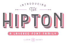 Bandung, Indonesia-based designer (b. 1990) of the free Victorian typeface Pilar (2013). With Ezza Adhreza, he created Libre (2013).
 In 2014, he created the commercial Victorian typefaces Handter, Vigneta, Splandor, Bhavers (art nouveau) and Brilant (sic). In 2014, together with Panji Nugraha and Maghrib Lab, he started Flavor Type. In 2015, he made the brush typefaces Messy Script (with Maghrib Lab) and Wild Youth, Rusty ColaPen, the Victorian typefaces Fictoria and Artisan Display and the swashy watercolor script typeface Afecta (followed by Afecta Clean in 2018). Typefaces from 2016: Herchey (baseball signage script), The Hipton (layering typeface), Quite Hustle (a brush face done with Maghrib Lab). Typefaces from 2017: Balford (vintage or label typeface). Typefaces from 2018: Bilcase, Adelios (layerable and art deco), Caniste, Stoneburg (a free athletic lettering font family), Stoneburg Condensed, Caniste (Victorian). Typefaces from 2019: Samtom, Moister (calligraphic signage type based on old beer labels), Fontcise, Borest (a luxurious flared sans by Ilham Herry and Maghrib Lab), Fulgate (by Ilham Herry and Adam Fathony). Typefaces from 2020: Ephemera Bullsmith, Ephemera Wristen, Genty (a creamy retro signage script typeface by Ilham Herry and Adam Fathoni Haris), Glaw (a psychedelic font by Ilham Herry and Adam Fathoni Haris), Ephemera Kingsford (vintage), Budge (a layerable retro signage script by Ilham Herry and Adam Fathoni Haris), Muray House (a bold swashy bathroom towel typeface by Ilham Herry and Adam Fathoni Haris), Esteric (a playful tapered font by Ilham Herry and Adam Fathony). Typefaces from 2021: Monvar (a layerable Cooper Black style typeface by Ilham Herry and Adam Fathoni Haris), Rische (a 6-style dis[play serif with huge counters and an enormous x-height; by Ilham Herry and Adam Fathoni Haris). [Google]
[MyFonts]
[More] ⦿
|
Iliana Alejandra Urdiales Vega
|
During her studies, Iliana Alejandra Urdiales Vega (Ciudad Obregon, Mexico) designed the handcrafted art nouveau emulation typeface Nouveau Script (2017). [Google]
[More] ⦿
|
Indian Summer Studio
[Alexander Bobrov]

|
 Alexander Bobrov (Indian Summer Studio, or simply Indians, Moscow) designed the vintage didone typeface family Dodo (Latin and Cyrillic) from 2008-2012. This beautiful typeface is in a style similar to Nick Shinn's scotch Modern and Alexey Kryukov'sOld Standard but was developed independently based on old books from 1930s (printed with 1860s to 1910s metal type). His web site shows lots of calligraphic work, but also a few typefaces such as Oriental Font (2015), Photon Display (2014) and Trafareta (2015, stencil).
 Typefaces from 2016: Historical Stencil Font USSR 1980 (2016), Geometric Sans Serif, Tanuki, Curly Cyrillic Sans, Historical Geometrical Art Nouveau Study, Indian Stylized Cyrillic, Historical USSR (constructivist), IBM Selectric Typewriter, 1966 Olympia SF DeLuxe Cursive (typewriter font), Moscow Metro, Cynzel (cyrillization). Typefaces from 2019: Funny Toons (a rounded cartoon family by Ekke Wolf and Alexander Bobrov), Selectric Century (a Scotch Modern / Schoolbook typeface modeled after the famous IBM Selectric golfball font), Aldo New Roman (a modern version of the typeface cut by Francesco Griffo for Venetian printer Aldus Manutius around 1490AD). Typefaces from 2020: Air Force 30 Stencil (the official US military fonts/lettering used in U.S. Air Force, U.S. Army, U.S. Navy, U.S. Marine Corps, based on their technical specifications), Oriental Kaishu (all caps, oriental simulation), Selectric Melt, Air Force (the official US military fonts/lettering used by US Air Force, US Army, US Navy and US Marine Corps, designed based on the Military Standards and Technical Manual; covers Latin, Cyrillic and Greek), Stone Age (a neolithic font), Selectric Pyramid (a typefwriter font based on Rudolf Wolf's Memphis from 1929), Selectric (a 1315-glyph (!) revival of IBM's famous golfball typeface, Selectric), Dymond (a dymo label font). Typefaces from 2021: Science Fiction (rounded, squarish), USSR (a squarish Russian cold war propaganda font; Latin and Cyrillic), Age (squarish and rounded; for Latin and Cyrillic). [Google]
[MyFonts]
[More] ⦿
|
Ingga Nafasyah
[Telllu Craft]
|
[More] ⦿
|
Ingo Preuss
[preussTYPE]

|
 [MyFonts]
[More] ⦿
|
Ingo Zimmermann
[Ingofonts]

|
 [MyFonts]
[More] ⦿
|
Ingofonts
[Ingo Zimmermann]

|
 Ingofonts is a foundry in Augsburg started by Ingo Zimmermann (b. 1967) in 1994. It offers Fraktur fonts, handwriting fonts, sans serif fonts, Antiqua fonts and some pixel fonts. Full fonts go for 50 USD a piece and up. Some fonts are free. Many fonts are adaptations or revivals of historically important fonts. Ingo also practices calligraphy, and in particular, calligraphy for wine labels. The list:
 - Absolut Pro (2008) is a classy sans family that comes in Regular, Licht, Thin and Schmuck.
- Amhara (2009): An experimental font inspired by the Ethiopic writing system.
- Analogue (2010).
- Anatole France (1997-2021). An art deco font in the style of Plakat Schrift by the munich-based printer Georg D. W. Callwey.
- August Sans (2013).
- Auxerre. A wedge-serifed text typeface. Ingo writes: Auxerre is a precursor of Etienne, which later became popular as an advertising script of the 19th century.
- Banknote 1948 (2010).
- Behrens Schrift (2008) is based on Behrens' famous 1902 Jugendstil typeface for Rudhard'sche Giesserei. Behrensschrift iF Plus (+Schmuck) followed in 2021.
- Biró Script is a handwriting font (2007-2012, +Biro Script Plus, 2020) named after the inventor of the ballpoint pen, Laszlo Joszef Biro, 1899-1985.
- Boule Plus (2020). A fat round circle-based bubblegum font family in Gras, Contour and Brilliant styles.
- CharpentierBaroqueIF, CharpentierClassicItaliqueIF, CharpentierClassicistiqueIF, Charpentier Renaissance Pro (1996 and Pro version from 2020; modeled on Roman Capitalis). Charpentier Classicistique Pro (2020; earlier called Classicist) is an absolutely charming didone display typeface family with an award quality Black. In 2014, he added Charpentier Sans Pro for Latin, Greek and Cyrillic with the Pro version following in 2020.
- Chiq Pro. After Apple's Chicago.
- Conté Script (2014). A phenomenal effort towards the creation of a typeface that emulates real handwriting. It even has three-letter ligatures to achieve the desired reality. Based on Ingo's own hand, it also achieves a crayon effect. See also Conte Script Plus (2020).
- Countries of Europe (2008). Outlines of countries. Free download.
- DeBorstel Brush Pro (2009): brush face.
- De Display (2010). A gridded type system.
- De Fonte (1995): a grungy blurred overexposed Helvetica. See also De Fonte Plus (2020).
- Déformé: a grungy Clarendon.
- Deko-Blakk, Deko-Yello (art deco typefaces from 2007).
- DeKunst (1995, deconstructivist). DeKunst Initialen (2007) is Bauhaus-inspired.
- DePixel (1999: based on Apple's Geneva and Chicago; and Illegible DePixel).
- Deutsche Schrift Callwey (1998). A free Sütterlin script that is based on a script sample from around 1920/30 by Karl Schäffer. DeutscheSchriftCallwey (1998): a free handwriting typeface in the style of the 1800s that was later taught in German schools under the generic name of "Sütterlin type".
- Rudolf Diesel Rudolf (2008-2009): Based on the handwriting of the inventor of the Diesel motor, Rudolf Kristian Karl Diesel (1858-1913).
- Die Überschrift (1998): headline sans.
- EconoSans Pro (2020). A 28-style sans that is meant to save space by squishing the letters together.
- Faber Eins, Faber Zwei (1996, legible sans family), Faber Drei, Faber Gotic (2002, +Text, +Gothic, +Gotic Capitals; a Textura based on Gutenberg's blackletter from 1450), Faber Fraktur (1994), Faber Sans Pro (2011). This comes with a great all caps Deko style.
- Façacde Pro (2007). An art nouveau brush typeface found in a 1900 booklet by Karl Otto Maier (a publisher in Ravensburg) entitled Schriften-Sammlung für Techniker Verkleinerte Schriften der wichtigsten Alphabete. Cyrillic version.
- Fixogum (1998, scratchy handwriting).
- Fundstueck (2021). A simplified squarish typeface.
- Graz2006 (1994, a sans family for the 2006 OlumTypographerpic Games in Graz; later renamed by Linotype to Olympia).
- Guhly (2011). An organic family.
- Gutenberg (1995, a textura).
- Handschrift (2007). Expressionist and rough.
- Hedwig Pro (2021). A tall condensed sans; 12 styles.
- Hero (angular handwriting).
- Josef (2000), Josefov (2003, slab serif for Josef), JosefPro (2006, a free sans family), Josefa Rounded Pro (2020: a rounded sans family).
- Klex Plus (1997): a calligraphic or watercolor brush font.
- Koch Schrift (1998-2021). A Schwabacher used by the Deutsche Reichsbahn and first developed by Rudolf Koch in 1909, first known as Neudeutsch and later as Koch Schrift. An earlier version of Zimmermann's Koch Schrift was called Schwabacher Deutsche Reichsbahn.
- Lech Sans (2020). A humanist sans family.
- LeDrôle Lettering Pro (2020).
- LettreCivilitdeGranjon (1997, a reworking of S. Moye's font by that name).
- Maier's No. 8 (2002) and Maier's Neue No. 8 based on forms found in work of Karl O. Maier from before 1914, which already has the geometrical simplicity characteristic of the Weimar period. Maiers No. 21 (2006) and Maiers Nr 21 Pro (2021) are based on a script found in the magazine Schriften-Sammlung für Techniker: Verkleinerte Schriften der wichtigsten Alphabete (Karl O. Maier, Otto Maier Publishing House, Ravensburg, ca. 1910)---a hand-crafted font for technicians. Finally, Maiers Nr. 42 Pro (2020) is a brush-painted art nouveau typeface based a pamphlet of script samples from around 1900 that was issued by Otto Maier's publishing house in Ravensburg, Germany.
- Marleen Script (2011, with over 400 ligatures).
- Menschenalphabet (1997), based on Peter Flötner's alphabet from 1534.
- Novello Pro (2009): The serifed counterpart of his Absolut Pro family.
- OlympiaBuchIF, OlympiaFettIF, OlympiaHalbfettIF, OlympiaLeichtIF, OlympiaSemiSansBuchIF
- Palmona Plus (2008). A German expressionist blackletter after Karl Schaeffer (1939). Palmona Plus was published in 2020.
- Saeculum (1996, cursive connected handwriting).
- Rudolf Diesel (2008-2009): Based on the handwriting of the inventor of the Diesel motor.
- Toby Font (2006(. A 3d doodle font for children.
- Wendelin Pro (1996). A grotesque family. The Pro was released in 2020.
- Whole Europe (2008, outlines of countries), now called Countries Of Europe. Pick it up, togeter with many suppoirt files for TeX by Herbert Voss, at CTAN.
Dafont link. Fontsy link. Klingspor link. Dafont link. Abstract Fonts link. [Google]
[MyFonts]
[More] ⦿
|
Inland Type Foundry
[A.V. Haight]

|
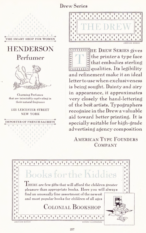 The Inland Type Foundry in Saint Louis was established in 1892 by the three sons of Carl Schraubstadter (1827-1897), William A. Schraubstadter (1864-1957), Oswald Schraubstadter (1868-1955) and Carl Schraubs Jr. (1862-1947). Carl had run the Central Type Foundry in Saint Louis and sold it to ATF (American Type Founders) in 1892, and the sons reacted by setting up Inland. Until 1911, Inland was one of the most successful foundries in the United States. In 1911 Inland was purchased by ATF and its equipment divided between that foundry and Barnhart Brothers and Spindler (BBS). A.V. Haight (Poughkeepsie) designed Rogers (art nouveau) at Inland Type foundry in 1902. He also designed Haight. Nicholas J. Werner, who used to work for Central, also created many designs at Inland. Look for "Specimen book and catalog, a price list of printers' supplies, showing types and rules in which are embodied all the latest styles ... among which ... may be especially mentioned the casting of types on standard line and unit sets." (1902, 464 pages), Specimen Book and Catalog. A Price List of Printers Supplies, Showing Types and Rules in which Are Embodied all the Latest Ideas that Enable the Printer to Produce Superior Work in a most Economical Manner Among which Betterments May Be Especially Mentioned the Casting of Types on Standard Line and Unit Sets (St. Louis, 1897) (a free copy is here and here) and Specimen Book and Catalog. A Price List of Printers Supplies, Type, Rules and Accessories of the Very Latest Designs which Facilitate the Economical Production of Superior Printing. A Notable Improvement Is the Casting of All Type on Standard Line&Unit Sets (St. Louis, 1907). MyFonts page.
 Scans of some typefaces: Becker (art nouveau), Blanchard Italic [Blanchard was revived in 2013 by Paulo W as Blanchard Inland], Commercial Script, Edwards (art nouveau), Inland, Lightface Blanchard, Matthews (1902: revived in 2019 by Chuck Mountain as Cotrell CF), Extended Studley (revived by Chuck Mountain in 2019 as Dukas CF, and by Jeff Levine in 2008 as Bayview JNL), Rogers (art nouveau), Poster French Oldstyle (1897 catalog), Poster Ionic (1897 catalog), Poster Latin Antique (1897 catalog), Pacific Bikes (ornaments, 1897 catalog), Recut Caslon (1907, as taken from the 1923 ATF catalog), Drew (1910, from the 1923 ATF catalog: a digital version called Droobie NF was created by Nick Curtis in 2014), Title Shaded Litho (1911), Litho Roman (1907), Gothic No.578 (1898), Pen Print (1911), Blair (1900; Condensed Blair was revived in 2022 by Jeff Levine as Generic Sans JNL), Mitchell (1906, a bold version of the all caps grotesque face Blair; digitally revived by Nick Curtis in 2015 as Mitchell NF), Comstock (1902), Inland Copperplate (1901), Shaw Text (1907). Commentaries by Mac McGrew on some of the typefaces: - Gothic No. 578: Gothic No. 578 was shown as Gothic No.8 by Inland in 1898 as "the latest candidate for the printer's favor; a popular old typeface entirely recut." It was shown until 1941. It is a bold weight, and is quite similar to Standard Bold which as an import from Germany was very popular in this country in the 1950s. It is also similar to Comstock, but without the added outline. Keystone called it Standard Gothic, although it is not identical to the German face. As a nineteenth-century gothic, the cap G had no crossbar. Paragon Gothic is the same design, without lowercase, cast as a title face.
- Pen Print: Pen Print and Pen Print Bold were introduced by Inland Type Foundry in 1911, with the latter thought to have been the last typeface cut by that foundry before its sale to ATF. Pen Print Open was designed for ATF in 1921 by Morris Benton, and includes open versions of all the characters shown for the bold. The series has more the appearance of rather crude brush lettering than pen "printing," but the inclusion of an open version is contrary to the conception; perhaps it was intended for two-color printing. The letters have a slight backslant. The bold was also cut by Intertype, in 1927. Compare Dom Casual.
- Blair: Blair was advertised in 1900 by Inland Type Foundry as new and original, calling it "an exact imitation of the small gothic letter now so popular with engravers for stylish stationery." Its production was continued by ATF until the 1950s. It is similar to Copperplate Gothic Light, but without the tiny serifs of that face. Litho Gothic is the same design but with lowercase. Mitchell (1906) is the same design but slightly heavier. The condensed version was produced in 1903 or earlier. Hansen copied Blair as Card Gothic No.2. Compare Lightline Gothic.
- Comstock: Comstock was advertised by Inland Type Foundry in 1902 as "a striking novelty, our brand new face." It was revived by ATF in 1957. It is a medium weight conventional gothic, distinguished by a hairline surrounding each letter. The G lacks a crossbar, typical of many nineteenth-century gothics. The design was sponsored by A. H. Comstock of Omaha, according to a review at the time of its introduction. Condensed Comstock was introduced by Inland in 1905, but patented in the name of William A. Schraubstadter in 1908. It has no lowercase, but the design is more contemporary. Monotype has copied both typefaces, but Monotype Comstock Condensed is in 18-point only, without figures. In both foundry typefaces, there are several sizes on 12-point body; No.1 is the largest in regular, but No.1 is the smallest in Condensed. In 1911, a copy of Comstock was issued by Bauer in Germany under the name Astoria, revived in 1957.
- Inland Copperplate: Inland Copperplate is a shaded Old English typeface, first shown by Inland Type Foundry in November 1901. It is similar to Typo Text (q.v.). although the specimen here, reproduced from an over-inked showing, doesn't reveal the shading.
- Mac McGrew writes: Matthews is a very heavy, thick-and-thin, serifless type introduced by Inland Type Foundry in 1901. It is somewhat similar to the later Globe Gothic (Bold-in fact it is more carefully designed and seems to agree better with the lighter Globe Gothics than the latter typeface does. ATF cast both typefaces for a while after acquiring Inland in 1912, as well as Condensed Matthews, which Inland had introduced in 1903 as "a new gothic letter." The specimen of Matthews shown here is from a font showing considerable wear, with rounded corners. Compare Radiant Heavy. For a digital revival, see Merchant Trade JNL (2020, Jeff Levine).
- Shaw Text: Shaw Text was introduced by Inland Type Foundry in 1907 as its "latest novelty," although it is a rather conventional Old English face, a little heavier than Wedding Text, and a little lighter and fancier than Engravers Old English. After Inland merged with ATF, Shaw Text continued to be shown until 1954. Compare Plate Text.
- Litho Antique (1910). Mac McGrew: Rockwell Antique was a reissue of Litho Antique, cut by William Schraubstadter for Inland Type Foundry and introduced in January 1910 when it was advertised as the "newest typeface; one of our best; closely imitating steelplate and lithography." In the late 1920s similar typefaces became popular in Europe, and some were imported into the United States. Morris Benton of ATF added several characters to the old Inland face, matrices of which were then in ATF's vaults, and it was reissued in 1931 as Rockwell Antique. But Benton saw that something more was needed, and redrew it as Stymie Bold (q.v.) in the same year. The alternate characters which were added to Rockwell are the same ones now shown with Stymie Bold. Monotype copied Rockwell but erroneously called it Stymie Bold in some literature, and there has been confusion between the two typefaces ever since; the latter name is often applied to fonts of Rockwell cast on Monotype machines by secondary suppliers. Indicative of this confusion, Stymie Bold Italic on Mono is series 1891, corresponding to Rockwell series 189, while Stymie Bold is 790. English Monotype has several weights of Rockwell, a square serif family which differs from this typeface and should not be confused with it; see Imports in Appendix. Antique Shaded (q. v.) is sometimes called Rockwell Antique Shaded.
- Herald Extra Condensed (1909). An octagonal typeface.
- Extra Condensed Title Gothic No.12.
[Google]
[MyFonts]
[More] ⦿
|
Inna Bagaeva
|
 Graphic designer in Magnolia, AR, who created an Alphonse Mucha illustration in 2012. Behance link. [Google]
[More] ⦿
|
Intecsas
[Klaus Herrmann]
|
Foundry run by Klaus Herrmann from Düsseldorf, whose fonts are distributed by Precision Type and FontHaus. Fonts include basically all of David Rakowski's old shareware fonts. Through Intecsas, David Rakowski has finally gone commercial. The fonts are often redrawn, and have complete international character sets. The library contains 500 fonts, of which about 90 are based on David's old shareware fonts. Among the newer fonts, DwigginsFortyEight (1999). Mark Johansson explains the history of Rakowski's fonts. Atomic Type distributes their fonts as well. Partial font list: Aaaaaaaargh Caps, Aarcover, Adineski, Adine Kernberg Script, Adriana Davidovsky, Air Supply, Alvin Caps, Aminal Initials, Anderson Script, Anne Stone, Avery Jean, Beffle, Bela Drips, Belgian Casual, Bellagio, Benjamin, Bizarro, Blasius, Braille Font, Brandenburger, Brookfield, Brooks Initials, Buffalo Bill, Cardboard Cutout, Carrick, Chalice, Charlotte Tile, Chinese Menu, Christensen Caps, Command Ment, Constructivist, Corsage, Crackling Fire, Crane Initials, Davys Blocks, Davys Dingbats, Davys Key Caps, Davys Big Key Caps, Davys Other Dingbats, Davys Ribbons, DeBellis, Deco Twenty Two, Dewhurst, Dieter Caps, Dilara Caps, Dinderman, Dorothy Initials, Dragonwick, Drawing Pad, Dubiel, Dupuy, Eileen Caps, Elizabeth Ann, Elzevier, Eraser Dust, Even More Face Cuts, Face Cuts, Fetch Scotty, Flicker, Forest, Frisch Script, Garton, Gessele Script, Gouda Old Style, Grab Bag, Gravestone Rubbing, Green Caps, Griffin Dingbats, Ground Hog, Harting (an old typewriter font), Headhunter, Holtzschue, Horror Show, Horst Caps, Hunan Garden, Ian Bent, Jacobs, Jeff Nichols, Joanna Lee, Judy Finckel, Kastner Casual, KidStuff, Kinigstein Caps, Kioko, Konanur Caps, Korf Caps, Koshgarian Light, Kramer, Lee Caps, Legal Vandal, Lemiesz, Lilith, Logger, Lower East Side, Lucy Script, MalakaLaka-LakaLakaLaka, Man About Town, Mary Monroe, McGarey Fractured, More Face Cuts, Multiform, Munchner Initials, Nauert, Nitemare Caps, No More Face Cuts, Octagon, Paris Metro, Party Down, Pavelle, Phonetic, Pixie Font, Pointage, Polo Semiscript, Randolph, Rechtman Script, Relief, Reynolds Caps, Rhodes Roman, Rounded Relief, Rudelsberg Regular, Rumble, Saint Albans, Scratchy Pen, Showboat, Sjlausmann, Sprecher Initials, Starburst, Still More Face Cuts, Sturbridge Twisted, Taiga, Tejaratchi Caps, Thompson Pond, Toletto, Travis Brush, Trench, Trevor Light, Tucker, Tundra, Upper West Side, Varah Caps, Victoria Casual, Wedgie, Wein Initials, Wharmby, What A Relief, Will Harris, Yasmine, Zaleski, Zallman Caps. At Will-Harris House, we find these fonts by David Rakowski: Cardboard Cutout, Dwiggins 48 (ornamental caps first designed by Dwiggins), Fetch Scotty, Gibbons (a great geometric Bauhaus-style font), Gravestone Rubbing, Greene&Greene (architectral lettering), Davy's Art Nouveau Initials, Gravestone Rubbing, Harting, Handscrifte, Lillith, Lillith Initials, Pointage, Rabbit ears, Rasta Rattin Frattin, Tenderleaf Caps, Tendril, Toletto (toilet paper alphadings), Will-Harris, and Zaleski. [Google]
[More] ⦿
|
Intellecta Design (or: Monocracy Types)
[Paulo W]

|
 Intellecta Design is a design company in Brazil run by Paulo W (b. 1970) from Recife. In 2020, he also set up Monocracy Types. Paulo W is a gaúcho (Brazilian southerner), with interests in multiple areas, including poetry (he has published the digital opus Magical Book), graphic design and, most recently, type design.
 Dafont link. MyFonts. MyFonts link. Abstract Fonts link. YWFT link. Behance link. Blog. Home page. Fonthaus. Monotype. Eshops. Facebook. Flickr. Klingspor link. Wordpress. Devian tart. T26. Linkedin. Identifont. Linotype. ITC. Faces.co. His typefaces: - Free fonts: Inductive Resonance (2014: connected script), Retrodings (+Two, 2014), Living In The Past (outlined Tuscan face), Rough Ornaments Free (2014), CornPop Three (borders), Too Good To Be True (2013, retro script), Blanchard Inland (2013), Living Together (2013), Arresto (2013, brush script), Hertziano (2013, non-connected fat script), Japanese Tourist (2013), Nouveau Never Dies Free (2013), The Beat Goes On (2012, fifties script), Stencix (2012), Figgins Brute Trash (grunge), Fontaniolo Beveled (2011, ornamental caps), Czech Gotika (2011), Random Dingbats (2011), Victorian Free Ornaments (2011), Rustic (2011), Armorial (2011), Woman Silhouettes (2011), The Nile Song (2010, hieroglyphics), Smith Typewriter (2009), Sign Flags (2010, semaphore dingbats), Senectus Morbus (2010), MesoAmerica (2010, Indian symbols), ClassicSketches (2010, dingbats), Columns (2010, dingbats of Greek and Roman columns), EasyCuneiform (2010), EasyLombardicTwo (2010), EasyOpenFace (2010, blackboard bold style), Egidia (2010), Significante (2010, dingbats with, e.g., gender symbols), WhiteDominoes (2010, domino pieces), Easy Heraldics (2010), Intellecta Heraldics (2010), Heraldic Devices (2011), KidingsFree (2010, dingbats), RoughTuscan (2010), The French (2009, Fleur de Lys dings), AprendizCaligrafico (2010), Volitiva (2006, Trajan caps and chancery lower case, all based on work by Ludovico Vicentino Arrighi), Gaivota (2006), KurrentKupferstichThin (2006), PaulKlein (2010), PaulKleinTwo (2010), PortuguesArcaicoLectura (2005), ReproxScript (2009, based on Jerry Mullen's Repro Script from 1953-1954), RickGearyHomage (2007, scanbats), WestBalaio (2006, ornamental caps), Corto Maltese (2006, scanbats), Renaissance Coiffure (2006), Renaissance Ornaments (2007), Renaissance Shoes (2012, free), TTF Tattoef (2006, tattoo-inspired dingbats), ExperiTypo5 (2006), Lower Metal (2006), Geometric Serif PW (2006), Geometric (2006), Geometric Petras PW (2006), War II Warplanes (2005), Carbono (2005), Times New Vespasian (2005), BoldBold (2005), Vengeance (2005), Doppleganger (2005), Chancelaresca (2005), Cursivo Saxonio (2005), Gotische Minuskel 1269 (2005: a Kanzlei Schrift after Dekan Hermann zu Soest, 1269) and Guto Lacaz (2005, dingbats).
- Richard Gans revival project: Gans Tipo Adorno, Gans Lath Modern, Gans Titular Adornada (2006), Gans Ibarra (2006, after Carlos Winkow's Elzeviriano Ibarra), Gans Antigua (2006), Gans Antigua Manuscrito (2006), Gans Radio Lumina (2006), Gans Fulgor (2006), Gans Carmem Adornada (2006), Gans Italiana (2006, extensive Italian-style slab serif family), Gans Titania (2007), Gans Titania Adornada (2007), Gans Titular (2007), Gans Gotico Globo (2007: 9 styles by Iza W), Gans Royality (2007: 3 styles by Iza W), Gans Headpieces (2008), Gans Rasgos Escritura (2010: filets---followed in 2011 by Rasgos Escritura Nuevos), Gan Esquinazos (2010, frames), Gans Blasones (2010, shields), Gans Neoclassic Fleurons (2008), Gans Classical Fleurons, Gans Ding.
- Wood-inspired typefaces: Dead Wood Rustic (2007), Taranatiritza (5 wood type styles, after William Hamilton Page), Majestade (2007, by Iza W---two Tuscan style typefaces), Decorative Tuscanian (2007), Concave Tuscan (2010, wood type), Palermo (2007, by Iza W---Tuscan style family), Teatro (2009, Tuscan), Bruce Double Pica (2009, Tuscan; the Beveled weight is free), Antique Extended (2010, slab serif wood type), Dark Wood (2009, gothic), Dark Wood Beveled (2011).
- Charles Bluemlein's script revivals: Bluelmin Kisaburo (2013), Bluelmin Ralph (2012), Bluelmin Ronald (2012), Bluelmin Sandsfort (2012) and Bluelmin Benedict (2012). (2012).
- Blackletter: Salterio (2012, +Trash, +Three, +Gradient, +Shadow, +Shadow Two), Leothric (2011, bastarda), Bruce 532 Blackletter (2011, after George Bruce), Schneider Buch Deutsch (2007, +Trash, +Shadow, +Shadow Two), Schneidler halb fette Deutsch (2009, +Beveled), Schneidler Zierbuchstaben, Hostetler Fette Ultfraktur Ornamental (2007, blackletter caps), Gothic 16 CG (2007), Gothic 16 CG Decorative (2007, blackletter caps), Schneidler Grobe Gotisch (2008, Iza W, T-26), Allerlei Zierat (2008, ornament fonts based on a 1902 catalog of Schelter & Giesecke), Allerlei Zierat Capitals (2007), Psalter Gotisch (2009, a blackletter after the Benjamin Krebs blackletter face by the same name, ca. 1890), Münster-Gotische (2009, a blackletter family after a 1896 typeface by the same created by Schelter&Giesecke), Koberger N24 Schwabacher (2007), Student's Alphabet (2007, blackletter), Like Gutemberg Caps (2007), Nürnberg Schwabacher, Gotische Frame (2007: four framed blackletter styles by Iza W), Gotische (2007: ten ornate blackletter styles by Iza W), Gothic Garbage, Gothic Shadow, Gothic Trashed, Gothic Flourish (2009), Gotica Moderna (octagonal, blackletter), AltDeutsch (2007, four severe blackletter fonts by Iza W), Fin Fraktur, Gotische Bouffard, Heimat RGS, Gothic Handtooled Bastarda (2006), HostetlerFetteUltfrakturOrnamental (2007, blackletter caps), Gothic Handtooled Bastarda (2006).
- Historical revivals: Pantographia (2010: a digitization, as is, of several alphabets from Edmund Fry's Pantographia, 1799), Caslon2000, Caslon B, Delamotte Large Relief (2010), Figgins Brute (2007: 8 heavy Egyptian styles by Iza W based on Figgins' 1817 specimen book), Erased Figgins Brute (2007), Gras Vibert (2007, a didone family; followed by Gras Vibert Two in 2009).
- Erotic or human alphabets: American Way of Life (2011), Roman Silhouettes (2011), Silvestre Weygel (2007, named after Martin Weygel'a erotic alphabet from 1560, which in turn was based on Peter Flötner's 1534 alphabet), Gravure (caps typeface made of human silhouettes), Innocence (2007, dingbats of girls).
- Medieval chancery hand: Portugues Arcaico (2005, three medieval handwriting styles), Kurrent Kupfertisch (2006, a medieval hand done with Fernanda Salmona), Dovtrina Christam 1622 (authentic old manuscript face), Catania (2007, exquisite medieval caps in 3 styles by Iza W).
- Typewriter typefaces: Remix Typewriter (2012), Smith Trash (2012), Neo Bulletin (2010, +Trash), Remington PW (old typewriter face), Olivetti Linea (old typewriter face), Erased Typewriter 2 (2007: 4 styles by Paulo W), RIP Typewriter (2009), Shadow Typewriter (2007), Underwood Typewriter (by Iza W).
- Calligraphic: Broken Kiss (2015), Derniere Script (2015), Bradstone Parker Script (after Zaner's penmanship), Jan van den Velde Script (2011, based on the penmanship of Jan van den Velde as illustrated in vna den Velde's 1605 book Spieghel der schrijfkonste; developed jointly by Paulo and Iza W), Penabico (2010, with Iza W); Penabico is a free interpretation of the copperplate script styles to be found in the Universal Penman, London, 1741, by George Bickham---it contains over 1500 calligraphic glyphs and 250 ornaments. Samples of Penabico: i, ii, iii, iv, v, vi, vii, viii, ix), Easy Calig, Intellecta Mixed Script (2008), Spencerian Constancia (2008), Calligraphia Latina Soft4 (2010, quilled ornaments), Intellecta Script commercial (2009), Spencerian By Product (2009), Spencerian Palmer Penmanship Pro (2010), Indenture English Penman (2010), Calligraphia Latina (2008-2010, in weights called Soft2, Dense, 3, Soft4, Mixed, Square Edition).
- Victorian, Edwardian: Engel (2007, by Iza W in 15 styles that have a 1870s look), Compendium (Victorian), Costado (2009, a Victorian / Western face).
- Ornamental caps: Campi (2009), Doppel Mittel Lapidar Azure (2012), Musirte Antiqua (2012), The House of Usher (2012), Peterlon (2012), Dolphus Mieg Alphabet (2011, +Two), Dolphus Mieg Monograms (2011), Human Nature (2011), English Arabesque Revival 1900 (2011), Imprenta Royal Nonpareil (2011), XVI Century Shaw Woodcuts (2011), Ichweis Caps (2011), Cherubim Caps (2011), Rara Beleza (2011), Gothic 1880 Revival (2011), Angelicaps (2010), Unnamed Caps Two (2010), VertiCaps (2010) Rebimboca Caps (2010), Rebimboca Beveled (2012, free), Rebimboca Gradient (2012, free), Rebimboca Trash (2012, free), Rebimboca Outlined (2012, free), Republica Presente (2010), Speedball Metropolitan Caps (2010, after a design by Ross F. George), Nice Initials (2010), Morphelic (2010), DurerGotischCapitals (2010), Egmontian (2007, ornamental caps family), Saducismus Triumphatus (ornamental caps), Vogus (Victorian caps), Victorian Ornamental Capitals (2009) and Frompac 1889 Arabesque (2007) [both are classical arabesques published in Ludwig Petzendorfer's Schriften-Atlas. Eine Sammlung der wichtigsten Schreib- und Druckschriften aus alter und neuer Zeit nebst Initialen, Monogrammen, Mappen, Landeskarten und heraldischen Motiven fur die praktischen Zwecke des Kunstgewerbes, 1889], Lettrines Petin (+Ornée), Numa Initials (2006), Gradl Initialen, Vampirevich (2009, ornamental caps), Paulus Franck 1602 (2006, ornate caps), Geodec (2006, baroque caps), HostetlerFetteUltfrakturOrnamental (2007, blackletter caps), Cadels (2007, ornate caps by Iza W), Manuscript XIV Century (2007, by Iza W--four Lombardic caps), Merona (2007, by Iza W--ten Lombardic caps fonts), Selena (2007, by Iza W---ornate Victorian caps), Leyenda (great Victorian era ornamental caps), Mixed Capital Style (2007, caps), Lenda (2008, capitals), Kidnaped at Old Times (2008, ornamental caps, ransom note style), Mortised Capitals, Is Not ABrazilian Font (hand-printed blackboard bold caps), Robur The Conqueror (2009, ornamental caps), Georgia Capitals (2009), Decadence avec Elegance (exaggerated ornamental caps).
- The American Advertise series: American Advertise No. 9 (2008), American Advertise No. 17 (2007, 19th century caps), American Advertise 018 and 019 (2008), American Advertise Square Series (2007), American Advertise 003 (2012), American Advertise 004 (2010), American Advertise 005 (2010), American Advertise 006 (2010, alphadings), American Advertise 007 (2010, ornamental caps).
- Ornaments, fleurons: Transportation Dings *2015), Cornucopia of Dingbats Eight (2015), Animals Old Cuts Two (2015), Unpublished Ornaments Two (2013), Classix (2012), Cornucopia of Dingbats (2012-2014, +Two, +Three, +Four, +Five, +Six, +Seven), Cornucopia of Ornaments (2013; +Two, +Three, +Four, +Five, +Six, 2014), Cornucopia Caligrafica (2012), Vintage Hands (2012), Human Silhouettes (2012; +Free, 2013; +Two, 2013; +Human Silhouettes Three, 2013; +Four, 2013; +Five, 2014; +Six, 2014; +Seven, 2014; +Eight, 2014; +Nine, 2015), Easy Fleurons (2012), Floreale Two (2012), Neoclassic Fleurons Free (2011), Calligraphic Frames Soft (2011, +Two), Jugendstil Flowers Free (2011), Easy Ornaments (2011), Blasons (2011), Blasons Free (2012), Armorial (2011), Monograms Soft (2010, with Iza W), Easy Tiles (2010), Free Tiles (2010), Rough Fleurons Two (2010), Vegetable Breathe (2010), Corn Pop Plus (2010), Mortised Fleurons (2010), Mortised Ornaments (2011), Mortised Ornaments Free Two (2013), Golden Times (2010), Stahlhelme und Kronen (2010), Rough Fleurons (2006), Nouveau Never Dies (2009, ornaments), GeodecBruceOrnamented6 (2006, after a sample from the Bruce Type Foundry), Grave Ornamental (2006), BlackOrnaments (2008), Hera Hedelix (2009, ornamental tiles), Mortised Ornaments (2009), Soft Fleurons (2007), Half Flower (2007), Frames 1 (2007, by Iza W), Flower Essences, Micro Fleurons (2009), Naturella (2009, leaf and grape dingbats by Iza W), Black Fleurons (2010), Easy Fleurons Two (2011), Intellecta Borders (2008, by Iza W), Intellecta Style (2007, borders).
- Fonts made before 2007: Brute Aldine (2007, Western family), Bad Situation (2007, after a design by Freeman Delamotte from 1864), Benjamin Franklin (2007), Geodec Petras Enhanced (2006), Deutsche Poster (2006), FatFontGrotesk (2006), Orchis (2006, an art deco family by Iza W), Fantis (2006), Frompac (2006, with Iza W), Geodec Fog (2006), Intellecta Modern (2006), Intellecta Modern 2 (2006), Intellecta Romana Humanistica (2006), Advantage (2006, together with Iza W), Biza (2006, together with Iza W), Elegancy (2006, together with Iza W), Estiliza (2006, a sans family together with Iza W), Experitypo 4, Stairway to Heaven, Copperplate PW, Dings PW, Roger Dean, Gliphs PW, Luxeuil, Watchtower Bible 1965, Gabinete Portugues (11 fonts), Elara (2009), Xilografuras (dingbats), Beta, Alta, Paleolitica Nacional, Shakespeare Studs, Copperplate collection (5 fonts), Wine, Ampersamp, James Poem, Leal Conselheiro, Haeckel Enygma, Iza B, Of, Lementa (2006, ornate family), Pirates (dingbats), Wire Clip (2009), Divina Proportione (2009, dingbats), Tharagaverung (2007), Correo (2009, a nice manly bold face), Titivilus (2007, Roman lettering), Pirates De Luxe (2007, dingbats), Geodec Minuskel (2006), Geodec Spyral (2006), Copperplate Decorative (2006), Feosa (2006), Francesco Decorative (2006, Iza W), Geodec Petras Enhanced (2006), Ibarra Flourished (2006), Intellecta Decorative 017 (2006), Intellecta Decorative 018 (2006), Intellecta Slab Bold (2006), Kansas Decorative (2006), Pingente (2006), Sixties Living (2006), Caractere Doublet (2007), DeutschePosterSteinschrift (2007; by Iza W), Bailarina (2007), GP Casual Script (2007), Colonia Portuguesa (2007), Contouration (2007), Deco Experiment 3 (2007), Floresco (2007), Flower Jars (2007, by Iza W---a very nice idea), Frutisis (2007), Intellecta Monograms (2007: 19 monogram fonts by Paulo W), Intellecta Monograms Random Sample (2012-2013: several typefaces), Peloponeso (2007, by Iza W), Porcupine (2007, by Iza W), Southern Flight (2007, by Iza W---condensed), TTF TTTOEF 4 (2007, by Iza W---dingbats), GeodecBruceFlourished, HostetlerNormande, Victorian Ultra Parphernalia (2007), Angels (2007), Angels Free (2013), Mondrongo (2007), Oorlog (2007).
- Fonts in 2008: Das Riese (3d engraved caps, +Shadow), Economica (sans, T26), Antiqua Double 12, Bad Baltimore (+Beveled, +Typewriter), Calligraphia Latina (2008-2009, in weights called Soft2, Dense, 3, Mixed, Square Edition, Free), Fry's Alphabet, Grissom (bug dingbats, by Iza W), Latinish (by Iza W), Lettering Deco (by Iza W), Litho Romana Inland, Quadratta Serif (a slab serif by Fernando Diaz), TTF TATTOEF 7 (by Iza W).
- Fonts made in 2009: Eingraviert (engraved; scans: i, ii, iii), Eingraviert Beveled (2011), Greko Roman Oldstyle, Ortodoxa do oriente, Sans Square, Speedball (by Iza W, Victorian style), Speedball Western Letters (after Ross F. George's lettering), Elara (2009), Intellecta Roman Tall, Force Brute & Ignorance, Sunamy Caps, Starret, The Pilgrim (alphadings), Renaisperian (alphadings), Real Caps Two, Mateus Bold (4 bold styles), Intellecta Crafts (arts and crafts family), Bruce 1490, Bradley Dingies (five dingbat typefaces, after William H. Bradley), Allerlei Zierat Renaissance, Grave Plus, the grungy Monkey series (Victorian Monkey, Monkey Poesy, Monkey Messed Gutenberg Caps, Monkey Was Here, Monkey Insinuation, Monkey In The Middle Ages), Montezuma (dingbats), Grotesque and Arabesque, Calhambeque (old car dingbats), Eiger (2009, a 3d sketched headline face).
- Faces made in 2010: Polen, Pencraft (capitals were inspired in Swagger Capitals, an original design from Carl Stephen Junge, at Barnhart Brothers & Spindler; lowercase based Pencraft Specials, an ornamental variation of the Pencraft Oldstyle series, as displayed in the BBS catalog from 1922), Salamemingoe (children's hand), BarberPoles, Beware the neighbors (scary), BlackInitialText, CaligrafiaDivina, CornPop, CowboyHippie Pro, Grotesca3-D, Nardis, Senzacuore, Speedball Metropolitan Poster (2010, after a design by Ross F. George), TagWood, Tosca, TypographyTribute, Zooland, Bubbleboddy-Fat, bubbleboddylight-Light, Pretoria Gross (a Victorian family done with Iza W), Wood Font Five (wood plank font), Wood Font Four, Herr Foch (art nouveau), Rebimboca, Octagon French (a 3d beveled typeface due to George Nesbitt, 1838), Picuxuxo (retro futuristic, comic book style), Large Old English Riband, Ornamental Riband, Kidings (Dutch dingbats), Hostil (originally done in 2007: a headline family; followed by Hostil Shadow Two (free, 2012) and Hostil Gradient (free, 2012)), Grotesca, Heptagon French, Antiquariaat (condensed), Cortinado, Sanoxio (3d headline face), Violentia (grunge), Swirlies (spiral dings).
- Faces from 2011: Dia de los Muertos (fantastic skeletal masks), Inland Becker, Rasgos Escritura Nuevos, Jaggard (2007, a renaissance penmanship caps typeface modeled after Joachim Romann's Queen (1954-1956, Stempel)), Jaggard Two, Naive Ornaments Black, Augustus (+Beveled: roman letters), Sayonara (oriental simulation face; the Beveled style is free), Trash Barusa (inline ornamental face), Free Ribbons, Black Ornaments Three, Calligraphia Latina Soft 5, Heraldic Devices Premium, Ornate Blackboards, Benjamin Franklin Beveled, Baltimore Typewriter Beveled, Bernardo Beveled, Van den Velde Script (a free interpretation of the work of the famous master penman Jan van den Velde, found in the Spieghel der schrijfkonste, in den welcken ghesien worden veelderhande gheschrifften met hare fondementen ende onderrichtinghe (Haarlen, 1605)), Indenture English Penmanship, Penmanship Birds and Ornaments (2012), Beware The Neighboors Shadow (texture face), White Free (shadow face), Delamotte Large Relief Beveled.
- Typefaces made in 2012: Porosa, Presto, Derradeira (signage script), About Sweet Memories (brush script), Intellecta Ribbons, Irrelevante (beveled caps), Laus Sus Chris (Christian dingbats), Unpublished Ornaments, Heavy Squared Writing (brush face), Mezcla Titan, Sweet About (retro script), Publicité, Hard to read monograms, Free Medieval, Doctor Polidori (initial caps), Mixed Silhouettes (One through Five), Glosilla Castellana Cursiva (inline type family), Sayonax (a textured version of the oriental simulation typeface Sayonara), Wood Stevens (free), Rockabilly (fifties script), Interdite Script (heavy calligraphic face), Prismatica (free), Cristalid (free prismatic face), Zed Leppelin (free), Neo Bulletin Outline (free), Neo Bulletin College (2012), Victorian Free Ornaments (+Two), Spanish Army Shields (+Two), Varius Multiplex, Stephens Heavy Titling.
- Typefaces from 2013: Face of Yesterday (calligraphic script), Ribbon in the sky, Dreamer (a flowing upright semi-connected script), Vorname (blackletter), Barocque Capitals, Close To You (a rabbit-eared script), Wappen (heraldic shields), Eletroz (hand-printed), Morcrepito (blackletter), Metropolitan Poster Black, Animal Silhouettes, Intellecta Pointers and Hands, The Loyalist (script), Vonnegut (a left-leaning script), Perhaps Love (left-leaning script), So Lonely (script), Exposition (upright script), Plaster of Paris (connected script), Volstead (connected script), Versitia (connected script), Porongo (heavy brush script), Fat Fantasy, Das Krieg (soldier dingbats), Corn Pop Two (ornamental corners), Corn Pop Four, Corn Pop Five, Astrodings, Vulnavia Sans (comic book face), Capitular Heraldica, Mirella Initials Ornamntals (a swashy calligraphic script; with Iza W), Carpete (retro script), Free Writer, Round Hand, Exclusivite (fifties script), Hertz Oscillations (fat retro script), Heavy Rock (fifties script), Raindrops (retro script), Ralph Walker (ronde), Exiles (retro signage script), Mr. Richmond Caps (art nouveau alphadings), Berengard Caps Two.
- Typefaces from 2014: Prester John, Animals Old Cuts, Take a Pebble, Corn Pop Five (borders), Kidnapped at German Lands (ransom note font), Kidnapped at German Lands 2, Kidnapped at German Lands 3, Kidnapped at German Lands 4 (finished in 2016).
- Typefaces from 2015: Rogeer (script), Chart Moss, Eliensee, Speedball Ragged, State Bridge, Derniere Script, Grissom Four (dingbats of critters), Das Modern, Zona Pro (a sans family).
- Typefaces from 2016: Ares Modernos, Soldier William Holmes (vintage handwriting), Doctor Russel (script), Hollandisch Closed (blackletter), Rough Flowers (floral ornaments), Equis (crosses), Mattaaus (a counterless poster font), Holland Morleau (a Kanzlei style blackletter font), Rough Vignettes, Rechnung (a bejeweled didone), Alphabet Fantasie (decorative caps), Phantasinian (blackletter), Loosing Memory (blackletter), Laandbrau (blackletter), Lord Radcliff.
- Typefaces from 2019: Penmanship Feather.
- Typefaces from 2020: Victorian Alphabets (a weathered engraved money font; despite its name, this is just one alphabet), Mortised Vignettes, Mortised Caps, Monocracy Cuts And Clips, Sincelo Ornaments, Augusta Torino Ornaments (based on art nouveau ornaments from Societa Augusta Torino), Renouveau (art nouveau).
Typefaces from 2021: Gotteslob (blackletter), Cotton Mather (a medieval blackletter), Josef Wein Moderne Blackletter (after an alphabet by Josef Heim from the 1900 book Moderne Schriften / herausgegeben und verlegt von Josef Heim, Supernouveau (art nouveau ornaments). Showcase of Intellecta Design's fonts, numbering 554 as of early 2017. [Google]
[MyFonts]
[More] ⦿
|
Isaias Jacomeli
|
Ribeirao Preto, Brazil-based designer of the art nouveau style typeface Toulouse Lautrec (2014). [Google]
[More] ⦿
|
Ivan Louette
|
 Belgian designer of the free dingbat font Botarosa (1999-2000). Louette lived in Chaumont-Gistoux, where he was affiliated with Roseraie communale de Terre Franche. He now resides in Louvain-La-Neuve and will soon move to Liège. His typefaces:
 - In 2014, he set out to improve on Georges Auriol's art nouveau type, Auriol, and created Blobby Georg Gras, which is based on Auriol's original idea---a predecessor of Auriol---that was used, e.g., in J.K. Huysmans's 1903 novel A Rebours. This typeface is more rounded, warmer and stencilized---a real charmer. In the end, the typeface was renamed George A Rebours (2015). Other Auriol revivals include French Light 2 Regular (2014), French Light 4 Regular (2015), French Elongated Bold (2014), French Elongated 4 Bold (2015), George Labeur Corps 10 (2015) and Georges Labeur Corps 8 (2015).
- Cabotine Sans Asymetrique 2 et 3 Medium (2015), Cabotine en Stress (2014) and Cabotine en Plastoc (2014).
- Geranium (2015-2017) is Louette's take on Venetians, influenced by typefaces such as Centaur and Hightower Text---it is rounded like liquid drops, subtly curvaceous as if Goudy himself held his pen, yet very Venetian. Not surprisingly, he then set his eyes on a revival of Goudy Village (2016), which led to Village 1903 (2019).
- In 2018, he designed the Jensonian typeface family Uccello.
- In 2020, he added a garalde typeface, Gustine, which was inspired by 16th century punchcutter Pierre Haultin's Augustine.
- Hilfea is a tall text family designed in 2021. It revisits Francesco Griffo's Bembo.
[Google]
[More] ⦿
|
J. Fürst Gardiner
[Aeolien]
|
[More] ⦿
|
JAB'M Foundry
[Marco Miniussi]

|
Marco Miniussi (b. 1955, Nancy, France) is a sculptor who lives in Paris. His JAB'M Foundry produces logos, designs and fonts. The latter include the art nouveau Metro New One and Two (2008), which were inspired by Hector Guimard's design for the Paris subway, but extended to lower case. MyFonts link. Klingspor link. [Google]
[MyFonts]
[More] ⦿
|
Jacob Jan Wise
[Wise Type]
|
 [More] ⦿
|
Jade Newman
[Design Surplus Co]
|
[More] ⦿
|
James Frank Tenney
|
Designer in the late ninenteenth century of pre-art nouveau typefaces like this one. [Google]
[More] ⦿
|
James Grieshaber
[Typeco]

|
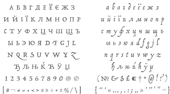 [MyFonts]
[More] ⦿
|
James T. Edmondson
[Oh No Type]
|
 [More] ⦿
|
Jan Schmoeger
[Paragraph]

|
 [MyFonts]
[More] ⦿
|
Jan Toorop
|
Jan Toorop was a Dutch-Indonesian painter and illustrator, b. Purworejo, Java, Dutch East Indies, 1858, the son of a Dutch-Indonesian father and a British mother. In 1869, he left Indonesia for the Netherlands, where he studied in Delft and Amsterdam and at the Rijksakademie in Amsterdam. From 1882 until 1886 he lived in Brusselss, where he joined Les XX (Les Vingts), a group of artists grouped around James Ensor. He developed his own unique Symbolist style, with dynamic, unpredictable lines based on Javanese motifs, highly stylized willowy figures, and curvilinear designs, and is considered as one of artists that represent the art nouveau and Viennese Secession movements. In 1905 he converted to Catholicism and began producing religious works. He also created book illustrations, posters, and stained glass designs. Toorop died in 1928 in Den Haag, The Netherlands. [Google]
[More] ⦿
|
Jason Castle
[Castle Type]

|
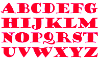 [MyFonts]
[More] ⦿
|
Javier Araiza
|
San Luis Potosi, Mexico-based creator of the soft art nouveau typeface Crixus (2014). [Google]
[More] ⦿
|
Jay Rutherford
[Typoart GmbH (or: VEB Typoart)]

|
 [MyFonts]
[More] ⦿
|
Jérémy Landes
[Studio Triple]
|
[More] ⦿
|
Jérémy Schneider
[VJ Type (was: Violaine & Jérémy)]
|
 [More] ⦿
|
Jean Wojciechowski
[Pretty Faces Typefaces]

|
[MyFonts]
[More] ⦿
|
Jeff Levine

|
 Prolific type designer in Florida, b. New York, 1952. His fonts were originally free and consisted largely of dingbats. Around 2005 he went commercial, and now sells his work (over 350 fonts as of 2009) via MyFonts. He has branched out into several font styles, with a soft spot for stencil fonts, fonts for signage, art deco, and fonts for advertising. Born in New York, his family moved to Florida in 1963, where he has been ever since.
 An interview. Alternate URL. Yet another URL with his early free fonts. My pages on him. Dafont link. Abstract Fonts link. MyFonts link. Klingspor link. [Google]
[MyFonts]
[More] ⦿
|
Jeff Levine
[Jeff Levine: Art nouveau types]

|
[MyFonts]
[More] ⦿
|
Jeff Levine
[Jeff Levine: Wood type]

|
 [MyFonts]
[More] ⦿
|
Jeff Levine
[Jeff Levine: Additional typefaces]

|
 [MyFonts]
[More] ⦿
|
Jeff Levine: Additional typefaces
[Jeff Levine]

|
 This is a list of fonts by Jeff Levine not categorized anywhere else on my pages.
 - A: Adelanto JNL (2009), Adhesive Letters JNL (2011), Adhesive Serif Letters JNL (2015), Adventure Film JNL (2021: a casual sans based on the titles and credits for Texas Across the River, 1966), Afternoon Edition JNL (2015), Air Circus JNL, Aisle Seats JNL (2006, based on letters cut by the Redikut Letter Company of Hawthorne, CA), Album Cover JNL (2008), Alleway JNL (2012, a condensed sans), Allograph JNL (2007), Alphacal JNL (2008, outlined, and like Juneway JNL, based on water-applied decals once made by the Duro Decal Company (now Duro Art Industries) of Chicago), Alton JNL (2010: a bold display sans), Amateur Printer JNL (2007, grunge), Ampersorts JNL (2011: ampersands), And So Forth JNL (2011), Anecdote JNL (2009), Announcement Board JNL (2018: white-on-black), Antique Packaging JNL (2019: Victorian), Antique Price Tags JNL (2019), Arcaro JNL (2013, a calligraphic typeface based on the movie credits of the ABC TV series Naked City, 1958-1963, starring detective Frank Arcaro), Antique Show Card JNL (2018: based on an alphabet from the first Speedball Lettering Book in 1915), Arch Creek JNL (2010, an all caps revival of Beton), Ardball (2006), Arrevederci JNL (2018), Arrow Callouts JNL (2021: an arrow-themed alphading font), Art Deco Monograms JNL (2015), Arte Critique JNL (2009), Artist Colony JNL (2009), Arts District JNL (2014), Art Student JNL (2010), Art Techno JNL (2017), Astrospy JNL (2008: techno), Awkward Gothic JNL (2008), Axelby JNL (2013).
- B: Backpage Article JNL (2010), Bal Harbour JNL (2008), Balcony Seats JNL (2007, narrow retro sans), Ball Game JNL (2018), Bandmaster JNL (2021: based on the opening movie titles from the 1940 musical comedy Strike up the Band starring Judy Garland and Mickey Rooney), Barricade (2011, a great shadowed caps face), Bayview JNL (2008, based on Inland Type Foundry's Studley), Best Bet JNL (2014, a slab serif redesign of Beton), Bike Decals JNL (2008), Billing and Shipping JNL (2010), Bingo Player JNL (2010), Birch Beer JNL (2008), Bitmap Typewriter JNL (2017), Bit Part JNL (2017: extra condensed), Bit Player JNL (extra-condensed tall poster font) (2015), Bloktor Mosaik JNL (2007), Blue Parrot (2006), Bluesman JNL (2014: based on the lettering of the blues album "I'm Jimmy Reed" released on the legendary Vee-Jay label out of Chicago), Bold Display Sans JNL (2016: based on an imge in a Speedball book), Bonehead JNL (2013, bones), Bookkeeper JNL (2019: based on R. Hunter Middleton's slab serif, Karnak), Bookkeeping JNL (2019, like an extra bold version of R. Hunter Middleton's slab serif Karnak (1936)), Boss Jock JNL (2021: an informal font based on the title and credits from the 1965 film Strange Bedfellows), Box Lunch JNL, Brass Rail JNL (2015), Brazil Nut JNL (2015), British Cinema JNL (2021, based on the hand lettered titles and credits from the 1945 British film The Way to the Stars), British Vehicle JNL (2020; based on the UK license plate font created by Charles Wright in 1935; with Ahmed Eraqi), Broadcast JNL (2015), Broadletter JNL (2009), Brochure Sans JNL (2022: based on Sans Serif No.7 from the 1921 Miller & Richard type specimen book), Brogado (2006), Brookside JNL (2016), Brushmark JNL (2011), Brush Off JNL (2017), Bulk Weight JNL (2017), Bum Steer JNL (2015), Burger Joint (2006), Burger Royale JNL (2007), Burlesk Queen JNL (2020: blocked letters), Business Helpers JNL (2014), Business Letter JNL (2021: based on the squarish typeface Geometric in the 1894 catalog of the John Ryan Foundry in Baltimore, MD).
- C: Calendar Blocks JNL (2009), Calling Card JNL (2010), Callouts JNL (2011, in Circle and Square styles; white letters on black background), Canby (2006, a squarish caps face), Candle Wax JNL (2014, based on the movie poster for Bell, Book and Candle starring James Stewart), Cast And Crew JNL (2015, condensed monoline), Cast Shadow JNL (2010), Casual Lunch JNL (2009), Casual Friday JNL (2008, roman lettering), Casual Tune JNL (2015), Catalog Serif JNL (2015), Catalog Sheet JNL (2022: based on an extra condensed serif typeface from the 1892 MacKellar, Smiths & Jordan type foundry specimen book), Catch Words JNL (2009), Channel Tuning JNL (1999), Channel Surfing JNL (2010), Charlies Bar BQ JNL (2008, heavy slab serif), Charmer JNL (2014), Chive Turkey JNL (2007), Chunky Nouveau JNL (2020), Circuletter JNL (2016), Ciribiribin JNL (2014), Classification JNL (2015), Classroom JNL (2009), Cling Vinyl JNL (2009), Coal Train (2004), Cocktail Hour JNL (2016, a beatnik typeface based on the opening title for the 1962 Blake Edwards film Days of Wine and Roses starring Jack Lemmon and Lee Remick), Coffee Bar JNL (2021: a squarish typeface), Coldfield JNL (2008), College Nouveau JNL (2018), Colmar JNL (2018), Columnist JNL (2020, after Morris Fuller Benton's News Gothic, 1908, ATF), Commentary JNL (2010, almost typewriter type---easy on the eye), Composer JNL (2017), Concierge JNL (2014), Conscription JNL (2017), Corkboard JNL (2010: a rounded all caps family), Cornfield JNL (2008), Crepe Paper JNL (2018), Criminal Intent JNL (2018: based on the trailer of the 1942 movie Mr. and Mrs. North), Crown Heights JNL (2007, slab serif caps), Cruise Director JNL (2021: an inline typeface based on a hand-lettered title on the poster for the 1933 musical comedy film Melody Cruise), Courtship JNL (2018), Cover Letter JNL (2019), Curtain Up JNL (2018), Cyberglass (2010, techno), Cybrox JNL (2012, grunge).
- D: Dance Hall JNL (2011), Dance Lesson JNL (2015, a wedge serif in the style of Latin Wide), Rotisserie Menu JNL (2021: based on a 1928 menu for the restaurant Rotisserie Du Cardinal), Dangits JNL (2009), Danish Script Initials JNL (2019, based on letters designed by Copenhagen-born industrial artist and letterer Gustav Boerge Jensen (1898-1954), Date Book JNL (2021; based on the credits of the movie The Awful Truth, 1937), Decal (2006), Decalcomania JNL (2017), Deco Of Tomorrow JNL (2014), Deconstructed JNL (2012), Decorative Panels JNL (2009), Deco Template JNL (2018: squarish), Deerfield JNL (2006, Bank Gothic style), Department Store JNL (2019), Desk Jockey JNL (2008), Deskplate JNL (2011: an all caps copperplate font), Desk Job JNL (2018), Detective Client JNL (2021: based on the cast credits of the 1941 film, The Maltese Falcon), Detention JNL (2007, hand-printed), Diamond Callouts JNL (2019, letters in triangles), Diamond Jim (2010), Diamondwood JNL (2015, rhombic), Dip Pen JNL (2017, rounded, handcrafted), Disclaimer JNL (2010, condensed thin headline face), Display Board JNL (2020: based on Paul Renner's Futura Display from 1932), Display Inline JNL (2009), Displayced (2006, LED font), Display Roman JNL (2014), Doggone It JNL (2019: based on the movie posters for the 1962 film, Mono Cane), Do It Yourself JNL (2008), Doo Wop Initials JNL (2007), Doowop (2006), Dormitory Decals JNL (2009), Double Take JNL (2008), Drafting Class JNL (2021: based on an all caps alphabet in The Essentials of Lettering by Thomas E. French and Robert Meiklejohn (circa 1912)), Dreamy JNL (2017), Dual Line Roman JNL (2021: an inline titling typeface), Duonor JNL (2010), Durable JNL (2016, based on a 1940s cover of a catalog for the Duro Decal Company of Chicago).
- E: Eastport JNL (2019: an interpretation of Morris Fuller Benton's 1931 classic, Stymie Extra Bold), Eat More Fruit JNL (2016), Eccentric Sans JNL (2018), Edessa JNL (2009: chiseled stone look, faux Greek), Editorial Comment JNL (2009, grotesk caps-only headline face), Edits and Credits JNL (2008), Egg Farm JNL (2021: based on the opening titles and credits of the 1947 film comedy The Egg and I), Electric Newspaper JNL (2021: a dot matrix font based on the moving message board electric newspaper from 1931 installed by the Los Angeles Times---in partnership with the Richfield Oil Company---on its building), Electrostatic JNL (2017, textured), Elite Resort JNL (2017, slab serif), Elsinor (2006), Endless Journey JNL (2009), Ensemble Inline JNL (2014), Entitled JNL (2007, squarish as in Bank Gothic), Evening Edition JNL (2009), Evening Event JNL (2021; based on hand lettering from the title credits for the 1950 film All about Eve), Evening Paper JNL (2015), Evening Walk JNL (2018), Expressions (smilies).
- F: Factual JNL (2010,headline face), Fairgrounds (2006), Fancy Free JNL (2016: decorative caps), Fancy Show Card JNL (2021), Farragut JNL (2008, hairline geometric), Fastenating JNL (2012, paper clip font), Federal Agent JNL (2021: a condensed typeface based on the opening title of the 1959 premiere season of The Untouchables), Feltboard JNL (2008), Fence Post JNL (2012), Festival Nights (fancy letters), File Clerk JNL (2020, Jeff Levine: based on Cushing (1897)), File Folder JNL (2010, Bank Gothic style family), Film Crew JNL (2009), Fincastle JNL (2011, all caps sans titling face), First Responder JNL (2017: a left-slanted version of Catalog JNL), Flagstaff JNL (2010), Flatbush Beanery (2006), Flipboard JNL (2011), Flivver (2006, a slab-serif display font), Floor Tiles JNL (2009), Florida (2006, retro), Food Vendor JNL (2011), Fordham JNL (2011, all caps slab serif), Formal Invite JNL (2021: thin, condensed serif lettering found in a 1937 magazine ad for Chris Craft boats), Formal Notice JNL (2020: a revival of an alphabet by Samuel Welo in Studio Handbook for Artists and Advertisers), Frankly Plain JNL and Franky Ornate JNL (2010, all caps typefaces after Franklin Gothic), Frantic Pace JNL (2016, a bouncy retro party font), Free Form Retro JNL (2021: an all caps sans based on the titles and credits from the 1960 French film Le Passage Du Rhin), French Calligraphic JNL (2019), French Cinema JNL, French Serif Moderne JNL (2009), French Slab Serif JNL (2018: based on the 1934 French lettering instruction book L'Art du Tracé Rationnel de la Lettre), French Song JNL (2021: a whimsical typeface based on the titles and credits of the 1952 British comedy Song of Paris), Freunlaven JNL (2006, psychedelic), Front Row JNL (2017: a tall condensed typeface that reinterprets Morris Fuller Benton's Empire from 1937), Fruit Juice JNL (2020), Fun and Games (2011, a casual retro typeface redrawn from the lettering found on the cover of a 1935 Speedball Lettering Pen book).
- G: Gene Condensed JNL (2014), Generic Sans JNL (2022: modeled after Condensed Blair from the 1907 specimen book of the Inland Type Foundry), Generic Gothic JNL (2013: an interpretation of Franklin Gothic Condensed), Genesee JNL (2010), Gift List JNL (2016), Gift Wrap JNL (2014), Gilbert JNL (2011, after Eric Gill's sans), Go Home JNL (2017), Good Sport JNL (2019), Goose Creek JNL (2021: based on hand lettered credits from the 1942 British film comedy The Goose Steps Out), Go To Town JNL (casual inline type style) (2015), Gothic Grotesk JNL (2020; a revival of Royal Gothic (1930s, Stevens, Shanks & Sons), which in turn was based on Charter Oak (1899, Keystone Foundry)), Greenwich Village JNL (2014), Groovy 3D Caps JNL, Groovy Happening JNL (2005, psychedelic, in the style of Action Is), Groovy Summer (2006, a casual sans), Guadalajara JNL (2014, a Mexican party font), GummedAlphabet JNL (2011), Gummed Letters JNL (2010).
- H: Halavah Twist JNL (2007; see also its extension Zydeco JNL in 2009), Hallandale (2006), Halliday JNL (2013: an outlined typeface based on Beton Open Condensed), Handbills And Posters JNL (2015), Handmade Caslon JNL (2015), Handmade Dropshadow JNL (2010), Handmade Gothic JNL (2011, inspired by lettering samples in a 1941 Speedball Lettering Pen instructional booklet), Handmade Headline JNL (2018: a 1940s style typeface), Handmade Roman JNL (2011), Hand Stamped JNL (2006, rubber stamp look), Hanford (2010, a sans headline family), Hash and Beans JNL (2007), Headstone Roman JNL (2015), Hectonoid JL (2008), Heller Sans JNL (2019: after an experimental alphabet by Steven Heller), Highbrow Cafetorium JNL (2009), Hippie Comics JNL (2021: based on poster lettering in the 1920 edition of How to Paint Signs and Sho Cards by E. C. Matthews), Home Address JNL (2019), Home Economics JNL (2018), Home Room JNL (2009), Horse Puckey JNL (2008), Hotel Suite JNL (2017), Hoxie JNL (2008).
- I-J: Impecunious JNL (2017), Impressionable JNL (2012, based on a rubber stamp set), Incarceration JNL (2020), Industriality JNL (2015), Informational Gothic (2013: The Wood-Regan Instruments Company (Wrico) of New Jersey manufactured for decades a line of lettering kits called the Wrico Sign Maker. With only special ink pens, plastic templates and a template guide anyone could letter clean, clear signs, posters and notices. This typeface is based on one of those kits), Informational Sans JNL (2021: squarish, caps only), Initial Seals JNL (2012), Inkpad Letters JNL (2011), Inline Lettering JNL (2011, inspired by the opening title of a classic 1940s horror film, The Invisible Man's Revenge), Inlet JNL (2017), Inline Square JNL (2017), Innerspring JNL (2015), Intermediate JNL (2019: based on a home movie titling kit from circa the 1950s or 1960s called the Magna Tech Titler Number 312, modeled after Futura Bold), Interoffice Memo (2011), Intrigue JNL (2014, based on the hand-lettered movie titles from one of the William Powell / Myrna Loy Thin Man series of films), Island Time JNL (2015), Jalopy (2014), Jive Jump (2006), Jobseeker JNL (2011: hand-printed), Juneway (2006, modeled after a set of water-applied decals made by the Duro Decal Company of Chicago), Jungle Drums JNL (2017, African theme), Junior Printer JNL (2015), Just Great JNL (2016: angular display typeface).
- K-L: Katydid JNL (2015, a connect-the-dots typeface), Katz Pajamas JNL (2017), Keyden Drop Caps JNL (2021: a set of slab serif framed capitals based on John Alden Initials, shown in the 1906 edition of the Keystone Type Foundry specimen book), Key Largo JNL (2011, all caps slab serif), Lakeland JNL (2013), Kiddie Blokz JNL (2010), Kids Activities JNL (2017, handcrafted), Lamp Post JNL (2012, an interpretation of Post Old Style, ca. 1901), Last Date JNL (2018), Lasting Impression JNL (2008), Late Breaking News JNL (2016, headline sans), Late Hours JNL (2021: inspired by the hand lettered titles for the 1961 film The Children's Hour), Lecture Hall JNL (2012), Lefferts (2006, squarish display face), Legal Brief JNL (2021), Legal Eagle JNL (2017, with engraved lines), Les Folies JNL (2009, Victorian), Lettering Lesson JNL (2021: a bold serif typeface based on the 1922 instructional booklet from the St. Louis Show Card School), Lettering Pen JNL (2015, handcrafted), Library Book Initials JNL (2018: Library Book Initials JNL was modeled from examples of Sidney Gaunt's Publicity Initials; originally sold in metal type by Barnhart Brothers and Spindler as a companion to the Publicity Gothic typeface), Liebestraum JNL (2014, a decorative caps font), Limited Appeal JNL (2016), Linem Up (2010), Lobby Card JNL (2010), Local News JNL (2021: a condensed sans based on the hand lettered title for the 1954 film Power of the Press), Location JNL (2017), Longbranch Initials (2006, for decorative monograms), Longacre JNL (2013, fat rounded sans), Long And Thin Initials JNL (2015), Loose Leaf JNL (2010), Love Notes JNL (2011: alphadings), Luminum JNL (2007).
- M: Made in Japan (2014), Mailbox Letters JNL (2008), Main Feature JNL (2017, a marquee sans), Mainline JNL (2014), Manual Typewriter JNL (2017: allegedly after a 1933 example by Morris Fuller Benton), Manufactory JNL (2019, a wedge serif not unlike the ones used in advertizing in the late 19th century), Manufacturer JNL (2020: a reinterpretation of the Extra Bold Extended weight of Bauersche's Venus Grotesk (ca. 1907)), Marble Cutter JNL (2015, based on dies used for stamping text into marble headstones or other monuments manufactured by The Vermont Marble Company (Vermarco), which operated from the 1880s until 1976), Marching Band JNL (2019), Margate JNL (2013, based on water-applied decals manufactured in 1962 by the American Decalcomania Company for Goodyear), Marketing Strategy JNL (2017), Marking Device JNL (2014), Maryland JNL (2014), Matchbook JNL (2014: based on lettering on a matchbook from the Carrousel Restaurant in Miami Beach), Mayville JNL (2009), McCadden JNL (2013, inspired by the hand-lettered credits for the George Burns and Gracie Allen Show [1950-1958]), Meal Ticket JNL (2008, squarish), Merchandiser JNL (2010), Merchandising JNL (2014, brush signage script), Merchant Trade JNL (2020, after the Matthews Series by Inland Type Foundry, 1901), Merrymakers JNL (2020), Midnite Movie JNL (2017, inspired by the hand lettered title credits from the 1961 Hammer Pictures film Curse of the Werewolf), Millport (2006, squarish display face), Mimeograph Template JNL (2019: based on a plastic lettering guide manufactured by the Albert Blake Dick Company of Chicago), Misdirection JNL (2009), Mixed Messages JNL (2007, ransom note), Mocombo JNL (2010, an African look typeface that is a slightly modified version of one of the numerous alphabets created by the late Alf R. Becker for Signs of the Times Magazine during the period of the 1930s through the 1950s), Model Railroad JNL (2015), Moderator JNL (2013), Modern Appliances JNL (2014), Monoline Rounded JNL (2014), Monster Movies JNL (2018: a Halloween font), Monthly Meeting JNL (2013), Monthly Newsletter JNL (2011), Monthly Statement JNL (2018: based on the 1934 French lettering instruction book L'Art du Tracé Rationnel de la Lettre), Morning Edition JNL (2021), Morning Paper JNL (2015), Morningside Heights JNL (2015), Morningstar JNL (2012, named after Jeff's friend, Estella Dawn Roberts of Stella Roberts Fonts), Movieland JNL (2008), Movie Night JNL (2011), Movie Set JNL (2021: an all caps wedge serif based on a 1911 movie poster for the film How Bella Was Won), Movie Show JNL (2021: an all caps wedge serif based on a 1911 movie poster for the film How Bella Was Won), Moving Message JNL (2015, dot matrix typeface), Musical Arrangements JNL (2014), Musical Comedy JNL (2021: hand-printed), Musical Score JNL (2015), Music Course (2019), Mystery Show JNL (2018: modeled after the hand lettered titles found on various early episodes of the 1950s TV suspense program Alfred Hitchcock Presents).
- N: Naroid Initials JNL (2010, one of the most ultra-compressed sets of initials available in digital type), Narrow Minded JNL (2014), National Spirit JNL (2009), Newark JNL (2014: a strong slab serif), New Car Tag JNL (2020: based on the new license plates in Florida, which were introduced in 2018), Newsbreak JNL (2008), Newsbreaker JNL (2016; a vintage newspaper titling typeface), News Crew JNL (2017), Newshawk JNL (2007, a condensed sans), Newspaper Publisher JNL (2021: based on a headline in the 1917 edition of Logansport, Indiana Pharos-Observer), Newsprint JNL (2011), Newsreel Caps JNL (2014), Newsreel Text JNL (2021), News Ticker JNL (2021: based on the New York Times Square ticker operational in the 1930s), Newsworthy JNL (2011: a condensed headline sans), New Thin Roman JNL (2019, based on an alphabet called Compressed Roman in Essentials of Lettering, 1912), Nightcap JNL (2011), Nighthawk JNL (2009, a retro headline sans), No Entry JNL (2021: a bold blocky slab serif based on the hand lettered titles and credits from the 1958 war film The Young Lions), Nondescript JNL (2012), Nouveau Date JNL (2021: arts and crafts style), Nouveau Fashion JNL (2018), Nouveau Spur JNL (2019: neither art nouveau nor spurred), Nouveau Standard JNL (2018), Nouveau Handlettered JNL (2017), Nouveau Lettering JNL (2019, based on a 1916 slab serif alphabet by Thomas Wood Stevens), Nouveau Romance JNL (2017), Nouveau Roundcorner JNL (2015), Nouveau Square JNL (2017, squarish), Nouveau Standard JNL (2018), Nouveau Work JNL (2018), Nouveau Years JNL (2019), Nouveau Yorke JNL (2015), Novelty Nouveau JNL (2021), Now Playing JNL (2010).
- O: Oblogram JNL (2008, techno), Occidental Tourist JNL (2009), Odditype JNL (2006, computer simulation), Off Duty JNL (2021: based on the hand lettering from the titles and credits of the 1964 French film comedy Le Gendarme de Saint-Tropez), Office Staff JNL (2021: a version [with serifs added] of Popularity JNL---a condensed art deco design based on a popular typeface known as Radiant), Office Space JNL (2021: based on Condensed Edina from the 1921 Miller & Richard type specimen book), Office Work JNL (2021: a squarish typeface based on the title and credits of the 1965 film Mirage), Off The Wall JNL (2008). Old Bodoni Wide JNL (2016), Old Songs JNL (2018), Old Tijuana JNL (2018: in the serape style of pseudo-Mexican lettering found on ad designs of the 1930s and 1940s), Order Form JNL (2021: after MacKellar, Smiths & Jordan's Lining Gothic Extended from their 1892 catalog), Ordinary Gothic JNL (2017: gaspipe style), Outline Sans JNL (2018), Overnight JNL (2017), Oversimplified JNL (2019), Overton JNL (2017, based on early letter designs of Rudolf Wolf).
- P-Q: Pacific Atoll JNL (2021: a stylized slab serif type design based on the movie title lettering for the 1942 wartime film Pacific Rendezvous), Pacific Island JNL (2017: a tiki font based on the sheet music cover for the title song from the 1957 Marlon Brando movie Sayonara), Packaged Cookies JNL (2021; based on the first Oreo Sandwich package from 1923), Packaged Goods JNL (2016), Park Slope JNL (2014), Parfum de Paris JNL (2014), Paint Store JNL (2006), Parking Lot Sale JNL (2021: a flag font), Parkitechture (2006), Part and Parcel JNL (2009), Partial Eclipse JNL (2012), Patriotica JNL (2011, American flag face), Pavement JNL (2010, based on the extra-condensed lettering used on roadway information signs as revised by the U.S. Government in 2000), Pendraw Roman (2006), Pen Elegant JNL (2018, after an alphabet from a 1918 lettering instruction book by William Hugh Gordon), Pen Gothic JNL (2017: a rounded sans), Penmanshift JNL (2006, ronde style), Pen Nib Square JNL (2019), Penny Wise JNL (2017), Pen Sans Rounded (2019: based on a Speedball book from 1940), People Talk JNL (2021; a squarish all caps typeface based on a title card with cast credits for the 1935 movie The Whole Town Talking starring Edward G. Robinson and Jean Arthur), Performer JNL (2014, re-drawn from condensed hand lettering found on a piece of vintage sheet music), Personal Invitation JNL, Personalization (2019: a squarish typeface), Personal Note JNL (2011), Photo Developer JNL (2021), Picz JNL (2009), Pillow Puff JNL (2008, fluffy and cloud-like lettering), Pistol Twelve JNL (2008), Pitkin JNL (2006, a hand-lettered sans), Plastic Display JNL (2010, sketched from photo examples in an old sales promotion sheet for the Movitex Do-It-Yourself Plastic Sign Kit by Pryor Marking Products of Chicago), Plastic Template JNL (2011), Pleasantville JNL (2012, a condensed slab serif), Pocket Initials JNL (2008), Podunk JNL (2007), Political Poster JNL (2021: a condensed casual sans inspired by the hand lettering on a 1940 campaign poster for Franklin Delano Roosevelt), Pool Deck JNL (2015), Popstix JNL (2013), Pop Tune JNL (2014), Popularity JNL (2014, after Radiant), Port Of Call JNL (2015), Postal JNL (2009, white on black, as on stamps), Poster Contoured JNL (2018), Poster Pen JNL (2017), Poster Inline JNL (2014), Poster Plain JNL (2012), Poster Project JNL (2020), Post Production JNL (2021: a slab serif modeled after title card of the 1950 Humphrey Bogart and Gloria Grahame drama In a Lonely Place), Prehysteric JNL (2010), Presentation JNL (2011, a slabby family), Press Run JNL (2015, a reinterpretation of the classic typeface Cheltenham Condensed), Pricing Labels JNL (2010), Printed Letters (2006, made from stamped impressions made by a 1940s childrens sign making set), Printing Set JNL (2006, based on a rubber stamp alphabet), Printing Sorts JNL (2009), Prismatiq JNL (2009, shadow face), Privilege Sign JNL (2021: based on above-the-store signage for many newspaper stands, soda shops, candy stores, luncheonettes and pharmacies of the 1950s and early 1960s), Privilege Sign Two JNL (2021: based on decorative signage for many drive-ins, motels, food stores and other businesses of the 1940s), Promotional Copy JNL (2012), Proofreader JNL (2011, a rounded slab serif face), Prospect Heights JNL (2015), Public Notice JNL (2009), Public Transportation JNL (2008), Public Utility JNL (2012), Public Works JNL (2007: emulates the hand-cut lettering silk screened onto metal), Publication JNL (2010, a revival of DeVinne, 1890), Punch Tape JNL (2016, dot matrix font), Quick Meal (2019: a hand lettered interpretation of Morris Fuller Benton's 1905 design Miehle Extra Condensed Title), Quick Poster JNL (2019), Quick Response JNL (2015, based on QR codes), Quick Titling JNL (2019), Quorfid JNL (2010).
- R: Raccoon Coat JNL (2014), Radio Interference (2019: grungy), Radio Show JNL (2019: based on a logo from the TV show Car 54 Where Are You?), Rail Bum JNL (2016, basically Morris Fuller Benton's Hobo with slab serifs added), Railway Station (2019: a spurred wedge serif), Recording Artist JNL (2019), Record Jacket JNL, Recreation JNL (2013, outlined shadow face), Red Border Labels JNL (2015), Rendering (2011, architectural draftman's lettering), Reprint JNL (2013), Restaurant And Lounge JNL (2015, handcrafted), Retail Merchant (2006), Retail Monoline JNL (2021: a stylish thin headline typeface), Retail Packaging JNL (2019), Recruitment JNL, Retail Price JNL (2021, +Inline; for catchy price cards), Retail Shop JNL (2018: based on vintage New York City neon signage), Retirement JNL (2021: a flared headline typeface based on the hand lettered film credits for the 1937 movie Make Way for Tomorrow), Retro Packaging JNL (2018), Retro Resort JNL (2011), Reveler JNL (2019), Reverberation JNL (2011, horizontally striped face), Reverse Calendar Blocks JNL (2011), Rhineland Roman JNL (2017), Ritz Slab Serif JNL (2018), Road Picture JNL (2021: modeled after the hand lettered title and credits for the 1940 Bob Hope-Bing Crosby semi-musical comedy Road to Singapore), Roadside Diner JNL (2021: a signpainting font in the style of pre-war Miami), Rockaway JNL (2006, titling sans), Rock Concert JNL (2021; an all caps curly Victorian typeface inspired by the opening title and credits for the 1964 motion picture comedy Send Me No Flowers starring Rock Hudson, Doris Day, and Tony Randall), Roma Initial Caps JNL (2009), Rotisserie Menu JNL (2021: based on a 1928 menu for the restaurant Rotisserie Du Cardinal), Rough Print JNL (2012, rubber stamp lettering), Roundpoint Pen JNL (2011, based on instructional lettering found in an old Speedball Pen textbook), Roughshod (2006), Running Board JNL (2017, monoline, pen-lettered), Rural Route JNL (2010), Rustic Inn JNL (2014).
- S: Salad Bar JNL (2013), Sales Convention JNL (2021: a squarish typeface based on a menu printed in 1937 for the Starlight Room of the Waldorf-Astoria in New York City), Sales Pitch JNL (2014), Sales Slip JNL (2013), Sandcastle JNL (2011), Sans Poster Bold + 3D, Savings And Loan JNL (2014), Scandals JNL (2017), School Project JNL (2015, based on self-adhesive poster board letters once made by the E-Z Letter Stencil Company and sold under the name Quik Stik), Schoolroom JNL (2020: a school font based on the type style used for the Superior Sign and Chart Printer No. 929), School Age (2019: based on Trixy Toy Educator, a 1930s-era set of letters and numbers for teaching children, manufactured by the Durrel Company of Gardner, MA), Schoolyard Blues JNL (2018), Sea Cruise JNL (2015), Scoreboard JNL (2014: dot matrix typeface), Screentext JNL (2010, pixel), Screenwriter JNL (2021; based on the all caps hand lettered credits from the 1950 Humphrey Bogart film In a Lonely Place), Second Guess JNL (2017), Second Impression JNL (2008), Sennetarium JNL (2008, after lettering in a Charlie Chaplin movie), Semi Calligraphic JNL (2018), Sentzoff Coupon (2006, stitched), Series A Signage JNL (2018: this is based on Highway Gothic, also known as FHWA, by the United States Federal Highway Administration; the widths varied from A (condensed) to F (wide), but A was discontinued, hence the motivation to create Series A Signage), Serif Callouts JNL (2017), Sew What JNL (2010, stitching face), Shareholder JNL (2015), Shelf Numbers JNL (2008), Shelf Tags JNL (2017), Shicken Zoop JNL (2008, Hebrew), Shipping Carton JNL (2012), Sign and Poster JNL (2009, die-cut letters), Sign and Display JNL (2019: a companion of Sign and Poster), Shopkeeper JNL (2010, after a a vintage rubber stamp sign and chart printing set), Shopping Guide (2019), Short Subject JNL (2016, based on some hand-lettered title cards from various vintage Columbia Pictures two-reel comedies), Show Card Freehand JNL 2021; based on the title and credits for the 1951 Dick Powell and Rhonda Fleming film Cry Danger), Show Card Pen JNL (2021: based on an alphabet in the 1920 edition of How to Paint Signs and Sho Cards by E. C. Matthews), Show Card Sans JNL (2021: based on an alphabet in the 1922 book Modern Show Card Writing), Showmanship JNL (2017), Show Poster JNL (2021: A vernacular typeface based on a design from the 1960 edition of Samuel Welo's Studio Handbook for Artists and Advertisers), Shutterbug JNL (2021: a blocky typeface based on the signage of Jerry Lewis's Camera Exchange on Vine Street in Hollywood in 1950), Sightseeing Boat JNL (2021: based on the titles and credits for the 1966 romantic comedy The Glass Bottom Boat), Sign Expert JNL (2021: based on an alphabet in The Expert Sign Painter, 1922), Sign Studio JNL (2019: a multiline typeface modeled after an alphabet found in Martin Meijer's Album de Lettres Arti (1949)), Sign Template JNL (2015, based on one of the many plastic lettering guides manufactured by the now-defunct Wright-Regan Instrument Company also known as Wrico), Silent Film JNL (2021: a display slab serif used by the Uptown Theater in Wichita, Kansas, in 1928), Silent Movies JNL (2021; a rounded monolinear sans of the interbellum period), Silly Behavior (2019: a shaded bouncy letter font that revives a 1930 alphabet from 100 Alphabets Publicitaires dessinés par M. Moullet), Simplicity JNL (2014), Simply Grotesk JNL (2012, Peignotian), Simply Nouveau JNL (2017), Slab Compact JNL (2019), Sleuth JNL (2013, after the trailer for the 1936 movie After The Thin Man), Slim Chance JNL (2015, an ultra-narrow font based on an image of vintage packaging for Aquapruf Ear Drum Protectors), Slim Nouveau JNL (2017), Snack Shop JNL (2007, the retro diner look in a bold outline face), Snorkel JNL (2014), Snow Job JNL (2017, inspired by the hand-lettered titles for the 1964 Rankin-Bass animated holiday classic Rudolph the Red Nosed Reindeer), Socialite JNL (2009), Soda Fountain JNL (2015, bilined), Solid Serif JNL (2014), Songbook JNL (2014), Song Composer JNL (2017), Song Merchant JNL (2017), Song Plugger JNL (2014), Song Publisher JNL (2015), Song Stylist JNL (2016), Song Vendor JNL (2017), So Unusual JNL (2021: based on the hand lettered credits for the 1942 film comedy I Married a Witch), Southwest Serenade JNL (2015), Special Edition JNL (2021: based on a newspaper headline font used in 1924), Specimen Book JNL (2020: based on Lining Antique (1889. Illinois Type Foundry) and Central Lining Antique (1892, Central Type Foundry)), SplintersJL (2004), Sporting Event JNL (2021: a slab serif based on the title and credits of a British boxing film from 1953 called The Square Ring), Sportsboard JNL (2020: a flipboard font), Sport Shaded JNL (2009), Spring Fashion JNL (2010), Spring Season JNL (2020: textured caps), Spur Handlettered JNL (2008), Squarity JNL (2008), Stage Production JNL (2020), Stage Show JNL (2021: based on the movie credits for 9 Garcons...Un Coeur starring Edith Piaf), Stamp of Approval JNL (2007), Stamped Metal JNL (2012, beveled), Starlight Sans, Stationer JNL (2018), Stellator JNL (2006, a high-tech modular font), Stenographer JNL (2021: close to Bank Gothic Condensed), Stickball JNL (2017), Stonecut JNL (2014), Store Clerk JNL (2020: outlined), Store Tags JNL (2011), Streetcar JNL (2019: a vintage railroad wagon lettering font), Streeter JNL (2013, based on Beton Bold Condensed), Stylish Title JNL (2021: based on the cover title of the July 1935 issue of Harper's Bazaar), Subscription JNL (2018), Summer Holiday JNL (2021; based on the hand lettered production credits for the 1930 film Holiday), Summertime Breeze JNL (2021: based on the opening title sequence for the 1958 film The Long, Hot Summer), Sunlight JNL, Sunny South JNL (2015), Sunshine Susie JNL (2018), Supporting Cast JNL (2011), Surf Bum (2019), Swing Band JNL (2013: inspired by the title lettering from "Hi-De-Ho", a 1930s all-black cast film starring legendary bandleader Cab Calloway), Swing Vote JNL (2020: a beatnik font).
- T: Tabloid Edition JNL (2021: based on a headline newspaper font from UK's Daily Mail in 1918), Tabloid News (2019: an all caps condensed slab serif), Tabloid Press JNL (2015), Take Charge JNL (2016, based on the opening title card for the 1936 film The Charge of the Light Brigade starring Errol Flynn, Olivia de Havilland, Donald Crisp and David Niven), Tallahassee Chassis JNL (2007, modeled from a toy rubber stamp set imported from Japan), Tall And Narrow JNL (2015), Tamiami JNL (2009, Victorian, known as "Cuba"), Tea Bag JNL (2013), Tea Time JNL (2014), Technerd JNL (2011, a thin technical/mechanical face), Technopen JNL (2013: a rounded techno sans from a 1929 instructional booklet for the Esterbrook Drawlet Pens), Teenagers JNL (2021: a beatnik font that was inspired by the hand lettered opening credits for The Many Loves of Dobie Gillis, a teen-oriented television comedy that ran from 1959 to 1963 on CBS), Teen Years JNL (2021: a blocky sans inspired by the hand lettered name for the Joyce Records label (circa 1956)), Template Basic JNL (2021: a simple sans), Template Sans (2019: based on a lettering template by the Wright-Regan Instrument Company (Wrico)), Template Shadow (2019), Tenement JNL (2020: based on a Cooper Black style alphabet by Harry Lawrence Gage that was shown in Thomas Woods Stevens's book Lettering (1916)), Terrace JNL (2015), Terror JNL, That Stuff JNL (2009), Theater Lights JNL (2014), Theater Tickets JNL (2021: Based on the marquee signage for Detroit's Majestic Theater built in 1934), Theatrics JNL (2009, 3d face), Thin Mint JNL (2011), Thinly Disguised JNL (2016), Three Day Pass JNL (2009), Tiler JNL (2012, a gridded face), Title Block Sans JNL (2011, an avant-garde titling face), Too Much Information JNL (2007), Top Billing JNL (2008, dot matrix), Top Forty (2019: handcrafted), Topographic Sans JNL (2018: a mapmaking sans featured in a U.S. Army Corps of Engineers topographic drafting manual), Toucan Tango JNL (2007, multiline face), Tough Guy (2006, shaded titling face), Tough Stuff JNL (2008), Toy Decals JNL (2018), Toy Letters JNL (2018: based on die-cut letters and number by Village Toys (circa 1930s or 1940s)), Toyprint JNL (2009, grunge), Trade Journal JNL (2010), Trade Printer JNL (2007, Victorian-era sans emulation), Train Car JNL (2021: based on the hand-lettered opening credits of Alfred Hitchcock's Strangers on a Train (1951)), Transactive JNL (2007, dot matrix), Transcendental JNL (2017), Tribal Council JNL (2011, jungle lettering with a linocut look), Trilium JNL (2010, triline face), Tropicano JNL (2013, a wavy typeface), Tunesmith JNL (2014, Victorian), Twelve Oaks (2006), Two Cents Plain JNL (2012), Two Reeler JNL (2006; see also its follow-up typeface Positive Vibe JNL, 2007, both modeled after title cards of an early Charlie Chaplin movie), Two Step Nouveau JNL (2018), Type Catalog (2011, bilined all caps face), Typemonger JNL (2022: based on Two Line Sans Serif from the British type specimen book of Vincent Figgins (circa 1860)), Typesetter JNL (2011), Type Vendor JNL (2012), Typewriter Sans JNL (2015), Type Wronger JNL (2013, old typewriter typeface).
- U-V: Unpretentious JNL (2014), Urmeba JNL (2012, named after amoebas and co-designed with Ray Larabie; a barf font), Used Cars (2012), Utica JNL (2010, squarish all caps face), Vacation Resort JNL (2021: based on the hand lettered cast and production credits for the 1942 musicl comedy Holiday Inn starring Bing Crosby and Fred Astaire), Vaudevillian JNL (2017), Utility Signage JNL (2017), Vehicle JNL (2010, a condensed block font as for car plates), Vendor JNL (2010, Victorian era ribbon face), Vertical Roundpoint JNL (2011, found in a 1941 edition of the Speedball Lettering Pen instruction book and re-drawn digitally by Jeff Levine), Victorian Typewriter JNL (2020), Vintage Designs JNL (2009, dingbat which has some fists), Vintage Price Tags JNL (2015), Vododeo JNL (2014).
- W: Washington Heights JNL (2016), Wavely (2010), Weekend Date JNL (2020), Weeneez JNL (2011, wiener-shaped glyhs), Welcome Home JNL (2009), Werble JNL (2010), What A Night JNL (2018), Whoosh JNL (2007), Wild About Myself JNL (2015), Willoughby JNL (2006, based on 1950s toothpaste lettering), Window Sign JNL (2013), Wine Cellar JNL (2014), Winery JNL (2012: a soft-serifed caps face), Winkle Picker JNL (2021: a cut paper font based on the 1963 movie poster for an Italian documentary called Sexy Nudo), Winter Garden JNL (2017), Wireline JNL (2021: a paperclip font), Wire Mesh JNL (2009), Work Force JNL (2011), Wynwood JNL (2009).
- X-Y: Yankee Doodle Boy JNL (2017), Yard Sale JNL (2013), Yargo JNL (2009, hand-printed), Yayazout JNL (2008, fun titling face), Yorso Square JNL (2007).
- Z: Zera JNL (2007, intersecting rings), Zodor JNL (2010), Zoning Department JNL (2012), Zydeco JNL (2009).
[Google]
[MyFonts]
[More] ⦿
|
Jeff Levine: Art nouveau types
[Jeff Levine]

|
 Art nouveau typefaces by Jeff Levine:
 [Google]
[MyFonts]
[More] ⦿
|
Jeff Levine: Wood type
[Jeff Levine]

|
 Digital renderings and simulations of wood type by Jeff Levine include Advertiser JNL (2009), Alderman JNL (2020: a wide slab serif typeface based on the classic wood type Antique Light Face Extended), Antique Unique JNL (2017, a revival of a wood type called Ten Line Antique Compressed No. 7), Blacksmith JNL (2011, based on a brass stencil image), Brenham JNL (2011), Buckdance JNL (2005, Tuscan), Bushwick JNL (2011, caps-only sans), Cattleman JNL (2013, a condensed French Clarendon), Cattle Trail JNL (2019: after Latin Condensed), Chamfer Engraved JNL (2020: a chamfered sans serif wood type design with a right side engraving line from the 1800s was found within the pages of the Thorowgood Foundry), Cherrywood JNL (2020: based on the classic Columbian from the William H. Page Wood Type Company (circa 1870), Cherrywood JNL is a bold slab serif type design), Clarenwood JNL (2014), Clarenwood Stencil (2015), Clarified JNL (2020; based on William H. Page's Clarendon Extended wood typeface), Compressed Wood JNL (2020: extrapolated from J.G. Cooley's Roman Triple Extra Condensed Fifty Line), County Clerk JNL (2020: after the vintage Hamilton wood typeface Gothic Special), Daily Tablet JNL (2014: based on wood type used for newspaper headlines), DuBois Block JNL (2008), Early Edition JNL (2020), Eccentric Wood Type JNL (2020), Elida JNL (2011, a didone all caps wood type family), Elk Grove JNL (2009, based on a wood type called Facade), Emporia JNL (2011), Engine Company JNL (2013), Final Edition JNL (2015), Fort Courage JNL (2014, a French Clarendon), Framingham JNL (2010, a widened version of Nostrand JNL), General Merchandise JNL (2020: after the condensed slab serif Antique X Condensed, ca. 1840, by Wells and Webb), General Merchant JNL (2013), Gristwood JNL (2015), Hayfork JNL (2011), Ingomar (2006), Lenorah JNL (2009), Local Printer JNL (2020: based on William Page's wood typeface Skeleton Antique, ca. 1865), Lockup JNL (2009), Longwood JNL (2014), News Event JNL (2020), Normandy Isle JNL (2011), Northfork JNL (2010, based on a William H. Page wood type alphabet called Parisian, circa 1857-58), Nostrand JNL (2009, condensed wood type), Notification JNL (2011), Nouveau Sans JNL (2014, art nouveau-inspired wood type), Octagonist (2020: a 3d beveled typeface that revives George Nesbitt's Octagon from 1838), Old Wood JNL (2013), Ornery Polecat JNL (2014: Western style), Page Printer JNL (2020: after William H. Page's Skeleton (1948)), Payson (2009), Pleasantwood JNL (2014), Presswood JNL (2020: based on the title font used on the cover of a specimen book issued by the Delittle Wood Type Company of York, England), Primitive Tuscan JNL (2014), Rachelle JNL (2009, Italian), Ranch Hand JNL (2013), Reverse Gothic JNL (2014), Roman Wood Type JNL (2012, in the Clarendon Condensed style), Rounded Sans Wood JNL (2015), Roundwood JNL (2020: spurred), Rustic Setting JNL (2013), Saddle Tramp JNL (2013), Sagebrush JNL (2014: modeled after French Clarendon), Sales Book JNL (2013), Sales Event JNL (2014), Sandalwood JNL (2020: based on a sans wood type seen in Rob Roy Kelly's American Wood Type), Shadowland JNL (2014), Shadowlawn JNL (2014), Sidewinder JNL (2013, an ultra-compressed wood type), Splinters JNL (2009, wood pieces), Slabserif Grotesk JNL (2020: based on a wood type design called Antique Light Face), Slabserif Wood JNL (2020), Stockville JNL (2012), Streamwood JNL (2014), Strongbox JNL (2009), Table Wood JNL (2020: based on the wood type Concave Tuscan Extra Condensed), Tamarac (2006, slab-serif wood type), Tent Show JNL (2014, based on a French Clarendon circus style), Teterboro JNL (2010; although built from scratch, this slab serif has a wood type feel), Texarkana JNL (2011, based on a classic condensed wood type from the 1800s, and embellished with stars), Topanga JNL (2010, ultra-condensed sans serif wood type), Trail Boss JNL (2011), Troubadour JNL (2011, ornamental wood type), Unadorned JNL (2017, an ornate spurred wood type font), Weekend Tabloid JNL (2009, a sans serif wood type), Western Wood Type JNL (2015, a Clarendon), West Fork JNL (2020: after Latin Extended by Hamilton, 1888), Westward JNL (2014: circus lettering typeface), Winnetka JNL (2009, octagonal wood type inspired by Cooley Antique Tuscan Condensed---a printer's wood type manufactured in 1859 by J.G. Cooley), Woodbranch JNL (2016), Wood Clarendon JNL (2020: after Hamilton Clarendon Condensed, 1899), Wood Condensed Grotesk (2014), Woodcraft JNL (2013), Wood Fancy Reverse JNL (2020), Wood Gothic JNL (2020: based on Hamilton Gothic Bold (Hamilton Wood Type Foundry, circa 1889), Woodhaven Initilas JNL (2014), Woodlawn JNL (2013, outlined), Wood Line JNL (2018, based on wood type), Woodline (2019: very different from Wood Line JNL), Woodmark JNL (2014: based on William H. Page's New Process No. 507), Wood Nouveau (2014), Wood Poster Display JNL (2014), Wood Rounded JNL (2020: an interpretation of Caslon Rounded), Wood Sans Narrow JNL (2017, based on examples of an extra condensed Hamilton Wood Type), Wood Serif Poster JNL (2020), Wood Stencil (2019), Wood Tuscan JNL (2014), Wood Type Bodoni JNL (2013), Wood Type Calendar JNL (2016), Wood Type Grotesk JNL (2014), Woodwork JNL (2014). [Google]
[MyFonts]
[More] ⦿
|
Jeniffer Fernandes
|
Campos dos Goitacazes, Brazil-based creator of Natural Nouveau (2013), a typeface that contains certain art nouveau elements. [Google]
[More] ⦿
|
Jeremy Vessey
[Pixel Surplus]
|
 [More] ⦿
|
Jesper Birk
[Buddha Graphix]
|
[More] ⦿
|
Jessie Marion King

|
Scottish book designer, talented illustrator, and artist in abroad sense (b. New Kilpatrick, Dunbartonshire, 1875-d. Kirkcudbright, 1949). In Kirkcudbright, Scotland, she founded Green Gate Close, a center for women artists. Often, her illustrations included hand lettering. A children's book Art Nouveau style illustration from 1898 gave Richard Every the inspiration to make ITC Greengate from 1996 until its release in 2002. She left behind a collection of beautiful illustrations and floral borders. [Google]
[MyFonts]
[More] ⦿
|
Jevgeni Tarlokov
|
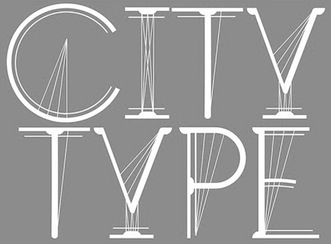 London-based creator of The Red Fox On The Lemon Tree typeface (2013), which was inspired by old Slavonic and by art nouveau. The London Eye (2013) is an architecture-inspired typeface that has elements of bicycle spokes. [Google]
[More] ⦿
|
J.G. Schelter&Giesecke
[Johann Schelter]

|
 Leipzig-based foundry started in 1819 by punchcutter Johann Schelter and typefounder Christian Friedrich Giesecke (1793-1850). It evolved in 1946 into Typoart in Dresden, the official East German government's press. Its early history is told in Schelter & Giesecke 75 Jahre (1894, Leipzig).
 The descendants of Giesecke were also involved, because we find patents filed in the USA by Georg F. Giesecke for typefaces such as Italian Renaissance (1883, blackletter), an ornamental caps typeface (1889), a boxed alphabet (1881), a Celtic caps typeface (1883), Gothic Initials (1883), Zierschrift 1328 (1889), Zierschrift 1400 (1889), Akantrea (1883, borders and ornaments), an early border typeface (1878), Silhouette Border Series 63 (1884), a Lombardic typeface (1885), some script typefaces (1887, 1892), Kartuschen Einfassung serie 72 (1887, ornaments), an ornamental caps typeface with angels (1888), Shieldface A (1881, caps), Shieldface Combinationpieces (1881, ornamental) and Toskanische Egyptienne Initialen (1889; revival by Dieter Steffmann in 2003). Typefaces include the script typefaces Hispania Script (1890, a pirate map face), Koralle (1915), Flamme (1933, brush-like script), Fanal (1933, angular blackletterish script face), Sakia (1931, by Jan Tschichold), Shakespeare Mediäval (1930), Koralle (1929; Georg Kraus mentions the date 1915, as does Nick Curtis, who based his Koralle NF (2012) and Koralle Rounded NF (2014) on this typeface; see also the recent revival Koralle RMU (2018, Ralph M. Unger)), Belwe (1929, by Georg Belwe), Gnom (1928), breite Gnom (1928), Perkeo (1928), Tauperle (1928), Kolibri (1928), Wieland (1927, Georg Belwe), Belwe Antiqua (1927, Belwe), Alt Latein (1924, modified modern), Dolmen (1923, Max Salzmann), Titan and breite Titan (1915), Watteau-Schrift and Watteau Schmuck (1913: aka Kartenschrift Watteau; a non-connected script; ornaments by artists Erich Gruner, Professor Flinzer and Louis Oppenheim), Die Zierde (1913, ornaments by F.H. Ernst Schneidler), Salzmann Antiqua (1913, Max Salzmann), Monos (1912), Salzmann Fraktur and Kräftige Salzmann Fraktur (1911, Max Salzmann), Salzmannschrift and halbfette and schmale Salzmannschrift (1910, Max Salzmann), Roland Grotesk and Roland Kursiv (1910), Rundgotisch (1909; others say 1902-1903), Mimosenzierat (1909, Heinz Keune), Meierschrift (1904-1908, C.F. Meier), Walgunde mit Zieraten (1908, Eduard Lautenbach), Schmale Anker Romanisch (1908, a German romanesque), Leipziger Lateinschrift (1908), Liane (1908), Schmale fette Schelterantiqua (1908), Kalender Vignetten (1907, Max Salzmann), Initialen zur Rousseau (1907), Fee (1907, handwriting), Fata Morgana (1907, handwriting), Schmale fette Edelgotisch und Zierat (1907), Schmale Medieäval (1840: revived in 2020 by Ralph M. Unger as Schmale Mediaeval), Akropolis Ornamente (1907), Patriz Huber Ornamente (1906, Patriz Huber), Reklameschrift Radium (1904-1906), Schelter Kursiv (1906), Schelter Antiqua (1906---and its extensions in 1907, Leipziger Lateinschrift and Tauchnitz-Antiqua; revived in 2020 by Oliver Weiss as Schelter Antiqua WF), Fafner (1905, + Schraffierte; revived by Oliver Weiss in 2020 as WF Fafner), Biedermeierzierat (1905), Rosenzierat Serien 534 und 535 (1905, Heinz Keune), Accidenz-Zierat (1902), Edelgotisch (1901, Albert Knab), Belwe Antiqua (Georg Belwe), Belwe Kursiv (Georg Belwe), Schul-Fraktur (1886, + Fette, 1890, + Schmale fette, 1918; digitization by Delbanco as DS-Schulfraktur in 2001), Gutenberg-Gotisch (1885; the original by F.W. Bauer and Th. Friebel dates from 1880; Halbfette Gutenberg-Gotisch was done in 1890), Borghese (1904, art nouveau: revived in 2015 by Ralph M. Unger as Borghese), Münster-Gotisch (1896; revived in 2009 by Paulo W as Münster Gotische; Gerhard Helzel also did a revival), Jugend-Fraktur (ca. 1900), Breite Kanzlei (1835; other publications mention 1890...), Halbfette Kanzlei (1860), Baldur (1895; for a digital revival, see Alan Jay Prescott's New Baldur APT, 1996, and Dieter Steffmann's Baldur from 2000), Moderne enge halbfette Fraktur (1886), Schmale Steinschrift (1898, Grotesk), Schlanke Grotesk (1886, Grotesk), Breite Grotesk (1886, a typeface that influenced the Bauhaus movement and that become the forefather of Helvetica; revived by Nick Curtis as Schelter Grotesk NF in 2010, and by Arve Båtevik as Sagen Grotesk in 2015), Breite Halbfette Grotesk and Breite magere Grotesk. Ornaments found in their 1902 catalog formed the inspiration for the digital family Allerlei Zierat (2008, Intellecta Design). Comments by Paul Hunt in 2005 on Schelter Antiqua (1906): Schelter & Giesecke had launched Schelter-Antiqua as their own original in-house design with very elaborate and beautiful specimens, an essay on its features, and a warning that they had protected it under German law (gesetzlich geschützt). It was intended as a very serious contender in the legibility stakes and the Schelter & Giesecke specimen contains a fascinating 4-page article on it. There is much emphasis on the care put into avoiding over-fine hairlines and achieving good spacing. Benton's 1914 ATF typeface Souvenir is a cuddly soft version of Schelter Antiqua. Ed Benguiat (Photo-Lettering) did a faithful phototypesetting revival of Benton's typeface in his Souvenir Graphic (1967) and Souvernir Balloon, and that typeface in turn evolved (and was expanded) into the digital typeface ITC Souvenir. Books: Probensammlung Schelter&Giesecke, Zweite Folge (1894), Probensammlung (1888), Type specimen book of Schelter & Giesecke (1899), Schriften und Zierat (1909), Type specimen book of Schelter & Giesecke (1912), Type specimen book of Schelter & Giesecke (ca. 1932). Scans of some typefaces: Altromanisch Kursiv, Cancellaresca, Dante, Edda (art nouveau), Edelgotisch-Initialen, Edelgotisch (art nouveau), Galathea, Hispania, Iris, Müstergotisch, Petrarka (1900, an art nouveau typeface revived in 2012 by Nick Curtis as Petrushka NF), Rundgotisch, Sylphide, (see Hispania Script, 2008, Tom Wallace), Thalia (art nouveau), Tintoretto (for digital versions, see Dieter Steffmann (2000) or Ralph M. Unger, 2009), Washington, Altromanische Antiqua, Halbfette Altromanisch Versalien, Romanische Antiqua, Romanische Kursive No 20, Schmale Halbfette Romanisch, Schmale Muenster Gotisch, Sylphide, Sylphide. View some digital typefaces that are derived from the Schelter & Giesecke library. FontShop link. [Google]
[MyFonts]
[More] ⦿
|
J.H. Crook

|
Type designer who created Mecanorma Ortem, an art nouveau caps face, which can be bought from URW and MyFonts. [Google]
[MyFonts]
[More] ⦿
|
J.H. Kaemmerer
|
Art nouveau type designer, who created these designs ca. 1915: a, b, c, d. [Google]
[More] ⦿
|
Jia Yi Chee
|
Illustrator and designer in Singapore who made an ornamental caps art nouveau alphabet called Deception (2013) and published it in The Subversive Alphabet Book. It showcases ruthless women throughout history. [Google]
[More] ⦿
|
Jim Ford
[VersaType]

|
 [MyFonts]
[More] ⦿
|
Jim Fordyce
|
 Or James Fordyce. Type designer active ca. 1993, possibly located in Kosciusko County, IN. His typefaces were free, and can be found in many places. Font Squirrel link.
 A list of his creations: - Blackletter typefaces: Deutsch Gothic (1994), Diamond Gothic (1995), Wellsley (1994).
- Art nouveau style: Cabaret (1993).
- Semi-blackletter: Greenowic-Narrow (1993), renamed Lombardic Narrow (1993).
- Independence, a fourth of July type of font. In the same spirit, he made Stars and Stripes (1993) and Patriot (1993).
- Poseidon (1993). Recreated by Nick Curtis as Herzog von Graf.
- Lombardic: King Arthur (1993), Geschlossen Gotik Kaps (1993, aka Altmark), Lubeck (1993), Curled Serif (1993).
- Fatty, roundish: Pleasantly Plump, Rounded Informal (1994---this has an fat art nouveau look).
- Pompeii Caps (1993).
- Virginia (1999).
- Gothic typefaces: Bloody, Angular.
- Shadow typefaces: Shadowed Serif, White Bold (1994).
- Wavy.
Abstract Fonts link. [Google]
[More] ⦿
|
Jim Spiece
[Spiece Graphics]

|
 [MyFonts]
[More] ⦿
|
Jimmy Francisco
|
Jimmy Francisco (Giuli Vitelli) created the mysrterious semi-art nouveau typeface Aruma (2011). [Google]
[More] ⦿
|
JLH Fonts
|
 JLH Fonts (or: jhnri4) is the American creator of Making a list checking it twice (2012), Judges (2012, grungy), Janitor (2012), Remix (2012), Arrows (2012), Chalk Line Outline (2012), Pretzel (2012, art nouveau titling face), At Sign (2012), Portmanteau (2012), Seattle Avenue (2012), Sunflower Harvest (2012), Double Strike (2012: a hand-drawn blackboard bold typeface family), Sierra Nevada Road (2012), The Radical Sign (2012), The Jewish Bitmap (2012), The Inequality Grapher (2012), Thin Pencil Handwriting (2012), Marker Scribbles (2012), Grunge Handwriting (2012), Tally Mark (2012, prison wall counting), Gold Plated (2012), Overhaul (2012), Apex Lake (2012, ornamental caps), Halogen (2012, in the style of Comic Sans), Signs For Advertising (2012), and Hand Drawn Shapes (2012).
 Typefaces from 2013: Vengeance (calligraphic), Calligraserif, Heavy Equipment (sans caps), ViaFont (art deco sans based on the Viacom logo), Bromine (a typeface that started out in iFontmaker), Topeka, Printed Circuit Board (based on the Hewlett-Packard logo), Fondue, Northampton, World Tour (ransom note font), Aquifer (an antiqued Garamond), Floppy Disk. Typefaces from 2014: Scratched Letters, Airbrush, Broken Glass (glaz krak font), Byzantine Empire, Office Junk (ransom note font). Dafont link. Old Fontspace link. Blogspot link. Google Plus link. Fontspace link. [Google]
[More] ⦿
|
Johann Schelter
[J.G. Schelter&Giesecke]

|
 [MyFonts]
[More] ⦿
|
John B. Wundes
[Wundes]

|
[MyFonts]
[More] ⦿
|
John Bonadies
[Mpress Interactive]

|
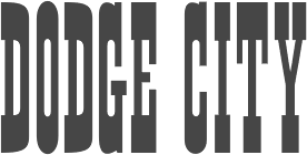 [MyFonts]
[More] ⦿
|
John F. Cumming

|
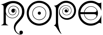 Massachusetts-based punchcutter, b. 1852, Harrisville, PA.
 - Typefaces at the Boston Type Foundry: Albino (1882), Autograph Script (1884), Bank Note Roman and Italic (1870), Banner (< 1883), Binner Gothic (< 1898), Century (1884), Cheque (1882), Clark Script (1884), Copley (1886), Dresden (1882), Duerer (1889), Facade (1892), Kismet (1879, the ultimate Victorian typeface), London (< 1885), Lubeck (1884), Magnolia Script (1884), Morris, Munich (1882), Record (1881), Rubens (1884), Skinner Script (1885), Soudan (1884), Syrian, Weimar (1886).
- Typefaces at the Dickinson Type Foundry (also in Boston): Algonquin and Algonquin Ornamented (1888), Caxton Title, Colonial (1887), Elandkay (1892), Florentine Old Script (1884), French Cursive, Globe. Gothic Script (1891), Gothic Slope, Grady (< 1891), Howland (1892), Jagged Series (1881), Karnac (1884, Victorian), Masonic Text (1890), Mother Hubbard (1885), Outing Series (1888, revived by Nick Curtis as Pique-Nique NF in 2014), Quaint (1888), Renaissant (1880, a Victorian typeface revived in 2014 by Nick Curtis as Renaissant NF), Satanick (1897), Skjald (1890), Stenograf (1890), Vertical Script (1897), Virile (1890), Visible Speech.
- Typefaces at the Hansen Type Foundry: Viking Old Style No. 3 (1899).
Comment by Mac McGrew on Howland: Howland was introduced by Dickinson in 1892 as a "companion series to DeVinne." The same design was called DeVinne Condensed (No.3) by Keystone Type Foundry, but differs from the De Vinne Condensed issued by other sources. Howland Open followed in 1894; it was copied by Linotype as Condensed Outline and suggested through the 1940s as a display typeface for classified advertising pages which banned bold types. Compare DeVinne Condensed, MacFarland Condensed. Some digitizations exist: the nice fat pre-art deco typeface Binner is offered by Linotype, Elsner & Flake (as Binner EF), and Monotype (as Binner Poster MT). Kismet was digitized by Linotype and separately by Richard Beatty as Spiral. Viking Old Style No. 3 was revived in Ingvaeonic-Oldestyle (2007, Nick Curtis)). Howland was revived by Elizabeth Carey Smith as Howland New. Jenson Oldstyle No. 2 (1893) was designed by J.W. Phinney and cut by John F. Cumming. Linotype link. FontShop link. Klingspor link. [Google]
[MyFonts]
[More] ⦿
|
John F. Irwin
|
New York-based creator of the art nouveau alphabet Rustic Roman that is featured on page 79 of John G. Ohnimus's Henderson's Sign Painter (1906). This typeface was digitally revived in 2018 by Brian J. Bonislawsky and Jim Lyles as MFC Sansome Monogram (at Monogram Fonts Co). Other alphabets in Ohnimus's book include Brush Letters (page 85). [Google]
[More] ⦿
|
John Haddon & Co (or: Haddon-Caxton Type Foundry)
[Phil May]
|
 London-based foundry with a sense of humour, because all their type names start with the letter H. Examples of art nouveau typefaces: Harlech, Harquil, Harrington, Hawarden Italic, Huntsman (late Victorian, pre-art-nouveau style).
 Most of their typefaces were designed by Phil May [information unverified]. For digital revivals, see Huntsman (2005, Dan X. Solo). John Haddon published Haddon-Caxton List of Poster Wood-Letters Ornaments and Rules at the Fleet Street location of the Haddon-Caxton Type Foundry in London in 1923. Free local PDF. That book shows these exclusive wood types: Haddon, Hawarden, Highland, Herald, and Hamlin. [Google]
[More] ⦿
|
John M. Bergling

|
 Great American calligrapher and engraver. He wrote several books, including Engraving Designing Etching (1914), Heraldic Designs & Engravings (1913), Heraldic Designs for Artists and Craftspeople, Ornamental Designs and Illustrations">, Art Monograms and Lettering (1912, 1916) and Art Alphabets and Lettering (1914, 1918, 1923). He was Master Engraver with the renowned C.D. Peacock jewelers in Chicago around 1900. Creator of many art alphabets, Bergling is also noted for state seals of the United States and many seal crests of foreign countries. His great-grandchildren set up Bergling Publishing and are selling directly or through Amazon most of his oeuvre.
 Digital fonts based on Bergling's work: - One Good Urn NF (2005, Nick Curtis) is based on his art nouveau lettering from 1914.
- Morocco (1914) provided the caps of Funky Tut NF (2005, Nick Curtis), and Keramic Text (1914) provided the lower cases characters of the latter font.
- Chantilly Lace NF (2005, Nick Curtis) uses uppercase letters by Bergling and lowercase letters by Roland W. Paul.
- His Nibs NF is a digital font by Nick Curtis (2007) based on the calligraphy of Bergling, ca. 1914.
- Carson Monogram (2009, Brian J. Bonislawsky) is based on Bergling's New Antique 53 from the book Art Monogram and Lettering.
- Bergling (2010, Scriptorium) is a floriate script based on Bergling's work. Other (art nouveau style) Scriptorium fonts based on Bergling include Boetia, Belgravia, Bosphoros and Beaumains (2011).
- LHF Bergling Panels (2012, John Davis) is based on Bergling's work.
- Initials Bergling (2012, Alter Littera) is a comprehensive set of initials (usually referred to as Uncials, Lombardic Initials, or Lombards) of the French variety, adapted from Bergling's book Art Alphabets and Lettering (Second Edition) (1918, Chicago: Blakely-Oswald Printing Company).
- In 2011, J.M. Bergling's work inspired John Studden's monogram fonts LHF Monogram Circle, LHF Monogram Diamond, and LHF Monogram Oval.
- MFC Ambeau Monogram (2019, Monogram Fonts Co). Based on the decorative art nouveau alphabet called American Beauty in Art Alphabets and Lettering).
- MFC Decatur Monogram (2020, Monogram Fonts Co). Based on an alphabet seen in J.M. Bergling's book Monograms and Engraving Alphabets (1914).
- Bergling Nouveau Display (2020, Steve Harrison).
- Skaliwag Display (2020, Steve Harrison).
- Allotropic (2022, The Flying Type). An art nouveau font that loosely draws inspiration from an untitled alphabet drawn in 1914 by J.M. Bergling.
[Google]
[MyFonts]
[More] ⦿
|
John M. Murphy
[Free Arts&Crafts Fonts]
|
 [More] ⦿
|
John Roshell

|
 Designer (b. 1970, Mountain View, CA) of many (most) fonts at Comicraft, a comic book font outfit in Los Angeles, CA, a company he cofounded with Richard Starkings in 1992.
 Some fonts: Altogether OOky, Addams-AltogetherOoky, Addams-Capitals, Addams-Regular, CCBithead-Bark, CCBithead-Byte, CC Bryan Talbot (2008, created for Bryan Talbot's Alice in Sunderland), CCHooky-Open, CCHooky-Solid, CCAlchemite, CCChills, CCDigitalDelivery, CCDivineRight-Regular, CCDoubleBack-Future, CCDoubleBack-Past, CCElsewhere-Regular, CCFlameOn, CCFrostbite, CCGrimlyFiendish-Regular, CCJimLee, CCJoeMadInt, CCLosVampiros, CCMeanwhile, CCMeltdown, CCMonsterMash, CCSpills, CCSplashdown, CCStormtrooper (1997), CCTheStorySoFar-Regular, CCThrills, CCToBeContinued, WildAndCrazySFX. With Richard Starkings, he designed Achtung Baby (2001), Adamantium and DoubleBack in 2001 for Agfa/Monotype. Other designs: Dave Gibbons (2006), UpUpAndAway (2005), Forked Tongue (2005), Paranoid Android (2005), Snowmany Snowmen (2005), Gibbous (2006), Astronauts in Trouble, Chatterbox, Red Star, Tough Talk, Sean Phillips, Atomic Wedgie, Pass The Port, Divine Right, Shoutout, Battle Scarred, Danger Girl, Primal Scream, PhaseSonStun, Yeah Baby, Nuff Said (2005), Trick Or Treat, MonsterMash, CarryOnScreaming, Chills, Goosebumps, CreepyCrawly, GrimlyFiendish, IncyWincySpider, Spookytooth, Meltdown and TrickOrTreat dingbats, BiffBamBoom, Spellcaster, Cheese And Crackers, FaceFont, Hedge, Meanwhile, Wildwords International, Comicrazy, Storyline (2006), Happy Holidays (2007), Foom (2007). MyFonts sells these fonts by him: Adamantium, Alchemite, Altogether Ooky (vampire script), Area51, Aztech, Battle Cry, Bithead, Chills, Dave Gibbons, Dead Mans, Destroyer, Digital Delivery, Divine Right, Drop Case, Elsewhere, Euphoria, CC Fairy Tale (2007), Face Front, Fighting Words, Flame On, Foom, Frostbite, Gibbons Gazette (2009, Gobbledygook, Golem (2002), Grimly Fiendish, Happy Holidays, Hellshock, Hip Flask, Holier Than Thou, Hooky, Hyperdrive, Joe Kubert, Meanwhile, CCMild Mannered (2007), Monologous, Near Myth, Overbyte, Phat Boi, PhilYeh, Rough Tongue, Sanctum Sanctorum, Scott McCloud, Smash, Speeding Bullet, Spills, Splashdown, Spookytooth, Stonehenge Runes, Stormtrooper, Storyline, Thats All Folks, The Story So Far, Thingamajig, Thrills, Tim Sale, Tim Sale Brush, Timelord, Treacherous, Treasure Trove (2007), Up Up And Away, Wild And Crazy, Zzzap, Deadline (2007), Kickback (2007, with David Lloyd), Sticky Fingers (2007, scary). Typefaces made in 2008: Ratatatat (2008), CC Mad Scientist (2008), HammerHorror (2008), EnemyLines (2008, based on WWII lettering used by the nazis), Cutthroat Lower (2008), Philyeh (2008), Doohickey Lower (2008), CC Sign Language (2008, fruit vendor lettering). Typefaces made in 2009: SpillProof (2009), Slaphappy (2009), Hooky (2009, spraycan style), Long Underwear (2009), Digital Delivery (2009), Grande Guignol (2003, art nouveau), Bronto Burger (2009), Elsewhere (2009, art nouveau), Exterminate (2009, stone carving face), You Blockhead (2009), CC Rugged Rock (2009), Creations in 2010: Wild Words Lower (2010), Back Beat (2010), Rick Veitch (2010, based on the lettering of comic book artist Rick Veitch), Credit Extension (2010), Shiver (2010, with Richard Starkings), Shake (2010, with Richard Starkings), Elephantmen (2008-2010, squarish family). Contributions from 2011: Knobbly Knees, Ed McGuinness (comic book script family), Big Top, Clean Cut Kid, Dash Decent (a very round almost-bubblegum family), Fancy Pants (connected script), Goth Chic (blackletter). Fonts from 2012: Lunar Modular, Lunar Orbiter, Lunar Rover, Geek Speak, Ancient Astronaut, Totally Awesome (comic book caps face). Fonts from 2013: Samaritan and Samaritan Tall (with Richard Starkings), Ghost Town (a family of seven gold rush era typefaces), Colleen Doran (a comic book family: A Distant Soil is a classic bold and beautiful science fiction/fantasy comic book series by creator, writer, artist and letterer Colleen Doran. A Distant Soil is being remastered and re-released by those awfully nice chaps at Image Comics and Colleen commissioned Comicraft to create the definitive bold and beautiful Colleen Doran font, based on her original pen lettering), Mega City (an elliptical in-your-face advertising signage typeface family), Soliloquous (fat rounded hand-printed comic book family), Excalibur Stone, Excalibur Sword, Legendary Legerdemain (+Leggy), Cool Beans (beatnik font). Fonts from 2014: Shaky Kane (based on the comic books by that name), Resistance Is Lowered (techno), Hero Sandwich Ingedients, Hero Sandwich Combos (a layered set of informal typefaces combined in many ways), Monstrosity (a ghoulish typeface), HighJinks, Onomatopedia, Killzone, Killswitch, Killjoy. Fonts from 2014: Mike Kunkel (based on the hand of comic book artist Mike Kunkel). In 2015, John Roshell (Comicraft) created the comic book typeface family The Sculptor based on Scott McCloud's lettering. Other fonts from 2015 include AB Flock Poster, Hypnotique, Samaritan Lower (by Richard Starkings and John Roshell), Graveyard Smash, Maladroit, Extra Extra (pen-lettered newspaper headline font family), Merry Melody, Temporal Shift and Temporal Gap (computer emulation typeface), Temporal Shift and Temporal Gap Expanded, Temporal Shift and Temporal Gap Compressed, Danger Girl Hex (with Jeffery Scott Campbell), J. Scott Campbell Lower (with Jeffery Scott Campbell). Typefaces from 2016: Victory Speech Lower, Man Of Tomorrow, Thrills, Holy Grail, A Likely Story, Victory Speech, Questionable Things (with Richard Starkings), The Story Begins + Ends, Pixel Arcade (video game font), Schadenfreude (octagonal style), Vengeance Is Mine. Typefaces from 2017: Right In The Kisser, Music To My Eyes">, True Believer. Typefaces from 2018: Metcon (+a stencil version, Metcon Rx), Summer Fling, Samaritan Tall Lower (by Starkings and Roshell), Blah Blah Upper (by John Roshell and Richard Starkings), Ultimatum, Wuxtry Wuxtry (art nouveau), Single Bound (a sans), Evil Doings (by Richard Starkings and John Roshell), Prince of Darkness (a gothic layered font family), Empire State Gothic, Empire State Deco. Typefaces from 2019 by John Roshell: Whatchamacallit (a variable cartoon sans with weight, width and italic axes), Ask For Mercy, Excelsius, Space Race, When Suddenly. Typefaces from 2020: FX Machina (squarish, octagonal), Origin Story, Cybervox, CCQuigglesmith (a beatnik font), Ripped Bam Boom, Dynamic Duo, If This Be Doomsday, Elektrakution (a Greek simulation font family by Richard Starkings and John Roshell), Whatchamacallit, CCMighty Mouth, This Man This Monster (by John Roshell and Richard Starkings), Simply Marvelous, Meanwhile Uncial, Transylvanian (a jungle font), Shark Snack, Letterhack Sans, Letterhack Serif. Typefaces from 2021: Ultimatum MFV (a 21-style chamfered military typeface family including several stencil fonts), Grim N Gritty, Richard Starkings Brush (a comic book typeface by Richard Starkings and John Roshell), Scoundrel (a comic book face by Richard Starkings and John Roshell), Tall Tales (a fat finger font). Typefaces from 2022: Beyond Belief. Klingspor link. FontShop link. View John Roshjell's typefaces. [Google]
[MyFonts]
[More] ⦿
|
John Vargas Beltrán

|
 Colombian type and graphic designer (b. 1974, Bogota), who graduated from Universidad Nacional de Colombia (1997). Co-founder of ADG Colombia (Colombian Association of Graphic Designers). He was studying for a Postgraduate degree in Type Design at UBA (Universidad de Buenos Aries) in Argentina. He currently lives in BuenosAires.
 Designer of the minimalist rounded display typeface Conectiva (1998), the informal signage script Salsa (2011, inspired by the old LP album covers from the 1970s), the retro comic book typeface Boogaloo (2010, free at Google Web Fonts), and the early 20th century-look face Cambalache (2008-2011). Creator with Nicolás Silva Schwarzenberg of the free upright italic sans typeface Convergence (2011, Google Web Fonts). In 2012, Macondo---which was started in 1997---was published at Google Web Fonts, together with Macondo Swash Caps. John writes about this art nouveau pair: The forms are inspired by some illustrations created for a tarot card game, itself inspired by the work of Colombian literature Nobel prize winning author, Gabriel García Márquez, Cien Años de Soledad. Macondo won an award in the display type category at Tipos Latinos 2012. Still in 2012, he published Germania One at Google Web Fonts---an angular typeface that is a hybrid between blackletter and sans serif, and looks like the signage on many German pubs. Cygnus (2012) is a futuristic typeface. Dulcinea Serif (2012) is an uncial typeface. Cabriolet (2012) is the standard Detroit car emblem type used on cars in the 1950s and 1960s. In 2013, John Vargas Beltran created the fifties automobile or diner script Cabriolet V8. In 2014, he returned to African themes, perhaps jarred by the death of Nelson Mandela. His first typeface of the year is Kalimba (named after an African percussion instrument), which comes in several textured styles called Masai, Kingombo and Nenyanga. Guadalupana (2014) is based on bronze ecclesiastical letters found in the Virgin Guadalupe basilica in Mexico, designed in 1976 by Pedro Ramirez Vazquez. Tequendama is a squarish inline typeface that is rooted in pre-Columbian pre-hispanic Muisca tribal art. Typefaces from 2015: Muisca (a typeface family influenced by pre-Columbian pre-hispanic Muisca tribal art), Caminito (a layered steamboat family of typefaces based on the Fileteado Porteño art style in Argentina, as practiced today, e.g., by Alfredo Genovese). Typefaces from 2016: Lucky Lady (retro signage script going back to the WWII era), Cumbanchera (based on retro cover art on Latin albums), Biscayne (a Miami art deco typeface family), Lucky Lady Script (a signage script family inspired by the old, classic art and craft of brush script lettering usually applied in ads of the WWII era and 1940s), Expreso (a layered typeface family based on squarish retro urban lettering). Typefaces from 2017: Clair de Lune (script, for the exclusive use of Clara Dahler Design). Typfaces from 2018: Amaretto. Typefaces from 2020: Baggy (Cooper Black-inspired; he writes that if your uncle's moustache from 1974 was a font, this would be it). MyFonts link. MyFonts foundry link. Behance link. Klingspor link. Creative Market link. Google Plus link. [Google]
[MyFonts]
[More] ⦿
|
Jolie O'Dell
|
Jolie O'Dell has been a professional copywriter, journalist, and editor in the SF Bay area since 2000. She created the grunge typefaces Dude Ranch (209) and Gun Show (2009). Her ChampagneCoupe face mixes a monoline sans with art nouveau elements. Dafont link. [Google]
[More] ⦿
|
Jonathan Paterson
|
 Jonathan Paterson (d. 2024) was based in Montreal. His typefaces include Boom Box (1997), Delusion (1997), London-Tube (1997), JPHand (1997), Pipe Dream (1997), Masao (an oriental simulation font), MovieStar (1997), French Grotesque (1997) and Crown Title (1997).
 He writes about French Grotesque: French Grotesque is roughly based on a series described simply as "lettres grotesques" (grotesque letters) shown in a specimen sheet issued by the Deberny foundry in Paris in 1910. Deberny produced the series as outline and fill fonts for two-colour printing in 18 pt., 24 pt. and 36 pt. sizes. A hollow version, similar to the outline but with no fill, was available in 10, 12, 18, 24 and 36 points. Jonathan completed and refined this art nouveau design. All fonts are freeware or shareware. Abstract Fonts link. [Google]
[More] ⦿
|
Jonathan Stephen Harris
[Tattoo Woo (or: JSH Creates, or: Smokewire)]

|
 [MyFonts]
[More] ⦿
|
Jordan Greywolf
[Todd Jordan Greywolf Peacock]
|
Free PC fonts made in 2002 and 2003 by American designer Todd Jordan "Greywolf" Peacock: GreywolfGlyphs (hieroglyph), GreywolfHeater, GreywolfNouveau (art nouveau), GreywolfPaperHeroes01, GreywolfPaperHeroes02, GreywolfPaperHeroes03, GreywolfPaperHeroes04, GreywolfQuirk (curly lettering), GreywolfStarshipFactory01, GreywolfTreasureItems01, IronclawPaperHeroes01, IronclawPaperHeroes02, IronclawPaperHeroes03, IronclawPaperHeroes04, IronclawPaperHeroes05, IronclawScenery1, IronclawStandUps1, IronclawStandUps2, IronclawStandUps3, IronclawStandUps4, IronclawStandUps5, IronclawSymbols, MagicIconsGW, SkavenIconsGW. Dafont link. [Google]
[More] ⦿
|
Jordi Manero Pascual
[Woodcutter Manero]
|
 [More] ⦿
|
Joris-Karl Huysmans
|
Author of the book A Rebours (1903), a book with 220 wood engravings by Auguste Lepère (1849-1918). It is wonderfully typeset in Georges Auriol's art nouveau typeface Auriol. The typeface used in that book was meticulously revived by Ivan Louette as George A Rebours (2015). [Google]
[More] ⦿
|
Jose Jimenez
[Celebrity Fontz]

|
 [MyFonts]
[More] ⦿
|
Josef Heim
|
Author of the art nouveau era book Moderne Schriften / herausgegeben und verlegt von Josef Heim (Vienna and Leipzig, 1900). Local download. One of the alphabets in this book was digitally revived by Paulo W as Josef Wein Moderne Blackletter (2021). [Google]
[More] ⦿
|
Josef Maria Auchentaller

|
 Austrian artist (b. 1865, Vienna) who studied at the Vienna Academy, and became a Professor in Munich. Member of the Secession from 1898. He died in Grado, Italy, in 1949. A travel poster by Josef Maria Auchentaller in 1906 led Tom Wallace to design the avant garde / art nouveau all caps typeface Auchentaller ca. 2007.
 Read about his participation in the Viennese Secession. [Google]
[MyFonts]
[More] ⦿
|
Josella Colquhoun
[Tack-O-Rama]
|
[More] ⦿
|
Josep Pep Patau i Bellart
[Tipo Pepel (was: Antaviana Typeface Division, or: Astramat)]

|
 [MyFonts]
[More] ⦿
|
Joseph Kaspar Sattler

|
Lettering artist, painter and illustrator, b. 1867 Schrobenhausen, d. 1931 München. He studied in München and became professor in Strasbourg. His art nouveau illustrations appeared, e.g., in Simplicissimus. The typeface Sattler AS by Andreas Seidel (2003) at AS Type captures some of Sattler's finest initials, made in 1897 for the monumental book project Die Nibelunge (1900) for the Reichsdruckerei Berlin. The corresponding art nouveau script typeface by Sattler is called Nibelungen-Schrift (1897). Klingspor link. [Google]
[MyFonts]
[More] ⦿
|
Joseph Maria Olbrich
|
Joseph Maria Olbrich (b. 1867, Troppau, Austria, which today is Opava in the Czech Republic; d. Düsseldorf, Germany, 1908, from leukemia) was an Austrian architect, and co-founder of the Vienna Secession artistic group, which was formed in 1897 by a number of Austrian painters, sculptors, and architects who had resigned from the Association of Austrian Artists, including Gustav Klimt, Koloman Moser, Josef Hoffmann, Joseph Maria Olbrich himself, Max Kurzweil, Otto Wagner, and others. His architectural works, especially his exhibition buildings for the Vienna and Darmstadt Secessions, have had a strong influence on the development of the Art Nouveau Style. Like most architects of that period, he drew several alphabets, such as these Modern German capitals. Nick Curtis designed Olbrich display NF based on a 1907 typeface by Joseph Maria Olbrich. [Google]
[More] ⦿
|
Joshua M. Smith
[Legacy of Defeat]
|
 [More] ⦿
|
Joshua Mayfield
[Mayfield Type Foundry]

|
[MyFonts]
[More] ⦿
|
J.P. Bender
|
 For a project at the University of the Arts in Philadelphia, J.P. Bender designed the all caps art nouveau typeface Navetteur (2017) and the Trajan caps typeface Voyager (2017). [Google]
[More] ⦿
|
Juan Esteban Orozco Sanchez
|
 Graphic communication student in Medellin, Colombia. Creator of Helvetica Y Art Nouveau (2012), a typeface in which Helvetica outlines are filled with art nouveau patterns. [Google]
[More] ⦿
|
Juan Manuel Escobar Bernal
|
Mexican designer of Neon Lights (2013), En Mi Cuadra Nada Cuadra (2013), Mundonick (2010, unicase), Partofme (2012), Moonstone (2011), Princess And The Frog (2011), When the goes sun scene (2011, avant garde), Jessie Normal (2011, grunge face), Grachi (2011, bouncy spiky face, modeled on Fontdiner.com), Anahi (2011, art nouveau), Grachi 2 (2011), Tangled (2011, tattoo face), Femme 2 (2011), and Carly (2011). [Google]
[More] ⦿
|
Julia Rausch

|
 Now Julia Kahl. Designer (b. 1983, Aschaffenburg, Bavaria) who studied communication design at Hochschule Darmstadt from 2004 until 2007, and interned in 2007-2008 at Magma Brand Design in Karlsruhe. Creator in 2008 at the German foundry Volcano of Nymphe, a monoline typeface based on the form and character of an art nouveau illustration from 1907. Still at Volcano, she made Sports (a biline / semi-stencil face) and Ready Steady Go (2009, with Boris Kahl and Lars Harmsen).
 Alternate URL. Klingspor link. Volcano Type link. [Google]
[MyFonts]
[More] ⦿
|
Julia Yuri Landim Goya
|
 Bauru, Brazil-based design student in the College of Architecture, Arts and Communication from Estadual Paulista Júlio Mesquita Filho University, who created Petit Noveau (2014), a typeface inspired by art nouveau. [Google]
[More] ⦿
|
Juliana Santiago
|
Rio de Janeiro-based designer of Art Deju (2012, art nouveau). [Google]
[More] ⦿
|
Julie Patat
|
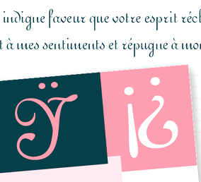 During her typography studies at Ecole Estienne in Paris, Julie Patat created the unicase font Mischievous Type (2014) and the display typefaces Wolf (2015, after an alphabet in D. Duvillé's l'Art du tracé rationnel de la lettre, 1934), Amsterdam (2015, art nouveau) and Brocéliande (2015). She also revived Firmin Didot's Ronde. Alda (2015) is an italic font with two different angles. Designed for French pocket books, it was inspired by Aldus Manutius's italics from 1501.
 In 2018, she published the Peignotian fashion branding typeface Trigère. Since 2014, Julie is asociated with Novo Typo in Amsterdam as a type designer. [Google]
[More] ⦿
|
Julien Gineste
|
 Graduate of Ecole Estienne in Paris, b. 1973. Teacher at Ecole Estienne since 2009 and at University of Paris-Est Marne-la-Vallée. In 2010, Sandra Chamaret, Julien Gineste and Sébastien Morlighem wrote Roger Excoffon et la fonderie Olive.
 Designer, with David Poullard, in 2001, of Métropolitaines, a revival of the (Paris) Metro art nouveau typeface originally designed by Hector Guimard in 1901. See also here. Linkedin link. Author of these books at Zeug: Alphabet, Xavier Dupré, itinéraire typographique / typographical itinerary. [Google]
[More] ⦿
|
Julien Saurin
[S&C Type Paris (was: La Goupil Paris)]

|
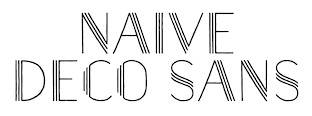 [MyFonts]
[More] ⦿
|
Julius Guildenstine
|
Type designer from New York City who created pre-art nouveau typefaces for Barnhart&Barnhart in 1886 and 1888, and display typefaces in 1883 and 1888. For Bruce Type Foundry, he created a condensed typeface in 1890 and an art nouveau typeface in 1888. [Google]
[More] ⦿
|
Julius Klinger

|
 Klinger was born in Dornbach near Vienna in 1876. He studied at Technologischen Gewerbemuseum in Vienna. In 1895, he found his first employment with the Vienna fashion magazine Wiener Mode. In 1896, he moved to München where he worked as an illustrator for the Meggendorfer Blätter and other magazines. From 1897 to 1902 he was a collaborator at the famous Jugendstil magazine Die Jugend. In 1897 he moved to Berlin, where he worked extensively as a commercial graphic artist until 1915. Together with the printing house Hollerbaum und Schmidt, he developed a new fashion of functional poster design that soon gained him international reputation. In 1912 he designed the poster for the Rund um Berlin air show in Johannisthal. In Berlin he also contributed to Das kleine Witzblatt, Lustige Blätter and Das Narrenschiff magazines. Beginning in 1918, Klinger designed the ads for Tabu cigarette rolling paper. According to Viennese police records, Klinger, who was Jewish, was deported to Minsk on June 2, 1942 together with his wife Emilie and killed the same year. Others have him die in Vienna in 1950.
 His typefaces include Klinger Antiqua (1919, Emil Gursch) and Klinger Type (1925-1927, Schriftguss). Digitizations of his work: Jim Spiece created SG Veranda Poster (+Caps) in 2001. Its elegant letters go back to Julius Klinger and Willy Willrab. Based on fabric lettering by Klinger from 1925, Andrew Leman created a type family called Julius Klinger (2003). Nick Curtis designed Toot Sweet NF after a 1912 poster design by Klinger. Klingspor link. Anita Kühnel's page on his posters. Vienna Secession link. [Google]
[MyFonts]
[More] ⦿
|
Julius Klinkhardt
[Julius Klinkhardt Schriftgiesserei]
|
 [More] ⦿
|
Julius Klinkhardt Schriftgiesserei
[Julius Klinkhardt]
|
 Julius Klinkhardt designed typefaces such as the blackletter font Neue Schwabacher (1922, Berthold). He ran the Julius Klinkhardt Schriftgiesserei in Leipzig in the late 19th century, after having acquired the type foundry of Gustav Schelter in 1871. It was taken over by Berthold in 1920. Their typefaces include Flora Ornamente (1906), Lithographia (1895), Secessions Schriften (1906), Baldur (1903, art nouveau; for a digital revival, see Alan Presott's New Baldur APT, 1996, and Dieter Steffmann's Baldur from 2000), Britania-Gotisch (1900, also known as Altgotish, and as Kloster Gotisch, and as Mammut Gotisch), Breitkopf Fraktur (just like versions of this typeface at C.F. Rühl (1912)), Helios Reklameschrift (revived by Ralph M. Unger in 2017 Affiche), Stempel (1912) and Berthold (1919)), Rosen Zierat (ca. 1910), Negro (1908), Elvira (1908), Cornelia Einfassung (1908), Hubertus Schmuck (1909), Filigran Ornamente (1910), Doris Ornamente (1917), Stigma Ornamente (1911), Bastard gross (a Kanzlei typeface with mager and fett versions), Werkschrift Germanisch (ca. 1880), Tango-Cursiv (1914), and Bismarck-Gotisch gross, all digitally revived by Gerhard Helzel. His TipTop (ca. 1900) was digitized under the same name by Petra Heidorn (2004). Tip Top Pro (2008, URW++) is a commercial revival of the same typeface by Ralph M. Unger.
 On EBay, they were selling the specimen book: See here. Their main specimen books are Gesamt-Probe der Schriftgiesserei Julius Klinkhardt in Leipzig und Wien (1885, 690 pages) and Oktav-Probe II (1890, 452 pages). See the cover of an earlier specimen book. Some type designers: - Richard Grimm-Sachsenberg: Grimm-Antiqua und Schmuck (1914), Neue römische Antiqua (1907), Saxonia (1907), magere römische Antiqua (1912).
- Heinz König: Rundine (1913).
- Hermann Delitsch: Ramses (1912, an Antiqua face), Delitsch-Kanzlei (1903), Delitsch Antiqua (1911).
- Julius Nitsche: Unger Fraktur (1910; Wetzig says 1907), Neudeutsche Ornamente (1911), Buchschmuck (1905), Akzidenz-Zierat (1905).
- Remarkable typefaces: Schmale Runde Grotesk (1885, a forerunner of DIN?).
- Gadso Weiland: Toscana Schriften und Schmuck (1908).
Examples from their catalog from 1890: Fette Universal, Garnitur XII and XIII, Garnitur XIV, Kurrentschrift, Verzierte Merkur Kanzlei, and Neue Cursiv Zierschrift, Antika and Italia Grotesk Versalien, drawing of a boudoir, Enge Egyptienne, Fette Cursiv, Fraktur, Halbfette Fraktur, Holz Schriften (wood type), more wood type, drawing of horses, Moderne Fette Fraktur, monograms, Neue Fette Fraktur and Victoria Gotisch, Neue Fette Fraktur, Neue Schmale Fette Egyptienne, Romanische Gotisch, Rundschrift Polytypen, Schmale Antiqua, Schmale Fraktur, Schmale Halbfette Grotesk, Schwabacher, Silhouette Initialen, Stickmuster Typen, vignetten, more vignetten, Zierschriften, more Zierschriften, Zweifarben-Schriften. [Google]
[More] ⦿
|
Julius Schmohl

|
In 1891, Julius Schmohl and Ernst Lauschke designed an art nouveau and a Victorian face for BBS. Schmohl was born in Germany, but lived in Chicago for most of his life. In 1895, he and Max Rosenow published an upright script with BBS. This ronde typeface was originally known as Oliphant and renamed Advertisers Upright Script in 1925. In 2014, Spiece Graphics created a digital version of it, Milroy Upright SG. [Google]
[MyFonts]
[More] ⦿
|
K. u. K. Hof-Schriftgiesserei Poppelbaum
[Hartwig Poppelbaum]
|
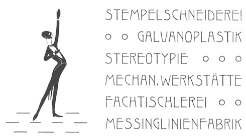 Viennese foundry acquired in 1926 by D. Stempel AG (50%) and H. Berthold AG (50%). Designers of Original-Schwabacher (before 1925) and Messe-Gotisch (before 1925). Kurt Liebing made Liebing-Fraktur, also some time before 1925. A small timeline of the company:
 - 1858: Benjamin Krebs dies. His son-in-law Gustav Rosalino, partner in Benjamin Krebs Nachfolger) dies in 1870. That year, the Benjamin Krebs foundry opens an office in Vienna under the lead of Bernhard Alexander Poppelbaum. The firm Poppelbaum & Bossow (with Karl Bossow) is set up in Vienna with five foundry machines.
- 1880: Karl Bossow dies.
- 1890: Hartwig Poppelbaum and Karl Gsottschneider, the son and son-in-law of Hermann Poppelbaum become partners in the company.
- 1892: Hermann Poppelbaum dies.
- 1903: Compressa (an Inserat typeface family), Reform and Massiv are finished.
- 1903: The script typeface Ideal is finished.
- 1904: Publication of Ridingerschrift (a feather / copperplate script for weddings and invitations).
- 1905: Publication of the work horse typeface Rediviva.
- 1906: Biedermeier (an Inserat cursive) is finished. Frankfurter Buchschrift (designed by Paul Ed. Lautenbach) follows.
- 1907: Reklameschrift Komet, and Hohlweinschrift (by Ludwig Hohlwein).
- 1908: The book typeface Renata-Serie and the Gigantea typeface are published.
- 1909: Pompadour (an elegant Zirkularschrift after copperplate examples of the era of Louis XVI in France), Merian-Fraktur (after the typeface of Math. Merian used in bibles in the 19th century), the Rohrfederschrift Diavolo, the Rohrfeder-Fraktur are published.
- 1910: Karl Gsottschneider dies. Hartwig Poppelbaum is now the sole president. Publication of Katalog-Antiqua (a book face), Brunhilde (a Zirkularschrift), Federzug-Antiqua and Epoche.
- 1912: Opening of a shop in St. Petersburg where Cyrillic fonts are produced. The war brings an end to this project in 1914, and all machines and matrices are destroyed.
- 1923: The new leaders are Hartwig Poppelbaum Jr. and Dr. Karl Poppelbaum. New weights are added to Epoche and Merina Fraktur. New typefaces include Brentano-Fraktur, Alt-Schwabacher Werkschrift, Latina, Antiqua Firmin-Didot, Kanzlist (sans), Burokrat (sans), Konigin Luise (sans), All Right (sans), Schonbrunn (sans), Ideal-Schreibschrift III (sans), Hartwig-Schrift (by Hartwig Poppelbaum Jr: Hartwig Schrift was digitized by Petra Heidorn in 2005), Hartwig-Werkschrift (by Hartwig Poppelbaum Jr), Xylo, and Phänomen (signage script).
- 1926 or 1927: The foundry is acquired by D. Stempel AG (50%) and H. Berthold AG (50%).
[Google]
[More] ⦿
|
Kalyani Rajguru
|
 During her studies in Pune, India, Kalyani Rajguru designed a set of art nouveau capitals (2016) and a lively sans disaply typeface, Peppy (2016). [Google]
[More] ⦿
|
Karl Brendler
[Karl Brendler&Söhne]

|
[MyFonts]
[More] ⦿
|
Karl Brendler&Söhne
[Karl Brendler]

|
Type foundry in Vienna, active in the last part of the 19th century. Examples of their typefaces: Desdemona (art nouveau), Elefanta (art nouveau), Fette Venezia (flared display face), Venezia. About Desdemona: we find it in the 1981 and 1986 Letraset rub-down catalogs. Digital fonts include a 1992 version by David Berlow at Font Bureau and a 1994 typeface by Richard Beatty, also called Desdemona. Nick Curtis published Elefantasia NF (2012), which is based on Elefanta. [Google]
[MyFonts]
[More] ⦿
|
Karl Klingspor
[Klingspor (or: Gebrüder Klingspor)]

|
[MyFonts]
[More] ⦿
|
Karl Marie Diez
|
Author of the art nouveau era book Die Hundertzwanzig tage von Sodom oder die Schule der Auschweifung. Examples of introductions and chapter headings: 1, 2, 3, 4, 5, 6, 7, 8, 9, 10. [Google]
[More] ⦿
|
Karley Johnston
|
American designer in 2010 of the free curly art nouveau font Anning. [Google]
[More] ⦿
|
Karlo Wagner
|
Phototype designer. He created the psychedelic / art nouveau phototype typeface Fortunata (1971, Berthold). That typeface was revived by Kevin Allan King and Patrick Griffin as Spadina (2010, Canada Type). [Google]
[More] ⦿
|
Karolina Lach
|
 Polish / American designer who writes: Karolina Lach is a graphic designer, web designer and typographer residing in New York. She currently works as the Senior Designer for Kiwibox Media, a social network and online magazine for teens. A graduate of The Cooper Union for the Advancement of Science and Art, she has studied under Mike Essl, Emily Oberman, James Craig, Maxim Zhukov and Hannes Famira. Graduate from the type design program at the University of Reading in 2010.
 Her typefaces: Behance link. Home page in New York City. Behance link. Klingspor link. Google Plus link. [Google]
[More] ⦿
|
Kayla Edgar
|
 Kayla Edgar (Denver, CO) created the adorable bilined art bouveau typeface Celeste (2012). She studies illustration at the Rocky Mountain College of Art and Design. [Google]
[More] ⦿
|
Keith Bates
[K-Type]

|
 [MyFonts]
[More] ⦿
|
Keith Tricker
[Studio K]

|
 [MyFonts]
[More] ⦿
|
Ken Ray
|
American musician and poster designer. He made Strongs 1917 Sharp (2010), an all caps art nouveau typeface found in the book Strongs Book of Design (1910), by Charles J. Strong. Strong was a designer at the height of the Art Nouveau movement. [Google]
[More] ⦿
|
Keren Hasson
|
During her studies at Parsons in New York City, Keren Hasson created the art nouveau tyle event poster Bacchanalia (2013). [Google]
[More] ⦿
|
Kerstin Fritsche

|
German designer of Linotype MMistel (1997), an art nouveau / Christmas eve typeface. Linotype link. FontShop link. Klingspor link. [Google]
[MyFonts]
[More] ⦿
|
Kevin Allan King

|
 Kevin Allan King is from Toronto. He designed fonts for Canada Type from 2010 until 2017. In 2018, he graduated from the University of Reading's MATD program.
 In 2010, he co-designed Robur and Wagner Grotesk, Slinger (an art nouveau face) and Sol Pro (a 20-style monoline sans family based on the classic Sol design by Marty Goldstein and C.B. Smith, published by VGC in 1973) with Patrick Griffin at Canada Type. Still with Griffin at Canada Type, he revived a psychedelic / art nouveau typeface called Fortunata (1971, Karlo Wagner) and called it Spadina (2010). He also has a Facebook group on type crimes called TCI: Typographic Crime Investigators. Wagner Grotesk is the elaborate digital version of Edel Grotesque Bold Condensed (also known as Lessing, Reichgrotesk, and Wotan Bold Condensed), a 1914 typeface by Johannes Wagner, which was later adopted by pretty much every European type foundry, exported into the Americas, and used on war propaganda posters on either side of the Atlantic. In 2011, he and Patrick Griffin published the refined Orpheus Pro family, which was based on the elegant Orpheus by Walter Tiemann (1926-1928, Klingspor), and its Italic which was called Euphorion (Walter Tiemann, 1936). Their enthusiastic description: The Orpheus Pro fonts started out as a straightforward revival of Tiemann's Orpheus and Euphorion. It was as simple as a work brief can be. But did we ever get carried away, and what should have been finished in a few weeks ended up consuming the best part of a year, countless jugs of coffee, and the merciless scrutiny of too many pairs of eyeballs. The great roman caps just screamed for plenty of extensions, alternates, swashes, ligatures, fusions from different times, and of course small caps. The roman lowercase wanted additional alternates and even a few ligatures. The italic needed to get the same treatment for its lowercase that Tiemann envisioned for the uppercase. So the lowercase went overboard plenty alternates and swashes and ligatures. Even the italic uppercase was augmented by maybe too many extra letters. Orpheus Pro has been a real ride. Images of Orpheus: i, ii, iii, iv, v. In 2011, Griffin and King co-designed Walter Script, a calligraphic script that revives Troubadour (1926, Wagner&Schmidt). Still in 2011, King and Griffin completed work on an exceptionally beautiful revival, Ratio Modern (the original by F.W. Kleukens is from 1923). This is a didone family with a refined humanist trait. Still in 2011, he and Patrick Griffin created the 18-style sans family Recta, a considerable extension of Novarese's Recta. And they also completed Kumlien Pro, a revival and expansion of a beautiful transitional typeface designed in 1943 by Akke Kumlien. King Tut (2011) is a restoration and expansion of the original Egyptian Expanded, a single bold typeface cut in 1850 by Miller&Richard. Libertine (done with Patrick Griffin) is an angular calligraphic script inspired by the work of Dutchman Martin Meijer (1930s): This is the rebel yell, the adrenaline of scripts. Paganini (with Patrick Griffin) is another jewel in Canada Type's drawers: Designed in 1928 by Alessandro Butti under the direction of Raffaello Bertieri for the Nebiolo foundry, Paganini defies standard categorization. While it definitely is a classic foundry text typeface with obvious roots in the oldstyle of the Italian renaissance, its contrast reveals a clear underlying modern influence. Patrick Griffin and Kevin Allan King did a revival called Paganini in 2011. The year 2012 starts out with a bang. King and Patrick Griffin published Wonder Brush (partly based on a signage brush script called Poppl Stretto (1969) by Friedrich Poppl), Wagner Script (a revival of Troubadour (1926, Wagner&Schmidt)), Spade (a super-heavy slab face, done with Patrick Griffin; based on Farmer and Little's Antique No2 from 1867), and Louis (a faithful digital rendition and expansion of a design called Fanfare, originally drawn by Louis Oppenheim in 1927, and redrawn in 1993 by Rod McDonald as Stylus). King Wood (2012) is an octagonal flared wood type family with a set of dingbats, King Wood Extras. Monte Cristo (2012) is a grand type family with five styles and 1630 characters with many swashes and ways of connecting the calligraphic glyphs---it is the ultimate wedding font. The last joint project of King and Griffin in 2012 was Pipa, a pseudo-psychedelic groovy bellydancing font: Originally made for a health food store chain we cannot name, Pipa is the embodiment of organic display typography. In 2013, Kevin Allan King and Patrick Griffin revived Georg Trump's transitional typeface Mauritius (1967, Weber). In 2014, they designed the psychedelic typeface Jingo: This is the digital makeover and major expansion of a one-of-a-kind melting pot experiment done by VGC and released under the name Mardi Gras in the early 1960s. It is an unexpected jambalaya of Art Nouveau, Tuscan, wedge serifs, curlycues, ball endings, wood type spurs and swashes, geometry and ornamental elements that on the surface seem to be completely unrelated. His graduatiuon type at MATD in 2018 was Mazina, a multi-script typeface system developed for complex literary texts. It supports Arabic, Latin, and several Canadian aboriginal scripts. In 2022, he released eight fonts for Canadian Syllabics at Typotheque. At the same time, he published the extensive article Syllabics typographic guidelines. [Google]
[MyFonts]
[More] ⦿
|
Kevin McDonald
|
During his studies at Flagler College, Saint Augustine, FL, Kevin McDonald created the lower-case-only art nouveau typeface Fluid Groove (2013). [Google]
[More] ⦿
|
Keystone Type Foundry
|
 Philadelphia-based foundry, 1888-1917. The history of this short-lived foundry was told by James Eckmann in The Keystone Type Foundry, 1888-1917: a reprint [from] Printing&graphic arts, volume VI, number 1, February 1958 (Lunenburg, Vermont: The Stinehour Press, 1958). Their work appeared in Keystone Type Foundry, 1901 (362 pages), Abridged specimen book, type: nickel-alloy on universal line comprising a price list of types, borders, leads and slugs, brass rule, brass galleys; miscellaneous cuts and general supplies for printers (1906, 636 pages, see also here, here and here), A book of Keystone type typefaces (2nd ed., Philadelphia, ca. 1920), Catalogue and specimen book. Keystone products, consisting of type, material, furniture, complete line of miscellaneous supplies for printers and publishers, machinery and wood goods (Philadelphia, ca. 1910), See also Keystone Products Catalogue and Specimen Book, Consisting of Type, Material, Furniture, Complete Line of Miscellaneous Supplies for Printers and Publishers, Machinery and Wood Goods (1915).
 Typefaces: Admiral, Ayer (Mac McGrew: Ayer was introduced by Keystone Type Foundry in 1909, which said it was "named for F. Wayland Ayer, founder of Keystone Type Foundry and the great advertising agency which bears his name." The non-kerning italic was added in 1910.), Ben Franklin, Ben Franklin Condensed, Ben Franklin Open, Bulletin, Caslon Adbold, Caslon Adbold Extended, Caslon Adbold Extra Condensed, Caslon Bold, Caslon Bold Condensed, Caslon Bold Extended, Caslon Bold Italic, Caslon Lightface, Caslon Lightface Condensed, Caslon Lightface Italic, Caslon Title Extended, Charcoal, Charter Oak (1899), Compressed Gothic, Condensed Lining Gothic, Crayonette, Elite Typewriter, Gothic Condensed No. 3, Gothic No. 102, Gothic No. 114, Harris Italic (1910), Harris Roman (1909), Herculean Gothic, Italia Condensed (1906), John Alden Decorative Initials (1906), John Hancock, John Hancock Condensed, John Hancock Extended, John Hancock Outline, Keystone Gothic, Laureate (1906: revived in 2012 by Isabel Urbina), Lining Antique [Keystone], London Gothic (1910 or earlier), New Model Remington Typewriter, Outline, Outline Condensed, Remington, Remington Typewriter, Round Gothic (1884), Skeleton Lining Gothic, Skeleton Lining Gothic No. 19, Smith Premier, Title Gothic [Title Gothic No. 9, Condensed Title Gothic No. 11], Venezia, Washington Text (1902, blackletter), Washington Text Shaded. Digital pictures I took from the Specimen Book of Type (1903): Bulletin, Keystone Bikes, Boldface Cellini, Crayonette Open, Keystone Cyclers, Encore, Lining Antique, Lining Gothic, Outing Initials, Remington Typewriter, Remus, Ronde Initials, Salem (a wedge serif revived in 2021 by Latinotype as Osbourne), Venezia, Victoria Italic, Worcester. Catalog A-C, Catalog C-P, Catalog P-Z. Digitizations: - Miletus Grotesk (2021, Mario Feliciano) revisits Standard Gothic (1906).
- The slab serif John Hancock (ca. 1903) and condensed slab serif John Hancock Condensed (ca. 1917, Lanston Monotype) were digitized as Hancock RR (1994) and Hancock Pro (2017) by Steve Jackaman (Red Rooster).
- The Remington typewriter typefaces (ca. 1905) were digitized as Secret Service Typewriter RR (2002) by Steve Jackaman (Red Rooster).
- Roman TyresRR (1997) was made by Steve Jackaman (Red Rooster).
- Poor Richard RR is based on a Keystone design from 1919, namely Ben Franklin, Ben Franklin Condensed, Ben Franklin Open (named after Benjamin Franklin's "Poor Richard Almanack"). There is also a free font Poor Richard (1994, Projective Solutions).
- Jeff Levine's Keyden Drop Caps JNL (2021) is a set of slab serif framed capitals based on John Alden Initials, shown in the 1906 edition of the Keystone Type Foundry specimen book.
- Caslon FB (1992, Font Bureau) comes with this text: Our familiar Caslon Bold headletters were invented around the turn of the twentieth century in the United States and were only loosely based on William Caslons romans. The best of the Caslon Bolds originated at the Keystone Type Foundry of Philadelphia, whose Caslon Bold Condensed appeared about 1905, probably drawn by R.F. Burfeind. Jill Pichotta revised his Bold Condensed&drew the Bold Extra Condensed.
- Gibbs Mason designed the art nouveau typeface Vanden Houten (1904) at Keystone. This typeface was remade by Dan X. Solo as Dutch Treat at Solotype.
- Emerge BF (2009, John Bomparte) is a flare serif typeface that was inspired by Admiral, c.1900.
- Old Softy NF (2010, Nick Curtis) is a soft round typeface based on Round Gothic (1884).
- Charter Oak is similar to Royal Gothic (Stevens Shanks & Sons). For a digital revival, see Gothic Grotesk JNL (2020, Jeff Levine) or OPTI Charter Oak (by Castcraft).
Comments by Mac McGrew: - On Harris Roman: Harris Roman was announced by Keystone Type Foundry in 1909. It was "named in honor of the late Joel Chandler Harris, author of Uncle Remus." It is a plain modernized roman, somewhat similar to Century Expanded. In 1910 Harris Italic was added; it was designed to be cast without kerns. Advertising claimed, "Non-kerning italics will save endless annoyances and losses resulting from broken letters, and the purchase price is the same as any other type of our make."
- On Charter Oak: Charter Oak is a heavy, inclined gothic introduced by Keystone in 1899. There is a fair amount of contrast, and round letters are flat sided or nearly so. London Gothic (q.v.) was a comparable upright face, and Royal Gothic of the 1880s from another foundry is quite similar. Compare Doric Italic.
- On London Gothic: London Gothic was issued by Keystone Type Foundry in 1910 or earlier, but is virtually a duplicate of Royal Gothic, shown by Marder, Luse&Co. in 1887. It is similar to the same founder's Charter Oak series, but upright. Although the italic typeface survived Keystone's acquisition by ATF in 1919. London Gothic does not appear to have done so. See Charter Oak.
[Google]
[More] ⦿
|
Khoir
[Muhammad Romzul Khoir]

|
Jepara, Indonesia-based designer (b. 1996) of the decorative caps typeface Karakter (2017), the monoline script Suprats (2017), the culturally inspired Jepara Carving Font (2017), the script typeface Cahyati (2017), and the free fat finger font Romzul Sans (2017, Letterhend Studio). Typefaces from 2018: Delova, Domco (an art deco sans), The Cheryl (a Victorian label font), Elma (display sans), Boven (display sans; caps only), Randusary, Almairah, Antenna, Massali (signature script). Typefaces from 2019: Milona, The Houls, Bromtone, Panerah, Benaco (art nouveau-inspired), Syailendra, Nieel, Gram (spurred), Wolver (a luxurious high-contrast typeface), Bodbug (1970s style balloon type), Caravan (a free display font). Typefaces from 2020: Givani (a decorative serif), Sila (a decorative serif), Rolih (a decorative serif), The Maulo (a decorative serif), Sila, Antonia (display), Virago (display), The Alpan (a bold semi-psychedelic display typeface), Dovika (Victorian), Chinta. Typefaces from 2021: La Penina, Qulio (a sharp-edged display serif), Carafia (a stylish black display serif), Sadila (a stylish black sharp-edged display serif), The Britin. Typefaces from 2022: Trimo (a wide extreme contrast display serif). [Google]
[MyFonts]
[More] ⦿
|
Kira McGarrity
|
Downingtown, PA-based designer of the vintage art nouveau script typeface Hocus Pocus (2015), which was created for the movie Hocus Pocus. [Google]
[More] ⦿
|
Kiwifrog
|
 Mucha Like (2009) was designed by New Zealander "Kiwifrog" (b. 1966) in the style of Alphonse Mucha's lettering. [Google]
[More] ⦿
|
Klara Barova
|
Brno, Czechia-based designer of the handcrafted art nouveau typeface Alfontzo (2019). [Google]
[More] ⦿
|
Klaus Herrmann
[Intecsas]
|
[More] ⦿
|
Klaus Johansen
[Listemageren Fontarkiv]
|
[More] ⦿
|
Kleressia Perry
|
Jackson, MS-based designer of the art nouveau typeface Stardust (2015), which is based on the book Stardust by Neil Gaiman. Behance link. [Google]
[More] ⦿
|
Klingspor (or: Gebrüder Klingspor)
[Karl Klingspor]

|
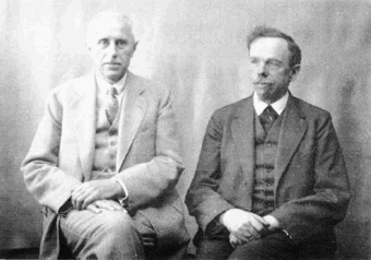 German foundry established in 1906 by brothers Karl Klingspor (1868-1950) and Wilhelm Klingspor (1871-1925) in Offenbach am Main. About half of its catalog consists of blackletter types (as listed in 2000 by Harald Süß), and many of its typefaces were designed by German über-designer Rudolf Koch. History (in German, PDF), resummarized here:
 - 1892: Carl Klingspor (1839-1903), the father, buys the Rudhardsche Gießerei in Offenbach am Main in 1892, which was originally founded in 1842 by Johann Peter Nees, Phillip Rudhard and Johann Michael Huck.
- 1899: Heinz König designs Walthari (a light Fraktur font).
- 1900: Otto Eckmann designs the Fraktur font Eckmann Schrift, and Kurt Wanschura (from Leipzig) designs the Fraktur font Offenbacher Schwabacher. Reform appears!
- 1901: Peter Behrens publishes Behrensschrift (art nouveau style). Offenbacher Fraktur appears too.
- 1902: Behrens Schrift by Peter Behrens. Fette Eckmann Schrift und Ziermaterial by Peter Behrens. Vignetten by Emil Doepler d.J., and Schmuck für Bücher und Akzidenzen by Robert Engels, München.
- 1903: Reform Kursiv.
- 1904: Karl and Wilhelm Klingspor become the sole owners of the Rudhardsche Gießerei. As a private typeface, they decide on Munthe Schrift by Norwegian Gerhard Munthe.
- 1905: Heinz König designs König Antiqua. Breitkopf Fraktur is published, based on the original design of Joh. Gottl. Immanuel Breitkopf (1719-1794). Also new is Auszeichnungsschriften für Fraktur, as well as Die Leidensstationen by Robert Engels.
- 1906: The form is renamed Gebr. Klingspor. Otto Hupp makes Liturgisch (another Fraktur font). Jugendschrift is published.
- 1907: Peter Behrens publishes Behrens-Kursiv.
- 1908: Peter Behrens publishes Behrens Antiqua. Otto Hupp makes Neue Anzeigen Schriften. Halbfette Reform is published.
- 1909: Otto Hupp makes Hupp Antiqua (a Basque "A" in here!), Hupp Unziale. Walter Tiemann designs Tiemann Mediäval.
- 1910: Rudolf Koch designs Fette Deutsche Schrift (Fraktur) and Fette Kochschrift (are these not the same?). Hupp Fraktur appears. The company publishes Kalender Bilder by Heinrich Vogeler.
- 1911: Tiemann makes Halbfette Tiemann Mediäval.
- 1912: Tiemann makes Tiemann Mediäval. Kursiv and Tiemann-Kursiv. Koch makes Halbfette Deutsche Schrift and Deutsche Schrägschrift.
- 1913: Peter Behrens publishes Behrens Mediäval. Koch makes Schmale deutsche Schrift.
- 1914: Rudolf Koch publishes Frühling, Maximilian Gotisch, Maximilian-Antiqua and Maximilian. Walter Tiemann makes Peter Schlemihl and Tiemann Fraktur.
- 1915: Klingspor acquires F. W. Aßmann and Wilhelm Gronau in Berlin.
- 1917: Albert Windisch makes Windisch Kursiv.
- 1919: Karl Michel designs Schraffierte Antiqua. Some cooperation is established with D. Stempel AG, which acquires some shares.
- 1920: Tierbilder-Probe is published.
- 1921: Rudolf Koch publishes Deutsche Zierschrift (Fraktur) and Magere deutsche Schrift. Walter Tiemann makes Narziß. The company publishes Elfenschmucjk, as well as Schräge Schwabacher. Leo Wackerle makes Kalender Bilder.
- 1922: Rudolf Koch designs Koch Antiqua and Koch Antiqua Kursiv. Otto Hupp publishes Deutsche Schrägschrift. Ernst Engel designs Mörike Fraktur, a private typeface just created for the Ernst Engel Presse.
- 1923: Rudolf Koch designs Koch Antiqua Kursiv and Neuland. Walter Tiemann designs Tiemann Antiqua.
- 1924: Koch designs Grosse Koch Antiqua, and Tiemann makes Tiemann Gotisch.
- 1925: Wilhelm Klingspor dies. Rudolf Koch designs Wilhelm-Klingspor-Schrift (Fraktur), and Victor Hammer creates an uncial font, Hammerschrift.
- 1926: Tiemann makes Tiemann Antiqua Kursiv and Koch publishes Klingsporschrift.
- 1927: Rudolf Koch designs Kabel.
- 1928: Rudolf Koch designs Neuland Licht. Walter Tiemann makes Kleist Fraktur.
- 1929: Rudolf Koch creates Zeppelin.
- 1930: Rudolf Koch designs Wallau (rotunda) and Jessen-Schrift (Fraktur).
- 1931: Heinrich Maehler makes Salut.
- 1932: Rudolf Koch designs Holla.
- 1934: Walter Tiemann makes Fichte Fraktur.
- 1935: Rudolf Koch creates Koch Kurrent.
- 1937: Rudolf Koch publishes Claudius.
- 1940: Rudo Spemann's Gavotte appears.
- 1944: A bombardment destroys a lot of material and drawings.
- 1950: Karl Klingspor dies. Walter Tiemann makes Offizin. According to Chronik und Stammfolge der Familie Klingspor (1989, Reinhard Klingspor and Gerhard Moisel), Karl Klingspor died on January 1, 1951, but everywhere on the web we find 1950.
- 1951: Karl Hermann Klingspor (1903-1986), son of Wilhelm, takes over the company.
- 1952: Karlgeorg Hoefer makes Salto.
- 1953: Karlgeorg Hoefer publishes Saltino. Victor Hammer makes Hammer Unziale. The Klingspor Museum in Offenbach is created.
- 1954: Hans Kühne designs Andreas Schrift (Fraktur) and Kühne Schrift (Fraktur). Joachim Romann makes Constanze (a formal script) and Queen. Alfred Finsterer designs Duo Licht and Duo Dunkel.
- 1955: Karlgeorg Hoefer makes Monsun.
- 1956: D. Stempel AG buys the remaining shares of Klingspor, and incorporates many of its types in its own catalog.
That library included typefaces by these designers: - H. Kühne: Andreas Schrift (1954, carried by Delbanco and Gerhard Helzel), Kühne Antiqua (1954), Kühne Schrift (1954), Stahl (1933-1939).
- P. Behrens: Behrens Antiqua (1907), Behrensschrift (offered by Intecsas as Sprecher Gothic), Behrens Initialen (called Sprecher Initials at Intecsas).
- Rudolf Koch: Claudius (carried by Delbanco), Deutsche Schrift (1910), Frühling (1917, carried by Delbanco), Deutsche Zierschrift (1921, offered by Delbanco and Gerhard Helzel), Holla (1932), Jessen-Schrift (1924-1929, carried by Delbanco), Kabel (1927, at Linotype now; called Geometric 231 at Bitstream, and Kalten at PrimaFont, and Koch Original at LetterPerfect), Koch Antiqua (1922, published by Linotype now; available from Alphabets Inc as AI Koch Antiqua MM; called Eva Antiqua SG at Spiece Graphics), Zeppelin (1929, available from Agfa now), Koch Kurrent (1935, offered by Delbanco), Koch Fraktur (offered by Delbanco, Gerhard Helzel, and Christian Richter), Marathon (1938), Maximilian (1917, available at Castle Systems, and carried by Delbanco), Maximilian-Gotisch (carried by Gerhard Helzel and by Walden Font), Neuland (1923, available from Linotype; available from Alphabets Inc as AI Koch Neuland, and at Bitstream as Informal 011, and at PrimaFont as Newfish, and at Keystrokes as Neuland inline), Prisma (1928; a multiline typeface revived in 2003 by Dieter Steffmann, and extended in the large family LL Prismaset at Lineto), Wallau (1926-1934, carried by Delbanco, and called Wal at PrimaFont), Wilhelm Klingspor-Schrift (1925, carried by Delbanco and Linotype; Wilhelm Klingspor-Gotisch is called Wilson at PrimaFont).
- J. Romann: Constanze (1954), Queen (1954, called Ferrante by Intecsas).
- Walter Tiemann: Daphnis (1929), Fichte Fraktur (1934-1939, carried by Delbanco and Gerhard Helzel), Kleist Fraktur (1928, revived by Dieter Steffmann in 2002, and carried by Delbanco), Narziss (1921, available from Font Bureau and Spiece Graphics as Narcissus), Offizin (1952), Peter Schlemihl (revived by Walden Font, and by Dieter Steffmann in 2002), Tiemann Mediäval (carried by Gerhard Helzel), Tiemann Antiqua (1923, now at Linotype).
- A. Finsterer: Duo licht/Duo dunkel (1954).
- O. Eckmann: Eckmann Schrift (1900, called Freeform 710 at Bitstream, and called Eckmann at Elsner&Flake, ScanGraphic, Linotype, URW++, Gerhard Helzel and Delbanco), Eckmann Initialen (called Jan Bent at Intecsas).
- Kurt Wanschura: Offenbacher Schwabacher (1900, Offered at Delbanco).
- H. König: Falstaff (1906).
- H. Schardt: Folkwang (1949).
- R. Spemann: Gavotte (1940, available from Linotype).
- V. Hammer: Hammerschrift (1923, available as Martel at Scriptorium), Hammer Unziale (1953). [Linotype has it as Neue Hammer Unziale. Agfa carries Uncial, which is really Neue Hammer Unziale. The Electric Typographer calls it Electric Uncial. Elsner&Flake have a version called American Uncial.]
- O. H. W. Hadank: Ornata (1943).
- H. Bohn: Orplid (1929).
- O. Hupp: Liturgisch (1906, carried by Gerhard Helzel), Hupp Antiqua (1909).
- F.K. Sallwey: Information breitfett (1958).
- A. Kumlien: Kumlien Antiqua.
- R. Bauer: Magnet (1906).
- K. Hoefer: Monsun (1955), Salto (1952, now at Linotype), Saltino (1953, carried by TypeRevivals), Saltarello (1954).
- H. Maehler: Salut (1931, version available from Agfa).
An unclassified condensed elongated Victorian fat face, Slimback-style, is Figura. No date known. View the Klingspor typeface library. [Google]
[MyFonts]
[More] ⦿
|
Koloman Moser
|
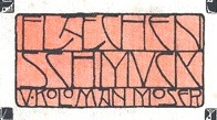 Koloman Moser (1868-1918) studied at the Akademie der bildenden Künst (1886-1892) and the at the Kunstgewerbeschule in Vienna (1893-1895). He began as an illustrator for the satirical magazine Meggendorfer Blätter in München. He was a founding member of the Vienna Secession in 1897 and later the artistic director for the Wiener Werkstätte in 1903. He taught at the Kunstgewerbeschule in Vienna until his death.
 Kolo LP (1996, Garrett Boge and Paul Shaw) was inspired by and named after Koloman Moser. Similarly, we find PiS Lietz Germion (2013), a rounded script in the style of Viennese Jugendstil about which its designer, Hannes Siengalewicz writes: Kolo Moser is dancing an absinthe infused poster-polka! You should too!. Vienna Workshop (2012) by David Kerkhoff is an art nouveau typeface based on some of the artwork produced by Vienna Workshop artists, in particular that of Koloman Moser. [Google]
[More] ⦿
|
Korinna
|
The story of Korinna, a slightly art nouveau typeface designed by Berthold in 1904. Korinna and Korinna Bold were cut by Intertype in 1934. In 1974, Ed Benguiat and Victor Caruso created ITC Korinna, and made the design more popular. Ed writes: The goal was to keep the style and personality of the original German typeface, but make it more applicable to current tastes. The ITC Korinna font family doesn't fade into the background, and I like that. There was no italic design in the original, so I sat down for a month or two and just drew it and then decided to call it Korinna Kursiv rather than italic. I thought it sounded better! Digital versions: [Google]
[More] ⦿
|
Kristians Sics
[Lamatas un Slazdi]

|
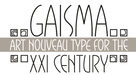 [MyFonts]
[More] ⦿
|
Ksenia Galantzan

|
Israeli graphic designer. At Masterfont, ca. 2002, Ksenia designed Agartal MF, Ariadna MF, Art Nouveaux MF, Buki MF (pen graffiti or children's hand), Classi MF, Esthetic MF, Extra MF, Fifty Five MF, Flamingo MF, Gan Eden MF, Hatuh MF, Iris MF, Ksenia Classi MF, Ksenia MF, Mandolina MF, Musical MF, Napoli MF, Oceanus MF, Ofna MF, Opera MF, Osher MF, Peer MF, Pikanti MF, Plastelina MF, Renessans MF (2004), Roman MF, Roosha MF, Sean MF, Sheli MF, Shoni MF, Start Up MF, Stav MF, Stone MF, Style MF, Tabasco MF, Tango MF, Tuki MF. [Google]
[MyFonts]
[More] ⦿
|
K-Type
[Keith Bates]

|
 K-Type is Keith Bates' (b. 1951, Liverpool) foundry in Manchester, UK, est. 2003. Keith works as an Art&Design teacher at a Salford High School. They custom design type, and sell some of their own creations.
 Commercial typefaces: - Adequate (2012). A basic geometric monoline sans family.
- Adventuring (2010, comic book style)
- Alan Hand (2005, based on some blobby lettering, handwritten by printer and mail artist, Alan Brignall)
- Alex (2002-2004)
- Alright (2004, cursive script)
- Anna (2002-2007).
- Argot (2019). Characterized by square counters, this typeface family exhales brutalism and industrialism. See also Argot Machine (2019).
- Artist Hand (2019).
- Axis
- Bank of England (2012, blackletter): Bank of England is loosely based on blackletter lettering from the Series F English twenty pound banknote introduced in 2007. The font also takes inspiration from German Kanzlei (Chancery) typefaces and the 17th century London calligrapher, John Ayres.
- Banks & Miles (2018). Inspired by the geometric monoline lettering created for the British Post Office in 1970 by London design company Banks & Miles, a project initiated and supervised by partner John Miles, which included Double Line and Single Line alphabets. The new digital typeface is a reworking and extension of both alphabets.
- Barbica (2015). A glyphic typeface.
- Bricola (2020).
- Brush Hand New (2013): Brush Hand New is a full font based on a copy of Flash Bold called Brush Hand marketed by WSI in the 1990s and more recently distributed through free font sites. Brush Hand was an anonymous redrawing of Flash which simplified, slightly lightened, smoothed out ragged edges, and improved the legibility of the original classic created by Edwin W. Shaar in 1939.
- Building&Loan (2007, engaved face)
- Bigfoot (2005, a Western font based on the slab capitals used by Victor Moscoso in his 1960s psychedelic rock posters)
- Bolshy (2009)
- Bolton750 (2003, a mechanical typeface done with John Washington).
- Chancery Lane (2021). An italic text typeface that is based on chancery scripts.
- Charles Wright (2016). A set of fonts based on the UK license plate fonts.
- Chock (2009)
- Circa (geometric sans)
- Cloudbuster (2019). Inspired by Imre Reiner's Corvinus Skyline of 1934.
- Club.
- Coinage Caps (2017). Coinage Caps is a trilogy of small caps fonts based on the roman lettering used for the designs of British coinage. Coinage Caps Eric Gill is a regular weight, spur serif style drawn by Eric Gill for silver coin designs in the 1920s which were rejected by the Royal Mint. Coinage Caps Humphrey Paget is a medium weight serif based on the lettering of Thomas Humphrey Paget, designer of the Golden Hind Halfpenny first struck in 1937. This font simulates the soft, slightly rounded corners of the minted letterforms. Coinage Caps Kruger Gray is a glyphic, flare serif font typical of the bold style engraved by George Kruger Gray for numerous British and Commonwealth coins during the 1920s and 30s. This font also simulates the slightly rounded corners of the minted letterforms.
- Collegiate (2009)
- Component (2012). A font for lost civilizations and dungeon rituals.
- Context (experimental)
- Credit Card (2010, font for simulating bank cards)
- Curwen Sans (2018). A monoline sans from the early 1900s originally created for in-house use at the Curwen Press in London.
- Cyberscript (2006, connected squarish face)
- Deansgate (2015). Deansgate and Deansgate Condensed are based on the clearest and most distinctive of the sans-serif letterforms used on Manchester street nameplates, and easily identified by a pointy Z and pointed middle vertices on M and W.
- Designer
- Digitalis
- English
- Enamela (2013). Keith writes: Enamela (rhymes with Pamela) is based on condensed sans serif lettering found on vitreous enamel signage dating from the Victorian era and widely used in Britain for road signs, Post Office signs, the plates on James Ludlow wall postboxes, railway signs, direction signs and circular Automobile Association wayfinding plaques throughout the first half of the twentieth century. The original model goes back to Victorian times, ca. 1880.
- Engravia (2018). Engravia is a didone display typeface supplied in three varieties of engraving---Inline, Shaded and Sawtooth---plus a plain basic font.
- Example (2017). A workhorse neo-grtesque typeface family.
- Excite
- Flip (2011), a western grotesk billboard face.
- Flyer (2009, techno)
- Frank Bellamy (2009, an all-capitals family based on the hand lettering of English artist Frank Bellamy, who is most famous for his comic art for Eagle and TV21, and his Dr Who illustrations for Radio Times)
- Future Imperfect
- Gill New Antique (2003)
- Greetings
- Helvetiquette
- Hapshash (2010): an all capitals font inspired by the 1960s psychedelic posters of British designers Hapshash and the Coloured Coat (Michael English and Nigel Waymouth), in particular their 1968 poster for the First International Pop Festival in Rome. A dripping paint font.
- Irish Penny (2016). An uncial typeface based on the lettering from Percy Metcalfe's influential pre-decimal coinage of Ireland, the Barnyard Collection.
- Ivan Zemtsov (2009)
- Kato (2007, oriental simulation face)
- Keep Calm (2015). A geometric sans inspired by a British war poster from 1939.
- Keith's Hand
- Klee Print (2010, Klee Print is based on the handwriting of American artist Emma Klee)
- Latinate (2013). A vintage wedge serif wood style typeface, and a rough version.
- Lexie (an improved or "adult" version of Comic Sans) and Lexie Readable (2006, modified in 2015). Keith writes: Lexie Readable (formerly Lexia Readable) was designed with accessibility and legibility in mind, an attempt to capture the strength and clarity of Comic Sans without the comic book associations. Features like the non-symmetrical b and d, and the handwritten forms of a and g may help dyslexic readers.
- Licencia (2016). A blocky typeface inspired by the tall, soft-cornered lettering on vehicle licence and registration plates world-wide.
- Londinia (2016).
- Matchbox
- Max
- Ming
- Modernist Stencil (2009).
- Monterey Pop (2020). A psychedelic / popart typeface based on Tom Wilkes's poster lettering for the Monterey International Pop Festival in June 1967.
- Mythica (2012). A slightly condensed lapidary roman with copperplate serifs.
- Modulario (2010): a contemporary sans.
- New Old English (2010, blackletter)
- Norton (2006)
- Nowa (2004, a play on Futura)
- NYC (octagonal)
- Openline (2008, an art deco pair)
- Oriel Chambers Liverpool: A Lombardic small caps font based on the masonry lettering on Peter Ellis's 1864 building, Oriel Chambers, on Water Street in Liverpool.
- Pentangle (2008, based on album lettering from 1967)
- Pixel
- PixL (2002-2004)
- Plasterboard (2004-2005)
- Pop Cubism (2010) is a set of four texture fonts, combining elements of cubism and pop art.
- Poster Sans (2006). A wood type family based on Ludlow 6 EC. See also Poster Sans Outline.
- Rick Griffin (2006, more psychedelic fonts inspired by a 1960s Californian artist)
- Rima (2020). A stencil typeface with heavy slabs.
- Roundel (2009, white on black)
- Runestone (2010, runic).
- Sans Culottes (2008, grunge)
- Serifina
- Solid State (2008, art deco blocks)
- Solus (2004, a revival of Eric Gill's 1929 typeface Solus which has never been digitized; read about it here)
- Stockscript (2008, down-to-earth script based on the pen lettering of the writer, Christopher Stocks)
- Susanna (2004)
- Ticketing (2011): pixelish.
- Total and Total Eclipse (2004, squarish display typefaces based on the four characters of Jaroslav Supek's title lettering for his 1980s mailart magazine, Total)
- Transport New (2009: a redrawing of the typeface designed for British road signs. In addition to the familiar Heavy and Medium weights, Transport New extrapolates and adds a previously unreleased Light weight font originally planned for back-lit signage but never actually applied. Originally designed by Jock Kinneir and Margaret Calvert beginning in 1957, the original Transport font has subtle eccentricities which add to its distinctiveness, and drawing the New version has involved walking a tightrope between impertinently eliminating awkwardness and maintaining idiosyncrasy.)
- Union Jack (octagonal)
- Victor Moscoso (2008, psychedelic)
- Wanda (2007, art nouveau)
- Waverly
- Wes Wilson (2007, psychedelic, inspired by 1960s psychedelic poster artist Wes Wilson).
- 3x5
- Zabars (2001): a Western face.
His free fonts: - Blue Plaque (2006: a distressed font based on English heritage plaques)
- Blundell Sans (2009)
- Celtica (2007) has Celtic influences
- Dalek (2005, stone/chisel face: Dalek is a full font based on the lettering used in the Dalek Book of 1964 and in the Dalek's strip in the TV21 comic, spin-offs from the UK science fiction TV show, Doctor Who. The font has overtones of Phoenician, Greek and Runic alphabets). See also Dalek Pinpoint (2018).
- Designer Block (2006)
- Flat Pack (2006)
- Future Imperfect (2006, grunge)
- Gommogravure (2005)
- Greetings (2006), Greetings Bold (2006)
- Insecurity (2005, experimental) won an award at the 2005 FUSE type competition.
- International Times (2006, inspired by the masthead of the International Times underground newspaper of the 1960s and 1970s)
- Keep Calm (2011). Related to London Underground.
- Kindersley Sans (2017). A modernized version of David Kindersley's 1950s type used for many street name plates in Britain, about which Bates writes: Kindersley Sans is a humanist sans-serif that conserves the Gill-inspired character and some of the calligraphic qualities of Kindersley's lettering, it retains the Roman proportions and its Britishness, but traditional prettiness and intricacy are discarded in favour of a clean modernity.
- Klee Capscript (2005: based on the handwriting and capitals drawn by artist Emma Klee (USA) for her Color Museum Mail Art invitation. The upper case is based on Emma's capitals and the lower case is freely adapted from her script)
- Lexia and Lexia Bold (2004)
- MAGraphics (2004)
- Magical Mystery Tour (2005, outlined shadow face), Magical Mystery Tour Outline Shadow (2005), Magica (2015, a serifed titling typeface family).
- Mailart (2004), Mailart Rubberstamp (2004), Mailart Rubberstamp Sans (2018).
- Mandatory (2004, a UK number plate font based on the Charles Wright typeface used in UK vehicle registration plates).
- McKnight Kauffer (2021). A retro poster font in the style of poster artist Edward McKnight Kauffer.
- Motorway (2015), a companion typeface to Transport, the British road sign lettering. This is an extension of an original design by Jock Kinneir and Margaret Calvert: The Motorway alphabet was created for the route numbers on motorway signage, and is taller and narrower than the accompanying place names and distances which are printed in Transport. However, for Motorway Jock Kinneir and Margaret Calvert created only the numbers 0 to 9, the capitals A, B, E, M, N, S and W, ampersand, slash, parentheses and a comma. So, although the lettering made its first appearance on the Preston bypass in 1958, K-Type Motorway is the first complete typeface and contains all upper and lower case letters, plus a full complement of punctuation, symbols and Latin Extended-A accented characters. As with the Transport alphabet the starting point was Akzidenz Grotesk, Motorway taking inspiration from condensed versions. Changes were mainly driven by a quest for legibility, resulting in some reduced contrast between horizontal and vertical strokes, and Gill-esque straight diagonal limbs on the 6 and 9, and high vertex for the M.
- Penny Lane (2014). A a sans serif derived from twentieth-century cast-iron signs displaying Liverpool street names.
- Possible (2020). A 10-style mini-serif typeface.
- Provincial (2014). A Victorian set of outline fonts.
- Ray Johnson (2006-2008)
- Roadway (2005, based on New York roadside lettering).
- Romanica (2017). A humanist sans.
- Sam Suliman (2020). A condensed squarish typeface which was inspired by lowercase lettering on a Sarah Vaughan album cover designed by Sam Suliman in 1962. Suliman was born in Manchester, England in 1927. After working for McCann Erikson in London, he moved to New York where he took on freelance work designing album covers, particularly celebrated are his striking minimalist designs for jazz records. He moved back to England in the early 1960s, designing many book jackets, film titles and fabrics, also working in Spain and India before settling in Oxford in the 1980s.
- Savor (2011). An art nouveau family.
- Sgt Peppers Lonely Hearts Club (2014).
- Sinkin Sans (2014, free) and Sinkin Sans Narrow (2015, commercial). Open Font Library link.
- Soft Sans (2010)
- Subway Ticker (2005)
- Taxicab (2016). A squarish style.
- This Corrosion (2005).
- Toppler (2018). A modern and full range top-heavy cartoon font family that includes a Popdots style. Bates was striving to improe on 1990s clasics such as Baby Kruffy (Ben Balvanz), Comix Heavy (WSI) and Startling (Dave Bastian).
- Wildcat (2016). An athletics typeface family.
- Zinc (2018). A monoline sans with diagonal nubs.
- Colnage Caps Kruger Gray (2018). Coinage Caps is a trilogy of lapidary small caps fonts based on the Roman lettering used for the designs of British coinage.
- Dalek Pinpoint (2018). Based on Dalek comic book lettering from the 1960s.
- Icky Ticket Mono (2018). IckyTicket Mono is a monospaced font based on the coarsely printed numbering from 1960s bus tickets.
- Sexbomb (2018). A psychedelic typeface family.
- Mancunium (2019). A monoline sans family.
- Straight Line (2020). An outlined font with chamfered corners and straight edges, possibly useful as a blackboard bold type.
- We The People (a blackletter font based on the peamble of the American constitution).
- Bowdon (2021). A six-style warm, Bodoni-inspired English Modern, influenced by the 1930s lettering of designer Barnett Freedman.
- Oxford Street (2021). A condensed grotesque with horizontal and vertical stem terminals; it is a street a signage font that began as a redrawing of the capital letters used for street nameplates in the borough of Westminster, which in turn were designed in 1967 by the Design Research Unit using custom lettering based on Adrian Frutiger's Univers 69 Bold Ultra Condensed.
Custom / corporate typefaces: With Liverpool-based art director Liz Harry, Bates created a personalized font, loosely based on Coco Sumner's handwritten capitals, for the band I Blame Coco. Medium and Semibold weights of Gill New Antique were commissioned by LPK Design Agency. Stepping Hill Hospital and Bates created Dials, a pictorial font to help hospital managers input data about improvements. A custom font was designed for Bolton Strategic Economic Partnership. Abstract Fonts link. View Keith Bates's typefaces. Dafont link. Yet another URL. Fontspace link. Fontsy link. Behance link. [Google]
[MyFonts]
[More] ⦿
|
La Belle Epoque
|
A survey article on La Belle Epoque, with historical data, but also lists of digital fonts that represent the various movements. On the history and nomenclature, they write: Influenced by Arts and Crafts, which tried to tear down the boundaries between fine art, design, printing, architecture and goods manufactory, Art Nouveau in Paris and Glasgow, Jugendstil in Munich, Modernisme in Catalunya, the Wiener Sezession in, Vienna ... rejected neoclassicism, embraced aestheticism and stuck two fingers up at industrialisation. It is fundamentally Arts and Crafts and Art Nouveau that we have to blame for both theme pubs and flower children. They continue: In terms of graphic design, La Belle Epoque kicked off in 1891 when the Post Impressionist Toulouse Lautrec made Moulin Rouge and Europe went crazy for posters. Constructivists might call it "The Curve Rejecting The Straight Line." [...] "The Age of the Poster." [...] About a zillion things fed into the Belle Epoque, but some key components were: Arts and Crafts, the Pre-Raphealites, Post-Impressionism, Arabesque, Symbolism, Chromolithography, and Ukiyo-e. [Google]
[More] ⦿
|
Laetitia Levan
|
Antwerp-based designer of the flared typeface Victor Horta (2015), in honor of the famous Belgian architect and designer (b. Gent, 1861; d. Brussels, 1947) who put his stamp on the art nouveau architecture that makes the center of Brussels so spectacularly beautiful. [Google]
[More] ⦿
|
Laïc
[Maciej Polczynski]
|
 Laic is the type foundry founded in 2018 by Warsaw, Poland-based type designer Maciej Polczynski. His typefaces:
 - As part of his Bachelor's project at the Polish-Japanese Academy of Information Technologies in 2016, Maciej Polczynski (Warsaw, Poland) designed the sans typeface Ayka.
- In 2016, as part of Warsaw Types, he designed the vintage technical typeface Cyrulik and writes: Cyrulik is inspired by technical stencil lettering found on electrical and mechanical devices in Warsaw, and a prewar headline display font---Cyklop---used in a newspaper called Cyrulik Warszawski. The font design combines a strong and sturdy form with delicate and modern details, reflecting the contemporary character of Warsaw. Cyrulik comies in Rounded, Sharp and Stencil styles and is free.
- In 2017, at The Designers Foundry, he published the display typeface Solenizant, which covers Latin, Greek and Cyrillic.
- Obibok (2018): Obibok (2018). Obibok is a Polish word describing a lazy person. It is a modern sans serif typeface family consisting of five styles (Light, Regular, Bold, Black and Inversed). This fine geometric typeface was extended and modified in 2020 as Obibok Sans.
- Maruder (The Designers Foundry). A reverse contrast typeface, 2018-2019.
- Prostak. A plain geometric sans.
- Ozzy.
- Nieuk. An experimental modular typeface.
- Krayewski: Krayewski is a display typeface based on sketch lettering of Andre de Krayewski from his book cover "Moje Okladki" (2014). Andrzej Krajewski (b. Poland) was an outstanding illustrator and designer who developed his own style mixing art-deco and pop art, and was trained at the Academy of Fine Arts in Warsaw under the supervision of Wojciech Fangor and Henryk Tomaszewski. Krayewski is unicased. It consists of Latin, Cyrillic and Greek scripts. It was released at Laic in 2019.
- Retor (2018-2019). A 6-style text typeface family.
- Rygor (2018). An art nouveau typeface based on lettering by illustrator and publisher Ignacy Chodorowicz.
- Wiwat (2019). A contemporary sans inspired by deco. In six weights.
- Nielot (2019). Nielot (Polish for flightless) is a plain, geometrical typeface. It was inspired by posters created by designers representing Russian Constructivism.
- Figura (2019). A nearly monolinear contemporary interpretation of a grotesque typeface.
- Eksces (2019). A squarish display family.
- Ozzy (2019, Laic). Described as calligraphic funk, this typeface by Brody Neuenschwander and Maciej Polczynski cannot be properly classified. Several versions were released between 2029 and 2022, numbered Ozzy I through Ozyy VIII.
- Figiel (2020). A stylish wide monoline sans typeface family inspired by art deco streamline architecture.
- Elektyk (2020, +Stencil). A quirky exaggerated display typeface.
- Hybrida (2020). The slab version of Eklektyk, daring, in-your-face, and dystopian.
- Pion or Pionek (2020). A condensed all caps headline sans.
- Monter (2021). An octagonal typeface that refers to mechanical items such as nuts and bolts.
- Iskry (2022). A sparling display serif.
- Fason (2022). A hipsterish condensed sans family.
- Awaria (2022). Emulating old pixel fonts.
- Blef (2022). A triagular cutout typeface family.
- Kommune Stencil (2022) and Kommune Display (2022).
[Google]
[More] ⦿
|
Lamatas un Slazdi
[Kristians Sics]

|
 Design studio, est. 1999 in Riga, Latvia. They are doing some type design under the guidance of Kristians Sics, aka Chris Lamatas. No sales or downloads as far as I can tell. Kristians Sics (b. 1961, Riga), who studied at the Art Academy of Latvia, now lives in Puerto Vallarta, Mexico, where he is a graphic designer and illustrator. In 2010, Sics established the commercial foundry Lamatas un Slazdi. Typefaces (from 2010 or just before 2010):
 - Burtnieks: comic book face. Covers Latin and Cyrillic.
- Cukurgrauds: meaning Sugarcube, this typeface is for children's or comic books.
- Dienasgaisma: pleasant informal face; for restaurant menus or invitations to art galleries. I guess that this became Gaisma (2010), which was advertised by Kristians as an art nouveau family. Images: Greek and Cyrillic, Greek, Latin and Greek, Latin, sample, example.
- Fette Deutsche Schrift (2011). Fette Deutsche Schrift also known as Koch-Fraktur or Kochschrift was created by Rudolf Koch for Klingspor foundry between 1908 and 1910.
- Frio (2011). A 15-style elliptical family with pereft balance and proportions.
- Kochschrifts: after Rudolf Koch's Kochschrift (1910).
- Lamatas: a mix between ransom note typefaces and informal wood types.
- Liturgisch (2013): after Otto Hupp's Liturgisch (1906).
- Oro y Plata (2013): The collection Oro y Plata (Gold and Silver) is a Mexican style blackletter, dedicated to the three big silver cities---Taxco, Zacatecas and Guanajuato. Taxco is more angular compared to rounded Zacatecas and elaborate Guanajuato. All three are based on vernacular types seen in these cities.
- Ozollapa: a psychedelic face.
- Pastkaste: an elliptical / hexagonal corporate typeface for inbox.lv.
- Periodika: advertised as a typewriter face, but it isn't.
- Piektdiena: informal sans. Contains Cyrillic.
- Tautumeita: an all caps display face.
- TradeGothicBlurred: blurred Trade Gothic Extended.
- Zebiekste: inspired by an architect's hand.
Creations from 2011: Aramara Chromatic (+Base, + Engraved). Jaquizaca (2001-2013). Originally created as a TV program titling typeface in 2001, it became a retail font in 2013. The adjectives to describe it are cartoonish, upbeat, joyful, and buoyant. Klingspor link. [Google]
[MyFonts]
[More] ⦿
|
Laura Haas
|
American illustrator and artist, who created the fancy Numerals Nouveau typeface (2011). [Google]
[More] ⦿
|
Lauren Thompson
[Nymfont (was: Nymphont)]
|
 [More] ⦿
|
Laurence Schall
|
Early 20th century designer of letters, such as this Modern Poster Alphabet with art nouveau influences, Adapted Roman (uncial), and Gothic. The Celtic style typeface Ballyhaunis NF (2005, Nick Curtis) and Inglenook Corner NF (2005, Nick Curtis) are based on his lettering. [Google]
[More] ⦿
|
Léon Hulst
[TypeFaith Fonts]

|
 [MyFonts]
[More] ⦿
|
Léon Maillard
|
 Author of Les Menus & Programmes Illustrés---Invitations---Billets de Faire-Part---Cartes d'Adresses---Petites Estampes du XVIIème Siècle jusqu'à nos jours (1898, G. Boudet, Paris). This book has many art nouveau style illustrations with plenty of examples of art nouveau lettering. [Google]
[More] ⦿
|
Legacy of Defeat
[Joshua M. Smith]
|
 This web site, related to Joshua Smith's Hydro 74 foundry in Orlando, FL, offers original creations, both free and commercial. They specialize in vintage signage type, display type, the Western look, scary typefaces, art nouveau, tattoo type, psychedelic and Victorian styles. The catalog as of 2011: Anarchy Script, Aphex Script, Apocalypse, Avante, Black Mail Sect, Black Mamba, Black Plague (blackletter), Burial Black, Cadaver Ink (tattoo font), Cadaver Script, Calypso, Catalyst, Cortez, Dayton Black, False Idols, Golden Age, Heresy, Hood Black, Hydro Script, Imperial Black, Iron Fist, Kremlin Ink, Kustom Style, La Calavera Catrina, La Santsima Muerte, Le Venom, Lucky's Flash, Martyr Black, Muerte Black, Napalm Vertigo, Nue Black, Nue Goth, Norway Black, Razor Black, Royal Baron, Sacred Black, Sailor Jerry, Salem Witch Hunt, Sentry Black, Spitfire, Skid Row, Thai Black, The Clique, The Thickness, Thunder Script, Tramp Stamp, Tyranny Gothic, Uber Black, Vahalla, Venice Black, Viper Black, War Machine, West Coast Soul, Wolfstien Electro, Working Class Hero, Zombie Allegiance, Zombie Attack, Slash Black, Suture Set, Corpse, Czar, Proclivity, Uber Black Caps.
 Free and commercial typefaces from 2013: Pricks, Ocelot Piss, The Witches, Wizard Tit, Wizard Dick, Riverside, Dirty Sanchez, Corpus Delicti, Warlock, Ghetto Wolves, Spitfire, Cheap Deal, Shwarma (Arabic simulation), Alderaan (alchemic), Surplus (spurred), Goth Bitch (blackletter), Siberian Vodka (alchemic), Scalliwag (2015, a fat brush), Zombie Headshot (2015), Counter Strike (2015), Bitch Please, Dirty Whore (brush script), Skeleton Key (EPS), Old School (EPS), Forty Thieves (EPS; Arabic simulation), Conquest (EPS), The Sailors Creed (EPS), Achilles (constructivist), Gold Chain (EPS), Bootleggers (Western), Blood Clot (dripping blood face), Hernandez (Latino style), The Order (spurred), Kuso, Pinche Muerte, Chingon, Nomad, Major Jackov, Sinner, Mayhem, Outlaw (Western), Absinthe, Zombie Headshot, Black Diamond, Alcazar, Eastern Star, El Librador (Cuban colonial style), Monniker, Her Majesty, Kobra, Dishonor, Ghetto Hawk, Kings Wrath, Fraternal, Wizard Taint, Rinzler (inspired by TRON), Dream Weave. Behance link. Creative Market link. [Google]
[More] ⦿
|
Lena Schmidt
[Spirit&Bones]

|
[MyFonts]
[More] ⦿
|
Leo Delgado
|
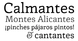 Puebla, Mexico-based designer of Chat Noir (2019: an art nouveau font) and Queen (2019: bilined).
 Member of the Sic Typus Creatus Est team (Dafne Martinez, Jorge George, Leonardo Delgado, Iordan Evair and Federico Biagioli) that designed Calmadita in 2020 for the Torneo tipografico competition. Calmadita is an angular slab serif meant for Ipads and Kindles. [Google]
[More] ⦿
|
Leo Kainradl
|
Leo Kainradl (1872-1943) was a member of the Vienna Club of Seven and is best known for his work as a graphic artist. He drew illustrations for The Meggendorfer Blätter and became the editor for the magazine Fliegende Blätter. He also illustrated children's books for J.F. Schreiber and designed a series of postcards for Philipp & Kramer. [Google]
[More] ⦿
|
Leonhard Katschner
[Brave Type (was: Brave Lion Fonts)]

|
[MyFonts]
[More] ⦿
|
Les Besnardtypo
[Michel Besnard]

|
The French type designers Michel (b. 1942) and Rosalyne Besnard (b. 1946) live in Rouen. Under the brand Les Besnardtypo, they jointly designed Micmac (Agfa Creative Alliance, 1997), ITC Odyssee (1996), ITC Typados (1997), Rom (Creative Alliance, 1998), Bouchon (Letraset, 2000), Huit (Visual Graphics Corporation, 1972), Sargon (Visual Graphics Corporation, 1974: bilined and futuristic), Migraph (Agfa Monotype, 1999), PistolShot LT Std Normal and Light (Linotype, 2003), Nazca (Monotype Imaging, 2005), Sargon (Monotype Imaging, 2006), First One (Monotype Imaging, 2006: a family for teaching the alphabet to children), Mickros (Monotype Imaging, 2007), Pantin (Monotype Imaging, 2007), De Gama (Monotype Imaging, 2008), Pasta (Monotype Imaging, 2008). As of 2015, Monotype sells De Gama, Filao, First One, Gamira, Huit, Makina, Mickros, Modern B42, Nazca, Pantin, Pasta, Robotool, Sargon, Season. Linotype page. FontShop link. Another FontShop link. View Michel Besnard's typefaces. [Google]
[MyFonts]
[More] ⦿
|
Letitia Thirapathi
|
Letitia Thirapathi Appadu (Townsville, Australia) created Futura Floral (2011) by filling the glyphs of Futura with art nouveau style flower ornaments. Behance link. [Google]
[More] ⦿
|
Letter Stock (was: Gumacreative)
[Guguh Gumantoro]

|
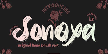 Bandung, Indonesia-based designer (b. 1982) of Masura (2016, brush style), Space Cake (2016, sci-fi style), Caroline Script (2016), Morning Fever (2016), Binzo (2016), Morning Cloud (2016, handcrafted), Rancha (2016: grungy style), Alkhali (2016), Gath Is A Robot (2015) and Scarlet (2015, textured typeface).
 Typefaces from 2018: Vanhala (Tuscan), Orchard, Solitaire, Founder (a thin script), Elanor, Callous (signature script), Keith (script), Subsky (script), Hamburger (artsy script), Smith (monoline rounded sans). Typefaces from 2019: Steven Mattew, Romansa (script), Pianicas, Infamous, Voltras, Faddox, Slayer Creeper (a dripping blood blackletter font), Hellioum (a balloon font), Grootten Beast (a wooden plank font), Lazarrous (beatnik), Salmounth (a clean script), Damaskush (a blackletter), Neurotic (spurred, blackletter), Maclucash, Neowave, Throoper, Maldivine, Morrisette (signage script), Descrendent (sans), Athlenstan, Hole Script, Cardigan, Lenox, Aero Space, Esentrik (over-decorated), Lethal (sans), Markwell (script), Hallmark, Fymous (signature script), Brighford (spurred), Bulb (a bubblegum font), Wavecraft. Typefaces from 2020: Flinch (a stone cut Flintstone font), Jack Miller (a signature script), Jaguar Jugglers (squarish, constructivist), Lazarrous (beatnik style), Jane Frediction, Grindmore (a calligraphic blackletter typeface), Descendent (a monolinear rounded coffee shop sans), Oliver Queen (a fat brush script), Orangutan, Chadwick (a Halloween font), Oakleaf, Buckles, Hackwell, Susan Brooks, Jacqueline, Alistair Morrison, Gibson Walsh, Slapstick, Monkey Werch, Rooselyn, Northway (lettering for outdoor or nature trail signage), Ghotana, Apija, Rawkin Pickles, Lockdown, Linger (a curly delight), Nuttyclash (a dry brush typeface), Ghosie, Kuro (a brush script). Typefaces from 2021: Bellamind (a decorative serif), Bingana (a playful typeface with oriental influences; appropriate for toys), Cheshire (sketched, textured), Creepycall, Croftler (a grungy athletic shirt font), Goldenwick (a vintage decorative serif), Karlburns (an ultra-decorative font by Vic Carless), Shorelly (an arts and crafts all caps serif), Walkingblue (a round vernacular slab serif), Garlicha (a great formal copperplate calligraphic font that unfortunately features a lower case r that can be confused with a lower case n), Hamingduck (copperplate calligraphy), Antucious (an ornamental serif), Monkeymod (a textured reverse srtress display font), Eightbit (a retro pixel font), Maloney West (art nouveau), Adamovick (a spurred Halloween font), Grindleaf (organic), Cronicalypse (a reverse stress elephant foot display font), Houston Palace (a monolinear retro script), Raceryouth (a weathered stencil font), Lyonade (a monolinear script based on retro motorbike posters), Alleysondust (a calligraphic script), Carlosberg (a spurred Victorian typeface), Clubeight (a trilined neon typeface that is reminiscent of Wyman's designs for the 1968 Olympics in Mexico), Slacksluger (a decorative inline typeface with medieval terminals), Beckmarine (a rough typeface inspired by retro cartoon and retro motorbike posters), Bullmars (a heavy font), Sinofluck (a stylish brush script inspired by a samurai poster), Scandlers (a dry brush script), Melvines (a thick paint brush font), Rockapolis (stencil), Lexaviers (a rune simulation font), Mylo (a dry brush typeface), Meckatler, Machiates (a vintage signage font), Fluxion (a dry brush script), Black Marilyn (blackletter), Palermosh, New Kids on the Font, Psychonaut (a reverse contrast, or even a Western, font), Black Valentine (a decorative blackletter), Buckles (a dry brush font), Smegh Mouth (a dry brush font), Armthadore, Brookland (a dry brush script), Khian Shantang (a decorative blackletter), Laekar (a hand-drawn blocky poster font), Schoutler (an ornamental fantasy font), Sonoxa (a heavy and creamy dry brush typeface), Classicloud (a decorative and festive blackletter). Typefaces from 2022: Gavin Zoo (a vintage decorative serif), Sallam (Arabic emulation), Sururim Maudunah (emulating Arabic), Ar Rayyan (Arabic emulation), Hollybucks (a round handprinted typeface), Mack Dutch (a weathered elephant foot serif), Obidel (a squarish vernacular typeface), Pinkerton (a playful cartoonish font), Sloopy Joe (a condensed sans with some curly terminals), Xylo Macloud (a decorative serif), Hickenwitch (a decorative serif), Parkwilson (a decorative serif), Buckedtalk (an inline blackletter typeface), Buckedtalk (an inline blackletter typeface). Creative Fabrica Script. [Google]
[MyFonts]
[More] ⦿
|
LetterGraphics
[Marc Jones Barry Kimbrough]
|
 Photolettering foundry run by Marc Jones Barry Kimbrough in Culver City, CA. Russell Bean worked for the Los Angeles studio of Lettergraphics International in charge of lettering, logo design and converting type designs to film fonts. It was at this time (1973) that the Washington family (digital version at Type Associates, Russell Bean's present company) was completed. The company ceased operations in the mid-1980s.
 The 1968 catalog of Lettergraphics featured typefaces like the psychedelic Mod Poster in Alfred Roller's Viennese secession style. The 1974 catalog of Lettergraphics shown in ULC 1974 includes these typefaces: - House styles: Virginia, Vantage, Grading, Joe, Heritage, Chaparral, Radius, Nectar, JoJo, Dojo, Harvey, Spatz, Mamoru, Wellington, Sebastian, Belden, Parquet, Della, Nippy, Hess, Totemic, Ruby, Big Fat, Simoes Classic, Serendipity, Kiwi, Angelo, Bethany, Right-On Neon, Klein Lined, McGrath, Fitzner Caps, Skidoo Outline, Plastic.
- By Joseph Churchward: Twenties, Churchward Sans, Churchward Roman, Churchward Lined.
- By Marlene Steen: Steen Sans.
- By Michael Di Canzio: Di Canzio Sans.
- By Donald Carboni: Carboni.
- By Patrick Collins: Arlenette.
- By Edston J. Detrich: Detrich Sans.
- By Martha A. Rowland: Rowland Grotesk.
- By John E. Lorish: Lorish Shadow.
- By Alfted Guerra: Times Square.
- By Reynolds M. Roberts: Roberts Square.
- By Peter Solly: Colescombe.
- By Robert F. Brightman: Streak, Brightman.
- By Robert L. Cooley: La Grange, La Grange Black.
- By Herbert L. Frager: Frager Punch.
- By Anthony Liliefeldt: Padua.
- Ray L. Herness: Herness Script.
- Robert E. Gotsch: Botsch Glob, Botsch Toe.
- Donald L. Vernon: Chrome.
Digital revivals: - Latitude Sans (2019, Stiggy & Sands). A heavy sans based on Lettergraphics' Free.
- Mushmouth PB (2019, Phil Bracco). A revival of the comic book font Albert.
- Nudity PB (2018, Phil Bracco) revives Ad Shadow as a layerable font.
- Wintermint (2018, Phil Bracco) revives and extends the flared almost psychedelic typeface Lori.
- Boilermaker (2018, Stiggy&Sands) is a revival of the tall condensed sans LetterGraphics typeface Flair G100.
- The psychedelic (art nouveau inspired) typeface called Cantini (1972) was digitally revived and expanded by Patrick Griffin as Salome (2007, Canada Type).
- Intrigue is a Lettergraphics film typeface that was digitized, revived and expanded to a large octagonal / mechanical typeface family, Contraption, by Phil Bracco (Pink Broccoli).
- Scrwby (2013, Phil Bracco) is a revival of Surf.
- Virginia (2008, Russell Bean) is a digitization of an old avant garde typeface by Bean himself from ca. 1970 that won a Lettergraphics typeface competition. It was extended by two weights and redrawn in 2016 as Virginia Neo.
- Rebecca Alaccari (Canada Type) designed Goudy Two Shoes in 2006, an expansion of the film typeface Goudy Fancy by Lettergraphics.
- Good Grief PB (2015, Phil Bracco) started out as a revival of Carmel (or Karmel).
- MardiKrewePB (2015, Phil Bracco) started as a digitization of a (psychedelic) film typeface called MardiGras by Lettergraphics.
- Maile was digitized and extended by Stiggy & Sands as Husk in 2018.
- Gene Eidy's Sukiyaki (1968, Lettergraphics) was eventually digitized (without permission) by Jonathan Smith as Hirosh (1993). In 2020, Steve Harrison did a proper digital revival giving full credit to Eidy---his free typeface is also called Sukiyaki.
- Laurel was revived and extended/modified by Stiggy & Sands in 2019 as Lorette.
- Rackem PB (2019, Phil Bracco) is a beatnik font that started as a digitization of the LetterGraphics film typeface Eightball. There are other Eightball film fonts of a very different look elsewhere, so that name is a bit confusing.
- The bullethole typeface Circue Solid was revived by Phil Bracco as Blackhole PB (2019).
- Wood Grotesk. This font was revived and expanded in 2020 by Stiggy & Sands as Bugleboy. Berkshire Pro (a plump display typeface).
- Caren. A great stencil font revived in 2021 by astigmatic One Eye as Rinzler AOE Pro.
[Google]
[More] ⦿
|
Letterhead Fonts
[Chuck Davis]

|
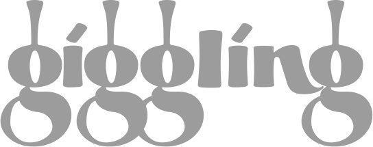 Chuck Davis (Palmdale, CA) is the founder of Letterhead Fonts, which is now loacted in Reno, NV. LHF was established in 1999. They specialize in sign and logo fonts, taking inspiration from wood type and late 19th century style typefaces.
 Free fonts "Letterhead Tuscan" (handlettering), Quadrex (2006, 3d effect font), and Wal-Mart People (dingbats). Early display fonts include Esoteric (1999), Wall Dog, Double Gild, Convecta, Smalts, Splash, Lisa. His Atkinson collection has a few nice lettering alphabets: Heavy Sign Script, Eccentric French, Fancy Roman and Modern 1908 Classic (now called Cafe Nouveau). Mike Stowe designed Old Blackletter in 2001. Ken McTague made the hand-lettered style typeface Boston Truckstyle. Designed by Brian Kniceley in 2000: LHF Henderson Church, LHF Ohnimus Florid, LHF Ohnimus Spiked, LHF Strong Tea House, Strong Caliope, Strong Nouveau. Fonts made around 2000 by Chuck Davis: LHFActionMovie LHF Bulletin Plug, LHF Classic Block, LHF Condensed French, LHF Convecta (2005, beveled face), LHF Cool Blue, LHF Crouching Tiger, LHF Def Artist, LHF Def Writer, LHF Double Gild, LHF Eccentric French Lt, LHF Esoteric, LHF Heavy French Roman, LHF Heavy Sign Script, LHF Jami (2000), LHF Letterhead Tuscan, LHF Lisa, LHF Modern 1908 Classic, LHF Quantum (2001, techno family), LHF Smalts, LHF Splash, LHF Tuscan Full Block (Western style), LHF Wall Dog, LHF Letterhead Tuscan. Fonts made in 2001 by Chuck Davis: LHF Advertisers Plug ATK, LHF Argentine Solid, LHF Boston Truckstyle, LHF Esoteric New, LHF Grants Antique, LHF Mister Kooky, LHF Mister Spooky, LHF Scriptana (2003, angular calligraphic script). The following are all by Chuck Davis: Kung Faux (2021: oriental simulation), LHF Antique Shop, LHF Fat Cat (2011, a round informal typeface influenced by Alf Becker's rounded block letterstyle), LHF Bank Note (2007), Quadrex (2005), Menace (2004, comic book style), Michelle (2004, calligraphic script), LHF Ambrosia (2004, free), Sofia Script (2003), Stanford Script (2003), Sarah Script (2003), Fancy Full Round (2003, a Western typeface inspired by Al Imelli, ca. 1900), Matthews Thin (2003, tall caps face), New Modern Classic (2003), LHF Birgitta (2003, roman style typeface, inspired by an E.C. Matthews book), LHF Happy Fun Ball (2003, comic book style), CD Esoteric, OldSignFont, Robin, LHFDefWriter, LHFDefArtist, LHF Amarillo (2001, a spurred serif), LHFBeckerMonogramEnglish, LHFBeckerPosterScript, LHFBeckerRoundedBlock, LHFConclaveFLATreg, Cool Blue (2003), LHFConclaveFLATwide, LHFConclaveROUNDreg, LHFConclaveROUNDwide, LHFConclaveSHARPreg, LHFConclaveSHARPwide, LHFCrouchingTiger, LHFCrouchingTigerCONVEX, LHFEquinox, LHF Esoteric3 (2004), LHFMirageBOLD, LHFMirageITALIC, LHFMirageREG, LHFMonogram, LHFQuantumCONVEX, LHFQuantumREG, LHFRomanaClassico, LHFScriptana (great lettering font), LHFTimberlodge, Village, Kelly Ann, Outlaw, Hensler (2002, a cigar box face), Antique Half Block (2002, wood type), Spurred Egyptian, Wolverine, Ortlieb, Super Thick&Thin, Denise, Hensler, Charlotte, Antique Half Block (2002), Supabad (2003), Brianna (2003, techno), Happy Fun Ball (2003, comic book family), Naylorville (2004), LHF Grant's Antique (2004, caps only Victorian face), Michelle (2004), Cafe Corina (2006, a decorative 19th century style free font by Chuck Davis), LHF Ambrosia (2004, a purely Victorian free font by Chuck Davis), Lincoln (2006), No Fishin (2006), LHF Bell Boy (2004, a free art deco font, Chuck Davis), LHF Full Block (2003; free slab serif athletic number typeface by Davis), Mike's Block (free slab serif by Davis), Old Block (free athletic numbering typeface by Davis), LHF Old Stock (2007), (2007, lettering from old stock market certificates), Hick Sticks (2007, letters made from sticks), LHF Fast Slant (2007, comic book style), LHF Cartoon Cowboy (2009), LHF Big Daddy (2012, fat signage family), LHF Comic Caps 2 (2014), LHF Advertisers Square (2014, after a signage alphabet by Al Imelli, 1922), LHF Asylum (2015, scratchy brush), LHF Black Rose Script (2016), LHF Mastercraft (2017). Typeface categories: 3D, 30's and 40's, 50's and 60's, Art Deco, Art Nouveau, Bold, Calligraphic, Cartoon, Casual, Circus, Condensed, Convex, Corners, Decorative, Distressed, Early 1900's, Extended, Fire Truck, Formal, Gothic, Graffiti, Inline, Late 1800's, Layered, Light, Modern, Old English, Ornaments, Panels, Prismatic, Racing, Railroad, Ribbons, Roman, Sanborn Map Co., Sans Serif, Scripts, Scrollwork, Shadow, Stock Certificate, Swashes, Victorian, Western, Word Art. Designers: Arthur Vanson, Brad King, Bruce Bowers, Charles Borges, Chuck Davis, Dan Sawatzky, Dave Correll, Dave Smith, David Parr, Denise Bayers, Duncan Wilkie, Francis Lestingi, Jeff Marshall, John Davis, John Studden, Kaitlin Sims, Ken McTague, Mark Searfoss, Mike Erickson, Mike Jackson, Patrick Kalange, Rob Cooper, Steve Contreras, Tom Kennedy. At one point, Chuck Davis was running Blu Creative Media, where he published BLU Esoteric (1999). Interview at MyFonts. Letterhead link. Behance link. [Google]
[MyFonts]
[More] ⦿
|
Letterhead Studio YG
[Yuri Gordon]

|
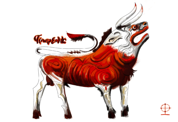 Letterhead is Yuri Gordon's (b. Moscow, 1958) Moscow-based foundry which publishes mainly Cyrillic fonts. Its coowners are Valery Golyzhenkov and Olga Vassilkova and it was established in 1998. It evolved from Garbage Type Foundry. Not to be confused with Chuck Davis' Letterhead. The main designer is Yuri (or: Jury) Gordon, the Moscow-based designer of the Type Directors Club 1999 award-winning designs Dve Kruglyh and FaRer Cyrillic, available from Paratype. URL at Yakovlev's Foundry. Picture. Article in the Moscow Times (2006), in which he proclaims: Better to make five fun and tasty new display fonts than one old, boring (and you thought it would look fresh!) text font. He is a graphic designer, illustrator, type designer, engraver and copyrighter. He is Art Director of several magazines.
 - Yuri Gordon created AntiQuasi (2008, a nice lightly slabbed serif family), Babaev [1996; inspired by the Russian Art Nouveau typefaces, initially created as a part of a corporate identity programme for Babayevskoye AO of Moscow], Artemius (custom designed family for Art Lebedev Studio), Barrizmo (2004), Bistro (1997, hand-printed), Chantage (2000, handwriting), Conqueror Text, Conqueror Slab and Conqueror Display (large families), Conqueror Sans (2005-2010), Conqueror Text (2005-2010), Costa Brava (2003, fun script described as beach type), Costa Dorada (2003), Dva Probela (1997-1998), Dve Kruglyh (1997, unicase), Excession (1999), FaRer [1994; art deco typeface inspired by the work of Russian graphic artists Vladimir Favorsky (1886-1964) and Ivan Rerberg (1892-1957), especially by Favorsky's lettering of 1924 and by Rerberg's of 1935. Dedicated to the Moscow Underground (Metro). Obtained an award at the 1997 TDC competition], Forward No. 10 (1995-1996), Forward Grotesque No. 9 (1998-2000), Gordoni (his take on Bodoni), GiardyOla (2008-2019), Handy, HotSause (1997, irregular handwriting), Karkas (2004, a manly sans), Little Shift (1999), Method (2002, a sans family), Minusmanscript (1998, calligraphic), Mr. Mixter (2011), Non System (2000), OptiMyst (1997), ResPublicana (1999), Sivtzev Vrazhek (1999, + mono), Michelle (2004, medieval), Naylorville (2004), Probel (1997-1998).
- Illarion Gordon made the fun fonts Strelochnik (1996, irregular hand), Probbarius (1996), Monte Summa (1997), as well as Rahit (1998, kid's handwriting), Rough (2000, blotchy hand), Simpel (kid's hand), St. Valentin (2001), Accept (1998), Kartofel (2000, irregular handwriting), LangobardR (1999), Ospa (1997, funky handwriting), pLatinum (1999, informal script).
- Valery Golyzhenkov's fonts from before 2000 are typically destructionist. He made 04.07 (1998), Bort#1 (2000), CardHolder (1997), Chellebrity (2004, screen), Cracker (1997), Cubes (2000), Dead Metro (1997, a constructivist family renamed Dead Mementro in 2017), Do Not Touch (1997), Dream Team (2000), Formalist (2001), Gamering (+Sans, 2009: a game font), Garbage (12997), GarbEdge (1997), Garmony (1997), Grammatika (1997), HandsOn (1997), Hole Down (1997), Hot Sauce (2009, Yuri Gordon), Ice Cola (2000), Kabotage (1998, octagonal), Kassa (2002, octagonal), Kren (1998), Laborant (2000), Lavert Noise (1997), Matrrolla (2001, octagonal), Mono (2000), Musor (1997), OneCode (1998), Primitiv (1998), Principal (1998-1999), Recruit (2004, octagonal), Remont (2000), Rounds (basic dingbats), Silver Winer (2000), Sklad (2000), Stampit (2000), Upadok (1997, futuristic), YE Stencil (2009), Zaplyv (1997), Zanoza (2005).
- Custom typefaces for companies or special projects: 19oclock (2004, Yuri Gordon: for Vernost Kachestvu confectionery factory), AlfaBank, Always, Anteus, Artemius, Alexey, Atlas-1904, Bat Sans, Bat Roman, Calendarus, Carlis, Cifirki, CTC Screen, Digrol, Digimag, Esquire, Gulliver UTS, Gurmania_MA (2004, handwriting), Hi Afisha, In CaST, Ka, Kater, Komet, Kostro, Lumene Script, N.B.T., Nochnoi Dozor, Odessa, Progress Custom, Redd's, Robb Report New, Rolling Stone 2003, Rolling Stone 2005, Romb (2010), Rosbank Sans, RMA 2006, Salon Script (2007, calligraphic), Salon Antiqua (2007), Seventeen, N.Side, W.Side, Sivtzev Vrazhek, Snickers, Sovereign, STS Vizion, Svyaznoy RF (2008, sans), ToShi, Trust, Whiskas lettering, Zabava.
- Typefaces and/or lettering from 2007-2009: Barocco Mortale (2005-2007curly script), Barocco Mortale Borders, Alfavita (ornamental caps by Goluzhenkov), Fleurs du Mal (2008, a Baudelarian antiqua, mischievous and decadent), DBL Cheque (by Goluzhenkov), Medved (by Goluzhenkov), YE Stencil (by Goluzhenkov), 21Cent (2009, related to Century; +Cyrillic; +Thin; +Black; advertised as not Century, not Clarendon, this fresh family is sure to win awards), Antiquasi (2008), Around the world, Bazaarban (2009, for Harper's Bazaar), Blacksteel, Citizen M (art deco), EsqGuardi (for Esquire), the curly Naska, with accompanying dingbats Naska Kozliki, the bird dingbats Udo Birdo, and more at Flickr.
- Production in 2012: Digital October, Red Square (constructivist), Red Ring (art deco sans), Baker Street 221B (anglomane grotesque).
- In 2013: Clarendorf (a hand-printed spoof on Clarendon), Bonvalet (large x-height sans), Bazaart (an art deco typeface for Harper's Bazaar), The drop-dead gorgeous condensed American slab and sans serif typefaces Mr Palker and Mr Palkerson.
- Typefaces from 2014: 20 Kopeek (sans family with steampunk influences).
- Typefaces from 2015: Buffon (a spaghetti Western italian typeface), Mr Palker Dad, Mr Palker Dadson.
- Typefaces from 2018: Atomic Alice (a simple stocky sans family).
Author of the acclaimed 384-page book Book of Letters From to ” (2007, Art. Lebedev Studio). Behance link. Art by Yuri. Issuu link. Klingspor link. Behance link for Yuri Gordon. Art Lebedev link. View Letterhead YG's typefaces. [Google]
[MyFonts]
[More] ⦿
|
Letterhend Studio (or: Magang Letterhend)
[Hendry Juanda]

|
 Hendry Juanda runs Letterhend Studio in Yogyakarta, Indonesia. He designed the signage script typefaces Redoura (2016) and Kadisoka (2016), and the accompanying Redoura Serif (2016) and Kadisoka Monoline (2016). Hendry also designed the handcrafted typefaces Signerella Script (2016, +Sans), Motherline (2016), Motherline Sans (2016), Mukadua (2016: a beatnik serif and a script), Sakra (2016) and Sakra Script (2016).
 Typefaces from 2017: Kaylar Script (formal calligraphy), Keylar Serif, Legion, Hipsterious (signage script), Megattor, Dear Jane (a signature script), Wonder Stark (a rhythmic script), Kingbirds (monoline script), Mandatory (Sans+Script), Modesta Script, Romzul Sans (a fat finger font by Muhammad Romzul Khoir), Kanuda (by Galih Prasetyo), Aamonoline (by Ageng Jatmiko), Fad Script, Ageng Sans (by Ageng Jatmiko), Anisa Sans, Morsel, The Lentigo, Quinible, Storytella, Rose Colored, Swiftone, Antone (letterpress family), Retrology (monoline script), Claytonia, Pipetton (brush Script and Sans), Marttabuck (retro), Gloriant Signature Script, Jouska, Brooklyn (dry brush), Holiday, Take Easy (dry brush), Larizo (brush script), Vanillate (monoline retro script). Typefaces from 2018: Sabatons, Autogate (font duo), Sharon Baker, Blue Phantom Script, Dologan, Bolica, Jaceline, Youther (brush script), The Goldies, Carllosta (curly), Black Space (brush style), Anjani Script, Melania Monoline, Calasans (retro layered), Arlington (spurred, Tuscan), Pastelle (SVG brush font), Diana Webber, Caligor (a vintage headline typeface), Greatly, Belymon Script (a great signage script), Majestika Script (signage script), Nagoya (monoline script), Charlotta Script, Stronger (vintage style), Vanillate (connected monoline script), Pipetton (script), Roseville (calligraphic: by Hendry Juanda and Sarid Ezra), Rupture, Gustolle (a great watercolor brush font in OpenType SVG format), Riverside (monoline script), Bulgaria Script, The Majority (calligraphic script), Blacklite (signage script), Athalia Script, West Hood (Western), Fort Collins (font duo, by Sarid Ezra at Letterhend), Flanders Script (a signage script), Thirdlone (a monoline script), Bigstorm, Melania Script (named after the first golddigger), Motherline, Harsey (a 16-font toolbox of signage scripts and dingbats), Dearday Script, Dearday Sans, Blodders, Callonsky Script, Kulon, Quicken, Reklase, Skizzle, Storytella, Brighter. Typefaces from 2019: Shockbar (a Halloween font), Chanide Script, Girly Moods, Padlock (a great retro script), The Rouged (monoline script), Karatone, Kingdrops, William Letter Signature, Billskates, Dorothy Clark, Chord Brights (a Victorian typeface), Sequents, LS Olive 01 Script, Bargitta (an SVG brush script font by Hendry Juanda and Sarid Ezra), Hellone Script, Sharon Baker (by Hendry Juanda and Sarid Ezra), Daniella Evans (a display serif by Hendry Juanda and Sarid Ezra), Leafstar, Righton (a signage script by Hendry Juanda and Sarid Ezra), Lotustail (by Henry Juanda and Sarid Ezra), Radicals, Seriously (a display sans), Rupture, North Avellion, Majestika Script, Palmbell (a signature font by Hendry Juanda and Sarid Ezra), Fokers (Victorian), Frankest (Script, Serif; with a Victorian feel), Danielle Harris, Callonsky Script, Murphy Script, Lanoline Script, Bittergrace Script (by Hendry Juanda and Sarid Ezra), Bordemile (a copperplate calligraphic script by Henry Juanda and Sarid Ezra), Daybird Script, Amerta Misty, Wonderstory, Kingbirds Rough (monoline), Rupture Stamp (for signage), Gorgone (a one-style didone by Henry Juanda and Sarid Ezra), Stomper, Caligor, Asterone (a wide all caps sans), Venettica Script (a signature script), Hougbon Script, Philomena Script, Cephalonia, Birmingham Script (calligraphic), Hillstown (Sans and Script). Typefaces from 2020: Billrocks (a condensed all caps sans), Greybridge (a fine retro script), Lava Cookies, Just Because, Moraline Script (a baseball signage script), Lemonade Peach, Mayburn (a retro signage script), Fillerglad (a signature script), Breadfast, Della Brian (script), Sailritme (wild, calligraphic), Stacylia, Stacylia, Salty Unicorn (a monolinear marker pen font), Super Giants, Gingerly, Creeplens, Donthank (a fat finger font), The Viperion, Blantika, Maritosca (wild, calligraphic), Thirtylane Script, Winland (a brush script), Ballmarks (wild, calligraphic), Mellodate, Braleno (a shaky font), Siregar, Camie (a wedge serif), Hugiller (a high contrast ball terminal fashion mag serif), Mildistance (a tall calligraphic script), Midgeto (a casual all caps typeface), Crimson Black (a brush typeface), Duke Charming (a decorative serif), Lucky Spark, Blue Jones, Sunshine Valley, Hello Christine (a rough-edged script), Revalina (a wild calligraphic script), Ranshell (a chalky script), Malliandra Script (a wild calligraphic script), Vistaria Notes (a wide flowing calligraphic script), Achiever, Bullgine (blackletter), Billion Reach (a signature script), The Randi (a monoline script), Yorkson (a signage script), Laverty Castaroza (all caps, art nouveau), Kandani (a creamy signage script), Fragtude (a creamy script), Quick Counters, Kaeliwritten, Heaven Wanders (a lively vintage hand-printed typeface), Chillday Script, Redberries, Foretelling Script, The Stegris (a decorative serif), Bayland (a signage script), Darthon, Caligonia, Deluge (a heavy script), Laterlocks (a display typeface), Baille Simpson (a dry brush script), Kanote (an all caps cartoon font), Black Ground, Franceur, The Wanters, Alburgone (an all caps quaint shop front lettering typeface), Annette Bradford, Winstreak (a brush font), Madegra (a decorative serif), Samrose (a dry brush font), Dehors (a Tuscan circus font), Compania (a wild script), Neography (a formal script), Shakuro Brush (oriental brush), Rascals, Wednesdom, Chirpy, Altia (Script, Sans, Slab Serif, Signature, Hand, Brush, Dingbats), Stargation, Buttoni, Radgrows, Linkgray, Monday Bay, Brown Chunkers (a vintage label font), Squiborn (a hand-drawn athletics font), Brilliantly, Holystone, Detroit (a handcrafted slab serif), Spring Note, Bigtown (a heavy hand-lettered slab serif), Naville (a 6-style all caps sans family), The Proactive (script), Wardrum Pro (a wide sans) and Wardrum, Kinderline Script (monoline), Kingdrops, The Kogles Script (retro), Conseration (a condensed sans). Hopkins Angela, Blue Phantom, Gladiolus Script, Calvous (spurred and weatheed), Fort Smith (penmanship calligraphy), Ramdone (a creamy signage script), Devilion (a signage script), Cortair (a vintage typeface), Kingbirds (a monoline script), Purefell Script, Rangkings (serif), The Holloway (Victorian), Roquen (a rustic typeface), Gloriant. Typefaces from 2021: The Riskeys (a tall stylish serif), Brandice (blackletter), Carllosta (a Victorian font), Dountyland (a monoline script), Garten House (Victoriana), Hello Sierra Sans (a child's hand), Marla Griselda (a formal script), Nachinta (script), Winter Rosetta (a curly script), Distoniare (a thin calligraphic script), The Moon Milter (a vintage all caps display font), Asper Crown (a nature park display font), Delgian (script), Astropicks (a marker bpen font), Cerlistine (a fat finger script), Fintbar (a fat all caps display font with an oversized chin), Madre Rose (a stylish unicase typeface), Norvin (vintage caps), Roundkind, Sentra (a wide hand-crafted display font), Stone Masher (script), Beast Party (a Halloween font), Hollow House (a Halloween font), Blowsters (a dry brush mural font), Rumble Born (a bean font), Stano Sans (rounded), Amillia Rochete (a delicate signature script), Shopie Minclair (a fine pencil script), Sign Paintoh (a sign painter's font), Wednesday Island (script), Sinister Mind (a horror font), Divine Stone (a brush font), Pinsmalle (a signage script), Radnick (a plumpish retro font), Wackets, The Royal Chambers (decorative caps, with a hint of art nouveau), Shopie Minclair (a refined script), The Morshine (Victorian), Beauty Culture (an angled calligraphic script), Allarmante (a horror font), Billanta (a retro signage script), Galpike (a 9-style sans with modulated stems), Magnitude (a stylish display sans with large x-height), Romans Story (stylish caps), Stay Strong (a dry brush script), Cardila (a monoline retro signage script), Explore Magic (hand-printed), Kingslayer (a graffiti font), Marina Bullock (a flowing rabbit ear script), Dustland (a retro signage script), Haystack (script), Sakura Town (Japanese brush emulation), Boldistrike (a retro signage script), Maleryan (a delicate formal calligraphic script), Sellina Word (a calligraphic script with irregular line thickness), Servegin (a display serif), Shelbie Roger (Victorian), Stumble (a signage script), Foresight (a vintage script), Cordoba Sans (vintage caps), Badgear (a monoline script), Edellyn Script (tall and elegant), Glorify Sans (an 8-style decorative sans), Wellytonia Package (a scrapbook script), Turesco (a creamy caps typeface), Black Space (a horror brush SVG font), Slime Yogurt (a fat finger font), Black Hymned Script, Pompano (a lively almost vernacular headline sans), California Quotes (brush script), Rosterine (a vintage condensded display font), Between Days (a display serif), Crescent Slim (a stylish display serif), Captivate (script), Flumbery White (a thin tilted script), Modern Prestige, Olive Vine (a lively brush script), Graystera (an elegant script), Morning Glints (a marker pen font), Native Roast (a vintage layered typeface), Menleader (script), Neophyte (a flared vintage typeface), Dankfield (condensed, squarish), Sogate (a bold script), Hollow Sky (a thin script), Boosley (a condensed supermarket script), Killviners (blackletter), Chenile Deluxe (a vernacular supermarket font) Silvestern (a vintage display font), Arnette Script (a calligraphic script), Margoline (an elegant formal calligraphic script), Pinmold (a geometric stencil font), Eligated (all caps, vintage), Garmouth Display (a Victorian era advertizing font), Bugheds (blackletter), Candleton, Riotous, Baverley Astone (script), Belmistate (a fine rhythmic brush script), Hulberk (an all caps slab serif), Mogaster (a monolinear script), Black Rockets (a dry brush script), Glady Script (a bold signage script), Yesternight (a bottom heavy script), Welroseltone (a stylish calligraphic font), Bold Garage (an inky unusually elegant typefacre), Bright Clones (hand-printed) Grand Wilson (a font duo), Merodine (calligraphic), Appears (a decorative serif), Mounties (tall caps with flared terminals), Quatro, Ground Castle (a display serif), Linestay (a signage script), Alessia Harvey (a signature font), Caramel Chestnut, Londers (an upright bold script), Hubstone (a brush font), Oversouth (vintage, hand-drawn), Bright Gesture (a lachrymal font), Center Voyage (an all caps display typeface), Asteria Royalty, Georude (hand-printed), Raksana (a bold upright script), Aesthetic Notes, Broadley (a vintage font duo), Chopader (a vintage font duo), Wimp Stars (a beatnik font), Brown Holmes, Mortina (a vintage font duo), Dustown (a rounded handcrafted sans), Holymore, Lamberds (a rhythmic script), North Mountain (a decorative flared typeface), Butter Slices, Portalica (an all caps italic font with plenty of ball terminals), Evening River (an optimistic and playful script), La Graziela (formal copperplate calligraphy), Metro Capitals, Davenvale, Earthgate (a vintage penmanship font), Vindale (a retro reverse stress script), Better Hobby (a layerable cutout font), Bouldster (a bottom-heavy psychedelic script), Melorist (a display sans), Benorante, Millgrove (a condensed spurred typeface), Asterluck (a fat finger font), Boinger (wide, octagonal), Rimeland (calligraphic), Ansylia, Mantaray. Typefaces from 2022: Arturico (a frivolous art deco font), Calmine Font Duo (a bold vintage script), Foresight, Penster Bross, Mayhome (script), Rivervale (flared hand-crafted caps), Rontage (a late 19th century-style display typeface), Bert Watson (a tall thin upright script), Honnie (Greek emulation), Livemono (6 styles), Caldeisa (a creamy script), Coral Candy Regular Slant (a blocky plump unicase typeface), Hanstone (script), Hintown Slant (arts and crafts era caps), Liviatica (a wavy display serif), Rosie Brown (a font duo), Growline (an all caps display sans), Lion Parade (a vintage apothecary script), Praysire (a sharp-edged display serif), Bashiton (a monolinear script), Crainzel (notched caps), Garetra (a stylish serif), Moon Slayer (a scrapbook brush font), Growlies (a fat finger script), Ridge Cliff (a massive slab srif), The Bristers Sans (a font duo), Augify (a hipsterish display serif), Dustyland (a monoline script), Primore Castle (hand-crafted), Merry Brook (script), Monstroux (a brush font), Blue Carousel (an informal brush script), Bastinson (a thin monoline script), Happy Sparkle (an inky treefrog script), Arinkoln, Backdown (script), Krostenia (a monoline script), The Bardian (script), Black Rocket (hand-printed), Kaglia (script), Cyberion (sci-fi), Groovy Friends (hand-printed), Calfine (a bold condensed poster typeface with small wedge serifs), Fountencil (a blackletter stencil), Logirent (a minimalist logo font), Logirent, Hermush (art nouveau caps). Aka Magang Letterhend. Behance link. Dafont link. Graphicriver link. Dafont link. Creative Market link. Fontesk link. [Google]
[MyFonts]
[More] ⦿
|
Levi Szekeres
|
 Cluj, Romania-based creator (b. 1973) of Levi Brush (2004, brush face), Levi ReBrushed (2012), Lipsum (2011, hand-printed), Levi Marker, Levi Crayola, Lorem Ipsum, LeviNaiveLetter1 (grunge), LeviWindowsExtraLight (pixel face), Pxlxxl (2012, pixel face). These were all made under the alias Scotch Kitsch Sandwich.
 In 2013, he made Pxl, Pxll and Pxlxxl Cond. In 2014, he published the stencil typeface Rubber and the condensed roundish sans typeface Ruler. In 2015 he made HermanoMayor, HighVoltage-Rough, HighVoltage, Ruler-Modern. Typefaces from 2016: Ruler Stencil, Loveletter No. 9, Ruler Volume, Hermano Alto Chisel (octagonal), Fashion Fetish, Gotcha Gothic, Hermano Alto, Supercaligrafilisticexpialidoc, Cry Brush, Loveletter No. 9, Post Scriptum. Typefaces from 2017: Sugar & Vinegar (a rounded art nouveau typeface), Fat Flamingo 5 (didone fat face), Hermanoalto Unicase, Ogonek (a great sans family), Ogonek Unicase, Golden Age. Typefaces from 2019: Windows Outline, Windows Dots, Pxlxxl, Virgula Vulgaris (a text typeface). Dafont link. Home page. Old URL. Behance link. [Google]
[More] ⦿
|
Lewis Foreman Day
|
 Lettering artist and author, 1845-1910. His books include Alphabets Old and New: Containing Over One Hundred and Fifty Complete (1902, B.T. Batsford), which has a large number of historic alphabets, initials, blackletter examples, and new alphabets by the author himself. Other books: Alphabets Old And New For The Use Of Craftsmen (1910, B.T. Batsford, London), Lettering in ornament (B.T. Batsford, 1902), The anatomy of pattern (B.T. Batsford, 1895), Penmanship of the XVI, XVII&XVIIIth centuries (1911, B.T. Batsford, London: Local download), and Nature and Ornament (B.T. Batsford, Charles Scribner's Sons, 1892).
 He created numerous pen-drawn alphabets. I am using the descriptive names he used in his own book, Alphabets Old and New: Modern Brush Letters, Blunt Brushwork, Blunt Twisted Brushwork, Japanese Brushwork, Modern Capitals for engraving on metal, Modern Capitals, more Modern Capitals, and yet more Modern Capitals, Modern early Gothic Capitals for engraving on metal, Modern Early Spanish Letters, Modern Foliated Capitals, Modern Gothic Capitals, Modern Minuscule Gothic, Modern Roman Capitals, Modern Roman Italics, Modern Twisted Letters, Numerals (set 1), Numerals (set 2), and Numerals (set 3). In 2012, Dick Pape created a number of typefaces based on alphabets found in Alphabets Old And New For The Use Of Craftsmen (1910). These include LFD14thCItalian75 (drawn by J. Vinycomb), LFD15thCFrenchRelief91, LFDAlphabetUndOrnamente216 (after roman capitals by Otto Hupp), LFDAsianStencilling205 (an art nouveau stencil based on an original by E. Grasset and M. Verneil), LFDBlockCapitals213 (based an alphabet by Walter John Pearce), LFDEngravingonSilver196 (a Foreman Day original designed for engraving on silver), LFDFreehand170 (based on an alphabet by Bailey Scott Murphy, architect), LFDFrenchPrintedType189 (based on a type by E. Grasset), LFDFrenchType209 (a caps typeface by Lewis Foreman Day), LFDIncisedinWood114 (a Foreman Day original Elizabethan lettering aklphabet based on an inscription incised in wood at North Walsham, Norfolk), LFDMetalEngraving187 (another original by Foreman Day, for engraving on metal), LFDModernCaps210 (an original), LFDPainted148 (a sketched typeface that was painted in 1727 on the wooden drug-drawers of an old apothecary's shop and kept in the Germanisches Museum, Nuremberg), LFDPenAlphabet222 (an art nouveau alphabet by Foreman Day), LFDPenwork160 (after an original monstrosity by Walter Crane), LFDPenwork181 (based on an alphabet of Roland W. Paul), LFDPenwork206 (based on lettering by Franz Stuck), LFDQuasiJapanese203 (an oriental art nouveau design by Foreman Day), LFDRomanCapitals224 (based on lettering by Franz Stuck), LFDScriptStencil219 (an oriental art nouveau design by Foreman Day), LFDSquareCut202 (an original pixelish typeface by Foreman Day), LFDThinFrench208 (based on an alphabet by John Vinycomb). [Google]
[More] ⦿
|
Lewis McGuffie

|
 British graphic designer and sign painter who was at some point in Tallinn, Estonia. Graduate of the MATD program at the University of Reading, class of 2019.
 Old German Baltic maps gave him the inspiration for the signage family Livo Display (2014). Other typefaces, all done in 2015: Imperija Roman (2015, an impressive Trajan typeface for posters and editorial use; Lewis explains: The original letters were drawn from a memorial engraving in Ljubljana, Slovenia), Trout Beer (display type), Andra Roman (a humanist sans based on a letter sample dated around 1920 found in the Estonian History Museum), Cream (an Italian western type based on an original wood type), Gauss (a pointy stencil type), Heath Egyptian (based on Caslon's Two-Line Egyptian: a custom type for London-based craftsman Daniel Heath), Poison, Titanik Tuleva, Hebden (a grotesque and incised pair inspired by the original signs at Hebden Bridge train station in Yorkshire). Typefaces from 2016: Fleischer Display, Bobik (a sans / slab / wedge serif triplet of fonts initially developed based on basic principles described in Jean Alessandrini's Codex 80), Cindie Mono (four monospaced fonts of widely varying widths), Cenotaph Titling (a free engraved titling typeface influenced by Eric Gill's inscriptions). Typefaces from 2017: Osselian Demi (lapidary), Borough Grotesk (free; updated to Pro in 2018), Tusker Grotesk (a headline grotesk in the tradition of Haettenschweiler, Impact and Helvetica Inserat; influences include Inland Type's Title Gothic No.8 and Stephenson Blake Elongated Sans No.1), Gardner Sans. Typefaces from 2018: Chicken Shop Gothic (a condensed grotesk published by Typeverything: partly inspired by Benguiat's 1968 sample book Psychedelitype and part-nod to the stretched tacky stick-on-vinyl lettering on the windows of late-night takeaways, Chicken Shop is a variable font with a super-size height axis), Zierde Grotesk (a take on early advertising, small-copy grotesks of the late 19th/early 20th century, and is largely inspired by Miller & Richard's own range of grotesques. The ornaments were inspired by J.G Schelter & Giesecke's 1913 type specimen book Die Zierde). Sortie Super (Italian stress Western font). During his studies at Ecole Estienne (Paris), Manuel de Lignières (Montpellier, France) published Waba (2018) with Lewis McGuffie. Inspired by woodblock types and art nouveau, Waba is a bit of love letter to Estonia, the Baltics and the visual history of Eastern Europe. The free variable font Waba Border (2018) was added by Lewis McGuffie. Find Waba at Typeverything. Typefaces from 2019: Cham (heavy, octagonal, based on fascia lettering from 1875 in Liverpool; released by Typeverything), Chicken Shop Gothic (a condensed poster sans, with a variable type option), Columba (a variable font done for his graduation at MATDi with Latin, Greek, Cyrillic & Hebrew coverage and optical size and weight axes; Grand Prize winner at Granshan 2019). Typefaces from 2020: Salford Sans (an 8-weight headline sans family; a collaboration between Lewis McGuffie (Latin, Greek, Cyrillic), Dave Williams of Manchester Type (Latin, Arabic) and Elsa Baussier (symbols)), Jooks Script (in the style of Kurrent and Sütterlin; reviving Walter Höhnisch's Werbeschrift), Auroc (a flared incised petite-serif), Cindie 2 (an extension of Cindie Mono, this family has 26 monospaced widths). Typefaces from 2021: Tekst (a Latin / Greek / Cyrillic font family based on Literaturnaya---a book type popular in the Soviet Union; it comprises ekst A (Analog for print), Tekst D (Digital for screen) and Tekst M (M for Mono)). Typefaces from 2022: Mushy (a soft-edged joining script display type with four substyles, Cheese, Butter, Yoghurt and Cream), Rulik (unicase, uncial), Narwa (a wonderful all caps poster typeface). Future Fonts link. Type Department link. [Google]
[MyFonts]
[More] ⦿
|
Liberty Type Foundry
[George Thomas]
|
 Commercial type foundry of George Thomas (Dallas, TX), whose fonts include Pendula (2014, art nouveau). They write: Pendula is an adaptation of Pittoresques Droites (Scenic Casual) found in the circa 1924 specimen book of La Fonderie Typographique Française. Changes to a very small number of the original characters were made to make the typeface work better with more languages, as well as for aesthetic reasons. A newly designed Cyrillic character set was added.
 In 2015, he released the penmanship font Smith Spencerian, which is a revival of a 1878 script by Richard Smith for MacKellar, Smiths & Jordan, which is possibly the most decorative Victorian script. [Google]
[More] ⦿
|
Liron Segal Lahav
|
Tel Aviv-based designer of a Hebrew typeface (2013) that was inspired by art nouveau furniture. [Google]
[More] ⦿
|
Lisa Hu
|
During her studies in Gold Coast, Australia, Lisa Hu designed Midnight Nouveau (2018). [Google]
[More] ⦿
|
Listemageren Fontarkiv
[Klaus Johansen]
|
 In the late 1990s, Klaus Johansen from Odense made gorgeous (free) dingbat typefaces such as Fabeldyr, Ancient Heads, Art Nouveau Headers, Art Nouveau Women, Atleter, Border DingCats, Devils and Dragons, Dutchmen Dingbats, Dingbat Cats, Engleknapper, Fandom Dingbats, Gabriel's Angels, Great Detectives, NY Dingbats, Malacates, Masonic Symbols, Mayan Dingbats, Mexican Ornaments, Mythago Wood, New Dingcats (1997), Ornamenter 1 through 5, Panda, Relieffer, Spirits, Square Ornaments, Statuer, Zodiac Signs, Zodiac02 (1998), Traesnit, Traesnit2, Woodcut1, Woodcut2 and Aeroplanes. Listemageren fonts also include Hans Christian Andersen Papercuttings, and the following alphabet fonts: Carmencita (ornamental Victorian), Preciosa (Victorian), Tropicana (almost like caps), Domino-samlingen, 1998 A, 1998 B, 1998 experimenter..., Fantomet, Karen Helenes Haandskrift, Klaus Johansens Haandskrift, Lewis F. Day No. 191, Lisbjerg, William J. Pearce No. 213 [note: this is named after an alphabet by Walter John Pearce...], Takker. All postcardware! More complex designs: Children, WW1-A (bicycles), WW1-B, WW1-C, WW1-Planes.
 Dafont link. [Google]
[More] ⦿
|
Lloyd Springer
[TypeArt Foundry (or: Digiteyes Multimedia TypeArt Foundry)]

|
 [MyFonts]
[More] ⦿
|
Lone Army
[Alfin Weniardi]

|
Indonesian designer of the display sans Royal Castle (2020), the aerospace-themed rounded sans typeface Space Quest (2020), the upright script font Sweetlovers (2020), the script family Marvellous Script (2020: Palin, Magical, Shadow), and the art nouveau display family Rianti (2020). [Google]
[MyFonts]
[More] ⦿
|
Lori Maigne
|
Parisian designer of Art Nouveau Typeface (2015), Kawa (2015, display typeface) and an untitled modular typeface (2015). [Google]
[More] ⦿
|
Lorvad (or: Printers Devil)
|
 Free font outfit, active from 1991 until 2008. They made Bellbottom Laser (1991, from the hippie days), Spatz (1993, Tuscan), Medusa (1991, like Arnold Boecklin), Bodidly Bold (2008), CartWright (1991, Western face), Judas Caps (spiky letters), OxNard, Black Forest (blackletter), Oswald Black, Albatross, Get A Grip, Down Wind, Inka Bod, and Loop de Loop. [Google]
[More] ⦿
|
Louise Fili

|
 Founded in 1989, Louise Fili Ltd is a graphic design studio specializing in brand development for food packaging and restaurants. Formerly senior designer for Herb Lubalin, Louise Fili was art director of Pantheon Books from 1978 to 1989, where she designed close to 2,000 book jackets. She has received Gold and Silver Medals from the Society of Illustrators and the New York Art Director's Club, the Premio Grafico from the Bologna Book Fair, and three James Beard award nominations. Fili has taught and lectured extensively, and her work is in the permanent collections of the Library of Congress, the Cooper Hewitt Museum, and the Bibliothèque Nationale.
 She is co-author, with Steven Heller, of Italian Art Deco, British Modern, Dutch Moderne, Streamline, French Modern, Deco Type, Deco España, German Modern, Design Connoisseur, "Typology Type Design from the Victorian Era to the Digital Age" (Chronicle Books, San Francisco, 1999), Typology, Stylepedia, Euro Deco, Scripts, Shadow Type, Belles Lettres, Cover Story, and Stencil Type. Fili has also written Elegantissima, Grafica della Strada, Graphique de la Rue, The Cognoscenti's Guide to Florence, and Italianissimo. A member of the Art Directors Hall of Fame, she has received the medal for Lifetime Achievement from the AIGA and the Type Directors Club. Her book cover (done with Jessica Hische) won a design award at TDC 55. Fili was also honored with the 2018 SOTA Typography Award. In 2015, she made a futuristic counterless typeface, Mardell, which is named after retired Hamilton type cutter Mardell Doubek. It was published in 2016 as HWT Mardell in the HWT (Hamilton Wood Type) collection over at P22. In 2017, Louise Fili, Nicholas Misani and Rachel Michaud co-designed the art nouveau typeface Montecatini, which is inspired by Italian travel posters from that era. In 2019, Louise Fili, Nicholas Misani and Andy Anzollitto expanded this typeface to the 24-style Montecatini Pro. Marseille (2017) is co-designed with Nicholas Masani and Andy Anzollitto. It is an art deco-inspired letterform that is based on Louise Fili's cover design for the Marguerite Duras novel The Lover. Keynote speaker at TypeCon 2018 in Portland, OR. [Google]
[MyFonts]
[More] ⦿
|
Love Letters
[Sebastien Sanfilippo]
|
 Sebastien Sanfilippo founded Love Letters in Brussels, Belgium, under the motto Single-handedly drawing letters for world peace. He designed these open source typefaces:
 - Polsku Regula (2010).
- Reglo (2009). Free at OSP and at Open Font Library).
- Bagnard (2016). A wedge serif typeface inspired by the graffiti of an anonymous prisoner of the Napoleonic wars. The sans serif version, Bagnard Sans (2016), was developed jointly by Sebastien Sanfilippo, Doug Thomas, Chris Fodge and May Kim. Github link.
- Cotham Sans (2016). A grotesque typeface. Github link.
- Grotex (2018).
- Kvetch (2018): Monospace extended is the new reverse contrast. Kvetch is named after the Yiddish word for being a pain in the you know what. Initially started as a bit of a joke, this monospaced and extended typeface combines two unlikely ideas. Brutish but with calligraphic roots, Kvetch is Frankenstein in a ballerina costume. A commercial font family.
- Agrippa (2019). A playful ultra-fat stencil typeface.
- Blimey (2019). Intended to become a 2-axis variable font, Blimey is inspired by art nouveau and psychedelia. Variable font version. Future Fonts link.
- Mint Grotesk (2019) and its sturdy, no-nonsense sans-serif companion, Mint Book (2022).
- Tatras and Tatras Shaded (2021). These typefaces pay homage to eastern European design and its socialist heritage. The typeface takes its inspiration from the lettering that is emblematic of mid-century design in Hungary, Poland, Czechia, Slovakia and the Balkans.
Behance link. Personal home page. Git repository. Future Fonts link. [Google]
[More] ⦿
|
Lucinda Vercoe
|
Born and raised in Auckland, New Zealand, Lucinda completed a degree in graphic design at Auckland University of Technology in 2012. Her typefaces include Jugend (2012, art nouveau; see also here), and Lineland, Flatland and Spaceland (2012, straight-edged geometrical type family). Behance link. [Google]
[More] ⦿
|
Ludvig S. Ipsen
|
Type designer based in Malden, MA. In 1903, he patented two typefaces for ATF, and many people believe that he therefore was the designer at ATF of ATF Florentine Old Style (1896). Mac McGrew writes: Florentine or Florentine Oldstyle was advertised by ATF in 1896 as a caps-and-small-caps design, but quickly replaced by Florentine Oldstyle No.2. with lowercase instead of small caps. Florentine Heavyface followed in 1898. The latter was renamed Florentine Bold, and condensed and extra condensed widths were added in 1903, and became popular advertising typefaces. Some of these were patented in the name of Ludvig S. Ipsen, and presumably he was the designer. ATF said of the Oldstyle: "Many of the characters are transcripts of the lettering of a famous Italian monument of the sixth century," although it is a rather bizarre novelty series. The advertizing for Florentine Old Style was in The Inland Printer, March 1896. In the digital age, we have these revivals and interpretations: - Florentine by URW. No date, no designer. This interpretation leans more towards art nouveau.
- Florentine (2012) by SoftMaker. Earlier, SoftMaker had F761 Deco in its line-up.
- OPTI Tommy by Castcraft.
- Agfa Monotype's Florentine AT Script (2002).
[Google]
[More] ⦿
|
Ludwig Petzendorfer
|
Born in 1851, Ludwig Petzendorfer published these books at the Stuttgart house of Julius Hoffmann. - Schriften Atlas: eine Sammlung der wichtigsten Schreib- und Druckschriften aus alter und neuer Zeit, nebst initialen, Monogrammen, Wappen, Landesfarben und heraldischen Motiven für die praktischen Zwecke des Kunstgewerbes (1889). Local download of his 1889 book.
- Schriften Atlas: eine Sammlung der wichtigsten Schreib- und Druckschriften aus alter und neuer Zeit, nebst initialen, Monogrammen, Wappen, Landesfarben und heraldischen Motiven (1894). Local download.
- He edited a follow-up in 1903, called Neue Folge, perhaps the greatest collection of art nouveau type styles collected in one book.
- Jugendstil Schriftenatlas (1905).
- Schriften Atlas (1909). In 1984, Dover Publications published a a facsimile of Schriften Atlas (1909) under the title Treasury of Authentic Art Nouveau Alphabets, Decorative Initials, Monograms, Frames and Ornaments. That affordable book was bought by many with the result that most of the alphabets in the book have now been digitized by people like Claude Pelletier (as free fonts) and Tom Wallace (commercially).
[Google]
[More] ⦿
|
Ludwig&Mayer

|
 Big German foundry active in the first half of the 20th century. It was absorbed by Neufville in 1984, which will make its typefaces available in digital form. Type designers and typefaces:
 - House typefaces: Allemannia Fraktur (1908, or: Alemannia Fraktur; a digital revival in 2018 by Mew Varissara Ophaswongse), Allright (1936), Altenburger Gotisch (1928), Aristokrat Zierbuchstaben (1911: digital revival by Dieter Steffmann in 2002), Bastard Mediaeval, Beatrice (1931), Chic, Cochin (1922), Commerciale, Die Mode (1914-1915), Diplomat (1964, see the digital version Diploma by Hans van Maanen, 2009), Excelsior (1914, script face), Firmin Didot (1929), Hallo (1956), Kombinette (1932), Kupferplatte (1950), Largo (1939), Magnet (1951), Manolo (art nouveau: revival in 2019 by Ralph Unger as RMU Manolo), Nelson (1902, art nouveau), Wren, Samson Script, Luminous, Behrens. Kudos Kaps NF (2006, Nick Curtis) is a set of five nice ornamental caps and associated alphabet and border sets, including a Lombardic set, and an engraved set--they are based on typefaces from the Ludwig&Mayer library.
- Albert Christoph Auspurg: Rasse (1924), Mona Lisa (1930), Brigitte (1935), Krimhilde (1934)
- Hans Bohn: Allegro (1936-1937)
- Jakob Erbar: Erbar-Grotesk (1922-1930), Lucina, Lumina, Lux, Phosphor, Koloss (1923), Candida (1936, a mediocre didone family), Feder Grotesk (1910), Fette Feder Grotesk, Erbar
- Hace Frey: Charleston (1967, Alphonse Mucha-style display face)
- G. Germroth: Germroth-Deutsch (1935, blackletter)
- Erhard Grundeis: Achtung (1932)
- Karlgeorg Hoefer: Stereo (1968), Permanent (1962), Headline (1964), Elegance (1968), Big Band (1974)
- Walter Höhnisch: Tempo (1930), Werbeschrift Deutsch (1933), National (Fraktur, 1933-1934), Schräge National (1937), Skizze (1935, a script face), Stop (1939), Antiqua die Schlanke (1938-1939), Express (1952), Candida Italic (1937), Slender (1939)
- Heinrich Jost: Aeterna (or Jost Mediaeval, 1927)
- Walter Ferdinand Kemper: Colonia (1938-1939, a humanist sans)
- Wilhelm Krause: Professor-Krause-Fraktur (1930, blackletter)
- Paul Eduard Lautenbach: Prägefest (1926)
- Richard Ludwig: Augenheil (1908)
- Helmut Matheis: Charme (1957-1958, calligraphic), Slogan (1959, connected script), Primadonna (1956, a formal script), Matheis Mobil (1960), Compliment (1965, an angular vertical script)
- Joshua Reichert: Reichert-Gotisch (1930s).
- Imre Reiner: Contact (Deberny&Peignot, 1952; Ludwig&Mayer, 1968 (according to Jaspert), and 1963 according to others), Corvinus (ca. 1932), Stradivarius (1945)
- Lorenz Reinhard Spitzenpfeil: Welt-Fraktur (1910), Werk-Fraktur (1918)
- Alfred Riedel: Domino (1954: a fat face)
- Georg Schiller: Lyrisch (1907)
- Arthur Schulze: Werbekraft (1926)
- Ilse Schüle: Rhapsodie (1949-1951, bastarda)
- Johannes Schweitzer: Dominante (1959)
- Francesco Simoncini: Aster (or Aster Simoncini, 1958), Life (1965), Armstrong (1970), Simoncini Garamond (1961)
- K. Sommer: Dynamo (1930)
- Hans Wagner: Altenburger Gotisch (1928, Fraktur font), Welt (1931, slab serif), Wolfram (1930, a heavy upright italic).
- Eugen Weiss: Hoelderlin (1937-1938, blackletter)
[Google]
[MyFonts]
[More] ⦿
|
Lukas Krakora
[Typewriterfonts.net]
|
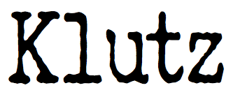 [More] ⦿
|
Lukyan Turetskyy
[2D Typo]

|
[MyFonts]
[More] ⦿
|
Lydia Rodriguez
|
Based in Tegucigalpa, Honduras, Lydia Rodriguez was inspired by Greek columns in the design of Jonico (2013). The resulting typeface has an art nouveau appearance. Behance link. [Google]
[More] ⦿
|
M. Verneil
|
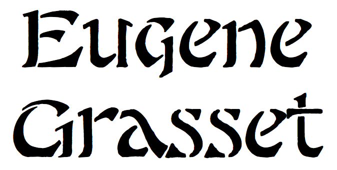 French typographer from the art nouveau era. One of his alphabets was made into a digital typeface by Dick Pape in 2012, LFD Asian Stencilling 205 (original oriental-looking art nouveau drawings by E. Grasset and M. Verneil). [Google]
[More] ⦿
|
Mário Feliciano
[Feliciano Type Foundry]

|
[MyFonts]
[More] ⦿
|
Maciej Polczynski
[Laïc]
|
 [More] ⦿
|
Made Deduk
[Deduk Suandana]

|
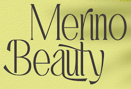 Or Deduk Suandanaipande, or Suandana Ipandemade, or Anggun Suandewi, or Suandana I Pande Made, or Pande Made, who publishes his fonts under the labels Made Deduk (est. 2016) and Type Class Heroes (est. 2022). Bali, Indonesia-based designer of the free display typefaces Merthy (2016, calligraphic script), Druchilla (2016), Breathe Karma (2016), Carrinady (2016: an all caps sans family), (2016), Rowdy (2016), Chandry (2016, connected script), Old Alpha (2016), Autumn Leaves (2016, textured with a floral pattern) and Anggun (2016).
 Typefaces from 2017: Die Hard (inspired by graffiti), Hamer, Harley (script), Pink Gladiolus, Madeleine (ultra-wide sans), Draconian (grungy caps), Amandella (calligraphic), Strong Bold (ink splash script), Jet Pilot (squarish), Bright Beauty (creamy connected script), In Blossom (watercolor brush script), Triumph Wheels, Budhayanti, Moonchrome (a monoline script), Claiborne, Geovana (a monoline script), Wild River, Sugar Candy (free signature font), Bilody Rainan (brush), Amandella (calligraphic), The Dark Titan (a textured typeface family). Typefaces from 2018: Donatello (signage script), Justify (spurred), Nightype, Violaceous, Pierce, Thrones, Homerun (signage script), Skytree (brush script). Typefaces from 2019: Merthy Script, The Dark Titan, Sugar candy (monoline script), Reingttoon (dry brush), Justify (a spurred tattoo font family), Bonthing (calligraphic), Chameron, Raegan (a brush script), Triumph Wheels (spurred, vintage), Inner Beauty, Reff Devil, Shergine (formal calligraphy), Sweet Yellow, Daniels Signature, Maddison Signature, Sophia Bella, Concetta Kalvani (a signature script / serif font duo), Chronicle (a layerable Victorian typeface), Nakone (a black fashion mag typeface), Gisbon (brush script), Marchello, Keshya (a dry brush script) (script), The Delicate, Sophia Bella (signature script), Munrolane (an extended techno or car grill typeface), Bethsy, Breath Karma (free), Bilody Rainan (free), Allison Tessa (script), The Phamelo (brush script), Majestic Romance (a monoline script). Typefaces from 2020: Mollie Rocky (a decorative art nouveau font), Hacky (an 18-style condensed display serif with a slight art nouveau feel), Wild River (a grungy and sturdy display typeface), Catellos (a display serif), Marlyn (with 73 styles, the largest floriated luxury serif typeface family to date), El Katana (a luxury serif), Delvon (a condensed organic sans), Sugar Candy, Pink Gladiolus , Primatama (a luxury serif), Black Elliot (a dry brush script), Sweet Harley Script, Challista (a signature script), Roman Morrissey (a dry brush script). Typefaces from 2021: Victory History (a single-height decorative typeface), Raque (an all caps display serif), Nirma (an expressive deco typeface), Heavy (a bold flared display font), Mothra (a semi-psychedelic display typeface), Kittenish (a playful retro cartoon font), The Strattos (a great interlocking cartoon font; perhaps a bit too complex to be used in children's books), Dino Moose (for children's books), Graves (a 9-style display family), Singa (a 53-style squarish display typeface), Marga (a decorative typeface), Pacho (a powerful angular display typeface), Nicla (a signage script). Graphicriver link. Creative Market link. Creative Fabrica link. [Google]
[MyFonts]
[More] ⦿
|
Maghrib Lab
[Rizky Satyaludin]
|
Rizky Satyaludin (Maghrib Lab) is the Bandung, Indonesia-based creator (b. 1990) of Botanica (2018, SVG), Mixing (2018: Open SVG format), Crude (2017: an OpenSVG font), Born Losers (2017), Baling Ink (2017, brush script), Siberia Rough (2016, brush style), Holihood Script (2016), Slav Rough (2016, an all caps brush typeface), Slav Clean (2016), Storing Brush (2016), Chamberline (2016, brushy typeface), The Rupture (2016), Voltunes (2016), Pantel Rough (2016, a rough brush script), Society (2016, a connected hand-painted typeface), Good Vibes (2016), Himalaya Script (2016), Quite Hustle (2015, brush type), Addic Type (2015, dry brush script), Rusty Cola Pen (brush script, 2015), Asmara (2015), Siren (2015: blackletter), Natalia Script (2015), Author Type (2015, signage typeface), Messy Script (2015, a rough brush font), Dream Big (2015), Bold Face (2015), Southern California (2015, retro spurred tattoo script also made by Reza Rahman), Delight (2015), Austin Type (2015), Sunoise (2015), Road Culture (2015, biker gang blackletter), Rise & Shine (2015, brush typeface), the brush typeface Mallow (2015), the Victorian or pre-art nouveau typefaces Ginusto (2014), MGH Vinolian Hand (2014). MGH Divergent (2014, a Victorian display typeface), Mira Script (2015), Bladekade (2014, a stencil script), Rude Cookie (2014, a layered hand-drawn font), Stooges Races (2014), Alpha Rough (2014, hand-drawn signage face), the ball terminal typeface Mucilage Type (2013), the fat brush typefaces Beats (2014) and Baurbon (2014), and the spurred typeface Brave (2013). Aka ngulik, as Satyaludin, and as Yuyun Miranur. Possibly also the same as Reza Rahman. Creative Market link. Behance link. Dafont link. Fontspace link. A second Behance link. Home page. [Google]
[More] ⦿
|
Malou Verlomme
|
 French type designer who graduated from l'Ecole Duperré in Paris and the University of Reading (2005). He cofounded the type foundry LongType in 2012. Since 2016 he works for Monotype UK. His typeface Ficus (2005) won an award in the Creative Review Type Competition 2005.
 He wrote Technological Shifts in Type Design and Production (2006). His typefaces: Respublika (2013, a humanist sans done with Gregori Vincens, Fontyou), Camille (2010-2011, for Camille Muller), ECAM (2009-2010, for the ECAM theater), Dijon (2011, for the identity of Dijon's Opera house), Arbre (2010, for the identity of the coffee brand L'Arbre de Cafe), Totem, Ficus (2005-2006), Syneas (2009, for Syneas), Digitaline (2007, a Futura-like family done for Agence Digitaline), Vingt-huit (2007), Sabasi (2008), Gem (2007, art nouveau), Oops (2006). Marion Andrews, Malou Verlomme and Laurence Bedoin collaborated on the school fonts Écriture A and Écriture B which are presented in Modèles d'écriture scolaire (2013), a document issued by the French Ministry of Education. These fonts are available from Eduscol. Verlomme set up Long Type in 2012 with Mathieu Chévara, Mathieu Reguer and Thomas L'Excellent. In 2016, for Monotype, on commission for the Transport For London company, he redesigned / tweaked New Johnston, called Johnston100. It will be used in TfL's trains and station signage including for London's new Crossrail Elizabeth line that is scheduled to open in 2018. In 2018, he published the geometric sans typeface family Madera and the revival typeface Placard Next (based on an old Monotype condensed poster typeface) at Monotype. In 2019, he released the 12-style high-contrast Ariata (Text, Display, Stencil) at Monotype. In 2020, he published the superfamily Macklin (Sans, Display, Text, Slab) at Monotype. Influenced by early 19th century designs in Europe, and especially by the work of Vincent Figgins, it is intended for use in headlines and short blocks of text. Variable fonts are also available. Co-designer, with Clement Charbonnier Bouet, of Ionic No 5 (2021), a ten-style Clarendon that revives and refreshes a classic Linotype Clarendon-style serif for Monotype. Noteworthy is that the designers replaced Clarendon's ball terminals by 21st century serifs, even including the hipsterish coathanger f. The ball terminals are relegated to the "alternates". In 2021, he took part in the development of Helvetica Now Variable (Monotype). Helvetica Now Variable was designed by Max Miedinger, Charles Nix, Monotype Studio, Friedrich Althausen, Malou Verlomme, Jan Hendrik Weber and Emilios Theofanous and published by Monotype. Monotype writes: Helvetica Now Variable gives you over a million new Helvetica styles in one state-of-the-art font file (over two-and-a-half million with italics!). Use it as an extension of the Helvetica Now family or make custom-blends from its weights (Hairline to ExtraBlack), optical sizes (four point to infinity), and new Compressed and Condensed widths. It contains 144 static styles. In 2022, he released Boucan (a variable all caps font that can be animated to react to sounds and music). Typecache link. Speaker at ATypI 2017 Montreal. [Google]
[More] ⦿
|
Manuel de Lignières

|
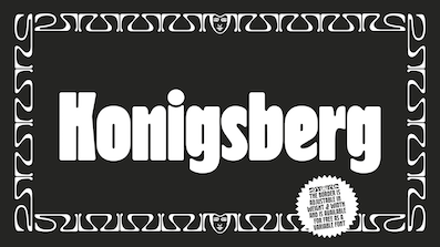 During his studies at Ecole Estienne (Paris), Manuel de Lignières (Montpellier, France) published Waba (2018) with Lewis McGuffie. Inspired by woodblock types and art nouveau, Waba is a bit of love letter to Estonia, the Baltics and the visual history of Eastern Europe. The free variable font Waba Border (2018) was added by Lewis McGuffie.
 Earlier, in 2017, he published the blackletter font Kodex. [Google]
[MyFonts]
[More] ⦿
|
Manvel Shmavonyan

|
 Moscow-based Armenian type designer (b. 1960, Artashat, Armenia) and graphic artist. In 1984 graduated from the Moscow Poligraphic Institute, department of Polygraphic Product Design. He worked for the Type Department of Committee of Print in Yerevan, and for the publishing houses Ayastan, Luys and Sovetakan Grokh. At Microsoft's request, in 1999, he was consulted for the Armenian section of the Sylfaen project.
 Creator of PT Margarit Armenian and Asmik (1997, Armenian, based on PT Petersburg, 1992, by Vladimir Yefimov), available from ParaType, where he is an active type designer. These fonts won awards from the Type Directors Club in 1999. At ParaType, he also published Propisi Cyrillic + western (1997, a school script family), PT Henman Pictograms (2001, based on Armenian ornaments revived by Henrik Mnatsakanyan), Cooper BT (2000, a Cyrillic version of the Bistream family by the same name), Henman Western, Karolla Western (2002, art nouveau face, based on an alphabet of Lucian Bernhard, 1912), Zagolovochnaya Western (2002, based on a Caslon model from 1725), Haverj Western (2004, flared mini-serifed typeface with an f and a j ready for the paralympics), PT Margarit (1997, based on PT Bodoni by A. Tarbeev), Bardi (2004, Paratype, an extra compressed decorative stenciled typeface based on the lettering created in 1970s by the Armenian type designer Henrik Mnatsakanyan (1923-2001)), Haverj (2004, Paratype, also based on Mnatsakanyan's work), and PT Noah (1997, to accompany Tagir Safayev's PT FreeSet, 1992). Asmik, and Humanist 531 Cyrillic (the latter co-designed with Isay Slutsker) won awards at Bukvaraz 2001. In 2007, he designed the text and display family Susan (Paratype; award winner at Paratype K2009), which was named after his wife. Award winner at Granshan 2008. In 2010, he designed the Ripe Apricot humanist sans family (ParaType). Narevik (2011, Paratype) is a dynamic low contrast design with slightly rounded triangle serifs. In 2011, he created the free Google Web Font Marmelad, meant for headlines. Jacques Francois and Jacques Francois Shadow (2012, Cyreal) were co-designed with Alexei Vanyashin. They are revivals of the Enschedé no. 811 type specimen (ca. 1760) by Jacques François Rosart (1714-1774), made for Enschedé Printing House. Free at Google Web Fonts. Typefaces from 2013: Vaccine (a slab serif family, ParaType). This was followed in 2014 by the humanist Vaccine Sans (2014, with the help of Alexandra Korolkova and Gayaneh Bagdasaryan). In 2015, he made Levnam (ParaType), a sans with wide proportions for small text. In 2016, Alexander Lubovenko and Manvel Shmavonyan co-designed the 30-style Latin / Cyrillic workhorse sans typeface family Mediator, which was followed in 2017 by Mediator Serif. In 2018, Alexandra Korolkova and Manvel Shmavonyan designed Fact at Paratype. Fact is based on Frutiger. The fact type system contains 48 upright styles with variations in width and weight and eight italics of normal width. Vast (2021, Paratype) is a 56-style sans family, with three variable fonts, by Manvel Shmavonyan and Alexander Lubovenko. Choices are from thin to black and regular to extra wide. FontShop link. Catalog. MyFonts link. Klingspor link. [Google]
[MyFonts]
[More] ⦿
|
Marc Jones Barry Kimbrough
[LetterGraphics]
|
[More] ⦿
|
Marcia Loeb
|
Author of New Art Deco Alphabets (Dover, New York, 1975). That book contains 38 alphabets which are referred to as NADA1 through NADA38 on the web page. Some alphabets have names: 2 (Saxony), 3 (Julep), 4 (Amazon), 5 (Rose), 6 (Zig Zag), 7 (Mah-Jong), 8 (Boogie), 9 (Stardust), 11 (Samba), 12 (Bolt Flash), 13 (Elite), 15 (Rio), 16 (Mecca), 17 (Inca), 18 (Bambu), 19 (Claude), 21 (Fan), 23 (Tropez), 24 (Roxy), 25 (Waldorf), 26 (Cube), 27 (Electra), 28 (Empire), 31 (Mode), 32 (Ebony), 33 (Reflex), 36 (Rainbow), 37 (Big Lou). Abstractfonts link. The page by Sander de Voogt also mentions a number of digital fonts based on her work: - Manfred Klein made Art Nouveau Caps (2006, based on Saxony=NADA2), Dot Caps MK (2004, based on Julep=NADA3), Dot Caps Two (2004, based on Mode=NADA31), Multi Caps One and Two (2004, both based on Cube=NADA26).
- Bright Ideas created Moteefe (based on Boogie=NADA8).
- Stefan Lundhem created Bessie (2001, based on Rainbow=NADA36) and Billie (2001, based on Zig Zag=NADA6).
- House of Lime digitized Big Lou (2003, NADA37) and Retro Elite (2003, based on Elite=NADA13).
- Doug Olena made Aquarium (NADA38) and Loeb Eclipse Caps (NADA10).
- Ken Kizer created Sunrise Sunset (1996) in 1996, based on NADA10, NADA22 and NADA35.
- Renn Crump made Rio Art Deco (2002, based on Rio=NADA15).
- An unknown designer published Decollection (1997), which is based on Boogie (NADA8) and Big Lou (NADA37).
- Steve Ferrera created Supercarguy (2006), based on Empire=NADA28.
- Seth Martin designed Stardust06 (2006), after Stardust=NADA9.
- Alex Sheldon created Match&Kerosene (2009), which was modeled after Zig Zag (NADA6) and rainbow (NADA36).
- John Wollring designed Zig Zag ML (2009) based on ZigZag=NADA6, and ML Roxy Initials KK based on Roxy.
[Google]
[More] ⦿
|
Marco Miniussi
[JAB'M Foundry]

|
[MyFonts]
[More] ⦿
|
Marcus Behmer
|
 Marcus Michael Douglas Behmer (b. 1879, Weimar, Germany, d. 1958, Berlin) began painting at an early age under the direction of his father who was also a painter. He worked primarily as an illustrator and graphic artist. His early work was heavily influenced by the work of Aubrey Beardsley. He achieved his first success in 1903 when he illustrated Oscar Wilde's Salome. He illustrated for the journals Die Insel, Simplicissimus and continued to do book illustrations until his death. He designed Stefan George-Schrift (1904, Otto von Holten), Behmer Antiqua or Behmer Schrift (1920, Otto von Holten), and Soncino Hebräisch (1927, cut by Georg Pfendt, Genzsch & Heyse, it influenced Friedlaender's Hadassah).
 Klingspor link. [Google]
[More] ⦿
|
Mareike Windisch
|
 German designer of the modular hexagonal typeface Coldplate (2011), Splinter (2011, with a hint of art nouveau), I Like (2011---my favorite--a rounded monoline display face and an accompanying bilined typeface), and The Quick (2011). Behance link. Logo. Pic. [Google]
[More] ⦿
|
Måns Grebäck
[Aring Typeface]

|
 [MyFonts]
[More] ⦿
|
Mario Arturo

|
 Barcelona-based graphic designer (b. 1963). Dafont carries his free fonts, which are often revivals, or fonts based on scans from Dover books. The list of his typefaces:
 - Amarfil (2012). Traced from the Dubbelde Auguftyn Capitalen typeface by father and son Izakk and Johan Enschedé.
- Angelface (2014). Mario writes that it is loosely based on the Lariata typeface. It was traced from the 1993 edition of the Novum Press book Schreibschriften/Script Types, compiled by Michael Rau & Rosemarie Kloos-Rau.
- Better Heather (2000): a cleanup of De Nada's script font Heather.
- Bodoni Fragile Sharp (2018). A Bodoni stencil.
- Boizenburg (2013). An art nouveau caps typeface.
- Brennan (2012). A heavy slab serif typeface.
- Brook Flair (2012). Mario explains: This font is traced from the book Alphabete 2 by Erhardt D. Stiebner and Helmut Huber for Novum Press (1990). I added the missing swashy characters and punctuations. From what I understand, this is a variation of a typeface called Macbeth that was designed in the 1950's for Filmotype.
- Dean Martin and Dean Martin Swing (2012). A retro font and its curly cousin.
- Doris Day: an upright connected script.
- Echedo (2018). This typeface was traced from an unnamed ornamental Roman alphabet from the 1958 edition of 101 Alphabets by W. Ben Hunt and Ed.C. Hunt. Originally published as 60 Alphabets in 1935.
- Esplanade Script (2015). Published at Aring Typeface.
- Flamingo (2015). A revival of a condensed titling typeface (+Inline) family designed in 1929 by Louis Oppenheim at H. Berthold Schriftgiesserei A.G.
- Galeries (2001): based on a type that appeared on a receipt from a store called Galeries Sant Jordi in the 1960s in Pineda de Mar, Catalunya.
- Halo Handletter (1997): taken from Brushstroke and Free-Style Alphabets-100 Complete Fonts (Dover).
- Helvelow: based on Helvetica.
- Individual (or: Initial): calligraphic all caps face. Scanned from an alphabet book.
- Japan (1997): a brush stroke font based on a scan from Brushstroke and Free-Style Alphabets-100 Complete Fonts (Dover).
- Lisbon Script (2014). Based on a script shown in Schreibschriften/Script Types (1993, Michael Rau & Rosemarie Kloos-Rau, Novum Press).
- Lombard (2018). This typeface was traced from an unnamed orient alphabet from the 1943 edition of «New Letters and Lettering» by Paul Carlyle and Guy Oring.
- Masana (2011). An upright connected script family inspired by the handwriting of Catalan photographer Josep Masana from Barcelona who was also a publicist in the 1930's. Followed by Masana Grata, Masana Maxima and Masana Extras in 2011.
- Mister Sinatra and Mister Sinatra Slim (2012).
- Oz's Wizard (2012). Based on scans of L. Frank Baum's The Wonderful Wizard of Oz (1900), which used a typeface designed by Goudy.
- PetuniaBounce (1997): based on a Dan Solo typeface from Brushstroke and Free-Style Alphabets-100 Complete Fonts (Dover).
- Riddle (Riddle Upright and Riddle Script, 2010-2013): based on the typeface used on the Frank Sinatra&Nelson Riddle LP "Only the Lonely". With help from Harold Lohner. Continued in Riddle Upright (2013).
- Rom (2001): inspired by Barcelona's Rom Caffe logo.
- Rough Spring: based on Spring by Letterperfect.
- Sahara (2000): based on the font Arbot.
- South Pacific. Inspired by a phrase from The ABC of Lettering (1965, J.I. Biegeleisen, Harper & Row Publishers,NY. See also this OFL link.
- Thick Deco: art deco face.
- You're Invited (2014). An invitation script font that revives a script found in Lettering (1916, Thomas Wood Stevens). The typeface was designed by Lawrence Rosa and later refined by Mario Arturo.
Klingspor link. Dafont link. Fontspace link. [Google]
[MyFonts]
[More] ⦿
|
Mario Mora
|
Santiago, Chile-based designer of the free art nouveau typeface Mandala (2013). In 2018, he published the De Stijl typeface Cuadrata. Graphicriver link. [Google]
[More] ⦿
|
Marketa Kontova
|
Born in Prague, Marketa Kontova is now in Southport, Australia. She created the curly script typeface Dignity (2013). [Google]
[More] ⦿
|
Marko Milin
|
Tough-looking graphic designer from Belgrade. In 2010, he created the equally macho copperplate typefaces PastCoast and Type No 6. He used a grid design when he made the Globe Ship typeface in 2012 for Latin and Cyrillic. Type No2 (2014) was inspired by art nouveau. Type No 3 (2014) is an elegant inline typeface. Tye No 12 (2014) is a spurred Tuscan typeface. Behance link. Blogspot link. [Google]
[More] ⦿
|
Marta Leon Martinez
|
Sevilla, Spain-based designer of the shaded 3d typeface Sailor Stripe in 2016. In 2017, she created the stencil typeface Space and the slab serif Revolution Type. [Google]
[More] ⦿
|
Martin Kotulla
[SoftMaker Software GmBH (or: freefont.de)]

|
 [MyFonts]
[More] ⦿
|
Martina Dighero
|
Argentinian designer of the art nouveau typeface Mala Cara (2019). [Google]
[More] ⦿
|
Match Fonts
[Michel Bujardet]

|
 Match Fonts is the West Hollywood, CA-based foundry led by Michel Bujardet (b. Bordeaux, France, 1951), who is Mike Budge on alt.binaries.fonts. They make and sell interesting font paks. A particular favorite of mine is the Calligraphic Fonts Pack 2, which has the beautiful medieval-look typeface Rodolphe (2001), together with the Chancellerie family, the blackletter font SquareText, and a few Uncial fonts called Oncial. Free demos. Cursive Handwriting is a 6-font pak for teaching handwriting. Also offering a handwriting and signature font service. Among free offerings, check Le Blackmail (ransom font). Also, commercial fonts for these languages: Armenian, Bulgarian, Croatian, Czech, Estonian, Greek, Hawaian, International Phonetic (IPA), Hebrew, Hieroglyphs, Hungarian, Japanese, Latvian, Lithuanian, Macedonian, Marshallese, Polynesian, Polish, Romanian, Russian, Serbian, Slovak, Turkish, Ukrainian, Yiddish.
 Interesting typefaces: Boulon (letters with bolts), Bujardet Freres (French restaurant type), Calebasse (1997, semi-psychedelic), Chinoiseries (Chinese look-alike), Cristolikid (LCD), Diodes Light, Grecques, Halloween, Malabars, Metroplitain (art nouveau), Monogram, Octogone, Osselets (bones), Parador, Ruban Dis-Moi, SilBooettes, TSF et Compagnie, Venitienne, Yiddilatin, Zebrues, and the dingbats Dinosotype, Alphabetzier, Nahkt Hieroglyphics, Norman Prince (children's handwriting), Angelots, Sceaux, Seraphiques, Talismans, La Main Guided, La Main Solid (both children's tracing fonts), Bordini, Bordofixed, BoumBoum, ChapClerk, Dactylographe (nice!), Halotique (sans serif), Tortillon (2001, art deco), Normographe (great too!), Normafixed, Oloron, Parlante (serif family), Presse (typewriter), Technicien. Plus handwriting fonts Skrypta, Skryptaag (upright and connected), Willegha. a Morse Code font. The Halloween pack includes Coulures, Halloween, Osselets and SilBooettes. Fixed width fonts include Dactylographe, Oloron, Bordo, Norma. Direct access. Interview and photo. Alternate URL (in French), with many more fonts, such as the handwritten Pierre, Mariette. MICR E13 B font. Fontspace link. [Google]
[MyFonts]
[More] ⦿
|
Matt Frost

|
 Matt Frost Type is located in Madison, WI. Matt designed some fonts at Chank's place, including Cowboy Rhumbahaut (2000), a take on a mid 19-th century ornamental face. His home page. In 2011, he set up Matt Frost Foundry.
 His commercial typefaces include - Aegean (2012). A swashy take on roman capitals. The spurred version is Cirque (2012).
- Antler (2014-2016). A spurred woody letterpress vintage family of typefaces Antler has your back for beer bottles, fantasy novels, taco shops, beekeepers, cattle rustlers, tattoo artists, druids, hair bands, and bounty hunters, is how Matt descrives the typeface family. The Western typefaces Antler East, Antler North, Antler West (spurred; in Regular, Wood and 3d) and Antler South (Tuscan) were published in 2016. In 2017, he added Antler.
- Baron of Arizona (2011). A Victorian ornamental face.
- Baboon (2015). A handcrafted poster typeface.
- Cirque (2012).
- Cow Boss (2015). A Tuscan Western typeface.
- Dubliners (2011). A signage script face.
- Escape From Budapest (2011). Art deco, based on a type specimen in the Communist Sculpture graveyard outside of Budapest.
- King Of Prussia (2011). An angular Halloween face.
- Praha Nouveau (2011). Art nouveau. Praha Nouveau is based on a type specimen on the statue of Jan Hus in Prague's Old Town Square. The statue was designed in 1903 by Ladislav Saloun.
- Quijibo (2011). A quaint handmade slab serif.
- Street of Crocodiles (2011). Inspired by the main title of the Quay Brothers film Street of Crocodiles (based on the 1934 Bruno Schultz book).
View Matt Frost's typefaces. [Google]
[MyFonts]
[More] ⦿
|
Matthew Carter

|
 Matthew Carter (born in London in 1937, and son of Harry Carter) is one of today's most influential type designers. He trained as a punchcutter at Enschedé in 1956. In 1963 he was hired by Crosfield, a firm that pioneered the new technology of photo-typesetting, to lead their typographic program. He worked for Mergenthaler Linotype (1965-1981), and co-founded Bitstream Inc. with Mike Parker in 1981, adapting many fonts to digital technology. In January 1992, he founded Carter&Cone with Cherie Cone, and often collaborated with Font Bureau. In 1995, he won the Gold Prize at the annual Tokyo Type Directors Club competition for Sophia. In 1997, he received the TDC Medal for significant contributions to the life, art, and craft of typography. In 2010, he received a MacArthur grant. He lives in Cambridge, MA.
 John Berry on Carter's art (2002). Apostrophe comments on Berry's article. Interview. His fonts: - The Microsoft screen fonts Verdana (1996), Georgia (1996), Georgia Greek, Georgia Cyrillic, Nina and the humanist sans typeface Tahoma (1994). Georgia (in roman and italic only) is a screen version of Miller, Carter's Scotch design. Nina was designed to address the requirements on smaller screens such as phones, and was used in Windows Mobile smartphones before Microsoft switched to Segoe. The Greek and Cyrillic versions of Nina were developed by François Villebrod. Georgia Pro (2010, Ascender) was developed from Georgia with the help of Steve Matteson. For Verdana Pro (2010, Ascender), Carter was assisted by David Berlow and David Jonathan Ross.
- Apple's Skia (1993), a sans serif designed with David Berlow for Apple's QuickDraw GX technology, now called AAT. [Carter's Skia and Twombly's Lithos are genetically related.]
- Monticello (2003), based on Linotype's Monticello (1950), which in turn goes back to Binny&Ronaldson's Monticello from 1797, a typeface commissioned by Princeton University Press for the Papers of Thomas Jefferson. It is in the Scotch roman style.
- Miller (1997, Font Bureau), an extremely balanced family co-designed by Carter, Tobias Frere-Jones and Cyrus Highsmith. Carter explains: Miller is a Scotch Roman, a style that had its beginnings in the foundries of Alexander Wilson In Glasgow and William Miller in Edinburgh between about 1810 and 1820. It is considered that the punchcutter Richard Austin was responsible for the types of both Scottish foundries. Miller is a revival of the style, but is not based on any historical model. Now, there is also a 16-weight newspaper version, Miller Daily (2002), and an 8-weight Miller Headline (2002). This was followed by News Miller, a typeface designed for the Guardian. Note: Georgia (1996) is a screen version of Miller, and Monticello (2002) is a later modification. A comparison of these typefaces.
- Alisal (1995, +Bold).
- ITC Galliard (1978), a recreation of Robert Granjon's garalde letters. This typeface was originally conceived in 1965. Bringhurst recommends a Carter and Cone version of this font, called Galliard CC: it has old style figures and small caps. Further versions include Aldine 701 (Bitstream), Matthew (Softmaker), ITC Galliard Etext (2013, Carl Crossgrove, Linotype), and Gareth (Softmaker).
- The ITC Charter family (1987 for Bitstream and known as Bitstream Charter; licensed to ITC in 1993; see the Elsner&Flake version of ITC Charter). An upgraded commercial version was released by Bitstream in 2004 under the name Charter BT Pro.
- Vincent (1999), a font commissioned for use in Newsweek. It is named after Vincent Figgins, an English foundry owner and punch cutter who lived in the late 18th century.
- Walker (1994), designed for The Walker Art Center.
- Ionic Number One (1999, Carter&Cone).
- Mantinia (1993, Font Bureau), based on inscriptional forms, both painted and engraved, by the Italian renaissance artist Andrea Mantegna.
- Big Caslon (1994, Font Bureau), a display typeface based on the largest romans from William Caslon's foundry.
- Big Figgins (1992) and Big Figgins Open (1998, based on the decorative didone types shown in the specimens of Vincent Figgins of 1815 and 1817). Big Figgins was called Elephant and Elephant Italic in Microsoft's Truetype Fontpack 2.
- Sammy Roman (1996), loosely based on the 17th century romans of Jean Jannon. A beautiful typeface designed to accompany kanji and kana typefaces produced by Dynalab in Taiwan.
- Sophia (1993, Font Bureau), a mix with Greek, uncial and classical Roman influences.
- Shelley Script (1972), a family of formal scripts, split into Andante, Volante and Allegro. It is based on intricate English scripts of the 18th and 19th centuries attributed to George Shelley.
- Cochin (1977, at Linotype). MyFonts writes: In 1913 Georges Peignot produced a typeface based on Nicolas Cochin's eighteenth century engravings. In 1977, Matthew Carter expanded this historic form into a three part series.
- Bell Centennial (Linotype-Mergenthaler, 1975-1978), a legible heavily ink-trapped family designed by Matthew Carter as a replacement of Bell Gothic at Mergenthaler. There are also digital Linotype and Bitstream versions. AT&T commissioned the font to replace their previous typeface choice Bell Gothic for their 100th Anniversary.
- Cascade Script (1965-1966, Linotype, now also known as Freehand 471 BT in the Bitstream collection). Paratype's extension of Freehand 471 to Cyrillic is by Oleg Karpinsky (2011).
- New Century Schoolbook was designed from 1979-1981 in the New York Lettering office of Merganthaler Linotype based on Morris Fuller Benton's Century Schoolbook from 1915-1923. It was the second face, after New Baskerville, that was digitized and expanded using Ikarus (digital technology). The Bitstream version [Century Schoolbook] is a virtually exact copy, only being moved from a 54 unit to a 2000 or so unit design.
- Auriol (Linotype), an art nouveau family (including Auriol Flowers 1 and 2 and Auriol Vignette Sylvie) based on the lettering of the painter and designer Georges Auriol. MyFonts explains: Auriol and Auriol Flowers were designed by Georges Auriol, born Jean Georges Huyot, in the early 20th century. Auriol was a French graphic artist whose work exemplified the art nouveau style of Paris in the late 19th and early 20th centuries. In 1900, Georges Peignot asked Auriol to design fonts for Peignot&Sons. The resulting Auriol font was the basis for the lettering used by Hector Guimard for the entrance signs to the Paris Metro. It was re-released by Deberny&Peignot in 1979 with a new bold face, designed by Matthew Carter. These decorative fonts with a brush stroke look are well-suited to display settings. The Peignot drawing office insisted on a more normal appearance in the boldface, calling it Robur. Matthew Carter has returned to Auriol's original design for the whole series.
- Helvetica Greek (Linotype).
- Helvetica Compressed (Linotype, 1974, with Hans-Jörg Hunziker).
- Wilson Greek (1995), compatible with Miller Text, and based on a type cut by Alexander Wilson for the Glasgow Homer of 1756. See here.
- Olympian (1970, Linotype), designed for newspaper use. This is Dutch 811 in the Bitstream collection. The custom typeface Milne (Carter&Cone) done for the Philadelphia Inquirer is based on Olympian.
- Gando, a French "ronde" typeface based on the work of Nicholas Gando (mid 1700s), and designed for photo-typesetting at Mergenthaler by Carter and Hans-Jörg Hunziker in 1970. Very similar to Bitstream's Typo Upright.
- Fenway (1998-1999, Carter&Cone), commissioned by Sports Illustrated to replace Times Roman.
- Snell Roundhand (1965-1966): a connected cursive script based on the 18th-century round hand scripts from English writing masters such as Charles Snell. Early in the digital era, Matthew published this in the Bitstream collection as Roundhand BT. A Cyrillic version by Isabella Chaeva and Vladimir Yefimov was released by ParaType in 2013.
- Auriga (1970). (Wallis dates this in 1965 at Linotype.)
- CRT Gothic (1974).
- Video (1977).
- V&A Titling (1981).
- Deface (in the FUSE 18 collection).
- Madrid (2001), done for the Spanish newspaper El País.
- Milne, done for the Philadelphia Inquirer (a revised version of Olympian). Not available.
- Durham, a sans serif family for US News&World Report.
- Airport.
- Century 725 (Bitstream, for the Boston Globe: after a design by Heinrich Hoffmeister).
- For Microsoft: Georgia, Verdana, Tahoma (1994), Nina.
- Freehand 471 (Bitstream). A chunky slightly angular script.
- New Baskerville. [Matthew Carter says that this is wrongly attributed to him. It was directed by John Quaranta.]
- Postoni [or Post-Bodoni], for the Washington Post, which is still using it. See here.
- Le Bé, a Hebrew typeface that was used in the Pennyroyal Caxton Bible.
- Rocky (2008, Font Bureau, with Richard Lipton), for the Herald in Scotland.
- Time Caledonia.
- Wiredbaum, for WIRED.
- Wrigley (for Sports Illustrated). Matthew Carter designed Roster in the 1990s, and it was adopted as a display face for Sports Illustrated under the name Wrigley. Jesse Ragan was instrumental in later expanding the family from its original seven styles to the current 60. In 2015, Carter & Cone and Font Bureau released an expanded 60-style family of this typeface under the new name Roster.
- Benton Bold Condensed (for Time Magazine).
- Foreman Light (for the Philadelphia Inquirer).
- Newsbaum (for the New York Daily News).
- Carter Latin: Matthew was commissioned in 2003 to create a new design to be cut in wood type by the Hamilton Wood Type&Printing Museum in Two Rivers, WI. He came up with an all-caps, chunky, Latin-serif design.
- Times Cheltenham (2003), which replaces in 2003 a series of headline typefaces including Latin Extra Condensed, News Gothic, and Bookman Antique.
- The Yale Typeface (2004), inspired by the late fifteenth-century Venetian typeface that first appeared in Pietro Bembo's De Aetna, published by Aldus Manutius. This extensive family is freely available to members of Yale University.
- DTL Flamande (2004, Dutch Type Library), based on a textura by Hendrik van den Keere. Since 2018, available from URW++. Additions to DTL Flamande by Lukas Schneider.
- Meiryo UI, Meiryo UI Bold, Meiryo UI Bold Italic, Meiryo UI Italic (2004). Meiryo is a modern sans serif Japanese typeface developed by Microsoft to offer an optimal on screen reading experience and exceptional quality in print, as part of the Cleartype project. The Japanese letterforms are generously open and well-proportioned; legible and clear at smaller sizes, and dynamic at larger display sizes. The beauty of Meiryo is that it sets text lines in Japanese with Roman seamlessly and harmoniously. Meiryo was designed by a team including C&G Inc., Eiichi Kono, Matthew Carter and Thomas Rickner. It won a 2007 type design prize from the Tokyo Type Directors.
- Suntory corporate types (2003-2005), developed with the help of Akira Kobayashi and Linotype from Linotype originals: Suntory Syntax, Suntory Sabon, Suntory Gothic, Suntory Mincho.
- Rocky (2008, Font Bureau): A 40-style high contrast roman family that is difficult to classify (and a bit awkward). Developed with Richard Lipton.
- Carter Sans (2010, ITC), based on epigraphic letters used in inscriptions. Created for the identity of the Art Directors Club 2010 class of its Hall of Fame, one the laureates in the 2010 Hall of Fame. Codesigned by Dan Reynolds, this chiseled typeface is loosely based on Albertus.
- In 1997, he designed Postoni for the The Washington Post's headlines, a sturdy Bodoni.
- MS Sitka (2013). A typeface with six optical sizes that are chosen on the fly if an appropriate application is present. Developed at Microsoft with the help of John Hudson (Tiro Typeworks) and Kevin Larson (who carried out extensive legibility tests). German link. Typophile link. Sitka won an award at Modern Cyrillic 2014.
- Van Lanen Wood Type (Hamilton Wood Type, 2002-2013). Carter started work on the wood type in 2002, but technical accuracy issues postponed the implementation. Digital versions were finally done in 2013 by P22's Hamilton Wood Type.
- Big Moore (2014, Font Bureau): A 1766 specimen by Isaac Moore, former manager of Joseph Fry's foundry in Bristol, England, shows many types inspired by John Baskerville. But a century later, standardization had foisted inept lining figures and shortened descenders upon these designs. Matthew Carter remedies the tragedy with Big Moore. Oldstyle figures, full-length descenders, and historic swashes are restored to this regal serif in two styles. Big Moore won an award in the TDC 2015 Type Design competition.
- Role (2019, Sans, Slab, Serif, Soft). A superfamily published at Morisawa and Fontelier. Matthew Carter, Shotaro Nakano, and Kunihiko Okano co-designed Role Serif at Morisawa.
Speaker at ATypI 2013 in Amsterdam. Speaker at ATypI 2019 in Tokyo on the topic of Expressing Vocal Tones through Typography. Linotype link. FontShop link. Favorite quote: Watching me work is like watching a refrigerator make ice. Another quote: A typeface is a beautiful collection of letters, not a collection of beautiful letters. View Matthew Carter's typefaces. Matthew Carter's fonts. The typefaces made by Matthew Carter. See also here. Wikipedia page. Klingspor link. [Google]
[MyFonts]
[More] ⦿
|
Matthijs Herzberg
[Herzberg Design]
|
 [More] ⦿
|
Matyas Machat

|
 Born in Jablonec and Nisou, Czech Republic, 1992, Matyas Machat created Sandokan in 2014. Sandokan is a brush script font with that conjures up oriental calligraphy, art nouveau and psychedelic flower power.
 In 2017, he designed BC Brief (Briefcase Type). In 2018, Vojtech Riha and Matyas Machat co-designed Slavia and Slavia Press + Repress. The former is a socially awkward 1910-era grotesque, and the latter two typefaces are letterpress style cousins. In 2021, he released the nine-style sans Civil at Superior Type. At Brieface Type, he published BC Eric Machat (Machat's interpretation of Eric Gill's humanist typeface Gill Sans), BC Eric Machat Headline and BC Eric Machat Script (based on Eric Gill's handwriting). [Google]
[MyFonts]
[More] ⦿
|
Max Joseph Gradl

|
 German type and jewelry designer, 1873-1934. He did advertising work for customers in Naples, London, New York and Germany. He was active in the art nouveau era and is credited with these typefaces:
 - The ultimate art nouveau all caps face, Gradl Highstep, revived under that name in 2008 by Tom Wallace (HiH).
- Gradl Initialen (2005), another art nouveau caps typeface revived and extended by Tom Wallace in 2008. Wallace writes: Max Joseph Gradl designed Art Nouveau jewelry in Germany. At least some of his designs were produced by Theodor Fahrner of Pforzheim, Germany -- one of the leading manufacturers of fine art jewelry on the Continent from 1855 to 1979.
- Gradl Zierschriften is yet another art nouveau decorative face, ca. 1900. Revived by Tom Wallace in 2005 under the same name. Another revivalist is Peter von Zezschwitz (Zetafonts), who created, e.g., Gradler. Rivanna NF (Nick Curtis) is yet another revival, but this one is free. Other revivals include Gradl No 1 (2008, Ralph M. Unger, URW++), Gradl (1992, Font Bureau typeface done for Microsoft), and Gradl Max (2010, Mike Freiman).
Scans of some his art nouveau alphabets: (1), (2). Scans of some alphabets of initials: (3), (4), (4). [Google]
[MyFonts]
[More] ⦿
|
Maxence Massot
|
Lille, France-based designer of the art nouveau typeface Verrerie (2018). [Google]
[More] ⦿
|
Mayfield Type Foundry
[Joshua Mayfield]

|
 Graphic designer in Greenfield, SC.
 Creator of Jesper (didone), Durham, and Sinbad (art nouveau) in 2012. In 2013, he set up his own commercial foundry, also in Greenfield. His first commercial release is Roloi (2013), a layered numbers font in art deco lettering style. It has many clock symbols as well. In 2016, he designed Durham Latin (a vintage industrial revolution Latin typeface). Behance link. [Google]
[MyFonts]
[More] ⦿
|
Mélanie de Bossoreille
[Studio 27]
|
[More] ⦿
|
Mecanorma

|
 French graphics lettering company initially involved in instant lettering (made by Trip Productions), and some original typeface designs. From 1989 until 1994, Mecanorma worked with another Dutch company Visualogik to create digital versions of their typefaces, all having MN in their names. Monotype licensed and digitized some of Mecanorma's typefaces. In 1995, Mecanorma got out of graphics and stepped into home decoration. In 1999, Trip Productions, a Dutch Company located in Lisse, purchased the Mecanorma brand and what was left of the company. In 2004, International TypeFounders from Cedars, PA, licensed the typefaces from Trip Productions and released them as the Mecanorma Collection. Since 2021, there also is a Mecanorma Collection at The Type Founders.
 Their collection includes some great fonts: Access, Artdeco, Artworld, BalloonMN, Brio, BusoramaMN, Campus, CardCamio, Carplate, CaslonAntiqueVL, ChocMN, CircusMN, ComicStripMN, DynamoMN, Galba, Globe-Gothic-Outline, Glowworm, Jackson, LibraMN, MtPlacard, Ortem, Renault, RoslynMN, Sayer, SayerScriptMN, SquashMN, Sully-Jonquieres, Watch-Outline. You can also buy through Atomic Type. Projected new URL, which I am afraid will never be activated because in 1999, the company was bough by the Dutch company Trip Productions. MyFonts sells these typefaces: Access, American Uncial, Anatol, Arnold Bocklin (art nouveau), Artdeco, Artworld (an embossed font), Aster, Balloon (brush font), Blippo Black, Brio, British Inserat, Brush, Bulletin Typewriter, Caligra (blackletter), Campus (athletic lettering), Cardcamio, Carplate, Caslon Antique, Celtic (in the style of University Roman), Chicago (dot matrix / marquee typeface), Chinon, Choc (brush script), Circus (Western font), Classic Script (a copperplate calligraphic script), Comic Strip, Commercial Script, Contest, Cooper Black, Dubbeldik, Dynamo, Egyptienne, Estro (Western font), Eurostile, Forelle, Fumo Dropshadow MN, Galba (Trajan typeface), Globe Gothic, Glowworm (a bubblegum font), Gothique (blackletter), Hansson Stencil, Hillman, Hotel (multilined art deco), Isonorm, Jackson, Jubilee Lines (an engraved money font), Latina, Leopard, Libra (uncial), Michelina (anthroposophic), Milton, Mistral, Normalise Din, Old Style, Olive, Orator, Organda, Ortem, Polka (a brush typeface), Renault, Rondo (retro script), Roslyn, Sayer Interview (old typewriter font), Sayer Script, Sayer Spiritual, Squash, Stencil, Stop (stencil typeface), Studio, Swaak Centennial (pure art nouveau), Tzigane, Viant, Vivaldi, Voel Beat (beveled), Watch Outline (LED font), Windsor, Zambesi (African look font). Designers include Albert Boton, J.H. Crook, Jan van Dijk, J. Dresscher, Roger Excoffon, U. Fenocchio, L. Fumarolo, William Gillies, N. Glason, Lennart Hansson, B. Jaquet, K. Kochnowicz, J. Larcher, C. Mediavilla, José Mendoza y Almeida, L. Meuffels, Aldo Novarese, Georges Renevey, F. Robert, Manfred Sayer, M. Schmidt, J.P. Thaulez, J. Werner and Bogdan Zochowski. The Western slabby font Figaro MT (2004) is ascribed to Mecanorma. A list culled from the web: AccessMN-Bold, AccessMN-Medium, AmericanUncialMN, AnatolMN, ArnoldBocklinMN, ArtdecoMN, ArtworldMN, AsterMN-Demi, AsterMN-Roman, BalloonMN-Bold, BalloonMN-ExtraBold, BlippoBlackMN, BrioMN, BritishInseratMN, BritishInseratMNCondensed, BrushMN, Bulletin-Typewriter, BusoramaMN-Bold, CaligraMN, CampusMN, CardcamioMN, CarplateMN, CaslonAntiqueVL, CelticMN-Bold, CelticMN-Italic, CelticMN, CenturyMNCondensed-BoldItalic, CenturyMNCondensed-Bold, CheltenhamMN-Book, CheltenhamMN-BookItalic, CheltenhamMN-Ultra, ChicagoMN, ChinonMN, ChocMN, CircusMN, ClassicScriptMN, ComicStripMN-Italic, ComicStripMN, CommercialScriptMN, ContestMN, Cooper-Black-Italic, Cooper-Black-Outline, CooperBlackMN, CushingMN-Book, CushingMN-Heavy, CushingMN-HeavyItalic, CushingMN-Medium, DubbeldikMN, DynamoMN-Bold, DynamoMN-Medium, DynamoMN-Shadow, EgyptienneMNCondensed-Bold, ElanMN-Extended, ElanMN-Light, ElanMN-Medium, EnrouteVL, ErasMN-Book, ErasMN-Demibold, ErasMN-Ultra, ErasMN, EstroMN, EurostileMN-Extended, EurostileMN-ExtendedBold, EurostileMN-Medium, FidelioMN, FolioMN-Bold, FolioMN-Extrabold, ForelleMN, FranklinGothicMN-Book, FranklinGothicMN-BookItalic, FranklinGothicMN-Heavy, FrizQuadrataMN-Bold, FrizQuadrataMN, Fumo-DropshadowMN, FuturaBlackMN, GalbaMN, Gillies-Gothic-Bold, Gillies-Gothic-Light, Gillies-Gothic-Ultra-Shadow, Gillies-Gothic-Ultra, GlobeGothicMN-Bold, GlobeGothicMNCondensed-Bold, GlobeGothicMNOutline, GlowwormMN, GlowwormMNCompressed, GorillaVL-Bold, GothiqueMN, HanssonStencilMN-Bold, HanssonStencilMN, HillmanMN, HillmanMNCondensed, HotelMN, IrishUncialVL, IsonormMN, Italia-Bold, Italia-Book, Italia-Medium, JacksonMN, JubileeLinesMN, LatinaMN, LeopardMN, LibraMN, MRunic-Condensed, MSwingBold, MachineMN-Bold, MachineMN, MichelinaMN, MiltonMN-Demibold, MistralVL, MtPlacard-Condensed, NormaliseDinMN, OklahomaState, OliveCompactMN, OliveMNBold, OliveNordMN, OratorMN, OrgandaMN-Bold, OrgandaMN, OrtemMN, PascalMN, PolkaMN-Bold, PolkaMN, PopplExquisitMN, PopplExquisitMN-Alternative, RenaultMN, RenaultMNBold, RondoMN, RoslynMN-Bold, RoslynMN-Bold, RoslynMN-Outline, RoslynMNMedium, SaphireMN, SayerMN-Interview, SayerScriptMN-Black, SayerScriptMN-Bold, SayerScriptMN-Light, SayerSpiritualMN-Italic, SayerSpiritualMN, SloganMN, SquashMN-Outline, SquashMN, StencilAntiqueMN, StencilAntiqueVL, StencilMN, StencilMNOutline, StopMN, StudioMN, SullyJonquieresMN-Bold, SullyJonquieresMN, SwaakCentennialMN, Syntax-Bold, Syntax-Roman, ToucheVL, TziganeMN, ViantMN-Bold, VivaldiMN, VoelBeatMN, WashSymbolVL-Light, WatchMN-Outline, WindsorMN, WindsorMNElongated, ZambesiMN. MyFonts link. View Mecanorma's typefaces. [Google]
[MyFonts]
[More] ⦿
|
Meghan Hopkins Sokorai
|
Designer and letterer in Columbus, OH. During her studies at Type@Cooper in 2013, she created Tasso, a revival of the art nouveau typeface Tasso No. 2 (1890 or earlier, Barnhart Brothers & Spindler). Still at Type@Cooper in 2013 and 2014, she designed the high contrast serif typeface Perry. Tasso Two (2016) is a modernized version of her earlier typeface Tasso. Behance link. [Google]
[More] ⦿
|
Melanie GGF
|
Lima, Peru-based designer of the art nouveau typeface Dandelin (2019). [Google]
[More] ⦿
|
Melissa McArthur
|
 Based in Gold Coast, Australia, Melissa Mcarthur designed a great almost-art nouveau logotype in 2013 called Golden Goddess. [Google]
[More] ⦿
|
Meredith Uyeyama
|
Sacramento, CA-based designer of the arts and crafts / art nouveau sans typeface After Dark (2017). Creative Market link. [Google]
[More] ⦿
|
Merethe Liljedahl
[House of Lime]
|
 [More] ⦿
|
Mia Wibberley
|
Ellensburg, WA-based designer of the art nouveau typeface Bonzai (2012). [Google]
[More] ⦿
|
Michael Albers
|
German creator in 1997 of CRX, Z1 Alice Dee (art nouveau), Sign (dingbats and scanbats), and Bundesliga. Alternate URL. Fontspace link. [Google]
[More] ⦿
|
Michael Gene Adkins
[The Fontry]

|
 [MyFonts]
[More] ⦿
|
Michael Parson
[Typogama]

|
 [MyFonts]
[More] ⦿
|
Michel Besnard
[Les Besnardtypo]

|
[MyFonts]
[More] ⦿
|
Michel Bujardet
[Fontmenu.com]

|
[MyFonts]
[More] ⦿
|
Michel Bujardet
[Match Fonts]

|
[MyFonts]
[More] ⦿
|
Michelle Dixon
[Dixie's Delights]
|
[More] ⦿
|
Mick Sylvestre
[Sylvestre Studios]

|
[MyFonts]
[More] ⦿
|
Miguel Llopis
|
Valencia, Spain-based designer of the art nouveau typographic poster True Love (2015). [Google]
[More] ⦿
|
Mike Freiman
[Fresh Air Fonts]

|
[MyFonts]
[More] ⦿
|
Mila Von Luttich
|
Mila Von Luttich was an Austrian painter and illustrator, 1872-1929. She mostly illustrated for the Viennese Secession era satirical magazine Meggendorfer Blätter in München. Her work is reminiscent of that of Viennese Secession artists Koloman Moser and Gottlieb Theodor von Kempf. She went on to illustrate many children's books. [Google]
[More] ⦿
|
Miller&Richard
[William Miller]

|
 Founded by William Miller in Edinburgh in 1809. The company became Miller&Richard in 1838, and closed in 1952, when the designs became the property of Stephenson Blake. They are best known for innovative type design, including hits such as the Miller&Richard Oldstyle (and its boldface, nowadays called Old Style or Century Oldstyle), Le Naudin, Egyptian Expanded (1850), and Antique Old Style, or Bookman. Specimen book from 1884. In 1974, Bloomfield Books (Owston Ferry Lincs) published a facsimile of Miller&Richards Typefounders Catalogue for 1873. Scans: Cuban, Grange, Ludgate, Teutonic, Tudor Black, Grotesque Capitals, Old Style Antique No. 7, Old Style Italic, Sans Serif No. 7.
 From their 1912 catalog: Grotesque No4, Grotesque No4 Italic, Grotesque No7, Grotesque No7. Revivals: - Bruntsfield CF (2020). A revival of Bruntsfield by Chuck Mountain.
- Nick Curtis offers a few digitizations: his Millrich Moravian NF (2010) revives Bohemian (1918, a jugendstil face). Millrich Grange NF (2015) revives Grange. Millrich Reading NF (2010, Victorian) revives a 1918 Miller&Richard typeface (by the same name, I presume). Millrich Olivian NF (2014) revives Olivian. Habana Sweets NF (2012) is a Victorian typeface modeled on Cuban (1873).
- Canada Type's digitizations: King Tut (2011, Kevin Allan King) is a revival and expansion of the original Egyptian Expanded (1850).
- Vintage Type Co revived Egyptian Expanded in 2019 as Bloke.
- Wood Type Revival (Matt Braun) revived the arts and crafts typeface Teutonic (1909) as WTR Roycroft (2015).
- Sean Coady revived Egyptian Expanded as VTC Bloke (2019).
- Auber CF (2019, Chuck Mountain). A revival and extension of Bohemian, a metal type that can be seen in Printing Machinery and Material (Miller & Richard, 1902).
- Massenet (2020, Chuck Mountain). A revival of Old Style Grotesque Condensed as shown in Specimens of Printing Type (Miller & Richard, Edinburgh, c. 1920).
- Jeff Levine revived Condensed Edina from the 1921 Miller & Richard type specimen book as Office Space JNL (2021).
- Brochure Sans JNL (2022, Jeff Levine). This is based on Sans Serif No.7 from the 1921 Miller & Richard type specimen book.
[Google]
[MyFonts]
[More] ⦿
|
Milos Kunst
|
Czech creator of the old typewriter font Psacstroj (2011), Rifle 1 (2012, a wooden plank typeface), Willy 2 (2011, hand-printed), Ozzy 2 (2011, grunge blackletter face), and Mucha (2011, art nouveau). In 2013, the dot matrix typeface family PlDvl was created. Abstract Fonts link. Fontspace link. [Google]
[More] ⦿
|
Mireia Selma
|
Valencia, Spain-based designer of the decorative art nouveau typeface Scargot (2018). [Google]
[More] ⦿
|
Misha Panfilov
[Russian Fonts]

|
 [MyFonts]
[More] ⦿
|
Monogram Fonts Co
[Brian J. Bonislawsky]

|
 Commercial foundry, est. 2009 by Brian J. Bonislawsky (Las Vegas, NV), known for his participation in the Astigmatic One Eye Typographic Institute, the Breaking the Norm Font Library, VersusTwin Type Foundry, and Foundry-X. Most of the fonts done after 2013 were in cooperation with Jim Lyles. Fonts made in 2009 include MFC Franklin Corners (based on Metal Corners from the 1889 "Convenient Book of Specimens" from Franklin Type Foundry in Cincinnati), MFC Manoir Monogram (2009, Victorian initials), MFC Bijou Monogram, MFC Escutcheon Monogram, MFC Pantomime Monogram, MFC Peony Monogram (2009), MFC Vice Monogram (an Art Deco letterset (capitals only) from a 1915 publication by Cartier-Bresson of Paris), MFC Viper Monogram (based on Hollywood Combination Initials, found in a 1934 ATF book), MFC Carson Monogram (from Art Monogram and Lettering by J.M. Bergling, Vol. 1, Fifth Edition, 1912), MFC Semicirculus Monogram, MFC Royaume Monogram (after lettering from the 1884 Ames' Guide to Self Instruction in Practical and Artistic Penmanship by Daniel T. Ames), MFC Bindi Monogram (after a 1915 publication by Cartier-Bresson of Paris), Carson Monogram (a letter set from the book Art Monogram and Lettering by J.M. Bergling, Vol. 1, Fifth Edition published in 1912, where it was simply labeled New Antique 53), Noir Monogram (after the "Pearl" letterset from the 1854 Becker's Ornamental Penmanship and Draughtsman's Letter Book by George J. Becker), Distinto Borders (after the Black&White and Running Borders from the 1906 Abridged Keystone Type Foundry Specimen Book), Tagliato Monogram (after a decorative letterset (capitals only) from the 1899-1900 Treatise on Embroidery, Crochet and Knitting booklet by M. Hemingway&Sons Silk Co), Mouchoir Monogram, Memoriam Initials (based on University Initials in the 1934 Book of American Types by ATF), Moissanite Monogram (based on Diamond Combination Monograms from the same book), MFC Monarchy Initials (based on Diamond Combination Monograms from the same book), Morningside Monogram and Neuport Monogram (both based on letters found in the 1934 Book of American Types by American Type Founders), Diamant Monogram, Distinto Borders (based on borders found in the 1906 Abridged Keystone Type Foundry Specimen Book), Ruse Monogram (an all caps typeface based on DeRoos Inline), MFC Tagliato Monogram (from the 1899-1900 Treatise on Embroidery, Crochet and Knitting booklet by M. Hemingway&Sons Silk Co), and Tryst Monogram. MFC Franklin Corners (2009) is a series of three border dingbat fonts.
 MFC Hills Medieval (2010) was developed from an overly ornamental blackletter type specimen found in the 1882 Hills Manual of Social and Business Forms. The interesting Victorian outline family Sappho Monogram (2010) was inspired by an alphabet set from the book, Monograms and Alphabets for Combination by Dollfus Mieg&Cie, first published in the 1890s. Typefaces from 2012: MFC Bruce Corners. Typefaces from 2013, all done with Jim Lyles: MFC Baelon Monogram (an 800-character monster font with outlined spurred letters from Dollfus Mieg's book, ca. 1890), MFC Bontebok Monogram, MFC Carnivale Monogram (known as Romantiques No. 3 and Ornate No. 2), MFC Thornwright Monogram (from the Manuel de Broderies No. 179 by N. Alexandre & Cie. from the late 1800s), MFC Zulu Monogram (an African-themed font inspired by Bibliothèque D.M.C: Alphabets et Monogrammes 2nd Series), MFC Jewelers Monogram (based on a decorative alphabet designed in 1901 by Marcus Goldsmith, an inventor of elegant accessories), MFC Verre Monogram, MFC Triangulus Monogram (based on a vintage publication called "Bibliotheque D.M.C: Alphabets et Monogrammes 2nd Series"), MFC Chaoxiang Monogram, MFC Fantasie Monogram, MFC Mastaba Monogram, MFC Voyeur Monogram (based on Broadway Monogram Initials in Book of American Types (1893, ATF)), MFC Haute Monde Monogram, based on Elite Monogram Initials in Book of American Types (1893, ATF)), MFC Budding Monogram, MFC Hardwood Monogram, MFC Almond Monogram, MFC Brass Rules Petit (based on filets from the Franklin Type Foundry), MFC Damask and MFC Damask Flourish (by Brian J. Bonislawsky and Jim Lyles, a Victorian capitals and floriated caps pair of typefaces based on Oxford No. 2 from the 1893 catalog of the Cleveland Type Foundry). Typefaces from 2014: MFC Medieval Monogram (a Lombradic caps typeface based on Book of American Types (1934, American Type Founders)), MFC Chaplet Monogram (from Dessins de Broderies---Album No. 486 (Sajou, late 1800s)), MFC Capulet Monogram (based on Monograms and Alphabets for Combination (Dollfus Mieg & Cie, 1890s)), MFC Klaver Monogram, MFC Billow Monogram (from Manuel de Broderies No. 179 by N. Alexandre & Cie. from the late 1800's), MFC Aldercott Monogram (by Brian J. Bonislawsky and Jim Lyles, after a 1901 alphabet by Marcus Goldsmith, an inventor of elegant accessories of personal nature). Typefaces from 2015: MFC Tattersaw Monogram, MFC Livermore Monogram (based on Victorian alphabets shown in Charles J. Strong's The Art of Show Card Writing, 1907), MFC Ringold Monogram (based on Strong's Book of Designs, 1917), MFC Petworth Monogram, MFC Piege Monogram, MFC Gilchrist Initials, MFC Gilchrist Monogram, MFC Arteaga Borders One, MFC Arteaga Borders Two, MFC Arteaga Borders Three, MFC Brass Rules Grand (based on Franklin Type Foundry's brass rules in Convenient Book of Specimens, 1889). Typefaces from 2016: MFC Diresworth Monogram (based on an alphabet set from the book, Monograms and Alphabets for Combination by Dollfus Mieg & Cie, first published in the 1890's), MFC Spindler Borders, MFC Imperator Monogram (based on Monograms and Alphabets for Combination by Dollfus Mieg & Cie, 1890s), MFC Mercer (an initials set from the book Monograms and Alphabets for Combination by Dollfus, Mieg & Cie, first published in the 1880s), MFC Botanical Borders (based on a collection of border treatments from the 1886 Spécimens de caractères d'imprimerie by E. Houpied a Paris), MFC Diamondside Monogram, MFC Redding Monogram (a highly ornate lettering style from Letters and Lettering by Carlyle & Oring), MFC Rodizio (a layered chromatic typeface family inspired by wood types by William H. Page), MFC Falconer Monogram, MFC Glencullen Monogram, MFC Bruce's Corners Two (based on Metal Corners found in Specimens of Printed Types (1882, Bruce Type Foundry)), MFC Westport Monogram, MFC Arkena Monogram (art nouveau font based on Strong's Book of Designs (1917)). Typefaces from 2017: MFC Enschede Borders (based on floral borders in the 1904 Ornamenten Hoofdlijsten en Sluitstukken book by Joh. Enschedé & Zonen, Haarlem), MFC Keating Monogram (based on Monograms and Alphabets for Combination (1890s, Dollfus, Mieg & Cie)). Typefaces from 2018: MFC Stencil Borders Six, MFC Elmstead Monogram and MFC Endeavor Monogram (both based on Dollfus, Mieg & Cie, 1890s), MFC Blossom Monogram (a chromatic layering font), MFC Buttergin Monogram (based on Tuscan typeface shown in Letters and Lettering by Carlyle & Oring), MFC Stencil Borders Five, MFC Stencil Borders Four, MFC Stencil Borders Three, MFC Stencil Borders Two, MFC Stencil Borders One (all by Brian Bonislawsky), MFC Diamondstack Monogram, MFC Sansome Monogram (an art nouveau typeface based on John F. Irwin's Rustic Roman from 1906). Typefaces from 2019: MFC Joliet Monogram (2019: based on a vintage McCalls Kaumagraph Transfer), MFC French Roman (an all caps typeface based on French Roman Light in an 1899 lettering publication by International Correspondence Schools), MFC Diamerrick Monogram (diamond-shaped monograms), MFC Ambeau Monogram (2019, based on the decorative art nouveau alphabet called American Beauty in J.M. Bergling's Art Alphabets and Lettering, 1914), MFC Diamas Monogram (diamond-shaped monograms), MFC Nadall Medieval (an uncial/blackletter font based on Bernd Nadall's Faust from 1898). Typefaces from 2020: MFC Patisserie Monogram (from Letters and Lettering by Carlyle & Oring), MFC Decatur Monogram (after an alphabet seen in J.M. Bergling's book Monograms and Engraving Alphabets). Typefaces from 2021: MFC Deco Diamond Monogram. View the typefaces made by Brian Bonislawsky. Typefaces from 2022: MFC Heathcliff Monogram (2022: rhombic monograms). Creative Market link. [Google]
[MyFonts]
[More] ⦿
|
Morris Fuller Benton

|
 Prolific American type designer (b. 1872, Milwaukee, d. 1948, Morristown, NJ), who published over 200 alphabets at ATF. He managed the ATF type design program from 1892 until 1937. Son of Linn Boyd Benton. MyFonts page on him. Nicholas Fabian's page. Linotype's page. Klingspor page. Unos tipos duros page. His fonts include:
 - 1897: Cloister Old Style (ATF). [Stephenson Blake purchased this from ATF and called it Kensington Old Style, 1919] [Cloister (2005, P22/Lanston) is based on Jim Rimmer's digitization of Benton's Cloister.]
- 1898: Roycroft. Mac McGrew on Roycroft: Roycroft was one of the most popular of a number of rugged typefaces used around the turn of the century, when printing with an antique appearance was in vogue. It was inspired by lettering used by the Saturday Evening Post. then a popular weekly magazine, and has been credited to Lewis Buddy, a former Post artist and letterer, but ATF says it was designed "partly" by Morris Benton, about 1898. Gerry Powell, director of typographic design for ATF in the 1940s, says, "Roycroft was first known as Buddy, changed when it was adopted by Elbert Hubbard for the Roycroft Press." Henry L. Bullen, ATF librarian and historian, says, "The first font of type to be made from matrices directly engraved on the Benton machine was 24-point Roycroft. October 4, 1900." While the machine was originally designed in 1884 to cut punches rather than matrices, it is doubtful that no fonts of mats were cut before 1900. Roycroft is also said to be the first typeface for which the large size of 120-point was engraved in type metal, with matrices made by electrotyping. Many typefaces of the day had a number of alternate characters. For this face. ATF gave specific instructions for their intended use: "M with the short vertex, in words the letters of which are open; R with the long tail, as a final letter in all-cap words; the wide h, m, and n, as a final letter only; t with the swash tail, as a final letter but not too frequently; u with the descending stroke, in words having no descending letters; ct ligature, wherever possible; the long s and its combinations, in antique work." Roycroft Open was cut in 1902, probably from the same patterns as the parent face. Roycroft Tinted is a very unusual face, in which the typeface is engraved with the equivalent of a halftone screen of about 25 percent tone value, with a black shadow on the right side; this typeface was cut by the Dickinson Type Foundry branch of ATF in Boston, and includes the same special characters as Roycroft. Compare Post Oldstyle.
- 1900: Century Expanded (1900: poster by Heather Leonhardt). This was a complete redraw of Century Roman which was designed in 1894 by his father, Linn Boyd Benton, for Theodore Low DeVinne, the publisher of Century Magazine. Digitizations by Elsner&Flake, Bitstream and URW.
- 1901: Linotext (aka WedddingText).
- 1901-1910: Engravers.
- 1901: Wedding Text (some put this in 1907), Old English Text, Engravers' Old English (a blackletter font remade by Bitstream). Wedding Text has been copied so often it is sickening: Wedding Regular and Headline (HiH, 2007), Dan X. Solo's version, Comtesse, Elite Kanzlei (1905, Stempel), Meta, Lipsia, QHS Nadejda (QHS Soft), Blackletter 681, Marriage (Softmaker), Wedding Text TL (by Tomas Liubinas).
- 1902: Typoscript.
- 1902-1912: Franklin Gothic. Digital versions exist by Bitstream, Elsner&Flake (in a version called ATF Franklin Gothic), Red Rooster (called Franklin Gothic Pro, 2011), Linotype, and ITC (ITC Franklin Gothic). Discussion by Harvey Spears. Mac McGrew: Franklin Gothic might well be called the patriarch of modern American gothics. Designed in 1902 by Morris Fuller Benton, it was one of the first important modernizations of traditional nineteenth-century typefaces by that designer, after he was assigned the task of unifying and improving the varied assortment of designs inherited by ATF from its twenty-three predecessor companies. Franklin Gothic (named for Benjamin Franklin) not only became a family in its own right, but also lent its characteristics to Lightline Gothic. Monotone Gothic, and News Gothic (q.v.). All of these typefaces bear more resem- blance to each other than do the typefaces within some other single families. Franklin Gothic is characterized by a slight degree of thick-and-thin contrast; by the double-loop g which has become a typically American design in gothic typefaces; by the diagonal ends of curved strokes (except in Extra Condensed); and by the oddity of the upper end of C and c being heavier than the lower end. The principal specimen here is Monotype, but the basic font is virtually an exact copy of the ATF typeface in display sizes, except that Monotype has added f- ligatures and diphthongs. Franklin Gothic Condensed and Extra Condensed were also designed by Benton, in 1906; Italic by the same designer in 1910; and Condensed Shaded in 1912 as part of the "gray typography" series. Although Benton started a wide version along with the others, it was abandoned; the present Franklin Gothic Wide was drawn by Bud (John L.) Renshaw about 1952. Franklin Gothic Condensed Italic was added by Whedon Davis in 1967. Monotype composition sizes of Franklin Gothic have been greatly modi- fied to fit a standard arrangement; 12-point is shown in the specimen-notice the narrow figures and certain other poorly reproportioned characters. The 4- and 5-point sizes have a single-loop g. Gothic No. 16 on Linotype and Inter- type is essentially the same as Franklin Gothic up to 14-point; in larger sizes it is modified and more nearly like Franklin Gothic Condensed. However. some fonts of this typeface on Lino have Gagtu redrawn similar to Spartan Black. with the usual characters available as alternates; 14-point is shown. Western Type Foundry and later BB&S used the name Gothic No.1 for their copy of Franklin Gothic, while Laclede had another similar Gothic No. 1 (q.v.). On Ludlow, this design was originally known as Square Gothic Heavy with a distinctive R and t as shown separately after the Monotype diphthongs; when the name was changed to Franklin Gothic in 1928, it was redrawn, closer to Franklin Gothic but still a bit top-heavy; the unique R was retained in standard fonts but an alternate version like that of ATF was made available separately; also a U with equal arms, a single-loop g, and a figure 1 without foot serifs. Ludlow Franklin Gothic Italic, partially shown on the third line of the specimen, is slanted much more than other versions, to fit the standard 17 -degree italic matrices of that machine. Modern Gothic Condensed and Italic (q.v.) are often though not properly called Franklin Gothic Condensed and Italic, especially by Monotype users. Also see Streamline Block.
- 1903: Alternate Gothic (ATF). See Alternate Gothic Pro Antique (Elsner&Flake), Alternate Gothic No2 (Bitstream), Alpin Gothic (by Team77), League Gothic (2009-2011, The League of Movable Type), and Alternate Gothic No1, No2 and No3 (see the URW version). Mac McGrew: Alternate Gothic was designed in 1903 by Morris F. Benton for ATF with the thought of providing several alternate widths of one design to fit various layout problems. Otherwise it is a plain, basic American gothic with no unusual features, but represents a more careful drawing of its nineteenth-century predecessors. The Monotype copies in display sizes are essentially the same as the foundry originals, with the addition of f-ligatures. The thirteen alternate round capitals shown in the first line of Alternate Gothic No.1 were designed by Sol Hess in 1927 for Monotype, hence the "Modernized" name; with these letters the design is sometimes referred to as Excelsior Gothic. Monotype keyboard sizes, as adapted by Hess about 1911, are considera- bly modified to fit a standard arrangement; caps are not as condensed as in the original foundry design. In 6-point, series 51 and 77 are both the same width, character for character, but some letters differ a bit in design. Note that these two narrower widths are simply called Alternate Gothic on Monotype, while the wider version is Alternate Gothic Condensed! Alternate Gothic Italic, drawn about 1946 by Sol Hess for Monotype matches No.2, but may be used with other widths as well. Condensed Gothic on Ludlow, is essentially a match for Alternate Gothic No.1, but has a somewhat different set of variant characters, as shown in the third line. There is also Condensed Gothic Outline on Ludlow, introduced about 1953, essentially an outline version of Alternate Gothic No.2. On Linotype and Intertype there is Gothic Condensed No.2 which is very similar to Alternate Gothic No. 1 in the largest sizes only, but with even narrower lowercase and figures. Also compare Trade Gothic Bold and Trade Gothic Bold Condensed. For a free version of Alternate Gothic No. 1, see League Gothic (2009-2011, The League of Movable Type).
- 1904: Bold Antique, Whitin Black [see OPTI Bold Antique for a modern digitization], Cheltenham (digitizations by Bitstream and Font Bureau, 1992), Cloister Black (blackletter font, see the Bitstream version: it is possible that the typeface as designed by Joseph W. Phinney).
- 1905: Linoscript (1905). Originally at ATF it was named "Typo Upright". Clearface, about which McGrew writes: Clearface was designed by Morris Benton with his father, Linn Boyd Benton, as advisor. The bold was designed first, in 1905, and cut the following year. The other weights and italics were produced through 1911. As the name implies, the series was intended to show unusual legibility, which it certainly achieved. The precision of cutting and casting for which ATF is noted produced a very neat and handsome series, which had considerable popularity. Clearface Heavy Italic has less inclination than the lighter weights, and is non-kerning, a detail which helped make it popular for newspaper use; the specimen shown here is from a very worn font. Some of the typefaces have been copied by the matrix makers. But the typeface Monotype calls Clearface and Italic is the weight called Bold by other sources. Monotype also includes Clearface Italic No. 289, a copy of the lighter weight. Revival and expansion by Victor Caruso for ITC called ITC Clearface, 1978. Also, American Extra Condensed, an octagonal mechanical typeface revived in 2011 by Nick Curtis as Uncle Sam Slim NF.
- 1906: Commercial Script (versions exist at Linotype, URW, Bitstream (called English 144), SoftMaker (2012), and Elsner&Flake), Miele Gothic, Norwood Roman.
- 1907: Lincoln Gotisch, named after Abraham Lincoln. This found found its way from ATF to Schriftguss, Trennert und Sohn, and Ludwig Wagner. Digital revivals include Delbanco's DS Lincoln-Gotisch. Compare with Comtesses, Lipsia, Elite Kanzlei, Lithographia and Wedding Text.
- 1908: News Gothic, Century Oldstyle (digital versions by Bitstream, Elsner&Flake, and URW), Clearface Gothic (1907-1910: digital revivals include Clear Gothic Serial (ca. 1994, SoftMaker) and Cleargothic Pro (2012, SoftMaker). McGrew: Clearface Gothic was designed by Morris Benton for ATF in 1908, and cut in 1910. It is a neat, clean gothic, somewhat thick and thin, which incorporates some of the mannerisms of the Clearface (roman) series. However, it can hardly be considered a part of that family. There is only one weight, and fonts contain only the minimum number of characters.
- 1909-1911: Rugged Roman. McGrew: Rugged Roman was designed for ATF by Morris F. Benton in 1909-11. It was patented in 1915, but the earliest showing seems to have appeared in 1917. It is a rugged face, as the name says, of the sort that was popular early in the century, but appears to have no relation to other typefaces having the name "Rugged." It somewhat resembles Roycroft, but is lighter. But to add to the uncertainty, fonts contained a number of ligatures of the kind which were more common in the early 1900s, in addition to the usual f-ligatures.
- 1910: Cloister Open Face, Hobo (1910, strongly influenced by the Art Nouveau movement; Hobo Light followed in 1915), ATF Bodoni (Bitstream's version is just called Bodoni, and Adobe's version is called Bodoni Book or Bodoni Poster or Bodoni Bold Condensed, while Elsner&Flake call theirs Bodoni No Two EF Ultra; Font Bureau's version has just two weights called BodoniFB-Bold Condensed and Compressed). McGrew writes about Hobo: Hobo is unusual in two respects---it is drawn with virtually no straight lines, and it has no descenders and thus is very large for the point size. It was designed by Morris F. Benton and issued by ATF in 1910. One story says that it was drawn in the early 1900s and sent to the foundry without a name, which was not unusual, but that further work on it was continually pushed aside, until it became known as "that old hobo" because it hung around so long without results. More time elapsed before it was patented in 1915. The working name was Adface. Hobo was also cut by Intertype in three sizes. Light Hobo was also drawn by Benton, and released by ATF in 1915. It is included in one list of Monotype typefaces, but its series number is shown elsewhere for another Monotype face, and no other evidence has been found that Monotype actually issued it.
- 1911-1913: Venetian, Cromwell. Mac McGrew: Cromwell is a rather playful typeface, designed by Morris Benton in 1913 but not released by ATF until three years later. It uses the same capitals as Cloister (q.v.) and has the same small x-height with long ascenders and descenders, but otherwise is quite different, with much less formality. Notice the alternate characters and the double letters including overhanging f's.. Cromwell was digitized by Nick Curtis in 2010 as Cromwell NF. Mac McGrew on Venetian: Venetian and Italic were designed by Morris F. Benton for ATF about 1911, with Venetian Bold following about two years later. They are rather reserved transitional typefaces, almost modern, instead of classic designs of Venetian origin as the name implies. The result is closer to Bodoni than to Cloister. The working title was Cheltenham No.2, but the relationship to that family is not apparent. It is carefully and neatly done, but never achieved widespread use. Compare Benton, a later typeface by the same designer, which has similar characteristics but more grace and charm.
- 1914: Adscript, Souvenir, Garamond (with T.M. Cleveland).
- 1916: Announcement, Light Old Style, Goudy Bold. Mac McGrew writes: Announcement Roman and Announcement Italic were designed by Morris F. Benton in 1916, adapted from steel or copperplate engravings, but not completed and released until 1918. These delicate typefaces have had some popularity for announcements, social stationery, and a limited amount of advertising work, but are a little too fancy for extensive use. Oddly, some of the plain caps shown in the specimens, both roman and italic, do not seem to appear in any ATF specimens. Foundry records show that a 48-point size of the roman was cut in 1927, but no other listing or showing of it has been found. In fact, sizes over 24-point were discontinued after a few years, and all sizes were discontinued in 1954.. Digitizations: Announcement Roman was revived by Nick Curtis in 2009 and called Society Page NF. Rebecca Alaccari at Canada Type revived it as Odette in 2004. See also Castcraft's OPTI Announcement Roman.
- 1916-1917: Invitation. For a digital revival, see Sil Vous Plait (2009, Nick Curtis).
- 1917: Freehand.
- 1917-1919: Sterling. Digitizations include Howard (2006, Paul D. Hunt), Argentina NF (2009, Nick Curtis), and Argentina Cursive NF.
- 1918: Century Schoolbook (1918-1921). (See ITC Century (Tony Stan, 1975-1979), or the Century FB-Bold Condensed weight by Greg Thompson at Font Bureau, 1992. For Century Schoolbook specifically, there are versions by Elsner&Flake, Bitstream and URW. Bitstream has a monospaced version.) URW Century Schoolbook L is free, and its major extension, TeXGyre Schola (2007) is also free.
- 1920: Canterbury. Mac McGrew: Canterbury is a novelty typeface designed by Morris F. Benton for ATF in 1920, when trials were cut, but not completed for production until 1926. It features a very small x-height, with long ascenders and descenders; monotone weight with minute serifs; and a number of swash capitals. It is primarily suitable for personal stationery and announcements. Compare Camelot Oldstyle. Digital versions were done by Nick Curtis in his Londonderry Air NF (2002-2004), and Red Rooster in the series Canterbury, Canterbury OldStyle, and Canterbury Sans.
- 1922: Civilité. Mac McGrew on the ATF Civilité: Civilite in its modern adaptation was designed by Morris Benton in 1922 and cut by ATF in 1923-24. The original version was cut by Robert Granjon in 1557 to imitate the semi-formal writing then in vogue, and is believed to be the first cursive design cut in type. It became popular for the printing of poetry and for books of instruction for children, where the type itself could serve as a perfect model of handwriting. The first of these books was titled La Civilite puerile, printed at Antwerp in 1559. The books were so popular that the design came to be known as "civility" type. Other interpretations of the letter have been made, including Cursive Script, cut in the nineteenth century in 18-point only from French sources by ATF predecessors and by Hansen, but Benton's seems more attractive and legible to modern eyes. The French pronunciation of ci-vil'i-tay is indicated by the accented e, which was used only in ATF's earliest showings. The many alternate characters were included in fonts as originally sold; later they were sold separately and finally discontinued, although the basic font was still listed in recent ATF literature. Also see ZapfCivilite. Compare Freehand, Motto, Verona.
- 1924: Schoolbook Oldstyle.
- 1926-1927: Typo Roman.
- 1927: Chic (American Typefounders; doubly shaded capitals and figures), Gravure, Greeting Monotone, Goudy Extra Bold. The art deco typeface Chic was revived by Nick Curtis as Odalisque NF (2008) and Odalisque Stencil NF (2010).
- 1928: Parisian, Bulmer (revival of William Martin's typeface from 1792 for the printer William Bulmer; digital forms by Monotype, Adobe, Linotype, and Bitstream), Broadway (1928-1929, see two styles offered by Elsner&Flake, Linotype, Bitstream, and 11 weights by URW), Goudy Catalogue, Modernique, Novel Gothic (ATF, designed with Charles H. Becker), Dynamic. Novel Gothic has seen many digital revivals, most notably Telenovela NF (2011, Nick Curtis), Naked Power (Chikako Larabie) and Novel Gothic SG (Jim Spiece). Images of Bulmer: i, ii, iii, iv, v, vi, vii, viii, ix, x, xi, xii.
- 1929: Louvaine. McGrew: Louvaine series was designed by Morris F. Benton for ATF in 1928. It is an adaptation of Bodoni (the working title was Modern Bodoni), and many of the characters are identical. Only g and y are basically different; otherwise the distinction is in the more abrupt transition from thick to thin strokes in this series. In this respect, Ultra Bodoni has more affinity to Louvaine than to the other Bodoni weights. The three weights of Louvaine correspond to Bodoni Book, Regular, and Bold. This series did not last long enough to appear in the 1934 ATF specimen book, the next complete one after its introduction. Compare Tippecanoe.
- 1930: Benton, Engravers Text, Bank Gothic (see Bitstream's version), Garamond-3 (with Thomas Maitland Cleland), Paramount (some have this as being from 1928: see Eva Paramount SG by Jim Spiece). McGrew: Paramount was designed by Morris Benton in 1930 for ATF. It is basically a heavier companion to Rivoli (q. v.), which in turn is based on Eve, an importation from Germany, but is heavier than Eve Bold. It is an informal typeface with a crisp, pen-drawn appearance. Lowercase is small, with long ascenders and short descenders. Vertical strokes taper, being wider at the top. It was popular for a time as an advertising and announcement type.
- 1931: Thermotype, Stymie (with Sol Hess and Gerry Powell). Stymie Obelisk is a condensed Egyptian headline face---the latter was revived by Nick Curtis as Kenotaph NF (2011).
- 1932: Raleigh Gothic Condensed (the digital version by Nick Curtis is Highpoint Gothic NF (2011)), American Text (blackletter). Mac McGrew: Raleigh Gothic Condensed was designed by Morris F. Benton for ATF in 1932. It is a prim, narrow, medium weight gothic face, with normally round characters being squared except for short arcs on the outside of corners. The alternate characters AKMNS give an even greater vertical appearance than usual. At first, this typeface was promoted with Raleigh Cursive as a stylish companion face, although there is no apparent relationship other than the name. Compare Phenix, Alternate Gothic, Agency Gothic.
- 1933: American Backslant, Ultra Bodoni (a great Bodoni headline face; see Bodoni FB (1992, Font Bureau's Richard Lipton). About Agency Gothic, McGrath writes: Agency Gothic is a squarish, narrow, monotone gothic without lower- case, designed by Morris F. Benton in 1932. It has an alternate A and M which further emphasize the vertical lines. Sizes under 36-point were added in 1935. Agency Gothic Open was drawn by Benton in 1932 and introduced in 1934; it follows the same style in outline with shadow, and probably has been more popular than its solid companion. Triangle Type Foundry, a Chicago concern that manufactured matrices, copied this typeface as Slim Open, adding some smaller sizes. ATF's working titles for these typefaces, before release, were Tempo, later Utility Gothic and Utility Open. Compare Raleigh Gothic Condensed, Poster Gothic, Bank Gothic. Digital versions include Warp Three NF (2008, Nick Curtis), which borrows its lowercase from Square Gothic (1888, James Conner's Sons), FB Agency (1995, David Berlow at FontBureau), Agency Gothic (by Dan Solo) and OPTI Agency Gothic (by Castcraft).
- 1934: Shadow, Tower (heavy geometric slab serif), Whitehall. Font Bureau's Elizabeth Cory Holzman made the Constructa family in 1994 based on Tower. Digital versions include Warp Three NF (2008, Nick Curtis), which borrows its lowercase from Square Gothic (1888, James Conner's Sons), FB Agency Gothic (1995, David Berlow at FontBureau) and Agency Gothic by Castle Type. Eagle Bold followed in 1934. McGrew: Eagle Bold is a by-product of the depression of the 1930s. The National Recovery Administration of 1933 had as its emblem a blue eagle with the prominent initials NRA, lettered in a distinctive gothic style. Morris Benton took these letters as the basis for a font of type, released later that year by ATF, to tie in with the emblem, which businesses throughout the country displayed prominently in advertising, stationery, and signs; naturally it was named for the eagle. Compare Novel Gothic. USA Resolute NF (2009, Nick Curtis) is based on Eagle Bold.
- 1935: Phenix. This condensed artsy sans was revived in 2011 at Red Rooster by Steve Jackaman and Ashley Muir as Phoenix Pro.
- 1936: Headline Gothic. For a digital version, see ATF Headline Gothic (2015, Mark van Bronkhorst, Igino Marini, & Ben Kiel at American Type Founders Collection).
- 1937: Empire. This ultra-condensed all caps skyline typeface was digitally remade and modernized by Santiago Orozco as Dorsa (2011). Jeff Levine reinterpreted it in 2017 as Front Row JNL. Bitstream also has a digital revival.
Linotype link. FontShop link. Picture. Typefaces alphabetic order: - Adscript
- Agency Gothic (+Open
- Alternate Gothic No.1 (+No.2, +No.3)
- American Backslant
- American Caslon&Italic
- American Text
- Announcement Roman&Italic (1916). For digital revivals or influences, see Friendly (2012, Neil Summerour), Odette (2004, Canada Type) and Society Page NF (2009, Nick Curtis).
- Antique Shaded
- Bank Gothic Light (+Medium, +Bold, +Light Condensed, +Medium Condensed, +Bold Condensed). For digital versions, see Bank Gothic AS Regular and Condensed (2008, Michael Doret).
- Baskerville Italic
- Benton (Whitehall)&Italic
- Bodoni&Italic (+Book&Italic, +Bold&Italic, +Bold Shaded, +Bold Open)
- Bold Antique (+Condensed)
- Broadway (+Condensed). The prototyical art deco typeface (1928-1929).
- Bulfinch Oldstyle (1903).
- Bulmer&Italic
- Canterbury
- Card Bodoni (+Bold). 1912-1916.
- Card Litho (+Light Litho)
- Card Mercantile
- Card Roman
- Century Expanded&Italic
- Century Bold&Italic (+Bold Condensed, +Bold Extended)
- Century Oldstyle&Italic (+Bold&Italic, +Bold Condensed)
- Century Catalogue&Italic
- Century Schoolbook&Italic (+Bold)
- Cheltenham Oldstyle&Italic (+Condensed, +Wide)
- Cheltenham Medium&Italic (+Medium Condensed, +Medium Expanded, +Bold&Italic, +Bold Condensed&Italic, +Bold Extra Condensed&Title, +Bold Extended, +Extrabold, +Bold Outline, +Bold Shaded&Italic, +Extrabold Shaded, +Inline, +Inline Extra Condensed, +Inline Extended)
- Chic
- Civilite
- Clearface&Italic (1907, +Bold&Italic, +Heavy&Italic)
- Clearface Gothic: a flared version of Clearface.
- Cloister Black
- Cloister Oldstyle&Italic (+Lightface&Italic, +Bold&Italic, +Bold Condensed, +Cursive, +Cursive Handtooled, +Title&Bold Title)
- Commercial Script
- Copperplate Gothic Shaded
- Cromwell.
- Cushing Antique (1902).
- Della Robbia Light
- Dynamic Medium
- Eagle Bold
- Empire (1937). A skyline typeface.
- Engravers Bodoni
- Engravers Old English (+Bold)
- Engravers Bold
- Engravers Shaded
- Engravers Text
- Franklin Gothic&Italic (+Condensed, +Extra Condensed, +Condensed Shaded)
- Freehand (1917). Mac McGrew: Freehand, a typeface based on pen-lettering, was designed for ATF by Morris Benton in 1917. The working title before release was Quill. Derived from Old English, it is an interesting novelty, and has had quite a bit of use. Compare Civilite, Motto, Verona.
- Garamond&Italic (+Bold&Italic, +Open)
- Globe Gothic (+Condensed, +Extra Condensed, +Extended, +Bold&Italic)
- Goudy Bold&Italic (+Catalogue&Italic, +Extrabold&Italic, +Handtooled&Italic, +Title)
- Gravure
- Greeting Monotone
- Headline Gothic
- Hobo&Light Hobo (1910). For digital versions, see Informal 707 (Bitstream), Hobbit (SF), Homeward Bound (Corel), Hobo No2 (2012, SoftMaker), Bogo (2016, Harold Lohner), and Hobo (Bitstream).
- Invitation (+Shaded)
- Light Oldstyle
- Lightline Gothic&Title (1908). For a revival, see Benton Gothic Thin NF (2014, Nick Curtis).
- Lithograph Shaded (1914, with W.F. Capitain).
- Louvaine Light&Italic (+Medium&Italic, +Bold&Italic)
- Miehle Extra Condensed&Title
- Modernique
- Monotone Gothic&Title
- Motto (1915). Mac McGrew: Motto is a calligraphic typeface designed by Morris F. Benton for ATF in 1915. It is similar to the same designer's Freehand, drawn a couple of years later, but has plainer capitals, heavier thin strokes, and shorter descenders. But letters combine into legible words with a pleasant, hand-lettered appearance. Also compare Humanistic, Verona. For a digital version, see Motto by Juan Kafka.
- News Gothic (+Condensed, +Extra Condensed&Title)
- Norwood Roman
- Novel Gothic
- Othello
- Packard (+Bold)
- Paramount
- Parisian
- Pen Print Open
- Phenix
- Piranesi Italic (+Italic Plain Caps, +Bold&Italic, +Bold Italic Plain Caps)
- Poster Gothic (1934).
- Raleigh Gothic Condensed (1934).
- Rockwell Antique
- Roycroft
- Rugged Roman
- Schoolbook Oldstyle
- Shadow
- Souvenir (1914). Revived in 1977 by Ed Benguiat as ITC Souvenir, but a total failure as a type design. Simon Garfield: Souvenir was the Comic Sans of its era, which was the 1970s before punk. It was the typeface of friendly advertising, and it did indeed appear on Bee Gees albums, not to mention the pages of Farrah Fawcett-era Playboy. Mark Batty from International Typeface Corporation (ITC) on one of his best-selling fonts: A terrible typeface. A sort of Saturday Night Fever typeface wearing tight white flared pants. Garfield also retrieved this quote by type scholar Frank Romano in the early 1990s: Real men don't set Souvenir. Digital revivals also include Sunset Serial by Softmaker, and ITC Souvenir Mono by Ned Bunnel.
- Sterling&Cursive
- Stymie Light&Italic (+Medium&Italic, +Bold&Italic, +Black&Italic)
- Thermotypes
- Tower Condensed (1934). Revived by Photo-Lettering Inc as PL Tower.
- Typo Roman&Shaded
- Typo Script and Typo Script&Extended (1902)
- Typo Shaded
- Typo Slope
- Typo Upright&Bold
- Ultra Bodoni&Italic (+Condensed, +Extra Condensed)
- Venetian&Italic (+Bold)
- Wedding Text&Shaded
View Morris Fuller Benton's typefaces. A longer list. A listing of various digital versions of News Gothic. More News Gothic-like typefaces. Even more News Gothic-like typefaces. [Google]
[MyFonts]
[More] ⦿
|
Morula Type (or: Type01 Foundry, or: T1 Foundry)
[Valerio Monopoli]
|
 Barcelona-based designer of these typefaces:
 - Gatwick or MRL Gatwick (2019, Pangram Pangram). He writes: Gatwick is a wide incise sans that grows in funkiness as it gains weight. Vaguely vintage and fiercely syncopated, it is the perfect choice when it comes to displaying names of kung fu movie stars, pretentious yachts and sci-fi convention speakers.
- MRL Curata.
- MRL Giro (2019). A seriously ink-trapped typeface with some tapering of the stems.
- Skeleton.
- MRL Migra (2019). A sharp-serifed text typeface. Published at Pangram Pamgram as Migra Serif (2020), now a 16-style spiky serif typeface inspired by the features in migratory birds.
- Plotwist Serif (2019). A transitional (Times-Roman-like) typeface.
- Arcuata.
- Pillow (2019). A geometric sans.
- Quasar Grotesk (2019).
- T1 Korium (2021). A soft condensed (variable) display typeface and sharp, even angry, counters. And variable fonts.
- Pangram Sans V2 (2021). With Mathieu Desjardins of Pangram Pangram. This font has 144 styles, and a 3-axis variable font version. Followed by Pangram Sans Rounded (2021).
- Gil Modern (2022, CAST). Gil Modern is a distinctive low-contrast display typeface featuring Lombardic / Basque capitals and rounded lowercase letters also suitable for small-size typesetting. Inspiration came from a medieval parody developed within the context of the Catalan Art Nouveau movement. Gil Modern is named after Pau Gil i Serra, the patron of the Hospital de la Santa Creu i de Sant Pau in Barcelona, a masterpiece of the Catalan art nouveau movement in the late part of the 19th century.
- PP Rader (2021, free at Pangram Pangram). An experimental typeface that mixes art nouveau with DIN with a stunning result.
Type department link. [Google]
[More] ⦿
|
Mott Jordan
[Mysterylab]

|
 [MyFonts]
[More] ⦿
|
Mpress Interactive
[John Bonadies]

|
 Type foundry set up in 2013 in Champaign, IL, by John Bonadies who has an MFA in graphic design from the University of Illinois. In 2011, he set up an iPad application in which one can move wooden letters around as in a letterpress. He says: LetterMpress will be a virtual letterpress environment---released first on the iPad---, that will allow anyone to create authentic-looking letterpress designs and prints.
 The typefaces are based on letterpress and/or vintage wood type, and have names that are prefixed by MPI. In 2013, Mpress Interactive published MPI Roman Condensed (based on a typeface from Showcard Machine Company), MPI Old Style, MPI Bodoni Ultra, MPI Sardis (after Warren Chappell's Lydian from 1938, ATF), MPI Republic Gothic, MPI No. 510 (based on a design by William H. Page, 1887), MPI No. 508 (based on William H. Page, 1890), MPI No. 507 (based on William H. Page, 1890), MPI Headline Modified (also called Modified Gothic by some type manufacturers, it is based on a typeface by Hamilton Manufacturing Company from 1897), MPI Gothic, MPI Aldine Extended (based on a 1872 wood type by William H. Page), MPI Antique (slab serif), MPI French Clarendon (based on wood type from 1865 by William H. Page), MPI French Antique (a typical far West saloon font based on wood type by William H. Page, 1869), MPI Egyptian Ornamented (a western typeface based on a 1870 wood type by William H. Page), MPI Arcadian (based on a 1870 design by William H. Page), MPI Tuscan Extra Condensed (based on William H. Page wood type from 1872), MPI Norwich Aldine Reversed (from a 1872 original), MPI Nouveau, MPI Delittle (based on a wood type by DeLittle), MPI Deco (art deco caps), MPI Atlas (slightly art nouveau typeface based on a font by Day & Collins), MPI Circle Sans (white on black letters). [Google]
[MyFonts]
[More] ⦿
|
Muhammad Romzul Khoir
[Khoir]

|
[MyFonts]
[More] ⦿
|
Muntab Art
[Satriyo Hutomo]
|
 Malang, Indonesia-based designer of the serif typeface Lorena (2019: for fashion mags featuring skinny models), Orlando Sign (2019), Banana Caroline (2019: font duo), Salvages Bold (2019), Davinci (2019), the loud typeface Dogtown (2019), the blackletter typeface Tribal (2019), the black metal blackletter font Southside (2019), the brush script fonts Selfakia (2019) and Destroit (2019), the multi-font Good Vibes (2019), the monoline scripts Freeflow (2019) and Lemonade (2019), the curly tattoo script typeface Chicano (2019), the tattoo font Brigade (2019), the sans font Walker (2019), the spurred tattoo script Dayles Script (2019) and the script font Hanselle (2019).
 Typefaces from 2020: Esteban (Tuscan), Aquatone, Oakle, Familia (a tattoo font), Gangsta (a blackletter typeface with decorative spurs), Martyr, Santiago (decorative), Mayhem, Westcoast (spurred), Mexicanos (a tattoo or cigar box font), Florida (a wavy font), Aveden (an all caps avant garde typeface), Skyload, Black Sails (brush), Hardcore (dry brush), Mood, Caithlyn (a great inky calligraphic script), Lestly (a curly text typeface). Typefaces listed by early 2021: Aeromono (a futuristic semi-stencil), Akasara (a decorative serif), Amerald, Anomaly, Aquatone, Armora, Aveden, Balmonte, Baltre, Banana Carolline, Becko (futuristic, sci-fi), Befaro, Berlin (a sci-fi stencil typeface), Black Sails, Brigade, Caithlyn, Carl Brown (a decorative serif), Chicano Font, Chicano Vol. 02, Davinci, Dogtown, Dayles Script, Defrozo, Destroit, Eastside, Esteban, Evalter, Exposure, Familia Tattoo Lettering Font, Farware, Fenomeno (futuristic), Florida, Freeflow Monoline Script, Good Vibes, Gangsta Typeface, Glenca, Hardcore, Havox, Herlik, Herofin, Lemonade Signature Font, Leoni, Lestly Fonts, Lorena, Magna (a decorative serif), Maldito Font, Mandora, Martyr, Maverick, Mayhem, Metrolic, Mexicanos, Mijuo, Minerva, Monica, Monreal, Mood Font, Nordik (a sci-fi stencil typeface), Nova, Oakle, Orlando Sign, Phoenix, Quadron, Quincy, Rebelion, Reforma, Reviews, Roman, SALVAGES BOLD, SOUTHSIDE, Santiago, Selfakia, Skyload, Tribal Font, Valkrye, Velta, Westcoast, Wilyam, Zemora. Typefaces added in 2021: Anabele (decorative serif), Arizona (a stylish all caps typeface), Avander (a stylish serif), Babylon (an all caps blackletter), Badgiek (decorative serif), Bandito Script (for tattoos), Bestie, Boston (retro baseball script), Bravado (decorative serif), Brescia (decorative caps), Brown Sugar (an all caps decorative serif), Calya (decorative serif), Carl Brown (a decorative serif), Carola (an art deco mini-serif), Caterina (an all caps display typeface), Cigero (a decorative all caps serif), Dectro (decorative caps), Dream Avenue (a decorative serif), Elmo (a decorative serif), Elva, Felicio (an art gallery serif), Gamero (a monolinear paperclip font), Ghania, Hexagon, Katrine (a decorative condensed serif), Le Monte (a high contrast jewelry store typeface), Lemonia (a reverse stress serif), Love Story Self Made, Lower Coast, Macron (a spurred Victorian tattoo font; why it is named after the French president beats me), Margate (a sword-serifed display typeface), Matrix (a bullet hole font), Molten (a display caps typeface), Monstar (an all caps typeface for fashion mags), Musa, Pleasure (blackletter), Qaigero (a display serif), Qureka (a glamour font), Ragesta (decorative with wavy junctions), Reno (cyberpunk), Rhapsody (a swashy penmanship script), Rioky (a lovely wedge serif display typeface with a vaguely tribal vibe), Romance (display caps), Rosalia (a fashion mag typeface), Stachy, (elephant-footed caps) Tropico Salte (art nouveau genre caps). [Google]
[More] ⦿
|
MyFonts: Adolphe Mouron Cassandre
|
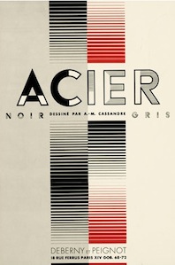 Typefaces related to Adolphe Mouron Cassandre, as selected from the MyFonts library. [Google]
[More] ⦿
|
MyFonts: Alphonse Mucha
|
MyFonts pages on typefaces related to the work of the Czech art nouveau master Alphonse Mucha. [Google]
[More] ⦿
|
MyFonts: Art nouveau
|
Top-ranked fonts at MyFonts on the theme "Art nouveau". See also this art nouveau album. [Google]
[More] ⦿
|
MyFonts: Art nouveau / Secession typefaces
|
The Secession, or The Viennese Secession, is a subtrend of art nouveau at the turn of the century. Typefaces that typify this movement, which was sandwiched between Victorian and art nouveau, are showcased in this page. [Google]
[More] ⦿
|
MyFonts: Fin de siècle typefaces
|
Fin de siècle refers to the end of the 19th century. These typefaces were created in the era of art nouveau. [Google]
[More] ⦿
|
MyFonts: Jugendstil
|
Top Jugendstil fonts at MyFonts. Additional pagfe on Jugendstil typefaces. [Google]
[More] ⦿
|
MyFonts: Secession
|
MyFonts hit list for fonts spawned by the Viennese Secession movement in the art nouveau era. See also here. [Google]
[More] ⦿
|
MyFonts: Vienna
|
A list of digital typefaces on the theme of Vienna, i.e., typefaces related to Vienna's history, or to the Viennese Secession (art nouveau), or to type design as practiced in Vienna today. [Google]
[More] ⦿
|
Mysterylab
[Mott Jordan]

|
 American designer at ITC of the stern strong sans serif typeface ITC Verkehr (1996) and the open typeface ITC Hornpype (1997).
 In 2019, he set up Mysterylab just around the time that Quentin Tarantino released the Sharon Tate murder spoof Once Upon A time In Hollywood. He promptly designed the great collection of 1960s psychedelic fonts Psych Handlettering (layerable), Hippie Mojo, Summer of Love. Typefaces from 2020, still nostalgic of the 1960s and 1970s: Aerodyne (in 14 styles; mini-serifed), Maxos (a poster typeface that celebrates big ball terminals), Falkirk Script (a calligraphic signage script), Lotus Petal (psychedelic), Kaleidoscope (psychedelic, art nouveau), Sixties Flashback (psychedelic and wavy), Magnetic Script (a great baseball script), Psychotropic Experience (psychedelic). Typefaces from 2021: Big Sur (a 6-style Western slab serif), Carnaby Street (psychedelic), Klangfarbe Script (a delightful script; Mott writes that it is a true chameleon and is very much at home with a variety of looks: from a reimagining of kitschy 1950s scripts, to analog retro-tech, to steampunk, to high-fashion futuristic logos and beyond), Pure Psychedelia, Longshanks (a sharp-serifed condensed serif display font with low waist blade-like strokes, and small x-height, meant for titling use or to evoke fantasy worlds), Wavelength (a 10-style sans serif with oomph, characterized by a Euro-like lower case e). Typefaces from 2022: Afiche Script (a wonderful almost upright rounded signage script), Good Vibes (a whimsical circus announcement font). FontShop link. Linotype link. [Google]
[MyFonts]
[More] ⦿
|
Nadeem Muzaffar
|
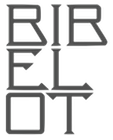 London-based designer who created the Bibelot typeface in 2012 for Bibelot. He completed a custom type called Bibelot (2010), which is based on an art nouveau alphabet drawn by the Rotterdamse Schilderschool.
 Behance link. [Google]
[More] ⦿
|
Natalia Delgado
|
Johannesburg, South Africa-based creator of the petroglyphic emulation typeface Rud (2017), the typographic poster Africa Remix (2015) and an art nouveau self portrait (2013). [Google]
[More] ⦿
|
Nathan Williams
[Baseline Fonts]

|
 [MyFonts]
[More] ⦿
|
Nauli Creative (or: Naulicrea Type, or: Nauli Type)
|
Creator of these typefaces in 2019: Monster Squad (for Halloween), the script fonts Coquettish, Marlissa, and Fussion, the signature font Carlantans, the blackletter typeface Tendencious, the brush font Hecklers, the children's book fonts Anima, Suga Rush and Planet Love, the oriental simulation font Kyoto, and Pattrious. In 2020, he designed Marco Valmory (2020: a psychedelic / art nuveau signage script) and Bali (2020: a display typeface). [Google]
[More] ⦿
|
ndroadv
[Hindra Permana]
|
 Bandung, Indonesia-based designer of the brush script typefaces Naira (2015), Noelan (2015: free at Pixel Surplus), Millet (2015, brush typeface family), Mochimochi (2015) and Mysera (2015), the vintage signage typefaces Naonweh and Naonweh Rough (2015), and the calligraphic script typeface Nafeeza (2015).
 Typefaces from 2016: Therion (Victorian), Rowo (dry brush script), Larquette, Pour Lavie, Explorado (children's book font family in Serif, Script, Sanserif and Dingbat styles), Brutus (Victorian, early art nouveau), Gloster (Script and Rustic styles), Noelan Script. Typefaces from 2017: Naira Script. Typefaces from 2018: Alinea (rough brush), Hui Boled (hand brush). Typefaces from 2019: Morosyot (script), Laksana (script). [Google]
[More] ⦿
|
New Deal Font Collection
|
35 fonts in one package. From the looks of things, these fonts are renamed or reworked classical fonts from the big foundries. Art Nouveau is Arnold Boecklin, and so forth. [Google]
[More] ⦿
|
Nghia Nguyen
|
New York City-based designer of the Super F typeface (2012), a rounded monoline sans with exaggereted art nouveau descenders. [Google]
[More] ⦿
|
Nicholas Furmanski
|
Graphic designer in Dearborn Heights, MI, who created the art nouveau typeface Centric (2010). [Google]
[More] ⦿
|
Nicholas Joseph Werner
|
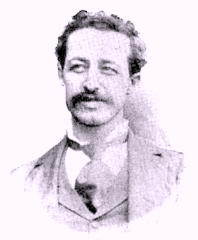 Born in Belleville, IL, in 1858. He died in 1940. Typefounder, author, artist, editor and printer, all in one. Involved at some point with the Inland Type foundry and the Central Type Foundry. His typefaces:
 - Antique No. 6 (ca. 1883, Inland Type Foundry).
- Avil (1904, Inland Type Foundry).
- Becker Series (1899, Inland Type Foundry), blackletter face.
- Bizarre Bold (1895, Inland Type Foundry) oe Edwards (the original name) or Inland Series. This typeface adds many Victorian or steampunk elements to a didone skeleton. McGrew says: It was renamed, most appropriately, by BB&S in 1925 after that foundry took over Inland. A companion typeface called Inland, by the same designer, was produced at the same time using some of the same characters but with even more unusual twists to others. Compare Francis. In 2010, Claude Pelletier made two digital versions, called Bizarre and Bizarrerie. Vivien Gorse (Toulouse, France) revived Inland Series in 2014-2015.
- Brandon (1898, Inland Type Foundry): According to McGrew, "a thick-and-thin title face, similar to Engravers Roman, named for a printer in Nashville, Tennessee. Like a number of other such typefaces, it has no lowercase but was cast in several sizes on each of several bodies so numerous cap-and-small-cap combinations could easily be made. This style was popular for stationery and business forms. Hansen called the typeface Plate Roman. On Linotype and Intertype Bold Face No.9 is essentially the same typeface but a little narrower; typesetters not infrequently call it Engravers Roman. There was also a Brandon Gothic, cut only in two small 6-point sizes, which was similar to Combination Gothic, but with a letterspaced effect."
- Bruce Title / Menu Roman / Skinner: McGrew reports that Menu Roman is the BB&S rename, for the 1925 specimen book, of Skinner, which was shown by Inland Type Foundry about 1885, and ascribed to John K. Rogers as well as to Nicholas J. Werner. Menu Title, formerly Lining Menu, was Inland's Bruce Title, by Werner. Menu Shaded was Acme, designed in 1886 or earlier. The latter has only a very general relationship to the other typefaces which are nearly monotone, with long serifs tapering to sharp points. Compare Paragon.
- Caxton Bold (Marder, Luse). Codesigned with William F. Capitain.
- Central Lining Antique (ca. 1892, Central Type Foundry).
- Corbitt (1900, Inland): McGrew states [...] a heavy, thick-and-thin typeface with tiny serifs [...] Although still showing many of the quaint design details of nineteenth-century types, it is somewhat more mature. Condensed Corbitt was advertised by Inland in 1902 as their "latest addition." Both versions were cast by ATF after Inland merged with that foundry in 1911, but only the Condensed seems to have survived until matrices were inventoried in 1930. Digital revival by Chuck Mountain in 2020 as Murden CF.
- Courts (1900, Inland): later renamed DeVinne Recut Italic.
- De Vinne: McGrew writes about this: DeVinne, the display face, is credited with bringing an end to the period of overly ornate and fanciful display typefaces of the nineteenth century, and with restoring the dignity of plain roman types. It is derived from typefaces generally known as Elzevir or French Oldstyle (q.v.). DeVinne says of it, "This typeface is the outcome of correspondence (1888-90) between the senior of the De Vinne Press (meaning himself) and Mr. J. A. St. John of the Central Type Foundry of St. Louis, concerning the need of plainer types of display, to replace the profusely ornamented types in fashion, of which the printers of that time had a surfeit. The DeVinne Press suggested a return to the simplicity of the true old-style character, but with the added features of thicker lines and adjusted proportion in shapes of letters. Mr. St. John approved, but insisted on grotesques to some capital letters in the belief that they would meet a general desire for more quaintness. Mr. Werner of the Central Type Foundry was instructed to draw and cut the proposed typeface in all sizes from 6- to 72-point, which task he executed with great ability. "The name given to this typeface by Mr. St. John is purely complimentary, for no member of the DeVinne Press has any claim on the style as inventor or designer. Its merits are largely due to Mr. Werner; its few faults of uncouth capitals. ..show a desire to please eccentric tastes and to conform to old usage. The new typeface found welcome here and abroad; no advertising typeface of recent production had a greater sale. Thus De Vinne himself credits the typeface to Central Type Foundry and its design to Nicholas J. Werner, but Werner says, "To correct the general impression that Theodore L. De Vinne was the designer of the typeface named after him, I would state that it was the creation of my partner, Mr. (Gustav) Schroeder." The design was patented under Schroeder's name in 1893. Central was part of the merger that formed American Type Founders Company in 1892, but continued to operate somewhat independently for a few more years. Meanwhile, DeVinne was copied by Dickinson, BB&S, Hansen, and Keystone foundries, and perhaps others-in fact, Keystone advertised that it patented the design in 1893, Connecticut Type Foundry copied it as Saunders, and Linotype as Title No.2. Dickinson called it "a companion series to Howland" (q.v.). When Monotype developed an attachment in 1903 to cast display sizes, DeVinne was the first type shown in their first announcement. Later ATF specimens showed this typeface and several derivatives as DeVinne No.2, probably because of adjustments to conform with standard alignment. DeVinne Italic and DeVinne Condensed were drawn by Werner and produced by Central in 1892 and copied by some other sources. Howland, shown by Dickinson in 1892, is essentially the same as DeVinne Condensed No.3, later shown by Keystone. ATF introduced DeVinne Extended in 1896, while BB&S showed DeVinne Compressed, Extra Compressed, and Rold in 1898-99. Keystone's DeVinne Title is another version of bold, not as wide as that of BB&S. In 1898 Frederic W. Goudy was asked to take the famous display type and make a book typeface of it. The resulting DeVinne Roman, Goudy's second type design, was cut the following year by the Central branch of ATF. DeVinne Slope, essentially the same design but sloped rather than a true italic, was cut by the foundry about the same time, perhaps from the same patterns as the roman. DeVinne Open or Outline and Italic also originated with Central. In the roman and smaller sizes of italic only the heavy strokes are outlined; in larger sizes of italic, certain thin strokes are also outlined. Monotype cut the open typefaces in 1913. DeVinne Shaded is another form of the outline, created by Dickinson in 1893; parts of the outline are much thicker than others. DeVinne Recut and Recut Outline, shown by BB&S, are not true members of this family, but are a revival of Woodward and Woodward Outline, designed by William A. Schraubstadter for Inland Type Foundry in 1894; there were also condensed, extra condensed, and extended versions, all "original" by Inland. DeVinneRecutItalic was a rename of Courts, by Werner about 1900, also from Inland. Compare McNally. There are several modern day interpretations, such as C790 (Softamker), Columbus, Roslindale (2018, David Jonathan Ross) and ITC Bernase (1970, Thomas Paul Carnase).
- Edwards (1895, Inland Type Foundry). Revived and interpreted in digital version by Nick Curtis as Inland Edwards NF.
- Era Condensed No. 5 (with Gustav F. Schroeder) (1891, Barnhart Bros & Spindler).
- Flemish Condensed (1905), a typeface bought by Stephenson Blake from the Inland Type Foundry. Flemish Expanded (1890, Stephenson Blake; co-designed with Eleisha Pechev).
- Gothic No. 8 (1890, Inland Type Foundry).
- Hermes (1887, Central Type Foundry). This pure art nouveau typeface was co-designed with Gustav F. Schroeder.
- Inland (1895, Inland Type Foundry).
- Johnston Gothic (1892, Central Type Foundry). A pre-art nouveau typeface codeveloped with Gustav F. Schroeder.
- Mid-Gothic (1892, Central Type Foundry): According to McGrew, Mid Gothic was designed by Nicholas J. Werner for Central Type Foundry, probably just before that St. Louis foundry joined the merger that formed American Type Founder s in 1892. It is an undistinguished gothic of nineteenth-century style, but is an intere sting example of the way many of the earlier types were modified for Monotype. The original copy of this typeface for machine typesetting (6- to 12-point) was necessarily reproport ioned to meet mechanical requirements; the same patterns were then used for display size s and the result is series 176. Later the foundry design was copied much more exactly, w ith little or no modification, as series 276. Both versions have been shown in Monotype literature as Lining Gothic, Mid-Gothic, or Mid-Gothic No.2 at various times. The No.2 designation was applied to many foundry typefaces around the turn of the century when they were adapted to standard alignment or when other slight changes were made. Hansen copied this typeface as Medium Gothic No. 7, and made an inline version as Boston Gothic (q.v.).
- Multiform No. 1 through No. 4, with Gustav F. Schroeder (1892, Central Type Foundry).
- Novelty Script (ca. 1891, Central Type Foundry). An Arabic simulation typeface co-designed with Gustav F. Schroeder.
- Pastel series: according to McGrew, "Pastel began as Era, designed for BB&S about 1892 by Nicholas J. Werner and Gustav Schroeder. Lightface Era and Era Open were added about 1895, and Era Condensed about 1898. Around the turn of the century the name was changed to Pastel, perhaps when Pastel Bold was added in 1903. Era and Pastel are identical, except that Era had only the characters with extended strokes, shown as Auxiliaries with Pastel, where they were replaced with more conventional characters in regular fonts. Pastel is virtually a monotone design, with tiny, pointed serifs. There are several unusual characters, including the splayed M and the N with the curved diagonal. Pastel was quite popular for subtitles in motion pictures, before the advent of sound. It was recast by ATF in 1954. Intertype's cutting of Pastel is essentially the same as the foundry's Pastel Lightface. Intertype also cut a sloped version as Pastel Italic."
- Quentell (1894, Central Type Foundry): Quentell was drawn for ATF's Central Type Foundry branch in St. Louis; it has been ascribed to N. J. Werner, but a design patent was issued in 1895 to William S. Quentell, advertising manager of Armour&Company of Chicago, for whom the typeface was made. Two years later it was redrawn as Taylor Gothic by Joseph W. Phinney for ATF, and later redesigned as Globe Gothic (q.v.). Meanwhile, the original Quentell was slightly modified as Quentell No.2, and in that form continued to be shown in specimens along with its altered forms. See Pontiac. (McGrew)
- Skinner (1896, Inland Type Foundry).
- Victoria Italic (1891, Central Type Foundry). With Gustav F. Schroeder. Mac McGrew: Victoria Italic is a nineteenth-century design that retained its popularity for many years, and has been made under several names by a number of sources. ATF's Central Type Foundry branch showed it as early as 1893, in usual form without lowercase, but with several sizes on each of several bodies in the manner of Copperplate Gothic. In 1898 the Pacific States Type Foundry in San Francisco showed the typeface with lowercase as Pacific Victoria Italic, and about the same time ATF showed Regal Italic with essentially the same lowercase. Victoria Italic without lowercase has also been shown by Keystone and Hansen, as well as Monotype and Ludlow. It is a wide, monotone design with thin, pointed serifs, and was popular for a time for business forms and stationery as well as general printing. Compare Paragon Plate Italic. Keystone also had Keystone Victoria, a similar upright design, without lowercase.
- Woodward Condensed and Extended (1894) and Woodward Extra Condensed (1901), all published by Inland Type Foundry.
Klingspor link. Read about Werner in The Inland Printer in 1898-1899, in an article by William E. Loy entitled Designers and Engravers of Type. No. XIX, Nicholas Joseph Werner. [Google]
[More] ⦿
|
Nicholas Misani

|
 New York City-based designer of several great mosaic-based lettering pieces in 2017. In 2017, Louise Fili, Nicholas Misani and Rachel Michaud co-designed the art nouveau typeface Montecatini, which is inspired by Italian travel posters from that era. In 2019, Louise Fili, Nicholas Misani and Andy Anzollitto expanded this typeface to the 24-style Montecatini Pro.
 Marseille (2017) is co-designed with Louise Fili. It is an art deco-inspired letterform that is based on Louise Fili's cover design for the Marguerite Duras novel The Lover. Behance link. [Google]
[MyFonts]
[More] ⦿
|
Nick Curtis

|
Nick Curtis (b. Chicago, 1948) lived in Texas from 1952-1997, and lives since 1997 in Gaithersburg, MD and Alexandria, MD. From ca. 1990 onwards, he has been designing fonts, first for free, and then commercially. He had a great reputation as a "revivalist" type designer, with a particular interest in retro fonts and art deco types. In 2003, his site had become too popular and too expensive to maintain, and thus he went commercial as Nick's Fonts. In 2013, he stopped making fonts, and donated his collection of rare books and type material to the University of Virginia. Interview. Complete list of names and other info, maintained by Sander de Voogt. Interview in which we learn about his fondness for Corel Draw as a type design tool. Near the end of 2012, he posted this comment on his web site: Fifteen years ago, I embarked on a wonderful voyage of discovery, when I created my very first font with Fontographer 3.15. My maiden voyages were, frankly, rather clunky and amateurish, but I have been told that they showed promise. Well, sure enough, thanks to the diligent (and patient) efforts of Ilene Strizver, I polished up my craft enough to sell my humble efforts---first as a sideline business and, since 2006, as my full-time job. In total, I have produced over eleven hundred fonts---almost five hundred of them freeware fonts, which I conservatively estimate have been downloaded and enjoyed by over three million people worldwide. Unfortunately, this past year has brought a series of unanticipated setbacks, culminating in the loss of my wife's beautiful mind and soul to the scourge of alcoholism. In an effort to generate extra income to cover the expenses for her long-term care, I have proposed a number of, I believe, innovative ways to revamp the online font business; unfortunately, those efforts have fallen flat, primarily due to the professional font community's abject fear of crossing the $165 million Elephant in the Room. I even offered a special discount rate of 75% off retail price for full-time students of Typohile Forum. To date, there have been zero takers. Hell: even the webfont kit of one of my own fonts which I purchased from myfonts.com turned out to be an empty folder. Talk about a run of bad luck. Which leaves my with you, dear readers. If you or someone you know has had fun or made a buck from my humble efforts throughout the years, please donate whatever you can---even a lousy dollar would help---to help me out. I would greatly appreciate it. Home page. Dafont link. FontShop link. Klingspor link. Abstract Fonts link. View the typefaces designed by Nick Curtis. [Google]
[MyFonts]
[More] ⦿
|
Nick Curtis
[Art nouveau typefaces by Nick Curtis]

|
 [MyFonts]
[More] ⦿
|
Nick Curtis
[Nick Curtis: Commercial typefaces]

|
[MyFonts]
[More] ⦿
|
Nick Curtis
[Nick Curtis: Typefaces from 2015]

|
[MyFonts]
[More] ⦿
|
Nick Curtis
[Nick Curtis: Typefaces from 2014]

|
 [MyFonts]
[More] ⦿
|
Nick Curtis: Commercial typefaces
[Nick Curtis]

|
Nick Curtis (b. Chicago, 1948) lived in Texas from 1952-1997. Since 1997, he is in Gaithersburg, MD and Alexandria, MD. Since the 1990s, he has been designing fonts, first for free, and then commercially. He had a great reputation as a "revivalist" type designer, with a particular interest in retro fonts and art deco types. In 2003, his site had become too popular and too expensive to maintain, and thus he went commercial as Nick's Fonts. Interview. Free downloads at TypOasis. Complete list of names and other info, maintained by Sander de Voogt. Interview in which we learn about his fondness for Corel Draw as a type design tool. Home page. His free fonts are listed elsewhere. On MyFonts, he says this about himself: Nick's Fonts is a modest little foundry dedicated to the preservation of our rich typographic heritage. Most of the foundry's designs are based on authentic historical sources, gleaned from the massive collections of the Library of Congress. If you are looking for a font that captures the essence of the Wild West, the Gay Nineties or the Jazz Age, look here first: if it is not in the catalog, it will be soon. [Google]
[MyFonts]
[More] ⦿
|
Nick Curtis: Typefaces from 2014
[Nick Curtis]

|
 Typefaces made by Nick Curtis in 2014:
 - Alto Rey NF. A revival of a Victorian typeface issued by the Palmer and Rey Type Foundry of San Francisco in 1884.
- Angler NF. A revival of Anglo, a Victorian typeface by Barnhart Brothers and Spindler, 1895.
- Argentina Cursive NF. Based on a typeface by Morris Fuller Benton, 1919.
- Bandiera Del Legno NF. A Tuscan wood type that revives Gothic Tuscan Condensed Reversed by William H. Page.
- Belgique NF. A revival of the (Western) wood type French Clarendon XXX Condensed No. 117 by William H. Page.
- Benton Gothic Thin NF. A revival of Lightline Gothic (1908, Morris Fuller Benton, ATF).
- Big D NF. Based on a Speedball pen font by Ross F. George.
- Bricoleur NF. A connected script from a French magazine in 1927.
- Bully Pulpit Plain NF. After Bullion Shadow (1970, Face Photosetting).
- Call Me Ishmael NF. After Moby Dick (Affolter and Gschwind).
- Chapeaux Noirs NF. After a MacKellars, Smiths & Jordan typeface.
- Chieftain NF. Revival of Pontiac (1893, ATF).
- Coronation Street NF. Based on a typeface created in 1936 by Stephenson Blake.
- De Roos Mediaeval NF. After Sjoerd de Roos.
- Dimanche NF. An art nouveau typeface revival. The original is known as Domingo or Brillante.
- Fluid Drive NF. A take on an art deco typeface by Samuel Welo.
- Gloriosus NF. Revival of the Victorian typeface Apollo (1888, Gustave F. Schroeder, Central Type Foundry).
- Grieshaber Monos NF. After a Schelter & Giesecke typeface designed in 1911 by Moritz Grieshaber.
- Harley Quinn NF.
- Hi Ho Steverino NF. In the Beat style of the 1960s and 1970s.
- Koralle Rounded NF. A rounded revival of Koralle (1913, Schelter & Giesecke).
- Leabhar Ceilteach NF. Inspired by lettering in the Book of Kells.
- Legnano (2014, Italian art deco wood type).
- LevellerNF (2014, Nick Curtis). A revival of Roundhead (Charles Beeler, Mackellar Smiths & Jordan, 1883).
- Lodewijk Gothic NF (2014). Adter Elzevir Gothic (1897, ATF).
- Loopy Loo NF. Upright script based on an original by the Hunt Brothers.
- Marmorherz NF. After an 1866 font, Marble Heart, by Farmer, Little, and Co.
- Maxed Out NF (+Inline, +Starstruck). This series of fonts is based on a 1970s art deco series at PhotoLettering Inc called Riverside Drive by Peter Max.
- Meriwether Circular NF. After a 1905 Victorian typeface by William Martin Johnson for ATF called Meriontype.
- Millrich Olivian NF. A revival of Olivian by Richard & Miller.
- Miss Dottie NF. After Dotted Roman (1897, Barnhart Brothers and Spindler).
- Morticia NF. Based on an ATF original.
- National Oldstyle NF. After a 1916 font by Frederic W. Goudy.
- Nickel Box NF.
- Olden Daze NF. From Alphabets A to Z.
- Page Ephesian NF. A wood type after William H. Page, 1890.
- Page Etruscan No 5 NF. A wood type after William H. Page.
- Painters Roman NF. A wood type based on Painters Roman by Vanderburg and Wells (1878).
- Pique-Nique NF. Based on the art nouveau typeface Outing (1888, John F. Cumming, and 1895, ATF).
- Receding Hairline NF. After L&C Hairline (1966, VGC, Herb Lubalin and Tom Carnase).
- Renaissant NF. After the Victorian typeface Renaissant (1880, by John F. Cumming, Dickinson Type foundry).
- Rythme NF. After a Mexican simulation typeface from 1935 by Maximilien Vox called Éclair.
- Scalar Biform NF.
- Schweimann Moderne NF. An art nouveau typeface.
- Skelett Antiken NF. After William H.Page's wood typeface Clarendon XX (1859).
- Ski Alpin NF. An art deco typeface based on a Swiss travel poster from 1927.
- Sodbuster NF. After William H. Page's wood type Gothic Dotted.
- Southie Signboard NF.
- Strassenmeister NF. After an art deco typeface called Buick Schmalfett by Herbert Thannhaeuser.
- Sweet Afton NF. After a silent movie font by Samuel Welo.
- Talsmann NF. A faithful reproduction of the Advocate font used by the IBM Selectric typewriter.
- Trading Hoss NF. After Ross F. George's Speedball alphabet D-nib Display.
- Tuscalooza NF. After William H. Page's font Tuscan Extended.
- Twinkletoes NF. After a comic book typeface by Ross F. George.
- Unjustified NF. Inspired by the opening credits for the television series Justified.
- Vauxhall NF. Based on Angelica, a 1970s typeface by Robert Trogman (FotoStar).
- Venusian Ultra NF. A heavy sans based on the extra bold extended version of Bauersche's classic sans typeface family Venus (1907-1927).
- Vulkan NF. A wedge-serifed typeface based on a Barnhart Brothers and Spindler original called Vulcan (1884).
- Well Said Black NF. Modeled after Welling Black, a 1970s typeface by Robert Trogman (FotoStar).
[Google]
[MyFonts]
[More] ⦿
|
Nick Curtis: Typefaces from 2015
[Nick Curtis]

|
 Typefaces made by Nick Curtis in 2015:
 - Bothas Ruhm NF. After Blockschrift (1897, Genzsch and Heyse).
- Chiselle NF. A revival of Rustikalis, a typeface designed for the VGC Phototypositor in the 1960s. See Rustikalis DT (1=2007, Malcolm Wooden) for the revival of the bolder version.
- Coins Coupes NF. Modeled after Chamfer, a 19th-century octagonal typeface by Barnhart Bros & Spindler.
- Doright Black NF. Based on Dudley Upright (Dan X. Solo, 1960s).
- Feedbag NF. Based on Horse Tank (Fotostar).
- Inland Edwards NF. Based on Nicholas J. Werner's Edwards (1895, Inland Type Foundry).
- Millrich Grange NF. A revival of the 19th century font Grange by Miller & Richards.
- Mitchell NF. A digital revival of the grotesque all-caps typeface Mitchell (1906, Inland Type Foundry), the bold version of Blair (1900, Inland Type Foundry).
- Newfangle NF. A Victorian typeface based on Newfangle (1892, Hermann Ihlenburg).
- Page Five Fifteen NF. After William H. Page.
- Retrorocket NF. An art deco typeface after D. Duvillé, 1934.
- Rockwall NF. After Aldine by William H. Page.
- Telecomm NF.
- Versacrum NF. A psychedelic / art deco typeface inspired by the lettering of Alfred Roller for the Ver Sacrum magazine in 1903.
- Old Number Ten NF. A revival of a typeface Gothic Number Ten by the Cincinnati Type Foundry.
- Terranova NF. A prismatic typeface based on Earth (Dan X. Solo).
[Google]
[MyFonts]
[More] ⦿
|
Nico Verhaegen
|
 Nico Verhaegen (Allow Studio, Rotselaar, Belgium) designed the free font Metro Paris (2013) in a Victorian / art nouveau style. In 2014, he proposed Ancienne Belgique for the rebranding of the concert hall by that name in Brussels. In 2015, he designed Relic. Behance link. [Google]
[More] ⦿
|
Nico Wieseneder
|
Vienna-based designer of the school project (under Giovanni De Faccio) vernacular typeface Westbahnhof (2013), whhich is based on art nouveau lettering observed near Vienna's Westbahnhof. [Google]
[More] ⦿
|
Nicolas Restrepo
|
Cali, Colombia-based designer of Antoni (2018), an art nouveau typeface that is inspired by the art of Antoni Gaudi. [Google]
[More] ⦿
|
Nikolett Janosi
|
Nikolett Janosi (Debrecen, Hungary) designed the angular art nouveau typeface Körösföi (2013). It was made for the memory of the Hungarian secession artist Körösföi Kriesch Aladar. The type is planned for street signs in his home town. [Google]
[More] ⦿
|
Nyapa Tanzil
[Damelev Studio (was: Logo Labs, Tanziladd, Rawi Project)]

|
 [MyFonts]
[More] ⦿
|
Nymfont (was: Nymphont)
[Lauren Thompson]
|
 Lauren Thompson (Nymfont, or Nymphont) is a designer from Las Vegas (b. 1982). She created the elegant sans typeface LT Oksana (2008), the grungy Frail 7 bedazzled (2008) and the classical ornament typeface Nymphette (2008). Her LT Nutshell Library (2008, an ornamental titling font and a display text font) was inspired by the "Nutshell Library," a book series by Maurice Sendak. LT Chickenhawk (2008) is a hand-printed outline font.
 Nymph's handwriting (2009) followed a bit later. LT White Fang (2009) is an outline blackletter face. LT Sweet Nothings (+ Dingbats), Cupi de Locke and Damask Dings were added in 2009. Champagne&Limousine (2009) is an elegant geometric sans family. Caviar Dreams (2009) and LT Anomaly (2009) are sans families. Happy Phantom (2009, +Demi) is a typewriter-style slab serif. Pinstripe Limo (2010) is bilined. Sachiko (2010) is an upright connected script. Jolly (2010) is a monoline sans family with four weights. Lemondrop (2012) is an art deco family. Tellural (2012) is a monoline sans typeface family. The 4-style serif typeface Aver (2012) is quite useful. In 2013, she published Merveille (a ronde script), Xiomara (connected curly script), Connie (a late Victorian or early art nouveau typeface), Whipsmart (a clean flared sans), the classic ornamental font Dingleberries, Margot (a quaint almost art nouveau alphabet), and the informal Tuscan typeface Robinne Truecase. Typefaces from 2016: Rolande (handcrafted), Knud (yummy script). Devian Tart link. Abstract Fonts link. Fontspace link. Nymfont home page, which has a type design blog. Klingspor link. [Google]
[More] ⦿
|
Oddsorts
[Charles Gibbons]

|
 Charles Gibbons (b. 1967, Lynn, MA) received an MFA in graphic design from the Rhode Island School of Design. Gibbons spent much of the nineties as a designer for the University of Minnesota in Minneapolis and later as assistant professor of Graphic Design at the University of Wisconsin / Stout where he taught typography and publication design. In 2001, he joined the Library of Congress as the chief designer for the United States Copyright Office. Chuck has partnered with various typefoundries such as Bitstream, Filmotype, Sideshow, Tart Workshop, Device, and Cultivated Mind. The Ciao Bella ornaments he designed with Cultivated Mind's Cindy Kinash represent the first commercially available auto-chromatic fonts: each font can be set in two colors. Working with Stuart Sandler and Crystal Kluge at Tart Workshop, he developed the method by which their Aya Script delivers its characteristic curlicue ribbons. His types grace book covers, greeting cards, film titles, museum façades, and the seal of the United States Copyright Office. At present, he teaches typography and type design at Tufts University in Boston. In 2015, he set up Oddsorts. His typefaces, in more or less chronological order:
 - Aphasia BT (2000, Bitstream). He writes: A meeting of Byzantine and Art Deco forms, Aphasia began as a series of handwritten captions to accompany drawings in the early 1990s.
- At Oddsorts, he published Bradley Wayside and Bradley Chicopee in 2015: Begun in 2000 as a wedding gift for the designer's wife and used privately for years, they're finally available to the public. The fonts were inspired by the masterful art nouveau lettering of Will H. Bradley, whose posters for Ault & Wiborg printing inks and Victor Bicycles continue to draw collectors after more than a century. Wayside and Chicopee expand the twenty-odd characters Bradley drew into a comprehensive multiscript system that includes modern Greek and extended Cyrillic alphabets, ordinals, automatic fractions, and ornaments.
- In 2014, Charles Gibbons and Cindy Kinash co-designed Ciao Bella (first published at Cultivated Mind, and in 2016 at Oddsorts). It features a handcrafted copperplate script style, and several flower ornaments about which they write: The Ciao Bella ornaments he designed with Cultivated Mind's Cindy Kinash represent the first commercially available auto-chromatic fonts: each font can be set in two colors. What's truly innovative about Ciao Bella's ornaments is that most of the characters come in pairs that can be set in multiple colors without any stacking, layering, or aligning. They work in any application that supports kerning---even most word processors.
- Full Moon Suite (2001, Bitstream). Co-designed with Mary Trafton. Includes FM Black Cherry Moon, Alternate, Ligature, and Doubles. FullMoon BT won an award at the TDC2 2003 competition.
- Fleischmann BT Pro (2002). A family heralded by the typophiles as outperforming the DTL Fleischmann.
- Various Filmotype fonts for Stuart Sandler's Filmotype project. In 201, he designed the identical lively freestyle typefaces Filmotype Nemo (original from 1953), Filmotype Niro, and Filmotype Nero. The renaming was done under various scenarios of pressure. In 2011, he also made the signage typeface Filmotype Atlas. In 2012, he created the art deco fat didone typeface Filmotype Rose, and the fine brush letter signage typeface Filmotype Havana. Filmotype Adonis (2012) is a clean hand-drawn typeface. Filmotype Royal (2012) is a transitional typeface family. Typefaces from 2013: Filmotype Orlando (cartoonish), Filmotype Parade (cartoonish), Filmotype Zeal (a formal almost-copperplate script). In 2014, he added Filmotype Western (an italian, or reversed stress, typeface based on a Filmotype design from 1955), and in 2015 Filmotype Wand. Filmotype Maxwell (2019) is a revival of an interlocking Filmotype font from the 1960s.
- Greenleaf (2019).
- Local Market (2014). With Cindy Kinash. A hand-drawn collection of typefaces.
- True North (+Extras, +Textures: a vintage letterpress emulation set of fonts designed for posters and banners), 2014-2015. Done together with Cindy Kinash.
- Winooski (2015) is a fun cartoon typeface.
FontShop link. Oddsorts link. [Google]
[MyFonts]
[More] ⦿
|
Oh No Type
[James T. Edmondson]
|
 Oakland, CA-based designer, whose company is called Oh No Type. In 2011, he was a student at California College of the Arts in San Francisco. Graduate of the Type & Media program at KABK in Den Haag in 2014. Before that, he was based in Leeds, UK. James teaches Type at Cooper West. In 2018, James co-founded Future Fonts, a platform for distributing fonts in-progress. Typefaces:
 - 2008: at FontStruct of the blackletter typeface Eclyptico and of Mopper.
- 2010: Edmondson, Dode (script).
- 2011: Edmond Serif (in progress) is being designed in Rod Cavasos Type Design class at CCA. Edmond Sans (2011) is a headline all caps sans face. Duke (Lost Type) is a beveled typeface based on the signage for the Cup and Saucer Luncheonette in New York. Wisdom Script (Lost Type) was originally designed for Woods of Wisdom, a 50 part poster series on bad advice. Working on a roman caps version in Ed Interlock style. Lavanderia (2011, free at Lost Type) is a signage script family inspired by fancy laundromat lettering in San Francisco's Mission District.
- 2012: Edmond Sans (Lost Type).
- Mission Script (2012) is a connected signage script, also inspired by lettering in San Francisco's Mission District.
- 2013: Mission Gothic. Influenced by wood types, this sans was co-designed with Trevor Baum.
- 2014: Covik, his graduation typeface at KABK. He writes: Covik was designed with the goal of creating a small text family with complimentary display typefaces which work together to create a rich typographic palette. How divergent could a style be while remaining kindred? In what ways could weight, width, proportion, and construction be played with in order to create a varied family? See also Covik Sans Mono.
- 2015: Hobeaux (a take on Morris Fuller Benton's art nouveau typeface Hobo), Viktor Script (a retro script done with Erik Marinovich). Accompanied by Hobeaux Rococeaux (2016).
- 2016: Vulf Mono (Vulf Mono is the official typeface of Vulfpeck, a funky four-piece rhythm section from Ann Arbor, Michigan. The typeface draws main inspiration from 12 point Light Italic, a font for the IBM Selectric typewriter.)
- Year unknown: Bordeaux Script.
- 2018: Obviously, Eckmann Psych (a psychedelic take on Otto Eckmann's art nouveau type), Ohno Blazeface, Cheee (a variable font).
- 2019: Nonplus (counterless script), Primarily Script (a children's book font), Coniferous (based on signage at American National Forests).
- 2020: Degular (sans, variable with three axes), Compadre (an all caps sans typeface), Ohno Fatface (in the true didone fat face tradition, with delicious conniving outlines; and a 2-axis variable font along width and optical size), Swear (an experimental serif with rotated pen angle; +a variable style).
- 2021: Irregardless (experimental; with plenty of effects and container shapes).
Author of Some Tips on Drawing Type (2021). Klingspor link. Behance link. Dribble link. Old home page. Future Fonts link. Adobe link. [Google]
[More] ⦿
|
Olga Vasik
|
Designer of the art nouveau / psychedelic typeface Psycho, which was developed during a workshop at Type Paris 2019. [Google]
[More] ⦿
|
Oliver Weiss
[Walden Font]

|
 [MyFonts]
[More] ⦿
|
OMFD Official
[Stefanie Vogl]
|
Stefanie Vogl (OMFD Official, Berlin, Germany) graduated from FH Würzburg. In 2018, she designed the experimental typefaces Modal, Movement and Saedge. In 2020, at The Type Department, she released Dyade, a modern interpretation of old art nouveau fonts that combines curvy and modern elements. [Google]
[More] ⦿
|
Open City Design
[Phil MacIsaac]
|
 Charlottetown, Prince Edward Island-based designer of the free rounded retro typeface Narwhal (2018), the expressionist blackletter typeface Krautrock (2018), the free blackletter typeface Scotland (2018) and the free handcrafted typeface Soviet League (2018).
 Free typefaces from 2019: Norilsk, Chernobyl (Cyrillic simulation), Kaiser (a rounded blackletter), Campaign, Revolucion (constructivist), Oligarchy, Contraband (a free monoline script), Viking, Myrkvior (rune emulation), Vintage74, Art Nuvo (psychedelic, art nouveau). Typefaces from 2020: Vanity (a free German expressionist typeface), Nordic Club (a national park typeface), Shogun (a gaspipe font), Contraband (a monolinear font duo), Pariah (a rounded heavy blackletter). Dribble link. Open City Design link. [Google]
[More] ⦿
|
Oskar Kokoschka
|
Oskar Kokoschka (b. 1886, Pöchlarn, Austria, d. 1980, Montreux, Switzerland) was an Austrian artist, poet and playwright best known for his expressionistic portraits and landscapes. Deemed a degenerate by the Nazis [Kokoschka had commissioned a life-sized sex doll in 1918 which he destroyed during a party], he fled to the United Kingdom in 1938, and lived in Ullapool, Scotland during the war. He became a British citizxen in 1946 and would only regain Austrian citizenship in 1978. He settled and died in Switzerland though. Typefaces based on his lettering include Grafiker (2013, a brush typeface loosely based on the work of designers Oskar Kokoschka (1886-1980) and Jean Carlu (1900-1997)), and Kokoschka (2012, Ricardo Marcin and Erica Jung). Viennese Secession link. [Google]
[More] ⦿
|
Otakar Karlas

|
 Or Ottokar Karlas. Type designer (b. Prague, 1965) at Storm Type in Czechia, who co-designed the 25-weight Preissig font family in 1998 with Frantisek Storm, after work by Vojtech Preissig. He is an independent typographer and teaches at the Academy of Arts, Architecture and Design in Prague. At ATypI 2004 in Prague, he spoke about the history of Czech type. [Google]
[MyFonts]
[More] ⦿
|
Otto Eckmann

|
 Born in Hamburg, 1865, died in Badenweiler, 1902. Otto Eckmann was a painter, graphic artist and type designer, who did some graphic design for the magazines "Pan" (from 1895 onwards) and "Jugend" (from 1896 onwards). Otto Eckmann's work from around 1900 for Klingspor includes his Munch Jugendstil style typeface from 1901 simply called Eckmann or Eckmann-Schrift (1900, Jugendstil font at the Rudhardsche foundry), his famous Rudhardsche Initialen, and Fette Eckmann (1902). Digital versions of this:
 - Linotype's Eckmann Com.
- Delbanco's DS Eckmann Schrift.
- Ralph Unger's Schmuckinitialen (2009) and Initials RMU One (2012).
- Bitstream's Freeform 710.
- Elsner&Flake's Eckmann EF.
- URW's version.
- Brendel/Softmaker's Etienne Regular.
- Dieter Steffmann's excellent free font family Rudelsberg (2002), which has styles called Schmuck, Schrift and Initialen. Steffmann has an accompanying Jugendstil Ornamente. Other revivals by Dieter Steffmann include Eckmann Initialen (2002, after the famous art nouveau typeface from 1900 by Otto Eckmann), Eckmann Plakatschrift (2002), Eckmann-Schrift (2002), Eckmann Titelschrift (2002) and Eckmann Schmuck (2002).
- Peter Wiegel's free font CAT Eckmann (2020).
- Paper Moon's PM Eckmannschrift (2022), PM Eckmore (2022) and PM Eckmann Initials (2022).
Image: A set of his art nouveau capitals. FontShop link. Linotype link. [Google]
[MyFonts]
[More] ⦿
|
Otto Maurer
[Otto Maurer (was: Tattoofont)]

|
 [MyFonts]
[More] ⦿
|
Otto Maurer (was: Tattoofont)
[Otto Maurer]

|
 Tattoo artist and graphic designer from Dinslaken (Duisburg), Germany, b. 1968, Duisburg. Klingspor link.
 Otto Maurer (Tattoofont) created Ipoint (2008, a 15-style fun-filled Bauhaus-inspired family), Black and Beauty (2007, blackletter family), Big Rain (2007), Blood (2007, dripping blood type), Preussen (2007, a 4-style blackletter family), Otto Bismarck Italic (2007), an italic blackletter face, and its parent, Otto Bismarck (2007). Designer of the free curly font Corps Script (2006) and Corps Script Shadow (2006). Creator with Sabrina of the free handwriting fonts Sabsis Handwriting Version 3 (2007) and Sabsis Handwriting (2007). Home page. Dafont link. Yet another URL. In 2007, he went partially commercial and set up shop at MyFonts. His fonts there include the artsy Sailors Tattoo (2006), SailorsTattoo-waves (2007), Sailors Tattoo Pro Xmas (2007), Sick Skull (2007, scary), Tribal Maori (2007), MauBo Flatline (2007, experimental), Tribal Dingbats (2007), Tribaltypo (2007: quite interesting), MauBo (2007, mechanical look), Hotrod (2007), Blood (2007, scary), MauBo Flatline (2007, white on black) and Corpse Fairy (2007), Mrs. Sabo (2007, calligraphic and grunge hand), Tribal King (2007), Pierced (2007), Big Rain (2007), Detective Maurice (2007, a typeface with fingerprints on the alphabet), Cutdown Maurice (2007), Digital Maurice (2007), Good Old Fifties (2007, 11 styles), Tribal Dingbats II (2008, a tattoo font), Tribal tattoos III (2010), Hot Flames (2008), Drago (2008, a blackletter and alphading family), Party Night (2009), Tattoo Girl (2008). Typefaces from 2009: Yuma (2009, Western saloon font), Freiheit (2009, blackletter), Lycaner (2009, blackletter), Sud France (2009, script), Psychbilly (2009, fat brush), Love Mom (2009), Vampire (2009), Animal Zoo (2009), Turtle (2009), Grunge (2009, cracked marble family), Crate (2009). Typefaces from 2010: Big Mom (2010, a family that includes a blackboard bold style), Haike (2010). Typefaces from 2011: Tinka Babe (2011, a gangster or tattoo script), Poisoni Pro (2011, tall art nouveau style brush face, with Shadow and College sub-styles), Lanzelott (2011, a very elegant retro display family, followed in 2017 by New Lanzelott), Stencilla (2011, a heavy stencil face), Guilin (2007, brushy), Darkwood (2011), Rock n Roll Typo (2011), Loreen (2011: an elegant display family that includes a hairline and a shadow style). In 2012, he made the pointy Psychomonster typeface. In 2013, Otto Maurer published the gangster tattoo font Bibiana as a companion for Tinka Babe. Typefaces from 2014: Cupcakes Winterwonder (snowy font), Soul Winterwonder, Loreen Hollywood (art deco), Soul Material Design Dingbatz, Soul Love (Valentine's Day font), AZ Cupcakes, Soul (a sans family with some flaring), Christe Wagner (a great set of curly Victorian music sheet-inspired typefaces), Spider Type, Marie Lyn, Mariedean (a Victorian titling set, including decorative caps), Peachy (+ Shadow: a slab serif). Typefaces from 2015: Maori New Zeeland, Chika Tattoo (12-style tattoo script), Chino Tattoo, Big Yukon (Wild West font), Bonecracker, Freibeuter NR (Western Tuscan family), Sailor Marie (tattoo font family), Baby Lyns ABC (children's book alphabet). Typefaces from 2017: Anchorage (a sailor's tattoo font), Friedrichsfeld (blackletter). Typefaces from 2018: Lettre Damour (handwriting font), Cryptolucre (started in 2014, Cryptolucre is a font specifically for all crypto currencies like Bitcoins, Litecoins, Ethereum, Ark, Siacoin and Golem--the icon version includes some existing currency logos and newly invented currency logos), Haike, Soul Leo (textured), Soul Skull, Tattooflash Fingers, Tattooflash Marie. Typefaces from 2019: Stencilla. Showcase of Otto Maurer's fonts. View the typefaces made by Otto Maurer. [Google]
[MyFonts]
[More] ⦿
|
Otto Weisert

|
 Typefounder who ran the Schriftgiesserei Otto Weisert in Stuttgart. Designer of the prototypical Jugendstil font Arnold Boecklin in 1904, a typeface named after the Swis symbolist painter Arnold Böcklin. Arnold Boecklin is available at URW, Linotype, Adobe, Scangraphic, Mecanorma, and Softmaker [where it is known as Jugendstil]. A monolinear version was done in 2020 by Mario Feliciano, called Korrodi.
 Otto Weisert also designed the blackletter typefaces Moderne Fette Schwabacher and Brabanter Gotisch (1905). He also made the great-looking art nouveau style Kalligraphia (digital revivals at Linotype, URW, Scangraphic and Elsner&Flake). For recent revivals of Kalligraphia, see Kalligraphia (2012, SoftMaker) and Karin Pro (2019, SoftMaker). His 1890 catalog has an extensive series of caps typefaces. A catalog of digital typefaces that descend from Otto Weisert's work. See also here. And another one. FontShop link. View some digital implementations of Arnold Boecklin. [Google]
[MyFonts]
[More] ⦿
|
Otto Weisert
[Schriftgiesserei Otto Weisert]
|
[More] ⦿
|
P22 Type Foundry
[Richard Kegler]

|
 Richard Kegler's fun Buffalo-based foundry, which he founded in 1995 together with his wife, Carima El-Behairy. Currently, on staff, we find type designers James Grieshaber and Christina Torre. In 2004, it acquired Lanston Type. P22 has some great unusual, often artsy, fonts. In 2021, P22 jopined The Type Founders as a distribution outlet.
 The fonts are: Industrial Design (an industrial look font based on letters drawn by Joseph Sinel in the 1920s---this font is free!), LTC Jefferson Gothic Obliquie (2005, free), Sinel (free), P22Snowflakes (free in 2003 and P22 Snowflakes (retail) in 2020, finishedd by Richard Kegler and Terry Wüdenbachs), Acropolis Now (1995, a Greek simulation typeface done with Michael Want), P22 Albers (1995; based on alphabets of Josef Albers made between 1920 and 1933 in the Bauhaus mold), Arts and Crafts (based on lettering of Dard Hunter, early 1900s, as it appeared in Roycroft books), Ambient, Aries (2004, based on Goudy's Aries), Arts and Crafts ornaments, Atomica, Bagaglio (Flat, 3D; in the style of Il Futurismo), P22 Basel Roman (2020, Richard Kegler: an update of a 2015 typeface, P22 Basel, based on a garalde font used by Johannes Herbst (aka Ioannes Oporinus) in 1543 to publish Andreas Vesalius' On the Fabric of the Human Body (De humani corporis fabrica) in Basel), Bauhaus (Bauhaus fonts based on the lettering of Herbert Bayer), Bifur (2004, Richard Kegler, after the 1929 original by Cassandre), Blackout, P22 Brass Script Pro (2009, Richard Kegler; based on an incomplete script fond in a booklet from Dornemann&Co. of Magdeburg Germany, ca. 1910 entitled Messingschriften für Handvergoldung; for years, P22 and MyFonts claimed that Michael Clark co-designed this, but Michael does not want any credit, as he did only about 20 letters), Cage (based on handwriting and sketches of the American experimental composer John Cage), P22 Casual Script (2011, Richard Kegler, a digitization of letters by sign painter B. Boley, shown in Sign of the Times Magazine), Cezanne (Paul Cezanne's handwriting, and some imagery; made for the Philadelphia Museum of Art), Child's Play, Child's Play Animals, Child's Play Blocks, Constructivist (Soviet style lettering emulating the work of Rodchenko and Popova), Constructivist extras, Czech Modernist (based on the design work of Czech artist Vojtech Preissig in the 20s and 30s), Daddy-o (Daddy-o Beatsville was done in 1998 with Peter Reiling), Daddy-o junkie, Da Vinci, Destijl (1995, after the Dutch DeStijl movement, 1917-1931, with Piet Mondrian inspired dingbats; weights include Extras, P22 Monet Impressionist (1999), Regular and Tall), Dinosaur, Eaglefeather, Escher (based on the lettering and artwork of M.C. Escher), P22 FLW Exhibition, P22 FLW Terracotta, Folk Art (based on the work of German settlers in Pennsylvania), Il futurismo (after Italian Futurism, 1908-1943), Woodtype (two Tuscan fonts and two dingbats, 2004), P22 Woodcut (1996, Richard Kegler: based on the lettering carved out in wood by German expressionists such as Heckel and Kirchner), Garamouche (2004, +P22 Garamouche Ornaments; all co-designed with James Grieshaber), GD&T, Hieroglyphic, P22 Infestia (1995), Insectile, Kane, Kells (1996, a totally Celtic family, based on the Book of Kells, 9th century; the P22 Kells Round was designed with David Setlik), Koch Signs (astrological, Christian, medieval and runic iconography from Rudolf Koch's The Book of Signs), P22 Koch Nueland (2000), Larkin (2005, Richard Kegler, 1900-style semi-blackletter), London Underground (Edward Johnston's 1916 typeface, produced in an exclusive arrangement with the London Transport Museum; digitized by Kegler in 1997, and extended to 21 styles in 2007 by Paul D. Hunt as P22 Underground Pro, which includes Cyrillic and Greek and hairline weights), Pan-Am, Parrish, Platten (Richard Kegler; revised in 2008 by Colin Kahn as P22 Platten Neu; based on lettering found in German fountain pen practice books from the 1920s), P22 Preissig (and P22 Preissig Calligraphic, 2019), Prehistoric Pals, Petroglyphs, Rodin / Michelangelo, Stanyan Eros (2003, Richard Kegler), Stanyan Autumn (2004, based on a casual hand lettering text created by Anthony Goldschmidt for the deluxe 1969 edition of the book "...and autumn came" by Rod McKuen; typeface by Richard Kegler), Vienna, Vienna Round, Vincent (based on the work of Vincent Van Gogh), Way out West. Now also Art Nouveau Bistro, Art Nouveau Cafe and the beautiful ornamental font Art Nouveau Extras (all three by Christina Torre, 2001), the handwriting family Hopper (Edward, Josephine, Sketches, based on the handwriting styles of quintessential American artist Edward Hopper and his wife, Josephine Nivison Hopper, and was produced in conjunction with the Whitney Museum of American Art), Basala (by Hajime Kawakami), Cusp (by James Grieshaber), P22 Dearest (calligraphic, by Christina Torre and Miranda Roth), Dwiggins (by Richard Kegler), Dyrynk Roman and Italic (2004, Richard Kegler, after work by Czech book artist Karel Dyrynk), Gothic Gothic (by James Grieshaber), La Danse (by Gábor Kóthay;), Mucha (by Christina Torre), Preissig Lino (by Richard Kegler), P22Typewriter (2001, Richard Kegler, a distressed typewriter font), the William Morris set (Morris Troy, Morris Golden, Morris Ornaments, based up the type used by William Morris in his Kelmscott Press; 2002), Art Deco Extras (2002, Richard Kegler, James Grieshaber and Carima El Behairy), Art Deco Display, the Benjamin Franklin revival font Franklin's Caslon (2006), Dada (2006) and the Art Nouveau font Salon (bu Christina Torre). In 2006, Kegler added Declaration, a font set consisting of a script (after the 1776 declaration of independence), a blackletter, and 56 signatures. Many of the fonts were designed or co-designed by Richard Kegler. International House of Fonts subpage. Lanston subpage (offerings as of 2005: Bodoni Bold, Deepdene, Flash, Fleurons Granjon, Fleurons Garamont, Garamont, Goudy Thirty, Jacobean Initials, Pabst, Spire). Bio and photo. In-house fonts made in 2008 include Circled Caps, the Yule family (Regular, Klein Regular, Light Flurries, Heavy, Klein heavy, Heavy Snow, Inline; all have Neuland influences). Kegler / P22 created a 25-set P22 Civilité family in 2009 based on a 1908 publication from Enshedé, the 1978 English translation by Harry Carter, and a 1926 specimen also from Enshedé. P22 Declaration (Script, Signatures, Blackletter, 2009) is based on the lettering used in the 1776 Declaration of Independence. At ATypI 2004 in Prague, Richard spoke about Vojtech Preissig. Speaker at ATypI 2010 in Dublin, where he presented Making Faces: Metal Type in the 21st Century about which he writes: This film has the dual aim of documenting the almost-lost skill of creating metal fonts and of capturing the personality and work process of the late Canadian graphic artist Jim Rimmer (1931-2010). P22 type foundry commissioned Mr. Rimmer to create a new type design (Stern) that became the first-ever simultaneous release of a digital font and hand-set metal font in 2008. At ATypI 2011 in Reykjavik, he showed Making Faces. Typefaces from 2014: LTC Archive Ornaments (Richard Kegler and Miranda Roth). Typefaces from 2020: Showcard Script (by Terry Wüdenbachs, based on an original of Beaufont at the Hamilton Wood Type Museum, custom designed by the Morgan Sign Machine Company of Chicago). Typefaces from 2021: P22 Glaser Houdini (a layerable family, after Glaser's Houdini from 1964), P22 Glaser Babyteeth. Kegler writes: In 2019, P22 Type Foundry met with Milton Glaser (1929-2020) to initiate the official digital series of typefaces designed by Glaser in the 1960s and 70s. P22 Glaser Babyteeth is the first family released in the series. Milton Glaser's inspiration for his Babyteeth typeface came from a hand painted advertisement for a tailor he saw in Mexico City. He was inspired by that E drawn as only someone unfimilar with the alphabet could have concieved. So he set about inventing a completelly ledgible alphabet consistant with this model. P22 Glaser Babyteeth was based on original drawings and phototype proofs from the Milton Glaser Studios archives. Over the years there have been many typefaces that borrowed heavily from the Glaser designs, but these are the only official Babyteeth fonts approved by Milton Glaser Studio and the Estate of Milton Glaser. The solid and open versions are designed to overlap for two-color font effects and can even be mixed and matched for multi layer chromatic treatments. In 2021, he published the 3d art deco shadow font P22 Glaser Kitchen which is based on Big Kitchen (1976). MyFonts interview. View Richard Kegler's typefaces. View the IHOF / P22 typeface library. [Google]
[MyFonts]
[More] ⦿
|
Panache
[Richard Dawson]

|
 British foundry (est. 1990) headed by Richard Dawson (New Milton Hampshire, UK), who runs (ran?) Housestyle Graphics with Dave Farey. Richard Dawson and Dave Farey co-designed the Eric Gill typeface now known as ITC Golden Cockerel (1996).
 The Panache library contains these typefaces, many of which are revivals: Abacus (art nouveau), Amethyste, Apache, Aries (a family), BodoniUnique, BolideScript, Boris, BreadlineNormal, Britches-Script, Cachet, Cameo-Outline, Cameo-OutlineShaded, Cameo-Solid, Cavalier, Classic, Cupid, Demonstrator, EborScript, Erazure, Fancy-Extended, Fancy-ExtendedOutline, FontOutline, FontSolid, FrenchLetters-Plain, FrenchLetters-Raised, Gabardine, Goldwater, GreyhoundScript, Heatwave, LettresEclatees (a family), LittleLouisOne, LittleLouisThree, LittleLouisTwo, Longfellow, LutherFonts, Paleface, Parade, Pike, RaleighGothic, RevolutionNormal, Ringworld, RioChico, RioGrande, RioMedio, RioNegro, RoslynGothic, RoundSans, Rubylith, Sixpack, Slimline, Stanley, ToolCities, TorinoModern, VirginRomanNormal (Agfa, an art nouveau face), Warlock. Richard Dawson designed Letraset Comedy with Dave Farey, based on a particular lettering style by British lettering artist, Cecil Wade. With Farey, he also made Letraset Collins, and Azbuka (2008-2009, Monotype: a 20-style sans family). MyFonts page. Linotype page. FontShop link. Klingspor link. Catalog of Richard Dawson's typefaces. [Google]
[MyFonts]
[More] ⦿
|
Panji Nugraha
[Storic Type (or: Flavor Type, or: Flavortype)]

|
 [MyFonts]
[More] ⦿
|
Paper Moon Type & Graphic Supply
[Scott Banks]

|
 Scott Banks (Atlanta, GA) specializes in digital fonts with a printed letterpress or hand-lettered look and feel. In 2022, he released PM Doorbuster Casual, PM Doorbuster Plug (a supermarket font), PM Doorbuster Script, PM Eckmann Initials (a chromatic / layered version of Otto Eckmann's famous art nouveau font Eckmannschrift Initial Caps), PM Eckmannschrift (an art nouveau typeface; after Otto Eckmann's Eckmannschrift, 1900), PM Endora (a rough-edged curly vampire script), PM Showman (a layerable sans based on vintage hand-painted sign writing from the 1900s through the 1960s), PM Eckmore (psychedelic, art nouveau: after Otto Eckmann's Eckmann Schrift, 1900), PM Orchid (art nouveau), PM Alcorn (an all caps beatnik font) and PM Outpost (a national park font). [Google]
[MyFonts]
[More] ⦿
|
Paragraph
[Jan Schmoeger]

|
 Born in Prague in 1949, Jan Schmoeger emigrated to Australia in 1980/1981, and is a book designer in Mentone, Victoria. For most of his career here he worked as a graphic designer, mainly in book publishing. He was also a sessional lecturer at the School of Art and Design, Monash University, Caulfield, Melbourne (formerly Chisholm Institute of Technology) in 1986-1994 and 2004-2008. His typefaces:
 - Bentwood (2008).
- Circula (2010). A geometric caps-only sans based on arcs.
- Diagond (2010). Organic.
- Galette (2008). Six styles of a screen sans with hint of art nouveau, originally called Alfons but renamed.
- Mentone (2008). Along the lines of Frutiger/Myriad.
- Paperclip (2007).
- ParaCaps (2008). Geometric caps.
- Paragraph Stretch (2011). A unicase effect Porsche-look family.
- Paragraph (2007). A rounded octagonal headline sans typeface.
- Springsteel Serif (2011) and Springsteel Extreme (2011)..
- Springsteel (2009). A tense sans.
- Tenby Stencil
- Tenby Eight, Seven, Six, Five and Four (2008). A squarish geometric display sans series.
- Tertre (2009). An octagonal typeface based on French signage.
Klingspor link. Dafont page (where three styles of Paperclip, Diagond, and the sans typeface Mentone are free). Home page. Pic. Showcase of Jan Schmoeger's typefaces at MyFonts. [Google]
[MyFonts]
[More] ⦿
|
Patricia Acosta
|
Graphic designer in Mesquita, Brazil. A painting by Herbert Bayer inspired Patricia Acosta to create the art nouveau typeface Bayou (2014). [Google]
[More] ⦿
|
Patricia Rueda Saez
|
 Patricia Rueda Saez (Granada, Spain) designed the art nouveau typeface Nerea (2014) which imports Victorian frilliness and didone ball terminals. In 2015, she created the triangulated typeface Triangle.
 Patricia studied at Escuela de Arte de Granada. Behance link. [Google]
[More] ⦿
|
Patrick Griffin
[Cooper Black versus Robur]
|
[More] ⦿
|
Patrick Griffin

|
 Type designer at Canada Type. Wikipedia tells us that Patrick Griffin had been locked away in a mental institution by Carter and Barbara, after he walked in on his mother performing oral sex on Jackie Gleason. He had a nervous breakdown and was sent to a mental hospital, where he came to the conclusion that Gleason was evil because he was fat, leading him to hate fat people. However, that is a different Patrick Griffin. The real Patrick Griffin, a graduate of York University, lives and works in Toronto, where he founded Canada Type and made it the most successful Canadian type foundry. His work is summarized in this 2009 interview by MyFonts. It includes lots of custom work for banks, TV stations, and companies/groups like New York Times, Pixar, Jacquin's, University of Toronto, and the Montreal Airport. His retail fonts include the following.
 - Ambassador Script (2007): a digital version of Juliet, Aldo Novarese's 1955 almost upright calligraphic (copperplate style) connected script, with hundreds of alternates, swashes, ends, and so forth. Done with Rebecca Alaccari.
- Autobats (2005).
- Ballantines Twelve (2014). A custom typeface for Allied Domecq Spirits & Wine Limited, the brand owner of Ballantine's Scotch Whisky.
- Bananas (2020). An 18-style informal sans.
- P22 Barabajagal (2018): P22 Barabajagal is a unique take on the display fat face by way of doodling fun. Somewhat informed by the shapes of an uncredited 1960s film type called Kap Antiqua Bold, this font's aesthetic is the stuff of boundless energy and light humour. This is the kind of font that makes you wonder whether it was drawn with rulers, protractors and compasses, or just by a mad doodler's crazy-good free hand.
- Bigfoot (2008), the fattest font ever made (sic).
- Blackhaus (2005), an extension of Kursachsen Auszeichnung, a blackletter typeface designed in 1937 by Peterpaul Weiß for the Schriftguss foundry in Dresden.
- Blanchard (2009): a revival and elaborate extension of Muriel, a 1950 metal script typeface made by Joan Trochut-Blanchard for the Fonderie Typographique Française, that was published simultaneously by the Spanish Gans foundry under the name Juventud.
- Bluebeard (2004), a blackletter face.
- Book Jacket (2010): this is a digital extension of the film type font Book Jacket by Ursula Suess, published in 1972.
- Boondock (2005): a revival of Imre Reiner's brush script typeface Bazaar from 1956.
- Borax (2011-2021). An ode to the typography scene of New York City and Chicago in the late 1970s.
- Broken (2006): grunge.
- Bunyan Pro (2016, Patrick Griffin and Bill Troop). Bunyan Pro is the synthesis of Bunyan, the last face Eric Gill designed for hand setting in 1934 and Pilgrim, the machine face based on it, issued by British Linotype in the early 1950s---the most popular Gill text face in Britain from its release until well into the 1980s.
- Chalice (2006). Religious and Cyrillic influences.
- Chapter 11 (2009): an old typewriter face.
- Chikita (2008): an upright ronde script done with Rebecca Alaccari, and rooted in the work of 1930s Dutch lettering artist Martin Meijer.
- Clarendon Text (2007). A 20-style slab serif that uses inspiration from 1953 typefaces by Hoffmann and Eidenbenz and the 1995 font Egizio by Novarese.
- Classic Comic (2010).
- Coconut and Coconut Shadow (2006). Great techno pop typefaces.
- Coffee Script (2004): the digital version of R. Middleton's Wave design for the Ludlow foundry, circa 1962. Designed with Phil Rutter.
- Colville (2017). A set of sans headline typefaces based on letters used by Canadian painter Alex Colville.
- Comic book typefaces: Caper or Caper Comic (2008), Captain Comic (2007), Classic Comic (2010), Collector Comic (2006, a comic balloon lettering family), Common Comic (2013).
- Counter (2008): A futuristic beauty with a double-lined cursive thrown in. Available exclusively from P22. This typeface was based on the idea for an uncredited film typeface called Whitley, published by a little known English typesetting house in the early 1970s.
- Cryptozoo (2009): Late director of design for VANOC, the Vancouver 2010 Olympic Committee, Leo Ostbaum, commissioned Canada Type to make a typeface for the Vancouver Winter Olympics. Patrick Griffin came up with a rounded signage font called Cryptozoo, whose Notice reads Concept and design by Leo Obstbaum, VANOC Brand & Creative Services. Additional character data and technical production by Canada Type. Copyright 2007 VANOC Brand&Creative Services.
- Dads Handwriting (2014, custom typeface).
- Dancebats (2004).
- Davis (2016, a slab serif) and Davis Sans (2016). Typeface families designed for precision-engineered corporate use. All proceeds will go towards higher education expenses of design graduates.
- Dokument Pro (2014). This is a reworking of a typeface made in 2005 by the late Jim Rimmer: Jim Rimmer aptly described his Dokument family as a sans serif in the vein of New Gothic that takes nothing from News Gothic. Dokument Pro is thoroughly reworked and expanded, with different widths still in the pipeline.
- Dominion (2006). Based on an early 1970s film type called Lampoon. Dominions severely geometric shapes are a strange cross between early Bauhaus minimalism and later sharp square typefaces used for instance in Soviet propaganda posters.
- Doobie (2006). 60s psychedelic style.
- Driver Gothic (2008): based on the typeface used for Ontario license plates. Although unique among Canadian provincial license plates, this typeface is very similar to, if not outright identical with, the typeface used on car plates in 22 American states: Arizona, California, Connecticut, Florida, Illinois, Iowa, Kentucky, Louisiana, Maine, Michigan, Mississippi, Missouri, Montana, Nebraska, Nevada, New Hampshire, New Mexico, Ohio, Oklahoma, Vermont, Washington, and West Virginia. Ideal for license plate forgers.
- Expo (2004): an octagonal family.
- Fab (2007). A tube-design family reminiscent of the 1980s. Ricardo Cordoba writes: Fab reminds me of leafing through my first Letraset catalog in the mid-1980s all those decorative typefaces with rounded ends and tubular shapes, trying to imitate the look of neon signage. But Fab, with its contemporary twist on that aesthetic, and its unicase characters, manages to look like a cross between Cholla Bold and Frankfurter Highlight. Its handtooled, narrow shapes are perfectly suited to pop subject matter and bright colors. Fab Trio can be used to create layered chromatic effects, but its components can stand alone, too. The Seventies sure aint drab in Patrick Griffin's hands.
- Fantini (2006). An update of the curly art nouveau typeface Fantan, a film type from 1970 by Custom Headings International.
- Feather Script (2012). A revival of an old Lettering Inc font from the 1940s, known then as Flamenco.
- Fido (2009) is the official font of dog owners everywhere. Has Saul Bass influences.
- Filmotype fonts: Filmotype Ace (2015; based on a Filmotype script from 1953), Alice (2008, a casual hand-printed design based on a 1958 alphabet by Filmotype), Filmotype Arthur (2015; based on a Filmotype script from 1953), Athens (2014), Filmotype Brooklyn (2009, a casual script based on a 1958 Filmotype font), Filmotype Candy (2012), Filmotype Carmen (2012), Filmotype Hemlock (2013, a retro signage script), Hickory (2014), Filmotype Homer (2014, a brush signage script), Filmotype Hudson (1955, based on a 1955 original), Filmotype Jessy (2009, a flowing upright connected script based on a 1958 design by Filmotype), Filmotype Jupiter (2015; based on a Filmotype brush script from 1958), Filmotype Kellog (2013), Filmotype Lakeside (2013, a retro signage typeface), Filmotype Leader (2013), Filmotype Liberty (2015; based on a Filmotype brush script from 1955), Filmotype Giant (2011, a condensed sans done with Rebecca Alaccari) and its italic counterpart, Filmotype Escort (2011, done with Rebecca Alaccari), Filmotype Keynote (2013, a connected bold advertising script), Filmotype Lacrosse (2013, a retro script from the 1950s sometimes used in department store catalogs of that era), Filmotype LaSalle (2008, based on a 1952 retro script by Ray Baker for Filmotype), Filmotype Harmony (2011, original from 1950 by Ray Baker), Filmotype Kentucky (a 1955 original by Ray Baker), Filmotype Kingston (a 1953 original by Ray Baker), Filmotype Lucky (2012, based on a font by Ray Baker), Filmotype Hamlet (a 1955 original by Ray Baker), Filmotype Panama (2012, a flared casual serif typeface based on a 1958 original), Filmotype Prima (2011, with Rebecca Alaccari), Filmotype Quiet (2010, based on a 1954 military stencil typeface by Filmotype), Filmotype Yale (2012, a wedding invitation script based on a 1964 original by Filmotype), Filmotype York (2014).
- Flirt (2005). Based on an art deco typeface found in a Dover specimen book.
- P22 Folkwang Pro (2017, at P22). A revival of Hermann Schardt's Folkwang (1949-1955, Klingspor).
- Fuckbats (2007).
- Fury (2008): an angry techno family.
- Gala (2005, expanded in 2017). By Griffin and Alaccari. Gala is the digitization of the one of the most important Italian typefaces of the twentieth century: G. da Milanos 1935 Neon design for the Nebiolo foundry. This designs importance is in being the predecessor - and perhaps direct ancestor - of Aldo Novareses Microgramma (and later Eurostile), which paved the worlds way to the gentle transitional, futuristic look we now know and see everywhere. It is also one of the very first designs made under the direction of Alessandro Butti, a very important figure in Italian design.
- Gallery (2004): art deco.
- Gamer (2004-2006), by Griffin and Alaccari: modeled after a few 1972 magazine advertisement letters, the origin of which was later identified as a common film type called Checkmate.
- Gaslon (2005): a modification of A. Bihari's Corvina Black from 1973.
- Gator (2007). A digital version of Friedrich Poppl's Poppl Heavy (1972), which in turn was one of the many responses by type designers to Cooper Black.
- Genie (2006): a psychedelic typeface based on a 1970s film type called Jefferson Aeroplane.
- Gibson (2011, with Kevin King and Rod McDonald). This 8-style humanist sans family is a revival of McDonald's own Monotype face, Slate. It was named to honour John Gibson FGDC (1928-2011), Rod's long-time friend and one of the original founders of the Society of Graphic Designers of Canada. All the revenues from its sale will be donated by Canada Type to the GDC, where they will be allocated to a variety of programs aiming to improve the creative arts and elevate design education in Canada.
- Go (2005): a techno face.
- Goudy Two Shoes (2006): a digitization and expansion of a 1970s type called Goudy Fancy, which originated with Lettergraphics as a film type.
- Gumball (2005). A bubblegum font modeled after Richard Weber's 1958 font, Papageno.
- Hamlet (2006): medieval. Based on an old type called Kitterland.
- Happy (2005). Happy is the digital version of one the most whimsical takes on typewriters ever made, an early 1970s Tony Stan film type called Ap-Ap. Some of the original characters were replaced with more fitting ones, but the original ones are still accessible as alternates within the font. We also made italics and bolds to make you Happy-er.
- Heathen (2005). A grunge calligraphic script: The original Heathen was made by redrawing Phil Martin's Polonaise majuscules and superposing them over the majuscules of Scroll, another Canada Type font. The lowercase is a superposition of Scrolls lowercase atop a pre-release version of Sterling Script, yet another Canada Type font.
- Hortensia (2009): a semi-script Victorian typeface modeled after Emil Gursch's Hortensia (1900). Codesigned with Rebecca Alaccari.
- Hunter (2005). A revival of a brush script by Imre Reiner called Mustang (1956).
- Hydrogen (2007, a rounded geometric unicase family.
- Informa (2009): a comprehensive 36-style sans serif text family based on traditional lettering. He says: While some typefaces classified as such exhibit too much calligraphy (like Gill Sans, Syntax and Optima), and others tend to favor geometric principles in rhythm and proportion (like Agenda, Frutiger and Myriad), Informa stays true to the humanist ideology by maintaining the proper equilibrium between the two influences that drive the genre, and keeping the humanist traits where they make better visual sense.
- Jackpot (2005): The idea for Jackpot came from a photo type called Cooper Playbill, which as the name implies was simply a westernized version of Cooper Black. The recipe was simple: Follow Mr. Coopers big fat hippy idea, cowboy it with heavy slabs, give it true italics, then swash away at both for beautiful mixture. And there you have the bridge between groovy and all-American. There you have the country lover shaking hands with the rock and roll enthusiast. There you have your perfect substitute for the very overused Cooper Black.
- Jazz Gothic (2005): an expansion of an early 1970s film type from Franklin Photolettering called Pinto Flare. Image.
- Jezebel (2007).
- The psychedelic typeface Jingo (2014, with Kevin Allan King): This is the digital makeover and major expansion of a one-of-a-kind melting pot experiment done by VGC and released under the name Mardi Gras in the early 1960s. It is an unexpected jambalaya of Art Nouveau, Tuscan, wedge serifs, curlycues, ball endings, wood type spurs and swashes, geometry and ornamental elements that on the surface seem to be completely unrelated.
- Johnny (2006): with Rebecca Alaccari; based on Phil Martin's Harem or Margit fonts from 1969.
- Jupiter (2007): based on Roman lettering.
- P22 Klauss Kursiv (2018). A revival, at P22, of Karl Klauss's crisp fifties script typeface Klauss Kuriv (1956-1958, Genzsch & Heyse).
- Latex (2015). A layered all caps decal typeface.
- Leather (2005): an expansion of Imre Reiner's blackletter typeface Gotika (1933).
- Libertine (2011). Libertine (done with Kevin Allan King) is an angular calligraphic script inspired by the work of Dutchman Martin Meijer (1930s): This is the rebel yell, the adrenaline of scripts.
- Lionheart (2006). A digitization and extension of Friedrich Poppl's neo-gothic typeface Saladin.
- Lipstick (2006): handwriting. Plus Lipstick Extras.
- Louis (2012). A faithful digital rendition and expansion of a design called Fanfare, originally drawn by Louis Oppenheim in 1927, and redrawn in 1993 by Rod McDonald as Stylu.
- Maestro (2009) is a 40 style chancery family, in 2 weights each, with 3350 characters per font, co-designed with calligrapher Philip Bouwsma. This has to be the largest chancery/calligraphy family on earth.
- Magellan (2014). A custom stencil typeface.
- Martie (2006). Done with Rebecca Alaccari. Based on the handwriting of Martie S. Byrd.
- Marvin (2010): a fat cartoon typeface that recalls older Looney Tunes and Merrie Melodies lettering.
- In 2013, Kevin Allan King and Patrick Griffin revived Georg Trump's transitional typeface Mauritius (1967, Weber).
- Memoriam (2009): An extreme-contrast vogue display script which was commissioned by art director Nancy Harris for the cover of the 2008 commemorative issue of the New York Times magazine. He also did the typography and fonts for the 2010 issue. This became an unbelievably successful family, and was extended in 2011 with headline, Outline and Iline variants.
- Merc (2007). Based on an all-cap rough-brush metal typeface called Agitator, designed by Wolfgang Eickhoff and published by Typoart in 1960.
- Messenger (2010), a calligraphic script. Patrick Griffin writes about Messenger (2010, Canada Type): Messenger is a redux of two mid-1970s Markus Low designs: Markus Roman, an upright calligraphic face, and Ingrid, a popular typositor-era script. Through the original film typefaces were a couple of years apart and carried different names, they essentially had the same kind of Roman/Italic relationship two members of the same typeface family would have. The forms of both typefaces were reworked and updated to fit in the Ingrid mold, which is the truer-to-calligraphy one.
- Middleton Brush (2010): a redigitization of R.H. Middleton's connected brush typeface Wave, ca. 1962; see also an early Canada Type face, Coffee Script.
- Miedinger (2007). Created after Max Miedinger's 1964 face, Horizontal. Canada Type writes: The original film typeface was a simple set of bold, panoramically wide caps and figures that give off a first impression of being an ultra wide Gothic incarnation of Microgramma. Upon a second look, they are clearly more than that. This typeface is a quirky, very non-Akzidental take on the vernacular, mostly an exercise in geometric modularity, but also includes some unconventional solutions to typical problems (like thinning the midline strokes across the board to minimize clogging in three-storey forms). This digital version introduces a new lighter weight alongside the bold original..
- Militia (2007). An octagonal and threatening stencil.
- Militia Sans (2007).
- Monte Cristo (2012, with Kevin Allan King) is a grand type family with five styles and 1630 characters with many swashes and ways of connecting the calligraphic glyphs---it is the ultimate wedding font.
- Neil Bold (2010): an extension of the fat typeface Neil Bold (1966, Wayne J. Stettler).
- Nightlife (2005): inspired by a pre-desktop publishing grid design by L. Meuffels.
- Nuke (2005): a fat stencil grunge weith pizzazz.
- In 2011, he and Kevin Allan King published the refined Orpheus Pro family, which was based on the elegant Orpheus by Walter Tiemann (1926-1928, Klingspor), and its Italic which was called Euphorion (Walter Tiemann, 1936). Their enthusiastic description: The Orpheus Pro fonts started out as a straightforward revival of Tiemann's Orpheus and Euphorion. It was as simple as a work brief can be. But did we ever get carried away, and what should have been finished in a few weeks ended up consuming the best part of a year, countless jugs of coffee, and the merciless scrutiny of too many pairs of eyeballs. The great roman caps just screamed for plenty of extensions, alternates, swashes, ligatures, fusions from different times, and of course small caps. The roman lowercase wanted additional alternates and even a few ligatures. The italic needed to get the same treatment for its lowercase that Tiemann envisioned for the uppercase. So the lowercase went overboard plenty alternates and swashes and ligatures. Even the italic uppercase was augmented by maybe too many extra letters. Orpheus Pro has been a real ride. Images of Orpheus: i, ii, iii, iv, v.
- Outcast (2010): a grunge family.
- Oxygen (2006): a great grid-based design.
- Paganini (2011,(with Kevin Allan King) is another jewel in Canada Type's drawers: Designed in 1928 by Alessandro Butti under the direction of Raffaello Bertieri for the Nebiolo foundry, Paganini defies standard categorization. While it definitely is a classic foundry text typeface with obvious roots in the oldstyle of the Italian renaissance, its contrast reveals a clear underlying modern influence.
- The last joint project of King and Griffin in 2012 was Pipa, a pseudo-psychedelic groovy bellydancing font: Originally made for a health food store chain we cannot name, Pipa is the embodiment of organic display typography.
- Player (2007). An 11-style athletic lettering family.
- Plywood (2007): a retro typeface based on Franklin Typefounders's Barker Flare from the early 1970s.
- Press Gothic (2007). A revival of Aldo Novarese's Metropol typeface, released by Nebiolo in 1967 as a competitor to Stephenson Blakes Impact.
- Quanta (2005, stencil). Two weights, East and West.
- In 2011, Kevin Allan King and Patrick Griffin completed work on an exceptionally beautiful revival, Ratio Modern (the original by F.W. Kleukens is from 1923). This is a didone family with a refined humanist trait.
- Rawhide (2006): a bouncy Western saloon font based on cover page lettering of the Belgian comic book series Lucky Luke.
- Recta (2011, with Kevin King). This is eighteen-stye sans family that extends Novarese's Recta.
- Rhino (2005): a revival of the informal typeface Mobil (1960, Helmut Matheis, Ludwig&Mayer).
- Normandia (2021, by Patrick Griffin and Hans van Maanen). A digital revival of the fatface typeface Normandia by Alessandro Butti at Nebiolo (1946-1949).
- Noteworthy (2009). A font commissioned for the Apple iPad. It is based on Griffin's earlier revival typeface Filmotype Brooklyn.
- Ronaldson Regular (2008, with Rebecca Alaccari), a 17-style oldstyle family based on the 1884 classic by Alexander Kay, Ronaldson Old style (MacKellar, Smith&Jordan). Griffin reconstructed this family from the metal typeface and from many scans from rare documents provided by Stephen O. Saxe, Philippe Chaurize and Rebecca Davis.
- Roos (2009): A 10-style revival of Sjoerd Hendrik de Roos's De Roos Romein (1948), created in cooperation with Hans van Maanen.
- Robur (2010): Done with Kevin King, this set of two fonts revives Georges Auriol's Robur Noir from 1909.
- Runway (2004): racetrack lettering.
- Rush (2005): futuristic.
- Sailor (2005): digital rendition of West Futura Casual (late 1970s film type).
- Salden (2019, by Hans van Maanen and Patrick Griffin). A grand effort to collect the lettering of Dutch book and book cover designer Helmut Salden in a series of typefaces.
- Salome (2008). Done with Rebecca Alaccari, this is a revival and expansion of a photolettering era typeface called Cantini (1972, Letter Graphics).
- Santini (2004): Bauhaus-inspired architectural lettering.
- One of Heinz Schumann's unpublished typefaces from the early 1960s was revived in 2017 by Patrick Griffin and Richard Kegler at P22 as P22 Schumann Pro.
- Screener (2006): an extensive octagonal family, including Screener Symbols.
- Sears Social (2014). A custom typeface family that includes Sears Social Monocase.
- Secret Scrypt (2004): four shaky script styles done for a New York restaurant. With Alaccari.
- Semplicita Pro (2011). A grand revival of Alessandro Butti's Futura-like Semplicità, executed between 2009 and 2011 by Patrick Griffin and Bill Troop. Image of the Medium weight.
- Shred (2010): an octagonal heavy metal face.
- Siren Script (2009-2010): Done with Rebecca Alaccari, this six-style script family is based on the metal typeface Stationers Semiscript (BBS, 1899).
- Skullbats (2005).
- Serial Killer (2005): bloody.
- Slang (2004): a blood scratch face.
- Slinger (2010): a flared art nouveau face.
- Social Gothic (2007). After Tom Hollingsworth's Informal Gothic, a squarish unicase grotesk done in 1965. Followed by Social Stencil (2011-2012) and Social Gothic 2 (2014).
- Soft Press (2012). A rounded version of Canada Type's Press Gothic.
- Sol Pro (2010): a 20-style revival and extension of the monoline sans typeface Sol by Marty Goldstein and C.B. Smith (1973, VGC), done with Kevin Allan King. Griffin writes: This is not your grandfather's Eurostile. This is your offspring's global hope, optimism, and total awareness.
- Spade (2012). A super-heavy slab face, done with Kevin King.
- Spadina (2010): a psychedelic / art nouveau revival with Kevin Allan King of Karlo Wagner's Fortunata (1971, Berthold).
- Sterling Script (2005): done with Rebecca Alaccari. Sterling Script was initially meant to a be digitization/reinterpretation of a copperplate script widely used during what effectively became the last decade of metal type: Stephenson Blake's Youthline, from 1952. Many alternates were added, so this is a virtually new type family.
- Sultan: a Celtic-Arabic simulation typeface after "Mosaik" (1954) by Martin Kausche.
- Stretto (2008) is a revival and expansion of the reverse stress font Sintex 1 (Aldo Novarese, Nebiolo and VGC, 1973), a funky nightclub face. It was used as the basis of Cowboy Hippie (2010, CheapProFonts). Similar typefaces include ITC Zipper (1970) and Berthold Beat Star (1972).
- Symposium Pro (2011). This Carolingian family was drawn by Philip Bouwsma. Patrick helped with the production.
- Tabarnak (2012) and its shaded version, Tabarnouche (2012). Lovingly named to attract business from Quebec, this is a packaging or signage pair of fonts.
- Taboo (2009) is a geometric display typeface that was inspired by lettering by Armenian artist Fred Africkian in 1984.
- Testament (2010): a calligraphic uncial family done with Philip Bouwsma.
- Tomato (2005): done with Rebecca Alaccari, this is the digitization and quite elaborate expansion of an early 1970s Franklin Photolettering film type called Viola Flare.
- Treasury (2006): a huge type family based on a calligraphic script by Hermann Ihlenburg from the late 19th century. Canada Type writes: The Treasury script waited over 130 years to be digitized, and the Canada Type crew is very proud to have done the honors. And then some. After seven months of meticulous work on some of the most fascinating letter forms ever made, we can easily say that Treasury is the most ambitious, educational and enjoyable type journey we've embarked upon, and we're certain you will be quite happy with the results. Treasury goes beyond being a mere revival of a typeface. Though the original Treasury script is quite breathtaking in its own right, we decided to bring it into the computer age with much more style and functionality than just another lost script becoming digital. The Treasury System is an intuitive set of fonts that takes advantage of the most commonly used feature of todays design software: Layering.
- Trump Gothic (2005): a revival and expansion of two different takes on Signum (1955, Weber), Georg Trumps popular mid-twentieth-century condensed gothic: Less than one year after Signum, the Czech foundry Grafotechna released Stanislav Marso's Kamene, a reinterpretation of Signum. The differences between the two were quite subtle in most forms, but functionally proved to offer different levels of visual flexibility. Marso changed a few letters, most notably the wonderful a and g he added, and also made a bold weight. Trump Gothic West is a revival of Trump's original Signum, but in three weights and italics for each. Trump Gothic East is a revival of Marso's Kamene, but also in three weights and corresponding italics.. In 2013, Patrick Griffin redrew and optimized these condensed and ultra-economical typefaces in his Trump Gothic Pro and the rounded version, Trump Soft Pro.
- Trump Script (2010) revives the African look script by Georg Trump called Jaguar (1962). An improvement on an earlier Canada type family called Tiger Script.
- Tuba (2010).
- Valet (2006): inspired by an uncredited early 1970s all-cap film type called Expression.
- Veronica Polly (2005).
- Vintage Deco (2017).
- Vox (2007): a 24-style monoline sans family done with Rebecca Alaccari. This was followed in 2013 by a softer version, Vox Round.
- Wagner Grotesk (2010): a sturdy grotesk, after a typeface from the Johannes Wagner foundry. Kevin King is also credited.
- Wagner Script Pro (2011). Done together with Kevin King, this is a revival of Troubadour (1926, Wagner&Schmidt).
- King and Patrick Griffin published Wonder Brush in 2012. This is partly based on a signage brush script called Poppl Stretto (1969) by Friedrich Poppl.
- Opentype programming help for several fonts by Michael Doret, such as Deliscript (2009), Dynascript (2011) and Steinweiss Script (2010). Deliscript (a winner at TDC2 2010) is an upright connected script with accompanying slanted version. Steinweiss Script is a 2200-glyph curly script typeface called Steinweiss Script (2010), which captures a lot of the spirit of Steinweiss's album covers from the late 1930s and 1940s.
- HWT Tangent (2021, at P22). This revives a Morgans & Wilcox wood typeface known as Tangent in the Hamilton Manufacturing collection (after Hamilton took over Morgans & Wilcox).
- Patrick Griffin did the final mastering in 2021 for P22 Underground Pro, which was developed over the years by Richard Kegler (1997), Paul D. Hunt (2007) and finally, Dave Farey (2021) and James Todd (2021). This comes close to being thee ultimate implementation of Johnston's Underground.
- Filmotype Andrew (2021). A bold and wide extension of the retro casual script font Filmotype Athens.
- Ronaldson Pro (2021). A revision and extension of Griffin's 2006 font, Ronaldson Old Style. It now has four weights and two variable fonts.
Klingspor link. [Google]
[MyFonts]
[More] ⦿
|
Patrick Martin
|
 After graduating from Bauhaus University Weimar he founded the graphic and corporate design studio Happy Little Accidents in Leipzig, Germany, with Tobias Dahl. Creator of the art nouveau-inspired sans typeface Superspitze Grotesk (2013, Ten Dollar Fonts and The Designers Foundry). Patrick writes: Superspitze Grotesk was inspired by bold geometric typefaces such as Futura, Erbar and Kabel, yet its shapes are slightly more humanist and detailed. [Google]
[More] ⦿
|
Patriz Huber
|
German designer, goldsmith and furniture maker (1878-1902). Creator of the art nouveau ornamental typeface Patriz Huber Ornamente (published by J.G. Schelter&Giesecke in 1906). For a digital revival, see Oliver Weiss's WF Border Patriz Huber (2020). [Google]
[More] ⦿
|
Patten Wilson
|
British Victorian, pre-art nouveau illustrator, 1868-1928. Creator of this (lettered) set of Modern Capitals. [Google]
[More] ⦿
|
Paul James Lloyd
[Greater Albion Typefounders (or: GATF)]

|
 [MyFonts]
[More] ⦿
|
Paul Lang

|
 Type designer, 1877-1937, best known for his art nouveau typeface Langschrift (1905-1908), published by Flinsch. Some sources pin Langschrift in 1903. For a digital revival, see Stefan Chirila's Mendelson (2019). [Google]
[MyFonts]
[More] ⦿
|
Paul Shaw

|
 Paul Shaw (b. Ann Arbor, MI, 1954) is a calligrapher, type historian, writer and typographer working in New York City, where he runs Paul Shaw/Letter Design, and teaches calligraphy and typography at Parsons School of Design; and history of graphic design and history of type at the School of Visual Arts. He has created custom lettering and logos for many companies, including Avon, Lord&Taylor, Rolex, Clairol and Estée Lauder. In 2012 Shaw was appointed editor in chief of Codex magazine.
 On Ocober 15, 2018, he was attacked in New York City and severly injured. There is a GoFundMe site to help him pay his extensive medical bills. Designer of the Kolo LP art nouveau family (with Garrett Boge) in 1996 at Letterperfect Design. He was inspired by the lettering of Koloman Moser, Gustav Klimt, Alfred Roller, and other members of the Secession, Vienna's turn-of-the-century Art Nouveau movement, in the design of Kolo. Garrett Boge and Paul Shaw made the fun handwriting font Bermuda LP in 1996. At LetterPerfect (which he started with Garrett Boge in 1996), he co-designed Kolo (1996), Tomboy, Beata, Donatello, Ghiberti, Pietra, Pontif (roman capitals), Cresci (roman capitals), Old Claude LP and Uppsala LP (1998) with Garrett Boge. At Agfa/Monotype, you can buy his calligraphic fonts Göteborg LP (1998), Stockholm LP (1998, with Garrett Boge), and Uppsala. His books: - Coauthor with Peter Bain of Blackletter: Type and National Identity (1998).
- Editor of The Eternal Letter Two Millennia of the Classical Roman Capital (2015, MIT Press, Cambridge, MA).
- A Black Letter Primer (1981).
- Letterforms (1986).
- The Calligraphic Tradition in Blackletter Type (2001).
- Helvetica and the New York City Subway System (2009).
At ATypI in Rome in 2002, he spoke about the revival of the roman capital in the 15th century, and lettering in fascist Italy. At ATypI 2017 in Montreal, he spoke on the evolution of Dwiggins's Electra. Paul Shaw has been honored with the 2019 SOTA Typography Award. FontShop link. [Google]
[MyFonts]
[More] ⦿
|
Paul Wilhelm Bürck
|
German artist of the Viennese Secession, b. 1878 (Strassburg), d. 1947 (München). Designer of Bürck Schrift (1904, Stempel). [Google]
[More] ⦿
|
Paulo W
[Intellecta Design (or: Monocracy Types)]

|
 [MyFonts]
[More] ⦿
|
Pernod
|
An example of a 1931 ad for Pernod involving Josephine Baker, typeset in art nouveau style. [Google]
[More] ⦿
|
Peter Behrens

|
 Hamburg-born type designer, painter and architect, 1868-1940 (Berlin). From 1900 until 1903, he was part of the Darmstädter Künstlerkolonie, at the apex of the art nouveau era. From 1903 until 1907, he was director of the Duesseldorfer Kunstgewerbeschule. From 1903 until 1914, he was artistic director at AEG and designed their corporate identity. He was the cofounder of the Deutsche Werkbund in 1913, became a professor at the Wiener Akademie in 1922, and the head of the Prussian Academy of Art in Berlin in 1936. CV. MyFonts page. Typefaces:
 - Behrens Roman (1900, a rather useless and ugly pen-drawn roman; Klingspor)
- Behrens Schrift (1901-1902, Jugendstil font at the Rudhardsche foundry in Offenbach. This typeface served, for example, as the official German type for the world expositions in 1904 and 1910. Digital revivals or interpretations:
- Behrens-Kursiv (1906, Klingspor), aka Behrensschrift Kursiv (1907). For a digital version, see Behrens Kursiv (2013, Ralph M. Unger).
- Behrens Antiqua (1907; digitized by Dan X. Solo). The halbfett is from 1909. Behrens Antiqua Initialen was revived in 2015 by Typograf in a free font.
- Behrens Mediäval (1914)
- Behrens Initialen. Digitally revived as Sprecher Initials at Intecsas, and as Ar Tarumian Behrens Initialen (by Ruben Tarumian).
- Behrens Schmuck (ornaments). Faithfully revived based on a 1914 catalog by Andreas Stötzner in 2014 as Behrens Ornaments.
- AEG logotype
Complink. MyFonts page. Klingspor link. View typefaces. [Google]
[MyFonts]
[More] ⦿
|
Peter Nevins

|
San Francisco poster artist (b. 1968), whose hand-lettered alphabets are in the art nouveau tradition. His alphabets are being digitized by Scriptorium. Fonts there include NevinsHand, Nevins Avant and Exotique (the latter font looks like lettering of Alphonse Mucha). [Google]
[MyFonts]
[More] ⦿
|
Peter Rempel
[PR Fonts]

|
[MyFonts]
[More] ⦿
|
Peter Schnorr

|
 German artist and illustrator in the art nouveau (Jugendstil) period. He collaborated at some point with Bruce Rogers on book design, e.g., for Houghton Mifflin. Designer of the blackletter typeface Augsburger Schrift (+Halbfette) (+Augsburger Initialen) (1901, Berthold AG; Seemann and Wetzig state 1903) and of the art nouveau display typeface Gezeichnete Schrift.
 Digital revivals: - HiH published the blackletter typefaces Schnorr Dekorativ, Demi Bold and Initialen (2007), as well as Schnorr Gestreckt (2006), an art nouveau typeface initially done in 1898 by Peter Schnorr. See also Tom Wallace's Augsburger Schrift.
- Jason Castle's Samira (2008) also revives Schnorr Gestreckt.
- The art nouveau typeface Schnorr Gestreckt was also the basis of Gert Wiescher's Modernista (2008). Gert himself added two weights to the original.
- Alan Jay Prescott's New Ambrosia APT (1996) is also based on Schnorr Gestreckt.
- Ralph M. Unger revived Augsburger Initialen in his Initials RMU Two (2012).
- Scriptorium: Maginot (1993, David Nalle) is also strongly based on Schnorr Gestreckt.
[Google]
[MyFonts]
[More] ⦿
|
Peter Steiner

|
Painter and designer, b. Lochen, Germany, 1926, Graduate under Walter Brudi of the Akademie der bildenden Künste in Stuttgart. He taught at that school from 1962 until his retirement. Designer of these typefaces: - The slightly psychedelic art nouveau film typeface Swing (1974, Bertghold AG). This typeface was revived and expanded in 2007 as Steiner Special (2007, Rebecca Alaccari, Canada Type).
- Alpine (1974, Berthold AG).
- Black Body (1973, Berthold AG). Revived and extended by Jonathan Hill as Mekon in 2010.
- Black Pepper (1972). Florian Hardwig wrote that Black Pepper was exclusively available from Anton Herkner Graphisches Atelier, a phototype studio in Stuttgart, Germany.
- Dektiv Double (1975, Berthold AG).
- Jockey (1974, Berthold AG).
[Google]
[MyFonts]
[More] ⦿
|
Peter von Zezschwitz
[Zetafonts (Tangram Studio)]
|
[More] ⦿
|
Peter Wiegel
[CAT Design Wolgast]
|
 [More] ⦿
|
Peter Zelchenko
[Hobo]
|
[More] ⦿
|
Petra Heidorn
[CybaPeeCreations (or: Typoasis)]
|
 [More] ⦿
|
Phaedra Charles
[Undercase Type]
|
 [More] ⦿
|
Phil MacIsaac
[Open City Design]
|
 [More] ⦿
|
Phil May
[John Haddon & Co (or: Haddon-Caxton Type Foundry)]
|
[More] ⦿
|
Philipp Luidl
|
Author of Die Schwabacher (2004), and Ornaments. Philipp Luidl and Günter Gerhard Lange coauthored Paul Renner (1978, Typografische Gesellschaft München). Philipp Luidl and Helmut Huber wrote Typographical ornaments (Poole, Dorset: Blandford Press; New York, N.Y.: Distributed in the U.S. by Sterling Pub. Co., 1985), a 368-page in-depth treatise on the subject. Cover page and selected images such as this end piece with tendril decorations, 17th century, this cast unit piece assembled from various elements, these great ornamented caps, and this vignette from the Academicism period. They divide type ornaments up by historical periods: - Gothic period (1150-1500): Abstract leaves, trefoil, quatrefoil, sixlobe tracery, paisley, interlace and plant motifs.
- Renaissance (1500-1600): Fabulous creatures instead of animals, weapons, music instruments, hop, fig leaf and symmetry everywhere. In the early renaissance (1520-1570), we find grotesque (symmetry, leaves and creatures), mauresque (lines and forms only--no humans or animals!), and basketwork (geometrical designs made up from lines and bands). The late renaissance sees scrollwork (border ornament) and strapwork (wrought-iron).
- Baroque period (1600-1730): Ornate, exaggerated, swepping curves, no corners. In the high baroque (1680-1715), straight curves are not tolerated, and curlicues appear in lettering.
- Rococo period (1720-1780): From "rocaille" (shellwork), form is secondary to decoration. Shell shapes, flame shapes, some Asian patterns.
- Neoclassicism (1770-1830): Sobriety, a nostalgic return to antiquity. Urns and garlands, running dogs, oval cartouches. The Empire style refers to Napoleon times, with laurels, lotuses, sphinxes, and pyramids dominating. Another substyle is Romanticism or Biedermeier, with domestic tranquility.
- Academicism (1850-1900): Revival of Gothic, Baroque and Renaissance elements during this industrial growth period.
- Art Nouveau (1895-1914): Based on Asiatic or folkloric plant and animal motifs, asymmetrical, planar, and reactionary. A truly new style.
- Modernism: The geometrical patterns of the Art Deco movement (1920-1940), and other ornamental styles, often austere, reactionary, or experimental.
[Google]
[More] ⦿
|
Phillip Block
|
 London-based graphic, book cover and type designer. Specializing in unconventional typefaces, he released Gideon (2020: cyberpunk, dystopian), Apologue (2020: a stunning free decorative art nouveau typeface) and PB Cubeseat (2018: a rounded blocky typeface). Instagram link. Type department link. [Google]
[More] ⦿
|
Phospho
[Roland Hörmann]

|
 Austrian foundry (est. 2008) located in Vienna, and run by Roland Hörmann (b. 1976, Krems, Austria), who did some pixel fonts in the nineties for the Commodore64, and is presently art director and graphic designer.
 In 2007, he created Eltaus, an art nouveau font. Hörmann created the free brushy blackletter grunge typeface Adhesive Nr. Seven (2008), and the connected fifties style script typeface Luxus Brut (2009), and the simple handwriting family Neonoir (2010). In 2011, he published the graffiti typeface Whatka. In 2012, Roland Hörmann and Felix Auer co-designed the refined didone fashion mag display typeface Aquus (+the outline version, Aquus Linearis). In 2014, Roland completely reworked Luxus Brut and published Luxus Brut Sparkling, a luxurious high-contrast calligraphic script typeface. In 2015, he continued in the tradition of outstanding and striking display types by publishing Gloss Drop in the Treefrog genre. He writes: This is not a Barbie Script dolled up for the next beauty contest. It is imperfection and naivety dripping from every letter that makes this font stand out. An enviable choice for magazine headers, book covers or record covers. Works also well as a companion to hand-drawn or painted illustrations. Gloss Drop can even rock your wedding designs if they are seeking for something that makes a difference. Typefaces from 2018: Antipol (a reverse stress sans typeface family). [Google]
[MyFonts]
[More] ⦿
|
Pierre Jungers
|
During his studies, Pierre Jungers (Neuilly-sur-Seine, France) created the slightly art nouveau typeface Rhodiana (2015). Behance link. [Google]
[More] ⦿
|
PintassilgoPrints
[Ricardo Marcin]

|
 Brazilian printmaker, graphic artist and illustrator in Vitoria, b. 1973, Rio de Janeiro. His fonts are created together with Erica Jung at PintassilgoPrints (est. 2009). Pintassilgo relocated to Florianopolis at some point. In 2021, Pintassilgo Prints joined The Type Founders.
 Their typefaces include Petulante (scratchy caps) (2021), Skaligari (eighties punk) (2021), Slotrip (2021), Soapy (foam-textured caps) (2021), Conversa (2021), Tenacious Brush (2021), Clarks (2021: a modular typeface based on the work of Lygia Clark, one of the giants of Brazilian postwar art), Cachalote (a poster typeface) (2021), Search (an all caps dry brush font) (2020), Grok (2020), Pickles (2020), Pain de Mie (2020), Outside (2020), The King (2020), The Spoilers (2020), Altogether (2020: a doodling beauty with eight choices for each glyph), Ars Nova (2019: art nouveau), Pind-O-Rama (2019), Pieches (2019: a linocut font inspired by the powerful political and social posters by Paul Peter Piech), Soundstar, Clafoutis (2019), Pedrita (2018), Transmogrified (2018), Melodia (2018), Minute (2018), Mindset (2018), Salted (2018), Plunct Plact (2017: a children's script), Manihot (2017), Brushtones (2017), Strange Times (2017), Mudstone (2017), Plumcake (2017), Cordelia (2017), Dunkelbunt (2016, inspired by the eccentric artist, architect and designer Friedensreich Hundertwasser), Chronic (2016, influenced by the work of HAP Grieshaber and Willem Sandberg; expanded in 2020 to Anachronic), Unboring (2016), Sunbeat (beatnik style), Hand It (2016, a childish script), Botanique (2016, after Lucian Bernhard's Schmalfette Bernhard Antiqua, 1912), Somehand (2015), Gumdrop, Granz (2015: retro lettering based on a Porgy & Bess album cover by David Stone Martin), Stabile and Stabile Toys (2015, handcrafted), Cluster (2015, a layered letterpress emulation typeface), Stick Around (2014), Marker Aid, Unpack, Felt Noisy (fat brush), Blueshift (2014), Daft Brush (2014, a vernacular brush), Tuesnight (2014, offbeat poster font), Periplus (2013), Marujo (2013: a decorative typeface inspired by paintings of Arthur Bispo do Rosário, a Brazilian artist who lived for 50 years in a psychiatric institution), Brush Up (2013: a rough brush script), Undersong (a stackable script system), Tremendous (2013: a retro poster typeface), Rockinstead (2013), Runcible (2013, +Cleft, its glaz krak version), Mamute (2013: a layered letterpress style type system), Sabotage (2013: squarish poster font inspired by the iconic Vertigo movie poster by Saul Bass), Gentil (2012, an all caps poster font), Card-o-mat (2012, bird dingbats), Kokoschka (2012, based on the lettering on the poster of an expressionist play by Austrian painter, printmaker and writer Oskar Kokoschka in 1909), Sundowners (2012), YWFT Duncan (2012), Rather Jazzy (2012), Rather Loud (2012), Soundtrack (2012), Monstrinhos (2012, dingbats), Monstro (2012, fat poster face), Attic (2012), Melkslijter (2011, a stylish art deco typeface based on a brochure by Dutch graphic artist Dirk Hart), Polyspring (2011, a Victorian typeface hand-drawn based on Italia Condensed, Keystone, 1906), Berimbau (2011), Populaire (2011, a hand-drawn poster caps typeface that was inspired by the electrifying posters from May 1968 by Atelier Populaire, and loaded with alternates to give a random effect), Manicuore (2011, a hand-drawn typeface inspired by Italian movie posters by the prolific movie poster artist Symeoni, aka Sandro Simeoni), Ziclets (2011, a bubblegum typeface), Smashing (2011, a fat hand-printed poster face), Chancellor (2011, a plakatstil style caps face), the eccentric poster face Polygraph (2011, based on lettering of the Polish poster artist Leszek Zebrowski. Images: i, ii, iii, iv, v, vi, vii, viii, ix, x.), the vintage serif typeface Organically (2011), Transitore (2011: Transitore is a lively hand-drawn font with loads of alternates and ligatures which, managed by advanced OpenType features, help create a convincing handcrafted look), the poster display typeface Sforzando (2011; +Alto), the signage typeface Jongleur (2011), the Cuban poster typeface Transmogrifier (2010, based on lettering by Cuban poster artist Eduardo Muñoz Bachs), the ultra-fat art deco typeface Loudine (), Crocante (2010, comic book face), Love Birds Pattern (2010), Swung Note (2010), Amarelinha (2010, hand-printed), Cuadrifonte (2010, a fat hand-printed family including styles called Pics, Sketch (regular), Fill and Line), Xylo Sans (2010, wooden texture face), Ritornelos (2010, a curly all caps hand-printed face), Roadway (2010, based on wood Clarendons), Changing (2010), Vitrines (2010, hand-printed), Prokaryotic (2010, a "bacterial attack" face), Football World (2010, soccer silhouettes), Singela (2010), Bandoliers (2010, an informal hand-printed sketched face, with 3D versions such as Beefy, High and Rocky), Butterfly Effect (2010), Tonal (2010, ultra-fat with mini-counters), Dynatomic (2010, inspired by the hand-drawn lettering of a 1964 polish movie poster designed by Andrzej Krajewski: caps only), Grante (2009, a lively poster face), Somewhat (2010, hand-drawn), Mondiale (2009), Merceria Antique (2009), Nanquim (2009, sketched letters), Lovebirds (2010, bird silhouettes), Oyster (2010, hand-drawn dingbats), and Arca (2009, +Dashed). All have an informal and attractive look, and were co-designed with Erica Jung. Dafont link. He created the grunge typeface Talvezassim (2009) and the fat geometric typefaces Parafuse Ultrablack (2009, +Outline, Shadow) and DeLarge (2009). Monster Boxes (2009) is a dingbat face. Oyster (2010) is hand-printed. The prints of Horst Janssen had a characteristic uneven hand-printed lettering that led Erica Jung and Ricardo Marcin to design the multi-featured opentype typeface Horst (2010). Nova Horst was published in 2012. Alternate URL. Open Font Library link. Fontspace link. YWFT link. Creative Fabrica link. Fontsy link. Klingspor link. Creative Market link. Catalog of typefaces. View all of Pintassilgo's typefaces. [Google]
[MyFonts]
[More] ⦿
|
PiS (was: Polenimschaufenster)
[Hannes Siengalewicz]

|
 Originally, a free font foundry by Hannes Siengalewicz (b. 1980), who studied MultiMediaArt, and who is based in Vienna. Typefaces include Stutter (2007, stitched letters), NeoPrint M319 (2006, destructionist), Cinquenta Mil Meticais, Creatinin PAP, Dinarjev Republika (2004, Cyrillic simulation face), Hans Hand, Hans Bold, Manastirka Punjeno, Sexton Sans (2004, destructionist face), Sexton Serif (2004), Union Agrochemicals, Zwiefalter Klosterbräu (script). Lietz Alexander Nero (2005) is free.
 Dafont link. In 2008, Polenimschaufenster went commercial and became PiS (sic). The PiS fonts from before 2013 include PiS Lietz Lindham (2008, poster propaganda face, earlier called Lietz Lindau Hamburg (2006)), PiS Neo Print M319 (2008), PiS VinoZupa (2008, Wild West font based on a logo found on an old Slovenian bottle of brandy), PiS Hansch (2008, after graveyard lettering), PIS Coffee and Ghosts (2008, Halloween lettering based on the credit titles from the 1960s Edgar Wallace movie Der grüne Bogenschütze.), PiS Coffins and Ghosts (2008), and PiS Wallride (2008, grunge, brush). Typefaces from 2013: PiS Hans Hand Pro (hand-printed), PiS Lietz Berlham, PiS Lietz Parilon (heavy blackletter), PiS Creatinin Pro, PiS Lietz Germion (a rounded script in the style of Viennese Jugendstil---Hannes writes: Kolo Moser is dancing an absinthe infused poster-polka! You should too!), PiS Lietz Rathoga (a font for space hero comics). Typefaces from 2014: PiS Coalfield (scruffy scribbled typeface inspired by the expressive handwriting on various posters by Sister Corita Kent, an influential pop artist experimenting with serigraphs in the 60s), PiS Malefiz (inspired by the hand-drawn type on the package of the German 1960s version boardgame Malefiz, also known as Barricade or Barricata), PiS Penny Serenade (an all caps high-contrast Peignotian sans), PiS Wanderlust (a condensed sans headline typeface inspired by Die Schriften des Malers (1950), and by vintage hand painted signposts and guides found on hikes on the outskirts of Vienna). Typefaces from 2018: PiS Konzert (a bulky quirky all caps headline sans, inspired by letters found on a hand drawn polish poster from the 1960s), PiS Koernig (PiS Koernig is inspired by handwritten alphabets from Max Körner's book Das Neue Schriftenbuch (1949) which features bold and decorative retro style display type for use in sign painting and advertising. [Google]
[MyFonts]
[More] ⦿
|
Pixel Surplus
[Jeremy Vessey]
|
 Jeremy Vessey set up Hustle Supply Co in 2014. In 2016, he founded Pixel Surplus in Montreal. His first fonts there are Wild Youth (brush script), St. Jacques (a free avant-garde font), Buffalo (connected script font), Old Growth, Ambarella (free script), Greenstone (connected script), Summer Hearts (brush), Wayward, Wayward Sans (free), Gutenberg (a free soft blackletter typeface), Pilsner (also free, all caps and almost art deco), Westfalia (free, handcrafted), Cast Iron and Halogen (a free squarish industrial sans typeface).
 Typefaces from 2017: Harvester (script), Particle Regular (all caps sans), Hunter River (signature script), Garment District (a free monoline script designed together with Alex Joganic), Ciderhouse (free all caps sans), The Woodlands (a free brush script), Rustico (a free dry brush font), Chisel Mark (free, by Savanas Design), Ocean Six (free brush typeface), Terrain (condensed sans), Gritstone Script Bold, The Brewers Collection, The Woodblock Collection, Bourbon Grotesque (free). Typefaces from 2018: Schoolhouse (a free chalkboard SVG font), Rock N Roll (a free dry brush script), Calibre Super Condensed (free), Blackstone Script. Typefaces from 2019: JV Signature SVG, Bellanche, (a free curly calligraphic typeface), Lightshow (dry brush), Carlanta (by Faras Dina), Highfield (a free Peignotian sans), Heavy MFG, The Woodlands (brush script), Gallagher (a vintage font family), Whiskey Sour (font duo), Rose Blush (SVG opentype brush font), Emily Smiles (brush script), Rhythmic (a dry brush SVG font), Ashfort (dry brush), Flintstock. Typefaces from 2020: PS Botanical, Montero (script), Aelyn (a free art nouveau font), Paradizo (a didone-inspired typeface), Athletic Dept, Skream (a free horror dry brush font), Traverse (a painted SVG font), Blackshore (a painted SVG font), Morning Brew (grungy letters), Halden (SVG brush font), Strive (a dry brush SVG font). Typefaces from 2021: Hatfield Park (a baseball script), Avondale (a monoline script), Drag Race SVG (brush), Portside (an old map font), Wild Youth (script), Melrose (a rough-edged script), PS Ambiance (a signature script), Drag Race SVG (dry brush), Strive (dry brush, SVG), Underground Ink SVG (painted), Earthtone (dry brush), Kinlock (a stencil serif), Presque, Haute (a decorative serif), Le Grand Amour (a wild calligraphic script), Adventurist (a free SVG format dry brush script), Game Day (dry brush). Typefaces from 2022: Montgrove (a luxury serif), Rigero (a reverse contrast display typeface), Patheos (a sharp-edged decorative serif). [Google]
[More] ⦿
|
PR Fonts
[Peter Rempel]

|
 Peter Rempel (b. 1958) is a Winnipeg-based calligrapher. Nice graphic about classical roman types. He designed some exquisite shareware fonts: PR Uncial Creepy (2010), PR Agamemnon Bold (2008), PR-Uncial (2003), PR-UncialAltCapsExtended, PR-UncialAlternateCapitals (1998), Demo-ofGabrielCondensed, Demo-ofGabrielRegular, Demo-version:Gabrielextended, PR-CelticNarrow (1998), Magickal Signs, PR Runes (2000), PR Rune Stones (2000), Pi Rho Runestones (1998), PR Astrological (1998), PR Compass Rose (2007), PR Viking (2007; +Alternates) and Pirho Herakles (1998, an Etruscan-style or Greek simulation font). In preparation: PR Alchemyst, PR Snaggly, PR Monk's Holiday.
 He writes about himself: educated in music composition and visual design. In his family home, there were many wall plaques with German Bible verses, rendered in a variety of gothic and fraktur lettering styles. In the 1980s he discovered the art of calligraphy, first through the speedball lettering textbook, and later by joining the calligraphers Guild of Manitoba. He has studied a variety of lettering styles, but his strongest interest is in the letter styles of the Middle Ages, starting with the German Fraktur styles he knew from childhood, and extending back, into uncials, runic shapes, and the Classical Roman Letter. The Chancery cursive, or Italic hand, which to many people is synonymous with calligraphy, never held much interest for him. He released his first shareware fonts in 1996. In 2010, he went partially commercial. His first pay font is PR Pointers (2010, an arrows font). In 2011, he designed the commercial typefaces PR Mapping and PR Stars. In 2012, he published PR Arco (arcs for framing curved lines of text, in a style common on Victorian posters and almanac covers) and PR Hydra (a Greek simulation font). Typefaces from 2013 include PR Snowflakes 01, PR Bramble Wood 1 and 2, PR Valendoodle 01 (Valentine's Day ornaments), PR Swirlies (in series numbered 01 through 13), PR Swirlies Frames, PR HallowDoodles (Halloween dingbats), PR Nouveau Ornaments (art nouveau), PR Viking (a rune simulation face), PR Foxtail 01, PR Foxtail 02, PR Scrolls 03, 04 and 05 (2014), PR Sprucewood (2014), PR Swells One (2014), PR Xmas Doodles (2014), PR Hearts Take Wing 01, PR Mysticon 01 (star dingbats), PR Pointers 01 (arrows), PR Valknut (Norse god symbolism), PR Scrolls, PR Uncial (1998), PR Dim Sum (brush face), PR Columban (a Celtic uncial, named after Irish monk Columbanus), PR Columbian. Typefaces from 2014: PR Cauldron (a scary Celtic style font), Vanaheim (a flared display typeface influenced by Nordic runes). Typefaces from 2015: PR Hallow Doodles 03, PR Ex Cathedra (Trajan capitals). MyFonts link. MyFonts foundry link. Klingspor link. Fontsy link. Dafont link. Castles&Crypts link. [Google]
[MyFonts]
[More] ⦿
|
Pretty Faces Typefaces
[Jean Wojciechowski]

|
Jean Wojciechowski is a Barcelona-based graphic designer, who hails from Curitiba, Brazil, and spent some time in New York City. His typefaces: - Massimo (2018). A bespoke wide sans typeface family for Massimo Studio in Curitiba.
- Linsingen (2017), co-designed with Renato Bertao. It comes in Vintage, Moderna and Stencil styles, and was inspired by Brazilian lithographic tea barrel labels from the early 1900s.
- St Monique (2015). An antiqua typeface.
- Axis (2014). A stunning (and free!) sans typeface.
- Archtech (Massimo Studio). A variable techno font.
- Jugendreisen (2020) and JugendreisenSans (2020), an industrial Jugendstil font family in 3 weights.
[Google]
[MyFonts]
[More] ⦿
|
preussTYPE
[Ingo Preuss]

|
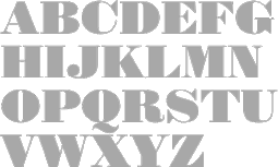 Ingo Preuss studied art at HBK Dresden (1976-1980) and graphic design from 1984-1989. In 1989, Ingo Preuss launched Cubus, a graphic design studio. Since then he also does freelance type design and illustration. Preusstype (est. 2003 in Dossenheim, and now Ladenburg, Germany) is his present foundry. In 2007, he also started an affiliation with The German Type Foundry.
 - Adora (2010-2015). An information design superfamily that consists of Adora Compact PRO, Adora Normal PRO, Adora Compressed PRO, and Adora Condensed PRO.
- Amita. A contemporary sharp serif.
- Anthea (2014). A transitional text typeface family.
- Arventa (2010): Arventa Sans Pro was the basis for the system, but the Slab is not just a Sans with sticking Serifs. Arventa Slab Pro is delicately crafted form the outlines of the Sans.
- Athanasius (2017-2018). a baroque font family.
- Aureata (2015). A vintage text typeface family (+Inline) that reminds me of the style of Lucian Bernhard in the early part of the 20th century.
- Babine (2003). Children's handwriting.
- Badgirls (2003). Hhandwriting.
- Barocco (2017). In Text and Display subfamilies. A traditional book font.
- Baroque Borders A and Baroque Borders B (2004).
- Battista (2005). A fat Bodoni family in Regular, Italic, Open, Stroke&Ornate.
- Care Instructions Pi (2005). With US and EU symbologies.
- Colombo (Normal, Outline). A revival of Columbian (1891, Hermann Ihlenburg).
- Daphne (2004). After a calligraphic script by Hildegard Korger.
- Daring. A revival of Hermann Ihlenburg's art nouveau font Childs (1892).
- Compressa (2006). A strong condensed grotesk.
- Floridana. A digital version of Hildegard Korger's handwriting font from 1965.
- Ebura (2004).
- Elara Sans and Elara Round.
- Fleischmann Gotisch PT (2004). A digital revival of Fleischmann's gorgeous Fraktur typeface Groote Canon Duyts (1744).
- Gekko (2003). In the style of Treefrog.
- Instance (2014-2016). A high-contrast almost Peignotian sans family characterized by a karate chop k.
- Korger Hand (2004). After the 1965 calligraphy of Hildegard Korger.
- Language Code.
- Lavina Sans. A humanistic sans.
- Linotype Scrap (1997) and Linotype Funny Bones (1997).
- Moto Guzzi Logo (2020). A logo font.
- Neue Steinschrift (2006). A 6-style condensed geometric sans. The Pro version contains 814 glyphs.
- Phoenica Std (2007, +Mono (for programming), +Hairline). A 12-style
- PicNic (2003). Handwriting.
- Placebo (2003).
- Prillwitz (2005). A didone typeface of 1790, cut by Johann Carl Ludwig Prillwitz well before the first Walbaum. Prillwitz Pro was published in 2015.
- Rosalia (2004). Based on the 1964 brush typeface Stentor by Heinz Schumann.
- Scooter (2003).
- Scootting.
- Scribana. An Italian renaissance script.
- Sebaldus. A heavy blackletter typeface, after Sebaldus Gotisch (1926, H. Berthold).
- Sinkwitz Gotisch (2007). A revival of a 1942 typeface by Paul Sinkwitz.
- Sipora (2016). A classic grotesque.
- Spitting Image (2003).
FontShop link. View Ingo Preuss's typeface library. [Google]
[MyFonts]
[More] ⦿
|
P.T. Shultz
|
Lavra-Plain (a gorgeous art nouveau Cyrillic font), and Russian_NewRoman (by Ilya Talev). [Google]
[More] ⦿
|
Rachel Michaud

|
 American graphic and type designer. In 2017, Louise Fili, Nicholas Misani and Rachel Michaud co-designed the art nouveau typeface Montecatini, which is inspired by Italian travel posters from that era. [Google]
[MyFonts]
[More] ⦿
|
Rachel Oke
[Art nouveau timeline]
|
[More] ⦿
|
Rachel Sinclair
|
Illustrator and fine artist in Louisville, KY, who confesses to many art nouveau influences. Her only entrance in the world of type design thus far is her typeface Fibonacci (2011), which is based on the golden ratio and the so-called Fibonacci sequence. The curves of the Fibonacci spiral inspired the shapes of the glyphs in the font, and magically, it has an art nouveau look because of it. [Google]
[More] ⦿
|
Rafal Brzezinski
[Antraxja Fonts (or: Atrax)]
|
[More] ⦿
|
Ralph Michael Unger
[RMU (Ralph Michael Unger Typedesign)]

|
 [MyFonts]
[More] ⦿
|
Ramandhani Nugraha
[Fortunes Co (was: Celcius Design)]

|
 [MyFonts]
[More] ⦿
|
Randomville
|
Among the fonts in this small art nouveau archive, David Siegel's Eaglefeather, Chelsea Studio, Dyer, Esmount, Semiramis, Eccentrical, Willow (Dave Fabik, 1995), Adresack, Spanky's Bungalow, and Edda Caps. [Google]
[More] ⦿
|
Raretracks (was: Monodark)
[Aulia Akbar]
|
Indonesian designer of these typefaces in 2017: Carita (round brush script with a glaz krak substyle), Borneo, Darker Time (stone chisel type), Mosqita, Segaris (curly). In 2018, he/she designed Merchants (a spurred vintage typeface), Ugly Jelly (textured), the poster typeface Barakuda, Bartholomew (Dutch deco), Raphaelum (a playful script), Tremore, Magnetum, Stabillum, Parisian (art nouveau), Chopio (a notebook font), Pristine (slab serif), Wilhelmina, Matheo Aans, and Grundschule (handcrafted). Creative Fabrica link. [Google]
[More] ⦿
|
Ray Larabie
[Typodermic]

|
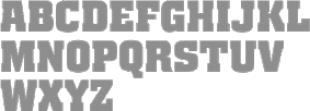 [MyFonts]
[More] ⦿
|
Ray Meadows

|
 Aka p2pnut, b. Wales, 1943, who started making fonts in 2009 at FontStruct. Alternate URL. Dafont link. Klingspor link. In 2010, Ray Meadows set up shop at MyFonts.
 Prolific creator at FontStruct in 2009 of the 3d typefaces Alphabox, Alphabox Reverse, Alphabox Lite, Alphabox Lite Complete, Alphabox Shadow and Alphabox Basic. He also made RM Playtime (outlined 3d family), Art DECOrated, Single DECOr, Romantic (+Carved, +Carved Shadow), TripleDECOr, New Romantic, SOFA, Mondrianish, Eye Test, Meltdown (grunge), Ameslan (American Sign Language), DECO Noir, DECOction, DECOserif (+Bold), DECOoction (+Bold Open), DEChrome, DECOpix, DECOr (a pure art deco typeface like Levine's Art Lover JNL), DECOThin (+Medium), Scrapheap, Westward (Far West font), Cheese Fondue, Alphabox Reverse (shadow font), AlphaRune, Spaced, Gothicky, Grand Prix, Entrees (alphadings), Compround, Phatzzo (nice!), DECOr8, Gothicky, Gothicky Grey, RM Ginger, RM Albion (blackletter), and Opening (outline face). RM Squarial (2009) is a hairline sans. Its 3d version is RM Squarial 3D. RM Typewriter (2009, +Medium, +Bold, +Old) is an old typewriter face. RM Serifangle (outline art nouveau face, +3D, +Chrome, +3DChrome) and RM Corrugation (postage stamp, white on black style) are both interesting. RM DECO Serif (2009) is in the RM Typewriter style series. RM Bowie Basic is a futuristic typeface based on the typeface used on Mars in "The Waters of Mars" (2009). RM Playtime Stencil (2009) is a rounded stencil typeface based on RM Playtime Solid. There are more styles such as RM Playtime 3D. Additions in 2010: RM New Albion (blackletter), RM Lined, RM Serifancy (Western face), RM Almanack (+Old), RM Tubeway (+Chrome), RM Thinny, RN White Letter, RM Blacklet, RM Squarial (+Ribbon, +3d), RM Typewriter Old, RM 7even, RM SideSlip, RM Teeny, RM Teeny 1.5, RM Narrowboat (+3D) (athletic lettering). His typefaces at MyFonts include RM Victoriana (2010, caps only Victorian face), RM Whiteletter (2010), RM Signwriter (athletic lettering), RM Deco (pure Broadway art deco), RM True to Type (typewriter face), RM Scrapheap, RM Elegance (condensed, with high ascenders), RM Playtime, Graphite Creations in 2011: RM Celtic, RM Uncialic (+RMWL Uncialic: Carolingian), RM Opensans, RM A Sign of the Times, RM Sans, RM Oliver (bold rounded sans), RM Soft Sans (wonderfully round sans), RM True To Old Type (old typewriter), RM True to Type (new typewriter), RM Middy, RM Phatso (textured), RM Phatso 2.0, RM Phatso 2.0 Solid (texture typefaces). Creations in 2012: RM Luceat (a bullethole typeface), RM Jazz Age, RM Basic Serif (roman face), Alphabox (a 3d family: +Reverse, +Lite, +Reverse Stencil), RM Slab, RM Slabb, RM Tubes (3d typeface), RM Smoothsans (rounded sans), RM Romantic Carved (+Shadow: a beautiful set of beveled typefaces), RM Westward, RM Typerighter, RM Uncorrugated, RM Snowtime, RM Smooth Jazz, RM Smooth Age, RM Nova Albion (blackletter), RM Tubes Chrome, RM Squarial FS10, RM Basic Serif. Typefaces from 2013: RM Bloc, RM Greek, RM Victoriana, All Bricks, RM Deco, RM Random Outline, RM Random 3D, RM Random (cartoon face), RM Celtic Condensed, RM Westus Condensed, RM Westus (Western, spurred), RM Hunky (chunky and modular), RM Thunk (piano key face, thick and chunky), Westward Ho (spurred Western face), RM Hangle (chuunky and elliptical). Typefaces from 2014: RM Firmstone (+Outline, +Condensed, +Outline Condensed), RM Ebdon Outline, RM Imber Outline, RM Moss Outline, RM Imber, RM Art Decorated, RM Celtic Inline. Typefaces from 2015: RM Deco, RM Stoney, RM Mondrianish, RM Stoney Shaded, RM Middy, All Bricks, RM Shepherds. Abstract Fonts link. Dafont link. [Google]
[MyFonts]
[More] ⦿
|
Rebecca Alaccari
[Canada Type]

|
 [MyFonts]
[More] ⦿
|
Rebecca Hurst
[Hashtag Type]

|
 [MyFonts]
[More] ⦿
|
Red Dragon
|
Free original fonts: Sporay (graffiti font, no download), RDHoney (2000, art nouveau lettering), RDIcons (2000, dingbats). Plus links to type sites in Japan. Dafont link. [Google]
[More] ⦿
|
Redfonts
[Amit Botre]
|
Amit Botre (Redfonts) is the Indian designer (b. 1978) of AB Dent (1999), AB Engraved (1999), AB Fatchic (1999), AB Fubu (1999, pixel), AB Ultrachic (1999, rounded sans), ABBarberian (1999, art nouveau meets gothic), ABExp (1999, striped letters), ABMindblock (1999, Franz Kafka's lettering?), AbFangs (2000), ABFuturun (1999, futuristic), AB Cave (1999, grunge), AB Majik (1999, slender letters) and AB Nirvana (1999, display lettering). Devian Tart link. [Google]
[More] ⦿
|
Reinhold Bauer
|
Type designer, 1861-1936. His typefaces include Rübezahl (1904, Klingspor), an art nouveau typeface, and Magnet (1906, Klingspor), a condensed display typeface. [Google]
[More] ⦿
|
Reza Rasenda
[Bagerich Type Foundry (was: Zealab Fonts Division, Zea Fonts, Zea Lab, Zeaspace)]

|
 [MyFonts]
[More] ⦿
|
Rian Hughes
[Device Fonts]

|
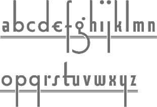 [MyFonts]
[More] ⦿
|
Ricardo Marcin
[PintassilgoPrints]

|
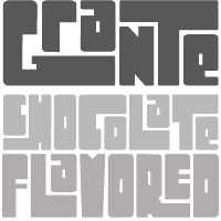 [MyFonts]
[More] ⦿
|
Ricardo Rodrigues dos Santos
[Vanarchiv]

|
 [MyFonts]
[More] ⦿
|
Richard Beatty
|
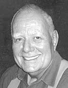 Richard Beatty (Colorado) died on May 14, 2018. He made beautiful fonts, often revivals and interpretations of old typefaces and calligraphic designs, and was influenced by Frederic Goudy. In the 1990s, he operated as Richard Beatty Designs, making over 500 typefaces. Most were only for private or corporate use. Richard's typefaces:
 - Baxter New Style (1988), Baxter Old Style (1988)
- Beatty Victoriana (1991): a set of five Victorian era fonts---Wanted, Spiral, Recherché, Hermosa and Childs (1985). Hermosa and Childs are nearly art nouveau. Childs is a revival of an 1892 typeface by Hermann Ihlenburg. Puzzling note: the Linotype catalogue says that Kismet was designed in 1879 by John F. Cumming. When you look at Spiral by Richard Beatty, you find a close copy of Kismet; Beatty says it's an "edited version of Kismet", but he holds the copyright. Is this another case of legal cloning? Finally, Wanted is based on an ATF typeface, Fantail, that was already shown in 1889 by the Franklin Type Foundry.
- Benjamin (2002, BeattyType): from sketches by Ed Benguiat.
- BernardsHand (beautiful medieval hand)
- Borders (1990, some designed by R. Mitchell and R. Beatty)
- Calligraph Initials (1997): a Lombardic face.
- Childs. After a design from 1893 by Hermann Ihlenburg.
- Civilite
- Cooper
- Desdemona (1994, +Black): art nouveau
- Doric
- Doves Type (2006). After the famous Venetian typeface designed by Emery Walker and T.J. Cobden-Sanderson, 1900.
- Duchy Blackletter, Duchy Initials (2002): A blackletter typeface based on a sketch by Ed Benguiat of Benton's Dutch Initials.
- Elizabeth RB. After Frederic Goudy, 1900.
- Elizabeth (1994, BeattyType): An all caps almost uncial face.
- Fanny Mitchell, Fanny Mitchell Initials (2005).
- GeneralMenou
- Goodhue (2005).
- Goudy Claremont (1993: based on Scripps College Old Style, 1941).
- Goudy Italian Old Style (1992).
- Goudy Mediaeval (1992).
- Goudy Saks (1990: based on a typeface designed in 1934 by Goudy for Saks Fifth Avenue in New York).
- Hermosa (1991). a Victorian typeface.
- Kennerley Old Style (1986, after Goudy's 1911 design)
- Jensen Eusebius, Jensen Eusebius New Style (1989). A Venetian typeface.
- 11LivingstonJCL
- Lucianard
- Mediaeval Calligraphy
- Ornaments (based on 1928 figures drawn by E. Adler)
- Overdressed (2002): based on a sketch by Edward Benguiat for his Phototype Company.
- Prairie Poster (Plain, Fancy): arts and crafts face.
- Quillsong (calligraphic)
- Recherché (1991). A curly Victorian typeface.
- Rene Louis (1992)
- Rolls Royce.
- Spiral (1991). Revival of John F. Cumming's Victorian typeface.
- Troyer
- University Old Style. After Frederic Goudy, 1938.
- Velda (2005, connected hand): the handwriting of Velda Burgess Will, classmate of the designer.
- Wanted RB (1991). A western font.
- White Tie, White Tie Relaxed (2005): roman lettering.
[Google]
[More] ⦿
|
Richard Crediton-Hughes
|
Designer in London, UK. Designer of this art nouveau-ish face (2006). He explains its genesis: [This is] a font I designed for OMEC (Orange Musical Electronic Company). The background is simple---Orange Amplifiers designed the word 'Orange' as a brand. I was working with the CEO, Cliff Cooper, who asked me to develop a full font based on the Orange branding. When this was complete I gave sole rights to the font to Cliff but retained the designer credit. There were a number of variations, outlined, stand off outline, embossed etc. Cliff was also the owner of a group of stores (World of Music) in Denmark Street London where you can still see signs I designed using this face. Cliff got out of retail in 2006. [Google]
[More] ⦿
|
Richard Dawson
[Panache]

|
[MyFonts]
[More] ⦿
|
Richard Every

|
 South African designer of ITC Greengate (2002), an arts and crafts (almost art nouveau) font in the mould of Eaglefeather.
 He writes: Jessie Marion King (1875-1949) began her professional career as a book designer and illustrator, but over time her creativity found its outlet in many forms, including posters, jewelry, ceramics, wallpaper, fabrics, murals, interior design and costumes. After eventually settling in Kirkcudbright, Scotland, she founded Green Gate Close, a center for women artists. Although her style is reminiscent of the Art Nouveau artist, Aubrey Beardsley, King's aesthetic was an offshoot of the "Glasgow Style," a Scottish hybrid of the Arts and Crafts movement and Art Nouveau. Often, her illustrations included hand lettering. It was just this kind of lettering that gave Richard Every his inspiration for ITC Greengate. When he saw some children's book illustrations that King created in 1898, he knew on the spot he had to complete the hand lettering as a typographic font. FontShop link. [Google]
[MyFonts]
[More] ⦿
|
Richard Gans
[Fundicion Tipografica Richard Gans]
|
 [More] ⦿
|
Richard Kegler
[P22 Type Foundry]

|
 [MyFonts]
[More] ⦿
|
Richard Keith Frazine
|
Thomaston, CT-based author of The Barefoot Hiker (1993). FontStructor whose fonts in 2011 include Frumfceaft Uncial (an outlined art nouveau typeface with uncial roots), Barefoot Hikers (a roman typeface done for his book), Caedmon, Nikonorian (needlepoint face), Frumfceaft Rune (an anglo-saxon rune face), Barefoot Standard. [Google]
[More] ⦿
|
Richard Starkings
[Comicraft (was: Active Images)]

|
[MyFonts]
[More] ⦿
|
Richard William Mueller
|
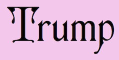 Designer from Elkader, IA (or is he from Garnavillo, IA?), b. 1956. No web page, but the fonts, mostly made in the early 1990s, were collected by CybaPee at TypOasis for your downloading pleasure. His typefaces:
 - AdvertMF, AdvertMFItalic. Ultra-heavy brush lettering.
- AkashiMF (1993). Oriental simulation font.
- AltenglischMF
- AmbrosiaMF (1995). Art nouveau.
- AndreasPenMF, AndreasPenMFBold
- AnglesMF. Beveled letters.
- ApolloMF-Shadow, ApolloMF (1994-1997). Victoriana.
- ArgosMF
- AtlantisMF
- BaileyMF (1997).
- BlackCastleMF. A rounded blackletter.
- BodieMFFlag, BodieMFHolly (1995). An American flag font.
- BolideMF. A brush font.
- BrandyMFScript (1993).
- BravoMF (1994). A script typeface inspired by a 1945 font by E.A. Neukomm.
- BurntMF. Halftone textured letters.
- CamelotMF, CamelotMFBold (1995).
- CarnivalMFOpen, CarnivalMFOpenShadow, CarnivalMFRimmed
- Casual-Regular, CasualContactMF, CasualMarkerMF (1994). Marker pen fonts.
- CignoMF. A delicate script.
- Cinema-Regular
- ClubMF
- CoffeeTinMFInitials. Western circus font.
- CreditCards. Dingbats.
- GFCristateMF (1997). Borders and dingbats, published by Garagefonts.
- DaisyMF
- DipperMF, DipperMFDemiBold
- DirectionsMF (1995).
- DragonflyMF
- EarthquakeMF. Broken letters.
- EddaMF. Art nouveau.
- EdisonMF (1995). Pure Victoriana.
- ElectMF (1997).
- FanfareMFFancy. Art nouveau.
- FantasticMFInitials, FantasticMFModern
- FarleyMF (1994).
- FlamesMF
- FleetingMF
- FranconiaMF (1994).
- GingerMF (1997). Late Victorian, early art nouveau.
- GrangeMF
- GreetingsMF
- GuttenbergMF (1995). Victorian.
- HayStackMFWide
- HeeHawMF
- HoffmanMF
- InkHighlight
- Knockout-Regular, KnockoutMFInitials
- KompaktMF
- LavaMF (1994).
- LegrandMF
- LongEarsMF
- MaizeMF
- MamaMF
- MantelMF
- MeltdownMF
- MercuriusMF
- NewDayMFScript
- OceanViewMFInitials
- OmegaMF-Bold, OmegaMF (1994).
- PaintPeelMFInitials
- ParchmentMF
- PenMarkMFBold (1995).
- PinewoodMF
- PlymouthMF
- PollockMF (1995). Marble-filled artsy display letters.
- PoloBrushMF (1993).
- PosturesMFInitials
- Primitive
- ProtestSignMF (1995).
- QuaintMF
- RaggedMF (1996).
- ReefMF (1994).
- SantaMonciaMF
- Sexy-MF
- SixtiesMF (1993). A psychedelic font.
- SophieMF (1995). Art nouveau.
- SpeedlineMF
- SpiritsMF
- StarshineMF
- StereoMF
- SteveMF (1997).
- StowawayMF
- SwingtimeMF (1995).
- TamboScriptMF
- TarantellaMF. An insect-themed decorative typeface.
- TitaniaMF
- TolkienUncialMF
- TomahawkMF (1995).
- TradingPostMFBold
- TumbleweedMF
- TuscanMFNarrow
- UncleBobMF-Shadow, UncleBobMF (1993).
- VassarMF
- VeronaScriptMF
- WaverlyMF
- WetPaintMF (1996).
- WindsweptMF
- WishMF (1997). Art nouveau.
- WizardryMF-Contour, WizardryMF (1997). Art nouveau.
Abstract Fonts link. Klingspor link. Dafont link. Fontspace link. [Google]
[More] ⦿
|
Richard Yeend

|
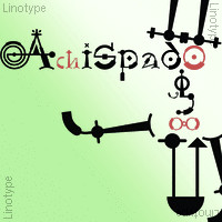 British cartoonist and type designer (b. London, 1945), who lived in Fourqueux, France, and is now based in Uccle, Belgium, since ca. 2000. He redesigned the The Boston Herald American, the International Herald Tribune and Die Welt. In addition, he has been Art Director for The New York Times and the European edition of The Wall Street Journal. Images of some of Richard Yeend's typefaces. Agfa/Monotype designer of Abbot Uncial, Acorn, Bangor, Broad Street, Comix, Honerswerda (Fraktur), Saxony Script, Ski Gothic (Fraktur), Xmas and Maidenhead (2001). At Linotype, he made Plantagenet, Achispado, Bandolero, Linotype Buckingham Fraktur (2002, part of TakeType 4), Linotype Richmond Fraktur, Hoyerswerda Fraktur (Agfa) and Linotype Richmond Zierschrift (2002). In 2003, as part of Linotype's Taketype 5 collection, he published Achispado LT, AmherstFraktur LT Std Bold, AmherstFraktur LT Std Heavy, AmherstFraktur LT Std Regular, AmherstGothicSplit LT Std It, AmherstGothicSplit LT Std Rg, AmherstGothicSplit LT Std RgAlt, Anasdair LT Std Bold, Anasdair LT Std BoldAlt, Anasdair LT Std Regular, Anasdair LT Std RegularAlt (2003), Bandalero LT Std, BurgstaedtAntiqua LT (Regular, Italic: with deformed letters, this is in the necrocock style), Hawkhurst LT Std Bold (2003, after a typeface by Albert Kapr), Hawkhurst LT Std BoldItalic, Hawkhurst LT Std Italic, Hawkhurst LT Std Regular, Hawkhurst LT Std RegularAlt, Hawkhurst LT Std RegularSC, Italienne LT Std (a true Western face), NeuseidlerAntiqua LT Std Bd, NeuseidlerAntiqua LT Std BdAlt, NeuseidlerAntiqua LT Std Hv, NeuseidlerAntiqua LT Std HvAlt, NeuseidlerAntiqua LT Std Rg, NeuseidlerAntiqua LT Std RgAlt. The Neuseidler family has art nouveau influences.
 View Richard Yeend's typefaces. Klingspor link. FontShop link. Linotype link. [Google]
[MyFonts]
[More] ⦿
|
Ricky Rinaldi
[Aiyari]

|
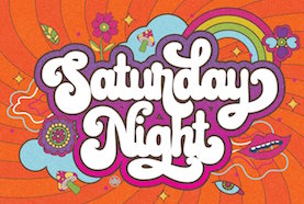 [MyFonts]
[More] ⦿
|
Riska Candra Dewi
|
Indonesian type designer. In 2020, Riska co-designed Bagerich (an art nouveau genre display typeface) and Brightfate (a sharp-edged typeface that conjures up images of a guillotine) with Reza Rasenda of Zealab Fonts. [Google]
[More] ⦿
|
Rizky Satyaludin
[Maghrib Lab]
|
[More] ⦿
|
RMU (Ralph Michael Unger Typedesign)
[Ralph Michael Unger]

|
 Ralph M. Unger (b. 1953, Thuringia, East Germany) says this about himself at MyFonts: Typesetter from the composing stick via Linotype setting machines to the Mac. Jobs in various Thuringian printeries. Barred further education by Communist authorities due to political reasons. Imprisoned in East Germany. Since 1988 in the state of Baden-Wuerttemberg, former West Germany. Jobs in several newspaper printing houses as advertisement compositor. Own office since 1995, in Aalen, Baden-Wuerttemberg. He lives in Schwaebisch Gmuend, and was a freelance type designer for Profonts and URW++, where he contributed frequently to their libraries between 2002 and 2009. In 2009, he founded RMU. MyFonts link. I split his contributions into two groups, the URW / Profonts group, and the RMU group. The prefix FontForum refers to a subseries of URW++ fonts. Unless specifically mentioned, all the following fonts are at URW++ and/or Profonts:
 - FontForum Admiral Script (2005): revival of Middleton's Admiral script from 1953.
- Amitié (2009): a garalde family.
- Arabella Pro (2006): after the script by Arnold Drescher from 1936, published at Joh. Wagner.
- Fontforum Atrament (2006): architectural lettering. Do not confuse with a Suitcase Type Foundry font from 2003 by the same name.
- Atze (2010): a comic book family.
- Behrensschrift D (2007): after the jugendstil typeface Behrens Schrift, 1902, by Peter Behrens.
- FontForum Bernhard Script (2005): after Bernhard Script from the 1920s.
- Bradley (2005): blackletter, after the original by William H. Bradley.
- Breite Kanzlei (2007).
- Breitkopf Fraktur (2003): after the original by Johann Gottlob Immanuel Breitkopf, done in 1793.
- Brocken (2011) is a signage typeface inspired by a design of Volker Küster (1960s).
- Profonts Bureau (2010, Profonts): a minimalist rounded sans family.
- FontForum Calypso (2005): a revival of Roger Excoffon's Calypso (1958).
- Card Pro (2006): a decorative display based on Ella Cursief (1916, Sjoerd Hendrik de Roos, Lettergieterij Amsterdam).
- Chaweng (2006, Profonts): an oriental all caps simulation face.
- Civilite URW (2005).
- Compliment (2004, casual script). Based on a 1965 script by Helmu Matheis for Ludwig & Mayer.
- Cranach (2007): a blackletter typeface modeled after Kuenstler Gotisch from the Krebs Foundry.
- Dominante (2007): a serif family based on Johannes Schweitzer's font by that name, 1959.
- Dominique (2010, profonts): an informal typeface.
- FontForum URW Ecsetiras (2005): revival of Ecsetirás (Zoltan Nagy, 1967, a brush face).
- Edda Pro (2008). An art nouveau typeface that revives a Heinrich Heinz Keune typeface from 1900.
- Energia Pro (2008, Profonts): connected monowidth script, based on Arno Drescher's Energos from 1932.
- Estro (2003, Western lettering). Seems close to Nebiolo's Estro from the 60s.
- Eurobrush Pro (2007, Profonts): handwriting.
- EuroSans (2008).
- Euroscript Pro (2006, Profonts): school script typeface based on his own handwriting.
- Flashes (2007): a revival of Crous-Vidal's Flash, 1953.
- Fox (2007): a brush script based on W. Rebhuhn's original from the 1950s.
- Gamundia (2010): a calligraphic copperplate script inspired by Excoffon's Diane.
- Ganz Grobe Gotisch (2006): a fat blackletter modeled after the original by F.H.E. Schneidler.
- Gmuender Elan Pro (2011) is a 1950s style script face.
- Gradl Nr 1 (2008): based on hand-drawn art nouveau upper case characters by M. J. Gradl, ca. 1900.
- Graphique Pro (2008): shaded caps face, based on Graphique, which was originally created by Swiss designer Hermann Eidenbenz in 1945, and issued as hot metal font by Haas'sche Schriftgießerei. See also New Graphique Pro (2011).
- Handel Slab (2009): a 6-style extension of Trogram's 1980 typeface Handel Gothic.
- Hanseat (2010): a grotesque family done at Profonts. It was heavily inspired by Germany's official DIN 1451 Engschrift.
- Iova Nova (2007): based on Jowa Script, designed by J. Wagner in 1967.
- Profonts>Impression (2008): art deco.
- Jessen Schrift (2004): after the Rudolf Koch blackletter typeface by that name.
- FontForum URW Konzept Pro (2005): revival of Konzept (1968, Martin Wilke's handprinting face).
- Legende (2002): a script typeface based on the original typeface of Friedrich Hermann Ernst Schneidler (1937).
- Leipziger Antiqua. The original Leipziger Antiqua by Alfred Kapr at Typoart dates from 1971 until 1973. The digital version of Leipziger Antiqua was developed by Ralph M. Unger in 2005.
- Manuskript Antiqua (2005): after Oldrich Meinhart's Manuskript Antiqua.
- The Maszynysta family of heavy industrial sans typefaces (2010) have a textured style (Struktura), a Shadow, and a plain Roman.
- Maxim (2003, Profonts): The heavy brush typeface Maxim was originally designed by Peter Schneidler in 1956 for the Bauer foundry.
- New Bayreuth (2008): after Friedrich Hermann Ernst Schneidler's Bayreuth from 1932.
- Old Borders and Lines (2010). A free font.
- Ornella (2008): Jugendstil.
- Peter Schlemihl (2008, Profonts): a revival of a blackletter by Walter Tiemann.
- Pedell (2009): a casual script.
- Polo (2002): a brush face modeled after Carl Rudolph Pohl's Polo (1960).
- In 2012, Ivana Koudelkova co-designed the grungy headline typeface Retroactive Pro with Ralph M. Unger at Profonts.
- Fontforum Rhapsody (2006): a revival of Ilse Schüle's rotunda face.
- Roberta (2003): art nouveau typeface after obert Trogman's typeface for FotoStar.
- FontForum Signs and Symbols (2006).
- Splendor (2009): a revival of a brush script typeface by Wilhelm Berg, Schriftguss, 1930. See also Splendor Pro (2014).
- Sportowy (2009): an outline face.
- Stanford (2011). A sports lettering face.
- Stiletto (2006): a medieval script.
- Fontforum Stripes (2007): a multistripe op art display typeface based on a Letraset font from 1973 by the same name.
- Fontforum Thalia (2006): retro font.
- Tintoretto (2006): shadow display face based on an origonal by Schelter & Giesecke.
- Tip Top Pro (2008): a Julius Klinkhardt art nouveau typeface revival.
- FontForum Unciala (2005): a revival of Oldrich Menhart's typeface Unciala (1953, Grafotechna).
- Unger Chancery (2005).
- Unger Script (2003): based on H. Matheis' Slogan typeface designed for Ludwig&Mayer in 1957.
- Veltro (2007): after a 1931 original by G. da Milano at Nebiolo.
- Profonts Woodpecker (2008).
The list of RMU fonts: - Affiche (2017). A revival of Helios Reklameschrift of the Klinkhardt foundry.
- Aldo Manuzio (2017). After a house typeface from 1897 by Schelter&Giesecke.
- Amati Pro (2010): after Georg Trump's condensed didone face, Amati, 1951.
- Antiqua Florenz (2021). A revival and extension of Paul Zimmermann's Antiqua Florenz (1960, Ludwig & Mayer), which is based on Venetian romans.
- Avus Pro (2012). A sans family that extends Gert Wunderlich's Maxima (1970).
- Baroque Pearl (2016). A pearly typeface that revives Peter A. Demeter's Fournier Geperlt (1922, Schriftguss).
- Behrens Kursiv (2013). After a 1906 original by Peter Behrens.
- RMU Belvedere (2020). A revival of Heinrich Wieynck's art nouveau / fin-de-siècle typeface Belvedere (1906, Bauer).
- RMU Bison (2020). A revival of Julius Kirn's brush script Bison (1935-1938, C.E. Weber).
- Bernhard Blackletter (2016). After Lucian Bernhard's extrafette Bernhard Fraktur (1921).
- Bernhard Cursive Extra Bold (2010).
- Borghese (2015). An art nouveau font after a Schelter & Giesecke original from 1904.
- Borgis Pro (2012). A Clarendon-style text family.
- Boulette (2015, a fat creamy script).
- RMU Bowery (2019) A revival of Old Bowery (1933, ATF)).
- Bravura Pro (2013). After G.G. Lange's Publica.
- Bricklayers (2012). An original fat slab display face.
- Brillant (2009): art nouveau and ultra heavy.
- Butti (2011). A script family paterned after Fluidum (1951, Alessandro Butti, Nebiolo).
- Cable Condensed (2014). Based on Koch's Kabel.
- Caesar Pro (2011). A flared sans typeface after Caesar Schrift (1913, Georg Schiller, C.F. Rühl).
- Capitol Pro (2012). An art deco typeface based on Capitol (Karl Hermann Schaefer for Schriftguss, 1931).
- Carina Pro (2017). A calligraphic script typeface based on Rautendelein (1929, Schriftguss).
- Carla Pro (2013). A broad-nibbed script modeled after Ballantines Script (Elsner & Flake, 1974; see also Ballantines Serial by SoftMaker).
- Carlsbad (2018). A couple of art nouveau typefaces based on originals from 1895 by H. Berhold called Regina Cursiv and Hansa Cursiv.
- Caslon Gotisch (2009): after the original by William Caslon from 1763.
- Celebration (2009): blackletter.
- Circensis (2016). A Western circus font based on a concept of Fritz Richter.
- Claudius (2010): after a 1937 blackletter font at Klingspor.
- Constanze Pro (2012). A light cursive typeface based on Constanze (1954, Joachim Romann, Klingspor).
- Contact Pro (2010): after Contact, a 1963 font by Helmut Matheis.
- Dante Alighieri (2018). Based on a Schelter & Giesecke original.
- Daphnis (2016). A revival of Daphnis (1929, Walter Tiemann).
- Deutschmeister (2017). A textura blackletter typeface after Deutschmeister by Berthold Wolpe for Ludwig Wagner in 1934. (Some dispute that Wolpe made this font.)
- Diamant Pro (2012). A transitional serif face.
- Emilia (2016). Based on Weiss Antiqua (1928) by Emil Rudolf Weiss.
- Neue Echo (2016). Based on Echo for Schriftguss.
- Elbflorenz (2020). A revival of Albert Auspurg's display typeface Miami (1934, Schriftguss).
- Emilia Gotisch (2016). After Weiss Gotisch (1936) by Emil Rudolf Weiss.
- Emilia Fraktur (2021). A revival of Emil Rudolf Weiss's Weiss Fraktur (1913).
- Erler Titling (2015). After Erler Versalien (1953, Herbert Thannhaeuser for Typoart).
- Eurotech Pro (2011): a slabby techno family.
- Faulkner Pro (2011): a connected heavy signage script based on Alan Meeks's Kestrel.
- Fette Kanzlei (2019).
- Fette Unger Fraktur (2010).
- Fichte Fraktur (2020). After Walter Tiemann's Fichte Fraktur (1934).
- Fontanesi RMU. An ornamental caps typeface that revives Aldo Novarese's Fontanesi (2018).
- Forelle Pro (2010): after the original Forelle script typeface by Erich Mollowitz, 1936.
- Frankenberg Pro (2012). An antique script face.
- Gabor Pro (2014). A connected copperplate script.
- Gaby Pro (2017). A revival of Hans Möhring's script typeface Gabriele (1938 or 1947, C.E. Weber).
- Garamond Antiqua Pro (2015).
- RMU Gilgengart (2020). A revival of Hermann Zapf's Fraktur font Gilgengart (1938).
- Gillray Pro (2015). A copperplate script after Hogarth Script (by Harald Bröder for Typoart).
- RMU Gloria (2019). After Gloria (1898, Emil Gursch).
- RMU Gong (2020). Based on Arno Drescher's Super Grotesk Schmalfett first released in 1933 at Schriftguss.
- Gmuender Gravur (2011). A 3d shadow face. Gmuender Antiqua Pro (2015) is influenced by the metal font Imprimatur (1952-1955, Konrad F. Bauer and Walter Baum). Gmuender Kanzlei (2018) is a blackletter typeface.
- Goethe Fraktur (2022). A revival of a blackletter typeface by Wilhelm Woellmer (1905).
- Gravira (2021). A revival of Herbert Thannhaeuser's Gravira, released by Schelter & Giesecke in 1935 .
- Haenel Antiqua (2020, based on a 19th century antiqua by Eduard Haenel) and Haenel Fraktur (2011, after Haenel Fraktur, ca. 1840).
- Hanse Textura (2020). A revival of a textura by Hermann Zapf.
- RMU Helion (2020). A revival of the 3d titling typeface Helion (1935, Arno Drescher for Schriftguss Dresden).
- RMU Herkules (2019). After a late 19th century font by Bauer and Berthold called Reklameschrift Herkules.
- Hoelderlin (2018). After Eugen Weiss's Hoelderlin blackletter font (1937).
- Hoyer Script (2017). After Hanns Thaddeus Hoyer's Hoyer Schoenschrift (1939, Stempel).
- Hupp Fraktur (2016). After Otto Hupp, 1911.
- Impuls (2010): a brushy typeface based on Paul Zimmermann's Impuls (1945).
- Initials RMU One (2012) consists of revivals of Rudhardsche Initialen (Otto Eckmann, ca. 1900) and Walthari Initials (ca. 1900, Rudhardsche Giesserei). Initials RMU Two (2012) consists of revivals of Jubilaeumsinitialen (by Bauersche) and Augsburger Initialen (by Peter Schnorr, 1901).
- Jean Paul Fraktur (2021). A revival of Breitkopf's Fraktur font Jean-Paul-Schrift (1798).
- Jobs Gravure (2011). It had to happen---a few days after Steve Jobs' death, Unger released the beveled engraved typeface Jobs Gravure, which is an extension of Trump Gravur (1954, Weber).
- Jolly Polly (2012): a curly non-connected script face.
- Kis Antiqua Pro (2018). A revival of Hildegard Korger's Kis Antiqua at Typoart.
- Kleist Fraktur (2010): after Walter Tiemann's original.
- Kompress Pro (2013). Two compressed sans typefaces.
- RMU Kontrast (2021). An art deco typeface that revives Kontrast (1930, F.H.E. Schneidler at Weber).
- Koralle RMU (2018). A revival of Schelter and Giesecke's Koralle (1915).
- Korpus Pro (2014). A text typeface family. Followed later in 2014 by Korpus Sans Pro.
- Korpus Serif Pro (2021). A revival and extension of Timeless (Typoart) that covers Greek, Latin and Cyrillic.
- Leibniz Fraktur (2012) is modeled after the famous Genzsch & Heyse blackletter font.
- Lenbach (2021). Inspired by a German font from the Victorian era.
- Liliom Pro (2012). A beautiful fat didone typeface based on an original from the Fonderie Française.
- Lipsia Pro (2011). An angular serif family.
- Literatura Pro Book (2012).
- Litfass (2021). A revival of an art nouveau font by Flisch.
- Lutetia Nova (2014). A fresh two-style take on Jan van Krimpen's Lutetia (1924).
- RMU Luchs (2021). A redesign of Jakob Erbar's inline all caps art deco font Lux (Ludwig & Mayer, 1929).
- Luxor Pro (2010): a Victorian/Western display face.
- Lyrica (2014). A revival of the informal blackletter typeface Lyrisch (1907, Georg Schiller).
- RMU Magnet (2021). A redesign and revival of Magnet (1951, Arthur Murawski at Ludwig & Mayer).
- RMU Manolo (2019). Based on the art nouveau typeface Manolo (Ludwig & Mayer).
- Manutius Pro (2012).
- Meister Antiqua (2011, +Bold, +Book). A Typoart original from 1951 in the tall flared ascender serif genre, revived and extended.
- Mitropaschrift (2016). An octagonal original.
- Mobil Pro (2011). A semi-script typeface in the fifties style of Matheis.
- Monument (2010): a 3d shadow roman caps face created after Oldrich Menhart's Monument.
- Narziss (2018). A revival of Walter Tiemann's Narziss from 1921.
- RMU Neptun (2021). A revival and extension of the art nouveau typeface Neptun by Aktiengesellschaft fuer Schriftgiesserei und Maschinenbau, Offenbach.
- Neue Kurier (2011). Typoart's popular signage script font in a new, completely remastered version.
- Neue Muenchner Fraktur (2010).
- Neue Schwabacher (2021). After Albert Anklam's Neue Schwabacher (Genzsch & Heyse, 1876).
- Neue Thannhaeuser (2011).
- Old Towne Pro (2010): a Western font.
- RMU Omega (2020). After Omega, an art deco typeface by Friedrich Kleukens at Stempel in 1926.
- Orbis Pro (2016). A revival of Walter Brudi's shadow typeface Orbis (1953, Stempel).
- Orplid Pro (2019). a layerable typeface that revives and extends Hans Bohn's all caps Bauhaus era typeface Orplid (1929).
- Parcival Antiqua (2016). A revival of Parcival Antiqua (1926, Herbert Thannhaeuser).
- Parfum (2013). A low x-height script that was inspired by Howard Allen Trafton's Quick (1933, bauer).
- Parler Fraktur (2018). A revival of Friedrich Poppl's Poppl Fraktur.
- Parler Gotisch (2011). A blackletter face.
- RMU Pittoreske (2019). A decorative Victorian typeface.
- Plastica Pro (2015, a chiseled typeface inspired by a J. Lehmann design).
- RMU Pergola (2021). A vintage shadow typeface inspired by a late-19th century font of Georg Giesecke.
- Post Fraktur (2014) and Postillon (2014). After Herbert Post, 1933-1937.
- Primana Pro (2012). A seductive geometric grotesk family.
- Prinzess Gravur (2010): a blackletter typeface modeled after Prinzeß Kupferstichschrift (1905, Berthold).
- Prisma Pro (2011). Revival and extension of Rudolf Koch's multiline typeface Prisma (1931).
- Reklame Fraktur (2016). After Reklame Fraktur by Albert Christoph Auspurg, 1914.
- Reflex Pro (2018). All caps, with an inline style.
- Reznicek Pro (2011) is a post-Victorian pre-art nouveau typeface named after Ferdinand von Reznicek (1868-1909), one of the leading artists and illustrators of those times.
- Rekord Antiqua (2020). A revival of the art nouveau era text typeface Rekord Antiqua (1911, Wagner & Schmidt).
- Rhythmus Pro (2016). After a Schriftguss AG and Schelter&Giesecke original grotesk, and extended to cover Cyrillic.
- Ridinger Std (2012). Based on Riedingerschrift (Franz Riedinger, 1906, for Benjamin Krebs Succ.).
- Ronde Pro (2011): roundhand script.
- Royal Grotesque (2021). A revival of Wotan by Wagner & Schmidt, 1914. Did this typeface become RMU Royal Sans (2022)?
- Salzmann Fraktur (2019). A revival of Max Salzmann's blackletter font released by Schelter & Giesecke in 1912.
- Saskia Pro (2016). Revival of Jan Tschichold's Saskia (1931, Schelter & Giesecke).
- Schmale Anzeigenfraktur (2009): based on Koch's Schmale Deutsche Anzeigenschrift, 1923, Klingspor.
- Schmale Mediaeval (2020). Based on Schelter & Giesecke's Schmale Mediäval (1840).
- Schmuckinitialen (2009): an ornamental caps typeface in the art nouveau style based on Walthari Initials [Walthari (1899, Heinz König for the Rudhard'sche Giesserei) in the upper case and Eckmann Initials (ca. 1900, by Otto Eckmann, Germany's chief art nouveau type designer) in the lower case].
- Schreibmeister (2021). Ralph's interpretation of Arno Drescher's formal cursive typeface for Ludwig Wagner (1958, Leipzig).
- Schwabacher Book (2013).
- Sebaldus (2019). A heavy blackletter typeface, after Sebaldus Gotisch (1926, H. Berthold).
- Senatsfraktur (2020). After Friedrich Bauer's Senats Fraktur done in 1907 for Genzsch & Heyse.
- Concordia (2020). A revival of Sensation Schmalfett (1914, Heinrich Hoffmeister).
- Siegfried Pro (2017). A revival of the art nouveau typeface Siegfried (1900, Wilhelm Woellmer).
- RMU Skizze (2021). This revives Walter Höhnisch's script typeface Skizze (1935, Ludwig&Mayer).
- Staxx Pro (2013). A prismatic typeface.
- Staufer Gotisch (2015). An engraved blackletter typeface modeled after Herbert Thannhaeuser's Hermann Gotisch (Schriftguss, 1934).
- Steinschrift Pro (2015). A single style condensed sans serif.
- Sylphe Pro (2019). A vintage script font that revives Schelter & Giesecke's Isabel (not Sylphide, as claimed by him).
- Tablica (2017). After Karl-Heinz Lange's DDR telephone directory font Minima (1984).
- Thannhaeuser Fraktur (2013) is a redesign of Typoart's Thannhaeuser Fraktur.
- Thomasschrift (2014). A rustic typeface that revives and extends Thomas-Schrift by Friedel Thomas (1957-1958, Typoart).
- Titanschrift (2011). A yummy soft and fat display face.
- Tombola (2018). After an alphabet from the 1920s by Otto Heim.
- RMU Trianon, renamed RMU Trifels (2020). After Heinrich Wieynck's Trianon (1905, Bauersche Giesserei).
- Trocadero Pro (2010): an extension and revival of Trocadero Kursiv, 1927, Albert Auspurg, Trennert.
- Troubadour Pro (2010): In Medium and Engraved styles.
- Trump Deutsch (2011): a blackletter face, after the 1935 original by Georg Trump.
- Trybuna (2013). Based on Herbert Thannhaeuser's Liberta Antiqua (1958), but completely redrawn.
- Turnier (2019). A revival of G.G. Lange's derby (1952-1953).
- Tyton Pro (2013). A brush script after Heinz Schumann's famous 1964 Stentor.
- Typoskript Pro (2010): a revival of Hildegard Korger's Typoskript, first done at TypoArt in 1968.
- Unger Fraktur (2010): after a 1793 design by Johann Friedrich Unger; includes fett and mager.
- Walbaum Antiqua Pro (2013). A revival of Justs Erich Walbaum's didone classic.
- RMU Wallau (2019). After Rudolf Koch's rotunda typeface Wallau (1926-1934).
- Werbedeutsch (2021). A revival of the blackletter typeface Buchdeutsch (Ernst Schneidler, 1926).
- Wieynck Fraktur (2019). after Heinrich Wieynck's Wieynck Fraktur (1912).
- Wieynck Gotisch (2018). After Wieynck Gotisch (1926, Heinrich Wieynck).
- Zentenar Fraktur (2010): mager and halbfett; after the 1937 workhorse by Ernst Schneidler at Bauer.
- Zierfraktur (2010): after Deutsche Zierschrift, an engraved blackletter font that was cut by Rudolf Koch between 1919 and 1921 for Klingspor.
Ralph made some typefaces outside URW/Profonts and RMU, such as Stripes (2014, a prismatic typeface puvlished by Thinkdust). Klingspor link. View Ralph M. Unger's typefaces. [Google]
[MyFonts]
[More] ⦿
|
Robbie Thiessen
|
Graphic designer in Dallas, TX, partner of Thiessen & Looper. Creator of the spurred vintage typeface Steamboat (2015) and the poster typefaces Vintage Display (2015, art nouveau), At Sea (2015) and Frontier (2015). Behance link. [Google]
[More] ⦿
|
Robert Trogman
[FotoStar]

|
 [MyFonts]
[More] ⦿
|
Robert Trogman
[Facsimile Fonts]

|
[MyFonts]
[More] ⦿
|
Roger White
|
Type designer from Staffs, UK. His 114 free creations, all done between 1992-1998, include AmertonOutline, AmertonOutlineItalic, Cambridge (a copy of University Roman), Cardiff, CardiffBold, CardiffBoldItalic, CardiffItalic, Carolus, CarolusItalic, Circled, Colton, ColtonSmallCapitals, Curborough, CurboroughBold, CurboroughBoldItalic, CurboroughItalic, Derrington, Dresden, Dublin, DublinBold, DublinHollow, Dunstall (art nouveau), Fradley, FradleyBlack, FradleyBold, FradleyBoldItalic, FradleyExtended, FradleyExtendedItalic, FradleyItalic, FradleyNarrow, FradleyNarrowItalic, FrysOrnamented, GloucesterOpenFace, Gresham, Hanch, HanchBold, HanchBoldItalic, HanchItalic, HanfordScript, Jana, Jarrow (uncial), KeeleDecorated, Lancaster (blackletter), Libra, LongdonDecorative, Loxley, Lydian, Milford, MilfordBlack, MilfordBold, MilfordBoldItalic, MilfordCondensed, MilfordCondensedBold, MilfordCondensedBoldItalic, MilfordCondensedItalic, MilfordHollow, MilfordItalic, MilfordLight, MilfordLightItalic, Milwich (Lombardic), NationalFirstFont, NationalFirstFontDotted, NationalPrimary, NationalPrimaryDotted, Newborough, NewportGothic, NewportGothicItalic, Newtown, NewtownBold, NewtownBoldItalic, NewtownItalic, Orgreave, OrgreaveBold, OrgreaveBoldItalic, OrgreaveExtendedBold, OrgreaveExtendedBoldItalic, OrgreaveExtendedItalic, OrgreaveExtendedNormal, OrgreaveItalic, Oxford, Plymouth, QueensPark, QueensParkBold, QueensParkBoldItalic, QueensParkItalic, Rochester, Rosart, StoweOpenFace, StoweTitling, StoweTitlingItalic, SudburyBook, SudburyBookBold, SudburyBookBoldItalic, SudburyBookItalic, SudburyLight, SudburyLightItalic, Swansea, SwanseaBold, SwanseaBoldItalic, SwanseaItalic, TamworthGothic, Telford, TelfordHollow, TelfordHollowItalic, TelfordItalic, Tiverton, TrajanusRoman, Tutbury (blackletter), TutburyBold, TutburyBoldItalic, TutburyItalic, Typewriter, TypewriterBold, WrexhamScript, WrexhamScriptLight, Yoxall, YoxallBold, YoxallBoldItalic, YoxallItalic. Many of these are text families, both sans (like Milford) and serif (like Fradley). The collection is largely a revival or an extension of historic typefaces. Specialty styles covered by him include blackletter (Derrington, Lancaster, Rochester), ornamental caps (Dresden), calligraphic scripts (Hanford Script, Wrexham Script), uncial (Libra) and medieval (Milwich). Fontspace link. Dafont link. Abstract Fonts link. [Google]
[More] ⦿
|
Rok Klemenčič
|
Slovenian designer of the art nouveau typeface Secirnica during the design workshop TipoBrda in 2008. [Google]
[More] ⦿
|
Roland Hörmann
[Phospho]

|
 [MyFonts]
[More] ⦿
|
Ronna Penner
[Typadelic]

|
[MyFonts]
[More] ⦿
|
Roos&Junge
|
German foundry established in 1886 and located in Offenbach. Acquired by D. Stempel in 1915. Typefaces include Teutonia (scan) and Offenbacher Reform (blackletter, ca. 1900). Offenbacher Reform was revived by Peter Wiegel in 2015. Teutonia is being reworked by Dan Reynolds as Teutonia Serif (2005) and/or Mountain. HiH made another revival in 2007, also called Teutonia. One of their art nouveau / Victorian typefaces, Mira, was digitized as Mira (2009, Tom Wallace). Komet is another art nouveau face, and Romanische Initialen is a decorative caps face. [Google]
[More] ⦿
|
Roselyne Besnard

|
The French type designers Michel (b. 1942) and Rosalyne Besnard (b. 1946) live in Rouen, France. Under the brand Les Besnardtypo, they jointly designed Micmac (Creative Alliance, 1997), ITC Odyssee (1996), ITC Typados (1997, art nouveau), Rom (Creative Alliance, 1998), Bouchon (Letraset, 2000), Huit (Visual Graphics Corporation, 1972), Sargon (Visual Graphics Corporation, 1974: bilined and futuristic), Migraph (Agfa Monotype, 1999), PistolShot LT Std Normal and Light (Linotype, 2003), Nazca (Monotype Imaging, 2005), Sargon (Monotype Imaging, 2006), First One (Monotype Imaging, 2006: a family for teaching the alphabet to children), Mickros (Monotype Imaging, 2007), Pantin (Monotype Imaging, 2007), De Gama (Monotype Imaging, 2008), Pasta (Monotype Imaging, 2008), Gilde (2014: a monoline script), Didosystem (2017: a connect-the-dots font). Linotype page. FontShop link. Another FontShop link. Klingspor link. View Roselyne Besnard's typefaces. [Google]
[MyFonts]
[More] ⦿
|
Roumond
|
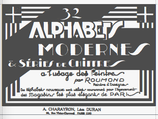 This page has a number of scans from a booklet by signpainter Roumond entitled 32 Alphabets Modernes, published in Paris by A. Charayron and Léon Duran, some time in the 1930s. There are lots of alphabets with art nouveau and art deco influences.
 In 2011-2012, Dick Pape digitized all 32 fonts from that booklet. They can be downloaded here. Pape's 32 fonts are FAModerne0369, FAModerne0562a, FAModerne0562b, FAModerne0946aBold, FAModerne0946bBold, FAModerne1367a, FAModerne1367b, FAModerne2021a, FAModerne2021b, FAModerne2491a, FAModerne2491b, FAModerne2491c, FAModerne2491d, FAModerne4441, FAModerne5204, FAModerne5204a, FAModerne5204b, FAModerne5204c, FAModerne6183a, FAModerne6183b, FAModerne6518a, FAModerne6518b, FAModerne6518c, FAModerne6518d, FAModerne7287a, FAModerne7287b, FAModerne7666, FAModerne7798, FAModerne9002a, FAModerne9002b, FAModerne9321a, FAModerne9321b. [Google]
[More] ⦿
|
Ruben Tarumian

|
 Ruben Tarumian, aka Ruben Hakobyan (b. 1963, Yerevan), is an Armenian architect and font designer, and son of architect Khachatur Hakobyan. In 1985 he graduated from the Faculty of Architecture and Construction of Yerevan Polytechnical Institute. He started designing typefaces in 1986. In 1989 he created one of the first computer fonts in Armenia, for Xerox Ventura Publishers. Since 2006 he is the chairman of NGO "Association of Type Designers".
 His typefaces include ArTarumianAnpuit (Rage Italic extension, I guess), ArTarumianBakhum, ArTarumianBarak (really BernhardFashionBT), ArTarumianErevan, ArTarumianGovazdItalic, ArTarumianGrig, ArTarumianHamagumar, ArTarumianKamar, ArTarumianPastar, ArTarumianAfrickian, ArTarumianAnpuit, ArTarumianGrqiNor, ArTarumianGrqiNorBold, ArTarumianGrqiNorBoldItalik, ArTarumianGrqiNorItalic, ArTarumianHeghnar, ArTarumianMHarvats, ArTarumian Ishkhan (for Latin and Cyrillic), ArTarumianMatenagir, ArTarumianMatenagirBold, ArTarumianMatenagirBoldItalic, ArTarumianMatenagirItalic, ArTarumianNorMatenagir. These fonts from 1994-1995 are Armenian generalizations of Latin fonts. Arian was created in 2007. In 2019, he published ArTarumianKhachatur (a fantastic architectural drafting or blueprint font) and ArTarumianVard (a lapidary or stone-carving font). Typefaces from 2020: Ar Tarumian Behrens Initialen (a revival of the art nouveau typeface Behrens Initialen by Peter Behrens; for latin, Cyrillic and Armenian), ArTarumianGrigNor (a comic book font). [Google]
[MyFonts]
[More] ⦿
|
Rudhardsche Gießerei
|
 German foundry established in 1842 by Johann Peter Nees, Phillip Rudhard and Johann Michael Huck, that was located in Offenbach am Main. Carl Klingspor (1839-1903), the father, bought the Rudhardsche Gießerei in 1892. It was renamed Gebr. Klingspor in 1906. Scans of some of its typefaces:
 - By Peter Behrens: Behrens Schrift (1901-1902), a Jugendstil font. It was digitized by Intecsas (as Sprecher Gothic), Dan X. Solo, Ralph M. Unger for URW++ (2007, as Behrensschrift D), Ingo Zimmermann (2008, as Behrens Schrift), and Klaus Burkhardt)
- Eckmann Schrift: the prototypical art nouveau typeface by Otto Eckmann. This Munch Jugendstil style typeface from 1900-1901 is often simply called Eckmann or Eckmann Schrift, Rudhardsche Initialen, or Fette Eckmann (1902). Digital versions of it exist at Linotype, Delbanco, Ralph Unger (Schmuckinitialen, 2009, and Initials RMU One, 2012), Bitstream (where it is called Freeform 710), Elsner&Flake (Eckmann EF), URW, Brendel/Softmaker, and Dieter Steffmann (an excellent free font called Rudelsberg; Steffmann has an accompanying Jugendstil Ornamente).
- Offenbacher Schwabacher (1900) by Kurt Wanschura. The idea for this type came from Gustav Ruprecht. Revivals at Delbanco (as DS-Offenbacher-Schwabacher) in 1996.
- Walthari, a mix between art nouveau and blackletter, designed in 1899 by Heinz König. Walthari Initialen.
- Behrens Initialen. Also by Peter Behrens.
- Schwabacher Initialen.
[Google]
[More] ⦿
|
Rudolf Geyer

|
 Austrian type designer, b. 1884, Vienna, d. 1972, Vienna. Painter of "primitive art" canvases and a commercial artist, noted for the design of books, calendars, diplomas and posters. Geyer worked as an in-house designer for the Zsolnay publishing house and, from 1942 to 1945, he taught at Graphischen Lehr und Versuchsanstalt in Vienna.
 He created the Jugendstil font Weiner Grotesk, which was released by H Berthold AG of Berlin in 1912. That font was digitized as Darling Emily NF (Nick Curtis, 2009). Klingspor link. [Google]
[MyFonts]
[More] ⦿
|
Rudolf von Larisch

|
 Typographer and graphic artist (b. 1856, Verona, d. 1934, Vienna). Author of Beispiele künstlerischer Schrift, 5 Folgen (1900-1926) and Unterricht in ornamentaler Schrift (1905). His wife, Frau Hertha von Larisch, gave most of his work to the Klingspor Museum in Offenbach. Some samples from his books are here. Larisch taught lettering at Kunstgewerbeschule (School of the Commercial Arts) and Akademie der Bildenden Kunste (Academy for Visual Arts), both in Vienna.
 Digital descendants include Larisch (2007, HiH), an all-caps handlettered design based on the title page of Beispiele Kunstlerischer Schrift (1903). Samples of his work: an outline capitals alphabet, an art nouveau piece entitled Moderne Architektur. In 1995, Harald Suess wrote about him in die Deutsche Schrift, Nr. 117, volume 4: A | B | C | D | E. Klingspor link. [Google]
[MyFonts]
[More] ⦿
|
Rudolph Gnichwitz
|
Type designer from Ashbourne, PA, who filed some designs with the US patent office. With Edwin C. Ruthven, he created an unnamed border type in 1889 for the Mather Manufacturing Company of Philadelphia. He made a curly Victorian face in 1890. In 1889, he made an art nouveau face. [Google]
[More] ⦿
|
Russian Fonts
[Misha Panfilov]

|
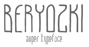 Misha Panfilov (Russian Fonts, St. Petersburg, Russia) created the free Cyrillic simulation Latin/Cyrillic font Tsarevich (2014). Later in 2014, he published Pribambas (free poster font), Shadow (a strong sans), Galaktika (a rounded sci-fi typeface), the free hand-drawn typeface Beryozki (Latin & Cyrillic) and the free poster typeface Fantazyor.
 In 2016, he designed the Latin / Cyrillic display typeface Ogonyok, the Latin / Cyrillic typeface Gora (+Stencil) and the free constructivist / art nouveau / pre-Petrine Latin / Cyrillic typeface Dobrozrachniy (with Aleksander Moskovskin). Typefaces from 2017: RF Rostin (monospaced, ideal for programming), RF Rufo (condensed sans), Krabuler (a fun free children's book or comic book font; free; by Cyril Mikhailov and Misha Panfilov), RF Barbariska (handcrafted and friendly). Typefaces from 2018: RF Tone (a geometric sans with short descenders), RF Dewi. Typefaces from 2019: RF Takt (a geometric sans). Behance link. Home page. Creative Market link. Behance link for Russian Fonts. [Google]
[MyFonts]
[More] ⦿
|
Ryan Molan
|
Graphic designer in Wanganui, New Zealand, who created the art nouveau typeface Nouveau (2012). [Google]
[More] ⦿
|
Ryoichi Tsunekawa
[Flat-It]

|
 [MyFonts]
[More] ⦿
|
Ryvan Kocko
|
 Cali, Colombia-based designer of the art nouveau-inspired typeface Kockotronic (2018). [Google]
[More] ⦿
|
S. Berthier&Durey
|
Typefounders in Paris. Their work can be found in Specimen de la fonderie S. Berthier&Durey. Caractères d'affiches (Paris, 46, rue de Rennes (place St-Germain-des-Prés), 1893). Metropolitaines (1905). [Google]
[More] ⦿
|
Sam Wang
|
 Clemson, SC-based designer of Partridge-Thin (1994), the Art Nouveau fonts Sarah Caps (1992), Ambrosia Caps (1992), Greeting (1992), ArgosANouveau (1992), Edda Caps (1993), Isadora Caps (1993) and Gismonda (1992, after an original phototype font by Geoff Nicholson from 1971), Maidstone Script (1992), Handsign (1993, Irish sign language font---not ASL), Harrington (1991, Victorian), Mira, Lampoon Brush (1992), Libby Script (1992), Uncio Gothic (2008, Lombardic), Thalia (2008), Arctic (1992), Celtic (1992), Fatso Caps (1992, psychedelic), Inkwell (1992), Arctic2, Columbus (1992, Victorian), Handwriting, Hokusai (brush script, 2008), LampoonBrush2, Partridge-ThinOblique, Saki Script (2008, faux oriental), Sumibrush (2008), Sycamore Sans (2008, draftsman style), New Hand (1995), Tamarind (1999).
 See also here. Fontspace link. [Google]
[More] ⦿
|
Samantha Clusiau-Lawlor
|
Graphic designer in Ottawa who created the experimental art nouveau typeface Mucha Typewriter (2012). [Google]
[More] ⦿
|
Sami Taberman
|
Lahti, Finland-based designer of the art nouveau typeface Tabermann Schrift (2019). [Google]
[More] ⦿
|
Samuel Welo

|
 Samuel Welo was an American advertising calligrapher, typographer, designer and lettering artist whose work appeared in the 1920s. Scans by Gene Gable of many pages of Studio Handbook Letter&Design for Artists and Advertisers (1927, Samuel Welo). This book has 233 pages and is entirely hand-lettered! Based on his lettering, several typefaces have seen the light of day. A partial list:
 - P22 Art Deco Chic (2002, James Grieshaber).
- Hamilton (David Nalle, Scriptorium, 1993): a tall, bold display font typical of art nouveau poster lettering and turn-of-the-century advertising design.
- Plakat (David Nalle, Scriptorium, 1993): a rough-edged curly decorative poster face.
- Melcheburn (David Nalle, Scriptorium, 1993): a blackletter face.
- Samuello (Iza W, Intellecta Design, 2007). This type family comes in five styles.
- Rio Rita NF (2012, Nick Curtis).
- Welo Casual NF (2012, Nick Curtis).
- Mohair Sam (2005, Nick Curtis): the upper case is based on Welo's letters, but the lower case on ATF's Romany Script.
- Pyriform Tones (2007, Nick Curtis): first done by Welo in 1925.
- Fireside Chat NF (2003, Nick Curtis) is a font based on a design by Welo shown in Studio Handbook for Artists and Advertisers (1927).
- ITC Photoplay (2002, Nick Curtis): based on lettering from 1927 by Samuel Welo, intended originally for captions of silent movies. It was in Studio Handbook for Artists and Advertisers (1927).
- Sweet Afton NF (2014, Nick Curtis) is based on another silent movie font by Welo.
- Grenadier NF (Nick Curtis) is based on Samuel Welo's Modernistic.
- Souci Sans (Nick Curtis) is based on a type design shown in Lettering Modern and Foreign (1930).
- Blue Plate Special (Nick Curtis) is a font family based on a design by Welo shown in Studio Handbook for Artists and Advertisers (1927).
- Herald Square NF (Nick Curtis) is a font family based on a design by Welo shown in Studio Handbook for Artists and Advertisers (1927).
- Magic Lantern NF (Nick Curtis) is a font family based on a design by Welo shown in Studio Handbook for Artists and Advertisers (1927).
- Speedball No 1 NF and Speedball No 2 NF (Nick Curtis) are font families based on a design by Welo shown in Studio Handbook for Artists and Advertisers (1927).
- Washington Square NF (Nick Curtis) is a font based on a design by Welo shown in Studio Handbook for Artists and Advertisers (1927).
- Whoopie Cushion SW (Nick Curtis) is a font family based on a design by Welo shown in Studio Handbook for Artists and Advertisers (1931).
- Mustang Sally and Tugboat Annie (Nick Curtis) are fonts based on a design by Welo shown in Studio Handbook for Artists and Advertisers (1931).
- Suave Sam NF (2009, Nick Curtis) is art deco at its peak.
- Fluid Drive NF (2014, Nick Curtis).
- Carillon (2014, David Nalle) is based on one of Welo's alphabets.
- LHF Welo Thin (2015, Patrick Kalange) is an art deco poster typeface based on Welo's work.
- Lenox Avenue (2017, David Kerkhoff).
- Formal Notice JNL (2020, Jeff Levine). A revival of an alphabet in Studio Handbook for Artists and Advertisers.
- Show Poster JNL (2021, Jeff Levine). A vernacular typeface based on a design from the 1960 edition of Samuel Welo's Studio Handbook for Artists and Advertisers.
Other alphabet designs: (unnamed, 1928), (unnamed, 1928), Modernistic (1932; I suspect that this was used as a basis for Samuello by Intellecta Design). Books by Welo: - Lettering: Modern and Foreign (1930, Chicago: Frederick J. Drake and Company). Local download.
- Practical lettering, modern and foreign (1946).
- Studio Handbook Letter&Design for Artists and Advertisers (1927).
- Trademark and Monogram Suggestions (1937).
View Samuel Welo's typefaces. [Google]
[MyFonts]
[More] ⦿
|
Sassy Rose's Graphics Garden (or: Sassy Graphics)
[Denise Clendenin]
|
 Tens of original dingbat fonts made by Denise Clendenin (who is based in California) in 1998-1999: Americana, AmericanaTwo, ArtDeco, ArtNouveau1, ArtNouveau2, BirdsOne, BirdsTwo, Butterflies, CarouselHorses, CelticDesignsI, CelticDesignsII, CornersBorders, DecoBorders, DecoDividers, Designs1, Designs22, Designs3, DividersMisc, Ellipses, FancyFish, FloraDeco, Flowers1, Flowers2, Flowers3, Flowers4, FolkArt, FolkArt2, FolkArtDividers, FunFish, IndianDesigns, JapaneseDesigns, MoreRoses, RosesRoses, Sealife, Ships, TeddyBears, TeddyBears2, VictorianDesignsOne, VictorianDesignsThree, VictorianDesignsTwo, Wildflowers1, Wildflowers2. Excellent quality, smooth outlines.
 Fontspace link. Dafont link. Catalog. Old dead URL. [Google]
[More] ⦿
|
Satriyo Hutomo
[Muntab Art]
|
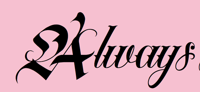 [More] ⦿
|
S&C Type Paris (was: La Goupil Paris)
[Julien Saurin]

|
 Julien Saurin (b. 1986) and Louis-Emmanuel Blanc (b. 1986) are two experienced graffiti artists who created the foundry "La Goupil Paris" in Paris in 2007. They were joined by Fanny Coulez. In 2017, Fanny Coulez and Julien Saurin set up S&C Type Paris and moved their successful collection of fonts there.
 Graffiti fonts: Ruelles (2009), Vandalism Alternate (2008). The original Vandalism (2007, co-designed by Saurin and Blanc) was free at Dafont. The scratchy Carving (2010) is commercial, however. In 2011, Saurin made the pure geometric art deco face Haussmann. With Angela Bolliger, Julien Saurin published the classic avant-gardist hand-drawn typeface Paris (2012, La Goupil). It comes with art nouveau ornaments called Paris Serif Ornaments. Typefaces from 2012: Paper Cute (a paper cut face), Adrenaline (hand-printed), Montmartre (a soft hand-printed typeface family, now retired from the line-up). Typefaces by Julien Saurin in 2013: The Serif Hand (with Fanny Coulez), The Hand (a hand-printed caps typeface done with Fanny Coulez), Naive (a curly hand-printed serif typeface done with Fanny Coulez), Insolente (a connected script done with Fanny Coulez), Neo Phoenician (a straight-edged rune simulation font done with Fanny Coulez). Typefaces from 2014: Pontiac Inline (by Fanny Coulez and Julien Saurin---a classy almost art deco inline caps font with layering and shadow and other effects). Typefaces from 2015: Pontiac (with Fanny Coulez), Insolente (by Julien Saurin and Fanny Coulez), Carving (scratchy hand). Typefaces from 2016: Naive Deco Sans, Naive Line Sans. A great all caps handcrafted sans serif font designed by Fanny Coulez and Julien Saurin. Typefaces from 2017: Majorelle (signage script). Typefaces from 2018: Papercute Inline (with Fanny Coulez), Colette (an inky script). Typefaces from 2022: The Hand Wide (hand-printed). Creative Market link. Fontspring link. MyFonts link. Klingspor link. Behance link for S&C Type Paris. Creative Market link for S&C Type Paris. [Google]
[MyFonts]
[More] ⦿
|
Schessa Garbutt
|
Schessa Garbutt received a B.A. in Fine Arts from the University of Southern California and founded Firebrand in Inglewood, CA. Graduate of TypeWest, class of 2021, where Schessa designed the art nouveau genre display text typeface Thumbalena Display. [Google]
[More] ⦿
|
Scholtz Fonts
[Anton Scholtz]

|
 Scholtz Fonts was started by Anton Scholtz (b. Durban, 1941) in 1997. This South African design company is located in Durban, where the Zulu culture of the region has greatly influenced Anton's font design. Klingspor link
 Scholtz sells a fine selection of display types that ooze African themes. An alphabetical list: - Aarde (2005), Aarda Brush
- Ability (2009). Calligraphic
- Affable (2008). Calligrahic
- African Elegance
- African Gold (2007)
- African Jazz (2005)
- African Jungle (2007)
- African Patchwork (2008)
- African Pattern (2004)
- African Shield (2005). Patterned after the cow-hide shields of the Zulu tribe. Made by Anton and Merle Scholtz
- Afrimod
- AfroFlare
- African Textile (2007)
- Ala Kazam (2015)
- Always (2010). A fantastic swashy calligraphic face, and its multiline sister, Filigree, 2010
- Amaboxi (2007) or Amabokhisi. White on black
- Amanzi (1999)
- Aplomb (2008)
- Aqua Casual (2008)
- Arabesque (2009). A flowing calligraphic typeface
- Archivo (2011)
- Art Nouveau SCF (2008)
- Asakire (2006)
- Assegai (2007)
- Bad Girl (2008). Grunge
- Bakuba
- Baluba and Baluba Snake
- Banquet SCF (2007). Brush script
- Baobab
- Black Tie (2007)
- Blackout SCF (2008)
- Blythe (2009). Connected script
- Bongo
- Bongani (2008)
- Brazza (2008). Brush
- Brillig (2008). Informal hand
- Button (2008)
- Buzz (2008)
- Camy (2009). Hand-printed
- Carve (2008). Chiseled look
- Catholic Girls (2008). Script
- Centric (2007). Zebra-striped, or op art
- Certificate (2008). Calligraphic
- Collette (2007). After an art deco font called "Independant" designed in 1930 by Collette and Dufour
- Comical (2007)
- Coral (2008) and Coral Pro (2012)
- Crime Inc
- Crostini
- Debs (2013). Hand-printed
- Deco Doni (2011)
- Delikat (2010). A script, followed in 2013 by Thaun
- Doorn (1998), Doorn Body, Doorn Display
- DragonFyre (2008). Calligraphic
- Dufour (2011). After an art deco font called "Independant" designed in 1930 by Collette and Dufour
- Dusk Til Dawn (2012). Art deco
- Elegance SF (2005). Art deco
- Estravaganza (2012)
- Et Cetera (2015). A classy breezy connected script
- Excalibur SCF (2007). A beautiful rough-edged hand
- Fable (2007). A type family for wizards
- FadedRose
- Figment (2008)
- Filigree
- Fracture (2008). Glaz krak style
- Fragrance
- Gatsby SF
- Genevieve (2007). Calligraphic
- Genial (2009). A flowing connected script
- Giraffe Skin (2007)
- Girl Script (2008). Curly hand
- Girltalk (2008). Curly script
- Gladly (2016). A 17-style decorative and romantic typeface
- Gossamer (2011). A wedding script
- Greek (2008). Chiseled
- Groom (2007). A connected brush type
- Grunge Formal (2007), Grunge Piazza (2007), Grunge Standard (2009)
- Hard Rain (2007)
- HiTone. Niely handcrafted
- Hobi (2008). A ghastly script
- Honeybird (2011)
- Hoofer (2014). A mega family of retro scripts
- Iliad (2007)
- Inja
- Jazz
- Jolie (2015). A connected calligraphic script for romance and weddings
- Josephine (2007). Art deco
- Kassena (2006)
- Kau (2016)
- Klatter (2007)
- Kuba (2007). A tribal stencil
- Kunjani (2008). African look
- Lagos
- Leah (2008). Handwriting
- LeopardSkin (2005)
- Lovers Pro (2011). A fantastic calligraphic hand---ready for red carpet treatment
- Lualaba Snake (2007)
- Lumina (2008)
- Madrigalle (2011). A calligraphic wedding script
- Mafuta (2006)
- Makonde (2007)
- Manhattan Midnight
- Margaux (2013). A vintage 1900s script
- Martini Script (2011)
- Maypole (2007)
- Melodica (2012)
- Miss Donna (2009). A script typeface
- Mtwane (2009)
- Nocturne (2012). An art deco family based on work from the 1920s by Paul Carlyle and Guy Oring
- Noobia (2013). An inky pen font
- Nordika
- Oxamu (2009). A wonderful angular African-themed font
- Pacific Script (2011). A font inspired by an alphabet created by Howard Trafton in the 1930s
- Palm Court (2007). A Bauhaus typeface by Merle Scholtz
- Parchemin (2008). Parchment look
- Phat Chance (2008). Organic
- Piazza (2007)
- Proper (2008)
- Qotho (2010). An almost architectural sans family, done with Merle Scholtz
- Queen (2008). Nice handwriting
- Quirky and Quirky Kurlz (2013). A spidery script based on a book of etchings by British artist Graham Clarke
- Refresh A 1950s script
- Riposte (2009). A dynamic script
- Romi (2008). A thin calligraphic typeface
- Rondalia (2008)
- Sage Sage (2008). Brush script
- SandWriting (2007)
- Sangoma (2007)
- Scratch SCF (2007). A scratchy hand
- Scrittura (2011). Calligraphic. +Antiqua, +Fantasia
- Shapely (2010). Swashy calligraphic typeface
- Silken (2009). Calligraphic
- Siyabonga
- Silver Dagger (2007)
- Smart Casual (2007). An artsy architectural typeface by Merle Scholtz
- Sondela (2007)
- Spaza (2007). African look
- Sprig (2010). A signpainting typeface
- Stoan (2008)
- StoneWash (2008). Grunge
- Tabwa (2007) Inspired by Koch's Neuland, but on an African theme
- Tamboti
- Tertius (2008). Also, Tertius Romantic and Tertius Crenellated (2008). Scripts based on the Carolingian hand
- Thaun (2013)
- Thought (2009)
- Thystle (2010)
- Tokoloshe (2008)
- Toulouse (2007). Art nouveau handcrafted typeface
- Tshikona (2005). Hand-crafted
- Tsotsi (2007)
- Ubuvila (2004)
- Umkhonto (2003)
- Umoya (2009). Organic
- Utshani (2000). African theme
- WildSong (2010). A calligraphic script
- Woodcarve.
- Write Now (2008). Connected script
- WriteHand (2008)
- Yseult (2009). Script
- Zaire SF (2007)
- ZebraSkin (2007)
- Zest (2007)
- Zim (2007). Octagonal
View the typefaces designed by Anton Scholtz. [Google]
[MyFonts]
[More] ⦿
|
Schriftgiesserei Flinsch
[Heinrich Flinsch]
|
 Foundry in Frankfurt am Main. House typefaces include Enge Antiqua (1859), Renaissance Kanzlei (also known as Antike Kanzlei), Verzierte Musirte Gotisch (ca. 1870, digitally revived by Gerhard Henzel), Flinsch-Germanisch (1876, blackletter by Karl Klimsch), Magere Kloster-Gotisch (ca. 1900), Neugotisch (1907), Universal-Gotisch (ca. 1900), Bernhard-Fraktur (1913, plus Extrafette), Dürer-Gotisch (ca. 1900), Flinsch-Fraktur, aka Frankfurter Fraktur (1911), Tages Antiqua (1915), Flinsch-Privat (1919, by Lucian Bernhard), Halbfette Schwabacher-Flinsch (which was used for titling in the Fehsenfeld editions of the Karl-May books; a digital revival at Gerhard Helzel's place), Breite halbfette Roemisch, Elzevier Initialen, Fette Mikado, Franconia, Jenson, Langschrift, Patent reclame, Reclame, Samson, and Victoria.
 For digital revivals, see Edna Text (Reymund Schroeder, 2017) and Litfass (2021, Ralph M. Unger). Their Book of Type Specimens (1904) has 719 pages. An earlier book from 1899, Einundzwanzigstes Fortsetzungs-Heft 1899 has just 70 pages. [Google]
[More] ⦿
|
Schriftgiesserei Otto Weisert
[Otto Weisert]
|
Stuttgart-based foundry run by Otto Weisert. Their publications and specimen books have dates between 1875 and 1922. Faces produced there include Nürnberger Buchschrift (ca. 1900), Kaiser-Gotisch (ca. 1900), Brabanter Gotisch (ca. 1900), Moderne fette Schwabacher (ca. 1900), Moderne Halbfette Schwabacher (ca. 1900, digitized by Petra Heidorn in 2005 as Moderne Schwabacher), Wilhelmina Ornamente (1914), Romanisch (1912), DeVinne Antiqua (1912), Giralda Graphik (1934), Cheltenham (1911). Designers: - Otto Weisert: the Jugendstil-styled Arnold Boecklin (1904), Brabanter Gotisch (1905).
- Ernst Schneidler: Ganz grobe Gotisch (1930).
- Heinrich Wieynck: Wieynck Mediaeval (1928) and Wieynck Mediaeval Kursiv (1929).
[Google]
[More] ⦿
|
Scorpions
|
A free art nouveau font with partial lettering, Scorpions-Font. [Google]
[More] ⦿
|
Scott Banks
[Paper Moon Type & Graphic Supply]

|
 [MyFonts]
[More] ⦿
|
Scriptorium (Ragnarok Press, Fontcraft)
[David Fleming Nalle]

|
 Dave Nalle was born in Beirut on March 19, 1959, and died on February 13, 2021 from COVID in his home town of Manor, Texas. From his wiki page: Dave Nalle is a political writer, game author and font designer who was active in the early history of the development of the internet. Nalle was at one time Chairman of the Republican Liberty Caucus, a group that promotes libertarianism within the Republican Party, Senior Politics Editor at Blogcritics online magazine, and was the CEO of Scriptorium Fonts. Obituary [PDF] by Steve Jackson at the Daily Illuminator. Obituary by Shannon Appelcline at RGG Net. Obituary [PDF] at Dungeon Master Magazine.
 A creative and prolific designer, he has made hundreds of beautiful (often historic) fonts. His outfit, Scriptorium (based near Austin, TX, est. 1989), also does custom font and logo design. At some points, Scriptorium was also known as Ragnarok Press and Fontcraft. It specializes in artsy and ancient typefaces. Some subset of the fonts is made by Michael Scarpitti. Free font demos. Images of his best selling fonts. Special subpages: - Three free fonts: Onuava (a mini-serifed hybrid fixed-width font), Divona (sans), Sirona (based on Lombardic calligraphy).
- Lombardic: Aneirin, Benevento (8th century Lombardic), Cymbeline, Fabliaux, Formidable, Locksley.
- Decorative initials such as the 20th century sign lettering initials set Pencraft Initials (2009), New Saxon Initials (2016, based on work by F.G. Delamotte), Delamotte Initials One (2016), Delamotte Initials Two (2016), Holly Initials (2010, based on Real PenWork (1880s, Knowles and Maxim), Vyones (2010), Vergennes (2001), Cascade (2009), Bergling (2010; based on initials by John M. Bergling).
- Steampunk typefaces: Clockwork, Gearhead, Gears, Verne, Draughtwork, Belgravia, Boetia, Blackthorn, Linthicum, Good-fellow, Necromantic, Mephisto.
- Wild West fonts: Academy, Alcalde, Atkinson Boomtown (2009, after the lettering of Frank Atkinson), Atkinson Eccentric (2009), BigIron, Cibola, Del Norte, Lachesis, Perdido, Plowright, Primer, Riudoso, Niederwald, San Lorenzo (2011, with a Mexican and Tuscan look), Stonehouse, Manquo, Rochambeau, Purcell, Vaquero.
- Arabic simulation fonts: Samaritan is based on the poster lettering of Alphons Mucha from his poster for the play La Samaritan. Serendib and Waziri are based on the hand lettering of René Bull from his edition of the Arabian Nights. Caliph (1993) is derived from Ernst Schneidler's classic Legende font, with variant characters based on his original lettering. Also: Satampra, Jerash, Samarkand, Isfahan.
- Celtic fonts: the fonts include Constance, Durrow (1993, traditional rendering of Insular Minuscule calligraphy), Malvern, Glendower (based on the most common lettering in the Book of Kells), Knotwork (caps based on Celtic knots), Alba Text (modernized text font based on Celtic uncial lettering), Lindisfarne (based on a square uncial style), Stonecross (1997, derived from Celtic cross and gravestone inscriptions), Celtic Spirals (dingbats), Celtic Borders font (lets you combine key strokes to form decorative borders; many frames and borders are original Celtic designs by Arts&Crafts period artists like Evelyn Paul and Louis Rhead), Spiral Initials, Brigida (based on Rudolph Koch's interpretation of a squared uncial), Macteris Uncial, Coverack (heavy non-traditional uncial), Dahaut (modernized uncial), Dunsany, Glendower, Morgow (1999, spiral uncial), Teyrnon (elaborate spurred uncial), Padstow (heavy uncial), Vafthrudnir (2011, uncial), Sualtim and Columba (decorative initials based on characters found in the Book of Kells), Albemarle (2001).
- Oriental simulation fonts: Yoshitoshi (2003, based on the 1900-style writing by Yoshi Toshi.
- Gothic fonts, including Alt Gothic, Koch Gothic, Barnabas (2011), Sternhagen (2014), Montgisard (2010, roman capitals with blackletter lower case), Serenissima, Gelderland, Alcuin, Monumental, Goldwork, Waldeck, Roncesvalles, Montressor (2010, ornamental blackletter capitals), T4C Beaulieux (1998, a free copy here), Bastarda (2011), Burgundian, Cadeaulx, Collins Old English, Courtrai, Descant, Ereshkigal, Faustus, Franconian (1993, a Schwabacher), Froissart (2000), Ghost Gothic, Katisha, Koch Gothic, Ligeia, Magdeburg, Magdelena, Melusine, Pyle Gothic, Rheingold, Sanctum, Stuttgart Gothic (2010), Textura, Theodoric, Yngling (2002).
- German expressionist: Dromon.
- Renaissance fonts: Monumental Gothic, Caswallon (a Caslon family), humanist cursive (Palmieri, Castiglione and Hanes Italic), quirky Italian cursives (Fiorenza and Alleghieri), a Roman style hand-lettered font (Rudolfo and Rudolfo Swash), a Trajan-style Roman lettering (Hadrianus), a classic flourished cursive (Trinculo) and a set of floral intials from the Quattrocento (Fraticelli).
- Modern poster fonts: Ascelon, Bilitis, Cosmic Dude, Dromon, Ducatus Rough, Eglantine (after Central Type Foundry's Quaint Roman), Ekberg (2002, based on Samuel Welo's posters), Fortinbras, Hamilton, Jambon, Oblivion, Posada (2008, based on the poster lettering of Mexican artist José Guadalupe Posada), Squiffy, Suspicion, Magnin (2003).
- Mapmaker fonts: building elements are available in Basilica; Ortelius is a map dingbat font; Queensland (based on lettering by artist and calligrapher Eric Sloane), is bold, hand-drawn and reminiscent of medieval writing on maps. There are also Brandywine, Daresiel, Hesperides, Longhorne, Windlass (1996), and Cityscape. Orford (2008) is based on samples of hand lettering from a 1693 manuscript collected by Lewis Day in his classic book on historical paleography, Alphabets Old and New.
- Calligraphic fonts: Albemarle (2001), Azariel, Moncrief (2011, based on the calligraphy of J.M. Bergling), Pavane, Rasael (2009), Abdiel (2005), Roncesvalles, Gazardiel (2003, connected script), Spoonbill (2003, arts and crafts), Macteris (Roman uncial font), Antioch Uncial (Roman uncial font), Burgundian (Classic black letter font), Franconian (993, a classic black letter font), Castiglione (Attractive Renaissance lettering), Cicero (Roman Rustica font), Formidable (1993, very bold late medieval / Lombardic style), Collins Old English (Classic Old English style gothic), Corbei Uncial (Roman uncial font), Cymbeline (late medieval lettering), Durrow (Standard insular minuscule uncial font), Theodoric (Classic black letter font), Gazardiel, Ghost Gothic (Unusual gothic font), Glendower (Uncial font based on Book of Kells), Gloriana (Interesting hand lettering style), Folkard (from the hand-lettering of Charles Folkard), Offenbach Chancery, Ranegund Merovingian Courthand, Benevento (8th century Lombardic), Hesperides.
- Art deco typefaces: Imperatore (2018: based on a hand lettered design from California art deco master designer Pedro de Lemos in the 1920s), Speakeasy (2018), Gates of the West (2018), Lyceum (2014), Borealis (2009), Criterion (2011), Illuminata, Madding (2009, a bold poster font that grew out of Aventine), Alexandrine (2009), art Deco Stencil (2009, based on samples of Art Deco stencil lettering by Pedro Lemos), Falmouth.
- Art nouveau typefaces: Acadian, Agravain (2009), Amphitryon (2009), Ariosto, Asphodel, Averoigne, Beaumains (2011, based on J.M. Bergling's lettering), Beauvoir, Belgravia (based on J.M. Bergling), Bernhardt (based upon the lettering of the Czech art-nouveau artist Alphonse Mucha), Bentham, Berenicia, Boetia (2003, based on J.M. Bergling's lettering), Bruges, Bucephalus (1993), Burd Ellen (2009), Butterfield (1993; in Alfred Roller's style), Cafe Society (2018), Curetana, Damariscotta, Elsene (2011, based on lettering by early 20th century illustrator Clara Elsene Peck), Elysian, Exotique, Flaubert, Gaheris, Ganelon, Gehenna, Goodfellow, Grammophon (2019: a bold Jugendstil poster font), Harbinger, Huyot (2016, after Georges Auriol's types), Jugendstil Kunsthand (2003), Lysander, Maginot (1993; after Peter Schnorr, 1898), Munich (after the Munchner Jugend magazine), Norumbega, Odeon, Ormandine (2010), Pantagruel, Phaeton, Reggio, Rochmbeau, Rockne (2009), Rudolfo, Setebos, Sprite, Summerisle, Sylphide (2005), Undine, Valentin (2008), Vambrace (2010), Walhal, Wendingen (2016), Wormwood (2018), Zeitschrift (2016, based on the Ver Sacrum magazine).
- Modern poster fonts: Field Day (2003), Ascelon, Bilitis, Cosmic Dude, Dromon, Ducatus Rough, Eglantine (after Central Type Foundry's Quaint Roman), Ekberg (2002, based on Samuel Welo's posters), Fortinbras, Hamilton, Jambon, Oblivion, Squiffy.
- Constructivist fonts: Krasny Mir (2009), Vrubel, Structura (1997).
- Futuristic fonts: Alecto, Angelus, Circuit, Culdrose, Gearhead, Ironclaw, Parika, Sanhedrin, Semiramis (1997), Slither, Structuro, Yazata, Adastra (dings).
- Borders and ornaments. These include New Arets and Crafts Borders (20912, based on The Calendar of Golden Thoughts (Barse and Hopkins Publ, 1911).
- Boneyard fonts: Undertaker (2014), Antrobus (2010), Sepultura (2002), Halloweenies, Dementia, Boneyard, Skull and Bones, Malagua (1999-2013), Paleos (2002, from titling of B movies in the cave girl genre), Carmilla, Abaddon, Black Cow (1998), Valdemar, Cuede, Ligeia, Mayhem, Mephisto, Golgotha, Sanguinary, Ironworks, Moravia, Gehenna, Nosegrind (2005, graffiti), Corpus, Ghostly.
- School fonts: Schoolhand (2010).
- Arts and Crafts movement (late Victorian period, 19th century), based on work and lettering by Walter Crane, William Morris, Charles Rennie Mackintosh and Elbert Hubbard. The Arts&Crafts movement was enormously influential on the works of designers, artists and architects of the 20th century, and inspired the Art Nouveau and Art Deco movements. Fonts include William Morris' Kelmscott (based on Morris' Troy type), and True Golden, fonts from the Glasgow branch of the movement like Chelsea Studio (1997), which is based on Charles Rennie Mackintosh's lettering, fonts from the Roycrofters of New York like Semiramis and Ganelon, fonts based on Walter Crane's work such as Crane Gothic, Pencraft Initials (2009) and Walter Crane, and even fonts from the California Arts&Crafts period of the early 1900s like Coloma. Other typefaces: Jesse M. King (refreshed in 2015, and based on hand lettering from a frontispiece design by Glasgow-based Jessie King who was known for her lavish book covers), Aylward, Palmyra (based on work by the Roycrofters, a design community founded by Elbert Hubbard), Aylward (2010, Victorian), Hyacinth Initials, Spoonbill, Adresack (1996: inspired by the arts and crafts lettering styles of designers like Charles Rennie MacKintosh and Jessie M. King), Brandywine, Changeling (2009, based on lettering by fairy artist Fanny Railton), Goddard, and Advertising Gothic (2003), Valentin, Gaheris, Agravain (2009). Delaguerra (2001-2009) is based on a lettering style originating in the California Arts&Crafts period commonly associated with Mission Style. It is still in common usage in signage at historical sites in California.
- Victorian: Beaumarchais, Berenicia, Bilibin, Brandywine, Brigidis, Curetana, Durendal, Elphinstone, Flaubert, Folkard, Gjallarhorn, Gloriana, Hermia, Ironclaw, Magnus.
- Typewriter: Fontcraft Courier.
- Anthroposophic: Ekberg (2002, based on a sample of poster lettering by Samuel Welo).
- Medieval fonts of Scriptorium, critiqued by Marc Smith, page 65: Batwynge is based on lettre gffe by Geofroy Tory (1529), and not on an illuminated manuscript of the tenth century as claimed by Scriptorium. Perigord (1993) is based on a Carolingian alphabet drawn by Ernst Bentele in 1952. Allencon is a calligraphic font based on an interpretation of 6th century Ostrogothic Italian calligraphy.
Some selected fonts: Finchley (psychedelic), Captain Kidd (2012, an original font design based on the title lettering from the classic pirate movie starring Charles Laughton), Aerobrush (2011), Fondry Ornament (2009), Atkinson Egyptian (2008, after the lettering of Frank Atkinson), Verne (2008: remade in 2020 into Covid19), Goldwork (almost blackletter), BigBlok (2010), LetterpressGothic (2010), Plymouth (2010, in the style of Cooper Bold), Broadley (2008, an architecturally inspired script based on lettering by British architect and designer C.F.A. Voysey), Locksley (2004, medieval lettering), Tuscarora (curly lettering), Fiorenza (Renaissance calligraphy), Hesperides (old colonial calligraphic script), Angelus (beautifully printed monospaced script), Esperanza (1996, connected medieval handwriting), Ithuriel (2002), Alleghieri (2002), Hamilton (2002), Spiral Initials, Zothique (great font, based on hand lettering from a map of Clark Ashton Smith's fantasy world of Zothique), Reynard (semi-Celtic), Daresiel (elegant script), Caliph (1992, Arabic simulation), Bassackwards, Rosalinde (1999, handwriting), Arakne (2000, connected handwriting), Falconis (by Michael Scarpitti), Asrafel (semi-Celtic), Swithin (2004), Tyrfing (Art Nouveau/Fraktur, 1999), Waldeck (2008, blackletter), Woburn Initials, Stampwork, Draughtwork, Roughwork (a codex font derived from Nalle's own True Golden which is based on a=n earlier typeface by arts and crafts master William Morris), Melusine (gothic calligraphy), Corbei (uncial), Niederwald (hand lettering), Gjallarhorn (great uncial), Gaiseric (early medieval uncial), Taranis (1987, an uncial first drawn as a font for the cover of the old Ysgarth roleplaying system), De Bellis (roman era, by Michael Scarpitti), Engravers Gothic, Monimental Initials, Sanhedrin (Enemy of the State font), Vespasiano (roman capitals, by Michael Scarpitti), Bilitis, Hendrix (2002), Collins OE (old English), Samedi, Praitor, Evadare (1993, based on a character set which was hand calligraphed by Rudolf Koch), Koch Fantasie (1993), Black Cow (1998). Zothique, Ruritania, Mariner (2004, based on hand lettering originally done by Willy Pogany), Trinculo (a swinging cursive font), Texas Star (2002), Octavian (antique demi-serif font), Ruffian (antique type font), Ascelon (thin sans serif font), Munich (title lettering from Munchner Jugend magazine), Necromantic (bizarre bold titling font), Titania (romantic decorative lettering font), Oberon (bold romantic font), Knotwork, Guede (1993), Pullman, Purcell (Victorian circus poster style font), Allegheny, Carmilla, Malagua (1999-2013), Ardenwood, Platthand, Buccaneer, Cochin Archaic (2010), Boswell (1994), Guilford (based on lettering by artist and calligrapher Eric Sloane), Death Ray (2012, constructivist), Alecto (futuristic), Candlemas (2003), Bridgeport (2003, based on lettering by artist and calligrapher Eric Sloane), Medieval Tiles (2003), Linthicum (2003), Draughtwork (2003), Yngling (Fraktur, 2003), Rheingold (elaborate Fraktur: Music Hall Text elsewhere; see also Teuton Text, Cincinnati Type Foundry, 1877), Kidd (2003), Belgravia (2004), Peck Shields (2004), Scrawlies (2000, handcrafted), Albrecht Durer Gothic (2004), Orpheus (2004), InduXtrial (2004, a grunge face), Yoshitoshi (2003), Veronique (2004), Veneto (2006), Vidilex (1993, monospaced), Abelarde (2006), John Speed (1993: a mapmaker font), Furbelow (2006), Estoril (2006), Tangle, Aventine (sans), Texas Star (2002), Groningen (Bauhaus design), Nevins Hand, Scrapple (2011, Victorian, ornamental), Leodegar (2011, based on samples of 7th century Frankish hand lettering), Candlemass (2012). Fonts from 2013: Doge (a Venetian font based on a J.M. Bergling revival), Original Django (after the titling font in Quentin Tarantino's movie Django Unchained). Fonts from 2014: Highball, Carillon (based on a typeface by Samuel Welo), Edifice (based on lettering by J.M. Bergling). Fonts from 2015: Gods of Mars (an inline sci-fi typeface), Rykov (based on a 1930s Ukrainian constructivist style; Latin and Cyrillic), Vie Moderne (French art deco), Dahlgren, Grand Concours (art deco), Tantalus, Power Tie (art deco), Marquis Greeking. Fonts from 2016: Ekberg Modern (based on lettering samples by Samuel Welo from poster designs of the 1920s), Knuckleduster, Tzaphkiel, Sarandiel, Primrose Initials, Elizabethan Script (chancery style), Zeitschrift (an art nouveau font based on the Ver Sacrum magazine), Wendingen (Dutch deco), Memento Mori (Tuscan), Rounders (art deco). Fonts from 2017: Buzzmill (wooden plank font), Pumpkin Patch Initials, Talinn, Reliquary, Nopalito, Scattershot (script). Typefaces from 2018: Marionettas (a Mexican horror movie poster font), Fascination, Architextura, Santa Sangre, Glyphos. Typefaces from 2019: Cafe Corso (art nouveau), Comic Classix. Fnts released in 2020: Epigramatic (based on lettering by Dard Hunter for the Roycroft Press in the early 1900s), Cryptos (graffiti). Klingspor link. Abstract Fonts link. Dafont link. View David Nalle's typefaces. Scriptorium's library. [Google]
[MyFonts]
[More] ⦿
|
Sebastien Sanfilippo
[Love Letters]
|
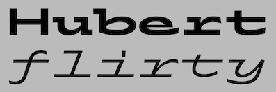 [More] ⦿
|
Seruput (or: Barokah, or: Graptail)
[Teuku Deky Firnanda]

|
 Indonesian design studio located in Banda Aceh, run by Teuku Deky Firnanda, b. 1989. In 2013 it published the free Comic Sans-style typeface Barokah, Purbacala (hand-lettered posater face), Hardline, Hardline Grunge, and Hardline Stencil.
 In 2014, they created Kahitna, Stand By Slab, Laskar (signage script), Aleandra (a flowing script), Gemulay Script (signage script family), Monday (script face), Transmetal and Bringin (a free connected script). Typefaces from 2015: Apashi, Anthem Script (a ronde style connected script), Honeymoon Script, Devious, Dankita Script (brush script), Ringdena (connected calligraphic script), DorayakiScript, Realist, Hillda Script, Angelline Script, Karmela Script, Lemonade. Typefaces from 2016: Pathout Script (for signage), Manisly Script, Kaitlyn Script, Trapline, Regaled Script. Typefaces from 2017: Antigena, Duffish (a heavy upright script), Sarcastic (+Inline; Victorian; published in 2019 as Sarkastic), Pathout Script, Young Coconut Script (signage brush script), Blastrick (Tuscan / Victorian), Smooth Boy, Bringin, Delitha. Typefaces from 2018: Dropslide (Victorian), Laskar Script, Aerohate (Victorian), Jailetter (spurred), Grantmouth, Monday Script, Karmela Script, Apashy, Ropstone (Victorian). Typefaces from 2019: Arastin (Serif+Script), Herina, Grantmouth Vol. 2 (art nouveau), Crotila. Typefaces from 2020: Rodest (a decorative serif), Histories Family (a fairy book display serif), Boheld (a vintage collection with Sans, Serif, Bold, Condensed, and Inline styles), Morthern (a decorative Victorian typeface). Typefaces from 2021: Sarcastic Nova (Victorian caps), Ringift (a decorative serif), Norteam (a 9-style vintage all caps collection), Lorida (a compressed display serif), Sernes (an 18-style condensed all caps display serif), Bunga Pro (a stylish curly romantic serif), Koling (a romantic cursive font), Klipan Black, Rhinegold (a heavy display serif with diamond-shaped tittles). Dafont link. Behance link. Graptail link. Another Creative Market link. Graphicriver link. Type Department link. [Google]
[MyFonts]
[More] ⦿
|
Seryozha Rasskazov
[Zeh Foundry]
|
[More] ⦿
|
SIAS (or: Signographical Institute Andreas Stötzner)
[Andreas Stötzner]

|
 Andreas Stötzner (b. 1965, Leipzig) is a type designer who lives in Pegau, Saxony. Graduate from the Hochschule für Grafik und Buchkunst Leipzig and the Royal College of Art in London (1994). Since then, free-lance. Started making typefaces in 1997. He edits the sign and symbol magazine Signa. He spoke at Typo Berlin 2004 and at ATypI 2005 in Helsinki where his talk was entitled On the edges of the alphabet. Coauthor with Tilo Richter of Signographie : Entwurf einer Lehre des graphischen Zeichens. He set up SIAS in 2006-2007 and started selling fonts through MyFonts.
 He created Andron Scriptor (2004, free), with original ideas for Greek and Cyrillic alphabets. The Andron project intends to extend this Venetian text typeface in many directions: right now, it covers Latin, Greek, Coptic, Gothic, runes, Cyrillic, Etruscan and Irish scripts, musical symbols, astronomical and meteorological symbols, and many dingbats. The Andron MC Corpus series (2012) contains Uncial, Mediaeval and Capital styles. He also created Andron 1 Monetary (2014), Andron 1 Alchemical and Andron 2 ABC (2014, for children's literature). On or before 2006, he created a few typefaces for Elsner & Flake. These include EF Beautilities, EF Ornamental Rules, EF Squares, EF Topographicals, EF Typoflorals, EF Typographicals, EF Typomix, EF Typosigns, EF Typospecs, EF Typostuff. Fonts from 2007-2010: Gramma (2007, three dingbats with basic geometric forms), Andron Corpus Publix (2007, dingbats including one called Transport), SIAS Freefont (2007, more dingbats), SIAS Lineaturen (2007, geometric dingbats) SIAS Symbols (2009), Andron Freefont (2009, text font), Andron 1 Latin Corpus (2009), Andron 1 Greek Corpus (2009), Andron Kyrillisch (2009, consisting of Andron 1 CYR, Andron 2 CYR and Andron 2 SRB where SRB stands for Serbian), Andron 2 English Corpus (2010, blackletter-inspired alphabet), Andron 2 Deutsch Corpus (2010), Andron Ornamente (2012), Reinstaedt (2009, blackletter family), Crisis (2009, economic sans). Lapidaria (2010) is an elegant art deco sans family that includes an uncial style and covers Greek. Hibernica (2010) is a Celtic variant of Lapidaria. Symbojet Bold (2010) is a combination of a Latin and Greek sans typeface with 400 pictograms. Rosenbaum (2012) is a festive blackletter face, obtained by mixing in didone elements. In 2013, he published Arthur Cabinet, a six-style inline art deco caps collection of typefaces, with accompanying Arthur Ornaments and Arthur Sans. Meanwhile, Andron Mega grew to 14,700 unicode glyphs in 2013. Typefaces from 2014: Behrens Ornaments (art nouveau ornaments based on Behrens Schuck by Peter Behrens, 1914), Fehlian (an open capitals typeface family with Plain, Gravur and Precious styles), Happy Maggie (a hand-drawn script based on Maggie's sketches when she was 13 years old), Abendschroth (for lullabies, girl's literature, murder poems, short stories and Christmas gift books), Abendschroth Scriptive, Albyona English No. 1 (as Andreas writes, suitable for children's books, fantasy literature, crime novels, natural food packaging and poison labeling, for infancy memories, vanitas kitsch items, dungeon museum bar menu cards, introductions to herbalism and witchcraft manuals), Lindau (a Venetian Jensonian typeface with considerable flaring in the ascenders), Grund (based on the 1924 art deco signage in Leipzig's Untergrundmesshalle Markt whose architect was Otto Droge), Leipziger Ornamente (based on variopus buildings in Gohlis, Leipzig, dating from the 1920s-1950s), Kaukasia Albanisch (ancient writing system of the Caucasus region, allegedly created by Mesrop Mashtots who also invented the Armenian alphabet in 405). Commissioned fonts include Runes (commission by Ludwig Maximilian University Munich), Lapidaria Menotec, Old Albanian, Dania (a special notation for Danish dialectology. Font extension of Latin Modern Italic (Open source), commissioned by the Arnamagnanean Institute, Copenhagen Universit). Typefaces from 2015: Andron 2 EIR Corpus (uncial, Gaeli), Artemis Sans (Greek version of Arthur Sans), Ardagh (a Gaelic / Irish version of Arthur Sans). Don Sans (a sturdy sans). Typefaces from 2016: Popelka (an uncial fairy tale font modeled after the opening sequence of the 1973 movie Drei Haselnüsse für Aschenbrödel). MyFonts. Behance link. Abstract Fonts link. Klingspor link. Showcase of Andreas Stötzner's typefaces at MyFonts. View the SIAS typeface library. [Google]
[MyFonts]
[More] ⦿
|
Simetris (was: Hanief Studio, or: Hanzel Studio, or: Hanzel Space)
[Hanief Farandi]
|
 Sidoarjo, Indonesia-based designer (b. 1990) of these typefaces in 2019: Rumble (a sharp-edged sans), The Atlantic (a serif), Bellarinde, Brigan (a signage script), Janetta Silloam (a signature script), Crushed Stone (a dry brush typeface), Saltacrus, Angler, Ballmont, Andrellina (a signature font), Bakojin, White Smith, Buffallo (a sharp-edged serif), Petricia, Kastangel, Montena, Blustori, Binetta (signature script), Sanctuary Script, Raydric, Rombus, Sambosa, Opera, Caroline Script, Squatter Collins (script), Hilmy Sahid Script (a signature script), Sonic Blow (spurred, dystopian), Zafir, Atena, Moscovia (a rounded all caps sans), Desta Sans, Slightly Sans.
 Typefaces from 2020: Gisellya (a dry brush script), Heritage (brush script), Sechillia Ruster, Rafelya Carrotin (a signature script), William Costinave, Renitta, Southnis (script), Bellisya (script), Royal Kevino, Britonia Sevagus (a decorative serif), Rosellinda Alyamore, Andellia Davilton, Softness, Stink (a wedge serif display typeface), Regoza, Trellis (a great wedge serif for display), Flamingo, Willow (a bold rounde serif), Croc (a fat display wedge serif), Brovile (a display serif), Refita (a striking wedge serif), Gilden (a Caslon), Selvina (a stylish sans), Silmastin (script), Briktail (a typeface with flared art nouveau terminals). Catalog in 2022: Amabillis, Andellia Davilton, Angler, Argiss, Arthines, Brogetta, Ballerick, Bellarinde, Bellisya, Berdiolla, Black Lunatic, Blingstone, Breattogis, Brigan, Briktail, Bringlandes, Britonia Sevagus, Brittish Shorthair Script, Brovile, Collin Weather Script, Croc, Gisellya, Heritage Brush, Hightlight, Historis Script, Janetta Silloam, Jeasland Script, Jellovy Switch, Just Squash, Magnolia Grande (a monolinear script), Margadeth (dry brush), Mathilda, Next, Osike, Rafelya Carrotin, Refita, Regoza (a slim serif), Rellington, Renitta, Road Blast, Roasting Script, Rosellinda Alyamore, Royal Kevino, Saltacrus, Sambosa, Sechillia Ruster, Selvina, Sienthas, Silmastin, Sinethar, Sonic Blow, Southland, Southnis, Stink, Storm Gust, Stringless, The Atlantic, The Roughly Handwritten, Trellis, White Smith, William Costinavel, Zafir, Zafrilus (a bold signature script). Creative Market link for Hanief Studio. Home page. Creative Fabrica link. [Google]
[More] ⦿
|
Sitintahitam
[Hasto Hst]
|
Designer of the late Victorian / early art nouveau typeface Eversthedin (2020) and the signage script Ekshada Script (2020). [Google]
[More] ⦿
|
Skjald
|
 Skjald is an "almost" art nouveau face first seen in digital form at Agfa. Who made it? [Google]
[More] ⦿
|
Sneha Chotia
|
New Delhi, India-based designer of a Latin art nouveau typeface (possibly called Art Nou) and the octagonal typeface Buffalo in 2018. [Google]
[More] ⦿
|
Snorri Eldjárn Snorrason
|
 Icelandic dreator of the art nouveau typeface Harmonia (2011) and the slab typeface Albania (2012, Ten Dollar Fonts). [Google]
[More] ⦿
|
Società Augusta Torino
|
Italian type foundry located in Turin. In 1878, Giovanni Nebiolo bought a foundry from Giacomo Narizzano. In 1889, the Levi brothers joined this venture to form Nebiolo&Co. After 1899, several other foundries were absorbed by Nebiolo, and for some time (1908-1917), the company was called Società Augusta Torino, but it reverted to Nebiolo&Co in 1917. [Google]
[More] ⦿
|
SoftMaker Software GmBH (or: freefont.de)
[Martin Kotulla]

|
 SoftMaker, Martin Kotulla's German foundry in Nürnberg, is selling the 10,000-TrueType font Megafont XXL CD (50 USD, www.megafont.de). Every month, a different font or font family (TT and T1) is given away for free. The MegaFont XXL has most standard Monotype/Adobe/Linotype families (up to 1995/1996). They say that most fonts are licensed from URW++ and Brendel Informatik (Cologne). Contents of MegaFont XXL's predecessor, MegaFont Profi CD, here. Since early 2001, you can download one font family from the CD MegaFont XXL here. Martin Kotulla also started infiniType, a collection of 5050 fonts at a good price (Mac and PC). That collection grew to 7444 fonts in InfiniType 4 in 2016. The XXL series has character sets for Western and Central European languages, Turkish, and Celtic, and comes with many expert sets. For historical accuracy: older packages by Softmaker include the 3333-font (TT and T1) MegaFont Profi CD-2.0 (99DM), the 5000-font MegaFont Euro (50 Euro), the Truepack Profi-CD and the 500-font TypeMaker 5.0 Profi-Pack (10DM).
  Their early fonts were renamed and had the attribute Serial in the name. Samples of some of these fonts/families: Adelon Serial (1996, after Albertus MT), Melbourne Serial, Nashville Serial (+Heavy), Nevada Serial, On Stage Serial, Ornitons Serial, Penthouse Serial, Plakette Serial, Priamos Serial, Quadrat Serial, Quebec Serial, Riccione Serial, Rochester Serial, Salzburg Serial, Stafford Serial, Sunset Serial, Sydney Serial, Thames Serial, Toledo Serial, Valencia Serial (Heavy), Valencia Serial (Xlight), Verona Serial, Volkswagen Serial, Wichita Serial. Their early fonts were renamed and had the attribute Serial in the name. Samples of some of these fonts/families: Adelon Serial (1996, after Albertus MT), Melbourne Serial, Nashville Serial (+Heavy), Nevada Serial, On Stage Serial, Ornitons Serial, Penthouse Serial, Plakette Serial, Priamos Serial, Quadrat Serial, Quebec Serial, Riccione Serial, Rochester Serial, Salzburg Serial, Stafford Serial, Sunset Serial, Sydney Serial, Thames Serial, Toledo Serial, Valencia Serial (Heavy), Valencia Serial (Xlight), Verona Serial, Volkswagen Serial, Wichita Serial.
In 2008, SoftMaker started selling fonts on MyFonts: fonts there include the 28-style Suetterlin family (2008), based on the handwriting taught in German schools in the first half of the 20th century, Harald Handwriting (2009), Agilo Handwriting (2009), Wally Handwriting (2009), Vittorio Handwriting (2009), Turandot Handwriting (2009), Tommi Handwriting (2009), Veneto Handwriting (2009), Tolomeo Handwriting (2009), Sarx Handwriting (2009), Salew Handwriting (2009), Roxana Handwriting (2009), Renate Handwriting (2009), PizPaz Handwriting (2009, Mexican style), Schneid Handwriting (2009), Pietro Handwriting, Phil Handwriting, Nadine Handwriting, Kuno Handwriting, Larissa Handwriting, Lizzy Handwriting, Juri Handwriting, Jeff Handwriting (2009), Josh Handwriting (2009), Jelena Handwriting (2009), Jaro Handwriting (2009), Jacques Handwriting (2009), Hilly Handwriting (2009), Harico Handwriting (2009), Hakon Handwriting (2009), Stone Handwriting (2009), Federico Handwriting (2009), Fabio Handwriting (2009), Emmi Handwriting (2009), Davio Handwriting (2009), Alec Handwriting (2009), Brian Handwriting (2009), Armand Handwriting (2009), Claude Handwriting (2010), Cathy Handwriting (2010), Clay Handwriting (2010), Danielle Handwriting (2010), Feliks Handwriting (2010), Foster Handwriting (2010), Giorgio Handwriting (2010), Giovanna Handwriting (2010), Guga Handwriting (2010), Giuliano Hanriting (2010), Carlo Handwriting (2009), Brouet Handwriting (2010), Bjarne Handwriting (2009), Fuego (2015: a retro script, after Letraset's Flamenco), Agnieszka Handwriting (2009) and Thery Handwriting (2009).  Additions in 2010: Tabasco (a geometric based on the phototype font by John Schaedler), Tabasco Twin (a bilined typeface after John Schaedler's Paprika), Advertisers Gothic (a revival of a 1917 typeface by Robert Wiebking), Ad Lib (a revival of a quirky 1961 typeface by Freeman Craw for ATF), Accent (brush face), Flagstaff (oblique techno face), Cornered (with angular pieces), Abilene (Western; caps only), Comix, Cathedral Open (nice open face), Boa Script (2010), Bryce (2010, brush script), Brush Script (2010, after the original ATF font by Robert E. Smith from 1942), Bernhard Fashion (2010), Abbott Old Style (2010, after a 1901 semi-Victorian font by Joseph W. Phinney), Artistic (2010, after Ariston, a 1933 typeface by Martin Wilke), Elegant Script (2010, a revival of Berthold's Englische Schreibschrift), Garamond Serial (2011), the Suetterlin family. Additions in 2010: Tabasco (a geometric based on the phototype font by John Schaedler), Tabasco Twin (a bilined typeface after John Schaedler's Paprika), Advertisers Gothic (a revival of a 1917 typeface by Robert Wiebking), Ad Lib (a revival of a quirky 1961 typeface by Freeman Craw for ATF), Accent (brush face), Flagstaff (oblique techno face), Cornered (with angular pieces), Abilene (Western; caps only), Comix, Cathedral Open (nice open face), Boa Script (2010), Bryce (2010, brush script), Brush Script (2010, after the original ATF font by Robert E. Smith from 1942), Bernhard Fashion (2010), Abbott Old Style (2010, after a 1901 semi-Victorian font by Joseph W. Phinney), Artistic (2010, after Ariston, a 1933 typeface by Martin Wilke), Elegant Script (2010, a revival of Berthold's Englische Schreibschrift), Garamond Serial (2011), the Suetterlin family.
The typefaces remastered in 2012 include Chandler Pro (this is Rofer Excoffon's 1955 brush typeface Choc; see also Staccato 555 by Bitstream and Chalk by Corel), Cheltenham Pro, Cleargothic Pro (after Morris Fuller Benton's flared version of Clearface, Clearface Gothic, 1907), Cooper Black Pro (+Stencil), Bristol Pro, Tioga Script Pro (after Georg Trump's 1956 script by that name, but aka Time Script). Free download: Huntington-Bold [-> Handel Gothic], Huntington-Light, ImperialStd-Bold [-> URW Imperial] ImperialStd-BoldItalic, ImperialStd-Heavy, ImperialStd-HeavyItalic, ImperialStd-Italic, ImperialStd-Medium, ImperialStd-MediumItalic, ImperialStd-Regular, ImperialStd-Xbold, ImperialStd-XboldItalic, KremlinScript-Bold [-> Kuenstler Script], RaleighSerial-Bold, RaleighSerial-Heavy, RaleighSerial-Regular, Scott [-> Stop], TiogaScript-Bold [-> Time Script], TiogaScript-Light, TiogaScript-Medium. Handwriting fonts shown at MyFonts in 2013: Allan Handwriting, Andrew Handwriting, Eleanor Handwriting, Enrico Handwriting, Estelle Handwriting, Jay Handwriting, Jaz Handwriting, Jesco Handwriting, Justine Handwriting, Kris Handwriting, Laszlo Handwriting, Lennart Handwriting, Luitpold Handwriting, Manolo Handwriting, Marbo Handwriting, Marcello Handwriting, Murielle Handwriting, Pablo Handwriting, Paolo Handwriting, Pascal Handwriting, Picto Handwriting, Rainer Handwriting, Reyno Handwriting, Ronaldo Handwriting, Teje Handwriting, Theo Handwriting, Valerian Handwriting, Vincent Handwriting, Vogel Handwriting, Volker Handwriting, Wilma Handwriting. The blackletter collection published in 2016 by SoftMaker includes these typefaces: Albrecht Duerer Fraktur Pro, Barock 1720, Breitkopf Fraktur Pro, Coburg No1, Coburg No2, Coelnische Current Pro, Diamant Gotisch Pro, Fleischmann Gotisch Pro, Fraktur No2 Pro, Fraktur No3 Pro. Later in 2016, SoftMaker published its revival collection, which includes Alternate Gothic Pro, Amsterdamer Garamont Pro, Antiqua Pro, Balloon Pro (brush), Caslon Antique Pro, Century Old Style Pro, Elmore Pro (architectural hand), Falcon Pro (retro brush), Cheltenham ExtraCondensed Pro Bold, Casual Pro (a copy of Thomas Nevison's Casual Pro from 1935), Garamond Nova Pro, Giulio Pro (a copy of Gillies Gothic), Josephs Brush Pro (a copy of Joseph Churchward's Churchward Brush), Malaga Pro (a copy of Roger Excoffon's Mistral), Melville Pro (after Murray Hill), Pedro Pro (a revival of the brush script Dom Casual by Peter Dombrezian, 1950-1953, at ATF), Salmon Pro (a revival of François Boltana's Stilla from 1973), Soledad Pro (based on Helmut Matheis's Slogan (1959, Ludwig & Mayer)), Somerset Pro (a revival of the Letraset font Shamrock designed in 1978 by Alan Withers), Sterling Pro (based on Stentor, designed in 1964 by Heinz Schumann at Typoart), Violin Script Pro (based on Vladimir Script by Vladimir Andrich, 1978). Typefaces from 2019: American Text (after an original condensed textura by Morris Fuller Benton), Angelo (after a Victorian typeface called Anglo by Barnhart Brothers ans Spindler, ca. 1895), Balloon No2 (just like SoftMaker's Balloon, based on Max Kaufmann's Balloon from 1939 at ATF), Balzac (after Johannes Boehland's Balzac from 1951), Amber (after Amelia by Stanley Davis, 1964), Karin Pro (a revival of OttoWeisert's art nouveau script Kalligraphia), Beale Charming (2019, after an art deco typeface by Collis Clements, ca. 1974), Bernhard Condensed No2, Bluff No2 (2012-2019, after Julius Kirn's brush script Bison, 1938), Boss (2012, after the sci-fi typeface ITC Bolt (1970, Tom Carnase and Ronne Bonder)), Broadway No2 (2012), Cavalier (2012), Century Schoolbook Pro (2019: after Morris Fuller Benton's typeface from 1919), Century PS Pro (2019: after New Century Schoolbook), Commercial Script No2 (2012, after Morris Fuller Benton's Spencerian script), Cristoforo (2012: after Columbus, a Victorian typeface by Hermann Ihlenburg), Dillon No2 (2012, after Jan Van Dijk's Demian), Disco (2012), Dom (2012; after Peter Dombrezian's Dom, 1952), Durango No2 (2012; after K. Sommer's Dynamo, 1930), Egyptian Wide (2012, after walter H. McKay's Egyptienne from 1952), Eller Initials (2012), Entebbe (2012: after F. Scott Garland's Enviro, 1982), Estelle (2012, based on Vince Whitlock's Equinox from 1988), Florentine (2012, after Ludvig S. Ipsen's ATF Florentine Old Style (1896)), Fraktur No2 (2012, after Johann Christian Bauer's Fette Fraktur, 1850), Frenzy (2012), Giulio No2 (2012, after William S. Gillies's Gillies Gothic, 1935), Greyhound (2012), Harlekin (2012, after Colin Brignall's retro script Harlow Solid (1977)), Hobo No2 (2012, after Morris Fuller Benton's Hobo, 1910), Hubert (2012, after Jan van Dijk's Van Dijk from 1982), Hudson (2012, a brush script), Ingrid (2012), Inverserif (2012), Japanette (2012, an oriental simulation face modeled after Barnhart Brothers and Spindler's 1893 font, Wedge Gothic ML, aka Japanet), Kalligraphia (2012, after Otto Weisert's art nouveau script, Kalligraphia, from 1902), Legend Script (2012, after F.H. Ernst Schneidler's faux Arabic simulation font Legende from 1937), Looking Glass (2012, after Phil Martin's Introspect, 1971), Messing (2012, after W. Schwerdtner's Metropolis from 1928), Metallic Sky (2012, after Mekanik, a Letraset typeface from 1988 by David Quay), Mister Big (2012, after Juergen Riebling's Mr. Big from 1972), Openface No2 (2012, after Augustea Open done in 1951 by Alessandro Butti and Aldo Novarese), Organ Grinder (2019, based on Franz Heigemeir's Organda from 1972), Paladin (2012, a blackletter, also called P650 Blackletter and Excalibur), Pergamon (2012, a deco hairline sans modeled after Premier Lightline (1969, Colin Brignall for Letraset)), Pinocchio (2012, based on a psychedelic typeface by Gustav Jaeger from 1973; earlier called P732 Deco by SoftMaker), Pretoria (2012, earlier called P820 deco by SoftMaker; a revival of the Edwardian typeface Pretorian by P.M. Shanks and Sons, ca. 1880s), Publicity Gothic (2012, based on Sidney Gaun's 1916 typeface for BBS), Quartz (2012, after Alan Birch's LCD from 1981), Reflex (2012, based on Refracta, made in 1988 by Martin Wait), Regency Script (2012: was R690 Script), Rosa (2019, after Herb Lubalin's ITC Ronda, 1970), Rough Script (2012, based on Imre Reiner's Reiner Black, 1955), Rovinj (2012, after a font by Phil Martin), Shotgun (2019, based on a film font from 972 by J. Looney for VGC), Siegfried (2012, art nouveau style), Slager (2012, based on Flash by Edwin Shaar, 1937), Sprint (2012, after Aldo Novarese's Sprint from 1974), Station Script (2012, after a 1946 typeface pair, Studio and Flambard, by Adolf Overbeek), Status (2012, after Michael Neugebauer's Squire from 1980-1987), Tico (2019), Unziale (2012), Yorkshire (2019, formal calligraphy), Zanzibar (2019, after a 1950s Filmotype font), Zephyr (2019; after Rofger Excoffon's Mistral, 1953). View the Softmaker library of typefaces. See also here. [Google]
[MyFonts]
[More] ⦿
|
Solotype
[Dan X. Solo]

|
 Dover Press sold Oakland's Dan X. Solo's digitizations. Dan Solo (b. 1928, d. 2012) has collected over 13,000 sets of metal fonts, starting when he was 9 years old and growing up in Oakland, CA. Finally, in 2002, he stopped doing that and began converting all of his fonts to computer type. Solotype, his company, was established in Alameda, CA. He printed 30 books on fonts (with Dover), including The Solotype catalog of 4,147 display typefaces, and created hundreds of fonts. In 2007, Dan Solo retired from the font business. He died in 2012.
 Robert Trogman writes: I know Dan X. Solo personally. He ran a typographic studio in Berkeley for over 30 years. He had a large collection of film fonts, including some of my own. He created thousands of fonts and is now retired and is an avocational prestigitator. Copyrights have run out on most of his fonts. He also protected himself by creating pseudonyms on the questionable font names. Stuart Sandler confirms that many of the fonts in Solo's Dover books are in fact from the Filmotype collection, which Stuart is digitizing right now. Gene Gable writes: Dan Solo of Solotype in Berkeley was experimenting with photo type as early as 1945 and started doing optical special effects in the early '60s. And a number of the larger display-type shops developed their own techniques. But in terms of opening up new markets for display type (and giving designers more control over type setting), Visual Graphics and Letraset lead the way. These companies were proud of, and promoted, the fact that that their products could be used by non-typesetters with little training. Bio. He wrote about himself: Dan X. Solo The Solotype Archive was begun in 1942 when I was 14. I was a kid printer for several years before that. At 16, after a quick three months of training, I dropped out of school and went to work full time as a radio actor and announcer in San Francisco. (Easy to get jobs in those days, due to the war-induced manpower shortage.) In 1949 and 1950, I created a magic show which played West Coast theatres with some success. After that, back to broadcasting. By 1962, I was completely burned out on radio, so I decided to see if I could make a living with my collection of antique types, which numbered about a thousand fonts at that time. In 1962, I sent out 4,000 catalogs showing the type to ad agencies all over the U.S. The timing was perfect (no thanks to me) because there was developing at that time a renewed interest in the old types. Business took off immediately. The Solotype collection was one of four commercial collections at the time, but I seemed to have been more aggressive in marketing than the other chaps. (Well, Morgan Press certainly knew how to market.) Two years into the business, I began to collect alphabets on paper for conversion to photo lettering, which was just becoming mainstream in the type business. We closed the shop for a month every year and went on a type hunt, mostly in Europe where there didn't seem to be much competition among collectors. Other typographers couldn't understand how we could do this, but I believe it made people appreciate the resource we offered even more. Over the years, the collection became quite large. When I closed Solotype a couple of years ago, I got rid of about half the archive (because the fonts were dull, or already digitized, or for a variety of other reasons) leaving me with about 6,000 fonts on paper or film. In 1974, I began to supply Dover Publications with mechanicals for books of 100 alphabets on a particular theme. I did 30 of these books over the years, and 30 more of printers' ornaments, borders, and so forth. Sometime in the 1990s, Dover asked me to digitize books of 24 fonts each, to be sold with a disk in the back. I did 12 of these. The Dover relationship came to an end when Hayward Cirker, the owner and my special friend, died and the company was sold to another publisher. Dover felt that they had covered the type field thoroughly. Now in my old age, my wife and I have a mindreading act that is great fun and good for the ego. Even so, when not traveling, I digitize type for relaxation and enjoyment, but have made no effort to sell it. Until now. Solo's wood type/Western/ headline/ Victorian collection includes Acantha, Bindweed, Dime Museum (2004, a French Clarendon revived by ATF in 1933 under the name P.T. Barnum), Egyptian Oldstyle, Excelsis, Extravaganza, Rigney, Assay, Baraboo Banner, Beijing, Brevet (after a Victorian typeface from 1887 by Ernst Lauschke), Brussels, Cathedral, Cleopatra, Cognac, Crossroads, Dainty Lady, Dangerfield, Diablo, Dutch Treat, Grecian, Lord Mayor, Malibu, Minnesota, Moulin Rouge, Penny Arcade (1992, a Victorian face after an 1890 original called Mural by Boston Type Foundry), Trixie, Valerie, Valjean, and Zorro. Alaska is based on an 1890 design of Marder, Luse and co. Arcade imitates an 1888 design of Barnhart Brothers&Spindler. Bamboo (oriental simulation face) is based on a 1889 creation of Barnhart Brothers&Spindler. Behrens Antiqua and Behrens schrift are revival of early 20th century typefaces by Peter Behrens. Eccentric is a digitization of a 1898 arts and crafts typeface by Kingsley/ATF. Hansard is a revival of a display type published in 1887 by MacKellar, Smiths,&Jordan. Pekin is a digitization of a face, first designed by Ernst Lauschke in 1888 and issued by Barnhart Bros.&Spindler foundry in Chicago under the name Dormer, and revived by them in 1923 under the name Pekin. Charles Henry Beeler made a condensed sans serif issued by Mackellar, Smiths&Jordan foundry in 1887: it was digitally revived as Roundhead. Monument is a revival of a 1893 typeface by the Boston Type Foundry, but was also cast at the Central Type Foundry. Vienna Light is a delicate early 1900s type originally created by the German foundry of Schelter&Gieseke. Other designs: Bareback, Campaign (ca. 1970), Cigar Label (1997), Estienne, Farringdon (a western face), Goodfellow (digitization of wood type from 1895 found at Hamilton and probably due to W.H. Page), Harlem Text (blackletter), Houdini (ca. 1992), Memorial, Quadrille 2 (a simplified Tuscan face), Sparticus, Vanities (a Victorian type), Whirligig. In 2005, MyFonts added Seminary (after a Victorian font from 1885 by Bruce Type Foundry), Margie (formal script based on Marggraff Bold Script by the Dresden foundry vormalig Brüder Butter, 1920s), Fancy Dan, Bamberg (2005, after a condensed wood type from ca. 1850), Fat Face No. 20, French Ionic (quite ugly--based on an 1870 Clarendon derivative by the Cincinnati Type Foundry), Hearst Italic (based on a 1904 typeface by Carl Schraubstadter of the Inland Type Foundry), Hearst Roman (based on a typeface from the Inland Type Foundry allegedly stolen from a hand lettering job done by Goudy, acccording to Goudy himself), Tally Text (early photolettering type of the comic book style), Welcome 1 (based on Van Loey-Nouri's art nouveau typeface from 1900). A list of some digitized fonts: - Art Deco: Advertisers Gothic Light, Alex, Beverly Hills, Boul Mich, Capone Light, Chic (after Morris Fuller Benton's Chic, 1927), Clyde, Eagle Bold, Eagle Narrow, Eden Bold, Eden Light, French Flash, Gallia, Graybar Book, Grock, Matra, Modernique (art deco), Parasol, Parisian, Phoenix American, Plaza Suite, Publicity Gothic, Salut, Stymie Obelisk, Zeppelin.
- Victorian: Anglo, Arboret, Campanile, Chorus Girl, Fancy Celtic, Ferdinand, Floral Latin, Glorietta, Grant Antique, Gutenberg, Hogarth, Jagged, Katherine Bold, Lafayette, Meisteringer, Olympian, Phidian, Ringlet (1998, a Victorian typeface after an 1882 original by Hermann Ihlenburg), Romanesque, Rubens, Stereopticon, Templar, Wedlock, Zinco.
- Script/Cursive: Amapola, Artists Script, Carpenters Script, Certificate Script, Commercial Script, Conway (an architectural script), Elegance, Engrossing Script, Figaro, Flare, Gloria Script, Hanover, Helvetica Cursive, Holly, Kunsteler Bold, Liberty, Manuscript, Orion Script, Pantagraph Script (+No2, +No3), Park Avenue, Romany Script, Trafton Script, Typo Upright, University Script, Virginia Antique.
- Art Nouveau: Ambrosia, Argus, Artistik, Auriol, Baldur, Bocklin, Cabaret (2003, as in Murder She Wrote), Carmen, Childs, Edda Black, Excelsior, Francomia, Giraldon, Harrington, Isadora, Metropolitan, Murillo, Oceana, Odessa, Orbit Antique, Palmetto (2005; an art nouveau typeface based on a 1887 typeface called Palm from the A.D. Farmer Foundry), Siegfried, Skjald, Spartana, Titania.
- Gothic/Medieval: Academy Text, American Uncial, Antique Black, Becker Bold, Bradley, Castlemar, Celebration Text Fancy, Church Text, Engravers Old English, Frederick Text, Freehand, Hingham Text, Initials-Bradley and Caxton, Kanzlei Light, Lautenbach, Lautenbach Fancy Caps, Libra, Morris Black, Nicholini Broadpen, Rhapsodie Swash Caps, Scottford Uncial, Solemnis, Washington Text, Wedding Text.
- Celtic: Anglo Text, Camden Text, Chappel Text, Cimbrian, Colchester Black, Durer Gothic, Durwent, Fenwick, Genzsch Initials, Gloucester Initials, Gutenberg Gothic, Hansa Gothic, Harrowgate, Kaiser Gothic, Kings Cross, Konisburg, Malvern, Medici Text, Middlesex, Progressive Text, Tudor Text, Warwick, Westminster Gothic, Yonkers.
- Special-Effects Display Fonts: Azteca Condensed, Buddha (oriental simulation face, after a Schelter&Giesecke type), Burst, Campaign (1970), Chinatown (oriental simulation), Cigar Label (1997-2002), Colonial Dame, Contract Banner (2004, a take on Mezzotint from 1880), Direction, Fillet, Filmstar (1999), Firebug, Headhunter, Hollywood Lights, Igloo Solid, Import, Lariat, Needlepoint, Old Glory, Protest, Rustic, Scimitar (Arabic simulation face), Scoreboard, Skyline, Starburst, Sundown Shadow, Tableau, Tonight, Xerxes.
- Other: Acantha, Assay, Baraboo Banner, Beijing, Bindweed, Brevet (after a Victorian original by Ernst Laushke, 1887), Brussels (positioned inbetween Stephenson Blake's Flemish Expanded and Flemish Condensed), Cathedral, Cleopatra, Cognac, Crossroads, Dainty Lady, Dangerfield, Diablo, Dime Museum, Dutch Treat, Egyptian Oldstyle, Excelsis, Extravaganza, Grecian, Lord Mayor, Malibu, Minnesota, Moulin Rouge, Penny Arcade, Rigney, Trixie, Valerie, Zorro.
Images of selected typefaces: Agency Gothic, Alpha Midnight, Alpha Twilight, Anita Lightface (1977), Art Deco Display Alphabets, Ashley Crawford, Ashley Inline, Astur, Bamberg, Banco, Beans, Blackline, Bobo Bold, Braggadocio, Broadway Engraved, Busorama Bold, Busorama Light, Bust, Charger, Checkmate, Colonel Hoople, Corral, Dudley P Narrow, Dynamo, Earth (a futuristic / prismatic typeface revived by nick Curtis in 2015 as Terranova NF), Eclipse, Empire, Ewie, Fat Cat, Fatso, Festival, Futura Black, Futura Inline, Gillies Gothic Bold, Greeting Monotone, Grooviest Gothic, Hess Neobold, Hotline, Huxley Vertical, Inkwell Black, Joanna Solotype, Joyce Black, Koloss, Lampoon, Mania, Mania Contour A, Mania Contour B, Margit, Mindy Highlight, Modernistic, Monograms Stencil, Mossman, Neon, Neuland (+Inline), Phosphor, Piccadilly, Pickfair, Polly, Prismania P, Quote, Rhythm Bold, Shady Deal, Sheet Steel, Sinaloa. The Solotype Catalog is a file with information on Dan Solo's typefaces, annotated with remarks about name equivalences and digitizations. The original file was due to Thibaudeau, but typophiles on alt.binaries.fonts have added to it in 2010. PDF version. Excel version. Text version. See also here. View Dan Solo's typefaces. Another page on Solotype. Dan Solo's typefaces listed in decreasing order of popularity. View Dan Solo's typefaces. View Dan Solo's typefaces. [Google]
[MyFonts]
[More] ⦿
|
Sparklefonts
[Geoff Anderson]
|
Sparklefonts (est. 2005, England) showcases the work of founder Geoff Anderson, who wants to maintain legibility without compromising style. Chocolate (2005) is a flexible, monoline comic book family. Also: Obsidian (2005, bubblegum or oil slick font), Festival (2005, art nouveau), Dialog (2005, liquid, with stencil versions), Groundhog (2005), Tungsten (2005, futuristic). Klingspor link. [Google]
[More] ⦿
|
Spiece Graphics
[Jim Spiece]

|
 James R. Spiece (b. 1946, Wabash, IN) attended Culver Military Academy and graduated from Wabash High School in 1964. Jim attended Indiana University and graduated with a B.S. in 1969 after serving two years in the US Army stationed in Germany. Based in Fort Wayne, IN, he liked to revive old type designs. Ji died in 2021 in Green Valley, AZ. Obituary.
 The typefaces made Jim Spiece: - Adonis Old Style SG (2004): a connected upright script modeled after a little stationery and greeting card typeface developed for American Type Founders in 1930 by Willard T. Sniffin.
- Anthology SG (2005).
- Arched Gothic Condensed: another Victorian type, developed around 1885 by the James Conners&Son Foundry (New York).
- Ark Monogram SG: Ark is a combination monogram set based on the ATF Virkotype designi from the 1930s.
- Asteroid Primo SG (2009).
- Astoria Antique (2003): 19th century style ornamental face.
- Aviator SG (1995), aka Ventura Slim, based on an old 1930s lettering style popularized by Carl Holmes in his book.
- Bernhard Brushscript SG: based on an extremely heavy informal script was created in the early 1920s by Lucian Bernhard.
- Bernhard Gothic SG
- Beverly Shores Script SG (2004).
- Birdlegs SG (1991).
- Cactus Flower SG (2006): a Wild West family based on lettering by Ross F. George.
- California Poster SG (1996).
- Centric Geo SG (1996) and Centric Serif SG (1996). These are squarish slab typefaces.
- Concerto Rounded SG: revival of some 1920s Lucian Bernhard lettering.
- Edison Swirl: A frilly Victorian blackletter typeface based on a design by Hermann Ihlenburg from ca. 1900.
- El Castillo SG (2008): an old style newsprint family.
- Epicerie One&Two SG (2008): a signage family.
- Eva SG. Eva Antiqua SG is an exquisite family based on the 1922 Klingspor model by German designer Rudolf Koch (known as Koch Antiqua or Locarno). It also includes Eva Paramount SG, which is a revival of a 1928 typeface, also flared, by Morris Fuller Benton called ATF Paramount. The Castcraft incarnation is called OPTI Eve.
- Frisco Antique Display SG (2004): based on a woodtype display typeface from the 1880s by Bruce Type Foundry.
- Gable Antique Condensed (2002): based on a Bauer Type Foundry art nouveau face.
- Gambit Nouveau SG (2004): art nouveau.(2004): art nouveau.
- Grand Slam SG (2002): based on an old cardwriting style known as Poster Gothic.
- Headline Helpers One SG and Headline Helpers Two SG (2009). Followed by Headline Helpers Three SG (2017), Headline Helpers Four SG (2017), Headline Helpers Five SG (2017).
- Hollywood Deco SG (1994): based on a Willard T. Sniffin deco-inspired original from 1932.
- ITC Blair (1997). Blair has its roots in the Inland Type Foundry, ca. 1900.
- ITC Deli Deluxe and ITC Deli Supreme (1999)
- ITC New Winchester
- Ironman SG (2002): art deco poster font.
- Kingsbury Condensed SG (1992): 1930s style art deco face.
- Kolinsky Sable SG (2004): a brush display typeface due to Charles P. Bluemlein, 1944.
- Little Brown Frog SG (2007).
- Melrose Modern SG (2005): art deco family.
- Memorandum SG (1992): a sans text family.
- Metropolis SG: revival of a long-legged 1932 classic design by W. Schwerdtner for the Stempel Foundry.
- In 1895, Julius Schmohl and Max Rosenow published an upright script with BBS. This ronde typeface was originally known as Oliphant and renamed Advertisers Upright Script in 1925. In 2014, Spiece Graphics created a digital version of it, Milroy Upright SG.
- Mingo Gothic SG (1991-1992).
- Narcissus SG (Open and Solid): Narcissus Open is a heavy typeface designed by Walter Tiemann in 1921 for the Klingspor Foundry in Germany.
- Newport Classic Basic SG and Newport Classic SG: based on an extra condensed art deco typeface designed by Willard T. Sniffin for American Type Founders in 1932.
- Nicolas Jenson SG: a large text family about which Spiece writes: It was the original work of fifteenth century designer Nicolas Jenson that formed the basis for this roman serif style developed by Ernst Detterer in 1923. Similar in spirit to other early twentieth century revivals such as Centaur, Cloister Old Style, and Italian Old Style, Nicolas Jenson is distinguished by its pristine and delicate nature. A gifted young apprentice to Detterer, Robert Hunter Middleton, greatly expanded the family. And by 1929, bold, italic, and open were part of the Ludlow Foundry's beautiful Nicolas Jenson Series. It was reintroduced under a new name, Eusebius, in 1941.
- Nova Script Recut One SG (2011): based on Nova Script (1937, George F. Trenholm).
- Pacific Clipper SG (1991): a mix between Koch's kabel and ATF's Novel Gothic (1929, Morris Fuller Benton and Charles H. Becker).
- Panorama SG (1995): art deco family, based on an old 1930s lettering style popularized by Carl Holmes is his wonderful book on the subject.
- Quaint Gothic: Arts&Crafts face.
- Replica Rough SG (2018). A grungy typeface.
- Samson Classic SG: a heavy display typeface based on a 1940 design by Robert Hunter Middleton for the Ludlow Foundry.
- San Remo Casual SG: a fifties style connected script.
- Sheridan Gothic SG: an art nouveayu face, ca. 1910, known as Grant Antique.
- Speedway SG (1992-1993): connected upright 1950s diner script.
- Stellar Classic SG (1997): Stellar was originally designed by by Robert Hunter Middleton in 1929 as a serifless roman well before Hermann Zapf's Optima, released in 1958.
- Stratosphere SG (1993).
- Telepod SG (2002): based on an old Speedball lettering style and has a very retro look.
- Thumbnail Text SG (2005).
- Travel Kit SG (2004): art deco.
- Tribunus SG: roman Trajanus style family, originally designed in 1939 by Warren Chappell for Stempel.
- Tweed SG (1992): handlettering.
- Ultramodern Classic SG: a marquee lettering font family in the style of Broadway. Based on a 1928 design by Douglas C. McMurtrie, Aaron Borad, and Leslie Sprunger.
- Valentina SG (1991-1992): a plump comic book style script.
- Veranda Poster SG: derived from a European art supply manufacturer's logotype done in the Vienna (Wien) Austria style, which was used by artists such as Julius Klinger and Willy Willrab in the 1920s.
- Wellsbrook Initials SG: based on the 1920s work at Bauer of the German graphic designer Emil Rudolf Weiss.
- Zinc Italian SG (2002): 19th century style curly ornamental face, aka Zinco in the Victorian era. Based on Zinco (1891, Hermann Ihlenburg for Mackellar, Smith & Jordan).
MyFonts link. Klingspor link. View Jim Spiece's typefaces. Listing of Jim Spiece's fonts. [Google]
[MyFonts]
[More] ⦿
|
Spirit&Bones
[Lena Schmidt]

|
 Lena Schmidt was born 1981 in Bremen, Germany, and works in Hamburg, Germany. She is a painter, graphic designer and illustrator mostly known for her huge wood carving paintings. From 2003 to 2011 she studied Fine Arts in Hamburg under Matt Mullican. From 2015 to 2019 she studied graphic design with a focus on type design at HAW Hamburg under Jovica Veljovic. In 2021, she set up Spirit & Bones in Hamburg.
 Her typefaces: - In 2019, she released a 9-style revival and extension of F. H. Ernst Schneidler's Schneidler Latein (1916-1921) simply called Schneidler Latein. Each style contains 948 glyphs, variations of numbers, three stylistic sets one preserving the historic forms of changed characters, small caps, open type features and superior and inferior characters. She writes: Schneidler Latein is a sharp and elegant Antiqua based on the ductus of the broad edged pen with a strong character. Running perfectly in paragraph text giving it something quite special and being effortlessly legible at the same time, Schneidler Latein works great in headings as well. Each glyph is a piece of art ready to be used in branding and blowup combining beauty and personality in a kick-ass blend. It is absolutely new to the digital world as it never has been digitized before.
- Jutta (a hand-crafted stencil typeface) (2021). A delicate painted stencil text typeface that relates to Auriol's art nouveau typefaces and the era of impressionism.
- Neue Latein (2021). A 2-weight sans based on Schneidler Latein.
[Google]
[MyFonts]
[More] ⦿
|
Stefan Chirila
|
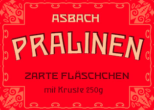 Canadian designer from Kitchener (b. 1984) now located in Washington, DC, and before that, in Reston, VA. He created the irregular handwriting font Stefan Handwrite (2006) and an untitled art nouveau typeface in 2014. In 2016, he created Tuscan, based on a scan from Epreuves des Caractères et Vignettes by Charles Derriey, 1839, Paris.
 In 2019, he released the Viennese Secession typeface Mendelson, and wrote: Mendelson is an art nouveau-inspired typeface which is based on a design by Paul Lang (1877-1937). Originally the typeface was named Langschrift (meaning long type) and was released by the Flinsch foundry in Frankfurt am Main in 1905. With its rigorous verticals and squarish shapes Mendelson works best as a display typeface. Low contrasts and balanced proportions make this typeface both bold and elegant. It is best used when centered in symmetrical settings. Other URL. [Google]
[More] ⦿
|
Stefanie Vogl
[OMFD Official]
|
[More] ⦿
|
Steve Harrison
[Geckodude (or: Sleepy Gecko)]
|
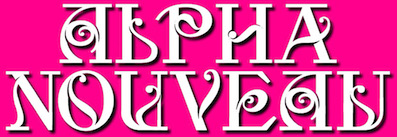 [More] ⦿
|
Stian Berger
|
Norwegian co-designer with Magnus Rakeng at Millimeter Design of Telenor (2001, sans) for the new corporate identity for Telenor. Still with Rakeng, but now at Melkeveien designkontor, he cocreated Always (2005, a connected 1950's style face, based on Rakeng's very popular earlier typeface Radio) and the Jugendstil style typeface Ålesund jugendstilsenter (2004, based on architect H. Schytte Berg's architectural lettering). [Google]
[More] ⦿
|
Storic Type (or: Flavor Type, or: Flavortype)
[Panji Nugraha]

|
 Flavor Type was an Indonesian design studio located in Bandung in which Panji Nugraha, Ilham Herry and Maghrib Lab were involved. In 2017, Panji Nugraha set up Storic Type.
 Panji Nugraha is the Bandung, Indonesia-based designer of Caferus (2014), Murmers (2014, Victorian), Bonerica (2014, a Victorian typeface), Vanderchalk (2014) and Glowist (codesigned in 2014 with Ilham Herry and Maghrib Lab at Flavor Type). In 2015, he made My Dear Script (penmanship script), Hava Shine (Victorian signage face), Lovile, La Chalk (chalk writing emulation), Carneval (a fun hand-drawn typeface family with a possibility of layering), To Dear (brush script typeface), Allic (brush typeface), Vidiz (a swashy slab serif poster typeface), Levitte Script, Leila, Holisun (brush face), Vacamous, Summerica, Callalily, Vicent (watercolor brush), Morning Sugar (brush script), Blacky, Lonssa (hand-drawn type, with ornaments), Heartwell (a wonderful brushy poster script), Noside (a splashy brush), Toxine and Fruty. Typefaces from 2016: Enlighten (bouncy sans), Bite Chalk, Stay Alive (Victorian), Dafodil (Western), Vercha, De Arloy (art nouveau), Herald Bouncy, Mon Cheri (signage script). Typefaces from 2017: Relove (Victorian), Floresh, Chester (a layered spurred vintage typeface), Recipe Daily (free), Glandish, Moody Blue (a curly Victorian typeface), Reborn (ornamental Victorian typeface), Recipe Diary. Typefaces from 2018: Limit Corner (Victorian), Bride Chalk (sans and serif). Typefaces from 2019: Borest (a luxurious flared sans by Ilham Herry and Maghrib Lab), Fulgate (by Ilham Herry and Adam Fathony). Typefaces from 2020: Muray House (a bold swashy bathroom towel typeface by Ilham Herry and Adam Fathoni Haris), Esteric (a playful retro jazz typeface). Flavortype's catalog in 2022 showed these typeface families: - Barlon (2022). Art nouveau, modernized. By Ilham Herry and Adam Fathony Haris.
- Borest (2019). A luxurious flared sans by Ilham Herry, Adam Fathony Haris and Maghrib Lab.
- Budge (2020). A layerable retro signage script.
- Bumsy (2021). A bold display serif by Ilham Herry and Adam Fathoni Haris.
- Esteric (2020). A playful tapered retro jazz font. By Ilham Herry and Adam Fathony Haris.
- Fulgate (2019). A luxury display family by Ilham Herry and Adam Fathony Haris.
- Genty (2020). A creamy retro signage script typeface by Ilham Herry and Adam Fathoni Haris.
- Glaw (2020). A psychedelic font by Ilham Herry and Adam Fathoni Haris.
- Monvar (2021). A layerable Cooper Black style typeface. By Ilham Herry and Adam Fathony Haris.
- Muray House (2020). A bold swashy bathroom towel typeface. By Ilham Herry and Adam Fathony Haris.
- Rische (2021). A 6-style display serif with huge counters and an enormous x-height. By Ilham Herry and Adam Fathony Haris.
Creative Market link for Flavor Type. Another Behance link. Behance link. Another Behance link. Another Creative Market link. [Google]
[MyFonts]
[More] ⦿
|
Stu Stagg
|
Brisbane, Australia-based designer of the display typeface Console (2016), which is based on the art nouveau typeface Lining Grant (early 1900s). Behance link. [Google]
[More] ⦿
|
Studio 27
[Mélanie de Bossoreille]
|
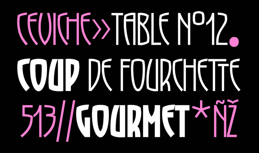 Paris-based art director. Her charming typefaces:
 - Amaretto. A reverse stress deco typeface.
- Cabernet Rose. A stylish decorative serif.
- Dame de Pic. Dame de Pic (2019) is an original 3-style sharp-edged custom-designed display typeface for the brand Anne-Sophie Pic. Inspired by the signature dish of the chef, the Berlingots., tt was developed during a workshop at Type Paris 2019.
- Geronimo. A chic rive gauche deco typeface family.
- Grenny. Art nouveau.
- Hector (2013). A hexagonal typeface.
- Mel Script.
[Google]
[More] ⦿
|
Studio K
[Keith Tricker]

|
 Keith Tricker (b. 1949) is the Creative Director of a UK advertising agency, and during his career has worked as both a copywriter and art director. MyFonts lists him as Keith Gordon. Klingspor link.
 His foundry is Studio K: The foundry specialises in display fonts designed primarily for advertising, publishing, product packaging and signage. He created the wavy typeface Calypso (2011), the techno typeface Charta (2011), the sturdy black typeface Anvil (2011), Jazz Age (2011, art deco), and the brush typeface Pagoda (2011). In 2012, he published Hollywood Hills, Pier Arcade, Graffix, Skeleton Slab, the art deco typeface Tea Dance, the art nouveau typeface Paris Metro, Oscar Bravo (a heavy octagonal typeface), Café de Paris (a stylish retro--futuristic fifties style typeface), Barrowboy, and the stylish Contessa family. Typefaces from 2013: Communiqué (rugged stencil face), Regency (influenced by Americana and Optima, it is a flared very humanist sans), Alma Mater (athletic lettering), Showbiz (inline typeface), Dynatron (retro sci-fi font), Mechanoid (elliptical techno sans), Canterbury (inspired by the shapes of the cathedral), Export Drive (a bold condensed cargo stencil), Soft Rock (bold condensed sans), Red Top, Colossus (an elliptical typeface that is a bit squarer than Microgramma), 4Square (elliptical), Aspidistra (art nouveau), Home Grown. Typefaces from 2014: Belvedere, Joe Cool (a bold masculine headline typeface in the genre of Impact), Gravitas (a Bauhaus / futurismo typeface), Rock Face (sticky tape typeface). Typefaces from 2015: Chenko (2015, a constructivist / brutalist typeface named after Rodchenko), Marazion (a rounded display sans), Castaway, Variety (ransom note font), Nightlife (an amoebic rounded stencil typeface that conjures up neon signs, DNA molecules and jelly beans), Rough Stuff (textured faded stencil typeface), Signpost (a drop shadow version of Red Top). Typefaces from 2016: Cambourne (a luxury goods font advertized as cutting edge retro), Capstan (slab serif), Alonquin (art deco: a typographical tribute to Dorothy Parker and the New Yorker crowd who haunted the Alonquin hotel in its 1920s heyday), Cadenza, Exotica (described by Keith as Old World elegance meets Levantine luxury), Oxbridge (vintage compact titling typeface). Typefaces from 2017: Vagabond (a weathered vintage railroad font), Brando (slab serif). Typefaces from 2018: Stamina (a sports font), Cybernaut. [Google]
[MyFonts]
[More] ⦿
|
Studio Triple
[Jérémy Landes]
|
Founder of the graphic design agency Studio Triple. Since 2012, he is active in the Velvetyne type foundry. French designer of the elegant monoline sans typeface family Millimètre (2016), which is free at Open Font Library. He joined Velvetyne Type Foundry, where he designed Hyper Script (2017, a custom design for the Hyper Chapelle exhibition by AAAAA Atelier) and Solide Mirage (2017). In 2018, Landes, under the art direction of Julien Alirol and Paul Ressencourt of Murmure, published the great display sans typeface Le Murmure, which won an award at the Type Directors Club's Type Design Competition 2019. Free download at Velvetyne. Open Font Library link. At Future Fonts, he published the intestinal and accidental art nouveau typeface Digestive (2018, +a variable font): Digestive borrows shapes from the submarine universe (mainly seaweeds) and from anatomic parts, organs and guts. P>In 2019, Anton Moglia and Jérémy Landes co-designed Pilowlava, a free font that was originally a custom font for the last issue of Cercle Magazine. In 2020, Studio Triple released Jaune Grande and Jaune Petite at Future Fonts: Jaune Grande makes everything that can touch, touch. Like an overcooked cheese gratin, Jaune is sticky and really fat and we like it that way. NaN Jaune (2021) features hipster elements and has three optical sizes, Maxi, Mini and Midi. It also has a variable font option. Mayenne Sans used to be a free font but was withdrawn. Landes explains: Mayenne Sans is a custom typeface designed with an art direction by Atelier Julian Legendre for the department of the Mayenne, in the northwest France. To renew the brand image of the department, Atelier Julian Legendre asked Jérémy Landes to draw a display font with his existing font Jaune Grande as a starting point. To distinguish this new font from Jaune and make it more legible, it has been chosen to have big apertures and rounder curves. The resulting typeface is way friendlier and conveys the messages of the territory. Like its source, Mayenne Sans as a tremendous x-height with super short ascenders and descenders, allowing tight leading and making it useful for compact heading paragraphs. [Google]
[More] ⦿
|
Sukjana Almunandar
[Alcode]

|
 [MyFonts]
[More] ⦿
|
Suomi Type Foundry
[Tomi Haaparanta]

|
 Tomi Haaparanta (b. Vaasa, Finland, 1967) is a Finnish type designer and art director. He created many great fonts, and founded Suomi Type Foundry in 2005. Speaker at ATypI 2005 in Helsinki. MyFonts link. FontShop link. Klingspor link. His typefaces, suboptimally grouped:
 - Typefaces from 2016: Suomi Hand Script.
- Typefaces from 2015: Tool (a classic, narrow and clean sans serif family with seven weights), Triangle (wedge serif typeface), Tip (a modulated sans).
- Typefaces from 2013: Abandon (a basic sans family), This (a rounded family), Abiding (slab serif).
- Typefaces from 2012: SciFly (a free rounded sans commissioned by Flyerzone).
- Typefaces from 2011: Tow (a headline font family), Grumpy Black (Black 24 is based on the headline typeface ITC Grouch (1970, Ronne Bonder and Tom Carnase), and the other styles are increasingly of higher contrast).
- Creations in 2010: Tenner (very plump and round, good for signage), Tart Heavy (fat slabs to drool over), That (a display family, +Open, +Irregular, +Bold), Thud (an industrial belt octagonal/mechanical family), Steelworks (a sturdy mechanical sans), Taste This (sans family), Telltale, Titillation (rounded), Tide (connected script emulating ink flow), Taffee (narrow sans), Televisio, Tournedot (a very cute and lively semi-serif headline face), Tempest, Tristan (hand-printed), Cider Script, Toffee Script (after an art nouveau typeface called Regina Cursive, which was published by H. Berthold Messinglinienfabrik und Schriftgiesserei around 1895). Tonsure Script (a high-contrast connected script), Ticketbook (for movie posters), Suomi Sans (a family with special counters).
- Creations in 2009: Tar (rounded sans family), Marimekko (a slab family for a Finnish clothing company, adapted from its 1954 Olivetti typewriter roots), Vektori (monoline octagonal), Kaapeli (Tomi's take on Kabel), Suomi Slab Serif (related to American Typewriter), Marimekko Sans, Tee Franklin (gothic sans family, made for The British Vogue---check out the light weight; done with Brian Kaszonyi), Tobacco (octagonal, based on drawing program emulation), Pannartz (based on a scan of a 1476 text by Sweynheim&Pannartz), Suomi Hand (FontShop), That (4-weight serif family), Talbot (connected script patterned after the Talbot car logo), Taint (modular ink trap face), Tailor (slab serif), Tink, Tale 40, Tale 20, Story 40, Story 20 (all pixel fonts), Tictac (a 3D face), Giro (done on purpose to mimic the ugly Giro d'Italia geometric logo font), Tame (rounded sans), Suomi Script, Explosion (grunge).
- Creations in 2007: Caxton Script (blackletter).
- At ITC: ITC Tetra (2005, squarish face), ITC Tomism (2005, modeled after Church Slavonic), ITC Tyke (2004, a take on Cooper Black).
- At Psy-Ops: Temporal, Torus.
- At T-26: Talmud (1998, faux Hebrew), TyrantRoman (1998, an Exocet-style face, T-26), Tumbler, Torino-Book, Tonic, Terylene, Tension, Teebone, Task-Toobig, Target (2004), Tantalus, Aged (1999), and Taper (2009, slab serif), the experimental sans families Target Recut (2004).
- At FUSE: FutuRoman (FUSE95).
- Tang (2004, an anti-inkbleed sans family done for very small point sizes).
- At Agfa Creative Alliance: Tangerine, Teethreedee, Twinkle.
- With Klaus Haapaniemi and Brian Kaszonyi: the 15-font War family in 1999-2000.
- At Linotype: TeebrushPaint LT Std (2003).
- Game (family).
- Tubby.
Dafont link. View Tomi Haaparanta's typefaces. [Google]
[MyFonts]
[More] ⦿
|
Super Fonts
[Dick Pape]
|
 Fonts made in 2009-2011 by Dick Pape based on Super Fonts vector files: Angel Alpha (Super Fonts 032), Super Fonts 001, Super Fonts 002 (art nouveau), Super Fonts 004, Super Fonts 022, Super Fonts 026, Super Fonts 029, Super Fonts 033, Super Fonts 035.
 Download here. [Google]
[More] ⦿
|
Svetoslav Simov
[Fontfabric]

|
 [MyFonts]
[More] ⦿
|
Sylvestre Studios
[Mick Sylvestre]

|
 New Westminster, BC-based foundry of Mick Sylvestre (b. Regina, Saskatchewan, 1968), who designed the gothic families Cardinal (2005) and Scriptura (2005). He also created Hashi (2006, techno), Voussoir (2006, heavy display face), Caricatura (2005, hand-printed), Dingums (2005, dingbats), Diva Pop (2006, avant garde), Cannabis (2005), Glam Rock (2005), Vlad (2005, condensed and sectarian), Bramare (2006), Pepperjack (2006, blocky with round holes), Colby Script (2006, brush), Mickster (2006, comic book lettering), Nine Volt (2007, grunge), Savasato (2007, art nouveau look) and Quadra (2005, black blocky face).
 Additions in 2009: the handwriting typefaces Caramella, Fantillo, Shaelynn, Manta, Seussian, and the LED-meets-art deco font Katzenklo. In 2015, Sylvestre designed the carnival font Rodinia (Latin and Cyrillic) and the curly kitschy typeface Garish. Klingspor link. View Mick Sylvestre's typefaces. [Google]
[MyFonts]
[More] ⦿
|
Sztuchlak Gergö
|
Oradea-Mare, Romania-based graphic designer who created the free slab serif typeface Derkon (2014). In 2017, he designed the textured art nouveau-inspired typeface Grodna. Behance link. Creative Market link. [Google]
[More] ⦿
|
Tack-O-Rama
[Josella Colquhoun]
|
 Beautiful and practical archive specializing in retro: 50s, 60s, art deco, 70s, art nouveau, Bauhaus, Western. Run by Josella Colquhoun. Josella also designed some freeware fonts such as Tack-O-Ding (2004). [Google]
[More] ⦿
|
Talita Menezes
|
Talita Menezes (London, UK) created the art nouveau typeface Alphonse Nouveau (2014). [Google]
[More] ⦿
|
Tan Type
|
 Designer specializing in exquisite decorative display typefaces. Typefaces from 2020 include Garland, Aegean, Mon Cheri, Luna Negra, Kindred, Pearl, Vivre Libre, Astoria (wavy, intestinal), Nightingale, Ashford, Angleton, St. Canard, Giok, Variety, The Whistling, Jambore and the rounded decorative serif display typefaces Tangkiwood and Harmoni.
 Typefaces from 2021: Liebe (art nouveau / intestinal), Aesop (a reverse stress art nouveau-style display typeface), Daisy (a groovy typeface with deep soft cuts), Gardenia (a hipster style display serif), Egret (a condensed display serif), Headline, Twinkle (a fashion mag typeface), New York (a plump blackletter-inspired display typeface), Meringue (like a font for impressionist painters), Nimbus (psychedelic), Summers (an informal sans), Belgravia (a display serif), Clementine (a decorative teardrop https://github.com/MonicaRizzolli/Tomorrowserif), Winston (flared), Magnolia, Moon Light (art nouveau, psychedelic), Spring (wavy), Rosebud (an intestinal typeface with a daring name), Mignon (a stylish display serif), Buster (art nouveau-inspired capitals), Parfait, Grandeur (Belle epoqyue style), Songbird (a soft serif), Cinema Paradiso (a great art nouveau initials typeface). Typefaces from 2022: Waverly Display, Alder (wavy), Algiers (a display typeface). [Google]
[More] ⦿
|
Tatiana Lyskova

|
 Russian type and web designer associated with ParaGraph. Since 1999, she is a head of Taitl Design (USA). She designed the Cyrillic version of Bernhard Condensed (1993, based on Lucian Bernhard's typeface from 1912 for the Bauer company), ITC Bauhaus (1994, ParaGraph, with assistance of Elvira Slysh) and ITC Beesknees (1994, ParaGraph, with Elvira Slysha), and ITC Franklin Gothic (with Isay Slutsker). She also made the art nouveau typeface PT Karolla (1994, ParaGraph, based on Karola Grotesk, of H. Berthold and Bauersche type foundries, and Haas' Boutique. URW has Latin and Cyrillic versions of PT Karolla. Its bold style is based on Hercules (early 20th century) and was added for ParaType by Manvel Shmavonyan in 2002).
 FontShop link. Paratype link. [Google]
[MyFonts]
[More] ⦿
|
Tattoo Woo (or: JSH Creates, or: Smokewire)
[Jonathan Stephen Harris]

|
 Tattoo Woo (or: Smokewire) is American tattooist Jonathan Harris. He also runs JSH Creates.
 In 2011, he created the curly gothic tattoo typefaces Hot Chocolate Latte, League of Ages, Royal Inferno, Tribal Times and Tribal Dragon, and the spiky typeface Quasari (2011). He also made Jelly Swirls (curly), Highway to hell, What a mess (grunge), Pixie Moon, Sword Thrasher, Starship XXXII (Star Trek face), Christmas Snow (art nouveau snowcapped glyphs), and Jazzy Caveman (a stone age face). Typefaces created in 2012: Bright Star Tonight, Harristoon, a crayon series (Crimes Times Six, Colored Crayns, XXX Dirty Jokes XXX, Harris Wear, Black Crayon), Alien Mutations Begin, Vineyard Magazines, Forbidden Land (scratchy face), Way Gardens (flowery script), Pencil Shading, Cartoon Shadow, Heart Shapes, Sassy Stark, Back to School, Black Eye Peas, Silly People, Street Art (a great ink splatter font), Heartbroken, Jen Luves Ben Forever, Heart Broken, Catalina, Anywhere but home, Holly Christmas, Kringley Christmas (dingbats), Seasons Greetings, Cheese Cake, Abraham Heights, Call me maybe (sketch font), Lydia Puente (calligraphic script), Tribal Script, The Daily Bread (a beautiful ronde), Naughty Nights, a set of four Asian brush style typefaces (Japanese Style, All Yoko, Chinese Asian Style, Chinese Takeaway), Hey Cutie, Zing Easy (brush), Kids Play, Keep It Simple (loopy script), Standing Tall (anguished Kafkaesque typeface), The Abandoned Treasure (brushy caps face), The Mocking Bird, Nighty Nights, Road Trip, Been Hanging Around, Divided Nations, Dodger Gear, The Best Night (brush), Stencil Brush (brush), Quite Chocolatey, Round About (stitch font), Physics Teacher, Madman Howling, Love Sequel, Cross Out, My Mistake, Colours of Autumn, Da Streets (graffiti face), Hard Fox (stencil brush), You Are Precious (curly script), The Blue Oasis, Dysfunctional Family (brush face), Lovely Excuse (brush family), No Fear (brush face), Dead End, The Art Show (brush face), Comical Smash, The Quick, The Lost Paintings, Stone Age, Eyeliner Tattoo, Sketch Pad, Art Class (spilled paint face), Ink Studio, Stay Holy Okay, Water Park (bubblegum face), Urban Jungle, Geez Seriously (curly typeface), Crazy Weekend, Slimeball, Real People, A Brush No, Beware of the Hogs (blood drip typeface), Definitely Maybe, Draw Freehand, Bloodthirsty (blood drip font), Zombie Slayer (blood drip font), Your Bloody Choice (blood drip font), Barn Animals, Comic Strip, Scribble Fun (textured face), Boom Shanker, Girly Punk, Pucky, Spray Break, Font Insane, Fairground, Last Breath (2012), Follow Your dreams, Together Again, Drawing Guides, Death Branch, Panda Spots, Fuzzy Bear, Threadz Needle, Homeboy, Hairs Dens Bag, Primitive Alien, Bonney Lass, Cake Nom (3d and shaded), Headshop (psychedelic), Tribal Butterflies (dings), Tribal Dragons Tattoo Designs, Tribal Animals Tattoo Designs, Abstract Alien Symbols, Jewelry Design Shapes, Wander Ball, Love Hue, The Fat Store, Chooka Zoon (bubblegum face), Happy Roxy, Hearts and Stars, Arcade Book, Teaspoon Display (swashy calligraphic face), Ready Black (another swashy calligraphic face), The Lodger Rang (gothic script), Sketch Book, Sketchline, Drafting, Last Breath (tattoo font), Drawing Pad, Child's Play, Design Bubble, A Stitch Plus Nine, Ming in Bling (comic book shadow face), You Are Something (curly script), Hot Pink, How To Do Something (comic book face), I Love What You Do, Get Wet. Typefaces from 2013: Seaside Heights, Falling Rain, Ace Records, Today People, Night Adder, Squicky (curly font), No Messin (scratchy brush), Wrong Tracks, Postcard From Mars, Aluminum Trucks (script), Life Azures, The Waddys, The Angels, Oliver Richards (brush face), Arabic Magic, Messenger, Anxiety Management, Basterds, Beep Beep, Suburban Legends, Street Wild, Abreviater, Snowmania, Yak Shamash, Booday, Everyday Mayhem, Mega Team, Beaty Pagent (sic), Monster Unleashed, Hopeless Place, Alley Cat, The Lovers, Crazy Rascals, Golden Star, Gimme Your Love, Every Freakin Night (a sketched poster face), Big Top, Hopeless Place, The Lovers, Alley Cat, Queenie Beebie, Swirly Shirley (curly script), Dark World (scratchy face), Fun House (sketched face), Ultimate Chaos, Wake Me Up, Find A Way, Fat Tats (signage script), Big Winks, Nothing To Lose (blood drip typeface), Art Brewery (brush font), Holiday Blues (scratchy brush), Punked Out, The Jolly Rancher, Quite Mighty, Smudgie Crayon, Squiggley Brown, Morning Star (brush face), No Talking Allowed, Butter Finger (scratchy typeface), Mad Beef (thin script), Dinosaur, Reed of Love (a textured script face), First Grader, School Holiday (brush script), Spin Head (sketched face), Russian Roulette, Blah (brush face), Eating You Alive (brush face), Christians United (brush face, same as Blah), Beginning of Summer (brush face), Something Strange (blood drip font), Messy Script, Broken Ink, Car Wash, Head Case (a very curly script), Barn Owl, Ruff Ruff, Shadow Jumper, Barn Oil, Phantom Ghost, Tardy Kid, Scrapbooking, Fiesta Time, Science Project, Oh No Not Again, Oh Shit (brushy), Teaser Houses, Eternal Fascination (connected script), Shades of Black, Bingo Bangos (brushy script), Street Fighter, Marker Pen (brush), Home and Away (brush), Spring Cleaning, Scribble Table, Sound Heart, Imagination Station (a heavy brush face), Teddy Bear, Good Day, Easy Rider (retro script), Silent Reaction, Today is the Oldest and Youngest (tall condensed script), Brush Strokes, Texas (brush), Messing About (scratchy hand), Kindergarten (hand-printed), Oh No (dusty typeface), Art Studio, Crazy Horse (great grungy brush), Time Machine, Strings and Things (sketched typeface), Twisted Brother, Big Easy, Egyptian Nights, Demolished, Lazy Girls, Angels Message (pixie dust script), Medieval Queen, Kings and Queens (swashy script), Admiration Pains, Confetti Stream, Hill Billies (signage face), Sweet Heart, Manhunter, Beware of the dog, Kiss Me Quick (Valentine's Day script), Atomic Number (a chalky dusty typeface), Potted Balls, The Boatman (graffiti font), Dead Island (brush face), Age to Age (swashy brush), Sticky Things (brush face), Lasting Love, Beware of the Zombies, Skyscraper, Coffee House, Rough Rider (fat brush face), The Green Life, National Cartoon (sketched 3d face), True Lies (brush face), Heron's Nest (sketched), Freaky Friday, Be There Soon, Praying Angel, Leap of Faith (graffiti brush), Beginning Yoga (brush script), Tims Grocery Store, Biogalaxy, Funga Donga Binge, Sketchbook Challenge, Arsonist, Say No to Drugs, Frizzled Planet, Decayed in Sixty Seconds. Typefaces from 2014: Believer Fever (tattoo script), Millennium (sketched font), Everything Holiday (tattoo script), Angel Warriors, Ghetto Master, Going Rogue (3d, hand-printed), Times Are Hard (brush), Oliver Twist (fat brush), Story Book (brush face), Rockers, Berty Script, Broken Promise (textured all caps typeface), Paranoid Freak (a great scratchy typeface), Nitya HK (or: Drawing Practice: a sketch font), Early Bird, British Quest, Crazy Thoughts (fat brushy script), Teenage Dreams, Renegades (hairy, grungy), The Pits (crayon font), Always Beside You (tattoo script), Greed (fat brush), Sea Reef, Sandy Bay, Fun Crayon, Mother in Law (caryon brush), Asylum Mansion (fat brush), Taking Notice, Basquiat, The Beach, Open Hours, Paranoia (brush typeface), Beast of Avalon, Motives, The Hit, Air Heads, Painted Lady (brush script), Born Wild (fat brush), Rebel Beat, Across the Road (script), Zentaiges (script), Fearing Madness (tattoo font), Rags to Riches (a great brush face). Typefaces from 2015: Merry Christmas Tree, Christmas Trees Celebration, Fun Christmas Trees, Ocean Rotation, Street Sound (thick brush), Without Notice (thick brush font), Slowed Down (brush font), Girlfriend (sketched shaded beauty), The Others Are Here (scary brush font), Government Torment (brush font), Love Rock, Skid (charcoal brush), Redrum (grungy brush), Charcoal, Home School (textured), Mona Shark (textured 3d typeface), Cookie Dough, Minimum Loss, Moonstreet, Friday Lovers, Broken Dreams, Cutie Pie, Freedom Fighters, Cooperation Nest, Magic Pies (rough brush script), Rain Tax. Typefaces from 2016: Loads of Love, Personal Delinquent, The Right Thing, Devastated (scratchy style), Broken Ground, Slimed, Cartoon Madness (sketched), Anything For You, Sketchy Script, Beautiful Vampires (scratchy), Think Nothing, Barn House (paint or blood drip typeface), Thready Bear, Get Richer, Bedrock, Chocolate Smoothie, Running Scared, Truly Yours, Coffee Mocha, Abrahams Wish, Dicey Slices, Forbid Nothing, Cartoon Freak, The Oyster Bar, Nowadays, Rough Script, Messy Artist, Fun Things, Bubble Bash (grungy), Yeti Fety (dry brush script), Kahuna Island (a tropical island font), Dancing on the Beach, Consistency Measures, Dead Wood (dry brush), Regent Way, Last Feast, Steppers, Oily. Typefaces from 2017: Wishing Well, Darkside of the Morning, From Nowhere, Wreak Havoc, Rocky Bottoms, Shock Horror, Signatures, Elyse, Stew Tuesdays (brush script), Majestic Mansion, Chasing Magnolia. Typefaces from 2018: Queens Perfume, Shiny Pimple, Belly Queens, Martian Vacation, School's Out (sketch font), Brush Pains (dry brush), Death Valley (dry brush), Steady Rain (crayon font), Blinkets, Trap Beats, Chicken Fajitas, Knackers, Regal Eagle. Typefaces from 2019: Sketchy Night (a dry brush font), Royal Riot (dry brush), Questionary (a chalk font), Holly Hood, Squiggles, Pirate Scripts, Mutation Patient, Futures Past, Monster Reading (sketched), Metal Head, Ghosting, Wear and Tear, Rain Shower (textured), Ring Master, Yellow Rose, Splat Attack, Crazy Hearts (dingbats), Margarita, Black Brush, Ghost Story, Chalk Stick, Spiritual Ritual (textured), Farty Breath, When in Rome (brush), Crazy Metro, Swirly Tops (curly). Typefaces from 2021: Crimes Times Six (a dry brush font), Sticky Pops. Fontspace link. Dafont link. Abstract Fonts link. Fontspace link for Smokewire. Link to Smokewire. Fontspace link for Jonathan harris. [Google]
[MyFonts]
[More] ⦿
|
Taylor Joppich
|
During her studies in Brisbane, Australia, Taylor Joppich designed the rounded display typeface Arrondi (2017), which shows some art nouveau influences. [Google]
[More] ⦿
|
Teags Humm
|
During her design studies in Melbourne, Teags Humm designed the art nouveau rope font Madame Brussels (2013), which is based on Desdemona. [Google]
[More] ⦿
|
Teawat (or: This is typography)
[Tomoyuki Watanabe]
|
Free fonts by Tomoyuki Watanabe (aka Tea-wat): Graffiare (2006, slightly grunge), Bambina (2004), Bambino (2004), Bilancio and Bilancio Alternate (2004, artsy), Bolantan (2004), Boltan (2004), Bifur (2002, a take on the old Bifur), the stars-themed Divo (2003), Ecco (thin-lined rectangular glyphs, 2003), Fraish (2003, art nouveau handwriting), FraishBoldOblique, FraishOblique, Graffiare (2006), Grappa (2004), Margherita (2003, roman numerals), Minerva (2003), Moderno (2003), Orange (2003, pixels), Orangejuice (2003, pixels), Peignot Neo (2004, an interpretation of Cassandre's Peignot from 1937), Quarto (2003, liquid font), Razzo (2003), ReSipleBoldOutline (2003), ReSipleRounded (2003), Retra (2003, handwritten kana), Schedel (2002, skulls alphading font), SchedelBold, SipleDemiBold (2001, sana), SipleDemiBoldOblique, SipleLight, SipleLightOblique, Stency (2003, stencil font), Valentine (2002, Valentine alphadings), ValentineOblique, Valentinecaps, Veneto (2004, artsy stencil face), Versu (2003, artsy stencil face), Vendetta (2004), Vigente (2005). Direct access to the fonts. Handwriting font service. Abstract Fonts link. [Google]
[More] ⦿
|
Tegar Hafizhal
[Egypto Type Co]

|
[MyFonts]
[More] ⦿
|
Telllu Craft
[Ingga Nafasyah]
|
Yogyakarta, Indonesia-based cooperative that includes people such as Ingga Endita Nafasyah (b. 1982), Aditya Nugraha Putra and Ilham Wahyu. They published the formal calligraphic typeface Sinestesia (2018, inspired by brush lettering from old sign paintings; made by Haris MM), Wander Type (2018: signage) and Articlave (2018: a vintage display type with one art nouveau style, and plenty of classical ornaments). Typefaces from 2019 and 2020 include MissBaker, Bustanist, Endita, Kosakatta (a signature font), Boulevard, Downtown, Goodkids, Goodline (a monoline script), Hands Down, Harson, Hi Girls, Hustle Bustle, Miggoe, Nafasyah, Nielsen Rough, Rosella. Creative Fabrica link. [Google]
[More] ⦿
|
Terry Gatechair
|
 During his studies, Oakland, CA-based Terry Gatechair created the experimental typeface Spiro (2015). For a neighborhood cafe that is connected to the sex-positive/BDSM scene in San Francisco, Terry created several art nouveau lettering pieces influenced by Kolomon Moser. [Google]
[More] ⦿
|
Terry Kunysz
[Casady&Greene (Fluentlaserfonts)]
|
 [More] ⦿
|
Terry Wüdenbachs

|
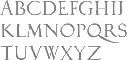 Snowboarder from Liechtenstein, who designs typefaces at P22 and its descendant foundries such as HWT. The list:
 - His first font was the whacky P22 Catalan (2003), which was inspired by Antonio Gaudi, Joán Miro and Salvador Dali.
- In 2004, he created BlancoNeg, Mexican Relics (100 dingbats from pre-Columbian Mexico), Sniplash (a 60s cartoon face) and Durer Caps (after Dü'rer's 1525 original).
- In 2005, he added P22 Mystic (art nouveau).
- The curly P22 Festiva and P22 Huffer Pro (comic book face) followed in 2009.
- In 2010, he designed two revivals of Nebiolo work, P22 Nebiornaments, and P22 Slogan (after the 1957 brush font by the same name by Aldo Novarese).
- In 2012, he created P22 CoDependent, a set of two art deco typefaces that revive of the Independant typeface from 1930 created by Dutch designer Johannes Nicolaas Coenraad Collette along with Jos Dufour from Belgium.
- In 2012, Terry joined forces with Richard Kegler and published the multilayered Western circus font HWT American Chromatic at Hamilton Wood Type. American Chromatic was originally created by Wm. H. Page & Co. circa 1857-59.
- In 2013, he designed HWT Arabesque for Hamilton Wood Type. This art nouveau / psychedelic typeface was originally produced by the Morgans & Wilcox Co. and the Wm. Page Co. as almost identical designs. Both manufacturers were acquired by Hamilton and offered briefly by Hamilton as design #618. William Page Arabesque was first shown in 1872 and after the Page purchase by Hamilton in 1891, it was renamed to No. 618. Similarly, the Morgans & Wilcox Arabesque was first shown in 1884, but after Morgan's purchase by Hamilton, it was renamed to No. 3189.
- HWT Showcard Script (2020). Described as an extended script type that lends itself well to fine fashion, ready-to-wear and all quality merchandise in a marketing blurb that pitched Beaufont by the Morgan Sign Machine Company of Chicago for their Line-O-Scribe sign printing system. This advertising script font was originally manufactured exclusively for Morgan Sign under license by the Hamilton Wood Type Manufacturing Company.
- In 2020, the Bixlers and P22 jointly published the ornamental typeface LTC Bixler Ornaments. The digital version is due to Terry Wudenbachs.
- P22 Snowflakes (2020). By Richard Kegler and Terry Wüdenbachs.
Klingspor link. View Terry Wüdenbachs's typefaces. [Google]
[MyFonts]
[More] ⦿
|
Teuku Deky Firnanda
[Seruput (or: Barokah, or: Graptail)]

|
 [MyFonts]
[More] ⦿
|
The Ampersand Forest
[D.C. Scarpelli]

|
 Scarpelli's design and production clients have included the California Attorney General's Office, Napa/Sonoma Magazine, the American Cancer Society, Catholic Healthcare West, UC Hastings School of Law, Chevron, Frito Lay, the Oakland A's and the San Francisco Giants. He regularly designs theater graphics for companies throughout the Bay Area, and is resident Graphic Designer for 42nd Street Moon, Bay Area Musicals, and Silicon Valley Shakespeare. Additionally, he has created and edited several art books in the collection of the San Francisco Museum of Modern Art. His original training is in the theater. With his husband Peter Budinger, he has written and directed several plays, and appeared in numerous productions. They were theater majors, playwrighting students, and improv disciples together at Yale University. Scarpelli is currently Associate Director of the School of Web Design + New Media at the Academy of Art University, San Francisco. He designed these typefaces:
 - Donovan Display (2021). A modern tall display serif in twelve styles.
- Pawl (2020). A 48-style elliptical sans family. He writes: Pawl lives in the same visual landscape as fantastic modular superfamilies like Eurostile, Agency, Geogrotesque, Barlow, and even the great American Gothics.
- Worriment (2019: a vampire typeface).
- The extroverted display typeface family The Fudge (2019), which comis in Skinny, Sleek, Thicc and Chonk styles.
- Pamplemousse (2019), originally called Chelsea Morning: A family of casual-but-chic Sunday-morning display faces. Pamplemousse started out as a typeface based on the lettering of Gustav Klimt in his poster for the first exhibition of the Vienna Secession movement (Art Nouveau). This drifted into an homage to Rea Irvin's iconic masthead typeface for the New Yorker magazine. Finally, with the addition of a lowercase (absent from Irvin's typeface), a significant revision away from both Klimt and Irvin into a more casual space, Pamplemousse was born.
- Ampir. A casual Modern typeface, suggestive of gilt sign-maker letterforms, influenced by the modular type forms of Yakov Chernikov. Roman and Cyrillic character sets.
- Disquiet: Disquiet is a weird little display typeface designed to convey the free-floating anxiety of the mid-20th century. It is based on a single nongeometric form: the temple piece of a pair of horn-rimmed glasses---the kind worn by sweaty little men in offices who always seem to run the world in Atomic Age thrillers.The form is hexagonal, to give each letter a sense of being locked in---trapped. The double stroke gives it a nasty little bit of queasiness. And the negative spaces within the letters form mini-glyphs of their own---perfectly geometrical inside the fractured outer strokes.
- Swonderful (2019). An art deco typeface family with many different styles of interlocking.
- Haggis (released in 2020, but designed earlier): Haggis was intended to be a pseudo-sans-serif version of a traditional Insular Uncial. A bastard child of pub signage and rubber duckies, Haggis is not without its charms, and it certainly doesn't take itself too seriously.
- Mrs Keppel: Inspired by Stephenson Blake's 1884 typeface Windsor Light Condensed (made famous by Woody Allen's title sequences), Mrs Keppel finally appends an italic to this iconic face. Gentle in its design but firmly anchored in the fin-de-siècle, Mrs Keppel moves us forward to the 1910s, redolent of Ragtime and spiked tea. Named for the mistress of King Edward VII, who was likewise illegitimately linked to a Windsor.
- Donovan Display (2021). A modern tall display serif in twelve styles.
- Wiblz Serif (2021). A 12-style didone.
- Carollo Playscript (2021). A ten-style slab serif that is inspired by typewriter type.
- Nerone (2021). A slightly despotic display typeface.
- Budinger Oldstyle (2021). A ten-style semi-Venetian renaissance text typeface.
- Tremendo (2021). A 48-style gothic sans with many hipster elements such as the coathanger lower case f.
- Wodehouse (2021). A vintage display trio with a hint of deco.
[Google]
[MyFonts]
[More] ⦿
|
The Flying Type

|
 Brazilian type foundry set up in 2021 by the people who started Pintassilgo Prints two decades earlier, Erica Jung and Ricardo Marcin. Their typefaces:
 - Allotropic (2022). An art nouveau font that loosely draws inspiration from an untitled alphabet drawn in 1914 by J.M. Bergling.
- Aquatronik (2022). A reto-futuristic typeface.
- Acid Green (2021). A post art nouveau and partly psychedelic typeface based on a 1914 alphabet by J.M. Bergling.
- Chorine (a bottom-heavy psychedelic font) (2021).
- Lunatique and Lunatique Rounded (2021). A revival and extension of the semi-psychedelic typeface Lucky, which was designed in 1972 by André Pless for the Mecanorma type contest, and later released by Mecanorma in their Letter-Press transfer sheets.
[Google]
[MyFonts]
[More] ⦿
|
The Fontry
[Michael Gene Adkins]

|
 The Fontry is a Watts, OK, based outfit, est. 1992 by Michael Gene Adkins (b. 1965, OK) and James L. Stirling (b. 1964, OK): Digital type for computer-aided signmaking, with fonts designed for signmakers by signmakers.
 Since 2009, they have been producing various digitizations of alphabets designed by Alf R. Becker in the 1930s and 1940s. Gene Adkins designed ARB-187 Moderne Caps AUG-47 (2013, didone), ARB 85 Modern Poster JAN-39 (2011, after Modern Poster Script, 1939), ARB-70 (1995), ARB-67 (1998), ARB-66 Neon (2010, +Block, +Line), ARB-44 (1995), ARB-96 Jitter Display DEC-39 (1999), SCRIPT1 ARB-85 Poster Script Normal (2000), ARB-66 Neonline Block, ARB114 Hillbilly Roman JUN-41 Normal (1999), ARB-187 Moderne Caps AUG-47 CAS family (2009, a beautiful didone display face), the ARB 08 Extreme Roman AUG-32 CAS family (2009), ARB-218 Big Blunt (2010), ARB-218 Neon Blunt. Another product is the Wild Bunch Pak #3: Danthr Skal, Kastaka, Gas Bumps, Skrawl 613, Sharrpe Gothik, Levo Fraz, Kommerce, Stellar Spice, Infected Hurt. Wild Bunch Pak #2 (50 USD) has Marbles&Strings, Keetoowah, Peppermint, Ghixm (2008: a retrospective of the horror comics and movie posters of the 1960s and the 1970s), Klash, all outline fonts. In Wild Bunch Pak #1, look for Toxia. Race Pak #1 contains 5 chiseled fonts, including ARB67, Brannt Chiseled, Excursions, JLS Ultra, and Race Checkers. 50 USD. There are also Greek Pak #1 (12 Greek fonts for 25 USD, including GRK Orbit, GRK Universe City, GRK Albert, and GREK Bodnaut) and Signfaces Narrow Pak #1. At Garagefonts, Wild Larra, Wild Ruts, Wild Toxia, Wild Nobody families (1999), Jackport (2014, athletic lettering and Western typeface family). Adkins also designed the commercial font First Vision at GarageFonts in 1998. Review at &Type. List of the fonts on his CD. MyFonts sells FTY Garishing Worse (2011---there is a free version at Dafont), SCRIPT1 Team (2010), SCRIPT1 Toon (2010), SCRIPT1 Voodoo Script (1999-2009, signage script), What Sound Pounds (2009), WILD3InfectedHurtNormal (2010), WILD1 Firstvision (1997), WILD1 Larra (1997, grunge), WILD1 Nobod (1997, grunge), WILD1 Ruts (1997), WILD1 Toxia (1997) and the blackletter typefaces Ironhorse and Ironrider (2007), revivals of classic wood type typefaces. FontShop link. Some fonts are inspired by sign painter Frank H. Atkinson. These include the Broken Poster series done in 2010, FHA Modernized Ideal Classic (2011), and FHA Nicholson French (1999-2014: art nouveau). In 2008, The Fontry published the Greek Font Set, Copper Penny DTP (after Copperplate Gothic, but with lower case included), Droeming (an eerie family) and Earth A.D. (more eerie stuff, metallic, and with sharp serifs). It then generated a break-away subfoundry that carries fonts solely designed by James Stirling, Fontry West. Fontry West is located in Tulsa, OK. At MyFonts, these Fontry West fonts can be bought: Iron, WILD1 Firstvision, WILD1 Larra, WILD1 Nobody, WILD1 Ruts, WILD1 Toxia, WILD2 Ghixm, Greek Font Sets 1 and 2 (not Greek, only Geek-ish, made for fraternity use), and a large Comic Fanboy set which includes glyphs painted with stars and stripes (CFB1 American Patriot, CFB1 Captain Narrow, CFB1 Shielded Avenger, all made by Adkins). The CFB1AmericanPatriot family (2009), and the SCRIPT1 Rager Hevvy family (2009) are free here. JLS Overkill (2009, Bloque, Stencil, Grunge, Champion [athletic lettering], Hammer) is a sturdy family covering everything from SUV-strength stencils to grunge stencils and macho slab serif headline typefaces. After Disaster (2008), FHA Eccentric French Normal (2008, wood type after an alphabet created by Frank H. Atkinson in 1908), WHATSOUNDPOUNDS?Normal (2009) are free at Dafont. Sinder (2010) is a grunge face. FTY Konkrete (2010) is constructivist, and has a beveled weight. FTY Strategycide (2010-2018) is a similar severe headline sans family. Sinder (2010) and Demon Sker (2011) are free grunge typefaces. American Purpose (2011) is a grotesk family. American Purpose Casual and American Purpose Stripe (2011) are follow-ups. Garishing Worse (2011) is a casual bold face. Sharpe Gothik (2011) is hand-drawn. American Captain (2011, a manly retro squarish propaganda headline face; see also American Captain Patrius 02 FRE). Deathe Maach (2012) is a sturdy 6-style display family. Avengeance (2012) is a techno typeface. FHA Condensed French (2012, by Michael Gene Adkins and James L. Stirling) and FHA Nicholson French (1999-2014, art nouveau) are based on Frank H. Atkinson's examples. Typefaces from 2013: FHA Broken Gothic (a layered chiseled family done with James Stirling, based on Broken Poster by Frank H. Atkinson), FTY SKRADJHUWN (a flared family), Iron Man of War (with layering effects, +001Rivet), Iron Man of War 2 NCV, RACE1 Brannt (prismatic, beveled, art deco), FTY Skorzhen (mini-spurred), FTY Speedy Casual, FTY Skradjhuwn NCV (comic book family). Typefaces from 2014: FHA Tuscan Roman (2014, Michael Gene Adkins, James L Stirling), FTY Varoge Saro Noest. Typefaces from 2015: FHA Sign DeVinne (after a popular sign painting design by Frank H. Atkinson named after DeVinne). Typefaces from 2016: FTY Delirium (+Neon), Delirium NCV. Typefaces from 2017: FTY Galactic VanGuardian. Typefaces from 2021: Fty Old Sport (a slab serif athletic lettering font family, one of the best in this genre). Typefaces made by Fontry West. Typefaces by Mike Adkins. Fontspace link. Klingspor link. Dafont link. Abstract Fonts link. Creative Market link. [Google]
[MyFonts]
[More] ⦿
|
The Golden Black
|
 Commercial display type foundry in Saint Petersburg, Florida, est. 2009. Their selection includes Orthodox (2011, a spiked display face), Golden Blackletter, Catalyst Black (Lined, Solid; by Hydro74), Iron King (2011, inspired by cigar box labels), Chief (monoline octagonal face), Fearless Script (2011, tattoo script), Inked Script (copperplate calligraphic (tattoo) script), Muerte Black (by Hydro74), Black Mamba (by Hydro74), Viper Black (by Hydro74), West Coast Soul (by Hydro74), Bushido Ink, Iron Fist, Blackmail Sect, Golden Age, Tyranny Gothic. Infamous (2011, +Shaded) is a custom display font based on typography by the Sanborn Company designs issued in the 1800s. Perfecta (2011) and Fantasma (2011, spurred, all caps) are art nouveau fonts.
 Golden Bones (2011) is free. Typefaces from 2013: GB Shinto (oriental simulation), Berzerk (angular and spurred). Behance link. Dafont link. Another Behance link. [Google]
[More] ⦿
|
The Ugly Tree
[Geoffrey Bunting]
|
 Geoffrey Bunting (b. 1991, Germiston, UK) graduated from Cambridge School of Art with a degree in Graphic Design in 2014. His first company was called The Ugly Tree Graphic Design (Norwich, UK). He created Eddison (2016), a tall condensed modular typeface for E.R. Eddison's The Worm Ouroboros.
 In 2018, he designed the all caps typefaces Victoria Nouveau. He also published the 3d typefaces Stalker and Pixel Gothic in 2018. [Google]
[More] ⦿
|
Theo Molkenboer
|
Dutch art nouveau era book artist, 1871-1920, whose lettering from 1900 can be admired in Rudolf von Larisch's Beispiele künstlerischer Schrift (1900-1926). [Google]
[More] ⦿
|
Theresa Luft
|
Muenster, Germany-based designer of the free art nouveau typeface Mohnschein (2019). [Google]
[More] ⦿
|
Thibaud Chanoine
|
Paris-based designer the art nouveau font Contreformik (2021). [Google]
[More] ⦿
|
Thibaudeau's classification
[François Thibaudeau]
|
In 1921, François Thibaudeau (1860-1925), a French typographer, proposed a simple classification system based on serifs: - Triangular serifs are called Elzevir (or antique, as in Jenson and Garamond). When they are geometrically rigorous triangles, the style is called Latin. Heavy Elzevir types are called deVinne types.
- Didot typefaces, now called didones: these are characterized by rectangular serifs.
- Egyptians have rectangular serifs on top and bottom of thickness equal to the stroke width. When the bottom slabs are rounded on the inside, he calls them égyptiennes anglaises (English Egyptians). Another subfamily of the Egyptian types are the Italian types, which have thick slabs and reverse stress.
- "Antiques" (or: lettre baton): sans-serif typefaces such as those drawn by the Greeks and Romans.
- Hellenic types: these have triangular serifs and feature bi-concave strokes.
- Trait de plume types: these often have triangular serifs, but the glyphs are almost drawn by a pen, as in many art nouveau typefaces.
Thibaudeau later added the Script and Display sections to the list above to categorize types used in advertising. Franços Thibaudeau wrote the art nouveau-styled Manuel français de typographie moderne, faisant suite à "La Lettre d'imprimerie"... Cours d'initiation... par la pratique du croquiscalque, ou manuscrit typographique (1924). He also wrote La Fonderie Typographique Française Album d'alphabets pour la pratique du croquis-calque, édité spécialement pour le Manuel français de typographie moderne de F. Thibaudeau (ca. 1920, impr. de G. de Malherbe, Paris). Local download of the latter book in PDF format [15.7MB]. [Google]
[More] ⦿
|
Thomas Da Silva
|
Graphic designer in Versailles, France. In 2018, he created the art nouveau typeface La Samaritaine. [Google]
[More] ⦿
|
Thomas Ewing French
|
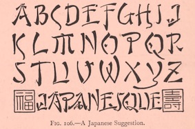 Scientific lettering expert, 1871-1944. His book The Essentials of Lettering (1912, McGraw-Hill, New York), coauthored with Robert Meiklejohn, has many historical examples and takes the reader on a grand tour of lettering. The tease. Local download.
 For a digital revival of some alphabets, see Jeff Levine's New Thin Roman JNL (2019) and Drafting Class JNL (2021). [Google]
[More] ⦿
|
Thomas Franz Bernhard Simandl
|
Graphic designer in Vienna, who created the severe sans typeface Viennesienne (2014), which was inspired by art nouveau, Klimt, Loos, and Wagner. [Google]
[More] ⦿
|
Thomas Vree
|
Dutch type designer, b. 1967, Amsterdam, who now works in Dundas Valley, Ontario, Canada, in pre-press and the print trade. He has had wonderous encounters with other type designers. He made 47 digital typefaces. As far as I can tell, no sales, and no downloads. Behance link. A partial list: - Amazon (1996). Most letters are didone, but some serifs are Bodoniesque.
- Amsterdam: A compendium of experimental typefaces done starting in 1988. He writes: My initial forays into type consisted of hacking Letraset, distorting it on photocopiers, playing around with it on stat cameras, then adding to that with tech pens, etc. Then in early 88 I started drawing type on the computer. I was doing fanzines, gig posters, logos, tape covers, etc. and I knew instinctively that I wanted to use typefaces other than the ones I had at my disposal. My choices at the time were very limited, and nothing I had access to accurately conveyed the look I thought would be appropriate for say an experimental electronic combo. So I started drawing my own typefaces.
- Bass Bin (1997). A first hint of grunge.
- Boloni (1996). A Bodoni face.
- Cosmodrome (1992).
- Cryptonym (1995). A mishmash of fonts reconstructed to give something magical.
- Dirigible (1993). A slightly convex display face.
- Dread (1991). In the style of Kisman's Fudoni and Makela's Dead History.
- Engravers Initials 2 and 3 (2011). These are Victorian über-ornamental semi-blackletter typefaces based on designs found in Dan X. Solo's Gothic and Old English Alphabets from Dover Publications.
- Faith. Thomas writes: Back in 94, 95 Paul Sych of Faith asked me to do the production work on a typeface package he was going to release through Thirstype. I created the analphabetic, accented characters, set up the kerning tables, and in some cases, created variants (italic, bold, outline, etc.) One of the typefaces was Wit, which was inspired by the experimental typography of Kurt Schwitters. The set of typefaces Thomas did included Wit, Fix Plain Mix, Fix Sin Mix, Fix Ram Hog Mix, and USeh.
- Freddy. A digital version of an art nouveau typeface that Morgan Press had been using in the 1960s [those psych typefaces were mostly inspited by art nouveau].
- Gyrosol (1997).
- Jarkko. Based on old sign painter lettering.
- Lucas: a sans family.
- Lucifah: comic book lettering.
- Mau Gothic: a bold weight of W.A. Dwiggins's Gothic, on commission for Bruce Mau Design.
- Nephilim (1996).
- Penetralia (1990). An ultra-condensed face.
- Percolator. An organic face.
- Poser (1995): A comic book face.
- Puffage (2010): a typeface made up of pot leaf elements.
- Ray Gun: a type done for a Ray Gun flyer.
- Reklame. With hints of Avant Garde.
- Snug Industries Font (a logotype done with Tony Elston).
- SubRosa (1992). A squarish condensed face.
- Thornaments. A set of symmetric ornamental symbols.
Behance link. [Google]
[More] ⦿
|
Thomas Wood Stevens
|
 Early 20th century designer of letters, who was associated with the Carnegie Institute of Technology, Pittsburgh. Author of Lettering (1916, The Prang Company, New York).
 Alphabets from his 1916 book include Art Nouveau Capitals, Italic Capitals, Italic Lowercase, Modern Script Italics, Modern German Italic Capitals, Modern Round Gothic, Uncial (based on a 14th century manuscript), Venetian Modern Capitals, Roman Lowercase, Modern German. PDF file of his 1916 book. Digital remakes include Wood Stevens (2012, Intellecta). In 2012 and 2013, Dick Pape digitized many of the typefaces discussed in Lettering (1916). They are freely downloadable from this site. The typefaces in Dick's collection are attributed as follows: - No artist: TWS Brush Caps 31, TWS Capitals from Coins 15,
- Harry Lawrence Gage: TWS Heavy Capitals 49, TWS Italian Gothic Caps 80, TWS Renaissance Alphabet 39, TWS Robinson Caps 23, TWS Roman Caps 13, TWS Slab Capitals 22, TWS The Japanese 32 [note: see also Yoshi Toshi, 2003, by Da ABF Mafia, and Yoshitoshi, 2003, by David Nalle].
- Norman P. Hall: TWS Heavy Modern 30.
- Oswald Cooper: TWS Long Ascenders 36.
- Ned Hadley: TWS Modern Caps 24, TWS Modern French 25.
- Helen E. Hartford: TWS Modern German Capitals 28.
- Charles H. Barnard: TWS Modern Roman 05.
- F. G. Cooper: TWS Modern Roman Bold 37.
- William A. Dwiggins: TWS Modern Roman Caps 32, TWS Variation on Georgian.
- Guido Rosa: TWS Outline Caps 21.
- George W. Koch: TWS Roman Wide Pen 33.
Commercial revivals include he slab serif Nouveau Lettering JNL (2019, Jeff Levine). [Google]
[More] ⦿
|
Thor Christopher Arisland
|
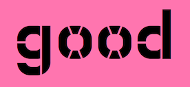 Oslo-based designer (b. 1986) of i8080 (2017: old computer screen emulation font), Manos (2017), Modum (2017), Monomod (2017), the tall serif typeface Roland (2017), the modular monoline monospace sans typeface Borgen (2017), Sullivan (2017), Inverted Stencil (2017), the high-contrast sans High Society (2017), and the slim slab serif typeface Klub Katz (2017).
 Typefaces from 2018: Hothead, Anderson, Nodes, Salome (art nouveau style), Dirdy Birdy (calligraphic and inky), Betong (stencil), Solid Sans, College Sans, Giovanni, Cardboard Cutout, ZX80. Typefaces from 2019: Brush Off (brush script). Creative Fabrica link. [Google]
[More] ⦿
|
Thousand Type Works
[Bryan Levay]

|
Thousand Type Works is the Nashville, TN-based foundry of Bryan Levay. Their fonts, dated ca. 2011, include Equa (squarish family), Astral (art nouveau flavors), Alebin (large x-height text face), and Kilo (informal handprinting). [Google]
[MyFonts]
[More] ⦿
|
Tibor Lantos
|
 Budapest-based creator (aka Frodo 7) in 2009 at FontStruct of FontMoot 01 (pixel face), Brego, Magor (minimalist, De Stijl typeface), Andromeda Strain, Elrond (Tengwar font), Oil Stencil, Optill 2A and 2B and 3A and 3B (optical illusion fonts), Rivendell (Celtic weaving), Cubeology (patterned cubes), The Two Towers, Mike Wazowski (emoticon face), Edoras Stencil, Elessar, Earendil, LE Meta (dot matrix), Coccinella (dot matrix), +Two, +TwoB, Picosec, Picosec Rounded (ultra fat retro), Palindrome, Valimar, Fundin Eco, Fundin Regular, Lost Entropy (series of rectangular fonts), Bombs and Men (2009, modular and blocky), Eärendil, Chromosomes, Denethor-Sans (octagonal), Edoras-, Elspeth-, Elspeth-Grey, FontMoot-01 (pixel face), French-Defence-v2 (chess font), French-Defence (chess font), Gilgalad-v2, Gilgalad (octagonal), Hommage-a-Escher-LC1, Hommage-a-Escher-LC2, Legolas-Codex-Stencil, Legolas-Codex (blackletter family), Legolas-Stencil (+v2; art nouveau style), Mirkwood-Regular and Mirkwood Outline (pixel typefaces), Nimrodel-FS, Faramir (gridded), Faramir Black (octagonal, mechanical), Elessar, Vertebrae, Etudes Pour Noir et Blanc (01, 02, 02 Vertebrae), Eomer FS, Karyotype (horizontal stripes), Snooker Ball, Aragorn, Mirkwood Nano (pixel face), Mirkwood Second Iteration, Mirkwood First Iteration, Haldir (pixel face).
 Creations in 2010: Hasta Siempre (military stencil), Hasta Siempre Supplement (Fontstruct rendering of the iconic photograph of Che Guevara by Alberto Korda), Belfalas, Fractal Font, Sierpinski White, Sierpinski Black, Sierpinski Dalmatian, Remolino Stencil, Boikot Stencil, Legolas Pixel, Brego, Vortices (dings), Gamling, Coccinella Two (+B), Cyrillic 02, Waves, Hommage à Escher v2 extLat. Creations in 2011: Midori Dot (2011, a dotted kana face), Sierpinski Black Initials (a stunning decorative caps typeface based on Sierpinski triangles), Fontstructivism (constructivist Latin/Cyrillic face), Sierpinski White Initials, Vasarely Squares (experimental---letters based on Victor Vasarely's work), Hurin (counterless, created after Nagasaki by Tom Muller), Strider (an optical illusion 3d multilined face), Dot Dot White (texture face), Dot Dot Black (texture face), Garamond Italic SP (a pixelized version of Garamond Italic), Rohan (+NE01, +NE03: a textured lined 3d logotype family, +NE04, +NE10), Gray Scale (a very interesting texture experiment in which gray scales are "simulated" by simple font mechanisms). Fonts made in 2012: Font Neuf, Khazad (stencil font), Oktogon Stencil, Oktogon Outline, Thorin Stencil (army stencil), Deagol Stencil. Typefaces from 2013: the Voxelstorm family (3d, Escher-style), Elendil (3d face), Denethor Sans (strong mechanical sans), Mirkwood Nano (pixel face), Waves (op art). Typefaces from 2014: Wrath of Mordor (video game font), Gray Scale, Luthien Pixel (blackletter pixel), Gimli (Bevel Black, Inline Shadow, Inline, Bevel Shadow, Shadow), Zebroid, Hunor, Denethor Sans v2, Vasarely Squares (op-art), Waves (op-art), Ecthelion, Hast Siempre (octagonal stencil). FontStruct link. [Google]
[More] ⦿
|
Tim Ryan
[Type Revivals (or: SourceNet)]

|
[MyFonts]
[More] ⦿
|
Tipo Pepel (was: Antaviana Typeface Division, or: Astramat)
[Josep Pep Patau i Bellart]

|
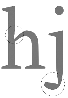 Antaviana Typeface Division is a Catalan foundry, est. ca. 2002. It went also under the name Astramat and was also known as ANTAVIANA SERVEIS INTERACTIUS, SCCL. Located in Lleida, it is run by Josep Patau i Bellart (b. 1971, Les Borges Blanques, Lleida). Patau i Bellart offered free fonts, as well as commercial fonts. He has emerged as one of the most talented contemporary Spanish type designers. In 2011, he started Tipo Pepel [MyFonts link] in Les Borges Blanques. Josep Patau's typefaces:
 - Free typefaces: Lletraferida (2011, a didone), Negrona (2011, a revival of Lucian Bernhard's Bernhard Negro, 1930), Perolet, Lango, Gimenells, Arbeka, Rosango, Antaviana, FoxScript (1996, old typewriter), Unregistered, and FistroRatted (grunge).
- At Astramat, one could download these fonts: Anmari (2002), Antaviana (1996), Arbeka (2002), FAXADA (2001, by Cel Tico Petit), FoxScriptNormal (1996, old typewriter), Gastada (2001, another grunge font by Cel Tico Petit), Gimenells (2001, pixel font), Gorchs (2007, script font), Klander (1999, pixel font), Lang (2001, pixel font family), Masterfly (2007, T-26), Omellons (2001, pixel font family), Perolet (2001, Bauhaus style), Pixelade (2001, pixel font), Rosango (1996), Tiquet (2001, grunge font by Cel Tico Petit), Ultrafat (2007, T-26), Fistro Ratted. Fontspace link for Astramat.
- T-26 fonts: the screen typeface PixScript (2004), the screen icon dingbat font Pixelade Icons (2003), the art nouveau headline font Gisele (2003, angular art deco titling face), Masterfly (2007), Gopal (2004), Gourmet (2004, based on a type from the 1923 ATF catalog), Confetti (2006, connected fifties style face based on a 1930 type called Escritura Maravilla and Escritura Energica by the José Iranzo foundry in Barcelona), the pixel family Bit Kit (2003), Houdini Icons (20 pixel web icon dingbat typefaces, 2004).
- At ATypI 2009 in Mexico City, he explained the typographic work of the goldsmith Manuel Peleguer: The aim of this paper is to give an account of the project Peleguer, the recovering and digitialization of the work of the goldsmiths Manuel Peleguer, both father and son, who cut some printing characters between 1780 and 1784 in response to an order of the "Real Sociedad Económica Valenciana de Amigos del Pais". The result was a modern transitional typeface, with good legibility and neoclasical forms, equal in quality to those made by the Real Press (Imprenta Real) in Madrid by Pradell, Espinosa or Gerónimo Gil. Peleguer founded a press and a font foundry in 1784. Patau Bellart created a type family based on Peleguer's work called Peleguer (2009, + Ornaments).
- Anduaga, a calligraphic typeface from the 18th century, won the Laus Prize (said to be the Spanish equivalent of the type Oscars). Anduaga is the interpretation of the script that Joseph of Anduaga proposed for teaching the first letters in the 1780 book Arte de escribir por reglas y sin Muestras ...
- Valliciergo (2011) is a 100+-glyph calligraphic / copperplate script font that is inspired by samples from Caligrafía inglesa published in Madrid in the late nineteenth century by Spanish calligrapher Vicente Fernández Valliciergo.
- Dafont page, where one can download Ventura Edding (2008, hand-printed).
- Kids Script (2011). An upright connected school script.
- Trajana Sans (2011) is a sans-serif typeface family based on the shapes and proportions of the characters on the Trajan Column in Rome.
- Farrerons Serif (2011) is a very readable family with angular and humanist underpinnings.
- Chupada (2012) is an ultra-condensed font family noted for their exaggerated x-height, which consists of five different weights.
- Chopped Black (2012) was inspired by the font Pabst Heavy, designed by Chauncey Hawley Griffith in 1928 for Linotype. It was Linotype's version of ATF's popular Cooper Black.
- Paralex (2012) is a 12-style geometric slab typeface family.
- Boxed (2013) is an 18-weight squarish sans family. Followed in 2017 by Boxed Round.
- Cinta (2013). A large humanist sans family with a full range of weights starting with hairline. It also has Cyrillic.
- Bridone (2013), for British didone. A didone family that inherits some features from Victorian era British slab serif typefaces. Fashionable, beautiful, and useful.
- Sisco (2014) is an 18-style elliptical techno family with large x-height.
- Book Cover (2014) is a fat headline typeface.
- Tiquet (2014). A dot matrix typeface.
- Milio (2014). A ten-style wedge-serif transitional typeface family for newsprint and magazines.
- Naste (2014). A sixteen-style geometric sans family that adds details and character to the classical geometric sans typefaces such as Futura. It is a bit wider than usual and covers Cyrillic.
- Pobla (2015). A text serif with angular, almost fractured.
- Dupla. A large multilingual sans family.
- Trepa (2015). A stencil family with various choices of textures, which was inspired by commercial signs and the 1960s French art movement Graphie Latine.
- Itaca (2016). A 48-style sans family with very open counters.
- Mario (2017). A typeface family for arcade games and children.
- Werdet Script (2017). A calligraphic penmanship script which is named after calligrapher Jean-Baptiste Werdet who was a penman in Bordeaux in 1809 and later a professor at Ecole Normale Superieure in Paris.
- Geo Deco (2019). A geometric art deco sans family.
- Frontis (2019). A transitionl roman typeface family inspired by the roman lettershapes that Asensio y Mejorada drew in 1780.
- Kongress (2019). An elliptical sans family for corporate identities.
- Labernia (2019). A large didone family based on the font used in Diccionari de la Llengua Catalana (1864, by Pere Labernia, Barcelona): Labernia and Labernia Titling are characterized by ball terminals that are turned inwards.
- Indecise (2020). A nostalgic 50-style sans family that reminds us of type designs by Enric Crous-Vidal and José Mendoza y Almeida.
- Frenchute (2020). A great 36-style garalde family inspired by the type used in the 1727 text Le Chemin Royal de la Croix.
- Gina (2020). A great readable 16-style humanist sans family. Sixteen styles including a hairline.
- Samplex (2020). Bellart's take on the neutral Swiss sans genre.
- Bauen (2020). A Bauhaus-inspired geometric sans typeface family.
- Bazinga (2020). A display typeface family characterized by square counters. Perhaps a children's book font.
- Romulo (2020). A 12-style transitional roman typeface.
- Kheops (2020). A 14-style slab serif.
Additional links: Dafont. MyFonts page. Alternate URL. Fontspace link. Fontfreak page. Patau Bellart is also involved in the type information site Unos Tipos Duros. Klingspor link. Abstract Fonts link. Interview by Unostiposduros. Fontspring link. [Google]
[MyFonts]
[More] ⦿
|
Todd Jordan Greywolf Peacock
[Jordan Greywolf]
|
[More] ⦿
|
Todd M. Hallock
[Bannigan Artworks]

|
[MyFonts]
[More] ⦿
|
Tom Kennedy

|
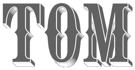 Thomas Kennedy started working for Baldwin Designs, a wood sign company in Concord, Massachusetts, in 1989, where he grew up. He specialized in signage and lettering, and hooked up with Letterhead Fonts in 2011. He now lives in Sweden. Designer at Letterhead of the Pilsner formal script font family (2002) (the lower case is now called Ballpark Script), Egyptian (2006: this is a gothic, not an Egyptian), Pilsner Swashes, CigarShop Corona, CigarShop Maduro (2002, caps), the Western billboard font Tonic (2002), LHF Thick and Thin (2002, sign painting caps in serif and sans styles), Ephemera and Ephemera Swashes (2002, calligraphic), Old Tom, Engravers Ornaments (a great set of filets), Cameo (copperplate), Confection Deco Caps (+Essentials), Corner Specimens, Colonial Roman (2003), Rawson&Evans (Victorian), Royal Script (2003), Cosmic Cursive (2004-2011, a drop dead gorgeous thick upright script), LHF Bootcut (2010, Victorian), LHF Billhead (2004, art nouveau / Victorian), Firehouse (2004, a Tuscan face) and Thick and Thin (2003, sans and serif).
 Letterhead Fonts link. Klingspor link. [Google]
[MyFonts]
[More] ⦿
|
Tom Wallace
[HiH (Hand in Hand)]

|
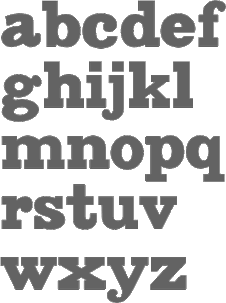 [MyFonts]
[More] ⦿
|
Tomi Haaparanta
[Suomi Type Foundry]

|
 [MyFonts]
[More] ⦿
|
Tomoyuki Watanabe
[Teawat (or: This is typography)]
|
[More] ⦿
|
Transfer Studio
[Falko Grentrup]

|
 Transfer Studio is a design studio that was established in 2006 in London and Stockholm by Valeria Hedman (b. Sweden) and Falko Grentrup (b. Germany). Falko first studied Graphic Design at the Arts Institute of Bournemouth followed by an MA in Communication Design at Central Saint Martins in London. He is based in the UK. Their typefaces:
 - Cabaret Nouveau (T26). It has a bit of an oriental art nouveau look.
- At Parachute, Falko Grentrup published PF Eef (2012). Parachute writes: First conceived as the upper-and lowercase e for the logotype of independent publishers Elemental Editions, the letterforms were so well received that they were extended to an entire typeface and formed the basis for a bespoke font, Eef. The type design draws inspiration from the basic elements, the periodic table, functionalist vintage lettering and influences from other classic geometric typefaces with condensed cuts such as Futura and Trade Gothic. The extended set is now developed into a family consisting of three weights---Regular, Medium and Bold
- Konrad, a bespoke sans typeface for the identity of Transfer Studio.
- Love Story: A playful display typeface custom-made for The Southbank Centre.
[Google]
[MyFonts]
[More] ⦿
|
Trevor Scott
|
During his graphic design studies at Texas Christian University in 2021, treevor Scott designed Caribou (a rounded perhaps art nouveau style serif), Khaki (a display serif), Studioso (a sans) and Angulosa (an octagonal typeface). [Google]
[More] ⦿
|
Tuija Kuusela
|
Graphic designer in Finland since 1988, who obtained a Masters in Philosophy in 2001 from the Art History department at the University of Helsinki. Since 1997 she is a graphic designer at the book publisher Tammi. At the ATypI 2005 meeting in Helsinki she spoke on the history of Finnish type, focusing on the art nouveau era and the early 20th century. [Google]
[More] ⦿
|
Typadelic
[Ronna Penner]

|
 Ronna Penner (b. Niagara, Ontario, Canada, 1958) founded Typadelic, a commercial foundry. She won an award at Bukvaraz 2001 for Sketchley (2001, now a Bitstream font), which is based on her own handwriting. She is located in Waterloo, Ontario. Sketchley and Sketchley Swash are available from Bitstream. Font list: Avril (gorgeous handprinting), Butterflies (dingbats), BlackJack (2002, free), Clarissa (2002), Corky, Frivolous (2002), FiddlestixFunnyCaps (2002), FamousFolks (2002), Inkster (2002), Stone Hinge (2003), JellyBean, Jot, Mayfield, Moonbeam, Pointed Brush, Rendezvous (2003, calligraphic), Lee Ann (2003, calligraphic), Java Jive (2003, comic book style), Ronita (2000, Bitstream), Sketchley, Silver Script (2002), Silver Script Flourishes (2002), Velvet Script (2002), Fiddlestix, Garden Party (2002), Quigley (2002, great art nouveau font), Hayseed (2003), Fresh Paint (2002, handwriting), Frisco Serif (2002), Frisco Sans Serif (2002), Sunnydale (2003, handwriting), American Writer (2003, a Tekton-like font), Amelie (curly handwriting), Rockford (2003, handwriting), Persimmon (2004, brush script), Peach Fuzz, Sheree (2009), Journal Hand (2009), Dream Cake (2009), Sweet Pea, Mirielle (2004), Natural Script (2004), Not Too Shabby (2004), Schlub (2004), Tweedledee (2004), Type Keys (2004), Urban Scrawl (2004), Jinxed (2004), Wazoo (2004), Stylin (2008, a monoline face), Love Ya Honey (2009, a 1950s style hand-printed script), Shes All That (2009), Sharpy (2009, monoline), Tanked (2009), Cattapilla (2009, children's handprinting), Average Joe (2009) and Sweetheart Script (2004, sold via FontBros).
 Fonts from 2011: Pink Lemonade (child's hand), Little Sunshine (Open, Solid: slightly Victorian letters), Gaffer, Ruff N Ready, Elisabeth (rough-edged antiqua), Miss Demeanor (based on 1930s script), Wee Todd (2011, kid's hand), Crush (grunge). FontShop link. Fontspace link. Font Squirrel link. Klingspor link. Dafont link. [Google]
[MyFonts]
[More] ⦿
|
[Deduk Suandana]
 [MyFonts]
Type Revivals (or: SourceNet)
[Tim Ryan]

|
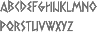 Tim Ryan is a Thousand Oaks, CA-based type designer and font enthusiast, who has helped me out generously with font links in the 1990s. FontShop link.
 His fonts are distributed by ITF and Monotype and Precision Type. Font list: AES, AcmeTR, AdmiralTR, AlpineWhiteTR, AncientTextTR, AssayTR, August family, AutomationTR, BinnerGothicTR, BinnerTR, BlackboardLinedTR, BlackboardTR, BoboCapsTR, BonGuia, Bondage-Oblique, Bondage-Regular, BoomerangTR (1995, a typical art nouveau face), CameraStencilTR, CartoonPartyCapsTR, ChopinTR, CiviliteTR, ClaudiusTR, CollegeCapsTR, CoreDumpTR, DirectionTR, EclipseCapsTR, EngravedTR, ExpressTR, FlairTR, FrenchCapsTR, GabrielleTR, GaelicCapsTR, GoudyMediaevalTR, HelvinBlackTR, HelvinTR, HostessTR, KhayyamTR (Arabic simulation face), KiddoKapsTR, KleukensTR, LadyDawnTR, MaximeTR, ModTR, PencilCapsTR, PlayBlocksTR, SaltinoTR, SansPlateCapsTR, SchoolScript-Bold, SchoolScript (1994), SchoolScriptDashed, SchoolScriptLined-Bold, SchoolScriptLined, ShalimarTR (Indic simulation), ShalomTR (Hebrew simulation), SimplexTR, SpringtimeTR, SukiakiTR (Japanese simulation), SusieQTR, VarianteInitialsTR, WashingtonTextTR, XerxesTR (Greek simulation face, now at Monotype), SchoolOblique. Santa Barbara, CA-based SourceNet used to market school fonts, ca. 1992-1994, such as those listed above: SchoolScript-Bold, SchoolScript (1994), SchoolScriptDashed, SchoolScriptLined-Bold, SchoolScriptLined, but also DnealianCursive, DnealianCursiveLined, DnealianManuscript, DnealianManuscriptLined. [Google]
[MyFonts]
[More] ⦿
|
TypeArt Foundry (or: Digiteyes Multimedia TypeArt Foundry)
[Lloyd Springer]

|
 TypeArt is the commercial foundry of Lloyd Springer (Vancouver), est. 1992. His typefaces from before 2003:
 - Bitmap fonts: CitymapRounded, LoveBytes, Letterstitch.
- Comic book: Disorder, Scratchpad, Sideshow, Superhero, Verbal Cues, Balloons, Buffalo Joe, Frontline.
- Western: Outlaw, Eastside.
- Typewriter: Courier Ragged, Double Hitter, Firenza, Keystoned, Romanstone, Streetwise, Writing Machine, Firenza Text, Dear John.
- Stencil: Mediocre, Boxcar.
- Serif: Burlington (1997, roman caps only), Miracolo (2002, art nouveau), Saltzburg (1999, a bit art nouveau), Steinburg Modern, Sundance.
- Script: Prints Charming, Sideshow, Dream Lover, Falcon Casual, Falcon Brushscript.
- Fifties: Golden Age, Golden Day, Flingaling.
- Monster: Braindead, Horror Show, Junglemania, Newman, Frankenstein, Frontline, Mixed Breed.
- Label type: Dimeotype, Label Gun, Liteweit, Silverscreen (1998, a condensed sans ideal for movie credits), Total Disorder, Letterstitch.
- Inline: Puzzler, Scratchpad, Steelyard.
- Grunge: Amnesia, Bellamie, Bighead, Braindead, DeviantStrain, DoubleHitter, DoubleVision, Fi ngerprint, LabelGun, Meanstreak, Phantom, Poorsport, Social Menace, Streetwise, TotalDisorder, Mixed Breed, Tapeworm, Typochondriac.
- Display and decorative fonts: Niteweit, PostIndustrial, Tolstoy (1996, art deco), WhatTheHell, Xheighter, Bossman, Eucaliptus (art deco), Fishboners, Strangelove (1999), Charbonne (art deco), Reerspeer (2002), Freakshow, Underground, Tipemite, Spaced Out, Sunday Best, Eye Doctor, Foreign Language, Hammerhead, Sidewalker, Wendy Woo, Post Industrial, Starship Command, Venus Envy.
The 2003 collection includes Natalian, Amusement, and Finders. MyFonts link. In 2007, MyFonts started selling his fonts: Amnesia, Bellamie, Bighead, Bossman, Boxcar, Buffalo Joe, Charbonne, Courier Ragged, Dead Zone, Dear John, Deviant Plain, Deviant Strain, DimeOtype, Disorder, Double Hitter, Double Vision, Dream Lover, Eastside, Eucaliptus, Eye Doctor, Falcon Brushscript, Falcon Casual, Frankenstein, Frontline, Golden Age, Golden Days, Horror Show, Junglemania, Keystoned, Label Gun, Letterstitch, Letterstitch Plain, Letterstitch Script, Liteweit, Miracolo, Outlaw, Prints Charming, Reerspeer, Romanstone, Saltzburg, Sidewalker, Silverscreen, Spaced Out, Starship Command, Steelyard, Strangelove, Sundance, Superhero, Tapeworm, Time Machine, Tolstoy, Typochondriac, Venus Envy, Verbal Cues, Writing Machine, Xheighter Condensed. View the TypeArt typeface library. [Google]
[MyFonts]
[More] ⦿
|
Typeco
[James Grieshaber]

|
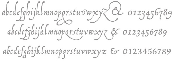 James Grieshaber earned a BFA in Graphic Design from Rochester Institute of Technology. Based first in Rochester, NY, and then in Chicago, IL, and then again in Rochester, Grieshaber ran Typeco, a typographic services and solutions company established in 2002. James Grieshaber (b. Detroit, 1967) most recently was on staff of P22 Type Foundry, where he designed many type families and helped establish International House of Fonts. He has been honoured with an award of Excellence in Type Design from Association Typographique International (ATypI) for his Gothic Gothic (2004, blend of blackletter and English style), and by TypeArt'05 (for Operina Cyrillic). Designer and Co-editor of the Indie Fonts book series, Grieshaber now teaches typography at RIT and runs Typeco. MyFonts sells his fonts now. YouWorkForThem sells the Super Duty family (stencil), Glyphic Neue, the Trapper families, Chunk Feeder, Gothic Gothic and Cusp. Identifont page. FontShop link. Behance link. Details on some of his typefaces:
 - Gothic Gothic (2001), an extended blackletter co-designed with Christina Torre. In 2004, he received an award of Excellence in Type Design from Association Typographique International (ATypI) for his Gothic Gothic type design.
- The Glyphic Neue display family was inspired by the Op Art style of lettering in the United States that ran rampant in many photo type houses in the 1960's and 1970's---I like to call it the "piano key style".
- Chunkfeeder (2002) is a beautiful monospaced octagonal OCR-like family.
- Cypher (2003, an LED/LCD family) has 24 weights. Of these, Cypher7 is free.
- Duty (2002) is a sans typeface co-designed at T26 with Lee Fasciani.
- The stencil family Super Duty (2004) has 8 variations. There are also techno variant called Superduty Condensed, Superduty Regular, Superduty Narrow and Superduty Text.
- Cusp (2001-2005): a techno display family with 18 weights, including an LED style, art deco styles and Cusp De Stijl.
- Trapper (2004) is an 8-weight exaggerated ink trap font family which comes in Trapper Round and Trapper Sharp versions.
- Zaftig (2008, Typeco) is a super-fat face.
- P22 Operina (2003, in Romano, Corsivo and Fiore versions) is based on Vicentino Ludovico degli Arrighi's calligraphy used in his 1522 instructional lettering book La Operina da Imparare di scrivere littera Cancellarescha. This book contains what is considered to be the earliest printed examples of Chancery Cursive. P22 Operina won an award at TypeArt 05. Operina Pro contains over 1200 glyphs. In 2010, Paulo Heitlinger compared P22 Operina favorably to another digital chancery font, Poetica (by Robert Slimbach, Adobe), which, according to him [and I agree], lacks vigor and dynamism.
- P22 Posada (2003, with Richard Kegler): based on lettering of Mexican printmaker José Guadalupe Posada (1851-1913) that was used for some of his posters and broadsides.
- P22 Arts and Crafts Tall (1995, art nouveau), P22 Arts and Crafts Hunter (1995). Both based on alphabets by Dard Hunter, 1908-1910.
- P22 Art Deco Chic (2002), based on the Art Deco hand lettering of Samuel Welo, ca. 1930. P22 Art Deco Display (2002) is a Broadway style face.
- Churchy (2002).
- He offered (offers?) a handwriting font service for 100 USD. Free trial typeface Reenie Beanie (2002). Signature font service for 50 USD. Reenie Beanie (2002) is now offered (as a joke, I assume) as part of the Google open font directory (for free web fonts).
- P22 Garamouche (2004, with Richard Kegler). Comes with Garamouche Ornaments (2004).
- Segoe Print (2006, Monotype Imaging). [Isn't this Googlee's competition?] This is an informally hand-printed typeface co-designed with Brian Allen, Carl Crossgrove, James Grieshaber and Karl Leuthold at Ascender.
- P22 Cezanne Pro (2006). Has over 1,200 glyphs.
- P22 Yule (2005; Heavy, Inline): a stone chisel family with a hint of Neuland.
- P22 Numismatic (2005): originally offered by the Devinne Press, and based on ornaments and letters used by 15th and 16th century engravers of seals and coins; however it looks very much like Otto Hupp's Numismatisch (1900, Genzsch&Heyse).
- Black Ops One (2011) is a military stencil face, available at the Google Font Directory.
- Short Stack (2011) is Grieshaber's free contribution to the Comic Sans genre. It was published by Sorkin Type and can be downloaded from Dafont.
- Atomic Age (2011) is a free font at Google Font Directory. It was inspired by 1950s era connected scripts seen on nameplates of American cars.
- Sarina (2011). A connected script published by Sorkin Type.
- Supermercado One (2011, Google Font Directory) is a low contrast semi geometric typeface inspired by naive industrial letters. More a signage typeface than a web font.
- Typeco Grecian (2012, FontStruct) is loosely based on a Wells & Webb Grecian style woodtype circa 1846.
- Typeco De Stijl (2012, FontStruct) is based on Van Doesburg's De Stijl magazine's name plate in 1923. Typeco Topaz Serif Tall (2012, FontStruct) is a pixel typeface. Typeco New Wave (2012, FontStruct) is an op art party font.
- Metamorphous (2012, Sorkin Type) borrows its arches from Gothic cathedrals---it was inspired by Jonathan Barnbrook and by the free font Morpheus. Google font download.
- HWT Geometric (2013, Hamilton Wood Type Foundry) is a squarish wood type family: Geometric began its life as a metal typeface from the Central Type Foundry, circa 1884. Soon after, this design was officially licensed to Morgans & Wilcox and was shown in their 1890 catalog in Regular, Light and Condensed Light variations. After acquiring Morgans & Wilcox, Hamilton Manufacturing offered Geometric Light Face Condensed as their own No 3020 and the Geometric Light Face as No 3021. HWT Geometric has been expanded digitally to include a Regular Condensed version.
- Trattatello (2014). An Apple system font.
- HWT Archimedes (2017, P22). A revival of the Page No. 122 wood type called Mansard Ornamented, done together with Richard Kegler (P22) and Virgin Wood Type. They write: This new digital version is a simultaneous release with Virgin Wood Type and features a variety of styles including the standard screw head option plus a Phillips head, hex/Allen wrench head, and even the vexing Apple pentalobe tamper resistant star screw. As a bonus, the screwheads themselves are accessible via a glyph palette, so you can put the screws to Comic Sans, or any other font, if you so desire.
Klingspor link. Google Plus link. Behance link. Fontsquirrel link. [Google]
[MyFonts]
[More] ⦿
|
TypeFaith Fonts
[Léon Hulst]

|
 Leon Hulst (TypeFaith) was born in 1966. Typographer at WAT Ontwerpers in Utrecht, The Netherlands, and affiliated with Linotype.
 Commercial fonts: ReadMyHand (1994, brush), Bombin, Fix, Cubi, Berkhout (handwriting), Miguel (sans family), Salamanca Caps, Ponsi Rounded (2011). Free fonts at TypeFaith, his place on the web, all made ca. 2008: AlbaJulia-ExpandedBold (techno), AlbaJulia-ExpandedBoldItalic, AlbaJulia-ExpandedRegular, AlbaJulia-ExpandedRegularItalic, Dilys-Bold (organic), Dilys-BoldItalic, Edding-Italic, Edding (brush), FixFlat-Italic, FixFlat, Flowmotion-Heavy (2010), LowFile-Bold (grunge), LowFile-BoldItalic, LowFile-WidthOblique, Mellow-Italic, Mellow (comic book family), PaloAlto-Italic, PaloAlto (sans), Per4m (dot matrix face), StitchCross. Creations from 2012: Ponsi Rounded Slab (the regular weight is free), Danze Script, Salamanca TF, Moonface Script (an elegant display serif typeface family). Typefaces from 2013: Lev Serif, Lev Black Distressed (2015, free). Typefaces from 2014: Picastro (retro signage script), Desierto, Frye Caps, Birchwood (hand-printed), Fix Fat Black, Seren Script, Planjer (art deco), Planjer Distressed. Typefaces from 2015: Jason Capitals (a revival of a woodblack capitals alphabet), Bakersville (Full, Line: hand-drawn, sketched), Lev Serif Grunge, Blackflower (brush face), Inkredible, Goldpicker (a layered Western typeface), Goldpicker Line (bilined; blackboard bold). Typefaces from 2016: Amilly Script (a heavy nibbed pen script), Rozy Cursive (based on Ella Cursief/Handels-Cursief by Sjoerd de Roos for Lettergieterij Amsterdam in 1915), Jason Distressed, Toxa Ink, Donker Caps (wood type emulation). Typefaces from 2017: Organa (a futuristic typeface family). Typefaces from 2018: Solente (art nouveau-inspired with Victorian decorations). Typefaces from 2019: Chaumin (hand-printed). Typefaces from 2020: Pinkhoff Caps (in Dutch deco style). Typefaces from 2022: Thirty Nine Stencil. Klingspor link. FontShop link. Behance link. Known as Misha at iFontMaker, he drew the outlined hand-printed Miff (2011). [Google]
[MyFonts]
[More] ⦿
|
Typewriterfonts.net
[Lukas Krakora]
|
 Czech designer of the grunge monospace font Urania Czech (2006) and of the didone numbers-only font Stöhr Numbers (2006). In 2009, he made the old typewriter typeface Bohemian Typewriter (based on the Czech Remagg typewriter). In 2010, that was followed by another typewriter font, USIS 1949, which was based on United States Information Service reports from 1949.
 In 2012, he made the old typewriter typeface Albertsthal Typewriter. His typewriter typefaces of 2013 include Lucky Typewriter, Hollywood Starfire and Vera Type. In 2014, he made Hermes 1943 (old typewriter font), Susanne Nouveau, Modern Typewriter and Elegant Typewriter. Typefaces from 2017: Earth 2073 (rounded retro-futuristic), Dearborn Type, Oceanside Typewriter, Dresden Elektronik, 1938 Stempel, 1952 Rheinmetall (another old typewriter font). Typefaces from 2018: Prager Headlines. Typefaces from 2019: Speedwriter (an old typewriter font). Typefaces from 2020: Dogtown Typewriter, Victoria Typewriter, Orange Typewriter, Volkszeitung 21 (letterpress emulation). Typefaces from 2021: Mechonat Ktiva font (primarily a Hebrew typewriter font but it also contains basic Latin character set). Home page. Another link. Fontspace link. Abstract Fonts link. Dafont link. 1001 Fonts link. [Google]
[More] ⦿
|
Typoart GmbH (or: VEB Typoart)
[Jay Rutherford]

|
 Dresden (East Germany)-based font studio that evolved from the former East German centralized press, VEB Typoart. VEB Typoart operated from 1948 until 1989, when it was renamed Typoart GmbH. Typoart GmbH dissolved mysteriously in 1995, perhaps due to bankrupcy.
 MyFonts catalog of digitizations. Timeline as provided by Typoart-Freunde, a project of Jay Rutherford at the Bauhaus University in Weimar (and published in 2007 in a book by the same title, Heinz Wohlers Verlag, Harrlach): - 1945: Schriftguß KG (before that, Gebr. Butter) produces type again.
- 1946: Schelter&Giesecke in Leipzig becomes VEB Druckmaschinenwerk Leipzig.
- 1948: Schriftguß KG becomes VEB Schriftguß Dresden. This is the true start of Typoart.
- 1951: the foundry section of VEB Druckmaschinenwerk Leipzig is absorbed by the VEB Schriftguß Dresden. Herbert Thannhaeuser becomes art director. We see the name Typoart.
- 1952: Herbert Thannhaeuser publishes Papier und Druck, and creates Meister-Antiqua and Technotype.
- 1957: Typoart is in full production now. An eyecatcher is Albert Kapr's Leipziger Antiqua.
- 1958: Thannhaeuser publishes his Liberta Antiqua and Garamond Antiqua. The Party decides that all private industrial property now belongs to the state.
- 1961: Typoart absorbs Ludwig Wagner KG in Leipzig and Norddeutsche Schriftgießerei Berlin. The Berlin wall is built.
- 1962: There is some negative press about Typoart's domination by Thannhaeuser's designs. VEB Typoart is absorbed by Vereinigung Volkseigener Betrieb (VVB) Polygrafische Industrie.
- 1963: Thannhaeuser dies. Albert Kapr becomes art director.
- 1965: The annual production reaches 4,5 million matrices. Purchase of the Digiset machine, built by Firma hell in Kiel, which is the first machine for electronic typesetting.
- 1967: Sabon Antiqua appears.
- 1970: Typoart is now owned by SED. In the DDR, all phototype printing is now done in Berlin, Leipzig and Dresden.
- 1971: Typoart is now producing its own phototype for the Linotron 505. Their prime productions include Maxima (by Karl-Heinz Lange; based on Gert Wunderlich's Linear-Antiqua) and Prillwitz-Antiqua (Albert Kapr).
- 1973: Albert Kapr publishes Typoart-Typenkunst, in which 19 typefaces are showcased.
- 1976: Phototype fonts are developed for Diatype, Diacomp (such as Maxima, Liberta, Garamond-Antiqua, Tschörtner-Antiqua, Leipziger-Antiqua), and 2NFA (Russian). Detlef Schäfer becomes head of research and development.
- 1977: To help with the digital transition, Norbert du Vinage joins Typoart.
- 1980: New types include Kleopatra, Biga, Zyklop, Quadro and Molli.
- 1987: Albert Kapr hands the art directorship to Norbert du Vinage. Publication of the first phototype catalog by Typoart.
- 1989: Publication of Fotosatzschriften, Typoart's typeface program. Typoart folds.
- 1990: VEB Typoart is changed into a GmbH with 230 employees.
- 1991: Eckehart Schumacher Gebler acquires all of Typoart's matrices. This collection is kept in the Werkstätten und Museum für Druckkunst Leipzig GmbH. Typoart GmbH and HL Computer (Karl Holzer's company) are joined.
- 1995: Typoart GmbH still has 100 employees. It offers typefaces in truetype and postscript formats. Albert Kapr dies in Leipzig. The demise of Typoart is mysterious, and not much is known about who owes what to whom. The copyright status of its typefaces remained uncertain. This page mentions the present situation. Andreas Seidel explains that Typoart has digitized lots of its type typefaces using Ikarus, and that the rights are held by Mr. Holzer, who may be in some financial trouble. He says that no living Typoart designers have received any royalties or public recognition.
Typoart Freunde and Typowiki have partial lists of typefaces. Here is my own: - Agitator (1960). By Wolfgang Eickhoff. This rough-brush typeface was digitally revived in 2007 by Patrick Griffin at Canada Type as Merc.
- Alte Schwabacher: blackletter by Herbert Lemme.
- Antiqua (fett, kursiv fett and schmalfett) by Barbara Cain. A didone family.
- Baskerville (1982) by Volker Küster and Peter Greinke.
- Bembo: Typoart's version is by Erhard Kaiser.
- Biga: a shaded headline typeface made by Fritz Richter in 1985.
- Caslon-Gotisch: a blackletter typeface originally created by William Caslon in 1760, it was brought to Leipzig from England in 1904 by Carl Ernst Pöschel.
- Eckmann: a soft blackletter, dating from 1900.
- Egyptienne. By Hans-Peter Greinke.
- Erler Versalien (1953, Herbert Thannhaeuser). Digital versions: Erler Titling (2015, Ralph M. Unger), Missale Incana (2004, Andreas Seidel).
- Garamond (1955): the metal Typoart version is by Herbert Thannhaeuser. The digital version is Garamond No.5 at Elsner&Flake. See also here. URW published a different digital version, Garamond No. 4. And Infinitype / SoftMaker says that its German Garamond is based on TypoArt's.
- Fleischmann: a serif based on Fleischmann's historical face. An original cursive by Harald Brödel was added.
- Halbfette Baskerville: an interpretation of Baskerville by Volker Küster.
- Hogarth Script: an elegant script based on 18th century copperplate originals by William Hogarth. Font by Harald Brödel. Digital versions at URW, Softmaker (as Hobson), Alexandra Gophmann (Cyrillic version, 2005), Ralph M. Unger (as Gillray Pro, 2015), Castcraft (as OPTI Historic Script), Linotype and Elsner&Flake. Incredibly, Linotype owns the Hogarth Script trademark.
- Kis Antiqua: Hildegard Korger's interpretation of this classic Dutch Antiqua by Nikolaus Kis. For a digital revival, see Ralph Unger's Kis Antiqua Pro (2018).
- Kleopatra: a double-line decorative typeface by Erhard Kaiser (1985), digitized in 1989.
- Leipziger Antiqua: a very legible Antiqua designed by Albert Kapr in 1959, developed for phototypesetting by Hans-Peter Greinke, and further developed in digital form by Tim Ahrens in 2002 as Lapture.
- Liberta Antiqua and Kursiv: a robust house typeface from 1958 made by Herbert Thannhaeuser. Klingspor gives the date 1956.
- Lotto (1955). By Herbert Thannhaeuser.
- Luthersche Fraktur: a blackletter by Volker Küster and Herbert Lemme, digitized in 1989.
- Magna: a DDR magazine text typeface from 1968, by Herbert Thannhaeuser. In 1975, Albert Kapr added Cyrillic letters. Karl-Heinz Lange developed the phototype. URW, Linotype and Elsner&Flake (who owns the trademark) have a digital version.
- Maxima: a sans family by Gert Wunderlich (1970). Elsner&Flake (who owns the trademark), Linotype and URW have a digital version.
- Minima: Karl-Heinz Lange's narrow sans designed for the DDR's telephone directory in 1984. Revived by Ralph M. Unger in 2017 as Tablica.
- Molli: a comic book typeface by Harald Brödel.
- Neutra (1968): A variant of Clarendon, rendered more legible by Albert Kapr. Used in the DDR for advertising.
- Nidor: a slab serif by Harald Brödel.
- Norma-Steinschrift: a house sans.
- Prillwitz (1971-1987): a didone by Albert Kapr and Werner Schulze based on the original from 1790 by Johann Carl Ludwig Prillwitz. Elsner&Flake have a digital version. See also the 2015 revival by Ingo Preuss called Prillwitz Pro.
- Polo by Carl Pohl. URW++ has a digital version.
- Primus: a 1962 workhorse family (with Magna and Timeless) for the magazines in the DDR. Conceived in 1962, it was later adapted in Phototype by Karl-Heinz Lange. However, the Berthold Phototypes book of 1982 and Klingspor Museum put the date of creation at 1950.
- Publika: a sans typeface developed between 1981 and 1983 by Karl-Heinz Lange. Sometimes spelled Publica.
- Quadro: a four-line showstopper typeface by Erhard Kaiser.
- Roesner Versalien (1960). By Wolfgang Roesner.
- Schwabacher T09, T20 and T48. By Herbert Lemme.
- Sinkwitz Gotisch and Versalien (1950). By Paul Sinkwitz.
- Stentor: a brush script by Heinz Schumann (1964). Digital versions by Scangraphic, Ralph M. Unger (2013, as Tyton Pro), Elsner&Flake and URW. Rosalia (2004, Ingo Preuss) is based on Stentor.
- Super Grotesk: a legible sans by Arno Drescher (1930, Schriftguss). Super Grotesk Buchtype (kursiv and halbfett) are placed in 1951. For a digital version, see FF Super Grotesk (1999, Svend Smital).
- Technotyp (1951). By Herbert Thannhaeuser.
- Thomas Schrift (1956). By F. Thomas.
- Timeless (1982). See also Elsner&Flake and URW. In 2021, Ralph Unger revived and extended Timeless, calling it Korpus Serif Pro.
- Tschörtner Antiqua and Kursiv (1955). By Helmut Tschörtner.
- Typo Skript (1968). By Hildegrad Korger.
- Typoart Didot (antiqua, kursiv and halbfett). Added in 1958 by Herbert Thannhaeuser.
- Typoart Garamond (1955). By Herbert Thannhaeuser.
- Walbaum (1984): a didone by Hans-Peter Greinke based on Walbaum's originals.
- Zyklop: an art nouveau/Jugendstil face by Fritz Kossack.
References on Typoart: - Walter Begner: 25 Jahre Typoart Dresden In: Papier und Druck, Leipzig 6/1973.
- Walter Begner: Entwurf und Herstellung von Schrifttypen in Ostdeutschland. In: Leipziger Jahrbuch zur Buchgeschichte. Jahrgang 6 (1996), pages 405-436.
- Albert Kapr and Hans Fischer: Typoart Typenkunst. Leipzig, 1973.
- Albert Kapr and Detlef Schäfer: Fotosatzschriften, Itzehoe, 1989.
- Detlef Schäfer: Fotosatzschriften Type-Design+Schrifthersteller, VEB Fachbuchverlag Leipzig, 1989.
- Norbert du Vinage (as artistic director of Typoart): 40 Jahre Typoart---vier Jahrzehnte intensives Bemühen um niveauvolle Schriften. In: Papier und Druck, Leipzig 11/1988.
Personal home page of Jay Rutherford. MyFonts link. View Typoart's typefaces. [Google]
[MyFonts]
[More] ⦿
|
Typodermic
[Ray Larabie]

|
 Ray Larabie (b. 1970, Ottawa, Canada) ran Typodermic in Mississauga, ON, which opened in the Fall of 2001. In 2006, it moved to Vancouver, BC, and in 2009 it moved on to Nagoya, Japan. Dafont page. Ray Larabie has been making fonts since 1996, but those early fonts were freeware. His pre 2001 fonts are grouped under the label Larabie Fonts. In 2001, he set up Typodermic. Latest additions.
 The Typodermic fonts: - 2022: Biphoton (a monospaced sans with the same proporions as Letter Gothic 12), Valve (an industrial muffler shop font), Deception (a sub-pixel typeface with ten captivating effects---Deception Array (wide blocks), Deception Bars (text viewed through lenticular glass), Deception Blocks (as in heavy JPEG degradation), Deception Diamonds, Deception Lines (for a grayscale effect), Deception Particles, Deception Plusses, Deception Process (simulates grayscale LCD text or a thermal printer on the fritz), Deception Scanline (television picture tube text rendering), Deception System (1-bit dithering gone haywire)), Monofonto (a monospaced sans), Encercle Draft (permitting users to create numbers in borders), Encercle Sans, Heavy Heap (a groovy psychedelic typeface with a scorching look, reminiscent of 1960s hot-rod culture and die-cast toy vehicles), Ggx89 (a 48-style tightly spaced Swiss style sans family).
- 2021: Quadrillion (a 12-style rounded monoline sci-fi family), Mochon (a wall writing or chalk font based on the lettering of Donald Mochon, dean of the RPI School of Architecture until 1966; the Mochon samples were provided by an ex-student of Mochon, Karl A. Petersen), Steelfish Hammer (a subtly rustic version of Larabie's most popular typeface, Steelfish), Wavetable (sci-fi), Xyzai (an LED emulation font, described by Ray Larabie as a hardcore, Y2K-style techno typeface), Geoparody (a 12-style squarish typeface inspired by a late 1960s font called Anonymous), Typewriter Spool (122 fonts, modeled after the Underwood No. 5 typewriter font).
- 2020: Gravtrac (a 56-style condensed to crushed slab serif family inspired by mid-twentieth century classics like Univers 59 Ultra-Condensed, Helvetica Inserat and Compacta; +Greek, +Cyrillic), Vinque Antique (a rustic handcrafted blackletter in eight styles).
- 2019: Dealerplate (17 license plate styles for various states and provinces in the USA and Canada, current as of 2019; included are California, New York, New Jersey, Ohio, Illinois, Pennsylvania, Florida, Maryland, Michigan, Wisconsin, Massachusetts, Missouri, Washington, North Carolina, Virginia, Quebec, and Ontario), Kenyan Coffee Stencil, Good Timing, Steelfish Rounded, Bitcrusher (a consumer electronics / techno font), Galderglynn 1884 (a nineteenth-century style sans-serif typeface that exp[ands his Galderglynn Esquire).
- 2018: Cybermontage, Crack Man (a pac man font), Propaniac (a 1980s-style postmodern typeface inspired by a Pointer Sisters record sleeve which was designed by Shoot That Tiger Creative Services), Zelega Zenega, Spectrashell.
- 2017: Minicomputer (MICR style), Squirty, PCTL9600, PCTL4800 (retro techno), Ultraproxi (semi-monospaced and influenced by the high speed computer printers from the 1950s to 1970s), Toxigenesis (techno sans), Venus Rising, Vanchrome (a compact sans-serif headliner with chromatic layers), Krait (a layered geometric typeface designed for architectural display), Xylito (a layered font for chromatic or 3d effects).
- 2016: Refuel (octagonal, based on military aircraft markings), Expressway Soft (a sans-serif font family inspired by the U.S. Department of Transportation's FHWA Series of Standard Alphabets, also known as Highway Gothic), Conthrax (squarish, techno), Cornpile (cartoonish), Electric, Evensong (art deco), Fledgling (a very tall typeface), Gymkhana (sans), Remissis (sans), Sunday Evening (a reverse contrast typeface), Meloche (Meloche is a unique grotesque sans-serif typeface influenced by hand-painted French signs of the late nineteenth century. It's available in 7 weights and obliques).
- 2015: Canada 150 (a custom font for the Canadian government; see here, here, this coverage regarding the Inuktitut part of the font, and this reaction by the curmudgeons in Toronto who complain that Ray did this work for free), Autoradiographic (sans family), Built Titling (for compact headlines), Chickweed Titling (cartoon titling font), Cardigan Titling (flared headline face), Bench Grinder Titling, Kleptocracy Titling, Palamecia Titling (rounded black comic book typeface), Quasix Titling, Galderglynn Titling (all caps sans family from hairline to black), Mixolydian Titling, Stormfaze (a sci-fi font started in 1996 and finished in 2015), NK57 Monospace (a 60-style programmer typeface), Gargle, Athabasca (a sans family designed for the rugged Canadian oil patch).
- 2014: Mesmerize (a large free sans family), Kingsbridge (a large slab serif family with sharp points on the A, M, N, V and W), Manbow (a layered geometric art deco display font which includes solid, clear, stripe, polka-dot and screen patterns), Breamcatcher (an all caps art deco font inspired by the piano sheet music for With Every Breath I Take which was featured in the Bing Crosby/Kitty Carlisle musical comedy film, Here is my Heart), Kilsonburg (Dutch deco based on an old Vogue magazine cover), Uchiyama (poster typeface), Goldsaber (art deco design), Vexler Slip (unicase), Rakesly, Dacquoise, Pretender, Rimouski (a rounded geometric font family), Nulshock (techno), Recharge (techno/industrial font), Interrogator Stencil, Strange Alphabets (arts and cratfs font), Angerpoise Lampshade (free).
- 2013: Numbers With Rings, Shookup (funky cartoon font), Pastrami on Rye (cutout comic book style), Chickweed, Built (a condensed headline sans), Fluctuation (a softly rounded elliptical sans family), Astrochemistry (sci-fi, techno with rounded edges), Snasm (sci-fi).
- 2012: Engebrechtre (2000-2012), Die Nasty (1999-2012: free), Strasua (1999-2012), Planet Benson (1997-2012), Husky Stash (1998-2012), Barbatrick (1999-2012: a speed emulation font), Zero Hour (1997-2012), Urkelian (1998-2012: very condensed), Zolasixx (inspired by the video game Zaxxon), Ampacity (neon font), Chromakey (a space deco headline font inspired by box art classic video games including Matrix Marauders and Magical Chase), Disassembler (1980s style bitmap font), Zerbydoo (a dot matrix family), Superego (a geometric-techno font inspired by the cabinet graphics for the 1981 Stargate arcade game), Rukyltronic (a set of dot matrix typefaces), Nerdropol (pixel family), Gulkave (rounded pixel font), Cyclopentane, Palamecia (a fat finger poster face), Gameness (a 1990 retro industrial deco font), Camulogen (headline face), Color Basic (a pixel typeface inspired the by TRS-80 Color Computer), Triac Seventy One (a funky face), Acroyear (retro all-caps headline font), Troll Bait, Strenuous (unicase), Permanence (a retro=futuristic font based on Alvin Toffler's cover of Future Shok, 1970), Clockpunk (octagonal and quaint), Battlemaze (trekkie face), Mixolydian (industrial sans).
- 2011: Ugocranis (a brutalist typeface), Clipwave, Wheaton (MICR-inspired), Mango Scribble, TRS Million (dot matrix face), Ugogranis (constructivist), Gomoku (paper cut face), From The Internet.
- 2010: Cranberry Gin (2010, octagonal), Restore (all caps, geometric sans), From The Stars (an elliptical techno family done with Chikako Larabie), Thrusters (space age face), Dream Orphanage, Dream Orphans (2000-2012), Kengwin (rounded slab serif), Gleaming The Cube (Greek simulation face), Vectipede (a slab serif family), Great Escape (an elliptical sans family), Subrocs (connected script), Hackensack (with Chikako Larabie), Polarband (bilined stackable headline face), Naked Power, Special Forces (a great macho slab serif headline face---watch for awards to roll in), Warugaki (handpainted), Warmer, Honfleur (art deco; with Chikako Larabi), Voivode (a headline typeface done with Chikako Larabie), Hachimitsu (Asian look face, done with Chikako Larabie), Kadeworth (rounded retro look sans, done with Chikako Larabie), Gnuolane Jump (2010, with Chikako Larabie), Markerfield (brush), Board of Directors (Bank Gothic style family, done with Chikako Larabie), GGX88 (a Swiss sans family), Body Goat, Reversal, Gord (techno), Computechnodigitronic (LED, LCD geek-look font), Bench Grinder, Inklea (a bubbly face), Skygirls (retro brush script), Gloss (a paint brush typeface based on Champion, 1957, G.G. Lange), Galderglynn Esquire.
- 2009: Maqui (an industrial headline sans family), Zingende (art deco family: caps only), Misadventures, Gaz (large retro sans family), Acrylic Brush, Enamel Brush (a digitization of Catalina, 1955, Emil J. Klumpp), DDT (neutral sans), Thump (fat, casual), Desperate Glamour, Pricedown (an update of his free 1990s font, patterned after the lettering on The Price Is Right show), Mitigate (monoline and slabbed; has some typewriter styles), Catwing, Walken (slab serif stencil), Silicone (soft rounded sans family), Movatif (sans), Gunplay (a stencil family inspired by the poster for the 1972 Steve McQueen/Ali MacGraw film The Getaway), Fragile Bombers (octagonal), Forgotten Futurist (techno sans, 19 styles), Bullpen (slab serif), Coolvetica (35 styles), Duality, Good Times, Strenuous, Shlop (paint-drip style), Dirty Baker's Dozen (stencil), Junequil (VAG Rounded style), Owned (graffiti), Domyouji, Threefourtysixbvarrel (stencil), Enacti, Uniwars (futuristic, 16 styles).
- 2008: Madawaska (a rugged slab serif), Ebenezer (grunge), Gnuolane Stencil, Raincoat, Report School (avant garde sans), Jesaya, Carouselambra (art nouveau), Debusen (rounded), Barge (military font), Renju (2008, potato or rubber stamp print face), Otoboke (handlettered), Hit (informal hand), R6 D8 (futuristic sans family), Rexlia (an octagonal machinistic family), Hybrea (a display sans with TV screen rounding), Sweater School, Tussilago (2008, a neutral sans family), Presicav (extended sans), Hover Unit, Addlethorpe (grunge), Scheme (rounded sans), Usurp (bouncy poster lettering), Negotiate (technical sans family), Divulge, Sewn, Gnoulane (condensed sans), Moja, Teeshirt (old typewriter face), Pound (art deco marries grunge), Graveblade (heavy metal font), Synthemesc (psychedelic anti-Starbucks font), Chysotile (white on black grunge), Cardigan (sans), Gurkner (balloon style), Reagan (grunge).
- 2007: Tight (a copy of Dean Morris's 1976 Letraset chrome font Quicksilver), Headlight, Meloche (a 3-style grotesk), Octin Spraypaint (grunge stencil), Octin Vintage (grunge), Bouffant (script), Octin Prison (stencil), Octin Sports (octagonal), Octin College (octagonal, for sports jerseys), Octin Stencil (free octagonal font family), Burnaby Stencil (stencil), Superclarendon, Conceal, Ohitashi, Stud (grunge), Bristles (grunge), Skirt, Cotton (grunge), Kelvingrove (a bit of copperplate gothic, rounded and shaved), Augustine, Containment, Snowa, Veriox, Scrubby, Transmute, Sheaff, Injekuta (techno), Rinse (grunge), Polyflec, Domyouji (square sans), Winthorpe (old style), Cutiful (script), Flyswim (grunge), Dirtstorm (spray-painted stencil), Shnixgun (grunge), Neuzon (grunge), Oxeran (old typewriter), PRINTF (grunge all caps monospaced), Akazan (sans), Nyxali (a metal tag face), Nesobrite (25 styles of Bank Gothic lookalikes), Meloriac (a heavy headline sans inspired by Futura), Walnut (graffiti face), Gnuolane (a narrow superelliptical sans), Edifact (a damaged computer font), Darkheart, Stampoo (squarish), Raymond (rough script), Hayate (oriental look), Telephoto. The entire Octin series is free at DaFont.
- 2006: Octynaz (grunge), Paltime (ornamented), Jolie Ecriture Desard (children's hand), Mango (comic book face), Desard (child's hand), Bulltoad, Lerku (eroded serif), Charbroiled (also eroded), Ceroxa (eroded stencil), Nagomi (a chiseled-look Asian font based on calligraphy of Chikako Suzuki from Nagoya), Whiterock, Yellande, Chilopod (a futuristic typeface inspired by the logo from the 1980s videogame, Atari Centipede), Order, Goldburg (based on a typeface by George Bowditch, 1957), Laserjerks (2006, brutalist), Milibus (futuristic), Bonobo (serifed), Ohitashi, Sarasori (TV-tube shaped typeface in the style of Oban), Structia (an octagonal family), Betaphid (octagonal), Gendouki (futuristic stencil), Slugger (athletic lettering), Marianas (a gorgeous art deco face), Lineavec (octagonal), Corzinair (serif family), Buxotic (a great caps face), Cinecav X (for closed caption TV and DVD), Salsbury (comic book face), Lonsdale (loosely based on a font called Parkway Script, which was designed by Emil Hirt in 1964), Alepholon (futuristic), Kwokwi, Mikadan (a tribute to Stephenson Blake's Verona from 1948, which was in turn based on William Dana Orcutt's Humanistic from 1904), Marion (2012: a beautiful transitional family adopted as a standard Mac OS X font), Quasix (hookish), Skraype (grunge stencil), Bleeker (casual lettering), Linefeed (monospaced line printer font), Draculon (a casual typeface inspired by the letterforms of William Orcutt's humanist font from 1904 which was in turn based on an Italian manuscript from 1485), Mahavishnu (a mix between 1970s psychedelics and art nouveau), Doradani (a corporate identity sans family), Korotaki (futuristic).
- 2005: Beat My Guest, Kadonk (a Halloween face), Report (a VAG-Rounded style face), Croteau (a poster face), Heroid (ook face), Barrista (informal script), Wyvern (sans serif), Wubble (like puddles of water), Caryn (casual script), Folder (a rigid sans family), Venacti (a futuristic family), Xenara (a keyboard lettering family), Emory (a destructionist sans family), Ligurino (neat sans&serif family), Biondi (update of Copperplate Gothic; followed in 2010 by Biondi Sans; these copperplate style typefaces are in the style of AT Sackers), Byington (Trajan column lettering), Sayso Chic, Expressway (28 weights, a highway signage family), Algol (pixel type), Meposa (fat display face), Tandelle (condensed), Vigo, Maychurch, Mecheria, Vactic (dot matrix), Zosma, Topstitch, Windpower, Llandru, Soap (a creative extension of Cooper Black, with dingbats), Kleptocracy (1999-2005), Owned, Rimouski (sans), Burnstown Dam (2005, a wooden plank font), Sinzano (sans with opentype ligatures galore; compare, e.g., House Ed Interlock), Zamora.
- 2004: Affluent, Threefortysixbarrel (stencil face), Tank, Telidon (dot matrix face), Funboy, Neuropol X, Neuropol Nova, Mufferaw (comic book face), Larabiefont, Zekton (techno), Strenuous 3D, Silentina (advertised as "a silent movie font"), Amienne (brush script), Fenwick Outline (free), Betsy Flanagan (1998, a keyboard face), Boopee (children's handwriting), Pirulen (in the general Bank Gothic style), Zalderdash.
- 2003: Zupiter, Blue Highway.
- Before 2002: the dot matrix family Telidon, Telidon Ink, Butter Belly, Almonte (1999), the architectural font Jillican (octagonal), Snowgoose, Bomr, Pakenham, Neuropol, Nasalization, Fenwick, Kleptocracy DLX, Sui Generis, Dirty Bakers Dozen (faded stencil), Minya Nouvelle, Asterisp, Chinese Rocks, Jillsville (great artsy Courier), Ulian, Wevli (including Wevli Dingbats), Sappy Mugs (funny mugshots), Sofachrome (1999, inspired by Pontiac car emblems), Eden Mills (1999).
MyFonts interview. Fontspace link. Fontspring link. Catalog of the typefaces in the Larabie Fonts collection. Klingspor link. Catalog of the Typodermic library in decreasing order of popularity. Extensive (large page warning) Typodermic catalog. Font Squirrel link. Creative Fabrica link. Fontsquirrel link. Fontdaily link. [Google]
[MyFonts]
[More] ⦿
|
Typogama
[Michael Parson]

|
 Typogama is the personal foundry of Swiss designer Michael Parson (b. Geneva, Switzerland, 1979), who published these fonts in 2003 as part of Linotype's Taketype 5 collection: Anlinear LT Std Bold, Anlinear LT Std Light, Anlinear LT Std Regular, Arabdream LT Std (Arabic simulation face), ClassicusTitulus LT Std, Hexatype LT Std Bold, Morocco LT Std, Jan LT Std, Ned LT Std, Pargrid LT Std Cross, Pargrid LT Std Regular, Pargrid LT Std Trash, Piercing LT Std Bold, Piercing LT Std Code, Piercing LT Std Regular, Raclette LT Std.
 Most of Parson's fonts cover both Latin and Cyrillic. In 2004, he made Clans (T-26, blackletter) and Boulas (T-26). In 2006, he released these at T-26: Boutan (Indic simulation face), Heraldry (dingbats), Palm Icons (dingbats for golf), Wingbat (aircraft dingbats). In 2007, still at T-26: Heraldry, Thunderbolt 73 through 76 (from techno stencil to techno sans). In 2008, at T26: Ealing (geometric sans family, with a hairline), Bauhau (6 weights), Jane (a rounded sans in 12 weights), Quean, Halja (a modular sharp-edged blackletter with illuminated capitals), Faddish (a high-contrast vogue family), Big Boy (11 styles, a slab family from grunge to regular, accompanied by BigSigns, a hand sign font). Fonts from 2010: Tinsel (condensed), Rusty (Latin / Cyrillic constructivist typeface inspired by snowboarding), Vindaloo (+Outline, T26), Kimbo (octagonal slabby family), Cyrus (for Latin, Greek and Cyrillic), Calvin (a monoline sans family, +Hairline), Checkpoint (rounded display sans that won an award at Modern Cyrillic 2014), Fuera (2011: a bilined typeface, T26). In 2013, he published Selecta (an organic rounded sans, T26), Thunderbolt (an octagonal army style typeface family with a military stencil, T-26), Xcetera (2011), Ignorance (an American 19th century style penmanship font), Psalta (an octagonal blackletter typeface), Nadsat (a geometric display sans with some interlocking letters), Cobono (organic sans), Prox (sans face), Zurika (a wonderful crazy script face), Faddish (T26: a fashion mag typeface), Heraldry (T26), Cedi (YWFT: a hand-printed typeface family with huge multi-character ligature set to simulate real handwriting), Tcho (T26: a soft rounded sans family that covers Latin, Thai, Arabic, Greek and other scripts), Dejecta (a striking scratched titling face, T26), Nedo (2011, a bold prismatic display typeface inspired by the work of Nedo Mion Ferrario in Venezuela), Quam (2012, an elliptical sans family), Pictypo (2012, a useful icon typeface). In 2014, he updated the interlocking poster display typeface Tinsel (T26---original from 2010) and published the fantastic cartoon / comic book typeface family Bangbang. Siggy (2014) is a funky typeface. Lale (2014), which won an award in the TDC 2015 Type Design competition, uses the opentype features to set up a font system for flowers. Jane (2014) is a rounded sans typeface family. Vulgat (2014) is a vibrant display typeface based on uncial letterforms. Elsuave is a free rounded piano key typeface. Typefaces from 2015: Chickenz, Framez, Jackazz, Raubam (free), Martinaz (signage script). Typefaces from 2016: Auro (rounded sans), Dejecta (rough and ragged), Apollonius (a swashy didone), Rosengarten (vintage type influenced by Lucian Barnhard), Deleplace (influenced by didones), Furius (Tuscan style). Typefaces from 2017: Kurstiva (an informal sans family), Banja (a plump signage script), Bignoy (Wild West, modernized), Kimbo (octagonal), Mensrea (organic sans with beveled, inline, and various layered and graffiti styles), Nibbles (a food truck-inspired dingbat typeface), Huggy (an art nouveau typeface influenced by the work of Heinrich Heinz). Typefaces from 2018: Brinnan (a wide sans), Zoltana (a floriated, abll terminal-laden fancy titling typeface), Genesa, Kufin (a free Kufic emulation typeface), Madden (an angry dry brush poster typeface). Typefaces from 2019: Ahsing (oriental look font), Convexion (a creamy display typeface), Vidocq (based on 19th century woodcut styles). Typefaces from 2020: Fiducia (inspired by the first Swiss banknotes), Gorgonzo (a creamy bold typeface designed for attention grabbing headlines), Thrifty (a clean minimalist sans family). Typefaces from 2021: Oildale (an oily and creamy display typeface), Conica (a fine extra bold condensed poster typeface). Typefaces from 2022: Xotor (a double-inline or prismatic font with octagonal outlines). Behance link. Klingspor link. Hellofont link. MyFonts link. View Michael Parson's typefaces. [Google]
[MyFonts]
[More] ⦿
|
Typograf
|
 Moldovan creator of these free fonts:
 - Berry Rotunda (2016).
- Excalibur Nouveau (2015). Pure art nouveau.
- Dyer Arts and Crafts (2015).
- Behrens Antiqua Initialen (2015, after Peter Behrens, 1907). A revival font.
- Morris Jenson Initialen (2015). Contains many of William Morris's art nouveau initial letters done for Kelmscott Press. A revival font.
- Feinsliebchen Barock (2015). Also known as Kanzlei Initialen, an excessively ornate set of blackletter initials.
- Maximilian Antiqua Initialen (2015). An initial caps version of Rudolf Koch's Maximilian Antiqua.
- Blumenstrauss Caps (2018).
[Google]
[More] ⦿
|
Umbrella Type
|
Marketed by Veer, this collection, started in 2004, brings us fonts by Alejandro Paul (Kautiva, 2004), Alejandro Paul and Angel Koziupa (Argenta (2003, a playful script), and Brisa (2004, another casual script)), HabanoST, Malbeck, Mobley, Murga, and Tiza), Corey Holms (Mince, Brea), Wayne Thompson (Bosin), Miles Newlyn (the blackletter typeface Ferox), Neil Summerour (Donatora (2004, a Bodoniesque revival), Headcold (2004), Ayumi (2004), the casual handwriting family Luce, and the athletic lettering family Sneakers), Randy Jones (Olduvai, 2004), Mike Cina (Trisect (2004)), Jonathan Macagba (Exposition and Exposition Rounded (2004, a type revival influenced by an Italian poster designed by Leopoldo Metlicovitz in 1906 for the opening of the Simplon Tunnel), Libris (2004, a great and very clean revival of a 12th century Spanish script), Poster (2004, partially influenced by Egon Schiele's hand-lettered poster for the 1918 Vienna Secession)), Alfredo Graziani and Alejandro Paul (Mama Script (2004, a medieval script)), Stefan Hattenbach (New Global), Christian Robertson (Pill Gothic), Michael Doret (Orion) and Diego Giaccone (Plumero). [Google]
[More] ⦿
|
Undercase Type
[Phaedra Charles]
|
 Undercase Type is based in Boulder, CO (and before that, in Brooklyn, NY). It is the independent type foundry of Phaedra Charles and Flavia Zimbardi, who met while attending the Type@Cooper Extended Program at the Cooper Union. Phaedra Charles is a Brooklyn-based typeface designer and lettering artist. From 2011-2014, she was Senior Designer at Louise Fili Ltd, and was a partner at Charles&Thorn, a boutique typographic and illustration studio. She has taught at the School of Visual Arts in New York City, is a graduate of the Type@Cooper Extended Program at the Cooper Union. Flavia Zimbardi is a typeface designer and visual artist. Native from Rio de Janeiro, she is currently based in New York and has collaborated with foundries such as Frere-Jones, Commercial Type, and Adobe Fonts. Flavia was the first Brazilian woman to have a typeface awarded by the Type Directors Club in 2018.
 In 2020, Phaedra Charles and Flavia Zimbardi co-designed the free decorative text typeface Fraunces at Undercase Type. Commissioned by Google Fonts, Fraunces is huge--it has over one hundred styles and covers four design axes: optical size (9pt to 144pt), weight, softness, and wonk. Fraunces is a display "Old Style" soft-serif typeface inspired by the mannerisms of early 20th century typefaces such as Windsor, Souvenir, and the Cooper Series. Google Fonts link for Fraunces. At Lost Type and Undercase Type, Phaedra Charles, Kelly Thorn, and Flavia Zimbardi published the chunky art nouveau typeface Regina Black (2020; +a variable font). In 2018, Charles&Thorn published Phaedra Charles's (variable) back-slanted Mollydooker at Future Fonts. It was republished in 2020 at Undercase. In 2022, Phaedra Charles released the monumental flared serif typeface Mausoleum, which updates her earlier design, Whittington (2013), which as inspired by a plaque in Boston College. Future Fonts link. Fontsquirrel link. [Google]
[More] ⦿
|
USE Mediengestaltung (or: Union Sozialer Einrichtungen GmbH)
|
 Berlin, Germany-based consortium called USE (or USE Mediengestaltung, or: Union Sozialer Einrichtungen GmbH). Some of their typefaces were designed by Leonhard Katschner, such as the pixel typeface Block Rock (2018), Nasa 21 (2019), Reduza Infinity (2019: a minimalist monoline sans), Neue Jugend (2019: an all caps art nouveau typeface), and Versalis Ink (2019).
 Other members of USE developed the handcrafted typefaces Mediqua (2018) and Display Fadi (2018), Everest (2019: a wedge serif), Cleopatra (2019: Egyptian), Bastard 21 (2019: a flared terminal text typeface), Schuetz (2019: a transitional text typeface), Lisa (2019: a marker pen font), Schreibmaschine (2019: a typewriter font) and Medistencil (2019). [Google]
[More] ⦿
|
UTF Type Foundry
[Bill Tchakirides]
|
Fonts designed by Bill Tchakirides (b. 1946) out of Shepherdstown, WV (was Hartford, CT), who writes about himself: Would you believe that this old man in West Virginia was once a Broadway Producer, or a Commercial Food Photographer, or a Justice of the Peace, or a Font Designer, or even a Director of a major non-profit Arts Program on Cape Cod? Well, he was. Now he spends most of his time posting in the blogosphere and looking for things to do (retirement is a bitch). This company (UTF=U-Design Type Foundry) sells display and picture fonts at 45 dollars a shot (30+15 handling): Bill's Hand Chiseled, Bill's Blasting Caps, Bill's Fat Freddy Caps, Bill's Olde Foundry, Bill's 1935 Caps, Bill's Printer Pals (2003), Bill's Light Deco, Bill's DECOrations, Bill's Tropical DECOrations, Bill's Modern Diner, Bill's Barnhart Ornaments (1989), Bill's Victorian Ornaments, Bill's Broadway DECOrations, Bill's Dingbats (1988---his first font), Bill's Universal Symbols, Bill's Century Marks, Bill's Cast O Characters (2003), Bill's New Elzevir (1993), Bill's School Letters (1993), Bill's School Daze (1993), Bill's American Ornaments (1993), Bill's Bertham (after Goudy), Bill's Brushed Broadway (1993, fat art deco face), Bill's Metropolitan (1993, art nouveau), Bill's Peculiars, Bill's Real Rubber Stamps, Bill's Asterisks and Bullets (1993), Bill's FISTory (1993), Bill's Brackets, Bill's Ampersands, Bill's Box Specials. Klingspor link. [Google]
[More] ⦿
|
Valerio Dell'Edera
[Hederae Creative (or: Hederae Type Foundry)]

|
 [MyFonts]
[More] ⦿
|
Valerio Monopoli
[Morula Type (or: Type01 Foundry, or: T1 Foundry)]
|
 [More] ⦿
|
Vanarchiv
[Ricardo Rodrigues dos Santos]

|
 Ricardo Rodrigues dos Santos (or just Ricardo Santos, b. 1976 in Lisbon) is a Portuguese type designer. He ran VanArchiv (est. 2000) from Loures, Portugal. He changed the name to Ricardo Santos and sells his work through MyFonts.
 In 2014, Aprígio Morgado, Ricardo Santos and Rúben Dias cofounded Tipos dasLetras in Lisbon. Klingspor link. Behance link. FontShop link. Ricardo's early masterpiece is Atlantica (2005), a 28-weight transitional family. His typefaces Insectos Project (1997, geometric sans) Base Geometric Sans Serif (1998, geometric sans) Focus (1999, geometric sans) and Zeit Geist (2000, decorative) are discussed by a type forum. He made the sans families Boom (1997, decorative), Van (1998-2001, geometric sans) Urbis (2001, geometric sans) Baseniv (2001), geometric sans) RS1 (1998, decorative), Mitron (2001, decorative) Van Condensed (1998-2004, geometric sans), Van Dingbats (2004, travel dingbats), Focus and Focus Dingbats (2006, sans), and Lisboa (2000-2005, a humanist sans, with dingbats based on the symbology of Lisbon city, published with Fountain, and later at Vanarchiv as Lisboa Swash (2015), Lisboa (2017), Lisboa Sans (2017), Lisboa Tamil (2018). Lisboa Sans Tamil (2019), and Lisboa Hebrew (2018)). At Tiponautas: Lab Sans Pro (LuisAlonso+RicardoSantos--LabSlabPro-2011b.png">2011, by Luis Alonso and Ricardo Santos) is a geometric sans-serif typeface with a technological and minimalist look and is suitable for use in large sizes. Tramuntana 1 Pro (2012) was inspired by the late Renaissance and Manneiist spirit during 2009 for his Masters in Advanced Typography (Eina-Barcelona). This project was also inspired by Robert Granjon, Garamond and Sabon typefaces. The name tramuntana (Tramontane) is the Catalonian word for the cold wind that comes from the Pyrenees mountains and goes as far as the Balearic Islands. It was designed for editorial proposes (books and magazines). Tramuntana Dingbats (2012) is a set of artistic arrows. Typefaces at Tipos da Letras: TDL Ruha Hairline and Latin (2014, with Abrígio Morgada and Rúben Dias: a modern slab and wedge serif pair). See also TDL Ruha Crown (2017). In 2014, Ricardo Santos designed the geometric humanist sans typeface family Grafia Sans. Typefaces from 2015, at Tiponautas: Xaloc (a Latin text typeface with flaring and stroke modulation, divided over subfamilies called Caption, Text, Subhead and Display). At Vanarchiv, still in 2015, he published the 20-style calligraphic text families Escritura and Escritura Display. In Escritura, Santos worked in elements of chancery and renaissance writing, Its angular open letters make this typeface useful for texts. It was extended in 2017 to Escritura Hebrew. Typefaces from 2016: Aircrew (published at Tiponautas), which is a neutral, humanist sans-serif family optimized for wayfinding and signage applications in display sizes. Aircrew features large x-height, vertical terminals, low contrast, and short ascenders and descenders. Typefaces from 2017: Aquino (by Rui Abreu and Ricardo Santos; a display calligraphic stencil typeface inspired by a liturgic book made by Portuguese friar Tomas Aquino in 1735), Gazeta (text and editorial use). Typefaces from 2019: Gazeta Slab, Gazeta Stencil Ds, Lisboa Sans Hebrew, Lishbona Naskh (an Arabic typeface based on Lisboa Sans). Typefaces from 2020: Linka (2020: a rounded organic sans that can be morphed into a linked cursive script, complete with initial, medial and final forms), Linka Stencil (2020), Nouveau LX Expanded, Nouveau LX Stencil, Nouveau LX (based on Hermann Hoffmann's Herold (1913, Berthold), but with a different capital R). Typefaces from 2021: Miragem (an 18-style serif typeface with wedgy terminals), Typefaces from 2022: Quebra Expa, Quebra Ex Condensed, Quebra (a large slightly techno sans family with large squarish counters), Van Condensed Hebrew. [Google]
[MyFonts]
[More] ⦿
|
Vectorian
[Vincent Le Moign]
|
 A vector ornament pack (EPS and AI formats) can be downloaded here. It was made by Vincent Le Moign from Rennes, France, who is now based in Chiang Mai, Thailand. There is an extensive set (for money) and a free sampler set. The ornaments are from George Bruce's catalog from 1882.
 In 2013, he published Printer's Paradise (430 frames and 179 seamless patterns, taken directly from George Bruce's Son & Co Type Catalog (1882)) and Luxurious Flourishes (543 ornaments and 179 frames taken from Specimen Album catalog, by the Charles Derriey French type foundry (1862)). There is also a list of links to free vintage fonts. [Google]
[More] ⦿
|
Ver Sacrum
|
Var Sacrum (Sacred Spring) was the magazine of Austroia's Secessionist movement. It was published regularly every year from 1898 until 1903. PDF files scanned by the University of Heidelberg: 1898, 1899, 1900, 1901, 1902, 1903. [Google]
[More] ⦿
|
VersaType
[Jim Ford]

|
 Versa Type is Jim Ford's foundry. Jim graduated in graphic design from Columbia College in Chicago. He received his BFA in Graphic Design in 2005. Jim lives in Delavan, Wisconsin. He joined Ascender Corp in 2005, and Monotype in 2013.
 At Ascender, he co-designed Ayita (2006), a decorative sans family, with Steve Matteson. Pokerface (2009, Ascender) is an industrious mixed-case display font devised on the theme of playing cards. Captain Quill (2008, Ascender Corp) is calligraphic. Moire (2008, Microsoft) is a sans face. Jimmy Crack Corn (2009, Ascender) is an ordinary handwriting font. Ford's Folly (2010, Ascender) is a felt tip pen face. He also made Artcraft Pro (Ascender). Dempster (2010, Ascender) is a geometric sans with angular terminals; it was reissued in 2016 and Steve Matteson's name was adeed to the list of designers. He also designed the Segoe Chess Font (2006, Ascender, with Steve Matteson). He co-designed Segoe Mono in 2012 with Steve Matteson at Ascender. In 2013, Jim joined Monotype as a type designer. The Halloween font Wolfsblood was designed in 2013. In 2014, he created Quire Sans (a humanist sans) at Monotype. In 2015, he designed Esca (Monotype). Richie (2016, Monotype) is a brush script typeface inspired by the work of Czech type designer Oldrich Menhart, who liked angular calligraphic outlines. Posterama (2016, Monotype) is a 63-font set that pays homage to the 20th century. Its base set is Posterama Text (Latin, Greek, Cyrillic). Additional subfamilies include Posterama 1901 (art nouveau), Posterama 1913 (abstract art, as seen at the Armory Show, or 1913 Exhibition of Modern Art), Posterama 1919 (Bauhaus), Posterama 1927 (related to Metropolis, The Jazz Singer and Paul Renner's Futura), Posterama 1933 (art deco), Posterama 1945 (constructivism and Russian propaganda), Posterama 1984 (sc-fi and video game era, with a bit of George Orwell thrown in), and Posterama 2001 (inspired by Stanley Kubrick's science fiction movie). Still in 2016, he designed Ernie, a funky animated typeface, intended as a complimentary serif design to Freeman Craw's fun retro hit, Ad Lib. Typefaces from 2017: Beefcakes (butcher shop type), Masqualero, a display typeface family with a luxurious look and a sparkly smooth finish: Like the legendary jazz song of the same name, Masqualero is haunting and sophisticated. Drawn as a tribute to Miles Davis, its letterforms are as beautiful as his Masqualero composition. I approached drawing the letters as if they were marble sculptures. Typefaces from 2018: Hideout (a sturdy typeface family inspired by the flared serif lettering of antique tobacco tins), Alfie (a casual script). Typefaces from 2021: Guzzo (an informal, humble and naive sans family with 18 styles that takes its name from American artist Jeremy Pinc, aka the painter Guzzo Pinc; Guzzo channels the quirky, funny and poignant qualities of his paintings). View Jim Ford's typefaces. [Google]
[MyFonts]
[More] ⦿
|
Viennese Secession (or: Vienna Secession)
|
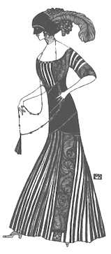 The Vienna Secession---also known as the Union of Austrian Artists, or Vereiningung Bildender Künstler Österreichs---was formed in 1897 by a group of Austrian painters, sculptors, and architects who had resigned from the Association of Austrian Artists: Gustav Klimt, Koloman Moser, Josef Hoffmann, Joseph Maria Olbrich, Max Kurzweil, Otto Wagner, and others. The first president of the Secession was Gustav Klimt, and Rudolf von Alt was made honorary president. In 1898, the group's exhibition house was built in the vicinity of Karlsplatz. Designed by Joseph Maria Olbrich, the exhibition building soon became known simply as die Sezession. This building became an icon of the movement.
 The secession building displayed art from several other influential (art nouveau) artists such as Max Klinger, Eugene Grasset, Charles Rennie Mackintosh, and Arnold Bocklin. Secessionists not mentioned above include Josef Maria Auchentaller, Rudolph Bacher, Peter Behrens, Marcus Behmer, Adolf Böhm, Paul Bürck, Hans Christiansen, Johannes Cissarz, Carl Otto Czeschka, Josef Diveky, Max Fabiani, Remigius Geyling, Willi Geiger, Richard Gerstl, Albert Paris von Gütersloh, Josef Hoffmann, Ludwig Hohlwein, Moriz Jung, Gottlieb Theodor von Kempf, Julius Klinger, Leo Kainradl, Oskar Kokoschka, Max Kurzweil, Oskar Laske, Bertold Löffler, Heinrich Lefler, Mila Von Luttich, Burkhard Mangold, Carl Moll, Alphonse Mucha, Joseph Maria Olbrich, Bruno Paul, Joze Plecnik, Emil Preetorius, Erwin Puchinger, Alfred Roller, Malva Schalek, Egon Schiele, Othmar Schimkowitz, Jan Toorop, Heinrich Vogeler. Dedicated link. [Google]
[More] ⦿
|
Vincent Le Moign
[Vectorian]
|
 [More] ⦿
|
Vincent Tavernier
|
Bordeaux, France-based designer of the art nouveau typeface Bushbush (2016). [Google]
[More] ⦿
|
Vintage Font Lab
[By Wahtung]
|
Osaka, Japan-based of many vintage label and handcrafted fonts. These include Claudio (2019), Heritage (2018), Rapsodie (2018), Bertha (2018), Ambient (2018), Alexandra (2018), Broker (2018: a vintage decorative font), Bullseye (2018), Classy (2018: art nouveau caps), Delayne (2018: vintage), Oliver (2018: a modular sans), Wide Saloon (2018: Western), Speedy Cheetah (2018). Designer of the handcrafted typefaces Sheyla (2018) and Oliver (2018). A fuller list: Abandoned, Alabama Gunners, Alcohol Letters, Alexandra handcrafted script, Ambient, Armadilo, Artefactor, Arthur Conan Doyle, Authentic Love and Peace vintage script, Authentic superior Dementor, Barber Shop, Barber, Believe in love, Best Vintage Academic Font, Best Vintage typeface, Blue bell covered Armadilo typeface, Bullseye Shadowed Damaged, Carpenter covered victoriaprice vintage, Childishness, Chummy covered Armadilo typeface, Coffee Shop typeface, Cowboy Saloon, Cowboy Western, Crafters, Denim 1978 Jeans, Dimension, Double Font Set, Double Wood, Drunken Sailors, Elcorazon, Elina Epirus, Exclusive Vintage Cupcakes, Fable covered, Finest Whiskey, Fraudster, Funny Selestine, Future Dreams, Fyodor Dostoyevsky, Ghostly Shadow, Grandeur new vintage, Halloween font, Handcrafted Scratched Typeface, Handcrafted Vintage, Handcrafted vector typeface, Hannisville Whiskey, Happy Halloween, Heritage Collection, Highsky, Horror, Infested, Inspiration, Invisible, Irish Whiskey, Jameson Strong covered Striped Shadow, Jazz and Tequila, KingFisher Display, Layout, Left Behind, Lighthouse, Mariner covered victoriaprice vintage, Masterpiece, Mercantile Saloon, Mexican Fraudster, Moscovite vintage, Narayana, New Jersey, Odinelia, Old Fort Damaged Style Display Font, Old School, Old Style font, Old story, Oliver, Original Vintage Label Vector Typeface, Outgunned display, Paris Bistro Typeface, Piligrimistic Display Font, Police Line Do Not Cross, Postcard Font covered Striped Shadow, Precious, Private Whiskey Collection, Prosperous Shadow Font, Pulpwood font vintage typeface with prosperous cover, Pure Made Coffee, Pure Made Coffee, Real Bourbon, Repeating Floral Eastern Pattern, Repeating Octagon Eastern Pattern, Reserve, Restricted area, Rosalina Boushe, Sherlock Holmes, Sheyla, Smoothy, Space Ship, Speedy Cheetah, Strange Cosmos, Stricktly, Striped, The Gin In the Bottle, Thomas Sawyer, Treasure Whiskey Typeface, Unlucky covered victoriaprice vintage font , Vertically Striped Vintage Handcrafted Font, Victor Hugo, Vintage Academic Based Typeface, Vintage Academic Typeface, Vintage Alcohol Label, Vintage Barber Shop, Vintage Bourbon, Vintage Cinema Lounge, Vintage Gentle, Vintage Goldfield Typeface, Vintage Halloween Covered Vertically Striped Font, Vintage Label, Vintage Meathook Typeface, Vintage Romance, Vintage Typeface, Vintage Vector Letters, Vintage handcrafted typeface, Vintage style double lettered typeface, Vintage, Watercolor Dreams, Whiskey Americana, Whiskey Font, Whiskey Lounge, Whiskey Marine, Wild Ride California, Wild Saloon, Wildfire covered victoriaprice vintage, Winter Holidays, Winter Poster Covered Pulpwood Font, Wonderland, Zebra. [Google]
[More] ⦿
|
Virile
|
Virile is an art nouveau typeface first seen in digital form at Agfa, and later at Monotype. It was designed in 1890 by John F. Cumming. For another digital revival, see Vineyard (2020, Harold Lohner). [Google]
[More] ⦿
|
VJ Type (was: Violaine & Jérémy)
[Jérémy Schneider]
|
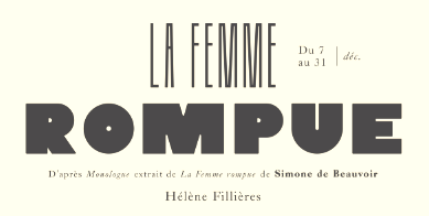 In 2011, Violaine Orsoni and Jérémy Schneider set up their studio, Violaine & Jérémy, in Paris. Schneider studied at Ecole Professionnelle Supérieure d'Arts graphiques et d'Architecture de la Ville de Paris (EPSAA). Their work is fashionable, elegant, unique, ground-breaking and delightfully experimental.
 In 2015 Schneider designed Nord and Sud for Théâtre des Bouffes du Nord. In 2016, they designed the (custom) Tuscan typeface Tribute, the gorgeous deco poster typeface Dida and the tall typeface Scali for Théâtre des Bouffes du Nord. Schneider added the expressive and frivolous display typeface Canopée in 2016 as well. In 2017, Violaine Orsoni and Jérémy Schneider published the stylish typeface Traviata. In 2018, Jérémy Schneider designed the stylish typeface family Kobe, and the exquisite but delicate all caps typeface Love. In that same year, VJ Type released the corporate art deco type Archibald, Les Gros mots, Big Fernand, Art Team, Napoleon Stratege, Lukas Dong, and Cage. In 2019, they created the identity, illustrations, fonts and menus for the Parisian restaurants Baba and Mamie (art deco), and the angular display typeface Cako. Jérémy Schneider designed the luxurious fashion mag typeface Voyage in 2019 as well. Typefaces from 2020: Jäger (by Jérémy Schneider), a tribute to fine craftsmanship. Jäger is a display typeface for headlines and short texts. Its first drawings were developed for an exhibition in 2015 at the Musée des Arts Décoratifs in Paris. Jäger is inspired by techniques mastered by craftsmen in their work, such as hollowed-out counter forms reminiscent of engravings, sculptures or chisel work. The angles give the impression of having been cut in wood, while the contours are rounded. Typefaces from 2021: Dahlia (an art nouveau serif by Jérémy Schneider that was influenvced by Italian lake posters from ca. 1910), Mun (a samurai sword caps typeface for the identity of Japanese restaurant Mun Camps Elysées), Kobe (experimental). [Google]
[More] ⦿
|
Vladimir Nikolic
|
 Belgrade, Serbia-based designer (b. 1981) of these typefaces:
 - The dingbat fonts Canavarlar (2020: funny men), Haircut (2020: women's hairdos), Ornament Borders (2020), Gourdy (2020: birds), Lizards (2020), Mantra (2020), All Star (2020), Speel (2020), Soavely (horses) (2020), Forma (2020), Hell Beasts (2020), Mistresses (2020), Paraiso (2020), Crow (2020), Traverser (2020: crosses), Cats (2020), Dogs (2020), Negative-Heads (2020), Otu (2020), Wakazi (2020), Risk (2020), Wurm (2020), Beard Man (2020), Hoder (2020), Damen (2018), Damen 2 (2020), Foliga (2020), Solo Drinker (2020), Congress (2020), Farmacy (2020), Elections (2020), Emergency (2020), VN Arrows (2020), Hexagonos (2020), Automobiles (2020), Cars (2020), Emoji Boom (2020), Bestia (2020), Aliens (2020), Insect (2020), Bytost (2020), Monstero (2020), Aveto (2020), Dancing Cat (2020), Atradimas (2020), Womanhood (2020), Figur (2020: an alien insect font), Halfwits (2020), Silly Donkey (2020), Crazy Monkey (2020), Round Masks (2020), The Quick Dog (2020), Flying Birds (2020), Maskid (2020), Monstra (2020), Bull Skulls (2020), War Items (2020), Public Transport (2020), Loomad (2020), Mokhabiso (2020: African patterns), Record (2020), Mulher (2020), Heroez (2020), Bulls (2020), Madarak (2020: birds), Bold People (2020), Munari (2019: a collection of drawings based on Bruno Munari's book "Artista e designer" from 1966), Screws (2019), White Mouse (2019), Schepselen (2019), Glatze (2019), Crosses (2019), Chefs (2019), Diamond Blocks (2019), Hexagons (2019), Maumbo (2019), Circles (2019), Enfeite (2019), Pigs (2019), Mythos (2019), Kreaturen (2019), Baby Alien (2019), Body Moving (2019), Various Boys (2019), Lines and Objects (2019), Mouvman (2019), Watch (2019), Credit Card (2019), Cycles (2019), Devil Emoji (2019), Fare (2019), Mund (2019), Labbra (2019), Circular Ornaments (2019), Cranium (2019), Ugok (2019), Ansigter (2019), Tsim (2019), Schmetterlinge (2019), Jungfrau Maria (2019: religious icons), Knights Helmets (2019), Kinderskizzen (2019), Wolves (2019), Various Cats (2019), Owls (2019), Spiral Object 3D (2019), Zodiac Signs (2019), Cyborg (2019), Duck (2019), Cat 3D (2019), Object 3D (2019), Circle and Line (2019), Various Girls (2019), Dulcet (2019), Erotic Symbols (2019), Frauen (2019), Pierre the Vampire (2019), Robotter (2019), Middle Finger (2019), Claudio The Cat (2019), Medusa (2019), Veggie (2019), Pablo (2019), Fishes (2019), Dream of Picasso (2019), Stam (2019), Animality (2019), Ink Drops (2019), Faces (2019), Bayan (2019), Froggy (2019), Senhoras (2019), Diamondo (2019), Skallen (2019: skulls), Swimmers (2019), Churches (2019), Easter Icons (2019), Lippen (2019), Gullar (2019), Bankwesen (2019), Creatures with Horns (2019), Vehicles (2019), Various Hands (2019), 3D Animals (2019), Abantu (2019), Herr (2019), Menge (2019), Funny Aliens (2019), Mustachos (2019), Kids Drawings (2019), Tierfarm (2019), Troep (2018), Women Heads (2018), Cats and Dogs (2018), Wanita (2018), Eyez (2018), Animales (2018), Peoples (2018), Mobile Icons (2018), Controllers (2018), Womano (2018), Lost in Space (2018), Blumen (2018: flowers), Tetriso (2018), Snowflake (2018), Meine (2018: masks), Horoscopicus (2018), Esoterica (2018), Astrologicus (2018, astrolical symbols), Abbild (2018: African masks), Being (2018: monsters), Gebell (2018), Headed (2018), Falter (2018), Filling (2018), Anichka (2018), Cyclopia (2018), Buggus (2018), Opa (2018), Messe (2017), Head of Idol (2018), Diavolo Nero (2017: funny silhouettes).
- The boxed or encircled alphabets Audience Capitals (2020), Galileo (2020), Compare (2020), Compare-Light (2020), Hexagonas (2020), Select (2020), Before (2020), Before-Dark (2020), Boxes (2020), Boxes-Extravagant (2020), Boxes-Fancy (2020), Calf-Negative (2020), Capital-Relationship (2020), Pyxidas (2020), Capitalica (2020), Tundra (2020), Ordinary Capitals (2020), Broadway Capitals (2020), Browser Capitals (2020), Capitalismo (2019), Schwarzenberg Capitals (2019), Retrospective Capitals (2019), Official Capitals (2020), Impression (2020), Oriental (2020), and Letters in Circles (2018).
- Shadowed caps: Cleopatra (2021), Farmers Market (2021), Erkekler (2021), Assignation (2021), Greek Tragedy (2021), Distorted (2021), Lightshow (2021), Credenza (2021), Ragusa (2021), Comunismo (2021), Scordia (2021), Gazelle (2021), Organ (2021), Strizhi (2021), Umoya (2021), Ninja Justice (2021), Unlimited (2021), Unicorns (2021), Labyrinth (2021), True Artisans (2021), Poker (2021), Donald (2021), Ferrari (2021), Booster (2021), Madness (2021), Favorita (2021), Vitamin (2021), Robot (2021), Robust (2021), Engine (2021), Whether (2021), Nucleus (2021), Trunk (2021), Ombre (2021), Viscosus (2021), Jewelry (2021), Verge (2021), Pursue (2021), Keener (2021), Visor (2021), Korvo (2021), Squash (2021), Scum (2021), Darker (2021), Education (2021), Cimice (2021), Tomb (2021), Bambola (2021), Calla (2021), Rump (2021), Complex (2021), Razor (2021), Driveller (2021), Karambol (2021), Princino (2021), Berger (2021), Adopted (2021), Bugbear (2021), Samara (2021), Talisman (2021), Waterway (2021), Megabus (2021: a marquee font), Roller (2021), Numerica (2020), Bond (2020), Gloom (2020: a marquee font), Chalkboard (2020: sketched), Unboxing (2020: techno), Antennas (2020), Secca (2020), Umfo (2020), Sabbia (2020), Squirrel (2020), Byzan (2020), Debtor (2020), Bridge (2020), Familie (2020), Lake (2020), Roma (2020), Tissue (2020), Bombay (2020), Osteology (2020), Restroom (2020), Speaker (2020), Bebika (2020), Center (2020), Gismo (2020), Fierce (2020), Gambler (2020), Afterparty (2020), Birdbrain (2020), Boner (2020), Divine (2020), Gelatin (2020), Lost (2020), Marshland (2020), Quadri (2020), Shadow (2020), Stairs (2020), Superba (2020), Techno (2020), Underman Book (2020), Wired Capitals (2020), Fineliner (2020), Fictive Kinship (2020), Exotica (2020), Ural (2020), Devianza (2020), Kultur (2020), Unmute (2020), Antiqua (2020), Chains (2020), Scheme (2020), Stumble (2020), Aroma (2020), Beans 2 (2020), Cover (2020), Cronica (2020), Fundament (2020), Horna (2020), Loce (2020), Mademoiselle (2020: art nouveau), Melodia (2020), Penny (2020), Taikun (2020), Assault (2020), Athletica (2020), Baraka (2020), Brassica (2020), Builder (2020), Chancellery (2020), Gwara (2020), Pliez (2020), Recinzione (2020), Right (2020), Rimes (2020), Seal (2020), Service (2020), Scorpions (2020), Terraces (2020: American flag font), Wedding Cabbage (2020), Wild Girl (2020), Tragedy (2020), Indos (2020), Starfish (2020), Vintage (2020), Adriatica (2020), Funeral (with American flag texture) (2020), Voleur (2020), Calzino (2020), Peshkop (2020), Metzger (2020), Asshole (2020), Puppet (2020), Broeksel (2020), Hals (2020), Escort (2020), Vortex (2020), Dades (2020), Boild Hedgehog (2020), Mermer (2020), Grower (2020), Rainbow (sketched) (2020), Baise (2020), Necklace (2020), Angels (2020), Smuggler (2020), Dommage (grungy) (2020), Squalor (2020), Fusto (2020), Course (2020), Fisheye (2020), Baiser (2020), Banda (2020), Cantaloupe (2020), Canto (2020), Begriff (2020), Trapeze (2020), Arabeska (2020), Silver (2020), Wasco (2020), Kosaken (2020), Triangle (2020), Banquet (2020), Demode Capitals (2020), Cultus Capitals (2020), Idiot Capitals (2020), Granary Capitals (2020), Liberta (2020), Montblanc (2020), Granary (2020), Blanket (2020), Tuyaux (2020), Wolf (2020), Comeback (2020), Oliba (2020), Idiot (2020), Trailer (2020), Bricks (2020), Toys (2020), Luxury (2020), Hertz (2020), Signal (2020), Serenada (2020), Kurven (2020), Schnecke (2020), Mona (2020), Sierra (2020), Search (2020), Tranchante (2020), Eccentric (2020), Fast (2020), Mosquito (2020), Speed-of-Light (2020), Thanks (2020), Album (2020), Boyhood (2020), Ending (2020), Trend (2020), Universal-Serial-Bus (2020), Fixed (2020), Kings (2020), Holiday (2020), Range (2020), Numbers (2020), Shipman (2020), Officer (2020), Video (2020), Order (2020), Route (2020), Cosa-Nostra (2020), Clowns (2020), Unique (2020), Voyeur (2020), Shape (2020), Brigadier (2020), Allora (2020), Spartacus (2020), Advisor (2020), Ambis (2020), Cables (2020), Genesa (2020), Horse (2020), Laptop (2020), Pork (2020), Mafioza (2020), Mucho (2020), Athens (2020), Audience (2020), Rotor (2020), Mundo (2020), Olympus (2020), Border (2020), Scale (2020), Survival (2020), Trouble (2020), Turnabout (2020), Catharsis (2020), Parade (2020), Discoteque (2020), Rude (2020), Fame (2020), Safran (2020), Ausweis (2020), Mechanica (2020), Moscowian-Party (2020), Beers (2020), Strengthen (2020), Tempo (2020), Unreal (2020), Poetico (2020), Bach (2020), Bach-Fat (2020), Energy (2020), Alexandra (2020), Basket (2020), Cushion (2020), Model (2020), Organiser (2020), White (2020), Anabela (2020), Cannibal (2020), Casablanca (2020), Castle (2020), Control (2020), Crazy (2020), Crazy-Gradient (2020), Emotion (2020), Honey-Bunny (2020), Knockout (2020), Linearo (2020), Murmure (2020), Polished (2020), Reon (2020), Sparrow (2020), Storms (2020), Street-Stars (2020), Franchise (2020), Pencil (2020), Ruanda (2020), Pepito (2020), Megalomania (2020), Rouleaux (2020), Frozen (2020), Together (2020), Saldo (2020), Museum (2020), Network (2020), Hunk (2020), Cultus (2020), Creator (2020), Flow (2020), Blocchi (2020), Possession (2020), Bad Germans (2020), Discounted (2020), Traversal (2020), Mangalica (2020), Murmansk (2019), Summer Candy (2019), Question (2019), Second Channel (2019), 3D Models (2019), Memory (2019), Computer (2019), Diversity (2019), Elastic Letters (2019), Businessman (2019), Kuchen (2019), Demode (2019), Objective (2019), Medication (2019), Nonsense (2019), Plagiat (2019), Toledo (2019), Tricks (2019), Common (2019: a trompe-l'oeil font), Mafia (2019), Releases (2019), Extradition (2019), Shoot To Kill (2019), Groowing (2019), Enough (2019), President (2019), Silence (2019), Dressed (2019), Already (2019), Hocus Pocus (2019), Password (2019), Ready (2018) and Messages (2017).
- The ornamental caps typefaces Mahal (2021), Stamp (2021), Hell Door (2021), Tangram (2021), Custom (2021), Remake (2021), Studio (2021), Adagio (2021), Oxidizer (2021), Mondial (2021), Paraglide (2021), Tattoo (2021), Developer (2021), Dama (2021), Lobby (2021), Gabaritos (2021), Sence (2021), Ombre (2021), Cresa (2021), Anniversary (2021), Wire (2021), Triton (2021), Lamina 92021), Hangup (2021), Years (2020), Dowry (2020), Sephora (2020), Jewels (2020), Straightforward (2020), Dance (2020), Necklace (2020), Maria (2020), Taxi2 (2020), Outlaw (2020), Combat (2020), Chewed (2020), Fantasy (2020), Observation (2020), Cure (2020), Pioneer (2020), Near (2020), Kleid (2020), Unitas (2020), Tomato (2020), Blader (2020), Canal (2020), Baked Snails (2019), Alcoholic (2019), Bonjour (2019), Zylinder (2019), Phenomenal (2019), Surfaces (2019), Success (2019: as in De Stijl), Retailer (2019: multilined), Havana (2019: multilined), Mechanismo (2019) and Pencil Letters (2019).
- The display typefaces Trader (2020), Oysters (2020), Furious Ride (2020), Portfolio (2019), Pontos (2019), Swordsman (2019), Regular (2019), Andrey (2019), Retrive (2019), Connected (2019), Locator (2018), Tracking (2018), Iceberg (2018: snow-capped letters), New Amsterdam (2018), Ana (2018), Enemy (2018), New Yorkers (2018), Happy Day at School (2018), Focused (2018), Modish (2018), Beholder (2018) and Principality (2017).
- The alphadings Birthdays and Parties (2021), Bahanalia (2020), Icecreams (2020), Brailler (2020), Night Dreams (2020), Flower Capitals (2020), Jingle Bells (2020), Neuron Capitals (2020), Easter Time (2020), Hearts and Arrows (2018), Penguins (2018), Kitties (2018), Doggy (2018), Teddy Bears (2018), International Capitals (2018), Aafia Capitals (2018), Answer Capitals (2018), Beholder Capitals (2018).
- The circuit font Simple Repairs (2021).
- The 3d typefaces Sharp (2021), Edited (2021), Three Dimensions (2020), Rental (2020), Shiny Blocks (2020), Turbulence (2020), Labor (2020), Worship (2020), Fantasy-3D (2020), Zucker (2020: stacked blocks) Perfetto (2020), Rude-3D (2020), Lover (2020), Kasten (2020), 3D Models (2019), Tricks (2019) and Metallic (2019).
- The multiline typefaces Yiphi (2021), Porker (2020), Formula (2020), Laguna (2020), Hypochondria (2020), Majestic (2020), Vibes (2020), Tubes (2020), Yogurt (2020), Turkish (2020), Question (2019), Pancake (2019), Remained (2017), Liquidrom (2018), Second Channel (2019), 3D Models (2019), However (2019), Confarreatio (2018) and Fudged (2018).
- The textured typefaces Incompetent (2021), Autumn (2021), Sangria (2021), Studio (2021), Kino (2021), Elixir (2021), Espace (2020), Mistress (2020), Heritage (2020), Silicone (2020), Hornettio (2018), Ignorant (2018), Americans (2020: the American flag embedded into the glyphs), Pollution (2020), Jakob (2019), Diversity (2019), Townscape (2019), Patriotic (2019: American flag theme), Meshes (2018), Complained (2019), Duration (2018) and its solid counterpart, Duration Book (2018).
- The Slavonic emulation typeface Russian Land (2017) and the Cyrillic emulation typefaces Monarch (2021), Cold War (2021), Beograd (2020), Ukrainian Princess (2019), Territory (2019), Kalinka (2019), Rubles (2018), Maniac (2018), Jurij (2018), Kachusha (2018), Soviet Program (2018), Armenia (2017), Fontograd (2018) and Russian Spring (2017).
- The constructivist typefaces Tokarev (2017), Russiano (2018), Suggested (2018), Hungaria (2018) and Schwachsinn (2018).
- Art deco typefaces: Cavalier (2021), Performer (2021), Angelica (2019), Protocol (2019), Retrospective (2019), Leculier (2018, after an alphabet in Georges Leculier's art deco lettering book from ca. 1930), Better (2018), Critical (2017).
- Art deco caps: Reverse (2020), Bathroom (2019), Idiotism (2019).
- The chess fonts Schach (2020) and Wisdom Chess (2020).
- The weather icon font Weather Symbols (2020).
- The decorative sans typefaces Shock (2021), Energia (2021), Pitviper (2021), Nemesis (2021), Addiction (2021), Nehad (2021), Chewer (2021), Nightfall (2021), Gourmet (2021), Flipside (2021), Layered Letters (2019), Imbecile (2019), Answer (2018), Hours (2018), Abandoned (2018), Sea Gardens (2017), Forvertz (2018), Yeysk (2018) and Closeness (2018).
- Sans: Wollicht (2021), Ministro (2021), Lonely (2021), Noix (2021), Messina (2021), Samara (2021), Rickrack (2021), Broadcaster (2021), Catamaran (2021), Official (2019).
- Comic book fonts: Reset (2021).
- Artsy fonts: Hornstick (2021), Kikundi (2021), Shanghai (2021), Skewed (2021), Company (2021), China (2020).
- The headline sans typefaces Finance (2020), Marija (2020), Fashion (2020), Magazine (2020), Policemen (2020), Impressum (2019), Educated Deers (2019), Hindenburg (2019) and Fixation (2018).
- The rounded organic sans typefaces Hofmann (2020), Adelino (2020), Available (2018) and Biysk (2018).
- The handcrafted typefaces Diana (2020), Flood In London (2019), Milord (2018), Sex and Breakfast (2018), Sweet Handwrite (2018), Industrial Revolution (2018), Oh Maria (2017), Sofija (2017) and Travelling (2017).
- The bubblegum typefaces Roller (2020), Jellies (2020), Designero (2019), Bubblicious (2019) and Icecreamer (2017), and its oily companions Gummy (2018) and Liquid (2018).
- The heavy deco typefaces Guest (2019), Bigger (2018), Hours (2018), Intransitive (2018: Dutch deco), Theatrical (2017) and Consequences (2017).
- The beveled fonts Iron (2020), Rising (2020), Novgorod (2020), Troy (2020), Fake Hope (2019), Diamond Ring (2019), Playback (2018) and Member (2018).
- The starred caps typefaces Farmers Market (2021), Donald (2021), Citizen (2021), Wizard (2021), Adrenaline (2021), Diabolo (2021).
- The stencil fonts Browser (2019), Serbia (2019), Belgrado (2019), Further (2019), Generals (2018), Mayor (2018) and Olga (2018).
- The semi-stencil all caps typefaces Restaurant Menu (2019), Queen Dea (2019), Latest (2019) and Large (2019).
- The fat rounded sans typefaces Guest (2019) and Subscribe (2019).
- The Western fonts Newlywed (2020) , Tombola (2019), Permission (2019), Alexander (2019), Retrosonic (2019), Kasplysk (2019).
- The experimental typeface Typo Layer (2019).
- The German expressionist outline typeface Robert (2018).
- Current Moment (2019): a digitized "Zuccini" plate by Frits Jonker.
- The LED fonts Remaster (2021), Ringing (2022), Gigabytes (2020), Error (2020) and Technology (2018).
- The octagonal athletic lettering fonts Academy (2021), Junk (2020), Barbara (2019), Soccer (2020), and Soccer League (2018) and the outlined athletic font Onderneming (2018).
- Leculier (2018). After an alphabet in Georges Leculier's art deco lettering book from ca. 1930.
- The speed fonts Live News (2020) and Speed Racing (2019).
- Essere (2018).
- The squarish typefaces Archipelago (2021), Haine (2020), Augsburg (2020), Legionary (2020), Cyber Princess (2019), Professor (2019), Layers (2018) and Cataclysmo (2017).
- Driving Around (2018).
- The decorative floral caps typefaces Floral Capitals (2018) and Narcissus (2018).
- Gradientico (2018). A textured didone.
- The Greek simulation font Meteora (2018).
- Griddy Blocks (2018) and Blocky Letters (2018).
- Decorattio (2018).
- Ordinary (2018) and Mina is Gone (2018).
- The trilined typeface Trio (2017).
- The connected handwriting typeface Eric's (2016).
- The military typefaces Login (2018), Commanders (2017) and Hunt (2017, after an alphabet by the Hunt Brothers in their 1930s book Lettering of Today).
- The neon typeface Bubble 3D (2017), and the neon and shadow font family Magia (2019).
- Schaeffer (2017). A revival of the famous multiline typeface Fatima (1933, Karl Hermann Schaefer).
- The grungy typefaces Horizont (2020), Cosmas (2020), Drunk Millionaire (2019), Leave No Fingerprints (2018), Haziness (2017) and Victorious (2017).
- The molecular typeface Neuron (2019).
- The inline caps typefaces Panther (2021), Africa (2021), Look (2019) and Speed (2019).
- The inline typefaces Green (2020), Bernard (2020), and Games (2017).
- The display serif typefaces Kandinsky (2021), Funia (2021), Army Guys (2021), Hoodie (2019).
- The marquee typefaces Squad (2021), Grotto (2021), Megabus (2021), Plagiat (2019), Dropped (2019), Casino (2018) and Chicago (2018).
- The layerable marquee font Rockefeller (2018).
- Movie fonts: Film Letters (2018).
- The outlined typeface Important (2018).
- The white-on-black typeface Circusant (2019).
- The didone typeface Vogue (2018).
- The geometric solid typeface family Ivan (2019).
- The geometric sans typeface Occupied (2017).
- Rise of Kingdom (2017).
- Cartoonish (2017).
- Hesitation (2017). A rounded handcrafted poster font.
- Leben and Leben Shadow (2018).
- Braillenum (2018).
- The condensed grotesks Around (2020), Heinrich (2019) and Schwarzenberg (2019).
- Schreibmaschine (2017). A dusty old typewriter font.
- The vintage initial caps typefaces Nautiica 3d (2018), Fantasy Capitals (2018) and Herne Capitals (2018).
- The Arabic emulation typefaces Bayram (2020) and Sinbad (2018).
- Herne (2018).
- Passage (2018).
- Knotty (2018).
- The Mexican style font Mexicanera (2018), Dilemma (2018: Mexican Calavera skulls), and Mexican Tequila (2018).
- The techno typefaces Flight 21 (2019), Cyber Princess (2019), Passionate Relationship (2019), Neighbor (2018), Bombardment (2018) and Leprosy (2018).
- The avant-garde typeface Typolino (2018).
- Regensburg (2018).
- The ultra-fat typefaces Crime (2020), Owners (2018) and Housebreak (2019).
- The prismatic typefaces Jumble (2020), Boogie Woogie (2019), Running (2019), Bigger Italic (2018; based on Bigger Book), Linerine (2018) and Cosmology (2018).
- Failed (2018).
- The codex typefaces Grille (2020), Compass (2020) and Measurements (2018).
- Damages (2018).
- The circle-themed fonts Sparks (2020) and Condition (2018).
- The textured typefaces Mitesser (2020), Object (a meshed font) (2020), Noisy Walk (2020), Brightness (2020), Mistress (2020), Heritage (2020), Silicone (2020), Hornettio (2018) and Ignorant (2018).
- The oriental simulation fonts Dasvidaniya Book (2020), Pearl Harbor (2020), Chinese Dragon (2019), Sudoku (2019), Hiroshima (2019) and Kamikaze (2018).
- Monograms: Quintete (2020), Formogram (2020), Diamond Monogram (2020), Ribbon-Monogram (2020), Bulged Monogram (2020), Monogramus (2019), Blocky Monogram (2018) and Monograma (2018).
- Blackletter: Bramble Princess (2021), Drunks (2021), Cosmopolite (2020).
- Fists: The-Point (2020).
- Scanbats: Retro-People (2020), Vladimir (2019: Putin scanbats), Portraits de Femmes (2019: scanbats), Notre Dame and Notre Dame de Paris (2019: scanbats), Hollywood Actors (2019: scanbats), European Leaders (2018: scanbats), Trumpolina (2018: Trump scanbats).
- Word fonts: Black-Lives-Matter (2020).
- Plank fonts: Wooden Planks (2020).
- The outlined typefaces Carwash (2020), Hypno (2020), George (2020), 3D Letters (2018), Milk & Chocolate (2018: trilined), Czar (2018), Classica (2018) and Created (2018).
- The glitch fonts Elderberry (2021), Sparkle (2021), Eclairages (2021), Nectar (2021), Check Your Connection (2020), Horizons (2020) and Searching For Signal (2019).
- The glaz krak font Smashed (2018).
- The circus font Amigo (2020).
- The kitchen tile font New Message (2020).
- The 3d dingbats typefaces Basic Objects (2020: geometric shapes) and Jigsaw Puzzles 3D (2018).
- The modular typefaces Orenburg (2018), Broadway (2018) and Assyrian (2018).
- Escher style: Illusion (2019), Vologda (2019).
- Slinky typefaces: Rings (2020), Zylinder (2019), Pipes (2019).
- Lombardic caps: Moher (2020), Dublin (2020), Moderno (2020).
- Ransom note caps: Today (2020).
- Artistic font: Meute (2020).
- Halftone fonts: Tourner (2020), Cinquecento (2020), Devotion (2020), Gulliver (2020), Bamboo (2020).
- Ornaments: Adornos (2020).
- Antique caps: Grandes (2020), Reveler (2020: from Draughtsman's Alphabets (1877) by Hermann Esser)).
- Funny faces: Isitolo (2020).
- Angular caps: Milk (2020), Strike (2020), Worldwide (2020).
- Tall sans caps: Bungler (2020), Shakeout (2020).
- Mecano typefaces: Shakers (2020).
- Titling sans: Steinberg (2020).
- Titling serif: Love (2020).
- Break (2020).
- China (2020).
Creative Fabrica link. [Google]
[More] ⦿
|
Wagner&Schmidt
|
 German foundry establshed in 1888 by Theodor Robert Arthur Schmidt and Ludwig Wagner in Leipzig. In 1902, Ludwig Wagner quit and joins Gundelach&Ebersbach (first founded in 1897) also in Leipzig, and then opens his own foundry, Ludwig Wagner. Schmidt stops in 1932, while Otto Schmidt takes over--the company is now called Wagner&Schmidt Nachfolger. Otto Schmidt dies in 1941, and the company is dissolved in 1942.
 Wagner&Schmidt was responsible for such successful Fraktur typefaces such as Allemannia-Fraktur (see also Ludwig&Mayer, Frankfurt am Main, 1908), Deutschmeister (Berthold Wolpe; the date 1927 has been suggested), Fette Fraktur (well, their own version at least, dated 1875, with present day versions by that name at Adobe and Berthold. Imitations of Fette Fraktur: Fraktur Fett (Greenstreet), Baron&Berliner (Swfte), Bauble (SSi), Luftwaffe (WSI), F692 Blackletter (SoftMaker), Fraktur (SoftMaker)). They also made the art nouveau era text typeface Rekord Antiqua (1911: revived in 2020 by Ralph M. Unger as Rekord Antiqua), the upright semiscript Mirabelle (1926, which was digitized and extended by Nick Curtis as Anna Nicole NF (2007)), Donatello (1935), Kurmark (see also Norddeutsche Schriftgießerei, Berlin, 1934), Annonce Grotesque (1914; see also Ludlow), Amanda Ronde (1939; see Stephenson Blake) and Senta (1904). Under C.E. Weber in Stuttgart, we find these additional typefaces: Colonna Antiqua (1908), Druckhaus Antiqua (1919), Druckhaus Kursiv, Ekkehard (1903), Erika (1920), Margarete (before 1927), Orient Antiqua (1914), Parlements Fraktur (1908) and Progreß Reklameschrift. In 1936-1937 the company created the Bauhaus-inspired headline sans family Kristall Grotesk, which was digitally revived in Kristall H MfD Pro (2019, Elsner & Flake). [Google]
[More] ⦿
|
Walden Font
[Oliver Weiss]

|
 Walden Font (est. 1997) sells historical typefaces&clip-art by Oliver Weiss from Winchester, MA. Walden's site includes a brief history of blackletter, as summarized in the PDF document The Gutenberg Press: Five Centuries of German Fraktur (1997). Typefaces by categories:
 - The nice 14-font package called Civil War Press.
- The free art nouveau font Jugend WF (2006).
- Kraftwerk Press (2016-2017), a collection of 25 German industrial fonts emulating the era from 1920-1930:
- WFBorderBergland, WFBorderLineal, WFBorderLorbeer, WFBorderRauhreif, WFBorderRiesel, WFBorderSaftig, WFBorderSandmann, WFBorderSchnuppe, WFBorderWolkig, WFBorderZahnung, WFKraftwerkOrnamente, WFKraftwerkVignettenFett, WFKraftwerkVignettenLicht. Great borders and ornaments that were mainly revived from Neues Schmuckmaterial (Schriftguss AG, formerly Brüder Butte).
- WFFettdruck, WFHochdruck, WFNormdruck: Examples of Reklameschrift originally designed in 1908, 1926 and 1920, respectively.
- WFFetteKrause. Inspired by an advertisement for printing machinery in a 1924 issue of the Hungarian trade magazine Magyar Grafika.
- WFKaracho: Inspired by a bit of hand-lettering from a 1926 issue of the German advertising art periodical Gebrauchsgrafik.
- WFLuftpost. Based on lettering samples for sign painters.
- WFNeueOhioSchrift. Weiss writes: The Brüder Butter foundry in Dresden had a good working relationship with ATF, and thus several American typefaces found their way into the Butter catalog. Among them was Pabst Oldstyle, designed in 1902. Brüder Butter changed the erect peak of Pabst's A to a flaccid one, and distributed the result as Ohio Schrift, starting about 1913. Throughout the 1920s, Brüder Butter marketed the Ohio family through a series of leaflets that put the typeface through its paces in innovative ways. WFNeueOhioKursiv is the Italian companion. In 1922, Brüder Butter added a bold typeface to the Ohio family. This was not an ATF transplant, but a new design by Eduard Lautenbach. It was available with a set of swash capitals, and several curly-cued, lowercase alternates, ideally suited for children's books. Weiss's revival is WFNeueOhioKraft.
- WFNeueWerbeKraft. Based on Arthur Schulze's Werbkraft (1926).
- WF Paletti. Loosely based on the popular monoline silent movie script typeface Tango-Kursiv (1913, Ernst Deutsch).
- WF Vulkan. A loud all caps typeface based on an advertisement in the April 1926 issue of Gebrauchsgraphik.
- Their Renaissance&Handwriting font pack has nine different handwriting fonts from 1450 to 1700.
- The Minuteman Printshop set contains 18 colonial fonts: Ancient Black, Caslon Book, Caslon Book Italic, Caslon Swash Italic, Webster Italic, Webster Roman, English Hand, Rev.War Heroes, Signers of the DoI, Colonial Bullets, Daisy Border, Lily Border, Marigold Border, Needlepoint Border, Pine Cone Border, Quilt Border, Rose Border, Tulip Border.
- Eighteen blackletter fonts, called the Gutenberg Press series: Alte Schwabacher, Breitkopf Fraktur, Coelnisch Current, Fette Haenel Fraktur, Ganz Grobe Gotisch, Grossvater Kurrent, Gutenberg Bibelschrift, Kurrent Kupferstich, Luthersche Fraktur, Maximilian Gotisch, Neue Schwabacher, Peter Schlemihl, Suetterlin, Theuerdank Fraktur, Unger Fraktur, W'bg. Schwabacher, Zentenar Fraktur.
- Wood type, the Wild West Press series (2010, 47 fonts), and related fonts: Sawtooth WF (2002), Acanthus Border, Ashwood Condensed, Ashwood Extra Bold, Asphaltum, Aubrey Landing, Baubles Border, Bear Gulch, Brass Rules, Bullion Extra Condensed, Bullion Italic, Bullion, Cattle Brands, Chalk Bluff, Clifford Eight, Cut and Shoot, Dead Man's Hand, Faywood Extra Condensed, Faywood Italic, Faywood, Fringe Border, Garland Border, Gatlin Bold, Grid Border, Heroes and Villains, Jawbones Condensed, Lace Border, Langtry, Matchwood Bold Italic, Matchwood Bold, Matchwood Italic, Matchwood, Muleshoe, Ophir, Rawhide, Round Mountain, Royal Nonesuch, Sageland, Sawtooth, Seal Border, Shelldrake, Stockton, Thousandsticks, Thunder Mountain, Vine Border, Western Bullets, Whitecross, Wildwash.
- Art nouveau revivals. His Art Nouveau Printshop Vol. 1 (2020) includes these fonts:
- WF Border Edellinien: Based on borders by Schelter & Giesecke, 1901.
- WF Border Eos.
- WF Border Flach: After a specimen seen in a 1915 specimen book at Bauersche Giesserei.
- WF Border Nimbus.
- WF Border Patriz Huber: After a Schelter & Giesecke design from 1906 called Patriz Huber Ornamente, which was named after designer, goldsmith and furniture maker Patriz Huber, 1878-1902.
- WF Border Peacock: Based on borders by Schelter & Giesecke, 1904 (or earlier).
- WF Border Seerosen.
- WF Border Ver Sacrum: Based on borders by Heinz Keune for Schelter & Giesecke, 1901 (or earlier).
- WF Dahlia: Closely based on a draft for F. Schweimann's Wodan, first issued by Stempel & Co in 1902.
- WF Fafner: After a poster typeface by Schelter & Giesecke first seen in 1905. Unknown designer.
- WF Habsburg: After an original by Heinz Keune from 1903 for Schelter & Giesecke.
- WF Jugendstil Ornaments.
- WF Liane Semibold: A condensed Plakatschrift that revives Liane Semibold (1908, Schelter & Giesecke).
- WF Maria Theresia: After Maria-Theresia-Versalien (1903, Heinz Keune for Schelter & Giesecke).
- WF Meierschrift: Based on Meierschrift (1903, C.F. Meier), which was produced by Schelter & Giesecke in 1904.
- WF Ovid: After an original by Heinz Keune from 1903 for Schelter & Giesecke.
- WF Radium: After an original white on black typeface by Schelter & Giesecke (1905).
- WF Rienzi Versalien: After Versalienschrift Rienzi (1901).
- WF Schelter Antiqua: A revival of Schelter Antiqua (1905, Schelter & Giesecke).
- WF Wallenstein: Based on an original by Heinz Keune (1904), who intended it as a heavy weight companion of Habsburg and Wittelsbach,
- WF Wittelsbach: After an original by Heinz Keune from 1903 for Schelter & Giesecke.
- Gnomos is a grungified merovingian typeface [Walden Font claims that it was found in a 16th century house].
- Magick: A series of 11 alchemic and medieval typefaces, including custom creations by Australian calligrapher Mark Calderwood: Astaroth, Bastarda, Batwynge, Gnomos, Luxeuil, Orgeuil, Runor, Salem 1692, Alchemy Symbols, Astrological Symbols.
- Diverse Handes: Nine historically accurate script fonts from the Renaissance era: 10th Century Bookhand WF, Bastarda WF, Copperplate 1672 WF, English Hand WF, German Latin WF, James the Second WF, Spanish Court Hand WF, Uncial WF, William Shakespeare WF.
- A collection of 62 American poster fonts of World War II, heavily influenced by art deco, was created in 2013: Acie WF, Almanzo WF, Balfrey WF, Bellofatto WF, Bleecker WF, Bleecker WFShaded, Bobbin WF, Bullshorn WF, Calt WF, Cassino WF, Cephus WF, Chippett WF, Cutright Bold ItalicWF, Cutright Bold WF, Cutright WF, Dickie WF, Dragoo WF, Elbie WF, Eldon WF, Elmira WF, Enlow WF, Epsom WF, Falaise WF, Fansler WF, Fustian WF, Glancy WF, Golden WF, Graveney WF, Greenlaw WF, Hackett WF, Hardwick WF, Harlie WF, Huntley WF, Irby WF, Iva WF, Jowdy WF, Kilroy WF, Kododa WF, Lacar WF, Maximino WF, Nelda WF, Nuisance WF, Odon WF, Olindo WF, Payson WF, Payson WFBold, Payson WFBold Italic, Payson WFItalic, Perlina WF, Poster Bullets WF, Remely WF, Reny WF, Sharkey WF, Sheffie WF, Telmoss WF, Tilmon WF, Toxie WF, Ula WF, Wallington WF, Wilber WF, Wylie WF, Zipnut WF.
- Other fonts in the collection: 10thCenturyBookhand, AcanthusBorder, Alchemy-Symbols, Alte Schwabacher, AncientBlack, AshwoodCondensed, AshwoodExtraBold, Asphaltum, Astaroth, Astrological-Symbols, AubreyLanding, Bastarda, Batwynge, BaublesBorder, BearGulch, BrassRulesBorder, BreitkopfFraktur, Bullion, BullionExtraCondensed, BullionItalic, BullionRoman, CWP_TypeNo08, CWP_TypeNo09, CaslonBook-Italic, CaslonBook, CaslonSwashItalic, Cattle Brands, ChalkBluff, CliffordEight, CoelnischCurrentFraktur, ColonialBullets, ConfederateSignatures, Copperplate1672, Cut&Shoot, DaisyBorder, Dead Man's Hand, EnglishHand, Faywood, FaywoodExtraCond, FaywoodItalic, FetteHaenelFraktur, FinalFrontierShipside, FringeBorder, GanzGrobeGotisch, GarlandBorder, GatlinBold, GebetbuchFraktur, GermanLatin, Gnomos, GridBorder, GrossvaterKurrent, GutenbergBibelschrift, Heroes & Villains, JamesII, JawbonesCond, Jugend, KurrentKupferstich, LaceBorder, Langtry, LilyBorder, LutherscheFraktur, Luxeuil, MarigoldBorder, Matchwood, MatchwoodBold, MatchwoodBoldItalic, MatchwoodItalic, MaximilianGotisch, Muleshoe, NeedlepointBorder, NeueSchwabacher, OldStateHouse, Ophir, Orgeuil, Pangho, Panghobl, Pangolin, Pangbl, PeterSchlemihl, PineConeBorder, QuiltBorder, Rawhide, RevolutionaryWarHeroes, RoseBorder, RoundMountain, RoyalNonesuch-Bold, Runor, Sageland, Salem1692, Sawtooth, SealBorder, Shelldrake, SignersoftheDOI, SpanishCourtHand, Stockton, Sütterlin, TheuerdankFraktur, Thousandsticks, ThunderMountain, TulipBorder, TypeNo1, TypeNo2, TypeNo3, TypeNo4, TypeNo5, TypeNo6, TypeNo7, TypeNo8, TypeNo9, TypeNo10, TypeNo11, TypeNo12, TypeNo13, TypeNo14, Uncial, UngerFraktur, UnionSignatures, VineBorder, WebsterRoman, Western Bullets, Whitecross, WilliamShakespeare, WittenbergSchwabacher, ZentenarFraktur.
- The New Victorian Printshop collection (56 fonts): Absalom, Adelar, Amaltea, Amilcar, Augur, Banter, Baretto Italic, Baretto Shaded, Baretto, Barettoshaded Italic, Beamish, Blaisdell, Blinov, Braham, Brinton, Brunel Script, Chatelaine, Cupboard, Devough, Dewitt, Ephinol, Gano Extended, Giglio, Gresley, Grubb Script, Hester, Hipolon, Hiram, Inigo, Isherwood, Jasper, Jophet, Klabasto, Lightburn, Medola, Monboddo, Nestor, Oldkirk Italic, Oldkirk, Ormsby, Pennyfarthing, Phectic, Pomeroy, Rebstock, Rudyard, Rungholt, Sedgwick, Steam Border Medium Aztec, Steam Border Medium Bar and Balls, Steam Border Medium Bar and Curls, Steam Border Medium Bar and Leaves, Steam Border Medium Baroque, Steam Border Medium Belgian Lace, Steam Border Medium Dish and Wire, Steam Border Medium Drainfly, Steam Border Medium Flourish, Steam Border Medium Frill, Steam Border Medium Geometric, Steam Border Medium Leaf, Steam Border Medium Loops, Steam Border Medium Picture Frame, Steam Border Medium Quatrefoil, Steam Border Medium Ribbon, Steam Border Medium Shells, Steam Border Medium Spruce, Steam Border Medium Tiles, Steam Border Medium Triangles, Steam Border Medium Woody, Steam Border Thin Brick Bar, Steam Border Thin Cordula, Steam Border Thin Double Wavy, Steam Border Thin Double, Steam Border Thin Fine Dots, Steam Border Thin Forward Wave, Steam Border Thin Oscillations, Steam Border Thin Scallop, Steam Border Thin Straight Rule, Steam Border Thin Tight Oscillations, Steam Border Thin Triple, Steam Border Thin Undulations, Steam Border Wide Arch and Vine, Steam Border Wide Argent Leaf, Steam Border Wide Bar and Acanthus, Steam Border Wide Bower, Steam Border Wide Knots and Weeds, Steam Border Wide Lattice, Steam Border Wide Mephisto, Steam Border Wide Peacock, Steam Border Wide Rebstock, Steam Border Wide Roccoco, Steam Border Wide Shield and Acanthus, Steam Border Wide Shield and Vine, Steam Border Wide Stipple, Steam Border Wide Stone Leaf, Steam Border Wide Vault, Steam Charms, Steam Flourishes, Steam Gems, Steam Logotypes, Steam News Cuts 1, Steam News Cuts 2, Steam News Cuts 3, Swartwood, Tempris, Tilson Initials, Tivadar, Trowbridge, Twiselton, Whitcomb, Whittle, Winan.
Dafont link. [Google]
[MyFonts]
[More] ⦿
|
Walter Bernard "Ben" Hunt
[Hunt Brothers]
|
[More] ⦿
|
Walter John Pearce
|
 Letterer from the art nouveau era. In some fonts named after him, the name William J. Pearce seems to have crept in. Author of the art nouvea style book Painting and decorating (1898, Charles Griffin: London). Examples of his alphabets include these Modern Block Capitals and these Gothic Capitals. These pictures appeared in the 1910 book by Lewis Foreman Day entitled Alphabets Old and New, For the use of Craftsmen [other editions of this book date back to 1898].
 In 2012, the former alphabet was digitized by Dick Pape as LFD Block Capitals 213. Another free digitization is W.J. Pearce No. 213 by Klaus Johansen. [Google]
[More] ⦿
|
Ward Pettibone
|
Graphic designer in New York City, who created Today's Specials (2015, hand-printed), Perks (2015, hand-drawn), Spindle Nouveau (2015, a vampire font in art nouveau style), Ashe (2015, a brush typeface), Spiffy (2015, a thin script), and Tout de Sweet (2015, a handcrafted typeface). [Google]
[More] ⦿
|
Webfoot
[Charles Voegtle]
|
Charles Voegtle (Webfoot), a web designer from Philadelphia, PA, created the art nouveau dingbat typeface OldArtWF (2004), WFHandFontsWithdots (2004), and HandFontWithDotsItalicByWF (2004). [Google]
[More] ⦿
|
Weknow
[Wino Sutarmin Kadir]

|
 Weknow is the foundry of Indonesian type designer Wino Sutarmin Kadir (b. 1979), who is based in Bogor, Jakarta. Weknow produced a large collection of free fonts from 2009 until 2012. He started making commercial fonts in 2012.
 Creator of the unicase sans typeface Weknow (2009) and the roundish MisstyPoland (2009). From 2010: Helenfont (2010), Dennis Vallera (2010), Kasumichan, Karitza, Mozzie, Wings, Sharon, Noakatz, dearladysandra, arachnidlove, Alexandra, Monica (2010), Natalie, Wayner 8088, Anime Queen (2010, pixelized), Nano (2010, pixel face), Glover (2010, circular face), Frozen Pandaman (geometric), Joenine (circular), Fun Record (geometric), Gembira (circular), Gabrielle, Solgas (circular), lifeforfun (2010), znowwhite (2010), Snowmask (2010), Nine (2010), Znowwhite (2010), Cecile (2010, experiment with triangles), Coreldraw (2010, geometric, monoline), DennisVallera (2010, inspired by the vector art of Canadian Dennis Vallera), Helenfont (2010). Designs from 2011: Michelle (circle-based), Emmilia (circle-based), Raynaliz, Polysoup, Seba, Selfregion (concentric glyphs), Wings of the dragons (octagonal), Spider, The Training Artist, Chewed Kandi, Sandra, Saintfighteraqua (geometric), Alexey (circle-based), Kristina (circle-based), Graphic Dream, Crystalcore (techno), Dominique (fat rounded), Formalart, Henderson (circle-based), Intanputripratiwi (circle-based), Kioshima (geometric), Gitchgitch (geometric), Justta, Dismecha, Self Region (labyrinthine), Alberto (monoline geometric), Abstrasctik (rounded and experimental), Nicole, Robotoc, Laggastic, Masterpanda, Mohr, Maruciel, Gabrielle, Carlos (a circle-based face), Life For Fun (geometric monoline sans), Lois Cesarano (hexagonal), Heather Thomas (circles and lines), Picaee (modular and leafy), Owaikeo (a circle and arc face), Celeste, The World, Future, Lanitta, Earthearth, Basic, Beautiful, Internationalist (monoline rounded sans caps face), Midnight Show, Plastic, Victory, Perfect, Superpower, Katarzyna, Invasion, Block, Wonderfull, Sweetest, Direction, Funrecord, Eternal Flame, Coreldarw, James Glover (circle-based), Superstar, Inside, Parallel, Million, Ocean, Never Ending Maze, Silverbend, Dragon Fly, Whatever You Want, Swinging Swan, Funatic, Soulmate, Superhero, Zetland, Letting The Cable Sleep, Weknow World, Universalisme, Ocean, Smiley Turtle, Family&Friend, Flower in the window, You&Me&Everyone Else, Astonishing, Grass Hopper, Merpati Putih, Extra Hot, Trees of Happiness, Blowing Bubble, Brain Storm, Good Morning, Flower Lover, Honestly, Jaguar, Modern Aristocrat, Pure and Simple Everytime, Ride the lightning, Proffesional (sic), Flight Stewardess, Antique Retro, Natural Technologies, Ethereal Sky, Conversation, Earth Heart. Free typefaces from 2012: Serta Kayu (multiline script), Emerald, Sweater (texture face), Fish Bone, Delicious Ketchup. The Dark Knight, String and Wire, Little Ant, Xtrapower, Standard International, Nice dream come true, Bavaria, Queen of the modern age, Science Fiction, Greatest View, Queen of the Modern Age, Made in earth, Arabian Knight, Emperor of Japan, Bill Gates Windows, Maximum Kilometer, Mineral Oil Resources, Motorcycle (curly caps), Eskimo and Polar Bear, Gladiator Sport, Aero Dynamic, Optical Fiber, High Logic, Generation (a nice all-caps shadow face), My Heart, Play Ground (multiline face), Cartoon Character, Windows in Japan, Quantum Leap (dymo label face), Computer Love, Electric City, and Copper, Valentine In Love, Weknow Windows, Punk, Graphic Design, Billy Jean Style, LMAO (rounded bold sans face), Take and Give, Indonesia Tanah Air, Swimmer Browser, Diamonds are forever (hexagonal and rounded), Tortoise, My Dear, Get Ready, Export Import, Miracle, Digital Ninja, Funtastic Million Moment, Funny and Cute, Samurai in UK, Bookmark, Once Upon A Time, Bird Feather, Respect, Aruna Aira Jasmine, Extra Cheese, Beauty and the beast, Kung Fu Master (oriental simulation typeface), Game Player (art deco), Modern Building, Trade and Mark, Grovy (sic) Kind of Life, King of Font and Typography, ABC (comic book face), Metro City (extended monoline typeface), The Art, Sprout and the bean, Scooter experiment, Sundown Sunrise (a rounded monoline sans), Art Heart, WindowsObject, Authentic Love, Dolphin Ocean Wave, British Pop Music, Master (sci-fi), Sneak Peeks, Like This, Crumble, Zebra Cross, Star Constellation, Water and Gasoline, Autumn, Aviator, So Cute, Crow Chief (bow and arrow font), Beard Rider, Skateboard, Panel, Swallow Sky Night, Hotel Motel (fat finger face), Techno Various, Zooming Track, Robo Cop, Dance Fever, West Java, Ivory Culture, Push The Button (art deco), Highway Patrol (blocked black typeface), Sausage, Little Atom, Mick Jagged, Life Is Final (copperplate), Total Hammer, Cybertooth, Modern Craft, Riding The World, Boarder (counterless), Essential Arrangement, Sensation, Helmet, Smile, Little Think Big Impact, Airplane, Young and Free, The Futurist, Creative Mind, House Builder, Falling in love, My Font (a rounded monoline oblique sans), Proffesional (sic) Edition, Young Forever, Brown Fox, We Know, Prehistoric, Frankenstein Monster, Great Adventure, You Makes Me Happy, The One and Only Me, Wireframe (3d face), Ceramic (3d face), Winner, The Amazing Me, Cycle, Asia Pacific, Written on the hand, Love is blind, Luxurious Sexy, Robotic, Nano (dot matrix face), King Of The World, Roller Blade, Antelope Run, Elemental, Champion Coffee Cup, Bandit, Arcade, Zetland, The Training Artist, Technique, Neon Glow, Fruit Vegetable, Archieve, Experiment Butterfly, French Fries, Remember Memory, Rocksteady, Electro Static Rain, Science Channel (stencil face), Surfing and Play, Umbrella, The Wizard, Great Leader, Bare Knuckle Fight, The Wizard of One Click, Extra Large, Stabilo Spidol, Onion Rings, Strawberry, Lets Do It Again, Modern Script, Amazing Symphony, Psychedelic, Jump Street, The Earth (modular), Brigade Army, Extraordinary, Cobra on Coconut Tree, Natural Beauty, Anything Mean Everything, Smoke on the water, Write A Letter, Everybody, Together, Planting And Seeding, Savior Light Our Way, All Around The World, Think More For Solution, Yesterday, Techno Tech, Prudent, Metamorphosys, Keep quite and simple (sic), India Hair Style, Catalyst, Bamboo Shoot, Global Capitalism, Water Drop, Thunder Jagger, The Science Archaeologist, The Happy Face Smile, Pyramid Inverted, Jailbreak, Game of Life, Fun Raiser, Athletic, Android Robot (sci-fi), Croissant Sandwich, Ocean Free, Thursday, Crochet Pattern, Firework, Futuristic, Pocket (rounded bold sans), Entertainment, Technology (bubblegum face), So This Is It (inline caps face), Everything (circle-based font), Auto Mobile, Futurism, Rhinoceros Break, Enormous (angulat headline face), The Quick (octagonal), Over The Mountain (wavy face), Frame Work, Interplanetary, Antariksa (rounded sans), Airwaves, Strong in the Heart, Pure And Simple Everytime (rounded organic sans), Gitchgitch (rounded organic sans), Monica, The Lazy Dog (grunge), True Self Reliant, Think Techno, Street, Symbol (constructivist), Post Rock, Moon Light (plump and round), Jumping Running, Green Avocado, Bunga Melati Putih, Bizzare, World Word, Little Rainy Day (dot matrix), Animaline (animal dingbats), Smart Watch, At Most Sphere, Sweet Lollipop (curly), Painting The Light, Flattered, Earth Aircraft Universe, Daydreamer, Earth Aircraft Universe, Flattered, Welcome to Planet Earth, People Quark, Friendly Robot, Biological, Splashing, Freezer, Ragatnia Clara (a nice script), The Happy Face Return. Typefaces from 2013: Cat Eyes, Stay True, Where Wolf, The Sound, Royal Jelly, Grumpy Cat, Aku Cinta Kamu, Yellow, Innovation, Invisible Man, Archieve, Electro Magnet, Bamboo Chopsticks, Valentine's Day, True Love, Club Golf, Your Smile, Guitar On Stage, Karate (oriental simulation), Recognition, Sleeping Beauty (plump lettering), Gelombang Radio, Frozen Ice, Sport Center, Reflection, Enjoy The Time, Fillet O Fish (brushed caps), Artistic, Flower Generation (psychedelia), Heart Shaped, Adore You, Jelang (textured typeface), Stargazer, Army Of Me, Xtreme Bike, Atomic, Fancy Curly, Mastermind, Scientist, Brother, Bahasa Indonesia (sans), Cyber, Photography, Super Creative, Black Stallion (script), Cartoon, Exposure (shadow face), The Ticket, Mercury (retro-futuristic), Agriculture (lava lamp typeface), Electronic, Transformation, The Night (gothic typeface), King Cobra, Bionic Heart, Goddess of Fortune, Guitar Acoustic, Magenta Flower, Java Island (lava lamp typeface), Ready Steady Go, Cute Monster, High Speed, Machine Gun, Random Face 1 (dingbats), Dear Diary, Shinobi Ninja, Stranger (octagonal), Discovery, Translation, Japan (oriental simulation), Digital Gothic, Techno, Butterfly (lava lamp typeface), Candlelight (eax drip face), Maverick, Movie Script Ending, Monochrome, Japan, Chunky Bar, The Greatest High (blackboard bold), Featured, Random Thing 1 (cartoon dingbats), Straw Hat, Where Are You, Plant On Lawn, The Innocent Face, Beat of Drum, ASDFA, Creamy Butter, Monster Rock, Plumbing, Mexicano Chili Sauce, Air Show (bubblegum face), This Is True, Fresh Mint, Laser Gun, My Game, Black Mamba, Drako Heart, Children Stories, Play The Game (with a McDonald's M), Let it be, Everlasting Song, Logotype, Blessing Son, Wino Sutarmin Kadir, Bad Boy, Bold and Blue, Quantum (sci-fi face), Oceanography, Elementary, Sailorman, Heart And Love, High Thin Light, Vintage Postcard (spurred), The Bartender (spurred), Inside The Boxes (rhombic type), Herbalism, Happy Home (lava lamp typeface), Wave Zone, Market Leader, The Monkey, Engine Power, Gamer, Story Telling (lava lamp typeface), High Flagship, Back to Nature, The Quick Motorcross (bilined, caps only, with a McDonalds M), Fisherman (lava lamp typeface), Step Forward, King of Pirate (art nouveau caps), Heritage, High in Love, Thin Decorative (spurred typeface), Little Cowboy, What The Fun, Aha Experience, Glitch (pixel face), Portable. Typefaces from 2014: Enjoy The Show (bubblegum font), Right Power, Xerxes, Selamat Hari Raya, Sincere Heart, Thermometer, My Angle (fat script), Restaurant, Life is font, Material Science, Wave Zone, Everything is a test, The kind of feeling, The President, Blue Ocean, Heavy Metal Gaze, Air-Planet, FOREST-THING (a black poster font), Here-Comes-The-Sun, VICE-VERSA, Wajah-mu-Malaikat, The Miracle, Over The Sky, Eternal Love, Under Stand, Lets Get It On, Salute, Please Forgive Me, Forest Jump. Dayak Shield, Golden Bar (piano key stencil face), Life To Find, Make Peace, Rocket Brothers, Space Truckin, Silver Knight, Zeppelin, Banana Split, Funny Sport, Material Science, Cinta Adalah Perhatian, Love is Attention, Philosophy, Swampthing, Something, Great Job, I Love You, Baby Metal, Millenium 3, White Sock, Liberate, Life Is Font, Chasing Tail, Listening, Sghining Pearl, Hall of Fame, The Good Life, Funky Claw, Pretty Clever, Breath, Continue, Eyes Believer, Samurai Sword, About, God is Watching us, Smile at face, Guitar Rumble, Si Cantik, She is Beautiful, Joker Shoes, Welcome to the jungle (brush face), Maximum High Tension, First Love, Great Heart, Computer Robot, Question of Science, Book Shelves, Billy The Kid (Western font), Times New Romance, Techno Capture, Chemistry, City Shine, Samurai and Blade, Hexagonal. Typefaces from 2015: Brigade of Love, Creative Culture, Axe For Warrior (dingbats), Bogor, Teleport Machine, Construction, Architecture, Underground (octagonal), King will be king, Knight of Light (medieval), Barbarian, Every Day, Thumbs Up, Defragmented (pixel face), Garden of Rose, House Music, Giant Universe, Element (a connect-the-dots typeface), Kingdom of Heart, Smart Talk, Take On Me, Symbolism, The Happiness, Dark Empire, Space of Time, Game Robot, Made in Indonesia, Morning Sunshine (art deco), Gravity Relationships, All About Love, City of Rock, Dear Baby, My Pleasure, Dear Lovely, Drea Reality, Charming Prince, Warehouse Project (geometric solids), Stone Rock, Script Machine, Pray Boy, Copy Paste, Baby Cuttie, Treasure Island, Impulse of Heart (fat rounded stencil), Extraordinary Craft, Brand New Colony (connected script), Digital Handmade, Learning, Aero Glass, Rainbow In Love, Catatan Harian, Sky Liner, A Lot of Love, Take Me Home, Shake It Off, Everything More, Qualified Good, We are the Word, Tshirt, Valuable, Weknow, Metal Kingdom, Phytoplankton, Kissing The Rain, Sunset Beach, Jazz Music, Dear Lovely, Dream Reality, My Pleasure, Boarder, Entertaintment-Show, Guardian, Indonesia, This-is-internet, Picture-of-you. Typefaces from 2016: Big Burger, Blues Melody, Kangaroo Punch, Dark, Amazing Day Everyday, Delicious Choice (lava lamp script), Panda Robot, Wijaya Fresh, Megapolitan Jakarta, Chalk Board, Mother Father, Knowledge Power, Singing Bird, Extra Machine (stencil), Airwave (rounded sans), Human Alter Ego (octagonal), Grand Prix, Serat Kayu, Daniel, Greatest Map, Jazz Sound, Amazing Sound, Algorithm (techno), Brother Army (upright connected script), Cannon Ball, Senorita Spain, Billionaire, Most Famous, The Innocent Army, Guitar Electric, Bracelet, Batman, Phenomenon, Arabian Prince, Taring Serigala, Happy Everydays Day, Coffee Time, Revolver (Western style), Space Object, Black Arrow, Candle-Light, Evergreen, Green Tea (foliate typeface), Harley Queen, Masquerade. Typefaces from 2017: Red Light Special, The Brain, Entrance, Auto Bots, Alive in Science Fiction, Harmonic Vibration, Hydraulics System, Mountain Dew, Flying Bird, Next Century (outlined), Read Book (trilined), Just Do Good, Purpose, Kasih Dan Sayang, Tobacco (scratchy typeface), Baby Superhero, Life in Digital Age, Black Star, Start Revolution, Artistic, Army of Me, Anything Mean Everything, Antariksa, Animaline Dingbats, Android Robot, Amazing Symphony, A Lot of Love, All Around The World, All About Love, The Ugly Font, Switch System, Across The Night, I Am A Robot, Polygon Star, The Creation, Amazing Day Everyday, A Lot of Love, Western Eastern (Far West font), Gangsters, Armored, All Around The World, Great Britain, Chintya Awuy, King and Queen, City of Rain, Sub Urban City, Spicy Paprika, King of Everything, Pondok Ratu Intan, Celestial Love, After Party, Underground 2. Typefaces from 2018: Age of Science and Technology, Autopilot, Age of Awakening. Typefaces from 2019: Primitive Heart. Typefaces from 2020: Thefotosintesis. Alternate URL. Behance link. Dafont link. Fontspace link. Klingspor link. Fontm link. Creative Market link. [Google]
[MyFonts]
[More] ⦿
|
Werner Affolter
[Affolter und Gschwind AG]
|
 [More] ⦿
|
Werner Schulze
|
Type designer, b. Dessau, 1937. After studies at Fachschule für angewandte Kunst, Berlin, he became graphic designer. At Typoart, the East German foundry, he published the art nouveau typeface Eckmann (1961), a phototype created after the original by Otto Eckmann. Still at Typoart, he published the Timeless family (think Times Roman). Timeless is now available from Elsner & Flake, from URW++, and from Ralph Unger (as Korpus Serif Pro, 2021). Finally, he also made Garamond No. 4 Cyrillic (now a URW typeface) and Prillwitz Antiqua (1971-1987, with Albert Kapr). [Google]
[More] ⦿
|
Wiescher Design
[Gert Wiescher]

|
 Gert Wiescher was born in Braunsbach am Kocher, Germany, in 1944. Based in München, Gerd Wiescher designed many classy and classic Bodoni families, as well as New Yorker Type (1985). All of his typefaces are carefully fine-tuned and balanced. Wiescher founded first Munich Type and then Wiescher Design and Autographis. He is known as a hard, fast and prolific worker. His exquisite typefaces can be bought at MyFonts. Catalog of his bestselling typefaces. Interview in 2008. Wikipedia page. Creative Market link. List of typefaces:
 - Scripts: Prima Script (2017: for menus and cookbooks), Marmelade (2015, +Fruits, a set of dingbats), Triana (2014, a thin monoline penmanship script named after a Spanish sailor on the Pinta who in 1492 was the first to see America---in this case the Bahamas), Floral Script (2014, copperplate style script), Sherlock Script (2014: this comes with Sherlock Stuff (fingerprints) and Sherlock Stuff Dots (ink stains)), Felicita (2013, a swashy copperplate script), Vividangelo (2013, after the handwriting of a real person), Dreamline (2013, connected monoline cursive wedding scripts in A, B and C styles), Fiorentina (2012, a renaissance style script with 650 characters), Excelsia Pro (2012), Delicia Pro (2012, a fat brushy signage script), Nono (2011, formal swashy calligraphic family), Dyane (2011), Penn (2011), Lettera (2011, hand-drawn formal face), Tosca (2010, a high-contrast calligraphic typeface with 730 glyphs), Grandcafe (2010), Loulou (2010, curly and of extreme contrast), Schoolblock (2010, hand-printed school font), Grandezza (2010, calligraphic family; +Xtra), Sixtra (2010, a curly didone script), English Script (2010, classic Spencerian calligraphic script), Savage Initials (2009), Morning News (2009), Revolte (2009, a brush script for demonstration signs), Estelle (2009), Scriptofino (2008, 4 calligraphic styles to give Zapfino a run for its money), Exprima (2008), Daiquiri (2008), Lisa Bella, Lisa Fiore and Lisa Piu (2008, connected and calligraphic), Tati (2008), Movie Script (2007), Cake Script (2007), Eddy (2007, grungy calligraphy), Pointino (2007), Bohemio (2007, a great oriental-brush script), Artegio (2007, two calligraphic scripts), Xylo (2006, in the tradition of the 18th-century English calligrapher George Bickham and the 19th-century American calligrapher Platt Rogers Spencer), Tamara (2005, art-deco script based on some initials for Semplicita made in the 1930s by the Nebiolo foundry), Tecon, Ellida (2005, inspired by the elaborate scripts of 18th-century English calligrapher George Bickham, with additional influences from 19th-century American calligrapher Platt Rogers Spencer), Eloise (2009, a high-contrast version of Ellida), Nadine Script (2005, an elegant script inspired by a set of initials the French designer and artist Bernard Naudin drew for Deberny&Peignot in the 1920s), Royal Classic (2005, unbelievable script based on a design that has initially been comissioned by King Ludwig I of Bavaria for in-house-use), DesignerScript, Filzer Script (1995, handwriting), Futuramano-Condensed-Bold, Futuramano-Condensed, Futuramano-Plain, Futuramano-Thin, Giambattista, Scriptissimo-Plain, Scriptissimo-Forte, Scriptissimo-Swirls, Squickt (1989), Konstantin A, B and C (2005), Konstantin Forte (2005), MyScript, GrocersScript, Swanson (2006). Scriptissimo (2004) has versions named Start, Middle and End, tweaked for their position in the word, and there are plenty of ligatures. Check also Bodoni Classic Chancery (2007) and Bodonian Script (2012).
- Sans: Brute Sans (2018), Xpress (2018), Xpress Rounded (2019), Classic Sans (2017, a revival of Theinhardt Grotesk), Classic Sans Rounded (2017), Maxi (2017), Nic (2017), Azur (a large almost geometric sans famly with 1950s Roger Excoffon-style French flavours, called a Medterranean grotesk by Wiescher himself), Royal Sans (2017, after Theinhardt's Royal Grotesk---the forerunner of Akzidenz Grotesk--- from 1880), Docu (2016, a workhorse elliptical sans family), Viata (inspired by Bauhaus), Noticia (2016, in the Bauhaus tradition, with very pointy v and w, and a bipartite k; not to be confused with the 2011 Google Web Font Noticia Text by José Solé; followed in 2019 by Noticia Rounded), Avea (2015), Aramis, Nota Bene (2015: squarish, narrow, technical), Nota (2015, technical and cold: the rounded version, Nota Rounded, followed in 2019), Dylan Condensed (2014), Dylan Copperplate (2014), Supra (2013, grotesk: Supra Thin is free. See also Supra Condensed (2013), Supra Mezzo (2013, between regular and condensed), Supra Extended (2013), Supra Rounded (2015), Supra Classic (2014), and Supra Demiserif (2013, slab serif derived from Supra)), Dylan (geometric sans), Franklin Gothic Raw (2013, like Franklin Gothic but with raw, not rough, outlines, only visible at very large sizes), Blitz (2012, a flared family), Blitz Condensed (2012), Contra Sans (2011, which led to Contra Slab, Contra Condensed and Contra Flare), Vedo (2011, a Bauhaus style family that include a hairline weight), Germania (2011, a useful and beautiful monoline sans family), Geometa (2011, +Rounded, +Rounded Deco, +Deco: all based initially on Renner's Futura), Geometra Rounded (2011, a rounded family based on Futura and "much less boring than DIN"), Bombelli (2010, ultra-wide architect's hand), Bluenote Demi (2010, a grungy Franklin Gothic Condensed), Perfect Sketch (2010, sketched grotesque), Unita (2009), Antea (2009), Eterna (2009, sans with a swing), Pura (2008, an uncomplicated grotesk family), Purissima (2010, a decorated extension of Pura; +Bold), Copperplate Gothic Hand (2009, after a 1901 design by Goudy), Copperplate Alt (2011), Copperplate Wide (2011), FranklinGothicHandDemi (+Shadow), Franklin GothicHandCond (2009), Franklin Gothic Condensed Shadow Hand (2010), and Franklin Gothic Hand Light (2009, a hand-drawn version of Franklin Gothic), Papas (2005, sturdy, slightly curly), Julienne (2005, a condensed sans family; see the new versions Moanin and Julienne Piu, 2017), Cassandra (1996, an art deco style after Adolphe Mouron Cassandre), Futura Classic (2006), Cassandra Plus (2012), Ela Sans (2005, a large family), Mondial-Bold (2004), Mondial-Demi, Mondial-Light, Mondial-Medium, Mondial-Normal, Mondial-XBold, Monem-Bold, Monem-Medium, Monem-Normal, Monem-Roman.
 Serif: Imperia (2011, a Trajan column caps face), Monogramma (2012, a Trajan family for monograms), Imperium (2005, a precursor of Imperia with a Relief shadow style included), Hard Times (2011), Fat Times (2011, retraced Times), Elegia (2011, slightly Victorian family), Breathless (2010, a spiky family, inspired by nouvelle vague movie posters), Bodoni Classic 1, Bodoni Classic 2, Bodoni Classic 3, BodoniClassic-Condensed, BodoniClassic-Handdrawn, BodoniClassic-Swashes, BodoniClassic-Text, Bodoni Classic Deco, Bodoni Classic Swirls (2009), Bodoni Classic Pro (2011), Bodoni Classic Inline (2012), Bodoni Classic Fleurs (2014, ornamental caps), Bodoni Comedia (2010, one of my favorites: a funny "live one day at a time" curly Bodoni cocktail), Bodoni Classic Swing (2010), Bodoni Classic Free Style (2010, curly), Bodoni Classic Ultra (2010), La Bodoni Plain (+Italic, 2008), Take Five (2005, a jazzy take on Bodoni Classic), DonnaBodoniAa, DonnaBodoniBe, and DonnaBodoniCe (three scripts named after Bodoni's wife, Margharita dell'Aglio, who published his complete works, the Manuale Tipografico, in 1818, five years after his death), Edito, Robusta. A great series, some of which were originally published at Fontshop, see, e.g., FFBodoniClassic (1994). MyFonts: When the first of Wiescher’s Bodoni Classic fonts came out in the 1993, there was nothing like it. Up to then, virtually all Bodoni revivals had been given clear-cut forms and square serifs. But Bodoni’s originals from the late 1800s were never as straight and simplistic as is often assumed: they had rounded serifs and slightly concave feet. Wiescher digitized a wide range of Bodoni letterforms, including a wonderful script-like family called Chancery and a nice series of Initials. Having accomplished his mission twelve years later, he began making personal additions to the family, such as the more decorative Bodoni Classic Swashes. Recently a useful little family was added to the clan: LaBodoni is sturdier and less optically delicate than most Bodonis, and therefore more usable as a text face. Wiescher made Metra Serif (2009), Principe (2008) and Paillas (2009). Prince (2009) is a curlified didone. Serif: Imperia (2011, a Trajan column caps face), Monogramma (2012, a Trajan family for monograms), Imperium (2005, a precursor of Imperia with a Relief shadow style included), Hard Times (2011), Fat Times (2011, retraced Times), Elegia (2011, slightly Victorian family), Breathless (2010, a spiky family, inspired by nouvelle vague movie posters), Bodoni Classic 1, Bodoni Classic 2, Bodoni Classic 3, BodoniClassic-Condensed, BodoniClassic-Handdrawn, BodoniClassic-Swashes, BodoniClassic-Text, Bodoni Classic Deco, Bodoni Classic Swirls (2009), Bodoni Classic Pro (2011), Bodoni Classic Inline (2012), Bodoni Classic Fleurs (2014, ornamental caps), Bodoni Comedia (2010, one of my favorites: a funny "live one day at a time" curly Bodoni cocktail), Bodoni Classic Swing (2010), Bodoni Classic Free Style (2010, curly), Bodoni Classic Ultra (2010), La Bodoni Plain (+Italic, 2008), Take Five (2005, a jazzy take on Bodoni Classic), DonnaBodoniAa, DonnaBodoniBe, and DonnaBodoniCe (three scripts named after Bodoni's wife, Margharita dell'Aglio, who published his complete works, the Manuale Tipografico, in 1818, five years after his death), Edito, Robusta. A great series, some of which were originally published at Fontshop, see, e.g., FFBodoniClassic (1994). MyFonts: When the first of Wiescher’s Bodoni Classic fonts came out in the 1993, there was nothing like it. Up to then, virtually all Bodoni revivals had been given clear-cut forms and square serifs. But Bodoni’s originals from the late 1800s were never as straight and simplistic as is often assumed: they had rounded serifs and slightly concave feet. Wiescher digitized a wide range of Bodoni letterforms, including a wonderful script-like family called Chancery and a nice series of Initials. Having accomplished his mission twelve years later, he began making personal additions to the family, such as the more decorative Bodoni Classic Swashes. Recently a useful little family was added to the clan: LaBodoni is sturdier and less optically delicate than most Bodonis, and therefore more usable as a text face. Wiescher made Metra Serif (2009), Principe (2008) and Paillas (2009). Prince (2009) is a curlified didone. - Romain du roi: In 2008, Wiescher designed the two-style Royal Romain, which is based on the Romain du Roi of Philippe Grandjean, which was completed in 1745 after Grandjean's death by Grandjean's successor Jean Alexandre and Louis Luce. Wiescher: The Romain du Roi was for the exclusive use of the Louis XIV. It was never sold or given to any other king or government. The king of Sweden tried to scrounge a set, but the king refused. This font is the basic design for such famous fonts as the Fournier and Bodoni. Just so the Romain du Roi doesn't get lost in the digital turmoil I set out to redesign it in 2004 and finished now in early 2008. I did a lot of research in France's National Library. A good excuse to visit Paris is always welcome!!!
- Engravers: Dylan Copperplate (2014), Cavaliere (2010), Guilloche A (2009), Guilloche B (2013, op-art borders), CopperplateClassic-Plain, CopperplateClassic-Round, CopperplateClassic-Sans, Copperplate Classic Light Floral (2009), Cimiez-Bold, Cimiez-Roman (2004), Ela-Demiserif, Ela-Sans (2004), Eleganza (2008).
- Blackletter/Fraktur: Renais (2011, renaissance initials), Flipflop (2011), Fraktura and Fraktura Plus (2008), Royal Bavarian (2004, based on a typeface commissioned by King Ludwig 1st of Bavaria about 1834), Royal Blossom (2009), Royal Bavarian Fancy (2004), Bold Bavarian (2010, a heavy version of Royal Bavarian), Monkeytails (2008), Fat Fritz (2006, rounded endings), Ayres Royal (2005, blackletter typeface based on drawings of London's calligrapher John Ayres, ca. 1700; to be used with RoyalBavarian; followed in 2010 by BoldAyres).
- Slab serif: Slam Normal (2017), Slam Rounded (2017), Suez (2017: with extra tall ascenders and descenders), Egyptia (2010), Egyptia Rounded (2010).
- Typewriter: Lettera (2014), Lectra (2011), QuickType-Bold, QuickType-Plain, QuickType-Sans.
- Decorative: Tric (2017, art deco), Franklin Gothic Raw Semi Serif (2015), Frank Woods (2013, letterpress simulation based on Franklin Gothic Heavy), Ohio Bold (2012, a rough headline type in the tradition of Louis Oppenheim's Lo-Type from 1913), Viking Initials (2012), Cannonball (2012, a psychedelic typeface derived from a jazz record-sleeve for Cannonball Adderley), Byblos (2011, derived from the logo of St. Tropez's famous Hotel Byblos), Blockprint (2013, early 1900 German expressionist grunge face, renamed Bannertype after 24 hours), Ferrus (2010, inspired by Cassandre's Acier Noir, 1936), Petite Fleur (2009, flowery embellishments and the capitals of his redesigned Royal Romain, which in turn is based on the famous romain du roi), Glass Light (2012, a decoirative art nouveau type family based on Glass Light by Franz Paul Glass, 1912), Penstroxx (2009, 5 fonts that are based on the powerful, expressive Traits de plume (penstrokes) designed in Paris around 1930 by Alfred Latour), Liquoia A, B and C (2008, decorative scripts), Modernista (2008, an art nouveau headline face, based on an 1898 sample by Peter Schnorr), Ornata A, B, C, D, E, F and G (2008-2009: ornaments), Fleuraloha (2008), Floralissimo (2008: flowery ornaments), Frank Flowers (2011), Scrolls A (2010, penman's dingbats), Bacterio (2007), Alpha Bravo, Alpha Charlie, Alpha Echo (2006), Barracuda, Cacao (2005, fifties style), Cassandre Initials (2004, Elsner&Flake, after the 1927 original by Adolphe Mouron Cassandre), Contype, Fleurie (2005), Fleurons Two (2006), Fleurons Three (2006), Fleurons Four (2006), Fleurons Initials (2007), Fleurons Six (2008), Fleuron Labels (2008), HebrewLatino, Julius, Lunix (2006), MyHands, NewYorkerType (1985; extended in 2011 to NewYorker Plus, and in 2020 to New Yorker Type Classic and New Yorker Type Pro; after Rea Irvin's well-known typeface for The NewYorker), Venice Initials (2006, after a 15th century find, but Wiescher added about half of the caps), Ventoux, Vivian (2005), Woody.
- Pixel and/or futuristic: Nexstar (2013: this octagonal typeface is also useful or athletic lettering), Alpha Fox (2007), Alpha Juliet (2010), Alpha Papa (2010), Alpha Square (2010), Alpha Jazz (2010), Alpha Papa (2010, LED meets stencil).
- Stencil typefaces: Dripps (2010, handpainted, perhaps brutalist), Red Tape Plus (2014).
- Comic book fonts or brush fonts: Breezy (2015), Caboom (2014).
- Dingbats: Wayside Ornaments (2012), XX Century Ornaments (2012), Thistle Borders (2012), Greenaway Mignonettes (2012, after Kate Greenaway (1846-1901), author and illustrator of childrens books), Collins Florets (2012), Flourishes A (2010), Jingle Doodles (2010).
- Art deco: Trix (2017), Zelda (2017, named after F. Scott Fitzgerald's wife).
- Commissioned and special typefaces include a version of the logotype for the Munich's newspaper Abendzeitung, Maxi (variable width sans), NIC Grotesk, Tric (art deco), a Cyrillic version of Bodoni Classic for Vogue Moscow, a special Bodoni Classic for Ringier Publishers in Zurich, and Red Tape, a typeface that is on permanent exhibition at the German National Library in Leipzig.
- Typefaces from 2019: Elita (a condensed sqaurish typeface), Artis Sans, Sigma Condensed and Sigma (simplified readable sans families), Cosma (an elegant high-contrast text family with tapered upstrokes and crossbars, but otherwise didone roots), Quincy (a bebop typeface that started from some letterutouts), Phoebe (an elliptical techno family), Phoebe Rounded, Polygon A, Polygon I, Polygon X.
- Typefaces from 2020: Bullets Bannertype, Alpha One (a counterless experiment), Exec (a 14-style sans family), Exec Corners, Exec Demiserif, Penta (a grotesque family with large counters that make the ExtraLight style quite striking), Penta Rounded.
Author of many books, including Zeitschriften & Broschüren (Systhema-Verlag, München, 1990), Schriftdesign (Systhema-Verlag, München, 1991), and Blitzkurs Typografie (Systhema-Verlag, München, 1992). The following text was excerpted from his wikipedia page: At 14 years of age, Wiescher went to Paris to study fine art. He financed his stay by doing portraits on the Place du Tertre on Montmartre. In the sixties Wiescher studied graphic design at the Berlin Academy of Fine Arts. (Since November 2001, Berlin University of the Arts.) He financed his studies by sidewalk painting and drawing portraits. While doing sidewalk paintings, he met the typeface designer Erik Spiekermann, who inspired his love of this branch of design. After two years he quit his studies, and went to Barcelona where he worked at the offices of Harnden & Bombelli, for whom he designed the OECD-Pavilion of the 1970 Osaka World Expo. In 1972 he moved on to Johannesburg working as an art director at Grey and Young advertising . In 1975, he returned to Germany, working first for DFS+R-Dorland, and then for the "Herrwerth & Partner" ad agency. At Herrworth, he was involved in introducing IKEA into the German market. In 1977 he became a creative partner in the Lauenstein & Partner ad agency, creating mainly campaigns for large German retail chains. In 1982 he started his own design office, creating work for editors (Markt & Technik, Systhema and Langen-Müller-Herbig), computer companies (House of Computers, FileNet) and he worked for Apple Computers designing their publications (Apple-Age and Apple-LIVE). View Gert Wiescher's typefaces. Wikipedia link. [Google]
[MyFonts]
[More] ⦿
|
Wilhelm Diebener
|
Editor (d. 1922) of Monogramme und Dekorationen (1908, Leipzig: W. Diebener). This book showcases art nouveau era emblems, monograms and decorative typographic pieces with contributions by Peter Behrens, E. Doepler, Gustav Gessner, R. Langner, Edward Menzel, Robert Neubert, Georg Wastian and Bernhard Wenig. It also has many specimens of typefaces of the time period---both art nouveau and already early art deco styles. [Google]
[More] ⦿
|
Wilhelm Gronau
[Wilhelm Gronaus Schriftgießerei]
|
[More] ⦿
|
Wilhelm Gronaus Schriftgießerei
[Wilhelm Gronau]
|
 Wilhelm Gronau was a German typographer who ran the Wilhelm Gronaus Schriftgießerei in Berlin-Schöneberg from the mid 1800s until early in the 20th century. Typefaces at that foundry include Hohenzollernschrift (1905), Kolumbus and Kolumbus Eng (1905-1906, by Heinrich Wieynck) and Gronau Gotisch (Heinrich Ehlert, 1850). House typefaces include the blackletter typefaces Accidenz-Gotisch, Albion, Alt-English, Alt-Gotisch, Amerikanische Gotisch, Angelsächsisch, Bastard, Canzlei (breite, moderne, musirte, neueste fette, schmale, and umzogene), Deutsch-Gotisch, Diplomen-Gotisch, Moderne Gothisch, all done before 1891, as well as Schmale Zeitungs Gotisch and Universal Gotisch from the 1850-1870 period. Berolina (art nouveau), Sezessions-Initialen, Teutonia and Martagon Ornamente were done ca. 1900. Reichs-Deutsch followed ca. 1904. Specimen books include Brotschriften, Titelschriften für zeitgemässe Druckausstattung (Berlin, ca. 1902), Moderne Schriften, Einfassungen, Ornamente, Vignetten, Anwendungen (Berlin, ca. 1908), Muster-Sammlung von Wilhelm Gronau’s Buchdruckerei und Schriftgiesserei (Berlin, 1891). The foundry was acquired by Klingspor in 1915. [Google]
[More] ⦿
|
Wilhelm Woellmer
|
 Wilhelm Woellmer is a German type designer who ran a foundry which published typefaces such as Deutsche Reichsschrift (1910, a Fraktur digitally revived by Gerhard Helzel). The earliest publication is from 1886, and the latest one from 1933. The Wilhelm Woellmers Schriftgießerei in Berlin ceased operations in 1938. Most matrices are now in the possession of Typoart, formerly Schriftguss KG. Designers who published at Woellmer's foundry, which was located in Berlin, include:
 - Wilhelm Woellmer: the Fraktur typeface Berliner Gotisch (1910) and the script typefaces Barberina (1925, advertised as Kartenschrift Barberina), Berolina (1930), Drescher Eilschrift (1934) and Attraktion (1925; Jaspert says 1930).
- Heinrich Wieynck: Mercedes Antiqua, Kursiv and Antiqua Halbfett in 1904, 1905 and 1906 respectively, as well as Woellmer Antiqua (1907), Woellmer Kursiv (1907) and Woellmer Antiqua Halbfett (1908).
- Lucian Zabel: the Fraktur typeface Zabel Roman (1928-1930), Fette Zabel Antiqua.
- Erich Meyer: Woellmer-Fraktur (1937).
- Konrad Jochheim: the Fraktur typeface Jochheim Deutsch (1933-1935).
- Martin Wilke: Ambassador.
- Arthur Pestner: Deutsche Reichs-Schrift (1915).
Other typefaces: Kartenschrift Feodora (1925, Wilhelm Woellmer's Schriftgiesserei: a slender sans for use on maps and drawings; designer unknown), Deutsche Reichsfraktur (before 1925), Schattierte Grotesk, Senats Antiqua (1914), Kartenschrift Gerda (1915), Breite Magere Medieval mit Zierschrift Initialen (1894), Breite magere Kolonial (1911), Empire Messing (1910s), Berliner Gotisch (1909, blackletter), Lessing Antiqua (1908), Dekor (1907), Consul Kursiv (1906), Avista Ornamente (1906), Goethe Fraktur (1905; some say 1910; digitally revived by Ralph Unger (2022) and Gerhard Helzel), Mercedes Ornamente Series 1-6 (1905), Kolonial (1904), Reiher Grotesk (1904), Mercedes Antiqua and Kursiv (1904), Halbfette Transita (1904), Consul (1903), Fette Freihand Ornamente (1903), Freihand-Ornamente (1901), Freihand-Linien (1901), Römische Initialen, Runde Buchgotisch (ca. 1900), Favorit (ca. 1900, blackletter; a reader reports having seen it in a 1889 specimaen book), Fette Globus (1898, blackletter), Reuß-Schrift, Uncial-Gotisch (ca. 1900). Berry, Johnson and Jaspert write about Kolonial: A heavy display roman, rather like CHELTENHAM. It is somewhat condensed and has short ascenders and descenders. Serifs are thick, blunt and horizontal (except on the d). The K has a very high waist, the middle strokes of the M descend only half-way, the R has a tapering tail. The ear of the g points north-east. The arches of the h, m and n are splayed. The italic has the serifs of the roman and some swash capitals. There are also a Shaded and an Extended face. Before World War II the type was also sold as Columbia by the Amsterdam Typefoundry, and is the Buffalo of the H.C. Hansen Foundry of Boston. It belongs with Morland (Blanchard of the Inland Type Foundry) to the group of heavy display types of which many American foundries had their own version. Its similarity with Cheltenham applies particularly to the original Cheltenham drawings. Notes on revivals of selected typefaces: - The art nouveau typeface Siegfried (ca. 1900) is also attributed to Woellmer. It was revived by Dieter Steffmann as Siegfried (2001) and by Ralph M. Unger as Siegfried Pro (2017).
- Schmale Fette Renaissance (1895) was revived in 2016 as Edna by Reymund Schroeder.
- Consul was revived by Stephan Müller and Reymund Schroeder.
- In 2004, Dan Solo published Marshall Normal, an art nouveau typeface that he attributes to Woellmer, ca. 1900.
The main specimen book of the foundry is Muster-Sammlung von Wilhelm Woellmer's Schriftgiesserei und Messinglinienfabrik (Berlin, 1896 or 1898). [Google]
[More] ⦿
|
Will Ransom
[ATF 1923 Catalog: Parsons]
|
[More] ⦿
|
William Miller
[Miller&Richard]

|
[MyFonts]
[More] ⦿
|
William W. Jackson

|
Prolific type designer, b. Camden, NJ, in 1847. He died in 1898 in Atlantic City, NJ. Many of his designs are late Victorian and art nouveau. As a punch cutter, engraver and type designer. He created typefaces for MacKellar, Smiths & Jordan, Barnhart Brothers & Spindler, Bruce Type Foundry, Central Type Foundry, Farmer Little & Co (later A.D. Farmer & Sons), Keystone Type Foundry, and ATF. His typefaces: - At A.D. Farmer&Son: Abbey No. 2 (ca. 1886), Flirt (ca. 1886), Horizontal Shaded (1883), Ivy Script, Law Hand (1883), Lockwood (1893), Stationers Script (before 1890).
- At Keystone Type Foundry: Ancient Gothic (1891), Gothic Script (1891). Ancient Gothic was revived as Vasari NF (2011, Nick Curtis).
- At MacKellar, Smiths&Jordan: Aquatint (1878), Cabalistic (1879), Cadmus (1887), Campanile (1879), Cimmerian (1882), Circular Script (1883), Cruickshank (1886: for a digital version, see Cruickshank ML (2012, Tom Wallace)), Eastlake (1879), Edson (1881), Fancy Gothic (1883), Fresco (1883), Graphic Text (1883), Jenson (1890), Kitcat or KitKat (1883), Koster Initials (1888), Medallic (1884), Mezzotype (1890), Monkish (1884), Myrtle Script (1885), Parsee (1888), Philadelphian Lining Gothic 6 (before 1896), Ripple Text (1878), Roundhead (1883; elsewhere we read that Roundhead is by Charles Beeler), Ruskin (1880), Title Black Shaded (1881), Typo (1891), Unique Celtic (1889). See also this art nouveau typeface from 1886, this script from 1883 and these ornaments from 1979. Other unnamed typefaces at MacKellar: 1878, 1883, 1879, 1882, 1883, 1883, 1888, 1890, 1879.
- At Barnhart Brothers&Spindler: Grace Script (1889), Radial Italic (1885), Standard Script (1887), Umbra (1887). This famous shaded typeface has been copied tens of times. Umbra (1907) was revived by Nick Curtis as Shady Lady NF (2005). Monotype's Umbra is based on a later metal version by Ludlow though. List of digital typefaces based on Umbra.
- At Bruce Type Foundry: Ornamented No. 515 (1876), Ornamented No. 1063 (1879), Ornamented No. 1547 (1875). Images of some typefaces at MacKellar: 1875, 1878.
- At Dickinson Type Foundry: Phinney Script.
- At Central Foundry: Steelplate Script (1888). Mac McGrew: Steelplate Script was advertised by ATF in 1907 as "equal to copperplate printing." It originated with Central Type Foundry in 1888. It is a very delicate traditional connected script, suggestive of nineteenth-century styles. The lowercase is quite small, but in 24-point there is an alternate lowercase font which is smaller yet. For digital revivals, see, e.g., Steelplate Script (2015, Gearwright). Geometric Condensed (with W.W. Jackson, 1882) was revived in 2014 by Robert Donona.
Google patent link. Klingspor link. Another MyFonts link. Klingspor link. [Google]
[MyFonts]
[More] ⦿
|
William Wolfer
[Wolfer Type Design]
|
[More] ⦿
|
Wino Sutarmin Kadir
[Weknow]

|
 [MyFonts]
[More] ⦿
|
Wise Type
[Jacob Jan Wise]
|
 Wise Type is an independent digital type foundry established in 2019 by Jacob Wise as a platform to distribute his own typefaces. The foundry was located in the UK but is currently based in Rotterdam, The Netherlands. Jacob Jan Wise graduated from Kingston University, class of 2017. Designer of these typefaces:
 - WT Kormelink (2019). Influenced by Victor Lardent's Times New Roman from 1931).
- WT Kraft (2018). A spiky art nouveau typeface.
- WT Monarch (2019). An update of Monarch, Monarch Nova (a typeface with tapered stems; with Margot Leveque) was released in 2020.
- WT Skrappa (2019). Inspired by lettering designed by the prolific British designer Ken Garland (1929-2021) in 1964 for the First Things First Manifesto. This manifesto, backed by over 400 designers, was a combined proclamation of solidarity against the accelerating consumerist culture of the era. The condensed Skrappa is one of the greatest dystopian fonts ever made.
- WT Zaft (2019).
Instagram link. [Google]
[More] ⦿
|
Wolfer Type Design
[William Wolfer]
|
Bill Wolfer's designs at Wolfer Type Design include Deco Dingbats (art deco dings), Dekros-Regular (art nouveau), Mars (LED style face) and Winston (art nouveau), all made in 1994, and now part of the Fonthaus collection. Bill Wolfer is a Grammy-nominated songwriter and producer who founded Mamborama, an international group of North American and Cuban musicians, which released Cuban-style music CDs such as Night of the Living Mambo and Entre La Habana Y El Yuma. He no longer designs fonts. [Google]
[More] ⦿
|
Woodcutter Manero
[Jordi Manero Pascual]
|
 Prolific Barcelona-based type designer. He started out by creating the counterless hand-printed typefaces Woodcutter Dripping Nightmare (2012) and Woodcutter MMXII (2012).
 In 2013, he created Gothic Winter (snow-capped blackletter), Woodcutter Anonymous (ransom note font; +part2, 2014), The Shining (movie scanbats), Woodcutter Optical Army (op-art), Viking Runes Shields, Fresh Blood, Pig Rules, Pole Dance, Music+Party, Asian Food, Deers (sic), Woodcutter Amor de Madre (curly tattoo font), Tattoo Vieja Escuela 1, 2 and 3, Origami (animal dingbats), Vintage Motorcycle Club (scanbats), Vintage Christmas (dingbats), Terry Richardson World (scanbats), Woodcutter Wire Fence, Woodcutter Points (textured face), Made in Spain 4, I Love 80s (dings), Drugs (drug paraphernalia dings), Barber Shop (dingbats), Woodcutter del Reves, Adventure Time, New York New York (1 and 2), Woodcutter Dripping Classic, Woodcutter Tinta China (ink splatter font), Woodcutter Cross, Nightmare on Social Media, Breaking Bad (scanbats), Fight Club (boxing scanbats), Boligrafo (sketched font), Robots, Luxury Brands, Woodcutter Buena Lettra, Barcelona (scanbats), Devoto (religious dingbats), Joker (dingbats), Woodcutter Typewritter (sic), Banksy (scanbats), Made in Spain 1, 2 and 3 (company logos), Animal City (funny dingbats), LSD Junior (a scary alphading font), Woodcutter Army (army stencil), Woodcutter El Día De Todos Los Santos (Mexican dingbats), Woodcutter Summer Shadows, and the monster dingbat typeface Woodcutter El Dia del Juicio. Still in 2013, he designed Woodcutter Black Square, DaPunk, Woodcutter Pollita Alegre (a penis font), Woodcutter Hungry Pig, and Woodcutter Hand Light. Typefaces from 2014: Hospital Icons, Woodcutter Rare Drawings, Headache, Irresistible (rounded sans), Doctor Garcia (textured), Violence, Hipster Icons, Saint Valentine's Day, Mister Manson, Casino (dingbats), Christian Icons, Christmas Icons, Hermes Manero, Beauty (dingbats), Art Icons & Tools, Clouds Mix, Malamadre (grunge), Offset Punk, Manos de Cerdo, Hotel Oriental, Basic Trip, Popeye (scanbats), Viva la Fiesta (flag alphadings), Street Stencil, Supermarket, Ebola Font, Vintage Halloween, Motel Imperial, Clothes, The Second World War (army stencil), Tahs On A Rope, Penis (dingbats), Regular Show (dingbats), Parkinsonism, The 70 Greatest Directors of All Time (scanbats), Smartphone (alphadings), Dripping, Chaos in Wisconsin, Saturno, Gym (dingbats), Angie, Antique Book, Black Rodeo, Gutierrez+, Matias-Font, Viejo-Oeste, Woodcutter-Prison-Tattoo, old+sailor, Italian Revolution, Kid Nightmare, Anderson (rough stencil), Manero (scratchy script), Tecno-Chaos (dot matrix font), Neverland, Martian Font, Radical Block, Woodcutter Delicada, Bon Appetit, Termica, Kandinsky, Hotel Paradiso, Seven Arts, Street Icons, Militaria (dingbats), Undergramo (poster font), Woodcutter Avispa, Fuego Fatuo, Other Space, Electrica Sals, Woodcutter Dramatica, Cocinitas (cooking dingbats), Bad Mother Fucker, Quentin Tarantino (scanbats), El Extraño, Fine Disorder, Woodcutter BCN Style (dripping blood font), Woodcutter Virus, Efectiva, Mogambo (fat brush), Duck Tape, Warriors, Cutre Glam, Woodcutter Sutill Shadow, Woodcutter Future, Rage, Woodcutter Negative, Manolo, Vegetables, Woodcutter Storm (lightning texture), Woodcutter Rare Drawings, Rustic Heavy Metal, Grass, Virgin Mary (scanbats), Laurus Nobilis (wreaths), Mister Bambu, Woodcutter Barcode, Conquest, Multimedia Icons, Preschool, Cursors, Woodcutter Kaos, Woodcutter Lines, Ukraine (constructivist), Meccano, Woodcutter Simple Font, Crux (crucifixes), Dolores (3d), Eyes, MoneyMoneyMoney, Made in Spain 5, Barcelona Mon Amour, New Society (a 3d shadow face), Federico (a hand-printed shadow typeface), Aranea (spider dings), Fifth Avenue (art deco), Beware of Pitbull, Dictators (scanbats), Woodcutter Vintage Cartoon, The American (textured face), Woodcutter Mixed Icons, Apple Japanese Keyboard, Vintage Classics Disney, Carnage College (blood splatter font), Vintage Porn (scanbats), Woodcutter Fontana (textured caps), Woodcutter Mixed Icons, Woodcutter Jet Set, Woodcutter Gothic Drama (blackletter), Woodcutter Relieve, Mixed Icons Vol. 1, Woodcutter Electric, Woodcutter Cloth, Street Style (graffiti font), Gothic Punk, Human Body Parts, Dirty Harry, Woodcutter Fine Sketch, Woodcutter Invisible, Miley Cyrus (scanbats), Old Guard, Circus and Fair, Comic Cover, Woodcutter Gigantismo, Clockwork Orange (scanbats), Dosmilcatorce, The Walking Dead (scanbats). Typefaces from 2015: Rude High School, Imprenta Gonzales (white on black), Estrategia (textured style), Monkey Business, Venganza (dripping blood font), Woodcutter Executive, Left Hand Comic (textured), Dirty News, Gorilla BCN (a great handcrafted athletic lettering typeface), Neo Protein (bio-grunge), Barrio-Santo (graffiti style), Periodic-Table-of-Elements, TerrorToons, Vanilla-Candy, Baseball-Icons, Boots, Fine-Homage, Jesus-Christ (religious icons), Lock, Meredith (texturted typeface), Neo-Victorian, Old-Europe (soft blackletter), White-Army (military stencil), HeadWear, Oil-Icons, Pollito-Peligroso (white-on-black letters), Taxi, The-Dentist, Planeta Zero (white-on-black letters), Cronenberg, Hell Bar, Horror Poster, Big Gipsy Bro, Peccatum (bloo drip font), Tempus Fugit (grunge), Indiana State (a great shaded titling face), DJ Icons, Gentleman Icons, Dope Crisis (textured), Bad Quality, Love and Hate, Smoking (dingbats), Phantom of the Opera (dripping blood font), Video Games (dingbats), Beauty Initials, Knife, Ciudad Capital, System Error (dot matrix font), Rejilla (gridded font), Punk Survival, Watches, Barrio Chino (grungy typeface), Delayed (dot matrix font), Impertinencia, Ecology, Anchor, Comic Sandchez, Beard, Globe Icons, Jalisco Company (handcrafted 3d typeface), Summer Icons, New Art Deco (textured art nouveau typeface), Gordita Alegre, Banned World, Pixel Chaos, Dirty Grunge, Metal Curvy, Jazz Club, One Percent, Profile, Scoreboard, Sentencia, The Octopus (silhouettes of octopi), New Sailor (tattoo script), Cleaner, Bear Icons, Woodcutter Trama, Manolete (wavy font), Skully (alphadings), Big Designer, Vintage Punk (white on black), Streets of Fire (textured), Nordica, Belle Epoque (art deco), Bakery, The Worlds Best Logos, Special Unit (textured typeface), Manifesto, Shooter, Woodcutter Carnage, Black Rain (sketched), Soft Addiction, Digital Camera Symbols, Surf, Tailoring, Palo Santo, Morbida (rounded athletic letters), Fine Shadows, The Woodcutter (dings), Experimento (textured typeface), Seven Sisters, Senior Citizen (dingbats), Hotel California, Woodcutter Hand 2015, Fire Department (scanbats), Dolor de Muelas [toothache], Hamburger, Vintage Mixed Vol 1 and 2, Torremolinos, Ol Torero (bullfight scanbats), Formula 1 (scanbats), Presidents of the United States of America, Furure Blood (dripping blood typeface), Wild West Icons, Maravillosos, Territorio (textured display face), Forced Flowers, Black Hole, The Death, Extra Fat (comic book font), Cristobal, Cirilico, Fuck Off (a very useful raised middle finger font), Mexican Skull (the best Mexican skull font anywhere), Old Nuremberg, Maria Dolores, China, Street College, Rodriguez, Tourism, Community, Oklahoma (varsity font), Smartphone Icons, Science Icons, Horse, Greek Mythology, Persiana (a Venetian blind font), Alcohol, Whatsap Emoticons, Library (possibly the best library icon font today), Candelita, Remember Me, Flamenco, Universidad 2015 (athletic lettering), Sneakers, Fire, Industrial Worker, Europe, Abstemious, Police, School, Paris, Savage Empire, Nautical (dingbats), Crusader (dingbats), Woodcutter MMXV, Rats, Monster Mash, 5th Avenue Stencil, Baby Icons, New Space, City Icons, Diamonds, Punkland, Temblores, Puttana Antique, Human Anatomy (dingbats), Guerra Santa, Winter Icons, Farm, NeoWriter, Russia. Typefaces from 2016: Woodcutter People Faces, Ear, Codociosa (grungy), Viking Hell, Simple Myopia (textured, halftone style), Bulbs, Emblem, Vegan Icons, Fleur de Lis, Pregnancy, Harley Davidson, Window, Owl, Native American Indians, The Toy Castle, Aristogramos Chernow, Mediogramo (monogram font), Yes Darling, Dilema Emocional (white on black), Original 301 (draftsman style), Emperador Oscuro (scribbly), Vespa (scanbats), Fine-Sheriff, Hard-Western, Olivia-Garcia (brush script), Woodcutter-Rude-Press (a great handcrafted poster typeface), Printing, Disabled Icons, Golf Icons, Electric Guitar Icons, Airport-Icons, Prudencia (pixel style), Rude-Basic, Stencil-Guerrilla, Tramita-club, Drone, Garden Icons, Feminine Hygiene, Psycho Dad, Intransigencia (textured), Fat Food Icons, Torrebruno, Home Appliances, La Pecosa (textured), Gyn Toons, Insect Icons, Bomb, Special Forces, Business, Irish, Female Underwear, Zombie Salad, Isometric Love, Dinastia (textured), Fireworks, Happy Birthday, Snake Mix, US Election, Spectrum, Extreme Simple, Drunk Sailor (tattoo font), Mountain (dingbats), Cafe Madrid (white on black), Celebration, Rabbit, Rude College, Words, Wingding Review, Transilvania (blood drip font), Tattoo Museum, El Arropeiro (dry brush font), TV (scanbats), Western Dead, Star Wuarras, File Types, Industrial Poison (grunge), Future War, Masacre Digital, Senor Domingo (grungy), Workout Routine (dingbats), Gipsy Bar, Finegrams (ornamental caps, monogram font), Diving (dingbats), Extupida, Dictadura, Euro Estilazo, Cul de Sac, Lions, Woodcutter Olla Barrejada, Cocaine, Monogramos, Gobierno (rounded sans), Maldita Comebolsas, Macho (spurred style), Eagle (great eagle-themed dingbats for East European coup d'etats ca. 1880), Fuck Love, Woodcutter Rocks (white on black), England (dingbats), Mechanic (garage mechanic dingbats), Rodaja (script), Le Petit Chaos, Old Deutschland (blackletter), Mister George, Cloud Candy, Ceporro, Old School Toons, Big Drama (fat poster style), Serial Font, Hotel Madriz, Lady Fiesta, Punk Army, Enfermo Rules, The Laguna, Casa Camaron, Mister Muerte (dripping blood font). Typefaces from 2017: Sea Life, Sushi Sushi, Destruccion, The Barrio Caps (blackletter for gangs), Prehistoric Paintings, Sumo, Hot Air Balloons, Woodcutter Self-Portraits, Manero Universe (grune), Digital Dark Sister (LED font), New Watch (LED style), Free Biker (spurred tattoo font), The King, Canada, Super Hero, Target Shooting, Smokeland, Rabia Absoluta, Infringement, Gifts Icons, Sprinkled (textured), Miopia Internacional, Chupapollas, Orientalismus (oriental emulation), Technopollas, Doctor Punk (ransom note font), Global Terror, Bananas Social Club, Wedding, Coffee Icons, Archeology, Graffiti Tags, Maquina de Escribir (old typewriter font), Little Candy Shop, Madre Superiora (script), Territorial, Diogenes, Cyber Tittle, Pain Explosion, Panchito Style, Lightning Bolt, Pixeland, Club Seven Espadas, Chandelier, Computer Mouse, Restroom, Wash Care, Hell Circus, Extraterrestre, Pix Punk, Lamp, Pizza, Pirate Style, Vacaciones, Hecatombe, Fuente Manerismo, La Cucaracha (white on black), Plastic Surgery, Mafia Mix, Dirty Classic Machine (old typewriter), Woodcutter Noise, Cokelines, Simple Cream, Vintage Poison, Lighter Icons, Pacific Break, Maldito Gringo, Bazar Costa, Doctor Satan (dripping blood font), Caja Fuerte (textured stencil typeface), Saint Peter (brush script), Bela-Lisboa, Ear, Future-Socialism (constructivist), Poop, Retro-Toons, Tattoo-Pro-Icons, Victorian-Gang, Woodcutter-Justice, Writing, Amusement-Park, Linoleum, Funny Barber (shaded), Decadence, Victorian Gang, Depalma (spurred sans), Bela Lisboa. Typefaces from 2018: La Gilda, Portugal Vintage, Call to Huesi, Wood Xmas, Black Empire (a fancy blackletter), Benedicto (a textured all caps typeface), Pixel Icons, Hysterical, Cadalso 74 (grunge), Gramitos, Negroni Chaos, Carajillo de Anis, Hail Disney, Pen Icons, Neo Spain (a glitch font), Adolfito, Anesthesia, Don Pasquale, The Imperial, Juanita Banana, Sovereignty, Bloody Winter (dripping blood font), Drunk College, Sunset Boulevard (shadow font), Miss Order (3d effect font), Burning Manero, Dirty War (a grungy military stencil), Press Division (a shadow font), Fight Team 18, Time To Dead (grunge), Woodcutter Clasica, La Nueva Vieja Escuela (a paint drip font), Woodcutter Animal Faces, Crochet (a softly spurred typeface), Marshal Manero, Nou Barris Bcn, Bad Things (a dripping blood font), Biker Vamp, Insuperable, Pain Shop, El Monstruo del Raval, Arabesque Ornaments, Fans, Tarraco City, Woodcutter Basic Viking (rune simulation), The Hurraca Company, Broken Press, Carnage 1974 (a dripping blood font), Manicomio Woodcutter (a very funny comic book style dingbat font), Amor (spurred), Rompetechos, Electric Punk, Happy Square, Bad Signal (a glitch font), Funny Death, Fresh Nieve (paint drip font), Rota en mil Pedazos (a glitch font), Perra Gorda, Goma de Mascar (a bubblegum font), Mister Love, La Deco Klan, Glitchland, Hackerchaos, Vicious Stencil, Hippie (dings), Skate (dingbats), Dinosaur Icons, Mastodontus, Alphaletras, Torito Style (a woven font), Problems in Wisconsin, Alarma Social, Rue Mademoiselle, Tree Icons, Go Go Sports, Rage Against Mom, Hell Kitchen, Black Order, Black Trident, Sale, War Times (dingbats), Ice Cream Icons, Bastardo, Titi Yayo Rules, Jailbreak, Britannia (blackletter), Venenosa (grungy letterpress), The Gallery (3d, sketched), El Puto Amo, Finolis, Lovegramos (monogram font), Smartwatch, Interferencias (glitch font), Hostage (ransom note font), Miss Antonia (grungy caps), Bocadilla de Mortelada, Bitcoin, Car Parts, Celtic Knots, Cock (rooster dingbats), Dubious Reputation, Funny Chaos, Garage Imperio (shaded, vintage), Geometriarquia (archeological stone font), Good Morning, Graphic Design (dings), Hard Core, HoldFast (spurred), MacizoCompany, Milk, New Gang (garage dingbats), Ninja and Samurai, PhayaThai (Thai emulation), Robotic Arm, Rotunda, Social Media Circled, Stone Block, Unicorn, Victorious (Victorian), Gypsyland, Modernist Chaos, Rata Negra, MMA Champ, Love Initials, Doctor Glitch, Mad College, E-Commerce (dingbats), Sheriff (dingbats), Outline Mix, Stencil Icons, Fairy Tales (dingbats), Alfabetizacion, Night Fever Again, Jodido & Noble, Woodcutter Oligarquia, Screwdriver, Baroque Explosion, Seville Kid, Huesitos, Hanging Party, Brave Grams, Tower of London (outlined, Tuscan), Quintanar de la Orden, Punk West, El Forastero, The Enemigo (ink splash font), El Camino, Finisterre (thin sans). Typefaces from 2019: Ho Chi Minh City, Retro Team, Brushland, Stamp Empire, The Drama Army (an irregular military stencil), Space Grunge, Disturbed (a glitch font), Dead Corporation, El Tito Adolfo (textured), Dirty Deco, Mister Black, Grunge Manifesto, Dark College, Indian casino (a striped Far West font), Heil West (Tuscan), Bonesitos (a bone font), Bad Santa Company, Felipe Segundo, Vanity Garden, Rough Blacky, Rough City (textured, weathered caps), California, Canarias, Chernobyl (weathered), Beauty Bee (an inky script), Chain Style (a bike chain font), Spaniard Soldier, The Matadero (a slimey font), Lapicero, The Minima, House Icons, La Distinguida, Fuente Jalisco, Cordoba, Extreme Glitch, Simulacro, Dies Irae Saloon, El Hispano (decorative Tuscan capitals), Senorita Esmeralda (Tuscan; white on black), Easy Listening, Cool Chaos, Guarrilla, Big Dealer (a grungy poster typeface), Lord British (decorative caps), Cantina Jalisco (Tuscan), Disco Paradiso (brush font), Dark Metal Institute, Asteroide, Bloody Office (dripping blood font), Los Chapters, Home Entertainment, Witch, Cemetery King (dripping blood font), Steel Soldier (a military stencil), Estreno (a dot matrix font), Cat Faces, Gears Icons, Flower Icons, Hardcore Poster, Northern Army (a military stencil), Casimiro, Pantano Gipsy (sic), Zodiac Mix, Insane Empire, Break Summer, Wood Hell Company, Merluza Company (a grungy typeface), Metalurgia Sexual, Aztec Icons, Cemetery Picnic, Pantano Thing, Falange Punk, Jupiter Team, Breakdance, Origaminator, Gothic Gotera, Friday 14, Wifi Icons, Parque del Buen Retiro, Bato Todo El Rato (a graffiti font), Neo Nacional (a shadow font), Capitan Morgan (a Tuscan pirate font), Habitacion 37, Santa Monica (a shadow font), Casino Bar (shaded font), El Boxeador, Attack the Block, Sister Ant, Hard Tree, Another Round, Charcuteria, Thor Gonzalez, Crappy Town (grungy), European War (eroded military stencil), Rock of Times (3d), Crazy Saigon (shaded), Diamondgrams (monograms), Humanoide 2014 (a dripping blood font), Cheddar Cheese (weathered type), Alberto ha Vuelto, Sweet Cake, Cortocircuito (a glitch font), Potorro Angular, Hijo Puta Peligroso (a 3d shadow font), Constitution, Mastodonte, Street Reich, Hispania Manero, Pureta, Pandora, Spray Letters, Roca de Escama, Fat Mom Rules, Thespian, Stencil Time, Isometria Club (3d), Meteoritox, Cinema Capitol, Barna Break, Scratch Night Team, The Estampada, Afterhours, B-Team, Caballito, Ampersand, Gothic Manus, Espana (spurred, Western), Circus Manerus (Tuscan circus font), Hood Army Stencil, Negative System, Positive System, Pagan Symbols, Andy Capp, American Sign Language, Tiki Idols, Greek Column, Maze, Euro Western, Speed Grams, Tiki Tako, Burgos City (waethered caps), The Company (inline caps), Waste Money (a striped money font), Speedy Retro (a circus font), La Rapidita (a speed emulation font), Chill-out Gang, Resistance (grunge), Normandy Squad (condensed military stencil), Last Round, Tecno Extrema, Madrid Grunge, Escabetxina, Face To Sun, Sailor Gonzalez (a tattoo font), Times Now (a codex font), Sergi Tete, Orgasm Co. Typefaces from 2020: Pocket Change, Basura Humana, Korean Icons, Construction Icons, Cowboy Manero (handcrafted, Western), National College, Big Junkie Joe, New World Order, Le Club Parisien, Hardcore Attitude (grungy), Orchestra Icons, Soccer Icons, Tennis, Billiard, Startup Icons, The Fortune, Imperator, La Ramera de Barcelona, The North Hell, Soccer Team, Traditional Punk (a ransom note font), Seismo Club (a glitch font), Ugly, Pistolas, Thailand Icons, Renderland (beveled), Traditional Tattoo Parlour, Retro Computer (halftone font), Vintage Glitch, Torquemada in da house, Louisiana Biker Shop, Le Casino Royale (vintage caps, almost Tuscan), Property of Thor, Los Angeles MMXX (a dripping blood blackletter), American Dreamer (a circus font), American Signs, Back To The Fantasy, Badass Draws, Ballooning, Barcelona Streets (a dripping paint font), Battle of Gettysburg, Bisturi Night Club (a marquee font), Born To be Strong (grungy), Bourbon Whiskey, Century Manero (blackletter), Crunch Motel, Decorative Stencil, Drunk Company, Fat Enterprise, Fellini Club, Gameboard, Gorilla Team, Grandma Rules (a stitching font), Grindcore Records (a scratchy font), Hygiene Icons, La Cebadita, Laia the Great Blondie, Latino Heart, Mass Hysteria, Neo Metropolis, Old Celtiberian (blackletter), Oscuro Club (a heavy grungy brush font), Pandemic&co, Poster Queen, Retro Killer (splattered blood font), Saint-Tropez, Sangre y Arena, Se Esta Lianado, Skate Brand (grungy), Spanish Nightmare (a glitch font), The Happy Bear, The Poster King (grungy), Trabello, Trapeze Artist, Western Samurai, City of Brussels, Daddy Ink (a dripping blood font), Conflictive, Albacete Team, Ornaments Salad, Strong Brain, Hand Shadows Icons, Hello Kitty, Bunker Lowercase (a blackletter), LSD Glitch, Rounder Dirty Team, Ole Torrero, Doctor Terror, Hello Chilly (a glitch font), Donuts Icons, Candy Icons, Holy Bible, Old Japanese, Gothic Notausgang, Adventure Magazine, Nordic Thunder, Black Metal, Franco Bros, Saigon Hotel, Piratas, English Bulldog, Mount Olympus (stone cut Greek emulation), Recreativos, Coronavirus, Dirty And Elegant (grungy), 18 Army (an army stencil), Dirty Streets (grungy), Dark Citizen (grungy), Wild Spain, Marbella, Woodcutter People Faces Vol2, Hawaiian Icons, Vietnam, Maps of USA, Comandante Glitch, Planets, Documenta (a shadow font), Ghetto Bros, Charnego (a wooden plank font), Westfalia (a blackletter), Oi!oi!oi! Party (a ransom note font), Bad Gringo (Tuscan), La Formalita, Sabandija Asquerosa, Woman Faces, Dark Tales, Model Woman Silhouettes, Super Impacto, Adolfo's Punk Restuarant, Virginia, Henry McCarty (a grungy western font), Neo Euskal Herria (a Basque font), Heartbreaking, Battery Icons, Space Rangers, Terremoto, La Distorsionada (a glitch font), New York Press (textured ultra fat caps). Typefaces from 2021: Retro Grunge West, The Bandido (spurred), Casino Madrid, Rosita's Dinner, Mom's Gang (a grungy slab serif), Las Brigadas (a military stencil), Typewriter Grunge, Fire Safety Icons, Zodiac Killer Code, Hearts Salad, American Offset (a halftone texture font) Schizoid Personality, Happy Ending (a dripping semen font), María Magdalen, Nuevo Orden Nacional, Future Shit, Carnage Movie Poster (brush), Big Holidays (counterless), San Judas Tadeo, The King Of Wall (a ransom note font), Graffiti City, Spanish College (a sports font), Campo De La Bota, History Icons, Gothic War, Rocking Bunny, White Storm, Police Department, Rebel Hero, Graphic Lady, La Casa Del Cementerio, Picapiedra (a 3d stone font), Barcelona Scared (a dripping blood font), Nightmare On Raval Streets, High Moon, The Lord of War, La Isla Tortuga (a pirate font), Carmen Polo Superstar (script), Napolitana, New Dimension (3d), Heavy Steel, Barna Hardcore, Fine Books (Initial caps), Descompensada (a ransom note font), Rifle Casual, Espana Imperial, Big Titles, La Costa Dorada is Spain, Brasil Icons, Indonesian Icons, Los Guripas (a grungy blackletter). [Google]
[More] ⦿
|
Woodside Graphics (was: Arroyo-Style California, or: Rustic Spirit)

|
 This graphic design firm in Westlake, Oregon makes original fonts. Through MyFonts.com, they are selling
 - Presidio (2001). Presidio is a stylized version of the hand-lettered calligraphy typical of the Mission era of early California.
- Craftsman (2001). The Craftsman font is a faithful reproduction of the logo, or Title typeface used for Gustav Stickley's Craftsman Magazine, the foremost journal of the American Arts & Crafts Movement during its publication years of 1901-1916.
- G+G (1996). The only authentic digitized version of the unique handlettering of Pasadena architects Charles and Henry Greene.
- Syracuse (1999). The explanation for this arts & crafts typeface: In Syracuse you will find hints of Dard Hunter's work at the Roycrofters in East Aurora, New York, a little of the Art Nouveau style of 1900 Vienna, even a touch of Charles Rennie Mackintosh's design ideas in Glasgow, Scotland. The font was named for the city in New York where Gustav Stickley produced his Craftsman furniture.
- Mission Art (2001). Mission Art contains 26 design elements from many of the California missions.
- Stickley Decorations (1997). Stickley Decorations contains 26 classic images from Gustav Stickley's Craftsman Magazine.
- Batchelder Ruff (2000). Batchelder Ruff is a battered version of the typeface used for titling in the catalogs and advertising of the Batchelder Tile Company in Pasadena, California in the 1920s.
- Greene Designs (1997). This font consists of 26 design elements derived and adapated from various architectural works of Charles and Henry Greene who created hundreds of designs for houses, furniture and decorative arts in their own unique interpretation of the Arts & Crafts style in the early years of the 20th Century, mostly in Pasadena, California.
- Batchelder Elements (2000). Batchelder Elements contains 26 images from legendary Pasadena tilemaker Ernest Batchelder's design books of the 1920s.
Other designs include Wild Wood, Prairie, and handmade notecards drawn from early designs featured in Gustav Stickley's Craftsman Magazine, published between 1901 and 1916. [Google]
[MyFonts]
[More] ⦿
|
Wrongly named typefaces
|
Funny piece by Hoefler and Frere-Jones about wrong names for type. He cites the Series Gutenberg by Nebiolo, which is plain art nouveau, and the Didot Series in 1888 by the Cincinnati Foundry, but which is just plain old Victorian stuff. Some quotes: - This is the Caxtonian typeface, produced by the San Francisco type foundry of Palmer&Rey, and appearing in their 1889 catalog. Its name presumably honors William Caxton (c. 1415-1492), best remembered as England's first printer, though this design suggests a gold rush pioneer, or a Dodge City vaudevillian. (Or perhaps your local watering hole has Caxtonian Stout on tap?)
- [About a page that says "Garamond" in a 1920 Fonderie Typographique Française catalog]: here in the Album d'Alphabets is the proud declaration "GARAMOND," atop a showing of the late ninteenth century American typeface known today as Bookman. I'd love to use this typeface for the cover of an album called "Berlioz," which contains nothing but marches by John Phillips Sousa.
[Google]
[More] ⦿
|
Wundes
[John B. Wundes]

|
 Graphic designer John B. Wundes (b. 1971, California) established the Wundes foundry in Hayward, CA, in 2005. MyFonts catalog.
 - Ossuary (2005) is a font in which each letter is formed using a uniquely arranged pile of skulls. The font was inspired by images from the Kostnice ossuary in Sedlec, Kutna Hora near Prague.
- Neona (2006) takes inspiration from neon signs.
- Road Stencil (2006) is a font based on painted street markings: The letters are stretched roughly six times their normal height so that when viewed from an angle, the text is seen as proportional.
- In 2007, Wundes published Boilerplate, Broadveau (art nouveau), Sprouts (which he calls bonsai nouveau), Fairybook (ornamental caps face), Caard (credit card text face), Museum Initials (scanned from the engravings of Freeman Delamotte, 1879), and Henry8 (16th century caps font).
View John Wundes's typefaces. [Google]
[MyFonts]
[More] ⦿
|
Yanky Goldman

|
 Yanky Goldman runs a design boutique in Brooklyn, NY, since 2014. In 2018, he created Ringlings, a decorative typeface that comes with Deco Caps and Borders, to give the package a late Victorian, early art nouveau feel. [Google]
[MyFonts]
[More] ⦿
|
Yuri Gordon
[Letterhead Studio YG]

|
 [MyFonts]
[More] ⦿
|
Yus Wardi
[Diyos]
|
[More] ⦿
|
Zeh Foundry
[Seryozha Rasskazov]
|
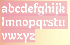 Seryozha Rasskazov is a graphic and type designer, lettering artist, and sign painter from St. Petersburg, Russia, who studied at ECAL's Master in Type Design program in Lausanne, 2020-2022. Under the supervision of Kai Bernau, he designed the optically optimized variable didone stencil typeface Didonist (2021).
 We believe that he created the art nouveau typeface Flory (2021) at Zeh Foundry. He may also have been involved in the development of the Latin / Cyrillic hipster family Russian Tourist Brand (2021). [Google]
[More] ⦿
|
Zetafonts (Tangram Studio)
[Peter von Zezschwitz]
|
At 40 dollars per font, Peter von Zezschwitz's Durham, Ontario-based company digitized Art Nouveau designs created by M.J. Gradl, Philip Morris and other of their less well-known contemporaries. Mac or Windows. Great-looking typefaces. Not to be confused with the foundry ZETAFonts! Fontnames: Gradler, Greta, Gretchen, Heinisch, Kaiser (minimalist unicase font), Lydia (drop caps), Florentia, Mahlau (has also astrological symbols), Mirror, Odilia, Morelia, Pinks, Ramona, Blautopf (Fraktur), Vintago (caps). Odilia, Vintago and Morelia are beautiful Uncial/Celtic fonts. I say "Bravo!". Write-up at FontNews. Feena Casual and others are free at Eksten. FontShop link. Klingspor link. [Google]
[More] ⦿
|
Zhalgas Kassymkulov
[Architaraz Type (or: Kassymkulov Design)]

|
 [MyFonts]
[More] ⦿
|
 [The shot of Kibo used for the Wired article – he’s not quite as exciting as all this, no red aura in real life.]
 The Russian word “Chudno” (above) means “wondrous.” What’s really wondrous is the unique similarity of Benton’s majuscule O and the one drawn at the poster’s extreme right. The shape of the letters in the word “HOBO!” don’t hurt the argument, and of course the name buttresses it. To me, the striking coincidence of this single “O” letterform crowns the argument and should lay to rest the mystery of Hobo. This evidence shows that Morris Fuller Benton must have seen this poster somewhere. Perhaps he was somehow reluctant to admit that the source of his inspiration came from outside his famously insecure mind?

 Alex Joganic (1871 Project) is the Birmingham, AL-based designer of Matches (2016, an octagonal typeface), Ciclista (2016, a casual monoline typeface), Superior (2016, a handcrafted sans), The Victor (2016, handcrafted), Zara Elyse (2016: script), Fernweh (2016, a handcrafted typeface with a vintage wood type look) and Xander (2016, in Sans and Serif: 19th century all caps typeface family with a wood type look).
 Acmé-Paris is a design studio in Paris run by Élodie Mandray and Caroline Aufort. Creators of New Gothic Textura (2009), Canevas (2010-2012, stitching font), Acme (2013), Tropique (2011, experimental), Minuscule (2012), Tribute (2012, children's hand), Juicy (2010), Eclipse, Thésard, the music-inspired Swing (2010), the heavy monoline sans typeface
  [
[ [
[ Adicto Multichannel Agency is a studio located in Sankt Gallen, Switzerland. For the new restaurant Werk 1 in a renovated industrial building built in 1900 Adicto created the new typeface Werk1 (2014). For this typeface, they used the art nouveau font Quaint as a model. The font was developed by
  Creator at FontStruct of Aeolien (2011, alphadings),
  Adam Fathony (or Adam Fathoni Haris; AF Studio, Bandung, Indonesia) created the vintage typeface Grandesa (2014), the signage typeface Magnifika (2014) and the Victorian typeface Marema (2014).
  Werner Affolter ran a phototype and printing company in Basel, Switzerland, called Affolter und Gschwind AG, Fotosatz&Reprotechnik. In 1981, Affolter published an extensive catalog entitled Letterama that showed over one thousand alphabets. Few of those were original, so I suspect he acted as a vendor of sorts, but at least a couple seemed original, or were claimed to be original or exclusive:
  [
[ Bandung, Indonesia-based designer (b. 1988) of the modular display typeface
  Pottstown (Philadelphia)-based designer and PostScript font hacker who ran Prescott Design and now Alan Jay Prescott Typography, but was also involved in other ventures such as the Black Walnut Winery. Originally from Greenfield, MA, he graduated from Saddleback College, and worked for some time as a typesetter in New York. He advertizes himself as a leader in PostScript Open Type Font development specializing in the revival of print-only letterforms into digital typographic materials. He operates as APT and more recently as AJPT. In 2019, he announced that he would stop making typefaces altogether. His work can be partitioned into time periods. For this reason, Prescott's oeuvre is split over several pages:
  Foundry in Offenbach, Germany. Their main specimen book is Haupt-Probe über Schriftgiesserei-Erzeugnisse und Messing-Material (1911, Offenbach am Main). House typefaces include the blackletters
  [
[ Prolific type designer, b. London, 1951. Alan started working in 1970 for Graphic Systems as a lettering artist. In 1975, he joined Letraset as the Senior Type Designer and Studio Manager where he was responsible for all the artwork produced by the Letraset studio. During his tenure at Letraset, he designed over 40 popular typefaces, including Bramley, Candice, Bickley Script and Belwe. Most of these typefaces also showed up in the Scangraphic collection. Together with type director Colin Brignall, Alan contributed to the success of Letraset. All the original typographic artwork produced at Letraset was produced by hand cutting the fonts in Rubylith, a highly-skilled technique known as stencil cutting. Alan was responsible for training the entire Letraset studio in this art. Most of the original Letraset artwork has now been archived at St. Brides Printing Library, London. Today, Alan works independently, specializing in all facets of corporate identity including type design, typography, packaging, and development of logos and symbols.
  [
[ Creator of these typefaces at the Spanish type foundry Eurotypo:
  Alberto Villanueva (b. 1982) lives in L'Hospitalet de Llobregat near Barcelona. He designed the gothic display typefaces
  Banda Aceh, Indonesia-based designer (b. 1993) who specializes and excels in formal calligraphic typefaces. Creator of the thin calligraphic typefaces Yesterday (2017: upright) and Jazzi Script (2017), and the swashy formal calligraphic typefaces Peaches (2017), and Sinday College (2017).
  Chilean illustrator and designer from the art nouveau era, 1865-1912. Check
  [
[ Russian designer of typefaces who collaborates with Ivan Zeifert and specializes in revivals, cyrillizations and beautiful digitizations, some of them done with Anatole Gophmann. There have been complaints about her practice of borrowing fonts from type designers without asking. One typophile writes: I have cracked open fonts she claims as hers, Bolero, Bickham and others, she has copied and pasted glyphs, copyright data, added Cyrillic and changed the copyright string. As an example, Angelica is a copy of Alejandro Paul's Miss Fajardose. Alejandro has drawn the numerals in his font in 2004 to accompany the letters found in an old catalog of alphabets. There is no other source of the numerals, and Angelica has them. Michael Clark writes: I initiated a battle with the illustrious Alexandra "Bitch" from Russia who has renamed Pouty (FontBureau) and copyrighted [it as] Bolero. She and her partner Anatoly shithead. Available on Fonts101.com for anyone who wants it free. The ass's site, Jagdesh, is in Pakistan and we cannot touch him. 260+ viewings and 140+ downloads. Let's see that is 1400$ I will never see! Others have complained as well about her practice of taking and extending fonts without permission. Anyway, her "fonts" are:
  Austrian graphic designer, painter and lettering artist during the secessionist period, who lived from 1864 (b. Brünn, Mähren) until 1935 (d. Vienna). He was one of the founding members of the influential Vienna Secession for whom he designed
  Student at Mimar Sinan University's Graphic Design Department. Istanbul-based designer of a
  During
  A graduate of Institut Seni Indonesia Denpasar Bali who is based in Denpasar, Bali, Alit Suarnegara (Gurita Hitam, b. 1986, Denpasar) created these typefaces:
  [
[ Type designer. Not to be confused with "Walden Font", a commercial foundry run by Oliver Weiss.
  Born in Ivancice, Moravia (Czechia), in 1860, died in Prague in 1939. Famous for his sleek posters of women at the height of the art nouveau movement. In 1885 he studied at the Munich Academy of Art and then moved to the Academie Julian in Paris. In Paris, he took commissions for illustrations, portraits and decorative projects, but became most famous for his poster designs for plays, especially under the patronage of Sarah Bernhardt in the 1890s. The success of his posters led to a commercial career in decorative design for commercial and advertising products. Mucha also created jewelry designs, and briefly taught art in New York. In 1910, Mucha returned to Prague to work on nationalistic art, including murals, postage stamps, stained glass and bank notes.
  During their studies at Rochester Institute of Technology /University of Espirito Santo, in Vitoria, Brazil, industrial design students Ana Quinelato, Brenno Mello, Cassio Ferreira, Filipe Motta and Myriam Fabris codeveloped UFES Sans (2014), a wayfinding sans typeface for the signage at their university, UFES. The team leader was Professor Ricardo Esteves Gomes.
  [
[ [
[ [
[ Brooklyn, NY-based designer of the
  Born in Barcelona in 1962,
  In 2017, Louise Fili, Nicholas Misani and Rachel Michaud co-designed the art nouveau typeface
  Argentinian lettering artist who worked for 35 years for McCann Erikson and has produced freelance works for other major agencies like Interbrand, Futurebrand, and others. Veer wrote: The talented Angel Koziupa has been lettering, creating type and designing logos for the past 40 years. His handiwork is behind nearly every important packaging logotype in Argentina. He worked 35 years for McCann Erikson and has produced freelance works for other major agencies like Interbrand, Futurebrand, and others.
  Anne Ulku is an established designer based in Minneapolis, MN. She graduated from Minneapolis College of Art&Design in 2007. Her typefaces include
  Some Italian wood types shown in Catalogo Caratteri in Piombo e Legno by Anonima Impressori (Bologna, Italy). The styles covered here represent the art nouveau era. They comprise Amalia, Aurora Arcaico, Barnum, Bastone Stretto Fiat, Cenisio, Desdemona, Iris, Libellula, Liberty, Titania, Uranio. [
 [
[ Antonio J. Morata (Almeria, Spain, b. 1968) is a FontStructor (aka elmoyenique) who used FontStruct to make several modular typefaces starting in 2010. The typeface names start with z. We list them alphabetically:
 Born in the Canary Islands, Ariel Martín Pérez is a freelance art director and illustrator based in Paris. He set up Ariel Graphisme. In 2020, he founded
  Architaraz Type (Kassymkulov Design) is located in Shanghai, China, and Taraz, Kazakhstan. Its type designer, Zhalgas Kassymkulov, was born in 1986 in Kazakhstan. His initial type designs were all done with the help of FontStruct. In 2013, he went commercial as Architaraz Type.
  [
[ Måns Grebäck (Aring Typeface, Örebro, Sweden) is a prolific Swedish designer (b. Lindesberg, Sweden, 1990), who lives in Borlänge, Sweden. Måns Grebäck has a bachelor's degree in graphic design from the University of Dalarna (2012). In 2010, he went commercial, and started selling fonts through
  French foundry, est. 2007, which published many extensive free sans and sans serif families by Hirwen Harendal, who supports Open Source projects. The purpose of ADF is to provide a large number of high quality fonts (174 fonts as of the end of August 2007). Harendal has help from Clea F. Rees, most notably on the TeX part and the extensive Venturis family.
  Quoting the wiki: Art Nouveau is an international movement and style of art, architecture and applied art-especially the decorative arts-that peaked in popularity at the turn of the 20th century (1890-1905). The name Art nouveau is French for new art. It is also known as Jugendstil, German for youth style, named after the magazine Jugend, which promoted it. A reaction to academic art of the 19th century, it is characterized by organic, especially floral and other plant-inspired motifs, as well as highly-stylized, flowing curvilinear forms. Art Nouveau is an approach to design according to which artists should work on everything from architecture to furniture, making art part of everyday life. Art Nouveau's fifteen-year peak was strongly felt throughout Europe-from Glasgow to Moscow to Spain-but its influence was global. Hence, it is known in various guises with frequent localized tendencies. In France, Hector Guimard's metro entrances shaped the landscape of Paris and Emile Gallé was at the center of the school of thought in Nancy. Victor Horta had a decisive impact on architecture in Belgium. Magazines like Jugend helped spread the style in Germany, especially as a graphic artform, while the Vienna Secessionists influenced art and architecture throughout Austria-Hungary. Art Nouveau was also a movement of distinct individuals such as Gustav Klimt, Charles Rennie Mackintosh, Alfons Mucha, René Lalique, Antoni Gaudí and Louis Comfort Tiffany, each of whom interpreted it in their own individual manner. Although Art Nouveau fell out of favor with the arrival of 20th-century modernist styles, it is seen today as an important bridge between the historicism of Neoclassicism and modernism. Furthermore, Art Nouveau monuments are now recognized by UNESCO on their World Heritage List as significant contributions to cultural heritage. The historic center of Riga, Latvia, with "the finest collection of art nouveau buildings in Europe", was inscribed on the list in 1997 in part because of the "quality and the quantity of its Art Nouveau/Jugendstil architecture", and four Brussels town houses by Victor Horta were included in 2000 as "works of human creative genius" that are "outstanding examples of Art Nouveau architecture brilliantly illustrating the transition from the 19th to the 20th century in art, thought, and society." It later influenced psychedelic art that flourished in the 1960s and 1970. [
 Art nouveau revivals by Nick Curtis include the following free typefaces.
  Ahmad Ramzi Fahruddin (aka Ramzehhh and as Ramz Fahruddin, b. 1993) established Arterfak Project in 2015. He is the Palembang, Indonesia-based designer of the display typefaces Aidah (2015, spurred), Temenyut (2015, spurred), Basenglah (2015, a geometric solid typeface), Local Genius (2015), Oropitem (2015, blackletter), Cakmacak (2015), Maeninaja (2015), Yagitudeh (2015, a
  Artistik (an art nouveau brush face) was first a
  Type designer at Red Rooster, where she published
  Astype.de is a German foundry started in 2003 by illustrator and type designer Andreas Seidel (b. 1975, bad saarow, near Berlin, Germany). He lives in Cottbus, Germany. In 1998, he obtained a Masters degree in business administration. In 2007, he and Ingo Preuss set up
  Showcasing the best pages from the Parsons Series in the ATF 1923 Catalog. This is an original ATF display typeface (via its acquisition of BB&S) with a hand-drawn almost art nouveau look. Created in 1918 by
  French painter, designer, poster artist, book illustrator and caricaturist, b. Paris, 1872, d. Paris, 1955. His early work was influenced by the art nouveau movement. He drew some typographic silhouettes that represent that epoch. His most famous posters are Les Appareils photographiques Demaria frères, La Motocyclette Werner, Spratt's Patent, High Life Tailor, Le Bourgeon, Scala en Bombe, Au Smart Carmen and La Maison du Rire. [
 [
[ [
[ Founded in Bandung, Indonesia in the middle of 2019 by graphic designers Reza Rasenda (b. 1993) and Riska Chandra Dewi, Zealab Fonts Division specializes in and is inspired by urban culture, luxurious brands and street posters. Reza Rasenda designed these typefaces in 2020: Crenzo (a
  Based in Perry, OK, Bannigan Artworks was founded in 1998 by
  Trying to fit this 1000-page book into one web page, with discussion of many types. It's impossible, but I tried it.
  Or Bart Wesolek, b. 1986. Nowa Sol / Poznan, Poland-based graphic designer, who published the vintage typeface Rheiborn, the display typeface Onufry (based on lettering on vintage cycling posters), the poster typeface Molheim, the letterpress typeface Darmond, the squarish Garthram, the vintage typeface Martslock, the
  [
[ Foundry in Wichita, KS, founded in 1999 by Nathan Williams (b. Concordia, KS, 1973), formerly from the University of Kansas Art Museum Library. Its motto: The goal of the foundry is to provide uninterpreted revivals of type samples generated through disappearing printing methods, and create new fonts for dissemination in the type community. Order through
  Type specimen book by Bauersche Giesserei published ca. 1915.
  Frankfurt-based foundry started in 1837 by Johann Christian Bauer. At the end of the 19th century, the new owner was Georg Hartmann. On its staff, it had designers such as Konrad F. Bauer [
 Creator of
  German foundry established in 1816 by Benjamin Krebs (1785-1858) and based in Frankfurt, which grew out of Schriftgießerey der Andreäischen Buchhandlung. Many of its shares were acquired by D. Stempel in 1933. A list of the typefaces:
  [
[ Berlin, Germany-based designer, who is a member of a consortium called
  Graphic and web designer in Boston who studied at Hampshire College 2006-2007). He wrote the
  [
[ Cedar Rapids, IA-based designer of the art nouveau typeface Alphonse (2015), which is named after Czech art nouveau artist Alphonse Mucha. [
 German architect, illustrator, interior designer, and furniture designer, 1874-1968. Illustrator for the art nouveau magazine Jugend (1896) and for the satirical magazine Simplicissimus (1897-1906). [
 Art nouveau type designer, who created
  Eric Kurniawan (or Burntilldead, b. 1986) is located in Bali, Indonesia. He created the vintage script typeface The Goldsmith Vintage (2015).
  A free orphaned typeface designed in 1993. It is an art nouveau typeface modeled after Timothy Walter "Tim" Burton's movie The Nightmare Before Christmas. [
 Albert Boton is a Parisian type designer and teacher, born in 1932 in Paris. Boton died in 2023. In 1957 he started work at Deberny&Peignot under Adrian Frutiger. From 1958 to 1966 he helped create several typefaces for the Hollenstein phototype catalog. In 1968 he became the art director for Robert Delpire publishers, but continued designing typefaces for the Hollenstein collection and later for Mecanorma and Typogabor. From 1968 to 1997 he was a teacher of type design and calligraphy at the École nationale des arts décoratifs (ENSAD) in Paris. From 1988 to 1998 he taught type design at the Atelier National de Recherche Typographiques. In 1981 he became art director and head of type department at the design agency Carré Noir.
  An art nouveau-era typeface made in 1896 by Frederic Goudy. D.J.R. Bruckner: This is the first tvpe attributed to Goudy based on letters he drew and sent to the Dickinson Tvpe Foundry. He made only the capitals, and the foundry men added a lower case.
  Foundry in Canada, est. 2004 by Rebecca Alaccari in Toronto, and run by her and Patrick Griffin.
  During her studies at Parsons in New York, Candice Ralph created an art nouveau-inspired typeface called
  Type and graphic designer, b. 1878, Vienna, d. 1960, Hamburg. From 1894 until 1899, he studied at the Akademie der bildenden Künste in Vienna. He was a member of the Vienna Secession in 1900 and joined the Wiener Werkstätte in 1905 where he created his most famous illustrated book, Die Nibelungen (1909). He taught at the Kunstgewerbeschule in Vienna (1902-07) and at the Kunstgewerbeschule in Hamburg (1907).
  During her studies in Sao Paulo, Carolina Takara created the initial caps alphabet Cat Nouveau (2014) and the decorative handcrafted typeface Ganache (2014). [
 Casady&Greene, Inc. started out as two separate little companies, CasadyWare and Greene, Inc. CasadyWare, which was founded by Robin Casady in August 1984, began producing Fluent Fonts, which were bitmapped typefaces for the Macintosh. The 1984 set of fonts have copyright lines that mention Richard A. Ware. As soon as PostScript fonts appeared, CasadyWare got hold of the first version of Fontographer and produced the first downloadable PostScript fonts, even beating Adobe, the originators of PostScript, to the punch. These were marketed as Fluent Laser Fonts (FLF) out of Carmel, CA.
  Designs by
  Wolgast-based type designer Peter Wiegel (b. 1955) runs CAT Design Wolgast. Designer of these free fonts:
  Specializing in celebrity signature fonts, this Arcadia, CA-based foundry (est. 2008) is run by
  Dubai (and before that, Beirut Lebanon)-based designer of Celina (2015), a charming typeface with a hint of art nouveau warmth. In 2015, she created the Arabic kufi-style typeface Kanater.
  Foundry from St. Louis, est. 1872. It became "Central Division of ATF" in 1893.
  Prolific Woodland Hills, CA-based typophile and type designer (1937-2013) whose portfolio consisted largely of revivals and who used the alias Character for his typographic work. The Los Angeles Times posted
  [
[ Lettering artist and architect in Glasgow (b. Glasgow, 1868, d. London, 1928). He was a designer in the Arts and Crafts movement and also the main exponent of Art Nouveau in the United Kingdom. Some speculate that he had Asperger's Syndrome. Typefaces based on his lettering include
  Designer of the baroque serif typeface
  Parisian designer of the curvy art nouveau-ish Feu Sauvage (2015).
  Co-designer with Richard Kegler of several fonts at P22 type foundry, which she joined in 2000. She graduated from the State University of New York at Buffalo with a BA in Communication Design. She worked at the Pushpin Group in NYC and at Dog Eat Dog Advertising, Inc. in Buffalo, NY. Her typefaces:
  [
[ Designer of free revival types:
  American designer in Jackson Heights, NY (b. 1965), associated with the Cherokee Nation. He created the graffiti font Chase Zen Jackulator (2015), Chase Zen Jingletruck Karachi (2015), the tattoo font Chase Zen Holy Monkey (2015), the art nouveau typeface Chase Zen Paris (2014), Chase Zen Sprawl (2014), Chase Zen Blight (2014), Chase Zen Punjabi (2014), Chase Zen Basmati (2014), and Chase Zen Bangladesh (2014).
  Aka Chyrllene K. Daughter of Iza W, who designed many typefaces at Intellecta Design starting in 2010. She studied applied mathematics and graphic design, and works as COO of Intellecta Design. In 2013, she wrote a
  Prolific author, b. 1899. His books include the typographically magnificent Handbook of Early Advertising Art, Mainly from American Sources (Dover, 2 volumes). The typeface Lexington is attributed to him, as Mac McGrew writes: Lexington is a font of shaded and decorated letters and figures, drawn for ATF by Wadsworth A. Parker in 1926, from a design by Clarence P. Hornung. It is an ornamental form of roman letter, with curly serifs, and tendrils at the ends of light strokes. It was recast in 1954, and copied in one size by Los Angeles Type.
  Quebec-based typographer and type designer (aka Diogene) who specializes mainly in revivals of obscure or old typefaces.
  During her studies in Montreal, Claudie Leger was inspired by Alphonse Mucha when she designed the ornamental art nouveau typeface Freyja (2014). [
 Navarre, OH-based foundry run by artist/designer Billy Jacobs (b. 1958).
  Type designer from Buffalo, NY. His typefaces were mostly developed at P22.
  Graphic design collective in Orchamps near Besançon, France, est. 2012, consisting of graduates in the Masters program of the École des Beaux-Arts de Besançon, i.e., Clément Moussard, Antonin Buchwalter, and Simon-Pierre Chapuis. Their typeface creations:
  Comicraft was founded by Richard Starkings and John Roshell in 1992. Located in Santa Monica and Los Angeles, they do lettering and design for the comic book industry and make comic book fonts. At one point they were also called Comic Book Fonts. The current presidents are Rita Simpson and
  An excellent piece written by Patrick Griffin in 2010 when he and Kevin King published
  Born in Firenze in 1969. Cofounder with Francesco Canovaro and Debora Manetti of the Italian design firm in Firenze called Studio Kmzero. He co-designed some typefaces there such as
  CybaPee is the nom de plume of Petra Heidorn who lives near Hamburg. She has created many typefaces (listed below) between 1997 and 2005 and has cooperated with several type designers on interesting projects. She is undoubtedly best known for her successful web site
  Buenos Aires, Argentina-based designer of the art nouveau style typeface Encanto (2017). She writes that it was inspired by vintage fantasy books, romanticism and surrealism. [
 Yogjakarta, Indonesia-based type foundry, est. 2016, whose designer is Nyapa Tanzil, who also used the alias Tanzil Adduha (b. 1991), who operated as
  [
[ American type designer, born in Detroit, who lives in New York City. His early typefaces include
  A graduate of Detroit Lakes Vocational Technical school, Dave has been making signs since 1983. He designs storefronts, dimensional signage, banners and logos at his Faribault, MN-based sign shop. His typefaces at Letterhead Fonts include Anna Banana (2004),
  From Portland, OR, Dave Fabik's free truetype fonts. Includes fonts such as Slipstream,
 Type designer and composer, born in St. Albans, VT, in 1958. He was one of the early free/shareware type designers, well-known for creating revivals of 19th century typefaces. He was the Walter W. Naumburg Professor of Composition at Brandeis University, and has previously taught at Harvard University, Columbia University, and Stanford University.
  Type designer who was born in London in 1943. Dave Farey runs
  [
[ [
[ Parisian type designer (b. 1972) who designed
  Creator of the art nouveau outline typeface Café Norden (2009) and of Simon Script (2006, a hand-printed blackboard bold typeface).
  [
[ [
[ American designer of the fonts P22 Bauhaus Extras, P22 Bauhaus Extras, P22 Bayer Shadow, P22 Bayer Universal, P22 Cage Extras, P22 Da Vinci, P22 Da Vinci Extras,
  [
[ Freelance graphic designer from London, who lives (lived?) in Wellington, New Zealand. In 2014, she created Gentleman's Poison, and Taco&Tequila. In 2015, she designed the handcrafted typefaces Pilgrim, Chesapeake Script (a monoline script), Kodiak (+Icons: brushy wilderness font), Globe, Old Pine, Tiny Moose, Grayling and Hawk&Hunter.
  Desmond Wong studied at The Cooper Union (2011) and at Pratt Institute (2009-2013) before setting up shop in New York City. He designed some typefaces such as Mandelbrot (a Type@Cooper fractal emulation project from 2011 named after Benoit Mandelbrot), Bema (2013, a reinterpretation of a typeface originally created by Michael Freiburger, Martin Kranz, and Ulrich Gering for the first Bible printed in France---designed during Jesse Ragan's typeface design class at Pratt Institute), OM Steiner (designed at Other Means with direction from Gary Fogelson, Phil Lubliner, Ryan Waller and Vance Wellenstein for Yeasayer's Fragrant World), Export (2012, for Jesse Ragan), Vogue Sans (2013, a class project done with Kathleen Creighton), and four typefaces crated for his senior thesis project in 2013 jointly with Frank DeRose and Brendan Griffiths: Chinatown, Woodworm (with art nouveau stencil hints), Plant, Classified.
  Rian Hughes studied at the LCP in London before working for an advertising agency, i-D magazine, and a series of record sleeve design companies. Under the name Device he now provides design and illustration for the advertising, entertainment, publishing, and media industries. He works from Richmond, UK, as a comic book artist, letterer and typefounder---his foundry is called
  [
[ [
[ [
[ [
[ [
[ The extensive Dover series by Dick Pape contains about 150 typefaces. The typefaces are numbered and carry these names:
  In February 2013, Dick Pape published a number of typefaces grouped together here.
  Dick Pape revived hundreds of initial caps typefaces. Some came from collections. The unclassified ones include these fonts from 2009 (unless date specially mentioned): Antique Alphabet,
  Ornamental typefaces made in 2008-2010 by
  Die Brücke (The Bridge) was a group of German expressionist artists formed at the Königliche Technische Hochschule in Dresden in 1905, after which the Brücke Museum in Berlin was named. Founded by the Jugendstil architecture students Fritz Bleyl (1880-1966), Erich Heckel (1883-1970), Ernst Ludwig Kirchner (1880-1938) and Karl Schmidt-Rottluff (1884-1976), it later included members such as Emil Nolde (1867-1956), Max Pechstein (1881-1955) and Otto Mueller (1874-1930). It influenced the evolution of modern art and expressionism.
  FontShop was the name of
  Yogyakarta, Indonesia-based designer (b. 1990) of these script typefaces in 2018: Radicalis (script), Blacktail (layered, spurred, Western), Aniyah (formal calligraphic script),
  Porto, Portugal-based designer of the mischievous art nouveau-inspired display typeface Gunther (2021). [
 This used to be a wonderful page, but Michelle Dixon seems to have retired from the font making business. There used to be five shareware dingbats fonts: African Ornaments One, Cave Painting Dingbats One, Mayan Dingbats, Pre-Columbian Ornaments One, and Printers' Ornaments One (Mac PS), plus about 45 other original fonts (not shareware). In her wonderful collection, the following of Michelle Dixon's creations stand out: Arrighi Copybook, ItalianMosaicOrnaments, Beautiful, LondonHouse, Love Letter Typewriter, Gaudy Medium, Rusty Nail-Medium (the last four are all old typewriter fonts), and the display fonts Isla Bella (art nouveau), La Negrita, Arty Nouveau, Victorian, Art Nouveau Fonts, Bad Dog-Black, Berlin, Caslon Frenzy, Dixon's Vixens Caps, AntiqueMonoTW, DangerousTypoWriter, Elegant Nouveau Initial Caps, Fruitbasket, Matador, Manhattan, Modern Scribe, Ovid, Spillage, Tacos, Tolstoy, Typewriter, Love Letter, Basketcase, ChiliPepperDingbats, Postage Stamps, Garish Monde,
  Yus Wardi (Diyos) is the Indonesian designer of these typefaces:
  [
[ Lima, Peru-based designer of the ultra-black piano key typeface Evangelion (2020). Domenico writes: Evangelion is a sans serif display typeface inspired by the works of Wim Crouwel and the anime Evangelion.
  [
[ Brazilian resident who specializes in original grunge designs. His typefaces are mostly free. Some commercial typefaces are available via
  American creator of the constructivist typeface Back in the USSR (2009: created for issue 4 of Critica Grafica magazine) and the art nouveau typeface
  Russian type designer specializing in historical revivals of old Cyrillic typefaces. creator of these Latin / Cyrillic typefaces:
  A mysterious
  [
[ Typefounder in Vienna around 1900. His work includes the art nouveau post-Victorian typefaces
  Born in New York in 1927, Ed grew up in Brooklyn. He died in 2020. Ed was once a very prominent jazz percussionist playing in several big bands with Stan Kenton and Woody Herman, among others. He has created a large number of typefaces between 1970 and 1995. About his career, he once said: I'm really a musician, a jazz percussionist. One day I went to the musician's union to pay dues and I saw all these old people who were playing bar mitzvahs and Greek weddings. It occurred to me that one day that's going to be me, so I decided to become an illustrator. He designed more than 400 typefaces for PhotoLettering. He played a critical role in establishing The International Typeface Corporation (or ITC) in the late '60s and early '70s. Founded in 1971 by designers Herb Lubalin, Aaron Burns, and Ed Ronthaler, ITC was formed to market type to the industry. Lubalin and Burns contacted Benguiat, whose first ITC project was working on Souvenir. Ed became a partner with Lubalin in the development of U&lc, ITC's famous magazine, and the creation of new typefaces such as Tiffany, Benguiat, Benguiat Gothic, Korinna, Panache, Modern No. 216, Bookman, Caslon No. 225, Barcelona, Avant Garde Condensed, and many more. With Herb Lubalin, Ed eventually became vice-president of ITC until its sale to Esselte Ltd.
  Graphic designer in Shenzhen, China.
  German type foundry in Hamburg established in 1986 by Veronika Elsner and Günther Flake. They offer original fonts as well as improved versions of classical fonts. There are many non-Latin fonts as well. In-house designers include Jessica Hoppe (Carpediem), Verena Gerlach (
 [
[ Brazilian printmaker, graphic artist and illustrator, b. 1975. Her fonts are created together with Ricardo Marcin at
  Erik lives in Zwolle, The Netherlands, and was born in 1964. He designed the splendid free handcrafted typefaces Eryx Rennie Macintosh (2015, Scottish arts and crafts typeface),
  Nineteenth century engraver (b. Germany, 1872, d. 1944) in Chicago. He designed these typefaces:
  Swiss type designer. As
  Viennese painter, illustrator, industrial designer and graphic artist, b. 1875, d. 1944. Puchinger studied with the muralist and art professor Franz von Matsch (1861-1942), who worked on decorative art with Gustav Klimt. He worked in London, Prague and Paris as well as Vienna and collaborated with other major figures in Viennese art and design such as Ernst and Gustav Klimt and Otto Prutscher. At the end of his studies, he met Otto Wagner, Josef Hoffman, Joseph Maria Olbrich and Koloman Moser and joined the Vienna Secession. [
 Ethel Larcombe (1879-1965, Britain) created
  Swiss decorative artist, poster designer of the art nouveau era, and type designer (b. Lausanne, 1841, d. Sceaux, 1917). Grasset worked in Paris during La Belle Epoque.
  Independent type designer who created typefaces for D. Stempel when he lived in Hannover, Germany. His typefaces, all published by D. Stempel AG, include
  [
[ Fabrizio Schiavi was born in Ponte dell'Olio in the Piacenza province in 1971. FSD Fabrizio Schiavi Design in Piacenza was opened in 1998. With Alessio Leonardi, he co-founded Fontology. He also co-launched the experimental graphics magazine Climax in 1994.
  New York-based foundry, also called White's Type Foundry and A.D. Farmer Foundry. It was created in New York in 1862, and sold to ATF in 1892. Many of its typefaces were digitized in recent years, such as the art nouveau typeface Palm (1887), which resurfaced as
  Feliciano Type was established in 2001 by Mario Feliciano. The foundry's main design studio in Lisbon, Portugal, with two additional offices, in Povoa de Varzim, Portugal, and in The Hague, Netherlands. Mário Feliciano (b. 1969, Caldas da Rainha, Portugal). Feliciano studied graphic design at IADE, Lisbon, and began working as a graphic designer at Surf Portugal magazine in 1993, where he stayed as art director until 2000. In 1994 he founded the design studio Secretonix in Lisbon. He has been heavily involved in type design since. In 2005, he joined the type coop
  Japanese foundry in Nagoya that offers free and commercial Latin fonts made by
  Flavia Zimbardi is a type designer and visual artist from Rio de Janeiro, based in Berlin. From 2005 to 2013 she worked for some of the leading magazines in Brazil. Flavia is a graduate of the Type@Cooper Extended Program at the Cooper Union, class of 2017. In 2018, she started
  Foundry in Paris, which made the celebrated art nouveau Paris subway font Metropolitaines in 1905. Also called Berthier&Durey. In 1882, Berthier & Cie published
  Big Paris-based foundry, with an extensive factory. Their work can be found in
  Type foundry in Paris, founded in 1921 by the merger of the firms of Chaix, Marcou, Durey, Huart and Saling. There were several catalogs of their typefaces such as Fonderie Typographique Française Catalogue Général (ca 1925, 798 pages).
  FONTana is a font design studio in Szeged, Hungary, started in 1999.
 At Fontgrube AH, Andreas Höfeld, a protestant pastor from Erbach/Odenwald, designed these typefaces:
  FontMeister is the commercial foundry of
  Obsolete German foundry, est. 2010 by Michel M and
  Grzegorz Klimczewski, who runs Fonty PL, a commercial Polish foundry etablished in 1994 in Wroclaw, is the Polish designer of a commercial font that mimics the letters found on Polish traffic signs, called Tablica Drogowa (
 Cimahi / Bandung, Indonesia-based designer (b. 1986) of the hand-lettered alphabets Awesome (2015), Wonderwall (2015, a splash brush font), Valencia Sweetness (2015, brush script), Basik Rough (2015, brush), Innocents (2015), Againts (2014) (sic) and Leathery (2014).
  Los Angeles-based company that distributed a 5000+ library of two-inch film fonts for display typefaces, some of which were original, such as Yagi Double (the CNN logo font) and Yagi Link Double. It ceased operations in 1985. Trogman maintains a design studio in Palm Springs, California.
  Sign painter from the art nouveau era, who lived in Chicago and worked mostly for Cadillac. His books Sign Painting (1908) and
  Born in the USA in 1873, he designed a few hundred book covers, illustrations or title page layouts for many publishers, and was influenced by the
  Franz Paul Glass (b. 1886, Munich, Germany, d. 1964) studied Industrial Design at the College of Arts and Crafts in Munich. Later, he became well-known for his poster designs. He created
  Among the fonts in this small art nouveau style and arts and crafts archive, compiled by John M. Murphy in 2003, we find
  Fresh Air Fonts is an American foundry, est. 2010 by
  The Richard Gans Foundry is a defunct Spanish foundry which existed from 1888-1975.
  GalloFonts is part of Graphics by Gallo, founded in 1974 by
  [
[ Steve "Gecko" Harrison of the Sleepy Gecko Chillout Bar on Cam Nam island off Hoi An, and also Danang, Vietnam, b. 1952, designed these typefaces:
  French lettering artist and type designer, b. Beauvais, 1863, d. Paris, 1938. His real name was Jean-Georges Huyot. He was an
  American designer, b. Rockville Centre, NY, 1950. George Ryan held senior positions at Linotype and Bitstream since 1979, where he has been involved in the production of over 2500 fonts. In 2004, Ryan joined Agfa Monotype, and is now a Monotype typeface designer.
  British printer and
  George Williams's site (now defunct) site was a discovery! George Williams (b. 1959) wrote spline-generating code and then went on to produce several fonts with his software between 1987 and 1998:
  French author of the art deco lettering book Modèles de lettres modernes par Georges Léculier (1925). Typefaces based on his alphabets include
  [
[ [
[ Maryland-based graphic and type design company. Their typeface catalog in 2021 showed these fonts, most of which are ornaments or initial caps: Americana Ornaments, Angulatte, Art Nouveau Flowers, Art Nouveau Ornaments, Art Nouveau Ornaments, Birds Flying, Blooming Ornaments, Blue On Blue, Brashee, Bullish, Carefreed, Carved Initials, Charisma, Chiseled Initials, Cleancut, Cross Ornaments, Cross Stitch Basic, Cross Stitch Brazen, Cross Stitch Carefree, Cross Stitch Classic, Cross Stitch Coarse, Cross Stitch Cursive, Cross Stitch Delicate, Cross Stitch Diamond Monogram, Cross Stitch Discreet, Cross Stitch Display, Cross Stitch Elaborate, Cross Stitch Formal, Cross Stitch Gothic, Cross Stitch Graceful, Cross Stitch Majestic, Cross Stitch Medieval, Cross Stitch Monogram, Cross Stitch Noble, Cross Stitch Ornaments, Cross Stitch Regal, Cross Stitch Simple, Cross Stitch Solid, Cross Stitch Splendid, Dexterous, Diamond Monogram, Display Ardent, Display Art, Display Art One, Display Art Two, Display Black Serif, Display Brutal, Display Carlos, Display Chamfer, Display Crisp, Display Digits Eight, Display Digits Five, Display Digits Four, Display Digits Nine, Display Digits One, Display Digits Seven, Display Digits Six, Display Digits Ten, Display Digits Three, Display Digits Two, Display Dots & Squares, Display Dots Five, Display Dots Four Sans, Display Dots Four Serif, Display Dots One, Display Dots Seven, Display Dots Six, Display Dots Three Sans, Display Dots Three Serif, Display Dots Two Sans, Display Dots Two Serif, Display Explicit, Display Exquisite, Display, Display Gothic, Display Grungy, Display Haphazard, Display Intense, Display Plump, Display Prominent, Display Robust, Display Squares Two, Display Uncanny, Display University, Dooddle, Elegant Ornaments, Embossed Deep, Embossed Medium, Embossed Shallow, Fancy Flowers, Fast Hand, Fish Fresh, Flair Hand, Fleuron Ornaments, Floral Ornaments, Foliage Ornaments, Folk Art Flowers, GG Casual, GG Serif, Glorita, Gnarlee, Gothic Initials Eight, Gothic Initials Five, Gothic Initials, Gothic Initials Four, Gothic Initials Nine, Gothic Initials One, Gothic Initials Seven, Gothic Initials Six, Gothic Initials Three, Gothic Initials Two, Green On Green, Hand Lettered, HappyFont Hasty Hand, Heavy Duty, Heraldic Creatures, Holy Ornaments, Impossible Ornaments, Interlaced Ornaments, Isometric Initial Caps Bird's Eye, Isometric Initial Caps Worm's Eye, Isometric Ornaments, Just Bugs, Kruede, Leaf Assortment, Logotype, Magnificent Ornaments, Make Tracks, Mighty Oaks, Modest Ornaments, Neat Hand, Numbers Style One, Numbers Style Three, Numbers Style Two, Orange On Orange, Oriental Ornaments, Ornate Initials, Plant Assortment, Pleasant Hand, Precision, Printers Plant Ornaments, Pristine Light, Quilt Patterns Four, Quilt Patterns One, Quilt Patterns Three, Quilt Patterns Two, Rectilinear Ornaments, Rolling Ball Cursive, Rosette Ornaments, Serene, Shield Ornaments, Simple Serif, Slender, Smiling Faces, Snowflake Assortment, Spiral Ornaments, Sport Numbers, Star Assortment, Stature, Sweet Hand, Swiss Folk Ornaments Critters, Swiss Folk Ornaments Floral, Swiss Folk Ornaments -Geometric, Tight Hand, Time Clocks, Tree Assortment, Ultimate Ornaments, Veggie Fruit, Victorian Leaf Ornaments, Victorian Ornaments, Vigorous, White On White, Woozee. [
 [
[
 Dnipropetrovsk, Ukraine-based designer of these typefaces in 2015: Odd Times (a vintage blackletter typeface), Brandy Label (a layered Victorian signage font), Smoking (a great Western layered poster font), Traveller, Letterhead (steampunk, vintage, Victorian), Age, Nataly Temper, Vintage Auto (a retro chrome automobile font), Golden Dust (a lava lamp font), Rusty Phoenix, Phoenix, the Victorian signage typeface Whiskey, Spirals, Biker (spurred inline font), the oily signage font Pin Up.
  Under the heading of Golden Era Ornaments, Dick Pape created the following typefaces containing panels, borders, fists, fleurons and ornaments in 2010-2011: KatalogAmericana1, KatalogAmericana2, KatalogAmericana3, KatalogAmericanaCorners,
 [
[ [
[ Designer (b. 1925) who studied at Werkkunstschule Offenbach and worked at Bauersche Giesserei. All his fonts were published at Berthold with the exceptions explicitly mentioned:
  Punchcutter, b. 1861 (Berlin), who made many typefaces. He worked at the Central Type Foundry and then ATF in the late 1800s, and was living in St. Louis, MO, in 1891 and in Mill Valley, CA in 1892. The Inland Printer announced in 1895 that Schroeder had joined the Pacific States Type Foundry in San Francisco. His typefaces straddle the Victorian, arts and crafts and art nouveau eras.
  H. Berthold Systeme AG was founded in 1858 in Berlin by Hermann Berthold. Also known as H. Berthold Messinglinienfabrik und Schriftgiesserei, the type foundry was the largest in the world by 1918, with offices in Stuttgart, St. Petersburg, Leipzig, Riga, Budapest and Vienna. It grew by acquisitions of many other foundries, see., e.g.,
  Graphic designer in Montreal. At UQAM, for a course given by Étienne Aubert Bonn and Alexandre Saumier Demers, she designed an untitled but very beautiful Viennese Secession style typeface in 2014.
  [
[ [
[ Hanoded is the
  [
[ Harold Lohner was born in upstate New York in 1958. He received an MFA in printmaking from the University at Albany and is Professor of Visual Arts at Sage College of Albany. He began making fonts in 1997 and starting distributing them the next year through Harold's Fonts. He lives in Albany, NY, with his partner, Al Martino. Originally, most of his typefaces were freeware or shareware, but gradually, he started selling most on his site or via
  [
[ Rebecca Armstrong / Rebecca Hurst (Redcar, UK) joined The Northern Block in 2013 as a type design apprentice while studying graphic design at Teesside University in the UK. In 2016 she also studied the TDi typeface design course at Reading University. In 2017, she set up her own type foundry,
  Hector Guimard (b. Lyon, 1867, d. New York, 1942) was an architect, who is widely considered today to be the most prominent representative of the French Art Nouveau movement (1890-1905). Designer in 1901 of the art nouveau font Metropolitaines used in the Paris metro (see
  Talented visual designer in Bari, Italy. Creator of the handcrafted poster typefaces Neretto Sans (2015, thick and black), Organic Tobacco (2015) and Sensi Bold (2015), and the elegant rubber stamp-inspired Marinaio (2015).
  [
[ Heinz Keune (possibly Keune von Waldheim) was born in 1881 in Hannover, and died in 1946 in Berlin. He was a signpainter in Hannover and Leipzig and, from 1903 onwards, a freelance graphic designer in Weimar and Berlin. From 1908 until 1910, he studied in Leipzig under H. Steiner-Prag and H. Delitsch before returning to Hannover in 1911. In 1915 he became a professor at the Königlichen Kunstschule in Berlin. From 1918 until 1920, he taught at the Akademische Hochschule für bildende Künste at Berlin Charlottenburg. From 1920 on, he taught at the Kunstgewerbe und Handwerkerschule in Berlin-Ost.
  [
[ French art nouveau era painter and illustrator, b. 1867 Paris, d. 1909 Les Petites Dalles. He designed a typeface and
  German type designer, b. 1856, Hildesheim, d. 1926, Berlin. He settled in the 1890s in Berlin and founded Maschinenfabrik Heidenheim & Hoffmann. In 1895 he became head of H Berthold AG in Berlin. His designs:
  German-American type designer (b. 1843, Berlin) who apprenticed at the Trowitzsch & Son type foundry in Berlin, and then worked as a punchcutter in Dresden and at the G. Haase & Sons foundry in Prague. After positions at the Flinsch foundry in Frankfurt, the Battenburg foundry in Paris, and the Fonderie Haas in Basel, Ihlenburg moved to the United States in 1866 to work for the L. Johnson & Company foundry in Philadelphia, which became MacKellar, Smiths & Jordan some time later. Specializing in ornamental (Victorian) fonts and borders, he designed over eighty typefaces for that Mackellar and a few more for American Type Founders after it purchased MacKellar, Smiths & Jordan in 1901. Ihlenburg became an American citizen in 1874, and died in Philadelphia in 1905. He will be remembered as the prototypical Victorian type designer.
  Aka BaronHerzberg. Illustrator, letterer and type designer, who was born in the Netherlands, moved to New Orleans in 2013, and set up Herzberg Design, a commercial type foundry, in 2019. His typefaces include:
  Tom Wallace's foundry, HiH (est. 2005), was first located in Woodbridge, CT. Subsequently, Tom Wallace (b. 1944) moved from Woodbridge to Naugatuck to Waterbury and finally in 2009 to New Britain, CT. His type designs are based on historical letterforms:
  [
[ Peter Zelchenko, a master trade typographer in Chicago in the 1980s and 1990s, gave me permission to tell his story about the origins of Hobo---both the name and the typeface. He contradicts Mac McGrew, but his explanation is more likely than all others that have been proposed. So here we go (all text below by Peter).
  Defunct type foundry that had free original
  Graphic designer, aka Hace or Hace Frey, who was born in 1929 in Breslau, and who died in 2003 in Stuttgart. He studied at the Freie Kunstschule Stuttgart, and became a freelancer. At Ludwig & Mayer, he created
  Walter Bernard "Ben" Hunt (b. 1888, Greenfield, WI, d. 1970) was an American artist, outdoor educator and author. His books covered native American arts, woodworking, scouting, pioneering, jewelry making, metalworking, and calligraphy. Quoting wikipedia: Hunt was born in Greenfield, Wisconsin and grew up in a log cabin. He attended Milwaukee's South Division High School, but did not graduate, dropping out to become lithographic engraver at the Bruce Publishing Company. Hunt moved to Hales Corners, Wisconsin with his wife, Laura, in 1920. In 1924, Hunt, along with his father-in-law and his brother, Edwin C. Hunt, built a log cabin behind his home. The cabin, a 16x28-foot structure, made of tamarack logs, was the subject of Hunt's first article, How We Built Our Log Cabin. During the late 1930s, Hunt began to study the work of Native American artists. As part of his research, Hunt met with artists and leaders such as Nick Black Elk, Frank Smart (or Chief Gogeoweosh), and James F. "Buck" Burshears. Hunt shared his knowledge of "Indian lore" with Milwaukee's boy scout leaders and, in 1942, Hunt started writing articles for Boy's Life. He became a regular member of its staff, ultimately writing over 1,000 articles. Hunt's work for Boy's Life, led him to serve on the staff of the National Boy Scout Jamboree in 1950, 1953, 1957, and 1960.
  Spanish art student (in 2013). FontStructor who created these typefaces in 2013: Beauvoir, Lancaster, Figaro, Abel, Cawdor (octagonal), Dilior (a didone), Harmond (blackletter), Antelopes, Godiva (blackletter), Autumn, Sasanida, Help I Need Somebody (circle-based geometric sans), Goodbye Fontstruct, Fairy Tale Vanishing, Slanton, Kyrie, Eat Me, De Stijl, Chiara, Hecate, Stancyl (piano key), Ionica, Winty's Gothica, Vintage America, El Greco, Fairy Tale, Ozawa, Donibo Display, Decade (blackletter), Donibo, Weirdy Moves (+Party), Bliss (crayon font),
  Bandung, Indonesia-based designer (b. 1990) of the free Victorian typeface
  Alexander Bobrov (Indian Summer Studio, or simply Indians, Moscow) designed the vintage didone typeface family
  [
[ [
[ Ingofonts is a foundry in Augsburg started by Ingo Zimmermann (b. 1967) in 1994. It offers Fraktur fonts, handwriting fonts, sans serif fonts, Antiqua fonts and some pixel fonts. Full fonts go for 50 USD a piece and up. Some fonts are free. Many fonts are adaptations or revivals of historically important fonts. Ingo also practices
  The Inland Type Foundry in Saint Louis was established in 1892 by the three sons of Carl Schraubstadter (1827-1897), William A. Schraubstadter (1864-1957), Oswald Schraubstadter (1868-1955) and Carl Schraubs Jr. (1862-1947). Carl had run the Central Type Foundry in Saint Louis and sold it to ATF (American Type Founders) in 1892, and the sons reacted by setting up Inland. Until 1911, Inland was one of the most successful foundries in the United States. In 1911 Inland was purchased by ATF and its equipment divided between that foundry and Barnhart Brothers and Spindler (BBS). A.V. Haight (Poughkeepsie) designed
  Graphic designer in Magnolia, AR, who created an
  Intellecta Design is a design company in Brazil run by
  Belgian designer of the free dingbat font
  [
[ [
[ [
[ [
[ [
[ [
[ [
[ Prolific type designer in Florida, b. New York, 1952. His fonts were originally free and consisted largely of dingbats. Around 2005 he went commercial, and now sells his work (over 350 fonts as of 2009) via
  [
[ [
[ This is a
  Art nouveau typefaces by Jeff Levine:
  Digital renderings and simulations of wood type by Jeff Levine include Advertiser JNL (2009),
  [
[ London-based creator of
  Leipzig-based foundry started in 1819 by punchcutter Johann Schelter and typefounder Christian Friedrich Giesecke (1793-1850). It evolved in 1946 into Typoart in Dresden, the official East German government's press. Its early history is told in
  [
[ Or James Fordyce. Type designer active ca. 1993, possibly located in Kosciusko County, IN. His typefaces were free, and can be found in many places.
  [
[ JLH Fonts (or: jhnri4) is the American creator of Making a list checking it twice (2012),
  [
[ [
[ Massachusetts-based punchcutter, b. 1852, Harrisville, PA.
  London-based foundry with a sense of humour, because all their type names start with the letter H. Examples of art nouveau typefaces: Harlech, Harquil, Harrington, Hawarden Italic, Huntsman (late Victorian, pre-art-nouveau style).
  Great American calligrapher and engraver. He wrote several books, including Engraving Designing Etching (1914),
 Colombian type and graphic designer (b. 1974, Bogota), who graduated from Universidad Nacional de Colombia (1997). Co-founder of ADG Colombia (Colombian Association of Graphic Designers). He was studying for a Postgraduate degree in Type Design at UBA (Universidad de Buenos Aries) in Argentina. He currently lives in BuenosAires.
  Jonathan Paterson (d. 2024) was based in Montreal. His typefaces include
  [
[ [
[ [
[ Austrian artist (b. 1865, Vienna) who studied at the Vienna Academy, and became a Professor in Munich. Member of the Secession from 1898. He died in Grado, Italy, in 1949. A travel poster by Josef Maria Auchentaller in 1906 led Tom Wallace to design the avant garde / art nouveau all caps typeface
  [
[ [
[ For a project at the University of the Arts in Philadelphia, J.P. Bender designed the all caps art nouveau typeface Navetteur (2017) and the Trajan caps typeface Voyager (2017). [
 Graphic communication student in Medellin, Colombia. Creator of
  Now Julia Kahl. Designer (b. 1983, Aschaffenburg, Bavaria) who studied communication design at Hochschule Darmstadt from 2004 until 2007, and interned in 2007-2008 at Magma Brand Design in Karlsruhe. Creator in 2008 at the German foundry
  Bauru, Brazil-based design student in the College of Architecture, Arts and Communication from Estadual Paulista Júlio Mesquita Filho University, who created Petit Noveau (2014), a typeface inspired by art nouveau. [
 During her typography studies at Ecole Estienne in Paris, Julie Patat created the unicase font
  [
[ Klinger was born in Dornbach near Vienna in 1876. He studied at Technologischen Gewerbemuseum in Vienna. In 1895, he found his first employment with the Vienna fashion magazine Wiener Mode. In 1896, he moved to München where he worked as an illustrator for the Meggendorfer Blätter and other magazines. From 1897 to 1902 he was a collaborator at the famous Jugendstil magazine Die Jugend. In 1897 he moved to Berlin, where he worked extensively as a commercial graphic artist until 1915. Together with the printing house Hollerbaum und Schmidt, he developed a new fashion of functional poster design that soon gained him international reputation. In 1912 he designed the poster for the Rund um Berlin air show in Johannisthal. In Berlin he also contributed to Das kleine Witzblatt, Lustige Blätter and Das Narrenschiff magazines. Beginning in 1918, Klinger designed the ads for Tabu cigarette rolling paper. According to Viennese police records, Klinger, who was Jewish, was deported to Minsk on June 2, 1942 together with his wife Emilie and killed the same year. Others have him die in Vienna in 1950.
  [
[ Julius Klinkhardt designed typefaces such as the blackletter font Neue Schwabacher (1922, Berthold). He ran the Julius Klinkhardt Schriftgiesserei in Leipzig in the late 19th century, after having acquired the type foundry of Gustav Schelter in 1871. It was taken over by Berthold in 1920. Their typefaces include Flora Ornamente (1906),
  Viennese foundry acquired in 1926 by D. Stempel AG (50%) and H. Berthold AG (50%). Designers of Original-Schwabacher (before 1925) and Messe-Gotisch (before 1925). Kurt Liebing made Liebing-Fraktur, also some time before 1925. A small timeline of the company:
  During her studies in Pune, India, Kalyani Rajguru designed a set of art nouveau capitals (2016) and a lively sans disaply typeface, Peppy (2016). [
 Polish / American designer who writes: Karolina Lach is a graphic designer, web designer and typographer residing in New York. She currently works as the Senior Designer for Kiwibox Media, a social network and online magazine for teens. A graduate of The Cooper Union for the Advancement of Science and Art, she has studied under Mike Essl, Emily Oberman, James Craig, Maxim Zhukov and Hannes Famira. Graduate from the type design program at the
  Kayla Edgar (Denver, CO) created the adorable bilined art bouveau typeface
  [
[ [
[ Kevin Allan King is from Toronto. He designed fonts for Canada Type from 2010 until 2017. In 2018, he graduated from the
  Philadelphia-based foundry, 1888-1917. The history of this short-lived foundry was told by James Eckmann in The Keystone Type Foundry, 1888-1917: a reprint [from] Printing&graphic arts, volume VI, number 1, February 1958 (Lunenburg, Vermont: The Stinehour Press, 1958). Their work appeared in Keystone Type Foundry, 1901 (362 pages),
  Mucha Like (2009) was designed by New Zealander "Kiwifrog" (b. 1966) in the style of Alphonse Mucha's lettering. [
 German foundry established in 1906 by brothers
  Koloman Moser (1868-1918) studied at the Akademie der bildenden Künst (1886-1892) and the at the Kunstgewerbeschule in Vienna (1893-1895). He began as an illustrator for the satirical magazine Meggendorfer Blätter in München. He was a founding member of the Vienna Secession in 1897 and later the artistic director for the Wiener Werkstätte in 1903. He taught at the Kunstgewerbeschule in Vienna until his death.
  [
[
 Laic is the type foundry founded in 2018 by Warsaw, Poland-based type designer Maciej Polczynski. His typefaces:
  Design studio, est. 1999 in Riga, Latvia. They are doing some
  [
[ [
[ Author of Les Menus & Programmes Illustrés---Invitations---Billets de Faire-Part---Cartes d'Adresses---Petites Estampes du XVIIème Siècle jusqu'à nos jours (1898, G. Boudet, Paris). This book has many art nouveau style illustrations with plenty of examples of art nouveau lettering. [
 This web site, related to Joshua Smith's Hydro 74 foundry in Orlando, FL, offers original creations, both free and commercial. They specialize in vintage signage type, display type, the Western look, scary typefaces, art nouveau, tattoo type, psychedelic and Victorian styles. The catalog as of 2011: Anarchy Script, Aphex Script, Apocalypse, Avante, Black Mail Sect, Black Mamba, Black Plague (blackletter), Burial Black, Cadaver Ink (tattoo font), Cadaver Script, Calypso, Catalyst, Cortez, Dayton Black, False Idols, Golden Age, Heresy, Hood Black, Hydro Script, Imperial Black, Iron Fist, Kremlin Ink, Kustom Style, La Calavera Catrina, La Santsima Muerte, Le Venom, Lucky's Flash, Martyr Black, Muerte Black, Napalm Vertigo, Nue Black, Nue Goth, Norway Black, Razor Black, Royal Baron, Sacred Black, Sailor Jerry, Salem Witch Hunt, Sentry Black, Spitfire, Skid Row, Thai Black, The Clique, The Thickness, Thunder Script, Tramp Stamp, Tyranny Gothic, Uber Black, Vahalla, Venice Black, Viper Black, War Machine, West Coast Soul, Wolfstien Electro, Working Class Hero, Zombie Allegiance, Zombie Attack, Slash Black, Suture Set, Corpse, Czar, Proclivity, Uber Black Caps.
  Puebla, Mexico-based designer of Chat Noir (2019: an art nouveau font) and Queen (2019: bilined).
  Bandung, Indonesia-based designer (b. 1982) of Masura (2016, brush style), Space Cake (2016, sci-fi style), Caroline Script (2016), Morning Fever (2016), Binzo (2016), Morning Cloud (2016, handcrafted), Rancha (2016: grungy style), Alkhali (2016), Gath Is A Robot (2015) and Scarlet (2015, textured typeface).
  Photolettering foundry run by Marc Jones Barry Kimbrough in Culver City, CA. Russell Bean worked for the Los Angeles studio of Lettergraphics International in charge of lettering, logo design and converting type designs to film fonts. It was at this time (1973) that the Washington family (digital version at Type Associates, Russell Bean's present company) was completed. The company ceased operations in the mid-1980s.

 Hendry Juanda runs Letterhend Studio in Yogyakarta, Indonesia. He designed the signage script typefaces
  Cluj, Romania-based creator (b. 1973) of
  Lettering artist and author, 1845-1910. His books include
  British graphic designer and sign painter who was at some point in Tallinn, Estonia. Graduate of
  Commercial type foundry of George Thomas (Dallas, TX), whose fonts include Pendula (2014, art nouveau). They write: Pendula is an adaptation of Pittoresques Droites (Scenic Casual) found in the circa 1924 specimen book of La Fonderie Typographique Française. Changes to a very small number of the original characters were made to make the typeface work better with more languages, as well as for aesthetic reasons. A newly designed Cyrillic character set was added.
  In the late 1990s, Klaus Johansen from Odense made gorgeous (free) dingbat typefaces such as Fabeldyr, Ancient Heads, Art Nouveau Headers, Art Nouveau Women, Atleter,
  [
[ Free font outfit, active from 1991 until 2008. They made
  Founded in 1989, Louise Fili Ltd is a graphic design studio specializing in brand development for food packaging and restaurants. Formerly senior designer for Herb Lubalin, Louise Fili was art director of Pantheon Books from 1978 to 1989, where she designed close to 2,000 book jackets. She has received Gold and Silver Medals from the Society of Illustrators and the New York Art Director's Club, the Premio Grafico from the Bologna Book Fair, and three James Beard award nominations. Fili has taught and lectured extensively, and her work is in the permanent collections of the Library of Congress, the Cooper Hewitt Museum, and the Bibliothèque Nationale.
 Sebastien Sanfilippo founded Love Letters in Brussels, Belgium, under the motto Single-handedly drawing letters for world peace. He designed these open source typefaces:
  Big German foundry active in the first half of the 20th century. It was absorbed by Neufville in 1984, which will make its typefaces available in digital form. Type designers and typefaces:
  [
[ French typographer from the art nouveau era. One of his alphabets was made into a digital typeface by
  [
[ Or Deduk Suandanaipande, or Suandana Ipandemade, or Anggun Suandewi, or Suandana I Pande Made, or Pande Made, who publishes his fonts under the labels Made Deduk (est. 2016) and Type Class Heroes (est. 2022). Bali, Indonesia-based designer of the free display typefaces Merthy (2016, calligraphic script), Druchilla (2016), Breathe Karma (2016),
  French type designer who graduated from l'Ecole Duperré in Paris and the
  During his studies at Ecole Estienne (Paris), Manuel de Lignières (Montpellier, France) published Waba (2018) with Lewis McGuffie. Inspired by woodblock types and art nouveau, Waba is a bit of love letter to Estonia, the Baltics and the visual history of Eastern Europe. The
  Moscow-based Armenian type designer (b. 1960, Artashat, Armenia) and graphic artist. In 1984 graduated from the Moscow Poligraphic Institute, department of Polygraphic Product Design. He worked for the Type Department of Committee of Print in Yerevan, and for the publishing houses Ayastan, Luys and Sovetakan Grokh. At Microsoft's request, in 1999, he was consulted for the Armenian section of the Sylfaen project.
  Marcus Michael Douglas Behmer (b. 1879, Weimar, Germany, d. 1958, Berlin) began painting at an early age under the direction of his father who was also a painter. He worked primarily as an illustrator and graphic artist. His early work was heavily influenced by the work of Aubrey Beardsley. He achieved his first success in 1903 when he illustrated Oscar Wilde's Salome. He illustrated for the journals Die Insel, Simplicissimus and continued to do book illustrations until his death. He designed
  German designer of the modular hexagonal typeface
  [
[ Barcelona-based graphic designer (b. 1963).
  [
[ Match Fonts is the West Hollywood, CA-based foundry led by Michel Bujardet (b. Bordeaux, France, 1951), who is Mike Budge on alt.binaries.fonts. They make and sell interesting font paks. A particular favorite of mine is the

 [
[ Born in Jablonec and Nisou, Czech Republic, 1992, Matyas Machat created
  German type and jewelry designer, 1873-1934. He did advertising work for customers in Naples, London, New York and Germany. He was active in the art nouveau era and is credited with these typefaces:
  Graphic designer in Greenfield, SC.
  French graphics lettering company initially involved in instant lettering (made by Trip Productions), and some original typeface designs. From 1989 until 1994, Mecanorma worked with another Dutch company
  Based in Gold Coast, Australia, Melissa Mcarthur designed a great almost-art nouveau logotype in 2013 called
  [
[ [
[ Founded by
  [
[
 Prolific American type designer (b. 1872, Milwaukee, d. 1948, Morristown, NJ), who published over 200 alphabets at ATF. He managed the ATF type design program from 1892 until 1937. Son of Linn Boyd Benton.
  Barcelona-based designer of these typefaces:
  [
[ Type foundry set up in 2013 in Champaign, IL, by
  Malang, Indonesia-based designer of the serif typeface Lorena (2019: for fashion mags featuring skinny models), Orlando Sign (2019), Banana Caroline (2019: font duo), Salvages Bold (2019), Davinci (2019), the loud typeface Dogtown (2019), the blackletter typeface Tribal (2019), the black metal blackletter font Southside (2019), the brush script fonts
  Typefaces related to Adolphe Mouron Cassandre, as selected from the MyFonts library. [
 American designer at
  London-based designer who created the
  [
[ Bandung, Indonesia-based designer of the brush script typefaces Naira (2015), Noelan (2015:
  Born in Belleville, IL, in 1858. He died in 1940. Typefounder, author, artist, editor and printer, all in one. Involved at some point with the Inland Type foundry and the Central Type Foundry. His typefaces:
  New York City-based designer of several great mosaic-based lettering pieces in 2017. In 2017, Louise Fili, Nicholas Misani and Rachel Michaud co-designed the art nouveau typeface
  [
[ [
[ Typefaces made by Nick Curtis in 2015:
  Nico Verhaegen (
 [
[ Lauren Thompson (Nymfont, or Nymphont) is a designer from Las Vegas (b. 1982). She created the elegant sans typeface LT Oksana (2008), the grungy Frail 7 bedazzled (2008) and the classical ornament typeface Nymphette (2008). Her
 Oakland, CA-based designer, whose company is called
  [
[ Charlottetown, Prince Edward Island-based designer of the
  Or Ottokar Karlas. Type designer (b. Prague, 1965) at Storm Type in Czechia, who co-designed the 25-weight Preissig font family in 1998 with Frantisek Storm, after work by Vojtech Preissig. He is an independent typographer and teaches at the Academy of Arts, Architecture and Design in Prague. At
  Born in Hamburg, 1865, died in Badenweiler, 1902. Otto Eckmann was a painter, graphic artist and type designer, who did some graphic design for the magazines "Pan" (from 1895 onwards) and "Jugend" (from 1896 onwards). Otto Eckmann's work from around 1900 for Klingspor includes his Munch Jugendstil style typeface from 1901 simply called Eckmann or
  [
[ Tattoo artist and graphic designer from Dinslaken (Duisburg), Germany, b. 1968, Duisburg.
  Typefounder who ran the Schriftgiesserei Otto Weisert in Stuttgart. Designer of the prototypical Jugendstil font Arnold Boecklin in 1904, a typeface named after the Swis symbolist painter Arnold Böcklin. Arnold Boecklin is available at URW,
  [
[ Scott Banks (Atlanta, GA) specializes in digital fonts with a printed letterpress or hand-lettered look and feel. In 2022, he released
  Born in Prague in 1949, Jan Schmoeger emigrated to Australia in 1980/1981, and is a book designer in Mentone, Victoria. For most of his career here he worked as a graphic designer, mainly in book publishing. He was also a sessional lecturer at the School of Art and Design, Monash University, Caulfield, Melbourne (formerly Chisholm Institute of Technology) in 1986-1994 and 2004-2008. His typefaces:
  Patricia Rueda Saez (Granada, Spain) designed the art nouveau typeface Nerea (2014) which imports Victorian frilliness and didone ball terminals. In 2015, she created the triangulated typeface Triangle.
  Type designer at Canada Type.
  After graduating from Bauhaus University Weimar he founded the graphic and corporate design studio Happy Little Accidents in Leipzig, Germany, with Tobias Dahl. Creator of the art nouveau-inspired sans typeface
  [
[ Type designer, 1877-1937, best known for his art nouveau typeface Langschrift (1905-1908), published by Flinsch. Some sources pin Langschrift in 1903. For a digital revival, see Stefan Chirila's
 [
[ Hamburg-born type designer, painter and
  German artist and illustrator in the art nouveau (Jugendstil) period. He collaborated at some point with Bruce Rogers on book design, e.g., for Houghton Mifflin. Designer of the blackletter typeface
  [
[ [
[ [
[ [
[ London-based graphic, book cover and type designer. Specializing in unconventional typefaces, he released Gideon (2020: cyberpunk, dystopian), Apologue (2020: a stunning free decorative art nouveau typeface) and PB Cubeseat (2018: a rounded blocky typeface).
  Austrian foundry (est. 2008) located in Vienna, and run by
  Brazilian printmaker, graphic artist and illustrator in Vitoria, b. 1973, Rio de Janeiro. His fonts are created together with Erica Jung at
  Originally, a free font foundry by
  Jeremy Vessey set up Hustle Supply Co in 2014. In 2016, he founded Pixel Surplus in Montreal. His first fonts there are Wild Youth (brush script), St. Jacques (a free avant-garde font), Buffalo (connected script font), Old Growth, Ambarella (free script), Greenstone (connected script), Summer Hearts (brush), Wayward, Wayward Sans (
 Peter Rempel (b. 1958) is a Winnipeg-based calligrapher.
 [
[ [
[ [
[ Aka p2pnut, b. Wales, 1943, who started making fonts in 2009 at FontStruct.
  [
[ [
[ [
[ [
[ [
[ [
[
 South African designer of
  [
[ [
[ Designer from Elkader, IA (or is he from Garnavillo, IA?), b. 1956. No web page, but the fonts, mostly made in the early 1990s, were collected by CybaPee at TypOasis for your downloading pleasure. His typefaces:
  British cartoonist and type designer (b. London, 1945), who lived in Fourqueux, France, and is now based in Uccle, Belgium, since ca. 2000. He redesigned the The Boston Herald American, the International Herald Tribune and Die Welt. In addition, he has been Art Director for The New York Times and the European edition of The Wall Street Journal.
  [
[ Ralph M. Unger (b. 1953, Thuringia, East Germany) says this about himself at
  [
[ [
[ This page has a number of scans from a booklet by signpainter Roumond entitled 32 Alphabets Modernes, published in Paris by A. Charayron and Léon Duran, some time in the 1930s. There are lots of alphabets with art nouveau and art deco influences.
  Ruben Tarumian, aka Ruben Hakobyan (b. 1963, Yerevan), is an Armenian architect and font designer, and son of architect Khachatur Hakobyan. In 1985 he graduated from the Faculty of Architecture and Construction of Yerevan Polytechnical Institute. He started designing typefaces in 1986. In 1989 he created one of the first computer fonts in Armenia, for Xerox Ventura Publishers. Since 2006 he is the chairman of NGO "Association of Type Designers".
  German foundry established in 1842 by Johann Peter Nees, Phillip Rudhard and Johann Michael Huck, that was located in Offenbach am Main. Carl Klingspor (1839-1903), the father, bought the Rudhardsche Gießerei in 1892. It was renamed Gebr. Klingspor in 1906. Scans of some of its typefaces:
  Austrian type designer, b. 1884, Vienna, d. 1972, Vienna. Painter of "primitive art" canvases and a commercial artist, noted for the design of books, calendars, diplomas and posters. Geyer worked as an in-house designer for the Zsolnay publishing house and, from 1942 to 1945, he taught at Graphischen Lehr und Versuchsanstalt in Vienna.
 Misha Panfilov (Russian Fonts, St. Petersburg, Russia) created the
  [
[ Cali, Colombia-based designer of the art nouveau-inspired typeface Kockotronic (2018). [
 Clemson, SC-based designer of Partridge-Thin (1994),
  Samuel Welo was an American advertising calligrapher, typographer, designer and lettering artist whose work appeared in the 1920s.
  Tens of original dingbat fonts made by Denise Clendenin (who is based in California) in 1998-1999: Americana, AmericanaTwo, ArtDeco, ArtNouveau1,
  [
[

 Foundry in Frankfurt am Main. House typefaces include
  [
[ Dave Nalle was born in Beirut on March 19, 1959, and died on February 13, 2021 from COVID in his home town of Manor, Texas. From his
  [
[ Indonesian design studio located in Banda Aceh, run by Teuku Deky Firnanda, b. 1989. In 2013 it published the
 Sidoarjo, Indonesia-based designer (b. 1990) of these typefaces in 2019: Rumble (a sharp-edged sans), The Atlantic (a serif), Bellarinde, Brigan (a signage script), Janetta Silloam (a signature script), Crushed Stone (a dry brush typeface), Saltacrus, Angler, Ballmont, Andrellina (a signature font), Bakojin, White Smith, Buffallo (a sharp-edged serif), Petricia, Kastangel, Montena, Blustori, Binetta (signature script), Sanctuary Script, Raydric, Rombus, Sambosa, Opera, Caroline Script, Squatter Collins (script), Hilmy Sahid Script (a signature script), Sonic Blow (spurred, dystopian), Zafir, Atena, Moscovia (a rounded all caps sans), Desta Sans, Slightly Sans.
 Icelandic dreator of the art nouveau typeface
 Their early fonts were renamed and had the attribute Serial in the name. Samples of some of these fonts/families:
  Additions in 2010:
  Dover Press sold Oakland's
 Lena Schmidt was born 1981 in Bremen, Germany, and works in Hamburg, Germany. She is a painter, graphic designer and illustrator mostly known for her huge wood carving paintings. From 2003 to 2011 she studied Fine Arts in Hamburg under Matt Mullican. From 2015 to 2019 she studied graphic design with a focus on type design at HAW Hamburg under Jovica Veljovic. In 2021, she set up Spirit & Bones in Hamburg.
  Canadian designer from Kitchener (b. 1984) now located in Washington, DC, and before that, in Reston, VA. He created the irregular handwriting font
  [
[
 Paris-based art director. Her charming typefaces:
  Keith Tricker (b. 1949) is the Creative Director of a UK advertising agency, and during his career has worked as both a copywriter and art director.
  [
[
 Fonts made in 2009-2011 by
  [
[ New Westminster, BC-based foundry of
  Beautiful and practical archive specializing in retro: 50s, 60s, art deco, 70s, art nouveau, Bauhaus, Western. Run by Josella Colquhoun. Josella also designed some freeware fonts such as Tack-O-Ding (2004). [
 Designer specializing in exquisite decorative display typefaces. Typefaces from 2020 include Garland, Aegean, Mon Cheri, Luna Negra, Kindred, Pearl, Vivre Libre, Astoria (wavy, intestinal), Nightingale, Ashford, Angleton, St. Canard, Giok, Variety, The Whistling, Jambore and the rounded decorative serif display typefaces Tangkiwood and Harmoni.
  Russian type and web designer associated with ParaGraph. Since 1999, she is a head of Taitl Design (USA). She designed the Cyrillic version of
  Tattoo Woo (or: Smokewire) is American
  During his studies, Oakland, CA-based Terry Gatechair created the experimental typeface Spiro (2015). For a neighborhood cafe that is connected to the sex-positive/BDSM scene in San Francisco, Terry created several art nouveau lettering pieces influenced by Kolomon Moser. [
 [
[ Snowboarder from Liechtenstein, who designs typefaces at P22 and its descendant foundries such as HWT. The list:
  [
[ Scarpelli's design and production clients have included the California Attorney General's Office, Napa/Sonoma Magazine, the American Cancer Society, Catholic Healthcare West, UC Hastings School of Law, Chevron, Frito Lay, the Oakland A's and the San Francisco Giants. He regularly designs theater graphics for companies throughout the Bay Area, and is resident Graphic Designer for 42nd Street Moon, Bay Area Musicals, and Silicon Valley Shakespeare. Additionally, he has created and edited several art books in the collection of the San Francisco Museum of Modern Art. His original training is in the theater. With his husband Peter Budinger, he has written and directed several plays, and appeared in numerous productions. They were theater majors, playwrighting students, and improv disciples together at Yale University. Scarpelli is currently Associate Director of the School of Web Design + New Media at the Academy of Art University, San Francisco. He designed these typefaces:
  Brazilian type foundry set up in 2021 by the people who started Pintassilgo Prints two decades earlier, Erica Jung and Ricardo Marcin. Their typefaces:
  The Fontry is a Watts, OK, based outfit, est. 1992 by
  Commercial display type foundry in Saint Petersburg, Florida, est. 2009. Their selection includes
  Geoffrey Bunting (b. 1991, Germiston, UK) graduated from Cambridge School of Art with a degree in Graphic Design in 2014. His first company was called The Ugly Tree Graphic Design (Norwich, UK). He created Eddison (2016), a tall condensed modular typeface for E.R. Eddison's The Worm Ouroboros.
  Scientific lettering expert, 1871-1944. His book
  Early 20th century designer of letters, who was associated with the Carnegie Institute of Technology, Pittsburgh.
  Oslo-based designer (b. 1986) of i8080 (2017: old computer screen emulation font), Manos (2017), Modum (2017), Monomod (2017), the tall serif typeface Roland (2017), the modular monoline monospace sans typeface Borgen (2017), Sullivan (2017), Inverted Stencil (2017), the high-contrast sans High Society (2017), and the slim slab serif typeface Klub Katz (2017).
  Budapest-based creator (aka Frodo 7) in 2009 at FontStruct of FontMoot 01 (pixel face), Brego,

 [
[ [
[ Transfer Studio is a design studio that was established in 2006 in London and Stockholm by Valeria Hedman (b. Sweden) and Falko Grentrup (b. Germany). Falko first studied Graphic Design at the Arts Institute of Bournemouth followed by an MA in Communication Design at Central Saint Martins in London. He is based in the UK. Their typefaces:
 Tim Ryan is a Thousand Oaks, CA-based type designer and font enthusiast, who has helped me out generously with font links in the 1990s.
  TypeArt is the commercial foundry of Lloyd Springer (Vancouver), est. 1992.
 Leon Hulst (TypeFaith) was born in 1966. Typographer at
  Czech designer of the grunge monospace font Urania Czech (2006) and of the didone numbers-only font Stöhr Numbers (2006). In 2009, he made the old typewriter typeface
  Dresden (East Germany)-based font studio that evolved from the former East German centralized press, VEB Typoart.
  Ray Larabie (b. 1970, Ottawa, Canada) ran Typodermic in Mississauga, ON, which opened in the Fall of 2001. In 2006, it moved to Vancouver, BC, and in 2009 it moved on to Nagoya, Japan.
  Typogama is the personal foundry of Swiss designer
  Moldovan creator of these free fonts:
  Berlin, Germany-based consortium called USE (or USE Mediengestaltung, or: Union Sozialer Einrichtungen GmbH). Some of their typefaces were designed by Leonhard Katschner, such as the pixel typeface Block Rock (2018), Nasa 21 (2019),
  [
[ [
[ Ricardo Rodrigues dos Santos (or just Ricardo Santos, b. 1976 in Lisbon) is a Portuguese type designer. He ran VanArchiv (est. 2000) from Loures, Portugal. He changed the name to Ricardo Santos and sells his work through
  A
A  Versa Type is Jim Ford's foundry. Jim graduated in graphic design from Columbia College in Chicago. He received his BFA in Graphic Design in 2005. Jim lives in Delavan, Wisconsin. He joined Ascender Corp in 2005, and Monotype in 2013.
  The Vienna Secession---also known as the Union of Austrian Artists, or Vereiningung Bildender Künstler Österreichs---was formed in 1897 by a group of Austrian painters, sculptors, and architects who had resigned from the Association of Austrian Artists: Gustav Klimt, Koloman Moser, Josef Hoffmann, Joseph Maria Olbrich, Max Kurzweil,
  [
[ In 2011, Violaine Orsoni and Jérémy Schneider set up their studio, Violaine & Jérémy, in Paris. Schneider studied at Ecole Professionnelle Supérieure d'Arts graphiques et d'Architecture de la Ville de Paris (EPSAA). Their work is fashionable, elegant, unique, ground-breaking and delightfully experimental.
  Belgrade, Serbia-based designer (b. 1981) of these typefaces:
  German foundry establshed in 1888 by Theodor Robert Arthur Schmidt and Ludwig Wagner in Leipzig. In 1902, Ludwig Wagner quit and joins Gundelach&Ebersbach (first founded in 1897) also in Leipzig, and then opens his own foundry, Ludwig Wagner. Schmidt stops in 1932, while Otto Schmidt takes over--the company is now called Wagner&Schmidt Nachfolger. Otto Schmidt dies in 1941, and the company is dissolved in 1942.
  Walden Font (est. 1997) sells historical typefaces&clip-art by Oliver Weiss from Winchester, MA. Walden's site includes a
  Letterer from the art nouveau era. In some fonts named after him, the name William J. Pearce seems to have crept in. Author of the art nouvea style book
  Weknow is the foundry of Indonesian type designer Wino Sutarmin Kadir (b. 1979), who is based in Bogor, Jakarta. Weknow produced a large collection of free fonts from 2009 until 2012. He started making commercial fonts in 2012.
  [
[ Gert Wiescher was born in Braunsbach am Kocher, Germany, in 1944. Based in München,
  Serif:
  Wilhelm Gronau was a German typographer who ran the Wilhelm Gronaus Schriftgießerei in Berlin-Schöneberg from the mid 1800s until early in the 20th century. Typefaces at that foundry include
  Wilhelm Woellmer is a German type designer who ran a foundry which published typefaces such as Deutsche Reichsschrift (1910, a Fraktur digitally
  [
[ Wise Type is an independent digital type foundry established in 2019 by Jacob Wise as a platform to distribute his own typefaces. The foundry was located in the UK but is currently based in Rotterdam, The Netherlands. Jacob Jan Wise graduated from Kingston University, class of 2017. Designer of these typefaces:
  Prolific Barcelona-based type designer. He started out by creating the counterless hand-printed typefaces Woodcutter Dripping Nightmare (2012) and
  This graphic design firm in Westlake, Oregon makes original fonts. Through
  Graphic designer
  Yanky Goldman runs a design boutique in Brooklyn, NY, since 2014. In 2018, he created
  [
[ Seryozha Rasskazov is a graphic and type designer, lettering artist, and sign painter from St. Petersburg, Russia, who studied at ECAL's Master in Type Design program in Lausanne, 2020-2022. Under the supervision of Kai Bernau, he designed the optically optimized variable didone stencil typeface Didonist (2021).
  [
[