TYPE DESIGN INFORMATION PAGE last updated on Mon Jul 20 20:33:25 EDT 2026
FONT RECOGNITION VIA FONT MOOSE

|
|
|
|
|
Indic language fonts | ||
|
|
|
|
SWITCH TO INDEX FILE
110design
|
Cofounder in 2011 of Cyreal, a Russian foundry. There, he designed typefaces such as Rationale (2011, with Olexa Volochay and VladimirPavlikov), Vidaloka (2011, a didone done with Olga Karpushina), Alike (2009, with Svetlana Sebyakina), and Adamina (2011, a text typeface for small print: free at OFL). I am not sure if Iceland (2011, Cyreal: free at Google Web Fonts) is also his. Typefaces made in 2012: Junge (a delicate roman face, free at Google Web Fonts, which was inspired by the calligraphy of Günther Jung), Merge Pro Greek and Cyrillic (codesigned with Kosal Sen, Philatype), Jacques Francois and Jacques Francois Shadow (Cyreal: co-designed with Manvel Shmavonyan, they are revivals of Enschedé No. 811 by J.F. Rosart; free at Google Web Fonts). Suisse International Condensed Cyrillic won an award at Modern Cyrillic 2014. Sumana (2015, free at Google Web Fonts, and published by Cyreal) is a family of Latin and Devanagari fonts for text setting and web usage. The Latin counterpart is derived from Lora by Olga Karpushina, Cyreal. Its vertical and horizontal metrics are adjusted to better match with the Devanagari. [Google] [MyFonts] [More] ⦿ |
| |
Aakash Soneri
| |
Designer of the Indic versions of Oli Grotesk (2019, Typotheque), a typeface family by Shiva Nallaperumal. They plan to support all the writing scripts of India (Devanagari, Bangla, Gujarati, Gurmukhi, Urdu, Oriya, Tamil, Malayalam, Telugu and Kannada) in the same wide range of weights as its Latin fonts. In 2017, he designed Pramukh (commercial at Fontstore) and Pramukh Rounded (free at Fontshare), a rounded condensed sans family in 16 styles. Bevellier (2019-2021; by Arya Purohit and Barbara Bigosinska) is a 16-style (+variable) rounded condensed organic sans family. [Google] [MyFonts] [More] ⦿ | |
Ludhiana, India-based designer of the Devanagari font Devnaigi Rustic (2017) and the modular Latin typeface Fontstruct (2017). [Google] [More] ⦿ | |
Font generation service located in Mumbai, India. [Google] [More] ⦿ | |
Abhijit Das published the Bengali text editor in the 1990s. He also had several free Bengali PostScript fonts. In addition, he offered software for using Bengali in TEX and has Bengali X11 screen fonts. At that time, he was with the Department of Computer Science and Automation, Indian Institute of Science, Bangalore. [Google] [More] ⦿ | |
| |
ItxBeng (Bengali, 1997), ItxGuj (Gujarathi, 1997, by Shrikrishna Patil), NCS_CSX+ (URW's Sanskrit, 1994), Xdvng (1997). [Google] [More] ⦿ | |
Pune, India-based designer in 2016 of a Devanagari typeface that is based on Bookman Old Style. [Google] [More] ⦿ | |
A typeface by Robert Slimbach, Tim Holloway and Fiona Ross hat was published by Adobe. There was a discussion on Typophile n 2012 regarding the defects of Adobe Devanagari. In defense, John Hudson wrote: The first thing that should be noted is that Adobe Devanagari was designed specifically for modern Hindi use, and not for Sanskrit; it may be of limited use even for other modern languages such as Marathi and Nepali. The design brief was specifically to target use of Hindi in a modern business environment (the font was originally made to bundle with Acrobat), and not scholarly use. Uli Stiehl rues about the missed opportunity: adding only a few additional ligatures could make the font also suitable for Marathi and Sanskrit. For example, for Classical Sanskrit, only 11 additional ligatures would be required to make the Adobe Devanagari font suitable for Classical Sanskrit (as opposed to Vedic Sanskrit). [Google] [More] ⦿ | |
Hindi fonts: Agra, Agra-Bold (Ly's, 1996), DV-TTYogesh-Bold, DV-TTYogesh-Normal (C-DAC, Pune, 1992). [Google] [More] ⦿ | |
Indic typeface archive: Has ArialUnicodeMS (2000) and DevLys 050 (1997). [Google] [More] ⦿ | |
Paul Rädle's great jump page for foreign fonts and phonetic fonts. [Google] [More] ⦿ | |
One Hindi truetype font by Satish Upadhye (1999). [Google] [More] ⦿ | |
Designer at Open Font library of Sgangal (2008), a font for Hindi and Marathi. [Google] [More] ⦿ | |
Akhilesh Gupta
| |
Pune, India-based designer of the zen garden Tamil typeface Karkkal (2017). [Google] [More] ⦿ | |
Akshar Pathak (New Delhi) the Devanagari typeface Ujagar, named after his grandfather Trilok Ujagar, in 2013. Behance link. [Google] [More] ⦿ | |
Indic language software, with some commercial fonts. A free Unicode font, aksDeva. [Google] [More] ⦿ | |
| |
Lithuanian professor at the University of Vilnius who in 1997-1998, together with Petras Skirmantas, created the Lithuanian fonts Fontra1italic, Fontra2italic, Fontra3italic, Fontra4italic, Fontra5italic, Fontra6italic, Fontra7italic, Fontra8italic, Fontra9italic, IndoBalt-0-italic, IndoBalt-1-italic, IndoBalt-2-italic, IndoBalt-3-italic, IndoBalt-4-italic, IndoBalt-5-italic, IndoBalt-6-italic, Fontra0italic, Fontra0Normal, Fontra1Normal, Fontra2Normal, Fontra3Normal, Fontra4Normal, Fontra5Normal, Fontra6Normal, Fontra7Normal, Fontra8Normal, Fontra9Normal. These fonts were designed for (phonetic) transcriptions of Indo-Baltic languages. [Google] [More] ⦿ | |
Alex Passi from the University of Bologna created an elegant Sanskrit font in 1998 called Vinayaka. He has a Mac version. The PC truetype version is here. [Google] [More] ⦿ | |
Alexei Vanyashin
| |
Free Windows truetype Sindhi fonts developed by Abdul Latif Memon and Abdul Qadeer Memon. See also here. [Google] [More] ⦿ | |
Alphabetum
| Juan-José Marcos García (b. Salamanca, Spain, 1963) is a professor of classics at the University of Plasencia in Spain. He has developed one of the most complete Unicode fonts named ALPHABETUM Unicode for linguistics and classical languages (classical&medieval Latin, ancient Greek, Etruscan, Oscan, Umbrian, Faliscan, Messapic, Picene, Iberic, Celtiberic, Gothic, Runic, Modern Greek, Cyrillic, Devanagari-based languages, Old&Middle English, Hebrew, Sanskrit, IPA, Ogham, Ugaritic, Old Persian, Old Church Slavonic, Brahmi, Glagolitic, Ogham, ancient Greek Avestan, Kharoshti, Old Norse, Old Icelandic, Old Danish and Old Nordic in general, Bengali, Hindi, Marathi, Phoenician, Cypriot, Linear B with plans for Glagolitic). This font has over 5000 glyphs, and contains most characters that concern classicists (rare symbols, signs for metrics, epigraphical symbols, "Saxon" typeface for Old English, etcetera). A demo font can be downloaded [see also Lucius Hartmann's place]. His Greek font Grammata (2002) is now called Ellenike. He also created a package of fonts for Latin paleography (medieval handwriting on parchments): Capitalis Elegans, Capitalis Rustica, Capitalis Monumentalis, Antiqua Cursiva Romana, Nova Cursiva Romana (2014), Uncialis, Semiuncialis, Beneventana Minuscula, Visigothica Minuscula, Luxoviensis Minuscula, Insularis Minuscula, Insularis Majuscula, Carolingia Minuscula, Gothica Textura Quadrata, Gothica Textura Prescissa, Gothica Rotunda, Gothica Bastarda, Gothica Cursiva, Bastarda Anglicana (2014) and Humanistica Antiqua. PDF entitled Fonts For Latin Palaeography (2008-2014), in which Marcos gives an enjoyable historic overview. Alphabetum is not Marcos's only excursion into type design. In 2011, he created two simulation fonts called Sefarad and Al Andalus which imitate Hebrew and Arabic calligraphy, respectively. Cyrillic OCS (2012) is a pair of Latin fonts that emulate Old Church Slavonic (old Cyrillic). In 2013, he created Cuneus, a cuneiform simulation typeface. Paleographic fonts for Greek (2014) has ten fonts designed by Marcos: Angular Uncial, Biblical Uncial, Coptic Uncial, Papyrus Uncial, Round Uncial, Slavonic Uncial, Sloping Uncial, Minuscule IX, Minuscule XI and Minuscule XV. These fonts are representative of the main styles of Greek handwriting used during the Classical World and Middle Ages on papyrus and parchments. There is also a short manual of Greek Paleography (71 pages) which explains the development of Greek handwriting from the fourth century B.C. to the invention of printing with movable type in the middle of the fifteenth A.D. He wrote a text book entitled History of Greek Typography: From the Invention of Printing to the Digital Age (in Spanish; second edition, 2018). See also here and here. [Google] [More] ⦿ |
Her typefaces include
Typecache link. [Google] [More] ⦿ | |
Pune, India-based designer of a handcrafted devanagari script typeface in 2017. [Google] [More] ⦿ | |
Amit Botre
| |
Nagpur, India-based designer of the Marathi display typeface Orange Nagpur (2018). [Google] [More] ⦿ | |
In 2013, he made the free modular Latin typeface Bauchaomaicha (FontStruct) and the Indic simulation typeface Pasarocks. In 2014, at FontStruct, he created the Devanagari typefaces Ananda Thopla (dot matrix) and Ananada Devanagari Round. In 2015, he published the free monoline Devanagari font Ananda Ukaliorali, the Sanskrit-inspired Latin typeface Ananda Neptouch Caps and the Devanagari font Ananda Chautari. Typefaces from 2016: Ananda Devanagari (free), Ananda Fanko (a free brush Devanagari typeface specially made for the Nepali movie Fanko). Typefaces from 2017: Nepal Lipi. Typefaces from 2019: Ananda Hastakchyar (script). Behance link. Klingspor link. Hellofont link. Blogspot link. Devian tart link. Catalog. Another Hellofont link. Creative Market link. Behance link. Blogspot link. Speaker at ATypI 2019 in Tokyo. [Google] [More] ⦿ | |
As a student at NIFT Mumbai, Khargha, India-based Anaya Purandare designed the devanagari typeface Devanaya (2017). [Google] [More] ⦿ | |
| |
With Carolina Giovagnoli, he developed Cambo (2011, Huerta Tipográfica), a family for Latin and Khmer [a free weight at Fontsquirrel and at Google Fonts]. Katachi Media collaborated with Andrés Torresi to create a typeface superfamily - targeted mainly for the iPad, but also for web and print. An intense project between Andrés in Argentina, and Katachi in Norway, took place over 14 months. The result so far is a serif and sans-serif, two of in total seven weights of the Katachi typeface. In the coming months we'll be adjusting these two, as well as add the last five weights. In 2012, Andrés Torresi published Telex at Google Web Fonts: Telex is a humanist sans serif conceived to be a web font with nice legibility at normal text sizes. Asap (2012) is a free rounded sans family designed by Pablo Cosgaya for Omnibus Type. Asap is based on Ancha (designed by Pablo Cosgaya and Hector Gatti), and has been developed with the collaboration of Andrés Torres. In 2014, Huerta Tipografica published the free text typeface family Caladea which was designed by Carolina Giovagnoli and Andrés Torresi. Caladea is based on Lato and is metric-compatible with Microsoft's Cambria. In 2015, Andrés Torresi and Carolina Giovagnoli developed the Devanagari typeface family Sarali at Huerta Tipografica (free at Google Web Fonts). The Latin part is based on Torresi's Telex (2012). Telder HT Pro (2015) is a commercial humanist sans serif family with ten weights, conceived for web use. Telder won an award at Tipos Latinos 2018. Together with Pablo Impallari, he designed the free workhorse sans typeface family Encode Sans (2012) and Plata Sans (2019). Github link. In 2016, he designed Cira Sans and Cira Serif. The original concept was created for Katachi Media as a corporate font for text and experimentation in an iPad magazine. [Google] [MyFonts] [More] ⦿ | |
Andrew Glass is a paleography expert who obtained his Ph.D. at the University of Washington in 2006. His links and downloadable fonts for various Indic languages included Gandhari Unicode, Devanagari Unicode, Bengali Unicode, Kharoshti Unicode, Rhino Kharoshti, and Times Gandhari CSX. The Gandhari Unicode fonts are based on an original Postscript font called "Nimbus Roman No9 L" created by URW++ Design and Development Incorporated and donated to the free software community under the GNU General Public License. The Nimbus Roman No9 L font is itself based on the design for Times New Roman by Stanley Morison. Defunct link. [Google] [More] ⦿ | |
Andrew Glass
| |
| |
Annapurna SIL (2007-2017) is a free Unicode-based font family published by SIL. It offers broad support for writing systems that use the Devanagari script. Inspired by traditional calligraphic forms, the design is intended to be highly readable, reasonably compact, and visually attractive. It has special support for Nepali as well. [Google] [More] ⦿ | |
Bombay-based company which made these free Indic fonts in 1997: Chambold, Chamheavy, Chamunorm. Download here. [Google] [More] ⦿ | |
Anshuman Pandey (University of Washington, Seattle) made a Bengali METAFONT. He also created wnri, a METAFONT set of fonts for Old English, Indic languages in transcription, and American Indian languages. The Washington Romanized (WNRI) Indic package enables texts encoded in the 8-bit Classical Sanskrit/Classical Sanskrit eXtended (CS/CSX) encoding to be typeset in \TeX{} without modification of the input scheme. Pandey also developed a LaTeX package for Gurmukhi/Punjabi, which uses a metafont he generated (with permission) from Hardip Singh Pannu's Punjabi truetype font. Frans Velthuis (Groningen University) developed a Devanagari Metafont in 1991, which is on the CTAN archive. Later, Anshuman Pandey took over the maintenance of font. Primoz Peterlin made type 1 outlines based on this. These outline renderings (Type 1) were automatically converted from METAFONT by Peter Szabo's TeXtrace, and subsequently edited using George Williams' PfaEdit PostScript font editor by Anshuman Pandey (University of Washington). In 2003-2004, additional updates in the set of 22 Metafont files are due to Kevin Carmody, who presently maintains the package. The font names: TeX-dvng10, TeX-dvng9, TeX-dvng8. These were later changed to VelthuisDevanagari8-Regular, VelthuisDevanagari9-Regular and VelthuisDevanagari10-Regular. This font was used in the GNU freefont project for the Devanagari range (U+0900-U+097F). [Google] [More] ⦿ | |
Antonis Tsolomitis
| |
Free truetype fonts (ISFOG family) for Hindi, Marathi, Nepali, Gujarati, Tamil, Punjabi, Bengali, Assamese, Telugu, Malayalam, Kannada, Oriya. [Google] [More] ⦿ | |
At the National Institute of Fashion Technology, Mumbai, India-based Anupriya Aeron designed the devanagari typeface Aeranya (2017). [Google] [More] ⦿ | |
Vendor of Mac and PC fonts for several languages and from a variety of companies, active ca. 1999. The fonts covered Japanese, Chinese, Russian, Arabic, Hebrew, Persian, Urdu, Tamazight, Turkish, Greek, Indic, Thai, Eastern European, and Korean. [Google] [More] ⦿ | |
Indian freelance graphic designer, who lives in Mumbai. She created the Indic simulation font Modakshar BT (2003). See also here. [Google] [MyFonts] [More] ⦿ | |
Arun Gupta
| |
Type designer who was involved in (owned?) Indian Type Foundry. He died in or just before 2012. [Google] [More] ⦿ | |
Bhopal, India-based designer of the Indic typeface Ghanakar (2020). [Google] [More] ⦿ | |
Elk Grove Village, IL-based company established in 2004, which specializes in font development, licensing and IP protection. It rose from the ashes of a major fire at Agfa/Monotype at the end of 2003. Its founders are Steve Matteson (type designer, formerly with Agfa/Monotype), Thomas Rickner (of Microsoft fame, where he hinted many Microsoft families), Ira Mirochnick (founder and President of Monotype Typography Inc in 1989 (where he was until 2000) and a Senior Vice President and director of Agfa Monotype Corporation (2000-2003), a self-proclaimed expert in font licensing issues and IP protection), and Bill Davis (most recently the Vice President of Marketing for Agfa Monotype). Also included in this group are Josh Hadley, Brian Kraimer, Jim Ford (since 2005), and Jeff Finger (as Chief Research Scientist, since 2006). On December 8, 2010, Ascender was acquired by Monotype for 10.2 million dollars. Their typefaces include Endurance (2004, Steve Matteson, an "industrial strength" Grotesk designed to compete with Helvetica and Arial; it supports Greek, Cyrillic and East European languages). In April 2005, Ascender announced that it would start selling the Microsoft font collection, which is possibly their most popular collection to date. They also started selling and licensing IBM's Heisei family of Japanese fonts in April 2005: Heisei Kaku Gothic, Heisei Maru Gothic and Heisei Mincho. Ascender's version of the CJK font Heiti is called ASC Heiti. Also in 2005, they started distributing Y&Y's Lucida family. In October 2005, Ascender announced the development of Convection, a font used for Xbox 360 video games. Their South Asian fonts cover Bengali, Devanagari, Gujarati, Gurmukhi, Kannada, Malayalam, Tamil and Telugu, and include Ascender Uni, Ascender UniDuo and Arial Unicode for general use across all Indic languages, and, in particular, the Microsoft fonts Vrinda (Bengali), Mangal (Devanagari), Shruti (Gujarati), Raavi (Gurmukhi), Tunga (Kannada), Kartika (Malayalam), Latha (Tamil) and Gautami (Telugu). Khmer SBBIC (2011) is a Khmer font at Open Font Library. It does more type trading and licensing than type creation, although Steve Matteson has contributed fairly well to their new typefaces. Their brand value took a hit when they started selling scrapbook, handwriting and wedding fonts under the name FontMarketplace.com. Recent contributions: Crestwood (2006, a house face, possibly by Steve Matteson) is an updated version of an elegant semi-formal script typeface originally released by the Ludlow Type Foundry in 1937. In 2009, they started a subpage called GoudyFonts.Com to sell their Goudy revivals. In 2010, they announced a new collection of OpenType fonts created specifically for use in Microsoft Office 2010: Comic Sans 2010 (including new italic and bold italic fonts), Trebuchet 2010 (including new black&black italic fonts), Impact 2010, Pokerface 2010, Rebekah 2010 and Rebus Script 2010. Ligatures in Comic Sans? View Ascender's typefaces. [Google] [MyFonts] [More] ⦿ | |
| |
Mumbai-based creator of the Devanagari typeface Satt (2012). Behance link. [Google] [More] ⦿ | |
During her studies in Mumbai, India, Ashan Mistry designed a curly Gurmukhi Script typeface (2016). Based on Archie's comics, she also created the decorative caps typeface Archies Font (2016). Charkat (2016) is a Devanagari font is inspired by the famous Nehru Planeterium. [Google] [More] ⦿ | |
Designer in 1994 of Avanti and Kashi, Hindi/Marathi/Sanskrit fonts for the Mac. Aklujkar worked then at the Department of Asian Studies, University of British Columbia, Vancouver. He sold the fonts on a diskette, which also included the Roman fonts "Ganga" and "Sindhu" which can be used for transliteration of most literary languages of South Asia. [Google] [More] ⦿ | |
Mumbai, India-based designer of a monoline circle-based Devanagari font in 2016. [Google] [More] ⦿ | |
Wide range of Hindi and Gujarati fonts. Download GSOnline, made by Gujarat Samachar. [Google] [More] ⦿ | |
Association for Insight Meditation (or: Aimwell)
|
The present list of fonts, with some older ones removed:
|
Free fonts AtamGurmukhi and AtamHindi. Truetype and type 1. Copyright AtamMarg, 1998. [Google] [More] ⦿ | |
During his studies at IIT Bombay, Athang Samant designed the free typeface Crafto Stencil (2018). In 2019, he designed an experimental devanagari typeface. [Google] [More] ⦿ | |
Avinash Chopde
| |
Mumbia-based creator of Taj Mahal (2013, an experimental Devanagari / Latin typeface that was inspired by the shapes of the Taj Mahal. [Google] [More] ⦿ | |
Here we find KwTimesNewRomanBoldItalic, KwTimesNewRomanBold, KwTimesNewRomanItalic, KwTimesNewRoman, Bali-Simbar-B. The latter is for the Balinese script, and was designed by Yayasan Bali Simbar in 1999. [Google] [More] ⦿ | |
The Balarama fonts for Sanskrit are free. Here, you can download them, and we also read: Balaram is a Sanskrit diacritic font, but it is not a Unicode font. Balaram is one of a family of Sanskrit diacritic fonts developed by ISKCON in the 1990s. ISKCON fonts such as Balaram, ScaGoudy, etc. include all 31 of the standard ISKCON Sanskrit diacritic characters, but none of these characters are mapped according to the Unicode standard. [Google] [More] ⦿ | |
Baloo
| Baloo is a free display font available in nine Indian scripts along with Latin. Included are Baloo-Devanagari, BalooBhai-Gujarati, BalooTammudu-Telugu, BalooBhaina-Odia (Oriya), BalooChettan-Malayalam, BalooDa-Bangla, BalooPaaji-Gurmukhi, BalooTamma-Kannada, and BalooThambi-Tamil. The project's leader is Girish Dalvi, and the project is in the hands of Ek Type. Type design help came from Ek Type, and in particular from Ek Type's Sarang Kulkarni (for Devanagari) and Noopur Datye (for Baloo Da-Bangla). Maithili Singre helped with Malayalam. Baloo Bhai was designed by Supriya Tembe and Noopur Datye. Baloo Thambi is designed by Aadarsh Rajan. Google Fonts link. Baloo 2 (2021) consists of ten font families with unique local names for each of the nine Indic scripts plus Arabic (Baloo Bhaijaan 2, by Sanskriti Dholi and Noopur Datye). Each family supports one Indic/Arabic script plus Latin, Latin Extended, and Vietnamese. The Gurmukhi is designed by Shuchita Grover; Bangla by Noopur Datye and Sulekha Rajkumar; Odia by Yesha Goshar, Manish Minz, and Shuchita Grover; Gujarati by Noopur Datye and Supriya Tembe; Kannada by Divya Kowshik and Shuchita Grover; Telugu by Maithili Shingre and Omkar Shende; Malayalam by Maithili Shingre and Unnati Kotecha; and Tamil by Aadarsh Rajan. Baloo Devanagari and Latin are collaboratively designed by Ek Type. Font engineering and type design assistance by Girish Dalvi. [Google] [More] ⦿ |
Bangtex
| Bangtex is a package for typesetting documents in Bangla and Assamese using the Tex/Latex systems, developed by Calcutta-based Palash Baran Pal, Saha Institute of Nuclear Physics, Calcutta. It includes a metafont family. See also here. Designer of the free Unicode-based Bengali font Akaash (2003), which can be found here and here. The latter font is part of a free Bengali font effort by the FreeFonts Project. Akaash is co-produced by Sayamindu Dasgupta. [Google] [More] ⦿ |
Author of Typography of Devanagari in three volumes, Bombay, Directorate of Languages (1971). This is a very useful set of books for Indic typeface design. [Google] [More] ⦿ | |
Berkeley Fonts
| Oakland, CA-based Richard Lasseigne (Berkeley Fonts) made these Devanagari and Sanskrit typefaces in 1988-1994: TmsNagari, BF_Devanagari. [Google] [More] ⦿ |
Winnipeg-based designer of a set of 23 Hindi, Sanskrit, Gujarati, Marathi and Sindhi-Devnagari truetype fonts (20 USD for the set). See also here. The Bhagwan has a Bachelor of Engineering degree (1952) from the University of Poona, India, and a Doctor of Philosophy degree (1965) from Bombay University. [Google] [More] ⦿ | |
Bharatvani Hindi Font
| 10USD shareware Hindi font by Shashi Advani. [Google] [More] ⦿ |
Graphic designer in New Delhi, India. In 2016, she designed a modular typeface using FontStruct, as well as a Devanagari typeface called Kala Chashma. [Google] [More] ⦿ | |
Bhikkhu Pesala
| |
Mumbai, India-based designer in 2018 of Anya Latin, Anya Bengali and Anya Maithili (Maithilki is a scrpt on the verge of extinction). [Google] [More] ⦿ | |
In 2013, she graduated from the Plantin Institute's type design program under Frank E. Blokland. Her graduation typeface there was the children's storybook font Calina. At Plantin, she also attempted a Jacques Francois rosart revival. She writes that for Google Fonts, she developed Dinah (for Latin and Devanagari), but there is no record of that at Google Fonts. Custom fonts by Blondina include Barefoot (for bare Greetings greeting cards) Presently, she is a PhD student at the Aix-Marseille University, and is based in Aix-en-Provence. Since 2015, she organizes Typote, mobile workshops for training in calligraphy, lettering, typeface design and graphic design. [Google] [MyFonts] [More] ⦿ | |
Site with fonts representing all Indic scripts (all made by C-DAC, Pune): AS-TTDurga-Normal, BN-TTDurga-Normal, DV1-TTYogesh-Normal, DV-TTYogesh-Normal, GJ-TTAvantika-Normal, KN-TTUma-Normal, ML-TTKarthika-Normal, OR-TTSarala-Normal, PN-TTAmar-Normal, TL-TTHemalatha-Normal, TM-TTValluvar-Normal. [Google] [More] ⦿ | |
Free truetype fonts for Sanskrit: PalatinoSanskritHuBold, PalatinoSanskritHuItalic, PalatinoSanskritHu, ScaGoudyBold, ScaGoudyItalic, ScaGoudy, ScaPalatinoBold, ScaPalatinoItalic, ScaPalatino, ScaTimesBold, ScaTimesItalic, Tamal-BoldItalic, Tamal-Bold, Tamal-Italic, Tamal, TimesNewRomanPS-BoldItalicMT, TimesNewRomanPS-BoldMT, TimesNewRomanPS-ItalicMT, TimesNewRomanPSMT.DVBTTSurekhENNormal, PalatinoSanskritHuBold, PalatinoSanskritHuItalic, PalatinoSanskritHu, ScaGoudyBold, ScaGoudyItalic, ScaGoudy, ScaPalatinoBold, ScaPalatinoItalic, ScaPalatino, ScaTimesBold, ScaTimesItalic, Tamal-BoldItalic, Tamal-Bold, Tamal-Italic, Tamal, TimesNewSanskrit family (by Monotype). [Google] [More] ⦿ | |
Bruno Maag
| |
Phil Thompson's site has modified type 1 Pali fonts. There are also truetype conversions. There are 51 fonts in all from these families: PaliBookman, PaliChancery, PaliCharter, PaliHelvetica, PaliPalatino and PaliTimes. [Google] [More] ⦿ | |
Her graduation typeface at FADU-UBA, Andada, was awarded at the Second Bienal Iberoamericana of Design (BID 10) and at Tipos Latinos 2012. Andada is a warm text typeface designed specially for Argentinian and Paraguayan (Guarani) text. Andada is free at Google Fonts and Open Font Library. It was commercially released at Huerta Tipografica in 2020 as Andada ht Pro. In 2021, Google Fonts published Andada Pro. With Andrés Torresi, she developed Cambo (2011, Huerta Tipográfica), a family for Latin and Khmer [a free weight at Fontsquirrel]. Robots ht, which uses layering to construct robots, won an award at Tipos Latinos 2014. There is a useful accompanying font called Robots HT Arrows. Winner at Tipos Latinos 2018 of a type design award for Robots HT. In 2014, Huerta Tipografica published the free text typeface family Caladea which was designed by Carolina Giovagnoli and Andrés Torresi. Caladea is based on Lato and is metric-compatible with Microsoft's Cambria. In 2015, Andrés Torresi and Carolina Giovagnoli developed the Devanagari typeface family Sarali at Huerta Tipografica (free at Google Web Fonts). The Latin part is based on Torresi's Telex (2012). Sura (2015, Google Web Fonts) is a Devanagari typeface family designed by Carolina Giovagnoli. It is based on the original Latin typeface Andada, a serif typeface for text. Winner at Tipos Latinos 2018 of a type design award for Laura HT. In 2020, she designed the stone cut typeface Das ABC der Scheren. In 2021, she released Weg, an experimental font based on interweaved lines. [Google] [MyFonts] [More] ⦿ | |
American type designer, b. 1992, who has a BFA in Graphic Design from RISD, class of 2014. She currently teaches Graphic Design in the MFA program at California College of the Arts. In 2016, she published the free Google Font Yatra One (original design from 2014), a free Latin / Devanagari / Marathi brush typeface inspired by the hand-painted signage of a local railway in Mumbai. Github link. [Google] [More] ⦿ | |
| |
Free Bodo fonts made in 2008: GISTOTBRXDhruvBold, GISTOTBRXDhruvBoldItalic, GISTOTBRXDhruvItalic, GISTOTBRXDhruvNormal, GISTOTBRXMohiniBold, GISTOTBRXMohiniBoldItalic, GISTOTBRXMohiniItalic, GISTOTBRXMohiniNormal, GISTOTBRXSubodhBold, GISTOTBRXSubodhBoldItalic, GISTOTBRXSubodhItalic, GISTOTBRXSubodhNormal, GISTOTBRXVinitBold, GISTOTBRXVinitBoldItalic, GISTOTBRXVinitItalic, GISTOTBRXVinitNormal, GISTOTBRXVishakhaBold, GISTOTBRXVishakhaBoldItalic, GISTOTBRXVishakhaItalic, GISTOTBRXVishakhaNormal. [Google] [More] ⦿ | |
Free Dogri fonts made in 2008: GISTOTDGRDhruvBold, GISTOTDGRDhruvBoldItalic, GISTOTDGRDhruvItalic, GISTOTDGRDhruvNormal, GISTOTDGRMohiniBold, GISTOTDGRMohiniBoldItalic, GISTOTDGRMohiniItalic, GISTOTDGRMohiniNormal, GISTOTDGRSubodhBold, GISTOTDGRSubodhBoldItalic, GISTOTDGRSubodhItalic, GISTOTDGRSubodhNormal, GISTOTDGRVinitBold, GISTOTDGRVinitBoldItalic, GISTOTDGRVinitItalic, GISTOTDGRVinitNormal, GISTOTDGRVishakhaBold, GISTOTDGRVishakhaBoldItalic, GISTOTDGRVishakhaItalic, GISTOTDGRVishakhaNormal. [Google] [More] ⦿ | |
Free Hindi fonts made in 1992-2005 by Modular Infotech: DV_ME_Shree0700, DV_ME_Shree0701, DV_ME_Shree0702, DV_ME_Shree0704, DV_ME_Shree0705, DV_ME_Shree0706, DV_ME_Shree0707, DV_ME_Shree0708, DV_ME_Shree0709, DV_ME_Shree0713, DV_ME_Shree0714, DV_ME_Shree0715, DV_ME_Shree0720, DV_ME_Shree0722, DV_ME_Shree0723, DV_ME_Shree0724, DV_ME_Shree0726, DV_ME_Shree0728, DV_ME_Shree0732, DV_ME_Shree0734, DV_ME_Shree0735, DV_ME_Shree0739, DV_ME_Shree0746, DV_ME_Shree0747, DV_ME_Shree0971, DV_ME_Shree0972, DV_ME_Shree0993, DV_ME_Shree0995, DV_ME_Shree1000, DV_ME_Shree1005, DV_ME_Shree1006, DV_ME_Shree1029, DV_ME_Shree1030, DV_ME_Shree1042, DV_ME_Shree1068, DV_ME_Shree1069, DV_ME_Shree1071, DV_ME_Shree1085, DV_ME_Shree1087, DV_ME_Shree1090, DV_ME_Shree1091, DV_ME_Shree1092, DV_ME_Shree1094, DV_ME_Shree1203, DV_ME_Shree1211, DV_ME_Shree1212, DV_ME_Shree1214, DV_ME_Shree1215, DV_ME_Shree1229, DV_ME_Shree1230. [Google] [More] ⦿ | |
Free Maithili fonts made in 2008: GISTOTMAIDhruvBold, GISTOTMAIDhruvBoldItalic, GISTOTMAIDhruvItalic, GISTOTMAIDhruvNormal, GISTOTMAIMohiniBold, GISTOTMAIMohiniBoldItalic, GISTOTMAIMohiniItalic, GISTOTMAIMohiniNormal, GISTOTMAISubodhBold, GISTOTMAISubodhBoldItalic, GISTOTMAISubodhItalic, GISTOTMAISubodhNormal, GISTOTMAIVinitBold, GISTOTMAIVinitBoldItalic, GISTOTMAIVinitItalic, GISTOTMAIVinitNormal, GISTOTMAIVishakhaBold, GISTOTMAIVishakhaBoldItalic, GISTOTMAIVishakhaItalic, GISTOTMAIVishakhaNormal. [Google] [More] ⦿ | |
Free Marathi fonts made in 2005: GIST-DVOTSuman-BoldItalic, GIST-MROTDevendra-Bold, GIST-MROTMaya-Italic, GIST-MROTMaya-Normal, GIST-MROTNanda-Bold, GIST-MROTRamanBold, GIST-MROTRamanBoldItalic, GIST-MROTSharad-Bold, GIST-MROTSuman-Bold, GIST-MROTVinay-Bold, GIST-MROTVinay-BoldItalic, GISTMROTAishwaryaBold, GISTMROTAishwaryaBoldItalic, GISTMROTAjayBold, GISTMROTAjayBoldItalic, GISTMROTAksharItalic, GISTMROTAksharNormal, GISTMROTBhimaBold, GISTMROTBhimaBoldItalic, GISTMROTDhruvBold, GISTMROTDhruvBoldItalic, GISTMROTDhruvItalic, GISTMROTDhruvNormal, GISTMROTGaneshBold, GISTMROTGaneshNormal, GISTMROTKishorBold, GISTMROTKishorBoldItalic, GISTMROTKishorItalic, GISTMROTKishorNormal, GISTMROTMohiniBold, GISTMROTMohiniBoldItalic, GISTMROTMohiniItalic, GISTMROTMohiniNormal, GISTMROTRaghavBold, GISTMROTRaghavBoldItalic, GISTMROTSharadNormal, GISTMROTShwetaBold, GISTMROTShwetaBoldItalic, GISTMROTSubodhBold, GISTMROTSubodhBoldItalic, GISTMROTSubodhItalic, GISTMROTSubodhNormal, GISTMROTVinitBold, GISTMROTVinitBoldItalic, GISTMROTVinitItalic, GISTMROTVinitNormal, GISTMROTVinitNormal, GISTMROTVishakhaBold, GISTMROTVishakhaBoldItalic, GISTMROTVishakhaItalic. [Google] [More] ⦿ | |
Free Sanskrit fonts made in 2007: GISTSDOTDhruvBold, GISTSDOTDhruvBoldItalic, GISTSDOTDhruvItalic, GISTSDOTDhruvNormal, GISTSDOTMohiniBold, GISTSDOTMohiniBoldItalic, GISTSDOTMohiniItalic, GISTSDOTMohiniNormal, GISTSDOTSubodhBold, GISTSDOTSubodhBoldItalic, GISTSDOTSubodhItalic, GISTSDOTSubodhNormal, GISTSDOTVinitBold, GISTSDOTVinitBoldItalic, GISTSDOTVinitItalic, GISTSDOTVinitNormal, GISTSDOTVishakhaBold, GISTSDOTVishakhaBoldItalic, GISTSDOTVishakhaItalic, GISTSDOTVishakhaNormal. [Google] [More] ⦿ | |
C-DAC Noida carries the Indic font Yuvraj (1997). [Google] [More] ⦿ | |
At the CRCL in Bangkok, Doug Cooper offers useful pages on South-East Asian languages, including fonts for many formats. Includes the Alice font family of John Durdin and Ngakham Southichack (Lao), and several Thai (such as Dear Book Thai) and Burmese fonts (such as KannakaLex, ICMyanmar and AvaLetterKka). In addition, we find these Sanskrit fonts: Courier_CSX+-Bold, Courier_CSX+-Bold, Courier_CSX+-BoldItalic, Courier_CSX+-BoldItalic, Courier_CSX+-Italic, Courier_CSX+-Italic, Courier_CSX+, Courier_CSX+, Helvetica_CSX+-Bold, Helvetica_CSX+-Bold, Helvetica_CSX+-BoldItalic, Helvetica_CSX+-BoldItalic, Helvetica_CSX+-Italic, Helvetica_CSX+-Italic, Helvetica_CSX+, Helvetica_CSX+, NCS_CSX+-Bold, NCS_CSX+-Bold, NCS_CSX+-BoldItalic, NCS_CSX+-BoldItalic, NCS_CSX+-Italic, NCS_CSX+-Italic, NCS_CSX+, NCS_CSX+, Palatino_CSX+-Bold, Palatino_CSX+-Bold, Palatino_CSX+-BoldItalic, Palatino_CSX+-BoldItalic, Palatino_CSX+-Italic, Palatino_CSX+-Italic, Palatino_CSX+, Palatino_CSX+, Times_CSX+-Bold, Times_CSX+-BoldItalic, Times_CSX+-Italic, Times_CSX+-Roman, Times_CSX+-Roman, URWPalladioCSX+-B, URWPalladioCSX+-BI, URWPalladioCSX+-I, URWPalladioCSX+. [Google] [More] ⦿ | |
Chandra Yenco's type 1 transliteration fonts for Pali, made in 1999 by modifying URW++'s NimbusRomNo9L font (for Pali Times) and other URW++ fonts. The fonts: PaliBookman, PaliChancery-MediItal, PaliHelvetica, PaliPalatino, PaliTimes. The PaliCharter family is based on Bitstream's Charter. The fonts can also be downloaded here. The truetype versions of these 51 fonts are here. The conversion seems to have been done by Phil Thompson. [Google] [More] ⦿ | |
Charles Wikner
| |
Bitstream Charter in Postscript (type 1) format, and some Macintosh True Type Fonts with all the diacritics for Devanagari. [Google] [More] ⦿ | |
Hindi and Bengali fonts: KrutiDev020Bold, BN-TTBidisha-Bold, BN-TTBidisha-Italic, BN-TTBidisha-Normal, BN-TTBidisha-Bold-Italic, BN1-TTBidisha-Bold, BN1-TTBidisha-Italic, BN1-TTBidisha-Normal, BN1-TTBidisha-Bold-Italic. The BN series is by C-DAC, Pune. [Google] [More] ⦿ | |
Designer in Bangalore City, India. Designer of the Indic simulation typeface TypoC (2013). [Google] [More] ⦿ | |
Designer in Denver, CO. Behance link. He was inspired by some Bollywood movies when he made Pyar Mohabbat (2010, Devanagari face). [Google] [More] ⦿ | |
Font archive at Swedish University Network SUNET, mirrored from cica. Has a Bengali font, a Telugu font, a Tamil font, a Tarot font, Sanskrit font and several Cyrillic fonts. [Google] [More] ⦿ | |
Mark Leisher's creation: "ClearlyU is a set of BDF (bitmap) 12 point, 100 dpi fonts that provides glyphs that can be used for Unicode text. The font contains over 4000 glyphs, including numerous additional glyphs for alternate forms and ligatures. The ClearlyU typeface was originally inspired by Donald Knuth's Computer Modern typeface, but has been slowly evolving into something else." Supported are: Navajo, Armenian, Cyrillic, Georgian, Greek and Coptic, Hebrew, Lao, Thai. [Google] [More] ⦿ | |
PostScript and TrueType versions of Utopia extended for use in Sanskrit. Plus many other fonts for Indic languages. A wonderful place to visit! [Google] [More] ⦿ | |
Bitstream Charter fonts with added Computer Sanskrit encoding. PostScript and TrueType. [Google] [More] ⦿ | |
The Microsoft truetype font collection. Also, the musical font PowerTab (2000), PalatinoLinotype, Sylfaen, Raavi, Shruti, Latha, Mangal and Gautami. [Google] [More] ⦿ | |
Free Hindi truetype fonts: DV-TTSurekh-Normal, DV-TTYogesh-Normal, DVBW-TTSurekhEN-Normal, DVBW-TTYogeshEN-Normal. [Google] [More] ⦿ | |
Indian foundry. In 2001, these fonts were made by them: MillenniumAditya-Normal, MillenniumAmeya-Normal, MillenniumDeepak-Normal, MillenniumGanesh-Normal, MillenniumGauri-Normal, MillenniumMogara-Normal, MillenniumNilima-Normal, MillenniumPooja-Normal, MillenniumPriya, MillenniumShailesh-Normal, MillenniumShridhar-Normal, MillenniumVarun-Normal. [Google] [More] ⦿ | |
Company in Mumbai (with offices in Bangalore) that made these Malayalam fonts: AkrutiMal1, AkrutiMal2 (2002). They also created the Kannada font LangscapeKndPadma. Here, you can download their Devanagari family Gargi, and their Gujarati font family Padmaa. They also made the well-known Akruti font family which can be downloaded here: AkrutiBng2Bold, AkrutiBng2Normal, AkrutiDev2Normal, AkrutiGuj1Normal, AkrutiGujL1Bold, AkrutiKnd1Bold, AkrutiKnd1Normal, AkrutiMal2Bold, AkrutiMal2Normal, AkrutiOri1Bold, AkrutiOri1Normal, AkrutiPnj2Bold, AkrutiPnj2Normal, AkrutiTlg2Bold, AkrutiTlg2Normal, AkrutiTml1Bold, AkrutiTml1Normal. These fonts cover Devanagari, Gujarati, Telugu, Tamil, Malayalam, Kannada, Bengali, Oriya, and Gurumukhi. [Google] [More] ⦿ | |
D. Paul Alecsandri
| |
Designer of the new rupee symbol in 2010. The new symbol is a blend of the Devanagari "Ra" and the Roman capital "R" without the stem. Speaker at ATypI 2012 in Hong Kong: Black and white in Indian typography. Speaker at ATypI 2013 in Amsterdam: Indian politics: typography. In that talk, he attempts to understand the usage of multicolor typography that challenges the conventional typography principles and norms. [Google] [More] ⦿ | |
Free original Hindi font LangscapeDevPooja (postscript name WWWDevSanSerif; by ACES Consultents (sic), Thane). More to be added later. [Google] [More] ⦿ | |
One free Hindi font (Jagran). From Jagran Prakash Ltd in Kanpur. An updated Jagran (2001) is property of Jagran Infotech Ltd. [Google] [More] ⦿ | |
Dalton Maag
|
The Dalton Maag team designed these commercial fonts:
Fonts sold at Fontworks, and through the Bitstream Type Odyssey CD (2001). At the ATypI in 2001 in Copenhagen, he stunned the audience by announcing that he would never again make fonts for the general public. From now on, he would just do custom fonts out of his office in London. And then he delighted us with the world premiere of two custom font families, one for BMW (BMWType, 2000, a softer version of Helvetica, with a more virile "a"; some fonts are called BMWHelvetica), and one for the BMW Mini in 2001 (called MINIType: this family comprises MINITypeRegular-Bold, MINITypeHeadline-Regular, MINITypeHeadline-Bold, MINITypeRegular-Regular). Other custom typefaces: Tottenham Hotspur (2006), Teletext Signature (by Basten Greenhill Andrews and Dalton Maag), Skoda (Skoda Sans CE by Dalton Maag is based on Skoda Formata by Bernd Möllenstädt and MetaDesign London), UPC Digital, BT (for British Telecommunications), Coop Switzerland (for Coop Schweiz), eircom, Lambeth Council, Tesco (2002), PPP Healthcare, ThyssenKrup (Dalton Maag sold his soul to these notorious arms dealers; TK Type is the name of the house font), Co Headline (2006), Co Text (2006, now a commercial font), Telewest Broadband, Toyota Text and Display (2008), TUIType, HPSans (for Hewlett-Packard, 1997). His custom Vodafone family (sans) (2005) is based on InterFace. In 2011, Dalton Maag created Nokia Pure for Nokia's identity and cellphones, to replace Erik Spiekermann's Nokia Sans (2002). The Nokia Pure typeface has rounder letters, and is simultaneously more legible and more rhythmic. In 2010, the Dalton Maag team consisted of Bruno Maag and David Marshall as managing and operations directors, and Vincent Connare as production manager. The type designers are Amélie Bonet, Ron Carpenter, Fabio Haag, Lukas Paltram and Malcolm Wooden. In 2015, Kindle picked the custom serif font Bookerly by Dalton Maag for their typeface. Still in 2015, Dalton Maag custom designed the sans typeface family Amazon Ember for Amazon for use in its Kindle Oasis. Free download of both Amazon Ember and Bookerly. Dalton Maag created the custom typeface family Facebook Sans in 2017. Bressay (2016). Stuart Brown led the design and did the engineering for Bressay (design by Tom Foley, Selma Losch, and Spike Spondike, at Dalton Maag, London), which won an award at TDC 2016. Later additions include Bressay Arabic [designers not identified by Adobe] and Bressay Devanagari [designers not mentioned by Adobe]. ATT Aleck is a large custom typeface family designed in 2016. Netflix Sans (2018): Netflix replaced Gotham to combat spiraling licensing costs and commissioned its own bespoke typeface: Netflix Sans under design lead Noah Nathan. Free download. The family include Netflix Sans Icon (2017). Comments by designers at The Daily Orange. In 2018, Dalton Maag designed the custom typefaces Itau Display and Itau Text for Itau Unibanco, a large Brazilian bank. In 2019, Dalton Maag produced a corporate typeface for Air Arabia. Venn (2019, Bruno Maag). A 5 weight 5 width corporate branding sans typeface, with an option to get Venn Variable. Typefaces from 2020: Dark Mode VF (a humanist sans designed specifically for digital user interfaces, offering subtle grade adjustments to counteract the effects of setting light type on a dark background, as is common with many dark mode digital reading environments; it has two axis in its variable type format---weight and dark mode), Highgate VF (a variable humanist sans inspired by traditional British stone carving), Goldman Sans (a free clean sans family that includes three variable fonts; Goldman Sachs lets you use it except to criticize the company or any other capitalist pigs). Interview in 2012 in which he stresses that typefaces should above all be functional. View the Dalton Maag typeface library. Speaker at ATypI 2016 in Warsaw and at ATypi 2015 in Sao Paulo, where he gave an electrifying talk on type design for dyslexics (with Alessia Nicotra). Speaker at ATypI 2016 in Warsaw. Speaker at ATypI 2017 Montreal and at ATypI 2018 in Antwerp. Adobe link. [Google] [MyFonts] [More] ⦿ |
Dan Reynolds
| |
Dan is an expert on Indic scripts, and spoke about that at ATypI 2011 in Reykjavik. His graduation typeface at Reading was Gina (2007), a serif about which the reactions are generally good (a Minion with character according to Stephen Coles, and an awful lot of Unger in one gulp according to Joe Clark). Gina covers not only Greek, but most European languages. I especially appreciate its attention to mathematical symbols and typesetting. In 2009, Ian Moore and Dan Rhatigan created Sodachrome, a typeface designed at The Colour Grey for Sodabudi, a forthcoming online store for art work inspired by folk art from India. Dan Rhatigan blogged about it here. When the two parts of the typeface are screenprinted in different colours on top of each other, they produce an optical effect. In 2010, his (free) rounded bold serif typeface Copse font was published at Kernest (free downloads). Kernest link. Google Web Font Directory carries his free typeface Astloch, a monoline blackletter face. Another download link. Clear Sans (2013) was designed by Daniel Ratighan at Monotype under the direction of the User Experience team at Intel's Open Source Technology Center. Clear Sans is available in three weights (regular, medium, and bold) with corresponding italics, plus light and thin upright (without italics). Clear Sans has minimized, unambiguous characters and slightly narrow proportions. Ryman Eco is a free multilined typeface created in 2014 by Dan Rhatigan and Gunnar Vilhjálmsson at Monotype that satisfies its two design goals---beauty and economy (it uses 33% less ink than a normal text font). Speaker at ATypI 2017 Montreal. Fontsquirrel link. CTAN download link. Klingspor link. Monotype link. Google Plus link. [Google] [More] ⦿ | |
Graphic designer in Pune, India, who created the deco devanagari typeface Geomarathi (2016). [Google] [More] ⦿ | |
Publishers of the free Indic truetype font Sindhi Ghar and Sindhi Light. [Google] [More] ⦿ | |
Mumbai-based Indian software company, est. 1985. They write about themselves: The first one to introduce the Indian languages to computers in 1986. Font subpage. The company offers no downloads, but has pages that show samples of fonts called Yogesh (for Marathi) and Natraj (for Sanskrit)---these are part of their software packages. Fonts shown in PDF files include MSTT31c390, MSTT31c2df, MSTT31c285, and Natraj (1993-2000, Dataflow). Their fonts, all part of their DTP packagesm cover Hindi-Marathi (Devanagari), Gujarati, Oriya, Bengali, Assamese, Telugu, Kannada, Tamil, Gurumukhi, Urdu, Malayalam, and Punjabi. Alternate URL to Devyani. Rajiv Bhagwat wrote me about the historical importance of Dataflow/Devyani: Our files hold the first ever digitised Devanagari character ("ma" to be exact) and its laser printout. It was hand digitised by measuring the co-ordinates from a graph paper and creating a single character postscript type 3 font. We purchased the artworks for commercial fonts Natraj&Yogesh by paying hefty sums to ITR, Pune; and digitised these using in-house programs. Elsewhere on my own site I mention that Akruti has been the victim of piracy. But Bhagwat is quick to add that Akruti itself is the first ever piracy of our Natraj. We were too small to take them to court. [Google] [More] ⦿ | |
From 2004 to 2007, he ran his own design studio DAVI, with projects in graphic, web and interface design. Back in Brno, he worked with Tiro Typeworks (Canada) as an associate designer. At ATypI 2008 in St. Petersburg, he spoke about multi-script typography. His typefaces include
Blog. Myfonts link. Klingspor link. Speaker at ATypI 2013 in Amsterdam on the topic of multilingual type design. [Google] [MyFonts] [More] ⦿ | |
Author of a Hindi/Sanskrit truetype font in the early 1990s. [Google] [More] ⦿ | |
DD
| |
Free Indic fonts that come with Debian:
| |
Deepak Singh Dogra
| |
Deniart Systems
|
List of font packages: Aglab, Alchemy Symbols, American Sign Alphabet, Ancient Writings Vol. 1, Ancient Writings Vol. 2, Angelica, The Astrologer Bundle, Astrologer, Aztec Day Signs, Black Magick, Braille Alphabet, Castles&Shields, Celestial Writing, Celtic Astrologer, Certar, Chinese Zodiac, Coptic Alphabet, Daggers Alphabet, Dendera, Dinosauria, Dragons, Egyptian Deities, Enochian Writing, Egypt. Hieroglyphics Vol 1, Egypt. Hieroglyphics Vol 2, Egypt. Hieroglyphics Vol 3, Egypt. Hieroglyphics Vol 4, Futhark, Greco, Hebrew Basic, Hypnotica, Magi Writing, Magick&Mystic, Malachim Writing, Masonic Writing, Maya Day Names, Maya Month Glyphs, Meso Americano, Meso Deko, Morse Code, Old Persian Cuneiform, Passing the River, Phaistos, Pike's Alphabets, Powers of Marduk, Sanskrit Writing, Semaphore Code, Signals&Signs, Skeleton Alphabet, Sublimina, Tengwanda Gothic, Tengwanda Namarie, Theban Alphabet, The Egyptologist, Tolkien Scripts, WhiteMagick, Skeleton Alphabet, Hebrew Basic, Sanskrit Writing. Note: I cannot find an entry for Jan Koehler at MyFonts, where all Deniart fonts are said to have been made by Denise Koehler. [Google] [MyFonts] [More] ⦿ |
Denis Roegel
| |
| |
Commercial Sanskrit fonts (type 1, truetype) designed by the Theosophical University Press (Pasadena, CA). [Google] [More] ⦿ | |
50USD for a 3-weight Devanagari family of fonts by Theosophical University Press. [Google] [More] ⦿ | |
Organized font archive. Many subcategories including Party fonts, Holiday fonts, Balloons, Halloween, Christmas, screen fonts, phonetic fonts, African, Balinese, Bengali, Burmese, Cambodian, Croata-glagolitic, Cyrillic, Ethiopic, Georgian, Greek, Hebrew, Hindi, Hmong, Japanese, Javanese, Khmer, Lao, Malayan, Nepali, Nko, runes, Tamil, Vietnamese. [Google] [More] ⦿ | |
Three free typefaces from the IndoTimes family (Times with many accented letters), developed at the Institut für Indologie und Zentralasien-wissenschaften of the University of Leipzig. Alternate URL. [Google] [More] ⦿ | |
Derek Cardigfans
| |
Bangalore-based designer of a hand-printed Devanagari alphabet for school, in 2013. Behance link. [Google] [More] ⦿ | |
Devanagari is the most frequently used Northern Indic scripts. It is utilised to write Hindi, Marathi, Nepali, Kashmiri, Bihari, Rajasthani, as well as some minority languages. It is also the script most often used for writing Sanskrit, the ancient predecessor of Modern Hindi. All modern-day Indic scripts are descendants of Brahmi, an extinct script which flourished more than two thousand years ago. Over the centuries, the descendants of Brahmi divided into two groups, one for writing the northern Indic, mainly Indo-Aryan languages, the other for the southern Indic, or Dravidian, languages. [Google] [More] ⦿ | |
Mark Leishers's BDF font is 18pt/75 dpi, and has about 400 glyphs. [Google] [More] ⦿ | |
Collection of Devanagari BDF files for X-Windows, by Sandeep. Plus a few Devanagari truetype fonts. [Google] [More] ⦿ | |
Big archive of Devanagari fonts. Easy downloads. [Google] [More] ⦿ | |
Sandeep Sibal's free Devanagari fonts (type 1, truetype) for UNIX and Windows, to be used with his Jtrans transliteration software. [Google] [More] ⦿ | |
Devanagari Linotype (1933, Mergenthaler Linotype Company, Brooklyn, NY) explains keyboard operations for composing Sanskrit, Hindi, Marathi, Gujarati and other Indic scripts on the Devanagari Linotype machine. The PDF of this book was posted by John Hudson in 2013. [Google] [More] ⦿ | |
Page with many Devanagari fonts and links, by David McCreedy. He states: "The Devanagari script is a Brahmi-based writing system used originally to write Sanskrit. It is used in India and Nepal to write many languages, including these: Konkoni: The state language of Goa, India; Hindi: The official language of the Indian government and the state language of Bihar, Chhattisgarh, Delhi, Haryana, Himachal Pradesh, Jharkhand, Madhya Pradesh, Rajasthan, and Uttar Pradesh, India; Marathi: The state language of Maharashtra, India; Nepali: The national language of Nepal, also used in parts of India and Bhutan; classical Sanskrit." [Google] [More] ⦿ | |
Mumbai, India-based designer of the free Urdu-Arabic typeface Baloo Bhaijaan (2017). Github link for EK Type's Baloo family of fonts. [Google] [More] ⦿ | |
Graduate of Srishti School of Art, Design and Tech, Bangalore, India. Creator, with Mahendra Patel, of some Devanagari typefaces (2014-2015). [Google] [More] ⦿ | |
Free Hindi truetype font DevLys 010 (1997). See also here. The Devanagari font DevLys 050 is at Vivek Mundra's site. See also here. [Google] [More] ⦿ | |
Archive: -JS-Rapee (Thai), ER-Bukinist-1251 (Ukranian), Simsun (Chinese), NUTANU-Regular (Hindi), Times-New-Roman-Greek, VPS-Times (Vietnamese). [Google] [More] ⦿ | |
Amarilis (2011) is an ornamental caps face, which can be bought here. Chicha (2012) is a bouncy curvy layered set of typefaces published by Cocijotype. It is based upon Peruvian market signs. Typefaces from 2018: Papaia (plumpish and curvy, with many dingbats). Winner at Tipos Latinos 2018 of a type design award for Papaia. MyFonts link. Logo. Interview in March 2010. Behance link. Klingspor link. [Google] [MyFonts] [More] ⦿ | |
Dirk W. Loenne
| |
Dunwich Type Founders
|
Creative Market link. https://fonts.ilovetypography.com/fonts/dunwich-type-founders">I Love Typography link. Github link. Fontsquirrel link. [Google] [MyFonts] [More] ⦿ |
Four Hindi truetype fonts, making up the DV-TTYogeshEN family (C-DAC, Pune, 1997). [Google] [More] ⦿ | |
Eben Sorkin
| |
Ecological Linguistics
| Located at P.O. Box 15156, Washington, D.C., 20003, this outfit published Arab language fonts, as well as fonts for Sinhalese, Tamil, Bengali, Gujarati, Hindi, Kannada, Malayalam, Punjabi, Telugu, and Tibetan. In addition, it had Kharoshti, Brahmi and Harappan symbols, and sold typefaces for many "complex alphabets". Free truetype fonts with plenty of Maya icons, made in 1997 by "Ecological Linguistics": Abaj, AbajBold, DaysBF, DaysCodBold, DaysCodBoldItalic, DaysCodItalic, DaysCod, TunBold, Tun, Wuuj, WuujBold, WuujBoldItalic, WuujItalic. See also here. The Times-Roman-like font AlaBas (1998) is also due to Ecological Linguistics. [Google] [More] ⦿ |
Buenos Aires-based graphic designer and prolific type designer who runs Graphic Design Firm. Since 2005, he has been teaching typography together with Marcela Romero and Pablo Cosgaya at the Centro Cultural Ricardo Rojas. Behance link. Klingspor link. Fontspace link. Google Plus link. Interview by MyFonts. His typefaces, haphazardly organized:
| |
EK Type
|
Typefaces at Ek Type from 2011 by Hanif Kureshi include Painter Umesh, Painter Kafeel, and Painter Suhail. In 2013, Girish Dalvi and Yashodeep Gholap co-designed Ek Devanagari at Ek Type for Hindi, Marathi, Sanskrit, Konkani and Nepali. It is a contemporary, humanist, monolinear typeface available in seven weights. Its companion, also designed by them, is the humanist sans typeface family Ek Latin (2013). Designer of Modak (2013, Ek Type), a Latin / Devanagari bubblegum typeface that was published in the Google Web Font collection in 2015. Modak Devanagari was designed by Sarang Kulkarni and Maithili Shingre and Modak Latin by Noopur Datye with support from Girish Dalvi and Pradnya Naik. Github link. Another Github link for Modak. In 2012, he designed Star Jalsha, a Bengali television screen font for Star India Pvt Ltd. In 2016, Ek Type designed the free Latin / Devanagari / Gujarati font Mukta Vaani. More precisely, it was designed by Noopur Datye and Pallavi Karambelkar with support from Sarang Kulkarni and Maithili Shingre. Google Fonts link. Github link. In 2017, EK Type released Jaini and Jaini Purva designed by Girish Dalvi and Maithili Shingre: Jaini is a devaagari typeface based on the calligraphic style of the Jain Kalpasutra manuscripts. The design of this font is based on the 1503 Kalpasutra manuscript. In 2020, EK Type published the devanagari typeface Gotu at Google Fonts. Niranjan collected these EK fonts:
In 2022, Ek Type released a multi-script (variable) Indic typeface family that includes Anek Telugu, Anek Malayalam, Anek Latin, Anek Kannada, Anek Gurmukhi, Anek Tamil, Anek Odia, Anek Gujarati, Anek Devanagari, and Anek Bangla. Contributors of this project are: Maithili Shingre (Anek Malayalam, Anek Kannada), Yesha Goshar (Anek Latin, Anek Odia), Kailash Malviya (Anek Devanagari), Aadarsh Rajan (Anek Tamil), Sulekha Rajkumar (Anek Bangla), Vaishnavi Murthy (Anek Kannada), Omkar Bhoir (Anek Telugu), Mrunmayee Ghaisas (Anek Gujarati), Mahesh Sahu (Anek Odia), and Sarang Kulkarni (Anek Gurmukhi). Project management and design assistance by Noopur Datye, and Font engineering and design assistance by Girish Dalvi. Ek Type won an award at 25 TDC in 2022 for Anek. The designers mentioned in the TDC press release are Girish Dalvi, Noopur Datye, Sarang Kulkarni, Aadarsh Rajan, Kailash Malviya, Mahesh Sahu, Maithili Shingre, Mrunmayee Ghaisas, Omkar Bhoir, Sulekha Rajkumar, Vaishanvi Murthy, and Yesha Goshar. Github link for Anek. Behance link. White Crow Designs link [White Crow was established in 2005 in Mumbai by Sarang Kulkarni]. Typophile link. Behance link. White Crow Designs. Fontsquirrel link. Github link. Fontsquirrel link. [Google] [More] ⦿ |
Sanskrit web site, with great articles about the origins of the Indo-European languages, font links, and a free Sanskrit98 font. In English and Spanish. [Google] [More] ⦿ | |
Elmar Kniprath
| |
Companies in Thiruvananthapuram, Kerala, India, who created ECBThinkal, ECThinkal, ECWChingam, ECWThinkal from 2002 until 2007. Download here. [Google] [More] ⦿ | |
Eric Wannin
| |
Erin McLaughlin
| |
Ernst Tremel s based in Muenster, Germany. He designed a Devanagari font called ShiDeva that includes a "volt" table and many ligatures. His pages also cover Tamil, and one can download the ETTamilNew font. He also has a Kurdish font, as well as maps about the Kurds and about Indian languages. About the Kurdish font, he writes: Kurdish AllAlphabets contains 694 glyphs and 529 standard kern pairs: Latin, Cyrillic and Arabic script. There are OpenType tables for Arabic and embedded bitmaps included. He joined the Open Font Library movement. He offers Ahuramazda there, which is an alphabet for the Avestan language: Avestan was an Iranian language in which the earliest Zoroastrian hymns were orally transmitted since 1500 BCE. Due to lingusitic change, fluency in Avestan as spoken a thousand years earlier was deteorating, and hence the need to write the language became increasingly apparent. By the 3rd century CE an alphabet was created to write down the ancient Avestan language. OFL link. Alternate URL. And another URL. [Google] [More] ⦿ | |
Free truetype font "Subak" (1999, Modular Infotech, Pune). [Google] [More] ⦿ | |
Every Witch Way
| D. Paul Alecsandri designed the runic fonts Futharc (2001), NewSymbolFont (2000) and Samaritan (2001). We also find the rather complete Unicode truetype font Roman-Unicode (2001), which cover all European, Arabic, Hebrew, Greek, Cyrillic, Thai and Indic languages, and provide kana as well (but not kanji). All parts of unicode covered. See also here. Samaritan (2001) deals with a pre-Samaritan or pre-Babylonian Hebrew. Originally designed for linguistics, the free typeface Chrysanthi Unicode (2001) contains all Unicode Latin characters (including Basic Latin, Latin 1 Supplement, Latin Extended A&B, IPA, and Latin Extended Additional) as well as Greek, Cyrillic, Hebrew, and everal others. Fontspace link. [Google] [More] ⦿ |
FAQ by Sridhar Venkataraman (Arizona State University), last updated in 1994. [Google] [More] ⦿ | |
Delhi-based outfit which created Chandini (2001). [Google] [More] ⦿ | |
The Adobe Thai typefaces were commissioned from Tiro Typeworks and collaboratively designed by Fiona Ross, John Hudson and Tim Holloway in 2004-2005 for use with Adobe Acrobat (production by Tiro Typeworks). Vodafone Hindi (2007, with Tim Holloway and John Hudson) won an award at TDC2 2008. Co-designer with Robert Slimbach and Tim Holloway of Adobe Devanagari. Between 1978 and 1982, Tim Holloway and Fiona Ross designed Linotype Bengali based on Ross's research for her doctoral studies in Indian palaeography. In 2020, Fiona Ross and Neelakash Kshetrimayum were commissioned by Monotype to update that popular typeface, still called Linotype Bengali. In 2018, Borna Izadpanah, Fiona Ross and Florian Runge co-designed the free Google Font Markazi Text. They write: This typeface design was inspired by Tim Holloway's Markazi typeface, with his encouragement, and initiated by Gerry Leonidas as a joint University of Reading and Google project. The Arabic glyphs were designed by Borna Izadpanah and design directed by Fiona Ross, they feature a moderate contrast. It takes its cues from the award-winning Markazi typeface, affording a contemporary and highly readable typeface. The complementary Latin glyphs were designed by Florian Runge. It keeps in spirit with its Arabic counterpart, echoing key design characteristics while being rooted in established Latin traditions. It is an open and clear design with a compact stance and an evenly flowing rhythm. Four weights are advertized at Google, but only the Regular is available. Bio at ATypI. Her books and/or essays:
Speaker at ATypI 2010 in Dublin and at ATypI 2018 in Antwerp. [Google] [MyFonts] [More] ⦿ | |
| |
Pali resources and fonts (such as URW's Indic Times). Includes Adobe's CS-Utopia series. [Google] [More] ⦿ | |
Links and info on Indic fonts. Page by David N. Nelson. [Google] [More] ⦿ | |
Fontwala (was: Hindi Rinny)
|
She designed Katari for her thesis. Originally from Milwaukee, she received a BFA in Graphic Design from the Minneapolis College of Art & Design before her MA at Reading. Erin created an angular typeface---à la Oldrich Menhart---, and added a matching Devanagari style---the harmonious ensemble is called Katari. This typeface earned her the 2011 SoTA Catalyst award. In 2015, she published the free Google Web Font typeface Khula for Latin and Devanagari. The Latin is based on Steve Matteson's Open Sans. GitHub link. Still in 2015, she published the useful free Devanagari typeface family Yantramanav at Google Web Fonts, to accompany Christian Robertson's Roboto. Adobe Kannada was also designed in 2015---the Latin part of that font was by Robert Slimbach. Typefaces from 2016 include Hubballi (a free monolinear typeface for Kannada; Google Fonts link). In 2019, she aided with the Devanagari part of the free Google Fonts typeface IBM Plex Sans Devanagari (by Mike Abbink, Paul van der Laan, Pieter van Rosmalen, Erin McLaughlin). In 2021, Erin McLaughlin and Wei Huang developed the traditional workhorse sans serif typeface Tenorite for Microsoft for use as one of the default fonts in Office apps and Microsoft 365 products. Elements such as large dots, accents, and punctuation make Tenorite comfortable to read at small sizes on screen. In 2020, she published BhuTuka Expanded One at Google Fonts. BhuTuka Expanded One, originally designed in 2017, is a Gurmukhi companion to Aoife Mooney's BioRhyme Expanded Light typeface. Home page. Github link. Personal home page. [Google] [MyFonts] [More] ⦿ |
Primoz Peterlin made type 1 outlines based on this. These outline renderings (Type 1) were automatically converted from METAFONT by Peter Szabo's TeXtrace, and subsequently edited using George Williams' PfaEdit PostScript font editor by Anshuman Pandey (University of Washington). In 2003-2004, additional updates in the set of 22 Metafont files are due to Kevin Carmody, who presently maintains the package. The font names: TeX-dvng10, TeX-dvng9, TeX-dvng8. These were later changed to VelthuisDevanagari8-Regular, VelthuisDevanagari9-Regular and VelthuisDevanagari10-Regular. This font was used in the GNU freefont project for the Devanagari range (U+0900-U+097F). Karel Piska's type 1 fonts in the Indic1 package include these Devanagari typefaces based on Velthuis's Metafont sources from 1991-2005: Velthuis-dvng10, Velthuis-dvng8, Velthuis-dvng9, Velthuis-dvngb10, Velthuis-dvngb8, Velthuis-dvngb9, Velthuis-dvngbi10, Velthuis-dvngbi8, Velthuis-dvngbi9, Velthuis-dvngi10, Velthuis-dvngi8, Velthuis-dvngi9, Velthuis-dvpn10, Velthuis-dvpn8, Velthuis-dvpn9, VelthuisBombay-dvnb10, VelthuisBombay-dvnb8, VelthuisBombay-dvnb9, VelthuisBombay-dvnbb10, VelthuisBombay-dvnbb8, VelthuisBombay-dvnbb9, VelthuisBombay-dvnbbi10, VelthuisBombay-dvnbbi8, VelthuisBombay-dvnbbi9, VelthuisBombay-dvnbi10, VelthuisBombay-dvnbi8, VelthuisBombay-dvnbi9, VelthuisBombay-dvpb10, VelthuisBombay-dvpb8, VelthuisBombay-dvpb9, VelthuisCalcutta-dvnc10, VelthuisCalcutta-dvnc8, VelthuisCalcutta-dvnc9, VelthuisCalcutta-dvncb10, VelthuisCalcutta-dvncb8, VelthuisCalcutta-dvncb9, VelthuisCalcutta-dvncbi10, VelthuisCalcutta-dvncbi8, VelthuisCalcutta-dvncbi9, VelthuisCalcutta-dvnci10, VelthuisCalcutta-dvnci8, VelthuisCalcutta-dvnci9, VelthuisCalcutta-dvpc10, VelthuisCalcutta-dvpc8, VelthuisCalcutta-dvpc9, VelthuisNepali-dvnn10, VelthuisNepali-dvnn8, VelthuisNepali-dvnn9, VelthuisNepali-dvnnb10, VelthuisNepali-dvnnb8, VelthuisNepali-dvnnb9, VelthuisNepali-dvnnbi10, VelthuisNepali-dvnnbi8, VelthuisNepali-dvnnbi9, VelthuisNepali-dvnni10, VelthuisNepali-dvnni8, VelthuisNepali-dvnni9, VelthuisNepali-dvpnn10, VelthuisNepali-dvpnn8, VelthuisNepali-dvpnn9. A complete package for Velthuis Devanagari (Hindi) with both fonts and TeX support is at CTAN. It is maintained by Anshuman Pandey. [Google] [More] ⦿ | |
Download Nina_1_0 (1996, International Journal of Tantric Studies), SanskritNew4 (1993, Omkarananda Ashram Himalayas), and Times_CSX-BoldItalic, Times_CSX-Bold, Times_CSX-Italic, Times_CSX-Roman, all made by URW in 1994. [Google] [More] ⦿ | |
Spanish language site for various non-Latin language fonts. A sampling: Afus Deg Wfus 2 (for Berber), AlKatib1 (2001, an Arabic typeface by Naseem Amjad), Albanian, Alice_0 (Lao typeface by by Ngakham Southichack), LAOMAY_5 CHAREUNSILP (Lao typeface by by Soupasith Bouahom), Arial AMU (1999, Armenian typeface by Ruben Tarumian), BaltFrutigerLight, BaltHelveticaMedium, BaltNewCenturySchoolbookMedium, BaltOptimaMedium, BaltTiffanyMedium, BaltUniversityMedium, CarloAtor (1997, Arabic family by Timm Erickson, Summer Institute of Linguistics), Caligraf-W, Ciula (1996, a Romanian typeface by Paul Hodor), Cursiv (Romanian), AnlongvillKhek, GabrialAtor (another Arab family by Timm Erickson), Gin, Greek (1993, by Peter J. Gentry&Andrew M. Fountain), HandSign (1993, Sam Wang), HFMassisShantNUnicode (1990-1994, an Armenian unicode typeface by BYTEC Computers and Massis Graphics), HONGKAD (1994, a family by Dr. Hongkad Souvannavong), IsmarBold, IsmarLight, Lakshmi, X000000A (1994, a lao typeface by Sith Bouahom), LAOMAY_2-CHAREUNSILP, Alice3Medium, Alice0Medium, Langagedessignes (1998, by Philippe and François Blondel), NorKirk (1997, a great Armenian typeface by Ruben Tarumian), NovaTempo (for Esperanto), Pazmaveb (for Armenian), ILPRumanianB100 (1996, by Charles J. Coker), Saysettha-Lao, Saysettha-LaoBold, SenzorgaAnhok, Timok, Tribuno, Turn-W, TimesUnicode, ArialAMU, PoliceTypeAPI (for Armenian), Cieszyn-Regular, PoojaNormal, Shibolet (1995, Hebrew), Shree-Ass-0552 (2000, by Modular InfoTech), Tudor-Semi-Lite, Webdunia, TimesNRCzech, TNRLiboriusVII (2001, a fully accented Times typeface by Libor Sztemon), GreatMoravia (2001 Libor Sztemon, Czechia), Johaansi-ye-Peyravi (2001, a full accent blackletter typeface by Libor Sztemon, Czechia), TimesNREuskaraEuransiEsperanto (2001, Libor Sztemon). [Google] [More] ⦿ | |
The free software foundation of India, in conjunction with Cyberscape Multimedia Limited, Bangalore (developers of Akruti Software for Indian Languages) have released a set of TTF fonts for nine Indian scripts (Devanagari, Gujarati, Telugu, Tamil, Malayalam, Kannada, Bengali, Oriya, and Gurumukhi) under the GNU General Public License (GPL). Direct download page. Font names: AkrutiBng1Normal, AkrutiBng2Bold, AkrutiBng2Bold, AkrutiBng2Normal, AkrutiDev1Bold, AkrutiDev1Normal, AkrutiDev2Normal, AkrutiGuj1Bold, AkrutiGuj1Normal, AkrutiGuj2Bold, AkrutiGuj2Normal, AkrutiKnd1Bold, AkrutiKnd1Normal, AkrutiKnd2Bold, AkrutiKnd2Normal, AkrutiMal1Bold, AkrutiMal1Normal, AkrutiMal2Bold, AkrutiMal2Normal, AkrutiMal2Normal, AkrutiOri1Bold, AkrutiOri1Normal, AkrutiOri2Bold, AkrutiOri2Normal, AkrutiPnj1Bold, AkrutiPnj1Normal, AkrutiPnj2Bold, AkrutiPnj2Normal, AkrutiTlg1Bold, AkrutiTlg1Normal, AkrutiTlg2Bold, AkrutiTlg2Normal, AkrutiTml1Bold, AkrutiTml1Bold, AkrutiTml1Normal, AkrutiTml1Normal, AkrutiTml2Bold, AkrutiTml2Bold, AkrutiTml2Normal, AkrutiTml2Normal. [Google] [More] ⦿ | |
G. Nagarjuna
| |
Free fonts for Indic languages: Gautami, Mangal-Regular, Raavi, Shruti, and Ekushey Mohua (Bengali). [Google] [More] ⦿ | |
Ganapati fonts: AkLite_Image_One, AkLite_Image_Two, LangscapeDevManoramaNormal, LangscapeDevPoojaBold, LangscapeDevPoojaNormal, LangscapeDevPriyaBold, LangscapeDevPriyaNormal, LscapeRegDevManorama, LscapeRegDevPoojaBold, LscapeRegDevPoojaNormal, LscapeRegDevPriyaBold, LscapeRegDevPriyaNormal. These are made by ACES Consultants, Chanakya, Gokhale Road, Naupada, Thane 400602, in 1999. [Google] [More] ⦿ | |
Gandhari project
|
Defunct link. [Google] [More] ⦿ |
Gandhiji Font
|
|
Gardenparty
| Saffron (based on the logo of Republica), Prakrta (Devanagari simulation), Sveningsson, Gardenparty and CardigStuff, all designed by Derek Cardigfans. Dead link. [Google] [More] ⦿ |
Designer of Elements (2017), a decorative typeface that consists of juxtaposed triangles and geometric solids. This typeface was published during her studies at Sophia Polytechnic, Art & Design, Mumbai. [Google] [More] ⦿ | |
Thane, India-based designer of the stylized Devanagari typeface Siddham Script (2016). [Google] [More] ⦿ | |
Devanagari fonts Agra Thin, Ankit, Hemant, Krishna, Liza, Richa, Saroj. Dead link. [Google] [More] ⦿ | |
In 2011, she created the absolutely fantastic ornamental caps typeface Saudade, which consists of overlapping circles. She writes: Poster for a talk of Marina Willer. Saudade is the most beautiful word in Brazilian Portuguese. It means something a bit like nostalgia. Typeface: In collaboration with Henrik Kubel. Maya (2011) and Sea Shells (2011) are typefaces that were inspired by Indian architecture. Behance link. [Google] [More] ⦿ | |
Graduate (UK and India) of the type design program at the University of Reading, class of 2017. Her graduation typeface there was Omala, a Latin / Devanagari text typeface with calligraphic roots. [Google] [More] ⦿ | |
Designer of some early Hindi and Tamil public domain fonts in type 3 format. [Google] [More] ⦿ | |
Giangiorgio Fuga
| |
Giò Fuga Type
|
|
As a type designer he has co-created several typefaces for Indian scripts, prominent amongst these is the Ek multi-script family, the open source Ek Mukta family, LifeOk Devanagari and Star Bengali. In 2013, Girish Dalvi and Yashodeep Gholap co-designed Ek Devanagari at Ek Type for Hindi, Marathi, Sanskrit, Konkani and Nepali. It is a contemporary, humanist, monolinear typeface available in seven weights. Its companion, also designed by them, is the humanist sans typeface family Ek Latin (2013). Ek Mukta (2013) is a free Google Web Font (2013) co-designed by Girish Dalvi and Yashodeep Gholap with extensive support from Noopur Datye, Sarang Kulkarni and Maithili Shingre. It covers Latin in a Gill Sans style as well as Devanagari. At Github, he oversaw the development of the free font family Baloo that covers nine Indic scripts. In 2017, EK Type released Jaini and Jaini Purva designed by Girish Dalvi and Maithili Shingre: Jaini is a devaagari typeface based on the calligraphic style of the Jain Kalpasutra manuscripts. The design of this font is based on the 1503 Kalpasutra manuscript. Jaini won an award at Granshan 2017. Dalvi was the font engineer of Ek Type's award-winning typeface family Anek (2022). [Google] [More] ⦿ | |
Girish Dalvi
| |
This was a sub-site of C-DAC, India's main commercial font and language software maker. It used to have free Tibetan and Gujarati fonts. For a while, it offered commercial products for all Indic languages, including Tibetan and Nepali. Then, finally, it went the way of all big companies--unreadable pages with hard-to-find stuff, often hidden in PDF files. For good old times' sake, here are the font names (published as a courtesy to them--wish they would do this themselves): AS-Abhijit, AS-Amrut, AS-Arbindo, AS-Bidisha, AS-Bipin, AS-Debashish, AS-Durga, AS-Kaali, AS-Kailash, AS-Maya, AS-Mrinal, AS-Parshuram, AS-SantoshItalic, AS-Satyajit, AS-Savita, AS-Shyamal, AS-Sushmita, AS-Tagore, BN-Abhijit, BN-Amrut, BN-Arbindo, BN-Bidisha (see also here), BN-Bipin, BN-Debashish, BN-Durga, BN-Kaali, BN-Kailash, BN-Maya, BN-Mrinal, BN-Parshuram, BN-Santosh, BN-Satyajit, BN-Savita, BN-Shyamal, BN-Sushmita, BN-Tagore, DR-Kunzang, DV-Aakash, DV-Aishwarya, DV-Ajay, DV-Akshar, DV-Alankar, DV-Amruta, DV-Aniket, DV-Anjali, DV-Basant, DV-Bhargav, DV-Bhima, DV-Brinda, DV-Chhaya, DV-Devendra, DV-Dhruv, DV-Diwakar, DV-Gandhar, DV-Ganesh, DV-Hemant, DV-Jamuna, DV-Jayesh, DV-Jivan, DV-Kartik, DV-Kishor, DV-Latika, DV-Madhu, DV-Makarand, DV-Manisha, DV-Manohar, DV-Mayur, DV-Megha, DV-Meghadoot) def, DV-Mohini, DV-Nandan, DV-Natraj, DV-Ninad, DV-Nisha, DV-Prakash, DV-Pramod, DV-Preetam, DV-Purva, DV-Radhika, DV-Raghav, DV-Rahul, DV-Rajashri, DV-Rakesh, DV-Raman, DV-Ranjita, DV-Rohini, DV-Sachin, DV-Sagar, DV-Sajan, DV-Samata, DV-Samir, DV-Sanket, DV-Shalaka, DV-Sharad, DV-Shefali, DV-Shishir, DV-Shital, DV-Shridhar, DV-Shrikant, DV-Subodh, DV-Sumeet, DV-Surekh, DV-Surkhiyan, DV-Sushil, DV-Swapnil, DV-Swaraj, DV-Vallabh, DV-Varun, DV-Vasuki, DV-Vasundhara, DV-Vijay, DV-Vimal, DV-Vinit, DV-Vishakha, DV-Yamini, DV-Yogesh, DV-Yogesh, GJ-Anamika, GJ-Anand, GJ-Avantika, GJ-Balram, GJ-Bela, GJ-Chitra, GJ-Damodar, GJ-Devaki, GJ-Dinakar, GJ-Dwarika, GJ-Dynamic, GJ-Gagan, GJ-Gopika, GJ-Kalpana, GJ-Kamini, GJ-Kanoj, GJ-Kapila, GJ-Kaumudi, GJ-Keshav, GJ-Kirit, GJ-Kishan, GJ-Krishna, GJ-Krishna, GJ-Kusum, GJ-Madan, GJ-Manasi, GJ-Mangal, GJ-Mira, GJ-Mohan, GJ-Mukul, GJ-Nayan, GJ-Nirmal, GJ-Piyush, GJ-Prabha, GJ-Pratik, GJ-Purnima, GJ-Radhey, GJ-Ritesh, GJ-Rohini, GJ-Rohit, GJ-Sabarmati, GJ-Sandeep, GJ-Shila, GJ-Shreedeep, GJ-Shrinath, GJ-Snigdha, GJ-Sucheta, GJ-Sujit, GJ-Swati, GJ-Taapi, GJ-Tara, GJ-Vidya, GJ-Yashoda, ISFOC-BR1, ISFOC-BR2, ISFOC-BR3, ISFOC-BR7, ISFOC-BR8, KN-Basava, KN-Bharat, KN-Brindavan, KN-Chinmaya, KN-Kamala, KN-Kamanna, KN-Kasturi, KN-Kaveri, KN-Nandi, KN-Padmini, KN-Pampa, KN-Pankaj, KN-Radhey, KN-Ragini, KN-Rajani, KN-Rajeshwari, KN-Ranna, KN-Seema, KN-Seema-Light, KN-Seema, KN-Seeta, KN-Shankar, KN-Shravan, KN-Smita, KN-Sumitra, KN-Uma, KN-Vatapi, ML-Aathira, ML-Ambili, ML-Anakha, ML-Anjali, ML-Aparna, ML-Ashtamudi, ML-Aswathi, ML-Atchu, ML-AyilyamBold, ML-BeckalBold, ML-Bhavana, ML-Chandrika, ML-Chithira, ML-Devika, ML-Gauri, ML-Geethika, ML-Gopika, ML-Guruvayur, ML-Indulekha, ML-Jaya, ML-Jyothy, ML-Jyotsna, ML-Kala, ML-Kamini, ML-Kanika, ML-Karthika, ML-Kaumudi, ML-Keerthi, ML-Leela, ML-Malavika, ML-Mammiyoor, ML-Mayoori, ML-Nalini, ML-Nandini, ML-Nanditha, ML-Nila, ML-Onam, ML-Periyar, ML-Pooram, ML-Poornima, ML-Ravivarma, ML-Revathi, ML-Rohini, ML-Sabari, ML-Sankara, ML-Sarada, ML-Sruthy, ML-Sugatha, ML-Suparna, ML-Surya, ML-SwathyBold, ML-Thakazhi, ML-Theyyam, ML-Thiruvathira, ML-Thunchan, ML-Vaisali, ML-Varsha, ML-Vinay, ML-Visakham, ML-Vishu, ML-Yashasri, PN-Amar, PN-Baisakhi, PN-Baljit, PN-Bishan, PN-Chandra, PN-Chetan, PN-Deeler, PN-Dipak, PN-Gurudev, PN-Hira, PN-Jasbir, PN-Jasjit, PN-Jaspal, PN-Jeevan, PN-Joginder, PN-Kanvaljit, PN-Kapil, PN-Karan, PN-Karishma, PN-Kavita, PN-Komal, PN-Manjit, PN-Nanak, PN-Nitu, PN-Pratap, PN-Randhir, PN-Satabir, PN-Sonam, PN-Sukhabir, PN-Sushil, SD-Natraj, SD-Surekh, SH-Harmony, SH-Namal, SY25-Election, SY30-Jain, SY31-Mudras, SY32-Music, TB-Youtso (for Tibetan), TB1-Youtso, TL-Amma, TL-Anuradha, TL-Atreya, TL-Charminar, TL-Godavari, TL-Gurazada-BoIdItalic, TL-Harshapriya, TL-Hemalatha, TL-Krishna, TL-Nannaya, TL-Pratima, TL-Rayancha, TL-Tanmayi, TL-Tikkana, TL-Vennela, TL-Vishaka, TM-Abhirami, TM-Amala, TM-Appar, TM-Archana, TM-Aruna, TM-Arunagiri, TM-Avvai, TM-Bharathi, TM-Chanakya, TM-Chandra, TM-Chetan, TM-Chitra, TM-Gopur, TM-Heena, TM-Hema, TM-Ilango, TM-Kalyani, TM-Kamal, TM-Kamban, TM-Kannadasan, TM-Kapilan, TM-Komala, TM-Krishna, TM-Lalitha, TM-Lathika, TM-Madhu, TM-Madhuram, TM-Nakkeran, TM-Nambi, TM-Neha, TM-Padma, TM-Pattinathar, TM-Poornima, TM-Poovai, TM-Radhika, TM-Rajarajan, TM-Rama, TM-Ramiya, TM-Ratna, TM-Ravindra, TM-Rekha, TM-Seema, TM-Shiva, TM-Sudhir, TM-Swetha, TM-Umesh, TM-Valluvar, TM-Vaman, TM-Venu, TM-Virendra, Tarpobane-Black. [Google] [More] ⦿ | |
Free Bodo Unicode font made in 2008 by CDAC, GIST, Pune. It can be downloaded here. [Google] [More] ⦿ | |
Free Dogri Unicode font made in 2008 by CDAC, GIST, Pune. It can be downloaded here. [Google] [More] ⦿ | |
Free Maithili Unicode font made in 2008 by CDAC, GIST, Pune. It can be downloaded here. [Google] [More] ⦿ | |
Free Indic fonts: AS-TTDurga-Normal, BN-TTDurga-Normal, DV-TTYogesh-Normal, DV1-TTYogesh-Normal, KN-TTUma-Normal (for Kannada), ML-TTKarthika-Normal, OR-TTSarala-Normal, PN-TTAmar-Normal, TL-TTHemalatha-Normal, TM-TTValluvar-Normal. [Google] [More] ⦿ | |
Glavy Fonts
| Jason Glavy, who lives in Yokohama, runs Glavy Fonts. He has created some free fonts: JG Lepcha (2001, a South asian language font), JG Chantabouli and JG Sasettha (cleaned up and extended unicode vesions of Sasettha and Chantabouli fonts created by John Durdin), JGAksaraBali, JGBasicLao, JGChamVer2, JGChamCambodia, JGChamVN, JGChantabouliLao, JGHurufJawaSanskrit, JGLaoOldArial, JGLaoOldface, JGLaoTimes, JGSoyombo (Tibetan), WL-LatinIPATimes. He used to have a bunch of Japanese fonts on his web site, including his Jindaimoji series. He also created three fonts for Makassarese/Buginese. At some point, he was associated with Saronix Japan. His Hmong page had JGCwjmemFinalVersion, JGCwjmemSecondVersion, JGCwjmemThirdVersion, JGNaadaasFinalVersion, JGNaadaasSecondVersion, JGNaadaasThirdVersion, JGPahawhFinalVersion, JGPahawhSecondVersion, JGPahawhSourceVersion, JGPahawhThirdVersion, JGPuajTxwm, all made in 2002: of these, the Pahawh series is original, while Cwjmem and Naadaas are improvements of other fonts. West African fonts designed by him: JGBassaVahHandwriting, JGBassaVahPrint, JGBete, JGKpelleA, JGKpelleB, JGNKo, JGVaiA, JGVaiB, JGVaiC. These fonts are well researched, and are based on drawings and findings by Dalby, Dr. Welmer, and Jensen. Some of Glavy's fonts for other languages: JGBasicLao, JGChamCambodia (1998), JGChamVN (1998), JGChantabouliLao, JGHurufJawaSanskrit (2001), JGLaoOldArial, JGLaoOldface, JGLaoTimes, JG Lepcha (2001), JGSoyomb (2001). See also SIL's Mingzat (2019) for the Lepcha language of South asia, wich is based on JG Lepcha. [Google] [More] ⦿ |
GNU Freefont (or: Free UCS Outline Fonts)
|
Fontspace link. Crosswire link for Free Monospaced, Free Serif and Free Sans. Download link. [Google] [More] ⦿ |
Chinese truetype fonts. And 20 MB worth of international bitmap fonts. The fonts at the latter link contain PCF and BDF sources, and some truetype and type 1 fonts. Among the bitmap (BDF) fonts: ISO8859 series 1 through 9 (Latin, Greek, Cyrillic), KOI8 (Cyrillic), Indic, Lao, Tibetan, Thai, Vietnamese, Chinese, Japanese, Korean, Ethiopic, Arabic, IPA, Hebrew. Truetype: Latin-X fonts, Vietnamese (VISCII roman). Type 1: Latin-X fonts, Vietnamese (VISCII roman), Thai (TIS620), Thai National Font. The readme goes: "We greatly appreciate the contribution of Yannis Haralambous and Tereza Tranaka. They made free TrueType and Type1 fonts for Latin-X series, Thai, and Vietnamese. They will eventually make fonts for more character sets." The fonts are called OmegaSerif, and were made in 1999. Also included is the Thai National font Nf3, made by Yannis Haralambous and Virach Sornlertlamvanich in 1999. [Google] [More] ⦿ | |
Indian graphic designer. Creator of Tape Font (2013, folded paper typeface) and Sahgam (2013, a circle-based display typeface). Behance link. [Google] [More] ⦿ | |
Hindi font consultants. Opentype conversion service. Soon they will publish a Devanagari OT font package. [Google] [More] ⦿ | |
The Gopika font for Hindi. GopikaTwo is here. See also here. [Google] [More] ⦿ | |
Free TrueType Hindi fonts: Richa, Shusha. Richa is copyright Moser Database Pvt Ltd, B-12, Punjabi Baug, Bhopal. [Google] [More] ⦿ | |
Indian font and clipart design company, est. 1988, located in Sukhsagar Nagar, Katraj, Pune. More than 1000 typefaces in different Indian languages. [Google] [More] ⦿ | |
The Ministry of Culture of the Republic of Armenia and the Typographic Society Munich (tgm --- Typographische Gesellschaft München) are organizing Granshan 2012, The Fifth International Type Design Competition for Non-Latin Typefaces, which was created especially for Armenian, Cyrillic, Greek, Indic (i.e., Devanagari, Bengali, and Tamil only) and Arabic fonts. Exceptionally, this year, Latin fonts designed in the last ten years can also be nominated. Edik Ghabuzyan and Boris Kochan are the big bosses. The jury consists of Timothy Donaldson, Otmar Hoefer, Ahmed Mansour, Fiona Ross, Manvel Shmavonyan, Panos Vassiliou, and Vladimir Yefimov. There are five expert panels:
| |
Graphite Foundry
|
Typefaces from 2016: Renogare and Renogare Soft (free sans), Argone LC (a handcrafted organic typeface family), Bumpo (ultra plump family). Typefaces from 2017: Agenor (an all caps sans display, not to be confused with Jean-Renaud Cuaz's Agenor from 1998 at Typorium), Gretaros (sans), Geometos Neue, Metrosant, Bumpo Soft. Typefaces from 2018: Renos Rough (distressed), Geometos Soft. Typefaces from 2019: Heavitas Neue (a typeface that mixes lowercase and uppercase in several ways), Aventra (a rounded sans), Aftika (a clean geometric sans typeface family), Joyto Soft (a cartoon font). Typefaces from 2020: Aftika Soft. Typefaces from 2021: Agenor Neue (seven styles), Agenor Neue (a rounded geometric sans seven styles), Gurdano (a great rounded sans family showing warmth and optimism). [Google] [MyFonts] [More] ⦿ |
Horsham and Cambridge, UK-based designer who proposed the Kobi Serif typeface in 2014: I found the idea of Kobigraphs whilst researching methods of communication for the blind. The website dotlessbraille.org was the sole proprietor of the Kobigraph idea and it was virtually unknown outside of that website. Researching the website further I became curious about the idea of this typographic bridge between embossed braille for the blind and visual letterforms for sighted persons to read braille more easily. Braille is becoming something of a dying form even though it is extremely important for blind people to know some form of written communication. Fewer than 1% of the two million visually impaired people in the UK are users of Braille. Yet 66% of blind or partially sighted people of working age are unemployed as a result of a lack of some form of literacy. It seemed to me that helping to make braille as accessible as possible to everyone through using the Kobigraph would help raise awareness of the issues of blind literacy and encourage everyone to try learning braille. The Kobigraphs visual form can be read by sighted persons at a glance as opposed to braille - which is usually colourless dots printed on a page. And as the Kobigraph uses the same cell structure as braille, the dots could be raised to allow blind users to read too. The links between cell dots could also be raised to help users further guide their way around a letterform more easily if they have not built up the necessary tactile abilities needed to sense individual dots. In 2014, he made a multilingual display typeface for Latin, Devanagari and Hiragana called InterSans. Behance link. [Google] [More] ⦿ | |
DV-TTSurekh family of truetype fonts for Hindi. [Google] [More] ⦿ | |
Gudrun Buhnemann's page on transliteration fonts for Sanskrit. You can download John Smith's CSX+ fonts (Courier, Helvetica, New Century Schoolbook, Palatino, Times), and the Times-Norman fonts designed by Professor K. R. Norman of the University of Cambridge for use in printing Indian language material in Roman script. [Google] [More] ⦿ | |
Gunnar Vilhjalmsson
| |
Designer in New Delhi, India, of the devanagari typeface Funmukhi (2017). She also designed a modular Latin typeface (2017). [Google] [More] ⦿ | |
Free Gurbani and Hindi fonts taken from the "Gurbani CD". Included are Kulbir S. Thind's GurbaniRomanizing, GurbaniKalmi, GurbaniHindi. [Google] [More] ⦿ | |
Hindi font software links, including several font downloads. [Google] [More] ⦿ | |
Handpainted Type
| Hanif Kureshi is an Art Director/ Graphic Designer who has graduated from Faculty of Fine Art, Baroda. He has worked with Ogilvy&Mather in both New Delhi and Mumbai before moving back to New Delhi to join Wieden+Kennedy. Speaker at ATypI 2011 in Reykjavik on Painter Kureshi: Painter Kureshi is a presentation that charts this ubiquitous phenomenon and seeks to preserve and digitize the rich but dying art form of hand painted type that became the cultural motif of India. The project involves inviting street painters to create all characters of the roman alphabet in their own styles, digitizing them and making them available on Handpaintedtype.com, where a short film on the current scenario is also on show. The presentation explains the process with examples and recent results of the typefaces created by a number of street painters across India. Several of these (mostly Latin) typefaces can be freely downloaded. A list: Painter Umesh, Painter Kafeel, Charan Art, Painter Vasant, Painter Vaghela, Painter Bindra, Painter Shakeel. [Google] [More] ⦿ |
Hanif Kureshi
| |
Typefaces from 2017: Azureon, Aadhunik (monoline organic sans). Dafont link. Fontspace link. [Google] [More] ⦿ | |
Free Kannada, Telugu, Tamil and Sanskrit truetype fonts by C-CAD (Pune): KN-TTUma-Normal, SD-TTSurekh-Normal, TL-TTHemalatha-Normal, TM-TTValluvar-Normal. [Google] [More] ⦿ | |
| |
Free truetype font families Balaram (1995), Sanskrit-Times (Ramakanta Dasa, 1999), Sariga, ScaGoudy (1997). [Google] [More] ⦿ | |
Indian type designer, who worked at some point for the Konkan Railway Corporation. He created free Marathi / Hindi truetype fonts, Shivaji and Shusha in the 1990s. He also made the fonts Vakil (Gujarathi) and Sandhu (Gurmukhi). Another source. Harsh Kumar has started BharatBhasha and contributed to the GNU Freefont project for these ranges:
| |
Héctor Gatti
| |
Devanagari MT Narrow (2000, Agfa/Monotype), an extensive font for Hindi. [Google] [More] ⦿ | |
Free Hindi truetype font Amarujala, caalled Yogeshweb. [Google] [More] ⦿ | |
Free Hindi truetype fonts Shusha, Maya and Pankaj. [Google] [More] ⦿ | |
Hindi site with these truetype fonts from CV-DAC, Pune: DV-TTYogesh-Bold, DV-TTYogesh-Italic, DV-TTYogeshEN-Normal, DV-TTYogeshEN-BoldItalic, DV-TTYogesh-Normal, DV-TTYogesh-Bold-Italic, DV1-TTYogesh-Bold, DV1-TTYogesh-Italic, DV1-TTYogesh-Normal, DV1-TTYogesh-Bold-Italic, DV-TTYogeshEN-Bold, DV-TTYogeshEN-Italic. [Google] [More] ⦿ | |
Free Hindi fonts Jaipur and Xdvng. Hindi alphabet shown and explained. For other Indic languages at the South Asia Studies Department of the University of Pennsylvania, see here. One of the people there is Richard J. Cohen. [Google] [More] ⦿ | |
Lively South Asian type blog covering Bengali, Devanagari, Gujarati, Gurmukhi, Kannada, Malayalam, Oriya, Perso-Arabic, Sinhala, Tamil, Telugu, Tibetan. [Google] [More] ⦿ | |
Two free fonts, truetype and type 1, for Hindi. [Google] [More] ⦿ | |
At Rachana Sansad College in Mumbai, Hiral Parekh designed the devanagari typefaces Talaash (2017) and Calligari (2017). [Google] [More] ⦿ | |
Creator of a Times New Roman-looking font for Sanskrit for his Rigveda Samhita document in MS-Word format, some time between 1995 and 2005. It can be downloaded from the FTP server, gengo.l.u-tokyo.ac.jp/pub/Rigveda. [Google] [More] ⦿ | |
| |
Author of Introduction to the Devanagari script (London: Oxford University Press, 1953). [Google] [More] ⦿ | |
During her studies at Rachana Sansad College of Applied Art and Craft, Mumbai, India-based Hridya Velandy (b. 1994) designed Nakshi (2016, inspired by a small Gurudwara situated in Kalyan, Maharashtra) and Twirl (2016, Latin display typeface). [Google] [More] ⦿ | |
Century Schoolbook, Cloister Black BT, Shivaji01 and Shivaji02. [Google] [More] ⦿ | |
Several files with sanskrit truetype fonts. [Google] [More] ⦿ | |
Hubert and Fischer
|
Google Creative Lab approached them to design a typeface for the branding of the Rubik's Cube Exhibition "Beyond Rubik's Cube" the Liberty Science Center, Jersey City. They designed a slightly rounded heavyweight font (Rubik, 2015, Rubik One, 2014, and Rubik One Mono, 2014) in which the letters fit perfectly in a single cubelet of the Rubik's Cube. The font was expanded to include Cyrillic and Hebrew characters for the exhibition. Free downloads at Google Web Fonts (see also here), Github and Open Font Library. Rubik One was created by Elvire Volk Leonovitch under the art direction of Hubert and Fischer. Bickerton (2014) is a rhombic typeface. Other commissioned typefaces: Dumpling Grotesk (based on a hand-painted sign of a Chinese restaurant in New York and characterized by a two-legged m), Bickerton (based on the work of artist Ashley Bickerton), Akzidenz Grotesk Mono, Unterwirt Regular, Cold Comfort (2010, a sharp-edged typeface for the exhibition catalogue Cold Comfort of artist Rudolf Reiber), Stripe (by Sebastian Fischer: A signage system typeface developed for the high school Quinta das Flores in Coimbra, Portugal), EDP (by Sebastian Fischer: a thick geometric sans for Latin, Chinese, Hindi and Cyrillic), Oberkofler (a pixel script for the publication Blut im Schuh for artist Gabriela Oberkofler), Tiptop (a sans designed as headline for the publication Jugend Forscht), Morus (a hipster typeface family), Swollen. Behance link. Fontspace link. [Google] [More] ⦿ |
Huerta Tipográfica
|
In 2014, they published the free text typeface family Caladea which was designed by Carolina Giovagnoli and Andrés Torresi. Caladea is based on Lato and Cambo, and is metric-compatible with Microsoft's Cambria. In 2020, Julieta Ulanovsky ans Sol Matas co-designed the monoline signage typeface Confiteria, which was influenced by the lettering in the Saint Moritz tea shop in Buenos Aires. It was published by Sudtipos. Fontsquirrel link. Fontspace link. Behance link. Adobe link. [Google] [More] ⦿ |
Fonts by Apple/Linotype/Font Bureau for the transliteration of Sanskrit: DTimesANSI, DTimesBoldANSI, DTimesBoldItalicANSI, DTimesItalicANSI, TimesRomanANSI, TimesRomanBoldANSI, TimesRomanBoldItalicANSI, TimesRomanItalicANSI. [Google] [More] ⦿ | |
SanskritArialGE and SanskritTimesNewRomanGE truetype families by J. Hubbard. [Google] [More] ⦿ | |
IBM Plex
|
A later modification / fork is Perplexed by Peter Hull in 2018. Github link. IBM link. Direct download at Github. CTAN link. Local download. IBM Plex Mono at Google Fonts. IBM Plex Sans at Google Fonts. IBM Plex Sans Condensed at Google Fonts. IBM Plex Serif at Google Fonts. CTAN link for TeX support. IBM Plex won an award at TDC Typeface Design 2018. In 2021, Google Fonts added various multilingual versions of IBM PLex: IBM Plex Sans Devanagari (by Mike Abbink, Paul van der Laan, Pieter van Rosmalen, Erin McLaughlin), IBM Plex Sans Arabic (by Mike Abbink, Paul van der Laan, Pieter van Rosmalen, Wael Morcos, Khajak Apelian), IBM Plex Sans Hebrew (by Mike Abbink, Paul van der Laan, Pieter van Rosmalen, Yanek Iontef), IBM Plex Sans KR (by Mike Abbink; Paul van der Laan; Pieter van Rosmalen; Wujin Sim; Chorong Kim; Dohee Lee), IBM Plex Sans Thai (by Mike Abbink, Paul van der Laan, Pieter van Rosmalen, Ben Mitchell, Mark Frömberg), IBM Plex Sans Thai Looped (by Mike Abbink, Paul van der Laan, Pieter van Rosmalen, Ben Mitchell, Mark Frömberg). Google Fonts link. [Google] [More] ⦿ |
The font DV1-TTYogesh Normal is a Latin font used to represent Indic languages (loaded with diacritics). [Google] [More] ⦿ | |
Indic fonts in the gunzip file: AATMZL, Gayathri-Regular, Janaranjani-Regular, KPNEWS-Normal, Sanskrit-1.2, abtelgu. [Google] [More] ⦿ | |
Archive of Hindi fonts and Hindi font software. [Google] [More] ⦿ | |
Free software for the word-processing of Indian languages. Comes with some fonts. [Google] [More] ⦿ | |
Links to Indic language fonts, compiled by Frances Pritchett at the Southern Asian Institute, Columbia University. [Google] [More] ⦿ | |
Firm based in New York [Artistic Computers, 601 8th Ave., 2nd floor, New York, NY 10018] which in the early 1990s sold high-quality fonts for Bengali, Gujarati, Gurmukhi, Hindi and Urdu. [Google] [More] ⦿ | |
Indiafont
| Indian commercial type foundry based in Pune, specializing in mostly calligraphic fonts for Marathi and Hindi. Many, if not most, fonts were designed by Manoj Jaiswal, ca. 2016-2017. Typefaces include AMS Aaditya, AMS Aakul 4-8, AMS Aasmi, AMS Anaram Regular, AMS Barakhadi, AMS Bhagyshri, AMS Bindu Rekha 1 Bold, AMS Calligraphy 1-9, AMS Chhatrapati, AMS Deepak, AMS Dipanshu, AMS Girija, AMS Gourav Bold, AMS Grass, AMS Handwriting, AMS Harshdeep, AMS Hastkala, AMS Jiwan, AMS Kangna, AMS Kasturi, AMS Kesri, AMS Khadu, AMS Lekhan 1-5, AMS MahaBharat, AMS Manoja, AMS Nirakriti, AMS Pankaj, AMS Payal, AMS Premankur, AMS Rekha 4-6, AMS Samanya, AMS Sandhya, AMS Shloka, AMS Swarup, AMS Tikiya, AMS Vina, AMS Wood. [Google] [More] ⦿ |
Bombay-based company which owns ML_Janki (1996) and ML_Lalit (1996). Download here. [Google] [More] ⦿ | |
Three Indic truetype fonts, including Panjabi Amritsar AE. [Google] [More] ⦿ | |
Interesting Indian language font tutorial. Scripts of India. [Google] [More] ⦿ | |
The Indian Language Kit has many Indian fonts. [Google] [More] ⦿ | |
Indian Type Foundry (ITF)
|
In 2010, Satya N. Rajpurohit published the Kohinoor family for Latin, Devanagari and Tamil. Kohinoor Gurmukhi followed in 2011. The long term plan is to make Kohinoor support all official writing scripts of India. Kohinoor Gujarati is at the last stage of development and will be published soon. Kohinoor Bengali, Kohinoor Malayalam, and Kohinoor Kannada are scheduled for 2012. ITF Devanagari was published in 2011. In 2013, Satya Rajpurohit created the Latin typefaces Pilcrow and Pilcrow Soft. Also in 2013, Peter Bilak left ITF to pursue other interests. In 2014, Sanchit Sawaria and Jyotish Sonowal finished the free Google Web Font Khand, an 8-style family of compact mono-linear fonts with very open counter forms. Developed for display typography, the family is primarily intended for headline usage. Its Latin is from Satya Rajpurohit, and Khand carries the Indian Type Foundry label. In 2015, Satya published Brahmos (a modular Latin typeface). In 2017, Fontstore / Fontshare published their high-contrast serif typeface Stardom. At Indian Type Foundry, Satya N. Rajpurohit designed Belur Kannada (2017, calligraphic) and Sandur Kannada (2017, a text typeface family). In 2018, he published the pixel family Ray and the humanist sans typeface family Litmus. Typefaces from 2019 by Rajpurohit: Author (humanist sans). Anonymous typefaces at ITF that year include Prachar (an all caps marker pen font). In 2021, ITF published the reverse stress neo-grotesk typeface families Clash Display and Clash Grotesk. [Google] [MyFonts] [More] ⦿ |
Indic truetype fonts that comply with Unicode: Raghindi (National Centre for Software Technology), Indic Unicode (wonderful, complete, by India-n-Indian.com, 2000), Bharathi (Gowrabattini, 2001). They also mention James Kass's Code2000 font. [Google] [More] ⦿ | |
Jump page for most Indian languages: Telugu, Bengali, Gurmukhi, Oriya, Malayalam, Gujurati, Tamil, Kannada, Sanskrit, Marathi and Hindi. [Google] [More] ⦿ | |
Devanagri fonts (LangscapeDevPooja&LangscapeDevPriya), plus other fonts for Marathi, Hindi, Sanskrit. Page run by Ninad Pradhan. Recently added fonts: two typefaces called AkLite_Imag; and LangscapeDevManoramaNormal, LscapeRegDevManorama, LangscapeDevPriyaBold, LangscapeDevPriyaNormal, LscapeRegDevPriyaBold, LscapeRegDevPriyaNormal, LangscapeDevPoojaBold, LangscapeDevPoojaNormal, LscapeRegDevPoojaBold, LscapeRegDevPoojaNormal, all by ACES Consultants, Thane. [Google] [More] ⦿ | |
Free Indic OpenType fonts have been released under the GNU General Public License:
| |
Pango is software for X/UNIX for handling/editing Arabic, Urdu and Indic texts. This page by Robert Brady has some information and links on this free software. [Google] [More] ⦿ | |
Indian language software for Mac and PC by Summit india. Contains fonts (not free) for Hindi, Gurumukhi, Gujarati, Bengali/Assamese, Malayalam, Tamil, Telugu, Punjabi, Kannada and Oriya. PDF file with a catalogue of their fonts. [Google] [More] ⦿ | |
Collection of Hindi fonts from the Navabharat site. [Google] [More] ⦿ | |
IndicType1
| All the fonts below were converted from Metafont into type 1 by Karel Piska in 2005-2006 using his own tools, METAPOST, FontForge and t1utils. Karel Piska is with the Institute of Physics, Academy of Sciences, Prague.
|
Free software. The IndiX library contains the IndiX shaping engine that converts Indic text in Unicode to Glyphs from OpenType fonts. It does conversions (UTF-8 to UCS-2), tagging of the text with script and syllable, reordering of logical syllables to visual syllables, and conversion of the visual syllable of characters to a renderable syllable of glyphs. IndiX supports nine Indic scripts and comes with the required Saral series of OpenType fonts. Vedic Sanskrit is added. The IndiX library is used in enabling X11 for Indic text and in the IndiX applications, oprint, netprint. 'oprint' is a tool which converts Indic text to PostScript using OpenType font. When you download the package, you can find these free truetype fonts by R.K. Joshi and his team at the Centre for Development of Advanced Computing, Mumbai, all dated 2005:
| |
Download Indic opentype fonts. A comprehensive list of Indic fonts is also included. [Google] [More] ⦿ | |
Indolipi
|
|
Dominik Wujastyk's page of links on Indology. FTP site. [Google] [More] ⦿ | |
IndUni Fonts
| Free Indic/Latin fonts by John D. Smith, which used to have names like NCS IndUni or Courier IndUni, and resemble Courier, New Century Schoolbook, Times-Roman, Helvetica and Palatino. The fonts are based on fonts originally designed by URW++. The last update took place in 2009 and includes IndUni-C-Bold, IndUni-C-BoldOblique, IndUni-C-Oblique, IndUni-C-Regular, IndUni-CMono-Bold, IndUni-CMono-BoldOblique, IndUni-CMono-Oblique, IndUni-CMono-Regular, IndUni-H-Bold, IndUni-H-BoldOblique, IndUni-H-Oblique, IndUni-H-Regular, IndUni-N-Bold, IndUni-N-BoldItalic, IndUni-N-Italic, IndUni-N-Roman, IndUni-P-Bold, IndUni-P-BoldItalic, IndUni-P-Italic, IndUni-P-Roman, IndUni-T-Bold, IndUni-T-BoldItalic, IndUni-T-Italic, IndUni-T-Roman. The letters C, H, N, P and T stand for lookalikes of Courier, Helvetica, New Century Schoolbook, Palatino and Times, respectively. Cyrillic glyphs added by Valek Filippov. As well as a comprehensive set of "Indian" characters, all the letter forms required for Avestan and for the Pinyin representation of Chinese, a set of Cyrillic characters and a basic set of Greek letters, the fonts implement almost the whole of the Multilingual European Subset 1 of Unicode. The IndUni-T fonts also contain versions of j-underdot, used for some Dardic languages. [Google] [More] ⦿ |
InProS (Intellectual Property Solutions)
| Indian language fonts for PC and Mac. There used to be a commercial web page based in Houston, TX, where one could purchase fonts for Hindi [ex: SheelRekha, RoopLekha, Kamal], Gujarati [ex: Shefali, Nita, Anarkali, Agni], Punjabi [ex: Pushpa, Suman, Badal, Arup], Bengali [Jayanti, BornaMala], Tamil, Telugu, Kannada, Sanskrit [ex: Sansipro], Malayalam and Assamese. Fonts for transliteration include Diplomat and MonoPali. HTML editors for these languages as well. Free Om_SuniKanth font. Run by Sunny Kallara. [Google] [More] ⦿ |
Institut fuer Indische Philologie und Kunstgeschichte
| The ISB Times Standard&ISB Times Vistar TrueType Fonts were made by Dirk W. Loenne and Juergen Neuss at the Institut fuer Indische Philologie und Kunstgeschichte der FU-Berlin in the summer of 2000. These fonts for transliteration of Indic languages are based on Times New Roman. [Google] [More] ⦿ |
As part of the University of Cologne (Germany), the IITS (Institute of Indology and Tamil Studies) published its own truetype font, IITS, which is used for the transliteration of Sanskrit, Pali, Prakrit, Hindi, Marathi, Bengali, Urdu and Dravidian Languages. Other Indian and Tamil fonts can be downloaded too. These include Adhawin-Tamil (K. Srinivasan, 1995), BengaliAssamese Vijay (Vijay K. Patel, 1995), Gayathri (Ethno Multimedia, 1993), Gujarati (Vijay K. Patel, 1996), Janaranjani (EthnoMultimedia, 1993), Kannada Vijay (Vijay K. Patel, 1995), Mantra (Shrikrishna Patil, 1994), Malyalam Vijay (Vijay K. Patel, 1995), Nepali Vijay (Vijay K. Patel, 1994), Progoty (Chetona Software Cafe, 1997), Palladam (T. Govindaraj, 1989-1990), PunjabiSans (Atech, 1991), RK Sanskrit, Tamil Vijay (Vijay K. Patel, 1995), Telugu Vijay (beware: need to type 5 to 7 keys to get one character). [Google] [More] ⦿ | |
Introduction to Indic scripts
| Richard Ishida (W3) reviews the history of Indic scripts. This wonderfully informative page comes with a glossary and a nice set of references. [Google] [More] ⦿ |
IPBSC or Indo-PersianBitStreamCharter
| This font was modified by Richard J. Cohen, based on "HACC Indic" by Thomas Ridgeway, which in turn is based on Bitstream Charter, a font in the public domain. [Google] [More] ⦿ |
Russian bio. FontShop link. Klingspor link. View some of Isay Slutsker's digital typefaces. [Google] [MyFonts] [More] ⦿ | |
ISE
| ISE (Institute of Software Engineering) is Akhilesh Gupta's small software company and font foundry. He developed a Nagari-Latin font in 1995-1996. In 2005 he released Akhil_HE and Akhil_ME which are Unicode based OpenType Nagari-Latin fonts. These fonts are almost similar. The only difference is in design of glyphs for Devanagari digits FIVE, EIGHT and NINE (096B, 096E & 096F). The M in Akhil_ME indicates that glyphs are as used in Marathi rather than Hindi. These fonts are professionally hinted and render well on low resolution devices. Located in Gondia, Maharashtra, India. [Google] [More] ⦿ |
| |
Principal of Ishan Khosla Design, New Delhi, who has an MFA in Design from the School of Visual Arts, New York. At Typography Day 2012 he spoke on Typocraft: Creating an Indian Typographic Identity. Founder in 2012 of Typecraft Initiative (Type Design based on India's Rich Living Craft Tradition). The partners in that project are Andreu Balius and Sol Matas. Khosla's typefaces:
| |
| |
This site has downloads of Utkal (2003, a free Oriya font by Andy White), ThoolikaUnicode (for Malayalam: Supersoft, Computer Software R&D Centre, Kesavadasapuram, Thiruvananthapuram, Kerala) and Bangla (2003). [Google] [More] ⦿ | |
| |
Pune-based company which made these fonts: YogeshBold (1992), YogeshMedium (1992). Download them here. [Google] [More] ⦿ | |
itrans
| itrans is Avinash Chopde's freeware Indian Language Transliteration package. It includes a lot of free fonts: the Devnac PostScript Type III Font, the ItxGuj PostScript Type 1 and TrueType Gujarati (Donated by Shrikrishna Patil to ITRANS), the ItxBeng PostScript Type 1 and TrueType Bengali (Donated by Shrikrishna Patil to ITRANS), the Bengali - bwti metafont package, by Abhijit Das, Romanized Sanskrit (CSUtopia, type 1), the Washington Indic Roman TrueType fonts, the Washington Tamil metafont, the Kannada metafont, Xdvng (from the jtrans package, TrueType and type 1), Pun (a PostScript punjabi font), Frans Velthuis's Devnag Metafont, for Devanagari v1.6 (1998). Alternate site. At one point in the early 1990s, Chopde was assiociated with Avid Technology, Inc., Tewksbury, Mass. [Google] [More] ⦿ |
| |
Some Hindi truetype fonts: the DV-TTYogesh family. [Google] [More] ⦿ | |
James Walker Puckett
| |
Jan Koehler
| |
Famous Sikh photographer. Designer of the font BJanmeja5A. Free Punjabi font (Janmeja2920a (2002)). Ads for Elfring and Linotype. Other free fonts at the site: JanmejaGujratiNormal JanmejaKanadaNormal JanmejaMalyalamNormal JanmejaOriyaNormal JanmejaSinhalaNormal JanmejahindiThin JanmejaTeluguNormal, all made by him in 1997. [Google] [More] ⦿ | |
Jason Glavy
| |
Creator of the free rupee font Jay Ho (2010). Fontspace link. As explained here, the new rupee symbol was designed in 2010 by Bombay IIT post-graduate D. Udaya Kumar. [Google] [More] ⦿ | |
Vadodara, India-based creator of the Latin display typeface Baroda (2013), which was inspired by the shapes of buildings in Baroda City, Gujarat. Jharna graduated from the University of Baroda. [Google] [More] ⦿ | |
A list of his creations:
Abstract Fonts link. [Google] [More] ⦿ | |
Jo de Baerdemaeker
| |
Joana Maria Correia da Silva
| |
John D. Smith
| |
John D. Smith works at the University of Cambridge. His site offers a wide selection of roman fonts with added accents for Sanskrit and Pali. For both PCs and Macs, TrueType and PostScript type 1, and both CSX and Norman encodings. The free fonts include the csx+ family of Sanskrit fonts, and fonts implementing the character set designed by Professor K. R. Norman for Romanised text in Indian languages. Of interest also are two utilities, mkt1font and vpl2vpl, to generate accented type 1 fonts from existing type 1 fonts. A partial list of fonts: Courier_CSX+-Bold, Courier_CSX+-BoldItalic, Courier_CSX+-Italic, Courier_CSX+, Courier_CARB-Bold, Courier_CARB-BoldItalic, Courier_CARB-Italic, Courier_CARB, Helvetica_CSX+-Bold, Helvetica_CSX+-BoldItalic, Helvetica_CSX+-Italic, Helvetica_CSX+, Helvetica_CARB-Bold, Helvetica_CARB-BoldItalic, Helvetica_CARB-Italic, Helvetica_CARB, NCS_CSX+-Bold, NCS_CSX+-BoldItalic, NCS_CSX+-Italic, NCS_CSX+, NCS_CARB-Bold, NCS_CARB-BoldItalic, NCS_CARB-Italic, NCS_CARB, Palatino_CSX+-Bold, Palatino_CSX+-BoldItalic, Palatino_CSX+-Italic, Palatino_CSX+, Palatino_CARB-Bold, Palatino_CARB-BoldItalic, Palatino_CARB-Italic, Palatino_CARB, Times_CSX-Bold, Times_CSX-BoldItalic, Times_CSX-Italic, Times_CSX+-Bold, Times_CSX+-BoldItalic, Times_CSX+-Italic, Times_CSX+, Times_CSX-Roman, Times_CARB-Bold, Times_CARB-BoldItalic, Times_CARB-Italic, Times_CARB, TimesNormanBold, TimesNormanBoldItalic, TimesNormanItalic, TimesNormanRoman. [Google] [More] ⦿ | |
John Hudson
| |
Designer of the freeware font Sanskrit Roman. [Google] [More] ⦿ | |
Github link. [Google] [MyFonts] [More] ⦿ | |
Juan Pablo del Peral
| |
Juan-José Marcos García
| |
In-house type designer at Indian Type Foundry who is based in Ahmedabad. In 2012, Jyotish and Satya N. Rajpurohit co-designed the semi-calligraphic typeface Tulika Bengali (Indian Type Foundry). Sonowal explains: Tulika is a text typeface inspired by traditional Bengali calligraphy. It features distinctive, sinuous shapes and a high contrast between thick and thin strokes. Bengali is one of the most complex Indic scripts, requiring the design of over 700 glyphs for each of Tulika's 5 styles. Extensive research was done before defining the character set which included support for Assamese, Bengali, Bishnupriya Manipuri, Garo, Kokborok, Meitei, and Mundari languages. Tulika is a set of Unicode fonts suitable for setting books, magazines, newspapers and any other material which can benefit from its five weights and high legibility at small point sizes. The Indian Type Foundry published several typefaces at Google Web Fonts in 2014, including Rajdhani. Rajdhani is an Open Source typeface supporting both the Devanagari and the Latin scripts. The font family was developed for use in headlines and other display-sized text on screen. Its initial release includes five fonts. Satya Rajpurohit and Jyotish Sonowal developed the Devanagari component in the Rajdhani fonts together, while the Latin was designed by Shiva Nallaperumal. In 2014, Sanchit Sawaria and Jyotish Sonowal finished the free Google Web Font Khand, an 8-style family of compact mono-linear fonts with very open counter forms. Developed for display typography, the family is primarily intended for headline usage. Its Latin is from Satya Rajpurohit, and Khnad carries the Indian Type Foundry label. At the Indian Type Foundry, he helped with Rozha One (2014, free Google web font). This is a heavy didone typeface with large x-height, high contrast, and a harmonious balance between its Devanagari (designed by Tim Donaldson and Jyotish Sonowal) and Latin (designed by Shiva Nallaperumal). Github link. Sarpanch (2014, Indian Type Foundry is an Open Source squarish typeface supporting the Devanagari and Latin scripts. The Medium to Black weights of the Sarpanch family were design by Manushi Parikh at ITF in 2014. Jyotish Sonowal designed the Regular weight. Download at Google Web Fonts. Typefaces from 2015: Hind Siliguri (Google Fonts: a free Bengali / Latin typeface family at ITF), Hind Madurai (a free Google Font for Tamil, under the Indian Type Foundry aegis; Github link; Open Font Library link; CTAN link). [Google] [More] ⦿ | |
K. Ramasubramanian
| |
Designer of Anek Devanagari and kerner of Anek Bangla as part of Ek Type's award-winning family Anek (2022). [Google] [More] ⦿ | |
Kalidoscopio
|
Creator of the novel sans family Kalidoscopio (2006). Award winner at Tipos Latinos 2010 for Parque Chas (done with Sol Matas) and for Kalidoscopio. See also here and here. He joined Huerta Tipográfica, where he published Kalidoscopio HT, Alegreya HT (serif family), and Parque Chas HT. Alegreya is free and available, with TeX support, at CTAN. At Google Font Directory, he published the free fat finger typeface Gochi Hand (2011) and Alegreya Sans (2013) and Alegreya Sans SC (2013), both humanist sans versions of Alegreya. The open source version of Alegreya is Akiza Sans (2015, Huerta Tipografics). At Tipos Latinos 2012, he won the grand prize for Alegreya ht Pro. Alegraya also won an award at Tipos Latinos 2014. Juan Pablo also won awards for the flared typeface Acme (display type category). Acme is free at OFL and Huerta Tipografica. Further typefaces from 2014 include Rozel Cut Cut, a free OFL stencil version of Alegreya created by Johan Morgane, published by Huerta Tipografica. Sahitya (2015, Google Web Fonts) is a Devanagari typeface family based on the Latin Alegreya fonts. Juan Pablo del Peral designed the Latin, and led the design of the Devanagari with Sol Matas. His free text typeface family Piazzolla won an award at Tipos Latinos 2018. Google Fonts link. Github link. Fontsquirrel link. Google Plus link. [Google] [MyFonts] [More] ⦿ |
Kalypso Designs
| Kottayam, India-based designer of the free circle-based typeface Magnet Bold (2015) and of the free organic typeface Natura (2015). [Google] [More] ⦿ |
Kalypso Kichu
| |
FontStructor who made the art deco typefaces RE Take II and Rectilinear Certainty in 2010. Other cfaces include a pixelized Devanagari face, Devanagari Phonetic (2010), Handwritten Semi-Cursive (2010) and Kandryve (2010). [Google] [More] ⦿ | |
Kannada Font Piracy
| A huge case of font piracy is documented here by U.B. Pavanaja. The victim here is Cyberscape Multimedia Limited, Bangalore (developers of Akruti Software for Indian Languages) which has released over the years many fonts for Indic scripts now known as the Akruti fonts. Their spokesperson is S.K. Anand. Pavanaja discovered that several fonts found in Indic font software use the glyphs from Akruti without permission. These include:
|
Graduate of Rajasthan University. Indian type designer in New Delhi whose creations cover Devanagari, Gurumukhi, Gujarati, Bengali / Assamese, Malayalam, Tamil, Telugu, Kannada, Oriya. I could not locate the fonts on the web site. Futuristic Hindi face (2011). In 2013, he designed a Bengali typeface for small portable devices, called AR Hebe Sans. He also did an unnamed Oriya typeface in that year. In 2015, Rohilla created the phonetic typeface Unspell and the experimental Ink Save Font. Alternate site. Behance link. [Google] [More] ⦿ | |
Karel Piska
| |
During her studies, Mumbai-based Kasturi Koli designed the devanagari display typeface Fontesh (2017). [Google] [More] ⦿ | |
Mumbai, India-based designer of the decorative rhombic Latin / Devanagari typeface Amrapali (2015), which was inspired by the Taj Mahal palace. [Google] [More] ⦿ | |
Designer in 1994 of Jaisalmer (for Devanagari), Hindi/Sanskrit fonts (in all formats) for the Mac. [Google] [More] ⦿ | |
Kenneth Roy Norman (b. 1925) is a leading scholar of Middle Indo-Aryan or Prakrit, particularly of Pali. He saw military service in India and Malaya and studied classics at Cambridge University, and spent most of his career teaching Prakrit at Cambridge University. At Cambridge University, K.R. Norman designed the romanized Indic fonts MyTymes, Norman and Normyn in 1995. All are trivial non-unicode extensions of Times Roman. [Google] [More] ⦿ | |
The outline renderings (PostScript Type 1) of Frans Velthuis' Devanagari fonts (originally, dated 1990-1991) for TeX were created by Primoz Peterlin. The original METAFONT sources were automatically converted to PFB using Peter Szabo's TeXtrace, and subsequently edited using George Williams' PfaEdit PostScript font editor by Anshuman Pandey (University of Washington). In 2003-2004, additional updates in the set of 22 Metafont files are due to Kevin Carmody (email: i@kevincarmody.com), who presently maintains the package. The font names: TeX-dvng10, TeX-dvng9, TeX-dvng8. These were later changed to VelthuisDevanagari8-Regular, VelthuisDevanagari9-Regular and VelthuisDevanagari10-Regular. [Google] [More] ⦿ | |
In 2014, Kimya Gandhi and Rob Keller published the free Latin / Devanagari font family Vesper Devanagari Libre. An extension of Rob Keller's Vesper (2006), the Vesper Devanagari character set was completed in 2014. Vesper Devanagari Libre is a special web version that has been optimized for online use. Tiny details have been simplified and the character set is reduced for the perfect balance of beautiful web typography with fast page loading.is a special web version that has been optimized for online use. Tiny details have been simplified and the character set is reduced for the perfect balance of beautiful web typography with fast page loading. In 2015, she designed the Devanagari handwriting font Sharad 75, which was subsequently published in 2016 by Mota Italic. She writes: Rugwed Deshpande, of Setu Advertising wanted to commission the design of a typeface based on the handwriting of his father, Mr. Sharad Deshpande who has been a prolific copywriter for 50 years years and has been an intrinsic part of Setu. Rugwed explained how handwriting has been an important aspect of his copy-writing career. Her own handwriting was turned into a font in 2017, Maku. In 2019, she released the Devanagari / Gurmukhi / Latin stone-cut variable typeface Chikki at Mota Italic. [Google] [More] ⦿ | |
Free Devanagari fonts for Marathi, Hindi, and Sanskrit: Aarti (2001), Amruta (2001), Kiran (2000). Alternate URL, which in addition, has HemadreeModee (Belco Systems, Pune). [Google] [More] ⦿ | |
Creator of the free font Vadiraja (2012) for Sanskrit. [Google] [More] ⦿ | |
Hindu truetype font LT-TM-Barani, by Lastech, 1992. [Google] [More] ⦿ | |
A Devanagari / Latin font by Modular Infotech (2002). [Google] [More] ⦿ | |
Pune, India-based designer of the devanagari typeface Pumawati (2019), which is based on the Latin sports shoe font My Puma by Samuel Parks. [Google] [More] ⦿ | |
Koshin Suzuki's free fonts for Tibetan (part of his SuzTib package) and Sanskrit, Pali and Tibetan (his SuzBud package), as well as his free font A1Suzuki for Sanskrit, Pali, Tibetan, English, French, German, Pin-in and Mongolian. The list: A1Suzuki, KanbunU (1999), SuzBudCU, SuzBudRU, SuzBudW, SuzEurU, SuzTibA, SuzTibAD, SuzTibAU, SuzTibB, SuzTibBD, SuzTibBU, SuzTibBY, SuzTibC, SuzTibN, SuzTibR, SuzTibRD, SuzTibRU, SuzTibRY, SuzTibY, A1Ghos (2000), SuzBudC, SuzBudR, SuzEur. All were made by Suzuki in 1999-2000. Download here. [Google] [More] ⦿ | |
At the Journal of Buddhisy Ethics site, download Mac or Windows versions of K. Norman's diacritic fonts for romanized text in Indian languages, called Times-Norman. Alternate URL. [Google] [More] ⦿ | |
"The fonts in this archive implement the character set designed by Professor K. R. Norman of the University of Cambridge for use in printing Indian language material in Roman script. They are based on fonts designed by URW." Small changes made by and site managed by Cambridge's John D. Smith. [Google] [More] ⦿ | |
HWP is a commercial Hindi word processor for Hindi/Sanskrit, Gujarati, Punjabi, Bengali/Assamese, and Latin/Roman form (diacritics). The demo zip file has six truetype fonts: BengaMedium, BengaMedium, GujarMedium, HindiMedium, Latin, PunjaMedium, all by Krishna Software (1993). [Google] [More] ⦿ | |
Interdisciplinary, communication designer based in India. She is an active member of the type community in Mumbai. In 2021, she designed a Gujarati font. [Google] [More] ⦿ | |
Ksyberspace
| A number of freeware Sanskrit diacritic fonts, mostly made by Ramakanta dasa. Contains truetype, type 1 and East-European versions. Names: Avanti, Balaram, Garam, Hari-Garamond (by Ramakanta Dasa, 1997), Krishna Times, Krishna-Arial, Palaka, Sanskrit-Courier, Sanskrit-Garamond, Sanskrit-Helvetica, Sanskrit-Palatino, Sanskrit-Times, Sanskrit-ZapfChancery, Sanskrit-AvantGarde, Sanskrit-Benguiat, Sanskrit-BerkeleyOldstyle, Sanskrit-ComicSans, Sanskrit-NewCaledonia, Tamal, Timingala. Direct access. Another URL. [Google] [More] ⦿ |
Page by Arjuna Krishna-Das. A number of free Sanskrit TTF and type 1 fonts. The following families are here: SanskritAvanteGardeNormal, SanskritBenguiat, SanskritBerkeleyOldstyle, SanskritNewCaledonia (Govinda Dasa, 1993), Tamal (Madhava Dasa aka Michael Best, 1993), Avanti, Balaram, Garam, Hari-Garamond, Krishna-Arial, Krishna-Times, SanskritComicSans, Sanskrit-Courier (Ramakanta Dasa, 2000), Sanskrit-Garamond (Ramakanta Dasa, 2000), Sanskrit-Helvetica (Ramakanta Dasa, 2000), Sanskrit-Palatino (Ramakanta Dasa, 2000), Sanskrit-Times (Ramakanta Dasa, 2000), Sanskrit-ZapfChanceryItalic (Ramakanta Dasa, 2000), Timingala. The type 1 series also has fonts called Rama-Courier, Rama-Garamond, Rama-Helvetica, Rama-Palatino, Rama-Times, and Rama-ZapfChancery, all with a 1993 copyright notice by Ramakanta Dasa. Also, Palaka, Timingala, Sanskrit-Courier, Sanskrit-Garamond, SanskritAvanteGarde, SanskritBenguiat, SanskritBerkeleyOldstyle, SanskritComicSans. The Sanskrit series has a 1999 copyright by Ramakanta Dasa, except Sanskrit-Avante-Garde (1993, Govinda Dasa), Sanskrit-Benguiat (1994, Govinda Dasa), and Sanskrit-Berkeley Oldstyle (1994, Sri Mayapur Fund). Direct access. [Google] [More] ⦿ | |
Free Divya truetype font. Page by Jaishankar Narayan. [Google] [More] ⦿ | |
Laboratory of Digital Typography and Mathematical Software
|
About GFS Complutum, they write: The ancient Greek alphabet evolved during the millenium of the Byzantine era from majuscule to minuscule form and gradually incorporated a wide array of ligatures, flourishes and other decorative nuances which defined its extravagant cursive character. Until the late 15th century, typographers who had to deal with Greek text avoided emulating this complicated hand; instead they would use only the twenty four letters of the alphabet separately, often without accents and other diacritics. A celebrated example is the type cut and cast for the typesetting of the New Testament in the so-called Complutensian Polyglot Bible (1512), edited by the Greek scholar, Demetrios Doukas. The type was cut by Arnaldo Guillén de Brocar and the whole edition was a commision by cardinal Francisco Ximénez, in the University of Alcalá (Complutum), Spain. It is one of the best and most representative models of this early tradition in Greek typography which was revived in the early 20th century by the eminent bibliographer of the British Library, Richard Proctor. A font named Otter Greek was cut in 1903 and a book was printed using the new type. The original type had no capitals so Proctor added his own, which were rather large and ill-fitted. The early death of Proctor, the big size of the font and the different aesthetic notions of the time were the reasons that Otter Greek was destined to oblivion, as a curiosity. Greek Font Society incorporated Brocar's famous and distinctive type in the commemorative edition of Pindar's Odes for the Athens Olympics (2004) and the type with a new set of capitals, revived digitaly by George D. Matthiopoulos, is now available for general use. He also made GFS Solomos (2007) and GFS Baskerville (2007; note that several sites state that GFS Baskerville Classic is due to Sophia Kalaitzidou and George D. Matthiopoulos). In 2010, Tsolomitis published txfontsb, in which he added true small caps and Greek to the txfonts package. These fonts form a family called FreeSerifB, in type 1, that covers Latin, Greek, many Indic languages, Armenian, chess symbols, astrology, music, domino, and tens of other ranges of symbols. GFSNeohellenicMath was published in 2018: The font GFSNeohellenicMath was commissioned to the Greek Font Society (GFS) by the Graduate Studies program "Studies in Mathematics" of the Department of Mathematics of the University of the Aegean, located on the Samos island, Greece. The design copyright belongs to the main designer of GFS, George Matthiopoulos. The OpenType Math Table embedded in the font was developed by the Mathematics Professor Antonis Tsolomitis. The font is released under the latest OFL license, and it is available from the GFS site at http://www.greekfontsociety-gfs.gr. The font is an almost Sans Serif font and one of its main uses is for presentations, an area where (we believe) a commercial grade sans math font was not available up to now. In 2019, Tsolomitis released the free New Computer Modern package. An outgrowth of Knuth's Computer Modern, the fonts cover Latin and accented Latin letters and combinations, Greek (monotonic and polytonic), Hebrew, Cherokee and Cyrillic, and basically any possible math glyph. He writes in 2020: As far as the NewCMMath font is concerned, this is a derivative of lm-math with a huge amount of improvements and new glyphs. Currently the font should at least match STIX fonts in glyph coverage. [...] Finally, a long awaited feature, a Book weight for ComputerModern is added (math included). It produces slightly heavier output suitable for book production with high resolution printing. Further changes were added in 2021. [Google] [More] ⦿ |
Japanese designer of the free font LS Sanskrit (1999-2000). [Google] [More] ⦿ | |
Map and list of languages of India. Mirror. Another mirror. [Google] [More] ⦿ | |
Commercial TrueType and Type-1 HindiSanskritLS fonts, in plain, bold, italic and bolditalic styles, containing all the characters in modern Hindi and classical Sanskrit. By Linguist's Software. [Google] [More] ⦿ | |
TrueType and Type 1 fonts for Macintosh computers. Four fonts, 100 USD. "Sindhi is spoken in Pakistan, where it is written in the Arabic script with the addition of several letters to accommodate special sounds. Sindhi is also one of the constitutional languages of India." [Google] [More] ⦿ | |
Free Tamil, Devanagari, Telugu and Malayalam fonts. "Lastech is a Madras-based software company specializing in the areas of Desk-top publishing, Presentation graphics&Imageprocessing." [Google] [More] ⦿ | |
LaTeX Navigator
| General links on typography and fonts, compiled by Denis Roegel (with earlier contributions by Karl Tombre who is no longer involved). Very, very useful. This page contains, among other things:
|
Québec City-based creator (b. 1952) of the octagonal font Vegesignes (2009-2017, FontStruct). This font also appeared in 2010 at Open Font Library. It consists of almost 7,615 glyphs. Designed for: Afrikaans, Aghem, Akan, Albanian, German, Amharic, English, Western Apache, Arabic, Armenian, Asou, Assamese, Asturian, Azerbaijani, Bashkir, Bafia, Bambara, Low German, Lower Sorbian, Basque, Bassa, bemba, bena, Bengali, Belarusian, Burmese, Bodo, Bosnian, Breton, Bulgarian, Cape Verdean, Catalan, Cebuano, Chambala, Checha, Chicacha, Choctaw, Cisena, Cornish, Corsican, Mauritian Creole, Croatian, Danish, Diola-Fogny, Dogri, Douala, Dzongkha, Embou, Erzya, Spanish, Esperanto, Estonian, Ewe, Ewondo, Faroese, Filipino, Finnish, French, Friulian, West Frisian, Ga, Scottish Gaelic, Galician, Welsh, Ganda, Greek, Guarani, Gujarati, Gusii, Hausa, Upper Sorbian, Hawaiian, Hebrew, Hindi, Hungarian, Yakut, Ido, Igbo, Indonesian, Interlingua, Inuktitut, Irish, Icelandic, Italian, Javanese, jju, kabyle, kako, kalaallisut, kalendjin, kamba, kannada, kazakh, khmer, kiga, kikuyu, kinyarwanda, kyrgyz, kölsch, konkani, koyra chiini, koyraboro senni, kpellé, kurd, kurd sorani, kwasio, lakota, langi, Lao, Latvian, Lingala, Lithuanian, Lojban, Luba-katanga, Luo, Luxembourgish, Luyia, Maasai, Macedonian, Maïthili, makhuwa-meetto, makonde, malay, maldivian, malagasy, maltese, manipuri, manx, maori, mapuche, marathe, matchamé, mazanderani, meru, meta', mohawk, mongol, moundang, n'ko, nama, navajo, northern ndebele, Southern Ndebele, Dutch, Nepalese, Ngiemboon, Ngomba, Nkole, Norwegian Bokmål, Norwegian Nynorsk, Nuer, Occitan, Odia, Oromo, Ossetian, Uighur, Urdu, Uzbek, Pashto, Punjabi, Persian, Fulani, Nigerian Pidgin, Polish, Portuguese, Quechua, Romansh, Rombo, Romanian, Roundi, Russian, Rwa, Samburu, Northern Sami, Inari Sami, Samoan, Sango, Sangu, Sanskrit, Sardinian, Serbian, Shona, Sicilian, Sindhi, Slovak, Slovenian, Soga, Somali, Northern Sotho, Southern Sotho, Sundanese, Soureth, Swedish, Swiss German, Swahili, Swati, Tajik, Taita, Tamazight, Tamil, Taroko, Tasawaq, Tatar, Czech, Chechen, Chuvash, Telugu, Teso, Thai, Tibetan, Tigrigna, Tongan, Tsonga, Tswana, Turkish, Turkmen, Tyap, Ukrainian, Venda, Vietnamese, Vunjo, Walloon, Walser, Wolof, Xhosa, Yangben, Yiddish, Yoruba, Zarma, Zulu, Scripts: Arabic, Armenian, Bengali, Burmese, Korean, Cyrillic, Devanagari, Unknown script, Ethiopic, Gurmukhi, Greek, Gujarati, Hebrew, Japanese, Kannada, Khmer, Lao, Latin, N'ko, Nastaliq, Odia, Canadian Aboriginal syllabary unified, syriac, tamil, telugu, thai, thana, tibetan. Dafont link. Fontspace link. Vegesignes download. Home page. Aka Leaurend-Lavie-Hyppere (Laval) Chabon and as Joseph Rosaire Laval Frandey Leaurend Lavie Hyper Chabom. [Google] [More] ⦿ | |
Company in Chennai, India, which made these fonts in 1998: CCAgathiar-Narrow, CCAgathiar-Normal, CCAgathiar-Wide, CCBharadhi-Normal, CCKamban-Narrow, CCValluvar-Normal. Some can be downloaded here. [Google] [More] ⦿ | |
In 2017, he designed Xingkai Next (2017), a modern polygonal typeface for Hanzi, derived from cursive handwriting and Chinese calligraphy. In 2018, he released Astronomer (2018), an attractive Latin / Hanzi text typeface that refers to the Ming Dynasty astronomer / mathematician / scholar Xu Guangqi (aka Paul Siu, 1562-1633). [Google] [More] ⦿ | |
Hindi, Telugu and Sanskrit fonts (commercial). [Google] [More] ⦿ | |
This 5-style typeface family was published in 2019. Contributions:
Monotype's advertisement: Inspired by the late 19th and early 20th century Nirnaya Sagar designs, Linotype Devanagari is considered a traditional text face. Now available in five weights and suitable for a wide variety of print and digital uses, the design's open counters ensure high levels of legibility at small sizes and at modest resolution. A compact design, Linotype Devanagari also provides economy of space where textual real estate is at a premium. In addition, its large character set enables the setting of Hindi, Marathi, Nepali and is suitable for Sanskrit passages. [Google] [MyFonts] [More] ⦿ | |
In 2007, Linotype Saral was published. Saral, meaning simple in Hindi, is a monolinear design supporting most Devanagari based languages. Derived from the older Linotype typeface Rohini, it has been greatly expanded into three weights and a wide character set. Saral Light, Regular, and Bold are made to coordinate with the respective weights of Helvetica. It feels like a simple sans interpretation for Indic scripts. [Google] [More] ⦿ | |
Type designer in Ahmedabad, India, associated with the Indian Type Foundry. Graduate of the TypeMedia program at the KABK in The Hague in 2017. With Jonny Pinhorn, Lipi Raval designed the Google Web Fonts Tillana in 2015 and Kalam in 2014. Kalam is a handwriting-style typeface supporting the Devanagari and Latin scripts. The fonts have each been optimised for text on screen. Each font contains 1,025 glyphs, which includes many unique Devanagari conjuncts. Tillana is a rounded angular casual script for Latin and Devanagari. In 2016, Lipi designed the cursive Gujarati / Latin typeface Mogra (free at Google Fonts; Github link). [Google] [More] ⦿ | |
She writes: Mellow is a playful serif type family supporting Latin and Gujarati. It has a characteristic quirkiness and texture. With dynamic curves and strokes mellow shows nice fluidity especially in its italic. Mellow likes being used in long texts as well as for display purposes and feels most comfortable in a cultural environment. Publications should not be too conventional or serious because mellow wouldn't like it a lot. In 2019, she was part of a team that extended Matthew Carter's Devanagari from 1977 into Linotype Devanagari. [Google] [MyFonts] [More] ⦿ | |
Lloyd Anderson
| |
Udaipur, India-based designer of a Hindi origami typeface in 2019. [Google] [More] ⦿ | |
L.S. Tikhomirov (aka Lila-Purushottam das and Lilap das) revived 19th century Nagari foints that were cut and used in Europe throughout the 19th century. These free fonts are called Santipur99 and Gudakesa99. About the origin of these fonts, we quote from Glaister's Glossary by Geoffrey Ashall Glaister: In 1728, the Royal Library in Paris became Europe's main centre of Sanskrit studies. In 1820, August Wilhelm von Schlegel, professor of Sanskrit at Bonn Academia Rhenana, commissioned a fount of nagari type. The result was Vibert's excellent 20-point size of 1821 [...] Vibert cut the punches and J.-B. Lion cast the type. [...] In 1825 Delafond of Paris cut a 16-point size. At Bopp's instigation, the "Akademie der Wissenschaften" in Berlin acquired Schlegel's matrices and equipment for its newly established oriental printing office in 1821. Here Bopp supervised cutting of a smaller fount of nagari to be used for textual notes. [...] In 1825, the "Société Asiatique" in Paris bought the Schlegel and Bopp founts. [...] By mid-century the founts were acquired by Brill of Leyden who issued a specimen "De Sanskrit Drukletters" in 1851. Thus Schlegel's type spread through Europe. The Vibert and Delafond punches are now in the Cabinet des Poincons of the Imprimerie Nationale in France. Now there is also Santipur OT. [Google] [More] ⦿ | |
Graphemica is the work of Luca Bresolin, an Italian graphic designer currently based in London and Zagreb. He created typefaces such as Mio Display (2016) and OCR-A Extended (2016, which covers English, Greek, Cyrillic, Arabic and Hindi). Behance link. [Google] [More] ⦿ | |
Free font that can be found at the site of Asomiya Pratidin. [Google] [More] ⦿ | |
Creator of Dingli Sans (2011). He lives in Valletta, Malta. He is currently completing his Bachelor of Arts (Honours) in Graphic Design and Interactive Media at the MCAST Institute of Art and Design. In 2011, he also designed a simple alphabet called Kharoshti. He writes: This glyph system was used in the 3rd century BCE until it died out in the 7th century CE in the remote towns of Khotan and Niya. The buddhists mainly used these symbols as a mnemonic for remembering a series of verses relating to the nature of phenomena. In Tantric Buddhism this list was incorporated into ritual practices, and later became set down in mantras. Khraroshti is encoded in the Unicode range U+10A00-U+10A5E. These glyphs were redesigned for our era as part of a school typography assignment. All of the twenty glyphs selected were reduced to the simplest of forms without loosing their identification. [Google] [More] ⦿ | |
MacCampus
| Europe's largest independent foreign language font developer for the Macintosh, which is directed by Sebastian Kempgen from Germany. Fonts include: Western Languages (CoreFont series), Eastern Europe (CE-Font series), Cyrillic (Professional series: RomanCyrillic Pro, Ladoga Pro etc. (text fonts); DEsign fonts: Faktor, Inessa Cyr etc. (headline, handwriting); Olliffe Fonts: Batumi, Schechtel, Russian Open (display type; example: Mashinka); Scientific Cyrillic (includes old orthography, accents, old characters); Old Church Slavonic (Cyrillic and Glagolitic, Square and Round); Non-Slavic Cyrillic: Roman CyrTurk, Ladoga CyrTurk), Greek (Modern Greek and Classical Greek (Agora and Parmenides)), Icelandic&Faeroese (PolarFont series), Irish&Welsh (Gaelic, Celtic in the CeltoFont series), Romanian (DacoFont series), Turkish (TurkoFont series), BalkanFont series (Hungarian, Romanian, Turkish, Azerbaijani, Maltese), Basque (BaskoFont series), Saami (SamoFont series), Georgian, Armenian, Coptic (such as the Pachomius font), Cuneiform, Sabean, SinoFont series for Vietnamese plus more or Chinese (Pinyin) transliteration, phonetic Fonts (Trubetzkoy&Phonetica), Transliteration Fonts. Some of its fonts (like Campus Ten/Twelve and Magister Book) are now sold through Agfa/Monotype. Names of some fonts: Breitkopf Fraktur, Campus Sans, CampusRoman Pro, CampusSans Block, Dareios, Faktor, Glagol Pro, Inessa, Konkret, Kronstadt, Marib, Method, Moskva Pro, Parmenides, Polar, Retrograd, Saames, Tafelkreide, Tatlin, Thule, Trubetzkoy. [Google] [More] ⦿ |
Madan Puraskar Pustakalaya (MPP)
| Organization in Kathmandu involved in the Nepali Font Standardization. They maintain a Unicode Nepali font, Kanjirowa, by Sanir Karmacharya. He also designed Kalimati, which can be downloaded here. Download from the Madan Puraskar Pustakalaya (MPP) Library. Three Devanagari Unicode fonts, Sanir Karmacharya's Kalimati and Kanjirowa, and Rabison Shakya's Thyaka Rabison can be downloaded. [Google] [More] ⦿ |
From Dr. Deshpande at the Department of Asian Languages and Cultures, University of Michigan, a series of PostScript and truetype fonts for Hindi, Marathi and Sanskrit: "The Nagari "Madhushree" font works for Sanskrit, Hindi, Marathi. "Mandakini" works for Sanskrit and Hindi, and can do all the dotted letters used to transcribe Urdu sounds. The Roman diacritics font, "Manjushree-CSX," follows the CSX coding, but has a lot more diacritics. The print quality of the Devanagari fonts approximates the typography of Nirnayasagara press." [Google] [More] ⦿ | |
Type foundry from the early part of the 20th century, located in Madras, India. [Google] [More] ⦿ | |
Free Gujarathi font (Akshay, or Gopika), and free Hindi font (Bindu). [Google] [More] ⦿ | |
Mumbai-based publisher of Indic typefaces, some of which can be downloaded here: Rekha-medium (2003), aakar-MagNet (2003). The latter font is based on the glyphs of Padma, which in turn is based on Akruti. [Google] [More] ⦿ | |
| |
Designer of Baloo Chettan (for Latin and Malayalam) at Google Fonts, as part of Ek Type's Baloo project. Ek Type link. In 2016, Ek Type designed the free Latin / Devanagari / Gujarati font Mukta Vaani. More precisely, it was designed by Noopur Datye and Pallavi Karambelkar with support from Sarang Kulkarni and Maithili Shingre. In 2017, EK Type released Jaini and Jaini Purva designed by Girish Dalvi and Maithili Shingre: Jaini is a devaagari typeface based on the calligraphic style of the Jain Kalpasutra manuscripts. The design of this font is based on the 1503 Kalpasutra manuscript. Jaini won an award at Granshan 2017. Designer of Anek Malayalam and Anek Kannada (with Vaishnavi Murthy) as part of Ek Type's award-winning family Anek. Google Fonts link. Github link. [Google] [More] ⦿ | |
The font Malankara (1998) was generated by Unny&Manish Mukkoottumannil, and is coyright of Mukkudanse. [Google] [More] ⦿ | |
Mumbai, India-based designer of the devanagari typeface Lipi (2018). [Google] [More] ⦿ | |
Mumbai, India-based designer of the colorful decorative caps alphabet Indovasi (2018), which is inspired by Gond art. The Gond constitutes the largest Adivasi community in India. [Google] [More] ⦿ | |
Mangal
| Mangal is an OpenType font for Devanagari. It is based on Unicode, contains TrueType outlines and has been designed for use as a UI font by Raghunath Joshi. It is in the Microsoft font collection since 2001. Raghunath Joshi (or R.K. Joshi) also co-designed these fonts in the 2001 Microsoft collection for Indic scripts: Gautami (for Telugu), Raavi (for Gurmukhi) and Shruti (for Gujarati). Mohd Asif Ali Rezvan thinks that it is an eyesore. [Google] [More] ⦿ |
Mumbai-based type designer who created a Latin geometric display font called Mumbai Types (2012) as well as a Devanagari font (2012). [Google] [More] ⦿ | |
Graduate of Mahatma Gandhi University. Type designer at Monotype (since 2008) where he works on OEM font development. He is based in the Noida area in India. He has collaborated on these projects: Droid Sans (DroidSans Gujarati, DroidSans Gurmukhi, DroidSans Malayalam), Nokia bitmap fonts (Gujarati, Gurmukhi, Odia, Telugu), Library Project (Devanagari, Bengali, Telugu, Tamil, Malayalam, Gujarati, Odia, Gurmukhi, Kannada). He also did 4 weights of Frutiger Arabic. [Google] [More] ⦿ | |
Manoj Jaiswal
| |
He drew a useful world map of traffic typefaces. Yatrakshar (2012) is a prototype of a set of bilingual stenciled typeface for the transport system in Maharashtra (a state in western side of India). It supports Latin and Devanagari script and covers the English, Hindi and Marathi languages used in the state of Maharashtra. The type is based on Britain's Transport typeface by Margaret Calvert and Jock Kinneir. His last typeface of 2012 is Grid, which is designed on the basis of a 3d octagonal grid pattern. In 2013, Manosij created Tinsel Town, a school project at IIT Guwahati for Prof. G. V. Sreekumar (IIT Bombay), which is supposed to be used as a masthead. [Google] [More] ⦿ | |
| |
At Dalton Maag in 2007, he co-designed Kings Caslon with Ron Carpenter. In 2008, he collaborated with Ron Carpenter and Bruno Maag on the humanist sans typeface Aller. Still at Dalton Maag, in 2007, he created the Horus pictogram set. In 2008, he created the sans typeface Toyota, and the hand-printed typeface Globus. In 2009 at Dalton Maag, he did the wayfinding font Metrolink Manchester at Dalton Maag, and the custom typeface McDonalds. Pantograph was extended in 2017 by Eli Castellanos Chavez as Calmetta. [Google] [MyFonts] [More] ⦿ | |
She is a founder and partner of Estudio Cosgaya, a studio specialized in editorial design, corporate image and communication. In 2003, she designed CD Icons (published by Pixiefonts) with Pablo Cosgaya, with whom she cooperates on numerous projects. She plays an active role in the Latin American type design community. Editor of OERT (Open Educational resources for Typography). Pragati Narrow (2015, Omnibus Type and Open Font Library), derived from Chivo, is a free Google web font family that covers both Latin (in the 19th century American grotesque style with vertically or horizontally cut terminals) and Devanagari. The Devanagari was developed by Marcela Romero, Pablo Cosgaya and Nicolás Silva. The free Asap Symbol font (2015, Omnibus Type) was designed by Tania Quindos, Marcela Romero, Elena Gonzalez Miranda and Pablo Cosgaya, to accompany the rounded sans family Asap. Typefaces from 2019: Museo Moderno (by Pablo Cosgaya, Hector Gatti and Marcela Romero at Omnibus Type: an avant garde geometric sans specially created for the new identity of the Buenos Aires Museum of Modern Art). Github link. Google Font link. [Google] [More] ⦿ | |
A free Hindi/Marathi/Sanskrit font, Richa (1994, Moser Database Pvt Ltd, Bhopal). [Google] [More] ⦿ | |
Mark Leisher
| |
Commercial Indian font maker covering Tamil, Malayalam, Hindi, and soon also Telugu and Kannada. The font names start with MCL. [Google] [More] ⦿ | |
He also studied at the École Duperré, École Estienne and collaborates with many typographers and type foundries in France and elsewhere. He cofounded Fonderie Long Type in 2012. With Dan Reynolds, he created the libre a monolinear, geometric sans typeface family Biryani (2015, Google Web Fonts) for Latin and Devanagari. Martel Sans (2014) was published in the (free) Google Fonts collection in 2015. This Latin and Devanagari sans typeface family was co-designed with Dan Reynolds, and grew out of Dan Reynolds's school project font in 2008 at the University of Reading, which was also called Martel. In 2016, he designed Vinci Script Arabic. Since about 2017, he is in charge of font production at Stéphane Elbaz's General Type Studio. Long Type link. [Google] [More] ⦿ | |
Professor at IDG Wien (Indogermanistik Wien) of the Instituts für Sprachwissenschaft der Universität Wien. She designed Aal, Aal-Bold, Aal-BoldKursiv, Aal-Kursiv, AalTimes, AalTimesNewRoman-Kursiv, Aatoch, AatochFett, Aatoch-BoldKursiv, AatochKursiv, Aaron, Aaron-Bold, Aaron-BoldKursiv, AaronKursiv, AaronPunkt, AaronPunkt-Kursiv, Agriech (based on a typeface of Peter J. Gentry&Andrew M. Fountain, 1993), Agriech-Kursiv, Amairgin, Amairgin-Bold, Amairgin-BoldKursiv, Amairgin-Kursiv, AmairginTimes, AmairginTimesNewRomanPS-ItalicMT, Aspgriech, Aspgriech-Kursiv, and Keltiberisch (2001, a runes font). No downloads. [Google] [More] ⦿ | |
Michael Best
| |
Many free Sanskrit-diacritic typefaces here, all designed by Murari Dasa (was Madhava Dasa), aka Michael Best, who is the oldest son of Pratyatosa Dasa. The fonts: Tamal (1993, based on Times Ten), Bhaskar (NewBaskerville), Devanagari (well, this is a true Devanagari font done in 1995), Drona (Dutch), Garuda (FuturaCondensed), Gaudiya (Goudy), Hladini (Helvetica), Karuna (Courier), Shanti (Sabon), Avatar (Avenir), Bhimasena (Benguiat), Gauranga (FormalScript), Kunti (KuenstlerScript), Kurma (Cooper), Uttama (University Roman), Yama (TempHeavyCondensed). In 1996-1997, Best designed the Tamil font Indevr20, with copyright to The Bhaktivedanta Book Trust. All his fonts on one zip file. [Google] [More] ⦿ | |
Michael Everson
| |
From 2012 until 2019, he worked for Dalton Maag. Professor of type design at Poli Design in Milan (between 2007 and 2011) and in the Typeface Design master programs at the University of Reading, UK, and at ECAL in Lausanne, Switzerland. With Riccardo Olocco, Michele co-designed the caps typefaces Cordial Bloom (2009) and Cordial Cherry (2009). In 2018, he published Malden Sans at Monotype and wrote: Malden Sans is a mischievous humanist sans serif with charming details that gives designers a solid typographic voice. It was originally designed as part of a type system for cinema magazines, and embodies the devil-may care attitude of the silver screen. Cinetype (London, UK) is Michele's own type foundry. In 2020, Michele released the utilitarian perky-eared sans family Fabbrica. [Google] [More] ⦿ | |
| |
| |
This software comes with these Devanagari fonts: Kokila (2003), Aparajita (2003), Mangal (2003). [Google] [More] ⦿ | |
Minsk, Belarus-based designer in 2005 of the Hindi fonts Chandas and Uttara. Latin and Cyrillic glyphs were added from DejaVu font and modified according to GPL by Dharmo Raksati Raksitah. I quote: The font contains 4347 glyphs: 325 half-forms, 960 half-forms context-variations, 2743 ligature-signs. It is designed especially for Vedic and Classical Sanskrit but can also be used for Hindi, Nepali and other modern Indian languages. The font includes Vedic accents and many additional signs and provides maximal support for Devanagari script. In version 1.1 were added Latin and Cyrillic characters and corresponding Open Type tables for Sanskrit transliteration. Chandas font represents Southern (most commonly used today) style of Devanagari script. And Uttara font represents Northern style of Devanagari Script. These styles are sometimes also called Bombay (Southern, contemporary) and Calcutta (Northern, old) pen families accordingly. Uttara is today the only Devanagari OTF font which supports Northern variations in simple glyphs and in ligatures. He also created the free Devanagari Unicode opentype font Siddhanta. Siddhanta font home page. The font can be used for Sanskrit, Vedic, Hindi, Nepali and other languages which use the Devanagari script. Siddhanta supports many ligature variations and script variations---Calcutta, Bombay and Nepali styles. Google Plus link. [Google] [More] ⦿ | |
At the Department of Design of IIT, Guwahati, India-based Mihir Bankapure designed the devanagari typeface Ambadnya (2017). [Google] [More] ⦿ | |
Mike Abbink
| |
Links to Indic language fonts, compiled by Paul Baker at the Department of Linguistics of Lancaster University, UK. [Google] [More] ⦿ | |
Designers of MyFont1 HindiNormal (2003). [Google] [More] ⦿ | |
A free font released by SIL in 2019. Mingzat is a Unicode font based on Jason Glavy's JG Lepcha custom-encoded font. Lepcha is the script used in the Lepcha language, a Himalayish language spoken by the Lepcha people in Sikkim and parts of West Bengal, Nepal and Bhutan. Contributors include Jason Glavy (Lepcha), Lorna Priest (Lepcha additions), Walt Agee (Sophia) and Victor Gaultney (Sophia). [Google] [More] ⦿ | |
MIT's Indic font collection: AS-TTDurga-Normal, BN-TTDurga-Normal, DV-TTSurekh-Normal, DV-TTYogesh-Normal, GJ-TTAvantika-Normal, KN-TTNandi-Normal, ML-TTKarthika-Normal, OR-TTSarala-Normal, PN-TTAmar-Normal, TL-TTHarshapriya-Normal, TM-TTValluvar-Normal, TAB_CK-Ava. [Google] [More] ⦿ | |
Hindi font design competition held in 2002, won by Avneesh Shivaas and Arpit Agarwal. [Google] [More] ⦿ | |
Company in Pune, which made these freely available Tamil Opentype fonts in 2003: SUNDARAM_0806, SHREE_TAM_OTF_0807, SUNDARAM_0808, SUNDARAM_0810, SUNDARAM_0812, SUNDARAM_0819, SUNDARAM_0820, SUNDARAM_0821, SUNDARAM_0823, SUNDARAM_0824, SUNDARAM_0827, SUNDARAM_0830, SUNDARAM_0831, SUNDARAM_1341, SUNDARAM_1342, SUNDARAM_1351, SUNDARAM_1352, SUNDARAM_2852, SUNDARAM_2865, SUNDARAM_3811. Type catalog with over 2,700 fonts for Devanagari, Gujarati, Punjabi, Bengali, Assamese, Oriya, Tamil, Kannada, Telugu and Malayalam. Modular Infotech specializes in Indian language fonts since 1982. [Google] [More] ⦿ | |
Modular Systems from Pune, India, offers about 20 free truetype fonts for most Indic languages. The fonts are all called Shree something and appear incomplete. Covered are Assamese, Bengali, Hindi (Devanagri), Gujarati, Kannada, Malayalam, Oriya, Punjabi, Tamil and Telugu. In 1992, they made the Malayalam fonts Shree-Mal-0501W, Shree-Mal-0502. [Google] [More] ⦿ | |
Hindi fonts: the DV_Divya family (Indian Futures&Options Pvt. Ltd. Bombay, 1996), KrutiDev010 (1997). [Google] [More] ⦿ | |
Designer (aka maarizwan) of the free Hindi family Gurumaa (2008), which was based on Indic.ttf (GPL) by Sanjay Khatri. He also made the free Devanagari families Nithyananda Hindi Unicode Font (2004-2012, download here), Sadhguru (2012, download here) and Osho (2004). Designer of the free digital clock font DigiTalk-Mono (2010). [Google] [More] ⦿ | |
At IIT Guwahati in Guwahati, India, Mohammed Faris designed the free squarish typeface Qubo (2016). Behance link. [Google] [More] ⦿ | |
Sonali Sonania and Monika Shah covered Devanagari (U+0900-U+097F) and Gujarati (U+0A80-U+0AFF) in the GNU Freefont project. Glyphs were drawn by Cyberscape Multimedia Ltd., #101, Mahalakshmi Mansion 21st Main 22nd "A" Cross Banashankari 2nd stage Banglore 560070, India. Converted to OTF by IndicTrans Team, Powai, Mumbai, which was headed by Prof. Jitendra Shah. Maintained by Monika Shah and Sonali Sonania of janabhaaratii Team, C-DAC, Mumbai. This font is released under GPL by Dr. Alka Irani and Prof Jitendra Shah, janabhaaratii Team, C-DAC, Mumabi. Janabhaaratii is a localisation project at C-DAC Mumbai (formerly National Centre for Software Technology). It was funded by TDIL, Govt. of India. [Google] [More] ⦿ | |
Monotype sells fonts for the following languages: Amharic, Aksara Kaganga, Arabic, Armenian, Balinese, Burmese, Cambodian, Chinese, Coptic, Devanagari (Hindi/Marathi/Nepali), Farsi, Georgian, Glagolitic, Gujerathi, Gurmukhi (Punjabi), Hebrew, Japanese, Javanese, Jawi, Kannada, Korean, Laotian, Lontarak, Malayalam, Old Bulgarian, Oriya, Pushto, Sindhi, Sinhalese, Surat Pustaha, Syriac, Tamil, Telugu, Thai, Urdu, Vietnamese. [Google] [More] ⦿ | |
Hindi (Devanagari) fonts at Agfa Monotype: ITR Aviraj, ITR Chakra, Monotype Devanagari, ITR Hari, ITR Kable, ITR Mitra, ITR Natraj, ITR Nilesh, ITR Shakti, ITR Shridar, ITR Vijay, ITR Vishal, ITR Yogesh. [Google] [More] ⦿ | |
New Delhi, India-based designer. Behance link. She was working on a typeface for New Delhi (2012). [Google] [More] ⦿ | |
Creators of Indic fonts such as Gyansanchar (1999, 2004). [Google] [More] ⦿ | |
Yumi Ousaka and Moriichi Yamazaki created a Times-looking font called Pali96 (1997), which uses the MS Symbol encoding. iThe font used to be downloadable at sendai-ct.ac.jp. [Google] [More] ⦿ | |
Bhopal-based outfit that made Hindi truetype fonts such as Agra, Aman, Ankit, Arjun, Hemant and Kanika. Richa (1994) is here. See also here. [Google] [More] ⦿ | |
Mota Italic
|
Rob Keller (b. 1981) is a typeface designer from Illinois. He attended the University of Illinois where he earned Bachelor (BFA) degrees in both Graphic Design and Sculpture. From 2006 until 2007 he attended the University of Reading, England, for the MA in Typeface Design program. Immediately following the dissertation submission, Rob moved to Frankfurt, Germany, to work at Linotype GmbH in the Product Marketing department. He left Linotype to be able to do type design full time, first as a freelancer then forming Mota Italic in 2009. Sonja Keller, now Sonja Stange, left Mota Italic in 2013 to join Type Together. From 2014 until 2020, Rob lived in Mumbai. Mota Italic's fonts:
Type blog by Rob Keller. At the University of Reading, he published Linotype Devanagari: an abridged history of the typeface with analysis of the 1975 redesign (2007). Alternate URL for his blog. [Google] [More] ⦿ |
Bangalore-based designer who made the Latin typefaces Bronzo (2012) and Reroute (2012), as well as the Indic typeface Thamizh (2012). Designer in 1993 at T-26 of the Janaki family. Codesigner at Thirstype with Rick Valicenti of the futuristic font Ultrabronzo (1989). Behance link. [Google] [MyFonts] [More] ⦿ | |
Indian designer of the devanagari typeface Misht (2017). [Google] [More] ⦿ | |
Mumbai-based designer of the paperclip font Clipr (2012), which was inspired by Clip (URTD). In 2013 he created a Devanagari OCR font. Behance link. [Google] [More] ⦿ | |
New Delhi-based designer of Dipak Regular (2015), an Assamese display typeface designed keeping in mind and inspired by old Assamese manuscripts. [Google] [More] ⦿ | |
Nabina Ghosh
| |
Nabina Ghosh Indian Font Downloads [was: Font Fridays]
| Nabina Ghosh's blog in which he displays his fonts. These include Traffic Police (2008, a stencil typeface based on signage outside a Kolkata police station), BharatLotus (2008, ornamental), English (2008, Indic simulation), Travels (2008), Service (2008), BeanBags (2008, handwriting), Thane (2008, based on taxi stickers in Navi Mumbai), HornPlease2 (2008, signage font), Don'tTouch (2008, hand-printed), Stop Signal (2008, display), Horn OK (2008) and CargoLab (2008, stencil). All fonts are on Indian themes. Free downloads after registration. The full list: Bharat Lotus, English, Service, Beanbags, Thane, HornPlease, HornPlease2, DontTouch, Travels, Notice, StopSignal, CargoLab, PCO, OBricks, RedReverse, TrafficPolice, SoundHorn, STD-ISD, ThinkTwice, Parthas, Sonajit, Dosa, NoShoes. [Google] [More] ⦿ |
Akhilesh Gupta's intro to Nagari languages. I quote: Those Indian Languages which are written using Nagari can be called Nagari Languages. These languages have a common root, Sanskrit. Sanskrit was a language of Scholars (since 500 BC). Now only few hundred people speak Sanskrit and a few thousand can really understand it. Hindi, Marathi and Nepali, spoken by tens of millions of people, use Nagari. Awadhi, Bihari, Braj-bhasha, Chhattisgarhi, Konkani, and Marwari are spoken by between one and ten million people and also use Nagari. Rarer languages that use Nagari include Garhwali, Mundari, Newari, Bagheli, Bhatneri, Bhili, Gondi, Jaipuri, Harauti, Ho, Kachchhi, Kanauji, Kului, Kumaoni, Kurku, Kurukh, Palpa and Santali. [Google] [More] ⦿ | |
Future Fonts link. [Google] [MyFonts] [More] ⦿ | |
About 50 free Hindi TrueType fonts. These include Agra, Aman, Ankit, Arjun, Hemant and Kanika (all from Moser Database Pvt Ltd), the Ajay family, and the huge Kruti Dev family. [Google] [More] ⦿ | |
Mumbai-based designer of the free fonts Thin Style (2014), and Boldy (2014, a great ultra-fat display typeface). [Google] [More] ⦿ | |
Hindi truetype fonts: Maya, Pankaj, Shusha. [Google] [More] ⦿ | |
Fonts from 2011: En Simple Black, En Zelo (modular and pointy), En Drawn n Cut, En Brushah (+Connected). Fonts from 2012: En Chyn (Chinese simulation face). Fonts from 2014: En Word Puzzle, En Pelger. Dafont link. [Google] [More] ⦿ | |
He designed Frijky at Reading, which he introduces as follows: A progressive family of Latin and Bengali typefaces. Based on the calligraphic stroke movement, Frijky is fluid yet sturdy. Intended for publications, Frijky gives news extra bite with its aggressive edge. Frijky was used for the logo of the ATypI 2011 meeting in Reykjavik. Neelakash has designed two typefaces---Pakhangba and Sanamahi---for Meetei Mayek, the native script of Manipur. In 2011, Neelakash co-founded Mayek Projects with Anand Naorem, which offers design solutions for type, news and branding. Speaker at ATypI 2011 in Reykjavik and at ATypI 2019 in Tokyo on the revival of Meeti Mayek. He writes: In the beginning of the 18th century, as a result of political and cultural changes, the Bengali script replaced Meetei Mayek---the indigenous script of Manipur (a north-eastern state of India bordering Myanmar). Since then, the people of Manipur have been using the Bengali script for writing Meeteilon, the main spoken language of Manipur. This led to the introduction of new sounds in the Meeteilon from the Bengali script. Hence, during this period some new and modified letterforms were added for these sounds in Meetei Mayek. However after a number of conferences, the scholars have finally concluded that Meetei Mayek consists of 27 letteforms with their supplements. After almost 250 years, in 2005-06, the Government of Manipur officially approved the Meetei Mayek and included in the academic curriculum of Manipur Education. The new generation is learning Meetei Mayek instead of Bengali script to read and write Meeteilon. As the new generation is learning Meetei Mayek and it is slowly replacing the Bengali script, new typefaces will also be required for various forms of communication [...]. At present there are only a few typefaces, of questionable quality. Very limited research has been done on Meetei Mayek from the typographic point of view. Besides, there is a need to develop a system or guideline for designing Meetei Mayek typefaces. [...] This presentation discusses the typographic evolution of Meetei Mayek with examples from inscription, manuscript, letterpress, sign-paintings and digital typefaces. It reflects on the existence of multi-script communication in Manipur and its influence on Meetei Mayek. In 2017, Adobe Type released Myriad Devanagari and Myriad Bengali. Designed by Vaibhav Singh and Neelakash Kshetrimayum, respectively, these typefaces translate the design of Adobe's popular Myriad family (by Carol Twombly and Robert Slimbach) to the most-used writing systems of India. Between 1978 and 1982, Tim Holloway and Fiona Ross designed Linotype Bengali based on Ross's research for her doctoral studies in Indian palaeography. In 2020, Fiona Ross and Neelakash Kshetrimayum were commissioned by Monotype to update that popular typeface, still called Linotype Bengali. Designer of Adobe Bengali (2021; with help from Bengali script expert Fiona Ross). [Google] [MyFonts] [More] ⦿ | |
Neha is a graduate from the National Institute of Design (NID), Ahmedabad. Based in Mumbai, she co-designed Kunkun Devanagari in 2012 with Satya Rajpurohit at Indian Type Foundry. [Google] [More] ⦿ | |
Simon Ager's page on Newari. "The Newari or Ranjana alphabet is one of the many alphabets derived from the Brahmi alphabet, and has existed since at least 953 AD. Newari, a member of the Tibeto-Burman group of Sino-Tibetan languages is spoken in Nepal and India by about 775,000 people. The Newari alphabet has been used to write Buddhist and Hindu texts in both Newari and Sanskrit. Tibetans use the Newari alphabet, which they call Lanydza, to write the Sanskrit titles of books that have been translated from Sanskrit to Tibetan. They also use the alphabet for decorative purposes." [Google] [More] ⦿ | |
In 2015, Pablo Cosgaya and Nicolás Silva co-designed the rounded sans Latin / Devanagari typeface Jaldi (free at Google Web Fonts and Open Font Library) which is based on Asap and Ancha developed earlier by Pablo Cosgaya and Hector Gatti in collaboration with Andres Torresi. [Google] [More] ⦿ | |
During her studies in Jaipur, India, Niharika Nopany designed a vernacukar devanagari typeface (2017). [Google] [More] ⦿ | |
Indian designer of the squarish devanagari typeface Jyamitik (2019). [Google] [More] ⦿ | |
Mumbai-based type and graphic designer. Creator of Mrs Chatterjee (2009, experimental) and Industrialization (2009, modular). [Google] [More] ⦿ | |
Gurgaon, India-based designer of the bilined typefa e Atikin (2018) at Pearl Academy. [Google] [More] ⦿ | |
| |
Creator of the Devanagari part of the free Latin / Devanagari geometric sans typeface Poppins (2015, Google Fonts). The Latin is from Jonny Pinhorn. The Indian Type Foundry first published Poppins in 2014. Open Font Library link. [Google] [More] ⦿ | |
Ninad Pradhan's page with several free Indian language fonts, including the LangscapeDevPooja and LangscapeDevPriya truetype families (Devanagri) by ACES Consultants, Thane. [Google] [More] ⦿ | |
| |
During her studies at Sophia Polytechnic in Mumbai, Nirali Shah designed Jamini Roy (2014), a decorative typeface that was inspired by ancient paintings. In 2015, she designed the waterpipe-themed alphading typeface Hukka and the Gujarati display typeface Kai Po Che. During her studies in Ahmedabad, India, Nirali Shah designed the Latin typeface Arrow Narrow (2017). [Google] [More] ⦿ | |
In 2015, Nisam Ali wrote Migrating to Unicode from Legacy Systems on the topic of Unicode fonts for Odia / Oriya. [Google] [More] ⦿ | |
The Nitartha-Sambhota fonts for Tibetan, by Ugyen Shenpen and Gerry Wiener. Free. Direct access to save time. Fonts include the Dedris or Ededris family (1999-2001) developed by some Tibetan calligraphers. Also, Samw by Ugyen Shenpen and Gerry Wiener, 1994. Finally, NitarthaIndicRoman by Christopher J Fynn, 1998. Esama, Esamb, Esamc (1994). [Google] [More] ⦿ | |
He designed the Saur typeface for Hindi in 2017. It was made after collecting and studying the handwriting of the people from Saur village in Uttarakhand. Now based in New Delhi, he published the all caps alphabet ABC Of Social Issues in 2017 (free download of an AI file), possibly to forget the dismal events of 2016. He also started drawing exquisite steampunk style initial caps. He also created a great PDF file on the topic of Gill Sans (1927, Eric Gill). His graduation in 2018 at the University of Reading was ARone, a multiscript type family designed for augmented reality headsets. Its low contrast, generous spacing and robust shapes make it work well in busy backgrounds with high readability. [Google] [More] ⦿ | |
Fiona Ross tells about the development of mainly Arabic and Indic type at Linotype in the 20th century. [Google] [More] ⦿ | |
In 2016, Ek Type designed the free Latin / Devanagari / Gujarati font Mukta Vaani. More precisely, it was designed by Noopur Datye and Pallavi Karambelkar with support from Sarang Kulkarni and Maithili Shingre. Datye was part of the design team at Ek Type of the award-winning typeface Family Anek. Google Fonts link. Github link. Ek Type link. [Google] [More] ⦿ | |
Nora Salmeen (Dubai) created Nue Futura Devanagari (2013). [Google] [More] ⦿ | |
Noto Sans and Noto Serif cover Afar, Abkhazian, Afrikaans, Asturian, Avaric, Aymara, Azerbaijani-AZERBAIJAN, Bashkir, Bambara, Belarusian, Bulgarian, Bislama, Bini, Breton, Bosnian, Buriat, Catalan, Chechen, Chamorro, Mari (Russia), Corsican, Czech, Church Slavic, Chuvash, Welsh, Danish, German, Modern Greek (1453-), English, Esperanto, Spanish, Estonian, Basque, Finnish, Fijian, Faroese, French, Fulah, Friulian, Western Frisian, Irish, Scottish Gaelic, Galician, Guarani, Manx, Hausa, Hawaiian, Hiri Motu, Croatian, Hungarian, Interlingua (International Auxiliary Language Association), Igbo, Indonesian, Interlingue, Inupiaq, Ido, Icelandic, Italian, Kara-Kalpak, Kikuyu, Kazakh, Kalaallisut, Kurdish-ARMENIA, Kumyk, Komi, Cornish, Kirghiz, Latin, Luxembourgish, Lezghian, Lingala, Lithuanian, Latvian, Malagasy, Marshallese, Maori, Macedonian, mo, Maltese, Norwegian Bokmål, Low German, Dutch, Norwegian Nynorsk, Norwegian, South Ndebele, Pedi, Nyanja, Occitan (post 1500), Oromo, Ossetian, Polish, Portuguese, Romansh, Romanian, Russian, Yakut, Scots, Northern Sami, Selkup, sh, Shuswap, Slovak, Slovenian, Samoan, Southern Sami, Lule Sami, Inari Sami, Skolt Sami, Somali, Albanian, Serbian, Swati, Southern Sotho, Swedish, Swahili (macrolanguage), Tajik, Turkmen, Tagalog, Tswana, Tonga (Tonga Islands), Turkish, Tsonga, Tatar, Twi, Tuvinian, Ukrainian, Uzbek, Venda, Vietnamese, Volapük, Votic, Walloon, wen, Wolof, Xhosa, Yapese, Yoruba, Zulu, Akan, Aragonese, ber-dz, Crimean Tatar, Kashubian, Ewe, Fanti, Filipino, Upper Sorbian, Haitian, Herero, Javanese, Kabyle, Kuanyama, Kanuri, Kurdish-TURKEY, Kwambi, Ganda, Limburgan, Mongolian-MONGOLIA, Malay (macrolanguage), Nauru, Ndonga, Navajo, pap-an, Papiamento-ARUBA, Quechua, Rundi, Kinyarwanda, Sardinian, Sango, Shona, Sundanese, Tahitian, Zhuang. Non-Latin scrips include Noto Armenian, Noto Georgian, Noto Carian, Noto Greek, Noto Devanagari, Noto Ethiopic, Noto Glagolitic, Noto Hebrew, Noto Sans Imperial Aramaic, Noto Sans Lisu, Noto Sans Lycian, Noto Sans Lydian, Noto Sans Old South Arabian, Noto Sans Osmanya, Noto Sans Phoenician, Noto Sans Shavian, Noto Sans Tamil, Noto Sans Thai, Noto Serif Thai, Noto Sans Kannada, Noto Sana Telugu, Noto Sans Malayalam, Noto Sans Cherokee, Noto Sans Orya (for Odia), Noto Sans Bengali. Other typefaces in the package include Arima, , and Tinos. At CTAN, one can find Noto with full TeX support. At Open Font Library, one can download Noto Nastaliq Urdu (2014), which covers Arabic, Farsi, Pashto and Urdu. The fonts, as of October 2016: Noto Sans, Noto Serif, Noto Color Emoji, Noto Emoji, Noto Kufi Arabic, Noto Mono, Noto Naskh Arabic, Noto Nastaliq Urdu, Noto Sans Armenian, Noto Sans Avestan, Noto Sans Balinese, Noto Sans Bamum, Noto Sans Batak, Noto Sans Bengali, Noto Sans Brahmi, Noto Sans Buginese, Noto Sans Buhid, Noto Sans CJK JP, Noto Sans CJK KR, Noto Sans CJK SC, Noto Sans CJK TC, Noto Sans Canadian Aboriginal, Noto Sans Carian, Noto Sans Cham, Noto Sans Cherokee, Noto Sans Coptic, Noto Sans Cuneiform, Noto Sans Cypriot, Noto Sans Deseret, Noto Sans Devanagari, Noto Sans Egyptian Hieroglyphs, Noto Sans Ethiopic, Noto Sans Georgian, Noto Sans Glagolitic, Noto Sans Gothic, Noto Sans Gujarati, Noto Sans Gurmukhi, Noto Sans Hanunoo, Noto Sans Hebrew, Noto Sans HK, Noto Sans Imperial Aramaic, Noto Sans Inscriptional Pahlavi, Noto Sans Inscriptional Parthian, Noto Sans Javanese, Noto Sans Kaithi, Noto Sans Kannada, Noto Sans Kayah Li, Noto Sans Kharoshthi, Noto Sans Khmer, Noto Sans Lao, Noto Sans Lepcha, Noto Sans Limbu, Noto Sans Linear B, Noto Sans Lisu, Noto Sans Lycian, Noto Sans Lydian, Noto Sans Malayalam, Noto Sans Mandaic, Noto Sans Meetei Mayek, Noto Sans Mongolian, Noto Sans Myanmar, Noto Sans NKo, Noto Sans New Tai Lue, Noto Sans Ogham, Noto Sans Ol Chiki, Noto Sans Old Italic, Noto Sans Old Persian, Noto Sans Old South Arabian, Noto Sans Old Turkic, Noto Sans Oriya, Noto Sans Osmanya, Noto Sans Phags Pa, Noto Sans Phoenician, Noto Sans Rejang, Noto Sans Runic, Noto Sans Samaritan, Noto Sans Saurashtra, Noto Sans Shavian, Noto Sans Sinhala, Noto Sans Sundanese, Noto Sans Syloti Nagri, Noto Sans Symbols, Noto Sans Syriac Eastern, Noto Sans Syriac Estrangela, Noto Sans Syriac Western, Noto Sans Tagalog, Noto Sans Tagbanwa, Noto Sans Tai Le, Noto Sans Tai Tham, Noto Sans Tai Viet, Noto Sans Tamil, Noto Sans Telugu, Noto Sans Thaana, Noto Sans Thai, Noto Sans Tibetan, Noto Sans Tifinagh, Noto Sans Ugaritic, Noto Sans Vai, Noto Sans Yi, Noto Serif Armenian, Noto Serif Bengali, Noto Serif Devanagari, Noto Serif Georgian, Noto Serif Gujarati, Noto Serif Kannada, Noto Serif Khmer, Noto Serif Lao, Noto Serif Malayalam, Noto Serif Tamil, Noto Serif Telugu, Noto Serif Thai. Late additions include Noto Sans and Serif for Chinese, Japanese and Korean, developed at Adobe. In 2015, Adam Twardoch placed the Noto fonts on Github under the name Toto Fonts. A question of licenses. Github repositories. Open Font Library link. CTAN link. [Google]
[More] ⦿
| |
Nova Type Foundry
|
In 2010, under the supervision of Dino dos Santos at ESAD, Joana designed an unnamed bastarda / chancery typeface that is based on originals by Francisco Lucas. Creator of the script typeface Violet (2011). Artigo (2011) is an angular type family for Latin, Hindi and Greek that was created during her studies at Reading. Artigo won Second Prize for Greek typefaces at Granshan 2011. It also won an award at TDC Typeface Design 2018. In 2017, Ndiscovered published Artigo Global and Artigo Pro. Artigo Display followed in 2018. In 2020, Nova Type Foundry republished Artigo, Artigo Display. In 2012, she published the didone text typeface Cantata One at Google Web Fonts. Quando (Google Web Fonts) is a serifed text typeface inspired by brushy handwritten letters seen on an Italian poster from the second world war. In 2013, at MSTF Partners, a Portuguese consultancy, she created Writers Font (2013). This is a script typeface by Joana Correia that combines the handwriting of famous Portuguese authors. For example the A is by José Luis Peixoto, the B by José Saramago and the C by António Lobo Antunes. Link with the story. Still in 2013, she showed an unnamed unicase sans typeface and participated in the Canberra typeface competition. In 2014, she made the round connected script typeface Jasmina FY (Fontyou), the Google Web Font Karma (for Latin and Devanagari: Karma is an Open Source multi-script typeface supporting both the Devanagari and the Latin script. It was published by the Indian Type Foundry; see also Open Font Library), and Canberra FY (at Fontyou: a short-serifed typeface family). In 2015, Adrien Midzic and Joana Correia co-designed Saya Serif FY. Still in 2015, she published the humanist sans typeface family Vyoma at Indian Type Foundry. Amulya (2015-2021) is another humanist sans, now in 8 styles with two variable fonts, published by Correia at Indian Type Foundry's Fontshare. In 2016, Joana Correia and Natanael Gama co-designed the Latin / Tamil typeface Arima Madurai (free at Google Fonts). Their Arima Koshi (2016) covers Tamil, Malayalam and Latin. In 2016, Joana Correia and Natanael Gama co-designed the connected typeface Tidy Script at Indian Type Foundry. In 2017, Joana published Laca Pro: Laca is a semi-sans serif inspired by retro Portuguese packaging of soaps. Laca is the Portuguese word for hairspray. Free download. Laca Text (2018) is a sans serif version of Laca. For Nova Type versions, see Laca (2019) and Laca Pro (2020). The latter versions cover Greek and Cyrillic as well. In 2018, Joana published the soft script typeface Lemongrass: It was inspired by brush lettering and the sea and the strong winds that exist in Porto. At Future Fonts, she released the didone typeface Alga (2019), in which ball terminals are replaced by genuflections. She was the principal designer of the sans family Varta (2019, Sorkin Type), which is available from Google Fonts and Github. Assistance of Viktoriya Grabowska and Eben Sorkin. Typefaces from 2020: Loretta (with Abel Martins; see also Future Fonts; Loretta is a low contrast text typeface that comes in 12 styles), Loretta (Future Fonts: a low contrast text typeface in 12 styles; by Joana Correia and Abel Martins). Interview in 2021. Behance link. Another Behance link. Old home page. Joana Correia link at Behance. Future Fonts link. Type Department link. Speaker at ATypI 2018 in Antwerp. [Google] [MyFonts] [More] ⦿ |
Indian designer of the Gurmukhi children's book font Muki (2018). [Google] [More] ⦿ | |
Omkarananda Ashram Himalayas Sanskrit Page
| Located in Uttaranchal, Induia, and run by Swami Satchidananda. Makers of the free Itranslator package for Windows (version 99 and 2003 beta), which makes use of Unicode compatible fonts for the transliteration of ITRANS 5.30 encoded text or text files into Devanagari. Ulrich Stiehl's manual, which explains the ITX encoding scheme. Their Devanagari font involved, Sanskrit 2003, has all the ligatures ever needed (thousands), and is favorably compared in Stiehl's manual with the competition, Mangal, Arial MS Unicode (ugh!!!), shiDeva, Raghindi, DVBOT Surekh and Titus Cyberbit (another yuk). Older things: two free Devanagari TTF fonts (Sanskrit New and Sanskrit 1.2), by Swami Satchidananda. Download SanskritNew4 (1993-1994) here. [Google] [More] ⦿ |
Omnibus Type
|
Another URL. Google Plus link. Fontspace link. Fontsquirrel link. Behance link. Klingspor link. Open Font Library link. Catalog of typefaces. [Google] [More] ⦿ |
In 2013, Pablo Cosgaya and Dani Raskovsky co-designed a wood carving typeface called Bahiana---perfect for lettering on a Caribbean rum shack. Bahiana was published by Omnibus Type. Download from Open Font Library. Bahiana won an award at Tipos Latinos 2014. Together with Sergio Jimenez in 2013, Pablo designed the free vernacular poster typeface Barrio (see also Open Font Library). Barrio was extended in 2019 by Sergio Jimenez and Pablo Cosgaya to Barriecito. Github link. Google Fonts link. Pragati Narrow (2015, Omnibus Type and Open Font Library), derived from Chivo, is a free Google web font family that covers both Latin (in the 19th century American grotesque style with vertically or horizontally cut terminals) and Devanagari. the Devanagari was developed by Marcela Romero, Pablo Cosgaya and Nicolás Silva. In 2015, Pablo Cosgaya and Nicolás Silva co-designed the rounded sans Latin / Devanagari typeface Jaldi (free at Google Web Fonts and Open Font Library) which is based on Asap and Ancha developed earlier by Pablo Cosgaya and Hector Gatti in collaboration with Andres Torresi. Cosgaya and the Omnibus Type team co-designed the free rounded sans family Asap from 2011-2015. The main feature of Asap is that across different styles, characters maintain their widths. Asap (2012, Google Web Fonts) is based on Ancha (designed by Pablo Cosgaya and Hector Gatti), and has been developed with the collaboration of Andrés Torresi: it is a contemporary sans with rounded corners. Asap is accompanied by the free Asap Symbol font (2015), designed by Tania Quindos, Marcela Romero, Elena Gonzalez Miranda and Pablo Cosgaya. Pablo Cosgaya's Asap Condensed followed later in 2015. Asap Condensed won an award at Tipos Latinos 2016. Google Fonts link for Asap Condensed. In 2015, Pablo Cosgaya, Eduardo Tunni and the crew of Omnibus Type published the text typeface Manuale. Google Fonts link. In 2019, Daniela Raskovsky and Pablo Cosgaya released Bahianita. Github link. Googe Fonts link. They write: Bahianita has rustic, fresh and casual look, as if carved in wood. Its structure is ideal for composing condensed titles and short texts. OpenType offers alternative glyphs and programming to avoid repeating equal uppercase or equal numbers. Bahianita offers 647 characters (1234 glyphs) and diacritics with support for over 219 Latin languages (including Guarani). Museo Moderno (2019) is an avant garde geometric sans by Pablo Cosgaya, Hector Gatti and Marcela Romero at Omnibus Type specially created for the new identity of the Buenos Aires Museum of Modern Art (Museo Moderno, AR). Github link. Google Font link. Speaker at ATypI 2009 in Mexico City. Brief CV. MyFonts link. Pic. Klingspor link. [Google] [MyFonts] [More] ⦿ | |
Dafont link. Fontspace link. Google font directory link. Klingspor link. Abstract Fonts link. Fontsquirrel link. Google Plus link. On Snot and Fonts link. Another Google Plus link. Creative Market link Behance link. Blog. Home page. [Google] [More] ⦿ | |
Pablo Saratxaga's archive with about 20 display fonts, and fonts for Vietnamese, Armenian, Georgian, Thai, Indic and dingbats. Just the Armenian subarchive has these fonts, mostly by Ruben Tarumian, dated 1994: ArTarumianAfrickian, ArTarumianAnpuit, ArTarumianBakhum, ArTarumianBarak-Bold, ArTarumianBarak, ArTarumianErevan, ArTarumianGovazd-Italic, ArTarumianGrig, ArTarumianGrqiNor-Bold-Italik, ArTarumianGrqiNor-Bold, ArTarumianGrqiNor-Italic, ArTarumianGrqiNor, ArTarumianHamagumar, ArTarumianHandes, ArTarumianHeghnar, ArTarumianIshxan, ArTarumianKamar, ArTarumianMHarvats, ArTarumianMatenagir-Bold-Italic, ArTarumianMatenagir-Bold, ArTarumianMatenagir-Italic, ArTarumianMatenagir, ArTarumianNorMatenagir, ArTarumianPastar, ArmNet-Helvetica. [Google] [More] ⦿ | |
Paymaan Jafari's page on Persian (Farsi) for Amigas. Download Sepehr (truetype Farsi), Iranafont by Ali Aarefi, and some font sets in Amiga bitmap format made by Paymaan himself under the name IPJ. [Google] [More] ⦿ | |
Palash Baran Pal
| |
During his studies at IIT Bombay, Palash Bawankar designed a calligraphic devanagari typeface (2017). [Google] [More] ⦿ | |
This is a partial list of old Pali and Sanskrit typefaces, both in Unicode compatibe and ANSI encoding: Elementary, Elementary-Bold, Garland, Garland-Bold, GarlandBoldItalic, GarlandItalic, Gentium, Gentium-Italic, GentiumAlt, GentiumAlt-Italic, Georgia, Georgia-Bold, Georgia-BoldItalic, Georgia-Italic, Invite, Skt-Aristocrat, Skt-Arizona, Skt-Arnie, Skt-Bertha-Fashion, Skt-Billboard, Skt-Blypa, Skt-Blypa-Bold, Skt-Bodonoff, Skt-Bodonoff-Bold, Skt-Bodonoff-Bold-Italic, Skt-Bodonoff-Italic, Skt-Bodonoff-Ultra-Italic, Skt-Calligraphic, Skt-Casual, Skt-ChurchScript, Skt-Cupertina, Skt-Cupertina-Italic, Skt-Elementary, Skt-Elementary-Bold, Skt-Engraved, Skt-Engraved-Bold, Skt-Eros, Skt-Eros-Black, Skt-Eros-Black-Italic, Skt-Eros-Bold, Skt-Eros-Bold-Italic, Skt-Eros-Italic, Skt-Francis, Skt-Francis-Bold, Skt-Frankenstein, Skt-Freedom-Script, Skt-Futurist, Skt-Futurist-Black, Skt-Futurist-Bold, Skt-Futurist-Bold-Italic, Skt-Futurist-Italic, Skt-Grail, Skt-Hobbit, Skt-Invite, Skt-Invite-Engraved, Skt-Karman, Skt-Karman-Bold, Skt-Memento, Skt-Memento-Black, Skt-Memento-Bold, Skt-Memento-Bold-Italic, Skt-Memento-Italic, Skt-Mondine, Skt-Optimist, Skt-Optimist-Bold, Skt-Optimist-Bold-Italic, Skt-Optimist-Italic, Skt-Park, Skt-Prom, Skt-Return, Skt-Shadow, Skt-Technical, Skt-Truffle, Skt-Ultra-Sans, Skt-Uncial, Skt-Universal, Skt-Universal-Black, Skt-Universal-Bold, Skt-Universal-Bold-Italic, Skt-Universal-Italic, Skt-Varsity, Skt-Varsity-Italic, Skt-Wash-Black, SktBamboo, SktBodonoffUltra, SktCasperOpen, SktCenturion, SktCenturion-Bold, SktCenturion-BoldItalic, SktCenturion-Italic, SktGarland, SktGarland-Bold, SktGarland-BoldItalic, SktGarland-Italic, SktMedieval, SktMonterez, SktMonterez-Bold, SktPalermo, SktPalermo-Bold, SktPalermo-BoldItalic, SktPalermo-Italic, SktShotgun, SktTimes, SktTimes-Bold, SktTimes-BoldItalic, SktTimes-Italic, UnicodeBamboo, UnicodeBodonoffUltra, UnicodeCenturion, UnicodeCenturion-Bold, UnicodeCenturion-BoldItalic, UnicodeCenturion-Italic, UnicodeGarland, UnicodeGarland-Bold, UnicodeGarland-BoldItalic, UnicodeGarland-Italic, UnicodeHobbit, UnicodeMondine, UnicodeOptimist, UnicodeOptimist-Bold, UnicodeOptimist-BoldItalic, UnicodeOptimist-Italic, UnicodePark, UnicodeUncial, Verdana, Verdana-Bold, Verdana-BoldItalic, Verdana-Italic, VriRomanPaliDD, VriRomanPaliDDBold. [Google] [More] ⦿ | |
In 2016, Ek Type designed the free Latin / Devanagari / Gujarati font Mukta Vaani. More precisely, it was designed by Noopur Datye and Pallavi Karambelkar with support from Sarang Kulkarni and Maithili Shingre. Google Fonts link. Github link. [Google] [More] ⦿ | |
Free Hindi truetype fonts: DV-TTSurekh-Bold, DV-TTSurekh-Italic, DV-TTSurekh-Normal, DV-TTSurekh-Bold-Italic, DV-TTSurekhEN-Bold, DV-TTSurekhEN-Italic, DV-TTSurekhEN-Normal, DV-TTSurekhEN-BoldItalic. [Google] [More] ⦿ | |
Ahmedabad, India-based designer at the Indian Type Foundry of the free Latin / Gujarati typefaces Kumar One (2016) and Kumar One Outline (2016). In 2017, Parimal published the beautiful ITF Gujarati at Indian Type Foundry. Typefaces from 2018: Katana (a rhythmic very slanted Latin script with a distinct personality; at Indian Type Foundry). [Google] [MyFonts] [More] ⦿ | |
Paul D. Hunt
| |
Graphic designer in Mumbai who designed the ornamental caps typeface 26 Symbols of Sex (2012), which is based on 26 Symbols of Sex is a typography assignment based on the Khajurao Temple of India. [Google] [More] ⦿ | |
Payal Juthani
| |
Brazilian truetype font archive. Contains about ten Indian language fonts. [Google] [More] ⦿ | |
Designer who created the pixel grid typeface z001-rom (2008), Katerina (2010, almost LED face), Kinryu (2010), Kinryu No. 14 (2009), z001-rom_v10.4, Normal (2009, pixel face), Elektrogothic (2008, futuristic), Laurier Test (2009, serifed), Laurier No. 7 (2009, an extensive Unicode typeface that covers Latin, Greek, Cyrillic, most Indic languages, Thai, Hebrew, Lao, Tibetan, runic, Khmer, and mathematical, chess and other symbols), Kinryu No. 8 Regular (2009, an extension of Laurier towards Japanese), Clucky Duck (2008, rounded), and the double-scratch handwriting typeface Wild Freak (2008). [Google] [More] ⦿ | |
Pilcrow Type
|
He created Howard (2006, a digitization of Benton's Sterling), P22 Allyson (2006, based on Hazel Script by BB&S; a winner at Paratype K2009), the P22 FLWW Midway font family (2006-2018: Midway One, Two and Ornaments; based on the lettering found on the Midway Gardens working drawings of Frank Lloyd Wright from 1913---tall-legged and casual), Kilkenny (2005, P22), a Victorian-style font based on the metal types named Nymphic and Nymphic Caps which were designed by Hermann Ihlenburg in 1889. This typeface has almost 1000 glyphs and comes in OpenType format. It includes Cyrillic characters. Check the studies here and here. For another revival of Nymphic Caps, see Secesja by Barmee. Designer of the display typefaces Seventies Schoolbook (2004) and Interlocq (2004). Hunt also digitized Goudy's Village (2005). Village was originally designed by Fredric Goudy in 1903 for Kuppenheimer & Company for advertising use, but it was decided it would be too expensive to cast. It was later adopted as the house face for Goudy's and Will Ransom's Village Press. The matrices were cut and the type cast by Wiebking. The design was influenced by William Morris's Golden Type. This Venetian typeface was digitized by David Berlow (1994, FontBureau) and by Paul D. Hunt (2005). Hunt's version was eventually released in 2016 by P22/Lanston as LTC Village. He revived Hazel Script (BB&S), which he renamed Allyson (2005). Still in 2005, he created a digital version of Sol Hess' Hess Monoblack called LTC Hess Monoblack. In 2006, he published a nice set of connected calligraphic script fonts, P22 Zaner. Bodoni 175 (2006, P22/Lanston) is a revival of Sol Hess' rendition of Bodoni. He was working on Junius (2006), a revival/adaptation of Menhart Antiqua. Frnklin's Caslon, or P22 Franklin Caslon, was designed in 2006 by Richard Kegler and Paul Hunt in collaboration with the Philadelphia Museum of Art. This slightly eroded font set includes faithfully reproduced letterforms digitized directly from images of impressions made by Benjamin Franklin and his printing office circa 1750. It comes with a set of ornaments. In 2007, he used Goudy's 1924 typeface Italian Old Style in the development at P22/Lanston of LTC Italian Old Style. That typeface was remastered and extended to cover several languages by James Grieshaber in 2011. In 2014, Paul Hunt finished work on the wood type revival font HWT Bulletin Script Two (P22 & Hamilton Wood Type). This backslanted psychedelic typeface can be traced back to the wood type manufacturers Heber-Wells (Bulletin Condensed, No. 5167), Morgans and Wilcox (Bulletin Script No. 2, No. 3184), Empire Wood Type (1870: Bulletin Script), Keystone Type Foundry (1899: Bulletin Script), Hamilton (117), and Wm. H. Page & Co (No. 111 through No. 113). Free fonts at Google Web Fonts: Source Sans Pro (2012; Source Sans Pro for the TeX crowd), Source Code Pro (2012, a companion monospaced sans set by Paul D. Hunt and Teo Tuominen). Source Serif Pro, its Fournier-style relative, was developed at Adobe by Frank Grießhammer. They can also be downloaded from CTAN and Open Font Library. Fun creations at FontStruct in 2008-2009: Possibly (a stencil loosely based on the Mission Impossible series logo), Probably (same as Possibly but not stenciled), Med Splode, Arcade Fever, negativistic_small, New Alpha_1line, New Alpha_4line, New Alpha_bit, New Alpha_dot [dot matrix font], New Azbuka [after Wim Crouwel's New Alphabet from 1967], positivistic, slabstruct_1, slabstruct_too, structurosa_1, structurosa_bold, structurosa_bold_too, structurosa_caps, structurosa_faux_bold, structurosa_leaf, structurosa_script, structurosa_soft, structurosa_tape, structurosa_too, structurosa_two, Slabstruct Too Soft, Structurosa Clean Soft, Structurosa Script Clean, Structurosa Clean, Structurosa Clean Too, Structurosa Clean Leaf, Structurosa Boxy, Stucturosa Script Heavy. In 2010, he designed he programming font Sauce Code Powerline. Well, this is probably a renaming of Source Code by some hackers. Just mentioning that sauce Code is on some Github pages. Klingspor link. Google Plus link. [Google] [MyFonts] [More] ⦿ |
A Telugu and a Kannada font, ItcKan, ItcTel (2001), both by I3L. [Google] [More] ⦿ | |
Pooja's graduation typeface is Cawnpore (2012), a Latin / Devanagari multi-script family designed for readability in small print. Fontstructor who made these typefaces in 2011: Picadilly Circus (dot matrix), Rise of the Cellphone (cellphone dings), Depot (dot matrix), Depot Devanagari, Type in Transit I (dot matrix), Electricals Ltd, Giovanni Ostaus, Nip And Tuck, Delhi Metro Sans II (dot matrix face), and Delhi Metro Serif. Pooja added many dot matrix style stitching fonts in 2011: Sajou I, II and III, Lettering For Stitchers I through X. These are digitizations of embroidery patterns from Elsie Svennas' book A Handbook of Lettering for Stitchers. Chaukor (2009) is an experimental Devanagari face. In 2014, she developed Cambay (Google Web Fonts; see also GitHub and Open Font Library). Cambay is a libre Devanagari sans typeface family designed to match the Latin font Cantarell (Dave Crossland, 2009). Still in 2014, she created the Gujarati / Latin typeface Farsan (free at Google Fonts; Github link). In 2017, Pooja joined Type Together. Type Together interview, where we learn that she regrets not having studied mathematics. It's never too late, Pooja! In 2021, she was part of the development of Belarius, a three-axis variable family that shifts from sans to slab serif, from condensed to expanded widths, and includes every possibility in between. Published by Type Together in 2021, it was developed under the guidance of Veronika Burian and José Scaglione, with type design by Azza Alameddine and Pooja Saxena, and additional kerning and engineering help from Radek Sidun, Joancarles Casasin and Irene Vlachou. Still in 2021 at Type Together, she started work on Bree Devanagari. [Google] [More] ⦿ | |
Mumbai, India-based designer of the curly Batik pattern-inspired Latin / Devanagari display typeface Mrigasya (2018). [Google] [More] ⦿ | |
Free Bishnupriya Manipuri language fonts called Pouri and Uttam Singha (1999, truetype). By Pouri Computers, Jamaica, NY. Uttam Singha is the designer/owner. [Google] [More] ⦿ | |
Graphic and type designer from Mumbai, who made the custom Vodafone Urdu font in 2010 and the Virgin Gujarati font in 2011 with the company called WhiteCrow Designs Mumbai India. She is member of Aksharaya. Lehiya is Pradnya's Master's thesis project from KABK, Type and Media 2012. Depusta is a Latin typeface designed during Type and Media year 2011-12. She also revived the Dutch typeface Erasmus Mediaeval (De Roos, 1923) under the guidance of Paul Vanderlaan. Currently, she is finalizing work on Lehiya: Lehiya is a Devanagari text typeface which is designed for extended reading in Hindi and Marathi. With a compact, squarish look, it is inspired primarily by the calligraphic style of old Jain manuscripts.. It will be published later in 2015. [Google] [More] ⦿ | |
Mumbai-based designer of the circle and arc-based Devanagari typeface Vartul (2012). In 2013, she made Square Font. [Google] [More] ⦿ | |
Visual artist in Mumbai, who created a Marathi font (2016). [Google] [More] ⦿ | |
Prashant Coakley's graduation project in Helsinki was Badomtilia (2013), a script font for an endangered Indian language. It has a Latin component as well. [Google] [More] ⦿ | |
Jump site for free Indic fonts, maintained by Pratyatosa Dasa. In particular, this site has a convenient one-click download for fonts that have the necessary Sanskrit diacritics in Unicode standard. A partial list: AboriginalSansPlus-Bold, AboriginalSansPlus, AboriginalSerifPlus, AnadiPlus-BoldItalicMB, AnadiPlus-BoldMB, AnadiPlus-ItalicMB, AnadiPlusMB (2004, Michael Best), Balaram, BalaramBold, BalaramBoldItalic, BalaramItalic, CaslonPlus, CharisSIL-Bold, CharisSIL-BoldItalic, CharisSIL-Italic, CharisSIL, ChrysanthiUnicodePlus, DejaVuSans-Bold, DejaVuSans-BoldOblique, DejaVuSans-ExtraLight, DejaVuSans-Oblique, DejaVuSans, DejaVuSansCondensed-Bold, DejaVuSansCondensed-BoldOblique, DejaVuSansCondensed-Oblique, DejaVuSansCondensed, DejaVuSansMono-Bold, DejaVuSansMono-BoldOblique, DejaVuSansMono-Oblique, DejaVuSansMono, DejaVuSerif-Bold, DejaVuSerif-BoldItalic, DejaVuSerif-Italic, DejaVuSerif, DejaVuSerifCondensed-Bold, DejaVuSerifCondensed-BoldItalic, DejaVuSerifCondensed-Italic, DejaVuSerifCondensed, DoulosSIL, FreeMonoPlus, FreeMonoPlusBold, FreeMonoPlusOblique, FreeSans, FreeSansBold, FreeSansBoldOblique, FreeSansOblique, FreeSerifPlus, FreeSerifPlusBold, FreeSerifPlusBoldItalic, FreeSerifPlusItalic, GandhariUnicodePlusBold, GandhariUnicodePlusBoldItalic, GandhariUnicodePlusItalic, GandhariUnicodeRomanPlus, Garava-BoldItalic, Garava-Bold, GaravaHeavy, Garava-Italic, Garava, GaravaSmallCaps-Bold, GaravaSmallCaps, GentiumAlt-Plus-Italic, GentiumAlt-Plus, GeorgiaRefPlus, HindsightUnicodePlus, LLibertineCapsPlus, LinLibertinePlus, LinLibertinePlusBd, LucidaSansUnicode-Plus, MSReferenceSansSerifPlus-Bold, MSReferenceSansSerifPlus-BoldItalic, MSReferenceSansSerifPlus-Italic, MSReferenceSansSerifPlus, MSReferenceSerifPlus-Bold, MSReferenceSerifPlus-BoldItalic, MSReferenceSerifPlus-Italic, MSReferenceSerifPlus, MarinCapsPlus, MarinCapsPlusItalic, MarinPlus, MarinPlusItalic, MicrosoftSansSerif-Plus, OdanaPlus, PakType-Naqsh-Plus, SImPLPlus, SegoeUI-Bold, SegoeUI-BoldItalic, SegoeUI-Italic, SegoeUI, Tahoma-Plus-Bold, Tahoma-Plus, ThryomanesPlus, ThryomanesPlusBold, ThryomanesPlusBoldItalic, ThryomanesPlusItalic, URWPalladioITUPlus-Bold, URWPalladioITUPlus-BoldItalic, URWPalladioITUPlus-Italic, URWPalladioITUPlus, VUAnhMinhPlus-Bold, VUAnhMinhPlus-BoldItalic, VUAnhMinhPlus-Italic, VUAnhMinhPlus, VUArialPlus-Bold, VUArialPlus-BoldItalic, VUArialPlus-Italic, VUArialPlus, VUHeoMayPlus-Bold, VUHeoMayPlus-BoldItalic, VUHeoMayPlus-Italic, VUHeoMayPlus, VUHoangYenPlus-Bold, VUHoangYenPlus-BoldItalic, VUHoangYenPlus-Italic, VUHoangYenPlus, VUMinhQuanPlus-Bold, VUMinhQuanPlus-BoldItalic, VUMinhQuanPlus-Italic, VUMinhQuanPlus, VUPhuongThaoPlus-Bold, VUPhuongThaoPlus-BoldItalic, VUPhuongThaoPlus-Italic, VUPhuongThaoPlus, VUThaHuongPlus-Bold, VUThaHuongPlus-BoldItalic, VUThaHuongPlus-Italic, VUThaHuongPlus, VUTimesPlus-Bold, VUTimesPlus-BoldItalic, VUTimesPlus-Italic, VUTimesPlus, VUUHoaiPlus-Bold, VUUHoaiPlus-BoldItalic, VUUHoaiPlus-Italic, VUUHoaiPlus, VerdanaRefPlus, jGaramondPlus. [Google] [More] ⦿ | |
Designer of Ashoka Odia (2017, Indian Type Foundry). Ashoka Odia is an Odia-script typeface created for use in long passages of text intended for immersive reading. ITF writes: As a design, Ashoka Odia is a series of firsts: it is the first text typeface designed for Odia that applies Latin-style stroke contrast to the script's letterforms. It is also the first family for the Odia script to apply industry standards to each of its constituent fonts by e.g., making multiple related weights available and by including kerning and OpenType features. [Google] [More] ⦿ | |
Indian type tech person in Mumbai, who has calls himself an "internationalization engineer" and who has contributed to numerous free or open font projects, most notably the GNU Freefont project of the Free Software Foundation. Pravin Satpute, Bageshri Salvi, Rahul Bhalerao and Sandeep Shedmake added these Indic language ranges:
Other fonts by him incude Meera (2007, a Malayalam font done with Hussain K H, Suresh P, and Swathanthra Malayalam Computing, a font in the Liberation Fonts collection, and fonts in the Lohit project. [Google] [More] ⦿ | |
Slovenian font and font software specialist, who works at the Institute of Biophysics of the University of Ljubljana, Slovenia. Early on, he created type 1 outlines for the Devanagari fonts of Frans Velthuis, which dated back to ca. 1990. But his main project was the Free UCS Outline Fonts project, which was part of the Free Software Foundation. It morphed into the GNU Freefont project that set out to provide three monster fonts, FreeMono, FreeSerif and FreeSans, to cover many Unicode blocks. Primoz himself filled in missing glyphs here and there (e.g., Latin Extended-B and IPA Extensions ranges in the FreeMono family), and created the following UCS blocks:
| |
A free Marathi font at Osmanabadonline.com, called Priya (2002). [Google] [More] ⦿ | |
Priyal Mote, graphic designer and illustrator in Pune, India, trined as an architect. He created a geometric Latin / Devanagari display typeface in 2013. [Google] [More] ⦿ | |
London-based designer of the devanagari typeface Nagari (2017). Behance link. [Google] [More] ⦿ | |
Archive with fonts for Hebrew, Greek, alchemy, Persian, Sanskrit, Coptic and runes. [Google] [More] ⦿ | |
The 8MB Fonts zip file has some standard truetype fonts. Among the rarest in the collection: 404px (pixel font, 2000), AgencyFB-Reg (Font Bureau), LucidaGrande, LucidaSansUnicode, Orgv01 (pixel font, 2002, by orgdot.com), the Texas Instruments fonts Ti86Pc, Ti86PcBold, Ti86keys and Ti86keys, and the Indic fonts from Microsoft such as Tunga and Raavi. [Google] [More] ⦿ | |
Indic font archive: Kruti-Dev-010, Kruti-Dev-016, Kruti-Dev-160, Kruti-Dev-550, MSANGAM, YogeshBold-Bold, YogeshMedium-Regular. [Google] [More] ⦿ | |
Hindi font archive. It has Raghu8 (National Centre for Software Technology), Raghindi (National Centre for Software Technology), CDAC-GISTSurekh (2004), and Akshar Unicode (2005, kamban Software). [Google] [More] ⦿ | |
Quartet Systems
| Eric Wannin's French commercial foundry with PC and Mac fonts for all European languages, most Indic languages, Cyrillic, Vietnamese, Amharic, Inuit, Slavonic, Greek, Tibetan, Thai, Lao, Khmer, Burmese, Cri. Hieroglyphic fonts too. Free font family: EuroQuartet. These fonts have one glyph only, the Euro symbol. It has some bar code fonts too. Multilingual fonts. They cover Braille, East European languages, Turkish, Baltic, Cyrillic, Icelandic and Greek. According to the Google] [More] ⦿ |
Free truetype fonts by R. Neelameggham of South Jordan, Utah: Asanskrit, Abtelgu (Telugu), Abkanada (Kanada), Abengali (Bengali), Aatmzl (Tamil). Old UR. [Google] [More] ⦿ | |
Patan, Nepal-based designer of the free Devanagari typeface RabisonThyaka, as well as the fonts Nepali (RABISON2NepalLipiISBN9993355925) and Brahmi (BRAHMILIPIRABISONISBN9993355941), which can be found here. Download from the Madan Puraskar Pustakalaya (MPP) Library. He also made BISHOWSON2 Ranjana Lipi ISBN9993355933 for the Ranjani language of Nepal. [Google] [More] ⦿ | |
Graphic designer in Mumbai who designed the connected brush typeface A Postcard A Day in 2016. She also designed the handcrafted 3d Devanagari typeface Kanchan (2016). [Google] [More] ⦿ | |
Mumbai, India-based designer of Kanchan (2016), a Devanagari font inspired by a famous building in Mumbai called Kanchanjunga. [Google] [More] ⦿ | |
Raghunath Joshi
| |
His contributions to the type world:
| |
As a student at Srishti Institute of Art, Design and Technology in Bangalore, India, Rahul Mathew (b. Kerala) designed the free Malayalam font Videshi (2017), which was designed using FontStruct. In 2018, he designed Clayed and Cringe. FontStruct link. [Google] [More] ⦿ | |
Two free Devanagri Script fonts, Dvonil-Bold and Dvonil-Light, by Abacus Computers Limited Mumbai. [Google] [More] ⦿ | |
Type designer and typographer in Mumbai, India. His creations include the devanagari fomnt Mahamaya (2016). [Google] [More] ⦿ | |
Raj: a free Hindi truetype font by Rajcomp, Jaipur. [Google] [More] ⦿ | |
Rajendra Thakre (MIT Institute of Design, Pune, India) created the Indic typeface Modi Script (2014). [Google] [More] ⦿ | |
Indian font designer since 1988 who worked at Modular Infotech Pvt (1988-2012) and at CDAC, Pune. Based in Pune, he is a graduate of Abhinav College of Arts, Pune. He is presently working at Grace Graphics. [Google] [More] ⦿ | |
Maker of the free devanagari typeface Yashomudra (2015). [Google] [More] ⦿ | |
Four Hindi truetype fonts by C-DAC Pune: DVBTTSurekhENNormal (1995), DVBW-TTYogeshEN-Normal (1992), DV-TTSurekh-Normal (1999), DV-TTYogesh-Normal (2000). [Google] [More] ⦿ | |
Indian designer (b. 1979) of the display typeface Hitman (2006). Devian tart link. [Google] [More] ⦿ | |
Indic font by Ram Ramakrishnan. Some of these are extensions and modifications of other available fonts. The list covers Tamil and transliteration fonts for Sanskrit: E-Tahoma-Tamil-W, E-Tahoma, M-Lucida-R, M-Lucida, M-Onuava, M-Ossai-Bold, M-Spatial, M-Typewriter, M-Vera, M-VeraB, M-VeraSans, M03-Bam, M03-S, M03, Madhavi-Calisto, Madhavi-Vendome, Mylai-Ossai-Light, MylaiKalyaniNormal, Nandini-Calisto, Nandini-E-1, Nandini-Eraser, Nandini-Gotica, Nandini-Insula, Nandini-Maindara, Nandini-Script, Nandini-Vendome, Nandini, Noise, Sanskrit-M, T-05-W, T-Bam, T-Bold, T-Kalyani-ShortN, T-KalyaniN, T-Ossai-Bold, T-Ossai-LightN. [Google] [More] ⦿ | |
Ramakanta Dasa
| |
Ramakrishna Saiteja (Bangalore, India) studied Graphic Design at DJ Academy of Design in Coimbatore, India. He did his final project with Indian Type Foundry (ITF). While at ITF, Ramakrishna designed a few Indic scripts, including Coorg Kannada, Coorg Kannada Sans, and a Latin type design. In collaboration with ITF colleagues Jonny Pinhorn and Nikhil Ranganathan, he worked on the Telugu and Kannada extensions for the ITF typeface Akhand. Presently, Ramakrishna is working independently on another Classic Kannada type design and plans to pursue an MA in Visual Arts (Graphic Design and Visual Communication) at Academy of Arts, Architecture & Design in Prague. During his studies in Bangalore City, India, Ramakrishna Saiteja (b. 1994) created the monoline techno sans typeface Nova Gothic (2013). In 2015, he published Deccan at Indian Type Foundry. Deccan is loosely based on didones. In 2016, Ramakrishna Saiteja and Shiva Nallaperumal published the free Kannada / Latin typeface family Kolar. Each font's character set includes 925 glyphs. This massive range supports hundreds of unique Kannada-script conjuncts. Kolar's Latin script characters are all modified from Pablo Impallari's Libre Baskerville series. His Coorg Kannada typeface (2017) is designed for newsprint. Winner of the SOTA Catalyst award in 2017. Indian Type Foundry link. [Google] [MyFonts] [More] ⦿ | |
As a student at IITB, Mumbai, India-based Raman Yadav designed an experimental devanagari typeface in 2018. [Google] [More] ⦿ | |
Ramayana
| Arun Gupta's truetype font Xdvng, and Sandeep Sibal's BDF fonts in the JTRANS package. [Google] [More] ⦿ |
Designer at the University of Michigan of Vernmala, a Hindi typeface (all formats). At one point, in the early 1990s, he was associated with Medcom in Ypsilanti, MI. [Google] [More] ⦿ | |
Free Hindi truetype font, "Ranchi Express". [Google] [More] ⦿ | |
Information and samples for Newari/Ranjana script, by Christopher John Fynn. "The Ranjana script is found in many Buddhist Sanskrit manuscripts from India and Nepal and it is still used by the Newari community (the original inhabitants of the Kathmandu valley) for their religious texts both Hindu and Buddhist - and for some other writings in Sanskrit and Newari." [Google] [More] ⦿ | |
During her studies in Mumbai, India, Rashmi Sawant designed the Indic typeface Tamigri (2017). [Google] [More] ⦿ | |
Rathna Ramanathan is a practising designer and senior lecturer from Chennai, India, now based in London. Rathna received her PhD from the Department of Typography and Graphic Communication, The University of Reading. She has an MA in Communication Design from Central Saint Martins and a BA in Fine Art from the University of Madras. Formerly a Senior Lecturer in Design and Interaction at Central Saint Martins College of Art and Design in London, Rathna is now Head of Visual Communication at the Royal College of Art. Through her studio Minus9 Design, Rathna has worked with a range of clients including BBC World, Harvard University Press, Tara Books, World Bank, and UNICEF. She advises on the design of Indic typefaces. Her current research is concerned with the changing forms of typography and the book, particularly in the Indian context. Speaker at ATypI 2013 in Amsterdam, where she addressed Tamil font design. Speaker at ATypI 2016 in Warsaw on A Typography for India. She also spoke at ATypI 2018 in Antwerp. Speaker at ATypI 2019 in Tokyo on the topic of Building a New Typography: Tangible and Intangible Heritages of Typographic Practice in India. [Google] [More] ⦿ | |
Redfonts
| Amit Botre (Redfonts) is the Indian designer (b. 1978) of AB Dent (1999), AB Engraved (1999), AB Fatchic (1999), AB Fubu (1999, pixel), AB Ultrachic (1999, rounded sans), ABBarberian (1999, art nouveau meets gothic), ABExp (1999, striped letters), ABMindblock (1999, Franz Kafka's lettering?), AbFangs (2000), ABFuturun (1999, futuristic), AB Cave (1999, grunge), AB Majik (1999, slender letters) and AB Nirvana (1999, display lettering). Devian Tart link. [Google] [More] ⦿ |
Indic fonts: DV-TTGanesh-Bold, DV-TTGanesh-Normal, DV-TTSurekh-Bold, DV-TTSurekh-Italic, DV-TTSurekh-Normal, DV-TTSurekh-Bold-Italic, DV-TTYogesh-Bold, DV-TTYogesh-Italic, DV-TTYogesh-Normal, DV-TTYogesh-Bold-Italic, DV-TTGaneshEN-Bold, DV-TTGaneshEN-Normal, DV-TTSurekhEN-Bold, DV-TTSurekhEN-Italic, DV-TTSurekhEN-Normal, DV-TTSurekhEN-BoldItalic, DV-TTYogeshEN-Bold, DV-TTYogeshEN-Italic, DV-TTYogeshEN-Normal, DV-TTYogeshEN-BoldItalic. [Google] [More] ⦿ | |
Reinhold Kainhofer
| |
Renner Type was made in 1899 by the Bruce Type foundry division of ATF. Theodore L. De Vinne says of this face: Renner is a fair copy, but not a servile imitation, of the style of type devised by Franz Renner of Venice. and first used by him in his edition of the 'Quadragesimale' of 1472. It was made in 1899 (by the Bruce Type foundry division of ATF) for the service of the De Vinne Press, to exemplify the belief of the writer that the legibility of print does not depend so much upon an increase of blackness or thickness of its stems as on the entire and instant visibility of every line in every character. But Mac McGrew writes: In spite of DeVinne's enthusiasm for it, Renner is a quaint, now dated face. But it is notable for having an Underscore version for emphasis, although an italic was made by Bruce. The underscore consists of a series of short strokes, one to four under each character, cutting through descenders. Because of the varying width of characters, strokes vary somewhat in length. It was copied by Monotype, which extended its life, but has long been obsolete now. [Google] [More] ⦿ | |
Rhino (2001) is a free font by Andrew Glass for the British Library/ University of Washington Early Buddhist Manuscripts Project, Seattle Washington, for Kharosthi, based on the handwriting of the scribe of the Rhinoceros Sutra. A Kharosthi unicode font is under development. [Google] [More] ⦿ | |
Richard Ishida
| |
Richard J. Cohen
| |
Richard Lasseigne
| |
Baroda, India-based designer of a devanagari font in 2016, during his studies at MSU. [Google] [More] ⦿ | |
RK Ancient Fonts
| Free fonts for Sanskrit, Old Greek, Ugaritic, Meroitic, Oldpersian Cuneiform by Reinhold Kainhofer: RK-Meroitic-(Demotic), RK-Meroitic-(Hieroglyphics), RK-Meroitic-Transscript, RK-Persian-Cuneiform, RK-Sanskrit, RK-Ugaritic-Transscript, RK-Ugaritic. Kainhofer is based at Karl Franz University in Graz, Austria. Direct download. Dafont link. [Google] [More] ⦿ |
Rob Keller
| |
Pick up the free Roman Sanskrit Serif truetype font. [Google] [More] ⦿ | |
Ron Caltabiano's music fonts
| Ronald Caltabiano (b. 1959) is an American arts administrator and composer of contemporary classical music, with his music showing elements of modernism and romanticism. A composer, he has served on the faculties of the Manhattan School of Music, Peabody Institute (Peabody Conservatory) of the Johns Hopkins University, and San Francisco State University, where he also was Associate Dean of the College of Creative Arts until June 2011. In January 2011 Ronald Caltabiano was named dean of the Jordan College of Fine Arts at Butler University (Indianapolis, Indiana). He designed some music fonts. Downloadable demo fonts and online purchase were available, but seem to have disappeared. The fonts included Ghent Percussion Font Set (2 fonts), Sicilian Numerals (Figured Bass and Roman Numerals), and Rehearsal Font Set (3 fonts). [Google] [More] ⦿ |
Ronald Caltabiano
| |
Fonts at the time of the start-up include Aisha (Titus Nemeth: Arabic, Latin), Maiola (Cyrillic, Greek, Latin), Nassim (Arabic, Latin), Roxane (Devanagari, Latin), and Skolar (Cyrillic, Greek, Latin, Gujarati, Sanskrit). In 2011, they published Neacademia (by Sergei Egorov). Neacademia is a Latin and Cyrillic type family inspired by the types cut by 15th century Italian punch-cutter Francesco Griffo da Bologna for the famous Venetian printer and publisher Aldus Pius Manutius. The family is designed for lengthy texts. In 2012, Arek (Latin/Armenian) by Khajag Apelian was published by Rosetta Type Foundry. Interview by MyFonts. [Google] [MyFonts] [More] ⦿ | |
Designer as a student at Rachana Sansad College of Applied Art in Mumbai of the Indic display typeface Shiv Parvati (2018). [Google] [More] ⦿ | |
Rupakara
| Michael Everson's free font Rupakara is a sans-serif font created primarily to give support to the newly-invented Indian rupee sign, which has been assigned to U+20B9, though the standardization process for it has not been completed. Its basic alphabet was designed in 2005 by Thatcher Ulrich, who put his font, called Tuffy, into the public domain. In addition to supporting the Currency Signs block of the Universal Character Set, Rupakara also supports all of the letters commonly used to transliterate Indian languages. Interview with Michael Everson. [Google] [More] ⦿ |
Pune, India-based designer of Oxhorn (2016), a display sans typeface inspired by the cave paintings in Bhimbetka. [Google] [More] ⦿ | |
| |
Indian designer of a devanagari typeface in 2017. [Google] [More] ⦿ | |
In 2017, she published Athelas Arabic at TypeTogether, to accompany Scaglione and Burian's Athelas (2008). In 2022, she designed Portada Arabic for TypeTogether. Speaker at ATypI 2017 Montreal. [Google] [MyFonts] [More] ⦿ | |
| |
This font supports all Indic languages and was designed by GIST, C-DAC. [Google] [More] ⦿ | |
Links for Sanskrit fonts. It has SamarkanNormal, SamarkanOblique, BalaramBold, BalaramBoldItalic, BalaramItalic, Balaram. [Google] [More] ⦿ | |
Commercial Khmer font producer. Salika Ltd is located in Tokyo. Their Khmer fonts are named Khm-1 through Khm-4. They also have fonts for Bengali, Burmese, Chinese, Latin, Hindi, Japanese, Korean, Mongolian, Nepali, Cyrillic, Tamil, Thai and Vietnamese. [Google] [More] ⦿ | |
| |
Free truetype fonts: LangscapeKndPadma, LangscapeKndPadmini, KPNEWS (Express Publications, Madras, 1998). [Google] [More] ⦿ | |
Indian typographer at the National Institute of Fashion Technology in New Delhi. At Typography Day 2012 he spoke on All That I Have Learned About Devanagari----Evolution of the Devanagari script and development of letter-form design based on Vox-ATypI classification of type. [Google] [More] ⦿ | |
Samson Tennela (b. 1982) lives in Hyderabad, India. He created the hand-printed Latin typeface Sam T (2013), Blooy (2014, brush face), Freemind (2013, hand-printed), Rounded Brush (2013, grungy), Ink Pen (2013) and Slant Geo (2013, techno). Dafont link. Behance link. [Google] [More] ⦿ | |
Samyak
| Samyak is a free Opentype Unicode font family developed in 2005-2006 that covers Devanagari, Gujarati, Latin, Malayalam, Oriya, Tamil. The fonts are amyakSans, SamyakSans_Bengali, SamyakSans_Gujarati, SamyakSans_Gurmukhi, SamyakSans_Malayalam, SamyakSans_Oriya, SamyakSans_Tamil. The project is managed by G. Nagarjuna at the Homi Bhabha Centre For Science Education, Tata Institute Of Fundamental Research, V.N. Purav Marg, Mankhurd, Mumbai 400 088, India. Contributors include Rahul Bhalerao, Sandeep Shedmake, Bageshri Salvi, and Pravin Satpute. The fonts are based on earlier work, namely:
|
Mumbai-based creator of the Indic font Pahadi (2013). [Google] [More] ⦿ | |
In 2013, Sanchit outperformed the Germans in their own craft when he developed the ornamental blackletter typeface Black Diamond. Darkstone (2014) is a hybrid blackletter display font that combines Fraktur and Old English. In 2014, Sanchit Sawaria and Jyotish Sonowal finished the free Google Web Font Khand, an 8-style family of compact mono-linear fonts with very open counter forms. Developed for display typography, the family is primarily intended for headline usage. Its Latin is from Satya Rajpurohit, and Khnad carries the Indian Type Foundry label. Behance link. [Google] [MyFonts] [More] ⦿ | |
Sanir Karmacharya
| |
Indian designer of the free Devanagari font Indic. [Google] [More] ⦿ | |
Sanskrit fonts in all formats, with help files. Alternate URL. [Google] [More] ⦿ | |
Sanskrit metafonts
| |
Sanskrit Web (or: Transliteration and Devanagari Fonts for Sanskrit)
| Sanskrit Web offers several high-quality transliteration fonts for German, Polish and English-speaking indologists, made by Ulrich Stiehl (b. 1947, Wiesbaden) who lives in Heidelberg. All these fonts are derived from Hermann Zapf's URW Palladio (1990), with appropriate diacritics added for German and Polish indologists: URWPalladioCSXG-R (later replaced by URW Palladio CSX+), URWPalladioFF-B, URWPalladioFF-BI, URWPalladioFF-I, URWPalladioFF-R, URWPalladioGGM-B, URWPalladioGGM-BI, URWPalladioGGM-I, URWPalladioGGM-R, URWPalladioIT-B, URWPalladioIT-BI, URWPalladioIT-I, URWPalladioIT-R, URW Palladio IT98, URW Palladio ITU (a reencoding of URW Palladio IT), URWPalladioREEG-R, URWPalladioSKT-B, URWPalladioSKT-BI, URWPalladioSKT-I, URWPalladioSKT-R, URWPalladioUNI-Bold, URWPalladioUNI-BoldItalic, URWPalladioUNI-Italic, URWPalladioUNI (2002: replaced by URW Palladio HOT in 2003, which in addition has a Roman Small Caps style), URWPalladioUS-B, URWPalladioUS-BI, URWPalladioUS-I, URWPalladioUS-R, URWPalladioKUL-B, URWPalladioKUL-BI, URWPalladioKUL-I, URWPalladioKUL-R (with supplementary font URW Palladio M), Sanskrit 97 (roman), Sanskrit 2003 (roman), Sanskrit 99, URW Palladio IS (2003, packaged with the 2003 IndoSkript CD from the Universities of Berlin and Halle), URW Palladio Pali (2005, Buddhist Publication Society encoding), URW Palladio KRN (Norman encoding). The site offers, besides conventional truetype and type 1 fonts, an innovative hybrid OpenType Unicode font for PC and Mac. It can be used either as plain Unicode font or as OT font. On this page, Ulrich offers free versions of two historic fonts, GiacomoFranco (a human figure alphabet based on an original from 1596) and Hypnerotomachia (based on on Aldine font used in Hypnerotomachia Poliphili). Wikipedia page. [Google] [More] ⦿ |
Palakkad, Kerala-based computer scientist. He is responsible for Autonym Font (2013). He explains: A font that can render all language autonyms. If we want to show a large number of languages written in their own scripts (autonyms), we cannot apply the usual webfonts to it. This is because when each script requires a webfont, we will end up using a large number of webfonts. This can cause large bandwidth usage. An example of this use case is a language selector on a website. Autonym font tries to solve this. The font contains glyphs and opentype rules for rendering the language autonyms. And it contains only those glyphs for a language. The glyphs for the font are taken from a large number of free licensed fonts. The sources for the glyphs, by language, are:
| |
From Encyclopaedia Britannica: Writing system used for the Kashmiri language by the educated Hindu minority in Kashmir and the surrounding valleys. It is taught in the Hindu schools there but is not used in printing books. Originating in the 8th century AD, Sarada descended from the Gupta script of North India, from which Devanagari (q.v.) also developed. [Google] [More] ⦿ | |
Sarai has released an Opentype Unicode Devanagari font called Sarai (2007). The font was primarily designed for print and publishing needs of Sarai for Hindi. A set of convertors for Surya and Chanakya fonts to Unicode and vice versa is also being developed. [Google] [More] ⦿ | |
From Norway: "Saral Soft offers different collections of TrueType fonts for various Indian languages/alphabets." Included are Hindi, Gujarathi, Marathi, Tamil, Punjabi, and Bengali. From the readme file at this download site: Saral is a series of OpenType fonts in 9 Indic scripts for 12 Indian languages. These fonts have been designed and developed under the type font design directorship of Prof. R. K. Joshi and the fonters team at C-DAC, Mumbai (formerly NCST). Fonters team: Prof. R.K.Joshi, Vinay Saynekar, Rajith Kumar K.M., Omkar Shende, Sarang Kulkarni, Amresh Mondkar, Jui Mhatre, Kruti Dalvi, Nirmal Biswas, Seema Mangaonkar, Supriya Kharkar, Riddhi Joshi, Lokesh Karekar. SaralHindi has been designed and developed by Prof. R. K. Joshi (TypeFont Design Director, Visiting Design Specialist at C-DAC Mumbai), assisted by Ms. Jui Mhatre and Ms. Supriya Kharkar and Ms. Kruti Dalvi at C-DAC Mumbai (formerly NCST) under IndiX2, Project funded by TDIL, Department of Information Technology, Ministry of Communications and Information Technology, Govt. of India. SaralTamil has been designed and developed by Prof. R. K. Joshi (TypeFont Design Director, Visiting Design Specialist at C-DAC Mumbai) in association with Mr. Rajith Kumar K. M. (TypeFont Designer), assisted by Ms. Jui Mhatre and Ms. Supriya Kharkar at C-DAC Mumbai (formerly NCST) under IndiX2, Project funded by TDIL, Department of Information Technology, Ministry of Communications and Information Technology, Govt. of India. RRSaralTamil and RKSaralHindi are free at the latter site. [Google] [More] ⦿ | |
Commercial Indian language fonts. SaralSoft Hindi demo truetype font. Also, a Marathi demo font, and truetype fonts for Gujarati, Hindi and Tamil. The demos are quite useless, don't bother. [Google] [More] ⦿ | |
Sarang Kulkarni
| |
Sarang Kulkarni
| |
Sarasvati Sindhu (Vedic--Indus) civilization, language and script | |
A Gujarathi and a Hindi font. Called Sarjudas and Hari. [Google] [More] ⦿ | |
Designer of the Hindi fonts Bhaarat (2003) and Bhaarat (2003), and the transliteration fonts Pranav (2003) and Pranav3 (2003). [Google] [More] ⦿ | |
The MozPali font family for Pali (1998). See also here, where you can also find AmericanPictogram (1998) and APictOut (1998). [Google] [More] ⦿ | |
Free truetype fonts for the Thaana language of the Maldives: AReethi (2002, a handwritten Thaana font by Abdul Sattar, Abdulla Waheed, Musthafa Mohamed, and Ibrahim Yasir, with the assistance of Ahmed Asif), Faruma (2002, handwritten Thaana font by Musthafa Mohamed and Ibrahim Yasir, with the assistance of Ahmed Asif; see also here), and the following fonts made by M.A. Gadir for Sehga Soft: MvElaafLite, MvElaafNormal, MvIyyuNala, MvIyyuNormal, MvLady-Luck, MvMAGR, MvMAGHB, MvMAGXB and MvSehgaFB. We also find ThaanaUnicodeAkeh (2000, Maldivian Internet Task Force). [Google] [More] ⦿ | |
His type work includes ITF Devanagari (2001), this experimental display face (2006), this minimalist face (2007), this experimental sans (2007), Rail India (2007, an Indic simulation face) and this Devanagari (Hindi) typeface (2007). With Peter Bilak, he created Fedra Hindi (2010, ITF). In 2010, he received the SOTA Catalyst Award and published the Kohinoor family for Latin, Devanagari and Tamil. In 2012, he designed the type family Engrez Sans. With Jyotish Sonowal, he designed the beautiful semi-calligraphic Tulika Bengali. It includes support for the Assamese, Bengali, Bishnupriya Manipuri, Garo, Kokborok, Meitei, and Mundari languages. Kohinoor Latin (2012) is a low-contrast humanist sans-serif suitable for both body and the display text. The Indian Type Foundry published several typefaces at Google Web Fonts in 2014: Hind, Kalam, Karma, Teko and Rajdhani. Rajdhani is an Open Source typeface supporting both the Devanagari and the Latin scripts. The font family was developed for use in headlines and other display-sized text on screen. Its initial release includes five fonts. Satya Rajpurohit and Jyotish Sonowal developed the Devanagari component in the Rajdhani fonts together, while the Latin was designed by Shiva Nallaperumal. In 2014, Sanchit Sawaria and Jyotish Sonowal finished the free Google Web Font Khand, an 8-style family of compact mono-linear fonts with very open counter forms. Developed for display typography, the family is primarily intended for headline usage. Its Latin is from Satya Rajpurohit, and Khnad carries the Indian Type Foundry label. In 2015, Akhand (a condensed almost monoline sans that covers many Indic languages) appeared at MyFonts, where we learn that Satya Rajpurohit is the designer, but it is unclear who did what. That typeface was followed in 2016 by Akhand Soft. Jyotish Sonowal extended Hind to the free 10-style Calcutta in 2015. Satya Rajpurohit designed the sans typeface family Author (2017). . Behance link. Klingspor link. [Google] [MyFonts] [More] ⦿ | |
Satya N. Rajpurohit
| |
New Delhi-based designer of an experimental Hindi typeface in 2013. [Google] [More] ⦿ | |
Free font hosting place. Has several Devanagari typefaces. [Google] [More] ⦿ | |
Company located at CAE Lake Shandalee Road, Livingston Manor, NY 12758-0131. In the early 1990s, they published bitmap and type 1 fonts for Hindi and Sanskrit for the Mac. [Google] [More] ⦿ | |
Free fonts from SDL, IIT Madras covering most Indic scripts: iitmoriya, iitmbeng, iitmguj, iitmhind, iitmipa, iitmkann, iitmmal, iitmpunj, iitmsans, iitmtam, iitmtel, iitmuni. [Google] [More] ⦿ | |
The SEALANG web site is managed by Doug Cooper / Southeast Asian Software Research Center. Documentation (PDF files) and some free fonts. Burmese, devanagari, Jawi, Lao Dhamma, Ramkhamhaeng, Tibetan, Vietnamese, Mudir Thai. [Google] [More] ⦿ | |
Sebastian Fischer
| |
Sebastian Kempgen
| |
Designer of the Sanskrit-T1 series of type 1 fonts (2004), which are implementations of Charles Wikner's "skt" metafont series for the Sanskrit language. [Google] [More] ⦿ | |
Shapes for Cash
|
At ATypI 2004 in Prague, he spoke about The world's even bigger Hamburgefonts. At ATypI 2008 in St. Petersburg, he spoke about the resurrection of the pencil. He states in the abstract: During research for my recently published book, "Shapes for sounds", I investigated the Glagolitic alphabet created by the brothers Cyril and Methodius. This alphabet was the mother of Cyrillic. I learned to write the letters, an activity that took on a life of its own and led to a body of interpretation bordering on the obsessive. My talk will focus on the history, development, and subsequent abandonment of the Glagolitic alphabet and will show the new drawings, sculptures, scripts and typefaces I have produced as a result of this investigation. Speaker at ATypI 2010 in Dublin. Speaker at ATypI 2011 in Reykjavik. In 2012, he won the Akashi award in the Latin category of the Morisawa Type Design Competition for Jara (a fat signage script). Klingspor link. Linotype link. View Timothy Donaldson's typefaces. [Google] [MyFonts] [More] ⦿ |
Mumbai, India-based designer of Meitei Script (2018). Meitei Mayek was used for the Metei language (aka manipuri) spoken in the south-eastern Himalayan state of Manipur. It was replaced in the 18th century by Bengali. She also designed the Marathi font Tamasha (2018). [Google] [More] ⦿ | |
Shashi Advani
| |
A project by Jo de Baerdemaeker, started in 2014: Following his research trip to Bhutan in November and December 2014, Dr Jo De Baerdemaeker started the self-initiated project "Sherpa: the writing systems of the Himalayas" in which he studies the different writing systems that are used in the region of the Himalayan mountain range in Asia. His research investigates the origin and development of these scripts in different paleographic and typographic styles, with the purpose of designing and developing the Sherpa font, a digital type family for typesetting the languages and dialects of the Himalayas in their scripts of origin, with corresponding Latin transliterations and translations. The project starts with studying, and designing the Sherpa typeface, for the Lantsa (Ranjana) script, and will continue with Tibetan, Phags-pa, Lepcha, Mongolian, Soyombo, and Devanagari scripts. [Google] [More] ⦿ | |
After graduating from DJ Academy of Design in Coimbatore, India, he started studying graphic design (MFA) at the Maryland Institute College of Art (MICA). One of his school projects there was the angular fat stencil typeface Enemy (2014, available at Lost Type). Shiva has worked as an intern with J. Abbott Miller's team at Pentagram and Grandmother Design in Mumbai, India. At the Indian Type Foundry, Shiva helped with Rozha One (2014, free Google web font). This is a heavy didone typeface with large x-height, high contrast, and a harmonious balance between its Devanagari (designed by Tim Donaldson and Jyotish Sonowal) and Latin (designed by Shiva Nallaperumal). Github link. The Indian Type Foundry published several typefaces at Google Web Fonts in 2014, including Rajdhani. Rajdhani is an Open Source typeface supporting both the Devanagari and the Latin scripts. The font family was developed for use in headlines and other display-sized text on screen. Its initial release includes five fonts. Satya Rajpurohit and Jyotish Sonowal developed the Devanagari component in the Rajdhani fonts together, while the Latin was designed by Shiva Nallaperumal. Orwellian (2014) is a reversed-stress typeface designed for display use. It was inspired by the concepts explored by George Orwell in his monumental work Nineteen Eighty Four and follows Henry Caslon's Italian model. Buy it at Lost Type. Orwellian was hand hinted by Tom Grace of Virgo Type and mastered by Psy Ops in San Fransisco. In 2015, Shiva published the informal comic book typeface Pancho (Indian Type Foundry) and the six-weight modulated sans family Khang (Indian Type Foundry). In 2015, Namrata Goyal designed the Gurmukhi part of the free geometric sans font Roundo at Indian Type Foundry. Shiva Nallaperumal designed its Latin. In 2016, Shiva designed the Trench superfamily, which consists of the heavily ink-trapped typeface families Trench Sans, Trench Rounded, and Trench Slab. Trench Rounded was inspired by Wim Crouwel's exhibition poster for the sculptor Claes Oldenburg. Trench Slab also appears at Fontshare. Also in 2016, Ramakrishna Saiteja and Shiva Nallaperumal published the free Kannada / Latin typeface family Kolar. Each font's character set includes 925 glyphs. This massive range supports hundreds of unique Kannada-script conjuncts. Kolar's Latin script characters are all modified from Pablo Impallari's Libre Baskerville series. Github link. Calcula is a display typeface that uses smart OpenType features to explore the space between lettering and typeface design, creating maze-like spaces between letters. Inspired by the geometric Kufic style of traditional Arabic calligraphy, Calcula is a functional OpenType typeface, with design principles that are rooted in lettering, in that each letter reacts to neighbouring letters, adapting to its context. Calcula (2017, Typotheque) was designed by Shiva Nallaperumal, with the help of Tal Leming, who programmed the GSUB features and wrote scripts that generate the ligatures, and Frederik Berlaen who created the custom scripts that made the new decorative styles possible. Designer of Cabinet Grotesk (2017-2021) in eight styles, with two variable fonts. Originally called Cabinet Grotesque. Faction (2018). A very black typeface in which white space loses against black space. Oli Grotesk (2019, Typotheque). Shiva Nallaperumal plans to support all the writing scripts of India (Devanagari, Bangla, Gujarati, Gurmukhi, Urdu, Oriya, Tamil, Malayalam, Telugu and Kannada) in the same wide range of weights as its Latin fonts. The Indic versions of Oli are designed by Arya Purohit. In 2019, Bild Monday released his heavy stencil typeface family Ma href="https://www.boldmonday.com/typefaces/rekall/">Rekall. In 2015, Shiva won the SOTA Catalyst Award. Home page. Behance link. Note: MyFonts writes the designer's name with an e instead of an a: Shiva Nalleperumal. [Google] [MyFonts] [More] ⦿ | |
Shobhika
|
Shobhika is based in part on Yashomudra (2015, copyright of Rajya Marathi Vikas Samstha) and PT Serif (2010, Paratype). The Latin component of the font not only supports a wide range of characters required for Roman transliteration of Sanskrit, but also provides a subset of regularly used mathematical symbols for scholars working with scientific and technical documents. [Google] [More] ⦿ |
Pick up the Hindi font Kruti Dev 040 Wide (1997). [Google] [More] ⦿ | |
The Hindi truetype font Kruti Dev 040 Wide (1997). [Google] [More] ⦿ | |
Designer of the Indic fonts MSANGAM (1999), PUSHPA (1993), NUTAN (1994, for Marathi) and MoTAML (1999, for Tamil). See also here. [Google] [More] ⦿ | |
In 2021, Shrishti Vajpai, Cosimo Lorenzo Pancini and Andrea Tartarelli developed Stadio Deva as part of Zetafonts' Stadio Now typeface family, which expands Aldo Novarese's original design of Stadio to Devanagari script. [Google] [More] ⦿ | |
Designer in Mumbai who created the alphadings typeface Indian Classical Music Font (2012). [Google] [More] ⦿ | |
New Delhi-based student-designer of the devanagari typeface Hast Lekh (2017) and the rough Latin typeface Void (2017). [Google] [More] ⦿ | |
Creator of IndusRupee and Times IndusRupee Roman (2010), which contain the new rupee symbol. [Google] [More] ⦿ | |
At National Institute of Design, a team led by Tarun Deep Girdher, and consisting of Maanasa Mahesh, Gajesh Mitkari, Nicholas Pegu, Madhavi Bhagwat and Shubhangi Pandey , all located in Ahmedabad, India, designed the Latin, Devnagiri and Brahmi stencil typeface Patli Galli (2019). It was inspired by hand-painted signage in the streets of Ahmedabad. [Google] [More] ⦿ | |
During his studies in Ahmedabad, India, Shuvam Jaiswal designed the Benagli emulation typeface Bongish (2017). [Google] [More] ⦿ | |
Designers of the free Pali truetype font family VriRomanPali. [Google] [More] ⦿ | |
Shwebontha Software is the creator of these free Khmer fonts in 1998: VriKHmer CB and VriKHmer CN. Download here. They also made the pali font family VriRomanPali in 2000. [Google] [More] ⦿ | |
Links to Gurmukhi, Punjabi and Hindi fonts. [Google] [More] ⦿ | |
The New Surma font (1999, Sylheti Translation And Research) has been designed for printing the Sylheti language in its own Siloti Nagri script, and is based on previous Siloti Nagri typefaces such as those depicted here. [Google] [More] ⦿ | |
In 2012, he was based in New York City. In 2016, Simon published the free superfamilies Sean Slab and Sean Sans. The typeface is about to be renamed Canola. Github link for Metapolator: Canola is the first typeface created using Metapolator. It includes Sean Devanagari. As part of his Biblia Libre project, he addded Bold and Italic to Apostrophic Lab's free Day Roman font family (2020), which is based on François Guyot's 16th century types. [Google] [More] ⦿ | |
Dadar and Sindhi-N: "Devnagari and Arabic True Type Sindhi fonts developed by Dr. Bhagwan Thadani." Free. [Google] [More] ⦿ | |
An archive with truetype fonts for most Indic languages. [Google] [More] ⦿ | |
| |
Archive: AirCutLight, BlueHighway, CordiaNew, 5thGraderBold, Garamond, Garamond-Bold, Garamond-Italic, Pristina-Regular, Verdana, Verdana-Bold, Verdana-Italic, Verdana-BoldItalic, ComicSansMS, ComicSansMS-Bold, TrebuchetMS, TrebuchetMS-Bold, Trebuchet-BoldItalic, TrebuchetMS-Italic, Vrinda. [Google] [More] ⦿ | |
Mumbai, India-based designer of a Devanagari / Tibetan font in 2017. [Google] [More] ⦿ | |
Mumbai-based graphic and type designer. She made several experimental typefaces for Devanagari as a student in her Chichatting Typeface project in 2014. She also created the Malti Devanagari typeface (2014). [Google] [More] ⦿ | |
Sol Matas
| |
Award winner at Tipos Latinos 2010 for her caps only text typeface Parque Chas (done with Juan Pablo del Peral), created for maps and information design. At Huerta Tipográfica [an Argentinian type foundry and coop that unites Juan Pablo Del Peral, Carolina Giovagnoli, Sol Matas and Andrés Torresi], she published Bitter HT (2011, a contemporary slab serif) and Parque Chas HT. Bitter is free at Google Web Fonts. Specially designed for on screen use, it won an award at Tipos Latinos 2012. Bitter HT was Sol's graduation typeface at FADU-UBA and covers Latin and Cyrillic. Bitter was extended to the Devanagari typeface Kadwa in 2015, which can be obtained for free at Google Web Fonts. In 2016, Abhaya Libre was published by Google Fonts, which writes: Abhaya Libre is the Unicode compliant and complete libre version of Pushpananda Ekanayakes's FM Abhaya font, the most popular Sinhala typeface on Earth, with a new and original Latin [didone style] designed by Sol Matas. [Google] [More] ⦿ | |
Sonali Sonania and Monika Shah covered Devanagari (U+0900-U+097F) and Gujarati (U+0A80-U+0AFF) in the GNU Freefont project. Glyphs were drawn by Cyberscape Multimedia Ltd., #101, Mahalakshmi Mansion 21st Main 22nd "A" Cross Banashankari 2nd stage Banglore 560070, India. Converted to OTF by IndicTrans Team, Powai, Mumbai, which was headed by Prof. Jitendra Shah. Maintained by Monika Shah and Sonali Sonania of janabhaaratii Team, C-DAC, Mumbai. This font is released under GPL by Dr. Alka Irani and Prof Jitendra Shah, janabhaaratii Team, C-DAC, Mumabi. Janabhaaratii is a localisation project at C-DAC Mumbai (formerly National Centre for Software Technology). It was funded by TDIL, Govt. of India. [Google] [More] ⦿ | |
Soneri Type
|
In 2014, Soneri published the organic monoline elliptical sans family Ample, its rounded version Ample Soft, its Pro version Ample Soft Pro (2017) and its organic cousin Ample Alt. Alpineo (2017) is a great six-style rounded sans display typeface derived from Ample. Altissimo (2018) also comes from Ample: it is squarish, organic, monolinear and features a very large x-height. AmpleNu (2020) has 16 styles and features monolinear elliptical glyphs. In 2021, he added AmpleNuSoft (12 styles). His Movistar font (2014) can be downloaded here. Behance link. Another Behance link. Klingspor link. [Google] [MyFonts] [More] ⦿ |
As a student at IIT Bombay, Sony Salma (Mumbai, India) designed Idital (2016). Sony explains: The Sauras (alternative names and spellings include Saora, Sora, Savara and Sabara) are a tribe from Southern Odisha, north coastal Andhra Pradesh in India. They are also inhabitant the hills of Jharkhand, Madhya Pradesh and Maharashtra. At home they speak their mother tongue Saura which is an AustroAsiatic language. Sauras have used other non-native dominant scripts before developing their own script. For instance in Odihsa, the Odia script was used while communicating with others. The Idital project was started to create a font for the Sora script in response to the increased availability of technology within the Saura people. Idital is the main deity of the Sauras to whom their traditional mural paintings (Italons) are dedicated. The project was started with the help and support of experts of tribal language and activists with the aim of creating and popularizing a font for the Saura language. [Google] [More] ⦿ | |
Indian type designer Sony Salma has created a new typeface for the Sorang Sompeng alphabet, used to write India's Sora language. Sora, also known as Saura, is an indigenous language spoken, according to the 2011 Indian census, by about 400 thousand people in parts of the eastern Indian state of Odisha and the neighbouring state of Andhra Pradesh. The Sorang Sompeng or Sora Sompeng alphabet was originally invented by Malia Gomango in 1936. His son-in-law Mangei Gomango was instrumental in promoting it by setting up a letterpress which produced many books. The alphabet has been used primarily in religious contexts, and that is still the case for those who practice the traditional Sora faith. But as many Sora speakers converted to Christianity and Hinduism over time, and the Bible and other religious texts were translated using Latin and Odia, Sorang Sompeng was gradually sidelined. In 2012, the alphabet gained a boost by its inclusion in Unicode. Also in 2012, Salma created her first typeface for Sorang Sompeng, which is now broadly used in print and digital publications despite its low overall adoption. [Google] [More] ⦿ | |
Sorkin Type (was: Eyebytes)
|
Fontspace link. Fontsquirrel link. FontStruct link. Klingspor link. Dafont link. Eben spent February and March 2011 learning how to carve letters in stone from Lida Cardozo at the Cardozo Kindesley workshop, Cambridge UK, and collaborating with Lida on the typeface Pulle. The photographer photographed (in 2011, by Ralph Herrmann). |
A free truetype font, Sangudhari, created by Suresh for Bashabhimaani Magazine. And "Kuber" (or Sou. Padamala) written by Shri. Thada Subramanian. [Google] [More] ⦿ | |
Based at the University of Chicago, links and suggestions for free fonts are given for these languages: Assamese, Baluchi, Bengali, Brahui, Dzongkha, Gujarati, Hindi, Kannada, Kashmiri, Kodagu, Lahnda, Malayalam, Marathi, Nepali, Oriya, Panjabi (Gurmukhi), Panjabi (Shahmukhi), Pashto, Sanskrit, Sindhi, Sinhala, Tamil, Telugu, Tibetan, Tulu, Urdu. [Google] [More] ⦿ | |
Indic language font situation in 1994. By Frances Pritchett at the Southern Asian Institute, Columbia University. [Google] [More] ⦿ | |
In the late 1990s, SSi used to sell foreign fonts for Arabic, Urdu, Greek, Hebrew, Armenian, Baltic, Burmese, Cherokee, Cyrillic, Cree, Simplified Chinese, Ethiopian, Inuktitut, Gaelic, IPA, Japanese, Korean, Laotian, Mayan. Farsi, Punjabi, Sanskrit, Syriac, South Arabian, Tamil, Thai, Tibetan, Turkish, Ugaritic, and Vietnamese. Plus musical dingbats. Of course, they did not make a single of these fonts themselves. [Google] [More] ⦿ | |
Sridhar Murthy Srikantham is a graphic and type designer, b. 1963, Andhra Pradesh, India. He has a BFA from JNTU, Hyderabad. He created Telugu fonts for the following newspapers: Eenadu (Linotron 202), Vartha Andhara Jyothi, Andhra Bhoomi Sakshi, and Andhra Prabha Prajashakti. He also made Telugu fonts for Microsoft through Modular Infotech, Pune. He designed a typeface for the Naga Tribes called New Script. Speaker at ATypI 2010 in Dublin. Speaker at ATypI 2011 in Reykjavik. M/S Cyberscape Multimedia Limited, Mumbai, are the developers of Akruti Software for Indian Languages. They released a set of truetype fonts for nine Indian scripts (Devanagari, Gujarati, Telugu, Tamil, Malayalam, Kannada, Bengali, Oriya, and Gurumukhi) under the GNU General Public License (GPL). One can download the fonts from the Free Software Foundation of India WWW site. Contributions to the GNU Freefont project:
| |
From Arizona State University, Sridhar Venkataraman's collection of links on Indian fonts. [Google] [More] ⦿ | |
Srishti Mitra (Pune, India) studied at National Institute of Design, Ahmedabad, graduating in 2021. She designed Rani (2021), a Devanagari typeface created after research into the perception of gender in Devanagari type showed some visual trends (like strong, squarish typefaces being perceived as more masculine while thin, rounded, flowy typefaces being perceived as more feminine). Her typeface combined the more perceptually feminine aspects with boldness and strength. In 2020, she designed a Latin pixel typeface that was inspired by Minesweeper. [Google] [More] ⦿ | |
Delhi, India-based designer of Swadesi (2017, a devanagari typeface) and Nevada (2017, dot matrix style). [Google] [More] ⦿ | |
Steve White
| |
Studio Type (or: Typojo)
|
For his M.A. in Reading in 2004, he designed Lungta (2004). At ATypI 2006 in Lisbon, he spoke about Tibetan letterforms. In 2009, he obtained his doctoral degree from Reading on a topic entitled Tibetan Typeforms: from their inception in 1738 up to the present day. Jo taught at the Department of Typography & Graphic Communication (University of Reading). He presently teaches at the Plantin Institute of Typography (Antwerp), at the European Lettering Institute (Bruges) and at LUCA (campus Sint-Lucas Gent). Earlier he taught at LUCA (campus Sint-Lukas Brussels), and at KASK School of Arts (HO Gent). In 2012, Jo De Baerdemaeker founded Studio Type in Antwerp (Belgium), and collaborates with international design studios and type foundries. He received the title Nieuwe Vlaamse Meester in de Kunst in 2017 from the Flemish Government. Author of Tibetan Typeforms (De Buitenkant). His typefaces:
At ATypI 2006 in Lisbon, he spoke about Tibetan letterforms. Speaker at ATypI 2010 in Dublin: The Javanese typefaces of Johannes Enschedé en Zonen and Lettergieterij Amsterdam voorheen N. Tetterode. Speaker at ATypI 2011 in Reykjavik on The Mongolian script. Speaker at ATypI 2013 in Amsterdam. Speaker at ATypI 2016 in Warsaw (on reverse italics). Speaker at ATypI 2019 in Tokyo on the topic of Ferdinand Theinhardt's Legacy in Tibetan Typography. [Google] [More] ⦿ |
Designer in 2010 of the first free Unicode fonts for the Odia (Oriya) language, eOdissaBOX, eOdissaBOXUni, eOdissaKaanthaUni, eOdissa-Majhi-Uni (the last one is handwritten). Zip file with eOdissaBOXUni. Dafont link. He also created the Latin hand-printed typeface Im weird (2010), as well as Baby Potato (2010) and Pretty Tomato (2010). Direct download link. Fontspace link. [Google] [More] ⦿ | |
During her studies in New Delhi, India, Suchaina Mehan designed the Indic typeface Leela (2016). [Google] [More] ⦿ | |
Pali type 1 fonts galore: Charter, Helvetica, Palatino, Times families. Chandra Yenco's site. [Google] [More] ⦿ | |
Creator of Avanti Devanagari (2013), a Devanagari typeface influenced by ITC Avant Garde. Behance link. [Google] [More] ⦿ | |
Bangalore, India-based designer of the free brushy typeface Handwritten (2017) and the Malayalam typeface Vyakta (2016). [Google] [More] ⦿ | |
Sun has two free truetype fonts for download: Saraswati5Normal and Saraswati5Bold. These were developed in 2001 and 2002, respectively, by CDAC, Pune, in cooperation with Sun. The Unicode compliant fonts provide support for Hindi, Bengali, Gurmukhi, Gujarati, Tamil, Malayalam, Telugu, and Kannada. Horribly complicated download procedure involving registration. [Google] [More] ⦿ | |
Sun-ExtA and Sun-ExtB are two full free Unicode fonts, covering everything under the sun. Inside, we find information that these fonts were made by Beijing ZhongYi Electronics Co. [Google] [More] ⦿ | |
From Encyclopaedia Britannica: Brahmi script of north India, possibly connected with the late Maurya scripts and the early Kalinga character, and associated with the Sunga dynasty (c. 185 BC-c. 73 BC). The script was one of three prototypes of the North Indian subdivision of Brahmi script, out of which the Gupta scripts rose. [Google] [More] ⦿ | |
Kathmandu, Nepal-based communications professional and Ranjana script trainer working toward the promotion and awareness of ancient scripts and one of the indigenous languages of Nepal. She is also a freelance emcee and a social activist. Her interests focus on child participation and heritage preservation. With Ananda Kumar Maharjan, Dangol cofounded a calligraphers collective called "Callijatra" to promote various Nepalese scripts. Designer of the free Sunita Nepali (Devanagari) font (2015). Speaker at ATypI 2019 in Tokyo. [Google] [More] ⦿ | |
Type foundry from the early part of the 20th century, located in Bombay, India. [Google] [More] ⦿ | |
Sunny Kallara
| |
Graduate of NID, Ahmedabad, India. New Delhi, India-based designer of the bilined Devanagari typeface ZebDev (2017). [Google] [More] ⦿ | |
In the "exe" file of Suvadi, the Tamil text editor, lurks a Tamil truetype font, TSCMylai by K. Kalyanasundaram, 1996-2001. [Google] [More] ⦿ | |
During his studies in Mumbai, Suyog Duyade designed the experimental rounded Devanagari typeface Meghmalhar (2015), the architectural Devanagari typeface Wada (2016), the modular Latin display typeface Famous (2016), and an untitled curvy Latin typeface (2016). [Google] [More] ⦿ | |
Swami Omkaranda
| |
| |
New Delhi-based designer of an unnamed typeface for Hindi (2013). [Google] [More] ⦿ | |
Freelance graphic designer in Selangor, Malaysia. During her studies at University Technology Mora, she created the handcrafted ornamental Latin typeface Rangoli Didot (2015) which is inspired by Peacock Kolam, an Indian folk art known as Rangoli. [Google] [More] ⦿ | |
Typefaces from 2021: Saffron (a display sans), Endorphin (a 9-style oblique sans). Typefaces from 2022: Akshar (a variable display sans-serif font family that supports Latin and Devanagari and is free at Google Fonts). Github link. [Google] [MyFonts] [More] ⦿ | |
Free Tamal truetype font by Murari Dasa, at the site managed by Vipramukhya Swami. Alternate site. [Google] [More] ⦿ | |
| |
Archive of Hindi fonts and Hindi font software. It has, among other things, the DV ME Shree family (1992) of fonts made by Modular Infotech, Pune, India. Telugu subpage. Malayalam fonts. [Google] [More] ⦿ | |
Manojit (TechFat) created the free open source font RupeeTechFat (2010), which contains the new rupee symbol. Palle Jorgensen made a type 1 font and provided TeX support. [Google] [More] ⦿ | |
Finnish designer of the bitmap font Sshlinedraw (Tero Kivinen and SSH Communications Security Oy, linedrawing characters for VT100 terminal, 1997). He also discussed the Microsoft truetype collection, EstrangeloEdessa (by Paul Nelson and George Kiraz, 2000, Syriac Computing Institute), ITC Franklin Gothic, Gautami (Microsoft, 2001), Latha (Microsoft, 2001), LucidaSansUnicode, MV Boli (Agfa-Monotype, 2001), Mangal (Microsoft, 2001), PalatinoLinotype (1998, a Unicode font), Raavi (Microsoft, 2001), Shruti (Microsoft, 2001), Sylfaen (Microsoft, 1999). All of these fonts are basically Unicode for all European languages, Cyrillic, Armenian, Hebrew, Arabic, basic mathematics, and Greek. But the site disappeared. [Google] [More] ⦿ | |
Tetsuta majored in illustration at Seian University of Art and Design in Japan. After the graduation in 2015, he joined Morisawa Bunken Inc. as a type designer and transferred to Morisawa Inc. in 2017, after the merger of the company. He works on multi-script type design projects for Asian scripts and Latin. He was involved in the production of Clarimo UD Devanagari (2018). [Google] [More] ⦿ | |
Free Devanagari fonts: the Virat and Tulsin families by VSOFT Services, Bombay. Designed by Rajeev Prakash. [Google] [More] ⦿ | |
Designers in 1996 of the Indic font family Inben. They also had an Indic font archive that featured AboriginalSansPlus-Bold, AboriginalSansPlus, AboriginalSerifPlus, Akkhara-Italic, Akkhara, Anadi-BoldItalicMB, Anadi-BoldMB, Anadi-ItalicMB, AnadiMB, AnadiPlus-BoldItalicMB, AnadiPlus-BoldMB, AnadiPlus-ItalicMB, AnadiPlusMB, Arial-BoldItalicMT, Arial-BoldMT, Arial-ItalicMT, ArialMT, Avatar-Black, Balaram, BalaramBold, BalaramBoldItalic, BalaramItalic, Bhaskar-Bold, Bhaskar-BoldItalic, Bhaskar-Italic, Bhaskar, Bhimasena-Bold, Calibri-Bold, Calibri-BoldItalic, Calibri-Italic, Calibri, Cambria-Bold, Cambria-BoldItalic, Cambria-Italic, Cankama, Carita-Bold, Carita, CaslonPlus, CharisSIL-Bold, CharisSIL-BoldItalic, CharisSIL-Italic, CharisSIL, ChrysanthiUnicodePlus, CourierNewPS-BoldItalicMT, CourierNewPS-BoldMT, CourierNewPS-ItalicMT, CourierNewPSMT, DejaVuSans-Bold, DejaVuSans-BoldOblique, DejaVuSans-ExtraLight, DejaVuSans-Oblique, DejaVuSans, DejaVuSansCondensed-Bold, DejaVuSansCondensed-BoldOblique, DejaVuSansCondensed-Oblique, DejaVuSansCondensed, DejaVuSansMono-Bold, DejaVuSansMono-BoldOblique, DejaVuSansMono-Oblique, DejaVuSansMono, DejaVuSerif-Bold, DejaVuSerif-BoldItalic, DejaVuSerif-Italic, DejaVuSerif, DejaVuSerifCondensed-Bold, DejaVuSerifCondensed-BoldItalic, DejaVuSerifCondensed-Italic, DejaVuSerifCondensed, Devanagari-Bold, Devanagari-Normal, DoulosSIL, Drona-Bold, Drona-BoldItalic, Drona-Italic, Drona, Ebrima-Bold, Ebrima, FreeMonoPlus, FreeMonoPlusBold, FreeMonoPlusOblique, FreeSans, FreeSansBold, FreeSansBoldOblique, FreeSansOblique, FreeSerifPlus, FreeSerifPlusBold, FreeSerifPlusBoldItalic, FreeSerifPlusItalic, GandhariUnicodePlusBold, GandhariUnicodePlusBoldItalic, GandhariUnicodePlusItalic, GandhariUnicodeRomanPlus, Garava-Bold, Garava-BoldItalic, Garava-Italic, Garava, GaravaHeavy, GaravaSmallCaps-Bold, GaravaSmallCaps, Garuda-Bold, Garuda-BoldOblique, Garuda-Oblique, Garuda, Gaudiya-Bold, Gaudiya-BoldItalic, Gaudiya-Italic, Gaudiya, GaudiyaDisplay-Bold, GaudiyaDisplay-XB, GaudiyaDisplay, Gauranga, Gentium-Italic, Gentium, GentiumAlt-Italic, GentiumAlt-Plus-Italic, GentiumAlt-Plus, GentiumAlt, GeorgiaRef, GeorgiaRefPlus, Guru-Bold, Guru-BoldItalic, Guru-Italic, Guru, Hattha-Bold, Hattha-Italic, Hattha, HindsightUnicodePlus, Hladini-Bold, Hladini-BoldOblique, Hladini-Oblique, Hladini, Inbenb11, Inbeni11, Inbeno11, Inbenr11, Indevr20, Kabala-Bold, Kabala-BoldItalic, Kabala-Italic, Kabala, Karuna-Oblique, Karuna, KarunaBold, KarunaBoldOblique, Kunti-Black, Kunti-Medium, Kurma-Heavy-Italic, Kurma-Heavy, LLibertineCapsPlus, Lekhana-Bold, Lekhana-BoldItalic, Lekhana-Italic, Lekhana, LinLibertinePlus, LinLibertinePlusBd, LucidaSansUnicode-Plus, MSReferenceSansSerif-Bold, MSReferenceSansSerif-BoldItalic, MSReferenceSansSerif-Italic, MSReferenceSansSerif, MSReferenceSansSerifPlus-Bold, MSReferenceSansSerifPlus-BoldItalic, MSReferenceSansSerifPlus-Italic, MSReferenceSansSerifPlus, MSReferenceSerif-Bold, MSReferenceSerif-BoldItalic, MSReferenceSerif-Italic, MSReferenceSerif, MSReferenceSerifPlus-Bold, MSReferenceSerifPlus-BoldItalic, MSReferenceSerifPlus-Italic, MSReferenceSerifPlus, Mandala-Bold, Mandala-BoldItalic, Mandala-Italic, Mandala, MarinCapsPlus, MarinCapsPlusItalic, MarinPlus, MarinPlusItalic, MicrosoftPhagsPa-Bold, MicrosoftPhagsPa, MicrosoftSansSerif-Plus, MicrosoftSansSerif, Odana, OdanaPlus, PakType-Naqsh-Plus, Pali-Bold, Pali-BoldItalic, Pali-Italic, Pali, SImPLPlus, ScaBenguit, ScaBenguitBold, ScaCheltenham, ScaCheltenhamBold, ScaCheltenhamItalic, ScaFrizQuadrata, ScaFrizQuadrataBold, ScaGoudy-BoldItalic, ScaGoudy, ScaGoudyBold, ScaGoudyItalic, ScaHelvetica, ScaHelveticaBold, ScaKorinna, ScaKorinnaBold, ScaKorinnaItalic, ScaOptima, ScaOptimaBold, ScaOptimaItalic, ScaPalatino, ScaPalatinoBold, ScaPalatinoItalic, ScaSabon, ScaSabonBold, ScaSabonItalic, ScaTimes, ScaTimesBold, ScaTimesItalic, SegoeUI-Bold, SegoeUI-BoldItalic, SegoeUI-Italic, SegoeUI-Light, SegoeUI-SemiBold, SegoeUI, Shanti-BoldItalic, Shanti-Italic, Shanti-Roman, ShantiBold, Tahoma-Bold, Tahoma-Plus-Bold, Tahoma-Plus, Tahoma, Talapanna-Bold, Talapanna, Talapatta-Bold, Talapatta, Tamal-Bold, Tamal-BoldItalic, Tamal-Italic, Tamal, ThryomanesPlus, ThryomanesPlusBold, ThryomanesPlusBoldItalic, ThryomanesPlusItalic, TimesNewRomanPS-BoldItalicMT, TimesNewRomanPS-BoldMT, TimesNewRomanPS-ItalicMT, TimesNewRomanPSMT, URWPalladioITUPlus-Bold, URWPalladioITUPlus-BoldItalic, URWPalladioITUPlus-Italic, URWPalladioITUPlus, Uttama, VUAnhMinhPlus-Bold, VUAnhMinhPlus-BoldItalic, VUAnhMinhPlus-Italic, VUAnhMinhPlus, VUArialPlus-Bold, VUArialPlus-BoldItalic, VUArialPlus-Italic, VUArialPlus, VUHeoMayPlus-Bold, VUHeoMayPlus-BoldItalic, VUHeoMayPlus-Italic, VUHeoMayPlus, VUHoangYenPlus-Bold, VUHoangYenPlus-BoldItalic, VUHoangYenPlus-Italic, VUHoangYenPlus, VUMinhQuanPlus-Bold, VUMinhQuanPlus-BoldItalic, VUMinhQuanPlus-Italic, VUMinhQuanPlus, VUPhuongThaoPlus-Bold, VUPhuongThaoPlus-BoldItalic, VUPhuongThaoPlus-Italic, VUPhuongThaoPlus, VUThaHuongPlus-Bold, VUThaHuongPlus-BoldItalic, VUThaHuongPlus-Italic, VUThaHuongPlus, VUTimesPlus-Bold, VUTimesPlus-BoldItalic, VUTimesPlus-Italic, VUTimesPlus, VUUHoaiPlus-Bold, VUUHoaiPlus-BoldItalic, VUUHoaiPlus-Italic, VUUHoaiPlus, Veluvana, Verajja-Bold, Verajja-Bold, Verajja-BoldItalic, Verajja-BoldItalic, Verajja-Italic, Verajja-Italic, Verajja, Verajja, VerajjaSerif-Bold, VerajjaSerif-BoldItalic, VerajjaSerif-Italic, VerajjaSerif, VerdanaRef, VerdanaRefPlus, YamaHeavyCond, jGaramondPlus. [Google] [More] ⦿ | |
No, this is not about Matthew Carter's/Microsoft's Nina. And it is not about ParaType's Nina, a handwriting font designed in 1995 by Tagir Safayev. There is a third Nina font family out there that dates from 1996 and that was created for the transliteration of Sanskrit. It is really strange how Microsoft was even able to get the name Nina through the legal channels, but I guess Microsoft writes its own laws. Anyway, that third Nina font series is available here: Nina_1_0_bold, Nina_1_0_italic, Nina_1_0_bolditalic, Nina_1_0. The notice in the fonts said "Copyright (c) 1996 International Journal of Tantric Studies. All rights reserved." That journal states: "The Nina font for Devanagari is based on a totally new encoding, that allows the concurrent use of extended characters for the European languages, and characters for the Devanagari, making it possible for scholars to use just one font for all their publications. These fonts are not a mere redesign, but attempt to (partially, at least) solve a problem that affects the majority of Sanskrit scholars." Ulrich Stiehl has this to say: "It is easily recognizable that "Nina" is identical with "Original Garamond", designed by D. Stempel AG in 1926 on the basis of a typecut attributed to the Renaissance typecutter Claude Garamond. In 1996, the trademark "Original Garamond" was replaced by the fancy name "Nina", and the "International Journal of Tantric Studies" (IJTS), edited by Prof. Michael Witzel (Harvard University), claimed that the IJTS holds the "copyright" in the "Nina" font. Is this the usual method, by which "original" works are created at Harvard? It is assumed that academics are able to understand that the trademark "Original Garamond" should not have been replaced by the fancy name "Nina" and that the original notice should not have been replaced by the notice "Copyright (c) 1996 International Journal of Tantric Studies. All rights reserved.". [Google] [More] ⦿ | |
"The Tamal TrueType Font was developed by Murari Dasa, son of Pratyatosa and Urmila Prabhus and one of the main developers of the COM software used by ISKCON. Sanskrit Diacritic Typefaces by Madhava Dasa (Michael Best)." [Google] [More] ⦿ | |
The Venerable Mahasi Sayadaw's Discourses and Treatises on Buddhism | |
Digital artist in Shilong, India who is doing a Masters of Design at the Indian Institute of Technology in 2013. Creator of the Latin display tweetware typeface Kidak (2013). [Google] [More] ⦿ | |
Thomas Ridgeway (d. 2005) held a Ph.D. in Asian linguistics. He was Director of the Humanities and Arts Computing Center, University of Washington, Seattle WA, where he worked until around 2002. He is the author of
| |
Thomas T. Pedersen
| |
British designer who won an award at Bukvaraz 2001 for NoName. At Linotype in 1994, he designed the Arabic font Karim, with a Latin part that borrows the glyph set from Janson Roman. His Adobe Arabic (2005) won an award at TDC2 2006. Vodafone Hindi (2007, with Fiona Ross and John Hudson) won an award at TDC2 2008. Between 1978 and 1982, Tim Holloway and Fiona Ross designed Linotype Bengali based on Ross's research for her doctoral studies in Indian palaeography. In 2020, Fiona Ross and Neelakash Kshetrimayum were commissioned by Monotype to update that popular typeface, still called Linotype Bengali. Co-designer with Robert Slimbach and Fiona Ross of Adobe Devanagari. Mitra (2005, Linotype) is a modern Arabic text typeface with two weights: Mitra Light and Mitra Bold. Both of the fonts include Latin glyphs (from Optima Medium and Optima Bold, respectively) inside the font files, allowing a single font to set text in both most Western European and Arabic languages. He designed Markazi. In 2018, Borna Izadpanah, Fiona Ross and Florian Runge co-designed the free Google Font Markazi Text. They write: This typeface design was inspired by Tim Holloway's Markazi typeface, with his encouragement, and initiated by Gerry Leonidas as a joint University of Reading and Google project. The Arabic glyphs were designed by Borna Izadpanah and design directed by Fiona Ross, they feature a moderate contrast. It takes its cues from the award-winning Markazi typeface, affording a contemporary and highly readable typeface. The complementary Latin glyphs were designed by Florian Runge. It keeps in spirit with its Arabic counterpart, echoing key design characteristics while being rooted in established Latin traditions. It is an open and clear design with a compact stance and an evenly flowing rhythm. Four weights are advertized at Google, but only the Regular is available. Linotype link. FontShop link. MyFonts link. Klingspor link. [Google] [MyFonts] [More] ⦿ | |
The fonts in this archive implement the character set designed by Professor K. R. Normyn of the University of Cambridge for use in printing Indian language material in Roman script. They are based on fonts designed by URW++. Mac versions. All fonts are free. [Google] [More] ⦿ | |
Timothy Donaldson
| |
Foundry in Berlin, Germany. In 2015, they published Ranga as a free Google Web Font. GitHub link. Ranga is cursive and influenced by signpainting. It covers Latin and Devanagari. [Google] [More] ⦿ | |
Tiro TypeWorks
|
Klingspor link. [Google] [More] ⦿ |
About the Norman and CSX+ fonts for use with Indic languages. [Google] [More] ⦿ | |
Transliteration of Non-Roman Alphabets
| From Copenhagen and Estonia, Thomas T. Pedersen's page on non-Roman alphabets. He specializes in all kinds of Cyrillic alphabets, such as Abaza, Abkhaz, Adyghe, Altay, Arabic, Armenian, Avar, Azerbaijani, Bashkir, Belarusian (Belorussian), Bulgarian, Buryat, Chechen, Chukchi, Chuvash, Crimean Tatar, Dargwa (Dargin), Dungan, Erzya Mordvin (Mordva), Eskimo - Yupik, Even, Evenki, Gagauz, Georgian, Greek, Hindi, Marathi, Nepali, Ingush, Kabardian, Kalmyk, Karachay-Balkar, Karakalpak, Kazakh, Khakass, Khanty, Kirghiz, Komi (Komi Zyryan), Komi-Permyak, Koryak, Kumyk, Lakh, Lezgian (Lezgin), Macedonian, Mansi, Mari: Hill Mari, Meadow Mari, Moksha Mordvin (Mordva), Moldovan (Moldavian), Nanai, Nenets, Nivkh, Nogay (Noghay), Ossetian (Ossetic), Ottoman Turkish, Russian, Rusyn (Lemko&Vojvodinian), Selkup, Serbian, Tabasaran, Tajik, Talysh, Tatar, Turkmen, Tuvinian, Udmurt, Ukrainian, Uzbek, Yakut, Yiddish. [Google] [More] ⦿ |
A truetype font called Tyeif Prayers, with symbols that mean something to a Hindu sect (I guess). They also have at same site an AUM font with a religious logo. [Google] [More] ⦿ | |
Type Together
|
Speaker at ATypI 2017 Montreal. Type Together occasionally published educational books as well. In 2022, they released Building Ligatures The Power of Type. Catalog of the Type Together typeface library. Adobe link. [Google] [MyFonts] [More] ⦿ |
TypeOff
|
Typefaces created by the collective include Argos, AT Stencil, Disco 3000, Ignaz Text, Ignaz Titling, India Gothic, Janus, Jeans, Pater Noster, Proportia, Sweet Pea, Teppic, Used to Love Her. The designers include the founder Dan Reynolds, and his collaborators David Borchers, Lara Glück, Till Hopstock, and Lukas Schneider. Dan's own typefaces at TypeOff include Ignaz Text (2004, originally called Ignaz Textura, and based on letters he found on a sepulchral memorial outside of St. Ignaz church in Mainz (Germany)), Ignaz Lombard Caps (2004), Ignaz Titling (2004), Janus (2004, a pixel face), Pater Noster (2004-2009, an uncial), Proportia (2004, a geometric sans), Sweet Pea (2004, an octagonal face), and Used to Love Her (2004, experimental). He is working on a Lombard Capitals face (2004), Teutonia Serif (2005, based on Teutonia, a geometric display typeface that was cut in Offenbach by the Roos & Junge type foundry in 1902; this squarish family is released under the name Mountain at Volcano Type in 2006) and Farewell Street (2004, sans family). Working on this condensed didone (2007). In 2007, he worked with Kobayashi at Linotype to produce a revival and extension of a 1930 sans family of Morris Fuller Benton, and named it Morris Sans (+Small Caps), which could be viewed as an organic version of Bank Gothic. Morris Sans was published in 2008 by Linotype. In 2008, he designed the serif family Martel in partial fulfilment of the requirements for the MA in typeface design at the University of Reading---it covers Latin and Devanagari. Martel Sans was published in the (free) Google Fonts collection in 2015. It was finished in 2014 in cooperation with mathieu Réguer. Github link. He is working on a Condensed Serif. Malabar (2008) won an award at TDC2 2009. Malabar also won the German Design Prize in Gold 2010. See the Linotype version Malabar Etext (2013). In 2013, Dan did a digital revival of Harold Horman's Western reverse stress typeface Carnival at House Industries. The original dates back to the 1940s when Horman co-founded PhotoLettering Inc. Codesigner with Matthew Carter in 2010 of Carter Sans (ITC), a flared lapidary typeface family. With Mathieu Réguer, he created the libre a monolinear, geometric sans typeface family Biryani (2015, Google Web Fonts) for Latin and Devanagari. In 2017, he published Rustic. In 2020, Eben Sorkin, Pria Ravichandran, Inga Ploennigs and Dan Reynolds co-designed the sans family Karow at URW. Type events of 2008 reviewed by Dan. Volcano Type link. Speaker at ATypI 2010 in Dublin and at ATypI 2011 in Reykjavik. Klingspor link. Speaker at ATypI 2013 in Amsterdam and at ATypI 2014 in Barcelona. Speaker at ATypI 2016 in Warsaw on Did photography kill punchcutting?. Speaker at ATypI 2018 in Antwerp on the topic of Jean Midolle's typeface Midolline. Volcano Type link. [Google] [MyFonts] [More] ⦿ |
Typography Day is an annual conference, usually in India, held since 2008. Typography Day 2021 will be held online for the fourteenth time on 6th and 7th of August 2021 hosted by IDC School of Design (IDC), Indian Institute of Technology Bombay (IIT Bombay) with support from India Design Association (InDeAs) and Aksharaya. [Google] [More] ⦿ | |
Typography Day was organized for the fifth time in 2012 (1st-3rd March) at the Industrial Design Centre (IDC) at the Indian Institute of Technology Bombay (IIT Bombay) with support from India Design Association (InDeAs) and Aksharaya. The event will include an international conference which will be devoted to addressing issues faced by type designers, type users and type educators. The theme for this year's event is Typography in Publication Design. The speakers whose talks touch upon type design include
| |
Typography Day will be organized for the Twelfth time on 2nd to 4th March 2019 at IDC School of Design (IDC), Indian Institute of Technology Bombay (IIT Bombay), Mumbai with support from India Design Association (InDeAs) and Aksharaya. The theme is Experimental Typography. [Google] [More] ⦿ | |
U.B. Pavanaja
| |
Free Indic fonts:
| |
Udgam truetype font at the Udgam magazine. Free. [Google] [More] ⦿ | |
Ulrich Stiehl
| |
Graduate of the Rachana Sansad College Of Applied Arts and Craft. Graphic designer from Mumbai, who created a devenagari font called Crop Circle (2012). [Google] [More] ⦿ | |
Unicode BDF fonts
| Mark Leisher at the Computing Research Lab of New Mexico State University has developed a set of (free) proportional, 12pt, 100dpi BDF (bitmap) fonts primarily for use with dense technical papers on the Web and with X11. The fonts contain about 4050 glyphs so far, including approximately 450 for coverage of the contextual forms needed for the Unicode Arabic blocks, U+0600-U+06FF. Finished are a Devanagari Unicode BDF font, and an Arabic Unicode BDF font. Quite a bit of Unicode is supported, except for the following major blocks: 1. The Hangul block. 2. The Han block (Hanja, Hanzi, Kanji, Chu Han). 3. The Indic scripts. 4. The Tibetan script. [Google] [More] ⦿ |
TDIL stands for the Technology Development for Indian Languages. It has an archive with these downloadable Indic fonts: Raghu, Gargi-1.3, GISTYogeshN, GISTSurekhN, JanaHindi, JanaKannada, JanaMalayalam, JanaMarathi, JanaSanskrit, JanaTamil. These are all by C-DAC, Pune. Also included are CDAC-GISTYogeshN-OpenType font and CDAC-GISTSurekh-OpenType fonts. From the National Centre for Software Technology comes the Raghindi font. Other fonts are here. [Google] [More] ⦿ | |
Commercial Windows XP packages sold with foreign language fonts in TrueType and PostScript, called GlobalSuite, GlobalWriter and GlobalOffice. Includes most foreign languages. For example, in the Cyrillic sphere, they have Bulgarian, Byelorussian, Macedonian, Russian, Serbian, Ukrainian plus over 50 additional Cyrillic languages such as Azeri, Kazakh, Kirghiz, Moldavian, Mongolian, Tadzhik, Tatar, Turkmen and Uzbek. And for North Indian, they have Assamese, Bengali, Gujarati, Hindi, Marathi, Nepali, Punjabi, and Sanskrit. [Google] [More] ⦿ | |
Universal Thirst
|
Gunnar co-designed the experimental display typeface Skuggasveinn with Siggi Eggertsson in 2005. He also co-designed Grasrot (2005). Old URL. At the University of Reading in 2010, his thesis typeface was Germain, a sturdy typeface that has some calligraphic origins (especially of course for its Arabic weight). The Latin appears to be a manly workhorse. Ryman Eco is a free multilined typeface created in 2014 by Dan Rhatigan and Gunnar Vilhjálmsson at Monotype that satisfies its two design goals---beauty and economy (it uses 33% less ink than a normal text font). In 2015, he developed a bespoke typeface for The Gourmand Magazine in cooperation with The Gourmand's artistic director, David Lane. The resulting typefaces, Gourmand Grotesque 777 and 888 won a bronze medal at the 2015 European design Awards competition. In 2019, Gunnar Vilhjalmsson, Kalapi Gajjar and the Linotype design Studio developed the 5-style Linotype Gujarati for use in print and on the screen. In 2019, he was part of a team that extended Matthew Carter's Devanagari from 1977 into Linotype Devanagari. Speaker at and coorganizer of ATypI 2011 in Reykjavik. [Google] [MyFonts] [More] ⦿ |
A selection of truetype and type fonts: Nina is a 1996 Garamond-like family of heavily accented fonts, copyright of the International Journal of Tantric Studies. SILDoulosIPA (1993) is a phonetic font. Sanskrit 1.2, Sanskrit 1998 (both 1998, Omkarananda Ashram Himalayas, Rishikesh, India) and SanskritVijay (Vijay K. Patel) are Indic fonts. The Times_CSX+ Sanskrit family is by URW (1994). The Translit98 family is a Nina-lookalike. [Google] [More] ⦿ | |
Huge metafont families for Old English (called wngb, or Washington Gerald Barnett), Washington Romanized Indic (called wnri), and Washington Puget Salish (called wnps, or Lushootseed, for American Indian languages). [Google] [More] ⦿ | |
Thane, India-based designer of an Arabic simulation font in Devanagari (2015) and a tree branch emulation font (2015). [Google] [More] ⦿ | |
In 2014, he codeveloped Skolar Sanskrit and Skolar Devanagari with David Brezina at Rosetta Type. Myriad Devanagari, designed by Vaibhav Singh, won an award at Granshan 2016. In 2017, Adobe Type released Myriad Devanagari and Myriad Bengali. Designed by Vaibhav Singh and Neelakash Kshetrimayum, respectively, these typefaces translate the design of Adobe's popular Myriad family (by Carol Twombly and Robert Slimbach) to the most-used writing systems of India. Earlier, in 2012, Vaibhav Singh and Paul D. Hunt published Adobe Gurmukhi. Typefaces from 2020: Marble (with Alessia Mazzarella, at URW: Marble is part of Asterisk Type Collection by URW Type Foundry. Marble is a modern sans serif with a distinct character and comes in 108 styles plus variable fonts). At ATypI 2011 in Reykjavik, he spoke on Devanagari letterforms in multi-script typography through the twentieth century. [Google] [MyFonts] [More] ⦿ | |
The truetype fonts Sanskrit98 and Translit98. Sanskrit98 was developed by Omkarananda Ashram Himalayas, Rishikesh, India, in 1998. [Google] [More] ⦿ | |
As a student at Banasthali Institute of Design, Jaipur, India-based Vanshika Tomar designed these typefaces in 2016: Hindi Cycling Font, Valora (sketched, textured), Voltare (circuit font). [Google] [More] ⦿ | |
During her studies at National Institute of Design, Gandhinagar, India-based Vanshikaa Sangal created the multiline typeface Konyaks (2018). She explains: My idea comes from the body tattoos of the Konyaks, a tribe residing in the hills of Nagaland. They were known for their headhunting customs. The typeface that I have developed uses elements of the tattoos that the Konyaks adorned and its name Noka comes from the word that etymologically means a man with pierced ears; the Konyaks were called Nakas. [Google] [More] ⦿ | |
Mumbai-based designer of an untitled all-caps painter's font in 2015. She also created the Devanagari font Parampara in 2015. [Google] [More] ⦿ | |
Vedabase Fonts
| Free Devanagari fonts. Alternate download URL. We find these free Sanskrit diacritic / Devanagari fonts: Inbenb11, Inbeni11, Inbeno11, Inbenr11, Indevr20, ScaBenguit, ScaBenguitBold, ScaCheltenham, ScaCheltenhamBold, ScaCheltenhamItalic, ScaFrizQuadrata, ScaFrizQuadrataBold, ScaGoudy, ScaGoudyBold, ScaGoudyItalic, ScaHelvetica, ScaHelveticaBold, ScaKorinna, ScaKorinnaBold, ScaKorinnaItalic, ScaOptima, ScaOptimaBold, ScaOptimaItalic, ScaPalatino, ScaPalatinoBold, ScaPalatinoItalic, ScaSabon, ScaSabonBold, ScaSabonItalic, ScaTimes, ScaTimesBold, ScaTimesItalic. These fonts are from VedaBase 2003, but were made in 1997. They are based upon the Sanskrit diacritic character mapping standards established by Michael Best. The "Sca' series is perfectly useful for Latin texts. [Google] [More] ⦿ |
Indic truetype fonts archive. Has LscapeRegDevPriyaBold, LscapeRegDevPriyaNormal, LangscapeDevPoojaNormal, LscapeRegDevPoojaBold, LscapeRegDevPoojaNormal, DV-TTSurekh-Bold, DV-TTSurekh-Italic, DV-TTSurekh-Normal, DV-TTSurekh-Bold-Italic, DV-TTYogesh-Normal, Loksatta-Web-Font, MahaBold, MahaNormal, Sanskrit98, Shivaji01, Shivaji05, SUBAK, Xdvng. [Google] [More] ⦿ | |
Veronika Burian
| |
Fort Worth, TX-based creator of a commercial font collection that covers most Indian languages: Gujarati Radhika, Gujarati Priti, Gujarati Palana, Hindi Vijay, Assamese Vijay, Bengali Vijay, Tamil Vijay, Telugu Vijay, Sanskrit Vijay, Punjabi Vijay, Malayalam Vijay, Malayalam Radhika, Kannada Vijay, Marathi Vijay, Nepali Vijay, Oriya Vijay, Indian Artwork-Vijay. [Google] [More] ⦿ | |
Designer of the fonts ManjushaMedium (2000) and ManjushaBold (1999) which can be found here. He lives in Pune. [Google] [More] ⦿ | |
At TypeArt 01, he won first prize with Varbur Grotesque (1999-2001, with Natalia Makeyeva), third prize with Joker (1970-2000), and honorable mention with Abetka. At TypeArt 05, he received awards for UniOpt (2002, Kafkaeqsue Op Art display style) and Blooming Meadow (dingbats). In 2009, his 2006 digitization of Anatoly Shchukin's 1968 typeface Ladoga (+Text, +Display, +Ladoga Armenian) won an award at Paratype K2009. In 2016, Henadij Zarechnjuk and Viktor Kharyk designed Dnipro for Apostrof. The Cyrillic version of this font follows Ukrainian decorative traditions, initiated by Georgy Narbut and Mark Kirnarsky in the 1920s and continued until the 1980s. The Latin part has an uncial character. Typefaces made in 2018: Algor, Zluka (with Henadij Zarechnjuk; named after The Act Zluka, or Ukraine's Unification Act of 1919), XX Sans, Yurch (developed by Henadij Zarechnjuk and Viktor Kharyk by samples of calligraphic lettering by Ukrainian book designer Volodymyr Yurchyshyn), heb? [Google] [MyFonts] [More] ⦿ | |
Preston, UK-based designer of a multiscripted experimental Indic typeface in 2013, called Letters to India. [Google] [More] ⦿ | |
During his graphic design studies at the MIT Institute of Design, Vinita Jakkal (Pune, India) created a decorative Oriya typeface, and wrote: This typeface is inspired from existing Oriya script & also circular forms & designs which are present in Odissi culture. Project was done under the guidance of Prof. Paresh Choudary, MIT Institute of Design for Typography Day 2013.. In 2014, he designed the Latin display typeface Cheese, which can be bought at Hellofont. [Google] [More] ⦿ | |
Pick up Sansk-Palatino, Sansk-Times Bold Italic. [Google] [More] ⦿ | |
Viraj Deo, a graduate of the London College of Communication, started the Braille Devanagari project in 2011. [Google] [More] ⦿ | |
Free archive of Gujarati fonts in one zip file such as Hitarth_Guj_Preyas_Normal and Sambhaav_Normal (Hitarth Consultants), GSOnline, Chg1993 and Akshay. Plus links to the other Indian fonts. [Google] [More] ⦿ | |
In her final project at the Sir J.J. Institute of Applied Art in Mumbai, Vishnupriya Kaulgud designed a set of six Latin fonts based on different Indian scripts. [Google] [More] ⦿ | |
Four free Indic truetype fonts: TM-TTValluvar (Tamil), TL-TTHemalatha (Telugu), SD-TTSurekh (Sanskrit), KN-TTUma (Kannada). [Google] [More] ⦿ | |
During his studies in Pune, Vishwajeet Sawant designed the circle-based typeface Orby (2013). [Google] [More] ⦿ | |
Archive of free foreign language fonts covering Arabic, Armenian, Bengali, Bulgarian, Burmese, Cambodian, Celtic, Chinese, Croatian, Czech, Estonian, Old English, Farsi, Georgian, German, Greek, Hawaiian, Hebrew, Hindi, Hmong, Hungarian, Icelandic, Japanese, Khmer, Korean, Latvian, Myanmar, Nepali, Persian, Polish, Punjabi, Romanian, Russian, Serbian, Slovenian, Tagalog, Tamil, Thai, Turkish, Ukranian, Urdu, Vietnamese and Welsh. [Google] [More] ⦿ | |
Florence, Italy-based designer of the straight-edged typeface Caesar Cipher (2016). At Istituto Europeo di Design (Firenze, Italy), she created the fat bilingual (Devanagari and Latin) typeface Gol Matol (2016). [Google] [More] ⦿ | |
Hindi truetype font Webdunia, SHREE708E copyright Modular Systems, Pune, India. [Google] [More] ⦿ | |
N.C. Murmu's free fonts for the Santhali language: ol_ciki_classic, ol_ciki_old, ol_ciki_optimum, ol_ciki_regular, ol_ciki_royal, olciki_usoro. All made in 2002. [Google] [More] ⦿ | |
White Crow
|
|
True Type fonts developed by Arun Gupta (Mac, Windows). [Google] [More] ⦿ | |
| |
In 2013, Girish Dalvi and Yashodeep Gholap co-designed Ek Devanagari at Ek Type for Hindi, Marathi, Sanskrit, Konkani and Nepali. It is a contemporary, humanist, monolinear typeface available in seven weights. Its companion, also designed by them, is the humanist sans typeface family Ek Latin (2013). [Google] [More] ⦿ | |
Graduate from the M.Des program at IIT, Guwahati, India. Now based in Pune, India, Yashodhan Mandke designed a devanagari typeface for information design and wayfinding in 2016. [Google] [More] ⦿ | |
This site has the following truetype fonts: Braille (by Vyacheslav Dikonov), MalOtf (Malayalam font by Shaji N Vyapron, based on fonts by Jeroen Hellingman), Raghindi (National Centre for Software Technology. This font was developed by Prof. R.K. Joshi with assistance from Mr. Vinay Sayanekar), TibetanUnicode (2002, Gregory Mokhin), UrduNastaliqUnicode (2002, Shehzad Ali&Tabish), ani (2002, a Bengali font by Dr. Anirban Mitra). [Google] [More] ⦿ | |
Yumi Ousaka and Moriichi Yamazaki created a Times-looking font called Pali96 (1997), which uses the MS Symbol encoding. iThe font used to be downloadable at sendai-ct.ac.jp. [Google] [More] ⦿ | |
Free Marathi fonts by Y.V. Sathaye, 2000: Marathi-Hastakshar, Marathi-Kanak, Marathi-Kanchan, Marathi-Lekhani-Ital, Marathi-Lekhani, Marathi-Roupya, Marathi-Saras, Marathi-Tirkas, Marathi-Vakra. See also here. [Google] [More] ⦿ | |
| |
|

 Russian graphic and web design studio in Moscow, run by
  Shanghai, China-based type foundry, est. 2017, with a foreign office in Berlin. They specialize in multilingual and multiscriptual typography and type matching, in particular for Chinese, Latin, Cyrillic and Arabic. Their font catalog in 2020:
  Indian designer of the technoid sans typeface
  Varanasi, India-based designer of the modular Latin typeface Elegance (2016). During her studies at IIT Jabalpur, Abhilasha Jaiswal designed the compass-and-ruler monoline rounded sans typeface Gol (2016) for Devanagari. She drew a textured set of zodiac symbols, a blackletter alphabet, and a Latin poster alphabet in 2016. [
 As a student in Mumbai, India, Akshata Chourey designed an Indic currency note typeface (2016) based on Ek Mukta. [
 [
[ French graphic and type designer, b. Paris, who graduated from
  Kathmandu-based designer (b. 1983) of a Nepali Devanagari font families called
  Graphic designer in Mumbai, India, who designed the decorative caps typeface Kala Ghoda in 2016 for the Kala Ghoda Arts Festival. [
 Argentinian graphic designer who graduated from Universidad Nacional de Cuyo, Mendoza, Argentina and obtained a Specialist in Typeface Design degree from the Universidad de Buenos Aires. He works in his own graphic design studio. He is a participant in the Argentinian type coop
  During her studies at MIT Institute of Design in Pune, Ahmedabad, India-based Anmol Chopra designed the decorative Latin / Devanagari paper cutout / beatnik typeface Clown (2016). [
 [
[ At the Industrial Design Center, IIT Bombay, Ashish Kumar designed the monolinear devanagari typeface IDC Ashish (2016-2017) for his graduation project. With 780 glyphs, it covers Hindi, Marathi and Sanskrit, and is meant to be used together with Univers.
  Bhikkhu Pesala, a Buddhist monk based in London, designs free fonts. His original we page was called
  [
[ Blondina lived and worked in Martinique, France for eight years. She graduated in 1999 from Insitut régional d'art visuel de la Martinique (IRAVM). Blondina founded Atelier Elms in Cave Hill, Barbados, in 2002. Her clients can be found in the United States, the British Virgin Islands, Martinique, Dominica and Barbados. She returned to settle in Barbados in November 2003.
  [
[ Born in Rosario, Argentina, in 1976, she studied type design at UBA in Buenos Aires from 2009 until 2010, and co-founded the type coop
  CDAC is Pune's Center for Development of Advanced Computing. They sell typefaces for all Indic languages. They introduced the Indian Script FOnt Code (ISFOC) standards to enable composing Indian language text. Scripts covered include Devnagari (Hindi, Marathi), Gujarati, Punjabi, Kannada, Bengali, Assamese, Tamil, Telugu, Malayalam, Oriya, Sanskrit, Diacritic Roman, Sinhalese, Bhutanese, Nepali, Tibetan.
  Dr. D. Udaya Kumar is an Assistant Professor at the Indian Institute of Technology Guwahati, India. He has a Ph.D. and Master's degree in Design from the Industrial Design Centre, IIT Bombay. He obtained his Bachelor's degree in Architecture from the School of Architecture and Planning, Anna University. He worked as a design head of the magazine "Intelligent Computing CHIP". His areas of interest include Visual Communication, Graphic Design, Typography, Type Design with special focus on Tamil Typography and Architecture.
  Swiss designer Bruno Maag (b. Zürich) founded Dalton Maag in 1991, and set up shop in Brixton, South London. He serves the corporate market with innovative type designs, but also has a retail font line. Ex-Monotype designer Ron Carpenter designs type for the foundry. In the past, type designers Veronika Burian worked for Dalton Maag. A graduate of the Basel School of Design, who worked at Stempel and was invitedd by Rene Kerfante to Join Monotype to start up a custom type department. After that, he set up Dalton Maag with his wife Liz Dalton. He has built the company into a 40-employee enterprise with offices in London, Boston, Brazil (where the main type designer is Fabio Luiz Haag), Vienna and Hong Kong.
  [
[ Czech designer (b. Brno) who graduated with a Masters in Informatics at the Masaryk University in Brno in 2005, spent a term at the Denmark's Designskole in Copenhagen in 2004 and graduated with distinction from the MA in Typeface Design at the
  [
[ Great fonts for astrology, hieroglyphics, alchemy and the occult, by Toronto's Jan and Denise Koehler, mostly designed between 1993 and 1995. They moved to Litomerice and then Teplice, the Czech Republic, recently.
  Partner of Jan Koehler in
  Peruvian creator (b. 1984, Arequipa, Peru) at
 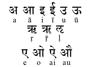 Sanskrit pages with some free fonts. [
 [
[ Dr. Fiona Ross, is a typographic consultant, typeface designer, lecturer and author, specializing in non-Latin scripts. Fiona holds a BA in German; a Postgraduate Diploma in Sanskrit and Pali; and a PhD in Indian Palaeography from SOAS (London University). From 1978 to 1989, Fiona Ross worked for the British arm of Linotype, Linotype Limited, where she was responsible for the design of their
  FiraGO (2012-2018) is an outgrowth of the open source Fira Sans typeface family by Carrois and Spiekermann. Script support has been considerably extended from Latin Extended, IPA, Pan African, Cyrillic Extended (+ locl BGR and SRB), and Polytonic Greek, already present in Firs Sans, to Arabic, Devanagari, Georgian, Hebrew, and Thai. Manual basic truetype hinting was done with Glyphs. Copyright of various parts of Firago: Carrois Corporate GbR, HERE Europe B.V., The Mozilla Foundation, Telefonica S.A., and bBox Type GmbH. Credits for the various additons and modifications:
 Frans Velthuis (Groningen University) developed a Devanagari Metafont in 1991, which is available from the
  On the Gandhari Romanization / Gandhari Unicode fonts: These fonts are based on an original Postscript font called "Nimbus Roman No9 L" created by URW++ Design and Development Incorporated and donated to the free software community under the GNU General Public License. The Nimbus Roman No9 L font is itself based on the design for Times New Roman by Stanley Morison (original trademark holder Monotype corporation). The Gandhari fonts have been extended to display the special diacritics necessary for Sanskrit and Gandhari and come in Roman, Italic, Bold, and Bold Italic styles. The notices in the fonts say: "Based on CSX, adapted for Gandhari by Dr. John Smith (University of Cambridge), and Andrew Glass (University of Washington), Buddhist Manuscripts Project. 1997." The fonts use the Private Use Area (PUA) of Unicode for additional diacritics not available in Unicode. Here they are (free): GandhariUnicode-Bold, GandhariUnicode-BoldItalic, GandhariUnicodeItalic, GandhariUnicodeRoman, TimesGandhari2Bold, TimesGandhari2BoldItalic, TimesGandhari2Italic, TimesGandhari2Roman, TimesGandhariBold, TimesGandhariBoldItalic, TimesGandhariItalic, TimesGandhariRoman. The Gandhari Unicode font is a modification of the Times Gandhari font (which is no longer available since 2005), carried out by Andrew Glass for the British Library/University of Washington Early Buddhist Manuscripts Project between 2000 and 2003. The Times Gandhari font is a modification of the Times CSX font by Andrew Glass and John Smith in 1998. The Times CSX font in turn is a modification of the Nimbus Roman No9 L font by John Smith (http://bombay.oriental.cam.ac.uk/index.html) in 1998.
  Gandhi's spectacles provided inspiration to Mumbai-based
  Geetika Alok is a graphic designer and works on projects in London and India. She graduated from the Royal College of Art with an MA in Communication, Art&Design and had previously completed her Bachelor's degree from the National Institute of Design with specialisation in Graphic Design. With Henrik Kubel, she designed the typeface India (2011). In 2014, she completed the TDi program at the University of Reading.
  An Italian type foundry by Milan-based type designer Giangiorgio Fuga, ATypI member, teacher of typography at the Istituto Europeo of Milan, Politecnico of Milan, Italy and Unisinos of Porto Alegre, Brasil. His great
  Girish Dalvi (Mumbai, India) holds a Bachelor's degree in Computer Engineering, a Master's degree in Design and a Ph.D. from IIT Bombay. His doctoral research dealt with the theoretical modeling of Devanagari typefaces. He is presently professor in the Industrial Design Center of IIT Bombay.
  The GNU Freefont is continuously being updated to become a large useful Unicode monster. GNU FreeFont is a free family of scalable outline fonts, suitable for general use on computers and for desktop publishing. It is Unicode-encoded for compatability with all modern operating systems. There are serif, Sans and Mono subfamilies. Also called the "Free UCS Outline Fonts", this project is part of the larger Free Software Foundation. The original head honcho was
  Graphite is an Indian type foundry, est. 2015 by Deepak Singh Dogra in New Delhi. They offer commercial fonts via MyFonts and free fonts through Dafont. Their typefaces include the handcrafted stone age emulation poster typeface
  [
[ Hyderabad and/or Visakhapatnam-based creator (b. 1992) of the free outlined typeface
  Harish Subu (Subramanian) is a Mumbai-based graphic designer and illustrator who is currently finishing his BFA degree at the School of the Art Institute of Chicago in Chicago, IL. He created a
  [
[ Designer of these typefaces:
  Founded by Philipp Hubert (based in New York) and Sebastian Fischer (based in Stuttgart), Hubert & Fischer is a design studio with offices in New York and Stuttgart, Germany with a global client base. The studio specializes in creating editorial design, type design, visual identity, print, application, websites and e-commerce design from concept to production.
  A large free font family created by Mike Abbink and Bold Monday (Paul van der Laan and Pieter van Rosmalen) for IBM's new corporate identity in 2017. It includes the IBM Plex Sans, IBM Plex Serif, IBM Plex Sans Variable, and IBM Plex Mono subfamilies.
  ITF is located in Ahmedabad, Gujarat, India. It was co-founded in 2009 by Peter Bilak (Typotheque) partnered with Rajesh Kejriwal (
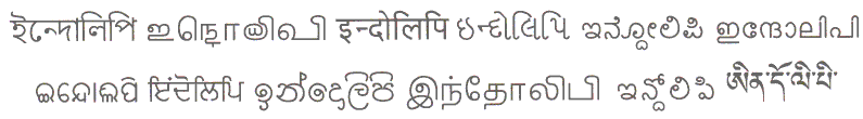 Indolipi is a multipurpose tool box for indologists and linguists that contains Open Type fonts for most Indian scripts, a Latin font for "instant" transliteration of Indic scripts, and a Unicode based Latin font for writing of scientific texts in a western language containing all transliteration signs used by indologists as well as all presently valid IPA signs. All fonts were made from 2004 until 2006 by Elmar Kniprath (Asien-Afrika institut, University of Hamburg, Germany): e-Bengali OT (for Assamese and Bengali), e-Grantamil (for Grantha Sanskrit, Tamil and Manipravala), e-Grantha OT (for Sanskrit), e-Gujarati OT, e-Kannada OT, e-Malayalam OT (for modern Malayalam), e-Malayalam OTC (for Malayalam with classical orthography), e-Nagari OT (for Sanskrit and Nepali), e-Nagari OTH (for Hindi), e-Nagari OTM (for Marathi), e-Nagari OTR (for Rajasthani), e-Panjabi OT (for Gurmukhi script), e-Sinhala OT, e-Tamil OT (for modern Tamil), e-Tamil OTC (for Tamil with classical orthography), e-Telugu OT, e-Latin Indic (for "instant" Latin transliteration of Indic Unicode texts), e-PhonTranslit UNI (for writing indological texts in a language based on Latin script, also containig all valid IPA signs and a lot of arrows, mathematical and logical signs).
 Mumbai, India-based designer of a Memphis-style decorative caps typeface (2018) and of the devanagari typeface Avshicha Gho (2018), which was inspired by the architectural design of the temple Padmanabh Swamy. [
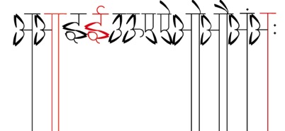 Designer in Mumbai who created the interesting Devanagari / Latin typeface Khubsurat (2013) that was inspired by lotus flowers. Earlier, she created the Photoshop-format decorative font Hagrid which is based on the physical appearance of Rubeus Hagrid, a fictional character in the Harry Potter book series written by J. K. Rowling. [
 New Delhi, India-based designer of the square-shaped labyrinthine typeface Carre (2017). She also designed Urdu Drop Caps (2017). [
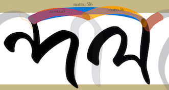 Designer who took the
  [
[ [
[ Or James Fordyce. Type designer active ca. 1993, possibly located in Kosciusko County, IN. His typefaces were free, and can be found in many places.
  [
[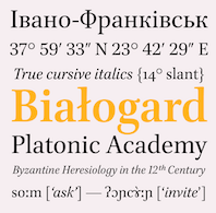 [
[ Jonathan (Jonny) Pinhorn is a British type designer and India enthusiast who obtained an MA in typeface design from
 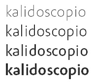 [
[ Juan Pablo del Peral (b. 1984), aka Cocosaurio, is an Argentinian graphic designer who lives in Mendoza. He graduated from the Universidad Nacional de Cuyo, and from
  Kimya Gandhi from Mumbai, India, holds a Bachelors degree in Communication Design from National Institute of Fashion Technology, Bombay (NIFT). She further went on to pursue specialization in the form of a post-graduate degree in Visual Communication at the Industrial Design Centre (IDC), IIT Bombay. Kimya interned with Linotype GmbH, Germany, in their font design department in 2010. Over the next several years she worked as a freelance designer for numerous type foundries catering to their multi-script requirements. She graduated from the TDi program at the University of Reading in 2012. Since 2015 she is a partner at Mota Italic in Berlin focusing on Indic and Latin designs for retail and custom corporate projects. Kimya teaches typography and type design at design institutes like Symbiosis Institute of Design and NIFT, and is currently designing and researching Indian script typefaces.
  The Department of Mathematics of the University of the Aegean (Samos, Greece) has established a laboratory on Digital Typography and Mathematical Software in 2006. It supports the Greek language with respect to the TeX typesetting system and its derivatives. Antonis Tsolomitis (who lives in Karlovassi, Samos, and is a professor of Mathematics at that university) writes: After the support for Greek was added by A. Syropoulos and the first complete Greek Metafont font was presented by Claudio Beccari there was an obvious need, to be able to use a scalable Greek font with LaTeX. With this in mind, we developed the first Greek fontfamily in Type1 format with complete LaTeX support, called "Kerkis". Their Greek font
  Designer at the Shanghai, China-based type foundry 3type of Weaf Mono (2017-2018), a monospaced monolinear sans family created together with Zheng Chuyang, covering Latin, Hanzi (Chinese), Arabic, Cyrillic and Devanagari. It also has some emoji characters.
  German-born graduate of the
 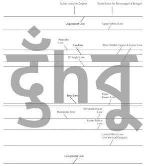 Indian type designer and typographer who received the Gutenberg Prize in 2010. Professor Patel retired from the National Institute of Design, Ahmedabad, in 2003, and presently s an adjunct professor at Symbiosis Institute of Design and MIT Institute of Design, both at Pune. His type design activities:
  Mumbai-based codesigner of Modak Devanagari together with Sarang Kulkarni. The bubblegum typeface family Modak (Latin & Devanagari) was published in the
  Graphic designer studying at the University of the Arts in London in 2012. In 2012, Manosij carried out a
  Indian type designer associated with the
  Marc comes from Liechtenstein and Switzerland, but works in London as Marc Weymann Design. Graduate from the type design program at the
  Frenchman who obtained an MA in typeface design from the University of Reading in 2008. His graduation type family,
  Graduate of Politecnico di Milano with a study on type and legibility, and of the
  Graduate of the National Institute of Design, India and a self-taught photographer, originally from Rajasthan, but now based in New Delhi. He made the experimental gridded typeface
  The list of new fonts in Windows 7 in 2009:
  Foundry, est. 2009 by Rob and Sonja Keller. Originally located in Berlin, Mota Italic is a type design studio specializing in unique, extensive type families. It relocated to Mumbai, India, at the end of 2014, and moved back to Berlin in 2020.
  Namrata (Bangalore and later Ahmedabad, India) graduated as a visual communication designer from Srishti School of Art, Design and Technology in Bangalore, India. After a couple of years of drawing type at Indian Type Foundry, she went on to pursue the discipline further at Cooper Union in New York and received her Masters in Type and Media at KABK Den Haag, The Netherlands, in 2018. Her typefaces:
  Indian designer in Tiruchirappalli, b. 1989. FontStructor who made these typefaces in 2010:
  Indian graduate from the type design program at the
  Digital artist Nilesh Singh (Mumbai, India) created the spiral typeface
  Baltimore, MD-based designer of Munshi Devanagari (2014), which was conceived during his diploma project at Indian Type Foundry a typeface for immersive reading. In 2016, Ninad was pursuing an MFA at the Maryland Institute College of Art (MICA). In that same year, he designed the high-contrast Koyla Devanagari typeface, and the Devanagari-inspired Latin typeface Chaplin. [
 Graduate of the
  A large free font family released under the Apache license at Google Web Fonts, and developed by Monotype's Steve Matteson and a team of type designers. Designed between 2012 and 2016, this typeface covers over 800 languages and 100 writing scripts.
 Hector Gatti, aka Pocho Gatt, is an Argentinian who runs Gatti Studio and Omnibus Type, and who co-designed the sans typeface
  Professor of Typography at FADU, the University of Buenos Aires, from 1994 onwards. Founder of
  Very prolific Argentinian type designer (b. 1976) located in Rosario. His extensive repertoire:
  [
[ Type and graphic designer from Joseph City, AZ. His first degree was from Brigham Young University. He was a type designer at
  Indian graduate of New Delhi's National Institute of Fashion Technology and the
  Typography professor R.K. Joshi's pages. He was born in 1936 in Kolhapur, Maharashtra, India, and died in San Francisco in 2008. He was a poet, calligrapher, designer, researcher, teacher and
  [
[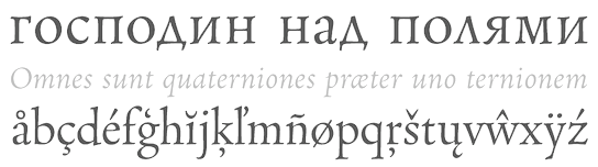 Rosetta is an independent foundry, set up in 2011 by David Brezina, José Scaglione and Veronika Burian, with a strong focus on multi-script typography. It is headquartered in Brno, Czechia. Other designers include Anna Giedrys, Amélie Bonet and Titus Nemeth. They specialize in multilingual typefaces.
 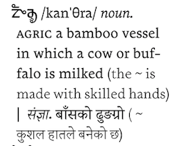 Ryan Hellyer Williamson is an Australian type designer, born in Japan and now based in the UK. After a stint as a graffiti artist in Sydney, he received his BA (Hons) in design from the University of New South Wales, Sydney. Graduate of
  Sahar Afshar is a type designer, printing historian and researcher from Iran. She studied at the University of Tehran and the University of Reading (where she obtained an MA in Typography & Graphic Communication). After graduating, she has been working on the design of Arabic typefaces and researching the printing of Arabic and Indic scripts. She is currently based in London, and obtained a PhD from Birmingham City University, where she researched Punjabi printing history and culture in post-war Britain.
  Indian illustrator and graphic designer who lives in Ahmadabad. He used lamps and wires to create the
  Salomi Desai is a type and graphic designer from Mumbai, India. Graduate of Central Saint Martins, UK (class of 2014) and of the postgraduate program in type design at
  Graphic design graduate of the National Institute of Design, Ahmedabad, who is from New Delhi. In 2012, during his studies, he created
 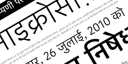 Satya is co-founder of the
  [
[ British calligrapher, signwriter, lettering artist, and type designer. He teaches typography at Stafford College and is a Research Fellow at the University of Lincoln. His typefaces:
  Graphic designer from Chennai, who created the octagonal typeface
  A free Devanagari / Latin / Cyrillic typeface developed at IIT Bombay in 2016 in the context of the
  Swiss art director who has done substantive typographic work for some clients. For Tess model agency in London, he custom-designed
 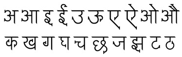 Indian graphic designer who lives in Jersey City.
  [
[ Argentinian type designer born in Buenos Aires who graduated from Universidad de Buenos Aires, and worked initially at Saatchi & Saatchi agency in Buenos Aires. Since 2001 she runs her own studio Sonnenshine specializing in branding and custom type design, working for companies from Latin America, Europe and the United States. She co-founded the type foundry Huerta Tipografica with fellow Argentinian designers in 2009. iIn 2013, she moved to Berlin, where she focused on developing fonts for Latin, Cyrillic, Greek, Oriya and Devanagari. Since 2019 she runs Hungry Type Society.
  The
The  Eben Sorkin obtained an MA in typeface design from
  Belgian type designer (b. Brussels, 1974) who lived in Kessel-Lo, and is now based in Antwerp.
  During her communication design studies in Pune, India, Swapna Patwardhan created the Indic (Devanagari) simulation typeface Vilayati (2015). [
 Canadian type foundry, est. 2020. In 2020, Tall Chai (not his/her real name) released
 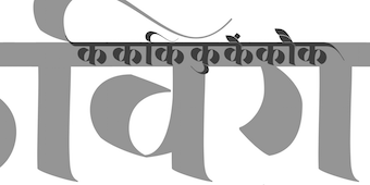 Type designer from India who graduated from the
  [
[ John Hudson and Wm. Ross Mills, the co-founders of Tiro Typeworks in 1994, design wonderful top-of-the-line fonts in Vancouver. Their commercial typefaces can be bought from
  Foundry est. in 2005 by
  Typeoff was an Offenbach-based German type collective, est. 2004 by Daniel John Andrew Reynolds (b. 1979, Baltimore, MD), who blogs happily and frequently. Dan grew up in various cities in the USA, received a BFA in graphic design from the Rhode Island School of Design (RISD) in 2002, and moved to Germany in 2003 to study typography with Professor Fritz Friedl at Hochschule für Gestaltung in Offenbach. Dan was an intern at Linotype, and is still affiliated with Linotype. In 2004, he founded Typeoff.de. In 2007 he moved to the University of Reading for an MA in typeface design. Afterwards, he returned to Germany where he is based in Berlin and, for some time. In 2017, he helped Jan Middendorp set up the new foundry
  Icelandic designer and type designer in Reykjavik (and now Germany). Co-founder of Universal Thirst, an Indian and Icelandic type foundry that makes typefaces for the Indic, Latin and Arabic scripts. Gunnar studied graphic design at Iceland University of the Arts, and worked briefly in Reykjavik's creative industry before becoming a freelance designer and focusing on collaborations within the cultural sector. After completing his M.A. in Typeface Design at the University of Reading in 2010, he joined Monotype's London studio, working on major type projects for global brands. Since launching in 2016, Universal Thirst has taken on bespoke projects for Google, The Gourmand, Frieze Art Fair, DesignMarch, Monotype and Falcon Enamelware, and is scheduled to open its font library to the world in 2019.
 [
[ Ukrainian designer, b. Kiev, 1957. Graduate of the Senior College for Print and Design in Kiev in 1982. Viktor became art director at Sphera in Kiev. Main type designer at Düsseldorf-based company Unique GmbH since 1998. In 2012, he cofounded
  WhiteCrow is a type foundry and design studio founded by Sarang Kulkarni in Mumbai in 2005. It specializes in multilingual branding, type design and calligraphy. A collective of type designers, the White Crow team creates customized typefaces for all Indian scripts, including Devanagari, Bangla, Gujarati, Tamil, Telugu, Kannada, Malayalam, Gurmukhi, Meitei Mayek (Manipuri), Oriya and Urdu. Their typefaces:
  Chinese type designer who graduated in 2018 from
  Type designer from Bangalore, India who graduated from the
  Designer of these fonts:
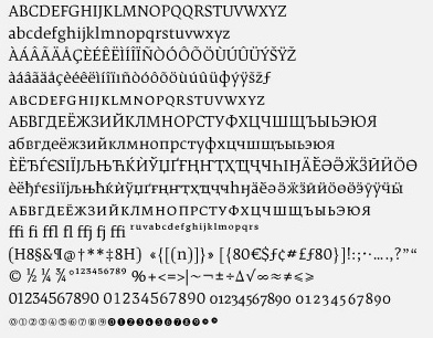
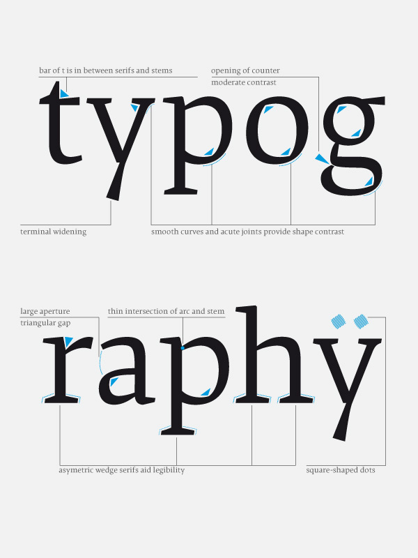
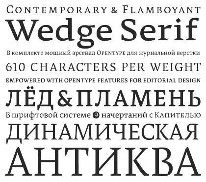
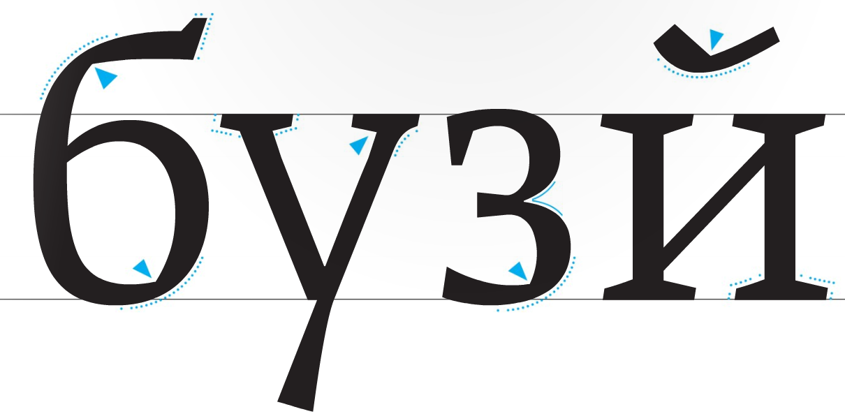
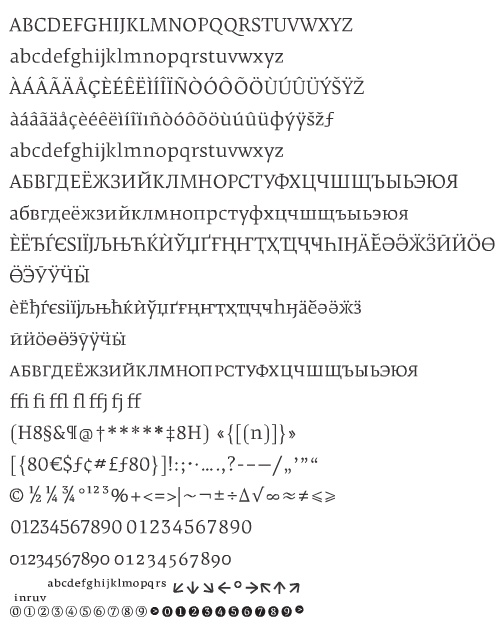
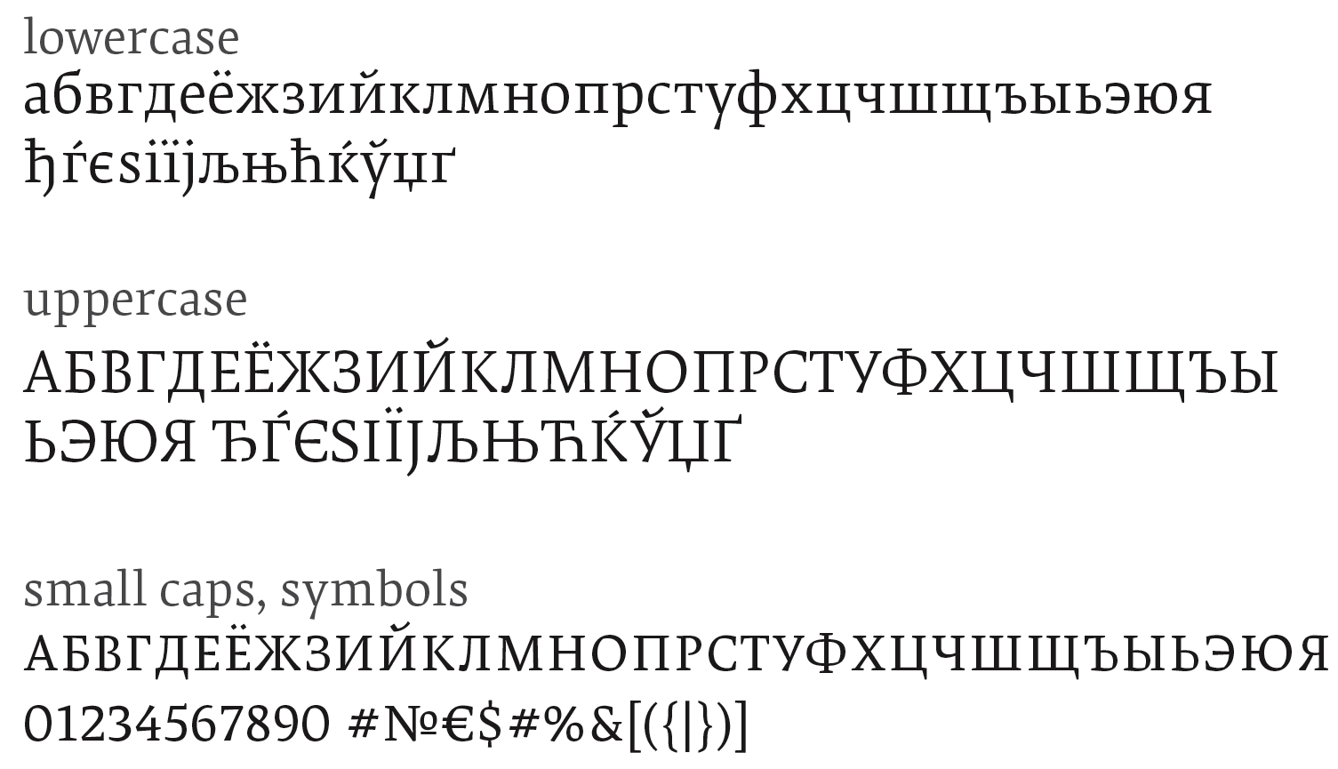
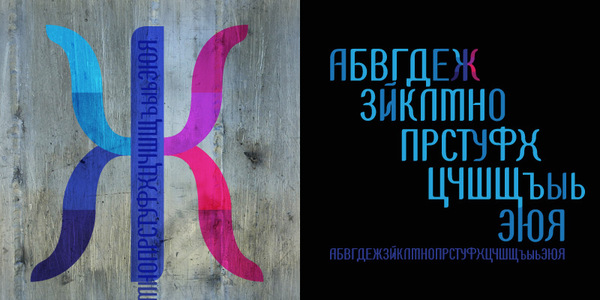
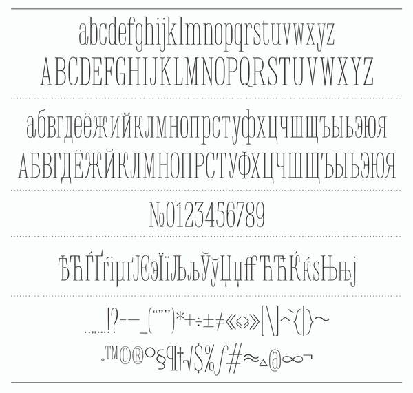
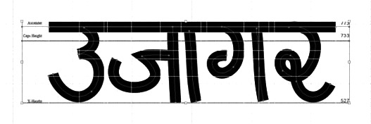
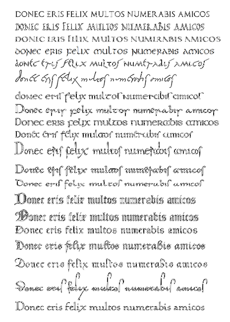
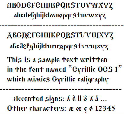
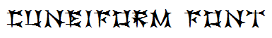
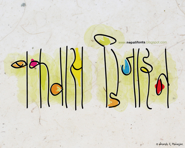
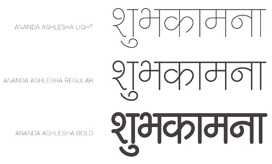
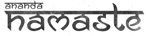
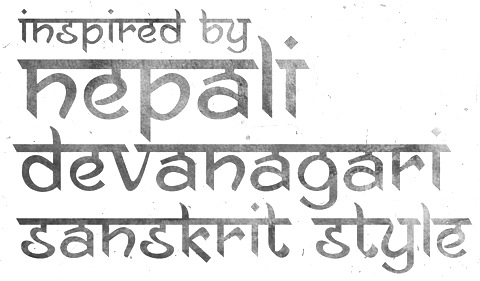
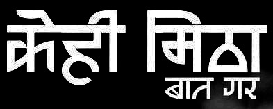
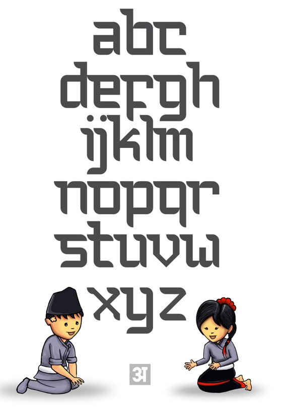
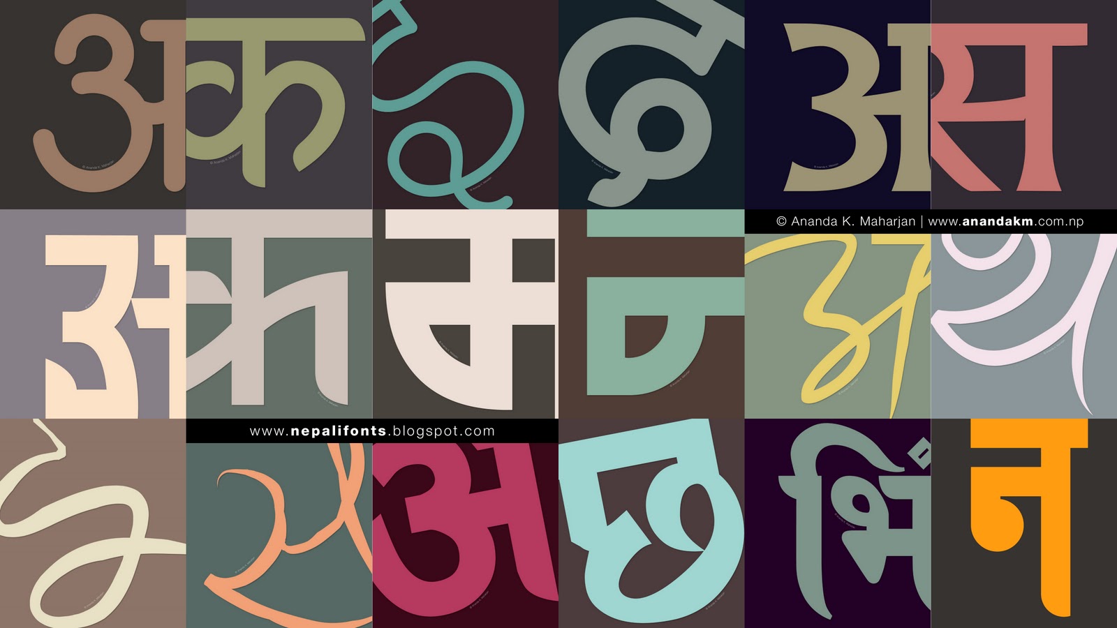
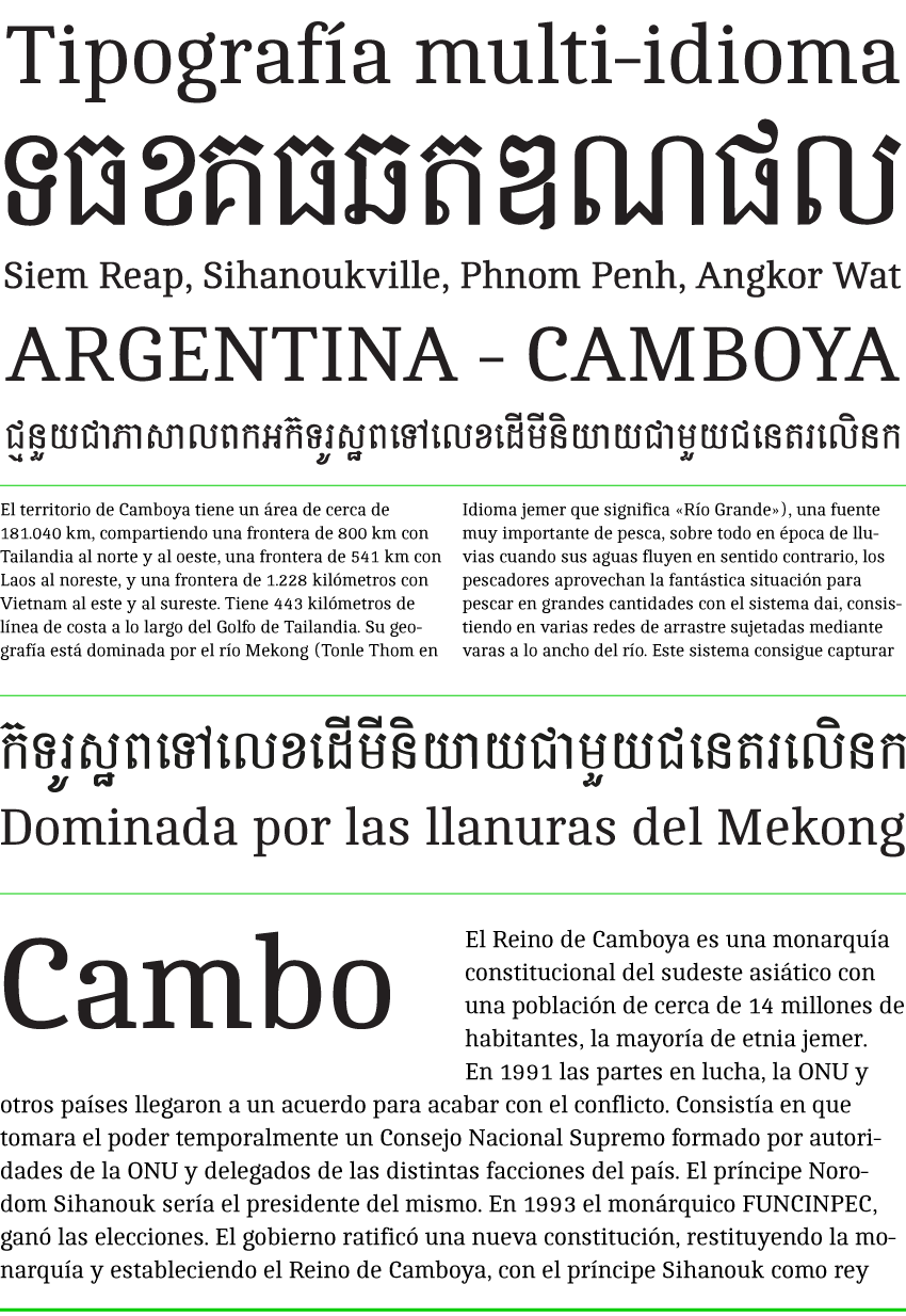
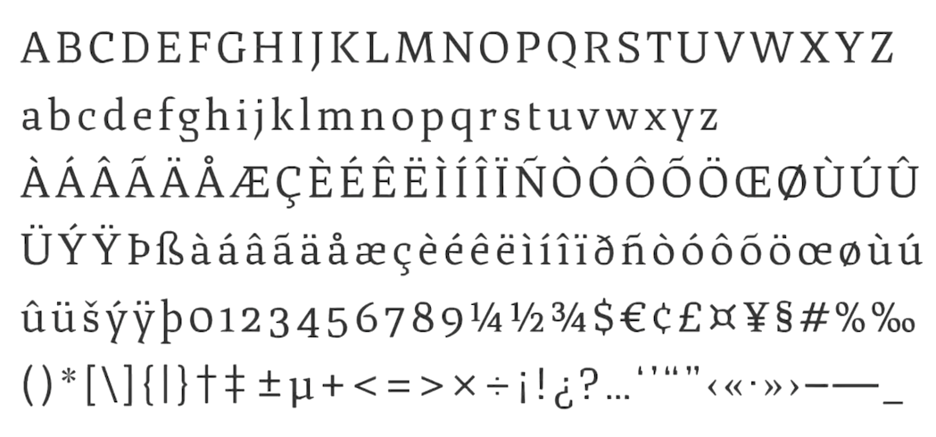
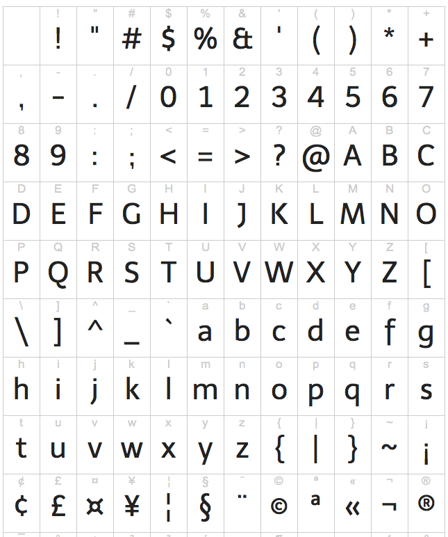
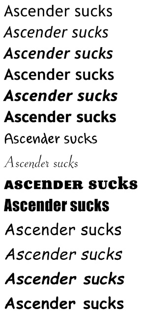
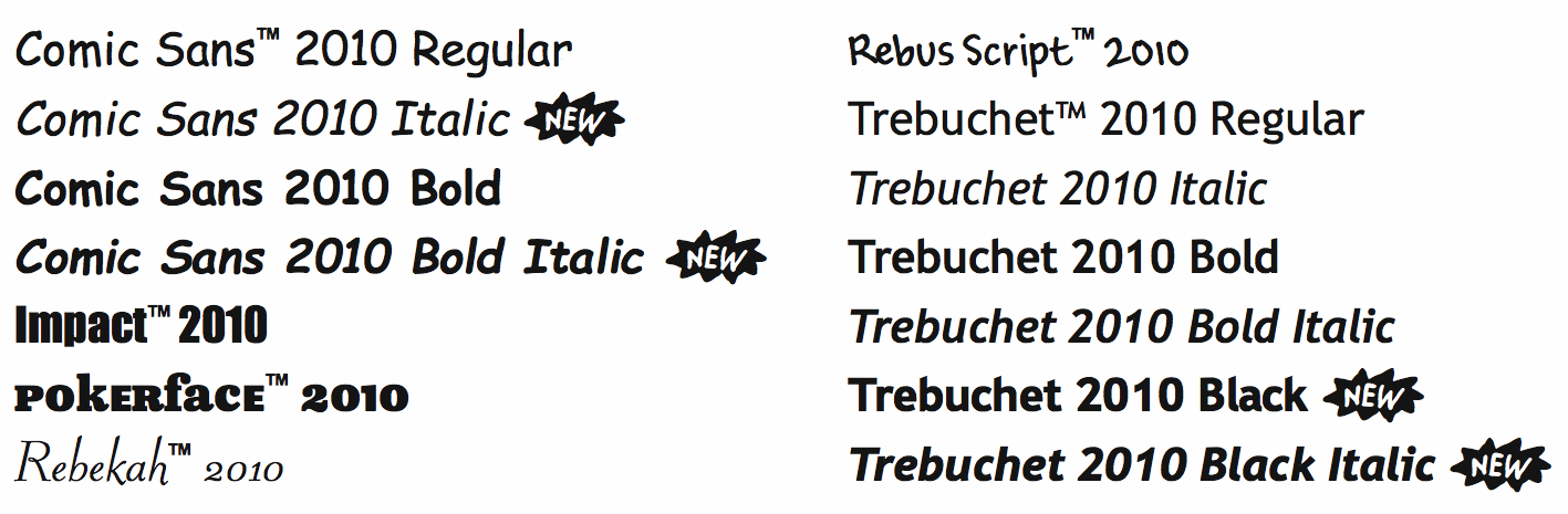
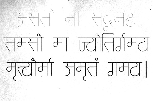
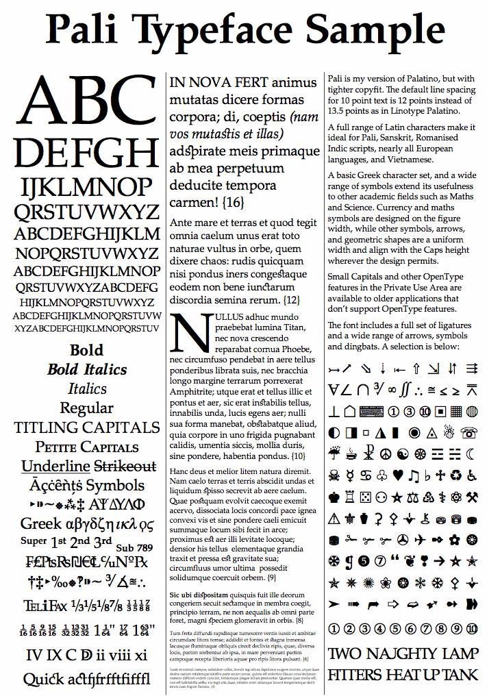
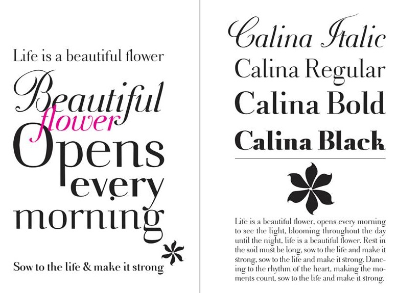
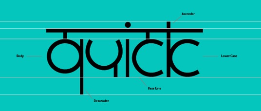
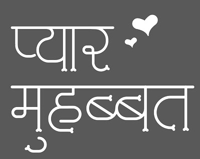
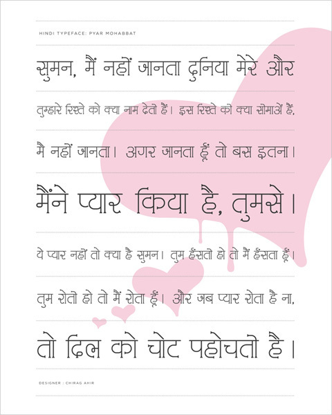
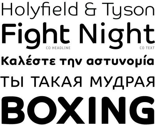
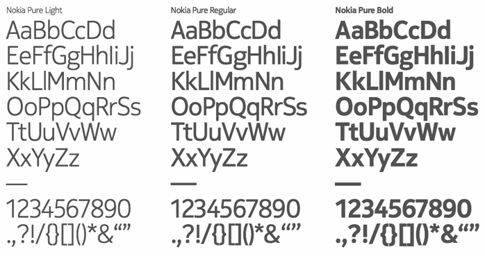
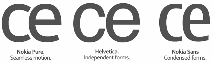
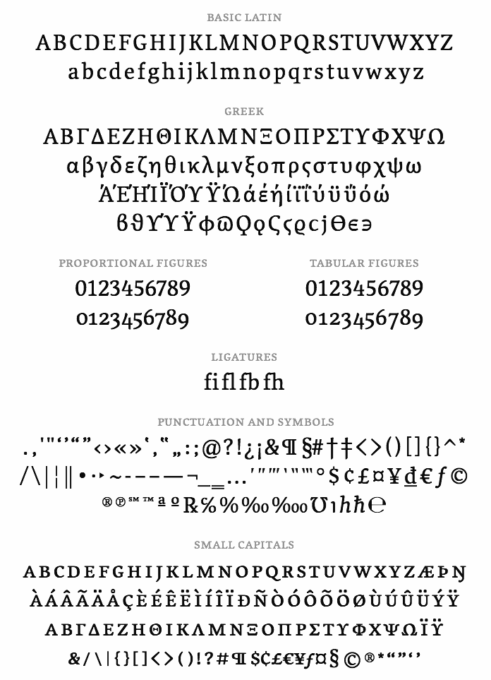
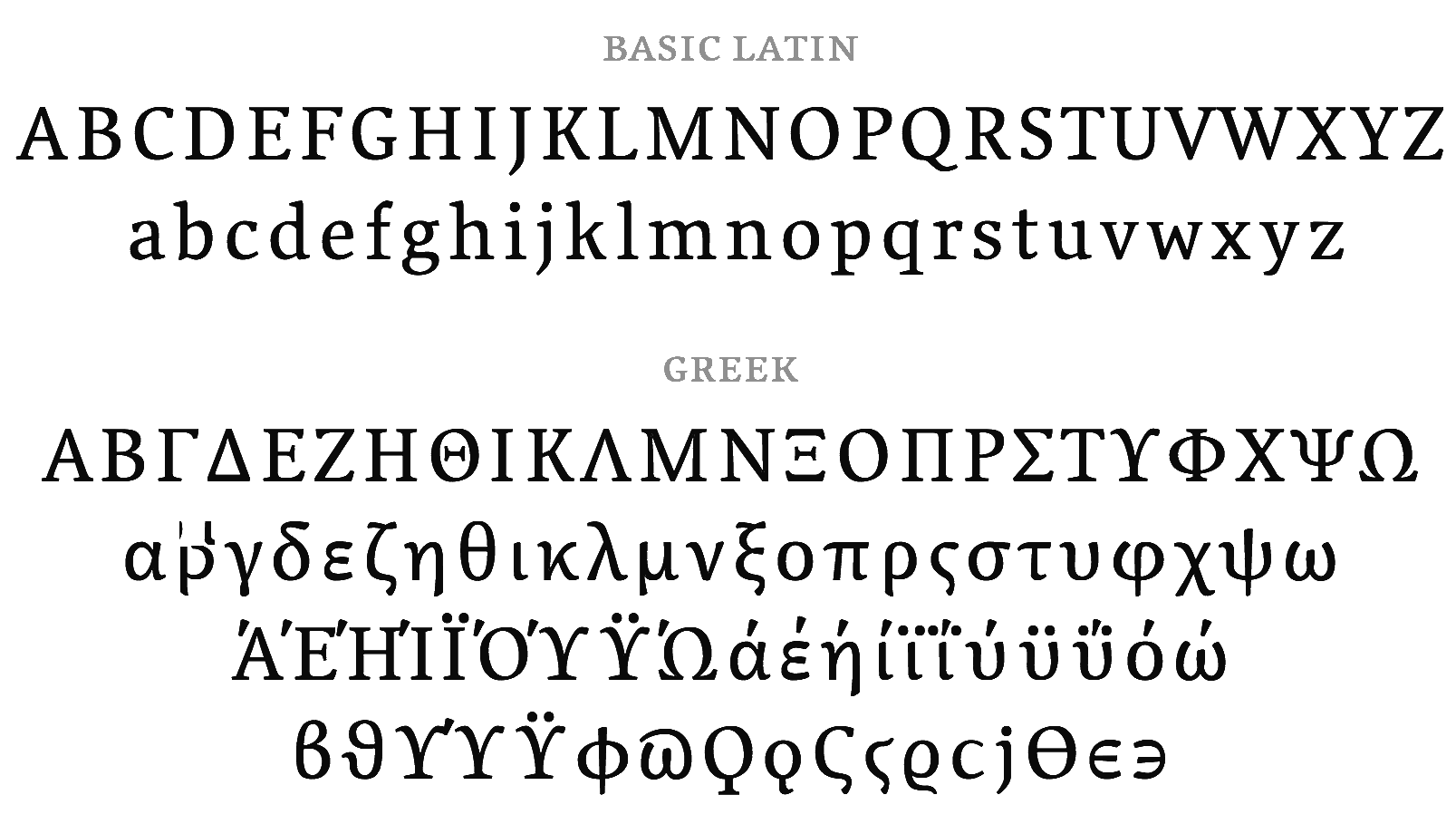
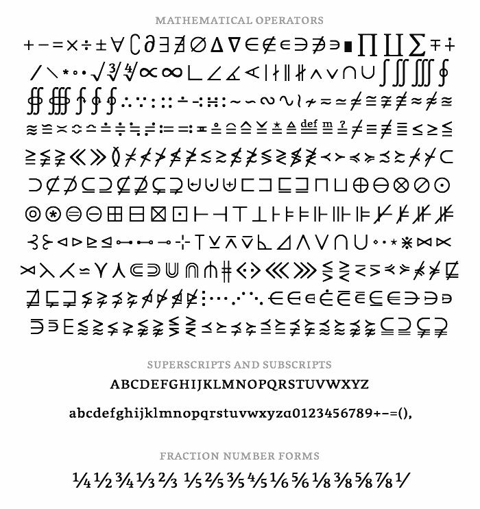
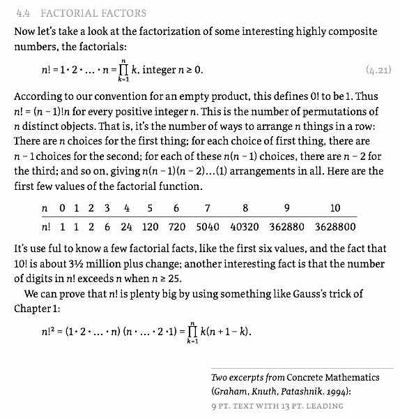
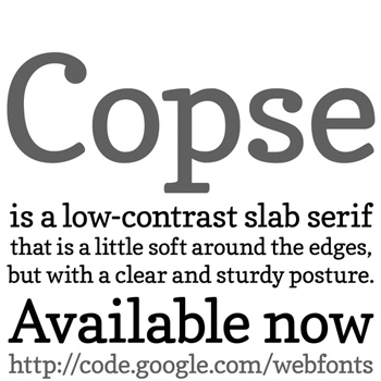
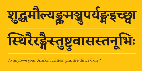
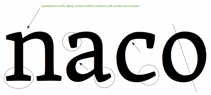
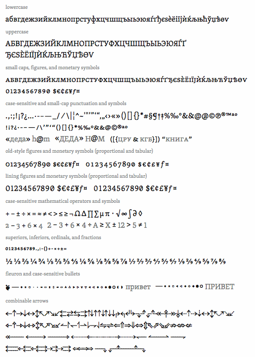
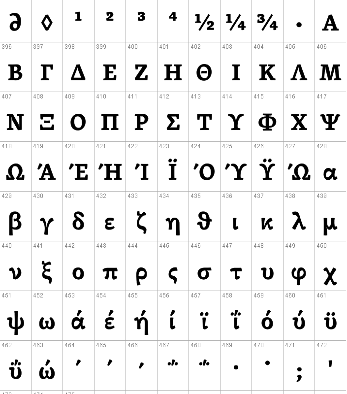
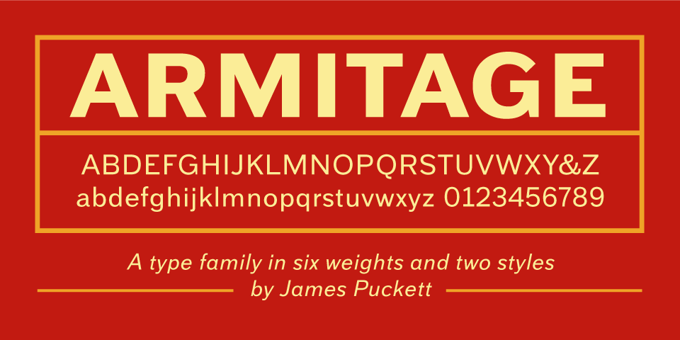
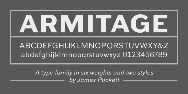
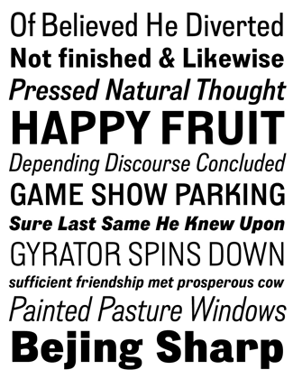
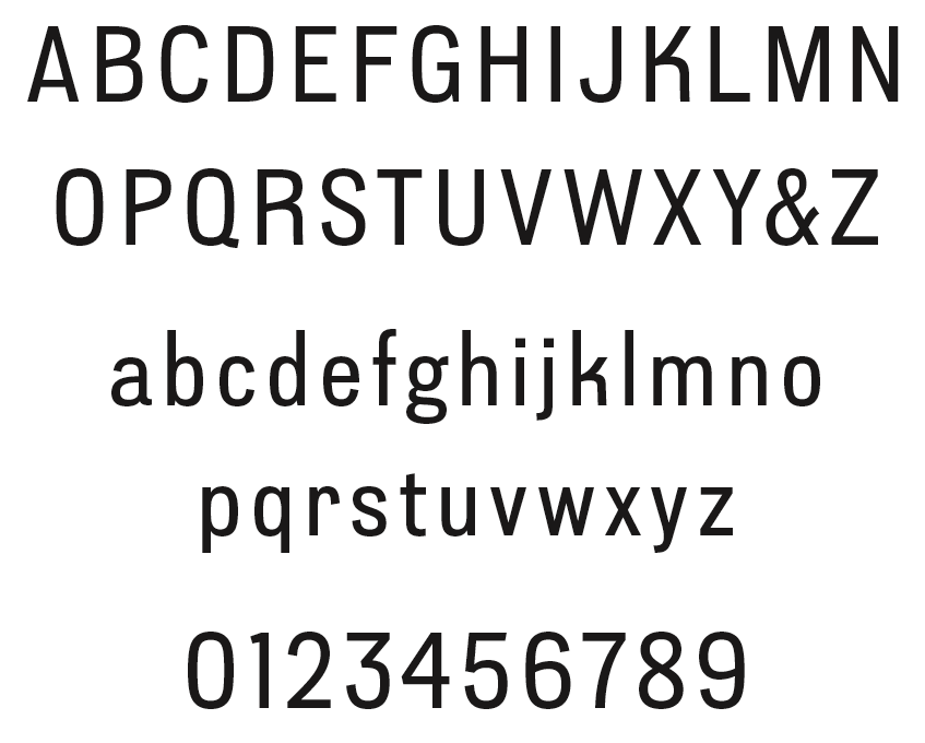
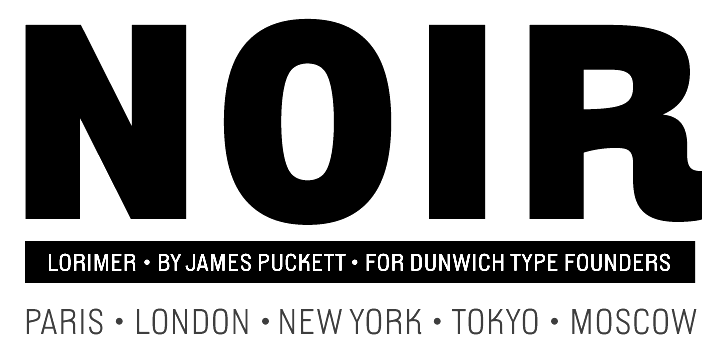
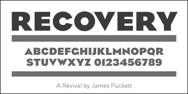
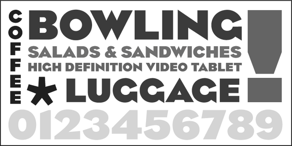
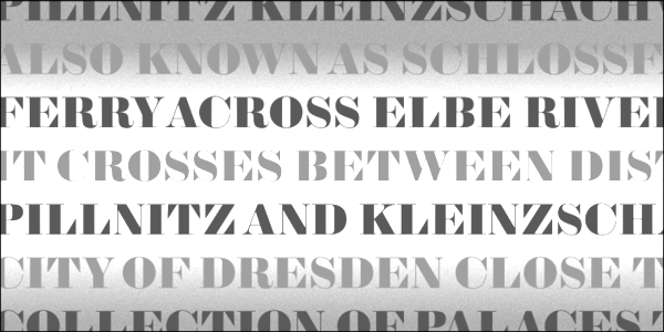
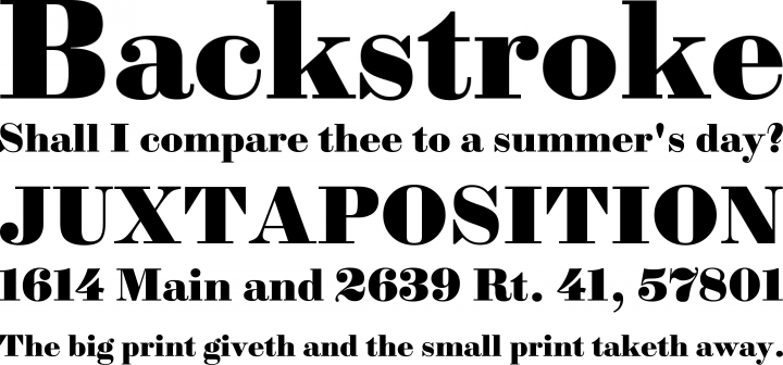
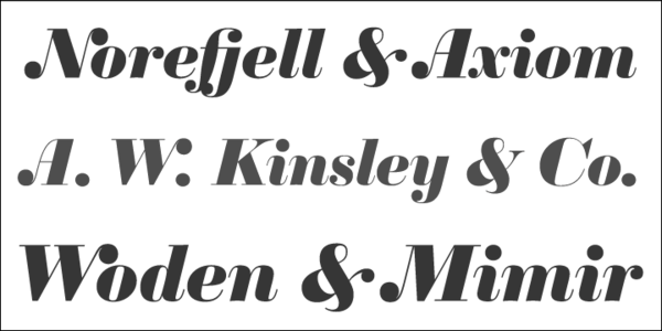
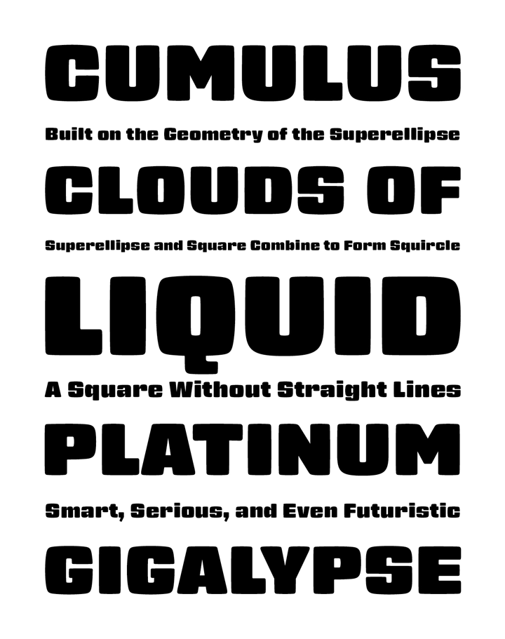
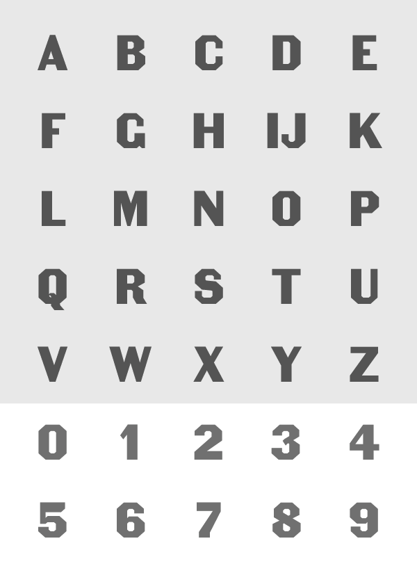
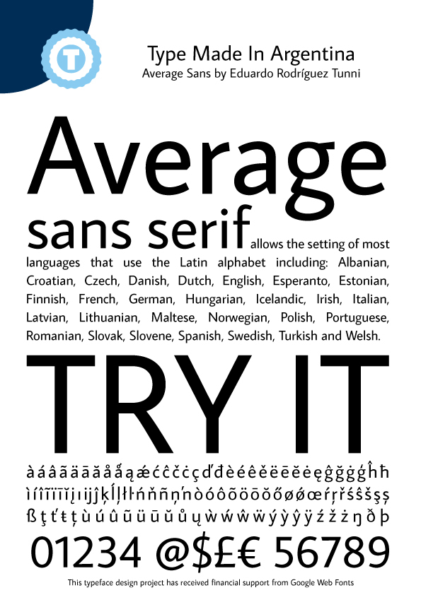
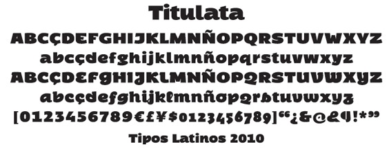
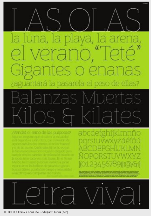
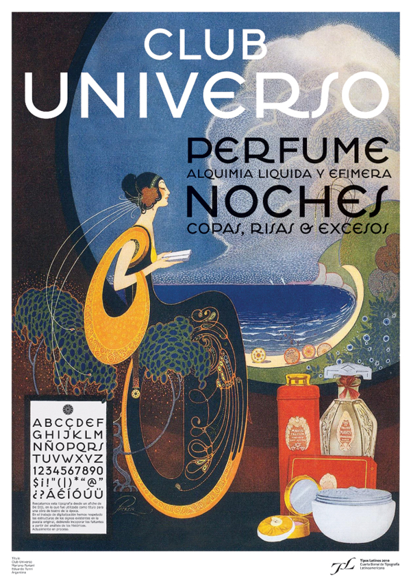
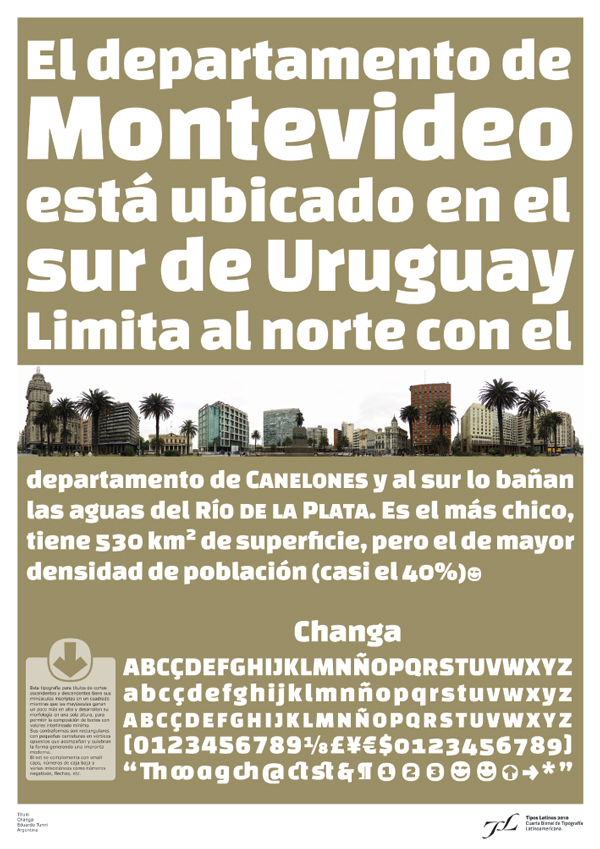
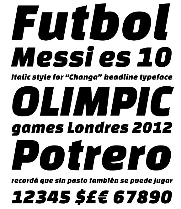
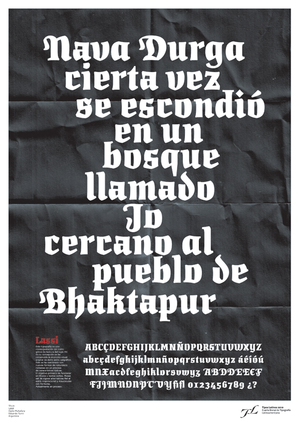
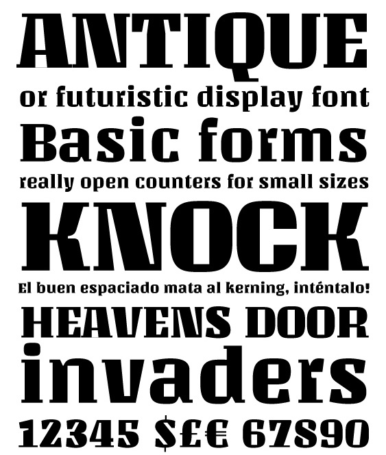
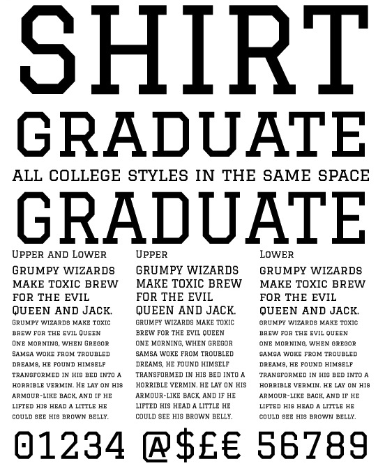
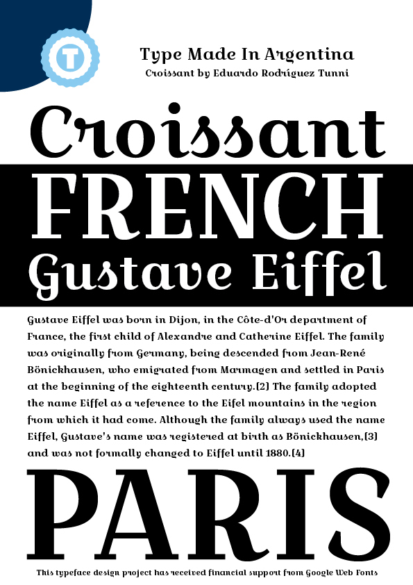
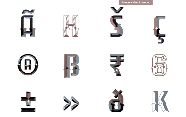
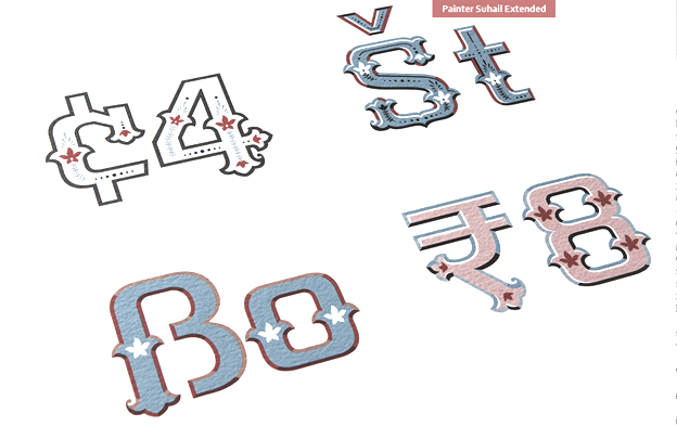
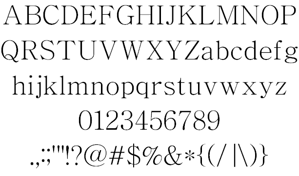
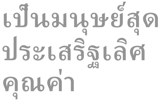
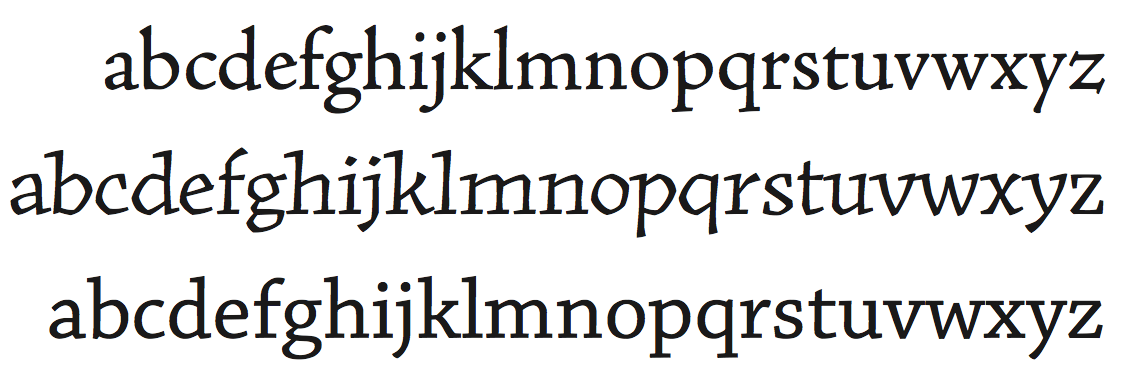
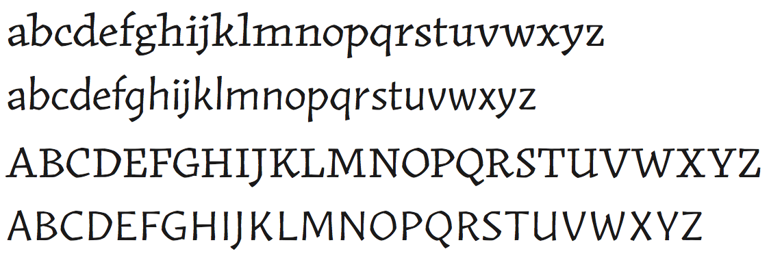
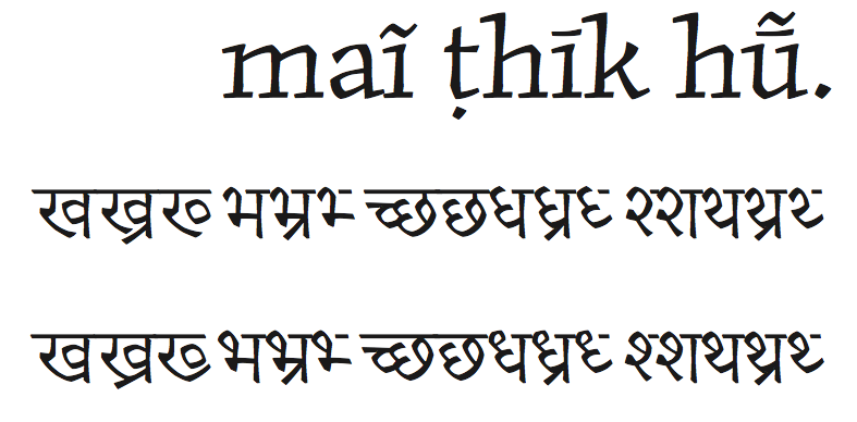
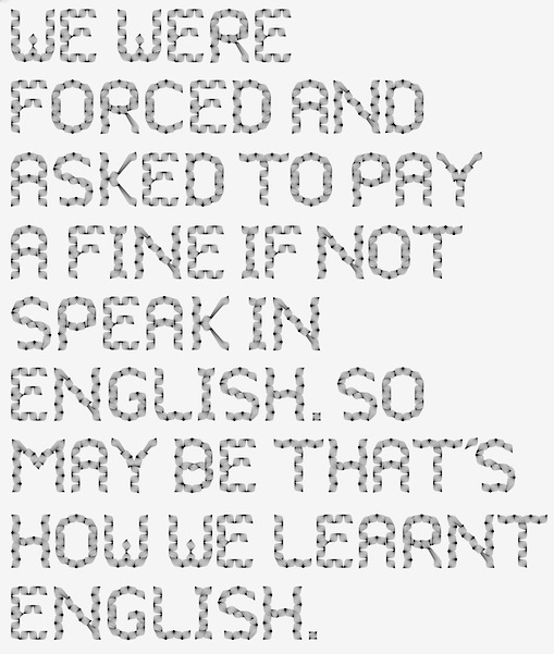
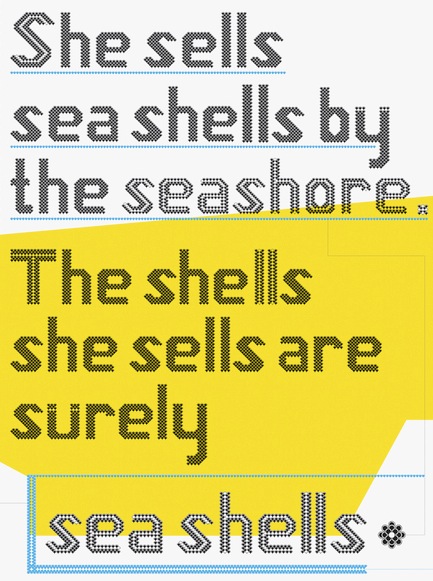
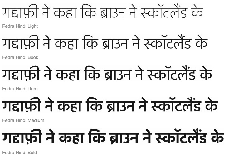
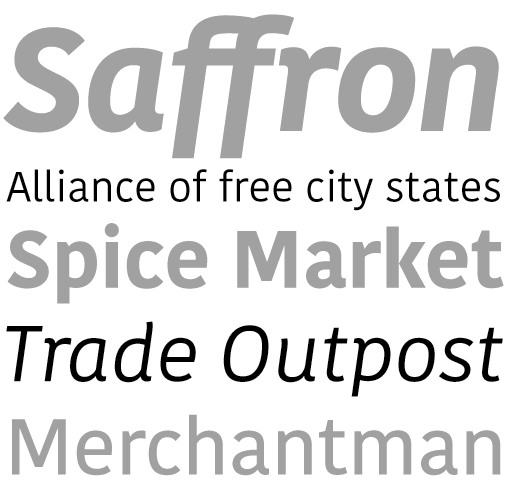
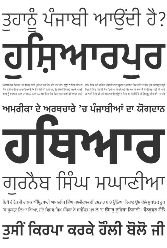
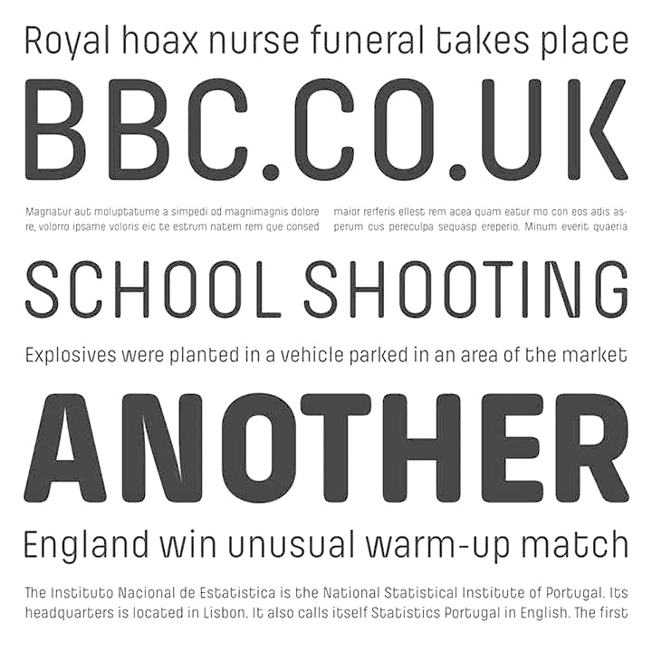
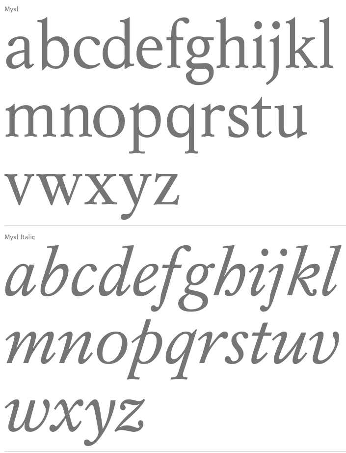
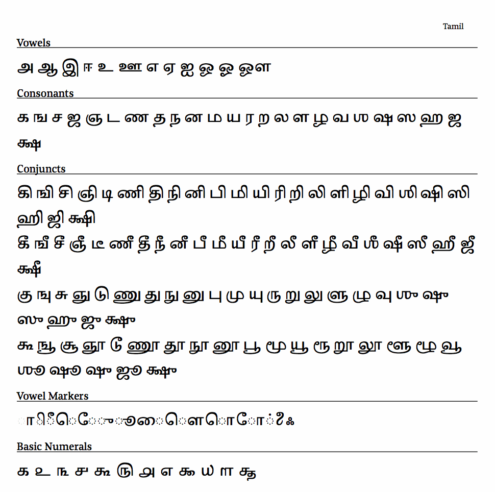
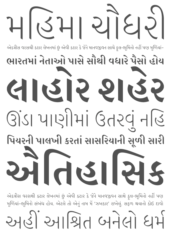
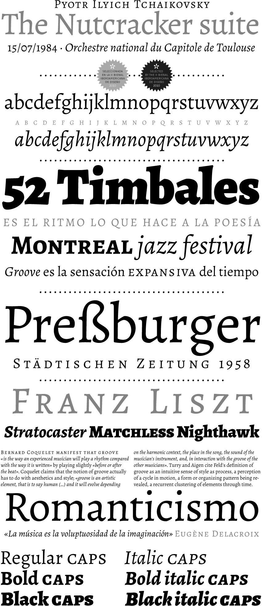
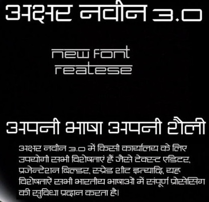
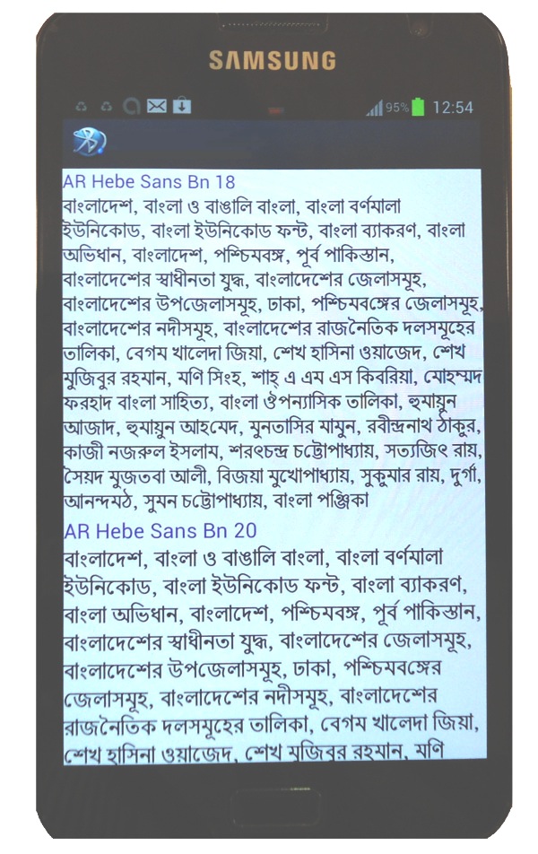
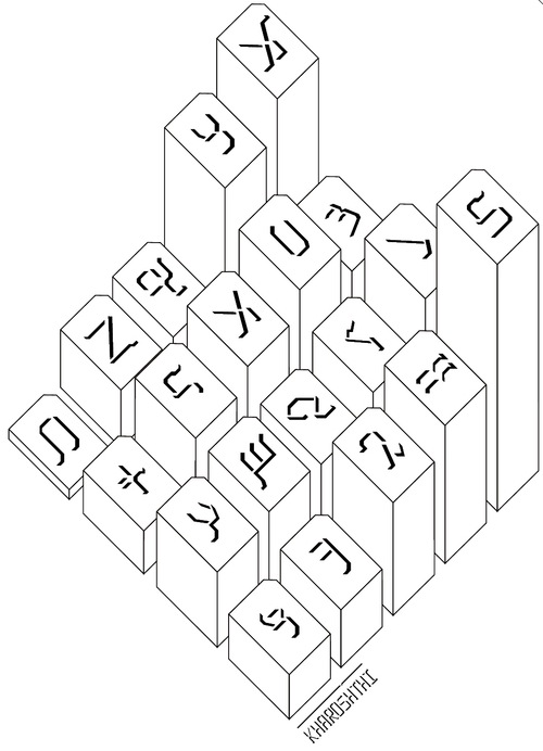
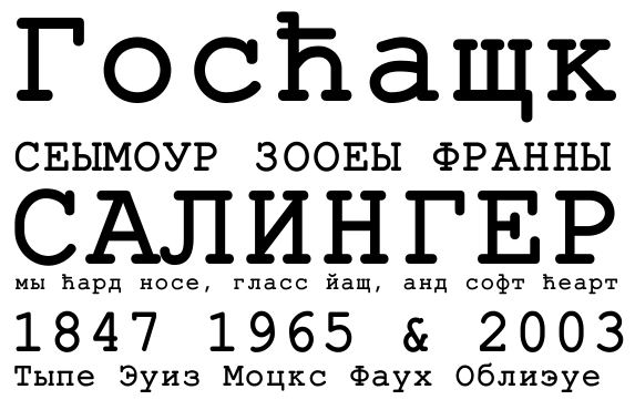
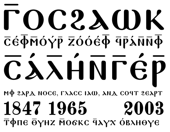
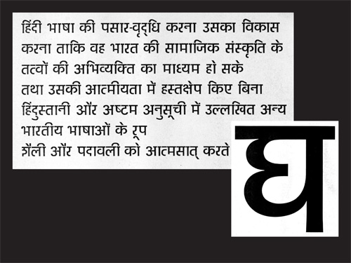
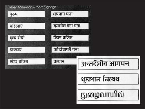
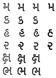
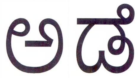
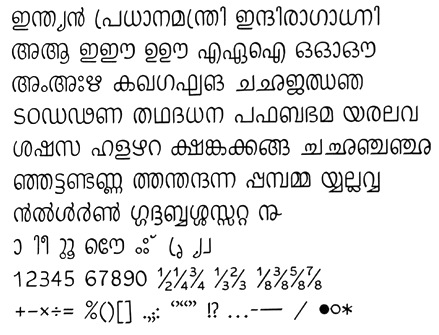
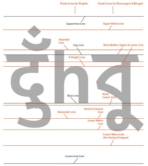
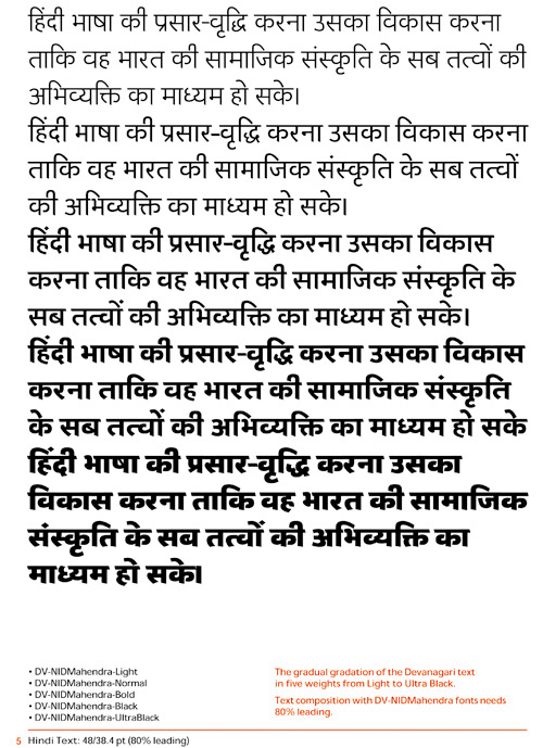
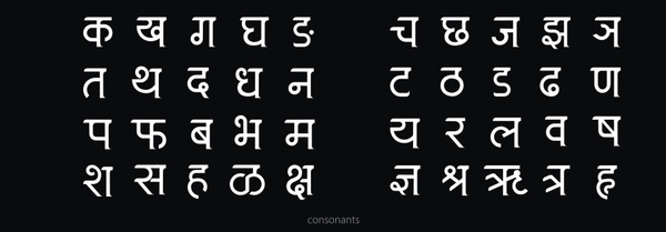
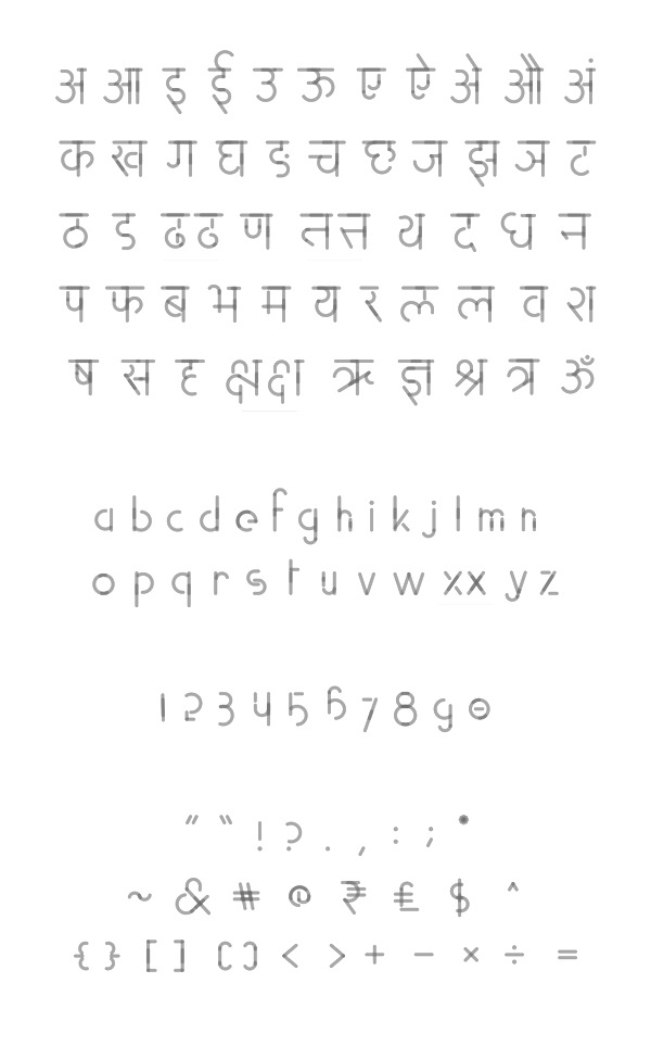
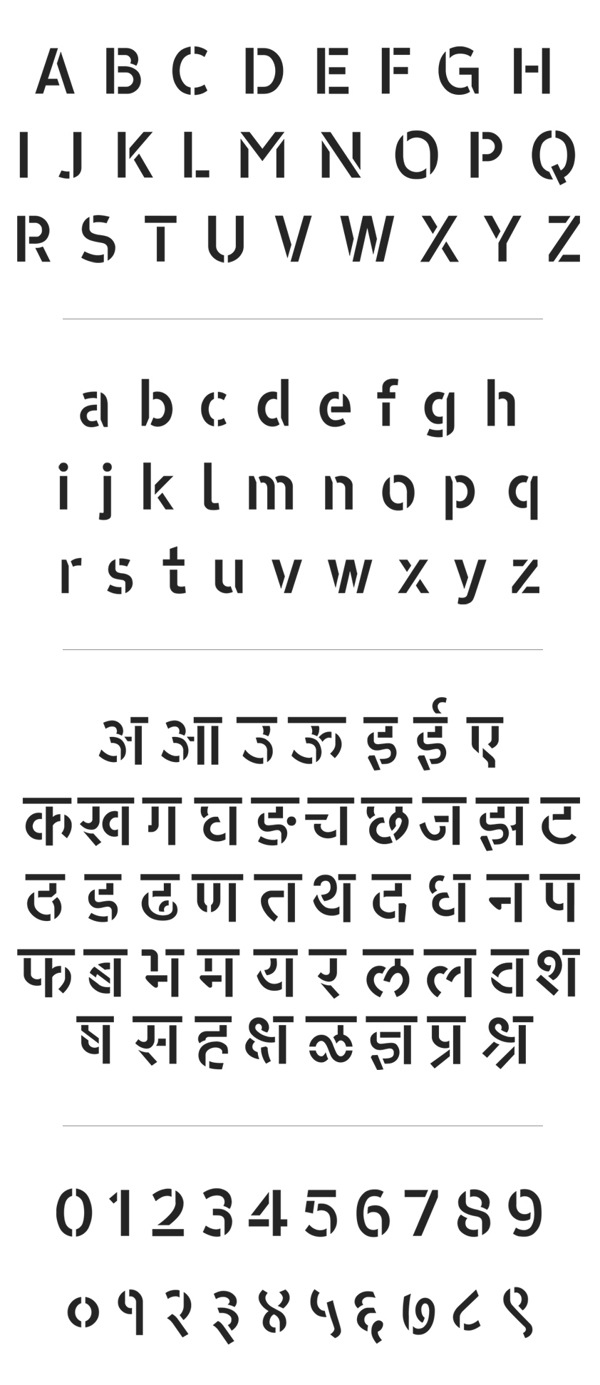
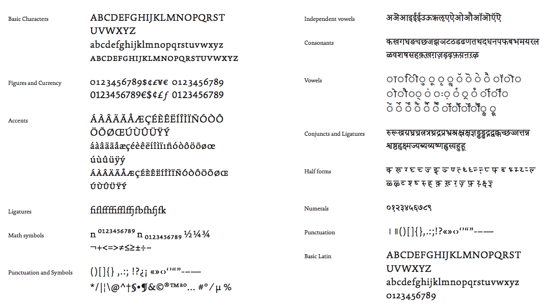
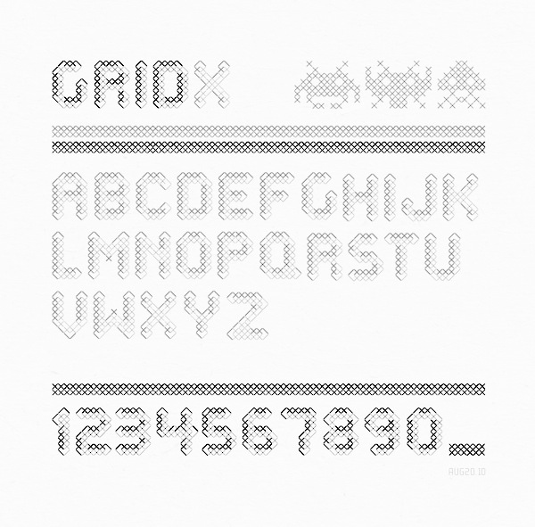
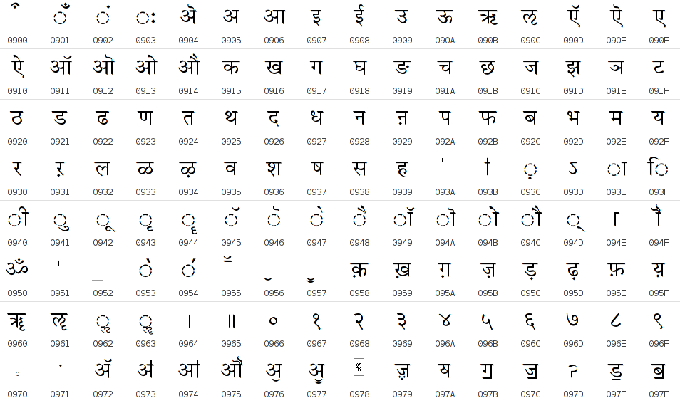
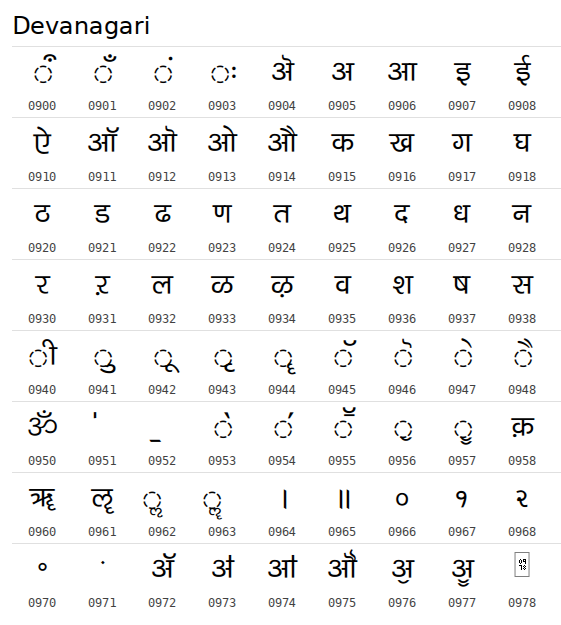
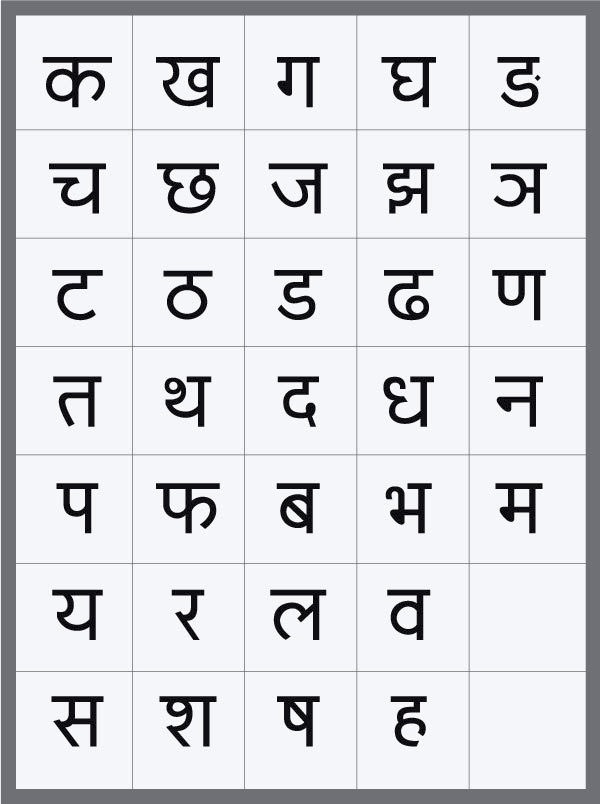
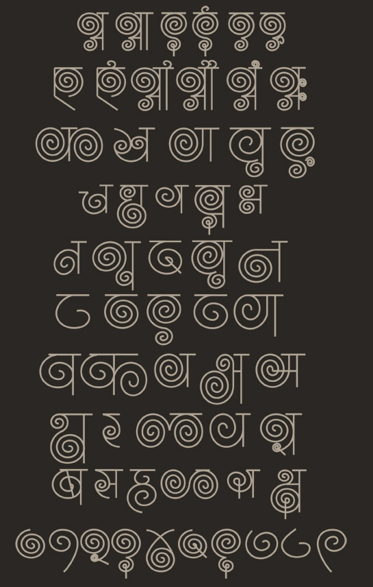
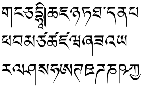
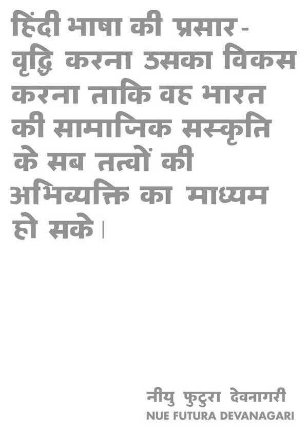
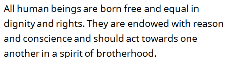
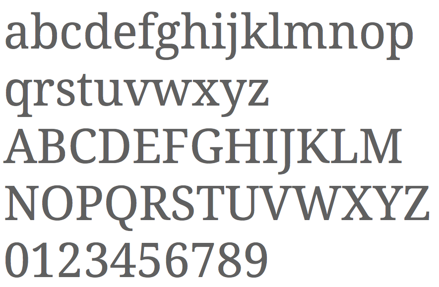
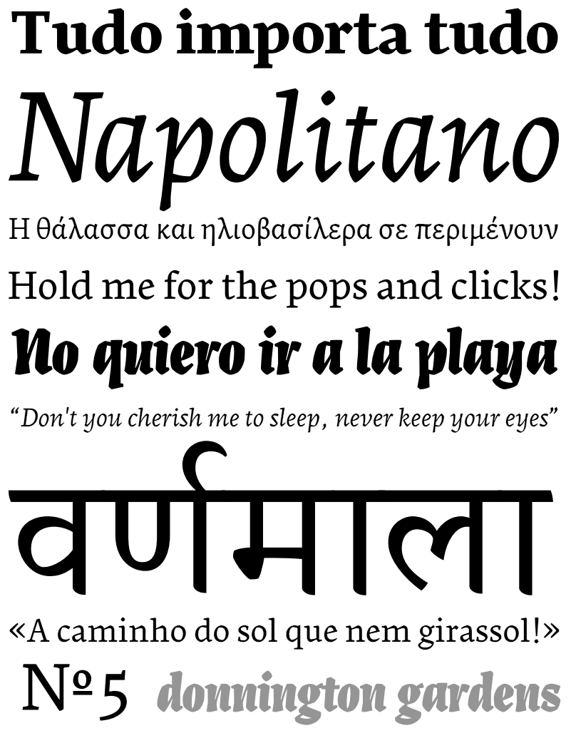
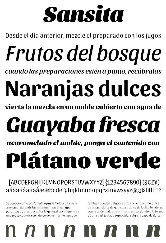
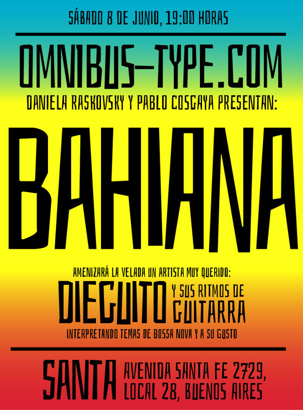
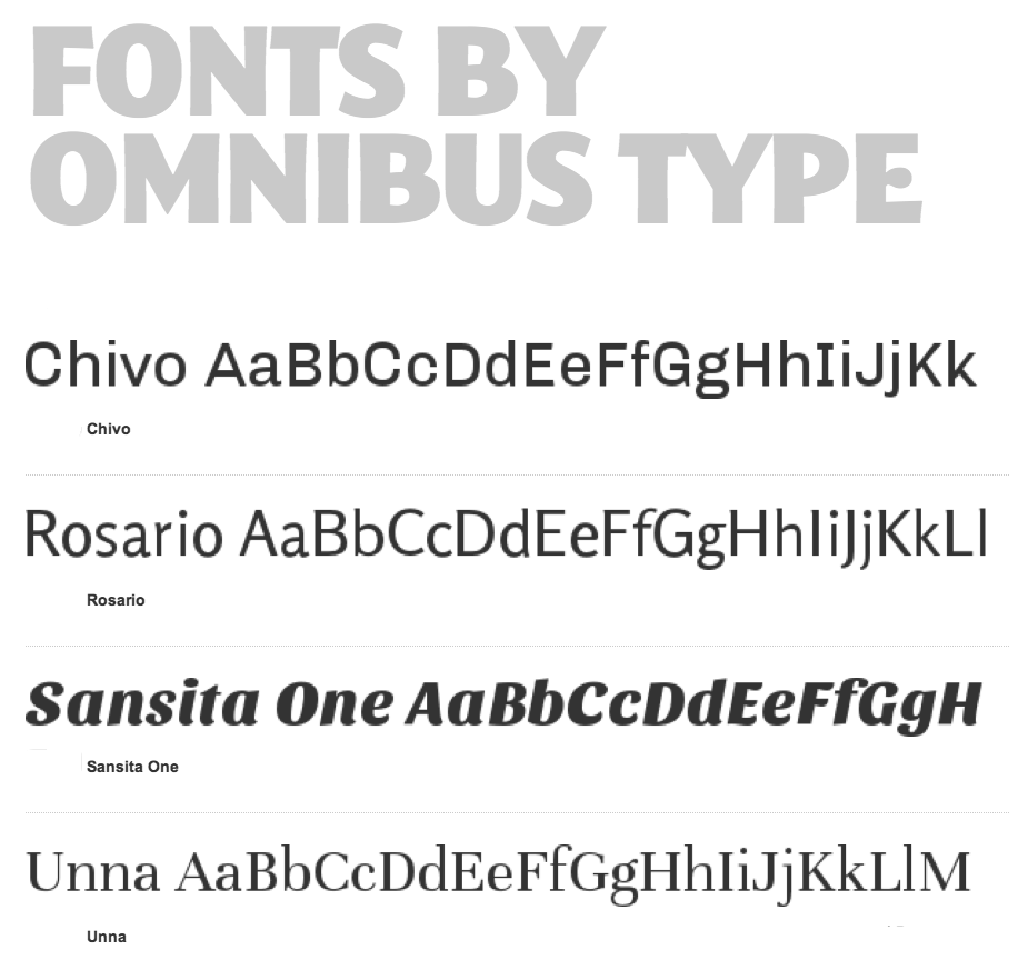
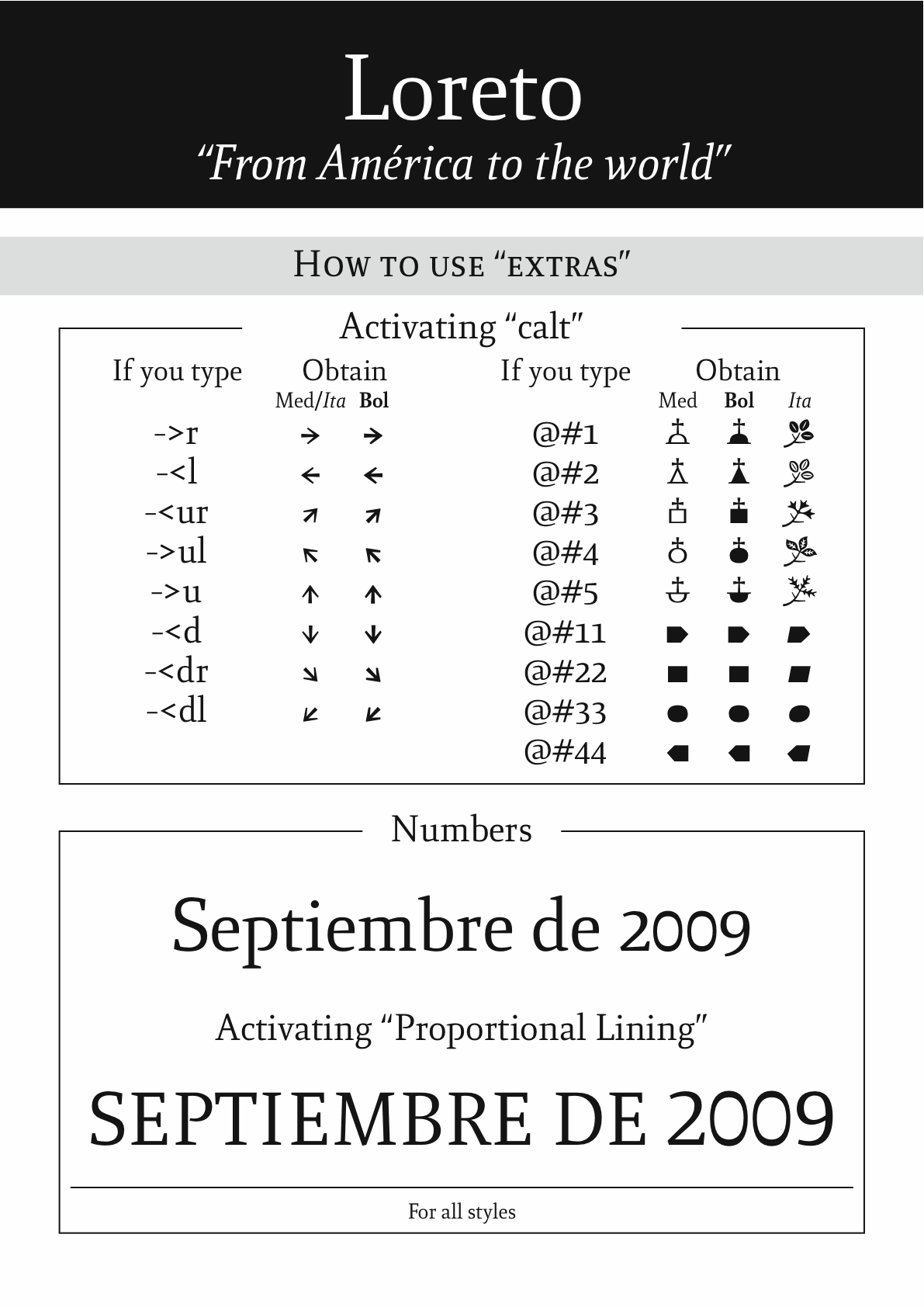
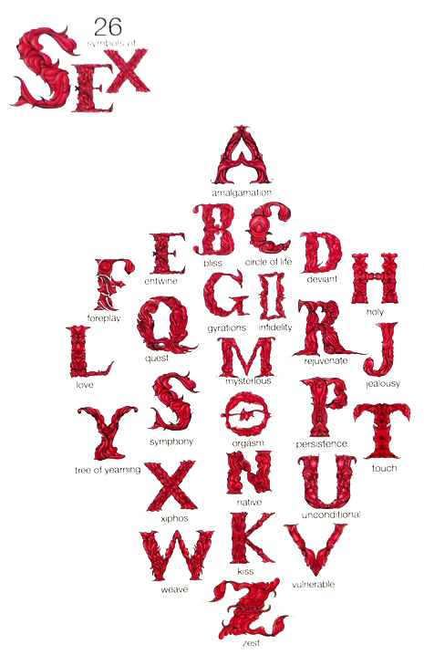
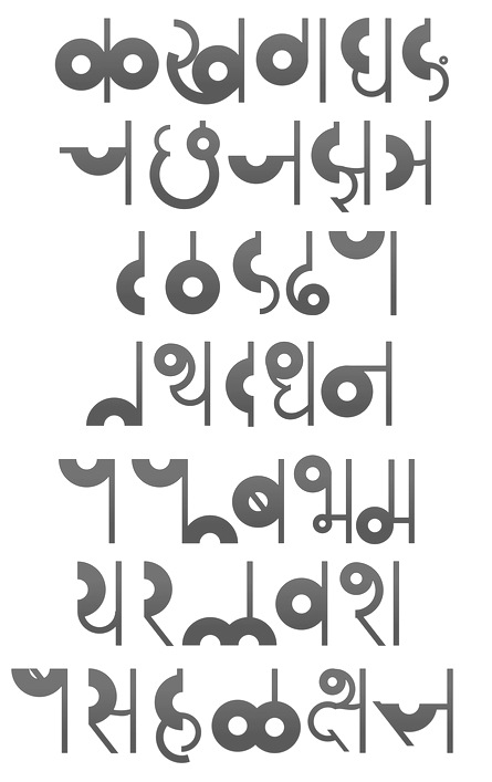
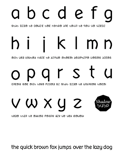
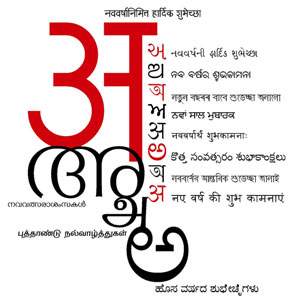
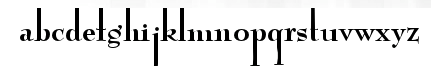
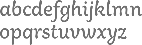
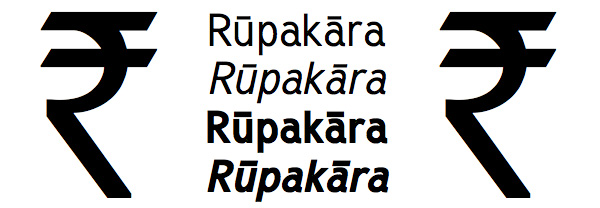
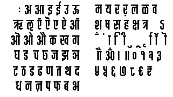
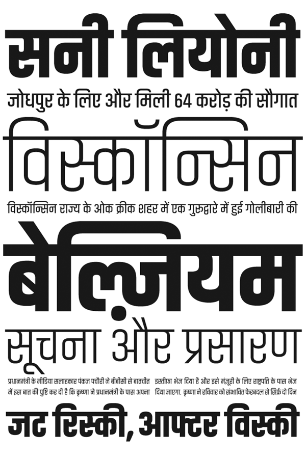
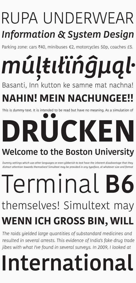
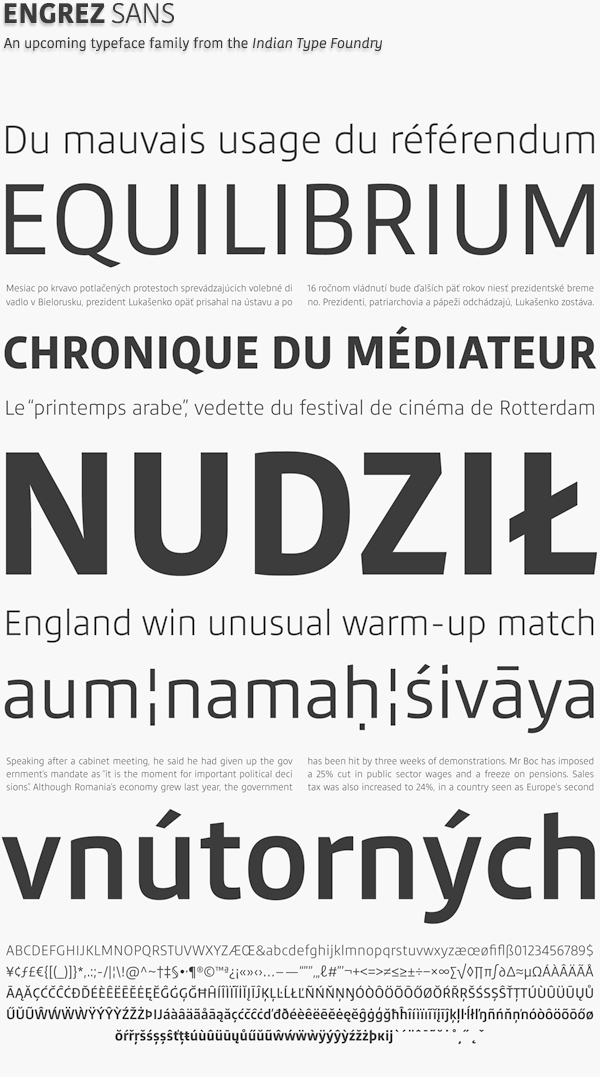
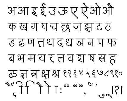
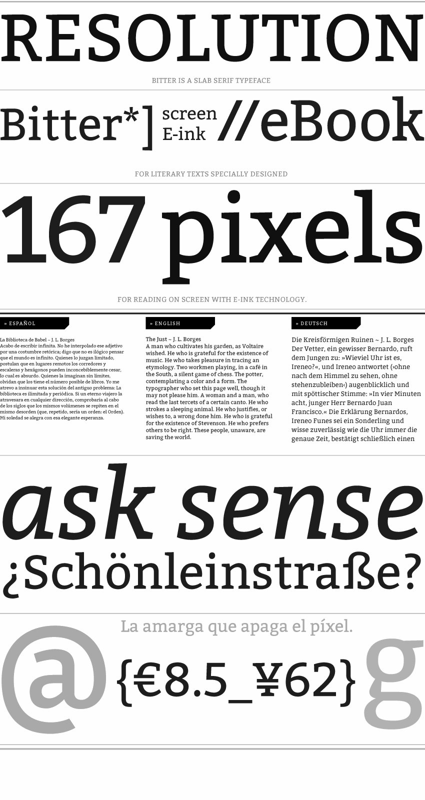
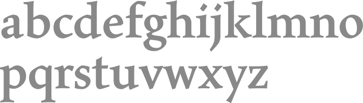
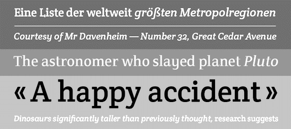
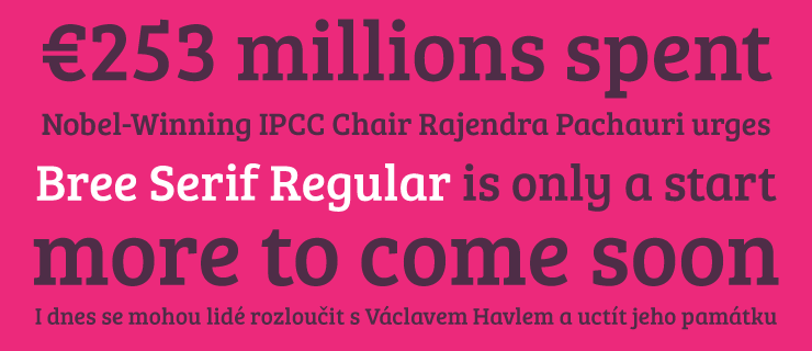
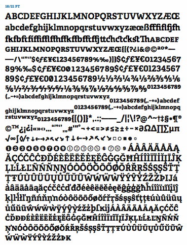
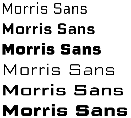
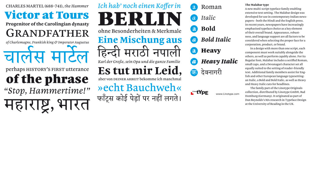
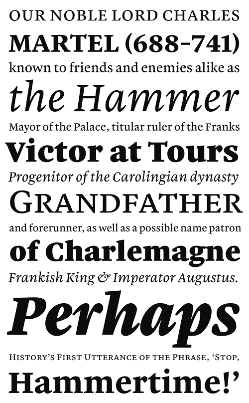
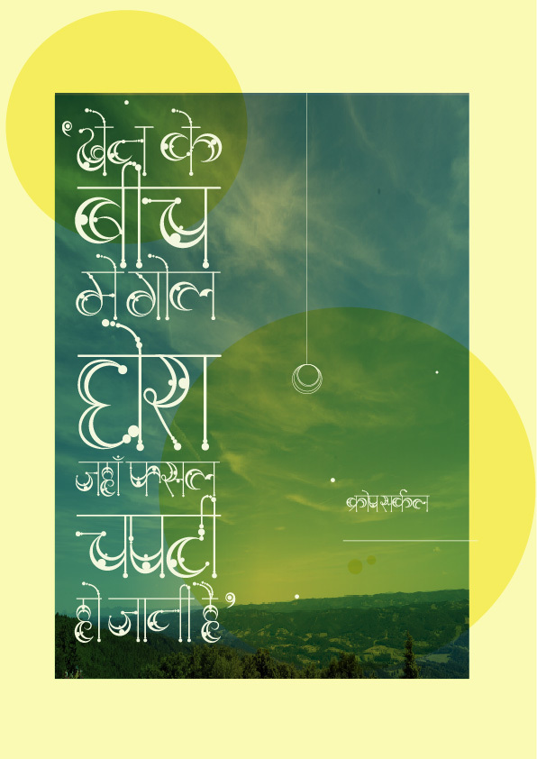
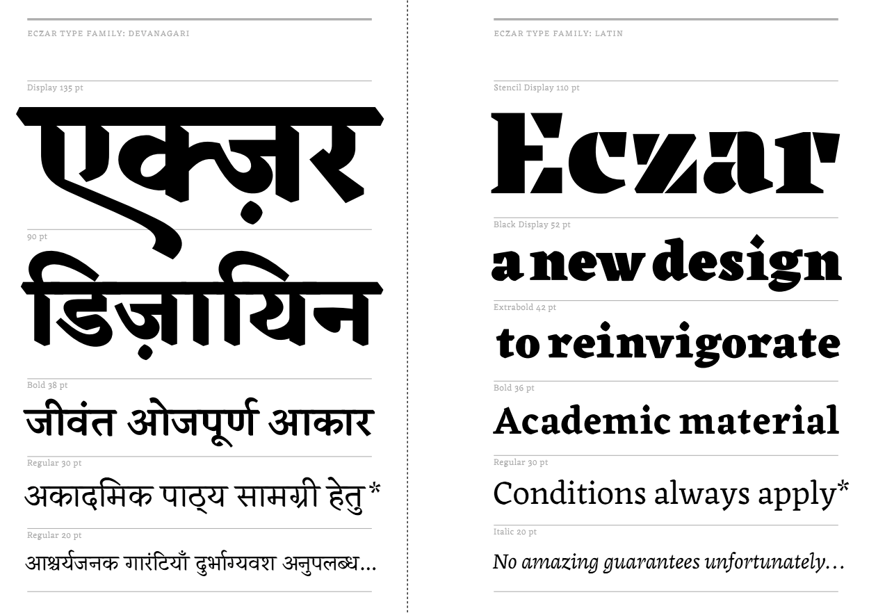
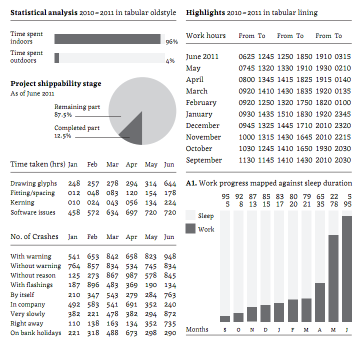
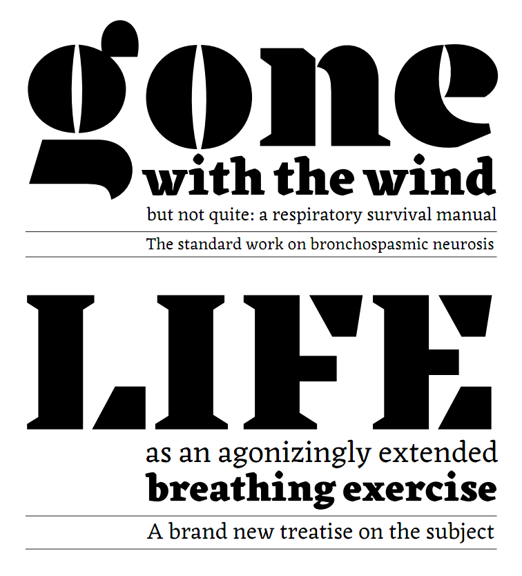
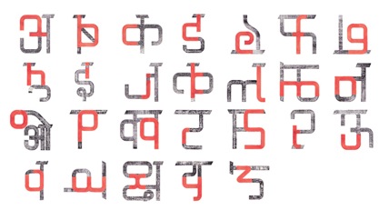
|
|
|
|