| | |
Agency Gothic
|
A typeface designed by Morris Fuller Benton in 1933 for American Typefounders. This is a typeface in which normally curved strokes are somewhat straightened. Mac McGrew writes: Agency Gothic is a squarish, narrow, monotone gothic without lowercase, designed by Morris F. Benton in 1932. It has an alternate A and M which further emphasize the vertical lines. Sizes under 36-point were added in 1935. Agency Gothic Open was drawn by Benton in 1932 and introduced in 1934; it follows the same style in outline with shadow, and probably has been more popular than its solid companion. Triangle Type Foundry, a Chicago concern that manufactured matrices, copied this typeface as Slim Open, adding some smaller sizes. ATF's working titles for these typefaces, before release, were Tempo, later Utility Gothic and Utility Open. Compare Raleigh Gothic Condensed, Poster Gothic, Bank Gothic. Digital versions include Warp Three NF (2008, Nick Curtis), which borrows its lowercase from Square Gothic (1888, James Conner's Sons), FB Agency (1995, David Berlow at FontBureau), OPTI Agency Gothic (by Castcraft), Agency Gothic (by Dan Solo), Agency Open (Jason Castle) and Agency Gothic Inline (Jason Castle). [Google]
[More] ⦿
|
Alan Dague-Greene

|
 Type designer (formerly Alan Greene) who is presently at MvB Design in charge of font production. Before that, he was head of custom font creation at FontShop San Francisco, and was also briefly at T26.
 His typefaces: - The huge serifed family FF Atma (2001).
- Indispose (T26).
- MVB Peccadillo (2002, MVB). Done with Holly Goldsmith.
- MVB Sirenne family (2002). Done with Mark van Bronkhorst, this large family is based on an 18th century design, with optical sizes.
- The free font family Courier Prime (2013), created for John August and Quote Unquote Apps, made for screenwriters: Courier Prime is optimized for 12 point size, and matches the metrics of Courier and Courier Final Draft, so you can often swap it out one-for-one. Other Couriers just slant the letters to create faux italics. We give you a whole new typeface [with true italics], modeled off the script of vintage typewriters. The competition was Mac Courier [the 1990 Apple system font made by Bitstream] and Courier Final Draft [used in the Final Drafdt screenwriter software]. At Open Font Library, we find Courier Prime Code (for programmers) and Courier Prime Sans, both designed in 2015. Finally Courier Prime was added to Courier Prime in 2019. Github link.
- Codesigner at American Type Founders Collection of ATF Alternate Gothic (2015, Mark van Bronkhorst, Alan Dague-Greene, David Sudweeks, Igino Marini, & Ben Kiel). ATF Alternate Gothic is a new, significant digital expansion to 40 fonts of Morris Fuller Benton's classic 1903 design.
- MVB Salis. A 16-style corporate sans family.
[Google]
[MyFonts]
[More] ⦿
|
Alphabet Soup (or: Michael Doret)
[Michael Doret]
|
 Michael Doret is a commercial hand lettering artist in Hollywood, CA, but born in New York in 1946. A graduate of The Cooper Union, he was interviewed by MyFonts in 2011. He worked at PhotoLettering as an assistant of Ed Benguiat. Klingspor link. Behance link. Veer writes: A graduate of the Cooper Union, Michael has run his own design studio for many years - first in New York City - and currently in Hollywood. An eight-time winner of the New York Art Directors Club Silver Award, Michael is a specialist in logos and letterforms. His unique typographic vision blends elements of lettering, illustration and graphic design. The inspiration for his work has come from such diverse sources as matchbook covers, theater marquees, enamel signs, early and mid-20th century packaging, and various other artifacts of this great land of ours. Although for much of his career he executed his work in traditional media, he now works almost exclusively in a digital format. In 2006, he set up his own foundry, Alphabet Soup.
 Fonts sold by MyFonts. Behance link. FontShop link. His typefaces: - Dark Angel (2013). A gloomy black blackletter hybrid.
- Deliscript (2009): an upright connected script with accompanying slanted version. It was inspired by neon signs in from of Canter's restaurant in Hollywood. Winner at TDC2 2010. And a winner in the Type Design category, CA Magazine's Award of Excellence in their 2011 Typography issue.
- Deluxe Gothic (2010), a Bank Gothic style face. DeLuxe Gothic was also the name that Intertype used for their version of Bank Gothic. Images: i, ii), iii.
- Dynascript (2011). Patrick Griffin did the Opentype programming. Dynatype (2012) is the upright, slightly more formal cousin of Dynascript.
- Grafika (2009): a gorgeous 1930s art deco typeface originally designed for the credits of the movie Savages. Doret calls it extreme deco.
- Metroscript (2006, Alphabet Soup): a connected retro script.
- Orion (2003): an upright, linear script, based on an enameled sign (probably of 1930s vintage) that designer Michael Doret picked up at a Paris flea market.
- Power Station (2006): a 3-d athletic lettering and beveled family, with styles such as Block, Wedge, Block Low, Block High.
- Steinweiss Script (2010): a 2200-glyph curly script typeface called Steinweiss Script (2010), which captures a lot of the spirit of Steinweiss's album covers from the late 1930s and 1940s. (Opentype programming help by Patrick Griffin).
Creative Market link. View Michael Doret's typefaces. The typeface libray at Alphabet Soup. [Google]
[MyFonts]
[More] ⦿
|
Alternate Gothic
[Morris Fuller Benton]
|
 A popular American typeface designed in 1903 by Morris Fuller Benton. It is essentially a condensed version of Benton's other well-known sans serif types, Franklin Gothic and News Gothic, and thus very useful for newsprint and tight work. Even today, it remains popular. Alternate Gothic No. 2, for example, is used in the Youtube logo.
 Mac McGrew: Alternate Gothic was designed in 1903 by Morris F. Benton for ATF with the thought of providing several alternate widths of one design to fit various layout problems. Otherwise it is a plain, basic American gothic with no unusual features, but represents a more careful drawing of its nineteenth-century predecessors. The Monotype copies in display sizes are essentially the same as the foundry originals, with the addition of f-ligatures. The thirteen alternate round capitals shown in the first line of Alternate Gothic No.1 were designed by Sol Hess in 1927 for Monotype, hence the "Modernized" name; with these letters the design is sometimes referred to as Excelsior Gothic. Monotype keyboard sizes, as adapted by Hess about 1911, are considera- bly modified to fit a standard arrangement; caps are not as condensed as in the original foundry design. In 6-point, series 51 and 77 are both the same width, character for character, but some letters differ a bit in design. Note that these two narrower widths are simply called Alternate Gothic on Monotype, while the wider version is Alternate Gothic Condensed! Alternate Gothic Italic, drawn about 1946 by Sol Hess for Monotype matches No.2, but may be used with other widths as well. Condensed Gothic on Ludlow, is essentially a match for Alternate Gothic No.1, but has a somewhat different set of variant characters, as shown in the third line. There is also Condensed Gothic Outline on Ludlow, introduced about 1953, essentially an outline version of Alternate Gothic No.2. On Linotype and Intertype there is Gothic Condensed No.2 which is very similar to Alternate Gothic No. 1 in the largest sizes only, but with even narrower lowercase and figures. Also compare Trade Gothic Bold and Trade Gothic Bold Condensed. Revivals: Alternate Gothic EF (Elsner&Flake), Alternate Gothic Pro (2016, Softmaker), Alternate Gothic No2 (Bitstream), and Alternate Gothic No1, No2 and No3 (see the URW version or the Linotype version). ATF Alternate Gothic (2015, Mark van Bronkhorst, Alan Dague-Greene, David Sudweeks, Igino Marini, & Ben Kiel at American Type Founders Collection) is a new, significant digital expansion to 40 fonts of Morris Fuller Benton's classic 1903 design. [Google]
[More] ⦿
|
American Garamond
|
 Or Garamond 3. Garamond 3 is published by Adobe and Linotype. The Linotype version of Garamond from 1936 is based on the American Type Founders design by Morris Fuller Benton and Thomas Maitland Cleland, who based their work, in turn, on seventeenth-century copies of Claude Garamond's types by Jean Jannon. The Bitstream version is called American Garamond. [Google]
[More] ⦿
Or Garamond 3. Garamond 3 is published by Adobe and Linotype. The Linotype version of Garamond from 1936 is based on the American Type Founders design by Morris Fuller Benton and Thomas Maitland Cleland, who based their work, in turn, on seventeenth-century copies of Claude Garamond's types by Jean Jannon. The Bitstream version is called American Garamond. [Google]
[More] ⦿
|
American metal versions of Bodoni
|
 All 19th and early 20th century versions of Bodoni can be traced back to Giambattista Bodoni, the pater familias of the modern rational style of typeface. Mac McGrew: There have been numerous interpretations of Bodoni's typefaces, but the most popular in America are those drawn by Morris F. Benton for ATF or adapted from his work by other manufacturers. His Bodoni, Bodoni Italic. Bodoni Book and Italic, and Bodoni Bold and Italic, introduced by ATF in 1910-11, have been duplicated by several sources, as detailed below. The ATF Bodoni series, with its long descenders, was the first new creation to successfully counter the popularity of standard alignment, introduced around the turn of the century. However, it was inspired by the successful revival of the original version of Caslon Oldstyle. Henry L. Bullen encouraged the resurrection of the Bodoni design, first of a series of such recreations, while his Typographic Library at ATF provided the resources for research into the works of the historic master designers.
 Monotype published its own interpretation of Bodoni and Italic in 1911. Mac McGrew: This is its No. 175 series, also based on historic Bodoni types but differing in many details from Benton's design. Notice especially the alternate French oldstyle figures, which depart from the usual style of oldstyle figures; ATF Bodoni also has similar alternate figures in small sizes, although they are rarely seen. In 1930 Monotype adapted Benton's Bodoni design as its No. 375 series. Neither 175 nor 375 suffers from the mechanical restrictions of Monotype's standard arrangement, but because Bodoni Bold and Italic required considerable reproportioning as first cut for that machine, Monotype later brought out Recut Bodoni Bold and Italic, which by means of a special arrangement are very close to ATF's original design. Bodoni Book and Italic were adapted to Monotype after special arrangements became more common. Notice the alternate v and w shown in the specimen of Bodoni Italic; these letters were made by ATF in all three weights of italic but not copied by any other source except Monotype Bodoni Book Italic. Perhaps because of the lighter Bodoni Book, some users apply the name "Bodoni Medium" to the regular weight. For newsprint, there were special designs with shorter descenders. McGrew: ATF's Newspaper Bodoni Bold is the same as Bodoni Bold, but with descenders (gjpqy,;Q as shown after the Bodoni Bold specimen) substantially shortened to permit casting each size on a smaller body, from 36/30 (36-point typeface on 30-point body) to 144/120. Ludlow Bodoni Bold offers similarly short- ened descenders in large sizes. ATF Bodoni Bold Italic was cast for a while in the 1960s with greatly shortened descenders though not on smaller bodies. Apparently the intention was to reduce the size of kerns and the chance of breakage. Not to be left behind, Ludlow entered the arena. McGrew: Ludlow's first offering in this family was Bodoni Light and Italic, designed by Robert Wiebking and introduced in 1923; it was similar to Monotype Bodoni No. 175 but lighter. Five years later Ludlow brought out True-Cut Bodoni and Italic, designed by Wiebking from original Bodoni works in Chicago's Newberry Library. The serifs and hairlines of this typeface turned out: to be too delicate for practical use, so in 1936 Robert H. Middleton modified the design and it was reissued as Bodoni Modern and Italic. The basic design is the same except for a few redrawn letters, but it is recut a little narrower and with slightly more strength to the hairlines. This is probably the most faithful recreation of Giambattista Bodoni's original types. The third lines of specimens of the latter face, both roman and italic, show some of the original True-Cut Bodoni characters before they were redesigned. Ludlow Bodoni Bold and Italic, cut by Wiebking before 1930, were replaced by Bodoni Trueface Bold and Italic, close copies of the Benton face. Bodoni Trueface and Italic in the regular weight were also added. About some condensed versions, McGrew has this to say: Bodoni Bold Condensed was drawn by Sol Hess for Monotype in 1934, and other versions were designed independently by some other sources; such a typeface was drawn by the ATF staff in 1933 but not produced. The basic Bodoni designs were narrowed by Linotype and Intertype in the larger sizes to fit early mechanical restrictions; when later machines permitted full width typefaces in these sizes, the narrow versions were renamed Bodoni Condensed and Bodoni Book Extra Condensed. Intertype also cut Bodoni Bold Extra Condensed and Slim Bodoni. ATF's Card Bodoni and Card Bodoni Bold were drawn by Benton in 1912-16. These are adaptations of the standard typefaces to all-caps fonts, with several sizes cast on 6- and 12-point and larger bodies for use on stationery and forms; notice the redrawn J, Q, comma, and semicolon [quote from McGrew]. Engravers Bodoni is a wide version of Bodoni Bold made the same way. It was drawn by Benton in 1926 but apparently not introduced until 1933. Bodoni Bold Shaded was designed by Benton in 1912 for ATF. McGrew: Bodoni Open, also by Benton in 1918, was discontinued after a time and reintroduced in 1930. Bodoni Bold Panelled was designed by Sol Hess for Monotype in 1928; it has no lowercase, points or figures, only the basic characters shown. All three typefaces are adaptations of Bodoni Bold. The most striking Bodonis are the very fat ones. McGrew explains the situation in this way: Ultra Bodoni and its variations are now well established under the Bodoni name, but historically they hardly belong here, being more closely related to the nineteenth-century English "fat" typefaces. One reviewer called Ultra Bodoni "an old Bruce typeface with a few redrawn characters." Actually it was entirely redrawn, but the resemblance is there. The Ultra Bodonis do not have the long ascenders and descenders of other Bodonis, and the transition from thick to thin is more abrupt. Ultra Bodoni and Italic, designed by Morris Benton in 1928 for ATF, were also made by Monotype; Intertype made them as Bodoni Modern and Italic. Linotype has Poster Bodoni and Italic, similar to Ultra Bodoni but with somewhat heavier hairlines, designed by C. H. Griffith. Ludlow's Bodoni Black and Italic, designed by Robert H. Middleton in 1930, are distinctly different but generally comparable; a later Condensed version was also designed by Middleton. ATF's Ultra Bodoni Condensed, drawn by Benton in 1930, is rarely seen but his Ultra Bodoni Extra Condensed of 1933 has enjoyed some limited use. Onyx, called Poster Bodoni Compressed by Linotype, is comparable. Ludlow's Bodoni Campanile (called Palisade on Intertype) and Italic are somewhat similar to Onyx, but less formal; they were designed by Middleton in 1936 and 1942 respectively. Finally, McGrew draws the attention to Bartlett, Damon Type Foundry's name for its copy of the Bodoni series. He writes: Compare Louvaine, French Round Face, Suburban French. Also see Bauer Bodoni. [Google]
[More] ⦿
|
American Text
|
 A textura typeface. Mac McGrew: American Text was designed by Morris F. Benton for ATF in 1932, as a modernized adaptation of the sort of typeface commonly called Old English. It seems to be constructed entirely of straight lines, with a very angular appearance. It has had some popularity in advertising, as well as for stationery.
 Digital versions include American Text by Bitstream, OPTI American Text by Castcraft, Blackletter 851 by Bitstream, National Text by Bitstream, American Text (2019) by SoftMaker, and the free typeface American Text (2000) by Dieter Steffmann. [Google]
[More] ⦿
|
American Type Founders Collection (or: TypoBrand LLC; or: ATF Type)
|
 Mark van Bronkhorst set up TypoBrand LLC in Berkeley, CA. As part of TypoBrand, he published several typefaces that are modern digital reinterpretations of typefaces at American Type Founders by famous type designers such Morris Fuller Benton. The collection is published by TypoBrand LLC under the names ATF Type or American Type Founders Collection. Codesigners include Igino Marini and Ben Kiel. TypoBrand writes: Reinterpreted and carefully crafted, the ATF Collection offers more weights and widths, expanded character sets, and robust typographic features in type designs beautifully suited to modern use and media. From the printed page to the screen, the new ATF Collection brings a tradition of typographic richness to the digital era. In 2021, ATF Type joined The Type Founders. Their typefaces:
 - ATF Alternate Gothic (2015, Mark van Bronkhorst, Alan Dague-Greene, David Sudweeks, Igino Marini, & Ben Kiel). ATF Alternate Gothic is a new, significant digital expansion to 40 fonts of Morris Fuller Benton's classic 1903 design.
- ATF Brush (2015). In five weights, this classic brush face is based on ATF Brush by Robert E. Smith, American Type Founders, 1942.
- ATF Garamond (2015, Mark van Bronkhorst, Igino Marini, & Ben Kiel). An 18-style family based on the Garamond designed between 1918 and 1923 by Morris Fuller Benton and Thomas M. Cleland. ATF Garamond was first released in roman and italic styles around 1918, drawn by Morris Fuller Benton, head of the American Type Founders design department. In 1922, Thomas M. Cleland designed a set of companion swash italics and ornaments. Bold and bold italic variants were released in 1920 and 1923, respectively.
- ATF Headline Gothic (2015, Mark van Bronkhorst, Igino Marini, & Ben Kiel). A newspaper font originally designed by Morris Fuller Benton in 1936. Sharp and round contours are provided.
- ATF Livermore Script). By Mark van Bronkhorst, Igino Marini, and Ben Kiel.
- ATF Poster Gothic (2015, Mark van Bronkhorst, Luis Batlle, Igino Marini, & Ben Kiel). Based on a design by Morris Fuller Benton, 1934. Thirty fonts in all!
- ATF Railroad Gothic (2016, Mark van Bronkhorst, Luis Batlle, Igino Marini, & Ben Kiel). The designers write: First introduced by the American Type Founders Company in 1906, Railroad Gothic was the quintessential typographic expression of turn-of-the-century industrial spirit---bold and brash in tone, and a little rough around the edges. A favorite for the plain speak of big headlines, Railroad Gothic quickly gained popularity among printers. Its condensed but robust forms were likely a source of inspiration for later families of industrial sans serifs. The ATF original was extended with four new weights.
- ATF Wedding Gothic (2015, Mark van Bronkhorst, Luis Batlle, Igino Marini, & Ben Kiel). An 18-font engravers gothic based on an original from ca. 1901.
- ATF Franklin Gothic (2019, Mark van Bronkhorst, Igino Marini, & Ben Kiel). A broad and multi-weight interpretation of Morris Fuller Benton's classic from 1905, Franklin Gothic, which only had bolder weights. For the lighter styles, the designers were inspired by Benton's Monotone Gothic.
Type Network link. [Google]
[MyFonts]
[More] ⦿
|
Antique (McGrew's definition)
|
Mac McGrew writes: Antique in general is a generic nineteenth-century term applied to a variety of old type styles. A few that were given a new lease on life by Monotype and the slug machines are listed here; others were similar to the older Clarendons, Dorics, Ionics, etc. Also see Bold Antique and Bold Condensed Antique, Modern Antique and Modern Antique Condensed, and Old Style Antique, also Cushing Antique, Latin Antique, etc. Antique No.1 is similar to Bookman. Antique No.2 (Lino) is equivalent to Antique No.6 (Mono) and comes from BB&S, where it was later known as Antique Bold. Antique No.3 is equivalent to Modern Antique. Antique No. 525 (ATF) is very similar to Antique [No. 53] (BB&S) and Antique No.1 (Inland); also to Consort Light, the 1950s English revival (see Clarendon). Hansen's Antique No.1 was slightly lighter than the others. Antique Condensed comes from BB&S. Antique Extra Condensed was shown as Skeleton Antique by Marder, Luse in 1886 or earlier and by BB&S somewhat later, with many sources producing the same or very similar designs. Antique Shaded was designed by Morris F. Benton in 1910 but not introduced until 1913, when it was described as "the first of a series of shaded typefaces." It was later promoted as part of "the new gray typography." This typeface was the first one cut on a new shading machine invented by the designer's father, Linn B. Benton. When Monotype copied it, the typeface was named Rockwell Antique Shaded, to tie it in with that company's Rockwell series (q. v.), but since Rockwell is often confused with Stymie, it is perhaps natural that Antique Shaded is sometimes though incorrectly called Stymie Shaded. [Google]
[More] ⦿
|
Art deco typefaces by Nick Curtis: II
[Nick Curtis]
|
 Commercial art deco typefaces by Nick Curtis.
 - Bessie Mae Moocho NF (2002). An art deco font based on handlettering found on a travel brochure for IMM Steamship Lines, circa 1927.
- Blitzkrieg NF (2011). A Lufthansa Airlines baggage label from 1936 provided the inspiration for this genuinely German typeface, with strong art deco influences.
- Blue Jay Way NF (2011). An art deco typeface inspired by Ross F. George. This typeface was used on the Beatles' original Magical Mystery Tour album.
- Boeuf au Joost (2003). Art deco based on work by comic book artist Joost Swarte.
- Boho à Gogo NF (2007): a multiline (op art?) typeface inspired by Bauhaus.
- Chalk and Cheese NF (2004). This art deco uppercase is based on 1930s lettering by French poster artist Charles Loupot (based on this art deco poster), and the non-art deco lowercase is based on 1910s lettering by German plakatmeister Ludwig Hohlwein.
- Chemin de Fer NF (2005). An art deco shadowed outline face.
- Chi Town NF (2008) is a heavy art deco creation that is based on a 1931 poster for the film The Man from Chicago.
- Coochie Nando NF (2011). An art deco shadow caps face, after a typeface called Kitchen by Milton Glaser.
- Dooijes Deco NF (2010). A 3-style art deco family in the style of Broadway, based on the Dick Dooijes tryptich, Carlton, Bristol (1929) and Savoy (1936).
- Duck Soup (2003, after a 1928 poster by Italian designer Neri Nanetti for Snob Cognac).
- Elektromoto NF (2011). This family takes its inspiration from two early Art Deco typefaces from Germany. The Normal version is based on Dynamo, designed by K. Sommer for Ludwig&Mayer in 1930, while the Narrow version is based on Stadion, designed by Erhard Grundeis for Die Schriftguß AG in 1929. Their common design motifs epitomize the Age of Streamline.
- Humpty Dumpling NF (2010). A fat art deco typeface based on an offering from the irrepressible M. Draim, seen in La Lettre dans le Décor&la Publicité Modernes, published by Monrocq Frères of Paris in 1932).
- Dusty Rose (2008) is an art deco typeface based on the logotype for the Dutch magazine Geillustreerd Schildersblad in 1940.
- Edgewise (2007), a quirky well-rounded post-art deco and pre-psychedelic face, uses ideas from Ryter Night (VGC).
- Ege Schrift NF (2011). a faithful revival of Ege-Schrift (1921, Eduard Ege), a mix between Mexican party lettering and art deco.
- Engel Stabenschrift NF (2008). In 1927, Ernst Engel created an art deco typeface which was revived by Nick Curtis as Engel Stabenschrift NF.
- Faerie Queen NF (2006). Based on an art deco typeface named Titania made in 1933 by Fundición Richard Gans.
- The Reed and Fox typefaces Viennese and Corinthian were combined in 2014 in Nick Curtis's digital typeface Genever NF.
- Gotham Rail Company NF (2002). Art deco based on an Italian travel poster from 1931.
- Great Lakes Shadow (2008) is an art deco typeface based on a 1930s travel poster for the Canadian pacific Railway.
- Hunky Dory NF (2014). A circus font after William H. Page's wood type Doric, ca. 1850.
- Jazzfest NF and Tinseltown NF (2009). Based on the 1932 art deco typefaces Newport and Hollywood, respectively, both designed by Willard T. Sniffin for ATF.
- Kharon Ultra (2009). An art deco typeface based on Ludlow Stygian.
- Kinkajou Stew (2003). Image of Kinkajou NF.
- Kirschwasser NF (2005). A bubbly art deco face.
- Korner Deli NF (2006, art deco).
- Kymmera Deco NF (2011). Revival and redesign of Rainbow Bass (1982, saul Bass).
- La Reyna Catalina NF (2006). An art deco face based on Aragón, designed by Enric Crous-Vidal.
- Legnano Cuneo NF and Legnano Sassari NF (2014). Italian art deco wood type.
- Linea Nera NF (2011). Based on Wolf Magin's Black Line (1976, Berthold).
- Lodewijk Gothic NF. After Elzevir Gothic (ATF, 1897).
- Luben Tunen (2008) is another art deco face.
- Madison Squared NF (2012).
- Mighty Ditey (2007): a mix between art deco and Peignot, this elegant typeface is based on a 1970s Photolettering typeface by Richard Nebiolo called Aphrodite, and competes with Riesling (1994, Bright Ideas) and Gillespie (2015, Darren Odden) as revivals of Aphrodite.
- Mogzilla NF (2007) is an ultra fat art deco face.
- Monte Carlo Script NF (2002). An art deco font based on a font called Médicis from a Deberny and Peignot catalog, circa 1920.
- Nip&Tuck (2006).
- Odalisque NF (2008, +Stencil, 2010) are art deco fonts based on Morris Fuller Benton's Chic (1927).
- OK Chorale (2003). An art deco typeface based on Carl Holmes' ABC of Lettering book.
- Orchard Street NF (2011, +Inline). A pair of art deco caps typefaces inspired by one of many posters produced by the WPA by anonymous artists during the 1930s.
- Pentaprism NF (2011). Part Futura, part Bauhaus, this 5-style family has multiline, inline, and other variants.
- Picture Postcard NF (2004: based on an alphabet by Alf Becker).
- Raconteur NF (2006-2008) is a wonderful art deco typeface that shouts gin fizz and high heels: it takes its inspiration from a 1923 ad for Piera Nova, designed by Hernando G. Villa.
- Quoi Chou NF (2006). An elegant and quite original beefed-up version of Bernhard Fashion by Lucian Bernhard.
- Radio Days (2008). An art deco typeface based on 1930s logotype lettering for Crosley Radios.
- Rassetta NF and Rassetta Swash Caps NF (2005). An art deco pair of typefaces originally designed by Willard T. Sniffin for American Type Founders in 1931 under the name Rosetti.
- Renard Moderne NF (2010). An art deco typeface inspired by Sol Hess's 1940s typeface Twentieth Century Poster.
- Resolute NF or USA Resolute NF (2009). An all caps fat headline typeface based on Morris Fuller Benton's Eagle, ATF, 1934.
- Retrorocket NF (2015). An art deco alphabet based on a French lettering chapbook entitled Art du Tracé Rationnel de la Lettre (1934, D. Duvillé).
- Salzmann Deco NF (2011) and Salzmann Deco Deco NF (2011), art deco and Mexican-themed typefaces, modeled after Max Salzmann's Dolmen (1921-1922) and Zierdolmen (1922), respectively.
- Secret Agent (2003). A pure art deco beauty based on this Loupot poster from 1919.
- Ski Alpin NF (2014). An art deco typeface based on a Swiss travel poster from 1927.
- Smart Frocks NF (2008). A Peignotian face, after a shop sign in London, ca. 1930. Designer unknown.
- Stony Island NF (2011). Based on an Alf R. Becker typeface from 1935 called Chicago Modern Thick and Thin.
- Suave Sam NF (2010). An art deco typeface after a 1930 alphabet by Samuel Welo.
- Tasneem (2007) is the ultimate art deco face, originally drawn by Gustav Jensen in 1931.
- Tiny Bubbles NF (2008). An art deco typeface inspired by an alphabet in Pen&Brush Lettering and Practical Alphabets (Blandford Press, Ltd., London, 1929).
- Top Kick NF (2011). Based on Concentra, a geometric marvel with several parallel and concentric lines making up the letters. Concentra was originally published in Schriftatlas: Alphabete von A bis Z .
- Turista Gorda NF (2009). Based on Baltimore Type Foundry's Airport Tourist, which in turn was influenced by Futura Display.
[Google]
[MyFonts]
[More] ⦿
|
Ashley Muir
|
 Type designer at Red Rooster, where she published Creighton (2009, a sans family done with Steve Jackaman), Carlingtown (2009, an almost art nouveau face), Glasgow Pro (2010; a refreshed version of Steve Jackaman's Glasgow grotesque family), Harry Pro (based on the original design by Marty Goldstein (and C.B. Smith) done at VGC in 1966), Karnak Pro (2009, a slab family based on the original design by Robert Hunter Middleton, ca. 1931-1942), and Ronsard Crystal (2009, based on a VGC photo display font in the 1950s, but also related to Industria Ronsard by Hermann Zehnpfundt, 1913), together with Red Rooster's boss, Steve Jackaman. About Creighton: It was our initial intention to develop a suitable lowercase for Les Usherwood's Elston typeface, based on a few characters from an old German typeface called Hermes Grotesque (Woellmer, Berlin). However, the new design quickly took on a life of its own, and we decided to call it Creighton. A crisper version of Creighton is Megaphone (2009).
 Typefaces from 2010, all with Steve Jackaman at Red Rooster: Shamus (uncial), Ryder Gothic Pro (a revival of Roslyn Gothic by Harry Winters, 1972), Pickworth Old Style Pro (rustic), Wurlitzer Pro (slab serif), Eden Pro (based on the original 1934 Ludlow drawings by Robert Hunter Middleton), Connemara Old Style (uncial), Overtime LCD Pro (LED simulation face), Phosphate Pro (Solid and Inline). Typefaces from 2011, still with Steve Jackaman at Red Rooster: Phoenix Pro (after the condensed artistic sans called Phenix by Morris Fuller Benton, 1935, ATF), Guildford Pro (+Light, +Medium, +Titling; after Stephenson Blake's Guildford Sans, which in turn was identical to the 1928-1929 typeface by Hans Möhring called Elegant Grotesque), Granby Elephant (after the fat grotesk typeface Granby by Stephenson Blake, 1930), Franklin Gothic Pro (after Morris Fuller Benton's original from 1903), Windlesham (2011, a basic sans family), Relish Pro (2011, another basic sans family), Rocklidge Pro (2011, with Ashley Muir; based on Jana (Richard D. Juenger, VGC, 1965), Packard New Style and Packard Old Style (2011, with Steve Jackaman, after Packard by Oswald Cooper (1913) and Morris Fuller Benton (1916, ATF). Klingspor link. Fontspace link. [Google]
[MyFonts]
[More] ⦿
|
ATF 1923 Catalog: Bodoni Series
|
Showcasing the best pages from the Bodoni Series in the ATF 1923 Catalog. Fonts include Bodoni (+Italic), Bodoni Bold (+Italic), Bodoni Book (+Italic), Card Bodoni (+Bold), and Bodoni Mortised Ornament. [Google]
[More] ⦿
|
ATF 1923 Catalog: Caslon typefaces
|
 The Caslon typefaces in the ATF catalog from 2013 include the following:
 - American Caslon (Morris Fuller Benton), and American Caslon Italic.
- Caslon Adbold. Mac McGrew: Caslon Adbold, originating with Keystone in 1913, is characterized by heavier strokes throughout; Extended and Extra Condensed versions followed in 1915 to 1917; all were patented and presumably designed by R. F. Burfeind.
- Caslon Bold. Mac McGrew: The most popular Caslon Bold was introduced by Keystone Type Foundry in 1905, followed by Italic in 1906 and Condensed and Extended versions about 1911; this is the version made by ATF and in regular widths by Monotype. Monotype keyboard sizes (including large composition to 18-point) are modified considerably to fit standard arrangements, but the only apparent difference in display sizes is the redrawn T and g shown separately in the specimen alphabet and the addition of ligatures and diphthongs on Linotype and Intertype.
- Caslon Lightface (Keystone, 1910-1912).
- Caslon No. 540. Mac McGrew: Inland Type Foundry, St. Louis, advertised its own version of Caslon Old Style in 1901, with the claim. "We have obtained the sole right from the originating house to manufacture this series in the United States. Inland is the only type foundry which casts this typeface on standard line. ..." This meant that they had considerably shortened the descending letters; they had also redesigned the italic extensively. ATF countered with Caslon No. 540, with similarly shortened descenders but essentially the original roman and italic designs otherwise. Several other foundries, including BB&S, Hansen, and Keystone, produced similar Caslons. One of the most noticeable features of Caslon is its lack of uniformity from one size to another. This is due to the fact that all the original characters were cut by hand, before the invention of precise mechanical systems for enlarging and reducing drawings. In Caslon 540, each size is the equivalent of the next larger size of 471, including some obsolete odd sizes. Thus 14-point 540 is equivalent to 18-point 471,18 to 22, 20 to 24, etc. The difference is primarily in the descenders, very unattractively shortened in some sizes of 540; lining figures replace the hanging style, and a few other slight changes have been made. The additional large sizes are an attractive generalized design.
- Caslon Italic No. 540.
- Caslon Oldstyle No. 471. Mac McGrew: In 1858, Laurence Johnson, a prominent Philadelphia typefounder, visited London and arranged with the successors to William Caslon to duplicate the Caslon types. There are several accounts of how this was done; some say Johnson had fonts specially cast, from which he made electrotype matrices. Another account says he had strikes--unfinished matrices--made from the original punches, while a third account says he obtained the original matrices. The latter account is most unlikely, but the other two possibilities are interestingly credible. Many of the mats still available at ATF, successors to Johnson, are electrotypes-but then, mats wear out anyway, and are commonly replaced by electrotyping existing virgin cast type when patterns or punches are not available. If strikes were finished in this country-the usual process of accurately fitting them for width and position on the type body--this would allow for the fact that some sizes, especially in the 14- to 24-point range, are more loosely fitted here than in England. Otherwise there is virtually no difference between the American and English versions, except for later additions such as dollar mark and various swash letters--the latter are discussed later. Johnson simply called the typeface Old Style, as family names were a later development. When Johnson's foundry merged with MacKellar Smiths&Jordan foundry, the typeface was designated Original Old Style, to distinguish it from other typefaces in the same category. MS&J was part of the great merger that formed ATF in 1892, and the typeface became Old Style No. 71. When ATF's first specimen book was being prepared in 1897, the advertising manager. Henry Lewis Bullen, renamed the series Caslon Old Style. Later "No. 471" was added, the "4" designating typefaces obtained from MS&J.
- Caslon Oldstyle. Mac McGrew: Inland Type Foundry, St. Louis, advertised its own version of Caslon Old Style in 1901, with the claim. "We have obtained the sole right from the originating house to manufacture this series in the United States. Inland is the only type foundry which casts this typeface on standard line. ..." This meant that they had considerably shortened the descending letters; they had also redesigned the italic extensively. ATF countered with Caslon No. 540, with similarly shortened descenders but essentially the original roman and italic designs otherwise.
- Caslon Openface. Mac McGrew: Caslon Openface was originated by BB&S in 1915, where it was first called College Oldstyle. It started out as a reproduction of a delicate 18th-century French typeface known as Le Moreau le Jeune, by the foundry of G. Peignot&Son, but in the American version some strokes are heavier. In a later ad, BB&S said, "Placing it in the Caslon group of types is taking a liberty, but it assuredly 'belongs.' " Actually it has somewhat more affinity for the Cochin types.
- Condensed Caslon. Mac McGrew: Condensed Caslon is a modification of New Caslon, by Inland in 1907; it was inherited by ATF and copied by Monotype, both of which gave it the same series number (the only such incidence); printers often but incorrectly call it Caslon Bold Condensed. Caslon Extra Condensed is also derived from New Caslon, sometime between 1912 and 1917.
- Heavy Caslon. Mac McGrew: Heavy Caslon was issued by Inland in 1906 or earlier; Ludlow copied it as Caslon Old Face Heavy in 1925 and Intertype in 1937. Ludlow has a companion italic, while Intertype's italic is a sloped roman design. See Caslon Shaded..
- New Caslon. Mac McGrew: New Caslon, introduced in 1905 by Inland, was the most successful of these attempts. In addition to eliminating irregularities, the aim of this typeface was to strengthen the design so that under modern printing conditions it would more closely resemble the effect of the original Caslon when printed heavily on dampened rough paper, as was commonly done in the eighteenth century. The italic followed in 1906. In 1919 ATF (successor to Inland) reversed the descender-shortening trend with the design by Morris Benton of long descenders, oldstyle figures, and italic swash characters as American Caslon; otherwise this typeface and New Caslon are identical. New Caslon was adapted to Linotype and Intertype as Caslon No.3, which some users call Caslon Bold, although it was not intended to be a bold face. However, in 18-point and larger, Caslon No.3 and Italic are copies of Caslon Bold rather than New Caslon.
Mac McGrew describes the situation of Caslon in the era of metal type. All text below is quoted. Caslon is "the oldest living typeface," having survived in almost exactly its original form since every character was hand-cut by William Caslon more than 250 years ago. Virtually the same design is still available, along with a myriad of imitations, derivatives, and attempts at improvement. Altogether, they form a number of families, for there is little or no compatibility between many typefaces which now bear the name Caslon. In fact, Caslon is perhaps the hardest set of types to group into reasonable categories; therefore some of the following classifications are arbitrary. - The original Caslon. Prior to 1722 English typefounding was at a low ebb. and most printers in that country used Dutch types. But in that year William Caslon completed the first sizes of his new style, which quickly gained dominance over the Dutch types. This new English style was also extensively exported to other countries, including the American Colonies, where it was popular before the Revolution. In fact, the Declaration of Independence of the new United States was first printed in Caslon's types. Benjamin Franklin met Caslon in London, admired and recommended his types, and used them extensively in his printshop. Caslon's types have gone through several periods of decline and revival. In America they died out by about 1800, and had little or no further use for nearly sixty years. In 1858, Laurence Johnson, a prominent Philadelphia typefounder, visited London and arranged with the successors to William Caslon to duplicate the Caslon types. There are several accounts of how this was done; some say Johnson had fonts specially cast, from which he made electrotype matrices. Another account says he had strikes--unfinished matrices--made from the original punches, while a third account says he obtained the original matrices. The latter account is most unlikely, but the other two possibilities are interestingly credible. Many of the mats still available at ATF, successors to Johnson, are electrotypes-but then, mats wear out anyway, and are commonly replaced by electrotyping existing virgin cast type when patterns or punches are not available. If strikes were finished in this country-the usual process of accurately fitting them for width and position on the type body--this would allow for the fact that some sizes, especially in the 14- to 24-point range, are more loosely fitted here than in England. Otherwise there is virtually no difference between the American and English versions, except for later additions such as dollar mark and various swash letters--the latter are discussed later. Johnson simply called the typeface Old Style, as family names were a later development. When Johnson's foundry merged with MacKellar Smiths&Jordan foundry, the typeface was designated Original Old Style, to distinguish it from other typefaces in the same category. MS&J was part of the great merger that formed ATF in 1892, and the typeface became Old Style No. 71. When ATF's first specimen book was being prepared in 1897, the advertising manager. Henry Lewis Bullen, renamed the series Caslon Old Style. Later "No. 471" was added, the "4" designating typefaces obtained from MS&J. Meanwhile, a prominent New York printer, Walter Gilliss, had promoted the adoption of Caslon for setting Vogue magazine, a fashion and art journal which was started in 1892, and the typeface quickly returned to popularity. A. D. Farmer&Son copied the typeface under the name Knickerbocker Old Style. But this was the time when standard alignment was being heavily pro- moted, necessitating the shortening of descenders. Inland Type Foundry, St. Louis, advertised its own version of Caslon Old Style in 1901, with the claim. "We have obtained the sole right from the originating house to manufacture this series in the United States. Inland is the only type foundry which casts this typeface on standard line. ..." This meant that they had considerably shortened the descending letters; they had also redesigned the italic extensively. ATF countered with Caslon No. 540, with similarly shortened descenders but essentially the original roman and italic designs otherwise. Several other foundries, including BB&S, Hansen, and Keystone, produced similar Caslons. One of the most noticeable features of Caslon is its lack of uniformity from one size to another. This is due to the fact that all the original characters were cut by hand, before the invention of precise mechanical systems for enlarging and reducing drawings. In Caslon 540, each size is the equivalent of the next larger size of 471, including some obsolete odd sizes. Thus 14-point 540 is equivalent to 18-point 471,18 to 22, 20 to 24, etc. The difference is primarily in the descenders, very unattractively shortened in some sizes of 540; lining figures replace the hanging style, and a few other slight changes have been made. The additional large sizes are an attractive generalized design. To overcome objections to the wide fitting of some sizes of Caslon Oldstyle No. 471, ATF brought out Caslon Oldstyle No. 472 in 1932; the design is identical but it is fitted more closely. It is made only in 18-, 22- and 24-point sizes. In the specimens shown here, notice the small caps shown with Caslon OldstyleNo. 471, for which they are made up to 36-point-one of the very few typefaces to include such letters above 14- or 18-point. Most of these appear to be cut separately, rather than being regular caps of a smaller size. Long-s characters and combinations have also been made for Caslon Oldstyle roman and italic by ATF and Monotype, and for Caslon No. 540 roman by ATF; they are called Quaint Characters.
- Swash versions of the Caslon Oldstyle Italic capitals J, Q, T, and Y, also lowercase h with the final stroke turned inward, were the only forms shown in Caslon's original specimen sheet, although other similar swash letters were made for Dutch types at least a century earlier. Later, plain versions of these letters were added, and both forms are included in some fonts. About 1920, Thomas M. Cleland designed a dozen swash letters to be used with Caslon Oldstyle Italic No. 471, and a dozen more were designed in 1923 for Curtis Publishing Company, perhaps by another designer. These were cast in regular molds, with some letters having long, delicate kerns. By 1927 most of these letters, plus a few others, were being made for Caslon Italic No. 540. These were cast with mortises where necessary, greatly reducing the problem of breakage. Thereafter the larger sizes of Caslon No. 471 Italic were also adapted to mortise molds. Lowercase swash letters e, k, v, w, andz are part of the swash font for both 471 and 540 italics. Vowels are also cast on smaller bodies to fit within the mortises. Compare Scotch Open Shaded Italic. About 1927 an ATF specimen said, "The five largest sizes of CaslonItalic No. 540 are the equivalent of 60-, 72-, 84-, 96-, and 120-point Caslon Oldstyle Italic No. 471. Some of the Swash Capitals are cast on these bodies and long descenders cast on these larger bodies will be ready shortly, which will give the full effect of the popular No.4 71 Italic." No evidence has been found that this was ever completed. In the specimen of Caslon Oldstyle Italic No. 471 Swash shown here, these characters are shown on the first line; these are made in all sizes of the face. Caslon Italic No. 540 includes-only in sizes from 36-point up-many of these letters plus the I and U shown separately; fullface letters in this series are cast on the next larger body and thus are identical to 471. Incidentally, the swash J in these fonts is identical when inverted to the pound sterling mark furnished with English fonts. Ludlow True-Cut Caslon Italic also includes many of the 471 swash letters. Monotype Caslon Old Style Italic No. 3371 includes some of the same, plus the W shown separately. Monotype Caslon Old Style Italic No. 4371, which was copied from Stephenson Blake's Caslon Old Face in the 42- to 72-point sizes, has a different set of swash letters as shown on the latter part of the second line. Linotype Caslon Old Face Italic has a similar set of swash letters, only some of which are shown in the specimen. Linotype Caslon Italic (not Old Face) has no swash letters but the otherwise identical Intertype typeface does, as shown, including the peculiarly reversed T, which was later corrected. Also note the swash letters shown with some following Caslon italics. Caslon Italic Specials are swash letters of a completely different sort, designed by Carl S. Junge in 1924 for BB&S, for use with that foundry's Caslon Italic and various similar typefaces.
- Monotype produced an adaptation of Caslon to its mechanical restrictions as early as 1903, when Sol Hess drew English Caslon Old Style No. 37 at the request of the Gilliss Press in Boston. (Two years later Monotype adopted a new set of matrix and other mechanical improvements which required redesigning nearly all its typefaces.) Display sizes of this typeface were also drawn by Hess, presumably adapted from the original English face, as the italic has several swash letters similar to the English version. Otherwise display sizes of this roman and italic are very similar to Inland Type Foundry's short-descender adaptation of the original Caslon. On Linotype and Intertype. Caslon No.4 is essentially the same. Monotype also has Inland Caslon Old Style No. 137, presumably adapted from the Inland typeface mentioned above, but the italic seems identical to that of No. 37. Linotype has a copy of Caslon No. 137 under that name. About 1915 Monotype cut yet another version of Caslon Old Style-No. 337, designated "MacKellar Caslon" in some early literature because it is closer to the original typeface associated with that foundry. Display sizes are virtually an exact copy of No. 471. Composition sizes are well adapted, though necessarily modified to fit the standard arrangement; they are made with short descenders on standard alignment, but were the first Monotype typeface with alternate long descenders. Oddly, all three Monotype Caslons---37, 137, and 337---are the same set width---letter for letter---in all keyboard sizes made, which means that any given character is precisely the same width from one typeface to another in any composition size. In addition, 12-point No. 337, which with long descenders must be cast on 13- or 14-point body, is essentiallythe same size and width as 14-point of the same face. Sizes of this typeface above 36-point were later copied from Stephenson Blake's Caslon Old Face and called Caslon Old Style No. 437, as previously noted. Linotype and Intertype have Caslon and Italic, similar to Caslon No. 540 and cut about 1903; long descenders are available in place of the regular short descenders, making a fair approximation of Caslon Oldstyle No. 471; this Caslon Italic in 18- to 30-point sizes is more regularized as shown, similar to Caslon Light Italic. Linotype also has Caslon No.2, a copy of Monotype Caslon No. 37, also with alternate long descenders; and the previously mentioned Caslon No. 137, cut in 1936. For greatest authenticity, Linotype went back to the English original in 1923 for its Caslon Old Face; the roman is almost indistinguishable, but the italic is necessarily modified considerably. Most smaller sizes have both long and short alternate descenders avail- able. Intertype offers the same face, roman only, in 18- to 30-point. Ludlow's True-Cut Caslon and Italic, cut in 1922 and 1928 respectively, are close copies of Caslon Oldstyle No. 471 and Italic.
- Several attempts have been made to regularize Caslon and improve its so-called faults, but these have generally lost much of the character of the face. and have seldom achieved widespread use. They include
- Recut Caslon (Inland 1907).
- Caslon Lightface (Keystone 1910-12).
- Clearface Caslon (Robert Wiebking for Western 1913), etc., all with italics and some with condensed versions; Caslon Lightface Italic is non-kerning.
- New Caslon, introduced in 1905 by Inland, was the most successful of these attempts. In addition to eliminating irregularities, the aim of this typeface was to strengthen the design so that under modern printing conditions it would more closely resemble the effect of the original Caslon when printed heavily on dampened rough paper, as was commonly done in the eighteenth century. The italic followed in 1906. In 1919 ATF (successor to Inland) reversed the descender-shortening trend with the design by Morris Benton of long descenders, oldstyle figures, and italic swash characters as American Caslon; otherwise this typeface and New Caslon are identical. New Caslon was adapted to Linotype and Intertype as Caslon No.3, which some users call Caslon Bold, although it was not intended to be a bold face. However, in 18-point and larger, Caslon No.3 and Italic are copies of Caslon Bold rather than New Caslon.
- Condensed Caslon is a modification of New Caslon, by Inland in 1907; it was inherited by ATF and copied by Monotype, both of which gave it the same series number (the only such incidence); printers often but incorrectly call it Caslon Bold Condensed.
- Caslon Extra Condensed is also derived from New Caslon, sometime between 1912 and 1917.
- Caslon Catalog, with heavied hairlines, was designed by Robert Wiebking for his Advance Type Foundry in 1913 under the name of Caslon Antique (not to be confused with a later use of this name); it was also shown by Laclede, and was renamed when BB&S acquired it.
- Caslon Medium and Italic, as the name implies, are somewhat heavier versions, offered by BB&S as Modern Caslon and Italic about 1924---the roman at least was shown by Western Type Foundry in the mid-teens. However, the italic appears to be identical to Ludlow's Caslon Light Italic, also credited to Wiebking but advertised as early as 1922; it was the first typeface cut for Ludlow's development of italic matrices which permitted kerning designs without the fragility of the kerns on single types. Strangely, though, Ludlow Caslon Light (roman) matches Caslon Clearface.
- The newest Caslon was designed in 1965, when ATF commissioned a "beefed up" version of Caslon No. 540, by Frank Bartuska. The result was Caslon No. 641, an arbitrary number. It is a handsome face, reflecting the best of 540, but without the latter's variations from one size to another. It also includes all the ancillary characters of ATF's later creations as shown, in- cluding percent and pound marks, a variety of quotation marks, and center dot, hyphen, and dash in two positions to center on caps or lowercase. An italic was started but never completed. This typeface has considerable similarity to Caslon Medium, for which ATF still had mats when the new typeface was commissioned.
- Boldface Caslons have been made by several sources.
- The most popular Caslon Bold was introduced by Keystone Type Foundry in 1905, followed by Italic in 1906 and Condensed and Extended versions about 1911; this is the version made by ATF and in regular widths by Monotype. Monotype keyboard sizes (including large composition to 18-point) are modified considerably to fit standard arrangements, but the only apparent difference in display sizes is the redrawn T and g shown separately in the specimen alphabet and the addition of ligatures and diphthongs on Linotype and Intertype.
- Caslon No.3 matches ATF Caslon Bold from 18-point up, although smaller sizes match New Caslon.
- Hansen's Caslon Fullface and Caslon Fullface Condensed were close copies of Caslon Bold and Caslon Bold Condensed, differing most apparently in the characters shown (A Gas, condensed AG), but Hansen's Caslon Fullface Italic matches New Caslon Italic.
- A somewhat different Caslon Bold series is made by Ludlow.
- A Caslon Black series by BB&S, from Western Type Foundry in the mid-teens.
- Caslon Adbold, originating with Keystone in 1913, is characterized by heavier strokes throughout; Extended and Extra Condensed versions followed in 1915 to 1917; all were patented and presumably designed by R. F. Burfeind.
- Heavy Caslon was issued by Inland in 1906 or earlier; Ludlow copied it as Caslon Old Face Heavy in 1925 and Intertype in 1937. Ludlow has a companion italic, while Intertype's italic is a sloped roman design. See Caslon Shaded.
- Caslon Openface was originated by BB&S in 1915, where it was first called College Oldstyle. It started out as a reproduction of a delicate 18th-century French typeface known as Le Moreau le Jeune, by the foundry of G. Peignot&Son, but in the American version some strokes are heavier. In a later ad, BB&S said, "Placing it in the Caslon group of types is taking a liberty, but it assuredly 'belongs.' " Actually it has somewhat more affinity for the Cochin types.
- Caslon Shaded was adapted by ATF from Heavy Caslon in 1917, by W. F. Capitaine. Caslon Shadow Title was adapted from Caslon Bold by Monotype about 1928. Compare Cameo, Cochin Open, Gravure, Narciss.
- Caslons in name only.
- Caslon Antique and Italic were designed by Berne Nadall and brought out by BB&S in 1896-98 as Fifteenth Century (XV Century in one early announcement) and Italic. Although they aren't really representative of types of that time, being a poor copy of a crude early typeface cut about 1475 in Venice, they have become popular for the simulation of supposedly quaint American types of the eighteenth and nineteenth centuries. Disregarding the usual practice of increasing the proportionate width of a typeface as the size decreases, Caslon Antique maintains uniform proportions in all sizes, and thus appears narrow and cramped in small sizes. Caslon Antique is also the original (1913) name of Advance Type Foundry's Caslon Catalog, mentioned earlier, while in the early 1920s Laclede Type Foundry applied that name to "a brand-new, entirely machine-cut typeface of Old Style Antique," a duplicate of the Advance face.
- Caslon Old Roman is discussed later under its original name, Old Roman.
- Caslon Text originated with William Caslon in 1734. Inland Type brought out a reproduction of it in 1899 as part of their agreement with the Caslon Type Foundry in England. It later became the property of ATF, and was copied by Linotype. Being handcut originally, it shows the expected varia- tions from one size to another, but some characters show decidedly different forms in some sizes. See Cloister Black and Engravers Old English, which are derived from this face.
[Google]
[More] ⦿
|
ATF 1923 Catalog: Cheltenham
[Morris Fuller Benton]
|
 Showcasing the best pages from the Cheltenham Series in the ATF 1923 Catalog. Cheltenham was designed by Bertram Grosvenor Goodhue, but the Cheltenham in the ATF catalog is a reworking by Morris Fuller Benton. Mac McGrew explains: The design of Cheltenham Oldstyle and Italic is credited to Bertram Grosvenor Goodhue, an architect who had previously designed Merrymount, a private press type. For Cheltenham he had the assistance of Ingalls Kimball, director of the Cheltenham Press in New York City, who suggested and supervised the face. Original drawings were made about 14 ' inches high, and were subjected to much experimentation and revision. Further modification of the design was done by the manufacturers. Some historians credit this modification or refinement to Morris F. Benton; another source says it was done at the Boston branch of ATF, which suggests that the work may have been done by Joseph W. Phinney. In fact, Steve Watts says the typeface was first known as Boston Oldstyle. Mergenthaler Linotype also claims credit for developing the face, but it was first marketed by ATF. Trial cuttings were made as early as 1899, but it was not completed until about 1902, and patented in 1904 by Kimball. It was one of the first scientifically designed typefaces. The thin lines were strengthened to avoid the emaciated look of many types of the period. It is almost a monotone, but with just enough difference between light and heavy lines to avoid monotony. The small serifs and short, compact lowercase make a high character count. Ascenders are unusually long, while descenders are quite short. This was done as a result of studies that showed the greater importance of the upper half of a line of type in creating readily recognizable word shapes and result ing readability. The typeface has had much adverse criticism, especially because of its short descenders and the unusual design of several characters---notably A with the extension of its thick stroke at the top, G with the curve extended at the bottom, and g with its angular, unclosed tail. The alternate form of r, with its arm raised above x-height, has also been criticized, but this is mostly the result of misuse. It is disturbing within a word, but adds a bit of grace at the end of a word. Oddly, original fonts had only this form, with the more regular r added later; most fonts for handsetting include both forms of r, but those for machine setting include only the normal form or in a few cases only the more exotic form. Morris Benton, ATF's chief designer, produced Cheltenham Bold in 1904 and a score of variations up to 1913, methodically exploring the possibilities of various combinations of weight and width, and making this the first true large type family. Benton's variations include Cheltenham Bold Condensed, 1904; Cheltenham Bold Italic, Cheltenham Bold Condensed Italic, Cheltenham Wide and Cheltenham Bold Outline, 1905; Cheltenham Bold Extra Condensed and Cheltenham Bold Extended, 1906; Cheltenham Inline, Inline Extra Condensed and Inline Extended, 1907; Cheltenham Oldstyle Condensed, (Cheltenham continues) 1909; Cheltenham Medium, 1909; Medium Italic, 1910; Cheltenham Extrabold, 1910; Cheltenham Bold Shaded, Bold Italic Shaded and Extrabold Shaded, 1912; and Cheltenham Medium Condensed and Expanded, 1913. Linotype, Monotype, and Ludlow each have duplicates of a dozen or more Cheltenhams, while Intertype has the same under the name Cheltonian. Nearly all of these are essentially the same, except for the addition of ligatures and diphthongs in some display fonts (as shown for Cheltenham Bold), and the modification of keyboard sizes to fit mechanical requirements, but this is substantial in some cases. A curious exception is C heltenham Bold Outline; in the original foundry version it is cut from the same patterns as Bold so they will register for two-color work, while Monotype display sizes have several characters rather crudely redesigned---note H, P, R, e, h, u shown separately. Some of these other sources have also added versions of their own, notably Cheltenham Cursive, designed by Robert H. Middleton for Ludlow, and Cheltenham Wide Italic on Monotype, probably designed by Sol Hess. The latter carries the modifications required for machine-set sizes into display sizes as well. There are several oddities in the Cheltenham family. Cheltenham Wide is identical with Cheltenham Oldstyle except for the lowercase, in handset fonts. The same figures and punctuation marks from these two typefaces are also shared by Cheltenham Oldstyle Condensed, again in handset fonts. In the specimens shown here, compare Oldstyle and Wide. The former, set in ATF type, has two forms of cap C, which that foundry supplied with both typefaces, while the latter, set in Monotype, has two forms of cap W, which that company made only for that face. The unusual paragraph, prime and double prime marks, as well as parentheses and brackets, were made by ATF in some sizes of all three typefaces, but by Monotype only in Cheltenham Oldstyle. There is no Cheltenham Condensed Italic, but Linotype has a Cheltenham Extra Condensed Italic (so-called), which is actually a little wider than Cheltenham Condensed (roman)---why it is called extra condensed is not known. It suffers from adaptation to straight matrices, with annoying gaps between some letter combinations. But Cheltenham Medium Italic was designed more successfully by Benton to fit straight type bodies without kerns. Figures in the medium, bold, and extrabold weights differ from those of the Oldstyle; also notice how the x-height increases with weight. Ludlow Cheltenham is distinguished by the greater slant of some of its italics, and by the rounder top on the roman lowercase a and the rounder lower spur on capital G, as shown in some of the specimens. Western Type Foundry copied several members of this family as Chesterfield. Hansen had the Craftsman series, differing most noticeably in the few characters shown; and other foundries around the world copied it under a variety of names. Also see Kenilworth, Lowell, Venetian. [Google]
[More] ⦿
Showcasing the best pages from the Cheltenham Series in the ATF 1923 Catalog. Cheltenham was designed by Bertram Grosvenor Goodhue, but the Cheltenham in the ATF catalog is a reworking by Morris Fuller Benton. Mac McGrew explains: The design of Cheltenham Oldstyle and Italic is credited to Bertram Grosvenor Goodhue, an architect who had previously designed Merrymount, a private press type. For Cheltenham he had the assistance of Ingalls Kimball, director of the Cheltenham Press in New York City, who suggested and supervised the face. Original drawings were made about 14 ' inches high, and were subjected to much experimentation and revision. Further modification of the design was done by the manufacturers. Some historians credit this modification or refinement to Morris F. Benton; another source says it was done at the Boston branch of ATF, which suggests that the work may have been done by Joseph W. Phinney. In fact, Steve Watts says the typeface was first known as Boston Oldstyle. Mergenthaler Linotype also claims credit for developing the face, but it was first marketed by ATF. Trial cuttings were made as early as 1899, but it was not completed until about 1902, and patented in 1904 by Kimball. It was one of the first scientifically designed typefaces. The thin lines were strengthened to avoid the emaciated look of many types of the period. It is almost a monotone, but with just enough difference between light and heavy lines to avoid monotony. The small serifs and short, compact lowercase make a high character count. Ascenders are unusually long, while descenders are quite short. This was done as a result of studies that showed the greater importance of the upper half of a line of type in creating readily recognizable word shapes and result ing readability. The typeface has had much adverse criticism, especially because of its short descenders and the unusual design of several characters---notably A with the extension of its thick stroke at the top, G with the curve extended at the bottom, and g with its angular, unclosed tail. The alternate form of r, with its arm raised above x-height, has also been criticized, but this is mostly the result of misuse. It is disturbing within a word, but adds a bit of grace at the end of a word. Oddly, original fonts had only this form, with the more regular r added later; most fonts for handsetting include both forms of r, but those for machine setting include only the normal form or in a few cases only the more exotic form. Morris Benton, ATF's chief designer, produced Cheltenham Bold in 1904 and a score of variations up to 1913, methodically exploring the possibilities of various combinations of weight and width, and making this the first true large type family. Benton's variations include Cheltenham Bold Condensed, 1904; Cheltenham Bold Italic, Cheltenham Bold Condensed Italic, Cheltenham Wide and Cheltenham Bold Outline, 1905; Cheltenham Bold Extra Condensed and Cheltenham Bold Extended, 1906; Cheltenham Inline, Inline Extra Condensed and Inline Extended, 1907; Cheltenham Oldstyle Condensed, (Cheltenham continues) 1909; Cheltenham Medium, 1909; Medium Italic, 1910; Cheltenham Extrabold, 1910; Cheltenham Bold Shaded, Bold Italic Shaded and Extrabold Shaded, 1912; and Cheltenham Medium Condensed and Expanded, 1913. Linotype, Monotype, and Ludlow each have duplicates of a dozen or more Cheltenhams, while Intertype has the same under the name Cheltonian. Nearly all of these are essentially the same, except for the addition of ligatures and diphthongs in some display fonts (as shown for Cheltenham Bold), and the modification of keyboard sizes to fit mechanical requirements, but this is substantial in some cases. A curious exception is C heltenham Bold Outline; in the original foundry version it is cut from the same patterns as Bold so they will register for two-color work, while Monotype display sizes have several characters rather crudely redesigned---note H, P, R, e, h, u shown separately. Some of these other sources have also added versions of their own, notably Cheltenham Cursive, designed by Robert H. Middleton for Ludlow, and Cheltenham Wide Italic on Monotype, probably designed by Sol Hess. The latter carries the modifications required for machine-set sizes into display sizes as well. There are several oddities in the Cheltenham family. Cheltenham Wide is identical with Cheltenham Oldstyle except for the lowercase, in handset fonts. The same figures and punctuation marks from these two typefaces are also shared by Cheltenham Oldstyle Condensed, again in handset fonts. In the specimens shown here, compare Oldstyle and Wide. The former, set in ATF type, has two forms of cap C, which that foundry supplied with both typefaces, while the latter, set in Monotype, has two forms of cap W, which that company made only for that face. The unusual paragraph, prime and double prime marks, as well as parentheses and brackets, were made by ATF in some sizes of all three typefaces, but by Monotype only in Cheltenham Oldstyle. There is no Cheltenham Condensed Italic, but Linotype has a Cheltenham Extra Condensed Italic (so-called), which is actually a little wider than Cheltenham Condensed (roman)---why it is called extra condensed is not known. It suffers from adaptation to straight matrices, with annoying gaps between some letter combinations. But Cheltenham Medium Italic was designed more successfully by Benton to fit straight type bodies without kerns. Figures in the medium, bold, and extrabold weights differ from those of the Oldstyle; also notice how the x-height increases with weight. Ludlow Cheltenham is distinguished by the greater slant of some of its italics, and by the rounder top on the roman lowercase a and the rounder lower spur on capital G, as shown in some of the specimens. Western Type Foundry copied several members of this family as Chesterfield. Hansen had the Craftsman series, differing most noticeably in the few characters shown; and other foundries around the world copied it under a variety of names. Also see Kenilworth, Lowell, Venetian. [Google]
[More] ⦿
|
ATF 1923 Catalog: Cloister Series
|
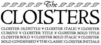 Showcasing the best pages from the Cloister Series in the ATF 1923 Catalog. These Venetian typefaces are based on Eusebius (1470, Nicolas Jenson). Included are Cloister Oldstyle, Cloister, Cloister Bold, Cloister Bold Condensed, Cloister Bold Italic, Cloister Bold Title, Cloister Cursive, Cloister Italic, Cloister Ornaments and Cloister Title. The text below is quoted from Mac McGrew, who explains the historical background:
 Cloister Oldstyle was designed by Morris Benton in 1913 and released by ATF early the next year. It follows quite closely the noted roman typeface used by Nicolas Jenson in 1470, but is slightly heavier to compensate for the improved printing conditions and smoother papers of the present time. Cloister Italic, released later in 1914, is based on an italic cast by Aldus Manutius in 1501, but does not follow this as closely as the roman does its source. Cloister Bold was designed in 1913; it and Cloister Bold Italic were cut in 1915. Cloister Title and Bold Title were cut in 1914-15; they are essentially the same as the regular Cloisters, but without lowercase, and cast full on the body. Cap J and Q were redesigned and the comma and semicolon shortened. In the specimens shown here, the complete font of Cloister Oldstyle is shown, including two styles of figures, alternate Rand T, and the array of quotation marks. Cloister Title shows the essential J and Q revisions; Cloister Bold Title is comparable. Cloister Lightface was designed in 1919 but not cut until 1924, with Italic the following year. It is considered the most faithful reproduction of Jenson's original type; substantially the same as Cloister Oldstyle but cut lighter to allow for the heavying which results from printing on rough or dampened papers with a strong impression, as was done in the fifteenth century. Cloister Cursive was cut in 1922. It has the same lowercase and figures as Cloister Italic, but a more freely designed set of capitals. Cloister Bold Condensed was designed in 1915 and cut in 1917. All these versions of Cloister were designed by Morris F. Benton, who considered this the ideal typeface. For this assignment he thoroughly studied the life and times of Nicolas Jenson of Venice, the first great designer of a roman typeface. Jenson's type was the inspiration for numerous typefaces in this century, including the comparatively crude Jenson Oldstyle. Benton's design was probably the first to accurately recapture the spirit of the fifteenth-century type. In 1992, ten characters of Cloister Oldstyle were redesigned with diamond-shaped dots for greater authenticity, and a long s added, in the 16-point size for private use. These new characters were contrived from existing patterns by Theo Rehak, New Jersey typefounder, and the result designated Cloister Oldstyle No.2. Cloister Cursive Handtooled was designed by Benton and Charles H. Becker in 1923, but not completed until 1926; it is derived from Cloister Bold Italic. Curiously, what might be called a companion typeface was not made by ATF but by Intertype, as Cloister Bold Tooled, which had been issued by that company in 1920. Cloister Wide was introduced by Linotype in 1926; it was designed to match the width of Cloister Bold for duplexing on the same matrices. Compare Centaur, Eusebius, Italian Old Style; also Cromwell. [Google]
[More] ⦿
|
ATF: Railroad Gothic
|
 This ATF classic headline sans was first introduced in 1906. Mac McGrew writes: Railroad Gothic is a plain, traditional form of heavy, condensed gothic, first shown by ATF early in the century, although it has the appearance of a nineteenth-century face, as some characters seem disproportionate to the others. There is no lowercase. It has long been popular for newspaper headlines, especially in the very large sizes, some of which continue to be shown in recent ATF lists. Ludlow makes the same design in some large sizes as Gothic Bold Condensed Title. Compare Headline Gothic (ATF). ATF Type adds: Railroad Gothic was the quintessential typographic expression of turn-of-the-century industrial spirit---bold and brash in tone, and a little rough around the edges. A favorite for the plain speak of big headlines, Railroad Gothic quickly gained popularity among printers. Its condensed but robust forms were likely a source of inspiration for later families of industrial sans serifs.
 For revivals and extensions: [Google]
[More] ⦿
|
ATF: Typo Script and Typo Gothic
|
Typo Script is a Spencerian script in the ATF library, cut by them in 1902. However, many similar scripts existed around that time. Mac McGrew explains: Typo Script is a group of ATF typefaces, most of which have little or no relation to each other except that all are intended for use on stationery, invitations, and other social printing, and are imitative of the work of copperplate and steelplate engravers. Several members of the group were originally named Tiffany; the name apparently was changed late in 1906, although a few typefaces were still shown with the earlier name as late as 1909. Typo Gothic is the oldest of the group, and has been made by many founders. It is a plain, square, monotone gothic with very small serifs, cast in several sizes of caps and figures on each of several point sizes. He continues about the origins of Typo Gothic: The earliest showing seems to have been offered as Lining Antique by Illinois Type Foundry in 1889; Keystone Type Foundry later used the same name. Subsequently it was shown as Cleveland by Standard Type Foundry, as Standard Lining Antique by Marder, Luse, and as Olympia by Inland, all before 1900. ATF showed it as Tiffany Gothic from 1901 to 1909 and later as Typo Gothic. BB&S took over Olympia and renamed it Engravers Gothic. Damon&Peets called it Franklin Card Gothic, which is the cap alphabet shown in the specimen here. Hansen called it Steel plate Gothic. From all sources it is essentially the same design, although there are some slight differences. Some versions have a horizontal crossbar on the G " some lack this on certain sizes. Now back to ATF. McGrew: Typo Roman was designed by Morris F. Benton for ATF in 1926; it is a narrow modern roman with small lowercase and very long ascenders. The M is splayed with a short vertex. Figures are much the same as Bodoni. Typo Roman Light was cut by Intertype in 1939. Typo Roman Shaded was the first of this group; it is said to have been designed by Morris F. Benton in 1921, adapted from engravings, but was not released by ATF until 1924. Typo Script and Typo Script Extended were designed by Benton and cut by ATF in 1902, originally as Tiffany Script and Extended, when they were called "as close a copy as possible to reproduce in type the work of the artist who did much of the copperplate engraving for the Pan-American exposition." But Middleton says Tiffany Script was the "first typeface engraved by Wiebking (and Harding) on their engraving machine brought from Germany." They are a refinement of popular nineteenth-century scripts; like some of them, these two typefaces share the same capitals, figures, and punctuation marks-only the lowercase differs. They are similar to Bank Script and Commercial Script, but lighter and more delicate. Inland's Invitation Script was very similar to Typo Script Extended. Also see American Script, Formal Script, Plate Script. Typo Text is a shaded Old English design, first shown by ATF as Tiffany Text in 1901, although this may be the same typeface shown by Bruce Type Foundry as Invitation Text a short time earlier, just before that foundry merged with ATF. Hansen copied it as Card Text. Also see Plate Text, Inland Copperplate. For a digital revival of Tiffany Gothic, see Tiffany Gothic CC (2020, Owen Earl). [Google]
[More] ⦿
|
Bank Gothic
|
Bank Gothic, in three weights and two widths, was designed in 1930-1933 by Morris Fuller Benton for ATF, which introduced the normal widths in 1930. Mac McGrew writes: It is a more squarish, contemporary adaptation of letters on the order of Copperplate Gothic, useful primarily for the same sort of forms and stationery work. Linotype has the same typeface in regular widths; it is called Commerce Gothic on Ludlow and DeLuxe Gothic on Intertype, while Monotype Stationers Gothic is similar. From these sources it follows the usual custom of small lining types with several sizes being made for each of several body sizes so that they can readily be used in a variety of cap-and-small-cap combinations. But Linotype cut condensed versions in 1936 as Card Gothic, in only one size each of6- and 12-point. Poster Gothic (q.v.) is the same design as Bank Gothic Condensed Medium but made in larger sizes and fitted more tightly. In the digital era, Bank Gothic has continued its progress, with new styles and weights added by various companies. Incredibly, Bank Gothic was trademarked by the Grosse Pointe Group / FontHaus in 2007 [a black eye to the trademark office in the USA]. Digital versions of Bank Gothic include: [Google]
[More] ⦿
|
Baskerville: metal type
|
Typophiles with opinions on metal versions of Baskerville, giving a nod to Monotype Baskeville, and voicing concern that the digital Baskervilles are too anemic. Wikipedia: Interest in Baskerville seems to have revived in the early 20th century, with Bruce Rogers among others taking an interest in him. [...] Not surprisingly, therefore, the type was revived for mechanical composition in the 20th century. ATF was first, followed by English Monotype in 1923, and thereafter other manufacturers (notably Linotype) followed suit. Monotype Baskerville (Series 169), perhaps the best-known of these revivals was a commercially successful type despite (or perhaps because) it was heavily "cleaned up" by the Monotype drawing office Monotype's was based on a font designed for use at a fairly large size in an edition of Terence's comedies published in 1772. ATF and Linotype used strikes from genuine punches of a smaller size type; it is not therefore surprising that different versions of Baskerville look noticeably different: they are (or may) still be 'authentic'. Mac McGrew's discussion, mainly regarding metal Baskervilles in America: There are two distinct varieties of Baskerville in America. Both based on the types of John Baskerville, distinguished eighteenth-century English printer and typefounder, who was noted for his quest for perfection. His types are based on Caslon and other popular typefaces of the day, but are more precise and have a little more contrast, with stress more nearly vertical, making them the first transitional designs between oldstyles typified by Caslon and moderns typified by Bodoni. A consistently noticeable characteristic is the lowercase g, with its lower loop not completely closed. All versions have rather long ascenders, and present an appearance of dignity and refinement. On ATF's Baskerville, he writes: The ATF version, which is called Baskerville Roman in foundry specimens but which most typesetters call American Baskerville, is produced from strikes (unfinished matrices) brought from Stephenson Blake, English typefounders, in 1915. In England it is known as the Fry Foundry version, and is said to have been cast from original matrices cut about 1795 by Isaac Moore as a close copy of Baskerville's own types. Small sizes to 14-point tend to be rather light and narrow, while sizes from 3D-point up have more weight and vigor. Production was discontinued about 1950, perhaps because most specimens didn't show the handsome larger sizes in sufficient detail; it was reinstated in 1957 without the sizes below 18-point. ATF Baskerville Italic was designed in 1915 by Morris F. Benton. It is a handsome typeface in itself, but has little in common with its roman mate other than adjustment to the narrowness of small sizes. It is not made above 18- point, nor-since it was reinstated-below small 18-point. Compare Century Catalogue Italic. About Linotype Baskerville: Linotype Baskerville, said to be based on original punches which are still in existence, is much like the ATF face, but differs in details of capitals C, Q, W, and lowercase w, y, and &. It was cut in 1926 under the direction of George W. Jones, British typographer. The italic was recut in 1936 under Linotype's program of typographic refinements. Lanston Monotype Baskerville is virtually a duplicate of the English Monotype face, which is based on original letters but is more regularized and has somewhat less contrast between thick and thin strokes than the Fry and Linotype versions. It was cut in 1923 under the direction of Stanley Morison, being derived from the great primer (18-point) size of Baskerville's type, and copied by Lanston in 1931. The Intertype roman typeface is substantially the same as Monotype except for adaptation to mechanical requirements. But while the Monotype italic is considerably narrower than the roman, on Intertype the two typefaces are necessarily the same width. Finally, McGrew evaluates Monotype Baskerville: Monotype Baskerville Italic has only the swash-like capitals JKNTYZ of the original, while both Linotype and Intertype have replaced these letters with regular characters in standard fonts, but offer a variety of swashes as alternates. Linotype, Monotype, and Intertype each provide their own versions of Baskerville Bold. All are similar, but the Monotype version is slightly heavier over all; this version was designed by Sol Hess, and is claimed to have been adapted from an original heavy typeface created by John Baskerville about 1757 and not generally known. Linotype and Intertype also have bold italics, the former designed by C. H. Griffith in 1939. (Latin Condensed was called "Baskerville" in ATF's 1898 book.) [Google]
[More] ⦿
|
Ben Kiel
|
 Graduate of the type design program at the University of Reading, who joined House Industries (Wilmington, DE) in 2006 to work as a typeface designer, director, and developer. He also worked with Ken Botnick at emdash. He runs Typefounding, a typeface design and production studio in St. Louis, Missouri. He teaches at Washington University in St. Louis and the Type@Cooper certificate program at Cooper Union, and has taught at the Maryland Institute College of Art and the University of Delaware. He is a partner at XYZ Type with Jesse Ragan.
 He designed Katje and Cimarron (2005, University of Reading, a serif family with support for Latin and Greek). Speaker at ATypI 2006 in Lisbon on Python scripts for FontLab and RoboFab. Image. In 2011, Vincent Pacella, Ben Kiel and Adam Cruz created the fat slab serif face Goliath, based on Film No. 6206 in the PhotoLettering archive. West Barnum Ultra, designed by Dave West and digitized by Ben Kiel&Adam Cruz in 2011, was film no. 5494 in the original Photo-Lettering archive. At House Industries, he redesigned the iconic Rea Irvin lettering for The New Yorker in September 2013. The typefaces are named New Yorker Irvin and New Yorker Neutraface. In 2012 at House Industries he revived the Photo Lettering Inc font Worthe Numerals, which pushed fat didone to its limits. Still at House Industries, Christian Schwartz, Mitja Miklavcic and Ben Kiel co-developed Yorklyn Stencil. Cortado Script (2014) was designed by Jesse Ragan and Ben Kiel. It was inspired by Swedish illustrator's Cecilia Carlstedt's hand-painted lettering. It follows one year after a similar signage script typeface, Carlstedt Script (2013), also co-designed by Jesse Ragan and Ben Kiel---it was a custom signage typeface for Aldo Shoes. In 2015, Mark van Bronkhorst set up TypoBrand LLC in Berkeley, CA. As part of TypoBrand, he published several typefaces that are modern digital reinterpretations of ATF typefaces. The collection is published by TypoBrand LLC under the names ATF Type or American Type Founders Collection. Ben Kiel co-designed, sometimes with others, classics such as ATF Alternate Gothic (2015), ATF Brush (2015), ATF Egyptian Antique (an expansion of Schraubstadter's Rockwell Antique by Mark van Bronkhorst, Igino Marini, and Ben Kiel), ATF Railroad Gothic (2016), ATF Garamond (2015), ATF Headline Gothic (2015), ATF Livermore Script (by Mark van Bronkhorst, Igino Marini, and Ben Kiel), ATF Poster Gothic (2015) and ATF Wedding Gothic (2015). At XYZ Type, Ben Kiel co-designed Cortado Script in 2013 with Jesse Ragan and designed the sans typeface Grep (2017). In 2019, Ben Kiel participated in the development of ATF Franklin Gothic (Mark van Bronkhorst, Igino Marini, and Ben Kiel). A broad and multi-weight interpretation of Morris Fuller Benton's classic from 1905, Franklin Gothic, which only had bolder weights. For the lighter styles, the designers were inspired by Benton's Monotone Gothic. Girard Sky (2019) is based on Alexander Girard's original typeface for his redesign of Braniff Airways. Working with the original drawings for the photoset typeface found in the Girard archive, the design was revived as part of the Alexander Girard collection. Followed by Girard Slab (2019). Typefaces from 2020: Ballast (Future Fonts: a condensed slab serif). [Google]
[MyFonts]
[More] ⦿
|
Bertram Grosvenor Goodhue
|
 New York architect, designer and artist. Born in Pomfret, Connecticut in 1869 and died in New York in 1924. He is most famous for designing Cheltenham (1896) for the Cheltenham Press in New York, a long-ascender classical American typeface created initially for Ingalls Kimball at the Cheltenham Press. He also designed Merrymount (1894-1896, Merrymount Press, a medieval-look humanist typeface cut by Woerner of A.D. Farmer&Son).
 Cheltenham was adapted, extended, and revisited by many, starting with Morris Fuller Benton from 1904-1911, who created a full family of Cheltenhams for ATF---Benton's Cheltenham is the Cheltenham we have today. The (British) Monotype version was Gloucester [it had an italic p with the normal closed bowl]. Stephenson Blake had Winchester [which may be distinguished by the curl of the ear in the g and the serifs of the s]. Intertype had Cheltonian. Berthold originally called their version Sorbonne (1905). In 1975, Tony Stan increased the x-height in his revival for ITC. Digital Cheltenham versions can be found at SoftMaker (Cheltenham Pro, and S790), Elsner&Flake (Cheltenham OldStyle EF), Berthold (as Sorbonne BQ), Adobe (ITC Cheltenham by Tony Stan), URW (Cheltenham Old Style, and the 2001 typeface Cheltenham D Bold Extra Condensed), Castcraft (as OPTI Cheltenham Old Style), Monotype (as Gloucester Old Style, Monotype's version of Cheltenham), Paratype (the 1997 Academy typeface family by Lyubov Kuznetosova and Alexander Tarbeev), Cheltenham Pro (2012, Softmaker), Bitstream (Cheltenham; also under the names Stubserif 705 and Stubserif 205 for the Extra Condensed versions), Font Bureau (FB Cheltenham by Jane Patterson, 1992), ITC (Tony Stan's 1975 version of Cheltenham; and ITC Cheltenham Handtooled, a 1993 openface family by Tony Stan and Ed Benguiat), and Scangrapghic (Chelten or Cheltenham Old Style SB). Mac McGrew on Cheltenham: The design of Cheltenham Oldstyle and Italic is credited to Bertram Grosvenor Goodhue, an architect who had previously designed Merrymount, a private press type. For Cheltenham he had the assistance of Ingalls Kimball, director of the Cheltenham Press in New York City, who suggested and supervised the face. Original drawings were made about 14 ' inches high, and were subjected to much experimentation and revision. Further modification of the design was done by the manufacturers. Some historians credit this modification or refinement to Morris F. Benton; another source says it was done at the Boston branch of ATF, which suggests that the work may have been done by Joseph W. Phinney. In fact, Steve Watts says the typeface was first known as Boston Oldstyle. Mergenthaler Linotype also claims credit for developing the face, but it was first marketed by ATF. Trial cuttings were made as early as 1899, but it was not completed until about 1902, and patented in 1904 by Kimball. It was one of the first scientifically designed typefaces. The thin lines were strengthened to avoid the emaciated look of many types of the period. It is almost a monotone, but with just enough difference between light and heavy lines to avoid monotony. The small serifs and short, compact lowercase make a high character count. Ascenders are unusually long, while descenders are quite short. This was done as a result of studies that showed the greater importance of the upper half of a line of type in creating readily recognizable word shapes and result ing readability. The typeface has had much adverse criticism, especially because of its short descenders and the unusual design of several characters---notably A with the extension of its thick stroke at the top, G with the curve extended at the bottom, and g with its angular, unclosed tail. The alternate form of r, with its arm raised above x-height, has also been criticized, but this is mostly the result of misuse. It is disturbing within a word, but adds a bit of grace at the end of a word. Oddly, original fonts had only this form, with the more regular r added later; most fonts for handsetting include both forms of r, but those for machine setting include only the normal form or in a few cases only the more exotic form. Morris Benton, ATF's chief designer, produced Cheltenham Bold in 1904 and a score of variations up to 1913, methodically exploring the possibilities of various combinations of weight and width, and making this the first true large type family. Benton's variations include Cheltenham Bold Condensed, 1904; Cheltenham Bold Italic, Cheltenham Bold Condensed Italic, Cheltenham Wide and Cheltenham Bold Outline, 1905; Cheltenham Bold Extra Condensed and Cheltenham Bold Extended, 1906; Cheltenham Inline, Inline Extra Condensed and Inline Extended, 1907; Cheltenham Oldstyle Condensed, 1909; Cheltenham Medium, 1909; Medium Italic, 1910; Cheltenham Extrabold, 1910; Cheltenham Bold Shaded, Bold Italic Shaded and Extrabold Shaded, 1912; and Cheltenham Medium Condensed and Expanded, 1913. Linotype, Monotype, and Ludlow each have duplicates of a dozen or more Cheltenhams, while Intertype has the same under the name Cheltonian. Nearly all of these are essentially the same, except for the addition of ligatures and diphthongs in some display fonts (as shown for Cheltenham Bold), and the modification of keyboard sizes to fit mechanical requirements, but this is substantial in some cases. A curious exception is C heltenham Bold Outline; in the original foundry version it is cut from the same patterns as Bold so they will register for two-color work, while Monotype display sizes have several characters rather crudely redesigned---note H, P, R, e, h, u shown separately. Some of these other sources have also added versions of their own, notably Cheltenham Cursive, designed by Robert H. Middleton for Ludlow, and Cheltenham Wide Italic on Monotype, probably designed by Sol Hess. The latter carries the modifications required for machine-set sizes into display sizes as well. There are several oddities in the Cheltenham family. Cheltenham Wide is identical with Cheltenham Oldstyle except for the lowercase, in handset fonts. The same figures and punctuation marks from these two typefaces are also shared by Cheltenham Oldstyle Condensed, again in handset fonts. In the specimens shown here, compare Oldstyle and Wide. The former, set in ATF type, has two forms of cap C, which that foundry supplied with both typefaces, while the latter, set in Monotype, has two forms of cap W, which that company made only for that face. The unusual paragraph, prime and double prime marks, as well as parentheses and brackets, were made by ATF in some sizes of all three typefaces, but by Monotype only in Cheltenham Oldstyle. There is no Cheltenham Condensed Italic, but Linotype has a Cheltenham Extra Condensed Italic (so-called), which is actually a little wider than Cheltenham Condensed (roman)---why it is called extra condensed is not known. It suffers from adaptation to straight matrices, with annoying gaps between some letter combinations. But Cheltenham Medium Italic was designed more successfully by Benton to fit straight type bodies without kerns. Figures in the medium, bold, and extrabold weights differ from those of the Oldstyle; also notice how the x-height increases with weight. Ludlow Cheltenham is distinguished by the greater slant of some of its italics, and by the rounder top on the roman lowercase a and the rounder lower spur on capital G, as shown in some of the specimens. Western Type Foundry copied several members of this family as Chesterfield. Hansen had the Craftsman series, differing most noticeably in the few characters shown; and other foundries around the world copied it under a variety of names. Also see Kenilworth, Lowell, Venetian. Books on Cheltenham include one by Thomas Hailing: Specimens of General Printing . Cheltenham (1882, Oxford Printing Works). Posters created on Cheltenham include one by Anna Brooks (2013). Klingspor link. Linotype link. FontShop link. View various digital versions of Cheltenham. See also here. [Google]
[MyFonts]
[More] ⦿
|
Bodoni (Dave Farey)
|
 Dave Farey's great essay on the history and implementations of Bodoni. All Bodoni typefaces published today have genetic material from Giambattista Bodoni's original. Below are various implementations:
 - ATF/Monotype Bodoni, originally designed by Morris Fuller Benton in 1907, and used by Monotype in the 1930s. Linotype's version. Adobe's version. Ultra weights sold by URW as Bodoni No 2. Libre Bodoni (2014, a free font family by Pablo Impallari and Rodrigo Fuenzalida) is based on Benton's Bodoni.
- Bodoni Modern (R.H. Middleton, 1930s, for the American Ludlow foundry). See his 1936 Bodoni Campanile, sold by Bitstream as Modern 735. URW offers Black and Stencil weights.
- Bauer Bodoni (Heinrich Jost, 1926). Dave Farey argues for its delicacy but still calls it a bastard. Neufville has the original design, with Linotype, Bitstream, Adobe and URW offering derivatives.
- Berthold Bodoni Antiqua (1935), a descendant of ATF Bodoni, resurrected in the 1970s by Günter Gerhard Lange. This was continued by Karl Gerstner in the 1980s and is available as IBM Bodoni from URW. See also the URW version of Bodoni Antiqua.
- Berthold Bodoni Old Face was designed in 1983 by Günter Gerhard Lange
- WTC Our Bodoni designed by Massimo Vignelli in 1989 for the World Typeface Corporation. For display only. Related to the ATF version.
- FF Bodoni Classic (FontShop, 1994). Designed in a two-year period by Gerd Wiescher, this is the first Bodoni version that tried to stick closely to Bodoni's original drawings. Farey complains that the italics are not tilted enough though. Check also Wiescher's FF Bodoni Classic Handdrawn (1997).
- ITC Bodoni is another faithful interpretation developed by Sumner Stone, Holly Goldsmith and Jim Parkinson. These come in 6, 12 and 72 point ranges and form an extensive extremely useful family. Versions sold by URW and Linotype.
- Bodoni Old Fashion by URW.
- Bodoni Classico, designed by Franko Luin at Omnibus.
- FB Bodoni: just two digitizations based on Benton's 1933 Ultra Bodoni Extra Condensed, by Richard Lipton in 1992. Clearly, for display only.
- URW Bodoni.
- Linotype Gianotten: Created by Antonio Pace in 2000, this typeface is said to go back directly to the Bodoni Museum in Parma.
- Ambroise, Ambroise Firmin (condensed) and Ambroise François (2001, extra condensed), 30 fonts in all, are splendid fonts named after Ambroise Didot by their creator, Jean-François Porchez. Many say that they are closer to Bodoni than to Didot--just look at the question mark, but Porchez based his work on late style Didot's published around 1830.
View various Bodoni Antiqua / Bodoni Old Face typefaces. [Google]
[More] ⦿
|
Caroline Hadilaksono
[The League of Movable Type]
|
 [More] ⦿
|
Caslon: Mac McGrew's take
|
 Mac McGrew describes the situation of Caslon in the era of metal type. All text below is quoted. Caslon is "the oldest living typeface," having survived in almost exactly its original form since every character was hand-cut by William Caslon more than 250 years ago. Virtually the same design is still available, along with a myriad of imitations, derivatives, and attempts at improvement. Altogether, they form a number of families, for there is little or no compatibility between many typefaces which now bear the name Caslon. In fact, Caslon is perhaps the hardest set of types to group into reasonable categories; therefore some of the following classifications are arbitrary.
 - The original Caslon. Prior to 1722 English typefounding was at a low ebb. and most printers in that country used Dutch types. But in that year William Caslon completed the first sizes of his new style, which quickly gained dominance over the Dutch types. This new English style was also extensively exported to other countries, including the American Colonies, where it was popular before the Revolution. In fact, the Declaration of Independence of the new United States was first printed in Caslon's types. Benjamin Franklin met Caslon in London, admired and recommended his types, and used them extensively in his printshop. Caslon's types have gone through several periods of decline and revival. In America they died out by about 1800, and had little or no further use for nearly sixty years. In 1858, Laurence Johnson, a prominent Philadelphia typefounder, visited London and arranged with the successors to William Caslon to duplicate the Caslon types. There are several accounts of how this was done; some say Johnson had fonts specially cast, from which he made electrotype matrices. Another account says he had strikes--unfinished matrices--made from the original punches, while a third account says he obtained the original matrices. The latter account is most unlikely, but the other two possibilities are interestingly credible. Many of the mats still available at ATF, successors to Johnson, are electrotypes-but then, mats wear out anyway, and are commonly replaced by electrotyping existing virgin cast type when patterns or punches are not available. If strikes were finished in this country-the usual process of accurately fitting them for width and position on the type body--this would allow for the fact that some sizes, especially in the 14- to 24-point range, are more loosely fitted here than in England. Otherwise there is virtually no difference between the American and English versions, except for later additions such as dollar mark and various swash letters--the latter are discussed later. Johnson simply called the typeface Old Style, as family names were a later development. When Johnson's foundry merged with MacKellar Smiths&Jordan foundry, the typeface was designated Original Old Style, to distinguish it from other typefaces in the same category. MS&J was part of the great merger that formed ATF in 1892, and the typeface became Old Style No. 71. When ATF's first specimen book was being prepared in 1897, the advertising manager. Henry Lewis Bullen, renamed the series Caslon Old Style. Later "No. 471" was added, the "4" designating typefaces obtained from MS&J. Meanwhile, a prominent New York printer, Walter Gilliss, had promoted the adoption of Caslon for setting Vogue magazine, a fashion and art journal which was started in 1892, and the typeface quickly returned to popularity. A. D. Farmer&Son copied the typeface under the name Knickerbocker Old Style. But this was the time when standard alignment was being heavily pro- moted, necessitating the shortening of descenders. Inland Type Foundry, St. Louis, advertised its own version of Caslon Old Style in 1901, with the claim. "We have obtained the sole right from the originating house to manufacture this series in the United States. Inland is the only type foundry which casts this typeface on standard line. ..." This meant that they had considerably shortened the descending letters; they had also redesigned the italic extensively. ATF countered with CaslonNo. 540, with similarly shortened descenders but essentially the original roman and italic designs otherwise. Several other foundries, including BB&S, Hansen, and Keystone, produced similar Caslons. One of the most noticeable features of Caslon is its lack of uniformity from one size to another. This is due to the fact that all the original characters were cut by hand, before the invention of precise mechanical systems for enlarging and reducing drawings. In Caslon 540, each size is the equivalent of the next larger size of 471, including some obsolete odd sizes. Thus 14-point 540 is equivalent to 18-point 471,18 to 22, 20 to 24, etc. The difference is primarily in the descenders, very unattractively shortened in some sizes of 540; lining figures replace the hanging style, and a few other slight changes have been made. The additional large sizes are an attractive generalized design. To overcome objections to the wide fitting of some sizes of Caslon Oldstyle No. 471, ATF brought out Caslon Oldstyle No. 472 in 1932; the design is identical but it is fitted more closely. It is made only in 18-, 22- and 24-point sizes. In the specimens shown here, notice the small caps shown with Caslon OldstyleNo. 471, for which they are made up to 36-point-one of the very few typefaces to include such letters above 14- or 18-point. Most of these appear to be cut separately, rather than being regular caps of a smaller size. Long-s characters and combinations have also been made for Caslon Oldstyle roman and italic by ATF and Monotype, and for Caslon No. 540 roman by ATF; they are called Quaint Characters.
- Swash versions of the Caslon Oldstyle Italic capitals J, Q, T, and Y, also lowercase h with the final stroke turned inward, were the only forms shown in Caslon's original specimen sheet, although other similar swash letters were made for Dutch types at least a century earlier. Later, plain versions of these letters were added, and both forms are included in some fonts. About 1920, Thomas M. Cleland designed a dozen swash letters to be used with Caslon Oldstyle Italic No. 471, and a dozen more were designed in 1923 for Curtis Publishing Company, perhaps by another designer. These were cast in regular molds, with some letters having long, delicate kerns. By 1927 most of these letters, plus a few others, were being made for Caslon Italic No. 540. These were cast with mortises where necessary, greatly reducing the problem of breakage. Thereafter the larger sizes of Caslon No. 471 Italic were also adapted to mortise molds. Lowercase swash letters e, k, v, w, andz are part of the swash font for both 471 and 540 italics. Vowels are also cast on smaller bodies to fit within the mortises. Compare Scotch Open Shaded Italic. About 1927 an ATF specimen said, "The five largest sizes of CaslonItalic No. 540 are the equivalent of 60-, 72-, 84-, 96-, and 120-point Caslon Oldstyle Italic No. 471. Some of the Swash Capitals are cast on these bodies and long descenders cast on these larger bodies will be ready shortly, which will give the full effect of the popular No.4 71 Italic." No evidence has been found that this was ever completed. In the specimen of Caslon Oldstyle Italic No. 471 Swash shown here, these characters are shown on the first line; these are made in all sizes of the face. Caslon Italic No. 540 includes-only in sizes from 36-point up-many of these letters plus the I and U shown separately; fullface letters in this series are cast on the next larger body and thus are identical to 471. Incidentally. the swash J in these fonts is identical when inverted to the pound sterling mark furnished with English fonts. Ludlow True-Cut Caslon Italic also includes many of the 471 swash letters. Monotype Caslon Old Style Italic No. 3371 includes some of the same, plus the W shown separately. Monotype Caslon Old Style Italic No. 4371, which was copied from Stephenson Blake's Caslon Old Face in the 42- to 72-point sizes, has a different set of swash letters as shown on the latter part of the second line. Linotype Caslon Old Face Italic has a similar set of swash letters, only some of which are shown in the specimen. Linotype Caslon Italic (not Old Face) has no swash letters but the otherwise identical Intertype typeface does, as shown, including the peculiarly reversed T, which was later corrected. Also note the swash letters shown with some following Caslon italics. Caslon Italic Specials are swash letters of a completely different sort, designed by Carl S. Junge in 1924 for BB&S, for use with that foundry's Caslon Italic and various similar typefaces.
- Monotype produced an adaptation of Caslon to its mechanical restrictions as early as 1903, when Sol Hess drew English Caslon Old Style No. 37 at the request of the Gilliss Press in Boston. (Two years later Monotype adopted a new set of matrix and other mechanical improvements which required redesigning nearly all its typefaces.) Display sizes of this typeface were also drawn by Hess, presumably adapted from the original English face, as the italic has several swash letters similar to the English version. Otherwise display sizes of this roman and italic are very similar to Inland Type Foundry's short-descender adaptation of the original Caslon. On Linotype and Intertype. Caslon No.4 is essentially the same. Monotype also has Inland Caslon Old Style No. 137, presumably adapted from the Inland typeface mentioned above, but the italic seems identical to that of No. 37. Linotype has a copy of Caslon No. 137 under that name. About 1915 Monotype cut yet another version of Caslon Old Style-No. 337, designated "MacKellar Caslon" in some early literature because it is closer to the original typeface associated with that foundry. Display sizes are virtually an exact copy of No. 471. Composition sizes are well adapted, though necessarily modified to fit the standard arrangement; they are made with short descenders on standard alignment, but were the first Monotype typeface with alternate long descenders. Oddly, all three Monotype Caslons---37, 137, and 337---are the same set width---letter for letter---in all keyboard sizes made, which means that any given character is precisely the same width from one typeface to another in any composition size. In addition, 12-point No. 337, which with long descenders must be cast on 13- or 14-point body, is essentiallythe same size and width as 14-point of the same face. Sizes of this typeface above 36-point were later copied from Stephenson Blake's Caslon Old Face and called Caslon Old Style No. 437, as previously noted. Linotype and Intertype have Caslon and Italic, similar to Caslon No. 540 and cut about 1903; long descenders are available in place of the regular short descenders, making a fair approximation of Caslon Oldstyle No. 471; this Caslon Italic in 18- to 30-point sizes is more regularized as shown, similar to Caslon Light Italic. Linotype also has Caslon No.2, a copy of Monotype Caslon No. 37, also with alternate long descenders; and the previously mentioned Caslon No. 137, cut in 1936. For greatest authenticity, Linotype went back to the English original in 1923 for its Caslon Old Face; the roman is almost indistinguishable, but the italic is necessarily modified considerably. Most smaller sizes have both long and short alternate descenders avail- able. Intertype offers the same face, roman only, in 18- to 30-point. Ludlow's True-Cut Caslon and Italic, cut in 1922 and 1928 respectively, are close copies of Caslon Oldstyle No. 471 and Italic.
- Several attempts have been made to regularize Caslon and improve its so-called faults, but these have generally lost much of the character of the face. and have seldom achieved widespread use. They include
- Recut Caslon (Inland 1907).
- Caslon Lightface (Keystone 1910-12).
- Clearface Caslon (Robert Wiebking for Western 1913), etc., all with italics and some with condensed versions; Caslon Lightface Italic is non-kerning.
- New Caslon, introduced in 1905 by Inland, was the most successful of these attempts. In addition to eliminating irregularities, the aim of this typeface was to strengthen the design so that under modern printing conditions it would more closely resemble the effect of the original Caslon when printed heavily on dampened rough paper, as was commonly done in the eighteenth century. The italic followed in 1906. In 1919 ATF (successor to Inland) reversed the descender-shortening trend with the design by Morris Benton of long descenders, oldstyle figures, and italic swash characters as American Caslon; otherwise this typeface and New Caslon are identical. New Caslon was adapted to Linotype and Intertype as Caslon No.3, which some users call Caslon Bold, although it was not intended to be a bold face. However, in 18-point and larger, Caslon No.3 and Italic are copies of Caslon Bold rather than New Caslon.
- Condensed Caslon is a modification of New Caslon, by Inland in 1907; it was inherited by ATF and copied by Monotype, both of which gave it the same series number (the only such incidence); printers often but incorrectly call it Caslon Bold Condensed.
- Caslon Extra Condensed is also derived from New Caslon, sometime between 1912 and 1917.
- Caslon Catalog, with heavied hairlines, was designed by Robert Wiebking for his Advance Type Foundry in 1913 under the name of Caslon Antique (not to be confused with a later use of this name); it was also shown by Laclede, and was renamed when BB&S acquired it.
- Caslon Medium and Italic, as the name implies, are somewhat heavier versions, offered by BB&S as Modern Caslon and Italic about 1924---the roman at least was shown by Western Type Foundry in the mid-teens. However, the italic appears to be identical to Ludlow's Caslon Light Italic, also credited to Wiebking but advertised as early as 1922; it was the first typeface cut for Ludlow's development of italic matrices which permitted kerning designs without the fragility of the kerns on single types. Strangely, though, Ludlow Caslon Light (roman) matches Caslon Clearface.
- The newest Caslon was designed in 1965, when ATF commissioned a "beefed up" version of Caslon No. 540, by Frank Bartuska. The result was Caslon No. 641, an arbitrary number. It is a handsome face, reflecting the best of 540, but without the latter's variations from one size to another. It also includes all the ancillary characters of ATF's later creations as shown, including percent and pound marks, a variety of quotation marks, and center dot, hyphen, and dash in two positions to center on caps or lowercase. An italic was started but never completed. This typeface has considerable similarity to Caslon Medium, for which ATF still had mats when the new typeface was commissioned.
- Boldface Caslons have been made by several sources.
- The most popular Caslon Bold was introduced by Keystone Type Foundry in 1905, followed by Italic in 1906 and Condensed and Extended versions about 1911; this is the version made by ATF and in regular widths by Monotype. Monotype keyboard sizes (including large composition to 18-point) are modified considerably to fit standard arrangements, but the only apparent difference in display sizes is the redrawn T and g shown separately in the specimen alphabet and the addition of ligatures and diphthongs on Linotype and Intertype.
- Caslon No.3 matches ATF Caslon Bold from 18-point up, although smaller sizes match New Caslon.
- Hansen's Caslon Fullface and Caslon Fullface Condensed were close copies of Caslon Bold and Caslon Bold Condensed, differing most apparently in the characters shown (A Gas, condensed AG), but Hansen's Caslon Fullface Italic matches New Caslon Italic.
- A somewhat different Caslon Bold series is made by Ludlow.
- A Caslon Black series by BB&S, from Western Type Foundry in the mid-teens.
- Caslon Adbold, originating with Keystone in 1913, is characterized by heavier strokes throughout; Extended and Extra Condensed versions followed in 1915 to 1917; all were patented and presumably designed by R. F. Burfeind.
- Heavy Caslon was issued by Inland in 1906 or earlier; Ludlow copied it as Caslon Old Face Heavy in 1925 and Intertype in 1937. Ludlow has a companion italic, while Intertype's italic is a sloped roman design. See Caslon Shaded.
- Caslon Openface was originated by BB&S in 1915, where it was first called College Oldstyle. It started out as a reproduction of a delicate 18th-century French typeface known as Le Moreau le Jeune, by the foundry of G. Peignot&Son, but in the American version some strokes are heavier. In a later ad, BB&S said, "Placing it in the Caslon group of types is taking a liberty, but it assuredly 'belongs.' " Actually it has somewhat more affinity for the Cochin types.
- Caslon Shaded was adapted by ATF from Heavy Caslon in 1917, by W. F. Capitaine. Caslon Shadow Title was adapted from Caslon Bold by Monotype about 1928. Compare Cameo, Cochin Open, Gravure, Narciss.
- Caslons in name only.
- Caslon Antique and Italic were designed by Berne Nadall and brought out by BB&S in 1896-98 as Fifteenth Century (XV Century in one early announcement) and Italic. Although they aren't really representative of types of that time, being a poor copy of a crude early typeface cut about 1475 in Venice, they have become popular for the simulation of supposedly quaint American types of the eighteenth and nineteenth centuries. Disregarding the usual practice of increasing the proportionate width of a typeface as the size decreases, Caslon Antique maintains uniform proportions in all sizes, and thus appears narrow and cramped in small sizes. Caslon Antique is also the original (1913) name of Advance Type Foundry's Caslon Catalog, mentioned earlier, while in the early 1920s Laclede Type Foundry applied that name to "a brand-new, entirely machine-cut typeface of Old Style Antique," a duplicate of the Advance face.
- Caslon Old Roman is discussed later under its original name, Old Roman.
- Caslon Text originated with William Caslon in 1734. Inland Type brought out a reproduction of it in 1899 as part of their agreement with the Caslon Type Foundry in England. It later became the property of ATF, and was copied by Linotype. Being handcut originally, it shows the expected varia- tions from one size to another, but some characters show decidedly different forms in some sizes. See Cloister Black and Engravers Old English, which are derived from this face.
[Google]
[More] ⦿
|
Catopodis
[Miguel Catopodis]
|
Miguel Catopodis (b. 1967, Buenos Aires, Argentina) is based in Buenos Aires, where he works as a graphic and type designer. He is art director at Accion Magazine and professor of Typography at UCES University and in the UBA Type Design postgraduate program. Creator of the humanist sans family Centuria (2004-2008) which is a sans version of Morris Fuller Benton's Century. [Google]
[MyFonts]
[More] ⦿
|
Century
|
 Mac McGrew tells the story of the development of Century. Quoted verbatim, with only minor editorial changes.
 - 1894: Century Roman was designed by Linn Boyd Benton at the request of Theodore L. De Vinne, publisher of Century Magazine at his De Vinne Press in New York City. Benton was the mechanical genius of the young American Type Founders Company. DeVinne was regarded as an outstanding printing craftsman, who was dissatisfied with the types then available for magazine and book work. As he wrote later, Readers of failing eyesight rightfully ask for types that are plain and unequivocal, that reveal, the entire character at a glance, and are not discerned with difficulty by body marks joined to hairlines and serifs that are but half seen or not seen at all. Century Roman was planned to get as many characters per line as the typeface previously used for the magazine, but because the x-height was increased, it appeared to be condensed. Hairlines were thickened for greater clearness. It was made only as foundry type, handset for several years for Century Magazine and for numerous books. Although shown in ATF specimen books, it was not used to any great extent by other printers because it was considered a little too narrow. A wider version, called Century Broad-Face or Century Roman No.2, was thereafter designed by Benton, but little used except by De Vinne.
- L. B. Benton's principal interest was the mechanical end of the typecasting industry, and he turned his attention back to this. About this time his son, Morris Fuller Benton, joined ATF after graduation from Cornell, and was assigned the task of unifying and updating the numerous styles of type the company had inherited from its many predecessors. One of the younger Benton's early assignments was redesigning Century Roman, extending it slightly to meet the Typographical Union standards of the day, on which rates for typesetting were based. The result was named Century Expanded, issued in 1900 [Image by Heather Leonhardt]. DeVinne, showing it in his company specimen book, said, The expansion is upward, enabling one to get much matter in small space---essentially what he had said of the earlier face. But it is obviously expanded in width also, compared with the original face. (Note: Some sources, including a publication by ATF itself and De Vinne's own specimen book, credit the elder Benton with designing Century Expanded. But study reveals that the typeface shown by De Vinne is not quite as wide as that later shown by ATF. Apparently the elder Benton designed an early version, cut it in one trial size, then turned the task over to his son. Undoubtedly, though, he collaborated in the redesign.). Century Expanded and Italic were made in an unusual number of sizes, including 4-, 41/2-, 5-, 51/2-, 6-, 7-, 8-, 9-, 10-, 11-point, and all the usual sizes to 72-point. The two smallest sizes were identical as to typeface except for length of descenders, likewise 51/2- and 6-point.
- 1904: Century Bold and Italic were designed by Morris Benton and released by ATF in 1905. Although the name doesn't include "Expanded," they are obviously the companion boldfaces.
- Century Bold Condensed and Extended were both designed in 1906 but not released until 1909 and 1910 respectively; both were also by Benton.
- 1938: Century Bold Condensed Italic was designed by Sol Hess for Monotype. Linotype cut Century Bold Extra Condensed as a newspaper headline typeface to fit the limits of its standard magazines.
- Meanwhile, the development of the Century family took a different turn when Benton designed Century Oldstyle in 1906. Released in 1908-09, this typeface is much like Century Expanded in weight and height, but with old-style serifs. An ATF ad in 1909 called it the newest and by far the best old-style ever designed. Century Oldstyle Bold was designed and cut in 1909 and Bold Italic in 1910, while Bold Condensed was designed in 1911 but not released until 1915. Although closely related, the Century Oldstyle family is not really a part of the Century Expanded family. Another related typeface is Schoolbook Oldstyle (q.v.). Also see University Old Style.
- Retreating, perhaps, from the large x-height of Century Oldstyle, a modified oldstyle named Century Catalogue was brought out by Benton in 1917 with longer ascenders but essentially the same general design. Curiously, Century Catalogue Italic was cut from the patterns for Baskerville Italic. Except for the caps A, V, and W and the omission of swash letters, the typefaces are almost identical in the 18-point size; in smaller sizes the Century typeface is wider, as modified by pantagraph during the cutting of mats.
- A third family of Century followed when Ginn&Company, publishers of schoolbooks, asked ATF to develop a typeface for maximum legibility. After many studies of eyesight and reading factors dating from 1912, Century Schoolbook and Italic were designed by Morris Benton in 1917-19 and released in 1918-1921. Century Schoolbook Bold was designed in 1919 and cut in 1923.
- The only Century design by an "outsider" during Benton's life, other than modifications for the composing machines, was Century Bold Condensed Italic by Sol Hess in 1938, mentioned above.
- 1964: Long after the end of Morris Benton's distinguished career, the immortal family was enriched with another member---Century Nova and Italic---designed by Charles E. Hughes, who had been commissioned by ATF for the project. This is a condensed face, following the spirit of Century Expanded. Unknowingly, Hughes brought Century back to just about the same proportions it had started with some 70 years earlier.
- Century Expanded and its variations have been copied extensively by Monotype, Linotype, Intertype, and Ludlow, under the same names. Century Schoolbook is also offered by Monotype and Intertype, while Ludlow calls its version Century Modern, offered in 1964. Some of these typefaces suffer a bit from adaptation to the mechanical restrictions of the various machines, but they are essentially the same. Intertype's Century Schoolbook Bold, though, while necessarily much narrower than the original, is a handsome typeface in its own right. Century Oldstyle is also made by Monotype, but its version differs substantially from the original; capitals are wider and fitting is looser throughout. This modification was required for keyboard sizes but was carried into display sizes as well. Linotype offered a faithful copy of Century Oldstyle in 24-point only-originally under the same name; later it was renamed Old Style No.7, although it is not at all the same typeface as smaller sizes shown under that name. Intertype offered Century Oldstyle only in 36-point, but copied the Monotype version in some small sizes under the name Old Style No.9. Monotype Century Oldstyle has another distinction. Quite a number of typefaces have alternate long descenders, but this typeface also has alternate long ascenders in the 12-point size. With these, it is suggestive of Century Catalogue. Western Type Foundry and its successor, BB&S, offered Century Roman; however, this was a copy of Century Expanded rather than the original Century Roman of ATF. Three mystery names turned up in the preparation of this section of the book. An Intertype list includes "Cent. Schoolbook Bd. with Italic," but if this means Bold Italic, no other trace of it has been found. A Monotype list includes "Century Mono-Photo, No. 520," and "Century Text, No. 618," both indicated as being made as matrices for metal typesetting, but it has been impossible to identify them otherwise.
[Google]
[More] ⦿
|
Century: A timeline
|
A timeline on the development of Century, with bits and pieces taken from The Century family (Paul Shaw, for Fine Print magazine), which in turn was based on material from Mac McGrew. Also check these typophile opinions. I have added personal comments and items to complete the picture. - Theodore Low DeVinne (1829-1914), printer of The Century magazine, designed a stronger, bolder and more readable typeface for the magazine and commissioned Linn Boyd Benton (1844-1932) of ATF to cut it.
- L.B. Benton cut it on the newly invented Benton punch-cutting machine and in 1895 was christened Century Roman. Afterwards, a companion typeface was created for ATF by L.B. Benton: Century no. 2, later called Century Broad-face. This typeface became the basis for Century Expanded, designed by L.B.'s son, Morris Fuller Benton in 1902 [Image by Heather Leonhardt]. Over the course of three more years, the italic, bold and bold italics were developed.
- Then after a few more years, Morris Fuller Benton developed Century Oldstyle. Paul Shaw writes While the essential appearance of Century Roman and Century Expanded derived from Bodoni and Didot, that of Century Oldstyle seems to have been based on Caslon.
- 1915: Century Book, a redevelopment of Century Oldstyle.
- Soon after, ATF was approached by Ginn&Co., the textbook publisher, with a request for a new typeface for schoolbooks. M.F. Benton began review of research done at Clark University on the relationship between the legibility of type and the eyesight of children. Consequently, Benton increased the space between letters, the x-height of each letter, and the weight of each stroke, and balanced the color of the type by opening up the counters. The result was Century Schoolbook, completed in 1919.
- In 1964, ATF commissioned Charles E. Hughes to design a new proportion for Century Expanded... the result, Century Nova, was more condensed.
- Under license from ATF, Tony Stan designed the sixteen-weight ITC Century family between 1975 and 1980 for International Typeface Corporation. [ITC Century Light and Ultra were released in 1975 while the other styles appeared only in 1980]. It has the large x-height that is characteristic of many typefaces of ITC in that time period. Nick Shinn: The color of ITC Century is not good at smaller text sizes.
- David Berlow: New Century Schoolbook was designed from 1979 until 1981 in the New York Lettering office of Merganthaler Linotype based on Century Schoolbook, long after the Bentons had passed on. It was the second face, after New Baskerville, that was digitized and expanded using Ikarus (digital technology). The Bitstream version [Century Schoolbook] is a near exact copy, only being moved from a 54 unit to a 2000 or so unit design. Matthew Carter did a lot of the work on New Century Schoolbook.
- Grad (Phil Martin, 2004, Mark Simonson Studio) was a redesign of the classic Century Schoolbook for Martin's personal use in the early '90s.
- See also Modern Century by SoftMaker. In addition, Centrum is an old Bitstream name for ITC Century back when they were in the cloning business.
View various commercial digital versions of Century Schoolbook. [Google]
[More] ⦿
|
Charles Herman Becker
|
ATF matrix and pattern maker. Born in Germany, he died in 1948. He was involved in the design of Cloister Cursive Handtooled (Cloister Handtooled Italic, 1923), Goudy Handtooled (1923; see Goudy Handtooled BT) and Novel Gothic (1928-1929, a heavy art deco face), all in cooperation with Morris Fuller Benton. He created Quick-Set Roman&Italic in 1918, also at ATF. Stephen Coles writes: Novel Gothic was frequently used for record covers in the 1960s-1970s particularly John Berg's designs at Columbia Records, such as Miles Davis: Bitches Brew. There are many digital typefaces in this 1920s showcard style (such as Kobalt), and many poor digitizations of Novel Gothic, but no faithful revival currently exists. Telenovela NF is a digital interpretation with an additional highlight effect, while Napoli and Naked Power are attempts to tame Novel Gothic's comical personality into large, straightforward sans families. FontShop link. Klingspor link. [Google]
[MyFonts]
[More] ⦿
|
Chic
|
 A typeface designed by Morris Fuller Benton in 1927. Mac McGrew: Chic is a novelty typeface designed by Morris Benton in 1927 and released by ATF the following year. It has no lowercase; its thin lines are very delicate and its normally thick lines are opened with two parallel white lines. The result is airy but very mechanical. The 48-point size was cut but no showing has been found; in fact the series was not shown at all in specimens appearing as early as 1931. Compare Boul Mich, Broadway, Gallia.
 Digital revivals include Chic (Dan Solo), Odalisque NF (2009, Nick Curtis) and Odalisque NF Stencil (2010, Nick Curtis). [Google]
[More] ⦿
|
Choice of Garamond
|
Apostrophe has this to say about the choice of one of the many Garamonds. - Stempel Garamond: the mainstream closest you will find to the original. Not much variety there though: 8 fonts at Lino/Adobe, include bold, italic, bold italic, OsF across the board, and roman small caps, but that's about it.
- Adobe Garamond: a lot of variety there, but while the main weights were based on Garamond's punches, the italics were based on Granjon's work (so they're not true Garamond).
- Monotype's Garamond: great fonts there. Based on Jannon's work, mind you, not Garamond's. Very nice expert sets and swashes.
- ITC Garamond: also based on Jannon's stuff, but I don't recommend it at all. It's umm, say, quirky in many respects. Adobe has a multiple master version of it too.
- Berthold Garamond: good set with some variety, but also based on Jannon's copies of Garamond's types.
- Granjon: just 6 fonts at Lino/Adobe, based on Granjon's work, which is very similar to Garamond (those two were contemporaries, if I remember correctly).
- Sabon: 8 fonts, romans based on original Garamond, italics based on Granjon's work.
- Garamond 3: 8 fonts at Lino/Adobe, based on Jannon's work (as copied by Benton at ATF, I think). Not much variety there.
- Simoncini Garamond: authentic enough, but no variety at all. A bit lighter than the rest too. 3 fonts at Lino/Adobe.
- 1530 Garamond, by Ross Mills at Tiro: this one is certainly based on Garamond's work, but the design turned out to be good for only display, and really bad for text (the c and e are too closed for 14 and under, for instance).
- And of course, my favourite of all digital Garamonds is called Augereau (named after Claude Garamond's teacher). It is the most authentic digitization I have ever seen of Garamond's work, and it's full of variety. 28 weights of sheer beauty. Unfortunately, it is too expensive to buy and available for purchase only from George Abrahms himself (the guy who digitized it), who happens to now be a very old man in upstate New York.
[Google]
[More] ⦿
|
Choice of Garamond (3)
|
 Choices of Garamond families include
 - Adobe Garamond (1989, Robert Slimbach)
- Amsterdam Garamont or ATF Garamond (1917, Thomas Maitland Cleland and Morris Fuller Benton). Check Garamont Amsterdam from Elsner&Flake or Scangraphic. For the digital era, we have ATF Garamond (2015, Mark van Bronkhorst, Igino Marini, & Ben Kiel), an 18-style family based on the Garamond designed between 1918 and 1923 by Morris Fuller Benton and Thomas M. Cleland at ATF.
- Berthold Garamond (1972, Günter Gerhard Lange)
- FontBureau Garamond Light (1929 Ludlow: Douglas Crawford McMurtrie and Robert Hunter Middleton; 1992 Font Bureau: Jill Pichotta)
- ITC Garamond (1975-77, Tony Stan)
- Monotype Garamond (1922) or Garamond No 3 (1925, Monotype staff)
- Simoncini Garamond (1958-61, F. Simoncini and W. Bilz)
- Stempel Garamond (1924-1925, Stempel staff; the Bitstream version is Aldine 430)
Charles Hedrick from Rutgers University writes: "At least half of the fonts called Garamond (including ITC Garamond) are based on work by Jean Jannon. He lived about a century after Garamond. His work was improperly identified early in the 20th Cent. Even though people know better now, people continue selling Jannon's fonts under the name Garamond. The most common versions are probably MT Garamond (which is the version of Garamond included with many Microsoft products) and Simoncini Garamond. In contrast to these, which are intended as fairly accurate versions, ITC Garamond is highly modified. I don't think it is intended to be a revival. I believe it was intended for display. However I think it looks rather nice as a text font in the O'Reilly books. Authenticity isn't everything." [Google]
[More] ⦿
|
Choice of Garamond (6)
|
 Linotype's offerings of Garamond, with all Linotype comments:
 - Stempel Garamond (D. Stempel AG, 1925): The famous Stempel Garamond interpretation of the 1920s remains true to the Original Garamond font with its typical Old Face characteristics. The bold italic was a modern addition at the end of the 1920s and the small caps provided an alternative to the standard capital letters. Since its appearance, Stempel Garamond has been one of the most frequently used text fonts. Stempel Garamond is available in four weights with Small Caps, Old Style Figures and Euro symbol.
- Adobe Garamond (Robert Slimbach, 1989): This relatively new interpretation of Garamond, designed by Robert Slimbach, is based on the Original Garamond as a typical Old Face style. However, this font has been expanded to include small caps, expert fonts, and calligraphic caps which were typical of the 15th and 16th centuries. Adobe Garamond is available in six weights with Small Caps, Old Style Figures and Euro symbol.
- ITC Garamond (Tony Stan, 1977): The ITC Garamond went through so many changes that it has only a few characteristics tying it to the Original Garamond. Designer Tony Stan applied a completely new concept in composing the lower case letters of all cuts with a larger x-height. This improved legibility and gave ITC Garamond the popularity it enjoys, especially in advertisements and manuals and handbooks. ITC Garamond is available in eight weights plus eight condensed weights and with Euro symbol.
- ITC Garamond Handtooled (Edward Benguiat, 1993): A handtooled version of the black and black italic for packaging, book jackets and poster design.
- Simoncini Garamond (Francesco Simoncini, 1961): Simoncini Garamond was designed by Francesco Simoncini to be true to the original.
- Garamond #3 (Morris F. Benton, 1936): Morris F. Benton's Garamond appeared in 1936 and is based on the forms of Jean Jannon, which already displayed characteristics of the transitional style. Garamond #3 is available in four weights with Euro symbol.
- Garamond No 5: Garamond No 5 is another interpretation of the Garamond with narrow letters. It is only available in roman, italic and bold.
- Garamond Classico (Franco Luin, 1993): Garamond Classico is based on the forms of Jean Jannon, which already displayed characteristics of the Transitional style.
- Sabon (Jan Tschichold, 1967): Sabon is a revised version of Garamond, designed by Jan Tschichold. Sabon was similar produced for three foundrys: D.Stempel AG, Linotype and Monotype. Classic, elegant, and extremely legible, the font Sabon is one of the most beautiful Garamond variations. The font Sabon is particularly good for text and headlines in: books / text, magazines, advertisements, documentation / business reports, corporate design, multimedia, correspondence.
[Google]
[More] ⦿
|
Christopher Bergmann
[Proportionally spaced typefaces with a monospaced appearance]
|
[More] ⦿
|
Civilité, a French cursive
|
A brief explanation and discussion of Civilité, the script typeface made by Robert Granjon in 1556 as a typical "French cursive". It was imitated and extended by Aimé Tavernier (1559), Hendrik van den Keere (1575), Richard Breton (1597), Philippe Danfrie (1597), Jean de Tournes (1598), Fleury Bourriquant (early 17th century: his type was called Civilité honneste), Pierre-Simon Fournier (1766), Matthias Rosart (1777, the Gros Romain Civilité), and Morris Fuller Benton (1922). Many have since created their own versions. We cite a few of the contemporary type designers: Klaus Burkhardt, Manfred Klein, Stephen Moye (CiviRegular), Ingo Zimmermann (almost a copy of Moye's version), Richard Beatty, Hans J. Zinken (civi4, 1996), Hermann Zapf (1984: Zapf Civilité), George Thomas (CivilitéMJ), and Tim Ryan (CivilitéTR). [Google]
[More] ⦿
|
Civilité: Comments by Mac McGrew
|
Mac McGrew on the ATF Civilité: Civilite in its modern adaptation was designed by Morris Benton in 1922 and cut by ATF in 1923-24. The original version was cut by Robert Granjon in 1557 to imitate the semi-formal writing then in vogue, and is believed to be the first cursive design cut in type. It became popular for the printing of poetry and for books of instruction for children, where the type itself could serve as a perfect model of handwriting. The first of these books was titled La Civilite puerile, printed at Antwerp in 1559. The books were so popular that the design came to be known as "civility" type. Other interpretations of the letter have been made, including Cursive Script, cut in the nineteenth century in 18-point only from French sources by ATF predecessors and by Hansen, but Benton's seems more attractive and legible to modern eyes. The French pronunciation of ci-vil'i-tay is indicated by the accented e, which was used only in ATF's earliest showings. The many alternate characters were included in fonts as originally sold; later they were sold separately and finally discontinued, although the basic font was still listed in recent ATF literature. Also see ZapfCivilite. Compare Freehand, Motto, Verona. [Google]
[More] ⦿
|
Civilité: Comments by Mac McGrew
|
Mac McGrew on the Zapf Civilité: Zapf Civilite is perhaps the latest typeface to be cut as metal type, having been announced in January 1985, although the designer, Hermann Zapf, had made sketches for such a typeface as early as 1940, with further sketches in 1971. But matrices were not cut until 1983 and 1984. The cutting was done by Paul Hayden Duensing in Kalamazoo, Michigan. The first Civilite typeface was cut by Robert Granjon in 1557, based on a popular French handwriting style of the time. Other interpretations have been made from time to time, notably the Civilite (q.v.) designed by Morris Benton in 1922 for ATF. The new Zapf design has the same general character but with a more informal and contemporary feeling. A smooth flow between weights of strokes replaces the stark contrast of thick-and-thin in older interpretations. There are several ligatures, and alternate versions of a number of characters, including several terminals. Only the 24-point Didot size is cut or planned. [Google]
[More] ⦿
|
Clarendon for text?
|
 The typophiles discuss the utility of Clarendon for text, given that is reads bolder than other text typefaces. The comments were generally positive. Some suggest Clarendon-like alternatives, including
 - Sentinel (1999, Hoefler Frere Jones). I quietly disagree---I find Sentinel a bit too sanitized and 21st century clean.
- Century Schoolbook in one of its many forms. All based on Morris Fuller Benton's Century Schoolbook from 1915-1923.
- Guardian Text Egyptian (2004-2005, Christian Schwartz).
[Google]
[More] ⦿
|
Clearface
[Morris Fuller Benton]
|
Clearface is an extremely popular traditional American typeface from the turn of the century. McGrew writes: Clearface was designed by Morris Benton with his father, Linn B. Benton, as advisor. The bold was designed first, in 1905, and cut the following year. The other weights and italics were produced through 1911. As the name implies, the series was intended to show unusual legibility, which it certainly achieved. The precision of cutting and casting for which ATF is noted produced a very neat and handsome series, which had considerable popularity. Clearface Heavy Italic has less inclination than the lighter weights, and is non-kerning, a detail which helped make it popular for newspaper use; the specimen shown here is from a very worn font. Some of the typefaces have been copied by the matrix makers. But the typeface Monotype calls Clearface and Italic is the weight called Bold by other sources. Monotype also includes Clearface Italic No. 289, a copy of the lighter weight. Revival and expansion by Victor Caruso for ITC called ITC Clearface, 1978. Other digital descendants: Opti Clearface Gothic Agency (Castcraft), Opti Clearface, TS Clearface (TypeShop Collection), Clearface Serial (Softmaker), Clearface Old Style (Softmaker), Clearface (Softmaker), Clearface (Infinitype), Revival 814 (Bitstream), Clearface (1973, Phil Martin). Metal descendants include Ludlow's Clearface Bold. Clearface Gothic (1907-1910). McGrew: Clearface Gothic was designed by Morris Benton for ATF in 1908, and cut in 1910. It is a neat, clean gothic, somewhat thick and thin, which incorporates some of the mannerisms of the Clearface (roman) series. However, it can hardly be considered a part of that family. There is only one weight, and fonts contain only the minimum number of characters. Digital revivals of Clearface Gothic include Clear Gothic Serial (ca. 1994, SoftMaker), Cleargothic Pro (2012, SoftMaker), Clearface Gothic (Softmaker), Clearface Gothic (Linotype, Monotype), Clear Gothic (Infinitype). View and compare most of the digital versions of Clearface in existence today. [Google]
[More] ⦿
|
Collectif MBC (was: MBC Graph)
|
 Graphic design collective in Orchamps near Besançon, France, est. 2012, consisting of graduates in the Masters program of the École des Beaux-Arts de Besançon, i.e., Clément Moussard, Antonin Buchwalter, and Simon-Pierre Chapuis. Their typeface creations:
 - From 2013: Juliano (2013, rounded sans for the restaurant Gusti del Gusto).
- From 2014: Plumber (rounded slab serif), Esposito (rounded sans), Polaris (rounded sans), Juliano (2013, rounded sans for the restaurant Gusti del Gusto), Sept Nains (a seven style type system based on Fonderie Olive's Simplex Gras, 1937), Raymond (slab serif), Monolab (monospaced), Aftur (a sans caps typeface that is partly art deco and partly futuristic; influenced by Cassandre's Bifur), Antique Calque (a layered typeface system), Lazy Super (a pixel face) and the variable width and variable height experiment called Expendable.
- Typefaces from 2015: Gnome (a sans done for the Centre Régional du Livre Franche-Comté), Monocle (a sans typeface for Cyclop Jazz Action), Laborio, Ploum (an art nouveau stencil), MFB (an art deco poster typeface family named after Morris Fuller Benton).
- Typefaces from 2016: Saljan, Buck01.
Tumblr link. Behance link. Old URL. Typeface catalog [PDF]. [Google]
[More] ⦿
|
Commercial Script
|
 Commercial Script is a typical Spencerian (connected) script, with early versions available from the Chicago and Inland typefoundries, ca. 1888. The most famous, and very popular, implementation is due to Morris Fuller Benton in 1906 and cut by ATF in 1908. It is similar to Bank Script, but heavier and with fewer flourishes. It also is similar to Typo Script. Some modern day digital versions:
 [Google]
[More] ⦿
|
Copperplate Gothic
[Frederic W. Goudy]
|
 A typeface made by Frederic Goudy in 1903. Mac McGrew: Copperplate Gothic Heavy was designed in 1903 by Frederic W. Goudy, who is much better known for his classic roman typefaces. Other weights and widths were drawn shortly thereafter by Clarence C. Marder of ATF, except the Shaded, designed by Morris F. Benton in 1912. A rather wide, monotone, conventional gothic with the added feature of minute serifs, Copperplate Gothic is imitative of the work of engravers, as suggested by the name. It became ATF's all-time best seller, being used extensively for stationery and form work, especially in the small neighborhood printshops of the letterpress era. It is the typical lining gothic face, featuring four sizes each on 6- and 12-point bodies, and two sizes each of 18- and 24-point in foundry (composing-machine sizes differ somewhat), so that a wide variety of cap-and-small-cap combinations can readily be set. Before Monotype developed its "Plate Gothic arrangement" (see under "Design Limitations" in Introduction) in 1919, permitting the keyboarding of all four sizes of 6- or 12-point at once, that company had made the Copper plate Gothics simply as cap-and-small-cap combinations, typically in 5-, 6-. 8-,10-, and 12-point plus display sizes. Hence most of these gothics have two different series numbers on Monotype, the lower number for display sizes and the obsolete cap-and-small-cap combinations, the other for the four-size combination. Several versions of Steelplate Gothic (q.v.) from BB&S were near duplicates of Copperplate Gothic, although a few characters differed slightly and the extended versions were not quite as wide. Hansen had Engravers Gothic in several versions, differing apparently only in the R as shown in the specimen. Compare Plate Gothic, Whittier; also see Bank Gothic, Blair, Boxhead Gothics. D.J.R. Bruckner lists the date as 1905 and writes: Goudy's recollection was that this hodgepodge was done for American Type Founders. It was made for Marder, Luse and Company and then taken on by ATF and can still be found in old ATF specimen books and their old fonts..
 Digital versions: Copperplate Gothic (Linotype), Copperplate Gothic (Adobe), Copperplate Gothic (Bitstream), Copperplate Gothic Hand (Wiescher Design), Opti Copperplate (Castcraft), Copperplate Gothic, Copperplate New (2019, Martin Cincar), Copperplate CC (2020, Owen Earl). [Google]
[More] ⦿
|
Cowan
|
 Designer of Engravers' Old English (1901, ATF) with Morris Fuller Benton, who designed the similar typeface Wedding Text (1901). McGrew writes: Engravers Old English is a plain, sturdy rendition of the Blackletter style, commonly known as Old English. It was designed in 1901 by Morris Benton and another person identified by ATF only as Cowan, but has also been ascribed to Joseph W. Phinney. It is a modernization of Caslon Text, and has been widely used. Engravers Old English Open was produced by ATF in 1902. Sidney Gaunt designed Engravers Old Black, very similar to Engravers Old English, for BB&S in 1910, but BB&S later produced Engravers English, a copy of Engravers Old English. It has also been copied by Intertype, and by Ludlow as Old English. [Google]
[More] ⦿
Designer of Engravers' Old English (1901, ATF) with Morris Fuller Benton, who designed the similar typeface Wedding Text (1901). McGrew writes: Engravers Old English is a plain, sturdy rendition of the Blackletter style, commonly known as Old English. It was designed in 1901 by Morris Benton and another person identified by ATF only as Cowan, but has also been ascribed to Joseph W. Phinney. It is a modernization of Caslon Text, and has been widely used. Engravers Old English Open was produced by ATF in 1902. Sidney Gaunt designed Engravers Old Black, very similar to Engravers Old English, for BB&S in 1910, but BB&S later produced Engravers English, a copy of Engravers Old English. It has also been copied by Intertype, and by Ludlow as Old English. [Google]
[More] ⦿
|
Dan O. Williams
[U.S. Web Design System]
|
[More] ⦿
|
David Sudweeks
|
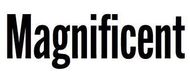 David Sudweeks pursued graphic design at Brigham Young University where he focused his studies on lettering and type. After completing a brief apprenticeship with type designer Mark van Bronkhorst in California, David took up the position of Type Director at FontShop San Francisco. He now works primarily from his home studio outside Raleigh, North Carolina writing and curating type as a member of FontShop's editorial staff, and drawing type on the side.
 He used FontStruct in 2008 to make the dotted typeface Pullchain, which could be used for teaching children how to write. Codesigner at American Type Founders Collection of ATF Alternate Gothic (2015, Mark van Bronkhorst, Alan Dague-Greene, David Sudweeks, Igino Marini, & Ben Kiel). ATF Alternate Gothic is a new, significant digital expansion to 40 fonts of Morris Fuller Benton's classic 1903 design. In 2019, Sudweeks designed the serif typeface family MVB Dovetail at MVB Fonts. Abstract Fonts link. [Google]
[MyFonts]
[More] ⦿
|
Dickinson Type Foundry
[Samuel Nelson Dickinson]
|
Boston-based foundry, also called Phelps&Dalton, and Phelps, Dalton&Co. Founded by Samuel Nelson Dickinson in Boston in 1839. They published "Specimen of type for book printing, manufactured by Samuel N. Dickinson" (Boston, 1842), "Hand-book specimen of printing type, cuts, ornaments, etc., from the foundry of Samuel N. Dickinson" (Boston, 1847), and "Point specimen book. Specimens of printing types, rules, cuts, printing material" (Boston, 1893, 457 pages). See also The General Specimen Book of the Dickinson Type Foundry, Comprising Types for Letter-Press Printing of Every Variety (Boston: Phelps&Dalton, 1856). In 1872, a fire ravaged the company, and a skilled punchcutter, Alexander Phemister, became a partner. In 1891, Dickinson became part of ATF in the great meltdown. Joseph W. Phinney and Robert W. Nelson (1851-1926) made the transition from Dickinson to ATF. Scans of typefaces shown in the 1923 ATF catalog: Roycroft Tinted, Card Mercantile (1890s). Commentary by McGrew on Card Mercantile: Card Mercantile was produced by Dickinson Type Foundry in the 1890s or earlier. Except for a few letters, it appears to be a duplicate of Extended No. 3 of Stevens, Shanks in England. In 1901 Morris Benton redesigned the two smallest sizes for ATF, successor to Dickinson, for better compatibility with the other sizes. It is a very delicate, wide, thick-and-thin style without lowercase (but the English typeface has lowercase), somewhat similar to Engravers Roman, which supplanted it in popular use. An 1899 ad said, "For imitating the work of steel engravers there can be nothing more beautiful picked from a case, and it is difficult if not impossible to imagine how anything finer ever can." Compare Engravers Roman, Brandon, Litho series. Digital revivals include Renaissant NF (2014, Nick Curtis: a Victorian typeface). Wikipedia link. [Google]
[MyFonts]
[More] ⦿
|
Diletta Vignolo
|
Torino, Italy-based designer of the blackletter typeface Urban Engravers (2018), which revives Morris Fuller Benton's Engravers Old English (1901). [Google]
[More] ⦿
|
Elsner&Flake
|
 German type foundry in Hamburg established in 1986 by Veronika Elsner and Günther Flake. They offer original fonts as well as improved versions of classical fonts. There are many non-Latin fonts as well. In-house designers include Jessica Hoppe (Carpediem), Verena Gerlach (Aranea), Petra Beisse (Petras Script), Uwe Melichar, Manuela Frahm (Fritz Dittert), Ralf Borowiak, Lisa von Paczkowski, and Achaz Reuss.
 Additions in 2005 include the dingbat typefaces Beautilities EF Alpha, Ornamental Rules EF, Diavolo Rules EF, Squares EF (Alpha, Beta and Gamma), Topographicals EF Alpha, Typoflorals EF Alpha, Typographicals EF Alpha, Typomix EF Alpha, Typosigns EF Alpha, Typospecs EF Alpha and Beta (which have several fists), Typostuff EF Alpha, Diavolo EF, Schablone EF, Gigant EF, Maloni EF, OCRA EF, EF Unovis (a 16-weight family inspired by Quadrat). In the hand-printed category, let us mention Filzerhand. Their blackletter collection includes some bastardas (Alte Schwabacher, Lucida Blackletter), some frakturs (Fraktur, Fette Fraktur EF, Justus Fraktur, NeueLutherscheFraktur, Walbaum-Fraktur), some rotundas (Weiss-Rundgotisch), and some texturas (Gotisch, Old English). Commissioned fonts include Castrol Sans (2007). Selected additional typefaces: Garamond Rough Pro (2018), Bluset Now Mono (2018), Newspoint (2017, based on Morris Fuller Benton's News Gothic), Meier Kapitalis (2013, a lapidary typeface based on a 1994 sketch by Hans Eduard Meier in his book Die Schriftentwicklung), Gillies Gothic EF (after William S. Gillies's 1935 original), EF Medieva, Bank Sans Caps EF, Metropolitain (1985) (after a 1905 art nouveau typeface by Fonderie Berthier). Fonts4ever link (2008). Listing at Fontworks. Future events schedule. New fonts. List of their fonts. Catalog of their typefaces [large web page warning]. See also here. [Google]
[MyFonts]
[More] ⦿
|
Engravers Old English
|
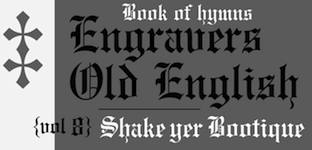 Engravers Old English is a plain, sturdy rendition of the blackletter style, commonly known as Old English. It was designed in 1901 by Morris Benton and another person identified by ATF only as Cowan, but has also been ascribed to Joseph W. Phinney. Mac McGrew writes: It is a modernization of Caslon Text, and has been widely used. Engravers Old English Open was produced by ATF in 1902. Sidney Gaunt designed Engravers Old Black, very similar to Engravers Old English, for BB&S in 1910, but BB&S later produced Engravers English, a copy of Engravers Old English. It has also been copied by Intertype, and by Ludlow as Old English. Hansen's Lafayette Text (q.v.) was very similar. Engravers Old English Bold was designed by Morris Benton for ATF in 1910. The unfamiliar characters of Old English types are often misused, and the alternate forms of some letters add to the confusion. I and J are particularly subject to mix-up, because they were originally the same letter, and never developed as definite a distinction in these styles as in roman letters. In Ludlow Old English, cap I is comparable to the one in the Bold weight, but this style has not been found elsewhere in the regular weight. Curiously, in the Engravers Old English Bold specimen shown, the letters appear as the Monotype copy presents them; however, Monotype's I and J are respectively the second and first forms of I as originally designed, while the specimen here shows separately the original foundry J, which Monotype does not make, along with the alternate H. Compare Wedding Text, a similar design in lighter weight; also Cloister Black; Shaw Text; Lafayette Text.
 Digital revivals and interpretations include [Google]
[More] ⦿
|
Engravers Roman
[Robert Wiebking]
|
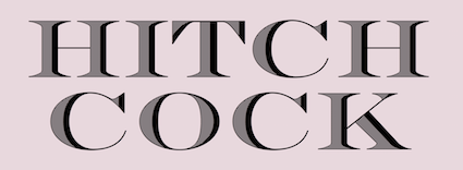 Mac McGrew: Engravers Roman was designed by Robert Wiebking and advertised by BB&S in 1899 as the "latest design"-"the only genuine." Other founders had introduced some similar typefaces a short time before, all imitating favorite designs of copperplate and steelplate engravers for fine stationery and announcements; Hansen called its version Card Roman. Engravers Roman was shortly supplemented by Engravers Roman Condensed and Engravers Title. The latter was a companion bold typeface which was displaced by Engravers Bold, designed by Morris Benton for ATF in 1902, and later cast also by BB&S. Western Type Foundry and later BB&S also had Engravers Bold Condensed, and a companion cap-and-lowercase typeface known as Engravers Litho Bold Condensed, designed by Robert Wiebking in 1914. However, Engravers Litho Bold, designed by Wiebking in 1915 for Western as Rogers Roman, was a substantially different face. Compare Card Mercantile, Brandon, Litho series. ATF issued Engravers Shaded, designed by Morris Benton about 1906, while BB&S had Engravers Roman Shaded, formerly Chester Title, designed by Sidney Gaunt in 1914. Compare Lithograph Shaded. Offset Engravers Roman and Offset Engravers Title were cut in reverse for a process of transferring proofs of type to lithographic stones.
 Digital versions: [Google]
[More] ⦿
|
Fontscape: Textura
|
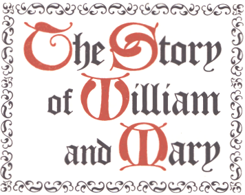 Commercial Textura fonts listed at Fontscape: Wilhelm Klingspor Gotisch, Wedding Text/Linotext (almost identical), Old English/Cloister Black (these two are related), Engravers' Old English, Agincourt, Fette Gothik, Gothique, Gotisch Bold, Goudy Text, Goudy Text Old Style, Notre Dame. [Google]
[More] ⦿
Commercial Textura fonts listed at Fontscape: Wilhelm Klingspor Gotisch, Wedding Text/Linotext (almost identical), Old English/Cloister Black (these two are related), Engravers' Old English, Agincourt, Fette Gothik, Gothique, Gotisch Bold, Goudy Text, Goudy Text Old Style, Notre Dame. [Google]
[More] ⦿
|
Fragtype
[Rodrigo Fuenzalida]
|
 Graphic and type designer from Caracas, Venezuela, b. 1981, who moved first to Buenos Aires and then to Santiago in Chile. While mainly a type designer, he also practices calligraphy. He was involved in and set up multiple type foundries, including Fragtype. Fuenzalida designed these typefaces:
 - The art deco faces Erre.
- The experimental typefaces Tructura, Tangram, Sicodelica (multiline), SuperC (2009, tall condensed) and Pixid (2010, pixel face).
- Concrete Stencil (2010). Stencil meets calligraphic script.
- Fux (2010). A rounded monoline sans.
- 7Tees.
- Aushaus: letters like music notes. This is also called Aubhaus.
- Gerd (2009). An artsy stylish piano key font that used to be free.
- LINE_A and K5 (multiline).
- Cubo (aka Khubo, 2009, Die Gestalten). This 3d geometric family was a grand prize winner in the experimental typeface category at Tipos Latinos 2010.
- Factur (2011) is an angular typeface.
- Isosibilia. A 3d face. This typeface won an award winner in the experimental typeface category at Tipos Latinos 2010.
- The connected upright script face Nedo.
- The grunge typeface Belt.
- The stencil Bodoni typefaces Giambo Stencil (2009, Die Gestalten) and Giambattista.
- Titan (2011). A fat rounded poster face, downloadable from Google Web Fonts.
- Fux (2010). A basic monoline sans family.
- Poetsen One (2012) is a rounded signage sans typeface co-designed with Pablo Impallari.
- Racing Sans (2012). A techno typeface that conjures up speed. Codesigned with Pablo Impallari, it is free at Google Web Fonts.
- With Nicola Massi, he created the textura typeface Pirata+One (2012, Google Web Fonts).
- Hermeneus One (2013, with Pablo Impallari) is a slab serif.
- Tweegi (2013) is an elegant super-condensed serif typeface family.
- Kardia (2014) is a rounded slightly elliptical warm-hearted sans family.
- Libre Baskerville (2012, Google Web Fonts, Open Font Library, Github, and CTAN) was developed together with Pablo Impallari. It is based on 1941 ATF specimens, but it has a taller x height, wider counters and minor contrast that allows it to work on small sizes in any screen.
- Libre Caslon (2012-2014). A free typeface family co-designed with Pablo Impallari.
- Raleway (2010-2013). This popular free sans typeface family was started by Matt McInerney in 2010 and completed by Pablo Impallari and Rodrigo Fuenzalida in 2013. In 2017, it was extended to Rawline.
- Libre Bodoni (2014) was developed by Pablo Impallari and Rodrigo Fuenzalida based on Morris Fuller Benton's Bodoni types---they optimized the glyphs for use on the web. Github link. Google Fonts link.
- Latina (2015) is a humanist sans typeface family developed with the Latinotype team. It won an award at Tipos Latinos 2016. Its headline styles have exaggerated humanist features, while its text styles are more subdued.
- In 2016, Latinotype published the 32-style Corporative Sans Round Condensed, which was developed by Elizabeth Hernandez and Rodrigo Fuenzalida, under the supervision of Luciano Vergara and Daniel Hernandez.
- Libre Franklin (Pablo Impallari and Rodrigo Fuenzalida) is a revival of Morris Fuller Benton's 1912 classic, Franklin Gothic. Created in 2015, it was only published in 2016 at Google Fonts. Github link.
- Taberna (2016). A vintage copperplate style family based on design trends in bar signage, liquor packaging and street wear. Codesigned by Jorge Cisterna at Latinotype.
- Letteria Script (2017, Latinotype). A signage script family.
- Winner at Tipos Latinos 2018 of a type design award for Mixta (Joya Type Foundry).
- In 2018, Daniel Hernandez and Rodrigo Fuenzalida enlarged the fat all caps slab serif Latinotype typeface Rita that was originally started in 2010.
- Market (2018, Latinotype) is inspired by hand-painted grocery store signs.
- In 2019, Latinotype published the great super-slab typeface Breton which was designed by Daniel Hernandez and Rodrigo Fuenzalida.
- In 2018, he published Multiple at Latinotype. Partly geometric and partly humanist, it has Sans and Slab subfamilies.
In 2019, Alfonso Garcia and Rodrigo Fuenzalida released Utily Sans at Latinotype. Utily Sans is a slightly humanist take on Futura. In 2019, Fuenzalida released Atenas through Los Andes. It emerged as a mixture of science fiction and calligraphy, with notable influences of Eurostile and Microgramma. There is a fully stocked stencil subfamily, Atenas Stencil. - Mixta (2020, Latinotype). A total of 54 typefaces with these subfamilies: Mixta Sharp, Mixta Pro, Mixta Didone. Includes weights from Hair to Heavy.
- Spock (2020). A 48-style demi-sans and demi-slab family by Luciano Vergara, Cesar Araya and Rodrigo Fuenzalida.
- In 2020, he co-designed Ragtag (a ragtag of capitals) with Alexander Wright for In-House International.
- Mixta Essential (or: Mixta Ess) (2020, Latino Type). A 12-style hybrid of a didone-inspired rectangle-shaped serif and a sharp wedge serif.
- In 2020, Rodrigo Fuenzalida, Alexander Wright and Michelle Benaim Steiner co-designed the exaggerated reverse stress (or: Italian) typeface Pata Slab at In-House International. All uppercase characters were built to fit precisely inside a square, so they are all the same width and height.
- Mumford (2021). An 18-style display sans.
- Outfit (2021, Google Fonts). Github link. This geometric font family was originally designed for the brand company Outfitio and On Brand Investments Pty Ltd. It includes a variable font.
- In 2022, Rodrigo Fuenzalida and Alexander Wright published the decorative angular typeface family Broker at In-House International.
Klingspor link. Abstract Fonts link. Behance link. Kernest link. YWFT link. Creative Market link. MyFonts link. Dafont link. Another Behance link. Google Fonts link. [Google]
[MyFonts]
[More] ⦿
|
Franklin Gothic
[Morris Fuller Benton]
|
 Franklin Gothic was designed from 1904 until 1913 by Morris Fuller Benton for ATF. It was one of the most successful advertising sans typefaces ever made. What the Americans called gothic in those days corresponds to the German Grotesk and the British grotesque. Designs close to Franklin Gothic of that era in Germany include Basic Commercial and Reform from D. Stempel AG. Later serif typefaces by Benton include Alternate Gothic, Lightline Gothic and News Gothic.
 Franklin Gothic is seen in many high-profile situations, from books to billboards. It was featured on the cover of Lady Gaga's The Fame Monster. It is the official typeface of the MOMA (Museum of Modern Art) in New York, and was even the typeface in the PBS series The Electric Company. Franklin Gothic Condensed was used for subtitles in the Star Wars films. In 1979, under license with ATF, Vic Caruso began work on more weights of Franklin Gothic for ITC. His version adheres closely to the subtle variations in stroke thickness of the original design. As was usual with all ITC designs of that period, it had an enlarged x-height and condensed proportions, and, as a result, it became a standard choice for use in newspapers and advertising. In 1991, David Berlow completed the family for ITC (MyFonts shows 96 styles) by creating compressed and condensed weights. He writes: ITC Franklin Gothic Compressed is designed especially to solve impossibly tight copyfitting problems, while maintaining high legibility standards. ITC Franklin Condensed provides medium weights of narrow proportions. Digital remakes and variations and versions include Franklin Gothic (URW++), Gothic 744 (Bitstream, later simply renamed Franklin Gothic), Franklin Gothic SG (2016, Elsner & Flake), Franklin Gothic Pro Black Condensed (2011, Red Rooster), and Frankfurt Gothic (Corel). In 2019, ATF Type published ATF Franklin Gothic (Mark van Bronkhorst, Igino Marini, and Ben Kiel), a broad and multi-weight interpretation of Franklin Gothic, which only had bolder weights. For the lighter styles, the designers were inspired by Benton's Monotone Gothic. MyFonts hit list for Franklin Gothic and its descendants. Subpage with the 96 styles of ITC Franklin Gothic by David Berlow, 1991-2008. [Google]
[More] ⦿
|
Frederic W. Goudy
[Copperplate Gothic]
|
[More] ⦿
|
Frederic William Goudy
|
 One of the great type designers of the twentieth century, 1865-1947. Born in Bloomington, IL, he made over 125 typefaces. He founded the Village Press with Will H. Ransom at Park Ridge, IL, in 1903. From 1904 until 1906, it was in Hingham, MA, and from 1906-1913 at 225 Fourth Avenue, New York City, where a fire destroyed everything except the matrices on January 10, 1908. From 1913 until 1923, it was located in Forest Hill Gardens, Long Island, and from 1923 until his death in 1947 at Deepdene, in Marlborough-on-Hudson, NY. He was an art consultant for Lanston Monotype from 1920-1940.
 His life's work and his ideas on typography can be found in his great book, Typologia, Studies in Type Design \& Type Making (1940, University of California Press, Berkeley), but his views are already present in Elements of Lettering (1922, The Village Press, Forest Hill Gardens, New York). His own work is summarized, shown and explained in his last book, A Half-Century of Type Design and Typography 1895-1945, Volume One (1946, The Typophiles, New York). See also Frederic Goudy by D.J.R. Bruckner for Harry N. Abrams Publishers, New York. In 1936, Frederic Goudy received a certificate of excellence that was handlettered in blackletter and immediately stated, Anyone who would letterspace blackletter would steal sheep. He also wrote: All the old fellows stole our best ideas, and Someday I'll design a typeface without a K in it, and then let's see the bastards misspell my name. His 116 fonts include - Camelot (1896, Dickinson Type Foundry). He sold another design in 1897 to that foundry, but it was never published. McGrew writes: Camelot or Camelot Oldstyle was the first typeface designed by Frederic W. Goudy. He offered it to Dickinson Type Foundry (part of ATF) in Boston, which accepted it and sent him $10, twice what he had modestly asked for it. This was in 1896; it was apparently cut and released the following year as drawn, without lowercase. In February 1900 a design patent was issued in the names of Goudy and Joseph W. Phinney, and assigned to ATF. Phinney was a well-known designer for Dickinson-ATF, and apparently it was he who added the lowercase alphabet. Its success encouraged Goudy to make a distinguished career of type designing, and this typeface was included in ATF specimen books as late as 1941. Compare Canterbury.
- De Vinne Roman (1898)
- Copperplate (1901): See Copperplate Gothic Hand (2009, Gerd Wiescher), Copperplate URW, or Copperplate EF (Elsner&Flake).
- Pabst Roman (1902)
- Village (1902). Some say 1903. Village was originally designed by Frederic Goudy in 1903 for Kuppenheimer & Company for advertising use, but it was decided it would be too expensive to cast. It was later adopted as the house face for Goudy's and Will Ransom's Village Press. The matrices were cut and the type cast by Wiebking. The design was influenced by William Morris's Golden Type. This Venetian typeface was digitized by David Berlow (1994, FontBureau), by Paul D. Hunt (2005), and by Steve Matteson (2018), who simply called his revival Village. Hunt's version was eventually released in 2016 by P22 as LTC Village. Ivan Louette (Belgium) is working on a fine version of Village as well.
- Bertham (1936), his 100th typeface, named for his wife, Bertha.
- Copperplate Gothic (ATF, 1905): The Bitstream version was done by Clarence Marder.
- Goudy Old Style (ATF, 1914-1915): A 15% heavier weight was made by Morris Fuller Benton in 1919. Bitstream and URW++ sell that as Goudy Catalogue. See also Goudy Catalogue EF (Elsner&Flake), Bitstream's Goudy Old Style, Scangraphic's Goudy Old Style SB (2004), Infinitype's Goudy Old Style, Bitstream's Venetian 522, and Softmaker's G790.
- ATF Cloister Initials (1917-1918). This was revived digitally by several foundries: Alter Littera did Initials ATF Cloister (2012). Group Type created Cloister Initials (2006).
- Goudy Handtooled (1916): A decorative font. Elsner&Flake and Bitstream have a digital version. The Bitstream version used to be called Venetian 523.
- Goudy Modern (Lanston, 1918): Goudy Modern MT is the Agfa-Monotype version. Adobe's version is confusingly called Monotype Goudy Modern.
- Hadriano (1918): Agfa-Monotype has a digital version, as does Adobe.
- Goudy Heavyface (ATF, 1925-1932): Created as a possible competitor of Cooper Black. Bitstream has a digital version.
- Goudy Newstyle (1921): additional letterforms are provided to distinguish different pronunciations. This legible semi-Venetian typeface was cut by Wiebking and recut in 1935. It was sold to Monotype in 1942. Revival by Steve Matteson in 2018 as Newstyle.
- Italian Oldtyle (+Italic) (ca. 1925): made after Dove, Monotype's president, prompted Goudy to make a Venetian typeface to compete with ATF's Cloister Old Style.
- Venezia Italic (1925), to accompany Venezia. George W. Jones of the English Linotype company had it made by Linotype.
- Aries (1925-1926): a kind of blackletter typeface in the style of Subiaco done for Spencer Kellogg for his new private press (he never used it).
- Goudy Dutch: based on handwriting on an envelope from Holland. Goudy lost the drawings.
- Companion Old Style and Italic
- Deepdene (1927). See D690 Roman on the SoftMaker MegaFont XXL CD, 2002. Deepdene became a Berthold font, and at Berthold it was digitized and refreshed by G.G. Lange from 1982-1983. URW also has a Deepdene family. But above all, one could pick up a free two-style revival by Barry Schwartz, Linden Hill (2010, OFL). View various Deepdene implementations.
- Goudy Text (1928). Based on the textura blackletter types of by Johann Gutenberg in the fifteenth century, Goudy Text has a narrow, ordinary lowercase. It can be used in display advertising and on certificates and invitations. Goudy Text is a "blackletter" type first used in 1928 by Goudy in a Christmas card from type cast at his own foundry. Among the digital versions, see LTC Goudy Text (P22 and Lanston; by Paul D. Hunt; this family includes LTC Goudy Text Lombardic Caps) and Goudy Text CT (Jason Castle).
- Kaatskill (1929, Lanston Monotype): a beautiful old style figures font originally done for an edition of Rip van Winkle. Mac McGrew: Kaatskill is a private typeface designed and cut by Frederic W. Goudy for use in an edition of Rip Van Winkle which he made for The Limited Editions Club, in 1929. Goudy says that what he had in mind was merely to design a type "as simple, legible, vigorous, clear, and effective in detail as could, and which would at the same time show no note of strangeness in the mass. ...I feel that Kaatskill owes nothing in its design to any existing face. and the type therefore is as truly an American type as anything so hidebound by tradition as type can be." It is named for the Catskill mountains, which were the locale of Goudy's home and workshop as well as of the story. See Trajan Title.
- Remington Typewriter (1929)
- Kennerley (1930) (see his book A Novel Type Foundery for specimens). The Berthold foundry, where the types can now be bought in digital form, mentions the dates 1911-1924.
- Ornate Titling (1931). See LTC Goudy Ornate (Lanston) and Goudy Ornate (2002, Ascender).
- Kennerley Bold and Bold Italic, and Kennerley Open Caps, to accompany Kennerley Old Style.
- Goudy Heavy Face (+Italic), made to please Harvey Best, the successor of Dove at Lanston Monotype.
- Marlborough (1930s): a typeface whose design was sold in 1942 to Monotype, but nothing came of it.
- Tory Text (1935). A blackletter typeface inspired by the lettre batarde used by Geoffroy Tory in his Champs Fleury.
- University (of California) Old Style (1938). Also called Californian (1938). A commercial version of this is ITC Berkeley Oldstyle by Tony Stan (1983). Font Bureau published FB Californian (1994, Carol Twombly, David Berlow, Jane Patterson).
- Bulmer (1939)
- Goudy Sans: ITC Goudy Sans (1986), LTC Goudy Sans (2006, Colin Kahn), Goudy Elegant (SoftMaker), Moon Cresta (Ray and Chikako Larabie, 2010) and Goudy Sans EF (now gone?) are digital revivals of Goudy's Goudy Sans family from 1929. GoudySorts MT, an Agfa Monotype font consisting of beautiful ornaments.
- Goudy Thirty. Mac McGrew: When Monotype suggested that Goudy design a type that that company might bring out after his death, to be called Goudy Thirty (from the newspaper term for the end of a story), he thought of a design he had started for a western college. That commission had fallen through, so the design was unfinished. Then, as Goudy relates, "This design struck me as particularly adapted to the purpose. As I worked on it I had determined to make it, as far as I was able, my last word in type design, a type in which would give my imagination full rein, and a type by which as a designer would be willing to stand or fall." Completed in 1942, it was kept under cover by Monotype and not released until 1953-long after his death in 1947. But he designed several types after this one, so it was not the last one from his hands. Goudy Thirty is a fine recreation of a fifteenth-century round gothic, excellent for period pieces. For digital versions, see LTC Goudy Thirty (Lanston, now P22 Lanston) and Goudy Thirty (a free font by Dieter Steffmann).
- Nabisco (1921).
- Garamont (1921).
- Goudy Initials. These are floriated caps.
- New Village Text (1938). A hybrid consisting of the capitals of Tory Text and the lower case of Deepdene.
Several foundries specialize in Goudy's types. These include P22/Lanston, which has an almost complete digital collection, Ascender Monotype, and Castle Type, which offers Goudy Trajan (2003), Goudy Text, Goudy Stout and Goudy Lombardy. WTC Goudy was digitized ca. 1986 by WTC. Links: Bio by Nicolas Fabian. Alternate URL. Andrew R. Boone's article on Goudy in Popular Science, 1942. Goudy's typefaces listed by Paulo W. Obituary, May 13, 1947, New York Times, Time Magazine, November 6. 1933, Amy Duncan's thesis at BSU entitled "Howdy Goudy: Frederic W. Goudy and the Private Press in the Midwest", A 2009 lecture on Goudy by Steve Matteson (TypeCon 2009, Atlanta), Melbert B. Cary Jr. collection of Goudyana. Wikipedia: List of typefaces designed by Frederic Goudy. Linotype link. FontShop link. [Google]
[MyFonts]
[More] ⦿
|
Garamond
|
 Hersh Jacob's partial list of 20th century Garamond/Jean Jannon typefaces (to which I added Porchez's family):
 - Deberny&Peignot Garamond (1912-1928), Supervised by Georges and Charles Peignot.
- ATF Garamond (1917), designed by M.F. Benton and T.M. Cleland
- Monotype Garamond (1924), designed by F.W. Goudy
- Stempel Garamond (1924)
- Ludlow Garamond (1930), designed by R.Hunter Middleton
- Mergenthaler Linotype Garamond 3 (1936), based on the designs of M.F. Benton and T.M. Cleland
- Simoncini Garamond (1958-1961), designed by F. Simoncini and W. Bilz
- Grafotechna Garamond (1959), designed by Stanislav Marso
- Berthold Garamond (1972-1975), designed by Gunter Gerhard Lange
- ITC Garamond (1976-1977), designed by Tony Stan
- Adobe Garamond (1989), designed by Robert Slimbach
- 1530 Garamond (1993-1994), designed by Wm Ross Mills
- Granjon (1928-1931), designed by George W. Jones
- Nebiolo's Garaldus (1956), designed by Aldo Novarese
- Sabon (1964), designed by Jan Tschichold
- Garnet (1992)
- Linotype Sabon Next (2002), designed by Jean-François Porchez
[Google]
[More] ⦿
|
Gearwright
[Yusof Mining]
|
 Yusof Mining (Gearwright) specializes in old American typefaces and letterpress. His typefaces:
 - Shrimpse (2016). A grungy descendant of Cheltenham.
- Steelplate Script (2015): A revival of William Jackson's copperplate style script typeface Steelplate script (1888, Central Type Foundry).
- In 2015, he revived Morris Fuller Benton's Gothic as Newston, and added Newston Inked.
- Similarly, Caston (2015) and Caston Inked (2015) revive Card Litho (1917, Morris Fuller Benton, ATF), itself a modification of Litho Roman (1907, Inland).
- Enigton (2015): a revival monogram typeface based on virkotype combination monograms issued by the American Type Founders in 1920's.
- Standard Issue (2015). An octagonal sans that emulates weathered inky prints. He added Standard Issue Clean a bit later in 2015.
- Arpegio Brush Script (2015).
Creative Market link. [Google]
[More] ⦿
|
Giambattista Bodoni
|
 Italian typographer and type designer, b. Saluzzo (1740), d. Parma (1813). Bodoni began his career as a typesetter at the Vatican's Propaganda Fide printing press in Rome before setting up a Royal Press (Stamperia Reale) for the Duke of Parma. In 1782, he was appointed court typographer for Charles III of Spain and opened his own printing press, Tipi Bodoni. Bodoni designed hundreds of fonts in his lifetime. In 1788, he published his masterpiece, the Manuale Tipografico (look at it here), which contained 291 alphabets, and was full of ornaments and borders. In 1818, 5 years after his death, his wife Margherita Dall'Aglio published a second edition, which contained 373 alphabets. He was influenced by Fournier and Firmin Didot. Today, most of his work resides in the Museo Bodoni of Parma.
 The early modern attempts at recreating his type are due to ATF (ATF Bodoni by Morris Fuller Benton, 1907-1915), Mergenthales Linotype Bodoni (1914-1916), Haas Bodoni (1924-1939), Bauer Bodoni (by Louis Hoell, 1924), and Berthold Bodoni (1930). Today, Linotype lists 114 weights/versions/faces of Bodoni. Some find Bodoni too severe, but I like its proud upright strong and mathematically exact look. Links: The story of Bodoni Open. Bio by Nicholas Fabian. Another URL for that piece by Fabian. Another bio. FontShop link. MyFonts link. Wiki. Another wiki. Giambattista Bodoni, génie ou assassin? (2007, Jonathan Perez's thesis at Estienne). Linotype link. Klingspor link Pink poster below created by Michael Robinson (Raleigh, NC). [Google]
[MyFonts]
[More] ⦿
|
Globe Gothic: Benton versus Goudy?
|
Globe Gothic is a typeface that came to ATF via Central Type Foundry's Quentell. Its career path is described by Mac McGrew: Globe Gothic is a refinement of Taylor Gothic, designed about 1897 by ATF at the suggestion of Charles H. Taylor of the Boston Globe, and used extensively by that paper. But Taylor Gothic has mostly the same lowercase as Quentell, though with hairlines heavied a bit. ATF's Central Type Foundry branch in St. Louis claims to have originated Quentell (q.v.) in 1895 or earlier. The conversion to Taylor Gothic was designed by Joseph W. Phinney, while the redesign as Globe Gothic in about 1900 is credited to Morris Benton. It is a serifless, thick-and-thin face, distinguished by the high crossbar on E, F, and H. The angular end on the stems of V, W, and most lowercase letters. But there is a slight controversy as to whom designed Globe Gothic Bold, Benton, or Goudy, or others, McGrew: Globe Gothic Condensed, Extra Condensed, and Extended were designed by Benton about 1900. Globe Gothic Bold and its italic are also credited to Benton, in 1907 and 1908 respectively. But Frederic W. Goudy, in the book on his typefaces, says, "This type (Globe Gothic Bold), drawn at the suggestion of Joseph Phinney, followed in the main certain points which he wished brought out. It never had much vogue and is the least satisfactory (to me) of all my types." This is puzzling, as the bold departs somewhat from the style of the lighter weights, but is not at all characteristic of Goudy's work-nor of Benton's, for that matter. Studley of Inland Type Foundry was similar. Compare Ryerson Condensed, Radiant, Matthews, Pontiac, World Gothic. In the digital era, we find Globe Gothic MN by Mecanorma and a more extensive family at Lanston Monotype called LTC Globe Gothic (2005). Colin M. Ford also created a digital typeface called Globe Gothic. Eli Hernandez's Magnolia (2019) was inspired by Globe Gothic. [Google]
[More] ⦿
|
Greg Thompson
[Greg Thompson Type]
|
[MyFonts]
[More] ⦿
|
Greg Thompson Type
[Greg Thompson]
|
Born in Nebraska, 1958, and resident of Mount Dora, FL. He graduated in 1985 from the Art Center College of Design in Los Angeles, California. In 1989 he began using Fontographer to make PostScript versions of existing typefaces for Chicago area design firms. At the invitation of Roger Black and David Berlow he became the first independent designer to contribute to the Font Bureau library. After Font Bureau, he joined Type Network. In 2021, he followed Sam Berlow to The Type Founders. Greg Thompson designed these typefaces: - Bodega Sans and Bodega Serif (1990-1992), originally released at Font Bureau. These are formal families, wearing a tuxedo for an art deco reception. Allan Haley's review of Bodega. Seee also Castcraft's OPTI Jake.
- Agenda (1993-2000, Font Bureau). A 54-style humanist sans family influenced by Edward Johnston's Underground (1916). Bluty (2000) seems to be a copy of Agenda. Agenda was remastered in 2022 as Agenda One at Type Network.
- Broadcare (2020). A 25-style expandsion and exploration of Morris Fuller Benton's art deco classic, Broadway.
- FB Century Bold Condensed (1992). After the 1906 design at ATF by Morris Fuller Benton.
- Clicker (1992-2005, Font Bureau). This soft octagonal typeface was drawn in 1992 for TV Guide and has since been used by CSI, Pepsi One, and Quicksilver. In 2005, Thompson has expanded the design, initially inspired by machine-readable type, to 44 new styles including italics and small caps. Type Network offers 30 styles of this soft techno design.
- Commerce (1991-1992, Font Bureau). With Rick Valicenti.
- Ooga Booga (1994). With Rick Valicenti at Thirst Type.
FontShop link. View Greg Thompson's typefaces. Article about Greg Thompson at Type Network. [Google]
[MyFonts]
[More] ⦿
|
Herman R. Freund
|
Intertype vice president for engineering in the 1930s and 1940s, who lived from 1886-1956. His creations include Ideal News&Italic (1926), Regal&Italic (1935), and Regal Bold (1937). He supervised the design of bold typefaces to accompany Morris F. Benton's News Gothic (1908, ATF) for Intertype. The newspaper type Ideal (Amsterdam; Intertype) is of the ionic genre. Ideal News is called Pressa in some European countries. Mac McGrew: Ideal (originally called Ideal News) was designed by Herman R. Freund for Intertype in 1926, for the New York Times. It has much the appearance of Century Schoolbook, but with shorter ascenders and squattier capitals. The italic is a little closer to Century Expanded Italic, providing more contrast with the roman. Sturdy serifs, substantial hairlines, and open loops make it a practical typeface for the demanding production requirements of high-speed newspaper use. Ideal Bold is heavier than the Century bold typefaces. Mac McGrew: Regal was created for the Chicago Tribune, designed by Herman R. Freund and introduced by Intertype in 1935, with Regal Bold following in 1937. This is primarily a newspaper face, rather wide, with large x-height and short ascenders and descenders, similar to Ideal but a little lighter. Also compare Paragon. [Google]
[MyFonts]
[More] ⦿
|
Hobo
[Peter Zelchenko]
|
 Peter Zelchenko, a master trade typographer in Chicago in the 1980s and 1990s, gave me permission to tell his story about the origins of Hobo---both the name and the typeface. He contradicts Mac McGrew, but his explanation is more likely than all others that have been proposed. So here we go (all text below by Peter).
 (Thanks to Boston’s Bill Ricker and Dick Miller for coaxing me to cough this story up finally. I originally mentioned it in comp.fonts about 20 years ago, but the “O” situation, recently discovered, offers incontrovertible proof of the theory.) As a master trade typographer in Chicago in the 1980’s and 1990’s, I was the last of the breed here before desktop publishing finally made our race extinct. I imagine there were only two or three of us in that generation. Among the very few others in Chicago were Adam Kallish and Jason Pickleman, who both were working for the irascible Harvey Hunt, a Berthold guy, when he closed down his Typographic Resource and moved to Mac. (Harvey and his wife inherited ownership of the Berthold font collection. For decades Berthold was a top-quality typesetting platform.) I was working upstairs from them during the storied heyday of InfoComm, a pioneering PostScript service bureau, at 213 W. Institute Pl., site of the early Schwinn bicycle factory. You can still see thousands of bicycle screws embedded in the wood floors of that building. We were young and, with proficiency in computers, were able to bridge old and new technologies easily. We were also font whores. Most kids in those days used to save their money up for model airplanes or blow it all on Twinkies. When we were children, my brother Greg and I used to haunt Chicago art stores, scraping up money for Zipatone dry-transfer, or “rub-down,” lettering. Our favorites were things like Calypso, Mistral, and others by Roger Excoffon, Herb Lubalin, Ed Benguiat, Rosmarie Tissi, and the many other designers of that prolific period. I also did a lot of calligraphy. I still do work with flat and pointed pen as well as flat and pointed brush (a devotee of Father Catich to the end). In later life I was briefly president of the Chicago Calligraphy Collective. Despite my skills and interest, I was never admitted into the higher church: East Coast: Ephram “Ed” Benguiat had me out for a tongue-lashing. The famous Jewish cigar-chomping dean of New York letters walked me around the labyrinth of Photo-Lettering, Inc., his huge Manhattan shop. Stopping at various stations to introduce me to his team, he would pointedly ask each guy how long they’d been working for him. “I’ve been on this very Staromat in this very darkroom for 25 years,” I remember one of them saying. (I was a VGC Typositor guy myself, thanks in part to the support of my beloved mentor, Al Blitz of Photofont.) Then he introduced me to the sub-basement, where I met Marco, an art student almost ten years younger than I. “You still wanna to work here?” Ed challenged me. “Marco’s my new right-hand.” And he stubbed out his cigar in one of the shop’s numerous overflowing ashtrays. Apparently this trip was just for him to show me that if I wanted to move to Manhattan to be his apprentice, I’d have to work in the basement for years, getting behind even young Marco, who after three years was still making $6 an hour touching up the edges of Ed’s drawings. West Coast: David Lemon of Adobe flew me out for a lavish two-day interview session with the type staff. I remember getting to know Linnea Lindquist, Bob Slimbach, Carol Twombly, and this really nice guy who had worked for the inimitable Dan X. Solo. I knew he and I would be best friends when I moved out there, but I never got the call. I think I was too crude for them, not an artist like most of them, just some schmuck without much flair, trained in the many nameless shops. Back home: The market was getting too tight. Dean of Chicago of lettering Charlie Hughes (designer of Indy and, coincidentally, of the Benton variant Century Nova) chose calligrapher Eliza Schulte over me as his apprentice. Holly Dickens, for her part, though I know she loves me dearly, was never the type to take on help. George Lee before he died told me that I already had too much experience to be anyone’s apprentice, but I knew I was also far too unsophisticated and too inept at business to forge out without first getting a leg up. It didn’t help that I was stranded in the Windy City (a bygone typographic center, former home of much that we can be proud of), circumstantially unable to move to one of the coasts, where the action really was. The best we had here by then was Castcraft, widely felt by respectable industry to be the worst font plagiarists in history. Anyone who is friendly with the Kreiter family would still never consider their shady world a place for a skilled young designer to hang one’s hat for a career. It would have been even more pathetic for me to take Boomie Kreiter up on his frequent offers than to wait for young Marco to free up his naugahyde seat in Benguiat’s dusty office. I would never get a job at Adobe or Font Bureau with that on my resume. Despite heading toward that dead end, I did become the guy in Chicago who knew fonts. I probably can’t tell Helvetica from Helios these days; it’s been 30 years since I’ve had to compare them. But wherever I worked, my reputation followed me. Every few days, at one or another type shop, someone would yell out: “Pete. Someone just called, wants you to identify a font.” Soon I’d see coming in on the fax machine a request from some designer, or from another mope at another harried River North type shop, asking me to identify some obscure font sample. For about 10 years, everyone in town apparently knew that if anyone could figure out which foundry and font they were trying to match, I could. There were times when I would do no more than glance at the sample, and then call them back: “It’s Stempel Garamond; you can tell by the cipher.” “Gosh, Pete. We really appreciate it. What do you want for this?” “Just send me a check with lots of Stempel Garamond zeroes. Better yet, buy me a drink at the Redhead Friday night. We’ve got a massive annual report to finish, but we may get off before midnight.” Other times I’d pore over a stack of thick books from VGC, Photo-Lettering Inc., and Castcraft before I finally found the match. But I could not easily be stumped. I could quickly tell a Benguiat brush script from knock-offs, and I knew when I’d have to pull out VGC’s or Castcraft’s massive tomes and start flipping pages for 15 or 20 minutes. And then there was the ponderous TypEncyclopedia, whose sheer weight could kill a grown man. This was the heyday of the proliferation of advertising design and numerous competing typographic platforms, each with a knock-off and variants of a popular font. This was the high-water mark in American typographic activity. There were dozens of foundries and tens of thousands of fonts. And it all came crashing down as quickly, and today I have no memory, and everything is all washed away, and I wonder how I could have wasted so much of my life on so profitless a pursuit. Nobody remembers me, and no one cares. Even in Chicago I was just a fax number to most famous designers, just someone somewhere who could help them make a quicker profit a few minutes sooner. And I always did it gratis. But in that day font substitution was done only as a last resort, so I had to do it. * * * In those days, to pass the time lovers of letters would walk up and down the streets of their cities and simply name fonts they saw in windows, sometimes self-righteously adding the designer’s name and perhaps the approximate year of the design. “You’re wrong, that’s not Helvetica Bold, it’s Vladimir Andrich’s Claro Bold.” In those days as ever, Hobo was everywhere. It is one of the two or three best-known and most-used display fonts in history, and it has long enjoyed a kind of cult following. But while one of the easiest of fonts to identify, no typophile will dispute that the mystery of its name is easily one of the most rampantly speculated typographic questions over the last century. A few years ago, my pal Kibo and I came up with the answer to this century-old mystery, as well as an insight into the design of this odd Art Deco font. Morris Fuller Benton was the contented son of Linn Boyd Benton, the latter one of the most influential figures of all time in the graphic arts, arguably ranking somewhere near the pantheon among Gutenberg and Bi Sheng. Through the 19th century, the Wyeths did painting, the Brontës did writing---and the Bentons did type. Every industry in every age has its salon powerhouses, those titans whose magic could rub off on you if you could only get near enough. But of course unless you actually were family, often nothing was bound to happen. Grandpa Benton, as it happens, owned the Milwaukee Daily News and also became a congressmen, and his father in turn was a prominent East Coast physician. In fact, Grandpa was under consideration as a presidential candidate but lost out to Stephen Douglas. Patricia Cost wrote a wonderful history about the Benton family that tells even more. But, nepotism aside, Morris Fuller became quite a prolific and celebrated type designer in his own right, surpassed by only a few others in the number of iconic font designs to his name.  The two main stories behind the naming of Hobo are both probably apocryphal. The first is that the bow-legged shape of the letters suggested the legs of a hobo. The second is more creative, but it too lacks much support. According to one writer, Emil Klumpp of ATF gave a talk at the APA Wayzgoose conference in 1977 and mentioned the origin of the name. In his 1993 book American Metal Typefaces of the Twentieth Century, historian Mac McGrew apparently summarizes Klumpp’s report: “One story is that it was drawn in the early 1900s [when Art Nouveau was still in fashion] and sent to the foundry without a name…but further work on it was continually pushed aside, until it became known as ‘that old hobo’ because it hung around so long without results.” * * * McGrew died a few years ago, as did Emil Klumpp, but I wish they were still alive so that we could debate these facts. Both were born long after the font. There is absolutely no evidence that the font’s design was begun earlier than 1910; that speculation may well owe itself only to its convenience to the story itself. Something just doesn’t seem to add up. We have, however, harder facts. The quintessential nerd, James “Kibo” Parry worked on the Atari 2600 design team. He became a household name on the early Internet by haunting Usenet newsgroups and contriving numerous online larks to amuse the digital populace, which at the time did not yet number 50,000 or so worldwide. Kibo once had a two-page feature all to himself in Wired magazine. He had a religion called Kibology named after himself, with a bizarrely popular online discussion group of thousands of subscribers. Kibo was even immortalized in the Geek Code, an early Internet fad that one would put in the signature of one’s e-mails and online posts to indicate level of geekiness and hence high-tech social status. There were several indicators, such as how well you knew the C language, or whether you were Unix (good) or MS-DOS (bad). The number of pluses after a letter code indicates the level of accomplishment. C is, predictably, C, and the Unix/Windows letter codes are U and w. There is even a flag for how close one is to Kibo. At the top end, it included: “K++++ I’ve met Kibo,” “K+++++ I’ve had sex with Kibo,” and “K++++++ I am Kibo.” At the bottom are several negative indicators, such as “K–” I dislike Kibo. I have the dubious distinction of being somewhere close to the K+++++ category, because technically I’ve, uh, slept with Kibo---well, at least I’ve shared his bedroom. Here is Kibo’s own e-mail signature which, although over 1,000 lines long, does not include a Geek Code. But it does give you an idea of the strange humor that is Kibo. Apart from all of this, Kibo is also a lover of type, and very knowledgeable about it. He and I were wandering around downtown Boston sometime around 1992, the morning after a rather snooty ATypI wine-tasting event hosted by David Berlow’s Font Bureau, celebrating Matthew Carter. Seeing the well-dressed and well-paid scions chatting and sipping red wine, it was impossible to picture us really fitting in there. And, of course, nobody paid the least attention to us. Another time, in 1994 in San Francisco, ATypI met, and the pushy, competitive nature of the nascent PostScript font industry took a more direct form. The Dutch youth, Erik van Blokland, Luc de Groot, and brothers Just and Guido van Rossum, had crossed the pond. There was a kind of technical mosh pit established as a playground for us 15 or so “youngsters” in which to create the show daily. This playground was billed as a social collaborative activity. But I recall the four Dutchmen muscling over this and other activities with equal, shall we say, zeal. A couple of less pushy participants raised a stink to the elders and yet the rebellion was discreetly put down. As is the case in such societies, most of us budding young craftsmen were hoping for some attention, but we were not nearly as forward about it as these tough Europeans. To be sure, they had talent. But we, at least, were aware that our eyes and minds and skills were as ready as theirs. I recall Luc de Groot simply drawing the nameplate for the publication, without any discussion from anyone else. An arguably enviable post that he had simply arrogated to himself. My recollection is that his skills were not much up to the task that day and I was pretty certain that I could have done better. Again, that year, nobody paid any attention to us.  [The shot of Kibo used for the Wired article – he’s not quite as exciting as all this, no red aura in real life.] Kibo and I were bored out of our skulls that morning after the Font Bureau affair in Boston, and probably a bit hung over and cynical. Presumably, we were already heading toward failure in the type world. Kibo lived right across from the Commons, in a cockroach-infested flat dotted with empty carry-out containers. I had slept on the floor. Walking somberly through the streets of old Boston, Kibo showed me how to pick locks with the metal bristle from a street-cleaning truck’s brushes, which bristles, to my amazement, can be found near the curb of almost any street in the world. We shared work horror stories. We sneered at the cult of personality that was the typographic design world in those high-flying days. Frankly, we were probably a bit jealous. And of course we showed off by pointing at signs and identifying many fonts. We also stopped in at several bookshops. At one particularly cozy little shop, I was flipping through a Russian poster art book, surveying a nice Art Nouveau poster for Duchess Tobacco. Kibo, looking over my shoulder, asked me what the poster said. I said it was for the “new and wonderful” Duchess Tobacco, 1/4 pound for 40 kopecks, from tobacconists Kolobova and Bobrova of St. Petersburg. I think Kibo said something like, “Huh. Why does it say ‘Hobo’ at the top? Those guys don’t look like hobos.” Indeed, the two characters pictured helping themselves to a box of the Eastern-style cigarettes known as papirosi were young Russian gentlemen. But I explained to Kibo that HOBO was the Cyrillic spelling of the word novo (“New!”). It was then that we both noticed that the poster was drawn in something very like the font Hobo. Of course, this was hand-lettered, but it was certainly in that Art Nouveau splayed style. That led to speculation that Benton could have seen this poster or one like it in a Russian neighborhood. Certainly the four-by-five–foot poster in a window of a Russian tobacco shop or grocer would have been amusing to non-Russians seeing the word “HOBO!” at the top, and it could very well have inspired any talented type designer to throw together a font in its honor.   The Russian word “Chudno” (above) means “wondrous.” What’s really wondrous is the unique similarity of Benton’s majuscule O and the one drawn at the poster’s extreme right. The shape of the letters in the word “HOBO!” don’t hurt the argument, and of course the name buttresses it. To me, the striking coincidence of this single “O” letterform crowns the argument and should lay to rest the mystery of Hobo. This evidence shows that Morris Fuller Benton must have seen this poster somewhere. Perhaps he was somehow reluctant to admit that the source of his inspiration came from outside his famously insecure mind? In fact, the “O” in the word “Чудно!” at the far right side of the poster looks as if it could have been traced by Benton as the model for his Hobo majuscule O. In fact, it is so close that it would arguably be more of a coincidence if this were not the case. The characters “HOBO” at the top of the poster, their general design formula, and the identical shape of that O, I feel, lay to rest the hundred-year mystery of the source of both the font’s name and design formula. There was also motive, method, and opportunity. This is far better substantiation than what we have from the two chief theories that have circulated all these decades. Moreover, what this suggests is that the original inspiration for Hobo probably was not Benton’s own mind, but the pen of an unknown graphic artist at the world-renowned Wefers lithographic press in St. Petersburg. It is not some great scandal that Benton failed to mention this, but it is true that Benton was famously insecure. Admitting that the source of the design of this font was something so pedestrian was not, and is still not, a common part of the ethical standard of the creative industry. It’s one thing for Carol Twombly (who once admitted to me that she didn’t know one end of a flat brush from the other) to acknowledge, even revere, the origins of Trajan. This is another thing entirely. In this case, you would think with such a cute origin, Benton would have been sharing the anecdotal pun with his pals at ATF. Perhaps he did and that history has been lost. Finally, if we believe the connection of the Hobo font to this Russian poster, then Benton’s naming of the font was very deliberately tied to Benton’s use of the poster as his exemplar. I bought the book and gave it to my uncle Boris and aunt Tanya in Boston, and they probably still have it. The poster included details on the date, but I recall it was around 1903 or 1905, and that agrees with the design style. As David Berlow has remarked, Morris Benton and his father often lived together and over the years would commute between home and the various locations of the ATF foundry in New York, later in Jersey City, and still later in Elizabeth. In fact, the northeastern New Jersey area where the Bentons lived, worked, and presumably played at the time had over 300,000 Russian Jews. We also know that at that time corner stores literally were at almost every street corner. ![]()
I don’t know for certain whether the Bentons’ travels went through any of the Russian neighborhoods. It seems that for the period in question they were probably living in Plainfield and commuting more than 20 miles, probably by car, to Jersey City. They may well have seen this poster at some point. Possibly they saw it in another place. Or perhaps Morris Fuller might have taken a trip to Russia around that time. That part is speculation. Perhaps Benton historian Patricia Cost could illuminate a bit. In any event, while the type snobs were sipping fine wine, slapping one another on the back, and tooling around Boston in their nice cars, all paid by typography, a couple of bums momentarily came from out of nowhere, and went nowhere in particular. While there, they quietly and unceremoniously found a plausible solution to a celebrated typographic mystery, that of the origin of the Hobo font. * * * I know it’s speculated that Morris Fuller Benton was controlled by his father. No one can actually say if he was truly contented or not, and it seems he may have been one poor sap. But clearly his family had a good deal to do with his success. My own father would have been 100 today, March 21, 2014. I recently turned half that. It would have been nice to have gotten a leg up. My father could do nothing for me; in general, he could do little for himself. Actually, he and I worked together in a small print shop once, one of the many odd jobs he had. He was rather skilled on the offset press. But he couldn’t even manage to get me through high school. My brother and I had to take care of both of our parents in our father’s last few years, and that put a big dent in our own midlife plans; we fought so bitterly over how to do it that we spent over a year in court on it. I am past my prime and am doing other things, having no further time for typography. I don’t even care that much about letterforms anymore. That work is chiefly for the quality children of quality people; over the years I have long been elbowed aside by such creatures. Whether employing ambition, birthright, or actual talent, the competition has been fiercer than one would expect for what was once a very humble craft. I will note that David Berlow’s son Sam, who really had nothing to do with type in his youth, is now in the stable at Font Bureau. Just sayin’. I suppose I may be one of Fred Warde’s typographically shipwrecked mariners. I have to hustle in the meantime on other business. Right now, I’m working 60 hours a week designing a 3D printer for mass production, for two young and impetuous entrepreneurs of some wealth. I really didn’t have time for this story. I do not know if I got much of it right, but in any event each of us should hope to make little contributions to our little worlds, and this is one of mine. [Google]
[More] ⦿
|
Igino Marini
|
 Igino Marini (b. 1964) is an Italian civil engineer based in Osimo. He teaches mathematics for design at ISIA Urbino, and runs iKern, a service for autospacing and autokerning digital typefaces based on a mathematical model and programs that he developed since 2002. He made revivals of the Fell types from 2000-2006: IM_FELL_Double_Pica_Italic, IM_FELL_Double_Pica_Roman, IM_FELL_Double_Pica_Roman_SC, IM_FELL_English_Italic, IM_FELL_English_Roman, IM_FELL_English_Roman_SC, IM_FELL_French_Canon_Italic, IM_FELL_French_Canon_Roman, IM_FELL_French_Canon_Roman_SC, IM_FELL_FLOWERS_1, IM_FELL_FLOWERS_2, IM_FELL_Great_Primer_Italic, IM_FELL_Great_Primer_Roman, IM_FELL_Great_Primer_Roman_SC, IM_FELL_DW_Pica_Italic, IM_FELL_DW_Pica_Roman, IM_FELL_DW_Pica_Roman_SC, IM_FELL_THREE_LINE_PICA. This is a striking historically important collection:
 - English Roman, Italic&Small Caps probably cut by Christoffel van Dijck. The Italic was probably cut by Robert Granjon. Acquisition in 1672.
- Three line pica (for 41pt size) by Peter de Walpergen. Acquisition in 1686.
- French canon (for 33pt size) by Peter de Walpergen. Acquisition in 1686.
- Double pica (for 17pt size) by Peter de Walpergen. Acquisition in 1684.
- Great primer (for 14pt size) by Peter de Walpergen. Acquisition in 1684 (Roman&Small Caps) and 1687 (Italic).
- De Walpergen pica (for 10.5pt size) by Peter de Walpergen. Acquisition in 1692.
- Fell flowers bought by Fell in 1672 from Holland. Cut by Robert Granjon and others. To be used at 25 or 17,5 points.
Google Directory link where one can download IM Fell DW Pica SC, IM Fell French Canon, IM Fell English SC, IM Fell Great Primer SC, IM Fell Double Pica, IM Fell French Canon SC, IM Fell Great Primer, IM Fell English, IM Fell Double Pica SC, IM Fell DW Pica. In 2015, Mark van Bronkhorst set up TypoBrand LLC in Berkeley, CA. As part of TypoBrand, he published several typefaces that are modern digital reinterpretations of ATF typefaces. The collection is published by TypoBrand LLC under the names ATF Type or American Type Founders Collection. Igino Marini co-designed, sometimes with others, classics such as ATF Alternate Gothic (2015), ATF Brush (2015), ATF Egyptian Antique (an expansion of Schraubstadter's Rockwell Antique by Mark van Bronkhorst, Igino Marini, and Ben Kiel), ATF Garamond (2015), ATF Headline Gothic (2015), ATF Livermore Script (by Mark van Bronkhorst, Igino Marini, and Ben Kiel), ATF Poster Gothic (2015) and ATF Wedding Gothic (2015), ATF Railroad Gothic (2016). In 2019, Marini participated in the development of ATF Franklin Gothic (Mark van Bronkhorst, Igino Marini, and Ben Kiel). A broad and multi-weight interpretation of Morris Fuller Benton's classic from 1905, Franklin Gothic, which only had bolder weights. For the lighter styles, the designers were inspired by Benton's Monotone Gothic. Klingspor link. Dafont link. Abstract Fonts link. [Google]
[MyFonts]
[More] ⦿
|
Invitation
[Morris Fuller Benton]
|
 Invitation is a typeface designed by Morris Fuller Benton in 1916-1917. Mac McGrew writes: Invitation Shaded is a unique shaded roman letter with unusual triangular serifs on some of the letters, designed in 1916 by Morris F. Benton for ATF. Invitation, a solid version, was made by the same designer in 1917. The shaded version was one of a long series of shaded typefaces produced by ATF from 1913 on; these typefaces, as the name implies, were intended for use in fine invitations and announcements, following the style of engraved work.
 For a digital revival, see Sil Vous Plait (2009, Nick Curtis). [Google]
[More] ⦿
|
James T. Edmondson
[Oh No Type]
|
 [More] ⦿
|
Jeff Levine
[Jeff Levine: Art Deco Typefaces]
|
 [MyFonts]
[More] ⦿
[MyFonts]
[More] ⦿
|
Jeff Levine
[Jeff Levine: Additional typefaces]
|
 [MyFonts]
[More] ⦿
[MyFonts]
[More] ⦿
|
Jeff Levine: Additional typefaces
[Jeff Levine]
|
 This is a list of fonts by Jeff Levine not categorized anywhere else on my pages.
 - A: Adelanto JNL (2009), Adhesive Letters JNL (2011), Adhesive Serif Letters JNL (2015), Adventure Film JNL (2021: a casual sans based on the titles and credits for Texas Across the River, 1966), Afternoon Edition JNL (2015), Air Circus JNL, Aisle Seats JNL (2006, based on letters cut by the Redikut Letter Company of Hawthorne, CA), Album Cover JNL (2008), Alleway JNL (2012, a condensed sans), Allograph JNL (2007), Alphacal JNL (2008, outlined, and like Juneway JNL, based on water-applied decals once made by the Duro Decal Company (now Duro Art Industries) of Chicago), Alton JNL (2010: a bold display sans), Amateur Printer JNL (2007, grunge), Ampersorts JNL (2011: ampersands), And So Forth JNL (2011), Anecdote JNL (2009), Announcement Board JNL (2018: white-on-black), Antique Packaging JNL (2019: Victorian), Antique Price Tags JNL (2019), Arcaro JNL (2013, a calligraphic typeface based on the movie credits of the ABC TV series Naked City, 1958-1963, starring detective Frank Arcaro), Antique Show Card JNL (2018: based on an alphabet from the first Speedball Lettering Book in 1915), Arch Creek JNL (2010, an all caps revival of Beton), Ardball (2006), Arrevederci JNL (2018), Arrow Callouts JNL (2021: an arrow-themed alphading font), Art Deco Monograms JNL (2015), Arte Critique JNL (2009), Artist Colony JNL (2009), Arts District JNL (2014), Art Student JNL (2010), Art Techno JNL (2017), Astrospy JNL (2008: techno), Awkward Gothic JNL (2008), Axelby JNL (2013).
- B: Backpage Article JNL (2010), Bal Harbour JNL (2008), Balcony Seats JNL (2007, narrow retro sans), Ball Game JNL (2018), Bandmaster JNL (2021: based on the opening movie titles from the 1940 musical comedy Strike up the Band starring Judy Garland and Mickey Rooney), Barricade (2011, a great shadowed caps face), Bayview JNL (2008, based on Inland Type Foundry's Studley), Best Bet JNL (2014, a slab serif redesign of Beton), Bike Decals JNL (2008), Billing and Shipping JNL (2010), Bingo Player JNL (2010), Birch Beer JNL (2008), Bitmap Typewriter JNL (2017), Bit Part JNL (2017: extra condensed), Bit Player JNL (extra-condensed tall poster font) (2015), Bloktor Mosaik JNL (2007), Blue Parrot (2006), Bluesman JNL (2014: based on the lettering of the blues album "I'm Jimmy Reed" released on the legendary Vee-Jay label out of Chicago), Bold Display Sans JNL (2016: based on an imge in a Speedball book), Bonehead JNL (2013, bones), Bookkeeper JNL (2019: based on R. Hunter Middleton's slab serif, Karnak), Bookkeeping JNL (2019, like an extra bold version of R. Hunter Middleton's slab serif Karnak (1936)), Boss Jock JNL (2021: an informal font based on the title and credits from the 1965 film Strange Bedfellows), Box Lunch JNL, Brass Rail JNL (2015), Brazil Nut JNL (2015), British Cinema JNL (2021, based on the hand lettered titles and credits from the 1945 British film The Way to the Stars), British Vehicle JNL (2020; based on the UK license plate font created by Charles Wright in 1935; with Ahmed Eraqi), Broadcast JNL (2015), Broadletter JNL (2009), Brochure Sans JNL (2022: based on Sans Serif No.7 from the 1921 Miller & Richard type specimen book), Brogado (2006), Brookside JNL (2016), Brushmark JNL (2011), Brush Off JNL (2017), Bulk Weight JNL (2017), Bum Steer JNL (2015), Burger Joint (2006), Burger Royale JNL (2007), Burlesk Queen JNL (2020: blocked letters), Business Helpers JNL (2014), Business Letter JNL (2021: based on the squarish typeface Geometric in the 1894 catalog of the John Ryan Foundry in Baltimore, MD).
- C: Calendar Blocks JNL (2009), Calling Card JNL (2010), Callouts JNL (2011, in Circle and Square styles; white letters on black background), Canby (2006, a squarish caps face), Candle Wax JNL (2014, based on the movie poster for Bell, Book and Candle starring James Stewart), Cast And Crew JNL (2015, condensed monoline), Cast Shadow JNL (2010), Casual Lunch JNL (2009), Casual Friday JNL (2008, roman lettering), Casual Tune JNL (2015), Catalog Serif JNL (2015), Catalog Sheet JNL (2022: based on an extra condensed serif typeface from the 1892 MacKellar, Smiths & Jordan type foundry specimen book), Catch Words JNL (2009), Channel Tuning JNL (1999), Channel Surfing JNL (2010), Charlies Bar BQ JNL (2008, heavy slab serif), Charmer JNL (2014), Chive Turkey JNL (2007), Chunky Nouveau JNL (2020), Circuletter JNL (2016), Ciribiribin JNL (2014), Classification JNL (2015), Classroom JNL (2009), Cling Vinyl JNL (2009), Coal Train (2004), Cocktail Hour JNL (2016, a beatnik typeface based on the opening title for the 1962 Blake Edwards film Days of Wine and Roses starring Jack Lemmon and Lee Remick), Coffee Bar JNL (2021: a squarish typeface), Coldfield JNL (2008), College Nouveau JNL (2018), Colmar JNL (2018), Columnist JNL (2020, after Morris Fuller Benton's News Gothic, 1908, ATF), Commentary JNL (2010, almost typewriter type---easy on the eye), Composer JNL (2017), Concierge JNL (2014), Conscription JNL (2017), Corkboard JNL (2010: a rounded all caps family), Cornfield JNL (2008), Crepe Paper JNL (2018), Criminal Intent JNL (2018: based on the trailer of the 1942 movie Mr. and Mrs. North), Crown Heights JNL (2007, slab serif caps), Cruise Director JNL (2021: an inline typeface based on a hand-lettered title on the poster for the 1933 musical comedy film Melody Cruise), Courtship JNL (2018), Cover Letter JNL (2019), Curtain Up JNL (2018), Cyberglass (2010, techno), Cybrox JNL (2012, grunge).
- D: Dance Hall JNL (2011), Dance Lesson JNL (2015, a wedge serif in the style of Latin Wide), Rotisserie Menu JNL (2021: based on a 1928 menu for the restaurant Rotisserie Du Cardinal), Dangits JNL (2009), Danish Script Initials JNL (2019, based on letters designed by Copenhagen-born industrial artist and letterer Gustav Boerge Jensen (1898-1954), Date Book JNL (2021; based on the credits of the movie The Awful Truth, 1937), Decal (2006), Decalcomania JNL (2017), Deco Of Tomorrow JNL (2014), Deconstructed JNL (2012), Decorative Panels JNL (2009), Deco Template JNL (2018: squarish), Deerfield JNL (2006, Bank Gothic style), Department Store JNL (2019), Desk Jockey JNL (2008), Deskplate JNL (2011: an all caps copperplate font), Desk Job JNL (2018), Detective Client JNL (2021: based on the cast credits of the 1941 film, The Maltese Falcon), Detention JNL (2007, hand-printed), Diamond Callouts JNL (2019, letters in triangles), Diamond Jim (2010), Diamondwood JNL (2015, rhombic), Dip Pen JNL (2017, rounded, handcrafted), Disclaimer JNL (2010, condensed thin headline face), Display Board JNL (2020: based on Paul Renner's Futura Display from 1932), Display Inline JNL (2009), Displayced (2006, LED font), Display Roman JNL (2014), Doggone It JNL (2019: based on the movie posters for the 1962 film, Mono Cane), Do It Yourself JNL (2008), Doo Wop Initials JNL (2007), Doowop (2006), Dormitory Decals JNL (2009), Double Take JNL (2008), Drafting Class JNL (2021: based on an all caps alphabet in The Essentials of Lettering by Thomas E. French and Robert Meiklejohn (circa 1912)), Dreamy JNL (2017), Dual Line Roman JNL (2021: an inline titling typeface), Duonor JNL (2010), Durable JNL (2016, based on a 1940s cover of a catalog for the Duro Decal Company of Chicago).
- E: Eastport JNL (2019: an interpretation of Morris Fuller Benton's 1931 classic, Stymie Extra Bold), Eat More Fruit JNL (2016), Eccentric Sans JNL (2018), Edessa JNL (2009: chiseled stone look, faux Greek), Editorial Comment JNL (2009, grotesk caps-only headline face), Edits and Credits JNL (2008), Egg Farm JNL (2021: based on the opening titles and credits of the 1947 film comedy The Egg and I), Electric Newspaper JNL (2021: a dot matrix font based on the moving message board electric newspaper from 1931 installed by the Los Angeles Times---in partnership with the Richfield Oil Company---on its building), Electrostatic JNL (2017, textured), Elite Resort JNL (2017, slab serif), Elsinor (2006), Endless Journey JNL (2009), Ensemble Inline JNL (2014), Entitled JNL (2007, squarish as in Bank Gothic), Evening Edition JNL (2009), Evening Event JNL (2021; based on hand lettering from the title credits for the 1950 film All about Eve), Evening Paper JNL (2015), Evening Walk JNL (2018), Expressions (smilies).
- F: Factual JNL (2010,headline face), Fairgrounds (2006), Fancy Free JNL (2016: decorative caps), Fancy Show Card JNL (2021), Farragut JNL (2008, hairline geometric), Fastenating JNL (2012, paper clip font), Federal Agent JNL (2021: a condensed typeface based on the opening title of the 1959 premiere season of The Untouchables), Feltboard JNL (2008), Fence Post JNL (2012), Festival Nights (fancy letters), File Clerk JNL (2020, Jeff Levine: based on Cushing (1897)), File Folder JNL (2010, Bank Gothic style family), Film Crew JNL (2009), Fincastle JNL (2011, all caps sans titling face), First Responder JNL (2017: a left-slanted version of Catalog JNL), Flagstaff JNL (2010), Flatbush Beanery (2006), Flipboard JNL (2011), Flivver (2006, a slab-serif display font), Floor Tiles JNL (2009), Florida (2006, retro), Food Vendor JNL (2011), Fordham JNL (2011, all caps slab serif), Formal Invite JNL (2021: thin, condensed serif lettering found in a 1937 magazine ad for Chris Craft boats), Formal Notice JNL (2020: a revival of an alphabet by Samuel Welo in Studio Handbook for Artists and Advertisers), Frankly Plain JNL and Franky Ornate JNL (2010, all caps typefaces after Franklin Gothic), Frantic Pace JNL (2016, a bouncy retro party font), Free Form Retro JNL (2021: an all caps sans based on the titles and credits from the 1960 French film Le Passage Du Rhin), French Calligraphic JNL (2019), French Cinema JNL, French Serif Moderne JNL (2009), French Slab Serif JNL (2018: based on the 1934 French lettering instruction book L'Art du Tracé Rationnel de la Lettre), French Song JNL (2021: a whimsical typeface based on the titles and credits of the 1952 British comedy Song of Paris), Freunlaven JNL (2006, psychedelic), Front Row JNL (2017: a tall condensed typeface that reinterprets Morris Fuller Benton's Empire from 1937), Fruit Juice JNL (2020), Fun and Games (2011, a casual retro typeface redrawn from the lettering found on the cover of a 1935 Speedball Lettering Pen book).
- G: Gene Condensed JNL (2014), Generic Sans JNL (2022: modeled after Condensed Blair from the 1907 specimen book of the Inland Type Foundry), Generic Gothic JNL (2013: an interpretation of Franklin Gothic Condensed), Genesee JNL (2010), Gift List JNL (2016), Gift Wrap JNL (2014), Gilbert JNL (2011, after Eric Gill's sans), Go Home JNL (2017), Good Sport JNL (2019), Goose Creek JNL (2021: based on hand lettered credits from the 1942 British film comedy The Goose Steps Out), Go To Town JNL (casual inline type style) (2015), Gothic Grotesk JNL (2020; a revival of Royal Gothic (1930s, Stevens, Shanks & Sons), which in turn was based on Charter Oak (1899, Keystone Foundry)), Greenwich Village JNL (2014), Groovy 3D Caps JNL, Groovy Happening JNL (2005, psychedelic, in the style of Action Is), Groovy Summer (2006, a casual sans), Guadalajara JNL (2014, a Mexican party font), GummedAlphabet JNL (2011), Gummed Letters JNL (2010).
- H: Halavah Twist JNL (2007; see also its extension Zydeco JNL in 2009), Hallandale (2006), Halliday JNL (2013: an outlined typeface based on Beton Open Condensed), Handbills And Posters JNL (2015), Handmade Caslon JNL (2015), Handmade Dropshadow JNL (2010), Handmade Gothic JNL (2011, inspired by lettering samples in a 1941 Speedball Lettering Pen instructional booklet), Handmade Headline JNL (2018: a 1940s style typeface), Handmade Roman JNL (2011), Hand Stamped JNL (2006, rubber stamp look), Hanford (2010, a sans headline family), Hash and Beans JNL (2007), Headstone Roman JNL (2015), Hectonoid JL (2008), Heller Sans JNL (2019: after an experimental alphabet by Steven Heller), Highbrow Cafetorium JNL (2009), Hippie Comics JNL (2021: based on poster lettering in the 1920 edition of How to Paint Signs and Sho Cards by E. C. Matthews), Home Address JNL (2019), Home Economics JNL (2018), Home Room JNL (2009), Horse Puckey JNL (2008), Hotel Suite JNL (2017), Hoxie JNL (2008).
- I-J: Impecunious JNL (2017), Impressionable JNL (2012, based on a rubber stamp set), Incarceration JNL (2020), Industriality JNL (2015), Informational Gothic (2013: The Wood-Regan Instruments Company (Wrico) of New Jersey manufactured for decades a line of lettering kits called the Wrico Sign Maker. With only special ink pens, plastic templates and a template guide anyone could letter clean, clear signs, posters and notices. This typeface is based on one of those kits), Informational Sans JNL (2021: squarish, caps only), Initial Seals JNL (2012), Inkpad Letters JNL (2011), Inline Lettering JNL (2011, inspired by the opening title of a classic 1940s horror film, The Invisible Man's Revenge), Inlet JNL (2017), Inline Square JNL (2017), Innerspring JNL (2015), Intermediate JNL (2019: based on a home movie titling kit from circa the 1950s or 1960s called the Magna Tech Titler Number 312, modeled after Futura Bold), Interoffice Memo (2011), Intrigue JNL (2014, based on the hand-lettered movie titles from one of the William Powell / Myrna Loy Thin Man series of films), Island Time JNL (2015), Jalopy (2014), Jive Jump (2006), Jobseeker JNL (2011: hand-printed), Juneway (2006, modeled after a set of water-applied decals made by the Duro Decal Company of Chicago), Jungle Drums JNL (2017, African theme), Junior Printer JNL (2015), Just Great JNL (2016: angular display typeface).
- K-L: Katydid JNL (2015, a connect-the-dots typeface), Katz Pajamas JNL (2017), Keyden Drop Caps JNL (2021: a set of slab serif framed capitals based on John Alden Initials, shown in the 1906 edition of the Keystone Type Foundry specimen book), Key Largo JNL (2011, all caps slab serif), Lakeland JNL (2013), Kiddie Blokz JNL (2010), Kids Activities JNL (2017, handcrafted), Lamp Post JNL (2012, an interpretation of Post Old Style, ca. 1901), Last Date JNL (2018), Lasting Impression JNL (2008), Late Breaking News JNL (2016, headline sans), Late Hours JNL (2021: inspired by the hand lettered titles for the 1961 film The Children's Hour), Lecture Hall JNL (2012), Lefferts (2006, squarish display face), Legal Brief JNL (2021), Legal Eagle JNL (2017, with engraved lines), Les Folies JNL (2009, Victorian), Lettering Lesson JNL (2021: a bold serif typeface based on the 1922 instructional booklet from the St. Louis Show Card School), Lettering Pen JNL (2015, handcrafted), Library Book Initials JNL (2018: Library Book Initials JNL was modeled from examples of Sidney Gaunt's Publicity Initials; originally sold in metal type by Barnhart Brothers and Spindler as a companion to the Publicity Gothic typeface), Liebestraum JNL (2014, a decorative caps font), Limited Appeal JNL (2016), Linem Up (2010), Lobby Card JNL (2010), Local News JNL (2021: a condensed sans based on the hand lettered title for the 1954 film Power of the Press), Location JNL (2017), Longbranch Initials (2006, for decorative monograms), Longacre JNL (2013, fat rounded sans), Long And Thin Initials JNL (2015), Loose Leaf JNL (2010), Love Notes JNL (2011: alphadings), Luminum JNL (2007).
- M: Made in Japan (2014), Mailbox Letters JNL (2008), Main Feature JNL (2017, a marquee sans), Mainline JNL (2014), Manual Typewriter JNL (2017: allegedly after a 1933 example by Morris Fuller Benton), Manufactory JNL (2019, a wedge serif not unlike the ones used in advertizing in the late 19th century), Manufacturer JNL (2020: a reinterpretation of the Extra Bold Extended weight of Bauersche's Venus Grotesk (ca. 1907)), Marble Cutter JNL (2015, based on dies used for stamping text into marble headstones or other monuments manufactured by The Vermont Marble Company (Vermarco), which operated from the 1880s until 1976), Marching Band JNL (2019), Margate JNL (2013, based on water-applied decals manufactured in 1962 by the American Decalcomania Company for Goodyear), Marketing Strategy JNL (2017), Marking Device JNL (2014), Maryland JNL (2014), Matchbook JNL (2014: based on lettering on a matchbook from the Carrousel Restaurant in Miami Beach), Mayville JNL (2009), McCadden JNL (2013, inspired by the hand-lettered credits for the George Burns and Gracie Allen Show [1950-1958]), Meal Ticket JNL (2008, squarish), Merchandiser JNL (2010), Merchandising JNL (2014, brush signage script), Merchant Trade JNL (2020, after the Matthews Series by Inland Type Foundry, 1901), Merrymakers JNL (2020), Midnite Movie JNL (2017, inspired by the hand lettered title credits from the 1961 Hammer Pictures film Curse of the Werewolf), Millport (2006, squarish display face), Mimeograph Template JNL (2019: based on a plastic lettering guide manufactured by the Albert Blake Dick Company of Chicago), Misdirection JNL (2009), Mixed Messages JNL (2007, ransom note), Mocombo JNL (2010, an African look typeface that is a slightly modified version of one of the numerous alphabets created by the late Alf R. Becker for Signs of the Times Magazine during the period of the 1930s through the 1950s), Model Railroad JNL (2015), Moderator JNL (2013), Modern Appliances JNL (2014), Monoline Rounded JNL (2014), Monster Movies JNL (2018: a Halloween font), Monthly Meeting JNL (2013), Monthly Newsletter JNL (2011), Monthly Statement JNL (2018: based on the 1934 French lettering instruction book L'Art du Tracé Rationnel de la Lettre), Morning Edition JNL (2021), Morning Paper JNL (2015), Morningside Heights JNL (2015), Morningstar JNL (2012, named after Jeff's friend, Estella Dawn Roberts of Stella Roberts Fonts), Movieland JNL (2008), Movie Night JNL (2011), Movie Set JNL (2021: an all caps wedge serif based on a 1911 movie poster for the film How Bella Was Won), Movie Show JNL (2021: an all caps wedge serif based on a 1911 movie poster for the film How Bella Was Won), Moving Message JNL (2015, dot matrix typeface), Musical Arrangements JNL (2014), Musical Comedy JNL (2021: hand-printed), Musical Score JNL (2015), Music Course (2019), Mystery Show JNL (2018: modeled after the hand lettered titles found on various early episodes of the 1950s TV suspense program Alfred Hitchcock Presents).
- N: Naroid Initials JNL (2010, one of the most ultra-compressed sets of initials available in digital type), Narrow Minded JNL (2014), National Spirit JNL (2009), Newark JNL (2014: a strong slab serif), New Car Tag JNL (2020: based on the new license plates in Florida, which were introduced in 2018), Newsbreak JNL (2008), Newsbreaker JNL (2016; a vintage newspaper titling typeface), News Crew JNL (2017), Newshawk JNL (2007, a condensed sans), Newspaper Publisher JNL (2021: based on a headline in the 1917 edition of Logansport, Indiana Pharos-Observer), Newsprint JNL (2011), Newsreel Caps JNL (2014), Newsreel Text JNL (2021), News Ticker JNL (2021: based on the New York Times Square ticker operational in the 1930s), Newsworthy JNL (2011: a condensed headline sans), New Thin Roman JNL (2019, based on an alphabet called Compressed Roman in Essentials of Lettering, 1912), Nightcap JNL (2011), Nighthawk JNL (2009, a retro headline sans), No Entry JNL (2021: a bold blocky slab serif based on the hand lettered titles and credits from the 1958 war film The Young Lions), Nondescript JNL (2012), Nouveau Date JNL (2021: arts and crafts style), Nouveau Fashion JNL (2018), Nouveau Spur JNL (2019: neither art nouveau nor spurred), Nouveau Standard JNL (2018), Nouveau Handlettered JNL (2017), Nouveau Lettering JNL (2019, based on a 1916 slab serif alphabet by Thomas Wood Stevens), Nouveau Romance JNL (2017), Nouveau Roundcorner JNL (2015), Nouveau Square JNL (2017, squarish), Nouveau Standard JNL (2018), Nouveau Work JNL (2018), Nouveau Years JNL (2019), Nouveau Yorke JNL (2015), Novelty Nouveau JNL (2021), Now Playing JNL (2010).
- O: Oblogram JNL (2008, techno), Occidental Tourist JNL (2009), Odditype JNL (2006, computer simulation), Off Duty JNL (2021: based on the hand lettering from the titles and credits of the 1964 French film comedy Le Gendarme de Saint-Tropez), Office Staff JNL (2021: a version [with serifs added] of Popularity JNL---a condensed art deco design based on a popular typeface known as Radiant), Office Space JNL (2021: based on Condensed Edina from the 1921 Miller & Richard type specimen book), Office Work JNL (2021: a squarish typeface based on the title and credits of the 1965 film Mirage), Off The Wall JNL (2008). Old Bodoni Wide JNL (2016), Old Songs JNL (2018), Old Tijuana JNL (2018: in the serape style of pseudo-Mexican lettering found on ad designs of the 1930s and 1940s), Order Form JNL (2021: after MacKellar, Smiths & Jordan's Lining Gothic Extended from their 1892 catalog), Ordinary Gothic JNL (2017: gaspipe style), Outline Sans JNL (2018), Overnight JNL (2017), Oversimplified JNL (2019), Overton JNL (2017, based on early letter designs of Rudolf Wolf).
- P-Q: Pacific Atoll JNL (2021: a stylized slab serif type design based on the movie title lettering for the 1942 wartime film Pacific Rendezvous), Pacific Island JNL (2017: a tiki font based on the sheet music cover for the title song from the 1957 Marlon Brando movie Sayonara), Packaged Cookies JNL (2021; based on the first Oreo Sandwich package from 1923), Packaged Goods JNL (2016), Park Slope JNL (2014), Parfum de Paris JNL (2014), Paint Store JNL (2006), Parking Lot Sale JNL (2021: a flag font), Parkitechture (2006), Part and Parcel JNL (2009), Partial Eclipse JNL (2012), Patriotica JNL (2011, American flag face), Pavement JNL (2010, based on the extra-condensed lettering used on roadway information signs as revised by the U.S. Government in 2000), Pendraw Roman (2006), Pen Elegant JNL (2018, after an alphabet from a 1918 lettering instruction book by William Hugh Gordon), Pen Gothic JNL (2017: a rounded sans), Penmanshift JNL (2006, ronde style), Pen Nib Square JNL (2019), Penny Wise JNL (2017), Pen Sans Rounded (2019: based on a Speedball book from 1940), People Talk JNL (2021; a squarish all caps typeface based on a title card with cast credits for the 1935 movie The Whole Town Talking starring Edward G. Robinson and Jean Arthur), Performer JNL (2014, re-drawn from condensed hand lettering found on a piece of vintage sheet music), Personal Invitation JNL, Personalization (2019: a squarish typeface), Personal Note JNL (2011), Photo Developer JNL (2021), Picz JNL (2009), Pillow Puff JNL (2008, fluffy and cloud-like lettering), Pistol Twelve JNL (2008), Pitkin JNL (2006, a hand-lettered sans), Plastic Display JNL (2010, sketched from photo examples in an old sales promotion sheet for the Movitex Do-It-Yourself Plastic Sign Kit by Pryor Marking Products of Chicago), Plastic Template JNL (2011), Pleasantville JNL (2012, a condensed slab serif), Pocket Initials JNL (2008), Podunk JNL (2007), Political Poster JNL (2021: a condensed casual sans inspired by the hand lettering on a 1940 campaign poster for Franklin Delano Roosevelt), Pool Deck JNL (2015), Popstix JNL (2013), Pop Tune JNL (2014), Popularity JNL (2014, after Radiant), Port Of Call JNL (2015), Postal JNL (2009, white on black, as on stamps), Poster Contoured JNL (2018), Poster Pen JNL (2017), Poster Inline JNL (2014), Poster Plain JNL (2012), Poster Project JNL (2020), Post Production JNL (2021: a slab serif modeled after title card of the 1950 Humphrey Bogart and Gloria Grahame drama In a Lonely Place), Prehysteric JNL (2010), Presentation JNL (2011, a slabby family), Press Run JNL (2015, a reinterpretation of the classic typeface Cheltenham Condensed), Pricing Labels JNL (2010), Printed Letters (2006, made from stamped impressions made by a 1940s childrens sign making set), Printing Set JNL (2006, based on a rubber stamp alphabet), Printing Sorts JNL (2009), Prismatiq JNL (2009, shadow face), Privilege Sign JNL (2021: based on above-the-store signage for many newspaper stands, soda shops, candy stores, luncheonettes and pharmacies of the 1950s and early 1960s), Privilege Sign Two JNL (2021: based on decorative signage for many drive-ins, motels, food stores and other businesses of the 1940s), Promotional Copy JNL (2012), Proofreader JNL (2011, a rounded slab serif face), Prospect Heights JNL (2015), Public Notice JNL (2009), Public Transportation JNL (2008), Public Utility JNL (2012), Public Works JNL (2007: emulates the hand-cut lettering silk screened onto metal), Publication JNL (2010, a revival of DeVinne, 1890), Punch Tape JNL (2016, dot matrix font), Quick Meal (2019: a hand lettered interpretation of Morris Fuller Benton's 1905 design Miehle Extra Condensed Title), Quick Poster JNL (2019), Quick Response JNL (2015, based on QR codes), Quick Titling JNL (2019), Quorfid JNL (2010).
- R: Raccoon Coat JNL (2014), Radio Interference (2019: grungy), Radio Show JNL (2019: based on a logo from the TV show Car 54 Where Are You?), Rail Bum JNL (2016, basically Morris Fuller Benton's Hobo with slab serifs added), Railway Station (2019: a spurred wedge serif), Recording Artist JNL (2019), Record Jacket JNL, Recreation JNL (2013, outlined shadow face), Red Border Labels JNL (2015), Rendering (2011, architectural draftman's lettering), Reprint JNL (2013), Restaurant And Lounge JNL (2015, handcrafted), Retail Merchant (2006), Retail Monoline JNL (2021: a stylish thin headline typeface), Retail Packaging JNL (2019), Recruitment JNL, Retail Price JNL (2021, +Inline; for catchy price cards), Retail Shop JNL (2018: based on vintage New York City neon signage), Retirement JNL (2021: a flared headline typeface based on the hand lettered film credits for the 1937 movie Make Way for Tomorrow), Retro Packaging JNL (2018), Retro Resort JNL (2011), Reveler JNL (2019), Reverberation JNL (2011, horizontally striped face), Reverse Calendar Blocks JNL (2011), Rhineland Roman JNL (2017), Ritz Slab Serif JNL (2018), Road Picture JNL (2021: modeled after the hand lettered title and credits for the 1940 Bob Hope-Bing Crosby semi-musical comedy Road to Singapore), Roadside Diner JNL (2021: a signpainting font in the style of pre-war Miami), Rockaway JNL (2006, titling sans), Rock Concert JNL (2021; an all caps curly Victorian typeface inspired by the opening title and credits for the 1964 motion picture comedy Send Me No Flowers starring Rock Hudson, Doris Day, and Tony Randall), Roma Initial Caps JNL (2009), Rotisserie Menu JNL (2021: based on a 1928 menu for the restaurant Rotisserie Du Cardinal), Rough Print JNL (2012, rubber stamp lettering), Roundpoint Pen JNL (2011, based on instructional lettering found in an old Speedball Pen textbook), Roughshod (2006), Running Board JNL (2017, monoline, pen-lettered), Rural Route JNL (2010), Rustic Inn JNL (2014).
- S: Salad Bar JNL (2013), Sales Convention JNL (2021: a squarish typeface based on a menu printed in 1937 for the Starlight Room of the Waldorf-Astoria in New York City), Sales Pitch JNL (2014), Sales Slip JNL (2013), Sandcastle JNL (2011), Sans Poster Bold + 3D, Savings And Loan JNL (2014), Scandals JNL (2017), School Project JNL (2015, based on self-adhesive poster board letters once made by the E-Z Letter Stencil Company and sold under the name Quik Stik), Schoolroom JNL (2020: a school font based on the type style used for the Superior Sign and Chart Printer No. 929), School Age (2019: based on Trixy Toy Educator, a 1930s-era set of letters and numbers for teaching children, manufactured by the Durrel Company of Gardner, MA), Schoolyard Blues JNL (2018), Sea Cruise JNL (2015), Scoreboard JNL (2014: dot matrix typeface), Screentext JNL (2010, pixel), Screenwriter JNL (2021; based on the all caps hand lettered credits from the 1950 Humphrey Bogart film In a Lonely Place), Second Guess JNL (2017), Second Impression JNL (2008), Sennetarium JNL (2008, after lettering in a Charlie Chaplin movie), Semi Calligraphic JNL (2018), Sentzoff Coupon (2006, stitched), Series A Signage JNL (2018: this is based on Highway Gothic, also known as FHWA, by the United States Federal Highway Administration; the widths varied from A (condensed) to F (wide), but A was discontinued, hence the motivation to create Series A Signage), Serif Callouts JNL (2017), Sew What JNL (2010, stitching face), Shareholder JNL (2015), Shelf Numbers JNL (2008), Shelf Tags JNL (2017), Shicken Zoop JNL (2008, Hebrew), Shipping Carton JNL (2012), Sign and Poster JNL (2009, die-cut letters), Sign and Display JNL (2019: a companion of Sign and Poster), Shopkeeper JNL (2010, after a a vintage rubber stamp sign and chart printing set), Shopping Guide (2019), Short Subject JNL (2016, based on some hand-lettered title cards from various vintage Columbia Pictures two-reel comedies), Show Card Freehand JNL 2021; based on the title and credits for the 1951 Dick Powell and Rhonda Fleming film Cry Danger), Show Card Pen JNL (2021: based on an alphabet in the 1920 edition of How to Paint Signs and Sho Cards by E. C. Matthews), Show Card Sans JNL (2021: based on an alphabet in the 1922 book Modern Show Card Writing), Showmanship JNL (2017), Show Poster JNL (2021: A vernacular typeface based on a design from the 1960 edition of Samuel Welo's Studio Handbook for Artists and Advertisers), Shutterbug JNL (2021: a blocky typeface based on the signage of Jerry Lewis's Camera Exchange on Vine Street in Hollywood in 1950), Sightseeing Boat JNL (2021: based on the titles and credits for the 1966 romantic comedy The Glass Bottom Boat), Sign Expert JNL (2021: based on an alphabet in The Expert Sign Painter, 1922), Sign Studio JNL (2019: a multiline typeface modeled after an alphabet found in Martin Meijer's Album de Lettres Arti (1949)), Sign Template JNL (2015, based on one of the many plastic lettering guides manufactured by the now-defunct Wright-Regan Instrument Company also known as Wrico), Silent Film JNL (2021: a display slab serif used by the Uptown Theater in Wichita, Kansas, in 1928), Silent Movies JNL (2021; a rounded monolinear sans of the interbellum period), Silly Behavior (2019: a shaded bouncy letter font that revives a 1930 alphabet from 100 Alphabets Publicitaires dessinés par M. Moullet), Simplicity JNL (2014), Simply Grotesk JNL (2012, Peignotian), Simply Nouveau JNL (2017), Slab Compact JNL (2019), Sleuth JNL (2013, after the trailer for the 1936 movie After The Thin Man), Slim Chance JNL (2015, an ultra-narrow font based on an image of vintage packaging for Aquapruf Ear Drum Protectors), Slim Nouveau JNL (2017), Snack Shop JNL (2007, the retro diner look in a bold outline face), Snorkel JNL (2014), Snow Job JNL (2017, inspired by the hand-lettered titles for the 1964 Rankin-Bass animated holiday classic Rudolph the Red Nosed Reindeer), Socialite JNL (2009), Soda Fountain JNL (2015, bilined), Solid Serif JNL (2014), Songbook JNL (2014), Song Composer JNL (2017), Song Merchant JNL (2017), Song Plugger JNL (2014), Song Publisher JNL (2015), Song Stylist JNL (2016), Song Vendor JNL (2017), So Unusual JNL (2021: based on the hand lettered credits for the 1942 film comedy I Married a Witch), Southwest Serenade JNL (2015), Special Edition JNL (2021: based on a newspaper headline font used in 1924), Specimen Book JNL (2020: based on Lining Antique (1889. Illinois Type Foundry) and Central Lining Antique (1892, Central Type Foundry)), SplintersJL (2004), Sporting Event JNL (2021: a slab serif based on the title and credits of a British boxing film from 1953 called The Square Ring), Sportsboard JNL (2020: a flipboard font), Sport Shaded JNL (2009), Spring Fashion JNL (2010), Spring Season JNL (2020: textured caps), Spur Handlettered JNL (2008), Squarity JNL (2008), Stage Production JNL (2020), Stage Show JNL (2021: based on the movie credits for 9 Garcons...Un Coeur starring Edith Piaf), Stamp of Approval JNL (2007), Stamped Metal JNL (2012, beveled), Starlight Sans, Stationer JNL (2018), Stellator JNL (2006, a high-tech modular font), Stenographer JNL (2021: close to Bank Gothic Condensed), Stickball JNL (2017), Stonecut JNL (2014), Store Clerk JNL (2020: outlined), Store Tags JNL (2011), Streetcar JNL (2019: a vintage railroad wagon lettering font), Streeter JNL (2013, based on Beton Bold Condensed), Stylish Title JNL (2021: based on the cover title of the July 1935 issue of Harper's Bazaar), Subscription JNL (2018), Summer Holiday JNL (2021; based on the hand lettered production credits for the 1930 film Holiday), Summertime Breeze JNL (2021: based on the opening title sequence for the 1958 film The Long, Hot Summer), Sunlight JNL, Sunny South JNL (2015), Sunshine Susie JNL (2018), Supporting Cast JNL (2011), Surf Bum (2019), Swing Band JNL (2013: inspired by the title lettering from "Hi-De-Ho", a 1930s all-black cast film starring legendary bandleader Cab Calloway), Swing Vote JNL (2020: a beatnik font).
- T: Tabloid Edition JNL (2021: based on a headline newspaper font from UK's Daily Mail in 1918), Tabloid News (2019: an all caps condensed slab serif), Tabloid Press JNL (2015), Take Charge JNL (2016, based on the opening title card for the 1936 film The Charge of the Light Brigade starring Errol Flynn, Olivia de Havilland, Donald Crisp and David Niven), Tallahassee Chassis JNL (2007, modeled from a toy rubber stamp set imported from Japan), Tall And Narrow JNL (2015), Tamiami JNL (2009, Victorian, known as "Cuba"), Tea Bag JNL (2013), Tea Time JNL (2014), Technerd JNL (2011, a thin technical/mechanical face), Technopen JNL (2013: a rounded techno sans from a 1929 instructional booklet for the Esterbrook Drawlet Pens), Teenagers JNL (2021: a beatnik font that was inspired by the hand lettered opening credits for The Many Loves of Dobie Gillis, a teen-oriented television comedy that ran from 1959 to 1963 on CBS), Teen Years JNL (2021: a blocky sans inspired by the hand lettered name for the Joyce Records label (circa 1956)), Template Basic JNL (2021: a simple sans), Template Sans (2019: based on a lettering template by the Wright-Regan Instrument Company (Wrico)), Template Shadow (2019), Tenement JNL (2020: based on a Cooper Black style alphabet by Harry Lawrence Gage that was shown in Thomas Woods Stevens's book Lettering (1916)), Terrace JNL (2015), Terror JNL, That Stuff JNL (2009), Theater Lights JNL (2014), Theater Tickets JNL (2021: Based on the marquee signage for Detroit's Majestic Theater built in 1934), Theatrics JNL (2009, 3d face), Thin Mint JNL (2011), Thinly Disguised JNL (2016), Three Day Pass JNL (2009), Tiler JNL (2012, a gridded face), Title Block Sans JNL (2011, an avant-garde titling face), Too Much Information JNL (2007), Top Billing JNL (2008, dot matrix), Top Forty (2019: handcrafted), Topographic Sans JNL (2018: a mapmaking sans featured in a U.S. Army Corps of Engineers topographic drafting manual), Toucan Tango JNL (2007, multiline face), Tough Guy (2006, shaded titling face), Tough Stuff JNL (2008), Toy Decals JNL (2018), Toy Letters JNL (2018: based on die-cut letters and number by Village Toys (circa 1930s or 1940s)), Toyprint JNL (2009, grunge), Trade Journal JNL (2010), Trade Printer JNL (2007, Victorian-era sans emulation), Train Car JNL (2021: based on the hand-lettered opening credits of Alfred Hitchcock's Strangers on a Train (1951)), Transactive JNL (2007, dot matrix), Transcendental JNL (2017), Tribal Council JNL (2011, jungle lettering with a linocut look), Trilium JNL (2010, triline face), Tropicano JNL (2013, a wavy typeface), Tunesmith JNL (2014, Victorian), Twelve Oaks (2006), Two Cents Plain JNL (2012), Two Reeler JNL (2006; see also its follow-up typeface Positive Vibe JNL, 2007, both modeled after title cards of an early Charlie Chaplin movie), Two Step Nouveau JNL (2018), Type Catalog (2011, bilined all caps face), Typemonger JNL (2022: based on Two Line Sans Serif from the British type specimen book of Vincent Figgins (circa 1860)), Typesetter JNL (2011), Type Vendor JNL (2012), Typewriter Sans JNL (2015), Type Wronger JNL (2013, old typewriter typeface).
- U-V: Unpretentious JNL (2014), Urmeba JNL (2012, named after amoebas and co-designed with Ray Larabie; a barf font), Used Cars (2012), Utica JNL (2010, squarish all caps face), Vacation Resort JNL (2021: based on the hand lettered cast and production credits for the 1942 musicl comedy Holiday Inn starring Bing Crosby and Fred Astaire), Vaudevillian JNL (2017), Utility Signage JNL (2017), Vehicle JNL (2010, a condensed block font as for car plates), Vendor JNL (2010, Victorian era ribbon face), Vertical Roundpoint JNL (2011, found in a 1941 edition of the Speedball Lettering Pen instruction book and re-drawn digitally by Jeff Levine), Victorian Typewriter JNL (2020), Vintage Designs JNL (2009, dingbat which has some fists), Vintage Price Tags JNL (2015), Vododeo JNL (2014).
- W: Washington Heights JNL (2016), Wavely (2010), Weekend Date JNL (2020), Weeneez JNL (2011, wiener-shaped glyhs), Welcome Home JNL (2009), Werble JNL (2010), What A Night JNL (2018), Whoosh JNL (2007), Wild About Myself JNL (2015), Willoughby JNL (2006, based on 1950s toothpaste lettering), Window Sign JNL (2013), Wine Cellar JNL (2014), Winery JNL (2012: a soft-serifed caps face), Winkle Picker JNL (2021: a cut paper font based on the 1963 movie poster for an Italian documentary called Sexy Nudo), Winter Garden JNL (2017), Wireline JNL (2021: a paperclip font), Wire Mesh JNL (2009), Work Force JNL (2011), Wynwood JNL (2009).
- X-Y: Yankee Doodle Boy JNL (2017), Yard Sale JNL (2013), Yargo JNL (2009, hand-printed), Yayazout JNL (2008, fun titling face), Yorso Square JNL (2007).
- Z: Zera JNL (2007, intersecting rings), Zodor JNL (2010), Zoning Department JNL (2012), Zydeco JNL (2009).
[Google]
[MyFonts]
[More] ⦿
|
Jeff Levine: Art Deco Typefaces
[Jeff Levine]
|
 Art deco is another style that appeals to Jeff Levine. He has created some beauties:
 - Acceptable JNL (2014).
- Afterword JNL (2021). An art deco typeface based on a card shown in the 1931 gangster film The Public Enemy.
- Aircheck (2006, retro CBS font).
- Airliner JNL (2008, all caps, based on a promotional postcard for Kitty Davis' Airliner - a popular Miami Beach night spot of the 1940s).
- Allerton (2019).
- Aparcero JNL (2015).
- Apparel JNL (2020). An art deco stencil.
- Artistry JNL (2017).
- Art Class JNL (2014). Art Class JNL was re-created from the titling of a lettering booklet called Drawlet Portfolio, published by the Esterbrook Pen Company in the 1930s. Drawlet pens were Esterbrook's answer to the popular Speedball lettering pens, and the booklet was an instructional manual on hand lettering with the pen nibs.
- Art Event JNL (2021). Based on a 1930s WPA (Works Progress Administration) poster advertising an exhibit of New Jersey area posters. It had its main lettering rendered in a very condensed hand lettered interpretation of Futura Black.
- Art Lover JNL (2007, based on an art deco typeface from a Dan Solo book).
- Art Materials JNL (2021). Based on the cover of the 1930s-era Catalog of Artists' Materials from Ernst H. Friedrichs, Inc. in New York.
- Art Museum JNL (2016).
- Artwork Stencil JNL (2018, based on an art deco stencil alphabet by Georges Léculier, 1939).
- Autumn Song JNL (2019).
- Bandleader JNL (2014).
- Bandshell JNL (2020).
- Bargain Shopping (2019). Based on an old storefront sign of F.W. Woolworth.
- Barn Dance JNL (2018).
- Bay Ridge JNL (2015).
- Beachfront Hotel JNL (2018).
- Bed And Bath JNL (2016, from the hand-lettered name on a 1930s-era tin for Cadet condoms).
- Belmont JNL.
- Bensonhurst JNL (2016).
- Big Band JNL (2011) is a brash typeface that is based on a lettering example found in a 1941 Speedball Lettering Pen instruction book.
- Bill of Fare JNL (2021). A stylish art deco serif based on a 1942 menu cover for the restaurant at the Biltmore Hotel in Los Angeles.
- Blue Orchid JNL (2015).
- Borough Park JNL (2014).
- Brand X JNL (2013),
- Brookhurst (2006, compressed art deco font).
- Cabana Club (2006, Miami Deco inspired font with a razor-thin double outline).
- Cafe Society JNL and Cafe Society Monoline JNL (2014).
- California Bound JNL (2015). Based on the hand lettering found on the side of the old California Zephyr passenger trains.
- Canarsie JNL (2006, a hand-lettered art deco face), Canarsie Slab JNL (2001).
- Casting Call JNL (2015).
- Casual Deco JNL (2019).
- Catalog JNL (2012). A blocky headline typeface.
- Central Park JNL (2014).
- Changing Times JNL (2017).
- Chanson De Paris JNL (2018).
- Chinese Song JNL (2019).
- Chocolate Bar JNL (2016).
- Clean Deco JNL (2020).
- Cleveland Neon JNL (2016, based on the art deco neon sign for the iconic Clevelander Hotel located in the Art Deco district of Miami Beach).
- Club Lunch JNL (2016).
- Common Area JNL (2015).
- Contintental Gothic (2006).
- Cortland JNL (2009): modeled [in part] from lettering spotted in the opening credits of Columbia Pictures 1945 Batman serial.
- Counter Servive JNL (2021).
- Courtroom JNL (2021). Based on the hand lettered opening title for the 1935 Perry Mason movie, The Case of the Lucky Legs.
- Cover Art JNL (2016). Based on a cover of an art deco era Portuguese magazine called Illustracao.
- Cover Charge JNL.
- Crestview Six JNL (2010). And its outline and shadow versions called Gramercy Eight JNL (2010).
- Cut Stencil JNL (2011).
- Dance and Sing JNL (2021). An art deco stencil based on a 1932 fan magazine from Spain entitled Films Selectos.
- Dance Band JNL (2017).
- Dance Moderne JNL (2020). An art deco typeface based on an alphabet in Portfolio of Alphabet Designs for Artists, Architects, Designers & Craftsmen (1938, Irene K. Ames).
- Dance Number JNL (2015).
- Dance Partner JNL (2015). Based a movie poster for the 1935 RKO picture "Roberta" starring Fred Astaire and Ginger Rogers, which in turn was based on the hit 1933 stage play that introduced the song Smoke Gets in Your Eyes. The play itself was based on the Alice Duer Miller novel Gowns by Roberta.
- Dance Routine (2019).
- Dance Time JNL (2021). Based on an appearance poster from 1936 for the Benny Goodman orchestra.
- Dancing Girl JNL (2021). An art deco font based on a poster for the 1930 film Show Girl in Hollywood.
- Dancing Marathon JNL (2021). An art deco font based on the cover of the 1932 sheet music for Dancing Marathon.
- Date Night JNL (2016, based on the opening title card for the 1931s pre-code movie drama Other Men's Women starring Mary Astor, Regis Toomey, James Cagney and Joan Blondell.
- Deco Days JNL (2018).
- Deco Design JNL (2020).
- Deco Diva JNL (2020).
- Deco Drop Caps JNL (2018). Based on an alphabet shown in Modèles de lettres modernes par Georges Léculier (1925).
- Deco Eccentrique JNL (2018) and Deco Multiline JNL (2018).
- Deco Banner JNL (2016), Deco Edition JNL (2017), Deco Moderne JNL (2017), Deco Nights JNL (2017), Deco Pen JNL (2017), Deco Redux JNL (2020: an all caps counterless art deco typeface), Deco Revisited JNL (2020).
- Deco Romance JNL (2020).
- Deco Roundpoint JNL (2018), Deco Semi Serif JNL (2017).
- Deco Signage JNL (2021).
- Deco Sketch JNL (2020).
- Deco Spot Initials JNL (2020). A set of rounded art deco initials set inside circular borders, after Georges Léculier's Modèles de Lettres Modernes.
- Deco Hotel JNL (2015). A hairline deco typeface.
- Deco Geometric Stencil JNL (2015).
- Deco Style JNL (2018).
- Deco Paragraph Initials JNL (2015).
- Deco Pennant Initials JNL (2013).
- Deco Elongated JNL (2013).
- Deco Triline JNL (2017).
- Deco Wide JNL (2020). Based on an alphabet in Georges Léculier's Models of Modern Letters.
- Delancey JNL (2014). Inline and squarish.
- Design District (2006, art deco inspired design elements).
- Desk Clerk JNL (2010).
- Dine and Dance JNL (2015). Supper club deco, multilined.
- Dining Out JNL (2021). An art deco sans based on a 1940s ad flier for the Los Angeles restaurant Lucca Paris Inn.
- Direkta JNL (2012).
- Dip Pen Deco JNL (2019). Made with a round nib pen.
- Discotheque JNL (2018).
- Double Bill JNL (2013). Inspired by the promotional movie trailer for 1938 gangster comedy A Slight Case of Murder starring Edward G. Robinson.
- Double Line Deco JNL (2015).
- Drawing Tablet JNL (2011).
- Dress Shirt JNL (2018).
- Drexel JNL (2018).
- Dual Line Deco JNL (2017).
- Dutch Deco JNL (2020). Based on Anton Kurvers's hand lettering on the front cover of the 1927 magazine Het Vlaamsche Volstooneel.
- East Village JNL (2016).
- East To West JNL (2014).
- Easy Living JNL (2015).
- Easy Money JNL (2014).
- Erratic JNL (2014).
- Estella JNL (2008, starry art deco version of Farragut JNL). Jeff writes: Her father named her Estella Dawn, or morning star. She truly shines bright, for as the owner of Stella Roberts Fonts, she has dedicated part of her net profits to helping her siblings pay for their medication; they both suffer from Cystic Fibrosis and diabetes. Calm in spirit, loyal to friends and family, nurturing and caring, Stella has been a friend of Jeff Levine's for years. His Estella JNL font was dedicated to her, as is this other namesake font, Morningstar JNL.
- Eckhardt Showcard JNL (2008).
- Evening Gown JNL (2015). Based on an ad for the 1935 musical "Roberta" starring Fred Astaire and Ginger Rogers.
- Evening Initials JNL (2015).
- Evening Out JNL (2018).
- Evening Wear JNL (2014).
- Family Deco JNL (2021). Inspired by the bold art deco hand lettering of the movie credits for the 1936 Laurel and Hardy comedy Our Relations.
- Fancy Dancing JNL (2015). Based on sheet music titling for the 1938 movie musical "Carefree" starring Fred Astaire and Ginger Rogers.
- Fancy Deco JNL (2018: based on the 1934 French lettering book L'Art du Tracé Rationnel de la Lettre by D. Duvillé).
- Fancy Roman JNL (2018).
- Fashionable JNL (2016, art deco: based on print ads for the Hickok Jewelry Company).
- Fashion Statement JNL (2018).
- Faux Decaux (2007, fat art deco).
- Favorite Hangout JNL (2009).
- Film Noir (2010). A counterless art deco typeface based on Alf R. Becker's examples.
- Fine And Dandy JNL (2018, curly art deco).
- Fine Dining JNL (2016: inspired by the opening titles for the 1940 Barbara Stanwyck-Fred MacMurray film Remember the Night).
- Fine Food (2019).
- Finery JNL (2014).
- Flirtation Walk JNL (2018).
- Floorwalker JNL (2013). Based on stencils made in 1926 by Display Material Company of St. Paul, MN.
- Flower Shop JNL (2021).
- Foreign Film JNL (2021). An art deco typeface based on opening credits for the 1936 French drama La Belle Equipe.
- Formal Dance JNL (2018, Dutch deco).
- Formal Event JNL (2021). Based on hand lettered actors' credits on a title card from the 1937 film Shall We Dance.
- Free Form Deco (2019).
- French Bistro JNL (2018, based on the 1934 French lettering instruction book L'Art du Tracé Rationnel de la Lettre).
- French Deco JNL (2018).
- French Geometric JNL (2018, based on an art deco alphabet by Georges Léculier, 1939).
- French Pastry JNL (2015).
- French Wine JNL (2018).
- Frisco Bay JNL (2007, a nice art deco).
- Funny Business JNL (2018).
- Funny Papers JNL (2017).
- Gambling Resort JNL (2014).
- Gidley (2007).
- Golden Beach JNL (2015).
- Golden Moment JNL (2021). An art deco font based on the hand lettered cast credits for the 1939 film Golden Boy starring Barbara Stanwyck, Adolphe Menjou, William Holden and Lee J. Cobb.
- Golden Opportunity JNL (2015).
- Golden Years JNL (2021).
- Graduating Class JNL (2017).
- Grand Central JNL (2010): multi-line Art Deco font is reminiscent of all of the glitz and glamour associated with Manhattan in the 1930s and 1940s.
- Hatchery JNL (2016).
- Hollenbeck JNL (2008).
- Hollywood Revue JNL (2015). Inspired by a movie poster for The Hollywood Revue of 1929.
- Home Movies JNL (2012). Based on 1950s cling vinyl letters made by the Clingtite Letters Company of Chicago.
- Horse Drawn Carriage JNL (2016. Based on the title card for a 1935 Bette Davis feature entitled The Girl from 10th Avenue.
- Hotel District JNL (2016).
- Huntington (2006, an art deco typeface inspired by the opening titles of the film Casablanca).
- Hybrid Deco JNL (2020).
- Industrial Arts JNL (2017). An interpretation of Morris Fuller Benton's Phenix American, 1935.
- Informational Sign JNL (2016).
- Inline Retro JNL (2019).
- Jams And Jellies JNL (2016).
- Jazz Guitar JNL (2020).
- Jazz Trumpeter JNL (2021; an art deco typeface modeled after the title card for the 1945 movie comedy The Horn Blows at Midnight starring Jack Benny).
- Juke Joint JNL (2014).
- Junior Clerk JNL (2017).
- Kiddie Show JNL (2017).
- Last Tango JNL (2021).
- Lauderdale JNL (2013).
- Light Line Deco JNL (2018).
- Limousine JNL (2010, counterless, caps only).
- Lobby Poster JNL (2021). Based on hand lettered cast credits for the 1932 George Arliss film The Man Who Played God.
- Local Jeweler JNL (2021). Thin art deco caps.
- Love Song JNL (2014).
- Malagueña Stencil JNL (2015).
- Mantequilla JNL (2021). Pure art deco lettering modeled after the cover of the 1924 edition of Joaquin Belda's novel, La Hora del Abandono.
- Maplehurst JNL (2010): a beautiful rounded ultra-fat face.
- Market JNL (2009).
- Metalworker JNL (2009), and its star-spangled derived face, NationalSpiritJNL (2009).
- Metalet Modern JNL (2008, based on the letters found within the Metalet Movie Titling Set manufactured by the Modern Display Advertising Company of Hollywood, California circa the 1940s. Each stamped metal letter would be affixed to the background surface via the use of miniature magnets. Once in place, titles for home movies or slides could be photographed, the letters then returned to their storage area in their box.).
- Midtown JNL (2010) and its serifed version, Crosstown JNL (2010).
- Millbrae JNL (2015). Named after the old Millbrae Theater in Millbrae City, CA.
- Modular Deco JNL (2018). Based on an alphabet shown in Modèles de lettres modernes par Georges Léculier (1925).
- Monoline Deco JNL (2014).
- Monthly Adventures JNL (2012).
- Moonlit Night JNL (2017).
- Moonlit Walk JNL (2017).
- More Deco Lettering JNL (2015).
- Movie Classic JNL (2021). Based on hand lettered title card from the 1935 melodrama Magnificent Obsession.
- Movie House JNL (2013). A trilined typeface.
- Movie Matinee JNL (2021). A marquee font based on a 1926 trade ad for the silent comedy The Nut-Cracker starring Edward Everett Horton.
- Movie Musical JNL (2021).
- Movie Screen JNL (2020). An art deco typeface based on the hand-lettered opening titles from the 1944 Laurel and Hardy comedy The Big Noise.
- Movie Set JNL (2021). Based on the hand lettered title on the poster for the 1929 film comedy Why Leave Home?.
- Mulholland JNL (2015).
- Musical Number JNL (2015) and Musical Prelude JNL (2017), Music Lesson JNL (2020).
- Nameplate JNL (2016).
- Narrow Deco JNL (2019).
- Nice and Easy JNL (2021). Based on art deco hand lettered title and credits for the 1937 film Easy Living starring Jean Arthur and Edward Arnold.
- Night Life JNL (2012).
- Nightspot JNL (2011). A bilined headline typeface based on lettering by Alf R. Becker.
- Nightowl JNL (2011): a headline font encased in rectangles inspired by an Art Deco hand-lettered alphabet found in a 1941 edition of the Speedball Lettering Pen instruction book.
- Nouveau Poster JNL (2011). based on an alphabet found in Modern Pen Lettering (1915, C. Howard Hunt pen company).
- Nyack (2010, Inline, Solid, Monoline): tall, caps only.
- Paducah JNL (2021). Based on hand lettered screen credits for the 1940 film The Proud Valley.
- Parisian Playboy JNL (2017).
- Parkitecture JNL (2006): counterless and fat.
- Park West JNL (2020). An art deco slab serif.
- Party Invite JNL (2016).
- Passenger Train JNL (2021). Based on a 1940s travel poster for the Florida East Coast Railway.
- Pencil Pusher JNL (2014).
- Pen Lettering Sans JNL (2017, handcrafted art deco).
- Pen Work JNL (2017).
- Penwrite JNL (2017).
- Performing Arts JNL (2018).
- Perfume Counter JNL (2017).
- Periodical JNL (2016). Based on a cover of a 1920s Spanish magazine called Nuevo Mundo.
- Period Piece JNL (2015).
- Piano Lesson JNL (2015).
- Piano Solo JNL (2015).
- Pin Spotter JNL (2021: art deco).
- Oceanfront Property JNL (2017).
- Office Visit JNL (2021).
- Playwright JNL (2010): Levine's version of Broadway.
- Old Miami Beach JNL (2012). Based on signs of the Roney Plaza hotel in South Miami Beach.
- On The Town JNL (2016).
- Opening Night JNL (2013).
- Ormond JNL (2011) and Ormond Inline JNL (2011). The latter is a blackboard bold style face.
- Pocatello JNL (2016. Based on the cast and crew credits for Presenting Lily Mars (1943), (starring Judy Garland and Van Heflin.
- Pocomoke JNL (2015).
- Ornate Deco (2019). Based on an alphabet by Martin Meijer in Album de Lettres Arti (1949).
- Postmodern Moderne (2019). Based on an alphabet by Paul Carlyle and Guy Oring in their 1935 book, Letters and Lettering.
- Poultry And Fish JNL (2016).
- Presswork JNL (2020).
- Private Eye JNL (2019). Based on signage seen in 77 Sunset Strip, an ABC series that ran from 1958 until 1964.
- Prospect Park JNL (2015).
- Quite Animated JNL (2016).
- Radio Singer JNL (2017).
- Rail Service JNL (2021). Based on extra bold, squared art deco sans hand lettering found on a 1940s travel poster for the Pennsylvania Railroad.
- Rail Travel JNL (2021). Based on a hand lettered 1930s travel poster from the Pennsylvania Railroad.
- Railway Depot JNL (2018: based on the 1934 French lettering instruction book L'Art du Tracé Rationnel de la Lettre).
- Regal Suite (2006, display art deco).
- Retail Establishment JNL (2021). Based on the 1935 catalog for Vitrolite. LI>Revelry Deco JNL (2021). Based on the dust jacket for the 1926 book Revelry.
- Rhythmic Revue JNL (2018).
- Ridgewood JNL (2012).
- Ritz Stencil JNL (2011).
- Riverside JNL (2017).
- Romance Song JNL (2021). An art deco sans serif lettering used for the opening titles of the 1941 melodrama Penny Serenade starring Cary Grant.
- Roney JNL (2008, a stylized version of his own art deco typeface Metalet Modern).
- Screen Star JNL (2020). A rounded monolinear art deco typeface.
- Seahawk JNL (2019).
- Screenplay JNL (2010): modeled after the signage seen in an old photo of the RKO movie studios building circa the 1930s.
- Service Deluxe JNL (2015).
- Sheet Music JNL (2011).
- Shopping Spree JNL (2016). Inspired by the hand lettering on the title card for the 1938 film Fast Company starring Melvyn Douglas and Florence Rice.
- Show Biz JNL (2013).
- Show Card Deco JNL (2017).
- Showgirl JNL (2011). Based on the neon letters of a 1940s marquee.
- Showpiece JNL (2014).
- Signage JNL (2013). A stencil in the style of Futura Stencil.
- Silver Screen Deco JNL (2020).
- Sleuth JNL (2013, after the trailer for the 1936 movie After The Thin Man).
- Social Gathering JNL (2016).
- Society Column JNL (2016. Based on the title card for the 1938 screwball comedy Four's a Crowd starring Errol Flynn, Olivia de Havilland and Rosalind Russell.
- Solid Deco JNL (2016).
- Song Album JNL (2016).
- Song And Dance JNL (2014).
- Song Sheet JNL (2014).
- Deco Drop Caps JNL (2018). Based on an alphabet shown in Modèles de lettres modernes par Georges Léculier (1925).
- Space Deco JNL.
- Stage Play JNL (2015).
- Summerhaven JNL (2009).
- Social Club JNL (2021). Based on a movie poster for the 1934 comedy/crime drama Jimmy the Gent starring James Cagney.
- Society Dame JNL (2008).
- Solitude JNL (2015).
- Song Folio JNL.
- Stationery Department JNL (2015).
- Streamlined Stencil JNL (2015).
- Striptease JNL (2012). A 1930s burlesque show marquee typeface.
- Stagehand JNL (2014).
- Stocks and Bonds JNL (2021). Based on the hand lettered opening title for the 1935 movie Thanks a Million.
- Structural Glass JNL (2020). An art deco typeface based on a 6-letter example from a 1931 Vitrolite catalog.
- Student Council JNL (2021). Based on a lithographed cardboard sign (circa 1930s) for Spizz Sparkling Water, a bottled seltzer from the Dr. Pepper Bottling Company of Lexington, Kentucky.
- Stuffed Shirt JNL (2013).
- Stylette JNL (2007, an art deco typeface after Stylor JNL).
- Stylor JNL (2006, hairline art deco).
- Suggestion Box JNL (2015).
- Supper Club JNL (2007).
- Swing Era JNL (2015).
- Table Fortu JNL (2007, art deco stencil).
- Tall Order JNL (2015, a revival of Raleigh).
- Tanawonda JNL (2010).
- Tarpon Springs JNL (2021).
- Theater Bar JNL (2021).
- Thoroughfare JNL (2014).
- Ticket Booth JNL (2016). Based on the opening title card for 1940's Two Girls on Broadway.
- Tin Pan Alley JNL (2014).
- Top Hat JNL (after Art Lover JNL).
- Totally Deco JNL (2017).
- Town And Country JNL (2014).
- Transit Station JNL (2021). Based on a neon sign above the Greyhound bus terminal entrance in a 1930s New York City photo.
- Travel Brochure JNL (2016, based on a vintage booklet from the Japan Tourist Bureau entitled How to See Matsushima and Environs).
- Travel Plans JNL (2021). An art deco typeface based on a 1930s travel poster from American Airlines.
- Triborough JNL (2008).
- Tropical Tourist (2011). A 1934 advertisement for the Roney Plaza Hotel at 23rd Street and Collins Avenue on Miami Beach yielded the inspiration for Tropical Tourist JNL.
- Type Uncommon JNL (2015).
- Upscale JNL (2014, based on a 1939 alphabet by Sanford Ink Company).
- Uptown JNL (2013). Based on the book Sixty Alphabets (1944).
- Tap Water JNL (2016).
- Thin Line Deco JNL (2016).
- Throughway JNL (2020). A revival of an art deco alphabet from A Portfolio of Alphabet Designs for Artists, Architects, Designers & Craftsmen (Irene K. Ames, 1938).
- Top Tune JNL (2018).
- Torrid Tango JNL (2018).
- Uptown Line JNL (2015), Uptown Residence JNL (2015), and Uptown Review JNL (2017).
- Van Wyck JNL (2008).
- Variety Store JNL (2015).
- Vaudeville JNL (2012).
- Vocalist JNL (2014).
- Weekend Plans JNL (2020).
- Westbrook JNL (2012, a monoline all-caps typeface).
- Western Suburbs JNL (2021). An art deco typeface based on the cover of a 1932 edition of Sunset Magazine.
- Window Dressing JNL (2012).
- Window Treatment JNL (2013). A Broadway style marquee face.
- Wingate JNL (2006, a narrow monolinear art deco type).
- Wonderful JNL (2014).
- Words And Music JNL (2014). Based on the 1934 sheet music for I'll String Along with You from the Dick Powell-Ginger Rogers musical 20 Million Sweethearts.
- World Travel JNL (2021: inspired by the hand lettering found on a 1930s travel poster promoting visits to India).
[Google]
[MyFonts]
[More] ⦿
|
John L. Bud Renshaw
|
ATF staff designer, b. 1924. Designer of News Gothic Bold, 1958, based on the 1908 original of Morris Fuller Benton. He also made the Spartan series and Franklin Gothic Wide. There was a disc ussion on the roots of Spartan on Typedrawers in 2021. Florian Hardwig suggests the following blurb: Started by anonymous Linotype staff members after Paul Renner [insert qualifiers about Futura having more than one parent as well], adopted and expanded by ATF staff members including but probably not limited to John L. Renshaw and Gerry Powell, and also more Linotype staff members. He provides more historical details: Renshaw contributed to the Spartan series, but giving him all credit for the design (or blame for the copy) doesn’t nail it. According to Mac McGrew, the series started at Mergenthaler Linotype with Sanserif 52 and Italic early in 1939, which were later that year offered as Spartan Black, alongside more weights. In 1941 ATF started to cut some of these typefaces for manual composition. Over the following dozen years or more, additional weights and widths were drawn by Bud Renshaw and Gerry Powell for ATF, and by Linotype staff designers. Renshaw didn't start the copy, nor did he come up with the name Spartan. He didn't even work for Linotype, the company that initiated it, and wasn't the only one at ATF to work on the adaptations and expansions. [Google]
[MyFonts]
[More] ⦿
|
Jordan Davies
[Wooden Type Fonts (was: American Wood Type and, Wooden Type)]
|
 [MyFonts]
[More] ⦿
[MyFonts]
[More] ⦿
|
Joseph Warren Phinney
|
 American type designer, 1848-1934. He worked in Boston, first at the Dickinson foundry, and later at ATF, where he was vice-president. He designed these typefaces:
 - Aesthetic (1882, Dickinson). This Victorian typeface was revived by Aridi as Spring.
- Cloister Black (Kinsley/ATF, 1904, available from Bitstream). According to McGrew, Cloister Black (or Cloister Text) was introduced by ATF in 1904. Its design is generally credited to Joseph W. Phinney, of ATF's Boston foundry, but some authorities give some or all of the credit to Morris Benton. It is an adaptation of Priory Text, an 1870s version of Caslon Text (q.v.), modernizing and eliminating the irregularities of that historic face, and making it one of the most popular versions of Old English. Flemish Black (q.v.), introduced at the same time, has the same lowercase and figures but a different set of capitals. Note the alternate V and W, and tied ct. ATF also makes a double lowercase l, while Monotype makes f-ligatures and diphthongs. Compare Goudy Text, Engravers Old English.
- Italian Old Style (1896, cut the punches; note--this is the Stephenson Blake name, who bought the typeface from ATF; the original name was ATF Jenson, and it in turn was modelled after Morris's Golden Type, according to Eason). Berry, Johnson and Jaspert relate Goudy's Italian Old Style typeface to Phinney's Jenson: [Italian Old Style was] designed originally as Jenson by Jos W. Phinney for American Typefounders. This type resembles Veronese, in colour, in its slab serifs and short ascenders and descenders. But the serifs on the tops of ascenders extend both sides of the main strokes. The italic is the roman inclined, even the a preserving the two-storeyed form, p and q are without foot serifs, the k has an enclosed, angular bowl. The Italian Old Style of F.W. Goudy is another recutting of Jenson, made for the Lanston Monotype. It has an unusual italic with some swash capitals. Tom Wallace explains the origins of his own Phinney Jenson in 2007: In 1890 a leader of the Arts & Crafts movement in England named William Morris founded Kelmscott Press. He was an admirer of Jenson's Roman and drew his own somewhat darker version called Golden, which he used for the hand-printing of limited editions on homemade paper, initiating the revival of fine printing in England. Morris' efforts came to the attention of Joseph Warren Phinney, manager of the Dickinson Type Foundry of Boston. Phinney requested permission to issue a commercial version, but Morris was philosophically opposed and flatly refused. So Phinney designed a commercial variation of Golden type and released it in 1893 as Jenson Oldstyle. Phinney Jenson is our version of Phinney's version of Morris' version of Nicolas Jenson's Roman.
- Abbott Oldstyle (1901). According to McGrew: Abbott Oldstyle is an eccentric novelty typeface designed in 1901 by Joseph W. Phinney for ATF. Upright stems taper inward slightly near the ends, while most other strokes are curved. Like many other typefaces of the day, each font contains several alternate characters, logotypes, and ornaments as shown. Some early specimens call it Abbot Oldstyle, without the doubled t. It bears ATF's serial number 1 because it headed the alphabetical list when the numbering system was introduced about 1930, rather than being their oldest face. Walter Long, who supplied the specimen, writes: All the fonts (sizes) are the same as to content and every item is shown on the specimen proof. So this may be the first complete font proof published, as the typeface was obsolete before founders and printers began showing all characters, and advertising typographers were still far in the future. However, a few characters in the specimen are worn or broken. Compare Bizarre Bold. For a digital version, see Abbott Old Style (2010, by SoftMaker). See also Brendel's Monsignore (1994), Alan Jay Prescott's New Abbott Old Style APT (1995), Opti/Castcraft's Abbess Opti (1990-1993), FontBank/Novel's Abbess (1990), SSI's Mandrita Display (1994), and Nick Curtis's Abbey Road NF.
- Bradley. McGrew's comments: Bradley (or Bradley Text) was designed by Herman Ihlenburg---some sources credit it to Joseph W. Phinney---from lettering by Will H. Bradley for the Christmas cover of an Inland Printer magazine. It was produced by ATF in 1895, with Italic, Extended, and Outline versions appearing about three] years later. It is a very heavy form of black-letter, based on ancient manuscripts, but with novel forms of many letters. Bradley and Bradley Outline, which were cut to register for two-color work, have the peculiarity of lower alignment for the caps than for the lowercase and figures, as may be seen in the specimens; Italic and Extended align normally. The same typeface with the addition of German characters (some of which are shown in the specimen of Bradley Extended) was sold as Ihlenburg, regular and Extended. Similar types, based on the same source and issued about the saUte time, were St. John by Inland Type Foundry, and Abbey Text by A. D. Farmer&Son. They were not as enduring as Bradley, which was resurrected fora while in 1954 by ATF. Also compare Washington Text. For a free digital revival, see Bradley Gratis (2005, Justin Callaghan).
- Camelot (1896). McGrew states: Camelot or Camelot Oldstyle was the first typeface designed by Frederic W. Goudy. He offered it to Dickinson Type Foundry (part of ATF) in Boston, which accepted it and sent him $10, twice what he had modestly asked for it. This was in 1896; it was apparently cut and released the following year as drawn, without lowercase. In February 1900 a design patent was issued in the names of Goudy and Joseph W. Phinney, and assigned to ATF. Phinney was a well-known designer for Dickinson-ATF, and apparently it was he who added the lowercase alphabet. Its success encouraged Goudy to make a distinguished career of type designing, and this typeface was included in ATF specimen books as late as 1941. Compare Canterbury.
- Cheltenham Old Style&Italic. McGrew's historical comments: The design of Cheltenham Oldstyle and Italic is credited to Bertram Grosvenor Goodhue, an architect who had previously designed Merrymount, a private press type. For Cheltenham he had the assistance of Ingalls Kimball, director of the Cheltenham Press in New York City, who suggested and supervised the face. Original drawings were made about 14 ' inches high, and were subjected to much experimentation and revision. Further modification of the design was done by the manufacturers. Some historians credit this modification or refinement to Morris F. Benton; another source says it was done at the Boston branch of ATF, which suggests that the work may have been done by Joseph W. Phinney. In fact, Steve Watts says the typeface was first known as Boston Oldstyle. Mergenthaler Linotype also claims credit for developing the face, but it was first marketed by ATF. Trial cuttings were made as early as 1899, but it was not completed until about 1902, and patented in 1904 by Kimball. It was one of the first scientifically designed typefaces.
- Engravers Old English (McGrew writes: a plain, sturdy rendition of the Blackletter style, commonly known as Old English. It was designed in 1901 by Morris Benton and another person identified by ATF only as Cowan, but has also been ascribed to Joseph W. Phinney.).
- Flemish Black (1902) (McGrew: It has the same lowercase as Cloister Black, which was introduced at the same time, but a distinctly different set of capitals. Cloister Black attained much greater popularity and longer life.).
- Globe Gothic (McGrew: a refinement of Taylor Gothic, designed about 1897 by ATF at the suggestion of Charles H. Taylor of the Boston Globe, and used extensively by that paper).
- Jenson Oldstyle&Italic, about which McGrew expounds: Jenson Oldstyle, though a comparatively crude typeface in itself, did, much to start the late nineteenth-century move toward better types and typography. Designed by J. W. Phinney of the Dickinson Type Foundry (ATF) and cut by John F. Cumming in 1893, it was based on the Golden Type of William Morris for the Kelmscott Press in 1890; that in turn was based on the 1470-76 types of Nicolas Jenson. Morris had established standards for fine printing, in spite of the fact that he did not design really fine types. Serifs in particular are clumsy, but the Jenson types quickly became popular. BB&S introduced Mazarin in 1895-96, as a revival of the Golden type, redesigned by our artist. But it was a poor copy, and was replaced by Morris Jensonian. Inland's Kelmscott, shown in 1897, was acquired by BB&S and renamed Morris Jensonian in 1912; Keystone had Ancient Roman (q. v.); Crescent Type Foundry had Morris Old Style. Hansen had Hansen Old Style (q. v.); and other founders had several other typefaces, all nearly like Jenson. It is hard to realize that Jenson was inspired by the same historic type as the later and more refined Centaur, Cloister, and Eusebius. ATF spelled the name "Jensen" in some early specimens, and added "No. 2" to the series, the latter presumably when it was adapted to standard alignment or when minor changes were made in the design. A 5-style family that includes LTC Jenson Heavyface and LTC Jenson Regular was published in 2006 at P22/Lanston. HiH produced its own typeface in 2007, called Phinney Jenson.
- Jenson Oldstyle Heavyface, introduced at the same time as the roman. McGrew: "ATF advertised Phinney's Jenson Heavyface in 1899 as "new and novel-should have been here long ago." Jenson Condensed and Bold Condensed were introduced in 1901."
- Satanick (McGrew: [..] issued by ATF in 1896, was called "the invention of John F. Cumming of Worcester, Massachusetts." It has also been credited to Joseph W. Phinney of ATF; probably Cumming cut it from Phinney's drawings. However, it was a close copy, though perhaps a little heavier, of the Troy and Chaucer types of William Morris. De Vinne called it "a crude amalgamation of Roman with Blackletter, which is said to have been modeled by Morris upon the style made by Mentel of Strasburg in or near the year 1470." See Morris Romanized Black.).
- Taylor Gothic (McGrew: ATF's Central Type Foundry branch in St. Louis claims to have originated Quentell in 1895 or earlier. The conversion to Taylor Gothic was designed by Joseph W. Phinney, while the redesign as Globe Gothic in about 1900 is credited to Morris Benton).
- Vertical Writing (McGrew: Vertical Script is a simple-almost childish-monotone upright script design, produced by Hansen in 1897. Although letters connect, they are widely spaced. The Boston foundry of ATF introduced a similar Vertical Writing, shown in 1897 and patented in 1898 by Joseph W. Phinney. Both are oversize for the body, with kerned descenders.).
Wiki. FontShop link. Klingspor link. [Google]
[MyFonts]
[More] ⦿
|
Josiah Stearns Cushing
|
 Born in 1854, died in 1913. Boston-based book printer who is usually credited with the design of Cushing in 1896 at Monotype. McGrew writes: Cushing is a group of typefaces rather than a family, for some members have little in common with each other, and were not intended to work together. Some accounts credit the design of these typefaces to Josiah Stearns Cushing, who in the late nineteenth century was president of the Norwood Press Company in Norwood, Massachusetts. Cushing was one of the most prominent printers of the day, but it seems more likely that he merely spelled out what he wanted in typefaces for his particular purposes, and that they were executed by others.
 Cushing and Cushing Italic were cut about 1897 by ATF. They are conventional roman and italic in basic design, but are almost completely uniform in weight of stroke throughout, with small oldstyle serifs, They were intended to provide a letter particularly adapted for book work, to print clearly and readably, and to reproduce well by electrotyping. A few years later they were shown as Lining Cushing No.2 and Italic, the added words probably indicating that some adjustment had necessarily been made to adapt them to the new standard alignment. BB&S had a copy of this roman under the name of Custer. in 1925 it was reissued as Bookman Lightface, in the same sizes. Compare Cardinal, Hunnewell. Frederic W. Goudy, the eminent type designer, includes Cushing Italic in his list of typefaces. In the book of his type designs, he says, "While in Hingham, Clarence Marder had me draw for him an italic to accompany the Cushing Roman already produced. ...Whether the italic shown in the specimen of today is the one I drew I cannot be sure. ..." It isn't; he went to Hingham in 1904; this Cushing Italic had been shown in 1898 or earlier. Cushing Oldstyle (later known as Lining Cushing Oldstyle No.2) was cut in the mid-1890s by ATF, and copied by Monotype in 1901. It is a sturdy, compact face, with a large x-height. In small sizes it is medium weight; from 18-point up it is a little heavier. The large, bracketed serifs and general style are similar to the early lonics, Dorics, and Clarendons. A copy of this typeface was made by Keystone under the name of Richelieu (named for Cardinal Richelieu), Linotype had it as Title No.1, and BB&S had a very similar face, Custer Bold, which in 1925 was renamed Bookman Bold. Lining Cushing Oldstyle Italic was cut about 1906 by ATF. It was cut for Monotype in 1910; the Monotype roman follows the original, being a little heavier in larger sizes, but the italic is wider than the original and uniform throughout, as patterns for the modified composition sizes were apparently used for display sizes as well. Cushing Monotone was cut about 1899, a refinement of an earlier typeface of the same name. It is generally a lighter version of Cushing Oldstyle, but not as light as Cushing [No. 2]. It is neat but undistinguished for either text or display, somewhat similar to Bookman but lighter. Uniline was a similar typeface shown later by Linotype. Also compare Cardinal. Cushing Antique was designed by Morris Benton for ATF in 1902, but not cut until 1905. An ATF announcement said of it, "Entirely redrawn and cut from new patterns. Conforms to approved outlines for antique typeface but modified to meet present-day requirements. Unquestionably the most complete and accurate series of antique made." It was copied by Ludlow in 1927. An italic was planned by ATF but not completed. Digital interpretations include ITC Cushing by Vincent Pacella (1982), Revival 721 (Bitstream), Calgary (SoftMaker), Bushing by David Bergsland (2010), and File Clerk (2020, Jeff Levine). [Google]
[MyFonts]
[More] ⦿
|
Juan Kafka
|
 Originally from Peru, Juan Kafka graduated from the Type@Cooper Extended Program in 2014. His typefaces:
 - Gregorio (2014: a sturdy text typeface).
- Horacio (2014: derived from roman capitals, this a great book typeface family).
- Flatbush Grotesk (conceived in Flatbush Brooklyn).
- Porter Gothic (an exploration on vernacular NYC typography).
- Motto. A revival of Morris Fuller Benton's Motto (ATF, 1915).
[Google]
[More] ⦿
|
Lewis Buddy III
|
Magazine artist and letterer, b. 1872, d. 1941. He designed Roycroft and Tabard (which appeared, e.g., in the 1912 ATF Specimen book). Tabard was digitized by Nick Curtis in 2006 as Gandy Dancer NF. Mac McGrew on Roycroft: Roycroft was one of the most popular of a number of rugged typefaces used around the turn of the century, when printing with an antique appearance was in vogue. It was inspired by lettering used by the Saturday Evening Post, then a popular weekly magazine, and has been credited to Lewis Buddy, a former Post artist and letterer, but ATF says it was designed "partly" by Morris Benton, about 1898. Gerry Powell, director of typographic design for ATF in the 1940s, says, "Roycroft was first known as Buddy, changed when it was adopted by Elbert Hubbard for the Roycroft Press." Henry L. Bullen, ATF librarian and historian, says, "The first font of type to be made from matrices directly engraved on the Benton machine was 24-point Roycroft. October 4, 1900." While the machine was originally designed in 1884 to cut punches rather than matrices, it is doubtful that no fonts of mats were cut before 1900. Roycroft is also said to be the first typeface for which the large size of 120-point was engraved in type metal, with matrices made by electrotyping. Many typefaces of the day had a number of alternate characters. For this face. ATF gave specific instructions for their intended use: "M with the short vertex, in words the letters of which are open; R with the long tail, as a final letter in all-cap words; the wide h, m, and n, as a final letter only; t with the swash tail, as a final letter but not too frequently; u with the descending stroke, in words having no descending letters; ct ligature, wherever possible; the long s and its combinations, in antique work." Roycroft Open was cut in 1902, probably from the same patterns as the parent face. Roycroft Tinted is a very unusual face, in which the typeface is engraved with the equivalent of a halftone screen of about 25 percent tone value, with a black shadow on the right side; this typeface was cut by the Dickinson Type Foundry branch of ATF in Boston, and includes the same special characters as Roycroft. Compare Post Oldstyle. For a digital revival of Roycroft, see Croft (2018, Brian J. Bonislawsky and Jim Lyles). [Google]
[MyFonts]
[More] ⦿
|
Linn Boyd Benton
|
 Type designer (b. Little Falls, NJ, 1844, d. Plainfield, NJ, 1932) who lived in New Jersey. Father of Morris Fuller Benton. He cut Century Expanded (1894) based on a design of Th. L. De Vinne. This Scotch roman typeface was later redrawn by Morris Fuller Benton in 1900. Linn Boyd Benton managed manufacturing at ATF from 1892 until his death in 1932.
 Article by Patricia Cost for Printing History: Linn Boyd Benton, Morris Fuller Benton,&Typemaking at ATF. Cynthia Jacquette writes about Linn Boyd and his son. FontShop link. [Google]
[MyFonts]
[More] ⦿
|
Linn Boyd Benton, Morris Fuller Benton, and Typemaking at ATF
|
Article by Patricia A. Cost in APHA vol. 16, No. 2, 1994. [Google]
[More] ⦿
|
Linoscript
|
Linoscript was made by Morris Fuller Benton at ATF in 1905. It is in the ronde style, and was earlier called Typo Upright and before that, Tiffany Script, at ATF. Equivalent names and designs include Basque, Agfa Codex, Linotype Computer, Agfa Dominante, Berthold Joanna, MT Kaylin, MT French Script. The Softmaker version is called L730 Script. [Google]
[More] ⦿
|
Litho Roman
|
Litho Roman (1907, Inland) has a long story and many descendants. Characterized by a C with inward curling tail, Mac McGrew helps us to decipher it: - Litho Roman was designed by Inland Type Foundry in 1907, and a number of variations followed during the next four years. When Inland merged with ATF in 1912, all these typefaces went along and were shown in the ATF book of that year. They are intended to imitate a style of lettering popular with lithographers in the days when lettering and designs were carefully drawn on lithographic stones. This process was especially in demand for high-quality stationery and announcements. The original Litho Roman is rather heavy, with fine hairlines. Serifs on heavy strokes are slightly filleted, while those on hairlines are heavy triangles. The ear of the g starts straight up from within the bowl, and in some series the tail of the cap R is not quite connected to the bowl.
- Title Shaded Litho, introduced by Inland in 1911, features horizontal shading, rather than the diagonal shading of almost all other such typefaces. Several versions have a title series, lacking lowercase and otherwise larger on the body, except in 6-point where caps are identical in the larger sizes but with additional smaller sizes.
- In 1917 two of these title series were modified by Morris F. Benton and reissued as Card Litho and Card Light Litho. The latter became the last survivor of the family, being shown by ATF as late as 1979 specimens.
- McGrew mentions that Monotype has its own copy of Light Litho.
- Litho Light and Litho Bold were issued by Ludlow in 1941. They are essentially the same as Title Light Litho and Title Litho Roman (no lower-case), but the tail of the R connects and the lower end of the C does not turn inward, although an alternate C matches the foundry letter.
- Rimmed Litho is basically the same design, including lowercase, but with a fine line surrounding each character. Rimmed Litho can be seen in the 1923 catalog of ATF.
- Compare Engravers Roman series; Masterman.
For a digital revival of Card Litho by Morris Fuller Benton, see Caston (2015, Yusof Mining) and Caston Inked (2015, Yusof Mining). [Google]
[More] ⦿
|
Luis Batlle
|
 American codesigner of these typefaces at American Type Founders Collection:
 - ATF Poster Gothic (2015, Mark van Bronkhorst, Luis Batlle, Igino Marini, & Ben Kiel). Based on a design by Morris Fuller Benton, 1934. Thirty fonts in all!
- ATF Wedding Gothic (2015, Mark van Bronkhorst, Luis Batlle, Igino Marini, & Ben Kiel). An 18-font engravers gothic based on an original from ca. 1901.
- ATF Railroad Gothic (2016, Mark van Bronkhorst, Luis Batlle, Igino Marini, & Ben Kiel). The designers write: First introduced by the American Type Founders Company in 1906, Railroad Gothic was the quintessential typographic expression of turn-of-the-century industrial spirit---bold and brash in tone, and a little rough around the edges. A favorite for the plain speak of big headlines, Railroad Gothic quickly gained popularity among printers. Its condensed but robust forms were likely a source of inspiration for later families of industrial sans serifs. The ATF original was extended with four new weights.
[Google]
[MyFonts]
[More] ⦿
|
Mac McGrew on Garamond
|
This text is from Mac McGrew's American Metal Typefaces of the Twentieth Century: Claude Garamond was a distinguished sixteenth-century type designer and founder, the first person to establish typefounding as a business separate from printing. Fonts known as caracteres de l'Universite and ascribed to Garamond are preserved in the Imprimerie Nationale in Paris. These were the inspiration for the Garamond typeface designed by Morris Benton for ATF and Garamont designed by Frederic W. Goudy for Monotype. Several years after they were released, Beatrice Warde, writing under the pseudonym of Paul Beaujon, established that the source types were actually the work of Jean Jannon, a master printer in Paris in the early seventeenth century. But this disclosure did nothing to diminish the popularity of the elegant types named for Garamond. Benton started work on his design in 1917, and it was released two years later, with Italic. Garamond Bold was added in 1920 and Bold Italic in 1923; they have achieved great popularity and wide use, and for many years were a basic choice for advertising display. In 1922 Thomas M. Cleland designed a set of swash letters and other auxiliary characters for the Garamond series. He also redesigned several characters in the fonts. In the specimen here, redesigned characters are shown in the alphabets, while EFJLU, shown separately, are Benton's original designs. Garamond Bold had similar characters. About 1930 Garamond Italic and Bold Italic were modified slightly for casting on angle body, and for a time were offered both ways. The separate J and fin the Italic specimen show the most obvious modifications for angle body, which had no ligatures, swash, or other extra characters. Garamond Open was designed by Benton for ATF in 1931. Aside from a short J and non-kerning f, it follows the revised style of Garamond. Intertype introduced a copy of Garamond in 1926, shown first under the name Garatonian; a short time later the Garamond name was applied and has remained. Edward E. Bartlett of Linotype went back to original Garamond specimens for a different and more authentic version of the face, introduced in 1929 with bold and italics; although these were handsome typefaces they never achieved the popularity of the ATF design. Later Linotype adapted the Benton design as its Garamond No.3 series. ("Garamond No.2" is said to have been applied to a few fonts of German Linotype Garamond brought to the United States.) Monotype issued Goudy's Garamont in 1921, although Monotype had an agreement that permitted reproduction of ATF typefaces. No boldface was designed for Garamont, so Mono copied ATF's Garamond Bold and Italic, which were mechanically incompatible with Goudy's design for keyboard typesetting. But popularity of the Benton design was such that Monotype copied it in 1938 under the name American Garamond, in composition sizes. This left Garamond and Garamond Italic almost the only important later ATF typefaces not copied by Monotype in display sizes. One of the most delicate and distinctive versions of Garamond, with bold and italics, was designed by R. Hunter Middleton for Ludlow in 1929, based on authentic original sources. It also has a number of swash and terminal characters. In the specimens here, both light and bold italic swash letters are out of sequence---in each case, the letter preceding G is J, not F. Also see Garamont; Granjon. [Google]
[More] ⦿
|
Mac McGrew on Garamont
|
This text is from Mac McGrew's American Metal Typefaces of the Twentieth Century: When Frederic W. Goudy joined Monotype as art advisor in 1920, he persuaded the company to cut its own version of the types attributed to Claude Garamond, rather than copying the foundry face. The result was named Garamont, also at Goudy's suggestion, to preserve the distinction between the different renderings. Both spellings of the name had been used in Garamond's lifetime. A comparison of ATF Garamond and Monotype Garamont, especially in the small sizes, demonstrates opposing views of two outstanding type designers, although the two typefaces are very similar in many ways. In most typefaces, the proportionate width increases as the size decreases, to overcome optical illu- sions and maintain legibility. Benton carried this idea beyond usual practice; his 6-point Garamond is a little more than one third the width of 24-point. But Goudy believed in strict proportions; his 6-point Garamont is only very slightly more than one fourth (26 percent) the width of 24-point; thus in 6- and 8-point sizes Garamont seems smaller than Garamond. This, incidentally, is what makes it impossible to combine Garamont with Garamond Bold for typesetting in one operation. Note also the characters EFJL in Garamont, which are closer to Benton's original Garamond designs than to Cleland's revision. Garamont has the short J in display sizes, but a long one in keyboard sizes. In the Garamont specimens, the last group of characters, both roman and italic, was obtained from a different source and is proofed much more heavily; actually the weight is uniform with the rest of the font. [Google]
[More] ⦿
|
Mariage
|
A textura blackletter typeface By Morris Fuller Benton (1901, ATF), similar to wedding Text. Digital revivals: - Mariage and Mariage Antique D (URW).
- Mariage (Linotype).
The following text is adapted from Linotype's description: Morris Fuller Benton, the principal designer of the American Type Founders, designed Mariage in 1901. Mariage, which has been sold under a plethora of different names during the last century, is a blackletter typeface belonging to the Old English category. The term blackletter refers to typefaces that stem out of the historical printing traditions of northern Europe. These letters, called gebrochene Schriften, or "broken type" in German, are normally elaborately bent and distorted. Their forms often print large amounts of ink upon the page, creating text that leaves a heavy, black impression. The Old English style is a subset of blackletter type that dates back to 1498, when Wynken de Worde introduced textura style printing to England. Continental printers had been printing with textura style letters since Gutenberg's invention of the printing press fifty years earlier. Italian printers stopped using them around 1470. For northern Europeans, texturas remained the most popular form of typeface design until the invention of the fraktur style in Nuremberg. Mariage is heavily classicized sort of Old English type. During the Victorian era, designers admired the Middle Ages for its chivalric, community-based values and its pre-industrial lifestyle. Yet they also found the basic medieval textura letterform too difficult to read by present standards. They desired to modernize this old style. Today, this sort of update is often referred to not as "modernization" but as classicism. Benton's design for ATF builds upon earlier Victorian classicist interpretations of Old English/textura letters. For an example of what these Victorian designs looked like, check out the popular 1990 revival of the genre, Old English. Old English style types often appear drastically different from other blackletters. For contrast, compare Mariage to a classical German fraktur design, Fette Fraktur, a Schwabacher style face, or the popular early 20th Century calligraphic gothic from Linotype, Wilhelm Klingspor Gotisch. Especially in the United States, classicist Old English typefaces are thought to espouse tradition and journalistic integrity. These features, together with the inherent, complex beauty of Mariage's forms, make this typeface a perfect choice for certificates, awards, and newsletter mastheads. [Google]
[More] ⦿
|
Mark van Bronkhorst
[MvB Design]
|
[MyFonts]
[More] ⦿
|
Michael Doret
[Alphabet Soup (or: Michael Doret)]
|
 [MyFonts]
[More] ⦿
[MyFonts]
[More] ⦿
|
Miehle Extra Condensed
[Morris Fuller Benton]
|
Mac McGrew writes about this typeface by Morris Fuller Benton: Miehle Extra Condensed was designed by Morris F. Benton for ATF in 1906. It is a very narrow typeface with large x-height, and has very short blunt serifs and little contrast between thick and thin strokes. It was intended for use in newspapers for headlines. Normal and Condensed widths were drawn but apparently not completed. Compare Compact, a more thick-and-thin typeface of similar proportions. Benton also designed Miehle Extra Condensed Title. [Google]
[More] ⦿
|
Miguel Catopodis
[Catopodis]
|
[MyFonts]
[More] ⦿
|
Morris Fuller Benton
[Miehle Extra Condensed]
|
[More] ⦿
|
Morris Fuller Benton
[Sterling and Sterling Cursive]
|
 [More] ⦿
|
Morris Fuller Benton
[Invitation]
|
 [More] ⦿
|
Morris Fuller Benton
[Alternate Gothic]
|
[More] ⦿
|
Morris Fuller Benton
[Clearface]
|
[More] ⦿
|
Morris Fuller Benton
[ATF 1923 Catalog: Cheltenham]
|
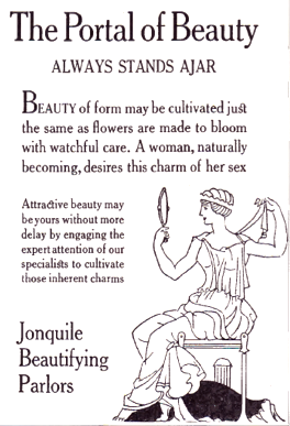 [More] ⦿
|
Morris Fuller Benton
[MyFonts: Broadway]
|
[More] ⦿
|
Morris Fuller Benton
[Franklin Gothic]
|
 [More] ⦿
|
Morris Fuller Benton
|
 Prolific American type designer (b. 1872, Milwaukee, d. 1948, Morristown, NJ), who published over 200 alphabets at ATF. He managed the ATF type design program from 1892 until 1937. Son of Linn Boyd Benton. MyFonts page on him. Nicholas Fabian's page. Linotype's page. Klingspor page. Unos tipos duros page. His fonts include:
 - 1897: Cloister Old Style (ATF). [Stephenson Blake purchased this from ATF and called it Kensington Old Style, 1919] [Cloister (2005, P22/Lanston) is based on Jim Rimmer's digitization of Benton's Cloister.]
- 1898: Roycroft. Mac McGrew on Roycroft: Roycroft was one of the most popular of a number of rugged typefaces used around the turn of the century, when printing with an antique appearance was in vogue. It was inspired by lettering used by the Saturday Evening Post. then a popular weekly magazine, and has been credited to Lewis Buddy, a former Post artist and letterer, but ATF says it was designed "partly" by Morris Benton, about 1898. Gerry Powell, director of typographic design for ATF in the 1940s, says, "Roycroft was first known as Buddy, changed when it was adopted by Elbert Hubbard for the Roycroft Press." Henry L. Bullen, ATF librarian and historian, says, "The first font of type to be made from matrices directly engraved on the Benton machine was 24-point Roycroft. October 4, 1900." While the machine was originally designed in 1884 to cut punches rather than matrices, it is doubtful that no fonts of mats were cut before 1900. Roycroft is also said to be the first typeface for which the large size of 120-point was engraved in type metal, with matrices made by electrotyping. Many typefaces of the day had a number of alternate characters. For this face. ATF gave specific instructions for their intended use: "M with the short vertex, in words the letters of which are open; R with the long tail, as a final letter in all-cap words; the wide h, m, and n, as a final letter only; t with the swash tail, as a final letter but not too frequently; u with the descending stroke, in words having no descending letters; ct ligature, wherever possible; the long s and its combinations, in antique work." Roycroft Open was cut in 1902, probably from the same patterns as the parent face. Roycroft Tinted is a very unusual face, in which the typeface is engraved with the equivalent of a halftone screen of about 25 percent tone value, with a black shadow on the right side; this typeface was cut by the Dickinson Type Foundry branch of ATF in Boston, and includes the same special characters as Roycroft. Compare Post Oldstyle.
- 1900: Century Expanded (1900: poster by Heather Leonhardt). This was a complete redraw of Century Roman which was designed in 1894 by his father, Linn Boyd Benton, for Theodore Low DeVinne, the publisher of Century Magazine. Digitizations by Elsner&Flake, Bitstream and URW.
- 1901: Linotext (aka WedddingText).
- 1901-1910: Engravers.
- 1901: Wedding Text (some put this in 1907), Old English Text, Engravers' Old English (a blackletter font remade by Bitstream). Wedding Text has been copied so often it is sickening: Wedding Regular and Headline (HiH, 2007), Dan X. Solo's version, Comtesse, Elite Kanzlei (1905, Stempel), Meta, Lipsia, QHS Nadejda (QHS Soft), Blackletter 681, Marriage (Softmaker), Wedding Text TL (by Tomas Liubinas).
- 1902: Typoscript.
- 1902-1912: Franklin Gothic. Digital versions exist by Bitstream, Elsner&Flake (in a version called ATF Franklin Gothic), Red Rooster (called Franklin Gothic Pro, 2011), Linotype, and ITC (ITC Franklin Gothic). Discussion by Harvey Spears. Mac McGrew: Franklin Gothic might well be called the patriarch of modern American gothics. Designed in 1902 by Morris Fuller Benton, it was one of the first important modernizations of traditional nineteenth-century typefaces by that designer, after he was assigned the task of unifying and improving the varied assortment of designs inherited by ATF from its twenty-three predecessor companies. Franklin Gothic (named for Benjamin Franklin) not only became a family in its own right, but also lent its characteristics to Lightline Gothic. Monotone Gothic, and News Gothic (q.v.). All of these typefaces bear more resem- blance to each other than do the typefaces within some other single families. Franklin Gothic is characterized by a slight degree of thick-and-thin contrast; by the double-loop g which has become a typically American design in gothic typefaces; by the diagonal ends of curved strokes (except in Extra Condensed); and by the oddity of the upper end of C and c being heavier than the lower end. The principal specimen here is Monotype, but the basic font is virtually an exact copy of the ATF typeface in display sizes, except that Monotype has added f- ligatures and diphthongs. Franklin Gothic Condensed and Extra Condensed were also designed by Benton, in 1906; Italic by the same designer in 1910; and Condensed Shaded in 1912 as part of the "gray typography" series. Although Benton started a wide version along with the others, it was abandoned; the present Franklin Gothic Wide was drawn by Bud (John L.) Renshaw about 1952. Franklin Gothic Condensed Italic was added by Whedon Davis in 1967. Monotype composition sizes of Franklin Gothic have been greatly modi- fied to fit a standard arrangement; 12-point is shown in the specimen-notice the narrow figures and certain other poorly reproportioned characters. The 4- and 5-point sizes have a single-loop g. Gothic No. 16 on Linotype and Inter- type is essentially the same as Franklin Gothic up to 14-point; in larger sizes it is modified and more nearly like Franklin Gothic Condensed. However. some fonts of this typeface on Lino have Gagtu redrawn similar to Spartan Black. with the usual characters available as alternates; 14-point is shown. Western Type Foundry and later BB&S used the name Gothic No.1 for their copy of Franklin Gothic, while Laclede had another similar Gothic No. 1 (q.v.). On Ludlow, this design was originally known as Square Gothic Heavy with a distinctive R and t as shown separately after the Monotype diphthongs; when the name was changed to Franklin Gothic in 1928, it was redrawn, closer to Franklin Gothic but still a bit top-heavy; the unique R was retained in standard fonts but an alternate version like that of ATF was made available separately; also a U with equal arms, a single-loop g, and a figure 1 without foot serifs. Ludlow Franklin Gothic Italic, partially shown on the third line of the specimen, is slanted much more than other versions, to fit the standard 17 -degree italic matrices of that machine. Modern Gothic Condensed and Italic (q.v.) are often though not properly called Franklin Gothic Condensed and Italic, especially by Monotype users. Also see Streamline Block.
- 1903: Alternate Gothic (ATF). See Alternate Gothic Pro Antique (Elsner&Flake), Alternate Gothic No2 (Bitstream), Alpin Gothic (by Team77), League Gothic (2009-2011, The League of Movable Type), and Alternate Gothic No1, No2 and No3 (see the URW version). Mac McGrew: Alternate Gothic was designed in 1903 by Morris F. Benton for ATF with the thought of providing several alternate widths of one design to fit various layout problems. Otherwise it is a plain, basic American gothic with no unusual features, but represents a more careful drawing of its nineteenth-century predecessors. The Monotype copies in display sizes are essentially the same as the foundry originals, with the addition of f-ligatures. The thirteen alternate round capitals shown in the first line of Alternate Gothic No.1 were designed by Sol Hess in 1927 for Monotype, hence the "Modernized" name; with these letters the design is sometimes referred to as Excelsior Gothic. Monotype keyboard sizes, as adapted by Hess about 1911, are considera- bly modified to fit a standard arrangement; caps are not as condensed as in the original foundry design. In 6-point, series 51 and 77 are both the same width, character for character, but some letters differ a bit in design. Note that these two narrower widths are simply called Alternate Gothic on Monotype, while the wider version is Alternate Gothic Condensed! Alternate Gothic Italic, drawn about 1946 by Sol Hess for Monotype matches No.2, but may be used with other widths as well. Condensed Gothic on Ludlow, is essentially a match for Alternate Gothic No.1, but has a somewhat different set of variant characters, as shown in the third line. There is also Condensed Gothic Outline on Ludlow, introduced about 1953, essentially an outline version of Alternate Gothic No.2. On Linotype and Intertype there is Gothic Condensed No.2 which is very similar to Alternate Gothic No. 1 in the largest sizes only, but with even narrower lowercase and figures. Also compare Trade Gothic Bold and Trade Gothic Bold Condensed. For a free version of Alternate Gothic No. 1, see League Gothic (2009-2011, The League of Movable Type).
- 1904: Bold Antique, Whitin Black [see OPTI Bold Antique for a modern digitization], Cheltenham (digitizations by Bitstream and Font Bureau, 1992), Cloister Black (blackletter font, see the Bitstream version: it is possible that the typeface as designed by Joseph W. Phinney).
- 1905: Linoscript (1905). Originally at ATF it was named "Typo Upright". Clearface, about which McGrew writes: Clearface was designed by Morris Benton with his father, Linn Boyd Benton, as advisor. The bold was designed first, in 1905, and cut the following year. The other weights and italics were produced through 1911. As the name implies, the series was intended to show unusual legibility, which it certainly achieved. The precision of cutting and casting for which ATF is noted produced a very neat and handsome series, which had considerable popularity. Clearface Heavy Italic has less inclination than the lighter weights, and is non-kerning, a detail which helped make it popular for newspaper use; the specimen shown here is from a very worn font. Some of the typefaces have been copied by the matrix makers. But the typeface Monotype calls Clearface and Italic is the weight called Bold by other sources. Monotype also includes Clearface Italic No. 289, a copy of the lighter weight. Revival and expansion by Victor Caruso for ITC called ITC Clearface, 1978. Also, American Extra Condensed, an octagonal mechanical typeface revived in 2011 by Nick Curtis as Uncle Sam Slim NF.
- 1906: Commercial Script (versions exist at Linotype, URW, Bitstream (called English 144), SoftMaker (2012), and Elsner&Flake), Miele Gothic, Norwood Roman.
- 1907: Lincoln Gotisch, named after Abraham Lincoln. This found found its way from ATF to Schriftguss, Trennert und Sohn, and Ludwig Wagner. Digital revivals include Delbanco's DS Lincoln-Gotisch. Compare with Comtesses, Lipsia, Elite Kanzlei, Lithographia and Wedding Text.
- 1908: News Gothic, Century Oldstyle (digital versions by Bitstream, Elsner&Flake, and URW), Clearface Gothic (1907-1910: digital revivals include Clear Gothic Serial (ca. 1994, SoftMaker) and Cleargothic Pro (2012, SoftMaker). McGrew: Clearface Gothic was designed by Morris Benton for ATF in 1908, and cut in 1910. It is a neat, clean gothic, somewhat thick and thin, which incorporates some of the mannerisms of the Clearface (roman) series. However, it can hardly be considered a part of that family. There is only one weight, and fonts contain only the minimum number of characters.
- 1909-1911: Rugged Roman. McGrew: Rugged Roman was designed for ATF by Morris F. Benton in 1909-11. It was patented in 1915, but the earliest showing seems to have appeared in 1917. It is a rugged face, as the name says, of the sort that was popular early in the century, but appears to have no relation to other typefaces having the name "Rugged." It somewhat resembles Roycroft, but is lighter. But to add to the uncertainty, fonts contained a number of ligatures of the kind which were more common in the early 1900s, in addition to the usual f-ligatures.
- 1910: Cloister Open Face, Hobo (1910, strongly influenced by the Art Nouveau movement; Hobo Light followed in 1915), ATF Bodoni (Bitstream's version is just called Bodoni, and Adobe's version is called Bodoni Book or Bodoni Poster or Bodoni Bold Condensed, while Elsner&Flake call theirs Bodoni No Two EF Ultra; Font Bureau's version has just two weights called BodoniFB-Bold Condensed and Compressed). McGrew writes about Hobo: Hobo is unusual in two respects---it is drawn with virtually no straight lines, and it has no descenders and thus is very large for the point size. It was designed by Morris F. Benton and issued by ATF in 1910. One story says that it was drawn in the early 1900s and sent to the foundry without a name, which was not unusual, but that further work on it was continually pushed aside, until it became known as "that old hobo" because it hung around so long without results. More time elapsed before it was patented in 1915. The working name was Adface. Hobo was also cut by Intertype in three sizes. Light Hobo was also drawn by Benton, and released by ATF in 1915. It is included in one list of Monotype typefaces, but its series number is shown elsewhere for another Monotype face, and no other evidence has been found that Monotype actually issued it.
- 1911-1913: Venetian, Cromwell. Mac McGrew: Cromwell is a rather playful typeface, designed by Morris Benton in 1913 but not released by ATF until three years later. It uses the same capitals as Cloister (q.v.) and has the same small x-height with long ascenders and descenders, but otherwise is quite different, with much less formality. Notice the alternate characters and the double letters including overhanging f's.. Cromwell was digitized by Nick Curtis in 2010 as Cromwell NF. Mac McGrew on Venetian: Venetian and Italic were designed by Morris F. Benton for ATF about 1911, with Venetian Bold following about two years later. They are rather reserved transitional typefaces, almost modern, instead of classic designs of Venetian origin as the name implies. The result is closer to Bodoni than to Cloister. The working title was Cheltenham No.2, but the relationship to that family is not apparent. It is carefully and neatly done, but never achieved widespread use. Compare Benton, a later typeface by the same designer, which has similar characteristics but more grace and charm.
- 1914: Adscript, Souvenir, Garamond (with T.M. Cleveland).
- 1916: Announcement, Light Old Style, Goudy Bold. Mac McGrew writes: Announcement Roman and Announcement Italic were designed by Morris F. Benton in 1916, adapted from steel or copperplate engravings, but not completed and released until 1918. These delicate typefaces have had some popularity for announcements, social stationery, and a limited amount of advertising work, but are a little too fancy for extensive use. Oddly, some of the plain caps shown in the specimens, both roman and italic, do not seem to appear in any ATF specimens. Foundry records show that a 48-point size of the roman was cut in 1927, but no other listing or showing of it has been found. In fact, sizes over 24-point were discontinued after a few years, and all sizes were discontinued in 1954.. Digitizations: Announcement Roman was revived by Nick Curtis in 2009 and called Society Page NF. Rebecca Alaccari at Canada Type revived it as Odette in 2004. See also Castcraft's OPTI Announcement Roman.
- 1916-1917: Invitation. For a digital revival, see Sil Vous Plait (2009, Nick Curtis).
- 1917: Freehand.
- 1917-1919: Sterling. Digitizations include Howard (2006, Paul D. Hunt), Argentina NF (2009, Nick Curtis), and Argentina Cursive NF.
- 1918: Century Schoolbook (1918-1921). (See ITC Century (Tony Stan, 1975-1979), or the Century FB-Bold Condensed weight by Greg Thompson at Font Bureau, 1992. For Century Schoolbook specifically, there are versions by Elsner&Flake, Bitstream and URW. Bitstream has a monospaced version.) URW Century Schoolbook L is free, and its major extension, TeXGyre Schola (2007) is also free.
- 1920: Canterbury. Mac McGrew: Canterbury is a novelty typeface designed by Morris F. Benton for ATF in 1920, when trials were cut, but not completed for production until 1926. It features a very small x-height, with long ascenders and descenders; monotone weight with minute serifs; and a number of swash capitals. It is primarily suitable for personal stationery and announcements. Compare Camelot Oldstyle. Digital versions were done by Nick Curtis in his Londonderry Air NF (2002-2004), and Red Rooster in the series Canterbury, Canterbury OldStyle, and Canterbury Sans.
- 1922: Civilité. Mac McGrew on the ATF Civilité: Civilite in its modern adaptation was designed by Morris Benton in 1922 and cut by ATF in 1923-24. The original version was cut by Robert Granjon in 1557 to imitate the semi-formal writing then in vogue, and is believed to be the first cursive design cut in type. It became popular for the printing of poetry and for books of instruction for children, where the type itself could serve as a perfect model of handwriting. The first of these books was titled La Civilite puerile, printed at Antwerp in 1559. The books were so popular that the design came to be known as "civility" type. Other interpretations of the letter have been made, including Cursive Script, cut in the nineteenth century in 18-point only from French sources by ATF predecessors and by Hansen, but Benton's seems more attractive and legible to modern eyes. The French pronunciation of ci-vil'i-tay is indicated by the accented e, which was used only in ATF's earliest showings. The many alternate characters were included in fonts as originally sold; later they were sold separately and finally discontinued, although the basic font was still listed in recent ATF literature. Also see ZapfCivilite. Compare Freehand, Motto, Verona.
- 1924: Schoolbook Oldstyle.
- 1926-1927: Typo Roman.
- 1927: Chic (American Typefounders; doubly shaded capitals and figures), Gravure, Greeting Monotone, Goudy Extra Bold. The art deco typeface Chic was revived by Nick Curtis as Odalisque NF (2008) and Odalisque Stencil NF (2010).
- 1928: Parisian, Bulmer (revival of William Martin's typeface from 1792 for the printer William Bulmer; digital forms by Monotype, Adobe, Linotype, and Bitstream), Broadway (1928-1929, see two styles offered by Elsner&Flake, Linotype, Bitstream, and 11 weights by URW), Goudy Catalogue, Modernique, Novel Gothic (ATF, designed with Charles H. Becker), Dynamic. Novel Gothic has seen many digital revivals, most notably Telenovela NF (2011, Nick Curtis), Naked Power (Chikako Larabie) and Novel Gothic SG (Jim Spiece). Images of Bulmer: i, ii, iii, iv, v, vi, vii, viii, ix, x, xi, xii.
- 1929: Louvaine. McGrew: Louvaine series was designed by Morris F. Benton for ATF in 1928. It is an adaptation of Bodoni (the working title was Modern Bodoni), and many of the characters are identical. Only g and y are basically different; otherwise the distinction is in the more abrupt transition from thick to thin strokes in this series. In this respect, Ultra Bodoni has more affinity to Louvaine than to the other Bodoni weights. The three weights of Louvaine correspond to Bodoni Book, Regular, and Bold. This series did not last long enough to appear in the 1934 ATF specimen book, the next complete one after its introduction. Compare Tippecanoe.
- 1930: Benton, Engravers Text, Bank Gothic (see Bitstream's version), Garamond-3 (with Thomas Maitland Cleland), Paramount (some have this as being from 1928: see Eva Paramount SG by Jim Spiece). McGrew: Paramount was designed by Morris Benton in 1930 for ATF. It is basically a heavier companion to Rivoli (q. v.), which in turn is based on Eve, an importation from Germany, but is heavier than Eve Bold. It is an informal typeface with a crisp, pen-drawn appearance. Lowercase is small, with long ascenders and short descenders. Vertical strokes taper, being wider at the top. It was popular for a time as an advertising and announcement type.
- 1931: Thermotype, Stymie (with Sol Hess and Gerry Powell). Stymie Obelisk is a condensed Egyptian headline face---the latter was revived by Nick Curtis as Kenotaph NF (2011).
- 1932: Raleigh Gothic Condensed (the digital version by Nick Curtis is Highpoint Gothic NF (2011)), American Text (blackletter). Mac McGrew: Raleigh Gothic Condensed was designed by Morris F. Benton for ATF in 1932. It is a prim, narrow, medium weight gothic face, with normally round characters being squared except for short arcs on the outside of corners. The alternate characters AKMNS give an even greater vertical appearance than usual. At first, this typeface was promoted with Raleigh Cursive as a stylish companion face, although there is no apparent relationship other than the name. Compare Phenix, Alternate Gothic, Agency Gothic.
- 1933: American Backslant, Ultra Bodoni (a great Bodoni headline face; see Bodoni FB (1992, Font Bureau's Richard Lipton). About Agency Gothic, McGrath writes: Agency Gothic is a squarish, narrow, monotone gothic without lower- case, designed by Morris F. Benton in 1932. It has an alternate A and M which further emphasize the vertical lines. Sizes under 36-point were added in 1935. Agency Gothic Open was drawn by Benton in 1932 and introduced in 1934; it follows the same style in outline with shadow, and probably has been more popular than its solid companion. Triangle Type Foundry, a Chicago concern that manufactured matrices, copied this typeface as Slim Open, adding some smaller sizes. ATF's working titles for these typefaces, before release, were Tempo, later Utility Gothic and Utility Open. Compare Raleigh Gothic Condensed, Poster Gothic, Bank Gothic. Digital versions include Warp Three NF (2008, Nick Curtis), which borrows its lowercase from Square Gothic (1888, James Conner's Sons), FB Agency (1995, David Berlow at FontBureau), Agency Gothic (by Dan Solo) and OPTI Agency Gothic (by Castcraft).
- 1934: Shadow, Tower (heavy geometric slab serif), Whitehall. Font Bureau's Elizabeth Cory Holzman made the Constructa family in 1994 based on Tower. Digital versions include Warp Three NF (2008, Nick Curtis), which borrows its lowercase from Square Gothic (1888, James Conner's Sons), FB Agency Gothic (1995, David Berlow at FontBureau) and Agency Gothic by Castle Type. Eagle Bold followed in 1934. McGrew: Eagle Bold is a by-product of the depression of the 1930s. The National Recovery Administration of 1933 had as its emblem a blue eagle with the prominent initials NRA, lettered in a distinctive gothic style. Morris Benton took these letters as the basis for a font of type, released later that year by ATF, to tie in with the emblem, which businesses throughout the country displayed prominently in advertising, stationery, and signs; naturally it was named for the eagle. Compare Novel Gothic. USA Resolute NF (2009, Nick Curtis) is based on Eagle Bold.
- 1935: Phenix. This condensed artsy sans was revived in 2011 at Red Rooster by Steve Jackaman and Ashley Muir as Phoenix Pro.
- 1936: Headline Gothic. For a digital version, see ATF Headline Gothic (2015, Mark van Bronkhorst, Igino Marini, & Ben Kiel at American Type Founders Collection).
- 1937: Empire. This ultra-condensed all caps skyline typeface was digitally remade and modernized by Santiago Orozco as Dorsa (2011). Jeff Levine reinterpreted it in 2017 as Front Row JNL. Bitstream also has a digital revival.
Linotype link. FontShop link. Picture. Typefaces alphabetic order: - Adscript
- Agency Gothic (+Open
- Alternate Gothic No.1 (+No.2, +No.3)
- American Backslant
- American Caslon&Italic
- American Text
- Announcement Roman&Italic (1916). For digital revivals or influences, see Friendly (2012, Neil Summerour), Odette (2004, Canada Type) and Society Page NF (2009, Nick Curtis).
- Antique Shaded
- Bank Gothic Light (+Medium, +Bold, +Light Condensed, +Medium Condensed, +Bold Condensed). For digital versions, see Bank Gothic AS Regular and Condensed (2008, Michael Doret).
- Baskerville Italic
- Benton (Whitehall)&Italic
- Bodoni&Italic (+Book&Italic, +Bold&Italic, +Bold Shaded, +Bold Open)
- Bold Antique (+Condensed)
- Broadway (+Condensed). The prototyical art deco typeface (1928-1929).
- Bulfinch Oldstyle (1903).
- Bulmer&Italic
- Canterbury
- Card Bodoni (+Bold). 1912-1916.
- Card Litho (+Light Litho)
- Card Mercantile
- Card Roman
- Century Expanded&Italic
- Century Bold&Italic (+Bold Condensed, +Bold Extended)
- Century Oldstyle&Italic (+Bold&Italic, +Bold Condensed)
- Century Catalogue&Italic
- Century Schoolbook&Italic (+Bold)
- Cheltenham Oldstyle&Italic (+Condensed, +Wide)
- Cheltenham Medium&Italic (+Medium Condensed, +Medium Expanded, +Bold&Italic, +Bold Condensed&Italic, +Bold Extra Condensed&Title, +Bold Extended, +Extrabold, +Bold Outline, +Bold Shaded&Italic, +Extrabold Shaded, +Inline, +Inline Extra Condensed, +Inline Extended)
- Chic
- Civilite
- Clearface&Italic (1907, +Bold&Italic, +Heavy&Italic)
- Clearface Gothic: a flared version of Clearface.
- Cloister Black
- Cloister Oldstyle&Italic (+Lightface&Italic, +Bold&Italic, +Bold Condensed, +Cursive, +Cursive Handtooled, +Title&Bold Title)
- Commercial Script
- Copperplate Gothic Shaded
- Cromwell.
- Cushing Antique (1902).
- Della Robbia Light
- Dynamic Medium
- Eagle Bold
- Empire (1937). A skyline typeface.
- Engravers Bodoni
- Engravers Old English (+Bold)
- Engravers Bold
- Engravers Shaded
- Engravers Text
- Franklin Gothic&Italic (+Condensed, +Extra Condensed, +Condensed Shaded)
- Freehand (1917). Mac McGrew: Freehand, a typeface based on pen-lettering, was designed for ATF by Morris Benton in 1917. The working title before release was Quill. Derived from Old English, it is an interesting novelty, and has had quite a bit of use. Compare Civilite, Motto, Verona.
- Garamond&Italic (+Bold&Italic, +Open)
- Globe Gothic (+Condensed, +Extra Condensed, +Extended, +Bold&Italic)
- Goudy Bold&Italic (+Catalogue&Italic, +Extrabold&Italic, +Handtooled&Italic, +Title)
- Gravure
- Greeting Monotone
- Headline Gothic
- Hobo&Light Hobo (1910). For digital versions, see Informal 707 (Bitstream), Hobbit (SF), Homeward Bound (Corel), Hobo No2 (2012, SoftMaker), Bogo (2016, Harold Lohner), and Hobo (Bitstream).
- Invitation (+Shaded)
- Light Oldstyle
- Lightline Gothic&Title (1908). For a revival, see Benton Gothic Thin NF (2014, Nick Curtis).
- Lithograph Shaded (1914, with W.F. Capitain).
- Louvaine Light&Italic (+Medium&Italic, +Bold&Italic)
- Miehle Extra Condensed&Title
- Modernique
- Monotone Gothic&Title
- Motto (1915). Mac McGrew: Motto is a calligraphic typeface designed by Morris F. Benton for ATF in 1915. It is similar to the same designer's Freehand, drawn a couple of years later, but has plainer capitals, heavier thin strokes, and shorter descenders. But letters combine into legible words with a pleasant, hand-lettered appearance. Also compare Humanistic, Verona. For a digital version, see Motto by Juan Kafka.
- News Gothic (+Condensed, +Extra Condensed&Title)
- Norwood Roman
- Novel Gothic
- Othello
- Packard (+Bold)
- Paramount
- Parisian
- Pen Print Open
- Phenix
- Piranesi Italic (+Italic Plain Caps, +Bold&Italic, +Bold Italic Plain Caps)
- Poster Gothic (1934).
- Raleigh Gothic Condensed (1934).
- Rockwell Antique
- Roycroft
- Rugged Roman
- Schoolbook Oldstyle
- Shadow
- Souvenir (1914). Revived in 1977 by Ed Benguiat as ITC Souvenir, but a total failure as a type design. Simon Garfield: Souvenir was the Comic Sans of its era, which was the 1970s before punk. It was the typeface of friendly advertising, and it did indeed appear on Bee Gees albums, not to mention the pages of Farrah Fawcett-era Playboy. Mark Batty from International Typeface Corporation (ITC) on one of his best-selling fonts: A terrible typeface. A sort of Saturday Night Fever typeface wearing tight white flared pants. Garfield also retrieved this quote by type scholar Frank Romano in the early 1990s: Real men don't set Souvenir. Digital revivals also include Sunset Serial by Softmaker, and ITC Souvenir Mono by Ned Bunnel.
- Sterling&Cursive
- Stymie Light&Italic (+Medium&Italic, +Bold&Italic, +Black&Italic)
- Thermotypes
- Tower Condensed (1934). Revived by Photo-Lettering Inc as PL Tower.
- Typo Roman&Shaded
- Typo Script and Typo Script&Extended (1902)
- Typo Shaded
- Typo Slope
- Typo Upright&Bold
- Ultra Bodoni&Italic (+Condensed, +Extra Condensed)
- Venetian&Italic (+Bold)
- Wedding Text&Shaded
View Morris Fuller Benton's typefaces. A longer list. A listing of various digital versions of News Gothic. More News Gothic-like typefaces. Even more News Gothic-like typefaces. [Google]
[MyFonts]
[More] ⦿
|
Morris Fuller Benton: Type Designer Fact or Fiction?
|
Rick von Holdt's resentation at the Amalgamated Printers Association Wayzgoose, Phoenix, June 7, 2013, in PDF format. He concludes: Morris Fuller Benton was shy and retiring and his relationship with his father and his personal life don't even come close to being normal, but others have written about that and I have only been interested in finding out if he really was the pencil-to- paper typeface creator that people are now so readily willing to give him credit as being. I am obviously not neutral on this issue. I personally give M. F. Benton little, if any, credit as being a typeface designer. It is difficult to try to piece all of this together a century after the fact, but if Morris Fuller Benton received absolutely no recognition from his peers as a legitimate type designer, there was probably a very good reason for that. I too used to believe that M. F. Benton designed all the typefaces credited to him, simply because I was naive and that was the information being offered. The more I learn, the more skepticism I have. von Holdt explains in his essay the absence of credit by his perrs for his designs, a result perhaps of being more an art director and manager of type design at ATF than an actual creative artist. Follow-up discussion by the typophiles. Whatever one may say, MFB elevated type design to an industrial level, with focused projects and the development of large type families that hang together logically. For this, one needs to have a good nose and a synthetic view of things, something the creative artists of the time like Goudy and Dwiggins, probably lacked or were not interested in. [Google]
[More] ⦿
|
Morris Fuller Benton's Venetian
|
 Venetian and Venetian Italic are typefaces that were designed by Morris Fuller Benton about 1911. Venetian Bold followed circa 1913. McMcGrew writes: They are rather reserved transitional typefaces, almost modern, instead of classic designs of Venetian origin as the name implies. The result is closer to Bodoni than to Cloister. The working title was Cheltenham No.2, but the relationship to that family is not apparent. It is carefully and neatly done, but never achieved widespread use. Compare Benton, a later typeface by the same designer, which has similar characteristics but more grace and charm.
 Digital revivals include the free typeface family HK Venetian (2016, Alfredo Marco Pradil). [Google]
[More] ⦿
|
MvB Design
[Mark van Bronkhorst]
|
MvB Design (later called MVB Fonts) is Mark van Bronkhorst's company in Albany, CA, est. 1991 in San Francisco. It was also known as Markanna Studios Inc. Its fonts were first distributed by FontHaus, then by MyFonts, and most recently by Type Network. In the list below, unless explicitly mentioned, Mark van Bronkhorst is the designer: GryphiusMVB (2003), MVB Solano Gothic (2007-2009, six Bank Gothic lookalikes done for the city of Albany, CA), MVB Celestia Antiqua One and Two (1993-1996, a rustic font family in the Caslon Antique genre; it contains zodiac signs), MVB Greymantle (1993, Kanna Aoki), MvB Magnesium (1992-2003, Adobe: a hefty, contrasted, all-caps sans serif with angled terminals that pays homage to American sign lettering), Magnolia MvB (1997), Airedale (1992), BovinePoster or MVB Bovine (1993), DickAndJane (1994), MildewRoman (1994), QuercusRegular (1993), PFAnimals (1993), PFCommerceCommunication (1992), PFFoodDrink (1992), PFHolidaysCelebrations (1992), PFHouseholdItems (1993), PFTransportTravel (1992), QuercusHard (1993), MVB Emmascript (1996, Kanna Aoki), MVB Café Mimi (1996-2003, Kanna Aoki), MVB Pedestria (2002, a sans family by Akemi Aoki), MVB Pedestria Pict (2002, dingbats by Akemi Aoki), MVB Verdigris (2003-2011, a garalde close to Sabon), MVB Fantabular and MVB Fantabular Sans (2002, Akemi Aoki, monospaced, typewriter-style), MVB Grenadine One and Two (2003, sans families by Akemi Aoki), MVB Peccadillo (2002, by Holly Goldsmith and Alan Greene), MVB BossaNova (Holly Goldsmith, 1997), BatmanForever1 (1994, Maseeh Rafani/Warner Bros and Mark van Bronkhorst), Breakdown (1996), HornyDave (1995, based on illustrations of Georgia Panagiotopoulos), HypnoclipsLogoFont (1997), Ovidius (1993), Subterfuge (1995), ZedGothicMvB (1996), HotsyTotsy, MVB Sirenne Six, MVB Sirenne Text, MVB Sirenne Display (2002, display serif family by by MvB and Alan Greene), Veriris Pro Text (2003-2011). MVB Sacre Bleu (2007) is an award-winning handwriting typeface about which Joshua Lurie-Terrell writes: Sacre Bleu is the most flexible and accessible informal script of 2007, and rivals some of the best typefaces in this vein from the past decade. He compares it with Christian Robertson's Dear Sarah, Dave Farey's Lettres Eclatees, Letterror's Salmiak and Nick Cooke's Olicana, another very successful face. In 2008, Mark set up Sweet Fonts, where he and Linnea Lundquist designed Sweet Upright Script (2008), and Mark published the quintuple line blackboard board family Sweet Titling No. 22 (2010), Sweet Square (2011---in the style of Bank Gothic), Sweet Sans Pro (2011, a sans family from Hairline, Sweet Gothic to Heavy. He says: The family is based on antique engraver's lettering templates called masterplates. Professional stationers use a pantograph to manually transfer letters from these masterplates to a piece of copper or steel that is then etched to serve as a plate or die. This demanding technique is rare today given that most engravers now use a photographic process to make plates, where just about any font will do. But the lettering styles engravers popularized during the first half of the twentieth century---especially the engraver's sans---are still quite familiar and appealing. It is in the style of Burin Sans and Sackers Gothic. And Embarcadero MVB (2010, a near-grotesque superfamily). In 2012, van Bronkhorst released MvB Mascot (a signage script). In 2013, MVB published the utilitarian sans family MVB Solitaire. For Whole Foods Market, he created the corporate typefaces Grace's Hand and Molly Text in 2014. In 2015, Mark van Bronkhorst set up TypoBrand LLC in Berkeley, CA. As part of TypoBrand, he published several typefaces that are modern digital reinterpretations of ATF typefaces. The collection is published by TypoBrand LLC under the names ATF Type or American Type Founders Collection. At ATF Type foundry, they co-designed, sometimes with others, classics such as ATF Alternate Gothic (2015), ATF Brush (2015), ATF Egyptian Antique (an expansion of Schraubstadter's Rockwell Antique by Mark van Bronkhorst, Igino Marini, and Ben Kiel), ATF Garamond (2015), ATF Headline Gothic (2015), ATF Livermore Script (by Mark van Bronkhorst, Igino Marini, and Ben Kiel), ATF Poster Gothic (2015), ATF Railroad Gothic (2016), and ATF Wedding Gothic (2015). In 2017, he designed the plastic template font family MVB Diazo. Type Network link. Linotype link. FontShop link. Alternate URL. Klingspor link. View Mark van Bronkhorst's typefaces. [Google]
[MyFonts]
[More] ⦿
|
MyFonts: Broadway
[Morris Fuller Benton]
|
 Broadway is Morris Fuller Benton's iconic art deco typeface. Here we show various typefaces in the MyFonts library that are identical to, or emulations of Broadway. [Google]
[More] ⦿
Broadway is Morris Fuller Benton's iconic art deco typeface. Here we show various typefaces in the MyFonts library that are identical to, or emulations of Broadway. [Google]
[More] ⦿
|
News Gothic
|
 News Gothic was designed by Morris F. Benton for ATF in 1908, in regular, condensed, and extra condensed widths, as part of his assignment to modernize the nineteenth-century gothics inherited from the foundry's predecessors.
 Mac McGrew writes: News Gothic, with its much finer rendering, is part of what might be called a family of basic American gothics, for it is essentially a light version of Franklin Gothic. Lightline Gothic is still lighter and Monotone Gothic is wider, but all of them, with the variations of News and Franklin Gothics, are as closely related as are members of most other type families. However, the flat-sided extra condensed is more similar to the style of the Alternate Gothics. These American gothics were pushed into obsolescence by the popularity of the German sans serifs, such as Futura and Kabel, in the 1930s. But they were rediscovered in the late 1940s, and made a strong come-back: - Linotype introduced its comparable Trade Gothic family (1948, by Jackson Burke).
- Intertype cut News Gothic and News Gothic Bold in 1955. Intertype offered News Gothic Extended with bold extended in 1961.
- Ludlow expanded its Record Gothic family.
- ATF and Monotype added to their families of News Gothic. Bud Renshaw drew ATF's version of News Gothic Bold in 1958, while a third version of the same typeface was offered by Monotype. McGrew: ATF had drawings for News Gothic Italic as early as 1912, and reconsidered the typeface in 1965, but we have no record of its production. Monotype and Intertype brought out their own versions of italic, similar to each other except that the former has slightly greater slant.
- ATF introduced News Gothic Condensed Bold, by Frank Bartuska, in 1965, while Monotype and Intertype used the name News Gothic Bold Condensed for their earlier versions.
- Baltimore Type's "News Gothic" is actually Inland Gothic No.6, Mono 149, while "Balto Gothic," with Italic and Bold, is News Gothic.
So far for the metal typefaces. McGrew ends with this note: Compare Franklin Gothic, Lightline Gothic, Monotone Gothic, also Trade Gothic, Record Gothic. Also see Phenix, Jefferson Gothic. A solid digital typeface family based on News Gothic is Font Bureau's Benton Sans (1993-2012, Cyrus Highsmith). See also News Gothic BT (Bitstream), News Gothic Bold (2017, Jordan Davies), and the one-weight Columnist JNL (2020, Jeff Levine). A listing of various digital versions of News Gothic. More News Gothic-like typefaces. [Google]
[More] ⦿
|
Nicholas Gando
|
Or Nicolas Gando. French calligrapher, engraver and type founder, d. ca. 1767. He acquired the types of Claude Lamesle: Épreuves générales des caracteres provenants de la fonderie de Claude Lamesle, lesquels se trouvent présentement dans celle de Nicolas Gando, l'aîné (Paris, Cloître S. Julien le Pauvre, 1758). See also Epreuve des caractères de la fonderie Gando (Paris, Cloistre Saint Julien le Pauvre, imprimerie Jacques Guerin, 1745; local download), Recueil d'ornemens qui comprennent les différentes combinaisons des vignettes de la fonderie de N. Gando (1745; local download), and Epreuves des caractères de la fonderie Gando, père et fils (Paris, Cloître Saint Julien le Pauvre, 1760). His son is Pierre-François. He was involved in music typography and wrote an angry response Observations sur le traité historique et critique de M. Fournier (1766) as a reaction to accusations of plagiarism made by Pierre-Simon Fournier in 1765 in Traité historique et critique sur l'origine et les progrès des caractères de fonte pour l'impression de la musique. A 170-page specimen book was published in 1810: Specimen des caractères de la fonderie de N.P. Gando à Paris et de son fils TH. S. Gandon à Bruxelles. [facsimile reprint in 1992 by Lane and Lommen] This shows that his son, Th. S. Gando, had set up shop in Brussels. Nicolas Gando is often associated with the upright connected script style. Digital versions of his typefaces include Gando Ronde (a formal script by H.J. Hunziker and Matthew Carter in 1970; Linotype), French 111 (at Bitstream) and Gando BT (at Bitstream). Typo Upright / Linoscript is a genetically slightly different family of rondes (compare the k's). [Google]
[MyFonts]
[More] ⦿
|
Nick Curtis
[Art deco typefaces by Nick Curtis: II]
|
 [MyFonts]
[More] ⦿
[MyFonts]
[More] ⦿
|
Nick Curtis
[Nick Curtis: Victorian typefaces]
|
[MyFonts]
[More] ⦿
|
Nick Curtis
[Nick Curtis: Typefaces from 2014]
|
 [MyFonts]
[More] ⦿
[MyFonts]
[More] ⦿
|
Nick Curtis: Typefaces from 2014
[Nick Curtis]
|
 Typefaces made by Nick Curtis in 2014:
 - Alto Rey NF. A revival of a Victorian typeface issued by the Palmer and Rey Type Foundry of San Francisco in 1884.
- Angler NF. A revival of Anglo, a Victorian typeface by Barnhart Brothers and Spindler, 1895.
- Argentina Cursive NF. Based on a typeface by Morris Fuller Benton, 1919.
- Bandiera Del Legno NF. A Tuscan wood type that revives Gothic Tuscan Condensed Reversed by William H. Page.
- Belgique NF. A revival of the (Western) wood type French Clarendon XXX Condensed No. 117 by William H. Page.
- Benton Gothic Thin NF. A revival of Lightline Gothic (1908, Morris Fuller Benton, ATF).
- Big D NF. Based on a Speedball pen font by Ross F. George.
- Bricoleur NF. A connected script from a French magazine in 1927.
- Bully Pulpit Plain NF. After Bullion Shadow (1970, Face Photosetting).
- Call Me Ishmael NF. After Moby Dick (Affolter and Gschwind).
- Chapeaux Noirs NF. After a MacKellars, Smiths & Jordan typeface.
- Chieftain NF. Revival of Pontiac (1893, ATF).
- Coronation Street NF. Based on a typeface created in 1936 by Stephenson Blake.
- De Roos Mediaeval NF. After Sjoerd de Roos.
- Dimanche NF. An art nouveau typeface revival. The original is known as Domingo or Brillante.
- Fluid Drive NF. A take on an art deco typeface by Samuel Welo.
- Gloriosus NF. Revival of the Victorian typeface Apollo (1888, Gustave F. Schroeder, Central Type Foundry).
- Grieshaber Monos NF. After a Schelter & Giesecke typeface designed in 1911 by Moritz Grieshaber.
- Harley Quinn NF.
- Hi Ho Steverino NF. In the Beat style of the 1960s and 1970s.
- Koralle Rounded NF. A rounded revival of Koralle (1913, Schelter & Giesecke).
- Leabhar Ceilteach NF. Inspired by lettering in the Book of Kells.
- Legnano (2014, Italian art deco wood type).
- LevellerNF (2014, Nick Curtis). A revival of Roundhead (Charles Beeler, Mackellar Smiths & Jordan, 1883).
- Lodewijk Gothic NF (2014). Adter Elzevir Gothic (1897, ATF).
- Loopy Loo NF. Upright script based on an original by the Hunt Brothers.
- Marmorherz NF. After an 1866 font, Marble Heart, by Farmer, Little, and Co.
- Maxed Out NF (+Inline, +Starstruck). This series of fonts is based on a 1970s art deco series at PhotoLettering Inc called Riverside Drive by Peter Max.
- Meriwether Circular NF. After a 1905 Victorian typeface by William Martin Johnson for ATF called Meriontype.
- Millrich Olivian NF. A revival of Olivian by Richard & Miller.
- Miss Dottie NF. After Dotted Roman (1897, Barnhart Brothers and Spindler).
- Morticia NF. Based on an ATF original.
- National Oldstyle NF. After a 1916 font by Frederic W. Goudy.
- Nickel Box NF.
- Olden Daze NF. From Alphabets A to Z.
- Page Ephesian NF. A wood type after William H. Page, 1890.
- Page Etruscan No 5 NF. A wood type after William H. Page.
- Painters Roman NF. A wood type based on Painters Roman by Vanderburg and Wells (1878).
- Pique-Nique NF. Based on the art nouveau typeface Outing (1888, John F. Cumming, and 1895, ATF).
- Receding Hairline NF. After L&C Hairline (1966, VGC, Herb Lubalin and Tom Carnase).
- Renaissant NF. After the Victorian typeface Renaissant (1880, by John F. Cumming, Dickinson Type foundry).
- Rythme NF. After a Mexican simulation typeface from 1935 by Maximilien Vox called Éclair.
- Scalar Biform NF.
- Schweimann Moderne NF. An art nouveau typeface.
- Skelett Antiken NF. After William H.Page's wood typeface Clarendon XX (1859).
- Ski Alpin NF. An art deco typeface based on a Swiss travel poster from 1927.
- Sodbuster NF. After William H. Page's wood type Gothic Dotted.
- Southie Signboard NF.
- Strassenmeister NF. After an art deco typeface called Buick Schmalfett by Herbert Thannhaeuser.
- Sweet Afton NF. After a silent movie font by Samuel Welo.
- Talsmann NF. A faithful reproduction of the Advocate font used by the IBM Selectric typewriter.
- Trading Hoss NF. After Ross F. George's Speedball alphabet D-nib Display.
- Tuscalooza NF. After William H. Page's font Tuscan Extended.
- Twinkletoes NF. After a comic book typeface by Ross F. George.
- Unjustified NF. Inspired by the opening credits for the television series Justified.
- Vauxhall NF. Based on Angelica, a 1970s typeface by Robert Trogman (FotoStar).
- Venusian Ultra NF. A heavy sans based on the extra bold extended version of Bauersche's classic sans typeface family Venus (1907-1927).
- Vulkan NF. A wedge-serifed typeface based on a Barnhart Brothers and Spindler original called Vulcan (1884).
- Well Said Black NF. Modeled after Welling Black, a 1970s typeface by Robert Trogman (FotoStar).
[Google]
[MyFonts]
[More] ⦿
|
Nick Curtis: Victorian typefaces
[Nick Curtis]
|
It is difficult to precisely define a Victorian typeface. They range from the ridiculously ornate typefaces from 1850-1870 to awkwardly balanced display typefaces and the pre-art nouveau trends. Nick Curtis's revivals in this genre are listed below. - Alto Rey NF (2014). A revival of a Victorian typeface issued by the Palmer and Rey Type Foundry of San Francisco in 1884.
- AnagramShadowNF. A free font. Commercial version in 2008. Anagram Shadow NF is based on handlettering from a 1928 poster for a steamship line by renowned British artist Austin Cooper.
- Angler NF (2014). After Anglo, which appears in the Barnhart Brothers and Spindler catalog of 1895.
- Beantown Bounce NF (2007) revives Century, an ornamental display typeface from the 1898 catalog of the Boston Type Foundry.
- Brownwood NF (2011). The inspiration for this semi-Victorian semi-art nouveau typeface came from a 1906 travel poster, promoting the Hotel Braunwald, located in the Swiss Alps.
- Cinnci Card Ornaments NF (2014) is a collection of design elements used in logotypes and calling cards from the Victorian era.
- Cleveland Litho NF (2007), a curly Victorian face, appeared in the 1898 specimen book of the Cleveland Type Foundry, under the name of Litho, while Yum Yum NF (1898) appeared in Cleveland's 1893 specimen book as Mikado.
- DoctorJekyllNF. A free font.
- Durham Abbey NF (2005). Based on a Victorian era font called Romanesque, which can be found in the Dan X. Solo collection.
- Dury Lane (2007) is based on a Victorian era release by Blake Type Foundry called Blackfriars.
- FancyPantsNF. A free font.
- Federlyn NF (2010) and Federlyn Initials NF (2011). Based on the Edwardian-era Artcraft by Robert Wiebking.
- Filibuster NF (2007). This curly über-Victorian typeface is based on Congress, an ornamental typeface found in H. C. Hansen Type Foundry's catalog of 1909.
- GingerPeachyNF. A free font.
- Great Sage NF (2010). That ugly duckling Victorian typeface Karnac (1888, ATF) [not to be confused with the Egyptian typeface Karnak by R.H. Middleton] led Nick Curtis to Great Sage NF.
- Habana Sweets NF (2012). Based on Cuban (1873, Richard & Miller).
- HardlyWorthit. A free font.
- HornswoggledNF. A free font.
- HutSutRalstonNF (2001). Based on a 1915 example in a Speedball Pen book.
- LabyrinthCapital, Labyrinth (1999, 2007). A free font family based on this poster.
- Londonderry Air NF (2002-2004) is based on Canterbury Old Style, a typeface designed by Morris Fuller Benton in 1920-1926 at ATF.
- MarchMadnessNF (2003). A free font. Inspired by lettering from a 1920s Italian poster by legendary postermeister Marcello Dudovich.
- MetropolisNF. A free font. Based on this movie poster from 1927 by Hungarian Josef Bottlik.
- Millrich Reading NF (2010). A Victorian typeface that revives a 1918 Miller&Richard face. Millrich Olivian NF (2014) revives Olivian.
- Nickelodeon NF (1999). A free font. This is sometimes compared with silent movie fonts.
- Nickley Normal (1997). A free font based on arts and crafts lettering by William Joseph Dard Hunter.
- Oaken Bucket NF (2009).
- Oh You Klid NF (2009). Based on a Victorian typeface by Central Type Foundry called Euclid (1880s).
- Palmer Oxonian NF (2011). Based on Oxford (Palmer&Rey, 1884).
- PasticheCapital, Pastiche. A free font.
- PayzantPenNF (2001). A free font, with a commercial version in 2010. Payzant Pen NF is based on Frank H. Atkinson's A Show at Sho-Cards: Comprehensive, Complete, Concise, published in 1918, executed with the then-state-of-the-art Payzant Reservoir Pen.
- Plus de Vagues NF (2006). Based on a curly semi-Victorian alphabet by Stephenson Blake called Recherché.
- Putney Junction NF (2007). Based on a BBS typeface called Design, ca. 1900.
- RhumbaScriptNF. A free font. Based on Tango Kursiv (1913, Ernst Deutsch), it is often compared with silent movie fonts.
- Shady Lady NF (2005). An ornamental shaded caps typeface called Umbra in the 1907 Barnhart Brothers&Spindler type specimen catalog.
- ShangriLaNF, ShangriLaNFSmallCaps (2002). A free font family. The commercial version was done in 2008. Based on a Victorian alphabet from the 1922 chapbook Modern Show Card Writing, by Joseph Bertram Jowitt.
- Sil Vous Plait NF (2009). A Victorian text typeface based on a 1917 font by Morris Fuller Benton called Invitation.
- SouciSans (1999). A free font. Based on a type design by Sam Welo shown in Lettering Modern and Foreign (1930).
- Speedball No1, Speedball No2 SW (2001), Speedball No3 (2001). SpeedballNo1NF-Bold, SpeedballNo1NF, SpeedballNo2NF-Bold, SpeedballNo2NF, SpeedballNo2SW, SpeedballNo3, SpeedballNo3NF-Bold, SpeedballNo3NF. This series is based in part on alphabets by Samuel Welo.
- Storybook Initials NF (2014).
- Streamers NF (2005). A Victorian-era typeface called Fillet revived.
- Tanglewood Tales (2000). A free font.
- Vidalia Sunshine NF (2007). An extension of the 1888 all caps typeface Ornamented No. 5 from MacKellar, Smiths&Jordan.
- Vintage Panels NF (2011): Victorian panels.
- VlaanderenChiseledNF, VlaanderenRoundNF, VlaanderenSquareNF. A free font family. These are based on an untitled work by Dutch designer André Vlaanderen from 1928. These are ugly ducklings because they mix various inconsistent styles without much thought.
[Google]
[MyFonts]
[More] ⦿
|
Oh No Type
[James T. Edmondson]
|
 Oakland, CA-based designer, whose company is called Oh No Type. In 2011, he was a student at California College of the Arts in San Francisco. Graduate of the Type & Media program at KABK in Den Haag in 2014. Before that, he was based in Leeds, UK. James teaches Type at Cooper West. In 2018, James co-founded Future Fonts, a platform for distributing fonts in-progress. Typefaces:
 - 2008: at FontStruct of the blackletter typeface Eclyptico and of Mopper.
- 2010: Edmondson, Dode (script).
- 2011: Edmond Serif (in progress) is being designed in Rod Cavasos Type Design class at CCA. Edmond Sans (2011) is a headline all caps sans face. Duke (Lost Type) is a beveled typeface based on the signage for the Cup and Saucer Luncheonette in New York. Wisdom Script (Lost Type) was originally designed for Woods of Wisdom, a 50 part poster series on bad advice. Working on a roman caps version in Ed Interlock style. Lavanderia (2011, free at Lost Type) is a signage script family inspired by fancy laundromat lettering in San Francisco's Mission District.
- 2012: Edmond Sans (Lost Type).
- Mission Script (2012) is a connected signage script, also inspired by lettering in San Francisco's Mission District.
- 2013: Mission Gothic. Influenced by wood types, this sans was co-designed with Trevor Baum.
- 2014: Covik, his graduation typeface at KABK. He writes: Covik was designed with the goal of creating a small text family with complimentary display typefaces which work together to create a rich typographic palette. How divergent could a style be while remaining kindred? In what ways could weight, width, proportion, and construction be played with in order to create a varied family? See also Covik Sans Mono.
- 2015: Hobeaux (a take on Morris Fuller Benton's art nouveau typeface Hobo), Viktor Script (a retro script done with Erik Marinovich). Accompanied by Hobeaux Rococeaux (2016).
- 2016: Vulf Mono (Vulf Mono is the official typeface of Vulfpeck, a funky four-piece rhythm section from Ann Arbor, Michigan. The typeface draws main inspiration from 12 point Light Italic, a font for the IBM Selectric typewriter.)
- Year unknown: Bordeaux Script.
- 2018: Obviously, Eckmann Psych (a psychedelic take on Otto Eckmann's art nouveau type), Ohno Blazeface, Cheee (a variable font).
- 2019: Nonplus (counterless script), Primarily Script (a children's book font), Coniferous (based on signage at American National Forests).
- 2020: Degular (sans, variable with three axes), Compadre (an all caps sans typeface), Ohno Fatface (in the true didone fat face tradition, with delicious conniving outlines; and a 2-axis variable font along width and optical size), Swear (an experimental serif with rotated pen angle; +a variable style).
- 2021: Irregardless (experimental; with plenty of effects and container shapes).
Author of Some Tips on Drawing Type (2021). Klingspor link. Behance link. Dribble link. Old home page. Future Fonts link. Adobe link. [Google]
[More] ⦿
|
Old English: Selection by zeno333
|
Blackletter fonts in the Old English style, suggested by typophile "zeno333": Engravers Old English, Linotext, Olde English, AT Old English, Rochester, Gregorian FLF, Cloister Black, Blackletter 686 BT. [Google]
[More] ⦿
|
Old English Text
|
A Monotype blackletter font from 1990-1992, based on the 1901 original of Morris Fuller Benton. See here or here. [Google]
[More] ⦿
|
Oswald Bruce Cooper
|
 Influential designer and type designer, motivated by beautiful advertising type (b. Mountgilead, Ohio, 1879, d. Chicago, 1940). Picture. He was angry at Goudy for his Goudy Heavyface (1925), which resembles Cooper Black a bit too much (check this 2002 video). MyFonts link. Cooper died of cancer. His typefaces include:
 - The well-known Cooper family done at Barnhart Brothers&Spindler: Cooper (1918-19), Cooper Stencil (1921), Cooper Black (1922; Linotype version, acquired from Barnhart Brothers&Spindler in 1924 by Schriftguß AG in Dresden; Elsner&Flake version; other versions exist by ParaType, Bitstream, Scangraphic, Mecanorma, Adobe, and URW++), Cooper Italic (1924), Cooper Old Style (1919), Cooper Initials (1925), Cooper Hilite (1925), Cooper Black Condensed (1926), Cooper Black Italic (1926), Cooper Fullface (1928). Bitstream offers an 11-style Cooper family. Cooper Black made it to American Typefounders (ATF). One of the original drawings for Cooper Fullface was rejected by ATF but digitally revived by Nick Curtis in 2008 as Ozzi Modo Plump NF and Ozzi Modo Squooshed NF in 2008.
Ian Lynam revived many styles from 2010-2013, under names such as Cooper Old Style, Cooper Initials, Cooper Italic, Cooper Fullface Italic. Lynam writes: Cooper OldStyle is the result of Barnhart Brothers&Spindler type foundry representatives Richard N. McArthur and Charles R. Murray having met with Oswald Cooper and his business partner Fred Bertsch in 1917. Due to other commercial design firms adopting Cooper's style of lettering throughout the Midwest, both companies came to an agreement to create a family of types based on Cooper's advertising lettering. McArthur and Murray saw the biggest potential in the super-bold advertising lettering that would become Cooper Black, but agreed that a roman weight old style should be executed first, the logical progenitor to a family or related types. The foundry requested that the roman have rounded serifs so as to more specifically correlate to the planned bold. This was the first of many tactical strategies in type design between type designer and foundry, most specifically McArthur and Cooper, whose back-and-forth relationship in designing, critiquing, and modifying letterforms was integral in shaping the oeuvre of type designs credited to Cooper. While it was Cooper's sheer talent in shaping appealing and useful alphabets that made his work so popular, McArthur's role as critic and editor has gone largely un-noted in the slim amount of writing of length about Cooper's work. Cooper and McArthur went back and forth over the design of the roman typeface for nearly two years with Cooper, constantly redrawing and revising the typeface to get it to a castable state. The capitals were successively redrawn by Cooper, with particular care paid to the "B" and "R" to make them relate formally. The lowercase was redrawn numerous times, as were experiments in shaping the punctuation. McArthur requested a pair of dingbats to accompany the typeface, along with a decorative four leaf clover ornament "for luck". Cooper included a slightly iconoclastic, cartoonish paragraph mark, as well as decorative end elements, a centered period, and brackets with a hand-drawn feel. The final typeface is a lively, bouncy conglomeration whose rounded forms dazzle and move the eye. Originally called merely "Cooper" in early showings, the name was later revised to "Cooper Oldstyle". The typeface met with a warm reception upon release in 1919, the public favoring its advertising-friendly, tightly-spaced appearance. Sales were moderate, and the typeface was considered a success. Cooper originally drew the figures the same width as the "M" of the font, but revised them to the width of the "N" at the request of McArthur. Early versions of drawings of the slimmer figures are noted as "cruel stuff" in accompanying notes by Cooper, though they were versioned out into far more elegant numerals than the earlier stout figures. Both versions of the numerals are included in the digital release, as are the ornamental elements. In 1925, McArthur and Murray requested a set of ornamental initials. Cooper designed the initials open-faced on a square ground surrounded by organic ornament. The initials were "intended to be nearly even in color value with that of normal text type". The letterforms themselves are a medium-bold variation on the Cooper OldStyle theme, lacking the balance of Cooper's text typefaces, but charming nonetheless. SoftMaker did a complete Cooper Black Pro series in 2012, including Cooper Black Pro Stencil. - Oz Handicraft BT (Bitstream, 1991) was created by George Ryan in 1990 from a showing of Oswald Cooper's hand lettering found in The Book of Oz Cooper (1949, Society of Typographic Arts, Chicago). In that book, you can also find two great essays by Cooper written in 1936-1937, Leaves from an Imaginary Type Specimen Book and As an experiment: 15 serifs applied to stems of similar weight to test serif influence in letter design. Modern Roman Capitals.
- Fritz (Font Bureau, 1997) was created by Christian Schwartz who was inspired by a characteristic handlettered ad from 1909, as well as the single word "Robusto" drawn for Oz Cooper's own amusement. In 1998, Fritz was honored by the NY Type Directors Clubs TDC2 competition.
- Boul Mich. Mac McGrew: Boul Mich. During the period of "modernistic" typography of the 1920s, BB&S, the large Chicago type foundry, brought out Boul Mich in 1927, the name being an advertising man's idea for a tie-in with the fashion advertising of the smart shops on Chicago's Michigan Boulevard [Avenue], according to Richard N. McArthur, then advertising manager of BB&S. An unidentified clipping with a bit of hand-lettering had been sent to the foundry; Oswald Cooper of Cooper Black fame was asked to sketch the missing letters to guide the foundry's pattern makers in cutting a new face, but he disclaimed any credit for the design. Apparently there is no truth in the persistent myth that Boul Mich was named for Boulevard Saint-Michel in Paris. Compare Broadway. Digitally revived in 2010 by Ian Lynam at Wordshape and a few years earlier by Dan Solo as well.
- Dietz Text.
- Packard, first handlettered for use in ads for the Packard Motor Company in 1913, and later converted to metal by BB&S. The bold weight is credited to Morris Fuller Benton (ATF, 1916), but it is highly probable that Benton did the adaptation for both weights. A digital version of this was done by Nick Curtis in 2008 under the name Packard Patrician NF. Steve Jackaman and Ashley Muir created Packard New Style in 2011, and the slightly grungier Packard Old Style also in 2011. Mac McGrew: Packard is ATF's adaptation of a distinctive style of lettering done by Oswald Cooper in advertisements for the Packard Motor Car Company, in 1913. Packard Bold followed in 1916. The latter is credited to Morris Benton, again closely following Cooper's original lettering, and it is quite likely that Benton did the actual adaptation of the first typeface also. These typefaces retain a handlettered appearance partly by the slightly irregular edges of strokes, partly by a number of alternate characters. Both were quite popular for several years.
- Pompeian Cursive (1927): a calligraphic script designed for BBS to compete with Lucian Bernhard's Schoenschrift. Ian Lynam found the original drawings and based his Pompeian Cursive (2010) on it.
- Cooper's handlettering also inspired Matt Desmond, who created the beautiful typeface Cagliostro (2011, free at Google Web Fonts).
- The Bitstream font Oz Handicraft BT (1991) was created by George Ryan in 1990 from a showing of Oswald Cooper's hand lettering found in The Book of Oz Cooper, published in 1949 by the Society of Typographic Arts in Chicago). A refresh was done in 2016.
Klingspor link. FontShop link. Linotype link. [Google]
[MyFonts]
[More] ⦿
|
Pablo Impallari
|
 Very prolific Argentinian type designer (b. 1976) located in Rosario. His extensive repertoire:
 - In 2010, he embarked upon an open source font project about a connected retro / signage script Lobster, which features carefully crafted opentype ligatures. In 2011, he added the upright script family Lobster Two. Alexei Vanyashin and Gayaneh Bagdasaryan added support for Russian, Ukrainian, Belarusian, Macedonian, Moldovan, and Serbian languages. Open Font Library link for Lobster.
- At the end of 2010, together with Edgar Tolentino (Mexico), he started a commercial font project about Terminal Dosis [or simply Dosis], a monoline basic and simple sans, now available at Google Web Fonts.
- Cabin (2010) is a free humanist sans face in the style of Gill. It was followed by Cabin Sketch (+Bold) in 2011. Open Font Library link for Cabin. For TeX support, see here.
- Dancing Script (2011) is an informal script in the spirit of Murray Hill or Mistral.
- Quattrocento (2011) is a classic roman titling face. Quattrocento Sans (2011) is a monoline sans. Quattrocento has been suggested by some as a free replacement of Friz Quadrata. CTAN link. Open Font Library link.
- Miltonian and Miltonian Tattoo (2011) are fun hand-printed typefaces.
- Creations from 2012: Poetsen One (signage face), Domine (Google Web Fonts; he says that It's is friendly in appearance because it combines the classic elements of familiar typefaces that have been in use from more than 100 years like Clarendon, Century, Cheltenham and Clearface), New Rocker (Google Web Fonts: blackletter tattoo font), Monda (Google Web Fonts and GitHub, a free sans family), Milonga (Google Web Fonts: a Victorian font inspired by the art of the tangueros), Ranchers (retro poster typeface at Google Web Fonts and Open Font Library, co-designed with Brenda Gallo), Petit Formal Script (Google Web Fonts), Cantora (Google Web Fonts: a friendly semi formal, semi condensed, semi sans serif; see also the Open Font Library), Kaushan Script (a readable brush script that is free at Google Web Fonts), Racing Sans (a techno typeface that conjures up speed; co-designed with Rodrigo Fuenzalida, it is free at Google Web Fonts and Open Font Library), Life Savers (Google Web Fonts).
- Libre Baskerville (2012, Google Web Fonts and CTAN) was developed together with Rodrigo Fuenzalida. It is based on 1941 ATF specimens, but it has a taller x height, wider counters and minor contrast that allows it to work on small sizes in any screen.
- Pablo Impallari and Rodrigo Fuenzalida extended McInerney's Raleway. Download here and at Open Font Library.
- Libre Caslon (2012) in four styles. See also the TeX support files for this free typeface. Co-developed by Rodrigo Fuenzalida and Pablo Impallari.
- Clement Numbers (2013). A commercial didone set of numbers from a 1838 specimen book by Fonderie Clément.
- The 45-font typeface family Encode Sans (2014, with Andres Torresi), its 5x9 matrix ranging from Compressed to Wide, and Thin to Black. Extended in 2019 to Plata Sans.
- Libre Bodoni (2014) was developed by Pablo Impallari and Rodrigo Fuenzalida based on Morris Fuller Benton's Bodoni types---they optimized the glyphs for use on the web. Github link. Google Fonts link.
- Caveat (2015, free handcrafted Google Font), Caveat Brush.
- Libre Clarendon is being planned.
- Amiko (2015). A Latin / Devanagari sans / screen typeface by Pablo Impallari, Rodrigo Fuenzalida and Andres Torresi. Github link.
- In 2016, Google Fonts published the free Latin / Bengali signage font Galada (2015). It is based on Pablo Impallari's Lobster (for Latin). The Bengali was developed as a studio collaboration by Jeremie Hornus, Yoann Minet, and Juan Bruce at Black Foundry in France. Github link.
- Libre Franklin (2016, Google Fonts). A large free typeface family that revives Morris Fuller Benton's Franklin Gothic (1912). Github link.
Dafont link. Fontspace link. Google font directory link. Klingspor link. Abstract Fonts link. Fontsquirrel link. Google Plus link. On Snot and Fonts link. Another Google Plus link. Creative Market link Behance link. Blog. Home page. [Google]
[More] ⦿
|
Patricia A. Cost
|
 Author of The Bentons: How an American Father and Son Changed the Printing Industry, published in 2011 by RIT Cary Graphic Arts Press. Book review by James Puckett. [Google]
[More] ⦿
Author of The Bentons: How an American Father and Son Changed the Printing Industry, published in 2011 by RIT Cary Graphic Arts Press. Book review by James Puckett. [Google]
[More] ⦿
|
Peter Zelchenko
[Hobo]
|
[More] ⦿
|
Phenix or Phenix American
|
An ATF typeface designed by Morris Fuller Benton in 1935. Mac McGrew: It is the same founder's and designer's News Gothic Extra Condensed, with several characters redesigned in the "round" fashion of the time. It is similar to Jefferson Gothic, derived earlier from the same source by Monotype. Baltimore Type called it Tourist Extra Condensed. For digital versions, see Cg Phenix American (Compugraphic), Phoenix Pro (2011, Ashley Muir and Steve Jackaman), and Industrial Arts JNL (2017, Jeff Levine). The Compugraphic version morphed into the Monotype version of Phenix American. [Google]
[More] ⦿
|
Proportionally spaced typefaces with a monospaced appearance
[Christopher Bergmann]
|
Christopher Bergmann compiled a list of proportionally spaced typefaces with a monospaced appearance. Others suggested additions and modifications on Twitter. The combined table: - 1973: Bulletin Typewriter (Mecanorma) based on Morris Fuller Benton's 1933 font for ATF. A proportionally spaced version was only available in phototype and transfer lettering formats.
- 1974: American Typewriter by Joel Kaden & Tony Stan (ITC)
- 1989: Officina Sans & Serif by Erik Spiekermann & Just van Rossum (ITC)
- 1996-1998: Letter Gothic Text by Albert Pinggera (FontFont)
- 1999: TypeStar by Steffen Sauerteig (FontFont)
- 2000: Bs Monofaked by Mario Feliciano (Feliciano Type Foundry)
- 2000: New Letter Gothic by Gayaneh Bagdasaryan (Paratype), based on the monospaced Letter Gothic font by Roger Roberson, 1956-1962
- 2001: Courier Sans by James Goggin (Lineto)
- 2007: Newsletter by Ingo Krepinsky (Die Typonauten)
- 2008: Generika by Alexander Colby (Milieu Grotesque)
- 2008: Lacrima Senza & Serif by Alexander Colby (Milieu Grotesque)
- 2008-2010: Lekton by Luciano Perondi and students at ISIA Urbino (Google Fonts)
- 2010: Typewriter by Henrik Kubel (A2-TYPE)
- 2011: Hellschreiber Sans & Serif by Jörg Schmitt
- 2011: Relative Faux by Stephen Gill & The Entente (Colophon Foundry)
- 2011: Signika by Anna Giedrys (Google Fonts)
- 2012: Anaheim by Vernon Adams (Google Fonts)
- 2012: Executive by Gavillet & Rust (Optimo)
- 2013: Documan by Martin Vacha (Displaay Type Foundry)>
- 2014: Input Sans & Serif by David Jonathan Ross DJR)
- 2014: Queue by Tal Leming (Typesupply)
- 2014: Triplicate by Matthew Butterick
- 2015: Monoid (Andreas Larsen)
- 2015: Clone by Lasko Dzurovski (Rosetta)
- 2016: Millimetre by Jérémy Landes (Velvetyne Type Foundry)
- 2016: Operator by Andy Clymer (Hoefler & Co.)
- 2016: Proportional by George Triantafyllakos (Atypical)
- 2017: Attribute Text by Viktor Nübel (FontFont)
- 2017: Bitcount Prop by Petr van Blokland (TYPETR)
- 2017: Comspot Tec by Nils Thomsen (TypeMates)
- 2017: iA Writer Duospace (based on IBM Plex Mono by Mike Abbink & Bold Monday). Pieter van Rosmalen says that this not a good example, because it's just a monospaced typeface with only m and w altered. From the same author, Oliver Reichenstein, we also have iA Writer Quattro (2017).
- 2017: Ultraproxi by Ray Larabie (Typodermic Fonts)
- 2018: Clincher Duo by Alexander Lubovenko (ParaType)
- 2018: Covik Sans Mono by James Edmondson (OH no Type Co)
- 2018: Drive Prop by Elliott Amblard & Jérémie Hornus (Black[Foundry])
- 2018: Tuner by Simon Renaud (Production Type)
- 2019: Recursive Sans by Stephen Nixon (Arrow Type)
[Google]
[More] ⦿
|
Ray Vatter
|
 American type designer. At International Type Founders, Ray Vatter and Steve Jackaman digitized the elegant tall silent movie typeface Canterbury Old Style in 1992, a typeface originally created in 1920 and produced in 1926 by Morris Fuller Benton at American Type Founders. Vatter and Jackaman added a bold weight and a Swash style in 2003. Finally, Jackaman remastered the whole thing in 2017 at Red Rooster as Canterbury Old Style Pro. For another revival of Morris Fuller Benton's original typeface, see Londonderry Air NF (2002-2004, Nick Curtis).
 FontShop link. [Google]
[MyFonts]
[More] ⦿
|
Red Rooster Collection (was: Red Rooster Type Foundry)
[Steve Jackaman]
|
 Red Rooster is a Cedars, PA-based foundry run by Steve Jackaman (b. 1954, Greenwich, London). Steve started out at London's Face Photosetting. Red Rooster was founded in Philadelphia in 1990 and has about 500 fonts, mostly complete text families in the classical mould, revivals of Ludlow and other foundries, and revivals of fonts by Canadian designer Les Usherwood from the phototypesetting era.
 Families of fonts: - Alexon (1993, by Les Usherwood), Alghera Pro (1996, Pat Hickson), Alphabet Soup (2007, a delicatessen signage typeface based on an 80s font he did while at Typographic House in Boston), Alys (calligraphic), Appleyard (1992, A. Pat Hickson), Aquarius (2007, based on a VGC font by that name), Argus (1992, Les Usherwood and Paul Hickson)
- Badger, Bannock Brae Gothic, Banque Gothique, Barnsley Gothic (2017, a copperplate relate to Steelplate Gothic), Bassuto, Beckenham (1992, Les Usherwood and Paul Hickson), Bellini (an Egyptian family), BlockGothic (1996, Steve Jackaman at the Rabbit Reproductions Type foundry), Bodoni Black Condensed (after R.H. Middleton, 1930), Bodoni Campanile Pro (1998 and 2017, after R.H. Middleton, 1930), Byron
- Cameo, Canterbury, Canterbury Old Style (1992, by Ray Vatter and Steve Jackaman after a 1920 original by Morris Fuller Benton at ATF), Canterbury Old Style Pro (2017, a remastering by Steve Jackaman), Canterbury Sans (a tall-ascender sans family based on the 1920-1926 design by Morris Fuller Benton for ATF), Casablanca (1997, avant-garde typeface based on Carlos Winkow's Electra), Caslon Extra Condensed (based on a Ludlow face), TCCentury (1996, Les Usherwood and Steve Jackaman at the Rabbit Reproductions Type foundry), Century New Style, Chamfer Gothic (after a condensed Ludlow typeface, ca. 1898), Chase, Chelsea (1993, Les Usherwood and Steve Jackaman), Claremont, Coliseum (1992, by A. Pat Hickson and Julie Hopwood for ITF). Steve Jackaman completely redesigned, redrew, and improved the Coliseum family in 2017 and called it Coliseum Pro. That redesign also produced the sister typefaces Clydesdale and Torpedo), Commander (1994, Steve Jackaman), Consort (1994, Steve Jackaman), ConranScript, Creighton (2009, a sans family), Coronet (after a 1937 typeface by R.H. Middleton).
- Dominus, Dundee (1993, A. Pat Hickson), Dungeon (based loosely on a VGC design by Dick Jensen, Serpentine, 1972).
- El Paso (2011, a Western/Mexican simulaton typeface based on El Paso from the Face Photosetting collection), Elston, Equestrienne, Erasmus, EuropaGrotesque, Extension
- Faust (1993: based on a 1958 typeface by Albert Kapr), Flexion Pro (2007, by Hal Taylor and John Langdon), Florentine Cursive (after a 1956 script by R.H. Middleton), ForumTitling, Franklin Gothic Pro (2011, with Ashley Muir), French Fries (2017, handcrafted), Frenchy.
- Garamond RR Light (after a 1929 typeface by R.H. Middleton), Gargoyle RR (Based on an Adrian Williams design, circa 1976 and Brook Type in 1903 designed by Lucien Pissarro for his private press, Eragny Press), GilmoreFahrenheit, GilmoreSansExtBolExtCondTitl, Gothic Extension, Gothic Medium Condensed (after a 1939 Ludlow typeface), GoudyY38, Grand Canyon (2002, a condensed slab serif family based on wood type). GroveScript
- Hancock Pro (2017), Hauser Script (after a 1934 Ludlow font by Georg Hauser), Helium (1994, a mini slab serif face), Hess Old Style (1993, a revival of the garalde typeface Hess Old Style by Sol Hess for Lanston, 1920-1923), Honduras
- Inverness, Iron Maiden RR
- Jardine, Javelin, Jolly Roger (2003, a digitization of a 1970 font by Phil Martin), Jubilee
- Keyboard, Kingsley, Kingsrow
- Leighton, Lesmore, Los Alamos (2007, a condensed sans companion of Grand Canyon), Lodestone Pro (2017; based on Marvin (1970) by Face Photosetting).
- Madrid (based on Nacional, a 1941 typeface by Carlos Winkow), Maximo, Mechanic Gothic DST, Megaphone, Motorcross (2008, after an art deco font from 1930 by Ludwig&Mayer)
- NewJohnston
- PallMall, Phoenix Pro (2011: after Morris Fuller Benton's condensed typeface Phenix American, 1935), Phosphate (based on Phosphor by J. Erbar, 1922-1930; contains a nice Inline; Phosphate Pro Solid and Inline was done with Ashley Muir in 2010), Pipeline, Poor Richard, Portobello (loosely based on Aldo Novarese's Pontecorvo)
- Quest
- Radiant RR (after a 1938 typeface by R.H. Middleton), Railroad Gothic Pro (2017: an American caps-only grotesque based on a Ludlow original, ca. 1900), Raleigh, RRRaleighGothic, Razor Bill (based on the original typeface from Face, London, circa 1972), Ribbit, RivoliInitials
- Rocklidge Pro (2011, with Ashley Muir). Based on Jana (Richard D. Juenger, VGC, 1965).
- Roman Tyres (1997).
- SaintLouis, Salzburg, Schiller Antiqua (based on Nacional's Hispalis), Sandbox (2017, after a typeface from the Robert D. DeLittle Foundry, ca. 1888), Schindler, Secret Service Typewriter (2002, based on a 1905 proof of an early Remington typewriter font from the Keystone Type Foundry), Shinn, Shortwave Gothic, Silverado, Sinclair, Sphinx (1992, Steve Jackaman, based on a 1925 design by Deberny&Peignot), Stanhope, Steelplate Gothic Pro (1993 and 2017: a copperplate gothic based on Robert Wiebking's original, ca. 1918), Stirling, Superba Pro (1992 and 2017, after Hass's Superba, 1928-1930), Sycamore
- TCAdminister (1994, Les Usherwood and Steve Jackaman), Tempo, Thingbat, TitanicCondensed, Triple Condensed Gothic (a movie credit font)
- Ultraduck, Ultra Modern RR (after a 1928 art deco typeface by Douglas McMurtrie).
- Venezuela (2000, Mexican simulation face, based on Albert Auspurg's Vesta from 1926, created by Pat Hickson), Veronese
- Waverly, Willard Sniffin Script (2007, based on Willard Sniffin's 1930s ATF brush script called Keynote)
- Yeoman Gothic
- Xctasy Sans (2002, an avant-garde family influenced by the 1960s typeface Design Fineline)
FontShop link. MyFonts link. Text listing of their typefaces. Alphabetic catalog of the Red Rooster typeface library [large web page warning]. [Google]
[MyFonts]
[More] ⦿
|
Robert Wiebking
[Engravers Roman]
|
[More] ⦿
|
Rodrigo Fuenzalida
[Fragtype]
|
 [MyFonts]
[More] ⦿
[MyFonts]
[More] ⦿
|
Samuel Nelson Dickinson
[Dickinson Type Foundry]
|
[MyFonts]
[More] ⦿
|
Souvenir
|
 Souvenir was designed by Morris Fuller Benton in 1914 and appeared in the famous ATF catalog in 1924. It has a cuddly roundish look---which was fashionable in the 1920s era of Cooper Black and Goudy Heavyface---and became very popular in the seventies when Ed Benguiat published ITC Souvenir, after he had earlier modeled his photo typefaces Souvenir Graphic and Souvenir Balloon after Benton's Souvenir.
 Mac McGrew writes in his American Metal Typefaces of the Twentieth Century: Souvenir was designed by Morris F. Benton in 1914 for ATF. It is an early typeface to feature rounded serifs and a soft, rubbery look. There is only slight contrast between thick and thin strokes, and the general weight is light. In development the working title was Round Roman. Being made in only one weight, with no italic and a limited range of sizes, Souvenir achieved little popularity. With the advent of phototypesetting, two versions of matching heavier weights were made for that medium. One of these, drawn by Ed Benguiat. New York lettering artist, achieved such popularity that it was later cut on matrices for use on Linotype, by Matrotype in England, in regular and demi- bold weights with matching italics. This is one of very few instances of a phototype typeface being cut in metal. However, the success of the phototype versions prompted ATF to reissue the typeface for a short time in 1972, and some secondary sources have cast fonts of separate type from the Matrotype matrices. Paul Hunt adds in 2005: Souvenir was strongly influenced by Schelter-Antiqua and Tauchnitz-Antiqua (1906) from J.G. Schelter & Giesecke, a leading German type foundry in Leipzig. They have many distinctive features, such as the open-bottom lowercase 'g', the narrowed top aperture of the uppercase 'U', and the convex diagonals of the A that mark them as the source for Souvenir. Schelter & Giesecke had launched Schelter-Antiqua as their own original in-house design with very elaborate and beautiful specimens, an essay on its features, and a warning that they had protected it under German law (gesetzlich geschuetzt). It was intended as a very serious contender in the legibility stakes and the Schelter & Giesecke specimen contains a fascinating 4-page article on it. There is much emphasis on the care put into avoiding over-fine hairlines and achieving good spacing. Adobe writes that Benton's typeface was influenced both by Schelter-Antiqua and Schelter-Kursiv from Schelter & Giesecke. Schelter in turn is a Jugendstil-influenced hybrid of blackletter and roman. Links to digital implementations View some digital versions of Souvenir. [Google]
[More] ⦿
|
Sterling and Sterling Cursive
[Morris Fuller Benton]
|
 Mac McGrew: Sterling and Sterling Cursive were designed by Morris F. Benton for ATF in 1917 and 1919 respectively. They are a delicate and attractive pair of typefaces. with long descenders, but have a number of unusual little quirks that make them more suited to such printing as announcements and programs than for extended reading. Italic capitals are quite flourished, but there is an additional set of Plain Capitals, fonted separately, which is essentially a slanted version of the roman.
 Digitizations include Howard (2006, Paul D. Hunt) and Argentina NF (2009, Nick Curtis). [Google]
[More] ⦿
|
Steve Jackaman
[Red Rooster Collection (was: Red Rooster Type Foundry)]
|
 [MyFonts]
[More] ⦿
[MyFonts]
[More] ⦿
|
Stymie
|
 Various digital revivals of the slab serif typeface Stymie (1931, Morris Fuller Benton) are shown here and here. These include: Adobe (Rockwell), Bitstream (Stymie), Elsner+Flake (StymieEF), Font Bureau (Constructa), Jeff Levine (CrownHeightsJNL and Eastport JNL (2019)), Lanston Type Company (LTC Squareface), Linotype (Stymie), Nicks Fonts (KenotaphNF), Red Rooster Collection (Karnak Pro), Scangraphic Digital Type Collection (StymieSB), Scangraphic Digital Type Collection (StymieSH), URW++ (Stymie). The green posters below are by Sean Gabay (2013).
 Mac McGrew on the ATF contribution from 1931: Stymie Bold is a redesign of Rockwell Antique (q. v.), which in turn was a reissue of Litho Antique, introduced by Inland Type Foundry in 1910. Rockwell appeared in 1931, but Morris Benton redesigned it as Stymie Bold in the same year, refining some characters and generally tightening the fit. Stymie Light and Medium and their Italics were also drawn by Benton in 1931, and the series quickly became very popular. Stymie Bold Italic followed a bit later. Elongated Ascenders and Descenders for Stymie Light, Medium, and Bold are a whimsical idea borrowed from the Parsons series (q.v.). Eleven characters as shown are offered for each weight from 15-point up, but there are actually only nine different characters, with an extra band in each set to invert for p and q. The ascenders are cast to proper alignment for reasonably easy use, but the descenders must be carefully justified vertically. They were short-lived. Monotype exercised its option to copy ATF typefaces soon after the introduction of these typefaces---too soon, in fact, because they copied Rockwell and in some literature called it Stymie Bold, and there has been confusion between the two typefaces ever since, with some Monotype users applying the latter name to the older face. The actual Stymie Bold was duplicated by Monotype about 1936. The Monotype contributions: Monotype did its part in expanding the family. Sol Hess designed Stymie Extrabold in 1934, a year before Morris Benton drew Stymie Black. These heavy versions differ slightly from each other and from the lighter typefaces. It's a matter of opinion as to which is more compatible with other Stymies. Sol Hess and Monotype also produced Stymie Light Condensed, Medium Condensed, and Extrabold Condensed, in 1935 and 1936. Gerry Powell drew the last major member of the family in 1937, with Stymie Bold Condensed, which departs a little more than the others from family characteristics. Trials of a medium condensed version at ATF were abandoned in favor of Tower (q.v.). Along the way Powell had also engineered the production in 1936 of Stymie Light Title and Stymie Medium Title, all-cap versions of their respective weights with several sizes cast on 6- and 12-point bodies in the manner of Copperplate Gothic. Back to supersized Stymie versions at ATF. McGrew: But there is more to the Stymie story. Shortly after the introduction of the family, perhaps as early as 1932, ATF undertook a program of producing type (Stymie continues) in extra-large sizes. Some of the Stymies were cast up to 144-point, along with a number of other designs, but even that was not enough. Stymie Compressed was cast in 288-point from drawings by Wadsworth A. Parker, head of the ATF specimen department. This is believed to be the largest complete font ever cast in regular type molds. However, apparently there never was a 288- point mold. Instead, all characters are designed to cast the long way in smaller molds, from 30-point for the I to 144-point for the W, each 288 points "wide." Round letters were virtually flush to the edges of the body-4 inches high! Fonts included capitals, figures, and ampersand, with an undersize dollar mark on 120-point body; for punctuation marks the foundry recom- mended using available sizes of Stymie Bold or Medium. One type each of all 38 characters weighed about 47 pounds, and sold originally for $28.05. The cap W alone weighed about 2 pounds! Stymie Stylus, the second largest type font, followed. It is an experimental font, with each character including lowercase cast on the minimum body with no unnecessary metal. There are five different body sizes in the one font, ranging from 96-point for lowercase letters without ascenders or descenders to 180-point for caps and 204-point for lowercase j. Like the previous face, these characters were cast sideways in smaller molds. Specimens said, "The letters justify quickly with point spacing material." This specimen has type bodies indicated for several letters. !?) were the only punctuation marks. And apparently this was the last of the giant typefaces produced. Stymie Inline Title was designed by Parker about 1931. It follows the basic Stymie Bold pattern but is cast full face, without lowercase. ATF literature lists a Stymie Open, but no specimen or other evidence of it has been found. Stymie Intaglio Figures are the Stymie Bold design reversed on black squares. Stymie Bold Open as offered by Baltimore is a copy of Beton Open from Germany, while Baltimore's Stymie Bold Open Condensed is a modifica- tion by pantagraph of the same face, offered in 1948. Stymie Shaded or Rockwell Shaded as offered by some secondary sources is Antique Shaded (q.v.). ATF offered alternate, condensed figures for Stymie Bold, but these were actually Foster Condensed (q.v.), with only a general similarity. Sixty-point Litho Antique as cast by Inland was oversize by about 5 points. This peculiarity is carried over into members of the Stymie family-even on Monotype. But in some versions of ATF Stymie, 60-point after a time was replaced by 66/60-point, wherein descenders are cast on the larger body. Compare Beton, Cairo, Karnak, Memphis. [Google]
[More] ⦿
|
Textism: Bulmer
|
Designed by Morris Fuller Benton in 1928, based on William Martin (1792), this typeface is England's answer to Didot and Bodoni. Textism [dead link] wrote: In the late 18th century, printing technology had evolved to the point where fine details in letterforms and illustrations would hold up on printed pages. In Italy and France, Bodoni and Didot were printing with new types featuring hairline filigree, and high contrast between strokes and serifs, design elements that would have fallen apart in the rough printing situations previously available. William Martin's Bulmer is a more restrained product of this transition, and it shares some of the characteristics of type designed by Martin's contemporary John Baskerville. I find Bodonis and Didots unusable for text, but this digital rendering of Bulmer is quite good, although over lengthy reading its fanciness tends not to go away. View digital versions of Bulmer. More digital versions of Bulmer. [Google]
[More] ⦿
|
The League of Movable Type
[Caroline Hadilaksono]
|
 Another cooperative where one can submit open source fonts, which is currently located in Anaheim, CA. Initial contributors in 2009 are Micah Rich, Caroline Hadilaksono, Haley Fiege, and Andrea Bergamini. The project was started by Micah Rich and Caroline Hadilaksono. Their manifesto: As designers on the web, we have a calling to raise the standards of the web-design world. We're not the only ones who value good design, and it's time for the web world to catch up with it. We understand the challenges that comes with the internet, but with our recent discovery of @font-face, we started getting excited. For those who aren't up to speed, @font-face is a fairly new addition to web styling, letting a designer specify the location of their own font files. Instead of having to design with just a handful of web-friendly fonts, we'll be able to use any typeface we desire. Well, that's our vision, anyway. There are people who design typefaces for a living, and we want them to make money off of something that they do well. This revolution is not a movement against type foundries and type designers; it's quite the opposite. The kind of revolution we want is a change in the way people think about doing business. We want type foundries and typographers to start thinking, "Maybe there's nothing wrong with giving things away sometimes." It's not always about the money, sometimes it's also about making a contribution to the society, in this case, the design community. Giving one typeface away for free will most likely only boost sales, and it's a good deed. We want more people to look at it like that: like they have a responsibility to do something good for their peers. We're not asking type designers and type foundries to sacrifice profit, we're asking them to contribute to a greater cause, to create a community where we not only have a high design standard for print and web alike, but also a community where we're able to share our creations, knowledge, and expertise with our peers and the world. Blog.
 In-house free font creations include League Gothic (2009-2011) [League Gothic is a revival of an old classic, and one of our favorite typefaces, Alternate Gothic No.1. It was originally designed by Morris Fuller Benton for the American Type Founders Company (ATF) in 1903. The company went bankrupt in 1993. And since the original typeface was created before 1923, the typeface is in the public domain.] and League Spartan (2014) [a bold geometric sans based on ATF's Spartan]. In 2017, they started an on-line type design course with type designer Thomas Jockin. [Google]
[More] ⦿
|
Thomas Maitland Cleland
|
 New York-born book designer, painter, type designer and illustrator, b, Brooklyn, NY, 1880, d. Danbury, CT, 1964. He was mainly involved with ATF. Fonts:
 - Della Robbia (1902-1903, Lanston Monotype). Mac McGrew: Della Robbia was designed by Thomas M. Cleland from his rubbings of a few stonecut caps, made during a visit to Rome. It was cut by ATF and first shown about 1902. The capitals have a good inscriptional quality, with almost no variation in thickness of line. The lowercase, with long ascenders and short descenders, has slight thick-and-thin contrast. The series is named for Luca Della Robbia, fifteenth-century Italian sculptor. The Monotype copy, issued in 1917, is virtually exact in display sizes and not seriously modified in composition sizes, but lacks the alternate characters of the foundry version, which also includes a long-tailed Q in QU and Qu combinations, a tied ct, and a distinctive paragraph mark. Della Robbia Light was designed by Morris Benton and cast by ATF about 1913---some sources say 1918. Damon&Peat's Armstrong is equivalent. Della Robbia Initials, which have no apparent relationship to the family except in name, were issued by Intertype. Similar designs to Della Robbia are M.F. Benton's Della Robbia Light (1913) and Monotype's Canterbury (1915). Bitstream made a digital typeface family. A free digital version is Della Respira (Nathan Willis, 2012, Google Web Fonts). Castcraft made OPTI Della Robbia. Other digital fonts like it include Cantoria; Canterbury, Dahila, Firenze, and Westminster Old Style.
- Caslon Swash.
- Westminster Oldstyle (1902, almost chiselled, ATF).
- Amsterdam Garamont (or Amsterdamer Garamont; with Morris Fuller Benton, 1917, Berthold). This Garamond was first released in roman and italic styles around 1918, drawn by Morris Fuller Benton. In 1922, Thomas M. Cleland designed a set of companion swash italics and ornaments. Bold and bold italic variants were released in 1920 and 1923, respectively. For digital versions, check ATF Garamond (2015, Mark van Bronkhorst, Igino Marini, & Ben Kiel at American Type Founders Collection: an 18-style family). Garamont Amsterdam was also implemented by URW, Softmaker, Scangraphic and Elsner&Flake. Garamond No. 3 is the Linotype version of Garamond from 1936, which in turn is based on the American Type Founders design by Morris Fuller Benton and Thomas Maitland Cleland, who based their work, in turn, on seventeenth-century copies of Claude Garamond's types by Jean Jannon.
[Google]
[MyFonts]
[More] ⦿
|
Typo Upright
|
Typo Upright is a ronde style upright script that originated from the Inland Type Foundry as French Script. MacMcGrew: Typo Upright is Morris Benton's interpretation in 1905 of a popular style of vertical French Script, introduced by ATF as Tiffany Upright. It is the only such design suitable for adaptation to keyboard slug casting, and is called Lino Script and Interscript by the two leaders in that field. There is also Typo Upright Bold and Typo Shaded, both recorded as being designed by Benton in 1906, but only the latter is noted as having the Tiffany name originally. These two typefaces are adaptations of the Typo Upright design. Finally there is Typo Slope, a sharply inclined version of the same design; it is credited to Benton in 1905, originally as Tiffany Slope. The lowercase of this typeface is more nearly a conventional script, while the caps show the French influence. Typo Upright was copied by Western as Society Script. Also see French Plate Script. Stephenson Blake's version of this design is Parisian Ronde. Typo Upright is also known as French Script, Interscript, Kaylin Script and Linoscript. Digital versions include French Script (Monotype), Typo Upright (Bitstream), Linoscript (Adobe), and Ronde Script (2012, Group Type). [Google]
[More] ⦿
|
U.S. Web Design System
[Dan O. Williams]
|
Dan O. Williams works for 18F for the American government's General Services Administration. Under the Trump presidency, it was unclear whether the GSA were the good guys or the bad guys. His typefaces: Github link. Dedicated page. Github link for US Web Design System. [Google]
[More] ⦿
|
Wedding Text
|
A textura blackletter typeface By Morris Fuller Benton (1901, ATF). Mac McGrew: Wedding Text is a light Old English face, designed by Morris F. Benton and cut by ATF in 1901. It is recorded that the 12-point size was cut in type metal in that year, instead of cutting punches or engraving matrices directly. Electrotype matrices were then made from these cuttings. It is uncertain whether this new method of cutting delicate typefaces resulted in unusual problems and delays, but the typeface was hailed as "new" in 1907 and again in 1909. It has been copied by Monotype under the same name, by Linotype as Lino Text, and by Hansen and Ludlow as Society Text, all virtually the same. Wedding Text Shaded was also designed by Benton, and cut by ATF about 1913. Compare Engravers Old English, Invitation Text, Plate Text. Digital revivals: [Google]
[More] ⦿
|
Whitin Black
|
Whitin Black and Whitin Black Condensed are metal typefaces issued by ATF in 1963. They were discontinued in 1968. The name came from Whitin Machine Works, of which ATF had become a subsidiary in 1960. Whitin Black evolved from Bold Antique. Mac McGrew: Bold Antique was designed by Morris F. Benton in 1904 and issued by ATF in 1905. Bold Antique Condensed was drawn by Benton in 1906 and issued in 1908 or 1909. As plain, thick-and-thin, square-serif typefaces of considerable weight, they enjoyed many years of popularity. The unusual lowercase fwith the crossbar bracketed at upper left was later replaced by one more like the condensed version, but the original style remained in f-ligature combinations and in most sizes of the Monotype copy. Compare John Hancock, Contact Bold Condensed. For digital versions, see the free Whitin Condensed Black created in 2015 by Claude Pelletier, and Opti Antique Bold (by Castcraft). [Google]
[More] ⦿
|
Willard T. Sniffin
|
 Designer at American Type Founders from 1927-1933. Catalog of some of his digitized typefaces. He made these fonts:
 - Adonis (1930, ATF). McGrew writes: Popular for stationery and announcements but with little use otherwise. Lines are monotone throughout, and lowercase letters are linked, although it is not really a script. There are alternate versions of several of the capitals. The 30-point size was cut, but seldom if ever shown. Revived by Jim Spiece as Adonis Old Style SG (1994).
- Hollwywood (1932, ATF). McGrew's comments: It was intended for smart, contemporary advertising, announcements, and stationery, but some of the characters have quaint shapes, suggestive of nineteenth-century styles. Compare Gothic Novelty. Revived by Jim Spiece in 1994 as Hollywood Deco SG and by Nick Curtis in 2009, with improvements, as Tinseltown NF.
- Keynote (1933, ATF), an informal script face. McGrew writes: Its name was suggested by the political campaigns of the previous year. There is variation in weight of strokes, and letters are unconnected, but there are a number of logotypes of connecting pairs of letters. Inclination is slight, permitting it to be cast on straight bodies with little overhang. Compare Raleigh Cursive by the same designer. Digitally revived in 2005 by Steve Jackaman as Willard Sniffin Script, and by Monotype---without mentioning Sniffin...---as CgChaplin (2016).
- Liberty (1927, ATF). McGrew: [ ...] was designed presumably to counter the importation of Bernhard Cursive (Bernhard Schoenschrift), which it greatly resembles. It differs in the crossbars of A and H, which have loops in them, the hooked ascenders of bdhl, and some lesser details, but it is a delicately handsome, unconnected script, with very small lowercase and very tall ascenders. On Intertype it is known as Lotus. Also compare Pompeian Cursive. Digital versions include Liberty (Bitstream) and Reliant (Intellecta Design).
- Newport (1932, ATF), an extra condensed novelty gothic / art deco face. McGrew: Caps occupy almost the entire body, and lowercase letters are tall, with short ascenders and very short descenders. In 48-, 60-, and 72-point sizes, descenders are cast on bodies 6 points larger. The round capitals CDGPR include arcs that are less than half a circle, joining stems at an acute angle. AEFH feature very low crossbars. The normal M is splayed, with the vertex ending short of the baseline, and is the W inverted. There are also an alternate M and W, consisting of three parallel lines with rounded top or bottom. In addition to characters shown in the specimen here, there are a cent mark and a small superior dollar mark, made only in 24-point and larger. Compare Jefferson Gothic, Phenix. Revived in 1994 by Jim Spiece as Newport Classic SG, by URW as URW Newportland, and by Nick Curtis in 2009 as Jazzfest NF.
- Nubian (1928, ATF). McGrew: It is a wide, very heavy design with extreme contrast of thick and thin strokes, and has very short serifs. The lowercase g has an uncompleted tail, and the i and j have semicircular dots. Compare Ultra Bodoni, Cooper Modern. The Broadway style signage font Nubian Black was revived and interpreted by Nick Curtis in his Slam Bang Theater NF (2002). Also check The Nubian: a new fashion in types (ATF, 1928). Local download.
- Piranesi (1930, ATF), a light display typeface with tall ascenders, short descenders, and an almost script italic. Named after an eighteenth-century Italian engraver. McGrew explains: Piranesi was designed by Willard T. Sniffin for ATF in 1930. It is a very delicate roman, with long ascenders and rather short descenders, and is named for an eighteenth-century Italian engraver. Other versions were added by Morris Benton: PiranesiItalic, also in 1930; PiranesiBoldItalic in 1931; and Piranesi Bold roman in 1933. The italics are more characterful and have more of a calligraphic feeling, especially in the cursive capitals, but a separate set of Plain Capitals-essentially a slanted version of the roman was produced for each of the italics. Oldstyle figures were made for all versions, and lining figures were also available for the bold roman. Both romans and both sets of italic plain capitals were still shown by ATF in recent specimens. There seems to be no explanation for the high series number of Piranesi Italic Plain Caps, but that is how it appears in ATF literature. PiranesiItalic, with regular cursive capitals, was also made by Intertype under the name Minuet. Piranesi was remade by Bitstream.
- Raleigh Cursive (1929, ATF). Mac McGrew: Raleigh Cursive is a spirited design by Willard T. Sniffin, drawn in 1929 for ATF but introduced in 1930. It has a pen-drawn quality, with precise lowercase letters which don't quite connect, and flourished capitals. There are two versions of cap Rand T, and several lowercase ligatures, as shown. Sizes over 36-point were discontinued in the late 1940s. Raleigh Initials were designed by the same artist at about the same time. They closely follow the style of Raleigh Cursive, but are more freely drawn. For each size, J and Q are cast on the next larger body size. Compare Park Avenue, Piranesi Bold Italic. For a digital version and extension, see the two-style Redwood (2007, Rebecca Alaccari, Canada Type).
- Rivoli and Rivoli Italic (1928, ATF). McGrew says: They are delicate typefaces with a nervous, pen-drawn quality, and are very similar to Eve and Eve Italic, designed by Rudolf Koch in Germany a few years earlier. However, Rivoli has the extra hairline on all sizes of caps in both roman and italic, whereas Eve has this line only on italic caps in sizes from 14-point up. Compare Paramount, which is essentially a bold version of Rivoli. A revival by Paul Hickson at Rooster Types is entitled Rivoli Initials [see also here].
- Rosetti (1931, ATF). McGrew: This is a thick-and-thin, serifless face. Many of the capitals are informal, and some have an extra swash version. In lowercase letters such as hand m, the ascending stroke leaves the stem at a low point. Compare Parisian, Optima, Radiant, Czarin, Lydian. Revived by Nick Curtis as Rassetta NF and Rassetta Swash Caps NF (2005).
FontShop link. Klingspor link. View Sniffin's typefaces. [Google]
[MyFonts]
[More] ⦿
|
William A. Schraubstadter
|
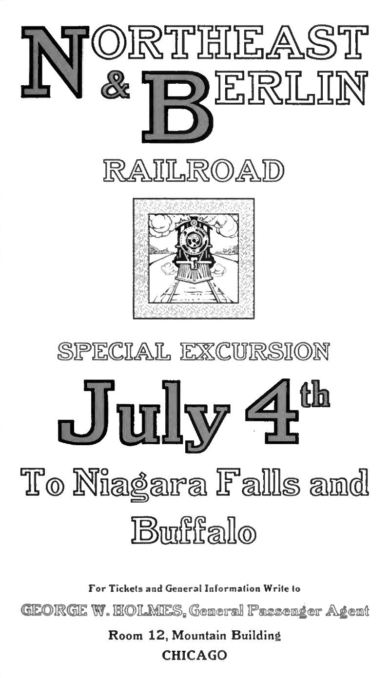 St. Louis-based punchcutter and typefounder (1864-1957) who started the Inland Type Foundry in St. Louis in 1895 together with his brothers Carl and Oswald. He is credited with the heavy square-serif typeface Foster (Inland Type foundry, 1905). Mac McGrew says: [Foster] seems rather crude by later Stymie standards-even compared with the earlier Boston Breton-particularly for the narrow G, the wide J, the high-waisted B, P, and R, and several other unusual letters. Condensed Foster, introduced by the same foundry in 1908, is comparable. He goes on: Adcraft Medium was formerly known as Rugged Medium or Alfred [Medium]. It was originated by Inland Type Foundry and patented by William A. Schraubstadter in 1910. About Comstock, McGrew writes: Condensed Comstock was introduced by Inland in 1905, but patented in the name of William A. Schraubstadter in 1908. It has no lowercase, but the design is more contemporary. Monotype has copied both typefaces, but Monotype Comstock Condensed is in 18-point only, without figures. Schraubstadter also created Woodward and Woodward Outline (1894, Inland Type foundry), Winchell Condensed, Webb, French Script, Devinne Recut, Devinne Recut Outline, and many 19th century typefaces.
 All notes by Mac McGrew about various typefaces designed by Schraubstadter: - Adcraft. The three weights shown by BB&S in 1927 under this name were assembled from three different sources. While they are acceptable as family members, their resemblance to each other is merely coincidental and not as pronounced as in most families. The unifying feature is their rugged or irregular shape, a popular style of the time. Adcraft Black, the oldest member, was introduced by BB&S under the name of Plymouth Bold in 1900 or earlier. It is very heavy, and the most rugged of the group. Fonts contained all the Special characters shown, except for certain ones in the largest sizes. The regular weight of Plymouth (q.v.) was called Adcraft Bold by some users, but that name does not seem to be in any of the founders' literature. Adcraft Medium was formerly known as Rugged Medium or Alfred [Medium]. It was originated by Inland Type Foundry and patented by William A. Schraubstadter in 1910. Adcraft Lightface originated with Western Type Foundry in 1911 as Carlton and was taken over by BB&S as Rugged Lightface; it was also made under the name Puritan by Hansen, which is the source of this specimen. Adcraft Lightface fonts contained all the Special characters shown plus capital AE and DE diphthongs, but Adcraft Medium fonts had ct and st ligatures only. Compare Avil, Drew.
- Comstock was advertised by Inland Type Foundry in 1902 as "a striking novelty, our brand new face." It was revived by ATF in 1957. It is a medium weight conventional gothic, distinguished by a hairline surrounding each letter. The G lacks a crossbar, typical of many nineteenth-century gothics. The design was sponsored by A. H. Comstock of Omaha, according to a review at the time of its introduction. Condensed Comstock was introduced by Inland in 1905, but patented in the name of William A. Schraubstadter in 1908. It has no lowercase, but the design is more contemporary. Monotype has copied both typefaces, but Monotype Comstock Condensed is in 18-point only, without figures. In both foundry typefaces, there are several sizes on 12-point body; No.1 is the largest in regular, but No.1 is the smallest in Condensed. In 1911, a copy of Comstock was issued by Bauer in Germany under the name Astoria, revived in 1957.
- Foster is a heavy square-serif letter, patented and probably designed by William Schraubstadter and introduced by Inland in 1905. It seems rather crude by later Stymie standards-even compared with the earlier Boston Breton-particularly for the narrow G, the wide J, the high-waisted B, P, and R, and several other unusual letters. Condensed Foster, introduced by the same foundry in 1908, is comparable. See Webb for the outline version of the same design.
- Rockwell Antique was a reissue of Litho Antique, cut by William Schraubstadter for Inland Type Foundry and introduced in January 1910 when it was advertised as the "newest typeface; one of our best; closely imitating steelplate and lithography." In the late 1920s similar typefaces became popular in Europe, and some were imported into the United States. Morris Benton of ATF added several characters to the old Inland face, matrices of which were then in ATF's vaults, and it was reissued in 1931 as Rockwell Antique. But Benton saw that something more was needed, and redrew it as Stymie Bold (q.v.) in the same year. The alternate characters which were added to Rockwell are the same ones now shown with Stymie Bold. Monotype copied Rockwell but erroneously called it Stymie Bold in some literature, and there has been confusion between the two typefaces ever since; the latter name is often applied to fonts of Rockwell cast on Monotype machines by secondary suppliers. Indicative of this confusion, Stymie Bold Italic on Mono is series 1891, corresponding to Rockwell series 189, while Stymie Bold is 790. English Monotype has several weights of Rockwell, a square serif family which differs from this typeface and should not be confused with it; see Imports in Appendix. Antique Shaded (q. v.) is sometimes called Rockwell Antique Shaded. For a digital revival of Litho Condensed (1908), see Liz DeLuna's Litho Compressed (2016). Schraubstadter's slab serif was revived and expanded to six weights as ATF Egyptian Antique by Mark van Bronkhorst, Igino Marini, and Ben Kiel.
- Webb is an outline version of Foster (q.v.). It is cut to register for two-color v work; slightly larger so slight misregister will not let the Foster show around C the edges. It was patented in 1905 by William Schraubstadter, probably the designer, and shown by Inland the same year. Condensed Webb was shown shortly after.
- Winchell was designed by Edward Everett Winchell, art director of the Matthews-Northrup Printing Works in Buffalo, New York, and introduced by Inland Type Foundry in 1903 as "especially adapted for use in fine catalog and booklet printing, as well as for commercial stationery, where something out of the ordinary is demanded." It is a bold, thick-and-thin display face, but more like a nineteenth-century design, with some characters seeming to be poorly proportioned or having awkward shapes. These faults are less noticeable in Condensed Winchell, introduced by Inland the following year, but patented by William Schraubstadter in 1905. Neither is a distinguished typeface by later standards. Compare John Hancock, Bold Antique.
- Woodward was designed for Inland Type Foundry in 1894 by William A. Schraubstadter, and named for a Saint Louis printer. Other versions followed over the next few years. In 1911 Inland was purchased by ATF and its equipment divided between that foundry and BB&S. Some time later BB&S reissued Woodward and Woodward Outline as DeVinne Recut and DeVinne Recut Outline (q.v.).
[Google]
[More] ⦿
|
William Addison Dwiggins
|
 Martinsville, Ohio-born illustrator, calligrapher, typographer, book designer, author, type designer and puppeteer, 1880-1956 (Hingham, MA). Pic (1955). All his typefaces were designed for the Mergenthaler Linotype Company, where he worked for 27 years. He also was Acting Director of the Harvard University Press, 1917-1918. In 1919, he founded the Society of Calligraphers, Boston, and was in fact an accomplished calligrapher, who drew many ornaments and designed many jackets. Dwiggins studied lettering under Goudy in Chicago while a student at Frank Holme's School of Illustration. When Goudy moved to Hingham, Dwiggins followed and was to work there for the rest of his life. As a puppeteer, he often used the pseudonym Dr. Hermann Puterschein. His papers:
 - Some why's and wherefore's of the shapes of roman letters (1919), a short essay full of quotes, some good, but mostly derogatory, regarding the main text types in vogue at the time, such as Century, Caslon, Cheltenham, Pabst, Cadmus and Scotch.
- WAD to RR, a letter about type design, Department of Printing and Graphic Arts, Harvard College Library, Cambridge, MA, 1940. In this letter to a friend, RR, entirely written in a beautiful hand, he explains how to make type.
His typefaces: - Arcadia (1943-1947). Mac McGrew: Arcadia was an experimental typeface designed by William A. Dwiggins for Mergenthaler in 1943-47, used in Some Random Recollections, by Alfred A. Knopf for the Typophiles as Chapbook XXII in 1949.
- Caledonia (1938-1939). Known as Transitional 511 at Bitstream, New Caledonia at Adobe, and New Caledonia at Linotype. See C651 Roman on the SoftMaker MegaFont XXL CD, 2002. Nicola Caleffi complains that New Caledonia and BT 511 are too weak and miss old style figures.
Mac McGrew: Caledonia and Caledonia Italic were designed by William A. Dwiggins for Linotype in 1938, with Caledonia Bold and Bold Italic added two years later. A Bold Condensed version was produced by Lino for newspaper head- line use. Caledonia has been described as a modernization of Scotch Roman (and Caledonia is the ancient name for Scotland), but it is more than that. It also shows the influence of the Bulmer typeface, with a large portion of Dwiggins' individuality. He describes the typeface as having a "liveliness of action. [...] quality is in the curves---the way they get away from the straight stems with a calligraphic flick, and in the nervous angle on the under side of the arches as they descend to the right." Being designed specifically for the Linotype and its mechanical limitations, rather than being adapted from a foundry face, Caledonia Italic is particularly successful, and the whole family has become very popular. In text sizes, short descenders may be cast on nominal body sizes, while the more handsome long descenders (not made for italics) require one point larger body size. Compare Baskerville, Bulmer, Scotch. - Caravan Borders (1938). Four fonts available at Linotype (1976).
- Charter (1946). Mac McGrew: Charter was an experimental, special-purpose typeface designed by William A. Dwiggins for Mergenthaler between 1937 and 1942. An upright script, only the lowercase and the few other characters shown were completed. For tests, these were combined with Electra caps. It was used in a limited edition book, The Song Story of Aucassin and Nicolete, designed and printed in 1946 by S. A. Jacobs at the Golden Eagle Press, Mt. Vernon, New York, with Electra small caps in place of regular caps. Between 2010 and 2018, Cristobal Henestrosa developed the titling typeface Royal Charter, a digital revival of Charter. With the help of Oscar Yanez, this became a retail typeface at Sudtipos called Mon Nicolette.
- Eldorado (1953). Berry, Johnson and Jaspert give an earlier date, 1951. Created after a 16th century early roman lowercase by Jacques de Sanlecque the elder. Revived in 1993 at Font Bureau as Eldorado by David Berlow, Jane Patterson, Tobias Frere-Jones, and Tom Rickner. Mac McGrew: Eldorado is a contemporary roman designed by W. A. Dwiggins for Linotype about 1950, based on early Spanish models. The lowercase is compact, with a small x-height and long ascenders. Several italic letters have cursive or decorative forms; also notice the cap Y, with curved, serifless arms.
- Electra (1934-1935), a text typeface with a distinctive Q but otherwise unobtrusive glyph shapes. Known as Transitional 521 at Bitstream. Mac McGrew: Electra is a contemporary modern typeface designed by W. A. Dwiggins for Linotype. The light weight was drawn in 1935, the bold a few years later. Aside from its readability and distinctive character, Electra is distinguished by a choice of italic forms. Electra Italic is really a sloped roman, while Electra Cursive, released in 1944, is more nearly a conventional italic form; only the lowercase is different. Like a number of the better Linotype typefaces, Electra also has a choice of short descenders, which will cast on the nominal body, or long descenders, which must be cast one point larger. Compare Fairfield. A digital revival was done by Jim Parkinson in 2010: Parkinson Electra. Parkinson did another revival in 2017, Aluminia, exclusively for use in Bruce Kennett's 2017 book on W.A. Dwiggins. In 2018, Laura Garcia attempted a revival while studying at Type West.
- Experimental 267D.
- Falcon (published in 1961) is an experimental font at Mergenthaler Linotype. Mac McGrew: Falcon was designed during World War II for Linotype by William A. Dwiggins and released in 1961. It seemed to him, he said, "to hit the middle ground between mechanical exactitude and the flow and variety of a written hand-suggesting some of that flow and variety but controlling it, so the letter can be repeated."
- Hingham (1937-1943). Mac McGrew: Hingham was an experimental newspaper face, originally called Newsface, designed between 1937 and 1943 by William A. Dwiggins, for improved readability. Only the 7-point size was cut by Mergenthaler, and it was used only for tests.
- Metro (1929-30). This famous sans serif family was published by Linotype in 1936-1937. It is also called Metroblack, and sometimes dated 1928. In digital format, it is known as Geometric 415 at Bitstream, and Metro Office, Metro #2, Metrolite, Metromedium and Metroblack at Linotype. It is DH Sans at FontHaus. It was revived as Examiner NF by Nick Curtis (2009). It lives another life as Grosse Pointe Metro at Group Type. Mac McGrew: Metrolite and Metroblack were designed by William A. Dwiggins and introduced by Linotype in January 1930, as the first American typefaces to join the trend to sans serif started by Futura and Kabel. These typefaces are less mechanical than the European imports, and were promoted as being less monotonous and illegible. The first two weights were soon followed by Metrothin and Metromedium. In 1932 several characters were redesigned; thereafter the series was promoted as Metrothin No.2, Metrolite No.2, Metromedium No.2, and Metroblack No.2, including the redesigned characters, but the original characters were available as extras. Metrolite No.2 Italic was shown in 1935, along with Lining Metrothin and Lining Metromedium, which are like the small caps of the regular typefaces. Italics for Metromedium No.2 and Metroblack No.2 were shown in 1937. Metrolite No.4 Italic and Metrothin No.4 Italic are essentially the same design but narrower, for mechanical purposes. Unique Capitals are made for some sizes of Metrothin and Metromedium. Alternative figures are made as follows: Gothic No. 39, for Metrothin No.2, similar to Spartan Light. Gothic No. 40, for Metrolite No.2, similar to Spartan Medium. Gothic No. 41, for Metroblack No.2, similar to Spartan Black. Gothic No. 42, for M etrothin No.2, similar to Kabel Light. Gothic No. 43, for Metrolite No.2, similar to Kabel Medium. Gothic No. 44, for Metromedium No.2, similar to Kabel Bold. Gothic No. 45, for Metroblack No.2, similar to Sans Serif Extra Bold.
- Stuyvesant (1942-1947). Mac McGrew: Stuyvesant and Stuyvesant Italic were designed in 1942-47 by William A. Dwiggins, inspired by a quaint Dutch type cut by J. F. Rosart about 1750, and used in 1949 in The Shelby Letters, from the California Mines, 1851-1852, published by Alfred Knopf. An entirely different Stuyvesant, a novelty design, was made by Keystone before 1906, perhaps before 1900.
- Tippecanoe (1944-1946). McGrew writes: Tippecanoe was an experimental typeface designed in 1944-46 by William A. Dwiggins for Mergenthaler, on the Bodoni-Didot theme. It was used in a book by Elizabeth Coatsworth, a friend of Dwiggins, The Creaking Stair, published in 1949 by Coward-McCann. Compare Louvaine Bold [by Morris Fuller Benton]..
- Winchester (1944). Revived as ITC New Winchester by Jim Spiece. Mac McGrew: Winchester Roman and Winchester Uncial with their italics were completed in 1944 by William A. Dwiggins, the Uncial being an experiment aimed at making the English language easier to read by eliminating some of the ascenders and descenders typically used in this language. Italic caps and other characters were drawn in 1948 but not cut. Although made on Linotype matrices by Mergenthaler, fonts of hand type were cast and used only by Dwiggins and Dorothy Abbe beginning in 1950 at the Puterschein-Hingham Press, where they were partners until his death in 1956. In the specimen shown here, the uncial f appears in both italic alphabets. A regular italic f was cut but apparently not cast.
- He worked with multiple typewriter manufactures including Underwood, Remington Rand, and IBM, but none of them were finished. He left a number of intriguing drawings which are now kept at the Boston Public Library. In his Dossier, Toshi Omagari combined these materials to make a cohesive monospaced typeface family: the upright was taken from a drawing of monospaced lowercase for an unknown client, and the italic was from the work he did for Underwood which he called Aldine.
Matt Desmond created Dwiggins Deco in 2009 and writes: This typeface was originally designed in 1930 by W.A. Dwiggins as the cover for the book "American Alphabets" by Paul Hollister. Only the 26 letters of the alphabet were included on the cover, so the rest of the numbers, punctuation, symbols, and accented characters have been crafted in a matching [art deco] style. A free version called Dwiggins Initials KK was designed in 2012 by John Wollring. Noteworthy also is Stefan Hattenbach's Dwiggins Script (2018), developed together with Glenn Sjökvist. Books about Dwiggins include Bruce Kennett's W.A. Dwiggins A Life in Design (2017, Letterform Archive). Linotype link. FontShop link. Klingspor link. MyFonts link. Bio by Nicholas Fabian. Flickr picture group for Dwiggins. View digital typefaces based on the work of Dwiggins. View W.A. Dwiggins's typefaces. [Google]
[MyFonts]
[More] ⦿
|
William F. Capitain
|
Punchcutter, b. 1851, Southgate, UK. Picture. In 1865, he went to Flinsch in Frankfurt to study punchcutting with William Kirkwood. Then he left for Chicago, and became American. His later work was done while he lived in Bayonne, New Jersey. His typefaces, often quite ornamental and/or Victorian, were all done at Marder, Luse & Co, except Adtype (+Italic) (1903, ATF), Lithograph Shaded (1914, ATF, with Morris Fuller Benton), an unnamed typeface patented by ATF in 1916, and Alfereta (ca. 1897, Crescent Type Foundry: Alfereta by Dan X. Solo is a digital revival). Google patent link. On Adtype, Mac McGrew writes: Adtype is a square-serif typeface patented in 1903 by W. F. Capitaine and introduced by ATF. An early example of this sort of square-serif letter, it is distinguished by its high-waisted R and unusual g. Compare Adstyle, John Hancock, Bold Antique, Contact Bold Condensed. Figures and some other characters are narrower in the Monotype cutting shown, which was produced about 1912. The italic is inclined an extreme 24 degrees. One of the revivals is Capitaine (2019, Letters from Sweden), which the Swedes descrive as a good-humoured slab serif. The Marder, Luse typefaces by date: - 1877: Parallel Shaded.
- 1881: Ladies Hand Script.
- 1885: Critic, Fancy Grotesque, Octagon, Pencillings.
- 1886: Hiawatha, Parthenian, Roumanian, Spartan.
- 1887: Georgian, Utopian [image].
- 1888: Lithotint, Trinal 1, 2 and 3.
- 1889: Banquet, Caxton Old Style, Caxton Italic.
- 1890: Ebony. This typeface was revived in 2011 by Claude Pelletier as a free font.
- 1891: Diagonal Card Black.
- 1894: Caxton Old Style Bold.
- 1895: Circular Gothic, Circular Italic.
Patents of various typefaces in PDF format: 1885, 1885, 1885, 1886, 1886, 1886, 1887, 1889. [Google]
[MyFonts]
[More] ⦿
|
William H. Bradley
|
 Book designer, poster designer and typographer, born in Boston (1868). He died in 1962. His typefaces include the following:
 - Abbey Text (1895, A.D. Farmer).
- Bradley (ATF, 1895). This blackletter typeface was cut into a wood type by Hamilton in 1900.
- A beautiful unnamed lettering for the Inland Printer (1891-1892).
- He drew the Bradley Series and licensed it to American Type Founders in 1895. That blackletter design was copied and issued by the Inland Type Foundry (as "St. John") and by A.D. Farmer&Son Type Founding Co (as "Abbey Text", still 1895). Also in 1895, Hermann Ihlenburg at ATF made the Germanic-language version of the Bradley Series. Several German foundries had metal versions of his 1895 series under the names Halbfette Altgotisch, Altfettgotisch and Amerikanische Altgotisch, such as Bauersche Giesserei and Schelter & Giesecke (1903). Digital revivals: Fyne Fish NF (Nick Curtis, 2009), Bradley Pro (2005, Ralph Unger at Profonts), Bradley DJR (2018, David Jonathan Ross). Bradley was used by Disney in its Sleeping Beauty Castle.
- Priory Black (ATF, 1897-1898) is said to be due to Bradley. In 1904, ATF introduced a modernized version called Cloister Black (or Cloister Text), designed by Joseph W. Phinney or Morris F. Benton.
- Bradley Roman and Italic saw the light in 1901 when Bradley was writing Peter Poodle, Toymaker to the King, and these typefaces are known as the Peter Poodle types.
- In 1904, he co-designed Antique Bold with J.W. Phinney and Morris Fuller Benton at ATF.
- His Bewick Roman series (1904) has gorgeous ligatures (tt, ct, and so on). Mac McGrew: Bewick Roman was designed by Will Bradley in 1904 and issued by ATF the following year. It is a quaint display type with a number of unusual characteristics. Several capitals have both wide and narrow versions, although generally the typeface is rather narrow; there are also several tied charac$Gters and ornaments in the font, as was common with nineteenth-century designs. Compare Rogers, Vanden Houten.
- Wayside Roman and Italic. Mac McGrew: Wayside Roman and Italic were shown by ATF in 1900, as a handsome interpretation of modern typeface similar to Scotch Roman, but without the heavier capitals of the latter face. Some sources say the designer was Will Bradley, but this is disputed by other authorities, and most likely it is a revival of an older face. It was not in regular production very many years, but special castings have been made at times. Some figures appear to be oversize---6, 7, and 9 in the specimen shown here---but this is a characteristic of the font, although not uniform from one size to another. Also compare Oxford, Bell.
- In 1904, he created the beautiful Chap-Book series (Cuts, Borders, Directors (pointing fingers), Guidons (unbelievable parentheses)), as well as the Mission Toys Ornaments, all at ATF. Thereafter followed Missal Initials, Wayside Borders (1904), Wayside Ornaments (1904), Cloister Borders (1905), Cloister Initials (1905), Indian Borders (before 1908). Some of his ornaments made it to American Pi NF (2006, Nick Curtis) and to the five-font-set Bradley Dingies (by Paulo W, 2009). Mac McGrew: Missal Initials were issued by ATF in 1904; their design has been ascribed to Will Bradley. Derived from fifteenth-century sources, each letter is designed to fill a square area. Compare Caxton Initials, Lombardic Initials. For a digital version of Missal Initials, see Initials ATF Missal Caxton (2012, Alter Littera).
- Bradley Initials (1934). For a degital version, see Glenda de Guzman's Bradley Intials (1994, Font Bureau).
- Vanity (1921-1930) is custom type he made while he was art director.
- His last group of typefaces was Bradley Combination Ornaments, made in 1952 for Steve Watts, type merchandising director of the American Type Founders Company.
- Roman alphabet by Bradley.
Fontshop link. A Booklet of Designs (1915, New York) contains many of his interesting drawings for typefaces. [Google]
[MyFonts]
[More] ⦿
|
William Martin
|
British typefounder and punchcutter (1757-1830) who trained under Baskerville, and was active as supplier to the Boydells, Nicols, the Bewicks, and Bulmer, 1776-1815. Born in Birmingham, he died in London in 1815 (others say 1830). In 1792, he designed the Bulmer typeface for the Shakespeare Press. Morris Fuller Benton's ATF version of the Baskerville style text typeface cut by William Martin for the English printer and publisher, William Bulmer, is called Bulmer. It is available from Bitstream in two styles, and from Monotype as Bulmer MT. ATF released the design in 1928. Adobe and Monotype, which have a multistyle family [much larger than the Bitstream family], now called Bulmer MT, write: Designed in 1792, the Bulmer types are named not after their designer, William Martin, but after the printer who used them so well in his Shakespeare [sic] Press editions. In fact, it was Morris Fuller Benton who gave them the name back in 1928 when he was creating revivals for American Type Founders. Originally, Martin's type was the English answer to the sharp, fine letterforms of Italy's Bodoni and France's Didot type foundries. But the Bulmer types did more than imitate the starkness of the modern-style Didot-Bodoni types. By condensing the letterforms, giving the strokes higher contrast, and bracketing the serifs slightly, Martin made his typefaces both beautiful and practical. Poster by Daniel Berkowitz. FontShop link. [Google]
[MyFonts]
[More] ⦿
|
William Martin Johnson
|
In 1903, William Martin Johnson published the beautiful Bulfinch Oldstyle at ATF. It was created for use in The Ladies' Home Journal (Curtis Publishing Company). Bulfinch was released for general sale to printers by ATF in 1905. Morris Fuller Benton helped in the production. Mac McGrew: Curtis specified a design devoid of oddity or freakishness, yet graceful and legible. Adjustments for practical foundry production were made by Morris F. Benton. Although it was used extensively as heads in their magazine, it was advertised to printers in general in 1905. Compare Meriontype. Bulfinch inspired Hernandez Bros (2021, by Daniel and Eli Hernandez). . He also created the (Victorian) Meriontype series for use in the same journal in 1905. ATF writes The requirements called for a composite modernization of popular oldstyle typefaces, retaining all of their desirable features, while eliminating those proven undesirable. It was further stipulated that the Meriontype letters must be interusable with the letters of Bulfinch, or sister series. McGrew adds: Some letters appear to be identical in the two series, others are similar, although the serifs of Meriontype are generally a little larger and more angular. The lowercase g of the latter typeface has the appearance of being reversed. Meriontype was revived by Nick Curtis in 2014 as Meriwether Circular NF. [Google]
[MyFonts]
[More] ⦿
|
Wooden Type Fonts (was: American Wood Type and, Wooden Type)
[Jordan Davies]
|
 Wooden Type Fonts (was: American Wood Type) is founded and run by Jordan Davies from South Hero, VT: Historically accurate reproductions of wood type produced in the 19th century in a variety of styles. This is a work of passion and dedication by Jordan Davies. Jordan's other passion is painting. His (digital) wood typefaces include these original designs: Bevan Condensed, Bevan Medium (based on Melior), Inline Regular, London Light, London Heavy, Neo Geo Block, Quirk, Slab Four Rounded (+Ext), Slab Four Rounded Italic, Slab Four Rounded Revised, Slab Four Rounded Super. MyFonts link. Digital revivals:
 - 20th Century ExtraBold Extended (2017). A very wide version of Futura.
- Aetna Bold.
- Alpine Mtn (2021). a display sans with some stencil glyphs.
- Antique 6 (based on Stevens, Shanks), Antique Condensed Bold, Antique Light, AntiqueRegular (saloon font), Antique Five, Antique Sans, Antique Shadow, Antique Six, Antique Three, Antique Tuscan 1, Antique 7 (2011), Antique Tuscan 8 (2008), Antique Tuscan Condensed, Antique Tuscan Heavy, Antique Wells Medium (2005), Antique Wells Expanded (2011, based on Wells&Webb), Antique Two (2008), Antique XX (2008).
- Bernhard Gothic Medium (2017, after Lucian Bernhard).
- Blobbing (2013, a fat finger typeface), Bodoni Ultra (2015, based on a Bauer Types original).
- Cassjor (2011): an angular face.
- Cheltenham (2019), (2019).
- Churchward Ultra Bold (2018).
- Clarendon Condensed, Clarendon Condensed Bold (2007, based on a 1859 design by William Hamilton Page), Clarendon Extended (2005, after W.H. Page), Clarendon Heavy, Clarendon Extra Condensed (2007), Clarendon 618 (2010), Clarendon 617 (2010), Clarendon Semi (2011), Clarendon Jordan (2015).
- Columbian (2015) and Columbian Slab (2015). Heavy classical Egyptians.
- Concave Tuscan X Condensed.
- Craw Clarendon (2013), Craw Clarendon Extended (2015), and Craw Clarendon Bold (2014).
- Davies Serif (2014): a great wide wood-inspired wedge-serifed display didone.
- Devendra (2021). A counterless stencil typeface.
- DeVinne Wood, DeVinne Wood Italic.
- Doric Condensed, Doric Expanded.
- Egyptian Bold, Egyptian Ornamented (+Bold), Egyptian Regular, Egyptian Slab (2007), Egyptian Two, Egyptian Wide (2006, based on a Miller&Richard original, ca. 1850), Egyptian Bold Expanded (2011), Egyptian Extra Bold Condensed (2011), Egyptienne75 Black (2020).
- French Antique Condensed.
- French Calrendon (2015) and French Clarendon Expanded (2015).
- Gallatin Light (2021), Gallatin Bold (2019) and Gallatin Medium (2020). A slab serif.
- Girder Heavy (2008, based on a design of W.H. Page, ca. 1900), Girder Super (2014, a slab serif based on William Hamilton Page).
- Gothic Bold, Gothic Bold Extended, Gothic Extra Extended, Gothic Extended (2009), Gothic Medium, Gothic Nesbitt (2011), Gothic Leavenworth (2015), Gothic Number Sixteen (2019), Gothic Special Condensed Bold (2005), Gothic Special Condensed Medium (+Italic, 2013), Gothic Special Normal (+Italic, 2013), Gothic Special Thin, Gothic Tuscan, Gothic Tuscan 9 (+Narrow), Gothic Tuscan 8 (+Pointed), Gothic Tuscan Condensed, Gothic Tuscan Round, Gothic Tuscan Concave, Gothic Tuscan Pointed Narrow, Gothic Unique (2007).
- Grecian Bold Condensed, Grecian XX Condensed, Grecian Bold Expanded (2014).
- Grotesque (2010), Grotesque Bold Italic (2013).
- Jensen Old Style.
- Jordan Calligraphy (2015).
- Kurilian (2015). After a 1879 spurred wod type design by Heber Wells.
- Lettres Angulaires (2010): based on Textura.
- London Heavy and London Medium (2017). A revival of Johnson Underground.
- Mansard. This revives a wood type from 1878 by Heber Wells.
- Martin Bold (2018), Martin Medium Regular (2018).
- Masterman (2017). After a typeface by Boston's Hansen foundry.
- Mementor Bold (2018) and Mementor Medium Regular (2018).
- News Gothic Bold (2017) and News Gothic Light (2017). After Morris Fuller Benton's original at ATF.
- Number5 Reg (2010). A variation of the William Page 500 font.
- Number 154 (2006, based on a 1887 design by William Hamilton Page), Number 515 Black, Number 514 (2011).
- Octagon.
- Peerless (2008). Peerless 131 Bold (2012) is a wedge serif design based on William Hamilton Page.
- Penny (2007, a gorgeous didone headline font based on a 1838 wood type font by George Nesbitt).
- Roman X Condensed (a great didone font), Roman X Expanded, Roman Wells Bold.
- Rubens Regular (2005) and Rubens Expanded Regular (2018).
- Sainted Medium, Sainted Extra Bold (2018). Two slab serif typefaces.
- Skeleton Antique (2005-2012). Based on a William Page original from 1865.
- Slab Four Rounded (2010, +Bold, +Super).
- Stymie Extra Bold (2018).
- Teniers Regular.
- Teutonic.
- Thorowgood (2010): a relatively low-contrast Clarendon based on a wood specimen sheet. Thorowgood Wide was done in 2013.
- Times Gothic (2009).
- Trenton, Trenton Condensed (2005, based on an 1889 typeface by James Edward Hamilton), Trenton Ornamented.
- Trooper Roman Black (2020).
- Tuscan Egyptian, Tuscan Italian.
- Video Black (2020).
- Venusian Bold Extended (2018). The name refers perhaps to the classic Bauersche sans typeface Venus.
- William Page 500, William Page 506.
- Wood Regular (2005).
Showcase of his most popular fonts at MyFonts. Klingspor link. [Google]
[MyFonts]
[More] ⦿
|
Yusof Mining
[Gearwright]
|
 [More] ⦿
|


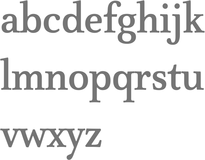
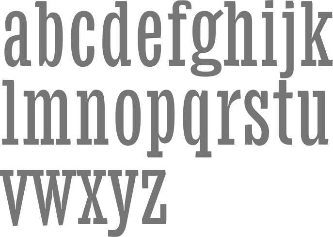
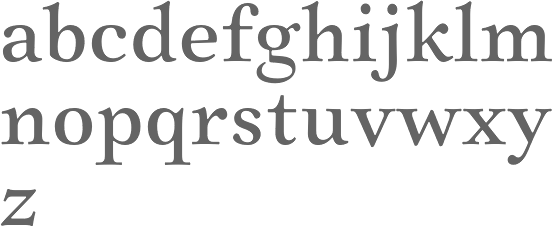
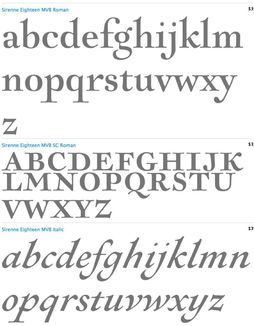
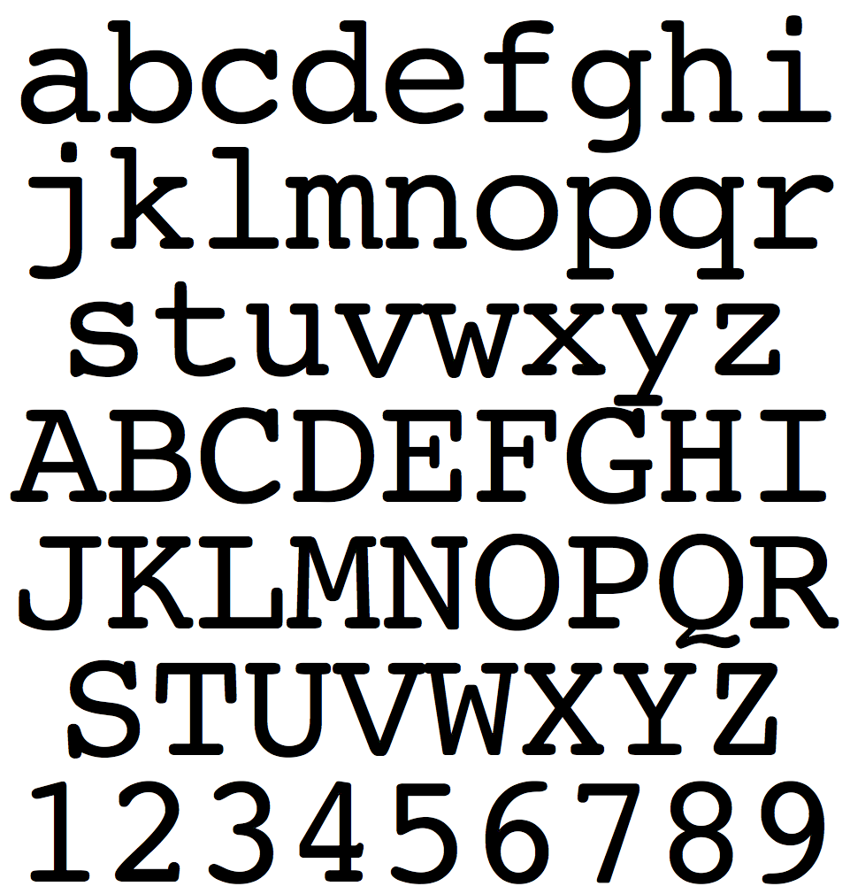
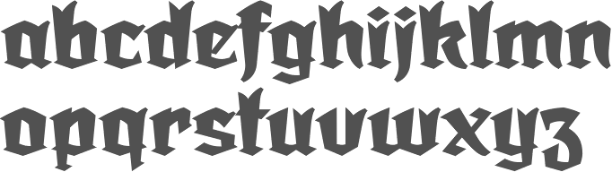
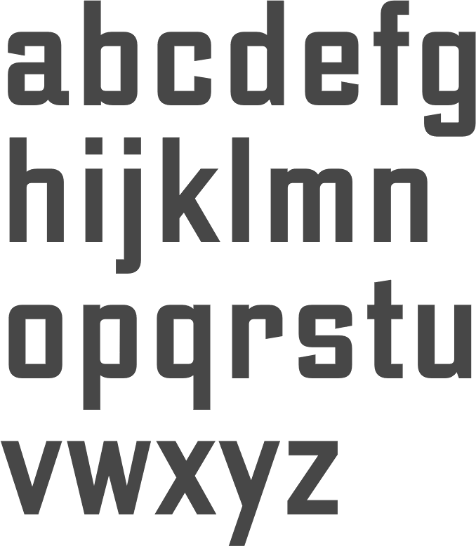
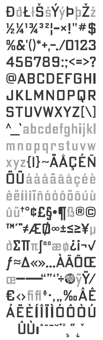
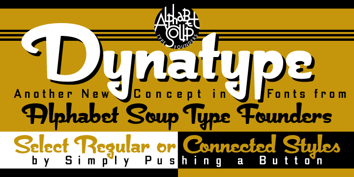
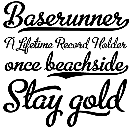
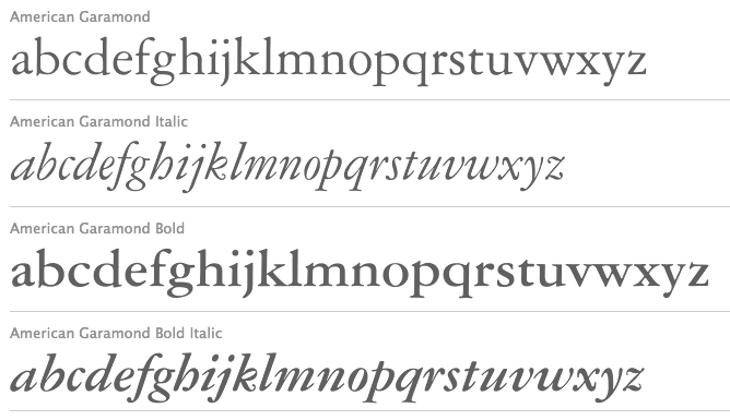
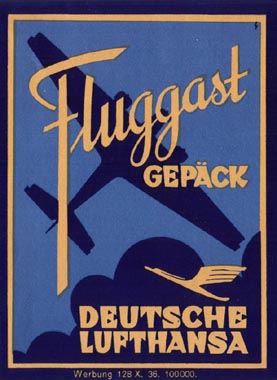
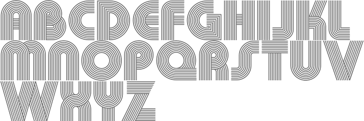
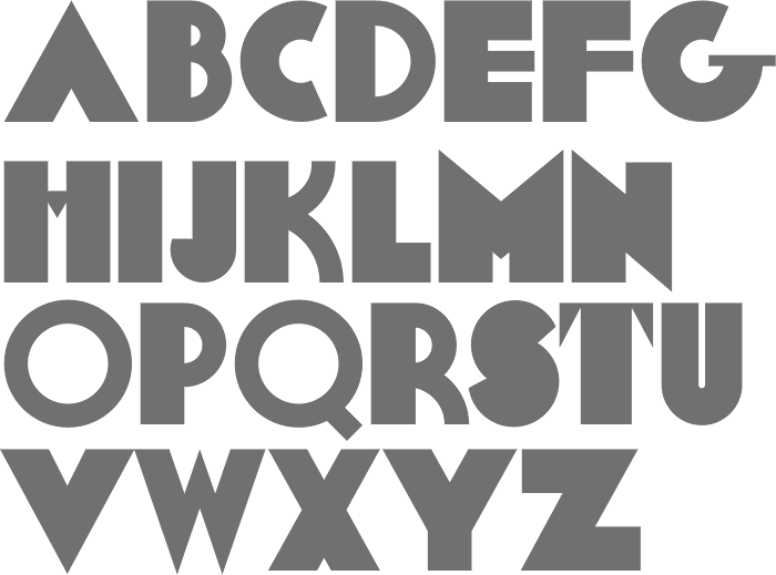
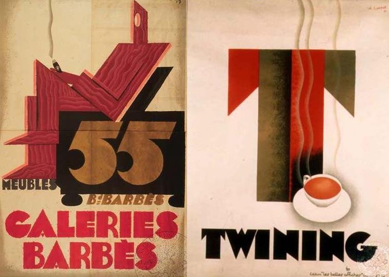
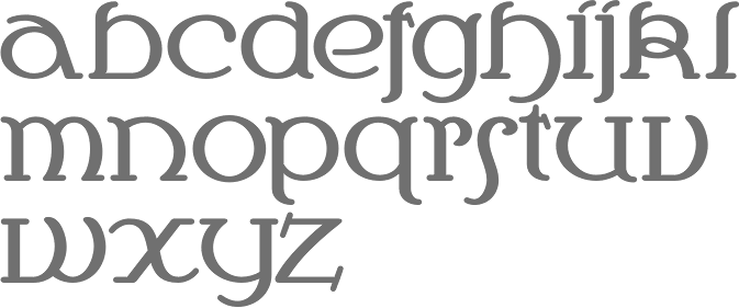
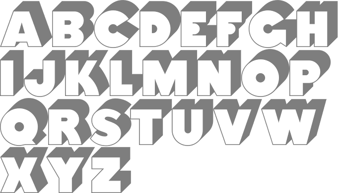
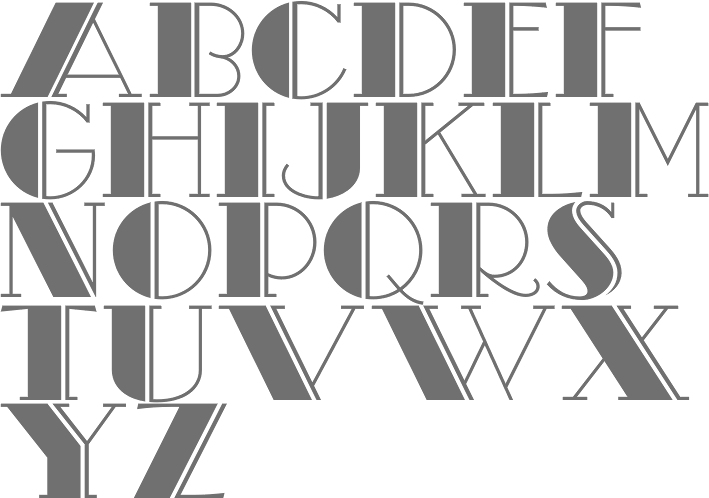
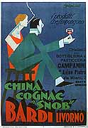
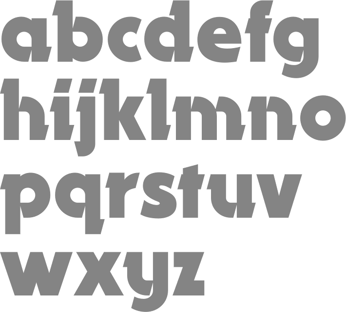
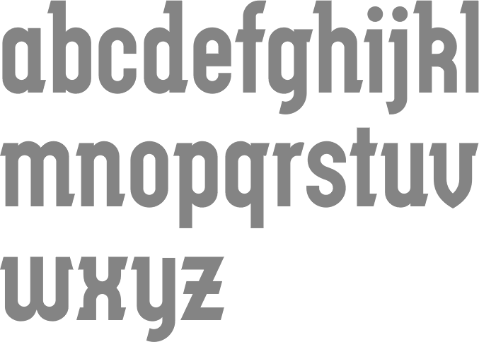
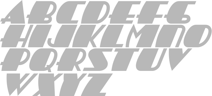
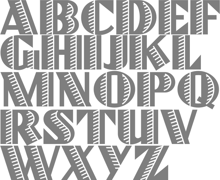
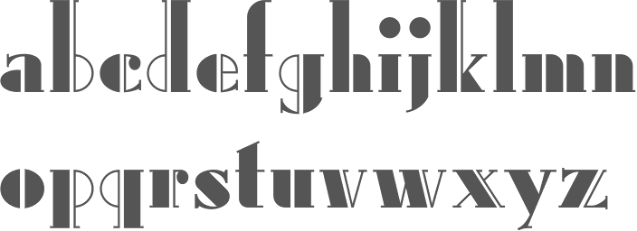
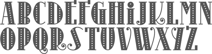
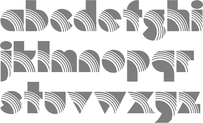
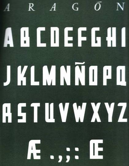
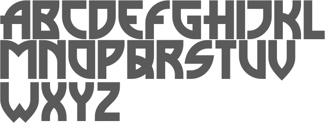
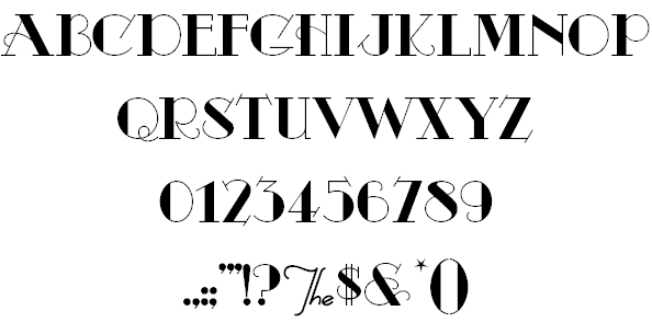
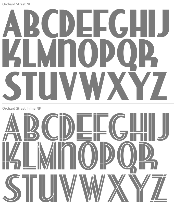
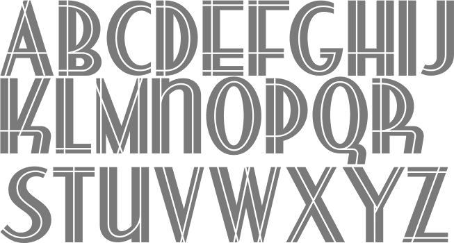
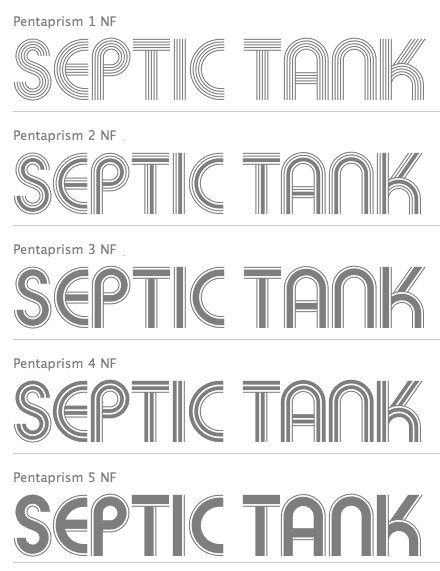
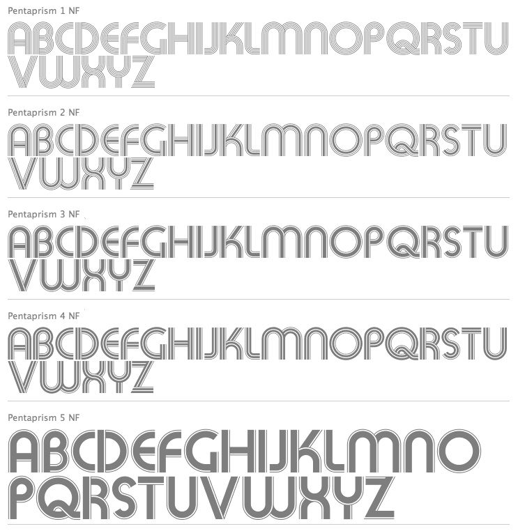
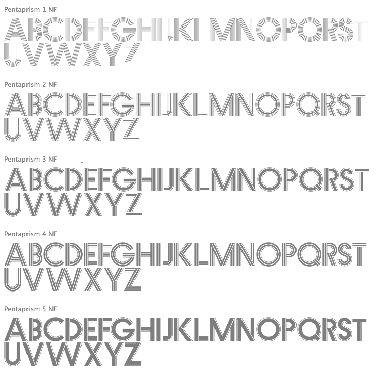
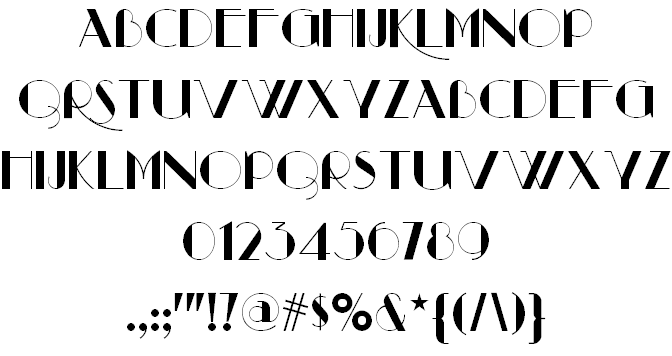
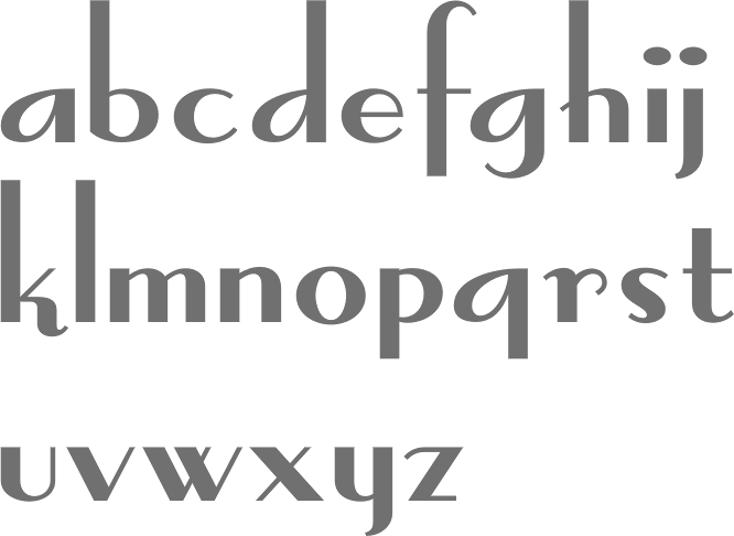
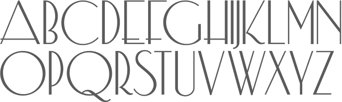
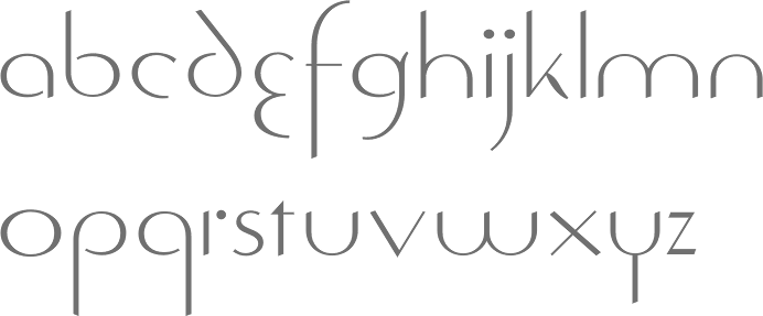
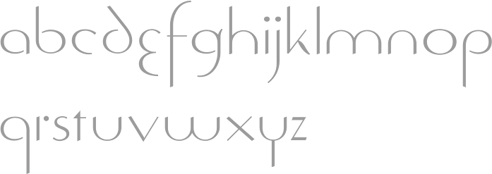
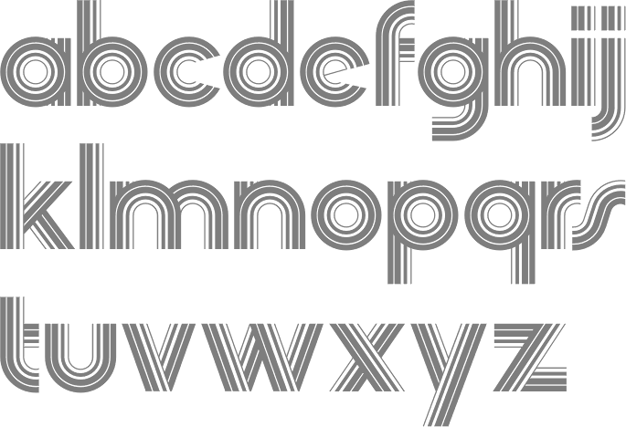
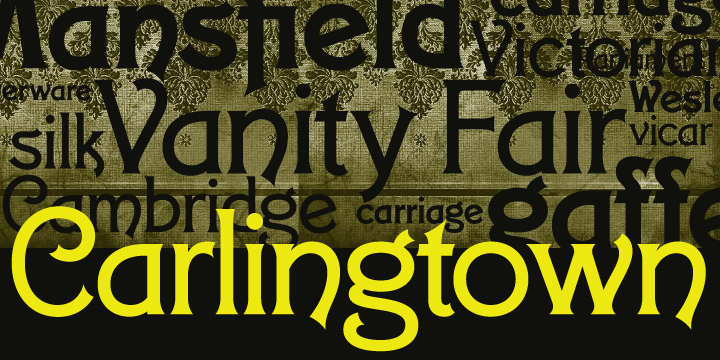
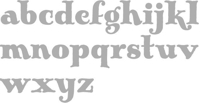
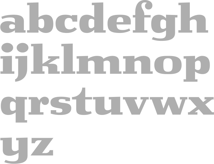
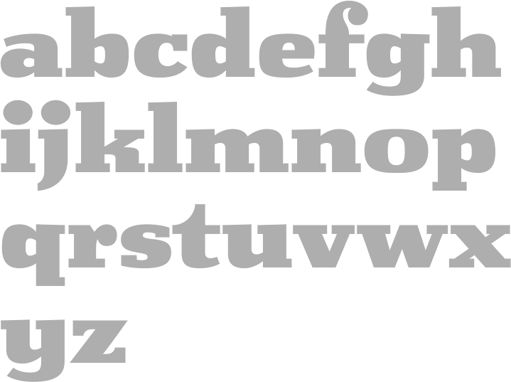
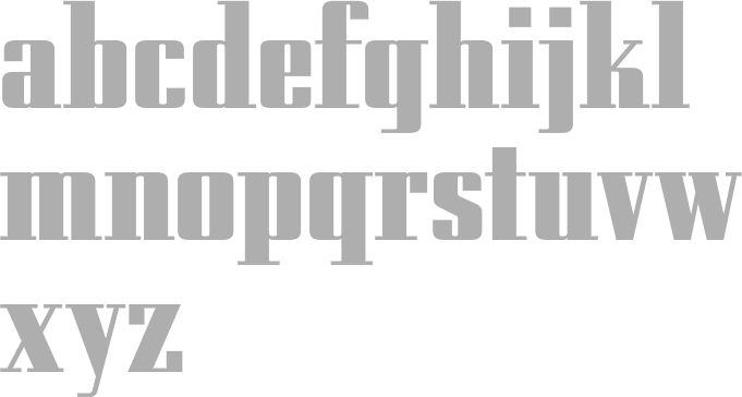
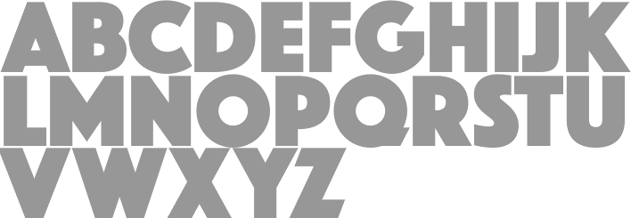
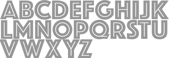
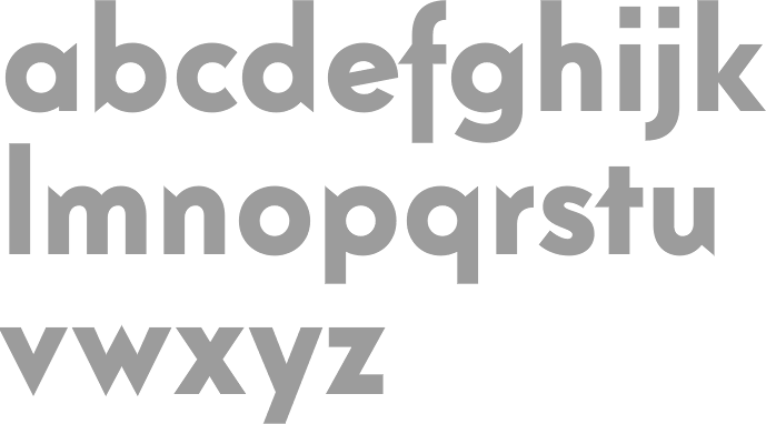
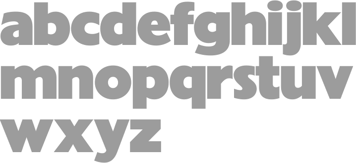
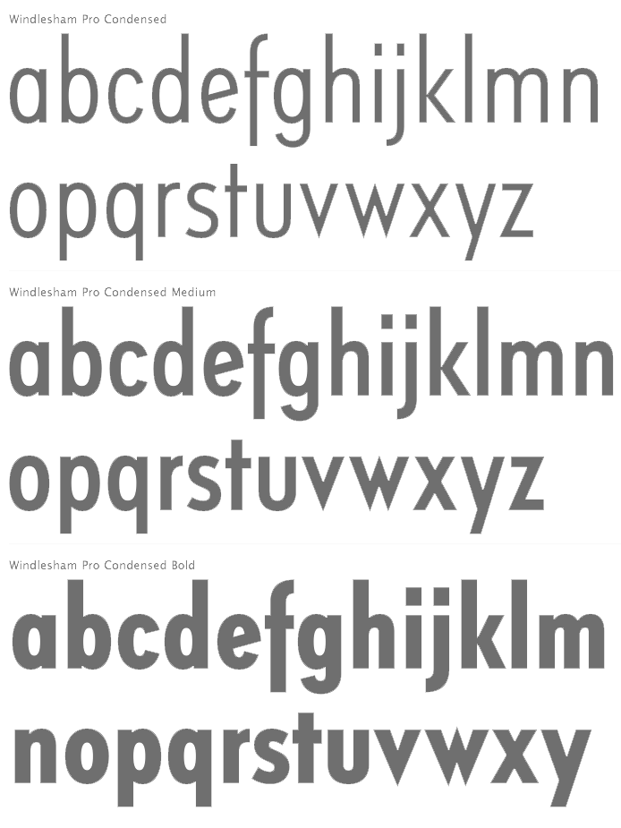
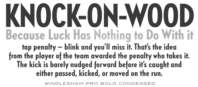
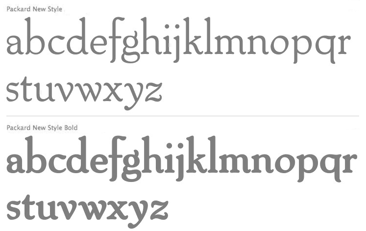
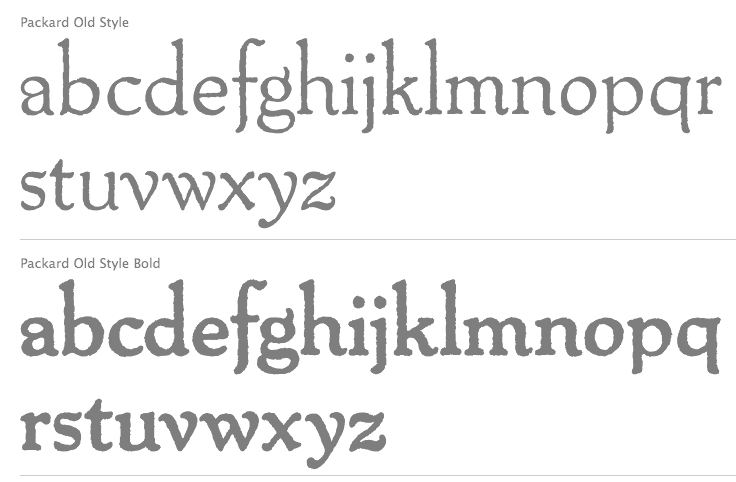
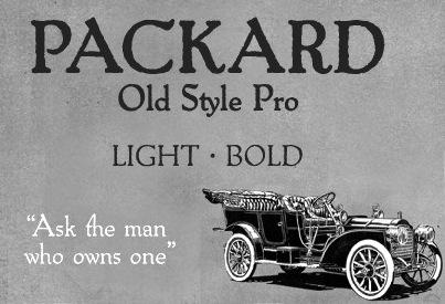
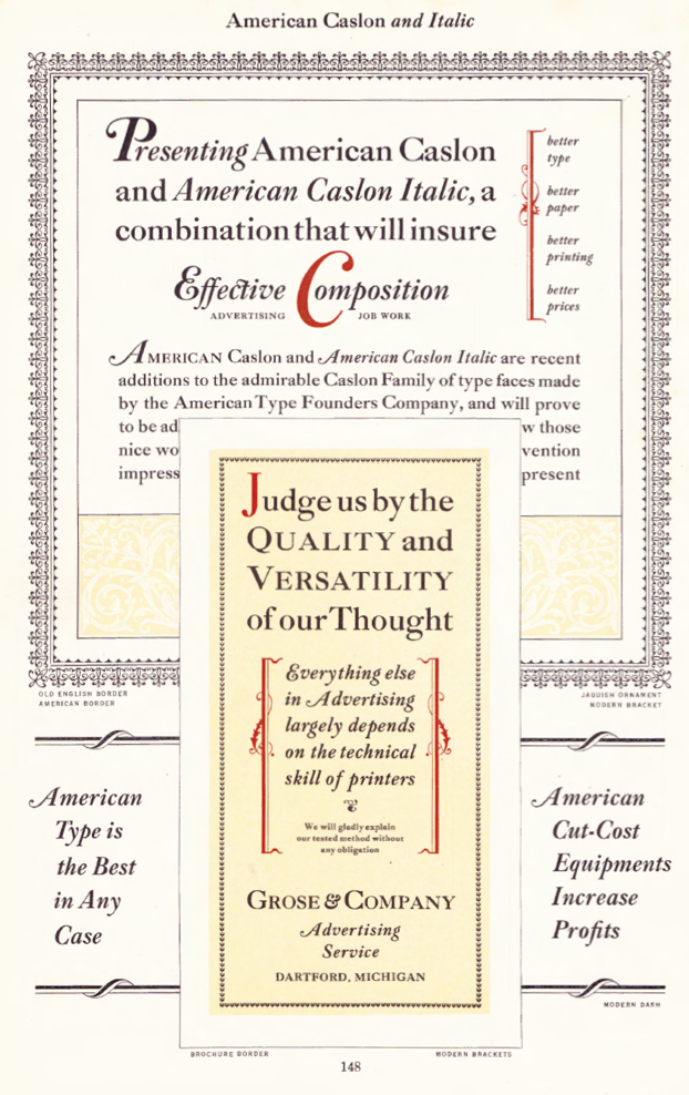
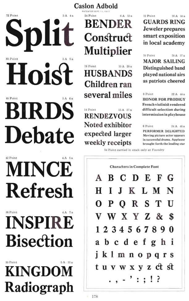
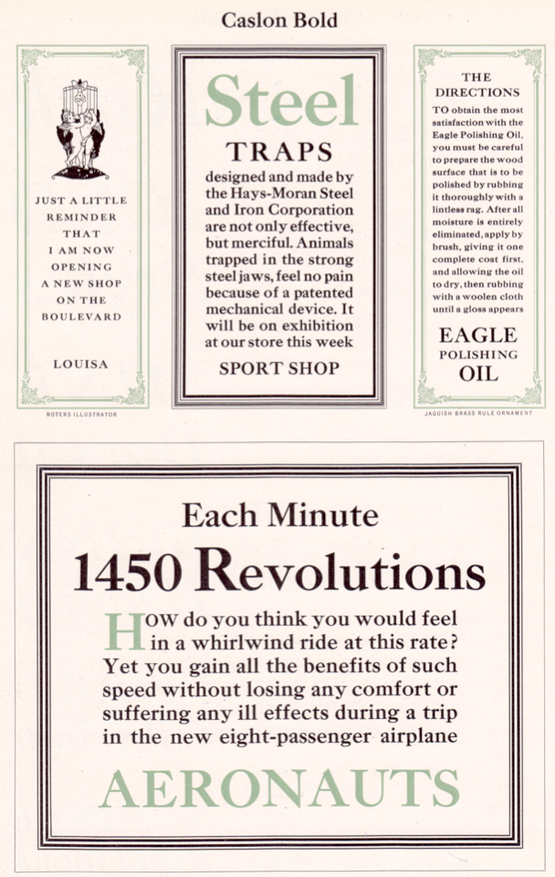
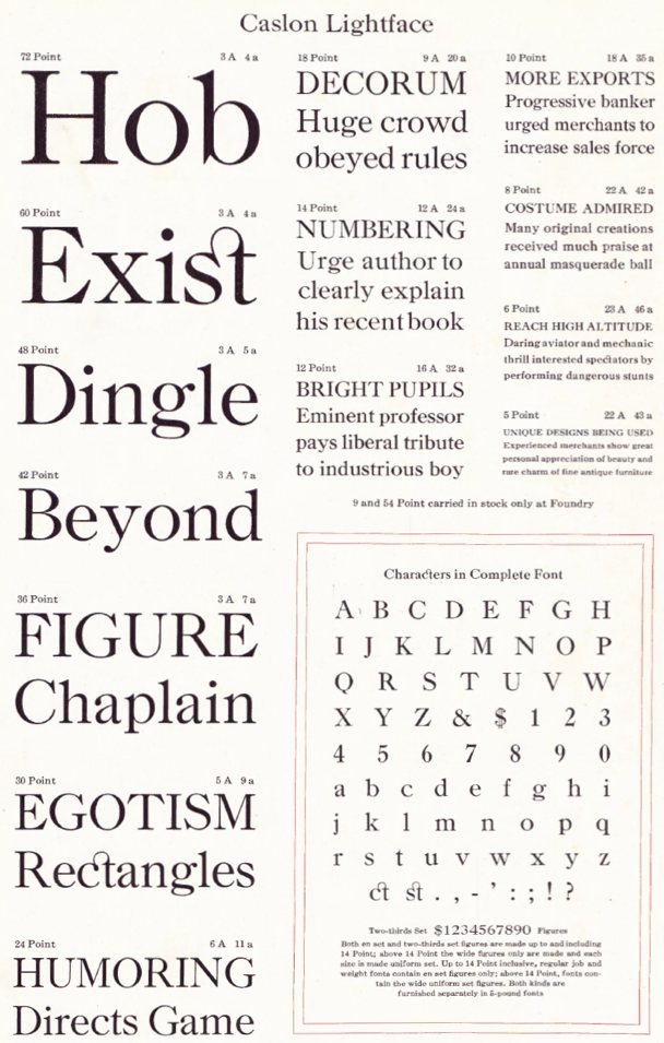
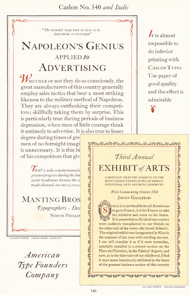
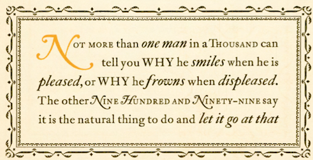
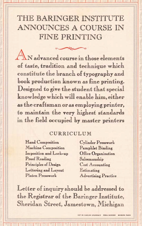
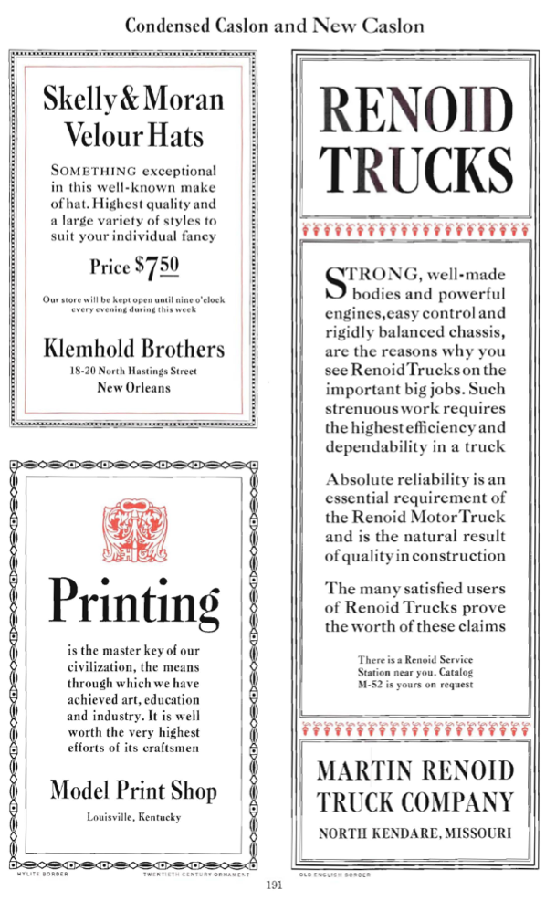
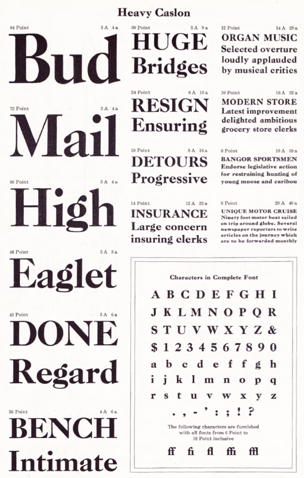
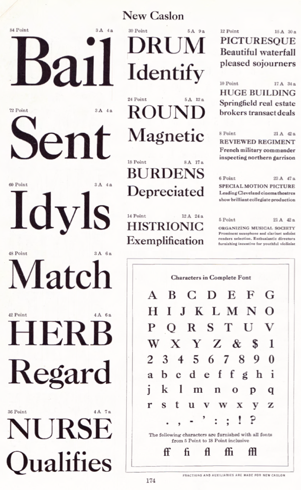
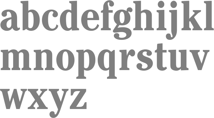
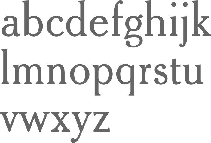
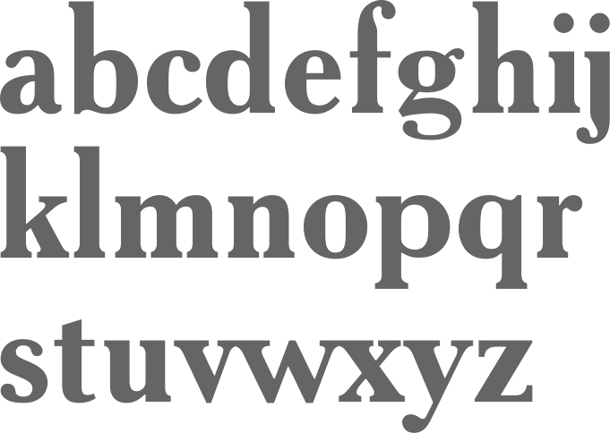
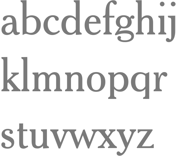
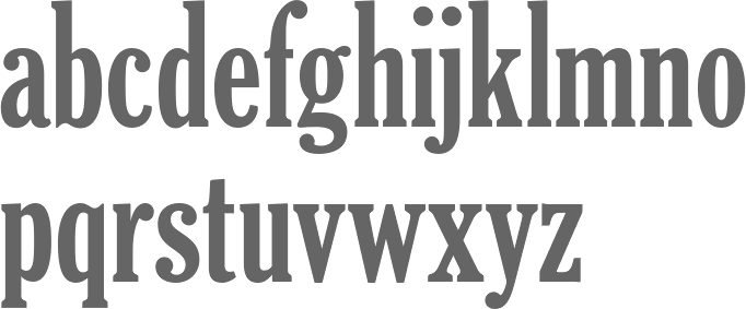
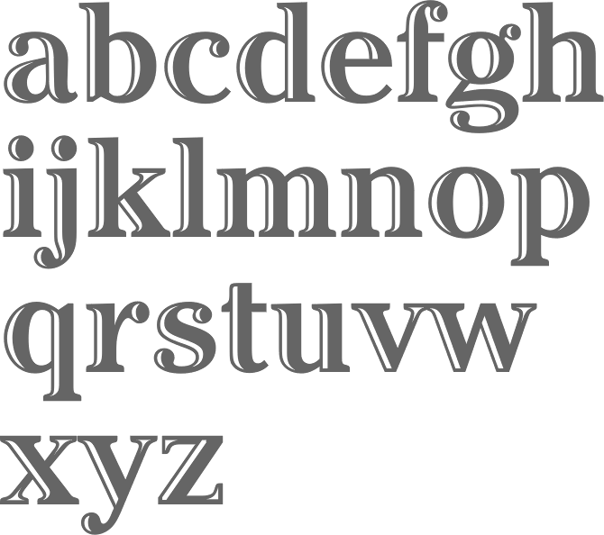
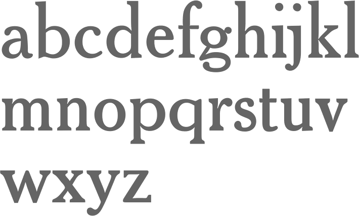
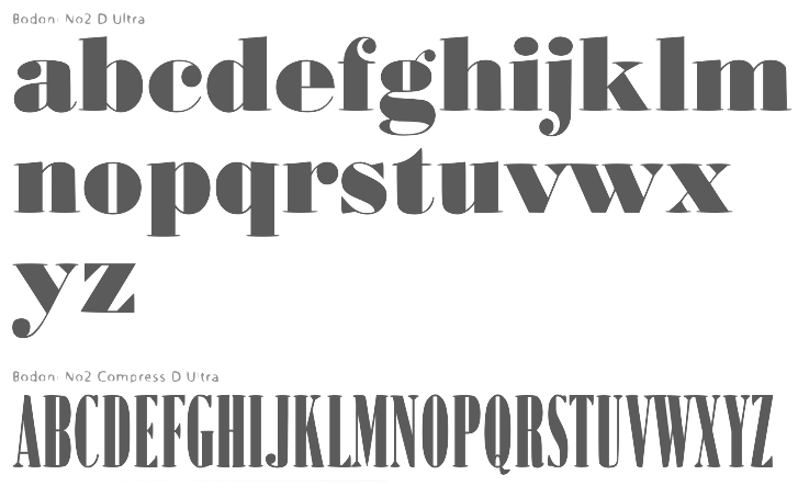
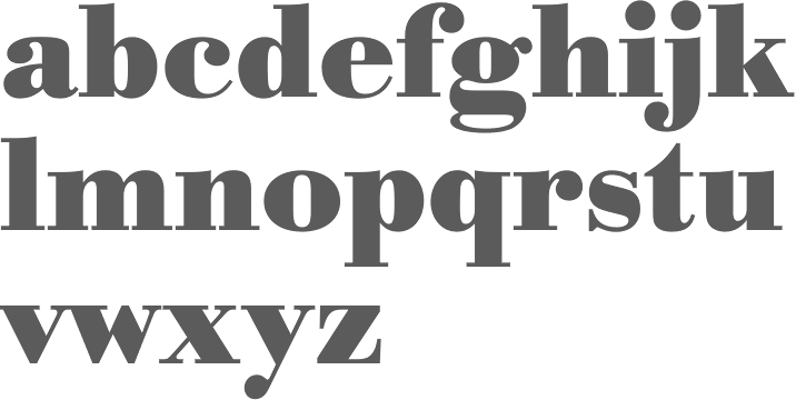
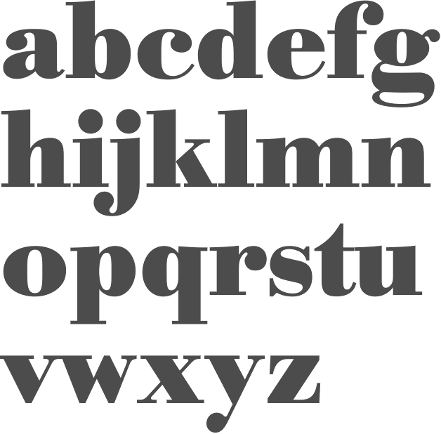
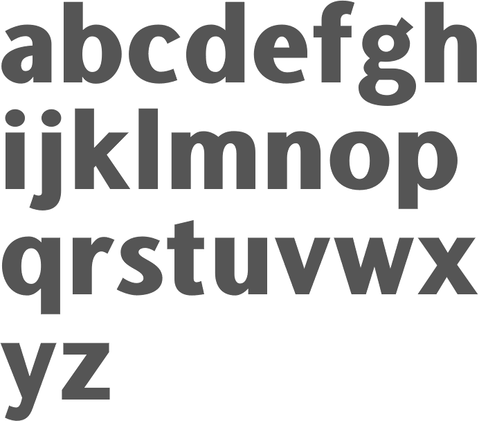
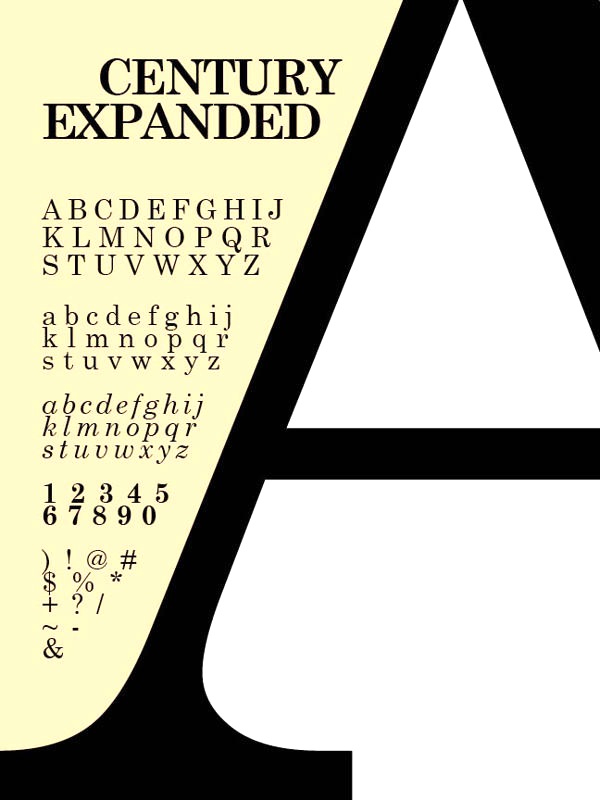
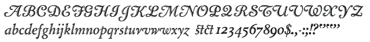
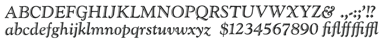
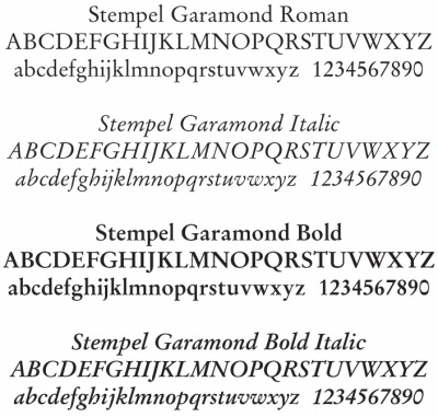
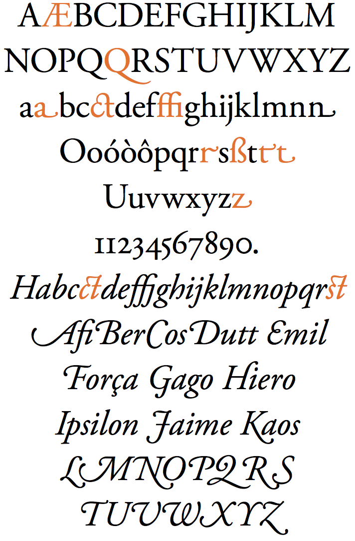
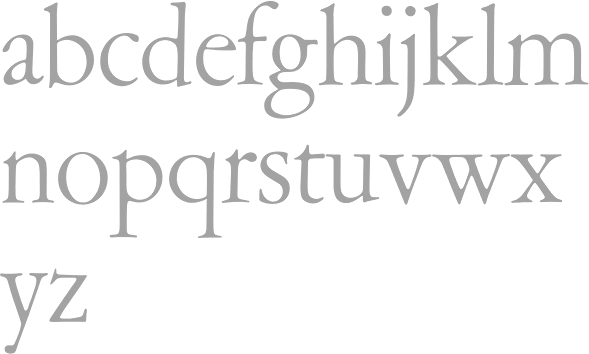
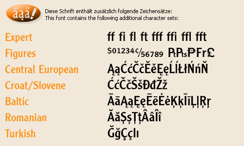
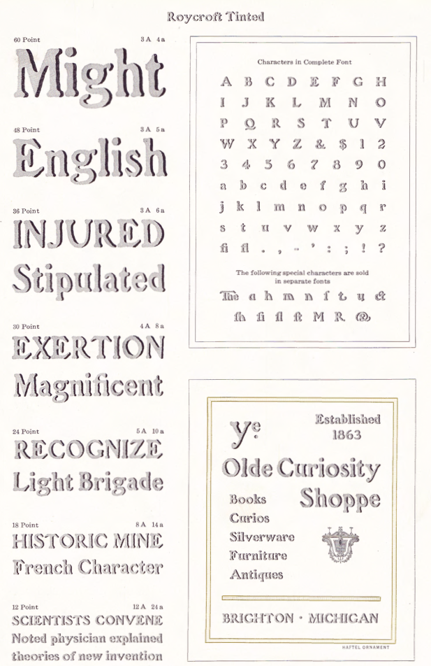
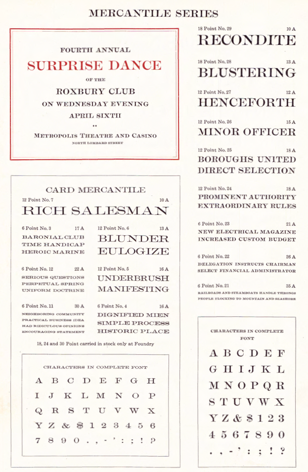
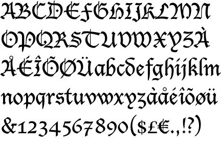
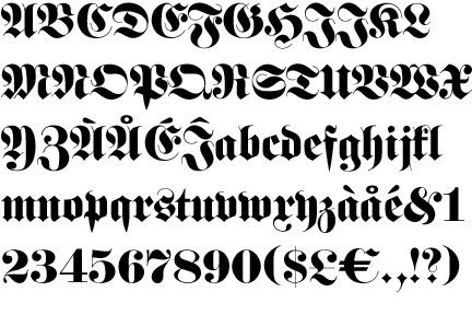
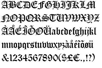
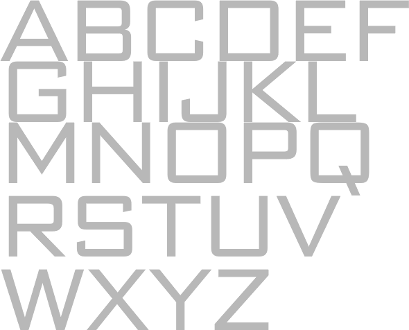
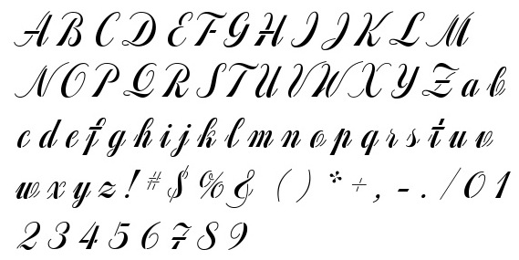
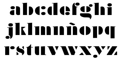
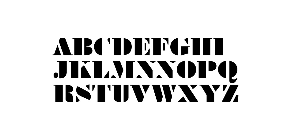
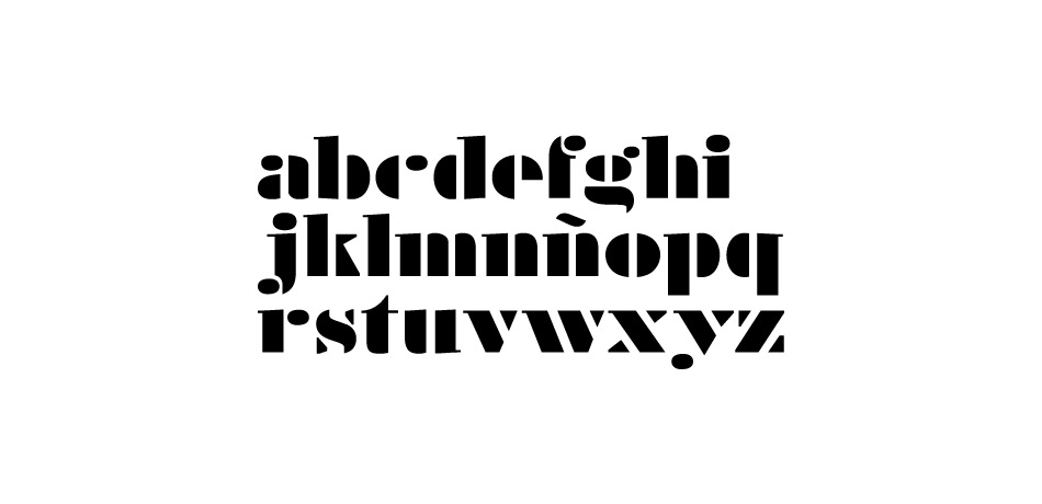
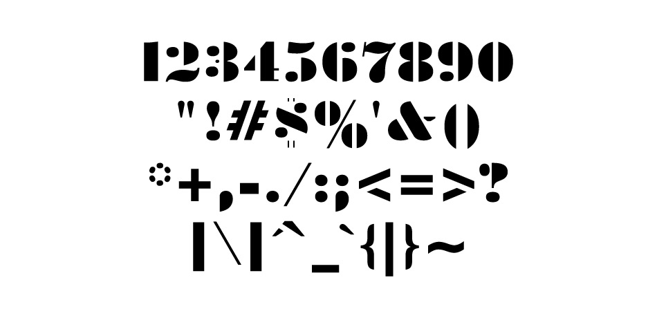
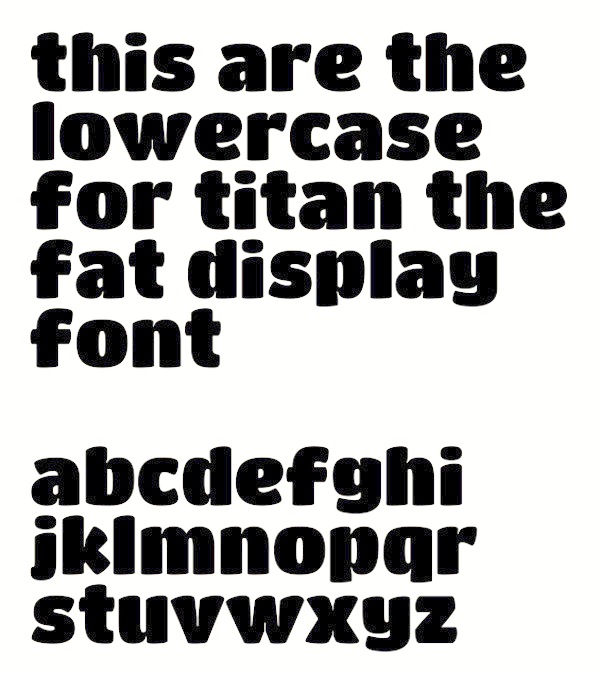
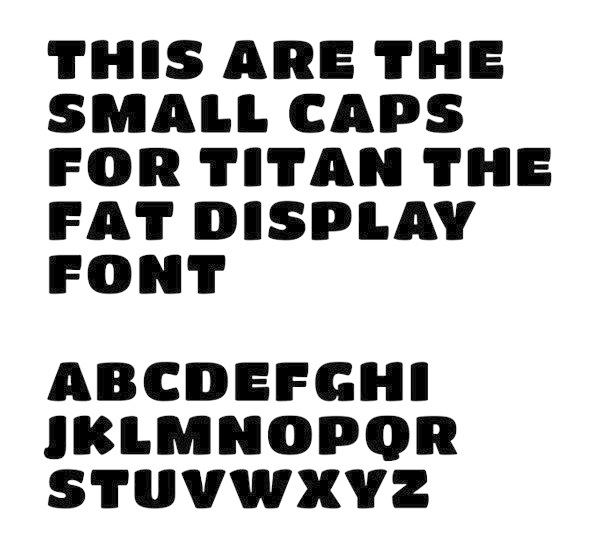
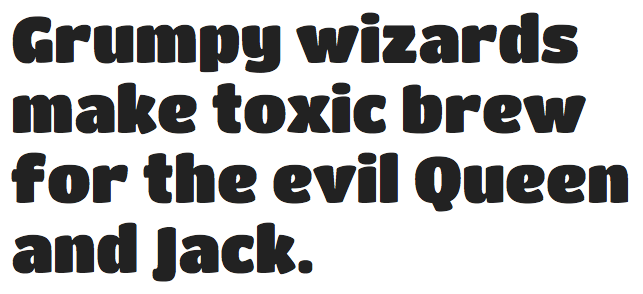
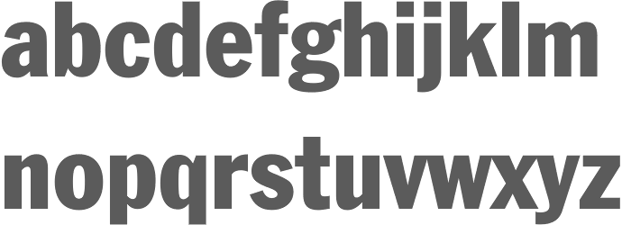
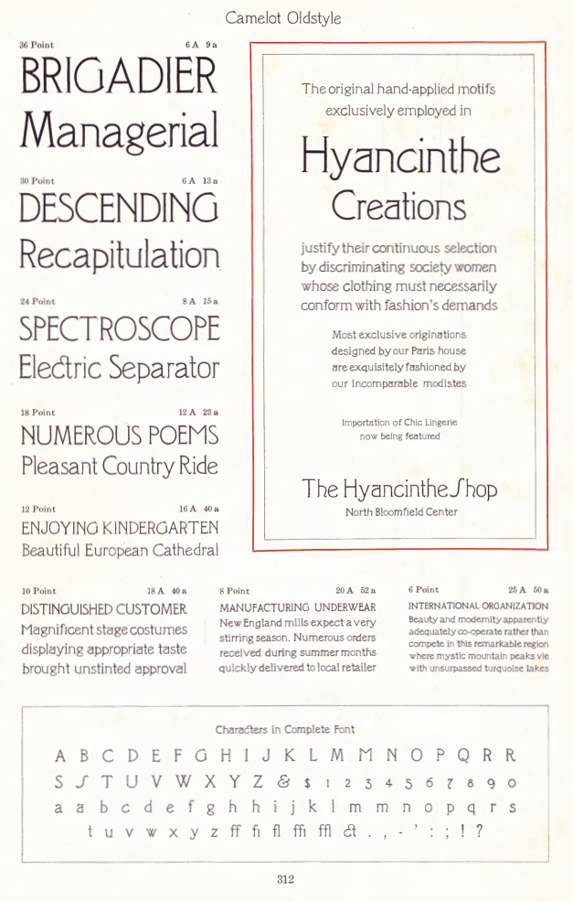
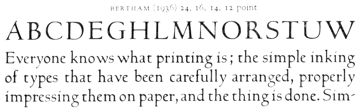
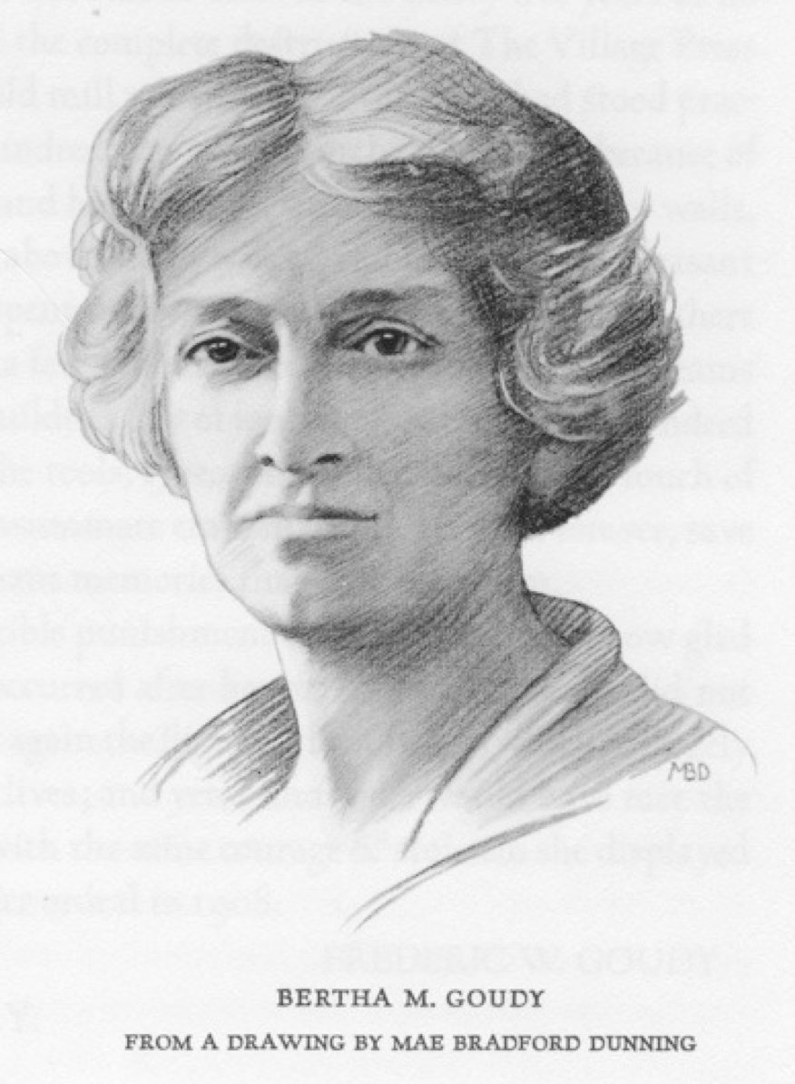
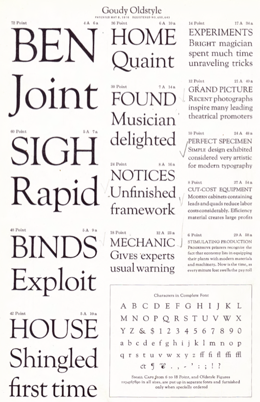
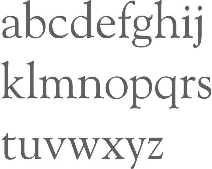
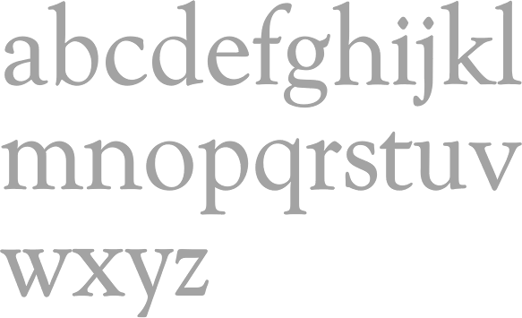
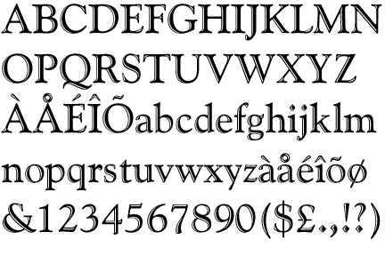
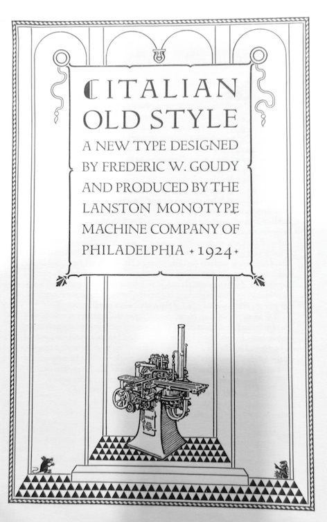
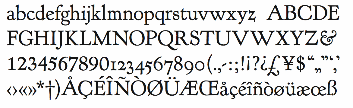
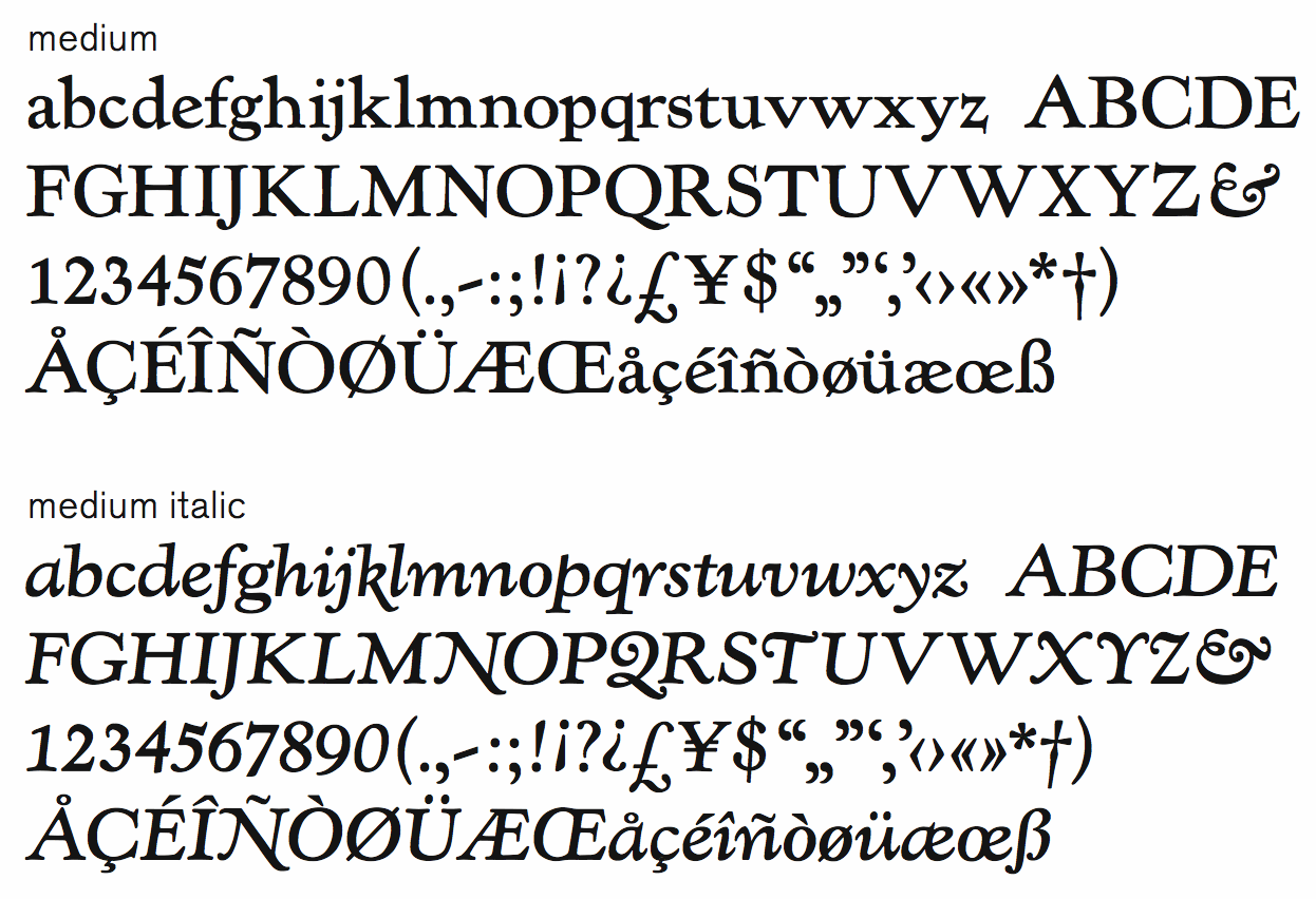
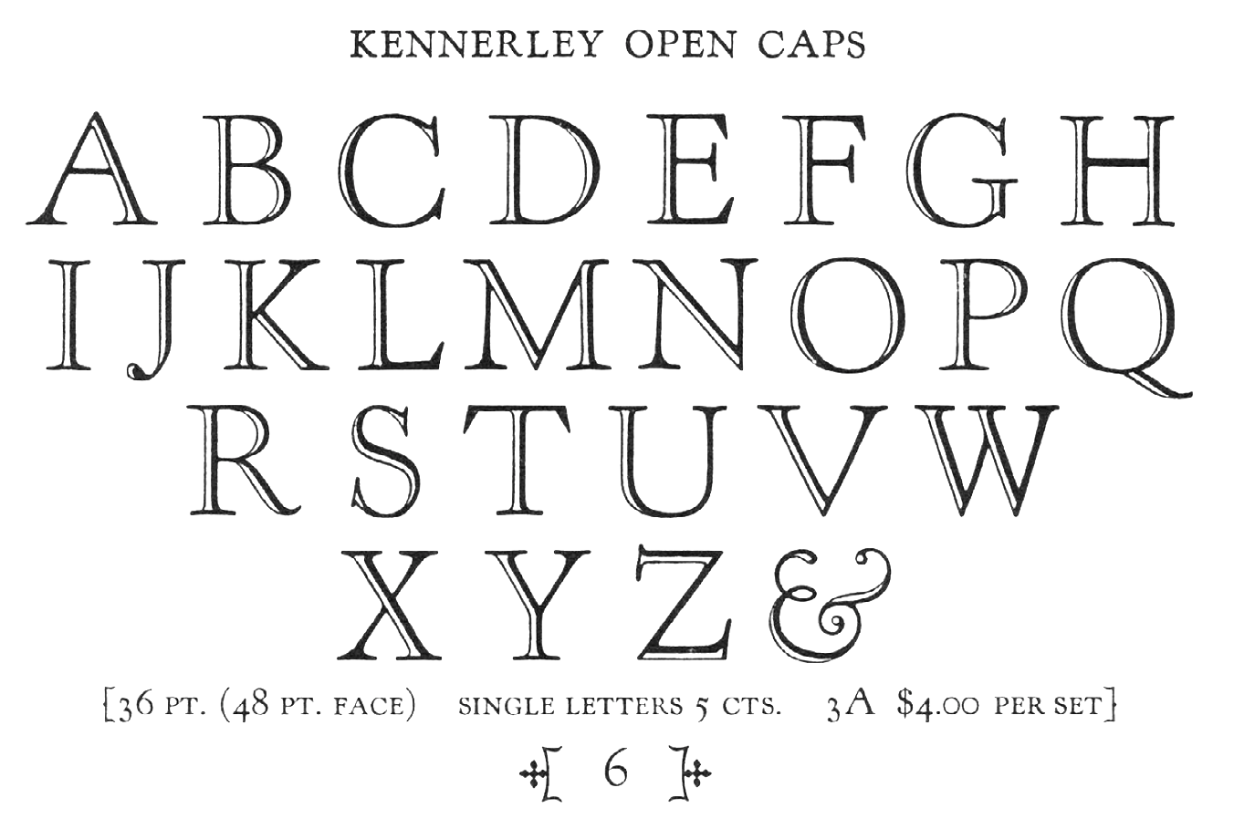
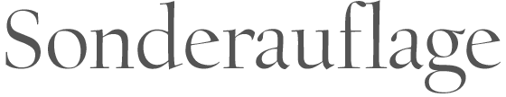
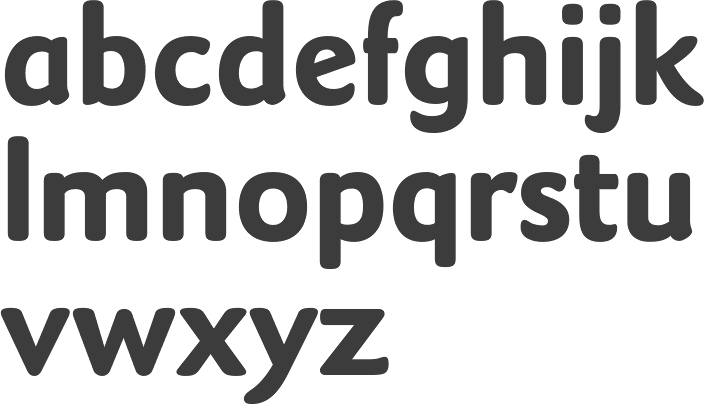
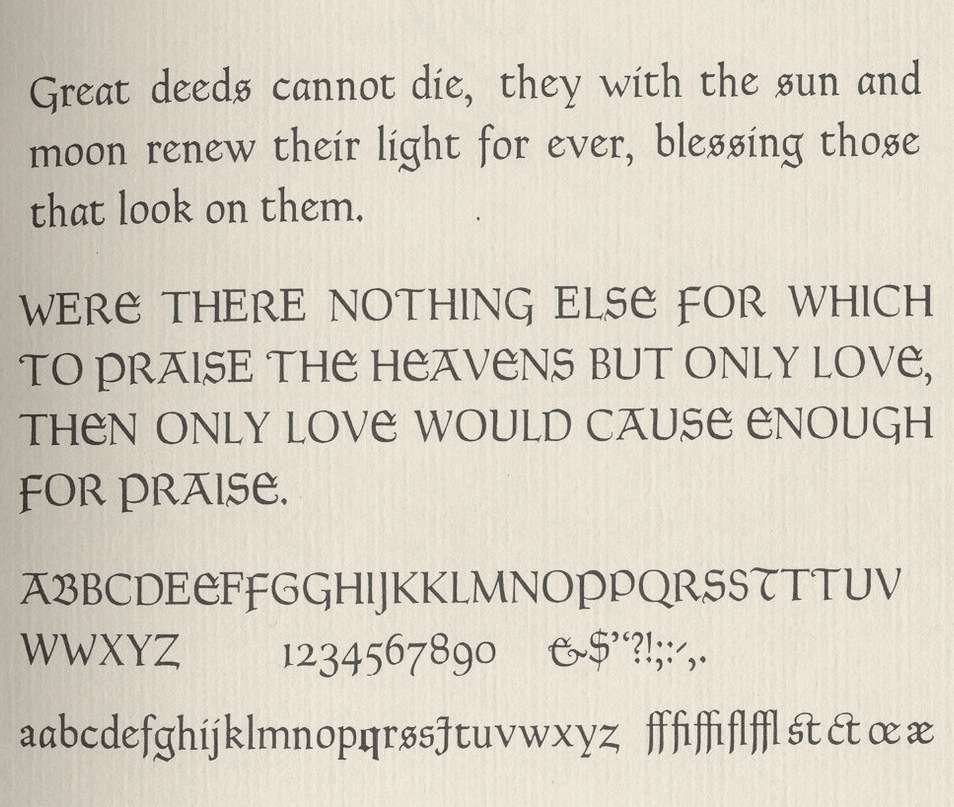
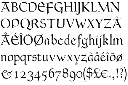
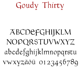
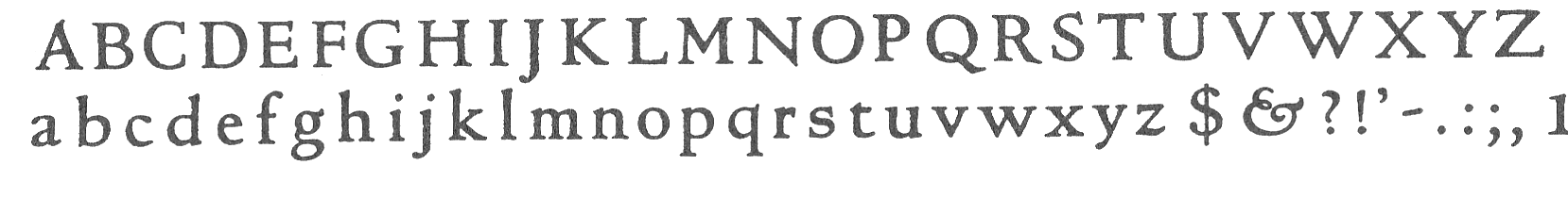
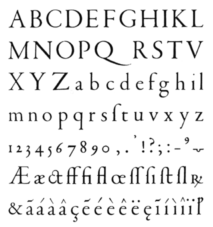
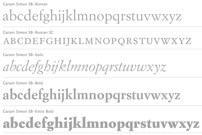
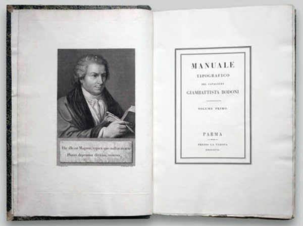
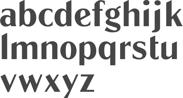
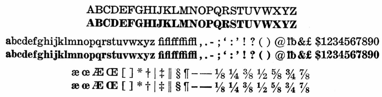
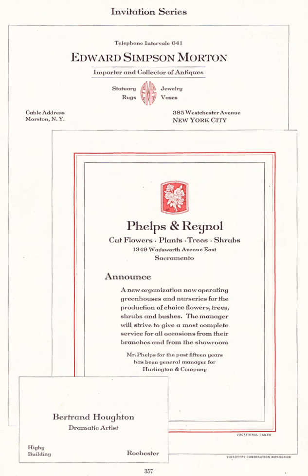
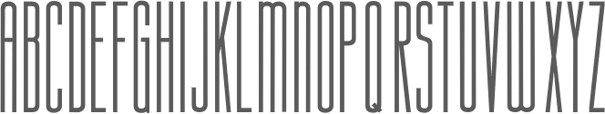
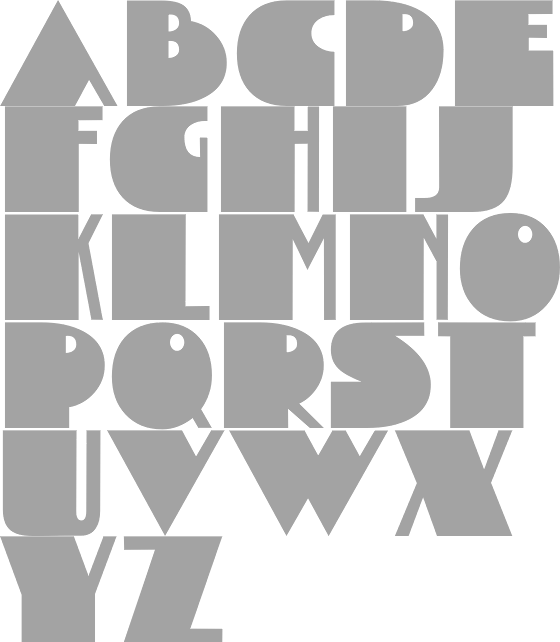
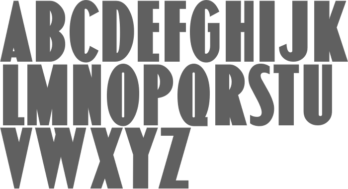
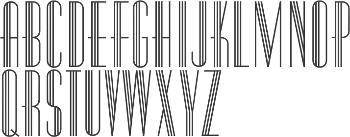
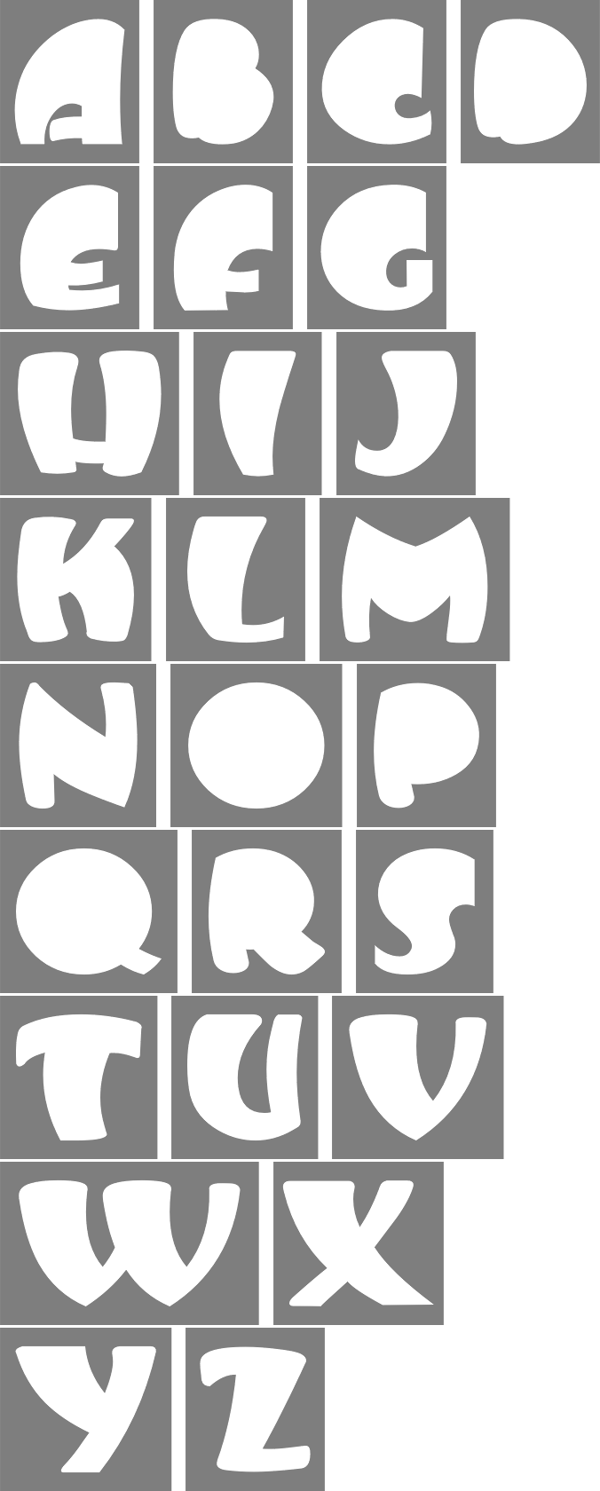
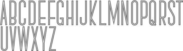
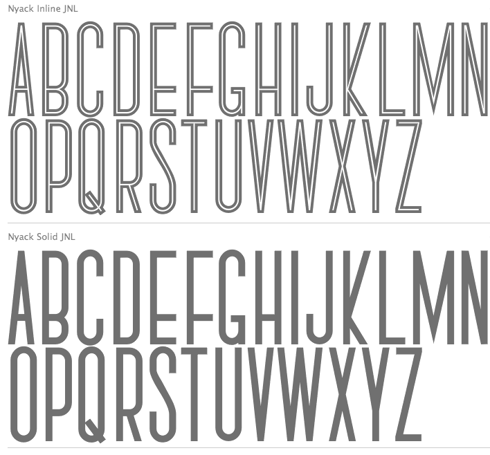
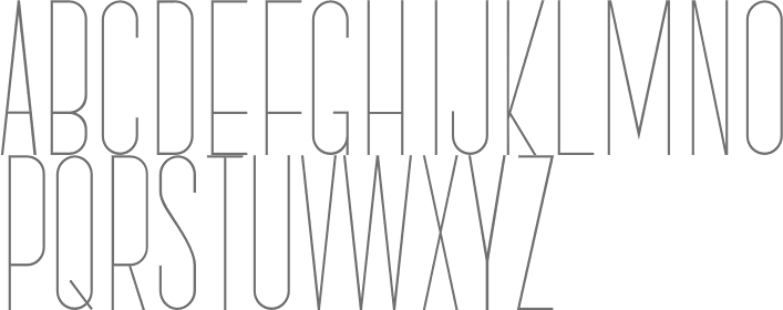
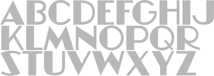
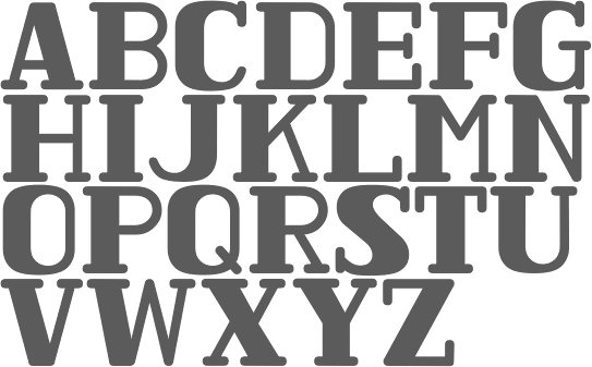
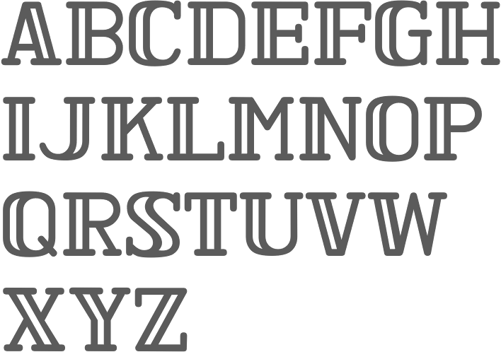
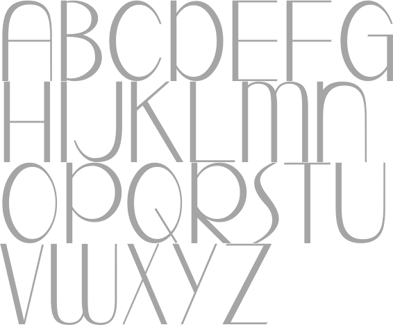
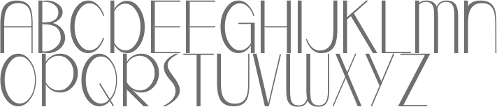
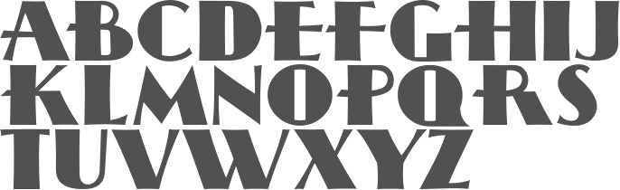
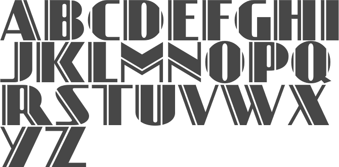
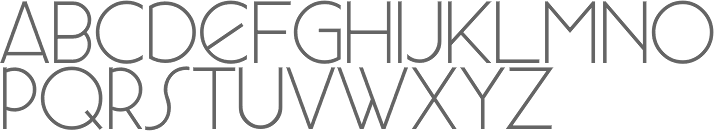
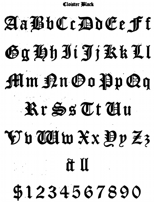
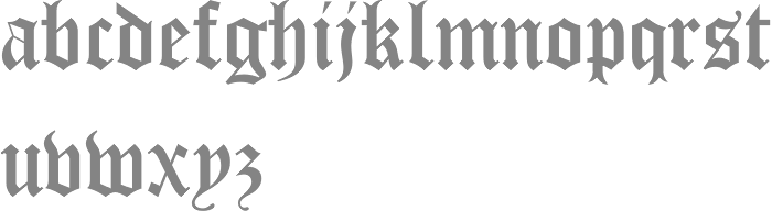
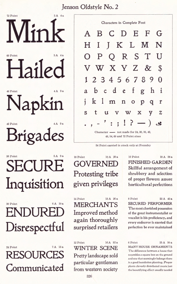
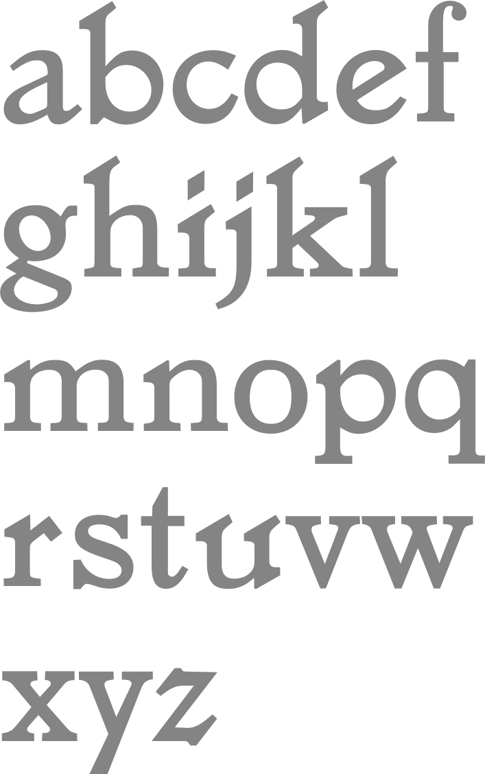
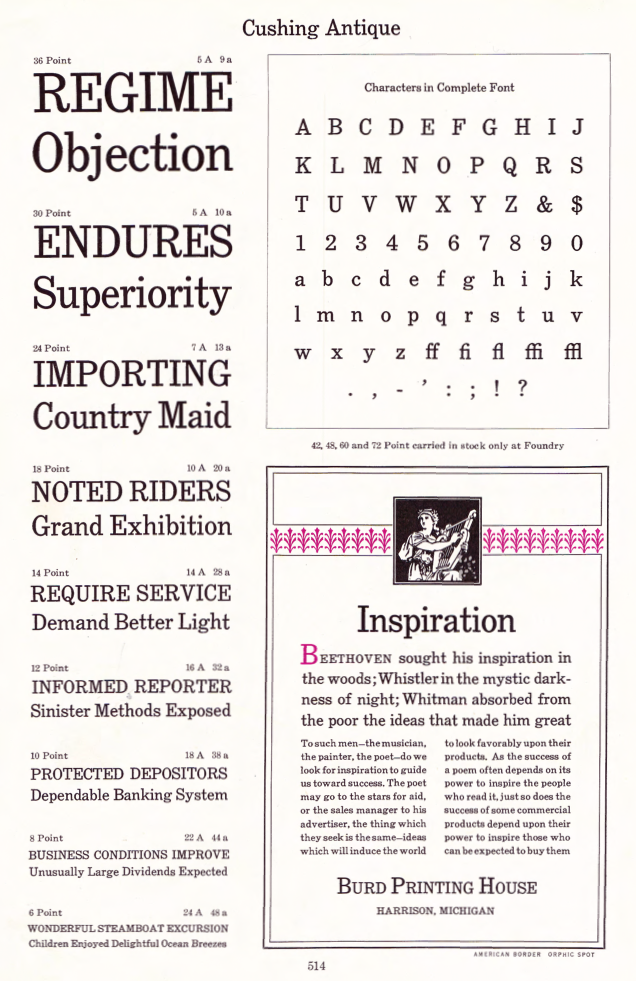
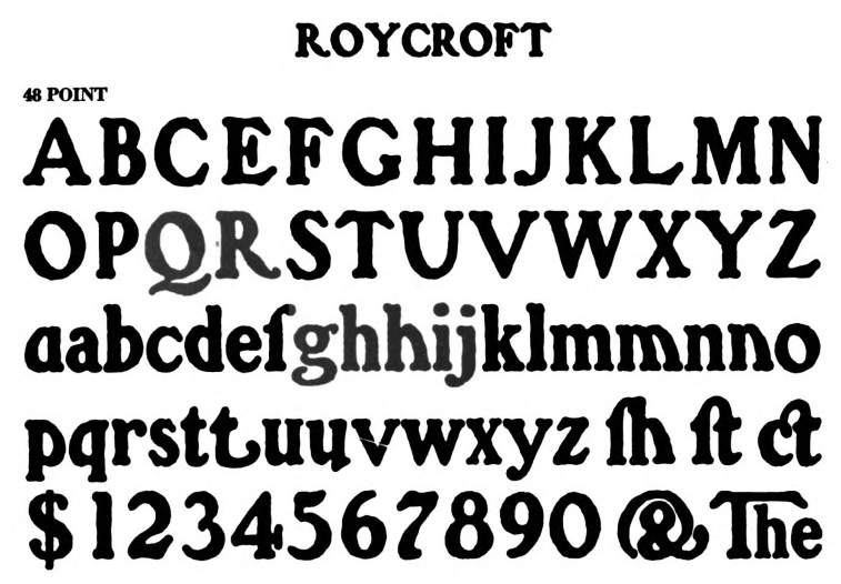
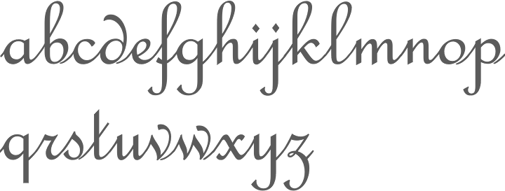
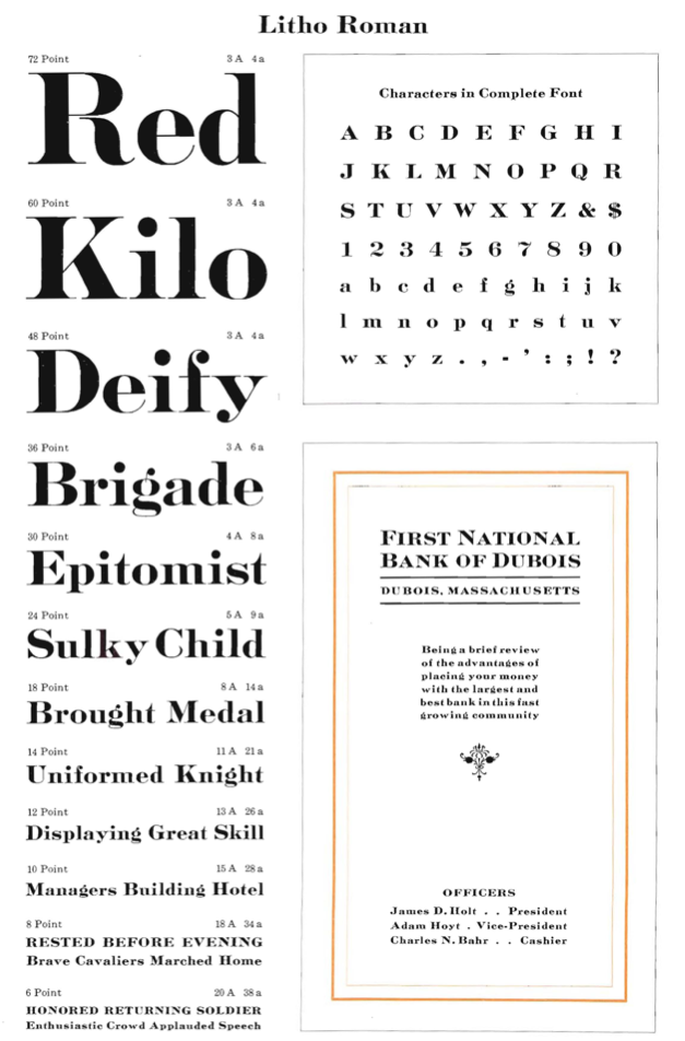
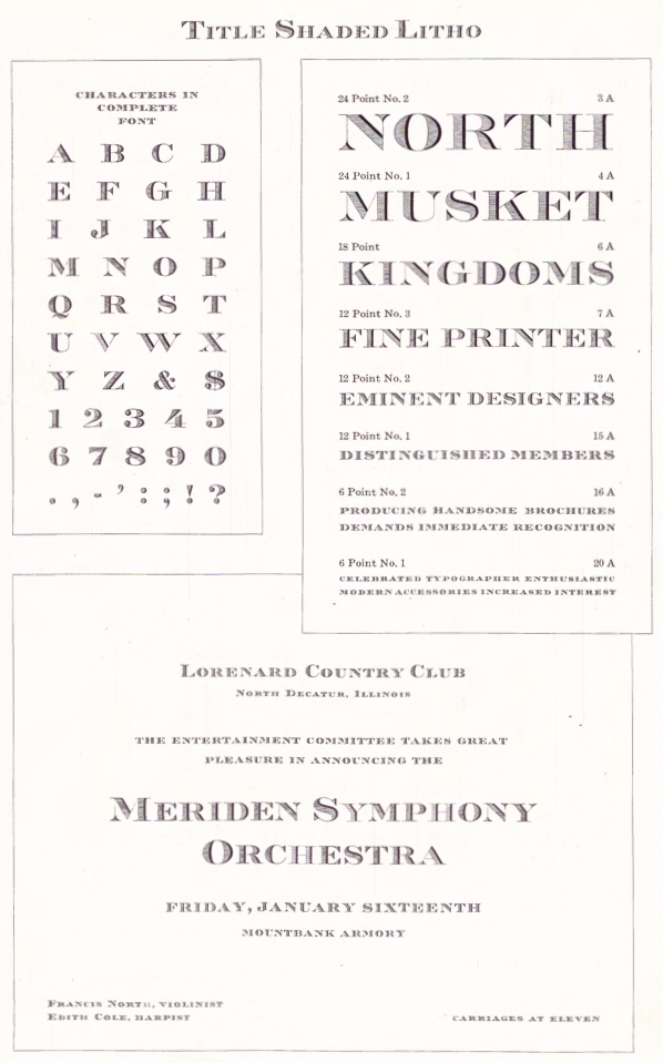
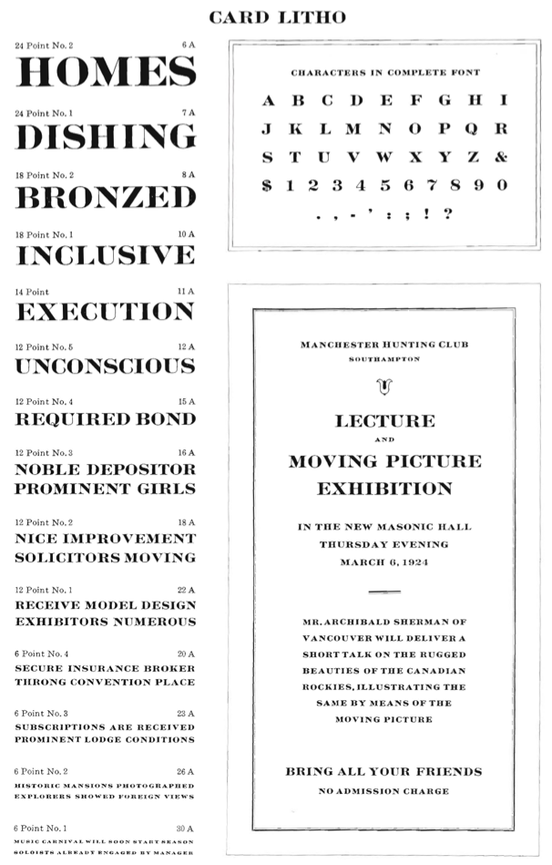
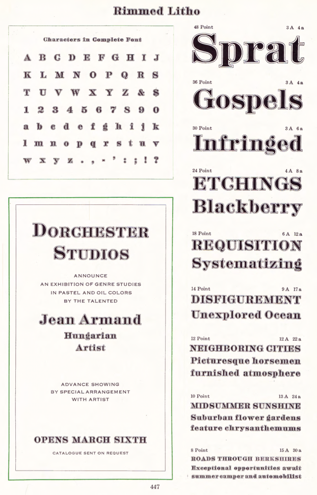
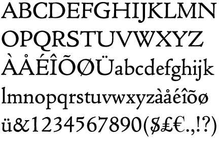
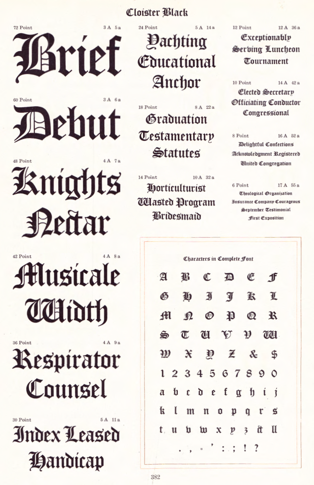
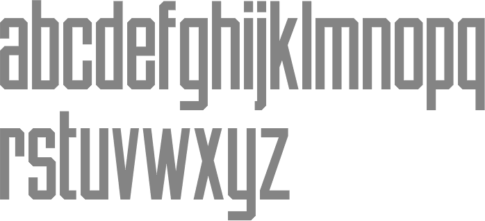
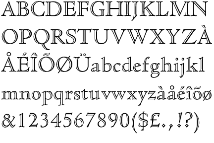
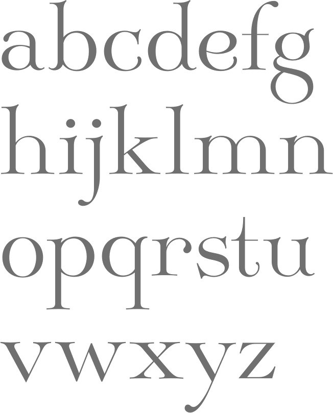
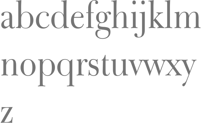
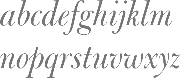
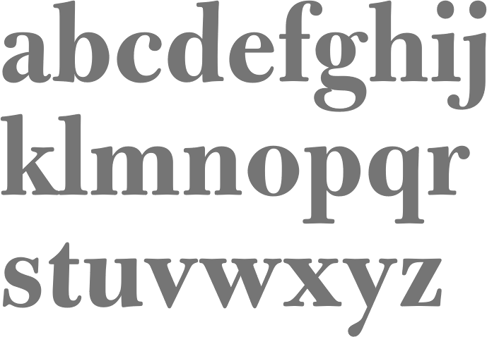
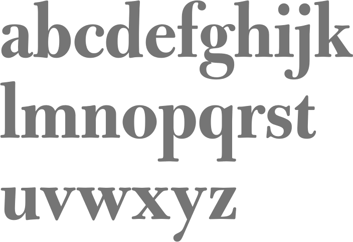
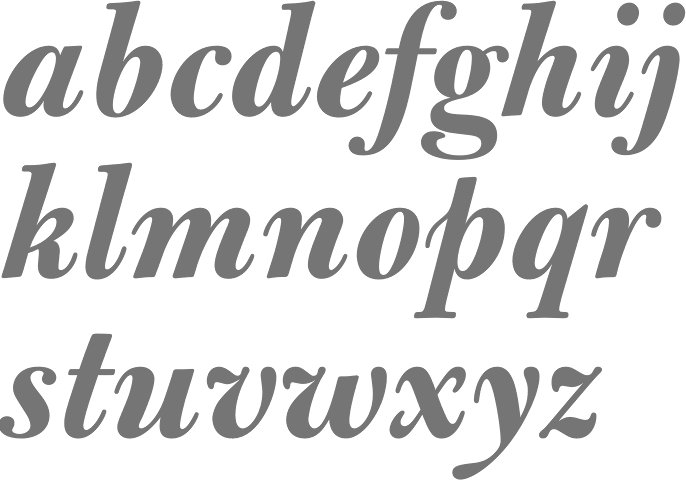
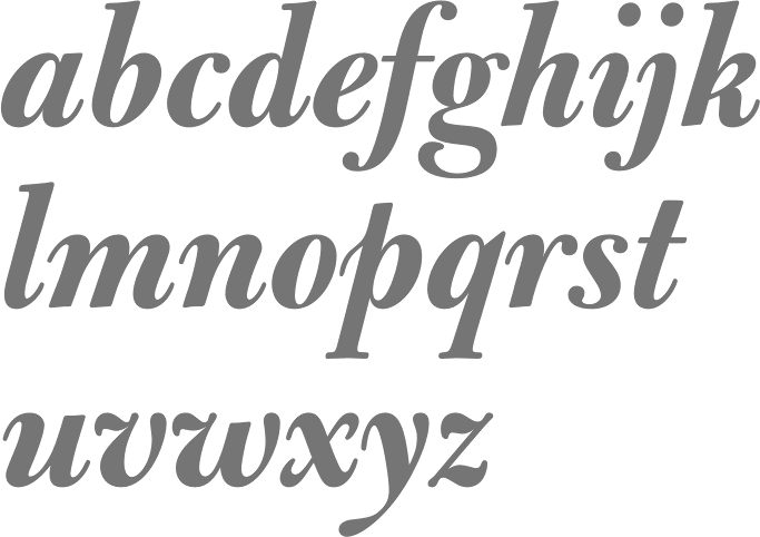
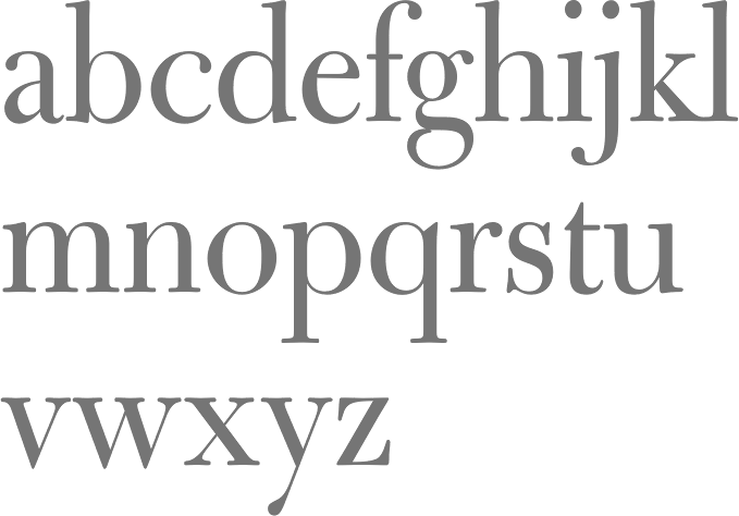
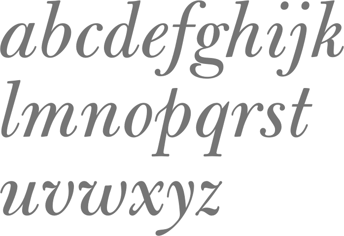
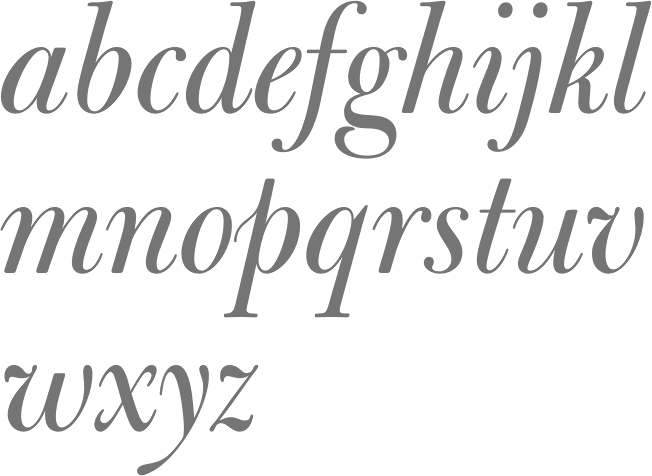
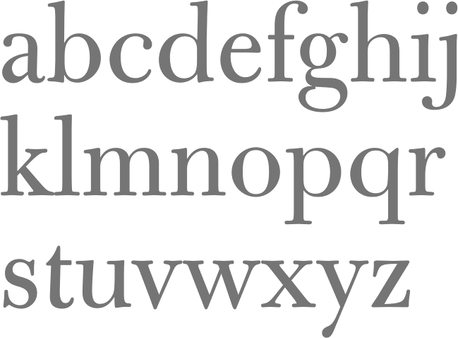
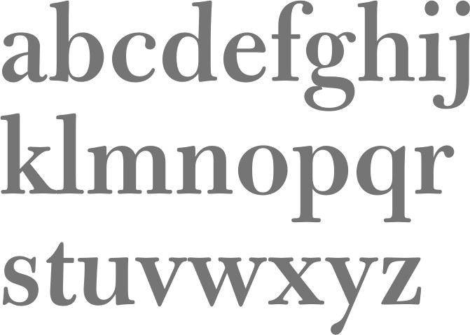
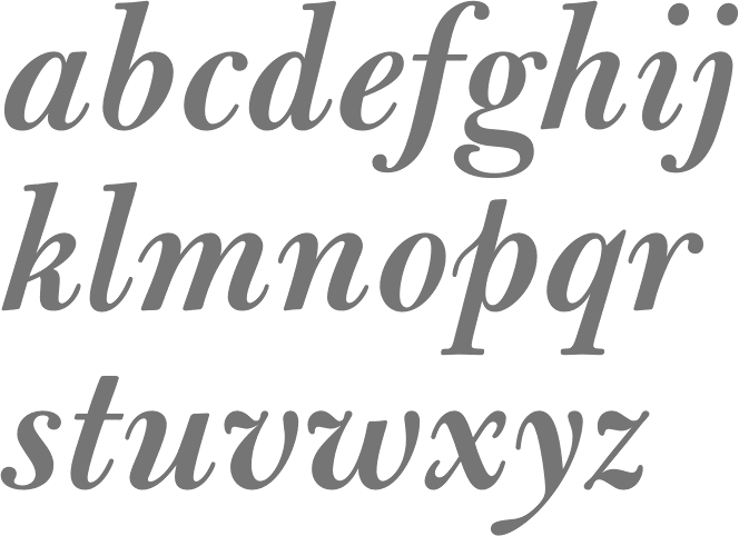
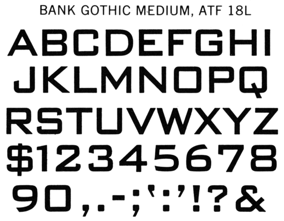
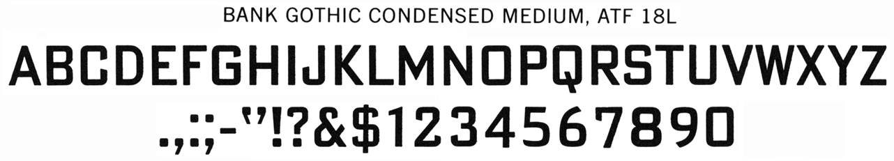
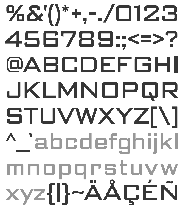
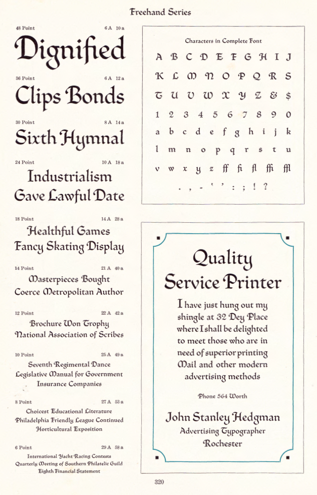
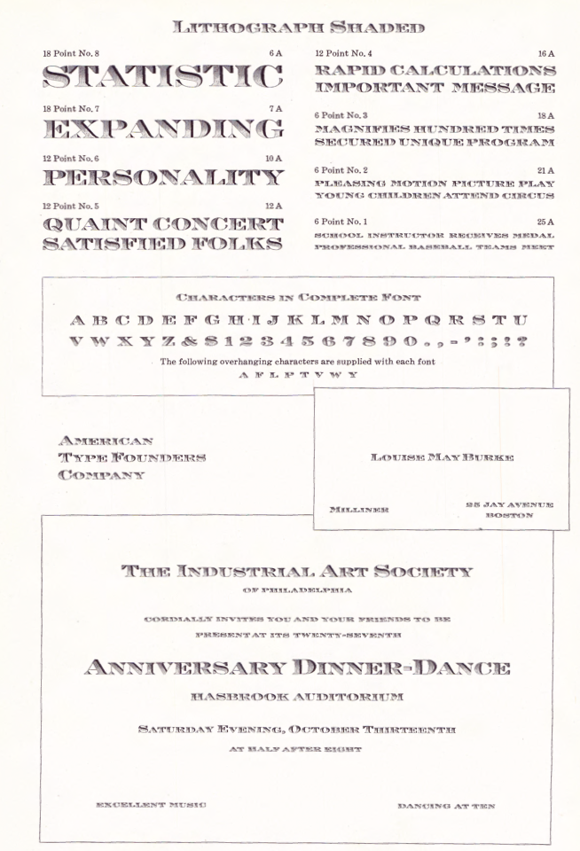
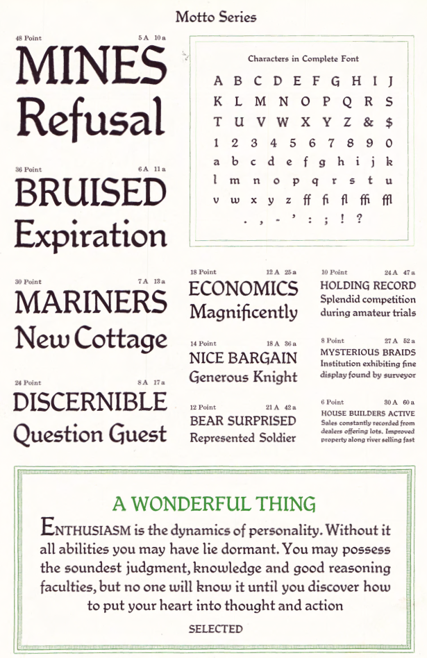
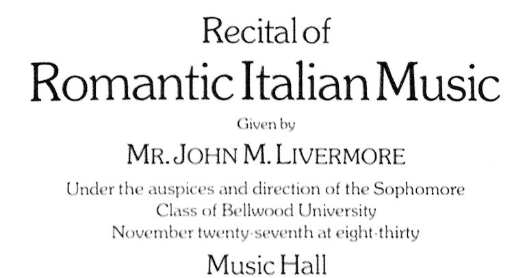
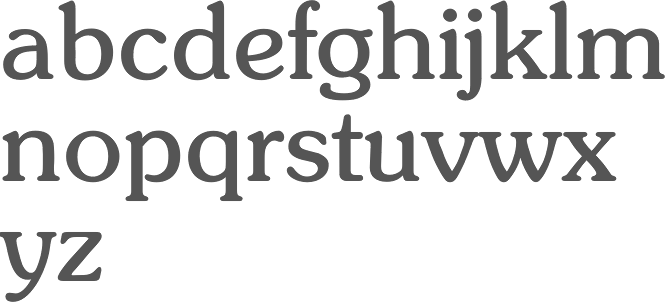
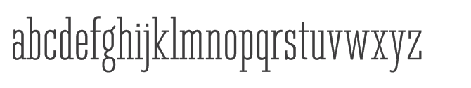
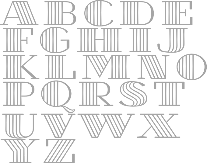
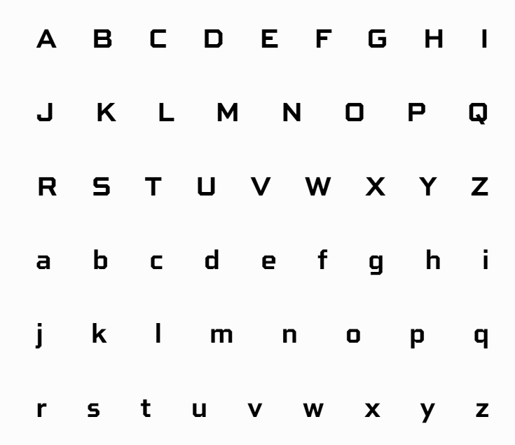
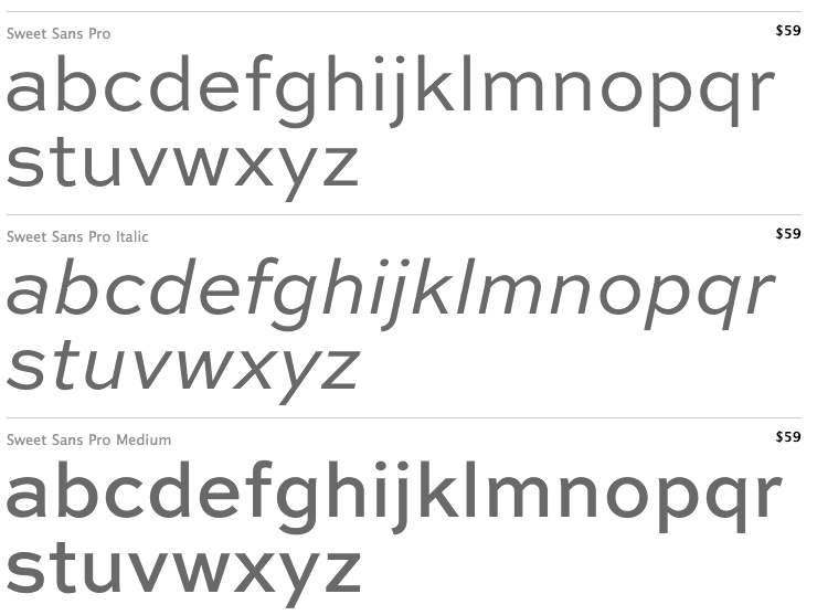
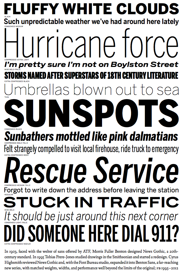
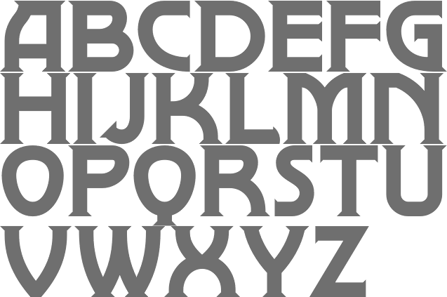
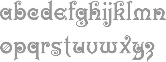
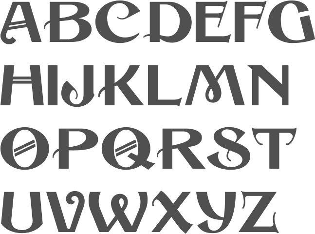
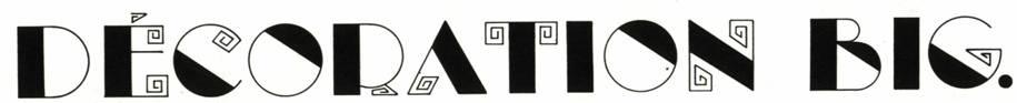
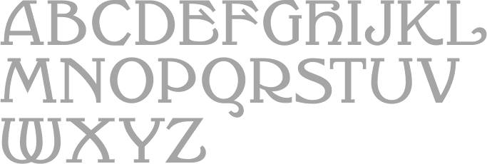
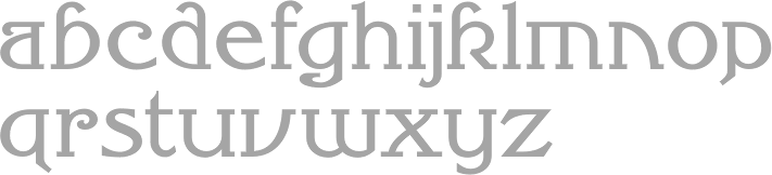
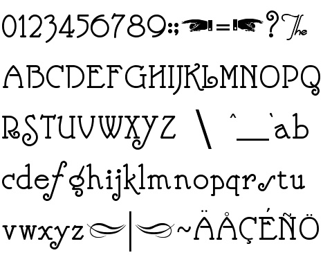
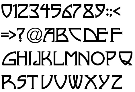
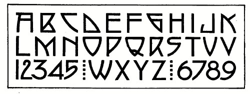
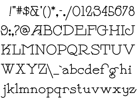
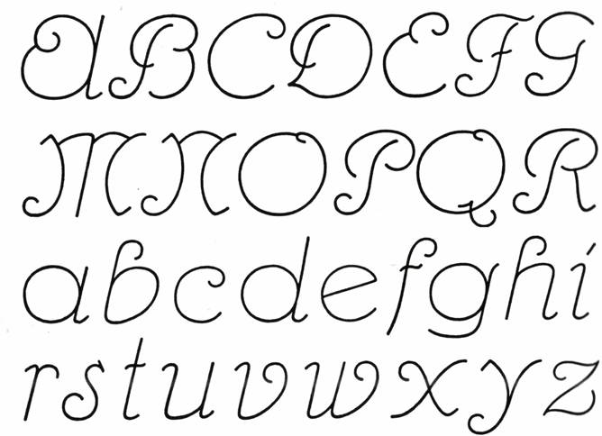
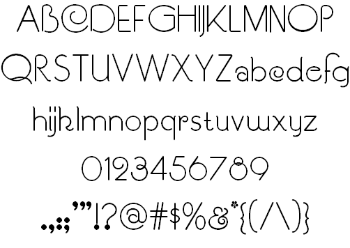
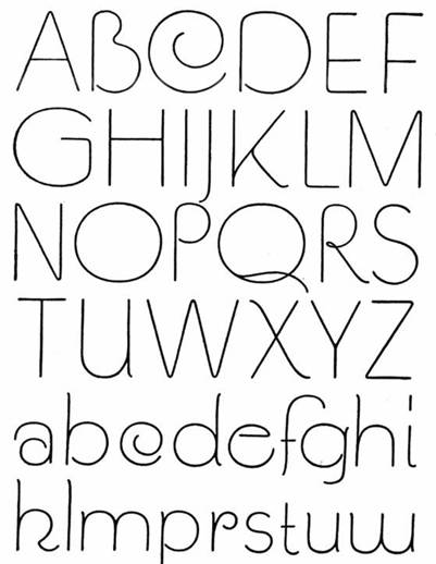
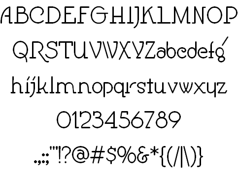
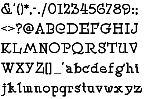
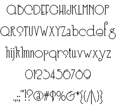
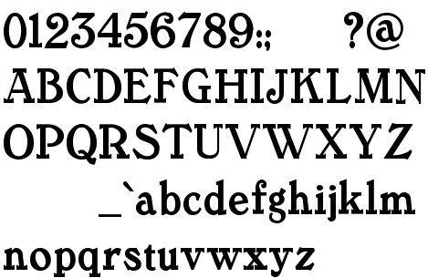
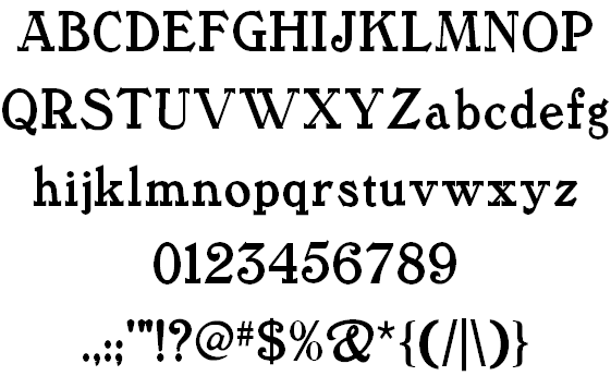
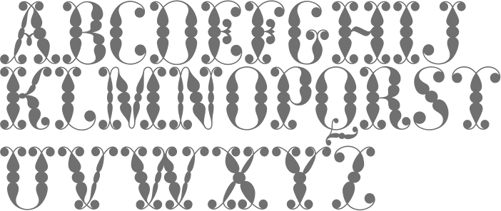
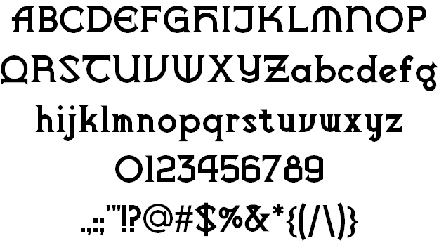
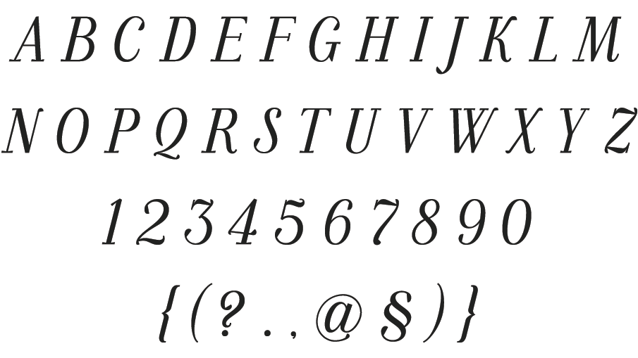
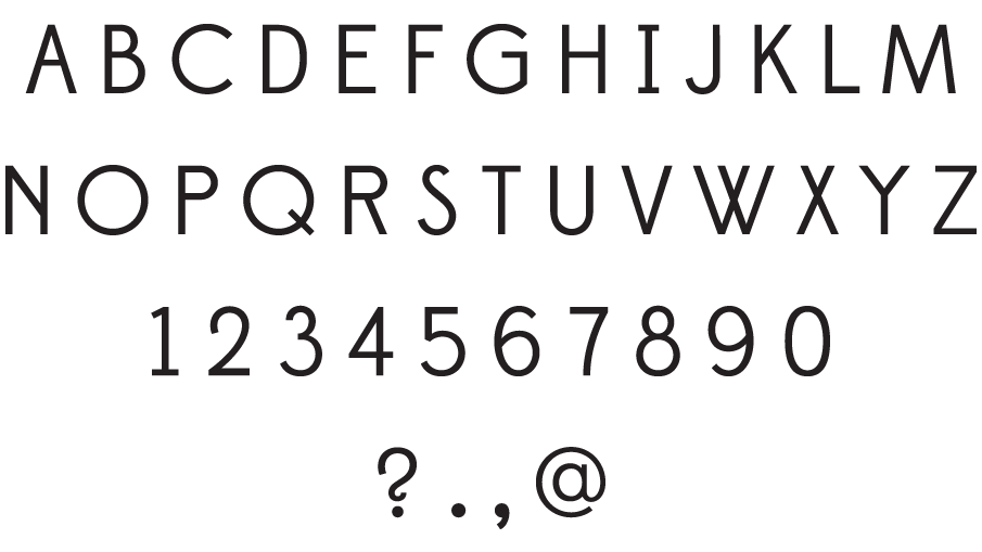
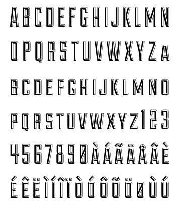
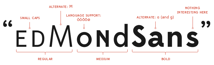
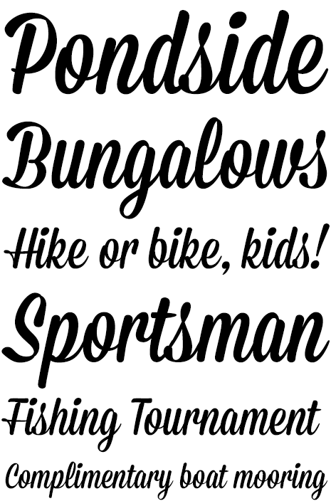
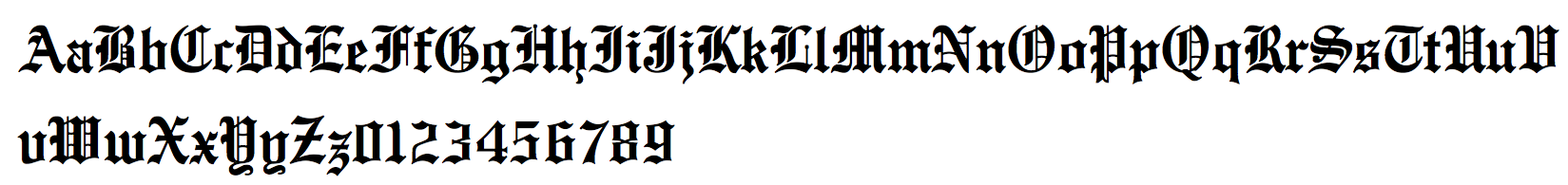
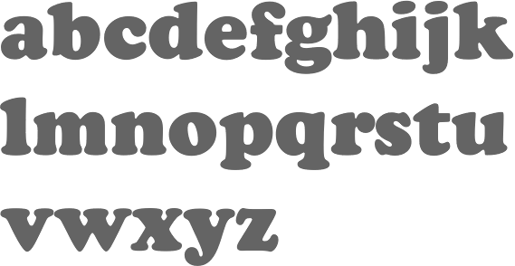
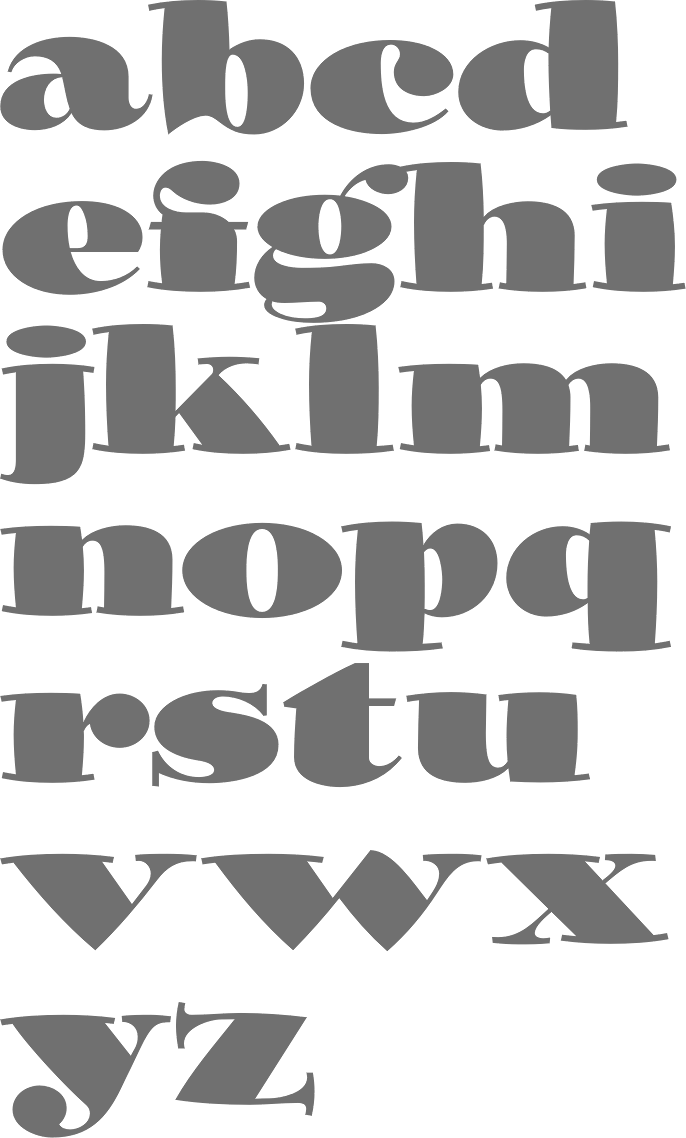
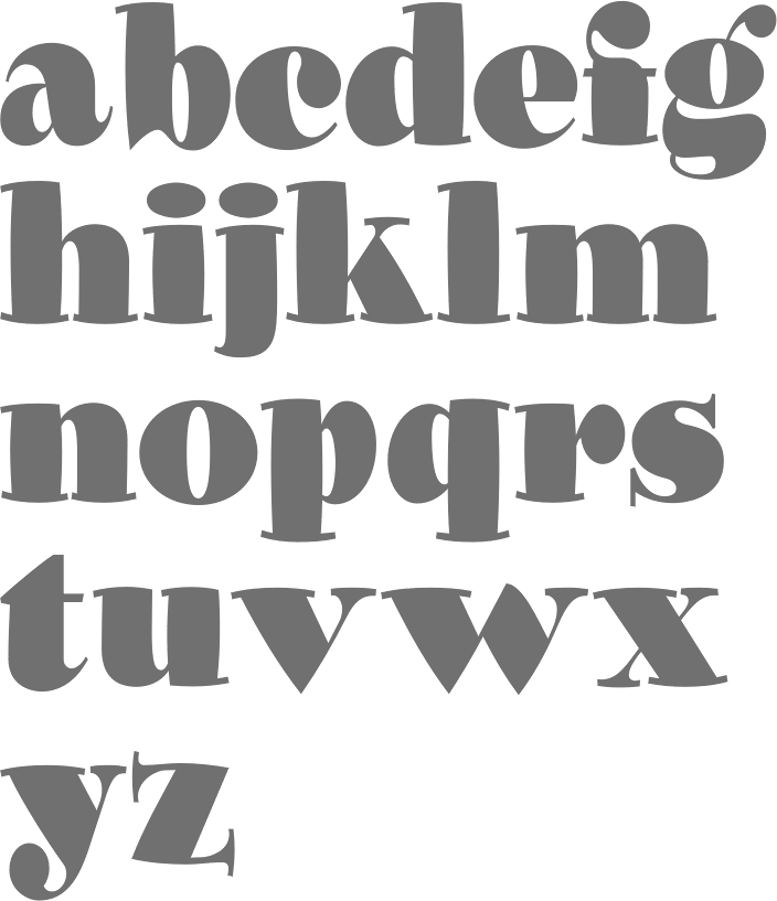
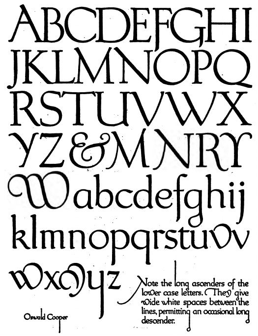
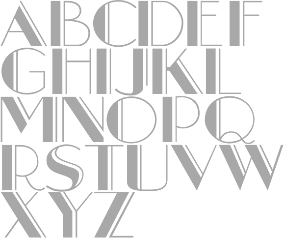
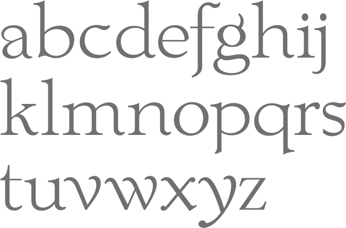
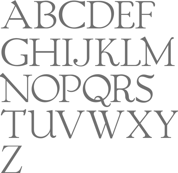
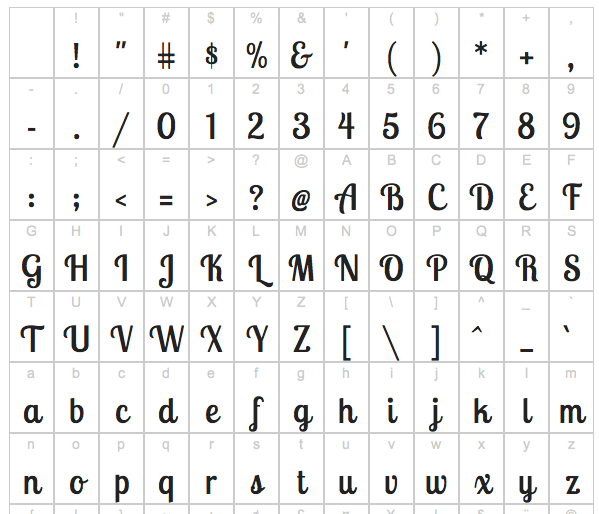
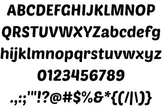
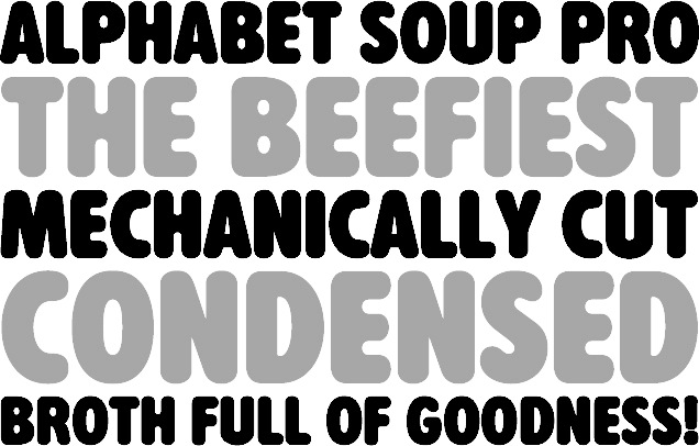
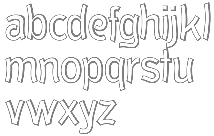
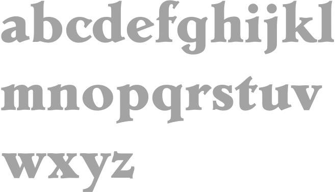
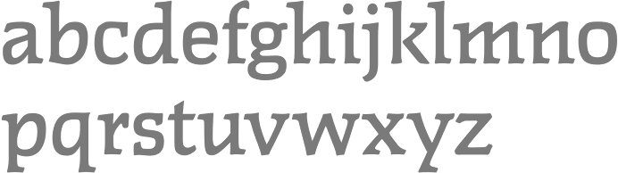
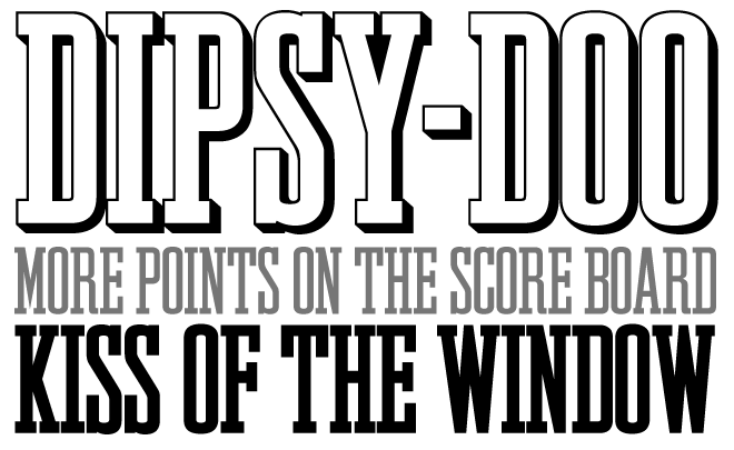
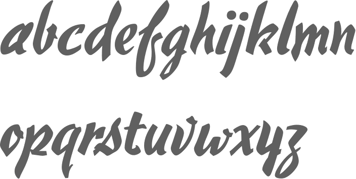
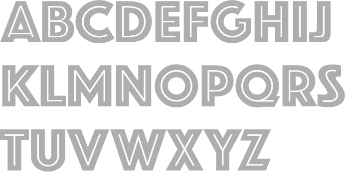
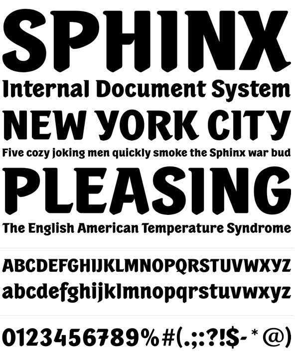
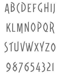
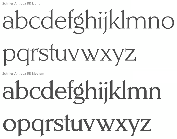
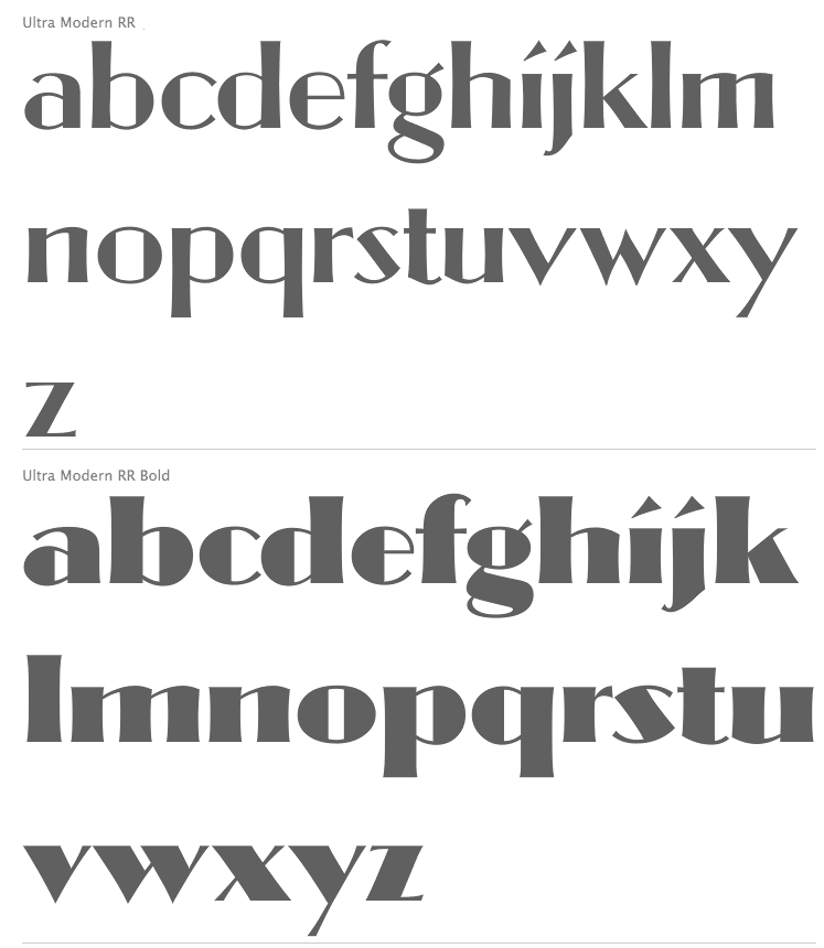
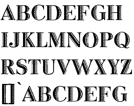
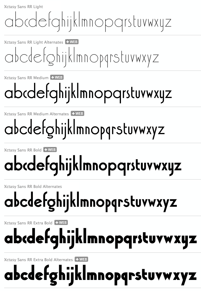
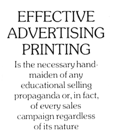
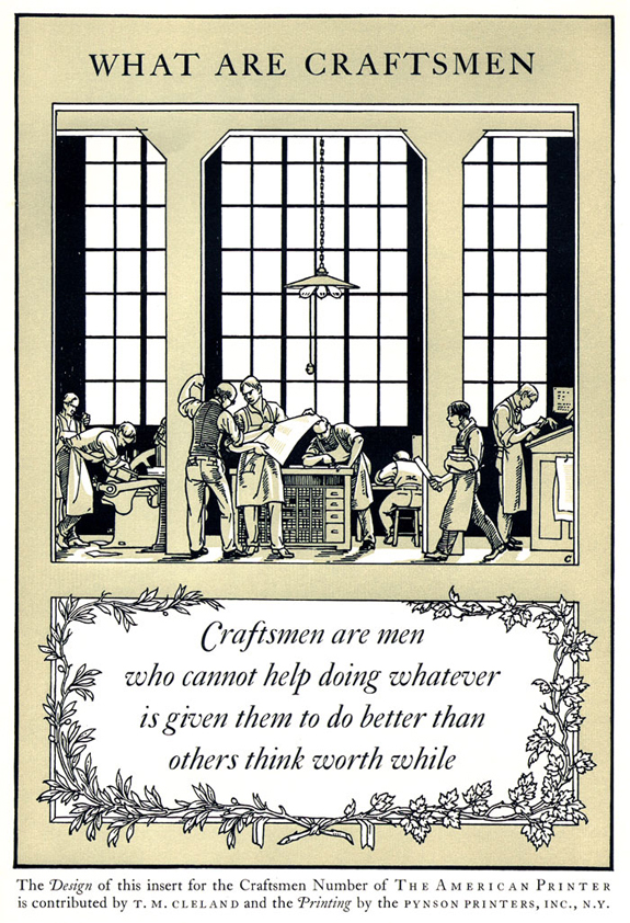
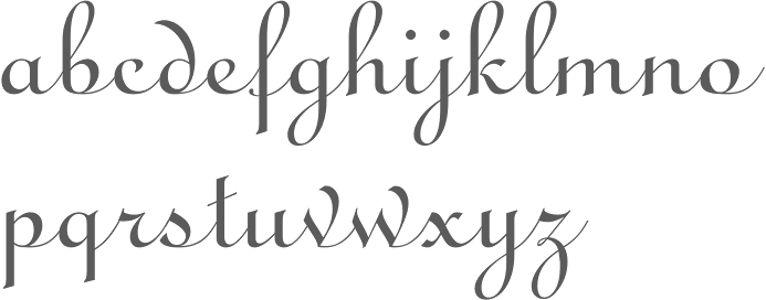
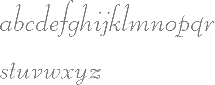
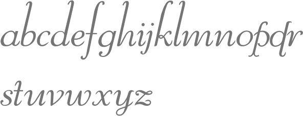
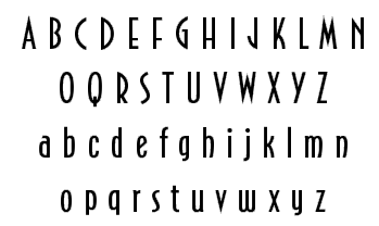
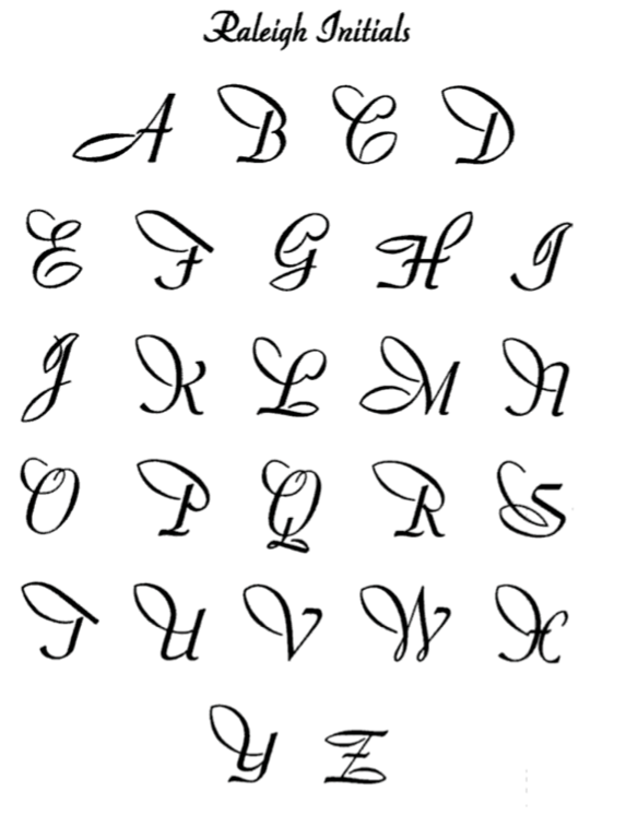
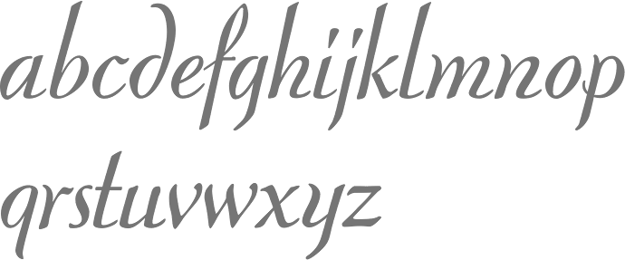
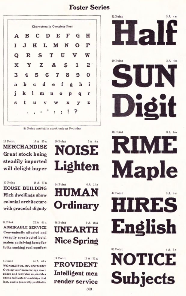
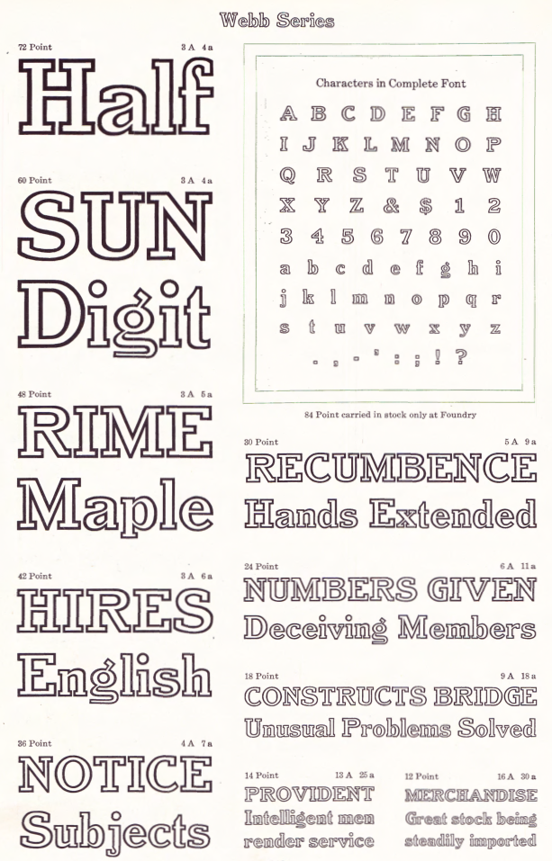
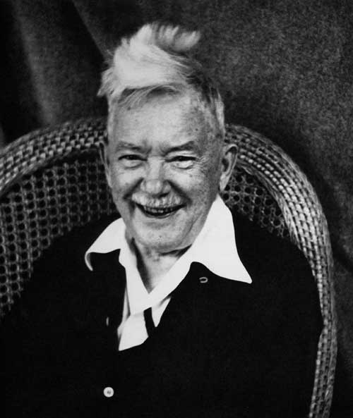
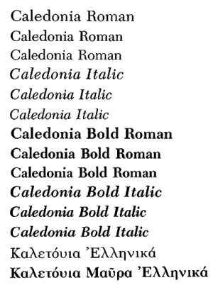
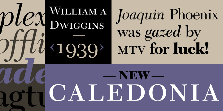
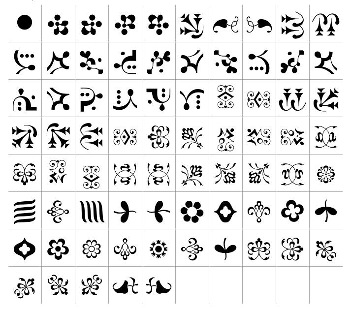
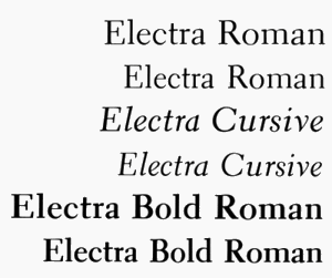
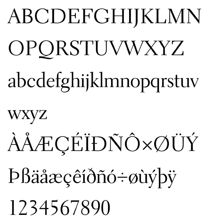
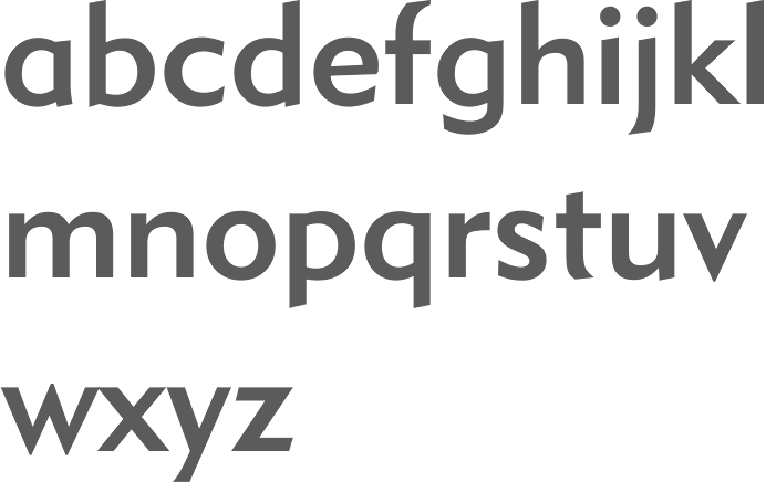
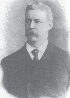
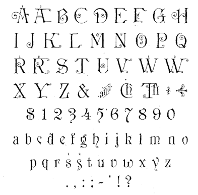
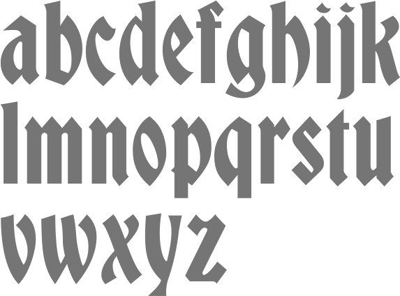
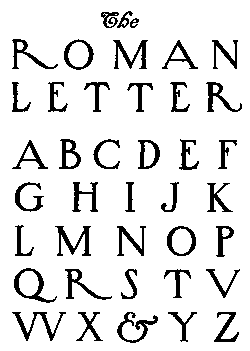
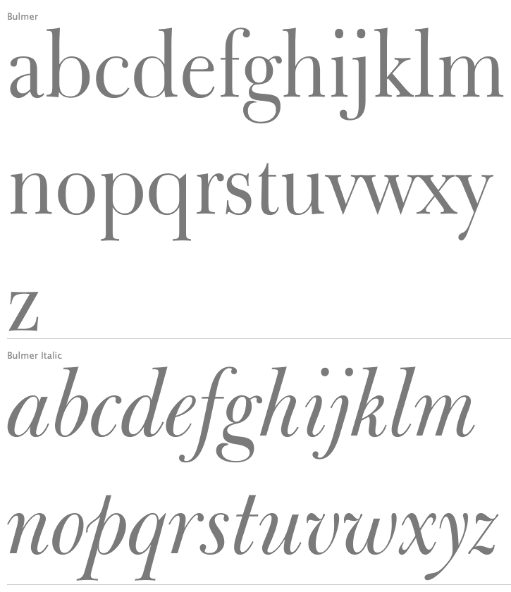
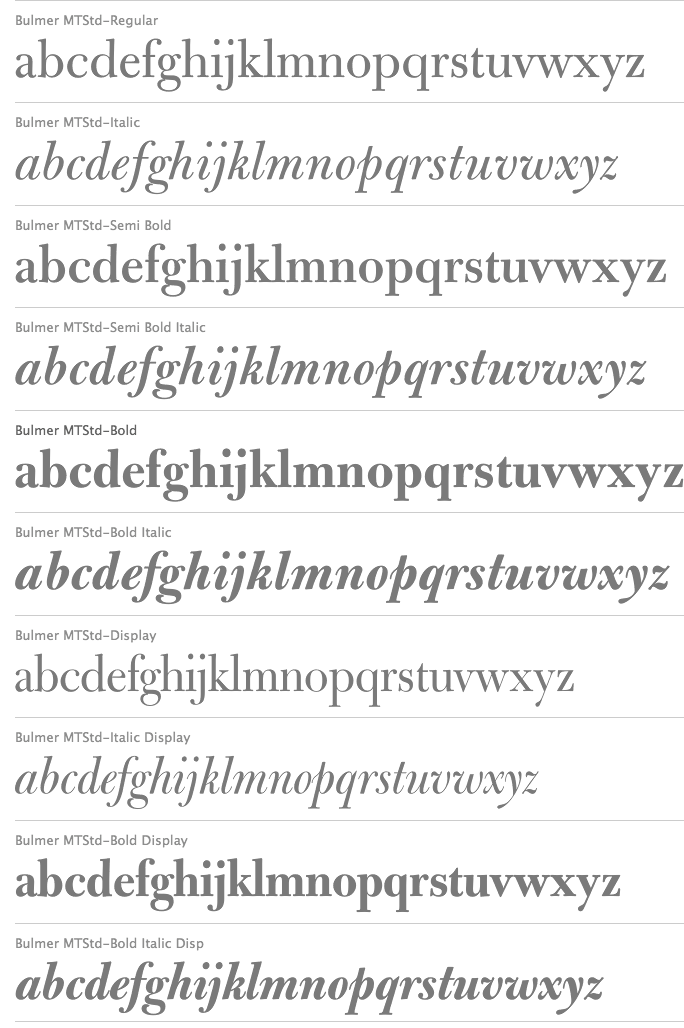
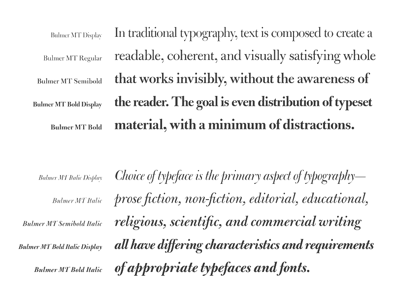
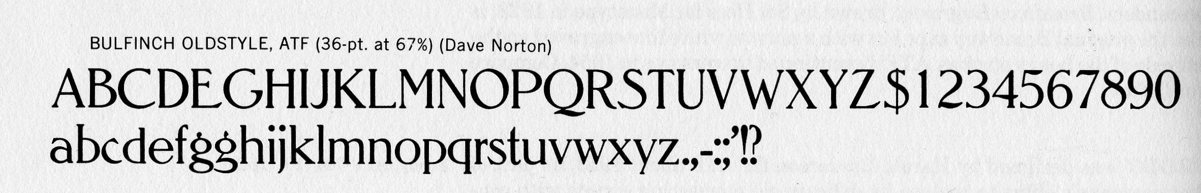
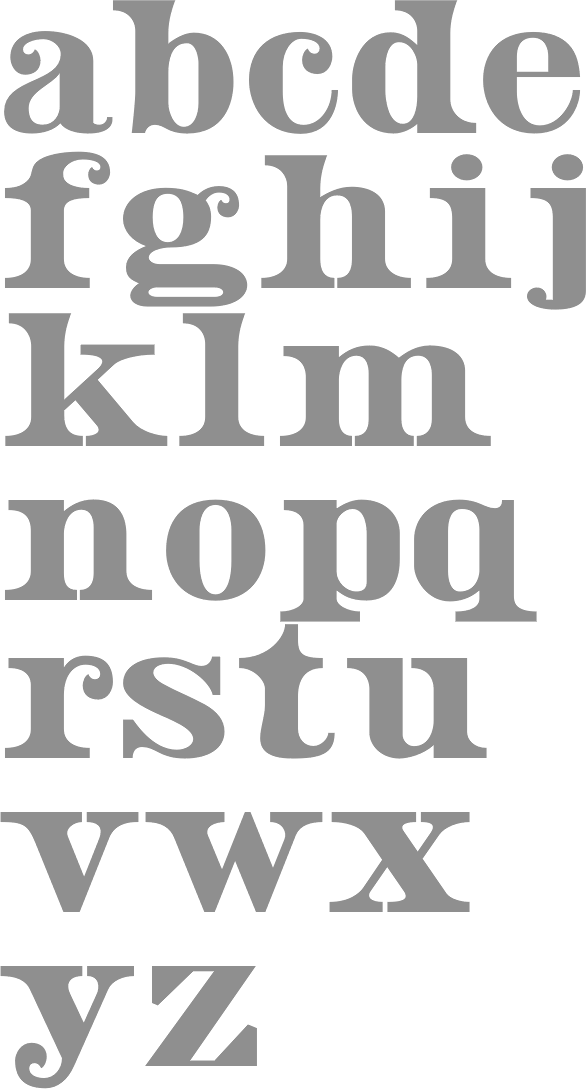
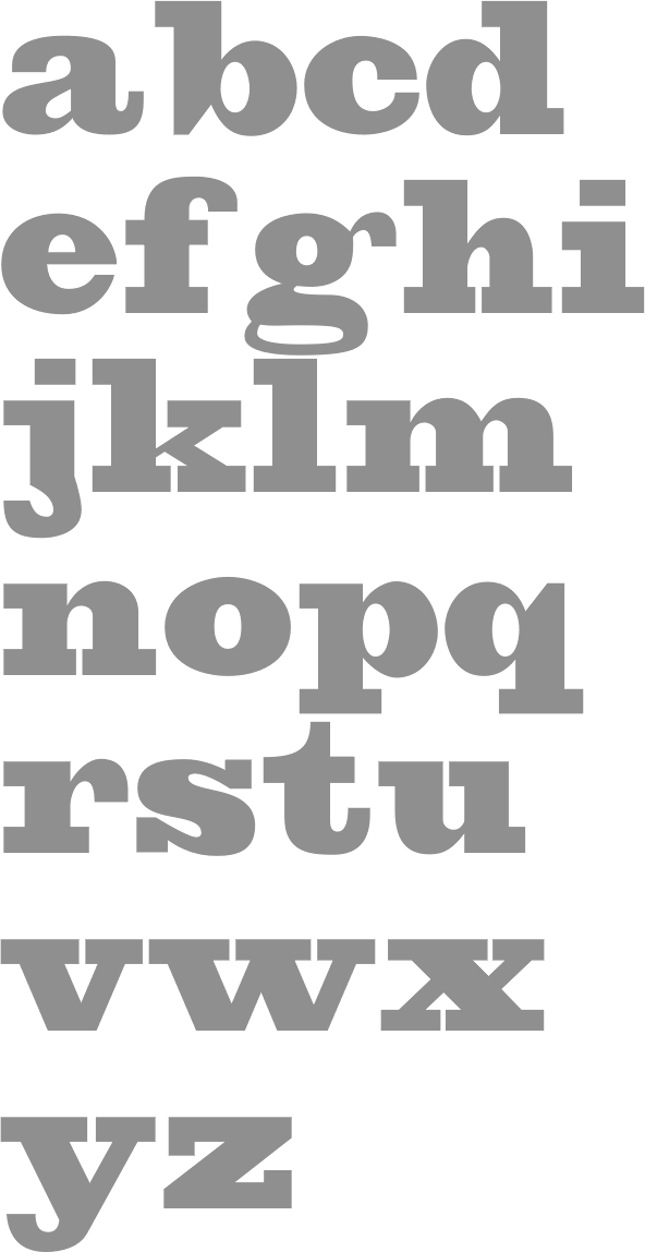
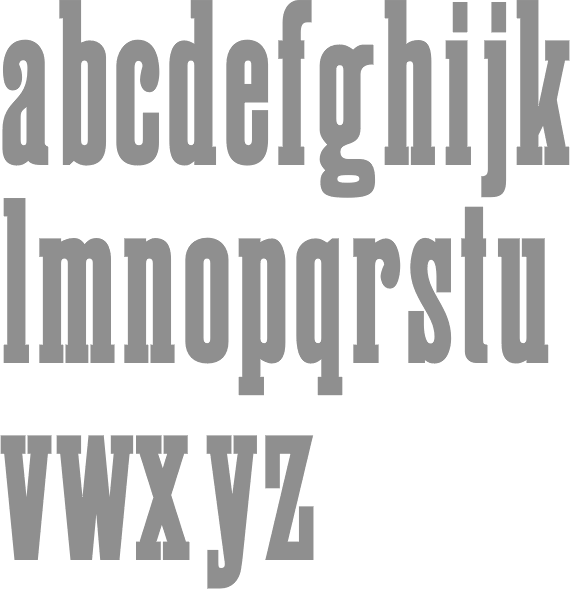
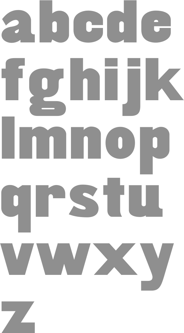
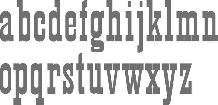
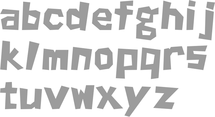
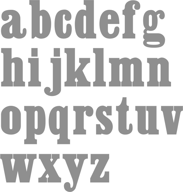
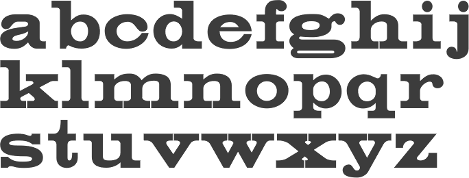
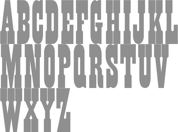
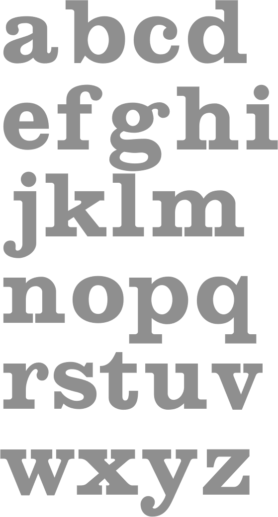
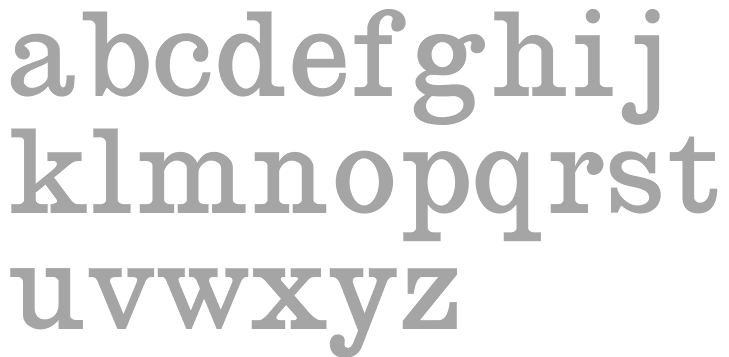
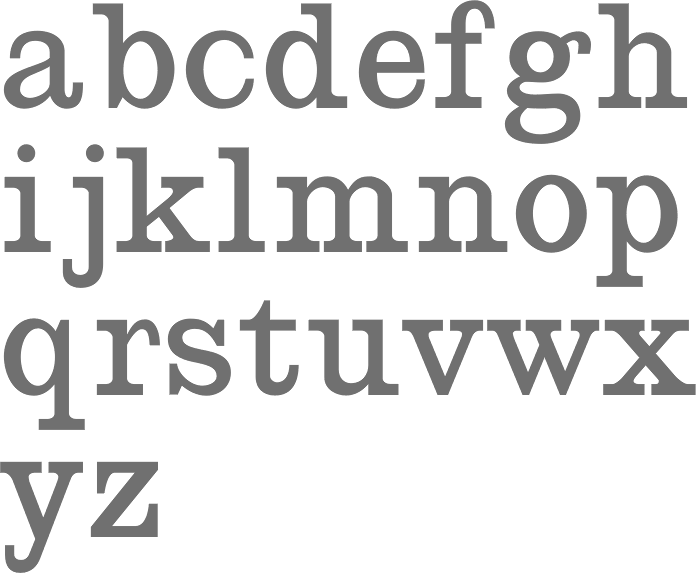
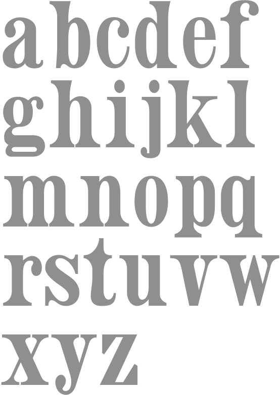
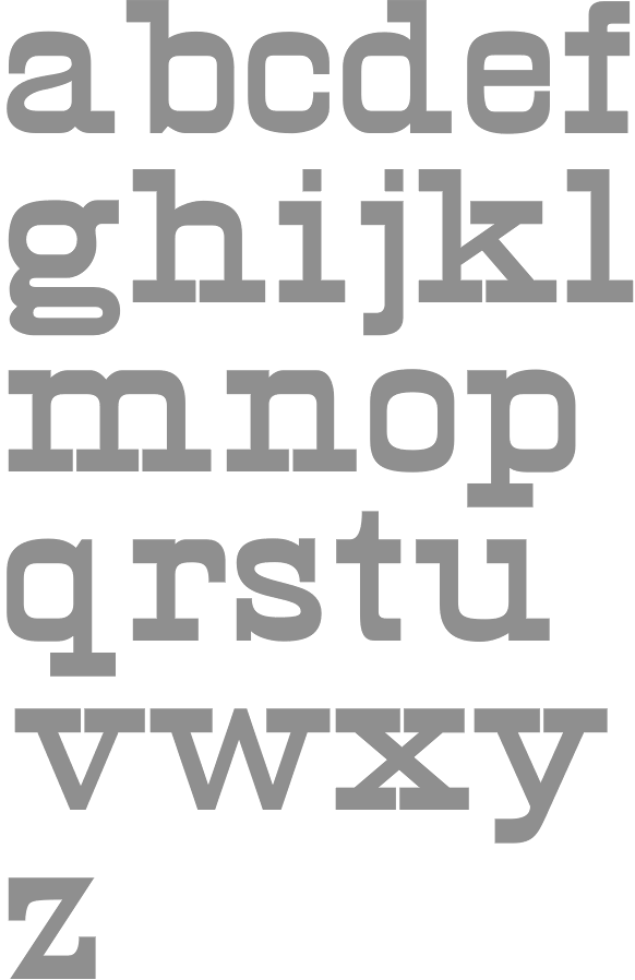
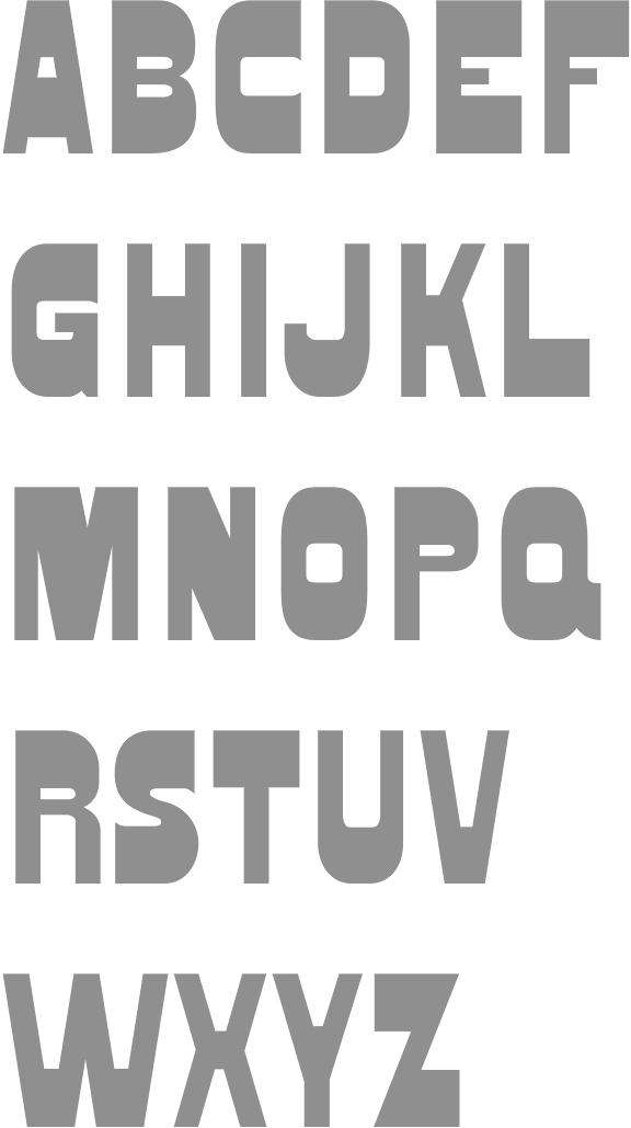
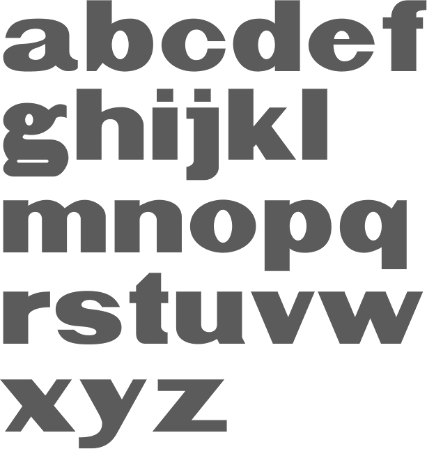
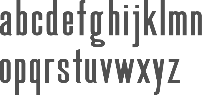
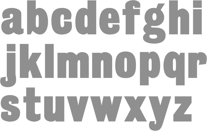
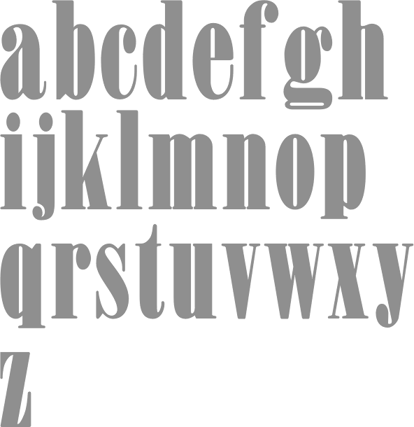
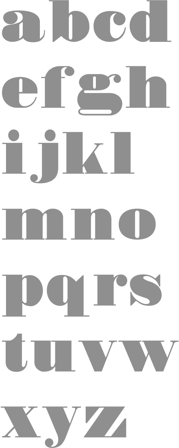
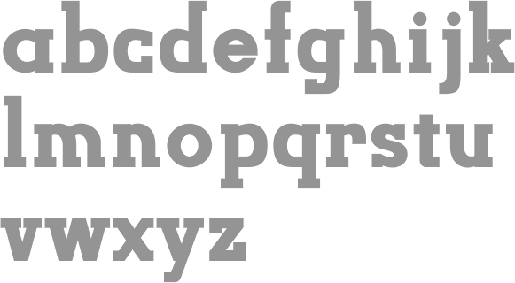
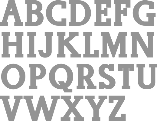
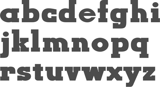
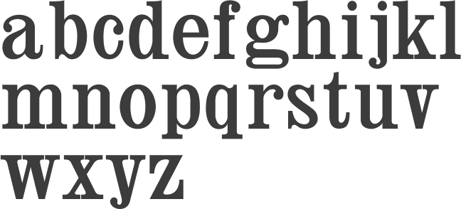