TYPE DESIGN INFORMATION PAGE last updated on Thu Jul 16 06:35:42 EDT 2026
FONT RECOGNITION VIA FONT MOOSE

|
|
|
|
|
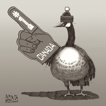
The Canadian type scene | ||
|
|
|
|
SWITCH TO INDEX FILE
10four design
|
Designer of ElDiabloRegular, TechnoOrganic (1996), Swashbuckler-Script (1996), BitchinCamero (1996) at Garagefonts. He also created Halqemeylem Serif (1997) for the Stolo Nation, based on Majoor's Scala. The fonts at 10four design include Adanac (free, clean sans), Bitchin' Camaro (scratchy writing font), Devicq (based on the handwriting of actress Paula Devicq), Downsize, El Diablo (gothic), Lonely Cowboy, Lonely Cowpoke (2010), Mia Pets (dingbats), Swashbuckler, Techno Organic. In 2007, Matt published the free icon typeface Adanac that contains 62 Canadiana symbols. In 2014, Heximer created Sonovovitch, a unicase display typeface inspired by the Russian Constructivist movement and Soviet Cold War era propaganda. Although a faux Russian font, Sonovovitch has language support for the true Cyrillic alphabet. In 2016, Matt published the angular Preissig-style Millwright and explains that it is inspired by spunky DIY attitude and Industrial era hardware---an exercise in rendering glyphs with a rudimentary, hand-cut flavour. Behance link. FontShop link. Creative Market link. Klingspor link. [Google] [MyFonts] [More] ⦿ |
| |
| |
3rd Wheel Creative Studio
| Canadian branding and graphic design studio run by Julian Brown. Julian created the free typefaces Feedback Quiet (2006) and Feedback Loud (2006). Dafont link. [Google] [More] ⦿ |
76type (was: electric type foundry)
| Free original fonts by Steve Palmer from Carleton University in Ottawa: Printer, Fabulous, Licorice, Electric Toaster, SaneSerif, Digitol and Crackpot. All in Windows TrueType format. Electric Type Foundry. Fontspace link. Dafont link. [Google] [More] ⦿ |
A Case For Type Design Education
| An article by Patrick Griffin in Applied Arts Mag, 2010. Patrick makes the point that type design should be taken seriously as a subject. [Google] [More] ⦿ |
A critique of existing typefaces for HDTV (EIA-708) captioning
| Joe Clark (Toronto) takes all the fonts proposed by Agfa/Monotype, Ascender and Bitstream for HDTV screen captioning apart. [Google] [More] ⦿ |
Fantastic collection of code and tutorials by a mathematician (Bill Casselman) for mathematicians. A must visit! [Google] [More] ⦿ | |
A Primer on Bezier Curves
| A Primer on Bezier Curves is an on-line book on Bezier curves by Pomax (Vancouver Island, Canada). [Google] [More] ⦿ |
Aka Memesbruh03. Canadian designer (b. 2003) in 2016 of the bitmap typefaces Gamer, Tairo, Blocktopia, 3DVenture, Monobit, AerxFont, ManualPrint, Codina, Codi, Revolute, Janyk, Miamiwriting, Reduction. Typefaces from 2017 include 000webfont (pixel font), Instructions (pixel font), Savior and SkateC (a pixel font). In 2018, he made 2A03, Galactic, Classic, Bit Cell, Average Symbol, 3x5, Heytext, Light, Superstar, Manual Display, Neato, Cutouts, Hometown3, Smalle, Cube Cavern, NDS Bios (pixel), Pixelface, Aerx Tablets (pixel font). Typefaces from 2019: Fewriter, Exin, Pocet, Bub, Euxoi. [Google] [More] ⦿ | |
Calgary-based design and illustration student who is working on Q-Bert or Aaron's 3d face (2004), an awesome graffiti face. [Google] [More] ⦿ | |
Designer of the thin unicase sans typeface Ardency (2013) [during his studies at George Brown College in Toronto]. Behance link. [Google] [More] ⦿ | |
Pickering, Ontario-based designer of the floral caps typeface Acid Trip (2016). Behance link. [Google] [More] ⦿ | |
Graphic designer in Red Deer, Alberta, who created the vintage typeface Mount Pleasant in 2013. Behance link. [Google] [More] ⦿ | |
Graduate from the Emily Carr Institute (Vancouver) and the KABK in Den Haag in the Type and Media program (2009). Originally from Lethbridge, Alberta, Abi designed a modular type generator. At KABK, he created Arietta, a small family consisting of a simply constructed transitional roman and a bold roman, as well as multiple italic companions. He works as a graphic designer at Commercial Type in New York City. [Google] [More] ⦿ | |
Abstract Fonts
| Growing 13000+ font archive maintained by Alex Chumak from Mississauga, ON. Chumak himself designed these fonts: AF Pepsi, AF Champion, AF Tommy Hilfiger. List of designers. New fonts. Fontspace link. Dafont link. [Google] [More] ⦿ |
Creators and vendors of an Ethiopic text family, HahuLite: "HahuLite is a program that runs on an IBM PC (or compatibles) that has Windows 95. This program enables you to write in Tigrigna and other languages that use the Geez alphabet, directly from your PC keyboard without any changes or additions to your existing Windows programs!" ACIS Consulting is based in Toronto. [Google] [More] ⦿ | |
Ackadia Fonts
| Fonts made by Paul Ackerley include Ackadia (1999, 3D simulation font). [Google] [More] ⦿ |
Pages no longer found. Signature/logo font service (70 USD per font). Download a free Halloween font and some free music fonts (George's Music): bagpipe, tin whistle, tablature. Based in Prince George, British Columbia. The fonts Recorder and Whistle can be found here. [Google] [More] ⦿ | |
Toronto-based designer who runs Peekay Art Department, which serves as a multi-disciplinary studio which focuses on art direction, illustration and graphic design. Behance link. Creator of the slabby Western poster typeface Fontaine (2011) and the grotesque black caps typeface TTC (2011). [Google] [More] ⦿ | |
Canadian designer of the bold avant garde typeface Sage Heavy (2011). [Google] [More] ⦿ | |
Vancouver, BC-based designer of the modular typeface Paprika (2016). Behance link. [Google] [More] ⦿ | |
Canadian nature photographer, who made Picassa Dance (2009), an abstract face. [Google] [More] ⦿ | |
Aioku Fonts (was: Kung-Fu fonts, or: Superfunk.com)
| Free fonts for PC and Mac made by Mike Lecky from Charlottetown, PEI, Canada. Mike Lecky's (mostly grunge) fonts: ATeam, Brad (glaz krak face), Bruce, BuddySystem, Class_of_74 (pixel font), Desi, DickSoup, EverCrash (extra thin LED font), Font, Funboy, Fruitsalad (pixel face), Jobats, Leck, Jet_Plane, Kevin Seconds, Losers, Mike_s_BigDay, Misfit, Rusty, WatchBreaker, Mark, Decline of the Western Civilization, Roadkill, x5, Brody (geometric font by Guilherme Capile!), Mark (grunge), Lou (handwriting), Kevin (handwriting). Dafont link. [Google] [More] ⦿ |
AiPaiNunavik Font
| Ray Taylor (Acorda Design Integration Inc) created a new Inuktitut font specifically for the Nunavik region of Northern Québec: AiPaiNunavik (2001) represents a return to the traditional way of writing the AI-PAI-TAI column of syllables. Fully-compatible Macintosh and Windows TrueType fonts in regular, italic, bold and bold-italic are available. The fonts contain the full Eastern Arctic syllabary (Nunavut and Nunavik). A version that is fully Unicode 3.0 compatible is available too. There are also AiPaiNutaaq (Unicode 3.0, full eastern arctic syllabary and Greenlandic), AiPaiNuna (a.k.a. AiPaiNunavik 2.0, all of the improvements to AiPaiNutaaq with AiPaiNunavik 8 bit encoding) and AiNunavik (1995, Ray Taylor), a font based on an original design of F. Firard and S. Putulik. The site also carries plenty of utilities for these languages. [Google] [More] ⦿ |
Canadian type designer from Toronto 1922-1978, active in the phototype era between 1950 and 1985, who made these typefaces:
The Baskerville Canada word mark in Canada's logo was lettered by Al Eliott. [Google] [More] ⦿ | |
| |
In 2016, at Lost Type, she designed the 8-weight sans typeface family Tofino, which is advertized as a West Coast Swiss. I hope that the name will stick, but surely, Greg Nicholls (designer of an earlier typeface called Tofino) and the foundry Tofino Type in Kelowna, BC, can't be too thrilled. Designer of the stencil typeface Sahlia (2020). Designer of the calligraphic typeface Avona (2020) and the text typeface Avona Serif (2021): The Avona family of fonts are inspired by fantasy games and calligraphy. Avona Serif is intended for flavourful user interfaces. Avona Serif draws inspiration from Carolingian letter forms and aims to captured the calligraphic round, wide structure. Typefaces from 2021: Formulate (a rounded sans typeface family that inludes dotted outlines for youngsters learning to write). Cargocollective link. [Google] [More] ⦿ | |
During his studies in Toronto, Albi Baraku designed the constructivist typeface Baeier (2018). [Google] [More] ⦿ | |
Ottawa-based student who is working on the curly display typeface Waterworld (2006) and the serifed display typeface Eskela (2006). [Google] [More] ⦿ | |
Kelowna, BC-based designer of the brush typeface Wanderer (2018). [Google] [More] ⦿ | |
Behance link. [Google] [More] ⦿ | |
Alex Blechta
| |
Alex Chumak
| |
Famous Canadian painter, 1920-2013. Official site. In 2017, Patrick Griffin (Canada Type) published a collection of all caps sans typefaces called Colville. He explains: The Colville fonts began their existence in 2015 as a project-specific typeface, made to be used on a custom-made headstone commemorating Canadian artist Alex Colville (1920-2013) and his wife Rhoda Wright. For that purpose, some initial shapes were modelled after letters Colville himself had used on a Governor General gold medal he designed in the mid-1970s. From there started a year-long project that culminated in a set of four comprehensive fonts ranging in weight from Light to Bold, each containing over 750 glyphs to cover Pan European language support, stylistic alternates, five sets of figures, automatic fractions, and some ornaments rooted in Alex Colville's art. These fonts exhibit a strong art deco aesthetic that has always been a favourite of architects, metal casters, and sign makers. This is a very humanist geometry alternating from the precisely calculated to the curvy and lithe, subtle contrast, flat stroke stops, and airy proportions that make for a counterspace built for accommodation and comfort. [Google] [More] ⦿ | |
Winkler, Manitoba-based designer who is working on Furtive (2007). [Google] [More] ⦿ | |
In 2015, Alex Nelson (Vancouver, BC) and Ross Milne drew Birds, a custom monospaced typeface created for Vancouver's café, The Birds & The Beets. [Google] [More] ⦿ | |
Canadian art student (b. 1988) who lives in Mississauga. As "Crimson Designs", he made the handwriting font Alexander Hosking Handwriting (2008). [Google] [More] ⦿ | |
Alexander Trosok
| |
During her studies at York University and Sheridan College in Toronto, Hamilton-based Alexandra Hawthorne designed the multilined typeface Maze (2017). Behance link. [Google] [More] ⦿ | |
Graphic designer and illustrator in Toronto who created the straight-line typeface Vamp in 2018. [Google] [More] ⦿ | |
Alien Typefaces
| Six futuristic typefaces by Canadian Nicholas Fabian, yours if you can decode his encrypted messages. Try them out! One is called FModernMedium (avant-garde style, 1993). Fabian died in April 2006. [Google] [MyFonts] [More] ⦿ |
Toronto-based designer of the decorative floral caps typeface Botanic (2017). [Google] [More] ⦿ | |
Graphic designer in Toronto. In 2013, she created the transitional text typeface Chalice (2013). [Google] [More] ⦿ | |
Vancouver-based creator of Allens Mess (2012, hand-printed). [Google] [More] ⦿ | |
Canadian graphic designer Allen Zuk designed these typefaces: Swing (was freely downloadable), Beat, the Kooky family (since 2004 a Bitstream font), Creep, Shadow, Krumple, Arson, Skritch, Schroder. Zuk used to run web pages/outfits called trashtype fonts and Financial Peril. These have disappeared. Home page (his original font pages are gone). Zuk used to work in Edmonton. In 2000, he moved to the UK where he worked as a freelance designer and copywriter until 2004. He currently lives in Toronto. Klingspor link. [Google] [MyFonts] [More] ⦿ | |
Toronto (and before that, Vancouver), Canada-based designer and photographer who created a few typefaces ca. 2015 such as the dot matrix Moonsafari and Belozoid, a contemporary sans-serif typeface designed for branding, signage, and editorial use. Dribble link. You Work For Them Link. [Google] [More] ⦿ | |
Toronto, Ontario-based designer of a graffiti font in 2017. [Google] [More] ⦿ | |
Alphabet Design
|
Other creations: Pixelina, Borek, Duckling, Fat Trace, Kloi (now Kloi BT (2004)), Tabita BT (2005, an informal font), and the great patterns of the Symbols font, JechoTecho. From the web site: He started working with digital fonts back in the days of bitmap fonts, sometime in 1988. At that time the studio operated in Zagreb, (former) Yugoslavia, which later became the capital of independent Croatia, under the name PixelPrint. The name changed to Abeceda Dizajn in 1992 while establishing itself as a successful typographic studio that specialized in font localization and type consulting. Abeceda Dizajn studio was the official distributor and manufacturer for Bitstream Inc. for Croatia and Slovenia from 1995 until 1997, when it relocated to Canada. Today, Alphabet Design is again a Bitstream re-seller. In 2005, Bitstream published Kloi, Borhand Tabitha, Duckling, as well as JechoTecho1 (the latter typeface was made by Evzen Jecho). Alphabet Design is donating all its proceeds of January 2005 to tsunami aid. In 2005, cartoonist Branimir Zlamalik created Smiles (dingbats) and Ulixa (comic book family). [Google] [MyFonts] [More] ⦿ |
Graduate of Emily Carr University of Art + Design in Vancouver. Creator of the free information design typeface Fabrica (2011, Practice Foundry). He wanted to make Fabrica into the most legible typeface for mobile screens. His Rytm typeface (2011, renamed Theatre I think) is an experiment: Rytm was built based on the height and width, letter spacing and kerning of Helvetica. Yes indeed, each Helvetica glyph was replaced by a correctly sized black rectangle. Behance link. Fontspace link. Klingspor link. Abstract Fonts link. [Google] [More] ⦿ | |
Vancouver-based designer of the pixel font Bitmap (2013). [Google] [More] ⦿ | |
Welland, Ontario-based designer of Affinities Script (2018). [Google] [More] ⦿ | |
During her art direction studies in Mississauga, Ontario, Amanda Clarke designed Zagged (2013), a script typeface. [Google] [More] ⦿ | |
Toronto-based designer of a remixed typeface in 2013 based on Accent Normal, Before the Rain, and Footlight MT Light. The (partial?) typeface is called This Modern Love. [Google] [More] ⦿ | |
Kelowna, BC-based designer of the color bitmap fonts Liquid Mojito, Liquid Galaxy and Liquid Sunset (2017). Creative Market link. Creative Market link for Character Market. [Google] [More] ⦿ | |
As a student at Humber College in Toronto, Amanda McCutcheon designed the decorative caps typeface Mythological Creatures (2016). [Google] [More] ⦿ | |
During her studies in Vancouver, Canada, Amber Pan designed the pixel typeface Dreams (2015). [Google] [More] ⦿ | |
Toronto-based designer of the semi-slab serif typeface Slabok (2014). [Google] [More] ⦿ | |
| |
Amy Bradley (b. 1984) lives in Sudbury, Ontario. At Devian Tart, she designed the scribbly handwriting font Jagged Thoughts (2001). [Google] [More] ⦿ | |
During her studies in Ottawa, Amy Brown designed Equae Deco (2013). [Google] [More] ⦿ | |
During her studies in Vancouver, Amy Meyer created the hipster typeface Sidestrike (2014). [Google] [More] ⦿ | |
Toronto-based designer of the free techno typeface Reactive (2013). Dafont link. [Google] [More] ⦿ | |
Graphic designer in Toronto, who created the teardrop terminal typeface Circle Sans (2013). Behance link. [Google] [More] ⦿ | |
Mississauga, Ontario-based designer of the rounded sans typeface Jelly Bean (2015). [Google] [More] ⦿ | |
| |
Graphic designer and illustrator in Waterloo, Canada. Creator of Dress My Hair (2012, an ornamental alphabet for hairdressers) and Block Cut (2012, a modular octagonal typeface). Behance link. [Google] [More] ⦿ | |
Toronto-based designer of the 3d typeface Lucent (2018). [Google] [More] ⦿ | |
Linkedin link. Behance link [Google] [More] ⦿ | |
Mississauga, Ontario-based designer of Milkbag (2015). [Google] [More] ⦿ | |
André Design (or: AAID)
| AAID stands for Andre & Associates Interpretation & Design. Type foundry in Victoria, BC. André Drafting (2012) is based on the hand-drafting lettering of senior designer Andrew Farrell. It can be used in CAD drawings, concept sketches and more. [Google] [MyFonts] [More] ⦿ |
During his studies in Toronto, Andrew Cooper created the Robotech typeface (2013). In 2015, he created the multi-colored Toy Alphabet. Behance link. [Google] [More] ⦿ | |
Andrew Dick was born in 1983 in Victoria, B.C. Canada, and is a selftaught artist who currently lives in Fukui, Japan. He is inspired by DADA, surrealism, the Cobra movement and naive art. He uses colored crayons and pens, paint, black ink, stamps, collages etc for his simple shapes, lines and new interpretations of old masters. His oeuvre includes several interesting sets of cats and critters done in 2007. [Google] [More] ⦿ | |
Andrew Farrell
| |
Chicago-based type designer who was born in Canada. Andrew studied graphic design at Columbia College in Chicago. He created the typeface Goonatic 72 Plus (2012). [Google] [MyFonts] [More] ⦿ | |
About his rounded informal sans typeface Coreopsis (2012), he says: Coreopsis is a family of fonts that combines mathematical precision with a hand-drawn feel. In 2012, he designed the painted typewriter font Stonecrop. Bitfield (2013) is a pixel simulation font. | |
In 2012, he published the pay-what-you-want typeface Soap (2012, Practice Foundry). Quillon (2012) is a typeface with minimal glyphs that draws inspiration from simplistic sword design. Hands (2012) is based on his own handwriting, and has its roots in street art. [Google] [More] ⦿ | |
Unclear whether Andrew Leto is Canadian or Australian. In any case, he designed the organic sans typeface Penguin Sans (2013). Dafont link. [Google] [More] ⦿ | |
Andrew McMillan
| |
Torontonian designer of a logiotype in 2011 called Mister Chino. Behance link. [Google] [More] ⦿ | |
Toronto, Ontario-based designer of the Adem Fox branding typeface (2018). [Google] [More] ⦿ | |
Vancouver-based designer of the paper-fold typeface Papertrails (2013). Behance link. [Google] [More] ⦿ | |
Andrew Vucko is a Canadian design director and animator. He runs an independent studio and builds content for studios, agencies, networks and brands. He has built relationships with local and international clients such as Google, Nike, BMW, YouTube, HP, Mitsubishi, Coca Cola, and Uber while being showcased in publications such as Applied Arts, One Show Annual, and Communication Arts. He is currently based in Toronto, Canada and freelances full time. Designer of the animated monospaced typeface Boomerang (2016). [Google] [More] ⦿ | |
Graphic designer in Vancouver and/or San Francisco. He created the free font Neighborhood Type (2009). Klingspor link. Abstract Fonts link. [Google] [More] ⦿ | |
Toronto-based graphic artist who created the water-and-ink experimental alphabet drips (2010). [Google] [More] ⦿ | |
Graphic designer in Ontario, who created Arch Type (2011, a geometric avant-garde face). [Google] [More] ⦿ | |
Angst Free Fonts
| Chris Dunfield's free fonts from 1990-1992. Mac PS, MacTT and Win TT. Includes AngstBlackLetter, AngstChartz1, AngstCircus2, AngstDingbatsOne3, AngstForce4, AngstGonzo5, AngstKidz6, AngstKink7, AngstMagicMush11, AngstMindless10, AngstPimp12, AngstProgge13. [Google] [More] ⦿ |
Chris Dunfield's font links: 2000 links to over 150,000 fonts! Possibly one of the greatest font link sites on the web. Link died! [Google] [More] ⦿ | |
Canadian creator of Leafy Font (2013). [Google] [More] ⦿ | |
Toronto-based designer of the modern typeface Kayak (2015). Ankush claims inspiration from Dwiggins. Behance link. [Google] [More] ⦿ | |
Graphic designer and social media specialist in Toronto, who created the futuristic octagonal typeface Galaxia (2015). [Google] [More] ⦿ | |
| |
Graduate of the University of Ottawa. Dring her studies at Algonquin College School of Media and Design, Anna Trojanowska created a display typeface (2015). [Google] [More] ⦿ | |
Toronto-based designer of the Ciya display typeface family in 2012 during a class of Rod Cavazos. Behance link. [Google] [More] ⦿ | |
Canadian designer of the handcrafted typeface Moon Firefly (2016). [Google] [More] ⦿ | |
During her studies at OCAD University, Toronto, Canada, Anran Zhou designed a Chines Lute-themed typeface (2016). [Google] [More] ⦿ | |
Canadian designer of the artsy avant garde caps display typeface Vienna Extended (1989, Letraset). Linotype link. FontShop link. Klingspor link. [Google] [MyFonts] [More] ⦿ | |
Aon Celtic Art
| Cari Buziak (Calgary, Canada) is the author of Calligraphy Magic---How to Create Lettering, Knotwork, Coloring and More (North Light, 2011). She also created the beautiful freeware Celtic font family Aon Cari (1998, a modern pseudo-Gaelic uncial). Dafont link. [Google] [More] ⦿ |
Apostrophe
| |
Apostrophic Instances
| Upstart foundry with one font family for now, the geometrically inspired Toolego (all formats). Newer fonts: FightThis, Tralfamadore (fantastic font!), WitchesBrew-1999. Alternate site. Apostrophe (Fredrick Nader from Toronto) is also a major custom font maker in Canada. His latest creations are for the 2003 Toronto Blues Festival, Trombone and King Gothic [not for public distribution]. In 2003, Apostrophic Instances morphed into Apostrophic Labs. [Google] [More] ⦿ |
Apostrophic Laboratory
|
|
Arash Ramin
| |
Graphic designer in Toronto. He made a logotype for the Italian restaurant Pranzo in 2012. Behance link. [Google] [More] ⦿ | |
Josh and/or Philippe is the Canadian designer (b. 1982) of grungy handwriting typefaces such as Sao Paulo (2007), Walk the Walk (2006), and Ugly Karen Slut (2007). Dafont link. [Google] [More] ⦿ | |
Asgard Studios (Ottawa, Canada) used iFontmaker in 2011 to create Runes Hand Painted. [Google] [More] ⦿ | |
At Algonquin College in Ottawa, Ontario, Ashley Murray designed the modular display font Targ (2016), which is inspired by the popular arcade bar and live music venue, The House of Targ, in Ottawa. Behance link. [Google] [More] ⦿ | |
Designer in 1994 of Avanti and Kashi, Hindi/Marathi/Sanskrit fonts for the Mac. Aklujkar worked then at the Department of Asian Studies, University of British Columbia, Vancouver. He sold the fonts on a diskette, which also included the Roman fonts "Ganga" and "Sindhu" which can be used for transliteration of most literary languages of South Asia. [Google] [More] ⦿ | |
Canadian creator of the fat finger fonts Rushed (2015) and Handwriting (2015). [Google] [More] ⦿ | |
Canadian art student, b. 1989. Designer of the constructivist fonts Truth and Real Truth (2009), both named after Pravda. Fonts2u link. [Google] [More] ⦿ | |
AT
| Canadian designer of the ancient gun-inspired typeface Scavenged (2018). [Google] [MyFonts] [More] ⦿ |
August T. Horvath
| |
Archive with two Star Wars truetype fonts, Wars and Aurabesh. [Google] [More] ⦿ | |
Calgary, Alberta-based designer of Forward Sans (2018). [Google] [More] ⦿ | |
Toronto-based designer who created the semi-blackletter typeface Elganis in 2016. Behance link. [Google] [More] ⦿ | |
During her studies, Vancouver, Canada-based Aynah Mahusen designed the glitch font Error (2019). [Google] [More] ⦿ | |
Canadian creator (b. 1990) of Strawberry Pink Child (2013, hand-printed), Bold Bronzyne (2013, a free fat finger typeface). [Google] [More] ⦿ | |
Victoria, Canada-based creator (b. 2001) of the white-on-black pixel font Insider (2013, FontStruct) and the dot matrix font Star (2013, FontStruct). [Google] [More] ⦿ | |
Vancouver-based designer of the dot matrix typeface Curvia (2015, FontStruct). [Google] [More] ⦿ | |
Torontonian creator of FF KlunderScript (Roman, Bold, Kreatures) and FF Ottofont (Fontshop, 2001). FontShop link. Klingspor link. [Google] [MyFonts] [More] ⦿ | |
Baron Art Co
| Lianne Tokey (Baron Art Co, Canada) created the handcrafted typeface Minnow (2015) and Mandala Symbols (2016: a handcrafted alphabet and accompanying set of kaleidoscopic ornaments). Creative Market link. [Google] [More] ⦿ |
Typefaces from 2021: Gemini (a condensed and vey stylish display typeface), Kafka (a struggling decorative typeface partly inspired by Wes Anderson's extravagant style), Arras (a dramatic display typeface), Rae (a sharp-edged display typeface), Erga (a display typeface), Kore (a display font). Shop. [Google] [More] ⦿ | |
Toronto-based designer of the modular typeface Beck (2010). [Google] [More] ⦿ | |
Baybayin Fonts
| Paul Morrow's Baybayin fonts (for old Philippine languages) in truetype and type 1 forms: Tagalog Stylized (a modern composite of many samples from the past), Tagalog Doctrina 1593 (based on the type typeface used in one of the very first books printed in the Philippines, the Doctrina Christiana of 1593), Bisaya Hervas (based on a type typeface that appeared in 1787 in an Italian work by Lorenzo Hervás y Pandura, Saggio prattico delle lingue con prolegomeni e una raccolta di Orazioni Domincale in più di trecento lingue e dialetti), Bikol Mintz (modelled after the cover art on the 1985 New Day Publishers edition of the Bikol-English Dictionary by Malcolm Warren Mintz&José Del Rosario Britanico), and Baybayin Lopez (2002), based on the typeface that Francisco Lopez used in the Ilokano Doctrina Christiana (1621). Alternate URL. [Google] [More] ⦿ |
The Government of BC, Canada, has an interesting 100-font non-shareware truetype archive. Includes Bitstream fonts such as ArrusBT, AuroraBT, and URW fonts such as BinnerD. [Google] [More] ⦿ | |
An open source typeface designed in 2019 for the Government of British Columbia by Monotype. Derived from Noto Sans, it supports indigenous languages in B.C. [Google] [More] ⦿ | |
BC Government dingbat fonts for environmental things: BCMELP Cor Symbols, BCMELP EPD Symbols, BCMELP Fisheries Symbols, BCMELP Trim Symbols, BCMELP Wildlife Symbols, BCMELP Water Symbols, Forestry Inventory Font 25. All in truetype. For related links, check the ARC/INFO Symbology at BC Environment. [Google] [More] ⦿ | |
Seyed Behdad Esfahbod MirHosseinZadeh Sarabi is an Iranian-Canadian software engineer, type expert and free software developer. He worked at Google in Mountain View, CA, and at Facebook (2019-2020). At the time he quit Facebook, his annual salary, as reported by The New York Times, was 1.5 million dollars. Behdad Esfahbod was born in 1982 in Sari, Iran. While at high school Esfahbod won a silver in the 1999 International Olympiad in Informatics and then gold in 2000. He studied computer engineering at Sharif University in Tehran while discovering the world of computer typography and open source. In 2003 he moved to Canada, studied computer science at the University of Toronto (MSc, class of 2006), became a regular contributor to GNOME---he was a director at GNOME Foundation from 2007 to 2010, serving as the president from 2008 to 2009---and many other open source projects. Esfahbod was among the founders of Sharif FarsiWeb Inc. which carried out internationalization and standardization projects related to open source and Persian language. He worked at Red Hat, Google, and generally became the go-to person regarding everything font and text rendering in open source projects. Among the projects he has led are the cairo, fontconfig, HarfBuzz, and pango libraries, which are standard parts of the GNOME desktop environment, the Google Chrome web browser, and the LibreOffice suite of programs. He received an O'Reilly Open Source Award in 2013 for his work on HarfBuzz. In 2012, he obtained an MBA from the University of Toronto as well. Speaker at ATypI 2014 in Barcelona. The abstract of his talk there explains the current status of the FontTools package: FontTools/TTX is a Python package for converting OpenType font fonts to / from XML. It was developed in early 2000s by Just van Rossum and has been in wide use by the type community since, mostly for testing and inspection, but its development has had stopped for the most part. In Summer 2013 I resurrected FontTools development by adding support for many tables that have not been supported before (EBDT/EBLC, CBDT/CBLC, sbix, COLR/CPAL, SVG, ...), as well as implementing new tools: a full font subsetting tool, font inspection tool, font merge tool. In this talk I will talk about the community gathered around the new FontTools development as well as my plans to expand FontTools into a full Open Source font production pipeline. Speaker at ATypI 2015 in Sao Paulo. Speaker at ATypI 2016 in Warsaw on The Open Source Python Font Production Pipeline. Addendum: Read his personal story involving psychological torture by the Iranian government. New York Times article in August 2020 about his Iranian experience: Esfahbod was arrested by Islamic Revolutionary Guards Corps' intelligence unit during a 2020 visit to Tehran. He was then moved to Evin prison, where he was psychologically pressured and interrogated in solitary confinement for seven days. They downloaded all his private data from his devices. Iranian security forces let him go based on his promise to spy on his friends once he was back in United States. According to Linkedin, he is now based in Edmonton, Canada. Wikipedia link. [Google] [More] ⦿ | |
Graphic designer and artist in Toronto. Creator of the free display typeface Eldora (2006), which is inspired by the Vienna Secession Movement. Dafont link. [Google] [More] ⦿ | |
Ben Tour
|
Download page. [Google] [More] ⦿ |
British illustrator who got a Masters degree in 2004 from the University of Huddersfield. Now, located in Toronto, he created some nice hand-lettered chalk mural pieces such as one called Metcalf Interns--it has the names of all 2001-2011 Metcalf interns. Cargo collective link. [Google] [More] ⦿ | |
Winnipeg, Manitobva-based designer of the free modular typeface Chicago by Benj Funk (2014). Dafont link. Behance link. [Google] [More] ⦿ | |
Graphic designer in Toronto, who created the otylined 3d typeface Jinx in 2015. [Google] [More] ⦿ | |
Benjamin Scholtens is based in Oakville, Ontario. During his studies at York University in 2013, he designed the informal sans typeface Entrepreneurial. [Google] [More] ⦿ | |
Vancouver-based designer of a few experimental typefaces in 2014. Home page. [Google] [More] ⦿ | |
Winnipeg-based designer of a set of 23 Hindi, Sanskrit, Gujarati, Marathi and Sindhi-Devnagari truetype fonts (20 USD for the set). See also here. The Bhagwan has a Bachelor of Engineering degree (1952) from the University of Poona, India, and a Doctor of Philosophy degree (1965) from Bombay University. [Google] [More] ⦿ | |
Bianca Di Pietro (Designed by Bianca, Hamilton,Ontario) created the circle-based experimental typeface Infinity (2012). [Google] [More] ⦿ | |
Biliktu Foundry
|
|
Toronto-based designer of the Arts & Crafts scrapbooking style typeface Crafty Font (2013) and of the wood type Bauer Bodoni-inspired slab serif Bodoni Block Font (2013). In 2016, he designed the geometric wedge serif typeface Equinox. Behance link. [Google] [More] ⦿ | |
Backend software developer in Canada. In 2021, he/she designed the dingbat font Fruits. [Google] [More] ⦿ | |
Black Dahlia Press
| Vancouver, BC-based designer of these typefaces in 2017: Seasalt, Kabir (sans), Lucille. Creative Market link. [Google] [More] ⦿ |
Black Fox Foundry
|
Creator of Egypt 22 (2011, a free heavy slab serif, which includes smilies), Lloyd Serif (2010), a refined piano key typeface. It covers Latin, Ukrainian and Russian, and was inspired by Bill Loyd and by the Ogaki typeface. In 2010, he set up his own foundry. At it, he published the soft monoline sans typeface Soft2911 (2011). In 2012, he created a geometric sans based on Futura for Chun+Ivan Design, called Anchor2. Pontus is a free geometric sans typeface available from Practice Foundry. In 2014, he published the oriental simulation typeface Takoshi (Ten Dollar Fonts: Takoshi is a finely crafted modern interpretation of 15-17th century Cyrillic writings. Takoshi also features influence from Japanese/Chinese calligraphic writing. Takoshi has a balanced contrast of thick and thin and sharp triangular shapes). Chun+Ivan Design is located in Toronto and is run by Chun Hu, Ivan Kostynyk and Philip Wu. Klingspor link. Another Behance link. [Google] [MyFonts] [More] ⦿ |
Black Lab Type
| Toronto, Canada-based designer of BLT Balfour (2019: art deco), Dozen (2019: a donut bakery font), BLT Heirloom (2019: rounded informal sans), BLT Portage (2019: a reverse stress Western font), BLT Gerhard (2019, a Victorian headline typeface) and BLT Norfolk (2019, a vintage-inspired font based on the styles found on packaging from the early 1900's). [Google] [MyFonts] [More] ⦿ |
Canadian co-designer, with Steve "Gecko" Harrison, of the Victorian revival font Brand New Memorial (2020), which improves on Dan Solo's Memorial. [Google] [More] ⦿ | |
Born in Edmonton in 1971. Calgary-based employee of Veer who holds a BCom degree from the University of Calgary. In 1991-1992, he designed these commercial fonts for Image Club Graphics: Digital (digital readout font), Pacifica (squarish all-caps display face). Monotype Imaging, which sells the font, does not even know who made it, so how can they be expected to pay royalties to the designer? [Google] [More] ⦿ | |
Blechmen
| Alex Blechta (Blechmen) is a portrait photographer and graphic designer based in Toronto. Designer of the distorted typeface family Melancholy (2019). [Google] [MyFonts] [More] ⦿ |
Blue Jay Font Studio
| The Blue Jay Font Studio specializes in alphadings and dingbats. Its fonts include BJFAngels, BJFBallerina-BJFBallerina, BJFBeaconofLight, BJFChristmasWreath, BJFDingFonts, BJFDragons, BJFFingerprint, BJFHollyBells, BJFHunnybee, BJFKatnMouse, BJFMermaid, BJFMerman, BJFSnowbird, BJFThread, BJFXmasAngelsAH, BJFXmasPuppy, Smilin_John. Just that last font name tipped me off. I had a very friendly correspondent once from Toronto, John Hill, and he used that nickname. And the Blue Jays play in Toronto, so I will bet my shorts that the designer is in fact John Hill. [Google] [More] ⦿ |
Blue Yolk Studio
| Pranavi works as a graphic and type designer in India. During her studies at California College of the Arts in San Francisco, Pranavi Chopra created the cursive typeface Fair Hand (2016). %T Graduate of TypeWest, class of 2021. Her graduation typeface there was Mynah, which is characterized by flowing letterforms and rhythmic texture. Mynah was inspired by explorations of ways to twist the parallel pen. During the Introduction to Modern Type Design workshop by Graham Bradley, with Libbie Bischoff, held online at the Letterform Archive, San Francisco in Summer 2020, she designed Bergenia, a light serif typeface intended for use in print and digital publications, branding and on websites, at 18pt or larger. It was inspired by the letterforms on a type specimen published by Schelter & Giesecke in 1912. She is the founder (in 2022) and creative director of Blue Yolk Studio, a graphic design studio based in British Columbia, Canada. [Google] [More] ⦿ |
Canadian designer of Seagull (at Ingrama, 1978; with Adrian Williams---now available at Bitstream), Springfield (1973; see Simpson at Softmaker), Elefont, and Roman Script (1979; see Rochester at Softmaker). Linotype link. FontShop link. Klingspor link. [Google] [MyFonts] [More] ⦿ | |
In 2012, he created type 1 versions of two large font packages, Philipp H. Poll's Biolinum and Libertine. [Google] [More] ⦿ | |
Three free Vietnamese truetype fonts from the Trichlor Group, called the VISCII fonts: U-Hoai 1.1 (by Cuong Bui), VI Chi Toan and VI Chi Toan Hoa (the latter two by Tuan-Loc Nguyen). [Google] [More] ⦿ | |
UHoai11 (by Cuong Bui, The TriChlor Group), and VIChiToan and VIChiToanH by Tuan-Loc Nguyen. Freeware Vietnamese TrueType fonts. [Google] [More] ⦿ | |
Bona Fide Craft
| Waterloo, Ontario-based designer of the interlocking typeface Stratford Sans (2018). [Google] [More] ⦿ |
Toronto-based designer of Donut Shop (2017) and Basement Stairs (2017). [Google] [More] ⦿ | |
Boris Mahovac
| |
Born2paradise Studio
| Canadian designer (b. 1968) of the brushed typeface Rakugaki (2020). [Google] [More] ⦿ |
Boulevard Lab
| Or just Sam G. Hughes. An experimental design studio in Edinburgh, Scotland and/or Canada that made some fonts starting in 2019: Avenue (+Mono), Arctic, Sometimes Times, Oatmeal Sans, George Display, Melody Sans, Alt Display. In 2020, he designed Lothian Sans (with harsh angles to accompany the uniform neo-grotesk design, influenced by the early-20th-century Cubist movement) and Kale Mono. Behance link for Sam G. Hughes. [Google] [More] ⦿ |
Brada
| Branding design studio in Queretaro, Mexico, and also co-located in Canada. His typefaces include De Valencia (2018), Fabat (2018), Xochi (2018: a pixel typeface) and Riviera (2018). Typefaces from 2019 include the futuristic Silba. [Google] [More] ⦿ |
Cartoonist in Canada who created Smiles (2005, smiling typefaces) and Ulixa (2005, a comic book face) at Alphabet Design. Klingspor link. [Google] [More] ⦿ | |
Brenden C. Roemich
| |
Canadian designer of Tantalog (2006), an artificial language font based on Disney's Lilo&Stitch. Alternate URL. [Google] [More] ⦿ | |
Brett Alton from Peterborough, ON, is a graduate in computer science from Trent University. He created the Open Font Library handwriting font Brett Font (2007). [Google] [More] ⦿ | |
Vancouver, BC-based designer of the display typeface Golden ratio (2018). [Google] [More] ⦿ | |
Director of the Type Club of Toronto, and printer and conservator at Massey College, University of Toronto, Brian is one of the type personalities of Canada. He currently teaches at Humber College in Toronto. [Google] [More] ⦿ | |
Brian Maloney
| |
Designer (with Dave Kellam, at Eightface) of Stay Clear, Niner and Pigment08, in 1998. Designer at Chankstore of Barrett Ironwork (2001) and MC Auto (2002). [Google] [More] ⦿ | |
Brian Thom
| |
FontStructor who made Alchemic Swan Song (2011). Briana is a student at Mount Royal University, Calgary, Alberta. [Google] [More] ⦿ | |
Graphic designer in the second most boring city of Canada, Waterloo (after Sudbury). Despite this setback, Brie designed a remarkable decorative textured typeface, Alphapat (2015). [Google] [More] ⦿ | |
Canadian creator of the free hand-drawn typefaces BD Calais, BD Grenoble, BD Avignon, BD Rouen, BD Toulouse, BD Paris and BD Marseille (connected script). Dafont link. [Google] [More] ⦿ | |
Britt Edwards is a graphic designer and illustrator in Toronto, Canada. In 2015, she created the handcrafted typeface Hyperbole. In 2014, she designed a set of icons. Behance link. [Google] [More] ⦿ | |
Sault Sainte Marie, Canada-based designer of the super-tall typeface Scumbag Sans (2016). [Google] [More] ⦿ | |
Canadian designer, b. 1991. Creator of the free font BM Spaceboy (2009, hand-printed outline font) and BM Sham Garde (2009). Fontspace link. [Google] [More] ⦿ | |
New Foundland-born type designer of the hand-printed typeface Soupbone (+dingbats), who directed commercials at Tricky Pictures, Chicago. He returned to Canada in 2000 to form Global Mechanic with filmmaker Ann Marie Fleming. Home page. FontShop link. Klingspor link. FontFont link. [Google] [MyFonts] [More] ⦿ | |
Japanese-born Brazilian designer based in Toronto, Canada. Creator of the free lower case-only blackletter font Delirium (2019). [Google] [More] ⦿ | |
By The Font (or: BTF)
|
|
Caffeen Fonts (was: Chlorine)
| Canadian archive where you can download 19 fonts by Regina's Jesse Wilson: Chlorinez, Chlorix, Chlorinov, Chlorinut, Chlorinar, Chlorinap, Chloriin, Chloreal, Chlorinej, Chlorinuh, Chlorenuf, Chlod, Chlub, Hyper3, JesseScript, Morevil, Circle6, Caffeen, Star Five. Mac and Windows. Plus Math Donuts, Hawaiiah, Clawless, Alcohol Licks, Ostro 868, Megapixel, Fack, Courier Now, Disco2000, Jim Teacher, Edcom, Kitchener, Alterna. Some of his fonts are also available in sIFR format. Dafont link. MyFonts link. [Google] [MyFonts] [More] ⦿ |
Kelowna, BC-based designer of the decorative caps typeface Emone (2016), which is inspired by anemones and crustaceans. [Google] [More] ⦿ | |
During her studies in Toronto, Caitlin Legere created the display typeface Foxtail&Fawn (2014). Behance link. [Google] [More] ⦿ | |
Graphic designer in Toronto who created the horror typeface Krumm (2013) and the brush typeface Oblina (2013). They are named after characters from Nickelodeon's Ahh Real Monsters. [Google] [More] ⦿ | |
Cajjmere Wray
| |
Cajjmere's Playground
| Cajjmere Wray is the Toronto-based designer of Deeegruvy, Deeeluvly, and GoodbyeHorses, posted in May 2000 on abf. His (truetype) fonts consist of artsy handwritten and often curly letters. Fun to play with. [Google] [More] ⦿ |
Canadian creator of the fat finger typeface Hipster (2012). Aka Georgia D. [Google] [More] ⦿ | |
Vancouver, BC-based designer of Mamba Blackletter (2017), a fleshy blackletter typeface. [Google] [More] ⦿ | |
Graphic designer Calum Smith (Gemini Design, Georgetown, Ontario), made the pixel typeface Pixette (2010). [Google] [More] ⦿ | |
Canadian designer (b. 1981) of the pixel typefaces Xposure (2008), Slashman (2009, FontStruct) and Vault (2008, FontStruct). He lives in Ontario. [Google] [More] ⦿ | |
Canada Type
|
Typefaces made in 2005: Jazz Gothic (Patrick Griffin), Showboat, Hunter (a revival of Imre Reiner's brush script Mustang, 1956), Quanta (stencil), Quiller (a script typeface based on J.J. Sierke's 1964 typeface Privat), Rhino (revival of Mobil, a 1960 typeface by Helmut Matheis for Ludwig&Mayer), Dominique (donated to FontAid), Secret Scrypt (donated to FontAid), Jackpot (2005, Western typeface remotely based on Cooper Playbill which in turn is related to Cooper Black, but it also has hippy 1968 influences), Sincerely (handwriting typeface based on Karlgeorg Hoefer's 1968 Elegance), Fontella (a digitization of Novarese's calligraphic script Elite), Boondock (digitization of Imre Reiner's Bazaar from 1956), Gumball (digitization of Papageno, a 1958 bubblegum font by Richard Weber for Bauer), Runway, Gamer, Dominique (OpenType handwriting face), Sterling Script (2005, by Alaccari and Griffin: a 7-weight digitization and extension of Stephenson Blake's 1952 clean copperplate script Youthline Script), Vox (2007, a 24-style monoline sans family done with Patrick Griffin), Vox Round (2013, a softer version), Swan Song (2006: a calligraphic typeface based on the hand of Alexander Nesbitt. A later document states that it is based on work by British artist Rachel Yallop from 1986), Evolver (2006, a 9-style futuristic family), Ambassador Script (2007, an Alaccari-Griffin revival of the angle-reduced calligraphic script Juliet by Nebiolo, 1955). In 2005, Philip Bouwsma joined Canada Type, and designed a great calligraphic blackletter-inspired family, Torquemada. He designed many other typefaces for Canada Type in subsequent years. VIP (2007, Rebeca Alaccari) is a humanist sans serif uppercase (and figures) combined with a freshly redrawn revival of the classic VGC Constanze initials originally designed by Harry Brodjian in 1970, and even further back, the Constanze Initials by Joachim Romann (1954-1956, Stempel). Chopper (2007, by Rebecca Alaccari) is a revival of Venture (a 1972 typeface for VGC by Harry Villhardt). Walter (2007, Rebecca Alaccari) is a digitization of Heritage (1952, ATF, a calligraphic script by Walter H. McKay). Celebrity (2007, Rebecca Alaccari) revives and extends the retro/techno typeface Latus (Willy Wirtz, 1971). Sympathique (2008, Alaccari) is an ultra-thin and ultra-tall typeface in the mold of Bernhard Fashion and other era poster or film typefaces (they say that it is rooted in the film typefaces Hairstreak and Mossman). Mullen Hand (2008) is a revival of Repro Script (1953, Jerry Mullen, ATF). Filmotype Giant (2011, a condensed sans) and its italic counterpart, Filmotype Escort (2011) were both co-designed with Patrick Griffin. In 2020, they released the variable informal sans typeface Bananas: Bananas was sourced from multiple American film era faces, all from 1950s and 1960s, when the casual sans genre was at its popular peak. Headliners' Catalina and its very similar cousin, Letter Graphics' Carmel, served as initial study points. Klingspor link. [Google] [MyFonts] [More] ⦿ |
The Canadian Typography Archives (CTA) is a non-profit initiative for education, inspiration and the preservation of content and community in typography and its related fields. Founded in 2018 by Rod McDonald (FGDC) and Patrick Griffin (CanadaType) with a premise of identifying, highlighting and celebrating Canada's significant contributions and innovations in the sphere of typography and the communication arts. As of 2026, the Board of Directors consists of Sam Archibald (Cole Harbour NS), Bob Beck (Montreal QC), Andrew Boardman (Montreal QC), Brian Donnelly (Gananoque ON), Patrick Griffin (Toronto ON), Linda Kincaid (Dartmouth NS), Rod McDonald (Lake Echo NS), Luke Norrad (Ottawa ON), and Steve Ross (Halifax NS). [Google] [More] ⦿ | |
Jim Lynch's font services in Toronto: signatures, new fonts, enhancements, customized products. [Google] [More] ⦿ | |
Cappello Designs
|
|
Canadian designer of the squarish typeface Jet Set (2011), which is based in part on the font used in the Jet Set Radio game. He also made the pixel family Mecha (2012, FontStruct). Fontspace link. FontStruct link. [Google] [More] ⦿ | |
Cari Buziak
| |
He created Canada's first roman typeface, Cartier (1967, MonoLino Typesetting Company Limited) for Canada's centennial. Cartier was unfinished when he died. Rod McDonald finished it, to become a working and much larger typeface family called Cartier Book in 2000. Cartier has a sequel: Raleigh (Ingrama, 1977), co-designed by Robert Norton, David Anderson and Adrian Williams is sold by Bitstream, Adobe, Linotype, Paratype, and URW++. It is characterized by a bloated belly N. Raleigh was produced in 1977 by Robert Norton, and was based on Carl Dair's Cartier typeface. It was renamed Raleigh after Dair's death. Adrian Williams added three weights for a display series, and Robert Norton designed the text version. Several typefaces were influenced by Cartier. These include Ludwig Ubele's award-winning FF Tundra (2011). For a full revival, including both a facsimile and an interpretation, see Nick Shinn's Dair (2017). Author of Design with Type (1952, revised and expanded in 1967 and republished by the University of Toronto Press (First Edition) in 2000). He also wrote several wonderful short treatises on various topics in type design. John Berry discusses Dair's seven different kinds of contrast, size, weight, form, structure, texture, color and direction. FontShop link. Klingspor link. [Google] [MyFonts] [More] ⦿ | |
Art director in Toronto who made the experimental typeface Alienese (2011). [Google] [More] ⦿ | |
For a project in Greg Van Alstyne's class at OCADU in Toronto, Casey Nash designed the hipster typeface Nautico (2015). Behance link. [Google] [More] ⦿ | |
Cassandra Cappello
| |
CC Creative Co
| Canadian designer in 2019 of the display typefaces CC Robo, CC Keni, CC Fat, CC Afterglow and CC Alamo. [Google] [More] ⦿ |
CC Creative Company
| Canadian designer, b. 1992, of CC Fat (2019: a black headline sans), CC Afterglow (2019), CC Robo (2019: a squarish monoline sans), CC Disto (2019: a computer emulation font), CC Alamo (2019), and CC Keni (2018: a hairline sans). [Google] [More] ⦿ |
Canadian designer who used Fontifier to create a handwriting face, Cecilia (2004). [Google] [More] ⦿ | |
During her studies at Algonquin College, Ottawa, Ontario-based Celeste Lavoie designed the display typeface Voldeon (2016). [Google] [More] ⦿ | |
CFF-glyphlet-fonts
| A great explanation/implementation of OpenType CFF font writing. By Canada-based Pomax. [Google] [More] ⦿ |
| |
Creator of the beautifully handlettered logo and meus for The Mermaid Inn (2009). Chad specializes in sign lettering out of his office on Spadina Avenue in Toronto. Behance link. [Google] [More] ⦿ | |
Toronto-based creator of Halloween Fashion Week Poster (2012) for an event held in Toronto that was hosted by Elle Canada. [Google] [More] ⦿ | |
Chank Fonts (or: Chank Store, or: Chank Diesel))
|
Chank became a popular and colorful figure who said this about himself: I like to drink a lot, and would like to think I'm known for it. Several of my fonts were inspired by booze, and I like to encourage other people to drink more, too. My best font is called Liquorstore. A partial list of his typefaces:
At Ascender: the mostly hand-printed typefaces Birthday Girl, Bleacher, Bobby Zee, Chauncy Decaf, Churros, Collateral Damage, Couchlover, Easterbuns, Loopy Fiesta, Mister Marker, Mister Twiggy, Prickly, Snowballs, Space Toaster, Tipsy, Twigdancer, Younger Than Me (2009, grunge). Chank also has a bunch of free fonts such as Yellabelly (handwriting), Fridley, Airboy, SundayLuck, Shadowboxer, Portastat, Fridayluck, Twenty Six Snake Rumba, and Blinkers. Dafont link. I Love Typography link. Behance link. Klingspor link. |
| |
Shareware barcode font set made in 1999 by Daniel Lajeunesse at Chaos Microsystems in Gloucester, Ontario: EAN-13, EAN-13B, EAN-13B-Half-Height, EAN-13-Half-Height, Interleaved-2of5, Interleaved-2of5-NT, UPC-A, UPC-A-Half-Height, UPC-E, UPC-E-Half-Height. The company may not longer exist: Daniel Lajeunesse now is Executive Vice-President&CTO, Storm Internet Services, CDS/Prometheus. The fonts are also here and here. [Google] [More] ⦿ | |
Charice Xi
| |
Designer of the Fingerprint (experimental) typeface (2010) for an anti-war poster. She grew up in Jakarta, Indonesia, and is a 2010 graduate in graphic design at the Ontario College of Art&Design, Toronto. [Google] [More] ⦿ | |
Early 20th century designer of letters, such as this Modern Roman typeface. He was an editor of Graphica (The Herald Press, Montreal and Toronto). [Google] [More] ⦿ | |
Charles R. Anderson
| |
Designer of the layered typeface Swim Cap (2016). Creative Market link. [Google] [More] ⦿ | |
Chelsea Muchantef is a New Media and Web Designer living in Vancouver, BC. She specializes in website design, brand identity, and print media such as business cards, fliers, banners, and posters. She graduated from British Columbia's Institute of Technology. Creator of the hand-printed chicken scratch scribbles typeface Horror Scribbles (2012), Girly (2012, hand-printed) and School Work (2015, handcrafted). Dafont link. [Google] [More] ⦿ | |
Cherith Walsh (Cherith Brooke) is a graphic designer in London, Ontario. She made the fat finger typeface Pourquoi (2010). Dafont link. Behance link. [Google] [More] ⦿ | |
Vancouver-based designer of Novel (2004, serif face). [Google] [More] ⦿ | |
Brampton, Ontario-based designer of Negative Typeface (2015). [Google] [More] ⦿ | |
Toronto-based designer of grungy typefaces called Gen A and Gen Z (2014). [Google] [More] ⦿ | |
Chinese chess font
| |
| |
Calgary, Alberta-based designer of the scary font Creaky Serif (2015). [Google] [More] ⦿ | |
Victoria, BC-based photographer who created the handwriting font chris@iamfour.comtext (2004) with Fontifier. Alternate URL. [Google] [More] ⦿ | |
Chris Campbell
| |
Canadian designer of the hand-printed typeface Canadian Penguin (2011). [Google] [More] ⦿ | |
Chris Daniels (Edmonton, Alberta) created the layered beveled typeface Activa in 2013. Heatherwood (2013) is a heavy round display typeface. [Google] [More] ⦿ | |
Chris Dunfield
| |
Vancouver, BC-based designer of an experimental typeface in 2017, obtained by cutting an existing typeface in half. [Google] [More] ⦿ | |
| |
Freelance graphic designer in Sudbury, Ontario, who created the display typeface Grazioso (2014). [Google] [More] ⦿ | |
| |
| |
Christopher Campbell
| |
Graduate of the Master of Design program (MDes) at NSCAD University, 2010, in Halifax, Nova Scotia, where he was born and still lives. Typographer and enthusiastic supporter of open source projects. He says: I conduct experimental research designed to support or refute typographic conventions in accordance with objective measures of human performance and empirical data. Useful subpage on type literature. [Google] [More] ⦿ | |
Christopher Harvey
| |
Chris Hunt's great handscribbled splatter font Collateral Damage (1998) is distributed by Chank, and was done with Andrea McKay. It was inspired by the gonzo art of Ralph Steadman. See also here. He is based in Yellowknife. [Google] [MyFonts] [More] ⦿ | |
Graphic designer in Toronto, who created the modular unicase display typeface Shfontz (2014). [Google] [More] ⦿ | |
Christopher Simmons
| |
Toronto-based designer of a custom bilined caps typeface for the redesign of the identity of the Gardiner Museum in 2013. This typeface is based on Engravers Gothic. She studied at the Ontario College of Art and Design University (OCADU), class of 2013. [Google] [More] ⦿ | |
Cindy Kinash
| |
Ottawa-based designer of a garmond poster in 2017. [Google] [More] ⦿ | |
Designer and illustrator in Halifax, Nova Scotia, who created the display typeface Rails (2014). Behance link. [Google] [More] ⦿ | |
Graphic design student in Vancouver, who combined Twentieth Century MT and Chaparral Pro to make the bastard child Chaplin (2012). [Google] [More] ⦿ | |
Dafont link. [Google] [More] ⦿ | |
Canadian designer, b. 1988, who created the angular typeface Rocket Frog (2012), which was done with the technical help of FontPanda. Dafont link. [Google] [More] ⦿ | |
FontShop link. [Google] [MyFonts] [More] ⦿ | |
AAmerican artist and type designer, who lives in British Columbia. He created the casual hand-printed family Cody (2009, Delve Fonts). [Google] [MyFonts] [More] ⦿ | |
Vancouver-based graphic designer who created the fat didone typeface Fat Bros (2013, free). Behance link. [Google] [More] ⦿ | |
Sault Ste Marie, Canada-based designer of the tattoo font MyFont (2011). [Google] [More] ⦿ | |
Graphic artist and illustrator from Caledon, Ontario, who is now based in Kitchener, Ontario. He created the experimental typeface Gundam (2010), which is based on scrap plastic pieces that came from a gundam model. In 2016, he designed the sans typeface Stalwart Gothic. [Google] [More] ⦿ | |
Canadian graphic and type designer who was born in Calgary and lives in Vancouver. He designed the didone typeface Outlier Italic (2010). [Google] [More] ⦿ | |
Colin Whitlock
| |
Connor Fitzgerald (New York City) created the hand-printed poster typeface Ginga Freestyle (2011) for a series of ads for Ginga, a soccer company based in Toronto. [Google] [More] ⦿ | |
Toronto-based typesetting company. Designers included A. Crawford and Allan R. Fleming. We cite: Cooper&Beatty, Limited was founded in 1921 by E. Cooper, L. Beatty and J.L. Pepper using the name Trade Composition Company. When Pepper left in 1926 the company was renamed to Cooper&Beatty. Until the Second World War it was essentially a trade typesetting company. In 1950 W.E. "Jack" Trevett acquired the company. Trevett shifted the focus to graphic design, for which Cooper&Beatty became known as one of the leading companies in the field. In 1986 the company was sold to Jannock Corporation and although greatly reduced in size today, continues to operate under the name of Cooper&Beatty Services Ltd. [Google] [More] ⦿ | |
Corel included hundreds of fonts with their graphics packages. Most of their fonts are from 1991 and 1992. [Google] [More] ⦿ | |
Toronto-based brand identity company. Free fonts made by them can be downloaded here: Sable CR, Tesori CR. [Google] [More] ⦿ | |
Vancouver, BC-based student who created the pixelish or video game typeface Arcus (2014). [Google] [More] ⦿ | |
Graphic designer in Toronto who created the didone typeface Corina in 2013. [Google] [More] ⦿ | |
Canadian designer of the display typeface Moderno (2018). [Google] [More] ⦿ | |
| |
Truetype archive. No list of fonts, just 4MB worth of rar files. [Google] [More] ⦿ | |
Creating Comics
| Dave A. Law's links on comics fonts. The page includes a free Mac comic font by James Kochalka. [Google] [More] ⦿ |
Canadian or French company. Designer(s) of the hand-drawn typefaces Caramellist (2016, brush script), Delikassy (2016), Fat Foot (2016), Caffe Bistro (2016), Jørn (2016), Old Tavern Serif (2016), Nancy (2016), Suppa Medium (2015), Hers (2015), Slabby Joe (2014), Kampon (2014), Hands Down 3 (2014), Big Tracy (2014, bilined), and Sugar Free (2014, a script). Creative Market link. [Google] [More] ⦿ | |
During her studies in Toronto, Crystal Wiesner designed the typeface Qweckle (2013). Dafont link. Fontspace link. [Google] [More] ⦿ | |
| |
Canadian creator of the ultra-compressed hand-printed typeface Forest Fire (2013). Dafont link. Fontspace link. [Google] [More] ⦿ | |
Cultivated Mind
|
Cocobella (2012) is a delightful Treefrog-style connected brush script. Luella (2012) is a vintage poster font family. It includes several typefaces with ornaments. Typefaces from 2013: Pacific Northwest (hand-drawn poster typeface), Mimbie (+Kitschy Ornaments, +Spooky Ornaments, +Social Media Icons), Maisy. Typefaces from 2014: Westcoast Letters, the curly typeface Veronia (2014, with Callie Hegstrom), Local Market (with Charles Gibbons), True North (with Charles Gibbons: a set of letterpress emulation and poster typefaces in all caps; +Extras), Ciao Bella (with Charles Gibbons: a hand-drawn copperplate script emulation with four lovely hand-drawn sets of floral ornaments), La Chic (sic) (a poster font family on a didone body, with several sets of frilly frames), Pacific Northwest Letters, Pacifc Northwest Labels, Azaelia (hand-painted; comes with a dingbat font that has handmade frames, page dividers, ribbons and fancy flourishes). Typefaces from 2015: Mulberry Script, Glamour Brush, True North Textures (letterpress emulation; with Charles Gibbons), Wanderlust (watercolor brush script), Wanderlust Collection (including Wanderlust Letters Pro, Decorative, Boho, Chic, Shine, Gold, Caps, and Ornaments). Typefaces from 2016: Viva Beautiful, Garden Grown (brush script; +US B, +US C Caps), Local Brewery (vintage script). Local Brewery evolved in 2020 into Local Brewery Collection, and includes Icons, Extras, a monoline script and a tall all caps monolinear sans. Typefaces from 2017: Northwoods (handcrafted sans). Typefaces from 2018: Beauty Club (a script and a didone text family), City Streetwear, Beauty Style, Bushcraft (a geometric monoline script). Typefaces from 2019: Garden Collection, Viva Beautiful Collection, Northwoods Rough, Eastville Square (signage script). Creative Market link. YWFT link. [Google] [MyFonts] [More] ⦿ |
Canadian designer of the monoline script typeface Local Brewery (2020). [Google] [More] ⦿ | |
Canadian mathematician and computer scientist from the University of Waterloo who is currently a visiting postdoctoral fellow of Carleton University. Author in 2011 of Computer Modern Metafont to PostScript Type 3 Converter. He converted Knuth's 75 Computer Modern fonts with this short program, and explains: This is a collection of Knuth's Computer Modern fonts in PostScript Type 3 format. They are non-outline, non-bitmap versions which have been generated by a script which runs MetaPost on the original Metafont sources. Using the script, any CM family can be converted at any optical size, which might be useful if no Type 1 version is available and you require vector fonts, not bitmap fonts. Since they were not generated by approximating a Bézier curve to the font's contours, these can be considered the "most accurate" representations of Knuth's original design. On the other hand, they have no hinting and will not look good on-screen, except when viewed at high resolution. Also, using them with TeX requires compilation to DVI first, since pdfTeX does not seem to natively support PostScript Type 3 fonts. [Google] [More] ⦿ | |
Designer of Cranberriesfont (1999). Used to be at the University of Alberta. [Google] [More] ⦿ | |
CX Graphics
| Vancouver, Canada-based designer of the free fonts Fatcat (2020) and Reflee (2020: a stencil font inspired by reflections of rain and water). [Google] [More] ⦿ |
Cynscribe Calligraphy
| Calligraphy link site maintained by Cynthia Garinther in Montreal. [Google] [More] ⦿ |
Cynthia Garinther
| |
Graphic Design student at Vancouver Island University in Canada in 2013-2014. Creator of Neu Anglo (2014), an angular shaded typeface influenced by blackletter. Behance link. [Google] [More] ⦿ | |
Dundas, Ontario-based designer (b. 1984) of Dain's Handwriting (2005). Alternate URL. [Google] [More] ⦿ | |
Toronto, Ontario-based designer of the text typeface Eiffel (2019). [Google] [More] ⦿ | |
Vancouver, Canada-based designer of the octagonal crate stencil font family Kraft Stencil (2021), which has various degrees of rounding. [Google] [MyFonts] [More] ⦿ | |
Australian / Canadian programmer who lives in Los Angeles. In 2021, he designed Flow, a typeface for wireframing, prototyping and experimenting, which just consists of horizontal strokes of varying lengths. Flow is free at Google Fonts. Github link. [Google] [More] ⦿ | |
Dan Steinbok
| |
Canadian designer of the fat finger font Poopy V2 (2020). Aka DJ Banana. [Google] [More] ⦿ | |
Corporate identity person who also created some typefaces: Dahlquist Axe Titling Capitals, Dezynamotiv (art deco display face), Dockside, and this display face (2004). He runs Dahlquist Axe Studio in Victoria, BC. [Google] [More] ⦿ | |
Medicine Hat, Canada-based student-designer of the octagonal typeface Tenko sans (2019), which takes inspiration from old signage in Medicine Hat. [Google] [More] ⦿ | |
Canadian designer of the hand-printed typefaces Dan's Hand Writing (2015) and Dan's Hand (2012). [Google] [More] ⦿ | |
Vancouver, BC-based designer of a couple of drop cap alphabets (2017). [Google] [More] ⦿ | |
Klingspor link. Fontspace link. Dafont link. Kernest link. Fontsquirrel link. Google Plus link. [Google] [More] ⦿ | |
Canadian artist who studied at Ryerson University in Toronto. Designer of Kirkita (2005; coauthored with Kirk Dyer, it is also here), Skratchy the Spook (2004), Skratchy v1 (2006, with Jacob Kobold) and Skratchy v2 (2004; also with Jacob Kobold). Alternate URL. Yet another URL. [Google] [More] ⦿ | |
During her studies at the Emily Carr University of Art and Design in Vancouver, Daniela Buitrago (b. Bogota, Colombia) created a modular dot matrix alphabet (2014). [Google] [More] ⦿ | |
Toronto-based designer of the ornamental unicase typeface Flash (2013). [Google] [More] ⦿ | |
Daqing Chu
| |
Darren M. Boudreau
| |
Darren Rigby
| Refreshing fonts created by Canadian Darren Rigby using High-Logic. The fonts come in truetype format (in 2000): Bayern (fraktur font), Beltane (2002), Brasspounder (2004), Con Jitters (2002, handwriting), Enigmatic, EnigmaticUnicodeRegular, Fitzgerald, GangueOuais (2002), HindsightUnicode (2001, with all European languages, Cyrillic, Armenian, and IPA), HindsightSmallCaps, HindsightRegular, HindsightMonospaceRegular, IntruderAlert, QuicktypeRegular, ThinDime, TorturerUpright, SilverDollar, DontWalkRun, History-Repeating (1999-2000), HistoryHappens, HistoryRepeatingH, HistoryHappens, HistoryRepeatingV, Lemon, Norse-Code (runes), OneEighty, TorturerBound, TorturerCrushed, Daybreaker, Yerevan, Seebreaze, Jareth, Tin Birdhouse, Tin Doghouse, Three-Sixty, Three-Sixty Condensed, Levity (2001, Western font), Gravity, River Avenue, Water Street, Warer Street Detour (unicase), Meridiana, Torquemada, Torquemada Starved, Torquemada Starved Unicode, Radian (2002), All Hooked Up (2002), Brasspounder (2004), Quilljoy (2004). [Google] [More] ⦿ |
Darren Rigby
| |
This outfit in Iqaluit, NWT, Canada designed the Inuktitut fonts Old Syl and QalluSylNormal in 1992. [Google] [More] ⦿ | |
Designer of the art deco multiline typeface Beacon Hill (2009, FontStruct). The font is called "Beacon Hill" because it's inspired by the totem pole carvings at Beacon Hill park in Victoria, BC, Canada. If you turn the word on its side, it looks like a totem pole. Dave Aquino is located in Vancouver. [Google] [More] ⦿ | |
Ottawa-based student who made Chester (2006), a grunged up version of Eurostile. [Google] [More] ⦿ | |
Dave Kellam
| |
Toronto, Canada-based designer of Raleigh Regular (1977, Ingrama), a typeface that takes after Carl Dair's Cartier. That typeface was copied (without Anderson's knowledge) and expanded (without italics, though) to a full set of weights by Adrian Williams (ca. 1978), who licensed it to Linotype. Today, Raleigh is sold by Bitstream. Anderson was associated with Toronto's Typsettra, which in 1977 began the design of original typefaces for Berthold, Letraset and ITC. [Google] [MyFonts] [More] ⦿ | |
Type and culture blog by Vancouver-based designer David Arias. He created Isometrica (2008, a 3d pixel block face) and Toko (2009). Home page. [Google] [More] ⦿ | |
From 2004 to 2007, he ran his own design studio DAVI, with projects in graphic, web and interface design. Back in Brno, he worked with Tiro Typeworks (Canada) as an associate designer. At ATypI 2008 in St. Petersburg, he spoke about multi-script typography. His typefaces include
Blog. Myfonts link. Klingspor link. Speaker at ATypI 2013 in Amsterdam on the topic of multilingual type design. [Google] [MyFonts] [More] ⦿ | |
Canadian type designer Cabianca holds masters degrees from The University of Reading, Cranbrook Academy of Art (2001) and Princeton University. Creator of the Scala Sans-like typeface Quotidian Sans (2002) and of Stupidity (2001). As a graduate student at Reading in 2003-2004, he designed Cardea (2003-2004), which was released by Emigre in 2014. Cardea is a masculine angular text typeface with high blood pressure. Emigre writes that he created a typeface that sparkles on the page, with high contrast, luster and crisp edges. The result is a type with a muscular or sculptural feel much like the work of artists Arne Quinze or Mark di Suvero. David Cabianca teaches graphic design at York University in Toronto, Canada. Speaker at ATypI 2006 in Lisbon. [Google] [More] ⦿ | |
Ontario-based graphic and web designer. Behance link. | |
Toronto, Ontario-based designer of the art deco typeface Rocko (2014). Behance link. [Google] [More] ⦿ | |
Font Shop font outlet man in Toronto. Used to be at 401 Wellington St W, Toronto, Ont M5V 1E8 Canada, and is very knowledgeable about fonts in general---Toronto is very lucky! He runs Swipe Books there. He will do custom font design work. Now, David was the man in Toronto. Let me just replay this sweet testimony of Nick Shinn which explains how he got into type design: I too had a John Bull set. And played with Letraset. But there are many things "I started to become interested in" that didn't end up as my career(s). With type, I would say in retrospect that an accumulation of influences and circumstances made me an art director and subsequently a type designer. Had I been a better art director, I would no doubt have worked at an agency doing broadcast ads rather than B2B type-heavy print, directed commercials, and eventually become a movie director like Ridley Scott. Rather than a serial accumulation of prods in this direction, there may well have been a turning point when two or more influences coincided. I can certainly attribute my career as a (successful) type designer to one person. In the mid 1980s I gave up on type design, having had a couple of typefaces published a lot of work and precious little remuneration. Then in 1993 David Michaelides, the manager of the FontShop store in Toronto, organized a type event with Carter and Brody speaking; he then suggested I present some type concept ideas to FontFont, which I did, and they published Fontesque, which became very popular. Had it not been, I would probably not have pursued type design any further. A lot of turning points, serendipity, personal inspiration, opportunities opened up by new technology, and so on. [Google] [More] ⦿ | |
David Mondou-Labbe
| |
David Vereschagin
| |
Located in Toronto, this outfit published Alphabetical index to type faces, ca. 1935. [Google] [More] ⦿ | |
West-Vancouver based digital artist, b. 1987. Creator of Dotty Fun (2007), a dot matrix font (PDF only). [Google] [More] ⦿ | |
Toronto-based creator in 2009 of LSD Blackletter, a dot matrix blackletter face. Conflict (2012) is a modular gridded almost stencil design. Behance link. [Google] [More] ⦿ | |
Calgary-based designer in 1995 of the hand-printed font Litterbox ICG, the irregular hand-printed font Stanton (1995, Image Club Graphics) and Smile (1995). [Google] [More] ⦿ | |
Deep Blue
| There are several studios in the world called Deep Blue. This one is located in Ankara, Turkey, and offers professional vector format font services. At Graphic River, one can buy some of Deep Blue's fonts. These include Vicasso (2012), Equilibrium (2013). On Behance, we read that the designer is the Torbit Mine, Columbia, Canada-based Kevin Portman. Elsewhere, the designer of Vicasso is identified as Ramzi Abdulbari (Dammam, Saudi Arabia). [Google] [More] ⦿ |
A free XWindows kanji font, and a free PostScript kana font. Plus some Japanese language links. [Google] [More] ⦿ | |
Deniart Systems
|
List of font packages: Aglab, Alchemy Symbols, American Sign Alphabet, Ancient Writings Vol. 1, Ancient Writings Vol. 2, Angelica, The Astrologer Bundle, Astrologer, Aztec Day Signs, Black Magick, Braille Alphabet, Castles&Shields, Celestial Writing, Celtic Astrologer, Certar, Chinese Zodiac, Coptic Alphabet, Daggers Alphabet, Dendera, Dinosauria, Dragons, Egyptian Deities, Enochian Writing, Egypt. Hieroglyphics Vol 1, Egypt. Hieroglyphics Vol 2, Egypt. Hieroglyphics Vol 3, Egypt. Hieroglyphics Vol 4, Futhark, Greco, Hebrew Basic, Hypnotica, Magi Writing, Magick&Mystic, Malachim Writing, Masonic Writing, Maya Day Names, Maya Month Glyphs, Meso Americano, Meso Deko, Morse Code, Old Persian Cuneiform, Passing the River, Phaistos, Pike's Alphabets, Powers of Marduk, Sanskrit Writing, Semaphore Code, Signals&Signs, Skeleton Alphabet, Sublimina, Tengwanda Gothic, Tengwanda Namarie, Theban Alphabet, The Egyptologist, Tolkien Scripts, WhiteMagick, Skeleton Alphabet, Hebrew Basic, Sanskrit Writing. Note: I cannot find an entry for Jan Koehler at MyFonts, where all Deniart fonts are said to have been made by Denise Koehler. [Google] [MyFonts] [More] ⦿ |
In 2012, he created the shadow typeface ShowLetters, Pullstar (fat signage script family), Pullstar Holinight (2012), Tracker (hand-printed), Medley Script, Rose Heart, Spear Mint, Brick Wall (a texture face), Crispy, Crisp, Armand Chief (connected script), Mystic Arm, Back of Times, Back of Shadow, Fairland (blackletter), Armand Cocktail, and Thorn Heart. In 2013, he published Jess Font and Jessy Heart. Dafont link. [Google] [More] ⦿ | |
Denise Even
| |
| |
Designer in British Columbia who created the fashion mag high-contrast typeface Kursive (2013). Behance link. [Google] [More] ⦿ | |
Canadian designer of the dot matrix typeface Galactic Spaceport (2012). [Google] [More] ⦿ | |
Canadian designer of the techno typeface Jeed (2006). [Google] [More] ⦿ | |
Vancouver-based designer of the experimental photograph-based typeface Wreckage (2014). [Google] [More] ⦿ | |
Dick Pape
| |
Diego Puga
| |
Digital Graphic Labs
| Brenden C. Roemich's Winnipeg-based foundry. They sold fonts at 10 to 20 USD a shot, but made them free starting in 2003, when they quit the font foundry business. The entire collection, mostly dated 1998: ALSScript (knock-off of Shelley Script Andante by Matthew Carter), Aberration, AngleterreBook, Aramis, AramisItalic, ChanceryCursive, Dichotomy, Eddie, EnterSansmanBold (heavy serious sans), EnterSansmanBoldItalic, FLWScript, Fanzine (ransom note face), GlassHouses, Gunmetal, ILSScript, Incite, KellsUncialBold, KellsUncialBold, LDSScriptItalic, MICREncoding, Misbehavin', NinePin, NobilityCasual, Overmuch (fat rounded), PinchDrunk, Protestant, PunchDrunk, RamseyFoundationalBold, RocketPropelled, SNCScriptItalic (a knock-off of Nuptial Script), ShagadelicBold (psychedelic), Spirit, StaticAgeFineTuning, StaticAgeHorizontalHold (textured like a bad TV signal), Symbolix, TempsNouveau, TitleWave, TypeWrong-Smudged-Bold, VinylTile, VulgarDisplay, Whimzee, WhizKid, alsscripttrial, bitwise (LED face), holyunion, overmuchtrial. Direct download. Dafont link. Fontspace link. Local download. [Google] [More] ⦿ |
Two custom designs for newspapers, Ink Bodoni and Ink Nulek, can be purchased here for 35 and 22 dollars respectively. Digital-Ink is located in Toronto. Makers of the InkFontDingbats font, 1996. [Google] [More] ⦿ | |
During her graphic design studies in Ottawa, Dima Badawi designed Old Touma (2013). [Google] [More] ⦿ | |
As posted on abf by Diogene:
| |
Founding partner and creative director of Toronto-based Concrete Design Communications Inc. She has lectured at the Ontario College of Art and Design and the design department of York University. [Google] [More] ⦿ | |
Web designer in Halifax who writes about fontography and type history. [Google] [More] ⦿ | |
Ottawa, Ontario-based designer of the wedge-serifed typeface Domonic (2016), which was created for satanists. [Google] [More] ⦿ | |
Located in Toronto, Don Black deals in metal type, printing equipment, matrices, used type, and so forth. Alternate URL. His pages have many metal specimen, especially from Ludlow and Monotype. [Google] [More] ⦿ | |
Graphic designer and typographer in Toronto. In 2009, she created the experimental geometric typeface Kolo (This typeface design was inspired by tin can pull tabs. Thank you chicken of the sea.), the cool Newmar (Newmar was designed to compliment the symbol above. Influences: paperclips, Julie Newmar 1966&a gold belt. This typeface has two ascender lines&three descender lines.), and the curly display face Gallnut (gallnut---a round gall produced on the leaves and shoots of various species of the oak tree.). Home page. About Newmar, she writes: Newmar was designed to compliment the symbol above. Influences: paperclips, Julie Newmar 1966&a gold belt. This typeface has two ascender lines&three descender lines. In 2012, Dorothy published the fun alchemic family Gelato (2012). [Google] [More] ⦿ | |
Graphic designer and illustrator in Toronto, whose work includes a beautiful Romeo and Juliet typographic poster (2009). [Google] [More] ⦿ | |
Doug Limin (Toronto) created the purely geometric typeface Subliminal Design (2013). [Google] [More] ⦿ | |
Douglas Wong
| |
Designer of a mathematical symbol metafont called dbnsymb. Bar-Natan is Professor at the Department of Mathematics at the University of Toronto, and has included a Canadian flag symbol as well. He also has a free script that one can use to make xfig drawings into a metafont. [Google] [More] ⦿ | |
"D-Type Font Engine consists of an ultra-fast grayscale rasterizer capable of generating beautiful antialiased type on screen or any other raster device." It works with TrueType, type 1, OpenType and type 3 fonts. For Windows, Mac and Unix. A demo (DType V3.2) is available. Located in Toronto, Ontario. [Google] [More] ⦿ | |
Vancouver, BC-based designer of the Escher-inspired typeface Impossible Alphabet (2017). [Google] [More] ⦿ | |
E. Victor-C
| |
Ottawa, Ontario-based designer of Papercut (2014). Behance link. [Google] [More] ⦿ | |
East Coast Font Club
|
|
Eccentrica
| Toronto-based graphic designer (b. 1984) and student at York University. Creator of Chiquita Banana (2005). Dafont link. [Google] [More] ⦿ |
Coauthor with Jürgen Siebert and Erik Spiekermann of The FontBook, published by FontShop International in 1998, with additions and updates in the following years. Robert Stacey situates Cleary in the history of Canadian design [because Cleary lived and died in Toronto], when he talks about the 1980s: Typographic design integrity continues to be defended, meanwhile, against trendiness and clutter by such private-press and fine-printing luminaries as Coach House Printing's Stan Bevington, Hemlock Press's David Clausen, Giampa Textware Corp.'s Gerald Giampa, Imprimerie Dromadaire's Glenn Goluska, Dreadnaught Design's Robert MacDonald, Canadian Art's John Ormsby, Aliquando Press's Will Rueter, and the late Ed Cleary, of the venerable Cooper&Beatty Typographers and the more recent Font Shop. As their work serves to remind us, the "democratization" of type and print through desktop publishing software and hardware, and the attendant access of thousands of typefaces, increases rather than decreases the need for taste, discernment and restraint to be brought to bear on the management of textual and visual materials. [Google] [More] ⦿ | |
Behance link. [Google] [More] ⦿ | |
Eightface (was Dave Kellam.com)
| Eightface had free truetype fonts by Dave Kellam who was a student at Queen's University. He currently lives in England. David's fonts were mostly made in 1998: Cof, Plastic Tomato (thick round letters), dawgbox (grunge), Stay Clear (sloppy paint-- nice !), Pigment 08 (artsy), Dimestore Hooker (great eroded font), Niner, After Shok, and Eau de Toilet. Plus Discount Inferno (double vision font), Millionair, Nineteen 77, Adlock, Grade, Issac. Dave Kellam was born in Brockville, Ontario in 1981. He joined Fontmonster, where he (re)published Stay Clear, Adlock, DawgBox, DimestoreHooker, DiscountInferno, and PlasticTomato. Direct download [now dead]. His type blog. Klingspor link. Dafont link. [Google] [More] ⦿ |
Designer of the Inuktitut fonts Emi Inuktitut Regular and Medium (1995). They can be downloaded here. [Google] [More] ⦿ | |
Russian designer of the Latin / Cyrillic script typeface Basil (2016). [Google] [More] ⦿ | |
Eli Horn (b. 1986) lives in Vancouver, Canada. Tommaso (2011, Lost Type) is an angular condensed caps face. Behance link. Aka Fivethousand Fingers. [Google] [More] ⦿ | |
Calgary, Alberta-based creator of the contrasted sans typefaces Hargill (2013) and Slade (2013). I believe that Slade was renamed Hargill. Behance link. [Google] [More] ⦿ | |
Toronto-based designer of OOTB (2015, an experimental typeface) and Manju (2015, an organic typeface). [Google] [More] ⦿ | |
Ellen X
| |
Editor of The Scope, an alternative magazine in St. John's, Newfoundland, Canada. Creator of Full Dece Sans (2011, comic book style), Scootch over Sans (2011), Middle Cove Beach Rocks (2011, a stone emalation face) and Half Cut Gothic (2011). Typefaces from 2013: Ukulele, Blockhead, Doublespeak (multiline typeface), Arm Fight. Dafont link. Fontspace link. Old URL. [Google] [More] ⦿ | |
Ellis Design
|
|
Graphic designer in Toronto, who created the display typeface Little Red Riding Hood (2016). Behance link. [Google] [More] ⦿ | |
Nanaimo, BC-based student designer of the decorative caps typeface Flora (2014). [Google] [More] ⦿ | |
Aka Ash Lumiere and Emily Kryz. Canadian designer (b. 1995) of the Indian arrow-themed typeface Artemis Curse (2016). [Google] [More] ⦿ | |
During her studies at York University in Toronto, Emily McDonald designed the text typeface Quarius (2015). [Google] [More] ⦿ | |
Graphic designer, creative thinker and photographer in Ottawa, who created the hipster typeface Revolutionary in 2014. [Google] [More] ⦿ | |
Toronto-based designer of a colorful typographic poster entitled Jessie Reyez (2017). [Google] [More] ⦿ | |
Toronto-based designer of the experimental molecular typeface Xenon (2017). [Google] [More] ⦿ | |
During her graphic design studies in Toronto, Emma Herlick designed the vintage typeface Alexander (2014). [Google] [More] ⦿ | |
FontStructor who made Ally Ally Wooga (2010), a grungy hand-printed face. Is this the Emma I know in Toronto? [Google] [More] ⦿ | |
Eric Ochaya
| |
Medicine Hat, Alberta-based designer of Geometric PH (2017), which is inspired by the abstract art of Peter Halley. [Google] [More] ⦿ | |
During her studies, Ottawa, Ontario-based Erin Elizabeth designed the sharp-edged typeface The Slant (2016). [Google] [More] ⦿ | |
Commercial foundry associated with Canada Type, selling most of its fonts under the SE label ("Scrapper's Edition"). Owner and designer: Julie Mead. [Google] [More] ⦿ | |
Sylvie Peladeau's company in Ottawa creates custom fonts, primarily logo, handwriting and signature fonts for corporations to integrate with mail merge campaigns, office automation, fax software, and web pages. [Google] [More] ⦿ | |
During her studies at the Art Institute of Vancouver, Esmeralda Mejia (b. El Salvador, 1996) designed the textured caps typeface Frida (2018), the slimy typeface Monstrocity (2017) and the decoirative caps typeface Pipes (2017). Behance link. [Google] [More] ⦿ | |
Ethno Multimedia
| Publisher of Indic fonts, who set up Ethno fonts. He studied mechanical engineering at University of Sri Lanka in Peradeniya, Sri Lanka (1978) and chemical engineering at the University of Toronto (1981). He settled in Canada, and obtained a Ph.D. in chemical engineering from the University of Toronto in 2005. He had a lifelong interest in mathematical modeling and type design. Vijayakumar died in 2017. Some of his Tamil fonts could be found at R. Padmakumar's archive. In 2017, after his death, Vijayakumar's family granted me permission to place the collection on my site for free download. There are sometimes multiple versions of the same font, with minor changes. All of these are included too. The list:
His fonts were developed on Commodore 64, on which one could not make the long N (Moonu suzhi N) as a single character and the result was a non-symmetric placement of the pulli (the dot). Vijayakumar continued that style in his fonts so he could easily recognize his work anywhere. That asymmetric pulli also led to the demise of his typefaces. A link has been set up to raise funds for the Vijayakumar scholarship at the University of Toronto to honour his memory. Download link. [Google] [More] ⦿ |
Originally from Quebec where he was art director at Ubisoft, Etienne Poulin is a graphic designer and art director in Vancouver, Canada. He created a thin pixelish typeface called Pixel & Cie (2013). Behance link. [Google] [More] ⦿ | |
Vancouver, Canada-based designer of the techno-military or athletic lettering font family Squadron (2019). [Google] [More] ⦿ | |
Canadian designer of Articulate (2014) and the free vampire font Cryptik (2014). Dafont link. [Google] [More] ⦿ | |
Ottawa, Ontario-based designer of El Punto (2016), a display typeface inspired by Western woodblock hand-painted lettering found throughout Mexico. Behance link. [Google] [More] ⦿ | |
EVCCo
| EVCCo is the foundry of London, Ontario-based type designer E Victor-C, est. 1980. EVCco has engaged in numerous acts of illustration, photography, and graphic design for clients representing fields as diverse as education, architecture, and the music industry. He created West Warp (2010), Evcial (2000, monoline geometric avant garde sans) and Chapeau (2010, experimental). In 2020, he released the art nouveau-inspired typeface Annadalea. [Google] [MyFonts] [More] ⦿ |
Formerly Image Club Graphics. Was Adobe Studios until late 1998. Calgary-based foundry and font vendor. Free fonts Pacifica Condensed and Mini Pics Digidings. In February 2003, Eyewire was acquired by Agfa/Monotype: big fish eats small fish. [Google] [More] ⦿ | |
Font vendor located in Calgary, Canada. Behance link. [Google] [More] ⦿ | |
Fairytaled
| Canadian who designed free handwriting fonts such as Fairytaled Handwriting (2008), Karma (2008) and Scratch (2008). The artist is Ellen X. Alternate URL. [Google] [More] ⦿ |
Faith
| Faith is a Torontonian outfit headed by designer and type designer Paul Sych, who has published fonts with FontShop and Thirstype. Designer of the experimental typefaces FF Dig, FF Dog and FF Hip (1991, FontFont). Thirstype fonts: Wit (1995), USeh (1994), Fix, Toy. FUSE 6 font: Box (1992, FontShop, pixel style). In 2014, he hooked up with Canada Type, also in Toronto, and published the heavy rounded sans (custom) typeface MiO (2014), the hand-drawn Centrum (2014). FontShop link. FontFont link. Klingspor link. [Google] [MyFonts] [More] ⦿ |
Vancouver-based designer of Polka Dot (2016). [Google] [More] ⦿ | |
Fatfonts
|
Numerals in vector fonts developed by the team have a thickness that is proportional to their value. Numerals can also be nested. The (free) fonts were converted to opentype by Richard Wheeler (a PhD student at The Sir William Dunn School of Pathology of Oxford). Uta Hinrichs designed Gracilia, Cubica, and Rotunda. She co-designed Miguta with Miguel Nacenta. Finally, Richard Wheeler himself created the LED typeface 7Segments. [Google] [More] ⦿ |
3d Animator in Toronto, b. 1990. He created the art deco / logo typeface Chaos Math (2009). Dafont link. [Google] [More] ⦿ | |
Graphic designer in Toronto. She created the Knotty typeface in 2009. [Google] [More] ⦿ | |
Canadian creator of the free grunge font Dirty Joe (2008) and the free hand-printed outline typeface Outlined (2011) and the hand-printed Dear Diary (2011). [Google] [More] ⦿ | |
Neat explanations on font embedding in web pages by Microsoft. [Google] [More] ⦿ | |
Font Explorer 1.5 beta
| Font Explorer is a freeware 32-bit font manager for Windows 95/98/NT. Version 1.5 is a complete rewrite, with a completely new interface. By UBC's Arash Ramin. His outfit is called Digitalroom.net. [Google] [More] ⦿ |
Font Forestry
|
Typefaces from 2018: Monique Script, Maveryk. Typefaces from 2022: Marlowe (all caps serif). Creative Market link. Behance link. Newest Behance link. [Google] [More] ⦿ |
Fontage Canada
| Joanna Briggs' nice original fonts such as Leger Light (1998), and the handwriting font Menrath Antiqua (1998). Commercial fonts: Cancon (Canadian flag in the a and o!), Medwin Sans and Regular, Acoustic, Krovelblad, Accacciatura, Airport Carpet. Fontspace link. [Google] [More] ⦿ |
From Vancouver, G. Gibson and Associates' program for converting Truetype and Postscript Level one fonts into AutoCAD fonts. 95USD. For Windows. Sold here. [Google] [More] ⦿ | |
Fonteam International
| Marin Darmonkow is the designer at Fonteam International of Refugee (2002), K-Taj (2002), Jaxon (2002), Inahurry (2002), Fontone (2002). He used to be located in St. Johns, New Foundland. Alternate URL. List of fonts at the site: Aga, Bordy, Clichet (stencil), Darmonkow, Dotmap, Fontone, GiaMagdalena, Grozen, Inahurry, Jaxon, Kitaj, Liveon, Moden A, Newold, Orthodox, Orthodox 2 (cyrillic simulation typefaces), Ossie 02, Pechat, Refugee, Repenton (gothic), Squaremap (pixel face), Sunny Samuel, Tutiin, Valerie ZD, Vetren Sans (elegant high contrast sans family), Vlast. [Google] [More] ⦿ |
Fonts For Flash
| Toronto-based "Fonts For Flash" (est. April 2002, run by Walter Apai) offers low cost pixel fonts and allows type designers to sell their fonts through the site. Randy caldwell is the name mentioned by dafont. Free crippled demos: FFF Freedom, FFF Reaction, FFF Compact, FFF Agent, FFF Extras. MyFonts site. See also here. In 2003, Fonts For Flash and TRUTH in Design developed the notion of Superpixel fonts, which are pixel fonts with quarter pixels added to certain blank pixels so that the results show well in Flash. An example is Halogen (2003). Dafont has some free fonts, and mentions the name Randy Caldwell. The list of fonts: Abstract, FFFAccess, FFFAccessExtended, FFFAgentCondensed, FFFAgentTrial, FFFAlaska, FFFAlaskaCondensed, FFFAlaskaCondensed, FFFAlaskaCondensed, FFFAntigua, FFFAntiguaBold, FFFAntiguaBoldExtended, FFFAntiguaExtended, FFFAquarius, FFFAquariusBold, FFFAquariusBoldCondensed, FFFAquariusCondensed, FFFAtlantis, FFFAtlantis, FFFAtlantis, FFFAtlantisBold, FFFAtlantisBoldCondensed, FFFAtlantisCondensed, FFFAtlantisTrial, FFFAtlantisTrial, FFFAvantiBoldCondensed, FFFBusiness, FFFBusinessBold, FFFBusinessBoldExtended, FFFBusinessExtended, FFFBytecode, FFFBytecodeExtended, FFFCalypso, FFFCalypsoExtended, FFFCompact, FFFCorporate, FFFCorporateBold, FFFCorporateBoldExtended, FFFCorporateExtended, FFFCorporateRounded, FFFCorporateRoundedBold, FFFCorporateRoundedBoldExtended, FFFCorporateRoundedExtended, FFFCosmos, FFFCosmosCondensed, FFFDaylight, FFFDaylightBold, FFFDaylightBoldExtended, FFFDaylightExtended, FFFDirect, FFFDirectCondensed, FFFDiscotheque, FFFDreamer, FFFDreamerBold, FFFDreamerBoldExtended, FFFDreamerExtended, FFFEnchanted, FFFEnterprise, FFFEnterpriseBold, FFFEnterpriseBoldExtended, FFFEnterpriseExtended, FFFEstudioExtended, FFFExecutive, FFFExecutiveBold, FFFExecutiveBoldExtended, FFFExecutiveExtended, FFFExecutiveTrial, FFFExpresso, FFFExpressoBold, FFFExpressoBoldExtended, FFFExpressoExtended, FFFExtras, FFFExtras2, FFFFamily, FFFFamilyExtended, FFFForward, FFFFreedom, FFFFreedomTrial, FFFFuego, FFFFuegoBold, FFFFuegoBoldExtended, FFFFuegoExtended, FFFGalaxy, FFFGalaxy, FFFGalaxyBold, FFFGalaxyBoldExtended, FFFGalaxyExtended, FFFGalaxyExtended, FFFGalaxyExtraBold, FFFGalaxyExtraBoldExtended, FFFGames, FFFGamesBold, FFFGamesBoldExtended, FFFGamesExtended, FFFGamesThin, FFFGamesThinBold, FFFGamesThinBoldExtended, FFFGamesThinExtended, FFFGardencity, FFFGardencityBold, FFFGardencityBoldExtended, FFFGardencityExtended, FFFGlorious, FFFGloriousBold, FFFGloriousBoldExtended, FFFGloriousExtended, FFFHarmony, FFFHarmony, FFFHarmony, FFFIdea, FFFIdeaCondensed, FFFIntelligent, FFFIntelligentCondensed, FFFIntelligentThin, FFFIntelligentThinCondensed, FFFInterface01, FFFInterface01b, FFFInterface02, FFFInterface02b, FFFInterface03, FFFInterface03b, FFFInterface04, FFFInterface04b, FFFInterface05, FFFInterface05b, FFFInterface06, FFFInterface06b, FFFInterface07, FFFInterface07b, FFFInterface08, FFFInterface08b, FFFLighthouse, FFFLighthouseExtended, FFFMagazine, FFFMagazineBold, FFFMagazineBoldExtended, FFFMagazineExtended, FFFMajestica, FFFMajesticaBold, FFFMajesticaBoldExtended, FFFMajesticaExtended, FFFManagerBold, FFFMetropolis, FFFMetropolisExtended, FFFMinitower, FFFMinitowerBold, FFFMinitowerBoldExtended, FFFMinitowerExtended, FFFMinute, FFFMinuteBold, FFFMinuteBoldExtended, FFFMinuteExtended, FFFModulas, FFFModulasBold, FFFModulasBoldExtended, FFFModulasExtended, FFFMono01, FFFMono01BoldExtended, FFFMono01Extended, FFFNadador, FFFNadadorBold, FFFNadadorBoldCondensed, FFFNadadorBoldTight, FFFNadadorCondensed, FFFNadadorTight, FFFNeostandard, FFFNeostandardBold, FFFNeostandardBoldExtended, FFFNeostandardExtended, FFFNeostandardTrial, FFFPhantom01, FFFPhantom01, FFFPhantom02, FFFPlaneta, FFFPlanetaBold, FFFPlanetaBoldExtended, FFFPlanetaExtended, FFFProfessional, FFFProfessional, FFFProfessional, FFFProfessionalBold, FFFProfessionalBold, FFFProfessionalBoldExtended, FFFProfessionalBoldExtended, FFFProfessionalExtended, FFFProtege, FFFProtegeBold, FFFProtegeBoldExtended, FFFProtegeExtended, FFFReaction, FFFReactionBold, FFFReactionBoldCondensed, FFFReactionBoldExtended, FFFReactionCondensed, FFFReactionCondensed, FFFReactionCondensed, FFFReactionExtended, FFFReactionTrial, FFFRegates, FFFRegatesBold, FFFRegatesBoldCondensed, FFFRegatesCondensed, FFFRegency, FFFRegencyBold, FFFRegencyBoldExtended, FFFRegencyExtended, FFFResolution, FFFResolutionCondensed, FFFSailor, FFFSailor, FFFSilver, FFFSilverExtended, FFFSimplicity, FFFSimplicityExtended, FFFSpacedust, FFFStar, FFFStar, FFFStar, FFFStarBold, FFFStarBoldCondensed, FFFStarCondensed, FFFStrawberry, FFFTimeline01, FFFTimeline02, FFFTraditional, FFFTraditionalExtended, FFFUrban, FFFUrbanBold, FFFUrbanBoldExtended, FFFUrbanExtended, FFFViewpoint, FFFViewpointBold, FFFViewpointBoldExtended, FFFViewpointExtended, FFFZerofactor, FFFZerofactorBold, FFFZerofactorBoldExtended, FFFZerofactorExtended, Lemoine, LemoineExtended, Orgill, OutlinePixel, OutlinePixelExtended, Pixpat10, Pixpat20, RaxelGreek, RaxelGreekBoldBold. Showcase of the typefaces made by Fonts For Flash. [Google] [MyFonts] [More] ⦿ |
Gif files of characters for use in web pages: 5 dollars per font. By Jim Norman. [Google] [More] ⦿ | |
X-server format font archive (PCF, BDF formats) with these fonts: Artsie (by Chris MacGowan, Pinhead (also by Chris), Caps, Bigcaps, Smallcaps, Vga (by Larry Varney), Outcast, Shine, Bright and Zaber (the last four fonts by "The Bishop"). [Google] [More] ⦿ | |
Martin Hosken's free Perl module for TrueType font hacking. Supports reading, processing and writing of the following tables: LTSH, OS/2, PCLT, cmap, cvt, fpgm, glyf, hdmx, head, hhea, hmtx, kern, loca, maxp, name, post, prep, vhea, vmtx and the reading and writing of all other table types. In short, you can do almost anything with a standard TrueType font with this module. Alternate site. Another site. Now also support for the OpenType tables: GSUB, GDEF and GPOS and also a bunch of AAT tables. The module now also supports XML output and a buggy XML input. Man pages. On-line manual. [Google] [More] ⦿ | |
| |
Francesco Franciosi
| |
Frank Lawrence
| |
Sao Luis, Brazil (and before that, Vancouver, Canada)-based creator of Flaot Stencil (2013, a modular stencil face), Obvious (2013, a hairline geometric experimental typeface) and Hideseek (2013, a straight-edged experimental typeface). In 2014, he created the ultra-fat typeface Dreew. In 2016, he published Modernista which was inspired by the work of Brazilian Architect Oscar Niemeyer. In 2020, he released Andarillo (a display typeface inspired by vintage travel posters and magazines). Typefaces from 2021: Sarttori (a stylish 6-weight display serif). [Google] [MyFonts] [More] ⦿ | |
Toronto, Ontario-based designer of the sans typeface Zenith in 2017. [Google] [More] ⦿ | |
Vancouver, BC-based designer of the free connected script typeface Lament (2017). Behance link. [Google] [More] ⦿ | |
Fredrick M. Nader
| |
Canadian designer of the didone typeface Frisco (2002, with Alejandro Paul) at Typeworx in Toronto, a company which he co-founded. He is also the well-known type designer "Apostrophe" at Apostrophic Lab [dead link] in Toronto, where he created hundreds of full font families. He was the main industrial custom type designer in Toronto. Interview: Who is Apostrophe?. MyFonts admits that Nader's current whereabouts are unknown. [Google] [MyFonts] [More] ⦿ | |
Vancouverite who designed the wedding invitation font Vivaldi (1965, Letraset). [Google] [MyFonts] [More] ⦿ | |
Aka Fred Peter. We find the name Friedrich Peter at Monotype and most other foundries. Designer, visual artist and calligrapher (b. 1933, Dresden, Germany) who moved to West Berlin in 1950, where he studied lettering design, painting, graphics, typography and calligraphy at the Academy of Visual Arts. He emigrated to Canada in 1957 with his wife, and started teaching in 1958 at the Vancouver School of Art, which later became the Emily Carr Institute of Art and Design, and this until 1998. He has many designs for postage stamps, coins and medals in Canada between 1980 and 1998. He is an all-round artist who is also famous for his contributions to calligraphy. His typefaces:
FontShop link. Klingspor link. Linotype link. [Google] [MyFonts] [More] ⦿ | |
Designer of Manuscript Caps (2011, uncial or Celtic caps). [Google] [More] ⦿ | |
G. Kevin Connolly's thesis at the University of Calgary on legibility: Legibility and Readability of Small Print: Effects of Font, Observer Age and Spatial Vision (1998). [Google] [More] ⦿ | |
Gabriel Lam
|
Github link for Gabriel Lam, aka bettergui. Fontsquirrel link. [Google] [More] ⦿ |
As a student at Emily Carr University of Art and Design in Vancouver, BC, Gabriella (Junjiao) Li designed TTTT (2018). [Google] [More] ⦿ | |
During his graphic design studies in Sudbury, Ontario, Gates Godin designed the modular typeface Godina (2013). [Google] [More] ⦿ | |
GautFonts
|
Interview. Fontspace link. Dafont link. Klingspor link. [Google] [More] ⦿ |
As a student in Toronto, Genevieve Pizzale designed the typeface Dots (2016), which combines elements of Bauhaus, modernism and futurism. [Google] [More] ⦿ | |
Gennaro Palmieri is a 3d mechanical designer who lives in Canada. He created some hand-printed and fat finger typefaces in 2013 such as Gennaro Palmieri HP Pencil (crayon font), Gennaro Palmieri Niagara 3D, Gennaro Palmieri Hectic 3D, Gennaro Palmieri Formal 3D, Gennaro Palmieri Thorny 3D, Gennaro Palmieri Draftsman 3D, Gennaro Palmieri Cursive 3D, Gennaro Palmieri Dots 3D, Gennaro Palmieri Bold Black, Gennaro Palmieri Formal, Gennaro Palmieri Thorny, GennaroPalmieri Cursive, GennaroPalmieri Hectic, GennaroPalmieri, GennaroPalmieri Dots 2012, Olivia Palmieri, Anthoiny Palmieri, and Pal Gen. [Google] [More] ⦿ | |
Toronto-based George W.L. Gu worked in a publishing house in Shanghai for eight years as assistant editor and graphic designer. In 1991, he received his Masters degree from the Musashino Art University in Tokyo where he wrote a thesis on digital typography. After graduation, he worked in the design center of Sharp for four years as the head of the font team and subsequently as an adviser. Since 1988, George has been developing and designing CJK Multiple Master display typefaces. In 1998, he single-handedly completed a set of JIS X 0208-1990 MMT, which contains 25,420 Kanji and Kana symbols. He lives in Toronto since 1993. Speaker at ATypI 2012 in Hong Kong: Hanzi: The Past, Present, and Future. In his Hong Kong talk, Gu basically summarizes the history of CJK font design. Here are the main points:
| |
George Mok (P.O. Box 1918, Edmonton, Alberta, Canada T5J 2P3) will make a free TrueType signature font. Just send him your signature or picture on a sample sheet. Full functional fonts for 30 dollars. [Google] [More] ⦿ | |
Pefferlaw, Ontario-based designer of the alphading typeface Quick Shoe & Boot (2013). [Google] [More] ⦿ | |
Gerald Giampa
| |
Toronto-based designer of the display caps school project typeface Feather Font (2013). Behance link. [Google] [More] ⦿ | |
Toronto-based designer of the script typeface Glou Myths (2014). [Google] [More] ⦿ | |
Written by David Huggins-Daines, gglyph is a GNU-license open code previewer and installer for Type 1 fonts for X-Windows/Linux. [Google] [More] ⦿ | |
Gia Bao Lam
| |
Toronto, Canada-based designer of the LED font Conceptual (2016, for Latin and Hebrew), Sports Icon Set (2016), Fastfood Icons (2015), and the Hebrew display typeface BaShalom (in peace). Behance link. [Google] [More] ⦿ | |
Graphic designer in Toronto, who created the heavy Hebrew typeface Galeria in 2016. [Google] [More] ⦿ | |
Goluska had a book typeface designed in his honour by Nova Scotia-based type designer Rod MacDonald. The typeface, simply called Goluska, was published in 2021 at Canada Type, where Patrick Griffin oversaw the production and the addition of some variable fonts. Goluska admired Dwiggins, so Goluska, the typeface, was influenced by the puppeteer's work, especially the Scotch roman typeface Caledonia. | |
Globe and Mail
| Canada's main newspaper, The Globe and Mail, was redesigned on April 23, 2007. It features a new font family, consisting of Globe and Mail Sans, Globe and Mail News, and Globe and Mail Text subfamilies, all designed by Nick Shinn. Thanks to the new type, the width of the paper was decreased to 12 inches, matching the Wall Street Journal. The redesign is good, with strong sectioning by well-designed separators. Sample. See also the piece by News Designer. The Globe and Mail News font replaces the old serif headline font, and introduces a semi-serif with the ascenders of the b, d and l slightly bent near the top. Its "l" has a tail for readability I suppose. Personally, I would have stuck with a solid serif headline face---classy and timeless. Chapter two, October 1, 2010--another redesign, this time catastrophic by any standard. Text content is reduced, pictures are bigger and flashier (and all in color), sports scores, sudoku puzzles, and just about any piece of information is smaller (to the point that sudokus, for example, are almost impossible to do with no scratch space left), and large one-page ads without information are taking over. Nick Shinn's Globe Sans is not bad, but the Globe promises a reduction in its use of serif typefaces for text, and that is another major blunder. This is very sad, indeed, because just about all other newspapers in the country, some French ones excepted, are in the hands of a right-wing group and provide predictable biased content. [Google] [More] ⦿ |
Goldtrone
| Coquitlam, British Columbia, Canada-based designer (b. South Korea) of the free handcrafted display typeface Playertip (2016), which was developed during his studies at British Columbia Institue of Technology. Behance link. [Google] [More] ⦿ |
Edmonton, Alberta-based graphic designer who created the display typeface Gothic Gotham in 2014. Behance link. [Google] [More] ⦿ | |
The Government of Nunavut's web site has these free Inuktitut fonts: EmiInuktitutMedMedium, EmiInuktitutRegular, Naamajut (2000), Nunacom, NunacomU, Pigiarniq-Bold, PigiarniqHeavy, Pigiarniq-Italic, PigiarniqLight, Pigiarniq, ProSyl, ProSylBold, TunngavikBold, Tunngavik. [Google] [More] ⦿ | |
During her studies at Algonquin College in Ottawa, Ontario, Grace Walker created the techno display typeface Gracio (2014). Behance link. [Google] [More] ⦿ | |
Toronto, Ontario-based designer of the angular typeface Stoked (2017). [Google] [More] ⦿ | |
An empirical study of two stylus-based text entry techniques, Graffiti and Unistrokes, by York University (Toronto) researchers Steven J. Castellucci and I. Scott MacKenzie. Itvwas published in 2008 in Proceedings of the ACM Conference on Human Factors in Computing Systems. [Google] [More] ⦿ | |
| |
Calgary-based designer (aka splorp) who created typefaces at Image Club Graphics, Adobe Studios, EyeWire, and Getty Images, while maintaining the storefronts of some of these places. He designed East Bloc Open (a Cyrillic simulation font), Mini Pics Classic (Image Club), Mini Pics Snowflakes (1997, ICG), Narrowband Prime, Schmutz Cleaned (ICG, 1996), Badloc (plus Bevel, Compression), Boca Raton (and Solid), Carver, Broadband, East Bloc Closed, Mini Pics ASL Alphabet, Mini Pics International, New Geneva Nine (and Nine Point), Schmutz Clogged, Schmutz Corroded, and Mini Pics Directional (AA, DA, RA, RT, SA, ST). He was also a type marketer at ICG, Adobe Studios, EyeWire, Getty Images, and most recently, Veer. He is a founding member of Veer. Alternate URL. Splorp.com is his blog. He describes hiw own life path as follows:
Klingspor link. [Google] [MyFonts] [More] ⦿ | |
Grant Hutchinson
| |
During his studies in Toronto, graphic designer Grant Irving created the rune simulation font Druid (2016). [Google] [More] ⦿ | |
Canada-based designer of the marker pen typeface GSM Font (2015). [Google] [More] ⦿ | |
Grant Pollock (Toronto, Ontario) combined Lucida Blackletter, Baskerville and Edwardian Script ITC when he made an experimental hybrid typeface in 2015. [Google] [More] ⦿ | |
North York, Ontario-based designer of the silhouette typeface Parra (2017). [Google] [More] ⦿ | |
Canadian graphic communications and graphic arts magazine founded in 1991. Its publisher is Dan Brill. The magazine's type designer is Nick Shinn. [Google] [More] ⦿ | |
Glenn Wooden and Harry Hahne explain about Greek and Hebrew under MS Windows. Their recommendation in 2000: Both WinGreek and Silver Fonts are good choices for Greek, but Silver Fonts offers higher quality output and greater ease of editing. These two sets also provide economical Hebrew fonts, although editing is easier with Silver Fonts. BibleScript provides a more polished Hebrew text with cantillations, easy Roman transliteration of Hebrew and Greek, and a wide range of Hebrew typefaces. The public domain fonts from Scholars Press are a good choice for displaying biblical and classical texts which use the TLG and Michigan-Claremont text encoding schemes or for those on a limited budget. [Google] [More] ⦿ | |
Calgary, Alberta-based designer of Block Shadow (2014). Dafont link. [Google] [More] ⦿ | |
Greg Kolodziejzyk
| |
Greg Nicholls
| |
Toronto-based designer of Mercer (1994, developed for Mercer Union Gallery, Toronto), A Font Called Frank (1994, with Bruce Mau; developed for Frank Gehry's Walt Disney Concert Hall), Franky Greg (1993, developed for Pleasure Dome Film Collective), Jusslur (1993, with Bruce Mau; developed for Rem Koolhaas/OMAs Jussieu Library), Blackdome (1992, developed for Pleasure Dome Film Collective). [Google] [More] ⦿ | |
Canadian designer of Gregs Hand (2010) and Bradley Hand (2010). [Google] [More] ⦿ | |
From the Government of Canada: "The suite of GSC ArcInfo Symbolsets consists of line, marker (point), shade (area) and text symbols appearing on geological maps produced by the Cartographics Services Section since 1995." The following truetype fonts are included: GSC1, GSC10, GSC2, GSC3, GSC4, GSC5, GSC6, GSC7, GSC8, GSC9, Inuktitut-Sri-Regular, Nunacom, OldSyl. The last two fonts are Inuktitut fonts by Krista Thompson, Nortext Multimedia (1997-1998). [Google] [More] ⦿ | |
Born in Bogota, Colombia, Gustavo Hernandez now works as a graphic designer in Toronto. During his studies at OCAD University in Toronto, he created the typeface Bacatá (2012), which is named after the original name for Bogotá. [Google] [More] ⦿ | |
Brazilian graphic and web designer who now lives in Toronto. Before that, he was a professor of graphic design at the Catholic University of Campinas in Brazil. In 2008, he created Greenland2008, Greenland2025, Greenland2050, Greenland2100, Greenland-2100-Extra-Light, fonts done in the context of his web site Type For Change. [Google] [More] ⦿ | |
Torontonian who sells two Armenian fonts at 15 USD a piece. Also, four Arabic fonts. [Google] [More] ⦿ | |
Haley Fiege
| |
Halq'emiylem Font Downloads
| Four free truetype fonts for Halq'emiylem, a Salishan language spoken by First Nations people living in the Fraser Valley (Canada). Designed by Brian Thom. HalqemeylemSans is based on Martin Majoor's ScalaSans, and HalqemeylemSerif on his Scala. [Google] [More] ⦿ |
Graphic designer in Toronto who created some experimental typefaces in 2016. [Google] [More] ⦿ | |
Photographer and graphic designer in Toronto. Behance link. She designed Teckno (2011). [Google] [More] ⦿ | |
Hans Thiessen
| |
Quebec-based designers of the free Berber and Touareg typefaces HapaxBerbre, HapaxMusique, HapaxTouareg, HapaxTouaregDàG (2005). [Google] [More] ⦿ | |
Graphic designer in Vancouver. Creator of a poster typeface called J Dilla (2012) and of the art deco typeface Blk Dahlia (2012). She created a nice multiline logo for the hair, make-up and wardrobe stylist Gigi Nijjar. [Google] [More] ⦿ | |
Canadian designer of the glitch font Shard (2019). [Google] [More] ⦿ | |
During her studies at Algonquin College in Ottawa, Heather Bisaillion designed the tattoo typeface tattooer (2016). [Google] [More] ⦿ | |
Canadian designer Heather Kidd (Stuck in suburbia) created three pixel typefaces in 2011: Streeeeetch, Pocket Pixel, Rounded Pixel. [Google] [More] ⦿ | |
During her studies at Algonquin College, Ottawa, Canada-based Heater Lynn M created the pointy hand-drawn typeface Nessie (2015). [Google] [More] ⦿ | |
During her studies in Ottawa, Heather Sanders designed the display typeface Soda Tab (2016). [Google] [More] ⦿ | |
Toronto-based creator of Remix Type (2012) and Bovine (2015). Behance link. Cargo Collective link. [Google] [More] ⦿ | |
| |
Helen Gabara lived and worked in Toronto. She studied Communication Arts but earlier on, she developed an interest in typography and customized calligraphy projects. PF Rafskript and PF Signskript (2007, Parachute) are two of her typefaces. She no longer works for Parachute. [Google] [More] ⦿ | |
London, Ontario-based designer, as a student at Fanshawe College, of Vääksy (2018). This geometric sans is based on the architecture of classical bridges. [Google] [More] ⦿ | |
Henry Rogers (Department of Linguistics at the University of Toronto), creator of the phonetic symbol font IPAPhon. Free downloads. [Google] [More] ⦿ | |
Illuminated alphabet by Hersh Jacob (2000) from Loyalist College in Belleville, Ontario. The letters are in GIF format. [Google] [More] ⦿ | |
High Peak
| Canadian designer of the sans display typeface Mittelhorn (2019), and the related monospace font Framework Mono (2019). In 2020, he designed Trolltunga (a sturdy slab serif) and Fat Ink (a fat finger font). [Google] [MyFonts] [More] ⦿ |
Toronto, Ontario-based designer of the lachrymal and perhaps sligtly art nouveau-ish typeface Wanderlust (2017). Behance link. [Google] [More] ⦿ | |
HJSmylski-OwlskiMHenry-2012.png
| |
Edmonton, Canada-based web company. They made the free curly typeface Digory Doodles (2016), possibly as a hook to earn a free link or two. Dafont link. [Google] [More] ⦿ | |
Toronto-based designer of the slab serif typeface Slabb (2015). [Google] [More] ⦿ | |
Instructions for Fontographer by Steven Hall. [Google] [More] ⦿ | |
Howard M. Berlin
| |
Hustle Supply Co
|
In 2015, he designed the vintage typeface Arbour, the free octagonal caps-only typeface Cast Iron, the handcrafted Yosemite, Wayfarer, American Tradition, Growler Script, Yonder and Longshore. He also made the old whisky label-inspired Höchstadt, and the brush typeface Sitka, which will have to be renamed once Microsoft's lawyers hear about the name, which coincides with MS Sitka (2013, Matthew Carter et al). Typefaces from 2016: Bourbon Grotesque, Holtzberg (a free letterpress emulation font), Bonfire, Belfast (brush style), Buffalo, Gibson Script (vintage label font), Hochstadt (a whiskey-inspired sans serif), The Great Outdoors, Summer Hearts, Oatmeal Stout (a vintage beer label font, with Rough, Hatched and Aged substyles that can be mixed and matched), Whiskey (letterpress emulation), Greenstone, Hochstadt Rounded, Hochstadt Serif, Pathways, Restless Youth, Yorkshire (brush script), Hustle Script (retro connected script done with the help of Scott Byrne). Typefaces from 2017: Ciderhouse, Boathouse (brush script), The National (condensed sans, in 12 styles, including aged, weathered versions), Renegade (dry brush), North Port (dry brush), Rustico (a free dry brush font), Gastro Pub (a 3d layered typeface family), Harper Script, The Brewers Collection, Everyday Script and Sans, Genuine Sans and Script (by Jeremy Vessey and Stephanie Arsenault). Typefaces from 2018: Calibre Super Condensed, Purveyor (vintage all caps), Rothmans (a heavy monoline script), Bolder (an OpenType SVG font), JV Signature (an opentype SVG font for signatures), Köhler (a condensed textured typeface family), Restless (brush script), Secret Society (spurre), Berringer, Portrait (signature script), the Artisan collection (letterpress set: Heinberg, Holtzman, Trade Supply, Barley Script). Typefaces from 2019: Purveyor, Avondale (monoline script), The Great Outdoors (all caps sans), Huscon (vintage label style), HSCO John Hancock (a signature font), Heather Oliver (a signage script), Haroldson (condensed sans), Youthful (dry brush script). Typefaces from 2020: Athletic Dept, Kendrick Serif, Arbour, The Shoreman (vintage, all caps). Typefaces from 2021: Hatchet Arrow (Victorian), Parkshore, The Sterling Bros (+Stencil), National (a 12-style ultra condensed all caps typeface), Artisans Moniker (a signage script), Wayward, Headline (a headline sans), Ashfort Brush Script, Hastington Script, Bohemian Hunter (a vintage wedge serif), Hustle Brush (a dry brush typeface), Birchfield (vintage), Acreage (a decorative serif), The Handwritten Watermark (script), Waves (a condensed all caps didone), Quartz Grotesque, Athletic Dept. Typefaces from 2022: Nolan (a free dry brush SVG font). [Google] [More] ⦿ |
Ian Brignell
| |
IB Type (was: Ian Brignell Lettering Design)
| Toronto-based logo and type specialist, who founded IB Type in 2014 together with his partner, Catherine O'Toole. Ian has designed custom fonts for Coke's Share-a-Coke campaign (YOU font), Subway (Six-inch, Footlong), Budweiser (Bold and Crafted), Bud Light (Bud Light Bold and Black), Michelob Ultra (Regular, Bold), Bell (Slim in 6 weights) and Naturalizer. He designed Bell Slim for Bell Canada's 2008 web site and identity. It seems that he also did some logo lettering for Belgian beer brewers such as Leffe and Hoegaarden. Retail typefaces:
Discussion of his work by Villatype. Old URL. Bell Slim link. [Google] [MyFonts] [More] ⦿ |
Icestar Software or IS Software are the Canadian designers of Child Handwriting (2003) and IPA Font (2003). [Google] [More] ⦿ | |
OCAD Candidate Bachelor of Design 2011 in Toronto. She created several hand-printed typefaces in 2010. [Google] [More] ⦿ | |
Image Club Graphics
|
Greg writes: In 1994 I sold Image Club to Adobe Systems of Mountain View, California. At that time, Image Club was distributing over 10 million software catalogs to it's customers world wide. With sales topping $20 million in 1996, Image Club is very well known in the industry as a successful direct marketer and software developer. [...] The company still operates in Calgary, but has been purchased back from Adobe by the manager who I had hired years ago who changed the name to Eyewire. In 1998, Eyewire was sold to Getty Corporation for a whopping $30 million. The ICG site said at one point that Image Club no longer exists. As a company, it ceased to be sometime between our purchase by Aldus in 1994 and our rebranding as Adobe Studios in 1998. Until recently, the Image Club Typeface Library and Image Club clip art products were available at EyeWire. Eyewire then became Veer. The ICG library can now be bought at MyFonts. List of available ICG fonts. Martin Kotulla states that ICG copied fonts in an aggressive manner, and finds it ironic that this pirate was bought by Adobe. Greg Kolodziejzyk's reply: You should add that all fonts "aggressively copied" by this "pirate" were licensed from the foundries who owned the copyrights to those fonts. I can't tell you how many 100's of thousands of dollars we paid over the years to foundries as licensing fees. This statement is false. Selected typefaces: Eclat (retro signage script), Cariola Script Std (a wide connected script by James West). View the Image Club Graphics typeface library. Greg Kolodziejzyk's present blog about personal fitness. [Google] [MyFonts] [More] ⦿ |
The Master's thesis of Frances Sendbuehler written in 1995 at the Université de Montréal, Département d'études anglaises. There are some interesting typographical comments. [Google] [More] ⦿ | |
Inception 8
| Darren M. Boudreau (Inception 8) is the Canadian-born, Los Angeles-based designer of Resident Evil Movie (2003), a tweaked TimesNewRoman. Alternate URL. [Google] [More] ⦿ |
Nova Scotia-based company which makes a free font available: Nova Scotia Highway Numbers v2 (2006). [Google] [More] ⦿ | |
Inuktitut Font
| Krista Thompson (Nortext Multimedia) designed the Inuktitut font Nunacom (1998). She also designed OldSyl, a free truetype font for PC and Mac (Western, i.e., Canadian style, not Greenland style). Alternate URL. One more URL. See also at the Nunavut Government site. [Google] [More] ⦿ |
At the government of Nunavut's site, about ten free Inuktitut truetype fonts: Naulak (Saali Peter, 1996), NaulakBold (Saali Peter, 1996), Nunacom (Krista Thompson, Nortext Multimedia, 1998), ProSyl (Saali Peter, 1996), ProSylBold (Saali Peter, 1996), QalluSylNormal (Datarctic Information Systems, Iqaluit, NWT, 1992), TunngavikBold (Nunanet Worldwide, 1997), Tunngavik (Nunanet Worldwide, 1997). [Google] [More] ⦿ | |
INVDR
| Freelance designer currently studying in the York/Sheridan Bachelor of Design program in Toronto, Ontario. Check out his Font Bots: robots made from letters taken from famous fonts. [Google] [More] ⦿ |
New York City (was: Toronto)-based designer of the free naughty script typeface Sansual (2013). [Google] [More] ⦿ | |
Toronto-based graphic designer who created the fashion mag typeface Sibilant (2012): Sibilant is a display typeface designed primarily for fashion editorials. The initial basis of the concept was to eliminate parts of the letterforms while still having the typeface recognizable. The typeface is very light and airy, yet the combination of high stoke contrast and elegant curves gives this typeface a whispery, edgy, hissing quality reminiscing of snakes. Hence the name Sibilant. Behance link. [Google] [More] ⦿ | |
Born in Taiwan, Iris Wu obtained a Bachelor's degree in Communication Design from Emily Carr University of Art and Design in 2010. She now lives in Toronto. She created an unnamed fluid typeface in 2012. [Google] [More] ⦿ | |
Canadian artist who designed Bonified (2005). [Google] [More] ⦿ | |
Graphic designer in Eskisehir, Turkey, who created the display typeface Wider (2015). Behance link. [Google] [More] ⦿ | |
Canadian lettering artist wh runs the design studio Hoffmann Angelic Design together with his wife, graphic designer Andrea Hoffmann. Ivan created the vernacular script typeface Sashay Script in 2018. [Google] [MyFonts] [More] ⦿ | |
Ivan Kostynyk
| |
Graphic designer in Toronto, who created the avant garde typeface Roundtancle Sans (2014) and of Kolour (2015). Behance link. [Google] [More] ⦿ | |
Edmonton, Alberta-based created of the blackboard bold font Mapping Archer (2012). Behance link. [Google] [More] ⦿ | |
Izabela Sloma (Brampton, Ontario) designed the connect-the-dots typeface Konstelacja in 2017. [Google] [More] ⦿ | |
Canadian designer of the fat finger typeface Izzy Lol (2014). [Google] [More] ⦿ | |
J Foundry (was: Greyscale Type)
|
He designed the 8-style Grey Sans family in 2013. Gia Tran and Jason Vandenberg created the decorative typeface Ella FY (2013, Fontyou). The slender display typeface Sérafine FY (2013) was co-designed by Jason Vandenberg, Jérémie Hornus and Alisa Nowak. At the end of 2013, Jason Vandenberg and Jérémie Hornus co-designed the groovy poster typeface Jack FY. In 2014, Adrien Midzic, Jason Vandenberg, Jérémie Hornus, Julien Priez and Alisa Nowak co-designed the creamy script Vanilla FY. It was renamed Vanille FY after a few days. Minuit FY (2014, by Jason Vandenberg and Gia Tran) is a beautiful angular angry calligraphic display typeface. Still in 2014, he published the Peignotian fashion mag typeface families Bodoni Sans, Bodoni Sans Display, and Bodoni Sans Text. Typefaces from 2015: Abrade (a 12-style geometric sans with medium x-height and perfect rhythm covering Hairline to Ultra). Typefaces from 2016: Fourth (a baseball or roundhand script family), Town (a 124-style all caps art deco and lettering typeface family with enormous potential). Town includes subfamilies for Display, Inline, Outline, Lines (prismatic), 3 Dimensional, Shadow, Text, Emboss, Stencil, Chic and Contrast, and can be used for layering. Typefaces from 2017: Colby (a workhorse hand-drawn sans family). Typefaces from 2018: Stash (signage script). Typefaces from 2019: Marsden (114 styles: a bold, no-nonsense Grotesque. It was designed for display, branding, advertising, packaging or anywhere a strong voice is needed. Marsden is built on a geometric foundation, with just enough warmth to keep the style confident and lively). Typefaces from 2020: Mello (an informal grotesque). Typefaces from 2021: Cutmark (a 60-style octagonal industrial typeface family that features common 45 degree chamfered corners, flattened ink traps and wide apex forms; Cutmark Variable contains the full family of styles in a single file with width, weight and slant axes). Typefaces from 2022: Sundry (44 styles; J Foundry's take on the early 20th century grotesque). Fontspring link. Behance link. Monotype link. [Google] [MyFonts] [More] ⦿ |
Jack Curtis is a graphic designer currently living and working in Toronto, ON. He received his BFA from Emily Carr University of Art and Design in Vancouver BC. During a workshop at Type Paris 2018, he designed Leth. He explains: My sources {for Leth] came from two grave stone carvings from New York as well as a statue of King George III in Weymouth, England. My goal was to create two drastically different typefaces, interpolate the two, and see what the outcomes were. [Google] [More] ⦿ | |
Swiss type designer at Fontnest who designed these fonts: Crux (a gothic bitmap font), Keytype, Frankental (LED simulation), Padsans (dot matrix), Padtype (dot matrix), Multitool (a dingbat font with firemen's tools), Hexagonipus (a kitchen tile font based on lettering on Spitfires), Code. Cofounder of Home Clothing in Switzerland and Canada. [Google] [More] ⦿ | |
Jacques Richer
| |
Canadian illustrator who teaches at OCAD University (Ontario College of Art and Design) in Toronto. Nice handlettering in some of her work. [Google] [More] ⦿ | |
Toronto-based designer of Betelnut (2017), a rounded sans typeface that is inspired by old Taiwanese license plates. Behance link. [Google] [More] ⦿ | |
Harrow and/or Windsor, Ontario-based designer of Crude (2017), and the handcrafted vernacular typeface Guac (2019). Creative Fabrica link. [Google] [More] ⦿ | |
Sydney, Canada-based creator (b. 1995) of the paperclip typeface Moderno (2012). [Google] [More] ⦿ | |
Jacobus Alwyn Kruger Olivier is the South African designer of ZAsymbolsAriel (2002) and ZAsymbolsRoman (2002). These have (had) diacritics useful for these South African languages: isiNdebele, isiZulu, Sepedi, Setswana and Tshivenda. Currently, Jako Olivier is an Adviser: Higher Education at the Commonwealth of Learning, Burnaby, Canada. Before this he lead the UNESCO Chair on Multimodal Learning and Open Educational Resources (OER) and was a Professor at North-West University, South Africa until August 2022. His research interests include open and distance learning, self-directed learning, multimodal learning, OER, blended learning, e-learning, multiliteracies, multicultural education, language planning and subtitling. At one point, he was based in Sasolburg, South Africa. CV. [Google] [More] ⦿ | |
Graphic designer in Toronto, who created the circuit font Techno Shift in 2016. [Google] [More] ⦿ | |
Canadian creator (b. 1994) of Smudge (2009). [Google] [More] ⦿ | |
A British immigrant in Canada (1801-1846) who developed the syllabic writing systems for Ojibwa, and then Cree (with initials, syllables and finals making up the alphabet). In 1840, he started the Rossville Mission Press and had to use rather primitive methods of printing. An excerpt from Roderick Cave's The Private Press (1983, R.R. Bowker Co., New York): A Wesleyan Methodist missionary, the Rev. James Evans, had been at work among the Ojibway Indians in Canada since 1822 and had published a Speller and Interpreter in English and Ojibway in New York. Evans, however, like many missionaries, found the roman alphabet less than ideal to represent the sounds of speech in native tongues and eventually (by 1840) perfected a system of 36 syllables he believed would meet all the needs of the Canadian Indian languages. Evans reported that those in his mission at Norway House could read and write it with ease and fluency. At first he copied out his syllabics by hand on pieces of birchbark. These proved so popular that he realized he must resort to printing. But there was a difficulty, quite apart from the lack of type for his syllabary: the Hudsons Bay Company, which controlled all transport, was not in favor of making the Indians literate and refused to bring in a press. Being a man of much determination, Evans built his own primitive press on the model of the fur presses used at the trading posts. He also overcame the problem of providing type, for which he used musket balls and the linings of tea chests melted down. With some coarse paper and with ink contrived of soot and oil, in 1841 Evans printed 100 copies of a 16-page booklet containing the syllabary and some Bible texts and hymns translated into Cree. This effort was enough to overcome the skepticism of the church authorities about the value of his syllabary. They had a regular font of the type cut in England, and the Hudsons Bay Company withdrew its opposition. With the new type and a small handpress shipped in via Hudsons Bay, Evans and his successors at the mission continued work under rather easier circumstances. Image of his syllabery. [Google] [More] ⦿ | |
James Kochalka
| |
Graphic designer in Vancouver. His typefaces include the 3D block typeface Le Cube (2009). [Google] [More] ⦿ | |
James Prior from Toronto drew Beggars Alphabet (2010). [Google] [More] ⦿ | |
James Redekop is a University of Waterloo-based designer of some free math fonts: MVDecorations, MVMathA, MVMathB, MVMathC, MVRoman (this is Times New Roman), MVSansSerif (Verdana, really), MVTypewriter (Courier New in fact). Made in 2003, some of these fonts have references to HK Software. [Google] [More] ⦿ | |
James White
| |
Jamie Chang
| |
Behance link. [Google] [More] ⦿ | |
Graphic designer in Toronto, Ontario. In 2018, he designed the techno typeface Cyber Freight. [Google] [More] ⦿ | |
Canadian, b. 1991. He created the pixel typeface 0v3rcl0ck3d (2007). [Google] [More] ⦿ | |
| |
Jamie Nazaroff
| |
Canadian designer of the brush script typeface Lexi (2018) and the handcrafted January (2019). [Google] [More] ⦿ | |
Software developer and illustrator in Calgary, Canada, who designed the video game-inspired typeface Scouter in 2016. [Google] [More] ⦿ | |
Toronto, Ontario-based designer of a colorful all caps alphabet, Floral Gas (2018). [Google] [More] ⦿ | |
Jan Koehler
| |
Janet Cordahi
| |
During her studies at Sheridan College (York University, Toronto), Janette Xiao designed the sans typeface Plain Air (2018). [Google] [More] ⦿ | |
Canadian designer of Janice Hand (2012, +Bold, +Ink). Dafont link. [Google] [More] ⦿ | |
Jas Deol
| |
Brampton, Ontario-based designer of the casual typeface RomCom (2015), a typeface designed for romantic comedy movie titles. [Google] [More] ⦿ | |
Author of Alphabetum Romanum (Greenboathouse Press, Vernon, BC, 2010). This book has an alphabet of Felice feliciano, ca. 1460, asc redrawn by Dewinetz. There is a forword by Paul F. Gehl of Chicago's Newberry Library. [Google] [More] ⦿ | |
Jason Gilliland
| |
Toronto-based designer of Brownhand (2005). [Google] [MyFonts] [More] ⦿ | |
Jason Jadoonanan
| |
Graphic designer in Toronto, who created the tall display typeface in 2014. Behance link. [Google] [More] ⦿ | |
Dafont link. [Google] [More] ⦿ | |
Jason Munger (Nova Scotia, Canada) created the Wallruss font family (2011). [Google] [More] ⦿ | |
Jason Vandenberg
| |
Jay is a Canadian designer (b. 1992) who created JAY (2007) and Jack (2009), hand-printed fonts. [Google] [More] ⦿ | |
During his studies at York University and Sheridan College, Markham, Ontario-based Jay Lintag designed the left-leaning handcrafted typeface Audyssey (2017). [Google] [More] ⦿ | |
Jay Rutherford (b. Sarnia, Canada, 1950) studied graphic design in Kingston and Halifax. He opened his own design studio in the early 1980s in Nova Scotia and taught at the Nova Scotia College of Art and Design. In 1992, he worked at Meta Design in Berlin on FF Meta and FF Transit. In 1993, he became Professor of Visual Communications at the Bauhaus University Weimar in Germany until 2003. In 2004, he taught at the Faculty of Design and Art of the Free University of Bolzano, Italy, but returned to Weimar after that. In 1988, Jay Rutherford digitized Egmont Inline (after Sjoerd Hendrik de Roos's 1933 font), but did not publish it. He designed an OEM for his university called Unisyn, which is based on Syntax (with changes to the a, e and g in the italic versions, and a few other minor modifications). His projects include DDIA (Digital Design Image Archive: DDIA is putting high-quality, keyword-searchable images on a secure website for teachers and researchers in design), about which he spoke at ATypI 2006 in Lisbon (PDF of Jay's presentation). Speaker at ATypI 2017 Montreal. [Google] [More] ⦿ | |
During his studies, Vancouver-based Jaylen Fast created the squarish typeface Vernon (2015, FontStruct). [Google] [More] ⦿ | |
Designer and illustrator in Calgary, Canada. In 1997, she created the display typeface Bad Cabbage at Image Club Graphics. Bad Cabbage Primal is a fun stick figure font. Klingspor link. [Google] [More] ⦿ | |
Jeff Lee
| |
Jeff Middleton
| |
During her studies at Humber College in Toronto, Jenita Arevin created Modern Gaelic (2014) with a lower case t straight from a cemetery vampire movie. [Google] [More] ⦿ | |
Graduate of Alberta College of Art + Design and of Grant MacEwan University. Creator of the 3d typeface Gilbert (2013). [Google] [More] ⦿ | |
Huntsville, Ontario-based designer of Incture (2015). [Google] [More] ⦿ | |
Toronto-based designer of the ornamental caps typeface Cinder (2013) that was influenced by Moroccan tiles. [Google] [More] ⦿ | |
Toronto-based designer of the experimental typeface Tundrik (2014) and of Material (2017). [Google] [More] ⦿ | |
Toronto-based designer of the custom display typeface Hendo (2016). Behance link. [Google] [More] ⦿ | |
Illustrator in Toronto, who created Sleight Script (2012) and Amoeba Type (2015). Behance link. [Google] [More] ⦿ | |
His typographic posters are quite original, and pack lots of humour. See, e.g., Brixx Bar and Grill (2011) and Four-Fingered Fisherman (2011). In 2015, he created Augustus (2015), a rounded textured typeface inspired by his dachshund Augustus, and Luis, a counterless display face inspired by his chihuahua, Luis. Yus (2015) is a rough handcrafted typeface, Uncle Jer (2015) is hand-printed and designed to compete with Comic Sans, while Mia (2015) and Zord (2015) are tall thin titling fonts. Typefaces from 2016: Westerish (Tuscan style). Behance link. Old URL. Creative Market link. [Google] [More] ⦿ | |
Jeremy Vessey
| |
Jeremy Vessey
| |
Toronto, Ontario-based designer of the oriental simulation typeface Chinoce (2016). Behance link. [Google] [More] ⦿ | |
Around 2000, Jesse Wilson (Regina, Canada), made these free fonts, which at some point could be found at sites called Pland.net, caffeen fonts, jesserific.com and LukeZone (all expired): caffeen, Chlod, Chloreal, Chlorenuf, Chloriin, Chlorinuh, Chlorinej, Chlorinap, Chlorinar, Chlorinut, Chlorinov, Chlorinez, Chlorix, Chlub, Circle-Six, Courier-Now, edcom, Jessescript, Jim-teacher, Math-Donuts, morevil, ScissorCuts, ScissorCuts2, Star-5-Five, Disco-2000. Mac and Windows. Site also known as caffeen fonts, or jesserific.com. [Google] [More] ⦿ | |
Jesse Wilson
| |
Mississauga, Ontario-based designer of the art deco typeface Metria (2016). [Google] [More] ⦿ | |
Jessica Hay (Ottawa, Canada) created Body Type (2013, an anatomical dingbat face). [Google] [More] ⦿ | |
During her studies at Humber College, Jessica Zannona (Woodbridge, Ontario) created the children's book typeface Genevieve (2014). [Google] [More] ⦿ | |
J.F.Y. Daniel Gauthier
| |
Kitchener, Ontario-based designer of the handcrafted typeface Washi (2016). Creative Market link. [Google] [More] ⦿ | |
During her studies at Humber Colleg in Toronto, Jillian Kaimo designed Simula Sans (2018), which was influenced by Brandon Grotesque, Montserrat and Skelettschriften by Eric-Jean Müller. [Google] [More] ⦿ | |
Ottawa-based designer of Semi-Formal (2013). Behance link. [Google] [More] ⦿ | |
He designed Albertan (Albertan No.977, Albertan No.978 Bold) and Cloister (2000; a roman type family originally done by Morris Fuller Benton) in the Lanston collection. He also designed typefaces like Juliana Oldstyle (1984), Nephi Mediaeval (1986), Kaatskill (1988; a 1929 typeface by Goudy, revived and optimized for Lanston in type one format; the Kaatskill Italic was done by Rimmer based on Goudy's Deepdene), RTF Isabelle (Roman and Italic; 2006. A pair of delicate serif typefaces based on typefaces by Elizabeth Friedlander) and Fellowship (1986). ATypI link. Jim began work as a letterpress compositor in 1950. He entered the field of graphic design in 1963, working as a designer lettering artist and illustrator, and freelanced in this capacity from 1972 to 1999 in the same capacity. In 1960, he began collecting letterpress printing and typefounding equipment, and operated a private press and foundry (Pie Tree Press&Type Foundry). FontShop link. His metal typefaces at Pie Tree Press include:
In 1970, Jim made his first film type, Totemic. This sturdy text type was revived in 2015 by Canada Type as Totemic, and contains as an extra a et of stackable totems. Jim has designed and produced a collection of digital types, and over the past 20 years has designed and cut six metal types. He recently completed a Monotype Large Comp type named Hannibal Oldstyle, is currently cutting 14 point matrices for Cartier Roman, and is making drawings for the cutting of a 14 point Western and Eastern Cree. Samples and discussion of his Cree typeface. Jim in action in 2003. According to Gerald Giampa from Lanston, Jim is the most talented type designer alive in 2003. About his typefaces, I quote McGrew: Fellowship was designed and cut by Jim Rimmer in Vancouver in 1986, and cast by him for private use. He says, "The design is the result of the feeling of joviality and 'fellowship' I experienced at the meeting (American Typecasting Fellowship in Washington, D.C.). The design was not so much drawn as it was written. The letters were written quickly in a calligraphic manner with an edged pencil and then enlarged and inked to make a dry transfer sheet. As in my two previous designs (see Juliana Oldstyle and Nephi Mediaeval), Fellowship was cut not in steel, but in type metal, and then electroplated to make castable matrices." Juliana Oldstyle was designed and cut in 1984, as a private type. He says, "It represents my first attempt at cutting a metal type. I drew my letters completely freehand, hoping to capture a punchcut look. My artwork was then reduced and made into a dry transfer sheet, which I rubbed onto type-high typemetal blanks. I then cut the letters and electroformed copper matrices." Nephi Mediaeval was designed and cut in 1986, for private use. He says it "was inspired by the Subiaco type of the Ashendene Press and by its inspiration, the type of Sweynheym and Pannartz. My design breaks away from those types slightly in form and is softer in general feeling. In time I will cut other sizes." In 2012, Rimmer Type Foundry was acquired by Canada Type. The press release: Canada Type, a font development studio based in Toronto, has acquired the Rimmer Type Foundry (RTF) from P22 Type Foundry, Inc. The RTF library contains the complete body of work of Canadian design icon Jim Rimmer (1934-2010), who was an enormous influence on Canadian type design and private press printing, and the subject of Richard Kegler's documentary, Making Faces: Metal Type in the 21st Century. The RTF library contains many popular font families, such as Albertan, Amethyst, Credo, Dokument and Stern, as well as quite a few analog designs that were never produced in digital. Now that Rimmer's work has been repatriated, it will be remastered and expanded by Canada Type, then re-released to the public, starting in the fall of 2012. Jim's analog work will also be produced digitally and available to the public alongside his remastered and expanded work. Once Jim's designs are re-released, part of their sales will be donated to fund the Canada Type Scholarship, an award given annually to design students in Canada. This will be done in coordination with the Society of Graphic Designers of Canada (GDC), the national professional association that awarded Jim Rimmer with the prestigious GDC Fellowship in 2007. Jim Rimmer digitized Elizabeth (+Italic). From 2006 until 2012, the Rimmer Type Foundry collection was offered by P22. It included:
Jim Rimmer passed away early on January 8, 2010. His friend Richard Kegler (P22) wrote this obituary the next day: Jim was a multi-talented type designer, graphic artist, bookbinder, printer, letterer, technician and a most generous teacher. He was never glory-seeking and turned down most speaking engagements offered to him, not out of vanity or indifference, but rather thinking that he was not worthy of being given a spotlight. Jim offered free typecasting instruction to anyone who asked and came to visit him in his studio in New Westminster BC. He took as much time as needed and was generous to a fault. Anyone who took him up on this open invitation can attest to the intense and elegant chaos of his studio and work habits. I was fortunate enough to know Jim but for only a few years. What started as a business arrangement grew into a mutual respect and ongoing correspondence that I can only describe as life changing for me. His kindness and generosity were exceptional and his diplomacy even when given the opportunity to speak ill of anyone else was measured and kind. Jim's dedication to the craft of type design and related arts was beyond most if not all contemporaries. After his "retirement" from his professional life as a graphic artist and illustrator, he tirelessly worked on type designs for book projects where all aspects of his skills were applied. His book "Leaves from the Pie Tree" (I encouraged him to change the title from his original plan to call it "Droppings from the Pie Tree"...a truly self-effacing Jim Rimmerism) is the best single tome that summarizes his life and work. He designed the book�s typeface in Ikarus (as he had with the 200+ other type design he created), cut the matrices and cast the type, wrote the text using an autobiographical introduction and continued to explain the process he used to cut pantographic matrices for his metal typefaces. The multi-colored lino cut illustrations, book design, individual tipped in sheets and attention to press work and binding would be impressive for one specialist to complete on each component. The fact that Jim did all of this himself is awe inspiring. A trade edition of this book has been printed by Gaspereau press but does not hint at the grandeur of the beautiful book that is Pie Tree. Jim's follow up of his edition of Mark Twain's Tom Sawyer (set in his Hannibal Oldstyle font designed for and fitted onto on a monotype composition caster) was recently completed and is equally if not more imposing as a fine press book, but with a sympathetic humor and humanity that would knock the stuffing of any other fine press attempt at the same material. Almost two years ago I visited Jim for a week and filmed footage for a documentary on his cutting of the Stern typeface. For various reasons the finishing of the film has been delayed. I truly regret that Jim could not see the finished version. With the film and his Pie Tree book, Jim generously conveys information on making metal type that has otherwise been largely lost and previously limited to a now defunct protective guild system. It was his wish that the information and craft be kept alive. Jim's last email to me was in classic Jim form hinting at his tireless dedication to his work: details of a new type family for a new book. He was one of the great ones. He will be missed. Sumner Stone: Jim's insights into Goudy's typefaces in particular, and his devotion to doing everything in his own shop made me think he was perhaps Fred's reincarnation, but it took me awhile to realize this due to the self-deprecating personality you so accurately describe. His passing is truly a great loss to our craft. Rod McDonald: I would like to relate a telephone conversation I had with Jim last month because I believe it shows his incredible spirit, and wonderful sense of humor. My wife and I visited Jim in November and were delighted to hear that his doctors had pronounced him cancer free. He looked good, just a little tired, but that was to be expected after his recent radiation treatment. Of course he was also anxious to get back to work. Less than two weeks later I received an email from him informing me that they had discovered that the cancer had spread to his lungs and, not only was it inoperable, he now only had six months to live. This sudden turn of affairs was devastating for me and I called him, hoping I think, to hear that it wasn't as bad as it sounded. He said it was bad and apparently nothing could be done. However he felt he would outlive the six months and in fact we even talked of getting together in the fall. The conversation then turned to his latest type family and when I gently asked him how long he thought it it would take to complete he simply said "I've got lots of time, after all I'm only going to be dying during the last fifteen minutes". I knew Jim for thirty-five years and will miss him more than his work, and that's saying a great deal. In 2012, Canada Type, which had purchased Rimmer's designs started publishing some of Jim's lesser known designs. These include Cotillion Pro (2012, a very graceful typeface with high ascenders), Fellowship (2013, calligraphic), Poster Paint (2012, a take on Goudy Stout), Zigarre Script and Zigarre Rough (2012, brush scripts that were actually drawn with a marker), and Alexander Quill (2012, a calligraphic monastic typeface). In 2013, Canada Type remastered several of Rimmer's typefaces, including in particular Isabelle Pro: Isabelle is the closest thing to a metal type revival Jim Rimmer ever did. The original metal typeface was designed and cut in late 1930s Germany, but its propspects were cut short by the arrival of the war. This was one of Jim's favourite typefaces, most likely because of the refined art deco elements that reminded him of his youthful enthusiasm about everything press-related, and the face's intricately thought balance between calligraphy and typography. Not to mention one of the most beautiful italics ever made. Lancelot Pro (2013) is a calligraphic all caps typeface based on Rimmer's digital original from 1999. Pictures: Jim Rimmer casts 48pt ATypI keepsake (by John Hudson), Remembering Jim Rimmer (Facebook group), In his studio, a picture taken by the Globe and Mail. Another pic. Making Faces (trailer) (movie by Richard Kegler). Klingspor link. ContentDM collection. Jim Rimmer at the Fine Press Book Association. Rimmer Type Foundry link. View all typefaces by Jim Rimmer. An alphabetical listing of Jim Rimmer's typefaces. Catalog of Jim Rimmer's typefaces. [Google] [MyFonts] [More] ⦿ | |
Jim Strachan
| |
Toronto-based designer of the all caps Deco Sans typeface (2016). [Google] [More] ⦿ | |
Toronto-based designer of the minimalist circle-based typeface Noah (2019). [Google] [More] ⦿ | |
JMA Marketing Group
| Foundry located in Oshawa, Ontario, Canada. It is run by Sandy Cerovich (b. 1954, Ontario). The blurb there: Sandy Cerovich entered the world of graphic design in the mid 1980s. His first type designs were for the Atari ST computer platform and were published by the now defunct Safari Fonts. He worked closely with several font designers converting their creations between various formats. With the demise of the Atari ST computer line, he left font design behind, concentrating on designing and producing print media and web sites. His first release in over 15 years, JoAnne Display began life as an assortment of characters for use in a print ad in 1992. JoAnne Display has been tweaked and reworked, on and off, for 16 years.. JoAnne Display (2008) is an elegant open titling face. Alexandar (2008) is an austere almost-slab serif family. Dasieve (2008) is a simple 8-style sans family with huge counters. [Google] [MyFonts] [More] ⦿ |
Joachim Lapiak
| |
Joan Sarah Touzet developed the font Cherokee between 1993 and 1998 at Yale University. Cherokee is a free font that covers the native language of the Tsalagi (Cherokee) Indians of North America. Touzet is now at the University of Toronto. Thomas Phinney does not like it: It's utter junk in both design and execution. Bizarrely irregular stroke weights, sidebearings chosen by rolling dice, extrema often ignored in point placement, non-Euclidean geometry of curves. [Google] [More] ⦿ | |
Joana Patrasc
| |
Joanna Briggs
| |
Canadian designer of Chelsea Girls (2019), which is a display sans serif inspired by 1970s New York City. In 2020, she designed the hippie display font Sunfleur. [Google] [MyFonts] [More] ⦿ | |
Designer in 2009 of Qarmic Sans, Qirkus Qaps (almost Tuscan), Qranklestein, Qlippitek, Qixstix, QutnTorn Caps, and the hand-printed fonts Qirlycues and Qokijo. In 2011, she created Qokipops, Qik Edges (2011, dingbats and borders), Qut+Torn (papercut face), Qrypton (2011, sci-fi), Qumbazonki (2011, African look face), Qwagga (2011, another African face), Qixbox (2011, hand-printed 3d face), Qongasushi (2011, poster face), Qarkitech, and Qlinickle. Typefaces from 2012 include Qarolina, Qreepy, Qrackerjax, Qubism, Qoncrete, Qrubby, Questoz, Quinky (brush face), Qumberland Slab, Qinkgo, Qrayola, Qudos, Qubism (inspired by Picasso), Qimiko, Qhorah, Qratchee (scratchy typeface). In 2013, she designed Qrankenstein, Qaxton, Quota (a heavy titling face), Qlub Jozi (art deco), Qlarendon (a 7-style Clarendon family), Qarmic Sans Pro, Qanoodle (handwriting), Qorker (art deco, after The New Yorker?), Qlaire (clean sans), Qwinkwell, Quota (fat poster face), Qarross, Qontreaux, Qut+Paste (paper cut font), Qwacko, Qizulu (African-themed font), Qokeynote. Typefaces from 2014: Qlunky Brush, Qarrotface, QikiconsRealEstate, QrackStreet, Quiglet (a very rounded sans), Quota-Bold, Qutntorn, Qwinkwell, Quikhand (chalk / blackboard typeface), Qirlycues. Typefaces from 2015: African Elegance, Embroidery Running Stitch, Embroidery Chainstitch, Embroidery Backstitch, Leaderbord. Typefaces from 2016: Scrabblish (scrabble font). Typefaces from 2017: Qanterberry, Geeky Periodic Table Font. Devian Tart link. Behance link. Graphic River link. Fontspace link. Dafont link. Creative Market link. [Google] [More] ⦿ | |
Kitchner, Ontario-based designer of Bonbon (2017, iFontMaker). Twitter link. iFontmaker link. [Google] [More] ⦿ | |
| |
Joe Clark
| |
Joe Clark
| |
Joe Clark
| |
Joe Clark
| |
Joe Clark's essays on typography. Typoblog: his old blog on type. Newest URL for his type blog. Author of the must-read book Building Accessible Websites (2002). At ATypI 2003 in Vancouver, he spoke about typography for online captioning. ATypI writes: Toronto journalist, author (Building accessible websites, New Riders, 2003), and accessibility consultant Joe Clark has followed typography as long as he.s followed accessibility for people with disabilities: over 20 years. He is director of the Open&Closed Project, a public-private-academic partnership in research and standardisation in captioning, audio description, subtitling, dubbing, and related fields in audiovisual accessibility. At ATypI 2007 in Brighton, he spoke about Type in the Toronto Subway. [Google] [More] ⦿ | |
Joe Clark: Type in the Toronto subway
| Joe Clark tells us about the typeface used in the Toronto subway: The Toronto subway has a typeface all its own. You can compare it to a few other fonts, but no other typeface is exactly the same. And, for 50 years, pretty much the only place you found it was on permanent, virtually indestructible wall signage. The typeface, in its original form, is a geometric sansserif in upper case only, with ten numerals, ampersand, period, and apostrophe, and an arrow (though a few other arrows are found on period signage). The typeface is often misidentified at Gill Sans, a typeface that will later become important in TTC typographic history. Even highly expert designers have misidentified the typeface as Gill. Vaguely comparable typefaces are Verlag, Bernhard Gothic, Metro, Neutraface, and Eagle. [...] By all accounts, no one alive today knows who designed the Toronto subway typeface. The original drawings (TTC 1960) do not credit an artist. (Since the drawings are dated 1960.12.12, they were drawn after the first installation of letters on a subway wall. That makes the absence of credit even more surprising; it may mean the designer had already been forgotten six years after the subway opened.) The subway typeface does not have a name, although the TTC claims (2007a) it is known internally as the Station font. That name has not taken root with transit fans outside the TTC. No stable name for the typeface in common use apart from "the TTC font." [Google] [More] ⦿ |
Joe Nicholson is an honors graduate of Humber College's Package Design and Development Program in Rexdale, Ontario, Canada. In 1985, after working in several studio environments, he launched his own company, Design Fortress near Toronto, which specialized in packaging graphics, corporate identity programs, logotypes and typeface design. Nicholson's Prosper typeface family (monoline) was produced to incorporate both "open" and "closed" designs in light, book, medium, bold and black weights, with both condensed and italic complements. [Google] [MyFonts] [More] ⦿ | |
Canadian typography student in Reading (UK), who was working on a condensed serif text family for low quality printing. [Google] [More] ⦿ | |
Canadian designer of Ordinary Artichoke (2013, hand-printed). [Google] [More] ⦿ | |
Toronto-based designer of Abtechia, the large Retardo (also called Spaz-1) and Mermaid grungy families (free downloads). All fonts dated between 1996 and 1998. Alternate URL. Fontspace link. [Google] [More] ⦿ | |
Vernon, BC-based creator of Sandy (2012, hand-printed), Simply Delicious (2012, hand-printed) and Viande Funée (2012, hand-drawn). Dafont link. Aka Tuna Fish. [Google] [More] ⦿ | |
Designer at Garagefonts of Pawn (1991). John is from Ontario. [Google] [More] ⦿ | |
Oakville, Canada-based creator (b. 1986) of the following free fonts in 2014: Tech Noir, Cyberfunk, Loomis Sans, A Quiet Sleep (brush script). In 2015, he made Fresh Marker, Rustico and the grungy textured typeface Downer (the feel bad font). In 2017, he designed the hipster typeface Acrnm. Home page. [Google] [More] ⦿ | |
John Hill
| |
John Hudson
| |
| |
Johnny Martz
| |
Winnipeg, Canada-based designer of Perrin OT (2004), a recreation of the fonts found in the Oeuvres de Descartes series published by J. Vrin in the 1970s. A René Ponot quote: The Éditions des Cendres book was set in the typeface Perrin (fig. 10), thanks to the understanding and benevolence of the Imprimerie Nationale of France, to which it belongs. Used there for the first time, Perrin was recreated from the authentic Augustaux in 1987 by the Atelier National de Création Typographique, under the direction of Ladislas Mandel and José Mendoza. It was digitized in 1995 by designer Franck Jalleau of the Imprimerie. Knox's Perrin OT, after discussion with Hrant Papazian, morphed into and was renamed Marquet (2004-2005), a delicate text family, which he calls les Elzévirs de Théophile Beaudoire. [PDF file of Knox's Marquet.] He also created Adrichom (2005). [Google] [More] ⦿ | |
Designer of the sans family Kompass (2004), which was specially created for maps and diagrams. Jon is a graphic designer in Vancouver. [Google] [More] ⦿ | |
Jonah Kellam (Vancouver, BC) created the dot matrix typeface Blips (2014, FontStruct). FontStruct link. [Google] [More] ⦿ | |
Jonathan Hutton (Sinking Ship Entertainment, Toronto) designed a simple geometric all caps sans typeface called Geo (2014). Behance link. [Google] [More] ⦿ | |
Jonathan Yule
| |
Branding expert in Calgary, who has created some curly logotypes in 2009. In 2010, he made the geometric beveled face Architype, and the octagonal techno typeface Phreeker. [Google] [More] ⦿ | |
| |
Vancouver-based designer of the hipster typeface Geo Centry (2015). [Google] [More] ⦿ | |
Winnipeg, Manitoba-based designer of the industrial strength display typeface Gemstar (2017). In 2018, he designed the octagonal stencil typeface Keys Stencil, and the free decorative number font Tyndall. [Google] [More] ⦿ | |
Toronto, Ontario-based designer of Tree Type (2015). [Google] [More] ⦿ | |
Designer in Toronto who created Fortuna (2013) by blending Helvetica and Bodoni. Behance link. [Google] [More] ⦿ | |
Toronto-based designer of the sans typeface Smartie (2004). [Google] [More] ⦿ | |
Well-known Canadian penman (1879-1970) who studied under Edward C. Mills. He graduated from the Zanerian College of Penmanship in 1910, and became involved in teaching penmanship in high schools. Author of The Bailey Method of Penmanship, which was used in high schools throughout Ontario, Alberta and Saskatchewan for over 40 years. One of the founding members of the International Association of Master Penmen, Engrossers and Teachers of Handwriting. He significantly influenced the education of handwriting in Canada during the first half of the twentieth century. [Google] [More] ⦿ | |
Josh Conley (Canada) designed the skinny hand-printed typeface Wirey (2010). [Google] [MyFonts] [More] ⦿ | |
Canadian designer of the squarish dadaist typeface Box (2012). [Google] [More] ⦿ | |
JSN Jay
| Art director in Toronto, who graduated from York University/Sheridan College in 2011. Creator of Screw Type (2014). Behance link. [Google] [More] ⦿ |
During his studies at OCADU in Toronto, Jules Stacey created the graffiti and tattoo-inspired typeface Switchblade 92 (2014). [Google] [More] ⦿ | |
Julian Brown
| |
| |
Graphic designer in Mississauga, who studies at York University in Toronto. Creator of the modular typeface Runway (2011). [Google] [More] ⦿ | |
Newfoundland-based illustrator and designer Julie Lewis (b. 1979, aka Sassy Tuna) created the scratchy typeface Phont Van Ulden (2008). [Google] [More] ⦿ | |
Graduate designer in Toronto, who created the display typeface Double Parallel in 2017. [Google] [More] ⦿ | |
Toronto-based designer of Breaktura (2014), an ornamental caps typeface. Behance link. [Google] [More] ⦿ | |
| |
Behance link. [Google] [More] ⦿ | |
Justowriter was an autmatic composing machine that looked like an electric typewriter. Its typefaces included Text Type, Bold Face Type, Bold Face Italic Type, Galvin Type, Secretarial Type, Rogers Type, Documentary Type and Modern Type. Rogers Type was specifically designed for the Justowriter by Bruce Rogers. Manual. Justowriter was produced and sold by Toronto-based Commercial Controls Corporation. That same company also sold the Flexowriter. The Flexowriter consisted of two units, the Automatic Perforator which recorded typewritten material in the form of perforations in a strip of tape, and the Automatic Typewriter which "read" the perforated tape, thus producing individually typed letters in quantity. Both units were all-electric and easy to operate. [Google] [More] ⦿ | |
Designer of the Inuktitut font called Inuktitut-Sri (1996). Resident of St. Bruno, Quebec, he also made the Tamil fonts Valai-Sri (1997), Mylai-Sri (1996), Sri-TSC (1998), TSC-Sri (2001), Adhawin-Tamil. Some of these fonts are here and here. [Google] [More] ⦿ | |
| |
Kaejon Misuraca (Zink Dezign, Stratford, Ontario) created the squarish Fire and Ice 3D Font family (2014). [Google] [More] ⦿ | |
Canadian creator of the childish hand-printed typeface Kafei's Cafe (2013). [Google] [More] ⦿ | |
| |
Toronto-based designer of Puzzling Geometrics (2015). [Google] [More] ⦿ | |
During her graphic design studies at the Ontario College of Art and Design University, Kaitlyn Haddlesey created the serifed typeface Oliver (2013), which is a hybrid on a didone body. Imogen (2014) is along the same lines. [Google] [More] ⦿ | |
Toronto, Ontario-based designer of the avant garde all caps typeface Hard Love (2015). [Google] [More] ⦿ | |
Canadian designer of the gothic typeface Testing Chaos (2005). [Google] [More] ⦿ | |
Kaja Slojewska
| |
Born in Toronto and now in the Canadian rockies, Kamela Mulder created the upright script typeface Secret in 2012. [Google] [More] ⦿ | |
Canadian designer of the counterless typeface Block (2017). [Google] [More] ⦿ | |
Vancouver-born co-designer, with Apostrophe at Apostrophic Laboratory, of the Enemy of the State titling font (Metrolox; has 567 glyphs for most Latin, Cyrillic, Turkish and Greek languages), and of Wellbutrin. Karen lives in Bruges now. In 2001, she made Jagz with Apostrophe. [Google] [More] ⦿ | |
Graphic designer in Toronto, who made several hand-printed and brush typefaces in 2012, including a typeface family called Bonfire. She also made the ornamental caps typeface Architecture Type (2012). [Google] [More] ⦿ | |
As a student in 2015 in Winnipeg, Manitoba, Karrie McEwan created a display typeface using FontStruct. [Google] [More] ⦿ | |
Kate Fearnall is a Communications Designer with a strong foundation in the realm of Fine Arts. She has studied at Nova Scotia's College of Art & Design. During her studies at Emily Carr University of Art & Design in Vancouver, British Columbia, she created the pixelish typeface Plot (2013). | |
Illustrator and designer in Edmonton, Alberta, who created the decorative caps typeface Pink Beauty (2016). [Google] [More] ⦿ | |
Toronto-based designer of the hipster tweetware typeface Polar Vertex (2014) and the hand-drawn typeface Boxing Wizards (2014). Dafont link. Behance link. [Google] [More] ⦿ | |
Winnipeg-born designer, who is a Lecturer in the Department of Typography & Graphic Communication at the University of Reading. At ATypI 2005 in Helsinki she spoke on Children and typography. [Google] [More] ⦿ | |
During her studies at York University and Sheridan College in Toronto, Kathy Lu created the baseball script typeface Play Ball (2013). [Google] [More] ⦿ | |
Ontarian designer of the curly outline typeface Fica (2011). [Google] [More] ⦿ | |
Communication designer who has lived and worked in Vancouver, Hong Kong, and Shanghai. The free oriental simulation font Jululu (2015, Maximage) was developed during a workshop by the team of Katie Kwan, Didier Quarroz, Jacob Chen, Doris Zhou, and Tony Tang. Home page. [Google] [More] ⦿ | |
Toronto-based designer of the modular techno typeface Vylite (2014). Behance link. [Google] [More] ⦿ | |
Designer of Nature's Alphabet (2014), a decorative all-caps set of letters created during her studies in Kitchener, Ontario. [Google] [More] ⦿ | |
Graphic design graduate of The Academy of Design in Toronto. Creator of Mr. Sinjin (2012), a multiline display face. Her second typeface is 20s Moniker (2012). Behance link. [Google] [More] ⦿ | |
Photographer and designer in Toronto who created the all caps geometric typeface Pasta (2015) as a take on Futura. [Google] [More] ⦿ | |
Kaytee Davis (Nanaimo, British Columbia) designed an untitled dot matrix typeface in 2013. In 2014, she made the leafy typeface Overgrown. Behance link. [Google] [More] ⦿ | |
KC Fonts
|
Commercial typefaces: Pewter (2012), Varsity Playbook (2012, sketched), Subway Novella (2012). Typefaces made in 2012: This Line-Up (grungy), None Shall Pass (grungy stencil), Black Asylum (horror movie grunge), Jonze (rubber stamp grunge), Main Event (grunge), Pewter, Black Asylum (grunge), Transit Diplay (noisy), Muddy Tractor, Load up on guns (grunge), Tragic Vision (grunge), Closure, Rocky Shore (grunge), Kraft Nine, Hooverville (copperplate/engraved typeface), Misery Loves Company, All Ages (grunge), By The Throat (scribbly, fat), Faded Memory, Varsity Playbook, Headliner No. 45 (a heavy poster face), Dro (another poster face), The Biz (grunge), Scorched Earth, Gunslinger (grungy wood type), Friday Night Lights (athletic lettering), Noises in the Attic (grunge), Jonze and Jonzing (grungy poster typeface in the style of Veneer). Typefaces made in 2013: Misdemeanor (grungy stencil), Intaglio (grunge), Outliner No 45. Typefaces from 2017: Type Xero (grungy and texrtured). Dafont link. Home page. Fontspace link. [Google] [MyFonts] [More] ⦿ |
Graphic Designer living in Edmonton Alberta. He created a constructivist typeface in 2009 while studying at Grant MacEwan College. [Google] [More] ⦿ | |
Canadian graphic designer who offers on her site the free font Slayer (1999) which has as its copyright string Slayer the buffy font based on Herculanum. I know that Graham Meade made a font called Buffy The Vampire Slayer and got into tons of legal problems with FOX. I have no idea who made this particular font on Cullen's site. [Google] [More] ⦿ | |
Keith Chi-Hang Tam
| |
Ontario-based designer of the serif typeface Silverfish (2005) and of a 1x1 pixel face (2005). [Google] [More] ⦿ | |
Keith Tam Typography
| Keith Tam is a graphic designer and type designer born in Hong kong who has lived and worked in the UK and in Vancouver, Canada. He received his MA in Typeface Design at the Department of Typography&Graphic Communication at the University of Reading in 2002. Presently, he teaches art the School of Design, The Hong Kong Polytechnic University. In 2005, along with Michail Semoglou, Keith co-founded Type Initiative, a type foundry and design collective. Currently, he is Assistant Professor in the School of Design, The Hong Kong Polytechnic University. His fonts include Arrival (2005: a font developed during his graduate studies at Reading for reading signs from afar or while driving) and DGSans. Arrival can be bought at Incubator / Village. He started a discussion on why people pick certain typefaces:
Main organizer of ATypI 2012 in Hong Kong. Klingspor link. [Google] [MyFonts] [More] ⦿ |
Kejak Fonts (was: Cheops)
| Alexander S (aka Scott Dieznyik) made (mostly grunge) fonts in Mississauga, Ontario, and ran Kejak (formerly Cheops) Fonts, ca. 1997: his creations included Aadavalus, Honeybomb, This-Emulation, Keoki (not bad!), Lava-Lava (my favorite), ThisEmulation, Eroded2020, Circuit Scraping, Demun Lotion, Equilibrium, DustMites (a wonderful connected script based on Adobe's Sho Roman), Reticulan, Typewise, Bitwise Beta, Chemical Gus, Mechoba and BitwiseAlpha. Alexander is no longer making fonts. All his sites have disappeared. |
Designer in Toronto, who created Kelmo Sans (2018) and Warehouse (2018: a futuristic blackletter). [Google] [More] ⦿ | |
During her graphic design studies in Sudbury, Ontario, Kelly Ann McNamara created the sci-fi typeface Kemcan (2013). [Google] [More] ⦿ | |
Kelly Klages
| |
Graphic designer in Toronto who created the experimental typefaces Vertex and Orbit (2013). She also designed the brush typefaces Quillbee (2013) and Camper (2015). [Google] [More] ⦿ | |
Ottawa, Ontario-based designer of the school project typeface Slight Sans (2014). Behance link. [Google] [More] ⦿ | |
Toronto-based designer of the techno font Rubbers (2014). [Google] [More] ⦿ | |
Designer in 1994 of Jaisalmer (for Devanagari), Hindi/Sanskrit fonts (in all formats) for the Mac. [Google] [More] ⦿ | |
Kenny Li
| |
Canadian designer of Brush of Kent (2014). Dafont link. [Google] [More] ⦿ | |
Originally from Rio de Janeiro, Brazil, Ketlin moved to Canada in 2008. She studied at Emily Carr University of Art & Design and the British Columbia Institute of Technology in Vancouver. She is working as a freelancer in Montreal. In 2013, she designed the modular fashion mag typeface ABC. In 2015, she designed Skinny Pete and Hairy Gary. Behance link. [Google] [More] ⦿ | |
Kevin Allan King
| |
Kevin Allan King
| |
In 2010, he co-designed Robur and Wagner Grotesk, Slinger (an art nouveau face) and Sol Pro (a 20-style monoline sans family based on the classic Sol design by Marty Goldstein and C.B. Smith, published by VGC in 1973) with Patrick Griffin at Canada Type. Still with Griffin at Canada Type, he revived a psychedelic / art nouveau typeface called Fortunata (1971, Karlo Wagner) and called it Spadina (2010). He also has a Facebook group on type crimes called TCI: Typographic Crime Investigators. Wagner Grotesk is the elaborate digital version of Edel Grotesque Bold Condensed (also known as Lessing, Reichgrotesk, and Wotan Bold Condensed), a 1914 typeface by Johannes Wagner, which was later adopted by pretty much every European type foundry, exported into the Americas, and used on war propaganda posters on either side of the Atlantic. In 2011, he and Patrick Griffin published the refined Orpheus Pro family, which was based on the elegant Orpheus by Walter Tiemann (1926-1928, Klingspor), and its Italic which was called Euphorion (Walter Tiemann, 1936). Their enthusiastic description: The Orpheus Pro fonts started out as a straightforward revival of Tiemann's Orpheus and Euphorion. It was as simple as a work brief can be. But did we ever get carried away, and what should have been finished in a few weeks ended up consuming the best part of a year, countless jugs of coffee, and the merciless scrutiny of too many pairs of eyeballs. The great roman caps just screamed for plenty of extensions, alternates, swashes, ligatures, fusions from different times, and of course small caps. The roman lowercase wanted additional alternates and even a few ligatures. The italic needed to get the same treatment for its lowercase that Tiemann envisioned for the uppercase. So the lowercase went overboard plenty alternates and swashes and ligatures. Even the italic uppercase was augmented by maybe too many extra letters. Orpheus Pro has been a real ride. Images of Orpheus: i, ii, iii, iv, v. In 2011, Griffin and King co-designed Walter Script, a calligraphic script that revives Troubadour (1926, Wagner&Schmidt). Still in 2011, King and Griffin completed work on an exceptionally beautiful revival, Ratio Modern (the original by F.W. Kleukens is from 1923). This is a didone family with a refined humanist trait. Still in 2011, he and Patrick Griffin created the 18-style sans family Recta, a considerable extension of Novarese's Recta. And they also completed Kumlien Pro, a revival and expansion of a beautiful transitional typeface designed in 1943 by Akke Kumlien. King Tut (2011) is a restoration and expansion of the original Egyptian Expanded, a single bold typeface cut in 1850 by Miller&Richard. Libertine (done with Patrick Griffin) is an angular calligraphic script inspired by the work of Dutchman Martin Meijer (1930s): This is the rebel yell, the adrenaline of scripts. Paganini (with Patrick Griffin) is another jewel in Canada Type's drawers: Designed in 1928 by Alessandro Butti under the direction of Raffaello Bertieri for the Nebiolo foundry, Paganini defies standard categorization. While it definitely is a classic foundry text typeface with obvious roots in the oldstyle of the Italian renaissance, its contrast reveals a clear underlying modern influence. Patrick Griffin and Kevin Allan King did a revival called Paganini in 2011. The year 2012 starts out with a bang. King and Patrick Griffin published Wonder Brush (partly based on a signage brush script called Poppl Stretto (1969) by Friedrich Poppl), Wagner Script (a revival of Troubadour (1926, Wagner&Schmidt)), Spade (a super-heavy slab face, done with Patrick Griffin; based on Farmer and Little's Antique No2 from 1867), and Louis (a faithful digital rendition and expansion of a design called Fanfare, originally drawn by Louis Oppenheim in 1927, and redrawn in 1993 by Rod McDonald as Stylus). King Wood (2012) is an octagonal flared wood type family with a set of dingbats, King Wood Extras. Monte Cristo (2012) is a grand type family with five styles and 1630 characters with many swashes and ways of connecting the calligraphic glyphs---it is the ultimate wedding font. The last joint project of King and Griffin in 2012 was Pipa, a pseudo-psychedelic groovy bellydancing font: Originally made for a health food store chain we cannot name, Pipa is the embodiment of organic display typography. In 2013, Kevin Allan King and Patrick Griffin revived Georg Trump's transitional typeface Mauritius (1967, Weber). In 2014, they designed the psychedelic typeface Jingo: This is the digital makeover and major expansion of a one-of-a-kind melting pot experiment done by VGC and released under the name Mardi Gras in the early 1960s. It is an unexpected jambalaya of Art Nouveau, Tuscan, wedge serifs, curlycues, ball endings, wood type spurs and swashes, geometry and ornamental elements that on the surface seem to be completely unrelated. His graduatiuon type at MATD in 2018 was Mazina, a multi-script typeface system developed for complex literary texts. It supports Arabic, Latin, and several Canadian aboriginal scripts. In 2022, he released eight fonts for Canadian Syllabics at Typotheque. At the same time, he published the extensive article Syllabics typographic guidelines. [Google] [MyFonts] [More] ⦿ | |
Kevin Christopher
| |
Kevin was born in 1979 in Winnipeg MB but grew up on the east coat of Canada in Fredericton NB. In 1998 he attended the Nova Scotia College of Art and Design in Halifax NS, eventually earning a Bachelor of Fine Arts and the 2001 Xerox Canada digital arts scholarship. After Relocating to his current home of St John's NL Kevin has been re-energized toward art making and recently received a grant to develop an art exhibition through the Newfoundland Labrador Arts Council. Creator of Skretchy (2011). Dafont link. [Google] [More] ⦿ | |
Kevin Portman
| |
Kevin Theophile
| |
Canadian designer of the pixel font PointOne (2006). [Google] [More] ⦿ | |
Keya Vadgama (Pickering, Ontario) is a British born Gujarati-Canadian UX designer turned typeface designer. She previously attended Type@Cooper and has taught type and design at Sheridan College in Toronto. Keya is currently freelancing as a type designer at Black Foundry. Graduate of the MATD program at the University of Reading, class of 2020. Her typefaces:
| |
| |
Kingdom of Awesome
|
Old URL for Kingdom of awesome. Photos of her designs at Flickr. Behance link. Fontspace link. Fontsy link. Web Font Directory link. Klingspor link. Dafont link. Google Plus link. Newest Dafont link. [Google] [MyFonts] [More] ⦿ |
The font Kip_ReMT (or Kip_Resp) by Kip Panesar (from Calgary, Alberta) was made in 1998. It has some symbols for mathematics, but looks like a strange smorgasbord of glyphs taken from Times, Symbol, and a few other fonts. It has smilies, but no delta and no epsilon, strange. [Google] [More] ⦿ | |
Kit Pullen (Multilingual E-Data Solutions, Ottawa) assembled the Inuktitut font NunacomU (1999) for the Government of Nunavut, Iqaluit. Download site. [Google] [More] ⦿ | |
Komboh
| Komboh is Michael W. Mateyko and Hans B. Thiessen. Hans Thiessen is the Calgary, Alberta-based creator of the free piano key typeface Strict (2008). Behance link. [Google] [More] ⦿ |
| |
| |
Canadian designer who created Pixified (2007) and Pixeltastic (2008). [Google] [More] ⦿ | |
Krista Thompson
| |
| |
Torontonian designer of some interesting caps in which opposite counter are filled by competing graphical elements: K, S. While studying at the Ontario College of Art and Design University in Toronto, she created the connect-the-dots geometric typeface Interfuse (2013). Newer Behance link. [Google] [More] ⦿ | |
Aka Ratticsassin. Toronto-based designer of the brush typeface Bear Hugs (2016) and the weathered typeface Campkid (2016). Home page. Behance link. Fontspace link. Dafont link. Creative Market link. [Google] [More] ⦿ | |
Based in Toronto. Designer of Organica (2004). [Google] [More] ⦿ | |
Toronto, Canada-based designer of the free all caps sans headline typeface Make Ya Cry Grotesque (2019). [Google] [More] ⦿ | |
Krystal Empire
| Canadian youngster (b. 1992) who is working on the pixel typeface Chmod (2007). Home page. Chmod 1.0 (2008) was made with FontStruct. Alternate URL. [Google] [More] ⦿ |
Designer of Programmer Font (2005). See also here at Arcavia Software in Toronto, where he works. [Google] [More] ⦿ | |
Kyrox Arashi
| |
Canadian site where we find the avant-garde typeface Maleficent (2013). [Google] [More] ⦿ | |
Canadian designer of Testing Chaos (2005). [Google] [More] ⦿ | |
Language Geek
| Chris Harvey's site started out by provding keyboards and fonts for the native languages of North America. Located in Ontario, Canada, Chris Harvey's original collection included several free Unicode-compliant creations (Aboriginal Sans Unicode, Aboriginal Serif Unicode). The following were covered: Dakelh, Cherokee, Cree syllabics, Ojibway (Ojibwe, Ojibwa) syllabics, Naskapi syllabics, Dene or Athabaskan/Athapaskan (Chipewyan, Slavey) syllabics, Blackfoot syllabics, and roman orthographies of Canadian (and some US) native languages. As of 2019, he covers more than 100 Indigenous languages, including all of the ones in northern Canada, as well as languages in Australia, New Zealand and the U.S. Of particular interest are his pages on syllabics. I quote some passages: "Syllabics became very popular first among the Cree people, then spread to other Algonquian languages such as Ojibway, Naskapi, and Blackfoot. Heading north and east, Syllabics were adopted by some of the Dene languages, and Inuktitut. The writing system was transferred from parent to child despite the attempts of the Canadian residential school system to obliterate Native languages. The system was so popular, that it has been reported that the Cree once had a near 100% literacy rate. [...] These days, Inuktitut, Cree, Naskapi, Oji-Cree, are the languages most often written in Syllabics (although Roman orthographies for these languages are also available). The others have generally switched to Roman writing systems, however some dialects, communities, or individual speakers still prefer syllabics." The list:
Interview on CBC. [Google] [More] ⦿ |
Lanston Type Co
|
The fonts: Albertan No. 977, Albertan Bold No. 978, Albertan Title No. 980,&Inline No. 979, Bodoni No. 175, Bodoni Bold No. 2175, Bodoni 26 (a Lanston unicase based on an interpretation by Sol Hess), No. 175, Caslon Old Style No. 337, Caslon Bold No's 637,&537, Deepdene No. 315, Figures Square No. 132, Flash No. 373, Fleurons C, Fleurons Granjon Folio, Fleurons Folio One, Forum No. 274, Francis No. 982, Garamont No. 248, Globe Gothic No's 240,&239,&230, Goudy Initials No. 296, Goudy Old Style No. 394, Goudy Thirty No. 392, Goudy Village (#2) No. 410, Hadriano Stone-Cut No. 409, Hadriano Title No. 309, Jacobean Initials, Jefferson Gothic No. 227, Jenson Old Style No. 508, Kaatskill No. 976, Kaufmann (Lanston Swing Bold) No. 217, Kennerley Old Style No. 268, Metropolitan No. 369, Obelisk No. 2577, Pabst Old Style No. 45, Pabst Old Style Open, Spire No. 377, 20th Century No. 605, Vine Leaves C, Vine Leaves Folio One, Vine Leaves Folio Two, Water Garden Ornaments. P22 writes this about Lanston: In the late 1800s, Tolbert Lanston licensed his technology to an English sister company and became a major international force. Lanston grew rapidly with America's pre-eminent type designer, Frederic Goudy, holding the position of art director from 1920-1947. The Philadelphia-based Lanston Monotype eventually parted ways with its English counterpart. English Monotype became simply known as Monotype from that time forth. Lanston was acquired by American Type Founders in 1969. After a series of other owners, the company found its way to master printer Gerald Giampa, who moved it to Prince Edward Island in 1988. During its time of transition, Lanston continued supplying the American market for monotype casters until January 21, 2000, when the hot-metal component of Lanston was tragically destroyed by a tidal wave. Giampa was one of the earliest developers of PostScript fonts. After the loss, he focused on digitization to an even greater extent. Under his stewardship, Lanston's classic typefaces were digitized in a style that was true to the sources, which are the brass and lead patterns from which the metal type was made. The past few years have seen Giampa and Lanston travel from Canada to Finland, and back again. Now, Lanston has completed another journey back to the United States to come under the care of a new steward: P22. Giampa is answering the call of the sea. He has traded his type founder's hat for that of a ship's captain to sail the northern Pacific coast. During his shore leaves, Giampa will act as typographic consultant to Lanston-P22. The P22 Lanston collection (2005-2006) was designed wih the help of people such as Paul Hunt and Colin Kahn. It includes these typefaces:
Fonts can be purchased from MyFonts where all fonts have the prefix LTC. Obituary of Giampa and links to obituaries. Catalog of the Lanston typeface library. View the typefaces designed by Lanston. A more extensive page of Lanston Monotype typefaces. [Google] [MyFonts] [More] ⦿ |
Lapiak Design
| Graphic design bureau for the deaf, located in Alberta, Canada, and run by Joachim Lapiak, who created the wonderful sign language font Lapiak ASL (2007). He obtained a Bachelors in Design from the University of Alberta. See also here. Klingspor link. [Google] [More] ⦿ |
Larabie Fonts
|
Ray Larabie's fonts were originally free. The site was discontinued in the summer of 2001. Ray Larabie started a second life in his new commercial foundry, Typodermic, which opened in the Autumn of 2001. The following fonts are free: Blue Highway (1996-2011, based on American road signs, +Linocut), Strenuous, Shlop (2001, blood drip font), Tofu, Electoral Blue, Embargo, Lunaurora, MarqueeMoon, President Gas (nice stencil font), Motorcade, Overload, Baltar (2010), Dignity of Labour (1999), DirtyBakersDozen (1998, military stencil), Mufferaw (2000), Kimberley (2002), Typodermic, Mexcellent (2000, a great triline and 3D face), Minya (old typewriter font), PulseState, Quinquefoliate, Yadou, Para-Aminobenzoic, Hydrogen Whiskey, Metal Lord (an Iron Maiden font made in 1996), Golden Girdle, DazzleShips, Kredit, Minisystem, Boron, RiotAct, GlazKrak (1996), SoRunDown (1997; visions of Detroit in 2010), YellowPills, Fake Receipt, Tinsnips, Lucky Ape, Bailey's Car, Icicle Country, Home Sweet Home, Let's Eat, Giant Tigers, RoboKoz, Snidely, Xtra-Flexi-Disc, Fluoride Beings, Field Day Filter, Bramalea Beauty (1998), Braeside Lumberboy (stencil font), Oliver's Barney, Rothwell, Fragile Bombers, Yawnovision, Superheterodyne, Massive Retaliation, Instant Tunes, Neurochrome, Xenowort, Balcony Angels, Neuropol Deluxe, Quadaptor, Deftone Stylus, Lady Starlight, LetterSet, Map of You, First Blind, Larabiefont (monospaced, 1999), Monofonto (monospaced, 1999), Orange kid, Thiamine (1999), Green Fuzz, Gunplay (stencil font), Mail Ray Stuff, Walshes Outline, Mississauga, Union city blue, Carbon Phyber (1999-2009), Carbon Block (1999), Plain Cred, First Blind, Walshes, Credit river, Dendritic Voltage, Neuropolitical, Poke, Port Credit, Lesser Concern, Kustom Kar, Mold Papa, Kleptocracy, Blue Highway D, Hots, Coolvetica, Holy Smokes, Chinese Rocks, sudbury Basin, Lilliput steps, Hurontario, Participants, Adriator (1999-2014), Airmole (2000), Airmole Antique (2000), Ethnocentric, Biting My Nails, Biting Outline, Dyspepsia, Vanilla Whale, Libel Suit, Effloresce, DreamOrphans, EffloresceAntique, EnnobledPet, Euphorigenic, EyeRhyme, GotNoHeart, Hamma Mamma Jamma (1998), Octoville, PlainCred1978, Plasmatic, RadiosinMotionHard, Densmore (a modern stencil font), RadiosinMotion (a morse font), Sexsmith, ShouldveKnown, ShouldveKnownShaded, 20thCenturyFontItalic, Counterscraps, Cretino, Crystal Radio Kit, Duality, Echelon (1999, + Italic), Effloresce, Fabian, KenyanCoffee, MinyaNouvelle, OliversBarney, Oil Crisis (2002, car dingbats), SybilGreen (2000), Tork (2000), Degrassi (2001-2014: graffiti fonts), Vibrocentric, Rafika (stencil font), Berylium, Pakenham, Steelfish (see also here and here; Steelfish Rounded followed in 2019), Bullpen, Almonte Woodgrain, Sandoval, Sappy Mugs (2002, mugshots), Colourbars, Unispace, Urkelian (1998), Subpear, Stasmic, StreetCred (1998), Zekton Dots, Vademecum, Vectroid (2000), Zeroes One (1999). The early commercial fonts at Typodermic included Amienne (2004, brush script), Asterisp (named Aplha through Iota, asterisks, 2000), Bomr (2002), Jillican, Tank (2004, an octagonal face), Telidon Ink and Wyvern. Rare Larabie fonts. Mass download. Direct access to some fonts. Noteworthy is that Neuropol is the font in the official logo of the 2006 Olympic Winter Games. Roxio's new Easy Media Creator 7 includes 36 updated Ray Larabie freeware fonts with expanded character sets, kerning, Euro symbol and installable embedding: Arnprior, Baveuse, Berylium, Berylium Bold Italic, Blue Highway (based on the US highway series E font), Blue Highway Condensed, Blue Highway D Type, Blue Highway Bold, Blue Highway Linocut, Burnstown Dam, Carbon Block, Credit Valley (+ B, I,&BI), Earwig Factory, Hurry Up, Kredit, Krystoid, Minya Nouvelle (+ B, I,&BI), Neuropol, Planet Benson 2, Pupcat (unicase), Stereofidelic, Sybil Green (2000, girlish font), Teen (+ B, I, BI, Light, and Light Italic)), Velvenda Cooler, Velvenda MegablackWaker. Fonts made in 2004-2005: Stentiga (free), Boopee, Zalderdash, First Blind 2, Fenwick Outline, Amienne, Induction, Huxtable, Good Times, Euphorigenic, Neuropolitical, Effloresce, Squealer, Axaxax, Coolvetica, Cretino, Heroid (comic book). Catalog of the typefaces in the Larabie Fonts collection. Klingspor link. [Google] [MyFonts] [More] ⦿ |
Whistler, BC-based designer of the decorative Victorian typeface Tango Type (2016). [Google] [More] ⦿ | |
Graduate of George Brown College, class of 2017. Toronto-based creator of the flared unicase typeface Uniquill (2016). [Google] [More] ⦿ | |
Alternate URL. Behance link. Older Behance link. [Google] [More] ⦿ | |
Toronto-based designer of a bitmap font (2012). [Google] [More] ⦿ | |
Toronto-based designer of LS Casual (2015, handwriting typeface). Creative Market link. [Google] [More] ⦿ | |
Young French graphic designer who graduated in 2006 from Ecole Estienne. She lives temporarily in Vancouver. Typefaces by her include Personal (handwriting) and Funambule (experimental). Her thesis at Estienne was entitled Baskerville: rupture ou continuité? [Google] [More] ⦿ | |
laxj
| 20-font archive with the Howard M. Berlin Hebrew fonts AinYiddisheFontCursiv, AinYiddisheFontModern, AinYiddisheFontTraditional (1997) (see also here), and TorahSofer. Also Boomerang (Harold Lohner), DIVCHEM, Dahrlin (WSI), Fifties (WSI), GothicHijinx and GothicHijinxRough from Omega, Hirosh (AARRGGHH), MendelSiddurBold, ParishMedium (LMNo Designs, Steven Shepard), SymbolMW-Normal (MWSoft), and WarnSymbols5. [Google] [More] ⦿ |
Canadian designer of the fat finger font Those Days (2017). [Google] [More] ⦿ | |
Canadian designer of the hand-printed typefaces Georgina's Hand and Celine's Hand (2011). Dafont link. [Google] [More] ⦿ | |
During her studies at George Brown College School of Design in Toronto, Leaticia K created a unicase display typeface, Stiletto (2014). Behance link. [Google] [More] ⦿ | |
Lee Wai Kei
| |
At One Hour Watch, he shows watch drawings done by hand every day in one hour or less. [Google] [More] ⦿ | |
Lee Zavitz
| |
Graphic designer in Toronto. Dafont link. Creator of the techno / futuristic typeface Nanonaut (2011). [Google] [More] ⦿ | |
Communication Design Major at Emily Carr University of Art and Design in Vancouver, Canada. [Google] [More] ⦿ | |
Late director of design for VANOC, the Vancouver 2010 Olympic Committee. In December 2009, some hackers on alt.binaries.fonts extracted fonts from PDSFs at the Vancouver Olympics web site, and came up with a rounded signage font called Cryptozoo, designed in 2009, whose Notice reads Concept and design by Leo Obstbaum, VANOC Brand&Creative Services. Additional character data and technical production by Canada Type. Copyright 2007 VANOC Brand&Creative Services. So it appears that Canada Type was also involved in its design and production. Other fonts extracted by the same people include [the comments in italics are from the hacker team]:
The Vancouver 2010 official site writes: | |
Leslie Usherwood
| |
Linotype link. FontShop link. Klingspor link. [Google] [MyFonts] [More] ⦿ | |
| |
Prince Edward Island, Canada-based designer of the free slab serif typeface The Life (2021). [Google] [More] ⦿ | |
2009 creations: Haemophobe (pixel), Star Wreck, Mouthcaster (a bilined typeface based on the lettering on the front of the 1978 edition of the Scoutmaster's Handbook), Pasta (white on black), Medical Station Alpha (techno), Disco Stud (Chrome, Solid, Chrome Oblique, Solid Oblique), Affix, Infix (experimental and minimalist), Pinball Blizzard, Tears in Rain (a simplistic textura), Five Minute Hair Colour (slab serif), Seg Sixteen (LED face), Trajedy (pixel), Nobody 8 Italic (pixel), Home Sweet Home (a cross-stitch font), Wotan, Tiki Deaky, Writetyper, Chromatose (shadow family), Chocobot (an octagonal family containing Dark, Stacked (multilined), Milk, White), Big Fat (Shaded, Vibrate, Solid). 2010 creations: Fungal Sharp, Fungal Rounded (described by himself as a unicase stovepipe sans), Elliptical Lasso (Western ornamental caps), Astral Projection (a dot matrix typeface that updates Astra, a Letraset font designed by François Robert and Natacha Falda in 1973), Brick-block tops (3d effect), Knots, Spacerock (an extensive arc-based geometric family), Telephone (counterless), Pixular, StarWreck the Next Generation, Hockey Club, Brick-Block Tops, Bubblemania, Ziabelle Remix (outline, 3d, shaded), Hextone, Falcone (robotic face), but I didn't Trap the Deputy (Egyptian), Dinosaur Gothic. Fonts from 2011: Apé'ritif (bilined), Csillagok (a futuristic face based on a Hungarian Star Wars poster), Valhalla (faux runic), Birodalom, Haboruja, Piezo, Felix (black art deco face). Typefaces from 2013: Portafina, Portofino. Typefaces from 2014: Hanz and Franz, McRasky (a MICR font), Apricpt, Classic Spacerock, Five Minute Hair Colour. Typefaces from 2015: Big Fat Shaded Neue, Rampy, Managrom (monogram font), Spagett (connected cursive script). [Google] [More] ⦿ | |
Creator of the handwriting typeface Prime Minister of Canada (2008). It is not said which Prime Minister's hand this is---I would guess that its writer is at about grade three level, and thus it can only be Steven Harper's hand. Upon closer scrutiny, I discovered that the font was made by Ray Larabie in 1998, so Liam is a fake. But then again, so is Steven Harper. [Google] [More] ⦿ | |
| |
Lists all sources for metafont code for most languages in the world. Liam Quin works for SoftQuad Inc in Toronto. [Google] [More] ⦿ | |
Lists all sources for metafont code for most languages in the world. Liam Quin works for SoftQuad Inc in Toronto. Site at the University of Utrechts's CS Department. [Google] [More] ⦿ | |
Lists all sources for metafont code for most languages in the world. Liam Quin works for SoftQuad Inc in Toronto. [Google] [More] ⦿ | |
Lianne Tokey
| |
Limelight Artistry
| Canadian designer of the srtsy flared display typeface family Ace Attitude (2020). [Google] [MyFonts] [More] ⦿ |
Linda Caroll
| |
Lindsay Holton
| |
Ottawa-based creator of the slab serif typeface Popsicle (2014), which was designed during her graphic design studies. [Google] [More] ⦿ | |
Codesigner with Patrick Griffin (Canada Type) of Sobeys Merchant Script (2014), a hand-drawn custom typeface for Sobey's. [Google] [More] ⦿ | |
Ottawa-based creator of the semi-stencil typeface Glowworm (2013). [Google] [More] ⦿ | |
Communicatoion designer in Toronto. For a course at OCADU, she created the Kusaidia typeface in 2013. This organic sans was designed to promote maternal health in Tanzania---Kusiadia means Help. [Google] [More] ⦿ | |
Lloyd Springer
| |
Was working with Al-Alamiah and might have access to their (Sakhr) fonts. [Google] [More] ⦿ | |
Locker
| Rénald Lévesque offers a few self-made dingbat files (Valentine, HalloweenDingbats, Egyptian Hieroglyphics, Christmas Dingbats, Clipart Dingbats, Music Notation Font). [Google] [More] ⦿ |
Canadian creator of the fat grunge typeface Messy Bubble (2012). [Google] [More] ⦿ | |
Lonnie Taylor (patgroove) is the Canadian designer (Calgary, b. 1981) of LonniesHand and LonniesHandInProgress (2003) [no downloads]. Alternate URL. [Google] [More] ⦿ | |
Canadian designer of Machiavelli (2005). [Google] [More] ⦿ | |
Canadian designer =(b. 2003) of the sketchbook font Softie (2021). [Google] [More] ⦿ | |
Graphic designer in Toronto. He used glyphs from Helvetica to illustrate sexual positions in Helvetisutra (2012). Behance link. [Google] [More] ⦿ | |
Calgary-based designer of Overprint (1996), Seven Sans and Seven Serif. [Google] [More] ⦿ | |
An assignment given by Hersh Jacob at Loyalist College in Belleville, Ontario led to a number of pages on the main type designers such as Bodoni, Garamond, Goudy, Baskerville, and Dwiggins. [Google] [More] ⦿ | |
| |
During his studies at York University in Toronto, Lucas Young created an ornamental caps typeface called Alphabeta (2013). He created a Si-Scott style typeface in 2013 which is not available to the public---see however various posters on his site in that same style. Behance link. [Google] [More] ⦿ | |
Lucie Lacava (b. Italy) is a design consultant based in Montreal. Her company Lacava Design Inc. founded in 1992 has developed an international expertise in editorial design and visual identity, recognized for its architectural approach to design and streamlined use of custom typography. Her most prestigious awards include the Society for News Design "Best of Show" and "World's Best Designed Newspaper". Lacava has lectured internationally on the topics of newspaper design and typography. She has served as a judge for news and design organizations and has been published in critical books on the topic of newspaper design. Lacava is past president of the Society for News Design (2001). As Lacava Design Inc, she has her finger in almost every newspaper design contract in Canada, and has designed a large number of newspapers all over the world. In 2003, she redesigned La Presse in Montreal (and at that occasion, she created the italic typeface Montreal). In 2008, she did El Espectador in Colombia, and The National. In 2009, the redesign of the Atlanta Journal-Consitution was hers. She is best known for the designs of Le Devoir and The Baltimore Sun. Wikipedia link. [Google] [More] ⦿ | |
Luis Boisvert (b. 1986) is the Canadian designer of Luis Boisvert Handwriting (2009, Fontcapture font). [Google] [More] ⦿ | |
Luke William Turvey
| |
Canadian designer who filled in the RayGun font to make its character set more complete. [Google] [More] ⦿ | |
Canadian designer of the hand-printed block letter font Sunday Morning Garage Sale (2008), the comic book typeface Mumbley Joe (2008), the signpainter typeface The Bubbler (2008) and the brush typeface Underpaid Sign Painter (2008). Creator of Best Kind (2014), a hand-drawn poster typeface. In 2016, she added the handcrafted typefaces Mayor Town, I Don't Want To Grow Up, Can You Dig It, Dirty Joe, Dear Diary, Birthday Party, Outlined, Roll Up (curly letters). Devian Tart link. [Google] [More] ⦿ | |
Langley, BC-based designer of Geometric Typeface (2016). [Google] [More] ⦿ | |
Ottawa-based designer of the Berber fonts Tifinagh Typewriter (2014), aarrawki (2014, for the magazine Armat), Chalk Font (2014) and Square Font (2014). One can download all his Tifinagh fonts, which were designed between 2011 and 2014, here: Amazigh-Motifs1, TifinaghAmghsdaTunnt-Cur, TifinaghAmghsdas-Regular, TifinaghAmnaFont, TifinaghKabaw-Amna, TifinaghKabaw-Brga, TifinaghKabaw-Hatamalbroni, TifinaghKabaw-Hosamalhjaj, TifinaghKabaw-Jomasda, TifinaghKabaw-Mnad, TifinaghKabaw-RmdanDamja, TifinaghKabaw-SaidSifaw, TifinaghKabaw-Tanes, TifinaghKabaw-Teddus, TifinaghTawaltAarawki-Regular, TifinaghTawaltAghanim-Regular, TifinaghTawaltAmaynu-Regular, TifinaghTawaltAmckan-Regular, TifinaghTawaltAmzruy-Regular, TifinaghTawaltAnndh-Regular, TifinaghTawaltArmat-Regular, TifinaghTawaltAsdad-Regular, TifinaghTawaltAsma-Regular, TifinaghTawaltAtrar-Regular, TifinaghTawaltAzuwar-Regular, TifinaghTawaltAzwil-Regular, TifinaghTawaltAzzgrar-Bold, TifinaghTawaltAzzgrar-ExtBd, TifinaghTawaltAzzgrar-SemBd, TifinaghTawaltAzzgrar-SmBdIt, TifinaghTawaltCool-Italic, TifinaghTawaltCool-Regular, TifinaghTawaltImkni-Italic, TifinaghTawaltImkni-Regular, TifinaghTawaltTajddigt-Reg, TifinaghTawaltTajkurt-Regular, TifinaghTawaltTakerdat-Reg, TifinaghTawaltTallunt, TifinaghTawaltTamrrayt-Reg, TifinaghTawaltTarrawt-Regular, TifinaghTawaltTassiwet-Reg, TifinaghTawaltTighmar-Regular, TifinaghTawaltTighmert-Reg, TifinaghTawaltTunnet-Regular, TifinaghTawaltawrm-Bold, TifinaghTawaltawrm-ExtraBold, TifinaghTawaltawrm-Normal, TifinaghTawaltawrm-SemiBold, TifinaghTawaltimcm-Regular, TifinaghTwaltAghezzif-Regular, TifnaghTawaltAmattay-Bold, TifnaghTawaltAmattay-Italic. Behance link. [Google] [More] ⦿ | |
Young Canadian designer of Soundtrack Howl (2009), a hand-printed font patterned after the font used as Soundtrack Howl's logo. [Google] [More] ⦿ | |
Type designer in Etobicoke, Ontario (b. 1991, London, Ontario). In 2012, Madison created the condensed typeface Hermina. | |
London, Ontario-based designer of the tall fashion mag font Hermina (2015). [Google] [More] ⦿ | |
Creative director in Toronto. Designer of the geometric typeface LAB 195 (2013). Behance link. [Google] [More] ⦿ | |
| |
Ontario-based creator of Mallory Maloney's Handwriting (2009, Fontcapture). Her Home page. [Google] [More] ⦿ | |
Mandy Milks
| |
Manic Type
|
Graduate of the TypeMedia program at the Royal Academy of Art (KABK) in Den Haag, The Netherlands, class of 2020. His graduation typeface was Cleft (Text, Twinline). Earlier, he studied at York University in Toronto. At Canada Type in Toronto, he released the uncial / blackletter hybrid Tumba (2021). [Google] [MyFonts] [More] ⦿ |
Graphic designer in Toronto, who "made" Meta Rounded (really?). [Google] [More] ⦿ | |
Canadian designer of the comic book typeface Ace Attorney Objection (2011). [Google] [More] ⦿ | |
| |
Calgary, Alberta-based designer of the free cartoonish color font Scratch Grotesk (2017). [Google] [More] ⦿ | |
Vancouver, BC-based industrial designer (b. Montreal) who studied at the University of Montreal and at Elisava in Barcelona. He created the modern deco typeface Gula (2015). [Google] [More] ⦿ | |
Swedish graphic, type and logo designer, and photographer, born and raised in Skelleftea in Northern Sweden, but now located in Vancouver. His typefaces include SD Stencil, Bolsrf (ultra fat), Street Typeface (squarish), Swedisc (avant garde sans), Crispy (hairline octagonal), SubStreet (sturdy sans headline face), Miru (experimental), Subscript (upright connected script), and Bulky (ultra fat). [Google] [More] ⦿ | |
Ontario-based Canadian designer (b. 1955) of the hand-printed semi-calligraphic typeface Lindsay (1979, Letraset), which was at one point available from Linotype, Elsner&Flake and URW++. She also made Gato and Canada, both unpublished. Pic. MyFonts: Lindsay Holton has an atypical background as a type designer. She apprenticed many years ago with the legendary Les Usherwood in Toronto as a lowly proofreader after completing a literature degree at the University of Toronto and Edinburgh. Studying type and contour at extreme close range is like pursuing a map with a microscope; all is visible yet strangely mysterious. It was and continues to be an enchanting world. She began to doodle and designed Lindsay, her first face, in 1979, and licensed it to the now defunct dry transfer company, Letraset of England, in 1980 while writing her first book, Economic Sex, under pen-name, in Spain. Now an award-winning mid-career artist and author living in Canada, Lindsay has designed and produced over two hundred and fifty signature Canadian fine furniture pieces for many of Canada's cultural elite, written three books of social realism The Gilded Beaver won Best of 1999 from the Hamilton Arts Council written and directed one experimental documentary about hunting, created over five hundred original works of fine art, many in both public and private collections. Today, she pursues what pleases her most. Type is never very far from her thoughts. To wit, her typefaces Gato and Canada await their grand moment; watch for them, you're gonna love Canada. Linotype link. FontShop link. Klingspor link. [Google] [MyFonts] [More] ⦿ | |
Designer in Toronto. Behance link. She created the experimental texture alphabet called Mesh in 2010. [Google] [More] ⦿ | |
| |
Bowen Island, BC-based very talented graphic artist, who specializes in custom type and ornaments. Her typographic work:
She teaches typography through Emily Carr Institute in Vancouver, BC. Speaker at ATypI 2010 in Dublin. Klingspor link. [Google] [More] ⦿ | |
Born in 1982 in Canada, this illustrator has a BA in Interdisciplinary Studies (English Literature and Visual Arts) from the University of British Columbia. With John Roshell, she created the comic book lettering fonts Marian Churchland and Marian Churchland Journal (2009, Comicraft). FontShop link. [Google] [MyFonts] [More] ⦿ | |
Originally from Mexico, Mariana now studies media arts in Vancouver. She created a typeface in 2012. [Google] [More] ⦿ | |
Toronto-based art director and typographer. Creator of the curly alphabet The Sound of Fashion (2009). [Google] [More] ⦿ | |
Art director in Toronto, who designed Agro Sans (2014), which is advertized as a typeface for aggressive men. Behance link. [Google] [More] ⦿ | |
Marin Darmonkow
| |
During her studies, Karina Mistry (Brampton, Canada) created the outlined bubblegum typeface Jibbly (2016). [Google] [More] ⦿ | |
Marisa Ranalli is the Canadian designer of the alien writing font Irken (2002). Page at Devian Tart. Irken is also here. [Google] [More] ⦿ | |
Oakville, Canada-based designer of the sci-fi typeface Aslade (2019). [Google] [More] ⦿ | |
Mark Herd
| |
Toronto-based designer. During his studies at Concordia University, he created the display typeface Anthony (2018), which is based on design elements in the Braun BN0031 watch. [Google] [More] ⦿ | |
Mark Ombra
| |
Mark Orion (aka Hyrax) (b. 1985) in Ontario, Canada. At Devian Tart, he designed the handwriting font CanControl. See also here. He also made the FON format bitmap fonts 6p Killer (2001) and Chip (2001). [Google] [More] ⦿ | |
Behance link. [Google] [More] ⦿ | |
Canadian designer. Devian Tart link. Creator of the futuristic techno typeface Neutro Nation (2005). [Google] [More] ⦿ | |
Edmonton, Alberta-based designer of Alphageometry (2012). Behance link. [Google] [More] ⦿ | |
As a student in Toronto, Marsha Venkataranga designed the straight-edged typeface Route 8 (2013). [Google] [More] ⦿ | |
Web designer in London, Ontario, who created the heavy cursive typeface Lemon Butter in 2016. Creative Market link. [Google] [More] ⦿ | |
London, Ontario, Canada-based designer of the sans poster typeface Lemon Butter (2019). [Google] [More] ⦿ | |
During her studies at Algonquin College School of Media and Design in Ottawa, Ontario, Marta Anna P designed the free slab serif typeface Ada Round (2017). [Google] [More] ⦿ | |
Martin P. Pfeiffer
| |
Mashy.com
| Free original fonts by Mark Ombra: mashyBONG&Gossip, mashyDroopShadow, mashyJigsaw, mashyShona, mashyCutFelt, mashyFire, mashyJigsaw, mashySchizoid, mashyValentine. See also here. [Google] [More] ⦿ |
Born in Canada but now located in Komorow, Poland, Mateusz Glodek designed a set of gridded numbers simply called Pixel (2012). [Google] [More] ⦿ | |
Lasalle, Ontario-based designer (b. 1988) of Matt's Handwriting (2004, handwriting). Home page. [Google] [More] ⦿ | |
Matt Ellis
| |
Matt Heximer
| |
Toronto, Ontario-based designer of the free all caps bold sans typeface Current (2019). [Google] [More] ⦿ | |
Winnipeg, Canada-based creator of the modular display typeface My Font Of Awesomeness (2014, FontStruct). Behance link. [Google] [More] ⦿ | |
Canadian designer who is part of the cooperative type foundry Type Juice, est. 2019. In 2021, he released Unison Pro (an 8-style all caps superelliptical sans), the 32-style wide display sans Joyride and designed Merchanto (an 8-style all caps display sans) and Presta (a 12-style variable width family). [Google] [MyFonts] [More] ⦿ | |
Matthew Morris (Toronto) created the 3d typeface Shogun Gami (2013). [Google] [More] ⦿ | |
Vancouver-based creator of a nice Q capital in 2013. Behance link. [Google] [More] ⦿ | |
British Columbia and/or Winnipeg-based computer scientist who obtained his PhD from Waterloo. Currently, he is a Postdoctoral Fellow at the University of Manitoba, in the Computational Geometry Laboratory of the Department of Computer Science. He developed these fonts:
| |
Toronto, Canada-based graduate of Seneca College. Designer of the sharp-serifed display typeface Annex (2019), the mini-serifed typeface Sycamore (2019) and the squarish typeface Produk (2019: inspired by electronic music and science fiction). [Google] [More] ⦿ | |
Graphic designer in Winnipeg, Manitoba. Creator of the octagonal typeface Zwolfbox (2011, FontStruct) and the sans display typeface Metricurv Sans (2011, FontStruct). Aka Thirdlounger. FontStruct link. [Google] [More] ⦿ | |
During his studies in Vancouver, Max Funk created the dot matrix typeface Iris (2014). [Google] [More] ⦿ | |
Mitch Hopkins is based in Vancouver, BC. In 2017, during their studies at Hochschule Darmstadt in Darmstadt, Germany, Mitch Hopkins and Max Littledale designed the donationware blackletter typeface Oettinger. [Google] [More] ⦿ | |
Canadian designer of the monoline serif typeface Quartz (2017). Dafont link. [Google] [More] ⦿ | |
Or Maxime "Yazz" Lamoureux. Canadian designer of the free reverse stress typeface Clay Feet (2018) and the squarish typeface Americanos (2018). [Google] [More] ⦿ | |
Marek Cerajewski's Windsor, Ontario-based outfit selling barcode fonts and solutions. Also a calligraphy/signature service. This was Cerajewski Computer Consulting, where prices started at 40 dollars per font. Freebies include eight Morse code fonts, and one Braille font (MC Braille). PC, TT and type 1. High quality Morse code fonts: International Morse Codes MC morse_International_1890, MC morse_Baudot_5_Unit, MC morse_VanDuuren_7_Unit; MC morse_US_Navy_Bugle_1920; American or Railway Morse Code font MC morse_Am_or_Railway_1844, Vail morse code font MC morse_Vail_Code_1837; Double Translation Morse Code font MC morse_Double_Trans_1835; Rock Telegraph of the US Vietnam POW's font MC morse_Vietnam_POWs_1965. Barcode packages (not free): Code 11, Code 128, Code 2 of 5 industrial, Code 2 of 5 interleaved, Code 2 of 5 standard, Code 3 of 9, Code 93, Code Codabar, Code EAN, Code MSI, Code Plessey, Code Postnet and FIM Marks, Code 4 State. [Google] [More] ⦿ | |
Ontario-based designer of some pixel typefaces such as RGB and ROYGBIV (2005). [Google] [More] ⦿ | |
During her studies, Belleville, Ontario-based Meagan Wallace designed the thin minimal sans typeface Covet (2016). [Google] [More] ⦿ | |
Mean Tangerine
| Pixel foundry run by Santa Cruz, CA-based (was: Calgary, Alberta-based) designer Tyler Young. He writes about his Mean tangerine foundry: Mean Tangerine began in 2003, when founder Tyler Young recognized a need for fonts that would hold their shape in small sizes on screen. Running an online motocross/supercross magazine at the time, he found himself wanting all the selection of traditional PostScript type but within the pixel font world. Without many options, Young began designing his own fonts by hand, translating his designs into published fonts. Mean Tangerine was named for one of his favorite childhood songs by the Beatles, "Savoy Truffle" His typefaces include the kitchen tile pixel typeface Trixie&Blinker (2004, pixel versions of kitchen tile letters), the pixel typeface Slim (2006, very readable!), the pixel typeface Minus (2005), the dot matrix family Soda (2005), the pixel typeface Consist, the pixel typeface Tex Standard 7 (2007), the script pixel typeface Katie (2005), the futuristic display typefaces Flipper (2004), Atom (2003), Nuetron (2003, "inspired by Andreas Lindholm's industrial work"), the pixel typefaces Fredman (2004), Checker (2004), Belleville (2004), Errata Properus (2003), Dorothy (2003), Dope (2004, pixel font), Khaki (2004, pixel family), Commence (2004, pixel family), Biceps (2004, pixel family) and Rolos ( (2002-2003), Shale Modern (2003, pixel face), Arc Classic, Astromo 2017, Chip Classic, Chip Modern, Astromo 2018, Biceps, Bri++LeModern, Celophane Classic, Chain, Chain Unicase, Chaos, Clarus, Clarus even, Clarus Hi, Clarus Lo, Cursor, Disclosure, Dope Classic, Dope Short, Dorothy, Electron Classic, Gumdrop Bubble (2002-2003), Ice Classic, Montessa, Money Narrow, Resolution, Roma, Roma Mini, Screen Sans, Screen serif, Sheriff's Girl Tight, Troy, and Raster (2004). He also runs Tyler Young Creative, an impossible site that does not display at all on my browser. Behance link. Their 142-font library can be had for 100 dollars. Elsewhere, we read that he is located in Santa Cruz, CA. [Google] [MyFonts] [More] ⦿ |
Canadian designer of Hijo de la Luna (2004). [Google] [More] ⦿ | |
At Edmonton Digital Arts College (EDAC) in Edmonton, Alberta, Meghan McBride designed the decorative caps typeface Insect (2015). Behance link. [Google] [More] ⦿ | |
Canadian designer of Vector Flower Alphabet (2016), an all caps font in Adobe Illustrator format, as well as Blue Emojis (2016). Typefaces from 2017: Yoga Silhouettes (icons), Ghoul, Bloom, Make Your Mark (marker pen font). Creative Market link. [Google] [More] ⦿ | |
Canadian comic artist who calls herself Wayward Insecticon. Home page. Designer of the techno font Transformers AEC (2005), created by scanning a logo off a Cybertron toy box. [Google] [More] ⦿ | |
Toronto-based designer of the brush typeface Soapy Soap (2016). Creative Market link. [Google] [More] ⦿ | |
Toronto, Ontario-based art director. In 2014, she created a colorful decorative caps alphabet. Behance link. [Google] [More] ⦿ | |
Melothias
| Canadian type designer. In 2021, he released Vexillum (an extreme contrast display serif family consisting of seven fonts), Melothias (a 6-style modern display serif). [Google] [MyFonts] [More] ⦿ |
Merrill Liu attends OCAD University in Toronto, Canada. She also attended the Nanjing University of Art in Nanjing, China. Creator of the display typeface Caged Bird (2012). Behance link. [Google] [More] ⦿ | |
In 2012, he made MockingJay XL (a single glyph dingbat face), Outstanding (a Victorian caps set that looks like a rounded version of Ernst Voelker's Vineta (1973)), and Beauty Marks (an erotic silhouette scanbat font). In 2016, he finally published Cabbagetown, which he started in 2014. Cabbagetown is based on Light Shade (1874, Richard Smith). It later appeared in Dan X. Solo's The Solotype Catalog of 4,147 Display Typefaces on page 17 as Night Shade. The first known digital version of this typeface was Nigel SadeSH (1993, Soft Horizons). Other versions include Shadowed Serif (1994, James Fordyce), Cameo Antique (2009, by Character), and Outstanding (2012, Bobistheowl). Link at Dafont. Fontspace link. Abstract Fonts link. Devian Tart link. [Google] [More] ⦿ | |
At Ryerson University in Toronto, Mia tran designed a handcrafted deco typeface in 2018. [Google] [More] ⦿ | |
Michael C. Thomas
| |
Born in 1980, this Victoria, BC-based designer created the piano key typeface Mr. B. Dull (2010), which was specifically created for posters. He explains its development at his studio, called Mr Blonde. Ninjo (2011) is another piano key face. Behance link. [Google] [More] ⦿ | |
Art director in Toronto. He created the sans typeface Fraktured in 2013. Behance link. [Google] [More] ⦿ | |
Michael Kovacevich
| |
Michael Mavian, a graphic designer in Toronto, created Freedom Gothic (2012), a retro sans face. Behance link. [Google] [More] ⦿ | |
Michael Nÿkamp
| |
Michael Piercey
| |
Michael Tension (b. 1973) run Tension Type in Victoria, BC. He went commercial in 2012. Creator of the grunge typeface Caslame (2008), the old typewriter typeface My Underwood (2008), the handwriting typeface Prophecy Script (2008), the hand-printed 2Dumb (2009), 3Dumb (2009) and Chinese Ruler (2008), and the dymo white on black label typeface Impact Label (2008). In 2009, he made Sans I Am (sans), Fuck Beans (hand-printed; +Bold, +Italic), Key Tab Metal (outline) and the western typeface Heffer. Additions in 2010: Bottle Depot, Leander, Kyboshed (ball terminal face), Sears Tower (old typewriter), Helveticrap, DINK (grunge). Fonts from 2011: J.P. Kasperville (hand-printed). Fonts made in 2012: Deadspace. Fonts from 2015: Overspray (stencil). Fonts from 2017: Neutrina (hexagonal sci-ffont), She Said (comic book style, created for a transmedia project called Amplify Her, a motion picture and graphic novel), Note to Selfie. Typefaces from 2018: Nuetrina (round octagonal). Font Squirrel link. Fontsy link. Fontspace link. Kernest link. Font Squirrel link. Abstract Fonts link. [Google] [MyFonts] [More] ⦿ | |
Michail Semoglou
| |
Canadian designer (b. 1989) who created Michelle's (2007), a font of her own handwriting. [Google] [More] ⦿ | |
Graphic designer in Mississauga, Ontario. In 2012, she designed the dadaist typeface Mese. [Google] [More] ⦿ | |
Mick Sylvestre
| |
Canadian designer of an untitled blackboard bold typeface in 2019. [Google] [More] ⦿ | |
Mighty Pete
| |
On the day the FCC voted for net neutrality, Toronto-based Mike Agency published the display typeface Pirlo (2015). Behance link. [Google] [More] ⦿ | |
Mike Lecky
| |
Nova Scotian who works at GrammaTech in Ithaca, NY. Mike McDougall (ex-University of Pennsylvania Ph.D. student) created a random type 3 font called Tekla (1994) as an undergraduate student at McGill University, under the supervision of Luc Devroye. He used several handwritten samples as parents to create random offspring. A companion article entitled Random Fonts for the Simulation of Handwriting has appeared in "Electronic Publishing" in 1995. See also here. [Google] [More] ⦿ | |
Military Aircraft Fonts
| Airplane photographer August T. Horvath is from Windsor, Canada, and lives in the United States, where he works as an antitrust and false-advertising lawyer in New York City. Around 2001, August T. Horvath published his Military Aircraft Fonts series: RAF_45D_851ATH, RAF_45D_841ATH, RAF_PW_ATH, RAF_WW2_841ATH, RAF_WW2_641ATH, RAF_WW2_851ATH, RCAF_60O_ATH, RCAF_60SQO_ATH, RCN_8O_ATH. These truetype fonts have letters taken from RAF, RCN and RCAF airplanes, but they are limited in two respects---all fonts have the name "New", and all glyphs are hidden in the Private Use Area, and thus not easily accessible to the amateur user. They were free, but all sites that had them disappeared. Link to August T.Horvath's airplane photography. Linkedin link. [Google] [More] ⦿ |
Type designer from Quuen's University in Kingston, Ontario. [Google] [More] ⦿ | |
MINE San Francisco
|
|
| |
Miss Tiina
| Tina E.J. Raparanta (Miss Tiina, Miss Tiina Fonts, or MTF) owns MissTiina.com. Mostly, her fonts are free. Tina is of mixed Finnish and French origins and lives in Ontario. Designer of the ornamental dingbats typeface Miss Tiina (2007), as well as MTFBase (2009), MTFBaseOutline (2009), MTFUnderYourSkin (2009, curly), MTFBaseDashLeafy (2007), MTFBaseOutline (2007), MTFChunkie (2007), MTFRever (2007), MTFScribblie (2007), MTF_CHUNKIEDOODLE (2007), Mtf_sketchie (2007, childish handwriting), MTF Doodle (2008, dingbats) and MTF Heart Doodle (2008, dingbats). Commercial handwriting fonts, for a small fee: Megan, XOXO Vo2, XOXO Vo1, Christopher, Hunnie, Sweetie, Frozen Solid, Base, Girlie, Lexi, Oopsie Daisie, Chunkie Doodle (dingbats), Quirkie, Chunkie, Funk Fusion (dingbats), Cutie Patootie, Scribblie, Dreamie, Messy. With repetitions, the fonts at Fontspace are: MTF-Chunkie-Doodle, MTF-Funk-Fusion, MTF-Girlie, MTFBase, MTFBaseLeafy, MTFBaseOutline, MTFBecki, MTFCaMaura, MTFChubb, MTFChunkie, MTFCindy, MTFColleenCursive, MTFColleenPrint, MTFCoolKid, MTFCupcake, MTFCutiePatootie, MTFDearSanta, MTFDonna, MTFDoodle, MTFDoodlewhats, MTFDreamie, MTFElegance, MTFEpic, MTFEvasHand, MTFFlowerDoodles, MTFFlowrites, MTFFrozenSolid, MTFGavin, MTFGridie, MTFHeartDoodle, MTFHelloAgain, MTFHooRah, MTFHootyCoo, MTFHunnie, MTFIttyBittyBaby, MTFJanaG (2012), MTFJotted, MTFJude, MTFJumpin'Jack, MTFKatrina, MTFKim, MTFKrystyna, MTFLexi, MTFLoli'sHandwriting, MTFLynds, MTFMagicalMarilyn, MTFMegan, MTFMelissa, MTFMemory, MTFMessy, MTFMikayla, MTFMikaylaPrint, MTFNotebook, MTFOliveYou, MTFOopsie, MTFOopsieDaisie, MTFPeachCobbler, MTFPlaytime, MTFPorkChop, MTFQueenOfSketchyland, MTFRever, MTFRhesa, MTFSaxy, MTFScribblie, MTFSkinnyJeans, MTFStampinRachel, MTFSweetCheeks, MTFSweetDings, MTFSweetHalloweenDings, MTFSweetNatureDings, MTFSweetSkyDings, MTFSweetie, MTFTamarasHusband, MTFToast, MTFUnderYourSkin, MTFVecbatVo1, MTFWhacko, MTFWhimsy, MTFWildflower, MTFWulan, MTFXOXOVo.1, MTFXOXOVo.2, MTFakhn, MTFdrgnldy, MTFiheartSketches. Typefaces from 2018: MTF 100 Dings, MTF100, MTF183, MTF30Something, MTFBeMine, MTFBirthdayBash, MTFBirthdayBashDoodles. Klingspor link. Fontspace link. Dafont link. [Google] [More] ⦿ |
Mitch Hopkins is based in Burnaby, BC where he is participating in the IDEA progra, at Capilano University. In 2017, during their studies at Hochschule Darmstadt in Darmstadt, Germany, Mitch Hopkins and Max Littledale designed the donationware blackletter typeface Oettinger. [Google] [More] ⦿ | |
Canadian designer of the graffiti font Chill Style (2012). [Google] [More] ⦿ | |
MKGD
| Canadian designer of these typefaces:
|
MKN Design
|
|
Ottawa, Canada-based designer (b. 1990) of Eazy 3 (2014). Dafont link. Behance link. [Google] [More] ⦿ | |
Mohsen Salehi
| |
Mississauga, Ontario-based design student. Working on this broken serif face (2006), reminiscent of old Menhart or Preissig typefaces. [Google] [More] ⦿ | |
After completing an undergraduate degree at York University for Urban Studies and Communication, Monica Fontana began pursuing a Masters at the University of Toronto in Landscape Architecture. While there, she experienced a shift in perspective which led her to begin studying graphic design at Seneca College. At Seneca College, she designed the paper-fold typeface Paper (2015). [Google] [More] ⦿ | |
Canadian creator (b. 1998) of the hand-printed typefaces Lightweight (2014) and Monica Galaxy (2013). Dafont link. [Google] [More] ⦿ | |
Monkeymike
| Original fonts (Mac truetype only), typically scribbly handwriting by Canadian Michael Piercey, aka Monkey Mike: Krackle (2002), WeKickYourAss (2002), Kesone (2002), Bullfighter (2002), Grangband (2002), Molly Pangular (2002), Motone (2002), Pencillio (2002), (2002), Thirsty (2002), Saladbar (2002), Benew (2001), Fivestyle, (2001), KesoneOutline, (2001), Kowloon (2001), Dixel (2001), MollyParker (2001), Sandra Oh (2002, originally free), Althea (2001), Paolo, Schuble, Sranda, Nervous, Aire, Giraffe, King Tubby, Smooth Peanut Butter, Kickyourassspanktacular (2001), Dogbone (2001), Superthirsty (2001), Mena (2001). Nixon (2001) is a dirty scanned font. Part of the Chank Army, where you can buy Nube (2002). Some PC versions here. [Google] [More] ⦿ |
Nice discussion of monospaced fonts by Toronto's Joe Clark. [Google] [More] ⦿ | |
Barcode specialist in Markham, Ontario. They sell custom barcode fonts, and make your signature into a type 1 font (70 USD). They also sell the Monterey Barcode Creator which supports Code 39, Code 93, Code 128, Code 39 Extended, UPC-A, UPC-E, EAN-13, EAN-8 and POSTNET. At Dafont, pick up the free barcode font MRVCode39extMA. [Google] [More] ⦿ | |
| |
Canadian designer of the shaky finger-painted font Neige (2015). [Google] [More] ⦿ | |
Murathan Biliktu
| |
Long list of music notation software links. [Google] [More] ⦿ | |
Designer in Toronto, who designed the color font Anatomia in 2019. [Google] [More] ⦿ | |
A selection of typefaces tagged Canadian at MyFonts. [Google] [More] ⦿ | |
Canadian designer of the pixel typefaces Ice Hockey (2020), TI-83 Plus Large (2020), Casio fx-9860GII (2020), Casio FX-702P (2020), ZX Spectrum (2020), Casio fx-115ES (2020), Connected Characters (2020), Earthbound Beginnings (2020), Super Mario World Text Box (2018), Display (2018), Epson Pixeled (2018) and Small LCD Sign (2018, FontStruct). [Google] [More] ⦿ | |
Edmonton, Alberta-based designer of the display typeface Iron Myron (2016) and the foliate typeface Leaf (2017). Behance link. [Google] [More] ⦿ | |
Vancouver-based designer of the dot matrix typeface Drops (2014). [Google] [More] ⦿ | |
Nanda van der Meer (Vancouver, Canada) designed the all caps outlined typeface Stump (2013). Behance link. [Google] [More] ⦿ | |
Narani Kannan is a very gifted student at Ontario College of Art&Design in Toronto, pursuing a BDes in Graphic Design. She dabbles in typography and type design and created the organic sans typeface Pebble in 2008. Beautiful type posters. Home page. He created Victoria (2009, a delicate display typeface that was inspired by the Victorian elements and ornamental designs). [Google] [More] ⦿ | |
Toronto-based freelance graphic designer who moved to New York City. Creator of the multiline typeface Neon (2007), the hairline avant garde typefaces Gisele (2014) and Daria (2014), and the display typeface Electro Font (2014). Behance link. [Google] [More] ⦿ | |
Natalie Papanikolov is a freelance graphic designer currently residing in Toronto. She created Mare (2012), a typeface based on hair. [Google] [More] ⦿ | |
She created the high school handwriting fonts Geisha Holiday (2008) and Exchange Student (2008, Okaycat), and the dingbat fonts Little Japan (2008, exquisite Japanese dingbats) and Trees of Africa (2008, Okaycat). Hand Cursive and Stitch Cursive (2009) are upright connected scripts. Ribbon Cursive (2009) was developed from Mercator's Italic Hand. 3D Blocky (2009) is a hand-drawn 3-D font done with Luke William Turvey at Okaycat. Art of Japanese Calligraphy (2009, Okaycat) is a kanji font with calligraphic glyphs developed in cooperation with calligrapher Shigeru Nomura. With Luke William Turvey, she did Rustic Stamp (2009, grungy). List of fonts as of the end of 2009: 3D Blocky, Art Of Japanese Calligraphy, Brush Writing OC, Courier Coco, Exchange Student, Geisha Holiday, Grunge Decay, Hand Cursive, Hand Writing OC, Japanese Brush Master, Japoneh, Little Japan (2008, dingbats), Porto, Ribbon Cursive, Rustic Stamp, Stitch Cursive, Trees Of Africa. Fonts made in 2010: Flower Sketch (dingbats; see Flower Sketch Neue in 2014), The Inlines, The Inlines No Inlines, Kanji OC (a Latin font with a brushed Kanji character in place of each letter), Super Hand, Country Charm (dingbats), Rocktopus, Asian Scroll (kanji face). Fonts from 2011: Okay Marker, Script Love (connected script), Muju (Asian brush script), Joopica (a grungy casual typeface done with Luke William Turvey), Okay Berry (connected script), Orchids (flower dingbats), Seashells (dingbats), Sumi (2011, a beautifully raw brush face), Mushrooms (2011), Azsitra (2011, handwriting), Right Hand (2011). Fonts made in 2012: Ferns (dingbats), Arco Web (hand-printed, with Luke William Turvey), Oracle Bone (based on ancient Chinese glyphs), Arco Dot (think "Dalmatian"), Azola (hand-lettered caps), Azsion (a sketch font), Flowertype (a pair of floriated typefaces), Azoe (hand-drawn all caps poster face), Christmas Cards (greetings and ornaments). Fonts from 2013: Swallowtail Butterflies, Flows, Flows Stencil, Komela (a curvy thin poster font), Arco Star (done with Luke William Turvey), Star Cursive, Cosmos Cursive, 3D Cocoro, Cocoro (a sketched handlettered display typeface done with Luke William Turvey), Anika (curly, scratchy hand-printed typeface), Birds (hairline drawings of birds), Azebra (textured script), 3D Cursive. Typefaces from 2014: Macchiato, Maple Lane Cursive, Forest Cursive (connected script), Azola (an elegant connected letter cursive script), Cat Talk (outlined font), Maple Lane, Maple Street (with Luke William Turvey), Shaqa (inline), Hiew (ball terminal-laden display typeface). Typefaces from 2015: Flaticons, Lawson (retro script). Typefaces from 2016: Cosmic Pattern (a connect-the-dots typeface), Canadian Animals, Lawson Vintage. Typefaces from 2017: Easy Hand. Klingspor link. [Google] [MyFonts] [More] ⦿ | |
Graduate of the Communication Design program at Emily Carr University of Art & Design in Vancouver, 2012. Creator of the high-contrast artsy headline typeface called Yaletown (2012). Cargo collective link. [Google] [More] ⦿ | |
Manotick, Ontario-based designer of a calligraphic brush script (2007). He used my own Wahei (peace symbol dingbat face) in a sliding puzzle that will be carried by peace organizations worldwide. [Google] [More] ⦿ | |
Sutton, Ontario-based designer of the handcrafted typeface Passionately Curious (2019). [Google] [More] ⦿ | |
Syrian typographer and graphic designer in Chicago, who has also worked in Dubai and Toronto. Nermin holds a BSc in Visual Communications from the American University of Sharjah (UAE), as well as an MFA in Interdisciplinary Arts, Media and Design from OCAD. She created the cooking utensil alphading typeface Shai (2010). [Google] [More] ⦿ | |
Toronto, Ontario-based designer of Wooden Font (2017). Behance link. [Google] [More] ⦿ | |
Niche
|
|
Nicholas Fabian
| |
Nick Shinn
| |
Nick Shinn
| |
As a student at Parsons School of Design, New York, Nico Syjuco Siy (Richmond, BC) designed the futuristic typeface Interstellar (2016). [Google] [More] ⦿ | |
Digital artist in Vancouver, who created the computer game emulation font Forcefield (2009). [Google] [More] ⦿ | |
| |
Graduate of York University in Toronto. Toronto-based designer of an ironwork typeface (2014). Behance link. [Google] [More] ⦿ | |
New Foundland-based creator of MyHandwriting (2009). Blog. [Google] [More] ⦿ | |
Nomad Fonts
|
Graduate of the type design program at the University of Reading, class of 2017. Her graduation typeface there was the Latin / Greek / Cyrillic text typeface Alkes (2017). She is presently located in Vancouver, Canada, where she runs Nomad Fonts, which specializes in non-Latin script extensions. In 2020, she published the free reverse contrast / Western font Larrikin, VanSans (a 17-style minimalist humanist sans), Nuber Next (published at The Northern Block; Slojewska's role was to expand Jonathan Hill's Nuber from 2013), Strajk (for demonstration signs), and Capilano (a humanist sans family with a organic voice, inspired by nature and the native wilderness of Canada's parks and forests). In 2020, her graduation typeface was published in 14 styles by Fontfabric as Alkes. She received help from Plamen Motev and Nikolay Petroussenko. Designed to harmonize between Latin, Greek and Cyrillic, it features a generous x-height, wide letter spacing, large open counters and angled stress contrast so that the typeface is quite readable and friendly. She assisted Tiro Typeworks' John Hudson's and Paul Hanslow with the development of the text typeface Castoro (2020). Hudson writes: Castoro is a libre font family released under the SIL Open Font License. Castoro is a specific instance of an adaptive design developed for Tiro Typeworks' internal use as a base from which to generate tailored Latin companions for some of our non-European script types. The instance that has been expanded to create the Castoro fonts was initially made for the Indic fonts that we produced for Harvard University Press. In the Castoro version, we have retained the extensive diacritic set for transliteration of South Asian languages, and added additional characters for an increased number of European languages. The parent design here presented as the Castoro instance began as a synthesis of aspects of assorted Dutch types from the 16th through 18th Centuries. Castoro roman was designed by John Hudson, and the italic with his Tiro colleague Paul Hanslow, assisted by Kaja Slojewska. It is named Castoro after the busy beaver, a real workhorse in the Canadian forests. Typefaces from 2021: Rupert (a 16-style geometric sans). Fontsquirrel link. [Google] [MyFonts] [More] ⦿ |
Student-designer in Brampton, Ontario, in 2015. Creator of Oh Sweet Honey Bee (2015, a unicase typeface). [Google] [More] ⦿ | |
Nortel Networks has its own custom designed sans typeface family dated 1999, which can be downloaded for free from their site: NortelNetworksPrimary, NortelNetworksPrimaryBold, NortelNetworksPrimaryBold-Italic, NortelNetworksPrimarySB, NortelNetworksPrimarySB-Italic, NortelNetworksPrimaryXB, NortelNetworksPrimaryBlack, NortelNetworksPrimaryLight. For serif family, they use Adobe Garamond. These typefaces were made by London-based design studio Fitch. [Google] [More] ⦿ | |
Nowheresburg
|
Typefaces from 2017: NWB Ultra Violent (an 8 weight geometric sans-serif display typeface inspired by the poster type of A Clockwork Orange. It's design combines the aesthetics of Futura and the complex ligature structures of Avant Garde and other type designs of Herb Lubalin; free demo). Creative Market link. Behance link. [Google] [More] ⦿ |
Designers of the Inuktitut fonts Tunngavik and Tunngavik Bold (1997). They can be downloaded here. [Google] [More] ⦿ | |
This outfit designed the inuktitut font Tunngavik in 1997. [Google] [More] ⦿ | |
Oban Design Studios
| Chester, England and Toronto, Canada-based designer of the free copperplate sans typeface High Life (2017), the hand-crated typeface Simpler Times (2017), the German expressionist typeface Bedtime Story (2017), and the free beatnik font Lost Childhood (2017). In 2018, he published McJinnon Brush (a dry brush typeface). |
Oban Jones
| |
Ochaya Designs
|
Typefaces from 2018: Barlet (a free display sans), Portia (film noir caps). [Google] [More] ⦿ |
OJ Customs
| Canadian designer of the deco stencil typeface Yeezy (2015) and the handcrafted With My Woes (2015). Dafont link. [Google] [More] ⦿ |
Okaycat
| Takamatsu, Japan-based design division of The LOLO, a content creation company, which was established in 2006. Luke William Turvey (b. London, Ontario, 1978) who lives in Japan started out with street murals but is doing digital work now. His early fonts include Giacinta Ornate (2008, a lovely bastarda), Parabrite (2008, techno), Stefani EHYO Sans Rounded (2008, a clean geometric sans), Antikka (2008, art deco), Calisso (2008, experimental), LOLO Dingcats (2008), Clementine (2008: artsy serif), Okaytext (2008, a fashionable geometric sans in the style of Bernhard Fashion), Okay Cursive (2008, an upright connected script), Okay Crayon (2008), Okay Paint (2008), Japanese Brush Master (2008), Tag Banger (2008, graffiti font), Bapalopa (2008, more graffiti), Hive Mind (2008, nuts and bolts look), Trees of Africa (2008, dings), 3D Fantablock Beveled (2008), Shababa (2008, shadow font), LOLO Animals (2008), LOLO City (2008, inner city dingbat face), LOLO Cursive (2008, curly handwriting), Japoneh (2008, a great oriental-look drippy paintbrush font). In 2009, Okaycat published Arco Crayon (blackboard writing, but also a lipstick font), 3D Blocky (with Natsuko Hayashida), Carbon Neutral, Hand Writing OC, Okay Cotton, Hand Cursive, Stitch Cursive, Antique Dubplate, Porto (rough calligraphic), Brush Writing OC, Nouveau Rock (engraved), Shababa, 3D Techno, Stefani EHYO (4-style geocratic sans), Japanese calligraphy poster. With Natsuko Hayashida, he did Rustic Stamp (grungy). Fonts from 2010: Uncertainty (grunge), CASU Aerospatiale (an etched 3d font family), Geodot (a dot matrix face), Zampichi (a video game font family), Country Charm (Natsuko Hayashida: a dingbat face), The Inlines No Inlines (Natsuko Hayashida: a black rounded minimalist sans), CC Angular (Turvey: an octagonal typeface that comes with an outlined and shaded style), Pentastic (hand-printed), Candy Cursive (a monoline connected script). Typefaces made in 2011: Okay-A (this font lets one make 3D letters that look to be fastened down with screws), Teselka (a 3d outlined shadow face), Joopica (a casual typeface created together with Natsuko Hayashida). Typefaces made in 2012: Meksa (techno). In 2013, he created Pixapp Inter (a pixel face). Typefaces from 2014: Maple Street (a vintage wood type emulation typeface done with Natsuko Hayashida), Nunooska (a medium-heavy rounded sans). View Luke William Turvey's typefaces. View the Okaycat typeface collection. [Google] [MyFonts] [More] ⦿ |
Canadian designer of a handcrafted vector font in 2015. She also made the refined handcrafted poster font Senator (2015). [Google] [More] ⦿ | |
Toronto-based designer of the oriental brush typeface Modan Moji (2016). [Google] [More] ⦿ | |
The free OM system fonts can de downloaded here. Problem is, the zip file is corrupt. [Google] [More] ⦿ | |
Digital artist from Nova Scotia, Canada (b. 1978). Designer of the artificial language pixel font Galactic Mini (2006) and the handwriting font OhdeeSee (2007). Alternate URL. Home page. [Google] [More] ⦿ | |
Based in Toronto, Onat Ozer created the bullethole typeface Rectcircle (2013), which was completely constructed by using circles and rectangles. [Google] [More] ⦿ | |
Open City Design
|
Free typefaces from 2019: Norilsk, Chernobyl (Cyrillic simulation), Kaiser (a rounded blackletter), Campaign, Revolucion (constructivist), Oligarchy, Contraband (a free monoline script), Viking, Myrkvior (rune emulation), Vintage74, Art Nuvo (psychedelic, art nouveau). Typefaces from 2020: Vanity (a free German expressionist typeface), Nordic Club (a national park typeface), Shogun (a gaspipe font), Contraband (a monolinear font duo), Pariah (a rounded heavy blackletter). Dribble link. Open City Design link. [Google] [More] ⦿ |
Open source fonts
| Based in Ontario, Kevin fights to keep the Open Source sites free of "closed source fonts". These are fonts that, though free, can not be modified if one follows its creator's wishes. He gives as an example the Open Font Library, where one can find Ray Larabie's fonts. As a result of this discussion on Typophile, the Larabie fonts will be removed from Ubuntu, another Open Source site for Linux supporters. [Google] [More] ⦿ |
Oren Watson is a computer programmer from Canada. Designer of the free pixel font Neoletters (2016). It has 8653 glyphs, including about 1600 Chinese ones. [Google] [More] ⦿ | |
This page contains a nice historical tree explaining how most Indic languages came from from the brahmee script. [Google] [More] ⦿ | |
Our House Graphics
|
He created the free dot matrix typeface Campcraft (2010). The retail version of Campcraft has improved tracking and kerning, a few more glyphs and one (yes, just one) open type feature. It is available in four weights that can be combined to form a multi-layer (chromatic) font. Baro Black (2010) is a fat display typeface in the piano key or Futura style---it was initially called Bolo. Silex Black (2011) is a pointy octagonal face, characterized by McGorman as Silex Black is a solid, hard-edged, masculine display font suitable for [...] wrestlers or mixed martial arts fighters. Silex Stencil was designed in 2010. Kush Fat and Kush Shade (2011) are plump packaging typefaces described by McGorman in this way: Kush is what happens when you let your fonts sit around watching cartoons and eating cake and ice-cream all day---when their vectors are freed from constraints and allowed to follow their bliss. Kush has filled its insides to just the other side of contentment and comes to you on a sugar high with a head full of Loony Tunes. And... it's two ply! Typefaces made in 2012: Silex Black (mechanical and octagonal), Silex Stencil, After 5 (an an upright, slab serif, display typeface with an Art Moderne attitude), Reo (a fourties truck grill style typeface), Tynne (wedge serif family), Metro Bots (on the theme of city skies), Reo (a retro car grille-inspired typeface). In 2014, he published the retro stencil typeface 8th Avenue. In 2020, he published Era Max Radial (B;ack or Stencil) for extra large printing. Typefaces from 2021: EraMax 123 (a 5-layered (stacking) geometric sans serif, meant to be set big. It is based based on the original hand painted signage found in the T. H. & B Railway station in Hamilton Ontario, a classic Art Moderne building, designed by the New York architectural firm of Fellheimer and Wagner for the Toronto Hamilton and Buffalo Railway line and completed in 1933). |
Out of Step Font Company
|
Typefaces from 2014: Batter Up, Fortitude, Cvlt Rvne Regular (Norwegian rune simulation typeface), Toni Regular (hipster font), Nuvio Demo, Congruency Demo, Turnonacular Demo, Giants-Regular, Held-x-Fast-Regular (tattoo font), Salto, House-Paint-Shadow-Regular (3d shadow face), Sailor-Stitch-Regular, Munich (ultra-condensed), Cleptograph, Raw Denim Audacity, Creatif, Nue Gothic (Nue Gothic Round followed in 2019), Simpleton Gothic, Street Robot Inline, Shipmates, Team Captain (octagonal and spurred), House Paint Shadow (a flat square house paint graffiti font with a floating shadow). Typefaces from 2015: Playful Script, Sebastien Slab. Typefaces from 2016: Sailor Stitch (pixel tattoo font), Bristle Brush Script, Elegrand Gothic, Mister Brightstride (brush script), Ruben Gothic, Creatif Regular (hipster style). Typefaces from 2017: Brewmaster Gothic, Thick Brush, Botsmatic (pixelish), Annihilator, Sebastien Slab. Typefaces from 2018: Batter Up, Walkthru, Strike Back, Backtrack (a cracked stone font). Typefaces from 2019: Graf Script (graffiti), Simple Brush Script, Super Simple Brush Script, Annihilation, Bridal Shower Monoline script, Team Athletics, Sebastien Slab Round, Team MVP (octagonal, spurred), Brewmaster Gothic Round, Humbley Script. Typefaces from 2020: Ghoulie Tattoo Script, Plum Brush Script, Bubble Frum. FontStruct link. Fontspace link. Dafont link. Behance link. Creative Market link. [Google] [More] ⦿ |
OwlskiMHenry
| A script typeface made in 2012 by a Canadian designer. [Google] [More] ⦿ |
North Bay, Ontario-based designer of the thin octagonal typeface Goodness Gracious Sans Serif (2014). Behance link. [Google] [More] ⦿ | |
Toronto-based designer (b. Spain) of the animated geometric color typeface Utopian (2018). [Google] [More] ⦿ | |
Pallor Publishing
| Hamilton, Ontario-based designer of the knife and dagger dingbat font Cut Point (2017). In 2020, he designed Bat Fight and Tip Of Hell. [Google] [More] ⦿ |
Graphic designer and typographer in Vancouver. [Google] [More] ⦿ | |
Canadian designer of the fat finger fonts Mochibun (2021) and Mochihand (2021). [Google] [More] ⦿ | |
Patrick Griffin
| |
Klingspor link. [Google] [MyFonts] [More] ⦿ | |
Paul Ackerley
| |
Ottawa-based Paul Albers is the designer of the Startrek font Tron. See also here. Fontspace link. [Google] [More] ⦿ | |
PBinns Design (est. 2012) is located in Toronto, Canada. Creator of Electrical Tape (2012). [Google] [MyFonts] [More] ⦿ | |
Prince George, BC-based free-lance designer of Kaiser (2003, a fun distant display relative of Bodoni and Dalliance), Steampunk Metron (2002), a hookish font, the soft boulder sans serif font Epoch (2003), Coquitlam Gothic (2003), and Abbotsford (2003). At Union Fonts, he created Epoch (2003) and Cosmorton (2002). [Google] [More] ⦿ | |
In 2018, Paul Hanslow, Ross Mills and John Hudson co-designed the free STIX Two family, which is based on Times Roman. After joining John Hudson's Tiro Typeworks, which is based in Vancouver, Paul Hanslow aided in the development of the text typeface Castoro (2020). Hudson writes: Castoro is a libre font family released under the SIL Open Font License. Castoro is a specific instance of an adaptive design developed for Tiro Typeworks' internal use as a base from which to generate tailored Latin companions for some of our non-European script types. The instance that has been expanded to create the Castoro fonts was initially made for the Indic fonts that we produced for Harvard University Press. In the Castoro version, we have retained the extensive diacritic set for transliteration of South Asian languages, and added additional characters for an increased number of European languages. The parent design here presented as the Castoro instance began as a synthesis of aspects of assorted Dutch types from the 16th through 18th Centuries. Castoro roman was designed by John Hudson, and the italic with his Tiro colleague Paul Hanslow, assisted by Kaja Slojewska. It is named Castoro after the busy beaver, a real workhorse in the Canadian forests. Google Fonts link. Skeena (2021) is a humanist sans typeface by John Hudson and Paul Hanslow that was developed for Microsoft for use as one of the default fonts in Office apps and Microsoft 365 products. In 2021, Ross Mills, Anna Giedrys and Paul Hanslow co-designed the 14-style sans family Laconia at Tiro Typeworks. Co-designer with John Hudson, Alice Savoie and Karsten Luecke of Brill (2011), Brill Greek (2021), Brill Cyrillic (2021) and Brill Latin (2021). This classic text typeface family was a winner at the TDC 2013 competition. Client: Koninklijke Brill NV, Leiden, The Netherlands. [Google] [More] ⦿ | |
During his graphic design studies in Vancouver, Paul Landry created the decorative typeface 3D Army Alphabet (2014). [Google] [More] ⦿ | |
Paul Morrow
| |
Paul Sych
| |
Pazo math fonts
| Diego Puga from the University of Toronto offers a set of five math fonts (type 1) suitable for typesetting math in combination with the Palatino family of text fonts. Developed in 2000. The LaTeX macro package mathpazo.sty defines the Palatino family as the default roman font and uses the virtual mathpazo fonts, built around the Pazo Math family, for typesetting math in a style that suits Palatino. Puga explains: The mathpazo package builds on Walter Schmidt's mathpple package and has many similarities with it. The main difference is that mathpazo uses the purposefully designed Pazo Math font family instead of slanted versions of some of the Euler fonts. [Google] [More] ⦿ |
Born in Basel in 1940, Peter Bartl taught typography, graphic design, photography and computer graphics at the University of Alberta. He retired in British Columbia, where he and Jane Merks run PB+J Press. [Google] [More] ⦿ | |
Designer at Volcano Type in Karlsruhe of the extensive Western font family Gringo (2005-2006): GringoDingbats, GringoTuscan LightNarrow, GringoTuscan Light, GringoTuscan LightWide, GringoTuscan MediumNarrow, GringoTuscan Medium, GringoTuscan MediumWide, GringoTuscan BoldNarrow, GringoTuscan Bold, GringoTuscan BoldWide, GringoSans LightNarrow, GringoSans Light, GringoSans LightWide, GringoSans MediumNarrow, GringoSans Medium, GringoSans MediumWide, GringoSans BoldNarrow, GringoSans Bold, GringoSans BoldWide, GringoSlab LightNarrow, GringoSlab Light, GringoSlab LightWide, GringoSlab MediumNarrow, GringoSlab Medium, GringoSlab MediumWide, GringoSlab BoldNarrow, GringoSlab Bold, GringoSlab BoldWide. Discussion. In 2010, he created a family for type layering called Matryoshka (+Pregnant; scans: i, ii, iii). Brugger studied at the Schule für Gestaltung Basel Schweiz, the Hochschule für Gestaltung Pforzheim and at the Nova Scotia College of Arts and Design in Halifax, Canada. He teaches typography at the Staatlichen Akademie der Bildenden Künste in Stuttgart. Klingspor link. [Google] [MyFonts] [More] ⦿ | |
Peter Enneson is an Art Dirctor and Graphic Designer living and working in Toronto. His work has been awarded in design competitons sponsored by the National Magazine Awards Foundation, the Art Directors Club of Toronto, and others. Recently, his Typographical exploration of Genesis was selected for inclusion in Type Culture, a Canadian competition. Peter Enneson is preparing a translation of Gerrit Noordzij's De streek: theorie van het schrift, and a book based on his ATypI 2003 presentation on Henk Krijger's work. He holds a Masters of Philosophy degree in Aesthetics. His writings include a piece on Henk Krijger's 1972 painting The survivors, and a reply to Peter Burnhill's Type spaces in Typography Papers 4, 2000. In 2014, in collaboration with Patrick Griffin of Canada Type, he published a meticulous revival of Henk Krijger's Raffia Initials (1952, Lettergieterij Amsterdam, where it is known as Raffia Initialen) that is based on photcopies and digtal images of the master drawings. Raffia Initialen was distributed in North America by Amsterdam Continental Types and Graphic Equipment Inc. in electrotype format, and later through VGC on strips of typositor film. Currently licensing rights are owned by the Linotype Corporation. The master drawings were located in 2001 by longtime Lettergieterij Amsterdam employee Henk Gianotten, and are now part of the Special Collections division of the Univeriteitsbibliotheek of the University of Amsterdam. [Google] [More] ⦿ | |
Peter Rempel
| |
Designer of the Inuktitut fonts Naulak, Naulak Bold, ProSyl and ProSyl Bold (1996). They can be downloaded here and here. [Google] [More] ⦿ | |
Graphic designer/illustrator in Hamilton, Ontario. Co-creator of Maddy McGee, P.I. (maddymcgeepi.com) and Perfume & Primer Caps. Designer the commercial comic book typeface family Trinh Type Sans (2012). Behance link. [Google] [More] ⦿ | |
Peter von Zezschwitz
| |
Peter Zak
| |
Phil MacIsaac
| |
Designer at Canada Type of Coffee Script (2004, with Patrick Griffin), the digital version of R. Middleton's Wave design for the Ludlow foundry, circa 1962. [Patrick Griffin revived Coffee Script in 2010 as Middleton Brush.] Phil Rutter and Rebecca Alaccari designed Almanac (2004), a script typeface based on Imre Reiner's London Script (1957) (in 2007, superseded by Reiner Hand, a new digitization by Rebecca Alaccari), Tiger Script (2004, based on Georg Trump's wild brush script Jaguar done in 1967 for C. E. Weber; done with Rebecca Alaccari), and Ali Baba (2004), an Arabic simulation typeface originally designed by Georg Trump as Palomba (1955, C.E. Weber foundry). [Google] [MyFonts] [More] ⦿ | |
Matthew is an American digital artist, b. 1990, who resides in North Carolina. Under the aliases ZapatoDelFuego and Phoenix-Pyre Designs, he has created some free fonts such as Phoenix Grunge (2006). Home page. [Google] [More] ⦿ | |
Printer who runs Atelier Pierre Guillaume in Montreal, where he still uses a Vandercook Hand Press. He has made his own metal typefaces. [Google] [More] ⦿ | |
Pinyin fonts for Windows
| Pinyin TT fonts by Daqing (David) Chu of Calgary. "Pinyin is a phonetic system used in Chinese to help people to pronounce Chinese (Mandarin). It has been widely used in the People's Republic of China since 1958. Many none-speaking-Chinese people also find out that this is a very good phonetic system for them to learn Chinese." [Google] [More] ⦿ |
Plan Nine Design
| Free fonts by Andrew McMillan (Plan Nine Design): Cowboy Clips (1998, dings), Eva 16, November 16th, Happy Halloween Michelle (1998). I assume that Andrew is Canadian. [Google] [More] ⦿ |
Pomax
| |
Pomax
| |
PR Fonts
|
He writes about himself: educated in music composition and visual design. In his family home, there were many wall plaques with German Bible verses, rendered in a variety of gothic and fraktur lettering styles. In the 1980s he discovered the art of calligraphy, first through the speedball lettering textbook, and later by joining the calligraphers Guild of Manitoba. He has studied a variety of lettering styles, but his strongest interest is in the letter styles of the Middle Ages, starting with the German Fraktur styles he knew from childhood, and extending back, into uncials, runic shapes, and the Classical Roman Letter. The Chancery cursive, or Italic hand, which to many people is synonymous with calligraphy, never held much interest for him. He released his first shareware fonts in 1996. In 2010, he went partially commercial. His first pay font is PR Pointers (2010, an arrows font). In 2011, he designed the commercial typefaces PR Mapping and PR Stars. In 2012, he published PR Arco (arcs for framing curved lines of text, in a style common on Victorian posters and almanac covers) and PR Hydra (a Greek simulation font). Typefaces from 2013 include PR Snowflakes 01, PR Bramble Wood 1 and 2, PR Valendoodle 01 (Valentine's Day ornaments), PR Swirlies (in series numbered 01 through 13), PR Swirlies Frames, PR HallowDoodles (Halloween dingbats), PR Nouveau Ornaments (art nouveau), PR Viking (a rune simulation face), PR Foxtail 01, PR Foxtail 02, PR Scrolls 03, 04 and 05 (2014), PR Sprucewood (2014), PR Swells One (2014), PR Xmas Doodles (2014), PR Hearts Take Wing 01, PR Mysticon 01 (star dingbats), PR Pointers 01 (arrows), PR Valknut (Norse god symbolism), PR Scrolls, PR Uncial (1998), PR Dim Sum (brush face), PR Columban (a Celtic uncial, named after Irish monk Columbanus), PR Columbian. Typefaces from 2014: PR Cauldron (a scary Celtic style font), Vanaheim (a flared display typeface influenced by Nordic runes). Typefaces from 2015: PR Hallow Doodles 03, PR Ex Cathedra (Trajan capitals). MyFonts link. MyFonts foundry link. Klingspor link. Fontsy link. Dafont link. Castles&Crypts link. [Google] [MyFonts] [More] ⦿ |
Their manifesto: Practice Foundry is an independent type foundry and a collective space for showcasing the work of amateur type designers in Vancouver. Our goal is to create a stronger typographic presence in Canada. Typefaces include Fabrica (2011, Vince Lo), Egypt 22 (Ivan Kostynyk), Mimic Roman (2009, Will Longaphie), Collator (2011, Alvin Kwan) and Rytm (2011, Alvin Kwan: renamed Theatre). They operate on a "pay what you want" basis. [Google] [More] ⦿ | |
Pranavi Chopra
| |
Designer and web developer in Sudbury, Ontario, b. 1991, who graduated in 2012 from Cambrian College. Preston Racette is the go-to branding expert of Sudbury, Ontario. He creates, plans, and manages branding strategies for a wide range of organizations. He has received many awards for his design work. Preston created the free monoline organic sans typeface Urba (2012). [Google] [More] ⦿ | |
Toronto-based creator of the staircase-styled typeface Staps (2016). [Google] [More] ⦿ | |
Proggy Fonts
|
Designer of readable FON-type bitmap fonts fixed width for printing code: Proggy Clean, Proggy Square. He also made Webby Webby Small and Webby Caps, proportionally spaced pixel fonts. Alternate URL. Dafont link. [Google] [More] ⦿ |
Quadrat Communications
|
At MyFonts, one can buy Clear Prairie Dawn (Optima-like), Clear Prairie Ornaments, Farquharson (like wood type), My Aunt Celia, Ratcaps, Ratkeys, Spike, Toronto Subway (2004: based on the (art deco sans) lettering originally used for station identification and signage in the Toronto subway system, which first opened to the public in 1954. Developed from rubbings of the lettering on station walls and photographs of painted signage.) In 2008, he designed the cool constructivist poster family Kubrick, about the same time as Iconian Fonts' Kubrick family---I hope that they can settle the naming fight amicably. Behance link. [Google] [MyFonts] [More] ⦿ |
R9 Type Design
| R9 Type+Design is a type foundry in Toronto, Canada, established in 2016 by Tana Kosiyabong and Sir Angus of Gastown (the French Bulldog). Designers of the rounded monoline typeface families Alio Pro (2017) and Alio Text (2017). Typefaces from 2018: Augmento (a large sans family). Typefaces from 2019: Cubio Mono (hexagonal). Typefaces from 2021: Boxr (a blocky squarish typeface family with ten styles), Aldero (a ten-style geometric sans that gives users the choice between rounded casual glyphs and sharp corporate glyphs, all within each font). Behance link. You Work For Them link. MyFonts link. [Google] [MyFonts] [More] ⦿ |
Canadian designer of the pixel font Coal (2019). [Google] [More] ⦿ | |
Canadian designer of the Peognotian typeface Burnish (2016). [Google] [More] ⦿ | |
During her studies at Emily Carr University of Art and Design, Rachel Lee (Burnaby, BC) created the pixelish typeface Censored (2014). [Google] [More] ⦿ | |
Illustrator in Toronto. She drew many alphabets, mostly for children's prints. These are not fonts---they are only sold as prints. Behance link. Her shop. [Google] [More] ⦿ | |
Toronto, Canada-based creator of the free typeface family Elliot Sans (2016) and the retro typeface MCM (2016). In 2018, she designed Madeyn Sans and the Bauhaus sans Meraki. [Google] [More] ⦿ | |
London, Ontario-based designer of a Halloween font in 2020. [Google] [More] ⦿ | |
Graphic artist in Ottawa, Ontario. Creator of the display caps typeface Eureka (2013). Behance link. [Google] [More] ⦿ | |
Vancouver, BC-based designer of the pixel typeface Sophisticate (2015), which is based on Zuzna Licko's Mrs. Eaves. [Google] [More] ⦿ | |
Graduate of OCAD in Toronto, 2012. Creator of the typeface Feasby Semibold (2012). [Google] [More] ⦿ | |
Rafael Ruiz
| |
Canadian graphic, print and web designer who lives in Toronto. Behance link. His typefaces include the squarish Alphabet Soup (2008). [Google] [More] ⦿ | |
| |
Randy Caldwell
| |
Raphael Studio in Toronto created Cheeni (2012). Behance link. [Google] [More] ⦿ | |
Freelance graphic designer in Toronto who created the experimental modular typeface Stark Grotesk (2014). Behance link. [Google] [More] ⦿ | |
Charlottetown, PEI-based designer of the thin calligraphic connected typefaces Sometimes Maybe (2016) and Honeybell Script (2016), and the grungy script Silverfields (2016). Behance link. [Google] [More] ⦿ | |
Ray Larabie
| |
Ray Larabie
| |
Ray Taylor
| |
Rénald Lévesque
| |
| |
Rebecca Alaccari
| |
German type designer, b. 1985 Schwäbisch hall, who studied visual communication at HS Pforzheim, and at NSCAD University in Halifax, Canada. Codesigner with Lars Harmsen at Volcano Type of the sketched letter font B-Scratch One and B-Scratch Two (2009). Cypheral (2010, Volcano) is an LED style face. [Google] [MyFonts] [More] ⦿ | |
| |
Designer in 2021 of Player Sans Mono (an open source pixel font), Armoire (an art deco sans), Rufous Grotesque, Ritualist, Megabold (a very bulky poster typeface family), Space Mode and Gargano. At Typewknd 2021, he spoke about fonts for video games and stressed their importance in this 180 billion dollar industry. Github link. [Google] [MyFonts] [More] ⦿ | |
Remote Inc (or: StayPretty)
|
These fonts can be bought at MyFonts: SP Isis (minimalist font), SP Jean (a Bank Gothic exaggeration), SP Reka (more minimalism), SP Don Mills, SP Tanya (experimental), SP Taraville (2002; its dingbats are by Tara Rose Guild). [Google] [MyFonts] [More] ⦿ |
Remygius
| Toronto-based designer of the artsy fat typeface Stencil (2009). Behance link. [Google] [More] ⦿ |
Rendi Oktavio
| |
| |
Graphic designer, illustrator and video editor based in Toronto. In 2019, he drew the decorative alphabet Dragon Plate. [Google] [More] ⦿ | |
This site is devoted to the study of PostScript. [Google] [More] ⦿ | |
Born in Kingsville, Canada, in 1924, to American parents, Richard Isbell moved to the States with his family when he was three years old, settling in Detroit, Michigan. Between 1936 and 1943 he took special art classes for gifted students at Detroit Institute of Arts. In 1943 he joined the US Marines. He served in Australia, and later the South Pacific. In 1945, upon discharge, he returned to Detroit and worked for General Motors in the graphic illustration department. He joined New Center Studios in 1947 as a lettering and design artist. Owned by Art Greenwald, an ex-lettering artist, New Center Studios was to be his home for nine years. In 1955, he saw the first use of his alphabets for Mercury and Pontiac cars. Together with a group from New Center Studios, he formed Art Group Studios in 1956. He spent four years there, designing for automotive clients. In 1960, he became graphic director at Headliners International, designing various Oldsmobile advertisements. He continued to design for the automotive industry, becoming a member of the General Motors design staff in 1965 and designing the Chevrolet signature. Between 1976 and 1988 he taught lettering and design at the Center for Creative Studies, as well as at the School of Art and Design, Detroit. Isbell died in 2009 in Detroit. Isbell did typefaces for both ATF and ITC:
Linotype link. FontShop link. . [Google] [MyFonts] [More] ⦿ | |
Art director in Berlin who was born in Japan, and who graduated from the University of Toronto. Designer of the decorative all caps Brush Pen Font (2014). [Google] [More] ⦿ | |
Riz Ali is at Noetic Brands, a Toronto based branding agency. He designed the deconstructed sans typeface Corporate Glitch in 2018. [Google] [More] ⦿ | |
Ottawa, Ontario-based designer of the angular slab serif typeface Benzoyl (2016). Behance link. [Google] [More] ⦿ | |
Robbie Fairley
| |
Other books by him include A Short History of the Printed Word (1999, with Warren Chappell).
Discussions of The Elements of Typographic Style: The typophiles [John Savard: Sounds like The Elements of Typographic Style is the masterwork it was acknowledged to be, but one that has to be taken with a grain of salt. It is a rich mine of information, but it does not set the bounds for all that can be done in typography], Sam Potts [ETS's position on typography after all isn't so different from saying the best movies were made in the 40s in Hollywood and so we, today, should be making black and white movies to uphold the tradition. Imagine a filmmaking manual that argued for this.], Mark Simonson, Maurce Meilleur. In 2016, he published Palatino: The Natural History of a Typeface: This book provides a detailed and sumptuously illustrated history of the evolution of all members of the Palatino tribe: foundry Palatino, Linotype Palatino, Michelangelo, Sistina, Aldus, Heraklit, Phidias, American Palatino, Enge Aldus, Linofilm Palatino, Zapf Renaissance, PostScript Palatino, Palatino Nova, Aldus Nova, and Palatino Sans. It includes new specimens of the foundry and Linotype faces printed by hand directly from the metal, as well as hundreds of color illustrations documenting the artistry and care expended in creating these components of our typographic heritage. He spoke at ATypI 2008 in St. Petersburg and at ATypI 2010 in Dublin. [Google] [MyFonts] [More] ⦿ | |
Designer in Fredericton, New Brunswick, who is working on some typefaces. [Google] [More] ⦿ | |
Toronto-based designer of AJ Fosik Script (2016), a colored decorative caps typeface based on A.J. Fosik's work [AJ Fosik was born and raised in Detroit, Michigan. In 2003, he received a BFA in Illustration from Parsons School of Design in New York City. He is currently based in Portland, Oregon]. [Google] [More] ⦿ | |
Torontonian creator (b. 1991) of the handwriting font Robin's Handwriting (2009, Fontcapture). [Google] [More] ⦿ | |
Robot Johnny (was: Robotic Attack Fonts)
|
Dafont link. Klingspor link. Abstract Fonts link. [Google] [More] ⦿ |
Winnipeg, Manitoba-based designer of the display typeface El Pedorro (2016). Behance link. [Google] [More] ⦿ | |
Canadian designer of the hand-printed typefaces Retro Rocket (2014), Bubble Bath (2013), Ice Cream (2013) and of the fat finger font Rocco Handwriting (2013). [Google] [More] ⦿ | |
Rocky Chen (scarborough, Ontario) created the interesting modular typeface Venn in 2012. [Google] [More] ⦿ | |
Rocyl is from Vancouver, BC, b. 1993. She made RL Print (2009) and RunawayLies (2009) from her own handwriting. [Google] [More] ⦿ | |
Vancouver, Canada-based graphic design student, who created Archura (2004, a blackletter face: the name stands for Arched Textura). [Google] [More] ⦿ | |
The Stylus fonts included Bodoni Open Condensed (Rod McDonald, 1993), Fanfare Recu (Louis Oppenheim, 1927, revival by Rod McDonald, 1993; reworked in 2012 by Canada Type as Louis; see also here), Goudy Globe Gothic (revival by Rod McDonald, 1993), Loyalist Condensed (Rod McDonald, 1993), Regency Gothic (Rod McDonald, 1992: in the movie credit genre). He designed ITC Handel Gothic at ITC. In 2004, he designed Smart Sans, a bold, compressed, sans serif design in three weights, suited for setting headlines and display copy) as a tribute to the late Sam Smart, a Canadian type designer (d. 1998) who helped establish the first Type Directors Club in Toronto. In 2007, he became a Design Fellow for Monotype Imaging where he creates new and revived typefaces. In 2006, he created Slate (an 18-style sans family) and in 2008, Egyptian Slate. Both typefaces were released by Monotype. Slate became quite popular and was used in the Blackberry. In 2011, Slate was reissued and given a second life, but now as Gibson, with the help of Patrick Griffin and Kevin King at Canada Type. The Gibson typeface family sells for less than one style of Monotype's Slate. For other digital brothers of Egyptian Slate, we refer to Rockwell, Stafford Serial (Softmaker), Rambault (Softmaker), Roctus (URW), Slate (Bitstream) and Geometric Slabserif 712 (Bitstream). Rod McDonald created the 14-style Classic Grotesque (2011, Linotype) which is based on the older German grotesks, Ideal Grotesk and Venus (1907), and is related to the Monotype Grotesques, ca. 1926 that gave rise to Arial. In 2016, Monotype published the vastly expanded 54-style Classic Grotesque. Metronews Canada tells the story of Classic Grotesque. At a TDC meeting in New York, Patrick Griffin said: One thing he's not saying, because this guy doesn't like to toot his own horn: it's the biggest thing to ever be released by a Canadian. It's the largest and the longest, just in terms of how much time it took. It's the biggest thing to ever come out of Canada in terms of type design. In 2013, Rod McDonald launched Goluska, named to honor the late Canadian typographer Glenn Goluska, whose letterpress collection was acquired by Gaspereau Press in 2012. Glenn Goluska admired Dwiggins's work, and so Goluska was influenced to some extent by Dwiggins's Caledonia. The Goluska typeface was finished in 2021 with production assistance of Patrick Griffin at Canada Type. In 2021, he published Louis at Canada Type. Louis is a faithful digital rendition and expansion of a design called Fanfare, originally drawn by Louis Oppenheim in 1927. It was also expanded into three variations, including a soft-cornered style, and a rough woodcut one. Author of A Glossary of Typographic Terms (2013). Keynote speaker at ATypI 2017 Montreal. Youtube video of that talk entitled "Type Night In Canada". FontShop link. Linotype link. Agfa-Monotype link. Klingspor link. View Rod McDonald's typefaces. [Google] [MyFonts] [More] ⦿ | |
Rod McDonald
| |
Frenchman Romain Leclerc, who is now based in Vancouver, redesigned Roger Excoffon's Mistral (1953), replacing curved strokes by straight edges. The typeface is called Rafale (2013). Behance link. [Google] [More] ⦿ | |
Graphic and product designer in Vancouver, who made the quaint octagonal typeface Salvador (2012). [Google] [More] ⦿ | |
Ronald B. Ogawa
| |
Ronna Penner
| |
Rook Supply (was: Designer Toolbox, or: Rook Design Supply)
|
Typefaces from 2017: Pure Heart (dry brush, SVG), Freshly Squeezed (brush), Something Fresh (brush), Explorers (Palestone, Mystic, Blatchford), Westmount (geometric sans), Lakeshore (brush), Woodcrafter Sans, Bushfire (slab serif), Kicking Horse (weather wood emulation font), Treadstone (weathered octagonal typeface), Forever Young (heavy brush), Revelstoke (a vintage all caps sans family). Typefaces from 2018: Parkson, Silva (an SVG dry brush script), Tremblay (an all caps weathered SVG font), Outback (an inky brush font), Always Thankful (SVG brush), Beforth (SVG brush), Timber Wolf (SVG brush), Stranger Times (SVG brush), Take Charge (watercolor SVG font), Hunters (SVG Opentype brush font), Lion and Hare (condensed grotesque), Sanhurst (block sans serif), Belmont, Almonte (Opentype SVG brush font). Typefaces from 2019: Riverstone, Rexton (all caps sans), Total Rage (an SVG brush font), Born Strong (octagonal), South Island (dry brush), Outbacker (brush font), Port Blair (script). Typefaces from 2020: Obscura (a weathered condensed titling sans). [Google] [MyFonts] [More] ⦿ |
Canadian illustrator. Letterpress is one of his specialties. [Google] [More] ⦿ | |
Ross Milne
| |
Designer and illustrator in Toronto, who created the super-plump semi-futuristic typeface Martian (2016). [Google] [More] ⦿ | |
Designer and web developer in Kelowna, BC, who created a typographic poster entitled Alfred Hitchcock (2013). [Google] [More] ⦿ | |
Russell McGorman
| |
Canadian software expert. Designer of the free monolinear monospaced orgaic sans (programming) typeface Binchotan Sharp (2016). [Google] [More] ⦿ | |
Graphic designer and photographer in Vancouver, Canada. Creator of the free thin modular typeface Chirk (2015) and the free all caps sans typeface Relancer (2015). Behance link. [Google] [More] ⦿ | |
Graphic designer in Toronto. He created the monoline hairline sans typeface Verse Light (2010). Behance link. [Google] [More] ⦿ | |
Torontonian designer who is working on this octagonal font (2006). [Google] [More] ⦿ | |
| |
Richmond, BC-based designer of the display typeface Distension (2015). [Google] [More] ⦿ | |
Toronto-based designer of the display typeface Mosquito (2015). [Google] [More] ⦿ | |
| |
Toronto-based designer of the floral typeface Flores (2014). [Google] [More] ⦿ | |
Graphic designer in Ottawa, Ontario, who created the slimy drip typeface Black Lagoon (2013). [Google] [More] ⦿ | |
Calgary, Alberta-based designer of the geometric solid (and also deco) typeface Effy (2017). Behance link. [Google] [More] ⦿ | |
Toronto-based designer of the experimental ornamental typeface Delineated (2013). [Google] [More] ⦿ | |
Saskatchewan, Canada-based creator of the pixel fonts SD Auto Pilot (2008) and SD LED Screen (2008). FontStruct was used in the process. [Google] [More] ⦿ | |
Toronto-based designer of the display typeface House of Gatsby (2013). [Google] [More] ⦿ | |
Sam Sirlin is the author of textib, a Tibetan package for TEX. He also converted Don Stilwell's Gaka font into a metafont. He created gtib, another Tibetan font. On this page, you'll also find Leonardo Gribaudo's BOD, another Tibetan font. [Google] [More] ⦿ | |
Canadian type designer (d. 1998) who helped establish the first Type Directors Club in Toronto. As a tribute, Rod McDonald designed Smart Sans (2004, Agfa Monotype, a bold, compressed, sans serif design in three weights, suited for setting headlines and display copy). [Google] [More] ⦿ | |
During his studies in Toronto, Sam Stoat designed the negatively tilted typeface Rockfield (2017). [Google] [More] ⦿ | |
Designer and activist in Vancouver, BC, who created the pixelish typeface Bitsy in 2016. Behance link. [Google] [More] ⦿ | |
During his studies at the School of Architecture, University of waterloo, Canada, Sam Vickars (based in Toronto and London, UK) designed the 3d display typefaces Nostalgia and Vaudeville 3D (2013). In 2014, he created Bearings Sans (free download). Home page. Behance link. [Google] [More] ⦿ | |
Graphic designer in Ottawa who created the experimental art nouveau typeface Mucha Typewriter (2012). [Google] [More] ⦿ | |
Samatha Pereira (Toronto) designed Ink Typeface (2013) and Groque (2013, a squarish typeface). [Google] [More] ⦿ | |
During her studies at the Ontario College of Art and Design in Toronto, Samantha Sequeira designed the experimental pointillist typeface Density (2013). [Google] [More] ⦿ | |
Samuel Glen Hughes
| |
Sandy Cerovich
| |
Vancouver-based designer of the Jotting family (handprinting, 1993), Notimeleft (commercial), Comping (commercial), and Bubbalump (free, 1998). Salazar is into corporate branding and logos. Abstract Fonts link. [Google] [More] ⦿ | |
Ottawa, Canada-based designer of the handcrafted typeface Looper (2015). [Google] [More] ⦿ | |
Canadian creator of the fashion mag typeface Bravura (2011). [Google] [More] ⦿ | |
She is working on a superfamily, and has written an in-depth study of the evolution of the sans serif lowercase in the types of the nineteenth century. She has taught type design at Yale School of Art, the Book Arts Institute at Wells College, and New York's School of Visual Arts and the Cooper Type Certificate Program. Her typefaces:
| |
Designer in Ontario who created the custom typeface Monster Children in 2012. [Google] [More] ⦿ | |
Sudbury, Ontario-based designer of Sardines Bold Condensed (2017). [Google] [More] ⦿ | |
Graphic and web designer in Ottawa, Ontario, who created the vintage serif typeface verbiseam in 2016. [Google] [More] ⦿ | |
| |
Toronto-based sudent-designer of a decorative typeface in 2016. [Google] [More] ⦿ | |
Sarah Trafford
| |
Sarahtypes
| Toronto, Ontario-based designer of Witch Baby Font (2016), Memphis Park (2017, a creamy brush script), and Birds of Paradise (2017, brush script). [Google] [More] ⦿ |
Graphic designer in Toronto who made the script typeface Solige (2013). This typeface was created during her studies at OCAD. [Google] [More] ⦿ | |
Abbotsford, BC-based designer of the bilined typeface Delicious (2017). [Google] [More] ⦿ | |
During her graphic design studies in Toronto, Sayeda Akbary designed a modular typeface (2013). [Google] [More] ⦿ | |
Science Technology Centre Font Page
| Free TrueType chess font ChessDW. And CU-SYMBOL is another dingbat font with Canadian symbols, chess figurines, icons and Carleton University symbols. All developed by Douglas Wong. Alternate site. [Google] [More] ⦿ |
Scooter Graphics (Fonts by Marty Pfeiffer)
| Public domain fonts designed by Marty Pfeiffer (Vancouver) include some gorgeous fonts such as the experimental font Simga or Moris Script. The full list includes Epsy Serif, Epps Evans, Nu Sans, Epsy Sans-Tight, Midnight, Pfeiffer Tall, Jubal Sans, Virtue (based on Apple's Chicago and Charcoal fonts), Especial Kay, Marty Bold, Moris Script, Nu Casual, Calypso Boy (1996, after Excoffon's Calypso, 1958), Electrode, Freak, Ground Slither, Scooter Boy, Simga, Nu Sans Monospaced, Lower, Nu Serif. Also commercial fonts such as the cash-register lookalike font Receipt 1.0. Dafont link. [Google] [More] ⦿ |
Scott Beaty is a Toronto-based writer and graphic designer. Creator of Wolfkitten Grotesk (2013), which was inspired by the roughhewn letterforms found on constructivist poster art of the early 20th century.. [Google] [More] ⦿ | |
Earlier, over at FontStruct under the alias Zarvon, he made the octagonal typefaces Raven Sans, Raven Bold and Raven Slab, the slab typeface Berthald (inspired by Berthold City), the pixel typeface Sciptal Pixel, the squarish typeface Quizzical Pitch (2011), the constructivist Ascention (+Pixel), Neoletter (2011, tattoo face), and the round squarish typeface The Great Mutato, all done in 2011. Dafont link. FontStruct link. Creative Market link. [Google] [More] ⦿ | |
Scott Dieznyik
| |
Screenfont.ca
| Joe Clark (Toronto) is developing special fonts for captioning and subtitling for TV and film. Joe's motto is Watching TV is bad enough. Reading TV shouldn't be worse. Two interesting sub-pages: Here he explains the difference between captioning and subtitling. Captions are basically for the deaf, and are manually turned on. They not only describe what is said or heard but also mention or show things about the intonation, style, language, or nature of the voices or sounds. Subtitling is mostly used to translate. It is generally automatically turned on, and shown at the bottom of the screen. On this page, Joe lists the main issues with captioning and subtitling and lists the many problems with popular subtitling typefaces such as Bitstream's Tiresias or Monotype's Arial. Speaker at ATypI 2007 in Brighton. [Google] [More] ⦿ |
Sean Arnett
| |
Sean Arnett Type Foundry (was: corduroy)
| The Sean Arnett Type Foundry used to be called "Corduroy". This Canadian foundry sells about 175 fonts at 55 dollars a piece. The list: ALCHEMEY, AMSTERDAM, ANALOG, APRICOT, ARISTOTLE, BADLY DRAWN BOY, BALI EYES, BARREL OF A GUN, BARREL OF A GUN 2, BI - POLAR BEAR, BLITZKRIEG BOP, BROKEN, BUDDY HOLLY, BULLET, BULLETPROOF, BUTTERFLY, CAKE, CATERPILLAR, CHEMISTRY, CLEOPATRA, CLOSE TO ME, CONTINENTAL, CONTINENTAL EXTENDED, CONTINENTAL EXTENDED WIDE, CONTINENTAL OUTLINE, CONTINENTAL OUTLINE CLEAR, DEVOTION, DIESEL, DR. NO, EGYPTIAN HIEROGLYPHICS, ELVIS, ELVIS PRESLEY, ELVIS PRESLEY BOLD, ELVIS PRESLEY OUTLINE, ELVIS PRESLEY OUTLINE ZEBRA, EMBRACE, ESCTASY, EUROPA, EVEL KENIEVEL, EVEL KENIEVEL BROKEN, FANTA, FLAMENCO, FLAVOUR FLAV, FRANK SINATRA, FREESTATE BOLD OUTLINE, FREESTATE CHROME, FREESTATE OUTLINE, FROSTY THE SNOWMAN, FUTURAMA, GASOLINE, GAS PANIC, GINGER, GIRAFFE, GIRAFFE OUTLINE, GIRAFFE OUTLINE BOLD, GIRAFFE SHADOW, GOLDFISH, GUS GUS, GYPSEY KINGS, HAPPINESS, HASH PIPE, HEPBURN, HEPBURN BOLD, HEPBURN BOLD OUTLINE, HEPBURN OUTLINE, HOWDY, INSIGHT, INSIGHT BOLD, INSIGHT HIGHLIGHT, INSIGHT OUTLINE, INSIGHT THIN, INSTRUCTIONS, IRONWORK, IRONWORK BORDER, JESUS SAVES, JO JO'S JACKET, JOHNNY CASH, KEE WEE, KEE WEE BOLD, KEE WEE OUTLINE, KEE WEE OUTLINE OUTLINED, KEE WEE SMOOTH, KEE WEE SMOOTH OUTLINED, KISS ME KISS ME KISS ME, KUBRICK, LED ZEPPELIN, LEONARDO DA VINCI, LEONARDO DA VINCI SYMBOLS, LICORICE, LOU REED, LUSH, MARLON BRANDO, MARTINI, MATADOR, MEGATRON, MEMENTO, MEMPHIS, METRO, METRO BLOCK, MOLECULE, MONET, MONET SYMBOLS, MOONLIGHT DRIVE, MUTATIONS, NEIL FINN, NERO, NICO, OASIS, ODELAY!, ONES AND ZEROS, ORBIT, PARIS, PEIGNOT, PENGUIN, PETROGLYPHS AFRICAN, PEZ, PIXEL BUBBLE BUBBLE, PIXEL CONDENSED HV, PIXEL CONDENSED, PIXEL CURVED EXTENDED, PIXEL CURVED HV, PIXEL SPACE INVADERS, PIXEL SQUARE, PIXEL SQUARE EXTENDED, PIXEL SQUARE HV, PIXEL SQUASHED, PIXEL TECHNO, POPSICKLE, POSTCRYPT, QUICKDRAW, RAMONES, RAYGUN, RAYGUN OUTLINE, RED HOT CHILI PEPPERS, REVOLVER, RUN LOLA RUN, SAUL BASS, SCRABBLE, SEAHORSE, SEAWEED, SIGNAL ONE, SIGNAL TWO, SPIDERWEB, SPUTNIK, STEPHEN MALKMUS, STEREOPHONICS, STYLOROUGE, STRAWBERRY FIELDS, SUPERGRASS, SUPERMAN, SWANSONG, SWEETHEART, TAHITIAN MOON, TELEVISION, TROPICALIA, TECHINCOLOR©, THE NIGHT BEFORE CHRISTMAS, THE OYSTER (DO NOT FEED), THE STROKES, TIGER THE LION, TURNTABLE, USELINK, VELOCITY, VENICE, VERTIGO, VESPA, VESPERTINE, VINCENT SYMBOLS, VINCENT VAN GOGH, VIOLATION, WATER AND A SEAT, WILLIE NELSON, WOODY, WOWEE ZOWEE. [Google] [More] ⦿ |
Sean Coady
| |
Canadian creator of the spiky stencil typeface Tatted Teez Canada (2011, FontStruct, based on Wallachia by Intaglio). [Google] [More] ⦿ | |
Sean Mitchell
| |
Sean Reibeling (Waterloo, Canada) designed the free clean sans typeface Lexi Regular in 2015. Behance link. [Google] [More] ⦿ | |
Sebastian's motto: free as in both "free beer" and "freedom." Klingspor link. Open Font Library link. Google Plus link. Github link. [Google] [More] ⦿ | |
A graduate of Emily Carr University of Art+Design in Vancouver in 2011, Selina Lim designed Eclipse (2011), a layered display typeface designed with music in mind, inspired by a found type on the poster of Sweet Talk NYC, based on a free typeface called Bath. [Google] [More] ⦿ | |
Student at the Emily Carr University of Art and Design in Vancouver, 2009-2012. Creator of the display typeface Monkey Tail (2012). [Google] [More] ⦿ | |
Designer, type designer and illustrator in North Vancouver, whose early fonts could be bought from 2Rebels in Montreal. His early creations: Elder, Stoned OldStyle, Thais (2rebels, 1997), ITC Drycut (1997), ITC Ancestor (1997), ITC Gramophone, and ITC Ironwork (1997). At Alphabets Inc, check Coupage, Mager, Mira, Pattern, General and Sharp. SP Cutouts (dingbats) won an award at the 1999 Type Directors Club. SP Situations is a fun dingbat font. Other fonts from 2011-2012 include SP Celtic, SP Leopolis and SP Greece (pixelish). In 2011, he joined the FontStruct crowd, and published the pixelized family Ruthenoreum A1 through A5, and Ruthenorum B1, and Greece A1. FontStructions from 2012 include Serge Pichii Veles A, B, C, D, E and G. In 2013, he created a set of four typefaces under the name SP Halloween Dingbats. FontShop link. [Google] [MyFonts] [More] ⦿ | |
In 2017, Seul Lee (Waterloo, Canada) and Megan Shen designed the moon shape-inspired Latin typeface Moon Writing for a school project at the University of Waterloo. Behance link. [Google] [More] ⦿ | |
An article by Erin Kobayashi in the Toronto Star about Nick Shinn's types. [Google] [More] ⦿ | |
Shahab Siavash
| |
| |
Canadian designer (b. 1994) of the handcrafted typeface Shailettering (2016). [Google] [More] ⦿ | |
Graphic designer and photographer in Toronto. Creator of Collier Roman (2012), a typeface in the style of University Roman. Behance link. [Google] [More] ⦿ | |
Shauna Mae Hartsook (previously Luedtke) is a graphic designer and art director working in Calgary, Canada. At Type@Paris 2016, Shauna Hartsook designed the warm text typeface Meringue for use in signage and packaging related to food. At Fairgoods, she published Sans Français (2016). Fontsquirrel link. [Google] [More] ⦿ | |
Paul Gershon Vandenbrink's pages. He proposes a revised version of the Shavian alphabet, by adding a set of auxiliary vowel markers. Glottal stops are taken care of by a proposed vowel capitalization. No new fonts (yet), but there is a biography of George Bernard Shaw, and a history of the Shavian alphabet. [Google] [More] ⦿ | |
Vancouver, BC-based motion designer. For a children's TV channel, she designed the bicolored rounded sans typeface families Fun and sans Fun in 2018. [Google] [More] ⦿ | |
Ontario-based freelance web designer, b. 1985. He created the free pixel typeface phkk (2007). Alternate URL. Yet another URL. [Google] [More] ⦿ | |
As a student at Algonquin College, Ottawa, Canada-based Shelby Boyd created the art deco typeface Colonnade (2015). [Google] [More] ⦿ | |
Toronto-based designer of the outline typeface True Faith (2014). Behance link. [Google] [More] ⦿ | |
Canadian creator of the garffiti font Phoenix Boldy (2009). [Google] [More] ⦿ | |
Shinn Type
|
Shinn Type fonts at MyFonts. Behance link. He is the designer of Fontesque (a wild family of curly glyphs), the monospaced font Monkey Mono, Artefact (1999), Beaufort (a sharply serifed family done in 1999; in 2008, he published a 10-style extension called Beaufort Pro), Bodoni Egyptian (1999), Alphaville (2000, techno typeface with straight mono-width strokes), Brown, Brown Gothic, Duffy Script (2008, in 4 styles: an interpretation of the lettering of contemporary illustrator Amanda Duffy, aka Losergirl), Handsome (1999, cursive handwriting family, since 2005 available in OpenType), Merlin, Oneleigh (1999, masterful!!), Paradigm (1995, updated in 2008, inspired by 15th century letterforms), Shinn, Walburn (1996) [note: Walburn and Brown were originally commissioned for the 2000 redesign of the Globe and Mail. Walburn is an adaptation of a didone typeface by Erich Walbaum, c.1800], Worldwide (1999). In 2001, he designed the Richler font in honour of the memory of Mordecai Richler. The Richler font was only available to the Giller Prize, Random House and the Richler family until its public release in May 2013 at MyFonts, where Richler (+Cyrillic, +Greek) is advertised as a 21st century antiqua book face. In 2002, he published Goodchild (a Jenson revival; see also Goodchild Pro (2017). Goodchild is a Venetian with clean (not antiqued!) outlines and a larger-than-Jensonian x-height. It comes in 4 styles and is targeted at sophisticated academic typography) and the liquid lettering family Morphica, exclusively at Veer. In 2003, he released the absolutely gorgeous "modern" sans Eunoia (which has a unicase weight), and the quirky sans family Preface (2003; Preface Thin is a hairline weight; Preface Light is free at FontShop). In 2003, he also published the mmonowidth unicase family Panoptica (2003), which includes styles called Regular, Sans, Egyptian, Doesburg and Octagonal, to name a few. In 2004, he released Nicholas, a Jensonian serif family, which is the headline version of Goodchild. Additions in 2006 include Softmachine (VAG Rounded/comic book style family). Sexy type from Toronto is an article by Erin Kobayashi about Shinn's work published in the Toronto Star on April 15, 2007. Nick Shinn designed the type for the redesign of The Globe and Mail in April 2007: Globe and Mail Text [look at the f], Globe and Mail Sans (or GM Sans), Globe and Mail News (or GM News). In 2008, these typefaces went retail. One typeface is called Pratt, named after David Pratt, the design director at The Globe and Mail who commissioned the typeface for his redesign of the paper. The companion typeface will be called Pratt Sans. Additions in 2008: Figgins Sans (4 styles), Scotch Modern (a 5 style didone family that revives the typeface used in New York State Cabinet of Natural History), Scotch Micro. Paul Shaw writes: Scotch Roman, beloved by D.B. Updike and W.A. Dwiggins, was a standard in the typographic repertoire of pre-World War II printers but fell out of favor after the war, supplanted by Bodoni. Nick Shinn of Shinntype has made a bid to resurrect this oft-maligned typeface with Scotch Modern. Scotch Modern is not a revival of the familiar Scotch Roman of Linotype and Monotype, but of a more modern design attributed to George Bruce, the great 19th-century New York punchcutter. Shinn used a sample of the typeface from the New York State Cabinet of Natural History's 23rd Annual Report for the Year 1869 (printed in 1873) as a model. He drew it by eye, aided by a sharp loupe: no photographic enlargements, no scans, no tracing. The ends of the strokes are slightly rounded, to capture the effect of metal type being impressed into soft paper. Shinn contends that the 19th-century Scotch types were "eminently readable" and a factor in the rise of modern literacy. His rendition, an OpenType font, aims for readability in all situations with display, regular, and microtype versions. The display roman includes a unicase font-a nod to Bradbury Thompson's Alphabet 26 experiment-and the italic has elegant swash caps. Scotch Roman has never been a typeface for those seeking eternal beauty or anyone desperate for typographic kicks. Dwiggins gave it a 10 for legibility (where 10 was "reasonable human perfection") but only 4 for grace and 0 for novelty. Shinn's Scotch Modern, with its many OpenType extras, scores well on all three counts. It's a typeface for those who prefer a mature single malt: simple at first, but more complex as it is savored. Photograph. At ATypI 2008 in St. Petersburg, his talk was entitled Scotch Modern. Several catalogs have been published by Shinntype. Particularly noteworthy is The Modern Suite (2008, Nick Shinn, Coach House Press, Toronto), which showcases Figgins Sans and Scotch Modern. Sample of some Scotch Modern dingbats. Production in 2010: Sensibility (a humanist sans superfamily), Sense (a modernist sans superfamily), Bodoni Egyptian Pro (a monoline slab Bodoni experiment---the Pro version of a 1999 family by him). In 2011, he created Checker, an all caps 3d black and white-tiled typeface, and Parity (a roman unicase pair). Naiad (2013) is a didone, or neoclassical, typeface with Victorian curlicues thrown in to create a Victorian look. Pratt Nova (2014) is a 17-style large x-height typeface family that attempts to achieve visual and semantic opulence, equipping the typographer with a comprehensive array of harmonized fonts, all rigorously drawn, superbly fitted iterations of a single, profoundly original design. Neology (2014) is a 15-style sans family subdivieded into Deco, Grotesque and plain sans subfamilies. Brown Pro (2016) is a classic grotesque, distinguished by its semi-condensed proportions and slight flaring of the edges and some ink traps. Figgins Standard (2016) is a take on the low-contrast original sans typefaces designed in the 1830s in industrial London. Gambado (2016). This is a collection of shaken typefaces with bouncing letters. Particular fonts include Gambado Sans and Gambado Scotch. Dair (2017) is a revival of Canada's first home-grown typeface, Cartier, which was completed by Carl Dair in 1967 and named after 16th century explorer Jacques Cartier, who mapped the Gulf of St. Lawrence in the 1530s. Dair 67 and Dair 67 Italic are facsimiles of the original fonts. Dair and Dair Italic are fully-featured 21st century fonts. In 2018, Nick Shinn published Phiz, a diverse suite of 27 decorative fonts based on Figgins Sans Extra Bold. Designer of Boxley (2016), a superelliptical sans typeface family. At the end of 2020, he published the 14-style condensed rounded sans typeface family Aptly. o Typefaces from 2021: Buslingthorpe (a tall-necked typeface in which the x-height is only 29% of the ascender height, beating classic tall fonts such as Rudolf Koch's Koch Antiqua, and Lucian Bernhard's Lucian and Bernhard Modern). Speaker at ATypI 2017 Montreal. MyFonts interview. I Love Typography link. FontShop link. Klingspor link. View Nick Shinn's typeface library. [Google] [MyFonts] [More] ⦿ |
Si47ash Fonts
|
In 2017, he designed SepidKhan (Persian Braille), Si47ash Dali, Si47ash NaPeyda, Si47ash Kaboos, Si467ash Garmalad, Si47ash Sangestan, Si47ash Dibacheh, Si47Ash Mash Nazanin, Si47ash Bulb (grungy Arabic typeface) and Si47ash Ruby. Typefaces from 2018: Si47ash Fontball (a Persian and Arabic color font), Si47ash Sorkhabi, Si47ash Mana, Si47ash Mashgh, Rainbow Dream Font (a Persian color font in the style of Gilbert), Si47ash Dirin, Si47ash Barbad, Si47ash Apadana, Si47ash Eima (modular, stencil), Dream Fonts (color fonts for Latin and Persian), Shabdiz. In 2020, he released Hezareh. Typefaces from 2021: Chelleh (a chubby font for Latin, Persian and Arabic), Astaneh (a Persian / Arabic typeface). Open Font Library link. Dribble link. Alternate URL. Yet another link. [Google] [MyFonts] [More] ⦿ |
Signalnoise Studio
| Dartmouth, Nova Scotia-based artist and designer. Creator of the commercial brush typeface Neo-Noire (2015). Behance link. [Google] [More] ⦿ |
| |
Simon Dunford
| |
Designer at Canada Type of Boyscout (2004), which is based on her son's handwriting. [Google] [MyFonts] [More] ⦿ | |
| |
Interactive typography, letterform appreciation art magazine. Free subscription. Has feature articles, tips, a gallery and reviews. Run by Rod McDonald from Toronto. [Google] [More] ⦿ | |
Codesigner with Kemie Guaida in 1998 of Soli (Pixilate Designs, Sweden), a typeface that is based on an architect's handwriting. That typeface can now be bought at MyFonts. [Google] [MyFonts] [More] ⦿ | |
Sonya Yvonne Clarry is a type designer in Ontario, Canada. She created the display typeface Hatchet (2012). [Google] [MyFonts] [More] ⦿ | |
Soon
| Soon is a Canadian commercial type foundry set up by Robbie Fairley in Toronto. Designers of the monoline geometric sans typeface Nord du Canada North Grotesque (2015), abbreviated to CNG. Behance link. [Google] [More] ⦿ |
Sophie Hall (b. 1988) is from Werrington, Canada. She created the bauhaus style display typeface Sophie Hall Baudern (2012). [Google] [More] ⦿ | |
During her studies, Oakville, Ontario-based Sophie Jameson designed the display typeface Bent Out Of Shape (2018). [Google] [More] ⦿ | |
Graphic designer in Ontario. Bruce Mau Design asked Spencer to help with a new identity for Unilever in 2011-2012. It included the development of DIN Unilever, and of a fat roundish Unilever Illustrative Type. [Google] [More] ⦿ | |
Splorp.com
| Grant Hutchinson's blog. Grant founded Veer. [Google] [More] ⦿ |
Tikkana is a truetype font designed by Sri T. Desikachary, who is based in Winnipeg, Canada. Changes were made by Prasad Chodavarapu and Sri Ramana Juvvadi. See also here, here and here, where one can download the Tikkana fonts (truetype and type 1) for Telugu. These fonts are free under the GNU license. Prasad A. Chodavarapu also explains how to install the fonts for X-Windows/UNIX users. See also here. [Google] [More] ⦿ | |
St. Rachan Typeworks
| Free fonts by Jim Strachan (Canada): Bibliotheque, Cigarstore, D'Italia (nice stencil font), Mumblypegs (1999), Medieval Scribish (1999, Lombardic), Stampede (1999). Several medieval fonts. [Google] [More] ⦿ |
In 2019, he released the Viennese Secession typeface Mendelson, and wrote: Mendelson is an art nouveau-inspired typeface which is based on a design by Paul Lang (1877-1937). Originally the typeface was named Langschrift (meaning long type) and was released by the Flinsch foundry in Frankfurt am Main in 1905. With its rigorous verticals and squarish shapes Mendelson works best as a display typeface. Low contrasts and balanced proportions make this typeface both bold and elegant. It is best used when centered in symmetrical settings. | |
Canadian designer of Stefanie (2009, hand-printed using Fontcapture). Devian tart link. [Google] [More] ⦿ | |
During his studies at Emily Carr University of Art and Design in Vancouver, Canada, Stephan Garneau created the dot matrix typeface Bogart (2014), which is named after Humphrey Bogart. [Google] [More] ⦿ | |
During her studies at Algonguin College in Ottawa, Canada, Stephanie Albert designed a condensed modular typeface called Omega (2013). [Google] [More] ⦿ | |
Ottawa, Ontario-based designer of the custom typeface Wingardium (2016). [Google] [More] ⦿ | |
Abbotsford, BC-based designer of Bauhouse Universal (2017), a typeface family that is based on Herbert Bayer's Universal (1925). [Google] [More] ⦿ | |
Steve Michael Palmer
| |
| |
Canadian graduate (b. Ottawa) from the type design program at the University of Reading in 2010. He grew up in Halifax. Interested through his wife in the Mayan culture, Steve designed the typeface Yukatek at Reading. His motivation: A modern text typeface for books, with custom features for Mayan languages. In 2011, Steve joined the Adobe Type Team. Steve also designed fonts for House Industries, such as Plinc Italiano (2015: a digital revival by Steve Ross and Ken Barber at House Industries of Dave West's 1960s Photo Lettering Inc Bodoni-style italic called Italiano). Grid Büro link. [Google] [More] ⦿ | |
Winnipeg, Canada-based designer of these typefaces in or just before 2003: Techno-Industrial (1998), Totaly (2003, neon sign font), Bit Map, Positronic (2003), Aiden (2003, fridge door letters), Forever (2003). Behance link. [Google] [More] ⦿ | |
Kingston, Ontario-based designer of the urban brush typeface Raw (2016). [Google] [More] ⦿ | |
Toronto-based designer of the heavy handcrafted typeface X Marcs The Scott (2017). [Google] [More] ⦿ | |
Canadian designer (b. 1973) of Strassman Script (2009, Fontcapture). [Google] [More] ⦿ | |
Torontonian graphic and web designer. Creator of the Circular Alphabet (2009). [Google] [More] ⦿ | |
Founded by Alvin Kwan and Vince Lo, Faculty is based in Vancouver, Canada. Creators of SF Uniform (2015), a sans typeface created for in house use. Behance link. [Google] [More] ⦿ | |
Stylus
| Headline and revival type by this Toronto-based company (Stylus), run by Rod McDonald. Fonts include Bodoni Open Condensed (Rod McDonald, 1993), Fanfare Recu (Louis Oppenheim, 1927, revival by Rod McDonald, 1993; Canada Type made Louis in 2012), Goudy Globe Gothic (revival by Rod McDonald, 1993), Loyalist Condensed (Rod McDonald, 1993), Regency Gothic (Rod McDonald, 1992: in the movie credit genre). [Google] [More] ⦿ |
During her graphic design studies in Ottawa, Ontario, Sundus Asif created the typeface Gentleman's Club (2013). [Google] [More] ⦿ | |
Surplus Type
| Canadian designer of Blackshore (2020: a painted all caps SVG format sans), Restoration (2020: a weathered vintage typeface), and the all caps fashion mag sans typeface Highfield (2020). [Google] [MyFonts] [More] ⦿ |
Canadian digital artist. Creator of the hand-printed and flowy SwingScript2 (2009). [Google] [More] ⦿ | |
Regina, Canada-based designer of a fine typographic poster called Orange Whip (2015) in the Bauhaus style. [Google] [More] ⦿ | |
Chilliwack, British Colombia-based designer of the knotted typeface Firefly (2015). [Google] [More] ⦿ | |
Syllabics typographic guidelines
|
|
Sylvestre Studios
|
Additions in 2009: the handwriting typefaces Caramella, Fantillo, Shaelynn, Manta, Seussian, and the LED-meets-art deco font Katzenklo. In 2015, Sylvestre designed the carnival font Rodinia (Latin and Cyrillic) and the curly kitschy typeface Garish. View Mick Sylvestre's typefaces. [Google] [MyFonts] [More] ⦿ |
Graphic designer in Sudbury, Ontario, who created the decorative caps typeface Thar She Blows (2014). Behance link. [Google] [More] ⦿ | |
Canadian designer of Linotype Rory (1997) and Linotype Dummy (1997). FontShop link. Linotype Dummy is an Escheresque optical illusion face. [Google] [MyFonts] [More] ⦿ | |
American architect who did the beautiful inscriptional lettering on a monument in Toronto in 2008 honor the thousands who died in the forest of Katyn during the German invasion. Report by Jake Bauming. [Google] [More] ⦿ | |
Typefaces from 2021: Saffron (a display sans), Endorphin (a 9-style oblique sans). Typefaces from 2022: Akshar (a variable display sans-serif font family that supports Latin and Devanagari and is free at Google Fonts). Github link. [Google] [MyFonts] [More] ⦿ | |
Tana Kosiyabong
| |
Ex-student of Nick Shinn in Toronto who made the unicase graffiti typeface Flow in 2003 at York University. [Google] [More] ⦿ | |
Canadian designer of the shaded outline typeface Breo (2012). [Google] [More] ⦿ | |
| |
Vancouver-based designer of Paperclip (2014). [Google] [More] ⦿ | |
Canadian youngster, b. 1991. Creator of the hand-printed fonts Tchy (2009) and Ozul Script (2009). [Google] [More] ⦿ | |
Originally from Tirana, Albania, Taulant now lives in Ottawa. Using an on-line tool called Harmony, he drew the Insane Graphic Typeface in 2010. Taulant is an illustrator. In 2012, Taulant made the thin condensded slab typeface Hammer. Behance link. [Google] [More] ⦿ | |
Taylor Andrews
| |
During her studies at SCAD, Taylor Benvenutti (Boca Raton, FL) created the unicase display typeface Dailey (2013). Behance link. [Google] [More] ⦿ | |
Toronto-based designer of the modular display typeface Piloh (2015). [Google] [More] ⦿ | |
TechnoFace Digital Type Foundry
|
FontFont write-up. Agfa bio. FontShop link. Klingspor link. [Google] [MyFonts] [More] ⦿ |
| |
Prince George, BC-based designer of the hexagonal typeface Bumble (2017). [Google] [More] ⦿ | |
Graduate of the Ontario College of Art&Design University (OCADU) who lives in Toronto. He created the Asian simulation typeface Postskrit (2011), which as inspired by Sanskrit script and Roman ligature forms. Behance link. [Google] [More] ⦿ | |
At Ontario College of Art and Design, Mississauga, Ontario-based Teofan Gavriliu designed the display typeface Runi Sans (2016). Behance link. [Google] [More] ⦿ | |
Toronto-based designer of the prismatic typeface Exodys (2013). [Google] [More] ⦿ | |
Born in Rio, Thaira Bouhid (b. Rio de Janeiro) lives in Vancouver. She designed Orlo (2013), a techno display typeface that is inspired by the beaches of Ipanema and Leblon. [Google] [More] ⦿ | |
Tired of looking for a Canadian flag in a font, I made one myself, and named it after Julius Grey. [Google] [More] ⦿ | |
Nice pages by Nicolas Fabian on Canadian type. He writes about Eskimo languages: "Most Eskimo groups use Roman orthography while the eastern Arctic Inuits employ unique syllabic characters. For the Inuits it was a matter of luck and it depended on which missionary group they happen to come in contact with. The very first time, in 1742 in Greenland, the spoken Eskimo language was transcribed using the Roman alphabet by Hans Egede, a Norwegian missionary. In the 19th century some of the other Eskimo language groups were transcribed by special customized orthography using the Roman alphabet with the addition of special characters and unique accents. In the 1970s the written language was simplified to employ only the basic characters of the Roman alphabet. The syllabic characters were introduced to eastern Arctic Inuits in 1855 with borrowed characters from the Cree and Ojibwa languages. In the western Arctic, Roman orthography is used and in 1976 a systematic orthography in the Roman alphabet was proposed for all the Inuit of Canada." [Google] [More] ⦿ | |
The Lindsay Holton files
| We document the case of Lindsay Holton, who designed the hand-drawn typeface Lindsay in 1980. Players in the sad story about how she was misled, lied to, and cheated, include Letraset, urw++, ITC, Monotype and FontHaus. Typophile discussion. [Google] [More] ⦿ |
Toronto-based publisher of Instruction Course in Show Cards (1927: this comes in separate booklets from lessons 1 through 10) and Demonstration Folio (1927). Downloads of Instruction Course in Show Cards: Lessions 1-6, Lessons 7 and 8, Lessons 9 and 10, Lessons 11 and 12. [Google] [More] ⦿ | |
The Type Club of Toronto
| The Type Club of Toronto is headed by Brian Maloney, who is the Club's Director. The aim of the Club is to "promote typography." It hold events four to six time per year with with one or two presenters, usually at the Arts&Letters Club at 14 Elm Street in downtown Toronto. It was founded by Rod McDonald and Martyn Anstice. [Google] [More] ⦿ |
The Typotheque Syllabics Project
| In 2022, Typotheque launched a series of Unified Canadian Syllabics fonts for indigenous languages in North Anerica. They released eight Syllabic typeface families, a Serif style Lava, a Sans-serif November, November Condensed, November Compressed, rounded fonts October, October Condensed, October Compressed, and stencil fonts November Stencil, with the full Unicode 14 character support. Typotheque commissioned Canadian designer Kevin King to research the Unified Canadian Syllabics in preparation for designing future Syllabics fonts. Kevin identified that the Nattilik community in Nunavut, the northernmost territory of Canada, was missing 12 syllabic characters from the Unicode Standard, which means that the Nattilingmiutut text could not be written down. Kevin worked with Nilaulaaq, Janet Tamalik, Attima and Elisabeth Hadlari, and elders of the Nattilik community to prepare a Unicode proposal to encode the missing characters. Only after the acceptance of the proposal by the Unicode Technical Committee could fully functional fonts for the Canadian Syllabics be designed, a process that took two years. Typotheque collaborated with the Carrier community of central British Columbia, which enabled them to successfully propose corrections to the representative glyphs for the Carrier Syllabics in the Syllabics in the Unicode UCAS code charts. Vimeo documentary. [Google] [More] ⦿ |
Canadian founder (with Yuri Yarmola) of FontLab, where he was President. MD (1975) and MBA from Wharton. At ATypI in Rome in 2002 he spoke about Fontlab 4, but more importantly, about a new font format, called Photofonts that allows complete typographic control of web pages yet retains all the benefits of standard HTML text. At ATypI 2004 in Prague, he spoke about EULAs, font licensing and FontLab. At ATypI 2009 in Mexico City, he spoke on EULA's, once again, and about Fontgrapher V, all fresh and revived. I got a chuckle from this quote of his at ATypI 2009 in Mexico City: Fonts are the Rodney Dangerfield of software. Speaker at ATypI 2011 in Reykjavik. [Google] [MyFonts] [More] ⦿ | |
Thomas H. Barton
| |
During his studies, Whitby, Ontario-based Thomas Hadfield created the wide handcrafted typeface Wavybone (2015, free), the free Red Wood (2015), the chiseled typeface Altamira (2014), the spurred Western typeface Rollin (2014) and the biological font Roots (2014). Behance link. [Google] [More] ⦿ | |
Canadian designer of the music notation font Heji (2020). He writes: The Helmholtz-Ellis JI Pitch Notation (HEJI), devised in the early 2000s by Marc Sabat and Wolfgang von Schweinitz, explicitly notates the raising and low- ering of the untempered diatonic Pythagorean notes by specific microtonal ratios defined for each prime. The helmholtz-ellis-ji-notation package is a simple LATEX implementation of HEJI2 that allows for in-line typesetting of microtonal accidentals for use within theoretical texts, program notes, symbol legendsThe helmholtz-ellis-ji-notation package is a simple LATEX implementation of HEJI2 that allows for in-line typesetting of microtonal accidentals for use within theoretical texts, program notes and symbol legends. [Google] [More] ⦿ | |
Font technology expert who runs his own type tech blog. Thomas Phinney (Portland, OR) has MS in printing from the Rochester (NY) Institute of Technology, and an MBA from UC Berkeley. He is freelance type consultant, font detective and type designer. Thomas Phinney was in Adobe's type group from 1997 until December 2008, mostly as Product Manager for Fonts&Global Typography, based in Seattle. At Adobe, he was involved in the technical, design, historical and business aspects of type, and worked closely with other font developers and customers. In 2008, he joined Extensis, where he was senior product manager for font solutions. In 2014, he joined the FontLab team, where he became Vice President and then CEO. In 2019, he left FontLab to become a full-time font detective. Phinney created Geode (2004, Adobe) and Hypatia Sans (2005-2007, Adobe, an elegant geometric sans family, complete with coverage of East European languages, Greek and Cyrillic). Hypatia Sans Pro (2009) is a more complete family that was finished with the help of Paul Hunt. In 2012, he started work on Cristoforo, a revival of Hermann Ihlenburg's Victorian typeface Columbus (1890, ATF) and its accompanying American Italic, also by Ihlenburg. Kickstarter project. Phinney notes that it is known as the typeface of Call of Cthulhu, the H.P. Lovecraft roleplaying game, and as the original logo for Cracker Jack. In 2013, Cristoforo Italic, a cooperation with Andrea Leksen, was shown at Leksen Design. In 2019, he worked on Science Gothic At ATypI 2004 in Prague, he spoke about the demise of multiple masters, and the future of OpenType and type 1. At ATypI 2005 in Helsinki, he announced the phasing out of type 1 at Adobe. He has spoken at nearly all of the TypeTech parts of the annual ATypI meetings, and has been on the ATypI board since 2006. At ATypI 2008 in St. Petersburg, he spoke about web fonts and on OpenType. Speaker at ATypI 2010 in Dublin. His talk at ATypI 2011 in Reykjavik was entitled TSI: Type Scene Investigations. The title of his talk at ATypI 2013 in Amsterdam was Free Fonts: Threat, or Menace? Speaker at ATypI 2016 in Warsaw. Klingspor link. [Google] [MyFonts] [More] ⦿ | |
Dutch type designer, b. 1967, Amsterdam, who now works in Dundas Valley, Ontario, Canada, in pre-press and the print trade. He has had wonderous encounters with other type designers. He made 47 digital typefaces. As far as I can tell, no sales, and no downloads. Behance link. A partial list:
| |
Tibetan metafonts, and help files for the use of Tibetan in TeX and LaTeX. The metafont is by Sam Sirlin. Other pieces of code, including LaTeX Tibetan, are by Jeff Sparkes (Computer Science, Memorial University of Newfoundland). Dead link. [Google] [More] ⦿ | |
Vancouver, BC-based designer whose first typeface is Mothership Connection 3030 (2003). [Google] [More] ⦿ | |
Student at the Ontario College of Art and Design in Toronto. Creator of the fat pixel typeface BitFont (2008). [Google] [More] ⦿ | |
Toronto-based designer of Digi Sans (2015), a typeface created for mobile devices/ She also made Platter Icon Set (2013). [Google] [More] ⦿ | |
Tina E.J. Raparanta
| |
Tipogram
|
|
Tiresias: Critique by Joe Clark
| Joe Clark (Toronto) deflates the balloon blown up by Bitstream regarding John Gill's Tiresias, which was specially developed for screen captioning. His main points:
|
Tiro Polyglot Fonts offers Pigiarniq, a free Inuktitut font family made by Wm. Ross Mills (Tiro) for the Government of Nunavut, Canada. It also has Uqammaq which was developed for Nunavut Tunngavik Incorporated. The web site also contains useful information on the history of various North American scripts, and is maintained by Wm. Ross Mills. See also here for Pigiarniq. [Google] [More] ⦿ | |
Ross Mills Hudson at Tiro Typeworks makes these fonts for native (Canadian) Indian languages available to the public: Euphemia (2004), Pigiarniq (2001-2002), Uqammaq (2002). Euphemia covers most languages which use the Canadian Syllabic script including various Cree orthographies, Inuktitut and the historical Carrier/Dakelh script (dulkw'ahke). [Google] [More] ⦿ | |
Tiro TypeWorks
|
Klingspor link. [Google] [More] ⦿ |
Tofino Type
|
His first font sold at MyFonts is the hyper-swashy calligraphic Albion Signature (2008) which contains over 2200 glyphs, flourishes and ornaments. The commercial fonts also include Crown Jewels (2008, calligraphic ornamental typeface with 4,200 glyphs: this is the commercial version of Fantastic Pete) and Crown Jewels Flourishes (2008). When he started, he offered free fonts such as Extravagant Pete (2003), a gorgeous rococco font, as well as Extravagant Pete 3D, Fantastic Pete (medieval ornamental script---artwork below by Dora Ivette Torres), ComicPieces, GuiltyPieces, HollowPieces, MentalPieces, MetalPieces, MightyPieces, MoldyPieces, Pieces, PlainPieces, Scream In Pain, SillyPieces, SolidPieces, SorryPieces, StickyPieces, ThickPieces (2004). The commercial fonts also include Crown Jewels (2008, calligraphic ornamental typeface with 4,200 glyphs: this is the commercial version of Fantastic Pete) and Crown Jewels Flourishes (2008). 1001 Fonts link. Dafont link. [Google] [MyFonts] [More] ⦿ |
Tom Creighton
| |
Canadian designer of Illuminati Masonic Cipher (2015: based on the Bavarian Illuminati Masonic Cipher from the Secret State Archives Prussian Cultural Center in Berlin and transcribed in The Secret School of Wisdom.) and Illuminati Dirigens Berlin (2015, an astrological symbol font: based on the 1776 Bavarian Illuminati Dirigens or Scottish Knight cipher found in the Secret State Archives Prussian Cultural Center in Berlin.). Aka Illuminati Rex. Dafont link. [Google] [More] ⦿ | |
Edmonton, Canada-based designer of the elliptical typeface Spasiuk Sans (2020). [Google] [More] ⦿ | |
Tony Pankson (Brampton, Ontario) made eight Laotian fonts, and gives them away for free. He is asking 10 dollars to help Wat Lao, so please support him. [Google] [More] ⦿ | |
Toronto-based foundry, located on Bay Street. It was active in the late 19th century, and published a specimen book on wood type: "Wood Type" (1897). It went out of business in 1967 and was taken over by Howard Graphic Equipment. [Google] [More] ⦿ | |
Sean (Toronto Zoo) is based in Toronto. He designed the alphading typeface Toronto Zoo Penguins (2011) for the Toronto Zoo's new Endangered African Penguins. Fontspace link. [Google] [More] ⦿ | |
Traumae
| XXIIVV is the digital playground of Devine Lu Linvega, born David Mondou-Labbe, a french illustrator and programmer from Montreal. He is into artificial languages. FontStructor who made Septambres (2010), Septambres Neau (2011), Echo, Ehrivnv July (2010), Ehrivnv V Experience (2009), and Ehrivnv V Lo (2009). [Google] [More] ⦿ |
Graphic designer in Winnipeg who works for the Canadian Centre for Child Protection. In 2016, he created the sans typeface Kabouter. [Google] [More] ⦿ | |
Canadian programmer (b. 1989) who created the Super Mario-inspired typeface Pipe Dream (2007). Fontspace link. Home page. [Google] [More] ⦿ | |
Canadian designer of the script typefaces Inspiration (2017; connected and calligraphic) and Le Chateau (2016). Creative Market link. [Google] [More] ⦿ | |
Tristan Grimmer
| |
Truck Armstrong
| |
Truck fonts
| Original designs such as TRUCK Conky Choo Driver, a dingbat font by Chris Stone. Don Weber's grungy Truck Novembre Gruppe, Truck Rocketry by Truck Armstrong, and truck transmission by Steve Wilson can also be downloaded. Latest addition: Mandible Mama (by Truck Armstrong as well). The new page seems a dead end, so Truck Fonts was revived by CybaPee at typOasis. Alternate URL. [Google] [More] ⦿ |
TrueTypeToType42.ps
| Ghostscript-based program written in 2002 by by Thomas H. Barton for creating a PostScript Type 42 font file from a TrueType font file. The included C program ShowAllGlyphs creates a PostScript program which shows all the glyphs defined by the font. [Google] [More] ⦿ |
William Zhang's free program "converts BIG5 True Type Fonts to GB True Type Fonts and vice versa. It also converts GB files from/to BIG5 files. It is a WIN32 program running on Windows 95 and NT." [Google] [More] ⦿ | |
Tweektype
| Graphic design place, often involved in custom type design. Typefaces by Peter Zak of Tweektype in Toronto include Julie Script and a script typeface for the Humber Institute of Technology. They write: We have lectured on type related issues at York University, Humber Polytechnic and George Brown College in Toronto, Canada. [Google] [More] ⦿ |
| |
Ontario-based designer (b. 1997) of the dry brush typeface Wrix (2015). [Google] [More] ⦿ | |
Tyler Young
| |
During his studies at the University of Ballarat, Australia, Tyler Zebra designed the straight-edged typeface Peak XV (2013). [Google] [More] ⦿ | |
Typadelic
|
Fonts from 2011: Pink Lemonade (child's hand), Little Sunshine (Open, Solid: slightly Victorian letters), Gaffer, Ruff N Ready, Elisabeth (rough-edged antiqua), Miss Demeanor (based on 1930s script), Wee Todd (2011, kid's hand), Crush (grunge). FontShop link. Fontspace link. Font Squirrel link. Klingspor link. Dafont link. [Google] [MyFonts] [More] ⦿ |
Type Initiative
| Type Initiative is a typefounding and design collective based in Canada and Greece. It was co-founded by type designers Michail Semoglou and Keith Chi-hang Tam, who are both graduates of the Department of Typography and Graphic Communication at the University of Reading, UK, in 2005. In 2005, they joined the type coop Village, where you can buy their typeface Arrival (2005). Michail Semoglou, who is based in Thessaaloniki, was commissioned in 2005 by The Secretariat of Research and Development (EDET), at the Greek Ministry of Industry, to design a serif and a sans for the Greek Open Source Community to be used by all the Greek public administration. Michail Semoglou works as a calligrapher and type designer. [Google] [MyFonts] [More] ⦿ |
Canadian cooperative type foundry, est. 2019. Their designers include Matthew Massiha (who made the wide display sans Joyride in 2020). At Creative Market, the company is placed in London, UK. Typefaces from 2020: Merchant, Joyride (by Matthew Messiha), Hype SVG (a glitch font), Durham (blackletter), Mercantile (16 styles; all caps sans). Typefaces from 2021: Merchanto (an 8-style all caps display sans), Presta (a 12-style variable width family by Matthew Messiha), Unison Pro (16 squarish fonts), Machete (a 16-style squarish sans by Matthew Messiha), Presto (a 24-style grotesque). [Google] [MyFonts] [More] ⦿ | |
Type Release
| Commercial type release list by Vancouver-based Sean Mitchell. [Google] [More] ⦿ |
TypeArt Foundry (or: Digiteyes Multimedia TypeArt Foundry)
|
The 2003 collection includes Natalian, Amusement, and Finders. MyFonts link. In 2007, MyFonts started selling his fonts: Amnesia, Bellamie, Bighead, Bossman, Boxcar, Buffalo Joe, Charbonne, Courier Ragged, Dead Zone, Dear John, Deviant Plain, Deviant Strain, DimeOtype, Disorder, Double Hitter, Double Vision, Dream Lover, Eastside, Eucaliptus, Eye Doctor, Falcon Brushscript, Falcon Casual, Frankenstein, Frontline, Golden Age, Golden Days, Horror Show, Junglemania, Keystoned, Label Gun, Letterstitch, Letterstitch Plain, Letterstitch Script, Liteweit, Miracolo, Outlaw, Prints Charming, Reerspeer, Romanstone, Saltzburg, Sidewalker, Silverscreen, Spaced Out, Starship Command, Steelyard, Strangelove, Sundance, Superhero, Tapeworm, Time Machine, Tolstoy, Typochondriac, Venus Envy, Verbal Cues, Writing Machine, Xheighter Condensed. View the TypeArt typeface library. [Google] [MyFonts] [More] ⦿ |
Typefonts.html newsletter
| Newsletter created by Taylor Andrews, who made the font "Possibly". [Google] [More] ⦿ |
Short-lived Toronto-based commercial foundry (2002-2003). The fonts included: Plumero Script (2002, a sublime connected handwriting font by Diego Giaccone). Reflex (2002, a unicase techno-style font family by Alejandro Paul), Domingo and DomingoAlternates (2002, a funky sans serif pair by Ariel Garofalo) and Frisco (2002, a gorgeous fat didone typeface by Fredrick Nader). Freddy Nader continued for some time his general advertising and graphic design work at Hardcover Communications [dead link]. [Google] [More] ⦿ | |
Typodermic
|
The Typodermic fonts:
MyFonts interview. Fontspace link. Fontspring link. Catalog of the typefaces in the Larabie Fonts collection. Klingspor link. Catalog of the Typodermic library in decreasing order of popularity. Extensive (large page warning) Typodermic catalog. Font Squirrel link. Creative Fabrica link. Fontsquirrel link. Fontdaily link. [Google] [MyFonts] [More] ⦿ |
Typsettra
| Typesettra was the Toronto-based type house and foundry run by one of the most famous of all Canadian type designers, Leslie Usherwood (1932-1983). Usherwood studied at the Beckenham School of Art, and practiced as a lettering artist in the commercial art field for 15 years. According to many contemporaries, Usherwood did not really design type. Typesettra was created in 1968, and had more than four type designers in the early eighties. In 1977, Typsettra began designing original typefaces for Berthold, Letraset and ITC. Other designers associated with Typsettra included David Anderson. [Google] [MyFonts] [More] ⦿ |
UCAS font
| "This font implements the Unified Canadian Aboriginal Syllabics encoding as defined in Michael Everson's pDAM and includes some additional characters that were missing from the original proposal. " This is the BallymunRO family by Ronald B. Ogawa, 1999, St. Catharines, Ontario, Canada. It has characters for Cyrillic, Greek, Cree, Naskapi, Ojibwe and Inuktitut. See also here for these fonts. [Google] [More] ⦿ |
Ulric Auger posts some links to font sites. [Google] [More] ⦿ | |
The University of Toronto generously scans in many old copyright-free books, including many texts on typography and type design. [Google] [More] ⦿ | |
Affiliated with the University of Toronto, Massey College has material on the history of printing, papermaking, bookbinding, palaeography, calligraphy, and type design. The collections also include the papers of Canadian graphic designers Carl Dair and Allan Fleming. The Robertson Davies Library, Massey College, is located at 4 Devonshire Place, one block east of St George and one block south of Bloor Street in Toronto. Check also the Thomas Fisher Rare Books Library nextdoor, which includes the Cooper and Beatty Collection [over one thousand broadsides, pamphlets and books from the Canadian typographic firm of Cooper and Beatty, including Christmas cards and advertisements of its services. Designers represented are Stuart Ash, Tony Crawford, Carl Dair, Jim Donoahue, Allan Fleming, Tony Mann, Jake Sneep, and W.E. "Jack" Trevett]. [Google] [More] ⦿ | |
Canadian designer of Cindy's Handwriting (2009). [Google] [More] ⦿ | |
Uta Hinrichs
| |
Val Fullard
| |
Toronto-based designer of the octagonal typeface Kezia (2013). Behance link. [Google] [More] ⦿ | |
Indian-born tudent at KABK, Den Haag, who also claims Canada as his residence. He designed Console (2010), a (free) typeface in which all letters are inspired by elements of a computer. | |
Vaughn (b. 1986) is based in Medicine Hat, Alberta. He created the pixelish typeface UNDATAME (2009), as well as Vinc. Dafont link. [Google] [More] ⦿ | |
Aka A Blond Moment, and as Lana N. Located in Vancouver, BC, this group or designer created the curly Wonderland Script (2016), the whimsical handcrafted typeface Fairytale (2016) and Soho Lights (2016). Creative Market link. [Google] [More] ⦿ | |
Vancouver-based designer of Post-It Type (2013). Behance link. [Google] [More] ⦿ | |
Past-vendor of Adobe, Alias, Red Rooster, Shinn Type, Letraset Fontek and Device fonts. Shinn Type's Morphica was exclusively there. In October 2003, Veer acquired Jason Walcott's Jukebox Type Foundry, and adds it to the Test Pilot Collective Foundry whose typefaces it also sells exclusively. One of the founding members is Calgary-based type designer Grant Hutchinson. One of the sub-collections is called Umbrella. In 2004, they added a few typefaces from Fountain and Font Bureau. New type announcements. In 2007, Veer was bought by Corbis, a Bill Gates company. Typographers predicted that Veer would disappear soon after that, but this did not happen. On January 2, 2012, we learned that Veer will not be acquiring and selling licences for new typefaces. The collection will be frozen in time. Veer has been acquired by iStock (Visual China Group) and/or Getty Images, and closed down on March 31, 2016. [Google] [More] ⦿ | |
Canadian designer (b. Poland) of ITC TotSpots (1997, dingbats for children). Klingspor link. FontShop link. [Google] [MyFonts] [More] ⦿ | |
Canadian design and 3d modeling artist. Creator of the curly hand-printed typeface Nanaimo (2013). Dafont link. [Google] [More] ⦿ | |
While studying at OCADU in Toronto, Victoria Denstedt designed the modular typeface Plugged (2015). [Google] [More] ⦿ | |
Canadian designer of the display typeface Oculus (2017). [Google] [More] ⦿ | |
Victoria Vandenberg
| |
Victory Design
| Canadian designer of the grimy font Motor City (2017). Creative Market link. [Google] [More] ⦿ |
Vijayakumar Sinnathurai
| |
Villatype
| Mandy Milks' blog about type found in public spaces. See also here. Based in Toronto. [Google] [More] ⦿ |
Calgary-based creator of Hover Point (2014, hipster typeface). Behance link. [Google] [More] ⦿ | |
Vince Lo is a communication designer currently working and living in Vancouver Canada, where he recently graduated from Emily Carr University of Art + Design with a Bachelor of Design. In 2011, he created the Collator family at Practice Foundry: Collator is a typeface designed to achieve greater harmony between Chinese characters and Latin letterforms when set together. Narrator (2012) is a neutral sans. Klingspor link. Behance link. Studio Faculty Design & Research link. [Google] [More] ⦿ | |
Vintage Type Co
|
In 2014, he created Shifty Sailor (spurred), Hofmann (psychedelic typeface), Kalopsia Slab (a condensed slab serif family with an arts-and-crafts flair). One weight is free---the others can be bought here. He also created free User Interface Icons in 2014. Typefaces from 2015: Jackal Display, Anaheim Gothic, Alehouse (vintage connected script), Dorchester Display (vintage Victorian typeface), Huxley (brush script), Drone Ranger (octagonal dystopian type), Authentico (vintage poster typeface in eight styles), Firefly (free poster font), Highbinder (an eroded vintage typeface), Adventurous Script (watercolor brush), Nomad Icon Font, Arctic Express (handcrafted capitals). Typefaces from 2016: VTC Numeric (free), Grindstone (vintage), Grindstone Script, Grindstone Sans, Midnight Owl, Southbank (free), Planet Rouge, Life Is Jazz Script, Mystery Tour (+Sans) (a layered Americana or circus font), Sugar Boats, Navy Queen (a nice free font influenced by vintage nautical posters). Typefaces from 2017: Virgo Antique, Virgo Display, PressBox (letterpress and Americana emulation), Merchant Street Sans (eight stackable fonts), Old Spirits (spurred Victorian style), Prizefighter (art deco sans), Andre's Diner, Artisans Script (signature script), Milton Grotesque (a free all caps American grotesque), Queen Street (a layerable family). Typefaces from 2018: Grindhaus Sans (geometric), Drone Ranger Pro (octagonal). Typefaces frm 2019: VTC Bloke (a revival of Miller&Richard's Egyptian Expanded, a wide typeface reminiscent of the Egyptian wood types), VTC Horoscope. Typefaces from 2020: VTC Elmwood (a modernized blackletter font family), Fellbaum Grotesk, VTC Fellbaum Grotesk. Typefaces from 2021: Chocolate Chipped (a condensed woodblock emulation typeface family). Vintage Type Co. Dafont link. Behance link. Another Behance link. Creative Market link. Home page. Creative Market link for Vintage Type Co. [Google] [MyFonts] [More] ⦿ |
Vlad Rudakov
| |
Vladvertising Studio
|
Klingspor link. [Google] [MyFonts] [More] ⦿ |
Toronto-based designer at Apostrophic Labs of some geometric dingbats such as Ovulution I and Ovulution II (Wayne Sharpe). [Google] [More] ⦿ | |
North York, Ontario-based designer of the semiserif typeface Ouzel (2016). Behance link. [Google] [More] ⦿ | |
Designer of the free Canadian native font Nakaway. [Google] [More] ⦿ | |
Graphic designer in Vancouver who created a couple of unnamed display typefaces in 2012. [Google] [More] ⦿ | |
Wild Hare Studio
| Canadian designer of Snowflake Icons (2017), Christmas Icons (2017), Christmas Trees (2017), Quoth (2017, textured typeface), Thyme (2017), Whitewood (2017, a rustic brush), Willow (2017: same as Whitewood), Nature Rules (2017), and Hello Deer (2017). [Google] [More] ⦿ |
Canadian graphic, web and type designer in Vancouver. Behance link. His typefaces there:
| |
Together with Ross F. George, William Hugh Gordon invented the Speedball pens in 1914, the first of which was patented in 1916. Born in Canada in the 1860s of Scottish parents, he emigrated to the United States in the 1870s and lived in Colorado Springs, Chicago, Los Angeles and Seattle. He died in 1920. To promote the pens, Gordon and George published an instructional book, Presenting the Speedball Pen with alphabets, drawings and designs produced with this wizard of lettercraft (1915). Author of Lettering for Commercial Purposes, Cincinnati, Ohio, 1918 [Open Library link; local download]. He liked full round ovals, condensed vertical elements and a slightly broken alignment. He was one of the main American designers of commercial lettering during the early part of the 20th century. His students included Ross F. George. PDF of that book. Digital typefaces based on his alphabets include Penina (2021, Mario Feliciano: a multi-contrast single weight delicate serif), Pen Elegant JNL (2018, by Jeff Levine; after an alphabet from a 1918 lettering instruction book by Gordon), Cowling Sans AOE (2017, Astigmatic), Gordoni (2016, James Greenwood), WHG Simpatico NF (2002, Nick Curtis), and Minstrel Poster NF (2002, Nick Curtis). Additional link, where we find his Black Face Poster alphabet from 1918. Biographical research by Alex Jay. [Google] [MyFonts] [More] ⦿ | |
William Shaw (Ottawa, Ontario) created the funky typeface Clampett in 2013. Behance link. [Google] [More] ⦿ | |
Graphic designer in Toronto, who created the colorful Fromanger alphabet in 2016. [Google] [More] ⦿ | |
wkklee
| Lee Wai Kei's Canadian foundry. Creator of the super art deco font Bohy (2007). Klingspor link. [Google] [MyFonts] [More] ⦿ |
In 2000, Tiro was commissioned by the government of the new Canadian Arctic territory of Nunavut to design a set of Inuktitut and Latin script fonts. That font family is called Pigiarniq (Mills; see also here). He is working on Maxwell (also since 2005), a text typeface designed for the typesetting of mathematical and scientific texts. With Marian Bantjes, he created the ornamental font Restraint (2007), which won an award at TDC2 2008. The book family Huronia was designed from 2005-2010. The Pro version, which is currently in development, expands upon the standard character/glyph set, with targeted language and script support for languages of the Americas, including Canadian Syllabics, Cherokee, Latin and Latin derivatives for Americanist orthographies, IPA and support for arbitrary accent positioning. Polytonic Greek will also be included in the Pro version. It was published by Rosetta Type in 2013. There are small differences in language coverage between the original font from 2010 and the Rosetta version of 2013, but they promise that these will be evened out. PDF file of the 2010 original. In 2018, Paul Hanslow, Ross Mills and John Hudson co-designed the free STIX Two family, which is based on Times Roman. In 2021, Ross Mills, Anna Giedrys and Paul Hanslow co-designed the 14-style sans family Laconia at Tiro Typeworks. Klingspor link. [Google] [MyFonts] [More] ⦿ | |
Working Format
|
|
Graphic designer and illustrator in Toronto, who created a Chinese simulation typeface in 2015. [Google] [More] ⦿ | |
Graphic designer in Toronto who created the Mabuys Sans and Mabuya Serif typefaces in 2016. [Google] [More] ⦿ | |
| |
Vancouver-based student-designer of the dot matrix typeface Gems (2015). [Google] [More] ⦿ | |
Essay by Nick Shinn on typefaces designed by Canadians. Copy of a paper in "Graphic Exchange". [Google] [More] ⦿ | |
Youssef Hassanien
| |
Art director and illustrator in Toronto who designed the experimental typeface Thomas in 2016. [Google] [More] ⦿ | |
The Yukon Native Language Centre, or YNLC, created the YNLC Csrefi font package (truetype) which can be used for eight Yukon languages. [Google] [More] ⦿ | |
Yusuke Yamazaki is a Toronto-based graphic designer. He was born and raised in Shizuoka, Japan. In 2018, he created the decorative alchemic typeface Nova. [Google] [More] ⦿ | |
Toronto-based creator of the decorative alphabet Mirror Type (2014). [Google] [More] ⦿ | |
Canadian techie (b. 2001) who designed the pixel font Pixellari in 2017. Dafont link. [Google] [More] ⦿ | |
Canadian designer (b. 2001) of the cloud-themed typeface Blobify (2012, FontStruct) and of the hand-printed outline typefaces Randy (2012), Bubbled (2012), A Typewriter For Me (2012, iFontMaker), and Epic Awesomeness (2012). Best Font Evar (2012, iFontMaker) is a fat finger font. Once Upon A Time (2013) is a nibbed pen font. [Google] [More] ⦿ | |
Design student in Toronto, who is working on this unicase font (2005) which combines OCR with Startrek. [Google] [More] ⦿ | |
Zang-O-Fonts
|
Among the not-so-free fonts, I like Marc Anthony (an irregular Times-Roman), Boochie and the display fonts Brody and Duesenberg (1996). Newer fonts include MKUltra, Zygo, Pillowbiter, Epiphanatic, Otomo, Liz, 33 RPM Stylus, Pillowbiter, Shiloh, Lush (1996), Streamliner, McGurdy, Tiramisu, Dexy (1998---the typical retro techno look), Zygose, Eight (2002, geometric font), Lightspeed (1997), Thik, the Carmichael Theorum, Lawyerbait (2002), Koobler (2003, a lively roman font), Obsessed (2011, Monotype Imaging), Perpetuity, Thrombolus, Thik, Nuclear Standard, and CharleyStyle (1999). Showcase of Zang-O-Fonts's typefaces at MyFonts. [Google] [MyFonts] [More] ⦿ |
Canadian designer of the hand-printed typeface Hyperbole (2010). [Google] [More] ⦿ | |
Aka ZBY. Canadian creator of the hand-printed typefaces Hyperbole (2012), Cherry Pie (2012), Aeric (2012), and Ducky (2012). Fontspace link. [Google] [More] ⦿ | |
Polish fonts: links, explanations, code tables, maintained by Zbigniew Koziol. Read about the following codings of the special Polish characters: Mazovia, Dom Handlowy Nauki, Cyfromat, Microvex, LOGIC, IEA = Instytut Energii Atomowej w Swierku, IBM Latin-2 (DOS - Latin-2, CP852), ISO Latin-2 (ISO-8859-2), CP1250 = Microsoft Windows Code Page 1250, also called a Latin-2. [Google] [More] ⦿ | |
Zdzislaw Beksinski
| Polish abstract and surrealist illustrator active in the 1950s, 1960s and 1970s, whose freehand sketches inspired an expressive typeface by Joana Patrasc (Toronto) in 2012. [Google] [More] ⦿ |
ZedProMedia
| Photographer / designer Lee Zavitz (ZedProMedia, Toronto) created the marker typeface 1985 Marker in 2015. Creative Market link. [Google] [More] ⦿ |
Zetafonts (Tangram Studio)
| At 40 dollars per font, Peter von Zezschwitz's Durham, Ontario-based company digitized Art Nouveau designs created by M.J. Gradl, Philip Morris and other of their less well-known contemporaries. Mac or Windows. Great-looking typefaces. Not to be confused with the foundry ZETAFonts! Fontnames: Gradler, Greta, Gretchen, Heinisch, Kaiser (minimalist unicase font), Lydia (drop caps), Florentia, Mahlau (has also astrological symbols), Mirror, Odilia, Morelia, Pinks, Ramona, Blautopf (Fraktur), Vintago (caps). Odilia, Vintago and Morelia are beautiful Uncial/Celtic fonts. I say "Bravo!". Write-up at FontNews. Feena Casual and others are free at Eksten. FontShop link. Klingspor link. [Google] [More] ⦿ |
Toronto, Ontario-based designer of the free handcrafted typeface Bella Font (2017). Behance link. [Google] [More] ⦿ | |
Calgary-based designer of the experimental handcrafted typeface Shudder (2017), about which she writes: Shudder was created using an unconventional tool: a plastic kid's snack container. The flexibility and shape of the tool allowed little control over the form of the letters. Each character was handwritten then digitized and edited. [Google] [More] ⦿ |

 10four design group was founded in 2002 by Sue Lepard and Matt Heximer in Vancouver.
  Nick Shinn ran an interesting project in his 2009 class at Humber College in Toronto. In the 1950s, Toronto built a subway system [which is run by the TTC, the Toronto Transit Commission], with comprehensively modernist architecture. As part of the program, a geometric, all-caps typeface was designed (anonymously), for use in signage [read
  A list of links to good free clean legible fonts collected by someone in Edmonton. Well, with a few exceptions like Linotype's Helvetica Neue... Here is that list:
  Student at OCAD University, who created
  Graduate of the Emily Carr University of Art + Design in Vancouver, class of 2013. During her final year in the communication design program at Emily Carr, Alanna Munro created the dot matrix typeface
  Designer in Toronto (b. 1986, Siberia) who has some nice botanical illustrations in her
 During his design studies at Humber College in Toronto, Amit Jakhu designed the
  During his studies in Ottawa, andi Bordt drew a great typographic poster for Ilford (2014). [
 Or Andrea Cataro. A graduate of the Ontario College of Art and Design, Andrea Rodriguez lived and worked in Toronto. During a summer course called
  Canadian type designer, who is hopefully not related to the person in 24 Sussex Drive responsible for killing Canada's scientific research programs.
  Canadian graphic and type designer who lives in Vancouver.
  Toronto-based creator of
  One of the most dynamic foundries from 2000 until 2003. The "Lab" was run by Apostrophe (Fredrick Nader) and was based in Toronto. The name Apostrophe comes from a Frank Zappa song. It has produced well over 1000 original free fonts, in all formats (type 1, truetype, and opentype, PC and Mac), and nearly all fonts have full character sets. Many have character sets for extended European languages and Cyrillic as well. It was for a few years the only active producer of multiple master fonts.
  London, Ontario-based designer of these display typefaces in 2020: Agate, Blake, Briar (wavy, organic), Personify, Allusion (art deco), Allegory (art deco, all caps), Saltford (an industrial octagonal typeface family), Ephemera, Metaphor (a polygonal typeface).
  Ben Tour (b. 1977) is a Canadian artist.
  Murathan Biliktu obtained a Masters degree in masters in Inclusive Design at OCAD University. Toronto-based designer of these typefaces in 2020: Seoul Rave (Korean techno), Erkin (futuristic), Costes (futuristic).
  Ivan Kostynyk (Black Fox Foundry) is a graphic designer, aka Ivan K or Ivan Kay, who lives in Toronto, and studied graphic design at Ontario College of Art and Design, or OCAD. His type designs are both free and icommercial, can be found at
  Canadian computer scientist who used to be at Queen's University in Kingston. In 2006, he published the
  By The Font is a Canadian typeface and clip-art design and vanity press operation, run by Pastor Alex and Kelly Klages. The name was chosen in reflection of the Lutheran faith of its founders. Free fonts include some
  Foundry in Canada, est. 2004 by Rebecca Alaccari in Toronto, and run by her and Patrick Griffin.
  Toronto, Canada-based designer of these typefaces:
  Renowned Canadian type and graphic designer (b. Welland, Ontario, 1912, d. 1967 from a heart attack on a flight between New York and Toronto). He ran the Eveleigh-Dair Studio from 1947-1951 in Montreal with partner Henry Eveleigh. He worked mainly as a freelance designer, was department store art director and even typographic director for the National Film Board of Canada (1945). Dair lectured on typography at the Ontario College of Art between 1959 and 1962, and taught for a couple of years at the Jamaica School of Arts and Crafts. In 1956 and 1957 he received an RSC fellowship to study type design and manufacture in the Netherlands. During this period he had the opportunity to study metal type and hand-punching at Enschedé Foundry in Haarlem, where he created a silent film called Gravers and Files documenting one of the last great punchcutters, P. H. Rädisch. There is a beautiful modern version of the movie with voiceover by Matthew Carter.
  Chad Geran is a cartoonist and illustrator in Regina, Canada.
  Born in Edmonton in 1969,
 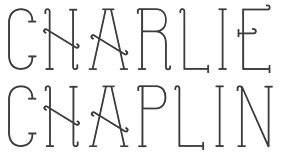 Sudbury, Ontario-based creator of the silent movie font
  During her design studies in Windsor, Canada, Chloe Blanchard designed the industrial typeface
  Graphic designer in Edmonton, Canada, who created the constructivist typeface Baturyn in 2016. This typeface is influenced by industry and revolution.
  Toronto-based graphic designer who created the alchemic typeface
  Christian Naths (Edmonton, Alberta) created the experimental typeface
  [
[ Graduate of Humber College in Toronto. Burlington, Ontario-based designer (b. 1994) of the (free) blackletter / tattoo typeface
  American typeface designer at IBM, b. 1929, d. 2011 in Toronto of Alzheimer's. He was employed for 31 years by IBM, from 1945 until 1976, in I.B.M.'s Production Engineering Department at Poughkeepsie where he designed type.
  Graphic design student at the Ontario College of Art and Design University in Toronto. He created the art deco multiline typeface
  The Canadian television station CTV uses Font Bureau's CTV Sans family and Icomoon's Webiconfont v7 for its online presence. Links to their web site:
  Cindy Kinash is an apparel graphic designer from Canada. She started the Cultivated Mind foundry in 2012, and made a reputation as a script font designer. She published the hand-printed poster typefaces
  [
[ Canadian type designer. His typefaces:
  Czech designer (b. Brno) who graduated with a Masters in Informatics at the Masaryk University in Brno in 2005, spent a term at the Denmark's Designskole in Copenhagen in 2004 and graduated with distinction from the MA in Typeface Design at the
  Great fonts for astrology, hieroglyphics, alchemy and the occult, by Toronto's Jan and Denise Koehler, mostly designed between 1993 and 1995. They moved to Litomerice and then Teplice, the Czech Republic, recently.
  Canadian designer of the (free) shadow circus fonts
  Partner of Jan Koehler in
  East Coast Font Club is a small team of designers living in Charlottetown, Prince Edward Island, Canada. Canadian graphic designer, and design school instructor Michael C. Thomas, one of the members, designed the slab serif typeface Tea Hill in 2021. Lewis Read created the
  Designer in Vancouver who specializes in corporate identities. His typefaces include:
  Fonthill, Ontario-based student-designer (at Niagara College) of the
 Font Forestry (Charlottetown, Prince Edward Island, Canada) is yet another venture of Jeremy Vessey, this time in cooperation with his companion, Stephanie Arsenault. I assume that it too is actually based in Montreal. Established in 2017, their initial fonts include Tuesday Night (a
  This foundry is possibly located in Fox Valley, Saskatchewan, or Fox Valley, IL. Designer of the inline display typeface Rhidian (2020). [
 Gabriel (or Gia Bao) Lam is an art director in Toronto. His typefaces:
  J.F.Y. Daniel Gauthier (GautFonts) was born in Montreal in 1964, and lives in Hamilton, Ontario. His fonts from 2005 and before include BarrelOfMonkeys, ChainFontOpen, ChangChang, ChangChangWoodcut, DirtyDarren, FireStarter, GriffinDucks, Jenna Myles, LollipopLettering, Lymphnodes, PooCorny, PooSmooth, Quake3ArenaBats (scanbats),
  [
[ [
[ Glenn Goluska (b. 1947, Chicago; d. 2011, Montreal) was a Canadian book designer and typographer. He came to Canada as a student at the University of Toronto. After graduating he worked for some time in the United States before returning to Canada to work at Coach House Press. He left Coach House Press to focus on letterpress printing first in Toronto and later in the Saint Henri neighborhood of Montreal under the labels Imprimerie Dromadaire and Nightshade Press. Goluska was awarded the Robert R. Reid Award for lifetime achievement or extraordinary contributions to the book arts in Canada by the Alcuin Society in 2011.
  Toronto, Ontario-based designer of the polygonal sports franchise typeface Arc Sculler (2018), which was published on Black Thursday, the day Ontario elected its first Trumpian premier, Doug Ford. Arc Sculler was made for the Toronto Argonauts and references 19-th century wood types. [
 [
[ [
[ [
[ During her graphic design studies in Vancouver, Heidi Rush designed the
  Jeremy Vessey (Hustle Supply Co, Charlottetown and/or Cornwall, PEI, Canada) created these commercial typefaces in 2014: Parlour (a grungy vintage typeface), Native (quaint style), Instapress (letterpress emulation).
 [
[ Jason Vandenberg (Greyscale Type and later J Foundry, Toronto) licenses his fonts independently and through
  Ottawa-based student at Algonquin College in 2013. During 2013, he created his first typeface, the warm and tall serif typeface
  Toronto-based creator of the slab serif typeface
  [
[ Canadian designer of three shareware fonts in the
  [
[ Teacher at the Edmonton Digital Arts College in Edmonton, Alberta, who created the techno family Powers (2011), the squarish monoline family
  [
[ Jim Rimmer (b. Vancouver, 1934, d. 2010) was one of the great contemporary type designers whose creations had a lot of flair, individuality, and charm. Based in New Westminster (near Vancouver, BC),
  Aka Jos Joy, as Joanne Ford Taylor, and as
  Bowmanville, Ontario-based art director, designer and illustrator. Creator of the squarish garage sign typeface Parts & Labor (2017).
  [
[
 FontStructor who made DB Brick VANOC in 2010. He writes about this gridded face: This font is based off BD Brick. It was used by VANOC (Vancouver Olympic Committee) as a secondary typeface in the 2010 Winter Olympics. [
 Juliana Tchakarova attended OCAD University in Toronto, and received a Bachelor's degree in Design with a specialization in Graphic Design. In 2014, she created Renoir (2014, a typeface in hommage of painters like Renoir).
  Based in Winnipeg, Justin Ladia's first entrance into the world of type design was
  During her studies at York University in Toronto, Kadi Koroma created
  Toronto, Canada-based designer of the stylish rounded free font Haven (2015).
  [
[ Canadian creator (b. Regina, SK) of the free typefaces Subway Novella (2011, grunge), Death From Above (2011, grunge), My Girl is Retro (2011, grunge),
  Kevin Allan King is from Toronto. He designed fonts for Canada Type from 2010 until 2017. In 2018, he graduated from the
  Canadian designer of the experimental typeface
 During his studies at RGD, Konor Abrahams (Toronto, Ontario) designed the piano key typeface Oppose Display (2019). [
 Torontonian creator of a lovely typographic poster entitled
  Graphic designer in Sudbury, Ontario, who created the Peignotian sans typeface Olyptika (2015). [
 The Lanston Type Co was based in PEI, Canada, moved in 2002 to Vancouver, and moved later that year to Espoo, Finland. In 2004,
  Well over 500 original designs by
  Laura Keung (b. 1989) is [in her own words] a half Bolivian-half Chinese hybrid, born in Buenos Aires, Argentina, raised in Santa Cruz, Bolivia and currently [2014] living in Toronto, attending OCAD (Ontario College of Art and Design). Creator of the closed counter geometric typeface
  Canadian type designer who specializes in type for watches. In 2018, he graduated from
  The most famous Canadian type designer (1932-1983). Usherwood studied at the Beckenham School of Art, and practiced as a lettering artist in the commercial art field for 15 years. Typesettra was created in 1968, and had more than four type designers in the early eighties. In 1977, Typsettra began designing original typefaces for Berthold, Letraset and ITC. Usherwood's typefaces:
  Calgary-based designer of
  Toronto-based designer of the blackletter typeface Deutsch Kino (2016).
 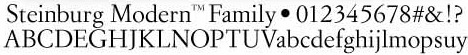 [
[ New York City-based design agency (est. 2003) specializing in commissioned fonts and brand design. Their custom typefaces include
  During her graphic design studies at Algonquin College in Ottawa in 2013, Makeda McLean created a stylish sans serif typeface. She also made
  Toronto-based designer originally from Canada / Taiwan. Creator of
  Canadian designer of the teardrop typeface Brotara (2015). [
 Canadian designer of the handcrafted typefaces Salmon Spirit (2017: indigenous North American style), Lime Time (2017), Cream of Oatmeal (2017), Blueberry Jam Script (2017) and Farm House (2017).
  Mark Poon (Mississauga, Ontario) created the font
  [
[
 MINE is the studio of Christopher Simmons, a Canadian-born, San Francisco-based designer, writer, design advocate and educator. He is the author of four books, the most recent of which, Just Design, focuses on design for social change. In 2015, he created a custom corporate headline sans typeface.
  Type designer. The casual film noir Firefly (2010, Canada Type) was designed by Miranda Hopper for Patrick Griffin's type design class of 2010 at Humber College in Toronto.
  Michael Nÿkamp (MKN Design, Grand Rapids, MI) is a designer and illustrator born and raised in Ontario Canada. He won an award in 2014 at the
  Extraordinarily talented type and graphic designer in New York City, who is the uncontested fashion magazine type designer. Before New York, he was in Jerusalem, where he studied at Bezalel Academy of Art and Design. He also did one exchange student term at OCAD in Toronto. His work is geared toward the fashion industry and fashion publications in general.
  MyFonts hit list for Canada Type. [
 Born in Takamatsu, Kagawa-ken, Japan, in 1984, Natsuko is a Canadian-educated graphic designer who publishes most of her typefaces at
  Barely five days after the catastrophe of November 6, 2016, Simon Dunford (London, Ontario) published the scanbat typeface Trump (2016). In December 2016, he published Dawson Grotesque. In 2017, he designed the art deco typeface Mouron (
 [
[ Graduate of York University, who is working as a graphic designer in Toronto. Creator of experimental typefaces such as Slinkyy (2014, prismatic), Workshop (2014, multilined) and Pigment (2014, hairline).
  During her graphic design studies at PJWSTK in Warsaw, Poland, Kaja Slojewska created Bubble Alphabet (2014) and Tilton (2014, a headline all caps sans typeface).
  Jason Gilliland (Nowheresburg, Edmonton, Alberta) created the sharp-edged display typeface Marvis in 2015. It was followed in 2016 by NWB Marvis Display Pro (
 Fredericton, New Brunswick, Canada (was: Ottawa, Canada)-based designer of the
  Charlottetown, Prince Edward Island-based designer of the
  Russell McGorman (b. 1954) runs
 Type designer at Canada Type.
  Australian graduate of the type design program at the
  [
[ Peter Rempel (b. 1958) is a Winnipeg-based calligrapher.
 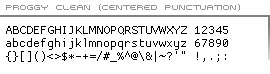 This pixel and bitmap font site is the home of the Proggy programmer's fonts (Proggy Clean, Proggy Square, Proggy Small, and Proggy Tiny, all made in 2004 by the website owner, Tristan Grimmer) as well as a number of contributed programming fonts (Crisp (2003, by Chris Pine), Speedy (by Walter Reel), CodingFontTobi1 (by Tobias Werner), PixelCarnageMonoTT (2004, by Roman J. Lewis, aka "The Wolf"), and Opti and Opti Small (by Nicolas Botti)). It is also the home of two other proportional bitmap fonts for use on web pages (Webby Caps and Webby Small). Several people have contributed to these fonts: Karl Landström to Proggy Clean, Christian Winkler to the Proggy fonts, and Simon Renstrom to Proggy Clean.
  Born in Edmonton in 1957,
  Canadian creator of the
  [
[ [
[ A penmmanship instruction manual with the subtitle Self-Instructor In Penmanship, published by Knowles & Maxim, Pittsfield, Mass., and St. Catharines, Ontario, Canada.
  [
[ Canadian designer of the modular semi-stencil futuristic typeface Aura (2018). [
 Vancouver, Canada-based designer of Kabella (2017), a
  Staypretty is a type collection that is part of the Toronto-based commercial type collective called
  Torontonian creator of a beautiful and thought-provoking
  Author of
 Original shareware fonts designed by Johnny Martz of Kitchener, Ontario. Font list:
  Born outside Pince Albert, Saskatchewan, Rod McDonald is perhaps the greatest Canadian type designer ever. First based in Toronto and later in Lake Echo, Nova Scotia, he designed the great
  Vancouver and/or Montreal, Canada-based designer of the brush script fonts Twin Oaks (2016), Wellaway (2016), Bold Vision (2016) and Mount Baker (2016, dry brush), the rough brush typefaces Outshine (2016), Postmark (2016) and Sunrise Waves (2016), Sunfast (2016), and the weathered stamp typeface Tofino (2016).
  [
[ [
[ Canadian designer who made the ultra-condensed poster / signage typeface Implodium Ultra Compressed (2015).
  Graduate of YSDN (York University/Sheridan College) who is based in Toronto. In 2015, she published the Perso-Arabic typeface Zariyah. In 2017, she designed Endangered Animal Alphabet.
  Toronto, Canada-born type designer best known for her work at Hoefler&Frere-Jones type foundry (where she is a senior designer) on such typefaces as Gotham. Ex-student at the University of Reading (MA, 2003) who designed
  During her studies in Toronto, Sarah Ellis designed a wonderful striped geometric alphabet (2017). [
 Scott Byrne Design is located in Prince Edward Island, Canada. He sells these typefaces: Badger (2015), Chatter Hat (2015, vintage poster typeface).
  [
[
 Toronto-based designer of an innovative decorative caps typeface in 2015.
  Nick Shinn (b. London, 1952) is an art director and type designer. He teaches at York University in Toronto, and is a founding member of the Type Club of Toronto. He writes regularly for Graphic Exchange magazine, and has contributed to Applied Arts, Marketing, Design, and Druk. He founded Shinn Type in 1999, and made fifteen type families.
  Graphic designer who was based in Rasht, Iran, who dabbles in experimental Persian type design. Reportedly, he is based in Canada in 2020. He has made
  Silvio is the Toronto-based designer of ITC Napoleone Slab (2001) and the Greek simulation font family
  Canadian designer of the whodunit typeface Locksmith (2014) and of the beatnik style Pink Panther genre typeface Fork (2016).
  Canadian designer from Kitchener (b. 1984) now located in Washington, DC, and before that, in Reston, VA. He created the irregular handwriting font
  Sandra and Steve Pell run Pellvetica Studio in Vancouver, BC. In 2015, Steve Pell created the square-shaped display typeface Pell Mono Bold.
 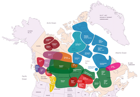 A piece written in 2022 by Canadian type designer Kevin King for Typotheque in which he discusses the three major Syllabics orthographic / typographic traditions, the Algonquian Syllabics, Inuktut Syllabics, and Dene Syllabics, as well as the Blackfoot Syllabics (which are related to the Cree Syllabics). [
 New Westminster, BC-based foundry of
  Canadian type foundry, est. 2020. In 2020, Tall Chai (not his/her real name) released
  Val Fullard is the Toronto-based designer of the Latin-American semi-dingbats font family
  Born in Lincoln, UK, in 1942,
  John Hudson and Wm. Ross Mills, the co-founders of Tiro Typeworks in 1994, design wonderful top-of-the-line fonts in Vancouver. Their commercial typefaces can be bought from
  Tofino Type is located in Kelowna, BC, Canada. An earlier site,
  Graphic designer in Mississauga, Ontario, Canada, who created the bilined typeface Malefic in 2015. Inspiration for the typeface came from Didot and the blackletter style.
 TypeArt is the commercial foundry of Lloyd Springer (Vancouver), est. 1992.
  Ray Larabie (b. 1970, Ottawa, Canada) ran Typodermic in Mississauga, ON, which opened in the Fall of 2001. In 2006, it moved to Vancouver, BC, and in 2009 it moved on to Nagoya, Japan.
  Graphic designer from Summerside and/or Charlottetown, Prince Edward Island, Canada, who was located first in Edmonton, Alberta, and then in Moncton, NB, then in Toronto, and finally in halifax, Nova Scotia. He runs SRC Designs and founded Vintage Type Co in 2015 (not to be confused with Susan Townsend's Vintage Type, a company set up in the 1990s). Creator of the free sans titling typeface family
  Design studio in Toronto. Run by
  Designer (b. Vancouver, 1970) of high-quality typefaces at Tiro Typeworks in Vancouver, which he co-founded with John Hudson. He created
  Ross Milne (b. 1985) works and lives in Vancouver, Canada where he studied at the Emily Carr University. After graduating with a degree in Communication Design (2007), he moved to Den Haag, where he studied type design at the
  Vancouver-based designer of the dot matrix typeface
  Zang-O-Fonts is a foundry in Guelph, Ontario, run by Jamie Nazaroff. [They used to be located in Orangeville, Ontario.] Nazaroff specializes in techno fonts. There are a few free fonts such as Stylechild (2003), Chemo, Slowhand, TechnoviaCaps, Yiroh, and Gustavus.
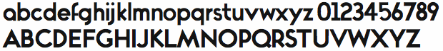
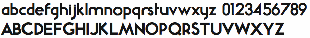
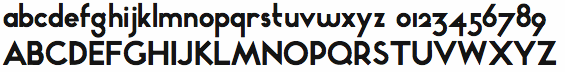
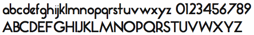
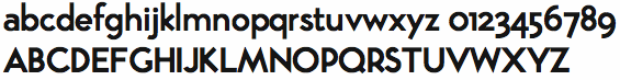
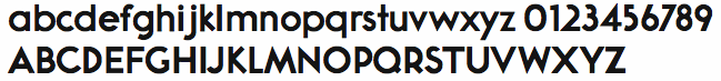
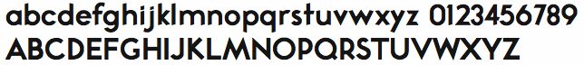
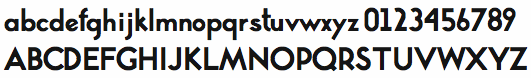
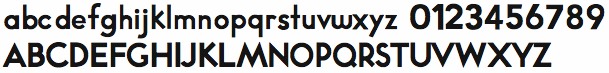
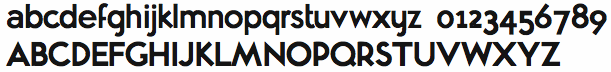
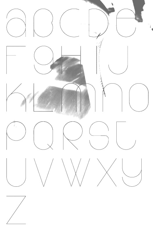
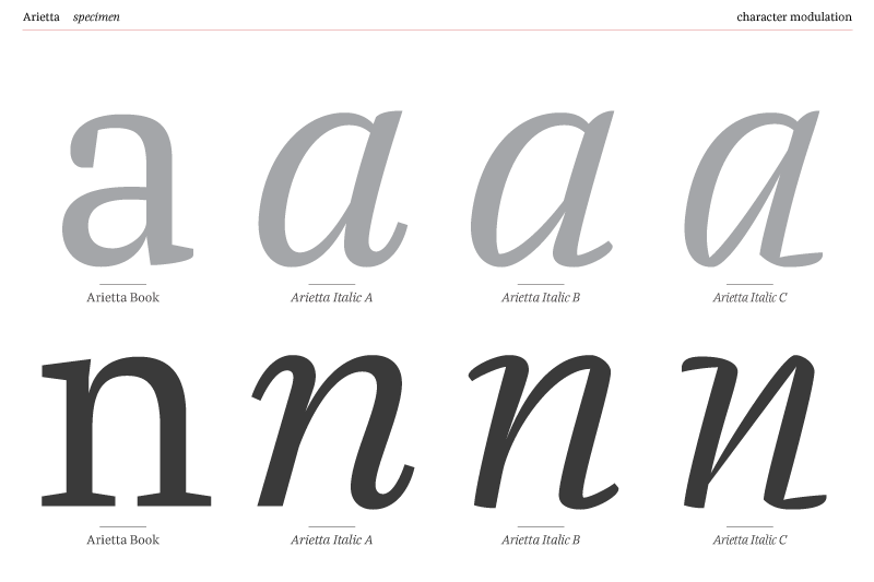
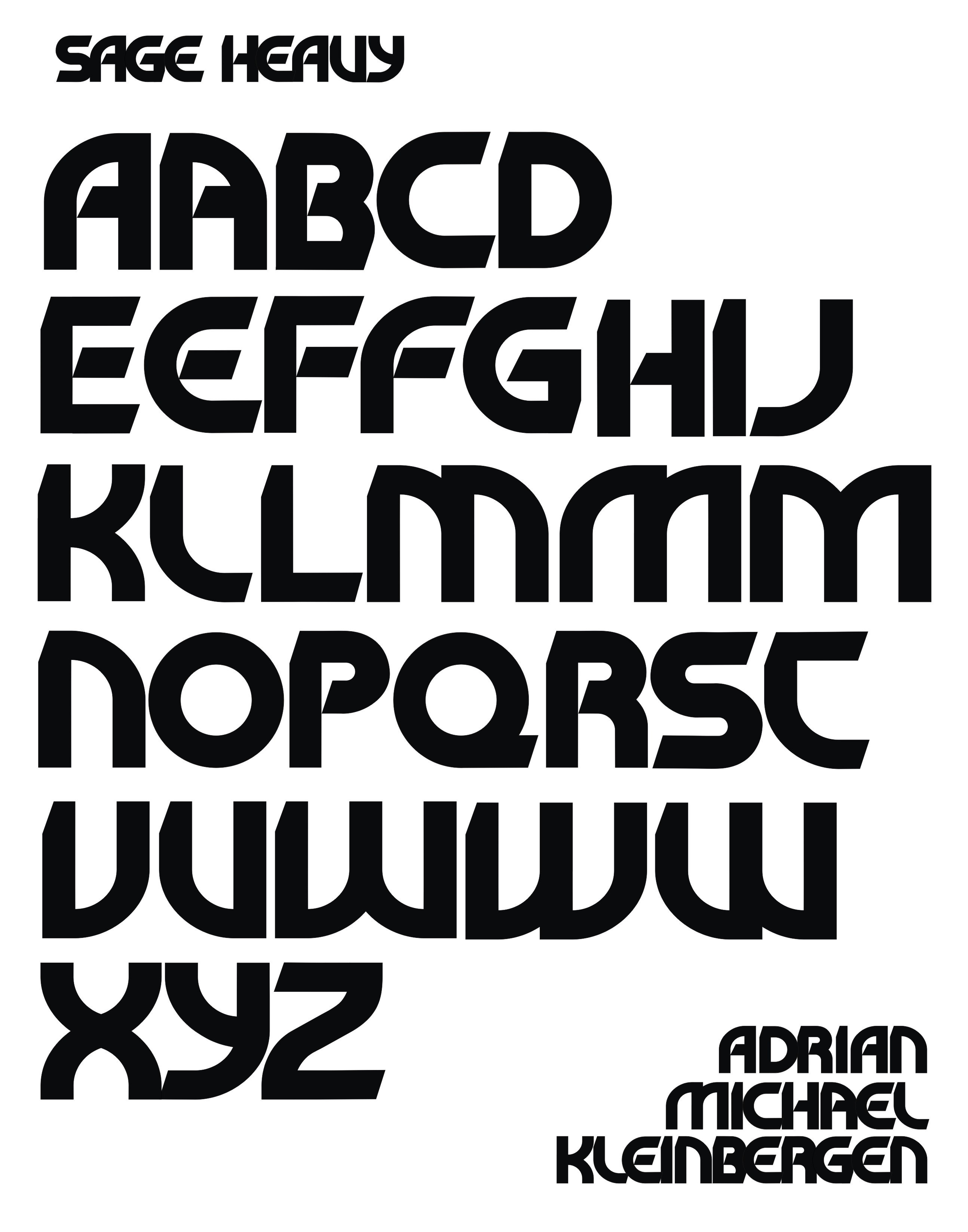
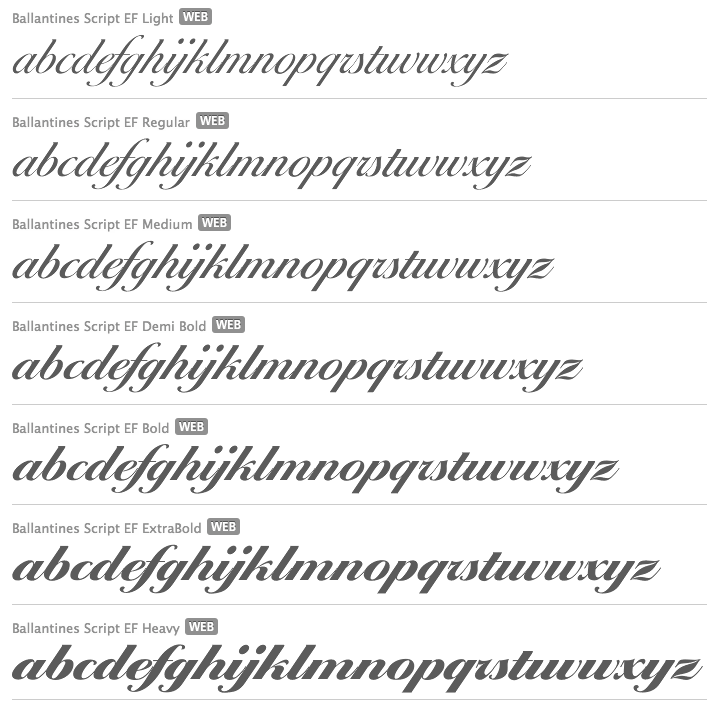
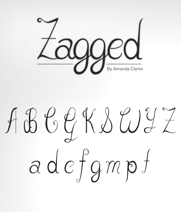
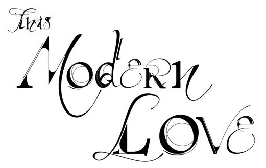
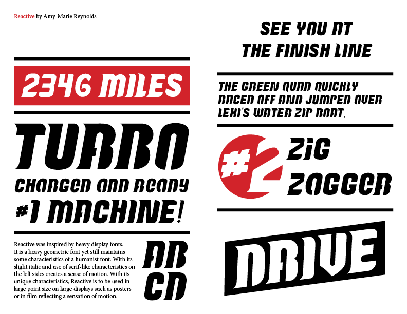
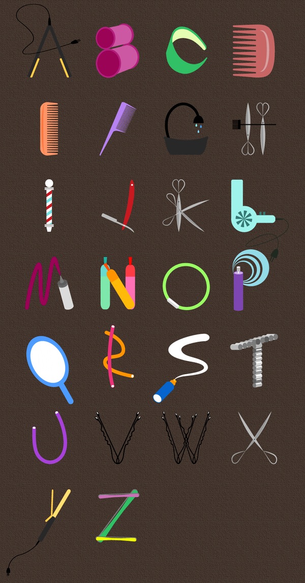
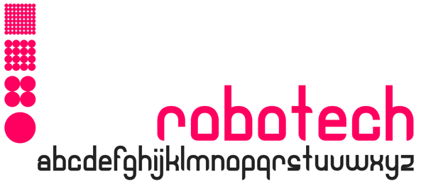
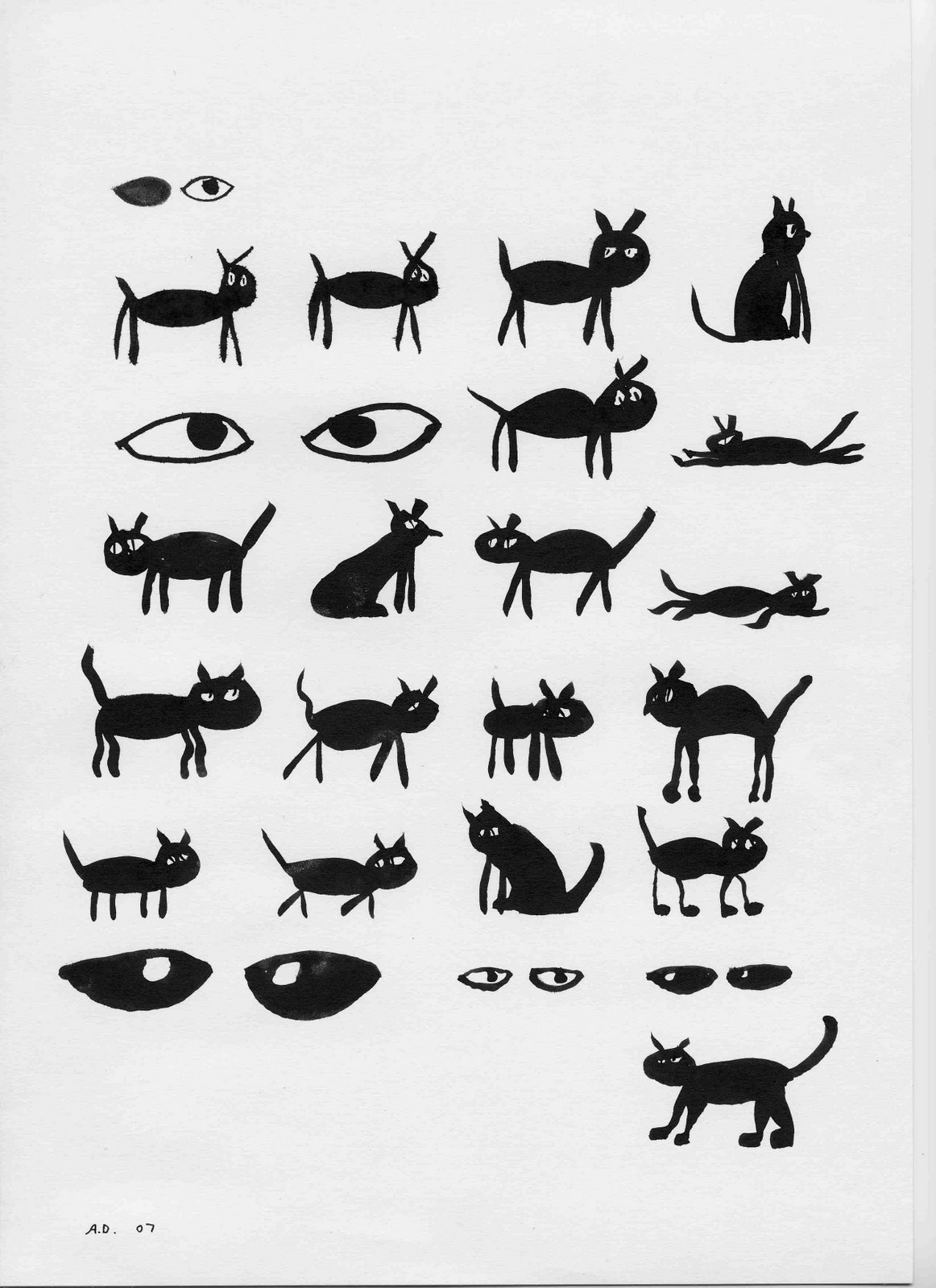
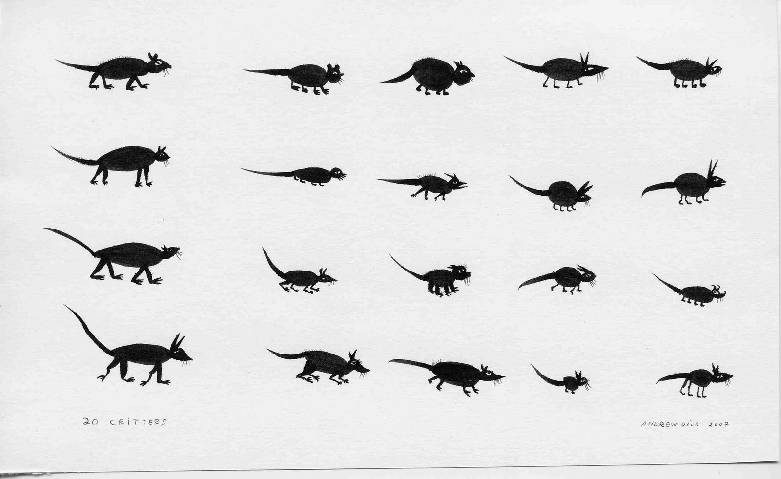
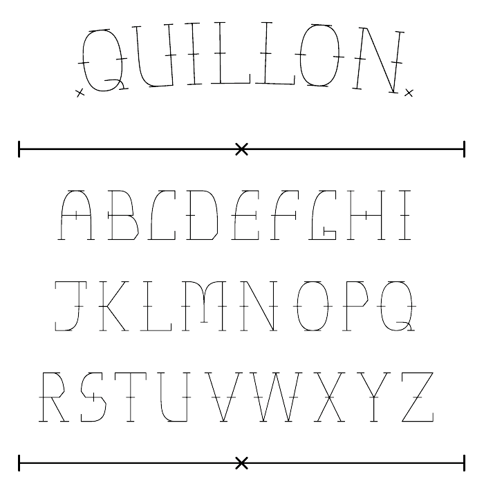
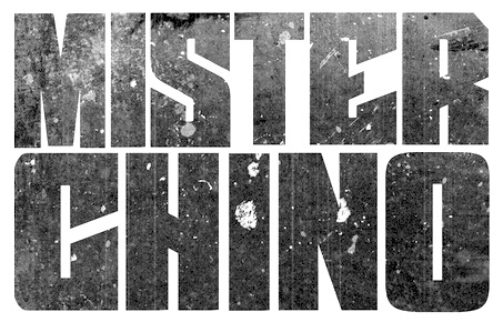
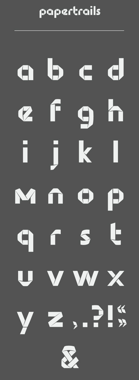
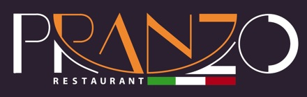
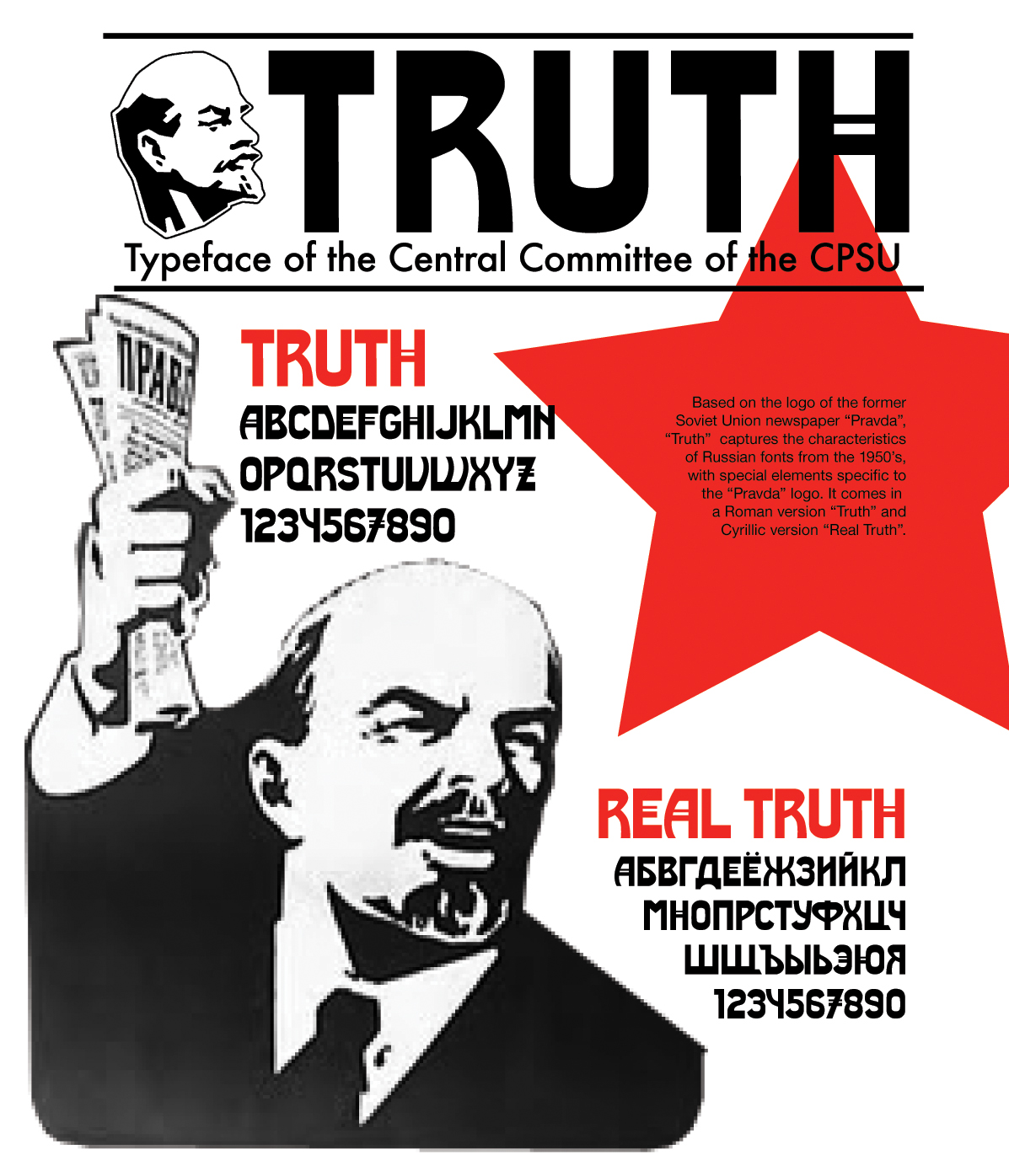
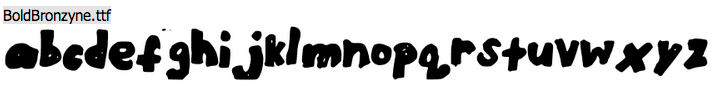
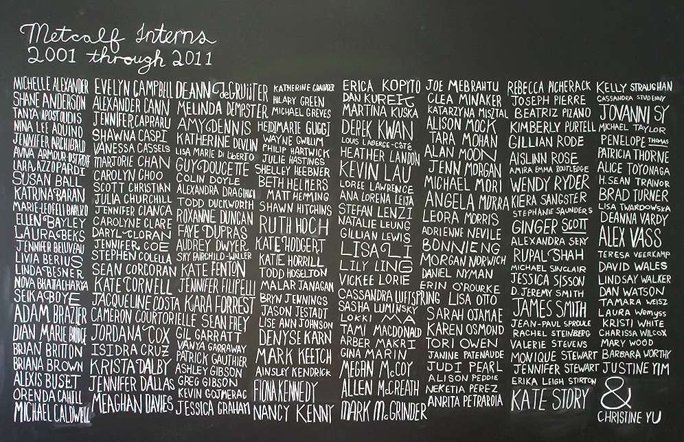
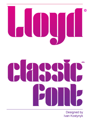
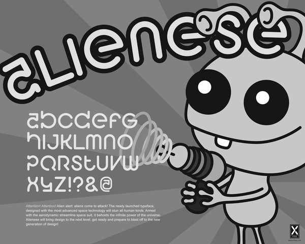
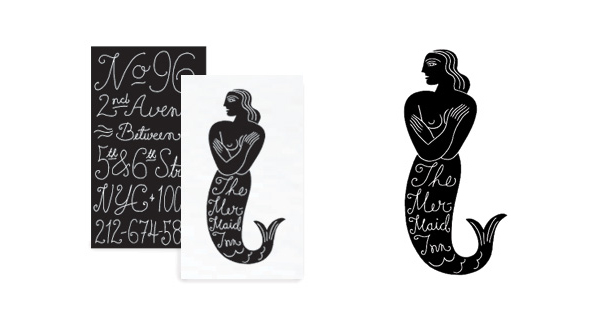
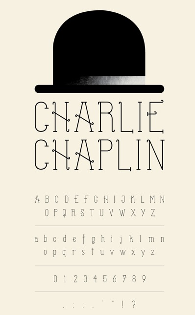
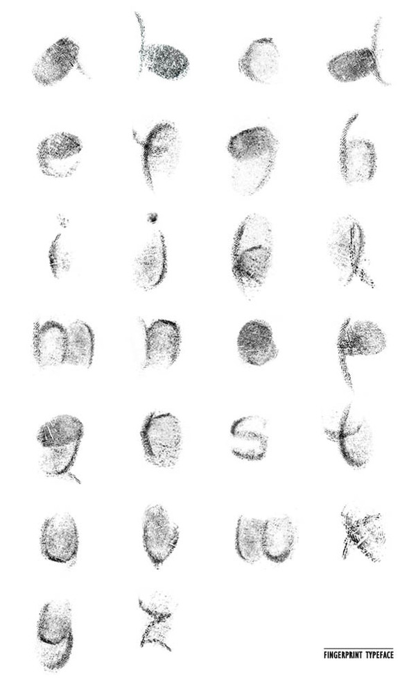
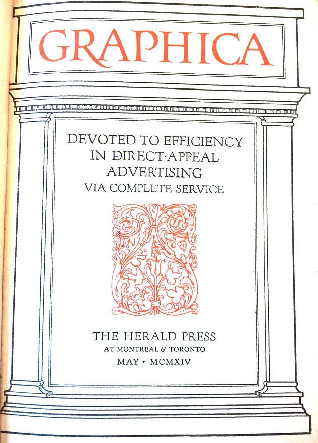
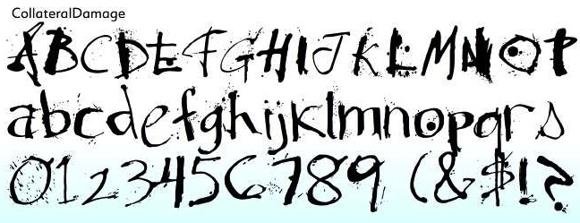
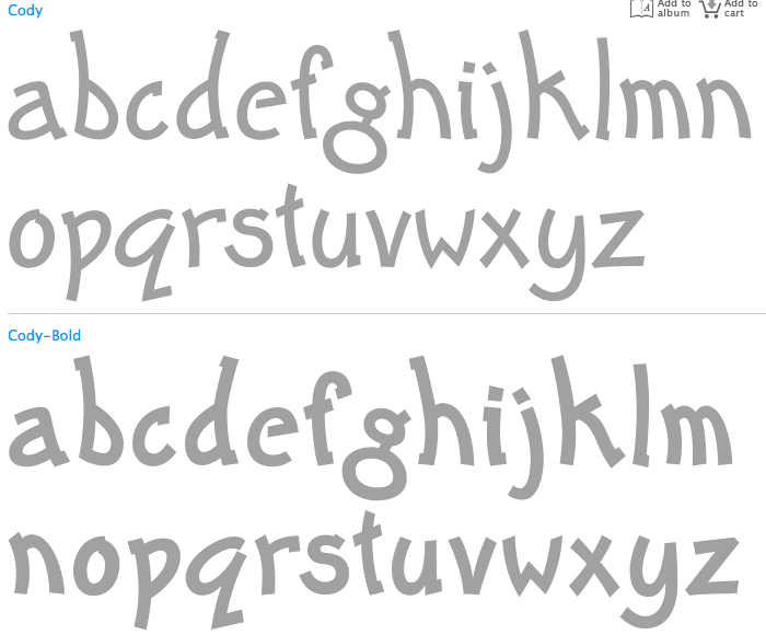
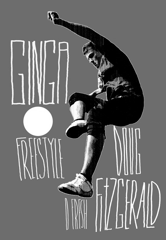
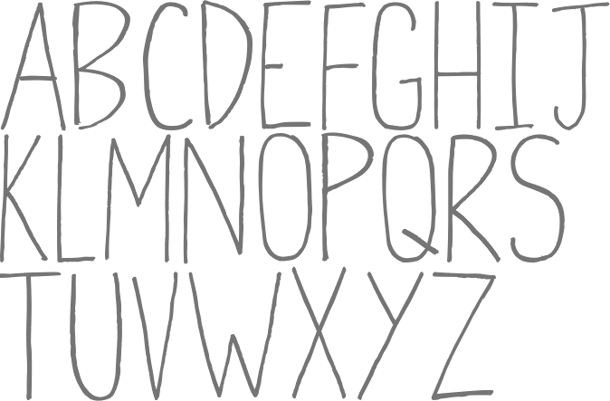
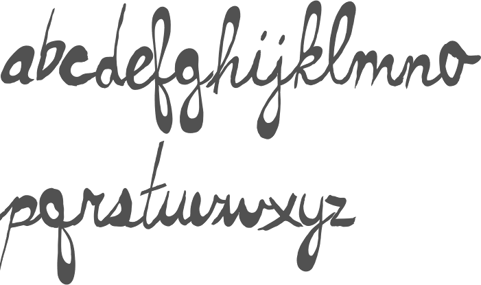
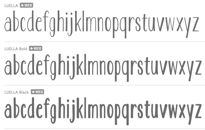
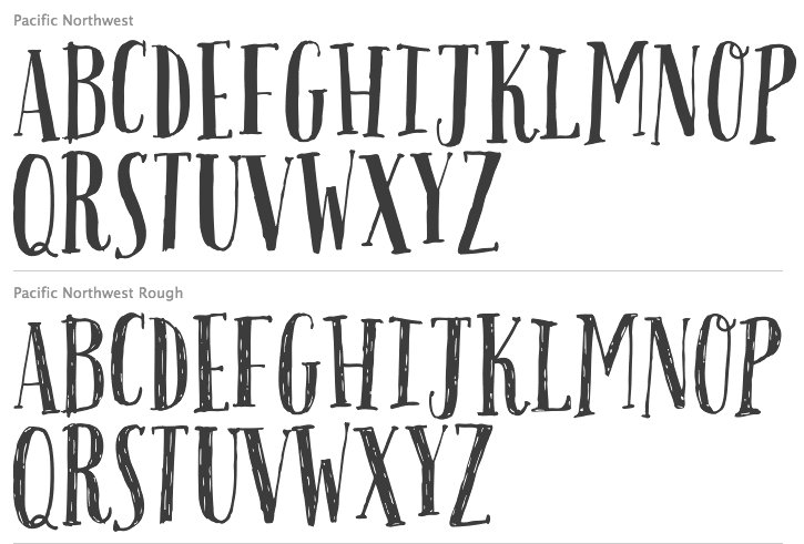
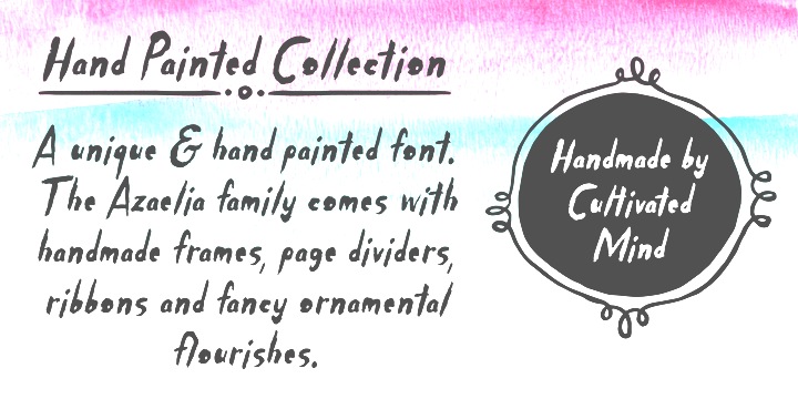
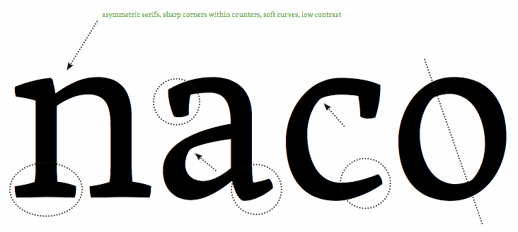
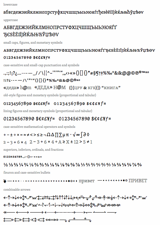
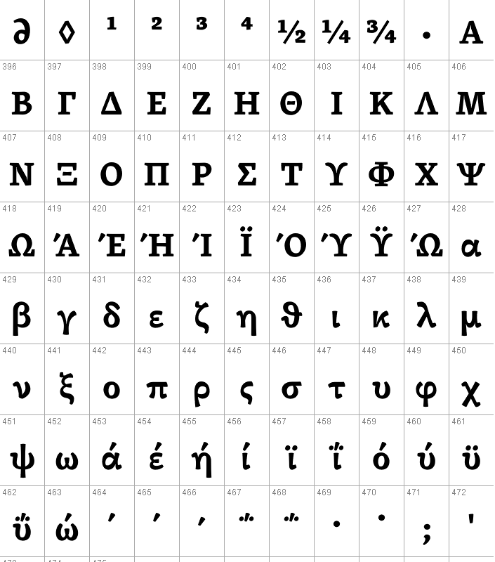
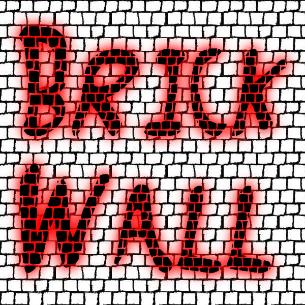
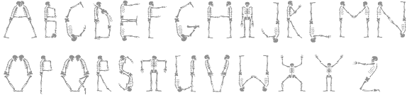
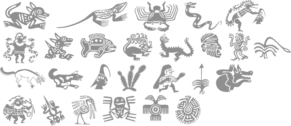
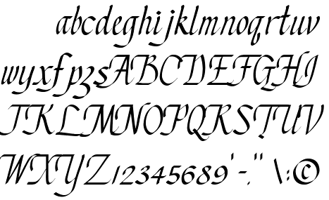
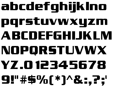
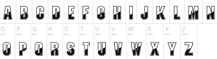
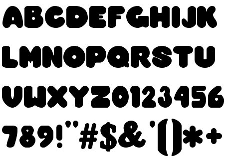
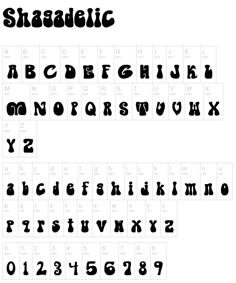
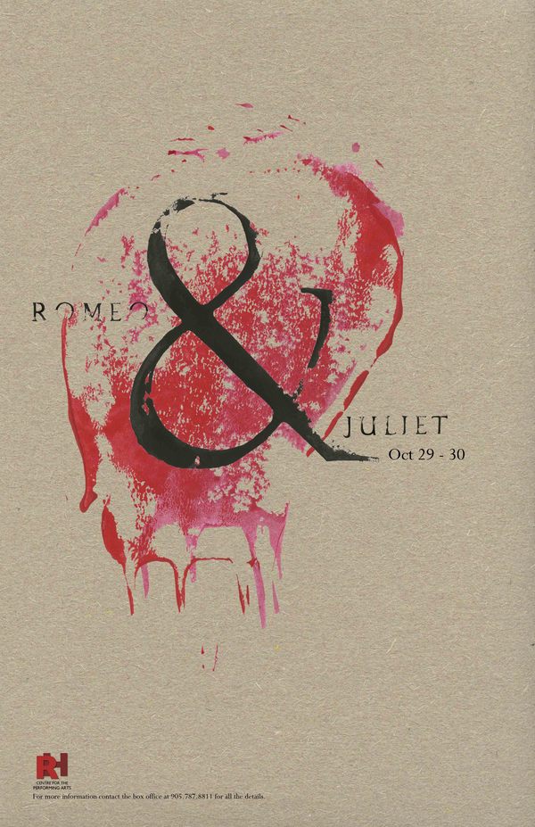
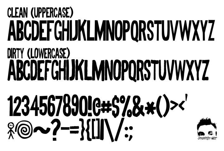
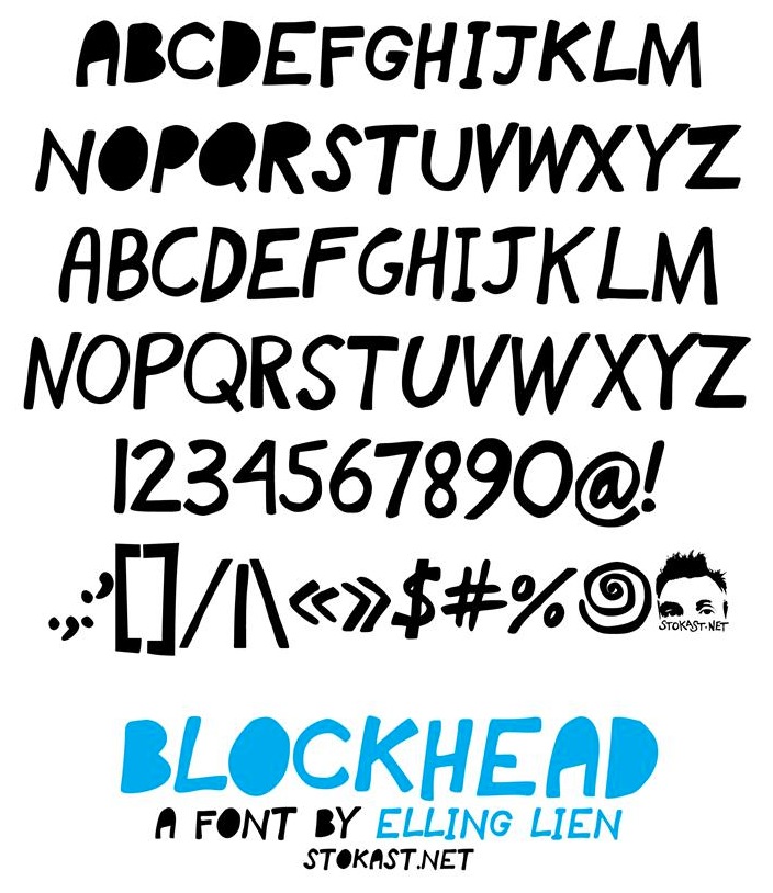
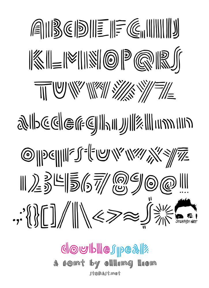
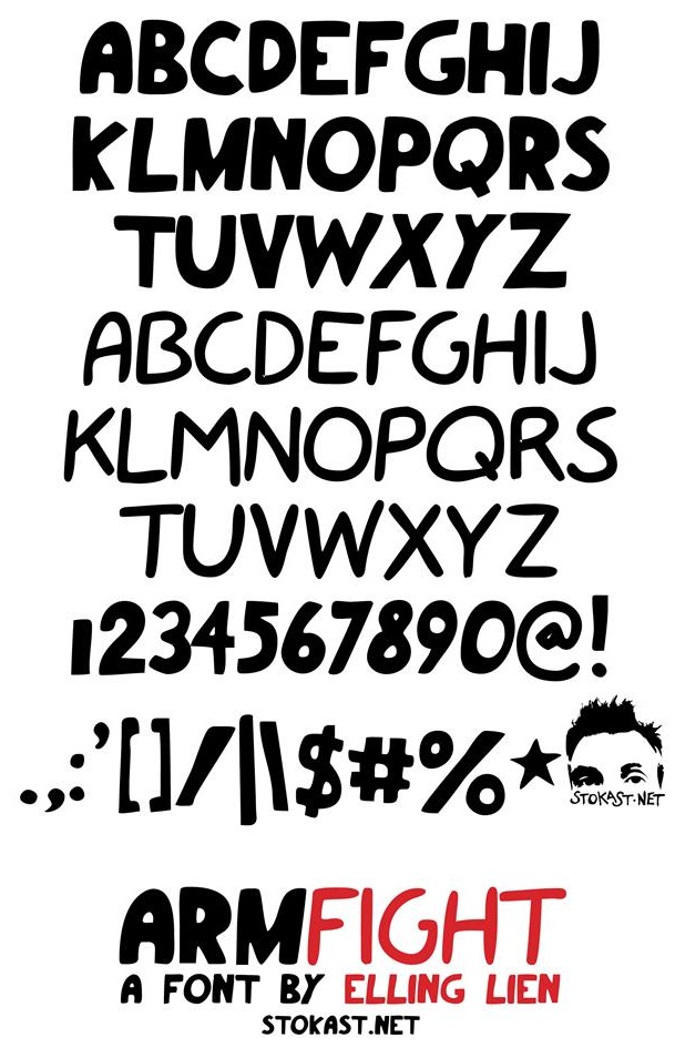
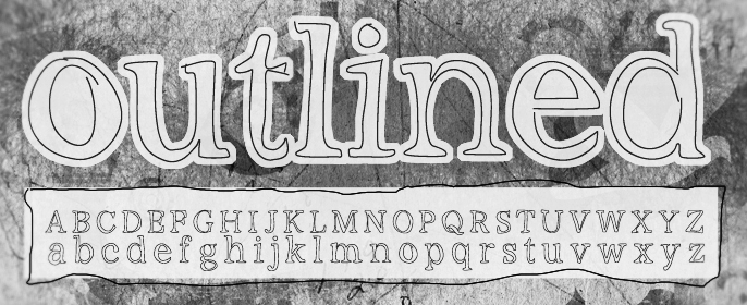
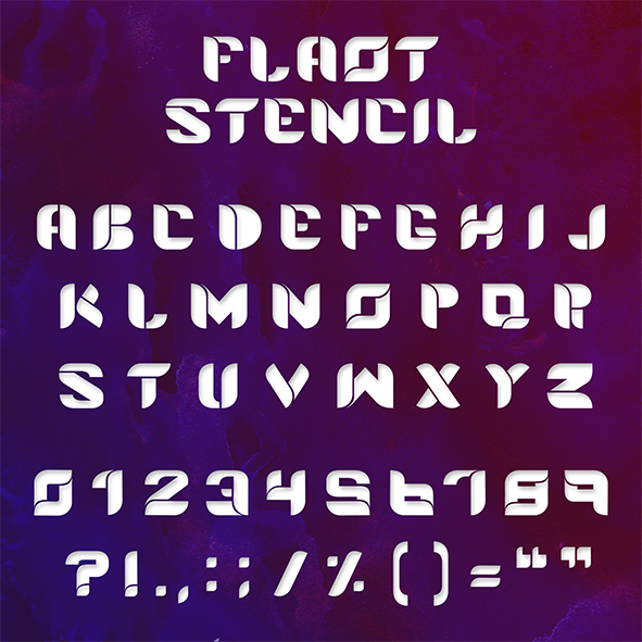
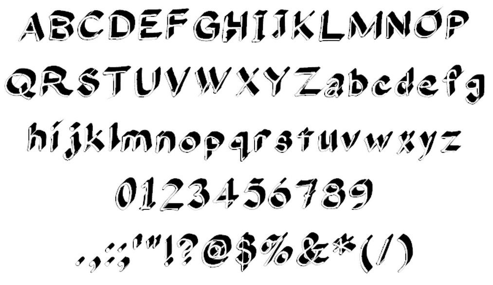
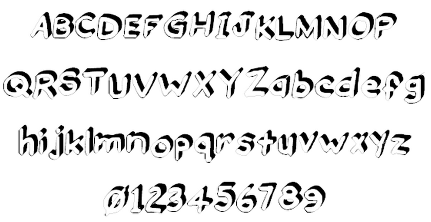
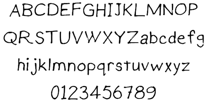
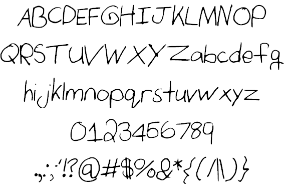
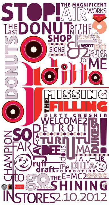
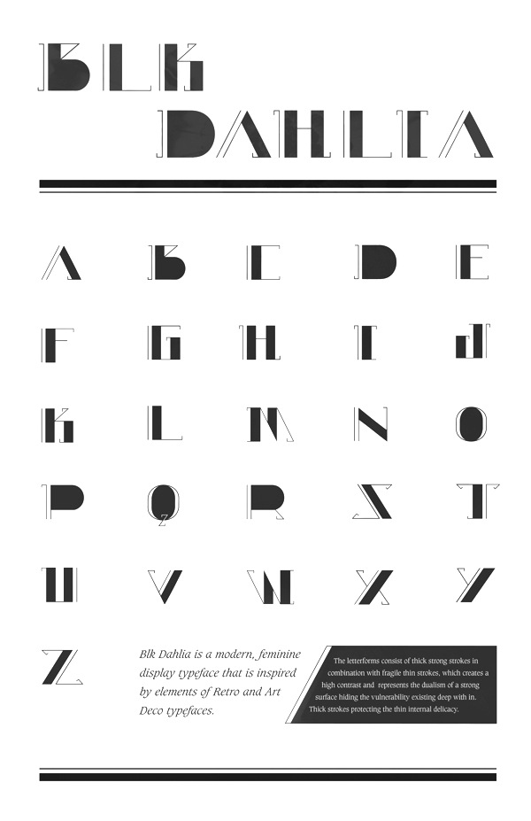
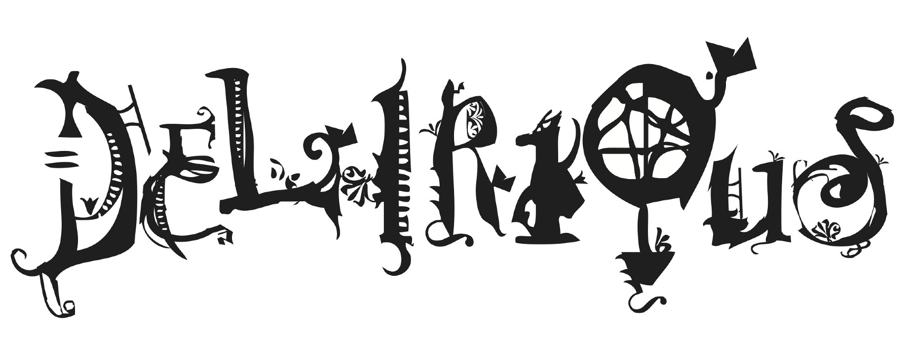
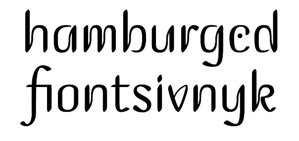
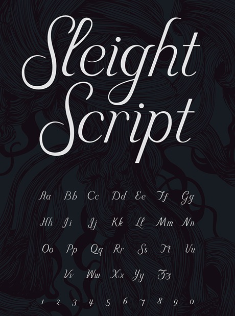
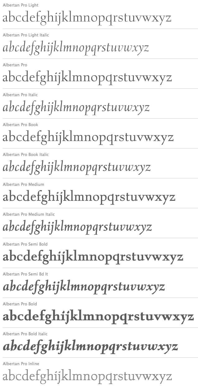
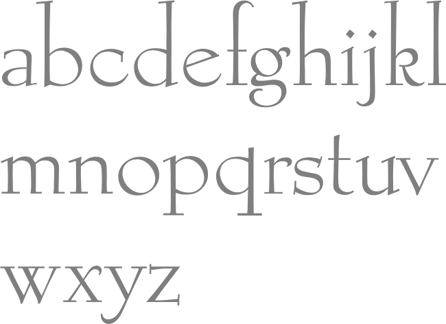
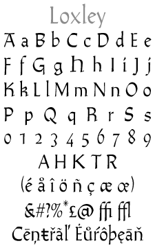
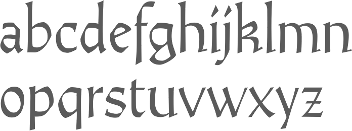
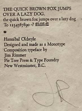
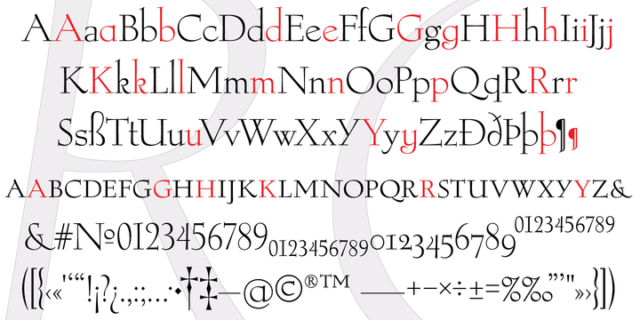
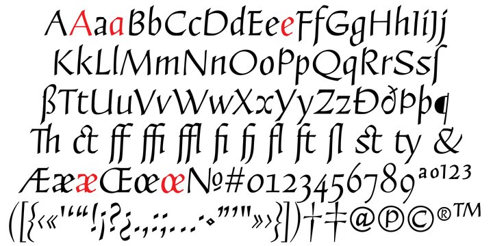
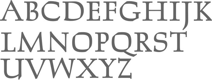
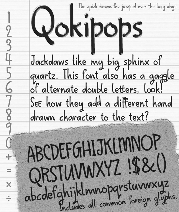
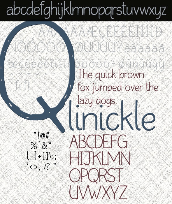
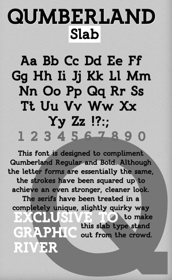
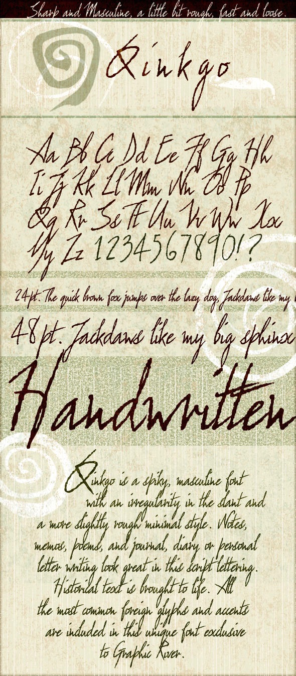
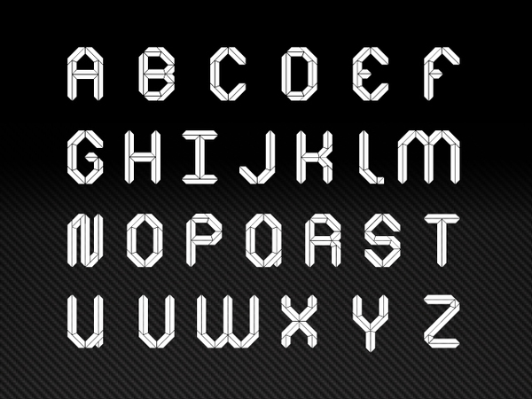
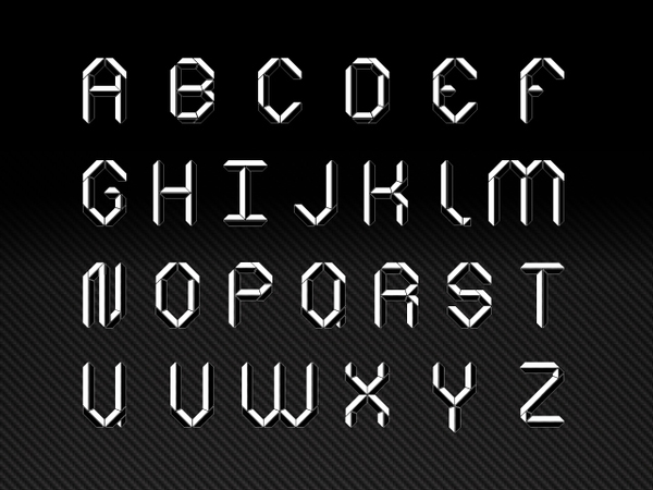
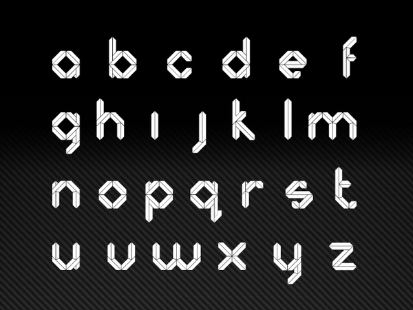
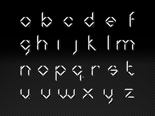
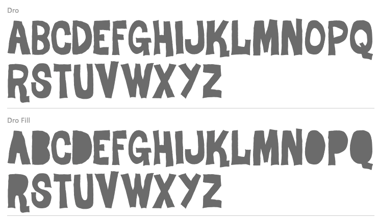
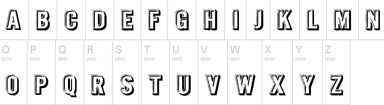
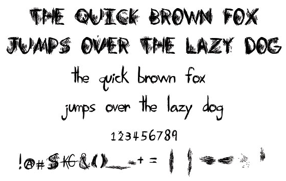
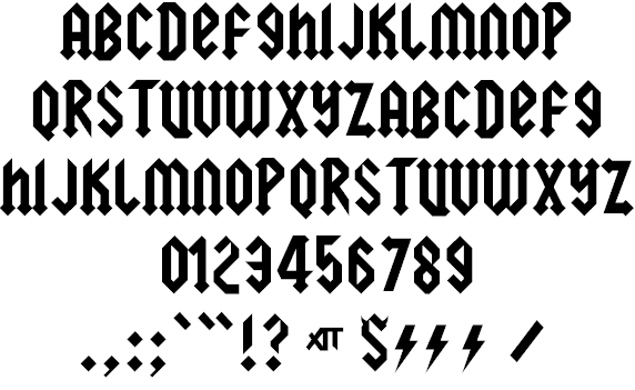
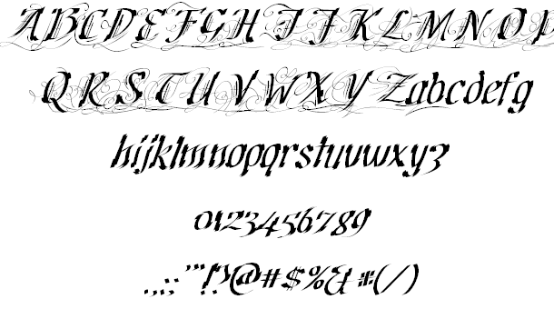
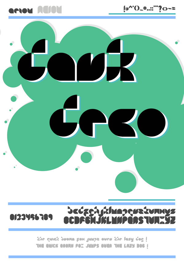
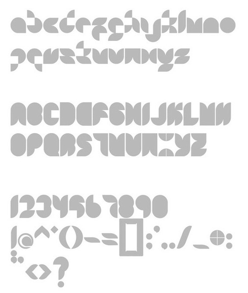
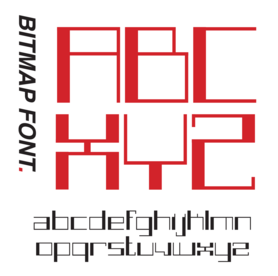
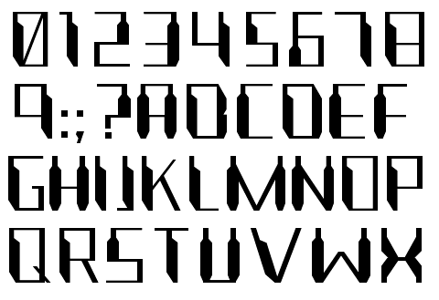
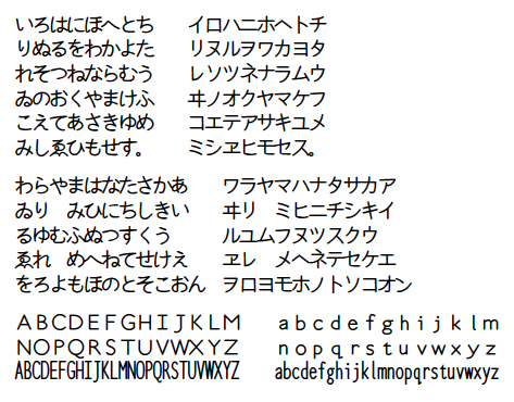
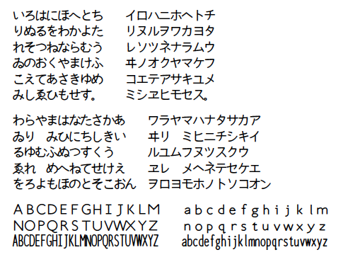
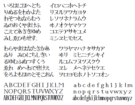
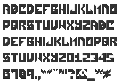
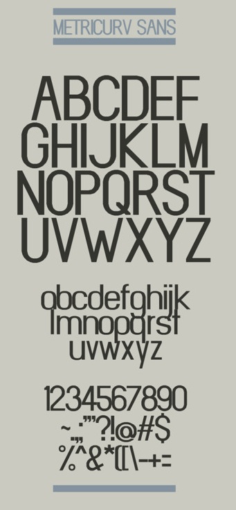
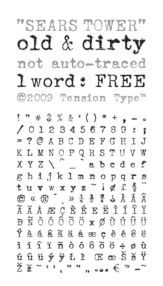
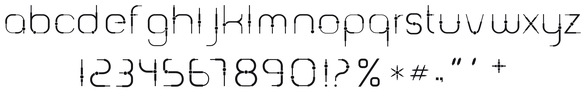
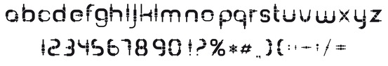
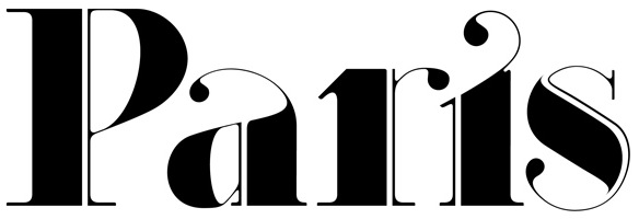
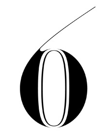
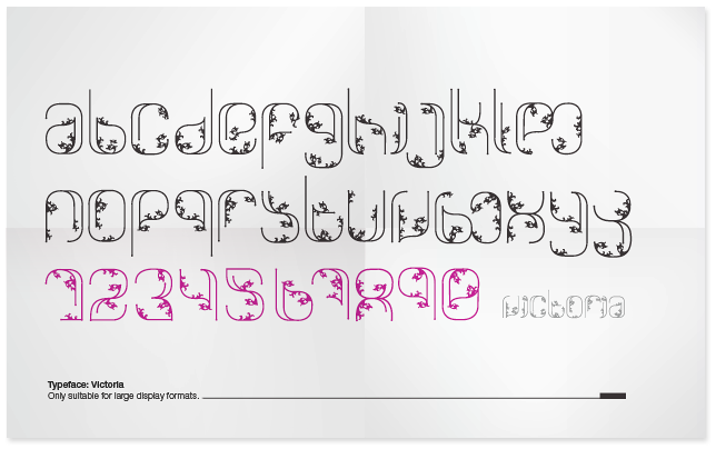
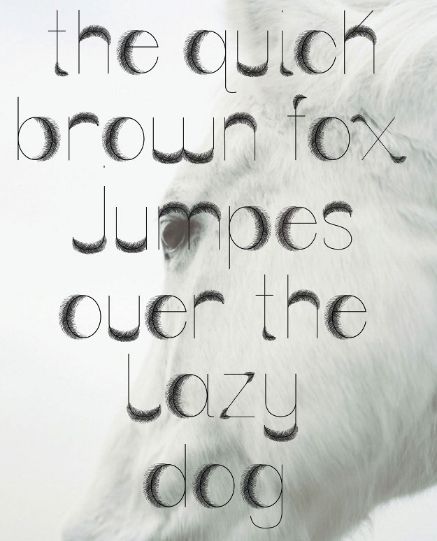
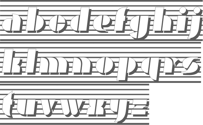
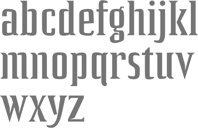
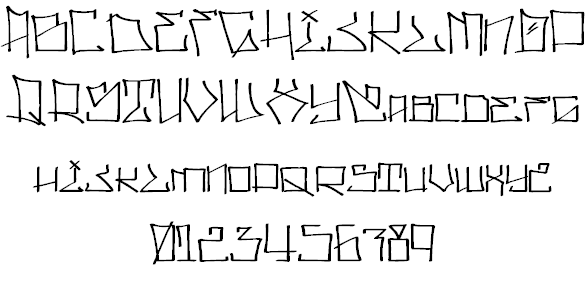
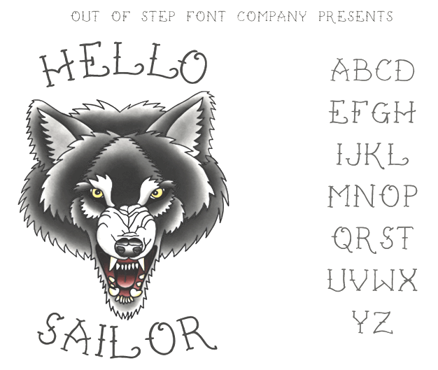
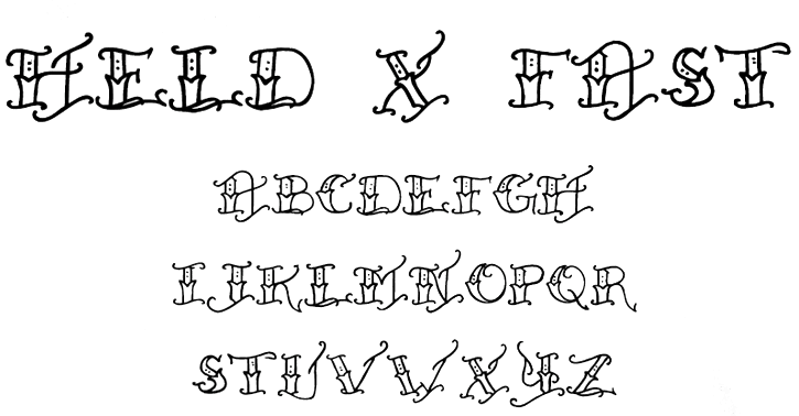
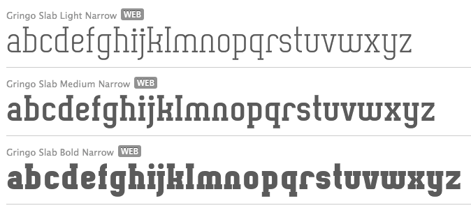
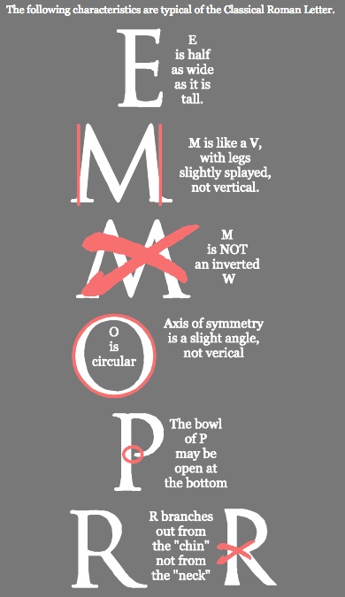
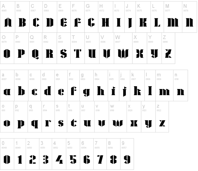
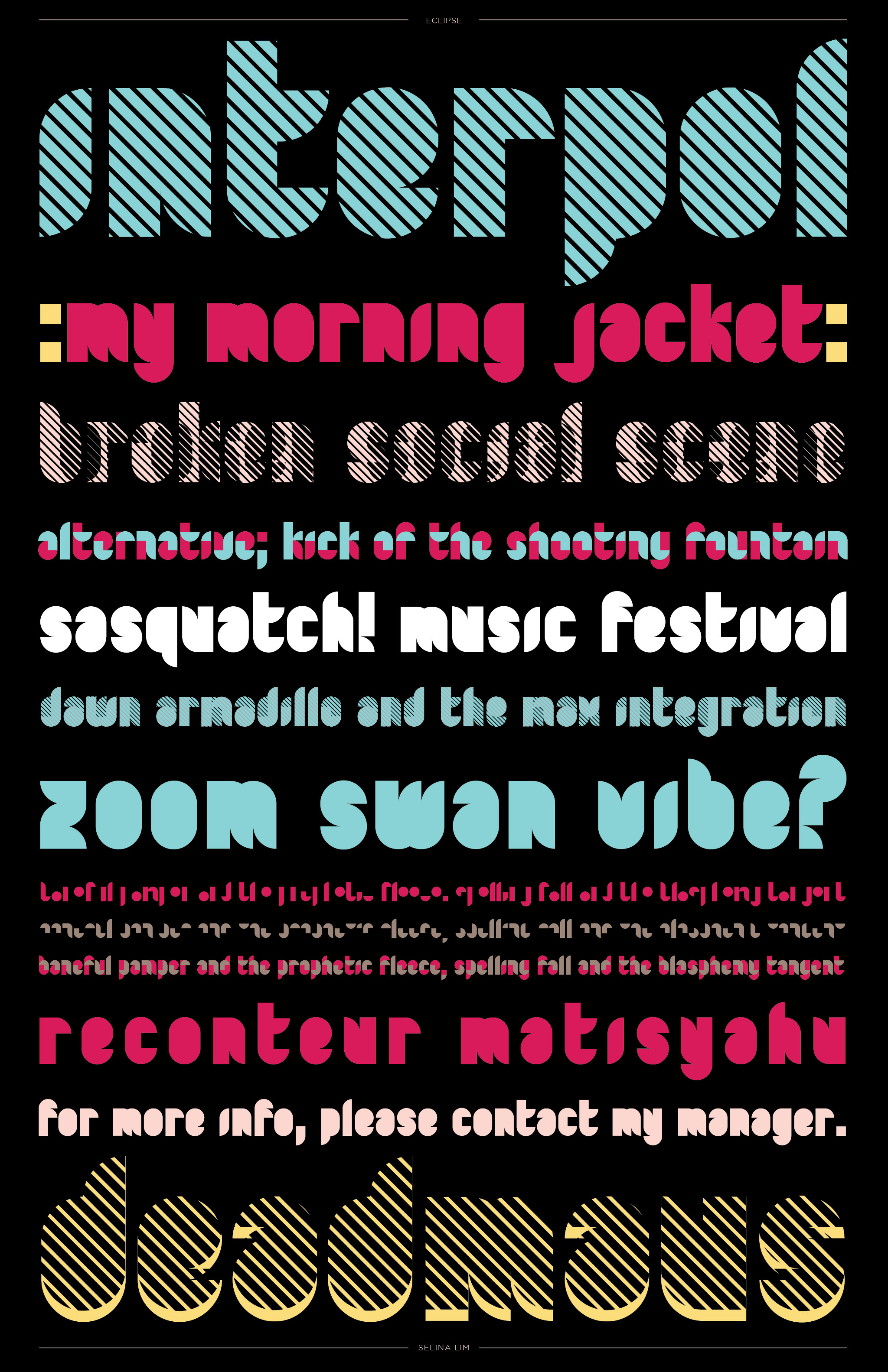
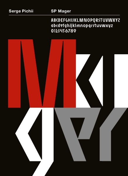
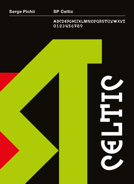
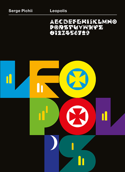
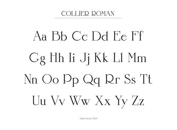
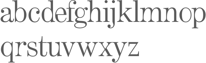
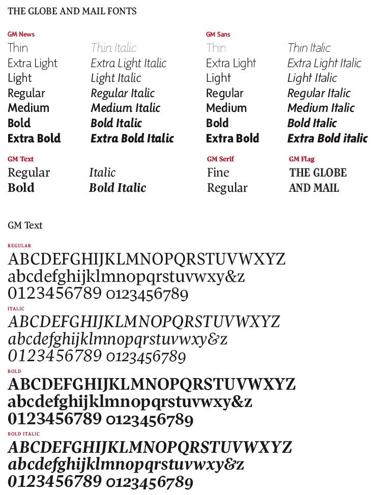
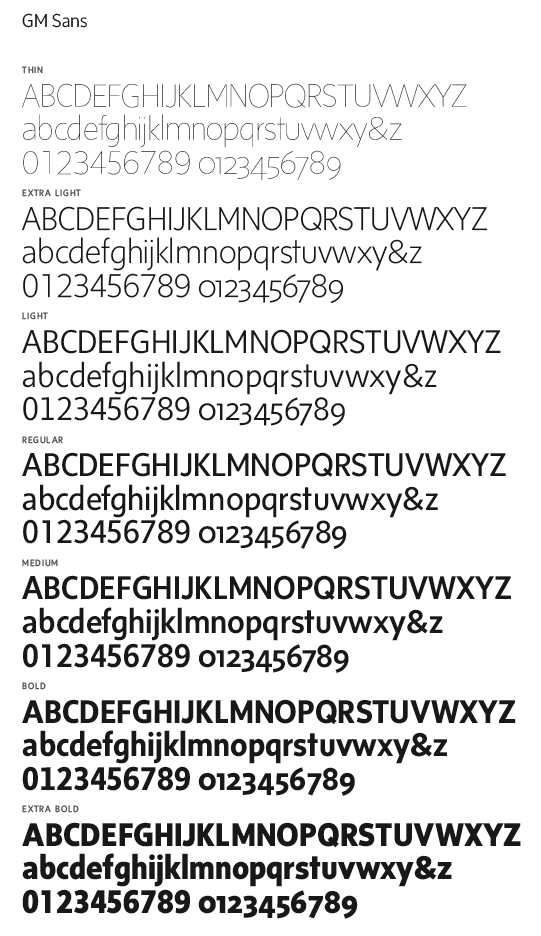
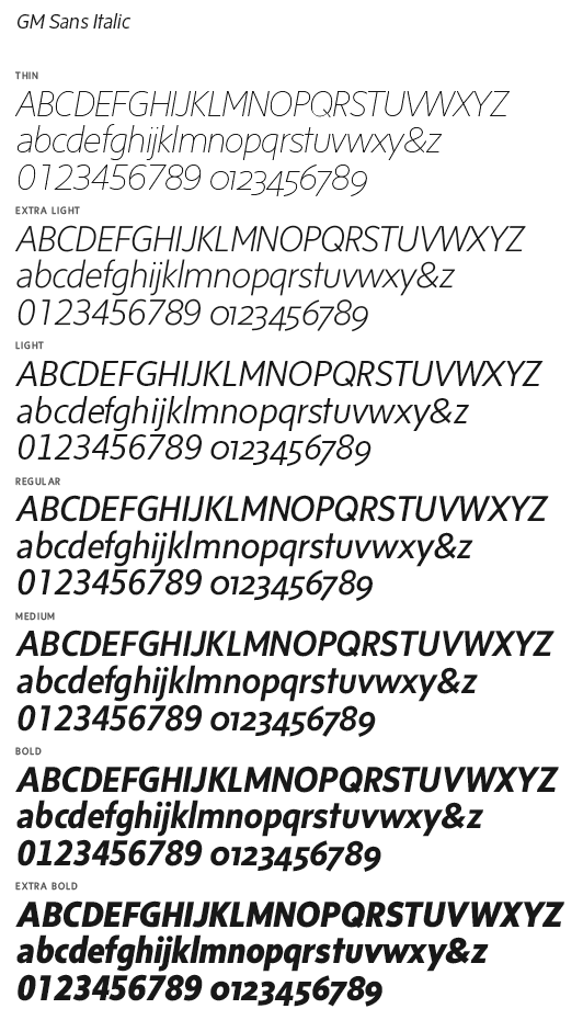
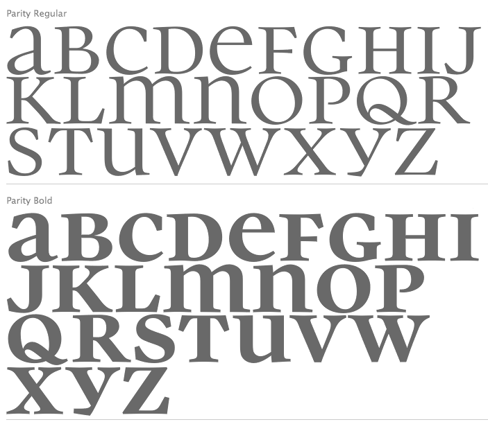
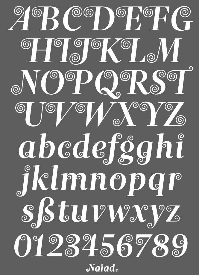
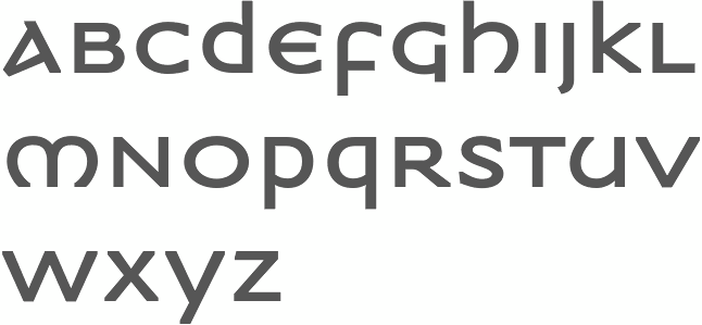
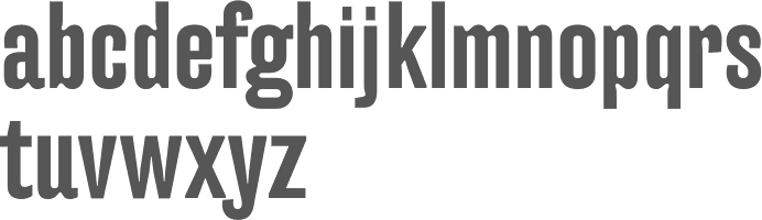
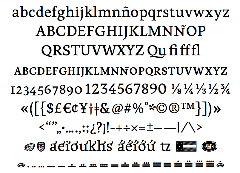
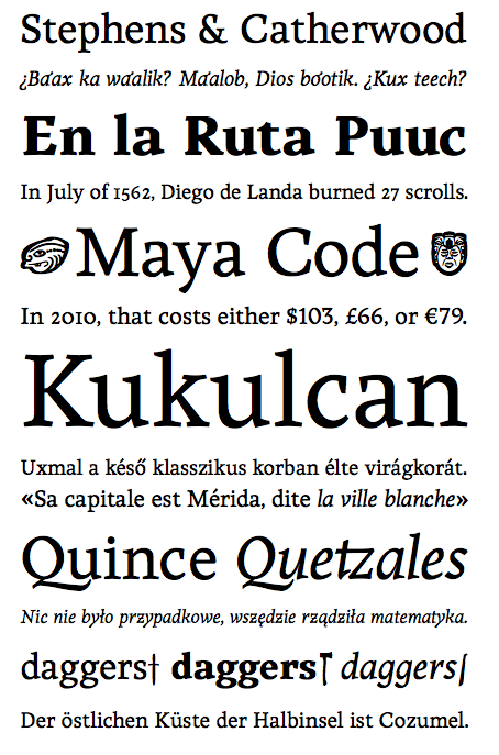
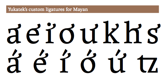
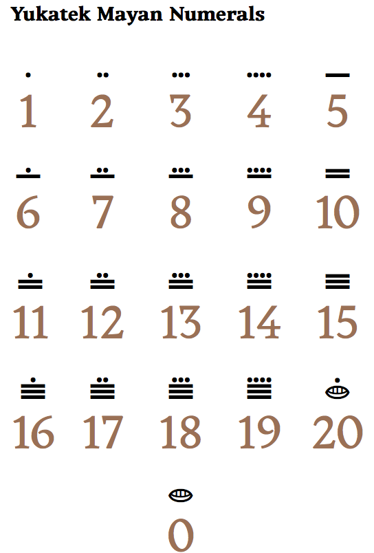
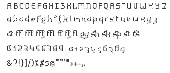
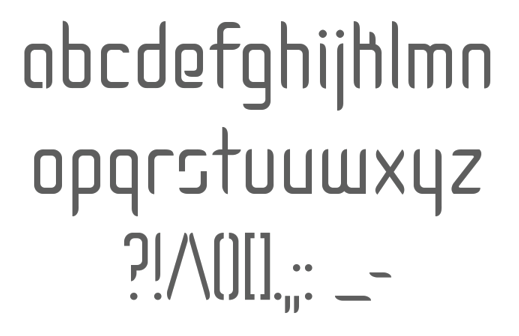
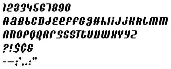
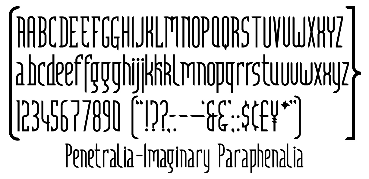
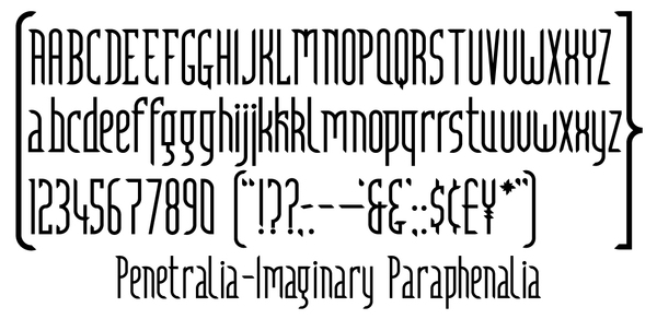
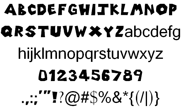
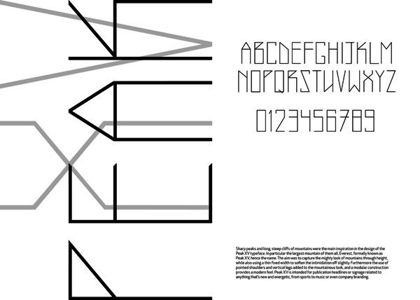
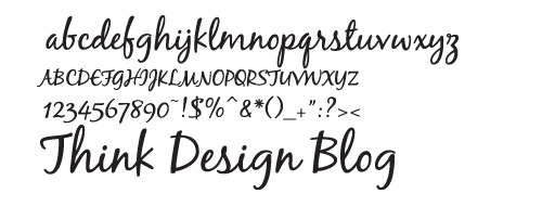
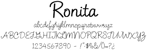
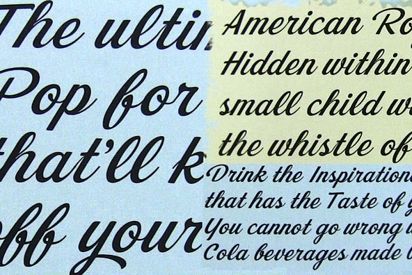
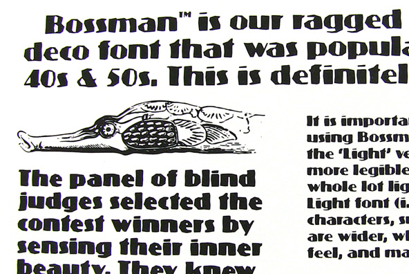
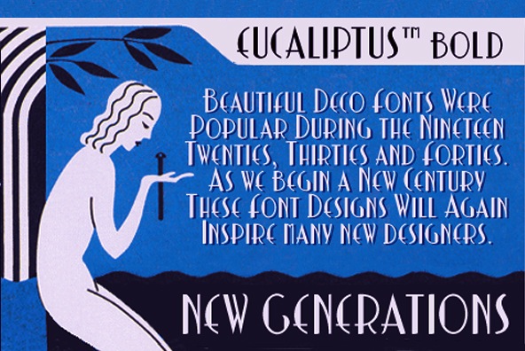
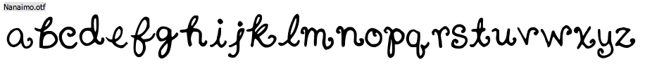
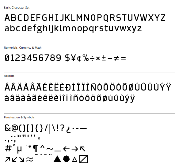
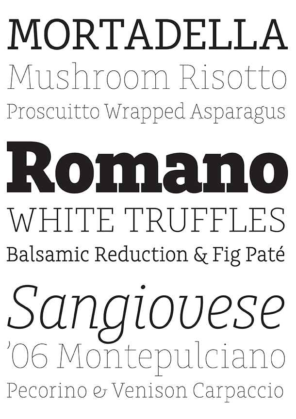
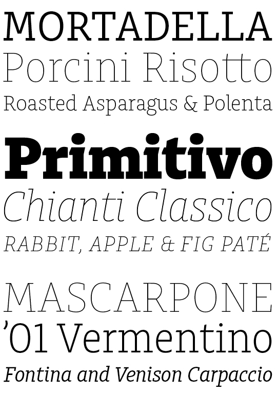
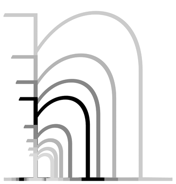
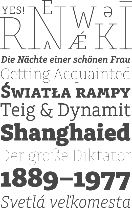
|
|
|
|