| | |
38 Lineart Studio (or: Grayscale, or: Fontsources)
[Muhammad Ridha Agusni]

|
 Architect and designer in Banda Aceh, Indonesia, b. 1980, who set up Grayscale, then 38 Lineart, and finally Fontsources.
 In 2018, he released the hexagonally-patterned color font Space, the nervous monoline display typeface Barcelona, the monoline script Brandy, the tattoo and metal band blackletter font Amstha, Twinkle (hexagonal texture), Premium Quality, Hightide (signage script), Ashley Pages, Bold Grunge (a wood style Western font), Rabbit House, Strongbold (brush style), Onthel (a rhythmic signage script), Cafeine, Seulanga (calligraphic), Sweet Bubble, Downhill, Architecture (technical writing font), Wisethink (rough brush), Emerald, Ghotic, Oakland (signage script), Parthenon (signage script), Strawberry Night (script), the formal calligraphic font Beauty Athena, the inline font Epicentrum, and the signature font Attitude in 2018. Typefaces from 2019: Ghoust (a marker font done at Cititype), Diamant Handwriting (a signature font), Utrecht (with Siti Saribanon Nurjannah), Exhibitionist (a fine rhythmic script), Holimount, Prague Metronome (a thin signature script), Allegroost (a brush typeface), Anisha (script), Kyoto Northern, ChiQuel (a Victorian display typeface that can be layered), Hillstone (a dry brush script), Malique, Ginchiest (a retro signage script), Kid Knowledge, Haghia, Khatija Calligraphy, Bernound, Graffity, Brandy Script (monoline), Downhill, Concept (sketched, blueprint font), Konya (signature script), Blacksmith, Curve Calibration (condensed sans). Typefaces from 2020: The Pallace (a great natural inky signature script by Muhammad Ridha Agusni and Siti Saribanon Nurjannah), Chipen (inline, all caps), Jakarta (a flowing inky script by Muhammad Ridha Agusni and Siti Saribanon Nurjannah), Rhode White (a great signature script by Muhammad Ridha Agusni and Siti Saribanon Nurjannah), Bailamore (a creamy signage script), Vogie (a sporty / techno sans family of 72 fonts, plus a variable font), Rollingtime (a brush script jointly designed by Muhammad Ridha Agusni and Siti Saribanon Nurjannah), Piedmont (a heavy connected handwriting script advertized as a masculine signature font), Whiplash (an all caps dry brush font), Aceh (a 36-style geometric sans), Youthink, Sacred Letter (a vintage weathered script), Serif Sketch (by Muhammad Ridha Agusni and Siti Saribanon Nurjannah), Corinthiago, Smart Chameleon (a handcrafted typewriter font by Muhammad Ridha Agusni and Siti Saribanon Nurjannah), Hiroshima Gyoshi (a brush font inspired by Japanese calligraphy), Roughmarker (dry marker font), Brotherhood, Blugie (a fat finger font), Rome Ionic (an all caps roman typeface), Black Orchestra (a great horror or black metal font), Black Orchestra (a horror font). Typefaces from 2021: Magreb (an 8-style renaissance serif typeface), Toxide (calligraphic; Celtic; uncial), Redtone (a 14-style geometric sans), Moula (an 18-style geometric sans for Latin, Greek and Cyrillic), Zouk (blackletter), Zagreb (an inky signature script by Muhammad Ridha Agusni and Siti Saribanon Nurjannah), Alsace (Victorian), Backbone (a black metal blackletter typeface), Roundkey (a 24-style condensed, but not round, sans), Wordwalker (a marker pen font by Muhammad Ridha Agusni and Siti Saribanon Nurjannah for Cititype), Sweet Bubble (a bubblicious font), Souljah (an elegant inky calligraphic script). Creative Fabrica link. Another Fontbundles link. [Google]
[MyFonts]
[More] ⦿
|
Abi Roe
|
As a student in Oklahoma City, Abi Roe designed the display typeface Celtic Structure (2017). [Google]
[More] ⦿
|
A.C. Smithy
|
Student at UWE in Bristol, UK. FontStructor who made the Celtic caps typefaces Radiating Bold (2011), Radiating (2011) and Closed Energy (2011). [Google]
[More] ⦿
|
Aenigma
[Brian Kent]
|
 Aenigma is the free font foundry of New York-based Brian Kent. The fonts often carry the string BRK in the name. Yet another site. Fontspace link. Dafont link. Typosasis backup. Backup at Fontfreak. Backup at 1001 fonts. Backup at Fortunecity.
 The free fonts: Arthritis BRK (2013), Alpha Beta BRK (2013), Amalgamate BRK (2013), Revert (2006), Gyneric (2006), Key Ridge (2006), 18 Holes (2006: Encircled letters and monograms), Double Bogey (2005), Hairball (2005), Whatever (2005), Dyphusion (2005), Blackonimaut (2005, blackletter), Snailets (2005), Vigilance (2005), Wager (2005), Janken (2005), Dented (2005), Syracuse (2005), Symmetry (2005), Nucleus (2005), Underscore (2004), Gesture (2004), Rough Day (2004), Sarcastic (2004), Galapogos (2004), Reason (2004), Slender (2004), Gather (2004), Quadratic (2004), Saunder (2004), NostalgiaBRK (2004), Kinkaid (2004), Jeopardize (2004), Pincers (2004), Fascii (2004), Grapple (2004), WaywardBRK, WaywardShadowBRK (2004), Obstacle (2004), False Positive (2004), Goosebumps (2003), Jargon (2003), Bewilder (2003), 90Stars (2003, snowflake font), Chumbly (2003), Synthetic (2003), Jawbreaker (2003), Mobilize (2003), GreatHeightsBRK (2003), Graveyard (2003), Bend 2 Squares (2003), Redundant (2003), Homespun (2003), Galvanize (2003), Dastardly (2003), Vantage (2003), Quarantine (2003), Knot Maker (2003, with a program for weaving Celtic knots), Combustion (2003), Knot (2003), Enthuse (2003), Weaver (2003), Foreshadow (2003), Rambling (2003), Mincer (2003), Intersect (2003), Technique (2003), Nominal (2003), Unlearned (2003), Brass Knuckle (2003), Quarterly (2003), Zirconia (2003), Zephyrean (2003), Whippersnapper (2003), Ryuker (2003), Discordance (2003), Graze (2003), Gravitate (2003), Edit Undo (2003), Persuasion (2003), Encapsulate (2003), Nymonak (2003), 36DaysAgo (2003), Vertigo (2003), Lights Out (2003), Sequence (2003), Rehearsal (2003), Yearend (2002), SupraGeniusCurvesBRK (2002), SupraGeniusLinesBRK (2002), Faux Snow (2002, snowflakes), Mishmash (2002), Brigadoom (2002), Gyrose (2002), Dystorque (2002), Upraise (2002), QuacksalverBRK (2002), Ravenous Caterpillar (2002), Bumped (2002), Tonik (2002), Jupiter Crash (2002), Mysterons (2002), Sideways (2002), Scalelines (2002), Pneumatics (2002), Granular (2002), Volatile (2002), Aspartame (2002), Bleak Segments (stencil font), Genotype, United, Lynx (2002), Lyneous (2002), Alpha Beta (2002, pixel font), Licorice Strings (2002), Syndrome (2002, futuristic font), Your Complex (2002), Nanosecond (2002), Binary (2002), Dynamic (2002, techno), Qbicle (2002), Flipside (2002), Amplitude (2002), Pindown (2002), Kurvature (2002), Euphoric (2002), Bobcaygeon (2002), Zoetrope (2002), Overhead (2002), Zelda DX (2002, pixel), Telephasic (2002), Hearts (2002), Lamebrain (2002), Compliant Confuse (2002), Line Ding (2002), AE Systematic, Acknowledge, Mini Kaliber, Upheaval (2002), The Code of Life font (2001), Amalgamate (2002), Bandwidth (2001), ClassicTrash (2001), XmasLights (2001, alphadings), Setback (2001), Qlumpy (2001), Regenerate (2001), Konector (2001), registry (2001), Stagnation (2001), Elsewhere (2001), Claw (2001), Cleaved, 8-bitLimit (4 weights), 10.15SaturdayNight-BRK-, Automatica-BRK (2001), Bendable-BRK (2001), BitBlocksTTF-BRK-, Kickflip-BRK-, Withstand-BRK-, Hyde-BRK-, Ecliptic (2000, a bold rounded monoline techno sans), Jekyll-BRK-, Larkspur-BRK-, NotQuiteRight-BRK-, Quandary-BRK- (an LCD font), Thwart-BRK-, Weathered-BRK-, AEnigmaScrawl, Aftermath, Blox (1999, 3d), CandyStripe (1999), Circulate, Collective (1999), Conduit, Corpulent Caps (2001), DarkSide, DashDot (1999), Dephunked (1999: halftone texture emulation), EmbossingTape (3 fonts), Exaggerate, Frizzed, FullyCompletely, Grudge, Hassle, Hillock, Impossibilium, Inertia, InkTank, Lethargic, MoronicMisfire, Numskull, Opiated, Phorfeit, PixelKrud, Powderworks, Pseudo, QuantumFlat, QuantumFlatHollow, QuantumRound, QuantumRoundHollow, QuantumTaper, Ravaged-By-Years-, Raydiate, Relapse, Sorawin-Plain, Spastic-, Splatz-, Stranded-, Swirled-, TRAGIC-, VacantCapz, Wobbly, XeroxMalfunction(BRK), Zenith, ZeroVelocity, Zoidal, simplton, Waver, SaffronColdWars, 3DLET, Bri's-Scrawl, TRAGIC-, AcidReflux, Arthritis, Ataxia (1999), AtaxiaOutline, BlockTilt, ChintzyCPU, ChintzyCPUShadow, Decrepit BRK (1999), Detonate, Draggle (2000), Draggle[overkerned], FatboySlimBLTC, Gasping, Hack&Slash, HeavyBevel, Jagged, Jasper, JasperSolid, Katalyst[active], Katalyst[inactive], LucidTypeA, LucidTypeB, LucidTypeBOutline, LucidTypeAOutline, Neural, NeuralOutline, ObloquyOutline, ObloquySolid, PlasmaDrip, PlasmaDrip[Empty], Queasy, QueasyOutline, Rotund, RotundOutline, SkullCapz (dingbats), Tearful, Tetricide, Turmoil, Ubiquity, Underwhelmed, UnderwhelmedOutline, Vanished, Xhume, Yonder, Yoshi'sStory, ZurklezOutline, ZurklezSolid, Gaposis, Naughts, Ink Swipes, Irritate, Perfect Dark, Forcible, Loopy, GaposisOutline(BRK), GaposisSolid(BRK), Head-DingMaker(BRK), JoltOfCaffeine(BRK), KirbyNoKiraKizzu(BRK), Orbicular(BRK), Xtrusion(BRK). Commercial fonts at CheapProFonts: Lamebrain BRK Pro, Dynamic BRK Pro, Phorfeit Bundle, Phorfeit Slanted BRK Pro, Genotype Bundle, Genotype S BRK Pro, Genotype H BRK Pro, Classic Trash BRK Pro, Vigilance BRK Pro, Technique Bundle, Technique BRK Pro, Technique Outline BRK Pro, Galapogos BRK Pro, Visitor BRK Pro (pixelish). [Google]
[More] ⦿
|
Akvaléir
|
French designer (b. 1972) of the Celtic look typeface Akvaleir (2007). Dafont link. Aka Ysengrin. [Google]
[More] ⦿
|
Alan M. Stanier
|
Alan M. Stanier from Essex University (UK) has created the following metafonts: ams1, cherokee, cypriote, dancers (the "Dancing Men" code of Conan Doyle), estrangelo (ancient Syriac language), georgian, goblin, iching, itgeorgian, ogham (found on ancient Irish and pictish carvings), osmanian (twentieth-century font used in Somalia), roughogham, shavian, southarabian (for various languages circa 1500BC), ugaritic (ancient cuneiform alphabet). More direct access. [Google]
[More] ⦿
|
Alan M. Stanier
[Ogham]
|
[More] ⦿
|
Alan Meeks
|
 Prolific type designer, b. London, 1951. Alan started working in 1970 for Graphic Systems as a lettering artist. In 1975, he joined Letraset as the Senior Type Designer and Studio Manager where he was responsible for all the artwork produced by the Letraset studio. During his tenure at Letraset, he designed over 40 popular typefaces, including Bramley, Candice, Bickley Script and Belwe. Most of these typefaces also showed up in the Scangraphic collection. Together with type director Colin Brignall, Alan contributed to the success of Letraset. All the original typographic artwork produced at Letraset was produced by hand cutting the fonts in Rubylith, a highly-skilled technique known as stencil cutting. Alan was responsible for training the entire Letraset studio in this art. Most of the original Letraset artwork has now been archived at St. Brides Printing Library, London. Today, Alan works independently, specializing in all facets of corporate identity including type design, typography, packaging, and development of logos and symbols.
 His oeuvre (sold via MyFonts) includes: - Letraset: Aardvark (with Colin Brignall, 1969). Also see Aargau (Softmaker).
- Font Factory: Chalfont (2003: similar to Antique Olive), Brigade (classic roman), Fairway (curly sans), Copacabana (italicized roman).
- Elsner&Flake fonts: Bramley, Cabaret, Candice, Chesterfield, Einhorn (1980, Scangraphic, a revival of a 1931 typeface by Heinrich Maehler called Salut), Frankfurter (1978-1981, with Nick Belshaw and Bob Newman; for digital versions, see Farnham by Infinitype and F821 Deco by SoftMaker), Galadriel (1975; specimen; another specimen), Glastonbury, Knightsbridge, Plaza, Princetown (athletic lettering font done in 1981 based on Princetown by Dick Jones at Letraset), Rialto, Shelley, Tarragon (1981, art nouveau).
- ITC fonts: Algerian Condensed, Ambrose, Belwe Mono, Bertie, Bickley Script, Burlington (1985), Cabaret, Campaign (stencil), Cancellaresca Script (1982), Champers, Claude Sans, Dynamo Shadow (1977), Fashion Compressed (1986, Letraset: a fashion mag didone typeface), Flamme (1993), Follies (1991), Frankfurter (1978-1981, with Nick Belshaw), Glastonbury (1979), Inscription, Jazz, Lightnin' (1994), Limehouse Script (1986), Locarno (1986), Malibu (1992), Plaza, Ragtime, Regatta Condensed, Savoye, Shelley, Tannhauser (1988), Varga (1991), Waterloo Bold (1987).
- Letraset fonts: Aachen, Ambrose (1985), Belwe Mono (1989), Bertie (1985, a Mexican simulation face), Bickley Script, Burlington (1985), Campaign, Champers, Claude Sans (1988), Fashion Compressed, Flamme, Follies, Inscription, Jazz (1992, art deco), Lightnin, Limehouse Script, Locarno, Malibu, Ragtime, Regatta Condensed, Savoye (1992), Tannhauser, Varga, Waterloo Bold.
- Linotype fonts: Aachen, Algerian, Belwe Mono, Bertie, Bickley Script (1986), Bramley, Burlington, Cabaret (1980), Campaign, Cancellaresca Script, Candice, Champers (1991), Chesterfield, Claude Sans, Dynamo, Einhorn, Fashion, Flamme (script), Follies, Frankfurter, Galadriel, Gill Display Compressed, Glastonbury, Inscription (1994), Jazz (1992), Kestrel (1985, a connected signage script at Letraset based on Commercial Script; Ralph Unger's 2011 typeface Faulkner Pro is based on Kestrel; see also Kestrel Script (2010), Meeks's own digital version, its informal version Falcon Script (2013), and Subflux's Ballpark Weiner), Knightsbridge, Lightnin, Limehouse Script, Locarno, Malibu, Plaza (1975), Plaza, Ragtime (1987), Regatta Condensed, Rialto, Savoye, Shelley, Tannhauser, Tarragon, Varga.
- Typefaces from 2011: Dublin (a Celtic typeface), Chalky.
- Typefaces from 2014: Pinot Grigio Modern (a modern rounded multi-style update of Peignot, originally designed in 1937 by A. M. Cassandre), Falcon Script.
- Typefaces from 2015: Park Lane (a classicitalic roman).
- Typefaces from 2017: British Empire (a colonial typeface).
- Typefaces from 2018: Arequipa (a titling font), Independence Script (a cursive script loosely based on the Declaration of Independence; co-designed with calligrapher Satwinder Sehmi), Witchcraft. A classic roman.
- Typefaces from 2019: Aquitania Script (calligraphic).
- Typefaces from 2020: Bodoni Elegant. An 8-style family in Bodoni's style with oh so slight curves thrown in.
- Typefaces from 2021: Pantomime (a heavy monolinear script).
- URW++ revivals: Glastonbury (2009).
- Allan Meeks collection (Cedars, PA): Astoria (2006, miniserifed family based on Gill Sans), Astoria Sans (2011), Astoria Classic (2016), Astoria Classic Sans (2017, with a Peignotian feel), Brigade (2003, serif family), Copacabana (2004, based on Goudy Old Style Italic), Vatican (2005, a calligraphic typeface characterized by the sharp edge style of Arthur Baker), Colosseum (2008, a sans based on Trajan roman and influenced by Friz Quadrata), Chalfont (2003, a News Gothic style typeface with thinned strokes near the bottom---strange and somewhat unattractive), Fairway (2003, a quirky sans), Chalfont Roman (2020), Spartacus (2014), Winterfell (2019).
- Custom type: Benson&Hedges, Lilt, The Woolmark Company, Somerfield, Tarmac, Clearstream.
Galadriel, Kornelia and Sparky are floating around freely in cyberspace. FontShop link. Linotype link. View Alan Meeks's typefaces. Yet another page with Alan Meeks's typefaces. Klingspor link. [Google]
[MyFonts]
[More] ⦿
|
Alex Ivanov
[Vates Design]
|
 [More] ⦿
|
Alexander Thom
|
Dublin-based creator of the roman Gaelic typeface Hogan (1891). He also made the Gaelic Modern round typeface Petrie C (also known as Thom) ca. 1856. [Google]
[More] ⦿
|
Alois Ritter Auer von Welsbach
|
Alois Ritter Auer von Welsbach (b. Wels, Austria, 1813, d. Vienna, 1869) was a typographer and printer for the state. He was famous for special techniques for "nature printing". Michael Everson Conjectures that he made the Gaelic typefaces Vienna A (also called Altirisch A, Altkeltisch) ca. 1845 and Vienna B (also called Altirisch B or Neukeltisch) ca. 1845. The former typeface is a manuscript face, while the latter is Gaelic uncial round. [Google]
[More] ⦿
|
Ancient Music of Ireland
|
Free Celtic font Bunchlo by Vincent Morley. [Google]
[More] ⦿
|
Andreas Stötzner
[SIAS (or: Signographical Institute Andreas Stötzner)]
|
 [MyFonts]
[More] ⦿
[MyFonts]
[More] ⦿
|
Andrew Lines Graphic Arts (or: Drewfont Foundry)
[Andrew Patrick Lines]
|
Andrew Patrick Lines (b. Lowestoft, Suffolk, UK, 1958) is a signage and logo specialist in Norfolk, UK. His fonts are sold through MyFonts. He started Drewfont Foundry (Great Yarmouth, UK) in August 2001 as part of Andrew Lines Graphic Arts. His typefaces: - Jester (2001).
- Seahorse (2004).
- Histry (2004).
- Nondy (2004).
- The Castles (2001). Includes Castle Nouveau and Castle squat. Inspired by the Victorian gothic revival and the work of Augustus Pugin.
- Celt (2001, Celtic).
- Gotheau (2001). This blackletter was developed for the logo of the Letterhead UK movement (an informal yearly gathering of sign based crafts people).
- Spaceboy (2001).
- Starman (2002).
[Google]
[MyFonts]
[More] ⦿
|
Andrew Patrick Lines
[Andrew Lines Graphic Arts (or: Drewfont Foundry)]
|
[MyFonts]
[More] ⦿
|
Annie Mason
|
Designer of the Celtic typeface Ardagh (1996). Dafont link. [Google]
[More] ⦿
|
Anthony Nash
[Classic Font Company]
|
[MyFonts]
[More] ⦿
|
Anton van de Repe
[ARP's free text utilities (MS-DOS) and TTF-fonts]
|
[More] ⦿
|
Aon Celtic Art
[Cari Buziak]
|
Cari Buziak (Calgary, Canada) is the author of Calligraphy Magic---How to Create Lettering, Knotwork, Coloring and More (North Light, 2011). She also created the beautiful freeware Celtic font family Aon Cari (1998, a modern pseudo-Gaelic uncial). Dafont link. [Google]
[More] ⦿
|
Apostrophic Laboratory
[Fredrick M. Nader]
|
 One of the most dynamic foundries from 2000 until 2003. The "Lab" was run by Apostrophe (Fredrick Nader) and was based in Toronto. The name Apostrophe comes from a Frank Zappa song. It has produced well over 1000 original free fonts, in all formats (type 1, truetype, and opentype, PC and Mac), and nearly all fonts have full character sets. Many have character sets for extended European languages and Cyrillic as well. It was for a few years the only active producer of multiple master fonts. Download site at Typoasis. Original URL, now being reworked. Highlights:
 - Miltown (from the Matrix movie).
- Fluoxetine (old typewriter).
- Desyrel (handwriting, Dana Rice).
- PicaHole-1890Morse font.
- Ritalin has almost 500 glyphs, and is a family designed for Latin, Greek, Turkish, eastern European, Cyrillic and Baltic.
- The 3-axis multiple master ImpossibleMM (of Mission Impossible fame).
- Carbolith Trips (letters from cuneiforms).
- Diehl Deco (revival of 1940 lettering by Wooster Bard Field; with Marley Diehl).
- Textan (with Rich Parks or Richard D. Parker; inspired by the Chinese Tangram).
- Poultrygeist (horror comic font).
- Hard Talk (an R-rated font by Slovenian Marjan Bozic).
- Independant (with Phynette; a faithful revival of a 1930s font by Collette and Dufour for Maison Plantin in Belgium---a fantastic Art Deco font family).
- Metrolox ("Enemy of the State" font, with Karen Clemens; a Unicode font with 567 glyphs for over 20 Latin-based languages and some math symbols).
- Komikaze, Komikazba, Komikahuna and Komikazoom (comic book fonts: 1280 glyphs for Latin, Greek, Cyrillic, Baltic, Turkish, East-European, with dingbats and Braille).
- Republika (a 300-font techno family; read about it here).
- ChizzlerMM (3-axis multiple master, a reworked version of Graham Meade's Chizzler).
- Street (a 87-font family by Graham Meade).
- Amerika (fantastic Armenian-look font series, with support for Greek, Cyrillic/Russian, Baltic, Turkish and Central European).
- The dingbats Eyecicles and Texticles, both with Graham Meade.
- Insula (2001, a Celtic/uncial font with Cybapee).
- Komika (2001, 50 comic book fonts designed with Vigilante). A spoof on Comic Sans, this family includes Komika Hand and Komika Text.
- Labrit (a great Fraktur font, with Graham Meade).
- Frigate (a Roman-kana font by Melinda Windsor).
- Scriptina (an unbelievable calligraphic font by Apostrophe, 2000-2001). In 2010, CheapProFonts published an extension, Scriptina Pro.
- Freebooter Script (an equally unbelievable calligraphic font by Graham Meade, 2001).
- Choda (a display font like none you have seen before; Apostrophe and Meade, 2001).
- Endor (with Meade, a Gothic font; 2001).
The list of designers and their fonts: - Apostrophe [dead link]: Day Roman (2002, the first digitization of Fr. Guyot's "Two Line Double Pica Roman", designed in the early 1600s), Bombardier (2002), Propaganda (2002), PropagandaCyrillic (2002), PropagandaGreek (2002), Contra (2003), Ergonome (2002), Ergonomix (2002, techno dingbats), Alfabetix (2002), SoMM (2002, a multiple master font), Templo (2001, a pixelish font), Zoloft, Miltown, Witches Brew, Celexa, Labrat, Effexor, Fluoxetine, Tralfamadore, Halcion, RxMM, Paxil, Valium, Fight This, Ritalin, Xanax, Maskalin, PicaHole, ImposMM, MiltownII, Carbolith, Komikaze, Komikazoom, Komikahuna, Diogenes, Komikazba, MistressScript, Sledge, Mary Jane, Republika, StarBat, Merkin, Erectlorite, Halter, Estrogen, Steinem (based on Dalton Maag's British Steel typeface), Lab Mix, Mary Jane II, Amerika, Masque, Konfuciuz, Mastodon, Broad, Amerika Sans, Scriptina, Karnivore, Cholo, Sedillo and Reprobate (all three based on Mike Sedillo's handwriting, 2001), Templo (screen font family, 2001).
- Marjan Bozic and Apostrophe: Hard Talk.
- Karen Clemens and Apostrophe [dead link]: Wellbutrin, Metrolox, Jagz.
- CybaPee and Apostrophe [dead link]: Cyclin, Lady Ice, Insula.
- CybaPee [dead link], Graham Meade and Apostrophe: Yellowswamp, Lady Ice revisited.
- Steve Deffeyes: Loopy.
- Marley Diehl and Apostrophe: Diehl Deco.
- Fleisch and Apostrophe: Colwell, Hadley.
- Steve Graham: Hypnosis.
- Frank Guillemette and Apostrophe: Ankora.
- Jeri Ingalls and Apostrophe: Paxil.
- Neumat Ick and Apostrophe: Icklips, Powderfinger.
- Keya Kirkpatrick: Extasy
- Keya Kirkpatrick and Apostrophe: Kimono.
- Jeff Lan: Healthy Alternative, Haven Code.
- Su Lucas and Apostrophe: Barbarello.
- Brigido Maderal and Apostrophe: Lab Bats.
- Graham Meade: Quastic Kaps (8-weight family, 2003), Quixotte (2002), Mechanihan (2002), Kameleon (2002), Lady Ice Extra (2002), Gizmo (2002), Zillah Modern (2002), Wazoo (2002), JamesEightEleven (2002), Equine (2001), Street Corner (2001), Freebooter Script, Street (31 font sans and slab serif), Bipolar Control, Lane, Street, Street Slab, 2nd Street, Kronika, Thong, Whackadoo Upper, Charrington, Lady Copra, Zebra, Extra Meade Pack, Control Freak, Dekon, Asenine, Heidorn Hill (a Fraktur font), Castorgate, Troglodyte.
- Graham Meade and Apostrophe: Moondog (2001), Choda, Futurex, Duralith, Epyval, BooterMM, Pamelor, Sabril, Erinal, Karisma, Whackadoo, Bicicles, Drummon, Primary Elector, Youthanasia, Grunja, Prussian Brew, ChizMM, Luciferus, Labtop, Gilgongo, Labrit, Kandide, Brassiere (which became the commercial typeface Ipscus in 2009), Eskargot, Endor, Labag.
- Graham Meade and Rich Parks: Luteous, Luteous II.
- Link Olsson and Apostrophe: Librium, Severina, Poultrygeist, Extrano, Komikandy.
- Rich Parks and Apostrophe: Textan, Glaukous, Textan Round, TexSquareMM, TexRoundMM.
- Alejandro Paul and Apostrophe: Fontcop, Usenet, Cayetano, Elektora.
- Evelyne Pichler: Sindrome.
- Evelyne Pichler and Apostrophe: 1910 Vienna.
- Phynette and Apostrophe: Independant.
- Peter Ramsey and Apostrophe: Distro, Futurex Distro (2001).
- Dana Rice and Apostrophe: Desyrel, Lilly.
- Wayne Sharpe: Ovulution I and II.
- Jessica Slater: Wiggles.
- Jessica Slater and Apostrophe: McKloud.
- Derek Vogelpohl: Phosphorus, Florence sans, Plasmatica, Covington, Avondale, Phosphorus II.
- Melinda Windsor: Plastic, Frigate.
- Robby Woodard: Ashby (2001).
- WolfBainX and Apostrophe: Tribal, Komika.
- Yol: Traceroute.
Font Squirrel link. Dafont link. Abstract Fonts link. [Google]
[MyFonts]
[More] ⦿
|
ARP's free text utilities (MS-DOS) and TTF-fonts
[Anton van de Repe]
|
Two TrueType fonts: ARP Numfont replaces characters by ASCII values, and Celtic-Iberian is just that. All fonts by Anton van de Repe. Contains an archive of 40 Arabic fonts. [Google]
[More] ⦿
|
Arthur Schuricht
|
Born in 1882 in Leipzig, died in 1945 in Vienna. Creator of Hammerschrift (or Hammer Unziale), ca. 1921, a modern pseudo-Gaelic uncial typeface named after Victor Hammer. [Google]
[More] ⦿
|
Ashley Muir
|
 Type designer at Red Rooster, where she published Creighton (2009, a sans family done with Steve Jackaman), Carlingtown (2009, an almost art nouveau face), Glasgow Pro (2010; a refreshed version of Steve Jackaman's Glasgow grotesque family), Harry Pro (based on the original design by Marty Goldstein (and C.B. Smith) done at VGC in 1966), Karnak Pro (2009, a slab family based on the original design by Robert Hunter Middleton, ca. 1931-1942), and Ronsard Crystal (2009, based on a VGC photo display font in the 1950s, but also related to Industria Ronsard by Hermann Zehnpfundt, 1913), together with Red Rooster's boss, Steve Jackaman. About Creighton: It was our initial intention to develop a suitable lowercase for Les Usherwood's Elston typeface, based on a few characters from an old German typeface called Hermes Grotesque (Woellmer, Berlin). However, the new design quickly took on a life of its own, and we decided to call it Creighton. A crisper version of Creighton is Megaphone (2009).
 Typefaces from 2010, all with Steve Jackaman at Red Rooster: Shamus (uncial), Ryder Gothic Pro (a revival of Roslyn Gothic by Harry Winters, 1972), Pickworth Old Style Pro (rustic), Wurlitzer Pro (slab serif), Eden Pro (based on the original 1934 Ludlow drawings by Robert Hunter Middleton), Connemara Old Style (uncial), Overtime LCD Pro (LED simulation face), Phosphate Pro (Solid and Inline). Typefaces from 2011, still with Steve Jackaman at Red Rooster: Phoenix Pro (after the condensed artistic sans called Phenix by Morris Fuller Benton, 1935, ATF), Guildford Pro (+Light, +Medium, +Titling; after Stephenson Blake's Guildford Sans, which in turn was identical to the 1928-1929 typeface by Hans Möhring called Elegant Grotesque), Granby Elephant (after the fat grotesk typeface Granby by Stephenson Blake, 1930), Franklin Gothic Pro (after Morris Fuller Benton's original from 1903), Windlesham (2011, a basic sans family), Relish Pro (2011, another basic sans family), Rocklidge Pro (2011, with Ashley Muir; based on Jana (Richard D. Juenger, VGC, 1965), Packard New Style and Packard Old Style (2011, with Steve Jackaman, after Packard by Oswald Cooper (1913) and Morris Fuller Benton (1916, ATF). Klingspor link. Fontspace link. [Google]
[MyFonts]
[More] ⦿
|
Bannigan Artworks
[Todd M. Hallock]
|
 Based in Perry, OK, Bannigan Artworks was founded in 1998 by Todd Hallock (b. 1969). His fonts include Arts&CraftsGS (2001, inspired by decorative lettering by Glaswegian illustrator Jessie Marion King (1876-1949) and by the Scottish style of Charles Rennie Mackintosh (1868-1928). This font was published by Jack Yan), Renaissance Caps (2005, floriated), Celtic Knots-BA (2002), Celtic BA (2003), Celtic Ornaments BA (2008), Christianity BA (2004, Christian symbols), and the futuristic font Hallock.
 Home page on Celtic Art. Agfa/Monotype sells Hallock, Celtic-BA and Celtic Knots. At MyFonts, we find the Keltic caps typeface Medieval Caps BA (2006), Left Hand BA (2007) and Art Nouveau 2 BA (2007). Archibald BA (2009) is inspired by the art nouveau lettering of Archibald Knox (1864-1933), a designer for Liberty&Co. from the Isle of Man. In 2014, he created Arts and Crafts Sans BA. In 2015, Todd published Circle BA. Klingspor link. View Todd Hallock's typefaces. [Google]
[MyFonts]
[More] ⦿
|
Barlow type
[John Barlow]
|
Early transitional Gaelic typeface prepared by the Gaelic Society of Dublin in 1808-1821, which, just as the very early Queen Elizabeth type, used some roman characters, in part to draw in people to study the Irish language. Sample from a grammar book published by John Barlow in 1808. [Google]
[More] ⦿
|
Barony of Marinus
|
Celtic font links. [Google]
[More] ⦿
|
Ben Griffin
|
Knots (2010) is a free Unicode typeface family. The first of these to be released is Knots regular. The characters use the Box Drawings Code Page U+2500 through U+257F in a creative manner, which allows for the analysis and representation of celtic knotwork. Scans of Knots: i, ii. [Google]
[More] ⦿
|
bertie111
|
Gaeilge2 font and an archive of 12 Celtic fonts. [Google]
[More] ⦿
|
Blambot!
[Nate Piekos]
|
 Blambot Comics Fonts was founded in 1999 by graphic designer and illustrator, Nate Piekos, and is located in East Providence, RI. Blambot has a huge number of original free comics fonts and balloons by Nate Piekos (East Providence, RI, b. RI, 1975). Comic Lettering is an alternate URL, where you can also order logo designs, custom fonts, and custom lettering. Fontspace link. The fonts:
 - 2021: Collect Em Now BB (a comic strip font), Spinner Rack Pro BB.
- 2020: Out of Line Pro BB, Ready for More BB, Nightmark BB, Tight Spot BB, Budrick BB, Flannel Shirt BB (a sans family).
- 2019: Tire Swing BB, Ready For Anything BB.
- 2018: Invulnerable BB.
- 2017: Collect Em All BB, Spinner Rack BB.
- 2016: Friend Or Foe Tall BB, Friend Or Foe BB, Astrogator BB, Out Of Line BB.
- 2015: Susurrus BB (sans family), Inkcantation BB (slightly creep jhand-drawn serif font), Blambastic BB, Brushzerker BB.
- 2014: Hundredwatt BB, Piekos Toons BB, Beelzebnrush BB, Astounded Round BB, Astounder Squared BB, Sleuth Serif BB, Crypto Creep BB, Wretched Remains BB (brushy Halloween font), Mech Effects 1 BB, We Come in Peace BB, Manga Master BB.
- 2013: Unearthed BB (Celtic), Always Angry BB, Sequentialist BB, Might Makes Right BB, Fight To The Finish BB, Palooka BB, ManlyMen BB, Trash Cinema BB, Bulletproof BB, Ticking Timebomb BB (LED font), Potty Mouth BB (dingbats), Vengeful Gods BB (Greek simulation face), Blowhole BB (fat finger font family), Shrunken Head BB, Perihelion (+Condensed: elliptical sans).
- 2012: Dungeon Dweller BB, Mark of the Beast BB (Halloween font), Monsterific BB, Tough as nails BB, Longbow BB (a rough-edged blackletter), Gamma Rays BB, Inkslinger BB (a true comic book style family), Saucer BB (sketch font), Smells Like Tacos BB, Mutant Academy BB, Destroy Earth BB, Mandroid BB, Fundead BB, Stupid Head BB, Spellbreaker BB, Elevations BB (2012, a blueprint typeface), Revenger BB (angular family).
- 2011: Silver Bullet BB (a fat hand-drawn blackletter face), Shallow Grave BB, Imaginary Friend BB, Highjinks BB, ShallowGrave BB, Quahog BB (angular, calligraphic), Mumble Grumble BB, Action Figure BB, Piekos FX Rough BB, ChainsawzBB, Heavy Mettle, Billy The Flying Robot BB, Longbox BB.
- 2010: Ninjutsu BB, Protest Paint BB, Rock Steady BB, Ladylike BB, Protest Paint BB (grunge), Tone Deaf BB, Clown Teeth BB, Irish Stout BB (beer label face), Sans Sanity BB, Straight To Hell, Unmasked, Piekos FX BB, Hometown Hero BB, Piekos Professional; BB, Big Bad Bold BB, Crash Landing, HoneyMead BB, Secret Origins (2010).
- 2009: Dragonbones BB, MeanStreets BB, Two Fisted BB, RedStateBlueState BB, Scream Queen, Fresh Meat BB, Gone Fission BB, Black Hole, Life Form, Crimewave BB, Firepower BB, Artists Alley BB, Stronghold BB, Village Idiot, Raging Red Lotus (2009, oriental simulation), Dwarven Axe BB, Silver Age BB, Flyboy BB (2009, techno), Giant Sized Spectacular BB (2009).
- 2008: Snake Oil Salesman (old typewriter face), Earthman and Earthman Extended (a nice 12-style retro sans family), Clairvoyant BB, KrakHead BB [one of my favorites], Blambot FXPro BB, Sangre BB, Dearly Departed BB, Boogers, Bada Boom BB, Old Crone BB (2008, bewitched style).
- 2007: Fire Fight BB, After Dark BB, Post Mortem BB, Fold and Staple BB (with Brandon J. Carr), Dunce Cap BB, DeathRattle BB, Potty Mouth BB, Dominatrix BB (grunge), Shore Leave BB (based on sailor tattoos), Cloudsplitter BB, Drawing Board (inspired by Tekton), Warhorse BB, Warmonger BB.
- 2006: Duty Calls BB, Hellfire BB, AveAveBB, Indie Star, Blamblam BB, Braaains BB (dingbats), Musashi BB, Atland Sketches, Double Life BB, SkinDeep BB, SkinDeep Swashes BB, Newsflash.
- 2005: KeelhauledBBBold, KeelhauledBB, MainframeBBBold, MainframeBB, Alter Ego BB, Entrails, Mastermind BB, Zooom BB, Whitechapel BB (handwriting), Sucker Punch, Crimefighter, 10c Soviet, CyranoBB, Praetorium, Spectre Verde, Hired Goons, Afterlife BB (2005, tall ascendered face), Seven Monkey Fury (oriental simulation face), Spectre Verde, FeedbackBB.
- 2004: Atland, Creative Block, Midnightsnack BB, Bloody Murder BB, Seven Swordsmen, Webletterer, Rackum Frackum, Oh Crud, CatholicSchoolGirlsBB, Antihero, Dark Arts, Bearded Lady BB, BottleRocket, Streetcred, Lowrider, Extra pickles (2004).
- 2003: Square Jaw BB, Shinobi, Bar Brawl, Holy Mackerel (2003, Craterface BB, Zombie Guts, Knuckle Sandwich, Workingman, Fat Stack BB, Santa's Big Secret, ArrMatey, Tokyo Robot, JackLanternBB, Perils of Piekos, Turntablz, Wicked Queen (2003, free), Golden Oldie, Badaboom, OhCrap, Whoop Ass, Damn Noisy Kids, Paperboy, Armor Piercing, Radioactive Granny, Sidekick International, Digital Strip, Mighty Zeo, Arcanum, Zud Juice, Ale&Wenches, Bar Brrawl, Bar Brawl BB, Armored Science BB, Blamdude, Shinobi, Man of Science, Sidekick BB (2003).
- 2002 and earlier: AndroidNation, Blambot-Custom, Blambot-Standard, Captain-Spandex, Casket-Breath, Concetta, Dupuy-Bold, Edible-Pet-II, Edible-Pet, Edible-PetInternational, Enchilada, Evil-Genius, Flat-Earth-Scribe, Gunhead-Chick, Lovecraft's-Diary, Mouth Breather, Mighty-Tomato, MonkeyChunks, Monkeyboy, Mummy-Loves-You, Mutant-Supermodel, Nate's-Choice, PiranhaSexual, Red-Right-Hand, Roboshemp, Space-Pontiff, Squeezy-Cheez, Urinetoast, Voodoo-Doll, YellaBelly, Zartz!, TwelveTonFishstick, TwelveTonSushi, A.C.M.E.-Explosive!-Bold, A.C.M.E.-Explosive!, GrungeUpdate, Mothership, Twelve-Ton-Goldfish, Whoop-Ass, WickedQueen BB, Winter-in-Gotham, 13 O Clock, ACMEInternational, ChroniclesofaHero, ChroniclesofaHeroBold, FanboyHardcore, KidKosmic, LetterOMatic, MangaTemple, GorillaMilkshake, Caeldera, Belizarius, Bottix, ChatteryTeeth, OrangeFizz, OrangeFizzItalic, Pythia, SpiritMedium. Direct access.
- Commercial fonts: Knuckle Sandwich, Utility Belt, Tentacle Jones, Rocketboy, Seargent Six-Pack, Secret Identity, Edible Pet 3, Piekostype, LintMcCree Mysteries, Doc Seismic, Mike Allred's AAA, AAARGH, Allred's Aliens Invade, Asteroids for Lunch, Action Away, Allred's Amazing Stupendous, ArmorPiercing, Mars Police, Irezumi, Holy Macxkerel, Hudson VC, CreepingEvil, BlambotPro (great), Creeping Evil, Rooftop Run, AAA Redmeat, Eurocomic, Comic Geek, Jack Armstrong (nice), Rivenshield (useful), Howard Bros (nice), Mighty Zeo, Cajun Boogie, Betty Noir, Sand Diego '02, Wrecking Ball, Miskatonic, Roswell Wreckage, WizardSpeak, Glass Jam, BucketOBlood, Three Arrows, Damn Noisy Kids, Humbucker, Oh Crap, Caveman, Blambot Casual, 10CentComics, BettyNoir, BigBlokeBB, BlamDudeBB, BlamDudeBBItalic, CajunBoogie, DetectivesInc, Irezumi, IrezumiItalic, SpiritMedium, VanHelsing.
Over 1000 free fonts here: 10CentSoviet, 10CentSovietBold, ACMEExplosive, ACMEExplosiveBold, ACMESecretAgent, ACMESecretAgentBold, ACMESecretAgentItalic, AleandWenchesBB, AleandWenchesBBBold, AndroidNation, AndroidNationBold, AndroidNationItalic, AnimeAce, AnimeAceBold, AnimeAceItalic, Arcanum, ArcanumBold, ArcanumItalic, ArmorPiercing, ArmorPiercing20BB, ArmorPiercing20BBItalic, ArmorPiercingItalic, ArrrMateyBB, BadaBoomBB, BattleLines, BettyNoir, BigBlokeBB, BlamDudeBB, BlamDudeBBItalic, BlambotCustom, Bottix, BottleRocketBB, BottleRocketBBBold, Caeldera, CajunBoogie, CatholicSchoolGirlsBB, ChroniclesofaHero, ChroniclesofaHeroBold, CreativeBlockBB, CreativeBlockBBBold, CrimeFighterBB, CrimeFighterBBBold, DamnNoisyKids, DarkArtsBB, DetectivesInc, DigitalStrip, DigitalStripBold, DigitalStripItalic, DwarfSpiritsBB, EvilGeniusBB-Bold, EvilGeniusBB, FanboyHardcore, FanboyHardcoreBold, FanboyHardcoreItalic, FatStackBB, FeastofFleshBB, FeastofFleshBBItalic, FeedbackBB, FeedbackBBItalic, FlyboyBB, GorillaMilkshake, GorillaMilkshakeItalic, Irezumi, IrezumiItalic, JackLanternBB, KeelhauledBB, KeelhauledBBBold, KidKosmic, KidKosmicBold, KidKosmicItalic, LetterOMatic, LetterOMaticBold, LetterOMaticItalic, MainframeBB, MainframeBBBold, MangaTemple, MangaTempleBold, MangaTempleItalic, MarsPolice, MarsPoliceItalic, MightyZeo20, MightyZeo20Bold, MightyZeo20Italic, MightyZeoCaps20, MightyZeoCaps20Bold, MightyZeoCaps20Italic, Miskatonic, MouthBreatherBB, MouthBreatherBBBold, NewsflashBB, OhCrap, OhCrudBB, OrangeFizz, OrangeFizzItalic, PraetoriumBB, PsiphoonBB, Pythia, RagingRedLotusBB-Italic, RagingRedLotusBB, RoswellWreckage, SanitariumBB, SantasBigSecretBB, SergeantSixPack, SevenMonkeyFuryBB, SevenSwordsmenBB, ShockTherapyBB-Italic, ShockTherapyBB, SpectreVerdeBB, SpectreVerdeBBBold, SpiritMedium, SwingSetBB, TurntablzBB, TurntablzBBBold, TwelveTonFishstick, TwelveTonSushi, Umberto, Vampiress, VillageIdiotBB, WarmongerBB, WebLettererBB, WebLettererBBBold, WhoopAss, WickedQueenBB, WizardSpeak, WizardSpeakWorn, Yoshitoshi, YoshitoshiBold, YoshitoshiItalic, ZudJuice, ZudJuiceBold, ZudJuiceItalic. Dafont link. Klingspor link. Fontspace link. View the Blambot typeface liubrary. [Google]
[MyFonts]
[More] ⦿
|
Bonaventure O Hussey
|
Irish guardian of a Franciscan monastery in Louvain, Belgium, where he died in 1614. He is credited with the first authentic Irish character type, the Louvain type. Brendan Leen writes about him: "One of a group that had sought refuge on the continent of Europe in the aftermath of the pillage of a Donegal monastery in the late sixteenth century, Bonaventure O Hussey entered the Franciscan monastic college at Louvain, Belgium, on 1 November 1601 and died as its guardian on 15 November 1614; it is for the printing of An Teagasc Criosdaidhe by O Hussey that the first authentic Irish type was cut. On 15 April 1614, O Hussey had petitioned for permission to print Irish material at Louvain." Another sample of Louvain. [Google]
[More] ⦿
|
Book of Kells Images
|
Paul DuBois scanned in images from the Book of Kells. [Google]
[More] ⦿
|
Brendan Leen
[Four centuries of printing in the Irish character]
|
[More] ⦿
|
Brenden C. Roemich
[Digital Graphic Labs]
|
[More] ⦿
|
Brett Naughton
|
Creator of Yafit (2013), a Celtic /uncial/ gaelic / insular typeface. [Google]
[More] ⦿
|
Brian Kent
[Aenigma]
|
[More] ⦿
|
Brian Powers
[Furdzville]
|
 [More] ⦿
|
Bryde's Free Medieval Fonts
|
Great archive with many blackletter fonts. Features fonts such as AngloSaxon 8th, Bastarda, CelticFrames (Omega Font Labs), Celtic Gaelige (Susan K. Zalusky), The Middle Ages (dingbats), Monsters of Stone (dingbats), Stonehenge, Theodoric, Windsor, Magic Medieval (Dave Howell's modification of Goudy Medieval), Kelly Ann Gothic (Mike Allard), Judas, Houters Normal. Has Celtic fonts and Heraldic fonts as well. Page by Bryde the Webmistress. Alternate URL. [Google]
[More] ⦿
|
califg
|
Three Celtic truetype fonts. [Google]
[More] ⦿
|
Cari Buziak
[Aon Celtic Art]
|
[More] ⦿
|
Carl Crossgrove
[Terrestrial Design]
|
 [MyFonts]
[More] ⦿
[MyFonts]
[More] ⦿
|
Carl Edlund Anderson
[Edlund Font Project]
|
[More] ⦿
|
Casa Celta
|
Small Celtic font archive. [Google]
[More] ⦿
|
Casady&Greene (Fluentlaserfonts)
[Terry Kunysz]
|
 Casady&Greene, Inc. started out as two separate little companies, CasadyWare and Greene, Inc. CasadyWare, which was founded by Robin Casady in August 1984, began producing Fluent Fonts, which were bitmapped typefaces for the Macintosh. The 1984 set of fonts have copyright lines that mention Richard A. Ware. As soon as PostScript fonts appeared, CasadyWare got hold of the first version of Fontographer and produced the first downloadable PostScript fonts, even beating Adobe, the originators of PostScript, to the punch. These were marketed as Fluent Laser Fonts (FLF) out of Carmel, CA.
 The FLF series includes Abilene (Western), Alexandria (1986, slab serif family), Black Knight (1991, blackletter), Bodoni FLF (1986), BodoniUltra (1986, a fat didone), Bonnard (art nouveau), ButtonHighlight, ButtonPlain, Calligraphy (1986), Campanile (a great didone face), Checkbox, Chicago FLF (free at OFL), Collegiate (1988, sports lettering), Coventry Script (calligraphic), Cutouts FLF (1992, cargo stencil), Desperado, Dorovar Carolus (1988, Carolingian; see also D790 at Softmaker and Carolingia (1991, William Boyd)), DryGulch, Epoque (art nouveau), FattiPatti, Fletcher Gothic (1992, art nouveau), Galileo (1987, didone), Gazelle (1988, calligraphic script), Gatsby (1986, pure art deco), Giotto, Gregorian (1986, English Gothic style blackletter), Harlequin FLF (1990), Highland Gothic (1992), Jott, Kasse (1992), Kells (modern round Gaelic font, 1988), KeyCaps, La Peruta, Meath (modern round Gaelic font, 1988), Michelle (1992, art deco, marquee face), Micro, MicroExtend FLF (1986, like Microgramma), Monterey (1986, Peignotian), Moulin Rouge (1992, an art nouveau typeface by Richard A. Ware), Nouveau (1990, art nouveau), Paladin (1988, blackletter), Pendragon (1991), Phoenix Script FLF (1990), Prelude (1986, connected script), Regency Script (1986, calligraphic copperplate script), Right Bank (1986, art deco), Ritz (1986, art deco in the style of Broadway), Rocko (1992, rounded like VAG Round), SansSerif FLF (1986, a large geometric sans family), Sedona Script (1990, connected, calligraphic, semi-psychedelic), Slender Gold (1992, script), Vertigo (1992, condensed monoline sans), VertigoPlus, Zephyr Script (1986, brush script). Many fonts were digitized by Richard Ware, and some were designed by Mike Wright. The contact was Terry Kunysz in Salinas, CA. On July 3, 2003, Casady&Greene closed it doors permanently. However, one of its designers, Mike Wright, writes: I believe that all the fonts that were developed by the company are now in the public domain. Robin Casady and I are thinking of putting up a site with free downloads of all of the old C&G public domain fonts--mainly as a way of attracting Mac users to see iData 2. Robin Casady in 2003: I founded Casady Company in 1984 to publish fonts for the new Macintosh. The name changed with incorporation to CasadyWare, Inc. Around this time I met Mike Greene who was looking for a software project to do after SpellsWell. I talked him into doing a program that became QuickDEX. Later CasadyWare, Inc. merged with Greene, Inc. and became Casady & Greene, Inc. Over the years, my role in management reduced as my interests in other areas developed. In the last ten years I have had no official management duties at C&G. About a year ago I removed myself from the Board of Directors. Some fonts could be found at TypOasis [defunct link]. Fontex link. Font Squirrel link. [Google]
[More] ⦿
|
Celtiber
|
Celtiber (1996) is a hand-drawn Celtic-Iberian font in truetype format. [Google]
[More] ⦿
|
Celtiberian script
|
"The Celtiberian script developed from the Iberian scripts. Only a small number of Celtiberian inscriptions dating from between the 6th and 1st centuries BC have been found. With the Roman take over of the Iberian peninsula, the Celtiberian script was gradually replaced by the Roman/Latin alphabet and eventually disappeared. The Celtiberian script was used mainly by druids for religious purposes. It s partly syllabic and partly alphabetic." See also here. [Google]
[More] ⦿
|
Celtic Creative - ProScribe Fonts Disc
|
Commercial Celtic fonts on a CD. 25 UKP for 4 fonts: Jenner, Duncan, Coran, and Sean. No mention of the type designers. [Google]
[More] ⦿
|
Celtic Faery
|
Celtic truetype font archive. Original fonts include Circledings and CelticaBlack. [Google]
[More] ⦿
|
Celtic fonts at Scriptorium
|
David Nalle at Scriptorium has a bunch of Celtic fonts to offer: Sualtim, Morgow (1999, spiral uncial), Teyrnon (spurred uncial), Padstow (heavy uncial), Columba (decorative initials), Alba (angular hybrid uncial), Dahaut (uncial), Glendower (uncial based on The Book of Kells), Knotwork, Stonecross (1997, derived from Celtic cross and gravestone inscriptions), Celtic Spirals, Celtic Borders, Lindisfarne, and Durrow (1993, minuscule calligraphy), Spiral Initials, Owen Jones Borders. [Google]
[More] ⦿
|
Celtic Fonts at Yamada
|
Free Mac font Gaeilge at the Yamada site of the University of Oregon. [Google]
[More] ⦿
|
Celtic Fonts by the Celtic Lady
[Susan Zalusky]
|
Original Gaelic fonts. Designer Susan Kathryn Zalusky sells California Uncial for 20 dollars. She also gives away for free a simple Gaeilge (Irish Celtic) font, Celtic Gaelige UNICODE (1997). [Google]
[More] ⦿
|
Celtic Images and Fonts
|
Links to Celtic images. [Google]
[More] ⦿
|
Celtic knotwork, art and font links
|
Celtic font links by Craig Cockburn. [Google]
[More] ⦿
|
Celtic--Uncial style fonts for Windows
|
Freeware/shareware Celtic and Uncial fonts collected in an archive by Dan Smith. [Google]
[More] ⦿
|
CelticWonder
|
About 20 Celtic TrueType fonts. Free from Daithi (CelticWonder). Mirror. [Google]
[More] ⦿
|
celt.net
|
Celtic font archive. [Google]
[More] ⦿
|
Châteaux Celtes et Chimères
|
Marie-Louise Pépin's page on medieval resources and "enluminures". Has a Heraldic (uncial) truetype font for download. Medieval resources in Québec. Addresses and links. [Google]
[More] ⦿
|
Charles Reed
|
Dublin-based typographer, and creator of the modern angular Gaelic typeface Reed (ca. 1874), modeled after Newman. [Google]
[More] ⦿
|
CheapProfonts
[Roger S. Nelsson]
|
 Started in 2008, this web place by Norwegian entrepreneur Roger S. Nelsson (based in Honningsvåg, Norway) sells fonts by Ray Larabie, Brian Kent, Nick Curtis, Derek Vogelpohl and Kevin King that were originally freeware fonts. Nelsson reworked them (more glyphs, more multilingual) and asks about 10 dollars per font now. He says his fonts now cover these Latin languages: Afrikaans, Albanian, Basque, Belarusian (Lacinka), Bosnian, Breton, Catalan, Chamorro, Chichewa, Cornish, Croatian, Czech, Danish, Dutch, English, Esperanto, Estonian, Faroese, Filipino (Tagalog), Finnish, French, Frisian, Galican, German, Greenlandic, Guarani, Hungarian, Icelandic, Indonesian, Irish (Gaelic), Italian, Kashubian, Kurdish (Kurmanji), Latvian, Lithuanian, Luxembourgian, Malagasy, Maltese, Maori, Northern Sotho, Norwegian, Occitan, Polish, Portuguese, Rhaeto-Romance, Romanian, Saami (Inari), Saami (Lule), Saami (North), Saami (South), Scots (Gaelic), Serbian (latin), Slovak(ian), Slovene, Sorbian (Lower), Sorbian (Upper), Spanish, Swedish, Tswana, Turkish, Turkmen, Ulithian, Walloon, Welsh, Yapese.
 Designer at FontStruct in 2008 of cowboy_hippie and Syndrome X (DNA-look typeface inspired by Syndrome BRK by Brian Kent). Nelsson's fonts are Classic Trash BRK Pro, Dynamic BRK Pro, Galapogos BRK Pro, Genotype BRK Pro, King Cool KC Pro (kid's hand; done with Kimberly Geswein), Lamebrain BRK Pro, Matrise Pro and Matrise Text Pro (dot matrix), Phorfeit BRK Pro, Syndrome BRK Pro, Technique BRK Pro, Vigilance BRK Pro, Grapple BRK Pro. The "BRK" refers to Brian Kent, the original free font designer. In 2009, he added a number of fonts that were done by Nick Curtis some years before that (hence the "NF"): Boogie Nights NF Pro (art deco face), Copasetic NF Pro, Coventry Garden NF Pro, Pro, Fontleroy NF Pro, Hamburger Heaven NF Pro, Monterey Popsicle NF Pro, and Wooden Nickel NF Pro. Trypewriter Pro (2009) is based on Kevin King's Trypewriter. Helldorado Pro (2009) is a Tuscan wood type style typeface based on a font by Levente Halmos. Designer of Isbit Pro (2012, a magnificent melting ice cube-shaped superlliptical typeface family), Familiar Pro (2011, designed with the same metric as Helvetica but "better than Arial"), Bloco Pro (2010, fat counterless face), Trump Town Pro (2009, athletic lettering slab serif), Geometric Soft Pro (2009), Geometry Script Pro (2010, upright connected script), DIN Fun Pro (2011), Infantometric Pro (2012), Foobar Pro (2012) and Cheap Pro Fonts Serif (2009). Typefaces from 2013: Adultometric Pro (narrow monoline sans). Dafont. Fontspace link. Fontsquirrel link. Catalog of Nelsson's bestselling typefaces. [Google]
[MyFonts]
[More] ⦿
|
Christopher Young
|
Michael Everson claims that a certain Christopher Young from Pittsburgh first digitized Gaeilge in 1991, based on the Celtic font Newman. This Christopher Young is not the same as the Australian designer of Elisa. [Google]
[More] ⦿
|
Ciarán Ó Duibhín
|
Gaelic fonts for Windows expertly categorized and explained by Ciarán Ó Duibhín. A great jump page. One can find opinions on choices of fonts. For example, on the choice of a Gaelic uncial, we find this paragraph: I find it useful to classify uncial fonts on a three-point scale of ornateness. The fonts at each point may then be compared on the extent to which their unciality is affected by minuscule or by Latin influences. - The most ornate ("Hammer") style is best represented by Loch Garman and by Mórchló GC, either of which is infinitely preferable to American Uncial. The Gaeilge 1/Gaeilge2/Gaeilge 2 family are also of this type, but have come under some minuscule influence.
- At the intermediate degree of ornateness, the purest is Ceanannas, while Léarchló and Orchló show minuscule tendencies in uppercase, Fíorchló shows Latinising tendencies in uppercase, and the Petrie metal types are digitally represented by Eirinn Gaelic showing minuscule influence in long r and s, and by GaelicLS showing Latin influence in letters like d and g.
- The least ornate or most "modern" uncials are �rchló (pure) and Glanchló and Lánchló (both with minuscule-influenced uppercase), and Colmcille (with both minuscule and Latin influence in uppercase, and minuscule influence in long r and s).
- A preference for uncial purity would select Loch Garman, Mórchló GC, Ceanannas and Orchló. The suitability of any one of these depends on the purpose, but plainness is a virtue for body text, and Orchló is the uncial font with the most realistic prospects for body text use. It may be noted that Loch Garman and Ceanannas both have bold, oblique and bold oblique variants, and Orchló has a bold variant.
[Google]
[More] ⦿
|
Cinderella Jimu Harrington
[CindiGirl]
|
[More] ⦿
|
CindiGirl
[Cinderella Jimu Harrington]
|
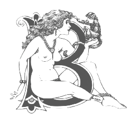 The CindiGirl site closed. Cartoonist and computer specialist who ran (runs?) The Art of Jimu. Her pages show an exquisite collection of celtic style erotic caps in the style of Aubrey Beardsley. Unknown origin---I must conclude that Harrington drew these caps herself. A download site. [Google]
[More] ⦿
The CindiGirl site closed. Cartoonist and computer specialist who ran (runs?) The Art of Jimu. Her pages show an exquisite collection of celtic style erotic caps in the style of Aubrey Beardsley. Unknown origin---I must conclude that Harrington drew these caps herself. A download site. [Google]
[More] ⦿
|
Clanbadge
[Daniel L. Isdell]
|
Clanbadge is a foundry in San Jose, CA. MyFonts link. Daniel Isdell (b. 1955, Washington, DC) sells a great font, The Celtic Knot Font (2001), that permits one to make thousands of Celtic knot patterns. An interesting idea, to say the least. The clue is here. MyFonts link. On MyFonts, he writes: Daniel Isdell Dan Isdell is a graphic artist, web designer and programmer living in San Jose, California. He has been a font addict from an early age, first with pencils and markers and then with good old Speedball pens. He designed his first full font at age 15. Attending a technical high school gave him the opportunity to learn typesetting by hand with movable metal type. His parents were both bookbinders and one of his first jobs was working at a real type foundry, where part of his job was stocking the linotype machines with fresh lead and melting galleys full of no longer needed type. Later, working as an engineer allowed him to use computers and CAD systems to design letterforms. As a Senior Web Design Engineer and graphic artist he had the opportunity to apply his love of typography to logos and user-interface design. Although he has yet to publish any of his letterform fonts, he has released the Celtic Knot Font. Its development stemmed from his interest in his hereditary Scottish culture, and the study of Celtic knotwork as embellishments for his leatherwork, knife-making and jewelry-making hobbies. The Celtic Knot Font has been a big success with well over 8000 copies sold. [Google]
[MyFonts]
[More] ⦿
|
Clare Bell
|
Clare Bell received a BA degree from Central Saint Martins College of Art & Design in London in 1999 after working as a designer in Dublin for eight years. She also worked in the design department of the Guardian newspaper for five years before returning to Dublin where she is undertaking a PhD entitled Typography, Culture & Society: An analysis of the visual representation of the Irish language in Northern Ireland at the Dublin Institute of Design and Technology, where she is a typography tutor. At ATypI 2005 she spoke on Typographic tales from the edge of empire, and deals mainly with the story of uncial, from the Book of Kells to present day murals in West Belfast. She co-organized ATypI in Dublin in 2010. Currently, she is Associate Researcher at the Graduate School of Creative Arts and Media. Speaker at ATypI 2018 in Antwerp. [Google]
[More] ⦿
|
Classic Font Company
[Anthony Nash]
|
 The Classic Font Company is a small foundry with absolutely gorgeous commercial fonts (often revivals of pen drawings) by Tony Nash (b. Bristol, 1944): Abby (blackletter family), Amadeus (1997), Batard, Bede, Byro, Carol (1997, blackletter family), Classic (2000-2002), Copper, Doodles (2000), El Cid (2000), Frameworks, Karen, Kells (celtic uncial), Prima, Priory (1997), Savoy (1997, a great bastarda font family accompanied by Savoy Frames), Scriptoria, Theodore (1995, blackletter font), Tuscany (Lombardic face), Versals (2000, Lombardic capitals). Plus 13 sets of fantastic caps (but not in font format) by Andy Jeffery. Based in North Somerset, UK.
 Not to be confused with the rip-off outfit "Classic Font Corporation, USA". Linotype link. Identifont lists these typefaces: Abby, Abby Hilite, Abby Lowlite, Abby Open, Abby Split, Amadeus, Carol, Classic, Copper, Doodles (CFC), El-Cid, FW-Leaves, Kells, Priory, Savoy, Theodore, Theodore Fancy, Tuscany (CFC), Versals. View Classic Font Company's typeface library. Klingspor link. [Google]
[MyFonts]
[More] ⦿
|
Cody Green
|
Cody Green (Wichita, KS) created Slab Gaelic in 2014. Slab Gaelic mixes a slab serif with the Gaelic style. Behance link. [Google]
[More] ⦿
|
Cois Life
|
John Kearney was a typefounder from Dublin (?) who, some time in the period 1571-1658, made the Gaelic typeface Queen Elisabeth. A draft digitization by Cois Life is mentioned. [Google]
[More] ⦿
|
Colm Ó Lochlainn
|
Typographer and printer who in 1926 founded Three Candles Press, b. Dublin, 1892, d. 1972. Creator of the typeface Baoithín (1932), based on Victor Hammer's Hammerschrift. Digitized as Loch Garman (1999, with Michael Everson). He and Karl Uhlemann are responsible for Colum Cille, a modern round Gaelic typeface named after the sixth-century Irish saint, Colmcille (1936, Monotype Series 121, see here). Digitized in 1993 by his son Dara Ó\0Lochlainn, it is now available from Monotype. Colum Cille (or Colmcille) was not commercially popular. Three Candles, the only printing press to offer the typeface, went under, and Irish typography came to a halt until the digital age. Linotype link. FontShop link. [Google]
[More] ⦿
|
Colum Twomey
|
Colum Twomey designed the free truetype font Cló Gaelach (1993), a free Newman-style Gaelic font. Michael Everson revised it to Tuamach, also in 1993. A 1994 version of Tuamach has dotted consonants (which are missing in Gaelach and the earlier Tuamach), but it uses an inconvenient CER-GS encoding. These fonts should now be considered technically obsolete. Tuamach Unicode is a re-encoding in Unicode by KAD (Korvigelloù an Drouizig) in 2003. [Google]
[More] ⦿
|
Con Kennedy
|
Con Kennedy (Dublin, Ireland) holds a Masters Degree in Professional Design Practice and a Bachelors degree in Design & Visual Communications both from the Dublin Institute of Technology. He has worked for a number of high profile creative agencies befdore starting his own graphic design studio. He created some free original Irish fonts, such as Cinnéide, Oireachtas (1997), Uachtar´n (1997), Uachtar´n Outline, Uachtara´ Sans, and Uachtar´n Fade. In 2014, he created the wide typeface Vector Sans. Klingspor link. Behance link. [Google]
[More] ⦿
|
Corwin Watts
|
Coral Springs, FL (formerly Rapid City, SD)-based designer of Jiri Monospaced, Ozme, Maku, Ethne Tribal Font and watc Monospaced Font, all created in 2004. In 2005, he created Bele, Eala, Njallur, Ressl, Rose (a curly upright script updated in 2008), Sante, Santina and Xeto. In 2006, he added Adam and Geu 1.2. In 2008, the Celtic font Santina became Albina. [Google]
[More] ⦿
|
Craig Cockburn's list of Celtic fonts
|
[More] ⦿
|
Curtis Clark
|
Curtis Clark of the Biological Sciences Department at California State Polytechnic University in Pomona, CA, designed these fonts between 1992 and 1998: Linear B, Piecharts, Female and Male Symbols (1996), Moon Phases, Celtic Ogham, Elder Futhark, Beth-Luis-Rearn, Beth-Luis-Nion and Woolbats (occult dings, astrological symbols). Free downloads. His site is also called Mockingbird Font Works. Dafont link. Fontspace link. [Google]
[More] ⦿
|
Dan M. Zadorozny
[Iconian Fonts]
|
 [More] ⦿
|
Dan Smith's Fantasy Fonts for Windows
[Daniel Steven Smith]
|
Dan Smith's historical/rune fonts for Germanic, Anglo/Saxon and Dwarvish, RUNenglish (runic-looking English), Celtic-looking knotwork fonts (DS_Celtic_Border-1), Tolkien-Tengwar fonts (Tengwar Quenya, Tengwar Sindarin, Tengwar Noldor), Mysticora (2001), DS Charity, DS Aqua, DS Khazuldum (for an alphabet invented by David De Lane Snow), DS_Sinenya (also for an alphabet invented by David De Lane Snow), and Tolkien-Cirth fonts (Cirth-Erebor has 6 weights including various Caps). All free. Current font list: AmericanUncialNormal, AngloSaxonRunes, AngloSaxonRunes1, AngloSaxonRunes2, DwarfRunes, DwarfRunes1, DwarfRunes2, GermanicRunes, GermanicRunes1, GermanicRunes2, VikingMedium, CelticBold, DSAqua1, DSCeltic1, DSCeltic2, DSCelticBorder1, DSCharity, DSKhazuldum, DS_Mysticora, DSNasilnese, DSRUNEnglish1, DSRUNEnglish2, DSSinenya, TengwarNoldor, TengwarNoldorA, TengwarNoldor1, TengwarNoldor2, TengwarQuenya, TengwarQuenyaA, TengwarQuenya1, TengwarQuenya2, TengwarSindarin, TengwarSindarinA, TengwarSindarin1, TengwarSindarin2, CelticBold, DwarfRunes, DwarfRunes1, DwarfRunes2, GermanicRunes, GermanicRunes1, GermanicRunes2, VikingMedium. Fontspace link. Dafont link. Mirror. Alternate URL. Archive of some of Smith's fonts. [Google]
[More] ⦿
|
Dan X. Solo
[Solotype]
|
 [MyFonts]
[More] ⦿
[MyFonts]
[More] ⦿
|
Dan X. Solo: Digitizations by Dick Pape
[Dick Pape]
|
Dick Pape based the following digitizations (2008-2010) of blackletter, art deco, Celtic, initial caps, and other ornamental typefaces shown by Dan X. Solo in his Dover books: DXSAlphaMidnight, DXSAlphaTwilight, DXSBeansBold, DXSBlackline (prismatic, art deco), DXSBoboBold, DXSBrusselsInitials, DXSBuckinghamInitials, DXSBust, DXSCharger, DXSCheckmate, DXSCorral, DXSDevon, DXSDevonian, DXSDudleyPNarrow, DXSFatCat, DXSFestival, DXSFrankfortInitials, DXSFuturaInline, DXSGrooviestGothic, DXSGuildhall, DXSHessNeobold, DXSHotline, DXSHuntingtonInitials, DXSJoyceBlack, DXSKupferInitials, DXSLampoon, DXSLeipzigInitials, DXSLeister, DXSLowenbrau, DXSMonogramStencil, DXSMonumentBold, DXSNottinghamInitials, DXSOrbit, DXSOttoHuppInitials, DXSPickfair, DXSPolly, DXSPotsdamInitials, DXSPrismaniaC, DXSPrismaniaP, DXSQuote, DXSRegalBlack, DXSRhythmBold, DXSRickyTick, DXSRoco (art deco), DXSSansSouci, DXSShadyDeal, DXSSheetSteel, DXSSilverShadowBlack, DXSStuttgartInitials, DXSTester, DXSThedaBara (counterless geometric art deco), DXSTulo, DXSTuxedo, DXSUrban (psychedelic), DXSVeronica, DXSWestmorland, DXSWienText, DXSYagiBold.bmp DXSYagiDouble, DXSYorkshireInitials, DXSZany, DXSZephyr. Images: DXSBlackline, DXSBust, DXSDudleyPNarrow, DXSGrooviestGothic, DXSJoyceBlack, DXSMonogramStencil, DXSPrismania'P', DXSRickyTick, DXSRoco, DXSSheetSteel, DXSTulo, DXSUrban, DXSYagiDouble, DXS Alpha Twilight, DXS Brussels Initials, DXS Kupfer Initials, DXS Lowenbrau, DXS Otto Hupp Initials, DXS Theda Bara, DXS Urban. Download page. [Google]
[More] ⦿
|
dancecolorado
|
CelticBreezeLight80SupCon font (truetype) by Imageline. [Google]
[More] ⦿
|
Daniel L. Isdell
[Clanbadge]
|
[MyFonts]
[More] ⦿
|
Daniel Steven Smith
[Dan Smith's Fantasy Fonts for Windows]
|
[More] ⦿
|
Dara Ó Lochlainn
|
Son of famous Irish typographer and printer, Colm Ó\0Lochlainn, who designed the Celtic font Colmcille (1936, Monotype Series 121). Dara digitized this in 1993. FontShop link. [Google]
[More] ⦿
|
Dave Fawthrop
[Dave Fawthrop's Celtic Page]
|
[More] ⦿
|
Dave Fawthrop's Celtic Page
[Dave Fawthrop]
|
PC version of a beta test set of fonts called Celtic Spiral, by Dave Fawthrop. [Google]
[More] ⦿
|
David Fleming Nalle
[Scriptorium (Ragnarok Press, Fontcraft)]
|
 [MyFonts]
[More] ⦿
[MyFonts]
[More] ⦿
|
David Kettlewell
[New Renaissance Fonts (was: New Fontografia, or: David's Fontografia 2006)]
|
[MyFonts]
[More] ⦿
|
David Setlik
|
American designer of P22 Kells Round (a Celtic font done with Richard Kegler, 1996), P22 Kells Extras (dingbats) and P22 Kells Square (1996, with Michael Want). These fonts are based on the lettering in the Book of Kells, a ninth century gospel that typifies early Celtic art. See also here. FontShop link. [Google]
[MyFonts]
[More] ⦿
|
D.C. Scarpelli
[The Ampersand Forest]
|
 [MyFonts]
[More] ⦿
[MyFonts]
[More] ⦿
|
De Nada Industries
[Mike Allard]
|
Mike Allard (DeNada Industries, Gainesville, FL) is the designer in 1992 of many early shareware fonts. The text provided by DeNada: Founded by a grumpy fellow when some software installation actually required a company name in the registration line. DeNada Industries has grown to include one employee (aka Mike Allard). A producer of typefaces in their early years, De Nada has slowly undeveloped over the years to include the odd Theatre Flyer design for out-rageous amounts of money. Their advertising budget is so severely limited as to preclude your being aware of their existence except by sheer accident. DeNada Industries is one of the slowest growing non-corporate entities in all of North America encompassing a wide variety of activities including: Typeface creation, flyer design, theatrical scenic and lighting design (in conjunction with The Shumway Brothers Moving Company) and a wide variety of other activities that defy specific categorization despite the heroic efforts of our staff. Dafont link. His typefaces: - Script typefaces: Lauren Script, Heather (updated in 2000 by Mario Arturo), Kavaler Kursive, Machine Script, Juliet, Kelly Brown, E-Brant Script, Miss Brooks.
- Sumdumgoi: a famous oriental simulation face.
- The Celtic font Viking.
- Blackletter typefaces: MikeAllard-PerryGothic.png, Kelly Ann Gothic.
- Brush typefaces: Grauman, Striped-Brush,
- Idiosyncratic typefaces: Alfred Drake, Joe Perry, Kurt Russell, Will Robinson.
- Camelot De Nada (hairline serif).
- Calligraphic: Romeo DN.
- Scimitar2.
Klingspor link. Fontspace link. [Google]
[More] ⦿
|
Deffeyes Design
[Steve Deffeyes]
|
 Steve Deffeyes from Fairfax, CA, is the designer of free fonts such as Sabon Sans, Kells (uncial/Celtic), Gondola SD (2001, calligraphic), Ramsey SD (2001, uncial), MarkerSD (1999), Roman SD (1999), Loopy (2001-2009, Apostrophic Labs [dead link]), Futurex Arthur (2009). His Oblivion family (2003) is here, here and here. Here, we find the artificial language families Dwemeris (2004) and Oblivion (2003). Dafont link. [Google]
[More] ⦿
Steve Deffeyes from Fairfax, CA, is the designer of free fonts such as Sabon Sans, Kells (uncial/Celtic), Gondola SD (2001, calligraphic), Ramsey SD (2001, uncial), MarkerSD (1999), Roman SD (1999), Loopy (2001-2009, Apostrophic Labs [dead link]), Futurex Arthur (2009). His Oblivion family (2003) is here, here and here. Here, we find the artificial language families Dwemeris (2004) and Oblivion (2003). Dafont link. [Google]
[More] ⦿
|
Dermot McGuinne
|
Researcher at the National Print Museum in Dublin, and one of the world's top experts on Irish type design. Author of Irish Type Design: a history of printing types in the Irish character (Blackrock: Irish Academic Press, 1992). He obtained a doctorate from Trinity College Dublin for work completed on the subject of the Irish Character in Print. He was Art Director of the University of Iowa Press for a number of years before returning to Ireland. He was a lecturer in design at the Dublin Institute of Technology, where he held the position of Head of the Departments of Visual Communication and Fine Art. At ATypI in 2003, he spoke about Irish type design: the Canadian connection. Speaker at ATypI 2010 in Dublin. Speaker at ATypI 2011 in Reykjavik. [Google]
[More] ⦿
|
Dick Pape
[Dick Pape: Clipart DeSign Ultimate Ornaments Mega Pack]
|
 [More] ⦿
|
Dick Pape
[Fonto Fonts (or: Fontologist)]
|
 [More] ⦿
|
Dick Pape
[Dick Pape: Celtic Designs]
|
[More] ⦿
|
Dick Pape
[Dan X. Solo: Digitizations by Dick Pape]
|
[More] ⦿
|
Dick Pape
[Freeform Letterlike Designs]
|
[More] ⦿
|
Dick Pape
[Schneidmeister]
|
[More] ⦿
|
Dick Pape
[Dick Pape: Initials]
|
 [More] ⦿
|
Dick Pape
[Dick Pape: ornamental typefaces]
|
 [More] ⦿
|
Dick Pape
|
 Dick Pape (Dallas, TX) is digitizing the Dan Solo books one by one, and has digitized many other sources of alphabets and images. He started making fonts ca. 2007. In 2009, he was doing Solo's art deco tome. He is on several font-making forums such as High Logic, and is interested in revivals. "Toto" writes: Dick Pape made hundreds of fonts and here are the links to most of his fonts. This list has not been updated and later additions are found in Rapidshare folders. I've missed some and some links had been deleted by Rapidshare during its migration from .de to .com. Some have also been sent directly to the group, like those based on Mada's alphas. It is hard to tell whether the font has been made by Dick Pape. The only indication that he created the fonts is that the font have "DP" as font vendor and/or has "Digitized by TTD" in the trademark field. Both are not present in some of his fonts. He seems not to want to take credit. He is just a guy who wants to digitize anything he likes. In 2010, he made Bultaco, based on the logotype for Bultaco Motorcycles---see Freehostia.
 Download here. [Google]
[More] ⦿
|
Dick Pape: Celtic Designs
[Dick Pape]
|
 Dick Pape's digitization of Celtic designs and Celtic alphabets, done in 2009: CelticDesigns-Dark, CelticDesigns-Light, CelticDesignsA, CelticDesignsB, CelticOrnaments, CelticOrnamentsA, CelticOrnamentsB, CelticOrnamentsC, CelticOrnamentsD.
 Download page. [Google]
[More] ⦿
|
Dick Pape: Clipart DeSign Ultimate Ornaments Mega Pack
[Dick Pape]
|
 In 2013, Dick Pape digitized the ornaments in the Clipart DeSign Ultimate Ornaments Mega Pack. The typefaces: CMP AdvancedScrollDesigns1, CMP AdvancedScrollDesigns2, CMP AdvancedScrollDesigns3, CMP AdvancedScrollDesigns4, CMP AdvancedScrollDesigns5, CMP AdvancedScrollDesigns6, CMP CelticDesigns, CMP ChineseFlorals1, CMP ChineseFlorals2, CMP CircleDings, CMP CircleFloralFrames, CMP ClassicFriezeDesigns, CMP ClassicScrolls1, CMP ClassicScrolls2, CMP ClipartDecoWomen, CMP CornerDesigns1, CMP CornerDesigns2, CMP DesignBorders1, CMP DesignBorders2, CMP DesignBorders3, CMP DesignBorders4, CMP EnhancedScrollDesigns, CMP ExquisiteAnimals, CMP ExquisiteBirds, CMP ExquisiteLadies, CMP FancyPanels1, CMP FancyPanels2, CMP FloralDesigns1, CMP FloralDesigns2, CMP FloralDesigns3, CMP FloralDesigns4, CMP FloralDings, CMP FloralFrieze1, CMP FloralFrieze2, CMP FloralPanels1, CMP FloralPanels2, CMP FlowerBaskets, CMP FlowerOrnaments1, CMP FlowerOrnaments2, CMP FlowerOrnaments3, CMP FlowerOrnaments4, CMP FlowerOrnaments5, CMP FlowerOrnaments6, CMP HandDrawnRibbons1, CMP HandDrawnRibbons2, CMP HangingSigns, CMP IndiaDesigns, CMP JapaneseFloralDesigns, CMP Medallions1, CMP Medallions2, CMP MexicanDesigns, CMP ModernDesignElements, CMP ModernScroll1, CMP ModernScroll2, CMP ModernScroll3, CMP OrnamentalBullets1, CMP OrnamentalBullets2, CMP OrnamentalBullets3, CMP OrnamentalBullets4, CMP OrnamentalDings, CMP OrnamentalPanels1, CMP OrnamentalPanels2, CMP OrnamentalPanels3, CMP OrnamentalPanels4, CMP OrnamentalPanels5, CMP OrnamentalPanels6, CMP OrnamentalPanels7, CMP OrnamentalPanels8, CMP RectangleFlorals1, CMP RectangleFlorals2, CMP RenaissanceScrolls, CMP RibbonsWithFlorals, CMP RuleLineDesigns1, CMP RuleLineDesigns2, CMP RuleLineDesigns3, CMP RuleLineDesigns4, CMP RuleLineDesigns5, CMP ScrollDesigns1, CMP ScrollDesigns2, CMP Shields, CMP SignPanels1, CMP SignPanels2, CMP SignShapes, CMP SimpleFloralOrnaments1, CMP SimpleFloralOrnaments2, CMP SimpleFloralOrnaments3, CMP SimpleFloralOrnaments4, CMP SimpleFloralOrnaments5, CMP SimpleFloralOrnaments7, CMP SimpleFloralOrnaments8, CMP SimpleFloralOrnaments9, CMP SimpleRibbons, CMP SnowFlakes, CMP TinyDesignElements1, CMP TinyDesignElements2, CMP TinyDesignElements3, CMP TinyDesignElements4, CMP TinyDesignElements5, CMP TinyDesignElements6, CMP TornParchments, CMP TornParchmentsFloral, CMP UltimateOrnaments6, CMP UrbanDesignElements, CMP WroughtIronDesigns1, CMP WroughtIronDesigns11, CMP WroughtIronDesigns2, CMP WroughtIronDesigns3, CMP WroughtIronDesigns4, CMP WroughtIronDesigns5, CMP WroughtIronDesigns6, CMP WroughtIronDesigns7, CMP WroughtIronDesigns8, CMP WroughtIronDesigns9, CMP WroughtIronDesignsJ.
 Download here. [Google]
[More] ⦿
|
Dick Pape: Initials
[Dick Pape]
|
 Dick Pape revived hundreds of initial caps typefaces. Some came from collections. The unclassified ones include these fonts from 2009 (unless date specially mentioned): Antique Alphabet, Avante Light (2010, avant garde caps), Babylon Initials (2009), Bird Drawings Alphabet (2008), Boast Feder Bold (2010, horizontally-striped caps), Boast Plain Bold (2010), BoldCameo (2009), Clea Initials (2010, nudes), Command (2010), Dover Old Fashion Alphabet (2010, silhouettes), Fancy Nouveau (2010, art nouveau caps), Floral Initials (2010), Flotner Anthropomorphic (2010), Flower Panels Outline (2010), Flower Panels (2010), Flower Vines (2010), Flowery Alphabet (2010), Framed Alphabet (2010), Frankfurt Stempel-Series 52 (2011), Frankfurt Stempel-Series 55 (2011), Garden Nouveau Initials (2010: great art nouveau initials), Genteliza Hand (2011), Gothic Metal Initials (2008), Goudy Initials (2008), Haas'sche 1925 (2010), Humanistic Alphabet 107 (2011, uncial), Humanistic Alphabet 109 Swash (2011), Humanistic Alphabet 110 (2011), In Bloom Alpha (2010), Iniciales Greco (2010, after Richard Gans, 1922), Initialen Feder Grotesk (2010, after Jakob Erbar's 1908-1910 typeface at Ludwig & Mayer), Lichte Jonisch (2008), Light Me Up (2010), Madeleine (2010), Nelma (2011), New Music (2010), Rankin-Initialen (2010: Celtic), Rosart Initials (2010), Sacon Initials (2010: birds, beasts and flowers by Jacques Sacon, Lyon, 1519), Schmale Jonisch (2008), Schriftgiesserei Series 56 (2013: after D. Stempel, 1915), Victorine Embellished (2010).
 Download here. [Google]
[More] ⦿
|
Dick Pape: ornamental typefaces
[Dick Pape]
|
 Ornamental typefaces made in 2008-2010 by Dick Pape: 2 Cute 4 U (+Block), Abstract Alphabet (2009), Aged Ornaments (2009), Ancient Mortises (2008), Angel Alpha (2009), Angelica Alpha (2009), Ani-Red Jello Alpha (2009), Antique Alphabet (2009), Arabesque Design (2009), Art Deco Dingbat Images (2010), Art Deco Frames (2010), AlphabetArt, AndrewHolmesArtA, AndrewHolmesArtB, AndrewHolmesArtC, AndrewHolmesArtD, AndrewHolmesArtE, AndrewHolmesArtF, Angel Alpha, Angelica Alpha, Ani Red Jello Alpha (2009), AvonInitials, BritishAirwaysNumbers, CaFaitDur, CelticDesignDark, CelticDesigns-Light, Continnental, EckenFlowerBorders, GermanGothicManuscript, KafkaFlourishes, LaxtonCommonRevival, NiceOldAlphabet, Portent, RomanoAlphabet, Weissranken-Initialen, Babylon Initials (2009), Bird Drawings Alphabet (2008), Black Buttons (2010, +Bold), Bold Cameo (2009), Bubble Gum (2010, +Condensed, +Extended), Bultaco (2010, after the motorcycle brand), Cardio Black and White (2010, ECG-inspired), Charcoal family (2010, crayon typefaces), Checkerboard (2010), Chinese Flowers (2008), Chiswick Press (2007), Chocolate Type (2011), ChrisGreen (2010), Calligraphia Latina (2010), Dough (2011), Electronic Alphabet (2011), Elo (2010), EstupidoEspezial1, EstupidoEspezial2 (2010, based on the Hoefler Swash variant of OCR_A), TokoFont, Clip People (2010), Clothes Pin Font, Compass Rose (2008), Coptic Letters (2010), Cubes, Cups, Cute Lolo Animals, Dark Herald (2011, Celtic caps), Dave's Glyphs, Design Images, Digital Auto Sampler, Drinking Scenes, Drinking Utensils, DunHuang Art, Eating Signs, EcoLeaf, Eduardo Recife, Eggs And Milk, Eroding Alphabet Italic (2010), Extra Initials, Extra Ornaments, Fantasy Butterflies, Fantasy Dragon FX, Fantasy Monster Skulls, Far Away Places Images, Festival Books Borders, Festival Books Initials, Festival Books Ornaments, Fire Letters, Fire Letters Cameo, Fire Letters Monospaced, Fire Letters Monospaced, Floral Initials, Florentine Initials, Florentine Initials Reverse, Flower Panels, Flower Panels Outline, Flower Vines, Fresh Fish, Funky (2010), Funny Numbers, Furore Mexican (2011), Futorisugi Face, Garden Nouveau Initials, Gill Canterbury Capitals (2011), Give me a break, Gothic Metal Initials, Goudy Initials, Graph Glyphs (2010), Halbfette Egyptienne (2008), Hat Dance Alpha, Haunted Initials (2010), Hellenic Sketch (2010), Hollandisch-Gothic (2008), Holly Alpha, Hula Ribbon, Hula Ribbon 2, Hula Ribbon1, Humanistic Alphabet 106 Italic (2011), Humanistic Alphabet 108 (2011, uncial), India Designs, Irina Batkova HRG (2010, based on Giger's paintings), Japanese Design Parts, Japanese Design Templates A, Japanese Design Templates B, Jugendstil A, Jugendstil B, Kelt Ornaments 1, Kelt Ornaments 2, Kleft Bold (2011, dot matrix face), Lichte Jonisch, Madeleine Shaded (2010), Mayan Affixes A, Mayan Affixes B, Mayan Main Signs A, Mayan Main Signs B, Mayan Profiles, Mc Call's Magazine, Metal Branches (2010), Mimbres Pottery, Moderne-Zelda (2010, after a Dan X. Solo alphabet), Moderne-Zelda Black, More Drinkings Scenes, Mostly Fish, Moto Bykes, Mythological&Fantastic I, Mythological&Fantastic II, Mythological&Fantastic III, Mythological&Fantastic IV, Mythological&Fantastic V, Mythological&Fantastic VI, Mythological&Fantastic VII, Native Designs-Mexico&Peru 1, Native Designs-Mexico&Peru 2, Native Designs-Mexico&Peru 3, New Music, Objects of Nature, Old English Images, Ondawall Versal (2011, Celtic), Panels&Frames, Parapam (2010), Pinto Inline (2010, +Speckled), Random Doodles, RangeMurata, Rankin-Initialen, Really Black Alphabet (2010), Robu Bold (2010), Rons Old Patterns, Rons Old Patterns Bare, Rosart Initials, Rustic Alphabet, Sacon Inititals, Saks (2010, bilined), Schmale Jonisch, Sea Shells of Nature, Shuttershock Vector Demo, Simple Alphabet, Simple China Images, Simple Doodles, Snails&Slugs, Softsquare, Some Guitars, Soviet Founders, Soviet Life Posters I, Soviet Life Posters II, Soviet Life Posters III, Soviet Life Posters IV, Soviet Propaganda Posters, Splish-Splash (2009), Strange Black Blobs, Tauba Auerbach, The Goetia, Tribal Dividers, Tribal Flames, ViaFaceDon Black, ViaFaceDon Black Hats, ViaFaceDon Outline, ViaFaceDon Speckled, Victorine (2010, Tuscan typeface), Viking Design A, Viking Design B, White Buttons Bold (2010), Wood Type Cheltenham Bold (2010), ZEart Designs, Zelek, Zelek Black, Zelek Boldline, Zelek Shadline.
 From 2012: French Onion. Download here. [Google]
[More] ⦿
|
Diego Aravena Silo
[Without Foundry (or W Foundry; was: Diego Aravena)]
|
 [MyFonts]
[More] ⦿
[MyFonts]
[More] ⦿
|
Digital Graphic Labs
[Brenden C. Roemich]
|
Brenden C. Roemich's Winnipeg-based foundry. They sold fonts at 10 to 20 USD a shot, but made them free starting in 2003, when they quit the font foundry business. The entire collection, mostly dated 1998: ALSScript (knock-off of Shelley Script Andante by Matthew Carter), Aberration, AngleterreBook, Aramis, AramisItalic, ChanceryCursive, Dichotomy, Eddie, EnterSansmanBold (heavy serious sans), EnterSansmanBoldItalic, FLWScript, Fanzine (ransom note face), GlassHouses, Gunmetal, ILSScript, Incite, KellsUncialBold, KellsUncialBold, LDSScriptItalic, MICREncoding, Misbehavin', NinePin, NobilityCasual, Overmuch (fat rounded), PinchDrunk, Protestant, PunchDrunk, RamseyFoundationalBold, RocketPropelled, SNCScriptItalic (a knock-off of Nuptial Script), ShagadelicBold (psychedelic), Spirit, StaticAgeFineTuning, StaticAgeHorizontalHold (textured like a bad TV signal), Symbolix, TempsNouveau, TitleWave, TypeWrong-Smudged-Bold, VinylTile, VulgarDisplay, Whimzee, WhizKid, alsscripttrial, bitwise (LED face), holyunion, overmuchtrial. Direct download. Dafont link. Fontspace link. Local download. [Google]
[More] ⦿
|
Dima Pole
[Slovolitni de Grande Tartaria]
|
 [MyFonts]
[More] ⦿
[MyFonts]
[More] ⦿
|
Divi Kervella
[Symboles bretons et celtiques]
|
[More] ⦿
|
Drop Caps
|
Great drop caps font archive (shareware/freeware). Plus three Celtic fonts from Bay Animation Inc's Kelt family. [Google]
[More] ⦿
|
DSoC Fonts
|
Four gothic fonts: Matura, Chasm (2 fonts, BayAnimation), KeltNormal (BayAnimation). [Google]
[More] ⦿
|
Dublin
|
Small Celtic font archive. [Google]
[More] ⦿
|
Dunnes Net
|
Celtic and Gaelic truetype font archive. Has Celtic MD Decorative with Drop Caps and Cló Gaelach (Colum Twomey, 1993), for example. [Google]
[More] ⦿
|
Edlund Font Project
[Carl Edlund Anderson]
|
Carl Edlund Anderson from the Dept. of Anglo-Saxon, Norse,&Celtic at St. John's College, University of Cambridge, makes medieval fonts of the highest quality. Made an Icelandic font, Eidlundur (Mac Icelandic encoding), Edlund Insular, Edlund SmallCaps, Edlund (Italic). Work on these fonts was done by Darcy Burner, Carl Anderson and Gary Munch. [Google]
[More] ⦿
|
Edmund Fry
|
British typefounder, d. 1835. Son of Joseph Fry, the founder of the Fry Letter Foundry in Bristol. Quoted from MyFonts: In 1784 he introduced a raised roman letter for the blind, and was awarded a prize by the Edinburgh Society of Arts. Louis Braille's system of lines and dots ultimately proved better. In 1787, he and his brother Henry took over the Fry Letter Foundry from their father. Credited with many great typefaces, including Fry's Baskerville (1768) and Fry Moxon (or Graisberry), a Gaelic typeface, Fry A Gothic Capitals (ca. 1819), an angular transitional Gaelic face, and Fry B Gaelic Capitals, a transitional Gaelic typeface (Everson mentions the date 1836, but that would be one year after his death...) and Priory Text. Mac McGrew writes: Priory Text was the blackletter of the Fry Foundry in England, with some sizes dating back to about 1600, and most sizes shown in 1785. It was revived by Talbot Baines Reed for his History of the Old English Letterfoundries in 1887, and DeVinne used it for his edition of Philobiblon in 1889. The Dickinson foundry, a forerunner of ATF, issued it as Priory Text about that time. It is very similar to Caslon Text (q.v.). BB&S made a near-duplicate type, originally called Reed Text, but later shown as Priory Black Text. Although the latter was shown as late as 1925, these typefaces had generally been replaced earlier by Cloister Black (q. v.) and other Old English typefaces with more refined draftsmanship. About the Gaelic types, Brendan Leen writes: In 1819, Edmund Fry cut a type once again commissioned by the British and Foreign Bible Society. The design of the Fry type signifies a departure from the angular minuscule toward the more rounded form of the half-uncial, a characteristic of Irish typography in the nineteenth century. Sample of Fry Irish type from The Two First Books of the Pentateuch. Author of Pantographia (1799, Cooper&Wilson, London), a work that shows the scripts of many languages [a careful digitization of some can be found in the font family Pantographia (2010) by Intellecta Design]. The full title is Pantographia; Containing Accurate Copies of All the Known Alphabets in the World; Together with an English Explanation of the Peculiar Force or Power of Each Letter: To Which Are Added, Specimens of All Well-Authenticated Oral Languages; Forming a Comprehensive Digest of Phonology. Examples from that book: Bastard, Bengallee and Berryan, Bulgarian and Bullantic, Chaldean. Local download. Author of Specimen of Printing Types by Edmund Fry, letter founder to the King, and Prince Regent, Type street, London (1816). Local download. FontShop link. [Google]
[MyFonts]
[More] ⦿
|
Ednei Sousa
|
Ednei Sousa based his Skells font (2013) on the Book of Kells. He is based in Rio de Janeiro. [Google]
[More] ⦿
|
Edward W. Lynam
|
Author of The Irish character in print, 1571-1923 (with an introduction by Alf MacLochlainn), New York: Barnes&Noble, 1924 (1969). The book was originally written in 1924. [Google]
[More] ⦿
|
Egil Moeller
|
Creator of CurlyHogRunes (2007), a gorgeous Celtic illuminated lettering font that is part of the Open Font Library. Alternate URL. [Google]
[More] ⦿
|
Eko Setiawan
[Emyself Design]
|
 [More] ⦿
|
Eldelphia
|
Celtic font links. [Google]
[More] ⦿
|
Elisa Bihan
|
During her studies at AGR l'Ecole de l'Image in Nantes, France, Elisa Bihan designed a deconstructed Celtic ornamental caps alphabet called Couture Haut de Casse (2016), and City Futuriste (2016). Behance link. [Google]
[More] ⦿
|
Emyself Design
[Eko Setiawan]
|
 Denpasar, Bali-based designer of the connected script typefaces San Joaquin (2018), Lightober (2018), Lakeland (brush font), Winterskol (2018: formal calligraphy), Lofinight (2018), Faithless (2018: font duo), Anaheim Script (2018: free), Neira (2018) and Senja (2018), and the handcrafted typefaces Windasa (2018), Sarada (2018, a slab serif), Inku (2018, a slab serif) and Shinigami (2018: a haunting brush font). He also designed the blackletter typeface Fullerton (2018), the font duo Ourense (2018) and the flared terminal typeface Queenstown (2018).
 Typefaces from 2019: Kurashiki Brush, Yerington, De Ginkgo (a stylish serif), San Francisco (font duo), Blue Lagoon (a bold sans and a glitch style called Wave), Sunset Road (a rounded blackletter), Alma Toran (a rotunda), Furano Gyo (a condensed slab serif), Furano (a condensed serif), Desuka Slab, Reschensee (a Speedball font), Swampcity, Novodevichi (Russian emulation font), Bielefeld (blackletter). Typefaces from 2020: ED Vitinia (blackletter), ED Ashglen Script, ED Northridge Sans (a 9-style sans), ED Lithosphere (a fashion mag serif), Candytuft (a thorny-serifed typeface), Bielefeld Next (blackletter), Black Orchid (blackletter), Balsamine Script, Lungwort (a text typeface), ED Celandine (blackletter), Cyrene Sans, Point Dume (a font duo), The Broads (a roman family), Failynn (thorny-serifed), Washboard (condensed), Fullerton Next (blackletter), Palmdale (a smooth script), Corbyn, Corbyn Serif (7 styles), Baliem (a blackletter), Kudoes, Logrono (a brush script), Silverdale, Pink Coast, Francoeur, Rosinweed, Nevers, Golden Cape. Typefaces from 2021: ED Phoebe, ED Lavonia (a stylish calligraphic script), ED Muglins (a display serif), ED Bienova, (a condensed display serif), ED Bedivere (a 10-style sans), ED Begonia (a blackletter with flower petal terminals and a jogging capital K), ED Cerfoglio (a serif), ED Daffodil (a Schwabacher with smooth edges), ED Faliraki (a modern gothic), ED Vacaville Script, ED Fettle, ED Ocher, ED Fettle Serif (10 styles), ED Morrigan (blackletter), ED Randgrid (a display serif), ED Sonar (a cursive typeface), ED Eklutna (a didone display serif with Q-tip terminals), ED Muskrat, ED Brigid (Celtic, uncial), ED Cretheus (a display serif), ED Fayetteville Script (calligraphic), ED Floriane Serif. Typefaces from 2022: Type department link. [Google]
[More] ⦿
|
Entrez dans la danse
|
Celtic fonts in the zip file at the bottom of the page: American-Uncial-Normal, AmericanUncial, CeltGael, CelticBorders, CelticFrames, CelticHand, CelticPatterns, CelticmdDecorativeWDropCaps, Eire, Gaeilge1Normal, Gaelach, KeltBold, KeltItalic, KeltNormal, MerlinPlain, PR-CelticNarrow, Stonecross, VikingPlain. [Google]
[More] ⦿
|
Eric VanDycke
[Omega Font Labs]
|
 [More] ⦿
|
EversonMono for MacOs
|
Free Mac fonts in the EversonMono series for CSX, Celtic, Croatian, Cyrillic, Esperanto, Gaelic, Georgian, Greek, Icelandic, Inuktitut, Ogham, Romanian, Sami, and Turkish. [Google]
[More] ⦿
|
Evertype (was: Everson Typography)
[Michael Everson]
|
Michael Everson's (b. Norristown, PA, 1963) brilliant pages on Celtic and other languages and on font standards, featuring the following sub-pages: - CeltScript describes Michael's contributions to unicode in general and to Celtic typography in particular. He created (commercial) Celtic fonts such as Gaillimh (1989, bitmap font), Ceanannas (1993), Duibhlinn (1993, after Monotype Series 24), Everson Mono Gaelic (1995, hybrid sans), Acaill (1997, based on the Watts type, an early 19th century transitional angular form of Gaelic type; it was renamed and further developed into a unicode-compliant typeface called Dumha Goirt in 2011), Corcaigh (1997), Darmhagh Underwood (1993, a "rough" monowidth font based on the typeface used on the old Underwood manual typewriter), and Loch Garman (1999, after Baoithin, Colm Ó Lochlainn). He is working on Cluain (Gaelic modern grotesque), Cois Life (his take on the hybrid Queen Elizabeth type), Darmhagh (Underwood), Doolish (Gaelic modern round, after Biggs), Lóbháin (after Louvain), Páras (after the Paris type).
- Everson Mono is a huge free monospaced font family started in 1994, but still being adjusted in 2010. As Michael puts it, Everson Mono is a simple, elegant, monowidth font. I designed it primarily to make glyphs available in support of all the non-Han characters in the Basic Multilingual Plane of ISO/IEC 10646-1 (BMP = Unicode, if you prefer), though I hope that users may find it a pleasant alternative to Courier and Monaco for general purposes, e-mail, and so forth. I have found it quite legible at sizes as small as 4 points. It is lighter and a bit looser than Courier.
- Ogham fonts created by Michael Everson (and free for download): Beith-Luis-Nion, Pollach, Maigh Nuad, Craobh Ruadh, Everson Mono Ogham, Cog, Crosta. Mac and PC. This page also has TITUS Ogham by Jost Gippert, and Ragnarok Ogham by David F. Nalle from Scriptorium.
- Inuktitut fonts designed by Everson include Allatuq (1998, hand-printed glyphs), Everson Mono Inuktitut, Jiniiva Maanaku, Naamajuttaaqqauq, Sikaagu.
- The Sutton signwriting fingerspelling fonts created by Everson are free.
- List of language lists.
- Fonts for the Sami language of the Barents region.
- Gaelic Typefaces: History and Classification.
- Armenian encoding on the web.
Elsewhere, one can find rare Everson creations such as Musgrave (1994). MyFonts sells these typefaces: - Allatuq.
- Ceanannas.
- Duibhlinn.
- Timenhor.
- Loch Garman. Everson: : Loch Garman is based on Baoithmn, designed by Viktor Hammer and Colm Ó Lochlainn; Baoithmn was based on Hammerschrift, which was related to Hammer's American Uncial -- though Loch Garman is more authentic Gaelic font than American Uncial. He continues: American Uncial sucks. It is inauthentic and it's not even attractive. It has a "dot" on the i (which it shouldn't) which makes it look like an í (which it doubly shouldn't). Hammer Uncial isn't much better. In my own view, the only one of Hammer's Uncials that I have seen that was any good was Pindar, and then only in its reworking as Baoithín (with Colm ÓÓ Lochlainn).
- Teamhair (1993). A monowidth font based on the typeface used on the old Sears Tower Gaelic manual typewriter.
- Teamhair Tower (1999). The rough version of Teamhair.
- Dumha Goirt.
- Corcaigh.
- Doire (1993). A monowidth font based on the typeface used on the old Royal Gaelic manual typewriter.
- Doire Royal (1999). A rough version of Doire.
- Darmhagh Underwood.
His bio, in his own words: Michael Everson, based in Westport, Co. Mayo, is an expert in the writing systems of the world. He is active in supporting minority-language communities, especially in the fields of character standardization and internationalization. He is one of the co-authors of the Unicode Standard, and is a Contributing Editor and Irish National Representative to ISO/IEC JTC1/SC2/WG2, the committee responsible for the development and maintenance of the Universal Character Set. He is a linguist, typesetter, and font designer who has contributed to the encoding in of many scripts and characters. In 2005 and 2006 his work to encode the Balinese and N'Ko scripts was supported by UNESCO's Initiative B@bel programme. Michael received the Unicode "Bulldog" Award in 2000 for his technical contributions to the development and promotion of the Unicode Standard. Active in the area of practical implementations, Michael has created locale and language information for many languages, from support for Irish and the other Celtic languages to the minority languages of Finland. In 2003 he was commissioned by the United Nations Development Programme to prepare a report on the computer locale requirements for Afghanistan, which was endorsed by the Ministry of Communications of the Afghan Transitional Islamic Administration. He prepared a number of fonts and keyboard layouts for Mac OS X 10.3 (Panther). Michael moved to Tucson, Arizona at the age of 12. He studied German, Spanish, and French for his B.A. at the University of Arizona (1985), and the History of Religions and Indo-European Linguistics for his M.A. at the University of California, Los Angeles (1988). He moved to Ireland in 1989, and was a Fulbright Scholar in the Faculty of Celtic Studies, University College Dublin (1991). In 2010, he made Timenhor, a Latin-script font whose glyphs are based on the uncial letterforms of Coptic manuscripts. Speaker at ATypI 2010 in Dublin. Speaker at ATypI 2011 in Reykjavik. Dafont link. View Michel Everson's commercial typefaces. [Google]
[MyFonts]
[More] ⦿
|
Every Celtic Thing on the Web (Fonts)
|
Celtic font links. [Google]
[More] ⦿
|
Fantasy Fonts
|
Medium archive of medieval, Celtic and gothic fonts. [Google]
[More] ⦿
|
Fenris Wolf
|
Three fonts of Bay Animation's Kelt family, and 2 Copperplate Gothic fonts from URW. [Google]
[More] ⦿
|
Feòrag NìcBhrìde
[Feorag's Place]
|
[More] ⦿
|
Feorag's Place
[Feòrag NìcBhrìde]
|
Nice designs by Feòrag NìcBhrìde (or Feòrag Forsyth) from Edinburgh, Scotland. Her Mac TrueType and PostScript fonts are mostly reproductions of historic type. Styl, Styl Round, Astradyne and DaySquareCut are futurist in inspiration. Chapbook and Chapbook Italic are based on 17th century type and Vespasian is taken from a late 7th century manuscript. Symbats and Orkney Runes are of particular interest to occultists. Flgheadh, my first shareware font, makes the creation of knotwork rows as easy as typing three characters which happen to be next to one another on the keyboard. Viking Runes from the Orkney Isles, Taisean (2010, angular uncial), Accelerando (2009, nice simple techno face), Day Square Cut (1997; based on lettering designed by Lewis Day, some time around 1900), Cianán (Mac type 1 font based on an old Irish manuscript, 1998), Astradyne (based on the font used on Ultravox's Vienna LP from 1980), Symbats (1997-2008, a Pagan dingbats font), Innsmouth Plain (2011, hand-printed), Skelett (2011, blackletter), Maeshowe (2014, Futhark runes), Orkahaug (2014, a grungy version of Maeshowe), Lindberg (2007-2014, a beer bottle font), Lindberg Caffeine (2014), Springmarch (2014). In 2016, he designed the Victorian typeface Whittier. Dafont link. Older URL for her free stuff. [Google]
[More] ⦿
|
Fergus Costello Studios
[Pádraig McCarthy]
|
The font Gaeilge 1 was originally developed by Pádraig McCarthy in 1993. Gaeilge 2 is an updated version, dated 1996, by Padraig McCarthy and Nikita Vsesvetskii (LINBIT group, P.O. Box 234, St. Petersburg 199155, Russia). Both are free at Fergus Costello Studios. Padraig McCarthy resides at The Presbytery, Rathdrum Co., Wicklow, Ireland. Alternate URL for Gaeilge1. Both fonts have proprietary encoding for the dotted consonants, but Gaeilge2 has nicer grave-accented vowels. Dafont download site of Peter Rempel. [Google]
[More] ⦿
|
Fingolfin
|
Two Celtic truetype fonts in this small archive: CelticmdDecorativeWDropCaps.ttf and CelticBold. [Google]
[More] ⦿
|
Fios Feasa
|
Creator of Gaeilge2, another version of McCarthy's Gaeilge1 for Irish/Celtic scripts, in 1997. There exists another Gaeilge 2, but that was made be Padraig McCarthy himself in 1996 with the help of Nikita Vsesvetskii. Free download here. [Google]
[More] ⦿
|
Flat Earth Games
|
Archive specializing in fantasy and medieval fonts. Nice presentation! Has a special Celtic font archive. Mac, PC. Among the Celtic fonts: Viking, Stonecross, Samedi, Ondine, Noel, King Arthur, and Gaeilge. Wonderful page. Check also the page on rune fonts and Gothic fonts. [Google]
[More] ⦿
|
Flat-It
[Ryoichi Tsunekawa]
|
 Japanese foundry in Nagoya that offers free and commercial Latin fonts made by Ryoichi Tsunekawa, who also runs Bagel & Co, Dharma Type, HolidayType and Prop-A-Ganda. Most of his work was done at Flat-It. His typefaces:
 - 2021: Best Choice (a monospaced sans), Short Films (an art deco sans in twelve styles), Golden Decades (a 16-style sans that borrows from several sans genres).
- 2019: Mid Century Sans, Tamba Sans, Rama Gothic Rounded, Bio Sans Soft.
- 2018: Fairweather (clean sans), Kaneda Gothic (a basic severe condensed gothic), Vincente (a tall condensed display didone family).
- 2017: Calling Code (monospaced programming font), Commuters Sans (elegant wide sans), Mighty Slab, Rigid Square (octagonal), Taro.
- 2016: Bio Sans, Gomme Sans, Quiet Sans, Siro (sans).
- 2014: Pero (condensed rounded organic sans), Kiro (minimalist organic sans), Graphie (modern geometric sans), Compasse (semi-condensed sans), Como (rounded sans).
- 2013: Spoon (organic, rounded, monoline sans family), Antoinette Monogrammes (based on early 1900s embroideries by Janon Co; with frames), Clonoid (a sci-fi family that pays tribute to arcade game logos in 80s and 90s), All Round Gothic Demi (a sans based on perfect circles), Griffon (copperplate titling face), Antique Spenserian (based on Spencerian Script by Mackellar, Smiths and Jordan).
- 2012: Geom Graphic (a retro sci-fi family that can be considered as a squarish version of Eurostile), Sheepman (modular), House of Cards, Space Colony (a lovely monoline futuristic techno family), Rama Slab (an antiqued wood-style slab serif), Rama Gothic. An antiqued sans serif family that recalls the wood type era), Diamond Ring (an art deco typeface inspired by Japanese cosmetics-packaging designs and posters from the late 19th and early 20th centuries), Controller (techno meets organic in this rounded squaris sans family), Revolution Gothic (an extended version of PAG Revolucion), 2008, which was inspired by retro propaganda posters and wallpainting in Cuba from the 60s to 80s; Revolution Gothic P followed in 2014), Diamond Ring (art deco).
- 2011: Yummo (monoline organic sans), Sheepman (based on the wood type No. 506 of William Page), Onick (2011, an art deco neojaponist fat display face done for Wordshape), Shiva (2011, hairline sans), Mocha Mattari (2011, grunge), Dharma Slab (2011, inspired by 1800s-style wood type), Dharma Gothic (2011, +P), Rama Gothic (2011, also inspired by 1800s-style wood type), Dimensions (2011, squarish), Design System (2011, a large family based on 70s style techno typefaces), Speedometer (2011, condensed piano key face).
- 2010: Stereo Gothic (2010: an extended all caps slightly techno sans family), Behrensmeyer Vigesimals (2010, a pixel format connected script), Civilite Vigesimals (2010, pixelized Civilite), Flat10 Arts and Crafts (2010), Flat20 Hippies, Flat10 Segments (2010), Flat10 Antique (2010), Flat20 Gothic (2010), Flat20 Streamer (2009, pixelized ribbon font), Flat10 Fraktur, Flat10 holy, Flat10 Holly, Flat10 Stencil, Flat20 Headline, Flat10 Artdeco, Word From Radio (2008-2010). Cigarette (2007, Bauhaus/Peignot-style).
- 2009: African Elephant Trunk (2009), Concrete Script, Concrete Stencil (2009, a stencil calligraphic script), Perfect Magic (2009), HT Maison (2009, signage face), HT Farmacia (2009, connected school script), HT Espresso (2008, upright script), HT Cartoleria (2008, connected script), HT Cafe (2009), Sneaker Script (2009).
- 2007-2008: Bistro Mono (2007, an awkward monoline face), Thousands (2007), Balaghat (2008), Garash Script (2008, a Halloween face), Woodstamp (2008), Banana (2008, brush script), Rebel Train Goes (2007, a piano key font), Rouge (2007, an elegant lipstick-on-the-bathroom-mirror pair of typefaces), Yasashii (2007, a great geometric art deco Broadway-style family, famous for being used in Damien Chazelle's La La Land, the 2017 blockbuster movie), Lily Wang (calligraphic script), Nothing (2007), Garash (2007, Arabic simulation), Moon Star Soul (2007, Western saloon font), Grandes Vacances (+ Une, Deux) (2007), Pansy Bo (calligraphic), Dremie (2007, an art deco headline typeface with Open and Fill weights), Grandes Vacances (2007, based on 19th century billboard letters), Xesy (2007, a fantastic "ronde" high-contrast upright connected script), Deluta Black (2007, a soft blackletter), Cotoris (2007, a 4-style family that takes inspiration from Koch Antiqua and the art nouveau movement).
- 2006: Daisy Lau (calligraphic), Agedage Luxeuil (based on a monasteric script from the 8th century), Agedage Cancellaresca, Agedage Beneventan, Agedage Simple Versal (2006, Lombardic caps simplified), Amsterdam Modern (art nouveau influences), Flat10 [Holly, Holy, Stencil, Fraktur] (a set of pixel typefaces), Machiarge (a heavy connected brushed signage script), Chic Hand (connected script), Double Dagger (geometric stencil family), Fault (an art deco striped lettering face), Killernuts (headline serif typeface with brush stroke endings), Underconstructionism! (a rectangular look family with associated dingbats), Machia (decorative script), Kiwi (geometric hairline), Bagel (roundish comic book face), Jaguarundi (distressed), Boycott (distressed), Tokyotrail (futuristic techno family), Coconut (noisy outline face), Coconut Split, Fresh Tomato (LED simulation), El Piedra (letterpress emulation), Dried Tomato (LED simulation), Dutch Style, Mocha Harrar (great stencil face), 103 (experimental, Bank Gothic style), Airhead, ArealBlack, Awkward, BagelNew, BagelOld, Banbino, Bebas (2005, industrial sans), Bebas Kai (2014: free!), Bebas Neue (2010: free!), Bebas Neue Bold, Berlin89, Blackout (redesigned in 2011 as the ulta-narrow Dimensions), Boycott (grunge), Built-1970, Bunyan, Busted, Camera (2007), Canstop, Chiangmai (Thai simulation face), DBLline, Dijkstra, Dutchstyle, Fling, Graphite, Harcomaso, Hiexplosive, Hitech, Honeycomb, Junkmix, Kanatypo, KemikalHi, Machia (a calligraphic family), Meegoreng, Mikrob, Natsupopy, Overwork, Palsu, Plamo, Plasitico, REC001, REC002, REC003, Resistance, SQRT, STdigi (LED font), Shandy, Superstar, Tembaga, Tenaga, Tomodachi, Tragedia, Trucker, VRdigital, VRembroidery, Welcome2M, Workaholic, Zeebraa, plot-A, plot-K, Appendix 3, Gesso (grunge), Pusab (ultra round; one free weight), Sushitaro, Typewrong, Celtics Modern (a Celtic family of fonts). At T-26, he published CRZ (2006), Guppy, Ohana (octagonal), Picnica (2006), and Wearetrippin.
MyFonts link. Fontsquirrel link for their free fonts such as Bebas (2005, industrial sans), Boycott, Gesso, and Pusab. Typefaces from 2022: Senpai Coder, Madromit (a layerable futuristic font inspired by the early computer fonts), Tokyo Olive (art deco), Poipoi (a layerable 3d or bubblegum font). YWFT link. Bagel & Co. link. Klingspor link. Dafont link. Dafont link. Interview. View Ryoichi Tsunekawa's typefaces. Kernest link. Adobe link. [Google]
[MyFonts]
[More] ⦿
|
F.M. O'Carroll
|
Aka F.M. O'Carroll Aberystwyth. Creator of the Gael AX and Gael BX fonts. The original version by F. M. O'Carroll (1997) consists of eight Gaelic fonts. These original fonts, packaged with some TrueType font development tools, are freely downloadable from the Celtic Department of University College Cork, Ireland. The Gael fonts come in two slightly-different minuscule styles. The fonts have acute accents on the vowels instead of grave. In 2003 (with an update in 2008), Korvellou An Drouizig made Unicode-compliant versions, Gael AX Unicode, Gael AX Unicode Bold, Gael BX Unicode and Gael BX Unicode Bold, available here and here. [Google]
[More] ⦿
|
Fontikon
[Michela Graziani]
|
 Rome, Italy-based designer. In her Fontikon font project (2020), ishe has produced eight fonts, each with letters and culture symbols: Alchemy Complex, Adinkra Wisdom, Aztec Empire, Celtic Iron, Lovecraftian Neue, Japan Kamon, Viking Norse, Slavian Ustav.
 Her Symbolikon set (2020) contains over 800 symbols / icons from the following cultures: Adinkra, Africa, Alchemy, American Native Rock Art, Ashtamangala, Asia, Astrology, Aztec, Buddhism, Celtic, Central America, Central Europe, Chakra, Christianity, Egyptian, Flowers, Greek Mythology, Hopi, Inca, Islam, Lakota Sioux, Latvian, Lovecraftian Mythos, Maori, Mapuche, Maya, Mu, Norse, Norse Runes, North America, North Europe, Pacific Area, Sacred Geometry, Slavic, South America, South Europe, Taino, Tarot Major Arcana. [Google]
[More] ⦿
|
Fonto Fonts (or: Fontologist)
[Dick Pape]
|
 Under the name Fonto Fonts, or Fontologist, Dick Pape created some designs that were contributed by unnamed persons. He digitized the designs in 2009 and 2010. These include Ca Fait Dur, Celtic Designs (Dark, Light), ChrisGreen, Continnental (sic), Cubes (a 3d face), Ecken Flower Borders, Effing Type, Estupido Espezial (1 and 2), Futorisugi Face (oriental simulation face), German Gothic Manuscript, Ihlenburg 1884, Kafka Flourishes (2009: my favorite in this set), Laxton Common Revival, Nice Old Alphabet, Portent, Romano Alphabet, Squared Box, Toko Font, Weissranken-Initialen.
 Download here. [Google]
[More] ⦿
|
Fonts in Cyberspace
|
List of useful links and free fonts for Ogham, Celtic, Cuneiforem, hieroglyphs, Cyrillic, and languages in general at SIL, the Summer Institute of Linguistics. [Google]
[More] ⦿
|
Four centuries of printing in the Irish character
[Brendan Leen]
|
Dead link. Brendan Leen (St Patrick's College, Drumcondra) writes about the early Irish alphabets. The preface goes as follows: Although the existing roman letter was officially sanctioned as the standard medium for the printing of Irish language documents in the early 1960s, the four preceding centuries had witnessed a rich tradition of printing in the Irish character. The origins of Irish character typography regress to the high standard of calligraphy achieved by the monastic scribes of the fifth century, and to the two discrete styles __ the half-uncial and the minuscule__ that emerged from the scriptorium to subsequently exert a defining influence on the design of Irish printing types. The full, rotund form of the half-uncial was typically used in the transcription of Latin tracts _____ notably, in the earliest known Irish manuscript, the Cathach, and, magisterially, in the Book of Kells. The Irish minuscule, a more angular form with a pronounced vertical emphasis, was often resorted to in manuscripts where vellum, and as a consequence space, would have been premium, and normally for the transcription of Irish as opposed to Latin texts. Although mostly in Latin, early texts in which the Irish minuscule hand appears include the Book of Armagh and the Book of Leinster. [Google]
[More] ⦿
|
Frauke Smit
|
Dutch designer (b. 1982) of Celtic Knot 1 (2006). [Google]
[More] ⦿
|
Fredrick M. Nader
[Apostrophic Laboratory]
|
[MyFonts]
[More] ⦿
|
Free Celtic Fonts
|
Four free original Celtic fonts. And these uncial fonts by Cari Buziak: AonCari (1998, a modern pseudo-Gaelic uncial), AonCariCondensed, AonCariExtended. [Google]
[More] ⦿
|
free stuff
|
About five free Celtic fonts are archived here by Jennifer DiCesare-Courtney. Has Knots (a program for making Celtic knots), and three decorative fonts as well. [Google]
[More] ⦿
|
Freeform Letterlike Designs
[Dick Pape]
|
Dick Pape based the following digitization on images and typefaces published by Freeform Letterlike Designs: Celtic Designs (A, B), 2009. Download page. [Google]
[More] ⦿
|
Friedrich Ballhorn
|
Leipzig-based creator of the early transitional Gaelic typeface Ballhorn (also called Leipzig, 1861), based on Watts. Author of Alphabete orientalischer und occidentalischer Sprachen (F.A. Brockhaus: Leipzig, 1859). Head of F.A. Brockhaus Printing in Leipzig, in 1856 he published "Grammatography. A Manual of Reference to the Alphabets of Ancient and Modern Languages". [Google]
[More] ⦿
|
Fritter Donut
|
Designer of Manuscript Caps (2011, uncial or Celtic caps). [Google]
[More] ⦿
|
Furdzville
[Brian Powers]
|
 Great free fonts made by Brian Powers (Furdzville): BrianPowersDoodleNormal (very funny), BrianPowersDoodle21, ChangelingDingbats, Nocker (curly Victorian typeface), NockerCranky, Plok, RedcapBloodthirsty, SatyrPassionate (1998, Greek simulation face), SidheNoble, SluaghCreepy, TMBGJohnHenry, TMBGSevereTireDamage, TrollOathbound (1992).
 Fontspace link. Dafont link. [Google]
[More] ⦿
|
Gaelchló
[Vincent Morley]
|
Since 1994, Vincent Morley has been designing Gaelic fonts, which can be freely downloaded at Gaelchló. His list, as annotated by Ciarán ó Duibhín: - Bunchló GC (1996): Newman-style; also italic, Bunchló Iodálach GC (2006, +Bold), Bunchló Trom GC (2003, +Extra Bold), Bunchló Dubh GC (1997), Bunchló Ársa GC (2004, +Italic), Bunchló Ársa Iodálach GC (2006, +Bold), Bunchló Ársa Trom GC (2004, +ExtraBold), Bunchló Ársa Dubh GC (2004), Bunchló na Nod GC (1996): style as Bunchló GC.
- Seanchló GC (1998): Watts-style; also bold, Seanchló Trom GC (2003), and extra bold, Seanchló Dubh GC (1998), Seanchló Ársa GC (2004): also bold, Seanchló Ársa Trom GC (2004), and extra bold, Seanchló Ársa Dubh GC (2004), Seanchló na Nod GC (2003),: style as Seanchló GC.
- Glanchló GC (1994): Colmcille-style but rounder; also italic, Glanchló Iodálach GC (2007), bold, Glanchló Trom GC (2003), and extra bold, Glanchló Dubh GC (1997).
- Úrchló GC (1996): modernized uncial; also bold, Úrchló Trom GC (2004).
- Úrchló Rómhánach GC (1996): Latin-style sans; also bold, Úrchló Rómhánach Trom GC (2004), Úrchló Dubh (1998): bold version of Úrchló, similar to Úrchló Trom.
- Fíorchló GC (1997): uncial lowercase with rustic uppercase.
- Lánchló GC (2000): uppercase is Latinised; also bold, Lánchló Trom GC (2004).
- Órchló GC (2001): semi-ornate uncial.
- Aonchló GC (2003): typewriter-style; also bold, Aonchló Trom GC (2003).
- Saorchló GC (2003): decorative, after pre-decimal coinage.
- Mínchló GC (2003): fine and rounded Newman-style; also bold, Mínchló Trom GC (2004).
- Mórchló GC (2004): ornate uncial; monocase, but for d, d-dot and n, the nominally upper- and lower-case positions contain variant glyphs
- Caschló GC (2005): an "artistic" minuscule
- Mearchló GC (2005): a contemporary handwriting minuscule, quite rounded
- Mionchló GC (2005): a traditional handwriting minuscule, quite angular
- Slimchló GC (2006): a stylized modernistic font with a 1920s/1930s feel
Former Gaelchló fonts now discontinued include: - Ollchló (1997); see Bunchló Dubh above
- Tromchló (1997); see Glanchló Dubh above
- Léarchló (1999): after Libra Uncial (1938)
- Nuachló (2000): partially-Latinised minuscule-style
- Nuachló Rómhánach (2000): Latin-style serif
[Google]
[More] ⦿
|
Gaelic
|
Gaelic printing in Scotland and Man uses normal Latin letters. However, there are specific diacritics, and the same is true of Ireland. The required diacritic letters are acute-accented and grave-accented vowels (a,e,i,o,u) in both upper and lower case, and, for Manx Gaelic, c-cedilla in both upper and lower case. The requirements for letters should not be confused with gaelic script, which refers more to a special shapes---characters that are different include d, g, t, i (dotless), j (dotless), r, s and ampersand. among Gaelic styles, we mention uncial or majuscule (rounded) and minuscule (angular). [Google]
[More] ⦿
|
Gaelic Fonts
|
Celtic fonts Tuamach and Gaelach. [Google]
[More] ⦿
|
Gaelic Script Fonts (SMO)
|
Celtic links to fonts, maintained by Seán Mac Suibhne. Archive with Tuamach, Gaelach and Vincent Morley's fonts. [Google]
[More] ⦿
|
Gaelic Typefaces: History and Classification
[Michael Everson]
|
Detailed historical listing of Gaelic typefaces by Michael Everson. He says that it is not always easy to classify Gaelic typefaces. His classification proposal: First order classification - Gaelic fonts have Insular letterforms: delta-form d; s-form g; dotless i; round t with no ascender above the crossbar.
- Pseudo-Gaelic fonts may be identical to Gaelic ones in other respects, but are inauthentic in that they have Carolingian letterforms: a bowled g and/or either a round t with its ascender piercing the crossbar or a rectilinear T. May have a tall f or a two-stroke vertical b and d. May have a dotted i (this is a cardinal sin).
- Roman fonts use unmodified Roman forms, but have dots above and acute accents required for Irish Gaelic. If dotted i is used, its dot and the dot of lenition must be harmonized with regard to height.
- Hybrid fonts use both Roman letterforms and Gaelic letterforms. The earliest typefaces mix special Gaelic glyphs with existing Roman ones. A few typefaces give Roman capital letters with Gaelic small letters; even if the strokes of the capital letters are "gaelicized", if they are not strictly speaking Gaelic, Hybrid is used to classify the face.
Second order classification - Manuscript fonts are generally spiky or angular; often irregular.
- Transitional fonts are designs intermediate between typefaces that reproduce calligraphic manuscript hands and rectified, regularized typographical typefaces.
- Modern fonts are regularized typographically.
Third order classification - Angular fonts have the inverted-v type a, though sometimes this contrasts with round-humped h, m, n.
- Round fonts have the script type a.
- Uncial fonts give a strong suggestion of pen-based strokes. Sometimes it is hard to tell the difference between Manuscript and Uncial but the latter is a "pre-Gaelic" class (there are non-Insular Uncials)
- Monowidth fonts are typewriter typefaces.
- Sans-serif fonts have no serifs.
- Grotesque fonts have no serifs.
[Google]
[More] ⦿
|
Galt Barber
|
Creator of the gaelic script font Rudhraigheacht (2000), available here. Rudhraigheacht Unicode (2003) has extra characters and was re-encoded in Unicode by Korvellou An Drouizig. [Google]
[More] ⦿
|
GemFonts98
[Graham Meade]
|
Prolific Australian type designer who has made over 300 free fonts to date. Creations: Bonk Fatty, Worstveld Sling (2003), Quastic Kaps (2003), Quadlateral (2003), Junge Burnout (2003), Choktoff (2003), Hall Fetica (2002), Lady Ice Extra (2002), Gizmo (2002), Arggh@$*# (2002), Republika Ego (a huge family made in 2002, as an extension of the large family Republika by Apostrophe), Zillah Modern Offset Outline (2002), Feldicouth (2002, medieval lettering), GM Exp (2002), Pecot, Pecot #2 and Pecot #3 (2002), Wazoo (2002), JamesEightEleven (2002), AnalSatisfaction (2002), GenericFont (2002), PanAm (2002), Border Base Future (2002), Moondog (2001, with Apostrophe), Equine (2001), Street Corner (2001), Mister Belvedere (2001), Freebooter Script (2001), Street (2001, an 31 font sans and slab serif at the Lab), Choda (2001, with Apostrophe), Walkway (2001, see here), Castorgate (2001), Heidorn Hill (2001, a Fraktur font with Apostrophe), Labag (2001, with Apostrophe), 11S01 Black Tuesday (2001, for Life Saving Fonts), Endor (2001; a gothic font with Apostrophe), Dekon (2001), Asenine (2001), Eskargot (2001, with Apostrophe, a "tango" font), Brassier (2001, with Apostrophe), Kandide (2001, with Apostrophe), Labrit (2001, a Fraktur font done with Apostrophe), Control Freak, Gilgongo, Eskargot, LabtopGraphed, PhoenixArise, PrussianBrewSolid, YouthanasiaTexture, Dumbledor, Luciferius, Zebrra, Street, Kronika, PrimaryElector (all at Apostrophic Labs), Scaling the Dragon, Primary Elector, Blacksmith Delight, Birthday Dingbats, Halloween 2, Comicbook Smash, AcidDreamer, Arialic, AvQest, Battered Cooper, Beerglass, Berthside, Bloodgutter 99, Blown Away, Boneribbon, Boneribbon Tall, Bunny Rabbits, Callistroke, Carbonized Timber Chizzler, Deathhead KeltCaps Drummon, Family .., Effluence, Ericott, Erozion, Erthqake, Fanfold, Gemerald, GemFont One, Gorlock, Hungover, Impressed Metal, Inked Weird, Inningham, Isildur High, JaggaPoint, KeltCaps, Kharnorric, Kharnorric Royal, Knights Quest, Knights Quest Callig, Lane Humouresque (2000), Layaway, Linear Beam, Line Etch, Melted Moments, Metal Spagetti, NeoSpacial, Niew CroMagnon, Offset Plain, Old Copperfield, Old Oak, Old Virus, Ooky, Parkvane, Pee's Celtic, Pi in the SciFi, Quilted Indian, Ribbon, Ripplemere, Roughhewn, Rounheads, Rusty Sign, Rykindor, Satan Possessed, Seventy Flares, Simpleman, Skunkline, Slinked, Snail n Ink, SnottMM (multiple master), Solid Ooky, Squashed, Static Charge, StaidMM (multiple master), Steamroller, Stiltedman, Stretch, Tear, Tearoff, Textapoint, Thor version 1.5, Time Pundits (a CODEX-like face), Torcing Away, Trilayered, Ulse Freehand, Uncey, Untidy Skrawl, Vale Shadow, Waif Thin, Warpy Roundhead, Whoosit, Wonkers, Woodbrush, Wormfont, Woven Brick, Woven Outline, Yurine Overflow, Dingbats, Americanic, BirdArt, Cattart, Chyld, Culinary Art, Doggart, Doggon, Drinks - Various, EasterArt, Ein Schwein, Gembats 1, Gembats 2, Helloween, JFC, KidClipart 1, KidClipart 2, Komedy Kritters, Krazy Kritters, Luvya Babe, Moolah, Multicasion, Odds N Sods, Sportzs, Teddyber, Teddyber Too, Vehicular, Whethers, Xmas Clipart 1, Xmas Clipart 2, PenicMasturbata, Aliensatemymum, AustralianSunrise, AustralianSunset, Blockstepped, BoldlyGo, BarredOut, Blockstepped3D, BoldlyGoOut, Daemonesque, Efentine, FuzzyXmas, Gazzarelli, Jhunwest, JhunwestConcaveGM, LickcurlPetite, LupusBlight, MilleniGem, PhilteredPhont, SlicedIron, Stargit, StargitVer2, ZappedSticks, AlphaRomanieG98, BraveNewEraG98, BlobfontG98, BoxingBrophius, CacophonyLoud, ChainzG98, CulinaryArt, DarkBastion, FortuneCity, GorlockBold, HornsofDilemma, LlynfyrchFwyrrdynn, Maranallo, OptimisticPessimist, PositiveNhilism, UniversalShatter, Bonk, Bonk College, Bonk Fatty, Bonk Offset, Bonk Outercut, Bonk Undercut, ChefsSliceNovice, MeteorGM, TreasureMapDeadhand, TechnicallyInsane, Futurex (with Apostrophe), Street, Calan, Lady Copra, Thing, Dexetrine, ChizzMM (multiple master, with Apostrophe, 2001), Charrington (2001), Lady Copra (2001), Likkle (2007), Luteous (with Rich Parks, 2001), Thorazine and Thorazone (last eleven at Apostrophic Labs [dead link]). Interview. In March 2001, Graham's Charming Font (done with Andreas Höfeld) won the 2001 Friday Night Type Fights competition. Alternate URL. Fontfreak link. Other fonts: Choktoff (2003), Etched Fractals, Film Cryptic (2003), Future Sallow, Hardnsharp (2003), Jagged Dreams, Jungle Burnout, Kyiss M'ass (2003), Tall Films (2004), Meichic (2003), Nightmare Blend Revisited, ReducedEfficiency (2003), Wasted in this job, Western Taint (2003), Wytherness, Yuma Sunset (Western style font), and Zone Linear. Klingspor link. Fontspace link. Dafont link. View Graham Meade's typefaces. [Google]
[MyFonts]
[More] ⦿
|
Gene Buban
|
 Gene Buban (aka geneus1) is the creative and prolific designer at FontStruct in 2008-2009 of these typefaces:
 - Aerologica (2009): 3-d headline face.
- Alphadings: DeTracks.
- Altitudinus (2010).
- Amplifica (+Carved, 2010).
- Arkham Bloodletters (2008).
- bay6
- Bauhaus style: Slink (2009) is a tribute to Josef Albers---one could also call it a piano key font. Codename Bauhaus (2010).
- Arc Brick 1:1 and 2:2 (2010).
- Bevelicious (2009): 3d shadow face.
- Bezziaiare (2010): an imitation of Futura.
- Brikd is a fantastic headline face.
- Bubble Lab EF (2008) and Bubble Lab Bang (2008): dingbat fonts.
- Calligraphique (2010).
- Candella (2013).
- ChequereBoard (2008): a 3d face.
- Christmas fonts: Kallosia Decorative (2009, blackletter), Snowflakes (2009).
- Clone War (2008).
- code2
- Codename Bauhaus (2010).
- Country Fried (Western style)
- Crossfyre (2010).
- Crystles (2014). He writes: In 1983, Atari released the Crystal Castles video game. You play Bentley Bear walking around castles and collecting gems. Trimetric instead of isometric. Interestingly enough, the initials of the highest scorer in the leaderboard is used to build the first castle. This font version is created using the same thin plated tiles that the player traverses through the castles.
- Decorata (stylized art deco)
- Didone fonts: Legality (2009, sharply serifed), Petrissage (2009).
- Digibubble (2014: pixelish face).
- Dingbats: DeTrayne (graffiti-clad trains), Happy Halloween (2009).
- Egalite (2010): a blackletter face.
- Direktype (2014: striped).
- Elektronika (2009) and Circularities (2015). Pixelish.
- ElSeeDee (2008, white on a black grid, inspired by the baggage claim LED scrolling message system at the Oakland Airport)
- Effleurage (2009).
- Eurostijl (2008)
- Exersia, Excursia
- Ferno (hell?)
- Filmstryp (2008)
- Flameon (2008) is a vertically striped athletic lettering font.
- Fluoralei (2008) and Fluoralyte (2008) are all caps floral-themed typefaces.
- Futuro (2008) and Futuro Extra Bold (2008).
- Futurity Watch (2009).
- Fragg (2014: a rounded stencil face).
- Framestore (2008).
- G1 Construx (2012). An arched textured typeface for "under construction" signage.
- G1 Stenzilla (2012). A piano key stencil face. G1 Twyne (2014: Celtic knots), G12 Brayed (2014: Celtic knots), G1 Explo (2014), G1 Fasttrax (2013).
- Gappy and Gappy LC (2010).
- Geolateral
- Glossierre (2009).
- Graffikki (2010): graffiti face.
- Hammerslab (2008) is a very thick heavy slab serif face.
- Happy Halloween (2008): Halloween dingbats.
- HellStruct (2008): flamed letters.
- hollo, holloback, holloblack
- HulkSmash has the look of cracked concrete blocks---has to be seen to be believed!
- HyperLynk (2010).
- Indiglo (2010).
- Interblok Cylindrome (2011) and Interblok Stroke (2009): labyrinthine / Celtic knot / texture typefaces.
- IronManic (2008, letters resemble armor steel plates with bolts)
- IsoMatrix 3D (2009, an Escher deception in 3D), Bevelluzian (2010, 3d beveled checkerboard illusion).
- Jaggs (2010): angular.
- Karuso 68 (2009).
- Leefer is a kitchen tile font.
- Legere (2010, a roman face).
- LegoManiax (2008).
- G1 Lovelines (2016). A multiline typeface with embedded hearts that won an award in the 2016 FontStruct competition on the theme of love.
- Lucid (2009).
- Lush Alienne Caps (2014).
- Microboto (2014).
- Modulus and Modulus Black, ultra fat fonts.
- Motternal (2011), a version of Othmar Motter's Motter Tektura.
- Mucro Bold, a heavy metal band font
- Multiverse Diagonality (2009).
- Nontroppo (2010).
- Outlier (2010).
- Paradoxx (2011). Peignotian.
- Periculum (2010): monoline sans.
- pixsle
- Pixsle (2010).
- Predatoric ad Predatoric2 (2010).
- Prikkle (2010): angular.
- Ray Type Alpha (2014). A game font based on Konami's 1981 game Scramble.
- Renovare S1 (2010) and Renovare S2 (2015). a slab serif.
- Requiemme Decorum (Sept. 14th, 2009): blackletter. He writes: Exactly one year ago two of my cousins, Chris and Cleofe, got into a dealer-loaned Lexus for a trip after their main car was being repaired. Cleofe's husband, a CHP officer, was driving and their teen daughter was along for the ride. While on the freeway, the accelerator became stuck and they lost control of the car. As the runaway vehicle sped up to over 100 mph, all four passengers were killed in a fiery crash in the San Diego River. The loss was unquantifiably devastating. This immensely tragic event led my aunt to testify before congress with damning evidence that would initiate the recall of millions of Toyota vehicles. Requiemme Decorum was created on the way down to southern California for the funeral services. For Chris, Cleofe, Mark, and Mahala, may you all rest in peace and love.
- Renovare (2010, +Renovare S1, S2): a slab serif.
- Roboscript (2008): an upright connected school script.
- Rubrix (2008): a Rubik cube dingbat font.
- Sanserity (2013).
- Scipio (2010).
- Scribble Not (2010) is a texture face.
- Sequencia (2010).
- sedagive
- Seriface and Seriface 2.0 (2010, a roman all-caps set).
- Sharp-serifed almost modern typefaces: Legality, Petrissage, Effleurage, Karuso68.
- Sinaloco (2014: in the style of Sinaloa).
- Sirkles (2015). a dot-matrix typeface.
- Sonorous (2010). Broadway-style art deco typeface.
- Spartan Tech (2010): inspired by the multiplayer game Halo3.
- Stanley Twobrick (pointy minimalist face)
- Startrek typefaces: Transformicon (2009).
- Stencilline (2014).
- Streamlyne (2010, squarish, outlined).
- Structurocca and Structurozza (2009): Horizontally stencilled black typefaces.
- Swizelle (2015). A lava lamp typeface.
- Tangience and Tangience Solid (2008) are fonts in which the glyphs are built up from circles glued together.
- Tetrisyde
- The Pax Man (2009): metallic whatever.
- Trelief and Trelief Rounded (2010): multilined 3d beveled typefaces.
- Tubric (2010): counterless.
- Upriteous and Upriteous Black, condensed protestant fonts.
- Victoriana (Victorian caps)
- Vindicta Dualine (2011: Blackboard bold).
- Wall-F: white squarish letters in black circles
- Waverly, with scary pointed barbs like on German WWI helmets.
- Weaver (Celtic knot-themed letters)
- Xerro (2010): like Helvetica.
- Yeomamuh, a fat look face.
- Wypeout (2010)
- Zorea (2014, inline font).
[Google]
[More] ⦿
|
Geo Ben
|
Los Angeles-based creator of the very cleverly and beautifully executed futuristic uncial typeface (if you can picture such a beast!) Saoirse Smalls (2006). [Google]
[More] ⦿
|
Georg Giesecke
|
Georg Giesecke, of Schelter&Giesecke in Leipzig, patented many of their typefaces in the USA. A partial list (with PDFs of the patents): Akantrea (1883), Angel Caps (1888), Border Series 73 (1887), Boxed Alphabet (1881), Celtic Caps (1883), Gothic Initials (1883), Initials (1889), Italian renaissance 1883), Kartuschen Einfassung Serie 72 (1887), Lombardic (1885), Ornaments (1878), Script (1887), Shieldface A (1881), Shieldface Combination Pieces (1881), Silhouette Border Series 63 (1884), Zierschrift 1400 (1889). Ralph Unger says that his RMU Pergola was inspired by one of Georg Giesecke's designs. [Google]
[More] ⦿
|
George Petrie
|
Dublin-based creator of the Gaelic uncial round typefaces Petrie A (also called Irish Archaeological Society 1 and 3), ca. 1835, and Petrie B (Irish Archaeological Society 2), ca. 1850. The Gaelic Modern round typeface Petrie C (also known as Thom) is due to Alexander Thom (ca. 1856). Petrie made the Gaelic modern angular typeface Newman (or: Keating Society) around 1857. That typeface was digitized as Gaeilge (1991) and Bunchló (1996). Brendan Leen explains: The artist and antiquary George Petrie occupies a central position in the history of Irish character typography in the nineteenth century. In 1830, Petrie purchased a holograph copy of the Annals of the Four Masters and, shortly afterward, commenced the design and production of an Irish type suitable for the printing of the Annals. An artist of contemporary renown, Petrie possessed a sound knowledge not only of the aesthetics, but also of the mechanics and technology of print production. The Petrie type continued to be used in the Clann Lir periodical, printed until 1922 by Colm Ó Lochlainn at the Sign of the Three Candles, Temple Bar, and by the National University of Ireland until 1957 for the setting of its examinations in Irish. Sample. About the Newman type, inspired by the Book of Hymns, and commissioned by Cardinal John Henry Newman, Leen writes: A typeface that owed more to the minuscule calligraphic tradition was prepared specifically for the Catholic University of Ireland, also by George Petrie. In order to avoid confusion with the earlier, half-uncial Petrie designs is generally referred to as the Newman type. [Google]
[More] ⦿
|
Ginnungagap
|
Rune archive. Has Runar Viking, OlofR Viking, Corel's Viking, Viking Medium and about ten other truetype fonts. Has Celtic Tattoo, Celtic Border and Celtic Frames. [Google]
[More] ⦿
|
Giovanni Landi
|
Pistoia, Italy-based designer (aka Il Papyrus) of the Celtic knot font Celtic101 (2002) and the Greek font families Atene (1995) and Naxos (1995). GBL edizioni is his company. [Google]
[More] ⦿
|
Graham Meade
[GemFonts98]
|
[MyFonts]
[More] ⦿
|
G-Type
[Nick Cooke]
|
 Nick Cooke is a British type designer based in Otley, West Yorkshire, and/or Newent, UK, who has been at it since 1982 as a lettering artist. He founded G-Type in 1999. Nick started as a lettering artist in London in 1982 crafting type by hand for book jackets. His typefaces:
 - Accent Graphic (1997, a Peignotian fashion mag sans).
- Amulet (2002, a Celtic look face).
- Avocet (2006).
- Chevin (2003, sans family, +Std, +Chevin Pro, +Chevin Eco, a version with perforatons).
- ITC Dartangnon (1998). A hand-printed script probably named after Dartagnan.
- Digitalis (2000).
- Geetype (an upright script inspired by cigarette pack lettering by the great A. M. Cassandre).
- Gizmo (a beautiful chaotic brush handwriting face).
- Goskar (2020). A forceful reverse stress script.
- Houschka (an Avenir lookalike; see also Houschka Rounded (2006), Houschka, Houschka Rounded Alt (2011), Pro (2009), and Houschka Alt Pro (2011), featuring weights from hairline to extra bold).
- Morpeth (2008, a sturdy sans family).
- Nubian (sans family).
- Olicana (2005, a nice casual connected script face), Olicana Rough, Olicana Smooth (2007) [note: everyone likes Olicana: Eben Sorkin writes The primary reason it was so powerfully and instantly popular was the font's voice, a personality both complicated and unique. On the one hand it has a casual and authentic sense of vivacity and fun. On the other hand this expressiveness is intermittent; it continuously but gently teases the eye.].
- Organon Sans and Organon Serif (2009). These families are lapidary---they have tapered stems.
- FF Penguin (1995).
- Precious Sans (2002), Precious Serif (2003). In 2014, he followed that up with Precious Sans Two.
- Remora Sans (2017). An extensive humanist sans serif consisting of the effervescent Remora Sans and its business partner Remora Corp. Both styles include five individual width sets ranging from the condensed W1 to the extra-wide W5.
- Rollerscript (2012). A connected informal script with enough bells and whistles to evoke true handwriting.
- Saltaire (2019). A decorative didone.
- Sherborne (2020). Nick writes: Inspired by a comment in a letter from Eric Gill to Stanley Morrison, Sherborne has waisted vertical stems, meaning they curve inwards to give an elegant appearance resulting in a typeface of supreme legibility and beauty. Sherborne references its calligraphic roots featuring tapered stems, angled axes and bracketed serifs so could be considered a Humanist Old Style with a distinctly modern twist.
- Sovereign Display (2008: an engraved or dollar bill style typeface; one free weight of this serif family could be found here).
- Ver Sacrum (2022). An art nouve au-inspired typeface that was lost by Nick Cooke due to a disk crash.
Klingspor link. Behance link. View all typefaces by Nick Cooke (G-Type). View Nick Cooke's typefaces. Font Squirrel link. [Google]
[MyFonts]
[More] ⦿
|
Hale Hill
|
Created of the free Celtic runic typeface Standard Celtic Rune (2015). [Google]
[More] ⦿
|
Hamish Muir
[MuirMcNeil Design Systems]
|
[MyFonts]
[More] ⦿
|
Hammond
|
A monospaced modern angular Gaelic font created ca. 1910 (designer unknown). [Google]
[More] ⦿
|
Hans van Maanen
|
 Dutch science journalist who has published extensively in the Volkskrant. He is also into fine arts and illustration, and has even designed a few fonts. MyFonts page. Klingspor link.
 - His first production was Lexington and Lexington Handtooled (2006, a revival and major expansion of a 1926 Ludwig Wagner Schriftgiesserei typeface called Titanic. A typical art deco signage typeface which can be bought at Canada Type, and is characterized by its rabbit-eared k, l, b, d and h).
- He also digitized and expanded Aurora Grotesk (1912, Johannes Wagner foundry) and called it Annonce (2006, Canada Type).
- As explained by Canada Type: The story of Serena is a unique one among revivals. Serena was neither a metal typeface nor a film one. In fact it never went anywhere beyond Stefan Schlesinger's 1940-41 initial sketches (which he called Saranna). A year later, while working with Dick Dooijes on the Rondo typeface, Schlesinger was sent to a concentration camp where he died, along with any material prospects for the gorgeous letters he'd drawn. The only sketches left of Schlesinger's Saranna work are found in the archives of the Drukkerij Trio (the owner of which was Schlesinger's brother-in-law). The sketches were done in pencil and ink over pencil on four sheets of paper. And now Hans van Maanen revives Schlesinger's spirit as closely as the drawings permit. Hans Van Maanen thus digitized Serena (2007, Canada Type).
- Dutch Mediaeval (2007, 9 styles) is a text family based on Hollandse Mediaeval, the 1912 Sjoerd Hendrik De Roos classic. Followed in 2013 by Dutch Mediaeval Book ST (done together with Patrick Griffin), which was engineered specifically for science writing.
- Freco (2006, Canada Type): an art deco font.
- Circulaire (2009, Canada Type) is a set of initial caps designed by Sjoerd Hendrik de Roos in 1926.
- Adams (2008, Canada Type) is a revival and major expansion of Dolf Overbeek's Studio typeface and Flambard, its bold counterpart, originally published by the Amsterdam Type Foundry in 1946 and 1954, respectively.
- Lotto: A brush typeface originally designed by expert ad artist Herbert Thannhaeuser for East German foundry Typoart in 1955. Revived by Van Maanen at Canada Type in 2009.
- Diploma (2009, Canada Type) is a revival of Diplomat, a metal type made by the in-house team of Ludwig&Mayer and first published in 1964.
- Roos (2009): A 10-style revival and extension of Sjoerd Hendrik de Roos's De Roos Romein (1948), created in cooperation with Patrick Griffin at Canada Type.
- Archie (2010): a heavy techno sans banner face, done at Canada Type as a revival of work by Martin Meijer.
- Agent (2010, Canada Type) is another revival of work by Martin Meijer.
- Aragon (2010, Canada Type): Advertised as a workhorse Dutch Garamond family. Includes an open style called Aragon Initials.
- Naga (+Naga Outline, 2011, Canada Type) is Hans van Maanen's original creation of art deco shapes intersected with intricate mazes of what could be Celtic or Mesoamerican knotwork art.
- Zilvertype (2012). A 590-glyph typeface revival published by Canada Type: Right on the heels of the tremendous popularity wave that made Hollandse Mediaeval the most used Dutch typeface during the Great War years, Sjoerd H. de Roos was asked to design a 15 point type for De Zilverdistel, Jean-François van Royen's publishing company. So between 1914 and 1916, de Roos and van Royen collaborated on the typeface eventually known as Zilvertype, and which both parties viewed as an improved version of Hollandse Mediaeveal. Like Hollandse Mediaeval, Zilvertype was based on the Jenson model, but it is simpler, with more traditional metrics, and lighter and more classic in colour. Followed in 2014 by the expanded Zilvertype Pro.
- Minuet (2007) revives Schlesinger's Rondo.
- Grippo (2012). A layered font in six styles, with a general art deco look.
- Gaulois (2012). Based on Scribe (1937, Marcel Jacno), an art deco era signage and advertising script.
- Wilke Kursiv (2013) is based on Martin Wilke's Wilke Kursiv from 1932.
- Aragon ST (2013, with Patrick Griffin). Related to Garamond, this family was designed for science writing, thanks to the incorporation of SciType. SciType is a flexible combination of oft-ignored letterforms and innovative OpenType programming that can be incoporated into existing text fonts in order for them to function seamlessly when including common science formulas and equations in regular text.
- In 2015, Hans cooperated with Patrick Griffin on the sturdy small text typeface Leo.
- Basilio (2017). a revival and expansion of the italienne typeface Hidalgo (1939, Stefan Schlesinger for Lettergieterij Amsterdam).
- Der Mond (2018). A stick font.
- Pala (2018). A condensed semi-bold sans typeface that is based on the tyopes seen on posters by activists.
- Monostad (2019).
- Litige (2019). A bold titling sans.
- Salden (2019, by Hans van Maanen and Patrick Griffin). A grand effort to collect the lettering of Dutch book and book cover designer Helmut Salden in a series of typefaces.
- Boerenzij (2019). A stencil type commissioned by Wapke Feenstra for an exposition in Rotterdam.
- Mmomo (2019).
- Artist in Space (2019). A commissioned typeface.
- Normandia (2021, by Patrick Griffin and Hans van Maanen). A digital revival of the fatface typeface Normandia by Alessandro Butti at Nebiolo (1946-1949).
[Google]
[MyFonts]
[More] ⦿
|
Harry C. Pears
[Typeface Research Pty Ltd]
|
[MyFonts]
[More] ⦿
|
H.C. Valentio
|
FontStructor who made Celtic Knots (2013). [Google]
[More] ⦿
|
Henry Gomez Vidales
|
Medellin, Colombia-based designer of the decorative Celtic caps typeface Alfabeto Celtico (2016). [Google]
[More] ⦿
|
Henry Mikiewicz
|
Type designer who is credited with Feinen (1983, Compugraphic), a Celtic look font in four styles. Recreations include Feinen by Datascan, APT Feinen Inline (1997, Alan Jay Prescott), FC-Feinen (company unknown), Furst (or OPTIFurst; made by OptiFont/Castcraft Software), and Baldur (by Mad Irishman Productions). On Usenet, someone wrote this: I first encountered Feinen in 1982 in a Compugraphic type book. I believe it was designed by Henry Mikiewicz. As far as I know, only Compugraphic offered it until Opti Castcraft did their version and named it Furst. I believe that Feinen was offered in three weights plus an inline version. I don't know if it was ever released as a PostScript font. I can find only two weights of the Opti Castcraft version. They were/are offered as TrueType and Open Type fonts. See also here. On the web, we find a reference to Henry Mikiewicz Design and Development URW America P.O. Box 700 Barrington, NH 03825, so that could well be the designer of Feinen. [Google]
[More] ⦿
|
Herman Miller
|
Herman Miller made several typefaces for Kolagian languages (runes): Kisuna, MizarianUni, OlaeUni, ZireenUni, CispaNormal, OlaetyanNormal, Thryomanes, Zirinka (font used for Zireen languages including Zírí:nká and Zharranh), Lhoerr (font used for Jarrda and Jaghri), Pintek (Braille-type font), Velika, Minza, Lindiga, Teamouse VS, Tirelat (2001), Ludireo, Tilya, Czirehlat. TIPANormal, ThrIPANormal and ThrSAMPANormal are fonts designed for phonetics. Livagian (2003) has a reasonable character set. TeamouseLX, TeamouseVS, TeamouseVS (all 2001) are Miller's versions of Times Roman. He also made the unicode font Thryomanes (fully accented Times, with Greek, Latin, Celtic/uncial and Cyrillic). FTP source. Direct link. Older alternate URL. Fontspace link. Dafont link. [Google]
[More] ⦿
|
Highlander Graphics Software
|
Designers of Celtic style typefaces: FraserWideNormal, GermanicCathedral (1997, blackletter), AncientNormal, AuldTownScript, BraigheRoseCapsThin, BrianBarruLight, ClassicScotlandNormal, Dirkrunner, FeatherQuillMedium, IrishSaddle, MacDonaldSemiBold, RiverliffeyLight, SaxonCaps, Talon. Some fonts are here. [Google]
[More] ⦿
|
Hilmius Akbar
[Type Factory]
|
[MyFonts]
[More] ⦿
|
Historical Gaelic metal fonts
|
Partial list of historical metal Gaelic fonts: of minuscule type: Queen Elizabeth, Louvain, Watts, Newman; and of half-uncial type: Petrie, Colmcille. [Google]
[More] ⦿
|
House of Lime
[Merethe Liljedahl]
|
 Defunct type foundry that had free original dingbats, alphadings and fonts, mostly from scanned art by Merethe Liljedahl (House of Lime) in Landskrona, Sweden.
 The font list: Abstract, Africa, African Design, African Eggs, AfricanPattern, AlphaRemember, AlphaSausage, AlphaThin, AmishQuilts, AngelsFairies, Angelsaroundtheworld, AngloText, Animal, AnimalDesign, AntiqueStuff, AntiqueStuffII, AroundSports, Aroundthehouse, ArtDecoMotif, ArtNouveauBild, ArtNouveauBlume, ArtNouveauFlowers, ArtNouveauFramesandBorders, ArtNouveauInitials (2001), ArtNouveauInitialsA, ArtNouveauInitialsB, ArtNouveauInitialsC, AsianArt, AsianArtII, BOO, BabyTime, BackToSchool (2000, pencil-themed face), Bagsandstuff, BagsandstuffII, Balloons, Baseball, Big Lou (2003, art deco), BirdStencilDesign, BirdStencilDesignII, Birdies, Bzzy (2004, alphadings), Books, Butterflies, Buttons (2006), Calender, CamelotCaps (2000), CarstensOwls, Cats, CelticElements, CelticElementsII, CelticMotif, Celtics, Cherub, CheshireInitials (2001), Chiseled (2006), ChristmasTime, ChristmasWreath, ChubbyDotty, ChubbyTrail, Cornerflair (2002), CrayolaKiddyFont, Curly Fleur Caps, DBLCeltic, DBLCorners, DBLFacesfromthepast, DBLFlowerDelight, DBLMedievalDesign, DancerInTheDark, DancerInTheDarkII, DancerInTheDarkIII, DecorativeOrnamental, Decorette, Decorina (2001), DesignMotif, DesignerCorners, DesignerCorners, DesignerDing, DesignerDividers, DesignerFrames, DesignerFramesTwo, DesignerMix, DesignerMixII, DesignerMixed, DesignerMotifs, DesignerMotifsThree, DesignerMotifsTwo, DesignerPlus, DesignerStuff, Dividers, DividersTwo, DoggyBag, DogsandCats, Dolphins, Dot Trail (2002), DoverChineseMotifDesign, DoverFloral, DoverFloralandDesignII, DoverJapaneseDesign, Dragons, Durbin Initials (2009), EasterBunny, EasterHoppy, EasterTime, EatingOut, Egypt, ElectionTime (2000), Elegance, EvelynsHeart, EvsDragons, ExtraOrnamentalNo2, FaceofaLady, Faces2Faces, FacesOfTheCentury, Faith, Fans, Fashion, FashionLadies, FleurCornerCaps (2000), FloralDesign, FloralStencilDesign, FloridVictorianOrnament, FlowerandFairyAlphabet, Folklore, FolkloreII, Fontanesi, Framed, Frames, FramesAndBorders, FramesAndBordersII, FramesAndBordersIII, FramesandBackgrounds, FramesandHeaders, Fromthegarden, Fruityandveggie, Furballs, GailsUnicorn, GardenTime, Geisha, Genzsch Initials, GermanCaps, GothicCornerCaps, GothicFlourish, GrafikText, GuinevereCaps, HalloweenKiddyFont, Hats, HatsII, HatsIII, HatsIV, HatsV, HeartsofLime, Heraldics, Horses, Houses, HousesII, Howling, Iconettes, Inmygarden, Inyourgarden, Itsserved, Jars, JustFrames, KarensKitties, KeyasTurtles, KiddyDing, KiddyFlakey (2002), KiddyFrames, KiddyHalloween, KiddyToys, KidsAlphabet, KittytheCat, Ladiesofthe20s, Leaves, LimeBlossomCaps (1999), LimeGloryCaps (2000), LisasDragons, LittleHeroes, LizsGibsonGirls, LovePoision, Maskes, MedievalAlphabet (2000), MedievalMotif, MedievalMotifTwo, MexicanMotif, MirrorImage, MosaicCaps (2000), Motif, Mousie (2000, alphadings), MoyrasParrots, Music For Your Ears (2006), MutansII, Mutants, Mythical, NavyBlues (2000, white on black buttons), OldFashionedIllus, OldFloralIllustration, OldFolksShuffle (2000), Onthefarm, OrientalDesign, OrientalIcons, OrientalIconsII, OrientalIconsIII, OrientalIconsIV, OrientalView, OrnamentalCorners, OrnamentalDecoration, OrnamentalDecorationII, OrnamentalElements, OrnamentalElementsII, OrnamentalFramesI, OrnamentalInitialsA, OrnamentalInitialsB, OrnamentalInitialsC, OrnamentalInitialsD, OrnamentalInitialsE, OrnamentalInitialsF, OrnamentalInitialsG, OrnamentalInitialsH, OrnamentalInitialsI, OrnamentalInitialsJ, OrnamentalInitialsK, OrnamentalInitialsL, OrnamentalInitialsM, OrnamentalInitialsN, OrnamentalInitialsO, OrnamentalInitialsP, OrnamentalInitialsQ, OrnamentalInitialsR, OrnamentalInitialsS, OrnamentalInitialsT, OrnamentalInitialsU, OrnamentalInitialsV, OrnamentalInitialsW, OrnamentalInitialsX, OrnamentalInitialsY, OrnamentalInitialsZ, OutOfAfrica (2000), Paisley, Paisley Caps, PaisleyII, Party (2004, Mexican simulation face), Pentagon (2003, Western face), PhilliBoo, PokemonKiddyDing, Retro Elite (2003, art deco), RibbonCaps, Rose, Rosegarden, Scary, Scary House, Scrapper's Arrows, ScrappersCorner, ScrappersElements, ScrappersElementsII, ScrappersElementsIII, ScrappersElementsIV, ScrappersElementsV, ScrappersKeys, ScrappersStencil, ScrappingDoodles, Scream, Sealife, September11, Shaking Salsa, Ships, SimplyFriends, Skeleton, Smelly, SomeoneSpecial, Spiders (2001), SplatterCaps, Spooky, Sporty (2004), Spring (2003, Victorian ornamental typeface), Square Frame (2006), Stamped Flowers, Starlite, Stars, Stencil, StripesCaps (2000), SugarFootStrut, Sun and Moon, Sunflowers, Sunny Days (2004), SunshineKiddyFont, Tattoo, TheGoddess, ThePerfectMan, ThemeCorners, TiffanyCorners, TiffanyCornersII, TiffanyCornersIII, Tiles, Tools, TraditionalFloralDesign, TraditionalFloralDesignII, TraditionalFloralDesignIII, Trapeze (2004), TreasuryofDesign, Treesandleaves, Tulips, TylersPokemon (2000), UncasWomen, Valentine, VictorianWindow, Wedding, Wildflower, WildflowerII, WildflowerIII, WildflowerIV, YesterdaysBeauty, YourSign, Yummi, Zodiac. Designer Menues (commercial dings, 2001). In 2006, these commercial dings: Scrapping Corners, Scrappers Fills. Direct access to the dingbats. Direct access to fonts. Fontspace link. Dafont link. Abstract Fonts link. [Google]
[More] ⦿
|
Iconian Fonts
[Dan M. Zadorozny]
|
 Born in Philadelphia and a resident of McKinney, Texas, Dan Zadorozny's creations at Iconian. He is a prolific type designer who specializes in techno and sci-fi typefaces. Dafont link. Fontsy link. Abstract Fonts link. Font Squirrel link. His fonts in alphabetical order:
 - #44 font (2002), 00Starmap (2001, pixel font), 1968 Odyssey (2016), 1st Cav (2008), 1st Enterprises (2017), 2-Tech, 21 Gun Salute (2013), 2nd Amendment (2007, guns), 2nd Amendment 2050 (2009, more gun silhouettes), 2Toon, 300 Trojans (2008, comic book family), 4114 Blaster (2008, futuristic), 5th Agent (2008, techno), 7th Service (2002), 8th Element (2013), 911Porscha, 98 Bottles of Beer (2016).
- Achilles, Action-Men (2008), Action Women (2008, female outlines), Aegis (2010, Greek simulation family), Aetherfox (2013), AirCobra (2002), Aircruiser (2011, trekkie family), AirForce (planes and copters), Airstrike (2013), Airstrip One (2003), Aldo's Moon, Aldo's Nova, Alexis (2001), Alien League, Alpha Century (2020), Alpha Men (2015), Alpha Sentry, Alpha Taurus (2007, octagonal, athletic lettering), Amalgam, American Kestrel (2019), Americorps (2012), Ampire (2019), Anakefka (2009, ultra-fat family), Annapolis (2016), Antietam (2015), Antikythera (2013, Greek simulation face), Antilles (2009, sans family), Arctic Guardian (2019), Argosy, Arilon (2008), Armed Lightning (2017), Army Rangers (2013, octagonal), Assassin Nation (2015, scary and perhaps referring to the "tradition" of school shootings in the USA), Astro Armada (2020: sci-fi), Astropolis (2009), Atlantia (2012, futuristic), Avenger (2008, futuristic).
- Babes&Bond (2009, erotic silhouettes), Babe-alicious (2002, erotic outlines), Bad Axe (2017), Bad Robot (2007, computer game look), Bal-Astaral (2016, octagonal), Bamf (2011, techno family), Banjin (2016), Banshee Pilot (2016), Barcade (2018), Battlefield, Battleworld (2016), Beam Rider, Beam Weapon (2015), Beastian (2011), Behemoth (2018), Ben Zion (2008, Hebrew simulation), Berserker (2008, grunge), Beta Biergärten (2008), Big Blue Bug (2021), Bio-disc, Bio-discSolid, Bio-discThin, Bionic Comic (2002), Bionic Type (2002), Birds of a Feather (2007, dingbats), Black Bishop (2015), Black Gunk (2016), Blade Singer (2021), Blizzard Shaft (2020), Block, Blood Crow (2009), Blood Drenched (2020), Bloodlust (2011, dripping blood face), Blue Cobra (2020), Blue July (2009), Body Swipers (2014, Halloween font), Bog Beast (2013), Bomber Escort (2020), Boomstick (2015), Borgsquad (2014, mechanical/octagonal), Bretton (2018), Brin Athyn (2008, uncial/Celtric), Broken Cyborg (2019), Bronic (2004), Bubble Butt (2014, bubblegum typeface), Buchanan (2016), Buddy Champion (2015), Bummer (2007, octagonal), Bushido (2008, oriental simulation), Butch and Sundance (2013), Buttons the Bear (2008, children's hand), Byte Police.
- Camp Justice (2018), Capella (2011, a wide techno family), Capricus (2018), Captain Canaveral (2019), Carnival Corpse (2016), CasperComics, Centaurus (2015), Chardin Doihle (2008), a useful informal handprinting family), Charlemagne, Charlie's Angles (2018: octagonal), Charmling (2019), Cheyenne Hand (2008), Chicago Express (2016), Christendom, Classic Cobra (2016), Clubber Lang (2013, grungy), Cobalt Alien (2015), C.O.D.E.R. (2012), Coffin Stone (2019: a stone age font), College Collage (2017), Colony Marines (2017), Colossus (2011, old chipped stone look), Combat Droid (2019), ComicBookCommando, ComicFX, Commonwealth, Concielian, Concielian Break (2015), Concielian Classic (2018), Concielien Jet (2015), Contour of Duty (2016), Corinthian, Count Suckula (2015, horror font), Covert Ops (2012, army stencil), Coyote Deco (2007, art deco), Crappity-Crap-Crap (2007), Crazy Ivan (2017: constructivist), Creepy Crawlers (2015, horror font), Crime Syndicate (2013), Crixus (2011, a squarish sans that includes an athletic lettering style), Cro-Magnum (2003), Cruiser Fortress (2016), CryUncial, Cyberdyne (2016), Cyberia (like Soviet: neat Russian imitation letters), Cyborg Rooster (2015), Cydonia Century (2017), Cyrus The Virus (2012, grungy, hand-printed).
- DS Man, Daedalus (2008), Daemonicus (2012), Dagger Dancer (2020), Dameron (2016), Dangerbot (2016), Danger Flight (2015), Dan Stargate (2008), Dan'sHand, Dark Alliance (2014), Dark Dominion (2019), Dark Hornet (2020: a great blocky mechanical typeface family), Dark Horse (nice brush font), Darklighter (2018), Darkwind, Dassault (2013), Deathblood (2014, Halloween font), Deathshead (2019: a metal band font), Deceptibots (2019: stencil), Defcon Zero (2016), Dekaranger (2015), Delta Phoenix (2019), Delta Ray, Demon Priest (2013), Department-K, DepartmentH, Deranian (2008), Devil's Tongue (2019), Detonator, Devil Summoner (2014), DiegoCon (2004), Digital Desolation (2014), Ding-o-saurs (2007), Direktor (2008, Cyrillic simulation techno), Dire Wolf (2013), Disco-Dork, Disco Deck (2005), Disco Duck, Discotechia (2015), Dodger, Dokter Monstro (2017: a great fat hand-painted typeface), Domino Jack (2016, an octagonal stencil typeface), Domino Mask Condensed (2016), Dotcom (2002), Drafting Board (2008), Drafting Table (2008), Dragon Order (oriental simulation), Dread Ringer (2015), Drid Herder (2002), Drive (2015, techno font), Droid-Lover (2008), Drone Tracker (2016), Drosselmeyer (my favorite), Dusk Demon (2020: grungy).
- Eagleclaw (2009), Eaglemania, Eagle Strike (2015), Early Warning (2021), Earth Orbiter (2016), Earthrealm (2013), Earthshake (2013), Earth's Mightiest (2002), East West (2015, constructivist), Echo Station (2017), Eco-files, Edge Racer (2917), Egg Roll (2016, oriental simulation), Elastic Lad (2020), Eldebaran (2012), Elder Magic (2009), Election Day (2009), Elephant Gun (2021), Elite Danger (2017), Emissary (2014, sci-fi), Empire Crown (2011, blackletter), Enduro, Ensign Flandry, Ephesian (2007), Eridanus (2015, octagonal / mechanical), Erin Go Bragh (2009, Celtic/uncial), Escape Artist (2015), Eskindar (2013), Eternal Knight (2013), Eurofighter (2015), Eva Fangoria (2018: a dripping blood font), EverettSteele'sHand, Excelerate, Excelsior, Excelsior Comics, Exedore (2008), Exoplanet (2013, techno), Extechchop (2005), Eyes Only (2018).
- Factor (2016), Falconhead, Falcon Punch (2015), Famous Spaceships (2007), Famous Spaceships 2 (2019), Fanfare Ticket (2018: dot matrix family), FantasticCreatures, Fantazian (2003), Fantom (2009, bad handwriting), Federal Blue (2019), Federal Escort (2014), Federal Service (2011), Federapolis (2008, octagonal techno face), Fedyral (2019), Fedyral-II (2019), Feldercarb (2003, octagonal font), Ferret Face (2013), Fiddler's Cove (2012), Fight Kid (2009), Final Front (2019), First Order (2001), Flash Rogers (2016), Flesh Eating Comic (2013, grunge), Flight Corps (2008, techno/pixelish), FlyingLetaherneck (2002), Force Commander (2019), Force Majeure (2016), Foreign Alien (2020), Foucault (2014, uncial), Fox on the Run (2018), Fox on the Run Academy (2018: athletic lettering), Frank-n-Plank (2013, a wooden plank font), Freakfinder (2014: Halloween font), Free-Agent (2008), Freedom Fighter (2013, stencil), From Bond With Love (2014: military stencil), Front Runner (2019), Frost Giant (2019), Frozen Crystal (2016, LED font), Funk Machine (2016, a great ultra-black techno family of typefaces), FunnyPages, Furiosa (2019), Future Forces (2015), Futurex Grunge (2005).
- Galactic Storm (2014), Galant, Galaxy-1 (2008), Galaxy Far Far Away (2009, futuristic dingbat font), Galaxy Force (2014), Galga (2008, futuristic), Gamma Sentry, Gemina (2011, sci-fi / techno family), Gemina2 (2013), Generation Nth, Gentleman Caller (2014), GeoBats (2007), Gearhead (2013, octagonal), Ghost Clan (2014), GI Incognito (2012), Global Dynamics (2014), Globe Trekker (2021), Goalie (2008, hockey mask alphading), Goblin Creek (2016: Halloween font), Gods of War, Gotharctica (2015, blackletter for horror flicks), Governor (2017), Graffiti Street (2019), Grand National (2015), Grand Sport (2015), Graymalkin (2011, trekky), Grease Gun (2012), Grendel's Mother, Grim Ghost (2013), Ghoulish Intent (2016: Halloween font), Grimlord (2009), Groovy Smoothie (2018), Guardian (2008), Guardian-Laser (2008), Guardian-Pro (2008), Guardian-Shadow (2008), Gunner Storm (2015), Gunrunner (2016: techno), Gunship, Gunship V2 (2002), Gypsy Killer (2013), Gyrfalcon.
- Hadriatic (2008, roman lettering), Half Elven (2013), Halfshell Hero (2013), Hall of Heroes (2007), Halo, Hanging Tree (2019: a wood print emulation font), Han Solo (2013), Hard Science (2019), Harrier (2002), Hawkmoon (2011), Head Human (2021), Heavy Copper (2020), Heavy Falcon (2019), Hello Copters (2013: helicopter dingbats), Hemogoblin (2017: spooky font), Heorot (2009, stone age fonts), Hermetic Spellbook (2017: alchemic), Heroes Assemble (2011), Heroes Assemble Dingbats (2014: all Avenger characters), Hero Worship (2021), Hexgon (2018), Hexkey (2020), Highrise Heaven (2007, city skyline dingbats), Hip Pocket (2014: psychedelic), Hitchblock (2017), Hollow Point (2015), Holly Dingle (2015), Holy Empire, Home Base (2020), Homemade-Robot, Holo Jacket (2016), Homebase (2020: heavy, octagonal), Homelander (2020), Homeworld (2003), Homeworld Translator (2003), Hong Kong Hustle (2015), Horroroid (2015), Horroween (2013, Halloween font), Hot Kiss (2017: paint splatter font), Howlin Mad (2017), Hula Hoop Girl (2019), Hulkbusters, Hydronaut (2019), Hydro Squad (2014), Hyper Vyper (2019: octagonal), Hypno Agent.
- Iapetus (2014, sci-fi), Icebox Art (2012), iChrono (2018), IWantMyTTR!, Iconian (2002), Iconified, iDroid (2020), Illuminati, Illumino (2016), Imaginary Forces (2008, mythical dingbats), Imperial Code (2003, Startrek style face), Imperium, Incubus, Incubus-Italic (2008), Incubus-Shadow (2008), Indigo Demon (2017), Infinity Formula (2003, super techno), Infobubble, Inhumanity (2014), I-House Edition (2014), Inspector General (2020), Instand Zen (2016: Halloween font), Inter Bureau (2019), Interceptor (2008), Interdiction (2012), Intergalactic (2017), International Super Hero (2002), Intrepid, Iron-Cobra (2008), Iron Forge (2012).
- Jack's Candlestick (2013), Jackson, Jannisaries, Jedi Special Forces (2012), Jeebra (2018), Jerusalem (1999, Hebrew font simulation)[see also here], Jetta, JettaTech, Jetway (2012, a stencil face), Johnny Torch (2012), Joy Shark (2018), Judge, Judge Hard, Jugger Rock (2018), Justice (2009), Jumpers (2017), Jumptroops (2003-2015), Justinian.
- Kahless, KameraDings (2009), Kangaroo Court (2018), KarateChop (2009), Kartoons (2008), Katana, Kaylon (2019), Kennebunkport (2013, script), Keystone (pixel font), Khazad-Dum (2011), Kid Cobalt (2008, comic book face), Kinex, King Commando (2011), King's Ransom, Kinnihuman (2020: dingbats), Knievel, KnightsTemplar, Kittrick (2019: a heavy octagonal type), Knock Furious (2003, dingbats), Kobold (2008, futuristic), Kondor (2013), Kountry Kodes (2008, international license plate lettering), Kovacs (2018), Kovacs-Spot (2016), Kreature Kombat (2018), Kreeture (2002), Kubrick (2008).
- Lamprey (2012, techno family), LandShark (2001), LandWhale (2001), Laredo Trail (2013, a Western face), Laser Corps (2020), Laserian, Laser Wolf (2018), Law and Order (2005, dingbats), League Wars (2013, sci-fi stencil), Leatherface (2013), LED Sled (2016, LED font), Left-Hand Luke (2016), Legacy Cyborg (2019), LegalTender, Legion, Legionnaires (2017: silhouettes), Legio Sabina (2017), Lethal (2014), Liberty Island (2013, sci-fi), Liberty Legion (2015), Lifeforce (2018), Light Brigade (2018), Lightsider (2011, Star Trekkish family), Lincoln Lode, Livewired (2015, sci-fi), Lionel (2009), Low Gun Screen (2008, a totally square screen type family), Lincoln Chain, Lionheart, Lobo-Tommy (2008), Lord of the Sith, Loveladies, Low Gun Screen (2008, screen face), Lux Contra Tenebras (2018: a fat Textura typeface).
- Machiavelli, Mad Marker, Magic Beans (2007), Major Force (2016), Mandalore (2019: squarish), Marathon-II, Marathon, Marsh Thing (2014, Halloween font), Masked Marvel (2002), Master Breaker (2017), Masterdom (2004), Merri Christina (2015, children's hand), Metal Storm 3D (2008), Metronauts (2013), Metroplex, MetroplexLaser, MetroplexShadow, Michaelmas, Michigan (2015), Milk Bar (2003), Micronian (2008, extensive pixel-based family), Military-RPG (2008), Mindless Brute (2015), Miracle Mercury (2017), Missile Man (2002, futuristic), Miss Amanda Jones (2004, brush style), Mister Twisted (2018), Mobile Infantry, Modi Thorson (2013, techno), Monsterama (2011, scary face), Monster Hunter (2017), Montroc (2015: squarish and varsity style), Moon Dart (2008), Moon Runner (2016), Morse Kode, MorseNK, Motorama (2018: car maker icons), Movie Gallery (2008, dingbats), Mrs. Monster (2013, Halloween brush font), Mystery Mobile (2015), Mystic Singler (2008, rough brush face).
- Nathan Brazil (2013, art deco), National Express (2003), Native Alien, Navy Cadet (2016), Nemesis Enforcer (2013), Neo-Geo (like the letters on the Neon cars), Neo Navy (2015), Neuralnomicon, Neuralnomicon (2018), Neutron Dance (2020), New Come Title (2016), New Mars (2015), New York Escape (2015), Nextwave (2014), NGC 292 (2020), Nick Turbo (2001), Nicomedia (2020), NifeFite, NifeFiter, NifeFites, Nightchilde (2013), Nightmare Alley (2016: Halloween font), Nightrunner (2008, sci-fi), Night Traveler (2020), Nightwraith (2011, techno family), Ninja Garden (2018), Ninjas (2002), Nobody's Home (2014: poster font), NoloContendre, Northstar (2014), Nostromo, Nuevo Passion (2013), Nyet (2002, Soviet letter simulation).
- Oberon, Oberon-Deux, Obsidian Blade (2020), Obsidiscs (2003, dingbats), Oceanic Drift (2013), October Guard (2013, Cyrillic simulation face), Odinson (2007, runes), Oh Mighty Isis (2014, Greek simulation family), Olympic Carrier (2017), Olympicons (2003), Omega 3 (2010, futuristic), Omega Flight (2020), Omega Force (2013, octagonal / mechanical), Omega Sentry, Omni Boy (2019), OmniGirl (2003, techno), Opilio (2012), Opus Magnus (2013, metal band font), Opus Mundi (2015), Oramac (2004), Ore Crusher (2013), Oubliette (2020), Outlands-Truetype (2001), Outrider (2013), Overstreet Bible (2014, hand-printed), Ozda (2011, a fat techno family with several horizontally striped styles), Ozymandias.
- Psyonic VII (2012), Paladins (2015), Pandemonious Puffery (2002), Parker's Hand (2002, handwriting), Peace & Houston (2019: squarish), Pepperland (2019), Perdition, Peregrine, Phantacon (2017), Phaser Bank (2008, techno), Philadelphia, Philly Dings (2003), Phoenicia (2015), Piper Pie (2007), Pistoleer (2011), Planet N (2016), Planet S, Planet X, Player 1 Up (2012: architectural family), Pocket Ball (2016, dot matrix style), Pocket Monster (2016), Police Cruiser (2013), Postmaster, Power Lord (2011), Predataur (2019), Presley-Press (2007), Press Darling (2012), Procyon, Prokofiev (2009, rounded and squarish), Promethean (2008), Protoplasm, Prowler (2013), Pseudo Saudi (1999, Arabic simulation), Psycho Butcher (2014, ransom note font), PuffAngel, Pulsar Class (2018), Pulsar Class Solid (2018), Pulse Rifle (2009), Punch (2020), Pyrabet.
- QTs (2013: erotic silhouettes), Quake-&-Shake, Quantum of Malice (2013), Quark Storm (2013), Quarrystone (2015), Quartermain (2002), Quasar Pacer (2018), Quasitron (2009, futuristic), Quatl (2002, an Inca font), Queen&Country (2009), Quest Knight (2009), Questlok, Quicken (2013, horizontal stencil), Quickening (2014), QuickGear (2019), Quickmark (2004), Quick Quick (2019), Quick Strike, QuickTech, Quill Sword (2016: soft blackletter style).
- RCMP, Racket Squad (2017), RadZad, Radio-Space, Raider Crusader (2016), Raise Your Flag (2013), Range Paladin (2018), Ranger Force (2020), Realpolitik, Rebecca, Rebel Command (2012, Star Trek family), Redcoat (2008, blackletter), Red Delicious (2019), Redline (2015), Red Rocket (2011, techno), Red Undead (2016: Halloween font), Regulators, Renegado (2014), Replicant, Repulsor (2013, pixelish), Rhalina (2011, a nice upright script), Rhinoclops (2019), Righteous Kill (2009), Right Hand Luke (2016), Robo Clone (2018), Robotaur (2008), Rocket Junk, Rocket Pop (2016), Rocket Type (2002), Rockledge (2019: an eroded stone look font), Rogue-Hero, Roid Rage (2003), Ro'Ki'Kier (2008), Rosicrucian (2009, stone age font), Royal Samurai (2018), Rubber Boy (2013, poster font family), Rumble Tumble (2020: a rough military stencil), Rune Slasher (2019).
- Sable Lion (2002), Sagan (2008, futuristic), Samurai Terrapin (2018: blocky), Scarab, ScarabScript, Sci-Fi (2008), SDF (2013), Sea-Dog, Searider-Falcon (2008), Secret Files (2011), Sever, Shablagoo (2015: thick creamy poster font), Shining Herald (2013), Shogunate (2019: a heavy octagonal typeface), Singapore Sling (2014), SisterEurope, Skirmisher (2014), Sky Cab (2017), Skyhawk (2014), Sky Marshal (2015), Sky Ridge (2020), Snubfighter (2009, sci-fi), Soldier (2011), Soloist (2018), Sound FX (2003), Soviet, Space Cruiser, Space Junker, Space Ranger (2013), Space Runner (2019), Spartaco (2016), Speed Phreak (2020), Speedwagon (2015), SPQR (2008, grunge roman), Spy Agency (2012), Spy Lord (2001), Starcruiser (2019), Starduster (2011), Star Eagle (2014), Star Fighter (2017), Star Guard (2019), Star Navy (2009: dingbats), Star Nursery (2018, fat stencil), Stranger Danger (2014: grunge), Strike Fighter (2017), Strikelord (2011, trekkie family), Stuntman, Subadai Baan (2013), Super Commando (2015), Super Soldier (2014, silhouettes), Super Submarine (2017: stencil), SuperUltra911, Superago (2002), Swordtooth (2017).
- Talkies (2008, dingbats), Tarrget (2013, based on the Tekken "Tag Tournament" logo), Taskforce (2008), Tauro (2012), Team America (2014), Team Galaxy (2020), Tele-Marines, Tempest Apache (2018), Terra Firma, Terran, Terror Babble (2017), Texas, Texas2, The Immortal (2019), TheRifleman, The Shire (2009), The Shooter (2012: gun dingbats), Texas Ranger (2014: Western font), Thundergod, Thundergod II (2013), Thunder-Hawk (2011, an aviation techno face), Thunderstrike (2016), Thunder Titan (2017), Thunder Trooper (2017: stencil), Tigershark (2013), Timberwolf (2011), Time Warriors (2007), Tokyo Drifter (2016), Tool (2012, dingbats of tools), Toon Town Industrial (2005, comic book font), Tower Ruins (2014: stencil), Tracer (2015), Trajia (2008, a techno/stencil/athletic lettering family), TransAmerica (2015), Traveler (2008), Travelicons (2009), Travesty (2003, scrawly handwriting), Trek Trooper (2008, Startrek font), Trigger Man (2013, octagonal and mechanical), Trireme (2011, Star trek family), Tristram (2008, uncial), Troopers (2011, futuristic), Trueheart (2009, Celtic), Turbo Charge (2016), Turtle Mode (2020: heavy octagonal), Tussle (2002), Typeecanoe (hand-printed), Typhoon (2013).
- Uberholme, Uberholme Lazar (2001), UFO Hunter (2009), Uglier Things (2018), Ultra 911, Ultramarines (2013), Underground Rose (2014, connect-the-dots), Union Gray (2015), Unisol, United Palanets (2014), UniversalJack, Uno Estado (2009, constructivist), Urban Defender (2019), U.S.A., US Angel (2017), USArmy, US Army II (2013), US Marshal (2012), US Navy (2007), U.S.S. Dallas (2008), Usuzi.
- Valerius (2009, uncial), Valiant Times (2021), Valkyrie (2008), Valley Forge (2008), Vampire Bride (2016: Halloween font), Vampire Games (2001), VariShapes (2001), Viceroy of Deacons (2016), Vicious Hunger (2014, grunge), Victory Comics (2017), VideoStar, Vigilante Notes (2003), Viking Squad (2015, stencil), Villain Team-Up (2020: a fat finger font), Vilmos Magyar, Vindicator (2012, techno), Virgin Hybrid (2014), voxBOX, Voortrekker Pro (2009: octagonal and athletic lettering family), Vorpal (2012: sci-fi stencil face), Vorvolaka (2013), Voyage Fantastique (2013), VX Rocket (2014, fat octagonal face), Vyper (2008, futuristic stencil).
- War Eagle (2009), Warlock's Ale (2014), War Machine, War Priest (2012), Warp Thruster (2013: military or Star Trek stencil), Warrior Nation (2011), Wars of Asgard (2009), Watchtower (2012), Weaponeer (2008, military lettering), Ween Dings (2918: Halloween dingbats), Were-Beast (2008), Westdelphia (2015, blackletter), Western Rail (2015), Wet Works (2013, grungy stencil), Whatafont, Ensign Flandry (2003), Whiskey Bravo (2003), Whovian (2015, scanbats of all Dr. Who characters owned by the British Broadcasting Corporation), Wiccan Ways (2020: alien writing), Wicker Man (2017), Wildcard (2011, Star trek family), Wimp Out (2004), Winter Solstice (2016), Wolf Brothers (2015), Wolf's Bane (+II, +Super-Extended, 2013), Woodgod (2013), Worldnet (great), Worm Cuisine (2016), Write Off, Writer's-Block, WyldStallyns.
- Xaphan (2003), XBones (2018), XCryption (1999, a hacker face), X-Fighters (2014), XPED, Xcelsion (2002), Xeno Demon (2017), Xenophobia, Xephyr, Xeppelin (2005, zeppelin dingbats), X-Grid (2008), Xiphos (2007), Xmas Xpress (2013), Xoxoxa, X-Racer (2012).
- Yahren, Yamagachi 2050 (2019), Yama Moto (2009: oriental simulation), Yankee Clipper (2011), Yay USA (2013), Year 2000, Year3000 (2001), Yellow Jacket (2002), Yeoman Jack (2021), Y-Files (2016), Yiroglyphics (2004), Yorstat (oriental simulation), Younger Brothers (2014), Younger Blood (2017), Young Frankenstein (2013), Young Patriot (2019: squarish), Youngtechs (2008, futuristic), Yukon Tech, Yummy Mummy (2018).
- Za's Vid (2001, pixel font), Zado (2002, dot-matrix font), Zakenstein (2011, caps only grunge), Zamboni Joe (2002, hand-printed)), Zealot (2008), Zee Lance, Zen Masters (2002, pixelish), Zero Prime (2019), Zeta Reticuli (2019), Zeta Sentry (2009, techno/futuristic), Zirconian (2021), Zollern (2013), Zombie Control (2013: a bloody paint drip face), Zone Rider, Zoologic (2009, animal dingbats), Zoomrunner (2016), Zounderkite (2017), Zyborgs, Zymbols.
[Google]
[More] ⦿
|
Identikal Foundry
[Nick and Adam Hayes]
|
 Identikal is a UK foundry run by identical twins Nick and Adam Hayes. Fonts made in 2000, sold through Atomic Type and/or [T26]: 21stA, 21stB, 21stComplete (2007, a rounded sans family), 22ndClosed, 22nd Open, 45degrees, ACTStern (2001), Angol (octagonal), Attac, B4, Breeze, Bully, Canal Extra, Chord, Click (2003), Corisande (2003), Positec (2003, techno), Curvature, Dieppe (2002, techno family in six weights), DigiGraf (2002), Distilla (2009, sans, HypeForType), Formatt, Kanal, Kneeon (2008, a paperclip or neon typeface), Curvature (futuristic, 2002), Rebirth (futuristic, 2002), Masta, Metron, Monark (2003), Camo Sans (2003, T-26, an octagonal stencil font), Multimedia Blitz, Panic, Phat, Phlex (dot matrix font), Phuture, Plotta, Podium, Rally, Rayzor, Reaction, Rebirth, Revalo Classic (2003; regular weight is free), Revalo Modern (2003), Robustik (2003), Sampler, Seize, Sharp, Skak (2003, octaogonal font), Stalk, Trak, Tremble, UNDA Series 1, 21st, UNDA Series 2, Wages (2002, dot matrix font), Wired, Zero (2000, Nick Hays, an octagonal font), Angol (2003, an octagonal font), Skrean (a stitching font, T-26), 22nd Closed and 22nd Open (2006, T-26, stencils), Loxley Serif (2006), Emporio (2006), Alwyn (2006), Direkt (T26, 2006), Baksheesh (2006, simple sans), Loxley Sans (2006, T-26), Loxley Mix (2006, T-26), Kowboy (2006, T-26: futuristic), Kelt (2006, 6 weights, T-26), Neutraliser Sans, Caps and Serif (2006, 24 weights in all, T26), Ramblok (2006, T26), Identikal Sans (2006, T26, 8 weights), BQE (2011, piano key family, T-26). Some pixel font families, and many futuristic designs.
 Fontworks site. Catalog. Klingspor link for Adam Hayes. Klingspor link for Nick Hayes. View Identikal's typefaces. [Google]
[MyFonts]
[More] ⦿
|
Irish Accessories for the Mac
|
Irish accessories, including enhanced font sets for the Mac. Shareware. [Google]
[More] ⦿
|
Irish alphabet
|
The Irish language (Gaelic) is also called Gaoileag, Gaoidhleag and Goidhealg. Its alphabet of 18 letters is Aibghitir, Aibidil, Aibchitir or Abchitir. Older alphabets had the letters in a different order, and those were called Beith-Luis-Nion (for b l n), Bobeloth (for b l) and Bobelloth. [Google]
[More] ⦿
|
Irish Northern Aid
|
Small Celtic font archive. [Google]
[More] ⦿
|
Irish Set Dancing in France
|
A Celtic font archive (13 fonts). [Google]
[More] ⦿
|
Ivan A. Derzhanski
|
Ivan A. Derzhanski works at the Institute for Mathematics and Computer Science of the Bulgarian Academy of Sciences in Sofia. His fonts include - CASYL: CASYLTEX (Canadian Aboriginal Syllabics TeX) enables you to typeset Cree/Inuktitut text. The package by Ivan A. Derzhanski was developed in 1999 and is based on James Evans' syllabic script.
- eiad (IAD's Computer Modern Irish Family of Founts): a metafont family for Gaelic, dated 1993. It was modelled on Irish Texts Society "An Irish Corpus Astronomiae".
[Google]
[More] ⦿
|
James Christie
|
Dublin-based creator of the Gaelic early transitional angular typeface Christie (1815-1844). This sample is from The Proverbs of Solomon. Brendan Leen writes: In 1815, the founder James Christie designed an Irish character type that represented the most legible fount to date. The Christie type also managed to retain the calligraphic qualities of the authentic Irish style. The type required meticulous care in the application of ink on account of its boldness and extreme contrasts of weights. [Google]
[More] ⦿
|
James' Font Page
[James Shields]
|
James Shields is an Irish type designer who designed AceCrickey (1998), Armageddon (1998), ChubbyCheeks (1998), HesDeadJim (1998), Fuzzed (1998), GreenScreen (1998), HoneyIStoleYourJumper (handwriting, 1998), Ragamuffin (handwriting, 1999), Slaine (1999, a modern angular Gaelic font). See also here. Dafont link. Fontspace link for Clan Maclarens. Fontspace link. Abstract Fonts link. [Google]
[More] ⦿
|
James Shields
[James' Font Page]
|
[More] ⦿
|
James Stone
[Subversive Type (was: Meztone Design)]
|
[MyFonts]
[More] ⦿
|
JC Fonts
[Joël Carrouché]
|
 JC Fonts is the foundry, est. 2009, of Joël Carrouché (b. 1984), who lives and works in Kaysersberg in France's Alsace region.
 He created the minimal sans serif family Estate (2009, T-26). In 2011, he created the fattish comic book style typeface Bango and the monoline geometric sans family Ando. In 2013, he published the simple condensed sans typeface Hand Gothic and the rounded sans family Korb. Typefaces from 2014: Bango Pro (a heavyweight poster font with a strong cartoon feel), Troika (a free German expressionist or dadaist papercut typeface), Reso (an experimental geometric typeface), Linotte (a rounded sans that can see applications in techno advertising but also children's products and food posters; it is in the round bubblegum style of Sofia Soft and Nokia), Norse (free rune simulation font). Typefaces from 2016: Doblo (blackboard bold family for layering, with choice of textures). Typefaces from 2018: Calima (a humanist sans), Kernel (squarish). Typefaces from 2019: Rikon (a flat top organic sans family). Typefaces from 2020: Bari Sans (an 18-style grotesk). Typefaces from 2021: Surimi (an organic sans). Typefaces from 2022: Galica (a 6-style sans with Celtic roots). Klingspor link. Behance link. Creative Market link. Dafont link. Fontsquirrel link. [Google]
[MyFonts]
[More] ⦿
|
Jean Joseph Marcel
|
At one point director of the imprimerie de la république. Author of Alphabet irlandais, précédé d'une notice historique, littéraire, et typographique (Paris, Imprimerie de la République, nivôse an XII [1804]). This book explains the Irish alphabet, but has little in terms of typographic information. [Google]
[More] ⦿
|
Jenita Arevin
|
During her studies at Humber College in Toronto, Jenita Arevin created Modern Gaelic (2014) with a lower case t straight from a cemetery vampire movie. [Google]
[More] ⦿
|
Jessica Slater
[West Wind Fonts]
|
[More] ⦿
|
Jobst-Hartmut Lueddecke
[Metafont Quellen]
|
[More] ⦿
|
Joelle's Font Collection
|
Celtic font archive: American-Uncial, AncientScriptExtended, AncientScript, Anglo-Saxon,-8th-c., Celtic-Bold, CelticHand, Celticmd-Decorative-w-Drop-Caps, Enchantment-BlackItalic, Enchantment-Black, EnchantmentCondensed, EnchantmentExtended-Italic, EnchantmentExtended, Enchantment-Italic, Freehand591, GabrielExtended, Gabriel, Gaelic-Regular, InnkeeperCondensed-Italic, InnkeeperCondensed, InnkeeperExtended, InnkeeperExtended-Italic, Innkeeper-Italic, InnkeeperOutline-Italic, InnkeeperOutline, Innkeeper, MaidenWord, MiddleAges. Most of these fonts are from the Swfte collection, 1996. [Google]
[More] ⦿
|
Joël Carrouché
[JC Fonts]
|
 [MyFonts]
[More] ⦿
[MyFonts]
[More] ⦿
|
John Barlow
[Barlow type]
|
[More] ⦿
|
John Day
|
 One of the first English type founders, 1522-1584. Designer of Anglo-Saxon (1567-1574), a Gaelic typeface. [Google]
[MyFonts]
[More] ⦿
One of the first English type founders, 1522-1584. Designer of Anglo-Saxon (1567-1574), a Gaelic typeface. [Google]
[MyFonts]
[More] ⦿
|
John Kearney
|
Designer from Dublin (?) who, some time in the period 1571-1658 made the Gaelic typeface Queen Elisabeth. Everson says that the roman glyphs are by Pierre Haultin (but he gives no date for that). A draft digitization by Cois Life is mentioned. [Google]
[More] ⦿
|
John McMillan
|
John McMillan (Belfast, Northern Ireland) was Professor of Graphic Design at Ulster University. In 2018, he approached MuirMcNeil to develop digital reinterpretation of the tiled lettering used for Belfast's historic street signage in matching Latin and Gaelic scripts. This led to Farset (for Latin) and Feirste (for Gaelic). In addition to redefining contours and completing the positive character sets in upper and lower case, MuirMcNeil added new cameo type families for both scripts. Working with the guidance of Liam McComish of Ulster University, an expert in typography for signage, the appearance of the orginal tiles was replicated in caps and small caps along with several alternate characters found in the orginal tiles. [Google]
[More] ⦿
|
John Mullany
|
Dublin-based creator of the roman aspirated Gaelic typeface Furlong (1842). [Google]
[More] ⦿
|
John Paul Gereaux
|
Tattoo artist in Florida, b. 1969, whose business is Vicious Ink. He posted 21 free fonts in 2011 at Dafont all at once. Many of these have calligraphic or Celtic influences. There are of course several blackletter and illuminated caps typefaces, as one would expect in a tattoo parlor. The fonts were all made in 2010: Pauls3-DTribal, PaulsBloodSweat&Tears, PaulsCelticFont1, PaulsCelticFont2, PaulsCelticFont3, PaulsCircusFont (Lombardic), PaulsEstherFont (tattoo style), PaulsFancyScript, PaulsGothicCurls, PaulsGraffitti, PaulsHeartlessFont, PaulsIlluminatedCelticFont, PaulsKanjiFont-Bold (oriental simulation), PaulsPoisonFont-Italic, PaulsRansomNoteFont, PaulsRealCelticRuneFont, PaulsSUPERFont, PaulsSinnerFont, PaulsSouthPacific, PaulsSwirlyGothicFont, PaulsWhimsyFont, Paul's Bloody, Paul's Weight, Paul's California (a fun script). Klingspor link. [Google]
[More] ⦿
|
John The Teuton
|
John the Teuton (John of Wildeshausen) was born about 1180. Everson credits him with the Gaelic angular manuscript typeface Rome. The exact connection is still unclear. [Google]
[More] ⦿
|
Jonathan Perez
[Typographies.fr]
|
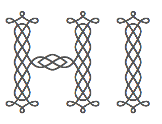 [More] ⦿
|
Joseph Moulton Jaquinta Grant
|
Designer (b. Fort Lauderdale, FL, 1965) of a few metafonts such as old uncial and cirth (Tolkien runes), to be found here, and Celtic Knotwork Font. Designer of the metafont Cun (runes, cuneiform). Now software engineer for IBM/Lotus in Ireland. [Google]
[More] ⦿
|
Joseph Moxon
|
British typefounder, 1627-1691. Well known for his book, "Mechanick Exercises or the Doctrine of the handy-works Applied to the Art of Printing" (London. Printed for Joseph Moxon on the Westside of Fleet-dtch, at the Sign of Atlas, 1683). This book was reedited by Herbert Davis and Harry Carter, London, Oxford University Press, 1958, and again at Dover, New York in 1960. He also published "Moxon's Exercises or the whole Art of Printing, 1683-1684", which was reissued in 1978 by Herbert Davis and Harry Carter (Dover, NY). Moxon manufactured an angular Gaelic typeface, Moxon (ca. 1680) based on the Louvain type. This was necessary as the Queen Elizabeth type matrices, used for catechisms and other religious material, had disappeared. Local download of Mechanick Exercises. [Google]
[More] ⦿
|
Joshua Harrison
|
American designer of the textured typeface Neoceltic (2019). [Google]
[More] ⦿
|
Jürgen Brinckmann
|
 German graphic designer (b. Aachen, 1960). His designs at FontFont include FF Ophelia Regular (1993, blackletter), FF Madonna Regular (1993, Celtic), FF Lukrezia Regular (1993, Celtic), FF RopsenScript (2001) and FF Humanist Regular, all calligraphic and/or old-text creations. EF Artemisia is a great OSF font at Elsner and Flake. Check also EF Carus (2003) and Justus Fraktur. EF Filzerhand and Graphis EF are ordinary hand-printed typefaces. EF Karolinger has a Celtic feel, and EF Medieva even more so. MyFonts link. [Google]
[MyFonts]
[More] ⦿
German graphic designer (b. Aachen, 1960). His designs at FontFont include FF Ophelia Regular (1993, blackletter), FF Madonna Regular (1993, Celtic), FF Lukrezia Regular (1993, Celtic), FF RopsenScript (2001) and FF Humanist Regular, all calligraphic and/or old-text creations. EF Artemisia is a great OSF font at Elsner and Flake. Check also EF Carus (2003) and Justus Fraktur. EF Filzerhand and Graphis EF are ordinary hand-printed typefaces. EF Karolinger has a Celtic feel, and EF Medieva even more so. MyFonts link. [Google]
[MyFonts]
[More] ⦿
|
Kaer
[Roman Korolev]
|
 Roman Korolev (Kaer, Vologda, Russia) designed the wood stick brush typeface WoodStick in 2016.
 Typefaces from 2017: OneLine Bold (rounded fat color font). Typefaces from 2019: Antique Initials (regular and color; with a flower pattern), OneLine Overlap (a color font). Typefaces from 2020: Pagesso (a lava lamp font), Avery (a monolinear connected sans), Sailem (an inline art deco font), Old Stamp (a fingerprint font), Silvery (a display typeface on the theme of thick and thin), Blueberry Spot, Coffee Chalk (a textured typeface), Allegro (a blueprint type), Northern Monk (beveled), Westland (blackletter), Neon Line, Bronze (art deco, +color, +texture), Shtrih (dry brush), Geoline (sketched, textured), Flowline, Foliageant (floral, curly), Northern Runes (rune emulation), Neon (color font), Parallel Lines, Bronzen Abundance (a display family with textured and color options), Sharp Stroke (a heavy brush typeface), Renaissance Initial, Celtic Spiral, Lace Line. Typefaces from 2021: Atta Weird (a font for LSD addicts), Three Neon Lines, Dead Saint (a Halloween alphabet), Lockdown Christmas (a dot matrix font), Nordic Folk (a layerable typeface family with Scandinavian texture; plus Nordic Folk Icons), Hewy (a display typeface), Planny (a blueprint font), Sportlight (a speed font), Wesloy (a brush serif font), Carle (a 3d polygonal children's book font; +Shadow, +Colored), Absundo (a playful dual weight font), Wide Plump (a geometric solid typeface), Colton (a condensed boutique serif), Aztec Initials (+a colored version), Adrim (a thin floriated sans), Northern Monk (an inscriptional ustav-inspired typeface), Sogia (a decorative serif). Typefaces from 2022: Asl Line (an American Sign Language font). [Google]
[MyFonts]
[More] ⦿
|
Kalinor
|
Small Celtic font archive with AuntJudy (Judith Sutcliffe), ElGar (Gary Garrett), Gothic-Leaf, King-Arthur (James Fordyce), Anglo-Saxon-Caps. [Google]
[More] ⦿
|
Karlgeorg Hoefer
|
 German scribe, type designer and unbelievable calligrapher, b. 1914 in Schlesisch-Drehnow, d. 2000 in Offenbach. Following schooling in Schlesien and Hamburg, he served a four-year typesetting apprenticeship from 1930-1934 in Hamburg and later at the Kunstgewerbeschule (School of Arts and Crafts) in Offenbach am Main. From 1939 until 1945 he was in active military service and became a prisoner of the Russians. After that ordeal, he became a calligraphy teacher at the Werkkunstschule in Offenbach, and developed a universal pen with novel writing and drawing techniques for the company Brause. It is at that point that Hoefer started designing types as well. From 1970 to 1979, Hoefer was a lecturer and later professor at the HfG (School of Design) in Offenbach. From 1981 to 1988, Hoefer ran summer calligraphy workshops in the USA (Los Angeles, San Francisco, Boston, New York, Washington, and other cities). In 1982, Karlgeorg Hoefer founded a calligraphy workshop in Offenbach for everyone, with evening courses and summer school, and in 1987, the registered association "Calligraphy Workshop Klingspor, Offenbach, Supporters of International Calligraphy." From 1987 to 1995, he was the chairman of the association while teaching continuing courses and summer school classes with leading foreign calligraphers. Hoefer has written two books about calligraphy: "Das alles mit einer Feder" (Brause, 1953) and "Kalligraphie, gestaltete Handschrift" (Econ, 1986). Numerous articles about Hoefer's work have appeared in calligraphy journals in Holland, France, the USA, and Japan. In 1989, the book "Schriftkunst/Letterart Karlgeorg Hoefer" was published as part of Calligraphy-Editions Herbert Maring (Die Kalligraphie Edition, Hardheim, Germany, 1989). For his activities as a calligrapher, Hoefer received the Order of Merit of the Federal Republic of Germany in 1993. His typefaces:
 - At Klingspor: Salto (1952), Saltino (1953), Saltarello (1954), Monsun (1954). Salto is a famous and often-copied brush script.
- At D. Stempel: Prima (1957), Zebra (1963-1965, D. Stempel, a script that plays on the simulation of grey and the use of two colors; revived by Colin Kahn in 2007 as P22 Zebra).
- At Ludwig&Mayer: Permanent (1962-1969, a large Grotesk family developed over many years---this was revived by Daylight in 2010 as Permanent Massiv; URW sells Permanent Headline URW D without even a word about the original designer; Softmaker has Plakette Serial and P700 sans; Castcraft has OPTI Permanent and OPTI Pinacle; Marcus Sterz published Letterpress Headline in 2009), Stereo (1963, an outline poster headline script developed between 1957 and 1968; digitally revived in 1993 as Stereo (Tobias Frere-Jones, Font Bureau)), Elegance (1964, a handwriting script, which was the basis for Sincerely (2005, Canada Type)), Big Band (1974, a fat poster script revived in 2007 by Nick Curtis as Baby Cakes NF (2007)), Big Band Terrazzo (1974, a glaz krak face), Headline (1964, a poster typeface that emanated from Permanent).
- Programm-Grotesk (1970): Hoefer's first digital typeface, commissioned by JT Hellas for the Greek telephone books It was first used in the digital machine Digiset of Dr. Ing. Hell in Kiel.
- From 1978 until 1980, Karlgeorg got involved in the development of a German license plate font that could withstand forgery by black marker pens. The typeface, FE Mittelschrift/Engschrift, had also input from other sources.
- Lateinischen Ausgangsschrift (1974): a school script for the Linotype phototypesetter. This led later to VA Schrift (Berthold and Linotype).
- At Linotype: Omnia (1990, a unicase typeface with a Celtic uncial feel), San Marco (1990, round gothic / Rundgotisch), Notre Dame (1991-1993, a full blackletter face), Dominatrix (1994), Sho (1992, an Asian brush script), Beneta (1992, a French bastarda inspired by the Littera beneventana, the script of the Benedictine scribes from the 10th to the 12th century).
Linotype page. FontShop link. View Karlgeorg Hoefer's typefaces. [Google]
[MyFonts]
[More] ⦿
|
Kat Rakos
[Kat's Fun Fonts]
|
[More] ⦿
|
Kathryn Darnell
|
Creator of Sweeney (Agfa-Monotype, 2002), an italic uncial with strong Celtic overtones. Sweeney Lino Cut is a companion series of illuminated initial letters. Agfa explains: Sweeney is the name of a seventh-century Irish king who went mad (some say from the din of battle; others say he was cursed by a Christian monk), roamed Ireland naked and composed poetry. Klingspor link. [Google]
[MyFonts]
[More] ⦿
|
Kat's Fun Fonts
[Kat Rakos]
|
Katsfunfonts had free alphadings and dingbats by "Kat Rakos". It was rumoured to go commercial, after initially having been a free font foundry from ca. 2000-2006. Dafont link. Since 2008, I have not been able to relocate the foundry. Direct access. List of fonts: Home Is Where The Heart Is, Mirror Mirror, Crayons, Wedding Bells, On The Go, Hip Star, Santa's Bag, Julie's Turtle Rescue, Holly, Eight Santas, Five Bunnies, Balloon, KRAFerretforAngel, KRAmishHeart, KRAngler, KRAnniversaryDinner, KRApple, KRArrowHeart, KRBabyBsFirstDayOut, KRBirdy, KRBirthdayCake, KRBirthdayCakeDings, KRBiteYourLip, KRBlackbird, KRBlazingSun, KRBullseye, KRBurningLove, KRButterfly, KRButterflyTwo, KRCaliforniaSun, KRCallMe, KRCameraFun, KRCandyKiss, KRCaramelApple, KRClover, KRCoffeeDings, KRCoffeeLove, KRConstruction, KRCowJuice, KRCrow, KRCupcake, KRDeclaration, KRDunkers, KREasterDings, KREasterRabbit, KREightBall, KRFathersDayDings, KRFirstBloom, KRFirstYearsDings, KRFlowerFrame, KRFooball, KRFootballFun, KRGardenforSue, KRGravestone, KRHalloweenKitten, KRHeartBalloons, KRHockeyFun, KRHoleInOne, KRHunnybee, KRIDo, KRInTheSpotlight, KR Irish Kat (2002, five fonts), KRIrishSpudman, KRKrazyKat, KRLilAngel, KRLilMikesRobot, KRLilNote, KRLincoln, KRLotsaTimeDings, KRMagicRabbit, KRMagicTea, KRMaverick, KRMoodRing, KRMorningMust, KRMothersDayDings, KRMovieTime, KRMovingDay, KRMrBunny, KRNghtsBrew, KRNicksLilRacer, KRNicksPuppy1, KRNutsy, KROffToWork, KROhMan, KROrangeBlossom, KRPRincEsS, KRPianoMan, KRPopcornTime, KRPotOGold, KRRachelsChalkboard, KRRamarasTwink, KRRibbonFrame, KRRingOShams, KRRonnysRose, KRSamisMark, KR Santas Bag, KR Saras New Kitten, KRSchoolDays, KR Scrappin Babies, KRScribbleHeart, KR Seeds, KRSeahorse, KR Shake, KRShootingStarLeft, KR Shroom (2001, psychedelic), KRSilverSpoons, KRSkooter, KR Sleep Over (2001), KRSnowboarder, KR St Patricks Day Dings (2001), KR St Patricks Frames (2002), KRStPattysHat, KRStevesSolo, KRStrawberry, KRSunnyDays, KRSwirl, KRSwordInTheStone, KRTeaTime, KRThoughts, KRThreeFlowers, KRTriton, KRTwinkTwo, KRValentineDings, KRValentineHeart, KRVotive, KRWashington, KRWeatherDings, KRWingsofLove, KRWintryMix, KRWomanOh, KRYoYo, KRZodiacDings, KRBalloon, KRCrayons, KREightSantas, KRFiveBunnies, KRHipStar, KRHolly, KRHomeIsWhereTheHeartIs, KRJuliesTurtleRescue, KRLittleLeague, KRMirrorMirror, KROnTheGo, KRSantasBag, KRSummerCandy, KRWeddingBells, KRBabiezTwo, KRBabiez, KRBackToSchool, KRBadBoyz, KRBadGirlz, KRDriverz, KRGardenz, KRGunz, KRHaHa, KRMadTeaParty, KRPeoplez, KRScrappinBabies, Batty, Birthday Letters, Cane Letters, Drak, Jigsaw Joey, Kaboomerang, Corners 2, Crescent Moons, Fruitsy, Halloween Signs 2, Happy Fruit, KR A Day At The Zoo, KR Black Kat, KR Love Letters, KR Filled With Flowers, KR That Silly Hunnybee!, KR Sara's New Kitten, KR Trilobe, KR Squished Mosquito, All Cracked Up, Love Lies Bleeding, OokieBookie, KRAllSmiles, KRChristmas2002Dings1, KRChristmas2002Dings2, KRNative, KRSillyArtPeople, KRAHuntingTheyWent2005, KRAllAboutTheHeart, KRAllAmericanAlpha, KRAllSmiles, KRAllSport, KRAnchorsAway, KRAnimalLines, KRAnimalOutlines, KRAnotherTwelve, KRArborDays, KRAstro1, KRAstro2, KRAstro2005, KRAstro3, KRAutumn2004, KRBackyardScraps, KRBalloonBunch, KRBamboo, KRBarnyardScraps, KRBigBang, KRBigCity, KRBloomBonanza, KRBooCity, KRBooLane, KRBootown, KRBooville, KRBunnyDings, KRChineseZodiacSymbols, KRChristmas2002Dings1, KRChristmas2002Dings2, KRChristmas2002Dings3, KRChristmas2002Dings4, KRChristmas2002Dings5, KRChristmasDings2004, KRChristmasDings2004Five, KRChristmasDings2004Four, KRChristmasDings2004Six, KRChristmasDings2004Three, KRChristmasDings2004Two, KRChristmasJewels20053, KRChristmasJewels20054, KRCircleScraps, KRCircularFlair, KRCivilWar, KRClassicFleur, KRClassicFleur2, KRClassicFleur3, KRClassicFleur4, KRColorMeChristmas2002, KRColorMeWindowScenes, KRCourtship, KRCrazyCrow, KRCupids2003, KRCuteAsABug, KRDecoFleurCorners, KRDreamcatcher, KREaster2003, KREasterSquares, KRFastFood, KRFireInTheSky, KRFishies, KRFlairFrenzy, KRFleurFlair1, KRFleurFlair10, KRFleurFlair11, KRFleurFlair12, KRFleurFlair13, KRFleurFlair2, KRFleurFlair3, KRFleurFlair4, KRFleurFlair5, KRFleurFlair6, KRFleurFlair7, KRFleurFlair8, KRFleurFlair9, KRFleurFlairCorners, KRFleurFlairLines, KRFleurFlairLines2, KRFleurFlairLines3, KRFloweryFleur, KRFloweryFleur2, KRFloweryFleur3, KRForYou, KRFourLittlePixies, KRFrames, KRFreeFallin, KRFromTheDeskOf, KRFromTheDeskOf2, KRFrostedCake, KRFunFrames2005, KRGetWellDings, KRGraphed, KRHarvestBounty, KRHeartalicious, KRHeartfelt, KRHeartily, KRHeartiness, KRHeartsAlong, KRHeartsGalore, KRHeartsUp, KRHomeOnTheRange, KRHousehold, KRJenTheQueenOVino, KRJointed, KRJungleScraps, KRJustDucky, KRJustTheFlowers, KRKatPeople, KRKatPeople2, KRKatWear, KRKatlingsEight, KRKatlingsEleven, KRKatlingsFifteen, KRKatlingsFive, KRKatlingsFourteen, KRKatlingsNine, KRKatlingsSeven, KRKatlingsSix, KRKatlingsSixteen, KRKatlingsTen, KRKatlingsThirteen, KRKatlingsTwelve, KRKatsCats, KRKatsGotANewValentine, KRKitchen, KRLeafyAlpha, KRLibations, KRLilBuddies, KRLilMites, KRLippy, KRLoveAngels, KRLoveStruck, KRMarkerThin, KRMedalOfHonor, KRModerna, KRMusicAngels, KRMusicalMuse, KRNADings, KRNative, KRNickysDinos, KRNickysEaster, KROffice, KROfficeParty, KROnlineLove, KROverlyCloverly, KRPartyLife, KRPenned, KRPyramid, KRRNBookplates, KRRPG, KRRachelLovesThe4th, KRRinglets, KRScrapTeddies, KRScrapTeddiesTwo, KRScrappinAnimals, KRScrappinBears, KRScrappinBunnies, KRScrappinSquares, KRScraps, KRSeemsFishyToMe, KRSignage, KRSillyArtDings, KRSillyArtHoliday, KRSillyArtPeople, KRSimpleFleur, KRSimpleFleur2, KRSimpleFleur3, KRSimpleFleur4, KRSimpleFleur5, KRSimpleFleur6, KRSketched, KRSomeFunBars, KRSpringBounty, KRSpringMe, KRSpringMeToo, KRStPats2003, KRStarryEyed, KRStarryNight, KRStarsSwirls, KRSummerGarden, KRSwashBuckler, KRTakeTheMysteryTrain, KRThanksgiving2002, KRTheEX1, KRThroughTheirEyes, KRTwinkle, KRValentine2003, KRVased, KRVeggieFrames, KRVerticalFlair, KRWelcome2003, KRWithHeart, KRWoodcutFleurs, KRYummy, KRBitsOShea, KRFloralScript, KRHeartfilled, KRKelticFive, KRKelticFour, KRKelticSix, KRKelticThree, KRKelticTwo, KRKindaFlakey, KRLittleBuzz, KRLyndasLady, KRShams, KRTigrrr, KRValentineKids2006, KRWeeFolk, KR Scrappin Animals, KRBarbed, KRCuoriDivertenti1, KRCuoriDivertenti2, KRCuoriDivertenti3, KRCuoriDivertenti4, KRCuoriDivertenti5, KRCuoriDivertenti6, KRCuoriDivertenti7, KRCuoriDivertenti8, KREastertime1, KREastertime2, KREastertime3, KREastertime4, KRLilShams1, KRLilShams2, KRLilShams3, KRLilShams4, KRLilShams5, KRLilShams6, KRLilShams7, KRLilShams8, KRLilShams9, KRSnowflakeButtons1, KRSnowflakeButtons2, KRSoftStencil, KRSpringbet07, KRBeautifulFlowers. Dafont link. Fontspace link. [Google]
[More] ⦿
|
Keith Bates
[K-Type]
|
 [MyFonts]
[More] ⦿
[MyFonts]
[More] ⦿
|
Kells Font Set
|
From P22 Type Foundry. Celtic font based on the Book of Kells and Other Early Medevial Celtic Manuscripts. [Google]
[More] ⦿
|
Kellworks
|
All things Celtic are sold here. Two free font families by BayAnimation, Kelt (Celtic) and Liberate (calligraphic). [Google]
[More] ⦿
|
Keltenclan.de
|
Small Celtic font archive. [Google]
[More] ⦿
|
Keltoi Today
|
Celtic font links. [Google]
[More] ⦿
|
Kevin King
[Kingthings]
|
 [MyFonts]
[More] ⦿
[MyFonts]
[More] ⦿
|
Kilcar.net
|
TrueType Celtic font archive. Included the gorgeous CelticmdDecorativeWDropCaps. Being rebuilt, so be patient. [Google]
[More] ⦿
|
Kingthings
[Kevin King]
|
 Keven King (Kingthings) is the British designer (born in Kent in 1959, educated at the Graphic Design College in Exeter/Devon, and based in Exeter) of these fonts, many of which have Celtic influences. His typefaces:
 - 2002: Kingthings-Gothique (oranmental face), Kingthings-Hand, Kingthings-Hand-Light, Kingthings-Organica, Kingthings-Petrock, Kingthings-Petrock-Light, Kingthings-Xander, Kingthings-Xander-Outline.
- 2003: Kingthings-Calligraphica, Kingthings-Calligraphica-Italic, Kingthings-Calligraphica-Light, Kingthings-Chimaera, Kingthings Flashbang, Kingthings Flourishes (Arabic simulation face), Kingthings-Italique (blackletter), Kingthings-Kelltika---Kevin-King.-2003 (fantastic Celtic style caps face), Kingthings-Sans, Kingthings-Whizzbang, Kingthings-Xander-Outline.
- 2004: Kingthings Linear K, Kingthings Pique'n'meex, Kingthings-Annex (started in 1981: ornamented letters), Kingthings-Printingkit (old typewriter), Kingthings-Spike (blackletter), Kingthings-Typewriter (old typewriter), Kingthings Versalis, Kingthings Wrote, Kingthings-Xstitch. Some fonts have calligraphic/medieval or Celtic influences.
- 2005: Kingthings Poppalok (ornamental dot matrix face), Kingthings Embroidery, Kingthings Spikeless, a blackletter face.
- 2006: Kingthings Petrock, KingthingsChristmas (ornamental).
- 2007: Kingthings Willow (great ornamental face; a commercial Pro version exists at CheapProFonts), Kingthings Willowless, Kingthings Exeter, Kingthings Extortion (ransom note face), Kingthings Facetype, Kingthings Lupine (the Pro version was done in 2009 at CheapProFonts), Kingthings Lupineless.
- 2008: Kingthings Wrecktangle (piano key font), KingthingsSerifique, Kingthings Clarity, Kingthings Gutenberg, Kingthings-Conundrum (oriental simulation face: the Pro version follows in 2012), Kingthings-Eggypeg, Kingthings-Inkydinky, Kingthings-Knobson, Kingthings-Spirogyra, Kingthings Bloone, Kingthings Tendrylle, Kingthings Foundation.
- 2009: Kingthings Slippery Lips, Kinthings Spike Pro (blackletter, commercialized by Cheap Pro Fonts).
- 2010: Kingthings Lickorishe, Kingthings Scrybbledot.
- 2011: Kingthings Scrybbledots Pro and Kingthings Scrybble Pro (sketch typefaces).
- 2012: Kingthings Frontwards, Kingthings Sans, Kingthings Kurllie (curly Victorian caps).
Alternate URL. Cheap Pro Fonts catalog. Klingspor link. Fontspace link. Abstract Fonts link. [Google]
[MyFonts]
[More] ⦿
|
Klaus-Peter Schaeffel
[KPS Fonts]
|
 [More] ⦿
|
Korvigelloù An Drouizig
|
Breton site with free Celtic fonts such as Rudhraigheacht UNICODE (2003). There is also a Celtic font archive. Korvigelloù An Drouizig made many existing fonts Unicode-compliant, and the list is growing. OTF versions were prepared by David Goode (Faculty of Divinity, University of Cambridge). These include Peter Rempel Narrow KAD, Peter Rempel Uncial KAD, Kelt, Gael AX - BX, Gaeilge, Celtic Gaeilge, American Uncial, Umber SSK, Tuamach, Thryomanes, Stonehenge, Rudhraigheacht, Merzhin, William Boyd Uncial, DS Celtic 1 KAD, DS Celtic 2 KAD. The KAD fonts were made by Korvigelloù An Drouizig. He also made Gaeilge Unicode (2003). The Gael AX and BX Unicode fonts are unicodizations of fonts originally made by F.M. O'Carroll. [Google]
[More] ⦿
|
Korvigelloù An Drouizig (or: KAD)
|
Celtic (mostly uncial) font archive. Some fonts were modified by KAD. The list: AmericanUncial, BoydUncialUNICODE, CelticGaeligeUNICODE, DSCeltic1_KAD, DSCeltic2_KAD, GaeilgeUNICODE, GaelAXUNICODE, GaelAXUNICODEBold-Bold, GaelBXUNICODE, GaelBXUNICODEBold-Bold, KeltUNICODE-Bold, KeltUNICODE-Italic, KeltUNICODE, Merzhin, PR-CelticNarrowKAD, PRUncial_KAD, RudhraigheachtUNICODE, StonehengeUNICODE, Thryomanes, ThryomanesBold, ThryomanesBoldItalic, ThryomanesItalic, TuamachUNICODE, UmberSSKUNICODE. Alternate URL. Of these, the following are all based on BoydUncialUNICODE (William Boyd, 1991, see also Carolingia): KeltUNICODE (Bay Animation), StonehengeUNICODE (unknown source), UmberSSKUNICODE (Paul King, Southern Software). No surprise to find Bay Animation and Southern Software in this list. [Google]
[More] ⦿
|
KPS Fonts
[Klaus-Peter Schaeffel]
|
 Swiss calligrapher in Basel who made and sells various medieval and historically important script fonts. Dedicated page. These included the paleographic (PAL) series and the KPS series. He lives in Ühlingen--Birkendorf, Germany. His fonts are uniformly of high quality and are usefl for illustrating historical alphabets.
 His early commercial collection: KPS Anglaise (calligraphic script), KPS Antiqua (+Kapitälchen), KPS Capitalis (classic Trajan caps), KPS Cicero, KPS Epona (calligraphic), KPS Fein (hand-printed), KPS Hand (calligraphic), KPS Horaz (calligraphic), KPS Iris (calligraphic), KPS Petit (calligraphic), KPS Plinius, KPS Spitzfelder, KPS Vitruv (calligraphy), PAL Bastarda, PAL Cancellaresca, PAL Carolina, PAL Gotisch, PAL Humanistica, PAL Lombarden, PAL Quadrata, PAL Rotunda, PAL Rustica, PAL Textura, PAL Uncialis, PAL Uncialis Roemisch, Weissranken Initialen, Ranken Initialen (Celtic capitals). Since September 2013, all of his fonts are free. They were renamed and have conveniently the date of original creation in the font name. The fonts dated in the 1990s and 2000s are new typefaces or creative revivals by Klaus-Peter. The list of revivals: 0100DeBellisMacedonicis [Pre-uncial letters from the fragment "de bellis macedonicis", ca. 1st century], 0300Petros [Greek hand from the oldest surviving copies of St. Peter's epistles, dated 3th / 4th century], 0362Vitalis [Roman Minuscule Cursive from the so called Vitalis letter, written before 362 on papyrus (Strasburg)], 0480VergiliusRomanus [Capitalis Rustica from the Vergilius Romanus written in Rome, ca. 480], 0500VergiliusSangallensis [Capitalis Quadrata from the Vergil fragments in Stiftsbibliothek St.Gallen], 0512Dioskurides [Greek Uncials from the Vienna Dioskurides (about 512)], 0746Beda [from Beda Venerabilis: Historia ecclesiastica gentis Anglorum, Northumbria, dated 746], 0800Kells [Half Uncials from the Book of Kells], 0800Remedius [So called "Lombardic-Raetic Minuscule" from Codex 348 of the Stiftsbibliothek St. Gallen], 0800 Theophanes [Greek Hand after a 9th century Theophanes manuscript], 0850CarolinaTours [Carolingian Minuscule], 0850Carolinaundulata [Carolingian Minuscule from the Scriptorium of Tours], 0864Folchart [St. Gall Carolingian from the Folachart Psalter], 1012Otto [Late Carolingian Minuscule from the Perikopes of Heinrich II, written at the Reichenau, donated to the dome of Bamberg in 1012], 1258FridericusII [Gothic Rotunda from the falcon book of Emperor Friedrich II, Southern Italy 1258-1266], 1400Wenzel [Bohemian Textura from Vienna], 1450Sebastos [Humanistic Greek hand from Homer, Ilias, Vatican Library], 1455GutenbergB42 [Gothic Textura types from the 42 line Gutenberg Bible], 1458GutenbergB36 [Gothic Textura types from the 36 line Gutenberg Bible], 1470Jenson [an antiqua by Nicolas Jenson], 1475HumanisticaCursiva [Humanistic Cursive of the kind Bartolomeo Sanvito of Padua wrote, after Cod. Pal. Lat. 1508], 1480Humanistica [Humanistic Book Hand from Valerius Maximus: Facta et dicta memorabilia, ca. 1480-1485. The calligraphy is attributed to Antonio Sinibaldi from Florence and the titling capitals to Bartolomeo Sanvito from Padua], 1483Koberger [Incunabula type from the Koberger Bible, printed in Nuremberg in 1483], 1485Grueninger [Incunabula type from the Grueninger Bible, printed in Strasburg in 148], 1493SchedelRotunda [Incunabula type from the Latin edition of Hartmann Schedel's World Chronicles, printed by Koberger at Nuremberg in 1493], 1501Manutius [First printed Italic Antiqua by Aldus Manutius (Venice 1501)], 1513Gebetbuch [Fraktur from Emperor Maximilian's Prayer Book, printed in Augsburg in 1513], 1517Gilgengart [Fraktur type from Emperor Maximilian's 1517 private print "Gilgengart"], 1517Teuerdank [Fraktur type from Emperor Maximilian's "Teuerdank", printed at Augsburg in 1517], 1519NeudoerfferFraktur [Fraktur alphabet from a woodblock model in Johann Neudoerffer the Elder's Calligraphy book "Fundament", Nuremberg 1519], 1739Bickham [Copperplate or running hand after models from "The Universal Penman" by George Bickham, printed in London 1743], 1741Bickham [Bickham's round hand from Universal Penman], 1782Thurneysen [Baroque Antiqua Type of J. Jacques Thourneysen fils, Basel 1782]. Original versions by Schaeffel, with date of design in the font name: 1999Anglaise1, 1999Anglaise2, 1999Cancellaresca, 1999Carolina (Carolingian minuscule), 1999Livius, 1999LiviusBold, 1999LiviusItalic, 1999LiviusSmC, 1999LiviusTitel, 1999Ovidius, 1999Stylus, 1999Textualis, 2000Bastarda, 2000Cicero, 2000Humanistica, 2000Plinius, 2000PliniusItalic, 2000Seneca-Italic, 2000Seneca, 2000TextualisFormata, 2000Uncialis, 2001RotundaFormata, 2002Cato, 2002Horatius, 2002Vitruvius, 2003Epona, 2003Lombarden, 2004CapitalisQuadrata, 2004CapitalisRustica, 2004Iris, 2004UncialisQuadrata, 2004UncialisRomana, 2008-Noeuds-1 [for making Celtic knots], 2008-Noeuds-2, 2008-Noeuds-3, 2009Xenophon, 2010Filigrane, 2010Gouttes, 2010Labyrinthe [squarish], 2010Pointu [a calligraphic blackletter], 2010Vergilius [a great calligraphic face]. Old URL. [Google]
[More] ⦿
|
Krieger Imperium
|
Archive with CloisterBlackBT-Regular, CataneoBT-Regular, Diploma (Fraktur font, 1993), KeltNormal, LyndaCursiveBold, Rothenburg-Decorative-Normal. [Google]
[More] ⦿
|
Kristen Ankiewicz
|
Kristen Ankiewicz offered lovely type 3 fonts and postscript examples of fancy things such as curlicue letters, and beads. She also has a lovely Celtic alphabet done in Adobe Illustrator. Fractal postscript demos as well. All free, of course. The fonts are here. Kirsten runs Ankiewicz Studios, an art studio in San Francisco. [Google]
[More] ⦿
|
krs185
|
Designer at FontStruct in 2009 of Celtic Modulations. [Google]
[More] ⦿
|
K-Type
[Keith Bates]
|
 K-Type is Keith Bates' (b. 1951, Liverpool) foundry in Manchester, UK, est. 2003. Keith works as an Art&Design teacher at a Salford High School. They custom design type, and sell some of their own creations.
 Commercial typefaces: - Adequate (2012). A basic geometric monoline sans family.
- Adventuring (2010, comic book style)
- Alan Hand (2005, based on some blobby lettering, handwritten by printer and mail artist, Alan Brignall)
- Alex (2002-2004)
- Alright (2004, cursive script)
- Anna (2002-2007).
- Argot (2019). Characterized by square counters, this typeface family exhales brutalism and industrialism. See also Argot Machine (2019).
- Artist Hand (2019).
- Axis
- Bank of England (2012, blackletter): Bank of England is loosely based on blackletter lettering from the Series F English twenty pound banknote introduced in 2007. The font also takes inspiration from German Kanzlei (Chancery) typefaces and the 17th century London calligrapher, John Ayres.
- Banks & Miles (2018). Inspired by the geometric monoline lettering created for the British Post Office in 1970 by London design company Banks & Miles, a project initiated and supervised by partner John Miles, which included Double Line and Single Line alphabets. The new digital typeface is a reworking and extension of both alphabets.
- Barbica (2015). A glyphic typeface.
- Bricola (2020).
- Brush Hand New (2013): Brush Hand New is a full font based on a copy of Flash Bold called Brush Hand marketed by WSI in the 1990s and more recently distributed through free font sites. Brush Hand was an anonymous redrawing of Flash which simplified, slightly lightened, smoothed out ragged edges, and improved the legibility of the original classic created by Edwin W. Shaar in 1939.
- Building&Loan (2007, engaved face)
- Bigfoot (2005, a Western font based on the slab capitals used by Victor Moscoso in his 1960s psychedelic rock posters)
- Bolshy (2009)
- Bolton750 (2003, a mechanical typeface done with John Washington).
- Chancery Lane (2021). An italic text typeface that is based on chancery scripts.
- Charles Wright (2016). A set of fonts based on the UK license plate fonts.
- Chock (2009)
- Circa (geometric sans)
- Cloudbuster (2019). Inspired by Imre Reiner's Corvinus Skyline of 1934.
- Club.
- Coinage Caps (2017). Coinage Caps is a trilogy of small caps fonts based on the roman lettering used for the designs of British coinage. Coinage Caps Eric Gill is a regular weight, spur serif style drawn by Eric Gill for silver coin designs in the 1920s which were rejected by the Royal Mint. Coinage Caps Humphrey Paget is a medium weight serif based on the lettering of Thomas Humphrey Paget, designer of the Golden Hind Halfpenny first struck in 1937. This font simulates the soft, slightly rounded corners of the minted letterforms. Coinage Caps Kruger Gray is a glyphic, flare serif font typical of the bold style engraved by George Kruger Gray for numerous British and Commonwealth coins during the 1920s and 30s. This font also simulates the slightly rounded corners of the minted letterforms.
- Collegiate (2009)
- Component (2012). A font for lost civilizations and dungeon rituals.
- Context (experimental)
- Credit Card (2010, font for simulating bank cards)
- Curwen Sans (2018). A monoline sans from the early 1900s originally created for in-house use at the Curwen Press in London.
- Cyberscript (2006, connected squarish face)
- Deansgate (2015). Deansgate and Deansgate Condensed are based on the clearest and most distinctive of the sans-serif letterforms used on Manchester street nameplates, and easily identified by a pointy Z and pointed middle vertices on M and W.
- Designer
- Digitalis
- English
- Enamela (2013). Keith writes: Enamela (rhymes with Pamela) is based on condensed sans serif lettering found on vitreous enamel signage dating from the Victorian era and widely used in Britain for road signs, Post Office signs, the plates on James Ludlow wall postboxes, railway signs, direction signs and circular Automobile Association wayfinding plaques throughout the first half of the twentieth century. The original model goes back to Victorian times, ca. 1880.
- Engravia (2018). Engravia is a didone display typeface supplied in three varieties of engraving---Inline, Shaded and Sawtooth---plus a plain basic font.
- Example (2017). A workhorse neo-grtesque typeface family.
- Excite
- Flip (2011), a western grotesk billboard face.
- Flyer (2009, techno)
- Frank Bellamy (2009, an all-capitals family based on the hand lettering of English artist Frank Bellamy, who is most famous for his comic art for Eagle and TV21, and his Dr Who illustrations for Radio Times)
- Future Imperfect
- Gill New Antique (2003)
- Greetings
- Helvetiquette
- Hapshash (2010): an all capitals font inspired by the 1960s psychedelic posters of British designers Hapshash and the Coloured Coat (Michael English and Nigel Waymouth), in particular their 1968 poster for the First International Pop Festival in Rome. A dripping paint font.
- Irish Penny (2016). An uncial typeface based on the lettering from Percy Metcalfe's influential pre-decimal coinage of Ireland, the Barnyard Collection.
- Ivan Zemtsov (2009)
- Kato (2007, oriental simulation face)
- Keep Calm (2015). A geometric sans inspired by a British war poster from 1939.
- Keith's Hand
- Klee Print (2010, Klee Print is based on the handwriting of American artist Emma Klee)
- Latinate (2013). A vintage wedge serif wood style typeface, and a rough version.
- Lexie (an improved or "adult" version of Comic Sans) and Lexie Readable (2006, modified in 2015). Keith writes: Lexie Readable (formerly Lexia Readable) was designed with accessibility and legibility in mind, an attempt to capture the strength and clarity of Comic Sans without the comic book associations. Features like the non-symmetrical b and d, and the handwritten forms of a and g may help dyslexic readers.
- Licencia (2016). A blocky typeface inspired by the tall, soft-cornered lettering on vehicle licence and registration plates world-wide.
- Londinia (2016).
- Matchbox
- Max
- Ming
- Modernist Stencil (2009).
- Monterey Pop (2020). A psychedelic / popart typeface based on Tom Wilkes's poster lettering for the Monterey International Pop Festival in June 1967.
- Mythica (2012). A slightly condensed lapidary roman with copperplate serifs.
- Modulario (2010): a contemporary sans.
- New Old English (2010, blackletter)
- Norton (2006)
- Nowa (2004, a play on Futura)
- NYC (octagonal)
- Openline (2008, an art deco pair)
- Oriel Chambers Liverpool: A Lombardic small caps font based on the masonry lettering on Peter Ellis's 1864 building, Oriel Chambers, on Water Street in Liverpool.
- Pentangle (2008, based on album lettering from 1967)
- Pixel
- PixL (2002-2004)
- Plasterboard (2004-2005)
- Pop Cubism (2010) is a set of four texture fonts, combining elements of cubism and pop art.
- Poster Sans (2006). A wood type family based on Ludlow 6 EC. See also Poster Sans Outline.
- Rick Griffin (2006, more psychedelic fonts inspired by a 1960s Californian artist)
- Rima (2020). A stencil typeface with heavy slabs.
- Roundel (2009, white on black)
- Runestone (2010, runic).
- Sans Culottes (2008, grunge)
- Serifina
- Solid State (2008, art deco blocks)
- Solus (2004, a revival of Eric Gill's 1929 typeface Solus which has never been digitized; read about it here)
- Stockscript (2008, down-to-earth script based on the pen lettering of the writer, Christopher Stocks)
- Susanna (2004)
- Ticketing (2011): pixelish.
- Total and Total Eclipse (2004, squarish display typefaces based on the four characters of Jaroslav Supek's title lettering for his 1980s mailart magazine, Total)
- Transport New (2009: a redrawing of the typeface designed for British road signs. In addition to the familiar Heavy and Medium weights, Transport New extrapolates and adds a previously unreleased Light weight font originally planned for back-lit signage but never actually applied. Originally designed by Jock Kinneir and Margaret Calvert beginning in 1957, the original Transport font has subtle eccentricities which add to its distinctiveness, and drawing the New version has involved walking a tightrope between impertinently eliminating awkwardness and maintaining idiosyncrasy.)
- Union Jack (octagonal)
- Victor Moscoso (2008, psychedelic)
- Wanda (2007, art nouveau)
- Waverly
- Wes Wilson (2007, psychedelic, inspired by 1960s psychedelic poster artist Wes Wilson).
- 3x5
- Zabars (2001): a Western face.
His free fonts: - Blue Plaque (2006: a distressed font based on English heritage plaques)
- Blundell Sans (2009)
- Celtica (2007) has Celtic influences
- Dalek (2005, stone/chisel face: Dalek is a full font based on the lettering used in the Dalek Book of 1964 and in the Dalek's strip in the TV21 comic, spin-offs from the UK science fiction TV show, Doctor Who. The font has overtones of Phoenician, Greek and Runic alphabets). See also Dalek Pinpoint (2018).
- Designer Block (2006)
- Flat Pack (2006)
- Future Imperfect (2006, grunge)
- Gommogravure (2005)
- Greetings (2006), Greetings Bold (2006)
- Insecurity (2005, experimental) won an award at the 2005 FUSE type competition.
- International Times (2006, inspired by the masthead of the International Times underground newspaper of the 1960s and 1970s)
- Keep Calm (2011). Related to London Underground.
- Kindersley Sans (2017). A modernized version of David Kindersley's 1950s type used for many street name plates in Britain, about which Bates writes: Kindersley Sans is a humanist sans-serif that conserves the Gill-inspired character and some of the calligraphic qualities of Kindersley's lettering, it retains the Roman proportions and its Britishness, but traditional prettiness and intricacy are discarded in favour of a clean modernity.
- Klee Capscript (2005: based on the handwriting and capitals drawn by artist Emma Klee (USA) for her Color Museum Mail Art invitation. The upper case is based on Emma's capitals and the lower case is freely adapted from her script)
- Lexia and Lexia Bold (2004)
- MAGraphics (2004)
- Magical Mystery Tour (2005, outlined shadow face), Magical Mystery Tour Outline Shadow (2005), Magica (2015, a serifed titling typeface family).
- Mailart (2004), Mailart Rubberstamp (2004), Mailart Rubberstamp Sans (2018).
- Mandatory (2004, a UK number plate font based on the Charles Wright typeface used in UK vehicle registration plates).
- McKnight Kauffer (2021). A retro poster font in the style of poster artist Edward McKnight Kauffer.
- Motorway (2015), a companion typeface to Transport, the British road sign lettering. This is an extension of an original design by Jock Kinneir and Margaret Calvert: The Motorway alphabet was created for the route numbers on motorway signage, and is taller and narrower than the accompanying place names and distances which are printed in Transport. However, for Motorway Jock Kinneir and Margaret Calvert created only the numbers 0 to 9, the capitals A, B, E, M, N, S and W, ampersand, slash, parentheses and a comma. So, although the lettering made its first appearance on the Preston bypass in 1958, K-Type Motorway is the first complete typeface and contains all upper and lower case letters, plus a full complement of punctuation, symbols and Latin Extended-A accented characters. As with the Transport alphabet the starting point was Akzidenz Grotesk, Motorway taking inspiration from condensed versions. Changes were mainly driven by a quest for legibility, resulting in some reduced contrast between horizontal and vertical strokes, and Gill-esque straight diagonal limbs on the 6 and 9, and high vertex for the M.
- Penny Lane (2014). A a sans serif derived from twentieth-century cast-iron signs displaying Liverpool street names.
- Possible (2020). A 10-style mini-serif typeface.
- Provincial (2014). A Victorian set of outline fonts.
- Ray Johnson (2006-2008)
- Roadway (2005, based on New York roadside lettering).
- Romanica (2017). A humanist sans.
- Sam Suliman (2020). A condensed squarish typeface which was inspired by lowercase lettering on a Sarah Vaughan album cover designed by Sam Suliman in 1962. Suliman was born in Manchester, England in 1927. After working for McCann Erikson in London, he moved to New York where he took on freelance work designing album covers, particularly celebrated are his striking minimalist designs for jazz records. He moved back to England in the early 1960s, designing many book jackets, film titles and fabrics, also working in Spain and India before settling in Oxford in the 1980s.
- Savor (2011). An art nouveau family.
- Sgt Peppers Lonely Hearts Club (2014).
- Sinkin Sans (2014, free) and Sinkin Sans Narrow (2015, commercial). Open Font Library link.
- Soft Sans (2010)
- Subway Ticker (2005)
- Taxicab (2016). A squarish style.
- This Corrosion (2005).
- Toppler (2018). A modern and full range top-heavy cartoon font family that includes a Popdots style. Bates was striving to improe on 1990s clasics such as Baby Kruffy (Ben Balvanz), Comix Heavy (WSI) and Startling (Dave Bastian).
- Wildcat (2016). An athletics typeface family.
- Zinc (2018). A monoline sans with diagonal nubs.
- Colnage Caps Kruger Gray (2018). Coinage Caps is a trilogy of lapidary small caps fonts based on the Roman lettering used for the designs of British coinage.
- Dalek Pinpoint (2018). Based on Dalek comic book lettering from the 1960s.
- Icky Ticket Mono (2018). IckyTicket Mono is a monospaced font based on the coarsely printed numbering from 1960s bus tickets.
- Sexbomb (2018). A psychedelic typeface family.
- Mancunium (2019). A monoline sans family.
- Straight Line (2020). An outlined font with chamfered corners and straight edges, possibly useful as a blackboard bold type.
- We The People (a blackletter font based on the peamble of the American constitution).
- Bowdon (2021). A six-style warm, Bodoni-inspired English Modern, influenced by the 1930s lettering of designer Barnett Freedman.
- Oxford Street (2021). A condensed grotesque with horizontal and vertical stem terminals; it is a street a signage font that began as a redrawing of the capital letters used for street nameplates in the borough of Westminster, which in turn were designed in 1967 by the Design Research Unit using custom lettering based on Adrian Frutiger's Univers 69 Bold Ultra Condensed.
Custom / corporate typefaces: With Liverpool-based art director Liz Harry, Bates created a personalized font, loosely based on Coco Sumner's handwritten capitals, for the band I Blame Coco. Medium and Semibold weights of Gill New Antique were commissioned by LPK Design Agency. Stepping Hill Hospital and Bates created Dials, a pictorial font to help hospital managers input data about improvements. A custom font was designed for Bolton Strategic Economic Partnership. Abstract Fonts link. View Keith Bates's typefaces. Dafont link. Yet another URL. Fontspace link. Fontsy link. Behance link. [Google]
[MyFonts]
[More] ⦿
|
Laser Gaelic
|
Commercial fonts for Gaelic: GaillimhLS, GaelicLS. At the same site of Linguist's Software, we also find the Ogham font BallymoteLS. [Google]
[More] ⦿
|
Laurence Schall
|
Early 20th century designer of letters, such as this Modern Poster Alphabet with art nouveau influences, Adapted Roman (uncial), and Gothic. The Celtic style typeface Ballyhaunis NF (2005, Nick Curtis) and Inglenook Corner NF (2005, Nick Curtis) are based on his lettering. [Google]
[More] ⦿
|
Lenition
|
Lenition explained on this page: In addition to the difference in letter shapes between Latin and Gaelic styles, there are two different methods of representing the letter modification known as "lenition", which is applicable to the nine consonants b, c, d, f, g, m, p, s, t. In Gaelic fonts, lenition is usually indicated by a diacritic (dot-above), while in Latin fonts it is common to use a digraph (e.g., lenited b is written "bh"). This situation is analogous to that of representing German umlaut by diacritic or digraphic means. It is important to realise that the questions of letter-style (Latin vs Gaelic) and of lenition representation (diacritic vs digraph) are independent, and all four combinations are possible in principle. The choice of letter-style has no encoding implications, since all the basic (unaccented) Gaelic letters are also found in the Latin alphabet---in this, Gaelic is like German Fraktur but unlike Greek or Cyrillic---whereas the choice of lenition representation has such implications. (Font encoding is another name for the range of characters in the font, and their correspondence with keystrokes.) When lenition is represented digraphically, the normal Windows Latin font encoding may be used (ISO Latin-1), irrespective of whether the letter style is Latin or Gaelic. When lenition is represented diacritically, the standard 8-bit encoding for Windows is ISO Latin-8 (aka ISO 8859-14), again irrespective of whether the letter style is Latin or Gaelic. Latin-1 and Latin-8 are in agreement on the placement of those characters common to both. A font may be described as "Gaelic" if it employs Gaelic letter-shapes, or if it supports dotted consonants, or both. [Google]
[More] ⦿
|
Les Mabinogs
|
CelticBold, OldEnglishTextMT. [Google]
[More] ⦿
|
Levi Halmos
[no image fonts]
|
 [MyFonts]
[More] ⦿
[MyFonts]
[More] ⦿
|
Lex Kominek
|
 Calgary-based designer of Naranja (2005), an experimental typeface built up of quarter circles and L-brackets. Its dingbats are inspired by Clockwork Orange. Faces made with FontStruct in 2008: Robot Builder (Solid, Shaded and Open: squarish typefaces), Polygonal Lasso (Far West type: 938 glyphs for Latin, Latin Extended A & B, Greek, Cyrillic, and Katakana), Marshmallow Script (based on Einhorn, Eclat, Deftone Stylus, and Magneto, all connected diner scripts), Crazy Eights (deck of cards), Ficus Stencil (+Compressed, +Condensed, +Extended, +Regular, +Zebra, +StencilOpen), Big Fat (+Vibrate, +Solid, +Shaded), Negatron (Regular, Solid and Fill), Tuscan Radar, Nuclear Depot Americum (495 glyphs consisting of stars), Nuclear Depot (Radioum, Neptunium, Plutonium, Uranium: a futuristic family that covers Cyrillic), Am I see are you pee see, eh? (a font that combines MICR with UPC-A). The links: big_fat_shaded, crazy_eights, ficus_stencil_compressed, ficus_stencil_condensed, marshmallow_script, negatron_fill, negatron_regular, negatron_solid, serpent_like_bold, tuscan_radar.
 2009 creations: Haemophobe (pixel), Star Wreck, Mouthcaster (a bilined typeface based on the lettering on the front of the 1978 edition of the Scoutmaster's Handbook), Pasta (white on black), Medical Station Alpha (techno), Disco Stud (Chrome, Solid, Chrome Oblique, Solid Oblique), Affix, Infix (experimental and minimalist), Pinball Blizzard, Tears in Rain (a simplistic textura), Five Minute Hair Colour (slab serif), Seg Sixteen (LED face), Trajedy (pixel), Nobody 8 Italic (pixel), Home Sweet Home (a cross-stitch font), Wotan, Tiki Deaky, Writetyper, Chromatose (shadow family), Chocobot (an octagonal family containing Dark, Stacked (multilined), Milk, White), Big Fat (Shaded, Vibrate, Solid). 2010 creations: Fungal Sharp, Fungal Rounded (described by himself as a unicase stovepipe sans), Elliptical Lasso (Western ornamental caps), Astral Projection (a dot matrix typeface that updates Astra, a Letraset font designed by François Robert and Natacha Falda in 1973), Brick-block tops (3d effect), Knots, Spacerock (an extensive arc-based geometric family), Telephone (counterless), Pixular, StarWreck the Next Generation, Hockey Club, Brick-Block Tops, Bubblemania, Ziabelle Remix (outline, 3d, shaded), Hextone, Falcone (robotic face), but I didn't Trap the Deputy (Egyptian), Dinosaur Gothic. Fonts from 2011: Apé'ritif (bilined), Csillagok (a futuristic face based on a Hungarian Star Wars poster), Valhalla (faux runic), Birodalom, Haboruja, Piezo, Felix (black art deco face). Typefaces from 2013: Portafina, Portofino. Typefaces from 2014: Hanz and Franz, McRasky (a MICR font), Apricpt, Classic Spacerock, Five Minute Hair Colour. Typefaces from 2015: Big Fat Shaded Neue, Rampy, Managrom (monogram font), Spagett (connected cursive script). [Google]
[More] ⦿
|
Liam Miller
|
Creator of the hybrid Gaelic typeface Nua-Rómhánach [Times New Roman Gaelic] (1964). [Well, the font was sketched by Liam Miller, drawn in full by William Britton (in 1963), and manufactured by Monotype.] [Google]
[More] ⦿
|
Lingolab
|
Vincent Morley's Bunchlo Gaelic TrueType font. Page by ozzie Hugh O'Connor. [Google]
[More] ⦿
|
Lisa L. Spangenberg
|
Celtic font links collected by Lisa L. Spangenberg. [Google]
[More] ⦿
|
Lisa Schickert
|
Graphic design student at UW-Stout in Menomonie, WI, who made a caps typeface in which all letters are based on Celtic knots (2004). [Google]
[More] ⦿
|
Lord Kyl's Medieval and Fantasy Fonts
[Robert D. Anderson]
|
 Old URL. Another old URL. This was of the greatest archives, loaded with medieval and fantasy fonts, including many dingbats. Robert D. Anderson (aka Lord Kyl MacKay) scanned in many alphabets from "Medieval and Renaissance Alphabets" and created tens of beautiful historical fonts, and made them available free of charge: Anglo-Saxon 8th c, Battel Abbey 8th C, British Block Flourish 10th c, British Museum 14th c, British Outline Majuscules 10th c., Celtic Knot, Curved Majuscules 17th c., Decorated Majuscules 14th c., English Gothic 17th c, Floral Majuscules 11th c, German Blackletters 15th c, Gothic Leaf, Gothic Straight-Faced 18th c., Italian Cursive 16th c (GREAT!), Library of Minerva 9th c., Spanish Round Bookhand 16th c., Traditional Gothic 17th c, Vatican Rough Letters 8th c, Celtic Knot (caps), Gothic Leaf (caps font), Medieval Dingbats.
 Alternate URL at TypOasis. Other archive categories: runic fonts, gothic, versals (initial caps), uncial, roman era, anglo-saxon. Old URL. Dafont link. Fontspace link. [Google]
[More] ⦿
|
Louvain
|
Historical Gaelic typeface family. Louvain A saw the light sometime between 1611 and 1728. It is tentatively credited by Michael Everson to Thomas Strong. The creator of Louvain B (1641-1662) is still unknown. [Google]
[More] ⦿
|
Loyson Foundry
|
Loyson had his own foundry in Paris from 1727-1728. In 1728, he joined his foundry with that of Briquet, and Briquet and Loyson thrived from 1728 until 1751. Briquet had died some time in that period, and Loyson married Briquet's widow. Loyson and Veuve Briquet operated from 1751 until 1758, when the foundry, after a brief one-year passage to widow Briquet's son, was left to Vincent Cappon, Loyson's student. The foundry made the angular Gaelic manuscript typeface Paris (1732-1751). A draft digitization (Páris) exists. Audin's account. Publications include Epreuve des caractères de la fonderie de Loyson et Briquet (1751, Paris, Rue de la Parcheminerie). Local download. [Google]
[More] ⦿
|
MacCampus
[Sebastian Kempgen]
|
Europe's largest independent foreign language font developer for the Macintosh, which is directed by Sebastian Kempgen from Germany. Fonts include: Western Languages (CoreFont series), Eastern Europe (CE-Font series), Cyrillic (Professional series: RomanCyrillic Pro, Ladoga Pro etc. (text fonts); DEsign fonts: Faktor, Inessa Cyr etc. (headline, handwriting); Olliffe Fonts: Batumi, Schechtel, Russian Open (display type; example: Mashinka); Scientific Cyrillic (includes old orthography, accents, old characters); Old Church Slavonic (Cyrillic and Glagolitic, Square and Round); Non-Slavic Cyrillic: Roman CyrTurk, Ladoga CyrTurk), Greek (Modern Greek and Classical Greek (Agora and Parmenides)), Icelandic&Faeroese (PolarFont series), Irish&Welsh (Gaelic, Celtic in the CeltoFont series), Romanian (DacoFont series), Turkish (TurkoFont series), BalkanFont series (Hungarian, Romanian, Turkish, Azerbaijani, Maltese), Basque (BaskoFont series), Saami (SamoFont series), Georgian, Armenian, Coptic (such as the Pachomius font), Cuneiform, Sabean, SinoFont series for Vietnamese plus more or Chinese (Pinyin) transliteration, phonetic Fonts (Trubetzkoy&Phonetica), Transliteration Fonts. Some of its fonts (like Campus Ten/Twelve and Magister Book) are now sold through Agfa/Monotype. Names of some fonts: Breitkopf Fraktur, Campus Sans, CampusRoman Pro, CampusSans Block, Dareios, Faktor, Glagol Pro, Inessa, Konkret, Kronstadt, Marib, Method, Moskva Pro, Parmenides, Polar, Retrograd, Saames, Tafelkreide, Tatlin, Thule, Trubetzkoy. [Google]
[More] ⦿
|
Mad Irishman
[Patrick Michael Murphy]
|
 Mad Irishman has original fonts by Patrick Michael Murphy, who is American (from Mebane, NC), not Irish, and who is now located in Columbia, MD:
 - Aberration (2001). A Celtic font.
- Baldur (1999). An uncial typeface based on Feinen (1983, Henry Mikiewicz).
- Carlisle (2000).
- Game Icons (2008).
- Graz (2001). A Celtic font.
- Miyama (2001). An oriental simulation font.
- Old Roman (2002). A text family based on an 1895 typeface designed by T.W. Smith.
- Ronan (2006).
- Splendors (2001). Modeled on the modified version of the Mason font that Wizards of the Coast uses for their titling on their Dungeons&Dragons Forgotten Realms publications.
The fonts were originally available from Agfa/Monotype. [Google]
[MyFonts]
[More] ⦿
|
Marcellin Legrand
|
Paris-based creator of the hybrid Gaelic typeface Legrand (ca. 1836). Typefounder in Paris. His work can be found in this specimen book (Paris, 1850, 97 pages). At the Imprimerie Nationale, he was asked in 1846 to cut an arabe maghrébin (the preferred Arabic writing style in Morocco and adjacent regions). He cut anotther weight in 1850. In 2009, Franck Jalleau made a digital version of this, called Le Maghrébin. [Google]
[More] ⦿
|
Margaret Layson
|
Calligrapher who lives in Australia. Designer from 2002-2004 of the Celtic look family Lindisfarne Nova (with Harry Pears) at Bitstream. FontShop link. MyFonts link. [Google]
[MyFonts]
[More] ⦿
|
Margo Chase
[Margo Chase Design (was: Gravy Designs)]
|
[MyFonts]
[More] ⦿
|
Margo Chase Design (was: Gravy Designs)
[Margo Chase]
|
 Margo Chase (b. 1958, d. 2017, Apple Valley, CA) was an American graphic designer. Originally a biology major with intentions of becoming a veterinarian, Chase studied design at California Polytechnic Colege, San Luis Obispo. She created logos for the TV shows Buffy the Vampire Slayer and Angel. Her company, Margo Chase Design (founded in 1986) was involved in the branding of numerous entities, such as Target stores, as well as celebrities such as Cher, Madonna and Selena. Chase Design Group has offices in Los Angeles, New York, Chicago and the UK. Chase lived in Los Angeles, California. In addition to working as a graphic designer, Chase taught at the California Institute of the Arts in Valencia, Art Center College of Design in Pasadena, and Long Beach State University. She died in a plane crash while practicing an acrobatic sequence on July 22, 2017.
 Margo Chase created or enabled some exquisite typefaces such as Celtic Envision, Box Gothic, Bradley, Edit, Evolution (1998), Kruella (1997), Portcullis (by Brian Hunt), Pterra-dactyl, Shiraz (1998), Tribe (by Ferris Emery) and Vitriol. Many of these fonts have a gothic flavour. Richard Lipton's Ecru, Talon and Shogun typefaces at Font Bureau are based on Margo Chase's lettering. Klingspor link. View Margo Chase's typefaces. Wikipedia link. Video at Lynda.com. [Google]
[MyFonts]
[More] ⦿
|
Martin Kausche
|
Designer (b. 1915, Stettin) at D. Stempel of Mosaik (1954), a bold irregular sans serif caps font. Revived digitally by Canada Type as Sultan (2005). Canada Type writes: This design highlights the unmistakable Arabic/Moorish calligraphy influence on Celtic lettering, by way of the highly active Andalusian culture from the ninth century until the crusades in the early eleventh century. Nick Curtis's version of this is called Aethelred NF (2007). [Google]
[MyFonts]
[More] ⦿
|
Mati Gaviño
|
Buenos Aires-based designer of the geometric Celtic font Makabre (2015). [Google]
[More] ⦿
|
Melanie Malzahn
|
Professor at IDG Wien (Indogermanistik Wien) of the Instituts für Sprachwissenschaft der Universität Wien. She designed Aal, Aal-Bold, Aal-BoldKursiv, Aal-Kursiv, AalTimes, AalTimesNewRoman-Kursiv, Aatoch, AatochFett, Aatoch-BoldKursiv, AatochKursiv, Aaron, Aaron-Bold, Aaron-BoldKursiv, AaronKursiv, AaronPunkt, AaronPunkt-Kursiv, Agriech (based on a typeface of Peter J. Gentry&Andrew M. Fountain, 1993), Agriech-Kursiv, Amairgin, Amairgin-Bold, Amairgin-BoldKursiv, Amairgin-Kursiv, AmairginTimes, AmairginTimesNewRomanPS-ItalicMT, Aspgriech, Aspgriech-Kursiv, and Keltiberisch (2001, a runes font). No downloads. [Google]
[More] ⦿
|
Merce Vilchis Carmona
|
Mercedes Vilchis is the Mexican designer of Isjaki (2017) at Universidad Iberoamericana in Mexico City. This font is Celtic and has an uncial lowercase. [Google]
[More] ⦿
|
Merethe Liljedahl
[House of Lime]
|
 [More] ⦿
|
Metafont Quellen
[Jobst-Hartmut Lueddecke]
|
Jobst-Hartmut Lueddecke's page has metafont sources for Suetterlin (by B. Ludewig), old Irish Uncial (by Jo Jaquinta), Italic (Cancellaresca corsiva) of Ludovico degli Arrighi, called Vicentino (Italy, early 16. century) by Willibald Kraml, yfrak, yinit, ygoth, yswab and cmfrak, Fraktur fonts by Yannis Haralambous. Also, the rune fonts bard (Celtic Bard Runes by Jobst-Hartmut Lueddecke), futhark (by Micaela Pantke and Sigrid Juckel), srune (by Jobst-Hartmut Lueddecke), the fantasy fonts cirth (dwarven runes created by J.R.R.Tolkien, by Jo Jaquinta), engwar (by Michael Urban), goblin (by Alan M. Stanier), tengwar (elven runes created by J.R.R.Tolkien, by Michael Urban), Jörg Knappen's EC fonts, hksym (a dingbat font by Hartmut Kennhöfer and Jobst-Hartmut Lueddecke), moonphases (dingbats by Stanislav Brabec, and wasy (dingbats by Roland Waldi). [Google]
[More] ⦿
|
Michael Biggs
|
Dublin-based creator of the modern Gaelic Uncial typeface Biggs (1953). A draft of a digitization, called Doolish (Michael Everson), is in the works. [Google]
[More] ⦿
|
Michael Evcerson
[Royal]
|
[More] ⦿
|
Michael Everson
[Scribhinn]
|
[More] ⦿
|
Michael Everson
[Tower]
|
[More] ⦿
|
Michael Everson
[Gaelic Typefaces: History and Classification]
|
[More] ⦿
|
Michael Everson
[Evertype (was: Everson Typography)]
|
[MyFonts]
[More] ⦿
|
Michael Gills
[ULGA Type (was: Creative Goats)]
|
[MyFonts]
[More] ⦿
|
Michael O'Rahilly
|
Monotype Series 24a (ca. 1906), a reincarnation of Later Figgins, was recast in 1913 by Michael O'Rahilly, and digitized in 1993 as Duibhlinn. He designed O'Rahilly Display (ca. 1915), which led to Monotype Series 117 (which, according to Everson, was never cut). [Google]
[More] ⦿
|
Michael Want
|
 British type designer from Waltham Abbey who worked as a staff designer for P22 from 1994 until 1999. Morisawa Judge's Choice Award winner in 1996 for his typeface Fusaka (an oriental simulation font, 1996, Adobe). Other designs: P22 ToyBox Blocks, P22 ToyBox Animals (1996), P22 ToyBox Regular (1996, child's hand), P22 Vincent, P22 DeStijl (1995, with Richard Kegler--Regular, Stencil, Extras and Tall: of these, Want only did the Stencil style), P22 DaddyO (1998; a beatnik set that includes Blackface, Crazy, fatface, Gaunt, Hip, Junkie and Square styles; by Richard Kegler and michael Want), P22 Bayer Fonetik (1997), P22 Acropolis (1995, Greek simulation typeface done with Richard Kegler), P22 Kells Square (1996, Michael Want and David Setlik), P22 Insectile (1995), P22 Cezanne (1996, a popular handwriting face), P22 Fonosaurus, P22 Folk Art (1997, a number of stitching fonts done with Richard and Denis Kegler), P22 Vincent and P22 Vincent Extras (1998, dingbats and script based on Vincent Van Gogh's work), P22 GD&T (1997: a geometric dimensioning and tolerancing fot), P22 Prehistoric Pals, P22 Prehistoric Pen, P22 Garamouche (+Ornaments; Think of Garamouche as Garamond's drunken cousin, he writes). The ToyBox set was co-designed by Michael Want, Jennifer Kirwin, Richard Kegler, Kevin Kegler, and Mariah Kegler in 1996. The P22 Kells set was co-designed by David Setlik, Richard Kegler, and Michael Want in 1996.
 FontShop link. View Michael Want's typefaces. [Google]
[MyFonts]
[More] ⦿
|
Michael White
|
Creator from Trim (Ireland) of the Gaelic modern uncial typeface Binín (1994). [Google]
[More] ⦿
|
Michela Graziani
[Fontikon]
|
[More] ⦿
|
Mike Allard
[De Nada Industries]
|
[More] ⦿
|
Morgane's Medieval Download Haven
|
Medieval font download archive. Has uncial and Celtic fonts. [Google]
[More] ⦿
|
Muhammad Ridha Agusni
[38 Lineart Studio (or: Grayscale, or: Fontsources)]
|
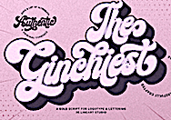 [MyFonts]
[More] ⦿
[MyFonts]
[More] ⦿
|
MuirMcNeil Design Systems
[Hamish Muir]
|
 MuirMcNeil Design Systems is a project-based collaborative between Hamish Muir and Paul McNeil, est. 2010. Their activities are focussed on exploring parametric design systems to generate appropriate solutions to visual communication problems. Hamish Muir is a founding principal of 8vo (1985-2001) and co-editor of Octavo (1986-1992). He currently combines work as an independent graphic design consultant specialising in editorial, information and systems design with teaching part-time at the London College of Communication. Paul McNeil is a London-based independent graphic design consultant specialising in type, information and systems design. He is a Senior Lecturer in Postgraduate Graphic Design at the London College of Communication and lead developer, MA Contemporary Typographic Media.
 They have several parametric and modular software systems for typography and type design. These include 20-20 (done in 1974: a modular design idea in the spirit of FontStructor, but without any active software), Interact (done in 1994---grid-based parametric screen fonts), Three Six (an experimental optical / geometric type system consisting of six typefaces in eight weights. It explores the possibilities of using systematic principles to generate geometric typeforms which are distinctive at large point sizes but which can also be read at smaller sizes in bodies of extended text), Four Two (an extension of Three Six). The Three Six project led to a number of multiparametric dot fonts. It was published by FontFont in 2012. In 2014, four commercial modular and pixelish typeface families were published, Panopticon (a system of layered 3d geometric typefaces), Intersect, Nine (Metric, Mono) and Interact. In that series, the nine-weight geometric almost-typewriter typeface Nine Mono (monospaced and monoline) stands out. The superfamily of pixelish and dot matrix fonts Two followed in 2015. Muir helped Dalton Maag with the development of Tephra (2008), an experimental multi-layered LED-inspired family. In 2016, the designed the dot matrix-themed identity for Typecon on the theme Resound. Still in 2016, MuirMcNeil released the geometric stencil typeface Cut. THD Sentient (2017) is an all-capitals monolinear rounded proportionally spaced all caps sans type family in four weights, designed by Tim Hutchinson in collaboration with MuirMcNeil. In 2017, Paul McNeil and Hamish Muir co-designed the stencil family Five. Typefaces from 2018: Farset (MuirMcNeil and John McMillan), Feirste (a gaelic typeface by MuirMcNeil and John McMillan). Farset and Feirste are digital reinterpretations of the tiled lettering used for Belfast's historic street signage in matching Latin and Gaelic scripts. In 2020, they released the Bauhaus typeface Two Bar Mono to complement the TwoPoint, TwoPlus and TwoBit series. Interlock (2020) is an experimental geometric bitmap typeface. Worm (2021) is an experimental modular type system designed in seven compatible weights. Typetoken link. FontShop link. Klingspor link. [Google]
[MyFonts]
[More] ⦿
|
MyFonts: Celtic and Gaelic typefaces
|
Various implementations of Celtic and Gaelic typefaces. [Google]
[More] ⦿
|
MyFonts: Celtic typefaces
|
A list of Celtic typefaces at MyFonts. [Google]
[More] ⦿
|
MyFonts: Gaelic typefaces
|
A small collection of commercial Gaelic typefaces. [Google]
[More] ⦿
|
MyFonts: Irish typefaces
|
MyFonts hit list for Irish typefaces. View a longer list of Irish typefaces. [Google]
[More] ⦿
|
MyFonts: Uncial typefaces
|
MyFonts hit list for uncial typefaces. Many would call these "Celtic" typefaces. [Google]
[More] ⦿
|
Mythical Ireland
|
Small Celtic font archive. [Google]
[More] ⦿
|
Nate Nielson
|
Cheney, WA-based designer of these typefaces: Arthuriel (medieval), Berkyspex (techno), BeviaGrowth (experimental), Brenin (unicase uncial), Brickfun (pixel), Bywater (uncial), Cheetah (fat display), Cipher (octagonal), Crown (uncial), Delivar, Drive, Drumsage, Efficient, Fanghorne (uncial), Figbead, Gaelothic (celtic), Galiden, Handshake (lego style), Havinoth (uncial), Humolion (experimental), Knowledge (indic simulation), Lancaster (indic simulation), Neoxidan, Nightime (uncial), Ockiahex (hexagonal), Paradox, Parfiche, Piecemeal, Pickel (pixel), Providian (uncial), Realight (fun experimental), Reliner (indic simulation), Rhubarb, Ribbon, Rimvet, Runestick (runes), Sageight, Skipfrog, Subrail, Toystack (pixel), Umbrella (clean geometric face), Valifas (uncial), Webgura, Westmarch. I assume that most typefaces were done in 2004-2005. [Google]
[More] ⦿
|
Nate Piekos
[Blambot!]
|
 [MyFonts]
[More] ⦿
[MyFonts]
[More] ⦿
|
Neale Davidson
[Pixel Sagas (was: Protoform Project, and Fontshack)]
|
 [More] ⦿
|
New Renaissance Fonts (was: New Fontografia, or: David's Fontografia 2006)
[David Kettlewell]
|
David Kettlewell (b. Edinburgh, Scotland, 1946, d. Bollstabruk, Sweden, 2011) moved to Sweden in 1984 to take the role of head of music at a college. He was soon putting his musical and linguistic talents to researching and performing early Swedish church and choral music. He was a guest lecturer at four of Sweden's universities and for a period a professor at Tartu University in Tallin, Estonia. He worked from his forest farmhouse in Bollstabruk, Northern Sweden. Kettlewell also ran Fontografia, a medieval and calligraphic type site featuring subpages on Ludovico Vicentino [degli Arrighi], Giovambattista Palatino, and Giovanniantonio Tagliente. He also told us why Fontlab is so much better than Fontographer when developing fonts from scans. Obituary. David Kettlewell is a harper, renaissance musicologist and conductor who illuminate his work with text and type. His own work through New Renaissance Fonts is mostly with medieval and renaissance scripts, calligraphic alphabets and ornamental capitals. Direct acess. MyFonts link for New Renaissance. Klingspor link. Free fonts: AliceScrolltipRoman, AndersFancyCapitals, AndersPlainCapitals, BickhamSwashCaps, Cartouches, CelticNoadProtoype, Chiswickblack, DagmarIlluCaps, Davies-RomantiqueCaps, DaviesIlluminatedcapitals, DaviesRoundhand, DaviesSapphire, DeBeauChesneRoman, FantasiaCaps, GothicCaps, KarinsFreeLombardyCaps (2006, with Karin Skoglund), KingRichard2Caps, Kurbits3, Lettreornee, LubnaCaps, NesbittDecoratedCaps-Medium, RicksClassicItalic, RicksDecoratedUncial-Medium, RicksFolkloreRoman, RicksRelaxedHand-Italic, Samuel, SevilliaDancingText, Sevilliastandingtext, Sevilliatiles, ShawDecoratedInitials1, ShawDecoratedInitials4-Medium, Taliente-IlluCaps, WestminsterMemorialBrasses-Medium. Other fonts (some no longer available or shown): Soest St. Mary (2006, decorative capitals from embroidery work in a German church), Kurbits, Samuel, Celtic Noad, Dagmar IlluCaps, Lettre ornée, Phalesiodecor (medieval caps, 1998), American Uncial (adaptation of a URW font), FinalRomanfat or FatRoman50 (adaptation of an RWE font), Marshall (made from an 1822 parchment). Some fonts are developed in conjunction with Richard Bradley. Others involved more loosely include Adam Twardoch, Karin Skoglund, Dagmar Varaksits and Anders Rosen. MyFonts offers fonts like Chiswick Illuminated Caps (2009, Lombardic), Alice Scrolltip (2006), Albrecht Fraktur (2011), Edward's Uncial 1904 (2011, after an alphabet drawn by Edward Johnston), Davids Roundhand, Karins Lombardy Caps, Sevillia (2006, with Richard Bradley), and Soest St Mary. View the New Renaissance Fonts library. [Google]
[MyFonts]
[More] ⦿
|
Nick and Adam Hayes
[Identikal Foundry]
|
[MyFonts]
[More] ⦿
|
Nick Cooke
[G-Type]
|
 [MyFonts]
[More] ⦿
[MyFonts]
[More] ⦿
|
Nick Curtis
|
Nick Curtis (b. Chicago, 1948) lived in Texas from 1952-1997, and lives since 1997 in Gaithersburg, MD and Alexandria, MD. From ca. 1990 onwards, he has been designing fonts, first for free, and then commercially. He had a great reputation as a "revivalist" type designer, with a particular interest in retro fonts and art deco types. In 2003, his site had become too popular and too expensive to maintain, and thus he went commercial as Nick's Fonts. In 2013, he stopped making fonts, and donated his collection of rare books and type material to the University of Virginia. Interview. Complete list of names and other info, maintained by Sander de Voogt. Interview in which we learn about his fondness for Corel Draw as a type design tool. Near the end of 2012, he posted this comment on his web site: Fifteen years ago, I embarked on a wonderful voyage of discovery, when I created my very first font with Fontographer 3.15. My maiden voyages were, frankly, rather clunky and amateurish, but I have been told that they showed promise. Well, sure enough, thanks to the diligent (and patient) efforts of Ilene Strizver, I polished up my craft enough to sell my humble efforts---first as a sideline business and, since 2006, as my full-time job. In total, I have produced over eleven hundred fonts---almost five hundred of them freeware fonts, which I conservatively estimate have been downloaded and enjoyed by over three million people worldwide. Unfortunately, this past year has brought a series of unanticipated setbacks, culminating in the loss of my wife's beautiful mind and soul to the scourge of alcoholism. In an effort to generate extra income to cover the expenses for her long-term care, I have proposed a number of, I believe, innovative ways to revamp the online font business; unfortunately, those efforts have fallen flat, primarily due to the professional font community's abject fear of crossing the $165 million Elephant in the Room. I even offered a special discount rate of 75% off retail price for full-time students of Typohile Forum. To date, there have been zero takers. Hell: even the webfont kit of one of my own fonts which I purchased from myfonts.com turned out to be an empty folder. Talk about a run of bad luck. Which leaves my with you, dear readers. If you or someone you know has had fun or made a buck from my humble efforts throughout the years, please donate whatever you can---even a lousy dollar would help---to help me out. I would greatly appreciate it. Home page. Dafont link. FontShop link. Klingspor link. Abstract Fonts link. View the typefaces designed by Nick Curtis. [Google]
[MyFonts]
[More] ⦿
|
Nick Curtis
[Nick Curtis: Celtic or uncial typefaces]
|
 [MyFonts]
[More] ⦿
[MyFonts]
[More] ⦿
|
Nick Curtis
[Nick Curtis: Commercial typefaces]
|
[MyFonts]
[More] ⦿
|
Nick Curtis
[Nick Curtis: Typefaces from 2014]
|
[MyFonts]
[More] ⦿
|
Nick Curtis: Celtic or uncial typefaces
[Nick Curtis]
|
 Celtic or uncial typefaces by Nick Curtis include the free typefaces Avignon (1999; spectacular ironwork font; +Heavy, +Light), Laconick-NormalA (based on an alphabet of William Morris), and TwoForJuanNF (2002, based on Canas (1998, Andreu Balius and Joan Carles Casasin)). Leabhar Ceilteach NF (2014) is inspired by lettering in the Book of Kells. [Google]
[MyFonts]
[More] ⦿
Celtic or uncial typefaces by Nick Curtis include the free typefaces Avignon (1999; spectacular ironwork font; +Heavy, +Light), Laconick-NormalA (based on an alphabet of William Morris), and TwoForJuanNF (2002, based on Canas (1998, Andreu Balius and Joan Carles Casasin)). Leabhar Ceilteach NF (2014) is inspired by lettering in the Book of Kells. [Google]
[MyFonts]
[More] ⦿
|
Nick Curtis: Commercial typefaces
[Nick Curtis]
|
Nick Curtis (b. Chicago, 1948) lived in Texas from 1952-1997. Since 1997, he is in Gaithersburg, MD and Alexandria, MD. Since the 1990s, he has been designing fonts, first for free, and then commercially. He had a great reputation as a "revivalist" type designer, with a particular interest in retro fonts and art deco types. In 2003, his site had become too popular and too expensive to maintain, and thus he went commercial as Nick's Fonts. Interview. Free downloads at TypOasis. Complete list of names and other info, maintained by Sander de Voogt. Interview in which we learn about his fondness for Corel Draw as a type design tool. Home page. His free fonts are listed elsewhere. On MyFonts, he says this about himself: Nick's Fonts is a modest little foundry dedicated to the preservation of our rich typographic heritage. Most of the foundry's designs are based on authentic historical sources, gleaned from the massive collections of the Library of Congress. If you are looking for a font that captures the essence of the Wild West, the Gay Nineties or the Jazz Age, look here first: if it is not in the catalog, it will be soon. [Google]
[MyFonts]
[More] ⦿
|
Nick Curtis: Typefaces from 2014
[Nick Curtis]
|
 Typefaces made by Nick Curtis in 2014:
 - Alto Rey NF. A revival of a Victorian typeface issued by the Palmer and Rey Type Foundry of San Francisco in 1884.
- Angler NF. A revival of Anglo, a Victorian typeface by Barnhart Brothers and Spindler, 1895.
- Argentina Cursive NF. Based on a typeface by Morris Fuller Benton, 1919.
- Bandiera Del Legno NF. A Tuscan wood type that revives Gothic Tuscan Condensed Reversed by William H. Page.
- Belgique NF. A revival of the (Western) wood type French Clarendon XXX Condensed No. 117 by William H. Page.
- Benton Gothic Thin NF. A revival of Lightline Gothic (1908, Morris Fuller Benton, ATF).
- Big D NF. Based on a Speedball pen font by Ross F. George.
- Bricoleur NF. A connected script from a French magazine in 1927.
- Bully Pulpit Plain NF. After Bullion Shadow (1970, Face Photosetting).
- Call Me Ishmael NF. After Moby Dick (Affolter and Gschwind).
- Chapeaux Noirs NF. After a MacKellars, Smiths & Jordan typeface.
- Chieftain NF. Revival of Pontiac (1893, ATF).
- Coronation Street NF. Based on a typeface created in 1936 by Stephenson Blake.
- De Roos Mediaeval NF. After Sjoerd de Roos.
- Dimanche NF. An art nouveau typeface revival. The original is known as Domingo or Brillante.
- Fluid Drive NF. A take on an art deco typeface by Samuel Welo.
- Gloriosus NF. Revival of the Victorian typeface Apollo (1888, Gustave F. Schroeder, Central Type Foundry).
- Grieshaber Monos NF. After a Schelter & Giesecke typeface designed in 1911 by Moritz Grieshaber.
- Harley Quinn NF.
- Hi Ho Steverino NF. In the Beat style of the 1960s and 1970s.
- Koralle Rounded NF. A rounded revival of Koralle (1913, Schelter & Giesecke).
- Leabhar Ceilteach NF. Inspired by lettering in the Book of Kells.
- Legnano (2014, Italian art deco wood type).
- LevellerNF (2014, Nick Curtis). A revival of Roundhead (Charles Beeler, Mackellar Smiths & Jordan, 1883).
- Lodewijk Gothic NF (2014). Adter Elzevir Gothic (1897, ATF).
- Loopy Loo NF. Upright script based on an original by the Hunt Brothers.
- Marmorherz NF. After an 1866 font, Marble Heart, by Farmer, Little, and Co.
- Maxed Out NF (+Inline, +Starstruck). This series of fonts is based on a 1970s art deco series at PhotoLettering Inc called Riverside Drive by Peter Max.
- Meriwether Circular NF. After a 1905 Victorian typeface by William Martin Johnson for ATF called Meriontype.
- Millrich Olivian NF. A revival of Olivian by Richard & Miller.
- Miss Dottie NF. After Dotted Roman (1897, Barnhart Brothers and Spindler).
- Morticia NF. Based on an ATF original.
- National Oldstyle NF. After a 1916 font by Frederic W. Goudy.
- Nickel Box NF.
- Olden Daze NF. From Alphabets A to Z.
- Page Ephesian NF. A wood type after William H. Page, 1890.
- Page Etruscan No 5 NF. A wood type after William H. Page.
- Painters Roman NF. A wood type based on Painters Roman by Vanderburg and Wells (1878).
- Pique-Nique NF. Based on the art nouveau typeface Outing (1888, John F. Cumming, and 1895, ATF).
- Receding Hairline NF. After L&C Hairline (1966, VGC, Herb Lubalin and Tom Carnase).
- Renaissant NF. After the Victorian typeface Renaissant (1880, by John F. Cumming, Dickinson Type foundry).
- Rythme NF. After a Mexican simulation typeface from 1935 by Maximilien Vox called Éclair.
- Scalar Biform NF.
- Schweimann Moderne NF. An art nouveau typeface.
- Skelett Antiken NF. After William H.Page's wood typeface Clarendon XX (1859).
- Ski Alpin NF. An art deco typeface based on a Swiss travel poster from 1927.
- Sodbuster NF. After William H. Page's wood type Gothic Dotted.
- Southie Signboard NF.
- Strassenmeister NF. After an art deco typeface called Buick Schmalfett by Herbert Thannhaeuser.
- Sweet Afton NF. After a silent movie font by Samuel Welo.
- Talsmann NF. A faithful reproduction of the Advocate font used by the IBM Selectric typewriter.
- Trading Hoss NF. After Ross F. George's Speedball alphabet D-nib Display.
- Tuscalooza NF. After William H. Page's font Tuscan Extended.
- Twinkletoes NF. After a comic book typeface by Ross F. George.
- Unjustified NF. Inspired by the opening credits for the television series Justified.
- Vauxhall NF. Based on Angelica, a 1970s typeface by Robert Trogman (FotoStar).
- Venusian Ultra NF. A heavy sans based on the extra bold extended version of Bauersche's classic sans typeface family Venus (1907-1927).
- Vulkan NF. A wedge-serifed typeface based on a Barnhart Brothers and Spindler original called Vulcan (1884).
- Well Said Black NF. Modeled after Welling Black, a 1970s typeface by Robert Trogman (FotoStar).
[Google]
[MyFonts]
[More] ⦿
|
no image fonts
[Levi Halmos]
|
 Free fonts by Hungarian type and graphic designer Levi Halmos [or: Levente Halmos], made between 1997 and 2001: AlienGhost2, Aliens, Anabolic Spheroid (2001, revived but alas commercialized by Roger S. Nelsson in 2009 as Anabolic Spheroid Pro), Aztec, Baby Universe (2000), Bateman, Bedlam Remix (2001), Bitsumishi (Bitsumishi Pro (2009) appeared at CheapPro Fonts; Bitsumishi Pro v2 followed in 2012), Butch, Byblostie, CHELIVES, Caddy (1996), CelticGaramond, CelticGaramondthe2nd, Chemistry, Coolthreepixels, Crystal Clear, Danube (techno, geometric), DataTransfer, Dredwerkz, ElephantMan, Escape Pod Normal, FUTURE, Faceplant, Finchley (1998), FreakShow, Gagarin (2001, a Cyrillic simulation and constructivist family), GraveDirt, Guevara, Haiku, Helldorado (2001, Western), Hibernate (2000), Iamsimplified, Indochine (2002, oriental letter simulation), IronLeague (2002, a Jonathan Barnbrook style face), Ivanbats, Ivanhoe, KabosGyula, Kalocsai Flowers Pi (2001), Kenzo, KingKikapu, Kozmonauta (2000), Kozmonauta2, Krizia Uomo (1995, art deco; later renamed Krizi Amo Pro in 2011, probably under pressure from Uomo), Leonardo (1996, a constructed face), Lefferts Corner (2001), LicenzPlate, Lousitania (2001, square-serifed), MagyarSerif, MarshGas, MathmosOriginal, Mutter (a stitch font), Niobium [Niobium Pro (2010, with Roger S. Nelsson) is used for signage and wayfinding in the new Mbombela Stadium built for the FIFA World Cup 2010], Nordic (2001; the Pro version appeared in 2010), Nushto (2000), Olympus (Greek simulation face), Peex (dot matrix family), Phatguy, PiratesGold (made commercial in the CheapProFonts collection of Roger S. Nelsson in 2009), Poison Berries (2000), PresidenteTequila (2000), RakettaFromMars (2001, fifties style futurism), Rammstein, RammsteinRemix (2001, constructivist), RedheadGoddess (2000), RedwildoderRotwild, Resurrection, Runningshoe, Sarkozi Line Patterns Pi (2001), Scully (scanbats), ScumoftheEarth (2000), Shazbot, Slither (1998), SmartSexy, SmartandSexy, Snake Venom (2000, Mexican simulation face), SpaceWorm (2000, futuristic), Sporty, Stonebridge, Subatonik, Sulphur (2000, a typeface influenced by gothic cathedrals), Tank Junior (2001), TerraX, Thrust (2000, Star Trek face), TickyFont, Treasure Island (2001, rounded with a semi-Greek look), TrustThisOne, TwoGunJohann (2000), TypeKnight (2001, with hairline serifs), VicePresidente (2001, Mexican simulation face), VoodooDolls, Voodoo Spirits (2001, wiggly hand), WeepingItalic, WhoulNormal, Zombieball.
 Myfonts link. Roger S. Nelsson (Cheapprofonts) and Halmos extended Danube and Celtic Garamond in 2009 as Danube Pro and Celtic Garamond Pro, respectively. Fontspace link. Font Squirrel link. Dafont link. View Levi Halmos's commercial typefaces. [Google]
[MyFonts]
[More] ⦿
|
Norbert Reiners
|
Aachen-based German type designer (born in 1967). After finishing his vocational training as a typesetter in 1991, he went on to the Fachhochschule Aachen, where he studied visual communication under Werner Eikel (calligraphy) and K. Mohr (typography), and graduated in 1996. He created these typefaces: - FF Tarquinius Pro (1995). A roman typeface.
- Éirinn AsciiLL and Eirinn Gaelic (1994, Linotype). A modern round Gaelic typeface based on Petrie A.
- EF Domingo (1995) and EF Flamingo (1995): glyphs tilted 90 degrees. Available from Elsner & Flake.
- Ossian EF(1995), Ossian EF Gaelic, and Ossian EF Ornaments (1995): very beautiful Gaelic / Irish / uncial typefaces.
- Linotype Octane (1997): a display sans typeface.
Linotype link. FontShop link. [Google]
[MyFonts]
[More] ⦿
|
Nordische Schriften
|
Rune and Celtic font archive: Anglo-Saxon,-8th-c., Anglo-Saxon-Caps, AngloSaxonRunes, AngloSaxonRunes1, AngloSaxonRunes2, AvalonQuestRegularSwfte, Becke-rFraktur-Regular, Beowulf1, Beowulf1Alt, Bunchlo, CeltGael, CelticFrames, CelticHand, CelticPatterns, CelticmdDecorativeWDropCaps, DSCelticBorder1, DiabloHeavy, DragonOrder, DwarfRunes, DwarfRunes1, DwarfRunes2, Folkard, Futhark-(jung), Futhark-Dänisch, Futhark-angelsächsisch-(um-88), Futhark-anglofriesisch,-Themse, Futhark-schwed.-norweg.2, Futhark-schwedisch-norwegisch, Futhark1-dän.-ab-9.Jahrh., Gaelach, GermanicRunes, GermanicRunes1, GermanicRunes2, Hälsingland-(12.Jahrh.), KeltNormal, Parchment-Regular, Pi-RhoRunestones, RUNEnglish1, RUNEnglish2, Stonecross, Stonehenge, Tuamach-Regular, Viking-Normal. [Google]
[More] ⦿
|
Northern European Languages and Fonts
|
Great links page on Old English, Icelandic, Norwegian, Swedish, Celtic and Germanic. [Google]
[More] ⦿
|
Odin's Castle of Dreams and Legends
|
FraserWideNormal is a free truetype font by Highlander Graphics Software (1996). It has a Celtic feel. [Google]
[More] ⦿
|
Offsight Arts
|
Commercial vendor of gorgeous printing images, divided into these categories: Volume 1. Headpieces, tailpieces, corners, dingbats. Volume 2. Frames and borders. Volume 3. Rules, vignettes, ornaments. Volume 4. Stencil designs, patterns, moires, backgrounds. Volume 5. Cartoushes, initials, monograms. Volume 6. Russian ancient book decor and ornaments. Volume 7. Japanese signs and patterns. Volume 8. Ancient South American motifs. Volume 9. Celtic designs. Volume 10. Nature figures and designs. Sample tailpieces. Sample headpieces. Dingbats. Corners. [Google]
[More] ⦿
|
Ogham
[Alan M. Stanier]
|
From Essex University, Alan M. Stanier's metafont for Ogham, an alphabet found on a number of Irish and Pictish carvings dated from the 4th century AD. The characters touch or cross the edges of the stone. [Google]
[More] ⦿
|
Ogham
|
Ogham is a 3rd to 6th century Irish script. Explanations and links by Lawrence Lo. [Google]
[More] ⦿
|
Old Italic
|
The script of some ancient (8th to 1st centuries BC) dialects of Central Italy, which are a subdivision of the western group of Indo-European languages spoken in Italy. These dialects included Etruscan, Faliscan, Middle Adriatic, North Picene, Oscan, South Picene, and Umbrian. The Old Italic script dialects show some similarity to Celtic and, to a lesser degree, Germanic. The Germanic runic alphabet was derived from one of these alphabets by the 2nd century AD. [Google]
[More] ⦿
|
Oldrich Menhart
|
 Czech type designer (b. Prague 1897, d. Prague 1962) who was mainly active at Grafotechna, a state foundry in Prague. Menhart was also an author who wrote about type and its history. After the World War II, he helped the communist party to promote itself. He was the author of fonts celebrating the victory of communism in hand-written manifests. Menhart considered himself foremost as a craftsman, and derived typefaces from calligraphic origins. Author of Nauka o pismu (1954) and Tvorba typografickeho pisma (1957). PDF file of Nauka o Pismu.
 Veronika Burian on Menhart. FontShop link. Klingspor PDF. Oldrich Menhart's typefaces include - Manuskript Antikva (1944-1950, Grafotechna), Manuskript Kursiva (1951, Grafotechna). An angular and slightly irregular typeface with a handwritten feel. Burian places Manuscript Antikva in 1943 and Kursiva in 1946. Digitizations of Manuskript: the five-weight family by Franko Luin (1991) at Omnibus, Menhart Manuscript by Alex V. White, Manuskript Antiqua (URW++, by Ralph M. Unger), and ITC Oldrichium by George Thompson from No Bodoni Typography.
- Menhart Antiqua and Menhart Kursiva, 1930. Menhart Antiqua was first published by the Bauersche Giesserei in 1932. We also find versions of this garalde set in 1936-1938 at Monotype. See also Grafotechna. Paul Hunt's Junius (2006) is a revival/adaptation of Menhart Antiqua. See also the beautiful revival Menhart Antiqua (2008, Albert Creus).
- Menhart Roman (1933) and Menhart Italic (1933), published by Lanston Monotype in 1934-1935, and by Bauersche Giesserei in 1939. Bill Horton recreated Menhart-Italic and Menhart-Regular. Alexander W. White revived Menhart Italika [his revivals of Preissig Antikva, Preissig Italika, Menhart Italika and Menhart Manuscript won him awards at the TDC2 2001 competition].
- Menhart Latein.
- Parlament (1950, Czech Government Printing Office). Calligraphic type with lots of individuality and irregularity, first planned to be used for printing the Czech Constitution.
- Standard Antikva and Kursiva (1959). See also at Grafotechna in 1966.
- Victory Roman, Medium and Italic, 1942-1943. Published in 1947 at Intertype. An angular text face.
- Triga Antikva, Kursiva and Medium (1951, published in 1954 at Sluzba Tos, Prague). Calligraphic text type.
- Ceska Unciala (1944), published in 1949 at Grafotechna. An angular pseudo-Gaelic uncial. Ralph Unger's FontForum Unciala (2005, URW++) is a revival.
- Figural Romana or Antikva (1940, published in 1949 at Grafotechna), Figural Kursiva or Italika (1948; published in 1949-1950, Grafotechna), Figural Romana (1940). Rather angular lower case letters with several slopes. Michael Gills, under the art direction of Colin Brignall, did Figural (1992) and Prague for Letraset without Grafotechna's permission, and ITC is still selling those fonts now as ITC Figural and ITC Prague. Monotype and Linotype also offer Figural. Figural and Figural Italic were also revived in 2006 by Ari Rafaeli.
- Grazdanka (1953, Grafotechna), Grazdanka Kursiva (1954, Grafotechna). Manuscript Grazhdanka (cyrillic) was revived in 2006 by Ari Rafaeli.
- Hollar (1939, at Jaroslav Picku, Prague).
- Monument (1950-1952, Grafotechna). An almost pen-drawn all-caps outline face. The digital version by Ralph M. Unger is also called Monument (2010, Profonts). Dieter Steffmann has a free revival of Monument in 2002.
- Vajgar (1961, Tiskarna Straz)
View the typefaces related to Oldrich Menhart. See also here. [Google]
[MyFonts]
[More] ⦿
|
Olga Shadrina
|
In a type design class in Moscow taught by Tagir Safayev, graphiccdesigner Olga Shadrina created the Celtic Latin / Cyrillic typeface Dublin (2015). [Google]
[More] ⦿
|
Oli's Heimsite
|
Celtic font archive. Direct access. [Google]
[More] ⦿
|
Omega Font Labs
[Eric VanDycke]
|
 Freeware fonts by Eric VanDycke from Warnerville, NY, aka Dr. Nimbus. Original and very very enjoyable creations from 1997-1998. The site was closed in March 1999, unfortunately! Thanks to CybaPee, you can download the whole collection now.
 Typefaces: OmegaSwirls (a neat collection of spirals and swashes), Curbature (an earthy outline font), SpahrtyGirl (1998, a great curly typeface), Shamantics (music-inspired), Doodle Dudes of Doom (funny dingbats), BirthdayBats, Big Ham, Black Shirt Slime Trail, Bazzomba, Big Blocko, Androganamous, 52 Spheroids, Vadim'sHand, Tom'sWriting (nice), Kim'sHandwriting, Jennifer'sHand, Fanny's Treehouse, Chris's Handwriting, Armageddon, Awl Scrawl, Kim'sToons, Max's Handwriting, Frog Mess 1 (by Froggie), and Frog Dings 1 (by Froggie), Halloween Boosta, Blottooo, Border Bats, Death Valley, Runes of Omega, Retrobats, Pittoresk, Runes of the Dragon, Cthulhu Runes, the fantastic DocNimbusBats, SpaceWooziesExtraz, Oriental Patterns, OldTimeAdDings, MonsterMasher (to make a monster font), Monsters of Stone, Garden Dings, DaFunkBrothers, Cultural Icons, Celtic Patterns, Celtic Frames, Cerbature, Callallied, Callaxis, Asian Dings, 52 Sphereoids (very original), gothic hijinx (phenomenal!), Spazzz Caps, Oogie Boogies, XRayTid, XXonXXoff, SwampType, Speedy12, SlapHappy, Kaptain Kurk (OK font!), jaunty, GrungePuddles, Frankendork, Evil Signature, Elevator Buttons, Chewed Straw, Chilly Moe, 4 Star typeface Font, Amosis Technik, Space Woozies, Schizoid Trout, Halloween Border Bats, Bloody Stump (dripping blood face), BubblyFrog, Cathzulu (+Hollow, +Extraz), Chunk-o-Muffin, Kallamar, Lyarith (curlies!), PsiBorgZ, Purple Burple, and Quasidipitous. Archive at Font-A-Sea. Archive at Mouser Fonts. Alternate URL. And another one. Fontspace link. Dafont link. [Google]
[More] ⦿
|
Oscar Fernando Guerrero Cañizares
[Sumotype Foundry]
|
 [MyFonts]
[More] ⦿
[MyFonts]
[More] ⦿
|
Ouripedes Gallene
|
Brazilian designer of caps fonts, dingbats, Celtic lettering fonts and some hand-printed alphabets, all done in 2002-2003: CapitularFloral, CapitularMoldurada, Formasgeometricas2, Formasgermetricas1, Personalidades1, PincelCaps, Pincel2Plain, Simbolos1, Sports1, CapitularMoldurada2, FolhasCaps, Ramo2Caps, RamoCaps, RebuscadaCaps, RetaCaps. Another URL. [Google]
[More] ⦿
|
P22 Type Foundry
[Richard Kegler]
|
 Richard Kegler's fun Buffalo-based foundry, which he founded in 1995 together with his wife, Carima El-Behairy. Currently, on staff, we find type designers James Grieshaber and Christina Torre. In 2004, it acquired Lanston Type. P22 has some great unusual, often artsy, fonts. In 2021, P22 jopined The Type Founders as a distribution outlet.
 The fonts are: Industrial Design (an industrial look font based on letters drawn by Joseph Sinel in the 1920s---this font is free!), LTC Jefferson Gothic Obliquie (2005, free), Sinel (free), P22Snowflakes (free in 2003 and P22 Snowflakes (retail) in 2020, finishedd by Richard Kegler and Terry Wüdenbachs), Acropolis Now (1995, a Greek simulation typeface done with Michael Want), P22 Albers (1995; based on alphabets of Josef Albers made between 1920 and 1933 in the Bauhaus mold), Arts and Crafts (based on lettering of Dard Hunter, early 1900s, as it appeared in Roycroft books), Ambient, Aries (2004, based on Goudy's Aries), Arts and Crafts ornaments, Atomica, Bagaglio (Flat, 3D; in the style of Il Futurismo), P22 Basel Roman (2020, Richard Kegler: an update of a 2015 typeface, P22 Basel, based on a garalde font used by Johannes Herbst (aka Ioannes Oporinus) in 1543 to publish Andreas Vesalius' On the Fabric of the Human Body (De humani corporis fabrica) in Basel), Bauhaus (Bauhaus fonts based on the lettering of Herbert Bayer), Bifur (2004, Richard Kegler, after the 1929 original by Cassandre), Blackout, P22 Brass Script Pro (2009, Richard Kegler; based on an incomplete script fond in a booklet from Dornemann&Co. of Magdeburg Germany, ca. 1910 entitled Messingschriften für Handvergoldung; for years, P22 and MyFonts claimed that Michael Clark co-designed this, but Michael does not want any credit, as he did only about 20 letters), Cage (based on handwriting and sketches of the American experimental composer John Cage), P22 Casual Script (2011, Richard Kegler, a digitization of letters by sign painter B. Boley, shown in Sign of the Times Magazine), Cezanne (Paul Cezanne's handwriting, and some imagery; made for the Philadelphia Museum of Art), Child's Play, Child's Play Animals, Child's Play Blocks, Constructivist (Soviet style lettering emulating the work of Rodchenko and Popova), Constructivist extras, Czech Modernist (based on the design work of Czech artist Vojtech Preissig in the 20s and 30s), Daddy-o (Daddy-o Beatsville was done in 1998 with Peter Reiling), Daddy-o junkie, Da Vinci, Destijl (1995, after the Dutch DeStijl movement, 1917-1931, with Piet Mondrian inspired dingbats; weights include Extras, P22 Monet Impressionist (1999), Regular and Tall), Dinosaur, Eaglefeather, Escher (based on the lettering and artwork of M.C. Escher), P22 FLW Exhibition, P22 FLW Terracotta, Folk Art (based on the work of German settlers in Pennsylvania), Il futurismo (after Italian Futurism, 1908-1943), Woodtype (two Tuscan fonts and two dingbats, 2004), P22 Woodcut (1996, Richard Kegler: based on the lettering carved out in wood by German expressionists such as Heckel and Kirchner), Garamouche (2004, +P22 Garamouche Ornaments; all co-designed with James Grieshaber), GD&T, Hieroglyphic, P22 Infestia (1995), Insectile, Kane, Kells (1996, a totally Celtic family, based on the Book of Kells, 9th century; the P22 Kells Round was designed with David Setlik), Koch Signs (astrological, Christian, medieval and runic iconography from Rudolf Koch's The Book of Signs), P22 Koch Nueland (2000), Larkin (2005, Richard Kegler, 1900-style semi-blackletter), London Underground (Edward Johnston's 1916 typeface, produced in an exclusive arrangement with the London Transport Museum; digitized by Kegler in 1997, and extended to 21 styles in 2007 by Paul D. Hunt as P22 Underground Pro, which includes Cyrillic and Greek and hairline weights), Pan-Am, Parrish, Platten (Richard Kegler; revised in 2008 by Colin Kahn as P22 Platten Neu; based on lettering found in German fountain pen practice books from the 1920s), P22 Preissig (and P22 Preissig Calligraphic, 2019), Prehistoric Pals, Petroglyphs, Rodin / Michelangelo, Stanyan Eros (2003, Richard Kegler), Stanyan Autumn (2004, based on a casual hand lettering text created by Anthony Goldschmidt for the deluxe 1969 edition of the book "...and autumn came" by Rod McKuen; typeface by Richard Kegler), Vienna, Vienna Round, Vincent (based on the work of Vincent Van Gogh), Way out West. Now also Art Nouveau Bistro, Art Nouveau Cafe and the beautiful ornamental font Art Nouveau Extras (all three by Christina Torre, 2001), the handwriting family Hopper (Edward, Josephine, Sketches, based on the handwriting styles of quintessential American artist Edward Hopper and his wife, Josephine Nivison Hopper, and was produced in conjunction with the Whitney Museum of American Art), Basala (by Hajime Kawakami), Cusp (by James Grieshaber), P22 Dearest (calligraphic, by Christina Torre and Miranda Roth), Dwiggins (by Richard Kegler), Dyrynk Roman and Italic (2004, Richard Kegler, after work by Czech book artist Karel Dyrynk), Gothic Gothic (by James Grieshaber), La Danse (by Gábor Kóthay;), Mucha (by Christina Torre), Preissig Lino (by Richard Kegler), P22Typewriter (2001, Richard Kegler, a distressed typewriter font), the William Morris set (Morris Troy, Morris Golden, Morris Ornaments, based up the type used by William Morris in his Kelmscott Press; 2002), Art Deco Extras (2002, Richard Kegler, James Grieshaber and Carima El Behairy), Art Deco Display, the Benjamin Franklin revival font Franklin's Caslon (2006), Dada (2006) and the Art Nouveau font Salon (bu Christina Torre). In 2006, Kegler added Declaration, a font set consisting of a script (after the 1776 declaration of independence), a blackletter, and 56 signatures. Many of the fonts were designed or co-designed by Richard Kegler. International House of Fonts subpage. Lanston subpage (offerings as of 2005: Bodoni Bold, Deepdene, Flash, Fleurons Granjon, Fleurons Garamont, Garamont, Goudy Thirty, Jacobean Initials, Pabst, Spire). Bio and photo. In-house fonts made in 2008 include Circled Caps, the Yule family (Regular, Klein Regular, Light Flurries, Heavy, Klein heavy, Heavy Snow, Inline; all have Neuland influences). Kegler / P22 created a 25-set P22 Civilité family in 2009 based on a 1908 publication from Enshedé, the 1978 English translation by Harry Carter, and a 1926 specimen also from Enshedé. P22 Declaration (Script, Signatures, Blackletter, 2009) is based on the lettering used in the 1776 Declaration of Independence. At ATypI 2004 in Prague, Richard spoke about Vojtech Preissig. Speaker at ATypI 2010 in Dublin, where he presented Making Faces: Metal Type in the 21st Century about which he writes: This film has the dual aim of documenting the almost-lost skill of creating metal fonts and of capturing the personality and work process of the late Canadian graphic artist Jim Rimmer (1931-2010). P22 type foundry commissioned Mr. Rimmer to create a new type design (Stern) that became the first-ever simultaneous release of a digital font and hand-set metal font in 2008. At ATypI 2011 in Reykjavik, he showed Making Faces. Typefaces from 2014: LTC Archive Ornaments (Richard Kegler and Miranda Roth). Typefaces from 2020: Showcard Script (by Terry Wüdenbachs, based on an original of Beaufont at the Hamilton Wood Type Museum, custom designed by the Morgan Sign Machine Company of Chicago). Typefaces from 2021: P22 Glaser Houdini (a layerable family, after Glaser's Houdini from 1964), P22 Glaser Babyteeth. Kegler writes: In 2019, P22 Type Foundry met with Milton Glaser (1929-2020) to initiate the official digital series of typefaces designed by Glaser in the 1960s and 70s. P22 Glaser Babyteeth is the first family released in the series. Milton Glaser's inspiration for his Babyteeth typeface came from a hand painted advertisement for a tailor he saw in Mexico City. He was inspired by that E drawn as only someone unfimilar with the alphabet could have concieved. So he set about inventing a completelly ledgible alphabet consistant with this model. P22 Glaser Babyteeth was based on original drawings and phototype proofs from the Milton Glaser Studios archives. Over the years there have been many typefaces that borrowed heavily from the Glaser designs, but these are the only official Babyteeth fonts approved by Milton Glaser Studio and the Estate of Milton Glaser. The solid and open versions are designed to overlap for two-color font effects and can even be mixed and matched for multi layer chromatic treatments. In 2021, he published the 3d art deco shadow font P22 Glaser Kitchen which is based on Big Kitchen (1976). MyFonts interview. View Richard Kegler's typefaces. View the IHOF / P22 typeface library. [Google]
[MyFonts]
[More] ⦿
|
Pádraig McCarthy
[Fergus Costello Studios]
|
[More] ⦿
|
Patrick Michael Murphy
[Mad Irishman]
|
[MyFonts]
[More] ⦿
|
Peter Baker's old English page at the University of Virginia
[Peter S. Baker]
|
 Peter S. Baker, an English professor at the University of Virginia, offers free TrueType and PostScript fonts. these include:
 - Anglo-Saxon Caps.
- Beowulf-1 (1995, a pseudo-Gaelic face; BeowulfOT dates from 2018).
- Bury Caps (2014, free at OFL). This decorative typeface was inspired by the display capitals in the 12th-century Bury Bible.
- The elegant Carolingian typeface Eadui (2010), a reproduction of English Caroline Minuscule as written by Eadui Basan, a scribe at eleventh-century Christ Church, Canterbury.
- Elstob (2018-2019). A variable font for for medievalists. He writes: The Elstob font, named for Elizabeth Elstob (1683-1756), a celebrated early scholar of Old English language and literature, is based on the Double Pica commissioned by Bishop John Fell (1625-1686) for the use of the Oxford University Press. Wherever possible, it is modeled on a specimen book printed in 1925 with type cast in the 1890s from the seventeenth-century matrices; digital images from the 1693 and 1706 Fell specimen books served as backup, and also an early eighteenth-century folio in which a lengthy dedication was printed in Fell's Double Pica. The type doesn't have a great reputation: the typographer Stanley Morison thought it amateurish in comparison with the excellent Fell English. However, its angular character (especially its flat or flattish serifs with minimal or no brackets) makes it well suited to adaptation as a variable font.
- Interlace Set (2015). A dingbat font for making Hiberno-Saxon interlace patterns.
- The important and well-designed Junius family (1996, modern hybrid Gaelic). This led to Junicode, the working name of a Unicode font for medievalists. The fonts in the latter project are Junicode-Bold, JunicodeItalic, Junicode (2002), and are by Peter S. Baker and Briery Creek Software. André G. Isaak writes: Junicode isn't the only free font for mediaevalists out there, but it's certainly one of the two most well-designed ones (the other being Andron Scriptor). I used to teach courses on the history of English and I used Junius (the predecessor of Junicode) for many of my handouts because I preferred it to all of the commercial fonts which I had looked at. In 2020, Junicode was rebuilt into JuniusX or Junicode New.
Alternate URL. Dafont link. Open Font Library link, where he is known as psb6m. Fontspace link. Link to his foundry, Thornbec Staefwyrhtan. Github link. [Google]
[More] ⦿
|
Peter de Walpergen
|
 German type designer (1646-1703) who practised in Oxford.
 He designed Roman and Italic cuts for Fell (the "Fell" types) in 1693. The Gaelic typeface Saxon (ca. 1667) is tentatively credited by Michael Everson to him. Peter de Walpergen also made musical type, used, e.g., by Leonard Litchfield in Oxford for printing the Musica Oxoniensis in 1698. See here. Digital typefaces influenced by de Walpergen include these: - Jonathan Hoefler made a Fell type family based on this at the Hoefler Type Foundry.
- A fresh 5-weight Fell type family called Prudential was made in 2002 by Apostrophe for Prudential Insurance.
- In 2004, Igino Marini made a large number of revivals of the Fell types (revised in 2007):
- English Roman, Italic&Small Caps probably cut by Christoffel van Dijck. The Italic was probably cut by Robert Granjon. Acquisition in 1672.
- Three line pica (for 41pt size) by Peter de Walpergen. Acquisition in 1686.
- French canon (for 33pt size) by Peter de Walpergen. Acquisition in 1686.
- Double pica (for 17pt size) by Peter de Walpergen. Acquisition in 1684.
- Great primer (for 14pt size) by Peter de Walpergen. Acquisition in 1684 (Roman&Small Caps) and 1687 (Italic).
- De Walpergen pica (for 10.5pt size) by Peter de Walpergen. Acquisition in 1692.
- Fell flowers bought by Fell in 1672 from Holland. Cut by Robert Granjon and others. To be used at 25 or 17,5 points.
- WT Fallen (2019) and WT Solaire (2021), both by Guillaume Jean-Mairet, are revivals and reinterpretations of the Fell types.
- Saxon was digitized as Junius (1996), named after Franciscus Junius (1589-1677), a pioneer in the study of Gothic and Anglo-Saxon who is famous for The Junius Manuscript, a compilation of Anglo-Saxon poems.
[Google]
[MyFonts]
[More] ⦿
|
Peter Rempel
[PR Fonts]
|
[MyFonts]
[More] ⦿
|
Peter S. Baker
[Peter Baker's old English page at the University of Virginia]
|
 [More] ⦿
|
Peter von Zezschwitz
[Zetafonts (Tangram Studio)]
|
[More] ⦿
|
Philip Bouwsma
|
 Type designer born in Boston in 1948 who created many exquisite designs such as Alexia (1992), Sallando Italic, Dorothea or Cresci Rotunda. His work shows the influence of masters such as Arthur Baker.
 View Philip Bouwsma's typefaces. [Google]
[MyFonts]
[More] ⦿
|
Pixel Sagas (was: Protoform Project, and Fontshack)
[Neale Davidson]
|
 Free original designs, often with a science fiction feel, by Neale Davidson (b. 1971). Does some custom font work. Adventure.
 Neale Davidson's typefaces: - 4E Dings (based on those used in WotC's 4E Dungeons and Dragons game).
- AdventureNormal (1998), AdventureSubtitlesNormal, Alpha Mutation (2012, based on the title logo to the 2011 version of "Gammaworld"), Algol (2013, based on the logo for R Talsorian's "Mekton Zero" role-playing game), Alternity, Amuro (2013, +Condensed: an ocragonal typeface), Anayanka (2013, Cyrillic simulation font), Ancient Thorass (2013), Angel Arms (2012, a shothole font), Anglo Celestial (2014, connect-the-dots typeface), Anglorunic (2011), AngloYsgarth (2014), Angolmois (2013, based on the Hasbro 'Dark Energon' exclusive toy line), Armorhide (2013, sci-fi face), Arneson (2013), Artifact (2011; became Ravenwood), Aurebesh (2013, based on the WEG version of Star Wars Imperial Writing).
- Bantorain (2013, spurred), Barazhad (2014, flourished, runic typeface based on the demonic and occult and necrotic languages from Wizards of the Coast's Dungeons and Dragons game), BattleBeasts (2000), Bayformance (2014), Beastformer (2011, based on the long-ago logo of Hasbro's "Battle Beasts"), Bayformance (2014), Beast Wars (2011, based on the logo of the show of the same name), Betazed (2013, for Star Trek betazoids), Bidan (2013, constructivist), Bienvenu (2011, pixel face), Blitzwing (2013, octagonal family), Blofeld (2013, a distressed font based on the title logo of Exile's cult-classic "Evil Genius"), Bloomingworth (2013), Braddington (2013, art deco), Britannian (2014, runes), Broadmoor (2012, art deco).
- Callie Mae (2013: a rounded organic sans), Cardosan (2013, runic script), Carlton (2012), Celestial, Chapleau (2012, art deco), Chinyen (2005, oriental simulation), Clark (2013), Classic Robot (2011), Coburn (2013: military stencil), Colony Wars (replaced by Gallonigher), Comic Book, Constitution Class Hull, Convoy (2011, based on the logo for "Armada" and "Robots in Disguise"), Counterfire (2014, stencil), Crichton (2013, an avant-garde font based on the title logo from the "Farscape" television series), 2015 Cruiser (2013, based on the police-car lettering used in the move "Back to the Future II"), Crystal Deco (2008, based on the logo for much of the merchandising for "Indiana Jones and the Crystal Skull"), CuniformEnglishNormal, Cyberfall (2013, octagonal / mechanical typeface based on the logo of the console game "Fall of Cybertron"), Cybertron Generations (dingbats, now replaced by Transdings), Cybertron Metals, Cybertron OpCode (2014), Coulson (2014, stencil), Cyberverse (2011, futuristic), Cyrodiil (2014).
- Daedra (2012: based on the Elder Scrolls series of games), Dai Atlas (2013, based on the original Transformers logo from Hasbro), DalelandsNormal (a Celtic typeface based on the lettering used in early TSR Dungeons and Dragons products), Datacron (2013: based on the Fall of Cybertron toyline), Davek (2014, based on the dwarven and "under-mountain" runic scripts found in Wizards of the Coast's Dungeons and Dragons fourth edition role-playing game), Decahedron (2012), Destronic Graffiti (2013), Dethek Stone (2011, runes), DiamondFantasyNormal, Dinobots (based on the Dinobots logo from Hasbro's Beast Machines line), Dodecahedron (2012), Downlink (2013, techno), Dragonmaster, Droid (2015), Dunkin and Dunkin Sans (2012, based on the rounded fat letters of the Dunkin Donuts logo), Dovahkiin (2013), dPoly (2013, polyhedra and game dingbats), Duodecahedron (2012), Dwemer (2013), Dynotherm (2013, a heavy octagonal face).
- Eladrin (2011, based on the third edition version of the Elven font used in Dungeons and Dragons), Electrorocket (2012, art deco), Elminster, Emotion Engine (2012, based on the Playstation 2 logo from Sony), Empanada (2013), Emulator (based on the old Nintendo game font), Energon (2011), Equestria (2012: based on the My Little Pony Line), Erte (2013), Espruar (2011, based on the Elvish script found within TSR's "2nd Edition: Dungeons and Dragons" Forgotten Realms Elvish script), Eurocorp (2012, based on the logo and menus within the classic "Syndicate Wars" game from Bullfrog Entertainment), Exodite Distressed (2013, a custom design for LPJ's "Neo-Exodus" Pathfinder campaign world), Explorien (2014), Eyvindr (2014, rune simulation font).
- Falmer (2013), Fhokki (2014), Flipbash (2012, an octagonal typeface that is based on the logo of Hasbro's Bot Shots), Flynn (2011, futuristic stencil face), Fontana (2011, techno-futuristic), Fractyl (2013, used for the Predacons' speaking bubbles in the BotCon "Ground Zero" comic in 1997), Furmanite (2011).
- Gaiking (2012: Based on the logo of Mattel's Giant Robot toyline, Shogun Warriors), Galaxy Force (2011, based on Hasbro's Transformers: Cybertron logo), Gallonigher (was Colony Wars), Gamedings, Gargish (2013), Gargoyles, Garriott (2013, runic), Geddes (2011, art deco sans related to Futura), Gemcut (2013), Generation Two, GIColton (2014), GiediAncientAutobot (2014), GiediDecepticonGraffiti, GiediGoldenDisk, GiediMaximal, GiediPredacon, Gin Rai (2011, based on the logo of Hasbro's latter-era "Generation One" Transformers series), Gold Box (2012, a pixel typeface based on the in-game lettering from the classic SSI "Gold Box" game collection, featuring Dungeons and Dragons: Pool of Radiance, Curse of the Azure Bonds, and so on), Gosub (2011, a pixel typeface similar to the on-screen lettering of the Timex Sinclair), Gotham Nights (2011, based on the lettering used in "Batman: The Animated Series"), Green Martian (2013), Gutcruncher (2011, based on the logo from the famous Blood Bowl game), Graalen (2013: an alien-glyph typeface based on the Andorian writing found in Last Unicorn Games' Among the Clans supplement for their Star Trek: Roleplaying Game).
- Harker (2013), Harpers (runes), Hauser (octagonal, futuristic; Former "Action Force", based on the logo of GI Joe), Hellpoint (2013, based on some of the plate markings founds in IDW's "Transformers" comic series), Hetfield (2013: a spurred typeface), Hexahedron (2012: dice), Hexahedron Rounded (2013), Hyperspace (2012, thin monoline octagonal, based on the original Atari vector font from Battlezone, and on Asteroids).
- Imaki (2011, futuristic; was Cybertron Metals; based on the logo of the Japanese Beast Wars Metals series), Indiana (2012, from the titling for the Indiana Jones movies and comics), Instruction (2012, monospaced and monoline caps typeface for engineering applications), Interceptor (2014, sci-fi), Invaders (2012, based on posters for the 1960s movie), Iokharik (2014, a Mandarin-stylized runic typeface based on the language described in Wizards of the Coast's Dungeons and Dragons), Iori (2013, octagonal stencil family).
- Jedi (2012: Star Wars logo font), JediHollowNormal, JediSolidNormal, Jefferies (former Constitution Class Hull, based on the original Star Trek Enterprise lettering), Jhiaxus (2011, based on the logo of "Transformers: Generation Two"), Joystick (2011, based on the lettering used from Sears' Tele-Games cartridges), Jumpman (2012, based on the logo of the original Donkey Kong game from Nintendo).
- Kanno (a geometric sans formerly called Sharon Apple), Kargi (2014), Kentaurus (2013, Greek simulation typeface; he writes: This 'microgramma-like' font is based on the "Kentaurus" writing found within Franz Joseph's "Star Trek: Technical Manual"), Ketchum (2011, a comic book typeface based on the logo of the popular Pokemon franchise), Kehdrai (2014), Kreon (2011, a round techno typeface based on the logo of Hasbro's Kre-O line).
- LaBoeuf (2011, techno: based on Indiana Jones subtitles), Laser Rod (2011, based on the Transformers line), Lassiter (2012, a spurred Western typeface), Lorre (art deco).
- Mage Script (2013), Majel (2013, an avant-garde typeface), Majoram (2012, a hairline avant garde typeface), Majoram Serif (2012), Manga (2011, oriental simulation), Mara's Eye (2013, based on the lettering used on Disneyland's Indiana Jones "Forbidden Eye" ride), Marston (2013, on the title logos of numerous Spaghetti westerns), Masterforce, MasterforceHollow, MasterforceSolid, MaximalBeasts, Maximus, Mechalock (2013, based on the "Combiners" subline logo from Hasbro's "Robots in Disguise" Transformers series), Mech Tech (2013, based on Hasbro's "Transformers: Dark of the Moon's" toys' "Mech Tech" logo), Medabots (based on the Hasbro toy line), Megatron (2011, based on the logo of the live-action Transformers movies), Microgramma Extended (later replaced by Probert), Minerva (2012: based on the logos used for Shout's releases of Transformers: Headmasters, Masterforce, and Victory), Mission GT-R (2013, based on Takara's "Transformers: GT-R"), Mode X (2012, based on lettering from classic "Mode X" games of the early 1990s), Modern Cybertronic (2013: an alien-dings font based on Jim Sorenson's "Ancient Autobot" script), Modern Destronic (2013: based on Jim Sorensen's "Ancient Decepticon" script), Modern Iaconic (2014: based on the 'runic' letting found in Transformers: Legacy), Mons Olympia (2014, sci-fi), Montalban (2011, based on the title credits of Star Trek II: The Wrath of Khan), Moria (runes), Morse Tech, MysticEtchingsNormal.
- Nakadai (2011, a unicase techno font based on Hasbro's Transformers: Prime figures), Neo Gen (2011, based on the logo for the SD Gundam series of games), Neostar (2012, sci-fi), Neverwinter (2011, based on the logo of the popular "Neverwinter Nights" computer game from Bioware) (see also here), Night Warrior, Nippon Tech (faux oriental), Nite Club (2011, dot matrix), Nyctographic (2014).
- Octohedron (2012), Okuda (formerly Okudagrams; based on the LCARS characters from Star Trek: The Next Generation), Omnicron, Ophidian, Optic (2011), Optimus (2011, based on the original Transformers logo from Hasbro), Orion (2012, a techno-style font based on the "Robots in Disguise" logo from Hasbro's 2012 Transformers toyline), Overseer (2011).
- Pacmania (2013), Palisoc (2013), Pcap Terminal (2014, sci-fi face), Phoenixians (2012: based on the logo of Centuri's Phoenix arcade game), Pixel Cowboy (2015), Pixel Musketeer (2013, based on Sony's Wild Arms and Wild Arms 2 games for the Playstation), Pixel Azure Bonds (2015), Pixel Combat (2015), Pixel NES (2013: based on screen fonts of Colecovision, Timex Sinclar, Nintendo, SimTech's ModeX VGA, Tandy Color), Planewalker (formerly called Magic Cards. Based on the text used in older Magic: The Gathering cards), PlanewalkerDings (2014), Plavsky (2013), Pokemon, Politik (2014, constructivist), Powerpuff (based on the logo of "The Powerpuff Girls" from Cartoon Network), PredaconBeasts, Probert (replaces Microgramma Extended), Protoculture (2012, based on the franchise logo of Robotech).
- Qijomi (2013), Quintanar (2011), Quantum (2013: based on the title credits of the James Bond movie "Quantum of Solace").
- Rapier Zero (2013), Ravenwood (2011), Razorclaw (2013: based on the logo of the Beast Hunters Transformers line), Reanaarian (2014), Reconstruct (2013), Red World (2014), Regen (2012: a science-fiction font based on the logo used on the cover of the Transformers: Regeneration One comics), Rellanic (2014), Renegade (2013, techno stencil, based on FASA's "Renegade Legions" gaming line), Resavy (2012, a Broadway style art deco beauty), Rio Oro (2012, a Far West Tuscan marquee font), Robot Masters (now called Takara), Roddenberry (2011, based on the StarTrek logo), Roughknight (formerly Materia Arms. Based on the Wild Arms 5 video game logo---it simulates wood type and is Western in concept), RubCaps (2013), RunicEnglishNormal.
- SandsofFireNormal, Schnaubelt (2011, rounded technical caps face), Semphari (2014), SharpAvienne (2014), Sierra Madre (2012: an avant-garde typeface based on the Sierra Madre casino's logo from Fallout: New Vegas: Dead Money), Silverball Oblique (2012, LED font), Simple Runes, Sinescript (2013), SkeksisNormal, Skir, Sorenson (2013, a stencil typeface), StarburstPips (2014), StarcraftNormal, Starfleet (2004), Stark (2012: based on the title logo of the Iron Man and Iron Man 2 movies), Steamcog Caps (2013), Steampuff (2012), Steamwreck (2012), Steiner (2014), Sternbach (2011), Straczynski (2011, based on the opening credits for the classic television series "Babylon 5"), Strongarm (2014, based on the title logo of Hasbro's Transformers: Robots in Disguise (2015) line), Suchet (2013: a nice art deco typeface inspired by the material of BBC Production's legendary "Poirot" series starring David Suchet), Symtext (2012, a faux 5x5 bitmap font based on the lettering used in early VGA games, such as Syndicate).
- Taibaijan (faux Arabic), Takara (former Robot Masters; based on the "Robot Masters" logo from Takara's Transformers), Tandysoft (2011, based on the old typeface of the MC-10 computer), Tellarite (2013: based on the canonical glyphs of the "Tellarite" language from Paramount's Star Trek franchise), Tetrahedron (2012), Thorass (runes), Thundara (the old name was Thundercats), Tirolese (2013, an alien glyph font), Tonopah (2012, western font), Toril (2011), Transdings (replaces Cybertron Generations: based on Transformers logos from Hasbro), Transformers, TransformersHollowNormal, TransformersSolidNormal, Transmaidens, Transmetals (based on Hasbro Inc's, "Beast Wars: Transmetals" logo), Trek Arrowheads (2013), Trek Arrowcaps (2013), Tsa Script (2011, based on logos used within TSR's classic "Dragon Magazine"), Turok (2011, based on the logo of the "Turok" video game), Turtles (2011, based on the popular classic "Teenage Mutant Ninja Turtles" logo; for an extension, see Dieter Steffmann's Turtles), Twobit (2013, LCD font).
- Vector Sigma (2011, based on the secondary "Beast Machines" logo), Vecna (2014), Videopac (2013, a stencil typeface based on a Philips gamme from the 1970s), Virtucorp (2014), Visionaries, Visitor Script (2013), Volkoff (2013, a Russian style tencil face).
- Warlords (2011, based on the logo of the game series), Whitestone (2014, octagonal), Whittle (2013, octagonal), Winslett (2012, Far West face), Wreckers (2013, octagonal).
- XBall (2013, loosely based on several title logos from Electronic Arts's (EA's) sports gaming titles).
- YsgarthEnglishNormal (2011, almost blackletter).
- Zarathos (2012, based on the titles for the Ghost Rider movie series), Zebulon (2013, sci-fi typeface based on the title logo of TSR's classic "Star Frontiers" game series), Zentran (2013, based on the Zentraedi glyphs found in Harmony Gold's "Robotech" franchise).
- Typefaces from 2014: Rebellion, Politik (squarish).
- Typefaces from 2015: Diner Bold, RPM, Pixel Calculon, Pixel Intv, Pixel Digivolve (based loosely on the title logo from the classic Digimon), Mechfire (military stencil and octagonal styles), Aurabesh Cantina (Star Wars font), Huggy Bear, Sigma Five, dPoly Block Dice, dPoly Imperial, dPoly Steampips (steampunk genre), Pixel Gosub, Pixel Symtext, Strongarm (circled glyphs), Chromia, Pixel Countdown, Pixel Tactical, Pixel Azure Bonds, Pixel Combat, Pixel Cowboy, IDroid.
- Typefaces from 2016: Hastings (art deco), Timepiece, Norfolk (octagonal; based on US Navy ship lettering), Nuffle (slab serif), Nuffle Dice, Outland (octagonal), Subspace (based on the early logo for CBS/Paramount's 2017 Star Trek television series), Spellweaver Nodes (a simple runic connect-the-dots font based on Dragon Magazine's fantasy hieroglyphics), Gobotronic (based on a design from Jim Sorenson, Gobotronic is a symbolic interpretation of the language of Hanna-Barbera's own take on robots in disguise), Kaplah (angular sans), Brainstorm, Manhattan Tower, Persis, Exostencil, Phelps (based on the Mission Impossible series), Inquisitor (insipired by the Dark Heresy sub-titles from Fantasy Flight Games), Steamwheel (steampunk style), Horizon, Thirty-Seven (art deco), Draconis (loosely on the title logos of Wizards of the Coast's Dungeons and Dragons: Fifth Edition game line).
Dafont link. See also here and here, here, and here. Klingspor link. Abstract Fonts link. Devian Tart link. Fontspace link. [Google]
[More] ⦿
|
PR Fonts
[Peter Rempel]
|
 Peter Rempel (b. 1958) is a Winnipeg-based calligrapher. Nice graphic about classical roman types. He designed some exquisite shareware fonts: PR Uncial Creepy (2010), PR Agamemnon Bold (2008), PR-Uncial (2003), PR-UncialAltCapsExtended, PR-UncialAlternateCapitals (1998), Demo-ofGabrielCondensed, Demo-ofGabrielRegular, Demo-version:Gabrielextended, PR-CelticNarrow (1998), Magickal Signs, PR Runes (2000), PR Rune Stones (2000), Pi Rho Runestones (1998), PR Astrological (1998), PR Compass Rose (2007), PR Viking (2007; +Alternates) and Pirho Herakles (1998, an Etruscan-style or Greek simulation font). In preparation: PR Alchemyst, PR Snaggly, PR Monk's Holiday.
 He writes about himself: educated in music composition and visual design. In his family home, there were many wall plaques with German Bible verses, rendered in a variety of gothic and fraktur lettering styles. In the 1980s he discovered the art of calligraphy, first through the speedball lettering textbook, and later by joining the calligraphers Guild of Manitoba. He has studied a variety of lettering styles, but his strongest interest is in the letter styles of the Middle Ages, starting with the German Fraktur styles he knew from childhood, and extending back, into uncials, runic shapes, and the Classical Roman Letter. The Chancery cursive, or Italic hand, which to many people is synonymous with calligraphy, never held much interest for him. He released his first shareware fonts in 1996. In 2010, he went partially commercial. His first pay font is PR Pointers (2010, an arrows font). In 2011, he designed the commercial typefaces PR Mapping and PR Stars. In 2012, he published PR Arco (arcs for framing curved lines of text, in a style common on Victorian posters and almanac covers) and PR Hydra (a Greek simulation font). Typefaces from 2013 include PR Snowflakes 01, PR Bramble Wood 1 and 2, PR Valendoodle 01 (Valentine's Day ornaments), PR Swirlies (in series numbered 01 through 13), PR Swirlies Frames, PR HallowDoodles (Halloween dingbats), PR Nouveau Ornaments (art nouveau), PR Viking (a rune simulation face), PR Foxtail 01, PR Foxtail 02, PR Scrolls 03, 04 and 05 (2014), PR Sprucewood (2014), PR Swells One (2014), PR Xmas Doodles (2014), PR Hearts Take Wing 01, PR Mysticon 01 (star dingbats), PR Pointers 01 (arrows), PR Valknut (Norse god symbolism), PR Scrolls, PR Uncial (1998), PR Dim Sum (brush face), PR Columban (a Celtic uncial, named after Irish monk Columbanus), PR Columbian. Typefaces from 2014: PR Cauldron (a scary Celtic style font), Vanaheim (a flared display typeface influenced by Nordic runes). Typefaces from 2015: PR Hallow Doodles 03, PR Ex Cathedra (Trajan capitals). MyFonts link. MyFonts foundry link. Klingspor link. Fontsy link. Dafont link. Castles&Crypts link. [Google]
[MyFonts]
[More] ⦿
|
Queen Elizabeth type
|
Very early Irish type. Brendan Leen writes about : "Insistent on communicating with foreign visitors to her court in their own language, the Queen--in the period c. 1560 to 1565--commissioned from Christopher Nugent a manuscript Iryshe-Latten-Englishe Primer. The Primer included an Irish alphabet as well as a glossary of words and phrases in Irish with translations in Latin and English." The first book to use the Queen Elizabeth type was Aibidil Gaoidheilge agus Caiticiosma (1571), a catechism in the Irish language, by John Kearney. The hybrid Irish font of Queen Elizabeth was used initially for religious materials. [Google]
[More] ⦿
|
Ralph Michael Unger
[RMU (Ralph Michael Unger Typedesign)]
|
 [MyFonts]
[More] ⦿
[MyFonts]
[More] ⦿
|
Ray Meadows
|
 Aka p2pnut, b. Wales, 1943, who started making fonts in 2009 at FontStruct. Alternate URL. Dafont link. Klingspor link. In 2010, Ray Meadows set up shop at MyFonts.
 Prolific creator at FontStruct in 2009 of the 3d typefaces Alphabox, Alphabox Reverse, Alphabox Lite, Alphabox Lite Complete, Alphabox Shadow and Alphabox Basic. He also made RM Playtime (outlined 3d family), Art DECOrated, Single DECOr, Romantic (+Carved, +Carved Shadow), TripleDECOr, New Romantic, SOFA, Mondrianish, Eye Test, Meltdown (grunge), Ameslan (American Sign Language), DECO Noir, DECOction, DECOserif (+Bold), DECOoction (+Bold Open), DEChrome, DECOpix, DECOr (a pure art deco typeface like Levine's Art Lover JNL), DECOThin (+Medium), Scrapheap, Westward (Far West font), Cheese Fondue, Alphabox Reverse (shadow font), AlphaRune, Spaced, Gothicky, Grand Prix, Entrees (alphadings), Compround, Phatzzo (nice!), DECOr8, Gothicky, Gothicky Grey, RM Ginger, RM Albion (blackletter), and Opening (outline face). RM Squarial (2009) is a hairline sans. Its 3d version is RM Squarial 3D. RM Typewriter (2009, +Medium, +Bold, +Old) is an old typewriter face. RM Serifangle (outline art nouveau face, +3D, +Chrome, +3DChrome) and RM Corrugation (postage stamp, white on black style) are both interesting. RM DECO Serif (2009) is in the RM Typewriter style series. RM Bowie Basic is a futuristic typeface based on the typeface used on Mars in "The Waters of Mars" (2009). RM Playtime Stencil (2009) is a rounded stencil typeface based on RM Playtime Solid. There are more styles such as RM Playtime 3D. Additions in 2010: RM New Albion (blackletter), RM Lined, RM Serifancy (Western face), RM Almanack (+Old), RM Tubeway (+Chrome), RM Thinny, RN White Letter, RM Blacklet, RM Squarial (+Ribbon, +3d), RM Typewriter Old, RM 7even, RM SideSlip, RM Teeny, RM Teeny 1.5, RM Narrowboat (+3D) (athletic lettering). His typefaces at MyFonts include RM Victoriana (2010, caps only Victorian face), RM Whiteletter (2010), RM Signwriter (athletic lettering), RM Deco (pure Broadway art deco), RM True to Type (typewriter face), RM Scrapheap, RM Elegance (condensed, with high ascenders), RM Playtime, Graphite Creations in 2011: RM Celtic, RM Uncialic (+RMWL Uncialic: Carolingian), RM Opensans, RM A Sign of the Times, RM Sans, RM Oliver (bold rounded sans), RM Soft Sans (wonderfully round sans), RM True To Old Type (old typewriter), RM True to Type (new typewriter), RM Middy, RM Phatso (textured), RM Phatso 2.0, RM Phatso 2.0 Solid (texture typefaces). Creations in 2012: RM Luceat (a bullethole typeface), RM Jazz Age, RM Basic Serif (roman face), Alphabox (a 3d family: +Reverse, +Lite, +Reverse Stencil), RM Slab, RM Slabb, RM Tubes (3d typeface), RM Smoothsans (rounded sans), RM Romantic Carved (+Shadow: a beautiful set of beveled typefaces), RM Westward, RM Typerighter, RM Uncorrugated, RM Snowtime, RM Smooth Jazz, RM Smooth Age, RM Nova Albion (blackletter), RM Tubes Chrome, RM Squarial FS10, RM Basic Serif. Typefaces from 2013: RM Bloc, RM Greek, RM Victoriana, All Bricks, RM Deco, RM Random Outline, RM Random 3D, RM Random (cartoon face), RM Celtic Condensed, RM Westus Condensed, RM Westus (Western, spurred), RM Hunky (chunky and modular), RM Thunk (piano key face, thick and chunky), Westward Ho (spurred Western face), RM Hangle (chuunky and elliptical). Typefaces from 2014: RM Firmstone (+Outline, +Condensed, +Outline Condensed), RM Ebdon Outline, RM Imber Outline, RM Moss Outline, RM Imber, RM Art Decorated, RM Celtic Inline. Typefaces from 2015: RM Deco, RM Stoney, RM Mondrianish, RM Stoney Shaded, RM Middy, All Bricks, RM Shepherds. Abstract Fonts link. Dafont link. [Google]
[MyFonts]
[More] ⦿
|
Renn Crump
|
As part of Life Saving Fonts, Renn Crump designed RC All American (2001). He also designed the display font Antwerp Text (2002), Paintdrips (2002), Easter Sunrise (2002), Meisterstinger (2002), Dodge City Initials (2002), the Celtic knot font CelticKnot (2002), RioArtDeco (2002, a multiline typeface based on Marcia Loeb's 1972 art deco alphabet, Rio), and the gorgeous Farnoe Initials font. Dafont link. [Google]
[More] ⦿
|
R.H. Stevens
|
London-based designer at Steven Shanks who made the slab serif typeface Clarence Condensed ca. 1910. Around 1904, he made the Gaelic modern angular font Stevens Celtic (or: Later Figgins Bold). The latter typeface resurfaced in a similar form as Monotype Series 85, ca. 1906. R.H. Stevens started R.H. Stevens&Co. [Google]
[More] ⦿
|
Rian Magee
[Twinbrush Image Forge]
|
 [More] ⦿
|
Rich Allen
[RicoWare]
|
[More] ⦿
|
Richard Kegler
[P22 Type Foundry]
|
 [MyFonts]
[More] ⦿
[MyFonts]
[More] ⦿
|
Richard Watts
|
London-based creator of the Gaelic early transitional angular typeface Watts (ca. 1818). Recent digitizations include Acaill (1997, Michael Everson) and Seanchló (1998). Later similar Gaelic fonts include Irish Echo (ca. 1881, by an unknown) and Ballhorn (ca. 1861, by Friedrich Ballhorn). The Watts type was originally cut for the Hibernian Bible Society, an organ of the The British and Foreign Bible Society, which tried to convert the Irish speaking majority. [Google]
[More] ⦿
|
RicoWare
[Rich Allen]
|
Three Celtic knot fonts (truetype) by Rich Allen: Diagonal Knots, Vertical Knots, Horizontal Knots. [Google]
[More] ⦿
|
RMU (Ralph Michael Unger Typedesign)
[Ralph Michael Unger]
|
 Ralph M. Unger (b. 1953, Thuringia, East Germany) says this about himself at MyFonts: Typesetter from the composing stick via Linotype setting machines to the Mac. Jobs in various Thuringian printeries. Barred further education by Communist authorities due to political reasons. Imprisoned in East Germany. Since 1988 in the state of Baden-Wuerttemberg, former West Germany. Jobs in several newspaper printing houses as advertisement compositor. Own office since 1995, in Aalen, Baden-Wuerttemberg. He lives in Schwaebisch Gmuend, and was a freelance type designer for Profonts and URW++, where he contributed frequently to their libraries between 2002 and 2009. In 2009, he founded RMU. MyFonts link. I split his contributions into two groups, the URW / Profonts group, and the RMU group. The prefix FontForum refers to a subseries of URW++ fonts. Unless specifically mentioned, all the following fonts are at URW++ and/or Profonts:
 - FontForum Admiral Script (2005): revival of Middleton's Admiral script from 1953.
- Amitié (2009): a garalde family.
- Arabella Pro (2006): after the script by Arnold Drescher from 1936, published at Joh. Wagner.
- Fontforum Atrament (2006): architectural lettering. Do not confuse with a Suitcase Type Foundry font from 2003 by the same name.
- Atze (2010): a comic book family.
- Behrensschrift D (2007): after the jugendstil typeface Behrens Schrift, 1902, by Peter Behrens.
- FontForum Bernhard Script (2005): after Bernhard Script from the 1920s.
- Bradley (2005): blackletter, after the original by William H. Bradley.
- Breite Kanzlei (2007).
- Breitkopf Fraktur (2003): after the original by Johann Gottlob Immanuel Breitkopf, done in 1793.
- Brocken (2011) is a signage typeface inspired by a design of Volker Küster (1960s).
- Profonts Bureau (2010, Profonts): a minimalist rounded sans family.
- FontForum Calypso (2005): a revival of Roger Excoffon's Calypso (1958).
- Card Pro (2006): a decorative display based on Ella Cursief (1916, Sjoerd Hendrik de Roos, Lettergieterij Amsterdam).
- Chaweng (2006, Profonts): an oriental all caps simulation face.
- Civilite URW (2005).
- Compliment (2004, casual script). Based on a 1965 script by Helmu Matheis for Ludwig & Mayer.
- Cranach (2007): a blackletter typeface modeled after Kuenstler Gotisch from the Krebs Foundry.
- Dominante (2007): a serif family based on Johannes Schweitzer's font by that name, 1959.
- Dominique (2010, profonts): an informal typeface.
- FontForum URW Ecsetiras (2005): revival of Ecsetirás (Zoltan Nagy, 1967, a brush face).
- Edda Pro (2008). An art nouveau typeface that revives a Heinrich Heinz Keune typeface from 1900.
- Energia Pro (2008, Profonts): connected monowidth script, based on Arno Drescher's Energos from 1932.
- Estro (2003, Western lettering). Seems close to Nebiolo's Estro from the 60s.
- Eurobrush Pro (2007, Profonts): handwriting.
- EuroSans (2008).
- Euroscript Pro (2006, Profonts): school script typeface based on his own handwriting.
- Flashes (2007): a revival of Crous-Vidal's Flash, 1953.
- Fox (2007): a brush script based on W. Rebhuhn's original from the 1950s.
- Gamundia (2010): a calligraphic copperplate script inspired by Excoffon's Diane.
- Ganz Grobe Gotisch (2006): a fat blackletter modeled after the original by F.H.E. Schneidler.
- Gmuender Elan Pro (2011) is a 1950s style script face.
- Gradl Nr 1 (2008): based on hand-drawn art nouveau upper case characters by M. J. Gradl, ca. 1900.
- Graphique Pro (2008): shaded caps face, based on Graphique, which was originally created by Swiss designer Hermann Eidenbenz in 1945, and issued as hot metal font by Haas'sche Schriftgießerei. See also New Graphique Pro (2011).
- Handel Slab (2009): a 6-style extension of Trogram's 1980 typeface Handel Gothic.
- Hanseat (2010): a grotesque family done at Profonts. It was heavily inspired by Germany's official DIN 1451 Engschrift.
- Iova Nova (2007): based on Jowa Script, designed by J. Wagner in 1967.
- Profonts>Impression (2008): art deco.
- Jessen Schrift (2004): after the Rudolf Koch blackletter typeface by that name.
- FontForum URW Konzept Pro (2005): revival of Konzept (1968, Martin Wilke's handprinting face).
- Legende (2002): a script typeface based on the original typeface of Friedrich Hermann Ernst Schneidler (1937).
- Leipziger Antiqua. The original Leipziger Antiqua by Alfred Kapr at Typoart dates from 1971 until 1973. The digital version of Leipziger Antiqua was developed by Ralph M. Unger in 2005.
- Manuskript Antiqua (2005): after Oldrich Meinhart's Manuskript Antiqua.
- The Maszynysta family of heavy industrial sans typefaces (2010) have a textured style (Struktura), a Shadow, and a plain Roman.
- Maxim (2003, Profonts): The heavy brush typeface Maxim was originally designed by Peter Schneidler in 1956 for the Bauer foundry.
- New Bayreuth (2008): after Friedrich Hermann Ernst Schneidler's Bayreuth from 1932.
- Old Borders and Lines (2010). A free font.
- Ornella (2008): Jugendstil.
- Peter Schlemihl (2008, Profonts): a revival of a blackletter by Walter Tiemann.
- Pedell (2009): a casual script.
- Polo (2002): a brush face modeled after Carl Rudolph Pohl's Polo (1960).
- In 2012, Ivana Koudelkova co-designed the grungy headline typeface Retroactive Pro with Ralph M. Unger at Profonts.
- Fontforum Rhapsody (2006): a revival of Ilse Schüle's rotunda face.
- Roberta (2003): art nouveau typeface after obert Trogman's typeface for FotoStar.
- FontForum Signs and Symbols (2006).
- Splendor (2009): a revival of a brush script typeface by Wilhelm Berg, Schriftguss, 1930. See also Splendor Pro (2014).
- Sportowy (2009): an outline face.
- Stanford (2011). A sports lettering face.
- Stiletto (2006): a medieval script.
- Fontforum Stripes (2007): a multistripe op art display typeface based on a Letraset font from 1973 by the same name.
- Fontforum Thalia (2006): retro font.
- Tintoretto (2006): shadow display face based on an origonal by Schelter & Giesecke.
- Tip Top Pro (2008): a Julius Klinkhardt art nouveau typeface revival.
- FontForum Unciala (2005): a revival of Oldrich Menhart's typeface Unciala (1953, Grafotechna).
- Unger Chancery (2005).
- Unger Script (2003): based on H. Matheis' Slogan typeface designed for Ludwig&Mayer in 1957.
- Veltro (2007): after a 1931 original by G. da Milano at Nebiolo.
- Profonts Woodpecker (2008).
The list of RMU fonts: - Affiche (2017). A revival of Helios Reklameschrift of the Klinkhardt foundry.
- Aldo Manuzio (2017). After a house typeface from 1897 by Schelter&Giesecke.
- Amati Pro (2010): after Georg Trump's condensed didone face, Amati, 1951.
- Antiqua Florenz (2021). A revival and extension of Paul Zimmermann's Antiqua Florenz (1960, Ludwig & Mayer), which is based on Venetian romans.
- Avus Pro (2012). A sans family that extends Gert Wunderlich's Maxima (1970).
- Baroque Pearl (2016). A pearly typeface that revives Peter A. Demeter's Fournier Geperlt (1922, Schriftguss).
- Behrens Kursiv (2013). After a 1906 original by Peter Behrens.
- RMU Belvedere (2020). A revival of Heinrich Wieynck's art nouveau / fin-de-siècle typeface Belvedere (1906, Bauer).
- RMU Bison (2020). A revival of Julius Kirn's brush script Bison (1935-1938, C.E. Weber).
- Bernhard Blackletter (2016). After Lucian Bernhard's extrafette Bernhard Fraktur (1921).
- Bernhard Cursive Extra Bold (2010).
- Borghese (2015). An art nouveau font after a Schelter & Giesecke original from 1904.
- Borgis Pro (2012). A Clarendon-style text family.
- Boulette (2015, a fat creamy script).
- RMU Bowery (2019) A revival of Old Bowery (1933, ATF)).
- Bravura Pro (2013). After G.G. Lange's Publica.
- Bricklayers (2012). An original fat slab display face.
- Brillant (2009): art nouveau and ultra heavy.
- Butti (2011). A script family paterned after Fluidum (1951, Alessandro Butti, Nebiolo).
- Cable Condensed (2014). Based on Koch's Kabel.
- Caesar Pro (2011). A flared sans typeface after Caesar Schrift (1913, Georg Schiller, C.F. Rühl).
- Capitol Pro (2012). An art deco typeface based on Capitol (Karl Hermann Schaefer for Schriftguss, 1931).
- Carina Pro (2017). A calligraphic script typeface based on Rautendelein (1929, Schriftguss).
- Carla Pro (2013). A broad-nibbed script modeled after Ballantines Script (Elsner & Flake, 1974; see also Ballantines Serial by SoftMaker).
- Carlsbad (2018). A couple of art nouveau typefaces based on originals from 1895 by H. Berhold called Regina Cursiv and Hansa Cursiv.
- Caslon Gotisch (2009): after the original by William Caslon from 1763.
- Celebration (2009): blackletter.
- Circensis (2016). A Western circus font based on a concept of Fritz Richter.
- Claudius (2010): after a 1937 blackletter font at Klingspor.
- Constanze Pro (2012). A light cursive typeface based on Constanze (1954, Joachim Romann, Klingspor).
- Contact Pro (2010): after Contact, a 1963 font by Helmut Matheis.
- Dante Alighieri (2018). Based on a Schelter & Giesecke original.
- Daphnis (2016). A revival of Daphnis (1929, Walter Tiemann).
- Deutschmeister (2017). A textura blackletter typeface after Deutschmeister by Berthold Wolpe for Ludwig Wagner in 1934. (Some dispute that Wolpe made this font.)
- Diamant Pro (2012). A transitional serif face.
- Emilia (2016). Based on Weiss Antiqua (1928) by Emil Rudolf Weiss.
- Neue Echo (2016). Based on Echo for Schriftguss.
- Elbflorenz (2020). A revival of Albert Auspurg's display typeface Miami (1934, Schriftguss).
- Emilia Gotisch (2016). After Weiss Gotisch (1936) by Emil Rudolf Weiss.
- Emilia Fraktur (2021). A revival of Emil Rudolf Weiss's Weiss Fraktur (1913).
- Erler Titling (2015). After Erler Versalien (1953, Herbert Thannhaeuser for Typoart).
- Eurotech Pro (2011): a slabby techno family.
- Faulkner Pro (2011): a connected heavy signage script based on Alan Meeks's Kestrel.
- Fette Kanzlei (2019).
- Fette Unger Fraktur (2010).
- Fichte Fraktur (2020). After Walter Tiemann's Fichte Fraktur (1934).
- Fontanesi RMU. An ornamental caps typeface that revives Aldo Novarese's Fontanesi (2018).
- Forelle Pro (2010): after the original Forelle script typeface by Erich Mollowitz, 1936.
- Frankenberg Pro (2012). An antique script face.
- Gabor Pro (2014). A connected copperplate script.
- Gaby Pro (2017). A revival of Hans Möhring's script typeface Gabriele (1938 or 1947, C.E. Weber).
- Garamond Antiqua Pro (2015).
- RMU Gilgengart (2020). A revival of Hermann Zapf's Fraktur font Gilgengart (1938).
- Gillray Pro (2015). A copperplate script after Hogarth Script (by Harald Bröder for Typoart).
- RMU Gloria (2019). After Gloria (1898, Emil Gursch).
- RMU Gong (2020). Based on Arno Drescher's Super Grotesk Schmalfett first released in 1933 at Schriftguss.
- Gmuender Gravur (2011). A 3d shadow face. Gmuender Antiqua Pro (2015) is influenced by the metal font Imprimatur (1952-1955, Konrad F. Bauer and Walter Baum). Gmuender Kanzlei (2018) is a blackletter typeface.
- Goethe Fraktur (2022). A revival of a blackletter typeface by Wilhelm Woellmer (1905).
- Gravira (2021). A revival of Herbert Thannhaeuser's Gravira, released by Schelter & Giesecke in 1935 .
- Haenel Antiqua (2020, based on a 19th century antiqua by Eduard Haenel) and Haenel Fraktur (2011, after Haenel Fraktur, ca. 1840).
- Hanse Textura (2020). A revival of a textura by Hermann Zapf.
- RMU Helion (2020). A revival of the 3d titling typeface Helion (1935, Arno Drescher for Schriftguss Dresden).
- RMU Herkules (2019). After a late 19th century font by Bauer and Berthold called Reklameschrift Herkules.
- Hoelderlin (2018). After Eugen Weiss's Hoelderlin blackletter font (1937).
- Hoyer Script (2017). After Hanns Thaddeus Hoyer's Hoyer Schoenschrift (1939, Stempel).
- Hupp Fraktur (2016). After Otto Hupp, 1911.
- Impuls (2010): a brushy typeface based on Paul Zimmermann's Impuls (1945).
- Initials RMU One (2012) consists of revivals of Rudhardsche Initialen (Otto Eckmann, ca. 1900) and Walthari Initials (ca. 1900, Rudhardsche Giesserei). Initials RMU Two (2012) consists of revivals of Jubilaeumsinitialen (by Bauersche) and Augsburger Initialen (by Peter Schnorr, 1901).
- Jean Paul Fraktur (2021). A revival of Breitkopf's Fraktur font Jean-Paul-Schrift (1798).
- Jobs Gravure (2011). It had to happen---a few days after Steve Jobs' death, Unger released the beveled engraved typeface Jobs Gravure, which is an extension of Trump Gravur (1954, Weber).
- Jolly Polly (2012): a curly non-connected script face.
- Kis Antiqua Pro (2018). A revival of Hildegard Korger's Kis Antiqua at Typoart.
- Kleist Fraktur (2010): after Walter Tiemann's original.
- Kompress Pro (2013). Two compressed sans typefaces.
- RMU Kontrast (2021). An art deco typeface that revives Kontrast (1930, F.H.E. Schneidler at Weber).
- Koralle RMU (2018). A revival of Schelter and Giesecke's Koralle (1915).
- Korpus Pro (2014). A text typeface family. Followed later in 2014 by Korpus Sans Pro.
- Korpus Serif Pro (2021). A revival and extension of Timeless (Typoart) that covers Greek, Latin and Cyrillic.
- Leibniz Fraktur (2012) is modeled after the famous Genzsch & Heyse blackletter font.
- Lenbach (2021). Inspired by a German font from the Victorian era.
- Liliom Pro (2012). A beautiful fat didone typeface based on an original from the Fonderie Française.
- Lipsia Pro (2011). An angular serif family.
- Literatura Pro Book (2012).
- Litfass (2021). A revival of an art nouveau font by Flisch.
- Lutetia Nova (2014). A fresh two-style take on Jan van Krimpen's Lutetia (1924).
- RMU Luchs (2021). A redesign of Jakob Erbar's inline all caps art deco font Lux (Ludwig & Mayer, 1929).
- Luxor Pro (2010): a Victorian/Western display face.
- Lyrica (2014). A revival of the informal blackletter typeface Lyrisch (1907, Georg Schiller).
- RMU Magnet (2021). A redesign and revival of Magnet (1951, Arthur Murawski at Ludwig & Mayer).
- RMU Manolo (2019). Based on the art nouveau typeface Manolo (Ludwig & Mayer).
- Manutius Pro (2012).
- Meister Antiqua (2011, +Bold, +Book). A Typoart original from 1951 in the tall flared ascender serif genre, revived and extended.
- Mitropaschrift (2016). An octagonal original.
- Mobil Pro (2011). A semi-script typeface in the fifties style of Matheis.
- Monument (2010): a 3d shadow roman caps face created after Oldrich Menhart's Monument.
- Narziss (2018). A revival of Walter Tiemann's Narziss from 1921.
- RMU Neptun (2021). A revival and extension of the art nouveau typeface Neptun by Aktiengesellschaft fuer Schriftgiesserei und Maschinenbau, Offenbach.
- Neue Kurier (2011). Typoart's popular signage script font in a new, completely remastered version.
- Neue Muenchner Fraktur (2010).
- Neue Schwabacher (2021). After Albert Anklam's Neue Schwabacher (Genzsch & Heyse, 1876).
- Neue Thannhaeuser (2011).
- Old Towne Pro (2010): a Western font.
- RMU Omega (2020). After Omega, an art deco typeface by Friedrich Kleukens at Stempel in 1926.
- Orbis Pro (2016). A revival of Walter Brudi's shadow typeface Orbis (1953, Stempel).
- Orplid Pro (2019). a layerable typeface that revives and extends Hans Bohn's all caps Bauhaus era typeface Orplid (1929).
- Parcival Antiqua (2016). A revival of Parcival Antiqua (1926, Herbert Thannhaeuser).
- Parfum (2013). A low x-height script that was inspired by Howard Allen Trafton's Quick (1933, bauer).
- Parler Fraktur (2018). A revival of Friedrich Poppl's Poppl Fraktur.
- Parler Gotisch (2011). A blackletter face.
- RMU Pittoreske (2019). A decorative Victorian typeface.
- Plastica Pro (2015, a chiseled typeface inspired by a J. Lehmann design).
- RMU Pergola (2021). A vintage shadow typeface inspired by a late-19th century font of Georg Giesecke.
- Post Fraktur (2014) and Postillon (2014). After Herbert Post, 1933-1937.
- Primana Pro (2012). A seductive geometric grotesk family.
- Prinzess Gravur (2010): a blackletter typeface modeled after Prinzeß Kupferstichschrift (1905, Berthold).
- Prisma Pro (2011). Revival and extension of Rudolf Koch's multiline typeface Prisma (1931).
- Reklame Fraktur (2016). After Reklame Fraktur by Albert Christoph Auspurg, 1914.
- Reflex Pro (2018). All caps, with an inline style.
- Reznicek Pro (2011) is a post-Victorian pre-art nouveau typeface named after Ferdinand von Reznicek (1868-1909), one of the leading artists and illustrators of those times.
- Rekord Antiqua (2020). A revival of the art nouveau era text typeface Rekord Antiqua (1911, Wagner & Schmidt).
- Rhythmus Pro (2016). After a Schriftguss AG and Schelter&Giesecke original grotesk, and extended to cover Cyrillic.
- Ridinger Std (2012). Based on Riedingerschrift (Franz Riedinger, 1906, for Benjamin Krebs Succ.).
- Ronde Pro (2011): roundhand script.
- Royal Grotesque (2021). A revival of Wotan by Wagner & Schmidt, 1914. Did this typeface become RMU Royal Sans (2022)?
- Salzmann Fraktur (2019). A revival of Max Salzmann's blackletter font released by Schelter & Giesecke in 1912.
- Saskia Pro (2016). Revival of Jan Tschichold's Saskia (1931, Schelter & Giesecke).
- Schmale Anzeigenfraktur (2009): based on Koch's Schmale Deutsche Anzeigenschrift, 1923, Klingspor.
- Schmale Mediaeval (2020). Based on Schelter & Giesecke's Schmale Mediäval (1840).
- Schmuckinitialen (2009): an ornamental caps typeface in the art nouveau style based on Walthari Initials [Walthari (1899, Heinz König for the Rudhard'sche Giesserei) in the upper case and Eckmann Initials (ca. 1900, by Otto Eckmann, Germany's chief art nouveau type designer) in the lower case].
- Schreibmeister (2021). Ralph's interpretation of Arno Drescher's formal cursive typeface for Ludwig Wagner (1958, Leipzig).
- Schwabacher Book (2013).
- Sebaldus (2019). A heavy blackletter typeface, after Sebaldus Gotisch (1926, H. Berthold).
- Senatsfraktur (2020). After Friedrich Bauer's Senats Fraktur done in 1907 for Genzsch & Heyse.
- Concordia (2020). A revival of Sensation Schmalfett (1914, Heinrich Hoffmeister).
- Siegfried Pro (2017). A revival of the art nouveau typeface Siegfried (1900, Wilhelm Woellmer).
- RMU Skizze (2021). This revives Walter Höhnisch's script typeface Skizze (1935, Ludwig&Mayer).
- Staxx Pro (2013). A prismatic typeface.
- Staufer Gotisch (2015). An engraved blackletter typeface modeled after Herbert Thannhaeuser's Hermann Gotisch (Schriftguss, 1934).
- Steinschrift Pro (2015). A single style condensed sans serif.
- Sylphe Pro (2019). A vintage script font that revives Schelter & Giesecke's Isabel (not Sylphide, as claimed by him).
- Tablica (2017). After Karl-Heinz Lange's DDR telephone directory font Minima (1984).
- Thannhaeuser Fraktur (2013) is a redesign of Typoart's Thannhaeuser Fraktur.
- Thomasschrift (2014). A rustic typeface that revives and extends Thomas-Schrift by Friedel Thomas (1957-1958, Typoart).
- Titanschrift (2011). A yummy soft and fat display face.
- Tombola (2018). After an alphabet from the 1920s by Otto Heim.
- RMU Trianon, renamed RMU Trifels (2020). After Heinrich Wieynck's Trianon (1905, Bauersche Giesserei).
- Trocadero Pro (2010): an extension and revival of Trocadero Kursiv, 1927, Albert Auspurg, Trennert.
- Troubadour Pro (2010): In Medium and Engraved styles.
- Trump Deutsch (2011): a blackletter face, after the 1935 original by Georg Trump.
- Trybuna (2013). Based on Herbert Thannhaeuser's Liberta Antiqua (1958), but completely redrawn.
- Turnier (2019). A revival of G.G. Lange's derby (1952-1953).
- Tyton Pro (2013). A brush script after Heinz Schumann's famous 1964 Stentor.
- Typoskript Pro (2010): a revival of Hildegard Korger's Typoskript, first done at TypoArt in 1968.
- Unger Fraktur (2010): after a 1793 design by Johann Friedrich Unger; includes fett and mager.
- Walbaum Antiqua Pro (2013). A revival of Justs Erich Walbaum's didone classic.
- RMU Wallau (2019). After Rudolf Koch's rotunda typeface Wallau (1926-1934).
- Werbedeutsch (2021). A revival of the blackletter typeface Buchdeutsch (Ernst Schneidler, 1926).
- Wieynck Fraktur (2019). after Heinrich Wieynck's Wieynck Fraktur (1912).
- Wieynck Gotisch (2018). After Wieynck Gotisch (1926, Heinrich Wieynck).
- Zentenar Fraktur (2010): mager and halbfett; after the 1937 workhorse by Ernst Schneidler at Bauer.
- Zierfraktur (2010): after Deutsche Zierschrift, an engraved blackletter font that was cut by Rudolf Koch between 1919 and 1921 for Klingspor.
Ralph made some typefaces outside URW/Profonts and RMU, such as Stripes (2014, a prismatic typeface puvlished by Thinkdust). Klingspor link. View Ralph M. Unger's typefaces. [Google]
[MyFonts]
[More] ⦿
|
R.O. Peel
[Studio Bob]
|
[More] ⦿
|
Robert D. Anderson
[Lord Kyl's Medieval and Fantasy Fonts]
|
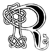 [More] ⦿
|
Roger S. Nelsson
[CheapProfonts]
|
[MyFonts]
[More] ⦿
|
Roman Korolev
[Kaer]
|
[MyFonts]
[More] ⦿
|
Rosemary Hall
[Rosemary Hall Calligraphy]
|
 [MyFonts]
[More] ⦿
[MyFonts]
[More] ⦿
|
Rosemary Hall Calligraphy
[Rosemary Hall]
|
 Rosemary Hall (Oak Park, IL) mae exquisite calligraphic fonts such as Rosemary Modern, Rosemary Copperplate, Rosemary Italic, Rosemary Modified Italic, Rosemary Script, and Rosemary Roman (a stunning font; a free version was done by Dieter Steffmann in 2001 called Rosemary Roman). Check also the fantastic Rosemary Celtic, 50 USD. Mike Yanega claims that the designer is actually Brian Hall (Chicago, IL). [Google]
[MyFonts]
[More] ⦿
Rosemary Hall (Oak Park, IL) mae exquisite calligraphic fonts such as Rosemary Modern, Rosemary Copperplate, Rosemary Italic, Rosemary Modified Italic, Rosemary Script, and Rosemary Roman (a stunning font; a free version was done by Dieter Steffmann in 2001 called Rosemary Roman). Check also the fantastic Rosemary Celtic, 50 USD. Mike Yanega claims that the designer is actually Brian Hall (Chicago, IL). [Google]
[MyFonts]
[More] ⦿
|
Royal
[Michael Evcerson]
|
A monospaced modern angular Gaelic font created ca. 1910 (designer unknown) for the old Royal Gaelicmanual typewriter. Digitized as Doire (1993) and Doire Royal (1999) by Michael Everson. [Google]
[More] ⦿
|
Ryoichi Tsunekawa
[Flat-It]
|
 [MyFonts]
[More] ⦿
[MyFonts]
[More] ⦿
|
Salvador Rodriguez Lagos
[Soda]
|
 [MyFonts]
[More] ⦿
[MyFonts]
[More] ⦿
|
Sam Wang
|
 Clemson, SC-based designer of Partridge-Thin (1994), the Art Nouveau fonts Sarah Caps (1992), Ambrosia Caps (1992), Greeting (1992), ArgosANouveau (1992), Edda Caps (1993), Isadora Caps (1993) and Gismonda (1992, after an original phototype font by Geoff Nicholson from 1971), Maidstone Script (1992), Handsign (1993, Irish sign language font---not ASL), Harrington (1991, Victorian), Mira, Lampoon Brush (1992), Libby Script (1992), Uncio Gothic (2008, Lombardic), Thalia (2008), Arctic (1992), Celtic (1992), Fatso Caps (1992, psychedelic), Inkwell (1992), Arctic2, Columbus (1992, Victorian), Handwriting, Hokusai (brush script, 2008), LampoonBrush2, Partridge-ThinOblique, Saki Script (2008, faux oriental), Sumibrush (2008), Sycamore Sans (2008, draftsman style), New Hand (1995), Tamarind (1999).
 See also here. Fontspace link. [Google]
[More] ⦿
|
savvash
|
The Kelt family by Bay Animation (1995). [Google]
[More] ⦿
|
Schneidmeister
[Dick Pape]
|
 Schneidmeister is a German computer game and toy company. Inspired by images of Shneidmeister, Dick Pape created these digital typefaces in 2009: CelticOrnamentsA, CelticOrnamentsB, CelticOrnamentsC, CelticOrnamentsD, ClownsandJokers, PredatoryInsects, Thundercycles.
 Download here. [Google]
[More] ⦿
|
Scoil an Teaghlaigh Naofa, Easca, Ceatharlach
|
Celtic font archive. [Google]
[More] ⦿
|
Scott Calo
|
 FontStructor, aka truth14ful, who made these pixelish typefaces in 2010: Ball Point, Symbol Sans, Balance sans, Tetris, Math, Marquee, Spacewave, Math, Evening (a stencil based on the EVE logo). In 2011, he made the flared serif typefaces Sophistry Serif Compact and Sophistry Serif Modular, the pixel typefaces fs Gaux 7px Bold (2011), fs Gaux 9px, fs Gaux 7px, and fs Gaux 5px Bold, as well as the avant-garde style Plato Sans, fs Salted Library (2011, a headline font based on the old Union Pacific logo) and Lindenmayer Dingbats (based on IFS fractals---looks like a Sierpinski triangle). FS Greener Grass V2 (2011) is a grotesque headline typeface that imitates FS Greener Grass by Agent Demonic Ladybug. fs Pincoya (2011) and its renamed version, fs Pink Oil (2011) imitate Pincoya Black (Daniel Hernandez). fs Schultasche (2011) is a grotesque face. fs Hudson (2011) is a fat display typeface named after Walter Hudson, one of the heaviest people who ever lived. fsCentury Humanist (2011) is a condensed sans. fs Kaputt (2011) is a pixel face.
 Typefaces from 2012: fs Off The Chain, fs Halo, fs Liberty, Sukai Tsuri (tall condensed face), fs Lesen (perfectly square white on black typeface), fs Washington One, fs Schultasche, fs Savant garde (pixel face), fs Mechanuscript (Trajan caps; +Celtic), fs Gaux (+Ambigram, +9px: pixel typefaces), fs Hard Times (high contrast didone face), Avica, fs Torvalds, fs Titanium, fs Neuron, fs Inception, fs OffTheChain. Typefaces from 2013: Dragon Slayer FS. Typefaces from 2014: Turnin Two, Down with Jezebel FS, FET Title 2014, fs Messenger, Klein Bottle, Amohat New, ECDb. One of my favorites in this collection is fs Hällvetyka 2011), a tall display typeface for posters and murals. [Google]
[More] ⦿
|
Scribhinn
[Michael Everson]
|
Info and links about Celtic fonts. By Michael Everson. [Google]
[More] ⦿
|
Scriptorium (Ragnarok Press, Fontcraft)
[David Fleming Nalle]
|
 Dave Nalle was born in Beirut on March 19, 1959, and died on February 13, 2021 from COVID in his home town of Manor, Texas. From his wiki page: Dave Nalle is a political writer, game author and font designer who was active in the early history of the development of the internet. Nalle was at one time Chairman of the Republican Liberty Caucus, a group that promotes libertarianism within the Republican Party, Senior Politics Editor at Blogcritics online magazine, and was the CEO of Scriptorium Fonts. Obituary [PDF] by Steve Jackson at the Daily Illuminator. Obituary by Shannon Appelcline at RGG Net. Obituary [PDF] at Dungeon Master Magazine.
 A creative and prolific designer, he has made hundreds of beautiful (often historic) fonts. His outfit, Scriptorium (based near Austin, TX, est. 1989), also does custom font and logo design. At some points, Scriptorium was also known as Ragnarok Press and Fontcraft. It specializes in artsy and ancient typefaces. Some subset of the fonts is made by Michael Scarpitti. Free font demos. Images of his best selling fonts. Special subpages: - Three free fonts: Onuava (a mini-serifed hybrid fixed-width font), Divona (sans), Sirona (based on Lombardic calligraphy).
- Lombardic: Aneirin, Benevento (8th century Lombardic), Cymbeline, Fabliaux, Formidable, Locksley.
- Decorative initials such as the 20th century sign lettering initials set Pencraft Initials (2009), New Saxon Initials (2016, based on work by F.G. Delamotte), Delamotte Initials One (2016), Delamotte Initials Two (2016), Holly Initials (2010, based on Real PenWork (1880s, Knowles and Maxim), Vyones (2010), Vergennes (2001), Cascade (2009), Bergling (2010; based on initials by John M. Bergling).
- Steampunk typefaces: Clockwork, Gearhead, Gears, Verne, Draughtwork, Belgravia, Boetia, Blackthorn, Linthicum, Good-fellow, Necromantic, Mephisto.
- Wild West fonts: Academy, Alcalde, Atkinson Boomtown (2009, after the lettering of Frank Atkinson), Atkinson Eccentric (2009), BigIron, Cibola, Del Norte, Lachesis, Perdido, Plowright, Primer, Riudoso, Niederwald, San Lorenzo (2011, with a Mexican and Tuscan look), Stonehouse, Manquo, Rochambeau, Purcell, Vaquero.
- Arabic simulation fonts: Samaritan is based on the poster lettering of Alphons Mucha from his poster for the play La Samaritan. Serendib and Waziri are based on the hand lettering of René Bull from his edition of the Arabian Nights. Caliph (1993) is derived from Ernst Schneidler's classic Legende font, with variant characters based on his original lettering. Also: Satampra, Jerash, Samarkand, Isfahan.
- Celtic fonts: the fonts include Constance, Durrow (1993, traditional rendering of Insular Minuscule calligraphy), Malvern, Glendower (based on the most common lettering in the Book of Kells), Knotwork (caps based on Celtic knots), Alba Text (modernized text font based on Celtic uncial lettering), Lindisfarne (based on a square uncial style), Stonecross (1997, derived from Celtic cross and gravestone inscriptions), Celtic Spirals (dingbats), Celtic Borders font (lets you combine key strokes to form decorative borders; many frames and borders are original Celtic designs by Arts&Crafts period artists like Evelyn Paul and Louis Rhead), Spiral Initials, Brigida (based on Rudolph Koch's interpretation of a squared uncial), Macteris Uncial, Coverack (heavy non-traditional uncial), Dahaut (modernized uncial), Dunsany, Glendower, Morgow (1999, spiral uncial), Teyrnon (elaborate spurred uncial), Padstow (heavy uncial), Vafthrudnir (2011, uncial), Sualtim and Columba (decorative initials based on characters found in the Book of Kells), Albemarle (2001).
- Oriental simulation fonts: Yoshitoshi (2003, based on the 1900-style writing by Yoshi Toshi.
- Gothic fonts, including Alt Gothic, Koch Gothic, Barnabas (2011), Sternhagen (2014), Montgisard (2010, roman capitals with blackletter lower case), Serenissima, Gelderland, Alcuin, Monumental, Goldwork, Waldeck, Roncesvalles, Montressor (2010, ornamental blackletter capitals), T4C Beaulieux (1998, a free copy here), Bastarda (2011), Burgundian, Cadeaulx, Collins Old English, Courtrai, Descant, Ereshkigal, Faustus, Franconian (1993, a Schwabacher), Froissart (2000), Ghost Gothic, Katisha, Koch Gothic, Ligeia, Magdeburg, Magdelena, Melusine, Pyle Gothic, Rheingold, Sanctum, Stuttgart Gothic (2010), Textura, Theodoric, Yngling (2002).
- German expressionist: Dromon.
- Renaissance fonts: Monumental Gothic, Caswallon (a Caslon family), humanist cursive (Palmieri, Castiglione and Hanes Italic), quirky Italian cursives (Fiorenza and Alleghieri), a Roman style hand-lettered font (Rudolfo and Rudolfo Swash), a Trajan-style Roman lettering (Hadrianus), a classic flourished cursive (Trinculo) and a set of floral intials from the Quattrocento (Fraticelli).
- Modern poster fonts: Ascelon, Bilitis, Cosmic Dude, Dromon, Ducatus Rough, Eglantine (after Central Type Foundry's Quaint Roman), Ekberg (2002, based on Samuel Welo's posters), Fortinbras, Hamilton, Jambon, Oblivion, Posada (2008, based on the poster lettering of Mexican artist José Guadalupe Posada), Squiffy, Suspicion, Magnin (2003).
- Mapmaker fonts: building elements are available in Basilica; Ortelius is a map dingbat font; Queensland (based on lettering by artist and calligrapher Eric Sloane), is bold, hand-drawn and reminiscent of medieval writing on maps. There are also Brandywine, Daresiel, Hesperides, Longhorne, Windlass (1996), and Cityscape. Orford (2008) is based on samples of hand lettering from a 1693 manuscript collected by Lewis Day in his classic book on historical paleography, Alphabets Old and New.
- Calligraphic fonts: Albemarle (2001), Azariel, Moncrief (2011, based on the calligraphy of J.M. Bergling), Pavane, Rasael (2009), Abdiel (2005), Roncesvalles, Gazardiel (2003, connected script), Spoonbill (2003, arts and crafts), Macteris (Roman uncial font), Antioch Uncial (Roman uncial font), Burgundian (Classic black letter font), Franconian (993, a classic black letter font), Castiglione (Attractive Renaissance lettering), Cicero (Roman Rustica font), Formidable (1993, very bold late medieval / Lombardic style), Collins Old English (Classic Old English style gothic), Corbei Uncial (Roman uncial font), Cymbeline (late medieval lettering), Durrow (Standard insular minuscule uncial font), Theodoric (Classic black letter font), Gazardiel, Ghost Gothic (Unusual gothic font), Glendower (Uncial font based on Book of Kells), Gloriana (Interesting hand lettering style), Folkard (from the hand-lettering of Charles Folkard), Offenbach Chancery, Ranegund Merovingian Courthand, Benevento (8th century Lombardic), Hesperides.
- Art deco typefaces: Imperatore (2018: based on a hand lettered design from California art deco master designer Pedro de Lemos in the 1920s), Speakeasy (2018), Gates of the West (2018), Lyceum (2014), Borealis (2009), Criterion (2011), Illuminata, Madding (2009, a bold poster font that grew out of Aventine), Alexandrine (2009), art Deco Stencil (2009, based on samples of Art Deco stencil lettering by Pedro Lemos), Falmouth.
- Art nouveau typefaces: Acadian, Agravain (2009), Amphitryon (2009), Ariosto, Asphodel, Averoigne, Beaumains (2011, based on J.M. Bergling's lettering), Beauvoir, Belgravia (based on J.M. Bergling), Bernhardt (based upon the lettering of the Czech art-nouveau artist Alphonse Mucha), Bentham, Berenicia, Boetia (2003, based on J.M. Bergling's lettering), Bruges, Bucephalus (1993), Burd Ellen (2009), Butterfield (1993; in Alfred Roller's style), Cafe Society (2018), Curetana, Damariscotta, Elsene (2011, based on lettering by early 20th century illustrator Clara Elsene Peck), Elysian, Exotique, Flaubert, Gaheris, Ganelon, Gehenna, Goodfellow, Grammophon (2019: a bold Jugendstil poster font), Harbinger, Huyot (2016, after Georges Auriol's types), Jugendstil Kunsthand (2003), Lysander, Maginot (1993; after Peter Schnorr, 1898), Munich (after the Munchner Jugend magazine), Norumbega, Odeon, Ormandine (2010), Pantagruel, Phaeton, Reggio, Rochmbeau, Rockne (2009), Rudolfo, Setebos, Sprite, Summerisle, Sylphide (2005), Undine, Valentin (2008), Vambrace (2010), Walhal, Wendingen (2016), Wormwood (2018), Zeitschrift (2016, based on the Ver Sacrum magazine).
- Modern poster fonts: Field Day (2003), Ascelon, Bilitis, Cosmic Dude, Dromon, Ducatus Rough, Eglantine (after Central Type Foundry's Quaint Roman), Ekberg (2002, based on Samuel Welo's posters), Fortinbras, Hamilton, Jambon, Oblivion, Squiffy.
- Constructivist fonts: Krasny Mir (2009), Vrubel, Structura (1997).
- Futuristic fonts: Alecto, Angelus, Circuit, Culdrose, Gearhead, Ironclaw, Parika, Sanhedrin, Semiramis (1997), Slither, Structuro, Yazata, Adastra (dings).
- Borders and ornaments. These include New Arets and Crafts Borders (20912, based on The Calendar of Golden Thoughts (Barse and Hopkins Publ, 1911).
- Boneyard fonts: Undertaker (2014), Antrobus (2010), Sepultura (2002), Halloweenies, Dementia, Boneyard, Skull and Bones, Malagua (1999-2013), Paleos (2002, from titling of B movies in the cave girl genre), Carmilla, Abaddon, Black Cow (1998), Valdemar, Cuede, Ligeia, Mayhem, Mephisto, Golgotha, Sanguinary, Ironworks, Moravia, Gehenna, Nosegrind (2005, graffiti), Corpus, Ghostly.
- School fonts: Schoolhand (2010).
- Arts and Crafts movement (late Victorian period, 19th century), based on work and lettering by Walter Crane, William Morris, Charles Rennie Mackintosh and Elbert Hubbard. The Arts&Crafts movement was enormously influential on the works of designers, artists and architects of the 20th century, and inspired the Art Nouveau and Art Deco movements. Fonts include William Morris' Kelmscott (based on Morris' Troy type), and True Golden, fonts from the Glasgow branch of the movement like Chelsea Studio (1997), which is based on Charles Rennie Mackintosh's lettering, fonts from the Roycrofters of New York like Semiramis and Ganelon, fonts based on Walter Crane's work such as Crane Gothic, Pencraft Initials (2009) and Walter Crane, and even fonts from the California Arts&Crafts period of the early 1900s like Coloma. Other typefaces: Jesse M. King (refreshed in 2015, and based on hand lettering from a frontispiece design by Glasgow-based Jessie King who was known for her lavish book covers), Aylward, Palmyra (based on work by the Roycrofters, a design community founded by Elbert Hubbard), Aylward (2010, Victorian), Hyacinth Initials, Spoonbill, Adresack (1996: inspired by the arts and crafts lettering styles of designers like Charles Rennie MacKintosh and Jessie M. King), Brandywine, Changeling (2009, based on lettering by fairy artist Fanny Railton), Goddard, and Advertising Gothic (2003), Valentin, Gaheris, Agravain (2009). Delaguerra (2001-2009) is based on a lettering style originating in the California Arts&Crafts period commonly associated with Mission Style. It is still in common usage in signage at historical sites in California.
- Victorian: Beaumarchais, Berenicia, Bilibin, Brandywine, Brigidis, Curetana, Durendal, Elphinstone, Flaubert, Folkard, Gjallarhorn, Gloriana, Hermia, Ironclaw, Magnus.
- Typewriter: Fontcraft Courier.
- Anthroposophic: Ekberg (2002, based on a sample of poster lettering by Samuel Welo).
- Medieval fonts of Scriptorium, critiqued by Marc Smith, page 65: Batwynge is based on lettre gffe by Geofroy Tory (1529), and not on an illuminated manuscript of the tenth century as claimed by Scriptorium. Perigord (1993) is based on a Carolingian alphabet drawn by Ernst Bentele in 1952. Allencon is a calligraphic font based on an interpretation of 6th century Ostrogothic Italian calligraphy.
Some selected fonts: Finchley (psychedelic), Captain Kidd (2012, an original font design based on the title lettering from the classic pirate movie starring Charles Laughton), Aerobrush (2011), Fondry Ornament (2009), Atkinson Egyptian (2008, after the lettering of Frank Atkinson), Verne (2008: remade in 2020 into Covid19), Goldwork (almost blackletter), BigBlok (2010), LetterpressGothic (2010), Plymouth (2010, in the style of Cooper Bold), Broadley (2008, an architecturally inspired script based on lettering by British architect and designer C.F.A. Voysey), Locksley (2004, medieval lettering), Tuscarora (curly lettering), Fiorenza (Renaissance calligraphy), Hesperides (old colonial calligraphic script), Angelus (beautifully printed monospaced script), Esperanza (1996, connected medieval handwriting), Ithuriel (2002), Alleghieri (2002), Hamilton (2002), Spiral Initials, Zothique (great font, based on hand lettering from a map of Clark Ashton Smith's fantasy world of Zothique), Reynard (semi-Celtic), Daresiel (elegant script), Caliph (1992, Arabic simulation), Bassackwards, Rosalinde (1999, handwriting), Arakne (2000, connected handwriting), Falconis (by Michael Scarpitti), Asrafel (semi-Celtic), Swithin (2004), Tyrfing (Art Nouveau/Fraktur, 1999), Waldeck (2008, blackletter), Woburn Initials, Stampwork, Draughtwork, Roughwork (a codex font derived from Nalle's own True Golden which is based on a=n earlier typeface by arts and crafts master William Morris), Melusine (gothic calligraphy), Corbei (uncial), Niederwald (hand lettering), Gjallarhorn (great uncial), Gaiseric (early medieval uncial), Taranis (1987, an uncial first drawn as a font for the cover of the old Ysgarth roleplaying system), De Bellis (roman era, by Michael Scarpitti), Engravers Gothic, Monimental Initials, Sanhedrin (Enemy of the State font), Vespasiano (roman capitals, by Michael Scarpitti), Bilitis, Hendrix (2002), Collins OE (old English), Samedi, Praitor, Evadare (1993, based on a character set which was hand calligraphed by Rudolf Koch), Koch Fantasie (1993), Black Cow (1998). Zothique, Ruritania, Mariner (2004, based on hand lettering originally done by Willy Pogany), Trinculo (a swinging cursive font), Texas Star (2002), Octavian (antique demi-serif font), Ruffian (antique type font), Ascelon (thin sans serif font), Munich (title lettering from Munchner Jugend magazine), Necromantic (bizarre bold titling font), Titania (romantic decorative lettering font), Oberon (bold romantic font), Knotwork, Guede (1993), Pullman, Purcell (Victorian circus poster style font), Allegheny, Carmilla, Malagua (1999-2013), Ardenwood, Platthand, Buccaneer, Cochin Archaic (2010), Boswell (1994), Guilford (based on lettering by artist and calligrapher Eric Sloane), Death Ray (2012, constructivist), Alecto (futuristic), Candlemas (2003), Bridgeport (2003, based on lettering by artist and calligrapher Eric Sloane), Medieval Tiles (2003), Linthicum (2003), Draughtwork (2003), Yngling (Fraktur, 2003), Rheingold (elaborate Fraktur: Music Hall Text elsewhere; see also Teuton Text, Cincinnati Type Foundry, 1877), Kidd (2003), Belgravia (2004), Peck Shields (2004), Scrawlies (2000, handcrafted), Albrecht Durer Gothic (2004), Orpheus (2004), InduXtrial (2004, a grunge face), Yoshitoshi (2003), Veronique (2004), Veneto (2006), Vidilex (1993, monospaced), Abelarde (2006), John Speed (1993: a mapmaker font), Furbelow (2006), Estoril (2006), Tangle, Aventine (sans), Texas Star (2002), Groningen (Bauhaus design), Nevins Hand, Scrapple (2011, Victorian, ornamental), Leodegar (2011, based on samples of 7th century Frankish hand lettering), Candlemass (2012). Fonts from 2013: Doge (a Venetian font based on a J.M. Bergling revival), Original Django (after the titling font in Quentin Tarantino's movie Django Unchained). Fonts from 2014: Highball, Carillon (based on a typeface by Samuel Welo), Edifice (based on lettering by J.M. Bergling). Fonts from 2015: Gods of Mars (an inline sci-fi typeface), Rykov (based on a 1930s Ukrainian constructivist style; Latin and Cyrillic), Vie Moderne (French art deco), Dahlgren, Grand Concours (art deco), Tantalus, Power Tie (art deco), Marquis Greeking. Fonts from 2016: Ekberg Modern (based on lettering samples by Samuel Welo from poster designs of the 1920s), Knuckleduster, Tzaphkiel, Sarandiel, Primrose Initials, Elizabethan Script (chancery style), Zeitschrift (an art nouveau font based on the Ver Sacrum magazine), Wendingen (Dutch deco), Memento Mori (Tuscan), Rounders (art deco). Fonts from 2017: Buzzmill (wooden plank font), Pumpkin Patch Initials, Talinn, Reliquary, Nopalito, Scattershot (script). Typefaces from 2018: Marionettas (a Mexican horror movie poster font), Fascination, Architextura, Santa Sangre, Glyphos. Typefaces from 2019: Cafe Corso (art nouveau), Comic Classix. Fnts released in 2020: Epigramatic (based on lettering by Dard Hunter for the Roycroft Press in the early 1900s), Cryptos (graffiti). Klingspor link. Abstract Fonts link. Dafont link. View David Nalle's typefaces. Scriptorium's library. [Google]
[MyFonts]
[More] ⦿
|
Séamas Ó Brógáin
[Seirbhísí Leabhar]
|
[More] ⦿
|
Séamus Ó Searcaigh
|
Alleged creator of a modern round Gaelic typeface about 1925. [Google]
[More] ⦿
|
Sébastien Hayez
|
 Type and graphic designer and art teacher, b. 1978, Lyon, France, who is based in Villeurbanne. He was artistic director at Crescend'O and curator of sifgners-book.com (2009-2018) and agfronzoni.com (2012-2018). His typefaces are mostly released at Frank Adebiaye's Velvetyne Type Foundry, which is committed to the Open Source movement---all fonts are free.
 In 2011, he created the experimental typefaces Mourier (based on a geometric alphabet created in 1973 by Danish graphic designer Eric Mourier. The font uses square of 7 x 7 units and consists of unclosed lines. The first and only use was in the booklet The Myth about Bird B by Knud Holten), Semicir, BipHop, Broom, Flaubertine (with Olivier Dolbeau), Hangul and Rotunda. In 2013, he added Victorianna (thin Victorian slab serif), Runic Sans (inspired by a runic semi-uncial callygraphy seen on the Book of Kells), Courrrier (with three r's---a monospaced experimental typewriter face), Process (geometric, experimental), Lment (hipster typeface), Gnaw. In 2014, he designed the free font VTF Victoriianna Thin at Velvetyne. In 2020, with Ariel Martin Perez, he released the free typeface Cantique at Velvetyne. Cantique was inspired by some hand-carved titles used in post-romantic French bookplates, both for their ornamental qualities and for their kind of medieval mood. Klingspor link. Velvetyne Type foundry, where one can download most of his fonts. Old URL. Behance link. Sébastien Hayez at Velvetyne. [Google]
[More] ⦿
|
Sebastian Kempgen
[MacCampus]
|
[More] ⦿
|
Seirbhísí Leabhar
[Séamas Ó Brógáin]
|
 Séamas Ó Brógáin (Seirbhísí Leabhar) is an Irish type specialist based in Dublin. He has a page on type measurements, with a proposal for reform. His typefaces are all free:
 - Clara (2015). A text typeface created specially for printing A Dictionary of Editing (2015). The family includes italic, bold, bold italic, and small capitals, while the character set includes Greek, Cyrillic, phonetic and mathematical ranges, scribal abbreviations, and other specialist characters. CTAN link, with TeX support, maintaned by Daniel Benjamin Miller.
- Florea (2013). Floriated type borders based on a sixteenth century model.
- The traditional minuscule (angular) Celtic font Gadelica (2007). Based on the first authentic examples from the seventeenth century.
- Germanica (2010-2012). A textura quadrata typeface based on a model by Fust and Schöffer (ca. 1457).
- Valida (2012). A font for creating ISBN barcodes.
Old URL. [Google]
[More] ⦿
|
ShaBruCha Graphics
|
Old Celtic capitals posted here in jpg format. [Google]
[More] ⦿
|
Shannon
|
A typeface published by Compugraphic in 1982. It was inspired by Irish calligraphy, and in particular, The Book of Kells. [Google]
[More] ⦿
|
SIAS (or: Signographical Institute Andreas Stötzner)
[Andreas Stötzner]
|
 Andreas Stötzner (b. 1965, Leipzig) is a type designer who lives in Pegau, Saxony. Graduate from the Hochschule für Grafik und Buchkunst Leipzig and the Royal College of Art in London (1994). Since then, free-lance. Started making typefaces in 1997. He edits the sign and symbol magazine Signa. He spoke at Typo Berlin 2004 and at ATypI 2005 in Helsinki where his talk was entitled On the edges of the alphabet. Coauthor with Tilo Richter of Signographie : Entwurf einer Lehre des graphischen Zeichens. He set up SIAS in 2006-2007 and started selling fonts through MyFonts.
 He created Andron Scriptor (2004, free), with original ideas for Greek and Cyrillic alphabets. The Andron project intends to extend this Venetian text typeface in many directions: right now, it covers Latin, Greek, Coptic, Gothic, runes, Cyrillic, Etruscan and Irish scripts, musical symbols, astronomical and meteorological symbols, and many dingbats. The Andron MC Corpus series (2012) contains Uncial, Mediaeval and Capital styles. He also created Andron 1 Monetary (2014), Andron 1 Alchemical and Andron 2 ABC (2014, for children's literature). On or before 2006, he created a few typefaces for Elsner & Flake. These include EF Beautilities, EF Ornamental Rules, EF Squares, EF Topographicals, EF Typoflorals, EF Typographicals, EF Typomix, EF Typosigns, EF Typospecs, EF Typostuff. Fonts from 2007-2010: Gramma (2007, three dingbats with basic geometric forms), Andron Corpus Publix (2007, dingbats including one called Transport), SIAS Freefont (2007, more dingbats), SIAS Lineaturen (2007, geometric dingbats) SIAS Symbols (2009), Andron Freefont (2009, text font), Andron 1 Latin Corpus (2009), Andron 1 Greek Corpus (2009), Andron Kyrillisch (2009, consisting of Andron 1 CYR, Andron 2 CYR and Andron 2 SRB where SRB stands for Serbian), Andron 2 English Corpus (2010, blackletter-inspired alphabet), Andron 2 Deutsch Corpus (2010), Andron Ornamente (2012), Reinstaedt (2009, blackletter family), Crisis (2009, economic sans). Lapidaria (2010) is an elegant art deco sans family that includes an uncial style and covers Greek. Hibernica (2010) is a Celtic variant of Lapidaria. Symbojet Bold (2010) is a combination of a Latin and Greek sans typeface with 400 pictograms. Rosenbaum (2012) is a festive blackletter face, obtained by mixing in didone elements. In 2013, he published Arthur Cabinet, a six-style inline art deco caps collection of typefaces, with accompanying Arthur Ornaments and Arthur Sans. Meanwhile, Andron Mega grew to 14,700 unicode glyphs in 2013. Typefaces from 2014: Behrens Ornaments (art nouveau ornaments based on Behrens Schuck by Peter Behrens, 1914), Fehlian (an open capitals typeface family with Plain, Gravur and Precious styles), Happy Maggie (a hand-drawn script based on Maggie's sketches when she was 13 years old), Abendschroth (for lullabies, girl's literature, murder poems, short stories and Christmas gift books), Abendschroth Scriptive, Albyona English No. 1 (as Andreas writes, suitable for children's books, fantasy literature, crime novels, natural food packaging and poison labeling, for infancy memories, vanitas kitsch items, dungeon museum bar menu cards, introductions to herbalism and witchcraft manuals), Lindau (a Venetian Jensonian typeface with considerable flaring in the ascenders), Grund (based on the 1924 art deco signage in Leipzig's Untergrundmesshalle Markt whose architect was Otto Droge), Leipziger Ornamente (based on variopus buildings in Gohlis, Leipzig, dating from the 1920s-1950s), Kaukasia Albanisch (ancient writing system of the Caucasus region, allegedly created by Mesrop Mashtots who also invented the Armenian alphabet in 405). Commissioned fonts include Runes (commission by Ludwig Maximilian University Munich), Lapidaria Menotec, Old Albanian, Dania (a special notation for Danish dialectology. Font extension of Latin Modern Italic (Open source), commissioned by the Arnamagnanean Institute, Copenhagen Universit). Typefaces from 2015: Andron 2 EIR Corpus (uncial, Gaeli), Artemis Sans (Greek version of Arthur Sans), Ardagh (a Gaelic / Irish version of Arthur Sans). Don Sans (a sturdy sans). Typefaces from 2016: Popelka (an uncial fairy tale font modeled after the opening sequence of the 1973 movie Drei Haselnüsse für Aschenbrödel). MyFonts. Behance link. Abstract Fonts link. Klingspor link. Showcase of Andreas Stötzner's typefaces at MyFonts. View the SIAS typeface library. [Google]
[MyFonts]
[More] ⦿
|
Sjoerd Hendrik de Roos
|
 Dutch typographer and type designer, b. Drachten, 1877, d. Haarlem, 1962. He worked at Tetterode from 1907-1941. Catalog of some of his digitized typefaces. Designer of various typefaces:
 - The uncial-like typeface Libra Uncial (1938, a pseudo-Gaelic font) at Tetterode in Amsterdam. Libra is now carried in digital form by Mecanorma and Bitstream.
- Nobel, a redesign of Berthold Grotesk. FB Nobel (1993, Tobias Frere-Jones at the Font Bureau) is a powerful 18-style sans family based on de Roos's Nobel. It ranges from Extra Light to Very Black, and includes a condensed sextet. See also DTL Nobel (Dutch Type Library) by Fred Smeijers and Andrea Fuchs (a German student at the Arnhe academy supervised by her teacher, Fred Smeijers).
- De Roos made Dutch (or Hollandse) Mediaeval (1912), an old style (Venetian) typeface with little contrast, arched slabs and serifs, short descenders, an atrocious lower case g, and an italic that is more like an oblique, but with several conservative workhorse qualities that made it one of the most popular typefaces during World War I. Intertype Mediaeval is similar. Hollandse Mediaeval was digitally revived by Hans van Maanen in 2007 as Dutch Mediaeval, and by Hans van Maanen and Patrick Griffin in 2013 as Dutch Mediaeval Book ST. For other digitizations, see De Roos Mediaeval NF (2014, Nick Curtis) and Hoboken Serial (2010, SoftMaker).
- He designed the calligraphic typeface Meidoorn (1928) for De Heuvelpers (his own private press), which was active from 1926-1935. The Meidoorn materials (matrices, punches) are now in the hands of G. J. Randoe (Keizersgracht 89, 1015 Amsterdam). Laure Afchain was doing a revival of Meidoorn in 2008 as a student at KABK, Den Haag. And Joe Chang, still at KABK, did a revival of it in 2012 in van der Laan's class.
- Egmont (1933) is a serifed typeface done at Lettergieterij Amsterdam. Mac McGrew writes: Egmont is a modern interpretation of classic letter forms, designed by S. H. DeRoos for Amsterdam Type foundry in the 1930s, and subsequently cut by Intertype. It is an elegant face, with long ascenders which have double serifs. There are three weights in roman and italic, all with three styles of figures as shown in the bold specimen. Italic swash letters are made for all three weights. Egmont Decorative Initials were added by George F. Trenholm in 1936; they are sometimes called Egmont Medium Italic, from which they are derived. Compare Bernhard Modern. A digital family was designed by Dennis Ortiz-Lopez in 2005 called OT Egmont. Castcraft's free font family OPTI-Eisen is also noteworthy. Open Egmont Kapitalen (2013) is a free openface designed by John Wollring based upon de Roos's known Egmont Inline (or Egmont Versalien) shown in a Lettergieterij Amsterdam specimen book of 1935. Jay Rutherford digitized Egmont Inline in 1988, but did not publish it. In 2016, Alice Retunsky designed the revival Dutch Plus, and added cyrillics.
- Erasmus Mediaeval (1923, Amsterdam). Berry, Johnson and Jaspert write: Venetian in style, but with light serifs and short descenders. Many of the serifs are shaped, as though drawn with a pen. E and F have the centre arms high, the Ha high bar and U the lower-case design. g has a brief tail drawn from right to left;p and q have oblique foot serifs. The italic has slight inclination and has the serifs of the roman. The heavier face of this design is called Grotius. Digital revivals include Erasmus (1992, A. Pat Hickson, ITF) and one by Pradnya Naik.
- Card Pro (2006, URW, Ralph M. Unger) is based on Ella Cursief (1916, Lettergieterij Amsterdam). For another digital version of Ella Cursief, see Rozy Cursive (2016, Leon Hulst).
- Circulaire (2009, Hans Van Maanen, Canada Type) is based on a set of initial caps designed by Sjoerd Hendrik de Roos in 1926.
- His last typeface was De Roos Romein (and Cursief) (1947, Amsterdam; Intertype New York; American Typefoundry) about which Canada Type, which produced a magnificent 10-style digital revival, expansion and interpretation in 2009 simply called Roos, in a cooperative effort between Hans van Maanen and Patrick Griffin, writes: It was designed and produced during the years of the second World War, and unveiled in the summer of 1947 to celebrate De Roos's 70th birthday. In 1948, the first fonts produced were used for a special edition of the Dutch Constitution on which Juliana took the oath during her inauguration as the Queen of the Netherlands. To this day this typeface is widely regarded as De Roos's best design, with one of the most beautiful italics ever drawn. In contrast with all his previous roman typefaces, which were based on the Jenson model, De Roos's last type recalls the letter forms of the Renaissance, specifically those of Claude Garamont from around 1530, but with a much refined and elegant treatment, with stems sloping towards the ascending, slightly cupped serifs, a tall and distinguished lowercase, and an economic width that really shines in the spectacular italic, which harmonizes extremely well with its roman partner. Mac McGrew: De Roos is a handsome contemporary roman type designed by S. H. DeRoos in Amsterdam, Holland. Originally imported from a Dutch type foundry, with additional weights and inline initials, this roman and italic were also cut by ATF about 1952, and by Intertype in 1954. A 1953 piece of ATF literature notes, "Cast at Elizabeth on Amsterdam line." Scans below are from the book First specimen book of De Roos Roman&Italic (Typefoundry Amsterdam).
- Savoy (ca. 1936) was the third art deco display typeface drawn under de Roos's superviosn, after the earlier pair, Bristol and Carlton (1929), which were drawn by Dick Dooijes also under de Roos's supervision.
- Simplex (1937). A typeface that flirts with the idea of unicase. For a digital revival, see Hendrik (2021, by Claudio Rocha and Lucas Franco).
- Zilvertype (1914-1916, with Jean-François van Royen). This was revived by Hans van Maanen as Zilvertype (2012-2014, Hans Van Maanen, Canada Type): Right on the heels of the tremendous popularity wave that made Hollandse Mediaeval the most used Dutch typeface during the Great War years, Sjoerd H. de Roos was asked to design a 15 point type for De Zilverdistel, Jean-François van Royen's publishing company. So between 1914 and 1916, de Roos and van Royen collaborated on the typeface eventually known as Zilvertype, and which both parties viewed as an improved version of Hollandse Mediaeveal. Like Hollandse Mediaeval, Zilvertype was based on the Jenson model, but it is simpler, with more traditional metrics, and lighter and more classic in colour.
- Nieuw Javaansch No. 1 (1909). A Javanese script done by Sjoerd de Roos at Lettergieterij Amsterdam. Revived in 2012 at the KABK by Troy Leinster under the same name.
Klingspor link. FontShop link. [Google]
[MyFonts]
[More] ⦿
|
Slaine
|
Some Celtic fonts are archived here. [Google]
[More] ⦿
|
Slovolitni de Grande Tartaria
[Dima Pole]
|
 Dima Pole (Slovolitni de Grande Tartaria, Yalta, Russia) is a Russian type designer [as a joke, he claimed on Behance to be from Russellstown, Ireland and on Hellofont he said that he was in Berjozovskii, Iceland].
 Designer of the clean sans typeface Hinton (2016), the lapidary typeface Gor (2016), and the handcrafted typefaces Pocherk 26, Zelo (calligraphic), Rusich, Etruria (based on Etruscan inscriptions, this handcrafted font tries to accurately simulate the writing of the Etruscans; published in 2018), Hors, Fufluns, and Fufluns Luna. Most of his fonts cover both Latin and Cyrillic. In 2017, he designed Garuspik (ultra-condensed; in Krug, Original and Kvadrat styles), Konung, which is a mixture of various medieval central European styles for Latin and Cyrillic. He also designed the contrast-rich typeface Retra, the blackletter typeface Getman, the eroded typeface family Hors, the Celtic typeface Keltichi, and the angst-ridden Dubrove (which was inspired by Moravian angular type design of 1930-50s) in 2017. Typefaces from 2018: Tartaria, Osovec (a wedge serif text typeface in one style), Maribor, Vinneta (a Latin / Cyrillic italic). Typefaces from 2019: Arkaim (East Slavic simulation style). [Google]
[MyFonts]
[More] ⦿
|
Soda
[Salvador Rodriguez Lagos]
|
 Mexican type designer who sert up Soda (in London, UK). He created the rounded sans typeface family Gardenia (2015-2016, Without Foundry). The name Gardenia may create confusion as there are at least five other typefaces with the same name.
 In 2016, Salvador Rodriguez and Diego Aravena Silo co-designed the geometric sans typeface family Fuse and Fuse V.2, which are characterized by a large x-height and some humanist elements. Salvador Rodriguez and Julia Martines Diana added Fuse V.2 Printed in 2018. Still in 2016, Salvador Rodriguez published Urbani at Without Foundry. This narrow tightly set sans family was inspired by Frutiger and Renner but mixes in Latin curves. Eren and Eren Condensed (2016) is a 32-style slab serif family with a humanistic touch and rounded corners---it was designed by Salvador Rodriguez and programmed by Diego Aravena. Typefaces from 2017: Sonny Gothic (a geometric sans in 36 styles, W Foundry: an homage to Herb Lubalin; followed in 2018 by Sonny Gothic Vol.2, which was co-designed with Gaspar Muñoz), Nutmeg (geometric sans, W Foundry), Kappa (a modern sans serif with humanistic and geometric features, co-designed by Salvador Rodriguez and Diego Aravena), Kappa Vol 2 (the slab serif version of Kappa), Ulises (with Diego Aravena Silo: an eclectic slab serif with some grotesque features). Typefaces from 2018: In 2018, he designed Helios Antique and Helios Stencil together with Felipe Sanzana at W Foundry. Hermann (2018, Salvador Rodriguez and Diego Aravena) is a wonderful readable garalde book typeface family. Typefaces from 2019: Campora (a revival and extension of K. Sommer's awkwardly serifed Dynamo, 1930, and Avant Garde from the 1980s; +inline). Typefaces from 2020: Supera Gothic (2020: an 18-style geometric sans by Diego Aravena Silo and Salvador Rodriguez; plus variable fonts), Gallos (2020: a 20-style mix of architype (based on Paul Renner's Architype), geometric, gaelic, unicase and uncial, by Diego Aravena Silo and Salvador Rodriguez; containing variable styles as well). Typefaces from 2021: Samy (a warm rounded geometric serif in 36 styles). [Google]
[MyFonts]
[More] ⦿
|
Solotype
[Dan X. Solo]
|
 Dover Press sold Oakland's Dan X. Solo's digitizations. Dan Solo (b. 1928, d. 2012) has collected over 13,000 sets of metal fonts, starting when he was 9 years old and growing up in Oakland, CA. Finally, in 2002, he stopped doing that and began converting all of his fonts to computer type. Solotype, his company, was established in Alameda, CA. He printed 30 books on fonts (with Dover), including The Solotype catalog of 4,147 display typefaces, and created hundreds of fonts. In 2007, Dan Solo retired from the font business. He died in 2012.
 Robert Trogman writes: I know Dan X. Solo personally. He ran a typographic studio in Berkeley for over 30 years. He had a large collection of film fonts, including some of my own. He created thousands of fonts and is now retired and is an avocational prestigitator. Copyrights have run out on most of his fonts. He also protected himself by creating pseudonyms on the questionable font names. Stuart Sandler confirms that many of the fonts in Solo's Dover books are in fact from the Filmotype collection, which Stuart is digitizing right now. Gene Gable writes: Dan Solo of Solotype in Berkeley was experimenting with photo type as early as 1945 and started doing optical special effects in the early '60s. And a number of the larger display-type shops developed their own techniques. But in terms of opening up new markets for display type (and giving designers more control over type setting), Visual Graphics and Letraset lead the way. These companies were proud of, and promoted, the fact that that their products could be used by non-typesetters with little training. Bio. He wrote about himself: Dan X. Solo The Solotype Archive was begun in 1942 when I was 14. I was a kid printer for several years before that. At 16, after a quick three months of training, I dropped out of school and went to work full time as a radio actor and announcer in San Francisco. (Easy to get jobs in those days, due to the war-induced manpower shortage.) In 1949 and 1950, I created a magic show which played West Coast theatres with some success. After that, back to broadcasting. By 1962, I was completely burned out on radio, so I decided to see if I could make a living with my collection of antique types, which numbered about a thousand fonts at that time. In 1962, I sent out 4,000 catalogs showing the type to ad agencies all over the U.S. The timing was perfect (no thanks to me) because there was developing at that time a renewed interest in the old types. Business took off immediately. The Solotype collection was one of four commercial collections at the time, but I seemed to have been more aggressive in marketing than the other chaps. (Well, Morgan Press certainly knew how to market.) Two years into the business, I began to collect alphabets on paper for conversion to photo lettering, which was just becoming mainstream in the type business. We closed the shop for a month every year and went on a type hunt, mostly in Europe where there didn't seem to be much competition among collectors. Other typographers couldn't understand how we could do this, but I believe it made people appreciate the resource we offered even more. Over the years, the collection became quite large. When I closed Solotype a couple of years ago, I got rid of about half the archive (because the fonts were dull, or already digitized, or for a variety of other reasons) leaving me with about 6,000 fonts on paper or film. In 1974, I began to supply Dover Publications with mechanicals for books of 100 alphabets on a particular theme. I did 30 of these books over the years, and 30 more of printers' ornaments, borders, and so forth. Sometime in the 1990s, Dover asked me to digitize books of 24 fonts each, to be sold with a disk in the back. I did 12 of these. The Dover relationship came to an end when Hayward Cirker, the owner and my special friend, died and the company was sold to another publisher. Dover felt that they had covered the type field thoroughly. Now in my old age, my wife and I have a mindreading act that is great fun and good for the ego. Even so, when not traveling, I digitize type for relaxation and enjoyment, but have made no effort to sell it. Until now. Solo's wood type/Western/ headline/ Victorian collection includes Acantha, Bindweed, Dime Museum (2004, a French Clarendon revived by ATF in 1933 under the name P.T. Barnum), Egyptian Oldstyle, Excelsis, Extravaganza, Rigney, Assay, Baraboo Banner, Beijing, Brevet (after a Victorian typeface from 1887 by Ernst Lauschke), Brussels, Cathedral, Cleopatra, Cognac, Crossroads, Dainty Lady, Dangerfield, Diablo, Dutch Treat, Grecian, Lord Mayor, Malibu, Minnesota, Moulin Rouge, Penny Arcade (1992, a Victorian face after an 1890 original called Mural by Boston Type Foundry), Trixie, Valerie, Valjean, and Zorro. Alaska is based on an 1890 design of Marder, Luse and co. Arcade imitates an 1888 design of Barnhart Brothers&Spindler. Bamboo (oriental simulation face) is based on a 1889 creation of Barnhart Brothers&Spindler. Behrens Antiqua and Behrens schrift are revival of early 20th century typefaces by Peter Behrens. Eccentric is a digitization of a 1898 arts and crafts typeface by Kingsley/ATF. Hansard is a revival of a display type published in 1887 by MacKellar, Smiths,&Jordan. Pekin is a digitization of a face, first designed by Ernst Lauschke in 1888 and issued by Barnhart Bros.&Spindler foundry in Chicago under the name Dormer, and revived by them in 1923 under the name Pekin. Charles Henry Beeler made a condensed sans serif issued by Mackellar, Smiths&Jordan foundry in 1887: it was digitally revived as Roundhead. Monument is a revival of a 1893 typeface by the Boston Type Foundry, but was also cast at the Central Type Foundry. Vienna Light is a delicate early 1900s type originally created by the German foundry of Schelter&Gieseke. Other designs: Bareback, Campaign (ca. 1970), Cigar Label (1997), Estienne, Farringdon (a western face), Goodfellow (digitization of wood type from 1895 found at Hamilton and probably due to W.H. Page), Harlem Text (blackletter), Houdini (ca. 1992), Memorial, Quadrille 2 (a simplified Tuscan face), Sparticus, Vanities (a Victorian type), Whirligig. In 2005, MyFonts added Seminary (after a Victorian font from 1885 by Bruce Type Foundry), Margie (formal script based on Marggraff Bold Script by the Dresden foundry vormalig Brüder Butter, 1920s), Fancy Dan, Bamberg (2005, after a condensed wood type from ca. 1850), Fat Face No. 20, French Ionic (quite ugly--based on an 1870 Clarendon derivative by the Cincinnati Type Foundry), Hearst Italic (based on a 1904 typeface by Carl Schraubstadter of the Inland Type Foundry), Hearst Roman (based on a typeface from the Inland Type Foundry allegedly stolen from a hand lettering job done by Goudy, acccording to Goudy himself), Tally Text (early photolettering type of the comic book style), Welcome 1 (based on Van Loey-Nouri's art nouveau typeface from 1900). A list of some digitized fonts: - Art Deco: Advertisers Gothic Light, Alex, Beverly Hills, Boul Mich, Capone Light, Chic (after Morris Fuller Benton's Chic, 1927), Clyde, Eagle Bold, Eagle Narrow, Eden Bold, Eden Light, French Flash, Gallia, Graybar Book, Grock, Matra, Modernique (art deco), Parasol, Parisian, Phoenix American, Plaza Suite, Publicity Gothic, Salut, Stymie Obelisk, Zeppelin.
- Victorian: Anglo, Arboret, Campanile, Chorus Girl, Fancy Celtic, Ferdinand, Floral Latin, Glorietta, Grant Antique, Gutenberg, Hogarth, Jagged, Katherine Bold, Lafayette, Meisteringer, Olympian, Phidian, Ringlet (1998, a Victorian typeface after an 1882 original by Hermann Ihlenburg), Romanesque, Rubens, Stereopticon, Templar, Wedlock, Zinco.
- Script/Cursive: Amapola, Artists Script, Carpenters Script, Certificate Script, Commercial Script, Conway (an architectural script), Elegance, Engrossing Script, Figaro, Flare, Gloria Script, Hanover, Helvetica Cursive, Holly, Kunsteler Bold, Liberty, Manuscript, Orion Script, Pantagraph Script (+No2, +No3), Park Avenue, Romany Script, Trafton Script, Typo Upright, University Script, Virginia Antique.
- Art Nouveau: Ambrosia, Argus, Artistik, Auriol, Baldur, Bocklin, Cabaret (2003, as in Murder She Wrote), Carmen, Childs, Edda Black, Excelsior, Francomia, Giraldon, Harrington, Isadora, Metropolitan, Murillo, Oceana, Odessa, Orbit Antique, Palmetto (2005; an art nouveau typeface based on a 1887 typeface called Palm from the A.D. Farmer Foundry), Siegfried, Skjald, Spartana, Titania.
- Gothic/Medieval: Academy Text, American Uncial, Antique Black, Becker Bold, Bradley, Castlemar, Celebration Text Fancy, Church Text, Engravers Old English, Frederick Text, Freehand, Hingham Text, Initials-Bradley and Caxton, Kanzlei Light, Lautenbach, Lautenbach Fancy Caps, Libra, Morris Black, Nicholini Broadpen, Rhapsodie Swash Caps, Scottford Uncial, Solemnis, Washington Text, Wedding Text.
- Celtic: Anglo Text, Camden Text, Chappel Text, Cimbrian, Colchester Black, Durer Gothic, Durwent, Fenwick, Genzsch Initials, Gloucester Initials, Gutenberg Gothic, Hansa Gothic, Harrowgate, Kaiser Gothic, Kings Cross, Konisburg, Malvern, Medici Text, Middlesex, Progressive Text, Tudor Text, Warwick, Westminster Gothic, Yonkers.
- Special-Effects Display Fonts: Azteca Condensed, Buddha (oriental simulation face, after a Schelter&Giesecke type), Burst, Campaign (1970), Chinatown (oriental simulation), Cigar Label (1997-2002), Colonial Dame, Contract Banner (2004, a take on Mezzotint from 1880), Direction, Fillet, Filmstar (1999), Firebug, Headhunter, Hollywood Lights, Igloo Solid, Import, Lariat, Needlepoint, Old Glory, Protest, Rustic, Scimitar (Arabic simulation face), Scoreboard, Skyline, Starburst, Sundown Shadow, Tableau, Tonight, Xerxes.
- Other: Acantha, Assay, Baraboo Banner, Beijing, Bindweed, Brevet (after a Victorian original by Ernst Laushke, 1887), Brussels (positioned inbetween Stephenson Blake's Flemish Expanded and Flemish Condensed), Cathedral, Cleopatra, Cognac, Crossroads, Dainty Lady, Dangerfield, Diablo, Dime Museum, Dutch Treat, Egyptian Oldstyle, Excelsis, Extravaganza, Grecian, Lord Mayor, Malibu, Minnesota, Moulin Rouge, Penny Arcade, Rigney, Trixie, Valerie, Zorro.
Images of selected typefaces: Agency Gothic, Alpha Midnight, Alpha Twilight, Anita Lightface (1977), Art Deco Display Alphabets, Ashley Crawford, Ashley Inline, Astur, Bamberg, Banco, Beans, Blackline, Bobo Bold, Braggadocio, Broadway Engraved, Busorama Bold, Busorama Light, Bust, Charger, Checkmate, Colonel Hoople, Corral, Dudley P Narrow, Dynamo, Earth (a futuristic / prismatic typeface revived by nick Curtis in 2015 as Terranova NF), Eclipse, Empire, Ewie, Fat Cat, Fatso, Festival, Futura Black, Futura Inline, Gillies Gothic Bold, Greeting Monotone, Grooviest Gothic, Hess Neobold, Hotline, Huxley Vertical, Inkwell Black, Joanna Solotype, Joyce Black, Koloss, Lampoon, Mania, Mania Contour A, Mania Contour B, Margit, Mindy Highlight, Modernistic, Monograms Stencil, Mossman, Neon, Neuland (+Inline), Phosphor, Piccadilly, Pickfair, Polly, Prismania P, Quote, Rhythm Bold, Shady Deal, Sheet Steel, Sinaloa. The Solotype Catalog is a file with information on Dan Solo's typefaces, annotated with remarks about name equivalences and digitizations. The original file was due to Thibaudeau, but typophiles on alt.binaries.fonts have added to it in 2010. PDF version. Excel version. Text version. See also here. View Dan Solo's typefaces. Another page on Solotype. Dan Solo's typefaces listed in decreasing order of popularity. View Dan Solo's typefaces. View Dan Solo's typefaces. [Google]
[MyFonts]
[More] ⦿
|
Sonja Steiner-Welz
|
 Author of Von der Schrift und den Schriftarten (Reinhard Welz Vermittler Verlag, Mannheim). These have a history of type and lettering, instructions on lettering (e.g., stroke guide for Antiqua Majuskeln, Lombardische Versalien, and Gotische Majuskeln), some type specimen (mainly German, from the early part of the 20th century), some alphabets, drawn by her, information on the German school scripts, and a German type and lettering glossary: i, ii, iii, iv. It was probably published between 1956 and 1959.
 In 2010-2012, Dick Pape created a number of (mostly caps-only) typefaces based on that book. These include SSWAntiquaPionsel, SSWAntiquaVersalien (a caps set based on Ludovico Vicentino, 1523), SSWCelticAntiquaOutline, SSWFederAntiqua, SSWHollowScript, SSWHolz (Lombardic caps), SSWJensonsAntiqua, SSWLeopoldAntiqua, SSWLombardischeVersalien, SSWMannheimOrnament, SSWPlakatschrift (a useful outline alphabet), SSWRoundPrinting, SSWRusticAlphabet, SSWRusticScript, SSWSchablonenschrift (Bauhaus-style stencil face), SSWUrbanAntiqua-Versal, SSWWoodcuts. Download Pape's fonts here. [Google]
[More] ⦿
|
Sorcerer
|
Designers of Medieval Sorcerer Ornamental (2005, luscious ornamental caps loosely based on a script found in the book Hill's Manual of Social and Business Forms (Chicago: Hill Standard Book Co., 1893) by Thomas E. Hill), FairiesWearBoots (2005, curly font), Flaming Stars (2005), Celtasmigoria (2005, letters made up of Celtic icons), Barnum Symbols, and Rongo Rongo (dingbats based on Easter Island Script). [Google]
[More] ⦿
|
Southern Software Inc. (SSi)
|
In the late 1990s, SSi used to sell foreign fonts for Arabic, Urdu, Greek, Hebrew, Armenian, Baltic, Burmese, Cherokee, Cyrillic, Cree, Simplified Chinese, Ethiopian, Inuktitut, Gaelic, IPA, Japanese, Korean, Laotian, Mayan. Farsi, Punjabi, Sanskrit, Syriac, South Arabian, Tamil, Thai, Tibetan, Turkish, Ugaritic, and Vietnamese. Plus musical dingbats. Of course, they did not make a single of these fonts themselves. [Google]
[More] ⦿
|
St. Patrick's Day 2000
|
Celtic font archive. [Google]
[More] ⦿
|
Stephen Parker
|
Dublin-based type designer who made the early Gaelic typeface Parker (now also known as Brooke or Bonham), 1787-1815. [Google]
[More] ⦿
|
Steve Deffeyes
[Deffeyes Design]
|
[More] ⦿
|
Stoneclave
|
Ten Celtic or related fonts in this mini-archive. [Google]
[More] ⦿
|
Stonehenge
|
An orphaned Celtic / uncial face with a production date of 1993. Download site. [Google]
[More] ⦿
|
strandbergio
|
FontStructor who made Slay The Dragon (2011) in various styles including Outline and Decorations. [Google]
[More] ⦿
|
Studio Bob
[R.O. Peel]
|
Or Studio ROP, probably a German outfit, active as a free font creator in 1998 and 1999. Studio Bob designed the Celtic-looking 6-weight St. Charles family (1998), sB-Cross (crosses), Crayomonde (1999), MelonSeeds, Mosuna, Nymph, Howdy Roper (1999: an artistic rope script font), Piratus&Parts (1999: dingbats) and FontsAnonBats Dingbat (1999). [Google]
[More] ⦿
|
Studio for Transcultural Design-Creative Solutions
|
Foundry in Vienna that makes gorgeous commercial fonts for African languages. These pictograms are so nice that I will list each of them. The complete font set retails for about 1000 USD. - Akelouke1: cave writing from the Sahara, 5000BC.
- Bete: symbols from Cote d'Ivoire, 1956.
- Mezzouliet: cave writing from the Sahara, 5000BC.
- Indalag: cave writing from the Sahara, 5000BC.
- Adinkra: modern symbols from Ghana.
- Meroitic: Egyptian hieroglyphs.
- Celto-Iberic: Spanish and North-African runes.
- Canary: runes from the Canary Islands.
- Bamum: pictograms from Liberia, 1890 and 1894.
- Loma: Liberian script, 1930.
- Vai: Liberian script, 1894. The Vai script was devised by Momulu Duwalu Bukele in about 1833 (Near Cape Mount, Liberia).
- Nsibidi: a complex Nigerian system of pictograms and ideograms, known as Nsibidi (or Nsiberi) has been used traditionally in the cross river area of Nigeria, especially among the Ekoi, Igbo and Ibibio.
- Nubian: Ethiopian script.
- Amharic: Another Ethiopian script.
- Ibo Geneva Style: Geneva with proper diacritics for Ibo.
- Nigerian Times.
- Pan African Arial Style.
- Orisha Arial Style.
- Djuka: A pictogram language from Suriname, 1910.
- Voodoo (Veve): A particularly elegant set of pictograms found in Haiti.
- Abakuá: Pictograms from Cuba, 1980.
- Cabbal: Pictograms from Tobago, 1990.
[Google]
[More] ⦿
|
Subversive Type (was: Meztone Design)
[James Stone]
|
Graduate of the Arts University at Bournemouth. James Stone (b. 1987, UK; was Meztone Design, but later Subversive Type, Taunton, Ilminster and Birmingham, UK) created the scary blackletter typeface Guttural (2007, metal band face) and the grungy typefaces Glitch (2013) and Disordered Bold (2009). Murder Face (2012) is a commercial font. Phantom Lord (2012) is a thrash metal band font. Duel (2012) is a blend of Celtic and blackletter. In 2013, he designed the display typeface Lightbringer. In 2014, he created the stencil typeface Panopticon. In 2016, he designed the rounded circular sans typeface Pano. Fontspace link. Dafont link. Devian tart link for Meztone Design. Creative market link, Behance link. Dafont link. Another Behance link. Home page. [Google]
[MyFonts]
[More] ⦿
|
Sumotype Foundry
[Oscar Fernando Guerrero Cañizares]
|
 Born in 1981 in Colombia, Oscar Guerrero lives in Pasto, Narino, in the southwest of Colombia. His graduation work in 2012 at FADU UBA (University of Buenos Aires) is the Venetian text typeface Epica. Epica was first released in 2014 at Sumotype and later, in 2020, by Sudtipos as Epica Pro.
 In 2014, he set up Sumotype Foundry in Bogota, Colombia. The Sumotype fonts include Proyecta (2014: a great wedge-serifed ultra-fat stencil typeface), Septima (2014, sans family for urban signage), Epica (2014 release: this typeface won an award at Tipos Latinos 2014), Farma (2014, a roundish headline sans), Republica del Diseño (2014, stencil), Moira (2014). Typefaces from 2015: Babar (an inspiring heavy poster typeface also headed for stardom). Typefaces from 2016: Pacha (free square-shaped tribal typeface with plenty of ligatures). In 2018, he published the creamy fashion mag italic headline font Vala (Monotype). In 2019, he added the retro script typeface Playland (Monotype). Typefaces from 2021: June (a variable font by Fer Cozzi and Oscar Guerrero), Fuga (an experimental hybrid sans). Typefaces from 2022: Gregor (a hybrid sans serif typeface family with two variants, Upright and Slanted; the design is inspired by some advertising graphic designs used in the United States during the 60's and 70's; published at Bastardatype), The Irish Pub (identity and custom typeface in a Celtic / beer bottle / German expressionist style). Typeface developer at Omnibus Type. Future Fonts link. [Google]
[MyFonts]
[More] ⦿
|
Susan Townsend
[Vintage Type]
|
 [More] ⦿
|
Susan Zalusky
[Celtic Fonts by the Celtic Lady]
|
[More] ⦿
|
SWCTY
|
A small archive (3 zip files) with medieval, Celtic and decorative fonts. [Google]
[More] ⦿
|
Symboles bretons et celtiques
[Divi Kervella]
|
200-dingbat truetype font for 32USD, containing symbols from the Celtic culture and from Brittany. By Divi Kervella. [Google]
[More] ⦿
|
Tarcisio Ribeiro
|
Rio de Janeiro-based designer of the Celtic font Mordor Kells (2015). [Google]
[More] ⦿
|
Ted Staunton
|
 Born in Lincoln, UK, in 1942, Ted Staunton lives in Surrey, BC, and designs type. After serving a five-year apprenticeship as a hand compositor (1958-1963) with the Lincolnshire Publishing Co., he spent three years (1963-1966) at Leicester College of Art&Design, graduating in type design. After spending some time in London working for Penguin, Hamlyn and other book publishing houses, he emigrated to Canada in 1970, working for Mitchell Press and Hemlock Printers in Vancouver before opening his own design business and letterpress printing shop, Sherwood Graphics, in 1984. In 1991 he published a private press book, The Lincolnshire Poacher, illustrated with his own wood-engravings. Some of his fonts were used privately on transfer lettering sheets and cast in metal for hand typesetting at his private press, Sherwood Letterpress. His typefaces are mostly published bi P22:
 - In 2003, P22 launched Staunton's Sherwood Type Collection, a beautiful ensemble of revivals: Afton (2003), Albemarle (2008: connected script), Albion (2003), Albion Italic, Amelia (2003: ornamental caps in the style of William Morris), Aragon (2003: Victorian), Avocet Light (1985: chancery script originally named Avoca), Canterbury (2006, +Caps A, Caps B, Caps C, Pro), Elven (2003), Floriat (2003: floriated ornaments), Founders (2003), Freely (2002), Kaz (2008, between architecture and Comic Sans), Kaz Thin, P22 Kelly Pro (2009, Celtic style uncial), Latimer (2002), Lindum (2000; based on his Lindum Titling from 1967), Mayflower (2002: medieval lettering), Mayflower Italic, Mayflower Smooth (2009), Mercian (2003), Plymouth (2001), Roanoke Script (2002, a rough texture typeface; Albemarle is the smooth version), 1722 roman (2002), 1722 italic, Sherwood (2002), Sparrow (2001), Symphony (1987), Tyndale (2002), and Tyndale Xtras (2002: Arabesque ornaments).
- Typefaces from 2004: Merton, P22 Ruffcut and P22 Spooky (blackletter).
- Typefaces from 2005: the Staunton Script (package P22), which includes handwritten style typefaces that simulate the period spanning between the English Civil War (1640s) and the Victorian Era (1839-1901): Virginian, Royalist, Grosvenor, Grenville, Elizabethan, Broadwindsor, Chatham. Staunton Script was first drawn in 1981.
- Typefaces from 2006: P22 Phantasmagoria (a wedge serif inspired by Viking runes), P22 Regina (calligraphic).
- Typefaces from 2011: Bix, Brigid.
- Typefaces from 2013: the spurred typeface Ridley, which is based on his Avalon Text (2002).
- Typefaces from 2014: P22 Amelia Jayne (which has a classical roman, with several sets of initial caps).
- Typefaces from 2015: P22 Clementine (sans, curly: pure Victoriana), P22 Ringwell (Victorian).
- Typefaces from 2019: P22 Kingsclere. Inspired by a 17th century tombstone inscription in the town of Remedios, Cuba.
- Typefaces from 2020: P22 Ridley (a spurred medieval typeface, named for Nicholas Ridley and similar in style to Staunton's Latimer font), P22 Tuscaloosa (P22: a hybrid Tuscan typeface).
- Typefaces from 2021: P22 Araminta (a Tuscan Victorian font).
- Undated roman: Bentley.
- Undated sans: Witham Light.
- Undated initial caps: Arabella Initials, Florabunda (floriated Lombardic caps).
- Undated blackletter: Luther, Yeoman.
- Undated Victorian typefaces: Arabella.
- Undated scripts: Guildford, Hykeham Swash, Nadine, Saluki.
- Undated text typeface: Crossroad.
Klingspor link. P22 link. View Ted Staunton's typefaces. [Google]
[MyFonts]
[More] ⦿
|
Terrestrial Design
[Carl Crossgrove]
|
 Terrestrial Design is Carl Crossgrove's web site. Crossgrove graduated from Rochester Institute of Technology in Printing /Typography, and has shown a life-long interest in calligraphy and lettering. Now based in San Francisco, he has worked at Adobe, where he designed the Multiple Master hand-printed (semi-Celtic or stone-carved) families Reliq (1998), Reliq Std Active and Reliq Std ExtraActive in 2002, and where, with the help of Kim Buker Chansler and Carol Twombly, he co-designed the Western fonts (Adobe's Wood Series) Origami (hookish, in the expressionist style of Menghart and Preissig), Pepperwood (1994), Ponderosa (1990), Rosewood (1994) and Zebrawood (1994). He was also active at ITC (ITC Minska, 1996) and Agfa Monotype (Origami, a Menhart or Preissig style family; and Mundo Sans, 2002: a 14-weight humanist family, which includes a fantastic hairline sans).
 Other fonts by Crossgrove include Othello (2002, with Steve Matteson), Wakerobin (based on hand-painted billboards, posters and signage lettering of the mid-19th century), Scripsit (which was named Judges' Choice in Serif Magazine's 1996 type design competition), Tarantella Script, Ranunculus, Penmark, Curlz MT (1995, Monotype; with Steve Matteson). Beorcana (2006) is a 28-part serifless roman in the style of Optima or typefaces like Albertus, Stellar, Tiepolo, Barbedor, Lydian and Amira. In the making since 1992, this flared calligraphic book typeface was released by Monotype in 2006. Stephen Coles states: Beorcana is Crossgrove's best and most complete design yet. I can declare from personal experience that it is beautifully drawn and sets very well, small or large, thanks to three optical size masters. It will be a hit with fans of calligraphic sans serifs like Optima. It won an award at TDC2 2007 and was one of the best types of 2007. Florian Hardwig writes: The typeface has no serifs, yet its the opposite of a grotesque. It exhibits the rhythmic contrast and the humanist proportions of a renaissance roman. Its letters please with vividly dancing forms in every detail. However, this obvious calligraphic derivation never seems inappropriately fancy even the spruce swash italics are down-to-earth in a convenient way. The Thin isn't anemic and the Ultra isn't heavy-handed. Crossgrove really knows his stuff. Beorcana Pro (2006-2013) comes in Regular, Display and Micro styles. Nebulon (2008) is an organic typeface that won an award at TDC2 2009. This retro-futuristic, soft superelliptical display sans-serif design was renamed Biome a year later. With Rod McDonald, he created Egyptian Slate (2009, Monotype). Linotype published ITC Galliard Etext in 2013, after the 1978 garalde typeface by Matthew Carter called ITC Galliard. It lists Carl Crossgrove as its designer. In 2014, Crossgrove published the Burlingame typeface family at Monotype. He calls this sans collection sturdy, muscular and decisive. From 2003 until 2014, he designed the OEM Monotype font Halesworth Etext. In 2017, he published the comic book typeface family Cavolini at Monotype. Still in 2017, Karl Leuthold, Juan Villanueva and Carl Crossgrove co-designed the breezy script typeface Sagrantino (Monotype) in Regular, Highlight and Shadow substyles. In 2018, Monotype's Carl Crossgrove, Charles Nix, Juan Villanueva and Lynne Yun co-designed Walbaum, a reimagined superfamily with 69 total fonts, in five optical sizes. Monotype writes: Walbaum was meticulously crafted by Monotype's Carl Crossgrove, Charles Nix, and Juan Villanueva to bring Justus Erich Walbaum's high contrast didone style masterpiece to the 21st century. Walbaum has over 600 glyphs with OpenType typographic features like small capitals, old style and lining figures, proportional and tabular figures, fractions and ligatures. Also included in the family are three decorative and ornament fonts. At the end of 2018, he published the rough-edged calligraphic typeface Amarone at Monotype. Typefaces from 2019: Mundo Serif (Monotype). Linotype page. Adobe's page. MyFonts page. FontShop link. Klingspor link. View Carl Crossgrove's typefaces. [Google]
[MyFonts]
[More] ⦿
|
Terry Kunysz
[Casady&Greene (Fluentlaserfonts)]
|
 [More] ⦿
|
The Ampersand Forest
[D.C. Scarpelli]
|
 Scarpelli's design and production clients have included the California Attorney General's Office, Napa/Sonoma Magazine, the American Cancer Society, Catholic Healthcare West, UC Hastings School of Law, Chevron, Frito Lay, the Oakland A's and the San Francisco Giants. He regularly designs theater graphics for companies throughout the Bay Area, and is resident Graphic Designer for 42nd Street Moon, Bay Area Musicals, and Silicon Valley Shakespeare. Additionally, he has created and edited several art books in the collection of the San Francisco Museum of Modern Art. His original training is in the theater. With his husband Peter Budinger, he has written and directed several plays, and appeared in numerous productions. They were theater majors, playwrighting students, and improv disciples together at Yale University. Scarpelli is currently Associate Director of the School of Web Design + New Media at the Academy of Art University, San Francisco. He designed these typefaces:
 - Donovan Display (2021). A modern tall display serif in twelve styles.
- Pawl (2020). A 48-style elliptical sans family. He writes: Pawl lives in the same visual landscape as fantastic modular superfamilies like Eurostile, Agency, Geogrotesque, Barlow, and even the great American Gothics.
- Worriment (2019: a vampire typeface).
- The extroverted display typeface family The Fudge (2019), which comis in Skinny, Sleek, Thicc and Chonk styles.
- Pamplemousse (2019), originally called Chelsea Morning: A family of casual-but-chic Sunday-morning display faces. Pamplemousse started out as a typeface based on the lettering of Gustav Klimt in his poster for the first exhibition of the Vienna Secession movement (Art Nouveau). This drifted into an homage to Rea Irvin's iconic masthead typeface for the New Yorker magazine. Finally, with the addition of a lowercase (absent from Irvin's typeface), a significant revision away from both Klimt and Irvin into a more casual space, Pamplemousse was born.
- Ampir. A casual Modern typeface, suggestive of gilt sign-maker letterforms, influenced by the modular type forms of Yakov Chernikov. Roman and Cyrillic character sets.
- Disquiet: Disquiet is a weird little display typeface designed to convey the free-floating anxiety of the mid-20th century. It is based on a single nongeometric form: the temple piece of a pair of horn-rimmed glasses---the kind worn by sweaty little men in offices who always seem to run the world in Atomic Age thrillers.The form is hexagonal, to give each letter a sense of being locked in---trapped. The double stroke gives it a nasty little bit of queasiness. And the negative spaces within the letters form mini-glyphs of their own---perfectly geometrical inside the fractured outer strokes.
- Swonderful (2019). An art deco typeface family with many different styles of interlocking.
- Haggis (released in 2020, but designed earlier): Haggis was intended to be a pseudo-sans-serif version of a traditional Insular Uncial. A bastard child of pub signage and rubber duckies, Haggis is not without its charms, and it certainly doesn't take itself too seriously.
- Mrs Keppel: Inspired by Stephenson Blake's 1884 typeface Windsor Light Condensed (made famous by Woody Allen's title sequences), Mrs Keppel finally appends an italic to this iconic face. Gentle in its design but firmly anchored in the fin-de-siècle, Mrs Keppel moves us forward to the 1910s, redolent of Ragtime and spiked tea. Named for the mistress of King Edward VII, who was likewise illegitimately linked to a Windsor.
- Donovan Display (2021). A modern tall display serif in twelve styles.
- Wiblz Serif (2021). A 12-style didone.
- Carollo Playscript (2021). A ten-style slab serif that is inspired by typewriter type.
- Nerone (2021). A slightly despotic display typeface.
- Budinger Oldstyle (2021). A ten-style semi-Venetian renaissance text typeface.
- Tremendo (2021). A 48-style gothic sans with many hipster elements such as the coathanger lower case f.
- Wodehouse (2021). A vintage display trio with a hint of deco.
[Google]
[MyFonts]
[More] ⦿
|
The Archives of GAELIC-L
|
Jim Michael's Fresno-based archive of GAELIC-L, a mailing list for users who want to communicate in Irish, Scottish or Manx Gaelic. The home of GAELIC-L is listserv@listserv.hea.ie at University College, Dublin in Dublin, Ireland. [Google]
[More] ⦿
|
The Commander
|
Kelmscott and Kelt from Bay Animation. [Google]
[More] ⦿
|
The Paris Irish type
|
Brendan Leen writes: "In 1732, an English Irish Dictionary, compiled by Conor O Begly, was printed by Jacques Guérin and the Paris type of its composition represented a major departure from preceding designs (it has been suggested that the type might have been modelled on a calligraphic sample supplied by O Begly). An unusual feature of the Paris type is its inclusion of an uncial, italic form of the letter a. With the exception of the Queen Elizabeth type, Irish character typography had to that point relied exclusively on the triangular or majuscule a." Shown here, it came about as the Moxon type of 1681 was strictly forbidden for religious literature, which had in the early 18th century been printed in roman characters. [Google]
[More] ⦿
|
The Parker Irish type
|
The Parker type, produced in Dublin in 1787, was the first Irish character type cut and cast in Ireland. It is sometimes called the Brooke or Bonham type, as Charlotte Brooke used it in "Reliques of Irish Poetry". The Parker type was not appropriate for textbooks as it used up too much space. [Google]
[More] ⦿
|
The Rome Irish type
|
After the Louvain type, the second true Irish type, cast in 1638 in Rome at the College of Saint Isidore. View a sample of its use in Lochrann na gCreidmheach by Fr. Francis O Molloy here. Brendan Leen writes about it: "Not dissimilar to the Louvain type, the Rome Irish type nonetheless represents a marked improvement on its predecessor. The letters have sloughed all of the vestiges of the ligature; now, they compose in a more vertical and distinct manner on the page. [...] On a "visit" to Italy in the early nineteenth century, Napoleon requisitioned the Rome Irish type for the National Print Museum of the Republic, the Imprimerie Nationale. The type was used by the Paris printer J.J. Marcel in the 1804 production of Alphabet Irlandais. [...] The Rome Irish type had been just one of an array of exotic punches pillaged in Italy and transported to the Imprimerie at the beginning of 1801; in an effort to obtain from the Propaganda samples of a range of foreign letters to complete the magnificent Paris collection, boxes of Arabic, Armenian, Brahmanic, Chaldaic, Coptic, Hebrew, Georgian, German Greek, Irish, Illyrian, Indian, Malabar, Persian, Ruthenian, Syriac and Tibetan had been unceremoniously looted and shipped northward. Ultimately, the original punches and matrices of the Rome Irish type were returned under threat of violence by the commissioners of the Tuscan Government." [Google]
[More] ⦿
|
The World of Celtic Art
|
Celtic font archive (PC). Includes some Futhark, Angerthas, Ogham and Tengwar runes. Plus several Celtic links. Celtic dingbats with goodies such as Celtic Frames, Orient Patterns, Celtic Patterns, Tattoo, Spirals, Celtic Border. Also, Celtic Zoomorphics was created by Vicky Yan. [Google]
[More] ⦿
|
Thomas E. Harvey
|
Thomas Harvey designed many fonts in the 1990s and explained: These 47 fonts were created for personal and business use in the early 1990s. I did not expect that they would still be usable in modern operating systems 25 years later. There is a chance they may even outlive me! The fonts fall into three categories of creation: totally original; digitized versions of 19th and early 20th century hot type (metal) fonts; plus some alternative digitizations of more modern fonts. His fonts are free for personal use (not including a personal business) or charitable and non-profit usage. Any other usage in a for-profit situation (whether net profits have actually occurred or not) requires a commercial license for a modest one-time fee: please contact Thomas. License information. Local download directory. Download all fonts in one zip file. He designed the following typefaces: - Akenaten (1993: a slab serif)
- Athenian. After Titania (1906, Haas).
- Ballers
- Balloons
- BeesWax (1992-1993: a play on Dave Farey's ITC Beesknees from 1991).
- BlackNib (1993)
- BoldPact (1993: a condensed version of Geoffrey Lee's Impact)
- Bosworth (1992-1993: a medium weight geometric sans)
- BoxOnBox
- BroadBay (1993: a take on Morris Fuller Benton's Broadway)
- Bulge
- CairoFont
- Calendar
- Cindybob
- Coliseum (1992-1993)
- Comaro (1992-1993: after Aldo Novarese's Stop, 1970-1971)
- Daughty
- Deborah (1992-1993: a far niece of Geoffrey Lee's Impact)
- DingMaps (1994: silhouettes of the American states)
- EZBorder
- Fettash
- FontSale
- Gael (uncial, Celtic: a version of Victor Hammer's American Uncial, 1943)
- Grammara (1993: techno, squarish, very close to Also Novarese's Eurostile)
- HigherUp
- HolyMoly
- Inscruta
- JBarrett
- JoeLouis
- Marbold (1992-1993: a revival of Michael Chave's avant garde typeface Marvin, 1969)
- Mirisch (an informal Western style slab serif, related to Expo)
- Mottek (1992-1993)
- NewForum (various weights)
- Nite Club (1992: a stylish art deco caps face)
- Panelite (1993)
- Pisan (1992-1993: a brush script)
- Rhinofon
- RikyTiky
- Romanche (1992-1993; after Central Type Foundry's Quaint Roman)
- RufCrate (a rough stencil font)
- Swashett (1993: after Werner Rebhuhn's brush script Fox from 1953)
- Tall Deco (1993: loosely based on Daniel Pelavin's art deco typeface ITC Anna, 1991).
- TomsHand
- Vascon
Fontsquirrel link. Abstract Fonts link. [Google]
[More] ⦿
|
Thundrune
|
Rune, Viking, Celtic, Germanic font archive. [Google]
[More] ⦿
|
Tibor Lantos
|
 Budapest-based creator (aka Frodo 7) in 2009 at FontStruct of FontMoot 01 (pixel face), Brego, Magor (minimalist, De Stijl typeface), Andromeda Strain, Elrond (Tengwar font), Oil Stencil, Optill 2A and 2B and 3A and 3B (optical illusion fonts), Rivendell (Celtic weaving), Cubeology (patterned cubes), The Two Towers, Mike Wazowski (emoticon face), Edoras Stencil, Elessar, Earendil, LE Meta (dot matrix), Coccinella (dot matrix), +Two, +TwoB, Picosec, Picosec Rounded (ultra fat retro), Palindrome, Valimar, Fundin Eco, Fundin Regular, Lost Entropy (series of rectangular fonts), Bombs and Men (2009, modular and blocky), Eärendil, Chromosomes, Denethor-Sans (octagonal), Edoras-, Elspeth-, Elspeth-Grey, FontMoot-01 (pixel face), French-Defence-v2 (chess font), French-Defence (chess font), Gilgalad-v2, Gilgalad (octagonal), Hommage-a-Escher-LC1, Hommage-a-Escher-LC2, Legolas-Codex-Stencil, Legolas-Codex (blackletter family), Legolas-Stencil (+v2; art nouveau style), Mirkwood-Regular and Mirkwood Outline (pixel typefaces), Nimrodel-FS, Faramir (gridded), Faramir Black (octagonal, mechanical), Elessar, Vertebrae, Etudes Pour Noir et Blanc (01, 02, 02 Vertebrae), Eomer FS, Karyotype (horizontal stripes), Snooker Ball, Aragorn, Mirkwood Nano (pixel face), Mirkwood Second Iteration, Mirkwood First Iteration, Haldir (pixel face).
 Creations in 2010: Hasta Siempre (military stencil), Hasta Siempre Supplement (Fontstruct rendering of the iconic photograph of Che Guevara by Alberto Korda), Belfalas, Fractal Font, Sierpinski White, Sierpinski Black, Sierpinski Dalmatian, Remolino Stencil, Boikot Stencil, Legolas Pixel, Brego, Vortices (dings), Gamling, Coccinella Two (+B), Cyrillic 02, Waves, Hommage à Escher v2 extLat. Creations in 2011: Midori Dot (2011, a dotted kana face), Sierpinski Black Initials (a stunning decorative caps typeface based on Sierpinski triangles), Fontstructivism (constructivist Latin/Cyrillic face), Sierpinski White Initials, Vasarely Squares (experimental---letters based on Victor Vasarely's work), Hurin (counterless, created after Nagasaki by Tom Muller), Strider (an optical illusion 3d multilined face), Dot Dot White (texture face), Dot Dot Black (texture face), Garamond Italic SP (a pixelized version of Garamond Italic), Rohan (+NE01, +NE03: a textured lined 3d logotype family, +NE04, +NE10), Gray Scale (a very interesting texture experiment in which gray scales are "simulated" by simple font mechanisms). Fonts made in 2012: Font Neuf, Khazad (stencil font), Oktogon Stencil, Oktogon Outline, Thorin Stencil (army stencil), Deagol Stencil. Typefaces from 2013: the Voxelstorm family (3d, Escher-style), Elendil (3d face), Denethor Sans (strong mechanical sans), Mirkwood Nano (pixel face), Waves (op art). Typefaces from 2014: Wrath of Mordor (video game font), Gray Scale, Luthien Pixel (blackletter pixel), Gimli (Bevel Black, Inline Shadow, Inline, Bevel Shadow, Shadow), Zebroid, Hunor, Denethor Sans v2, Vasarely Squares (op-art), Waves (op-art), Ecthelion, Hast Siempre (octagonal stencil). FontStruct link. [Google]
[More] ⦿
|
Tobar.ie
|
Irish site with a Celtic font archive: 26, 3DLET(BRK), Aarcover-(Plain):001.001, Alien, AngelOs1, Anglo-Saxon,-8th-c., ArborisFolium, Bones, BarbedWireSWFTE, BatMan, Beth-Luis-Fearn, Beth-Luis-Nion, BetsyFlanagan, BillyBear'sCrayons-Regular, BloodOfDracula, BulletHolz, Bunchlo, BurnstownDam, CHRISTMAS, Calendar-Normal, Campaign-Normal, CarrElectronicDingbats, CarrKeys, CeltGael, Celtic-Knot, CelticFrames, CelticPatterns, CelticPatterns, CelticmdDecorativeWDropCaps, CenturyGothic-Bold, CenturyGothic, ChineseTakeaway, Chlorinap, ChristianCrossesII, Christmas-Tree, Codex, CreepygirlLight, DarkWind, Dingbat-Cats2, ElectricHermesAOECharge, EnnobledPet, EuroSig, FZ-BASIC43, FZ-BASIC43COND, FZ-BASIC43EX, FZ-BASIC43HOLLOW, FZ-BASIC43HOLLOWEX, FZ-BASIC43HOLLOWITALIC, FZ-BASIC43HOLLOWLEFTY, FZ-BASIC43ITALIC, FZ-BASIC43LEFTY, Flakey, Flame, Flamer, Flower-Show, FlowerOrnaments, Frosty, GEMontage, GESheerScript, GabrielsAngels, Gaeilge1Normal, Glanchlo, Gnomes, GroovyGhosties, HalloweenBorders, Hazard-Regular, HolyMoly-Normal, Interdimensional, Iomanoid, Irish-Blessing, Jardotty, Jarman, Jasper(BRK), JewelSet, KarloffFont, KellyAnnGothic, KeltBold, KeltCapsFreehand, KeltItalic, KeltNormal, Kidprint, Lee, Mayan, Meroitic---Hieroglyphics, MomsTypewriter, MonsterParty, MonstersofStone, MostlyWaves-Regular, MusicalSymbolsNormal, National-FirstFont, National-FirstFontDotted, National-Primary, NoFear, Nosfer, Orna3, Orna4, ParaAminobenzoic, Pixel-Shift, Playbill, RNIB-Braille, Rainie'sKids-Regular, Ransom-Regular, Ruritania, Salter-Regular, SanskritNew4, ScratchyMess, Scythe, Seperates, Showboat-Regular, SkinnerAOE, Smartie, SnowCaps, SpiralsFont, Stjernetegn, SunnMoon, TattooNo1, TattooNo2, TeddyberV12, Tuamach-Regular, VintageDingbats, WeatherFont, WebOMintsGD, XmasClipart2, Zombified. [Google]
[More] ⦿
|
Todd M. Hallock
[Bannigan Artworks]
|
[MyFonts]
[More] ⦿
|
Tony Fahy
[Tony Fahy Font Foundry]
|
[MyFonts]
[More] ⦿
|
Tony Fahy Font Foundry
[Tony Fahy]
|
Designer at Bitstream of the elegant Roman sans Artane Elongated BT (2001). Born in Ireland, he designs type in Carrigallen. His early typefaces include Co Leitrim, Padraig (in the Celtic tradition), and the corporate typefaces BOC 100 Light and CIE 2000 Bold [the CIE Group of Companies includes Iarnród Éireann, Bus Éireann and Dublin Bus]. In 2020, he released the simple semi-stencil monolinear sans typeface Bredagh, the roman uncial hybrid Padraig Nua. In 2021, he released the multiline typeface Carrigallen Display, which is rooted in megalithic and Celtic Ireland. Its sculpted and spiral features are inspired by the graphics at the entrance stones and kerbstones at the Newgrange passage graves in Ireland. FontShop link. His home page. [Google]
[MyFonts]
[More] ⦿
|
Torsten Weisheit
|
German designer of Linotype IrishText (1997), a Gaelic uncial. Fontshop link. [Google]
[MyFonts]
[More] ⦿
|
Tower
[Michael Everson]
|
A monospaced modern round Gaelic font created ca. 1950 (designer unknown). Digitized as Teamhair (1997) and Teamhair Tower (1999) by Michael Everson. [Google]
[More] ⦿
|
Twinbrush Image Forge
[Rian Magee]
|
 Dungiven, Londonderry, Northern Ireland-based designer of these typefaces: Bank (2017: layered and arched), Locus Sans (2017: layered all caps rounded sans), Erin (2017: uncial Celtic style).
 In 2018, he published the font dup Summer Escape, the great Opentype SVG-format brush typeface Maverick and the color / SVG font Candy. Typefaces from 2019: Quentin (a sturdy text typeface), Brada Sans, Summer Escape (font duo). Typefaces from 2020: Candelabra (a blackletter / tattoo font), Merchant Ledger (typewriter font), Mythshire (chancery script), Hedliner Sans (all caps). [Google]
[More] ⦿
|
Tycam
|
Designer of AE Knots (2003). [Google]
[More] ⦿
|
Type Factory
[Hilmius Akbar]
|
Bandung, Indonesia-based designer of these fonts in 2020: Antonie, Black House, Black Passion (a dry brush script), Brentley, Charmelya, Galguna, Hackbot (a pixel font), Hailey, Hello Madelyne, Hi Rolley, Hollowtown (graffiti), How Dare You, Life Of Apple, Monkey Geek, Punkiss, Randhu, Reviola, Sendha, Seymore, Silver Flower, Someday, Sounding, Speedkings, The Speciment, Thundra. Typefaces from 2021: How Dare You (grungy vintage caps), Mystic Forest (a chalk font), Hello Jones (a vintage shadow font), My Home (a fat finger font), Honey Jar (handprinted), My Fox (a scrapbook font), Beachfly (a decorative serif), Hardinge (a hand-drawn blackletter), Chalkboy (sketched). Their catalog in 2022 showed 250 fonts: Abilane, Abrock, Acetone, Aestetic, Allista, Amal Baik, Aquarex, Archking, Aslah, Authentique, Avena, Avoda (a fashion mag sans), Baker's Dozen, Bakery Home, Baleho, Baloba, Bancak, Bangke, Barnies, Bayleigh, Beach Hits, Beachfly, Big Heroes, Big Jelly, Big Tales, Black Passion, Blackold, Bloody Camp, Bluffton, Bodor, Bratton (spurred), Bricius, Brickrow, Brickson, Brutaly, Bunaken, Came Back, Candola, Candyful, Carisyn, Chalkboy, Charmelya, Cider Lime, Classy, Coconutz, Cold Army, Combust, Coming Sans, Cordion, Cosmogen, Crabug, Crow Bait, Cutenest, Cybersky, Daewon, Dandely, Dark Magic, Day n Nite, Daya Sans, Death World, Debug, Delta Force, Destro (stencil), Dirty Drags, Dutch Brigade, El Mayor, Elecstrom, Exton, Fall Season, Fall Story, Fire Ace, Fronzy, Fun Show, Galguna, Garden Bloom, Gludak, God Doll, Golday, Grane, Grateful Life, Gummies, Gunji (Japanese emulation), Hackbot, Hacklife, Hadest, Hadeya, Hailey, Hakan, Hakio, Hakubo (Japanese emulation), Haloha, Happy Gnome, Hara, Hardinge, Harvest Day, Harvest Time, Hastag, Hazeland, Hello Jones, Hello Madelyne (a calligraphic script), Hellow, Helsinky, Hey Jack, Hey Jane, Hiccup, Hollowtown, Home to Rome, Honey Belly, Horrific (a horror font), How Dare You, Howling Nightmare, Jackal Band, Javanica (a vintage label typeface), Jonks, Jungle Hope, Just For You, Just Ruth, Kahlil, Kana & Hana, Kanatala, Kastil, Kesal, Killing Me, King Castle, King Malik, Klassiek (a crayon font), Kohatu, Kulo, Kurayami (Japanese emulation), Last Mission, Legendary Runes, Life Rolling, Life of Apples, Lubang Hitam, Madsense, Madtune, Maluku, Marsea, Marsela, Marshed, Mauricio, Melon, Mexican City (a Western slab serif), Miami Beat (a multiline font), Mighty Star, Mika Story, Mister Hipster, Mistery, Mistis (spooky), Mocktail Blues, Modeon (a wonderful layered all caps sans), Moeloek, Monde, Monkey Geek, My Fox, My Home, Mystic Forest, Night Vibes, Nightscary, On My Way, Orchard Song, Ovalie, Panikos, Parylicious, Poked, Princess Star, Punkiss, Qabil, Quirky Bay, Rabiul, Racula, Randhu, Rebutan, Reclaim Glory, Rekan, Remily, Renji, Retro Sick, Reviola Bold Script, Risky Venture, Romeda (a vintage serif), Runboy, Salacia, Saluyu Script, Sandatory, Savilla, Savon Burg, School Kids, Scribery, Secret Mansion, Seledina, Semur, Sendha, Senja, Sensai, Serkan (a Celtic font), Seymore, Shade June, Shayan, She Dance, Shocked Up, Show Up!, Shufen, Shutter Speed, Sketchup (a sketched font), Skullbone, Sneak Peak, Snooby, Soda Land, Someday, Sorreal, Sounding, Space Corner, Speedkings, Spirit Freak, Steak House, Sticky Web, Stitch Boy, Story of Alundra, Summer Blaze, Summer Blues, Summer Creamy, Sundae Bite, Sunday Coffee, Sunkiss Bliss, Sweet Beans, Sweet Cherry, Tangisan, The End Story, The Millers, The Speciment, Thundra, Ugly Byte, Uncracked, Urbanded, Vintage Wheel (a retro signage script), Voltec, Wake Snake, Walers, Walk Away, Wavemax, Weloved, West Yard, Wicked, Wild Justice, Winola, Wonder Magic, Wonder Soul, Wrecked Works. Envato link. [Google]
[MyFonts]
[More] ⦿
|
Typeface Research Pty Ltd
[Harry C. Pears]
|
 Australian Harry Pears (b. The Quirindi, Australia) is a veteran of the type world. He started his career as a colour camera operator and then as a phototypesetter. He started marketing digital typefaces in Australia, and has designed a few fonts himself. Creator in 2001 of the Celtic look family Lindisfarne Nova (with calligrapher Margaret Layson) at Bitstream (this includes Lindisfarne Nova Incised and Lindisfarne Runes).
 Harry is the owner of Typeface Research Pty. Ltd. of Lake Cathie, Australia. Author of Decorate with Type An encyclopedia of decorative and novelty fonts (2011), in which he proposes a new categorization of decorative types. MyFonts link. Bio at Bitstream. FontShop link. Klingspor link. [Google]
[MyFonts]
[More] ⦿
|
typOasis
|
Wonderful and useful archive, beautifully presented by the most generous of fontaholics, Petra Heidorn, a.k.a. CybaPee. Includes nice type art. The web presentation and the categorization are exemplary. Dingbats are used in a creative way to spice up things, and CybaPee juggles Paint Shop Pro like no one else. The growing archive is especially strong for decorative, blackletter, alchemy, Xmas, Celtic, and display fonts. The newest sub-page features Asian fonts (that is, Asian-style Roman letters). These pages are perfect: enjoy them! [Google]
[More] ⦿
|
Typographies.fr
[Jonathan Perez]
|
 French foundry, est. 2008, by Jonathan Perez and Laurent Bourcellier. Graduates from the Ecole Estienne in Paris, they have made the following fonts:
 - Chapitre (2013): It is based on the principle of the endless knot, a symbol used particularly in Hinduism and Buddhism. As its name implies, an endless knot has no beginning and no end. It also echoes many works in the history of writing which you must be familiar with, like Irish and Anglo-Saxon illuminations of the Middle Ages or Flemish calligraphy of the 17th century. Chapitre won an award at TDC 2014.
- Colvert (2012): A family comprosed of four families, Colvert Arabic (by Kristyan Sarkis), Colvert Cyrillic (by Natalia Chuvatin), Colvert Greek (by Irene Vlachou) and Colvert Latin (by Jonathan Perez).
- The free font Ifao N Copte, a Unicode-compatible font with 809 glyphs for Coptic. By Perez.
- Unicopte (by Bourcellier) and Copte Scripte (2008, by Bourcellier and Perez; it won an award at TDC2 2009). Discussion.
- A hieroglyphic font. By Perez.
- Joos (2009) took its inspiration from an italic, ca. 1530, by Joos Lambrecht, from Gent, Belgium, who was one of the great printers and punchcutters of the 16th century.
- Extensions of Syntax and ITC Slimbach for Vietnamese (with the help of Pauline Nuñez, Valentine Proust and Mathieu Réguer) for the National Museum of Asian Arts Guimet.
Jonathan Perez is a graphic and type designer. He graduated in 2007 from Ecole Estienne in Paris with a provocatively-titled thesis, Giambattista Bodoni, génie ou assassin?. In 2009, Jonathan set up his own site, JonathanPerez.cm, where he plans to publish some Latin typefaces. Fontspace has some free fonts by Perez, such as Ifao n Copte. I Love Typography link. Klingspor link. [Google]
[More] ⦿
|
Typomancer
[Warit Chaiyakul]
|
 Warit Chaiyakul (Typomancer) is a type designer from Bangkok, Thailand. He created the upright connected script typeface Rhyme Casual (2012) and its unconnected cousin Rhyme Formal (2012).
 All of Warit's typefaces cover Latin and Thai. Warit also designed Wongklom (2012, a rounded sans), Theorem (2012, didone), Charm (2012, serifed face), Conflict (2012, sans), Arch (2012). In 2013, he published Acid (an upright script), the rounded didone typeface family Lynx, the hybrid didone family Felis, the rounded humanist sans family Lounge, the calligraphic script family Mist, and the Latin / Thai sans typeface Quark. Dawnora (2014, +Initials, +Headline) is a flared swashy display type family. Auxilia (+Condensed) is a geometric sans typeface family. Typefaces from 2015: Cline (slab serif and sans), Cline (a slab and sans family), Lince (16 fashion mag typefaces rooted in didones), Felis Script. Typefaces from 2016: Eirlys (a sharp-edged typeface with a medieval or Irish character), Conflict (sans), Ounce (a didone typeface), Cloud (some weights are free). Typefaces from 2017: Cloud Soft (soft rounded sans; free LightBold weight), Gwyner, Charm (a warm rounded sans). Typefaces from 2018: Muirne (a Celtic semi-serif typeface family), Pinala (script and sans duo). Typefaces from 2019: Cloud Lucent, Cloud Script (free). Typefaces from 2020: Belynos. [Google]
[MyFonts]
[More] ⦿
|
ULGA Type (was: Creative Goats)
[Michael Gills]
|
 Michael Gills is a British calligrapher and graphic and type designer. He founded Creative Goats in Ipswich, Suffolk, UK, and later set up ULGA Type. He worked first at Letraset (1988-1995) where he made typefaces such as Charlotte and Charlotte Sans, Elysium, Gilgamesh, Fling, Forkbeard, Frances Uncial, Isis, Katfish, Prague and Type Embellishments. He is currently an art director at The Folio Society: Book publishers, London. His fonts:
 - ITC Iris (1990). A tall condensed all caps typeface.
- Elyseum Book (1992), originally at Letraset, now sold by ITC.
- Charlotte Book and Charlotte Sans (1992), originally at Letraset, now sold by ITC.
- Figural Book (1992; art direction by Colin Brignall; based on a typeface of Oldrich Menhart), originally at Letraset, now sold by ITC.
- Isis (1990, Letraset, then ITC). An open inline all caps typeface.
- Katfish (1994, Letraset, then ITC). An angular script typeface.
- Prague (1991, Letraset, sold by ITC; based on a typeface of Oldrich Menhart).
- Fling (1995), an upright connected script originally published at Letraset, but now an ITC font. Recently used for Martha Stewart's Blueprint magazine.
- Gilgamesh Book (1994), Gilgamesh Book Italic, Gilgamesh Medium, Gilgamesh Bold, all originally at Letraset, now sold by ITC. Plus Gilgamesh Titling (Fontek).
- Spidercave (Fontek).
- Type Embellishments Three (with Martin Wait, 1994, originally at Letraset, later at ITC). With Colin Brignall, Type Embellishments One (1993) and Type Embellishments Two (1993).
- Forkbeard (Letraset, then ITC).
- Frances Uncial (1995, Letraset).
- Avalanche Script (originally from Letraset).
- Rahere Sans (2019), a humanist sans with little contrast. He explains: Way back in 1992 I designed my first sans serif, Charlotte Sans, and although it was relatively successful, I was never really satisfied with the end result: not enough weights & italics, a small character set, lack of accented characters, and my design skills were still in their infancy. Whilst Rahere shares many common elements with Charlotte Sans, it is much more than just a reworking; it represents over 20 years of accumulated knowledge and experience as a designer. In 2021, he released the flared lapidary typeface Rahere Roman Display, which pays homage to Berthold Wolpe's Albertus. In 2022, he added the gothic version Rahere Esoteric and in 2022 Rahere Sans Inline.
- Agatized Informal (2020). A rough-edged stencil typeface with chunky letterforms and tight spacing. Accompanied by Agatized Formal (2020).
- Ulga Grid (2020). A modular, monospaced typeface reminiscent of the old Letraset LCD and Quartz typefaces from the 1970s and 1980s.
- Steel Grrrder (2021). A 12-style industrial strength stencil family. Followed by Steel Grrrder Script (2021), Steel Grrrder Groove (2021) and Steel Grrrder Nutjob (2021).
FontShop link. Klingspor link. View Michael Gills's typefaces. [Google]
[MyFonts]
[More] ⦿
|
Ulick J. Bourke
|
According to Michael Everson, either Bourke or James Marr made the roman Gaelic font Bourke (or: Romano-Keltic), ca. 1877. [Google]
[More] ⦿
|
Underwood
|
A monospaced modern angular Gaelic font created ca. 1905 (designer unknown). In 1999, digitized as Darmhagh Underwood. [Google]
[More] ⦿
|
Unicode ISO 8859
|
Description of character sets. - 8859-1 Europe, Latin America (Afrikaans, Catalan, Danish, Dutch, English, Faeroese, Finnish, French, German, Galician, Irish, Icelandic, Italian, Norwegian, Portuguese, Spanish and Swedish.)
- 8859-2 Eastern Europe
- 8859-3 SE Europe
- 8859-4 Scandinavia (mostly covered by 8859-1 also)
- 8859-5 Cyrillic
- 8859-6 Arabic
- 8859-7 Greek
- 8859-8 Hebrew
- 8859-9 Latin5, same as 8859-1 except for Turkish instead of Icelandic
- 8859-10 Latin6, for Eskimo/Scandinavian languages
[Google]
[More] ⦿
|
University College Cork
|
A few Celtic truetype fonts at the Faculty of Celtic Studies of the University College Cork. The font collection, GAELA, GAELAW, GAELAX, GAELAXW, GAELB, GAELBW, GAELBX, GAELBXW, shows the following copyright line: TTGL/TTASM (C) F.M. O'Carroll Aberystwyth 1997. The page also has truetype executables such as TTASM, TTBIT, TTGL, TTVIEW, all truetype font utilities allowing even a limited amount of truetype font editing on DOS (not Windows). [Google]
[More] ⦿
|
Vates Design
[Alex Ivanov]
|
 Moscow-based illustrator specializing in vintage style, calligraphy, ornate crests and emblems. In 2014, Vates Design created the commercial copperplate script typeface Bodega Script and the engraved currency font Bold Price. In 2015, Vates added the copperplate gothic typeface Barracuda Display and the curly Austen Display. In 2016, they published the calligraphic chancery style November Script. Fonts from 2017 include Achievement (a brush script) and Black Spot (vintage style).
 In 2018, he designed the beautiful Spencerian penmanship font Jamaica Script, which was inspired by Louis Madarasz. In 2019, he released Rough Antiqua and Viking Caps (a rune and rune emulation typeface). Typefaces from 2020: Lodbrok (Celtic). Typefaces from 2021: Marquise (a calligraphic script). Link to a business that makes vintage coat-of-arms logos. [Google]
[More] ⦿
|
Victor Hammer
|
 Austrian designer, printer, type engraver and teacher (b. Vienna 1882, d. Lexington, 1967) who made mainly uncial typefaces at Klingspor such as Hammerschrift (1923, a modern pseudo-Gaelic uncial), Hammer Unziale (1921). Other typefaces include Samson (1926, an uncial cut by Paul Koch, son of Rudolf Koch) or Hammer Samson Uncial (1931), Pindar (1933, a modern pseudo-Gaelic uncial), American Uncial (1943, a modern pseudo-Gaelic uncial first published with the Dearborn Type Foundry and revived in 1993 as Gaeilge 2), Andromaque Uncial (1958, digitized by Paul Baker in 1995), Aurora Uncial (Victor Hammer, ATF---never produced, but rediscovered by Theo Rehak when he bought the ATF material). In 1953, American Uncial was re-released by Klingspor foundry. It was renamed Neue Hammer Unziale, in two versions. Unlike the unicase American Uncial, Neue Hammer Unziale has both upper and lowercase letters.
 Hammer's uncials have been revived in Neue Hammer Unziale I (1988, Adobe) or New Hammer Uncial or American Uncial (for example at URW++ in 1993). See also Monotype's Uncial, Thomas E. Harvey's Gael (1993), and SoftMaker's Unziale (2012). Mac McGrew explains Andromaque's genesis: Andromaque is a cursive form of uncial letter, mixing Greek forms of aeklmnstz with Roman forms of the other letters, yet retaining legibility and harmony. The original size was cut by Victor Hammer and cast in France. The 14-point size was begun by Hammer, but left unfinished at his death. The font was completed by his long-time friend, R. Hunter Middleton, in the early 1980s, and cast by Paul H. Duensing. Paul Baker did a digital version of Andromaque in 1995. Hammer was forced to emigrate from Vienna to the USA in 1939, where he settled in Aurora, NY. His life is described in Victor Hammer. Artist and Craftsman (by Carolyn Hammer, Lexington, 1981) and in Notes on the Stamperia del Santuccio (by Carolyn Hammer, Lexington, 1963). Mac McGrew: American Uncial was designed and cut by hand by Victor Hammer in 1943. This artist, who was born in Austria, had built a reputation for craftsmanship as a type designer, punch cutter, and printer in Italy. In 1939 he became professor of fine arts at Wells College in Aurora, New York, where he cut punches for this face. Matrices were made and type was cast by the Dearborn Type foundry in Chicago, last of the small independent founders. Later the design was recut and cast by Klingspor in Germany. Uncial letters date to times before the common use of separate capital and lowercase alphabets. They are the basis for the lowercase of this font, to which Hammer has added a set of capitals. There is also a set of Initials, which follow mostly the lowercase design but with some modifications. Compare Hammer Samson Uncial, Worrell Uncial. [Google]
[MyFonts]
[More] ⦿
|
Vincent Figgins
|
 Influential typefounder, born in England, 1766-1844 (Peckham). He published several books of type specimens, and designed Gresham (1792), Old English (1815), Figgins Shaded (1816), Figgins Tuscan (1817, digitized by HiH (2005)), Egiziano Black (1815) and Egyptian (1817). His slab serifs such as Egiziano served as a model for Ale Navarro's LC Merken (2019).
 Giza (Font Bureau, 1994) is a revival by David Berlow of the latter face. Among the Gaelic typefaces he designed, we mention the later transitional angular typeface called Early Figgins by Michael Everson (ca. 1815), and the Gaelic modern angular typeface Everson calls Later Figgins. The latter typeface resurfaces ca. 1913 as Intertype and Intertype Bold (designer unknown), with versions at ATF (ca. 1916) and Linotype (ca. 1916), and as Monotype Series 24a (ca. 1906, which according to Everson was recast in 1913 by Michael O'Rahilly, and digitized in 1993 as Duibhlinn). Finally, Figgins's work from 1815 and 1817 inspired Matthew Carter's Elephant (1992), also called Big Figgins and Big Figgins Open (1998). Another digitization is Figgins Antique by Tom Wallace. Scans: Sample of the Figgins type from Hardiman's "Irish Minstrelsy", Two-Line Pearl Outline (1833). Epitome of Specimens by V.&J. Figgins was published in London in 1866. Vincent Figgins Type Specimens 1801 and 1815. Reproduced in facsimile. Edited with an introduction and notes by Bernard Wolpe was published in 1967 in London by the Printing Historical Society. Digital typefaces that can be traced back to Figgins. View typefaces derived from Figgins. [Google]
[MyFonts]
[More] ⦿
|
Vincent Morley
[Gaelchló]
|
[More] ⦿
|
Vintage Type
[Susan Townsend]
|
 Vintage Type offers hundreds of fonts, including decorative and typewriter fonts. Free trial downloads (which stopped many years ago): Corona, Mei Ornaments (great Chinese ornament font), and Bulletin, Mac and Windows, type 1 and TrueType: go here. They also sell a wonderful Celtic type family, Vintage Celtia for 35 USD (it consists of Spirals, Keys, Knotwork, and VT Quadrata). Font Jones (Hot Metal Type) made FruitbasketFlip, FruitbasketTantrum, FruitbasketUpset, Manhattan. Mark Thomas made RosabelAntique-Roman (1994). Other fonts, all by Susan Townsend: VTCojones, VTCrystalBalzac, VTDigitDog, VTEbolaReston, VTNervouzReich (a wonderfil fat poster face), VTPompousCircumstance, VTSuRealDingbats, 13Fletcher, 13Ghosts, 13Inka, 13Misa, 13Roshi, EbolaKikwit, Ghost, HippoCritic, Salsa-Two, Salsa, TomFoolPlumLoco. More or less complete list of fonts: Carbon14-BlackTape, Carbon14-Neo, Carbon14-NeoLite, Carbon14-Regular, Carbon14-Stout [the Carbon14 series is by Joseph Coniglio], CrystalBalzac, DigitDog-Pig, FruitbasketFlip, FruitbasketTantrum, FruitbasketUpset, Manhattan-Bold, Manhattan-BoldItalic, Manhattan-Italic, Manhattan, MarketLtd-Aquacia, PompousCircumstance-Chiseled, RosabelAntique-Roman, Salsa, SuRealDingbats-VolumeOne, VTCeltia-Keys, VTCeltia-KnotsBlack, VTCeltia-KnotsWhite, VTCeltia-Spirals, VTCojones, VTCojonesLaredo, VTCorona, VTCrystalBalzac, VTCrystalBalzacSplines, VTCualaCaslon-Italic, VTCualaCaslon-Roman, VTDigitDogAgog (a hacker font), VTDigitDogHog, VTDigitDogPig, VTEbola-Kikwit, VTEbola-MarburgBlackVomit, VTEbola-Reston, VTEbola-Sudan, VTEbola-SudanCrashing, VTEbola-Zaire, VTHippoCritic-Antics, VTHippoCritic-Flowerchild, VTHippoCritic-Lollypops, VTLucifersPension-Gothic, VTLucifersPension-Roman, VTMeiOrnaments-OnBlack, VTMeiOrnaments-OnCircle, VTMeiOrnaments, VTMeiOrnamentsOnBlack, VTNecrotic-Fluids, VTNecrotic-Tissue, VTNervouzReich-Boots, VTNervouzReich-Decorated, VTNervouzReich-Rank, VTNervouzReichBoots, VTNervouzReichDecorated, VTNervouzReichRank, VTPabstOldstyleItalic, VTPabstOldstyleRoman, VTPabstOldstyleSCItalic, VTPabstOldstyleSCRoman, VTPabstOldstyleSwashItalic, VTPompousCircumstanceChiseled, VTPompousCircumstanceShapely, VTQuadrata, VTSuRealDingbatsOne, VTSuRealDingbatsTwo, VTTomFool-Highfalutin, VTTomFool-PlumLoco, VTTomFool-Ransomer, VTWroughtIron-Bombs, VTWroughtIron-Cherries, VTWroughtIron-Maces, VTypewriter-BlickCursive, VTypewriter-BlickElectric, VTypewriter-Bulletin, VTypewriter-Corona, VTypewriter-Olympia, VTypewriter-RemingtonPerfected, VTypewriter-RemingtonPortable, VTypewriter-RemingtonPremiere, VTypewriter-RibbonFace, VTypewriter-Royal, VTypewriter-RoyalDeLuxe, VTypewriter-RoyalElite, VTypewriter-SmithUpright, VTypewriter-Telegram, VTypewriter-TelegramTwo, VTypewriter-Underwood, VTypewriter-UnderwoodPortable, VintageTypewriter-One, VintageTypewriter-RoyalDeLuxe, VintageTypewriter-SmithUpright, VintageTypewriter-Two. Direct access to their vintage typewriter page with these beauties: Blick Cursive, Blick Electric, Corona, Olympia, Remington Perfected No. 4, Remington Portable/4, Remington Premiere, Ribbon Face, Royal, Royal DeLuxe, Royal Elite, Smith Upright, Telegram, Underwood, and Underwood Portable. In 2009, their site had just this:
 - Vintage typewriters: Underwood, Ribbonface, Corona, Telegram.
- Pro typewriters: Smith, Remington, Oliver, Underwood.
- Celtia: Spirals, Keys, Knots, Quadrata.
- Pabst Oldstyle: Pabst Roman, Pabst Italic, Pabst Small Caps, Pabst Alternates, Pabst Alt Italic, Pabst Swash Capitals.
Dafont link. Abstract Fonts link. [Google]
[More] ⦿
|
Warit Chaiyakul
[Typomancer]
|
 [MyFonts]
[More] ⦿
[MyFonts]
[More] ⦿
|
West Wind Fonts
[Jessica Slater]
|
 Designers in 2001 of DearestFriendlite, DearestFriend, DearestOpen, DearestOutline, Dearest (the Dearest family is in the blackletter style), Exotica-Medium (ornamental caps used by Vogue Paris), HoppyRibbitday (alphadings), ShadyCharacters-Medium (3d face), WePray (2001, made in commemoration of the September 11 tragedy, alphading and blackletter), Florabet, Alphapix (alphadings), Celtic Eels (Celtic caps), Circus Train (alphadings), Billboard (2003, alphadings), Leafy (2001), Face (2001, great smilies Faceoff and Faceit), Autumn Gifts (2001), Leafyglade, Leafyshade (2001, leafy caps), LittleDaisy, Little Days (2001, connected handwriting, an interpretation of Memimas by Type-o-tones), Little Days Alt (2003), Notethis (2001), Yippy Alt (2003), Yippy Skippy (2001, handwriting), Yippy Skippy Alt (2003), Toy Train (2001), Wild West (2001), KitchenKapers (2001, alphadings), Cast Iron (2001), Santa Time (2001, letters made up of Santas), Applejuiced (2001), Ziggy Zoe (2001, handwriting).
 Fontspace link. Dafont link. [Google]
[More] ⦿
|
William Boyd
|
William Boyd made some semi-uncial fonts such as Carolingia (1991, based on Dorovar-Carolus FLF, made in 1988 by Casady & Greene, where "based on" is a euphemism). His designs were at the basis of the Celtic font Boyd Uncial Unicode (2003). He also did the Western font Laramie (1993), the monoline marker font Hopalong, and the octagonal athletics typeface Freshman (1993). [Google]
[More] ⦿
|
William Neilson
|
Dublin-based creator of the roman Gaelic typeface Neilson (1808-1845). [Google]
[More] ⦿
|
Without Foundry (or W Foundry; was: Diego Aravena)
[Diego Aravena Silo]
|
 Diego Aravena Silo set up Without Foundry with Felipe Sanzana 2012. In 2016, Diego Aravena joined forces with fellow type designers Patricio Truenos and Bana Arasanz. In 2022, he embarked on studies at the University of Reading. Diego's typefaces:
 - The funky flared typeface family Pirata (2013). Pirata has some interlocking characters.
- D Sari (2014, Latinotype). This typeface won an award at Tipos Latinos 2014. Diego calls this 22-style rounded sans family neohumanist.
- Zennat Pro (2014, Latinotype).
- D Hanna (2014) is a 22-font neohumanist sans typeface family. Followed in 2015 by D Hanna soft. D Hanna is instantly recognizable by its amputated e.
- Huboost (2014): a tall titling face.
- Dsert (2014, Latinotype): a 39-weight display sans family that is inspired by the 1970s politically colored design movement, afichismo. Many glyphs are slightly flared.
- Barranco (2015). Barranco is a 3d layered font family with shadows and inline effect layers.
- Without Sans (2015, by Felipe Sanzana and Diego Aravena). This large sans family is characterized by a large x-height and rhombic dots.
- D Blues (2015). A neo-humanist typeface family in 20 styles.
- Bronto (2015). A rounded sans family with reversed contrast.
- Biblioteca (2015) by Roberto Osses, Cesar Araya, Patricio Gonzalez and Diego Aravena won an award at Tipos Latinos 2016.
- Gardenia (2016): a rounded sans typeface family by Salvador Rodriguez Lagos.
- In 2016, Salvador Rodriguez and Diego Aravena Silo co-designed the geometric sans typeface family Fuse and Fuse V.2, which are characterized by a large x-height and some humanist elements. Salvador Rodriguez and Julia Martines Diana added Fuse V.2 Printed in 2018.
- Eren and Eren Condensed (2016) is a 32-style slab serif family with a humanistic touch and rounded corners---it was designed by Salvador Rodriguez and programmed by Diego Aravena.
- Ulises (2017). Designed with Salvador Rodriguez: an eclectic slab serif with some grotesque features.
- Kappa (2017): A modern sans serif with humanistic and geometric features, co-designed by Salvador Rodriguez and Diego Aravena. Followed in 2017 by the slab version Kappa Vol2 (designed by Salvador Rodriguez).
- Salvatore (2018). A neogrotesque.
- Notorious (2018). A brush script.
- Hermann (2018). By Salvador Rodriguez and Diego Aravena. This wonderful readable garalde will be great for novels.
- Ryman Gothic (2019, by Diego Aravena Silo and Franco Jonas at W Foundry) is inspired by Edwin Allen's wood types and Morris Fuller Benton's gothics.
- Gallos (2020, by Diego Aravena Silo and Salvador Rodriguez). A 20-style mix of architype, geometric, gaelic, unicase and uncial. It contains variable styles as well.
- Supera Gothic (2020). An 18-style geometric sans by Diego Aravena Silo and Salvador Rodriguez. Plus variable fonts.
- Saes Grotesk (2021). An 18-style grotesk sans by Diego Aravena that comes with two variable fonts. It is based on early 19th century gothics.
Creative Market link. Behance link. Another Creative Market link. Old foundry link at MyFonts. Behance link for Without Foundry. Yet another Creative Market link. [Google]
[MyFonts]
[More] ⦿
|
Wojciech Kalinowski
|
Wojciech Kalinowski was born in Wroclaw, Poland in 1969. Since 1990, he has designed and carved inscriptions and reliefs in stone, commemorative plaques, and gravestones. He also deals with computer graphics, digital typeface and logo design, and wallpapers. His typefaces are free and are available from the Open Font Library (or OFL). He created New Shape (2012, organic sans), Medieval Sharp (2011, blackletter), which originated 15 years earlier from a stone inscription alphabet. Consola Mono (2011, OFL) is a monoline monospaced sans for Latin, Greek and Cyrillic. Classica (2011) is a classical roman family. SquareAntiqua (2011, OFL) is a wavy informal face. Cursive Sans and Cursive Serif (ca. 1997, OFL) and Modern Antiqua (1997, OFL) are also based on stone inscriptions. Klaudia and Berenika (2011) is a Celtic style family. Roundstyle (2011) is a sans display family. Modern Antiqua (2011) has a strange name for a font that is neither modern (i.e., didone) nor Antiqua---it is an organic, or liquid, typeface with the gothic flavor of Jonathan Barnbrook's types. Kalinowski started the NovaCut typeface ca. 1986. Around that time, he developed Gothica, which served as a model for Nova Cut. Gothica was released in 2020. The uncial typeface family Celtica was released in 2020 and can be downloaded at Open Font Library. He created the free monospaced "programming" fonts NovaCut, NovaFlat, NovaOval, NovaRound, NovaSlim, NovaSquare, and NovaMono (2011, OFL): NovaMono is the monospace font especially created for programming, text editors and for terminal-use. NovaMono contains a large number of symbols, operators and other miscellaneous signs. NovaMono is a missing part of NovaFont Family. Nova Font is the family of six fonts. There are: NovaCut, NovaFlat, NovaOval, NovaRound, NovaSlim and NovaSquare. Now, the seventh part of the family - NovaMono. The following Unicode ranges are supported: - Controls and Basic Latin - 0000-007F (all)
- Latin 1 - 0080-00FF (all)
- Latin A - 0100-017F (all)
- Latin B - 0192, 01C4-01CC, 01E4, 01E5, 01F1-01F3, 01FA-021B, 0237
- Spacing Modifier Letters - 02C6, 02C7, 02C8, 02D8-02DD, 0308
- Greek and Coptic - 0370-03FF (all)
- Latin Extended Additional - 1E0C-1E0F, 1E24, 1E25, 1E36, 1E37, 1E80-1E89, 1E9E, 1EF2-1EF5, 1EF8, 1EF9
- General Punctuation - 2000-206F (all)
- Superscripts and Subscripts - 2070-209F (all)
- Currency Symbols - 20A0-20CF (all)
- Letterlike Symbols - 2100-214F (all)
- Number Forms - 2150-218F (all)
- Arrows - 2190-21FF (all)
- Mathematical Operators - 2200-22FF (all)
- Miscellaneous Technical - 2302, 2308-230B, 2310, 2319, 231C-2323, 2329, 232A, 2335, 239B-23AE, 23B0-23B7
- Geometric Shapes - 25A0, 25A1, 25A3, 25AA-25CC, 25CF-25D7, 25E0-25FF
- Miscellaneous Symbols and Arrows - 2B12-2B1C, 2B1F-2B28, 2B2C-2B2F, 2B53, 2B54
In 2020, he published Simply Sans. Klingspor link. Open Font Library link. Fontspace link. [Google]
[More] ⦿
|
WorldScript Macintosh Support
|
WorldScript: language utilities for the Mac (free downloads). Includes Turkish, Cherokee, Uralic Cyrillic, Georgian, Icelandic, Maltese, Vietnamese, Celtic, Intuktitut, Greek and Coptic support. Page maintained by Michael Everson. [Google]
[More] ⦿
|
WunderMoosen
|
American company that used to sell fonts inspired by historical documents or texts: American Beauty (formal script), Beethoven, Beethoven SuperCaps (blackletter), Book of JKells (Celtic), Elizabeth R, English Courthand, Merchantshand, Merchantshand Alternate, Rembrandt, Renaissance, Rheims (blackletter), Rheims SuperCaps, Roundhand, Swiss Gothic, Tiffany. 5 USD a piece. Since 2006, these fonts are free. [Google]
[More] ⦿
|
Yellowyellow
|
Free fonts with a Norse/Celtic theme: YY Sword and Dagger (2005), YY Norseman Dingbats (2005), YY Old English Dingbats (2005), YY Uncial Most Irish (2005, uncial), YYUMIExtendedCharacters (2005). In 2006, these dingbat fonts were added: 001Disney'sPooh1, 001Disney'sPooh2, 001Disney'sPooh3, 001PoohClassicDings, 001PoohHolidayDings, 001StarshipGmma (Startrek theme), 001 Once Upon a Time (2006), 001 Medieval Daze (2006), 001 Stretched-Strung (2006), Broken Robot (2006, pixelized), 001 Interstellar Log (2006), 001 System Analysis (2006), 001 Once Upon a Time 2 (2006). [Google]
[More] ⦿
|
Zetafonts (Tangram Studio)
[Peter von Zezschwitz]
|
At 40 dollars per font, Peter von Zezschwitz's Durham, Ontario-based company digitized Art Nouveau designs created by M.J. Gradl, Philip Morris and other of their less well-known contemporaries. Mac or Windows. Great-looking typefaces. Not to be confused with the foundry ZETAFonts! Fontnames: Gradler, Greta, Gretchen, Heinisch, Kaiser (minimalist unicase font), Lydia (drop caps), Florentia, Mahlau (has also astrological symbols), Mirror, Odilia, Morelia, Pinks, Ramona, Blautopf (Fraktur), Vintago (caps). Odilia, Vintago and Morelia are beautiful Uncial/Celtic fonts. I say "Bravo!". Write-up at FontNews. Feena Casual and others are free at Eksten. FontShop link. Klingspor link. [Google]
[More] ⦿
|

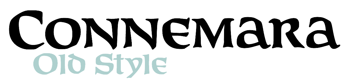
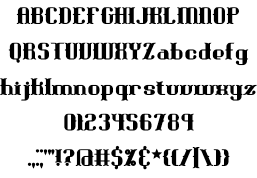
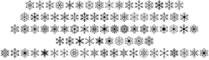
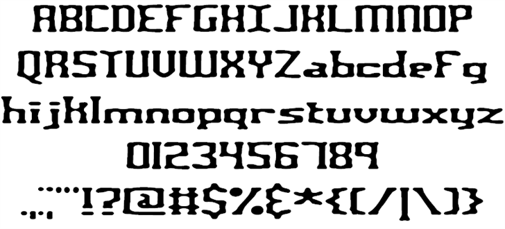
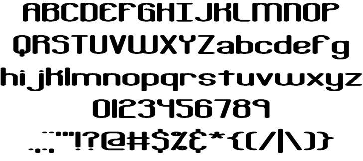
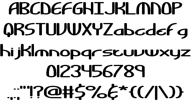
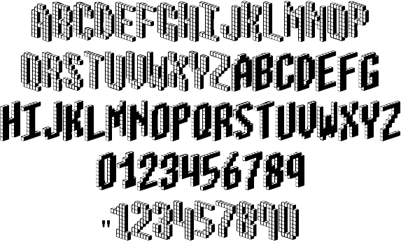
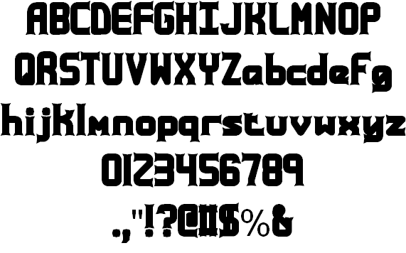
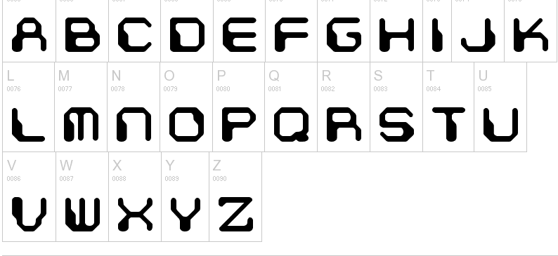
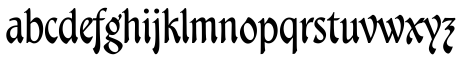
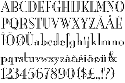
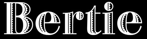
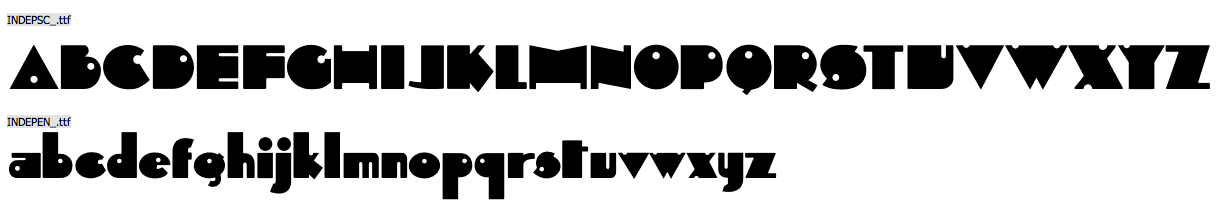
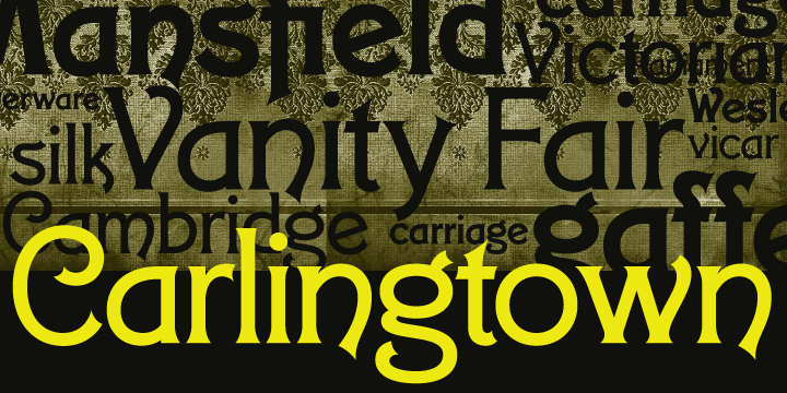
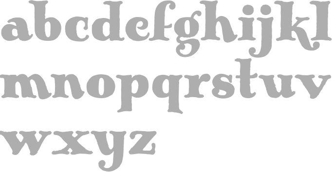
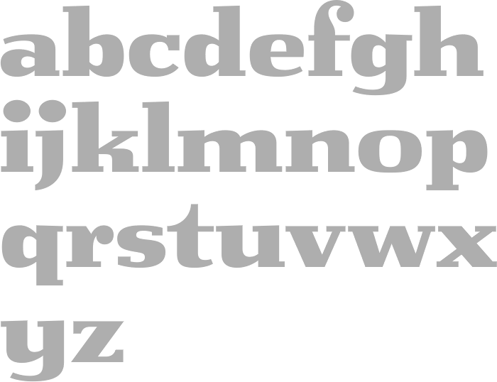
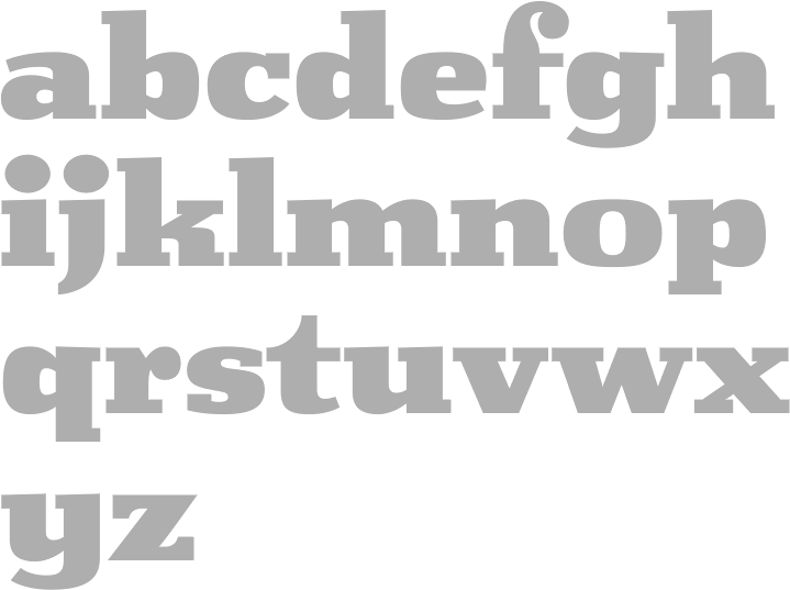
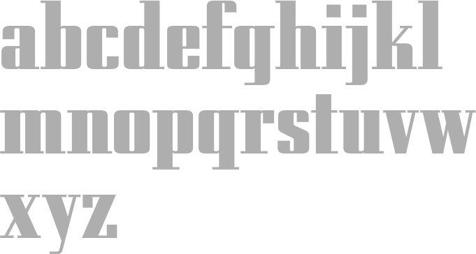
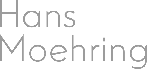
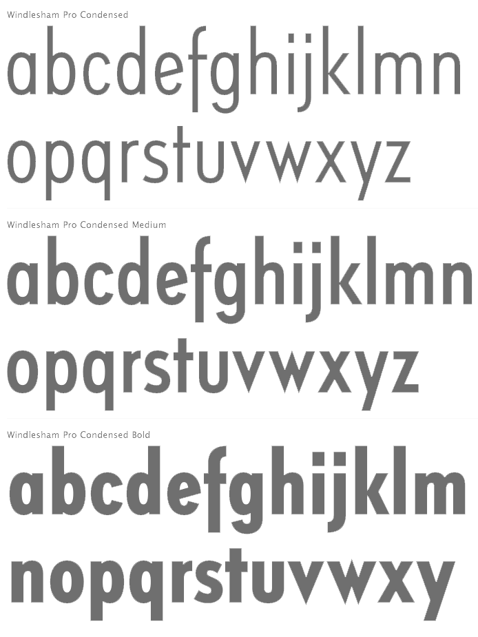
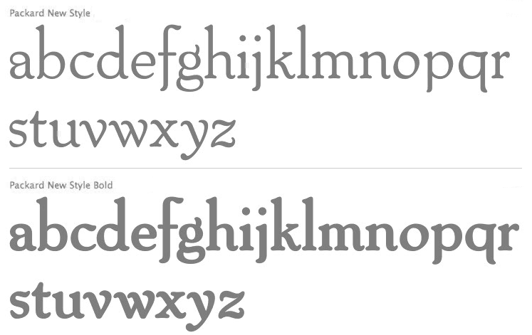
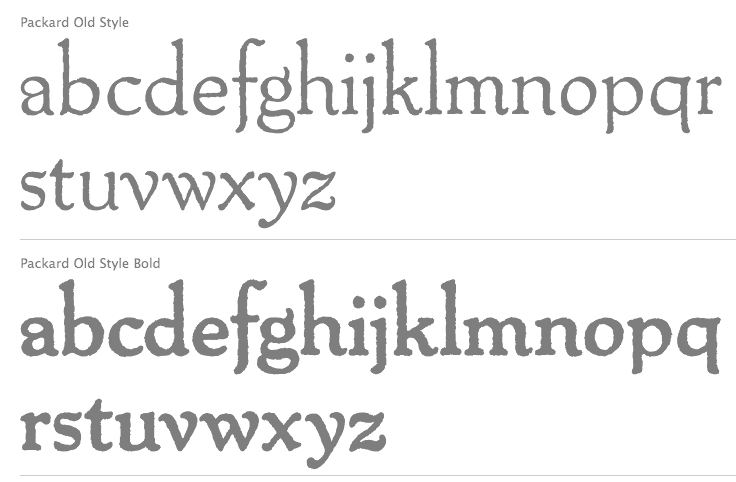
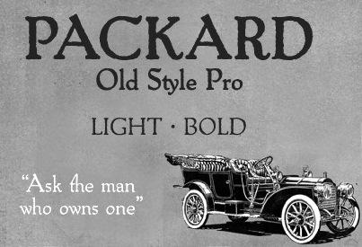
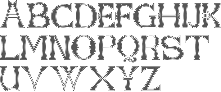
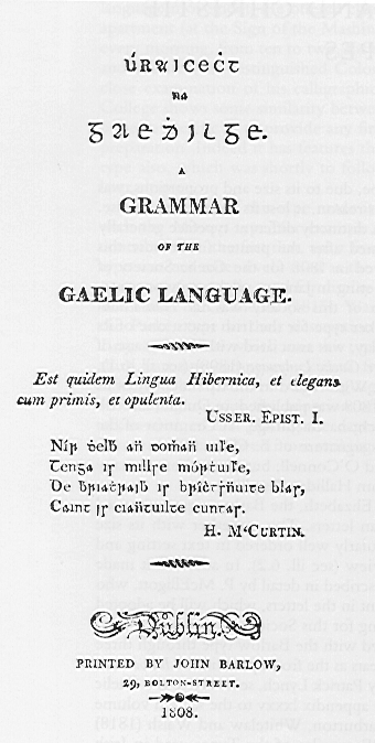
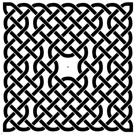
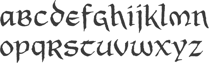
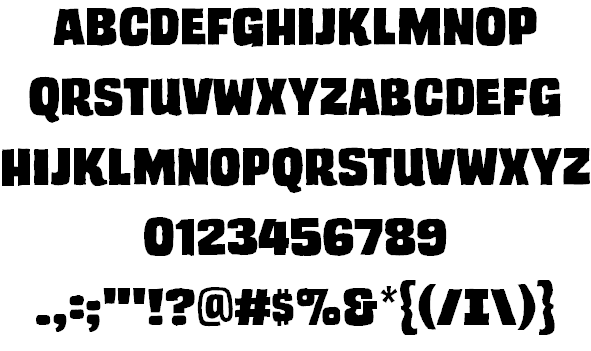
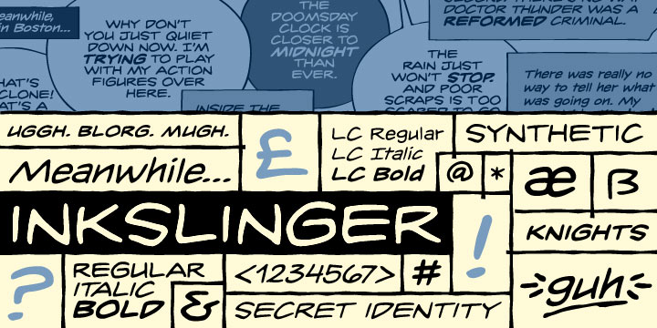
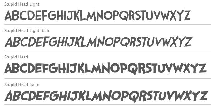
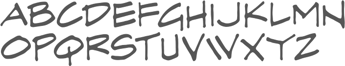
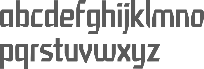
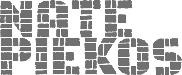
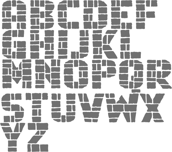
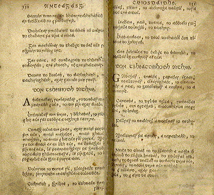
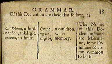
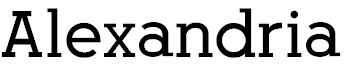
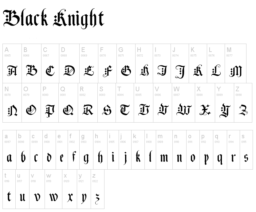
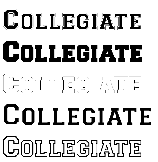
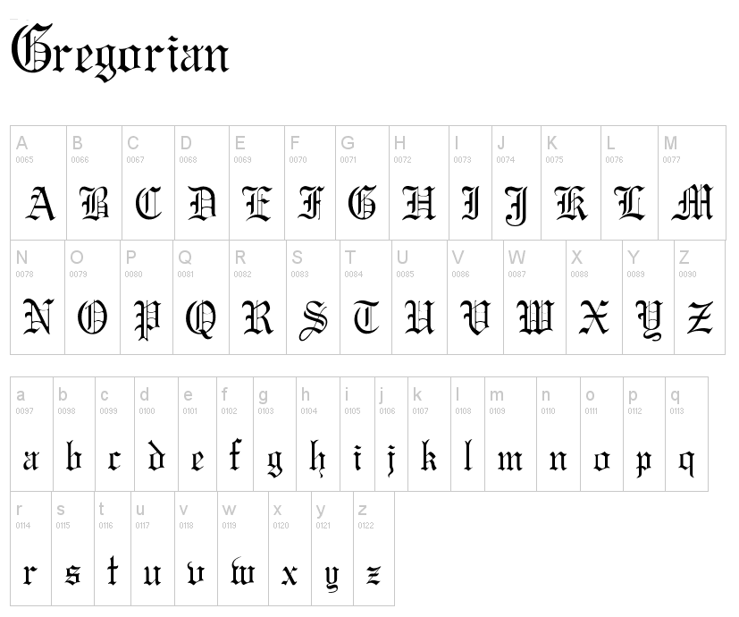
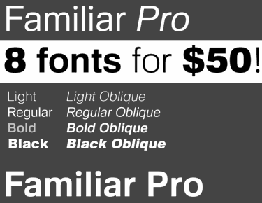
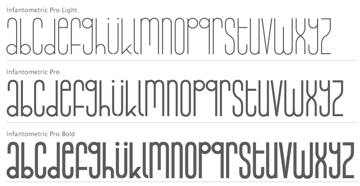
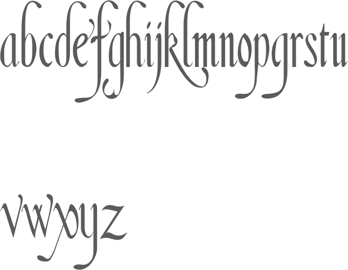
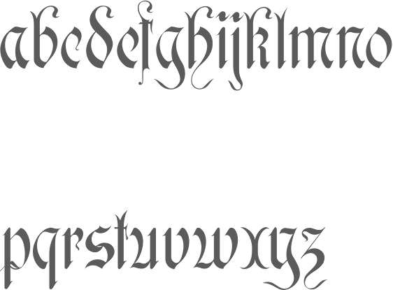
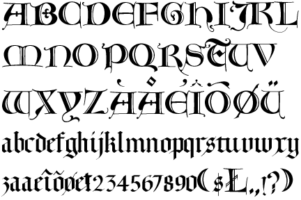
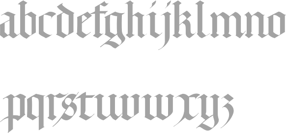
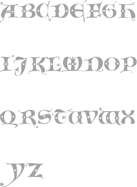
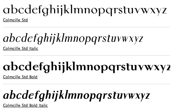
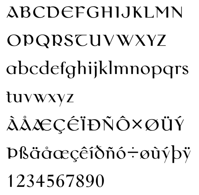
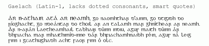
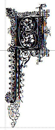
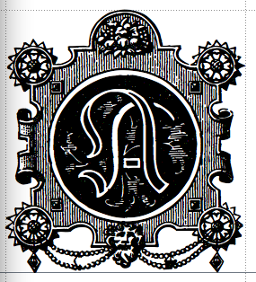
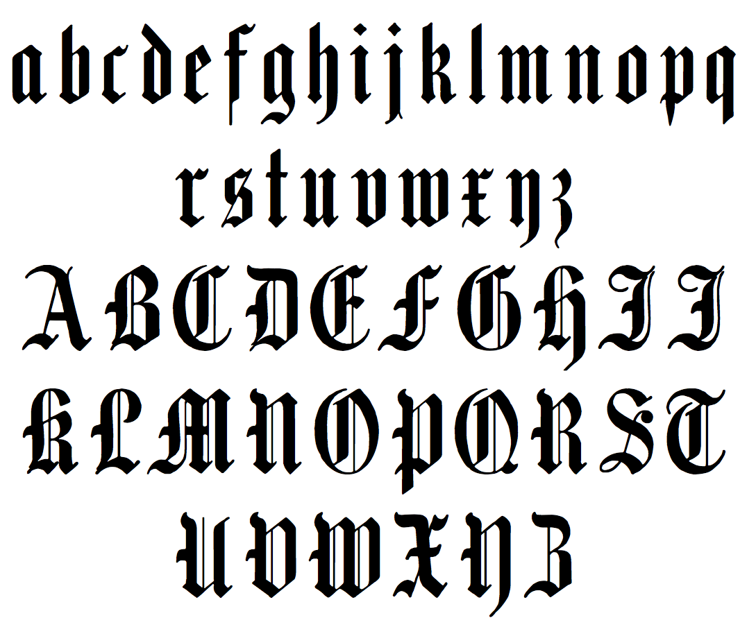
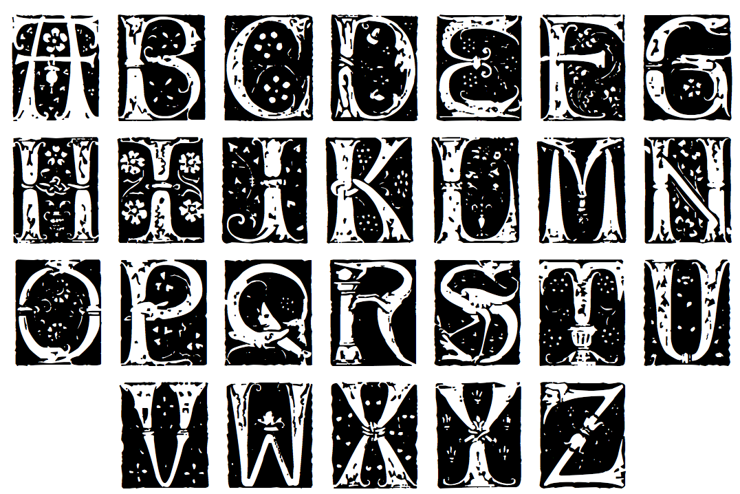
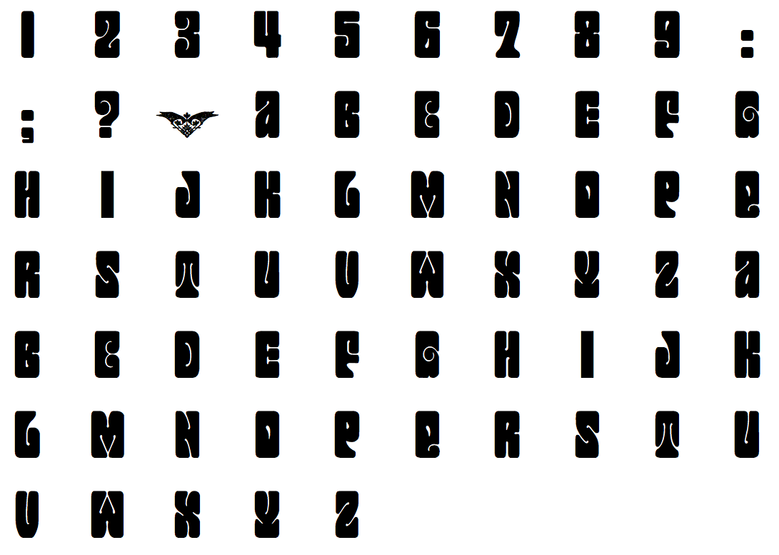
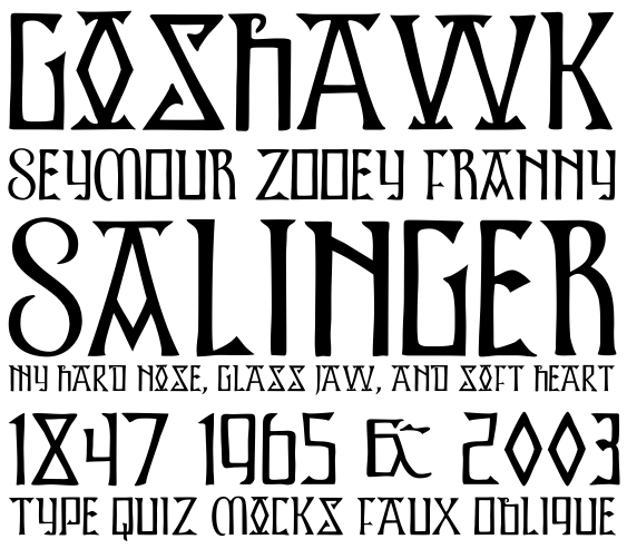
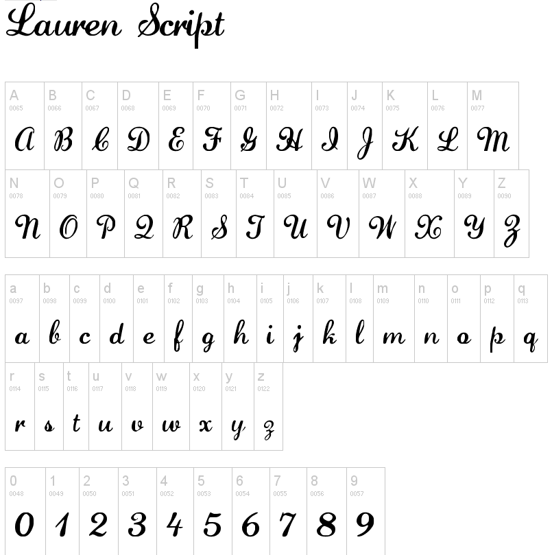
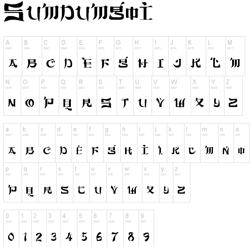
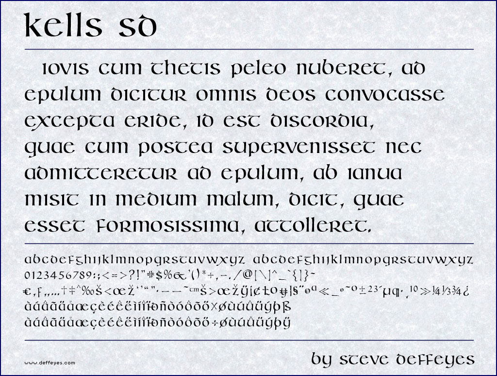
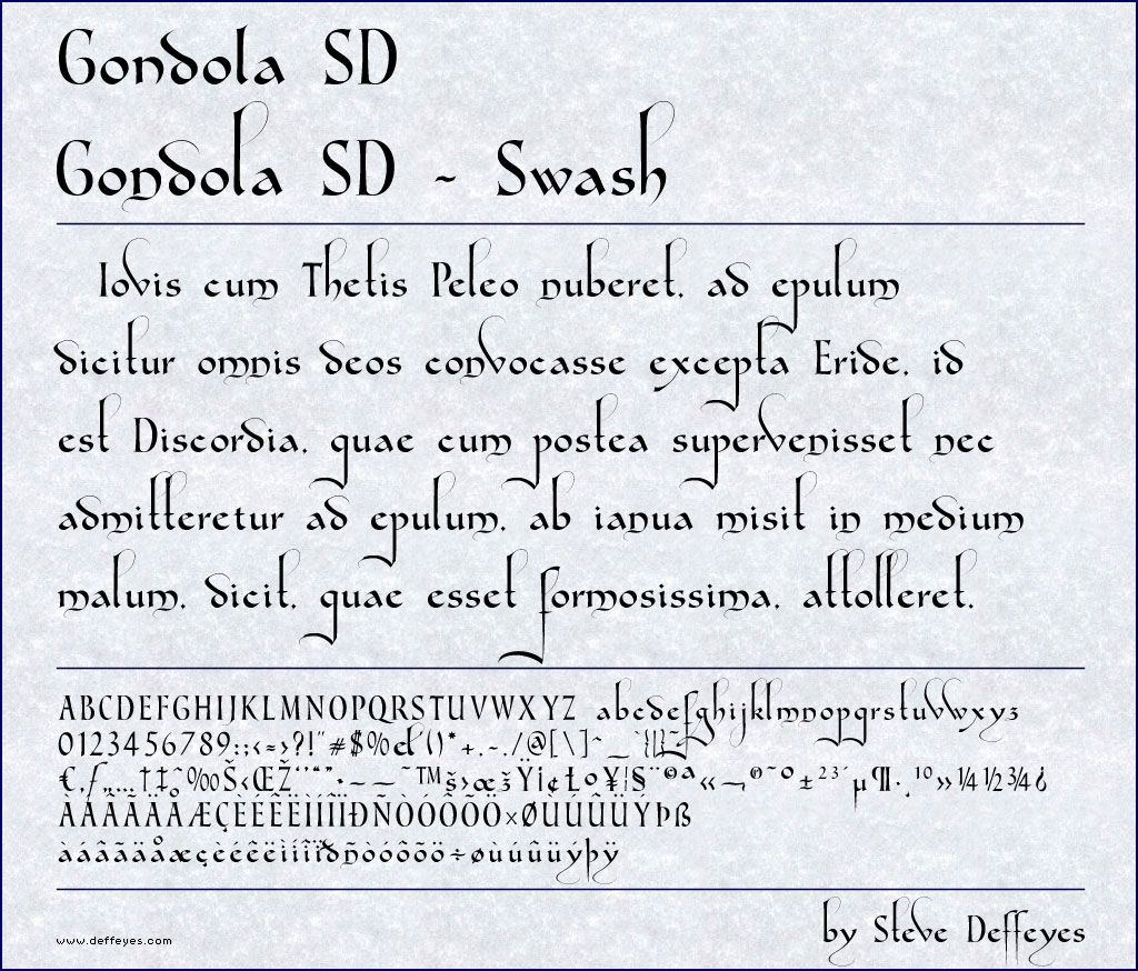
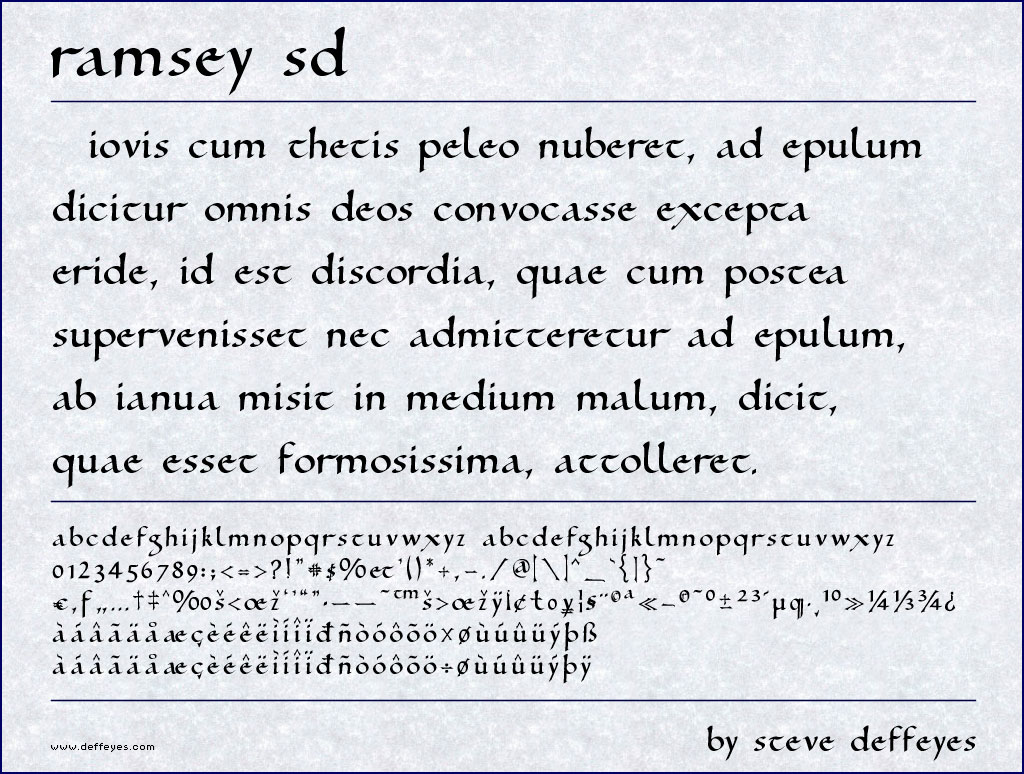
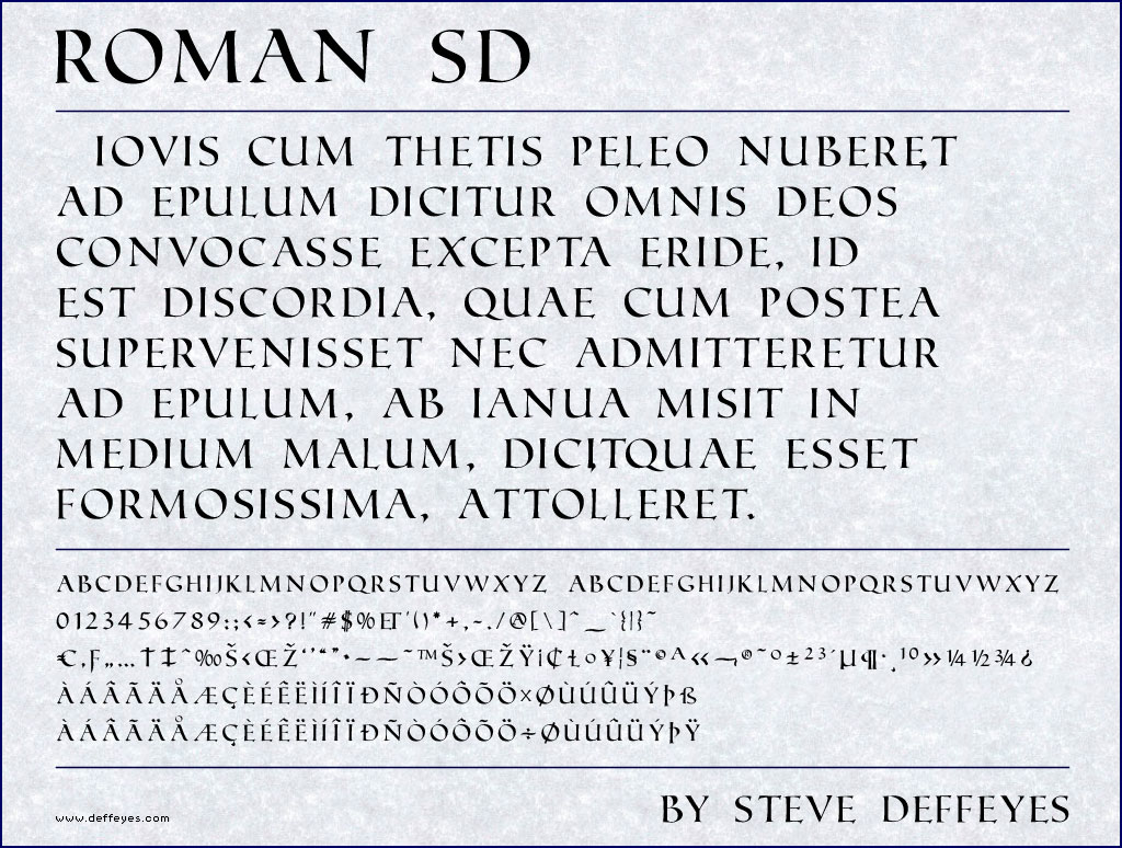
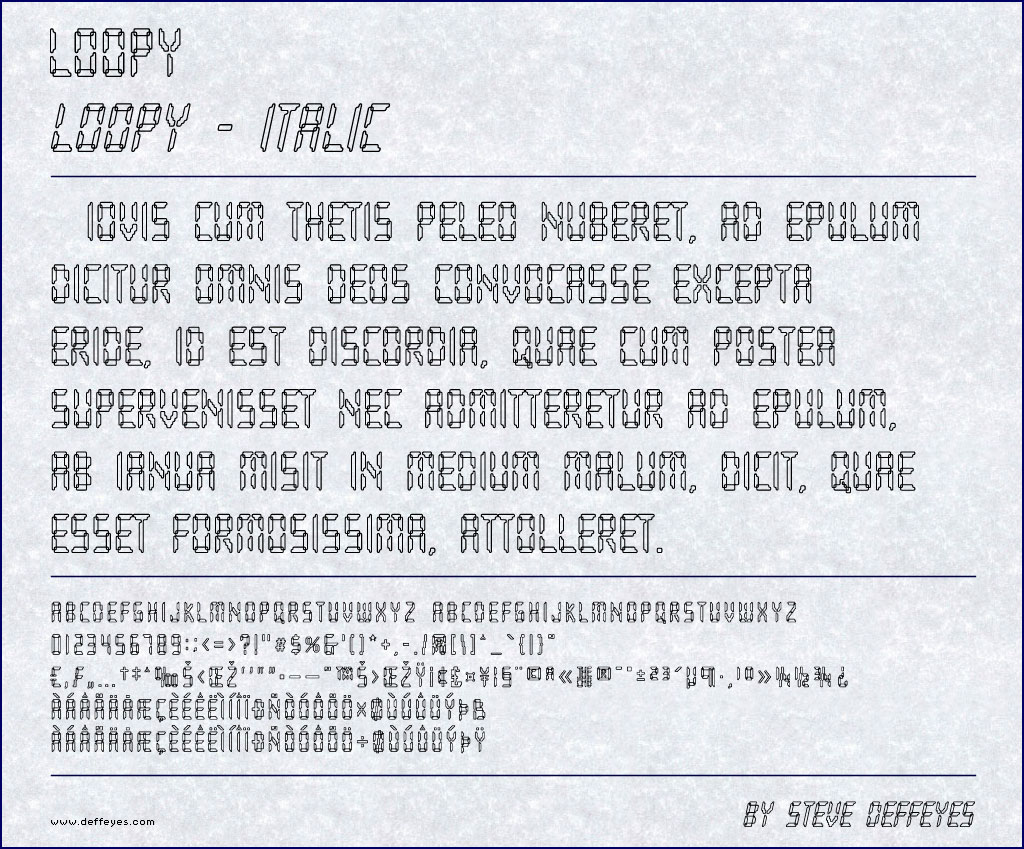
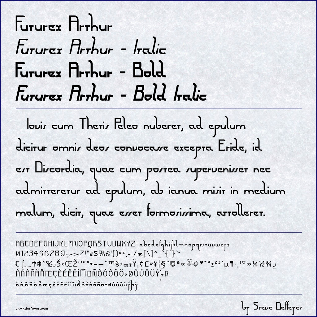
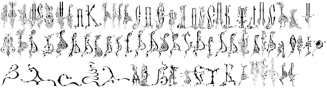
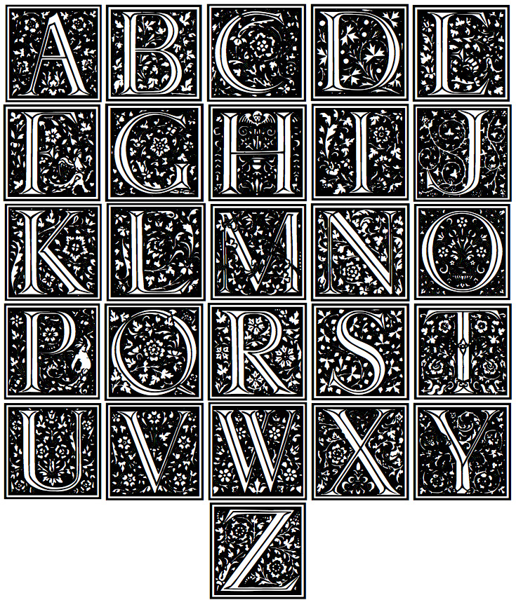
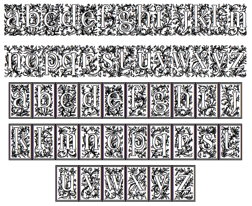
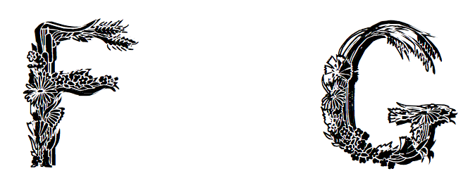
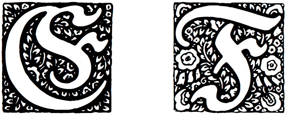
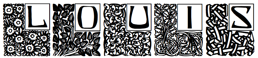
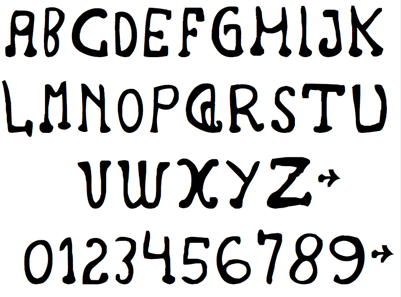
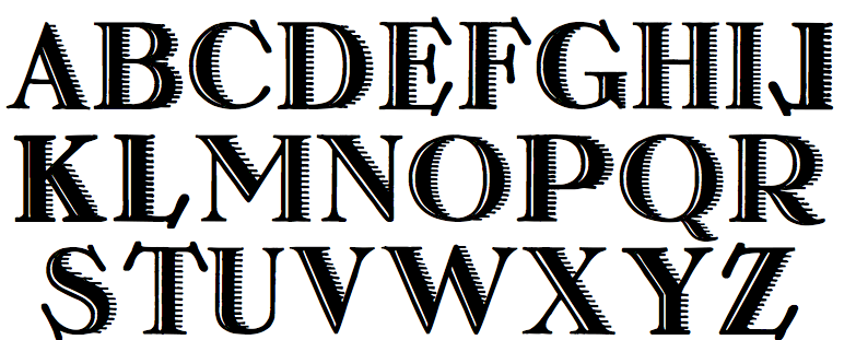
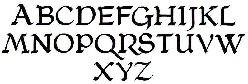
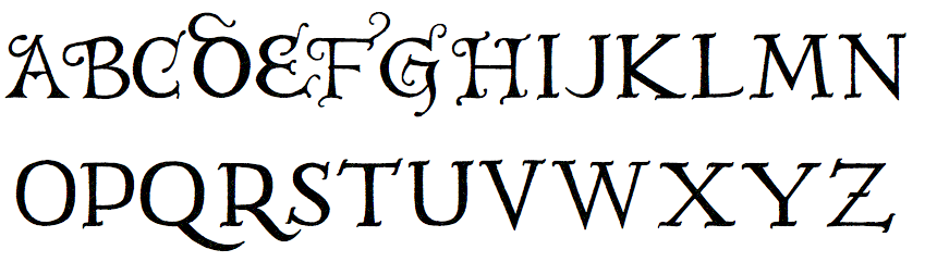
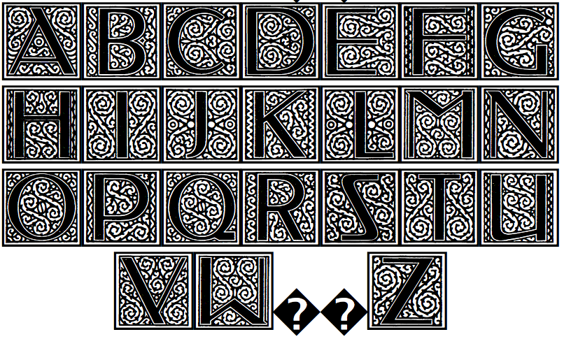
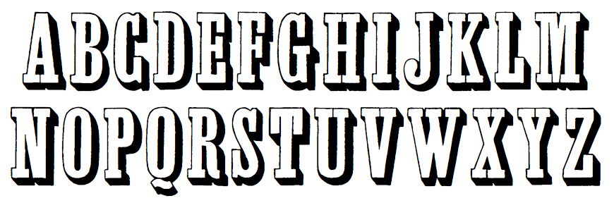
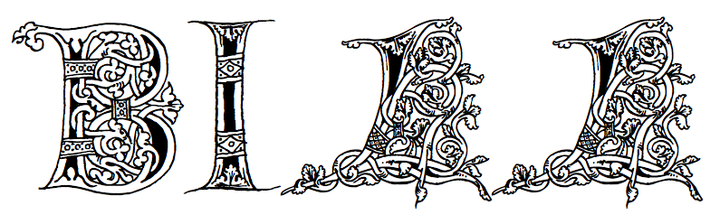
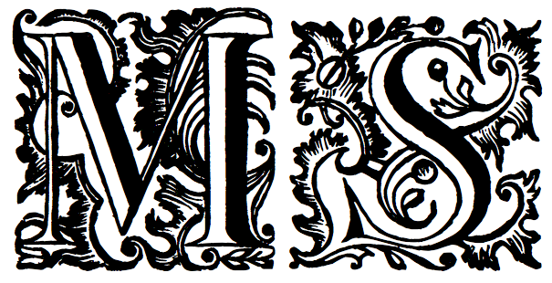
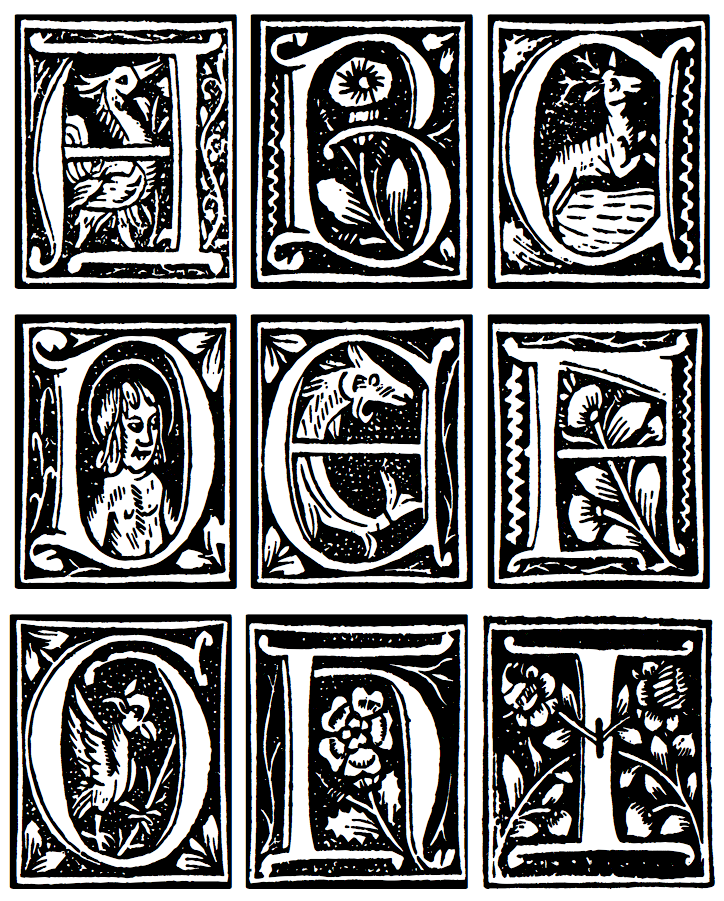
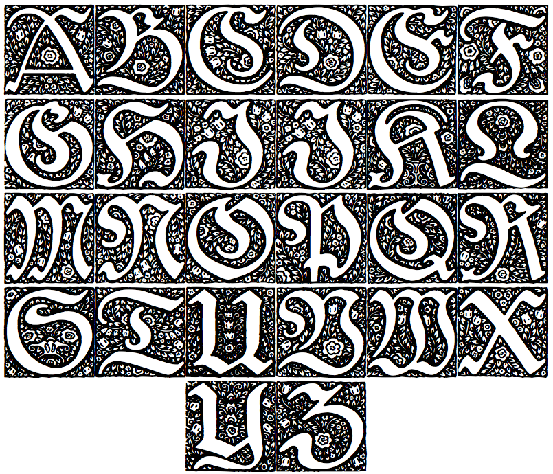
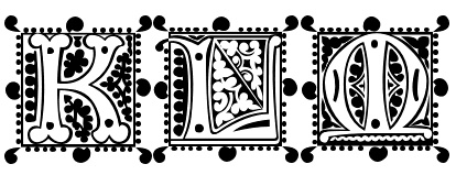
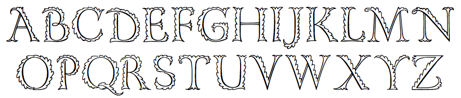
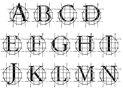
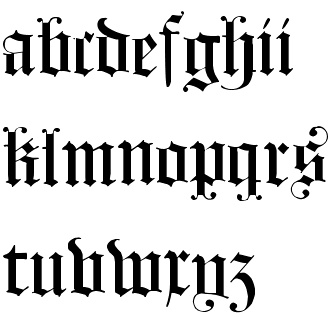
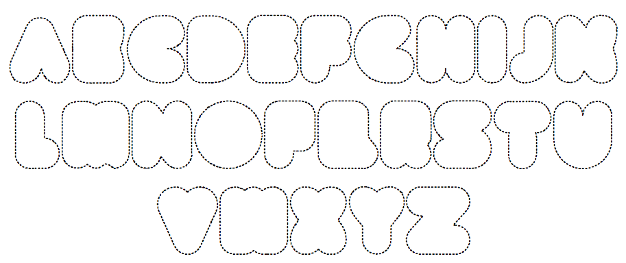
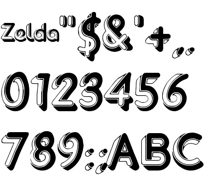
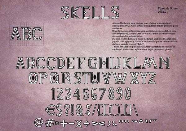
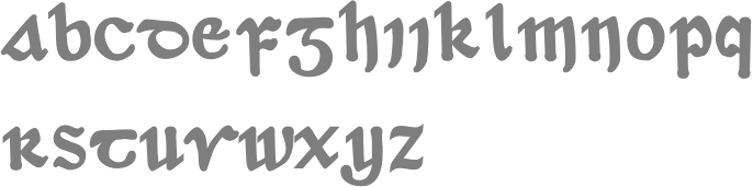
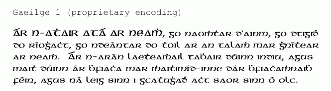
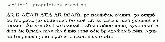
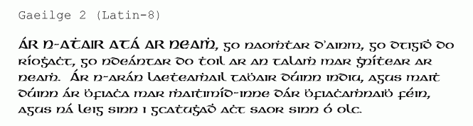
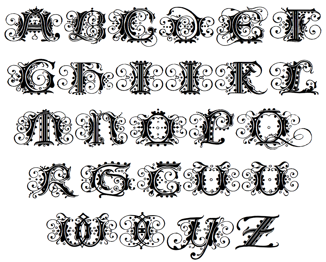
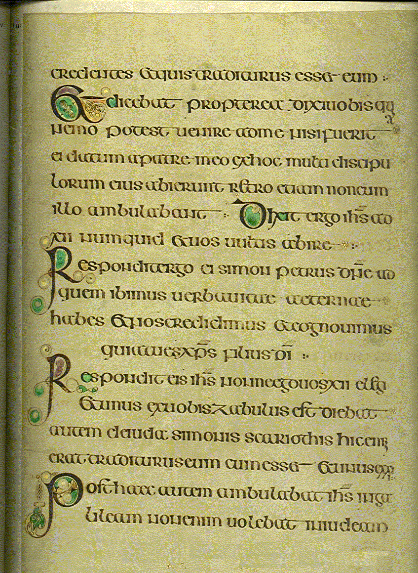
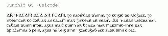
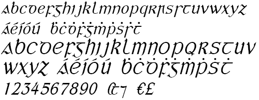
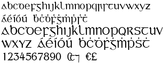
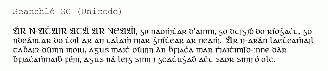
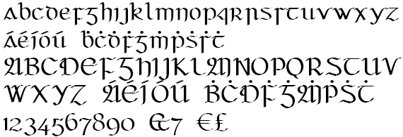
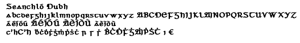
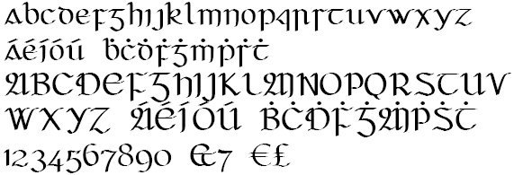
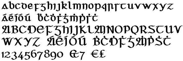
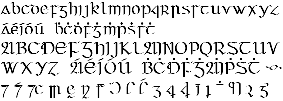
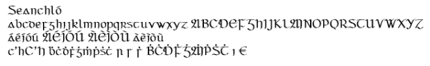
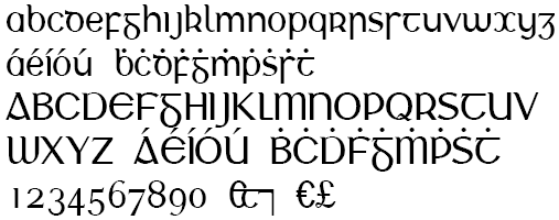
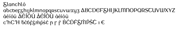
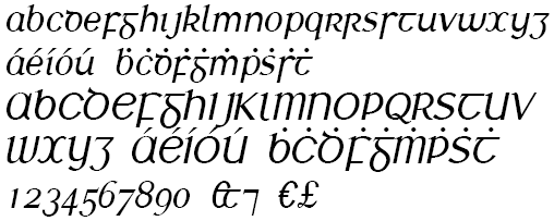
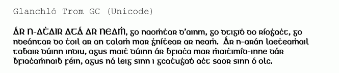
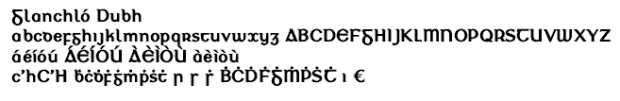
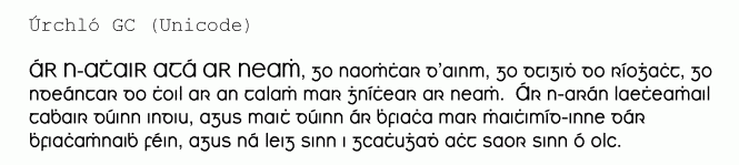
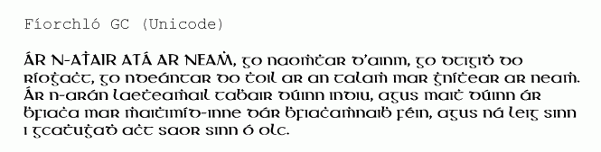
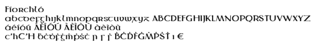
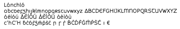
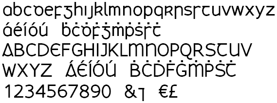
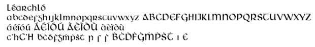
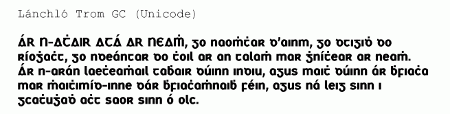
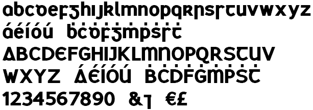
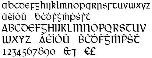
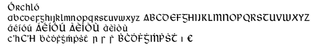
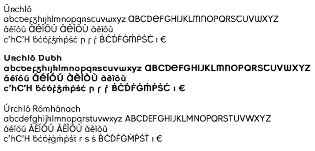
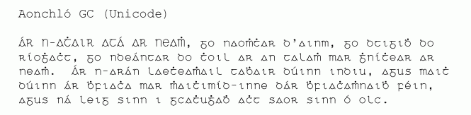
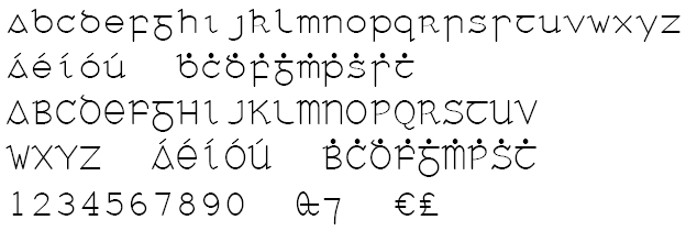
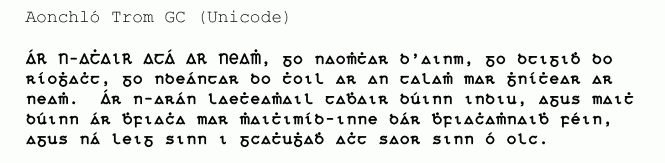
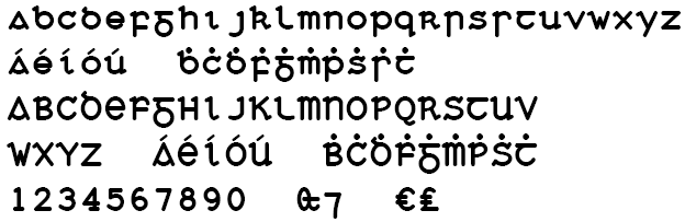
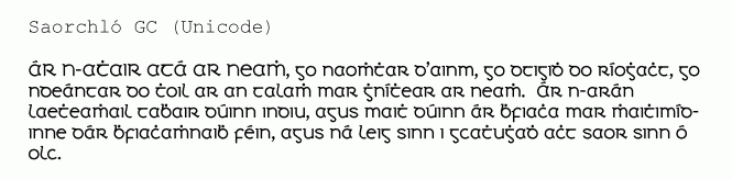
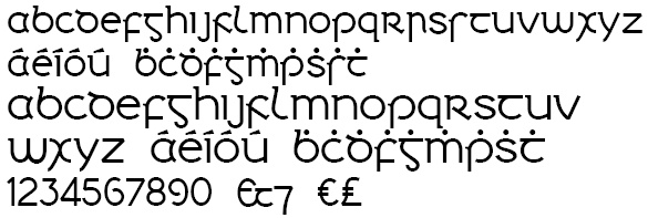
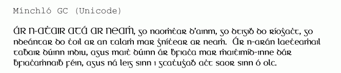
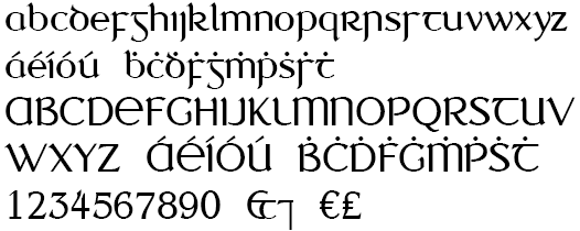
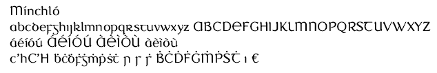
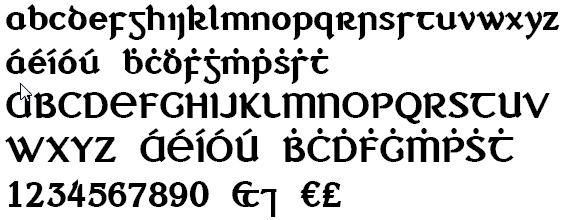
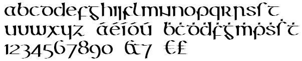
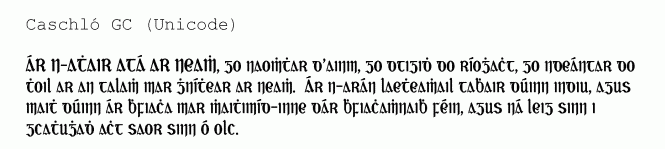
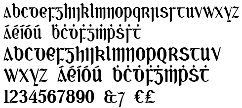
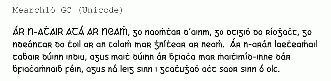
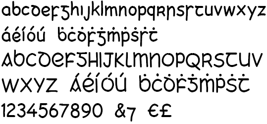
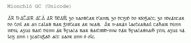
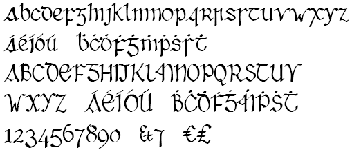
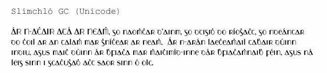
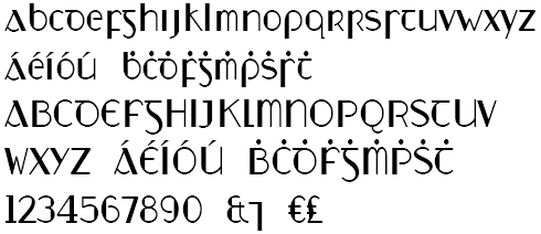
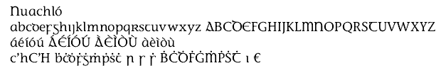
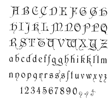
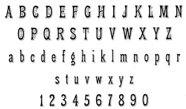
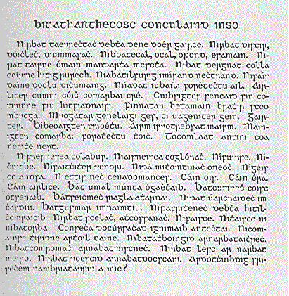
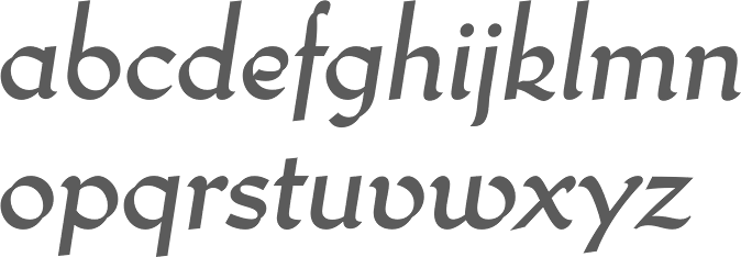
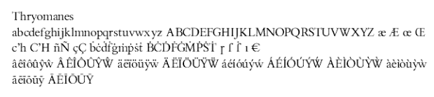
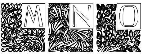
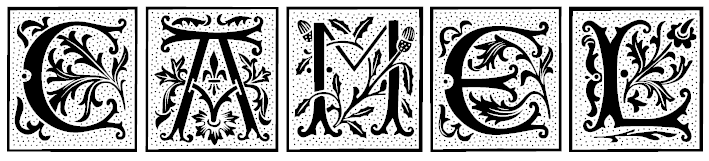
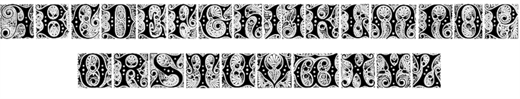
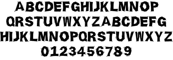
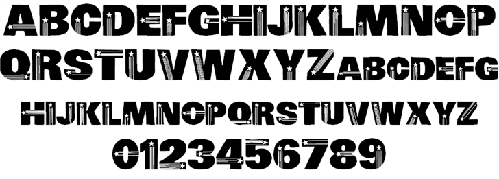
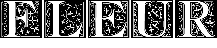
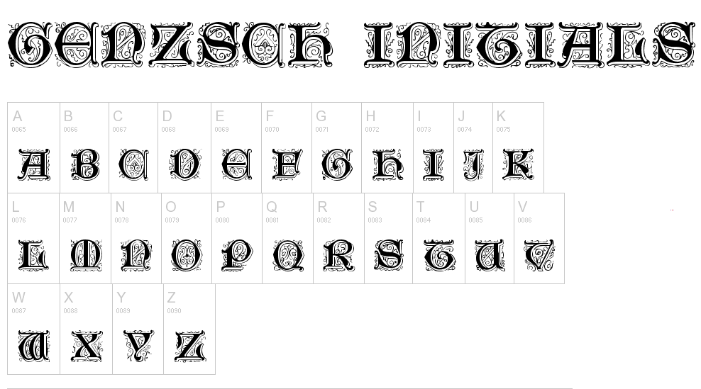
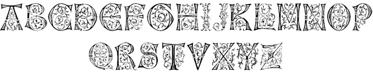
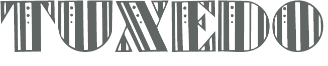
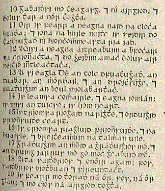
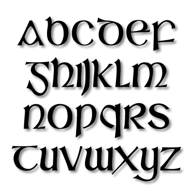
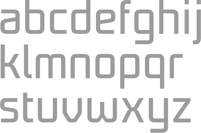
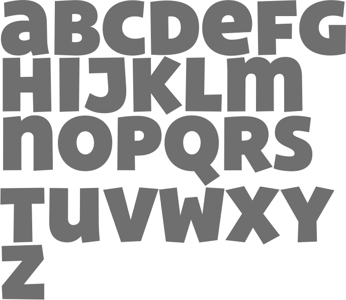
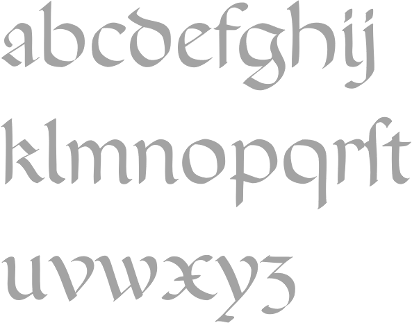
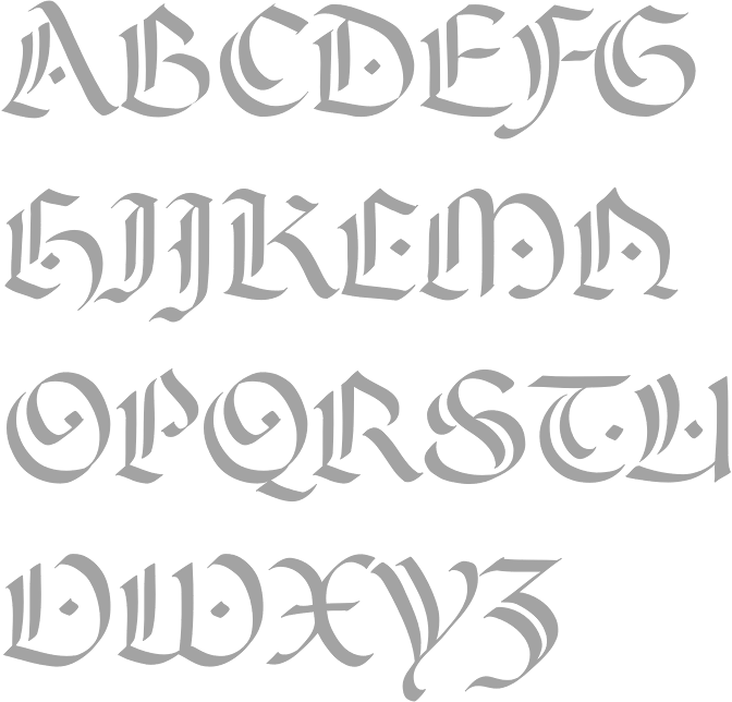
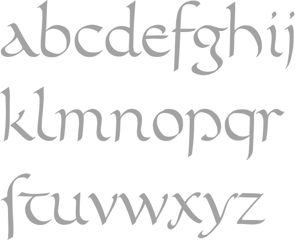
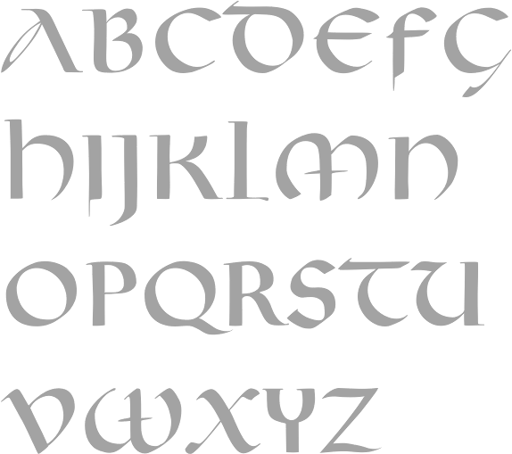
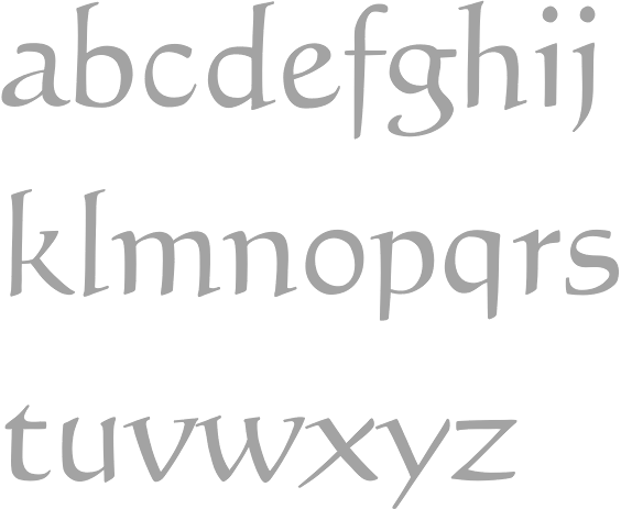
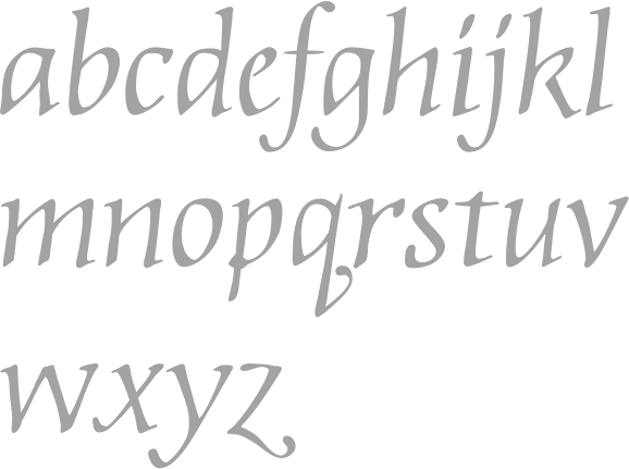
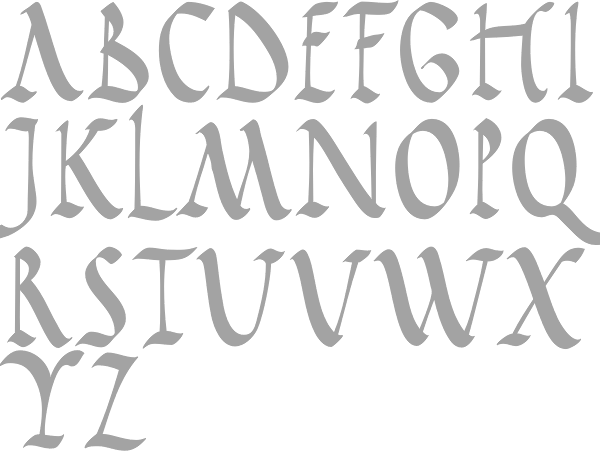
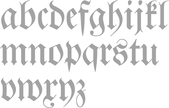
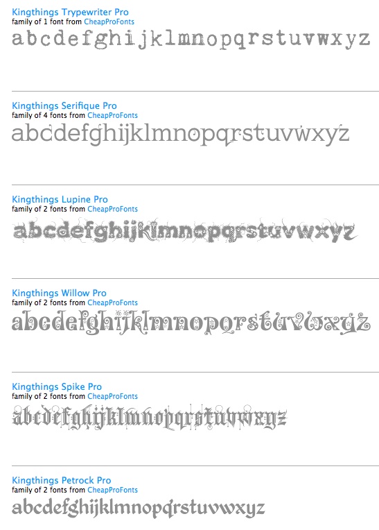
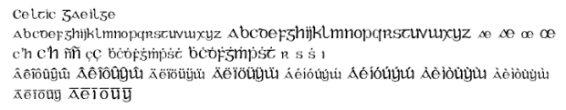
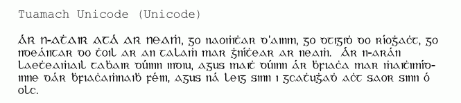
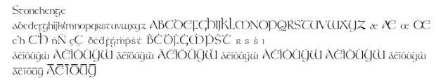
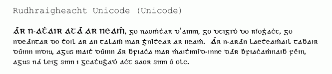
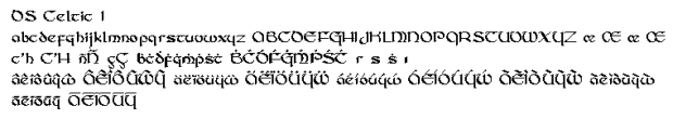
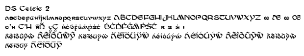
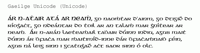
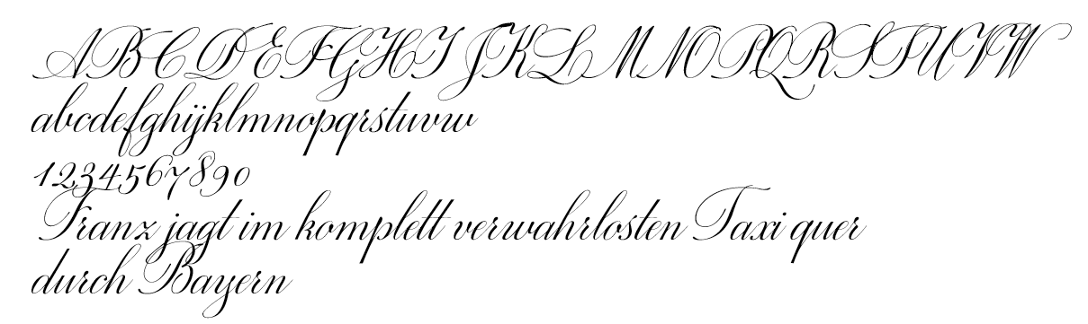
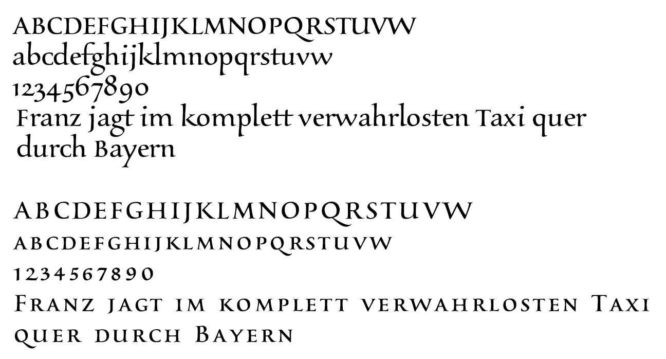
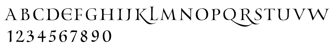
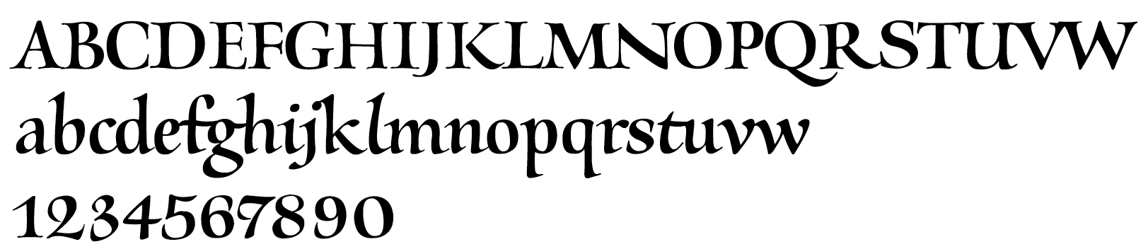
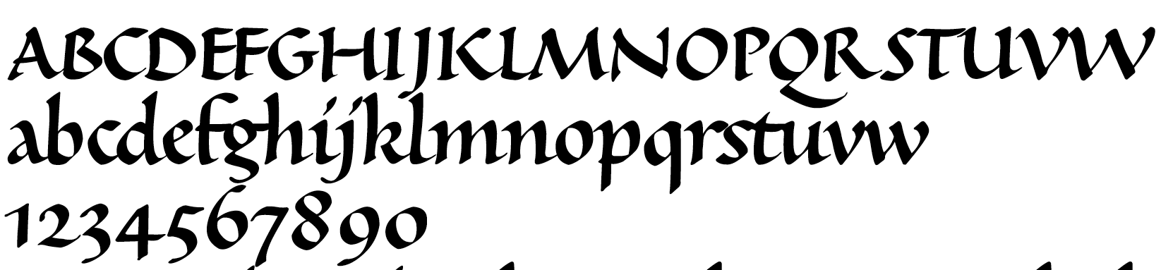
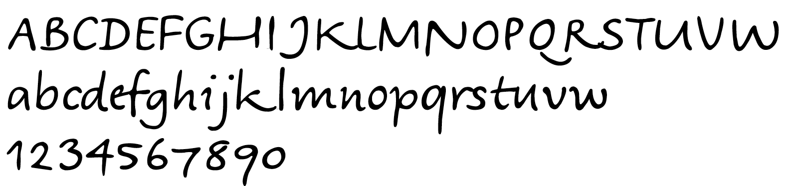
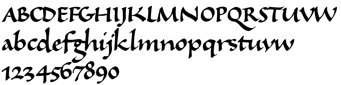
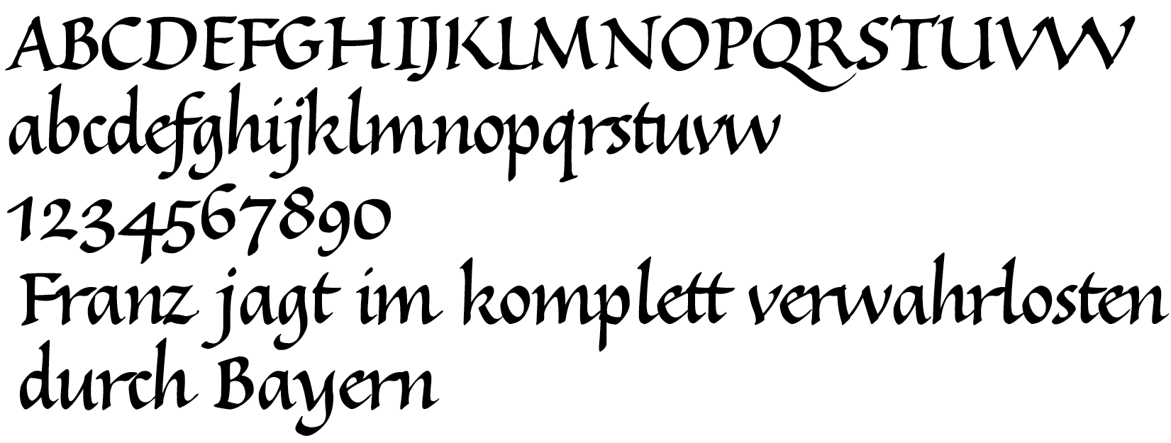
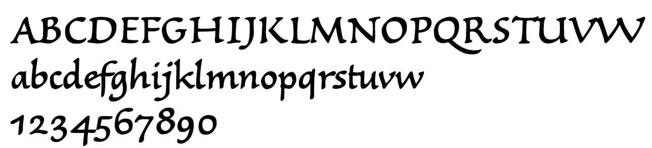
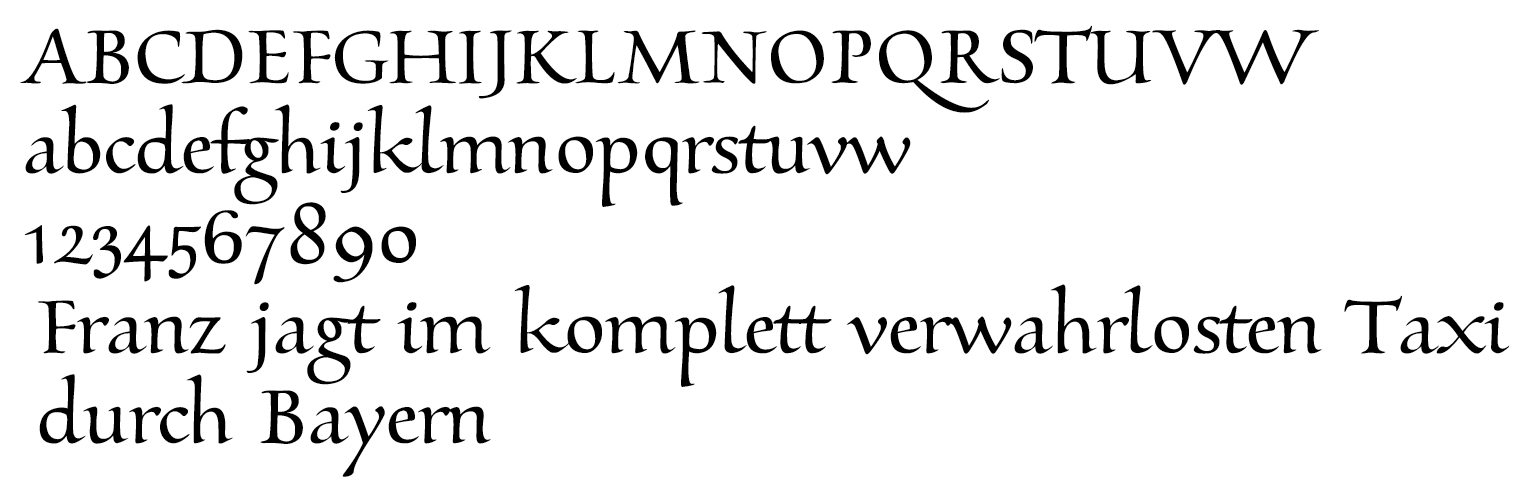
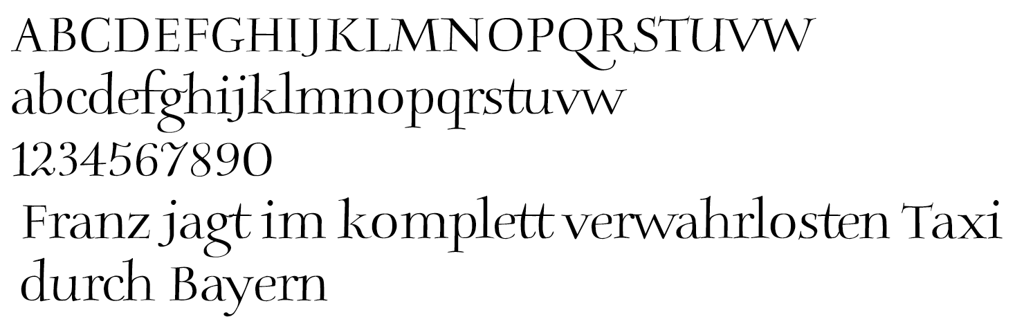
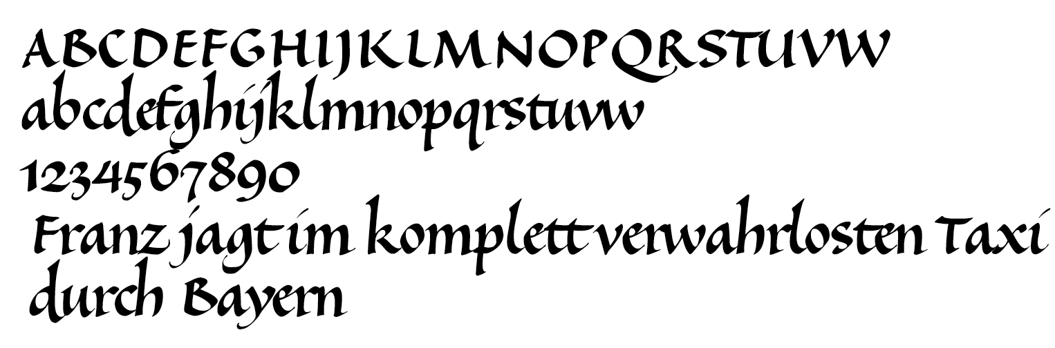
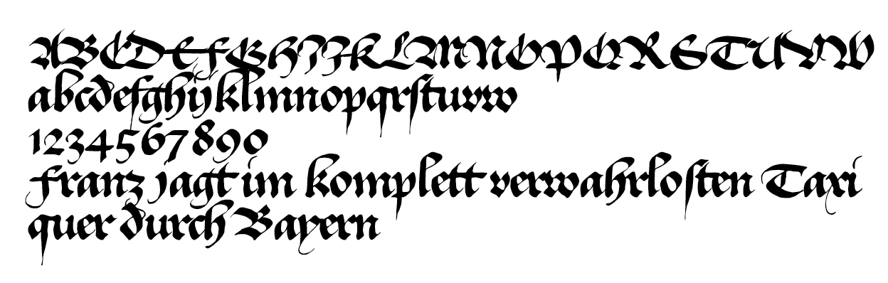
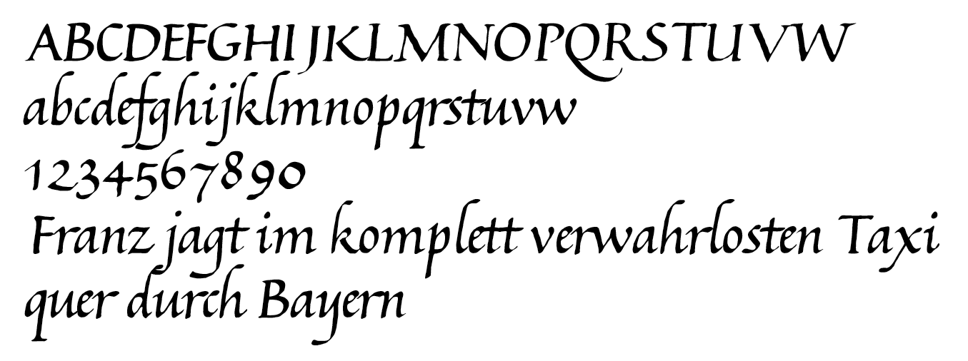
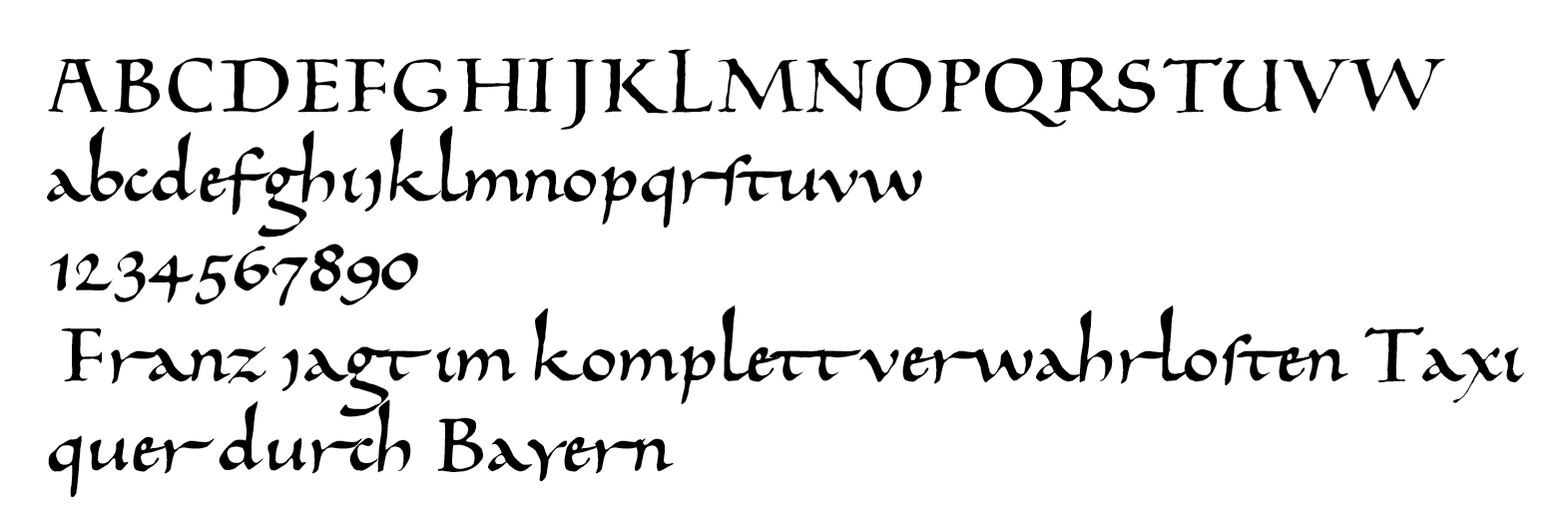
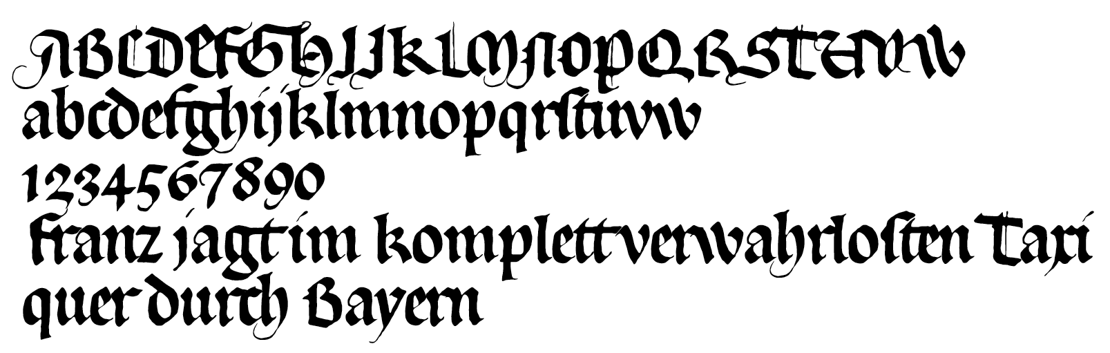
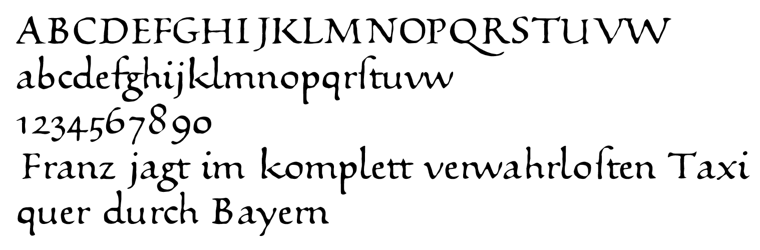
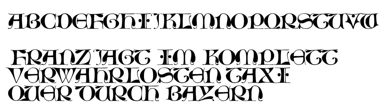
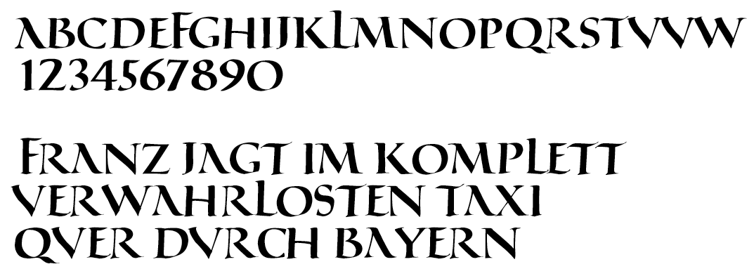
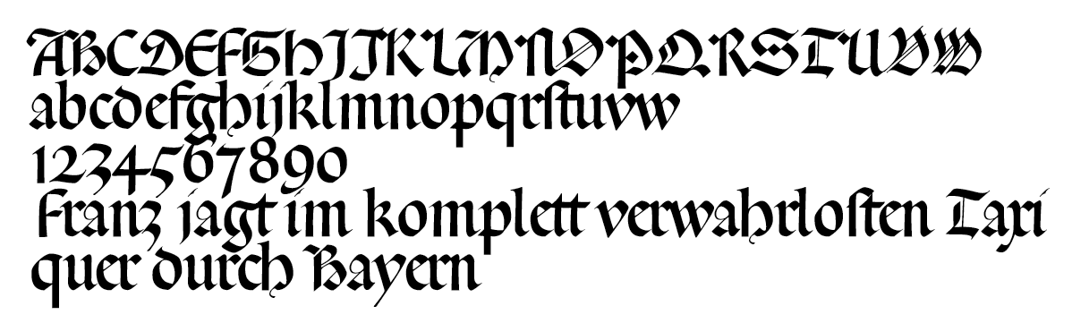
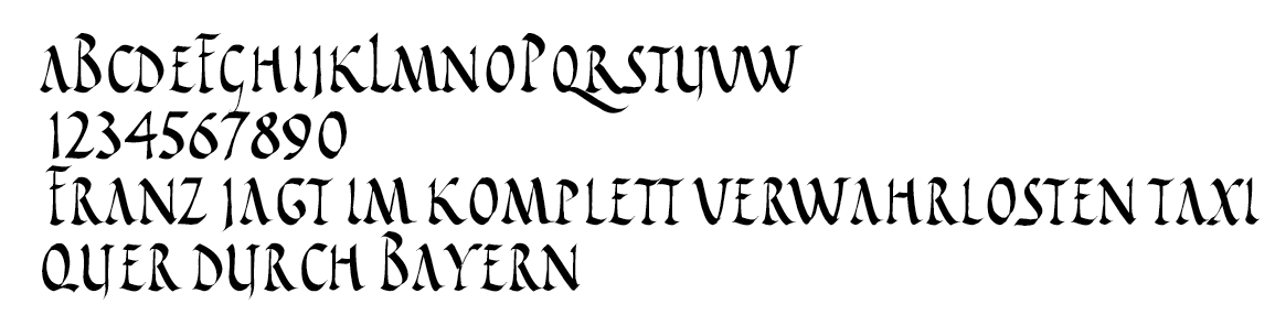
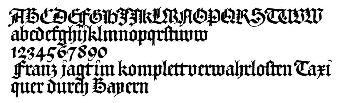
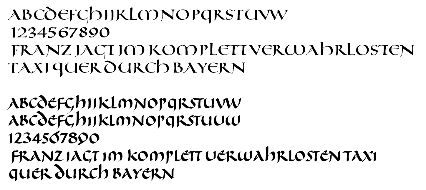
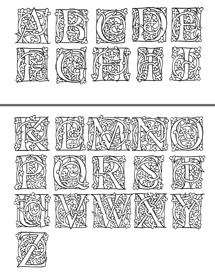
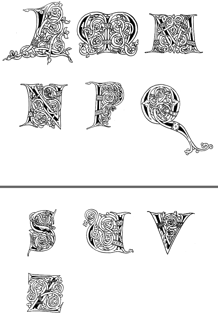
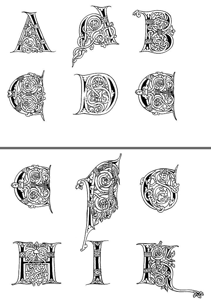
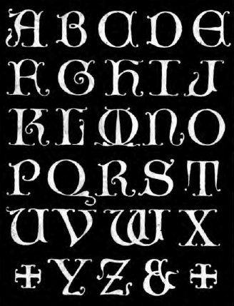
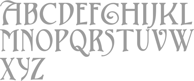
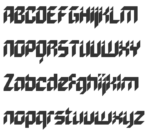
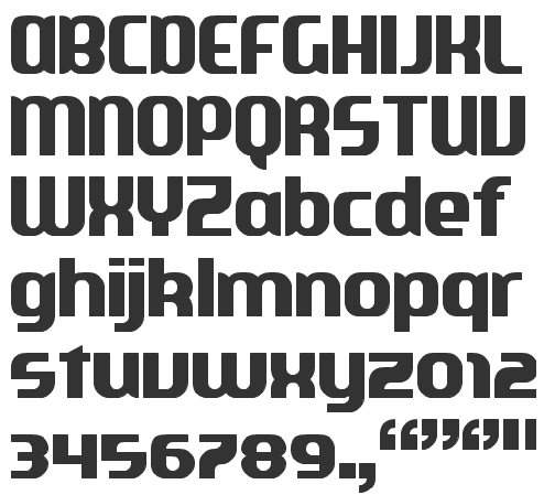
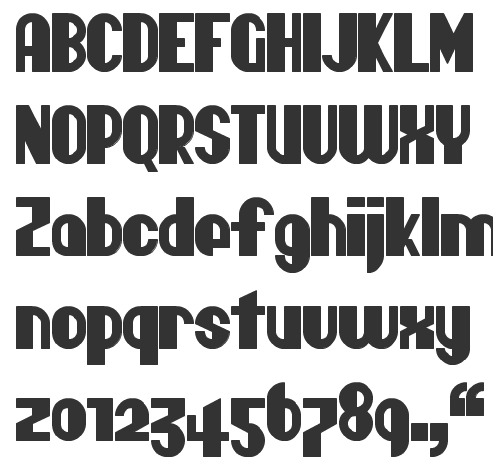
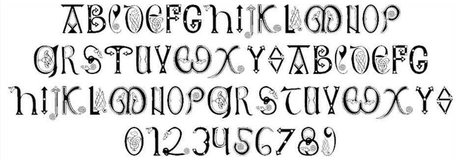
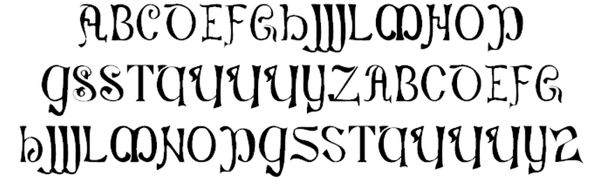
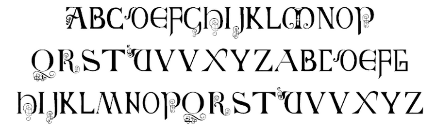
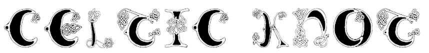
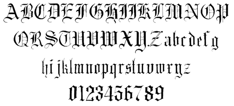
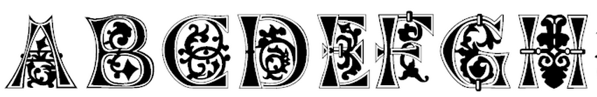
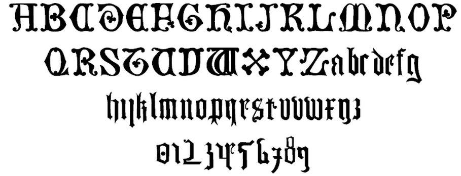
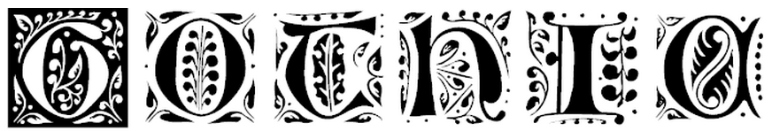
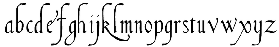
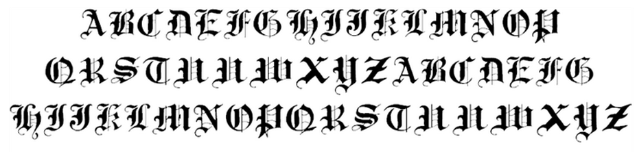
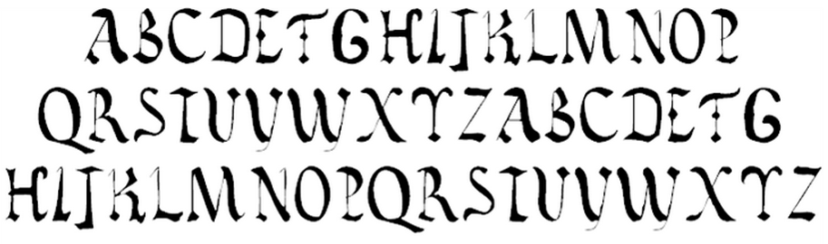
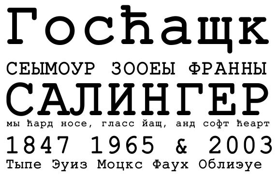
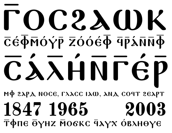
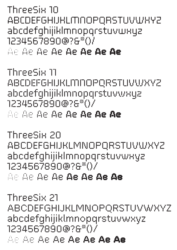
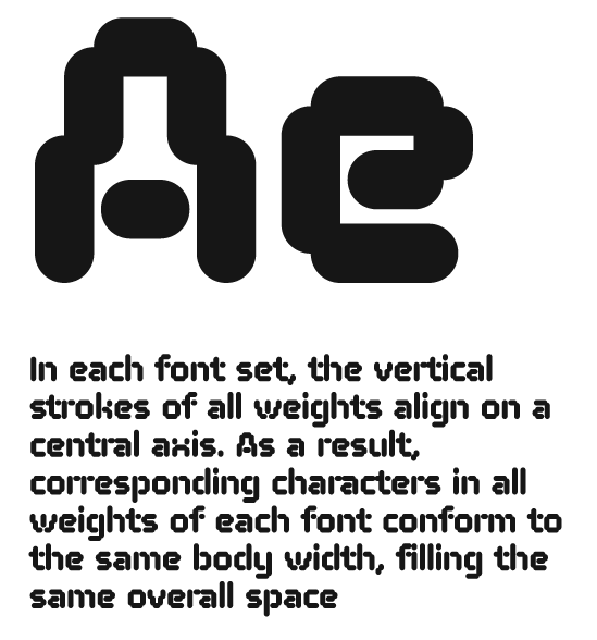
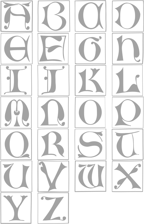
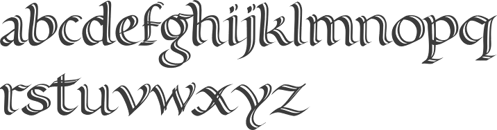
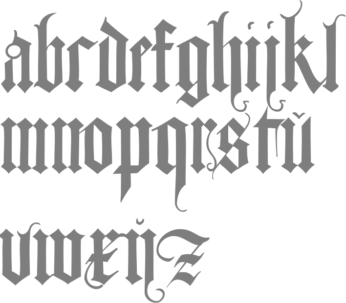
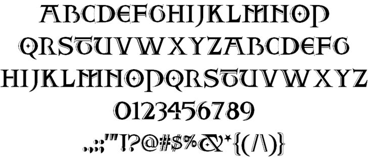
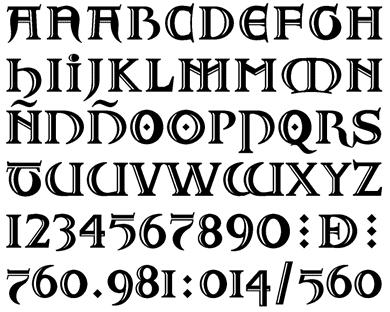
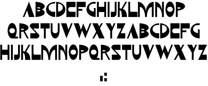
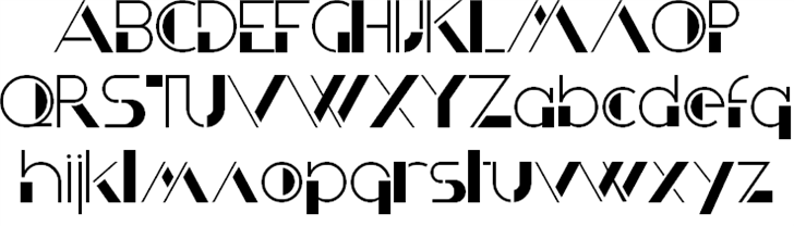
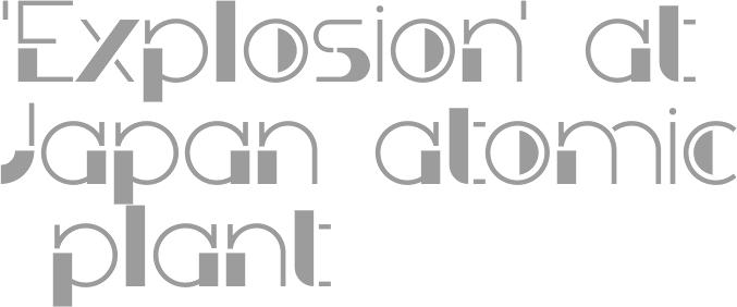
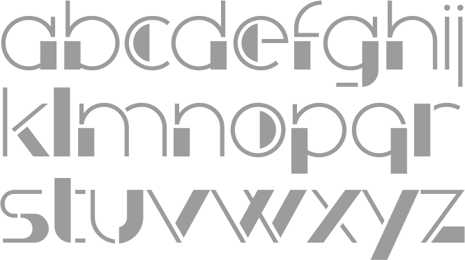
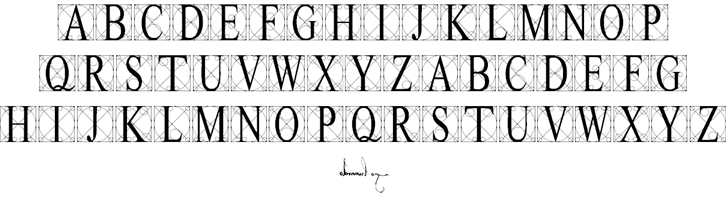
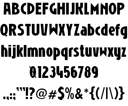
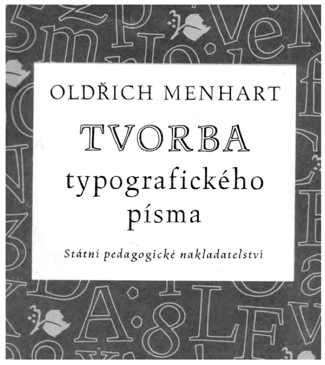
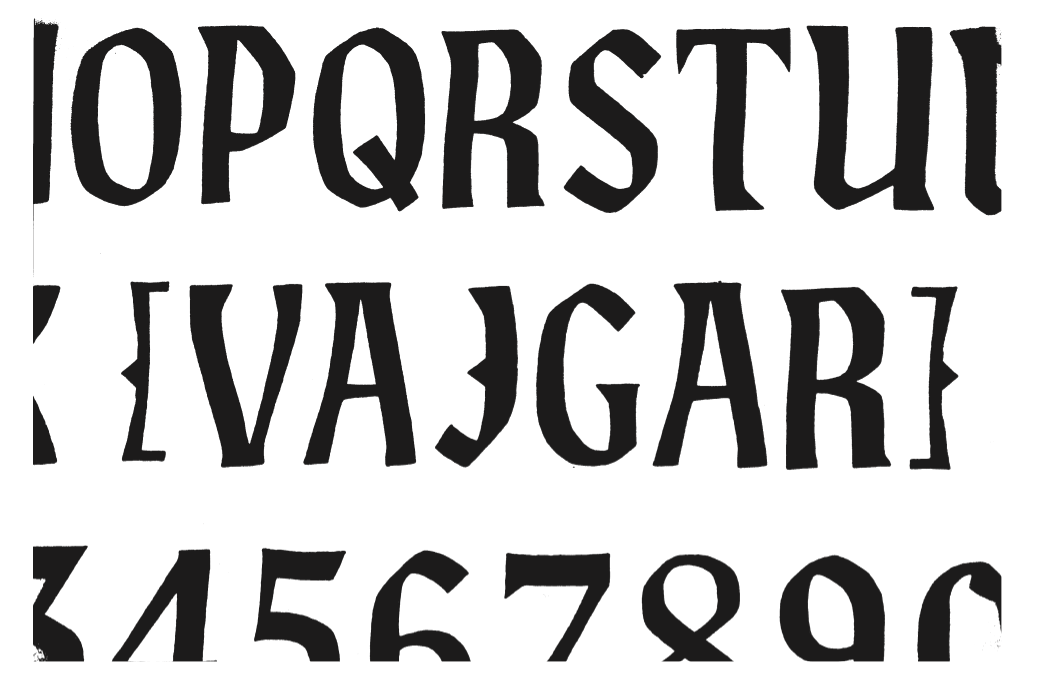
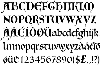
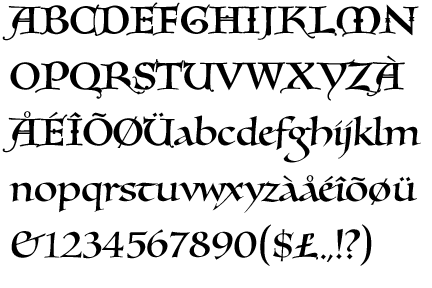
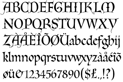
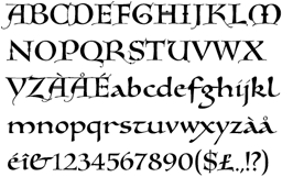
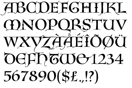
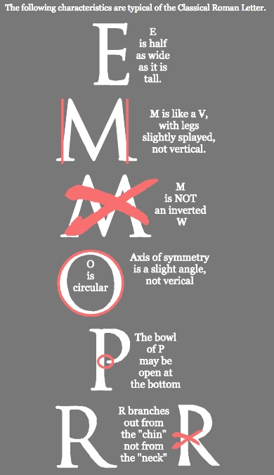
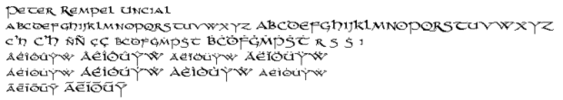
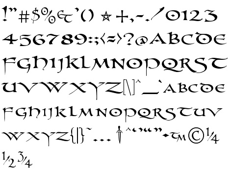
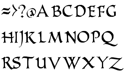
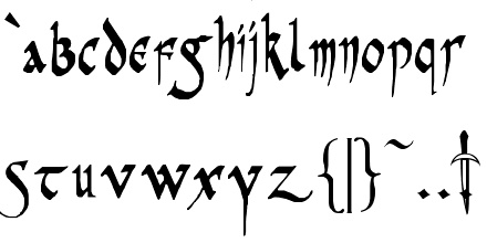
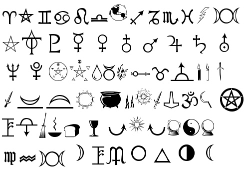
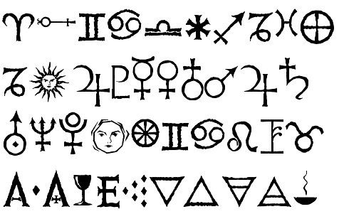
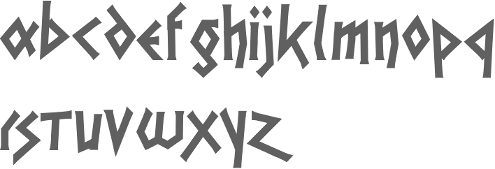
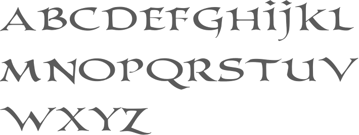
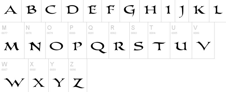
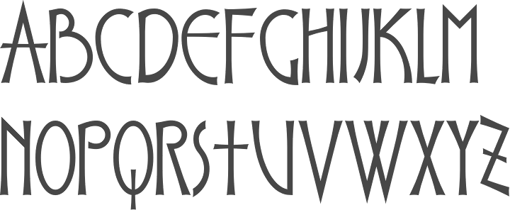
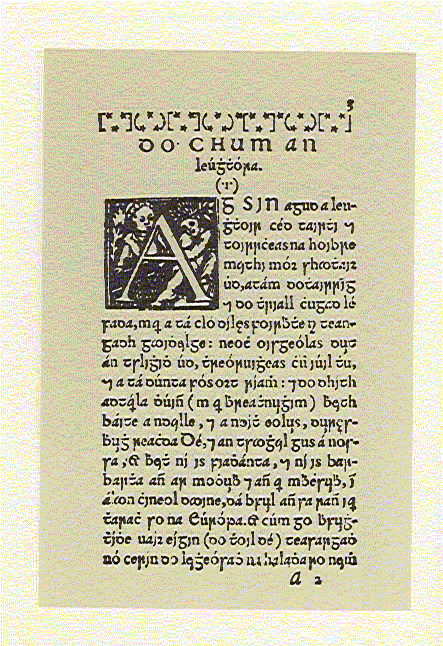
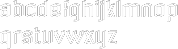
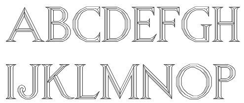
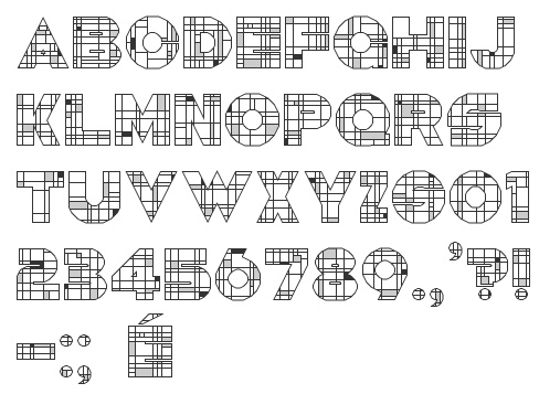
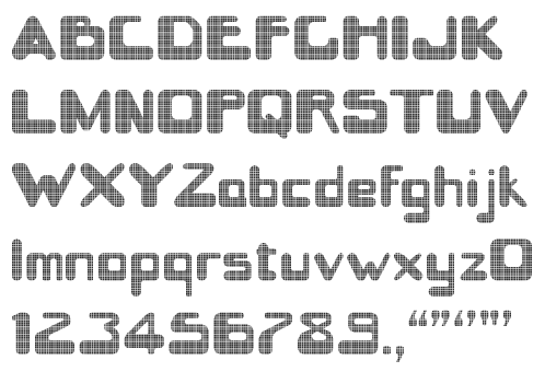
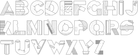
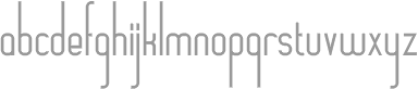
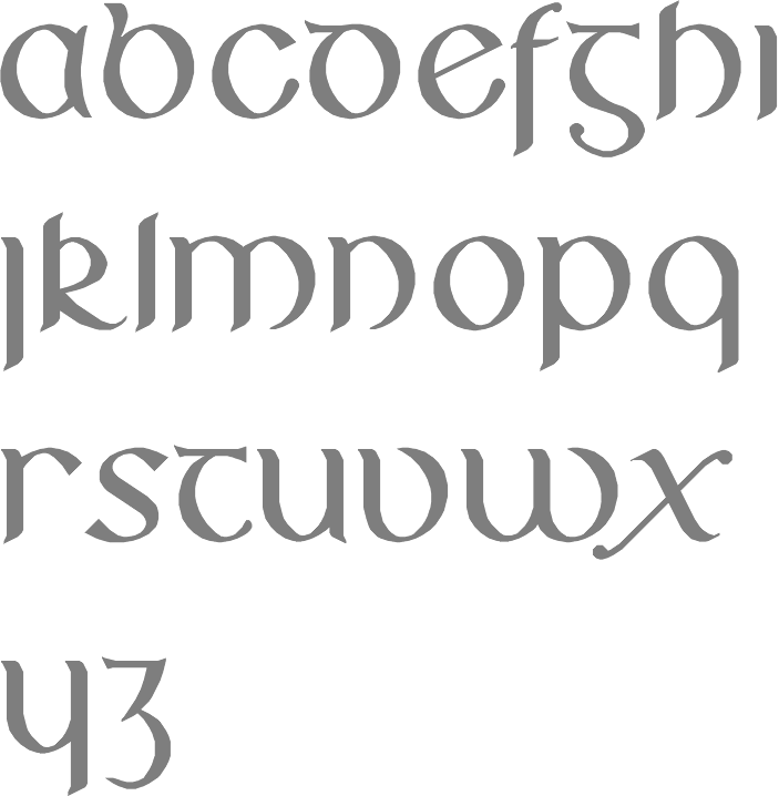
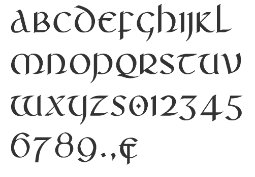
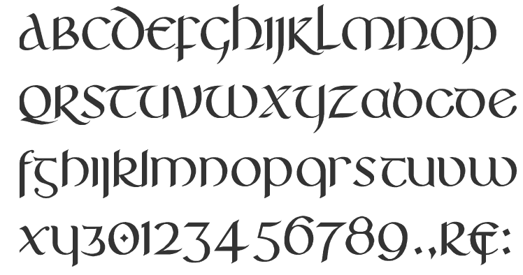
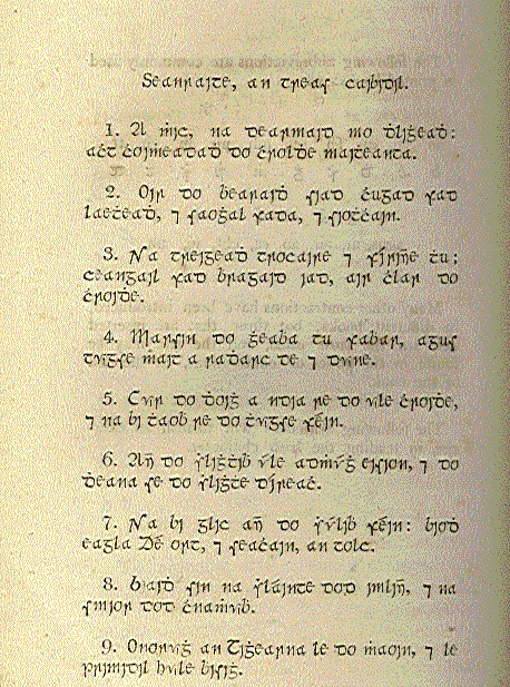
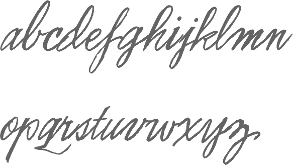
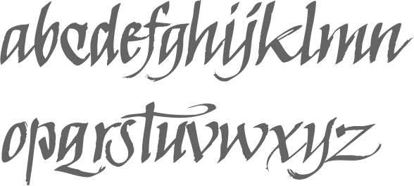
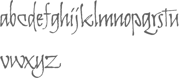
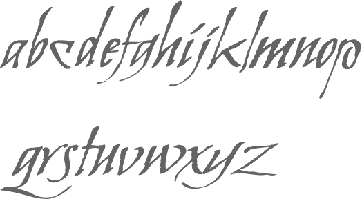
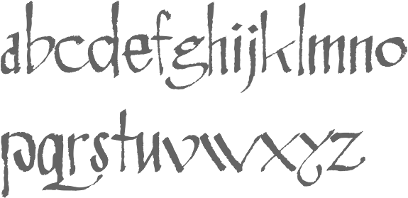
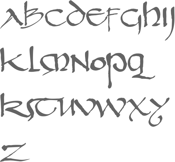
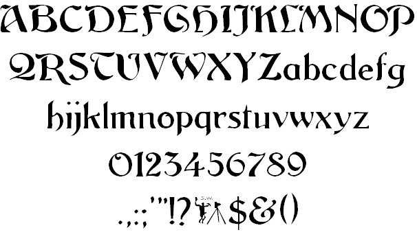
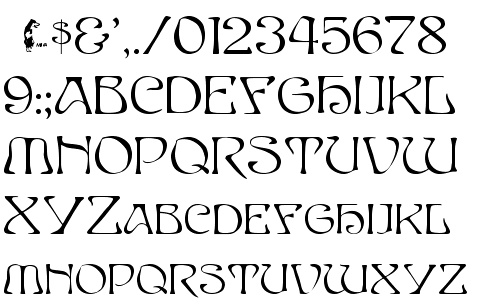
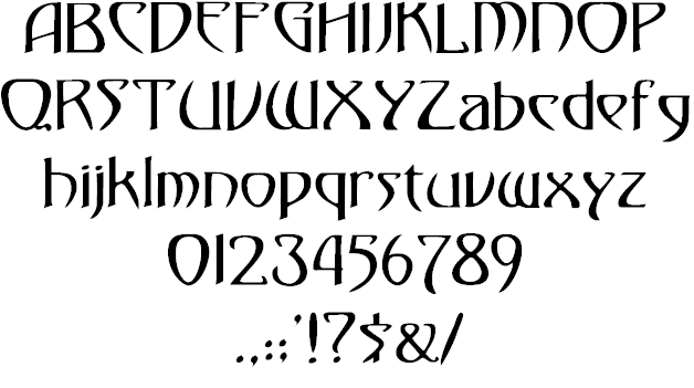
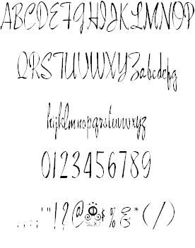
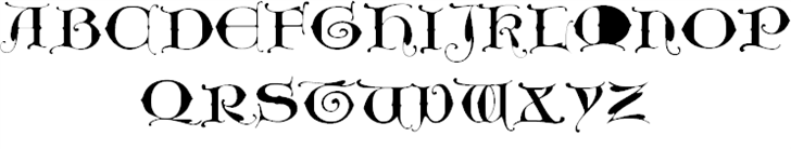
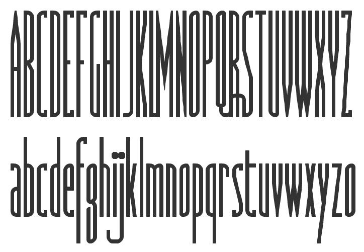
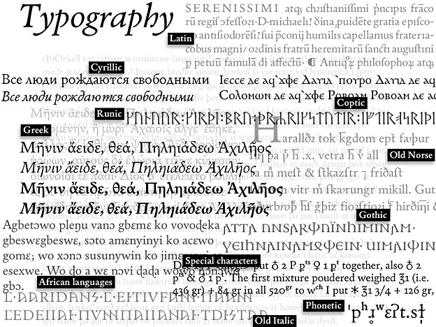
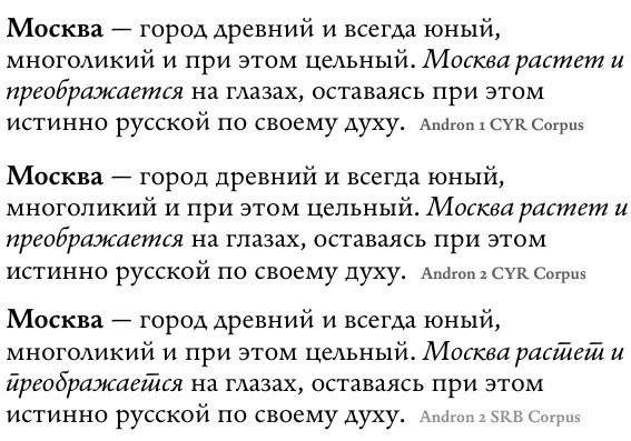
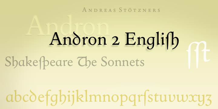
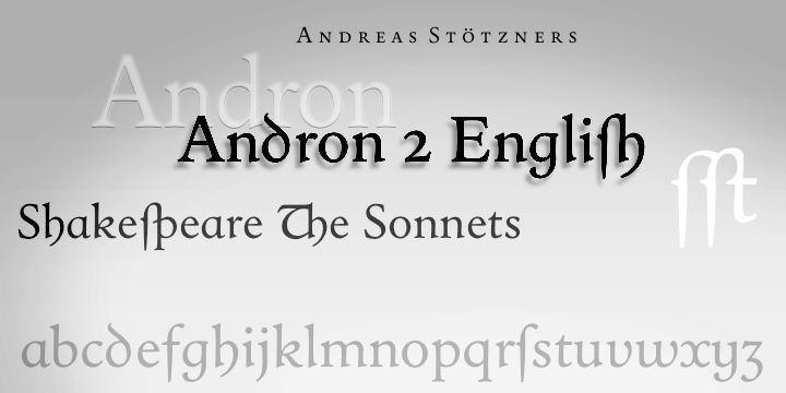
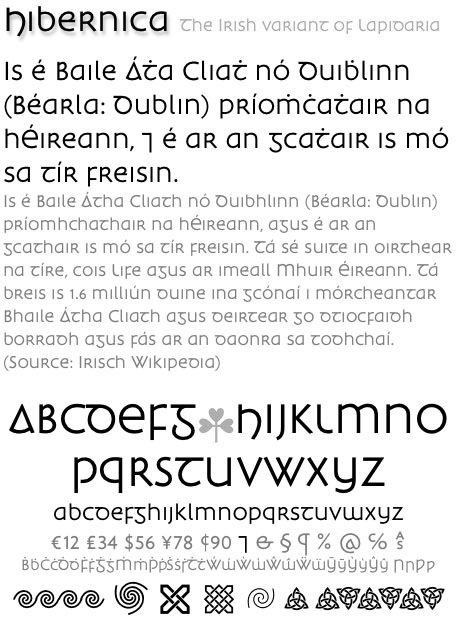
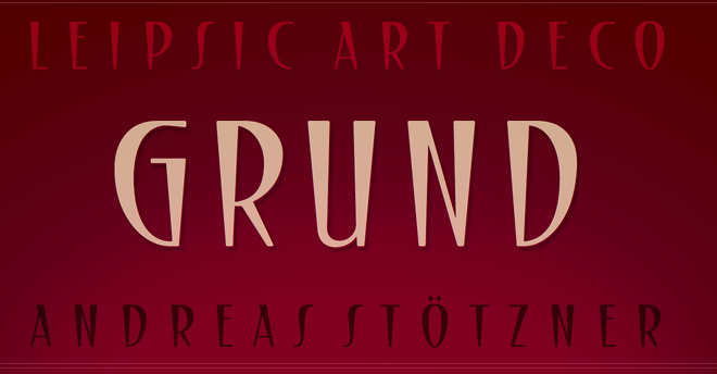
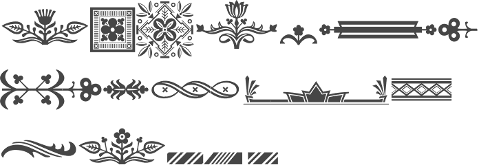
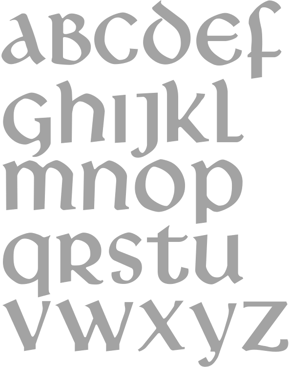
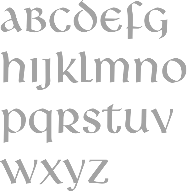
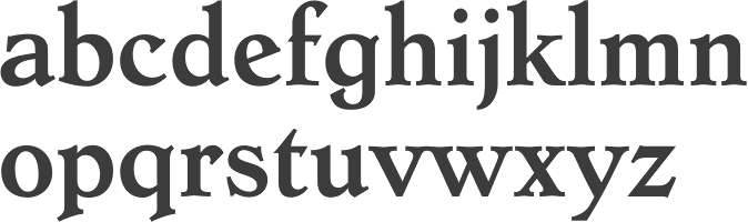
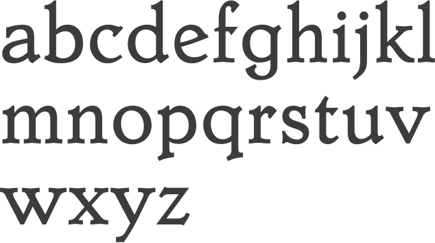
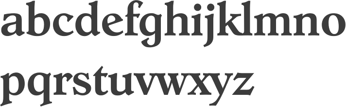
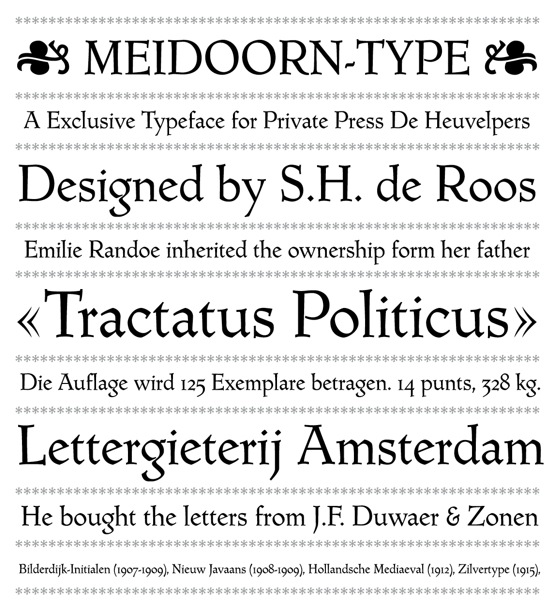
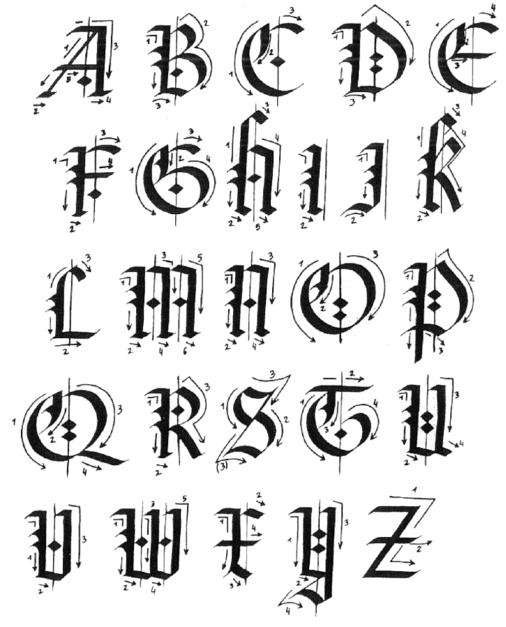
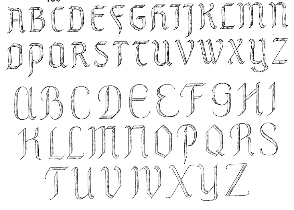
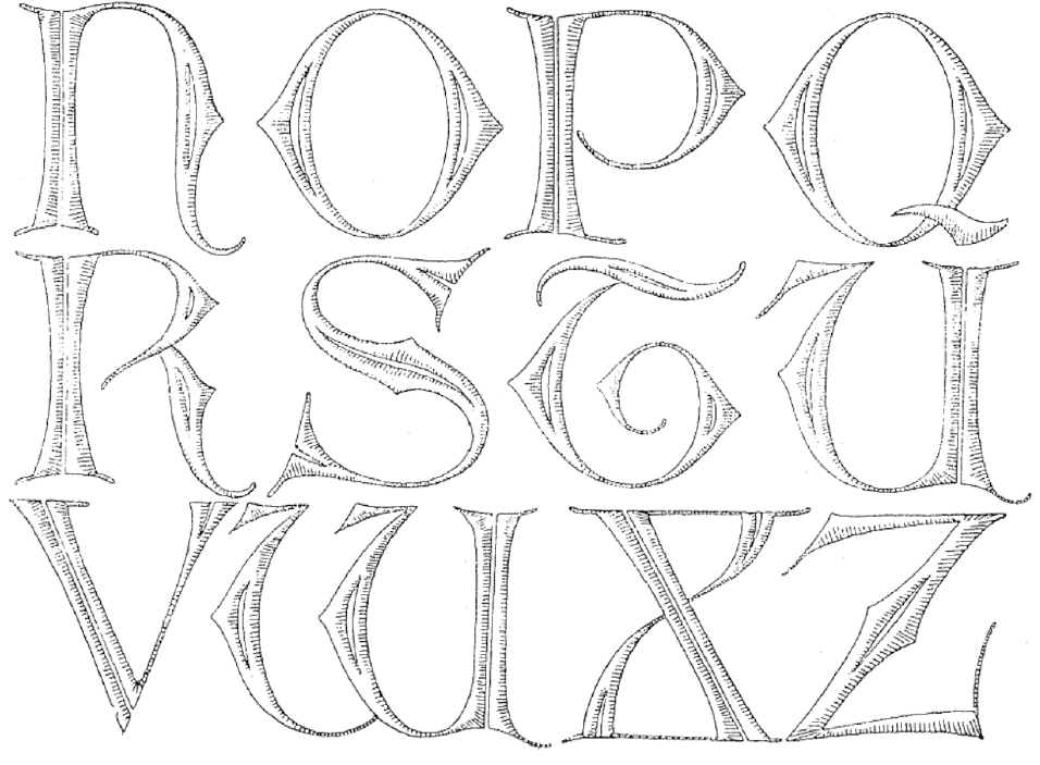
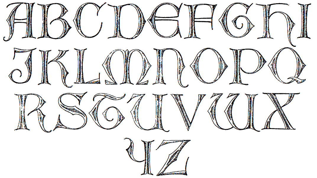
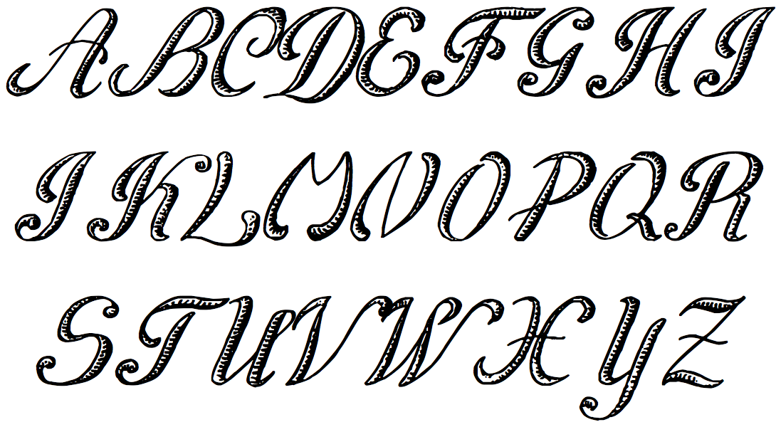
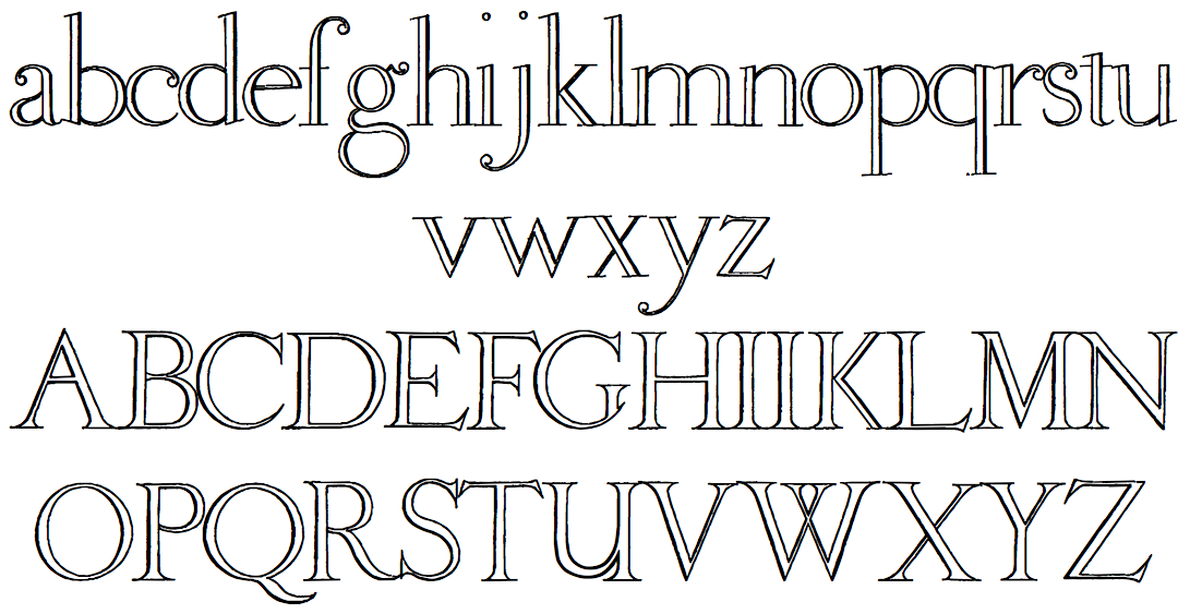
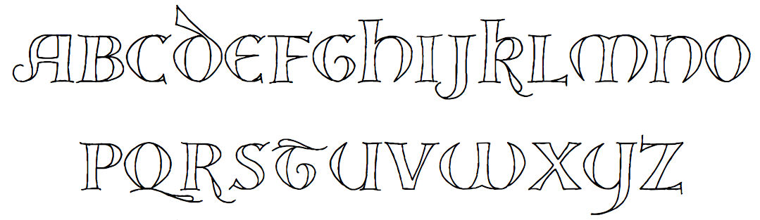
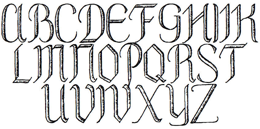
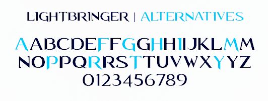
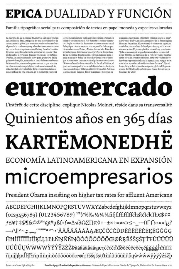
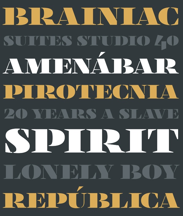
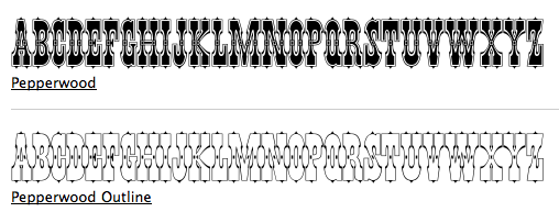
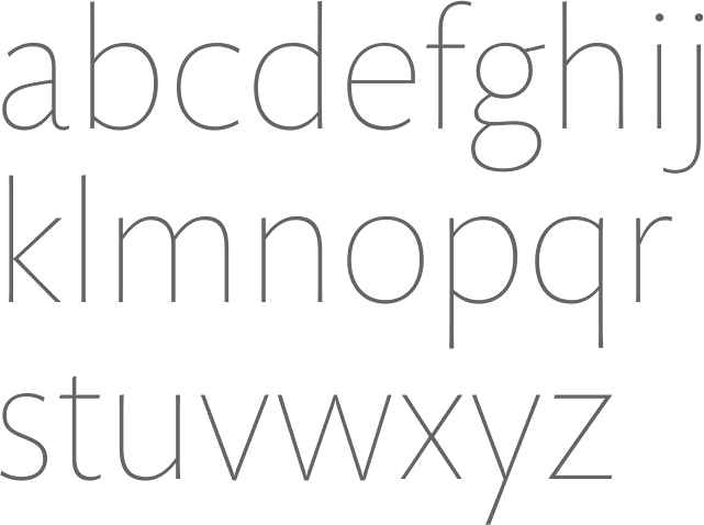
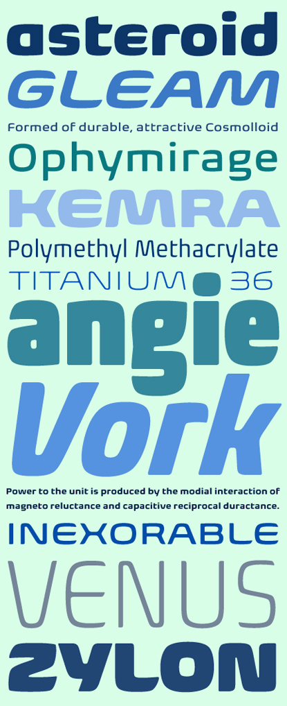
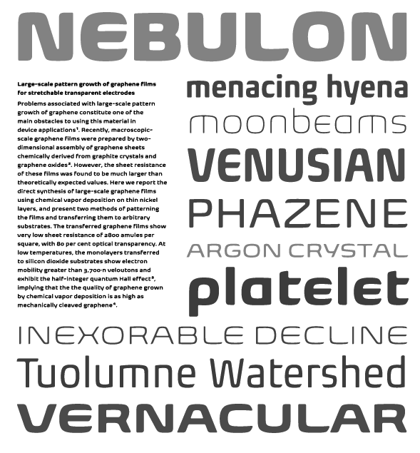
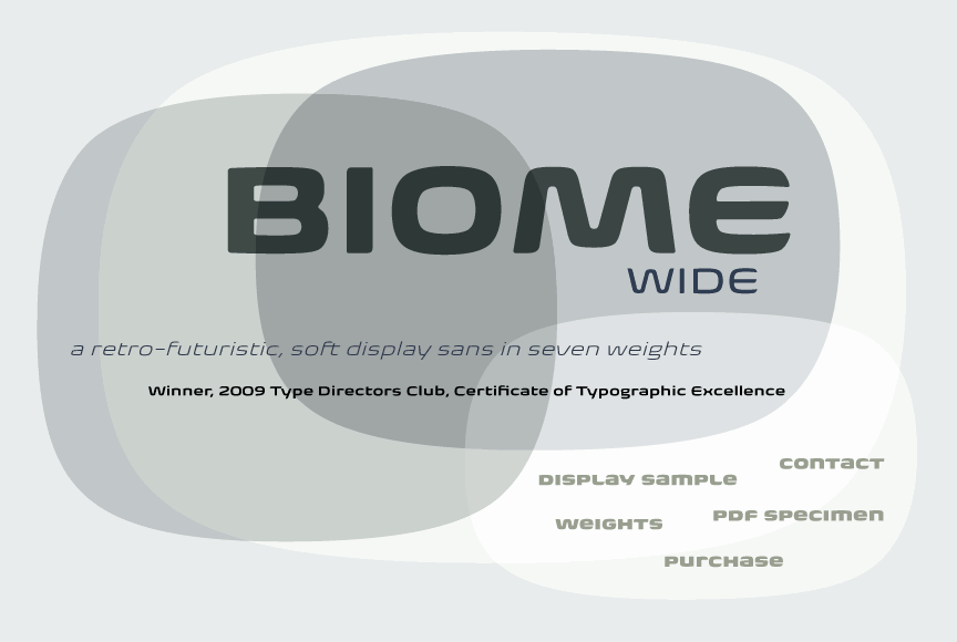
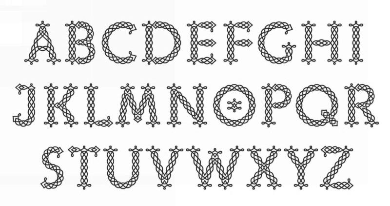
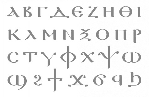
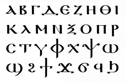
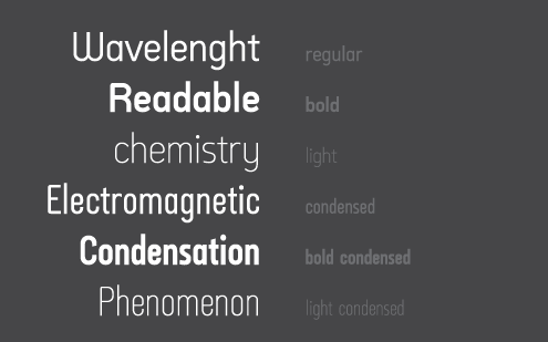
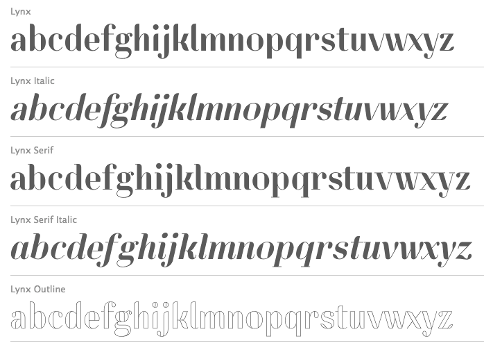
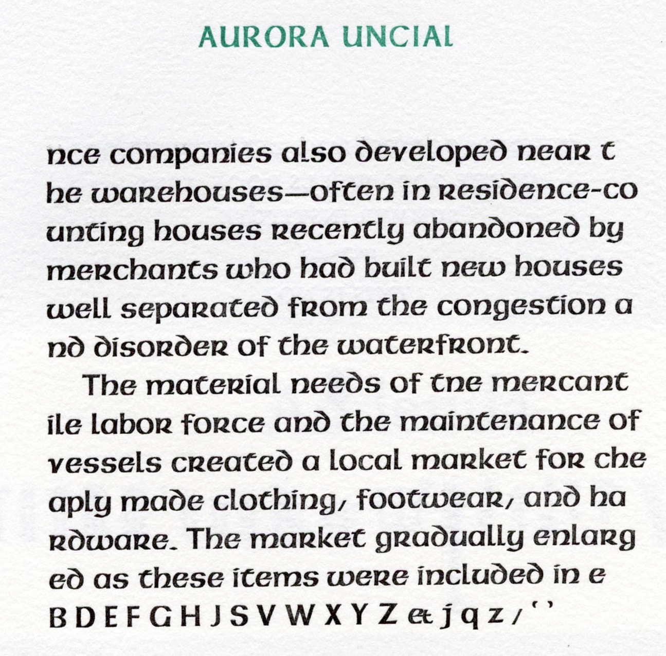
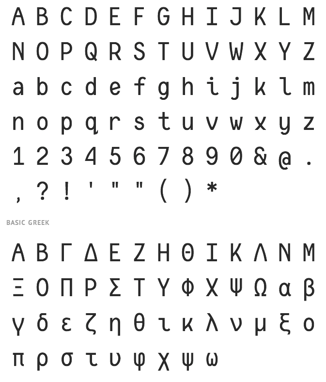
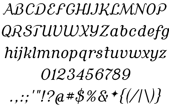
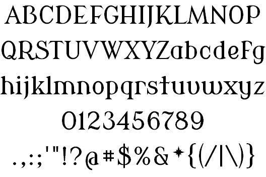
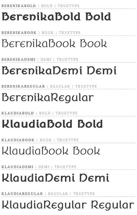
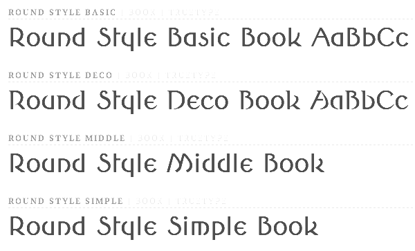
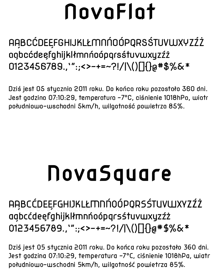
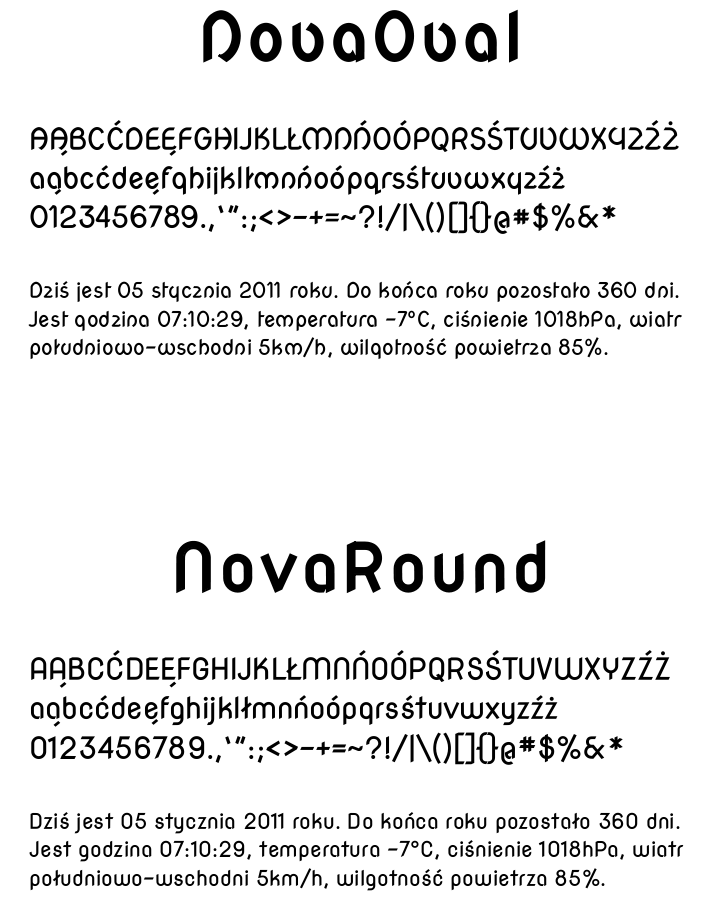
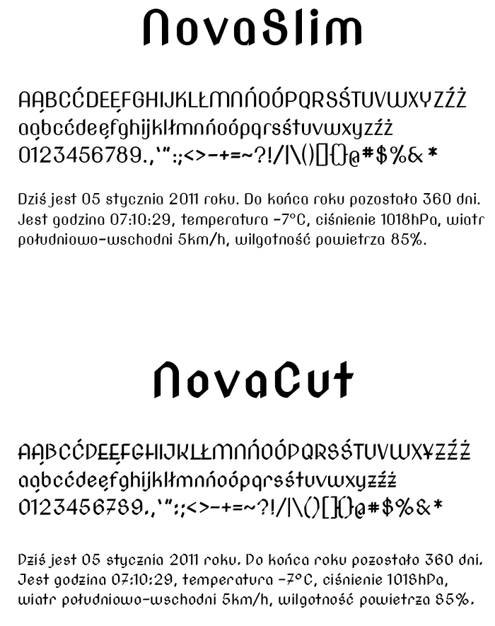
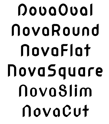