| | |
100 Beste Schriften aller Zeiten
|
 German FontShop-sponsored site listing the hundred best fonts of all times, compiled by a jury in 2007. There is a lot of good information about each of the fonts mentioned. PDF file compiled by the jury: Stephen Coles, Jan Middendorp, Veronika Elsner, Roger Black, Ralf Herrmann, Claudia Guminski (FontShop) and Bernard Schmidt-Friderichs. Visualization of the list. The list:
 - (1) Helvetica
- Garamond
- Frutiger
- Bodoni
- Futura
- Times
- Akzidenz Grotesk
- Officina
- Gill Sans
- Univers
- (11) Optima
- Franklin Gothic
- Bembo
- Interstate (1993, Tobias Frere-Jones)
- Thesis
- Rockwell
- Walbaum
- Meta
- Trinité
- DIN
- (21) Matrix
- OCR A und B
- Avant Garde
- Lucida
- Sabon
- Zapfino
- Letter Gothic
- Stone
- Arnhem
- Minion
| | - (61) Blur
- Base
- Bell Centennial
- News Gothic
- Avenir
- Bernhard Modern
- Amplitude
- Trixie
- Quadraat
- Neutraface
- (71) Nobel
- Industria, Insignia, Arcadia
- Bickham Script
- Bank Gothic
- Corporate ASE
- Fago
- Trajan
- Kabel
- House Gothic 23
- Kosmik
- (81) Caecilia
- Mrs Eaves
- Corpid
- Miller
- Souvenir
- Instant Types
- Clarendon
- Triplex
- Benguiat
- Zapf Renaissance
| - (91) Filosofia
- Chalet
- Quay Sans
- Cézanne
- Reporter
- Legacy
- Agenda
- Bello
- Dalliance
- Mistral
| Follow-up in English. Credit for some images below: Danielle West. [Google]
[More] ⦿
|
350 Designs
|
 A list of links to good free clean legible fonts collected by someone in Edmonton. Well, with a few exceptions like Linotype's Helvetica Neue... Here is that list: Ambrosia Anivers, Asenine, Aurulent Sans, Babel Sans, Bastardus Sans, Bebas, Bitstream Vera Mono, Blue Highway, BPReplay, Cicle, Decker, Diavlo, District Thin, Dustismo, Engel Light, Enigmatic, Eurofurence, Eurofurence Light, Existence Light, Fertigo Pro, Florence Sans, Folks, Forgotten Futurist, FranKleinBook, Futura Light, Geosans Light, Gill Sans, Gnuolance, Graublau Web, Grutch Grotesk, Helvetica Neue Light, Helvetica Neue UltraLight, Howie's Funhouse, Josef Pro Light, Lacuna, Lane Narrow, London Between, Mammagamma, Mandinga, Mank Sans, Mean 26 Sans, M+ Light, Museo Sans, Myndraine, Myriad Pro, Myriad Pro Condensed, National First, Nevis, Nuvo OT, Pakenham, Perspective Sans, Petita Light, Phoenix Sans, Print Clearly, Puritan, Qlassiuk Medium, Sansumi, Santana, Schul Vokal, Secret Code, SF New Republic, SF Old Republic, Soul Papa, Steelfish (see also here), Steiner, Stentinga, Street, Tall Films, Tradition Sans, Trebuchet, Walkway, Weezer, Y2K Neophyte. [Google]
[More] ⦿
A list of links to good free clean legible fonts collected by someone in Edmonton. Well, with a few exceptions like Linotype's Helvetica Neue... Here is that list: Ambrosia Anivers, Asenine, Aurulent Sans, Babel Sans, Bastardus Sans, Bebas, Bitstream Vera Mono, Blue Highway, BPReplay, Cicle, Decker, Diavlo, District Thin, Dustismo, Engel Light, Enigmatic, Eurofurence, Eurofurence Light, Existence Light, Fertigo Pro, Florence Sans, Folks, Forgotten Futurist, FranKleinBook, Futura Light, Geosans Light, Gill Sans, Gnuolance, Graublau Web, Grutch Grotesk, Helvetica Neue Light, Helvetica Neue UltraLight, Howie's Funhouse, Josef Pro Light, Lacuna, Lane Narrow, London Between, Mammagamma, Mandinga, Mank Sans, Mean 26 Sans, M+ Light, Museo Sans, Myndraine, Myriad Pro, Myriad Pro Condensed, National First, Nevis, Nuvo OT, Pakenham, Perspective Sans, Petita Light, Phoenix Sans, Print Clearly, Puritan, Qlassiuk Medium, Sansumi, Santana, Schul Vokal, Secret Code, SF New Republic, SF Old Republic, Soul Papa, Steelfish (see also here), Steiner, Stentinga, Street, Tall Films, Tradition Sans, Trebuchet, Walkway, Weezer, Y2K Neophyte. [Google]
[More] ⦿
|
A. Pat Hickson

|
 Britsh designer for ITF, most of whose fonts were mainly published by Red Rooster. After 2017, she started contributing to her husband's foundry, London Type. List (all ITF/Red Rooster unless otherwise specified):
 - Alghera Pro (1996): hand-printed, based on a handwritten Portuguese wine label design.
- Alys (1995): Calligraphic.
- Appleyard (1992): based on an old Monotype design, Prumyslava.
- Badger (1992): comic book style. In 2010, this was Steve Jackaman and Ashley Muir as Badger Pro.
- Basset, Basset Five, Basset Four, Basset One, Basset Six, Basset Three (1997): headline family.
- Bellini (1992): a garalde typeface based on Progreso (1923, Richard Gans Foundry). See Veer, where the font is sold as "Bellini". Linotype sells Greco (DsgnHaus, 1996) which according to some typophiles really is Progreso.
- Byron (1992, by Paul and Pat Hickson): a calligraphic font originally cut in the 1980s for QBF based on a design in Printing Types of the World (1931, Pitmans). Later redone in digial form as LDN Piccadilly (2019) at London Type.
- Coliseum (1992, ITF), co-designed with Julie Hopwood. Steve Jackaman completely redesigned, redrew, and improved the Coliseum family in 2017 and called it Coliseum Pro. That redesign also produced the sister typefaces Clydesdale and Torpedo.
- Dundee, Dundee Condensed (1993), inspired by the various headlines used in children's comic books in England, published by D.C. Thompson of Dundee, Scotland.
- Erasmus (1992): based on a design of Sjoerd Hendrik de Roos, 1923, Amsterdam Foundry.
- Forum Titling (1994): based on the Frederick Goudy design first shown in 1912, which was produced as a foundry typeface by Lanston Monotype in 1924.
- Gilmore Fahrenheit and Gilmore Sans (1992): ugly typefaces based on Eric Gill designs.
- Grove Script (1992).
- Javelin (1994): a connected fifties diner typeface in the style of Continental Railway Magneto Bold, Parkway Hotel, Permanent Waves, and Raceway.
- ITC Mona Lisa (ITC, 1992, and Elsner&Flake, 1991), ITC Mona Lisa Recut (ITC, 1991): an interpretation of a 1930 tall modern type by Albert Auspurg for Ludwig&Mayer.
- Rivoli Initials. Based on the William T. Sniffin design for ATF, circa 1928.
- Roller, Roller Shadow (1997): based on Iberica by Carlos Winkow for Fundicion Nacional, ca. 1942.
- Sinclair Script (1992).
- Stirling (1992).
- Venezuela (2000, Red Rooster) is a decorative Mexican simulation font based on the typeface Vesta by Albert Auspurg, circa 1926.
- Heseltine (2014) was designed by Paul & Pat Hickson in Text & Titling weights. The Heseltine typeface family was originally produced as a gift from Haymarket Media Group to Lord Heseltine for his 75th birthday.
- London Belgravia (2019, by Paul and Pat Hickson). An art deco sans.
- With Paul Hickson, she designed the floriated initial caps font LDN Garamond Initials (2020), which accompanies Paul's LDN Garamond (2020), which is a faithful revival of Claude Garamond's typeface.
MyFonts link. FontShop link. Klingspor link. [Google]
[MyFonts]
[More] ⦿
|
Adrian Talbot
[Talbot Type]
|
 [MyFonts]
[More] ⦿
[MyFonts]
[More] ⦿
|
Alan Meeks
|
 Prolific type designer, b. London, 1951. Alan started working in 1970 for Graphic Systems as a lettering artist. In 1975, he joined Letraset as the Senior Type Designer and Studio Manager where he was responsible for all the artwork produced by the Letraset studio. During his tenure at Letraset, he designed over 40 popular typefaces, including Bramley, Candice, Bickley Script and Belwe. Most of these typefaces also showed up in the Scangraphic collection. Together with type director Colin Brignall, Alan contributed to the success of Letraset. All the original typographic artwork produced at Letraset was produced by hand cutting the fonts in Rubylith, a highly-skilled technique known as stencil cutting. Alan was responsible for training the entire Letraset studio in this art. Most of the original Letraset artwork has now been archived at St. Brides Printing Library, London. Today, Alan works independently, specializing in all facets of corporate identity including type design, typography, packaging, and development of logos and symbols.
 His oeuvre (sold via MyFonts) includes: - Letraset: Aardvark (with Colin Brignall, 1969). Also see Aargau (Softmaker).
- Font Factory: Chalfont (2003: similar to Antique Olive), Brigade (classic roman), Fairway (curly sans), Copacabana (italicized roman).
- Elsner&Flake fonts: Bramley, Cabaret, Candice, Chesterfield, Einhorn (1980, Scangraphic, a revival of a 1931 typeface by Heinrich Maehler called Salut), Frankfurter (1978-1981, with Nick Belshaw and Bob Newman; for digital versions, see Farnham by Infinitype and F821 Deco by SoftMaker), Galadriel (1975; specimen; another specimen), Glastonbury, Knightsbridge, Plaza, Princetown (athletic lettering font done in 1981 based on Princetown by Dick Jones at Letraset), Rialto, Shelley, Tarragon (1981, art nouveau).
- ITC fonts: Algerian Condensed, Ambrose, Belwe Mono, Bertie, Bickley Script, Burlington (1985), Cabaret, Campaign (stencil), Cancellaresca Script (1982), Champers, Claude Sans, Dynamo Shadow (1977), Fashion Compressed (1986, Letraset: a fashion mag didone typeface), Flamme (1993), Follies (1991), Frankfurter (1978-1981, with Nick Belshaw), Glastonbury (1979), Inscription, Jazz, Lightnin' (1994), Limehouse Script (1986), Locarno (1986), Malibu (1992), Plaza, Ragtime, Regatta Condensed, Savoye, Shelley, Tannhauser (1988), Varga (1991), Waterloo Bold (1987).
- Letraset fonts: Aachen, Ambrose (1985), Belwe Mono (1989), Bertie (1985, a Mexican simulation face), Bickley Script, Burlington (1985), Campaign, Champers, Claude Sans (1988), Fashion Compressed, Flamme, Follies, Inscription, Jazz (1992, art deco), Lightnin, Limehouse Script, Locarno, Malibu, Ragtime, Regatta Condensed, Savoye (1992), Tannhauser, Varga, Waterloo Bold.
- Linotype fonts: Aachen, Algerian, Belwe Mono, Bertie, Bickley Script (1986), Bramley, Burlington, Cabaret (1980), Campaign, Cancellaresca Script, Candice, Champers (1991), Chesterfield, Claude Sans, Dynamo, Einhorn, Fashion, Flamme (script), Follies, Frankfurter, Galadriel, Gill Display Compressed, Glastonbury, Inscription (1994), Jazz (1992), Kestrel (1985, a connected signage script at Letraset based on Commercial Script; Ralph Unger's 2011 typeface Faulkner Pro is based on Kestrel; see also Kestrel Script (2010), Meeks's own digital version, its informal version Falcon Script (2013), and Subflux's Ballpark Weiner), Knightsbridge, Lightnin, Limehouse Script, Locarno, Malibu, Plaza (1975), Plaza, Ragtime (1987), Regatta Condensed, Rialto, Savoye, Shelley, Tannhauser, Tarragon, Varga.
- Typefaces from 2011: Dublin (a Celtic typeface), Chalky.
- Typefaces from 2014: Pinot Grigio Modern (a modern rounded multi-style update of Peignot, originally designed in 1937 by A. M. Cassandre), Falcon Script.
- Typefaces from 2015: Park Lane (a classicitalic roman).
- Typefaces from 2017: British Empire (a colonial typeface).
- Typefaces from 2018: Arequipa (a titling font), Independence Script (a cursive script loosely based on the Declaration of Independence; co-designed with calligrapher Satwinder Sehmi), Witchcraft. A classic roman.
- Typefaces from 2019: Aquitania Script (calligraphic).
- Typefaces from 2020: Bodoni Elegant. An 8-style family in Bodoni's style with oh so slight curves thrown in.
- Typefaces from 2021: Pantomime (a heavy monolinear script).
- URW++ revivals: Glastonbury (2009).
- Allan Meeks collection (Cedars, PA): Astoria (2006, miniserifed family based on Gill Sans), Astoria Sans (2011), Astoria Classic (2016), Astoria Classic Sans (2017, with a Peignotian feel), Brigade (2003, serif family), Copacabana (2004, based on Goudy Old Style Italic), Vatican (2005, a calligraphic typeface characterized by the sharp edge style of Arthur Baker), Colosseum (2008, a sans based on Trajan roman and influenced by Friz Quadrata), Chalfont (2003, a News Gothic style typeface with thinned strokes near the bottom---strange and somewhat unattractive), Fairway (2003, a quirky sans), Chalfont Roman (2020), Spartacus (2014), Winterfell (2019).
- Custom type: Benson&Hedges, Lilt, The Woolmark Company, Somerfield, Tarmac, Clearstream.
Galadriel, Kornelia and Sparky are floating around freely in cyberspace. FontShop link. Linotype link. View Alan Meeks's typefaces. Yet another page with Alan Meeks's typefaces. Klingspor link. [Google]
[MyFonts]
[More] ⦿
|
Alan Rimmer
[Fatchair]
|
[MyFonts]
[More] ⦿
|
Alexey Kustov
[Type Market]
|
[More] ⦿
|
Allison Mowry
|
American type, web, and brand designer in Baltimore, MD. She combined Adobe Caslon and Gill Sans to make a blended experimental typeface in 2010. View her typographic study of Gill Sans. [Google]
[More] ⦿
|
Angel Falcon
|
Graphic designer in Las Palmas de Gran Canaria who created Rising Typeface in 2013, for which he took inspiration from samurai warriors. Artyca (2013) is Gill Sans, adapted to various symbologies. In 2015, he designed the minimalist hipster typeface Nara, which is inspired by the architecture of Japan's second historical period known as Nara. [Google]
[More] ⦿
|
Anie Ajamian
|
For a school project in Los Angeles, Anie Ajamian started from Gill Sans and created a trimmed version of it called Elie Sans (2013). Behance link. [Google]
[More] ⦿
|
Anna Simons
|
Scribe, calligrapher and teacher (1871, Mönchengladbach-1951, Prien). From 1896 until 1903, she studied at the Royal College of Art in London, and was a student of Edward Johnston in 1900. She taught at Weimar from 1908-1914 and collaborated with the Bremer Presse from 1918 on. She created the initials for "Dante" (Berlin: Rowolth 1930) and for "Augustinus" (München: Bremer Presse 1924). Jakob Erbar was one of her students. The Bremer Presse published Anna Simons Titel und Initialen für die Bremer Presse in 1926. The book blurb: A portfolio of titles and initials designed by Anna Simons for the Bremer Presse. Along with Graily Hewitt, Eric Gill, and Percy Smith, Simons was one of Edward Johnston's star pupils at the Royal College of Art in London, and she has inscribed this copy to him on the title-page in black ink. It was after studying with Johnston, whose Writing&Illuminating,&Lettering she translated into German, that Simons in 1918 went home to Germany to work at the Bremer Presse. During her time at the Presse, she would design many titles and initial sets for them, and in 1926 this portfolio was issued to showcase her work. Each sheet in the portfolio is headed by one of Simons' Bremer Presse title designs, including her titles for the Divine Comedy, Fichte's Reden an Die Seutsche Nation, Chansons d'Amour, Albii Tabulli Elegiae, and others. The titles are followed by the initials she cut for the work. [Google]
[More] ⦿
|
Apple Fonts
|
 Alternate URL. The history of all fonts used and produced by Cupertino, CA-based Apple. A brief summary of this:
 - Corporate fonts and brand identity
- Motter Tektura (designed by Othmar Motter of Voralberger Graphic in 1975): before the first Macintosh, Apple used Motter Tektura to accompany the Apple logo. "According to the logo designer, Rob Janoff, the typeface was selected for its playful qualities and techno look, in line with Apple's mission statement of making high-technology accessible to anyone."
- Apple Garamond, the new corporate font used when the Macintosh was introduced in 1984. ITC Garamond (Tony Stan, 1977) was condensed to 80% of its normal width by Bitstream, who also adjusted and hinted it. Apple Garamond was used in most of Apple's marketing. The Wikipedia comment: "Many typographers consider ITC Garamond in general, and Apple Garamond in particular, to be poorly designed typefaces. A common viewpoint is that the algorithmic scaling distorted the typeface."
- Myriad Pro: starting in 2002, Apple began using Myriad Pro Semibold (a sans serif face) in its marketing, gradually replacing Apple Garamond. MyriadPro and MyriadApple can be downloaded here.
- Gill Sans Regular: used in the marketing of the Newton PDA.
- Fonts of the original Macintosh All but one of these bitmap fonts were due to Susan Kare. The fonts were originally named after stops along the Paoli, Pennsylvania commuter train line: Overbrook, Merion, Ardmore, and Rosemont. Later, under pressure from Steve Jobs, names of world cities were chosen. A number of different variants of each font were algorithmically generated on-the-fly from the standard fonts. Bold, italic, outlined, underlined and shaded variations were the most common.
- Cairo: a bitmap dingbat font, most famous for the dogcow at the 'z' character position.
- Chicago (sans-serif): the default Macintosh system font in System 17.6.
- Geneva (sans-serif): designed for small point sizes and prevalent in all versions of the Mac user interface.
- London (blackletter): an Old English-style font.
- Los Angeles (script): a thin font that emulated handwriting.
- Monaco (sans-serif, monospaced): a fixed-width font well-suited for 912 pt use.
- New York (serif): a Times Roman-inspired font family. Freely avaliable from Apple.
- San Francisco: a ransom note face.
- Venice (script): a calligraphic font designed by Bill Atkinson.
- Fonts in Mac OS X
- Lucida Grande: the primary system font in Mac OS X (all versions). Lucida Grande looks like Lucida Sans, but has more glyphs. It covers Roman, Cyrillic, Hebrew, Arabic, Thai and Greek. Many of its 2800+ glyphs were added by Michael Everson to the original collection.
- Mac OS X ships with a number of high-quality typefaces, for a number of different scripts, licensed from several sources.
- LastResort (designed by Michael Everson of Evertype): used by the system to display reference glyphs in the event that real glyphs needed to display a given character are not found in any other available font. Wikipedia states: "The glyphs are square with rounded corners with a bold outline. In the left and right sides of the outline, the Unicode range that the character belongs to is given using hexadecimal digits. Top and bottom are used for one or two descriptions of the Unicode block name. A symbol representative of the block is centered inside the square. By Everson's design, the typeface used for the text cut-outs in the outline is Chicago, otherwise not included with Mac OS X. The LastResort font has been part of Mac OS since version 8.5, but the limited success of ATSUI on the classic Mac OS means that only users of Mac OS X are regularly exposed to it."
- Apple Symbols (2003-2006): a 4000+-glyph dingbat font that complements the symbols from Lucida Grande, inttroduced first in Mac OS X 10.3 ("Panther").
- Zapfino (a calligraphic typeface designed by and named after renowned typeface designer Hermann Zapf for Linotype, based on an example he first drew in 1944): Zapfino utilizes the most advanced typographic features of the truetype format, and is partially included in OS X as a technology demo for ligatures and character substitutions.
- Mac OS X Snow Leopard comes with four new fonts in 2009: Chalkduster (emulating chalk on a blackboard), Menlo (a monospaced family based on Bitstream's Vera Sans Mono that replaces Monaco for applications such as Terminal and code editors; see also Deja Vu Sans Serif Mono), Heiti SC and TC and Hiragino Sans GB.
- Fonts used in other devices
- Espy Sans: designed in 1993 by Apple's Human Interface Group designed the typeface Espy Sans specifically for on-screen use. It was first used for the Newton OS GUI and later integrated into Apple's eWorld online service.
- eWorld Tight: a bitmap font used for headlines in Apple's eWorld. The metrics of eWorld Tight were based on Helvetica Ultra Compressed.
- Chicago (see above): bitmap typeface used in Apple's iPod music player since 2001.
The Apple Design team won two awards at 25 TDC in 2022, pne for SF Arabic (a contemporary interpretation of the Naskh style with a rational and flexible design; this extension of San Francisco serves as the Arabic system font on Apple platforms. Like San Francisco, SF Arabic features nine weights and variable optical sizes that automatically adjust spacing and contrast based on the point size of text. The typeface features an extensive repertoire that covers numerous vocalization, tone and poetic marks, extended vowel signs, honorifics and Quranic annotations. SF Arabic provides support across the following languages: Arabic, Kashmiri, Kurdish, Sorani, Mazanderani, Northern Luri, Pashto, Persian, Rohingiya, Sindhi, Urdu, and Uyghur) and SF Symbols 3 (over 600 new symbols including representations of devices, game controllers, health, communication, objects, and tools; it prides greater control over how color is applied to symbols, and has a variable font srtyle as well). [Google]
[More] ⦿
|
Apple: Leopard system fonts
|
The fonts installed in Mac OS X 10.5 (Leopard) are: - In /Library/Fonts, OTF format: ACaslonPro-Bold, ACaslonPro-BoldItalic, ACaslonPro-Italic, ACaslonPro-Regular, ACaslonPro-Semibold, ACaslonPro-SemiboldItalic, AGaramondPro-Bold, AGaramondPro-BoldItalic, AGaramondPro-Italic, AGaramondPro-Regular, ArnoPro-Bold, ArnoPro-BoldCaption, ArnoPro-BoldDisplay, ArnoPro-BoldItalic, ArnoPro-BoldItalicCaption, ArnoPro-BoldItalicDisplay, ArnoPro-BoldItalicSmText, ArnoPro-BoldItalicSubhead, ArnoPro-BoldSmText, ArnoPro-BoldSubhead, ArnoPro-Caption, ArnoPro-Display, ArnoPro-Italic, ArnoPro-ItalicCaption, ArnoPro-ItalicDisplay, ArnoPro-ItalicSmText, ArnoPro-ItalicSubhead, ArnoPro-LightDisplay, ArnoPro-LightItalicDisplay, ArnoPro-Regular, ArnoPro-SmText, ArnoPro-Smbd, ArnoPro-SmbdCaption, ArnoPro-SmbdDisplay, ArnoPro-SmbdItalic, ArnoPro-SmbdItalicCaption, ArnoPro-SmbdItalicDisplay, ArnoPro-SmbdItalicSmText, ArnoPro-SmbdItalicSubhead, ArnoPro-SmbdSmText, ArnoPro-SmbdSubhead, ArnoPro-Subhead, BellGothicStd-Black, BellGothicStd-Bold, BickhamScriptPro-Bold, BickhamScriptPro-Regular, BickhamScriptPro-Semibold, BirchStd, BlackoakStd, BrushScriptStd, ChaparralPro-Bold, ChaparralPro-BoldIt, ChaparralPro-Italic, ChaparralPro-Regular, CharlemagneStd-Bold, CooperBlackStd-Italic, CooperBlackStd, EccentricStd, GaramondPremrPro-It, GaramondPremrPro-Smbd, GaramondPremrPro-SmbdIt, GaramondPremrPro, GiddyupStd, HiraKakuPro-W3, HiraKakuPro-W6, HiraKakuStd-W8, HiraKakuStdN-W8, HiraMaruPro-W4, HiraMaruProN-W4, HiraMinPro-W3, HiraMinPro-W6, HoboStd, KozGoPro-Bold, KozGoPro-ExtraLight, KozGoPro-Heavy, KozGoPro-Light, KozGoPro-Medium, KozGoPro-Regular, KozMinPro-Bold, KozMinPro-ExtraLight, KozMinPro-Heavy, KozMinPro-Light, KozMinPro-Medium, KozMinPro-Regular, LetterGothicStd-Bold, LetterGothicStd-BoldSlanted, LetterGothicStd-Slanted, LetterGothicStd, LithosPro-Black, LithosPro-Regular, MesquiteStd, MinionPro-Bold, MinionPro-BoldCn, MinionPro-BoldCnIt, MinionPro-BoldIt, MinionPro-It, MinionPro-Medium, MinionPro-MediumIt, MinionPro-Regular, MinionPro-Semibold, MinionPro-SemiboldIt, MyriadPro-Bold, MyriadPro-BoldCond, MyriadPro-BoldCondIt, MyriadPro-BoldIt, MyriadPro-Cond, MyriadPro-CondIt, MyriadPro-It, MyriadPro-Regular, MyriadPro-Semibold, MyriadPro-SemiboldIt, NuevaStd-BoldCond, NuevaStd-BoldCondItalic, NuevaStd-Cond, NuevaStd-CondItalic, OCRAStd, OratorStd-Slanted, OratorStd, PoplarStd, PrestigeEliteStd-Bd, RosewoodStd-Regular, StencilStd, TektonPro-Bold, TektonPro-BoldCond, TektonPro-BoldExt, TektonPro-BoldObl, TrajanPro-Bold, TrajanPro-Regular.
- In /Library/Fonts. TTF format: AlBayan, AlBayanBold, AndaleMono, AppleMyungjo, Arial-Black, Arial-BoldItalicMT, Arial-BoldMT, Arial-ItalicMT ArialHB, ArialHBBold, ArialMT, ArialNarrow-Bold, ArialNarrow-BoldItalic, ArialNarrow-Italic, ArialNarrow, ArialRoundedMTBold, ArialUnicodeMS, Ayuthaya, Baghdad, BrushScriptMT, Chalkboard-Bold, Chalkboard, ComicSansMS-Bold, ComicSansMS, Corsiva, CorsivaBold, CourierNewPS-BoldItalicMT, CourierNewPS-BoldMT, CourierNewPS-ItalicMT, CourierNewPSMT, DecoTypeNaskh, DevanagariMT-Bold, DevanagariMT, EuphemiaUCAS-Bold, EuphemiaUCAS-Italic, EuphemiaUCAS, Georgia-Bold, Georgia-BoldItalic, Georgia-Italic, Georgia, GujaratiMT-Bold, GujaratiMT, Impact, InaiMathi, Kailasa, Kokonor, Krungthep, KufiStandardGK, LiSongPro, MicrosoftSansSerif, MonotypeGurmukhi, Mshtakan, MshtakanBold, MshtakanBoldOblique, MshtakanOblique, NISC18030, Nadeem, NewPeninimMT, NewPeninimMTBold, NewPeninimMTBoldInclined, NewPeninimMTInclined, PlantagenetCherokee, Raanana, RaananaBold, STFangsong, STKaiti, STSong, Sathu, Silom, Tahoma-Bold, Tahoma, TimesNewRomanPS-BoldItalicMT, TimesNewRomanPS-BoldMT, TimesNewRomanPS-ItalicMT, TimesNewRomanPSMT, Trebuchet-BoldItalic, TrebuchetMS-Bold, TrebuchetMS-Italic, TrebuchetMS, Verdana-Bold, Verdana-BoldItalic, Verdana-Italic, Verdana, Webdings, Wingdings-Regular, Wingdings2, Wingdings3.
- In /Library/Fonts, in DFONT format: #Gungseouche, #HeadlineA, #PCmyoungjo, #Pilgiche, AmericanTypewriter, Apple Chancery, Apple LiGothic Medium, Apple LiSung Light, Baskerville, BiauKai, BigCaslon, CharcoalCY, Cochin, Copperplate, Didot, Futura, GenevaCY, GillSans, Hei, HelveticaCY, Herculanum, Hoefler Text, Kai, MarkerFelt, Optima, Osaka, OsakaMono, Papyrus, Skia, Zapfino.
- In /System/Library/Fonts, OTF format: AquaKana-Bold, AquaKana, HiraMinProN-W3, HiraMinProN-W6, HiraKakuProN-W3, HiraKakuProN-W6.
- In /System/Library/Fonts, TTF format: AppleBraille-Outline6Dot, AppleBraille-Outline8Dot, AppleBraille-Pinpoint6Dot, AppleBraille-Pinpoint8Dot, AppleBraille, AppleSymbols, AppleGothic, GeezaPro-Bold, GeezaPro, Thonburi, Thonburi-Bold, LiHeiPro, STXihei, STHeiti.
- In /System/Library/Fonts, DFONT format: Courier, Geneva, Helvetica, HelveticaNeue, Keyboard, LastResort, LucidaGrande, Monaco, Symbol, Times, ZapfDingbats.
[Google]
[More] ⦿
|
Arkandis Digital Foundry
[Hirwen Harendal]
|
 French foundry, est. 2007, which published many extensive free sans and sans serif families by Hirwen Harendal, who supports Open Source projects. The purpose of ADF is to provide a large number of high quality fonts (174 fonts as of the end of August 2007). Harendal has help from Clea F. Rees, most notably on the TeX part and the extensive Venturis family.
 His typefaces: - Accanthis (2009: an alternative for Galliard or Horley Oldstyle).
- AlbertisADF (from URW-A028), Albertis Titling.
- Ameris ADF (from URW n33012t).
- ArrosADF (from URW n021003L).
- AurelisADF (2009, almost art nouveau).
- Baskervald ADF (7 years of work according to Harendal: an alternative for New Baskerville).
- BerenisADF (2008, a didone family), BerenisNo2 (2008).
- BirkenADF (from URW-n033014t).
- ColonnadeADF (from URW-n033014t).
- EditorialisADF (from URW-n033014t).
- Electrum (like Eurostile and URW City).
- FenelrisADF (sans).
- FrontonADF Titling (from URW-n033014t).
- GaramondeADF (from URW-g043004t), GaramondNo8ADF (from URW g043024t).
- Gillius ADF and Gillius ADFN (from Vera Sans, an alternative for Gill Sans MT).
- HelvetisADF (from URW U001).
- Ikarius (2008, semi-serif; inspired by Hypatia Sans), IkariusNo2 (2008), Ikarius-Serie (2009).
- Irianis (2008; IrianisADFMath (2009) was made for the TeX math community).
- Keypad (2010). a dingbat face.
- LibrisADF (sans, patterned after Lydian).
- MekanusADF (2009, typewriter style).
- Mint Spirit (2012) and Mint Spirit No. 2 (2012). An original minimalist sans design. The truetype version is Mintysis (2012).
- NeoGothisADF (2009).
- OldaniaADF (2009, art nouveau).
- OrnementsADF (2009).
- PalladioADFStyle (a Palatino derived from URW g043023t).
- RomandeADF (with hints of Caslon, Times and Tiffany; CTAN download).
- Solothurn (2011). A family developed for Scribus, a free text preparation package that competes with Adobe's InDesign.
- SwitzeraADF (derived from Vera).
- SymbolADF (2008, bullets and arrows).
- Teknis: under development.
- TribunADF (2009, like Times New Roman).
- Universalis ADF (2008-2009, a take on Futura). Open Font Library link.
- VenturisADF, VenturisOldADF, VenturisTitlingADF and VenturisSansADF (2007: alternatives for Utopia).
- Verana Sans and Serif (from Bitstream Vera Sans and Serif).
Kernest link. [Google]
[More] ⦿
|
August Heffner
[August Heffner's list of required typefaces]
|
 [More] ⦿
|
August Heffner's list of required typefaces
[August Heffner]
|
 For his graphic design class, August Heffner lists the only typefaces that he wants his students to use in their projects:
 - Old Style (renaissance 15th and 16th centuries): Garamond (1617) (v), Caslon (1722), Bembo (1495), Janson (1690), Palatino (1950), Sabon (1964), Centaur (1916).
- Transitional (baroque 17th century) (neo classical 18th century): Baskerville (1757), Times Roman (1931) (v), Scotch (1810), Electra (1935), Bookman.
- Modern (romantic 18th and 19th century): Bodoni (1780) (v), Didot (1784), Walbaum (1800).
- Egyptian/Slab: Century Schoolbook (1890) (v), Clarendon (1845), Cheltenham (1896), Lubalin Graph (1974), Melior.
- Sans Serif (realist 19th and 20th centuries)(Geometric Modernist 20th century): Helvetica (1957) (v), Univers (1957), Gill Sans (1928), Futura (1927) (v), Avant Garde (1967), Optima, Bell Centennial (1978), News Gothic (1908), Folio, Franklin Gothic, Adzidenz Grotesk, Frutiger, Trade Gothic.
- Digital Typefaces (Postmodern/Vernacular): Tobias Frere Jones, Interstate, 1993-95 (Font Bureau), Tobias Frere Jones, Knockout (Font Bureau), Tobias Frere Jones and Jesse Ragan, Gotham, 2000-01 (HFJ), Erik Spiekermann, Meta, 1984-991 (Font Shop).
- Digital Typefaces (Classical/Historical Revival): Jonathan Hoefler, HTF Didot, 1991 (Hoefler Type Foundry), Matthew Carter, Galliard, 1978, Matthew Carter, Big Caslon, 1994, Matthew Carter, Mantinia, 1993.
- Digital Typefaces (Electronic Communications): Tobias Frere Jones and Jonathan Hoefler Retina, 2000, Tobias Frere Jones and Jonathan Hoefler, Mercury, 1999, Zuzana Licko, Lo-Res, 1985 (Emigre), Matthew Carter, Miller, 1997 (The Guardian), Albert-Jan Pool, FF DIN, 1995 (Font Shop).
Note: (v) refers to Massimo Vignelli's list of the only typefaces you will ever need. [Google]
[More] ⦿
|
Barry Deck
|
Born in Mount Pleasant, IA, in 1962, Barry Deck is a freelance graphic designer in LA, Chicago and NYC. He designed Arbitrary (1990, a sharp-serifed sans) and Template Gothic (1990, grunge; see here for the Cyrillic version by Igor Polovodov and the Greek version by Panos Haratzopoulos) at Emigre in 1992 and 1994 [MyFonts says 1990...]. Rudy van der Lans recalls the Template Gothic story: It was designed by Barry Deck while he was a student at Cal Arts in the early 90s. Under the auspices of Ed Fella and Jeffery Keedy there was a lot of exciting type design experimentation going on at CalArts in those days. I remember that particular graduate class came to visit our studio in '92 or so. That's when we first saw Template Gothic. We liked the font and asked Barry if he would let us release it commercially. Hrant Papazian says that a lot of the credit for Template Gothic should go to Ed Fella. Besides these two Emigre fonts, Barry designed many other typefaces. He sells Barry Sans Serif (1989), Washout, Traitor, Truth, Fontoid, Canicopulus Script (1989, named in honor of Eric Gill's extracurricular activities), Cyberotica (1994), Caustic Biomorph (1992, part of FUSE 4), Cyberfriendly, Moderne Sans Serif, Mutant Industry Roman (1989), and Orgasm Heavy. More recently, Barry Deck designed Eunuverse specifically for RayGun and it was used in a few issues before this mag was bought-out. Fonts at Thirstype: Cyberotica, Eunuverse, Traitor, Truth, FauxCRA (2002), Caustic Biomorph, Repressed, Orgasm, and Canicopulis. [Google]
[MyFonts]
[More] ⦿
|
Beatrice L. Warde
|
Born in New York in 1900, she died in London in 1969. A typographer, writer, and art historian, she worked for the British Monotype Corporation for most of her life, and was famous for her energy, enthusiasm and speeches. Collaborator of Stanley Morison. She created a typeface called Arrighi. She is famous for The Crystal Goblet or Printing Should be Invisible (The Crystal Goblet, Sixteen Essays on Typography, Cleveland, 1956, and Sylvan Press, London, 1955), which is also reproduced here and here. The text was originally printed in London in 1932, under the pseudonym Paul Beaujon. Here are two passages: - Imagine that you have before you a flagon of wine. You may choose your own favorite vintage for this imaginary demonstration, so that it be a deep shimmering crimson in colour. You have two goblets before you. One is of solid gold, wrought in the most exquisite patterns. The other is of crystal-clear glass, thin as a bubble, and as transparent. Pour and drink; and according to your choice of goblet, I shall know whether or not you are a connoisseur of wine. For if you have no feelings about wine one way or the other, you will want the sensation of drinking the stuff out of a vessel that may have cost thousands of pounds; but if you are a member of that vanishing tribe, the amateurs of fine vintages, you will choose the crystal, because everything about it is calculated to reveal rather than to hide the beautiful thing which it was meant to contain.
- Bear with me in this long-winded and fragrant metaphor; for you will find that almost all the virtues of the perfect wine-glass have a parallel in typography. There is the long, thin stem that obviates fingerprints on the bowl. Why? Because no cloud must come between your eyes and the fiery heart of the liquid. Are not the margins on book pages similarly meant to obviate the necessity of fingering the type-page? Again: the glass is colourless or at the most only faintly tinged in the bowl, because the connoisseur judges wine partly by its colour and is impatient of anything that alters it. There are a thousand mannerisms in typography that are as impudent and arbitrary as putting port in tumblers of red or green glass! When a goblet has a base that looks too small for security, it does not matter how cleverly it is weighted; you feel nervous lest it should tip over. There are ways of setting lines of type which may work well enough, and yet keep the reader subconsciously worried by the fear of 'doubling' lines, reading three words as one, and so forth.
Drawing of her by Eric Gill. Life story. Beatrice Warde was educated at Barnard College, Columbia, where she studied calligraphy and letterforms. From 1921 until 1925, she was the assistant librarian at American Type Founders. In 1925, she married the book and type designer Frederic Warde, who was Director of Printing at the Princeton University Press. Together, they moved to Europe, where Beatrice worked on The Fleuron: A Journal of Typography (Cambridge, England: At the University Press, and New York: Doubleday Doran, 1923-1930), which was at that time edited by Stanley Morison. As explained above, she is best known for an article she published in the 1926 issue of The Fleuron, written under the pseudonym Paul Beaujon, which traced types mistakenly attributed to Garamond back to Jean Jannon. In 1927, she became editor of The Monotype Recorder in London. Rebecca Davidson of the Princeton University Library wrote in 2004: Beatrice Warde was a believer in the power of the printed word to defend freedom, and she designed and printed her famous manifesto, This Is A Printing Office, in 1932, using Eric Gill's Perpetua typeface. She rejected the avant-garde in typography, believing that classical forms provided a "clearly polished window" through which ideas could be communicated. The Crystal Goblet: Sixteen Essays on Typography (1955) is an anthology of her writings. Wood engraved portrait of Warde by Bernard Brussel-Smith (1950). [Google]
[MyFonts]
[More] ⦿
|
Ben Archer
[Gill Sans: Critique by Ben Archer]
|
[More] ⦿
|
Ben Bauermeister
[ElseWare Corporation]
|
[MyFonts]
[More] ⦿
|
Ben Jones
[Protimient.com]
|
 [MyFonts]
[More] ⦿
[MyFonts]
[More] ⦿
|
Ben Mecke-Burford
[M-B Creative]
|
 [MyFonts]
[More] ⦿
[MyFonts]
[More] ⦿
|
Ben Mitchell
[Fontpad]
|
 [More] ⦿
|
Bernard Philpot
|
Welsh creator of the irregular chiseled typeface ITC Bolthole (2008. ITC>). He writes: My father brought me to a small graveyard in the Welsh hills to show me two headstones carved by the great Eric Gill. I instantly fell in love with the beauty of the carving and the perfection of the letterforms. I still go back to marvel at these works of art. Philpot studied graphic design and typography at the London School of Printing, and soon after graduation started work in a large advertising agency in London. Klingspor link. [Google]
[MyFonts]
[More] ⦿
|
Best fonts of 2005 (Jan-Jun): Typographica
|
 The Golden Globe Awards of type design, nominated by regulars at Stephen Coles' Typographica, a selection from the ground up. I feel these are the true winners---unlike all those awards for which one has to apply, pay a fee and be subject to the scrutiny of a "selection committee". Masterfully brought to you by Stephen Coles---bravo! As Stephen himself notes this year (2005), there are three trends: (1) Gone are the days when large commercial outfits put out the bulk of serious type. Nine of the 14 top selections come from one-man studios. Meanwhile, several of the big boys (ITC, Linotype, Monotype, URW) are absent. (2) Nearly every featured font is available in OpenType, and many exclusively so. (3) Xavier Dupré: the Cambodia-based Frenchman is perhaps todays most productive single source of creative type design, rivaled only by Christian Schwartz. Drumrolls:
 - Lisboa (Ricardo Santos): Hrant Papazian writes: Lisboa harbors the sagacity to merely vie for — and thereby achieve — a simple Iberian warmth, something especially difficult in a sans. In the severely over-crowded field of humanist sans-serifs, Lisboa distinguishes itself through completeness (including expert characters and two numeral styles) and technical sophistication (as in its trapping), but mostly by providing two subtly varied cuts: one that helps exhibit the design's particular character; and another that eschews detail for maximal clarity in small sizes.
- Freight (Joshua Darden). Dyana Weissman: While we move out of the era of the antiseptic sans-serifs, Freight offers refreshing anomalies that warm up the design.[...] This family is insane. Not only because of the 100 styles, but also because of its charming little quirks.
- Ministry Script (Alejandro Paul). Paul Hunt comments: How do you convey sexiness with type? Use a sultry script face. The only thing more typographically titillating might be a set of canoodling ligatures.
- Garamond Premier Pro (Robert Slimbach).
- Deréon (Jean-François Porchez). Chris Rugen writes: When I see Déreon, I see a Whitman and Dalliance mix (two of my favorites) creating something unique. Like Whitman, Deréon gets its body from the Scotch Didone Caledonia.
- Proxima Nova (Mark Simonson). Kyle Hildebrant: It nestles neatly in a place between the geometric, grotesque, and gothic. Its generous x-height, thoughtfully balanced color, and expert typographic features (small caps, text figures, lining figures, etc.) position it as a prime candidate for extended textual setting.
- Zingha (Xavier Dupré, Font Bureau). Norbert Florendo comments: Reviewing Zingha is as delightful as discovering several long lost cases of unreleased ATF hot metal typefaces.
- Vista Sans (Xavier Dupré). Stephen Coles: With its friendly quirks, Vista Sans is a lot like Tarzana — another Emigre font — but succeeds everywhere Tarzana fails. The more distinctive glyphs feel harmonious with the rest of the font, never jarring. Gentle swashes and a large x-height make for a friendly sans that would work just right in so many settings.
- Cézanne Pro (James Grieshaber).
- FF Maiola (Veronika Burian). Dan Reynolds drools: Just when you thought your collection's text categories were set, Veronika Burian burst the stable doors open, reviving the Czech genre and its warm idiosyncrasies. A “warm” typeface? FF Maiola solves this puzzle using discrete play of irregularity and multiple angles, hearkening back to Menhart and Preissig's approaches.
- Maple (Eric Olson). Mark Simonson: Other type designers have mined the 19th century English grotesque, but Eric Olson gives it an energetic crispness which makes earlier attempts seem a bit stuffy. Maple captures the exuberant quirkiness of the grots without slavishly imitating them.
- Garda (Mario Feliciano). William Berkson notes: With great elegance and style—and alternative characters and ligatures—the set offers superb alternatives to Trajan, Optima, and Futura for titling.
- Litteratra (Karsten Lücke). Yippie! Keep it up, Karsten! Joshua Lurie-Terrell: It's a sort of roman amalgam of textura and Schwabacher, channeling the expressionist spirit of Vojtech Preissig. [...] It's an entire historical movement.
- Relato (Eduardo Manso). My compatriot Yves Peters: Emtype Relato combines Dutch purposefulness with Latin sensuality. Its serifs are constructed following a clever principle, and the typefaces look simply gorgeous.
Honorable mentions: FF Absara Sans (Xavier Dupré), Amor (František Storm), Arrival (Keith Tam), Avebury Black and Open (Jim Parkinson), Ayres Royal (Gert Wiescher), Bembo Book (Robin Nicholas), Bluemlein Scripts (Alejandro Paul), Botanika (Tomáš Brousil), Cabazon (Jim Parkinson), Chocolate (Angel Koziupa and Alejandro Paul), Crank8 (Greg Lindy & Henk Elenga), Deutsche Bahn [PDF] (Christian Schwartz and Erik Spiekermann), Dynasty (Rian Hughes), Fedra Sans Display (Peter Bilak), Flama (Mário Feliciano), Galicia (Rian Hughes), Gill Sans Pro (Monotype), Groovin' (Jason Walcott), Handsome Pro (Nick Shinn), Happy Hour (Jason Walcott), Incognito (Gábor Kóthay), Kaffeesatz (Jan Gerner), Kingfisher (Jeremy Tankard), Lapture (Tim Ahrens), Mashine (Tim Ahrens), Mercury Display & Text (Jonathan Hoefler & Tobias Frere-Jones), Miserichordia (Rian Hughes), Modesto Text (Jim Parkinson), Morice (Stephen Banham), Nerva (Dino dos Santos), Nicholas (Nick Shinn), Ogravan (Tomáš Brousil), Paperback (John Downer), Propane (David Buck), Radiogram (Rian Hughes), Rough Riders and Redux (Michael Hagemann), Sculptura (Jason Castle), ITC Stone Humanist Sans (Sumner Stone), Soap (Ray Larabie), Sovereign (Nick Cooke), Tamarillo (Jason Walcott), Tourette (Jonathan Barnbrook), Wanderer (Michael Hagemann). [Google]
[More] ⦿
|
Best fonts of 2006: Typographica
|
Stephen Coles and Joshua Lurie-Terrell publish their list of the 23 best fonts of 2006. These are the Oscars of type design. A summary: - Guardian, by Paul Barnes and Christian Schwartz. Not yet available for licensing. Proprietary license expires in 2008. Carl Crossgrove: A slab-serif design with a large x-height, low contrast and open aperture, the Guardian superfamily (including the subfamilies Guardian Egyptian, Guardian Sans, Guardian Text Egyptian, Guardian Text Sans, and Guardian Agate) offers the designers of the newspaper a galaxy of expressive weights which most certainly fit the various editorial tones required of such a publication.
- Titling Gothic, by David Berlow. Mark Simonson says: According to the Font Bureau's promotional copy, Titling Gothic was inspired by Railroad Gothic. To me it feels a more like old standbys Univers and Helvetica, but with the panache of custom-lettered advertising headlines from the fifties and sixties.
- Estilo, by Dino dos Santos. Chris Rugen states: The geometric simplicity of the characters is the basic step in this stylish Deco face's surprising range.
- Exchange, by Tobias Frere-Jones. Proprietary commission. Not available for licensing. Commissioned as a replacement for the Wall Street Journal's DowText. Christian Schwartz says: The real genius of this typeface is that it still has enough formal ties to DowText that I really doubt whether many of the readers will notice a difference.
- Darka, by Gabriel Martinez Meave. Mark Jamra raves: Darka is a fine achievement — not only for its crisp tension and accomplished nuances, but also for its sheer inventiveness. He has thrown the revivalists' rules out the window and, operating from what is obviously a firm understanding of blackletter forms, has created a hybrid which combines elements of gothic cursives, frakturs (uppercase and ascenders) and French lettre bâtardes (lowercase) with a hint of the Spanish-influenced Rotundas thrown in for good measure.
- FF Milo, by Michael Abink. Cheshire Dave comments: It's like a more modern, more square Gill Sans. The legs and tails (e.g., roman ‘K' and ‘R', italic ‘h', ‘k', ‘m', ‘n', and ‘x') have personality without dominating the design. Anyone searching for a versatile sans would likely be very happy with FF Milo.
- Fabiol, by Robert Strach. Tim Ahrens loves it: Compared to most other Garalde fonts Robert Strauch's Fabiol is less rational. It has a very sensual touch and an almost "hand-made". It is not irregular or pretentious.
- Rumba, by Laura Meseguer. Jan Middendorp loves it: Script typefaces are published at a dazzling rate nowadays; but Rumba is one of the most personal and most intelligent ones I've seen in a while.
- PTL Skopex, by Andrea Tinnes. Jan Middendorp again: With the Gothic expecially, Andrea Tinnes achieved an overall text image that is quite original: it doesn't emanate the late-modernist chill of a latter-day Helvetica or Akzidenz, nor does it try to be “warm” by conforming to the humanist model. If anything, it's close to some American gothics, but becomes more German as it gets bolder. An interesting hybrid.
- Omnes, by Joshua Darden. Armin Vit comments: The italics truly stole my heart. If you can look at Omnes Black Italic and not feel joy, you have Yoohoo running through your veins and you should get that checked. Omnes is chameleonesque. Last year we designed the identity for a non-profit organization devoted to fighting childhood obesity and we used Omnes for each kind of application and audience without missing a beat.
- Paperback, by John Downer. Paul Hunt states: Paperback's handsome appearance is enhanced by a range of optical sizes, so everything from miniscule body copy to ginormous headlines looks clean and crisp. The roman exhibits a warmth that is absent from most typefaces following the same rationalist construction principles.
- Margie Script, by G. Marggraff, Dan X. Solo. Anna Malsberger: Margie is a sexy, robust script that commands attention, a typeface that knows how to play a crowd. Wearing ball terminals and flauncy flourishes like big baubles and gauzy scarves, you might think she was compensating for a lack of substance.
- Eudald News, by Mário Feliciano. John Downer's opinion: This is a new set of four additions to Mário Feliciano's previous interpretations of typefaces by the 18th Century Spanish punchcutter, Eudald Pradell. The fonts form a handsome quartet: diverse in scope, yet sufficiently tame for newspaper work.
- KLTF Tiptoe, by Karsten Lücke. Dan Reynolds says: Like his TDC2 Award winning KLTF Litterata, Tiptoe is subtly inspired by early blackletters. Just as scribes would fit more letters onto a page by breaking the curves on their strokes, Karsten tells the forms in Tiptoe who's boss. Instead of letting the curves themselves define weight growth, his unorthodox angles allow for more density without sacrificing letter integrity. The result is a heavy typeface with surprisingly open counters and increased legibility.
- Odile, by Sibylle Hagmann. Following Yves Peters: Odile is definitely not some half-arsed “fun font” with curly bits all over. The initial caps have a perfectly balanced, interesting texture with carefully designed curves, which are contrasted with abruptly placed straight lines. Just the right amount of flair is added in the Initials, whereas the playful and intricate Deco Initials look like modern reinterpretations of medieval illuminated capitals.
- Palatino Sans, by Hermann Zapf and Akira Kobayashi. Hrant Papazian comments: The confluence of competence, freedom and kiai (more on that below) evident in Palatino Sans is breathtaking. The sober organicity, the bravado of the raised ‘r', the confident flair of the italic; all done before, but never in such a usable, contemporary whole. The texture of its setting is dynamic yet serene, reminiscent of a masterful exhibit of martial arts. Officially, the brilliance of this effort is ascribed to the old master, Zapf. But I, for one, have to wonder whether this isn't essentially a product of Kobayashi instead, delivering a personal showing of bujutsu.
- Freight Big and Display, by Joshua Darden. This one was expected by all typophiles. Dyana Weissman explains: This family is insane. Not only because of the 100 styles, but also because of its charming little quirks. The tail of the ‘G', the italic ‘i's, the delicious ‘k'. While we move out of the era of the antiseptic sans serifs, Freight Sans offers refreshing anomalies that warm up the design.
- Young Finesse, by Doyald Young. According to Peter Bruhn: I am in love with Young Finesse! The subtle slim calligraphic strokes is pure beauty. Based on classic Roman proportions — like a modern, slim and gentle serifless version of Van Krimpen's Lutetia and clear references to Hermann Zapf's Optima — it transcends all references and takes it step further.
- Esta, by Dino dos Santos. Brad Pityo says: It possesses the characteristics of recent serif typefaces — like Fabiol, Delicato, and Relato — with a Mediterranean-Catalan twist. If Esta's warm and curvy teardrops don't win you over, its versatility will. Esta is economical and humble when set small, but its strokes and counterspaces can also dance beautifully — in a postmodernist sort of way, believe it or not — when set large.
- Luxury, by Dino Sanchez and Christian Schwartz. Kris Sowersby comments: No longer shall we slum it with Helvetica, fake it with Trajan, or be shamed by out-dated Optima. The Luxury Collection is made available and affordable to us lowly typographic peons and our budget-conscious clients by the style mongers at House Industries.
- Deutsche Bahn, by Christian Schwartz, Erik Spiekermann, and Tal Leming. Proprietary commission. Not available for licensing. This impressive comprehensive system of fonts was made for the German national rail system (Deutsche Bahn AG) and you can't buy it. Richard Kegler: This practical and well-considered type system was made to suit the many needs of the client and performs with utmost efficiency. It looks great too. However, Linotype and URW++ (as DB Display: 2017) now seem to sell it. In 2007, Schwartz and Spiekermann were awarded a gold medal by the German Desig Council for this system of fonts.
- Confetti, by Josep Patau. Stephen Coles himself writes: Confetti hits the market at just the right time, joining Signal, Loupot, Zigarre, and Coptek in a group of underexposed retro scripts. Patau writes: The Confetti is a typeface created about 1930 by the defunct José Iranzo foundry in Barcelona, and imitates the forms and gestures of handwriting created with a round nib as Speedball Series B. The original typefaces were a pair, called Escritura Energica and Escritura maravilla.
- Amalia (OurType), by Nikola Djurek. Eben Sorkin mulls: a type family quietly breaking conventions of matching serifs, modes of contrast, and letter shape — all to good effect. Amalia feels open and approachable despite its Didone contrast usually associated with formality and authority. It also features a finely restrained but almost cheeky exuberance.
[Google]
[More] ⦿
|
Bill Troop
|
 Bill Troop, a phenomenal wordsmith, runs Graphos. Just read this quote: Typeface Design is obtuse, incomprehensible, unsuitable, unremunerable, and irresistable. With the aid of the computer, it has never been easier to design a typeface, and never easier to manufacture one. Because of PostScript, TrueType, and font creation programs like Fontographer, Font Studio, and Font Lab, there have never been more typeface designs available, nor have there ever been so many typeface designers active. Yet, just as at all times and places there is very little good of anything to be had, so there are remarkably few fine typefaces available today. Printers now have merely a fraction of the first rate types they had in 1930. He is active in the typophile community, where he is a fervent supporter of high quality and ethical typography. Bill Troop (b. Montreal) grew up in New York and London. He studied classical piano, type design, photography and writing. He is married to the novelist Elspeth Barker, and lives in England.
 Bill designed Busted (2008, Canada Type: grunge family) and the luxurious families Didot Headline (2009, Canada Type) and Didot Display. From 2009 until 2011, he cooperated with Patrick Griffin at Canada Type on a monumental revival of Alessandro Butti's Semplicità typeface---the new family is called Semplicità Pro. The designers write: Bill and I spent some time looking closely at Futura, the instant popularity of which in the late 1920s triggered Butti's design. This was for the most part a pleasant process of rehashing what constitues a geometric typeface, musing over the fundamental phallacy of even having such a classification in type while in reality very little geometry is left after the application of the optical adjustments inherently needed in simplified alphabet forms, trying to understand how far such concepts can go before entering into minimalism, and scoping the relativity between form simplicity and necessary refinement. Mostly academic, but very educational and definitely worth the ticket. [...] For an answer to Futura, Semplicità was certainly quite adventurous and ahead of its time. It introduced aesthetic genetics that can be seen in popular typefaces to this very day, which is to say eighty years later. Though some of that DNA was too avant-garde for the interwar period during which Semplicità lived out its popularity, much of it remains as an essential aesthetic typographers resort to whenever there is call for modern, techno, or high-end futuristic appeal. The most visibly adventurous forms at the time were the f and t, both which having no left-side crossbar, with the f's stem also extended down to fully occupy the typeface's descender space. Aside from those two letters, Semplicità's radical design logic and idiosyncracy become more apparent when directly compared with Futura. [...] Futura attempted to go as far as geometry could take it, which ultimately made it too rigid and considerably hurt its viability for text setting. Renner himself acknowledged some of its flaws, and even proposed alternate fucntionality treatments, with a more humanist aproach applied to some forms, all of which went nowhere because Futura's momentum and revenue were deemed undisruptable by some- thing so trivial as aesthetic or functionality. William Dwiggins' Metro design, a direct descendent of the Renner's design, went almost diametrically the opposite way of Futura, with the deco facets considerably magnified and the geometry toned down. Butti decided a design that finds the middle ground in that aesthetic tug of war was probably a better idea than either extreme. In 2016, Patrick Griffin and Bill Troop co-designed Bunyan Pro, which is the synthesis of Bunyan, the last face Eric Gill designed for hand setting in 1934 and Pilgrim, the machine face based on it, issued by British Linotype in the early 1950s---the most popular Gill text face in Britain from its release until well into the 1980s. [Google]
[MyFonts]
[More] ⦿
|
Bitstream font analogue
|
 Bitstream font name equivalences. The original file, dated 2007, was at Fontinfo.net, but dispappeared some time ago. Here is that list in text format:
 Aachen == Charlemagne; Ruhr; Vanadium; Westlake Ad Lib == Alibi Adsans == Ad Gothic; Angro; Humanist 970; News Ad Akzidenz Grotesk == Ad Grotesk; Gothic 725; Grigat; Standard; Wayland Albertus == Adelon; Alburt; Flareserif 821 Aldus == Breklum; Luce; Mannucci Roman Alternate Gothic No.2 == Alpin Gothic; Gothic Amazone == Amazonia; Fredrika Amelia == Computer 651; Orbit; Orea American Text == Blackletter 851; National Text Americana == AM; American Classic; Aston; Colonial; Concord; Flairserif 721; Freedom; Independence Antique No. 3 == Egyptian 710 Antique Olive == Alphavanti; AO; Berry Roman; Gibson Antique; Incised 901; Oliva; Olivanti; Olive; Olive Antique; Oliver; Olivette; Olivette Antique; Olivia; Provence Antique Roman Open == Roman Stylus Antique Roman Shaded == Roman Shaded Arnold Bocklin; Auckland == Bock; Expo; Medusa; Nouveau; Youth; Freeform 715 Asta == Albany; AS; Astro; Aztec; Corolla; Dutch 823 Auriol == Freeform 721; Robur; Skylark Aurora Bold Condensed == Anzeigen Grotesk; Aura; Aurora; Grotesque Condensed Aurora == Empira; News 706; News No.12; News No.2; Polaris; Regal Baker Signet == Keene; Signature; Signatur Vario; Signete Balloon == BL; Freehand 041; Lasso Bank Gothic == Bond Gothic; Commerce Gothic; Deluxe Gothic; Magnum Gothic; Square 021; Stationer's Gothic Baskerville == Baskenland; Baskerline; Basque; Beaumont; BK; Transitional 401 Baskerville No.2 == Euro Baskerville; Transitional 404 Bauer Bodoni == Bodoni B; Euro Bodoni; Headline Bodoni; Modern 405 Bell Centennial == Gothic 762 Bell Gothic == Directory Gothic; Furlong; Gothic 761; Paddock Belwe == Belter; Welby Bembo == Aldine 401; Aldine Roman; Ambo; BE; Bem; Bernstein vario; Bingo; Griffo; Latinesque Berling == Carmichel; Revival 565 Bernhard Modern == Beacon; Bernie; BN; Duchess; Engravers Oldstyle Bernhard Tango == Aigrette; Carmine Tango Bingham Script == Freehand 591 Bison == Bison; Blizzard; Brush 738 Bitstream Alisal == Calligraphic 456 Bitstream Amerigo == Flareserif 831 Bitstream Arrus == Lapidary 721 Bitstream Carmina == Calligraphic 811 Bitstream Charter == Transitional 801 Bitstream Cooper == Freeform 741 Bitstream Fournier == Transitional 601 Bitstream Iowan Old Style == Venetian 801 Bitstream Oz Handicraft == Freehand 701 Bitstream Ventana == Humanist 800 Blippo == Geometric 755 Block == Black; Block; Gothic 821; Hobble Bloc == Geometric 885 Bodoni == BO; Bodoni No. 2; Brunswick; Empiriana; Gorvind; Modern 421 Bodoni Campanile == Modern 735; Palisade Bookman == Bookface; Bookman Antique; Bookprint; Revival 710 Bremen == Exotic 011 Britannic == Gallery; Grenoble Broadway == Big City; BW; Deco; Hudson; Moderne; Modernistic; Ritz; Showtime Brody == Brophy Script Bruce Old Style == Bruce; No. 31; Old Style No.3; Old Style No.7; Revival 704 Brush Script == Bombay; BR; Brush; Brilliant Bold Script; Brush 451; Punch Cable == Geometric 231; Kabel; Kabello; Kobel Caledonia == Calderon; Caledo; California; Cornelia; Edinburgh; Gael; Gemini; Highland; Laurel; Transitional 511 Candida == Candide Cascade == Freehand 471; Kascade Script Caslon 540 == Caslon 74; CL; Caslon 2; Caslon 484; Caslon 485 Caslon Bold == Caslon No. 3; New Caslon; Caslon 74 Bold Caslon Old Face == Caslon Old Style; Caslon; Caslon 128; Caslon 471; Caslon 76 Cataneo == Chancery 731 Centaur == Arrighi; Centaurus; Venetian 301 Century Expanded == Century Light/II; Century X; Cambridge Expanded; CE; Century; Century Bold Century Oldstyle == Cambridge Oldstyle Century Schoolbook == Century Text; Century Textbook; CS; Schoolbook; Cambridge Schoolbook; Century Medium; Century Modern Chapel Script == Mahogany Script; Monterey Cheltenham Old Style == Cheltonian; Chesterfield; Gloucester; Kenilworth; Nordhoff; Sorbonne; Winchester Choc == Staccato 555 City == Square Slabserif 711; Town Clarendon == Clarique; Clarion; Cerebral Cloister Black == Abbey; Cloister Black Codex == Calligraphic 421 Concorde == Dutch 809; Chinchilla; Concert Cooper Black == Bitstream Cooper; Burlesque; Coop; CP; Ludlow Black; Pabst; Plymouth; Rugged Black Copperplate Gothic == Atalante; Copperplate; Formal Gothic; Gothic No.29; Gothic No.30; Gothic No.31; Gothic No.32; Gothic No.33; Lining Plate Gothic; Mimosa; Spartan Corona == Aquarius; Cardinal; CR; Crown; Elmora; Ideal; Koronna; News 705 BT; News No.3; News No.5; News No.6; Nimbus; Quincy; Royal; Scotsman Royal; StarNews; Vela Coronet == Pageant; Ribbon 131 Courier == Messenger Davida == DaVinci De Vinne == Congressional; Industrial 731 Della Robbia == Cantoria; Canterbury; Dahila; Firenze; Westminster Old Style Diotima == Calligraphic 810; Diotima Dom Casual == Ad Bold; Brush 431; Brush Roman; Dom Casual; Polka Eckmann == Freeform 710 Egyptian 505 == Egyptios; Egypt 55 Egyptienne == Humanist Slabserif 712; Egyptien Electra == Avanta; Elante; Illumna; Selectra; Transitional 521 Embassy == Boston Script; Florentine Script; Hellana Script; Script No.1; Script No.2 Englische Schreibschrift == English 157; English Script Engravers' Old English == Old English; Old English Text Engravers' Roman == Lining Litho Engravers Roundhand == Roundhand No. 1; Signet Roundhand; Snell; Snell Roundhand Eurostile == Aldostyle; Astron; ES; Eurogothic; Europa; Gamma; Micro; Microstyle; Square 721; Waltham Excelsior == Angeles; Berlin; Camelot; Commerce No.1; Commerce No.2; Digi-Antique; Esquire; EX; Excel; Excella; League Text; News 702; News No.10; News No.14; Opticon; Paragon; Primus; Victoria Fairefax; Fairfield == Fairmont; Savant; Transitional 551 Financial == Letter Gothic Folio == Haverhill Fraktur == German Gothic Franklin Gothic == Gothic No.16; Pittsburgh Frutiger == CG Frontiera; Concorde; Freeborn; Humanist 777; Provencale; Roissy; Siegfried Fry's Baskerville == Baskerville Display; Baskerville F; Baskerville Old Face; Transitional 409 Futura == Alphatura; Atlantis; FU; Future; Photura; Sirius; Utica Gando == Gando Ronde Garamond == Aldine 511; American Garamond; Canberra; Carrera; Garamond No.2; Garamond No.3; Garamond No.49; Garamont; GD; Grenada Gill Sans == Eric; Gillies; Glib; Graphic Gothic; Hammersmith; Humanist 521; Sans Serif 2 Gothic No.13 == Gothic No.4 Goudy Old Style == Grecian; Number 11; Goudy; Goudy Bold; Goudy Extra Bold Granjon == Elegant Garamond; Garamont Premier; Grandeur Grotesque 126 == Gothic 720 Hanseatic == Swiss 924; Geneva 2 Hanoverian; Helvetica Compressed == Helvetica Pressed; Spectra Compressed; Swiss 911; Claro Compressed; Geneva 2 Compressed; Helios Compressed Helvetica Inserat == Swiss 921; Geneva 2 Sera; Geneva Inserat; Helios Inserat Helvetica Monospaced == Monospace 821 Helvetica == Aristocrat; CG Triumvirate; Claro; Corvus; Europa Grotesk; Geneva/2; Hamilton; HE; Helios/II; Helv; Helvette; Holsatia; Megaron/II; Newton; Spectra; Swiss 721; Vega; Video Spectra Hobo == Hobnob; Tramp Imperial == Bedford; Emperor; Gazette; New Bedford; News No.4; Taurus Imprint == Period Old Style; Dutch 766 Impuls == Impuls; Brush 439 Ionic No. 5 == Ionic-326; Ionic/2; News 701; News Text Medium; Rex; Windsor; Zar; Corinth; Doric; Ionic 342; Dow News; Ideal; Regal Italian Script == Lorraine Script; Lucia ITC American Typewriter == Amertype; AT; Newriter; Typewriter 911 ITC Avant Garde Gothic == AG; Avanti; Cadence; Geometric 711; Suave; Vanguard ITC Bauhaus == BH Geometric 752 ITC Benguiat Gothic == BT; Informal 851 ITC Benguiat == Beget; BG; Revival 832 ITC Berkeley Oldstyle == Venetian 519 ITC Bolt Bold == Square 821 ITC Bookman == Revival 711; Bookman; BM ITC Busorama == Geometric 075; Omnibus; Panorama; ITC Century == Centrum ITC Galliard == Seville ITC Garamond == Garamet ITC Kabel == Kabot ITC Korinna == Kordova ITC New Baskerville == Transitional 402 ITC Serif Gothic == Line Gothic ITC Souvenir == Sovran; SV ITC Tiffany == Jewel ITC Zapf Chancery == Chancelor Janson == Jason; Journal; Kis; Kis-Janson; Nikis; Dayton; Jan/Dutch Jefferson == Freehand 575 Kaufmann == Swing Bold; Tropez Liberty == Bernhard Cursive; Bernhard Schonschrift; Lotus; Viant Libra == Libretto; Libby Uncial Life == Fredonia Linotype Modern == Modern 880; Telegraph Modern London Text == Belvedere; Blackletter 686 Lydian Cursive == Granite Cursive; Lisbon Cursive Lydian == Granite; Lisbon Madison == Century 725 Mandate == Command; Freehand 521 Matt Antique == Garth Graphic Melior == Ballardvale/2; CG Melliza; Hanover/II; Lyra; Mallard; Matrix; ME; Medallion; Metrion; Uranus; Ventura; Vermilion; Zapf Elliptical Memphis == Alexandria; Cairo; Geometric Slabserif 703; Nashville; Pyramid Meridien == Zenith; Equator; Latin 725; Latine; Maximal Metro == Chelsea; Geometric 415; Gothic No.2; Gothic No.3; Megamedium; Meteor Mirarae == Calligraphic 808 Mister Earl == Freehand 651 Mistral == Aeolus; Missive; Staccato 222; Zephyr Script Neuland == Othello; Informal 011 Neuzeit Grotesk == Genneken; Geometric 706; Grotesk S News Gothic == Alpha Gothic; CG Trade; Classified News; Gothic Bold-131; Gothic No.17; Gothic No.18; Gothic No.19; Gothic No.20; Gothic-130; Lightline Gothic; Record Gothic; Toledo; Trade Gothic Nuptial Script == Bridal Script; Floridian Olympian == Olympus; Dutch 811 Ondine == Formal Script 421; Mermaid Onyx == Arsis; Onyx; Poster Bodoni Compressed Optima == Athena; CG Omega; Chelmsford/II; Musica; October; OP; Optimis; Optimist; Oracle/II; Orleans; Roma; Ursa; Zapf Humanist; Zenith Oscar == Formal 436 Palatino == Andover/II; CG Palacio; Compano; Elegante; Malibu/2; Paladium; Palatine; Palermo; Parlament; Patina; Pontiac; Zapf Calligraphic Palette == Brush 445; Palette Park Avenue == Parkway; PA Peignot == Exotic 350; Monterey; Penyoe Perpetua == Felicity; Lapidary 333; Percepta; Perpetual Piranesi Italic == Minuet Plantin == Aldine 721; Atlantic; PL; Planet; Plantin Poster Bodoni == Bodoni Extrabold/No. 2; Modern 721 Prestige == Prestige Elite Primer == Rector; Scholasta; Century 751; Premier; Bancroft Profil == Decorated 035 Raleigh == Cartier Rockwell == Slate; Geometric Slabserif 712; Rockland Romana == Romanisch; De Vinne; De Vinne Ornamental; French Old Style; Lorimer; Romaans Sabon == Berner; Classical Garamond; September; Sybil/2; Symposia Serifa == Seriverse; Sierra; Monty; Seraphim Shelley == Operinia Simoncini Garamond == Garamond Simoncini; Garamondus; Italian Garamond; Spartan == Technica; Techno; Times Gothic; Twentieth Century; Geometric 212; Sans; Sparta Star Trek == Square 051 Stempel Garamond == Euro Garamond; Garamond; Garamond Antiqua; Garamond Royale; Original Garamond Stempel Schneidler == Amalthea; Bauen Schrift; Bauer Text; Brewer Text; Kohinoor; Schneidler; Schneidler Old Style Stuyvesant == Wintergreen Stymie == ST Syntax == Synthesis; Cintal; Humanist 531; Symphony; Synchron Textype == Century 731 Times Roman == TmsRmn; TR; Varitimes; Claritas; Dutch 801; English; English 49; English Times; Euro Times; London Roman; Pegasus; Press Roman; Sonoran Serif; Tempora; Tiempo; Timeless; Times New Roman Torino == Contessa; Galileo; Industrial 736; Loren Trump Mediaeval == Activa; Ascot; Continental; Knight; Kuenstler 480; Mediaeval; Olympus; Renaissance; Saul Typo Upright == French Script; Interscript; Kaylin Script; Linoscript; Parisian Ronde Umbra == Durante; Meandme; Plastica Univers == Alphavers; Aries; Boston; Eterna; Galaxy; Kosmos; Swiss 742; UN; Versatile; Zurich University Roman == Ace; Celtic; Collegette; Forum Flair; Opera; Orna; Stunt Roman Wedding Text == Linotext; Marriage Windsor == Winslow [Google]
[More] ⦿
|
Black Foundry
[Jérémie Hornus]
|
 Type foundry in Paris, est. 2016 by Jérémie Hornus, who is the design lead. Type designers associated with Black Foundry include Alisa Nowak and Ilya Naumoff. They initially bought the font collection of FontYou. Typefaces not included in the original FontYou collection:
 - Angus (2018). A multiplexed rounded sans typeface family by Elliott Amblard that includes a variable font.
- In 2018, Elliott Amblard and Jérémie Hornus co-designed the information design humanist sans typeface family Drive. It is accompanied by the more typewriter-styles families Drive Mono and Drive Prop, and published by Black Foundry. The fiorms in Drive Mono and Prop are great, but all fonts in Drive are too widely spaced (as are several other fonts in the Black Foundry collection).
- Clother (Jeremie Hornus, Julie Soudanne, Ilya Naumoff, 2017). This geometric sans workhorse covers also Cyrillic, Hebrew and Arabic.
- Vesterbro (Jeremie Hornus, Alisa Nowak, Ilya Naumoff, 2017). High-contrast Latin / Cyrillic typeface with a Viking feel that won an award at Granshan 2017.
- Jeremie Hornus, Gregori Vincens, Yoann Minet, and Roxane Gataud (and possibly Riccardo Olocco) designed the free Google web font Atma for Latin (in comic book style) and Bengali. Github link.
- In 2016, Google Fonts published the free Latin / Bengali signage font Galada (2015). It is based on Pablo Impallari's Lobster (for Latin). The Bengali was developed as a studio collaboration by Jeremie Hornus, Yoann Minet, and Juan Bruce at Black Foundry.
- In 2016, Franck Jalleau designed the monospace sans typeface family Aubusson. Initially designed as a custom typeface by Franck Jalleau for the Cité internationale de la tapisserie d'Aubusson, the monowidth proportions are linked to pattern and tiles arrangements used in tapestry. The retail version of Aubusson offers four weights with matching italics. It was published by Black Foundry.
- Drive (2016). A corporate sans serif family.
- Dragon (2016). A clean sans typeface.
- Galien (2019). By the Black Foundry team, a mix with didone elements in the roman and garalde features in the italic. There is also a variable font with a weight axis.
- A custom sans font family for DS Automobiles (2019).
- Finder is a multiscript typeface developed in 2020 at Black Foundry by Jérémie Hornus, Gaëtan Baehr, Changchun Ye and Zhang Miao. This neutral sans is intended for interface design, and covers Arabic, Cyrillic, Greek, Hangul, Hebrew, Japanese, Latin, Simplified Chinese, Thai and Traditional Chinese.
- Screen Sans (2020). A 14-style sans by Jérémie Hornus and Ilya Naumoff published by Indian Type Foundry.
- Alpine Script: a variable font with four axes including boldness, humanity, and irregularity, made for the identity of the French (Renault) Alpine sports cars.
- Maif (2020). A sans family for the corporate identity of the Mutuelle d'Assurance Automobile des Instituteurs de France.
- In 2017, Jérémie Hornus, Théo Guillard, Morgane Pambrun, Alisa Nowak and Joachim Vu co-designed Bespoke Sans, Bespoke Serif and Bespoke Slab at Fontstore / Fontshare. In 2020, Bespoke Stencil was added.
- Egitto (2020). A huge Egyptian (slab serif) family together with a handy variable font. By Jérémie Hornus and Solenn Bordeau.
- Rowton (2021) is a humanist sans in black, regular and hairline weights, named after Arthur Eric Rowton Gill. It is accompanied by two stencil styles.
- NouvelR (2021). A corporate geometric sans typeface for Renault covering Latin, Greek, Cyrillic, Hebrew, Arabic and Korean. Characterized by a totally square lower case r. All terminal angles are 28 degrees, to align with the angle in Renault's logo.
- Enedis (2022). A commissioned sans.
Creative Market link for Black Foundry. [Google]
[MyFonts]
[More] ⦿
|
Bold Decisions
[Mads Wildgaard]
|
Mads Wildgaard (Bold Decisions, Arnhem and now Amsterdam, The Netherlands) designs type. His typefaces include - Lars (2014). A neutral sans family. Followed by Lars Mono.
- Sverre (2014-2016). They write: Sverre is a stencil face, loosely drawn up from the Combination Stencil Sheet by Sverre Rian, a Norwegian immigrant, who made it in Darlington, Wisconsin, circa 1920. It is a circle-based monowidth design, but it is not a stencil face in the traditional sense of the word.
- GC15 (2016): GC15 is a monospaced serif typeface which originates from an undated plate, by Eric Gill.
- GC16 (2015-2016): a monospaced serif typeface that goes back to an undated plate by Percy Smith.
- Glossy Display (2018) and Glossy Magazine (2020). A vintage high contrast serif.
- Clip (2015-2017) is a modular typeface, revived by Asger Behncke Jacobsen in 2015, and completed with Mads Wildgaard in 2017.
[Google]
[More] ⦿
|
Boris Veytsman
|
Creator of the GillCM family in 2010: Unslanted italic Computer Modern fonts based on Eric Gill's ideas. He also created JAMTimes, expanded Times Roman as used in Journal d'Analyse Mathematique. He also made mdputu (2010), a package of virtual fonts with italics, upright digits, and punctuation for use with Adobe Utopia in mathematical texts. In 2011, he published pcarl, a TeX support package for Adobe Cason Open Face. In 2016, Sergei V. Znamenskii and Boris Veytsman, now with the Mathematics Department, Princeton University, published the cmtiup package. The cmtiup package can replace the cmti package in the Computer Modern fonts since it simplifies typesetting of mathematical texts. In 2016, the Computer Modern text italic (cmti) fonts were modified by unslanting all punctuation and digits and embedding the corresponding italic corrections into the kerning. [Google]
[More] ⦿
|
British Standards for Type Classification
|
Typeface classification according to "British Standards 2961:1967" (or BS 2961), British Standards Institution, London, 1967. - Humanist: Centaur, Jenson, Verona, Kennerley.
- Garalde: Stempel Garamond, Garamond, Caslon Old Face, Granjon, Sabon, Bembo.
- Transitional: New Baskerville, Baskerville, Caslon, Fournier, Perpetua.
- Didone: Bodoni, Bauer Bodoni, Torino, Walbaum.
- Mechanistic: Clarendon, Memphis, Rockwell, Lubalin.
- Lineal
- Lineal Grotesque: Franklin Gothic Demi-Bold, Franklin Gothic, News Gothic, Alternate Gothic.
- Lineal Neo-Grotesque: Helvetica Light, Akzidenz Grotesk, Folio, Helvetica, Univers.
- Lineal Geometric: Avant Garde Medium, Avant Garde, Futura, Eurostile, Erbar.
- Lineal Humanist: Gill Sans, Goudy Sans, Optima.
- Incised: Albertus, Latin, Friz Quadrata.
- Script: Brush Script, Mistral, Park Avenue, Zapf Chancery.
- Manual: Neuland, Broadway, OCR-A, Pritchard.
- Black Letter: Fette Fraktur, Old English, Goudy Text, Wilhelm Klingspor-Schrift.
- Non-Latin.
[Google]
[More] ⦿
|
Cameron Roll
[Typefaces no one gets fired for using]
|
[More] ⦿
|
Candace Uhlmeyer
[DH Type Visionaries]
|
[More] ⦿
|
Cannibal Fonts
[Panos Haratzopoulos]
|
 Greek commercial foundry specializing in Greek fonts, founded in 1995 by Yiannis Kouroudis (b. 1962) and Panagiotes (Panos) Haratzopoulos (b. 1967). Regulars include Y. Kouroudis, T. Katsoulidis, D. Arvanitis, H. Charalambous and A. Bakas. Some fonts are Greek extensions of the major Western fonts (such as the fonts from Emigre, Berthold Types, FontShop, Commercial Type, Font Bureau, House Industries).
 Original fonts include CF2 Allegro, CF2 Ancient Symposium, CF2 Anteus, CF2 Baby, CF2 Bac, CF2 Bar, CF2 Big, CF2 Bizzare, CF2 BlastGothic, CF2 Bloco, CF2 Compacta Greek, CF2 Criton, CF2 Daphne, CF2 Darkroom, CF2 Deconstruction, CF2 Demo, CF2 Derrida, CF2 DiscoVolante, CF2 DogEatDog, CF Dromon (2014-2015: a revival of the Greek traffic signage font that in turn was initially designed and adopted by the Ministry of Public Works in 1974 based on an adaptation of the British model designed by Jock Kinneir and Margaret Calvert in the 1960s), CF2 Eteocles, CF2 Fat, CF2 Garamond Greek, CF2 Holly, CF2 HotMetal, CF2 Initials, CF Klak (designed by Vassilis Georgiou, Yiannis Karlopoulos and Panos Haratzopoulos, based on Greek movie posters from the 40s, 50s and 60s), CF2 KouroudisGraffiti, CF2 KouroudisSelect, CF2 Leda, CF2 Leftism, CF2 Liar, CF2 Marker, CF2 Matrix, CF2 Milk, CF2 Nervoso, CF2 Newspaper, CF2 Note, CF2 Painter, CF2 Poster, CF Salamis (designed by Vassilis Georgiou, Yiannis Karlopoulos and Panos Haratzopoulos), CF2 Sans, CF2 Semplice, CF2 Smooth, CF2 Sophia, CF2 Stamp, CF2 Stencil, CF2 Stonepen, CF2 Suprematica, CF2 Twins, CF2 Type, CF2 Undo, CF2 Urania, CF2 Venus, CF2 Vivace, CF2 X-Ray, Rotis Semi, Perpetua Hellenic, Serif Hellenic, Bolt Hellenic, Conduit Hellenic, Franklin Gothic Hellenic, Gill Sans Hellenic, Goudy Hellenic, Kabel Hellenic, Legacy Sans Hellenic, Meta FF Greek, Officina Hellenic, Perpetua Hellenic, Rotis Hellenic and Stone Sans Hellenic. The designers include Demetres Arbanites (b. 1948), Yiannis Karlopoulos (b. 1967), Takis Katsoulides (designer of the Byzantian typeface Genesis Polytonic), Yiannis Kouroudis (b. 1962), Paris Koutsikos (b. 1967), Aggelos Mitakas (b. 1954), Vladimir Radibratovic (b. 1962, educated in Belgrade), Konstantinos Spaliaras (b. 1971), Blases Foteinos (b. 1968), Ektor Haralamitous (b. 1945), Panagiotes (Panos) Haratzopoulos (b. 1967). Haratzopoulos and Bilak (Typotheque) made Fedra Serif Greek (2003). Their news page is handy. New releases in 2005: Autokratorika, DIN Greek, Fedra Sans, Fedra Serif A Greek, Fedra Serif B Greek, Joanna Hellenic, Meta FF Greek, Perpetua Hellenic, Rotis Sans Hellenic, Rotis Serif/SemiSerif Hellenic, Zine FF Sans Display Greek, Zine FF Serif Display Greek. Panos Haratzopoulos is the main contributor to Cannibal. Designer of Greek versions of FontFont fonts (e.g., Instant Types Greek, Isonorm Greek, and Meta 1 Greek), House Industries (Chalet Greek and Neutraface Condensed Greek in 2010, Neutra in 2007), Garagefonts (Freight Display and Big, in 2007), Typetrust (Kari in 2007), Monotype (Davison American Greek in 2007-2008), Commercial Type (2011, Stag Greek and Stag Sans Greek), Lineto (2011, Gravur Condensed), Font Bureau (Sloop Greek in 2008, Heroun Sans in 2007 [for Men's Health Magazine], Griffith Gothic (in 2005), Berthold Types (in 2005-2006: Block, Bodoni Old Face, Akzidenz-Grotesk, Formata and Imago), Typotheque (in 2003: Fedra Serif Greek, done with Peter Bilak), Emigre (Template Gothic, 2003, Keedy (2003), Cholla (2003), Arbitrary (2003) and Mason (2003)). Custom fonts include Dimokratia (2010, for the Dimokratia daily), Wunderman Pencil (2011, for Wunderman AE), FF Unit Slab Greek (2009, by Panos for the Metro newspaper), Le Corbusier Greek (2009, based on a Nico Schweizer font, for Homme Magazine), Farnham Greek (by Panos for Eleftheros Typos based on FB Farnham by Christian Schwarz). Panos made three versions of Gotham Greek between 2004 and 2007 for different newspapers, Macedonia, Eleftheros and Domino. Panos and Yiannis Karlopoulos did custom work for Maxim Magazine in 2005, producing Proteus Project (originally a HFJ font) and Griffith Gothic Greek. Irene Vlachou and Panos created Amplitude and Franklin Antiqua Greek for AutoBild in 2007, and Esquire and Crank Greek for Esquire in 2004. Corporate fonts include a Greek version of Neoritmo (Claudio Piccinini) for the titles of the Benaki Museum's new website, Yamaha Hellas (a Greek version of Yamaha Koolhoven, 2001), Ballisage Greek (2007, Irene Vlachou, for Leroy Merlin), Tartine Script Greek (2005, by panos for Uphill/Nestea), Urania Sato (2007, based on CF Urania), FNAC Greek (2008, based on the FNAC chain font by Olivier Nineuil originally done in 2005). The font Gill Sans Hellenic (2000) was chosen for the corporate identity of the Olympic Games of Athens in 2004. The Greek version was designed by Hector Charalambous and was art directed by Panayiotis Haratzopoulos after permission for hellenization was given by Monotype. The font is available from Greek Digital Types. In 2013, John Karlopoulos, Vassilis Georgiou, and Panos Haratzopoulos co-designed the signage typeface CF Majestic (2013). In 2014, Cannibal published Genesis. In 2015, they added the Greek script font Red Script. In 2016, Vassilis Georgiou, Yiannis Karlopoulos and Panos Haratzopoulos co-designed the calligraphic script typeface CF Ariston and the connected script typeface CF Astir. In 2017, Vassilis Georgiou, Yiannis Karlopoulos and Panos Haratzopoulos co-designed the Greek brush script typeface CF Splendid (with two substyles, Serano and Special). In 2021, Haratzopoulos released CF Modern Grotesk at Fonts.Gr. This almost monolinear sans attempts to be neutral in the Helvetica and Univers genre. It include variable fonts. Alternate URL. FontShop link. Klingspor link. Behance link. [Google]
[MyFonts]
[More] ⦿
|
Castcraft Software Inc (or: OptiFont)
|
Castcraft [3649 W Chase Ave Skokie, IL 60026], showed off a comprehensive library of fonts, all with extended character sets for multi-language typography. OptiFont is a trademark filed in 1990 by Fredric J. Kreiter of Castcraft. Castcraft sold a CD-ROM Type Library Volume 1 at 200 USD. Its entire font collection was sold for 1000 USD. It also made some custom fonts. Most post-1990 fonts have the prefix OPTI. For example, OPTI-Peking is an oriental simulation font. OPTI-Favrile is a copy of Tom Carnase's Favrile (WTC). A visitor warned me that there is absolutely zero security when you order from this outfit, so you are warned--this is a dangerous site! It seems that Manny Kreiter (d. 2005) was the last President&CEO, and that his family (Abe, Harry and Ned Kreiter) have been at it since the days of metal type (1936) starting as Type Founders of Chicago. I found this on their pages: Castcraft has licensing [sic] the entire 20,000 TypeFaces from "Type Films of Chicago" and the entire "Solotype Alphabets" collection. Mike Yanega claims that most of their fonts are clearly not original any more than most of Bitstream's are original, and like them they re-name many of their fonts to avoid copyright issues. Their fonts all appear to be a "dead collection" of copies of relatively old designs that have already appeared in many other collections from the likes of WSI and SSi. In 2010, John Brandt reports: Castcraft, aka Type Founders of Chicago, moved decades ago from Hubbard St in Chicago to a close-in suburb (Skokie? Niles?) and was still operating within the past few years when I happened to drive by. I failed to find any current incarnation, but they used several names even years ago as a prominent pirate. Besides pirated fonts (Typositor to later, generally poor digital), they were a big metal vendor (I have a partial metal set of Helvetica gifted as they left downtown in the 1970s), and also had a guy (whose name escapes me) who did fabulous high-end signage, from sand-blasted glass to the created-on-building inscribed metal logo for a well-known Michigan Ave mall. Longtime owner Manny Kreiter died in 2005, but whether Boomie or any of the others who may still be around kept it going is unknown. Aside from simply having ANY version of their many offerings, most would consider their collection worthless. Anyone who has a digital "OPTIfont" and a font editor can readily view the problems, including usually several times too many Bezier points within any character. I counted 78 control points on a minimal character, for instance, that should have had less than a dozen. Mark Simonson: Castcraft was notorious in the sixties and seventies for pirating film fonts for headline setting machines, such as the Typositor. They would acquire a film fonts from franchisees of VGC (who also made the Typositor) or Filmotype or Alphabet Innovations, and then make duplicates and sell them to typesetting houses, usually changing the font names. Companies like Alphabet Innovations even put deliberate mistakes into individual fonts sent to franchisees just to try to see where Castcraft was getting them. Florian Hardwig: OPTI is a label used by Castcraft (also/previously known as Typefounders of Chicago and Type Films of Chicago) for digital fonts they produced around the early 1990s. My understanding is that virtually all of them are based on designs by others, made and distributed without authorization and without compensating the original designers or IP holders. Technically, many were likely based on the copies Castcraft previously made for phototype. They typically have names different from the original to avoid trademark issues. The company is long defunct and, ethical issues aside, the fonts are of subpar quality. Listing of Castcraft fonts (compiled by myself). The 802 fonts listed here are all dated between 1990 and 1994. I know there are at least 1,000 digital fonts made by them, so my list is incomplete. This link maintained by alt.binaries.fonts regulars contains most OPTI fonts for free download. It contains in particular some scans of one-line listings (i, ii, iii), and lists of name equivalences (i, ii). Mediafire link. Picture of Ned, Abe, Harry and Manny Kreiter. Defunct Castcraft Software link. Typophile discussion. Font name equivalences (by Philippededa, 2012). List of equivalences of Castcraft names. List of Castcraft typefaces as of July 2014. [Google]
[More] ⦿
|
Codesign (or: Aviation Partners, or AVP)
[Nicholas Garner]
|
 Nicholas Garner (b. 1949, Windsor) runs Codesign (or: Aviation Partners), a small London-based design firm which has created these commercial type families:
 - Cerafino (2005): informal sans.
- Delamere (2005): more classical sans.
- Kensington (2005): titling sans related to Gill Sans.
- Maisee (2005): an open, wide, generous and broadly smiling sans family.
- Tenison (2005): connected formal script.
- Fiendstar (2006, 16 styles; +Cameo (white on black), +Shaded) (after Gill Sans Schoolbook).
- Rosie (2010): a connected cosy script, in the Mistral style.
- Norwich (2006): a grungy version of Tenison. Outrage (2006) is more grunge.
- Cashback (2006).
- Crystal (2006): a slab serif family.
- Autobahn (2011) is a monoline elliptical sans family. Garner writes: Autobahn is a robust masculine sans of near monoline thickness and angular characteristics. Autocode (2011) is a monoline monospaced (for programs) elliptical sans based on Autobahn.
- LaCarte (2007): inspired by a series of handwritten menus produced in 1980. Further extended to La Carte Pen in 2010.
- Midas (2007).
- Sky Sans (including hairline weights) (2007).
- Lamoreli (2007).
- Backstage (2007). A stencil face.
- Amy (2010). Nicely hand-printed.
- Atria (2010) An ink-trapped sans-serif.
- Blocksta (2010). A rounded fat sans.
- The elegant script typeface Jacqueline (2010).
- New Fiendstar (2010).
- Omniscript (2010).
- Cambridge (2010). An elegant sans family with a misbehaving lower case q. Accompanied by a Cambridge Round family. It is designed as a schoolbook font, and is useful for dyslexics, since there are no ambiguities between letterforms.
- Central (2011). A rounded geometric sans family. Followed in 2012 by Central Inline.
- Combi (2011). This is a wonderful effort, as described by Garner himself: The Combi collection includes Sans, Sans Oblique, a true Italic, Serif, Serif Oblique and a set of Openface capitals. Combi fonts have 5 compatible weights and metrics allowing them to be used in free combination. Inspiration came from Jan Van Krimpen's Romulus (Enschedé, 1931). In addition to the Roman style, Van Krimpen created a set of open capitals, a simple oblique variant and subsequently, an attractive calligraphic italic, Cancelleresca Bastarda. In addition to Van Krimpen's idea, Combi has been influenced by features from many typefaces including Bembo, Melior and Optima. The object was to create a versatile family of body text and titling typefaces for use in books, magazines and on the web.
Polaris (2012) is a rounded sans family that reads well in print and on screens. Mensa (2012) is a 36-weight large x-height sans body family. - Beaulieu (2012).
- Clocktime (2012). A dingbat font with clocks.
- Chokey Pro (2012). A tall connected script face.
- Alleyn (2013). A soft geometric sans family. Followed in 2021 by the 12-style Alleyn Pro (2021).
- Corsica (2013). Corsica is an all-purpose geometric sans-serif typeface of visually uniform stroke thickness. The family contains six weights, two widths and three lowercase size options, together with an italic variant for each.
- Intrinseca (2014). An incised sans with some contrast and flaring, but still quite readable thanks to a good x-height.
- Browser Serif and Browser Sans (2014). These families were designed for use on screen.
Arethusa (2014) and Arethusa Pro (2014) are 12-style transitional typeface families. - Gimbal Egyptian (2018). Characterized by some asymmetric slabs and curvy italics. It covers Latin and Cyrillic and comes in several widths. See also Gimbal Grotesque (2018).
- Cadmium (2020). A 48-style grotesk family influenced by DIN.
- Varisse (2021). A 60-style superfamily consisting of Baskerville and transitional serifs on one end and Gill Sans-inspired humanist sans typefaces at the other end.
- Fielding (2022). A 12-style confident flared text and titling serif family.
MyFonts site. Klingspor link. Showcase of Nicholas Garner's typefaces. [Google]
[MyFonts]
[More] ⦿
|
Colin Banks
|
 Born in Ruislip, Middlesex, in 1932, Colin Banks has been involved in graphic design, corporate identity and typography since 1958 through the London-based partnership Banks&Miles (1958-1998), with John Miles.
 Author of London's handwriting (London Transport Museum, 1994) about the development of Edward Johnston's Underground Railway Block-Letter. CV. He died in March 2002 in Blackheath. Obituary by James Alexander. Banks&Miles had offices in London, Amsterdam, Hamburg and Bruxelles. Their clients included the British Council (it is unclear if he helped design British Council Sans at Agfa Monotype in 2002: a major controversy erupted in the UK when it was learned that the British Council had paid 50k pounds for British Council Sans), English National Opera, the European Parliament Election campaigns, producing corporate identities for the Post Office, Royal Mail, British Telecom, the Institute of Mechanical Engineers, Fondation Roi Baudouin, City and Guilds, Commission for Racial Equality, United Nations University, and major publications etc for UNHCR Geneva. He was consultant to London Transport for over thirty years, then Mott Macdonald engineers and Oxford University Press. The Royal Mail font is called Post Office Double Line, and was designed by Colin Banks in the 1970s. The British Council Sans family (2002, Agfa Monotype) is now available for free download here. Included is support for Arabic (Boutros British Council Arabic), Khazak, Greek, Cyrillic, and Azerbaijani. Other typefaces with Colin Banks's name on it include New Johnston (1979, after Edward Johnston's typeface for the London subway) and the sharp-serifed Gill Facia (1996, Monotype: based on letters drawn by Eric Gill in 1903-1907 for use by the stationers, W. H. Smith) [Google]
[MyFonts]
[More] ⦿
|
Conference on Eric Gill
|
 Conference at Notre Dame University from 15-17 Nov 2000 to examine the influence of Eric Gill and his colleagues of the Guild of St Dominic. [Google]
[More] ⦿
Conference at Notre Dame University from 15-17 Nov 2000 to examine the influence of Eric Gill and his colleagues of the Guild of St Dominic. [Google]
[More] ⦿
|
Dag Henning Brandsaeter
|
Amsterdam-based student at the Gerrit Rietveld Academie who was born in Oslo in 1982. He is working on this Gill-like sans face (2006). [Google]
[More] ⦿
|
Dani Dalledone
|
Curitiba, Brazil-based designer, b. 1985. Alternate URL. Creator of Dalledone (2008, her own handwriting) and Gill Sonos (2008, a take on Gill Sans). [Google]
[More] ⦿
|
David Cooper
|
Plymouth, UK-based creator of the free modular typeface Pinophyta (2013, FontStruct). In 2014, he created Capital Sans: Typographic response to the visual culture of London, taking influence from the designs of Edward Johnston and Eric Gill. This new typeface is an uppercase humanist sans serif, which will soon be available for free download. Dafont link. Behance link. [Google]
[More] ⦿
|
David Farey
|
 Type designer who was born in London in 1943. Dave Farey runs Housestyle Graphics with Richard Dawson in London. He was well-known for running the successful auctions at many ATypI meetings. His typefaces for various foundries:
 - Panache Typography: the artsy typeface Cupid, Azbuka (sans family).
- ITC: ITC Beesknees (1991), the sans-serif family ITC Highlander (1993), ITC Ozwald (1992, a beautiful fat face), ITC Johnston, and ITC Golden Cockerel family (1996, with Richard Dawson, an Eric Gill revival). The former three are part of the Linotype library. ITC Beesknees has been remade and extended by Nick Curtis as Arbuckle Remix (2008). Another revival, by Thomas E. Harvey, is BeesWax (1992-1993).
- Agfa: Zemestro (2003, a 4-weight sans tapped as a typeface for television). His Creative Alliance typefaces: Abacus (art nouveau), Blackfriar, Bodoni Unique, Breadline Normal, Cachet, Cavalier, Classic, Cupid, Font Outline, Gabardine, ITC Golden Cockerel, Greyhound Script, ITC Johnston, Little Louis, Longfellow, Maigret (art nouveau), Revolution Normal, Stanley, Stellar, Virgin Roman Normal (art nouveau), Warlock.
- Galapagos: Ersatz (2002, with Richard Dawson, at Galapagos, originally done at Panache).
- HouseStyle Graphics: ClassicFranklin family (2000-2001).
- FontHaus: Aries (1995), a font designed by Eric Gill (1932).
- Monotype: Azbuka (2008-2009): a 20-style sans family by Richard Dawson and David Farey.
- Elsner&Flake: Caslon EF Black.
- OEM work: TimesClassic (2000-2001) for The London Times.
- P22: In 2021, he was part of a big effort by P22 to revive and extend Johnston's Underground to P22 Underground Pro [Richard Kegler (1997), Paul D. Hunt (2007), Dave Farey (2021), James Todd (2021) and Patrick Griffin (2021) contributed at various stages]. Farey's contribution was to the italics.
View David Farey's typefaces. FontShop link. Klingspor link. Biography at Agfa. [Google]
[MyFonts]
[More] ⦿
|
David Kindersley
|
 English stonecutter (b. Codicote, 1915; d. Cambridge, 1995). An ex-apprentice of Eric Gill, he set up his own shop in Cambridge in 1939. His carved plaques and inscriptions in stone and slate can be seen on many churches and public buildings in the United Kingdom. He and his third wife Lida Lopes Cardozo, also a stonecutter, designed the main gates of the British Library.
 In 1952 Kindersley submitted MoT Serif to the British Ministry of Transport, which required new lettering to use on United Kingdom road signs. The Road Research Laboratory found Kindersley's design more legible than Transport, a design by Jock Kinneir and Margaret Calvert, but nevertheless chose Transport. Many of the street signs in England, especially in Cambridge use Kindersley's fonts. The book typeface Octavian was designed by Will Carter and David Kindersley for the Monotype Corporation in 1961. He also created Itek Bookface. Kindersley was known for his letterspacing system. Author of Optical Letter Spacing for New Printing Systems (Wynkyn de Worde Society/Lund Humphries Publishers Ltd, 1976) and Computer-Aided Letter Design (with Neil E. Wiseman). The Cardozo Kindersley workshop, which Kindersley founded and was later continued by Cardozo, publishes a number of typefaces based on Kindersley's work. They include Kindersley Street (2005, aka Kindersley Grand Arcade) which is based on Kindersley Mot Serif (1952). It was designed for the Grand Arcade, Cambridge. London street signs that were designed by David Kindersley served as the basis of a complete lapidary typeface by Boris Kochan and Robert Strauch of Lazydogs Type Foundry, called Streets of London (2013). Image: Stone cut alphabet from 1979 displayed in the University of Amsterdam' Special collections. Linotype link. FontShop link. MyFonts link. Wikipedia. Klingspor link. [Google]
[MyFonts]
[More] ⦿
|
David Rault
[Sans serif classification]
|
[More] ⦿
|
David Thometz's top 10 favorite text typefaces
|
- Hightower (Font Bureau: Tobias Frere-Jones, 1994-1996, based on Nicolas Jenson) and Cloister Old Style (Font Company/URW++; Nicolas Jenson; Morris Fuller Benton, 1897): "Nicolas Jenson's model is, in many typophiles' judgement, simply the best roman ever designed. Morris Fuller Benton's Cloister Old Style is by far my favorite of all the attempts to revive Jenson. ITC's Legacy Serif is too sterile, Adobe Jenson Pro lacks the same charm, and Monotype's Centaur is just a bit too spindly. Monotype's Italian Oldstyle and Jim Parkinson's Parkinson are good, but diverged a bit too much from the original form. Cloister Old Style has enough meat on its bones to print well at small sizes, but its forms are intriguing enough to keep it interesting at larger sizes. The Font Company/URW++ cut is the best that I've found, although its outlines are on the klunky side. Tobias Frere-Jones' Hightower is another font based on the same form. I haven't had it long enough to judge it completely fairly, but so far it has satisfied my expectations. It is slightly more sterile than Cloister, but not such that it completely loses its charm, and its outlines are better that any cutting of Cloister that I've yet come across. "
- Cheltenham Old Style (Bitstream; Hannibal Ingalls Kimball, Bertram Grosvenor Goodhue, Morris Fuller Benton, 1896-1911; 1990): "Demand the original design, as Bitstream's version has followed, and burn all copies of ITC's bastardization. Cheltenham Old Style is absolutely not for everyday use. Still, for those occasions when it is appropriate, it's a font you can kick off your shoes by the fire to read."
- Stempel Garamond (Stempel/Linotype AG; Claude Garamond, c.1480-1561; 1924): "This is a truly beautiful text font, and the only "Garamond" in which both the roman and the italic are based on Claude Garamond's work, and not Jean Jannon's."
- Mrs Eaves (Emigre; Zuzana Licko, 1996): Emigre's version of Baskerville isn't particularly true to Baskerville's design, but Zuzana Licko's alterations result in a fresh, new typeface that is well-suited to the realities of today's digital printing demands. The italic is especially beautiful, and the range of ligatures is (with a few exceptions) a bonus.
- FF Scala and FF Scala Sans (FontShop; Martin Majoor, 1990).
- HTF Didot (Hoefler Type Foundry; Firmin Didot, c.1784; Jonathan Hoefler, c.1992?) and Didot LH (Linotype AG; Firmin Didot, c.1784; Adrian Frutiger, 1992): "Didot is currently my favorite of the didone fonts, and both of these versions are good, each having different strengths. Still, Berthold Bodoni Old Face, Berthold Bodoni Antiqua, Bauer Bodoni and Berthold Walbaum slip into my top tier from time to time."
- Perpetua (Linotype AG; Eric Gill, c. 1925-1930; 1959; 1991): Strangely, Perpetua's flowing grace and stately structure is often too beautiful to be used for certain texts, which is why I don't use it even as often as I'd like.
- Serapion (Storm Type Foundry; Frantisek Storm, 2001): Serapion is klunky and untamed, but filled with a beautiful energy. William Berkson says in 2012: Well, I don't think Serapion is a good text face, because it's color is too uneven. You can get variety by doing uneven color, easily. To get variety while also getting even color to me is the challenge. Storm is a good designer, but to me this one is not a success. Large it's ugly as well, if you ask me. To me it's visually incoherent.
- Plantin (Agfa-Monotype; Frank Hinman Pierpont, ?): The original is much better than its descendant, Times New Roman.
- Bookman/Old Style (Ludlow, 1925; Merganthaler-Linotype, 1936; Agfa-Monotype ?): AGFA-Monotype has the best version that I've found; Bitstream's is okay. Avoid ITC's parody.
[Google]
[More] ⦿
|
Decorated Initials
[Stephen Coles]
|
Stephen Coles's list of decorated initials: [Google]
[More] ⦿
|
Designers talk: favorite fonts
|
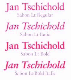 Favorite fonts as listed by designers, with votes tallied:
 - 4 votes: Helvetica Neue
- 2 votes: Clarendon, Eurostile, Futura, Optima
- 1 vote: Avenir, Avant Garde, Bliss, Bryant, Chevin, Da Plume, Egyptienne, DIN Engschrift, Frutiger, FS Clerkenwell, FS Albert, Gill Sans, Haas Unica, Haettenschweiler, Humanist, Interface, Interstate (1993, Tobias Frere-Jones), ITC Garamond, Klavika, Miller, Mister Giacco, Mostra, Officina Serif, Requiem, Sabon, Sansa, VAG, Whitney
[Google]
[More] ⦿
|
DH Type Visionaries
[Candace Uhlmeyer]
|
Candace Uhlmeyer provided a bit of type history through the work of Johannes Gutenberg (1398-1468), William Caxton (1422-1491), Aldus Manutius (1450-1515), William Caslon (1692-1766), John Baskerville (1706-1775), Giambattista Bodoni (1740-1813), William Morris (1834-1896), Frederic W. Goudy (1865-1947), Eric Gill (1882-1940), and Jan Tschichold (1902-1974). [Google]
[More] ⦿
|
Dominik Junker
|
Designer from Sankt Gallen, Switzerland, who created the copperplate typeface Arial Serif and the custom typeface Grill (based on Gill Bold) in 2013. Behance link. [Google]
[More] ⦿
|
Dylan Roscover
|
Dylan Roscover (Aloma, FL) made an incredible portrait of Steve Jobs based on the "Here's to the crazy ones" ad campaign from Apple in the 90s, using Motter Tektura, Apple Garamond, Myriad, Univers, Gill Sans, and Volkswagen AG Rounded, fonts present in Apple branding and products. [Google]
[More] ⦿
|
Edward Johnston
|
 Born in Uruguay in 1872, he died in the UK in 1944. A medical doctor, he taught all his life at the Central School of Arts and Crafts in London and at the Royal College of Art in London. From 1910 until 1930, he designed fonts for the Cranach-Presse in Weimar, which was owned by Count Harry Kessler.
 In 1916, he made a typeface for the London Underground (helped by Eric Gill). Johnston's London Transport type was reworked by Colin Banks in his New Johnston (1979), and again in 2016 by Malou Verlomme at Monotype, on commission for Transport For London (TfL), as Johnston100. Edward Johnston's fonts show a strong influence by Eric Gill. Hamlet-Type (1912-27, designed for a Shakespeare edition, Cranach Press, 1929) was also called Kessler-Blackletter. It was designed by Edward Johnston and cut in three sizes (10, 12 and 18 pt) by Edward Prince for William Shakespeare's Hamlet (published by Harry Kessler's Cranach Press in Weimar in 1929). The type is based on the Durandus for the lowercases, and Sweynheim & Pannartz's Subiaco type for the capitals. For a digital revival, see Hamlet Tertia 18 and Hamlet Cicero 12 by Alexis Faudot and Rafael Ribas which was developed at a workshop in Weimar in 2018. Hamlet was revived by Manfred Klein and Petra Heidorn as HamletOrNot. Johnston designed Imprint-Antiqua with Gerard Meynell and J. H. Mason in 1913. It includes Imprint Shadow. Digital descendants exist at Monotype [Imprint MT], URW [Imprint URW, preferred over the MT version by some of my correspondents], SoftMaker [I771], and Bitstream [Dutch 766<]. Johnston Sans Serif was done in 1916. A version of the London Underground typeface (1997, by Richard Kegler) was digitized by P22. In 2007, Paul D. Hunt extended that typeface to a 21-style multilingual collection called P22 Underground Pro. At ITC, Dave Farey and Richard Dawson recreated a Johnston sans serif family with 3 weights, aptly called ITC Johnston. Nick Curtis created Underground NF in 1999. Jordan Davies called his revivals London Medium (2017) and London Heavy (2017). Many other designers aped Johnston's Underground as well. In 2012, Greg Fleming published Railway Sans as a free open source font at OFL. It is based upon Johnston's original drawings and work started by Justin Howes just before his death. In 2021, P22 added italics to P22 Underground Pro and now covers Latin, Cyrillic and Greek---help with this newest version came from Housestyle Graphics (Dave Farey; for the italics), James Todd, and Patrick Griffin (final mastering). Edward Johnston is a book published by Priscilla Johnston (London, 1959). Author of Writing&illuminating,&lettering (1917, J. Hogg, London; original done in 1906). Writing Illuminating Lettering at Amazon. Scans of some lettering by him: illuminations (1917), modernized half uncial (1906), Calligraphy by Johnston. Digital fonts based on alphabets from the 1906 book include Edward's Uncial 1904 (2011, David Kettlewell). Links: Linotype, FontShop. [Google]
[MyFonts]
[More] ⦿
|
ElseWare Corporation
[Ben Bauermeister]
|
Founded by Ben Bauermeister and Clyde McQueen in 1990, former employees of Aldus. Based in Seattle, it created for Hewlett-Packard FontSmart (a product that gives users 110 fonts and a font-management technology for HP's LaserJet 5L, 5P and 5Si printers in an innovative and compressed format). It also made FontWorks (a truetype font generation engine for Windows), Infinifont (a parametric font generation system), and PANOSE (a fonty classification system). On December 21, 1995, HP bought the company and that was the end of it. The in-house type designer was Karl Leuthold. They produced about 340 "clones" of the major typeface styles, including Albertus, AntiqueOlive, Arial, AugustaEC, BistroEC, BodoniEC, BookAntiqua, BookmanEC, BookmanOldStyle, CGOmega, CGTimes, CafeEC, CenturyGothic, CenturySchoolbook, Clarendon, CourierEC, EtnaEC, GaramondEC, GeneraEC, GillSans, Goudy-Old-Style-EW, GraphosEC, InformaEC, LetterGothic, LetterSansEC, MentorEC, MetrostyleEC, ModalEC, NewTributeEC, OperinaEC, Ozzie, SchoolbookEC, StationEC, StriderEC, StylusEC, TerasEC, TerasMonospaceEC, Univers, VillageOldstyleEC, WilmingtonEC. MyFonts link. [Google]
[MyFonts]
[More] ⦿
|
Eric Gill
|
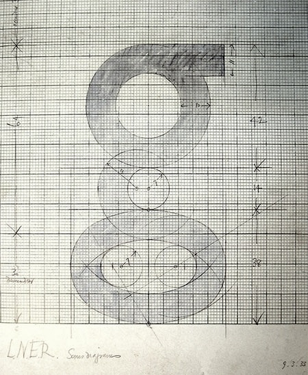 British stone carver, wood engraver, essayist and type designer Arthur Eric Rowton Gill was born in Brighton, England in 1882. He died in 1940. He was a student of Johnston and worked for some time for the Golden Cockerell Press in London. He became one of the most influential English type designers of the 20th century.
 The text book Eric Gill (Fiona McCarthy, Faber and Faber Ltd) describes his life. Publishers Weekly writes: An English artist-craftsman in the tradition of William Morris, Eric Gill (1882-1940) exemplifies the search for a lifestyle to heal the split between work and leisure, art and industry. He is remembered today for his fine engravings and stone carvings, his legendary typefaces and book designs for the Golden Cockerel Press. Yet there was another side to the man, downplayed by previous biographers: a fervent convert to Catholicism and leader of three Catholic arts-and-crafts communes, Gill had a hyperactive libido which extended to incest with his sisters and daughters, as well as numerous extramarital affairs, according to British writer MacCarthy. He rationalized his penile acrobatics by inventing a bizarre pseudoreligious theory. In MacCarthy's candid portrait, Gill, who preserved the outward image of a devout father-figure, was neither saint nor humbug, but a highly sexed creative artist trapped by his Victorian concept of masculinity. This charismatic firebrand was a renegade Fabian socialist, a bohemian friend of Augustus John and Bertrand Russell. His adventurous life, as re-created in this beautifully written, absorbing biography, is disturbingly relevant to our time. A follow-up article by McCarthy in The Guardian, 2006. Canicopulus Script (1989, Barry Deck) is a font named to remember one of Eric Gill's favorite extracurricular activities. Author of An Essay on Typography (1931, revised in 1936). For a French edition, see Eric Gill Un Essai sur la Typographie (Boris Donné and Patricia Menay, Ypsilon Editeur, 2011). Gill once said: There are now about as many different varieties of letters as there are different kinds of fools. His typefaces include - Gill Sans (1927). Revivals include Bitstream's Humanist 521 and its Cyrillic extension Paratype's Humanist 521. An obscure style called Gill Sans Shadow 338 (1929, Monotype) was digitized by Toto in 2011 as K22 EricGillShadow. Image of Gill Sans by Katharina Felski. Image of Gill Sans's g by John Bakhan (Seoul). Image of Gill Sans by Tori Estes. Over at Infinitype and SoftMaker, the typeface sells under the name Chantilly or Chantilly Serial. Niteesh Yadav, a graphic designer in New Delhi, created a great PDF file on the topic of Gill Sans. For a major digital update and revival, see Gill Sans Nova (George Ryan, 2015, Monotype). It extends Gill Sans MT from 18 to 43 fonts. Several new display fonts are available, including a suite of six inline weights, shadowed outline fonts that were never digitized and Gill Sans Nova Deco that was previously withdrawn from the Monotype library. And it covers Greek and Cyrillic.
- Golden Cockerell Roman (1929), forv the Golden Cockerel Press. Berry, Johnson and Jaspert write: Designed by Eric Gill, a rounder form of his Perpetua. It has the modest capitals, horizontal serifs and slight differentiation of colour of Gill's other romans. The M is somewhat splayed. The g has a rather large bowl. The t is very short. The italic, cut only for the 14 pt. size, is a sloped roman except for the a and with it are used the roman capitals, as in the case of Joanna.
- Perpetua (Monotype, 1928-1929). This is the prototypical lapidary typeface. The Bitstream version is called Lapidary 333. The SoftMaker versions are called P700 and persistent. See also here. Images of Perpetua: i, ii, iii, iv, v, vi, vii, viii, ix, x, xi.
- Solus (1929)
- Cunard (1934; sold to L. E. Deval, Elkin Matthews Limited, and listed as Jubilee (1952) by Stephenson Blake)
- Joanna (1930): a slab serif based on work by Granjon. Monotype's metal typeface Joanna dates from 1958. Berry, Johnson and Jaspert write: Designed by Eric Gill for Hague & Gill in 1930. A light roman with small horizontal serifs and little differentiation of colour. The type is remarkable for the smallness of the capitals, which do not reach the height of the ascenders, themselves not tall. The bowl of the g is rather large. The italic is the roman inclined except for a and g. The inclination is very slight. There are no specially cut capitals, but the modest roman capitals are used. This was the practice of Aldus, the first printer to use italic. Eric Gill's Essay on Typography, 1931 is printed in Joanna. In 2015, Monotype set out to remaster, expand and revitalize Eric Gill's body of work, with more weights, more characters and more languages to meet a wide range of design requirements. As part of that, it published a revival / extension in 2015 by Ben Jones, Joanna Nova. This 18-font series covers Greek and Cyrillic. There is an excursion into the sans world based on Joanna by Terrance Weinzierl, also in 2015, Joanna Sans Nova (2015, Monotype: 16 fonts).
- Aries (1932): see the 1995 revival at FontHaus by Dave Farey.
- Floriated Capitals (1932).
- Bunyan (1934). See also Bunyan Pro (2016, Patrick Griffin and Bill Troop).
- Pilgrim (1934), originally designed for a book published by the Limited Edition Club of New York. This serene typeface with incised features was re-cut by Walter Tracy for Linotype in 1950. For digital versions, see Pilgrim (Linotype, based on a cut by Walter Tracy), Palermo Serial (1999, Softmaker), Bunyan Pro (2016, Patrick Griffin and Bill Troop), and perhaps OPTI Porque (Castcraft).
- Kayo (1936). In 1980, it was redone by Esselte (and Monotype?). In digital form, we have Gill Kayo Condensed by ITC.
- Corporate typefaces such as this one for W.H. Smith&Sons (1903-1907). Revivals or derived typefaces include Gill Facia (1996, Monotype) and Dear Sir Madam (2011, Radim Pesko).
- Gill (ca. 1932): While Gill was living in Israel, he designed a Hebrew alphabet which he cut into walls. After Gill's death in 1940, the carvings were used by Moshe Spizer to design the Gill typeface, which was then cut by Alphonso Ioso. The typeface Gill, however, never caught on.
Klingspor link. FontShop link. Linotype link. [Google]
[MyFonts]
[More] ⦿
|
Eric Gill and Jonathan Barnbrook: Designers as Authors at the Poles of the Twentieth Century
[Steven McCarthy]
|
Discussion of the work of Eric Gill and Jonathan Barnbrook, offered by Steven McCarthy (University of Minnesota). [Google]
[More] ⦿
|
Eric Gill: Photographs and Portraits
|
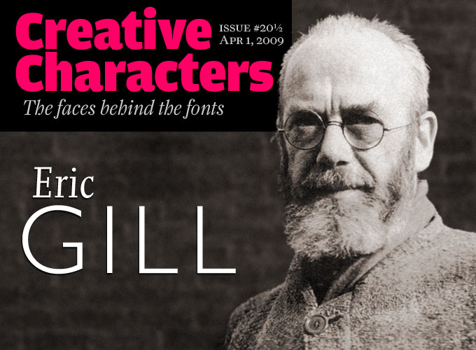 [MyFonts]
[More] ⦿
[MyFonts]
[More] ⦿
|
Eric Gill signs and lettering model for WH Smith, 1903-1907
|
One of the first examples of a corporate type was Eric Gill's typeface designed for the signs of W.H. Smith in 1903-1907. Stephen Coles reports about this typeface and quotes excerpts from Eric Gill: A Lover's Quest for Art and God (Fiona MacCarthy, 1989 US edition, E. P. Dutton): At the end of I903 Gill, the inveterate hater of garlic, was in Paris. He was there to paint the letters W. H. SMITH & SON on the fascia of Smith's Paris bookshop. He was also commissioned to paint lettering in the English tea-room which formed part of the Smith's complex, an outpost of old England in the rue de Rivoli. This was the first of a number of fascias hand-lettered by Gill for W. H. Smith at the instigation of St John Hornby, a director of Smith's, a great Arts and Crafts patron and connoisseur of lettering. His own private press, the Ashendene, is one of the most famous of its period. His choice of Eric Gill to paint Smith's signs was an inspired one; whilst other letterers might have treated them elaborately Gill's approach was absolutely clear and workmanlike. Although Gill himself only continued the hand-lettering till 1905 when, on grounds of cost, it was delegated to Smith's own sign-writers, Gill had established a style which was adhered to by W. H. Smith for many years to come. It was, as the design historians would later comment, one of the very first examples of corporate identity. Revivals or derived typefaces include Gill Facia (1996, Monotype) and Dear Sir Madam (2011, Radim Pesko). [Google]
[More] ⦿
|
Erik Spiekermann
[What makes a good typeface?]
|
[More] ⦿
|
Fatchair
[Alan Rimmer]
|
Fatchair is Alan Rimmer's company in Chessington, Surrey, UK. MyFonts catalog. He has made corporate type such as Kingston Gill Sans (for Kingston University), and Contact. Other type families: Naranja (2012, a nice rounded sans family), Reon Sans (2012), Vasarely Light (2002), Deep Fried (1996), Drug (1998), Illuminati (2000, monospaced, sans serif), Informatic (2002, 20-style sans family marketed as friendly alternative to DIN), Mizar Grotesk (2002), San Jaime (2002), WSK (2002, a modern family), Ozone Inline (free dot matrix font, 2002). Commercial fonts include Boeotian (2004), DeepFried (2005, 28 members in this multiline typographical experiment), Drug (2004, eroded face), Friday (2004), Illuminati (2004), Informatic (2004, 20-weight sans family), Mizar Grotesk (2004, 10 weights), Procyon (2004), San Jaime (2004), Stranski (2004), Venkmann (2004) and WSK (2004, a 4-weight serif). Klingspor link. View Alan Rimmer's typefaces. View Fatchair's typefaces. [Google]
[MyFonts]
[More] ⦿
|
Font Chameleon
|
A fantastic software program, available during the mid nineties, and brought to the market by Ares Software Corporation. It allowed to mix and match and extend and blend and parametrically shake fonts. Its auto-hinting features were unequaled. The program is still around in some archives, but here is a local download of Font Chameleon 1.5 (1994-1995). Laurence Penney's take: FontChameleon (created by the same team that brought us FontMonger and Letraset FontStudio) was an extremely powerful font manipulation program. Its power resulted from taking direct control of outline editing away from the user. Using a new way of representing fonts, where each character was defined as a set of "difference descriptors" from a generic outline, Ares created close approximations of 150 well-known fonts. These all shipped with Version 1.0 - which cost around $300. Using on-screen slider controls, you could adjust the weight, width, x-height, slant and tracking of these fonts, as well as blending one font into another! In general, all characters of all fonts were defined in terms of repositionings of the same set of control points (though letters such as 'a' and 'g' had more than one point-set for obvious reasons). Exploiting stylistic consistency within a font, these repositionings could be parametrized so that each font was expressible as a 2K parameter set - compared with 40K to 60K for standard font formats. So this new power could save 95% of your fonts' disk space too. A simple use of FontChameleon's blend feature would be to interpolate between Helvetica Regular and Helvetica Bold. With my second try on the program, I tried a more crazy use: interpolating between Garamond and Futura. Wow! All the grunge fonts you'll ever need, and then some! (Ernie Brock, one of its developers, told me how ideal TrueType was for much of the blending. You could use its interpolated on-curve points to vary a corner from sharp to curved: just bring two consecutive off-curve points together, and... we have a corner point.) Now that Ares is owned by Adobe, and bearing in mind the potential personality clash with multiple masters, FontChameleon (along with all of Ares' other font products) has been discontinued. Font Chameleon video FontChameleon 1.5 Professional was released in 1994 with 220 preset "flexible" fonts, including italics. This release was a massive expansion of available base fonts which covered most classic serif and sans serif font families from Berkeley Old Style to Ares Sans 46, which was a synthetic reincarnation of Frutiger. In 1994 it was advertised for $149.95. According to Nicholas Fabian, These flexible fonts, called font descriptors average only around 4K of space. Every time a new font is needed in an application, a fully functional TrueType or Postscript Type 1 font can be generated in a matter of seconds. When a font is created in FontChameleon, it is a fully-hinted font with quality second to none. ontChameleon fonts have unparalleled flexibility. Design parameters of a font are changed using slider bars which universally modify all the characters in any of the fonts in the font descriptor list. Slider bars control the weight, length of ascenders, depth of descenders, width (condense/extend amount), cap height, number height, x-height, slant and tracking. Even two different fonts can be blended together to create a new font, which leads to potentially millions of useful font variations. The Font Chameleon flexible fonts: - Ares Serif 1 (Similar to Aachen Bold): Aachen Bold.
- Ares Serif 5 (Similar to Americana): Americana, Americana Bold and Americana Extra Bold.
- Ares Sans 7 (Similar to Antique Olive): Antique Olive Condensed Bold, Antique Olive Light, Antique Olive Roman, Antique Olive Italic, Antique Olive Bold, Antique Olive Black, Antique Olive Compact, Antique Olive Nord and Antique Olive Nord Italic.
- Ares Sans 8 (Similar to Avant Garde): Avant Garde Extra Light, Avant Garde Extra Light Oblique, Avant Garde Book, Avant Garde Book Oblique, Avant Garde Medium, Avant Garde Medium Oblique, Avant Garde Demi, Avant Garde Demi Oblique, Avant Garde Bold and Avant Garde Bold Oblique.
- Ares Serif 10 (Similar to Bauer Bodoni): Bauer Bodoni Roman and Bauer Bodoni Black.
- Ares Serif 11 (Similar to Bembo): Bembo and Bembo Extra Bold.
- Ares Serif 13 (Similar to Berkeley Old Style): Berkeley Old Style Book, Berkeley Old Style Book Italic, Berkeley Old Style Black and Berkeley Old Style Black Italic.
- Ares Serif 16 (Similar to Bookman): Bookman Light, Bookman Light Italic, Bookman Medium, Bookman Medium Italic, Bookman Demi, Bookman Demi Italic, Bookman Bold and Bookman Bold Italic.
- Bodoni: Bodoni, Bodoni Bold and Bodoni Poster.
- Caslon: Caslon Book and Caslon Black.
- Ares Serif 26 (Similar to Cheltenham): Cheltenham Condensed Light, Cheltenham Condensed Ultra, Cheltenham Condensed Book, Cheltenham Condensed Bold, Cheltenham Light, Cheltenham Book, Cheltenham Bold and Cheltenham Ultra.
- Ares Serif 27 (Similar to City): City Light, City Italic, City Bold, City Bold Italic.
- Century: Century Condensed Light, Century Condensed Book, Century Condensed Book Italic, Century Condensed Bold, Century Condensed Bold Italic, Century Light, Century Book, Century Book Italic, Century Bold, Century Bold Italic, Century Ultra, Century Condensed Ultra.
- Century Old Style: Century Old Style and Century Old Style Bold.
- Courier: Courier, Courier Oblique, Courier Bold and Courier Bold Oblique.
- Cooper Black: Cooper Black.
- Ares Serif 37 (Similar to Cushing): Cushing Book and Cushing Heavy.
- Ares Sans 38 (Similar to Doric Bold): Doric Bold.
- Ares Sans 40 (Similar to Eurostile): Eurostyle Bold Condensed, Eurostyle Condensed, Eurostyle, Eurostyle Oblique, Eurostyle Bold and Eurostyle Bold Oblique.
- Franklin Gothic: Franklin Gothic Extra Condensed, Franklin Gothic Book, Franklin Gothic Book Oblique, Franklin Gothic Demi, Franklin Gothic Demi Oblique, Franklin Gothic 2 Roman, Franklin Gothic Heavy and Franklin Gothic Heavy Oblique.
- Ares Sans 46 (Similar to Frutiger): Frutiger Light, Frutiger Light Italic, Frutiger, Frutiger Italic, Frutiger Bold, Frutiger Bold Italic, Frutiger Black, Frutiger Black Italic and Frutiger Ultra Black.
- Futura: Futura Condensed Bold, Futura Condensed Bold Oblique, Futura Condensed, Futura Condensed Oblique, Futura Condensed Light, Futura Condensed Light Oblique, Futura Condensed Extra, Bold, Futura Condensed Extra Bold Oblique, Futura Light, Futura Light Oblique, Futura Book, Futura Book Oblique, Futura, Futura Oblique, Futura Heavy, Futura Heavy Oblique, Futura Bold, Futura Bold Oblique, Futura Extra Bold and Futura Extra Bold Oblique.
- Ares Serif 48 (Similar to Galliard): Galliard Roman, Galliard Italic, Galliard Ultra and Galliard Ultra Italic.
- Garamond: Garamond Condensed Bold, Garamond Condensed Book, Garamond Condensed Light, Garamond Condensed Ultra, Garamond Light, Garamond Light Italic, Garamond Book, Garamond Book Italic, Garamond Bold, Garamond Bold Italic, Garamond Ultra and Garamond Ultra Italic.
- Ares Sans 52 (similar to Gill Sans): Gill Sans Condensed, Gill Sans Bold Condensed, Gill Sans Light, Gill Sans, Gill Sans Bold and Gill Sans Extra Bold.
- Ares Serif 53 (Similar to Glypha): Glypha Thin, Glypha Thin Oblique, Glypha Light, Glypha Light Oblique, Glypha, Glypha Oblique, Glypha Bold, Glypha Bold Oblique, Glypha Black and Glypha Black Oblique.
- Gothic 13: Gothic 13.
- Goudy Old Style: Goudy Old Style and Goudy Old Style Extra Bold.
- Ares Sans 57 (similar to Helvetica): Helvetica Ultra Compressed, Helvetica Extra Compressed, Helvetica Compressed, Helvetica Narrow, Helvetica Narrow Oblique, Helvetica Narrow Bold, Helvetica Narrow Bold Oblique, Helvetica, Helvetica Oblique, Helvetica Bold and Helvetica Bold Oblique.
- Ares Sans 60 (Similar to Helvetica Neue): Helvetica Neue Ultra Light, Helvetica Neue Ultra Light Italic, Helvetica Neue Thin, Helvetica Neue Thin Italic, Helvetica Neue Light, Helvetica Neue Light Italic, Helvetica Neue Roman, Helvetica Neue Italic, Helvetica Neue Medium, Helvetica Neue Medium Italic, Helvetica Neue Bold, Helvetica Neue Bold Italic, Helvetica Neue Heavy, Helvetica Neue Heavy Italic, Helvetica Neue Black and Helvetica Neue Black Italic.
- Ares Serif 65 (Similar to Janson): Janson Roman, Janson Bold.
- Ares Sans 63 (Similar to Kabel): Kabel Book, Kabel Medium, Kabel Demi, Kabel Bold and Kabel Ultra.
- Ares Serif 67 (Similar to Leawood): Leawood Book, Leawood Medium, Leawood Bold and Leawood Black.
- Letter Gothic: Letter Gothic, Letter Gothic Slanted, Letter Gothic Bold and Letter Gothic Bold Slanted.
- Ares Serif 69 (Similar to Lubalin Graph: Lubalin Graph Book, Lubalin Graph Book Oblique, Lubalin Graph Demi and Lubalin Graph Demi Oblique.
- Ares Serif 71 (Similar to Melior): Melior, Melior Bold.
- Ares Serif 73 (Similar to Meridien): Meridien, Meridien Bold.
- Ares Serif 75 (Similar to New Baskerville): New Baskerville Roman, New Baskerville Bold.
- News Gothic: News Gothic, News Gothic Oblique, News Gothic Bold and News Gothic Bold Oblique.
- Ares Serif 78 (Similar to New Century Schoolbook): New Century Schoolbook Roman, New Century Schoolbook Bold.
- Ares Serif 85 (Similar to Palatino): Palatino Roman, Palatino Italic, Palatino Bold Italic and Palatino Bold.
- Ares Serif 88 (Similar to Plantin): Plantin Light, Plantin, Plantin Bold.
- Prestige Elite (Similar to Prestige): Prestige Elite, Prestige Elite Slanted, Prestige Elite Bold and Prestige Elite Bold Slanted.
- Ares Serif 92 (Similar to Rockwell): Rockwell Condensed, Rockwell Light, Rockwell Light Italic, Rockwell, Rockwell Italic, Rockwell Extra Bold.
- Ares Serif 94 (Similar to Serifa): Serifa Light, Serifa Light Italic, Serifa, Serifa Italic, Serifa Bold and Serifa Black.
- Ares Sans 95 (Similar to Serif Gothic): Serif Gothic Light, Serif Gothic Bold and Serif Gothic Black.
- Ares Serif 99 (Similar to Stempel Garamond): Stempel Garamond Roman and Stempel Garamond Bold.
- Ares Serif 104 (Similar to Times): Times Roman, Times Italic, Times Bold Italic and Times Bold.
- Ares Serif 106 (Similar to Times New Roman): Times New Roman, Times New Roman Bold.
- Ares Serif 109 (Similar to Trump Mediaeval): Trump Mediaeval Roman, Trump Mediaeval Bold.
- Ares Sans 108 (Similar to Trade Gothic): Trade Gothic Light, Trade Gothic Light Oblique, Trade Gothic Condensed (18), Trade Gothic Condensed (18) Oblique, Trade Gothic Condensed (20) Bold, Trade Gothic Condensed (20) Bold Oblique and Trade Gothic Bold (2) Oblique.
- Ares Sans 110 (Similar to Univers): Univers Condensed Thin (39), Univers Ultra Condensed (59), Univers (55), Univers (55) Oblique, Univers (85) Extra Black, Univers (85) Extra Black Oblique, Univers (53) Extended, Univers (53) Extended Oblique, Univers (93) Extra Black and Univers (93) Extra Black Oblique.
- Walbaum: Walbaum, Walbaum Book, Walbaum Bold, Walbaum Book Medium and Walbaum Book Bold.
Finally, a note by Guy Jeffrey Nelson, published here with his permission: I was one of the kids who pushed points around developing Font Chameleon. I worked for the Font Bureau at the time, under the great David Berlow. Tobias Frere-Jones was there with me along with Elizabeth Holzman and Kelly Ehrgot Milligan, working obscene hours to get hundreds of fonts hinted. Never eating, barely sleeping, we lived in the studio at 18 Tremont at the time. At one point we picked up some gag "old lady" tourist sunglasses to shield our burning eyes from the glare of the old CRT monitors. Our "conference room" was empty beyond eight folding beach chairs, and at least one of us would be getting a tight 30 minutes of sleep in there through the days. But through it all there was time for meeting girls in the hall (I married the one I met. She is beside me now 28 years later.) smoking cigarettes and eating Junior Mints, dropping 60 pound monitors down the stairs, playing practical jokes on David, Sam Berlow and Harry Parker (I left and cut my hair for the first time in years and returned as my twin brother) and just general insanity in the Golden Age of digital font foundries. What fun it was to have Eric Spiekerman, Neville Brody, Matthew Carter, Roger Black and other design greats come by in the fog of war during the Font Chameleon project and others. [Google]
[More] ⦿
|
Fontpad
[Ben Mitchell]
|
 Freelance graphic designer from Brighton, UK, b. 1976. He created the modular serif typeface Eternal (2007).
 In 2010, he was working on the angular serif face Mixteca, which in turn evolved into Feld spar, a typeface with strong unbracketed serifs. Mint (2009-2010, in many weights) is a spiced-up Optima family. And Gecko (was Melia) is a typeface designed for small sizes. Typefaces from 2011: Carnet (a take on Gill Sans and the British humanist sans in general), Sentosa (an elliptical sans family). Typefaces from 2012: Lumen (a typeface developed at the University of Reading for Burmese, Thai and Latin). Graduate of the MATD program at the University of Reading in 2012. His graduation typeface Lumen covers Latin, Burmese, and Thai. Co-designer of the free Google Fonts typefaces IBM Plex Sans Thai (2019; by Mike Abbink, Paul van der Laan, Pieter van Rosmalen, Ben Mitchell and Mark Frömberg) and IBM Plex Sans Thai Looped (2019; by Mike Abbink, Paul van der Laan, Pieter van Rosmalen, Ben Mitchell and Mark Frömberg). Flickr link. Behance link. [Google]
[More] ⦿
|
FontSite
[Sean Cavanaugh]
|
Online font site run by Sean Cavanaugh (b. Cape May, NJ, 1962) out of Camano Island, WA. This used to be called Title Wave Studios. Since 1996, Sean Cavanaugh is the head of FontSite. In the archives, one can/could find essays on writing style, rules of typography, and a comparison by Thomas Phinney (program manager of Latin Fonts at Adobe) of T1 and TTF. The Fontsite 500 CD (30 USD) offers 500 classical fonts with the original names, plus a few names I have not seen before, such as Bergamo (=Bembo by Francesco Griffo), Chantilly (=Gill Sans), Gareth (=Galliard), Noveo sans (=Neuzeit Grotesk), Palladio (=Palatino), Savoy (=Sabon), URWLatino, Unitus, Toxica, Publicity, Plakette, Pericles, Opus (=Optima), Melville, Function, Flanders, Cori Sans, Binner. Uli Stiehl provides proof that many of the fonts at FontSite are rip-offs (identical to) of fonts in Martin Kotulla's (SoftMaker) collection. This is perhaps best explained that Sean Cavanaugh's last real job was director of typography for SoftMaker, Inc., where he oversaw the development and release of SoftMaker's definiType typeface library and associated products [blurb taken from Digital Type Design Guide: The Page Designer's Guide to Working With Type, published in 1995 by Hayden Books]. Free fonts: Bergamo, CartoGothic (1996-2009), CombiNumerals. At MyFonts, the CombiNumerals Pro and CombiSymbols dingbat families are available since 2010. The site has a number of fonts with the acronym FS in the name, so I guess these are relatively original (but I won't swear on it): Allegro FS, Beton FS, Bodoni Display FS (+ Bold, Demibold), Bodoni No 2 FS (+ Ultra, Bodoni Recut FS (+Bold, Demibold), and so forth. His 500 Font CD has these fonts: - Garalde, Venetian: Bergamo, Bergamo Expert, Bergamo SC&OsF, Caslon, Caslon Expert, Gareth, Garamond, Garamond Expert, Garamond SC&OsF, Garamond Condensed, Garamond Modern, URW Palladio, URW Palladio Expert, Savoy, Savoy Expert, Savoy Small Caps&OsF, Vendôme.
- Slab Serif: Clarendon, Glytus, Typewriter, Typewriter Condensed.
- Script: Commercial Script, Deanna Script, Deanna Swash Caps, Hudson, Legend, Mistral, Park Avenue, Phyllis, Phyllis Swash Caps, Vivaldi.
- Uncial: American Uncial, Rosslaire.
- Blackletter: Fette Fraktur, Fette Gotisch, Olde English.
- Borders and symbols: Celtic Borders, Deanna Borders, Deanna Flowers, Picto, Sean's Symbols.
- Transitional: URW Antiqua, Baskerville, Baskerville Expert, New Baskerville.
- Didone, modern: Bodoni, Bodoni Expert, Bodoni Small Caps&OsF, Modern 216, Walbaum.
- Sans serif: Chantilly, Franklin Gothic, Franklin Gothic Condensed, Franklin Gothic Cnd. SC&OsF, Function, Function Small Caps&OsF, Function Condensed, Goudy Sans, Opus, Opus Small Caps&OsF, Syntax, Letter Gothic.
- Decorative: Ad Lib, Algerian, Arnold Boecklin, Binner, Caslon Antique, Chromatic, Copperplate Gothic, Davida, Delphian Open Titling, Function Display, Glaser Stencil, Goudy Handtooled, Handel Gothic, Hobo, Honeymoon, Horndon, Mercedes, Mona Lisa, OCR-A&OCR-B, Plakette, Reflex, Salut, Stop, Toxica, VAG Rounded.
Some more fonts: Alperton, Anaconda, Arizona, Bamboo, Bellhop, Bellows Book, Bernhard Modern FS (2011), Boehland (a revival of Johannes Boehland's Balzac, 1951), Le Havre. MyFonts link. Fontspace link. His art deco fonts, as always without "source" and confusing Victorian, art nouveau, and psychedelica with art deco, include Rimini, Arnold Boecklin, Eldamar, Erbar Deco, Rangpur, Pinocchio, Azucar Gothic, Boyle, Busorama FS, Winona, Abbott Old Style, Almeria (after Richard Isbell's Americana) and Adria Deco, Bernhard Modern FS (2011). FontSpring link. [Google]
[MyFonts]
[More] ⦿
|
Futura Display
|
 A typeface designed by Paul Renner in 1932 (Bauer, Neufville, Berthold).
 Derived typefaces include Futura Display by URW, Futura Display SB (2004, Scangraphic), Futura Display SH (2004, Scangraphic), Futura Display EF (Elsner & Flake), Deko Display Serial (2010, Softmaker), Function Display (Infinitype), S842 Deco (Softmaker), Steile Futura, Topic, Bauer Topic. Turista Gorda NF (2009, Nick Curtis) is based on Baltimore Type Foundry's Airport Tourist which in turn used ideas from Renner's 1932 typeface Futura Display. Airport Gothic is a related metal face. Mc McGrew on Airport Gothic: Most of this series is the first American copy of Futura, which originated in Germany in 1927, designed by Paul Renner for Bauer. One source says it was cut from original Futura drawings, smuggled out of that country, but it seems more likely that matrices were made by electrotyping the imported type. An extrabold weight, Airport Black, was cut by Baltimore about 1943; information on this cutting is scarce and contradictory---one account says it was designed by Bill Stremic or Bill Blakefield, another that it was designed by Carl Hupie (or Hooper), and cut by Herman Schnoor. There is also Airport Black Condensed Title and Airport Broad. The latter is a modification of Airport Black, cut 50 percent wider on the pantagraph by Herman Schnoor. Baltimore later cast some of its Airport series from Monotype Twentieth Century matrices, and in a few cases listed both series. Airport Relief, Baltimore 299, is English Monotype Gill Sans Cameo Ruled, while Airport Tourist, Baltimore 602, is Futura Display, cast from electrotype mats of the German foundry type. Hess Neobold was designed by Sol Hess for Monotype in 1934. Mac McGrew: It is a narrow, bold, and very squarish gothic with small serifs, designed for attention-getting display in a style of the day, but never made in more than one size. Compare Airport Tourist (Futura Display), Othello. [Google]
[More] ⦿
|
General purpose sans
|
 On Typeforum, a list of general purpose sans families (with Cyrillic, Italic, and so forth):
 - Myriad, Myriad Pro
- Helvetica
- Futura
- Interstate (1993, Tobias Frere-Jones)
- Univers
- Scala Sans
- The Sans
- Gill Sans
- Syntax (Linotype)
- Quay Sans (ITC)
- Bliss (Agfa)
- DTL Documenta
- DTL Nobel
- FF Meta
- LT Finnegan
- Optima Nova (Linotype)
- Formata (Adobe)
- Frutiger NEXT (Linotype)
- Imago (Berthold)
- ITC Officina
- Kievit (The Font Bureau, Inc.)
- Gotham (The Hoefler Type Foundry Inc.)
- LT Ergo
- Foundry Form Sans (The Foundry)
[Google]
[More] ⦿
|
Geometric sans: early 20th century
|
Discussion of geometric sans typefaces in the early 1900s. Some quotes: [...] Geometric sans serifs were all the rage, and every foundry wanted a piece of the pie. For instance, Monotype wanted Gill, Linotype wanted Dwiggins, and yes there was also Renner's Futura and Kabel. [...] A lot of typefaces back then, including Vogue, Metro, Gill, and Tempo, had alternate characters available to allow them to pass as Futura or Kabel. Linotype's Spartan (their version of Futura) also had an alternate two-story a. Monotype also had a Kabel look-alike called Sans Serif that had alternates to make it look like Futura or Bernhard Gothic, plus some really neat rounded capitals designed by Sol Hess. [...] Vogue was cut in 1930 for Vogue magazine and later released generally [by Stephenson Blake]. It differs from Futura in a number of ways. The caps are the full ascender height, the lowercase a is two-story in the lighter weights. The most distinctive characters are the uppercase G, M, and Q. [...] [Google]
[More] ⦿
|
George Ryan
|
 American designer, b. Rockville Centre, NY, 1950. George Ryan held senior positions at Linotype and Bitstream since 1979, where he has been involved in the production of over 2500 fonts. In 2004, Ryan joined Agfa Monotype, and is now a Monotype typeface designer. Creator of these typefaces:
 - The amazingly beautiful text font Kennedy GD (1995, Galapagos).
- Other Galapagos fonts: McLemore (2002), Geis (2002), Jorge (2002), Culpepper (2002, an extension and interpretation of Rudolf Koch's Neuland, 1923), the elegant formal script font Tiamaria (2002, connected script), the fat art nouveau font Robusto (2002, based on letters found in a book about Oswald Cooper), Prop Ten (2002).
- The hand-printed comic book style typeface ITC Kristen (1995).
- The legible Nikki New Roman GD (1996).
- The handwriting font MohawcsNote GD.
- The Bitstream font Oz Handicraft BT (1991). This was created by George Ryan in 1990 from a showing of Oswald Cooper's hand lettering found in The Book of Oz Cooper, published in 1949 by the Society of Typographic Arts in Chicago). A refresh was done in 2016.
- Migrate GD (now ITC Migrate).
- ITC Eborg.
- The fine dingbat font Web-O-Mints GD.
- The clean sans serif Wyle GD.
- Established in 2003 by George Ryan in Arlington, MA, Bilt Fonts (Aruban Font Foundry) sells revivals and original designs through MyFonts. Typefaces include Pietin, Geo Sans, Netto, Rescue, Jingle, Geo Tablet, Lottsa Lotta, Big Stuff, Rainman, Depth Charge, Sansand, Bulla Bulla, Kappa Nappa, Kappa Sappa, Sarabella (2004, calligraphic), Marcus Texus (fun informal), Marcus Displaeus, and Spio Beo.
- Semaphore (Bitstream, with Dave Robbins).
- In 2007, at Monotype, he made Givens Antiqua, named after Robert Givens, the co-founder and first president of Monotype Imaging---it is a soft and elegant serif family in 16 styles.
- In 2012, he published the comic book felt tip marker typeface Koorkin (Monotype).
- In 2013, he worked on an Ethiopic typeface at Monotype.
- In 2015, Monotype set out to remaster, expand and revitalize Eric Gill's body of work, with more weights, more characters and more languages to meet a wide range of design requirements. As part of that effort, George Ryan extended the popular Gill Sans from 18 to 43 fonts in his Gill Sans Nova (2015). Several new display fonts are available, including a suite of six inline weights, shadowed outline fonts that were never digitized and Gill Sans Nova Deco that was previously withdrawn from the Monotype library. Greek and Cyrillic coverage.
FontShop link. Klingspor link. View George Ryan's typefaces. [Google]
[MyFonts]
[More] ⦿
|
Gill Sans alternatives
|
 Stephen Coles, based on an article from 2007 by Ben Archer, lists the alternatives for Gill Sans (1932, Monotype), a typeface they both find lacking. Here is the list:
 - Granby by Stephenson Blake (metal in 1930; revived by Elsner & Flake as Granby EF, and Scangraphic as Granby SB). Closer to Johnston and highly recommended by Coles. Tankard's Wayfarer (2017) was influenced by Granby. Marquis (2021, Apfel Type Foundry) is a contemporary re-interpretation of Granby. Granby was also revived by Pat and Paul Hickson.
- Bliss by Jeremy Tankard (1996): very complete and legible.
- Foundry Sterling by David Quay and Freda Sack (2002, The Foundry). Coles thinks that it is overpowered by its predecessor, Bliss.
- Agenda by Greg Thompson (Font Bureau, 1993-2000).
- P22 London Underground (Richard Kegler, P22, 1997).
- ITC Johnston by David Farey (ITC, 1999-2002). One of the best digital versions of Johnston's Underground.
- English Grotesque (1998, Rian Hughes): an exaggerated interpretation.
- Tschichold by Jan Tschichold (1933, metal) and Thierry Puyfoulhoux (2001, digital).
The list above omits fonts designed after 2007, and also more or less direct digital imitations of Gill Sans such as Bitstream's Humanist 521 and its Cyrillic extension Paratype's Humanist 521. For a major digital update and revival, see Gill Sans Nova (George Ryan, 2015, Monotype). Softmaker's revival is called Chantilly. [Google]
[More] ⦿
|
Gill Sans: Critique by Ben Archer
[Ben Archer]
|
Ben Archer argues why Gill failed in his attempt to improve on Johnston's Underground typeface in his design of Gill Sans. He laments the lack of consistency and rhythm, the poor choices for some tails, ascenders and descenders. He concludes by saying: The old metal version of Granby has a faithfulness to Johnston's proportions and characteristics that Eric Gill missed in such a way as to suggest he did it deliberately. Nearly a century later, Edward Johnston's pioneering work is still the big noise in contemporary sans serif typeface design. So much for fool-proof! [Google]
[More] ⦿
|
Gill Sans DRK
|
 Eric Gill would turn in his grave if he saw the monstrosity Monotype sold to the German Red Cross (DRK: Deutsches Rotes Kreuz) for their branding: Gill Sans DRK (1996). And why did the DRK give the job to the British anyway? [Google]
[More] ⦿
Eric Gill would turn in his grave if he saw the monstrosity Monotype sold to the German Red Cross (DRK: Deutsches Rotes Kreuz) for their branding: Gill Sans DRK (1996). And why did the DRK give the job to the British anyway? [Google]
[More] ⦿
|
GillSansBridge
|
 Gill Sans augmented with some playing card symbols. [Google]
[More] ⦿
Gill Sans augmented with some playing card symbols. [Google]
[More] ⦿
|
Grosse Pointe Group LLC
[Mark Solsburg]
|
 The Grosse Pointe Group LLC is located in Westport, CT, and is run by Mark Solsburg, who also owns Group Type, ansd who was involved in or ran FontHaus and TypoBrand. Under the Grosse Pointe label, we find a digital font called Stradivarius (1992), named after Imre Reiner's 1938 formal script font Symphonie (Bauer; renamed Stradivarius in 1945). At Group Type or the other outfits of Solsburg, we find these fonts: Carpenter (a 1995 revival of an old connected ATF script by James West), Aquiline (an absolutely wonderful 16th century script), Bank Gothic (1994, a revival of Morris Fuller Benton's original---see also Bank Gothic BT), Aries (a 1995 revival of a lapidary by Eric Gill), Schneidler Initials (a 1995 revival of Friedrich Hermann Ernst Schneidler's Trajan-style typeface), Raleigh Gothic (a 1995 typeface based on Morris Fuller Benton's design. See also Raleigh Gothic RR for a different revival), Ovidius Script (a medieval simulation script, dated 2006, designed by Thaddeus Szumilas; in Light, Demi and Bold weights), Metro Sans (2006, a great Bauhaus style sans family based on William Addison Dwiggins' Metro #2), Corvinus Skyline (1991; a revival of a condensed modern family by Imre Reiner by the same name, 1934), Cloister Initials (2006, a revival of an illuminated caps typeface by Goudy), Regular Joe (2006, an out-of-place childish handwriting font), and Caslon Antique (1993; based on an original by Bernd Nadall). [Google]
[More] ⦿
The Grosse Pointe Group LLC is located in Westport, CT, and is run by Mark Solsburg, who also owns Group Type, ansd who was involved in or ran FontHaus and TypoBrand. Under the Grosse Pointe label, we find a digital font called Stradivarius (1992), named after Imre Reiner's 1938 formal script font Symphonie (Bauer; renamed Stradivarius in 1945). At Group Type or the other outfits of Solsburg, we find these fonts: Carpenter (a 1995 revival of an old connected ATF script by James West), Aquiline (an absolutely wonderful 16th century script), Bank Gothic (1994, a revival of Morris Fuller Benton's original---see also Bank Gothic BT), Aries (a 1995 revival of a lapidary by Eric Gill), Schneidler Initials (a 1995 revival of Friedrich Hermann Ernst Schneidler's Trajan-style typeface), Raleigh Gothic (a 1995 typeface based on Morris Fuller Benton's design. See also Raleigh Gothic RR for a different revival), Ovidius Script (a medieval simulation script, dated 2006, designed by Thaddeus Szumilas; in Light, Demi and Bold weights), Metro Sans (2006, a great Bauhaus style sans family based on William Addison Dwiggins' Metro #2), Corvinus Skyline (1991; a revival of a condensed modern family by Imre Reiner by the same name, 1934), Cloister Initials (2006, a revival of an illuminated caps typeface by Goudy), Regular Joe (2006, an out-of-place childish handwriting font), and Caslon Antique (1993; based on an original by Bernd Nadall). [Google]
[More] ⦿
|
Group Type
[Mark Solsburg]
|
 Mark Solsburg's outfit located in Westport, CT. Before GroupType, Solsburg worked at ITC, which he left in 1989 to start FontHaus. Later he started TypoBrand and Grosse Pointe Group LLC. Solsburg headed the Type Directors Club for a few years. He is presently located in Ann Arbor, MI. He is President / CEO of DsgnHaus (1989-present), and partner in TypoBrand LLC (2004-present), a specialized typographic consulting firm founded by type designer, Mark van Bronkhorst; former type designer for Adobe, Linnea Lundquist, and Mark Solsburg. It seems that the FontHaus collection is now being marketed under the Group Type label at MyFonts. Group Type does technology consultation in the field of providing software and type typeface fonts for designers, publishers and typographers, related to the selection, purchase and use of design software and type typeface fonts for use in graphic, industrial, interactive and communications design. They specialize in revivals. Their fonts include
 - Aquiline. An absolutely wonderful 16th century script.
- Arbor Brush (2012). A brush font that seems almost painted.
- Aries. A 1995 revival of a lapidary typeface by Eric Gill.
- Bank Gothic (1994). A revival of Morris Fuller Benton's original---see also Bank Gothic BT. Now also Bank Gothic Distressed.
- Bristol (1994). In Adornado and Solid substyles. Based on a design by Stevens Shanks.
- Broadway Poster.
- Carpenter Script (1995). Revival of an old connected ATF script by James West.
- Caslon Antique (1993). Based on an original by Bernd Nadall.
- Cloister Initials (2006). A revival of an illuminated caps typeface by Goudy.
- Cooper Poster.
- Corvinus Skyline (1991). By Ann Pomeroy. A revival of a condensed modern family by Imre Reiner by the same name.
- Craw Modern (2012). A revival of Craw Modern by Freeman Craw (1958, ATF).
- Diane Script.
- Fortis (2012), formerly Atlas. In the wood style of Latin Wide, with heavy sharp triangular serifs.
- Girder Poster.
- Gotico Black. A blackletter.
- Grosse Pointe Metro (2006-2009). A great Bauhaus style sans family based on William Addison Dwiggins' Metro #2). See also Detroit Metro.
- Grotesca (1995).
- Laughin. Andrew Smith contributed his Laughin, which was earlier at FontHaus.
- Maxim.
- Ovidius Script. A medieval simulation script, dated 2006, designed by Thaddeus Szumilas. Comis in Light, Medium and Bold.
- Poster Gothic.
- Raleigh Gothic (1995). A typeface based on Morris Fuller Benton's design. See also Raleigh Gothic RR for a different revival.
- Regular Joe (2006). An out-of-place childish handwriting font.
- Ronde Script (2012). This ronde comes from the French side. Group ype says that it was modeled after Parisian Ronde by the Chappelle foundry in Paris, but its roots go back to Nicolas Gando.
- Schneidler Initials (1995). Revival of Friedrich Hermann Ernst Schneidler's Trajan-style typeface.
- Sitcom. Ann Pomeroy contributed Sitcom.
- Spire. By Ann Pomeroy. A condensed didone family heavily based on Sol Hess's Spire (Lanston).
- Stradivarius.
View the Group Type typeface libary. [Google]
[MyFonts]
[More] ⦿
|
Harrisson
[Open Source Publishing (or: OSP)]
|
 [More] ⦿
|
Hausschriften
|
 A list (in German) of typefaces used by companies (often specially designed). Translated and partially reprodused here. We also took info from this subpage.
 | Company | Type | Alternate type | Yet another type | Still another type | | | | | | | ARD | The Sans | The Serif | | | | AirBerlin | Meta | | | | | Airbus | Helvetica Neue | Times New Roman | Arial | | | Akzo Nobel | Symbol | | | | | Aral | Aral V2 Medium | Baskerville BQ | | | | Audi | Audi Antiqua | Audi Sans | | | | BMW | BMW Helvetica | | | | | Bonnfinanz | Frutiger | Adobe Garamond | Bodoni Book | | | Bosch | Bosch Sans/Serif | | | | | Bundesregierung | Demos | | | | | CDU | FF Kievit | | | | | Credit Suisse | Credit Suisse Type | | | | | DHL | Frutiger | Minion | | | | DRK | Gill Sans | Rockwell | | | | DSK | The Sans5 | | | | | DaimlerChrysler | Corporate ASE | | | | | Deutsche Bahn | Helvetica | | | | | Deutsche Bank | DeuBa Univers | | | | | Deutsche Post | Frutiger | Helvetica | | | | E.ON | Polo | | | | | Ford | Ford Light/Bold | | | | | Heineken | Heineken Sans/Serif | | | | | Henkel | Helvetica Neue | Swift EF | Arial | Times New Roman | | IKEA | Ikea | | | | | Langenscheidt | Trade Gothic | | | | | Linde AG | Linde Dax | | | | | Lufthansa | Helvetica | | | | | Mephisto | Futura Book | | | | | Mercedes | Corporate A/E/S | | | | | Mitsubishi | Alpha Headline | | | | | Nissan | NissanAG | | | | | Nivea | Nivea Sans | | | | | Nokia | Nokia Sans/Serif | | | | | Opel | Opel Sans | | | | | Pioneer | Meta | | | | | Porsche | Franklin Gothic | | | | | Roche | Minion | Imago | | | | School | Chevin | | | | | Shell | Futura LT Bold | | | | | Siemens | Siemens Sans/Serif/Slab Serif | | | | | Sparkass | Sparkasse Lt/Rg | | | | | TUI | Tui | | | | | Tengelmann | Syntax | | | | | UBS | UBS Headline | Frutiger 45 | | | | UPS | Dax | | | | | VW | VW Headline | Utopia | | | | Velux | Futura | | | | | Volvo | Volvo Broard | | | | | WDR | Meta | Minion | | | | Zeche Zollverein | Chevin | | | | | Company | Typeface | Foundry | Designer | Basis | Application | | | | | | | | Škoda | Skoda Sans | Dalton Magg | | | | | 3Sat | Gill Sans | Monotype | Eric Gill | | | | ADAC | Franklin Gothic | Linotype | Morris Fuller Benton | | | | AEG | Rotis | Agfa | Otl Aicher | | | | AMD | Gill Sans | Monotype | Eric Gill | | | | ARD | The Sans | LucasFonts | Lucas de Groot | | | | ARD | The Serif | LucasFonts | Lucas de Groot | | | | AVM | Info | FontFont | Erik Spiekermann, Ole Schäfer | | | | AVM | Meta | FontFont | Erik Spiekermann | | | | AWD | AWD | | | Interstate | | | AXA | Eras | ITC | | | | | Adidas | AdiHaus | | | DIN | | | Adobe | Myriad | Monotype | | | | | Adobe | Minion | Agfa | Robert Slimbach | | | | AirBerlin | Meta | FontFont | Erik Spiekermann | | | | Airbus | Times New Roman | Monotype | | | | | Airbus | Arial | Monotype | Patricia Saunders, Robin Nichols | | | | Airbus | Neue Helvetica | Linotype | | | | | Akzo Nobel | Symbol | | | | | | Aldi | Futura | Elsner+Flake | Paul Renner | | | | Allianz | Formata Condensed | | | | Headlines | | Apple | Apple Myriad | | | | | | Aral | Baskerville BQ | | | | | | Aral | Aral V2 Medium | | | | | | Arcor | Memphis | Linotype | Chauncey H. Griffith | | | | Arvato | Bliss | | | | | | Audi | Audi Antiqua | | | | | | Audi | Audi Sans | | | Univers | | | B.Braun Melsungen AG | Rotis | Agfa | Otl Aicher | | | | BMW | BMW Type | | | Helvetica | | | Beck's | Syntax | Linotype | Hans Eduard Meier | | | | Berliner Zeitung | Walbaum | Linotype | J. E. Walbaum | | Headlines | | Berliner Zeitung | Utopia | Monotype | | | Text | | Bertelsmann | Utopia | Monotype | | | | | Bertelsmann | Univers | Linotype | Adrian Frutiger | | | | Bonnfinanz | Bodoni Book | Bitstream | Giambattista Bodoni | | | | Bonnfinanz | Adobe Garamond | Agfa | Claude Garamond, Robert Slimbach | | | | Bonnfinanz | Frutiger | Linotype | Adrian Frutiger | | | | Bosch | Bosch Serif | | | | | | Bosch | Bosch Sans | | | | | | Bulthaup | Rotis | Agfa | Otl Aicher | | | | Bundesagentur für Arbeit | Corporate S | URW++ | Kurt Weidemann | | | | Bundesregierung | Neue Demos | | | | | | Bundesregierung | Neue Praxis | | | | | | C&A | CA Info Type | | | | | | C&A | CA Corporate Type | | | | | | CDU | CDU Kievit | | | Kievit | | | Canon | DendaNew | | | | | | Commerzbank AG | Commerzbank Headline | | | Stymie Black | | | CosmosDirekt | Geometric Slabserif 703 | Bitstream | | | Logo | | CosmosDirekt | Univers Condensed | Linotype | Adrian Frutiger | | | | Credit Suisse | Credit Suisse Type | | | | | | DA direkt | Frutiger | Linotype | Adrian Frutiger | | Fliesstext | | DA direkt | Linotype Ergo | Linotype | | | Logo | | DAB Bank | DAB Bank Officina | | | Officina | | | DHL | Frutiger | Linotype | Adrian Frutiger | | | | DHL | Minion | Agfa | Robert Slimbach | | | | DRK | Helvetica | Linotype | Max Miedinger | | | | DRK | Arial | Monotype | Patricia Saunders, Robin Nichols | | | | DSK | The Sans | LucasFonts | Lucas de Groot | | | | Delta Airlines | Delta | Dalton Magg | | | | | Der Spiegel | Spiegel Sans (a 32 style American gothic family) | LucasFonts | Lucas de Groot | Franklin Gothic | | | Der Spiegel | Spiegel Serif | LucasFonts | Lucas de Groot | Linotype Rotation | | | Detax | Frutiger | Linotype | Adrian Frutiger | | | | Deutsche Bahn AG | DB Sans Condensed | URW++ | | | | | Deutsche Bahn AG | DB Sans | URW++ | | | | | Deutsche Bahn AG | DB Head | URW++ | | | | | Deutsche Bahn AG | DB News | URW++ | | | | | Deutsche Bahn AG | DB Serif | URW++ | | | | | Deutsche Bank | Deutsche Bank Univers | | | Univers | | | Deutsche Post AG | Frutiger Condensed | Linotype | Adrian Frutiger | | Headlines | | Deutsche Post AG | Minion | Agfa | Robert Slimbach | | Fliesstext | | Deutsche Telekom | TeleAntiqua | URW++ | | | | | Deutsche Telekom | TeleGrotesk | URW++ | | | | | Deutsche Telekom | TeleLogo | URW++ | | | | | Deutsche Welle | Bembo | Agfa | Francesco Griffo, A. Tagliente | | Fliesstext | | Deutsche Welle | DW Interstate | | | Interstate | | | Die Grünen | Corpus Gothic | Fountain | Peter Bruhn | | | | Die Linke/PDS | Meta | FontFont | Erik Spiekermann | | Fliesstext | | Die Welt | Franklin Gothic | Linotype | Morris Fuller Benton | | | | Die Welt | Excelsior | Linotype | Chauncery H. Griffith | | Text | | Die Welt | TimesBQ | | | | Headlines | | Direct Line | Gill Sans | Monotype | Eric Gill | | | | Dr. Oetker | Dr. Oetker Tiffany | | | Tiffany | | | Dänisches Bettenlager | Futura | Elsner+Flake | Paul Renner | | | | E-Plus | Frutiger | Linotype | Adrian Frutiger | | | | E-Plus | OCR Plus | Linotype | Adrian Frutiger | OCR F | | | EnBW AG | DIN | FontFont | | | | | Erco | Univers | Linotype | Adrian Frutiger | | | | Erco | Rotis | Agfa | Otl Aicher | | | | Eurex (Deutsche Börse AG) | Syntax | Linotype | Hans Eduard Meier | | | | Ev. Johanneswerk | Arial | Monotype | Patricia Saunders, Robin Nichols | | | | Ev. Johanneswerk | Helvetica | Linotype | Max Miedinger | | | | FC Bayern München AG | FCB Interstate | | | Interstate | | | FSB | News Gothic | Linotype | Morris Fuller Benton | | | | FSB | Univers | Linotype | Adrian Frutiger | | | | Festo AG | Meta | FontFont | Erik Spiekermann | | | | Financial Times | Utopia | Monotype | | | | | Financial Times | Walbaum | Linotype | J. E. Walbaum | | | | Ford | Ford Extended | | | Helvetica | | | Frankfurter Allgemeine Zeitung | Eighteen | | | | | | Frankfurter Allgemeine Zeitung | Times Ten | | | | | | Frankfurter Allgemeine Zeitung | FAZ Fraktur | URW++ | | Fette Gotisch | | | Fraunhofer-Gesellschaft | Frutiger | Linotype | Adrian Frutiger | | | | Fujitsu Siemens Computer | Rotis | Agfa | Otl Aicher | | | | GE (General Electric Company) | GE Inspira | | | | | | Germanwings | Bliss | | | | | | Gothaer (Versicherung) | Meta | FontFont | Erik Spiekermann | | | | Heidelberg Gruppe | Heidelberg Gothic | | | News Gothic | | | Heidelberg Gruppe | Heidelberg Antiqua | | | Swift | | | Heineken | Heineken Sans | | | | | | Heineken | Heineken Serif | | | | | | Henkel | Swift | | | | | | Henkel | Neue Helvetica | Linotype | | | | | Henkel | Arial | Monotype | Patricia Saunders, Robin Nichols | | | | Henkel | Times New Roman | Monotype | | | | | IGEPA | IGEPA Raldo | URW++ | | | | | ING DiBa | Stone Sans | | | | | | Ikea | Ikea Sans | | | Futura | | | Ikea | Ikea Serif | | | New Century Schoolbook | | | Industrie- und Handelskammer | Rotis Sans | Agfa | Otl Aicher | | | | Industrie- und Handelskammer | Rotis Serif | Agfa | Otl Aicher | | | | J.M. Voith AG | Voith Helvetica | | | Helvetica | | | Jaguar | DIN | FontFont | | | | | Jet (Tankstelle) | JetSans | | | | | | Kabel Deutschland | Kabel Unit | | | FF Unit | | | LBS | LBS The Sans | | | The Sans | | | Langenscheidt | Trade Gothic | Linotype | Jackson Burke | | | | Lekkerland | LL Sari | | | FF Sari | | | Linde AG | Linde Dax | | | FF Dax | | | Linotype Library GmbH | Univers | Linotype | Adrian Frutiger | | | | Lufthansa | Helvetica | Linotype | Max Miedinger | | | | MINI | MINITypeRegular | Dalton Maag | | | Fliesstext | | MINI | MINITypeHeadline | Dalton Magg | | | Headlines | | Mazda | BaseTwelve Sans | | | | Headlines | | Mazda | Frutiger | Linotype | Adrian Frutiger | | Text | | McDonald's | Akzidenz Grotesk | | | | | | Mecklenburg Vorpommern | Myriad Pro | | | | | | Mecklenburg Vorpommern | Lithograph | | | | | | MediaMarkt | Franklin Gothic | Linotype | Morris Fuller Benton | | | | Mephisto | Futura Book | Elsner+Flake | Paul Renner | | | | Mercedes | Corporate E | URW++ | Kurt Weidemann | | | | Mercedes | Corporate A | URW++ | Kurt Weidemann | | | | Mercedes | Corporate S | URW++ | Kurt Weidemann | | | | Mitsubishi | Alpha Headline | | | | | | Mobilcom | Neue Helvetica Extended | Linotype | | | | | Müller (Drogerie) | MuellerSchrift | | | Gill Sans | | | Münchner Rück | Univers | Linotype | Adrian Frutiger | | | | N-TV | Info Office | FontFont | Erik Spiekermann, Ole Schäfer | | Laufbänder | | NDR | NDR Sans | | | | | | Nissan | NissanAG | | | | | | Nissan | Nissan Standard | URW++ | | | | | Nivea | Nivea Sans | | | | | | Nokia | Nokia Sans | | Erik Spiekermann | | | | Nokia | Nokia Serif | | Erik Spiekermann | | | | OBI | Obi Sans | Elsner+Flake | | | | | Opel | Opel Sans | | | Futura | | | PAGE (Magazin) | GST Polo | TypeManufactur | Georg Salden | | | | Paul Hartmann AG | Frutiger Next | Linotype | Adrian Frutiger | | | | Peugeot | Gill Sans | Monotype | Eric Gill | | | | Pioneer | Meta | FontFont | Erik Spiekermann | | | | Plus (Supermarkt) | The Sans | LucasFonts | Lucas de Groot | | | | Porsche | News Gothic | Linotype | Morris Fuller Benton | | | | Porsche | Franklin Gothic | Linotype | Morris Fuller Benton | | | | Postbank AG | Frutiger | Linotype | Adrian Frutiger | | | | Premiere World | Premiere Gothic | | | Franklin Gothic | | | Puma | Puma Pace | Dalton Magg | | | | | Quelle (Versandhaus) | Quelle Interstate | | | Interstate (1993, Tobias Frere-Jones) | | | RBB | Interstate (1993, Tobias Frere-Jones) | Font Bureau | Tobias Frere-Jones | | | | RTL aktuell | Bank Gothic | Bitstream | Morris Fuller Benton | | | | RWE | RWE Corporate | | | | | | Rama | Rama Typo | | | | | | Ravensburger | The Sans | LucasFonts | Lucas de Groot | | | | Roche | Minion | Agfa | Robert Slimbach | | | | Roche | Imago | | | | | | Roche | Minion | Agfa | Robert Slimbach | | | | Roche | Imago | | | | | | SPD | The Sans | LucasFonts | Lucas de Groot | | | | Saab | Gill Sans | Monotype | Eric Gill | | | | Sat.1 | SAT1DigitalSans | | | Digital Sans | | | School | Chevin | | | | | | Schwäbisch Hall AG | Charlotte Sans | | | The Sans | | | Shell | Futura LT Bold | Elsner+Flake | Paul Renner | | | | Siemens | Siemens Serif | URW++ | | | | | Siemens | Siemens Sans | URW++ | | | | | Siemens | Siemens Slab | URW++ | | | | | Smart | Smart Courier | | | Courier | | | Sparda Bank | Clarendon | Linotype | H. Eidenbenz | | Headlines | | Sparda Bank | ITC Officina Sans | Agfa | Erik Spiekermann | | Fliesstext | | Sparkasse | Sparkasse Light | Dalton Magg | | | | | Sparkasse | Sparkasse Regular | Dalton Magg | | | | | Stuttgarter Zeitung | DTL Argo | | | | | | Stuttgarter Zeitung | Gulliver | | | | | | Süddeutsche Zeitung | Excelsior | Linotype | Chauncery H. Griffith | | Text | | Süddeutsche Zeitung | Helvetica | Linotype | Max Miedinger | | Headlines | | TU Dresden | DIN Bold | FontFont | | | | | TU Dresden | Univers 45 | Linotype | Adrian Frutiger | | | | TUI | Tui | Dalton Magg | | | | | Tagesspiegel (Berlin) | Franklin Gothic | Linotype | Morris Fuller Benton | | | | Tagesspiegel (Berlin) | Poynter | Font Bureau | | | Fliesstext | | Tagesspiegel (Berlin) | Californian | Font Bureau | Frederic W. Goudy, David Berlow | | Headlines | | Talkline | Neue Helvetica | Linotype | | | Text | | Talkline | Rockwell | Monotype | F. H. Pierpoint | | Headlines | | Taz (Berlin) | Taz III | LucasFonts | Lucas de Groot | | | | Taz (Berlin) | LF Taz | LucasFonts | Lucas de Groot | | | | Taz (Berlin) | The AntiquaE | LucasFonts | Lucas de Groot | | | | Taz (Berlin) | TazText | LucasFonts | Lucas de Groot | | | | Tchibo | Interstate (1993, Tobias Frere-Jones) | Font Bureau | Tobias Frere-Jones | | | | Tengelmann | Syntax | Linotype | Hans Eduard Meier | | | | UBS | Frutiger 45 | Linotype | Adrian Frutiger | | | | UBS | UBS Headline | | | | | | UPS | UPS Sans | | | | | | VW | Utopia | Monotype | | | | | VW | VW Headline | | | | | | Vattenfall | Interstate | Font Bureau | Tobias Frere-Jones | | | | Velux | Futura | Elsner+Flake | Paul Renner | | | | Vobis | Interstate (1993, Tobias Frere-Jones) | Font Bureau | Tobias Frere-Jones | | | | Vodafone | Vodafone Font Family | Dalton Magg | | InterFace | | | Volvo | Volvo Broard | | | | | | WDR | Minion | Agfa | Robert Slimbach | | | | WDR | Meta | FontFont | Erik Spiekermann | | | | Wilo AG | Wilo Plus | | | FF Plus | | | Xbox 360 | Convection | | | | | | Xerox | Walbaum | Linotype | J. E. Walbaum | | | | Yello Strom | Yello DIN | | | FF DIN | | | ZDF | Handel Gothic | URW++ | | | Logo | | ZDF | Swiss 721 | | | Helvetica | | | ZF Friedrichshafen | ZF Serif | URW++ | | | | | ZF Friedrichshafen | ZF Sans | URW++ | | | | | Zeche Zollverein | Chevin | | | | | | comdirect | Dax | FontFont | Hans Reichel | | | | dm Drogeriemarkt | DM Cochin | | | Cochin | | | dm Drogeriemarkt | DM The Sans | | | The Sans | | | e·on | GST Polo | TypeManufactur | Georg Salden | | | | kabel eins | DIN 1451 | FontFont | | | | | mdr (Mitteldeutscher Rundfunk) | can you (read me?) | | | | | | tegut... | tegut-Sans | | | Officina Sans | | Credit for some images below: Danielle West. [Google]
[More] ⦿
|
Hector Charalambous
|
The font Gill Sans Hellenic (2000) was chosen for the corporate identity of the Olympic Games of Athens in 2004. The Greek version was designed by Hector Charalambous and was art directed by Panayiotis Haratzopoulos (Cannibal Fonts) after permission for hellenization was given by Monotype. The font is available from Greek Digital Types. [Google]
[More] ⦿
|
Hirwen Harendal
[Arkandis Digital Foundry]
|
 [More] ⦿
|
Holley Aaron
|
Graphic designer in Pensacola, FL, who created Gill Sans Icons (2013). [Google]
[More] ⦿
|
Hugo Dumont
|
 During his graphic and type design studies at Ecole Estienne in Paris (2013-2015), Hugo Dumont created the Arabic and/or Indic simulation typeface Humanist (2014). Still in 2014, Julien Priez, Hugo Dumont, Jérémie Hornus and Alisa Nowak co-designed Rowton Sans FY, a sans family patterned after Gill Sans in six weights, from Hairline to Bold---named after Arthur Eric Rowton Gill, it has the Gillian lower case g but italic lowercase is a bit too far afield for my own taste, especially the squeezed g.
 In 2015, he created the uncial typeface Scylla and the display sans Ban (named after Japanese architect Shigeru Ban, Ban was his graduation typeface). From 2015 until 2019, he is doing a Masters at Ecole Nationale Supérieure des Arts Décoratifs de Paris. In 2016, he designed the bitmap-inspired hipster typeface Building (2016). In 2020, he released the humanist sans family Synonym at Fontstore / Fontshare. [Google]
[More] ⦿
|
Humanistic sans
|
It started all with Edward Johnston's Underground (1916), and continued with Eric Gill's Gill Sans (Thomas Worthington writes: "Not actually as good as Edward Johnston's London Underground type - in particular the loss of legibility in lower case 'L' Vs the digit 1 Vs upper case 'I', and the much less graceful upper case 'R' (which Gill was quite proud of for some reason) and 'Q'. However, Johnston never produced even lower-case bold while Gill is available in a huge range of variations which make it a very useful family."). Jan Tschichold has been very influenced by Gill Sans (1928) for this humanist sans serif drawn in 1933/36 for Uhertype, the first photo-typesetting machine, whose typefaces were designed by Jan Tschichold. For a revival of this, extending Gill and Johnston, see Thierry Puyfoulhoux's Tschichold. [Google]
[More] ⦿
|
Iain Logan
[Logan's Line Art]
|
[More] ⦿
|
Jamie Clarke
[Type Worship]
|
 [More] ⦿
|
Jérémie Hornus
[Black Foundry]
|
 [MyFonts]
[More] ⦿
[MyFonts]
[More] ⦿
|
Jean-François Porchez
[ZeCraft]
|
 [MyFonts]
[More] ⦿
[MyFonts]
[More] ⦿
|
Jean-François Porchez
[Metro Type]
|
[More] ⦿
|
Jeff Levine
[Jeff Levine: Additional typefaces]
|
 [MyFonts]
[More] ⦿
[MyFonts]
[More] ⦿
|
Jeff Levine: Additional typefaces
[Jeff Levine]
|
 This is a list of fonts by Jeff Levine not categorized anywhere else on my pages.
 - A: Adelanto JNL (2009), Adhesive Letters JNL (2011), Adhesive Serif Letters JNL (2015), Adventure Film JNL (2021: a casual sans based on the titles and credits for Texas Across the River, 1966), Afternoon Edition JNL (2015), Air Circus JNL, Aisle Seats JNL (2006, based on letters cut by the Redikut Letter Company of Hawthorne, CA), Album Cover JNL (2008), Alleway JNL (2012, a condensed sans), Allograph JNL (2007), Alphacal JNL (2008, outlined, and like Juneway JNL, based on water-applied decals once made by the Duro Decal Company (now Duro Art Industries) of Chicago), Alton JNL (2010: a bold display sans), Amateur Printer JNL (2007, grunge), Ampersorts JNL (2011: ampersands), And So Forth JNL (2011), Anecdote JNL (2009), Announcement Board JNL (2018: white-on-black), Antique Packaging JNL (2019: Victorian), Antique Price Tags JNL (2019), Arcaro JNL (2013, a calligraphic typeface based on the movie credits of the ABC TV series Naked City, 1958-1963, starring detective Frank Arcaro), Antique Show Card JNL (2018: based on an alphabet from the first Speedball Lettering Book in 1915), Arch Creek JNL (2010, an all caps revival of Beton), Ardball (2006), Arrevederci JNL (2018), Arrow Callouts JNL (2021: an arrow-themed alphading font), Art Deco Monograms JNL (2015), Arte Critique JNL (2009), Artist Colony JNL (2009), Arts District JNL (2014), Art Student JNL (2010), Art Techno JNL (2017), Astrospy JNL (2008: techno), Awkward Gothic JNL (2008), Axelby JNL (2013).
- B: Backpage Article JNL (2010), Bal Harbour JNL (2008), Balcony Seats JNL (2007, narrow retro sans), Ball Game JNL (2018), Bandmaster JNL (2021: based on the opening movie titles from the 1940 musical comedy Strike up the Band starring Judy Garland and Mickey Rooney), Barricade (2011, a great shadowed caps face), Bayview JNL (2008, based on Inland Type Foundry's Studley), Best Bet JNL (2014, a slab serif redesign of Beton), Bike Decals JNL (2008), Billing and Shipping JNL (2010), Bingo Player JNL (2010), Birch Beer JNL (2008), Bitmap Typewriter JNL (2017), Bit Part JNL (2017: extra condensed), Bit Player JNL (extra-condensed tall poster font) (2015), Bloktor Mosaik JNL (2007), Blue Parrot (2006), Bluesman JNL (2014: based on the lettering of the blues album "I'm Jimmy Reed" released on the legendary Vee-Jay label out of Chicago), Bold Display Sans JNL (2016: based on an imge in a Speedball book), Bonehead JNL (2013, bones), Bookkeeper JNL (2019: based on R. Hunter Middleton's slab serif, Karnak), Bookkeeping JNL (2019, like an extra bold version of R. Hunter Middleton's slab serif Karnak (1936)), Boss Jock JNL (2021: an informal font based on the title and credits from the 1965 film Strange Bedfellows), Box Lunch JNL, Brass Rail JNL (2015), Brazil Nut JNL (2015), British Cinema JNL (2021, based on the hand lettered titles and credits from the 1945 British film The Way to the Stars), British Vehicle JNL (2020; based on the UK license plate font created by Charles Wright in 1935; with Ahmed Eraqi), Broadcast JNL (2015), Broadletter JNL (2009), Brochure Sans JNL (2022: based on Sans Serif No.7 from the 1921 Miller & Richard type specimen book), Brogado (2006), Brookside JNL (2016), Brushmark JNL (2011), Brush Off JNL (2017), Bulk Weight JNL (2017), Bum Steer JNL (2015), Burger Joint (2006), Burger Royale JNL (2007), Burlesk Queen JNL (2020: blocked letters), Business Helpers JNL (2014), Business Letter JNL (2021: based on the squarish typeface Geometric in the 1894 catalog of the John Ryan Foundry in Baltimore, MD).
- C: Calendar Blocks JNL (2009), Calling Card JNL (2010), Callouts JNL (2011, in Circle and Square styles; white letters on black background), Canby (2006, a squarish caps face), Candle Wax JNL (2014, based on the movie poster for Bell, Book and Candle starring James Stewart), Cast And Crew JNL (2015, condensed monoline), Cast Shadow JNL (2010), Casual Lunch JNL (2009), Casual Friday JNL (2008, roman lettering), Casual Tune JNL (2015), Catalog Serif JNL (2015), Catalog Sheet JNL (2022: based on an extra condensed serif typeface from the 1892 MacKellar, Smiths & Jordan type foundry specimen book), Catch Words JNL (2009), Channel Tuning JNL (1999), Channel Surfing JNL (2010), Charlies Bar BQ JNL (2008, heavy slab serif), Charmer JNL (2014), Chive Turkey JNL (2007), Chunky Nouveau JNL (2020), Circuletter JNL (2016), Ciribiribin JNL (2014), Classification JNL (2015), Classroom JNL (2009), Cling Vinyl JNL (2009), Coal Train (2004), Cocktail Hour JNL (2016, a beatnik typeface based on the opening title for the 1962 Blake Edwards film Days of Wine and Roses starring Jack Lemmon and Lee Remick), Coffee Bar JNL (2021: a squarish typeface), Coldfield JNL (2008), College Nouveau JNL (2018), Colmar JNL (2018), Columnist JNL (2020, after Morris Fuller Benton's News Gothic, 1908, ATF), Commentary JNL (2010, almost typewriter type---easy on the eye), Composer JNL (2017), Concierge JNL (2014), Conscription JNL (2017), Corkboard JNL (2010: a rounded all caps family), Cornfield JNL (2008), Crepe Paper JNL (2018), Criminal Intent JNL (2018: based on the trailer of the 1942 movie Mr. and Mrs. North), Crown Heights JNL (2007, slab serif caps), Cruise Director JNL (2021: an inline typeface based on a hand-lettered title on the poster for the 1933 musical comedy film Melody Cruise), Courtship JNL (2018), Cover Letter JNL (2019), Curtain Up JNL (2018), Cyberglass (2010, techno), Cybrox JNL (2012, grunge).
- D: Dance Hall JNL (2011), Dance Lesson JNL (2015, a wedge serif in the style of Latin Wide), Rotisserie Menu JNL (2021: based on a 1928 menu for the restaurant Rotisserie Du Cardinal), Dangits JNL (2009), Danish Script Initials JNL (2019, based on letters designed by Copenhagen-born industrial artist and letterer Gustav Boerge Jensen (1898-1954), Date Book JNL (2021; based on the credits of the movie The Awful Truth, 1937), Decal (2006), Decalcomania JNL (2017), Deco Of Tomorrow JNL (2014), Deconstructed JNL (2012), Decorative Panels JNL (2009), Deco Template JNL (2018: squarish), Deerfield JNL (2006, Bank Gothic style), Department Store JNL (2019), Desk Jockey JNL (2008), Deskplate JNL (2011: an all caps copperplate font), Desk Job JNL (2018), Detective Client JNL (2021: based on the cast credits of the 1941 film, The Maltese Falcon), Detention JNL (2007, hand-printed), Diamond Callouts JNL (2019, letters in triangles), Diamond Jim (2010), Diamondwood JNL (2015, rhombic), Dip Pen JNL (2017, rounded, handcrafted), Disclaimer JNL (2010, condensed thin headline face), Display Board JNL (2020: based on Paul Renner's Futura Display from 1932), Display Inline JNL (2009), Displayced (2006, LED font), Display Roman JNL (2014), Doggone It JNL (2019: based on the movie posters for the 1962 film, Mono Cane), Do It Yourself JNL (2008), Doo Wop Initials JNL (2007), Doowop (2006), Dormitory Decals JNL (2009), Double Take JNL (2008), Drafting Class JNL (2021: based on an all caps alphabet in The Essentials of Lettering by Thomas E. French and Robert Meiklejohn (circa 1912)), Dreamy JNL (2017), Dual Line Roman JNL (2021: an inline titling typeface), Duonor JNL (2010), Durable JNL (2016, based on a 1940s cover of a catalog for the Duro Decal Company of Chicago).
- E: Eastport JNL (2019: an interpretation of Morris Fuller Benton's 1931 classic, Stymie Extra Bold), Eat More Fruit JNL (2016), Eccentric Sans JNL (2018), Edessa JNL (2009: chiseled stone look, faux Greek), Editorial Comment JNL (2009, grotesk caps-only headline face), Edits and Credits JNL (2008), Egg Farm JNL (2021: based on the opening titles and credits of the 1947 film comedy The Egg and I), Electric Newspaper JNL (2021: a dot matrix font based on the moving message board electric newspaper from 1931 installed by the Los Angeles Times---in partnership with the Richfield Oil Company---on its building), Electrostatic JNL (2017, textured), Elite Resort JNL (2017, slab serif), Elsinor (2006), Endless Journey JNL (2009), Ensemble Inline JNL (2014), Entitled JNL (2007, squarish as in Bank Gothic), Evening Edition JNL (2009), Evening Event JNL (2021; based on hand lettering from the title credits for the 1950 film All about Eve), Evening Paper JNL (2015), Evening Walk JNL (2018), Expressions (smilies).
- F: Factual JNL (2010,headline face), Fairgrounds (2006), Fancy Free JNL (2016: decorative caps), Fancy Show Card JNL (2021), Farragut JNL (2008, hairline geometric), Fastenating JNL (2012, paper clip font), Federal Agent JNL (2021: a condensed typeface based on the opening title of the 1959 premiere season of The Untouchables), Feltboard JNL (2008), Fence Post JNL (2012), Festival Nights (fancy letters), File Clerk JNL (2020, Jeff Levine: based on Cushing (1897)), File Folder JNL (2010, Bank Gothic style family), Film Crew JNL (2009), Fincastle JNL (2011, all caps sans titling face), First Responder JNL (2017: a left-slanted version of Catalog JNL), Flagstaff JNL (2010), Flatbush Beanery (2006), Flipboard JNL (2011), Flivver (2006, a slab-serif display font), Floor Tiles JNL (2009), Florida (2006, retro), Food Vendor JNL (2011), Fordham JNL (2011, all caps slab serif), Formal Invite JNL (2021: thin, condensed serif lettering found in a 1937 magazine ad for Chris Craft boats), Formal Notice JNL (2020: a revival of an alphabet by Samuel Welo in Studio Handbook for Artists and Advertisers), Frankly Plain JNL and Franky Ornate JNL (2010, all caps typefaces after Franklin Gothic), Frantic Pace JNL (2016, a bouncy retro party font), Free Form Retro JNL (2021: an all caps sans based on the titles and credits from the 1960 French film Le Passage Du Rhin), French Calligraphic JNL (2019), French Cinema JNL, French Serif Moderne JNL (2009), French Slab Serif JNL (2018: based on the 1934 French lettering instruction book L'Art du Tracé Rationnel de la Lettre), French Song JNL (2021: a whimsical typeface based on the titles and credits of the 1952 British comedy Song of Paris), Freunlaven JNL (2006, psychedelic), Front Row JNL (2017: a tall condensed typeface that reinterprets Morris Fuller Benton's Empire from 1937), Fruit Juice JNL (2020), Fun and Games (2011, a casual retro typeface redrawn from the lettering found on the cover of a 1935 Speedball Lettering Pen book).
- G: Gene Condensed JNL (2014), Generic Sans JNL (2022: modeled after Condensed Blair from the 1907 specimen book of the Inland Type Foundry), Generic Gothic JNL (2013: an interpretation of Franklin Gothic Condensed), Genesee JNL (2010), Gift List JNL (2016), Gift Wrap JNL (2014), Gilbert JNL (2011, after Eric Gill's sans), Go Home JNL (2017), Good Sport JNL (2019), Goose Creek JNL (2021: based on hand lettered credits from the 1942 British film comedy The Goose Steps Out), Go To Town JNL (casual inline type style) (2015), Gothic Grotesk JNL (2020; a revival of Royal Gothic (1930s, Stevens, Shanks & Sons), which in turn was based on Charter Oak (1899, Keystone Foundry)), Greenwich Village JNL (2014), Groovy 3D Caps JNL, Groovy Happening JNL (2005, psychedelic, in the style of Action Is), Groovy Summer (2006, a casual sans), Guadalajara JNL (2014, a Mexican party font), GummedAlphabet JNL (2011), Gummed Letters JNL (2010).
- H: Halavah Twist JNL (2007; see also its extension Zydeco JNL in 2009), Hallandale (2006), Halliday JNL (2013: an outlined typeface based on Beton Open Condensed), Handbills And Posters JNL (2015), Handmade Caslon JNL (2015), Handmade Dropshadow JNL (2010), Handmade Gothic JNL (2011, inspired by lettering samples in a 1941 Speedball Lettering Pen instructional booklet), Handmade Headline JNL (2018: a 1940s style typeface), Handmade Roman JNL (2011), Hand Stamped JNL (2006, rubber stamp look), Hanford (2010, a sans headline family), Hash and Beans JNL (2007), Headstone Roman JNL (2015), Hectonoid JL (2008), Heller Sans JNL (2019: after an experimental alphabet by Steven Heller), Highbrow Cafetorium JNL (2009), Hippie Comics JNL (2021: based on poster lettering in the 1920 edition of How to Paint Signs and Sho Cards by E. C. Matthews), Home Address JNL (2019), Home Economics JNL (2018), Home Room JNL (2009), Horse Puckey JNL (2008), Hotel Suite JNL (2017), Hoxie JNL (2008).
- I-J: Impecunious JNL (2017), Impressionable JNL (2012, based on a rubber stamp set), Incarceration JNL (2020), Industriality JNL (2015), Informational Gothic (2013: The Wood-Regan Instruments Company (Wrico) of New Jersey manufactured for decades a line of lettering kits called the Wrico Sign Maker. With only special ink pens, plastic templates and a template guide anyone could letter clean, clear signs, posters and notices. This typeface is based on one of those kits), Informational Sans JNL (2021: squarish, caps only), Initial Seals JNL (2012), Inkpad Letters JNL (2011), Inline Lettering JNL (2011, inspired by the opening title of a classic 1940s horror film, The Invisible Man's Revenge), Inlet JNL (2017), Inline Square JNL (2017), Innerspring JNL (2015), Intermediate JNL (2019: based on a home movie titling kit from circa the 1950s or 1960s called the Magna Tech Titler Number 312, modeled after Futura Bold), Interoffice Memo (2011), Intrigue JNL (2014, based on the hand-lettered movie titles from one of the William Powell / Myrna Loy Thin Man series of films), Island Time JNL (2015), Jalopy (2014), Jive Jump (2006), Jobseeker JNL (2011: hand-printed), Juneway (2006, modeled after a set of water-applied decals made by the Duro Decal Company of Chicago), Jungle Drums JNL (2017, African theme), Junior Printer JNL (2015), Just Great JNL (2016: angular display typeface).
- K-L: Katydid JNL (2015, a connect-the-dots typeface), Katz Pajamas JNL (2017), Keyden Drop Caps JNL (2021: a set of slab serif framed capitals based on John Alden Initials, shown in the 1906 edition of the Keystone Type Foundry specimen book), Key Largo JNL (2011, all caps slab serif), Lakeland JNL (2013), Kiddie Blokz JNL (2010), Kids Activities JNL (2017, handcrafted), Lamp Post JNL (2012, an interpretation of Post Old Style, ca. 1901), Last Date JNL (2018), Lasting Impression JNL (2008), Late Breaking News JNL (2016, headline sans), Late Hours JNL (2021: inspired by the hand lettered titles for the 1961 film The Children's Hour), Lecture Hall JNL (2012), Lefferts (2006, squarish display face), Legal Brief JNL (2021), Legal Eagle JNL (2017, with engraved lines), Les Folies JNL (2009, Victorian), Lettering Lesson JNL (2021: a bold serif typeface based on the 1922 instructional booklet from the St. Louis Show Card School), Lettering Pen JNL (2015, handcrafted), Library Book Initials JNL (2018: Library Book Initials JNL was modeled from examples of Sidney Gaunt's Publicity Initials; originally sold in metal type by Barnhart Brothers and Spindler as a companion to the Publicity Gothic typeface), Liebestraum JNL (2014, a decorative caps font), Limited Appeal JNL (2016), Linem Up (2010), Lobby Card JNL (2010), Local News JNL (2021: a condensed sans based on the hand lettered title for the 1954 film Power of the Press), Location JNL (2017), Longbranch Initials (2006, for decorative monograms), Longacre JNL (2013, fat rounded sans), Long And Thin Initials JNL (2015), Loose Leaf JNL (2010), Love Notes JNL (2011: alphadings), Luminum JNL (2007).
- M: Made in Japan (2014), Mailbox Letters JNL (2008), Main Feature JNL (2017, a marquee sans), Mainline JNL (2014), Manual Typewriter JNL (2017: allegedly after a 1933 example by Morris Fuller Benton), Manufactory JNL (2019, a wedge serif not unlike the ones used in advertizing in the late 19th century), Manufacturer JNL (2020: a reinterpretation of the Extra Bold Extended weight of Bauersche's Venus Grotesk (ca. 1907)), Marble Cutter JNL (2015, based on dies used for stamping text into marble headstones or other monuments manufactured by The Vermont Marble Company (Vermarco), which operated from the 1880s until 1976), Marching Band JNL (2019), Margate JNL (2013, based on water-applied decals manufactured in 1962 by the American Decalcomania Company for Goodyear), Marketing Strategy JNL (2017), Marking Device JNL (2014), Maryland JNL (2014), Matchbook JNL (2014: based on lettering on a matchbook from the Carrousel Restaurant in Miami Beach), Mayville JNL (2009), McCadden JNL (2013, inspired by the hand-lettered credits for the George Burns and Gracie Allen Show [1950-1958]), Meal Ticket JNL (2008, squarish), Merchandiser JNL (2010), Merchandising JNL (2014, brush signage script), Merchant Trade JNL (2020, after the Matthews Series by Inland Type Foundry, 1901), Merrymakers JNL (2020), Midnite Movie JNL (2017, inspired by the hand lettered title credits from the 1961 Hammer Pictures film Curse of the Werewolf), Millport (2006, squarish display face), Mimeograph Template JNL (2019: based on a plastic lettering guide manufactured by the Albert Blake Dick Company of Chicago), Misdirection JNL (2009), Mixed Messages JNL (2007, ransom note), Mocombo JNL (2010, an African look typeface that is a slightly modified version of one of the numerous alphabets created by the late Alf R. Becker for Signs of the Times Magazine during the period of the 1930s through the 1950s), Model Railroad JNL (2015), Moderator JNL (2013), Modern Appliances JNL (2014), Monoline Rounded JNL (2014), Monster Movies JNL (2018: a Halloween font), Monthly Meeting JNL (2013), Monthly Newsletter JNL (2011), Monthly Statement JNL (2018: based on the 1934 French lettering instruction book L'Art du Tracé Rationnel de la Lettre), Morning Edition JNL (2021), Morning Paper JNL (2015), Morningside Heights JNL (2015), Morningstar JNL (2012, named after Jeff's friend, Estella Dawn Roberts of Stella Roberts Fonts), Movieland JNL (2008), Movie Night JNL (2011), Movie Set JNL (2021: an all caps wedge serif based on a 1911 movie poster for the film How Bella Was Won), Movie Show JNL (2021: an all caps wedge serif based on a 1911 movie poster for the film How Bella Was Won), Moving Message JNL (2015, dot matrix typeface), Musical Arrangements JNL (2014), Musical Comedy JNL (2021: hand-printed), Musical Score JNL (2015), Music Course (2019), Mystery Show JNL (2018: modeled after the hand lettered titles found on various early episodes of the 1950s TV suspense program Alfred Hitchcock Presents).
- N: Naroid Initials JNL (2010, one of the most ultra-compressed sets of initials available in digital type), Narrow Minded JNL (2014), National Spirit JNL (2009), Newark JNL (2014: a strong slab serif), New Car Tag JNL (2020: based on the new license plates in Florida, which were introduced in 2018), Newsbreak JNL (2008), Newsbreaker JNL (2016; a vintage newspaper titling typeface), News Crew JNL (2017), Newshawk JNL (2007, a condensed sans), Newspaper Publisher JNL (2021: based on a headline in the 1917 edition of Logansport, Indiana Pharos-Observer), Newsprint JNL (2011), Newsreel Caps JNL (2014), Newsreel Text JNL (2021), News Ticker JNL (2021: based on the New York Times Square ticker operational in the 1930s), Newsworthy JNL (2011: a condensed headline sans), New Thin Roman JNL (2019, based on an alphabet called Compressed Roman in Essentials of Lettering, 1912), Nightcap JNL (2011), Nighthawk JNL (2009, a retro headline sans), No Entry JNL (2021: a bold blocky slab serif based on the hand lettered titles and credits from the 1958 war film The Young Lions), Nondescript JNL (2012), Nouveau Date JNL (2021: arts and crafts style), Nouveau Fashion JNL (2018), Nouveau Spur JNL (2019: neither art nouveau nor spurred), Nouveau Standard JNL (2018), Nouveau Handlettered JNL (2017), Nouveau Lettering JNL (2019, based on a 1916 slab serif alphabet by Thomas Wood Stevens), Nouveau Romance JNL (2017), Nouveau Roundcorner JNL (2015), Nouveau Square JNL (2017, squarish), Nouveau Standard JNL (2018), Nouveau Work JNL (2018), Nouveau Years JNL (2019), Nouveau Yorke JNL (2015), Novelty Nouveau JNL (2021), Now Playing JNL (2010).
- O: Oblogram JNL (2008, techno), Occidental Tourist JNL (2009), Odditype JNL (2006, computer simulation), Off Duty JNL (2021: based on the hand lettering from the titles and credits of the 1964 French film comedy Le Gendarme de Saint-Tropez), Office Staff JNL (2021: a version [with serifs added] of Popularity JNL---a condensed art deco design based on a popular typeface known as Radiant), Office Space JNL (2021: based on Condensed Edina from the 1921 Miller & Richard type specimen book), Office Work JNL (2021: a squarish typeface based on the title and credits of the 1965 film Mirage), Off The Wall JNL (2008). Old Bodoni Wide JNL (2016), Old Songs JNL (2018), Old Tijuana JNL (2018: in the serape style of pseudo-Mexican lettering found on ad designs of the 1930s and 1940s), Order Form JNL (2021: after MacKellar, Smiths & Jordan's Lining Gothic Extended from their 1892 catalog), Ordinary Gothic JNL (2017: gaspipe style), Outline Sans JNL (2018), Overnight JNL (2017), Oversimplified JNL (2019), Overton JNL (2017, based on early letter designs of Rudolf Wolf).
- P-Q: Pacific Atoll JNL (2021: a stylized slab serif type design based on the movie title lettering for the 1942 wartime film Pacific Rendezvous), Pacific Island JNL (2017: a tiki font based on the sheet music cover for the title song from the 1957 Marlon Brando movie Sayonara), Packaged Cookies JNL (2021; based on the first Oreo Sandwich package from 1923), Packaged Goods JNL (2016), Park Slope JNL (2014), Parfum de Paris JNL (2014), Paint Store JNL (2006), Parking Lot Sale JNL (2021: a flag font), Parkitechture (2006), Part and Parcel JNL (2009), Partial Eclipse JNL (2012), Patriotica JNL (2011, American flag face), Pavement JNL (2010, based on the extra-condensed lettering used on roadway information signs as revised by the U.S. Government in 2000), Pendraw Roman (2006), Pen Elegant JNL (2018, after an alphabet from a 1918 lettering instruction book by William Hugh Gordon), Pen Gothic JNL (2017: a rounded sans), Penmanshift JNL (2006, ronde style), Pen Nib Square JNL (2019), Penny Wise JNL (2017), Pen Sans Rounded (2019: based on a Speedball book from 1940), People Talk JNL (2021; a squarish all caps typeface based on a title card with cast credits for the 1935 movie The Whole Town Talking starring Edward G. Robinson and Jean Arthur), Performer JNL (2014, re-drawn from condensed hand lettering found on a piece of vintage sheet music), Personal Invitation JNL, Personalization (2019: a squarish typeface), Personal Note JNL (2011), Photo Developer JNL (2021), Picz JNL (2009), Pillow Puff JNL (2008, fluffy and cloud-like lettering), Pistol Twelve JNL (2008), Pitkin JNL (2006, a hand-lettered sans), Plastic Display JNL (2010, sketched from photo examples in an old sales promotion sheet for the Movitex Do-It-Yourself Plastic Sign Kit by Pryor Marking Products of Chicago), Plastic Template JNL (2011), Pleasantville JNL (2012, a condensed slab serif), Pocket Initials JNL (2008), Podunk JNL (2007), Political Poster JNL (2021: a condensed casual sans inspired by the hand lettering on a 1940 campaign poster for Franklin Delano Roosevelt), Pool Deck JNL (2015), Popstix JNL (2013), Pop Tune JNL (2014), Popularity JNL (2014, after Radiant), Port Of Call JNL (2015), Postal JNL (2009, white on black, as on stamps), Poster Contoured JNL (2018), Poster Pen JNL (2017), Poster Inline JNL (2014), Poster Plain JNL (2012), Poster Project JNL (2020), Post Production JNL (2021: a slab serif modeled after title card of the 1950 Humphrey Bogart and Gloria Grahame drama In a Lonely Place), Prehysteric JNL (2010), Presentation JNL (2011, a slabby family), Press Run JNL (2015, a reinterpretation of the classic typeface Cheltenham Condensed), Pricing Labels JNL (2010), Printed Letters (2006, made from stamped impressions made by a 1940s childrens sign making set), Printing Set JNL (2006, based on a rubber stamp alphabet), Printing Sorts JNL (2009), Prismatiq JNL (2009, shadow face), Privilege Sign JNL (2021: based on above-the-store signage for many newspaper stands, soda shops, candy stores, luncheonettes and pharmacies of the 1950s and early 1960s), Privilege Sign Two JNL (2021: based on decorative signage for many drive-ins, motels, food stores and other businesses of the 1940s), Promotional Copy JNL (2012), Proofreader JNL (2011, a rounded slab serif face), Prospect Heights JNL (2015), Public Notice JNL (2009), Public Transportation JNL (2008), Public Utility JNL (2012), Public Works JNL (2007: emulates the hand-cut lettering silk screened onto metal), Publication JNL (2010, a revival of DeVinne, 1890), Punch Tape JNL (2016, dot matrix font), Quick Meal (2019: a hand lettered interpretation of Morris Fuller Benton's 1905 design Miehle Extra Condensed Title), Quick Poster JNL (2019), Quick Response JNL (2015, based on QR codes), Quick Titling JNL (2019), Quorfid JNL (2010).
- R: Raccoon Coat JNL (2014), Radio Interference (2019: grungy), Radio Show JNL (2019: based on a logo from the TV show Car 54 Where Are You?), Rail Bum JNL (2016, basically Morris Fuller Benton's Hobo with slab serifs added), Railway Station (2019: a spurred wedge serif), Recording Artist JNL (2019), Record Jacket JNL, Recreation JNL (2013, outlined shadow face), Red Border Labels JNL (2015), Rendering (2011, architectural draftman's lettering), Reprint JNL (2013), Restaurant And Lounge JNL (2015, handcrafted), Retail Merchant (2006), Retail Monoline JNL (2021: a stylish thin headline typeface), Retail Packaging JNL (2019), Recruitment JNL, Retail Price JNL (2021, +Inline; for catchy price cards), Retail Shop JNL (2018: based on vintage New York City neon signage), Retirement JNL (2021: a flared headline typeface based on the hand lettered film credits for the 1937 movie Make Way for Tomorrow), Retro Packaging JNL (2018), Retro Resort JNL (2011), Reveler JNL (2019), Reverberation JNL (2011, horizontally striped face), Reverse Calendar Blocks JNL (2011), Rhineland Roman JNL (2017), Ritz Slab Serif JNL (2018), Road Picture JNL (2021: modeled after the hand lettered title and credits for the 1940 Bob Hope-Bing Crosby semi-musical comedy Road to Singapore), Roadside Diner JNL (2021: a signpainting font in the style of pre-war Miami), Rockaway JNL (2006, titling sans), Rock Concert JNL (2021; an all caps curly Victorian typeface inspired by the opening title and credits for the 1964 motion picture comedy Send Me No Flowers starring Rock Hudson, Doris Day, and Tony Randall), Roma Initial Caps JNL (2009), Rotisserie Menu JNL (2021: based on a 1928 menu for the restaurant Rotisserie Du Cardinal), Rough Print JNL (2012, rubber stamp lettering), Roundpoint Pen JNL (2011, based on instructional lettering found in an old Speedball Pen textbook), Roughshod (2006), Running Board JNL (2017, monoline, pen-lettered), Rural Route JNL (2010), Rustic Inn JNL (2014).
- S: Salad Bar JNL (2013), Sales Convention JNL (2021: a squarish typeface based on a menu printed in 1937 for the Starlight Room of the Waldorf-Astoria in New York City), Sales Pitch JNL (2014), Sales Slip JNL (2013), Sandcastle JNL (2011), Sans Poster Bold + 3D, Savings And Loan JNL (2014), Scandals JNL (2017), School Project JNL (2015, based on self-adhesive poster board letters once made by the E-Z Letter Stencil Company and sold under the name Quik Stik), Schoolroom JNL (2020: a school font based on the type style used for the Superior Sign and Chart Printer No. 929), School Age (2019: based on Trixy Toy Educator, a 1930s-era set of letters and numbers for teaching children, manufactured by the Durrel Company of Gardner, MA), Schoolyard Blues JNL (2018), Sea Cruise JNL (2015), Scoreboard JNL (2014: dot matrix typeface), Screentext JNL (2010, pixel), Screenwriter JNL (2021; based on the all caps hand lettered credits from the 1950 Humphrey Bogart film In a Lonely Place), Second Guess JNL (2017), Second Impression JNL (2008), Sennetarium JNL (2008, after lettering in a Charlie Chaplin movie), Semi Calligraphic JNL (2018), Sentzoff Coupon (2006, stitched), Series A Signage JNL (2018: this is based on Highway Gothic, also known as FHWA, by the United States Federal Highway Administration; the widths varied from A (condensed) to F (wide), but A was discontinued, hence the motivation to create Series A Signage), Serif Callouts JNL (2017), Sew What JNL (2010, stitching face), Shareholder JNL (2015), Shelf Numbers JNL (2008), Shelf Tags JNL (2017), Shicken Zoop JNL (2008, Hebrew), Shipping Carton JNL (2012), Sign and Poster JNL (2009, die-cut letters), Sign and Display JNL (2019: a companion of Sign and Poster), Shopkeeper JNL (2010, after a a vintage rubber stamp sign and chart printing set), Shopping Guide (2019), Short Subject JNL (2016, based on some hand-lettered title cards from various vintage Columbia Pictures two-reel comedies), Show Card Freehand JNL 2021; based on the title and credits for the 1951 Dick Powell and Rhonda Fleming film Cry Danger), Show Card Pen JNL (2021: based on an alphabet in the 1920 edition of How to Paint Signs and Sho Cards by E. C. Matthews), Show Card Sans JNL (2021: based on an alphabet in the 1922 book Modern Show Card Writing), Showmanship JNL (2017), Show Poster JNL (2021: A vernacular typeface based on a design from the 1960 edition of Samuel Welo's Studio Handbook for Artists and Advertisers), Shutterbug JNL (2021: a blocky typeface based on the signage of Jerry Lewis's Camera Exchange on Vine Street in Hollywood in 1950), Sightseeing Boat JNL (2021: based on the titles and credits for the 1966 romantic comedy The Glass Bottom Boat), Sign Expert JNL (2021: based on an alphabet in The Expert Sign Painter, 1922), Sign Studio JNL (2019: a multiline typeface modeled after an alphabet found in Martin Meijer's Album de Lettres Arti (1949)), Sign Template JNL (2015, based on one of the many plastic lettering guides manufactured by the now-defunct Wright-Regan Instrument Company also known as Wrico), Silent Film JNL (2021: a display slab serif used by the Uptown Theater in Wichita, Kansas, in 1928), Silent Movies JNL (2021; a rounded monolinear sans of the interbellum period), Silly Behavior (2019: a shaded bouncy letter font that revives a 1930 alphabet from 100 Alphabets Publicitaires dessinés par M. Moullet), Simplicity JNL (2014), Simply Grotesk JNL (2012, Peignotian), Simply Nouveau JNL (2017), Slab Compact JNL (2019), Sleuth JNL (2013, after the trailer for the 1936 movie After The Thin Man), Slim Chance JNL (2015, an ultra-narrow font based on an image of vintage packaging for Aquapruf Ear Drum Protectors), Slim Nouveau JNL (2017), Snack Shop JNL (2007, the retro diner look in a bold outline face), Snorkel JNL (2014), Snow Job JNL (2017, inspired by the hand-lettered titles for the 1964 Rankin-Bass animated holiday classic Rudolph the Red Nosed Reindeer), Socialite JNL (2009), Soda Fountain JNL (2015, bilined), Solid Serif JNL (2014), Songbook JNL (2014), Song Composer JNL (2017), Song Merchant JNL (2017), Song Plugger JNL (2014), Song Publisher JNL (2015), Song Stylist JNL (2016), Song Vendor JNL (2017), So Unusual JNL (2021: based on the hand lettered credits for the 1942 film comedy I Married a Witch), Southwest Serenade JNL (2015), Special Edition JNL (2021: based on a newspaper headline font used in 1924), Specimen Book JNL (2020: based on Lining Antique (1889. Illinois Type Foundry) and Central Lining Antique (1892, Central Type Foundry)), SplintersJL (2004), Sporting Event JNL (2021: a slab serif based on the title and credits of a British boxing film from 1953 called The Square Ring), Sportsboard JNL (2020: a flipboard font), Sport Shaded JNL (2009), Spring Fashion JNL (2010), Spring Season JNL (2020: textured caps), Spur Handlettered JNL (2008), Squarity JNL (2008), Stage Production JNL (2020), Stage Show JNL (2021: based on the movie credits for 9 Garcons...Un Coeur starring Edith Piaf), Stamp of Approval JNL (2007), Stamped Metal JNL (2012, beveled), Starlight Sans, Stationer JNL (2018), Stellator JNL (2006, a high-tech modular font), Stenographer JNL (2021: close to Bank Gothic Condensed), Stickball JNL (2017), Stonecut JNL (2014), Store Clerk JNL (2020: outlined), Store Tags JNL (2011), Streetcar JNL (2019: a vintage railroad wagon lettering font), Streeter JNL (2013, based on Beton Bold Condensed), Stylish Title JNL (2021: based on the cover title of the July 1935 issue of Harper's Bazaar), Subscription JNL (2018), Summer Holiday JNL (2021; based on the hand lettered production credits for the 1930 film Holiday), Summertime Breeze JNL (2021: based on the opening title sequence for the 1958 film The Long, Hot Summer), Sunlight JNL, Sunny South JNL (2015), Sunshine Susie JNL (2018), Supporting Cast JNL (2011), Surf Bum (2019), Swing Band JNL (2013: inspired by the title lettering from "Hi-De-Ho", a 1930s all-black cast film starring legendary bandleader Cab Calloway), Swing Vote JNL (2020: a beatnik font).
- T: Tabloid Edition JNL (2021: based on a headline newspaper font from UK's Daily Mail in 1918), Tabloid News (2019: an all caps condensed slab serif), Tabloid Press JNL (2015), Take Charge JNL (2016, based on the opening title card for the 1936 film The Charge of the Light Brigade starring Errol Flynn, Olivia de Havilland, Donald Crisp and David Niven), Tallahassee Chassis JNL (2007, modeled from a toy rubber stamp set imported from Japan), Tall And Narrow JNL (2015), Tamiami JNL (2009, Victorian, known as "Cuba"), Tea Bag JNL (2013), Tea Time JNL (2014), Technerd JNL (2011, a thin technical/mechanical face), Technopen JNL (2013: a rounded techno sans from a 1929 instructional booklet for the Esterbrook Drawlet Pens), Teenagers JNL (2021: a beatnik font that was inspired by the hand lettered opening credits for The Many Loves of Dobie Gillis, a teen-oriented television comedy that ran from 1959 to 1963 on CBS), Teen Years JNL (2021: a blocky sans inspired by the hand lettered name for the Joyce Records label (circa 1956)), Template Basic JNL (2021: a simple sans), Template Sans (2019: based on a lettering template by the Wright-Regan Instrument Company (Wrico)), Template Shadow (2019), Tenement JNL (2020: based on a Cooper Black style alphabet by Harry Lawrence Gage that was shown in Thomas Woods Stevens's book Lettering (1916)), Terrace JNL (2015), Terror JNL, That Stuff JNL (2009), Theater Lights JNL (2014), Theater Tickets JNL (2021: Based on the marquee signage for Detroit's Majestic Theater built in 1934), Theatrics JNL (2009, 3d face), Thin Mint JNL (2011), Thinly Disguised JNL (2016), Three Day Pass JNL (2009), Tiler JNL (2012, a gridded face), Title Block Sans JNL (2011, an avant-garde titling face), Too Much Information JNL (2007), Top Billing JNL (2008, dot matrix), Top Forty (2019: handcrafted), Topographic Sans JNL (2018: a mapmaking sans featured in a U.S. Army Corps of Engineers topographic drafting manual), Toucan Tango JNL (2007, multiline face), Tough Guy (2006, shaded titling face), Tough Stuff JNL (2008), Toy Decals JNL (2018), Toy Letters JNL (2018: based on die-cut letters and number by Village Toys (circa 1930s or 1940s)), Toyprint JNL (2009, grunge), Trade Journal JNL (2010), Trade Printer JNL (2007, Victorian-era sans emulation), Train Car JNL (2021: based on the hand-lettered opening credits of Alfred Hitchcock's Strangers on a Train (1951)), Transactive JNL (2007, dot matrix), Transcendental JNL (2017), Tribal Council JNL (2011, jungle lettering with a linocut look), Trilium JNL (2010, triline face), Tropicano JNL (2013, a wavy typeface), Tunesmith JNL (2014, Victorian), Twelve Oaks (2006), Two Cents Plain JNL (2012), Two Reeler JNL (2006; see also its follow-up typeface Positive Vibe JNL, 2007, both modeled after title cards of an early Charlie Chaplin movie), Two Step Nouveau JNL (2018), Type Catalog (2011, bilined all caps face), Typemonger JNL (2022: based on Two Line Sans Serif from the British type specimen book of Vincent Figgins (circa 1860)), Typesetter JNL (2011), Type Vendor JNL (2012), Typewriter Sans JNL (2015), Type Wronger JNL (2013, old typewriter typeface).
- U-V: Unpretentious JNL (2014), Urmeba JNL (2012, named after amoebas and co-designed with Ray Larabie; a barf font), Used Cars (2012), Utica JNL (2010, squarish all caps face), Vacation Resort JNL (2021: based on the hand lettered cast and production credits for the 1942 musicl comedy Holiday Inn starring Bing Crosby and Fred Astaire), Vaudevillian JNL (2017), Utility Signage JNL (2017), Vehicle JNL (2010, a condensed block font as for car plates), Vendor JNL (2010, Victorian era ribbon face), Vertical Roundpoint JNL (2011, found in a 1941 edition of the Speedball Lettering Pen instruction book and re-drawn digitally by Jeff Levine), Victorian Typewriter JNL (2020), Vintage Designs JNL (2009, dingbat which has some fists), Vintage Price Tags JNL (2015), Vododeo JNL (2014).
- W: Washington Heights JNL (2016), Wavely (2010), Weekend Date JNL (2020), Weeneez JNL (2011, wiener-shaped glyhs), Welcome Home JNL (2009), Werble JNL (2010), What A Night JNL (2018), Whoosh JNL (2007), Wild About Myself JNL (2015), Willoughby JNL (2006, based on 1950s toothpaste lettering), Window Sign JNL (2013), Wine Cellar JNL (2014), Winery JNL (2012: a soft-serifed caps face), Winkle Picker JNL (2021: a cut paper font based on the 1963 movie poster for an Italian documentary called Sexy Nudo), Winter Garden JNL (2017), Wireline JNL (2021: a paperclip font), Wire Mesh JNL (2009), Work Force JNL (2011), Wynwood JNL (2009).
- X-Y: Yankee Doodle Boy JNL (2017), Yard Sale JNL (2013), Yargo JNL (2009, hand-printed), Yayazout JNL (2008, fun titling face), Yorso Square JNL (2007).
- Z: Zera JNL (2007, intersecting rings), Zodor JNL (2010), Zoning Department JNL (2012), Zydeco JNL (2009).
[Google]
[MyFonts]
[More] ⦿
|
JFS Fonts
[John F. Sherman]
|
Graphic designer who teaches at Notre Dame University in Indiana. His typeface Felicitas (2003, JFS Fonts) is based on the lapidary typeface Perpetua (1929) by Eric Gill. [Google]
[More] ⦿
|
Joana Ferreira
|
For a course at Instituto Politécnico do Cávado e do Ave in Portugal in 2014, Maria Alexandra das Neves, Joana Ferreira and Joana Barroso co-designed the informal sans typeface Xanna, which is a distant descendant of Eric Gill's Joanna. [Google]
[More] ⦿
|
Joe Finocchiaro
[Joe Finocchiaro Design]
|
[More] ⦿
|
Joe Finocchiaro Design
[Joe Finocchiaro]
|
Joe Finocchiaro runs a corporate identity studio in New York, and specializes in custom typeface, symbol and logo design. His corporate font families include Roma 2002, the sans serif Ernst and Young family (1999), Air Canada (1994), the sans serif font Etna (2002), the sans serif family Largo (2002), a stencil font for the Performing Arts Center of Greater Miami (1999, based on Futura), the CHW font (1997) for Catholic Healthcare West (serif), Cargill (1994), the beautiful flared sans serif Wunderman Cato Johnson (1997), the PNC font (1993, for the PNC Bank, based on Fry's Baskerville, 1768), the Lincoln Life font (1994, in all-caps style like Bank Gothic), the Scotiabank corporate alphabet, the serifed Clinique (1997) for Clinique Laboratories Inc, Colgate (1993, based on Eras), the didone font Formica (1996), the didone family Tiffany, Tiffany Numerals, Tiffany SmallCaps (2000) for Tiffany&Co, the condensed sans family Schlumberger (1998), the sans family Orazio (2002), a logotype for Iberia (1997) and Univers AirService (1997), The NewYorkTimes (2000, a logo-matching typeface), some type for Avis (1999). He cleaned up the Cunard typeface (by Eric Gill), the Arthur Andersen typeface (1999) and the Deloitte Touche corporate typeface. Joe accepted money from the unscrupulous polluter Monsanto, the questionable Sultan Bin Abdulaziz Al-Saud Foundation and the crooks at Arthur Andersen. [Google]
[More] ⦿
|
John F. Sherman
[JFS Fonts]
|
[More] ⦿
|
Julia
[Valerio Di Lucente]
|
 Julia is Valerio Di Lucente (Italy), Erwan Lhuissier (France) and Hugo Timm (Brazil). They met at the Royal College of Art in London having come from different professional backgrounds in editorial design, web and art direction. The studio Julia was founded in 2008 upon their graduation. Together, they work on books, typefaces, posters, websites, identities and exhibition design. They teach as visiting lecturers at Kingston University. Typefaces:
 - Premio (2010), A beveled typeface, extended to lowercase in 2012.
- Riso (2009) is a display typeface designed for The Invisible Dot.
- Above Magazine (2009, an almost typewriter type).
- Copan (2010, a multilined typeface commissioned by Wallpaper's Born in Brazil issue that paid tribute to Oscar Niemeyer).
- Herman (octagonal, done for Wired Magazine in 2010).
- Modo (2008, an experiment on a superposition of shifted strokes).
- Gill Sans Rounded (2007).
- Serious Sans (2008, anti--Comic sans).
- Volt (2009, a sans done for Volt Magazine).
[Google]
[More] ⦿
|
Julien Priez
|
 Julien Priez (b. 1986, Montreuil, France) studied typography and type design at Ecole Supérieure Estienne des Arts et des Industries Graphiques in Paris (2006, 2008). In 2010, he worked at Atelier Pierre di Sciullo in Montreuil. Recently, he was affiliated with the French type foundry FontYou. His typefaces:
 - Rag FY (2013). A wavy brush typeface co-designed by Julien Priez, Sofia Proisy and Charles Privé at FontYou.
- Le Normandie (piano key face). Le Normandie was expanded at Fontyou in 2014 to a gorgeous display triple of fonts, Normandie FY (Modern, Gothic, Italian). Der Klaus (2011) is a blackletter version of Normandie.
- Le Montreuil (2010). An experimental poster typeface family done at Estienne with the help of Michel Derre, Margaret Gray et Franck Jalleau.
- Le Briqueterie (2010). Done with Pierre di Sciullo's studio: a modular pixelish family.
- Le Baaf (2010). Done with Margaret Gray: an experimental titling face, based on the stained glass windows of a cathedral in Ghent, Belgium.
- Le Composite (2010). An imaginary letter font made under the guidane of Michel Derre and Franck Jalleau.
- Le Jimmy (2009). A typeface done to invoke the 1930 mafia. A beautiful idea executed with the help of Michel Derre, Margaret Gray and Franck Jalleau.
- Typetool (2010). An ornamental caps typeface).
- At Fontyou, Benjamin Lieb, Gia Tran and Julien Priez co-designed the hand-drawn typeface Brixton FY (2013). Not to be confused with two earlier typefaces called Brixton, one by Tom Chalky, and one by Luke Ferrand. Since two of the three Brixtons are commercial, I expected FontYou to change the name.
- In 2014, Adrien Midzic, Jason Vandenberg, Jérémie Hornus, Julien Priez and Alisa Nowak co-designed the creamy script Vanilla FY. It was renamed Vanille FY after a few days.
- The punchy poster typeface Kraaken FY (2014) was designed by the FontYou team of Bertrand Reguron, Alice Resseguier, Valentine Proust, Julien Priez, Gia Tran, Jérémie Hornus, and Alisa Nowak.
- In 2014, Jeremie Hornus and Julien Priez co-designed the hairline typeface Gauthier Display FY.
- Mandinor FY (2014) is a decorative didone typeface---it comes with separate Gothic (blackletter) and Italian (Western) variants, and is accompanied by Mandinor Ornaments FY. Still in 2014, Julien Priez, Hugo Dumont, Jérémie Hornus and Alisa Nowak co-designed Rowton Sans FY, a sans family patterned after Gill Sans in six weights, from Hairline to Bold---named after Arthur Eric Rowton Gill, it has the Gillian lower case g but italic lowercase is a bit too far afield for my own taste, especially the squeezed g.
- Boogy Brut (2020). A pointy decorative serif with many calligraphic influences. At Bureau Brut.
- Julien also drew many calligraphic alphabets, some of which will eventually become fonts.
- Michel Derre and Julien Prez jointly won the Bronze Medal in the Latin category for Abelha in 2016 at the Morisawa Type Design Competition 2016.
Behance link. Julien Priez Drawing link. [Google]
[MyFonts]
[More] ⦿
|
K22 Fonts
[Toto]
|
 Quezon City or Kyusi (Philippines)-based designer of revivals and opportunistic typefaces, who is quite active on newsgroups like alt.binaries.fonts. His production is impressive:
 - Typefaces from Dan Solo's books: Pluto Outline (2012), a 3d beveled typeface from page 82 of Solo's Outline Alphabets. K22 Angular Text (2012, an interpretation of Herman Ihlenburg's 1884 Victorian typeface Angular Text at MacKellar, Smiths and Jordan), K22 Helve Cursive (based on Helvetica Serif by Dan Solo; other digitizations include Pen Tip (WSI) and Renania (Intellcta)), K22 Spiral Swash (Victorian), K22 Athenian Wide (2011: K22 Athenian Wide is Athenian Wide on page 5 of Circus Alphabets: 100 Complete Fonts by Dan X. Solo; see also Tobias SSK), K22 TriLine Gothic (2011, a multiline art deco typeface based on Ross F. George's TriLine Gothic from 1956), K22 Timbuctu (2011: this is the Arabic simulation typeface Timbuctu on page 73 of The Solotype Catalog of 4,147 Display Typefaces and on page 95 of Special Effects and Topical Alphabets: 100 Complete Fonts by Dan X. Solo), K22 Didoni (2011, + Swash: a fat typeface based on Didoni from page 33 of Swash Letter Alphabets: 100 Complete Fonts by Dan X. Solo and also on page 140 of The Solotype Catalog of 4,147 Display Typefaces), K22 K22 Eureka (2010, based on Eureka from Dan X. Solo's book "Circus Alphabets, 100 Complete Fonts"), K22 Monastic (2010, based on Monastic from Victorian Display Alphabets by Dan X. Solo), Solo Ornaments (2003, based on Solo's books), K22 Eclair (2010, a decorative Western typeface Toto found in Dan X. Solo's book on Victorian alphabets, but which in fact dates back to Hans Brehmer in 1868), K22 Karnak Deco (2009, a slab serif based on Karnak Deco from the Moderne Alphabets by Dan X. Solo and published by Dover Publications in 1999).
- Revivals of Letraset phototypes: K22 Lucifer No. 1 (2012, a beveled neon-look face).
- Typefaces from 101 Alphabets (W. Ben. Hunt and Ed. C. Hunt, The Bruce Publishing Company, New York, 1958): Saisa (2011, art deco face), K22 Amihan (2011, an art deco face, after this original).
- MICR fonts: K22 GKW Computer (2011, a MICR font which is based on KW Computer from ATF, and looks very similar to Moore Computer), Auto Mission (2011, after Auto Mission was derived from the MICR font Automation Shaded on page 3 of Solo's Special Effects and Topical Alphabets, and is more complete than Otto Mason SH, the Soft Horizon digitization of Automation).
- Fonts based on work by Ross F. George: K22 TriLine Gothic (2011) is based on Tri-Line Gothic by Ross F. George in Speedball Text Book, 17th Edition, 1956.
- K22 Xanthus (2012, based on Xanthus Computer, a dry transfer (or rub-on) font from Mecanorma).
- K22 Stile Ballmer (2011, after an art deco typeface made by Walter Ballmer for Olivetti), Mallary (2011, based on Mallary from page 43 of Dan X. Solo's Moderne Alphabets).
- K22 Landi Linear (2011, after Nebiolo's Landi Linear).
- Le Pochoir (2011, an art deco stencil typeface (à la Futura Stencil) based on an alphabet from Plate 40 of La Lettre dans la Peinture et la Publicité by Jean Joveneaux, Paris, 1987), Le Pochoir Creux (2011), Lettre dans le decor (2011, based on an alphabet from "La Lettre dans le Decor et la Publicité Modernes").
- Splash Gordon (2011, +Inline; after the title of Flash Gordon, the movie).
- Soccer shirt fonts: Brooks Chile (2011, used by Chile in the 2010 world cup), SwitchImage FC Copenhagen (2011, used by FC Kopenhagen), Azmie WC2010 South Korea (2010), SwitchimageACMilan (2010), FCBarcelona (2010), Azmie WC2010 United States (2010), Azmie WC2010 England (2010), Azmie WC2010 Australia (2010), Azmie WC2010Brazil (2010, based on a vector image by Kuala Lumpur-based Azmie for the Brazilian World Cup team), Azmie WC2010Portugal, Azmie WC2010Netherlands, Azmie2Slovenija-2010, Real Madrid 2011 (2010), ABFonts RCD Mallorca 2012 (based on the shirts of Real Club Deportivo Mallorca, for the 2012-2013 season).
- K22 EricGill Shadow (2011, after Gill's 1929 face, Gill Sans Shadow 338; and K22 EricGill Shadow Line, an inline version).
- Sajou Fancy Gothic (2011, based on pages 3 and 4 of Sajou No. 236, a late 19th century French embroidery booklet).
- RAWB (2010, ultra fat family).
- Linyat Bilog (2010). A geometric monoline typeface.
- K22 Ambelyn Condensed (2010, based on Ambelyn Condensed, page 2 of Condensed Alphabets: 100 Complete Fonts by Dan X. Solo and also page 21 of The Solotype Catalog of 4,147 Display Typefaces where it is called Ambelyn), K22 Spiral Swash (2010, based on Spiral Swash from Dan X. Solo's Swash Letter Alphabets (p79)).
- Art Jam MakingFaces (2003, a great dingbat font based on designs found in Image Club Graphics' volume 30, called Art Jam).
- Town Sketches Bandstand (2003, based on volume 35 (Sketches On The Town)).
- Fonts based on Aridi's designs: Nabel Initials (2005, based on Marwan Aridi's Nabel from the Initial Caps Vol I), Anabel (2005, a simpler version of Nabel Initials), Blister Caps (2005, based on the Blister set from the Aridi Initial Caps Vol. 1), RegalAlt, RegalInitials (2005, based on the Regal set from the Aridi Initial Caps Vol. I), SpringAlt, SpringInitials (2005, based on the Spring set from the Aridi Initial Caps Vol. I), VictorianaAlt, VictorianaInitials (2005, based on the Victoriana set from the Aridi Initial Caps Vol. III), Tuscan Initials (2005, based on more of Marwan Aridi's alphabets), Napoli Initials (2009, more Aridi capitals), Gothic Initials (2009, Aridi-based), Romant Initials (2009, Aridi-based), Royal Initials (2009, Aridi-based), Stone Initials (2009, also based on Aridi).
- K22 You Know Who (2004, dingbats based on Dark Mark from the Harry Potter books).
- Gidget Cameo (2004).
- K22 Xerxes (2003, a stone carving typeface).
- Dover Birds (2012, based on the Birds Alphabet Coloring Book by Ruth Soffer, Dover Publications).
- K22 Spotty Face (2012, +Cyrillic) is a dot matrix font based on Tony Huggett's Spotty (Zipatone).
- K22 Gadget Lined (2012) is an art deco typeface based on Gadget Lined by Peter Bennett at Zipatone. See also K22 Gadget (2014).
- K22 Lawenta (2012). A teepee-styled typeface (check also Nick Curtis's Wigwam NF). He says: The font is based on the alphabet on page 63 of 101 Alphabets by W. Ben. Hunt and Ed. C. Hunt (The Bruce Publishing Company, New York, 1958).
- K22 My Didot (2012). This is one of three known digitizations of CBS Didot.
- K22 Aking Didot (2012). free.
- K22 Plural (2013) is a revival of the op-art font Plural made in 1971 by Vicente Rojo for the Mexican magazine Plural.
- Sabbath Paranoid (2018). It is based on the letters used in Paranoid, the 1970 album of Black Sabbath.
- UP Fighting Maroons (2018). An unreleased custom font based on the sports font on the shirts of the Fighting Maroons at the University of the Philippines. The original Fighting Maroons font, called Maroons (Sharp Strong, Wide) is an octagonal family by AJ Dimarucot, Joanna Malinis of Plus63 Design Co., and Dan Matutina of Plus63 Design Co.
Alternate URL. Fontspace link. Partial catalog from 2010. Dafont link. Abstract Fonts link. [Google]
[More] ⦿
|
Katarzyna Kokot
|
Graphic designer in Poznan, Poland. Her typefaces in 2013 include Invisible Line (pixel face), Myriad Pro Redesigned and Gill Sans Redesigned. [Google]
[More] ⦿
|
Keith Bates
[K-Type]
|
 [MyFonts]
[More] ⦿
[MyFonts]
[More] ⦿
|
K.T. Kristian Möller
[KTKM]
|
 [MyFonts]
[More] ⦿
[MyFonts]
[More] ⦿
|
KTKM
[K.T. Kristian Möller]
|
 Karl Thomas Kristian Möller's foundry in Stockholm, est. ca. 2010, is called KTKM. He did a revival called Baskerville Old Face KTKM (2010), which aims to improve over the old Stephenson Blake version, about which Jan Tschichold wrote: The so-called Baskerville Old Face of the type foundry Stephenson Blake&Co. of Sheffield [...] is probably not immediately linked to Baskerville, but it is very much influenced by it. It is one of the most beautiful types of which the mats still exist; it has an incomparably different spirit than the streamlined re-cuts of today's Baskerville. Even keeping the general restraint extremely expressive. According to Berthold Wolpe (Signatures No. 18), the punches were cut and shown in samples in 1776 by Isaac Moore, who came from Birmingham to Bristol.
 Corporate typefaces by him include Quality Arrows (pictograams for Quality Hotel park in Södertäje, Sweden) and Hemköp Hand (for a grocery store). Unpublished typefaces: KM Caslon Antiqua (based on the Haas version), KM Caslon Kursiv, KM In Pectore (a display version of Bembo), KM Minerva (after a Linotype typeface by Reynolds Stone), KM Philatelie (an original antiqua), KM Ratio Latein Text (after Friedrich Wilhelm Kleukens's famous typeface Ratio Latein, 1925), KM Signwriter (a Trajan typeface after Eric Gill's instructions for the W.H. Smith bookstore), KM Universalitet. In 2013, he created Volunta Roman and Italic (a didone typeface). [Google]
[MyFonts]
[More] ⦿
|
K-Type
[Keith Bates]
|
 K-Type is Keith Bates' (b. 1951, Liverpool) foundry in Manchester, UK, est. 2003. Keith works as an Art&Design teacher at a Salford High School. They custom design type, and sell some of their own creations.
 Commercial typefaces: - Adequate (2012). A basic geometric monoline sans family.
- Adventuring (2010, comic book style)
- Alan Hand (2005, based on some blobby lettering, handwritten by printer and mail artist, Alan Brignall)
- Alex (2002-2004)
- Alright (2004, cursive script)
- Anna (2002-2007).
- Argot (2019). Characterized by square counters, this typeface family exhales brutalism and industrialism. See also Argot Machine (2019).
- Artist Hand (2019).
- Axis
- Bank of England (2012, blackletter): Bank of England is loosely based on blackletter lettering from the Series F English twenty pound banknote introduced in 2007. The font also takes inspiration from German Kanzlei (Chancery) typefaces and the 17th century London calligrapher, John Ayres.
- Banks & Miles (2018). Inspired by the geometric monoline lettering created for the British Post Office in 1970 by London design company Banks & Miles, a project initiated and supervised by partner John Miles, which included Double Line and Single Line alphabets. The new digital typeface is a reworking and extension of both alphabets.
- Barbica (2015). A glyphic typeface.
- Bricola (2020).
- Brush Hand New (2013): Brush Hand New is a full font based on a copy of Flash Bold called Brush Hand marketed by WSI in the 1990s and more recently distributed through free font sites. Brush Hand was an anonymous redrawing of Flash which simplified, slightly lightened, smoothed out ragged edges, and improved the legibility of the original classic created by Edwin W. Shaar in 1939.
- Building&Loan (2007, engaved face)
- Bigfoot (2005, a Western font based on the slab capitals used by Victor Moscoso in his 1960s psychedelic rock posters)
- Bolshy (2009)
- Bolton750 (2003, a mechanical typeface done with John Washington).
- Chancery Lane (2021). An italic text typeface that is based on chancery scripts.
- Charles Wright (2016). A set of fonts based on the UK license plate fonts.
- Chock (2009)
- Circa (geometric sans)
- Cloudbuster (2019). Inspired by Imre Reiner's Corvinus Skyline of 1934.
- Club.
- Coinage Caps (2017). Coinage Caps is a trilogy of small caps fonts based on the roman lettering used for the designs of British coinage. Coinage Caps Eric Gill is a regular weight, spur serif style drawn by Eric Gill for silver coin designs in the 1920s which were rejected by the Royal Mint. Coinage Caps Humphrey Paget is a medium weight serif based on the lettering of Thomas Humphrey Paget, designer of the Golden Hind Halfpenny first struck in 1937. This font simulates the soft, slightly rounded corners of the minted letterforms. Coinage Caps Kruger Gray is a glyphic, flare serif font typical of the bold style engraved by George Kruger Gray for numerous British and Commonwealth coins during the 1920s and 30s. This font also simulates the slightly rounded corners of the minted letterforms.
- Collegiate (2009)
- Component (2012). A font for lost civilizations and dungeon rituals.
- Context (experimental)
- Credit Card (2010, font for simulating bank cards)
- Curwen Sans (2018). A monoline sans from the early 1900s originally created for in-house use at the Curwen Press in London.
- Cyberscript (2006, connected squarish face)
- Deansgate (2015). Deansgate and Deansgate Condensed are based on the clearest and most distinctive of the sans-serif letterforms used on Manchester street nameplates, and easily identified by a pointy Z and pointed middle vertices on M and W.
- Designer
- Digitalis
- English
- Enamela (2013). Keith writes: Enamela (rhymes with Pamela) is based on condensed sans serif lettering found on vitreous enamel signage dating from the Victorian era and widely used in Britain for road signs, Post Office signs, the plates on James Ludlow wall postboxes, railway signs, direction signs and circular Automobile Association wayfinding plaques throughout the first half of the twentieth century. The original model goes back to Victorian times, ca. 1880.
- Engravia (2018). Engravia is a didone display typeface supplied in three varieties of engraving---Inline, Shaded and Sawtooth---plus a plain basic font.
- Example (2017). A workhorse neo-grtesque typeface family.
- Excite
- Flip (2011), a western grotesk billboard face.
- Flyer (2009, techno)
- Frank Bellamy (2009, an all-capitals family based on the hand lettering of English artist Frank Bellamy, who is most famous for his comic art for Eagle and TV21, and his Dr Who illustrations for Radio Times)
- Future Imperfect
- Gill New Antique (2003)
- Greetings
- Helvetiquette
- Hapshash (2010): an all capitals font inspired by the 1960s psychedelic posters of British designers Hapshash and the Coloured Coat (Michael English and Nigel Waymouth), in particular their 1968 poster for the First International Pop Festival in Rome. A dripping paint font.
- Irish Penny (2016). An uncial typeface based on the lettering from Percy Metcalfe's influential pre-decimal coinage of Ireland, the Barnyard Collection.
- Ivan Zemtsov (2009)
- Kato (2007, oriental simulation face)
- Keep Calm (2015). A geometric sans inspired by a British war poster from 1939.
- Keith's Hand
- Klee Print (2010, Klee Print is based on the handwriting of American artist Emma Klee)
- Latinate (2013). A vintage wedge serif wood style typeface, and a rough version.
- Lexie (an improved or "adult" version of Comic Sans) and Lexie Readable (2006, modified in 2015). Keith writes: Lexie Readable (formerly Lexia Readable) was designed with accessibility and legibility in mind, an attempt to capture the strength and clarity of Comic Sans without the comic book associations. Features like the non-symmetrical b and d, and the handwritten forms of a and g may help dyslexic readers.
- Licencia (2016). A blocky typeface inspired by the tall, soft-cornered lettering on vehicle licence and registration plates world-wide.
- Londinia (2016).
- Matchbox
- Max
- Ming
- Modernist Stencil (2009).
- Monterey Pop (2020). A psychedelic / popart typeface based on Tom Wilkes's poster lettering for the Monterey International Pop Festival in June 1967.
- Mythica (2012). A slightly condensed lapidary roman with copperplate serifs.
- Modulario (2010): a contemporary sans.
- New Old English (2010, blackletter)
- Norton (2006)
- Nowa (2004, a play on Futura)
- NYC (octagonal)
- Openline (2008, an art deco pair)
- Oriel Chambers Liverpool: A Lombardic small caps font based on the masonry lettering on Peter Ellis's 1864 building, Oriel Chambers, on Water Street in Liverpool.
- Pentangle (2008, based on album lettering from 1967)
- Pixel
- PixL (2002-2004)
- Plasterboard (2004-2005)
- Pop Cubism (2010) is a set of four texture fonts, combining elements of cubism and pop art.
- Poster Sans (2006). A wood type family based on Ludlow 6 EC. See also Poster Sans Outline.
- Rick Griffin (2006, more psychedelic fonts inspired by a 1960s Californian artist)
- Rima (2020). A stencil typeface with heavy slabs.
- Roundel (2009, white on black)
- Runestone (2010, runic).
- Sans Culottes (2008, grunge)
- Serifina
- Solid State (2008, art deco blocks)
- Solus (2004, a revival of Eric Gill's 1929 typeface Solus which has never been digitized; read about it here)
- Stockscript (2008, down-to-earth script based on the pen lettering of the writer, Christopher Stocks)
- Susanna (2004)
- Ticketing (2011): pixelish.
- Total and Total Eclipse (2004, squarish display typefaces based on the four characters of Jaroslav Supek's title lettering for his 1980s mailart magazine, Total)
- Transport New (2009: a redrawing of the typeface designed for British road signs. In addition to the familiar Heavy and Medium weights, Transport New extrapolates and adds a previously unreleased Light weight font originally planned for back-lit signage but never actually applied. Originally designed by Jock Kinneir and Margaret Calvert beginning in 1957, the original Transport font has subtle eccentricities which add to its distinctiveness, and drawing the New version has involved walking a tightrope between impertinently eliminating awkwardness and maintaining idiosyncrasy.)
- Union Jack (octagonal)
- Victor Moscoso (2008, psychedelic)
- Wanda (2007, art nouveau)
- Waverly
- Wes Wilson (2007, psychedelic, inspired by 1960s psychedelic poster artist Wes Wilson).
- 3x5
- Zabars (2001): a Western face.
His free fonts: - Blue Plaque (2006: a distressed font based on English heritage plaques)
- Blundell Sans (2009)
- Celtica (2007) has Celtic influences
- Dalek (2005, stone/chisel face: Dalek is a full font based on the lettering used in the Dalek Book of 1964 and in the Dalek's strip in the TV21 comic, spin-offs from the UK science fiction TV show, Doctor Who. The font has overtones of Phoenician, Greek and Runic alphabets). See also Dalek Pinpoint (2018).
- Designer Block (2006)
- Flat Pack (2006)
- Future Imperfect (2006, grunge)
- Gommogravure (2005)
- Greetings (2006), Greetings Bold (2006)
- Insecurity (2005, experimental) won an award at the 2005 FUSE type competition.
- International Times (2006, inspired by the masthead of the International Times underground newspaper of the 1960s and 1970s)
- Keep Calm (2011). Related to London Underground.
- Kindersley Sans (2017). A modernized version of David Kindersley's 1950s type used for many street name plates in Britain, about which Bates writes: Kindersley Sans is a humanist sans-serif that conserves the Gill-inspired character and some of the calligraphic qualities of Kindersley's lettering, it retains the Roman proportions and its Britishness, but traditional prettiness and intricacy are discarded in favour of a clean modernity.
- Klee Capscript (2005: based on the handwriting and capitals drawn by artist Emma Klee (USA) for her Color Museum Mail Art invitation. The upper case is based on Emma's capitals and the lower case is freely adapted from her script)
- Lexia and Lexia Bold (2004)
- MAGraphics (2004)
- Magical Mystery Tour (2005, outlined shadow face), Magical Mystery Tour Outline Shadow (2005), Magica (2015, a serifed titling typeface family).
- Mailart (2004), Mailart Rubberstamp (2004), Mailart Rubberstamp Sans (2018).
- Mandatory (2004, a UK number plate font based on the Charles Wright typeface used in UK vehicle registration plates).
- McKnight Kauffer (2021). A retro poster font in the style of poster artist Edward McKnight Kauffer.
- Motorway (2015), a companion typeface to Transport, the British road sign lettering. This is an extension of an original design by Jock Kinneir and Margaret Calvert: The Motorway alphabet was created for the route numbers on motorway signage, and is taller and narrower than the accompanying place names and distances which are printed in Transport. However, for Motorway Jock Kinneir and Margaret Calvert created only the numbers 0 to 9, the capitals A, B, E, M, N, S and W, ampersand, slash, parentheses and a comma. So, although the lettering made its first appearance on the Preston bypass in 1958, K-Type Motorway is the first complete typeface and contains all upper and lower case letters, plus a full complement of punctuation, symbols and Latin Extended-A accented characters. As with the Transport alphabet the starting point was Akzidenz Grotesk, Motorway taking inspiration from condensed versions. Changes were mainly driven by a quest for legibility, resulting in some reduced contrast between horizontal and vertical strokes, and Gill-esque straight diagonal limbs on the 6 and 9, and high vertex for the M.
- Penny Lane (2014). A a sans serif derived from twentieth-century cast-iron signs displaying Liverpool street names.
- Possible (2020). A 10-style mini-serif typeface.
- Provincial (2014). A Victorian set of outline fonts.
- Ray Johnson (2006-2008)
- Roadway (2005, based on New York roadside lettering).
- Romanica (2017). A humanist sans.
- Sam Suliman (2020). A condensed squarish typeface which was inspired by lowercase lettering on a Sarah Vaughan album cover designed by Sam Suliman in 1962. Suliman was born in Manchester, England in 1927. After working for McCann Erikson in London, he moved to New York where he took on freelance work designing album covers, particularly celebrated are his striking minimalist designs for jazz records. He moved back to England in the early 1960s, designing many book jackets, film titles and fabrics, also working in Spain and India before settling in Oxford in the 1980s.
- Savor (2011). An art nouveau family.
- Sgt Peppers Lonely Hearts Club (2014).
- Sinkin Sans (2014, free) and Sinkin Sans Narrow (2015, commercial). Open Font Library link.
- Soft Sans (2010)
- Subway Ticker (2005)
- Taxicab (2016). A squarish style.
- This Corrosion (2005).
- Toppler (2018). A modern and full range top-heavy cartoon font family that includes a Popdots style. Bates was striving to improe on 1990s clasics such as Baby Kruffy (Ben Balvanz), Comix Heavy (WSI) and Startling (Dave Bastian).
- Wildcat (2016). An athletics typeface family.
- Zinc (2018). A monoline sans with diagonal nubs.
- Colnage Caps Kruger Gray (2018). Coinage Caps is a trilogy of lapidary small caps fonts based on the Roman lettering used for the designs of British coinage.
- Dalek Pinpoint (2018). Based on Dalek comic book lettering from the 1960s.
- Icky Ticket Mono (2018). IckyTicket Mono is a monospaced font based on the coarsely printed numbering from 1960s bus tickets.
- Sexbomb (2018). A psychedelic typeface family.
- Mancunium (2019). A monoline sans family.
- Straight Line (2020). An outlined font with chamfered corners and straight edges, possibly useful as a blackboard bold type.
- We The People (a blackletter font based on the peamble of the American constitution).
- Bowdon (2021). A six-style warm, Bodoni-inspired English Modern, influenced by the 1930s lettering of designer Barnett Freedman.
- Oxford Street (2021). A condensed grotesque with horizontal and vertical stem terminals; it is a street a signage font that began as a redrawing of the capital letters used for street nameplates in the borough of Westminster, which in turn were designed in 1967 by the Design Research Unit using custom lettering based on Adrian Frutiger's Univers 69 Bold Ultra Condensed.
Custom / corporate typefaces: With Liverpool-based art director Liz Harry, Bates created a personalized font, loosely based on Coco Sumner's handwritten capitals, for the band I Blame Coco. Medium and Semibold weights of Gill New Antique were commissioned by LPK Design Agency. Stepping Hill Hospital and Bates created Dials, a pictorial font to help hospital managers input data about improvements. A custom font was designed for Bolton Strategic Economic Partnership. Abstract Fonts link. View Keith Bates's typefaces. Dafont link. Yet another URL. Fontspace link. Fontsy link. Behance link. [Google]
[MyFonts]
[More] ⦿
|
Ladislas Mandel
|
 Born in 1921 in Transylvania, he trained at the Fine Arts Academy of Budapest (Hungary) and then at the Beaux-Arts in Rouen (Normandy, France). Ladislas Mandel was a stonecutter, painter and sculptor. However, he spent his life in France, mostly as a type designer at Deberny&Peignot, where he worked since 1954. In 1955, he headed the type atelier. He was taught by and cooperated with Adrian Frutiger during nine years at Deberny, finally succeeding Frutiger in 1963 as type director. In 1955, he was in charge of the transformation of the Deberny type repertoire from lead to phototype. He created original designs under the label International Photon Corporation, and turned independent designer in 1977. After that, he specialized in typefaces for telephone directories, and made, e.g., Colorado in 1998 with Richard Southall for US West. He cofounded the ANCT in Paris in 1985 and taught there and at Paris VIII. In 1998, he published the book Ecritures, miroir des hommes et des sociétés (éditions Perrousseaux), which was followed in 2004 by Du pouvoir de l'écriture at the same publisher. He died on October 20, 2006.
 - His typefaces for the Lumitype-IPC (International Photon Corporation) catalogue include originals as well as many interpretations of famous typefaces: Arabica Arabic (1975), Aster (1960-1970), Aurélia (1967), Baskerville (1960-1970), Bodoni (1960-1970), Bodoni Cyrillic (1960-1970), Cadmos Greek (1974), Cancellaresca, (1965) Candida (1960-1970), Caslon (1960-1970), Century (1960-1970), Clarendon (1960-1970), Edgware (1974), Formal Gothic (1960-1970), Frank Ruehl Hebreu (1960-1970: this is one of the most popular Hebrew typefaces ever), Gill Sans (1960-1970), Gras Vibert (1960-1970), Hadassah (1960-1970), Haverhill (1960-1970), Imprint (1960-1970), Janson (1960-1970), Mir Cyrillic (1968), Modern (1960-1970), Nasra Arabic (1972), Néo Vibert (1960-1970), Néo-Peignot (1960-1970), Newton (1960-1970), Olympic (1960-1970), Plantin (1960-1970), Rashi Hebreu, Sofia (1967), Sophia Cyrillic (1969), Sphinx (1960-1970), Textype (1960-1970), Thai (1960-1970), Thomson (1960-1970), Times Cyrillic (1960-1970), Univad (1974), Weiss (1960-1970).
- Types done or revived at Deberny&Peignot: Antique Presse (1964, Deberny&Peignot), Times (1964). A note here: many type experts believe that Antique Presse is not by Mandel. According to Production Type, it was established that Adrian Frutiger, then art director of Deberny&Peignot, was more likely the mind behind Antique Presse. As further proof, Antique Presse quite blatantly follows Frutiger's Univers pattern on many levels.
- Types for phone directories: Clottes (1986, Sneat - France Telecom), Colorado (1998, U.S. West, created with the help of Richard Southall), Galfra (1975, Seat, Promodia, Us Seat, English Seat: there are versions called Galfra Italia (1975-1981), Galfra Belgium (1981), Galfra UK (1990), and Galfra US (1979-1990)), Lettar (1975, CCETT- Rennes), Letar Minitel (1982-1983), Linéale (1987, ITT-World Directories), Lusitania (1987, ITT-World Directories), Nordica 1985 (ITT-World Directories: Nineuil says that this is done in 1987-1988), Seatypo Italie (1980).
- Other typefaces: Portugal, Messidor (1983-1985, old style numerals font for the Imprimerie Nationale), Solinus (great!!, 1999), Laura (1999).
Ladislas Mandel, l'homme derrière la lettre is Raphael de Courville's thesis in 2008 at Estienne. In 1999, Olivier Nineuil wrote Ladislas Mandel: Explorateur de la typo français (Etapes graphiques, vol. 10, pp. 44-64). Olivier Nineuil's description of his achievements. [Google]
[MyFonts]
[More] ⦿
|
Laurent Carcelle
|
Parisian designer of Iron lady (2015), a display sans typeface with lively outlines that was inspired by Gill Sans. Laurent calls it a self-mocking typeface. Behance link. [Google]
[More] ⦿
|
Leonardo Lorenzo
|
Leonardo Lorenzo (Salvador, Brazil) created Breuer (2012), a typeface named after one of the Bauhaus artists, Marcel Breuer. His G-Type (2012) is a monoline sans named after Eric Gill. [Google]
[More] ⦿
|
Lerfu
[Mark E. Shoulson]
|
Lerfu is Mark E. Shoulson's foundry located in Highland Park, NJ. Creator of a variety of fonts: - The Visible Speech Fonts in metafont and truetype cover a phonetic alphabet invented by Alexander Melville Bell (his son was Alexander Graham Bell). Bell was a teacher of the deaf (as was the younger Bell), and this alphabet was intended as an aid to teaching the deaf how to pronounce words. An example is VS MetaPlain PUA.
- Marin, MarinCaps, MarinCapsItalic, MarinItalic: four free extensive phonetic truetype fonts made in 2004. They also cover Cyrillic, Greek and Hebrew.
- Okuda: A metafont for "Okuda" orthography of pIqaD (Klingon language). This font was later modified by Olaf Kummer.
- Gill Hebrew (2004, based on Gill Sans) and Shen (2004), both sold via Shoulson's foundry at MyFonts, called Lerfu.
- Itonai (2005), a Hebrew version of Times New Roman, also sold via Lerfu.
[Google]
[MyFonts]
[More] ⦿
|
Logan's Line Art
[Iain Logan]
|
Iain Logan's company has lots of transportation and railway clip-art and fonts. Typically 4USD for a package of 5 fonts. Typically truetype or Acorn outline fonts. Partial list: BR Headcode Font, US 'Railroad Roman', Signalling Symbols (BS376), Southern Railway Lettering, American Outline Loco's, Passenger and Freight Cars, Timetable Symbols, Transport Pictograms, Transport Route Map Symbols, Teletext Text Characters (BBC Micro Mode 7), Teletext Graphics Characters (BBC Micro Mode 7), Teletext 'Separated' Graphics Characters (BBC Micro Mode 7), Extra Bullet Points, British Sign Language, Underlining Characters, American Outline Loco's, Passenger and Freight Cars Trains, Modern British Loco's Coaches and Wagons Trains, British Loco's Coaches and Wagons, BR Headcode Font, LiNER (A version of Gill Sans in various weights and styles), Track Symbols (BS376), Teletext Text Characters (BBC Micro Mode 7). [Google]
[More] ⦿
|
Mads Wildgaard
[Bold Decisions]
|
[More] ⦿
|
Maria Alexandra das Neves
|
For a school project at IPCA, Maria Alexandra das Neves (Braga, Portugal), Joana Ferreira and Joana Barros designed the sans typeface Xanna (2015), which is inspired by and named after Eric Gill's Joanna. [Google]
[More] ⦿
|
Mark E. Shoulson
[Lerfu]
|
[MyFonts]
[More] ⦿
|
Mark Solsburg
[Group Type]
|
[MyFonts]
[More] ⦿
|
Mark Solsburg
[Grosse Pointe Group LLC]
|
[More] ⦿
|
Martin Silvertant
[The Silvertant classification]
|
[More] ⦿
|
Massimo Vignelli
|
 Famous Italian typographer and graphic designer, b. 1931, Milan, d. 2014. Designer, with Tom Carnase, of WTC Our Bodoni (1989). In 1966, he set up Unimark International in New York City, which became the largest disign firm of its day. He left Unimark in 1971, to set up Vignelli Associates in New York City with his wife Lelli.
 He dismissed Emigre as a garbage pail of design. Famous for his designs and opinions, he once said that a designer should only use these five typefaces: Bodoni, Helvetica, Times Roman, Century and Futura. Another quote along the samne lines: In the new computer age, the proliferation of typefaces and type manipulations represents a new level of visual pollution threatening our culture. Out of thousands of typefaces, all we need are a few basic ones, and trash the rest. In his Vignelli Canon (free PDF book on design), he mentions these six: Garamond (1532), Bodoni (1788), Century Expanded (1900), Futura (1930), Times Roman (1931) and Helvetica (1957) [However, in that booklet he uses 8 different type families: the above six, and Gill Sans and Univers]. Yves Peters' reaction: Massimo Vignelli clearly hasn't got a clue. It's not the first time a quote of his makes me cringe. I hope you appreciate I'm trying real hard to stay polite. Frankly, if I ever heard anyone say: "a music lover should only listen to 5 artists: Elton John, Celine Dion, Billy Joel, Whitney Houston and Luciano Pavarotti" I'd go to great lengths to ridicule the billy sastard. Nevertheless, in the eyes of many designers, he is a role model and an icon. Vignelli published New York City Transit Authority Graphics Standards Manual (1970, New York, as Unimark International). Famous quotes: - I like the instant gratification that design gives---a continuous orgasm.
- At the end of the day there is time for everybody. The one thing that unifies the good guys is their sense of responsibility.
- The life of a designer is a life of fight: fight against the ugliness.
- I don't think that type should be expressive at all. I can write the word 'dog' with any typeface and it doesn't have to look like a dog. But there are people that [think that] when they write 'dog' it should bark.
- Unfortunately, there are designers and marketing people who intentionally look down on the consumer with the notion that vulgarity has a definite appeal to the masses, and therefore they supply the market with a continuos flow of crude and vulgar design. I consider this action criminal since it is producing visual pollution that is degrading our environment just like all other types of pollution.
- If you do it right, it will last forever.
- A grid is like underwear. You wear it but it's not to be exposed.
- If you design one thing, you can design everything.
- I like it to be visually powerful, intellectually elegant, and above all, timeless.
- A designer without a sense of history is worth nothing.
- In the new computer age, the proliferation of typefaces and type manipulations represents a new level of visual pollution threatening our culture. Out of thousands of typefaces, all we need are a few basic ones, and trash the rest.
- The life of a designer is a life of fight: fight against the ugliness.
Discussion of his work by the typophiles. Report of his presentation at ATypI 2006 in Lisbon. Wikipedia link. FontShop link. Klingspor link. [Google]
[More] ⦿
|
Matthieu Cannavo
|
 French type and graphic designer who graduated from Ecole Estienne in Paris. Artistic Director at Magic Bridge Agency. Home page in Vilnius. French home page and Type specimen PDF.
 In 2013, he created these typefaces: Ororo, Mixo (Velvetyne: a free font based on the Saga of Amber by Roger Zelany published in the 1970s), Facio (related to Eric Gill's Gill Facia), Pandoro, Goldino (lapidary), Futuro (geometric sans). Matthieu Cannavo at Velvetyne. [Google]
[More] ⦿
|
M-B Creative
[Ben Mecke-Burford]
|
 M-B Creative is a British type foundry in Presteigne, Pows, est. 2013 by Ben Mecke-Burford, or just Ben Berford, who has created many stunning art deco and other typeface families.
 Typefaces made in 2013 include MB Noir (an art deco sans), the experimental minimalist MB Negative Space, the piano key typeface MB Sixtythree, the gorgeous art deco/avant garde titling typeface MB Deco, and the circle-based monoline typeface MB Geometrixa. In 2014, he published MB Vintage (sic: an art deco sans family), MB Empire (a sans that goes back to Gill Sans), MB Narrow (a compressed sans family), MB Edwardsson (handwriting font) and MB Picture House (an all caps art deco typeface family). Typefaces from 2020: Faustian (medieval, blackletterish), Nuovo Deco (an improvement of MB Deco), Loopkin (a playful fashion mag didone). [Google]
[MyFonts]
[More] ⦿
|
Metro Type
[Jean-François Porchez]
|
Article by Jean-François Porchez on typefaces used in the Paris transport system, the RATP. It mainly covers the development of his own Parisine typeface. The time chart: - Early 1970s: the RATP set up a study group, including Swiss type designer Adrian Frutiger. He was asked to design a special variation of his Univers typeface. The variant was introduced in 1973 to replace the twenty alphabets previously in use by the network. The new alphabet was used only when the text needed to be updated or the station renovated. Soon after, around 1973 to 1975, Frutigers Roissy, a preliminary version of the typeface called Frutiger, was created for the new Charles de Gaulle Airport. This time, without historical constraints, he used caps and lowercase instead of the all caps RATP alphabet.
- Early 1990s: The RATP president decided to select from one of the typeface families already in used by the RATP. These included the Adrian Frutiger all-cap typeface based on Univers, the RER, Albert Botons thin, rounded, all-cap typeface designed specifically for the new fast Métro in the late seventies, Gill Sans, used in recent years for corporate identity and official communication, and Neue Helvetica, chosen by designer Jean Widmer, which was used for the bus signage system from 1994. Neue Helvetica was selected because of its general availability and compatibility with various computer programmes.
- Late 1990s: Porchez was contacted by the RATP and developed his humanist Parisine for them.
[Google]
[More] ⦿
|
Michael Harvey
|
 Stonecutter and renowned carver (b. 1931, d. 2013), cyclist, and type designer. Michael was a visiting lecturer in the Department of Typography&Graphic Communication at the University of Reading, and is the author of several books on the lettering arts. CV and picture. He worked from his studio in Bridport (Dorset). At ATypI 2007 in Brighton, he analyzed the work of Frederic Goudy, Hermann Zapf, Eric Gill, Georg Trump, and Jan van Krimpen, and took the listener from analog to digital.
 Obituary by Yves Peters, who quotes Sumner Stone: We will miss the presence of his marvelous big smile and the twinkle in his eye that went with it. That twinkle always seemed to be there above his ruddy cheeks and one quickly learned that it was a true transmission of his inner state. He was a tall leprechaun, full of laughter. He had a subtle and perennial sense of humor and just being in his presence lifted you up. He could float on the jazz piano clouds of Ellington and Strayhorn, and named typefaces after each of them. He was also a serious thinker, a scholar, and always ready to engage in a discussion of the finer points. His achievements in the lettering arts are numerous and numinous. By any measure he was prolific. He carved letters in stone and wood, drew them for hundreds of book jackets, wrote books about them, taught them to graduate students, and made them into typefaces that ranged from goofy to sublime. He was a true master in every respect. Klingspor link. FontShop link. In 2001, he and Andy Benedek founded Fine Fonts, an independent digital type foundry in Cheltenham, UK. His typefaces: - Aesop Script (Fine Fonts).
- Andreas (1996), an outline font, and Moonglow , an all-caps typeface, two stone-cutting fonts published by Adobe.
- Balthasar (2002, Fine Fonts).
- Braff (2003, Agfa and later, Fine Fonts).
- Conga Brava MM, a fluid stencil font published by Adobe.
- DTL Unico. An extensive all-purpose family at the Dutch Type Library.
- Ellington (1990) and Strayhorn (1995), both at Monotype.
- Fine Gothic (blackletter).
- Frieze (Andy Benedek and Michael Harvey, Fine Fonts). The original font dates from ca. 1990. They explain: The origin of this font was a frieze in the RAF Chapel in Westminster Abbey which Michael Harvey was commissioned to design and create. It was comprised of the names of the top brass in Bomber Command, namely Dowding, Harris, Newall, Tedder, Portal and Douglas. The Brief was to cut the letters in bronze and guild them. Instead, they were cut in perspex and guilded. Some twenty years later, the missing upper-case letters were drawn together with the lower-case letters and Frieze, the font, was born.
- Marceta Uncial (Fine Fonts).
- Mentor (Fine Fonts).
- The multiple master Mezz at Adobe.
- Quirky (Fine Fonts).
- Ruskin (2008, Andy Benedek and Michael Harvey, Fine Fonts). This display serif typeface was originally created as a commission for Michael Harvey to design a signage font for the Dean Gallery in Edinburgh.
- Songlines (Fine Fonts).
- Studz (at Adobe).
- Tisdall Script (Fine Fonts).
- Victoriana (2002, Andy Benedek and Michael Harvey, Fine Fonts). A Victorian typeface named after cyclist Victoria Pendleton.
- Zephyr (at Ludlow).
[Google]
[MyFonts]
[More] ⦿
|
Monotype Imaging Inc
|
 In 2004, Monotype Imaging Inc was created when TA Associates bought Agfa-Monotype from Agfa. Its headquarters are in Woburn, MA. Agfa had bought the previous incarnation of Monotype in 1998. Before that, Agfa, a well-known photographic film, chemicals and paper manufacturer and Bayer subsidiary, entered the typography scene in 1982 by acquiring an interest in Compugraphic Corporation, the American phototypesetter company. From the press release: Based in Wilmington, MA, with regional offices in the U.K., Chicago, Redwood City, Calif., Japan and China, Monotype Imaging provides fonts and font technologies to graphic professionals, software developers and manufacturers of printers and display devices. Formerly Agfa Monotype Corp., the company also provides print drivers and color imaging technologies to OEMs (original equipment manufacturers). Monotype Imaging is home to the Monotype typeface library, a collection that includes widely used designs such as the Arial, Times New Roman and Gill Sans typeface families (now in OpenType in 21 weights). Monotype Imaging offers fonts and industry-standard solutions for most of the world's written languages. Information about Monotype Imaging and its products can be found on the company's web sites at www.monotypeimaging.com, www.fonts.com, www.monotypefonts.com, www.customfonts.com, www.fontwise.com, www.itcfonts.com and www.faces.co.uk. [...] Robert M. Givens remains as president and chief executive officer of the company. [...] Senior vice presidents Doug Shaw and John Seguin of Monotype Imaging have been named to its board of directors along with Givens and Johnston. Jonathan Meeks, a principal at TA Associates, has also joined the board. Dave McCarthy remains as vice president and general manager of Printer Imaging, and Al Ristow continues as vice president of engineering. The senior management team of Monotype Imaging also includes Jeff Burk, vice president of finance, Geoff Greve, vice president of type development, John McCallum, managing director of Monotype Imaging Ltd., David DeWitt, general manager of the U.S. consumer division, and Pattie Money, director of human resources.
 In 2006, Monotype Imaging acquires Linotype, one of the last truly dedicated and honest large type companies. In 2007, Doug Shaw succeeds Robert M. Givens as president and chief executive officer. In 2010, Monotype acquires Ascender. In 2011, Monotype buys Berthold Types, Bitstream and MyFonts. Images of their best-selling typefaces in 2011: i, ii, iii. Full catalog of Monotype's typefaces [large web page warning]. View the Monotype typeface library. [Google]
[MyFonts]
[More] ⦿
|
Monotype: The Eric Gill Series
|
 In 2015, Monotype set out to remaster, expand and revitalize Eric Gill's body of work, with more weights, more characters and more languages to meet a wide range of design requirements. The series also brings to life new elements inspired by some of Gill's unreleased work, discovered in Monotype's archive of original typeface drawings and materials of the last century. So, expect a number of large families coming to a web site near you. The releases:
 - Joanna Sans Nova (2015, Terrance Weinzierl). Sixteen sans fonts, loosely based on Gill's slab serif, Joanna, so technically, this is not a Gill revival, but a Gill extension. A well-balanced family with a medium-to-large x-height. But the italic g is disturbing.
- Joanna Nova (2015, Ben Jones). A great 18-font update of Gill's original slab serif, Joanna. There is covergae now of Greek and Cyrillic.
- Gill Sans Nova (2015, George Ryan). The popular Gill Sans was extended from 18 to 43 fonts. Several new display fonts are available, including a suite of six inline weights, shaded outline fonts that were never digitized and Gill Sans Nova Deco that was previously withdrawn from the Monotype library. Again, Greek and Cyrillic coverage.
[Google]
[More] ⦿
|
Muellerschrift
|
The house font of the German drug store Müller. Based on Gill Sans. [Google]
[More] ⦿
|
MyFonts: Eric Gill
|
 Eric Gill's typefaces showcased at MyFonts. [Google]
[More] ⦿
Eric Gill's typefaces showcased at MyFonts. [Google]
[More] ⦿
|
MyFonts: Gill Sans
|
A list of digital versions of Gill Sans, and related digital fonts. Please note the abysmal design of Gill Sans---the lower case seems to have been borrowed from a serif typeface, and the stroke widths in general are unpredictable. The lower case a destroys the entire design---what a shame. [Google]
[More] ⦿
|
MyFonts: Lapidary typefaces
|
Typefaces tagged lapidary at MyFonts. The main representatives are Eric Gill's Perpetua and Berthold Wolpe's Albertus MT. [Google]
[More] ⦿
|
Nenne.Com
|
Typographic tidbits about Beatrice Warde, Ruari McLean, Eric Gill, Barney Bubbles, Terry Jones, and Paul Rand. [Google]
[More] ⦿
|
Neo-humanist sans typefaces
|
 The typophiles discuss neo-humanist sans typefaces. Quoting one poster, Humanist Sans started in England with Edward Johnston (Johnston Underground) and Eric Gill (Gill Sans). There's a 80's trend of typefaces called SuperFamily or Serial that integrate Humanist Sans in their family. They were odd examples before the 80's concerning SuperFamily. Neo Humanist Sans typefaces are refined, soft and perfect for text and some offer ligatures as in the Old style Serifs of the Renaissance. They sometimes have the flavor of the Neo Grotesque like Helvetica but tamed with the Renaissance readability. Albert Jan Pool agrees with the definition Neo-Humanist Sans is a Humanist Sans tamed with Neo-Grotesque properties. Now, on to the list compiled from the discussion:
 [Google]
[More] ⦿
|
Nicholas Garner
[Codesign (or: Aviation Partners, or AVP)]
|
 [MyFonts]
[More] ⦿
[MyFonts]
[More] ⦿
|
Niteesh Yadav
|
 Graduate of the TDi program at the University of Reading, UK, 2017. He graduated in 2018 from the University of Reading's MATD program.
 He designed the Saur typeface for Hindi in 2017. It was made after collecting and studying the handwriting of the people from Saur village in Uttarakhand. Now based in New Delhi, he published the all caps alphabet ABC Of Social Issues in 2017 (free download of an AI file), possibly to forget the dismal events of 2016. He also started drawing exquisite steampunk style initial caps. He also created a great PDF file on the topic of Gill Sans (1927, Eric Gill). His graduation in 2018 at the University of Reading was ARone, a multiscript type family designed for augmented reality headsets. Its low contrast, generous spacing and robust shapes make it work well in busy backgrounds with high readability. [Google]
[More] ⦿
|
Open Source Publishing (or: OSP)
[Harrisson]
|
 Free software project based in Belgium and run by four people (and I quote from their web page):
 - Harrisson: Graphic designer and typographer, based in Liege and Brussels. Started to use as much Open Source software as possible on his Macintosh, as part of a research project The Tomorrow Book at the Jan van Eyck Academy in Maastricht.
- Pierre Huyghebaert: Exploring for eighteen years several practices around graphic design, he currently drives his own studio Speculoos. Interested to use free sofware to re-learn to work in others way and collaboratively on cartography, type design, web interface, schematic illustration, teaching and book design.
- Nicolas Malevé: Systems- and software developer from Brussels with a long interest in the politics and practice of software. Uses Linux since 1998 and makes publishing- and distribution systems for collaborative work.
- Femke Snelting: Graphic designer and artist based in Brussels. Most of her current work is for the web. Recently switched to Linux after using Apple Macintosh for more than ten years.
Alternate URL. They also describe interesting autotrace software included in Inkscape and UNIX batch tools for good autotracing of images. Designers of free fonts: - Alfphabet (2009). Based on the Belgian road signage system in use from 1945 until 1975. It came from Minneapolis to Brussels with 3M.
- Broodthaers.
- Cimatics (2009). Totally experimental. This font was designed in July 2009, for the graphic identity of Cimatics A\V Platform. It gathers glyphs from FreeSerif, FreeSerifItalic, DejaVuSans, DejaVuSerif, the OSP_frog mascot, the Cimatics two piece heart, a baronchon_palm_tree from Open Clip Art Library and private use dingbats drawn for Cimatics (Cimatics_scare_eye, white_pentagon).
- Crickx. A digital reinterpretation of a set of adhesive letters.
- Distilled Spirit and Whisky Jazz. In September 2009, Harrisson and Jean Baptiste Parre from LPDME remixed URW Gothic (Avant Garde) and published the free fonts Distilled Spirit and Whisky Jazz.
- DLF. DLF stands for Dingbats Liberation Fest.
- Libertinage. In August 2008, Harrisson designed 26 variations on Philipp H. Poll's 2006 font Libertine, and called the new family Libertinage. It covers Greek, Latin and Cyrillic.
- Limousine. This font was made for a poster to support nine people accused of "criminal association for the purposes of terrorist activity". They were arrested the 11th of November 2008, in France. They and others are the victims of a witch-hunt where the word "terrorism" was applied to any idea or practice which challenges the status quo. An international movement is emerging in their support. For the poster, we re-mixed an open font, the Free Sans from Free UCS Outline Fonts. Open Font Library link.
- Logisoso. Logisoso is a reinterpretation of the Delhaize logo lettering.
- NotCourierSans. NotCourierSans is a reinterpretation of Nimbus Mono and was designed in Wroclaw at the occasion of Linux Graphics Meeting (LGM 2008). We took Nimbus as the base of the design. We proceeded to remove the serifs with raw cuts. We did not soften the edges. We are not here to be polite.
- OSP-DIN (2009). The first cut of OSP-DIN was drawn for the festival Cinema du réel.
- Polsku Regula (2010). Polsku Regula is inspired by polish signage, street signs and shop windows lettering.
- Reglo (2011) was used for the new identity of Radio Panik.
- Sans Guilt (2011). The three Sans Guilt fonts have been produced during "Read The Fucking Manual", an OSP workshop at Deparment 21 (Royal College of Art), using Gimp, Fonzie and Fontforge. They are different versions of Gill Sans based on three different sources. Sans Guilt MB: based on a rasterized pdf made with the Monotype Gill Sans delivered with Mac OSX. Sans Guilt DB: Based on early sketches by Eric Gill Sans Guilt LB: Based on lead type from Royal College of Arts letterpress workshop. Open Font Library link.
- Univers Else (2010-2012). A geometric sans, about which they write: Univers Else is an experiment, a first attempt to escape the post ’80 era of geometrical purity that is so typical of Postscript vector based font drawing. The shapes of Univers Else were obtained from scanning printed textpages that were optically composed by cheap phototypesetting machines in the sixties and seventies. Some of Univers Else beautiful features are: round angles, floating baselines, erratic kerning. More precisely in this case, George Maciunas of the Fluxus group used an IBM composer (probably a Selectric typewriter) for most of his own work, and as a former designer, for all Fluxus work. In the 1988 book Fluxus Codex, kindly given to Pierre Huyghebaert by Sylvie Eyberg, the body text is typeset in a charmingly rounded and dancing Univers that seems to smile playfully at its dry swiss creator. Different scans were assembled by Grégoire Vigneron following different grids. These huge bitmaps were processed with appropriate potrace settings by the Fonzie software* through a .ufo font format as a working format, and an OpenType as output. Some testing and fine-tuning was done by Pierre Marchand, Delphine Platteeuw and Pierre Huyghebaert in FontForge and the font was ready, in a finished state enough to typeset the book. The oblique versions was simply slanted on the fly.
- VJ12 (2009).
- W Droge. In 2008, they ran a workshop in Wroclaw, Poland, to design a font in a day with the free tools Inkscape, Gimp and FontForge---called W Droge. It was based on Polish traffic signs. Cooperation with Dave Crossland, Alexandre Prokoudine and Nicolas Spalinger. The designers were Malwina Pukaluk, Marcin Wajda, Anna Bartoszek, Kacper Lenczuk, and Ludivine Loiseau.
- Le Patin Helvète (2011) is a slab typeface derived from Nimbus L. It covers Latin, Greek, Cyrillic and Hebrew: Patin Helvete is a attempt to turn the slick propergol purity of the modernist lines back to the coal dirt of the iron horse by going backward in time and space through little pieces of rail. Designed by Harrisson, Ludi Loiseau and Sebastien Sanfilippo.
- Mill (2012) is an architectural style typeface that has been created for engraving building instructions into the wood of a bench.
- Sans Guilt Wafer (2012) is described by OSP as follows: Gill Sans eats a Gaufrette.
[Google]
[More] ⦿
|
OSP and Monotype: An open letter
|
On April 9, 2011, the people at OSP, an open source foundry in Brussels, sent an open letter to Monotype in which they ask for permission to use the digital data of Gill Sans to make a reiniterpretation called Sans Guilt. See also here. It is unclear how Monotype replied. Whatever happened, we find the result for free download at Open Font Library in 2015: Versions of Gill Sans based on three different sources. Sans Guilt MB: Based on a rasterized pdf made with the Monotype Gill Sans delivered with Mac OSX. Sans Guilt DB: Based on early sketches by Eric Gill. Sans Guilt LB: Based on lead type from Royal College of Arts letterpress workshop. [Google]
[More] ⦿
|
Panache
[Richard Dawson]
|
British foundry (est. 1990) headed by Richard Dawson (New Milton Hampshire, UK), who runs (ran?) Housestyle Graphics with Dave Farey. Richard Dawson and Dave Farey co-designed the Eric Gill typeface now known as ITC Golden Cockerel (1996). The Panache library contains these typefaces, many of which are revivals: Abacus (art nouveau), Amethyste, Apache, Aries (a family), BodoniUnique, BolideScript, Boris, BreadlineNormal, Britches-Script, Cachet, Cameo-Outline, Cameo-OutlineShaded, Cameo-Solid, Cavalier, Classic, Cupid, Demonstrator, EborScript, Erazure, Fancy-Extended, Fancy-ExtendedOutline, FontOutline, FontSolid, FrenchLetters-Plain, FrenchLetters-Raised, Gabardine, Goldwater, GreyhoundScript, Heatwave, LettresEclatees (a family), LittleLouisOne, LittleLouisThree, LittleLouisTwo, Longfellow, LutherFonts, Paleface, Parade, Pike, RaleighGothic, RevolutionNormal, Ringworld, RioChico, RioGrande, RioMedio, RioNegro, RoslynGothic, RoundSans, Rubylith, Sixpack, Slimline, Stanley, ToolCities, TorinoModern, VirginRomanNormal (Agfa, an art nouveau face), Warlock. Richard Dawson designed Letraset Comedy with Dave Farey, based on a particular lettering style by British lettering artist, Cecil Wade. With Farey, he also made Letraset Collins, and Azbuka (2008-2009, Monotype: a 20-style sans family). MyFonts page. Linotype page. FontShop link. Klingspor link. Catalog of Richard Dawson's typefaces. [Google]
[MyFonts]
[More] ⦿
|
Panos Haratzopoulos
[Cannibal Fonts]
|
 [MyFonts]
[More] ⦿
[MyFonts]
[More] ⦿
|
Patrick
|
Designer based in Richmond, VA. Creator of three hairline/monoline Gill-inspired sans typefaces, Gill One, Gill two and Gill Three (2007). See here. [Google]
[More] ⦿
|
Patrick Griffin
|
 Type designer at Canada Type. Wikipedia tells us that Patrick Griffin had been locked away in a mental institution by Carter and Barbara, after he walked in on his mother performing oral sex on Jackie Gleason. He had a nervous breakdown and was sent to a mental hospital, where he came to the conclusion that Gleason was evil because he was fat, leading him to hate fat people. However, that is a different Patrick Griffin. The real Patrick Griffin, a graduate of York University, lives and works in Toronto, where he founded Canada Type and made it the most successful Canadian type foundry. His work is summarized in this 2009 interview by MyFonts. It includes lots of custom work for banks, TV stations, and companies/groups like New York Times, Pixar, Jacquin's, University of Toronto, and the Montreal Airport. His retail fonts include the following.
 - Ambassador Script (2007): a digital version of Juliet, Aldo Novarese's 1955 almost upright calligraphic (copperplate style) connected script, with hundreds of alternates, swashes, ends, and so forth. Done with Rebecca Alaccari.
- Autobats (2005).
- Ballantines Twelve (2014). A custom typeface for Allied Domecq Spirits & Wine Limited, the brand owner of Ballantine's Scotch Whisky.
- Bananas (2020). An 18-style informal sans.
- P22 Barabajagal (2018): P22 Barabajagal is a unique take on the display fat face by way of doodling fun. Somewhat informed by the shapes of an uncredited 1960s film type called Kap Antiqua Bold, this font's aesthetic is the stuff of boundless energy and light humour. This is the kind of font that makes you wonder whether it was drawn with rulers, protractors and compasses, or just by a mad doodler's crazy-good free hand.
- Bigfoot (2008), the fattest font ever made (sic).
- Blackhaus (2005), an extension of Kursachsen Auszeichnung, a blackletter typeface designed in 1937 by Peterpaul Weiß for the Schriftguss foundry in Dresden.
- Blanchard (2009): a revival and elaborate extension of Muriel, a 1950 metal script typeface made by Joan Trochut-Blanchard for the Fonderie Typographique Française, that was published simultaneously by the Spanish Gans foundry under the name Juventud.
- Bluebeard (2004), a blackletter face.
- Book Jacket (2010): this is a digital extension of the film type font Book Jacket by Ursula Suess, published in 1972.
- Boondock (2005): a revival of Imre Reiner's brush script typeface Bazaar from 1956.
- Borax (2011-2021). An ode to the typography scene of New York City and Chicago in the late 1970s.
- Broken (2006): grunge.
- Bunyan Pro (2016, Patrick Griffin and Bill Troop). Bunyan Pro is the synthesis of Bunyan, the last face Eric Gill designed for hand setting in 1934 and Pilgrim, the machine face based on it, issued by British Linotype in the early 1950s---the most popular Gill text face in Britain from its release until well into the 1980s.
- Chalice (2006). Religious and Cyrillic influences.
- Chapter 11 (2009): an old typewriter face.
- Chikita (2008): an upright ronde script done with Rebecca Alaccari, and rooted in the work of 1930s Dutch lettering artist Martin Meijer.
- Clarendon Text (2007). A 20-style slab serif that uses inspiration from 1953 typefaces by Hoffmann and Eidenbenz and the 1995 font Egizio by Novarese.
- Classic Comic (2010).
- Coconut and Coconut Shadow (2006). Great techno pop typefaces.
- Coffee Script (2004): the digital version of R. Middleton's Wave design for the Ludlow foundry, circa 1962. Designed with Phil Rutter.
- Colville (2017). A set of sans headline typefaces based on letters used by Canadian painter Alex Colville.
- Comic book typefaces: Caper or Caper Comic (2008), Captain Comic (2007), Classic Comic (2010), Collector Comic (2006, a comic balloon lettering family), Common Comic (2013).
- Counter (2008): A futuristic beauty with a double-lined cursive thrown in. Available exclusively from P22. This typeface was based on the idea for an uncredited film typeface called Whitley, published by a little known English typesetting house in the early 1970s.
- Cryptozoo (2009): Late director of design for VANOC, the Vancouver 2010 Olympic Committee, Leo Ostbaum, commissioned Canada Type to make a typeface for the Vancouver Winter Olympics. Patrick Griffin came up with a rounded signage font called Cryptozoo, whose Notice reads Concept and design by Leo Obstbaum, VANOC Brand & Creative Services. Additional character data and technical production by Canada Type. Copyright 2007 VANOC Brand&Creative Services.
- Dads Handwriting (2014, custom typeface).
- Dancebats (2004).
- Davis (2016, a slab serif) and Davis Sans (2016). Typeface families designed for precision-engineered corporate use. All proceeds will go towards higher education expenses of design graduates.
- Dokument Pro (2014). This is a reworking of a typeface made in 2005 by the late Jim Rimmer: Jim Rimmer aptly described his Dokument family as a sans serif in the vein of New Gothic that takes nothing from News Gothic. Dokument Pro is thoroughly reworked and expanded, with different widths still in the pipeline.
- Dominion (2006). Based on an early 1970s film type called Lampoon. Dominions severely geometric shapes are a strange cross between early Bauhaus minimalism and later sharp square typefaces used for instance in Soviet propaganda posters.
- Doobie (2006). 60s psychedelic style.
- Driver Gothic (2008): based on the typeface used for Ontario license plates. Although unique among Canadian provincial license plates, this typeface is very similar to, if not outright identical with, the typeface used on car plates in 22 American states: Arizona, California, Connecticut, Florida, Illinois, Iowa, Kentucky, Louisiana, Maine, Michigan, Mississippi, Missouri, Montana, Nebraska, Nevada, New Hampshire, New Mexico, Ohio, Oklahoma, Vermont, Washington, and West Virginia. Ideal for license plate forgers.
- Expo (2004): an octagonal family.
- Fab (2007). A tube-design family reminiscent of the 1980s. Ricardo Cordoba writes: Fab reminds me of leafing through my first Letraset catalog in the mid-1980s all those decorative typefaces with rounded ends and tubular shapes, trying to imitate the look of neon signage. But Fab, with its contemporary twist on that aesthetic, and its unicase characters, manages to look like a cross between Cholla Bold and Frankfurter Highlight. Its handtooled, narrow shapes are perfectly suited to pop subject matter and bright colors. Fab Trio can be used to create layered chromatic effects, but its components can stand alone, too. The Seventies sure aint drab in Patrick Griffin's hands.
- Fantini (2006). An update of the curly art nouveau typeface Fantan, a film type from 1970 by Custom Headings International.
- Feather Script (2012). A revival of an old Lettering Inc font from the 1940s, known then as Flamenco.
- Fido (2009) is the official font of dog owners everywhere. Has Saul Bass influences.
- Filmotype fonts: Filmotype Ace (2015; based on a Filmotype script from 1953), Alice (2008, a casual hand-printed design based on a 1958 alphabet by Filmotype), Filmotype Arthur (2015; based on a Filmotype script from 1953), Athens (2014), Filmotype Brooklyn (2009, a casual script based on a 1958 Filmotype font), Filmotype Candy (2012), Filmotype Carmen (2012), Filmotype Hemlock (2013, a retro signage script), Hickory (2014), Filmotype Homer (2014, a brush signage script), Filmotype Hudson (1955, based on a 1955 original), Filmotype Jessy (2009, a flowing upright connected script based on a 1958 design by Filmotype), Filmotype Jupiter (2015; based on a Filmotype brush script from 1958), Filmotype Kellog (2013), Filmotype Lakeside (2013, a retro signage typeface), Filmotype Leader (2013), Filmotype Liberty (2015; based on a Filmotype brush script from 1955), Filmotype Giant (2011, a condensed sans done with Rebecca Alaccari) and its italic counterpart, Filmotype Escort (2011, done with Rebecca Alaccari), Filmotype Keynote (2013, a connected bold advertising script), Filmotype Lacrosse (2013, a retro script from the 1950s sometimes used in department store catalogs of that era), Filmotype LaSalle (2008, based on a 1952 retro script by Ray Baker for Filmotype), Filmotype Harmony (2011, original from 1950 by Ray Baker), Filmotype Kentucky (a 1955 original by Ray Baker), Filmotype Kingston (a 1953 original by Ray Baker), Filmotype Lucky (2012, based on a font by Ray Baker), Filmotype Hamlet (a 1955 original by Ray Baker), Filmotype Panama (2012, a flared casual serif typeface based on a 1958 original), Filmotype Prima (2011, with Rebecca Alaccari), Filmotype Quiet (2010, based on a 1954 military stencil typeface by Filmotype), Filmotype Yale (2012, a wedding invitation script based on a 1964 original by Filmotype), Filmotype York (2014).
- Flirt (2005). Based on an art deco typeface found in a Dover specimen book.
- P22 Folkwang Pro (2017, at P22). A revival of Hermann Schardt's Folkwang (1949-1955, Klingspor).
- Fuckbats (2007).
- Fury (2008): an angry techno family.
- Gala (2005, expanded in 2017). By Griffin and Alaccari. Gala is the digitization of the one of the most important Italian typefaces of the twentieth century: G. da Milanos 1935 Neon design for the Nebiolo foundry. This designs importance is in being the predecessor - and perhaps direct ancestor - of Aldo Novareses Microgramma (and later Eurostile), which paved the worlds way to the gentle transitional, futuristic look we now know and see everywhere. It is also one of the very first designs made under the direction of Alessandro Butti, a very important figure in Italian design.
- Gallery (2004): art deco.
- Gamer (2004-2006), by Griffin and Alaccari: modeled after a few 1972 magazine advertisement letters, the origin of which was later identified as a common film type called Checkmate.
- Gaslon (2005): a modification of A. Bihari's Corvina Black from 1973.
- Gator (2007). A digital version of Friedrich Poppl's Poppl Heavy (1972), which in turn was one of the many responses by type designers to Cooper Black.
- Genie (2006): a psychedelic typeface based on a 1970s film type called Jefferson Aeroplane.
- Gibson (2011, with Kevin King and Rod McDonald). This 8-style humanist sans family is a revival of McDonald's own Monotype face, Slate. It was named to honour John Gibson FGDC (1928-2011), Rod's long-time friend and one of the original founders of the Society of Graphic Designers of Canada. All the revenues from its sale will be donated by Canada Type to the GDC, where they will be allocated to a variety of programs aiming to improve the creative arts and elevate design education in Canada.
- Go (2005): a techno face.
- Goudy Two Shoes (2006): a digitization and expansion of a 1970s type called Goudy Fancy, which originated with Lettergraphics as a film type.
- Gumball (2005). A bubblegum font modeled after Richard Weber's 1958 font, Papageno.
- Hamlet (2006): medieval. Based on an old type called Kitterland.
- Happy (2005). Happy is the digital version of one the most whimsical takes on typewriters ever made, an early 1970s Tony Stan film type called Ap-Ap. Some of the original characters were replaced with more fitting ones, but the original ones are still accessible as alternates within the font. We also made italics and bolds to make you Happy-er.
- Heathen (2005). A grunge calligraphic script: The original Heathen was made by redrawing Phil Martin's Polonaise majuscules and superposing them over the majuscules of Scroll, another Canada Type font. The lowercase is a superposition of Scrolls lowercase atop a pre-release version of Sterling Script, yet another Canada Type font.
- Hortensia (2009): a semi-script Victorian typeface modeled after Emil Gursch's Hortensia (1900). Codesigned with Rebecca Alaccari.
- Hunter (2005). A revival of a brush script by Imre Reiner called Mustang (1956).
- Hydrogen (2007, a rounded geometric unicase family.
- Informa (2009): a comprehensive 36-style sans serif text family based on traditional lettering. He says: While some typefaces classified as such exhibit too much calligraphy (like Gill Sans, Syntax and Optima), and others tend to favor geometric principles in rhythm and proportion (like Agenda, Frutiger and Myriad), Informa stays true to the humanist ideology by maintaining the proper equilibrium between the two influences that drive the genre, and keeping the humanist traits where they make better visual sense.
- Jackpot (2005): The idea for Jackpot came from a photo type called Cooper Playbill, which as the name implies was simply a westernized version of Cooper Black. The recipe was simple: Follow Mr. Coopers big fat hippy idea, cowboy it with heavy slabs, give it true italics, then swash away at both for beautiful mixture. And there you have the bridge between groovy and all-American. There you have the country lover shaking hands with the rock and roll enthusiast. There you have your perfect substitute for the very overused Cooper Black.
- Jazz Gothic (2005): an expansion of an early 1970s film type from Franklin Photolettering called Pinto Flare. Image.
- Jezebel (2007).
- The psychedelic typeface Jingo (2014, with Kevin Allan King): This is the digital makeover and major expansion of a one-of-a-kind melting pot experiment done by VGC and released under the name Mardi Gras in the early 1960s. It is an unexpected jambalaya of Art Nouveau, Tuscan, wedge serifs, curlycues, ball endings, wood type spurs and swashes, geometry and ornamental elements that on the surface seem to be completely unrelated.
- Johnny (2006): with Rebecca Alaccari; based on Phil Martin's Harem or Margit fonts from 1969.
- Jupiter (2007): based on Roman lettering.
- P22 Klauss Kursiv (2018). A revival, at P22, of Karl Klauss's crisp fifties script typeface Klauss Kuriv (1956-1958, Genzsch & Heyse).
- Latex (2015). A layered all caps decal typeface.
- Leather (2005): an expansion of Imre Reiner's blackletter typeface Gotika (1933).
- Libertine (2011). Libertine (done with Kevin Allan King) is an angular calligraphic script inspired by the work of Dutchman Martin Meijer (1930s): This is the rebel yell, the adrenaline of scripts.
- Lionheart (2006). A digitization and extension of Friedrich Poppl's neo-gothic typeface Saladin.
- Lipstick (2006): handwriting. Plus Lipstick Extras.
- Louis (2012). A faithful digital rendition and expansion of a design called Fanfare, originally drawn by Louis Oppenheim in 1927, and redrawn in 1993 by Rod McDonald as Stylu.
- Maestro (2009) is a 40 style chancery family, in 2 weights each, with 3350 characters per font, co-designed with calligrapher Philip Bouwsma. This has to be the largest chancery/calligraphy family on earth.
- Magellan (2014). A custom stencil typeface.
- Martie (2006). Done with Rebecca Alaccari. Based on the handwriting of Martie S. Byrd.
- Marvin (2010): a fat cartoon typeface that recalls older Looney Tunes and Merrie Melodies lettering.
- In 2013, Kevin Allan King and Patrick Griffin revived Georg Trump's transitional typeface Mauritius (1967, Weber).
- Memoriam (2009): An extreme-contrast vogue display script which was commissioned by art director Nancy Harris for the cover of the 2008 commemorative issue of the New York Times magazine. He also did the typography and fonts for the 2010 issue. This became an unbelievably successful family, and was extended in 2011 with headline, Outline and Iline variants.
- Merc (2007). Based on an all-cap rough-brush metal typeface called Agitator, designed by Wolfgang Eickhoff and published by Typoart in 1960.
- Messenger (2010), a calligraphic script. Patrick Griffin writes about Messenger (2010, Canada Type): Messenger is a redux of two mid-1970s Markus Low designs: Markus Roman, an upright calligraphic face, and Ingrid, a popular typositor-era script. Through the original film typefaces were a couple of years apart and carried different names, they essentially had the same kind of Roman/Italic relationship two members of the same typeface family would have. The forms of both typefaces were reworked and updated to fit in the Ingrid mold, which is the truer-to-calligraphy one.
- Middleton Brush (2010): a redigitization of R.H. Middleton's connected brush typeface Wave, ca. 1962; see also an early Canada Type face, Coffee Script.
- Miedinger (2007). Created after Max Miedinger's 1964 face, Horizontal. Canada Type writes: The original film typeface was a simple set of bold, panoramically wide caps and figures that give off a first impression of being an ultra wide Gothic incarnation of Microgramma. Upon a second look, they are clearly more than that. This typeface is a quirky, very non-Akzidental take on the vernacular, mostly an exercise in geometric modularity, but also includes some unconventional solutions to typical problems (like thinning the midline strokes across the board to minimize clogging in three-storey forms). This digital version introduces a new lighter weight alongside the bold original..
- Militia (2007). An octagonal and threatening stencil.
- Militia Sans (2007).
- Monte Cristo (2012, with Kevin Allan King) is a grand type family with five styles and 1630 characters with many swashes and ways of connecting the calligraphic glyphs---it is the ultimate wedding font.
- Neil Bold (2010): an extension of the fat typeface Neil Bold (1966, Wayne J. Stettler).
- Nightlife (2005): inspired by a pre-desktop publishing grid design by L. Meuffels.
- Nuke (2005): a fat stencil grunge weith pizzazz.
- In 2011, he and Kevin Allan King published the refined Orpheus Pro family, which was based on the elegant Orpheus by Walter Tiemann (1926-1928, Klingspor), and its Italic which was called Euphorion (Walter Tiemann, 1936). Their enthusiastic description: The Orpheus Pro fonts started out as a straightforward revival of Tiemann's Orpheus and Euphorion. It was as simple as a work brief can be. But did we ever get carried away, and what should have been finished in a few weeks ended up consuming the best part of a year, countless jugs of coffee, and the merciless scrutiny of too many pairs of eyeballs. The great roman caps just screamed for plenty of extensions, alternates, swashes, ligatures, fusions from different times, and of course small caps. The roman lowercase wanted additional alternates and even a few ligatures. The italic needed to get the same treatment for its lowercase that Tiemann envisioned for the uppercase. So the lowercase went overboard plenty alternates and swashes and ligatures. Even the italic uppercase was augmented by maybe too many extra letters. Orpheus Pro has been a real ride. Images of Orpheus: i, ii, iii, iv, v.
- Outcast (2010): a grunge family.
- Oxygen (2006): a great grid-based design.
- Paganini (2011,(with Kevin Allan King) is another jewel in Canada Type's drawers: Designed in 1928 by Alessandro Butti under the direction of Raffaello Bertieri for the Nebiolo foundry, Paganini defies standard categorization. While it definitely is a classic foundry text typeface with obvious roots in the oldstyle of the Italian renaissance, its contrast reveals a clear underlying modern influence.
- The last joint project of King and Griffin in 2012 was Pipa, a pseudo-psychedelic groovy bellydancing font: Originally made for a health food store chain we cannot name, Pipa is the embodiment of organic display typography.
- Player (2007). An 11-style athletic lettering family.
- Plywood (2007): a retro typeface based on Franklin Typefounders's Barker Flare from the early 1970s.
- Press Gothic (2007). A revival of Aldo Novarese's Metropol typeface, released by Nebiolo in 1967 as a competitor to Stephenson Blakes Impact.
- Quanta (2005, stencil). Two weights, East and West.
- In 2011, Kevin Allan King and Patrick Griffin completed work on an exceptionally beautiful revival, Ratio Modern (the original by F.W. Kleukens is from 1923). This is a didone family with a refined humanist trait.
- Rawhide (2006): a bouncy Western saloon font based on cover page lettering of the Belgian comic book series Lucky Luke.
- Recta (2011, with Kevin King). This is eighteen-stye sans family that extends Novarese's Recta.
- Rhino (2005): a revival of the informal typeface Mobil (1960, Helmut Matheis, Ludwig&Mayer).
- Normandia (2021, by Patrick Griffin and Hans van Maanen). A digital revival of the fatface typeface Normandia by Alessandro Butti at Nebiolo (1946-1949).
- Noteworthy (2009). A font commissioned for the Apple iPad. It is based on Griffin's earlier revival typeface Filmotype Brooklyn.
- Ronaldson Regular (2008, with Rebecca Alaccari), a 17-style oldstyle family based on the 1884 classic by Alexander Kay, Ronaldson Old style (MacKellar, Smith&Jordan). Griffin reconstructed this family from the metal typeface and from many scans from rare documents provided by Stephen O. Saxe, Philippe Chaurize and Rebecca Davis.
- Roos (2009): A 10-style revival of Sjoerd Hendrik de Roos's De Roos Romein (1948), created in cooperation with Hans van Maanen.
- Robur (2010): Done with Kevin King, this set of two fonts revives Georges Auriol's Robur Noir from 1909.
- Runway (2004): racetrack lettering.
- Rush (2005): futuristic.
- Sailor (2005): digital rendition of West Futura Casual (late 1970s film type).
- Salden (2019, by Hans van Maanen and Patrick Griffin). A grand effort to collect the lettering of Dutch book and book cover designer Helmut Salden in a series of typefaces.
- Salome (2008). Done with Rebecca Alaccari, this is a revival and expansion of a photolettering era typeface called Cantini (1972, Letter Graphics).
- Santini (2004): Bauhaus-inspired architectural lettering.
- One of Heinz Schumann's unpublished typefaces from the early 1960s was revived in 2017 by Patrick Griffin and Richard Kegler at P22 as P22 Schumann Pro.
- Screener (2006): an extensive octagonal family, including Screener Symbols.
- Sears Social (2014). A custom typeface family that includes Sears Social Monocase.
- Secret Scrypt (2004): four shaky script styles done for a New York restaurant. With Alaccari.
- Semplicita Pro (2011). A grand revival of Alessandro Butti's Futura-like Semplicità, executed between 2009 and 2011 by Patrick Griffin and Bill Troop. Image of the Medium weight.
- Shred (2010): an octagonal heavy metal face.
- Siren Script (2009-2010): Done with Rebecca Alaccari, this six-style script family is based on the metal typeface Stationers Semiscript (BBS, 1899).
- Skullbats (2005).
- Serial Killer (2005): bloody.
- Slang (2004): a blood scratch face.
- Slinger (2010): a flared art nouveau face.
- Social Gothic (2007). After Tom Hollingsworth's Informal Gothic, a squarish unicase grotesk done in 1965. Followed by Social Stencil (2011-2012) and Social Gothic 2 (2014).
- Soft Press (2012). A rounded version of Canada Type's Press Gothic.
- Sol Pro (2010): a 20-style revival and extension of the monoline sans typeface Sol by Marty Goldstein and C.B. Smith (1973, VGC), done with Kevin Allan King. Griffin writes: This is not your grandfather's Eurostile. This is your offspring's global hope, optimism, and total awareness.
- Spade (2012). A super-heavy slab face, done with Kevin King.
- Spadina (2010): a psychedelic / art nouveau revival with Kevin Allan King of Karlo Wagner's Fortunata (1971, Berthold).
- Sterling Script (2005): done with Rebecca Alaccari. Sterling Script was initially meant to a be digitization/reinterpretation of a copperplate script widely used during what effectively became the last decade of metal type: Stephenson Blake's Youthline, from 1952. Many alternates were added, so this is a virtually new type family.
- Sultan: a Celtic-Arabic simulation typeface after "Mosaik" (1954) by Martin Kausche.
- Stretto (2008) is a revival and expansion of the reverse stress font Sintex 1 (Aldo Novarese, Nebiolo and VGC, 1973), a funky nightclub face. It was used as the basis of Cowboy Hippie (2010, CheapProFonts). Similar typefaces include ITC Zipper (1970) and Berthold Beat Star (1972).
- Symposium Pro (2011). This Carolingian family was drawn by Philip Bouwsma. Patrick helped with the production.
- Tabarnak (2012) and its shaded version, Tabarnouche (2012). Lovingly named to attract business from Quebec, this is a packaging or signage pair of fonts.
- Taboo (2009) is a geometric display typeface that was inspired by lettering by Armenian artist Fred Africkian in 1984.
- Testament (2010): a calligraphic uncial family done with Philip Bouwsma.
- Tomato (2005): done with Rebecca Alaccari, this is the digitization and quite elaborate expansion of an early 1970s Franklin Photolettering film type called Viola Flare.
- Treasury (2006): a huge type family based on a calligraphic script by Hermann Ihlenburg from the late 19th century. Canada Type writes: The Treasury script waited over 130 years to be digitized, and the Canada Type crew is very proud to have done the honors. And then some. After seven months of meticulous work on some of the most fascinating letter forms ever made, we can easily say that Treasury is the most ambitious, educational and enjoyable type journey we've embarked upon, and we're certain you will be quite happy with the results. Treasury goes beyond being a mere revival of a typeface. Though the original Treasury script is quite breathtaking in its own right, we decided to bring it into the computer age with much more style and functionality than just another lost script becoming digital. The Treasury System is an intuitive set of fonts that takes advantage of the most commonly used feature of todays design software: Layering.
- Trump Gothic (2005): a revival and expansion of two different takes on Signum (1955, Weber), Georg Trumps popular mid-twentieth-century condensed gothic: Less than one year after Signum, the Czech foundry Grafotechna released Stanislav Marso's Kamene, a reinterpretation of Signum. The differences between the two were quite subtle in most forms, but functionally proved to offer different levels of visual flexibility. Marso changed a few letters, most notably the wonderful a and g he added, and also made a bold weight. Trump Gothic West is a revival of Trump's original Signum, but in three weights and italics for each. Trump Gothic East is a revival of Marso's Kamene, but also in three weights and corresponding italics.. In 2013, Patrick Griffin redrew and optimized these condensed and ultra-economical typefaces in his Trump Gothic Pro and the rounded version, Trump Soft Pro.
- Trump Script (2010) revives the African look script by Georg Trump called Jaguar (1962). An improvement on an earlier Canada type family called Tiger Script.
- Tuba (2010).
- Valet (2006): inspired by an uncredited early 1970s all-cap film type called Expression.
- Veronica Polly (2005).
- Vintage Deco (2017).
- Vox (2007): a 24-style monoline sans family done with Rebecca Alaccari. This was followed in 2013 by a softer version, Vox Round.
- Wagner Grotesk (2010): a sturdy grotesk, after a typeface from the Johannes Wagner foundry. Kevin King is also credited.
- Wagner Script Pro (2011). Done together with Kevin King, this is a revival of Troubadour (1926, Wagner&Schmidt).
- King and Patrick Griffin published Wonder Brush in 2012. This is partly based on a signage brush script called Poppl Stretto (1969) by Friedrich Poppl.
- Opentype programming help for several fonts by Michael Doret, such as Deliscript (2009), Dynascript (2011) and Steinweiss Script (2010). Deliscript (a winner at TDC2 2010) is an upright connected script with accompanying slanted version. Steinweiss Script is a 2200-glyph curly script typeface called Steinweiss Script (2010), which captures a lot of the spirit of Steinweiss's album covers from the late 1930s and 1940s.
- HWT Tangent (2021, at P22). This revives a Morgans & Wilcox wood typeface known as Tangent in the Hamilton Manufacturing collection (after Hamilton took over Morgans & Wilcox).
- Patrick Griffin did the final mastering in 2021 for P22 Underground Pro, which was developed over the years by Richard Kegler (1997), Paul D. Hunt (2007) and finally, Dave Farey (2021) and James Todd (2021). This comes close to being thee ultimate implementation of Johnston's Underground.
- Filmotype Andrew (2021). A bold and wide extension of the retro casual script font Filmotype Athens.
- Ronaldson Pro (2021). A revision and extension of Griffin's 2006 font, Ronaldson Old Style. It now has four weights and two variable fonts.
Klingspor link. [Google]
[MyFonts]
[More] ⦿
|
Paul Beaujon
|
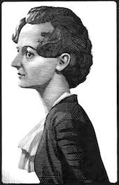 Paul Beaujon was the pen name of Beatrice L. Warde. Born in New York in 1900, she died in London in 1969. A typographer, writer, and art historian, she worked for the British Monotype Corporation for most of her life, and was known for her energy, enthusiasm and speeches. Collaborator of Stanley Morison. She created a typeface called Arrighi. She is famous for The Crystal Goblet or Printing Should be Invisible (The Crystal Goblet, Sixteen Essays on Typography, Cleveland, 1956, and Sylvan Press, London, 1955), which is also reproduced here and here. The text was originally printed in London in 1932, under the pseudonym Paul Beaujon. Here are two passages:
 - Imagine that you have before you a flagon of wine. You may choose your own favorite vintage for this imaginary demonstration, so that it be a deep shimmering crimson in colour. You have two goblets before you. One is of solid gold, wrought in the most exquisite patterns. The other is of crystal-clear glass, thin as a bubble, and as transparent. Pour and drink; and according to your choice of goblet, I shall know whether or not you are a connoisseur of wine. For if you have no feelings about wine one way or the other, you will want the sensation of drinking the stuff out of a vessel that may have cost thousands of pounds; but if you are a member of that vanishing tribe, the amateurs of fine vintages, you will choose the crystal, because everything about it is calculated to reveal rather than to hide the beautiful thing which it was meant to contain.
- Bear with me in this long-winded and fragrant metaphor; for you will find that almost all the virtues of the perfect wine-glass have a parallel in typography. There is the long, thin stem that obviates fingerprints on the bowl. Why? Because no cloud must come between your eyes and the fiery heart of the liquid. Are not the margins on book pages similarly meant to obviate the necessity of fingering the type-page? Again: the glass is colourless or at the most only faintly tinged in the bowl, because the connoisseur judges wine partly by its colour and is impatient of anything that alters it. There are a thousand mannerisms in typography that are as impudent and arbitrary as putting port in tumblers of red or green glass! When a goblet has a base that looks too small for security, it does not matter how cleverly it is weighted; you feel nervous lest it should tip over. There are ways of setting lines of type which may work well enough, and yet keep the reader subconsciously worried by the fear of 'doubling' lines, reading three words as one, and so forth.
Drawing of her by Eric Gill. Life story. Beatrice Warde was educated at Barnard College, Columbia, where she studied calligraphy and letterforms. From 1921 until 1925, she was the assistant librarian at American Type Founders. In 1925, she married the book and type designer Frederic Warde, who was Director of Printing at the Princeton University Press. Together, they moved to Europe, where Beatrice worked on The Fleuron: A Journal of Typography (Cambridge, England: At the University Press, and New York: Doubleday Doran, 1923-1930), which was at that time edited by Stanley Morison. As explained above, she is best known for an article she published in the 1926 issue of The Fleuron, written under the pseudonym Paul Beaujon, which traced types mistakenly attributed to Garamond back to Jean Jannon. In 1927, she became editor of The Monotype Recorder in London. Rebecca Davidson of the Princeton University Library wrote in 2004: Beatrice Warde was a believer in the power of the printed word to defend freedom, and she designed and printed her famous manifesto, This Is A Printing Office, in 1932, using Eric Gill's Perpetua typeface. She rejected the avant-garde in typography, believing that classical forms provided a "clearly polished window" through which ideas could be communicated. The Crystal Goblet: Sixteen Essays on Typography (1955) is an anthology of her writings. Wood engraved portrait of Warde by Bernard Brussel-Smith (1950). [Google]
[MyFonts]
[More] ⦿
|
Paul Hickson
|
 British designer who was first associated with Red Rooster, and who co-founded London Type in 2017. Designer of these typefaces, mainly done at Red Rooster:
 Byron (1992, by Paul and Pat Hickson): a calligraphic font originally cut in the 1980s for QBF based on a design in Printing Types of the World (1931, Pitmans). Later redone in digial form as LDN Piccadilly (2019) at London Type. - LDN Merton Sans (2019, London Type) started out as a design by Paul Hickson's wife Pat, a typeface from the 1970's called Modern Lightline. This was based on an old ATF design called Lightline Gothic published by Face Photosetting.
- Wade Sans Light (1990, Latraset/ITC). A slightly flared sans with tall ascenders and small eyes.
- At Red Rooster Type foundry, he co-designed Argus (1992) and Beckenham (1993) with Les Usherwood.
- He revived a 1919 Keystone Type foundry design, Poor Richard, at Red Rooster. See this poster by Alessandra Magrini.
- Pat and Paul Hickson redesigned the Granby family, exclusively at Atomic Type.
- Eric Gill's Jubilee, created specially for the Silver Jubilee Wedding Anniversary announcement of George VI and Queen Mary, was revived at Red Rooster by Hickson as Jubilee.
- Keyboard revives a 1951 design. It is a condensed modern face.
- Basuto (2000) revives an original Stephenson Blake design, circa 1927.
- In 1994, he revived Rivoli Initials at Red Rooster, an original typeface by William T. Sniffin (1928, ATF).
- In 1997, he created Messe Grotesk. This is a fat poster typeface based on the Albert Auspurg design, circa 1921-1927.
- Leighton. Based on Lectura, a design by Dick Dooijes, Amsterdam Foundry, circa 1966.
- Venezuela RR (a Mexican-look face). Based on the typeface Vesta by Albert Auspurg, circa 1926.
- Honduras (a Mexican-look family). Based on the typeface called either Albert or Select by Albert Auspurg, circa 1936, Amsterdam Foundry. Paul also designed the alternates not available on the original design.
- Inverness. Based on posters from the 1930s.
- Equestrienne, originally designed by Les Usherwood, and digitally engineered by Paul Hickson. Les never released this completed typeface before his untimely death in 1983.
- Claremont, also originally designed by Les Usherwood, and digitally engineered by Paul Hickson. Les never released this typeface before his death in 1983.
- Lesmore, also originally designed by Les Usherwood, and digitally engineered by Paul Hickson. Les never released this typeface before his death in 1983.
- Stanhope, also originally designed by Les Usherwood, and digitally engineered by Paul Hickson. Based on a turn-of-the-century typeface of the same name. The foundry is believed to be Soldans&Payvers, circa 1904. London Belgravia (2019, by Paul and Pat Hickson). An art deco sans.
- London Clarendon Poster (2019).
- London Whitechapel (2019). An industrial strength bold headline sans.
- London Bloomsbury Old Style (2019). Called post-impressionist.
- LDN Garamond (2020). A faithful one-style (roman only) revival of Claude Garamond's typeface. Floriated initial caps (LDN Garamond Initials) by Paul and Pat Hickson.
FontShop link. Klingspor link. View Paul Hickson's typefaces. [Google]
[MyFonts]
[More] ⦿
|
Perpetua
|
Designed by Eric Gill in 1925 (Monotype). Dean Allen at Textism [defunct site] plainly hated Adobe's digital version of this great transitional display face. Digital versions include View digital versions of Perpetua. Yet another list of Perpetua fonts and descendants. [Google]
[More] ⦿
|
Protimient.com
[Ben Jones]
|
 Ben Jones (b. 1980, Buckinhamshire, UK) was a student of typography and graphic communication in Reading (2000-2004). He got his Masters in Typeface Design from the University of Reading in 2011. MyFonts link for Protimient.
 His typefaces: - Billingsley (2005, Protimient: a script based mainly on a writing specimen of the penman Martin Billingsley, originally published in 1618).
- Buxus (2005, T26: a shaded display family).
- Cale (2004).
- Caligne (2004), Caligne Sans (2004).
- Clarence (2007) is a sturdy 2-style serif family.
- Eksja (2009) is a humanist slab serif family which to me feels a lot like a sans family---the slabs added as an afterthought.
- Emrys (2011) is his graduation typeface at Reading: Emrys is a modulated sans typeface for scripts including Latin, Greek, Armenian, Arabic and Cyrillic. Emrys won Third Prize at Granshan 2011. Emrys morphed into Amrys, which was published in 2019 by Monotype.
- Gilibert (2005, T-26, a decorative didone face).
- Greenwood (2006, Protimient: a monospaced, cursive typewriter script, based on a typewritten letter from a Mr J. G. Greenwood Esq. to a branch of the National Westminster bank in Oxfordshire, Great Britain, dated 6th June 1904).
- Joanna Nova (2015, Monotype). A great 18-font update of Gill's original slab serif, Joanna. There is coverage now of Greek and Cyrillic.
- Lightbox (2004, Protimient). A legible monoline sans family. See also the different later design Lightbox 21 (2021: an 18-style rather pure geometric sans family that runs the range from hairline to very black).
- ModernModern (2004, Protimient: a squarish didone).
- Nosta (2006, a nice modern text family).
- NotanuthaSerif1 (2005, text face; see also here).
- Pasquinade (2005, blackletter).
- Stobart (2006) is a script font based on the characters written in a letter by Henry Stobart, dated 1899. It is an Opentype handwriting typeface with 1200 glyphs with heavy character substitution.
- Travis (2005, Protimient: a legible sans family).
View Ben Jones's typefaces. [Google]
[MyFonts]
[More] ⦿
|
Richard Dawson
[Panache]
|
[MyFonts]
[More] ⦿
|
Roxxie Blackham
|
Leeds College of Art-based student designer of Dissect (2013), a typeface in which texture is applied to a Gill sans all caps background. [Google]
[More] ⦿
|
Sallie Morris
|
Ph.D. student at the University of Reading. Thesis topic: The typeface designs of Eric Gill. [Google]
[More] ⦿
|
Sans serif classification
[David Rault]
|
David Rault classifies sans designs following a slight modification of Lewis Blackwell's list in Typography of the 20th Century: - Grotesque, the first sans serif, from the early 19th century to the 1920's: Akzidenz Grotesk, Franklin Gothic
- Humanistic : Gill Sans, Johnston
- Geometrical: Futura, Avant-Garde, Kabel
- Modern : Helvetica, Univers, Folio
- Contemporary : FF Meta, Fedra Sans, Hybrea, FF Cocon
[Google]
[More] ⦿
|
Sans serif classification
|
 Several groups are generally distinguished:
 - Grotesque or Grotesk: These are the early sans-serif designs, but also include the 20th century work horses, Helvetica and Univers. Among the earlier ones, we list Akzidenz Grotesk, Bureau Grot, Grotesque, Franklin Gothic and Royal Gothic. The latter typefaces are sometimes classified as Gothic (two-story lowercase g, angled strokes on C and S).
- Humanist sans such as Johnston, Gill Sans, Frutiger and its copy, Myriad. These typefaces are alive with variations in width and calligraphic influences. Some appreciate them for beauty, others for legibility.
- Geometric sans: These typefaces are pregnant with geometric shapes, and are in some (most) cases less legible. On the other hand, they are more effective on posters and headlines. The main families in this category include Renner's Futura, and Lubalin's ITC Avant Garde. Other styles include Gotham, Spartan and Century Gothic.
- Neo-grotesque, transitional or realist: These are modern sans typefaces, often rather dull with little variation in line widths and lacking any extravagant features. Arial, Standard and Bell Centennial are in this group.
- Square Gothic, in the style of Bank Gothic: low contrast typefaces with straight lines and curved or rounded corners. Macho look.
In the DIN 16518 German classification, all sans typefaces are globbed together under the name Gruppe VI: Serifenlose Linear-Antiqua. Credit for some images below: Danielle West. [Google]
[More] ⦿
|
Schriftenpaket Osteuropa and the Hemming murder
|
Schriftenpaket Osteuropa is a CD of 245 fonts sold mainly in Germany. Each font is a renamed Adobe Font Folio font. The fonts were "made" by the Hemming company, that is, the copyright notices were all changed to Mon Ami 1994, and the fonts were renamed in a predictable manner: Arial became Adorea, Courier is Cora, Futura is Fulv, Eurostile became Europa, Gill Sans is Gisela, and so forth. Thirdly, Hemming insured that all diacritics for East-European languages were available. Ulrich Stiehl, the consummate font detective, collected all Adobe name equivalences in this PDF file. The "Firma Hemming" (later renamed Hemming AG) was founded in 1989 by Olaf Hemming in Landau (Pfalz, Germany). The Schriftenpaket Osteuropa CD went to market in 1994. Olaf Hemming (b. 1967 or 1968) was murdered in May 2001. His handcuffed body was found near Andenne in Belgium. His Audi was found on highway A27 in Polleur, Belgium. Hans-Joachim Ulrich and Ralf Wetzel took over the company. In 2002, his company went bankrupt and was officially liquidated in 2003. The public prosecutor in Landau may have placed copyright charges against the two men (but the internet source for this is not 100% reliable). In 2003, the murder trial of Olaf Hemming took place. We learned that he was killed by a 22-year old German woman who was born in Madagascar. She had been influenced by a 48-year old sectarian (Indian/Islamic) partner who forced her into drugs and prostitution. She also murdered someone else and was accused of two attempted murders as well. The following stores (and probably others too) still sell the CD: Pearl, Multi-Media-Schnäppchen (owned by Daniel Grigat, 51588 Nuembrecht), and Schütz Neue Medien GmbH. [Google]
[More] ⦿
|
Sean Cavanaugh
[FontSite]
|
[MyFonts]
[More] ⦿
|
Simon Garfield
[The 8 Worst Fonts In The World]
|
[More] ⦿
|
Slab serifs
|
 The typophiles discuss their favorite slab serifs (Egyptians). I summarize their suggestions:
 - The grandmother category: Clarendon. People also mention Rockwell (Monotype) [and Memphis], but with zero enthusiasm.
- The overall favorite: Archer (Hoefler and Frere Jones).
- Serious contenders: Neutra Slab (Kris Sowersby), Enclave (Terminal Design), Silica (Stone Type Foundry), Giza (Font Bureau), Stymie (Morris Fuller Benton; URW++), Chaparral (Carol Twombly, 1997-2000), PMN Caecilia (Peter Mathhias Noordzij), Brioni (Typotheque), Stag (Christian Schwartz), Facebuster (Silas Dilworth).
- Also rans: Soho, Amasis (Ascender), Apex Serif (Chester Jenkins), Vista Slab (Emigre), Rayuela Chocolate (Pampa Type), Cholla Slab (Emigre), Dispatch (Cyrus Highsmith, Font Bureau), Joanna (Eric Gill), Black Sabbath (YouWorkForThem), FF Zine, Unit Slab (Kris Sowersby), United Serif, Hellenic Wide (Jukebox Type), Glypha, Serifa (Adrian Frutiger), Officina Serif (Erik Spiekermann), TheSerif (Lucas de Groot), Schadow (George Trump), FF Tisa, Welt Antiqua (Nebiolo; on which Archer was based), Lexia (Dalton Maag), Farao (Fountain), Quadra57 (Berthold), Prelo Slab, Guardian Egyptian, Popular (Christian Schwartz), Ziggurat (Hoefler), Lubalin Graph, Aptifer Slab (Fontcaster), Morgan Avec.
[Google]
[More] ⦿
|
Smashing Magazine: 80 Beautiful typefaces for professional design
[Vitaly Friedman]
|
 Vitaly Friedman, editor-in-chief of Smashing Magazine, an online magazine dedicated to designers and developers, gives us his list of best commercial fonts in 2009:
 - Among the well-known types, they mention Helvetica, Helvetica Neue, Univers, Frutiger, Avenir, Myriad Pro, Neuzeit, Syntax, Proxima Nova, Proxima Sans, Glasgow, Charlotte Sans, Precious Sans, Gill Sans, Lisboa, Franklin Gothic, Futura, EF TV Nord 1, FF Scala, Rockwell, Eurostile, Warnock, FF DIN, FF Meta, Officina, FF Dax, DF Dynasty, Akzidenz-Grotesk, AG Book, Precious Serif.
- Lesser known typefaces: Locator, Seravek, FF Kievit, Ronnia, Stella, Le Monde Courrier, Parisine PTF, Freight, Guardian, Anomoly, PMN Caecilia, Leitura, The Mix, Stalemate, Neo Sans, Felbridge, Trade Gothic, Karmina, Source: FF Milo, Auto, Soho, Kepler, Depot, Relato Sans, Priva Pro, Relato Serif, Alber, Palatino Sans Informal, Fedra Sans, Olga, Depot, Whitman, Productus, Tempelhof, Amira, Krart, Tang, Dederon Sans, Samuels Family, Untitled, Greta Text, FF Sanuk, Houschka, Scene, Amplitude, Insider, Preface, Flex, Halvorsen, Xtra Sans.
- And typefaces for the future: Obliqua, Muestra Urbana, Wingardium (Prima Sans, really), Tauram Regular, Mello Sans.
[Google]
[More] ⦿
|
Soffi Beier
|
 Sofie "Soffi" Beier graduated from Danmarks Designskole (The Danish School of Design) in 2000, and has since been working as a graphic designer, designing several Danish magazines, websites, books and CD covers along with a number of typefaces. She has a PhD from the Royal College of Art in the UK, with a thesis entitled Legibility and Visual Compensation of Typefaces. Sofie works in London and Copenhagen. She teaches at Danmarks Designskole.
 Author of Reading Letters: Designing for Legibility (2012) and Type Tricks (2017). Designer of these typefaces: - The 8-style sans family Engel (2005). Followed by Engel New Sans (2010, at Die Gestalten), Engel New Serif, and eventually, Engel New (2017, The Northern Block).
- Pemba Script (2005, Die Gestalten). A connected 1950s era script.
- The rounded sans typeface family Ovink (2011). Published in 2017 by The Northern Block. It was loosely inspired by Knud V. Engelhardt's work for the street signage, designed around the years 1926-27 for Gentofte in Denmark. Named after legibility expert Gerrit Willem Ovink, the family was designed for legibility at great distances based on research published by Beier in Beier, S.&Larson, K. (2010): "Design Improvements for Frequently Misrecognized Letters", Information Design Journal, 18(2), 118-137.
- That same research was used in the calligraphic text typeface Spencer (2011, The Northern Block), which was named after legibility expert Herbert Spencer.
- Pyke (2011, released by The Northern Block in 2021). A 12-style Bodoni-inspired variation (with optical scaling: Display, Text, Micro) on the didones, named after legibility researcher Richard Lionel Pyke. Spencer and Pyke are two phenomenal contributions to the field, sure to garner her a closetful of awards.
- The sans / serif / open typeface family Karlo (2015, at Die Gestalten). Karlo is inspired by Edward Johnston's letter forms and calligraphy and has the characteristic Gill Sansian ear of the lower case g. In 2018, it was republished by The Northern Block. She writes: In Denmark, a guy named Karlo would typically be an old fellow with a slick hairstyle that makes an effort with his appearance. He is a handyman who can do a bit of this and that when needed. He is a happy go lucky kind of guy that takes one day at a time. To me, the typeface family has some of the same qualities.
Speaker at ATypI 2011 in Reykjavik. Speaker at ATypI 2013 in Amsterdam on the subject of typeface legibility. Her talk at ATypI 2014 in Barcelona was entitled The voice of a typeface. Speaker at ATypI 2014 in Barcelona. Speaker at ATypI 2016 in Warsaw on The legibility of letters and words and at ATypI 2017 in Montreal on The legibility of numerals. Speaker at ATypI 2018 in Antwerp on the topic of stroke weight and letter width. Speaker at ATypI 2019 in Tokyo on the topic of Age-Related Deficits and Their Effects on Reading. [Google]
[MyFonts]
[More] ⦿
|
Solveiga Vaitkute
|
Lleida, Catalunya-based designer of a 3d dripping paint font that is based on Gill Sans (2016). She also designed the modular typeface savage (2016). [Google]
[More] ⦿
|
Stephen Coles
[Decorated Initials]
|
[More] ⦿
|
Steve Matteson
|
 Rochester Institute of Technology's School of Printing graduate who lived in California and in Holland, MI, and now resides in Louisville, Colorado. He was a disciple of Chuck Bigelow and Kris Holmes. MyFonts page on him. In 1990, he started work at Monotype in Palo Alto to create the Windows truetype core fonts Arial, Times New Roman and Courier New. He stayed with Monotype and then Agfa/Monotype until 2003 (when he was probably fired, but that is only an unreliable guess), directing type development from the design office in Palo Alto, CA. Bio at Agfa/Monotype. He has directed branding projects such as Agilent Technology's corporate sans serif and Microsoft's corporate font family 'Segoe'. At the same time, he was involved in producing bitmaps and outline fonts for cell phones and TV set top environments. He has worked extensively designing Greek, Cyrllic, Thai, Hebrew and Arabic alphabets to satisfy the requirements of customers such as IBM, Microsoft, Nokia, Sun and Sybase. In 2004, he co-founded Ascender Corporation in Northbrook, IL, where he remained Type Design Director until Ascender was bought by Monotype, where he now heads the type design team (12 people in all, as of 2013).
 CBC interview in 2012. Fontspace link. FontShop link. At ATypI 2011 in Reykjavik, he spoke on typefaces for Android OS. His typefaces: - Amanda.
- Andale Mono (Monotype), Andale Mono (Ascender). This is a monospace sans-serif typeface designed for terminal emulation and software development environments. It was originally created by Monotype. Andalé Mono was first distributed as an Internet Explorer 4.0 add-on under the name Monotype.com. In version 1.25 of the font, it was renamed to Andale Mono, distributed with Internet Explorer 5. It is often used by programmers, and is bundled with Mac OS X.
- Andy (Monotype), his first face, a design based on a friend's lefty handwriting. Published at Agfa's Creative Alliance.
- Arimo (2010). A free sans family at Google Web Fonts that is metrically compatible with Arial. TeX support and further downloads on CTAN.
- Ascender Sans Mono (2004-2008, Ascender). Metrically compatible with Courier New. Ascender Serif (2005, 4 styles) is metrically compatible with Times New Roman.
- Ascender Uni Duo is a fixed-width comprehensive Unicode-compatible font available with support for the Unicode Standard. Ascender Uni Duo is a 39MB TrueType font with approximately 53,000 glyphs. The Latin and related glyphs (designed by Steve Matteson) are Sans Serif, with Gothic ideographs drawn in Japanese style, and complementary styles for other scripts. There are also versions of Ascender Uni that provide localized support for Korean, Simplified Chinese and Traditional Chinese. OpenType layout support is included for Arabic (initial, medial, final, isolate, and required ligature forms, as well as basic mark positioning), and vertical writing for CJK locales (consisting mostly of Latin, symbol, punctuation, and kana glyph variants). Character Set: Latin-1, WGL Pan-European (Eastern Europe, Cyrillic, Greek and Turkish), Chinese, Japanese, Korean, Thai, Vietnamese, Hebrew, Arabic. Ashley Crawford.
- Ascender Sans (Ascender).
- Ascender Serif (Ascender).
- Ayita (2006, Ascender), a decorative sans family co-designed with Jim Ford.
- Bertham Pro (2009, Ascender). Four styles including Open, after Goudy's Bertham.
- Bierstdat (2021). A sans typeface that could replace Calibri later in 2021 as Microdoft's go-to font in Microsoft 365 apps.
- Blueprint (1993).
- Binner Gothic (Monotype).
- Blueprint (Monotype).
- Cambria (Ascender).
- Carnero (2019, Monotype). Steve describes this sans family as a feisty hybrid of precise geometry and calligraphic flair.
- Chicory (2006, Ascender). A calligraphic script face.
- (2010). A free family at Google Code that is metrically compatible with Courier New. See also OFL.
- Creepy (Ascender Corporation): a Halloween font designed with Carl Crossgrove.
- Curlz (1995, Monotype). Done with Carl Crossgrove, based on wrought iron on chairs.
- Dempster (2016, with Jim Ford at Ascender). The original iangular industrial design, by Jim Ford, goes back to 2010.
- Droid Sans Mono Pro (Ascender), Droid Sans Pro (Ascender), Droid Serif Pro (Ascender). and Droid Sans Mono: a font family designed in 2006-2007 by Steve Matteson at Ascender for Google's Android project, mobile phone software for handsets. Free download at CTAN.
- Dujour (2005, Ascender): an art deco revival of the 1930's typeface Independant by Joan Collette and Jos Dufour for Plantin. Compare with the free Independant by Apostrophic Labs.
- Endurance Pro (2009, Ascender): neo-grotesque sans. Endurance Pro Cond (Ascender).
- Facade (Monotype).
- Fineprint (Monotype). A design loosely based on his own penmanship ("on a good day"). Another Creative Alliance face.
- Friar Pro (2009, Ascender): Friar Pro is a revival of Frederic W. Goudy's "Friar" typeface. Goudy described this typeface design as a 'typographic solecism' as it combines a lowercase of half-uncial forms from the 4th through 7th centuries with an uppercase of square capitals from the 4th century. Friar was originally designed in 1937 and used to print a Christmas keepsake produced by Goudy and printer Howard Coggeshall. The fire that burned Goudy's studio in 1939 destroyed the drawings and matrices before many metal fonts were cast. Of all that was lost in the fire, Goudy once said he missed Friar the most.
- Futura Now (2020: a 107-style family by Steve Matteson, Terrance Weinzierl, Monotype Studio and Juan Villanueva, that includes variable fonts as well as subfamilies called Text, Display, Headline, Inline, Outline, Shadow and Script).
- Georgia Pro (Ascender).
- Gill Floriated Caps.
- Goudy Fleurons (2010, Ascender).
- Goudy Modern MT (Monotype).
- Goudy Ornate (2002). Unsure if Matteson made this or Carl Crossgrove.
- Kennerley. Based on Goudy's Kennerley family.
- Kidprint (Monotype).
- Kootenay (2006, Ascender), a sans family.
- LeBeau (Ascender): a signage font.
- Liberation Mono, Sans and Serif (2007-2009, Ascender). A set of free open source fonts done for Red Hat Inc.
- Lindsey Pro (2006, Ascender): a cursive script based on his niece's hand.
- Louisville Script (2008, Ascender): ordinary handwriting.
- Massif (2006-2011, Monotype). Odd name, since Jean Joveneaux made a font called Massif in 1957. How can Monotype get away with a trademark for this is beyond me.
- Mayberry (2008, Ascender): a 14-font sans family with extremely large x-height and strange proportions. Mayberry semibold is free. Mayberry Pro (Ascender).
- McZee, a Microsoft symbols font.
- Miramonte Pro (2006, Ascender). A geometric-meets-humanist sans after the typeface Marsuv Grotesk by Stanislav Marso at Grafotechna, 1960.
- Open Sans (2010, Ascender). A free family by Steve Matteson. See also at Google Fonts. In 2021, he added the rounded companion, Open Sans Soft (20 styles).
- Overpass and Overpass Mono (2011-2019), designed by Delve Withrington, Dave Bailey, and Thomas Jockin. A free open source sans font. The design of Overpass is an interpretation of the well-known Highway Gothic letterforms from the Standard Alphabets for Traffic Control Devices published by the U.S. Federal Highway Administration in 1948. It was created for Red Hat Inc. Dedicated web page. Link at Delve Fonts.
- Newstyle. Based on Goudy's 1921 typeface, Newstyle. See also Newstyle (2018, Steve Matteson).
- Pericles Pro (2005, Ascender): an Ascender typeface based on the work of Robert Foster who created the original for American Type Founders in 1934), a 433-glyph OpenType font for Greek simulation or stone cut looks.
- Pescadero Pro (2005, Ascender),
- Pescadero Pro: a serif face.
- Rockwell Team (Ascender): an athletic lettering face.
- Rebus Script (2009, Ascender): done with Terry Weinzierl.
- Scooter Script (2009, Ascender): comic book style face.
- Segoe Chess (Ascender), Segoe Mono (Ascender), Segoe TV (1997-2004, Ascender: done for MSNTV).
- Tinos (2010). A free serif family at Google Fonts that is metrically compatible with Times New Roman. Download at CTAN, where one also finds TeX support maintained by Bob Tennent. Nerd Fonts patch.
- Tipperary eText (2012-2013), Monotype.
- Titanium Motors (2012, Monotype), Titanium (2006, Ascender): techno typefaces.
- Truesdell (1994, Monotype): a revival and extension of the "lost" Goudy types cut in 1931. Also at Creative Alliance. Also includes Truesdell Sorts.
- Tucker Script (2009, Ascender): ordinary handwriting face.
- Twentieth Century Poster (2002), an art deco display font straight from the late 1920s.
- VAG Rounded Next (2018, Monotype). Developed under the direction of Steve Matteson, this revival of the 1979 classic corporate font of Volkswagen AG has new weights and adds support for Greek and Cyrillic. The MyFonts site co-lists Tom Grace as designer.
- Verdorgia (2010): an ugly duckling.
Klingspor link. Fontspace link. View Steve Matteson's typefaces. [Google]
[MyFonts]
[More] ⦿
|
Steven McCarthy
[Eric Gill and Jonathan Barnbrook: Designers as Authors at the Poles of the Twentieth Century]
|
[More] ⦿
|
Talbot Type
[Adrian Talbot]
|
 Adrian Talbot (b. 1964, Worthing, Sussex, England) heads the type foundry Talbot Type in London. He made the Bauhaus-style Bremner family in 2000 for the visual identity of Mute Records.
 In 2012, he designed these typefaces: Kinghorn 205 (Egyptian), Kinghorn 105, Kamerik105 (+Kamerik 105 Cyrillic, 2014), Kamerik205 (an avant garde type family with many weights, including a hairline), Karben, KarbenMono (a mono-width sans family in the style of DIN), Karben 205 Mono, Karben 205, Karben 105, Karben 105 Mono, Kessel105, Kessel205 (a geometric sans family influenced by Futura; see also Kessel 105 Remix, 2016, and Karben 105 Stencil, 2016), Kettering105, Kettering205 (a slabby almost typewriter typeface influenced by Lubalin and similar avant garde styles), Kiruna (a legible and very open sans family), Kursk105, Kursk205 (constructivist), Kaleko 105 and 205 (Gill Sans-style sans families with large x-heights; see also Kaleko 105 Remix (2016) and Kaleko 105 Round Remix (2016), and the more geometric and medium x-height families Kaleko 105 Text and Kaleko 205 Text (2018)). Typefaces from 2013: Kilburn (a gothic sans serif), Kroppen Round (a geometric stencil), Kampen (square-spaced family), Kaleko 205 Round, Kaleko 105 Round. Typefaces from 2014: Kelso (an outline font with outlines that consist of a single continuous line), Klef (a geometric sans influenced by Avant Garde), Kenwyn (a playful bullet-holed Egyptian; +Stencil), Korbin (a semi-geometric grotesque family), Kandel 105 and 205 (geometric, tri-line, display and headline font). Typefaces from 2015: Kinsey. Typefaces from 2016: Keith (a sans family with layerable Umbra-like shadow styles), Korto (a geometric sans inspired by Futura and Avant-Garde). Typefaces from 2017: Kittle Round (stencil), Kittle Rough, Kitami (monoline sans), Keymer (a sans typeface family inspired by Margaret Calvert's Transport typeface), Keymer Thug (distressed), Keymer Radius (a rounded version), Keymer Block (a grungy version). Typefaces from 2018: Kessel 105 Text, Klamp 105 (a tall geometric sans with a handicapped g, followed in 2019 by Klamp 105 Mono), Klamp 205 (a tall geometric sans with a fine two-storeyed g, Klamp 205 Mono). Typefaces from 2019: K-haus 105, K-haus 205 (to celebrate 100 years of Bauhaus, an organic typeface family based on Herbert Bayer's universal alphabet), Kong Script. Typefaces from 2020: Koi (an inline / outline typeface close to a paperclip font), Kamerik 105 Text, Kamerik 205 Text. Typefaces from 2021: Kelso Round (a paperclip font), Benelux (a 10-style rounded monolinear sans). View Adrian Talbot's typefaces. [Google]
[MyFonts]
[More] ⦿
|
Terrance Weinzierl
|
 Grand Rapids, MI-based graphic designer trained in Chicago. Terrance worked as a graphic designer for the university book store while earning a bachelor of fine arts degree with an emphasis in graphic design from Grand Valley State University in 2008. After graduation, he joined Ascender Corporation where he worked closely with Steve Matteson. After Ascender folded, he became an in-house type designer at Monotype where most of his time is dedicated to custom fonts.
 His early typefaces include TW Geo Slab (2007), Dux (2007, ornamental Victorian type), Wingman (2006, handwriting) and Weinzierl Slab (2006, see also here). He joined Ascender and created there the stencil blackletter typeface Stenblak (2010), informal script typeface Rebus Script (2009, with Steve Matteson) and Romany (2009), a non-connecting script which was originally designed by A.R. Bosco and released by American Type Founders in 1934. In 2012, he created Feldman Engraver and JMC Engraver. Fonts from 2015: Kairos (Monotype: an octagonal typeface based on 19th century Grecian wood type). In 2015, Monotype set out to remaster, expand and revitalize Eric Gill's body of work, with more weights, more characters and more languages to meet a wide range of design requirements. As part of that project, Terrance Weinzierl designed Joanna Sans Nova (2015: sixteen fonts, loosely based on Gill's slab serif, Joanna, so technically, this is not a Gill revival, but a Gill extension. A well-balanced family with a medium-to-large x-height. But the italic g is disturbing). Fonts from 2016: Terry Junior Basic (free), Kairos Sans (which accompanies his 2015 typeface Kairos; both cover Latin and Greek). The octagonal typeface Kairos Sans became Monotype's first variable font---it is free at GitHub. Also in 2016, he added some Greek, Cyrillic, weights and widths to Kobayashi's Eurostile Next, for a grand total of 50 styles in this popular Linotype font family. Pizza Press (2013) won an award at TDC 2014. In 2017, Jeong-Sook Lee, John Pompa, Terrance Weinzierl and the Monotype team won a Red Dot award for the 72-style typeface family 72 designed for SAP Fiori. Fonts from 2018: Terry Junior (Monotype; a brush script perhaps with uses for children's books). Typefaces from 2019: Monarda (Monotype), Terrance Weinzierl's take on the loud and splashy brush scripts of the 1950s. Typefaces from 2020: Futura Now (a 107-style family by Steve Matteson, Terrance Weinzierl, Monotype Studio and Juan Villanueva, that includes variable fonts as well as subfamilies called Text, Display, Headline, Inline, Outline, Shadow and Script). Typefaces from 2021: Tellumo (a 12-style humanist geometric sans with a tidy look and large x-height) and Tellumo Variable. Klingspor link. Linotype link. [Google]
[MyFonts]
[More] ⦿
|
The 8 Worst Fonts In The World
[Simon Garfield]
|
 Simon Garfield is a British journalist and non-fiction author. In Just My Type: A Book About Fonts (2011), he wrote a section on the eight worst fonts in the world. Written to amuse typophiles, it has some amusing passages.
 - #1. About The London 2012 Olympic Typeface, which is called 2012 Headline, he cites this description by Alice Rawsthorn in the International Herald Tribune: it looks increasingly like the graphic equivalent of what we Brits scathingly call dad dancing, namely a middle-aged man who tries so hard to be cool on the dance floor that he fails. Garfield adds: It also has a vaguely Greek appearance, or at least the UK interpretation of Greek, the sort of lettering you will find at London kebab shops and restaurants called Dionysus.
- #2. Ransom Note.
- #3. Neuland Inline. He says about Rudolf Koch's typeface often associated with Jurassic Park: It is a dense and angular type, suggestive of something Fred Flintstone might chisel into prehistoric rock. The inline version is bristling with energy and a quirkiness of spirit, a bad type predominantly through its overuse rather than its construction.
- #4. Papyrus. Overused. Garfield especially objects to its use in Avatar (the movie): Avatar cost more to make than any other film in history but it did its best to recoup whatever it spent on 3-D special effects and computer-generated blue people by using the cheapest and least original font it could find: Papyrus, a font available free on every Mac and PC.
- #5. Brush Script. Garfield: If, during the 1990s, you ever perused the menu of a local restaurant (the sort of restaurant opened by people who on a starlit evening thought, "I'm a pretty good cook--I think I'll open a restaurant!"), then that menu had a good chance of featuring Pear, Blue Cheese and Walnut Salad on a Bed of Brush Script.
- #6. Gill Sans Light Shadowed. This Eric Gill design, one of the first in the shadow style of the 1930s, like Plastika and Umbra, triggers this reaction: Gill Sans Light Shadowed is the sequel that should never have been made--a font that pleases the taxman and no one else. It's hard to believe that this is what Eric Gill had in mind when he first picked up chisel and quill--a type design that would combine the look of both but ultimately end up redolent only of crackly Letraset on a school magazine.
- #7. Souvenir. Garfield gets help here from type scholar Frank Romano: "Real men don't set Souvenir," wrote Frank Romano in the early 1990s, by which time he had already been performing character assassination on the type for over a decade. At every opportunity in print and online, Romano would have a go. "Souvenir is a font fatale . . . We could send Souvenir to Mars, but there are international treaties on pollution in outer space . . . remember, friends don't let friends set Souvenir." He also gets help from Peter Guy, who has designed books for the Folio Society: A souvenir of every ghastly mistake ever made in type design gathered together--with a few never thought of before--into one execrable mish-mash.
- #8. Ecofont. The string vest and Swiss Cheese of fonts. [Google]
[More] ⦿
|
The Silvertant classification
[Martin Silvertant]
|
Martin Silvertant (MS Designs) proposes his own type classification system in 2012. - Serif
- Humanist/Venetian (Centaur, Roos, Brioso)
- Garalde (Garamond, Caslon, Minion)
- Transitional (Baskerville, Miller, Charter)
- Didone (Didot, Bodoni, Filosofia)
- Contemporary (Biblon, Coranto, Mokka)
- Slab serif
- Egyptienne (Glypha, Pragmatica Slab, Salvo Serif)
- Clarendon (Clarendon Text, Belizio, Suomi Slab Serif)
- Tuscan (Buckboard, De Louisville, Wood Type)
- Contemporary (Adelle, Museo Slab, Centro Slab Pro)
- Sans serif
- Grotesque (Helvetica, Univers, DIN)
- Geometric (Futura, Eurostile, Nobel)
- Humanist (Gill Sans, Frutiger, Ideal Sans)
- Chirographics
- Script (Reklame Script, Gelato Script, Metroscript)
- Hand-writing (Andrij Script, Just Lefthand, Erik Righthand)
- Comic (Comic Sans, Dion, Zoinks)
- Blackletters
- Textura (Goudy Text, Old English, Textura Quadrata)
- Schwabacher (Alte Schwabacher, SchwarzKopf, Sibyl)
- Fraktur (Breitkopf Fraktur, Fakir, Fette Fraktur)
- Rotunda (1483 Rotunda Lyon, Bucintoro, San Marco)
- Hybrida/Bastarda (Burgundica, Givry, Lucida Blackletter)
[Google]
[More] ⦿
|
The Solus story
|
Keith Bates from K-Type tells us the story of his revival of Eric Gill's Solus (1929), which has never been digitized. His revival is also called Solus (2004). [Google]
[More] ⦿
|
The Typehead Chronicles of Thomas Christensen
[Thomas Christensen]
|
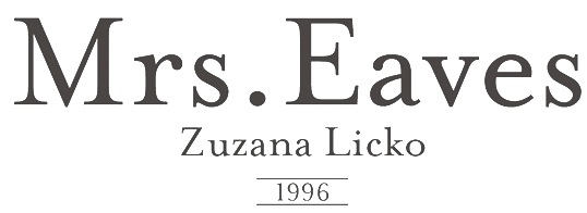 Information and specimen of all historically important typefaces: Akzidenz Grotesk, Aldus, Antique Olive, Avant Garde, Avenir, Baskerville, Bell, Bembo, Bodoni, Bulmer, Caslon, Centaur, Century Old Style, Cheltenham, Dante, Frutiger, Galliard, Garamond, Gill Sans, Goudy Old Style, Granjon, Helvetica, Janson (Kis), Minion, Mrs. Eaves, Optima, Palatino, Perpetua, Sabon, Syntax, Times New Roman, Today, Trump Medieval, Univers, Walbaum. [Google]
[More] ⦿
Information and specimen of all historically important typefaces: Akzidenz Grotesk, Aldus, Antique Olive, Avant Garde, Avenir, Baskerville, Bell, Bembo, Bodoni, Bulmer, Caslon, Centaur, Century Old Style, Cheltenham, Dante, Frutiger, Galliard, Garamond, Gill Sans, Goudy Old Style, Granjon, Helvetica, Janson (Kis), Minion, Mrs. Eaves, Optima, Palatino, Perpetua, Sabon, Syntax, Times New Roman, Today, Trump Medieval, Univers, Walbaum. [Google]
[More] ⦿
|
Thomas Christensen
[The Typehead Chronicles of Thomas Christensen]
|
[More] ⦿
|
Toto
[K22 Fonts]
|
 [More] ⦿
|
Type Market
[Alexey Kustov]
|
 Type Market is a Russian type foundry. Alexey Kustov made most fonts at Type Market (Moscow) between 1993-1995. Many of these are cyrillizations of Western typefaces: Aksent (futuristic, based on a design by Yevgeny Dobrovinsky), Bebit (similar to Baby Teeth by Milton Glaser, Photo Lettering), Countdown [based on a 1965 original by Colin Brignall], Cricket, Crystal, Europe, Everest, Gals, Gill Sans (1993), Glasten, Helios, Luxor [1993; based on Colin Brignall's Aachen, 1967], Micra, Micogramma (1952, Aldo Novarese and A. Butti, digitized in 1993), Miniature, Mistral, New Zelek [1993, inspired by the typeface of G. Klikushin, 1987, which in turn was based on the typeface of Bronislav Zelek of Mecanorma], Oliver, Peignot (A.M. Cassandre, 1937, done in 1993), Penta, Plain [after an art deco typeface by A. Grachev], Rodeo (F. Pierpont, 1934, cyrillicized in 1993), Start [1993, like Aldo Novarese's Stop from 1971], Stencil Bold Cyrillic (1993, based on Milton Glaser's Stencil Bold (1973)), Techno28 [1993, a MICR font based on Letraset's Data 70 by R. Newman, 1970], Trafaret [1993, a stencil font based on Tom Hultgren's Traffic, Letraset, 1973], Traktir [1993, based on Elsner&Flake's Old Town], Viola [1996, based on Adobe's Willow]. These are Cyrillic fonts that are typically extensions of well-known Roman fonts. Other designers at Type Market include A. Shevtsov, Anton Bisiajew, Oxana Doubovic, A. Babaljan, S. Shanovich, D. Gulinoff, Viktoria Grigorenko, Anna Terentieva. Fonts not by Kustov: Anastasia Script, Arthur, Dikovina, Dikovina Bildchen, Fita Church, Fita Poluustav, Fita Vjaz, Funny, HeinrichScript, Industry, Jatran, Keyboard, Magic, Morris, Office Type Sans, Oliver New, OpiumNew, OrnamentTM, OrnamentTM2, Palladium, Regata, Roger Script, Romul, Secretary, Sonet Serif, Unicum Condensed, Zodiac1, Zodiac2.
 Klingspor link. [Google]
[More] ⦿
|
Type Worship
[Jamie Clarke]
|
 Type Worship is the official blog of 8 Faces magazine. Featuring inspirational typography, beautiful lettering, reviews, interviews with leading designers, and exclusive content from the coveted bi-annual publication. Curated by Jamie Clarke (London) with Elliot Jay Stocks.
 Over four years and across eight issues they interviewed 64 world-renowned designers and asked them for their favorite fonts. These designers were Erik Spiekermann, Jessica Hische, Ian Coyle, Jason Santa Maria, Jos Buivenga, Jon Tan, Bruce Willen, Nolen Strals, Martin Majoor, Ale Paul, Stephen Coles, Tim Brown, Nick Sherman, Rich Rutter, Veronika Burian, José Scaglione, Ellen Lupton, Frank Chimero, Steve Matteson, Mark Caneso, Vincent Connare, Yves Peters, Jason Smith, Phil Garnham, John Boardley, Craig Mod, Kris Sowersby, Doug Wilson, Nadine Chahine, David Brezina, Silas Dilworth, Neil Summerour, Jonathan Hoefler, Tobias Frere-Jones, Mark Simonson, Trent Walton, Keetra Dean Dixon, Peter Bilak, Gerry Leonidas, Mark MacKay, Simon Walker, Dan Rhatigan, Seb Lester, Nina Stössinger, Grant Hutchinson, Mike Kus, Eric Olson, Nicole Dotin, Michael Bierut, Tomas Brousil, Georg Salden, Hannes von Döhren, Phil Baines, Ken Barber, Rudy VanderLans, Zuzana Licko, Elliot Jay Stocks, Jeremy Leslie, Jan Middendorp, Robert Slimbach, Steven Heller, Fiona Ross, Erica Jung and Ricardo Marcin. The top 25 fonts coming out of this poll are, in order [with quotes and discussion taken from Jamie Clarke's piece]: - Georgia. Matthew Carter, 1993. Originally designed for clarity on low resolution screens, for Microsoft, it is the counterpart to Verdana, which also appears in this list. Georgia has a large x-height and ascenders that rise above the cap height. It's a sturdy yet friendly typeface, with a wonderful flowing italic, that features on millions of websites.
- Gotham. Tobias Frere-Jones, 2000. Famously used for Barack Obama’s 2008 presidential campaign.
- FF Scala. Martin Majoor, 1990. FontShop International’s ‘first serious text face’.
- Futura. Paul Renner, 1927. This immortal ‘modern’ typeface with its uncompromising shapes has become the benchmark geometric sans for almost 80 years.
- Gill Sans. Eric Gill, 1926. A quintessential British design; though it’s eccentricities make it notoriously tricky to use well. A blend of humanist and geometric shapes.
- Garamond. (Claude Garamond, c. 1480–1561), Several derivatives of the Parisian punch cutter’s design have been chosen, including; ITC Garamond (Tony Stan), Adobe Garamond & Garamond Premier (Robert Slimbach).
- Caslon (Adobe Caslon). (William Caslon I, 1722) Carol Twombly, 1990. Gave rise to a printer’s saying ‘When in doubt, use Caslon’. Also a favourite of Benjamin Franklin.
- Akzidenz Grotesk. H. Berthold, Berthold Type Foundry, 1898. The first widely used sans serif typeface.
- Alternate Gothic. Morris Fuller Benton, 1903. Designed for the American Typefounders Company (ATF). All three weights are bold and narrow. Currently used on YouTube’s homepage logo.
- Helvetica. Max Miedinger with Eduard Hoffmann, 1957. Helvetica needs no introduction as the planet’s most famous typeface—it even inspired a very good film.
- Metro. William Addison Dwiggins, 1930. Designed out of a dissatisfaction with the san serifs of the time like Futura.
- ITC Franklin Gothic. Morris Fuller Benton, 1902. Created for the American Type Founders Company and named after Benjamin Franklin.
- Meta Serif. Erik Spiekermann, Christian Schwartz and Kris Sowersby, 2007. The serif companion to Eric Spiekermann’s influential sans serif, FF Meta. Also designed to work well with FF Unit and FF Unit Slab.
- Trade Gothic. Jackson Burke, 1948/1960.
- Adelle. José Scaglione and Veronika Burian, 2009. Adelle is a slab serif typeface conceived for intensive editorial use, mainly in newspapers and magazines but its personality and flexibility make it very adaptable.
- Caecilia. Peter Matthias Noordzij, 1990. A humanist rather than geometric slab serif, aiding its legibility.
- Chaparral. Carol Twombly, 2000. A
- DIN. Albert-Jan Pool, 1995. This clean geometric sans is based on the German standard typeface, DIN 1451, used for official documents and street signs etc. DIN stands for Deutsches Institut für Normung (German Institute of Standardisation). The font was added to the MoMA Design Collection in 2011.
- Hoefler Text. Jonathan Hoefler, 1991. Designed for Apple to demonstrate advanced type technologies it reintroduced type design traditions once central to fine printing like ligature sets, engraved capitals, ornaments and arabesques.
- Quadraat. Fred Smeijers, 1992. An original typeface Combining Renaissance elegance with contemporary ideas on construction and form. Named after Smeijers’ design studio in Arnhem, of the same name.
- Sabon. Jan Tschichold, 1964. An oldstyle serif typeface based on Garamond. A distinguishing feature of Sabon is the same width occupied by characters in the Roman and Italic styles, and the Regular and Bold weights.
- Sentinel. Jonathan Hoefler & Tobias Frere-Jones, 2009.
- Verdana. Matthew Carter, 1996. It was created specifically to address the challenges of on-screen display. Verdana’s large x-height, wide proportions, generous letter-spacing and large counters are key to its legibility at small sizes.
- Fedra Serif. Peter Bilak, 2003. A highly original text typeface. Shaped by a unique blend of technological considerations while maintaining hand-written forms.
- Feijoa. Kris Sowersby, 2007. Aiming to create a feeling of softness, Feijoa has an almost complete absence of straight lines. Feijoa successfully avoids the sense of coldness that Kris had felt with some previous digital typefaces.
- Officina. Erik Spiekermann, 1990. A paired family of serif and sans serif typefaces, originally designed as a typeface for business correspondence but found a much wider, trendier audience.
Credit for some images below: Danielle West. [Google]
[More] ⦿
|
Typedia: Typeface classification
|
The classification from the Typedia community: - Blackletter
- Fraktur: A German form of Blackletter with broken strokes. Classic example: Fraktur.
- Old English: The English blackletter style. Classic example: Cloister Black.
- Rotunda: A Blackletter style featuring wider lowercase with more rounded strokes.
- Schwabacher: A German form of Blackletter with simplified, rounded strokes.
- Textura: A Blackletter style featuring tall, narrow lowercase made mostly of straight strokes.
- Calligraphic
- Chancery: A script style of calligraphy made with a broad-point pen with slightly sloping, narrow letters that are the basis for italics in serif typefaces. Capitals may or may not have flourishes. Originated during the Renaissance. Classic example: Zapf Chancery.
- Etruscan: An early Roman form of calligraphy drawn with a flat brush held at a steep angle. Caps only, as lowercase had not been invented yet. Classic example: Adobe Pompeii.
- Uncial: A Celtic style of calligraphic script with forms created by a broad-nibbed pen at an almost horizontal angle, but sometimes more tilted in later variants. Roman lowercase is derived from Uncial forms. There is only one case in pure Uncial designs. Used during the middle ages. Classic example: American Uncial.
- Inscriptional---Roman Inscriptional: Stone-cut serif style from the late Roman Empire. The basis of modern roman capitals. Classic example: Trajan.
- Non-alphanumeric
- Dingbats
- Ornaments
- Pictorial
- Ornamented, Novelty
- Art Deco: A geometric display typeface style popular in the 1920s and 1930s. Classic example: Broadway.
- Art Nouveau: Display typefaces with a flowing, organic style popular in the early 20th Century. Classic example: Arnold Bocklin.
- Comic Strip Lettering: A style meant to look like the hand-drawn letters associated with comics or cartoons. This style is usually san serif, often having a loose, informal structure and is sometimes based on brush lettering. Classic example: Balloon.
- Dot Matrix: A style whose characters are composed of a pattern of dots used mainly for low-resolution impact printers, or to simulate the look of the output of such printers. Classic example: FF Dot Matrix.
- Futuristic: A style meant to suggest a futuristic theme. Often cold, brutal and geometric with a machine aesthetic and simplified construction. Classic example: Stop.
- Machine Readable: A style designed to be read by machine. These fonts are usually san serif and often feature unusual character shapes to make them more distinguishable from one another. Classic example: OCR-B.
- Pixel: A style whose characters are composed of pixels (usually represented as squares) used mainly for low-resolution computer display. Outline fonts are sometimes made to look like Pixel Fonts. Classic example: Silkscreen.
- Pseudo Foreign Script: A style intended to mimic non-Western letters. For example, a font that looks like Chinese, but is actually composed of Latin characters. Faux Chinese/Arabic/Hebrew. Classic example: Bruce Makita.
- Victorian: A whimsical, eclectic display style popular in the late 19th Century. Classic example: Skjald.
- Sans Serif
- Gothic: A sans serif style with moderate stroke contrast and modern proportions particular to the U.S. Usually features a two-story lowercase g, angled strokes on C and S, and a sloped, non-cursive italic. Classic example: Franklin Gothic.
- Grotesque: A sans serif style with moderate stroke contrast and modern proportions particular to the U.K. Usually features a two-story lowercase g, closed strokes (usually curving in slightly) on C and S, and a sloped, non-cursive italic. Classic example: Bureau Grot.
- Geometric Sans: A sans serif style made with rigidly geometric forms and little to no stroke contrast. Classic example: Futura.
- Grotesk: A sans serif style with low stroke contrast and modern proportions. Usually features a one-story lowercase g, closed or angled strokes on C and S, and a sloped, non-cursive italic. Classic examples: Akzidenz Grotesk, Helvetica.
- Humanist Sans: A sans serif style with proportions modeled on old-style typefaces. Characterized by open strokes on characters like C and S. Italics of this style often are more cursive in appearance, rather than a simple slanted version of the roman. Often has more slightly stroke contrast than other sans serifs. Classic examples: Gill Sans, Frutiger.
- Square Gothic: A sans serif style composed mainly of straight or nearly straight lines and (often) curved corners. Stroke contrast is usually low. Classic example: Bank Gothic.
- Swiss Gothic: A sans serif style with noticeable stroke contrast, straight sides on round characters, modern proportions, and large x-height. Usually features a one-story lowercase g and closed strokes on C and S. Classic example: Jay Gothic.
- Script
- Brush Script: Typefaces modeled after lettering made with a brush. Strongly associated with advertising in the mid-20th Century on. Classic example: Brush Script.
- Casual Script: Typefaces based on a style of lettering characterized by informal appearance, somewhat like handwriting, but more refined. Similar to Brush Script or Sans Serif. Classic example: Murray Hill.
- English Roundhand: A connecting-script style of calligraphy made with a flexible tipped pen. The characters are usually steeply sloped and capitals are often very elaborate. Popular in the 18th and 19th Century. Sometimes called Copperplate Script. Classic example: Bickham Script.
- French Roundhand: A connected-script style of calligraphy, sometimes with upright characters, a high stroke contrast and decorative capitals. Used in France in the 17th through 19th Century. Also called Civilité. Classic example: Typo Upright.
- Handwriting: A script style based on ordinary handwriting. Characters may or may not be connected. Classic example: Felt Tip Roman.
- Rationalized Script: A script style with sans serif qualities, low stroke contrast, and a formal appearance. Characters may or may not connect. Associated with 20th Century commercial design. Classic example: Gillies Gothic.
- Serif
- Grecian: A typically heavy display typeface with octagonal shapes where curves are normally used. Also known as Chamfered or Beveled. Popular in the 19th Century for wood types. Classic example: Acropolis.
- Latin: A serif style with large triangular or wedge-shaped serifs. Stroke contrast is medium to low. Popular in the 19th Century for wood types. Classic example: Latin.
- Modern: A serif style with high stroke contrast and vertical stress. Classic example: Modern No. 20.
- Didone: A serif style with high stroke contrast and vertical stress. Serifs are usually unbracketed. Classic examples: Bodoni (Italian), Didot (French).
- Scotch Modern: A serif style with medium to high stroke contrast and vertical stress, known for large serifs and tiny aperture. Serifs are usually bracketed. Classic examples: Modern No. 20, Scotch Modern.
- Old Style: A serif typeface with relatively low stroke contrast, angled stress, angled serifs. Classic example: Bembo.
- Antique: A serif style with moderate stroke contrast, bracketed serifs and usually vertical stress. Serifs are angled as in Old Style. Popular in the 19th Century. Classic example: Bookman.
- Dutch Old Style: A serif style with somewhat angled stress, bracketed serifs, and medium to high stroke contrast. Characteristic of Dutch and English types of the 18th Century. Classic examples: Caslon, Plantin, Times Roman.
- French Old Style: A serif style with angled stress on rounds; usually features a small eye on the lowercase e; soft, bracketed serifs and moderate stroke contrast. Classic example: Garamond.
- Spanish Old Style: A serif style with soft, bracketed serifs, medium to high stroke contrast, and often highly angled stress. Classic example: Rongel.
- Venetian Old Style: A serif style with angled stress on rounds; usually a tilted crossbar on the lowercase e; usually has somewhat low stroke contrast. Serifs are sometimes unbracketed. This style is associated with very early printing (Incunabula) in the West. Classic example: Jenson.
- Slab Serif: A serif style with serifs equal to or nearly the same thickness of the main strokes. Main strokes usually have low contrast. Classic example: Rockwell.
- Clarendon: A slab serif style with heavy, bracketed serifs, modern proportions and construction, low stroke contrast. Classic example: Clarendon.
- Egyptian: A serif style with heavy, unbracketed serifs, modern proportions, low stroke contrast. Basic construction is similar to Modern, but with low stroke contrast. Sometimes called Antique. Classic example: Egiziano.
- French Clarendon: A serif style with reverse stress (horizontal strokes thicker than vertical strokes) and slab serifs, sometimes bracketed, usually condensed. Popular in the 19th Century. Classic example: Playbill.
- Geometric Serif: A serif style made with rigidly geometric forms. Usually features slab serifs. Classic example: Stymie.
- Spur Serif: A serif style with very small serifs. Usually similar in design to san serif typefaces, except for the serifs. Usually very little stroke contrast. Classic example: Copperplate.
- Transitional: A serif style which, historically, bridges the gap between Old Style and Modern. Stroke contrast is stronger than old style, but less than modern. Bracketed serifs. Stress is mainly vertical. Characteristic mainly of English types around 1800. Classic example: Baskerville.
- Scotch Roman: A serif style with medium contrast and vertical stress, medium-sized bracketed serifs. Classic examples: Miller, Caledonia.
- Tuscan: A serif style with splayed or ornate serifs. Classic example: Thunderbird.
[Google]
[More] ⦿
|
Typefaces no one gets fired for using
[Cameron Roll]
|
 Cameron Roll is a freelance new media designer, author, and speaker. He has a blog in which the most trustworthy typefaces are listed. Taking votes from 61 typophiles gave these results:
 - 13 Helvetica Neue.
- 9 Frutiger, Warnock Pro, Futura.
- 7 Avenir, Myriad.
- 6 FF DIN, Bodoni.
- 5 (Adobe or other) Garamond.
- 4 Jenson Pro, Sabon, Trade Gothic, Trajan Pro.
- 3 Gotham, Caslon Pro, Akzidenz Grotesk, Rosewood, Franklin Gothic, Meta, Mrs Eaves, Thesis / The Sans, Gill Sans.
- 2 Bembo, Univers, Humanist 521, Minion, Officina (Sans), Trebuchet, Verlag, Imago, News Gothic, Clarendon, Versa (Sans).
- 1 Balance, Chopin Script, Sprint, Stone Print, Georgia, Zapfino, Bureau Grotesque, Courier New, Agenda, Bell Gothic, Filosofia, Arriere Garde, Marcelle Script, Porcelain, Lido STF, Uni 05 53, Modern 20, ITC Stone Sans, Book Antiqua, Avant Garde, Klavika, ITC Legacy, ITC Berkeley Old Style, Parkinson, Verdana, Cooper, Bello, Huxley, Maiandra GD, Interdimensional, Garth Graphic, Neutraface, Interstate, Vendetta, Proxima Nova, Newscastle, Zurich, Swiss, Eurostile, Fago, Downcome, American Typewriter ITC, Handel Gothic, Scala, Fonce Sans Pro, Penumbra, Electra, Optima, Serlio, Spring Light, Conduit, Lexicon, Delicious, Trinité, Productus, Documenta, Bitstream Vera, Bickham Script Pro, Voluta Script, Apex Sans, Chaparral Pro, Meridien.
[Google]
[More] ⦿
|
Uli Alarcon
|
Graphic designer in Sao Paulo. She made a light sans mix between 20db and Gill Sans Light in 2009. [Google]
[More] ⦿
|
Valerio Di Lucente
[Julia]
|
 [More] ⦿
|
Viktor Kharyk
|
 Ukrainian designer, b. Kiev, 1957. Graduate of the Senior College for Print and Design in Kiev in 1982. Viktor became art director at Sphera in Kiev. Main type designer at Düsseldorf-based company Unique GmbH since 1998. In 2012, he cofounded Apostrof with Konstantin Golovchenko. He designs Armenian, Greek, Georgian, Devanagari, Hebrew, Cyrillic and Arabic fonts, and is particularly interested in revivals of ancient, forgotten, or historically important typefaces and writing systems. His work:
 - At Elsner and Flake, he published EF Bilibin (2004, uncial), EF Abetka (2004), EF Gandalf (2004, uncial), Bilbo (2004-2008, an uncial family), Kiev EF (2002), Lanzug EF (2002, letters as zippers), Rose Deco EF (2001), EF Elf (2002, imitating Tolkien's writing), EF Deco Uni (2001-2004), EF Deco Akt Light (2001-2004), EF Fairy Tale (2003-2008, caps face), EF Varbure (2004, an experimental family), Rose Garden EF (2001, initial caps ornamented with roses; the text is uncial), and Viktors Raven EF (a spectacular caps font with letters made out of a raven).
- At MasterFont: Abetka MF (1999, with Alexeev), Kiev MF (1976-2003), and Netta MF (1999, text family). These fonts have Latin and Hebrew components.
- At Paratype, he published Uni Opt (2007, Op Art letters based on free brush technique similar to experimental lettering of the early decades of the 20th century; for instance to Graficheskaya Azbuka (Graphic ABC) by Peter Miturich and works by Victor Vasareli), Joker (1978, a subtractive font---since 2000, also in Cyrillic, Latin, Hebrew, Greek, Georgian, Armenian and Arabic), Blooming Meadow (2007, flowery ornaments), Bogdan Rejestrowy and Bogdan Siczowy (2006, based on Ukrainian Skoropis (fast handwriting) of the 16th and 17th centuries, and named after Ukrainian Getman Bogdan Khmelnitsky. The character set contains Cyrillic, Old Slavonic, Glagolitic, Latin and Greek alphabets), Lidia (2006, a lined engraving typeface based on a 1967 font by Iraida Chepil for Polygraphmash).
- At 2D Typo: Florentin 2D (2011, angular family), New Hotinok 2D (2010, with Henadij Zarechnijuk).
- Other work: Simeon 2D (2011, 2D Typo), some fonts at Face Typesetting (1970s), Getto (1970s), White Raven (2002), Handwritten Poluustav Ioan Cyrillic (1999-2001), Letopis (1983), New Zelek (1980s), UniAkt (2001, based on Unifont, an erotic caps face, done with Natalia Makievska).
- Free fonts at Google Web Fonts, published via Cyreal: Iceberg (2012, octagonal).
- Cyrillizations by Viktor Kharyk: Data 70 (1976; original from 1970 by R. Newman), ITC American Typewriter, Bullion Shadow (1984; of the shadow font Bullion Shadow (1978; original from 1970 by Face Photosetting), Calypso (1984; of Excoffon's 1958 original), Lazybones (1980s; of a 1972 Letraset font with the same name), Glagolitic (1983, Elvira Slysh, digitized in 2003), Augustea (1947, Allessandro Butti), Stencil (after a 1938 typeface by R.H. Middleton called Stencil), Columna (1980s; after Max Caflisch's original from 1955), Sistina (1951, Hermann Zapf), Weiss Kapitale (1935, Emil Rudolf Weiss), Vivaldi (1965, Friedrich Peter), ITC Tiffany (1974, Ed Benguiat, digitized in 1995), ITC Bookman Herb Lubalin (1974, digitized in 1980s), Berthold Cyrillic Helvetica Cyrillic (1980), Churchward Galaxy (1970s, J. Churchward, digitized in 1980s), Olive Bold Condensed (1980s, original of Roger Excoffon in 1962-1966), Motter Ombra (1980, original by O. Motter in 1975), Sinaloa (1981, original by Odermatt and Tissi in 1972), Serif Gothic (1990, original by Herb Lubalin and Tony DiSpigna in 1974), Dynamo (1980s, original of K. Sommer in 1930), EF Gimli and EF Gloin (2004-2010, mediaeval typefaces done at Elsner&Flake together with Marina Belotserkovskaja).
- Other typefaces: Lili (multilined), Rutenia (by Henadij Zarechjuk and Viktor Kharyk).
At TypeArt 01, he won first prize with Varbur Grotesque (1999-2001, with Natalia Makeyeva), third prize with Joker (1970-2000), and honorable mention with Abetka. At TypeArt 05, he received awards for UniOpt (2002, Kafkaeqsue Op Art display style) and Blooming Meadow (dingbats). In 2009, his 2006 digitization of Anatoly Shchukin's 1968 typeface Ladoga (+Text, +Display, +Ladoga Armenian) won an award at Paratype K2009. In 2016, Henadij Zarechnjuk and Viktor Kharyk designed Dnipro for Apostrof. The Cyrillic version of this font follows Ukrainian decorative traditions, initiated by Georgy Narbut and Mark Kirnarsky in the 1920s and continued until the 1980s. The Latin part has an uncial character. Typefaces made in 2018: Algor, Zluka (with Henadij Zarechnjuk; named after The Act Zluka, or Ukraine's Unification Act of 1919), XX Sans, Yurch (developed by Henadij Zarechnjuk and Viktor Kharyk by samples of calligraphic lettering by Ukrainian book designer Volodymyr Yurchyshyn), heb? [Google]
[MyFonts]
[More] ⦿
|
Vitaly Friedman
[Smashing Magazine: 80 Beautiful typefaces for professional design]
|
 [More] ⦿
|
Walter Tracy
|
Born in the UK (1914-1995). He was a type designer at Barnard Press from 1935-1938, did freelance design in 1947, and worked for Linotype England as head of the type department from 1948-1978. He continued after 1978 designing Arabic typefaces for Linotype. Tracy was a typographic advisor to The Times. He is perhaps most famous for his bestselling book Letters of Credit, a View of Type Design (London, 1986). This was republished in 2003 by David R. Dine in Boston. He also published "The Typographic Scene" (London, 1988). For lo-fi printing types, a recommended reading is Tracy's Telephone Directories (in issue #15 of the old series of Typographica (1958), pp 4-15). His typefaces: - Adsans (1959). A typeface with short descenders to jam as much text as possible in newspaper ads and telephone directories. Digital revivals include Bitstream's Humanist 970 and Ian Lynam's Adora (2011).
- Doric (1973).
- Jubilee (1953-1954, Linotype). A roman with moderate stress.
- Kufics (1980, Arabic font at Linotype).
- Malik (1988, Arabic font at Linotype).
- Maximus (1967).
- Medina (1989, Arabic font at Linotype).
- Oasis (1985).
- Pilgrim (Linotype) is attributed to Walter Tracy. It is based on Eric Gill's Pilgrim (1934) originally designed by Gill for a book published by the Limited Edition Club of New York. It has an incised quality that one also finds in other typefaces by Gill such as Joanna and Perpetua.
- Qadi (1979, Arabic font at Linotype).
- Sharif (1989, Arabic font at Linotype).
- Telegraph Modern (1969). For "The Daily Telegraph" newspaper.
- Telegraph Newface Bold (with Shelley Winter, 1979).
- Times Europa (1972). For The Times of London, as a replacement of Times New Roman which was made in 1931.
Linotype link. FontShop link. Klingspor link. View Walter Tracy's typefaces. [Google]
[MyFonts]
[More] ⦿
|
Web fonts vs Commercial fonts
|
 A comparison, one on one, of free web fonts and almost identical commercial web fonts. The pairings [(a,b) means a is commercial and b is free]:
 - (Rockwell Extra Bold, Bevan)
- (Times New Roman STD, Taprom)
- (Museo Slab 500 Regular OT, Arvo)
- (ITC Franklin Gothic Std Book, Quattrocento)
- (FF Meta Serif Offc, Radley)
- (Minion Pro Subhead, Freehand)
- (Eurostile Regular OT STD, Play)
- (Gill Sans Pro Medium, Cabin)
- (Frutiger Pro 55 Roman, DroidSans)
- (Helvetica Neue 65 Medium, Cabin)
- (FF Milo Offc Medium, Molengo)
- (Avant Garde Gothic Std Book, Didact Gothic)
- (Myriad Pro, Cabin)
- (Futura PT Book, Didact Gothic)
- (Neue Helvetica Std 25, Raleway)
[Google]
[More] ⦿
|
What makes a good typeface?
[Erik Spiekermann]
|
Erik Spiekermann reveals his rules for a good typeface: - What makes a good typeface is decided by the users, not the designer.
- Most good typefaces have been designed for one purpose, they do not come from a designers whim: Bodoni designed all his typefaces for specific books, Times was designed for the newspaper, Frutiger for signage at Charles de Gaulle airport, Helvetica to appeal to certain graphic designers, Bell Gothic for the American telephone books, Gill for a shopfront, Century for a magazine, and Meta for the German post office.
- There are certain laws of perception as well as cultural traditions which a typeface has to adhere to: it has to look almost like all the others.
- Just be a little different.
[Google]
[More] ⦿
|
Xavier Dupré
|
 French type designer (b. 1977), who studied graphic design in Paris as well as calligraphy and typography at the Scriptorium de Toulouse. From 1999 to 2001, he worked as a type designer in a packaging design agency. He collaborated with Ladislas Mandel on Renaissance writings. Since 2001, he lives at least part of the time in Asia. During this period, he designed Latin and Khmer typefaces for NGOs in Cambodia, for example. On his web site, he says that he enjoys full freedom in his work. When he is not designing typefaces, he spends time in nature or prepares vegetarian food and pastries. His work was discussed by Yves Peters. Dribble link. FontShop link. He designed the following fonts:
 - The aesthetic text font Humanix, 1998.
- FF Parango (2001). A garalde typeface.
- The beautifully balanced family FF Reminga (2001) and FF Reminga Titling.
- The swinging FF Jambono (2002).
- The fifties font FF Tartine Script (2002).
- The elegant garalde text family FF Angkoon (2003, FontFont, winner of an award at TDC2 2004).
- The slab serif family FF Absara (2004). This typeface won an award at the TDC2 2005 type competition. It was followed in 2005 by FF Absrara Sans (FontShop) and in 2007 by FF Absara Headline and FF Absara Sans Headline.
- Region Bretagne (2003-2016), an exclusive typeface for the Brittany province in France, based on his 12-weight typeface family Spotka (T-26, 2003), which was created in cooperation with Silas Dilworth.
- Meteor (2003, T-26).
- FF Megano (2005, FontShop), a humanist sans in six weights and a very eye-catching "g".
- Zingha (Font Bureau), an all-round serif family.
- Vista Sans (2005, Emigre): this won an award at TDC2 2006.
- Two Khmer fonts commissioned in 2003 and 2004 for Cambodia: ApsaraLight, ApsaraRegular, ApsaraMedium, ApsaraBold, ChriengCKS-Regular, ChriengCKS-RegularAlternate (done with the help of Michel Antelme).
- FF Sanuk (2006, FontFont), a 27-style family rooted in architectural drawing letters. FF Sanuk has subfamilies with standard suffixes such as Office, Pro, and so forth. In 2018, he added FF Sanuk Round. FF Sanuk Big Pro (2016) is a headline family with exaggerated x-height and tiny ascenders and descenders: all lungs and no legs.
- Malaga (2007, Emigre), a 32-weight serif family with a distinctive flat-topped lower case a.
- Vista Slab (2008, Emigre: 108 styles).
- FF Masala (2009, round scriptish sans) and FF Masala Script (2009).
- FF Yoga Sans and Serif (2009), a type system conceived for newspapers and magazines. The FontShop ad: FF Yoga, with its sturdy serifs is a good choice for body text, but it also serves as an original headline typeface with its subtly chiseled counters. The typeface mixes the dynamic tension of angular cuts with the balanced rhythm and elegant curves of Garalde typefaces. FF Yoga Sans is a contemporary alternative to Gill Sans and a sober companion to the serif FF Yoga.
- Mislab (2013, Typofonderie). A slightly cursive and fully humanist slab family in 32 styles and three widths. Mislab won an award at TDC 2014.
- Garalda (2016). A totally new Garamond with a lot of personality that was inspired by the Garamond Ollière (1914) cut by Maurice Ollière. The roman introduces angular elements, while the gorgeous italic is quite smooth and clean. The serifs on f, h, i, k, l, m, n, p, q and r are square.
- The daring attention-grabbing sturdy slab serif typeface Molto (2018, Type Together). Earler, this was called Miniad (2015).
- Ciabatta (2019). A great food packaging / "creamy" script in five weights, published by Sudtipos. It is based on Xavier's earlier typeface Nougato (2017, Fontstore: no longer available).
- Khmer School (2017). A Khmer typeface in 7 fonts (including a dotted one) to teach Khmer writing. This family is free.
- FF Pastoral (2019). This sans family features a large x-height and unusually tilted terminal strokes.
View Xavier Dupré's typefaces. A long interview with Julien Gineste became a book, Xavier Dupré, itinéraire typographique / typographical itinerary (2019, Zeug). [Google]
[MyFonts]
[More] ⦿
|
ZeCraft
[Jean-François Porchez]
|
 ZeCraft (Clamart, France) was founded by Jean-François Porchez as a vehicle for bespoke typefaces. An outgrowth of Typofonderie Porchez, it has created fonts for Arjowiggins, the Baltimore Sun, Beyoncé Knowles, Le Monde, Louis Vuitton, Public Transport in Paris (RATP) and Yves Saint Laurent Beauté. Some samples:
 - Retiro was specially designed for the Madriz magazine in Madrid. Based on the stereotypical Didot masthead of women's magazines like Tatler, L'Officiel and Vogue, and named after a park in Madrid, Retiro is a daring interpretation of Spanish typography. Retiro is a Castilian and Andalusian vernacular didone. Started in 2006, it became a retail font at Typofonderie in 2015. It won a Granshan award in 2012 and a certificate of excellence at the Type Directors Club 2010 competition.
- Parisine is a large family used for maps and external communication in the Parisian train network, the RATP. It comprises the dot matrix family Parisine Girouette, the 4-style sans family Parisine Office, and the 12-style sans family Parisine Plus. This is Porchez's main sans workhorse family, and was being updated and extended almost annually between 1998 and 2016. Currently it has 32 fonts, including Compressed and Narrow subfamilies. Porchez: It can be considered as a more human alternative to the industrial-mechanical DIN.
- Déreon was custom made for Beyoncé.
- Henderson BCG was created for the Boston Consulting Group.
- Vuitton Persona and Vuitton Malletier are layered typefaces done for Vuitton. This was completed by adding Vuitton Cabinet d'Ecriture.
- AW Conqueror was done for Arjowiggins.
- Singulier is a beautiful geometric sans family created for Yves Saint Laurent.
- The Costa typeface family began life as a corporate typeface for Costa Crociere, an Italian cruise company which still uses it. Costa is based on ligatured logotype Costa designed by Landor Associates. In 2000, Costa won a TDC award for bespoke typefaces.
- Bienvenue is an exclusive corporate typeface designed for France Telecom in conjunction with Landor Associates, which was in charge of a new corporate identity.
- Endless Story is an exclusive corporate typeface designed in 2007 by Jean-François Porchez for the Russian Vozrast group. It was inspired by Eric Gill's Perpetua, and developed in conjunction with Aaron Levin and Stories Design. It covers Latin and Cyrillic.
- Alpha Poste is custom sans typeface designed by Jean-François Porchez in January 2005 for the identity and logotype of La Banque Postale launched in January 2006 in France as a subdivision of Groupe La Poste.
- Macif is an all caps exclusive bespoke typeface designed by Jean-François Porchez in April 2006 for the new identity and logotype of the insurance company Macif launched in 2006 by BETC Design group.
- Lion is a corporate typeface designed in 1999 by Jean-François Porchez for Automobiles Peugeot. The bespoke typeface, developed in conjunction with EuroRSCG Design, Paris, is used by Peugeot for all the brand names used on their cars.
- It is possible to work for two enemies. After Peugeot in 1999, JFP did a custom typeface for its arch-enemy Renault, called Renault Identité in 2004. This was done in cooperation wirth Eric de Berranger.
- Tron Uprising is a bespoke inline all caps typeface designed in 2012 for the American animated science fiction television series for excluse use by Walt Disney Company.
- Script Fleury Michon (2013) is a bespoke typeface done for the ready-meals products created by Fleury Michon (France & Canada).
- Hinduja (2013) is a wide all caps custom font for the Indian conglomerate Hinduja.
- Nespresso (2014) for the Nespresso brand. An elegant art deco geometric monowidth sans family, wasted on poor coffee---especially the Nespresso capsules are quite bad, but marketing and good brand design does miracles.
- GL Bader (2015) is rooted in the long history of the Galeries Lafayette which was founded in 1894 by Théophile Bader and Alphonse Kahn in Paris. This neo-grotesque sans serif family, along with GL Kahn, accompanies the new visual identity and communication campaign launched in September 2015. The design of GL Bader is influenced by the brand created by Peter Knapp and Jean Widmer in 1958. Accompanied by GL Kahn.
- For the Boston Consulting Group, ZeCraft developed BCG Henderson.
- TypeCon Counter for TypeCon 2017 in Boston. Creative director: Bobby C. Martin, extremely contrasted stencil didone typeface designed by Zecraft on the basis of AW Conqueror Didot.
Behance link. [Google]
[MyFonts]
[More] ⦿
|

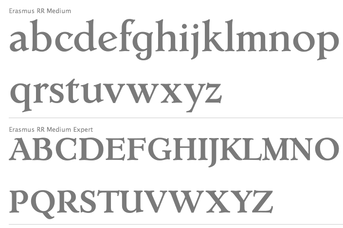
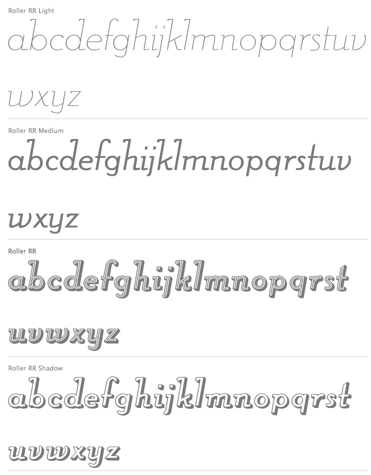
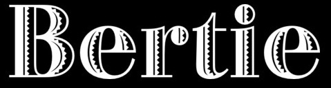
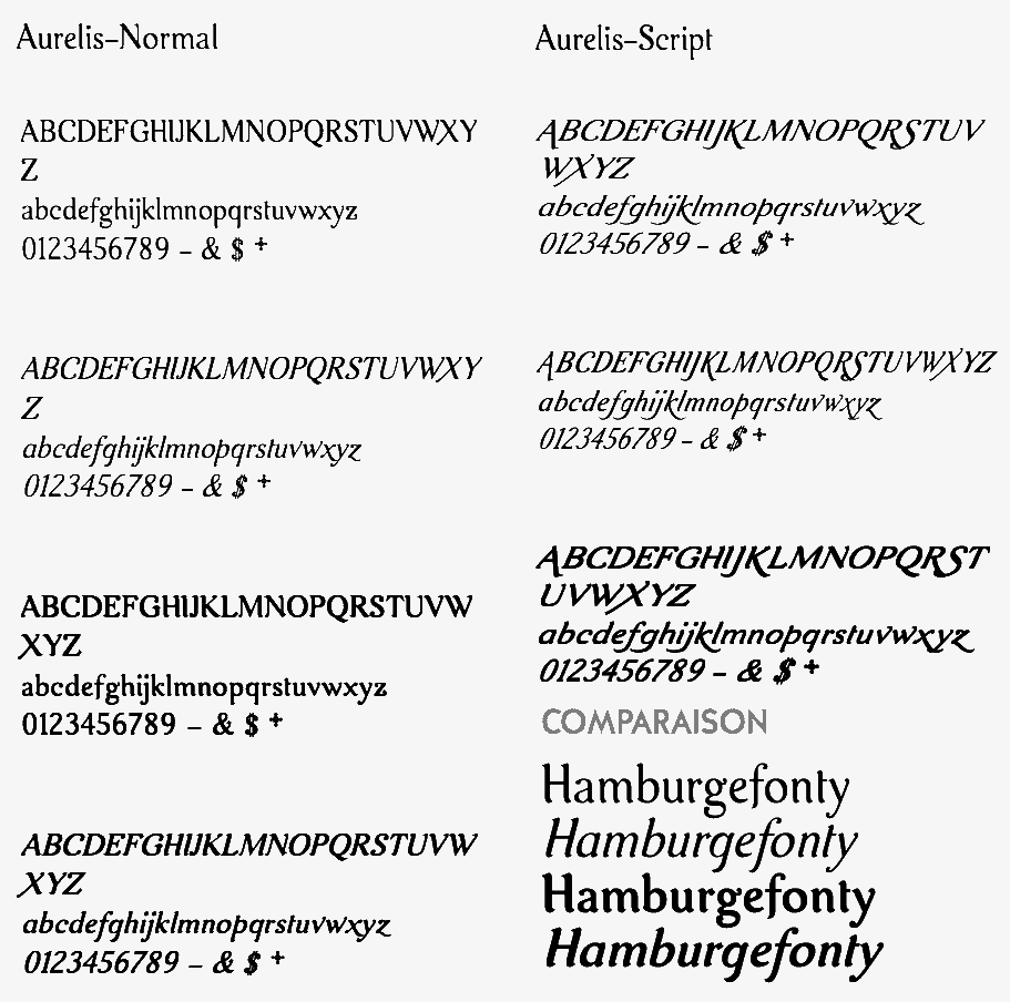
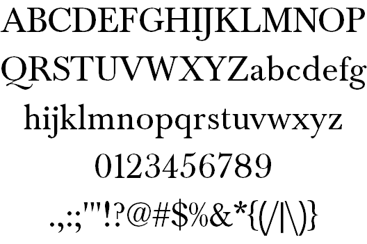
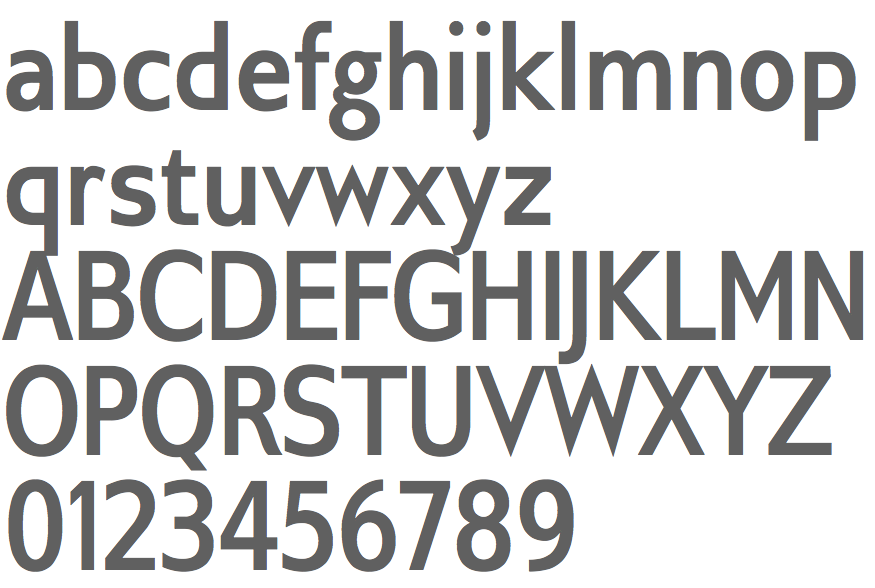
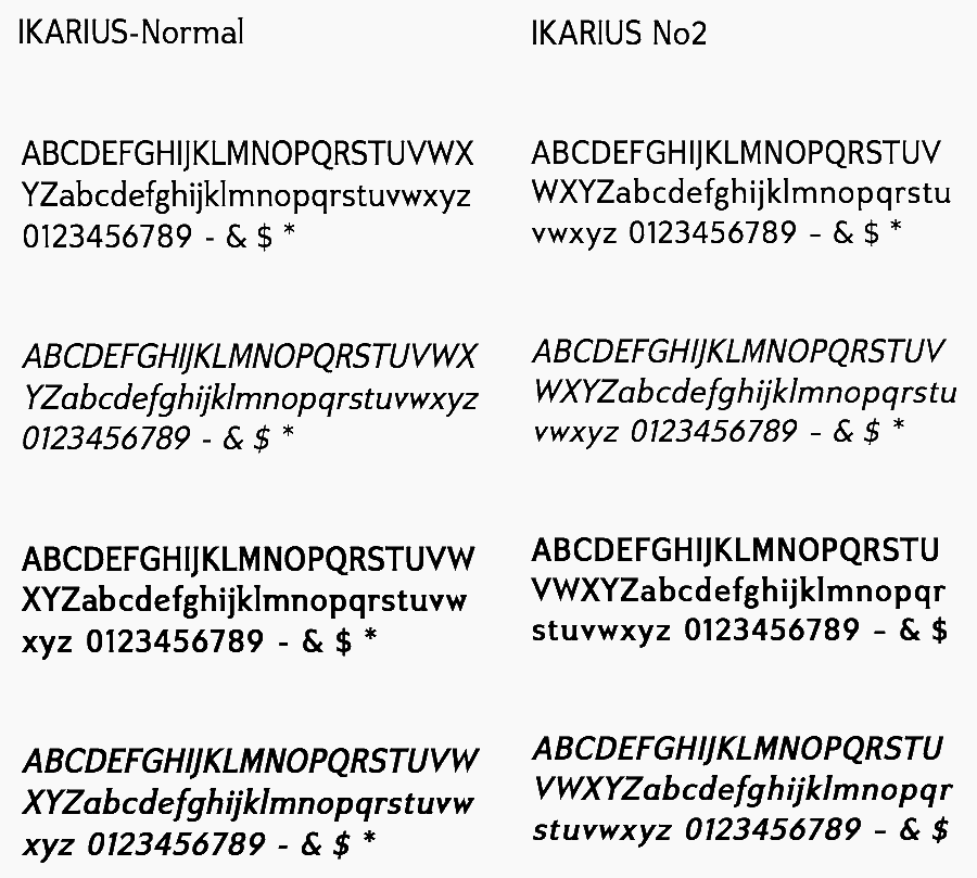
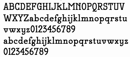
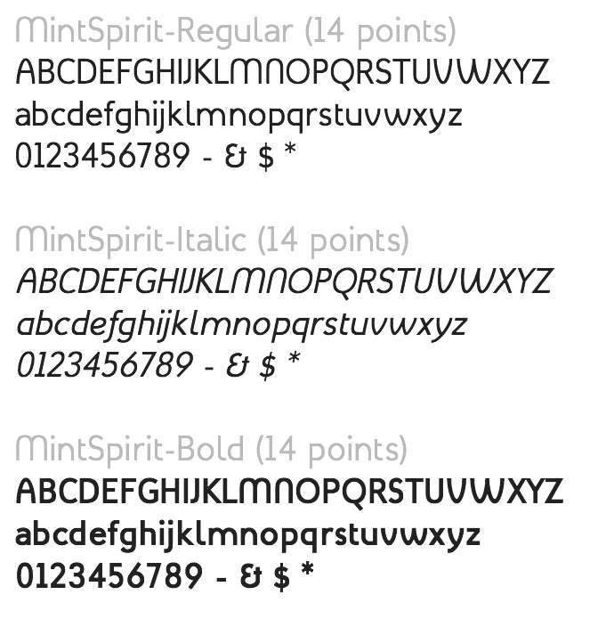
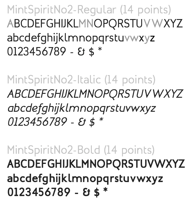
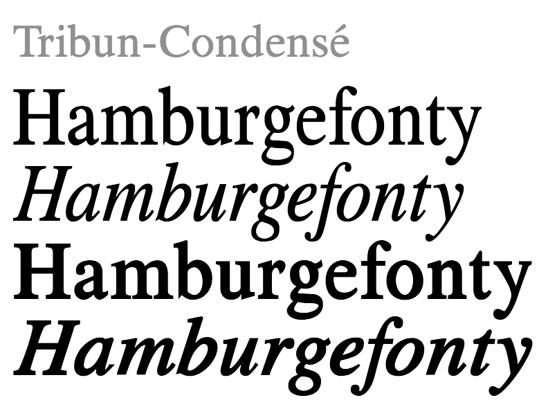
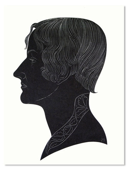
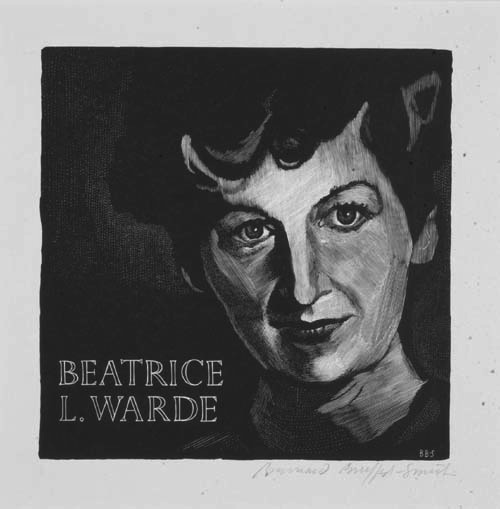
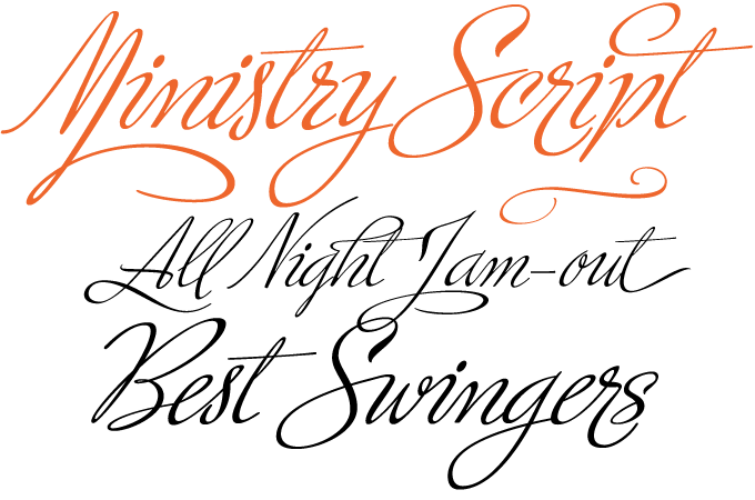
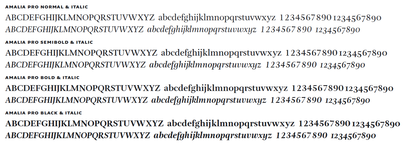
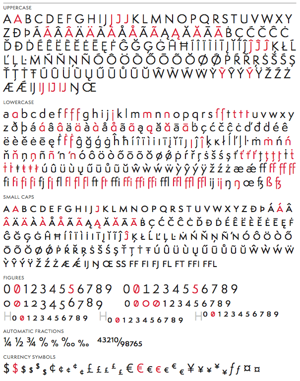
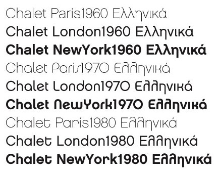
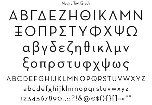
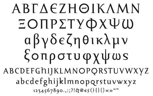
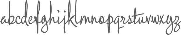
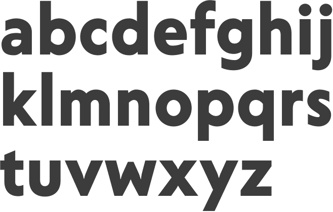
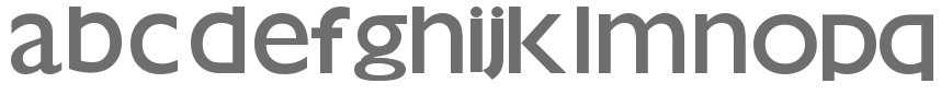
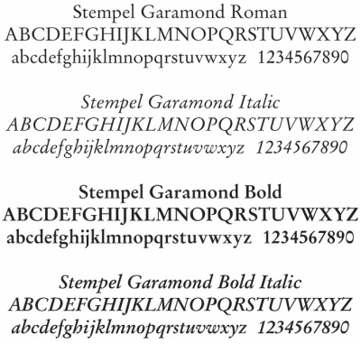
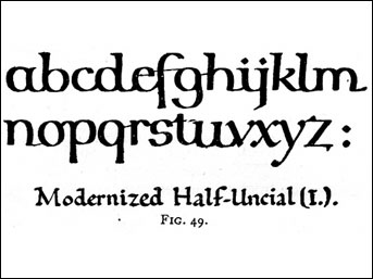
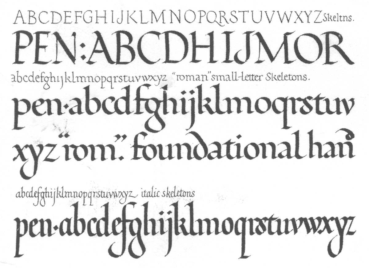
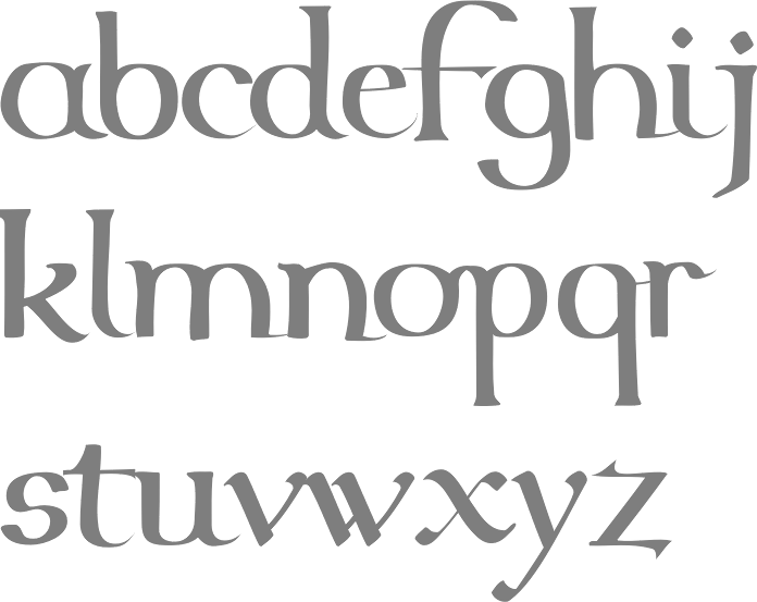
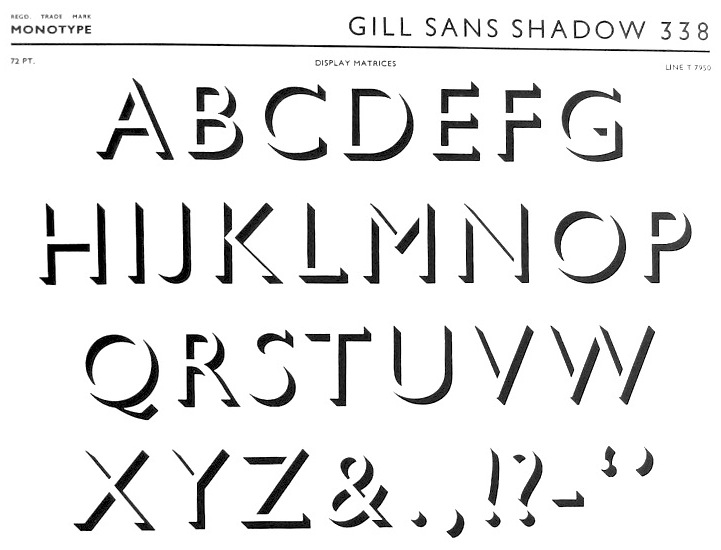
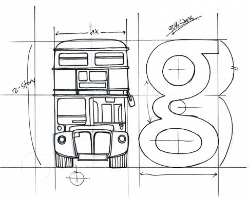
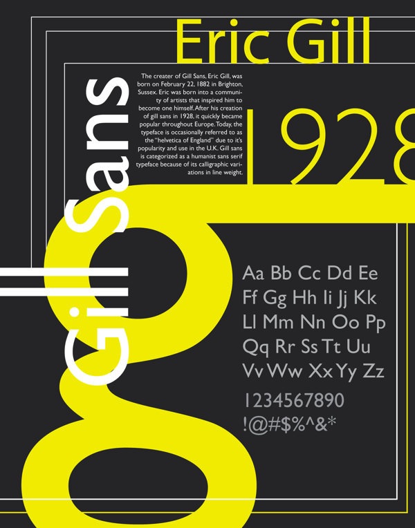
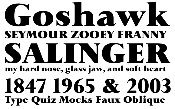
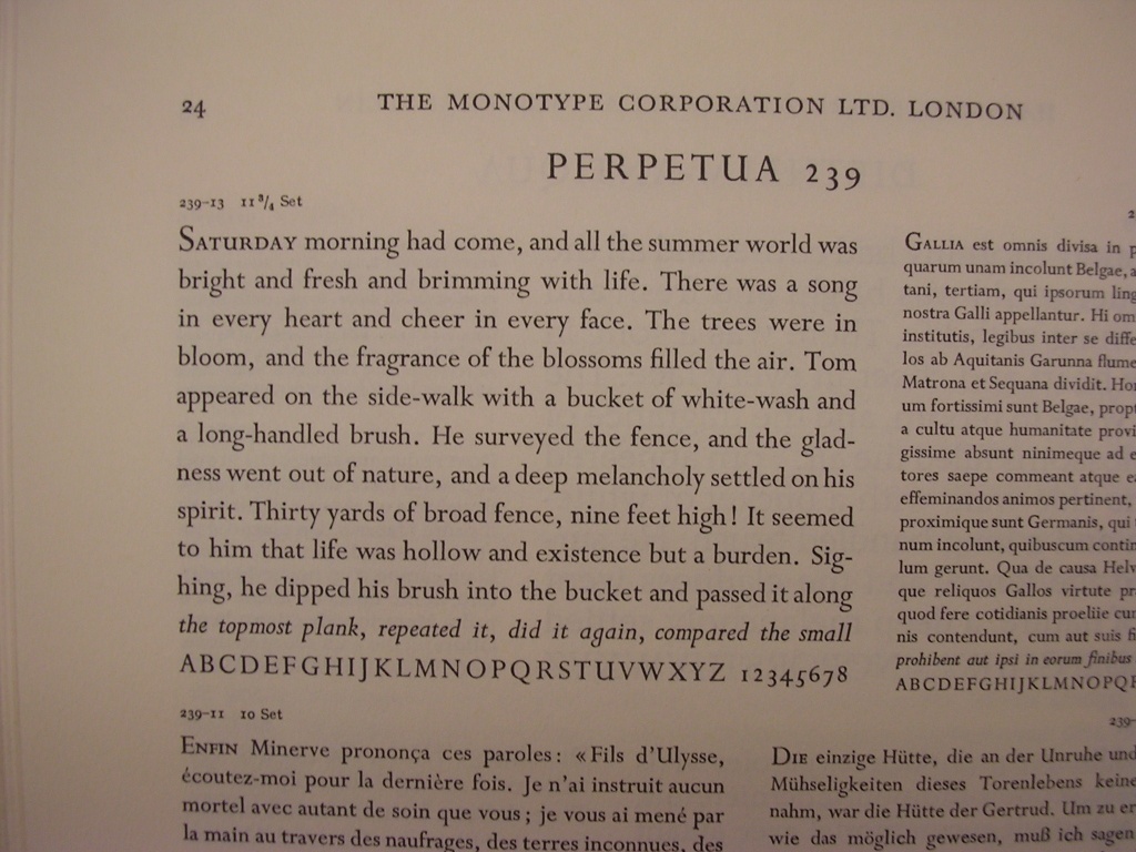
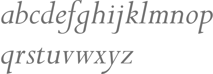
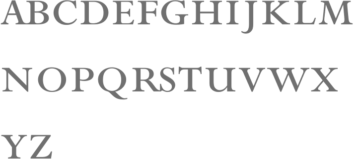
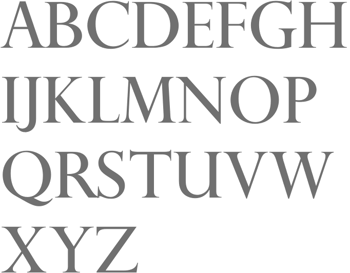
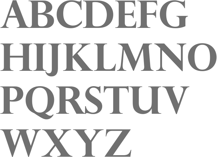
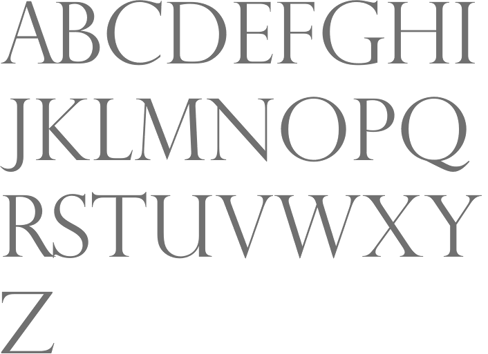
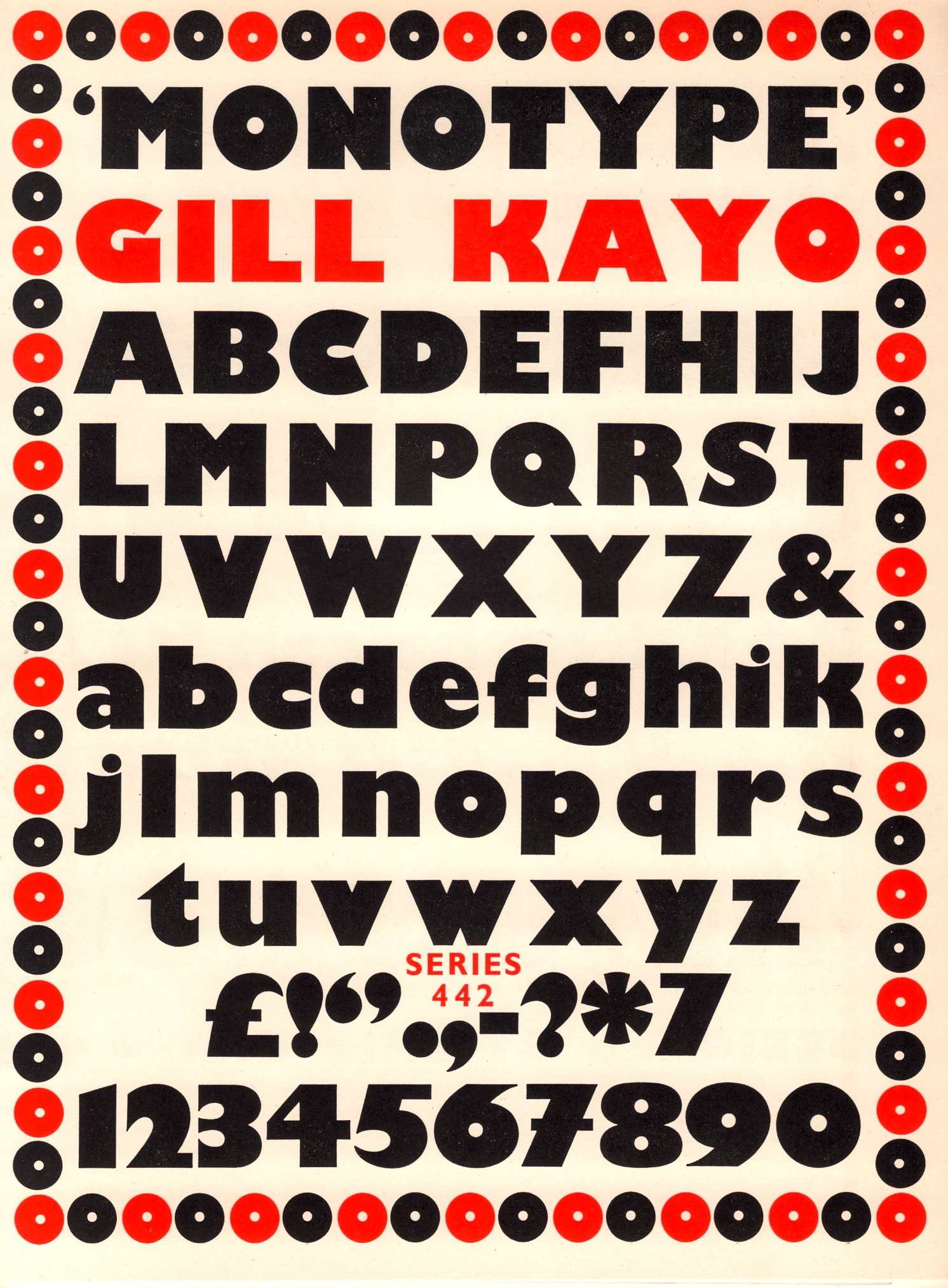
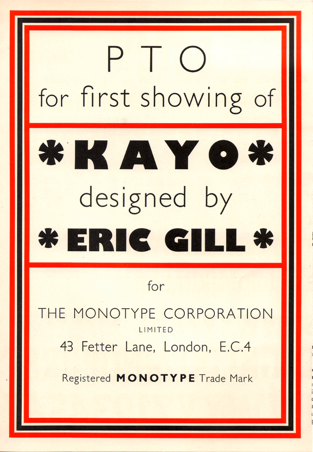
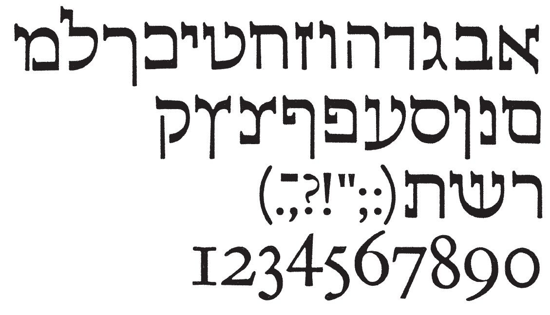
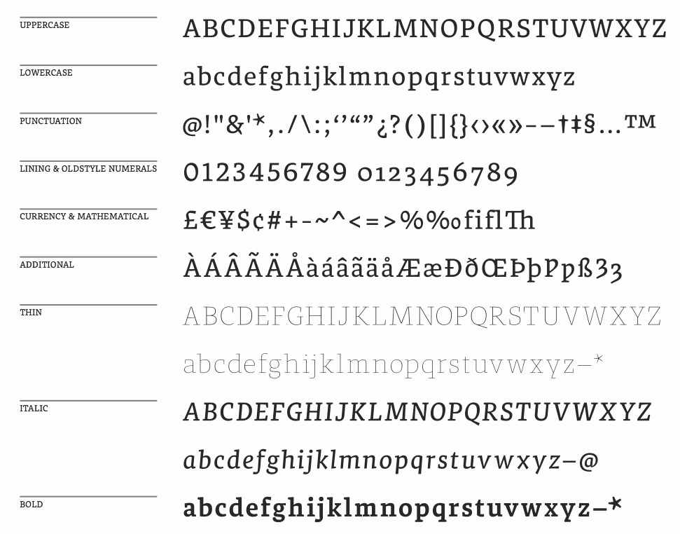
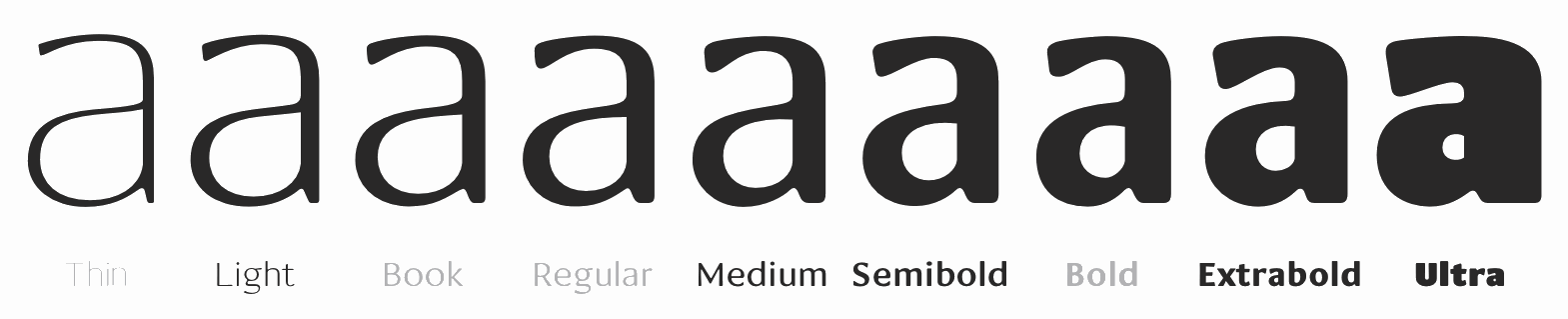
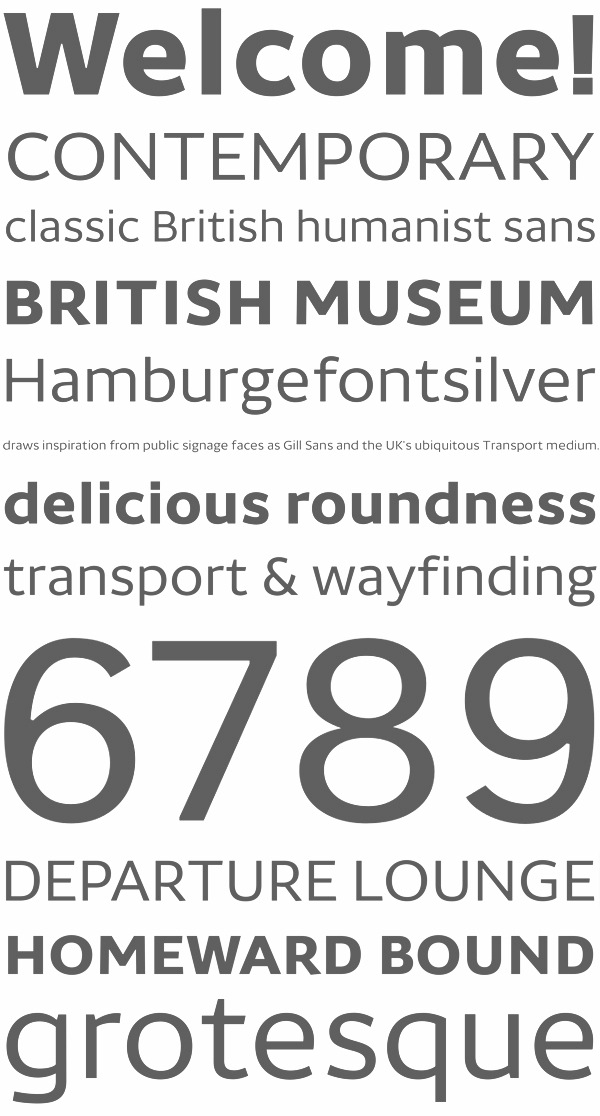
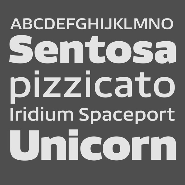
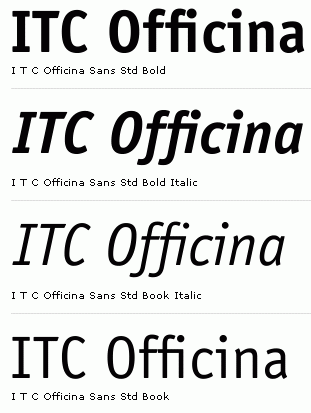
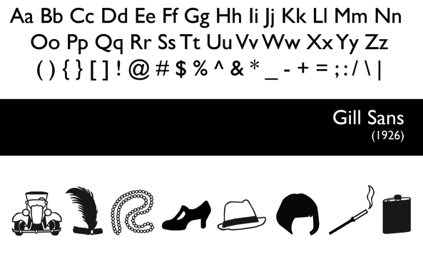
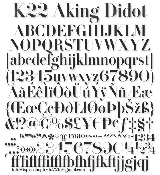
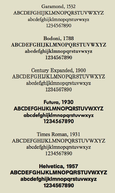
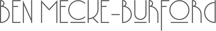
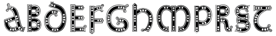
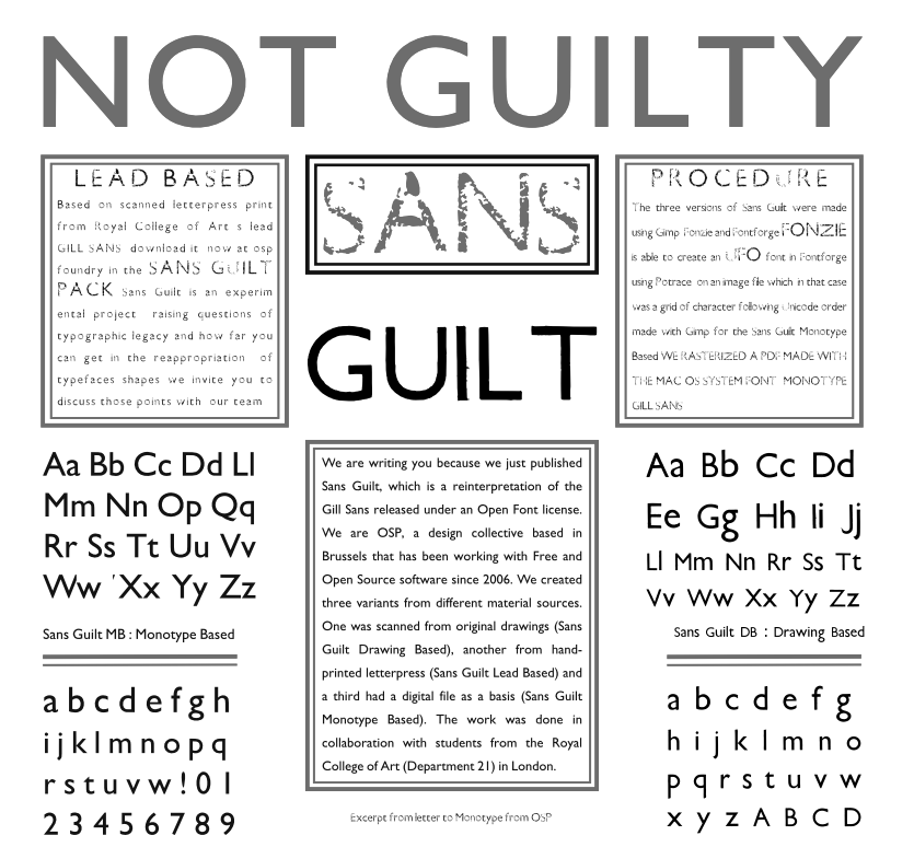
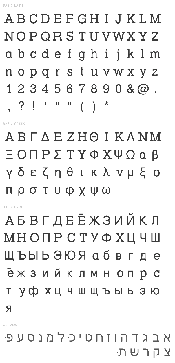
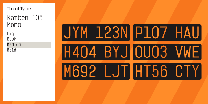
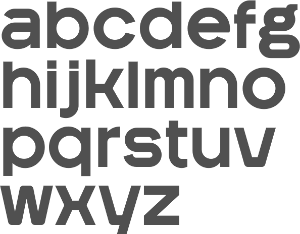
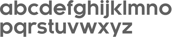
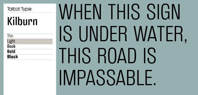
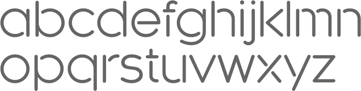
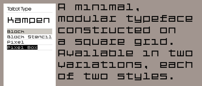
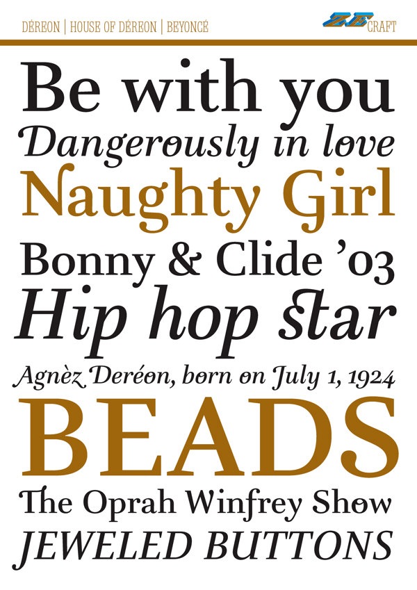