| | |
100types
[Ben Archer]
|
Educational and reference site run by Ben Archer, a designer, educator and type enthusiast located in England (who was in Auckland, New Zealand, before that). Glossary. Timeline. Type categories. Paul Shaw's list of the 100 most significant typefaces of all times were recategorized by Archer: - Religious/Devotional: Gutenbergs B-42 type, Gebetbuch type, Wolfgang Hoppyl's Textura, Breitkopf Fraktur, Ehrhard Ratdolt's Rotunda, Hammer Uncial, Zapf Chancery, Peter Jessenschrift, Cancellaresca Bastarda, Poetica.
- Book Publishing&General Purpose Text Setting: Nicolas Jenson's roman, Francesco Griffo's italic, Claude Garamond's roman, Firmin Didot's roman, Cheltenham family, Aldus Manutius' roman, William Caslon's roman, Pierre-Simon Fournier's italic, Ludovico Arrighi da Vicenza's italic, Johann Michael Fleischmann's roman, ATF Garamond, Giambattista Bodoni's roman, Nicolas Kis' roman, Minion multiple master, Unger Fraktur, John Baskerville's roman, Lucida, Optima, Bauer Bodoni, Adobe Garamond, Scotch Roman, Romanée, ITC Stone family, Trinité, ITC Garamond, Sabon, ITC Novarese, Charter, Joanna, Marconi, PMN Caecilia, Souvenir, Apollo, Melior, ITC Flora, Digi-Grotesk Series S.
- Business/Corporate: Akzidenz Grotesk, Helvetica, Univers, Syntax, Courier, Meta, Rotis, Thesis, Antique Olive.
- Newspaper Publishing: Times Roman, Bell, Clarendon, Century Old Style, Ionic, Imprint.
- Advertising and Display: Futura, Robert Thorne's fat typeface roman, Vincent Figgins' antique roman (Egyptian), Memphis, Fette Fraktur, Avant-Garde Gothic, Deutschschrift, Peignot, Erbar, Stadia/Insignia, Penumbra, Compacta, Bodoni 26, WTC Our Bodoni.
- Prestige and Private Press: Romain du Roi, Golden Type, Johnston's Railway Sans, Doves Type, Walker.
- Signage: William Caslon IV's sans serif, Trajan.
- Historical Script: Snell Roundhand, Robert Granjon's civilité, Excelsior Script.
- Experimental/expressive: Mistral, Beowolf, Dead History, Behrensschrift, Eckmannschrift, Neuland, Element, Remedy, Template Gothic.
- Onscreen/multimedia: Chicago, Oakland, OCR-A, Base Nine and Base Twelve, Evans and Epps Alphabet.
- Telephone Directory publishing: Bell Gothic.
Link to Archer Design Work. [Google]
[More] ⦿
|
Alan Meeks

|
 Prolific type designer, b. London, 1951. Alan started working in 1970 for Graphic Systems as a lettering artist. In 1975, he joined Letraset as the Senior Type Designer and Studio Manager where he was responsible for all the artwork produced by the Letraset studio. During his tenure at Letraset, he designed over 40 popular typefaces, including Bramley, Candice, Bickley Script and Belwe. Most of these typefaces also showed up in the Scangraphic collection. Together with type director Colin Brignall, Alan contributed to the success of Letraset. All the original typographic artwork produced at Letraset was produced by hand cutting the fonts in Rubylith, a highly-skilled technique known as stencil cutting. Alan was responsible for training the entire Letraset studio in this art. Most of the original Letraset artwork has now been archived at St. Brides Printing Library, London. Today, Alan works independently, specializing in all facets of corporate identity including type design, typography, packaging, and development of logos and symbols.
 His oeuvre (sold via MyFonts) includes: - Letraset: Aardvark (with Colin Brignall, 1969). Also see Aargau (Softmaker).
- Font Factory: Chalfont (2003: similar to Antique Olive), Brigade (classic roman), Fairway (curly sans), Copacabana (italicized roman).
- Elsner&Flake fonts: Bramley, Cabaret, Candice, Chesterfield, Einhorn (1980, Scangraphic, a revival of a 1931 typeface by Heinrich Maehler called Salut), Frankfurter (1978-1981, with Nick Belshaw and Bob Newman; for digital versions, see Farnham by Infinitype and F821 Deco by SoftMaker), Galadriel (1975; specimen; another specimen), Glastonbury, Knightsbridge, Plaza, Princetown (athletic lettering font done in 1981 based on Princetown by Dick Jones at Letraset), Rialto, Shelley, Tarragon (1981, art nouveau).
- ITC fonts: Algerian Condensed, Ambrose, Belwe Mono, Bertie, Bickley Script, Burlington (1985), Cabaret, Campaign (stencil), Cancellaresca Script (1982), Champers, Claude Sans, Dynamo Shadow (1977), Fashion Compressed (1986, Letraset: a fashion mag didone typeface), Flamme (1993), Follies (1991), Frankfurter (1978-1981, with Nick Belshaw), Glastonbury (1979), Inscription, Jazz, Lightnin' (1994), Limehouse Script (1986), Locarno (1986), Malibu (1992), Plaza, Ragtime, Regatta Condensed, Savoye, Shelley, Tannhauser (1988), Varga (1991), Waterloo Bold (1987).
- Letraset fonts: Aachen, Ambrose (1985), Belwe Mono (1989), Bertie (1985, a Mexican simulation face), Bickley Script, Burlington (1985), Campaign, Champers, Claude Sans (1988), Fashion Compressed, Flamme, Follies, Inscription, Jazz (1992, art deco), Lightnin, Limehouse Script, Locarno, Malibu, Ragtime, Regatta Condensed, Savoye (1992), Tannhauser, Varga, Waterloo Bold.
- Linotype fonts: Aachen, Algerian, Belwe Mono, Bertie, Bickley Script (1986), Bramley, Burlington, Cabaret (1980), Campaign, Cancellaresca Script, Candice, Champers (1991), Chesterfield, Claude Sans, Dynamo, Einhorn, Fashion, Flamme (script), Follies, Frankfurter, Galadriel, Gill Display Compressed, Glastonbury, Inscription (1994), Jazz (1992), Kestrel (1985, a connected signage script at Letraset based on Commercial Script; Ralph Unger's 2011 typeface Faulkner Pro is based on Kestrel; see also Kestrel Script (2010), Meeks's own digital version, its informal version Falcon Script (2013), and Subflux's Ballpark Weiner), Knightsbridge, Lightnin, Limehouse Script, Locarno, Malibu, Plaza (1975), Plaza, Ragtime (1987), Regatta Condensed, Rialto, Savoye, Shelley, Tannhauser, Tarragon, Varga.
- Typefaces from 2011: Dublin (a Celtic typeface), Chalky.
- Typefaces from 2014: Pinot Grigio Modern (a modern rounded multi-style update of Peignot, originally designed in 1937 by A. M. Cassandre), Falcon Script.
- Typefaces from 2015: Park Lane (a classicitalic roman).
- Typefaces from 2017: British Empire (a colonial typeface).
- Typefaces from 2018: Arequipa (a titling font), Independence Script (a cursive script loosely based on the Declaration of Independence; co-designed with calligrapher Satwinder Sehmi), Witchcraft. A classic roman.
- Typefaces from 2019: Aquitania Script (calligraphic).
- Typefaces from 2020: Bodoni Elegant. An 8-style family in Bodoni's style with oh so slight curves thrown in.
- Typefaces from 2021: Pantomime (a heavy monolinear script).
- URW++ revivals: Glastonbury (2009).
- Allan Meeks collection (Cedars, PA): Astoria (2006, miniserifed family based on Gill Sans), Astoria Sans (2011), Astoria Classic (2016), Astoria Classic Sans (2017, with a Peignotian feel), Brigade (2003, serif family), Copacabana (2004, based on Goudy Old Style Italic), Vatican (2005, a calligraphic typeface characterized by the sharp edge style of Arthur Baker), Colosseum (2008, a sans based on Trajan roman and influenced by Friz Quadrata), Chalfont (2003, a News Gothic style typeface with thinned strokes near the bottom---strange and somewhat unattractive), Fairway (2003, a quirky sans), Chalfont Roman (2020), Spartacus (2014), Winterfell (2019).
- Custom type: Benson&Hedges, Lilt, The Woolmark Company, Somerfield, Tarmac, Clearstream.
Galadriel, Kornelia and Sparky are floating around freely in cyberspace. FontShop link. Linotype link. View Alan Meeks's typefaces. Yet another page with Alan Meeks's typefaces. Klingspor link. [Google]
[MyFonts]
[More] ⦿
|
Alberto Pedro Di Santo
|
 Creator of these typefaces at the Spanish type foundry Eurotypo:
 - The rounded hexagonal typeface Klipa (2013).
- The chancery script typeface Alfina (2014). Its bold version is Alfina Notte (2016).
- The art nouveau typeface Oblonga.
- The chancery cursive script Donna Lena (2014).
- Vicentina (2014). The ductus of the gothic cursive calligraphic Vicentina has been derived from the documents redacted by Master Domenico Dominici from Vicenza, while most of the inspiration comes from books preserved in the archives of Orvieto Cathedral (Archivi dell'Opera del Duomo di Orvieto).
- Nova Caere (2015), an urban calligraphic typeface.
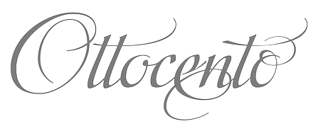
- Ottocento (2015, Eurotypo) is a crisp elegant chancery cursive, derived from XIXth century Italian calligraphic sources.
- Pieve (2015). A great calligraphic typeface.
- Andovai (2016, Eurotypo). A modern cursive typeface family.
[Google]
[MyFonts]
[More] ⦿
|
Alex Ivanov
[Vates Design]
|
 [More] ⦿
|
Alex Moseley
[Crazy Diamond Design Historical Fonts]
|
[More] ⦿
|
Alfred John Fairbank
|
English calligrapher, b. 1895, Grimsby, d. 1982, Hove, Sussex. Student at the Central School of Arts and Crafts, disciple (in his own words) of Edward Johnston. In 1921, he co-founded the Society of Scribes and Illuminators, and was honorary secretary from 1931 to 1933. He wrote several books on handwriting, including A Handwriting Manual (1932), many times reissued, e.g., in 1954 by Faber and faber in London. In 1960, Alfred Fairbank and Berthold Wolpe co-authored Renaissance handwriting: An anthology of italic scripts (Cleveland: World Publishing Co). His last book was A Book of Scripts (1968, London: Pelican Books). In 1932, Alfred Fairbank proposed Dryad Writing for schools. It is a connected regular and legible style of writing that was influenced by Francisco Lucas (16th century, Spain), and could be called chancery script. After the Second World War he founded the Society for Italic Handwriting. His only typeface was the first italic for Monotype, Bembo. This was not the italic that was put out for general use, and was eventually released (in 1928) as Bembo Narrow Italic. It is sometimes referred to as Fairbank Italic. The Bembo family is of course due to Stanley Morison at Monotype, after models of Francesco Griffo and Giovanni Tagliente. It has digital reinterpretations such as Bamberg Special (Softmaker) and Bergamo (Softmaker). It is possible that Fairbank MT (2003, Robin Nicholas) is named after him. [Google]
[MyFonts]
[More] ⦿
|
Alison Argento
[Dear Alison]
|
 [MyFonts]
[More] ⦿
[MyFonts]
[More] ⦿
|
Amélie Bonet
|
 French graphic and type designer, b. Paris, who graduated from Ecole Estienne in 2005 with a thesis entitled La cancellaresca, L'âge d'or de la calligraphie italienne.. She previously studied visual communications at Ecole Duperré in Paris. She has an MA in typeface design from The University of Reading (2009), based on her typeface Polydom, later renamed Roxane, which covers Latin, Greek and Devanagari. In the spring of 2010, she joined Dalton Maag in South London as a type designer. Since 2010, she has developed custom Indic fonts for Nokia, HP, Intel, Linotype and Google Fonts, and has collaborated with type foundries and designers such as URW Type Foundry, Brody Associates, Raoul Gottschling, Anatole Type, Lineto, Pangram Pangram & The Northern Block. She spent significant time in Los Angeles and London, before settling in Berlin.
 Her typefaces include Typecache link. [Google]
[More] ⦿
|
Ana Parracho
[Ana's Fonts]
|
 [MyFonts]
[More] ⦿
[MyFonts]
[More] ⦿
|
Ana's Fonts
[Ana Parracho]
|
 Paris-based Portuguese designer (b. 1990) of the free old typewriter typeface Ana's Rusty Typewriter (2013) and the sans typeface Squiggly Asta (2013). In 2014, she made Night Still Comes (a 4-style serif family), a serif typeface family in four styles, Candlebright (blackletter), Mystery Typewriter, Strangeways (brushed), and Calling Cards (sans). In 2015, she created the informal typefaces Rough Notes and Chalk Marks. In 2016, she designed the connected script typeface Better Phoenix.
 Typefaces from 2017: Reckless (thick brush), Bloxhall (art deco titling sans), Delirium (brush style), Blue Fires, Unexpected Typewriter, Wild Creatures (brush script), A Pompadour (11 styles, from retro sans to display), Night Wind Sent. Typefaces from 2018: These Days (brush SVG font), Soft Notes (blackletter), Popless (Serif, Script), Pitch or Honey, Be Cool, Honolulu (a hand-drawn blackboard bold typeface), Floret, Landslide, Bellevue (brush), BigRiver (+Script), Farewell Angelina (a display family in Sans, Serif and Text substyles), Siren Song, Something Exquisite (signature font). Typefaces from 2019: Amateur Typewriter, Be Cool, Big River (Sans, Script), Soul Drifter, Fletcher Typewriter, Rockford, Gumball (sans), Unika (a signature font). Typefaces from 2020: Thesis Typewriter (an old typewriter font family), The Voyager (a decorated full-bodied sans), Leaves and Twigs (dingbats), Notes and Quotes, Honey and Smoke, Summer Days (a monoline fat finger font), Smoke Signals, Secretary Typewriter, Clockwise (a friendly sans), Calling Cards (a condensed sans), Pitch Or Honey, Porchlight (a text typeface inspired by vintage French types). Typefaces from 2021: Little Things (a children's hand), Moon And Stars (handwriting and doodle bats), Dramatico Script (a rough-edged chancery script), Populaire Typewriter, Garden Song (a handcrafted text typeface), Morning Magpie (a fat finger font). Typefaces from 2022: Handy Typewriter, Linoblox (a linocut font; +Ornaments). [Google]
[MyFonts]
[More] ⦿
|
Andrea Chopp
|
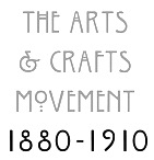 Graphic designer and typographer in Ferndale, MI. She did some type posters (e.g., on the Arts and Crafts Movement), and some calligraphic work. She also designed some experimental typefaces. [Google]
[More] ⦿
Graphic designer and typographer in Ferndale, MI. She did some type posters (e.g., on the Arts and Crafts Movement), and some calligraphic work. She also designed some experimental typefaces. [Google]
[More] ⦿
|
André-Michel Lubac
|
French type designer, b. 1955, who drew the calligraphic Le Griffe in 1973 (Letraset). Fontshop link. Klingspor link. Linotype link. [Google]
[MyFonts]
[More] ⦿
|
Antonin Kavalec
|
Czech Fraktur page. It has a lot of information and samples, includes a table (reproduced below), and has a small archive: Gothenburg (WSI), MA-Gotic (Will Software), Magdeburg (Scriptorium), SchwabenAlt-Bold, Diamond-Gothic (Jim Fordyce, 1993), Engrossing (Scriptorium, 1994), Fiorne (WSI), GF-Gesetz (Lorenz Goldnagl, 1999), JGJDurerGothic (Jeffrey Glen Jackson, 1997, based on Albrecht Dürer), OffenbachChancery, Ruritania, Schwabach, WornManuscript (Phillip Andrade, 1999), Suetterlin, MA-Bastarda1 (Will Software), FFraktur1, DSNormalFrakturBold (BfdS, 1997), Old-London, WilhelmKlingsporGotisch-Dfr. | Alte Schwabacher | 1470 | | | Andreas-Schrift | 1942-1948 | Hans Kühne (1910-1961) | | Breitkopf-Fraktur | 1750 | Johann Gottlob Imanuel Breitkopf (1719-1794) | | Caslon-Gotisch | 1760 | William Caslon (1692-1766) | | Claudius | 1931-1937 | Rudolf Koch (1876-1934) | | Deutsche Kursiv | 1909 | Richard Ludwig | | Deutsche Werkschrift | 1934 | Rudolf Koch (1876-1934) | | Deutsche Zierschrift | 1919-1921 | Rudolf Koch (1876-1934) | | Eckmann-Schrift | 1900-1902 | Otto Eckmann | | Ehmcke-Schwabacher | 1920 | Fritz Helmut Ehmcke (1878-1965) | | Eisenacher Fraktur | 1994 | Christian Spremberg (1956) | | Fette Gotisch | 1893 | Hausschnitt | | Fichte-Fraktur | 1934-1939 | Walter Tiemann (1876-1951) | | Frühling | 1913-1914 | Rudolf Koch (1876-1934) | | Gilgengart | 1938 | Hermann Zapf (1918) | | Kleist-Fraktur | 1928 | Walter Tiemann (1876-1951) | | Koch-Fraktur | 1910-1921 | Rudolf Koch (1876-1934) | | Lincoln-Gotisch | 1907 | Morris Fuller Benton | | Maximilian | 1926 | Rudolf Koch (1876-1934) | | Normal-Fraktur | 1913-1914 | Rudolf Koch (1876-1934) | | Offenbacher Schwabacher | 1926 | Rudolf Koch (1876-1934) | | Peter-Jessen-Schrift | 1899-1900 | Rudolf Koch | | Post-Fraktur | 1935-1940 | Herbert Post (1903-1978) | | Rhapsodie | 1951 | Ilse Schüle (1903-1997) | | Straßburg | 1926 | Hausschnitt der H. Berthold AG | | Tannenberg | 1933-1935 | Emil Mayer (1898-1983) | | Thannhaeuser-Fraktur | 1937 | Herbert Thannhaeuser (1898-1963) | | Unger-Fraktur | 1794 | Johann Friedrich Unger (1750-1804) | | Walbaum-Fraktur | 1800 | J. G. Justus Erich Walbaum (1768-1837) | | Wallau | 1924-1936 | Rudolf Koch (1876-1934) | | Wartburg-Fraktur | 1998 | Christian Spremberg | | Weißgotisch | 1936-1937 | Emil Rudolf Weiß (1875-1942) | | Wilhelm-Klingspor-Schrift | 1920-1926 | Rudolf Koch (1876-1934) | | Zentenar-Fraktur | 1937-1938 | Friedrich Hermann Ernst Schneidler (1882-1956) | [Google]
[More] ⦿
|
Antonio Sinibaldi
|
 Late fifteenth century Italian renaissance era calligrapher who was based in Florence, and who was famous for his florentine style of antiqua and cancellaresca. His alphabets inspired many typefaces, such as Petrarch (ATF), Sinibaldi (1926, Raffaello Bertieri) and Bologna (1946, Stephenson Blake).
 Digital typefaces based on his work: - 1480 Humanistica (2010) by Klaus-Peter Schäffel.
- Antonio, Sinibaldi and Magnifico (Maria Chiaro=i Fantini, 2021). In 2021, Fantini embarked on a project to create a font based on Antonio Sinibaldi's calligraphic material in Libro d'Ore di Lorenzo de Medici, now in possession of the Biblioteca Medicea Laurenziana di Firenze. Her first rough font was called Antonio. She also studied Raffaello Bertieri's Sinibaldi font done in 1928 at the Nebiolo Type Foundry when she designed her own digital version of Sinibaldi (2021). The latter font was regularized and smoothed in her final typeface in this project, Magnifico (2021).
[Google]
[More] ⦿
|
Anupap Jaichumnan
[Jipatype]
|
[MyFonts]
[More] ⦿
|
Apple: Leopard system fonts
|
The fonts installed in Mac OS X 10.5 (Leopard) are: - In /Library/Fonts, OTF format: ACaslonPro-Bold, ACaslonPro-BoldItalic, ACaslonPro-Italic, ACaslonPro-Regular, ACaslonPro-Semibold, ACaslonPro-SemiboldItalic, AGaramondPro-Bold, AGaramondPro-BoldItalic, AGaramondPro-Italic, AGaramondPro-Regular, ArnoPro-Bold, ArnoPro-BoldCaption, ArnoPro-BoldDisplay, ArnoPro-BoldItalic, ArnoPro-BoldItalicCaption, ArnoPro-BoldItalicDisplay, ArnoPro-BoldItalicSmText, ArnoPro-BoldItalicSubhead, ArnoPro-BoldSmText, ArnoPro-BoldSubhead, ArnoPro-Caption, ArnoPro-Display, ArnoPro-Italic, ArnoPro-ItalicCaption, ArnoPro-ItalicDisplay, ArnoPro-ItalicSmText, ArnoPro-ItalicSubhead, ArnoPro-LightDisplay, ArnoPro-LightItalicDisplay, ArnoPro-Regular, ArnoPro-SmText, ArnoPro-Smbd, ArnoPro-SmbdCaption, ArnoPro-SmbdDisplay, ArnoPro-SmbdItalic, ArnoPro-SmbdItalicCaption, ArnoPro-SmbdItalicDisplay, ArnoPro-SmbdItalicSmText, ArnoPro-SmbdItalicSubhead, ArnoPro-SmbdSmText, ArnoPro-SmbdSubhead, ArnoPro-Subhead, BellGothicStd-Black, BellGothicStd-Bold, BickhamScriptPro-Bold, BickhamScriptPro-Regular, BickhamScriptPro-Semibold, BirchStd, BlackoakStd, BrushScriptStd, ChaparralPro-Bold, ChaparralPro-BoldIt, ChaparralPro-Italic, ChaparralPro-Regular, CharlemagneStd-Bold, CooperBlackStd-Italic, CooperBlackStd, EccentricStd, GaramondPremrPro-It, GaramondPremrPro-Smbd, GaramondPremrPro-SmbdIt, GaramondPremrPro, GiddyupStd, HiraKakuPro-W3, HiraKakuPro-W6, HiraKakuStd-W8, HiraKakuStdN-W8, HiraMaruPro-W4, HiraMaruProN-W4, HiraMinPro-W3, HiraMinPro-W6, HoboStd, KozGoPro-Bold, KozGoPro-ExtraLight, KozGoPro-Heavy, KozGoPro-Light, KozGoPro-Medium, KozGoPro-Regular, KozMinPro-Bold, KozMinPro-ExtraLight, KozMinPro-Heavy, KozMinPro-Light, KozMinPro-Medium, KozMinPro-Regular, LetterGothicStd-Bold, LetterGothicStd-BoldSlanted, LetterGothicStd-Slanted, LetterGothicStd, LithosPro-Black, LithosPro-Regular, MesquiteStd, MinionPro-Bold, MinionPro-BoldCn, MinionPro-BoldCnIt, MinionPro-BoldIt, MinionPro-It, MinionPro-Medium, MinionPro-MediumIt, MinionPro-Regular, MinionPro-Semibold, MinionPro-SemiboldIt, MyriadPro-Bold, MyriadPro-BoldCond, MyriadPro-BoldCondIt, MyriadPro-BoldIt, MyriadPro-Cond, MyriadPro-CondIt, MyriadPro-It, MyriadPro-Regular, MyriadPro-Semibold, MyriadPro-SemiboldIt, NuevaStd-BoldCond, NuevaStd-BoldCondItalic, NuevaStd-Cond, NuevaStd-CondItalic, OCRAStd, OratorStd-Slanted, OratorStd, PoplarStd, PrestigeEliteStd-Bd, RosewoodStd-Regular, StencilStd, TektonPro-Bold, TektonPro-BoldCond, TektonPro-BoldExt, TektonPro-BoldObl, TrajanPro-Bold, TrajanPro-Regular.
- In /Library/Fonts. TTF format: AlBayan, AlBayanBold, AndaleMono, AppleMyungjo, Arial-Black, Arial-BoldItalicMT, Arial-BoldMT, Arial-ItalicMT ArialHB, ArialHBBold, ArialMT, ArialNarrow-Bold, ArialNarrow-BoldItalic, ArialNarrow-Italic, ArialNarrow, ArialRoundedMTBold, ArialUnicodeMS, Ayuthaya, Baghdad, BrushScriptMT, Chalkboard-Bold, Chalkboard, ComicSansMS-Bold, ComicSansMS, Corsiva, CorsivaBold, CourierNewPS-BoldItalicMT, CourierNewPS-BoldMT, CourierNewPS-ItalicMT, CourierNewPSMT, DecoTypeNaskh, DevanagariMT-Bold, DevanagariMT, EuphemiaUCAS-Bold, EuphemiaUCAS-Italic, EuphemiaUCAS, Georgia-Bold, Georgia-BoldItalic, Georgia-Italic, Georgia, GujaratiMT-Bold, GujaratiMT, Impact, InaiMathi, Kailasa, Kokonor, Krungthep, KufiStandardGK, LiSongPro, MicrosoftSansSerif, MonotypeGurmukhi, Mshtakan, MshtakanBold, MshtakanBoldOblique, MshtakanOblique, NISC18030, Nadeem, NewPeninimMT, NewPeninimMTBold, NewPeninimMTBoldInclined, NewPeninimMTInclined, PlantagenetCherokee, Raanana, RaananaBold, STFangsong, STKaiti, STSong, Sathu, Silom, Tahoma-Bold, Tahoma, TimesNewRomanPS-BoldItalicMT, TimesNewRomanPS-BoldMT, TimesNewRomanPS-ItalicMT, TimesNewRomanPSMT, Trebuchet-BoldItalic, TrebuchetMS-Bold, TrebuchetMS-Italic, TrebuchetMS, Verdana-Bold, Verdana-BoldItalic, Verdana-Italic, Verdana, Webdings, Wingdings-Regular, Wingdings2, Wingdings3.
- In /Library/Fonts, in DFONT format: #Gungseouche, #HeadlineA, #PCmyoungjo, #Pilgiche, AmericanTypewriter, Apple Chancery, Apple LiGothic Medium, Apple LiSung Light, Baskerville, BiauKai, BigCaslon, CharcoalCY, Cochin, Copperplate, Didot, Futura, GenevaCY, GillSans, Hei, HelveticaCY, Herculanum, Hoefler Text, Kai, MarkerFelt, Optima, Osaka, OsakaMono, Papyrus, Skia, Zapfino.
- In /System/Library/Fonts, OTF format: AquaKana-Bold, AquaKana, HiraMinProN-W3, HiraMinProN-W6, HiraKakuProN-W3, HiraKakuProN-W6.
- In /System/Library/Fonts, TTF format: AppleBraille-Outline6Dot, AppleBraille-Outline8Dot, AppleBraille-Pinpoint6Dot, AppleBraille-Pinpoint8Dot, AppleBraille, AppleSymbols, AppleGothic, GeezaPro-Bold, GeezaPro, Thonburi, Thonburi-Bold, LiHeiPro, STXihei, STHeiti.
- In /System/Library/Fonts, DFONT format: Courier, Geneva, Helvetica, HelveticaNeue, Keyboard, LastResort, LucidaGrande, Monaco, Symbol, Times, ZapfDingbats.
[Google]
[More] ⦿
|
Aring Typeface
[Måns Grebäck]
|
 Måns Grebäck (Aring Typeface, Örebro, Sweden) is a prolific Swedish designer (b. Lindesberg, Sweden, 1990), who lives in Borlänge, Sweden. Måns Grebäck has a bachelor's degree in graphic design from the University of Dalarna (2012). In 2010, he went commercial, and started selling fonts through MyFonts. In 2011 he started Mawns Design. In 2013, that was renamed to Aring Typeface. In 2011 he already had over seven million downloads of his fonts, which were featured at websites such as Dafont and Myfonts. He also does custom type work. His typefaces, both free and commercial:
 - Acryle Script (2014).
- Actonia (2016). A monoline script.
- Adielle (2018).
- Aerofoil (2017). A vintage bottom-heavy script.
- Airways (2016). A signage script.
- Akayla Script (2018). Calligraphic.
- Aliey (2021). A 4-style Victorian copperplate serif.
- Aliment (2018). A sharp geometric sans.
- Amertha (2020). a fat finger font.
- Amplify (2013). A signage script.
- Angars Runes (2019: medieval, with gothic cathedral curves).
- Angilla Tattoo (2013). A connected spurred tattoo typeface. Followed by Angilla Script (2020).
- Antlers (2012). A calligraphic script.
- Aquate Script (2019).
- Arachnids (2011, graffiti face)
- Artely Inks (2016).
- Artisual Deco (2021). Pure art deco.
- Artographie (2020). An all caps art deco typeface family.
- Atelas (2015). Signage type, baseball script.
- Atures (2018). Futuristic and monoline.
- Autograf (2015) and Autografia (2021). Signature typefaces.
- Ave (2016) in styles called Ave Utan, Ave Betwan and Ave Fedan. A family of baseball scripts.
- Avelana. A connected script.
- Backpack (2014). A thick signage script typeface.
- Backyard (2016). A blackletter typeface.
- Barkants (2011, elegantly hand-printed family).
- Barley Script (2017). A signage script.
- Baystar Script (2021).
- Beautiful Trouble (2012). A rabbit-eared upright connected script.
- Beaked Tyrant (2014). A copperplate calligraphic script.
- Beckasin (2011, signage face)
- Before The Rain (2011, calligraphic) Before The Rain Arabic (2016).
- Belladio (2021). An urban script.
- Bellino (2018).
- Bezar (2020). A script.
- Billion Dreams (2020, by Mans Grebäck and Rangga Subekti). A heavy signage script.
- Billion Stars (2013). A tattoo script font.
- Bira (2012). A retro connected brush / signage script.
- Blaak (2019).
- Black Fox (2014). A sirupy brush face.
- Black Signature (2021). A bold signature font.
- Black Larch (2016) and Dark Larch (2016).
- Bloc Boy (2016). Like handwriting.
- Blockography (2011). A sketched typeface.)
- Block Talk (2011, with Zaydek Michels-Gualtieri)
- Blods (2011, a great blotty brush face)
- Blueberry Script (2017; with Noah Kinard).
- Botanink (2011)
- Bouncy (a cartoon font).
- Bourdos2022). A script typeface.
- Brannboll (2011, baseball signage face), Brannboll NY (2013), Brannboll Connect (2020), Brannboll Stencil (a baseball script) (2020).
- Bready (2011). A retro signage script with art nouveau aroma.
- Brev Script (2014). A connected secretary hand from the 19th century.
- Bronze Script (2014).
- Brother Tattoo (2012).
- Bumblebees (2012). A plump curvy script.
- Bunya (2016). A geometric slightly deco sans typeface family.
- Calendary Hands (2012).
- Caligraf (2020).
- Canela Bark (2015, co-designed with Luis Miguel).
- Caneletter Sans and Script (2013). Upright unconnected and connected scripts.
- Cantona Script (2019).
- Canyon (2021). A wide elliptical sans in 18 styles, featuring a coathanger lower case f.
- Capoon (2018). A ten-style sans family.
- Caprica Sans (2014) and Caprica Script. A plump script.
- Caravela (2020). A pirate map script.
- Casat Cap (2017). An all caps brush typeface family.
- Caster (2019). A heavy poster script.
- Castro Script (2012).
- Catchland (2021). A retro baseball script.
- Celebrater (sic) (2012). An oily font.
- Cellos Script (2013).
- Centeria Script (2012).
- Channel (2011, connected upright script)
- Chapel Script (216). For signage.
- Characteristic (2011).
- Chavenir (2011).
- Chinal (2018).
- Choko (2011, released in 2016). Chocolate and cream-themed decorative typeface.
- Christmas Miracle (2018), Christmas Reign (Tuscan, all caps) (2020), and Christmas Sparkle (2018).
- Chrysante (2020). A monoline flowing pen script.
- Clear Line (2012). A fat finger / signage typeface.
- Clipper Script (2011).
- Clothe (2017).
- Coneria Script (2012). A connected script.
- Conture Script (2018). Elegant, classical, and with exaggerated capitals.
- Crackin (2011).
- Crunchy (2016). An upright connected script.
- Cruz Quaste (2020). A handcrafted blackletter typeface.
- Cubest (2021). A squarish monospaced techno family.
- CutScript (2011, connected script).
- Danbury (2022). A speed-emulating sans.
- Dark Crow (2020). a dry brush script.
- Dollie Script (2013).
- Ebbing (2018).
- Echinos Park Script (2012).
- Ederson (2018). A vintage signage script.
- Ekologie Hand (2012).
- Ekorre 2021). Aa vintage decorative serif.
- Elaya Script (2019). A creamy signage script.
- Electronics (2017). A retro signage script.
- Elevate (2016).
- Emiral Script (2017). A baseball script.
- Encina Script (2016). A thin calligraphic typeface.
- Enlighten (2011)
- Delinquente (2012).
- Denigan (2011, hairline)
- Equal Sans (2012).
- Espesor Olas (2011, fine hand-printed calligraphic family)
- Esplanade Script (2015, by Mario Arturo).
- Ethernal (2017). A connected script.
- Europe Underground (2010, geometric sans with a hairline weight).
- Fabulous (2017) and Fabulous Gold (2017). Signage script.
- Falkin Sans (2016), Falkin Script (2016), Falkin Serif (2016).
- Faltura (2011, constructivist), Faltura Alien (grunge), Faltura Guerra (grunge)
- Faltura Animals (2011)
- Feathergraphy Decoration (2011, calligraphic).
- Duera (2016). A variable width sans typeface family.
- Fargo (2021). A cursive script.
- Fat Wandals (2018). A graffiti font.
- Feathergraphy Clean (2011).
- Fibography (2013). A caps typeface composed of fibers.
- Filbert Brush (2012), Filbert Color (2013, a soft brush font).
- Finition (2017). A connected brush script.
- Fireplace (2020). A connected script.
- Firstly (2020). A flowing calligraphic signature script.
- First Lyrics (2011).
- First Reign (2022). A medieval typeface. Second Reign (2022), Third Reign (2022) and Fourth Reign (2022) are further medieval typefaces.
- Flighter (2018). A retro airplane font.
- Fondy Script (2018).
- Frankentype (2013). An all-caps brush typeface for signage.
- From Skyler (2016).
- Funkygraphy (2011, fat and counterless).
- Gecko (2015, a fine creamy signage script).
- Geza Script (2017). A great angular almost Arabic-looking script.
- Ghang (2011, graffiti family).
- Gingo (2020). A script.
- Goatskin Brush (2015). A great brush typeface.
- Golden Hopes (2021). A signature script.
- Gonzi (an 31-style sans). Published in 2021.
- Graced Script (2016). A wide calligraphic connected brush script.
- Grandi (2016). A ten-style display sans.
- Gready (2021). A fat signage script.
- Greback Grotesque (2012). The Thin is very very thin.
- Gretoon (2011, cartoon family)
- Griphite (2018). A rough brush typeface.
- Guld Script (2015).
- Habanero (2016). A fat signage typeface.
- Handtalk (2010, silhouettes)
- Harbell (2013).
- Hard Block (2011, Western slab face).
- Hastafi (2022). An 8-style sharp-edged display serif.
- Haydon Brush (2016).
- Heavy Rain (2021). Decorative initials, and an all caps wedge serif.
- Hemicube (a wide squarish all caps sans) (2020).
- Hemmet (2013). A signage script.
- Hierograf (2016). A layered textured handcrafted poster typeface family.
- Hitalica (2011).
- Honeymoon (2017). A connected script.
- Housegrind (2013, connected script).
- House of the Dragon (blackletter). Published in 2021.
- Hoyle (2020). A slab serif.
- Hundred Miracles (a signage script). Published in 2021.
- Impregnable (2013). A connected script.
- Indiana Script (2017). A baseball script.
- Inked Bones (2019). a hand-painted blackletter font.
- Intrique Script (2013). A baseball script.
- Isle Body (2019), Isle Headline (2019).
- Jacked Eleven (2011), Jacked Eleven Highlight (2011), Jack Pirate (2020: a tattoo blackletter typeface), January Script (2013).
- Jaymont (2018). A sharp-edged wedge serif typeface family.
- Jengotan (2021). A dry brush script.
- Jumper (2021). A 13-style sans. Free download for personal use only.
- Kandira (2018). A sleek sans family.
- Kanvas (2020). A script typeface.
- Kerater (2011, sans)
- Lace 2.0 (2012). A thin connected script co-designed with Matteo Milazzo.
- Lacosta (2020). A signage script.
- Kompar (2018).
- Krinkes (2015, baseball script). A connected swashy signage script.
- Kurri Island (2020).
- Lakesight (2014). A connected script.
- Larch (2016). A crisp script typeface.
- Largelake (2021). A signage script.
- Las Enter (2013). A neon light script.
- Leaders (2020). A blackletter font.
- Ledare (2021). A 14-style bold and expressive sans.
- Letric (2021).
- Let Me Ride (2011)
- Levitee (2011, a lively connected script).
- Lighthouse (2013). A bold high-contrast script face.
- Lina Script (2012). A tattoo script done with Vicky Mardian.
- Lourino (2018).
- Low Casat (2017) and Low Casat Fat (2017).
- Lyrics Movement (2011, tall-ascendered hand).
- Lyster (2020).
- Mandoul Script (2021) and Mandoul Black (2021: a brush script).
- Mainland (2018). A sans family.
- Mainstream (2017). Graffiti style.
- Manofik (a 4-style warm retro serif with a coathanger lower case f; for Latin, Cyrillic and Arabic). Published in 2021.
- Martyric (2014, brush script),
- Masteries (2013). A connected formal script.
- Mastoc (2014).
- Mauritz Caps (brushed) and Mauritz (a great wild script family), both published in 2021. Followed by Mauritz Sans (a brush script with a strong personality and a cartoon vibe) in 2022.
- Mean Casat (2018).
- Medish Script (2018). A great calligraphic handwriting typeface.
- Together with Noah Kinard, he designed the calligraphic typeface Melay Script (2016).
- Middle Ages (2019). A Lomardic blackletter in Regular and Deco styles.
- Milasian Circa (2015) and Milasian. A connected script.
- Merry Christmas (2015). A retro script in Flake and Star styles. Followed in 2017 by the color script font Merry Christmas Color.
- Milkyway Hotel (art deco sans).
- Miraikato Hand (2022) and Miraikato Script (a rustic script) (2022).
- Mistuki (2015). An oriental brush simulation font.
- Mochary (2016). A signage or tattoo script.
- Molly Sans (2019). Caps only.
- Monsta Tag (2013): a graffiti font.
- Motion Picture (2013). A heavy connected retro script.
- Mount (2012).
- MAWNS Graffiti (2010) and MAWNS Serif (2010)
- MAWNS Handwriting (2010).
- Made With B (2011, sketched face).
- Mardian (2012). A calligraphic tattoo script done with Vicky Mardian.
- Markera (2011, marker pen family)
- Many Weatz (2011)
- Mawns Rock (2011)
- Monoment (2011). A fat upright connected script.
- Moneymachine (2022).
- Monosphere (2012-2016). A futuristic monospaced typeface.
- Murality (2022). A readable graffiti or mural typeface.
- Myteri Tattoo (2021) and Myteri Script (2021: a calligraphic script).
- Nacinth (2020). A script.
- Nino Script (2018). A tattoo font.
- Nobella (2021). A retro baseball script.
- Normale (2014). A set of distressed typewriter fonts.
- Notera (2014). A connected handwriting font. Followed by Notera 2 in 2018.
- Odenburgh (2020). A medieval calligraphic typeface.
- Optien (2011, techno face)
- Ordinatum (2011, a severe sans).
- Original Black (2021). A fat blackletter typeface.
- Ornamental Versals (2011, ornamental caps)
- Painter (2016). A sign painting script.
- Patched (2021).
- Pennybridge 1563 (2010, blackletter)
- Pharmount (2014). A calligraphic connected script.
- Phraell (2013). A great italic formal calligraphic script with optional swashes.
- Pigeon (2016).
- Pineapple (2012).
- Plates Napery (2015).
- Plicata (2016).
- Pligo (2016). A balloon or cartoon font.
- Preside (2017).
- Prime Script (2012).
- Prognostic (2011)
- Qaskin (2015). A semi-formal connected script typeface with Black and White (outlined) styles.
- Qhuman (2021). A 6-style Victorian serif.
- Qraxy (2016). Quache Variable (2020) and Quache (2020). A 28-style flexible sans family.
- Quanton (2022). An 8-style angular serif.
- Querino Sans (2019). A very bold sans. Followed by Querino Script (2019).
- Quickier Pro (2012). A swashy calligraphic script face.
- Quincho Script (2016).
- Quintal Script (2021). A retro signage font.
- R-2014 (2011, LED face).
- Rabento (2021). A 6-style condensed display slab serif.
- Race Fever Pro (2015, in Brush and Pen versions) and Race Fever Brush (2015).
- Radio 187.5 (2010, techno family)
- Rakoon (2014). A creamy ultra-fat upright script. Followed by Rough Rakoon in 2016.
- Rangly (2017-2018). A paint roll font.
- Raspberry Script (2017).
- Recorda Script (2013). A formal calligraphic script.
- Reditum (2014). A decorative script.
- Reeler (2014, with Noah Kinard).
- Remachine Script (2013). Retro signage script. In 2020, Mans added Remachine Script Arabic.
- Respective (2011, calligraphic script, +Swashes).
- Respondent (2021). A script.
- Rider (2011, a 30-style "versal" sans family)
- Ringer (circle and arc-based sans)
- Ristella (2017). A baseball script.
- Rivera 2022). A narrow sans in 10 styles.
- Rodrigues (2021). A script typeface.
- Roona Sans (2018: modernist and organic curves).
- Ropest (2018). A rope font.
- Roskrift (2011, calligraphic; + Roskrift Clean).
- Rougant (2021). An organic display font.
- Roughen (2020).
- Rurable (2015).
- Ruthless Wreckin (graffiti typefaces), Ruthless Drippin' (dripping paint family)
- Safir Script (2016). A fat baseball script.
- Saker Sans (2017).
- San Andre (2021) and San Andreas (2021), the free version. A baseball script.
- Santa Claus (2019). A blackletter typeface, accompanied by Santa Claus Deco, a snow crystal font.
- Scantype (2016).
- Sculptor's Hand (2011, connected chancery hand).
- Second Lesson (2022). A wide script.
- Second Lyrics (2011, Treefrog-style handwriting)
- Sequal (2020). Graffiti style.
- Sicret (2020) and Sicret Mono (2020). An all caps family.
- Servin' for Salute (2011)
- Shaded Larch (2016).
- Sharpe (2019). A sharp-edged high-contrast serif typeface family. See also Sharpe Variable (2020).
- Shenandoah (flowing signage script).
- Shimes (2015).
- Shipped Goods (2011). A copperplate calligraphic script.
- Shortbrush (2011)
- Signerica (2011, connected flowing hand)
- Sketchica (2011, sketchy face)
- Skyzhi (2016). An advertising headline typeface.
- Society Editor (2013, connected script).
- Snacker Comic (2013).
- Snowstreet (2013, an octagonal typeface) and Snowy (2013).
- Some Weatz (2011, calligraphic, copperplate; +Swashes)
- Sonika (2018).
- South African (2014). A movie poster brush typeface.
- Southern Aire (2013, connected script face).
- Specify (2016). A 40-style sans family. Download, free for personal use.
- Spoken (2019). A graffiti font.
- Sponger (2021). In the VAG Round genre.
- Square Worm (2011)
- Stackyard (2015). A script.
- Stainy (2013). A signage script.
- Starella Script (2019) and Starella Tattoo (2019).
- Starge (2019).
- Starkey (2020).
- Stormland (2021). A wide monoplinear sans.
- Stormline (2021). All caps, wide and outlined.
- Strawberry Script (2017).
- String Lines (2018).
- Stroke Dimension (2011). A 3d typeface.
- Struck Base (2021). A baseball script.
- Suecos Locos (2011---yummy!).
- Sultan Cafe (2014). An interlocking poster typeface.
- Sunny Sam (2020). A script typeface.
- Sverige Script (2012). Calligraphic wedding font.
- Tall Casat (2018).
- Tamoro Script (2014).
- Taylor Hand (2020). A signature script.
- Tevegraphy (2011, elliptical)
- The Hills (2017).
- The World is Yours (2011, quaint)
- Throwupz (2011)
- Toley Hand (2019).
- Tipbrush Script (2011).
- Tomino (2016).
- Top Comic (2013). A very fat cartoon bubble face.
- Treehouse (2011, upright connected script; +Snowhouse for a snow-covered version)
- Tusch Touch 1 (2011)
- Two and Three (2011: a tattoo parlor blackletter family)
- Typographic Onedalism (2011, graffiti simulation face).
- Undergone (2014). Decorative and calligraphic.
- Unthrift (2015). A pen script.
- Vacer Sans and Vacer Serif (2016). The latter is a slab serif.
- Validity Script (2020, with Misti Hammers).
- Ventography (2013). A bold signage script.
- Vinho De Amora (2021). A vintage all caps wedge serif and a stencil version.
- Waiter (2017).
- Walk Da Walk One
- Wandals (2018). A graffiti font.
- Wankstaberg Battles (2010, a tall fat script)
- White Dream (2021). A retro script.
- White Larch (2016). A connected script typeface.
- Wholecar (2021). An unerground train graffiti typeface family.
- Wild Growth (2011).
- Wildline (2021).
- Winfield Script (2019).
- World Series (2021). A baseball script.
- Xtreem (2012) and Xtreem2 (2014).
- Yanty, Yanty Big, Yanty Script, and Yanty Script Big (2012).
- Yaquote Script (2014).
- Yaty (2019).
- Yoghurt (2011).
- Zoney (2021).
View Mans Grebäck's typefaces. Abstract Fonts link. Fontspace link. MyFonts link. Another URL. Dafont link. Klingspor link. Buy fonts directly from Måns Grebäck. Old URL. [Google]
[MyFonts]
[More] ⦿
|
Arthur Baker
[Arthur Baker Designs (or: Glyph Systems)]
|
 [MyFonts]
[More] ⦿
[MyFonts]
[More] ⦿
|
Arthur Baker Designs (or: Glyph Systems)
[Arthur Baker]
|
 American calligrapher in Andover, MA, who worked for many foundries, and ran several studios. He ran Glyph Systems in Andover, MA, and before that, Alpha Omega and Maverick Designs. Baker grew up in Berkeley, CA, and attended school on the West Coast and New York City. After serving in the U.S. Army, he studied under calligrapher Oscar Ogg and had private lessons with George Salter and Tommy Thompson. Some of Baker's earliest designs were made available through Photo-Lettering Inc., and his first widely-available commercial typeface was published in 1965. Baker's first book was published in 1973. Arthur Baker died in 2016 at the age of 86. Tribute by Allan Haley. His typefaces were all calligraphic:
 - Amigo (Adobe), Amigo (Linotype). Designed by Arthur Baker in 1989 for Agfa Compugraphic, Amigo is based on spontaneous pen lettering and an exaggerated calligraphic look.
- Arrows (Arthur Baker). Made in 1995.
- Baker Signet (Monotype), Baker Signet (Bitstream), Baker Signet (Adobe), Baker Signet (Linotype). Originally designed as a photo type in 1965 for VGC, it was Baker's first commercial design. Baker Signet features in the word Coke on the Coca Cola bottles. Halley writes: Tall ascenders and angled weight transfer show a subtle foundation in late 15th century typefaces. Baker Signet can also be found at VGC as Baker Argentina No 1 (1976) and Baker Danmark One (1976). Baker Signet, in its display text weights, was at the basis of Sigvar (Softmaker).
- Calligraphica (Arthur Baker), Calligraphica (IHOF). Created in 1995.
- Cold Mountain (Arthur Baker). Designed in 1995.
- Collier Script (Arthur Baker). Designed in 1995.
- Daybreak (Arthur Baker). Designed in 1995.
- Duckweed (Arthur Baker), Duckweed Sans (Arthur Baker). Designed in 1995.
- Feathers (Arthur Baker), Fishface (Arthur Baker), Florettes (Arthur Baker), Flowery (Arthur Baker), Hands (Arthur Baker). Designed in 1995.
- Hiroshige Sans (Arthur Baker), Hiroshige (Adobe). Hiroshige was designed in 1986 by Cynthia Hollandsworth of AlphaOmega Typography, Inc. The typeface was originally commissioned for a book of woodblock prints by nineteenth-century Japanese artist Ando Hiroshige, whose work influenced many impressionist artists. Hiroshige Sans (Arthur Baker) followed in 1995.
- ITC Tiepolo (ITC), ITC Tiepolo (Adobe). Tiepolo was designed at AlphaOmega Typography for the International Typeface Corporation in 1987.
- Kigali (Arthur Baker), Kigali (Adobe). Designed by Arthur Baker in 1994 for URW, Kigali is a wide-bodied display type with bold, uneven pen-drawn strokes that taper dramatically downward. There also is a textured version called Kigali ZigZag.
- Marigold (Monotype), Marigold (Adobe). Marigold was first released by Agfa Compugraphic in 1989.
- Mercator (Arthur Baker), Mercator (IHOF). Designed in 1995. Based on the lettering of Flemish map maker Gerardus Mercator (1512-1594).
- The Maverick Designs Collection (1994): New Amigo (Arthur Baker), New Marigold (Arthur Baker), New Oxford (Arthur Baker), New Pelican (Arthur Baker), New Visigoth (Arthur Baker).
- Oakgraphic (Arthur Baker). Designed in 1995.
- Oxford (Adobe). Designed for Agfa Compugraphic in 1989. It is a robust and lively non-connecting script with several bi-form characters.
- P22 Matador (IHOF). P22 Matador (2007) is a contemporary Roman font based on the manuscript tradition (digitized by Michael Clark).
- Pelican (Linotype), Pelican (Adobe). Released by Agfa Compugraphic in 1989.
- Plumes (Arthur Baker). Designed in 1995.
- Sassafras (Arthur Baker), Sassafras (Adobe). Designed for URW in 1995, Sassafras is based on the natural inline effect created when writing with a split-metal nibbed pen.
- Swirls (1994), Swooshes (1994). Ornaments.
- Visigoth (Adobe), Visigoth (Linotype). Visigoth was created in 1988 by Arthur Baker for AlphaOmega Typography. He designed it specifically for setting the text of A Dante Bestiary published in 1989 for Ombondi Editions in New York.
Some explanations by Freddy Nader: The Baker Argentina and Danmark typefaces were variations on his Signet. Baker originally made Signet for Headliners International in the 1960s, where he worked full time. In 1972 he was approached by VGC and told that they would pay him royalties as well if he made the same typeface for them. Royalties were a relatively new thing back then - Tommy Thompson was the very first person to ever earn royalties in type (in 1944 for his Thompson Quill script for Photo Lettering Inc), and he wasn't a type designer per se, he was a calligrapher. Lured by the idea of royalties coming his way from two different directions for the same face, Baker did a Signet for VGC. When Bob Evans, owner of Headliners, found out, he threatened to sue VGC for trademark infringement (copyright for typefaces was unheard of at the time - every major photo type house had "similar" fonts, and whenever someone got exclusives made by outside designers under a royalty program, it was only a matter of weeks before they were knocked off and changed slightly by other type houses, big and small). So in order to avoid a trademark infringement lawsuit, VGC called their typeface Baker Signet, instead of just Signet, and went further by asking Arthur Baker to make a lighter version and a condensed version. The lighter version was called Baker Argentina, the condensed version was called Baker Danmark. The "Number One" prefix was added to both so that when the inevitable knockoffs happened, type buyers would know which type was made first. About Baker Sans, Freddy writes: The Baker Sans was a knockoff of Helvetica. It was a massive family of a lot of fonts, rendered very ugly by camera stretching and slanting. Eddie Bauer used it as their corporate typeface for a long time in order to avoid the expensive fees of licensing Helvetica. Tim Ryan ended up digitizing it for Arthur Baker in the mid 1990s for a lot of money. That digital version is now being sold by ITF under one of its many companies (either Arthur Baker Design, or Arthur Baker Designs, or maybe Maverick Designs). MyFonts link. Klingspor link. View Arthur Baker's typefaces. Linotype link. MyFonts page. Another MyFonts page. And still another MyFonts page. FontShop link. View Arthur Baker's typefaces. [Google]
[MyFonts]
[More] ⦿
|
Asritype
[Sudarmaji]
|
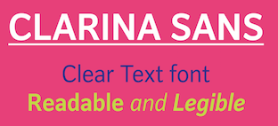 Indonesian designer of Axeo (2019), Ardentia (2019: a peaceful text typeface family related to transitional Dutch types such as Van Dijck), Sharp End (2019, a calligraphic semi-serif), Apresia Script (2019), Astonice (2019: a cursive typeface with chancery style ascenders), Clarina Sans (2019), the text typeface Alphabet Asri (2019) and the italic font Avarita (2019).
 Typefaces from 2020: Axeo Sans. [Google]
[MyFonts]
[More] ⦿
|
Association for Insight Meditation (or: Aimwell)
[Bhikkhu Pesala]
|
 Bhikkhu Pesala, a Buddhist monk based in London, designs free fonts. His original we page was called Aimwell (Association for Insight Meditation). On that site dedicated to Pali fonts, there was a file with Bhikkhu Pesala's free fonts. Most of Pesala's fonts have well over 1000 glyphs, cover Latin, Vietnamese and Greek, and have an enormous set of symbols including chess symbols and astrological signs.
 The present list of fonts, with some older ones removed: - Acariya (2016): a Garamond style typeface derived from Guru, but with suboptimal kerning.
- Akkhara (2006). Derived from Gentium.
- Balava (2014): a revival of Baskerville derived from Libre Baskerville.
- Cankama (2009). A Gothic, Black Letter script.
- Carita (2006). An all caps roman.
- Garava (2006). Designed for body text. It has a generous x-height and economical copy-fit. The family includes Extra-Bold and Extra-Bold Italic styles besides the usual four. Typeface Sample
- Guru (2008). A condensed Garamond style typeface designed for economy of copyfit in Buddhist publications. 100 pages of text set in the Pali typeface would be about 94 pages if set in Garava, or 92 pages if set in Guru.
- Hari (2016): a hand-writing script derived from Allura by Robert E. Leuschke, released under the SIL license.
- Hattha (2007). A felt marker pen typeface.
- Jivita (2012): an original sans typeface for body text.
- Kabala (2009). A sans serif typeface designed for display text or headings. Kabel?
- Lekhana (2008). Pesala's version of Zapf Chancery.
- Mahakampa (2016): a hand-writing script derived from Great Vibes by Robert E. Leuschke.
- Mandala (2007). A geometric sans designed for decorative body text or headings. Has chess symbols.
- Nacca (2016): a hand-writing script derived from Dancing Script by Pablo Impallari.
- Odana (2006). A calligraphic almost blackletter brush font suitable for titles, or short texts where a less formal appearance is wanted.
- Open Sans (2016): a sans font suitable for body text. Includes diacritics for Pali and Sanskrit.
- Pali: Pesala's version of Hermann Zapf's Palatino.
- Sukhumala (2014): derived from Sort Mills Goudy.
- Talapanna (2007). Pesala's version of Goudy Bertham, with decorative gothic capitals and extra ligatures in the Private Use Area.
- Talapatta.
- Veluvana (2006). A heavy brush style. The Greek glyphs are from Guru. Small Caps are greater than x-height.
- Verajja (2006). A Pali word meaning "variety of kingdoms or provinces." It is derived from Bitstream Vera.
- Verajja Serif.
- Yolanda (2008). Calligraphic.
[Google]
[More] ⦿
|
Astigmatic One Eye
[Brian J. Bonislawsky]
|
 Astigmatic One Eye (AOE) has lots of nice original fonts by Brian J. Bonislawsky (b. 1973, Pittsburgh, PA). Many are free, others are not. AOE joined Font Brothers Inc in 2006. Brian Bonislawsky currently lives in Las Vegas, NV.
 Fontsquirrel link. Dafont link. Fontspace link. A partial list of the AOE fonts made in 2011: Engagement (2011, a free brush script at Google Web Fonts), Fascinate (2011, an art deco typeface at Google Web Fonts; +Inline), Original Surfer (2011, a free Google Web Font inspired by a vintage advertisement for the "California Cliffs Caravan Park"), Smokum (2011, a Western / Italian face), Yellowtail (2011, signage face), Redressed (2011), Special Elite (2010, a free old typewriter face), Aclonica (2011). Typefaces from 2008 or before: Horseplay AOE (2008, Western style), Cake and Sodomy AOE (2008), Good Eatin AOE (2008), Paradiso AOE (2008, inspired by logotype of the Paris Resort and Casino in Las Vegas), Montelago AOE (2007, a script inspired by the logotype of the Mirage Resort and Casino in Las Vegas), Jack Chain AOE (2007), Henhouse (2007), Schnitzle (2007), Luxurian AOE (2007, inspired by the logo of the Luxor Hotel&Casino in Las Vegas), Digital Disco AOE (2007), Mighty Tuxedo AOE (2007), Makeshift AOE (2007), Clarity AOE (2007, slab serif headline; + grungy version), Red Pigtails AOE (2007), Run Tron 1983 (2002), Eyeliner AOE (2006, Tekton-like), Mother Hen (2007), Gloversville (2007, comic book style), Mighty Tuxedo AOE (2007, condensed sans), Quick Handle AOE (2007), Surfing Bird (2007), Hydrogen (2004), Hardliner (2004, fifties diner style), Big Ruckus (2004), SS Antique No. 5 (2004), Europa Twin (2003), EuroMachina (2003, techno), Lord Rat (2003: papercut sans), Love Anxiety (2003), BuzzSaw (2003), Skullbearer (2003, skull dingbats), Beatnick Blue (2002), Geisha Boy (2002), Mardi Party (2002), Midcrime (2002), Ocovilla (2002), Ruthless (2002), Saltie Doggie (2002), Whiskers (2002), Royal Gothic, Family, Eggit, Jericho, Wild Monkeys (2002), 5FingeredGothSW, AlienArgonautAOE, AlphaMackAOE, AmphibiPrint, AngiomaAOE, AntiChristSuperstar, AntiChristSuperstarSW, AstigmaSolid, BigLimboAOE, BigLimbodOutAOE, BoneRollAOE, BoneRollAOEBold, BoundAOE, BrailleAOE, BulletBallsAOE, ButterflyChromosome, ButterflyChromosomeAOE, ButtonButton, ButtonButtonAOE, CType, CTypeAOE, CelticLionAOE-Bold, CelticLionAOE-BoldItalic, CelticLionAOE-Italic, CelticLionAOE, CharailleAOE, ChickenScratch, ChickenScratchAOE, ClunkerAOE, ClunkerAOE-Bold, CropBats, CropBatsAOE, CropBatsIIAOE, DarkNightAOE, DeadGrit, DeliveryMatrixAOE, DetourAOE, DigitalDiscoAOE, DigitalDiscoAOEOblique, DingleBerries, DoggyPrintAOE, DraxLumaAOE, DungeonKeeperII, DungeonKeeperIIBold, DungeonKeeperIIItalic, EggItAOE, EggitAOE-Italic, EggitOutlineAOE, ElectricHermes, ElectricHermesAOE, ElectricHermesAOECharge, FearAOE, FilthAOE, FishyPrintAOEOne, FishyPrintOneAOE, FishyPrintTwoAOE, FutharkAOE, FutharkAOEInline, FutharkAOEInline, GateKeeperAOE, Ghoulish Fright AOE (2006), GlagoliticAOE (1999, grungy glagolitic), GorgonCocoonAOE, Gotik, GreyAlienSW, HAL9000AOE, HAL9000AOEBold, HAL9000AOEBoldItalic, HAL9000AOEItalic, HandageAOE, HandageAOEBold, HauntAOE, HybridLCDAOE, IDSupernovaSW, IslanderAOE, JokerWildAOE, KillMeCraig, KillMeCraigAOE, Kinderfeld, KittyPrint, KittyPrintAOE, Kornucopia, KornucopiaAOE, LinusFace, LinusFaceAOE, LinusPlayAOE, LinusPlaySW, Lochen, LovesickAOE, Manson, MasterPlan, Mervale Script Pro (2012: a brushy script based on the 1940's Fawcett Publications Mary Marvel comic), Microbe, MooCowSW, MotherlodeLoadedAOE-Italic, MotherlodeLoadedAOE, MotherlodeStrippedAOE-Italic, MotherlodeStrippedAOE, MysterioSWTrial, NightmareAOE, OrnaMental, Pantera, PapaManoAOE, PenicillinAOE (described as a bacterial stencil typeface), PixelGantryAOE, PixelGantryAOEBold, PixelGantryAOEBoldItalic, PixelGantryAOEHeavy, PixelGantryAOEHeavyItalic, PixelGantryAOEItalic, PixelGantryHiliteAOE, PixelGantryHiliteAOEItalic, PoppyAOE, PoseidonAOE, Prick, QuiltedAOE, QuiltedAOEBlack, QuiltedTrial, RippleCrumb, RippleCrumbUltraCon, ROCKY, ROCKYAOE, RustedMachineSW, SSExpAntiqueAOE, Schizm, Schrill, SchrillAOE, SchrillAOEOblique, Scrawn, ScrawnAOE, ScrawnCyrAOE, ScrawnKOI8AOE, ScrewedAOE, ScrewedAOEOblique, ScrewedSW, SeaweedFireAOE, SenthAOE, ShampooSW, ShottyTransferTrial, SkinnerAOE, SlurCrumb, SpatCrumb, SpikeCrumbGeiger, SpikeCrumbSwizzle, SpikeCrumbSwollen, SteelcapRubbingTrial, StruckSW, StrutterAOE, SunspotsAOE, SurferComicTrial, TRANSHUMANALPHABET10, TRANSHUMANKATAKANA20, TannarinAOE, TannarinAOEOblique, TibetanBeefgardenAOE, TibetanBeefgardenAOE, TouristTrapAOE, TransponderAOE, TransponderGridAOE, UglyStickAOE, VanguardIIIAOE-Bold, VanguardIIIAOE-BoldOblique, VanguardIIIAOE-Oblique, VanguardIIIAOE, Ventilate, VentilateAOE, Y2KPopMuzikAOE, Y2KPopMuzikOutlineAOE, YoungItchAOE, ZeichensSW, ZenoPotionAOE, Zombie, BeatnikBlueAOE, BeatnikBlueFillAOE, GeishaBoyAOE, MardiPartyAOE, MindCrimeAOE, OcovillaAOE, PolynesianTouristAOE, RuthlessAOE, SaltyDoggieAOE, SpruceAOE, WhiskersAOE-Oblique, WhiskersAOE, WhiskersAltCapsAOE-Oblique, WhiskersAltCapsAOE (2002), Habitual, Automatic (techno), Bitrux, Filth (an eerie brush script), Cake&Sodomy, Gulag, Bad Comp, Detour, Alien Argonaut, Dark Night, GateKeeper (Halloween font), Gargamel Smurf, Invocation, Neuntotter, Geisha Boy, Saratoga Slim, Gobe, Stingwire, Lavatype, Tapehead, Islander, Clunker, Digelectric, Gargamel, Krulo-Tag, Krelesanta, SurferComic, Bound, Culture Vulture, Intruder, Cavalier, Anoxia, Synchrounous (IBM logo style lettering), Luna, Data Error, Lunokhod, Jericho. There are many techno and gothic fonts. Kill Me Craig is the first 26 death scene dingbat font (scenes by Craig Dowsett). KittyPrint takes the LinusFace font concept to more realistic cat head dingbats. Krelesanta (not free) is a funky font inspired by the band Kreamy Electric Santa. The free ButtonButton is useful for making buttons. Lovesick AOE is a scrawly, lovelorn typeface, i's dotted with hearts. Strutter AOE is based on the KISS logo. Senth AOR is a runic font. Charaille is one of the many dot matrix fonts. Cavalero is inspired by the logotype of the Chevy Cavalier. At Bitstream in 2001, AOE published Cavalero, Stingwire and Tannarin. And in 2002, he published the comic book font Big Limbo, Euro Machina BT and Islander there. Bio at Bitstream. In 2005, Bonislawsky and Sandler realeased 500 fonts, via Bitstream and MyFonts, under the label Breaking The Norm. In 2006, Astigmatic published their typewriter collection, which includes Military Document, Bank Statement, State Evidence Small Caps, State Evidence, Urgent telegram, Library Report, Overdrawn Account, Customs Paperwork, Incoming Fax and Office Memorandum. From the bio and various pieces of information, one is led to believe that Brian was born in Poland, and now lives in Miami, but that may be wrong. In 2010, he placed a free font at the Google Directory, Syncopate. Along the same lines, we find the derived square serif typeface Stint Ultra Condensed (2011, Google Web Fonts) and Stint Ultra Expanded (2012). In 2011, several other typefaces followed there, like Ultra (fat didone), Maiden Orange, Special Elite (2010, a free old typewriter face), Just Another Hand, Crushed, Luckiest Guy (comic book face), Aclonica, Redressed, Montezuma (a curly connected upright script), Devonshire (brush script), Fondamento (calligraphic lettering), Yellowatil (connected retro script), Righteous (free at Google Web Fonts: inspired by the all capitals letterforms from the deco posters of Hungarian artist Robert Berény for Modiano), Ribeye and Ribeye Marrow> (cartoon and/or tattoo style lettering---free at Google Web Fonts), Spicy Rice (2011, free festive display typeface at Google Web Fonts). Contributions in 2012: Marcellus (2012, Trajan, flared roman, at Google Fonts and CTAN), Eagle Lake (a free calligraphic font at Google Web Fonts), Uncial Antiqua, Jim Nightshade (2012, free at Google web fonts), Dynalight (2012, a retro script inspired by a vintage luggage tag for the Southern Pacific 4449 Daylight steam locomotive), Yesteryear (a retro script loosely based on the title screen from the 1942 film The Palm Beach Story), Parisienne (Google Web Fonts: casual connected script based on a 1960s ad for bras), Shojumaru (Google Web Fonts: an oriental simulation typeface inspired by a poster for the Marlon Brando movie Sayonara), Berkshire Swash (Google Web Fonts), Audiowide (Google Web Fonts), Romanesco (Google Web Fonts: a narrow calligraphic style), Galindo (Google Web Fonts), Oregano (Google Web Fonts: based on cartoon style lettering of calligrapher and logo designer Rand Holub. This style of hand lettering adorned many retro brochures and advertisements of the late 40's through the 1960's), Peralta (Google Web Fonts: an Egyptian comic book face), Eagle Lake (Google Web Fonts: calligraphic), McLaren (Google Web Fonts: comic book style alphabet), Freckle Face, Hanalei Fill, Hanalei [Polynesian bamboo or tiki lettering], Purple Purse, Margarine, Risque, Clicker Script [image], Stalemate [a gracious script, by Jim Lyles for AOE], Mouse Memoirs, Quintessential [Google Web Fonts: chancery hand], Bigelow Rules, Englebert [Google Web Fonts: from the title screen of the 1930's film titled Der blue Engel, starring Marlene Dietrich], Sacramento [Google Web Fonts: connected script]. Typefaces from 2013: Freckle Face (grunge), Grand Hotel, Purple Purse (Purple Purse draws its inspiration from a vintage Ivory Soap ad from the 1950's. Somewhat of a cross between Bodoni and Pixie, this font finds that it never truly takes itself seriously). Stiggy & Sands is the American type foundry of Brian Bonislawsky and Jim Lyles, est. 2013. Their first commercial typefaces, all jointly designed, are Luckiest Guy Pro (a fat comic book font based on vintage 1950s ads) and Marcellus Pro (a flared roman inscriptional typeface with both upper and lower case, originally published in 2012 by Astigmatic). Typefaces from 2014: Franken Jr AOE Pro (inspired by the title screen from the 1966 Hanna Barbera cartoon Frankenstein Jr), Good Eatin Pro AOE (inspired by the title screen from the 1942 Warner Bros. cartoon Dog Tired), Ghostkid AOE Pro (comic letter style). Typefaces from 2015: Shanks Antique 5 AOE (after the newspaper typeface Memorial (1865, Stevens, Shanks & Sons)), Reliquaire AOE (a somber blackletter typeface inspired by Memorial (1881, Boston Type Foundry)). Typefaces from 2016: Mailuna Pro AOE (a gothic sans), Kentish AOE Pro (art deco). Reardon AOE (a digitization of a film typeface called Joyce Black by LetterGraphics), Berkmire AOE (1970s style robot-inspired techno font), Blackheath Pro AOE (this typeface started as a digitization of a film typeface called Roberts Square by LetterGraphics), Delaware Pro AOE (art deco), Rutland AOE (a futuristic font that is a digitization of a film typeface called Maccaro by LetterGraphics). In 2016, Brian J. Bonislawasky and Jim Lyles published the rugged octagonal mega typeface family Tradesman at Grype. In 2017, they added the art deco typeface Cowling Sans AOE (which is based on alphabet from "Lettering for Commercial Purposes" by Wm. Hugh Gordon). In 2018, they published the letterpress emulation typeface Prison Pro, Pink Sangria (50s style movie font), Manic Tambourine, Motenacity (a Martian cartoon font), the old typewriter font Office Memorandum Pro, and the Flintstone font Strongman. Typefaces from 2021: Klutz AOE Pro (a condensed all caps beatnik font), Data Error AOE Pro (based on early dot matrix printers), Customs Paperwork AOE Pro (based on the NuMode Type No. 61 vintage typewriter), Rinzler AOE Pro (a great stencil font that revives LetterGraphics' Caren), Restraining Order AOE Pro (an old typewriter font), Brazarri AOE Pro (an Aztec emulation font based on MacKeller, Smiths and Jordan's Bizarre from 1884). View Astigmatic's typeface library. View the typefaces made by Brian Bonislawsky. Fontsquirrel link. Dafont link. Fontspace link. Creative Market link. [Google]
[MyFonts]
[More] ⦿
|
Barbara Szwedowska
|
During her studies, Gdansk, Poland-based Barbara Szwedowska created a gorgeous pair of chancery hand typefaces (2015). [Google]
[More] ⦿
|
Ben Archer
[100types]
|
[More] ⦿
|
Bertram Kaiser
[Kaiser Type]
|
[MyFonts]
[More] ⦿
|
Bhikkhu Pesala
[Association for Insight Meditation (or: Aimwell)]
|
 [More] ⦿
|
Bill Horton
[Foster and Horton]
|
[More] ⦿
|
Bill Kroll
[Bill Kroll Typography]
|
[More] ⦿
|
Bill Kroll Typography
[Bill Kroll]
|
Bill Kroll's from Minneapolis, MN, is selling his creations: Kings Chancery, Minrose Black, Gambo, Korient (oriental simulation), Mu Initials, Rosecaps, Kyposh Light Extended, Kay Italic, Kaplumb Black, Kaligtry, Rosa Script, Ketex. [Google]
[More] ⦿
|
Boguslaw Jackowski
[qfonts]
|
[More] ⦿
|
Bogusław Jacko Jackowski
|
Polish type designer involved in GUST.org fonts for Polish such as QuasiTimes, QuasiPalladio, QuasiHelvetica, QuasiCourier, QuasiChancery, QuasiBookman, Antykwa Półtawskiego (based on work by Adam Półtawskiego (1923-1928), constructed by Bogusław Jackowski, Janusz M. Nowacki and Piotr Strzelczyk). He developed the Latin Modern fonts (2003, type 1) based on Knuth's Computer Modern fonts. In 2006, Nowacki and Jackowski published free extensions of the Ghostscript fonts in their TeX Gyre Project: Adventor, Bonum, Cursor, Heros, Pagella, Termes, Schola, Chorus. [Google]
[More] ⦿
|
Brenden C. Roemich
[Digital Graphic Labs]
|
[More] ⦿
|
Brian J. Bonislawsky
[Astigmatic One Eye]
|
 [MyFonts]
[More] ⦿
[MyFonts]
[More] ⦿
|
Bruce Rogers
|
 Albert Bruce Rogers was a celebrated American type and book designer (b. 1870, Linnwood, IN, d. 1957, New Fairfield, CT). A graduate from Purdue in 1890, he worked in book design. It was not until 1901 that he cut his first typeface, Montaigne, a Venetian style typeface named for the first book it appeared in, a 1903 limited edition of The Essays of Montaigne. In 1912, Rogers moved to New York City where he worked both as an independent designer and as house designer for the Metropolitan Museum of Art. It was for the Museum's 1915 limited edition of Maurice de Guérin's The Centaur that he designed his most famous type-face, Centaur (1914). Like Montaigne, it was based on the Venetian typefaces of Nicolas Jenson. Wikipedia: Rogers considered this typeface to be a substantial improvement on his early Montaigne, both because his design had matured and because, on the advice of Frederic Goudy, he had employed Robert Wiebking as the punch-cutter, and Rogers used Centaur extensively for the rest of his career. The Centaur was produced by Rogers in Dyke Mill at Carl Rollins' Montague Press and is now one of the most collectible books ever printed.
 In subsequent years, he designed books for Mount Vernon Press, and Harvard University Press, and served as typographic advisor at Lanston Monotype. To produce the Oxford Lectern Bible for Oxford University Press, an italic complement to Centaur was needed. Wikipedia: As he did not feel capable of designing the sort of chancery typeface that he thought appropriate, Rogers chose to pair Centaur with Frederic Warde's Arrighi, a pairing retained to this day. Rogers died in New Fairfield, CT, and donated his books and papers to Purdue University, where they are in the Beinecke Rare Book and manuscript Library. His typefaces: - Montaigne (1901, privately cast). Punches cut by John Cumming. Mac McGrew: Montaigne was designed by Bruce Rogers in 1901, and privately cast for the Riverside Press in Cambridge, Massachusetts. It was derived from one page printed in the noted type of Nicolas Jenson, and made in one size only, approximately 16-point, with punches cut by John Cumming of Worcester. Massachusetts. Compare Jenson, Cloister, Centaur, Eusebius.
- Centaur (original) (1914). Development continued until 1931. Privately cast by Barnhart Brothers&Spindler. Matrices cut by Robert Wiebking of the Western Type Foundry. Centaur is a modern version of Nicolas Jenson's Venetian typeface Centaur. There are many digital age descendants of Centaur. Bitstream got that ball rolling with Venetian 301 (Cyrillic version by Dmitry Kirsanov, Paratype, 2006), and SoftMaker has its Cambridge Serial (2010). Type families called Centaur exist at Adobe, Monotype and Linotype. Related typefaces, but without Centaur's flaring, include Phinney Jenson (Tom Wallace) and Nicolas Jenson SG (Spiece Graphics). See also Centurion, Centus (URW), Coelacanth (2014, a free 36-style typeface family by Ben Whitmore), and Arrighi Italic .
- Centaur (Monotype) (1929, Monotype Ltd. and Mackenzie&Harris). Matrices re-cut for machine composition by British Monotype. Further developments based on or related to this typeface: LTC Metropolitan (Lanston; with Frederick Warde; also called Metroplitan Oldstyle; digital version by Lanston/P22), Poster (1918-1919), Goudy Bible (1947, designed with the collaboration of Sol Hess for Lanston Monotype). Mac McGrew: Centaur was designed by Bruce Rogers in 1914, based on the beautiful roman type first used by Nicolas Jenson in 1470, and a refinement of Mon- taigne (q.v.), designed a decade earlier by Rogers. Centaur was first cut by Robert Wiebking of BB&S as a private type for the Museum Press of the Metropolitan Museum of New York. In 1929 it was recut under the joint sponsorship of Lanston Monotype and Monotype Corporation, England, but issued only by the latter. Some critics have called it the best recutting of the Jenson letter. Arrighi (q.v.) was cut as an italic companion to Centaur. Compare Cloister, Eusebius, Italian Old Style, also Jenson. Discussion of Centaur by Don Hosek. About Centaur Monotype (1929), and its digital version, Dean Allen writes: Like Bembo, released for the Monotype machine the same year, Centaur was an exceptionally beautiful and eminently readable revival of Renaissance type. Unfortunately, the producers of the digital version made a common mistake: the shapes are based on the most basic starting point of Bruce Rogers designs. These designs were intended for metal type that would press into paper, the ink spreading as it absorbed into the fibre. The resulting printed shapes had a good deal more visual force than the original designs. The process was total: design anticipating application. This version of Centaur suffers from the perfection of the process of digital design and offset printing: the original shape is printed coldly intact, and thus its very difficult to set a well-made page in Centaur. In 2014, Jerry Kelly and Misha Beletsky coauthored The Noblest Roman (RIT Cary Graphic Ars Press) on the history of Centaur types by Bruce Rogers. The blurb: The history of the Centaur type, likely the most important American typefeace ever designed, has been recounted untold times in very general terms, following the official version of events, purported by its designer in several publications. Yet, as the new research by Jerry Kelly and Misha Beletsky shows, there is a number of gray areas to the story. The new data, culled from archival documents, some unpublished, as well as from a variety of published sources presents this important design and its history in a new light.
- LTC Fleurons Rogers (2005, P22 / Lanston) is a digital font based on fleurons drawn by Rogers.
Linotype link. FontShop link. Klingspor link. [Google]
[MyFonts]
[More] ⦿
|
Casper Neff
|
Casper Neff introduced the chancery script (cancellaresca) in Germany in his 1549 book, Thesaurium artis scriptoriae. [Google]
[More] ⦿
|
Clarence Pearson Hornung
[Dick Pape]
|
 Prolific author, b. 1899. His books include the typographically magnificent Handbook of Early Advertising Art, Mainly from American Sources (Dover, 2 volumes). The typeface Lexington is attributed to him, as Mac McGrew writes: Lexington is a font of shaded and decorated letters and figures, drawn for ATF by Wadsworth A. Parker in 1926, from a design by Clarence P. Hornung. It is an ornamental form of roman letter, with curly serifs, and tendrils at the ends of light strokes. It was recast in 1954, and copied in one size by Los Angeles Type.
 The book Early Advertising Alphabets, Initials and Typographic Ornaments (1956), edited by Clarence P. Hornung, led Dick Pape to creates these digital fonts in 2008: AltDeutsch, Amorette1889, ArabesqueDesign, BreiteEgyptienne (2008), BreiteverzierteClarendon, ChiswickPressGothicInitials, EarlyScrollAlphabet, EarlySignboards, EnglandInitials1880, ErhardDatdolt, FlorentineInitials, FlorentineInitialsReverse (2008), GothicChancery1880s, GothicClosedLetter (2009-2010, Lombardic), Hollandisch-Gothic (2010), JudendstilAlphabet (2009), LilyoftheValley, Papillon 1760 [First shown in Paris in 1760, and reprinted by Clarence P Hornung in Dover Pictorial Archive Series: Early Advertising Alphabets, Initials and Typographic Ornaments (1956, Dover Publications). Hornung's images inspired Pape's typeface], Phantasie (2009-2010), Romaine Midolline (2010), RomanPrintShaded (2010, ornamental roman caps), RusticAlphabet, SilhouetteInitials1880, TheTerrorsofNightLife, VerzierteAltGothic, VerzierteGothic, VictoriaGingerbread1890 (2007). Klingspor link. Download here. More direct link to Pape's digitizations. [Google]
[More] ⦿
|
Claude Médiavilla
|
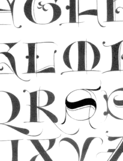 French type designer (b. 1948) who was born in the South of France. He studied typography, calligraphy and painting at the School of Fine Arts in Toulouse. He received the Prix Charles Peignot in 1982. In 1992, the President of France invited him to design the inscriptions for the royal tombs in the Basilique Saint Denis in Paris. He published Calligraphie (Imprimerie Nationale, 1993). Author of Calligraphy (Wommelgem, Belgium, 1996) and Histoire de la calligraphie française (Albin Michel, 2006; examples here). In 2009, with the help of Atelier des Signes, he created a typeface for the signage at Chateau de Fontainebleau. Additional URL. In 2010, Mediavilla cofounded Media type Foundry with Sonia Da Rocha and Joel Vilas Boas in Paris.
 His typefaces: - Galba: an elegant roman titling face, done at Mecanorma in 1987.
- Media Script (Mecanorma, 1985).
- Mediavilla (CCT, 1976).
- Mediavilla Script (Graphitel, 1986).
- Palazzo (Mecanorma, 1984).
- Tory (1991).
Examples of calligraphic alphabets drawn by him and shown in his Histoire de la calligraphie française (2006): Bastarda, Cancellaresca, Carolingian, Cursive gothic 1410, Luxeuil, Roman Capitals, Roman cursive 1st century, Roman cursive 4th century, Rustica 1st century, Textura 14th century, Textura 15th century, , Tourneure 15th century, Uncial 4th century. Klingspor link. [Google]
[MyFonts]
[More] ⦿
|
Cornelis Dirckszoon Boissens
|
 Dutch letterer and calligrapher, 1568-1634 (or 1635). He published the calligraphic masterpiece Gramato graphices in Amsterdam in 1605. This book has several blackletter and chancery alphabets proposed by Boissens. Teaser web site by yours truly. [Google]
[More] ⦿
Dutch letterer and calligrapher, 1568-1634 (or 1635). He published the calligraphic masterpiece Gramato graphices in Amsterdam in 1605. This book has several blackletter and chancery alphabets proposed by Boissens. Teaser web site by yours truly. [Google]
[More] ⦿
|
Crazy Diamond Design Historical Fonts
[Alex Moseley]
|
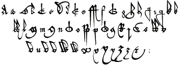 Wonderful 16-th century (commercial) fonts from this Manchester, UK-based foundry, including:
 - Bastard Secretary
- Black Cat Letter. A blackletter font used in the Harry Potter films.
- Chancery Hand
- Formal Text Hand
- Hand of the Court of the Common Pleas.
- Italic Hand
- Parchment Print & Italic. From the Harry potter films.
- Rustic Capitals (2005).
- Secretary Hand
- Seventeenth Century Print and Italic
- Uncial
- Wizard Runes and wizrdings. From the Harry Potter films.
- Written Square Caps (2005: roman inscriptional caps).
[Google]
[More] ⦿
|
Dan X. Solo: Digitizations by Dick Pape
[Dick Pape]
|
Dick Pape based the following digitizations (2008-2010) of blackletter, art deco, Celtic, initial caps, and other ornamental typefaces shown by Dan X. Solo in his Dover books: DXSAlphaMidnight, DXSAlphaTwilight, DXSBeansBold, DXSBlackline (prismatic, art deco), DXSBoboBold, DXSBrusselsInitials, DXSBuckinghamInitials, DXSBust, DXSCharger, DXSCheckmate, DXSCorral, DXSDevon, DXSDevonian, DXSDudleyPNarrow, DXSFatCat, DXSFestival, DXSFrankfortInitials, DXSFuturaInline, DXSGrooviestGothic, DXSGuildhall, DXSHessNeobold, DXSHotline, DXSHuntingtonInitials, DXSJoyceBlack, DXSKupferInitials, DXSLampoon, DXSLeipzigInitials, DXSLeister, DXSLowenbrau, DXSMonogramStencil, DXSMonumentBold, DXSNottinghamInitials, DXSOrbit, DXSOttoHuppInitials, DXSPickfair, DXSPolly, DXSPotsdamInitials, DXSPrismaniaC, DXSPrismaniaP, DXSQuote, DXSRegalBlack, DXSRhythmBold, DXSRickyTick, DXSRoco (art deco), DXSSansSouci, DXSShadyDeal, DXSSheetSteel, DXSSilverShadowBlack, DXSStuttgartInitials, DXSTester, DXSThedaBara (counterless geometric art deco), DXSTulo, DXSTuxedo, DXSUrban (psychedelic), DXSVeronica, DXSWestmorland, DXSWienText, DXSYagiBold.bmp DXSYagiDouble, DXSYorkshireInitials, DXSZany, DXSZephyr. Images: DXSBlackline, DXSBust, DXSDudleyPNarrow, DXSGrooviestGothic, DXSJoyceBlack, DXSMonogramStencil, DXSPrismania'P', DXSRickyTick, DXSRoco, DXSSheetSteel, DXSTulo, DXSUrban, DXSYagiDouble, DXS Alpha Twilight, DXS Brussels Initials, DXS Kupfer Initials, DXS Lowenbrau, DXS Otto Hupp Initials, DXS Theda Bara, DXS Urban. Download page. [Google]
[More] ⦿
|
Daniele Capo
|
Italian architect in Viterbo who is interested in typography. He studied at the Faculty of Architecture at the University of Firenze. He collaborates with Arci Viterbo in the communication of their social and cultural initiatives and has a contract assignment for the graphic design course at the Disucom of the Universita della Tuscia. He specializes in font engineering and training for engineers. He has been a member of the cooperative Italian type foundry CAST and is its type engineer since 2016. In 2009, he tried to design a typeface and called it Pince-Nez. He was working on Guido (2010), a free typeface based on the Italian gothic letterforms (roughly speaking, a blend between blackletter and chancery), or gotica corsiva (used in the fourteenth century for books such as Dante's Divine Comedy). Flickr page. Capo studied at the Faculty of Architecture at the University of Firenze. [Google]
[More] ⦿
|
Darío Manuel Muhafara
[Tipo]
|
 [MyFonts]
[More] ⦿
[MyFonts]
[More] ⦿
|
Darío Manuel Muhafara
|
Born in Buenos Aires in 1973. He has studied design and typography in Ort, Argentina and at the Parsons School and School of Visual Arts in New York. In 1998 he began to actively take part in the field of typography while teaching of typography (as the Catédra Goldfarb) at the University of Buenos Aires (2002-2003). Buenos Aires-based designer at T26 of Ultranova (1999) and Overlock (2006, a liquid display face). Linotype designer of the simple-shaped Cineplex family (2002), and FontFont designer of FF Jackie (2003), a fifties-style connected script typeface (see also here) and Duet Sans (whose weights are called Liviana, Liviana cursiva, Redonda, Cursiva, Negrita, Negrita cursiva, Extra negra, Extra negra cursiva, Monocaja). Creator of Balthazar (2011). With Félix Lentino, he created the elegant text typeface Malena (2003). Malena, Overlock (2006, a rounded sans) and Basile (2013, a chancery script) appeared at Tipo. Creator at Google Web Fonts of Galdeano (2011, a flared sans face). MyFonts link. MyFonts interview. Speaker at ATypI 2009 in Mexico City. [Google]
[MyFonts]
[More] ⦿
|
Dave Platt
|
Designer of the squarish font Alexandria (Mac only), and of Black Chancery and Windsor Demi. [Google]
[More] ⦿
|
David E. Howerton
[Planck Foam]
|
[More] ⦿
|
David Fleming Nalle
[Scriptorium (Ragnarok Press, Fontcraft)]
|
 [MyFonts]
[More] ⦿
[MyFonts]
[More] ⦿
|
Dear Alison
[Alison Argento]
|
 Travel writer based in Cherry Hill, NJ. Designer (b. Augusta, ME, 1977) of the children's scribble font Urly Lurnin (2008), and of Smiley (2008, comic book face), and of the informal handwriting fonts Pickled Sans (2008), Slim Pickens (2008), Smokehouse (2008) and Gladly Mailed (2008).
 Bender Script (2008) is a brush script developed from an incomplete script drawn by Charles Chas Bluemlein. Barnstormer Script (2010) is a sign painter typeface. Gonte (2013) is a sketchbook script typeface. Saskya (2015) is a rough chancery script. Glade (2015) is a formal calligraphic copperplate script in five widths. In 2016, she designed the architectural lettering typeface Robard, the brush script typeface Beckford Script and the ballpoint pen script Generous Hospitality. Typefaces from 2020: Postale (a monoline gas pipe sans). [Google]
[MyFonts]
[More] ⦿
|
Dick Pape
[Dan X. Solo: Digitizations by Dick Pape]
|
[More] ⦿
|
Dick Pape
[Clarence Pearson Hornung]
|
 [More] ⦿
|
Didones
[Ludwig M. Souzen]
|
A list compiled by Ludwig M. Souzen, a typographer and printer in Bertem, Belgium: - VII.1 Giambattista Bodoni (ca 1791)
- VII.1.A ORIGINAL
- VII.1.A.a Giambattista Bodoni, Manuale Tipografico)
- VII.1.B METAL REVIVALS
- VII.1.B.a Morris Fuller Benton (ATF, 1907)
- VII.1.B.b Monotype, 1930s
- VII.1.B.c Bauer Bodoni (Bauer, Heinrich Jost, 1926)
- VII.1.B.d Berthold Bodoni Antiqua, 1930s
- VII.1.B.e R.H. Middleton (American Ludlow foundry, 1930s)
- VII.1.C PHOTO COMPOSITION
- VII.1.C.a Berthold Bodoni (Gunter Gerhard Lange, 1970)
- VII.1.C.b Berthold Bodoni Old Face (Gunter Gerhard Lange, 1983)
- VII.1.C.c IBM corporate identity (Karl Gerstner, 1980s)
- VII.1.D DIGITAL REVIVALS
- VII.1.D.a Monotype 135 Bodoni (Monotype, 1921)
- VII.1.D.b Bauer Bodoni Std (Heinrich Jost, 1926)
- VII.1.D.c Monotype 357 Bodoni Std Book (Monotype, 1932)
- VII.1.D.d Bodoni Std
- VII.1.D.e WTC Our Bodoni (Massimo Vignelli, 1989)
- VII.1.D.f Berthold Bodoni
- VII.1.D.g Berthold Bodoni Old Face
- VII.1.D.h Bodoni Old Fashion (URW++)
- VII.1.D.i Bauer Bodoni URW
- VII.1.D.j Bauer Bodoni BT (Bitstream)
- VII.1.D.k EF Bodoni
- VII.1.D.l EF Bauer Bodoni
- VII.1.D.m FF Bodoni Classic [+ Swashes&Chancery] (Gert Wiescher, 1994)
- VII.1.D.n ITC Bodoni (three opticals: six, twelve&seventy-two; Sumner Stone e.a. 1994)
- VII.1.D.o Linotype Bodoni Classico (Franko Luin, 1995)
- VII.1.D.p Linotype Gianotten (Antonio Pace, 2000)
- VII.1.D.q Filosofia (Zuzanna Licko, Emigre)
- VII.1.E INTERPRETATIONS (bodoniennes)
- VII.1.E.a Fenice (Aldo Novarese)
- VII.1.E.b Iridium (Adrian Frutiger, Stempel, 1972)
- VII.1.E.a FF Acanthus (Akira Kobayashi, FontFont)
[Google]
[More] ⦿
|
Die Entwicklung unserer Schrift
[Peter Doerling]
|
Peter Doerling's visual overview of the styles of writing in Germany, for books, official documents (Urkunden) and in letters. For books, he takes us here: - 200-300: Roman capitals.
- 300-500: Quadrata.
- 500 on: Uncial.
- 900 on: Karolingian minuscules.
- 1200 on: Gothic minuscules.
- Textura.
- 1400 on: Rotunda.
- 1500 on: Schwabacher.
- 1600 on: Fraktur.
- 1500 on: Humanistic style.
- 1570 on: Antiqua.
- 1900 on: Grotesk, Egyptian. [Note that he omits the modern style.]
- 1960 on: Helvetica. (???)
For official documents: - 200-300: Roman capitals.
- 400-600: Rustica.
- 500 on: Half Uncial.
- 900 on: Karolingian minuscules.
- 1500 on: Notula.
- 1600 on: Canzlei (Cantzley, Kanzlei).
- 1600 on: Humanistic Canzlei
- 1875: Ronde, Rondo, Rundschrift.
- 1915: Jugendstil.
- 1930: Tannenberg.
For letters: - 200-300: Roman capitals.
- 400 on: Young Roman cursive.
- 900 on: Karolingian minuscules.
- 1300 on: Cursive.
- 1600 on: Cancellaresca [refined formal script].
- 1600 on: Kurrente.
- 1600 on: Humanistic cursive.
- 1800 on: deutsche Schreibschrift.
- 1800 on: Lateinische (Latin) Schreibschrift.
- 1930: Tannenberg.
[Google]
[More] ⦿
|
Digital Graphic Labs
[Brenden C. Roemich]
|
Brenden C. Roemich's Winnipeg-based foundry. They sold fonts at 10 to 20 USD a shot, but made them free starting in 2003, when they quit the font foundry business. The entire collection, mostly dated 1998: ALSScript (knock-off of Shelley Script Andante by Matthew Carter), Aberration, AngleterreBook, Aramis, AramisItalic, ChanceryCursive, Dichotomy, Eddie, EnterSansmanBold (heavy serious sans), EnterSansmanBoldItalic, FLWScript, Fanzine (ransom note face), GlassHouses, Gunmetal, ILSScript, Incite, KellsUncialBold, KellsUncialBold, LDSScriptItalic, MICREncoding, Misbehavin', NinePin, NobilityCasual, Overmuch (fat rounded), PinchDrunk, Protestant, PunchDrunk, RamseyFoundationalBold, RocketPropelled, SNCScriptItalic (a knock-off of Nuptial Script), ShagadelicBold (psychedelic), Spirit, StaticAgeFineTuning, StaticAgeHorizontalHold (textured like a bad TV signal), Symbolix, TempsNouveau, TitleWave, TypeWrong-Smudged-Bold, VinylTile, VulgarDisplay, Whimzee, WhizKid, alsscripttrial, bitwise (LED face), holyunion, overmuchtrial. Direct download. Dafont link. Fontspace link. Local download. [Google]
[More] ⦿
|
Doug Miles
|
Designer of Black Chancery (with Earl Allen, in 1993). Dafont link. [Google]
[More] ⦿
|
Earl Allen
|
Designer of Black Chancery (with Doug Miles, in 1993). See also here. [Google]
[More] ⦿
|
Edward Philip Prince
|
English punchcutter active from 1862 to 1923, associated with seemingly the whole of the blossoming private press movement in England and America, b. 1841, Kennington, d. 1923, North London. His type creations include Tudor Black (1878, Miller&Richard), a typeface co-designed by Frederick Tarrant. Notable work was for the Kelmscott Press of William Morris, and the Doves Press of Emery Walker&Thomas Cobden-Sanderson. For the Doves Press he cut the revivals of Jenson's type that stimulated an interest in 15th century printing in the wider printing industry. (This Doves type was later thrown into the River Thames by an upset Cobden-Sanderson, over a protracted argument about its authorship). Prince's major design failure is worth noting. He was commissioned by Emery Walker to design type for Count Harry Kessler's Cranach Presse. The roman design was not a problem, for Prince had cut similar designs for the Kelmscott and Doves presses. The italic presented a new challenge though. Based on a type used in a 1525 work of Tagliente, this was the first attempt to recut a chancery italic. Despite help from Edward Johnston, Prince was seemingly unable to do interpret the design, and demanded finished drawings from Johnston, which the Englishman - in accordance with his views on the nature of craftsmanship - was not inclined to provide. It is instructive to note a confession Prince made to Kessler, characterizing himself as "a craftsman carrying out other men's designs". For Kelmscott Press, William Morris (a founder of the Arts and Crafts movement and a forerunner of the influential private press movement in Europe) and Edward Prince (master engraver) designed Golden Type (1890), a robust typeface made after the 1469 roman by Nicolas Jenson [Charles Leonard: The Golden Type was one of the most influential of the 19th century, but doesn't hold a candle to the Venetian revival typefaces that quickly followed.]. See also ATF Jenson Recut, and the digital Linotype ITC Golden Type. [Google]
[MyFonts]
[More] ⦿
|
e-foundry (was: GUST)
|
The Polish TEX users group evolved into GUST and then e-foundry. Here you can find goodies in truetype and type 1 such as - QuasiHelvetica: based on NimbusSans, modified by Bogusław Jackowski, Janusz M. Nowacki and Piotr Strzelczyk.
- QuasiCourier: based on Nimbus Mono, modified by Bogusław Jackowski, Janusz M. Nowacki and Piotr Strzelczyk.
- QuasiChancery: based on URW Chancery L, modified by Bogusław Jackowski, Janusz M. Nowacki and Piotr Strzelczyk.
- QuasiBookman: based on URW Bookman L, modified by Bogusław Jackowski, Janusz M. Nowacki and Piotr Strzelczyk.
- QuasiTimes: based on Nimbus Roman No9, modified by Bogusław Jackowski.
- QuasiPalladio: based on URW Palladio, modified by Bogusław Jackowski.
- Antykwa Półtawskiego: based on work by Adam Półtawski (1923-1928), constructed by Bogusław Jackowski, Janusz M. Nowacki and Piotr Strzelczyk.
- Antykwa Toruńska: based on work by Zygfryd Gardzielewski, electronic version by Janusz M. Nowacki.
- The Latin Modern (LM) family of fonts is expected to eventually replace Computer Modern, the first family of fonts designed by Donald E. Knuth for TeX. By Jackowski and Nowacki, this is a major undertaking.
- The TeX Gyre (TG) collection aims at remaking of the freely available fonts distributed with Ghostscript. Included in this set is the Courier and URW Nimbus Mono revival TeX Gyre Cursor (2008): Cyrillic glyphs were added by Valek Filippov, Vietnamese characters were added by Han The Thanh, and the general work was done by B. Jackowski and J.M. Nowacki. Other styles include TeX Gyre Adventor, TeX Gyre Heros, TeX Gyre Chorus, TeX Gyre Bonum, TeX Gyre Schola, TeX Gyre Termes, TeX Gyre Pagella.
- Kurier and Iwona. Kurier was designed in pre-computing times by Malgorzata Budyta, digitized and extended by Janusz M. Nowacki. He went on to design Iwona, which is based on Kurier. Iwona is named after Janusz's daughter.
- Cyklop (2008), a two-style sans headline typeface by Nowacki based on a 1920s type by the "Odlewnia Czcionek J. Idzkowski i S-ka" type foundry in Warsaw.
Fontspace link. [Google]
[More] ⦿
|
Elfring Soft Fonts
[Gary Elfring]
|
Gary Elfring's company in Wasco, IL, which was founded in 1979, sold many fonts in the early 1990s, often adaptations of well-known fonts. It is presently based in St. Charle, IL. Some subcategories of fonts: - Art Deco fonts: Baha (1992), Broad Avenue, Hafnium, Haman Bold, Narcosis Oblique, Neaten, Orange Oblique, Ramose Oblique, Totem, Zyme Oblique.
- Bar Code fonts (Code 128, Code 39, UPC, 2/5 Inter, PostNet, EAN 8/13).
- Script fonts: Aristocrat, Blush, ESF Elite Light, Grandam, Hotpress, Jessica, Old English, Saffron, Tech Bold, Zap Charles
- MICR or check printing fonts, including Mic-EarthNormal (1992).
- Display typefaces: AdrianneNormal, ApexCondensed-Oblique, BlackChanceryNormal, CoronetNormal, Dalith, ESFEliteNormal, Emir, Expiry-Oblique, Expiry, GrangeCaps-Oblique, GrangeCaps, Hafnium-Oblique, Hafnium, Harbor-Oblique, Hartebeest, Hasp, Hesitate, Jayhawk, JayhawkExpand-Oblique, JayhawkExpand, Jetty-Oblique, Jetty, Jevons-Oblique, Jevons, Jocund-Oblique, Jocund, Josephine-Oblique, Josephine, Josiah-Oblique, Josiah, Kansas-Oblique, Kansas, Kaufman, Kermis-Oblique, Kilung-Oblique, Lackey-Oblique, Lackey, Lactam-Oblique, Lactam, Langur, Lazar-Oblique, Lazar, Ligand, Liquid-Crystal, Liquid-CrystalOblique, Lunatic-Oblique, Narcosis, Nonage, OldEnglishNormal, Orange-Oblique, Orange, Pavis-Oblique, Pavis, Quintly, Rankle-Oblique, Rankle, Saccule-Oblique, Saccule, Tarunda, Totem, ZapChanceNormal, Zwieback-Oblique, Zwieback, Zyme-Oblique, Zyme. An oriental simulation face, EchoCaps (1995), is here.
- A partial list: 226-CAI978, Aacho, Aapex, Aaron Heavy, Adrianne, Advance, Advertiser, Agency, Alien-Tongue, Alonse, Amber, Antiquarian, Antique, Antique Olive, Aristocrat, Avante, BC93Circle, Baha, Bahase, Bar Code 25, Bar Code 25 Interleaved, Bar Code 39, Bar, Bearer 25i, Big City, Black Chance, Black Chancery, Blippo, Bodoni, Broad Avenue, Broad Street, Brush, Bullet, Cal Zap Chance, Carefree, Cas Open Face, Century, Century School, Chicago, Circled Letters, CircledNumbers, Coach, Codabar, Code 128, Code 93, College, Commercial Script, Computer, Cookies, Cooper Italic, CooperBlack, CopperPlate, Coronet, Cursive Elegant, Dalith, Danley, DateLine, Deloise, Devotion, Dodge, DomCasual, Dot Matrix, EAN, ESF Deco, ESF Dingbats, ESF Elite, ESF Rounded, ESF-Elite, Earth, EchoCaps, Elegant Script, Elfring Elite, Elite, Emir, Engrave, Engraved, Expert Dingbats, Expert Elite, Expert Rounded, Expiry, Fashion, Flourish, Franzquo, Frit Qat, Fritz Quad, Friz Kat, Futena, Futura Black, Future, Garamond, Geometric Medium, Gillies, Gin and Tonic, Goudy Old Style, Grandam, GrangeCaps, Greece, Hafnium, Haman Bold, Hand Brush, Handel, Handsome, Hartebeest, Hasp, Heidelstein, Hellenic, Helv, Hesitate, Hobo, Hotpress, Illusion, Impact, Initial, Jayhawk, Jessica, Jetty, Jevons, Jocund, Josephine, Josiah, Jurassic, Kansas, Kaufman, Keys, Klefmon, LCD, Lackey, Lactam, Laguna, Langur, Lazar, Lenswith, Letter, Ligand, Liquid Crystal, Listium, MICR, Madison, MarriageScript, Micro, Microstile, Montana, Mossman, Mossy, Narcosis, Neaten, Next Trek, Nonage, OCR A, OCR B, Old English, Orange, Park Place, Park Street, Pavis, Pelicent, Penoir, PlanetEarth, Playful Print, Postal, Precidio, Prestige Elite, Query, Quintly, Ramose, Ranch, Rankle, Ransom, Revenue, Revue, Risky, Rockford, Roman, Saccule, Saffron, Salamander, Sans, Sci Fi, Script-Roundhand, Secure, Shaundow, Stensil, Tarunda, Technical, TiffBlack, Titanic, Totem, Toto, Trumpet, UPC, Umbles, Umpa, Un Gard, University, Vantrel, Vingy, Wolton, Yarnell, Zanders, Zap Chancery, Zap Dingbats, Zodiac, Zwieback, Zyme.
Dafont carries some of their free fonts, including the futuristic typeface Earth (1992). [Google]
[More] ⦿
|
English handwriting 1500-1700
|
On-line course notes by Andrew Zurcher based on Martin Billingsley's The pens excellencie or the secretaries delighte (1818). In particular he categorizes hands as follows (table borrowed from his pages): | Book hands | the hands found in books produced by scriptoria prior to the spread of printing; such hands are more accommodating of attempts at codification | | Court hands | general business/literary hands, including stylised hands in particular offices/professions which survive alongside Secretary (e.g., chancery hand, exchequer hand, etc.) | | Secretary | an offshoot of the court hands of the beginning of the C16 (early-, mid-, late-Tudor, Jacobean) | | Italic | created in Italy c. 1400 and popular with English Humanists from the early C16 on; only once the hand becomes widespread does it start to infect secretary and produce... | | Mixed | or hybrid/transitional hands, the next stage of the Italic conquest, leading to | | Round hand | mid-late C17 Italic: the hand we have inherited | [Google]
[More] ⦿
|
ES Typography (or: ES Fonts)
|
 Outfit known for its formal script fonts (which all have "ES" in their names). A list of their typefaces: CenturionES (1998), CynthiaScriptES (1998), GrandPrixES (1998), Perplexity (2001), Augusta ES (1998), BeautifulCapsESSwashCapitals (1998), BeautifulES (1999), Cancellaresca-ES (1998), Helena Script-ES (1998), La-Jolla-ES (1998), Olde-European-ES (1998), Original-Script-ES (1998), Sorrento-Script-ES (1998), Splendid-ES (1998), Ville-de-Geneve-ES (1998), Wedding-Bliss-ES (1998), York-Script-ES (1998, calligraphic), Young-Love-ES (1998), Zenith-Script-ES (1998). Most (all?) of these are plain copies of other scripts: Augusta ES is Augusta Cancelaresca Schnurkl (1998, by Julius De Goede), Perplexity is Perpetua, Olde European is OPTI Venetian Script, Original Script is OPTI Original Script, Beautiful ES is Bickham Script, Sorrento Script is Agfa's Florentine AT Script, Ville de Geneve is AT Old Fashion Script (1992, Miles Inc), Wedding Bliss is Aristocrat LET Plain (1994, Letraset), York Script is Yorkshire (1990, Brendel Informatik), Young Love is Young Baroque LET Plain (1990), Zenith Script is Zither Script (1999, FontShop), and so forth. [Google]
[More] ⦿
Outfit known for its formal script fonts (which all have "ES" in their names). A list of their typefaces: CenturionES (1998), CynthiaScriptES (1998), GrandPrixES (1998), Perplexity (2001), Augusta ES (1998), BeautifulCapsESSwashCapitals (1998), BeautifulES (1999), Cancellaresca-ES (1998), Helena Script-ES (1998), La-Jolla-ES (1998), Olde-European-ES (1998), Original-Script-ES (1998), Sorrento-Script-ES (1998), Splendid-ES (1998), Ville-de-Geneve-ES (1998), Wedding-Bliss-ES (1998), York-Script-ES (1998, calligraphic), Young-Love-ES (1998), Zenith-Script-ES (1998). Most (all?) of these are plain copies of other scripts: Augusta ES is Augusta Cancelaresca Schnurkl (1998, by Julius De Goede), Perplexity is Perpetua, Olde European is OPTI Venetian Script, Original Script is OPTI Original Script, Beautiful ES is Bickham Script, Sorrento Script is Agfa's Florentine AT Script, Ville de Geneve is AT Old Fashion Script (1992, Miles Inc), Wedding Bliss is Aristocrat LET Plain (1994, Letraset), York Script is Yorkshire (1990, Brendel Informatik), Young Love is Young Baroque LET Plain (1990), Zenith Script is Zither Script (1999, FontShop), and so forth. [Google]
[More] ⦿
|
Esa Anttikoski
[Minority languages of Russia on the Net]
|
[More] ⦿
|
FairbankMT
[Robin Nicholas]
|
A chancery/script typeface published by Robin Nicholas in 2003 at Monotype, which was possibly named after Alfred Fairbank, a 20th century calligrapher. [Google]
[More] ⦿
|
Ferdinando Ruano
|
Vatican calligrapher who created Lettera Cancellaresca Formata. This inspired Raffaelo Bertieri at Nebiolo to cast the typeface Ruano in 1926. The chancery typeface was finally digitized in 2013 by Leonardo Di Lena as Flanker Ruano. [Google]
[More] ⦿
|
Flanker (or: Studio di Lena)
[Leonardo Di Lena]
|
 Flanker, or Studio Di Lena, is the foundry of Italian type designer Leonardo Di Lena (b. 1975, Rome). Initially, it offered fresh free designs of classics. In 2012, it went commercial. Their fonts:
 - Bodoni Flnk.
- CNR lineare: athletic lettering.
- Didot Flnk.
- Doppio Senso: inspired by the 1992 traffic signal typeface in Italy, Transport D.
- Elettra (2013). A transitional typeface with extra long serifs and several didone traits. For display work.
- Flanker: classical roman face.
- Flanker Garaldus (2012). Based on a 1956 font by Aldo Novarese.
- Griffo Flnk: A multistyle family after typefaces like Bembo.
- Imperator: a classical roman face.
- Italian Typewriter (2012). A family of monospaced typewriter typefaces based on Italian typewriters of the thirties and forties.
- Lello: another classical roman face.
- Magnificat (2011): after Friedrich Peter's ornamental font from 1975. Free download at Dafont.
- Marantz: fat art deco face, after the logo of the sound system company.
- Marlboro Flnk: ultra condensed and tall.
- Poliphili (2017). This is a serious attempt at a revival of the elegant typeface used in Hypnerotomachia Poliphili (1499, publ. Aldus Manutius) that was cut by Francesco da Bologna. That roman font in turn was a revised version of the type used in 1496 for Pietro Bembo's De Aetna.
- Flanker Ruano (2013). Based on a chancery typeface by Raffaelo Bertieri (1926).
- Selene (2013). A monoline sans. Followed by Selene Book (2021: a 14-style geometric sans with art deco influences in some styles).
- Semplicità (2014-2015): a remake of the art deco sans by Butti and Novarese in 1930.
- Shock to the system: an original in the cyberpunk style.
- Sony: after the Sony logo letters.
- Flanker Tanagra (2022). Leonardo writes about this condensed vintage serif: In order to give new imput to the art of typeface design in Italy, Nebiolo Company held, in March 1910, an artistic competition for a new alphabet conception, so the best-ranked design would be transformed into a real new typeface. 42 competitors participated and, although the first prize was not technically awarded, "Ancora" resulted as the best typeface, created by the designer-typographer Natale Varetti of Turin. Nonetheless, the new alphabet was transformed into a full-fledged metal typeface in 1924, renamed "Tanagra" in honor of the Greek city in the center of Boeotia.
- There's nothing money can't buy: a sans.
- Titano: an original art deco sans family.
- Total Eclipse: futuristic.
- Traiano: Trajan column style.
- Travertino: a sans workhorse family.
The outfit was known as JFDooM Flanker's Fonts, between 2001 and 2004. The fonts then were slightly different. They included BodoniFlnk, BodoniFlnkCor, BodoniFlnkCorGrass, BodoniFlnkGas, CNRLineare, DidotFlnk, DidotFlnkCorsivo, DidotFlnkCorsivoGrassetto, DidotFlnkGrassetto, Emblema-della-Repubblica-Italiana, Frantisek, GaramondFlnkNormale, GaramondFlnkCorsivo, GaramondFlnkCorsivoGrassetto, GaramondFlnkGrassetto, GriffoFlnkCorsivo, GriffoFlnkCorsivoGrassetto, GriffoFlnkGrassetto, GriffoFlnknormale, Lellocorsivobold, Lellocorsivo, Lello, MarlboroFlnk, Magnificat, There's-nothing-money-can't-buy, Poker, ShocktothesystemCorsivo, ShocktothesystemVuoto, Sony, Bjork-Isobel, Imperator, Traiano, Rdclub. Most fonts have Greek and Cyrillic letters as well. View Leonardo Di Lena's typefaces. [Google]
[MyFonts]
[More] ⦿
|
Fontek (Letraset Fontek)
|
 Collection of typefaces at Letraset. Newest typefaces include Donaldson Hand (Tim Donaldson), La Gioconda (based on letters from Giovanni Francesco Cresci, done by Richard Dawson and Dave Farey), Spidercave (Michael Gills), Locomotiv (Phill Grimshaw), Bobbysox (Alan Dempsey), Bouchon (Roselyne and Michel Besnard), Eplica (Yvonne Diedrich), Uffington (Tim Donaldson). The fonts: Aachen Bold, Aachen Medium, Academy Engraved, Agincourt, Algerian Condensed, Ambrose, Aquinas, Aquitaine Initials, Aristocrat, Arriba, Arriba-Arriba, Artiste, Augustea Open, Avalanche Script, Avenida, Axis Bold, Balmoral, Bang, Banner, Becka Script, Belwe Mono, Belwe Mono Italic, Bendigo, Bergell, Bertie, Bertram, Bible Script, Bickley Script, Bitmax, Blackmoor, Bluntz, Bobbysox, Boink, Bordeaux Display, Bordeaux Family, Bordeaux Italic, Bordeaux Roman, Bordeaux Roman Bold, Bordeaux Script, Bouchon Bold, Bouchon Light, Brighton Bold, Brighton Light, Brighton Medium, Bronx, Burlington, Buzzer 3, Cabaret, Cabarga Cursiva, Campaign, Cancellaresca Script, Carlton, Carumba, Caslon 540 Ital/Swash, Caxton Light Italic, Caxton Roman Bold, Caxton Roman Book, Caxton Roman Light, Chalkline Bold, Challenge Bold, Challenge Extra Bold, Champers, Charlotte Bold, Charlotte Book, Charlotte Book Italic, Charlotte Family, Charlotte Medium, Charlotte Sans Bold, Charlotte Sans Book, Charlotte Sans Book Italic, Charlotte Sans Family, Charlotte Sans Medium, Charlotte Sans Small Caps, Charlotte Small Caps, Chiller, Chipper, Choc, Chromium One, Citation, Claude Sans, Claude Sans Bold Italic, Claude Sans Italic, Collins, Comedy, Commercial Script, Compacta, Compacta Bold, Compacta Italic, Coptek, Corinthian Bold, Corinthian Bold Condensed, Corinthian Light, Corinthian Medium, Crillee Bold Italic, Crillee Extra Bold Italic, Crillee Italic, Crillee Italic Inline Shadow, Cult, Dancin', Data 70, Dave Farey Display Fonts, David Quay Display Fonts, David Quay Scripts, Demian, Demian Bold, Design Font Attitudes, Design Font Calligraphic Ornaments, Design Font Celebrations, Design Font Commercials, Design Font Delectables, Design Font Diversions, Design Font Diversities, Design Font Eclectics, Design Font Energetics, Design Font Expressions, Design Font Incidentals, Design Font Industrials, Design Font Inspirations, Design Font Journeys, Design Font Mo' Funky Fresh Symbols, Design Font Moderns, Design Font Naturals, Design Font Organics, Design Font Organics II, Design Font Primitives, Design Font Radicals, Design Font Urbans, Design Font Well Beings, Design Font Wildlife, Digitek, Dolmen, Donaldson Hand, Doodlebug, Dynamo Shadow, Edwardian Medium, Elysium Bold, Elysium Book, Elysium Book Italic, Elysium Family, Elysium Medium, Elysium Small Caps, Emphasis, Enviro, Eplica Bold, Eplica Bold Italic, Eplica Book, Eplica Book Italic, Eplica Family, Eplica Medium, Eplica Medium Italic, Epokha, Equinox, Etruscan, Faithful Fly, Fashion Compressed No. 3, Fashion Engraved, Figural Bold, Figural Book, Figural Book Italic, Figural Family, Figural Medium, Figural Small Caps, Fine Hand, Flamenco Inline, Flamme, Flight, Fling, Follies, Forest Shaded, Frances Uncial, Frankfurter, Frankfurter Highlight, Frankfurter Inline, Frankfurter Medium, Freestyle Script, Freestyle Script Bold, Gigi, Gilgamesh Bold, Gilgamesh Book, Gilgamesh Book Italic, Gilgamesh Family, Gilgamesh Medium, Gilgamesh Small Caps, Gilgamesh Titling, Gill Display Compressed, Gill Kayo Condensed, Gillies Gothic Extra Bold Shaded, Glastonbury, Globale, Globale Bold, Globale Bold Italic, Globale Family, Globale Italic, Goo Goo Gjoob, Gravura, Green, Greyton Script, Hadfield, Hand Drawn, Harlow, Harlow Solid, Harvey, Hazel, Heliotype, Helvetica Bold Condensed, Helvetica Medium Condensed, Highlight, Hollyweird, Ignatius, Impakt, Indy Italic, Informal Roman, Inscription, Iris, Isis, Jazz, John Handy, Jokerman, Kanban, Katfish, Katytude, Klee, La Bamba, La Gioconda, La Gioconda Bold, Lambada, Laser, Laser Chrome, Latino Elongated, Laura, LCD, Le Griffe, Lexikos, Lightnin', Limehouse Script, Lino Cut, Locarno Italic, Locarno Light, Locomotiv, Magatama, Malibu, Marguerita, Martin Wait Display Fonts, Martin Wait Scripts, Mastercard, Mekanik, Mekanik Italic, Milano, Mistral, Mo' Funky Fresh, Montage, Neo Neo, Oberon, Odessa, Old English, One Stroke Script, One Stroke Script Bold, One Stroke Script Shaded, Orange, Orlando, Pablo, Papyrus, Party, Pendry Script, Phill Grimshaw Display Fonts, Phoenikia, Pink, Plaza, Pleasure Bold Shaded, Pneuma, Potato Cut, Prague, Premier Lightline, Premier Shaded, Princetown, Pristina, Pritchard, Pritchard Line Out, Pump, Pump Demi Bold, Quadrus, Quixley, Rage Italic, Ragtime, Rapier, Refracta, Regatta Condensed, Retail Script, Retro Bold, Retro Bold Condensed, Riva, Robotik, Robotik Italic, Romic Light, Romic Light Italic, Roquette, Ru'ach, Rubber Stamp, Rundfunk, Santa Fe, Savoye, Scratch, Scriba, Scriptease, Scriptek, Scriptek Italic, Scruff, Shaman, Shatter (op-art), Sinaloa, Skid Row, Slipstream, Smack, Smudger, Spidercave Bold, Spidercave Book, Spidercave Book Italic, Spidercave Family, Spidercave Ornamented, Spooky, Spotlight, Squire, Squire Extra Bold, Strobos, Superstar, Synchro, Tag, Tannhauser, Teknik, Telegram, Tiger Rag, Tim Donaldson Display Fonts, Tim Donaldson Scripts, Tiranti Solid, Trackpad, Tropica Script, Twang, Uffington, Ulysses, University Roman, University Roman Bold, University Roman Italic, Van Dijk, Van Dijk Bold, Varga, Vegas, Vermont, Victorian, Victorian Inline Shaded, Vienna Extended, Vivaldi, Wade Sans Light, Wanted, Waterloo Bold, Westwood, Wild Thing, Willow, Xylo, Young Baroque, Zaragoza, Zennor, Zinjaro. [Google]
[More] ⦿
Collection of typefaces at Letraset. Newest typefaces include Donaldson Hand (Tim Donaldson), La Gioconda (based on letters from Giovanni Francesco Cresci, done by Richard Dawson and Dave Farey), Spidercave (Michael Gills), Locomotiv (Phill Grimshaw), Bobbysox (Alan Dempsey), Bouchon (Roselyne and Michel Besnard), Eplica (Yvonne Diedrich), Uffington (Tim Donaldson). The fonts: Aachen Bold, Aachen Medium, Academy Engraved, Agincourt, Algerian Condensed, Ambrose, Aquinas, Aquitaine Initials, Aristocrat, Arriba, Arriba-Arriba, Artiste, Augustea Open, Avalanche Script, Avenida, Axis Bold, Balmoral, Bang, Banner, Becka Script, Belwe Mono, Belwe Mono Italic, Bendigo, Bergell, Bertie, Bertram, Bible Script, Bickley Script, Bitmax, Blackmoor, Bluntz, Bobbysox, Boink, Bordeaux Display, Bordeaux Family, Bordeaux Italic, Bordeaux Roman, Bordeaux Roman Bold, Bordeaux Script, Bouchon Bold, Bouchon Light, Brighton Bold, Brighton Light, Brighton Medium, Bronx, Burlington, Buzzer 3, Cabaret, Cabarga Cursiva, Campaign, Cancellaresca Script, Carlton, Carumba, Caslon 540 Ital/Swash, Caxton Light Italic, Caxton Roman Bold, Caxton Roman Book, Caxton Roman Light, Chalkline Bold, Challenge Bold, Challenge Extra Bold, Champers, Charlotte Bold, Charlotte Book, Charlotte Book Italic, Charlotte Family, Charlotte Medium, Charlotte Sans Bold, Charlotte Sans Book, Charlotte Sans Book Italic, Charlotte Sans Family, Charlotte Sans Medium, Charlotte Sans Small Caps, Charlotte Small Caps, Chiller, Chipper, Choc, Chromium One, Citation, Claude Sans, Claude Sans Bold Italic, Claude Sans Italic, Collins, Comedy, Commercial Script, Compacta, Compacta Bold, Compacta Italic, Coptek, Corinthian Bold, Corinthian Bold Condensed, Corinthian Light, Corinthian Medium, Crillee Bold Italic, Crillee Extra Bold Italic, Crillee Italic, Crillee Italic Inline Shadow, Cult, Dancin', Data 70, Dave Farey Display Fonts, David Quay Display Fonts, David Quay Scripts, Demian, Demian Bold, Design Font Attitudes, Design Font Calligraphic Ornaments, Design Font Celebrations, Design Font Commercials, Design Font Delectables, Design Font Diversions, Design Font Diversities, Design Font Eclectics, Design Font Energetics, Design Font Expressions, Design Font Incidentals, Design Font Industrials, Design Font Inspirations, Design Font Journeys, Design Font Mo' Funky Fresh Symbols, Design Font Moderns, Design Font Naturals, Design Font Organics, Design Font Organics II, Design Font Primitives, Design Font Radicals, Design Font Urbans, Design Font Well Beings, Design Font Wildlife, Digitek, Dolmen, Donaldson Hand, Doodlebug, Dynamo Shadow, Edwardian Medium, Elysium Bold, Elysium Book, Elysium Book Italic, Elysium Family, Elysium Medium, Elysium Small Caps, Emphasis, Enviro, Eplica Bold, Eplica Bold Italic, Eplica Book, Eplica Book Italic, Eplica Family, Eplica Medium, Eplica Medium Italic, Epokha, Equinox, Etruscan, Faithful Fly, Fashion Compressed No. 3, Fashion Engraved, Figural Bold, Figural Book, Figural Book Italic, Figural Family, Figural Medium, Figural Small Caps, Fine Hand, Flamenco Inline, Flamme, Flight, Fling, Follies, Forest Shaded, Frances Uncial, Frankfurter, Frankfurter Highlight, Frankfurter Inline, Frankfurter Medium, Freestyle Script, Freestyle Script Bold, Gigi, Gilgamesh Bold, Gilgamesh Book, Gilgamesh Book Italic, Gilgamesh Family, Gilgamesh Medium, Gilgamesh Small Caps, Gilgamesh Titling, Gill Display Compressed, Gill Kayo Condensed, Gillies Gothic Extra Bold Shaded, Glastonbury, Globale, Globale Bold, Globale Bold Italic, Globale Family, Globale Italic, Goo Goo Gjoob, Gravura, Green, Greyton Script, Hadfield, Hand Drawn, Harlow, Harlow Solid, Harvey, Hazel, Heliotype, Helvetica Bold Condensed, Helvetica Medium Condensed, Highlight, Hollyweird, Ignatius, Impakt, Indy Italic, Informal Roman, Inscription, Iris, Isis, Jazz, John Handy, Jokerman, Kanban, Katfish, Katytude, Klee, La Bamba, La Gioconda, La Gioconda Bold, Lambada, Laser, Laser Chrome, Latino Elongated, Laura, LCD, Le Griffe, Lexikos, Lightnin', Limehouse Script, Lino Cut, Locarno Italic, Locarno Light, Locomotiv, Magatama, Malibu, Marguerita, Martin Wait Display Fonts, Martin Wait Scripts, Mastercard, Mekanik, Mekanik Italic, Milano, Mistral, Mo' Funky Fresh, Montage, Neo Neo, Oberon, Odessa, Old English, One Stroke Script, One Stroke Script Bold, One Stroke Script Shaded, Orange, Orlando, Pablo, Papyrus, Party, Pendry Script, Phill Grimshaw Display Fonts, Phoenikia, Pink, Plaza, Pleasure Bold Shaded, Pneuma, Potato Cut, Prague, Premier Lightline, Premier Shaded, Princetown, Pristina, Pritchard, Pritchard Line Out, Pump, Pump Demi Bold, Quadrus, Quixley, Rage Italic, Ragtime, Rapier, Refracta, Regatta Condensed, Retail Script, Retro Bold, Retro Bold Condensed, Riva, Robotik, Robotik Italic, Romic Light, Romic Light Italic, Roquette, Ru'ach, Rubber Stamp, Rundfunk, Santa Fe, Savoye, Scratch, Scriba, Scriptease, Scriptek, Scriptek Italic, Scruff, Shaman, Shatter (op-art), Sinaloa, Skid Row, Slipstream, Smack, Smudger, Spidercave Bold, Spidercave Book, Spidercave Book Italic, Spidercave Family, Spidercave Ornamented, Spooky, Spotlight, Squire, Squire Extra Bold, Strobos, Superstar, Synchro, Tag, Tannhauser, Teknik, Telegram, Tiger Rag, Tim Donaldson Display Fonts, Tim Donaldson Scripts, Tiranti Solid, Trackpad, Tropica Script, Twang, Uffington, Ulysses, University Roman, University Roman Bold, University Roman Italic, Van Dijk, Van Dijk Bold, Varga, Vegas, Vermont, Victorian, Victorian Inline Shaded, Vienna Extended, Vivaldi, Wade Sans Light, Wanted, Waterloo Bold, Westwood, Wild Thing, Willow, Xylo, Young Baroque, Zaragoza, Zennor, Zinjaro. [Google]
[More] ⦿
|
Fontmenu.com
[Michel Bujardet]
|
Michel Bujardet (a Frenchman living in West Hollywood, CA) runs Matchfonts, and started Fontmenu.com in August 2001. Commercial fonts, and free demos in all formats. A partial list of fonts: - Square Text (old English).
- Block Letters (orthography for kids), Skryptaag (2001, educational).
- Boulons (letters made from nuts and bolts).
- Kindergarten (funny typefaces), Learning Handwriting (K2), Learning Cursive Handwriting (Grade 2-4), Japanese Hiragana-Katakana (Year 1).
- Morse code.
- Dictionary phonetic notation for pronunciation.
- The calligraphic fonts Chancellerie Moderne (1998, chancery hand), Oncial, Rodolphe, Willegha.
- The dingbat fonts Dinosotype, Matched Potato, Nahkt hieroglyphs, SilBooettes, Angelots, Sceaux, Seraphiques, Talismans.
- The monospaced fonts Bordofixed, Dactylographe (1997), Normafixed, Oloron fixed width screen font).
- The mathy fonts Oloron program, Hexalist and Numberslist.
- The handwriting fonts Charlotte, Louise, Mariette, Milko, Pierre, Quinze, Raoul, and Thibault.
- The pixel font 8-PinMatrix.
- The Bauhaus font BabyFace.
- The Chinese simulation font Chinoiseries.
- The LED fonts Diode, Cristolikid and Display.
- The Greek simulation font Grecques.
- The display fonts Zébrures (striped letters), Venitiennes, Ruban Dis-Moi, Parador, Osselets, Octogone, Metropolitain (art nouveau), Malabars, Halloween Match, Coulures, Chapou Relief, Candy Kane, Calebasse, Bujardet Freres and Big Bacon.
- The MICR font MICR E13B.
- The serif typefaces Baguad, Chap Clerk, Parlante, Presse, TSF&Co (art deco; +Heavy).
- The sans serif typefaces Bordini, Boum-Boum, Halotique (a sans family), Junien, and Normographe.
Alternate URL for his shareware typefaces. MyFonts link for his commercial typefaces. Alternate MyFonts link. Fontspace link. Dafont link. [Google]
[MyFonts]
[More] ⦿
|
Fortunes Co (was: Celcius Design)
[Ramandhani Nugraha]
|
 Cimahi / Bandung, Indonesia-based designer (b. 1986) of the hand-lettered alphabets Awesome (2015), Wonderwall (2015, a splash brush font), Valencia Sweetness (2015, brush script), Basik Rough (2015, brush), Innocents (2015), Againts (2014) (sic) and Leathery (2014).
 Other typefaces: Magenta Latte, Glamour Beauty (2016), Traveler (2016: dry brush style), Electric Vibe (2016: dry brush script), Nouvele Louisela (sic: this 2016 renaissance typeface was influenced by the chancery hand), Valencia Sans (2016, brush script), Burnts Marker (2015, a dry marker script), Celestial (2015, pure Victoriana), Borderland (2015). Typefaces from 2017: Beast (rough brush, SVG format), Mield Script, Fountain, Celestial, Postmark Typewriter (rough and textured), Pinkerton Script, Manhattan (brush script), Brighton (Victorian), Loveable Script, Camp Press, Campground (connected script; free after a complicated immigration procedure; see also Pixel Surplus). Typefaces from 2018: Minted Mood, Modular, Carlsons Script (a vintage lettering family), Milestone (baseball script), Maldina, Signatra, Block. Typefaces from 2019: Milles (an SVG format dry brush script), Miles Handwriting, Wincosin (free art nouveau caps), Hey Fonallia, Liondales. Typefaces from 2020: Futurama (octagonal), Bilestone (a retro signage script), Morning Violetta (a swirly creamy display typeface). Typefaces from 2021: Boldies Slab, Fd Catilde (a decorative serif with severely explicit ink traps), Fd Hallway (a retro signage or baseball script), Cutterlakes Script (a fat finger font). [Google]
[MyFonts]
[More] ⦿
|
Foster and Horton
[Bill Horton]
|
Bill Horton designs fonts at Foster and Horton, a foundry which sells through Atomic Type: BARNDOOR, BENKREBS, BOLERO, CAROUSEL, CAVALIER, CHAMPLEVE, Castaway-Normal, Chancery-Italic, Chappel-Italic, Chappel, CoffeeCan-Normal, Constantia-Italic, Constantia, Cursiva, DERVISH, ELFINSONG, Erasmus-Italic, Erasmus-Medium, Findhorn, Foho-Mod, FohoMod-Italic, GOETHENormal, Heidelberg94-Regular, JAMESCROW-Regular, JAMESCROW-inside, JCROW-Regular, Mendocino, Menhart-Italic, Menhart-Regular, MonasticINITIALS, NewSylph-Medium, NightshadeCaps, RIMSKY, Requiem, SIXTEENTHCENT, Sevilla, Trajanus-BoIdItal, Trajanus-Bold, Trajanus-Italic, Trajanus-Roman, Trident. Mac postscript fonts. Sold by Universal Fount Co. Some free fonts on the web include MacHumaine (1992, uncial). Fontspace link. [Google]
[More] ⦿
|
Francesco Periccioli
|
Italian calligrapher and scribe whose Cancellaresca moderna from 1610 in Sienna influenced 1610 Cancellaresca (2008, Gilles Le Corre). [Google]
[More] ⦿
|
Francisco Lucas
|
 Full name: Francisco Lucas Vezino De Sevilla. Spanish lettering master in the 16th century who wrote Arte de Escrevir (Madrid, 1571 [Paulo Heitlinger says that this is 1580, while others mention 1577]), in which he introduced the so-called Spanish Bastarda. He also published Arte de Escrivir (1608, Iuan de la Cuesta, Madrid). Local download.
 Digitizations of his Griffo-style lettering in 1577 include: - Decimosexto NF (2006, Nick Curtis).
- Francisco Lucas Llana Regular (2003). A chancery hand by Pia Frauss. She writes Written in Madrid in 1570, by a man called Francisco Lucas. He classified it as a Bastarda; but actually, it is a humanist cursive -- the type of writing that is mostly known under the name of Chancery.
- Francisco Lucas Brioso Regular (2003, Pia Frauss). A chancery hand.
Scans: Grifa italica and Batarda, Redondilla (1570), Letra. [Google]
[More] ⦿
|
Frederic Warde
|
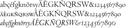 Born in Wells, Minnesota as Arthur Frederick Ward, 1894, d. New York, 1939. He enlisted in the United States Army in 1915 and attended the Army School of Military Aeronautics at the University of California, Berkeley during 1917-1918. On demobilisation he worked as a book editor for Macmillan&Co before undergoing training on the Monotype machine, after which he worked for the printers Edwin Rudge. He had met Beatrice Becker in 1919 and they married in December 1922. Warde was Printer for Princeton University (1922-1924). The couple moved to England in late 1924 for Warde had been offered work by the typographer Stanley Morison, designing for The Fleuron and the Monotype Recorder. The marriage did not last; they separated in 1926, and quickly divorced, though the break-up was an amicable one. Afterward Warde lived in France and Italy, where he became involved in Giovanni Mardersteig's Officina Bodoni. In 1926 Mardersteig printed The Calligraphic Manual of Ludovico Arrighi - complete Facsimile, with an introduction by Stanley Morison, which Warde issued in Paris while working for the Pleiad Press. He had his name changed several times, first his last name to Warde, and then his first name first to Frederique and then to Frederic. Warde returned to America permanently and he worked again for Edwin Rudge from 1927 to 1932, and also designed for private presses such as Crosby Gaige, the Watch Hill Press, Bowling Green Press, the Limited Editions Club and Heritage Press. Warde worked as production manager for the American office of the Oxford University Press from 1937 until his death in 1939.
 His typographic work: - Based on the fifteenth century letters of Nicolas Jenson, Centaur (originally called Arrighi) was first designed by Bruce Rogers in 1914 for the Metropolitan Museum, and parts of the typeface (like the italic) were done by Warde in 1925. This was called Arrighi Italic (a smooth version of Blado) but became Centaur Italic (Monotype, 1929). Warde was inspired by the italic forms on the Italica of Ludovico Vicentino, a 16th century typeface. However, his capitals are more freely formed (not vertical, for example). Warde designed a revival of the chancery cursive letter forms of Renaissance calligrapher Ludovico degli Arrighi. This italic, titled Arrighi, was designed as a companion to Bruce Roger's roman typeface Centaur.
Author of Monotype Ornaments (1928, Lanston Monotype Corp) [this book is freely available on the web thanks to Jacques André]. Many ornaments in this book have been digitized; see, e.g., Arabesque Ornaments (for the 16th century material) and Rococo Ornaments (for the 18th century ornaments). Warde also published the following privately in 1926 with Stanley Morison: The calligraphic models of Ludovico degli Arrighi, surnamed Vicentino---a complete facsimile and introduction by Ludovico degli Arrighi. Digital fonts based on his work include LTC Metropolitan (Lanston), Centaur (Monotype and Linotype versions) and Arrighi BQ (Berthold; this font has romans by Bruce Rogers and an italic by Frederic Warde). Wiki page. Linotype link. FontShop link. Klingspor link. [Google]
[MyFonts]
[More] ⦿
|
Freeman Jerry Craw
|
 Or Freeman Godfrey Craw. Type designer from East Orange, New York, born in 1917, who was associated with ATF. He died in 2017.
 Excerpts of his obituary in the Star Ledger: Graphic artist and designer renowned internationally as innovator in visual identity field, created many recognizable typefaces that bear his name. Freeman Godfrey Craw, 100, of Tinton Falls, N.J., passed away peacefully on Monday, May 1, 2017. Mr. Craw had lived in Tinton Falls since 2001. Prior to that, he had been a long-time resident of Short Hills, N.J. Known to family and friends as Jerry, he forged a highly distinguished and decorated career in graphic art, calligraphy, and topography. Born and raised in East Orange, N.J., Jerry graduated from Cooper Union For The Advancement of Science and Art in 1939. Upon graduation he became a designer with the American Colortype Company in New York City. In 1943, he joined Tri-Arts Press Inc. as its art director, and in 1958, he was named vice president of the company. In that capacity, he had complete graphic control over the most interesting and impressive printing produced in the U.S. during the 1950s and 1960s. During this time, he created unique visual identity programs for numerous prestigious business and institutional clients, including CBS and IBM. In 1968, he left Tri-Arts to establish his own company, Freeman Craw Design as a specialist in design-for-printing. As an independent design consultant and art director, Jerry maintained a full-time office of designers and artists to better serve the complete needs of his clientele. He provided a broad range of graphic and production services, including photography, typography, illustration, composition, platemaking and printing. He also served as manager of production and graphics for Rockefeller University Press at that time. Jerry was considered one of the best graphic artists in the world, and his body of work has been described by colleagues and industry insiders as "legendary." He was best known to fellow topographers for his many type designs commissioned by American Type Founders Company. Among these are Craw Clarendon, Craw Clarendon Book, Craw Clarendon Condensed, Craw Modern, Craw Modern Bold, Craw Modern Italic, Ad Lib, Canterbury, Chancery Cursive, Classic, CBS Sans and CBS Didot. Jerry's calligraphic works were held in such high regard that permanent collections were established at the of the Museum of Modern Art and the Cooper-Hewitt Museum of New York, a division of the Smithsonian Institution, as well as the Whitney Museum of American Art. He also had a number of one-man exhibitions in New York, Chicago, and London, and was an honorary member of the Gutenberg Museum in Mainz, Germany. Additionally, in 1946, he was a founding member of the Type Directors Club, which today is still the leading international organization devoted to excellence in topography. He was also the recipient of numerous national and international awards and citations for excellence in graphic design. Jerry wrote and designed for the following publications: American Artist, Fortune, Graphis, Print Magazine and the Saturday Evening Post, to mention only a few. He even found time as a guest lecturer at institutions including Yale University, Rensselaer Polytechnic Institute, Kean University, The New York School of Visual Arts, as well as the Universities of Alabama, Utah, and Maryland. His obituary contains this paragraph about Jerry's great personality: Jerry was warmhearted, gregarious, and passionate about his art. His intelligence and gentle nature always shined through. He was good humored, loved to be around people, and always seemed to get along with everyone, even strangers. He considered himself a "hopeless Francophile," and was heavily influenced by School of Paris painters like Degas, Braque, Picasso, and particularly Modigliani. Having traveled extensively throughout France, he developed a keen appreciation of French culture, French architecture and, of course, French wine. He even taught himself the language and became fluent in it. Jerry loved a good bottle of Chateauneuf du Pape, but would love sharing it with family and friends even more. His warmth, humor, and creativity will be sorely missed by all who knew and loved him. Designer of - Craw Clarendon (ATF, 1955-1960), based on the Benjamin Fox/Robert Besley Clarendon of 1845. Now available as OPTI Craw Clarendon (Castcraft), Craw Clarendon EF (Elsner & Flake), or Craw Clarendon (2013, Jordan Davies), for example. Mac McGrew writes: In 1955, ATF commissioned Freeman Craw to develop an American version of the Clarendon letter, resulting in Craw Clarendon. The following year Craw Clarendon Book, a lighter weight, was released, and Craw Clarendon Condensed in 1960. Craw has commented that as a designer of type he faced different problems than as a designer with type. Perhaps this and the alleged rush production resulted in unfortunate compromise, as some sizes are small for the body, with excess shoulder. Otherwise they are excellent and deservedly popular typefaces. The normal widths are also made by Monotype. Also see Clarendon.
- Craw Modern (1958). Mac McGrew writes: Craw Modern is a contemporary interpretation of the modern roman style, designed by Freeman Craw for ATF in 1958. It is a very wide face, with large x-height and short ascenders and descenders, otherwise somewhat the character of Bodoni but a little less formal. Craw Modern Bold followed, and in 1964 Craw Modern Italic was introduced. These typefaces have the same general proportions and some of the general design characteristics as the same artist's Craw Clarendon, but the similarity ends there and the typefaces should not be considered part of the same family. Compare Modern Roman, Litho series. Digital versions include Craw Modern (2012, Group Type) and OPTI Craw Modern (Castcraft).
- Ad Lib (ATF, 1961). This was revived as Ad Lib in 2010 by SoftMaker. Nick Curtis remade it as Oo Boodlio Doo NF (2011). Bitstream's version is simply called Ad Lib. Vladimir Pavlikov made a Cyrillic version at Paratype in 1999. Mac McGrew writes: Ad Lib is an irregular, novel gothic letter, designed by Freeman Craw in 1961 for American Type Founders, probably in response to the new-found freedom of photolettering techniques. The effect, suggestive of a woodcut technique, was reportedly achieved by cutting the letters out of a black sheet material with scissors. The complete font as shown features alternate designs for a number of characters; in addition, it is aligned so that several characters can be inverted to form additional alternates, such as u for n and vice versa. It is made only in three sizes. The alternate characters were later discontinued. Samoa, a nineteenth-century typeface, had somewhat similar invertible characters.
- Special commissions: Canterbury, Chancery, Classic, CBS Sans, and CBS Didot (1970s; for private users and manufacturers of film and digital type equipment). CBS Didot (2009, Daylight Fonts) is a revival of Craw's CBS Didot. For other digitizations, see K22 My Didot (2012, by Toto), Opti Didot CBS Special by Castcraft Software and an unattributed free font called CBS Didot.
He received a TDC medal in 1988 for lifetime achievement in typography. Link at TDC. FontShop link. [Google]
[MyFonts]
[More] ⦿
|
Gary Elfring
[Elfring Soft Fonts]
|
[More] ⦿
|
Gary Munch
[MunchFonts]
|
[MyFonts]
[More] ⦿
|
Gerardus Mercator
|
Flemish cartographer, b. Rupelmonde (as Gheert Cremer), 1512-1594. Educated at the University of Leuven, the alma mater of Luc Devroye, he lived in Duisburg (now Germany) from 1552 and is remembered for the Mercator chart named after him. Author of Literarum Latinarum, quas Italicas cursorias que vocant, scribendarum ratio (1540), which contains some beautiful alphabets, and teaches cursive writing [see Cursiv Latein]. Digital mapmaking fonts based on Mercator's chancery hand include Mercator (1995, Arthur Baker; see also the P22 version from 2001), and Ribbon Cursive (2009, Natsuko Hayashida). A scan of his 1540 book led Gilles Le Corré to 1540 Mercator Script (2010). A full scan of Gerardus Mercator's 1595 cosmographic atlas. Portrait. View typefaces related to Mercator. A list of typefaces related to Mercator. More typefaces based on Mercator's chancery hand. [Google]
[More] ⦿
|
Gert Wiescher
[Wiescher Design]
|
 [MyFonts]
[More] ⦿
[MyFonts]
[More] ⦿
|
Gilles Le Corre
[GLC --- Gilles Le Corre]
|
 [MyFonts]
[More] ⦿
[MyFonts]
[More] ⦿
|
Giovambattista Palatino
[Libro di M. Giovambattista Palatino cittadino romano]
|
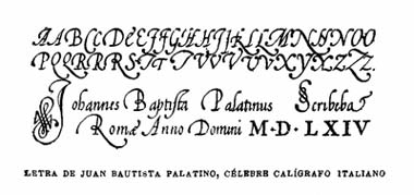 [More] ⦿
|
Giovanantonio Tagliente
|
 Or Giovanni Antonio Tagliente. Calligrapher and writing master, born in Venice, 1468-1527. Author of Lo presente libro insegna la vera arte de lo excellente scrivere de diverse varie sorti de litere (1524). Sample images from that penmanship book, which includes scripts for Latin, Hebrew and Greek: i, ii, iii, iv. Also: Chancery, Florentine, Florentine bastarda, Lettera bollatica, Lettera imperiale. Sets of ornamental capitals: Italian gothic Initials and Italian Renaissance Capitals. Picture of Tagliente's title page of his book in 1531. PDF of his work by Toni Pecoraro. Digitizations:
 - A scanfont based on his chancery is 1491 Cancellaresca Formata (2009, GLC).
- Stanley Morison's metal Bembo (1929) is based on Tagliente's letters. Bitstream's Aldine 401 is the first digital take of Bembo, which is attributed jointly to F. Griffo and G. Tagliente. JY Aetna (1994) is Jack Yan's version. Other revivals include Bembo MT (Monotype), Bamberg Serial (Softmaker), Bergamo and Bergamo Osf (Softmaker), Bergamo (Infinitype) and Bergamo (FontSite).
FontShop link. [Google]
[MyFonts]
[More] ⦿
|
Giraldo Fernandes de Prado
|
Or Giraldo del Prado (b. ca. 1535, d. Almada, 1592). Paulo Heitlinger writes about him in Cadernos vol. 16, 2010. De Prado was a painter, and acted as the calligrapher of the Teodosio II, the duke of Bragança. His home was in Guimaraes, but from 1580 on he lived in Almada. Author of the writing manual Caderno manuscrito de Caligrafia (1560, Lisbon). He seems to have been the first calligraphy specialist in Portugal. Heitlinger used Prado's examples to make his Lomabardian typeface Uncialis in 2009. Scans: Geometrically formed letters, Chancery hand (1560-1561), Another chancery hand (same year), And another one, Gotica rotunda (1560-1561). [Google]
[More] ⦿
|
GLC --- Gilles Le Corre
[Gilles Le Corre]
|
 French painter born in Nantes in 1950, who lives in Talmont St Hilaire. His fonts include 2010 Cancellaresca Recens (inspired by a chancery type of Francisco Lucas from the late 16th century), 2009 Handymade (comic book style), 2009 Lollipop (chancery style), 2009 GLC Plantin, 2009 Primitive (2009, a rough-edged roman script), 2008 Script 2 (2008), GLC Ornaments One (2008) and 2008 Xmas Fantasy (2008: blackletter). In 2008, he started GLC -- Gilles Le Corre and became commercial. Creative Market link. He is best known for his historic revivals:
 - 161 Vergilius (2010)
- 750 Latin Uncial (2010): inspired by the Latin script used in European monasteries from circa 5th to 8th, before the Carolingian style took over. The uppercases were mainly inspired by a 700's manuscript from Fécamp's abbey in France.
- 799 Insular (2010): inspired by the so-called insular style of Latin script that was used in Celtic monasteries from about 600 until 820.
- 825 Karolus (2009), and 825 Lettrines Karolus (2009).
- 1066 Hastings (2009).
- 1350 Primitive Russian (2012) was inspired by a Russian Cyrillic hand of Russkaja Pravda. It has rough-edged Latin charaters and many old Russian glyphs.
- 1420 Gothic Script (2008).
- 1431 Humane Niccoli (2010), after writings of Florence-based calligrapher Niccolo Niccoli (1364-1437).
- 1456 Gutenberg (2008, based on a scan of an old text). Followed by 1456 Gutenberg B42 Pro, which was based on the so called B42 character set used for the two Gutenberg Latin Bibles (42 and 36 lines).
- 1462 Bamberg (2008).
- 1467 Pannartz Latin (2009): inspired by the edition De Civitate Dei (by Sanctus Augustinus) printed in 1467 in Subiaco by Konrad Sweynheym and Arnold Pannartz, who was the punchcutter.
- 1470 Sorbonne (2010) was inspired by the first French cast font, for the Sorbonne University printing shop. The characters were drawn by Jean Heynlin, rector of the university based on examples by Pannartz. It is likely that the cutter was Adolf Rusch.
- 1470 Jenson-SemiBold (2008).
- 1475 BastardeManual (2008, inspired by the type called Bastarde Flamande, a book entitled Histoire Romaine (by Titus Livius), translated in French by Pierre Bersuire ca. 1475, was the main source for drawing the lower case characters).
- 1479 Caxton Initials (2009): inspired by the two blackletter fonts used by the famous William Caxton in Westminster (UK) in the late 1400s.
- 1483 Rotunda Lyon (2010): inspired by a Venetian rotunda found in a 1483 book called Eneide printed in Lyon by Barthélémy Buatier (from Lyon) and Guillaume Le Roy (from Liège, Belgium).
- 1484 Bastarda Loudeac (2008).
- 1470 Jenson Latin (2009), inspired by the pure Jenson set of fonts used in Venice to print De preparatio evangelica in 1470.
- 1491 Cancellarasca Normal and Formata (2009): inspired by the very well known humanist script called Cancellaresca. This variant, Formata, was used by many calligraphers in the late 1400s, especially by Tagliente, whose work was mainly used for this font.
- 1492 Quadrata (2008).
- 1495 Lombardes (2008): a redrawn set of Lombardic types, which were used in Lyon by printers such as Mathias Huss, Martin Havard or Jean Real, from the end of 14OOs to the middle of 1500s.
- 1495 Bastarde Lyon (2008, based on the font used in the "Conte de Griseldis" by Petrarque).
- 1499 Alde Manuce Pro (2010): inspired by the roman font used by Aldus Manutius in Venice (1499) to print Hypnerotomachia Poliphili, the well-known book attributed to Francesco Colonna. Francesco Griffo was the punchcutter. The Italic style, carved by Francesco Colonna, illustrates the so-called Aldine style.
- 1509 Leyden (2008; a Lombardic typeface inspired by the type used in Leyden by Jan Seversz to print Breviores elegantioresque epistolae).
- 1510 Nancy (2008, decorated initial letters was inspired by those used in 1510 in Nancy (France, Lorraine) for printing of Recueil ou croniques des hystoires des royaulmes d'Austrasie ou France orientale[...] by Symphorien Champion; unknown printer).
- 1512 Initials.
- 1514 Paris Verand (based on initial caps that Barthélémy Verand employed for the printing of Triumphus translatez de langage Tuscan en François.
- 1522 Vicentino (2011). Based on Ludovico Vicentino Arrighi's 1522 typeface published in La Operina.
- GLC 1523 Holbein (2010, after Hans Holbein's Alphabet of Death.
- GLC 1525 Durer Initials (2010). Sample R.
- 1529 Champ Fleury Pro and 1529 Champ Fleury Initials (2010): based on Geofroy Tory's original drawings and text face.
- 1532 Bastarde Lyon (2008, based on work by an anonymous printer in Lyon (France) to print the French popular novel Les Grandes et inestimables Chroniques du grand et enorme geant Gargantua).
- 1533 GLC Augereau Pro: inspired by one of Antoine Augereau's three roman typefaces: the Gros Romain size, used in 1533 to print Le miroir de l'&aciorc;me..., a poetic compilation by Marguerite de Navarre, sister of the French king François I.
- 1534 Fraktur (2009; inspired by the early Fraktur style font used circa 1530 by Jacob Otther, printer in Strasbourg (Alsace-France) for German language printed books).
- 1536 Civilité manual (2011). Based on a handwritten copy of Brief story of the second journey in Canada (1535) by French explorer Jacques Cartier.
- 1538 Schwabacher (2008, based on a font used by Georg Rhan in Wittemberg (Germany) to print Des Babsts Hercules [...], a German pamphlet against roman catholicism written by Johannes Kymeus).
- 1540 Mercator Script was inspired by an alphabet of Gerardus Mercator, who is known for his maps as well as his Literarum Latinarum, quas Italicas cursoriasque vocant, scribendarum ratio (1540).
- 1543 Humane Petreius (2012) was inspired by the typeface used in Nuremberg by Johannes Petreius for De Revolutionibus Orbium Coelestium, the well-known mathematical and astronomical essay by Nicolas Copernicus.
- 1543 German Deluxe (2009): a Schwabacher inspired by the sets of fonts used in 1543 by Michael Isengrin, printer in Basel, to print New Kreüterbuch, which is a book with numerous nice pictures, the masterpiece of Leonhart Fuchs, father of the modern botany.
- 1543 HumaneJenson-Bold (2008, after the typeface used in Vesalius' 1543 book De humani corporis fabrica).
- 1543 HumaneJenson-Normal (2008, same source).
- 1545 Faucheur (2011) is a rough garalde typeface that was inspired by the set of fonts used in Paris by Ponce Rosset, aka Faucheur, to print the story of the second travel to Canada by Jacques Cartier, first edition, printed in 1545.
- 1546 Poliphile (2009), inspired by the French edition of Hypnerotomachie de Poliphile ("The Strife of Love in a Dream") attributed to Francesco Colonna, 1467, and printed in 1546 in Paris by Jacques Kerver.
- 1550 Arabesques (2008, caps).
- 1557 Civilité Granjon (2010).
- 1557 Italique (2008, based on Italic type used by Jean de Tournes in Lyon to print La métamorphose d'Ovide figurée).
- 1565 Renaissance (2010), inspired by French renaissance decorated letters.
- 1565 Venetian Normal (2008, initial decorated letters that are entirely original, but were inspired by Italian renaissance engraver Vespasiano Amphiareo's patterns published in Venice ca. 1568).
- 1584 Rinceau (2008, a set of initial letters is an entirely original creation, inspired by French renaissance patterns used by Bordeaux printers circa 1580-1590).
- 1584 Pragmatica Lima (2011). Based on fonts used in 1584 by Antonio Ricardo to produce the first publication ever printed in Southern America.
- 1585 Flowery (2009): inspired by French renaissance decorated letters.
- 1589 Humane Bordeaux (2008, inspired by the Garamond fonts used by S. Millanges (imprimeur ordinaire du Roy) in Bordeaux ca. 1580-1590. The alphabets were used to reprint L'instruction des curés by Jean Gerson).
- 1590 Humane Warszawa is a rough-edged garalde typeface inspired by a font carved circa 1590 for a Polish editor.
- 1592 GLC Garamond (2008, inspired by the pure Garamond set of fonts used by Egenolff and Berner, German printers in Frankfurt, at the end of sixteen century. Considered the best and most complete set at the time. The italic style is Granjon's).
- 1610 Cancellaresca (2008, inspired by the Cancellaresca moderna type of 1610 by Francesco Periccioli who published it in Sienna).
- 1613 Basilius (2012) was based on the hand-drawn types used by Basilius Besler (Germany) for the carved plates of his botanical manual Hortus eystettensis.
- GLC 1619 Expédiée (2015). A grungy Civilté.
- 1621 GLC Pilgrims (2010).
- 1634 René Descartes (2009), based upon his handwriting in a letter to Mersenne.
- 1638 Civilité Manual (2010). Inspired by a French solicitor's document dated 1638.
- GLC 1648 Chancellerie (2011). Inspired by the hand-written 1648 Munster peace treaty signed by roi Louis XIV and Kaiser Ferdinand II.
- 1651 Alchemy (2010): a compilation created from a Garamond set in use in Paris circa 1651.
- GLC 1669 Elzevir (2011) was inspired by the font typefaces used in Amsterdam by Daniel Elzevir to print Tractatus de corde, the study of earth anatomy by Richard Lower, in 1669. The punchcutter was Kristoffel Van Dijk.
- GLC 1672 Isaac Newton (2012) is based on the hand of Isaac Newton.
- GLC Morden Map (2011). Based on an engraved typeface used on a pack of playing cards published by Sir Robert Morden in 1676.
- 1682 Writhed Hand: very irregular handwriting.
- 1689 GLC Garamond Pro (2010): inspired by Garamond fonts used in an edition of Remarques critiques sur les oeuvres d'Horace by DAEP, published in Paris by Deny Thierry and seprately by Claude Barbin.
- 1689 Almanach (2009): inspired by the eroded and tired fonts used by printers from the sixteenth century to the early years of twentieth for cheap or fleeting works, like almanacs, adverts, gazettes or popular novels.
- 1695 Captain Flynt.
- 16th Arabesques (2008, an exquisite ornamental caps scanfont).
- 1715 Jonathan Swift (2011). An example of the hand of Irish poet and novelist Jonathan Swift (1667-1745). It is a typical exemple of the British quill pen handwriting from about 1650-1720.
- GLC 1726 Real Espanola (2012). Based on the set of typefaces used by Francisco Del Hierro to print the first Spanish language Dictionary from the Spanish Royal Academy (Real Academia Española, Dictionario de Autoridades) in 1726. These transitional styles are said to have been the first set of official typefaces in Spain.
- 1741 Financiere (2009): inspired by the Fournier's font Financière. While it appears handwritten, it was in fact carved in 1741 by Pierre Simon Fournier le jeune and published in his Manuel Typographique in Paris (1764-1766).
- 1742 Frenchcivilite (2008).
- 1751 GLC Copperplate (2009), a 6-style family about which Gilles says: This family was inspired by an engraved plate from Diderot&Dalembert's Encyclopedia (1751), illustrating the chapter devoted to letter engraving techniques. The plate bears two engravers names: "Aubin" (may be one of the four St Aubin brothers?) and "Benard" (whose name is present below all plates of the Encyclopedia printed in Geneva). It seems to be a transitional type, but different from Fournier or Grandjean.
- 1756 Dutch (2011).
- 1776 Independence (inspired mainly from the font used by John Dunlap in the night of 1776 July 4th in Philadelphia to print the first 200 sheets of the Congress' Declaration of Independence establishing the United States of America).
- 1781 La Fayette (2010): a formal bâtarde coulée script with caitals inspired by Fournier (1781).
- 1785 GLC Baskerville (2011). Le Corre explains: The Baskerville's full collection was bought by the French editor and author Pierre-Augustin Caron de Beaumarchais who used it to print---in Switzerland---for the first time the complete work of Voltaire (best known as the Kehl edition, by the "Imprimerie de la société littéraire typographique"). We have used this edition, with exemplaries from 1785, to reconstruct this genuine historical two styles.
- 1786 GLC Fournier (2010), based on several books printed in Paris just before the Didot era set in. The Titling characters are based on hymns printed by Nicolas Chapart.
- 1790 Royal Printing (2009): inspired by various variants of Romain du Roy.
- 1791 Constitution (2011).
- 1792 La Marseillaise (2011). Based on the original manuscript of the French revolutionary song La Marseillaise which later became the French national hymn---it was composed in one night (April 25, 1792) by captain Rouget de Lisle.
- 1805 Austerlitz Script Light: a typical French handwriting style from that period, named after one of the few battles that Napoleon actually won.
- 1805 Jaeck Map (2011). Inspired by the engraved characters of a German map, edited in Berlin at the end of 1700s. The engraver was Carl Jaeck or Jaek (1763-1808).
- 1809 Homer (2011), a grungy typeface named after the "homer" message pigeons.
- 1815 Waterloo (2008): a handwriting typeface originating in Napoleon's government. Why do I feel that GLC is nostalgic for the era of Napoleon? Their own present dwarf-version of Napoleon is not exactly a huge success.
- 1820 Modern (2009) was inspired by a didone font used in Rennes by Cousin-Danelle, printers, for a Brittany travel guide.
- 1822 GLC Caslon (2010): inspired by a Caslon set used by an unknown Flemish printer from Bruges, in the beginning of 1800s, a little before the revival of the Caslon style in the 1840s.
- 1845 Mistress (2009): calligraphic script.
- 1848 Barricades Italic, a quill pen italic.
- 1859 Solferino (2009).
- 1863 Gettysburg (2008; inspired by a lot of autographs, notes and drafts, written by President Abraham Lincoln, mainly the Gettysburg address).
- 1864 GLC Monogram Initials (2011) was inspired by a French portfolio containing about two hundred examples of Chiffres---deux lettres, created for engravers and jewelers in Paris in 1864, and drawn by French engraver C. Demengeot.
- 1871 Victor Hugo (2011). Based on manuscripts from the final part of the life of Victor Hugo (1802-1885).
- 1871 Whitman Script (2008) and 1871 Dreamer Script (2008): inspired by manuscripts by American poet Walt Whitman. See also 1871 Dreamer 2 Pro (2012).
- 1880 Kurrentschrift (2010): German handwriting, based on late medieval cursive. It is also known as "Alte Deutsche schrift" ("Old German script"). This was taught in German schools until 1941.
- 1883 Fraktur (2009): inspired by fonts used by J. H. Geiger, printer in Lahr, Germany.
- 1885 Germinal: based on notes and drafts written by Émile Zola (1840-1902).
- GLC 1886 Romantic Initials (2012).
- 1890 Registers Script (2008): inspired by the French "ronde".
- 1890 Notice (2009): a fat didone family.
- 1902 Loïe Fuller (art nouveau face).
- 1906 Fantasio (2010): inspired by the hatched one used for the inner title and many headlines by the popular French satirical magazine Fantasio (1906-1948).
- 1906 French News: a weathered Clarendon-like family based on the fonts used by Le Petit Journal, a French newspaper that ran from 1863 until 1937.
- 1906 Fantasio Auriol (2010), inspired by the set of well known Auriol fonts used by the French popular satirical magazine Fantasio (1906-1948).
- 1906 Titrage (2009): a didone headline typeface from the same newspaper.
- Underwood 1913 (2007, an old typewriter font, whose commercial version is Typewriter 1913), and 1913 Typewriter Carbon (2008).
- 1920 French Script Pro (2010).
- 1920 My Toy Print Set, 1925 My Toy Print Deluxe Pro (2010): inspired by rubbert stamp toy print boxes called Le petoit imprimeur.
- 1968 GLC Graffiti (2009).
- 1917 Stencil (2009; with rough outlines).
- 2010 Dance of Death (2010): based on Hans Holbein's Alphabet of Death.
- 2009 Primitive (2016).
- 2009 GLC Plantin Pro (2016).
- 2010 Pipo Classic: a grungy typewriter slab serif family.
- 2010 Cancellaresca Recens (2016).
- 2011 Slimtype (2011, +Italic) and 2011 Slimtype Sans (2011): an old typewriter typeface.
Creative Market link. Fontspring link. [Google]
[MyFonts]
[More] ⦿
|
Gliphmaker.com
[Ivan Zeifert]
|
 Russian language site with an archive (specializing in calligraphic and display scripts), some original fonts by Ivan Zeifert of Ivan Zeifert Works, tens of free fonts by Alexandra Gophmann, and links to free and commercial font sites. Commercial scripts nearly all by Zeifert, and nearly all are cyrillicized versions of Latin typefaces. Free scripts: Cansellarist (2003, Ivan Zeifert, cyrillicized version of Cancellaresca Script Plain), ChampagneCyrillic (2005), Copyist (2004, Ivan Zeifert), Drakkar (2004), Figurny (2006, an exaggerated Victorian face, done with Anatole and Alexandra Gophmann), Flibustier-Thin (2005), HeatherScriptOne (2005, Alexandra Gophmann), HeatherScriptTwo (2005, Alexandra Gophmann), KabarettSimple-Thin (2004, a Showboat-style face, cyrillicized by Ivan Zeifert), KabarettDecorDEMO-Thin (2004), Marianna (2006), RockletterSimple (2005), RockletterTransparent (2005), RosamundaOne-Normal (2005, Alexandra Gophmann), RosamundaTwo (2005, Alexandra Gophmann). These are all by Ivan Zeifert: Flibustier-Thin (2005), Twin Brush (2006), Custodian (2006), Acquest Script (2006), Auric Script (2006), Calligraphist, ChampagneCyrillic (2005), Cansellarist (2003, cyrillicized version of Cancellaresca Script Plain), Chancellor, Chaplain, Chromium Plated, Connetable, Counterbalance, Copyist, Countess, Decree Art One and Two, Decree (Narrow, Thin, Wide), Drakkar, Engraver, Forest, Gissmonda, Kabarett Decorated, Kabarett Transparent, Languedoc, Maghreib, Medieval, Neon Italic, Patience, Rockletter Decorated, RockletterSimple (2005), RockletterTransparent (2005), Saloon, Splinter, Twin Brush, Whirlpool, Wooden Ship Decorated, Wooden Ship One and Two. News. [Google]
[More] ⦿
Russian language site with an archive (specializing in calligraphic and display scripts), some original fonts by Ivan Zeifert of Ivan Zeifert Works, tens of free fonts by Alexandra Gophmann, and links to free and commercial font sites. Commercial scripts nearly all by Zeifert, and nearly all are cyrillicized versions of Latin typefaces. Free scripts: Cansellarist (2003, Ivan Zeifert, cyrillicized version of Cancellaresca Script Plain), ChampagneCyrillic (2005), Copyist (2004, Ivan Zeifert), Drakkar (2004), Figurny (2006, an exaggerated Victorian face, done with Anatole and Alexandra Gophmann), Flibustier-Thin (2005), HeatherScriptOne (2005, Alexandra Gophmann), HeatherScriptTwo (2005, Alexandra Gophmann), KabarettSimple-Thin (2004, a Showboat-style face, cyrillicized by Ivan Zeifert), KabarettDecorDEMO-Thin (2004), Marianna (2006), RockletterSimple (2005), RockletterTransparent (2005), RosamundaOne-Normal (2005, Alexandra Gophmann), RosamundaTwo (2005, Alexandra Gophmann). These are all by Ivan Zeifert: Flibustier-Thin (2005), Twin Brush (2006), Custodian (2006), Acquest Script (2006), Auric Script (2006), Calligraphist, ChampagneCyrillic (2005), Cansellarist (2003, cyrillicized version of Cancellaresca Script Plain), Chancellor, Chaplain, Chromium Plated, Connetable, Counterbalance, Copyist, Countess, Decree Art One and Two, Decree (Narrow, Thin, Wide), Drakkar, Engraver, Forest, Gissmonda, Kabarett Decorated, Kabarett Transparent, Languedoc, Maghreib, Medieval, Neon Italic, Patience, Rockletter Decorated, RockletterSimple (2005), RockletterTransparent (2005), Saloon, Splinter, Twin Brush, Whirlpool, Wooden Ship Decorated, Wooden Ship One and Two. News. [Google]
[More] ⦿
|
Hajid Hikmatiyar
[Hikhcreative]
|
[MyFonts]
[More] ⦿
|
Hermann Zapf
|
 Prolific master calligrapher and type designer, born in Nuremberg in 1918. Most of his life, he lived in Darmstadt, where he died in 2015. He is best known for Palatino, Optima, Melior, Zapf Dingbats, Zapfino, and ITC Zapf Chancery. He created alphabets for metal types, photocomposition and digital systems.
 He studied typography from 1938 until 1941 in Paul Koch's workshop in Frankfurt. From 1946 until 1956, he was type director at D. Stempel AG type foundry, Frankfurt. In 1951 he married Gudrun von Hesse. From 1956 until 1973, he was consultant for Mergenthaler Linotype Company, Brooklyn and Frankfurt. From 1977 until 1987, he was vice president of Design Processing, Inc., New York (which he founded with his friends Aaron Burns and Herb Lubalin), and professor of Typographic Computer Programs, Rochester Institute of Technology, Rochester, New York. Students at RIT included Kris Holmes and Charles Bigelow, who together created the Lucida type family. Other prominent students include calligrapher/font designer Julian Waters and book designer Jerry Kelly. From 1987 until 1991, he was chairman of Zapf, Burns&Company, New York. He retired in Darmstadt, Germany, but consulted on many font projects until a few years before his death. In the 1990s, Zapf developed the hz program for kerning and typesetting. It was acquired by Adobe who used ideas from it in InDesign. Awards: - 1969 Frederic W. Goudy Award, Rochester Institute of Technology, Rochester, New York.
- 1973 Gutenberg Prize, City of Mainz.
- 1975 Gold Medal, Museo Bodoniano, Parma.
- 1985 Honorary Royal Designer for Industry, Royal Society of Arts, London.
- 1987 Robert Hunter Middleton Award, Chicago.
- 1994 Euro Design Award, Oostende.
- 1996 Wadim Lazursky Award, Academy of Graphic Arts, Moscow.
- 1999 Type Directors Club award for Zapfino (1998), New York.
- 2010 Bundesverdienstkreuz 1. Klasse.
Some publications by Hermann Zapf: Feder und Stichel (1949, Trajanus Presse, Frankfurt) About Alphabets (1960) Manuale Typographicum (1954 and 1968). Only 1000 copies were printed of the original. Typographic Variations (1964), or Typografische Variationen (1963, Stempel), of which only 500 copies were printed. Orbis Typographicus (1980) Hermann Zapf and His Design Philosophy (Chicago, 1987) ABC-XYZapf (London, 1989) Poetry through Typography (New York, 1993) August Rosenberger (Rochester, NY, 1996). Alphabet Stories (RIT Cary Graphic Arts Press, Rochester, 2008). Review by Hans Hagen and Taco Hoekwater. My collaboration with Don Knuth and my font design work [just an article], TUGboat 22:1/2 (2001), 26-30. Local download. List of his typefaces: - Alahram Arabisch.
- Arno (Hallmark).
- Aldus Buchschrift (Linotype, 1954): Italic, Roman. Digital version by Adobe.
- Alkor Notebook.
- Attika Greek.
- Artemis Greek.
- Aurelia (1985, Hell).
- AT&T Garamond.
- Book (ITC New York). Samples: Book Demi, Book Demi Italic, Book Heavy, Book Heavy Italic, Book Medium Italic. The Zapf Book, Chancery and International fonts are under the name Zabriskie on the SoftMaker MegaFont XXL CD, 2002.
- Brush Borders.
- Comenius Antiqua (1976, Berthold; see C792 Roman on the SoftMaker MegaFont XXL CD, 2002).
- Crown Roman and Crown Italic (Hallmark).
- Chancery (officially called ITC Zapf Chancery): Bold, Demi, Italic, Light, Liht Italic, Mediu Italic, Roman.
- Civilité (Duensing). Mac McGrew on the Zapf Civilité: Zapf Civilite is perhaps the latest typeface to be cut as metal type, having been announced in January 1985, although the designer, Hermann Zapf, had made sketches for such a typeface as early as 1940, with further sketches in 1971. But matrices were not cut until 1983 and 1984. The cutting was done by Paul Hayden Duensing in Kalamazoo, Michigan. The first Civilité typeface was cut by Robert Granjon in 1557, based on a popular French handwriting style of the time. Other interpretations have been made from time to time, notably the Civilité (q.v.) designed by Morris Benton in 1922 for ATF. The new Zapf design has the same general character but with a more informal and contemporary feeling. A smooth flow between weights of strokes replaces the stark contrast of thick-and-thin in older interpretations. There are several ligatures, and alternate versions of a number of characters, including several terminals. Only the 24-point Didot size is cut or planned.
- Charlemagne (Hallmark).
- Digiset Vario (1982, Hell): a signage face.
- Edison (Hell), Edison Cyrillic. Scans: Bold Condensed, Book, Semibold Italic, Semibold, Book Italic.
- Euler (American Mathematical Society). Zapf was also consultant for Don Knuth on his Computer Modern fonts. In 1983, Zapf, Knuth and graduate students in Knuth's and Charles Bigelow's Digital Typography program at Stanford University including students Dan Mills, Carol Twombly, David Siegel, and Knuth's computer science Ph.D. students Scott Kim and John Hobby, completed the calligraphic typeface family AMS Euler for the American Mathematical Society (+Fraktur, Math Symbols, +script). Taco Hoekwater, Hans Hagen, and Khaled Hosny set out to create an OpenType MATH-enabled font Neo-Euler (2009-2010), by combining the existing Euler math fonts with new glyphs from Hermann Zapf (designed in the period 2005-2008). The result is here. The Euler digital font production was eventually finished by Siegel as his M.S. thesis project in 1985.
- Firenze (Hallmark).
- Festliche Ziffern (transl: party numbers).
- Frederika Greek.
- Gilgengart Fraktur (1938, D. Stempel). Some put the dates as 1940-1949. It was released by Stempel in 1952. Revivals include RMU Gilgengart (2020, Ralph M. Unger), and Gilgengart by Gerhard Henzel.
- Heraklit Greek (1954). A digital revival was first done by George Matthiopoulos, GFS Heraklit. Later improvements followed by Antonis Tsolomitis and finally in 2020 by Daniel Benjamin Miller.
- Hunt Roman (1961-1962, Pittsburgh). A display typeface exclusively designed for the Hunt Botanical Library (Hunt Institute for Botanical Documentation since 1971), situated on campus of Carnegie Mellon University in Pittsburgh, to accompany their text typeface Spectrum. Review by Ferdinand Ulrich.
- International (ITC, 1977). Samples: Demi, Demi Italic, Heavy, Heavy Italic, Light, Light Italic, Medium, Medium Italic.
- Janson (Linotype).
- Jeannette Script (Hallmark).
- Kompakt (1954, D. Stempel).
- Kalenderzeichen (transl: calendar symbols).
- Kuenstler Linien (transl: artistic lines).
- Linotype Mergenthaler.
- Melior (1952, D. Stempel; see Melmac on the SoftMaker MegaFont XXL CD, 2002). Samples: Bold, Bold Italic, Italic, Roman.
- Michelangelo (1950, D. Stempel, a roman caps face; a digital version exists at Berthold and at The Font Company).
- Marconi (1975-1976, Hell; now also available at Elsner&Flake and Linotype; according to Gerard Unger, this was the first digital type ever designed---the original 1973 design was intended for Hell's Digiset system; Marconi is a highly readable text face).
- Medici Script (1971).
- Musica (Musiknoten, transl: music symbols; C.E. Roder, Leipzig).
- Magnus Sans-serif (Linotype, 1960).
- Missouri (Hallmark).
- Novalis.
- Noris Script (1976; a digital version exists at Linotype).
- Optima (1955-1958, D. Stempel--Optima was originally called Neu Antiqua), Optima Greek, Optima Nova (2002, with Akira Kobayashi at Linotype, a new version of Optima that includes 40 weights, half of them italic). Samples: Poster by Latice Washington, Optima, Demibold Italic, Black, Bold, Bold Italic, Demibold, Extra Black, Italic, Medium, Medium Italic, Regular, Italic. Digital clones: Zapf Humanist 601 by Bitstream, O801 Flare on the SoftMaker MegaFont XXL CD (2002), Opus by Softmaker, Columbia Serial by Softmaker, Mg Open Cosmetica, Ottawa by Corel, October by Scangraphic, CG Omega by Agfa compugraphic, Chelmsford by URW, Classico by URW and Optus by URW.
- Orion (1974).
- Palatino (1948, D. Stempel; the original font can still be found as Palazzo on Softmaker's XXL CD, 2002), Palatino Nova (2005, Linotype), Palatino Sans (2006, Linotype, with Akira Kobayashi), Palatino Greek, Palatino Cyrillic. Palatino was designed in conjunction with August Rosenberger, In 2013, Linotype released Palatino eText which has a larger x-height and wider spacing. Palatino samples: black, black italic, bold, bold italic, italic, medium, roman, light, light italic. Poster by M. Tuna Kahya (2012). Poster by Elena Shkarupa. Poster by Wayne YMH (2012). Zapf was particularly upset about the Palatino clone, Monotype Book Antiqua. Consequently, in 1993, Zapf resigned from ATypI over what he viewed as its hypocritical attitude toward unauthorized copying by prominent ATypI members.
- Phidias Greek.
- Primavera Schmuck.
- Pan Nigerian.
- Quartz (Zerox Corporation Rochester, NY).
- Renaissance Antiqua (1985, Scangraphic). Samples: Regular, Bold, Book, Light Italic, Swashed Book Italic, Swash Italic.
- Saphir (1953, D. Stempel, see now at Linotype).
- Sistina (1951, D. Stempel).
- Scriptura, Stratford (Hallmark).
- Sequoya (for the Cherokee Indians), ca. 1970. This was cut by Walter Hamady and is a Walbaum derivative.
- Linotype Trajanus Cyrillic (1957).
- Textura (Hallmark).
- URW Grotesk (1985, 59 styles), URW Antiqua, URW Palladio (1990).
- Hallmark Uncial (Hallmark).
- Virtuosa Script (1952, D. Stempel). Zapf's first script face. Revived in 2009 as Virtuosa Classic in cooperation with Akira Kobayashi.
- Venture Script (Linotype, 1966; FontShop says 1969).
- Winchester (Hallmark).
- World Book Modern.
- ITC Zapf Dingbats [see this poster by Jessica Rauch], Zapf Essentials (2002, 372 characters in six fonts: Communication, Arrows (One and Two), Markers, Ornaments, Office, based on drawings of Zapf in 1977 for Zapf Dingbats).
- Zapfino (Linotype, 1998, winner of the 1999 Type Directors Club award), released on the occasion of his 80th birthday. This is a set of digital calligraphic fonts. Zapfino Four, Zapfino Three, Zapfino Two, Zapfino One, ligatures, Zapfino Ornaments (with plenty of fists). Poster by Nayla Masood (2013).
Books and references about him include: - Hermann Zapf: A Life in Letters (2016, Julian Waters).
- What Our Lettering Needs: The Contribution of Hermann Zapf to Calligraphy & Type Design at Hallmark Cards (2011, Rick Cusick, RIT Cary Graphic Arts Press, Rochester).
- Hermann Zapf and the World He Designed: A Biography (2019, Jerry Kelly, The Grolier Club, New York).
- Laudatio for Professor Hermann Zapf (Frank Mittelbach). TUGboat 22:1/2 (2001), 24-26. Local download.
- Book review: Hermann Zapf and the World He Designed: A Biography, by Jerry Kelly (Barbara Beeton). TUGboat, Volume 40 (2019), No. 3.
Pictures of Hermann Zapf: with Lefty, with Rick Cusick, in 2003, with Frank Jonen, with Jill Bell, with Linnea Lundquist and Marsha Brady, with Rick Cusick, with Rick Cusick, with Stauffacher, a toast, with Werner Schneider and Henk Gianotten, with Chris Steinhour, at his 60th birthday party. Pictures of his 80th birthday party at Linotype [dead link]. Linotype link. Klingspor link. [Google]
[MyFonts]
[More] ⦿
|
Hikhcreative
[Hajid Hikmatiyar]
|
Yogyakarta, Indonesia-based designer of the vintage display sans typeface Nazgul (2020) and the script typefaces Scott Walker (2020), Epic Kantona (2020) and Bicillesta (2019). Typefaces from 2021: Rassell (script), Algaida (a semi-formal script), Magnold (an elephant foot display serif), Archangelisia (a very tall chancery script), Grimalda (a wedge serif), Griselda (an italic wedge serif), and Sandtrey (a lively wild calligraphic script). [Google]
[MyFonts]
[More] ⦿
|
Ignacio Pérez
|
Spanish author of the writing manual Arte de escrevir con cierta industria (1559). [Google]
[More] ⦿
|
imagex
|
 Frenchman (b. 1957) who started making fonts in 2010, after a career in illustration, comics, and video games. In 2010, he created the free fonts BabyJo (pixel face), Bayday, Chrom (beveled face), LaPresse (grunge), Muffaroo, Poppy, Poppydot, Spacecard, Strokewith, Strokeless, ToonLand (comic book lettering), ToonLandBlack, ToonLandShad, TrashToys (grunge), WorldColors (3d face).
 In 2011, he published Francobelge (comic book face), Freepress (grunge), Gamix (Western titling face), Inmyroom (dingbats), Majestrick (calligraphic), Onomatopaf (comic book dings), Outerzone, OuterzoneB, Starz (dingbats), Stenstreet (grunge), Tram, Tramix (texture face), TrashToys02, War-Lettersn, Mixagex, Massive Dynamite (grunge), Not Well (grunge), Actu, Blck, Gling (texture face), HeRioz (silhouettes), Brightoon (cartoonish brush face), Muzo (ink spill face), Sharpy, Space Shop (dingbats), Pulp Dance (hand-printed), Essef (art deco), Retro Sign (grunge), Labo (grunge), Exhausted, Komikoz, Puzzled, Toonimals (dings), Penstriped (sketch face), Cashier (grungy), Dan Hand, Hardwell (grungy caps), Colleged (athletic lettering), Goodjean (jeans texture face), Seaside Things (dingbats), Real Tek (techno), Zou (3d hand-printed caps), Painter, Border Line (grunge), Handout (grunge), Tract (grunge), Pulpatone (grunge), Logos I Love, Pal Antic (chancery hand), Twent (fat rounded display face), DoodFlow (dingbats), Afro Add (texture face), Crump (grunge), Big White, Dark Room (grunge), Manifesto (grunge), Tacketil (a FontStruct font), Otto Land (sketch face), Over (outline face), Under (brush dings), Baskertown (grunge), Nursery Tale, Panic (texture face), BlackNDot (ink spill face), Beyond (striped display face), Advert, Car Crash (grunge), Heartz, Starsteel, Smart Faces, Blackflag (a brushed blackletter), Dock 51 (grungy stencil), Lead (3d face). In November 2011, he created a number of texture typefaces: Hotöcop, Pal Mod, Speedy (sketch face), Thirties Gold, Sunset GP. Further 2011 typefaces: Poptivi, Shadow Mole, Super Modern Black. Faces from 2012: Remanence, Winter Days (dingbats), Nowharehouse (grunge), Snuff (grunge), Cup of Tea (3d shadow face), Talk of the wall. Typefaces from 2012: Egirlz (dingbats), Art Post (white on black poster lettering), Volutes (copperplate calligraphic script), From me 2 you (curly script), PS I Love You, Kolossal (caps only), Kraash, Alexandre (3d engraved headline face), Monstres de poche (dingbats), Alternate (grunge), Warning, Dreams (brush face), Headline Crack, Bump Pad (textured typeface), Carton (grungy white-on-black stencil face), Maybe maybe Not, Frames n Riboons (sic), Blackboard (sketched face), Logotronik (a 3d techno face), Big Bad Dogs (dingbats), Libre Expression (engraved copperplate typeface), Mecagothix (textured blackletter face), Destroy, Destroy Helpers, Buy More, Things we said (curly face), Lost Saloon (Tuscan), Salon de Coiffure (beveled), Brighton Pier (grunge), Motel Vacancy (grunge), Bates Shower (dripping blood typeface), Venus Furs (texture typeface), Showmen, True Men Tattoos (dingbats), Quicker (sketch font), Romanum Est (grungy Trajan face), Also (scratchy letters), Lazy Day (3d font), Pusher, Hard Dumb, The Idiot, Overflowing (grunge), Fast Foont (sketched), Melange (grunge), Jumbo Parade (circus font), Happy Monsters, Zozox (experimental), Magic Sound (packaging typeface), Arena Mascaras (dingbats), Top View (3d face), Flagadoum, Last King Quest, Rhythm n Blacks (textured face), Troll Sketched, Superpoz (a 3d painted typeface of exceptional beauty), HalloCuties (Halloween font), Gothik Steel (circus font), Silvestre Relief (3d titling face), Just Like That (comic book face), Numero 10 (athletic lettering), Tet de Mor (skulls), Facelook, Xmas Dad, Instant Marker, Ragtimer, Punk Dots (textured face), Onomato Vlam (comic book balloons), 8th Cargo (textured mechanical octagonal face), Zu Kabarett (creepy curly German expressionist face), Unusual Day One, Happy New One (party font), Xmas Doods, Xmas Doods 2, Higher, Usual Day One, Team 401 (athletic lettering), Doonga (comic strip letters), Killer's Move. Typefaces from 2013: Them (fat brush), Ghost Code, Tiny Heroes (figurines), Over There (sci-fi), Higher than High, Abandon (sketched face), Broken Hearts, True Stories, A wolf at the door (wood style poster face), Elo Hand, Bots n Droids (dingbats), Toonimals 2 (dingbats), Halftoned Backup (textured face), Novlang (textured poster face), Come With Us, Ptits Pirates (pirate figurines), Board Dudes (skateboard dingbats), Big Bro's Watch (grungy), Doonga Slash (comic book face), Round About, Signz, Lethal League (grungy athletic lettering), Dark Times, Dandy Hat Trick, tardots (textured typeface), Dinoz (dinosaur dingbats), Big Surprise (fat script), Comix Loud, Arlequin, Fanzine Title, Scotch Taped, Phoenix (dingbats), Rock's Death (grunge), Tuamotu (textured), Trees Friends (dingbats), King Arthur Legend (blackletter), Fairy Strange, Flame On, Mystery, Money Go Round (ransom note font), Seven of One, Captain's Talk, Peaches en Regalia (sketch font), Wrong Board (textured or crayon typeface), Subito (comic book face), Extra Sales (signage face), Gimme Danger (grunge stencil), Alphabet City (graffiti font), Raleigh Rock, Rysky Lines, Splash, Good Vibers (comic book figurines), Tequilla Sunrise (3d shadow face), Graphers Blog, Star Waves, Splash, Action Comics, Wild Trails (wood plank typeface), Tiki Club (dingbats), Bad Striped (sketched face), Come With Me (paint drip face), Famous Oldies (textured face), Girly Toons (dingbats), Eshop Advert, Full Pack 2025, Dickson's Tale (a great grungy caps face), Hand Typewriter, Campus Relief (athletic lettering), ZalienZ (dingbats), Manga Style (oriental brush), Journal du Soir (letterpress emulation), Royal Delight (3d sketched face), Gothix Fate, Lettrisme (a letterpress ransom note font), NYC Zone 123 (graffiti face), Tedz (teddy bear dingbats), Merry Xmas, Last Day On Earth (textured typeface). Typefaces from 2014: Dite Alla Giovine (flared cursive script), Heavy Gothik (textured blackletter), Comix Bubbles, King of Scotland (textured), Lazy Sketch, Arabica Export (coffee bag texture), Scream Again, Season of the Witch, Soul Festival, Back Ride 342, Cheap-Potatoes, Nine-Feet-Under (grunge), Remingtoned-Type, Search'n-Destroy, Starz-2, Vanished, On The Roof (or: On The Tops), Mad Groove Blast, Another Brick (textured face), Destination Future, Perversionist, Dex's Jobs (Treefrog-style typeface), Ptit Coeur d'Amour, Mickey's School (athletic lettering), One Way or Another (a hand-drawn poster typeface), Californian Cars (license plates), Building State Empire, Back on Lime (shadow face), Next Ups (graffiti face), PatchFun (textured face), Railway to Hells, Shut'em Down, Misunderstanding, Another Brick (textureface), Perversionist (grunge), Destination Future, Linographer, Polish Posterisation, For Girls Only, Half Price 4 You (sketched typeface), Secret Agency (bad ink grunge), Player One (a grungy baseball Script), Raw Notice, Home Mad Popsters, No Silly Walk There, Bad Coma (lovely grunge), Dark Net Warrior (grunge), Cowboy Movie (Western font), Palm Beach (textured typeface), Search n Destroy (textured), Carnaval de mai, Variations (textured), Black Jeans (weathered font), City of Light, Santa's Air Mail (snow-capped letters), Cheap-Potatoes, Nine-Feet-Under, Remingtoned-Type, Search'n-Destroy, Starz-2, Vanished. Typefaces from 2015: Snake Jacket, Big Campus (athletic lettering), Penball Wizard, When The Eagles Dare, Urban Brush Zone (graffiti font), Wild West Pixel, World Black Shadow, Next Custom, Irresponsible Direction (grunge), Doodle Gum (textured), Posthuman (textured), Red Zone (glaz krak face), Smasher 312 (graffiti font), Columbine (dripping blood font), Tarentula's Web, Just Like This (retro funk), Eastern Brush (oriental brush typeface), Pulp Headlines (grungy typeface), War is Over (letterpress emulation), Thirties Relief, Flowers Power (sic) (floral caps), Direct du Gauche (inky brush), Jackpot (3d, sketched), Numero 10 Clean (athletic lettering), Lace Dreams (textured), Right Chalk (chalky crayon font), Lazy Sketch Black, Golden Age (shaded pixel font), Swamp Death (textured), Astounding News, Heavy Metal Rocking, Fifties Movies, Grunge Strokes 01, Cosmik Orchestra, Paysley Sports (sandy athletic lettering), No Safety Zone (grungy stencil), Quicksands (textured), Break It Down (glaz krak font), Naughty Cartoons, Mad Groove Clean (athletic lettering), Outlaw Stars (grungy Western face), Space Comics, Dirty Bowl 86 (athletic lettering), Cheap Potatoes Black (imitating pototo printing?), ExtraBlur (textured), Backside Air, Megalopolis, Curse of the Zombie, After the Goldrush, Avantgardiste 1934, Easy Fashion (textured), Free Thinking's Murder (textured), Phantom Zone (zombie texture), Snake In The Boot, Checkpoint Charlie (grungy stencil), For Girls Only Bold, Playing In The Mood (piano key face), Intergalactik Airlines, Les Mystères de Paris, Season of the Witch Black (blackletter), Resistance Is Futile (a great textured mechanical typeface), On The Tops Lights (matinee signage), Strawberry Fields, Serif of Nottingham, OnomatoBom (cartoon smaks). Typefaces from 2016: Dynamix (a shaded comic book typeface), Black Santa (snowy letters), Astral Delight, Mr. Headlines (titling sans), Sister Spray, Shaka Pow (cartoon font), Jack in the Box, Glitter Campus (athletic lettering), Ghost Crazy (heavy brush), Prezident, Flowers Kingdom (psychedelic), Galaxy Corps (octagonal stencil), Stitchn School, Brown Shoes, Armagedon (dry brush), Smasher 312 (graffiti style), Bad Stories, Master Droid, Heavy Metal Box (grungy letterpress), Outerspace Shoping (sic), Extros Backstage (squarish), Jelly Crazies (jellybean font), Black and White Banners, Ballad of Dwight Frye (grungy), Crazy Sixties, SciFi Movies, Maximum Strength (athletic lettering), Evanescente (sketched typeface), Urban Ghost, Vif Argent (watercolor brush script), Demolition Crack (textured), How to Disappear, Public Market, Pyjama Party, Magician Rings (modular sans), Pale Blue Eyes (brush script), All The Mad men (sketched), Dixociative (white-on-black), White Flame (octagonal typeface), Asian Delight (oriental brush emulation), Candy Shop, Barb Wire Club, Super Weird, My Socks Line. Typefaces from 2017: Scoubidou Rap, Good Morning (cartoon font), Graphik Arts (textured), Danger Zone Warning, Love The One You're With, Are You Hung Up (textured), Keys of Paradise, Mr Headlines Fancy, Game of Brush, Powerful, Ghost Shadow, Quick Menu Boards, Urban Fresh Air, Cheer Lace Leader (textured), Cracked Code (grunge), Very Simple Chalk, Fluo Gums, Very Popular, Personal Service, Blind Signature (crayon font), Blood n Guts, Quarterback Fight (octagonal athletic lettering), Supersonic Rocketship, Reboot Crush, Strange Path (dry brush font), Heroes Legend, Cache-Tampon, Championship (a great horizontally striped typeface), Silver Age Queens, Strange Tales. Typefaces from 2018: Play With Fire, Scrunched, Megalomaniac Headliners, Craps of Paper (white on black), All Things Must Pass (textured), Presque Normal, Interfearence, Pop of the Tops, Universal Knowledge, Digital College, Cold Turkey (a handcrafted horror font), Strange Magic, Grandissimo, Best Prices (sketched), Magician's Daughter, Children's Theater (textured), Magnifico, Lethal Slime, Pop of the Pops, Slow Death, Folk Festival, Strange Marvel, Strong Impact (octagonal), Heavy Metal Blight, Mango Slice, Are You Jimmy Carl Black, Strange Clowns, Mechanical Animals, Fast Forward, Spanish Castles, Vintage Warehouse, Swamp Black, Pixelmania, Enigma key, Vlump (wooden plank font), Guns n Flash Comix, Black Streamer, East Border (military stencil), Bot Craftshop, Super Quick, Don't You Know?, Return of the Flash, Only The Strong (weathered athletics font), Hands Up, Strange Shadow, White on Black, Ed Wood Movies. Typefaces from 2019: Inner Mounting Flame, Playtimes, Game Commands (white on black), Magic Spots (with a spotted texture), Vanishing (with a halftone effect), State Secret (squarish), All My Stitches (a hospital font), Lightyear Design, Ancient Ad, African Style (textured with African patterns), Secret Planet (sci-fi), Universal Ignorance, Give Peace a Chance, Hard Punk Gothic, Vraoum (speed emulation font), Galaxy Travels, Megapoliscape, Red Signal, Perfect Mystery (dry brush), Many Years Ago (mechanical, octagonal), Vintage Display (textured caps), Space Sport (textured, octagonal), Dancing Days, Steam Punk, Splatch (comic book font), Rear Defender (octagonal, stencil), Ghost Factory, Kids Magazine. Typefaces from 2020: Bright Star (sci-fi), Fiesta Rumba (a matinee font), Sergeant Rock (a stencil typeface), Tricky Hearts (a vampire font), Organic Brand, Campus Riot (grungy), Crazy Love Song, Shiny Signature, Evil Highway, Slightly Eroded, Lightyear Shadow, City Player (graffiti), Night of the Deads (a horror font), Ka Blam (an all caps cartoon font), Unforgettable, Corrupted File (grungy, pixelish), Urban Heroes (a dripping paint font), Victorian Art Magic Remains, Kid Games, Restricted Area (a dripping paint stencil), Dark Poestry, Platinum Sign, Tacos de Tijuana (a Mexican party font), Retro Shine, Lower East Side (a graffiti font), Holidays Homework (a chalk font), Deep Shadow, Finger Printed, Crushed (a glaz krak typeface), Bing Bam Boum, Stars Fighters (a Star Trek font). Typefaces from 2021: Baby Party, Shadow Of The Deads, Big Bad Bugs, Boldfinger (bold caps), Paperback Writer (sketched), Comics Tricks, Charming Sixties, Squarely, Mad King Games, Back to School (a varsity font), Youtube Star (an oily typeface), Silver Medal (beveled), Cosmic Blaster. [Google]
[More] ⦿
|
Insigne Type Design Studio (was: Dooley Type)
[Jeremy Dooley]
|
 Insigne Type Design Studio (est. 2006) is run by Jeremy Dooley, b. Columbia, SC, 1981, who received a masters in graphic design at Savannah College of Art and Design in 2005. He lived in Atlanta, GA, and is now in Knoxville, TN. From 2004 until 2006, he ran Dooley Type in Greenville, SC. Behance link. Klingspor link. Font squirrel link. Creative Market link. MyFonts interview. His fonts:
 - 44th President (2009, based on Obama's handwriting).
- Aberlyth (2006). An informal script face.
- Ainslie (2014), Ainslie Slab (2014), Ainslie Sans (2014) and Ainslie Contrast (2020: a 42-style sans).
- Antigen (2007) is futuristic.
- Arendahl (2007) is a connected but irregular handwriting font.
- Ashemore (2012). Production assistance for Ashemore was provided by Lucas Azevedo and Marcelo Magalhaes. Followed by Ashemore Softened (2012).
- Avaloc (2006) is an expanded sans.
- The Aviano superfamily. Aviano Wedge (2012), Aviano Slab (2007), Aviano Serif (2008), 2009 Aviano Didone (2009), Aviano Flare (2010), Aviano Sans (2010), Aviano Future (2011), Aviano Contrast (2012), Aviano Gothic (2013), Aviano Sans Layers (2013), Aviano Copper (2018), Aviano Didone (2019). Aviano Titling (2007) is inspired by Trajan. Aviano Silk (2015) is a bilined decorative titling typeface. Aviano Royale followed in 2016.
- Barcis (2013). An organic sans family.
- Beastias (2006). An informal script face.
- Belda (2017). An elegant serif family of fonts that grew from the ancient roman capital. Followed by the 54-style Belda Didone (2020). A 54-style didone family without ball terminals.
- Biortec (2004).
- Biscuit Boodle (2008) is a fun and crazy script from Portland Studios illustrator Justin Gerard. Biscuit Boodle Ornaments (2009, dingbats).
- Blue Goblet (2005) is a Treefrog-style script developed for the pending illustrated childrens book from Portland Studios, The Blue Goblet. It was co-designed by Cory Godbey of Portland Studios and Jeremy Dooley. In 2011, Cory Godbey added Blue Goblet Christmas Ornaments.
- Boncaire Titling (2012) was iInspired by the type elements of 17th century map of Curacao made by Dutch cartographer Gerard Van Keulen.
- Brigette (2007) is an ink-splattered calligraphic script.
- Cabrito (2013). A typeface for children's books. Followed by Cabrito Inverto (2014) for reversed stroke stress---some of its heavier styles have a Western appearance. In 2014, Cabrito Sans was added to the set. Cabrito Semi followed in 2015, the playful Cabrito Didone in 2016, Cabrito Contrast in 2018, and Cabrito Flare and Cabrito Serif in 2019.
- Caridade.
- Carta Marina is a family of medieval map text typefaces and dingbats (2007).
- Cartes (2020). A charming 54-style family with chancery ascenders, and a roaring twenties handcrafted appeal.
- Cavole Slab (2011).
- Celari Titling (2014).
- Chatype is a geometric slab serif typeface family designed in 2012 for the city of Chattanooga, TN, by Robbie de Villiers and Jeremy Dooley.
- Chennai and Chennai Rounded (2007) are playful display sans typefaces. Chennai Slab (2009).
- Chypre (2017). A techno sans family.
- Civane (2017). A flared inscriptional typeface family.
- Coegit (2012). A sans family that offers Compressed, Compact and Condensed subsets.
- Cohort (2010, elliptical sans).
- Coupe (2003).
- Dever (2015) is a 107-style family of rough and weathered letterpress typefaces with industrial octagonal skeletons.
- Dienstag (2008, 8 styles).
- Daito (2018). A welcoming soft slab serif typeface family.
- Donnerstag (2010, extended slab serif).
- Dulcian (2017). A bright open sans family.
- Eigerdals (2010, rounded sans family).
- Enocenta (2013). A penmanship typeface family done with Cecilia Marina Pezoa.
- Enzia (2009, an elegant sans family).
- Evalfey (2021). Formal calligraphic.
- Fizgiger (2006). An informal script face.
- Florencia (2007) is a vintage script.
- Foverdis (2010, a calligraphic family that includes a hairline).
- Gineso (2016). A set of 48 slightly condensded and squarish headline typefaces. Followed by Gineso Titling (2016) and Gineso Soft (2018).
- Grayfel (2015). A 42-style sans typeface family characterized by flush horizontal or vertical terminal endings.
- Grenale (2013). A flashy in-your-face didone family from Thin to Heavy. Grenale #2 (2013) is a curvy sans that is almost a monoline. In 2015, Dooley launched Grenale Slab.
- Haboro (2016). A 54-font strong didone family with wedge serifs replacing the standard rectangular ones. It has no ball terminals. Followed by Haboro Slab (2016), Haboro Soft (2016), Haboro Serif (2016), Haboro Sans (2016), Haboro Contrast (2017), and Haboro Slab Soft (2020).
- Honeydrop (2017). A brush script.
- Insigne Abstractions (2007) and Insigne Fleurons (2008) are dingbats.
- Jon Cary (2004, the handwriting of John Kerry).
- Kairengu (2007) is a comic book family.
- Kasuga (2008) and Kasuga Brush (2009) are fresh new scripts with oriental undertones.
- Kidela (2007) is a sassy scrapbook family. Kidela Sketch (2009).
- Kochi (2015). A 54-font rounded organic sans typeface family.
- Le Havre (2008) is a gorgeous 8-style geometric art deco sans with tall ascenders. In 2010, the Le Havre Sketch family was added. We also have Le Havre Rough (2014, a bit of letterpress feel thrown in), Le Havre Rounded (2009), Le Havre Titling (2012), Le Havre Layers, Le Havre Hand (2015) and Le Havre Width (2017).
- Look (2015). In Sans, Script, and Serif subfamilies, this super-collection blends a bit of vernacular signage with weathered letterpress.
- Lorelei (2007, Insigne) is a bouncy script family.
- Lourdes (2007) is an informal script.
- Madeleine (2007) is a basic handwriting face.
- Madurai (2012). A simple monoline sans superfamily. Madurai Slab (2013) has 54 styles.
- Mahalia (2008) is a retro script.
- Majidah and Majidah Potens (2006) are medieval scripts.
- Mandrel (2017). A typeface with sharp serifs. Followed by Mandrel Didone (2021: a 54-style didone).
- Marintas (2012).
- Maris (2015). A curly script.
- Massif (2008) is an aggressive sans family.
- Metairie (2018). A connected high-contrast script.
- Mirantz (2019). A 54-style text typeface family.
- Mittwoch (2009, organic serif).
- Montag (2007) is a casual rounded sans family in six styles.
- Mr Darcy (2015). A Tuscan all-caps typeface.
- Mynaruse Flare (2018). An update of Mynaruse (2010), which is a roman inscriptional titling family---it is characterized by skinny flared serifs.
- Nanumunga (2007) is a comic book style face.
- Natalya (2007) is a connected calligraphic script. Natalya Monoline (2007). Natalya Swashes (2009, calligraphic).
- Newcomen (2008) is a 4-style roman titling face.
- Obline (2004, sans).
- Oita (2014). An octagonal typeface family.
- Olidia (2008) is calligraphic.
- Orewelia (2004, grunge face).
- Pauline Didone (2011, a curly didone family). Pauline Script (2008) is a monolinear retro script.
- Pershal (2021). A 54-style family, described as an oddball sans.
- Plathorn (2014). Inspired by the Wild West, this generous typeface family uses flaring in a thousand ways to recreate the feel of that era.
- Promethian (2005, futuristic).
- Quarca (2013). A 36-font sans family with a sturdy rounded square look.
- Quatie (2013). A curvaceous family: Quatie draws much of its inspiration from the industrial brawn of the railroad and the unique characteristics of Cherokee letterforms, giving it an atypical form not usually found in an industrial slab (accring to Dooley).
- Questal (2007) is a unicase serif face.
- Qurillian (2006, legible sans).
- Radona (2021). A 54-style geometric sans described as the typeface version of Synthwave.
- Ranelte (2016). A condensed sans series with techno or DIN appeal. The textured versions are collected in Ranelte Deco (2017).
- RendtPhysic (2006).
- Ript Cure (2005).
- Sabler Titling (2016). An all caps typeface family with tapered flared strokes.
- Sancoale (2011, an organic sans family, from Thin to Black). Sancoale Narrow (2011). Sancoale Softened (2012). Sancoale Slab (2012). Sancoale Slab Soft (2013), Sancoale Gothic (2022: 48 styles; a subdued and calming version of Sancoale, with quiet futurism).
- Sangli (2015). A 54-style rounded organic sans typeface family.
- Savigny (2011). Images: Savigny Black Extened, Savigny Regular Condensed.
- Savory Paste (2007). Grunge.
- Schorel (2019). A 54-style Scotch roman.
- Senlot (2018). A 54-strong sans family. In 2019, Senlot Sans and Senlot Serif (2019) were added. Senlot Didone followed in 2021.
- Serofina (2010, a calligraphic face).
- Shrike2003 (2003).
- Sildetas (2010, a high-contrast script typeface with tear drop terminals).
- Sociato (2022). A 54-style baroque text family with didone roots. The typeface was inspired by a declaration published during the French Revolution that extolled the development of a new religion, the cult of the Supreme Being.
- Solitas (2015). A rounded 42-style geometric sans family. Followed by Solitas Slab (2015), Solitas Serif (2017) and Solitas Contrast (2021; a 42-style display sans family described as sensual by Jeremy Dooley).
- The sans family Sommet (2008; see also Sommet Rounded (2008), Sommet Slab, 2010, and Sommet Serif (2011, a wedge serif family)) is futuristic. Sommet Slab Rounded (2011).
- Sophima (2021). A weathered script family.
- Soprani (2020). A 54-font set with considerable flaring and thorny serifs, based on a vintage plaque from the 1920s.
- Sovba (2009, upright italic).
- Steagal (2013). A geometric sans with a 1930s American feel.
- Steam Court (2015). A combination of steam punk and blackletter.
- Stefania (2007) has two calligraphic/chancery styles. Its aged version is called Stefania Antique (2008).
- Stratham (2007) is a medium to black family of legible sans typefaces.
- Terfens (2007) is an informal and quite rounded sans serif with inspiration from chancery scripts like Stefania. Terfens Contrast (2021) is an 48-style sans with calligraphic traits.
- Torcao (2013). An elliptical anthroposophic typeface family.
- Ultine (2016), an utilitarian sans family.
- Valeson (2020). A vintage display typeface with a kneeling art nouveau lower case n.
- Valfieris (2006). Valfieris Aged (2007) imitates medieval printing.
- Varidox (2019). A variable font with a roundish slab serif design.
- Verao (2018) and Verao Ornaments. A calligraphic script.
- Vergils (2021). A 54-style sans that tries to instill the spirit of the eighties and electronic music genres like Synthview.
- Waialua (2019). A script typeface with a variable font option.
- Waimea (2019). A variable script font produced with the help of Lucas Azevedo.
- Winsel (2019). A flared typeface influenced by British nostalgia, vintage signage and typographic ancestors like Edward Johnston and Eric Gill. Perfect for typesetting speeches by Winston Churchill.
- Wreath (2016). A script typeface family.
- Xalapa (2008) is a grunge family.
- Yevida and Yevida Potens (2006, scripts).
- Yorkten (2015): 54-style monoline sans family. See also Yorkten Slab (2017).
- Youngblood (2008, +Youngblood Antique, 2010) is non-connected.
Catalog of their typefaces. View Jeremy Dooley's font library. View Jeremy Dooley's typefaces. Adobe link. [Google]
[MyFonts]
[More] ⦿
|
Intellecta Design (or: Monocracy Types)
[Paulo W]
|
 Intellecta Design is a design company in Brazil run by Paulo W (b. 1970) from Recife. In 2020, he also set up Monocracy Types. Paulo W is a gaúcho (Brazilian southerner), with interests in multiple areas, including poetry (he has published the digital opus Magical Book), graphic design and, most recently, type design.
 Dafont link. MyFonts. MyFonts link. Abstract Fonts link. YWFT link. Behance link. Blog. Home page. Fonthaus. Monotype. Eshops. Facebook. Flickr. Klingspor link. Wordpress. Devian tart. T26. Linkedin. Identifont. Linotype. ITC. Faces.co. His typefaces: - Free fonts: Inductive Resonance (2014: connected script), Retrodings (+Two, 2014), Living In The Past (outlined Tuscan face), Rough Ornaments Free (2014), CornPop Three (borders), Too Good To Be True (2013, retro script), Blanchard Inland (2013), Living Together (2013), Arresto (2013, brush script), Hertziano (2013, non-connected fat script), Japanese Tourist (2013), Nouveau Never Dies Free (2013), The Beat Goes On (2012, fifties script), Stencix (2012), Figgins Brute Trash (grunge), Fontaniolo Beveled (2011, ornamental caps), Czech Gotika (2011), Random Dingbats (2011), Victorian Free Ornaments (2011), Rustic (2011), Armorial (2011), Woman Silhouettes (2011), The Nile Song (2010, hieroglyphics), Smith Typewriter (2009), Sign Flags (2010, semaphore dingbats), Senectus Morbus (2010), MesoAmerica (2010, Indian symbols), ClassicSketches (2010, dingbats), Columns (2010, dingbats of Greek and Roman columns), EasyCuneiform (2010), EasyLombardicTwo (2010), EasyOpenFace (2010, blackboard bold style), Egidia (2010), Significante (2010, dingbats with, e.g., gender symbols), WhiteDominoes (2010, domino pieces), Easy Heraldics (2010), Intellecta Heraldics (2010), Heraldic Devices (2011), KidingsFree (2010, dingbats), RoughTuscan (2010), The French (2009, Fleur de Lys dings), AprendizCaligrafico (2010), Volitiva (2006, Trajan caps and chancery lower case, all based on work by Ludovico Vicentino Arrighi), Gaivota (2006), KurrentKupferstichThin (2006), PaulKlein (2010), PaulKleinTwo (2010), PortuguesArcaicoLectura (2005), ReproxScript (2009, based on Jerry Mullen's Repro Script from 1953-1954), RickGearyHomage (2007, scanbats), WestBalaio (2006, ornamental caps), Corto Maltese (2006, scanbats), Renaissance Coiffure (2006), Renaissance Ornaments (2007), Renaissance Shoes (2012, free), TTF Tattoef (2006, tattoo-inspired dingbats), ExperiTypo5 (2006), Lower Metal (2006), Geometric Serif PW (2006), Geometric (2006), Geometric Petras PW (2006), War II Warplanes (2005), Carbono (2005), Times New Vespasian (2005), BoldBold (2005), Vengeance (2005), Doppleganger (2005), Chancelaresca (2005), Cursivo Saxonio (2005), Gotische Minuskel 1269 (2005: a Kanzlei Schrift after Dekan Hermann zu Soest, 1269) and Guto Lacaz (2005, dingbats).
- Richard Gans revival project: Gans Tipo Adorno, Gans Lath Modern, Gans Titular Adornada (2006), Gans Ibarra (2006, after Carlos Winkow's Elzeviriano Ibarra), Gans Antigua (2006), Gans Antigua Manuscrito (2006), Gans Radio Lumina (2006), Gans Fulgor (2006), Gans Carmem Adornada (2006), Gans Italiana (2006, extensive Italian-style slab serif family), Gans Titania (2007), Gans Titania Adornada (2007), Gans Titular (2007), Gans Gotico Globo (2007: 9 styles by Iza W), Gans Royality (2007: 3 styles by Iza W), Gans Headpieces (2008), Gans Rasgos Escritura (2010: filets---followed in 2011 by Rasgos Escritura Nuevos), Gan Esquinazos (2010, frames), Gans Blasones (2010, shields), Gans Neoclassic Fleurons (2008), Gans Classical Fleurons, Gans Ding.
- Wood-inspired typefaces: Dead Wood Rustic (2007), Taranatiritza (5 wood type styles, after William Hamilton Page), Majestade (2007, by Iza W---two Tuscan style typefaces), Decorative Tuscanian (2007), Concave Tuscan (2010, wood type), Palermo (2007, by Iza W---Tuscan style family), Teatro (2009, Tuscan), Bruce Double Pica (2009, Tuscan; the Beveled weight is free), Antique Extended (2010, slab serif wood type), Dark Wood (2009, gothic), Dark Wood Beveled (2011).
- Charles Bluemlein's script revivals: Bluelmin Kisaburo (2013), Bluelmin Ralph (2012), Bluelmin Ronald (2012), Bluelmin Sandsfort (2012) and Bluelmin Benedict (2012). (2012).
- Blackletter: Salterio (2012, +Trash, +Three, +Gradient, +Shadow, +Shadow Two), Leothric (2011, bastarda), Bruce 532 Blackletter (2011, after George Bruce), Schneider Buch Deutsch (2007, +Trash, +Shadow, +Shadow Two), Schneidler halb fette Deutsch (2009, +Beveled), Schneidler Zierbuchstaben, Hostetler Fette Ultfraktur Ornamental (2007, blackletter caps), Gothic 16 CG (2007), Gothic 16 CG Decorative (2007, blackletter caps), Schneidler Grobe Gotisch (2008, Iza W, T-26), Allerlei Zierat (2008, ornament fonts based on a 1902 catalog of Schelter & Giesecke), Allerlei Zierat Capitals (2007), Psalter Gotisch (2009, a blackletter after the Benjamin Krebs blackletter face by the same name, ca. 1890), Münster-Gotische (2009, a blackletter family after a 1896 typeface by the same created by Schelter&Giesecke), Koberger N24 Schwabacher (2007), Student's Alphabet (2007, blackletter), Like Gutemberg Caps (2007), Nürnberg Schwabacher, Gotische Frame (2007: four framed blackletter styles by Iza W), Gotische (2007: ten ornate blackletter styles by Iza W), Gothic Garbage, Gothic Shadow, Gothic Trashed, Gothic Flourish (2009), Gotica Moderna (octagonal, blackletter), AltDeutsch (2007, four severe blackletter fonts by Iza W), Fin Fraktur, Gotische Bouffard, Heimat RGS, Gothic Handtooled Bastarda (2006), HostetlerFetteUltfrakturOrnamental (2007, blackletter caps), Gothic Handtooled Bastarda (2006).
- Historical revivals: Pantographia (2010: a digitization, as is, of several alphabets from Edmund Fry's Pantographia, 1799), Caslon2000, Caslon B, Delamotte Large Relief (2010), Figgins Brute (2007: 8 heavy Egyptian styles by Iza W based on Figgins' 1817 specimen book), Erased Figgins Brute (2007), Gras Vibert (2007, a didone family; followed by Gras Vibert Two in 2009).
- Erotic or human alphabets: American Way of Life (2011), Roman Silhouettes (2011), Silvestre Weygel (2007, named after Martin Weygel'a erotic alphabet from 1560, which in turn was based on Peter Flötner's 1534 alphabet), Gravure (caps typeface made of human silhouettes), Innocence (2007, dingbats of girls).
- Medieval chancery hand: Portugues Arcaico (2005, three medieval handwriting styles), Kurrent Kupfertisch (2006, a medieval hand done with Fernanda Salmona), Dovtrina Christam 1622 (authentic old manuscript face), Catania (2007, exquisite medieval caps in 3 styles by Iza W).
- Typewriter typefaces: Remix Typewriter (2012), Smith Trash (2012), Neo Bulletin (2010, +Trash), Remington PW (old typewriter face), Olivetti Linea (old typewriter face), Erased Typewriter 2 (2007: 4 styles by Paulo W), RIP Typewriter (2009), Shadow Typewriter (2007), Underwood Typewriter (by Iza W).
- Calligraphic: Broken Kiss (2015), Derniere Script (2015), Bradstone Parker Script (after Zaner's penmanship), Jan van den Velde Script (2011, based on the penmanship of Jan van den Velde as illustrated in vna den Velde's 1605 book Spieghel der schrijfkonste; developed jointly by Paulo and Iza W), Penabico (2010, with Iza W); Penabico is a free interpretation of the copperplate script styles to be found in the Universal Penman, London, 1741, by George Bickham---it contains over 1500 calligraphic glyphs and 250 ornaments. Samples of Penabico: i, ii, iii, iv, v, vi, vii, viii, ix), Easy Calig, Intellecta Mixed Script (2008), Spencerian Constancia (2008), Calligraphia Latina Soft4 (2010, quilled ornaments), Intellecta Script commercial (2009), Spencerian By Product (2009), Spencerian Palmer Penmanship Pro (2010), Indenture English Penman (2010), Calligraphia Latina (2008-2010, in weights called Soft2, Dense, 3, Soft4, Mixed, Square Edition).
- Victorian, Edwardian: Engel (2007, by Iza W in 15 styles that have a 1870s look), Compendium (Victorian), Costado (2009, a Victorian / Western face).
- Ornamental caps: Campi (2009), Doppel Mittel Lapidar Azure (2012), Musirte Antiqua (2012), The House of Usher (2012), Peterlon (2012), Dolphus Mieg Alphabet (2011, +Two), Dolphus Mieg Monograms (2011), Human Nature (2011), English Arabesque Revival 1900 (2011), Imprenta Royal Nonpareil (2011), XVI Century Shaw Woodcuts (2011), Ichweis Caps (2011), Cherubim Caps (2011), Rara Beleza (2011), Gothic 1880 Revival (2011), Angelicaps (2010), Unnamed Caps Two (2010), VertiCaps (2010) Rebimboca Caps (2010), Rebimboca Beveled (2012, free), Rebimboca Gradient (2012, free), Rebimboca Trash (2012, free), Rebimboca Outlined (2012, free), Republica Presente (2010), Speedball Metropolitan Caps (2010, after a design by Ross F. George), Nice Initials (2010), Morphelic (2010), DurerGotischCapitals (2010), Egmontian (2007, ornamental caps family), Saducismus Triumphatus (ornamental caps), Vogus (Victorian caps), Victorian Ornamental Capitals (2009) and Frompac 1889 Arabesque (2007) [both are classical arabesques published in Ludwig Petzendorfer's Schriften-Atlas. Eine Sammlung der wichtigsten Schreib- und Druckschriften aus alter und neuer Zeit nebst Initialen, Monogrammen, Mappen, Landeskarten und heraldischen Motiven fur die praktischen Zwecke des Kunstgewerbes, 1889], Lettrines Petin (+Ornée), Numa Initials (2006), Gradl Initialen, Vampirevich (2009, ornamental caps), Paulus Franck 1602 (2006, ornate caps), Geodec (2006, baroque caps), HostetlerFetteUltfrakturOrnamental (2007, blackletter caps), Cadels (2007, ornate caps by Iza W), Manuscript XIV Century (2007, by Iza W--four Lombardic caps), Merona (2007, by Iza W--ten Lombardic caps fonts), Selena (2007, by Iza W---ornate Victorian caps), Leyenda (great Victorian era ornamental caps), Mixed Capital Style (2007, caps), Lenda (2008, capitals), Kidnaped at Old Times (2008, ornamental caps, ransom note style), Mortised Capitals, Is Not ABrazilian Font (hand-printed blackboard bold caps), Robur The Conqueror (2009, ornamental caps), Georgia Capitals (2009), Decadence avec Elegance (exaggerated ornamental caps).
- The American Advertise series: American Advertise No. 9 (2008), American Advertise No. 17 (2007, 19th century caps), American Advertise 018 and 019 (2008), American Advertise Square Series (2007), American Advertise 003 (2012), American Advertise 004 (2010), American Advertise 005 (2010), American Advertise 006 (2010, alphadings), American Advertise 007 (2010, ornamental caps).
- Ornaments, fleurons: Transportation Dings *2015), Cornucopia of Dingbats Eight (2015), Animals Old Cuts Two (2015), Unpublished Ornaments Two (2013), Classix (2012), Cornucopia of Dingbats (2012-2014, +Two, +Three, +Four, +Five, +Six, +Seven), Cornucopia of Ornaments (2013; +Two, +Three, +Four, +Five, +Six, 2014), Cornucopia Caligrafica (2012), Vintage Hands (2012), Human Silhouettes (2012; +Free, 2013; +Two, 2013; +Human Silhouettes Three, 2013; +Four, 2013; +Five, 2014; +Six, 2014; +Seven, 2014; +Eight, 2014; +Nine, 2015), Easy Fleurons (2012), Floreale Two (2012), Neoclassic Fleurons Free (2011), Calligraphic Frames Soft (2011, +Two), Jugendstil Flowers Free (2011), Easy Ornaments (2011), Blasons (2011), Blasons Free (2012), Armorial (2011), Monograms Soft (2010, with Iza W), Easy Tiles (2010), Free Tiles (2010), Rough Fleurons Two (2010), Vegetable Breathe (2010), Corn Pop Plus (2010), Mortised Fleurons (2010), Mortised Ornaments (2011), Mortised Ornaments Free Two (2013), Golden Times (2010), Stahlhelme und Kronen (2010), Rough Fleurons (2006), Nouveau Never Dies (2009, ornaments), GeodecBruceOrnamented6 (2006, after a sample from the Bruce Type Foundry), Grave Ornamental (2006), BlackOrnaments (2008), Hera Hedelix (2009, ornamental tiles), Mortised Ornaments (2009), Soft Fleurons (2007), Half Flower (2007), Frames 1 (2007, by Iza W), Flower Essences, Micro Fleurons (2009), Naturella (2009, leaf and grape dingbats by Iza W), Black Fleurons (2010), Easy Fleurons Two (2011), Intellecta Borders (2008, by Iza W), Intellecta Style (2007, borders).
- Fonts made before 2007: Brute Aldine (2007, Western family), Bad Situation (2007, after a design by Freeman Delamotte from 1864), Benjamin Franklin (2007), Geodec Petras Enhanced (2006), Deutsche Poster (2006), FatFontGrotesk (2006), Orchis (2006, an art deco family by Iza W), Fantis (2006), Frompac (2006, with Iza W), Geodec Fog (2006), Intellecta Modern (2006), Intellecta Modern 2 (2006), Intellecta Romana Humanistica (2006), Advantage (2006, together with Iza W), Biza (2006, together with Iza W), Elegancy (2006, together with Iza W), Estiliza (2006, a sans family together with Iza W), Experitypo 4, Stairway to Heaven, Copperplate PW, Dings PW, Roger Dean, Gliphs PW, Luxeuil, Watchtower Bible 1965, Gabinete Portugues (11 fonts), Elara (2009), Xilografuras (dingbats), Beta, Alta, Paleolitica Nacional, Shakespeare Studs, Copperplate collection (5 fonts), Wine, Ampersamp, James Poem, Leal Conselheiro, Haeckel Enygma, Iza B, Of, Lementa (2006, ornate family), Pirates (dingbats), Wire Clip (2009), Divina Proportione (2009, dingbats), Tharagaverung (2007), Correo (2009, a nice manly bold face), Titivilus (2007, Roman lettering), Pirates De Luxe (2007, dingbats), Geodec Minuskel (2006), Geodec Spyral (2006), Copperplate Decorative (2006), Feosa (2006), Francesco Decorative (2006, Iza W), Geodec Petras Enhanced (2006), Ibarra Flourished (2006), Intellecta Decorative 017 (2006), Intellecta Decorative 018 (2006), Intellecta Slab Bold (2006), Kansas Decorative (2006), Pingente (2006), Sixties Living (2006), Caractere Doublet (2007), DeutschePosterSteinschrift (2007; by Iza W), Bailarina (2007), GP Casual Script (2007), Colonia Portuguesa (2007), Contouration (2007), Deco Experiment 3 (2007), Floresco (2007), Flower Jars (2007, by Iza W---a very nice idea), Frutisis (2007), Intellecta Monograms (2007: 19 monogram fonts by Paulo W), Intellecta Monograms Random Sample (2012-2013: several typefaces), Peloponeso (2007, by Iza W), Porcupine (2007, by Iza W), Southern Flight (2007, by Iza W---condensed), TTF TTTOEF 4 (2007, by Iza W---dingbats), GeodecBruceFlourished, HostetlerNormande, Victorian Ultra Parphernalia (2007), Angels (2007), Angels Free (2013), Mondrongo (2007), Oorlog (2007).
- Fonts in 2008: Das Riese (3d engraved caps, +Shadow), Economica (sans, T26), Antiqua Double 12, Bad Baltimore (+Beveled, +Typewriter), Calligraphia Latina (2008-2009, in weights called Soft2, Dense, 3, Mixed, Square Edition, Free), Fry's Alphabet, Grissom (bug dingbats, by Iza W), Latinish (by Iza W), Lettering Deco (by Iza W), Litho Romana Inland, Quadratta Serif (a slab serif by Fernando Diaz), TTF TATTOEF 7 (by Iza W).
- Fonts made in 2009: Eingraviert (engraved; scans: i, ii, iii), Eingraviert Beveled (2011), Greko Roman Oldstyle, Ortodoxa do oriente, Sans Square, Speedball (by Iza W, Victorian style), Speedball Western Letters (after Ross F. George's lettering), Elara (2009), Intellecta Roman Tall, Force Brute & Ignorance, Sunamy Caps, Starret, The Pilgrim (alphadings), Renaisperian (alphadings), Real Caps Two, Mateus Bold (4 bold styles), Intellecta Crafts (arts and crafts family), Bruce 1490, Bradley Dingies (five dingbat typefaces, after William H. Bradley), Allerlei Zierat Renaissance, Grave Plus, the grungy Monkey series (Victorian Monkey, Monkey Poesy, Monkey Messed Gutenberg Caps, Monkey Was Here, Monkey Insinuation, Monkey In The Middle Ages), Montezuma (dingbats), Grotesque and Arabesque, Calhambeque (old car dingbats), Eiger (2009, a 3d sketched headline face).
- Faces made in 2010: Polen, Pencraft (capitals were inspired in Swagger Capitals, an original design from Carl Stephen Junge, at Barnhart Brothers & Spindler; lowercase based Pencraft Specials, an ornamental variation of the Pencraft Oldstyle series, as displayed in the BBS catalog from 1922), Salamemingoe (children's hand), BarberPoles, Beware the neighbors (scary), BlackInitialText, CaligrafiaDivina, CornPop, CowboyHippie Pro, Grotesca3-D, Nardis, Senzacuore, Speedball Metropolitan Poster (2010, after a design by Ross F. George), TagWood, Tosca, TypographyTribute, Zooland, Bubbleboddy-Fat, bubbleboddylight-Light, Pretoria Gross (a Victorian family done with Iza W), Wood Font Five (wood plank font), Wood Font Four, Herr Foch (art nouveau), Rebimboca, Octagon French (a 3d beveled typeface due to George Nesbitt, 1838), Picuxuxo (retro futuristic, comic book style), Large Old English Riband, Ornamental Riband, Kidings (Dutch dingbats), Hostil (originally done in 2007: a headline family; followed by Hostil Shadow Two (free, 2012) and Hostil Gradient (free, 2012)), Grotesca, Heptagon French, Antiquariaat (condensed), Cortinado, Sanoxio (3d headline face), Violentia (grunge), Swirlies (spiral dings).
- Faces from 2011: Dia de los Muertos (fantastic skeletal masks), Inland Becker, Rasgos Escritura Nuevos, Jaggard (2007, a renaissance penmanship caps typeface modeled after Joachim Romann's Queen (1954-1956, Stempel)), Jaggard Two, Naive Ornaments Black, Augustus (+Beveled: roman letters), Sayonara (oriental simulation face; the Beveled style is free), Trash Barusa (inline ornamental face), Free Ribbons, Black Ornaments Three, Calligraphia Latina Soft 5, Heraldic Devices Premium, Ornate Blackboards, Benjamin Franklin Beveled, Baltimore Typewriter Beveled, Bernardo Beveled, Van den Velde Script (a free interpretation of the work of the famous master penman Jan van den Velde, found in the Spieghel der schrijfkonste, in den welcken ghesien worden veelderhande gheschrifften met hare fondementen ende onderrichtinghe (Haarlen, 1605)), Indenture English Penmanship, Penmanship Birds and Ornaments (2012), Beware The Neighboors Shadow (texture face), White Free (shadow face), Delamotte Large Relief Beveled.
- Typefaces made in 2012: Porosa, Presto, Derradeira (signage script), About Sweet Memories (brush script), Intellecta Ribbons, Irrelevante (beveled caps), Laus Sus Chris (Christian dingbats), Unpublished Ornaments, Heavy Squared Writing (brush face), Mezcla Titan, Sweet About (retro script), Publicité, Hard to read monograms, Free Medieval, Doctor Polidori (initial caps), Mixed Silhouettes (One through Five), Glosilla Castellana Cursiva (inline type family), Sayonax (a textured version of the oriental simulation typeface Sayonara), Wood Stevens (free), Rockabilly (fifties script), Interdite Script (heavy calligraphic face), Prismatica (free), Cristalid (free prismatic face), Zed Leppelin (free), Neo Bulletin Outline (free), Neo Bulletin College (2012), Victorian Free Ornaments (+Two), Spanish Army Shields (+Two), Varius Multiplex, Stephens Heavy Titling.
- Typefaces from 2013: Face of Yesterday (calligraphic script), Ribbon in the sky, Dreamer (a flowing upright semi-connected script), Vorname (blackletter), Barocque Capitals, Close To You (a rabbit-eared script), Wappen (heraldic shields), Eletroz (hand-printed), Morcrepito (blackletter), Metropolitan Poster Black, Animal Silhouettes, Intellecta Pointers and Hands, The Loyalist (script), Vonnegut (a left-leaning script), Perhaps Love (left-leaning script), So Lonely (script), Exposition (upright script), Plaster of Paris (connected script), Volstead (connected script), Versitia (connected script), Porongo (heavy brush script), Fat Fantasy, Das Krieg (soldier dingbats), Corn Pop Two (ornamental corners), Corn Pop Four, Corn Pop Five, Astrodings, Vulnavia Sans (comic book face), Capitular Heraldica, Mirella Initials Ornamntals (a swashy calligraphic script; with Iza W), Carpete (retro script), Free Writer, Round Hand, Exclusivite (fifties script), Hertz Oscillations (fat retro script), Heavy Rock (fifties script), Raindrops (retro script), Ralph Walker (ronde), Exiles (retro signage script), Mr. Richmond Caps (art nouveau alphadings), Berengard Caps Two.
- Typefaces from 2014: Prester John, Animals Old Cuts, Take a Pebble, Corn Pop Five (borders), Kidnapped at German Lands (ransom note font), Kidnapped at German Lands 2, Kidnapped at German Lands 3, Kidnapped at German Lands 4 (finished in 2016).
- Typefaces from 2015: Rogeer (script), Chart Moss, Eliensee, Speedball Ragged, State Bridge, Derniere Script, Grissom Four (dingbats of critters), Das Modern, Zona Pro (a sans family).
- Typefaces from 2016: Ares Modernos, Soldier William Holmes (vintage handwriting), Doctor Russel (script), Hollandisch Closed (blackletter), Rough Flowers (floral ornaments), Equis (crosses), Mattaaus (a counterless poster font), Holland Morleau (a Kanzlei style blackletter font), Rough Vignettes, Rechnung (a bejeweled didone), Alphabet Fantasie (decorative caps), Phantasinian (blackletter), Loosing Memory (blackletter), Laandbrau (blackletter), Lord Radcliff.
- Typefaces from 2019: Penmanship Feather.
- Typefaces from 2020: Victorian Alphabets (a weathered engraved money font; despite its name, this is just one alphabet), Mortised Vignettes, Mortised Caps, Monocracy Cuts And Clips, Sincelo Ornaments, Augusta Torino Ornaments (based on art nouveau ornaments from Societa Augusta Torino), Renouveau (art nouveau).
Typefaces from 2021: Gotteslob (blackletter), Cotton Mather (a medieval blackletter), Josef Wein Moderne Blackletter (after an alphabet by Josef Heim from the 1900 book Moderne Schriften / herausgegeben und verlegt von Josef Heim, Supernouveau (art nouveau ornaments). Showcase of Intellecta Design's fonts, numbering 554 as of early 2017. [Google]
[MyFonts]
[More] ⦿
|
Isabella Chaeva
|
 Russian type designer called Olga Chaeva at MyFonts. She graduated from Moscow Academy of Print (former Moscow Printing Institute, now Moscow State University of Printing).
 Staff type designer of ParaType, where she worked on Pragmatica. Paratype writes: The typeface was designed at ParaType (ParaGraph) in 1989-2004 by Vladimir Yefimov and Olga Chaeva. A spin-off from Encyclopedia-4 type family of the Polygraphmash type design bureau (1987, Vladimir Yefimov and Isay Slutsker). Inspired by Helvetica (Neue Haas Grotesk) of Haas type foundry, 1957 by Eduard Hoffman and Max Miedinger. Based on the 19th century Grotesque designs, Helvetica brought a new level of mathematical accuracy to the sans serif category. Widely used for many applications, from magazines and books to advertising and headlines. Four basic styles of Pragmatica were developed in 1989 by Vladimir Yefimov. Eight additional styles were developed in 2003 by Olga Chaeva. Condensed styles were developed in 1993-2004 by Vladimir Yefimov, Alexander Tarbeev and Manvel Shmavonyan, with participation of Dmitry Kirsanov. Extended styles were developed in 2004 by Olga Chaeva and Manvel Shmavonyan. She made the Cyrillic version of Licko's Quartet (2003). She also created Engravers Gothic, an extended grotesque family (Paratype) based on the Bitstream original. In 2003, Isabella Chaeva added a Bold version. Other cyrillizations include FF Meta, ITC Officina Sans and Serif, and Bell Gothic (1999; after Bell Gothic, 1938, Chauncey H. Griffith). About Pragmatica, Paratype writes: The typeface was designed at ParaType (ParaGraph) in 1989-2004 by Vladimir Yefimov and Olga Chaeva. A spin-off from Encyclopedia-4 type family of the Polygraphmash type design bureau (1987, Vladimir Yefimov and Isay Slutsker). Inspired by Helvetica (Neue Haas Grotesk) of Haas type foundry, 1957 by Eduard Hoffman and Max Miedinger. Based on the 19th century Grotesque designs, Helvetica brought a new level of mathematical accuracy to the sans serif category. Widely used for many applications, from magazines and books to advertising and headlines. 4 basic styles of Pragmatica were developed in 1989 by Vladimir Yefimov. Eight additional styles were developed in 2003 by Olga Chaeva. Condensed styles were developed in 1993-2004 by Vladimir Yefimov, Alexander Tarbeev and Manvel Shmavonyan, with participation of Dmitry Kirsanov. Extended styles were developed in 2004 by Olga Chaeva and Manvel Shmavonyan. In 2006, she created the jagged script Jaggy (Paratype). In 2007, she added Vermicello (Paratype). Textbook New (2008, Paratype) is based on Bukvarnaya (TextBook) photocomposing version designed in 1987 by Emma Zakharova. The initial Bukvarnaya for metal composition was created at Polygraphmash in 1958 by Elena Tsaregorodtseva. It was developed for primers and the first level school textbooks. An early sans serif (Grotesque) with half-closed static letterforms. Kuenstler 165 (2008, Paratype) was extended by Isabella Chaeva: Two weights of Cyrillic version including alternative lc characters were developed by Isabella Chaeva and released in 2008 by ParaType. In 2010, Vladimir Yefimov and Isabella Chaeva extended and cyrillicized Kuenstler 480 (Bitstream) at Paratype, which in turn was the digital version of Trump Mediaeval (Georg Trump, 1954-1960). In 2011, she created the lovely curly swashy script typeface Rosabella (ParaType). Together with Isabella Chaeva, she made PT Mono (2012, Google Web Fonts). In 2013, Isabella Chaeva and Vladimir Yefimov created a Cyrillic version of Roundhand BT (1966, Matthew Carter) for ParaType. In 2014, she co-designed Stem, a geometric large x-height Latin / Cyrillic sans serif with optical sizing, with Alexandra Korolkova and Maria Selezeneva at Paratype. This was followed in 2015 by Stem Text. Codesigner of Kudryashev Display (2015, Isabella Chaeva, Alexandra Korolkova and Olga Umpeleva). Kudryashev Display is a set of light and high-contrast typefaces based on Kudryashev text typeface. In addition to Kudryashev Display and Kudryashev Headline typefaces, the type family includes also two Peignotian sans-serif typefaces of the same weight and contrast, with some alternates. The serif styles were designed by Olga Umpeleva in 2011, the sans styles were created by Isabella Chaeva in 2015 with the participation of Alexandra Korolkova. In 2020, she released the chancery-style humanist italic typeface Reed and Titul (a titling font family that includes an engraved money font, and solid and blackboard bold styles) at Paratype. In 2021, Paratype designers Isabella Chaeva, Vasily Biryukov and Alexander Lubovenko created DIN 2014 Rounded, an extension of the industrial sans serif DIN 2014. The six-style typeface supports all European languages based on Latin, Cyrillic, and Asian Cyrillic (Tatar, Kazakh and Kyrgyz) and has a variable version. FontShop link. Klingspor link. [Google]
[MyFonts]
[More] ⦿
|
Isaline Rivery
|
 Graduate of ESAD in Amiens, France. Her graduation typeface there is Artemio (2016), a tripartite serif typeface designed for pocket books. Artemio's Romain is inspired by a model of Ludovico degli Arrighi with sharp contrast and straight serifs. The Inverse is built on the foundations of the Romain, but has a reversed stress. The very sloped Cursif evokes chancery writing and is based on Francesco Cresci's model.
 Earlier, Isaline Rivery studied at ESAL Metz, where she designed Geomhotic (2012). [Google]
[More] ⦿
|
Ivan Zeifert
[Gliphmaker.com]
|
[More] ⦿
|
Jacqueline Sakwa
|
 Co-designer in 1993 with Richard Lipton at Bitstream of Cataneo (1991-1992; an elegant chancery cursive typeface, inspired by the work of Bennardino Cataneo, a 16th-century Italian writing master). She worked at Bitstream from 1982-1993, when she joined Galapagos as a type consultant. She lives in Massachusetts where she teaches art in an elementary school. She has a Masters degree in fine arts from the University of Massachusetts in Dartmouth (1980), and worked at the type drawing department of Compugraphic from 1980-1982. From 2001 until 2005, she created a fanciful display typeface in four weights, Minah (Font Bureau; +Black, Bold). FontShop link. [Google]
[MyFonts]
[More] ⦿
Co-designer in 1993 with Richard Lipton at Bitstream of Cataneo (1991-1992; an elegant chancery cursive typeface, inspired by the work of Bennardino Cataneo, a 16th-century Italian writing master). She worked at Bitstream from 1982-1993, when she joined Galapagos as a type consultant. She lives in Massachusetts where she teaches art in an elementary school. She has a Masters degree in fine arts from the University of Massachusetts in Dartmouth (1980), and worked at the type drawing department of Compugraphic from 1980-1982. From 2001 until 2005, she created a fanciful display typeface in four weights, Minah (Font Bureau; +Black, Bold). FontShop link. [Google]
[MyFonts]
[More] ⦿
|
Jakub Spurny
[Spurnej Type Foundry]
|
[MyFonts]
[More] ⦿
|
James Grieshaber
[Typeco]
|
 [MyFonts]
[More] ⦿
[MyFonts]
[More] ⦿
|
Jan van Krimpen
|
 Major Dutch typographer and type designer, b. Gouda, 1892, d. Haarlem, 1958. He studied at the Koninklijke Academie van Beeldende Kunsten in Den Haag (1908-1912) and joined Enschedé in 1925. He had a considerable influence on the next generation of type designers. His typefaces include:
 - Cancellaresca Bastarda (1934-1935, Enschedé). 100 Types writes: Cancellaresca Bastarda is a graceful narrow italic with long descenders and ascenders, and a large array of character variations and swashes. The uppercase and lowercase alone ran to 167 characters including ligatures, anticipating large-family calligraphic fonts such as Poetica Chancery by at least 50 years. Jan van Krimpen's types have been called 'austerely beautiful' but are little known outside of his native Holland. The Enschedé Foundry for whom he worked in the mid 20th century still rigidly controls his types, and none of these have been cross licensed, redistributed or pirated. As a result, Cancellaresca Bastarda is one of the rarest typefaces.
- Haarlemmer (1938). Berry, Johnson and Jaspert write: Designed by Jan van Krimpen, and commissioned in 1938 by the Vereeniging voor Druk- en Boekkunst. This originally private type was intended for an edition of the Staten Bijbel to be printed in small folio format. The type has the qualities of an old face. The serifs on the capitals are thin; on the lower case they are stronger and not quite horizontal. The capitals are wide, especially the M. The g has a large bowl. The italic is slightly inclined and has angular beginning strokes; the g has a calligraphic tail; v and w have cursive forms. Two styles of figures are provided. Now digitized as DTL Haarlemmer and DTL Haarlemmer Sans (1994). Frank E. Blokland published it at Monotype in 1998, and later at his own type foundry, Dutch Type Library. This is a prototype example of a design that is totally destroyed by one glyph, the lower case g in the italics.
- Lutetia (Enschedé, 1924). Berry, Johnson and Jaspert write: The type shares some of the qualities which we have found in a number of contemporary types, small serifs and unobtrusive capitals. The capitals are wide, note especially E and F. U has the lower-case design. In the lower case the e has an oblique stroke to the eye, the g a large bowl, and the t is very short. The figures are old style. In the italic there is a swash series of capitals with prolonged strokes in A, K, M, N and R. The lower case, very slightly inclined, resembles Blado in the angularity of the begininng strokes, but the serifs on ascenders are flat. The g has a calligraphic form. It is an italic which, again like Blado, will stand on its own. The roman alphabet shown here is the first Lutetia of 1925 designed 1923-1924. With the co-operation of Jan van Krimpen an American printer, Porter Garnett, had it revised in 1928. The present Enschedé Lutetia is of the first form with the exception of the horizontal bar to the e. Monotype Lutetia was adapted by the designer to the Mono-unit system. Lutetia Open was cut about 1930 on the model of handtooled capitals which the designer had been using occasionally. Lutetia was digitally revived as Lutetia Nova Book in 2014 by Ralph M. Unger, and as Lutetia Open by ARTypes in 2007. For her type revival project at KABK, Barbara Bigosinska picked Lutetia (2013) and writes: Lutetia was designed as a commission from Enschedé by Jan van Krimpen. The drawings of the typeface were ready in the middle of 1924 and first cut and cast in 16 point size in the Enschedé Type Foundry. For the first time the typeface was used in the book dedicated to the exhibition that took place in Paris in 1925. Therefore the name Lutetia refers to the Roman name of Paris. Essay by Doyald Young on Van Krimpen and his Lutetia.
- Open Roman Capitals (or: Open Kapitalen, revived in 2006 by Ari Rafaeli; see also Open Capitals by ARTypes, 2007).
- Romanée (Enschedé, 1928). For a digital revival, interpretation and extension, we refer to Holger Koenigsdoerfer's Renommée (2017-2018, published at Lazydogs).
- Romulus (Enschedé, 1931 for the Capitals and 1936 for the Open version). Romulus Kapitalen and Romulus Open were revived in 2006 by Ari Rafaeli. See also Romulus Capitals and Romulus Open in 2007 by ARTypes. Now digitized as DTL Romulus (2002).
- Curwen Initials, done in 1925 for The Curwen Press at Plaistow, London. Digitized by ARTypes as Curwen Initials (2008, Ari Rafaeli).
- Spectrum (Monotype, 1952--a very beautiful modern type family, legible, and flexible in all situations; part of the Linotype library). MyFonts writes: Spectrum is based on a design by Jan van Krimpen, who worked on his typeface from 1941 to 1943 for use in a Bible of the Spectrum publishing house in Utrecht. The bible project was later cancelled but the typeface was so beautifully formed and universal that the Monotype Corporation in London completed it.
- Van Dijck.
Van Krimpen had a difficult character. Lines&Splines wrote this: Alastair Johnston, from an issue of Ampersand, once posed the question, "Do you have to be an asshole to be a good type designer?" Gerard Unger replied to the effect that even to this day, people will look over their shoulders before discussing Van Krimpen. One can almost imagine Van Krimpen waving one of his sharp serifs over his head like a stick, flailing against the difficulties of his everyday relations, his nostrils flared as they were in every portrait taken of him. MyFonts page. CV at Linotype. FontShop link. Some of his work and correspondence can be found at the University of Amsterdam. Klingspor link. A list of typefaces based on Jan Van Krimpen's work: Author of On Designing and Devising Type (1957, New York: the Typophiles, & Heemstede). [Google]
[MyFonts]
[More] ⦿
|
Janusz Marian Nowacki
|
Polish type designer in Grudziadz (Stycznia) involved in the restauration of historical Polish type designs. At GUST.org, he created fonts for Polish such as QuasiHelvetica, QuasiCourier, QuasiChancery, QuasiBookman, Antykwa Półtawskiego (based on work by Adam Półtawskiego (1923-1928), constructed by Bogusław Jackowski, Janusz M. Nowacki and Piotr Strzelczyk), Antykwa Toruńska (1995, based on work by Zygfryd Gardzielewski, electronic version by Janusz M. Nowacki). Alternate URL for the latter face. He runs FOTO ALFA. At the latter page, you can find these fonts in which Nowacki participated: Antykwa Torunska, Antykwa Pótawskiego, Rodzina krojów PL, Rodzina fontów LM (Latin Modern), Quasi Palatino, Quasi Times, Quasi Bookman, Quasi Courier, Quasi Swiss, Quasi Chancery. The Quasi series are Polish versions of standard URW and Ghostscript fonts. The Rodzina series are Polish versions of the Computer Modern families. In 2005, he placed these fonts on CTAN: Kurier and Iwona. Kurier is a two-element sans-serif typeface. It was designed for a diploma in typeface design by Malgorzata Budyta (1975) at the Warsaw Academy of Fine Arts under the supervision of Roman Tomaszewski. The result was presented with other Polish typefaces at the ATypI conference in Warsaw in 1975. Kurier was intended for Linotype typesetting of newspapers and similar periodicals. The design goals included resistance to technological processes destructive to the letter shapes. As a result, amongst others, the typeface distinguishes itself through intra- and extra-letter white spaces as well as ink traps at cross-sections of some elements constituting the characters. The PostScript and OpenType family covers Latin, East-European languages, Cyrillic and Vietnamese. Iwona covers all of these too and is Nowacki's alternative to Kurier. Both sans font families have many useful mathematical symbols as well. In 2006, Nowacki and Jackowski published free extensions of the Ghostscript fonts in their TeX Gyre Project: Adventor, Bonum, Cursor, Heros, Pagella, Termes, Schola, Chorus. In 2008, two styles of Cyklop were published. This was a generalization and extension of a historical type. He writes: The Cyclop typeface was designed in the 1920s at the workshop of Warsaw type foundry "Odlewnia Czcionek J. Idzkowski i S-ka". This sans serif typeface has a highly modulated stroke so it has high typographic contrast. The vertical stems are much heavier then horizontal ones. Most characters have thin rectangles as additional counters giving the unique shape of the characters. The lead types of Cyclop typeface were produced in slanted variant at sizes 8-48 pt. It was heavily used for heads in newspapers and accidents prints. Typesetters used Cyclop in the inter-war period, during the occupation in the w underground press. The typeface was used until the beginnings of the offset print and computer typesetting era. Nowadays it is hard to find the metal types of this typeface. Boguslaw Jackowski and Janusz Marian Nowacki created Latin Modern using Metatype1 based on Computer Modern, but extended with many diacritics. The list: lmb10, lmbo10, lmbx10, lmbx12, lmbx5, lmbx6, lmbx7, lmbx8, lmbx9, lmbxi10, lmbxo10, lmcsc10, lmcsco10, lmr10, lmr12, lmr17, lmr5, lmr6, lmr7, lmr8, lmr9, lmri10, lmri12, lmri7, lmri8, lmri9, lmro10, lmro12, lmro8, lmro9, lmss10, lmss12, lmss17, lmss8, lmss9, lmssbo10, lmssbx10, lmssdc10, lmssdo10, lmsso10, lmsso12, lmsso17, lmsso8, lmsso9, lmssq8, lmssqbo8, lmssqbx8, lmssqo8, lmtcsc10, lmtt10, lmtt12, lmtt8, lmtt9, lmtti10, lmtto10, lmvtt10, lmvtto10. [Google]
[More] ⦿
|
Jeremy Dooley
[Insigne Type Design Studio (was: Dooley Type)]
|
 [MyFonts]
[More] ⦿
[MyFonts]
[More] ⦿
|
J.G. Schelter&Giesecke
[Johann Schelter]
|
 Leipzig-based foundry started in 1819 by punchcutter Johann Schelter and typefounder Christian Friedrich Giesecke (1793-1850). It evolved in 1946 into Typoart in Dresden, the official East German government's press. Its early history is told in Schelter & Giesecke 75 Jahre (1894, Leipzig).
 The descendants of Giesecke were also involved, because we find patents filed in the USA by Georg F. Giesecke for typefaces such as Italian Renaissance (1883, blackletter), an ornamental caps typeface (1889), a boxed alphabet (1881), a Celtic caps typeface (1883), Gothic Initials (1883), Zierschrift 1328 (1889), Zierschrift 1400 (1889), Akantrea (1883, borders and ornaments), an early border typeface (1878), Silhouette Border Series 63 (1884), a Lombardic typeface (1885), some script typefaces (1887, 1892), Kartuschen Einfassung serie 72 (1887, ornaments), an ornamental caps typeface with angels (1888), Shieldface A (1881, caps), Shieldface Combinationpieces (1881, ornamental) and Toskanische Egyptienne Initialen (1889; revival by Dieter Steffmann in 2003). Typefaces include the script typefaces Hispania Script (1890, a pirate map face), Koralle (1915), Flamme (1933, brush-like script), Fanal (1933, angular blackletterish script face), Sakia (1931, by Jan Tschichold), Shakespeare Mediäval (1930), Koralle (1929; Georg Kraus mentions the date 1915, as does Nick Curtis, who based his Koralle NF (2012) and Koralle Rounded NF (2014) on this typeface; see also the recent revival Koralle RMU (2018, Ralph M. Unger)), Belwe (1929, by Georg Belwe), Gnom (1928), breite Gnom (1928), Perkeo (1928), Tauperle (1928), Kolibri (1928), Wieland (1927, Georg Belwe), Belwe Antiqua (1927, Belwe), Alt Latein (1924, modified modern), Dolmen (1923, Max Salzmann), Titan and breite Titan (1915), Watteau-Schrift and Watteau Schmuck (1913: aka Kartenschrift Watteau; a non-connected script; ornaments by artists Erich Gruner, Professor Flinzer and Louis Oppenheim), Die Zierde (1913, ornaments by F.H. Ernst Schneidler), Salzmann Antiqua (1913, Max Salzmann), Monos (1912), Salzmann Fraktur and Kräftige Salzmann Fraktur (1911, Max Salzmann), Salzmannschrift and halbfette and schmale Salzmannschrift (1910, Max Salzmann), Roland Grotesk and Roland Kursiv (1910), Rundgotisch (1909; others say 1902-1903), Mimosenzierat (1909, Heinz Keune), Meierschrift (1904-1908, C.F. Meier), Walgunde mit Zieraten (1908, Eduard Lautenbach), Schmale Anker Romanisch (1908, a German romanesque), Leipziger Lateinschrift (1908), Liane (1908), Schmale fette Schelterantiqua (1908), Kalender Vignetten (1907, Max Salzmann), Initialen zur Rousseau (1907), Fee (1907, handwriting), Fata Morgana (1907, handwriting), Schmale fette Edelgotisch und Zierat (1907), Schmale Medieäval (1840: revived in 2020 by Ralph M. Unger as Schmale Mediaeval), Akropolis Ornamente (1907), Patriz Huber Ornamente (1906, Patriz Huber), Reklameschrift Radium (1904-1906), Schelter Kursiv (1906), Schelter Antiqua (1906---and its extensions in 1907, Leipziger Lateinschrift and Tauchnitz-Antiqua; revived in 2020 by Oliver Weiss as Schelter Antiqua WF), Fafner (1905, + Schraffierte; revived by Oliver Weiss in 2020 as WF Fafner), Biedermeierzierat (1905), Rosenzierat Serien 534 und 535 (1905, Heinz Keune), Accidenz-Zierat (1902), Edelgotisch (1901, Albert Knab), Belwe Antiqua (Georg Belwe), Belwe Kursiv (Georg Belwe), Schul-Fraktur (1886, + Fette, 1890, + Schmale fette, 1918; digitization by Delbanco as DS-Schulfraktur in 2001), Gutenberg-Gotisch (1885; the original by F.W. Bauer and Th. Friebel dates from 1880; Halbfette Gutenberg-Gotisch was done in 1890), Borghese (1904, art nouveau: revived in 2015 by Ralph M. Unger as Borghese), Münster-Gotisch (1896; revived in 2009 by Paulo W as Münster Gotische; Gerhard Helzel also did a revival), Jugend-Fraktur (ca. 1900), Breite Kanzlei (1835; other publications mention 1890...), Halbfette Kanzlei (1860), Baldur (1895; for a digital revival, see Alan Jay Prescott's New Baldur APT, 1996, and Dieter Steffmann's Baldur from 2000), Moderne enge halbfette Fraktur (1886), Schmale Steinschrift (1898, Grotesk), Schlanke Grotesk (1886, Grotesk), Breite Grotesk (1886, a typeface that influenced the Bauhaus movement and that become the forefather of Helvetica; revived by Nick Curtis as Schelter Grotesk NF in 2010, and by Arve Båtevik as Sagen Grotesk in 2015), Breite Halbfette Grotesk and Breite magere Grotesk. Ornaments found in their 1902 catalog formed the inspiration for the digital family Allerlei Zierat (2008, Intellecta Design). Comments by Paul Hunt in 2005 on Schelter Antiqua (1906): Schelter & Giesecke had launched Schelter-Antiqua as their own original in-house design with very elaborate and beautiful specimens, an essay on its features, and a warning that they had protected it under German law (gesetzlich geschützt). It was intended as a very serious contender in the legibility stakes and the Schelter & Giesecke specimen contains a fascinating 4-page article on it. There is much emphasis on the care put into avoiding over-fine hairlines and achieving good spacing. Benton's 1914 ATF typeface Souvenir is a cuddly soft version of Schelter Antiqua. Ed Benguiat (Photo-Lettering) did a faithful phototypesetting revival of Benton's typeface in his Souvenir Graphic (1967) and Souvernir Balloon, and that typeface in turn evolved (and was expanded) into the digital typeface ITC Souvenir. Books: Probensammlung Schelter&Giesecke, Zweite Folge (1894), Probensammlung (1888), Type specimen book of Schelter & Giesecke (1899), Schriften und Zierat (1909), Type specimen book of Schelter & Giesecke (1912), Type specimen book of Schelter & Giesecke (ca. 1932). Scans of some typefaces: Altromanisch Kursiv, Cancellaresca, Dante, Edda (art nouveau), Edelgotisch-Initialen, Edelgotisch (art nouveau), Galathea, Hispania, Iris, Müstergotisch, Petrarka (1900, an art nouveau typeface revived in 2012 by Nick Curtis as Petrushka NF), Rundgotisch, Sylphide, (see Hispania Script, 2008, Tom Wallace), Thalia (art nouveau), Tintoretto (for digital versions, see Dieter Steffmann (2000) or Ralph M. Unger, 2009), Washington, Altromanische Antiqua, Halbfette Altromanisch Versalien, Romanische Antiqua, Romanische Kursive No 20, Schmale Halbfette Romanisch, Schmale Muenster Gotisch, Sylphide, Sylphide. View some digital typefaces that are derived from the Schelter & Giesecke library. FontShop link. [Google]
[MyFonts]
[More] ⦿
|
Jipatype
[Anupap Jaichumnan]
|
 Bangkok, Thailand-based designer (b. 1996) of the free Latin / Thai italic text typeface ADC Somros (2017). In 2019, he designed the sans typefaces Ananatason, Boriboon, Serithai and Jipatha (for Latin and Thai), the variable typeface Adirek, the elliptical sans Petchlamoon, the techno typeface Pattanakarn, the rounded sans typefaces Opun Mai, Longdoosi and Monkhang, the slab serif Kulachat and its companion Kulachat Serif, the squarish typefaces Gamlangdee and Honor, the contrast-rich text typeface Priyati (for Latin and Thai), and the roundish typeface Thanmon, the informal typeface Laedoomai and the chancery script Chanceri.
 Typefacesfrom 2020: Asangha (90 styles), Luktao (rounded and elliptical, for Latin and Thai). Uturna Round, Banburi (a creamy display typeface), Namasakarn (a soft serif), Monradok (a rounded sans for Latin and Thai), Dumondi (a rounded casual sans), Prachason (a Latin/Thai sans family), Prachamati. Typefaces from 2021: Dimsum (oriental emulation), Prachason Neue, Athachantr (a Latin/Thai didone family), Kitchakan (a condensed sans), Mommi (a soft bold sans), Yodnam (a teardrop-themed font), Cakerolli, Jella (a supermarket font), Biski (a rounded supermarket sans). Typefaces from 2022: Anachak (an 18-style squarish sans), Santiphap (a slab serif), Jaturat (octagonal), Pcast (an 18-style squarish sans), Opkrop (an 18-style packaging sans), Phongphrai. [Google]
[MyFonts]
[More] ⦿
|
Joana Maria Correia da Silva
[Nova Type Foundry]
|
 [MyFonts]
[More] ⦿
[MyFonts]
[More] ⦿
|
Jobst-Hartmut Lueddecke
[Metafont Quellen]
|
[More] ⦿
|
Johann Schelter
[J.G. Schelter&Giesecke]
|
 [MyFonts]
[More] ⦿
[MyFonts]
[More] ⦿
|
John Baildon
|
British penman, Together with Jean de Beauchesne, he published the first writing manual in England: A Booke containing divers sortes of hands, as well the English as French secrataries with the italic, roman, chancelry&court hands (1570-1571, London: Thomas Vautrollier). The digital typeface Mala Testa (2012, Pia Frauss) is a chancery hand based on a writing sample titled Lettere piacevolle in that book. [Google]
[More] ⦿
|
Juan de Iciar
|
 Also written as Juan de Yciar or Juan de Ycíar or Ioannes de Yciar. Spanish calligrapher, mathematician and writing master, 1515-1590. Author of Arte Subtillissima (1553, Zaragossa) and Arte Breve (1559, Zaragossa). According to Heitlinger, he was born in 1523, not 1515, in the Basque city of Durango (Vizcaya). He studied calligraphy with Tagliente and Palatino, and invented the so-called Spanish Bastarda, and drew many beautiful chancery alphabets.
 Image of Spanish gothic capitals (1550). He published Recopilación subtillísima intitulada Orthographia Practica in 1547-1548 (Zaragoza), the first writing manual in Spain. He also published Arte Subtilissima por la cual se enseña a escribir perfectamente in 1548 (8 editions from 1548 to 1566). Recopilación subtillísima intitulada Orthographia Practica was republished in 2003 by Jakider. From that book, his beautiful Latina initial caps. Scan of his Spanish renaissance alphabet, other alphabets, Ave Maria (1548, from Arte Subtilissima), chancery hand, and Cancellaresca gruesca (1548). Biblioteca complutense de Madrid has images on-line. [Google]
[More] ⦿
|
Julien Chazal
|
Frenchman who has a wonderful historic overview of the calligraphic styles. Here are his categories: - Renaissance, starting with Gutenberg, and the re-use of Greek and Roman architecture and lettering. It has the chancery hand (or italic) and the humanist (or antiqua). But also in this category are the ronde (upright curvacious scripts), the Flemish cursive (stunning calligraphy) and the fine or modern chancery.
- Gothic, or medieval, alphabets: Primitive gothic (S, T, U, V), textura (P, Q, R), cursive gothic (D, E, F, G, H), bastarda (A, B, C), rotunda (M, N, O), and Fraktur (I, J, K, L). Chazal adds to these six groups the Lombardian (lettre tourneure: A, B, C, D, E, F, G), the tourneure gestuelle (modern hand-printed version of the Lombardian: A, B, C), and the lettres cadeaux (overly ornamental caps).
- Anglaises: voluptuous and difficult calligraphy.
- Gestuelles in modern calligraphy: the cola pen, the tire-ligne, the flat nib, and the pointed nib.
Additional scans of his work: The letter G | Happy 2005 | Abcdefg | Fine chancery alphabet | Lettres cadeaux | Starting alphabet for the lettres cadeaux | Trial 1 | Trial 2 | Trial 3. [Google]
[More] ⦿
|
Julius de Goede
|
 Dutch Creative Alliance designer of Uncia (1999, uncial), Rudolph (Fraktur), Julius Primary (1999, a school font family), Amadeo (handwriting, 1999, with Fiel van der Veen) and Augusta (1999, +Cancellaresca, +Schnurkl). He published Xander (2001) at Agfa, a font based on the handwriting of the Dutch type designer Alexander Verberne. Finally, he published the calligraphic script family Gaius (2002), the calligraphic Bastarda typeface family Bernhardt Standard (2003), the Fraktur typeface family Frakto (2003), and the blackletter family Rockner (2005) at Linotype.
 Linotype link. FontShop link. Klingspor link. [Google]
[MyFonts]
[More] ⦿
|
Kaiser Type
[Bertram Kaiser]
|
 Munich, Germany-based designer of the classical antiqua typeface Equipe (2015)---think lively Didot. He also made a series of calligraphic alphabets in his Schriftfamilie project (2015).
 In 2019, he released the calligrpahic blackletter font Kaiser Fraktur, which was inspired by original manuscripts of Johann Neudörffer and Leonhard Wagner. In 2021, he published Pontina (a 6-style ball terminal didone) and the chancery script Humanista , which features a choice of calligraphic swash caps or Zapf-like italic caps (in the Pro version only). Typefaces from 2022: Triole 21 (a rotunda). [Google]
[MyFonts]
[More] ⦿
|
Keith Bates
[K-Type]
|
 [MyFonts]
[More] ⦿
[MyFonts]
[More] ⦿
|
Klaus-Peter Schaeffel
[KPS Fonts]
|
 [More] ⦿
|
KPS Fonts
[Klaus-Peter Schaeffel]
|
 Swiss calligrapher in Basel who made and sells various medieval and historically important script fonts. Dedicated page. These included the paleographic (PAL) series and the KPS series. He lives in Ühlingen--Birkendorf, Germany. His fonts are uniformly of high quality and are usefl for illustrating historical alphabets.
 His early commercial collection: KPS Anglaise (calligraphic script), KPS Antiqua (+Kapitälchen), KPS Capitalis (classic Trajan caps), KPS Cicero, KPS Epona (calligraphic), KPS Fein (hand-printed), KPS Hand (calligraphic), KPS Horaz (calligraphic), KPS Iris (calligraphic), KPS Petit (calligraphic), KPS Plinius, KPS Spitzfelder, KPS Vitruv (calligraphy), PAL Bastarda, PAL Cancellaresca, PAL Carolina, PAL Gotisch, PAL Humanistica, PAL Lombarden, PAL Quadrata, PAL Rotunda, PAL Rustica, PAL Textura, PAL Uncialis, PAL Uncialis Roemisch, Weissranken Initialen, Ranken Initialen (Celtic capitals). Since September 2013, all of his fonts are free. They were renamed and have conveniently the date of original creation in the font name. The fonts dated in the 1990s and 2000s are new typefaces or creative revivals by Klaus-Peter. The list of revivals: 0100DeBellisMacedonicis [Pre-uncial letters from the fragment "de bellis macedonicis", ca. 1st century], 0300Petros [Greek hand from the oldest surviving copies of St. Peter's epistles, dated 3th / 4th century], 0362Vitalis [Roman Minuscule Cursive from the so called Vitalis letter, written before 362 on papyrus (Strasburg)], 0480VergiliusRomanus [Capitalis Rustica from the Vergilius Romanus written in Rome, ca. 480], 0500VergiliusSangallensis [Capitalis Quadrata from the Vergil fragments in Stiftsbibliothek St.Gallen], 0512Dioskurides [Greek Uncials from the Vienna Dioskurides (about 512)], 0746Beda [from Beda Venerabilis: Historia ecclesiastica gentis Anglorum, Northumbria, dated 746], 0800Kells [Half Uncials from the Book of Kells], 0800Remedius [So called "Lombardic-Raetic Minuscule" from Codex 348 of the Stiftsbibliothek St. Gallen], 0800 Theophanes [Greek Hand after a 9th century Theophanes manuscript], 0850CarolinaTours [Carolingian Minuscule], 0850Carolinaundulata [Carolingian Minuscule from the Scriptorium of Tours], 0864Folchart [St. Gall Carolingian from the Folachart Psalter], 1012Otto [Late Carolingian Minuscule from the Perikopes of Heinrich II, written at the Reichenau, donated to the dome of Bamberg in 1012], 1258FridericusII [Gothic Rotunda from the falcon book of Emperor Friedrich II, Southern Italy 1258-1266], 1400Wenzel [Bohemian Textura from Vienna], 1450Sebastos [Humanistic Greek hand from Homer, Ilias, Vatican Library], 1455GutenbergB42 [Gothic Textura types from the 42 line Gutenberg Bible], 1458GutenbergB36 [Gothic Textura types from the 36 line Gutenberg Bible], 1470Jenson [an antiqua by Nicolas Jenson], 1475HumanisticaCursiva [Humanistic Cursive of the kind Bartolomeo Sanvito of Padua wrote, after Cod. Pal. Lat. 1508], 1480Humanistica [Humanistic Book Hand from Valerius Maximus: Facta et dicta memorabilia, ca. 1480-1485. The calligraphy is attributed to Antonio Sinibaldi from Florence and the titling capitals to Bartolomeo Sanvito from Padua], 1483Koberger [Incunabula type from the Koberger Bible, printed in Nuremberg in 1483], 1485Grueninger [Incunabula type from the Grueninger Bible, printed in Strasburg in 148], 1493SchedelRotunda [Incunabula type from the Latin edition of Hartmann Schedel's World Chronicles, printed by Koberger at Nuremberg in 1493], 1501Manutius [First printed Italic Antiqua by Aldus Manutius (Venice 1501)], 1513Gebetbuch [Fraktur from Emperor Maximilian's Prayer Book, printed in Augsburg in 1513], 1517Gilgengart [Fraktur type from Emperor Maximilian's 1517 private print "Gilgengart"], 1517Teuerdank [Fraktur type from Emperor Maximilian's "Teuerdank", printed at Augsburg in 1517], 1519NeudoerfferFraktur [Fraktur alphabet from a woodblock model in Johann Neudoerffer the Elder's Calligraphy book "Fundament", Nuremberg 1519], 1739Bickham [Copperplate or running hand after models from "The Universal Penman" by George Bickham, printed in London 1743], 1741Bickham [Bickham's round hand from Universal Penman], 1782Thurneysen [Baroque Antiqua Type of J. Jacques Thourneysen fils, Basel 1782]. Original versions by Schaeffel, with date of design in the font name: 1999Anglaise1, 1999Anglaise2, 1999Cancellaresca, 1999Carolina (Carolingian minuscule), 1999Livius, 1999LiviusBold, 1999LiviusItalic, 1999LiviusSmC, 1999LiviusTitel, 1999Ovidius, 1999Stylus, 1999Textualis, 2000Bastarda, 2000Cicero, 2000Humanistica, 2000Plinius, 2000PliniusItalic, 2000Seneca-Italic, 2000Seneca, 2000TextualisFormata, 2000Uncialis, 2001RotundaFormata, 2002Cato, 2002Horatius, 2002Vitruvius, 2003Epona, 2003Lombarden, 2004CapitalisQuadrata, 2004CapitalisRustica, 2004Iris, 2004UncialisQuadrata, 2004UncialisRomana, 2008-Noeuds-1 [for making Celtic knots], 2008-Noeuds-2, 2008-Noeuds-3, 2009Xenophon, 2010Filigrane, 2010Gouttes, 2010Labyrinthe [squarish], 2010Pointu [a calligraphic blackletter], 2010Vergilius [a great calligraphic face]. Old URL. [Google]
[More] ⦿
|
Kris Holmes
|
 Born in Reedly, CA, in 1950. She studied calligraphy at Reed College with Lloyd Reynolds and Robert Palladino, and she studied roman brush writing in a workshop with Fr. Edward Catich. In New York, she studied lettering with Ed Benguiat at the School of Visual Arts. Later she studied calligraphy and type design with Hermann Zapf at Rochester Institute of Technology. She received her B.A. from Harvard University and her MFA from UCLA School of Theater, Film and Television, specializing in Animation. In 2012, she was honored with the Frederic W. Goudy Award in Typography from Rochester Institute of Technology, for her achievements in the lettering and typographic arts. Kris Holmes teaches type design at the Rochester Institute of Technology.
 Kris Holmes worked as a staff designer at Compugraphic Corporation in type design. She was part of the team that helped design the city fonts for Apple: Chicago, Geneva, Monaco, New York. [Kris did the truetype versions.] She founded the Bigelow&Holmes foundry in 1976 with Charles Bigelow. Kris Holmes has created over 300 typefaces, including the scripts Isadora, Kolibri, Apple Chancery, and Apple Textile. With Charles Bigelow, she co-designed Apple Capitals. Creator of the ubiquitous Lucida family around 1985 (with Charles Bigelow): Lucida Blackletter, Lucida Bright, Lucida Calligraphy, Lucida Casual, Lucida Console, Lucida Fax (1985), Lucida Handwriting, Lucida Math, Lucida Mono, Lucida Sans, Lucida Sans Typewriter, Lucida Typewriter (1994), Lucida. includes Greek, Cyrillic, Arabic, Hebrew, Thai, and Devanagari scripts. In addition to their popularity in computer operating systems like Macintosh OS X, Microsoft Windows, and Plan 9 from Bell Labs, Lucida typefaces have been widely used for scientific and technical publishing in Scientific American, Notes of the American Mathematical Society, and other mathematical, technical and scholarly books. Also with Bigelow, Kris designed the Lucida Icons, Stars, and Arrows fonts, which Microsoft later purchased and reassembled into Wingdings fonts. Other type designs by Holmes include ITC Isadora (1983), Sierra (1983, Hell: font now sold by Linotype), Leviathan (1979), Baskerville (revival in 1982), Caslon (revival, 1982), Galileo (1987), Apple New York (1991), Apple Monaco (1991), Apple Chancery (1994 [the Bitstream version is Cataneo]), Kolibri (1994, URW, since 2005 available as OpenType Pro with over 1200 glyphs), Wingdings (1990-1992, a dingbat font made with Charles Bigelow, now owned by Microsoft and Ascender) and AT Shannon (a simple lapidary sans family, with Janice Prescott, 1982, Agfa; now owned by Monotype Imaging). For the Go Project, Kris Holmes and Charles Bigelow designed the free typeface families Go and Go Mono in 2016. The font family, called Go (naturally), includes proportional- and fixed-width faces in normal, bold, and italic renderings. The fonts have been tested for technical uses, particularly programming. These fonts are humanist in nature (grotesques being slightly less legible according to recent research) and have an x-height a few percentage points above that of Helvetica or Arial, again to enhance legibility. The name Go refers to the Go Programming Language. . Fontsquirrel link. FontShop link. Klingspor link. Kernest link. View Kris Holmes's typefaces. [Google]
[MyFonts]
[More] ⦿
|
Ksyberspace
|
Page by Arjuna Krishna-Das. A number of free Sanskrit TTF and type 1 fonts. The following families are here: SanskritAvanteGardeNormal, SanskritBenguiat, SanskritBerkeleyOldstyle, SanskritNewCaledonia (Govinda Dasa, 1993), Tamal (Madhava Dasa aka Michael Best, 1993), Avanti, Balaram, Garam, Hari-Garamond, Krishna-Arial, Krishna-Times, SanskritComicSans, Sanskrit-Courier (Ramakanta Dasa, 2000), Sanskrit-Garamond (Ramakanta Dasa, 2000), Sanskrit-Helvetica (Ramakanta Dasa, 2000), Sanskrit-Palatino (Ramakanta Dasa, 2000), Sanskrit-Times (Ramakanta Dasa, 2000), Sanskrit-ZapfChanceryItalic (Ramakanta Dasa, 2000), Timingala. The type 1 series also has fonts called Rama-Courier, Rama-Garamond, Rama-Helvetica, Rama-Palatino, Rama-Times, and Rama-ZapfChancery, all with a 1993 copyright notice by Ramakanta Dasa. Also, Palaka, Timingala, Sanskrit-Courier, Sanskrit-Garamond, SanskritAvanteGarde, SanskritBenguiat, SanskritBerkeleyOldstyle, SanskritComicSans. The Sanskrit series has a 1999 copyright by Ramakanta Dasa, except Sanskrit-Avante-Garde (1993, Govinda Dasa), Sanskrit-Benguiat (1994, Govinda Dasa), and Sanskrit-Berkeley Oldstyle (1994, Sri Mayapur Fund). Direct access. [Google]
[More] ⦿
|
K-Type
[Keith Bates]
|
 K-Type is Keith Bates' (b. 1951, Liverpool) foundry in Manchester, UK, est. 2003. Keith works as an Art&Design teacher at a Salford High School. They custom design type, and sell some of their own creations.
 Commercial typefaces: - Adequate (2012). A basic geometric monoline sans family.
- Adventuring (2010, comic book style)
- Alan Hand (2005, based on some blobby lettering, handwritten by printer and mail artist, Alan Brignall)
- Alex (2002-2004)
- Alright (2004, cursive script)
- Anna (2002-2007).
- Argot (2019). Characterized by square counters, this typeface family exhales brutalism and industrialism. See also Argot Machine (2019).
- Artist Hand (2019).
- Axis
- Bank of England (2012, blackletter): Bank of England is loosely based on blackletter lettering from the Series F English twenty pound banknote introduced in 2007. The font also takes inspiration from German Kanzlei (Chancery) typefaces and the 17th century London calligrapher, John Ayres.
- Banks & Miles (2018). Inspired by the geometric monoline lettering created for the British Post Office in 1970 by London design company Banks & Miles, a project initiated and supervised by partner John Miles, which included Double Line and Single Line alphabets. The new digital typeface is a reworking and extension of both alphabets.
- Barbica (2015). A glyphic typeface.
- Bricola (2020).
- Brush Hand New (2013): Brush Hand New is a full font based on a copy of Flash Bold called Brush Hand marketed by WSI in the 1990s and more recently distributed through free font sites. Brush Hand was an anonymous redrawing of Flash which simplified, slightly lightened, smoothed out ragged edges, and improved the legibility of the original classic created by Edwin W. Shaar in 1939.
- Building&Loan (2007, engaved face)
- Bigfoot (2005, a Western font based on the slab capitals used by Victor Moscoso in his 1960s psychedelic rock posters)
- Bolshy (2009)
- Bolton750 (2003, a mechanical typeface done with John Washington).
- Chancery Lane (2021). An italic text typeface that is based on chancery scripts.
- Charles Wright (2016). A set of fonts based on the UK license plate fonts.
- Chock (2009)
- Circa (geometric sans)
- Cloudbuster (2019). Inspired by Imre Reiner's Corvinus Skyline of 1934.
- Club.
- Coinage Caps (2017). Coinage Caps is a trilogy of small caps fonts based on the roman lettering used for the designs of British coinage. Coinage Caps Eric Gill is a regular weight, spur serif style drawn by Eric Gill for silver coin designs in the 1920s which were rejected by the Royal Mint. Coinage Caps Humphrey Paget is a medium weight serif based on the lettering of Thomas Humphrey Paget, designer of the Golden Hind Halfpenny first struck in 1937. This font simulates the soft, slightly rounded corners of the minted letterforms. Coinage Caps Kruger Gray is a glyphic, flare serif font typical of the bold style engraved by George Kruger Gray for numerous British and Commonwealth coins during the 1920s and 30s. This font also simulates the slightly rounded corners of the minted letterforms.
- Collegiate (2009)
- Component (2012). A font for lost civilizations and dungeon rituals.
- Context (experimental)
- Credit Card (2010, font for simulating bank cards)
- Curwen Sans (2018). A monoline sans from the early 1900s originally created for in-house use at the Curwen Press in London.
- Cyberscript (2006, connected squarish face)
- Deansgate (2015). Deansgate and Deansgate Condensed are based on the clearest and most distinctive of the sans-serif letterforms used on Manchester street nameplates, and easily identified by a pointy Z and pointed middle vertices on M and W.
- Designer
- Digitalis
- English
- Enamela (2013). Keith writes: Enamela (rhymes with Pamela) is based on condensed sans serif lettering found on vitreous enamel signage dating from the Victorian era and widely used in Britain for road signs, Post Office signs, the plates on James Ludlow wall postboxes, railway signs, direction signs and circular Automobile Association wayfinding plaques throughout the first half of the twentieth century. The original model goes back to Victorian times, ca. 1880.
- Engravia (2018). Engravia is a didone display typeface supplied in three varieties of engraving---Inline, Shaded and Sawtooth---plus a plain basic font.
- Example (2017). A workhorse neo-grtesque typeface family.
- Excite
- Flip (2011), a western grotesk billboard face.
- Flyer (2009, techno)
- Frank Bellamy (2009, an all-capitals family based on the hand lettering of English artist Frank Bellamy, who is most famous for his comic art for Eagle and TV21, and his Dr Who illustrations for Radio Times)
- Future Imperfect
- Gill New Antique (2003)
- Greetings
- Helvetiquette
- Hapshash (2010): an all capitals font inspired by the 1960s psychedelic posters of British designers Hapshash and the Coloured Coat (Michael English and Nigel Waymouth), in particular their 1968 poster for the First International Pop Festival in Rome. A dripping paint font.
- Irish Penny (2016). An uncial typeface based on the lettering from Percy Metcalfe's influential pre-decimal coinage of Ireland, the Barnyard Collection.
- Ivan Zemtsov (2009)
- Kato (2007, oriental simulation face)
- Keep Calm (2015). A geometric sans inspired by a British war poster from 1939.
- Keith's Hand
- Klee Print (2010, Klee Print is based on the handwriting of American artist Emma Klee)
- Latinate (2013). A vintage wedge serif wood style typeface, and a rough version.
- Lexie (an improved or "adult" version of Comic Sans) and Lexie Readable (2006, modified in 2015). Keith writes: Lexie Readable (formerly Lexia Readable) was designed with accessibility and legibility in mind, an attempt to capture the strength and clarity of Comic Sans without the comic book associations. Features like the non-symmetrical b and d, and the handwritten forms of a and g may help dyslexic readers.
- Licencia (2016). A blocky typeface inspired by the tall, soft-cornered lettering on vehicle licence and registration plates world-wide.
- Londinia (2016).
- Matchbox
- Max
- Ming
- Modernist Stencil (2009).
- Monterey Pop (2020). A psychedelic / popart typeface based on Tom Wilkes's poster lettering for the Monterey International Pop Festival in June 1967.
- Mythica (2012). A slightly condensed lapidary roman with copperplate serifs.
- Modulario (2010): a contemporary sans.
- New Old English (2010, blackletter)
- Norton (2006)
- Nowa (2004, a play on Futura)
- NYC (octagonal)
- Openline (2008, an art deco pair)
- Oriel Chambers Liverpool: A Lombardic small caps font based on the masonry lettering on Peter Ellis's 1864 building, Oriel Chambers, on Water Street in Liverpool.
- Pentangle (2008, based on album lettering from 1967)
- Pixel
- PixL (2002-2004)
- Plasterboard (2004-2005)
- Pop Cubism (2010) is a set of four texture fonts, combining elements of cubism and pop art.
- Poster Sans (2006). A wood type family based on Ludlow 6 EC. See also Poster Sans Outline.
- Rick Griffin (2006, more psychedelic fonts inspired by a 1960s Californian artist)
- Rima (2020). A stencil typeface with heavy slabs.
- Roundel (2009, white on black)
- Runestone (2010, runic).
- Sans Culottes (2008, grunge)
- Serifina
- Solid State (2008, art deco blocks)
- Solus (2004, a revival of Eric Gill's 1929 typeface Solus which has never been digitized; read about it here)
- Stockscript (2008, down-to-earth script based on the pen lettering of the writer, Christopher Stocks)
- Susanna (2004)
- Ticketing (2011): pixelish.
- Total and Total Eclipse (2004, squarish display typefaces based on the four characters of Jaroslav Supek's title lettering for his 1980s mailart magazine, Total)
- Transport New (2009: a redrawing of the typeface designed for British road signs. In addition to the familiar Heavy and Medium weights, Transport New extrapolates and adds a previously unreleased Light weight font originally planned for back-lit signage but never actually applied. Originally designed by Jock Kinneir and Margaret Calvert beginning in 1957, the original Transport font has subtle eccentricities which add to its distinctiveness, and drawing the New version has involved walking a tightrope between impertinently eliminating awkwardness and maintaining idiosyncrasy.)
- Union Jack (octagonal)
- Victor Moscoso (2008, psychedelic)
- Wanda (2007, art nouveau)
- Waverly
- Wes Wilson (2007, psychedelic, inspired by 1960s psychedelic poster artist Wes Wilson).
- 3x5
- Zabars (2001): a Western face.
His free fonts: - Blue Plaque (2006: a distressed font based on English heritage plaques)
- Blundell Sans (2009)
- Celtica (2007) has Celtic influences
- Dalek (2005, stone/chisel face: Dalek is a full font based on the lettering used in the Dalek Book of 1964 and in the Dalek's strip in the TV21 comic, spin-offs from the UK science fiction TV show, Doctor Who. The font has overtones of Phoenician, Greek and Runic alphabets). See also Dalek Pinpoint (2018).
- Designer Block (2006)
- Flat Pack (2006)
- Future Imperfect (2006, grunge)
- Gommogravure (2005)
- Greetings (2006), Greetings Bold (2006)
- Insecurity (2005, experimental) won an award at the 2005 FUSE type competition.
- International Times (2006, inspired by the masthead of the International Times underground newspaper of the 1960s and 1970s)
- Keep Calm (2011). Related to London Underground.
- Kindersley Sans (2017). A modernized version of David Kindersley's 1950s type used for many street name plates in Britain, about which Bates writes: Kindersley Sans is a humanist sans-serif that conserves the Gill-inspired character and some of the calligraphic qualities of Kindersley's lettering, it retains the Roman proportions and its Britishness, but traditional prettiness and intricacy are discarded in favour of a clean modernity.
- Klee Capscript (2005: based on the handwriting and capitals drawn by artist Emma Klee (USA) for her Color Museum Mail Art invitation. The upper case is based on Emma's capitals and the lower case is freely adapted from her script)
- Lexia and Lexia Bold (2004)
- MAGraphics (2004)
- Magical Mystery Tour (2005, outlined shadow face), Magical Mystery Tour Outline Shadow (2005), Magica (2015, a serifed titling typeface family).
- Mailart (2004), Mailart Rubberstamp (2004), Mailart Rubberstamp Sans (2018).
- Mandatory (2004, a UK number plate font based on the Charles Wright typeface used in UK vehicle registration plates).
- McKnight Kauffer (2021). A retro poster font in the style of poster artist Edward McKnight Kauffer.
- Motorway (2015), a companion typeface to Transport, the British road sign lettering. This is an extension of an original design by Jock Kinneir and Margaret Calvert: The Motorway alphabet was created for the route numbers on motorway signage, and is taller and narrower than the accompanying place names and distances which are printed in Transport. However, for Motorway Jock Kinneir and Margaret Calvert created only the numbers 0 to 9, the capitals A, B, E, M, N, S and W, ampersand, slash, parentheses and a comma. So, although the lettering made its first appearance on the Preston bypass in 1958, K-Type Motorway is the first complete typeface and contains all upper and lower case letters, plus a full complement of punctuation, symbols and Latin Extended-A accented characters. As with the Transport alphabet the starting point was Akzidenz Grotesk, Motorway taking inspiration from condensed versions. Changes were mainly driven by a quest for legibility, resulting in some reduced contrast between horizontal and vertical strokes, and Gill-esque straight diagonal limbs on the 6 and 9, and high vertex for the M.
- Penny Lane (2014). A a sans serif derived from twentieth-century cast-iron signs displaying Liverpool street names.
- Possible (2020). A 10-style mini-serif typeface.
- Provincial (2014). A Victorian set of outline fonts.
- Ray Johnson (2006-2008)
- Roadway (2005, based on New York roadside lettering).
- Romanica (2017). A humanist sans.
- Sam Suliman (2020). A condensed squarish typeface which was inspired by lowercase lettering on a Sarah Vaughan album cover designed by Sam Suliman in 1962. Suliman was born in Manchester, England in 1927. After working for McCann Erikson in London, he moved to New York where he took on freelance work designing album covers, particularly celebrated are his striking minimalist designs for jazz records. He moved back to England in the early 1960s, designing many book jackets, film titles and fabrics, also working in Spain and India before settling in Oxford in the 1980s.
- Savor (2011). An art nouveau family.
- Sgt Peppers Lonely Hearts Club (2014).
- Sinkin Sans (2014, free) and Sinkin Sans Narrow (2015, commercial). Open Font Library link.
- Soft Sans (2010)
- Subway Ticker (2005)
- Taxicab (2016). A squarish style.
- This Corrosion (2005).
- Toppler (2018). A modern and full range top-heavy cartoon font family that includes a Popdots style. Bates was striving to improe on 1990s clasics such as Baby Kruffy (Ben Balvanz), Comix Heavy (WSI) and Startling (Dave Bastian).
- Wildcat (2016). An athletics typeface family.
- Zinc (2018). A monoline sans with diagonal nubs.
- Colnage Caps Kruger Gray (2018). Coinage Caps is a trilogy of lapidary small caps fonts based on the Roman lettering used for the designs of British coinage.
- Dalek Pinpoint (2018). Based on Dalek comic book lettering from the 1960s.
- Icky Ticket Mono (2018). IckyTicket Mono is a monospaced font based on the coarsely printed numbering from 1960s bus tickets.
- Sexbomb (2018). A psychedelic typeface family.
- Mancunium (2019). A monoline sans family.
- Straight Line (2020). An outlined font with chamfered corners and straight edges, possibly useful as a blackboard bold type.
- We The People (a blackletter font based on the peamble of the American constitution).
- Bowdon (2021). A six-style warm, Bodoni-inspired English Modern, influenced by the 1930s lettering of designer Barnett Freedman.
- Oxford Street (2021). A condensed grotesque with horizontal and vertical stem terminals; it is a street a signage font that began as a redrawing of the capital letters used for street nameplates in the borough of Westminster, which in turn were designed in 1967 by the Design Research Unit using custom lettering based on Adrian Frutiger's Univers 69 Bold Ultra Condensed.
Custom / corporate typefaces: With Liverpool-based art director Liz Harry, Bates created a personalized font, loosely based on Coco Sumner's handwritten capitals, for the band I Blame Coco. Medium and Semibold weights of Gill New Antique were commissioned by LPK Design Agency. Stepping Hill Hospital and Bates created Dials, a pictorial font to help hospital managers input data about improvements. A custom font was designed for Bolton Strategic Economic Partnership. Abstract Fonts link. View Keith Bates's typefaces. Dafont link. Yet another URL. Fontspace link. Fontsy link. Behance link. [Google]
[MyFonts]
[More] ⦿
|
Ladislas Mandel
|
 Born in 1921 in Transylvania, he trained at the Fine Arts Academy of Budapest (Hungary) and then at the Beaux-Arts in Rouen (Normandy, France). Ladislas Mandel was a stonecutter, painter and sculptor. However, he spent his life in France, mostly as a type designer at Deberny&Peignot, where he worked since 1954. In 1955, he headed the type atelier. He was taught by and cooperated with Adrian Frutiger during nine years at Deberny, finally succeeding Frutiger in 1963 as type director. In 1955, he was in charge of the transformation of the Deberny type repertoire from lead to phototype. He created original designs under the label International Photon Corporation, and turned independent designer in 1977. After that, he specialized in typefaces for telephone directories, and made, e.g., Colorado in 1998 with Richard Southall for US West. He cofounded the ANCT in Paris in 1985 and taught there and at Paris VIII. In 1998, he published the book Ecritures, miroir des hommes et des sociétés (éditions Perrousseaux), which was followed in 2004 by Du pouvoir de l'écriture at the same publisher. He died on October 20, 2006.
 - His typefaces for the Lumitype-IPC (International Photon Corporation) catalogue include originals as well as many interpretations of famous typefaces: Arabica Arabic (1975), Aster (1960-1970), Aurélia (1967), Baskerville (1960-1970), Bodoni (1960-1970), Bodoni Cyrillic (1960-1970), Cadmos Greek (1974), Cancellaresca, (1965) Candida (1960-1970), Caslon (1960-1970), Century (1960-1970), Clarendon (1960-1970), Edgware (1974), Formal Gothic (1960-1970), Frank Ruehl Hebreu (1960-1970: this is one of the most popular Hebrew typefaces ever), Gill Sans (1960-1970), Gras Vibert (1960-1970), Hadassah (1960-1970), Haverhill (1960-1970), Imprint (1960-1970), Janson (1960-1970), Mir Cyrillic (1968), Modern (1960-1970), Nasra Arabic (1972), Néo Vibert (1960-1970), Néo-Peignot (1960-1970), Newton (1960-1970), Olympic (1960-1970), Plantin (1960-1970), Rashi Hebreu, Sofia (1967), Sophia Cyrillic (1969), Sphinx (1960-1970), Textype (1960-1970), Thai (1960-1970), Thomson (1960-1970), Times Cyrillic (1960-1970), Univad (1974), Weiss (1960-1970).
- Types done or revived at Deberny&Peignot: Antique Presse (1964, Deberny&Peignot), Times (1964). A note here: many type experts believe that Antique Presse is not by Mandel. According to Production Type, it was established that Adrian Frutiger, then art director of Deberny&Peignot, was more likely the mind behind Antique Presse. As further proof, Antique Presse quite blatantly follows Frutiger's Univers pattern on many levels.
- Types for phone directories: Clottes (1986, Sneat - France Telecom), Colorado (1998, U.S. West, created with the help of Richard Southall), Galfra (1975, Seat, Promodia, Us Seat, English Seat: there are versions called Galfra Italia (1975-1981), Galfra Belgium (1981), Galfra UK (1990), and Galfra US (1979-1990)), Lettar (1975, CCETT- Rennes), Letar Minitel (1982-1983), Linéale (1987, ITT-World Directories), Lusitania (1987, ITT-World Directories), Nordica 1985 (ITT-World Directories: Nineuil says that this is done in 1987-1988), Seatypo Italie (1980).
- Other typefaces: Portugal, Messidor (1983-1985, old style numerals font for the Imprimerie Nationale), Solinus (great!!, 1999), Laura (1999).
Ladislas Mandel, l'homme derrière la lettre is Raphael de Courville's thesis in 2008 at Estienne. In 1999, Olivier Nineuil wrote Ladislas Mandel: Explorateur de la typo français (Etapes graphiques, vol. 10, pp. 44-64). Olivier Nineuil's description of his achievements. [Google]
[MyFonts]
[More] ⦿
|
Lee Hendrix
|
Lee Hendrix and Thea Vignau-Wilberg wrote The Art of the Pen Calligraphy from the Court of the Emperor Rudolf II (2002, Getty Publications, Getty Museum, Los Angeles). The promotional blurb about this beautiful booklet: The court of Holy Roman Emperor Rudolf II produced nothing more amazing than the Mira colligrophioe monumenta, a flamboyant demonstration of two arts-calligraphy and miniature painting. The project began when Rudolf's predecessor commissioned the master calligrapher Georg Bocskay to create a model book of calligraphy. A preeminent scribe, Bocskay assembled a vast selection of contemporary and historic scripts. Many were intended not for practical use but for virtuosic display. Years later, at Rudolf's behest, court artist Joris Hoefnagel filled the spaces on each manuscript page with images of fruit, flowers, insects, and other natural minutiae. The combination of word and images is rare and, on its tiny scale, constitutes one of the marvels of the Central European Renaissance. The manuscript is now in the collections of the Getty Museum. Forty-eight of its pages are reproduced in this book, containing samples of classic italic hands; historical, invented, and exhibition hands; Rotunda, a classicizing humanist script based on Carolingian minuscule; classically based scripts; and Gothic blackletter and chancery. Other publications include An Abecedarium: Illuminated Alphabets From The Court Of Emperor Rudolf Ii An Abecedarium: Illuminated Alphabets From The Court Of Emperor Rudolf II (1997). [Google]
[More] ⦿
|
Leon Sam Hugues
|
 British/French type and graphic designer currently who started his MFA studies in type design at Ecole Estienne in Paris in 2020. In 2018, he interned at Typofonderie (Zecraft). In 2019, he obtained a BA degree in type design from Ecole Estienne. In 2020, he joined Neil Summerour's Positype Flourish.
 His typefaces: - Bill. Pixelish.
- Brick
- Candone. Partly inspired by Didot.
- Dagobert
- Dorset. A script with elements of chancery.
- In 2021, Tim Vanhille, Léon Hugues and Matthieu Salvaggio co-designed the blackletter font Emeritus at Blaze Type.
- Illume. Mismatched---almost a glitch font.
- Jemmapes
- Joly Text. A text family in the Dutch style, published by Blaze Type in 2020. Followed by Joly Display and Joly Headline. Type Network link.
- Romane. Roman (Trajan) capitals.
- Sigurd (2021, by Léon Hugues and Matthieu Salvaggio). A 21-strong decorative roman inspired by old German sagas and feudal armours.
- Stratos (Mono, Sans). A monospaced typewriter font and a related sans typeface.
- Thorn (2020). A sharp-edged text and/or display typeface family.
Home page. Type Department link. [Google]
[More] ⦿
|
Leonardo Di Lena
[Flanker (or: Studio di Lena)]
|
 [MyFonts]
[More] ⦿
[MyFonts]
[More] ⦿
|
Libro di M. Giovambattista Palatino cittadino romano
[Giovambattista Palatino]
|
 This jewel of a book was published in 1550 by Antonio Blado asolano in Rome. It is now available on the web and contains of complete alphabets, from chancery scripts, to blackletter and roman. There are also Greek, Hebrew, Cyrillic, Syrian, Arabic and other alphabets. Selected pics to make you drool. [Google]
[More] ⦿
This jewel of a book was published in 1550 by Antonio Blado asolano in Rome. It is now available on the web and contains of complete alphabets, from chancery scripts, to blackletter and roman. There are also Greek, Hebrew, Cyrillic, Syrian, Arabic and other alphabets. Selected pics to make you drool. [Google]
[More] ⦿
|
Lipton Letter Design
[Richard Lipton]
|
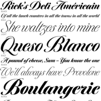 Calligrapher, sign painter, and graphic and type designer from Milton, Mass., who was born in New York, studied design and photography at Harpur College there (graduating in 1975), did some lettering in Syracuse until 1977, worked for Bitstream in Boston from 1983-1991, and made a career afterwards as a staff type designer at Boston's Font Bureau. In 2016, he joined Type Network, where his fonts can be bought. Since 2021, Richard Lipton is senior type designer at The Type Founders in New York. MyFonts page. MyFonts interview in which his modesty comes to the fore. His typefaces:
 - Alhambra: a calligraphic typeface.
- Apotek: based on lettering on old medicine bottles seen in Oslo.
- Arrus BT (Bitstream, 1991). This is a serif typeface with heavy calligraphic influences. The capitals are roman inscriptional. More typefaces in this style are to come, he promised in 2010.
- Avalon (1995, calligraphic): based on the calligraphic writing of Austrian artist Friedrich Neugebauer.
- Bennet Text, Bennet Display (36 styles: a wedge serif news text family), Bennet Banner (36 styles). This high contrast didone-themed superfamily (but for the wedge serifs) can't shed that "look at me" vibe. The initial idea for Bennet came from Moth Design's logotype and stationery system for the North Bennet Street School in Boston.
- Benton Modern Display (2008, co-designed with Richard Lipton at Font Bureau: Benton Modern Text was first prepared by Font Bureau for the Boston Globe and the Detroit Free Press. Design and proportions were taken from Morris Fuller Benton's turn-of-the-century Century Expanded, drawn for ATF, faithfully reviving this epoch-making magazine and news text roman. The italic was based on Century Schoolbook.). See also here.
- Bickham Script (1997, Adobe): The 2004 OpenType Pro version has hundreds of ligatures and substitute forms. See also Bickham Script 3 (2014). Review of Bickham by Timothy Rolands. Bickham Script is based on examples from Bickham's The Universal Penman. Poster by Fernanda D'Andrea (2013). Bickham Script 3 won an award at Modern Cyrillic 2014.
- Bodoni FB (1992, Font Bureau, a headline bold based on Benton's 1933 Ultra Bodoni).
- Bremen (Bitstream), Bremen (1992, Font Bureau). This German art deco face was influenced by the poster lettering of Ludwig Hohlwein in 1922. Munich is an angular version of Bremen.
- Bureau Grot. One of Font Bureau's bestsellers.
- Canto (2011, Font Bureau) is a 32-style roman family that started out from the Trajan inscriptions via a few styles called Canto Brush to smooth and delicate styles such as Canto Pen. New styles were added in 2017.
- Cataneo BT (Bitstream, 1993; with Jacqueline Sakwa): an elegant chancery cursive based on the calligraphic work of the 16th-century writing master Bernardino Cataneo.
- Ecru
- Escrow Banner (2016). An extension of Cyrus Highsmith's Scotch Roman, Escrow (2006).
- Hoffmann (1993): a display family that is based on lettering by Lothar Hoffmann.
- Meno (1994, Font Bureau). Lipton explains his oldstyle design: the romans gain their energy from French baroque forms cut late in the sixteenth century by Robert Granjon, the italics from Dirk Voskens' work in seventeenth-century Amsterdam. In 2016, he extended Meno to a 78-style superfamily. In 2021, MyFonts released Meno Text and in 2022 Meno Display (36 styles) and Meno Banner (36 styles).
- Miller Banner (2010, Font Bureau): a completion of Matthew Carter's Scotch family Miller, that has banner and titling styles, and adds styles with extreme contrast and hairline serifs.
- Moderno FB
- Munich.
- Nutcracker.
- Rocky (2008, Font Bureau, with Matthew Carter).
- Savanna Script (2013). A connected tightly spaced calligraphic script in three weights.
- Shimano: an industrial geometric font.
- Shogun (with Margo Chase, 1995).
- Sloop Script (a penmanship script, 1994), inspired by the lettering of Raphael Boguslav. Sloop Script won an award at Modern Cyrillic 2014. Type Network published Sloop Script Pro in 2018. MyFonts relesed Sloop Script Pro in 2021.
- Talon
- Tangier (2010, Font Bureau): a Spencerian calligraphic family that was part of the 2008 redesign of Glamour Magzine.
A redesign of Matthew Carter's Postoni (1997), called Stilson (2009, with Jill Pichotta and Dyana Weissman): Since 1997, The Washington Post's iconic headlines have been distinguished by their own sturdy, concise variation on Bodoni, designed by Matthew Carter. For the 2009 redesign, Richard Lipton, Jill Pichotta, and Dyana Weissman expanded the family with more refined Display & Condensed styles for use in larger sizes. Originally called Postoni, the fonts were renamed in honor of The Post's founder, Stilson Hutchins. - Delaney (2016).
- Collier (2018). A 150+-style lapidary flared stem typeface family ranging from Compressed to Extra Extended widths.
- Englewood (2022). A script whose inspiration for Englewood came from the calligraphic hand of Philip Grushkin.
I Love Typography link. Klingspor link. FontShop link. Type Network link. MyFonts interview. View Richard Lipton's typefaces. [Google]
[MyFonts]
[More] ⦿
|
Lodovico Curione
|
 Italian writing master, b. Bologna, d. Roma 1617. Examples of his work date from 1582 and 1588. Author of II Cancelliere di Ludovico Curione ornato di lettere corsiue et d'altre maniere di caratteri vsati a scriuersi in Italia. Libre Quarto (Roma, 1609). [Google]
[More] ⦿
Italian writing master, b. Bologna, d. Roma 1617. Examples of his work date from 1582 and 1588. Author of II Cancelliere di Ludovico Curione ornato di lettere corsiue et d'altre maniere di caratteri vsati a scriuersi in Italia. Libre Quarto (Roma, 1609). [Google]
[More] ⦿
|
Lo-ol Type foundry
[Loris Olivier]
|
 Talented type and graphic designer based in Morgin and/or Grand-Lancy, Switzerland. After obtaining a BFA from the Academy of Art University of San Francisco, he started a Masters in the TypeMedia program at KABK in Den Haag, graduating in 2015. After the KABK, he started working from Geneva on editorial identity, branding, editorial, graphic and type design. His spouse, Noheul Lee, is also a type designer. Loris's typefaces:
 - Animax (2016). A lineale geometric consisting of text and display.
- Aragon (2014). A transitional serif for display.
- Arancia (2016). A lineale geometric consisting of text and display.
- Bachus (2016). A heavy brush script.
- Brienz (2019).
- Chablaix (2015). A neo-textura.
- Civilitate (2016-2018). A blackletter with roots in Robert Granjon's Civilité..
- Cozette (2016). A didone.
- Fanny (2014). An exquisite display family.
- Fournier (2014). A revival.
- Gloubi (2019). A psychedelic font.
- Groo (2013). A lineale neo-grotesk for text and display.
- Kartel (2014). A lineale neo-grotesk for text.
- Katchka (2014). An all caps typeface for Latin and Cyrillic.
- Lemanic (2015). His graduation typeface at KABK. This large transitional text typeface family Lemanic is accompanied by a decorative blackletter typeface. Loris writes: The different weights and styles are made for magazine or newspaper environements. The entire family is constructed in order to decrease the usage of images next to the text. The shapes of the book weights and its inspiration are taken from the fluidity and the rhythm of the work of Fournier and certain shapes of the Romain du Roi.
- McQueen Superfamily (2020). A 20-style sans family in Display and Grotesque subfamilies by Loris Olivier, Noheul Lee and Katja Schimmel, realeased by Fontwerk.
- Medley (2015). A transitional serif for display.
- Merle (2016). A slab serif.
- Milwaukee (2014). A text typeface, + Stencil Bold.
- Misc (2013). A serif, sans and script trio.
- Moritz (2015). A slab serif.
- Orniere (2016). A lineale humanist sans, slightly flared and lapidary, for text and display.
- Phantom (2016). A transitional monospace serif (text and display).
- Phily (2015). A lineale geometric consisting of headline and display.
- Rouka (2015). A lineale neo-grotesk stencil typeface.
- Saudade (2013). A transitional serif in text and display versions.
- Scarpelli (2012). An étude in ball terminals.
- Soprana (2014). A transitional serif in text and display versions.
- Susanfe (2016). A sans typeface.
- Tuilots (2014). A gorgeous calligraphic text typeface.
- Tweelo (2014). A garalde.
- Volpe (2015). A transitional serif for display.
- Wicht (2016). A humanist serif.
Home page. Future Fonts link. Fontwerk link. [Google]
[More] ⦿
|
Lord Kyl's Medieval and Fantasy Fonts
[Robert D. Anderson]
|
 Old URL. Another old URL. This was of the greatest archives, loaded with medieval and fantasy fonts, including many dingbats. Robert D. Anderson (aka Lord Kyl MacKay) scanned in many alphabets from "Medieval and Renaissance Alphabets" and created tens of beautiful historical fonts, and made them available free of charge: Anglo-Saxon 8th c, Battel Abbey 8th C, British Block Flourish 10th c, British Museum 14th c, British Outline Majuscules 10th c., Celtic Knot, Curved Majuscules 17th c., Decorated Majuscules 14th c., English Gothic 17th c, Floral Majuscules 11th c, German Blackletters 15th c, Gothic Leaf, Gothic Straight-Faced 18th c., Italian Cursive 16th c (GREAT!), Library of Minerva 9th c., Spanish Round Bookhand 16th c., Traditional Gothic 17th c, Vatican Rough Letters 8th c, Celtic Knot (caps), Gothic Leaf (caps font), Medieval Dingbats.
 Alternate URL at TypOasis. Other archive categories: runic fonts, gothic, versals (initial caps), uncial, roman era, anglo-saxon. Old URL. Dafont link. Fontspace link. [Google]
[More] ⦿
|
Loris Olivier
[Lo-ol Type foundry]
|
 [More] ⦿
|
Luca Bolognese
|
Italian calligrapher and programmer who splits his time between Spain and Italy. He writes that he is inspired by the classical Italic hand, as exemplified by Fairbanks and Lloyd Reynolds and that his fonts strike a balance between the freshness of the pen and the rigidity of the digital medium. Typefaces from 2021: Italiko (a calligraphic typeface family; see also his Github page on Italiko). [Google]
[MyFonts]
[More] ⦿
|
Lucia Jurado
|
Graphic designer in Sevilla, Spain. In 2017, she drew a chancery script alphabet. [Google]
[More] ⦿
|
Ludovico Vicentino degli Arrighi da Vicenza
|
 Influential Italian printer, writing master and calligrapher, b. ca. 1475-1480, d. 1527, aka Ludovico Vicentino (degli Arrighi), or Ludovico il Vicentino. Around 1510 he was a bookseller in Rome. He was employed as a scribe at the Apostolic Chancery in 1515. Author in 1522 of the writing manual La Operina, da imparare di scrivere littera cancellarescha, which was the first one for popular use. La Operina contains the first printed example of Chancery Cursive. In 1523, he wrote a sequel, Il modo de temperare le penne, a beautiful and influential typographic manual.
 Roderick Cave writes in his The Private Press: The first part of this was printed entirely from wood blocks, but the second part, Il Modo di Temperare le Penne, contains several pages printed in a very fine italic typeface modeled on the cancellaresca formata hand. The type was fairly obviously derived from the hand used by Arrighi himself; it seems likely that the punches were cut by his partner, who can with reasonable certainty be identified as Lautizio de Bartolomeo dei Rotelli, of whose skill as an engraver of seals Benvenuto Cellini speaks with respect in his Autobiography. He started printing in 1524 and designed his own italic typefaces for his work, which were widely emulated. His letterforms were revived in the 20th century by designers such as Plumet (1925), Stanley Morison (Monotype Blado (1923, Stanley Morrison) is based on Arrighi's lettering---it was unfortunately named after the printer Antonio Blado who used the type in the 1530s; the name Monotype Arrighi would have been more appropriate), Frederic Warde (in his Arrighi Italic, 1925), Robert Slimbach (one could say that his memory lives on through fonts like Adobe Jenson Multiple Master), Ladislav Mandel (Cancellaresca), Willibald Kraml (Vicentino, 1992), Paulo W (as Volitiva), Gunnlaugur S.E. Briem (Briem Operina), James Grieshaber (P22 Operina), Michelle Dixon (Arrighi Copybook), Gilles Le Corre (1522 Vicentino, 2011) and Jonathan Hoefler (Requiem Text). Arrighi's last printing was dated shortly before the sack of Rome (1527), during which he was probably killed. Sample pics: Fantastic ornamental capitals (1522), roman capitals (1522), Italian capitals, Italian minuscule. [Google]
[MyFonts]
[More] ⦿
|
Ludwig M. Souzen
[Didones]
|
[More] ⦿
|
Manuel Barata
|
Lisbon-born calligrapher. Author of Arte de Escrever (1572, Lisbon), a writing manual. Posthumously, in 1590, Antonio Alvares published this book, Exemplares de diversas sortes de letras tirados da Polygraphia de Manoel Barata Escritor Portuguez acrecentadas pelo mesmo Author para comum proveito de todos. Derigido ao Excelentissimo D. Theotonio Duque de Bragança e de Barcellos Condestavel dos Reynos de Portugal (Lisbon). Scans, all from 1572: Chancery hand, rotunda, calligraphy. [Google]
[More] ⦿
|
Marc Hermann
|
German artist and illustrator. Creator of the elegant 18th century chancery typeface Handwriting1800 (2008). Alternate URL. Homepage. [Google]
[More] ⦿
|
Måns Grebäck
[Aring Typeface]
|
 [MyFonts]
[More] ⦿
[MyFonts]
[More] ⦿
|
Martin Billingsley
|
 Martin Billingsley (1591-1622) was an English writing master based in London. Author of The Pens Excellencie, or the Secretarys Delight (1618).
 The number of hands set out by Billingsley in examples was six, with some additional subdivisions. The six were the Secretary ["the usuall hand of England"]; the Bastard Secretary, or Text; the Roman [the hand "usually taught to women"]; the Italian; the Court [used in the courts of King's Bench and Common Pleas]; and the Chancery. [Google]
[More] ⦿
|
Mauricio Amster
|
 Polish-Spanish designer, 1907-1980, who fled Spain in 1939 to Chile on board of the Winnipeg, and who revolutionized editorial design in Chile. He worked on the mag Zig-Zag. Examples of his sublime lettering: calligraphy, Cancellaresca, Gotica Bastarda, Romana Antigua, Romantica Humanistica, Rotunda.
 Photo. Joaquin Contreras wrote a thesis at the Faculty of Architecture of the University in Chile in 2007 entitled Diseño de fuentes tipográficas, basadas en los libros integramente caligrafiados por Mauricio Amster en Chile. I quote from a talk given by Contreras in 2021: Mauricio Amster Cats is a leading Polish editorial designer who worked for 40 years in Chile as a publisher, potter, lettering artist and teacher. He published two books on graphic standards to support his classes at the school of journalism and design hundreds of books. Son of Jewish parents persecuted by the Nazi regime, as a young man he studied graphic arts in Germany. Together with his friend Mariano Rawicz he travelled to Spain to take part in the civil war. In Madrid he designed newspapers, pamphlets, posters and books, the best known being the Cartilla Escolar Antifascista, a study book for militiamen. As a refugee he travelled to Chile on the Winnipeg, a ship prepared by Pablo Neruda (Chilean poet, diplomat, winner of the Nobel Prize) where he arrived with his wife Adina, a Spanish bookbinder with whom he shared his life. In Chile he started out as an anarchist, but as time went by he became part of Chilean culture until he became probably the most important designer of the last century. [Google]
[More] ⦿
|
Maximiliano Sproviero
[Sproviero Type (was: Lián Types)]
|
 [MyFonts]
[More] ⦿
[MyFonts]
[More] ⦿
|
Metafont Quellen
[Jobst-Hartmut Lueddecke]
|
Jobst-Hartmut Lueddecke's page has metafont sources for Suetterlin (by B. Ludewig), old Irish Uncial (by Jo Jaquinta), Italic (Cancellaresca corsiva) of Ludovico degli Arrighi, called Vicentino (Italy, early 16. century) by Willibald Kraml, yfrak, yinit, ygoth, yswab and cmfrak, Fraktur fonts by Yannis Haralambous. Also, the rune fonts bard (Celtic Bard Runes by Jobst-Hartmut Lueddecke), futhark (by Micaela Pantke and Sigrid Juckel), srune (by Jobst-Hartmut Lueddecke), the fantasy fonts cirth (dwarven runes created by J.R.R.Tolkien, by Jo Jaquinta), engwar (by Michael Urban), goblin (by Alan M. Stanier), tengwar (elven runes created by J.R.R.Tolkien, by Michael Urban), Jörg Knappen's EC fonts, hksym (a dingbat font by Hartmut Kennhöfer and Jobst-Hartmut Lueddecke), moonphases (dingbats by Stanislav Brabec, and wasy (dingbats by Roland Waldi). [Google]
[More] ⦿
|
Michel Bujardet
[Fontmenu.com]
|
[MyFonts]
[More] ⦿
|
Michele Smaldini
|
 Cinquecento is a free italic serif font created by Michele Alessandro Smaldini (Adelfia, Italy), Matteo Lucarelli, Giovanni Dilauro and Marija Andelkovic in 2020 during their industrial design studies at Politecnico di Bari, Italy. This typeface is inspired by 16th century chancery glyphs from Giovan Francesco Cresci's Essemplare di piu sorti lettere (1560). [Google]
[More] ⦿
Cinquecento is a free italic serif font created by Michele Alessandro Smaldini (Adelfia, Italy), Matteo Lucarelli, Giovanni Dilauro and Marija Andelkovic in 2020 during their industrial design studies at Politecnico di Bari, Italy. This typeface is inspired by 16th century chancery glyphs from Giovan Francesco Cresci's Essemplare di piu sorti lettere (1560). [Google]
[More] ⦿
|
Minority languages of Russia on the Net
[Esa Anttikoski]
|
Esa Anttikoski's page with minority Russian language links. Has fonts for Altai/Mari, Kazakh, Tatar, Chechen, Chuvash (TimesEC), Udmurt, Ossetian, Karelian, Yakut. His font Abur (2000). Subpage on Russian minority language fonts. In particular, free fonts offered include - Eurasian fonts for Bashkir, Buryat, Chuvash, Kalmyk and Tatar (Cyrillic): Bookman Eurasian, Chancery Eurasian, Gothic Eurasian, Mono Eurasian, Palladio Eurasian, Roman Eurasian, Sans Eurasian, Sans Condensed Eurasian, Schoolbook Eurasian. The original fonts were created by URW++, the Cyrillic part by Valek Filippov, and were modified by Esa Anttikoski. These fonts can be distributed and modified freely in accordance with the GNU General Public License.
- Kildin fonts for the Kildin Saami dialect: Bookman Kildin, Mono Kildin, Roman Kildin, Sans Kildin.
- Mansi fonts for the Mansi language: Schoolbook Mansi.
- Paleoasian fonts for Chukchi, Eskimo, Itelmen, Ket, Koryak and Nivkh: ER Bukinist Paleoasian, ER Univers Paleoasian.
- Sakha fonts for Dolgan and Yakut: Bookman Sakha, Chancery Sakha, Gothic Sakha, Mono Sakha, Palladio Sakha, Roman Sakha, Sans Sakha, Sans Condensed Sakha, Schoolbook Sakha.
- Sayan-Altai fonts for Altai, Khakas and Shor: Chancery Sayan-Altai, Roman Sayan-Altai, Schoolbook Sayan-Altai.
- Uralic fonts for Altai, Khanty, Komi, Mari, Nenets, Selkup and Udmurt: Bookman Uralic, Chancery Uralic, Gothic Uralic, Mono Uralic, Palladio Uralic, Roman Uralic, Sans Uralic, Sans Condensed Uralic, Schoolbook Uralic, Zagadka.
[Google]
[More] ⦿
|
MunchFonts
[Gary Munch]
|
 Gary Munch (born 1953) is the Stamford, CT-based principal of MunchFonts. He teaches at Norwalk Community College and at the University of Bridgeport Shintaro Akatsu School of Design.. His typefaces:
 - GMAhuramazda (runes).
- Calligraphic.
- Candara (2005), a flared typeface done for Microsoft's ClearType project. Candara received a TypeArt 05 award.
- GMChanceryModern.
- Munch produced three new Cherokee fonts in 2011 in response to a request by Joseph Erb, of language technology and education services at the Cherokee Nation: Chancery Modern ProCherokee (a sleek sans serif semi-cursive font), Neogrotesk Cherokee (a multipurpose workhorse design), and Munch Chancery Cherokee (a calligraphic font that resembles handwriting). The Cherokee Nation is using Munch Chancery at its Cherokee Immersion School.
- GMClavier.
- GMDuomo.
- Linotype Ergo.
- The 8-weight didone font family GMFidelio is my favorite.
- Finerliner (linked handwriting).
- GMGlobe.
- GMHieroglyphic.
- GMHyperspace.
- GMLondinium (1993, a blackletter face), and GM Londinium Versals (a Lombardic face).
- GMMage.
- GMMedallion. An architectural writing font made in 1997.
- GMMeter.
- GMMunchfonts.
- GMMunchies.
- GMNanogram.
- GMPepRally.
- GMPrentice.
- Linotype Really (1997). An almost-didone family with Cyrillic and Greek extensions for which he received an award at the TDC2 2001 competition, and obtained third prize at the 3rd International Digital Type Design Contest by Linotype Library. It was updated to Really No2 in 1999.
- GM SPQR. A Trajan type family.
- UrbanScrawlButtah, UrbanScrawlChill, UrbanScrawlDown, UrbanScrawlFly.
- GM Wodensday.
Klingspor link. FontShop link. Linotype link. Old home page. Showcase of Gary Munch's fonts. [Google]
[MyFonts]
[More] ⦿
|
MyFonts: Chancery
|
Top-ranked chancery fonts at MyFonts. [Google]
[More] ⦿
|
Nova Type Foundry
[Joana Maria Correia da Silva]
|
 Graduate of the University of Reading in 2011, who was born in Porto, Portugal. Joana worked as an architect and graphic designer in Portugal. She currently lives in the UK and/or Porto, Portugal. Since 2011, she teaches type design at ESAD (Escola Superior de Artes e Design). Since 2021, Joana Correia is foundry relations manager at The Type Founders in New York.
 In 2010, under the supervision of Dino dos Santos at ESAD, Joana designed an unnamed bastarda / chancery typeface that is based on originals by Francisco Lucas. Creator of the script typeface Violet (2011). Artigo (2011) is an angular type family for Latin, Hindi and Greek that was created during her studies at Reading. Artigo won Second Prize for Greek typefaces at Granshan 2011. It also won an award at TDC Typeface Design 2018. In 2017, Ndiscovered published Artigo Global and Artigo Pro. Artigo Display followed in 2018. In 2020, Nova Type Foundry republished Artigo, Artigo Display. In 2012, she published the didone text typeface Cantata One at Google Web Fonts. Quando (Google Web Fonts) is a serifed text typeface inspired by brushy handwritten letters seen on an Italian poster from the second world war. In 2013, at MSTF Partners, a Portuguese consultancy, she created Writers Font (2013). This is a script typeface by Joana Correia that combines the handwriting of famous Portuguese authors. For example the A is by José Luis Peixoto, the B by José Saramago and the C by António Lobo Antunes. Link with the story. Still in 2013, she showed an unnamed unicase sans typeface and participated in the Canberra typeface competition. In 2014, she made the round connected script typeface Jasmina FY (Fontyou), the Google Web Font Karma (for Latin and Devanagari: Karma is an Open Source multi-script typeface supporting both the Devanagari and the Latin script. It was published by the Indian Type Foundry; see also Open Font Library), and Canberra FY (at Fontyou: a short-serifed typeface family). In 2015, Adrien Midzic and Joana Correia co-designed Saya Serif FY. Still in 2015, she published the humanist sans typeface family Vyoma at Indian Type Foundry. Amulya (2015-2021) is another humanist sans, now in 8 styles with two variable fonts, published by Correia at Indian Type Foundry's Fontshare. In 2016, Joana Correia and Natanael Gama co-designed the Latin / Tamil typeface Arima Madurai (free at Google Fonts). Their Arima Koshi (2016) covers Tamil, Malayalam and Latin. In 2016, Joana Correia and Natanael Gama co-designed the connected typeface Tidy Script at Indian Type Foundry. In 2017, Joana published Laca Pro: Laca is a semi-sans serif inspired by retro Portuguese packaging of soaps. Laca is the Portuguese word for hairspray. Free download. Laca Text (2018) is a sans serif version of Laca. For Nova Type versions, see Laca (2019) and Laca Pro (2020). The latter versions cover Greek and Cyrillic as well. In 2018, Joana published the soft script typeface Lemongrass: It was inspired by brush lettering and the sea and the strong winds that exist in Porto. At Future Fonts, she released the didone typeface Alga (2019), in which ball terminals are replaced by genuflections. She was the principal designer of the sans family Varta (2019, Sorkin Type), which is available from Google Fonts and Github. Assistance of Viktoriya Grabowska and Eben Sorkin. Typefaces from 2020: Loretta (with Abel Martins; see also Future Fonts; Loretta is a low contrast text typeface that comes in 12 styles), Loretta (Future Fonts: a low contrast text typeface in 12 styles; by Joana Correia and Abel Martins). Interview in 2021. Behance link. Another Behance link. Old home page. Joana Correia link at Behance. Future Fonts link. Type Department link. Speaker at ATypI 2018 in Antwerp. [Google]
[MyFonts]
[More] ⦿
|
Oliver Weiss
[Walden Font]
|
 [MyFonts]
[More] ⦿
[MyFonts]
[More] ⦿
|
Omega Type Foundry
[Toshi Omagari]
|
 Toshi Omagari is a Japanese type designer who grew up in Fukuoka and studied typography and type design at Musashino Art University in Tokyo. After graduating in 2008, Toshi taught graphic design in Fukuoka. He joined the University of Reading in the summer of 2010 and graduated in 2011. He is a type designer at Monotype.
 His graduation typeface Marco (<2011), which is named after Marco Polo, covers Latin, Mongolian, Greek, and Cyrillic, and has sans and serif versions. Inspiration for Marco goes back to Italian humanist typography such as those of Nicholas Jenson or Aldus Manutius, and general influences from calligraphy. Marco is a true superfamily, with wide utility and superb legibility---not surprisingly, it won an award at Modern Cyrillic 2014. The text styles were professionally produced in 2015 by Type Together in 2015---each style has over 1900 glyphs. His chancery hand typeface Tangerine (2010) is part of the Google font directory (for free web fonts). Typefaces from 2013: Metro Nova (Linotype: a sans family with a strangely circumcised lower case f). Metro Nova won an award at TDC 2014. Typefaces from 2014: Neue Haas Unica and Neue Haas Unica Pan European. A digital update of the Helvetica alternative Haas Unica, which was originally released in 1980 by the Haas Type Foundry for phototypesetting. In 2015, he made Cowhand (Monotype: a Western typeface). All words typed in Cowhand are of equal width, whether they contain one character or twenty (the maximum the font allows). For Monotype, he made the custom typeface Quentin Blake (2016) that emulates the irregular handwriting of Sir Quentin Blake, acclaimed illustrator of Roald Dahl's novels. In 2017, Toshi Omagari designed the Wolpe Collection for Monotype, all based on Berthold Wolpe's distinctive typefaces: Wolpe Pegasus, Wolpe Tempest, Wolpe Fanfare, Sachsenwald (blackletter: a revival of Berthold Wolpe's Sachsenwald from 1936), Albertus Nova. In 2018, Linda Hintz and Toshi Omagari published the large geometric sans typeface family Neue Plak that revives and extends Paul Renner's Plak (1928). Nadine Chahine and Toshi Omagari collaborated with Akira Kobayashi and Monotype Studio on Avenir Next Arabic (2021). At his own foundry, Omega Type, he released these typefaces in 2021: Klaket (a bold and monolinear Arabic display typeface that was inspired by classic Egyptian film posters in a free form Ruqah style), Platia (a modern revival of the 19th century font Hellenic Wide). At ATypI 2011 in Reykjavik, he spoke about Mongolian scripts. At ATypI 2015 in Sao Paulo, he revealed his research on the Siddham (post-Brahmian). Speaker at ATypI 2016 in Warsaw on BubbleKern (a new kerning algorithm). Speaker at ATypI 2017 Montreal on Sini: Arabic calligraphic styles from the Far East. Fontsquirrel link. Dafont link. Klingspor link. I Love Typography link. Google Plus link. Interview by MyFonts in 2022. [Google]
[MyFonts]
[More] ⦿
|
Orne Macuglia
|
During her graphic design studies in Buenos Aires, Argentina, Orne Macuglia created the chancery typeface Romess (2015). [Google]
[More] ⦿
|
ParaType
|
 The main digital type foundry in Russia. ParaType was established as a font department of ParaGraph International in 1989 in Moscow, Russia. At that time in the Soviet Union, all typeface development was concentrated in a state research institute, Polygraphmash. It had the most complete collection of Cyrillic typefaces, which included revivals of Cyrillic typefaces developed by the Berthold and Lehmann type foundries established at the end of 19th century in St. Petersburg, and artwork from Vadim Lazurski, Galina Bannikova, Nikolay Kudryashov and other masters of type and graphic design of Soviet time. ParaType became the first privately-owned type foundry in many years. A license agreement with Polygraphmash allows ParaType to manufacture and distribute their typefaces. Most of Polygraphmash staff designers soon moved to ParaType. In the beginning of 1998, ParaType was separated from the parent company and inherited typefaces and font software from ParaGraph. The company was directed by Emil Yakupov until February 2014. After Yakupov's death, Irina Petrova took over the reins.
 Products include FastFont, a simple TrueType builder, ParaNoise, a builder for PostScript fonts with random contours, FontLab, a universal font editor and ScanFont, a font editor with scanning module. Random, customized fonts. Multilingual fonts including, Latin, Cyrillic, Arabic, Greek, Georgian and Hebrew fonts for Macintosh and Windows. Catalog. Designers. Alternate URL. Famous typefaces by Paratype include Academy, Pragmatica, Newton, Courier, Futura, Petersburg, Jakob, Kuenstler 480, ITC Studio Script, ITC Zapf Chancery, Amore CTT (2004, Fridman), Karolla, Inform, Hafiz (Arabic), Kolheti (Georgian), Benzion (Hebrew). The PT Sans (Open Font Library link), PT Serif and PT Mono families (2009-2012) are free. PT stands for Public Type. Another download site. PT Sans, for example, consists of PTSans-Bold, PTSans-BoldItalic, PTSans-Caption, PTSans-CaptionBold, PTSans-Italic, PTSans-Narrow, PTSans-NarrowBold, PTSans-Regular. Other free ParaType fonts include Courier Cyrillic, Pushkin (2005, handwriting font), and a complete font set for Cyrillic. Type designers include Vladimir Yefimov, Tagir Safayev, Lyubov Kuznetsova, Manvel Schmavonyan and Alexander Tarbeev. They give this description of the 370+ library: The Russian constructivist and avant garde movements of the early 20th century inspired many ParaType typefaces, including Rodchenko, Quadrat Grotesk, Ariergard, Unovis, Tauern, Dublon and Stroganov. The ParaType library also includes many excellent book and newspaper typefaces such as Octava, Lazurski, Bannikova, Neva or Petersburg. On the other hand, if you need a pretty typeface to knock your clients dead, meet the ParaType girls: Tatiana, Betina, Hortensia, Irina, Liana, Nataliscript, Nina, Olga and Vesna (also check Zhikharev who is not a girl but still very pretty). ParaType also excels in adding Cyrillic characters to existing Latin typefaces -- if your company is ever going to do business with Eastern Europe, you should make them part of your corporate identity! ParaType created CE and Cyrillic versions of popular typefaces licensed from other foundries, including Bell Gothic, Caslon, English 157, Futura, Original Garamond, Gothic 725, Humanist 531, Kis, Raleigh, and Zapf Elliptical 711. Finally, ParaType offers a handwriting font service out of its office in Saratoga, CA: 120 dollars a shot. View the ParaType typeface library. Another view of the ParaType typeface collection. [Google]
[MyFonts]
[More] ⦿
|
Patrick Griffin
|
 Type designer at Canada Type. Wikipedia tells us that Patrick Griffin had been locked away in a mental institution by Carter and Barbara, after he walked in on his mother performing oral sex on Jackie Gleason. He had a nervous breakdown and was sent to a mental hospital, where he came to the conclusion that Gleason was evil because he was fat, leading him to hate fat people. However, that is a different Patrick Griffin. The real Patrick Griffin, a graduate of York University, lives and works in Toronto, where he founded Canada Type and made it the most successful Canadian type foundry. His work is summarized in this 2009 interview by MyFonts. It includes lots of custom work for banks, TV stations, and companies/groups like New York Times, Pixar, Jacquin's, University of Toronto, and the Montreal Airport. His retail fonts include the following.
 - Ambassador Script (2007): a digital version of Juliet, Aldo Novarese's 1955 almost upright calligraphic (copperplate style) connected script, with hundreds of alternates, swashes, ends, and so forth. Done with Rebecca Alaccari.
- Autobats (2005).
- Ballantines Twelve (2014). A custom typeface for Allied Domecq Spirits & Wine Limited, the brand owner of Ballantine's Scotch Whisky.
- Bananas (2020). An 18-style informal sans.
- P22 Barabajagal (2018): P22 Barabajagal is a unique take on the display fat face by way of doodling fun. Somewhat informed by the shapes of an uncredited 1960s film type called Kap Antiqua Bold, this font's aesthetic is the stuff of boundless energy and light humour. This is the kind of font that makes you wonder whether it was drawn with rulers, protractors and compasses, or just by a mad doodler's crazy-good free hand.
- Bigfoot (2008), the fattest font ever made (sic).
- Blackhaus (2005), an extension of Kursachsen Auszeichnung, a blackletter typeface designed in 1937 by Peterpaul Weiß for the Schriftguss foundry in Dresden.
- Blanchard (2009): a revival and elaborate extension of Muriel, a 1950 metal script typeface made by Joan Trochut-Blanchard for the Fonderie Typographique Française, that was published simultaneously by the Spanish Gans foundry under the name Juventud.
- Bluebeard (2004), a blackletter face.
- Book Jacket (2010): this is a digital extension of the film type font Book Jacket by Ursula Suess, published in 1972.
- Boondock (2005): a revival of Imre Reiner's brush script typeface Bazaar from 1956.
- Borax (2011-2021). An ode to the typography scene of New York City and Chicago in the late 1970s.
- Broken (2006): grunge.
- Bunyan Pro (2016, Patrick Griffin and Bill Troop). Bunyan Pro is the synthesis of Bunyan, the last face Eric Gill designed for hand setting in 1934 and Pilgrim, the machine face based on it, issued by British Linotype in the early 1950s---the most popular Gill text face in Britain from its release until well into the 1980s.
- Chalice (2006). Religious and Cyrillic influences.
- Chapter 11 (2009): an old typewriter face.
- Chikita (2008): an upright ronde script done with Rebecca Alaccari, and rooted in the work of 1930s Dutch lettering artist Martin Meijer.
- Clarendon Text (2007). A 20-style slab serif that uses inspiration from 1953 typefaces by Hoffmann and Eidenbenz and the 1995 font Egizio by Novarese.
- Classic Comic (2010).
- Coconut and Coconut Shadow (2006). Great techno pop typefaces.
- Coffee Script (2004): the digital version of R. Middleton's Wave design for the Ludlow foundry, circa 1962. Designed with Phil Rutter.
- Colville (2017). A set of sans headline typefaces based on letters used by Canadian painter Alex Colville.
- Comic book typefaces: Caper or Caper Comic (2008), Captain Comic (2007), Classic Comic (2010), Collector Comic (2006, a comic balloon lettering family), Common Comic (2013).
- Counter (2008): A futuristic beauty with a double-lined cursive thrown in. Available exclusively from P22. This typeface was based on the idea for an uncredited film typeface called Whitley, published by a little known English typesetting house in the early 1970s.
- Cryptozoo (2009): Late director of design for VANOC, the Vancouver 2010 Olympic Committee, Leo Ostbaum, commissioned Canada Type to make a typeface for the Vancouver Winter Olympics. Patrick Griffin came up with a rounded signage font called Cryptozoo, whose Notice reads Concept and design by Leo Obstbaum, VANOC Brand & Creative Services. Additional character data and technical production by Canada Type. Copyright 2007 VANOC Brand&Creative Services.
- Dads Handwriting (2014, custom typeface).
- Dancebats (2004).
- Davis (2016, a slab serif) and Davis Sans (2016). Typeface families designed for precision-engineered corporate use. All proceeds will go towards higher education expenses of design graduates.
- Dokument Pro (2014). This is a reworking of a typeface made in 2005 by the late Jim Rimmer: Jim Rimmer aptly described his Dokument family as a sans serif in the vein of New Gothic that takes nothing from News Gothic. Dokument Pro is thoroughly reworked and expanded, with different widths still in the pipeline.
- Dominion (2006). Based on an early 1970s film type called Lampoon. Dominions severely geometric shapes are a strange cross between early Bauhaus minimalism and later sharp square typefaces used for instance in Soviet propaganda posters.
- Doobie (2006). 60s psychedelic style.
- Driver Gothic (2008): based on the typeface used for Ontario license plates. Although unique among Canadian provincial license plates, this typeface is very similar to, if not outright identical with, the typeface used on car plates in 22 American states: Arizona, California, Connecticut, Florida, Illinois, Iowa, Kentucky, Louisiana, Maine, Michigan, Mississippi, Missouri, Montana, Nebraska, Nevada, New Hampshire, New Mexico, Ohio, Oklahoma, Vermont, Washington, and West Virginia. Ideal for license plate forgers.
- Expo (2004): an octagonal family.
- Fab (2007). A tube-design family reminiscent of the 1980s. Ricardo Cordoba writes: Fab reminds me of leafing through my first Letraset catalog in the mid-1980s all those decorative typefaces with rounded ends and tubular shapes, trying to imitate the look of neon signage. But Fab, with its contemporary twist on that aesthetic, and its unicase characters, manages to look like a cross between Cholla Bold and Frankfurter Highlight. Its handtooled, narrow shapes are perfectly suited to pop subject matter and bright colors. Fab Trio can be used to create layered chromatic effects, but its components can stand alone, too. The Seventies sure aint drab in Patrick Griffin's hands.
- Fantini (2006). An update of the curly art nouveau typeface Fantan, a film type from 1970 by Custom Headings International.
- Feather Script (2012). A revival of an old Lettering Inc font from the 1940s, known then as Flamenco.
- Fido (2009) is the official font of dog owners everywhere. Has Saul Bass influences.
- Filmotype fonts: Filmotype Ace (2015; based on a Filmotype script from 1953), Alice (2008, a casual hand-printed design based on a 1958 alphabet by Filmotype), Filmotype Arthur (2015; based on a Filmotype script from 1953), Athens (2014), Filmotype Brooklyn (2009, a casual script based on a 1958 Filmotype font), Filmotype Candy (2012), Filmotype Carmen (2012), Filmotype Hemlock (2013, a retro signage script), Hickory (2014), Filmotype Homer (2014, a brush signage script), Filmotype Hudson (1955, based on a 1955 original), Filmotype Jessy (2009, a flowing upright connected script based on a 1958 design by Filmotype), Filmotype Jupiter (2015; based on a Filmotype brush script from 1958), Filmotype Kellog (2013), Filmotype Lakeside (2013, a retro signage typeface), Filmotype Leader (2013), Filmotype Liberty (2015; based on a Filmotype brush script from 1955), Filmotype Giant (2011, a condensed sans done with Rebecca Alaccari) and its italic counterpart, Filmotype Escort (2011, done with Rebecca Alaccari), Filmotype Keynote (2013, a connected bold advertising script), Filmotype Lacrosse (2013, a retro script from the 1950s sometimes used in department store catalogs of that era), Filmotype LaSalle (2008, based on a 1952 retro script by Ray Baker for Filmotype), Filmotype Harmony (2011, original from 1950 by Ray Baker), Filmotype Kentucky (a 1955 original by Ray Baker), Filmotype Kingston (a 1953 original by Ray Baker), Filmotype Lucky (2012, based on a font by Ray Baker), Filmotype Hamlet (a 1955 original by Ray Baker), Filmotype Panama (2012, a flared casual serif typeface based on a 1958 original), Filmotype Prima (2011, with Rebecca Alaccari), Filmotype Quiet (2010, based on a 1954 military stencil typeface by Filmotype), Filmotype Yale (2012, a wedding invitation script based on a 1964 original by Filmotype), Filmotype York (2014).
- Flirt (2005). Based on an art deco typeface found in a Dover specimen book.
- P22 Folkwang Pro (2017, at P22). A revival of Hermann Schardt's Folkwang (1949-1955, Klingspor).
- Fuckbats (2007).
- Fury (2008): an angry techno family.
- Gala (2005, expanded in 2017). By Griffin and Alaccari. Gala is the digitization of the one of the most important Italian typefaces of the twentieth century: G. da Milanos 1935 Neon design for the Nebiolo foundry. This designs importance is in being the predecessor - and perhaps direct ancestor - of Aldo Novareses Microgramma (and later Eurostile), which paved the worlds way to the gentle transitional, futuristic look we now know and see everywhere. It is also one of the very first designs made under the direction of Alessandro Butti, a very important figure in Italian design.
- Gallery (2004): art deco.
- Gamer (2004-2006), by Griffin and Alaccari: modeled after a few 1972 magazine advertisement letters, the origin of which was later identified as a common film type called Checkmate.
- Gaslon (2005): a modification of A. Bihari's Corvina Black from 1973.
- Gator (2007). A digital version of Friedrich Poppl's Poppl Heavy (1972), which in turn was one of the many responses by type designers to Cooper Black.
- Genie (2006): a psychedelic typeface based on a 1970s film type called Jefferson Aeroplane.
- Gibson (2011, with Kevin King and Rod McDonald). This 8-style humanist sans family is a revival of McDonald's own Monotype face, Slate. It was named to honour John Gibson FGDC (1928-2011), Rod's long-time friend and one of the original founders of the Society of Graphic Designers of Canada. All the revenues from its sale will be donated by Canada Type to the GDC, where they will be allocated to a variety of programs aiming to improve the creative arts and elevate design education in Canada.
- Go (2005): a techno face.
- Goudy Two Shoes (2006): a digitization and expansion of a 1970s type called Goudy Fancy, which originated with Lettergraphics as a film type.
- Gumball (2005). A bubblegum font modeled after Richard Weber's 1958 font, Papageno.
- Hamlet (2006): medieval. Based on an old type called Kitterland.
- Happy (2005). Happy is the digital version of one the most whimsical takes on typewriters ever made, an early 1970s Tony Stan film type called Ap-Ap. Some of the original characters were replaced with more fitting ones, but the original ones are still accessible as alternates within the font. We also made italics and bolds to make you Happy-er.
- Heathen (2005). A grunge calligraphic script: The original Heathen was made by redrawing Phil Martin's Polonaise majuscules and superposing them over the majuscules of Scroll, another Canada Type font. The lowercase is a superposition of Scrolls lowercase atop a pre-release version of Sterling Script, yet another Canada Type font.
- Hortensia (2009): a semi-script Victorian typeface modeled after Emil Gursch's Hortensia (1900). Codesigned with Rebecca Alaccari.
- Hunter (2005). A revival of a brush script by Imre Reiner called Mustang (1956).
- Hydrogen (2007, a rounded geometric unicase family.
- Informa (2009): a comprehensive 36-style sans serif text family based on traditional lettering. He says: While some typefaces classified as such exhibit too much calligraphy (like Gill Sans, Syntax and Optima), and others tend to favor geometric principles in rhythm and proportion (like Agenda, Frutiger and Myriad), Informa stays true to the humanist ideology by maintaining the proper equilibrium between the two influences that drive the genre, and keeping the humanist traits where they make better visual sense.
- Jackpot (2005): The idea for Jackpot came from a photo type called Cooper Playbill, which as the name implies was simply a westernized version of Cooper Black. The recipe was simple: Follow Mr. Coopers big fat hippy idea, cowboy it with heavy slabs, give it true italics, then swash away at both for beautiful mixture. And there you have the bridge between groovy and all-American. There you have the country lover shaking hands with the rock and roll enthusiast. There you have your perfect substitute for the very overused Cooper Black.
- Jazz Gothic (2005): an expansion of an early 1970s film type from Franklin Photolettering called Pinto Flare. Image.
- Jezebel (2007).
- The psychedelic typeface Jingo (2014, with Kevin Allan King): This is the digital makeover and major expansion of a one-of-a-kind melting pot experiment done by VGC and released under the name Mardi Gras in the early 1960s. It is an unexpected jambalaya of Art Nouveau, Tuscan, wedge serifs, curlycues, ball endings, wood type spurs and swashes, geometry and ornamental elements that on the surface seem to be completely unrelated.
- Johnny (2006): with Rebecca Alaccari; based on Phil Martin's Harem or Margit fonts from 1969.
- Jupiter (2007): based on Roman lettering.
- P22 Klauss Kursiv (2018). A revival, at P22, of Karl Klauss's crisp fifties script typeface Klauss Kuriv (1956-1958, Genzsch & Heyse).
- Latex (2015). A layered all caps decal typeface.
- Leather (2005): an expansion of Imre Reiner's blackletter typeface Gotika (1933).
- Libertine (2011). Libertine (done with Kevin Allan King) is an angular calligraphic script inspired by the work of Dutchman Martin Meijer (1930s): This is the rebel yell, the adrenaline of scripts.
- Lionheart (2006). A digitization and extension of Friedrich Poppl's neo-gothic typeface Saladin.
- Lipstick (2006): handwriting. Plus Lipstick Extras.
- Louis (2012). A faithful digital rendition and expansion of a design called Fanfare, originally drawn by Louis Oppenheim in 1927, and redrawn in 1993 by Rod McDonald as Stylu.
- Maestro (2009) is a 40 style chancery family, in 2 weights each, with 3350 characters per font, co-designed with calligrapher Philip Bouwsma. This has to be the largest chancery/calligraphy family on earth.
- Magellan (2014). A custom stencil typeface.
- Martie (2006). Done with Rebecca Alaccari. Based on the handwriting of Martie S. Byrd.
- Marvin (2010): a fat cartoon typeface that recalls older Looney Tunes and Merrie Melodies lettering.
- In 2013, Kevin Allan King and Patrick Griffin revived Georg Trump's transitional typeface Mauritius (1967, Weber).
- Memoriam (2009): An extreme-contrast vogue display script which was commissioned by art director Nancy Harris for the cover of the 2008 commemorative issue of the New York Times magazine. He also did the typography and fonts for the 2010 issue. This became an unbelievably successful family, and was extended in 2011 with headline, Outline and Iline variants.
- Merc (2007). Based on an all-cap rough-brush metal typeface called Agitator, designed by Wolfgang Eickhoff and published by Typoart in 1960.
- Messenger (2010), a calligraphic script. Patrick Griffin writes about Messenger (2010, Canada Type): Messenger is a redux of two mid-1970s Markus Low designs: Markus Roman, an upright calligraphic face, and Ingrid, a popular typositor-era script. Through the original film typefaces were a couple of years apart and carried different names, they essentially had the same kind of Roman/Italic relationship two members of the same typeface family would have. The forms of both typefaces were reworked and updated to fit in the Ingrid mold, which is the truer-to-calligraphy one.
- Middleton Brush (2010): a redigitization of R.H. Middleton's connected brush typeface Wave, ca. 1962; see also an early Canada Type face, Coffee Script.
- Miedinger (2007). Created after Max Miedinger's 1964 face, Horizontal. Canada Type writes: The original film typeface was a simple set of bold, panoramically wide caps and figures that give off a first impression of being an ultra wide Gothic incarnation of Microgramma. Upon a second look, they are clearly more than that. This typeface is a quirky, very non-Akzidental take on the vernacular, mostly an exercise in geometric modularity, but also includes some unconventional solutions to typical problems (like thinning the midline strokes across the board to minimize clogging in three-storey forms). This digital version introduces a new lighter weight alongside the bold original..
- Militia (2007). An octagonal and threatening stencil.
- Militia Sans (2007).
- Monte Cristo (2012, with Kevin Allan King) is a grand type family with five styles and 1630 characters with many swashes and ways of connecting the calligraphic glyphs---it is the ultimate wedding font.
- Neil Bold (2010): an extension of the fat typeface Neil Bold (1966, Wayne J. Stettler).
- Nightlife (2005): inspired by a pre-desktop publishing grid design by L. Meuffels.
- Nuke (2005): a fat stencil grunge weith pizzazz.
- In 2011, he and Kevin Allan King published the refined Orpheus Pro family, which was based on the elegant Orpheus by Walter Tiemann (1926-1928, Klingspor), and its Italic which was called Euphorion (Walter Tiemann, 1936). Their enthusiastic description: The Orpheus Pro fonts started out as a straightforward revival of Tiemann's Orpheus and Euphorion. It was as simple as a work brief can be. But did we ever get carried away, and what should have been finished in a few weeks ended up consuming the best part of a year, countless jugs of coffee, and the merciless scrutiny of too many pairs of eyeballs. The great roman caps just screamed for plenty of extensions, alternates, swashes, ligatures, fusions from different times, and of course small caps. The roman lowercase wanted additional alternates and even a few ligatures. The italic needed to get the same treatment for its lowercase that Tiemann envisioned for the uppercase. So the lowercase went overboard plenty alternates and swashes and ligatures. Even the italic uppercase was augmented by maybe too many extra letters. Orpheus Pro has been a real ride. Images of Orpheus: i, ii, iii, iv, v.
- Outcast (2010): a grunge family.
- Oxygen (2006): a great grid-based design.
- Paganini (2011,(with Kevin Allan King) is another jewel in Canada Type's drawers: Designed in 1928 by Alessandro Butti under the direction of Raffaello Bertieri for the Nebiolo foundry, Paganini defies standard categorization. While it definitely is a classic foundry text typeface with obvious roots in the oldstyle of the Italian renaissance, its contrast reveals a clear underlying modern influence.
- The last joint project of King and Griffin in 2012 was Pipa, a pseudo-psychedelic groovy bellydancing font: Originally made for a health food store chain we cannot name, Pipa is the embodiment of organic display typography.
- Player (2007). An 11-style athletic lettering family.
- Plywood (2007): a retro typeface based on Franklin Typefounders's Barker Flare from the early 1970s.
- Press Gothic (2007). A revival of Aldo Novarese's Metropol typeface, released by Nebiolo in 1967 as a competitor to Stephenson Blakes Impact.
- Quanta (2005, stencil). Two weights, East and West.
- In 2011, Kevin Allan King and Patrick Griffin completed work on an exceptionally beautiful revival, Ratio Modern (the original by F.W. Kleukens is from 1923). This is a didone family with a refined humanist trait.
- Rawhide (2006): a bouncy Western saloon font based on cover page lettering of the Belgian comic book series Lucky Luke.
- Recta (2011, with Kevin King). This is eighteen-stye sans family that extends Novarese's Recta.
- Rhino (2005): a revival of the informal typeface Mobil (1960, Helmut Matheis, Ludwig&Mayer).
- Normandia (2021, by Patrick Griffin and Hans van Maanen). A digital revival of the fatface typeface Normandia by Alessandro Butti at Nebiolo (1946-1949).
- Noteworthy (2009). A font commissioned for the Apple iPad. It is based on Griffin's earlier revival typeface Filmotype Brooklyn.
- Ronaldson Regular (2008, with Rebecca Alaccari), a 17-style oldstyle family based on the 1884 classic by Alexander Kay, Ronaldson Old style (MacKellar, Smith&Jordan). Griffin reconstructed this family from the metal typeface and from many scans from rare documents provided by Stephen O. Saxe, Philippe Chaurize and Rebecca Davis.
- Roos (2009): A 10-style revival of Sjoerd Hendrik de Roos's De Roos Romein (1948), created in cooperation with Hans van Maanen.
- Robur (2010): Done with Kevin King, this set of two fonts revives Georges Auriol's Robur Noir from 1909.
- Runway (2004): racetrack lettering.
- Rush (2005): futuristic.
- Sailor (2005): digital rendition of West Futura Casual (late 1970s film type).
- Salden (2019, by Hans van Maanen and Patrick Griffin). A grand effort to collect the lettering of Dutch book and book cover designer Helmut Salden in a series of typefaces.
- Salome (2008). Done with Rebecca Alaccari, this is a revival and expansion of a photolettering era typeface called Cantini (1972, Letter Graphics).
- Santini (2004): Bauhaus-inspired architectural lettering.
- One of Heinz Schumann's unpublished typefaces from the early 1960s was revived in 2017 by Patrick Griffin and Richard Kegler at P22 as P22 Schumann Pro.
- Screener (2006): an extensive octagonal family, including Screener Symbols.
- Sears Social (2014). A custom typeface family that includes Sears Social Monocase.
- Secret Scrypt (2004): four shaky script styles done for a New York restaurant. With Alaccari.
- Semplicita Pro (2011). A grand revival of Alessandro Butti's Futura-like Semplicità, executed between 2009 and 2011 by Patrick Griffin and Bill Troop. Image of the Medium weight.
- Shred (2010): an octagonal heavy metal face.
- Siren Script (2009-2010): Done with Rebecca Alaccari, this six-style script family is based on the metal typeface Stationers Semiscript (BBS, 1899).
- Skullbats (2005).
- Serial Killer (2005): bloody.
- Slang (2004): a blood scratch face.
- Slinger (2010): a flared art nouveau face.
- Social Gothic (2007). After Tom Hollingsworth's Informal Gothic, a squarish unicase grotesk done in 1965. Followed by Social Stencil (2011-2012) and Social Gothic 2 (2014).
- Soft Press (2012). A rounded version of Canada Type's Press Gothic.
- Sol Pro (2010): a 20-style revival and extension of the monoline sans typeface Sol by Marty Goldstein and C.B. Smith (1973, VGC), done with Kevin Allan King. Griffin writes: This is not your grandfather's Eurostile. This is your offspring's global hope, optimism, and total awareness.
- Spade (2012). A super-heavy slab face, done with Kevin King.
- Spadina (2010): a psychedelic / art nouveau revival with Kevin Allan King of Karlo Wagner's Fortunata (1971, Berthold).
- Sterling Script (2005): done with Rebecca Alaccari. Sterling Script was initially meant to a be digitization/reinterpretation of a copperplate script widely used during what effectively became the last decade of metal type: Stephenson Blake's Youthline, from 1952. Many alternates were added, so this is a virtually new type family.
- Sultan: a Celtic-Arabic simulation typeface after "Mosaik" (1954) by Martin Kausche.
- Stretto (2008) is a revival and expansion of the reverse stress font Sintex 1 (Aldo Novarese, Nebiolo and VGC, 1973), a funky nightclub face. It was used as the basis of Cowboy Hippie (2010, CheapProFonts). Similar typefaces include ITC Zipper (1970) and Berthold Beat Star (1972).
- Symposium Pro (2011). This Carolingian family was drawn by Philip Bouwsma. Patrick helped with the production.
- Tabarnak (2012) and its shaded version, Tabarnouche (2012). Lovingly named to attract business from Quebec, this is a packaging or signage pair of fonts.
- Taboo (2009) is a geometric display typeface that was inspired by lettering by Armenian artist Fred Africkian in 1984.
- Testament (2010): a calligraphic uncial family done with Philip Bouwsma.
- Tomato (2005): done with Rebecca Alaccari, this is the digitization and quite elaborate expansion of an early 1970s Franklin Photolettering film type called Viola Flare.
- Treasury (2006): a huge type family based on a calligraphic script by Hermann Ihlenburg from the late 19th century. Canada Type writes: The Treasury script waited over 130 years to be digitized, and the Canada Type crew is very proud to have done the honors. And then some. After seven months of meticulous work on some of the most fascinating letter forms ever made, we can easily say that Treasury is the most ambitious, educational and enjoyable type journey we've embarked upon, and we're certain you will be quite happy with the results. Treasury goes beyond being a mere revival of a typeface. Though the original Treasury script is quite breathtaking in its own right, we decided to bring it into the computer age with much more style and functionality than just another lost script becoming digital. The Treasury System is an intuitive set of fonts that takes advantage of the most commonly used feature of todays design software: Layering.
- Trump Gothic (2005): a revival and expansion of two different takes on Signum (1955, Weber), Georg Trumps popular mid-twentieth-century condensed gothic: Less than one year after Signum, the Czech foundry Grafotechna released Stanislav Marso's Kamene, a reinterpretation of Signum. The differences between the two were quite subtle in most forms, but functionally proved to offer different levels of visual flexibility. Marso changed a few letters, most notably the wonderful a and g he added, and also made a bold weight. Trump Gothic West is a revival of Trump's original Signum, but in three weights and italics for each. Trump Gothic East is a revival of Marso's Kamene, but also in three weights and corresponding italics.. In 2013, Patrick Griffin redrew and optimized these condensed and ultra-economical typefaces in his Trump Gothic Pro and the rounded version, Trump Soft Pro.
- Trump Script (2010) revives the African look script by Georg Trump called Jaguar (1962). An improvement on an earlier Canada type family called Tiger Script.
- Tuba (2010).
- Valet (2006): inspired by an uncredited early 1970s all-cap film type called Expression.
- Veronica Polly (2005).
- Vintage Deco (2017).
- Vox (2007): a 24-style monoline sans family done with Rebecca Alaccari. This was followed in 2013 by a softer version, Vox Round.
- Wagner Grotesk (2010): a sturdy grotesk, after a typeface from the Johannes Wagner foundry. Kevin King is also credited.
- Wagner Script Pro (2011). Done together with Kevin King, this is a revival of Troubadour (1926, Wagner&Schmidt).
- King and Patrick Griffin published Wonder Brush in 2012. This is partly based on a signage brush script called Poppl Stretto (1969) by Friedrich Poppl.
- Opentype programming help for several fonts by Michael Doret, such as Deliscript (2009), Dynascript (2011) and Steinweiss Script (2010). Deliscript (a winner at TDC2 2010) is an upright connected script with accompanying slanted version. Steinweiss Script is a 2200-glyph curly script typeface called Steinweiss Script (2010), which captures a lot of the spirit of Steinweiss's album covers from the late 1930s and 1940s.
- HWT Tangent (2021, at P22). This revives a Morgans & Wilcox wood typeface known as Tangent in the Hamilton Manufacturing collection (after Hamilton took over Morgans & Wilcox).
- Patrick Griffin did the final mastering in 2021 for P22 Underground Pro, which was developed over the years by Richard Kegler (1997), Paul D. Hunt (2007) and finally, Dave Farey (2021) and James Todd (2021). This comes close to being thee ultimate implementation of Johnston's Underground.
- Filmotype Andrew (2021). A bold and wide extension of the retro casual script font Filmotype Athens.
- Ronaldson Pro (2021). A revision and extension of Griffin's 2006 font, Ronaldson Old Style. It now has four weights and two variable fonts.
Klingspor link. [Google]
[MyFonts]
[More] ⦿
|
Paul Hayden Duensing
[The Private Press and Type foundry]
|
[More] ⦿
|
Paulo W
[Intellecta Design (or: Monocracy Types)]
|
 [MyFonts]
[More] ⦿
[MyFonts]
[More] ⦿
|
Pedro Díaz Morante
|
Spanish penman, calligrapher and engraver, 1565-1636. He lived in Toledo from 1591 on and moved to Madrid in 1612. He published Arte nueva de escribir in which he explains his system for teaching cursive writing, published in five volumes between 1615 and 1631. He was respected as a great penman, who, incidentally, was ambidexterous. Scans: a calligraphic drawing of Felipe IV in 1624, a Spanish Bastarda (1624), a chancery hand (1630). For digital typefaces based on Morante's work, check out Ramiro Espinoza's Dulcinea (2012). Picture. [Google]
[More] ⦿
|
Peter Doerling
[Die Entwicklung unserer Schrift]
|
[More] ⦿
|
Peter Rempel
[PR Fonts]
|
[MyFonts]
[More] ⦿
|
Philip Bouwsma
|
 Type designer born in Boston in 1948 who created many exquisite designs such as Alexia (1992), Sallando Italic, Dorothea or Cresci Rotunda. His work shows the influence of masters such as Arthur Baker.
 View Philip Bouwsma's typefaces. [Google]
[MyFonts]
[More] ⦿
|
Pia Frauss
|
 German designer (whose real name is Marianne Steinbauer) of these beauuuuuuutiful (free) fonts:
 - Francisco Lucas Llana Regular (2003, chancery hand). Pia writes: Written in Madrid in 1570, by a man called Francisco Lucas. He classified it as a Bastarda; but actually, it is a humanist cursive -- the type of writing that is mostly known under the name of Chancery.
- Francisco Lucas Brioso Regular (2003, medieval hand). Also based on Francisco Lucas.
- WirWenzlawRough (2003). Pia writes: This is a genuine Bastarda, written at Prague in the year 1400, at the chancery of one Wenzlaw who was king of Bohemia and Roman king. His elixir of life was booze, his first occupation fighting off a brother who tried and retried to have him dethroned for insanity, his favourite pasttime having people drowned in the Moldava, and his only claim at immortality causing thereby the death of a court clerk called John of Pomuk, who afterwards became renowned as a saint.
- XenippaRegular (2003). Absolutely original Rotunda capitals mixed in with French Bastarda.
- XirwenaRegular (2003). A swash font invented by Pia.
- Dei Gratia (2005): This font is rather closely based on a charter issued in 1275 by Rudolf of Hapsburg (the first of his house to make it on the German throne).
- JaneAusten (2005): handwriting based on Jane Austen's hand.
- Tagettes and Tagettes Plus (2005): Pia writes Tagettes&TagettesPlus are the type of Italian chancery cursive of the 16th and 17th century that is mostly called Cancellaresca. Swashes galore!
- Xiparos (2005): an extract of some German charters issued nine hundred years ago by Henry, the last of the Salic kings. This medieval typeface was followed by Xiparos Lombard (2005).
- XiBeronne (2005): "XiBeronne is, of course, plain Black Letter -- at least as far as the lower case glyphs are concerned. They were inspired by a very beautiful and very celebrated French manuscript written at the beginning of the 15th century, containing -- and splendidly illustrating -- Gaston Phoebus' Book of the Hunt."
- EtBoemieRex (2007): a 14-th century blackletter face. Boemie means Bohemia...
- Tycho's Recipe: based on the Antiqua used by Peter Payngk (Denmark, 1575-1645) or his helpers in copying astronomer Tycho Brahe's recipe against the plague, ca. 1610.
- Love's Labour (2007): a blackletter based on a sample that Pia Frauss suspects is due to Michael Baurenfeind, ca. 1716.
- aeiou (2007): a blackletter based on the chancery used by the Hapspurg's who reigned from 1440 to 1493.
- XalTerion (2007): another blackletter.
- Mala Testa (2012). A chancery hand based on a writing sample titled Lettere piacevolle taken from A booke containing divers sortes of hands, published by J. de Beauchesne and J. Baildon, in 1571.
- Mitre Square (2012). A script typeface based on a handwriting dsample from the files of the Jack The Ripper case in 1888.
- Son of Time (2012). Based on the handwriting of Giovanni Borgia (Joan Borja), duke of Gandia, who was the son of a pope and the grandfather of a saint.
- Tycho's Elegy (2012). Based on the chancery hand of Tycho Brahe (1597, Denmark).
Dafont link. Yet another URL. Klingspor link. Abstract Fonts link. [Google]
[More] ⦿
|
Piero De Macchi
|
 Italian type designer born in Turin in 1937. Designer at Nebiolo from 1956-1959. Freelancer and writer since 1971 at his own De Macchi graphic design studio. Most of his typefaces were commissioned by corporations. In 1992 he set up the calligraphic association Dal Segno alla Scrittura. His typefaces:
 - At ATypI in Rome in 2002, he spoke about Novarese, and about his new font family, Nomina, developed for the Italian telephone directories (SEAT). Commissioned in 1999, it was first produced in 2001. It replaced Mandel's Galfra which had been in use since 1977.
- Iveco (1985): commissioned by the trucking company.
- Pancarrè (2008). A sans typeface family under development (as of 2013).
- Graphicus (2003). Done for the Graphicus magazine, Alberto Greco Publishing House of Milan. There are sans and serif versions.
- The Renaissance chancery italic type Paloma (1992).
- An experimental Bodoni family (1989).
- Pitto (1997).
- The neoclassic family Alexandra (1991-1992).
- Norberto (2009). Done for an exhibition dedicated to Norberto Bobbio in 2009. A humanist curvy sans.
- Fiat Advert (2007). A grotesk commissioned by Fiat.
- The Carolingian script typeface Pennino (1996).
- WDC2 (2005). Commissioned by Badriotto Palladino Agency for the Torino World Design capital communication briefs.
- Exemplar (2005). This ten-style text family is the last unfinished alphabet of Aldo Novarese, completed by DeMacchi on request of the Novarese family.
- A destructivist humanist face, Tremolino (since 1996).
De Macchi's company, De Macchi Progetti Grafici, is located in Torino. Klingspor link. [Google]
[More] ⦿
|
Pierre Hamon
|
Or Pierre Hammon. Pierre Hamon introduced the chancery script (cancellaresca) in France in his 1561 book, Alphabet de l'invention des lettres en diverses. [Google]
[More] ⦿
|
Pieter van Looy
|
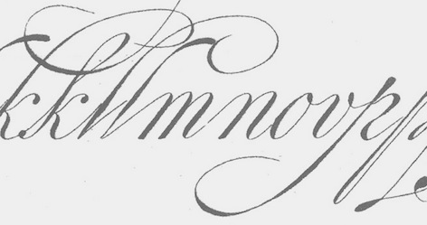 Drawing and lettering high school teacher in Haarlem (1853-1930) who studied at the Rijksakademie van beeldende kunsten in Amsterdam. He published the lettering model book Letters en hare grondvormen (1885, Scheltema & Holkema, Amsterdam). Remarkable in this book is an example of the Dutch krulletter found on the windows of cafes in Amsterdam in the 20th centurys---the Oud Hollandsche Schrijfletter that has its roots in the 17th century Dutch neorenaissance.
 Reference: Nederlandse belettering negentiende-eeuwse modelboeken (2015, Mathieu Lommen, de Buitenkant, Amsterdam). [Google]
[More] ⦿
|
Piotr Strzelczyk
|
Polish typographer involved in GUST.org fonts for Polish such as QuasiHelvetica, QuasiCourier, QuasiChancery, QuasiBookman, Antykwa Półtawskiego (based on work by Adam Półtawskiego (1923-1928), constructed by Bogusław Jackowski, Janusz M. Nowacki and Piotr Strzelczyk). Read about that last project here in their 1999 EuroTeX article Antykwa Półtawskiego: a parameterized outline font. [Google]
[More] ⦿
|
Planck Foam
[David E. Howerton]
|
Alpha-dings by David Howerton (who calls himself David God, Czarodziej or PlanckFoam): CATAL, CentauressRisingBLT, DEH_Crossword_fillins, DirtyBallPointPen, FromHasansDeskQGH, FROM_DOV, otherwhere GURP icons, pfamg234, pfamo345, pfams123, PFNP-1, Pfpaatilted, Pfpaaupsidedown, PFSNTSM, PFVB7INV, PFVBF3DS, PFVBF7WD, PFVVBF7, PFVVBF7O, PFVVBF7S, pf_0002, pf_0003, Pf_19th_century_taxi, pf_1drag, pf_64ths, pf_64ths3d, pf_64thsShadowed, Pf_64_acid_washed, PF_ABEAR, PF_ACORN, PF_AFACE, pf_ak, Pf_alabama, PF_ALIGA, Pf_another bear-3, Pf_another bear, pf_another_font001, pf_another_font002, pf_another_font003, pf_another_font004, pf_another_font005, pf_another_font006, Pf_another_wreath, pf_anubis, Pf_arizona, Pf_arkansa, pf_aster, PF_BAG-1, PF_BAG-2, PF_BAG-3, PF_BAG-4, PF_BAG-5, pf_ballet_shoes, Pf_ballet slippers, pf_bandaided-ameritype, pf_batter, Pf_bcase-1, Pf_bcase-2, PF_BCG1, PF_BEARH, pf_beatles, pf_belize (2002), PF_BETTL, Pf_bfly-1, PF_BGOAT, PF_BIRDK, PF_BIRDS, Pf_bird-2, Pf_bird-6, Pf_birdy-1, PF_BLF02, PF_BLF03, pf_block_letters-1-bold, pf_block_letters-1-college, pf_block_letters-1-outline, pf_block_letters-1, pf_bttr_fairy, Pf_cad_bunny-Gradient, Pf_cad_bunny-Hungry, Pf_cad_bunny-Inverted, Pf_cad_bunny-Liquid, Pf_cad_bunny-Shadow, Pf_cad_bunny, PF_CALIF, pf_calla, pf_calla-outlined, PF_CAMEL, Pf_caml-3, Pf_caml-2, pf_castle-1, pf_castle-1outline, pf_castle-2, pf_castle3-expanded-inverted, pf_castle3-gnawed_on, pf_castle3-outline, pf_castle3-outlinerippled, pf_castle3-outlinetwicked, pf_castle3-rippled, PF_CAT_I, pf_cat_in_shoe, pf_castle3-twicked, pf_castle3, pf_castle3D, pf_centaur-triumphent-bent, pf_centaur-triumphent-outline, pf_centaur-triumphent-shadowed, pf_centaur-triumphent, PF_CHEES, Pf_clipboad, pf_co, Pf_cockatoo, pf_complete_relief_sixties, Pf_cook-1, pf_corn_flower, PF_COYOT, PF_CRANE, pf_ct, PF_CUTEB, PF_CUTEM, pf_dc, pf_de, Pf_dh-1, PF_DH-2_, pf_ding0020, pf_ding0021, pf_dings0021, PF_DISK1, PF_DOG-1, PF_DOG-2, PF_DOGIN, pf_dogrose, PF_DRAGO, pf_dragon13-sixties, pf_dragon14-sixties, pf_DragonRose, pf_Dragonsvark, PF_EASEL, PF_EINST, pf_equestrian, PF_FALLL, pf_fancy0022, Pf_fate-001, Pf_fencepig, PF_FIVEP, pf_fl, pf_flag_needs, pf_flower40, pf_flower42, pf_flower56, pf_flower64-3d, pf_flower64-rippled, pf_flower64-spacewarped, pf_flower64, pf_flower65, PF_FROG_, Pf_frog-2, pf_frog_wizard, pf_froggy_5, pf_FromthedeskofHasan, pf_ga, PF_GFISH, Pf_gfish_sideways-1, Pf_gfish_tilt-1, Pf_gfishbkwd-1, Pf_gfishupsddn-1, pf_gldiols, PF_GRIFF, pf_grks, Pf_harvest time, pf_hedgehog, pf_hh_inverted, pf_hi, PF_HIPPO, PF_HOLLO, Pf_holloween-2, Pf_holloween-3, pf_hummingbird, pf_ia, pf_ice_skate, pf_id, pf_il, pf_il-gradient, pf_il-outlined, pf_il-shadowed, pf_in, pf_in-outlined, pf_in-shadowed, pf_iris, PF_ISAID, pf_i_read001, pf_i_read002, pf_i_read003, PF_JACKB, PF_JACKI, pf_joy_of_reading, pf_juggling_bear_Brenda, pf_just_another_joy_of_reading, Pf_kabang, PF_KETTL, pf_knight, pf_knoted_border, PF_KOALA, pf_ks, pf_ks-outlined, pf_ks-shadowed, pf_ky, pf_ky-outlined, pf_la, PF_LAMB1, PF_LIFES, Pf_lion-1, pf_little_girl-2, pf_little_girl-2Hollow, PF_LOTUS, pf_ma, PF_MAILB, pf_marigold, pf_marigold2, pf_md, pf_me, pf_me-outlined, pf_me-shadowed, PF_MERMA, pf_mermaid-216, pf_mermaid 300, me, pf_mi, pf_mn, pf_mn-outlined, pf_mo, PF_MOLE_, pf_monster-2, pf_monster-2 Outline, pf_monster-3, pf_months, pf_more_joy_of_reading, PF_MOUSE, Pf_mouse_in_cup, pf_ms, pf_mt, pf_mt-outlined, PF_MUSHR, Pf_mussle computer, Pf_narwhale, pf_nc, pf_nd, pf_ne, pf_nh, pf_nj, pf_nm, pf_not_enough_coffee, pf_notebook-2, pf_nv, pf_ny, pf_oh, pf_oh-outlined, pf_ok, pf_ok-outlined, pf_ok-shadowed, PF_OLD_M, Pf_old_marine, PF_OLIPH, Pf_onthesea-1, PF_OPPOS, pf_or, PF_ORNAT, pf_our_flag, PF_OWL-1, PF_OWL-2, pf_pa, pf_pa-outline, PF_PAA02, pf_palmtree3, Pf_party rabbit 2, Pf_partyrabbit, PF_PEGAS, pf_pegasus-poetica, PF_PELIC, Pf_pencil, pf_poetry_notebook, pf_poetry_notes_009, pf_poetry_notes_009b-outline, pf_poetry_notes_009b, pf_poppy, pf_pr, pf_prayer, pf_prayeroutlined, pf_prayerG, PF_PUMPK, Pf_pumpkin-2, pf_quincy_the_first, PF_RABBI, Pf_rabbit in a hat, PF_RACCO, Pf_raft, Pf_remember the typeface 2, pf_ri, pf_rose, pf_rose-2, PF_RUNNI, PF_SANTA, Pf_santa_ball, pf_sc, pf_sc-g, pf_sc-outlined, PF_SCIRC, pf_sd, Pf_shopping cart, Pf_skiprope-1, Pf_slavery_is_freedom, pf_smallcar, pf_smug_pegasusfl, pf_snowdrp2, Pf_snowman-2, Pf_snowman-3, Pf_snowman, pf_snowman_adorable, pf_snowman_citadel, pf_snowman3_adorable, Pf_something for honneybee, pf_ssissitss, PF_SSTAR, PF_SURRO, PF_SWANN, Pf_test_alphabet-2, Pf_thehen, pf_the_saw_man, Pf_thewitch, pf_thun_freehand-g15, pf_thun_freehand-hollow, pf_thun_freehand, pf_thyme, pf_thyme-outlined, pf_tn, pf_togep_murray-outline, pf_togep_murray, PF_TOOLB, pf_trowl, Pf_tropical, PF_TURKE, Pf_turkey-2, Pf_turkey_thanksgiving, pf_tx, pf_ut, pf_va, pf_ve, pf_ve-outlined, Pf_veryverybadfont5, PF_VSC06, PF_VVBF6, pf_vvbf6s, pf_wa, pf_walter_wolf, Pf_wanted_chancery, PF_WA___, pf_wi, Pf_wreath, Pf_writting a letter, pf_wv, pf_wy, pf_wyvern-3, pf_wyvern1, Pf_xmas_cat, Pf_xmas_flower-1, Pf_xmas_glass_ball, Pf_xmas_package-1, Pf_xmas_santahead, Pf_xmas_santas_tree, Pf_xmas_snowball-1, Pf_xmas_tag-1, Pf_xmas_tree-4, Pf_xmascandle-2, Pf_xmascandle, Pf_xmascandle_sideways, Pf_xmasdings, pf_your_needed, PF_YULEF, Pf_yulecandle, pf_zappa, plankfoamfonts, SAILBOAT, and the sfd002 rthrough sfd0030 series, DEH_sword (2002). Since 2002, Plamck Foam is starting to call itself Transfinite Transgressions Ltd. Alternatec URL. Dafont link. [Google]
[More] ⦿
|
PR Fonts
[Peter Rempel]
|
 Peter Rempel (b. 1958) is a Winnipeg-based calligrapher. Nice graphic about classical roman types. He designed some exquisite shareware fonts: PR Uncial Creepy (2010), PR Agamemnon Bold (2008), PR-Uncial (2003), PR-UncialAltCapsExtended, PR-UncialAlternateCapitals (1998), Demo-ofGabrielCondensed, Demo-ofGabrielRegular, Demo-version:Gabrielextended, PR-CelticNarrow (1998), Magickal Signs, PR Runes (2000), PR Rune Stones (2000), Pi Rho Runestones (1998), PR Astrological (1998), PR Compass Rose (2007), PR Viking (2007; +Alternates) and Pirho Herakles (1998, an Etruscan-style or Greek simulation font). In preparation: PR Alchemyst, PR Snaggly, PR Monk's Holiday.
 He writes about himself: educated in music composition and visual design. In his family home, there were many wall plaques with German Bible verses, rendered in a variety of gothic and fraktur lettering styles. In the 1980s he discovered the art of calligraphy, first through the speedball lettering textbook, and later by joining the calligraphers Guild of Manitoba. He has studied a variety of lettering styles, but his strongest interest is in the letter styles of the Middle Ages, starting with the German Fraktur styles he knew from childhood, and extending back, into uncials, runic shapes, and the Classical Roman Letter. The Chancery cursive, or Italic hand, which to many people is synonymous with calligraphy, never held much interest for him. He released his first shareware fonts in 1996. In 2010, he went partially commercial. His first pay font is PR Pointers (2010, an arrows font). In 2011, he designed the commercial typefaces PR Mapping and PR Stars. In 2012, he published PR Arco (arcs for framing curved lines of text, in a style common on Victorian posters and almanac covers) and PR Hydra (a Greek simulation font). Typefaces from 2013 include PR Snowflakes 01, PR Bramble Wood 1 and 2, PR Valendoodle 01 (Valentine's Day ornaments), PR Swirlies (in series numbered 01 through 13), PR Swirlies Frames, PR HallowDoodles (Halloween dingbats), PR Nouveau Ornaments (art nouveau), PR Viking (a rune simulation face), PR Foxtail 01, PR Foxtail 02, PR Scrolls 03, 04 and 05 (2014), PR Sprucewood (2014), PR Swells One (2014), PR Xmas Doodles (2014), PR Hearts Take Wing 01, PR Mysticon 01 (star dingbats), PR Pointers 01 (arrows), PR Valknut (Norse god symbolism), PR Scrolls, PR Uncial (1998), PR Dim Sum (brush face), PR Columban (a Celtic uncial, named after Irish monk Columbanus), PR Columbian. Typefaces from 2014: PR Cauldron (a scary Celtic style font), Vanaheim (a flared display typeface influenced by Nordic runes). Typefaces from 2015: PR Hallow Doodles 03, PR Ex Cathedra (Trajan capitals). MyFonts link. MyFonts foundry link. Klingspor link. Fontsy link. Dafont link. Castles&Crypts link. [Google]
[MyFonts]
[More] ⦿
|
Print and Penmanship 1450-1830
|
Course by James Mosley at l'Institut de l'Histoire du Livre (IHL) in Lyon, France, from October 14-17, 2002. Limited to twelve persons. 450 Euros. A beautiful course content: Introduction---the writing, of the Roman capital to the tiny Gothic. The discovery of the Roman capital in Italy to the 15 E century. L B Alberti, Felice Feliciano, Luca Pacioli, Geoffroy Tory, Albrecht Dürer. The invention of printing works and Gothic character. The Italian writing: scrittura umanistica and corsiva cancellaresca. Roman characters and italics in Italy and France, 1470-1600. Nicolas Jenson, Francesco Griffo, Claude Garamond, Pierre Haultin, Robert Granjon, Guillaume Bé. Literature of the engraving of the punches and the foundry of the characters: Joseph Moxon (London, 1683), Jacques Jaugeon (Paris, 1704) Pierre-Simon Baker (Paris, 1764). Characters with the "taste hollandois". Hendrik van den Keere, Nicolas Briot, Christoffel van Dijk, Nicolas Kis, Joseph Moxon, William Caslon. Towards a new penmanship 1560-1740 G.F. Cresci, Lucas Materot, Louis Barbedor, Charles Snell, George Bichkam. Of the "Roman of the roi" in Didot. Philippe Grandjean, John Baskerville, Pierre-Simon Baker, François-Ambroise (and others) Didot, Giambattista Bodoni. A new typography: use of the conceited person-face, antique and the Egyptian woman in printed publicity. [Google]
[More] ⦿
|
qfonts
[Boguslaw Jackowski]
|
Public domain type 1 fonts by Boguslaw Jackowski. Included are QuasiPalladio, QuasiTimes, QuasiBookman, QuasiChancery, QuasiCourier, QuasiHelvetica, QuasiHelveticaCondensed. See also here for the truetype versions as well. Other URLs: here, here and here. [Google]
[More] ⦿
|
Raffaello Bertieri
|
 Type designer from Florence, 1875-1941. Bertieri held the position of artistic consultant of the Nebiolo Foundry for most of his life. He made or supervised the production of these typefaces:
 - Inkunabula (1911, Società Augusta). This Venetian typeface is based on the roman of Erhard Ratdolt (1476).
- Sinibaldi (1926, Nebiolo). Based on the calligraphic letters of late 15th century florentine writer Antonio Sinibaldi. This typeface was digitized in 2021 by maria Chiara Fantini as a triplet, Antonio, Sinibaldi, and Magnifico.
- Paganini (1928). Done with Alessandro Butti. Jessica Svendsen digitized this in 2010 under the same name, and so did Patrick Griffin and Kevin Allan King at Canada Type in 2011: Paganini.
- Iliade (1930).
- Ruano (1926). Chancery font named after Vatican calligrapher Ferdinando Ruano who drew Lettera Cancellaresca Formata. For a digital version, see Flanker Ruano (2013, Leonardo Di Lena).
[Google]
[MyFonts]
[More] ⦿
|
Ralph Michael Unger
[RMU (Ralph Michael Unger Typedesign)]
|
 [MyFonts]
[More] ⦿
[MyFonts]
[More] ⦿
|
Ramandhani Nugraha
[Fortunes Co (was: Celcius Design)]
|
 [MyFonts]
[More] ⦿
[MyFonts]
[More] ⦿
|
Ramiro Espinoza
[Re-Type]
|
 [MyFonts]
[More] ⦿
[MyFonts]
[More] ⦿
|
Re-Type
[Ramiro Espinoza]
|
 Argentinian designer Ramiro Espinoza (b. Santa Fe, 1969) studied at the Universidad Nacional del Litoral in Santa Fe. He dabbled in fonts at his gorgeous (but now defunct) Jazz Futurezone site. In 2007, he founded Re-type, where he heads a group of designers including Yomar Augusto, Leo Beukeboom and Ricardo Rousselot. Ramiro graduated from the Type and Media's KABK (Den Haag) in 2004. He taught typography at the Universidad Nacional del Litoral, Universidad de Buenos Aires and the Escola d'Art i Superior de Disseny in Valencia, Spain. At FontShop International, he was in a team that converted more than 50 font families to OpenType. He freelances occasionally for David Quay's studio. He joined Type Network in 2017. He is currently located in Amsterdam. His typefaces:
 - Mabella (2001), a free font dedicated to the Argentinian feminist activist Mabel Bellucci. It was for some time available at Sudtipos but discontinued there. It is still at Dafont.
- Bellucci (2008), a commercial redesign of Mabella.
- The display font Mariabrug (2002). This too is no longer available--it was redesigned and marketed as Kurversbrug, one of the ReType's fonts. Kurversbrug (2007) is a revival of the famous letters appearing on Amsterdam's bridges: the letters were probably designed by Anton Kurvers (b. Den Haag, 23 July 1889; d. Amsterdam, 29 January 1940).
- At Union Fonts: Lula (2002-2003).
- Maitena (2003), a free font based on the hand of an Argentinian comic artist, Maitena Burundarena.
- Lavigne (2004-2010): Lavigne Display is the first release of a type-family aimed at publications such as interior design and women magazines-anywhere a touch of distinction is to be desired. Lavigne Display won an award at TDC2 2010. Lavigne Display and Lavigne Text (a modern serif family) were both winners at Tipos Latinos 2010.
- Tomate (2008) is a brush lettering / signage script font influenced by Goudy Heavyface Italic. It won an award at Tipos Latinos 2010.
- Barbieri (2009) is a signage face.
- Work on Severino (2004) has been abandoned.
- Smidswater Italics (2009): Smidswater is a Dutch graphic design studio with offices in The Hague and Breda. They had a corporate font (designed by Paulus Nabbe and Onno Bevoort) but wanted to expand the package adding italics and light weights. Ramiro Espinoza was commissioned for this and now Smidswater Font is a complete set extensively used in the studio's indentity.
- Bath (2010-2011) is a Dutch typeface developed with David Quay for the signage and orientation in the city of Bath.
- Winco (2012) is a glyphic (flared, incise) type family created from scratch. Espinoza mentions Arpke Antiqua and Globus Cursive as indirect influences on his new type family. It won an award at Tipos Latinos 2012.
- Krul (2012) is an interpretation of the Amsterdamse Krulletter style of calligraphic signage. This was presented at ATypI 2013 in Amsterdam. A book entitled Amsterdamse Krulletter by Rob Becker and Ramiro Espinoza was published by Lecturis.nl in 2014. The English edition, The Curly Letter of Amsterdam followed in 2015.
- Dulcinea (2012), a chancery / penmanship typeface. He writes: Dulcinea looks at Spanish Baroque calligraphy's most extreme tendencies, and especially at some of those produced by the writing masters Pedro Diaz Morante and Juan Claudio Aznar de Polanco. These 17th and 18th century alphabets with their plentiful calligraphic flourishes represented a marked break with the harmonic and angular Renaissance Cancellaresca style. It was Morante who first introduced and popularized the use of the pointed quill in Spain, and although his famous text entitled Arte Nueva de escribir(first volume published in 1616) contains alphabets that have much in common with traditional broad nib Cancellaresca calligraphy, most of the examples therein are outgrowths of the new models put forward by the Italian master Gianfrancesco Cresci. The swashes are complex and intricate, but at the same time they feature a profusion of defects. Many of them sometimes come close to ugliness. However, these pages contain an artistic essence that bears a relationship to the ironic and sometimes somber character of Spanish Baroque.
- Medusa (2013) is a delicate copperplate penmanship script based upon renowned master Ramón Stirling. Helped in the type production by Paula Mastrangelo, Ramiro looked very carefully at the original manner in which glyphs connected. This typeface will win awards. Well, I wrote the previous sentence on the day I first saw Medusa. Medusa won an award at TDC 2014. In March 2014, it won an award at Tipos Latinos 2014.
- Laski Slab, co-designed with Paula Mastrangelo, won an award at Tipos Latinos 2014. It is based on Paula's thesis work in 2012. Ramiro Espinoza kept on developing that typeface and published Laski Sans in 2016.
In 2017, he published Guyot Headline (a revival of Françcois Guyot's types). Guyot Text followed later in 2017---it is very legible even at small print sizes and is a sturdy workhorse overall. Winner at Tipos Latinos 2018 of a type design award for Guyot. Guyot also won an award won an award at TDC Typeface Design 2018. In 2020, Guyot was selected as a typeface for Garcia Media's redesign of the major German finacial newspaper, Handelsblatt. - Reiher Headline (2018). A typeface family inspired by two fonts displayed in the famous Ploos van Amstel specimen, first printed in Amsterdam in 1767. The Reiher Headline romans were based on the handsome N° 1 Groote Paragon Romein, a rather condensed typeface whose punchcutter has not yet been identified. Reiher Headline's italics were based on the Aszendonica types attributed to Nicholas Kis. Several of the ornaments included in the Reiher types have been ascribed to J.F. Rosart. Espinoza further expanded the possibilities of his new family with Reiher Headline Open, a decorative inline version of Reiher Headline Bold. Reiher Headline was designed for magazine and newspapers.
- Dejanire and Dejanire Headline (2019), a typeface family loosely inspired by an anonymous display typeface found in the type specimen of Claude Lamesle, published in Paris in 1742. It takes its name from Deianira, a Calydonian princess in Greek mythology and the wife of Heracles. Lamesle introduced it under the blah name of Gros canon deux points de gros romain. Ramiro Espinoza set out to improve Lamesle's typeface by fixing its flaws while preserving its freshness. It was followed in 2020 by Dejanire Sans and in 2022 by Dejanire Text and Dejanire Jewel (a baroque, profusely ornate set of capitals inspired by a set of titling capitals found in a religious decree printed in 1800 by Pedro Battle in Barcelona).
- Kranto (2021). A 144-style sans serif typeface inspired by British and German grotesque typefaces from the first half of the twentieth century. It features weights from thin to black, widths from regular to condensed, and x-heights from small to large (called text, normal and display).
MyFonts interview in 2012. Speaker at ATypI 2018 in Antwerp. Fontspace link. Dafont link. Behance link. Type Network link. [Google]
[MyFonts]
[More] ⦿
|
Rian Magee
[Twinbrush Image Forge]
|
 [More] ⦿
|
Ricardo Rodrigues dos Santos
[Vanarchiv]
|
 [MyFonts]
[More] ⦿
[MyFonts]
[More] ⦿
|
Richard J. Bradley
|
 Artist, calligrapher and type designer born in Portsmouth, England, in 1947. Richard Bradley designed ITC Bradley Hand (1995), Fine Hand (1987), Calligraphic Ornaments (1993, ITC; also in the Corel collection), and the flowing Bible Script (1979). Part-time teacher at the Portsmouth College of Art, and type designer for Linotype. From 2006 onwards, he cooperated with David Kettlewell at New Renaissance Fonts, where he jointly developed these renaissance-era fonts: AliceScrolltipRoman, RicksDecoratedUncial-Medium, RicksFolkloreRoman, RicksRelaxedHand-Italic, SevilliaDancingText, Sevilliastandingtext, Sevilliatiles, Ashbourne 1241 (2009, an uncial based on a gravestone in Ashbourne, Derbyshire, dated 1241). Future releases will include Ashbourne Uncials, Rick's Christmas card, Country Cursive, Curly Classic, Rick's Graphica, Rick's Rustic Caps, Rick's Rustic lettering, and Rick's Square Caps. In 2011, he and Linotype released a 3-style extension of Bradley Hand called Bradley Type. At New Renaissance Fonts, he released Bradley Chancery (2011), Alice Scrolltip (2006) and Sonnet Script (2011, inspired by the calligraphy of the Welsh artist and poet David Jones (1895-1974)). Bradley Texting (2014) is an informal script.
 FontShop link. Klingspor link. Linotype link. [Google]
[MyFonts]
[More] ⦿
|
Richard Lipton
[Lipton Letter Design]
|
 [MyFonts]
[More] ⦿
[MyFonts]
[More] ⦿
|
RMU (Ralph Michael Unger Typedesign)
[Ralph Michael Unger]
|
 Ralph M. Unger (b. 1953, Thuringia, East Germany) says this about himself at MyFonts: Typesetter from the composing stick via Linotype setting machines to the Mac. Jobs in various Thuringian printeries. Barred further education by Communist authorities due to political reasons. Imprisoned in East Germany. Since 1988 in the state of Baden-Wuerttemberg, former West Germany. Jobs in several newspaper printing houses as advertisement compositor. Own office since 1995, in Aalen, Baden-Wuerttemberg. He lives in Schwaebisch Gmuend, and was a freelance type designer for Profonts and URW++, where he contributed frequently to their libraries between 2002 and 2009. In 2009, he founded RMU. MyFonts link. I split his contributions into two groups, the URW / Profonts group, and the RMU group. The prefix FontForum refers to a subseries of URW++ fonts. Unless specifically mentioned, all the following fonts are at URW++ and/or Profonts:
 - FontForum Admiral Script (2005): revival of Middleton's Admiral script from 1953.
- Amitié (2009): a garalde family.
- Arabella Pro (2006): after the script by Arnold Drescher from 1936, published at Joh. Wagner.
- Fontforum Atrament (2006): architectural lettering. Do not confuse with a Suitcase Type Foundry font from 2003 by the same name.
- Atze (2010): a comic book family.
- Behrensschrift D (2007): after the jugendstil typeface Behrens Schrift, 1902, by Peter Behrens.
- FontForum Bernhard Script (2005): after Bernhard Script from the 1920s.
- Bradley (2005): blackletter, after the original by William H. Bradley.
- Breite Kanzlei (2007).
- Breitkopf Fraktur (2003): after the original by Johann Gottlob Immanuel Breitkopf, done in 1793.
- Brocken (2011) is a signage typeface inspired by a design of Volker Küster (1960s).
- Profonts Bureau (2010, Profonts): a minimalist rounded sans family.
- FontForum Calypso (2005): a revival of Roger Excoffon's Calypso (1958).
- Card Pro (2006): a decorative display based on Ella Cursief (1916, Sjoerd Hendrik de Roos, Lettergieterij Amsterdam).
- Chaweng (2006, Profonts): an oriental all caps simulation face.
- Civilite URW (2005).
- Compliment (2004, casual script). Based on a 1965 script by Helmu Matheis for Ludwig & Mayer.
- Cranach (2007): a blackletter typeface modeled after Kuenstler Gotisch from the Krebs Foundry.
- Dominante (2007): a serif family based on Johannes Schweitzer's font by that name, 1959.
- Dominique (2010, profonts): an informal typeface.
- FontForum URW Ecsetiras (2005): revival of Ecsetirás (Zoltan Nagy, 1967, a brush face).
- Edda Pro (2008). An art nouveau typeface that revives a Heinrich Heinz Keune typeface from 1900.
- Energia Pro (2008, Profonts): connected monowidth script, based on Arno Drescher's Energos from 1932.
- Estro (2003, Western lettering). Seems close to Nebiolo's Estro from the 60s.
- Eurobrush Pro (2007, Profonts): handwriting.
- EuroSans (2008).
- Euroscript Pro (2006, Profonts): school script typeface based on his own handwriting.
- Flashes (2007): a revival of Crous-Vidal's Flash, 1953.
- Fox (2007): a brush script based on W. Rebhuhn's original from the 1950s.
- Gamundia (2010): a calligraphic copperplate script inspired by Excoffon's Diane.
- Ganz Grobe Gotisch (2006): a fat blackletter modeled after the original by F.H.E. Schneidler.
- Gmuender Elan Pro (2011) is a 1950s style script face.
- Gradl Nr 1 (2008): based on hand-drawn art nouveau upper case characters by M. J. Gradl, ca. 1900.
- Graphique Pro (2008): shaded caps face, based on Graphique, which was originally created by Swiss designer Hermann Eidenbenz in 1945, and issued as hot metal font by Haas'sche Schriftgießerei. See also New Graphique Pro (2011).
- Handel Slab (2009): a 6-style extension of Trogram's 1980 typeface Handel Gothic.
- Hanseat (2010): a grotesque family done at Profonts. It was heavily inspired by Germany's official DIN 1451 Engschrift.
- Iova Nova (2007): based on Jowa Script, designed by J. Wagner in 1967.
- Profonts>Impression (2008): art deco.
- Jessen Schrift (2004): after the Rudolf Koch blackletter typeface by that name.
- FontForum URW Konzept Pro (2005): revival of Konzept (1968, Martin Wilke's handprinting face).
- Legende (2002): a script typeface based on the original typeface of Friedrich Hermann Ernst Schneidler (1937).
- Leipziger Antiqua. The original Leipziger Antiqua by Alfred Kapr at Typoart dates from 1971 until 1973. The digital version of Leipziger Antiqua was developed by Ralph M. Unger in 2005.
- Manuskript Antiqua (2005): after Oldrich Meinhart's Manuskript Antiqua.
- The Maszynysta family of heavy industrial sans typefaces (2010) have a textured style (Struktura), a Shadow, and a plain Roman.
- Maxim (2003, Profonts): The heavy brush typeface Maxim was originally designed by Peter Schneidler in 1956 for the Bauer foundry.
- New Bayreuth (2008): after Friedrich Hermann Ernst Schneidler's Bayreuth from 1932.
- Old Borders and Lines (2010). A free font.
- Ornella (2008): Jugendstil.
- Peter Schlemihl (2008, Profonts): a revival of a blackletter by Walter Tiemann.
- Pedell (2009): a casual script.
- Polo (2002): a brush face modeled after Carl Rudolph Pohl's Polo (1960).
- In 2012, Ivana Koudelkova co-designed the grungy headline typeface Retroactive Pro with Ralph M. Unger at Profonts.
- Fontforum Rhapsody (2006): a revival of Ilse Schüle's rotunda face.
- Roberta (2003): art nouveau typeface after obert Trogman's typeface for FotoStar.
- FontForum Signs and Symbols (2006).
- Splendor (2009): a revival of a brush script typeface by Wilhelm Berg, Schriftguss, 1930. See also Splendor Pro (2014).
- Sportowy (2009): an outline face.
- Stanford (2011). A sports lettering face.
- Stiletto (2006): a medieval script.
- Fontforum Stripes (2007): a multistripe op art display typeface based on a Letraset font from 1973 by the same name.
- Fontforum Thalia (2006): retro font.
- Tintoretto (2006): shadow display face based on an origonal by Schelter & Giesecke.
- Tip Top Pro (2008): a Julius Klinkhardt art nouveau typeface revival.
- FontForum Unciala (2005): a revival of Oldrich Menhart's typeface Unciala (1953, Grafotechna).
- Unger Chancery (2005).
- Unger Script (2003): based on H. Matheis' Slogan typeface designed for Ludwig&Mayer in 1957.
- Veltro (2007): after a 1931 original by G. da Milano at Nebiolo.
- Profonts Woodpecker (2008).
The list of RMU fonts: - Affiche (2017). A revival of Helios Reklameschrift of the Klinkhardt foundry.
- Aldo Manuzio (2017). After a house typeface from 1897 by Schelter&Giesecke.
- Amati Pro (2010): after Georg Trump's condensed didone face, Amati, 1951.
- Antiqua Florenz (2021). A revival and extension of Paul Zimmermann's Antiqua Florenz (1960, Ludwig & Mayer), which is based on Venetian romans.
- Avus Pro (2012). A sans family that extends Gert Wunderlich's Maxima (1970).
- Baroque Pearl (2016). A pearly typeface that revives Peter A. Demeter's Fournier Geperlt (1922, Schriftguss).
- Behrens Kursiv (2013). After a 1906 original by Peter Behrens.
- RMU Belvedere (2020). A revival of Heinrich Wieynck's art nouveau / fin-de-siècle typeface Belvedere (1906, Bauer).
- RMU Bison (2020). A revival of Julius Kirn's brush script Bison (1935-1938, C.E. Weber).
- Bernhard Blackletter (2016). After Lucian Bernhard's extrafette Bernhard Fraktur (1921).
- Bernhard Cursive Extra Bold (2010).
- Borghese (2015). An art nouveau font after a Schelter & Giesecke original from 1904.
- Borgis Pro (2012). A Clarendon-style text family.
- Boulette (2015, a fat creamy script).
- RMU Bowery (2019) A revival of Old Bowery (1933, ATF)).
- Bravura Pro (2013). After G.G. Lange's Publica.
- Bricklayers (2012). An original fat slab display face.
- Brillant (2009): art nouveau and ultra heavy.
- Butti (2011). A script family paterned after Fluidum (1951, Alessandro Butti, Nebiolo).
- Cable Condensed (2014). Based on Koch's Kabel.
- Caesar Pro (2011). A flared sans typeface after Caesar Schrift (1913, Georg Schiller, C.F. Rühl).
- Capitol Pro (2012). An art deco typeface based on Capitol (Karl Hermann Schaefer for Schriftguss, 1931).
- Carina Pro (2017). A calligraphic script typeface based on Rautendelein (1929, Schriftguss).
- Carla Pro (2013). A broad-nibbed script modeled after Ballantines Script (Elsner & Flake, 1974; see also Ballantines Serial by SoftMaker).
- Carlsbad (2018). A couple of art nouveau typefaces based on originals from 1895 by H. Berhold called Regina Cursiv and Hansa Cursiv.
- Caslon Gotisch (2009): after the original by William Caslon from 1763.
- Celebration (2009): blackletter.
- Circensis (2016). A Western circus font based on a concept of Fritz Richter.
- Claudius (2010): after a 1937 blackletter font at Klingspor.
- Constanze Pro (2012). A light cursive typeface based on Constanze (1954, Joachim Romann, Klingspor).
- Contact Pro (2010): after Contact, a 1963 font by Helmut Matheis.
- Dante Alighieri (2018). Based on a Schelter & Giesecke original.
- Daphnis (2016). A revival of Daphnis (1929, Walter Tiemann).
- Deutschmeister (2017). A textura blackletter typeface after Deutschmeister by Berthold Wolpe for Ludwig Wagner in 1934. (Some dispute that Wolpe made this font.)
- Diamant Pro (2012). A transitional serif face.
- Emilia (2016). Based on Weiss Antiqua (1928) by Emil Rudolf Weiss.
- Neue Echo (2016). Based on Echo for Schriftguss.
- Elbflorenz (2020). A revival of Albert Auspurg's display typeface Miami (1934, Schriftguss).
- Emilia Gotisch (2016). After Weiss Gotisch (1936) by Emil Rudolf Weiss.
- Emilia Fraktur (2021). A revival of Emil Rudolf Weiss's Weiss Fraktur (1913).
- Erler Titling (2015). After Erler Versalien (1953, Herbert Thannhaeuser for Typoart).
- Eurotech Pro (2011): a slabby techno family.
- Faulkner Pro (2011): a connected heavy signage script based on Alan Meeks's Kestrel.
- Fette Kanzlei (2019).
- Fette Unger Fraktur (2010).
- Fichte Fraktur (2020). After Walter Tiemann's Fichte Fraktur (1934).
- Fontanesi RMU. An ornamental caps typeface that revives Aldo Novarese's Fontanesi (2018).
- Forelle Pro (2010): after the original Forelle script typeface by Erich Mollowitz, 1936.
- Frankenberg Pro (2012). An antique script face.
- Gabor Pro (2014). A connected copperplate script.
- Gaby Pro (2017). A revival of Hans Möhring's script typeface Gabriele (1938 or 1947, C.E. Weber).
- Garamond Antiqua Pro (2015).
- RMU Gilgengart (2020). A revival of Hermann Zapf's Fraktur font Gilgengart (1938).
- Gillray Pro (2015). A copperplate script after Hogarth Script (by Harald Bröder for Typoart).
- RMU Gloria (2019). After Gloria (1898, Emil Gursch).
- RMU Gong (2020). Based on Arno Drescher's Super Grotesk Schmalfett first released in 1933 at Schriftguss.
- Gmuender Gravur (2011). A 3d shadow face. Gmuender Antiqua Pro (2015) is influenced by the metal font Imprimatur (1952-1955, Konrad F. Bauer and Walter Baum). Gmuender Kanzlei (2018) is a blackletter typeface.
- Goethe Fraktur (2022). A revival of a blackletter typeface by Wilhelm Woellmer (1905).
- Gravira (2021). A revival of Herbert Thannhaeuser's Gravira, released by Schelter & Giesecke in 1935 .
- Haenel Antiqua (2020, based on a 19th century antiqua by Eduard Haenel) and Haenel Fraktur (2011, after Haenel Fraktur, ca. 1840).
- Hanse Textura (2020). A revival of a textura by Hermann Zapf.
- RMU Helion (2020). A revival of the 3d titling typeface Helion (1935, Arno Drescher for Schriftguss Dresden).
- RMU Herkules (2019). After a late 19th century font by Bauer and Berthold called Reklameschrift Herkules.
- Hoelderlin (2018). After Eugen Weiss's Hoelderlin blackletter font (1937).
- Hoyer Script (2017). After Hanns Thaddeus Hoyer's Hoyer Schoenschrift (1939, Stempel).
- Hupp Fraktur (2016). After Otto Hupp, 1911.
- Impuls (2010): a brushy typeface based on Paul Zimmermann's Impuls (1945).
- Initials RMU One (2012) consists of revivals of Rudhardsche Initialen (Otto Eckmann, ca. 1900) and Walthari Initials (ca. 1900, Rudhardsche Giesserei). Initials RMU Two (2012) consists of revivals of Jubilaeumsinitialen (by Bauersche) and Augsburger Initialen (by Peter Schnorr, 1901).
- Jean Paul Fraktur (2021). A revival of Breitkopf's Fraktur font Jean-Paul-Schrift (1798).
- Jobs Gravure (2011). It had to happen---a few days after Steve Jobs' death, Unger released the beveled engraved typeface Jobs Gravure, which is an extension of Trump Gravur (1954, Weber).
- Jolly Polly (2012): a curly non-connected script face.
- Kis Antiqua Pro (2018). A revival of Hildegard Korger's Kis Antiqua at Typoart.
- Kleist Fraktur (2010): after Walter Tiemann's original.
- Kompress Pro (2013). Two compressed sans typefaces.
- RMU Kontrast (2021). An art deco typeface that revives Kontrast (1930, F.H.E. Schneidler at Weber).
- Koralle RMU (2018). A revival of Schelter and Giesecke's Koralle (1915).
- Korpus Pro (2014). A text typeface family. Followed later in 2014 by Korpus Sans Pro.
- Korpus Serif Pro (2021). A revival and extension of Timeless (Typoart) that covers Greek, Latin and Cyrillic.
- Leibniz Fraktur (2012) is modeled after the famous Genzsch & Heyse blackletter font.
- Lenbach (2021). Inspired by a German font from the Victorian era.
- Liliom Pro (2012). A beautiful fat didone typeface based on an original from the Fonderie Française.
- Lipsia Pro (2011). An angular serif family.
- Literatura Pro Book (2012).
- Litfass (2021). A revival of an art nouveau font by Flisch.
- Lutetia Nova (2014). A fresh two-style take on Jan van Krimpen's Lutetia (1924).
- RMU Luchs (2021). A redesign of Jakob Erbar's inline all caps art deco font Lux (Ludwig & Mayer, 1929).
- Luxor Pro (2010): a Victorian/Western display face.
- Lyrica (2014). A revival of the informal blackletter typeface Lyrisch (1907, Georg Schiller).
- RMU Magnet (2021). A redesign and revival of Magnet (1951, Arthur Murawski at Ludwig & Mayer).
- RMU Manolo (2019). Based on the art nouveau typeface Manolo (Ludwig & Mayer).
- Manutius Pro (2012).
- Meister Antiqua (2011, +Bold, +Book). A Typoart original from 1951 in the tall flared ascender serif genre, revived and extended.
- Mitropaschrift (2016). An octagonal original.
- Mobil Pro (2011). A semi-script typeface in the fifties style of Matheis.
- Monument (2010): a 3d shadow roman caps face created after Oldrich Menhart's Monument.
- Narziss (2018). A revival of Walter Tiemann's Narziss from 1921.
- RMU Neptun (2021). A revival and extension of the art nouveau typeface Neptun by Aktiengesellschaft fuer Schriftgiesserei und Maschinenbau, Offenbach.
- Neue Kurier (2011). Typoart's popular signage script font in a new, completely remastered version.
- Neue Muenchner Fraktur (2010).
- Neue Schwabacher (2021). After Albert Anklam's Neue Schwabacher (Genzsch & Heyse, 1876).
- Neue Thannhaeuser (2011).
- Old Towne Pro (2010): a Western font.
- RMU Omega (2020). After Omega, an art deco typeface by Friedrich Kleukens at Stempel in 1926.
- Orbis Pro (2016). A revival of Walter Brudi's shadow typeface Orbis (1953, Stempel).
- Orplid Pro (2019). a layerable typeface that revives and extends Hans Bohn's all caps Bauhaus era typeface Orplid (1929).
- Parcival Antiqua (2016). A revival of Parcival Antiqua (1926, Herbert Thannhaeuser).
- Parfum (2013). A low x-height script that was inspired by Howard Allen Trafton's Quick (1933, bauer).
- Parler Fraktur (2018). A revival of Friedrich Poppl's Poppl Fraktur.
- Parler Gotisch (2011). A blackletter face.
- RMU Pittoreske (2019). A decorative Victorian typeface.
- Plastica Pro (2015, a chiseled typeface inspired by a J. Lehmann design).
- RMU Pergola (2021). A vintage shadow typeface inspired by a late-19th century font of Georg Giesecke.
- Post Fraktur (2014) and Postillon (2014). After Herbert Post, 1933-1937.
- Primana Pro (2012). A seductive geometric grotesk family.
- Prinzess Gravur (2010): a blackletter typeface modeled after Prinzeß Kupferstichschrift (1905, Berthold).
- Prisma Pro (2011). Revival and extension of Rudolf Koch's multiline typeface Prisma (1931).
- Reklame Fraktur (2016). After Reklame Fraktur by Albert Christoph Auspurg, 1914.
- Reflex Pro (2018). All caps, with an inline style.
- Reznicek Pro (2011) is a post-Victorian pre-art nouveau typeface named after Ferdinand von Reznicek (1868-1909), one of the leading artists and illustrators of those times.
- Rekord Antiqua (2020). A revival of the art nouveau era text typeface Rekord Antiqua (1911, Wagner & Schmidt).
- Rhythmus Pro (2016). After a Schriftguss AG and Schelter&Giesecke original grotesk, and extended to cover Cyrillic.
- Ridinger Std (2012). Based on Riedingerschrift (Franz Riedinger, 1906, for Benjamin Krebs Succ.).
- Ronde Pro (2011): roundhand script.
- Royal Grotesque (2021). A revival of Wotan by Wagner & Schmidt, 1914. Did this typeface become RMU Royal Sans (2022)?
- Salzmann Fraktur (2019). A revival of Max Salzmann's blackletter font released by Schelter & Giesecke in 1912.
- Saskia Pro (2016). Revival of Jan Tschichold's Saskia (1931, Schelter & Giesecke).
- Schmale Anzeigenfraktur (2009): based on Koch's Schmale Deutsche Anzeigenschrift, 1923, Klingspor.
- Schmale Mediaeval (2020). Based on Schelter & Giesecke's Schmale Mediäval (1840).
- Schmuckinitialen (2009): an ornamental caps typeface in the art nouveau style based on Walthari Initials [Walthari (1899, Heinz König for the Rudhard'sche Giesserei) in the upper case and Eckmann Initials (ca. 1900, by Otto Eckmann, Germany's chief art nouveau type designer) in the lower case].
- Schreibmeister (2021). Ralph's interpretation of Arno Drescher's formal cursive typeface for Ludwig Wagner (1958, Leipzig).
- Schwabacher Book (2013).
- Sebaldus (2019). A heavy blackletter typeface, after Sebaldus Gotisch (1926, H. Berthold).
- Senatsfraktur (2020). After Friedrich Bauer's Senats Fraktur done in 1907 for Genzsch & Heyse.
- Concordia (2020). A revival of Sensation Schmalfett (1914, Heinrich Hoffmeister).
- Siegfried Pro (2017). A revival of the art nouveau typeface Siegfried (1900, Wilhelm Woellmer).
- RMU Skizze (2021). This revives Walter Höhnisch's script typeface Skizze (1935, Ludwig&Mayer).
- Staxx Pro (2013). A prismatic typeface.
- Staufer Gotisch (2015). An engraved blackletter typeface modeled after Herbert Thannhaeuser's Hermann Gotisch (Schriftguss, 1934).
- Steinschrift Pro (2015). A single style condensed sans serif.
- Sylphe Pro (2019). A vintage script font that revives Schelter & Giesecke's Isabel (not Sylphide, as claimed by him).
- Tablica (2017). After Karl-Heinz Lange's DDR telephone directory font Minima (1984).
- Thannhaeuser Fraktur (2013) is a redesign of Typoart's Thannhaeuser Fraktur.
- Thomasschrift (2014). A rustic typeface that revives and extends Thomas-Schrift by Friedel Thomas (1957-1958, Typoart).
- Titanschrift (2011). A yummy soft and fat display face.
- Tombola (2018). After an alphabet from the 1920s by Otto Heim.
- RMU Trianon, renamed RMU Trifels (2020). After Heinrich Wieynck's Trianon (1905, Bauersche Giesserei).
- Trocadero Pro (2010): an extension and revival of Trocadero Kursiv, 1927, Albert Auspurg, Trennert.
- Troubadour Pro (2010): In Medium and Engraved styles.
- Trump Deutsch (2011): a blackletter face, after the 1935 original by Georg Trump.
- Trybuna (2013). Based on Herbert Thannhaeuser's Liberta Antiqua (1958), but completely redrawn.
- Turnier (2019). A revival of G.G. Lange's derby (1952-1953).
- Tyton Pro (2013). A brush script after Heinz Schumann's famous 1964 Stentor.
- Typoskript Pro (2010): a revival of Hildegard Korger's Typoskript, first done at TypoArt in 1968.
- Unger Fraktur (2010): after a 1793 design by Johann Friedrich Unger; includes fett and mager.
- Walbaum Antiqua Pro (2013). A revival of Justs Erich Walbaum's didone classic.
- RMU Wallau (2019). After Rudolf Koch's rotunda typeface Wallau (1926-1934).
- Werbedeutsch (2021). A revival of the blackletter typeface Buchdeutsch (Ernst Schneidler, 1926).
- Wieynck Fraktur (2019). after Heinrich Wieynck's Wieynck Fraktur (1912).
- Wieynck Gotisch (2018). After Wieynck Gotisch (1926, Heinrich Wieynck).
- Zentenar Fraktur (2010): mager and halbfett; after the 1937 workhorse by Ernst Schneidler at Bauer.
- Zierfraktur (2010): after Deutsche Zierschrift, an engraved blackletter font that was cut by Rudolf Koch between 1919 and 1921 for Klingspor.
Ralph made some typefaces outside URW/Profonts and RMU, such as Stripes (2014, a prismatic typeface puvlished by Thinkdust). Klingspor link. View Ralph M. Unger's typefaces. [Google]
[MyFonts]
[More] ⦿
|
Robert D. Anderson
[Lord Kyl's Medieval and Fantasy Fonts]
|
 [More] ⦿
|
Robert Slimbach
|
 After a start at Autologic in Newbury Park in 1983, this prolific American master craftsman (b. Evanston, IL, 1956) helped pioneer digital type design at Adobe (which he joined in 1987) and created
 - ITC Slimbach (1987).
- ITC Giovanni Book (1988).
- Adobe Garamond (1989-1991).
- Adobe Jenson (1996) and Adobe Jenson Pro. Combining Nicolas Jenson's roman designs with Ludovico degli Arrighi's italics.
- Utopia (1989-1991) [Utopia Opticals was released in 2002].
- Minion (1990-1991): Minion was first released in 1990, and became later the first Adobe Opentype font. It has support for Greek and Cyrillic, including polytonic Greek. Minion Cyrillic is from 1992. By 2021, this text typeface featured 32 styles, and was published as Minion3.
- Myriad (1992, with Carol Twombly). Myriad Arabic and Myriad Hebrew were first published in 2011.
- Poetica (1992). In 2010, Paulo Heitlinger compared Poetica, in its smooth perfection, with P22 Operina, which is closer to the original chancery models of the 20th century, and he thinks Poetica lacks the vigor and dynamism of the originals (and P22 Operina does not).
- Sanvito (1993).
- Caflisch Script (1993, not my favorite script).
- Cronos (1996). Image by Jamie Groenestein). modeled after Kuester's Today Sans. Image of Cronos Pro Display.
- Kepler (1996).
- Warnock Pro (2000), which won an award at the Type Directors Club (TDC2) 2001 competition.
- Brioso (2002). A calligraphic/renaissance family comprised of over 40,000 glyphs. Images of Brioso: A poster by Kristina Reinholds, a poster by Nick di Stefano.
- Garamond Premier Pro (2005), based on originals found in the Plantin Museum in Antwerp. Weights include GaramondPremPro-BdItalic, GaramondPremPro-Bold GaramondPremPro-Italic, GaramondPremPro-Medium, GaramondPremPro-MediumIt, GaramondPremPro-Regular, GaramondPremPro-SbIt, GaramondPremPro-Semibold. Greek, Latin and Cyrillic are covered.
- Arno Pro (2007: typophile discussion) is in the style of Adobe Jenson Pro. Review by Typographica Thomas Phinney: Arno is what you might call a modernized Venetian oldstyle. I think of it as having the same relationship to Adobe Jenson that Minion has to Garamond Premier.
- Adobe Clean (2009). David Lemon: After more than 25 years in the type development business, Adobe decided to have its own corporate typeface family. The Creative Suite uses were early versions of a family designed by Robert Slimbach. Now that it has been officially adopted at Adobe, I can tell you about our latest design, called Adobe Clean. There is no plan to make it available for licensing, but you will be seeing more of it in Adobe materials and products as time goes on. Our initial question was "Why not just keep using Myriad Pro and Minion Pro?" These typefaces were designed to be timeless, and they are among our most popular families. But that second part points to the catch in this situation: Myriad, in particular, is used to represent many other companies, including businesses close to Adobe's (such as Apple and Verizon). Adobe wanted a fresh look that could remain unique. While some typeface designers do much of their work for corporate clients, this area was new to us. Robert&I met with the leaders of Adobe's Experience Design and Brand teams to develop a design brief. They wanted a 21st-century feel combined with an earnest readability. As the project grew, Christopher Slye led regular follow-up meetings with the client teams to keep them up to date and tease more input out of them. Robert's accustomed to aiming his work at the more general case, so it was an interesting challenge to have a very specific set of design goals. What he produced is as classic as all his other designs, but with an uncharacteristic blend of contemporary touches for on-screen rendering and a more progressive feel.
- Adobe Text (2010), a transitional family included in the standard font set for Adobe Creative Suite 5. Adobe Text won an award at Modern Cyrillic 2014.
- Adobe Hand (2012). Adobe Hand also won an award at Modern Cyrillic 2014.
- Trajan Pro 3 (2011, with Carol Twombly) and Trajan Sans (1989). The Trajan Sans family comprises six weights, ranging from Extra Light to Black (matching the weight range in Trajan Pro 3), with language coverage for Pan-European Latin, Cyrillic, and Greek. Maxim Zhukov advised on the design of the Cyrillic portion of the family, and Gerry Leonidas advised on the Greek, while Frank Grießhammer provided technical production support. Trajan Sans won an award at Modern Cyrillic 2014.
- Ryoko Nishizuka designed Ten Mincho (2017), a Japanese typeface in the Adobe Originals collection. Ten Mincho also features a full set of Latin glyphs, collectively known as Ten Oldstyle and designed by Robert Slimbach.
- Pelago (2017). A semi-formal sans family that won an award at TDC Typeface Design 2018.
- Acumin. A 90-style neo-grotesque typeface family.
For Warnock Pro, he got an award at the Type Directors Club (TDC2) 2001 competition. In 1991, he received the Prix Charles Peignot for excellence in type design. Minion Pro Greek, Minion Pro Cyrillic&Greek and Brioso Pro won awards at the TDC2 Type Directors Club's Type Design Competition 2002. At TDC2 2006, he won an award for Garamond Premier Pro. Arno Pro won an award at the TDC2 2007 competition. In 2018, he received the Frederic W. Goudy Award for Typographic Excellence at Rochester Institute of Technology. Bio at Linotype. Minion Pro now ships with Acrobat Reader and covers all European languages, including Greek and Cyrillic. View Robert Slimbach's typefaces. FontShop link. [Google]
[MyFonts]
[More] ⦿
|
Robin Nicholas
[FairbankMT]
|
[More] ⦿
|
Robin Nicholas
|
 Born in Westerham, KE (1947). He joined the Monotype drawing office in 1965 and moved to the type design department in 1968, where he became manager in 1982. In 2009, he is head of typography at Monotype. Klingspor link. Robin Nicholas's typefaces:
 - With Patricia Saunders and a team of ten, he co-designed the Arial family at Monotype, an outgrowth of a program for low resolution sans typefaces started in 1982. I do not have to add anything here---Arial was made to mimic Helvetica and to adopt the same metrics. No other motivation. No higher artistic ideals. No admission from Nicholas, and no apologies. Arial is a stained 1982 stamp on the rest of Robin Nicholas' life.
- Still at Monotype, he made Nimrod (1980), which was first used by the Leicester Mercury in its year of introduction. Nimrod became a popular newspaper type.
- He created Plantin Headline Condensed (1995).
- He had a hand in the development and revival of Bell, Centaur, Clarion (a newspaper text face), Janson, Van Dijck and Walbaum, all between 1982 and 1989, all at Monotype. A blurb: Nicholas has directed the design of fonts such as the Clarion and Columbus fonts, as well as the digital versions of many Monotype typefaces including the Bell, Centaur, Dante, Monotype Janson, Fournier, Van Dijck, Monotype Walbaum, Bulmer and Pastonchi designs.
- He had a hand in Columbus (1992, Monotype). Ascender writes: Columbus has a fresh and lively hand-drawn feel but works well with today's computer systems and printers. An excellent text face, Columbus can also be used for display in advertising, posters, flyers and headlines, where the true elegance and beauty of the letters can be seen. Columbus was designed by Patricia Saunders and directed by Robin Nicholas in 1992 to celebrate the quincentenary of the voyage from Spanish shores by Christopher Columbus. The regular weight is based on types used in Spain by Jorge Coci circa 1513, and the italic is derived from a font cut by Robert Granjon circa 1543 and used by Bartolome de Najera in 1548 to print a famous manual by the writing master Juan de Yciar.
- He has done custom font projects for British Airways, Scandinavian Airlines, Barclays Bank, Opel automobiles (see Opel Sans; more here on this derivative of Futura; posted here), and Ikea (Ikea Sans is based on Futura and Ikea Serif on New Century Schoolbook).
- In 2003, he published the Felbridge family and Fairbank MT (a chancery hand) at Agfa-Monotype.
- Cambria, Jelle Bosma's 2006 typeface for Ascender and Microsoft, was a joint effort with Steve Matteson and Robin Nicholas.
- In a project started in 2002 at Monotype, and finished in 2005, he created Bembo Book. Monotype's page explains: Originally drawn by Monotype in 1929, Bembo was inspired by the types cut by Francesco Griffo and used by Aldus Manutius in 1495 to print Cardinal Bembo's tract de Aetna. A beautiful design with tall ascending lowercase and elegant letterforms, Bembo has been a favourite for book setting for over 70 years. No italic was used in the Aldine de Aetna work so another source was needed. This was found in a publication by the writing master, Giovantonio Tagliente, produced in Venice circa 1524. Considered by many to be one of Stanley Morisons finest achievements during his tenure as Typographical Advisor to the Monotype Corporation, Bembo has consistently been a best selling typeface, both in its original hot metal form and in todays digital formats. Not intended to be a facsimile of Manutius work, Bembo was drawn to embody the elegance and fine design features of the original but marry them with the consistency of contemporary production methods and to ensure that the typeface would work satisfactorily with high speed printing techniques. The first phototypesetting and digital versions were based on hot metal 9 point drawings. This gave good legibility in small sizes, due to a comparatively large x height, but lacked some of the elegance present in larger hot metal sizes. This new digital version of Bembo, called Bembo Book, has been designed to be more suited to text setting in the size range from 10 point to 18 point. Based on the hot metal 10/18 point drawings, which were used to cut all sizes from 10 point to 24 point, this new typeface has been carefully drawn to produce similar results to those achieved from the hot metal version when letterpress printed. The project started in 2002 when a high quality UK Printing House asked for a digital version of Bembo which would give a similar appearance on the page to the 13 point hot metal they were currently using. Hot metal drawings were digitised and extensive editing was carried out on the resultant outlines to ensure that design features and overall colour from the digital output remained close to that of the letterpress product. The resultant typeface is slightly narrower than existing digital versions of Bembo, it is a little more economical in use and gives excellent colour to continuous pages of text. Ascending lowercase letters are noticeably taller than capitals, giving an elegant, refined look to the text.
- In 2009, he co-designed Ysobel (Monotype; winner of an award at TDC2 2010) with type designers Alice Savoie, also working at Monotype Imaging's UK subsidiary, and Delve Withrington based in the U.S. The sales pitch: According to Nicholas, the idea for the Ysobel typefaces started when he was asked to create a custom, updated version of the classic Century Schoolbook typeface, which was designed to be an extremely readable typeface - one that made its appearance in school textbooks beginning in the early 1900s.. The web version by Linotype in 2013 is called Ysobel eText Pro. It has larger x-height and wider spacing.
View the typefaces made by Robin Nicholas. [Google]
[MyFonts]
[More] ⦿
|
Russell Maret
|
Russell Maret is a type designer and letterpress printer working in New York City. He is a fellow of the American Academy in Rome and the current North American Chair of the Fine Press Book Association. He has written and lectured widely on the intersection of letter design, technology, and the private press book. In 2012, he used Kickstarter to fund a metal type project for Cancellaresca Milanese and its companion roman, Gremolata. He writes: Cancellaresca Milanese is based on a type that first appeared in Milan in 1541 in the books of Giovanni Antonio Castiglione. The type distinguishes itself in its combination of calligraphic energy with a minimal slope in its lower case and its comparatively small, upright capitals. Generally viewed as a descendent of the typefaces of Ludovico degli Arrighi, Castiglione's type has a darker, rougher quality than Ludovico's---its grace is a forceful one. In the design of Cancellaresca Milanese I have attempted to retain the liveliness of Castiglione's original type by resisting the temptation to "correct" the slightly modulating alignment or homogenize the finial strokes on the ascending and descending characters. The type is outfitted with both corsiva (as in the original) and formata descenders as well as a significant number of compound ligatured characters. He already did digital versions: I first developed the digital predecessor of the type for my book Aethelwold Etc in 2009 and I have used it in a few publications, taking each opportunity to redraw and refine the characters. I designed Gremolata in 2011 as a companion roman for Cancellaresca Milanese to be used in my book Specimens of Diverse Characters. For Gremolata, I designed a slightly larger set of capitals based on those in the Cancellaresca, and paired them with a lower case that is inspired, but not based on, Alpine typefaces of the mid-sixteenth century. [Google]
[More] ⦿
|
Sale Gajic
|
Serbian creator of BlackChancery (2008), a Serbian extension of Doug Miles' 1993 font Black Chancery. [Google]
[More] ⦿
|
Samuel Winfield Tommy Thompson
|
New York-based letterer and type designer, b. 1906, Blue Point, NY, who was also known as "Tommy". [Some sources have 1905]. He had a studio in New York City and was the author of several books on type and lettering. He died in 1967 in New York. His oeuvre includes - Baltimore Script (1955). Matrices cut by George Battee. Mac McGrew: Baltimore Script is a fancy style designed by Tommy Thompson and cut by George Battee for Baltimore Type in 1955. The lowercase follows the general style of a script letter hand-written with a broad pen, although the inclination is slight and the letters don't quite connect. Capitals are flourished. It is suitable for stationery, announcements, and greeting cards, but its range of small sizes is hardly enough for advertising use.
- Collier Heading. McGrew: Collier Heading was designed by Tommy Thompson in 1946 for Collier's magazine. It is an adaptation of an eighteenth-century style known generally as Grecian, and was cut by Monotype in a considerable range of sizes. Other Collier or Collier Heading types have turned up; one was designed by Tommy Thompson for Collier's magazine, but not identified otherwise. It was probably also cut by Monotype. One of these could possibly be the Bert Black mentioned previously.
- Various weights of Futura (later digitized by URW).
- Mademoiselle (1953, baltimore Type Foundry). Mac McGrew writes about Mademoiselle: Mademoiselle was designed by Tommy Thompson in 1953 as a display typeface for Mademoiselle magazine. It was cut by Herman Schnorr at Baltimore Type, which also offered fonts for general sale. It is a delicate, narrow modern roman, with long ascenders and short descenders, rather loosely fitted, and works well for display with transitional text typefaces such as Bulmer and Scotch Roman.
- Post Headletter (1943). Privately cast for the Saturday Evening Post.
- Thompson Quillscript (1953, ATF): a 50s version of a chancery hand. McGrew: Thompson Quillscript was designed by Tommy Thompson for ATF about 1952. It is an attractive cursive letter with the appearance of lettering with a broad pen. Letters slope moderately and are not joining. The general effect is less formal than most other such typefaces. Capitals are rather reserved, but a font of alternate characters, mostly more informal capitals, was available separately until 1968. Compare Heritage, Lydian Cursive, Park Avenue, Raleigh Cursive. This typeface made it to the PhotoLettering collection.
- The following typefaces for Photo Lettering: Thompson Buccaneer Thompson Cable, Thompson Coliseum, Thompson Colonial Wide 8, Thompson English, Thompson Federal, Thompson Federal Italic, Thompson Federal Open, Thompson Georgian 2, Thompson Georgian Semi Condensed 2, Thompson Georgian 3, Thompson Georgian 4, Thompson Glasgow Italic 4, Thompson Gross Bold 9, Thompson Headline Casoni, Thompson Logotype, Thompson Pegasus Stencil, Thompson Penscript, Thompson Railway Stencil, Thompson Scribe, Thompson Stencil 8, Thompson Stencil 10, Thompson Trend Extra Cd 3.
Author of these books: The ABC of our Alphabet (1942, London), The Script Letter: Its Form, Construction, and Application (1939, New York), How to render roman letter forms (1946, New York), Basic layout design; a pattern for understanding the basic motifs in design and how to apply them to graphic art problems (1950, New York), Script Lettering for Artist (1969, New York). [Google]
[More] ⦿
|
Samuel Xie
[University of Heidelberg]
|
[More] ⦿
|
Scriptorium (Ragnarok Press, Fontcraft)
[David Fleming Nalle]
|
 Dave Nalle was born in Beirut on March 19, 1959, and died on February 13, 2021 from COVID in his home town of Manor, Texas. From his wiki page: Dave Nalle is a political writer, game author and font designer who was active in the early history of the development of the internet. Nalle was at one time Chairman of the Republican Liberty Caucus, a group that promotes libertarianism within the Republican Party, Senior Politics Editor at Blogcritics online magazine, and was the CEO of Scriptorium Fonts. Obituary [PDF] by Steve Jackson at the Daily Illuminator. Obituary by Shannon Appelcline at RGG Net. Obituary [PDF] at Dungeon Master Magazine.
 A creative and prolific designer, he has made hundreds of beautiful (often historic) fonts. His outfit, Scriptorium (based near Austin, TX, est. 1989), also does custom font and logo design. At some points, Scriptorium was also known as Ragnarok Press and Fontcraft. It specializes in artsy and ancient typefaces. Some subset of the fonts is made by Michael Scarpitti. Free font demos. Images of his best selling fonts. Special subpages: - Three free fonts: Onuava (a mini-serifed hybrid fixed-width font), Divona (sans), Sirona (based on Lombardic calligraphy).
- Lombardic: Aneirin, Benevento (8th century Lombardic), Cymbeline, Fabliaux, Formidable, Locksley.
- Decorative initials such as the 20th century sign lettering initials set Pencraft Initials (2009), New Saxon Initials (2016, based on work by F.G. Delamotte), Delamotte Initials One (2016), Delamotte Initials Two (2016), Holly Initials (2010, based on Real PenWork (1880s, Knowles and Maxim), Vyones (2010), Vergennes (2001), Cascade (2009), Bergling (2010; based on initials by John M. Bergling).
- Steampunk typefaces: Clockwork, Gearhead, Gears, Verne, Draughtwork, Belgravia, Boetia, Blackthorn, Linthicum, Good-fellow, Necromantic, Mephisto.
- Wild West fonts: Academy, Alcalde, Atkinson Boomtown (2009, after the lettering of Frank Atkinson), Atkinson Eccentric (2009), BigIron, Cibola, Del Norte, Lachesis, Perdido, Plowright, Primer, Riudoso, Niederwald, San Lorenzo (2011, with a Mexican and Tuscan look), Stonehouse, Manquo, Rochambeau, Purcell, Vaquero.
- Arabic simulation fonts: Samaritan is based on the poster lettering of Alphons Mucha from his poster for the play La Samaritan. Serendib and Waziri are based on the hand lettering of René Bull from his edition of the Arabian Nights. Caliph (1993) is derived from Ernst Schneidler's classic Legende font, with variant characters based on his original lettering. Also: Satampra, Jerash, Samarkand, Isfahan.
- Celtic fonts: the fonts include Constance, Durrow (1993, traditional rendering of Insular Minuscule calligraphy), Malvern, Glendower (based on the most common lettering in the Book of Kells), Knotwork (caps based on Celtic knots), Alba Text (modernized text font based on Celtic uncial lettering), Lindisfarne (based on a square uncial style), Stonecross (1997, derived from Celtic cross and gravestone inscriptions), Celtic Spirals (dingbats), Celtic Borders font (lets you combine key strokes to form decorative borders; many frames and borders are original Celtic designs by Arts&Crafts period artists like Evelyn Paul and Louis Rhead), Spiral Initials, Brigida (based on Rudolph Koch's interpretation of a squared uncial), Macteris Uncial, Coverack (heavy non-traditional uncial), Dahaut (modernized uncial), Dunsany, Glendower, Morgow (1999, spiral uncial), Teyrnon (elaborate spurred uncial), Padstow (heavy uncial), Vafthrudnir (2011, uncial), Sualtim and Columba (decorative initials based on characters found in the Book of Kells), Albemarle (2001).
- Oriental simulation fonts: Yoshitoshi (2003, based on the 1900-style writing by Yoshi Toshi.
- Gothic fonts, including Alt Gothic, Koch Gothic, Barnabas (2011), Sternhagen (2014), Montgisard (2010, roman capitals with blackletter lower case), Serenissima, Gelderland, Alcuin, Monumental, Goldwork, Waldeck, Roncesvalles, Montressor (2010, ornamental blackletter capitals), T4C Beaulieux (1998, a free copy here), Bastarda (2011), Burgundian, Cadeaulx, Collins Old English, Courtrai, Descant, Ereshkigal, Faustus, Franconian (1993, a Schwabacher), Froissart (2000), Ghost Gothic, Katisha, Koch Gothic, Ligeia, Magdeburg, Magdelena, Melusine, Pyle Gothic, Rheingold, Sanctum, Stuttgart Gothic (2010), Textura, Theodoric, Yngling (2002).
- German expressionist: Dromon.
- Renaissance fonts: Monumental Gothic, Caswallon (a Caslon family), humanist cursive (Palmieri, Castiglione and Hanes Italic), quirky Italian cursives (Fiorenza and Alleghieri), a Roman style hand-lettered font (Rudolfo and Rudolfo Swash), a Trajan-style Roman lettering (Hadrianus), a classic flourished cursive (Trinculo) and a set of floral intials from the Quattrocento (Fraticelli).
- Modern poster fonts: Ascelon, Bilitis, Cosmic Dude, Dromon, Ducatus Rough, Eglantine (after Central Type Foundry's Quaint Roman), Ekberg (2002, based on Samuel Welo's posters), Fortinbras, Hamilton, Jambon, Oblivion, Posada (2008, based on the poster lettering of Mexican artist José Guadalupe Posada), Squiffy, Suspicion, Magnin (2003).
- Mapmaker fonts: building elements are available in Basilica; Ortelius is a map dingbat font; Queensland (based on lettering by artist and calligrapher Eric Sloane), is bold, hand-drawn and reminiscent of medieval writing on maps. There are also Brandywine, Daresiel, Hesperides, Longhorne, Windlass (1996), and Cityscape. Orford (2008) is based on samples of hand lettering from a 1693 manuscript collected by Lewis Day in his classic book on historical paleography, Alphabets Old and New.
- Calligraphic fonts: Albemarle (2001), Azariel, Moncrief (2011, based on the calligraphy of J.M. Bergling), Pavane, Rasael (2009), Abdiel (2005), Roncesvalles, Gazardiel (2003, connected script), Spoonbill (2003, arts and crafts), Macteris (Roman uncial font), Antioch Uncial (Roman uncial font), Burgundian (Classic black letter font), Franconian (993, a classic black letter font), Castiglione (Attractive Renaissance lettering), Cicero (Roman Rustica font), Formidable (1993, very bold late medieval / Lombardic style), Collins Old English (Classic Old English style gothic), Corbei Uncial (Roman uncial font), Cymbeline (late medieval lettering), Durrow (Standard insular minuscule uncial font), Theodoric (Classic black letter font), Gazardiel, Ghost Gothic (Unusual gothic font), Glendower (Uncial font based on Book of Kells), Gloriana (Interesting hand lettering style), Folkard (from the hand-lettering of Charles Folkard), Offenbach Chancery, Ranegund Merovingian Courthand, Benevento (8th century Lombardic), Hesperides.
- Art deco typefaces: Imperatore (2018: based on a hand lettered design from California art deco master designer Pedro de Lemos in the 1920s), Speakeasy (2018), Gates of the West (2018), Lyceum (2014), Borealis (2009), Criterion (2011), Illuminata, Madding (2009, a bold poster font that grew out of Aventine), Alexandrine (2009), art Deco Stencil (2009, based on samples of Art Deco stencil lettering by Pedro Lemos), Falmouth.
- Art nouveau typefaces: Acadian, Agravain (2009), Amphitryon (2009), Ariosto, Asphodel, Averoigne, Beaumains (2011, based on J.M. Bergling's lettering), Beauvoir, Belgravia (based on J.M. Bergling), Bernhardt (based upon the lettering of the Czech art-nouveau artist Alphonse Mucha), Bentham, Berenicia, Boetia (2003, based on J.M. Bergling's lettering), Bruges, Bucephalus (1993), Burd Ellen (2009), Butterfield (1993; in Alfred Roller's style), Cafe Society (2018), Curetana, Damariscotta, Elsene (2011, based on lettering by early 20th century illustrator Clara Elsene Peck), Elysian, Exotique, Flaubert, Gaheris, Ganelon, Gehenna, Goodfellow, Grammophon (2019: a bold Jugendstil poster font), Harbinger, Huyot (2016, after Georges Auriol's types), Jugendstil Kunsthand (2003), Lysander, Maginot (1993; after Peter Schnorr, 1898), Munich (after the Munchner Jugend magazine), Norumbega, Odeon, Ormandine (2010), Pantagruel, Phaeton, Reggio, Rochmbeau, Rockne (2009), Rudolfo, Setebos, Sprite, Summerisle, Sylphide (2005), Undine, Valentin (2008), Vambrace (2010), Walhal, Wendingen (2016), Wormwood (2018), Zeitschrift (2016, based on the Ver Sacrum magazine).
- Modern poster fonts: Field Day (2003), Ascelon, Bilitis, Cosmic Dude, Dromon, Ducatus Rough, Eglantine (after Central Type Foundry's Quaint Roman), Ekberg (2002, based on Samuel Welo's posters), Fortinbras, Hamilton, Jambon, Oblivion, Squiffy.
- Constructivist fonts: Krasny Mir (2009), Vrubel, Structura (1997).
- Futuristic fonts: Alecto, Angelus, Circuit, Culdrose, Gearhead, Ironclaw, Parika, Sanhedrin, Semiramis (1997), Slither, Structuro, Yazata, Adastra (dings).
- Borders and ornaments. These include New Arets and Crafts Borders (20912, based on The Calendar of Golden Thoughts (Barse and Hopkins Publ, 1911).
- Boneyard fonts: Undertaker (2014), Antrobus (2010), Sepultura (2002), Halloweenies, Dementia, Boneyard, Skull and Bones, Malagua (1999-2013), Paleos (2002, from titling of B movies in the cave girl genre), Carmilla, Abaddon, Black Cow (1998), Valdemar, Cuede, Ligeia, Mayhem, Mephisto, Golgotha, Sanguinary, Ironworks, Moravia, Gehenna, Nosegrind (2005, graffiti), Corpus, Ghostly.
- School fonts: Schoolhand (2010).
- Arts and Crafts movement (late Victorian period, 19th century), based on work and lettering by Walter Crane, William Morris, Charles Rennie Mackintosh and Elbert Hubbard. The Arts&Crafts movement was enormously influential on the works of designers, artists and architects of the 20th century, and inspired the Art Nouveau and Art Deco movements. Fonts include William Morris' Kelmscott (based on Morris' Troy type), and True Golden, fonts from the Glasgow branch of the movement like Chelsea Studio (1997), which is based on Charles Rennie Mackintosh's lettering, fonts from the Roycrofters of New York like Semiramis and Ganelon, fonts based on Walter Crane's work such as Crane Gothic, Pencraft Initials (2009) and Walter Crane, and even fonts from the California Arts&Crafts period of the early 1900s like Coloma. Other typefaces: Jesse M. King (refreshed in 2015, and based on hand lettering from a frontispiece design by Glasgow-based Jessie King who was known for her lavish book covers), Aylward, Palmyra (based on work by the Roycrofters, a design community founded by Elbert Hubbard), Aylward (2010, Victorian), Hyacinth Initials, Spoonbill, Adresack (1996: inspired by the arts and crafts lettering styles of designers like Charles Rennie MacKintosh and Jessie M. King), Brandywine, Changeling (2009, based on lettering by fairy artist Fanny Railton), Goddard, and Advertising Gothic (2003), Valentin, Gaheris, Agravain (2009). Delaguerra (2001-2009) is based on a lettering style originating in the California Arts&Crafts period commonly associated with Mission Style. It is still in common usage in signage at historical sites in California.
- Victorian: Beaumarchais, Berenicia, Bilibin, Brandywine, Brigidis, Curetana, Durendal, Elphinstone, Flaubert, Folkard, Gjallarhorn, Gloriana, Hermia, Ironclaw, Magnus.
- Typewriter: Fontcraft Courier.
- Anthroposophic: Ekberg (2002, based on a sample of poster lettering by Samuel Welo).
- Medieval fonts of Scriptorium, critiqued by Marc Smith, page 65: Batwynge is based on lettre gffe by Geofroy Tory (1529), and not on an illuminated manuscript of the tenth century as claimed by Scriptorium. Perigord (1993) is based on a Carolingian alphabet drawn by Ernst Bentele in 1952. Allencon is a calligraphic font based on an interpretation of 6th century Ostrogothic Italian calligraphy.
Some selected fonts: Finchley (psychedelic), Captain Kidd (2012, an original font design based on the title lettering from the classic pirate movie starring Charles Laughton), Aerobrush (2011), Fondry Ornament (2009), Atkinson Egyptian (2008, after the lettering of Frank Atkinson), Verne (2008: remade in 2020 into Covid19), Goldwork (almost blackletter), BigBlok (2010), LetterpressGothic (2010), Plymouth (2010, in the style of Cooper Bold), Broadley (2008, an architecturally inspired script based on lettering by British architect and designer C.F.A. Voysey), Locksley (2004, medieval lettering), Tuscarora (curly lettering), Fiorenza (Renaissance calligraphy), Hesperides (old colonial calligraphic script), Angelus (beautifully printed monospaced script), Esperanza (1996, connected medieval handwriting), Ithuriel (2002), Alleghieri (2002), Hamilton (2002), Spiral Initials, Zothique (great font, based on hand lettering from a map of Clark Ashton Smith's fantasy world of Zothique), Reynard (semi-Celtic), Daresiel (elegant script), Caliph (1992, Arabic simulation), Bassackwards, Rosalinde (1999, handwriting), Arakne (2000, connected handwriting), Falconis (by Michael Scarpitti), Asrafel (semi-Celtic), Swithin (2004), Tyrfing (Art Nouveau/Fraktur, 1999), Waldeck (2008, blackletter), Woburn Initials, Stampwork, Draughtwork, Roughwork (a codex font derived from Nalle's own True Golden which is based on a=n earlier typeface by arts and crafts master William Morris), Melusine (gothic calligraphy), Corbei (uncial), Niederwald (hand lettering), Gjallarhorn (great uncial), Gaiseric (early medieval uncial), Taranis (1987, an uncial first drawn as a font for the cover of the old Ysgarth roleplaying system), De Bellis (roman era, by Michael Scarpitti), Engravers Gothic, Monimental Initials, Sanhedrin (Enemy of the State font), Vespasiano (roman capitals, by Michael Scarpitti), Bilitis, Hendrix (2002), Collins OE (old English), Samedi, Praitor, Evadare (1993, based on a character set which was hand calligraphed by Rudolf Koch), Koch Fantasie (1993), Black Cow (1998). Zothique, Ruritania, Mariner (2004, based on hand lettering originally done by Willy Pogany), Trinculo (a swinging cursive font), Texas Star (2002), Octavian (antique demi-serif font), Ruffian (antique type font), Ascelon (thin sans serif font), Munich (title lettering from Munchner Jugend magazine), Necromantic (bizarre bold titling font), Titania (romantic decorative lettering font), Oberon (bold romantic font), Knotwork, Guede (1993), Pullman, Purcell (Victorian circus poster style font), Allegheny, Carmilla, Malagua (1999-2013), Ardenwood, Platthand, Buccaneer, Cochin Archaic (2010), Boswell (1994), Guilford (based on lettering by artist and calligrapher Eric Sloane), Death Ray (2012, constructivist), Alecto (futuristic), Candlemas (2003), Bridgeport (2003, based on lettering by artist and calligrapher Eric Sloane), Medieval Tiles (2003), Linthicum (2003), Draughtwork (2003), Yngling (Fraktur, 2003), Rheingold (elaborate Fraktur: Music Hall Text elsewhere; see also Teuton Text, Cincinnati Type Foundry, 1877), Kidd (2003), Belgravia (2004), Peck Shields (2004), Scrawlies (2000, handcrafted), Albrecht Durer Gothic (2004), Orpheus (2004), InduXtrial (2004, a grunge face), Yoshitoshi (2003), Veronique (2004), Veneto (2006), Vidilex (1993, monospaced), Abelarde (2006), John Speed (1993: a mapmaker font), Furbelow (2006), Estoril (2006), Tangle, Aventine (sans), Texas Star (2002), Groningen (Bauhaus design), Nevins Hand, Scrapple (2011, Victorian, ornamental), Leodegar (2011, based on samples of 7th century Frankish hand lettering), Candlemass (2012). Fonts from 2013: Doge (a Venetian font based on a J.M. Bergling revival), Original Django (after the titling font in Quentin Tarantino's movie Django Unchained). Fonts from 2014: Highball, Carillon (based on a typeface by Samuel Welo), Edifice (based on lettering by J.M. Bergling). Fonts from 2015: Gods of Mars (an inline sci-fi typeface), Rykov (based on a 1930s Ukrainian constructivist style; Latin and Cyrillic), Vie Moderne (French art deco), Dahlgren, Grand Concours (art deco), Tantalus, Power Tie (art deco), Marquis Greeking. Fonts from 2016: Ekberg Modern (based on lettering samples by Samuel Welo from poster designs of the 1920s), Knuckleduster, Tzaphkiel, Sarandiel, Primrose Initials, Elizabethan Script (chancery style), Zeitschrift (an art nouveau font based on the Ver Sacrum magazine), Wendingen (Dutch deco), Memento Mori (Tuscan), Rounders (art deco). Fonts from 2017: Buzzmill (wooden plank font), Pumpkin Patch Initials, Talinn, Reliquary, Nopalito, Scattershot (script). Typefaces from 2018: Marionettas (a Mexican horror movie poster font), Fascination, Architextura, Santa Sangre, Glyphos. Typefaces from 2019: Cafe Corso (art nouveau), Comic Classix. Fnts released in 2020: Epigramatic (based on lettering by Dard Hunter for the Roycroft Press in the early 1900s), Cryptos (graffiti). Klingspor link. Abstract Fonts link. Dafont link. View David Nalle's typefaces. Scriptorium's library. [Google]
[MyFonts]
[More] ⦿
|
Sebastiaan van de Venne
|
Eindhoven, The Netherlands-based designer of Black Blok (or Zwart Blok) (2018) and Novi (2018), a typeface developed at TypeParis 2018 that is based on chancery examples from the renaissance era by Ludovico Vicentino Arrighi. [Google]
[More] ⦿
|
Shane Fleming
|
Creative and art director from Tiburon, CA. He has made many typefaces: Hamburg (modular, as in train stations), Xorben (sans family, soon to be free), Dani (grunge), Antiquity (rough outlined-serif), Ledgement (chancery hand), Ridalin (modern sans with a stunning hairline weight), Statement (dot matrix), Xerak-024 (dot matrix), Rivec, Colorspace (dot matrix). Behance link. [Google]
[More] ⦿
|
Softmaker: Chancery scripts
|
Softmaker offers these chancery hands: Zabriskie Script (after the 1979 font by Hermann Zapf, ITC Zapf Chancery---see also Corel's Zurich Calligraphic and Bitstream's Chancery 801), Chancery Regular, and Florence Script. [Google]
[MyFonts]
[More] ⦿
|
Sproviero Type (was: Lián Types)
[Maximiliano Sproviero]
|
 Argentinian foundry located in Buenos Aires, est. in 2008 by Maximiliano Sproviero (b. 1987, Buenos Aires) as Lian Types (old link), mainly specializing in gothic, uncial, script and handwriting typefaces. Rennamed Sproviero Type, his typefaces can be licensed since 2021 via The Type Founders.
 Sproviero graduated from FADU, University of Buenos Aires in 2008 with a script thesis typeface called Colofon. His fonts from 2008 include Devil Kalligraphy, Pumba (great futuristic rounded look), Tobogan (retro), Kiwi Sans Serif, School Rainbow, Suave Calligraphy, Tonika (handwriting), Goddess (handwriting), Cursivessca (calligraphic; 4 styles), Friendship (6 styles), Chechelo Lawyer (modern italic condensed), Quijote Italic (calligraphic with tall ascenders and descenders), Miscelanea (arabesques), Lunga (a condensed hairline family consisting of Real Ligada, Exacta, Versalita and Extras), Mabela (a rounded fat display font), Red Wagon (ultra-condensed), Valeria Script (swashy), Kalligrand (2008, a tall calligraphic face), Intima Script One, Two and Three (described by him as a sensual calligraphic script family), and Paradise Script (96 styles, all calligraphic). Creations from 2009: Kaligrafia, Galana, Mon Amour Script (hyper-calligraphic), Oh Lara (also hyper-calligraphic), and Quijot sauvage (a 7-style calligraphic feat). In 2010 he made these typefaces: Parfait Script (a high-contrast calligraphic script), Kanikama, Breathe Pro (calligraphic with didone serifs), Boston Script. Creations from 2011: Reina (a curvaceous didone family, +Engraved). He updated this in 2021 to the 45-style Reina Neue. At Tipos Latinos 2012, Maximiliano Sproviero won awards in the display type category for Aire (2012, a thin curly didone family), Breathe Pro, and Reina. At TDC 2013, he won an award for the copperplate script Erotica. Erotica also won an award at Tipos Latinos 2014. Typefaces from 2013: String (a hairline Spencerian script), Brand (a signage script family), Agile Pro (a hairline swashy calligraphic family), Bird Script (which an award at Tipos Latinos 2014), Live Pro. Typefaces from 2014: Selfie (connected monoline signage script), Heroe (a script that takes Lubalin and Caslon to the extreme), Dream Script (a chancery script that won an award at Tipos Latinos 2016), Dream Caps (Trajan capitals), Beatle (a Spencerian script with psychedelic touches). Typefaces from 2015: Seventies (a funkadelic typeface), Indie (a signage script family that won an award at Tipos Latinos 2016), Model (a hairline fashion mag calligraphic script family). Typefaces from 2016: Lubaline (decorative caps inspired by Herb Lubalin), Skill (signage type: winner at Tipos Latinos 2018 of a type design award). Typefaces from 2017: Posh (a fat didone), Fluire and Fluire Caps (a greeting card font pair), Preta (almost psychedelic script), Vinyle (a remarkable monoline decal script). Winner at Tipos Latinos 2018 of a type design award for Lubaline, Posh and Preta. Typefaces from 2018: Burger (a fast food slab serif bonanza), Fleur (inspired by some lettering in Palais Garnier in Paris---Sproviero calls this the Napoleonic style), Pantera (a lively pointed brush calligraphic typeface family), Girasol (based on sketches by Susana Maurette), Rafaella (all caps---described by Sproviero as coquette). Typefaces from 2019: Hot Script (monoline), Elipses (a Peignotian sans family in 7 styles), Fabulous Script, Breathe Neue. Typefaces from 2021: Selfie Neue Rounded (40 styles), Selfie Neue Sharp (39 styles), Ballet VF (Maximiliano Sproviero: a variable Spencerian penmanship font with optical sizing from 16pt to 72pt---a technical feat accomplished with the help of Eduardo Tunni and the Omnibus team; free at Google fonts; Github link), Klingspor link. Behance link. Interview by MyFonts in 2014. [Google]
[MyFonts]
[More] ⦿
|
Spurnej Type Foundry
[Jakub Spurny]
|
 Spurnej Type Foundry was founded in 2014 in Prague, Czechia, by Jakub Spurny. In 2014, Jakub designed Senohraby, an uppercase display typeface inspired by an old sign at the Senohraby train station that is now slowly chipping away. Senohraby Paint emulates a flat brush and features a few scratches and irregulartities.
 In 2020, he released Ghitta Bodoni Cancellaresca, which revives a chancery typeface from Bodoni's Manuale Tipografico (1818). The typeface family is named after Bodoni's widow, widow Margherita (Ghitta) Dall'Aglio who published that 1818 edition of Manuale Tipografico. [Google]
[MyFonts]
[More] ⦿
|
Stefan Yatanski
[Yatanski]
|
[MyFonts]
[More] ⦿
|
Stephan Brechtl
|
Author of Ein gruenndtlich Formular manncherley Art Lateinischer und Teutscher Handschrifften (1550, Nuremberg), the first writing manual in Germany. [Google]
[More] ⦿
|
Stephen Rapp
|
 American calligrapher, letterer, and type designer (b. 1953, Indianapolis, IN) located in Lakewood, OH, and/or Kent, OH. As a lettering artist for American Greetings since 2000, he has designed and developed numerous proprietary fonts. He specializes in beautiful script typefaces. Stephen's commercial fonts can be found in both Veer and P22/IHOF collections. Creator of these fonts:
 See also here. MyFonts link. Klingspor link. Behance link. Creative Market link. [Google]
[MyFonts]
[More] ⦿
|
Sudarmaji
[Asritype]
|
 [MyFonts]
[More] ⦿
[MyFonts]
[More] ⦿
|
Ted Staunton
|
 Born in Lincoln, UK, in 1942, Ted Staunton lives in Surrey, BC, and designs type. After serving a five-year apprenticeship as a hand compositor (1958-1963) with the Lincolnshire Publishing Co., he spent three years (1963-1966) at Leicester College of Art&Design, graduating in type design. After spending some time in London working for Penguin, Hamlyn and other book publishing houses, he emigrated to Canada in 1970, working for Mitchell Press and Hemlock Printers in Vancouver before opening his own design business and letterpress printing shop, Sherwood Graphics, in 1984. In 1991 he published a private press book, The Lincolnshire Poacher, illustrated with his own wood-engravings. Some of his fonts were used privately on transfer lettering sheets and cast in metal for hand typesetting at his private press, Sherwood Letterpress. His typefaces are mostly published bi P22:
 - In 2003, P22 launched Staunton's Sherwood Type Collection, a beautiful ensemble of revivals: Afton (2003), Albemarle (2008: connected script), Albion (2003), Albion Italic, Amelia (2003: ornamental caps in the style of William Morris), Aragon (2003: Victorian), Avocet Light (1985: chancery script originally named Avoca), Canterbury (2006, +Caps A, Caps B, Caps C, Pro), Elven (2003), Floriat (2003: floriated ornaments), Founders (2003), Freely (2002), Kaz (2008, between architecture and Comic Sans), Kaz Thin, P22 Kelly Pro (2009, Celtic style uncial), Latimer (2002), Lindum (2000; based on his Lindum Titling from 1967), Mayflower (2002: medieval lettering), Mayflower Italic, Mayflower Smooth (2009), Mercian (2003), Plymouth (2001), Roanoke Script (2002, a rough texture typeface; Albemarle is the smooth version), 1722 roman (2002), 1722 italic, Sherwood (2002), Sparrow (2001), Symphony (1987), Tyndale (2002), and Tyndale Xtras (2002: Arabesque ornaments).
- Typefaces from 2004: Merton, P22 Ruffcut and P22 Spooky (blackletter).
- Typefaces from 2005: the Staunton Script (package P22), which includes handwritten style typefaces that simulate the period spanning between the English Civil War (1640s) and the Victorian Era (1839-1901): Virginian, Royalist, Grosvenor, Grenville, Elizabethan, Broadwindsor, Chatham. Staunton Script was first drawn in 1981.
- Typefaces from 2006: P22 Phantasmagoria (a wedge serif inspired by Viking runes), P22 Regina (calligraphic).
- Typefaces from 2011: Bix, Brigid.
- Typefaces from 2013: the spurred typeface Ridley, which is based on his Avalon Text (2002).
- Typefaces from 2014: P22 Amelia Jayne (which has a classical roman, with several sets of initial caps).
- Typefaces from 2015: P22 Clementine (sans, curly: pure Victoriana), P22 Ringwell (Victorian).
- Typefaces from 2019: P22 Kingsclere. Inspired by a 17th century tombstone inscription in the town of Remedios, Cuba.
- Typefaces from 2020: P22 Ridley (a spurred medieval typeface, named for Nicholas Ridley and similar in style to Staunton's Latimer font), P22 Tuscaloosa (P22: a hybrid Tuscan typeface).
- Typefaces from 2021: P22 Araminta (a Tuscan Victorian font).
- Undated roman: Bentley.
- Undated sans: Witham Light.
- Undated initial caps: Arabella Initials, Florabunda (floriated Lombardic caps).
- Undated blackletter: Luther, Yeoman.
- Undated Victorian typefaces: Arabella.
- Undated scripts: Guildford, Hykeham Swash, Nadine, Saluki.
- Undated text typeface: Crossroad.
Klingspor link. P22 link. View Ted Staunton's typefaces. [Google]
[MyFonts]
[More] ⦿
|
TeX Gyre Project
|
The TeX Gyre Project was started in 2006 as the brainchild of Hans Hagen (NTG). It is described in The New Font Project (Hans Hagen (NTG), Jerzy Ludwichowski (GUST) and Volker RW Schaa (DANTE e.V.), presented at BachoTeX2, 2006). From the project, which is being implemented by GUST's e-foundry guys, Boguslaw Jacko Jackowski and Janusz M. Nowacki aka Ulan: All of the Ghostscript font families will eventually become gyrefied as the result of the project. Gyrefication, also called LM-ization, was first applied to the Computer Modern Fonts and their various generalizations with the result known as the Latin Modern (LM) Fonts. The Gyre fonts each have 1200 glyphs that cover basically all European scripts (including Latin, Cyrillic and Greek), and have Vietnamese characters added by Han The Thanh, and Cyrillic glyphs by Valek Filippov. Available in Type 1 and OpenType, they come under a very liberal license (free, modifiable, unlimited use, and a request to rename altered fonts). The TeX Gyre fonts are - Adventor: family of four sansserif fonts, based on the URW Gothic L family, which in turn is based on ITC Avant Garde Gothic, designed by Herb Lubalin and Tom Carnase in 1970. Open Font Library link.
- Bonum (2006), based on the URW Bookman L family: TeXGyreBonum-Bold, TeXGyreBonum-BoldItalic, TeXGyreBonum-Italic, TeXGyreBonum-Regular.
- Cursor: based on URW Nimbus Mono L, which itself mimics Bud Kettler's Courier.
- Heros (2007): based on the URW Nimbus Sans L family, but heavily extended---eight typefaces of 1200 glyphs each. With the release of Heros, their QuasiSwiss fonts becomes obsolete. This is, in fact, the Gyre version of Miedinger's Helvetica. .
- Pagella (2006), based on the URW Palladio L family (and thus, indirectly, Zapf's Palatino): TeXGyrePagella-Bold, TeXGyrePagella-BoldItalic, TeXGyrePagella-Italic, TeXGyrePagella-Regular. In 2013, we find Tex Gyre Pagella Math in opentype format, by Boguslaw Jackowski, Piotr Strzelczyk and Piotr Pianowski. Greek symbols were taken from the Math Pazo font by Diego Puga. The calligraphic alphabet was taken from the Odstemplik font. The Fraktur is based on Euler. The sans part is DejaVu Sans, and the monospaced alphabet is taken from Latin Modern Mono Light Condensed.
- Termes (2006), based on the Nimbus Roman No9 L family (and thus, by transitivity, Stanley Morison's Times-Roman): TeXGyreTermes-Bold, TeXGyreTermes-BoldItalic, TeXGyreTermes-Italic, TeXGyreTermes-Regular. In 2013, we find Tex Gyre Termes Math in opentype format, by Boguslaw Jackowski, Piotr Strzelczyk and Piotr Pianowski. The Fraktur part is based on Peter Wiegel's Leipziger Fraktur. The sans serif part uses TeX Gyre Heros. The monospaced part is based on TeX Gyre Cursor. In 2017, the Open Font Library published a slightly updated and darker TG Roman.
- Schola (2006, based on the URW Century Schoolbook L family, designed by Morris Fuller Benton in 1919: TeXGyreSchola-Bold, TeXGyreSchola-BoldItalic, TeXGyreSchola-Italic, TeXGyreSchola-Regular.
- Chorus (2007): derived from handwritten letterforms of the Italian Renaissance as used by Hermann Zapf in ITC Zapf Chancery (1979). TeX Gyre Chorus is based on the URW Chancery L Medium Italic font, but heavily extended. The Vietnamese and Cyrillic characters were added by Han The Thanh and Valek Filippov, respectively.
Articles: The New Font Project (BachoTeX 2006 article by Hans Hagen (NTG), Jerzy Ludwichowski (GUST) and Volker RW Schaa (DANTE e.V.), TeX Gyre Project (2006) by Bogusaw Jackowski, Janusz M. Nowacki and Jerzy Ludwichowski, and TeX Gyre Project II (2007) by the same three authors. Fontspace link. [Google]
[More] ⦿
|
The Private Press and Type foundry
[Paul Hayden Duensing]
|
Paul Hayden Duensing (1928-2006) was a typographer and type designer who ran The Private Press and Type foundry, in Vicksburg, MI. Designer of Sans Descender, Chancery Italic (1966), Rustica Sixteenth Century Roman, Quadrata II, Janson Open (experimental), Van Krimpen Open Capitals (numerals only; designed by Will Reuter and cut by Duensing), Octavian Caps, Unciala, and Dartmouth (designed by Will Carter, cut by Duensing). In 1990, he published a gorgeously hand-set booklet entitled "Deutsche Druckschriften", in which he says: "The present portfolio attempts no campaign for Fraktur; rather it makes only a quiet appeal for consideration of a great, if neglected, calligraphic typeface." The blackletter types shown there are, I presume, made by him: Heinzemann No99M, Heinzemann No100M, Dürer No.256, Wallau, Jessen, Kasseler No. 40 Teutonic Text, Theuerdank No. 392, Wilhelm-Klingspor-Schrift, Blücher No. 387 and Koch Initials. He was a generous man, who in the last year of his life donated his typefounding machines, matrices and effects to young people. Mac McGrew explains Andromaque's genesis: Andromaque is a cursive form of uncial letter, mixing Greek forms of aeklmnstz with Roman forms of the other letters, yet retaining legibility and harmony. The original size was cut by Victor Hammer and cast in France. The 14-point size was begun by Hammer, but left unfinished at his death. The font was completed by his long-time friend, R. Hunter Middleton, in the early 1980s, and cast by Paul H. Duensing. Paul Baker did a digital version of Andromaque in 1995. Duensing died on November 9, 2006. [Google]
[More] ⦿
|
Three Mile Island
|
 In 1999, a gang of people including Graham Meade, upset with the font policing efforts of Three Islands Press, made Bush Toad, which looks like (but is different from) their Treefrog. Bush Toad (1999) may be found on several archives. I am hosting the Three Mile Island font collection here. The set also includes Rave Party (2002), ChocolatFromHelvetica (2002), HeilVertica, Nightmare in Blend Mode (2003), and the chancery-inspired Feldicouth family (2002). [Google]
[More] ⦿
In 1999, a gang of people including Graham Meade, upset with the font policing efforts of Three Islands Press, made Bush Toad, which looks like (but is different from) their Treefrog. Bush Toad (1999) may be found on several archives. I am hosting the Three Mile Island font collection here. The set also includes Rave Party (2002), ChocolatFromHelvetica (2002), HeilVertica, Nightmare in Blend Mode (2003), and the chancery-inspired Feldicouth family (2002). [Google]
[More] ⦿
|
Tipo
[Darío Manuel Muhafara]
|
 Argentinian foundry, est. 2006 by Darío Manuel Muhafara and Eduardo Rodriguez Tunni, located in Buenos Aires. Muhafara gave two presentations at ATypI 2009 in Mexico City. Back in Buenos Aires, he runs two restaurants, and one wonders how he has the time for anything.
 Klingspor link. Linotype link. FontShop link. MyFonts link. Behance link. Text types: Botija (Juan Montoreano, 2006: a 7-style sans family), Goudald (Aldus de Losa, 2006), Lineare Serif (9 styles serif typeface by Eduardo Tunni, 2006), Malena (a slab serif family by Felix Lentino and Darío M. Muhafara, 2006), Prima Sans (a sans typeface by Ariel Katena and Alejandro Lazos, 2006), Priscilla (Felix Lentino, 2000: a serif family), Overlock (2008, a rounded sans by Muhafara), Rosario (2000: a clean sans family by Pocho Gatti), Loreto (2009, by Eduardo Tunni and Pablo Cosgaya). Display/headline type: Overlock (Darío M. Muhafara, 2006, a sans family), Titulata (a fat typeface by Eduardo Tunni, 2006), Chaco (Ruben Fontana, 2008). Basile (a great chancery family, extended to a full OTF family with Swash and XSwash, and beginning and end glyphs in 2011), Average, Chaco and Think won awards at Tipos Latinos 2008. FF Jackie (2003-2009) is a connected upright signage script. Lassi Display (done with Eduardo Tunni) won an award at Tipos Latinos 2010. Balthazar (2011, Google Web Fonts) is a contemporary Copperplate Gothic serif typeface inspired by the kind of typefaces used by many bistros and cafes in New York City and Paris. Creations in 2012: Port Lligat Slab (2012, Google Web Fonts), Port Lligat Sans (2012, Google Web Fonts: a flared microserifed display sans). In 2013, they designed a custom font for the Faena Art Center in Buenos Aires. His typeface Argentina won an award at TDC 2014 and at Tipos Latinos 2014. View Dario Muhafara's typefaces. [Google]
[MyFonts]
[More] ⦿
|
Tom Grace
|
 Born in Boston in 1976. Graduated with an MA in Typeface Design from-the University of Reading and studied at the Rhode Island School of Design. After graduation, he worked briefly for Jeremy Tankard and Font Bureau. In 2005, he worked briefly for Porchez Typofonderie. He currently lives in Heidelberg, Germany.
 He designed these typefaces: - Strela (2003). This typeface covers Latin, Cyrillic, Albanian, Belorussian, Bosnian, Catalan, Croatian, Czech, Estonian, Greenlandic, Hungarian, Latvian, Lithuanian, Macedonian, Maltese, Polish, Romanian, Sami, Serbian, Slovak, Slovenian, Turkish, Ukrainian, and Welsh.
- Deréon (2005, Porchez Typofonderie). This is a 6-font family done together with J.F. Porchez for House of Deréon, the clothing label of Beyoncé and Tina Knowles.
- Other typefaces done for Porchez: Henderson Serif (2006, black weight and production help), Verspieren (2007, for an insurance company), Le Monde Journal PTF (2007, help with the expansion of the 1994 original by J.F. Porchez), Le Monde Livre PTF (2008, help with the expansion of the 1997 original), Parisine PTF (2006, production assistance), Parisine Office (2006, production assistance), Sabon Next (2002, assistance), Mencken (2005, help with this font for The Baltimore Sun).
- In June 2007, he won the best Greek display typeface catgory at the Hellenic Alphabet competition.
- In 2008, he made a bastarda typeface Givry (Type-Together) created in the spirit of the bâtarde flamande as shown in the styles of the prominent scribes Jean Fouquet, Loyset Liédet, and Jean Bourdichon. It has Civilité influences.
- Trade Gothic Next (2008), with Akira Kobayashi at Linotype.
- In 2009, he created Alizé (Type-Together), a 3-weight italic beauty based on the chancery italic of the 16th century, with a Garamondesque "h".
- In 2012, Type Together published his typeface Iskra, a rounded family that covers Latin and Cyrillic. Iskra won an award at TDC 2013.
- Aeris (2010, Linotype). A flared sans family.
- Neue Helvetica Compressed (2014, Linotype).
- In 2014, Akira Kobayashi, Sandra Winter and Tom Grace joined forces to publish DIN Next Slab at Linotype.
- In 2018, Tom Grace and Steve Matteson published VAG Rounded Next at Monotype. It is an extension of the Volkswagen font VAG Rounded from the 1970s.
Speaker at ATypI 2017 Montreal. Behance link. Old URL. Klingspor link. View Tom Grace's typefaces. [Google]
[MyFonts]
[More] ⦿
|
Toni Pecoraro
|
Toni Pecoraro was born in Favara (Agrigento) Italy in april 1958. In 1977 he graduated from the Agrigento Institute of Art. From 1977 to 1981 he studied decoration at Florence Fine Arts Academy. From 1985 to 1990 he taught Engraving Techniques at Macerata Fine Arts Academy. At present he is teaching Engraving Techniques at Bologna Fine Arts Academy, and lives in Montefiore Conca. On his web site, he placed a reedited version of Giovanni Antonio Tagliente's 1530 book published in Venice. [Google]
[More] ⦿
|
Torquato Torío de la Riva y Herrero
|
 Or Torcuato Torio de la Riva. Spanish writing master (b. 1759, Villaturde, d. 1820) who studied Latin, theology and law at the University of Valladolid in 1773. He published these books:
 Digital revivals of his chancery scripts include Torio (2014, Pedro Leal). [Google]
[More] ⦿
|
Toshi Omagari
[Omega Type Foundry]
|
 [MyFonts]
[More] ⦿
[MyFonts]
[More] ⦿
|
Twinbrush Image Forge
[Rian Magee]
|
 Dungiven, Londonderry, Northern Ireland-based designer of these typefaces: Bank (2017: layered and arched), Locus Sans (2017: layered all caps rounded sans), Erin (2017: uncial Celtic style).
 In 2018, he published the font dup Summer Escape, the great Opentype SVG-format brush typeface Maverick and the color / SVG font Candy. Typefaces from 2019: Quentin (a sturdy text typeface), Brada Sans, Summer Escape (font duo). Typefaces from 2020: Candelabra (a blackletter / tattoo font), Merchant Ledger (typewriter font), Mythshire (chancery script), Hedliner Sans (all caps). [Google]
[More] ⦿
|
Typeco
[James Grieshaber]
|
 James Grieshaber earned a BFA in Graphic Design from Rochester Institute of Technology. Based first in Rochester, NY, and then in Chicago, IL, and then again in Rochester, Grieshaber ran Typeco, a typographic services and solutions company established in 2002. James Grieshaber (b. Detroit, 1967) most recently was on staff of P22 Type Foundry, where he designed many type families and helped establish International House of Fonts. He has been honoured with an award of Excellence in Type Design from Association Typographique International (ATypI) for his Gothic Gothic (2004, blend of blackletter and English style), and by TypeArt'05 (for Operina Cyrillic). Designer and Co-editor of the Indie Fonts book series, Grieshaber now teaches typography at RIT and runs Typeco. MyFonts sells his fonts now. YouWorkForThem sells the Super Duty family (stencil), Glyphic Neue, the Trapper families, Chunk Feeder, Gothic Gothic and Cusp. Identifont page. FontShop link. Behance link. Details on some of his typefaces:
 - Gothic Gothic (2001), an extended blackletter co-designed with Christina Torre. In 2004, he received an award of Excellence in Type Design from Association Typographique International (ATypI) for his Gothic Gothic type design.
- The Glyphic Neue display family was inspired by the Op Art style of lettering in the United States that ran rampant in many photo type houses in the 1960's and 1970's---I like to call it the "piano key style".
- Chunkfeeder (2002) is a beautiful monospaced octagonal OCR-like family.
- Cypher (2003, an LED/LCD family) has 24 weights. Of these, Cypher7 is free.
- Duty (2002) is a sans typeface co-designed at T26 with Lee Fasciani.
- The stencil family Super Duty (2004) has 8 variations. There are also techno variant called Superduty Condensed, Superduty Regular, Superduty Narrow and Superduty Text.
- Cusp (2001-2005): a techno display family with 18 weights, including an LED style, art deco styles and Cusp De Stijl.
- Trapper (2004) is an 8-weight exaggerated ink trap font family which comes in Trapper Round and Trapper Sharp versions.
- Zaftig (2008, Typeco) is a super-fat face.
- P22 Operina (2003, in Romano, Corsivo and Fiore versions) is based on Vicentino Ludovico degli Arrighi's calligraphy used in his 1522 instructional lettering book La Operina da Imparare di scrivere littera Cancellarescha. This book contains what is considered to be the earliest printed examples of Chancery Cursive. P22 Operina won an award at TypeArt 05. Operina Pro contains over 1200 glyphs. In 2010, Paulo Heitlinger compared P22 Operina favorably to another digital chancery font, Poetica (by Robert Slimbach, Adobe), which, according to him [and I agree], lacks vigor and dynamism.
- P22 Posada (2003, with Richard Kegler): based on lettering of Mexican printmaker José Guadalupe Posada (1851-1913) that was used for some of his posters and broadsides.
- P22 Arts and Crafts Tall (1995, art nouveau), P22 Arts and Crafts Hunter (1995). Both based on alphabets by Dard Hunter, 1908-1910.
- P22 Art Deco Chic (2002), based on the Art Deco hand lettering of Samuel Welo, ca. 1930. P22 Art Deco Display (2002) is a Broadway style face.
- Churchy (2002).
- He offered (offers?) a handwriting font service for 100 USD. Free trial typeface Reenie Beanie (2002). Signature font service for 50 USD. Reenie Beanie (2002) is now offered (as a joke, I assume) as part of the Google open font directory (for free web fonts).
- P22 Garamouche (2004, with Richard Kegler). Comes with Garamouche Ornaments (2004).
- Segoe Print (2006, Monotype Imaging). [Isn't this Googlee's competition?] This is an informally hand-printed typeface co-designed with Brian Allen, Carl Crossgrove, James Grieshaber and Karl Leuthold at Ascender.
- P22 Cezanne Pro (2006). Has over 1,200 glyphs.
- P22 Yule (2005; Heavy, Inline): a stone chisel family with a hint of Neuland.
- P22 Numismatic (2005): originally offered by the Devinne Press, and based on ornaments and letters used by 15th and 16th century engravers of seals and coins; however it looks very much like Otto Hupp's Numismatisch (1900, Genzsch&Heyse).
- Black Ops One (2011) is a military stencil face, available at the Google Font Directory.
- Short Stack (2011) is Grieshaber's free contribution to the Comic Sans genre. It was published by Sorkin Type and can be downloaded from Dafont.
- Atomic Age (2011) is a free font at Google Font Directory. It was inspired by 1950s era connected scripts seen on nameplates of American cars.
- Sarina (2011). A connected script published by Sorkin Type.
- Supermercado One (2011, Google Font Directory) is a low contrast semi geometric typeface inspired by naive industrial letters. More a signage typeface than a web font.
- Typeco Grecian (2012, FontStruct) is loosely based on a Wells & Webb Grecian style woodtype circa 1846.
- Typeco De Stijl (2012, FontStruct) is based on Van Doesburg's De Stijl magazine's name plate in 1923. Typeco Topaz Serif Tall (2012, FontStruct) is a pixel typeface. Typeco New Wave (2012, FontStruct) is an op art party font.
- Metamorphous (2012, Sorkin Type) borrows its arches from Gothic cathedrals---it was inspired by Jonathan Barnbrook and by the free font Morpheus. Google font download.
- HWT Geometric (2013, Hamilton Wood Type Foundry) is a squarish wood type family: Geometric began its life as a metal typeface from the Central Type Foundry, circa 1884. Soon after, this design was officially licensed to Morgans & Wilcox and was shown in their 1890 catalog in Regular, Light and Condensed Light variations. After acquiring Morgans & Wilcox, Hamilton Manufacturing offered Geometric Light Face Condensed as their own No 3020 and the Geometric Light Face as No 3021. HWT Geometric has been expanded digitally to include a Regular Condensed version.
- Trattatello (2014). An Apple system font.
- HWT Archimedes (2017, P22). A revival of the Page No. 122 wood type called Mansard Ornamented, done together with Richard Kegler (P22) and Virgin Wood Type. They write: This new digital version is a simultaneous release with Virgin Wood Type and features a variety of styles including the standard screw head option plus a Phillips head, hex/Allen wrench head, and even the vexing Apple pentalobe tamper resistant star screw. As a bonus, the screwheads themselves are accessible via a glyph palette, so you can put the screws to Comic Sans, or any other font, if you so desire.
Klingspor link. Google Plus link. Behance link. Fontsquirrel link. [Google]
[MyFonts]
[More] ⦿
|
Typedia: Typeface classification
|
The classification from the Typedia community: - Blackletter
- Fraktur: A German form of Blackletter with broken strokes. Classic example: Fraktur.
- Old English: The English blackletter style. Classic example: Cloister Black.
- Rotunda: A Blackletter style featuring wider lowercase with more rounded strokes.
- Schwabacher: A German form of Blackletter with simplified, rounded strokes.
- Textura: A Blackletter style featuring tall, narrow lowercase made mostly of straight strokes.
- Calligraphic
- Chancery: A script style of calligraphy made with a broad-point pen with slightly sloping, narrow letters that are the basis for italics in serif typefaces. Capitals may or may not have flourishes. Originated during the Renaissance. Classic example: Zapf Chancery.
- Etruscan: An early Roman form of calligraphy drawn with a flat brush held at a steep angle. Caps only, as lowercase had not been invented yet. Classic example: Adobe Pompeii.
- Uncial: A Celtic style of calligraphic script with forms created by a broad-nibbed pen at an almost horizontal angle, but sometimes more tilted in later variants. Roman lowercase is derived from Uncial forms. There is only one case in pure Uncial designs. Used during the middle ages. Classic example: American Uncial.
- Inscriptional---Roman Inscriptional: Stone-cut serif style from the late Roman Empire. The basis of modern roman capitals. Classic example: Trajan.
- Non-alphanumeric
- Dingbats
- Ornaments
- Pictorial
- Ornamented, Novelty
- Art Deco: A geometric display typeface style popular in the 1920s and 1930s. Classic example: Broadway.
- Art Nouveau: Display typefaces with a flowing, organic style popular in the early 20th Century. Classic example: Arnold Bocklin.
- Comic Strip Lettering: A style meant to look like the hand-drawn letters associated with comics or cartoons. This style is usually san serif, often having a loose, informal structure and is sometimes based on brush lettering. Classic example: Balloon.
- Dot Matrix: A style whose characters are composed of a pattern of dots used mainly for low-resolution impact printers, or to simulate the look of the output of such printers. Classic example: FF Dot Matrix.
- Futuristic: A style meant to suggest a futuristic theme. Often cold, brutal and geometric with a machine aesthetic and simplified construction. Classic example: Stop.
- Machine Readable: A style designed to be read by machine. These fonts are usually san serif and often feature unusual character shapes to make them more distinguishable from one another. Classic example: OCR-B.
- Pixel: A style whose characters are composed of pixels (usually represented as squares) used mainly for low-resolution computer display. Outline fonts are sometimes made to look like Pixel Fonts. Classic example: Silkscreen.
- Pseudo Foreign Script: A style intended to mimic non-Western letters. For example, a font that looks like Chinese, but is actually composed of Latin characters. Faux Chinese/Arabic/Hebrew. Classic example: Bruce Makita.
- Victorian: A whimsical, eclectic display style popular in the late 19th Century. Classic example: Skjald.
- Sans Serif
- Gothic: A sans serif style with moderate stroke contrast and modern proportions particular to the U.S. Usually features a two-story lowercase g, angled strokes on C and S, and a sloped, non-cursive italic. Classic example: Franklin Gothic.
- Grotesque: A sans serif style with moderate stroke contrast and modern proportions particular to the U.K. Usually features a two-story lowercase g, closed strokes (usually curving in slightly) on C and S, and a sloped, non-cursive italic. Classic example: Bureau Grot.
- Geometric Sans: A sans serif style made with rigidly geometric forms and little to no stroke contrast. Classic example: Futura.
- Grotesk: A sans serif style with low stroke contrast and modern proportions. Usually features a one-story lowercase g, closed or angled strokes on C and S, and a sloped, non-cursive italic. Classic examples: Akzidenz Grotesk, Helvetica.
- Humanist Sans: A sans serif style with proportions modeled on old-style typefaces. Characterized by open strokes on characters like C and S. Italics of this style often are more cursive in appearance, rather than a simple slanted version of the roman. Often has more slightly stroke contrast than other sans serifs. Classic examples: Gill Sans, Frutiger.
- Square Gothic: A sans serif style composed mainly of straight or nearly straight lines and (often) curved corners. Stroke contrast is usually low. Classic example: Bank Gothic.
- Swiss Gothic: A sans serif style with noticeable stroke contrast, straight sides on round characters, modern proportions, and large x-height. Usually features a one-story lowercase g and closed strokes on C and S. Classic example: Jay Gothic.
- Script
- Brush Script: Typefaces modeled after lettering made with a brush. Strongly associated with advertising in the mid-20th Century on. Classic example: Brush Script.
- Casual Script: Typefaces based on a style of lettering characterized by informal appearance, somewhat like handwriting, but more refined. Similar to Brush Script or Sans Serif. Classic example: Murray Hill.
- English Roundhand: A connecting-script style of calligraphy made with a flexible tipped pen. The characters are usually steeply sloped and capitals are often very elaborate. Popular in the 18th and 19th Century. Sometimes called Copperplate Script. Classic example: Bickham Script.
- French Roundhand: A connected-script style of calligraphy, sometimes with upright characters, a high stroke contrast and decorative capitals. Used in France in the 17th through 19th Century. Also called Civilité. Classic example: Typo Upright.
- Handwriting: A script style based on ordinary handwriting. Characters may or may not be connected. Classic example: Felt Tip Roman.
- Rationalized Script: A script style with sans serif qualities, low stroke contrast, and a formal appearance. Characters may or may not connect. Associated with 20th Century commercial design. Classic example: Gillies Gothic.
- Serif
- Grecian: A typically heavy display typeface with octagonal shapes where curves are normally used. Also known as Chamfered or Beveled. Popular in the 19th Century for wood types. Classic example: Acropolis.
- Latin: A serif style with large triangular or wedge-shaped serifs. Stroke contrast is medium to low. Popular in the 19th Century for wood types. Classic example: Latin.
- Modern: A serif style with high stroke contrast and vertical stress. Classic example: Modern No. 20.
- Didone: A serif style with high stroke contrast and vertical stress. Serifs are usually unbracketed. Classic examples: Bodoni (Italian), Didot (French).
- Scotch Modern: A serif style with medium to high stroke contrast and vertical stress, known for large serifs and tiny aperture. Serifs are usually bracketed. Classic examples: Modern No. 20, Scotch Modern.
- Old Style: A serif typeface with relatively low stroke contrast, angled stress, angled serifs. Classic example: Bembo.
- Antique: A serif style with moderate stroke contrast, bracketed serifs and usually vertical stress. Serifs are angled as in Old Style. Popular in the 19th Century. Classic example: Bookman.
- Dutch Old Style: A serif style with somewhat angled stress, bracketed serifs, and medium to high stroke contrast. Characteristic of Dutch and English types of the 18th Century. Classic examples: Caslon, Plantin, Times Roman.
- French Old Style: A serif style with angled stress on rounds; usually features a small eye on the lowercase e; soft, bracketed serifs and moderate stroke contrast. Classic example: Garamond.
- Spanish Old Style: A serif style with soft, bracketed serifs, medium to high stroke contrast, and often highly angled stress. Classic example: Rongel.
- Venetian Old Style: A serif style with angled stress on rounds; usually a tilted crossbar on the lowercase e; usually has somewhat low stroke contrast. Serifs are sometimes unbracketed. This style is associated with very early printing (Incunabula) in the West. Classic example: Jenson.
- Slab Serif: A serif style with serifs equal to or nearly the same thickness of the main strokes. Main strokes usually have low contrast. Classic example: Rockwell.
- Clarendon: A slab serif style with heavy, bracketed serifs, modern proportions and construction, low stroke contrast. Classic example: Clarendon.
- Egyptian: A serif style with heavy, unbracketed serifs, modern proportions, low stroke contrast. Basic construction is similar to Modern, but with low stroke contrast. Sometimes called Antique. Classic example: Egiziano.
- French Clarendon: A serif style with reverse stress (horizontal strokes thicker than vertical strokes) and slab serifs, sometimes bracketed, usually condensed. Popular in the 19th Century. Classic example: Playbill.
- Geometric Serif: A serif style made with rigidly geometric forms. Usually features slab serifs. Classic example: Stymie.
- Spur Serif: A serif style with very small serifs. Usually similar in design to san serif typefaces, except for the serifs. Usually very little stroke contrast. Classic example: Copperplate.
- Transitional: A serif style which, historically, bridges the gap between Old Style and Modern. Stroke contrast is stronger than old style, but less than modern. Bracketed serifs. Stress is mainly vertical. Characteristic mainly of English types around 1800. Classic example: Baskerville.
- Scotch Roman: A serif style with medium contrast and vertical stress, medium-sized bracketed serifs. Classic examples: Miller, Caledonia.
- Tuscan: A serif style with splayed or ornate serifs. Classic example: Thunderbird.
[Google]
[More] ⦿
|
University of Heidelberg
[Samuel Xie]
|
 At the Institute of Chinese Studies of the University of Heidelberg, a series of free high quality Chinese truetype fonts, named HDZB 5, 6, through 96 (with some numbers missing). Alternate URL.
 - HDZB_5: Traditional Chinese Ancient Stamp Font. Description: Used in the seals and stamps of ancient times. This is one of the most elegant traditional Chinese fonts around.
- HDZB_6: Traditional Chinese Poster Font. Description: This font is sometimes used in posters.
- HDZB_10: Traditional Chinese Shu Font. Description: This Chinese font gives people the feeling of fluidity and comfortability.
- HDZB_25: Traditional Chinese Seal Script Font. Description: This traditional Chinese font is frequently used on seals or stamps. It evolved organically out of the Zhou dynasty script, arising in the Warring State of Qin. The Qin variant of seal script became the standard and was adopted as the formal script for all of China in the Qin dynasty, and was still widely used for decorative engraving and seals (name chops, or signets) in the Han dynasty. Ever since, its predominant use has been in seals, hence the English name. The literal translation of its Chinese name is decorative engraving script, because by the time this name was coined in the Han dynasty, its role had been reduced to decorational inscriptions rather than as the main script of the day.
- HDZB_27: Traditional Chinese Changing Style Font. Description: This traditional Chinese font changes in style depending on different Chinese characters. It sometimes feels like a handwritten style.
- HDZB_24: Traditional Chinese Regular Yan Style Font. Description: This traditional Chinese font is one of the traditional Chinese regular style fonts. It follows the styles of one of the greatest Chinese calligraphers in Tang Dynasty, Yan Zhenqing.
- HDZB_35: Simplified Chinese Black Changing Font. Description: This simplified Chinese font is normally used in large prints, posters, or books.
- HDZB_36: Simplified Chinese Regular Script Font. Description: This simplified Chinese font follows the style of the regular, or standard script of Chinese calligraphy. The regular script, also called standard script, or Kaishu, is the newest of the Chinese script styles (appearing by the Cao Wei dynasty ca. 200 CE and maturing stylistically around the 7th century), hence most common in modern writings and publications (after the Ming and sans-serif styles, used exclusively in print).
- HDZB_37: Simplified Chinese Clerical Script Font. Description: This simplified Chinese font follows the clerical script style, or Lishu. The clerical script, also formerly chancery script, is an archaic style of Chinese calligraphy which evolved in the Warring States period to the Qin dynasty, was dominant in the Han dynasty, and remained in use through the Wèi-Jìn periods. Because of its high legibility to modern readers, it is still used for artistic flavor in a variety of functional applications such as headlines, signboards, and advertisements. This legibility stems from the highly rectilinear structure, a feature shared with modern regular script (kaishu). In structure and rectilinearity, it is generally similar to the modern script; however, in contrast with the tall to square modern script, it tends to be square to wide, and often has a pronounced, wavelike flaring of isolated major strokes, especially a dominant rightward or downward diagonal stroke. Some structures are also archaic.
- HDZB_39: Simplified Chinese Shu Font. Description: This Chinese font gives people the feeling of fluidity and comfortability.
- HDZB_7: Traditional Chinese Clerical Script Font. Description: This traditional Chinese font follows the clerical script style, or Lishu. The clerical script, also formerly chancery script, is an archaic style of Chinese calligraphy which evolved in the Warring States period to the Qin dynasty, was dominant in the Han dynasty, and remained in use through the Wèi-Jìn periods. Because of its high legibility to modern readers, it is still used for artistic flavor in a variety of functional applications such as headlines, signboards, and advertisements. This legibility stems from the highly rectilinear structure, a feature shared with modern regular script (kaishu). In structure and rectilinearity, it is generally similar to the modern script; however, in contrast with the tall to square modern script, it tends to be square to wide, and often has a pronounced, wavelike flaring of isolated major strokes, especially a dominant rightward or downward diagonal stroke. Some structures are also archaic.
- HDZB_70: Simplified Chinese Thick Black Font. Description: This simplified Chinese font is mostly used in artistic posters, headlines or other occasions to emphasize the importance.
- HDZB_74: Traditional Chinese Regular Script Font. Description: This traditional Chinese font is one of the most commonly used fonts. The regular script, also called standard script, or Kaishu, is the newest of the Chinese script styles (appearing by the Cao Wei dynasty ca. 200 CE and maturing stylistically around the 7th century), hence most common in modern writings and publications (after the Ming and sans-serif styles, used exclusively in print). It looks extremely elegant, yet also very formal.
- HDZB_75: Simplified Chinese Regular Script Font. Description: This Simplified Chinese font is one of the most commonly used fonts. The regular script, also called standard script, or Kaishu, is the newest of the Chinese script styles (appearing by the Cao Wei dynasty ca. 200 CE and maturing stylistically around the 7th century), hence most common in modern writings and publications (after the Ming and sans-serif styles, used exclusively in print). It looks extremely elegant, yet also very formal.
- HDZB_86: Traditional Chinese Amber Font. Description: This traditional Chinese font is named after amber, the precious stone, for its style and shape. It is frequently used on posters, newspaper headings, etc. It looks artistic.
- HDZB_9: Traditional Chinese Kan Ting Font. Description: This traditional Chinese font is frequently used in posters, newspaper headings. While it lacks the feeling of formality, it is artistic.
- HDZB_96: Traditional Chinese Thick Song Font. Description: This traditional Chinese font is also frequently used in posters, newspaper headings, and art works.
[Google]
[More] ⦿
|
Vanarchiv
[Ricardo Rodrigues dos Santos]
|
 Ricardo Rodrigues dos Santos (or just Ricardo Santos, b. 1976 in Lisbon) is a Portuguese type designer. He ran VanArchiv (est. 2000) from Loures, Portugal. He changed the name to Ricardo Santos and sells his work through MyFonts.
 In 2014, Aprígio Morgado, Ricardo Santos and Rúben Dias cofounded Tipos dasLetras in Lisbon. Klingspor link. Behance link. FontShop link. Ricardo's early masterpiece is Atlantica (2005), a 28-weight transitional family. His typefaces Insectos Project (1997, geometric sans) Base Geometric Sans Serif (1998, geometric sans) Focus (1999, geometric sans) and Zeit Geist (2000, decorative) are discussed by a type forum. He made the sans families Boom (1997, decorative), Van (1998-2001, geometric sans) Urbis (2001, geometric sans) Baseniv (2001), geometric sans) RS1 (1998, decorative), Mitron (2001, decorative) Van Condensed (1998-2004, geometric sans), Van Dingbats (2004, travel dingbats), Focus and Focus Dingbats (2006, sans), and Lisboa (2000-2005, a humanist sans, with dingbats based on the symbology of Lisbon city, published with Fountain, and later at Vanarchiv as Lisboa Swash (2015), Lisboa (2017), Lisboa Sans (2017), Lisboa Tamil (2018). Lisboa Sans Tamil (2019), and Lisboa Hebrew (2018)). At Tiponautas: Lab Sans Pro (LuisAlonso+RicardoSantos--LabSlabPro-2011b.png">2011, by Luis Alonso and Ricardo Santos) is a geometric sans-serif typeface with a technological and minimalist look and is suitable for use in large sizes. Tramuntana 1 Pro (2012) was inspired by the late Renaissance and Manneiist spirit during 2009 for his Masters in Advanced Typography (Eina-Barcelona). This project was also inspired by Robert Granjon, Garamond and Sabon typefaces. The name tramuntana (Tramontane) is the Catalonian word for the cold wind that comes from the Pyrenees mountains and goes as far as the Balearic Islands. It was designed for editorial proposes (books and magazines). Tramuntana Dingbats (2012) is a set of artistic arrows. Typefaces at Tipos da Letras: TDL Ruha Hairline and Latin (2014, with Abrígio Morgada and Rúben Dias: a modern slab and wedge serif pair). See also TDL Ruha Crown (2017). In 2014, Ricardo Santos designed the geometric humanist sans typeface family Grafia Sans. Typefaces from 2015, at Tiponautas: Xaloc (a Latin text typeface with flaring and stroke modulation, divided over subfamilies called Caption, Text, Subhead and Display). At Vanarchiv, still in 2015, he published the 20-style calligraphic text families Escritura and Escritura Display. In Escritura, Santos worked in elements of chancery and renaissance writing, Its angular open letters make this typeface useful for texts. It was extended in 2017 to Escritura Hebrew. Typefaces from 2016: Aircrew (published at Tiponautas), which is a neutral, humanist sans-serif family optimized for wayfinding and signage applications in display sizes. Aircrew features large x-height, vertical terminals, low contrast, and short ascenders and descenders. Typefaces from 2017: Aquino (by Rui Abreu and Ricardo Santos; a display calligraphic stencil typeface inspired by a liturgic book made by Portuguese friar Tomas Aquino in 1735), Gazeta (text and editorial use). Typefaces from 2019: Gazeta Slab, Gazeta Stencil Ds, Lisboa Sans Hebrew, Lishbona Naskh (an Arabic typeface based on Lisboa Sans). Typefaces from 2020: Linka (2020: a rounded organic sans that can be morphed into a linked cursive script, complete with initial, medial and final forms), Linka Stencil (2020), Nouveau LX Expanded, Nouveau LX Stencil, Nouveau LX (based on Hermann Hoffmann's Herold (1913, Berthold), but with a different capital R). Typefaces from 2021: Miragem (an 18-style serif typeface with wedgy terminals), Typefaces from 2022: Quebra Expa, Quebra Ex Condensed, Quebra (a large slightly techno sans family with large squarish counters), Van Condensed Hebrew. [Google]
[MyFonts]
[More] ⦿
|
Vates Design
[Alex Ivanov]
|
 Moscow-based illustrator specializing in vintage style, calligraphy, ornate crests and emblems. In 2014, Vates Design created the commercial copperplate script typeface Bodega Script and the engraved currency font Bold Price. In 2015, Vates added the copperplate gothic typeface Barracuda Display and the curly Austen Display. In 2016, they published the calligraphic chancery style November Script. Fonts from 2017 include Achievement (a brush script) and Black Spot (vintage style).
 In 2018, he designed the beautiful Spencerian penmanship font Jamaica Script, which was inspired by Louis Madarasz. In 2019, he released Rough Antiqua and Viking Caps (a rune and rune emulation typeface). Typefaces from 2020: Lodbrok (Celtic). Typefaces from 2021: Marquise (a calligraphic script). Link to a business that makes vintage coat-of-arms logos. [Google]
[More] ⦿
|
Vespasiano Amphiareo
|
 16th century Franciscan scribe and calligrapher (1501-1563), known for his 1554 writing manual Opera di Frate Vespasiano Amphiareo da Ferrara ... nella quale si insegna a scrivere varie sorti de lettere (Venice, 1554), the first place where one can find a Bastarda. Typefaces based on scans of his work include Gothic Majuscles (2003, Manfred Klein, based on Gothic Initials, 1554), and Amphiareo (2002, a Mac font made by Michael Schrauzer). Pictures of his capitals. [Google]
[More] ⦿
16th century Franciscan scribe and calligrapher (1501-1563), known for his 1554 writing manual Opera di Frate Vespasiano Amphiareo da Ferrara ... nella quale si insegna a scrivere varie sorti de lettere (Venice, 1554), the first place where one can find a Bastarda. Typefaces based on scans of his work include Gothic Majuscles (2003, Manfred Klein, based on Gothic Initials, 1554), and Amphiareo (2002, a Mac font made by Michael Schrauzer). Pictures of his capitals. [Google]
[More] ⦿
|
Villu Toots
|
 Villu Toots (b. Tallinn, 1916, d. Tallinn, 1993) was an internationally known Estonian calligrapher, book designer, educator, palaeographer and author. In 1965 Toots established a successful one-man calligraphy school named Kirjakunsti Kool with a three-year course.
 Sample of his work on posters, 1956-1980. Scans: handset text, chancery hand, book cover (1956), geometric alphabet (1956), Brych, Gooti (1980), Pro Anno (1978), Rodrigues, Tahestik. Author of many books on calligraphy. These include i Opime plakatkirja. Algteadmisi kirjakunstist (Tallinn, 1949), Tänapäeva kiri (Tallinn, 1956), 300 burtu veidi" (Riga, 1960), Kirjukunsti ABC Grotesk ehk plokk-kiri (1968, Tallinn), Eesti kirjakunst 1940-1970" (Tallinn, 1973), Kiri kui kunst (Tallinn, 1981), Kiri Eesti kultuuriloos (compiled by Rein Loodus; Tallinn, 2002), Kalligraafilisi etüüde. Calligraphical studies (Tallinn, 1976), 50 eksliibrist (Tallinn, 1979), Sule ja pintsli duett (Tallinn, 1985), Paraaf (Tallinn, 1987), Calligraphical spirals (Gothenburg and Tampere, 1989), and Calligraphic Bookplates and Monograms (San Juan Capistrano, CA, 1992). In 2016, the Society of Scribes Calligraphy NYC, has set up a pre-order website for the limited edition book Villu Toots: One Hundred Book Covers. [Google]
[More] ⦿
|
Vladimir Vendiktorich Yefimov
|
 Vladimir Yefimov (b. Moscow, 1949, d. Moscow, 2012) was the art director and a co-founder of ParaType, Ltd., Moscow (since 1992; before that, starting in 1988, it was called ParaGraph, and he had been staff designer there since its inception). He lectured on type design at the Stroganov Higher School of Arts and Crafts, Moscow (1995-96) and the Higher Academical School of Graphic Design, Moscow (1997-98). He worked at the type department of NPO Polygraphmas (1973-1991). He is the designer of many Cyrillic typefaces, and several Indian, Greek, and Hebrew typefaces, and author on typography and type design.
 His typefaces include Bitstream Kis Cyrillic, AdverGothic (1989, after Advertisers Gothic by Robert Wiebking from 1917), Futuris, Futura PT (1991, 22 styles in all, after Renner's famous 1927 design), Compact (1991, ParaGraph, based on Anons by Gennady Baryshnikov), Decor (1989, after a typeface by Gennady Baryshnikov), Zhikharev (1989, after a 1953 original by Igor Zhikharev), Arthur (1994, TypeMarket, based on Agfa Marigold by Arthur Baker, 1989), Fraktura (1987, a Latin Fraktur typeface based on Justus E. Walbaum's Walbaum Fraktur), PT Didona (1992), PT ITC True Grit (1997, a Cyrillic version of Michael Stacey's ITC True Grit from 1995), PT Octava (2000, earlier (1996) called Scriptura Russica, a family commissioned by the Russian Bible Society and based on Lectura, 1969, by Dick Dooijes and Stone Print, 1991, by Sumner Stone. Octava won the Grand Prix of the Golden Biennale in 1996), Standard Poster (1992, based on a design from 1986 at Polygraphmash, inspired in turn by the fat didone style of the Ossip Lehmann type foundry (St.Petersburg)), Mason Sans Cyrillic (2002, Paratype, extending the Mason Sans family of Barnbrook at Emigre (1992)), Petersburg (1992), PT Compact (1991), PT ITC Fat Face (1993, with the help of Gennady Baryshnikov), PT ITC Zapf Chancery (1993, with the help of Gennady Baryshnikov), PT ITC Flora (1993, with help from Emma Zakharova, an extension of Unger's 1989 font ITC Flora), PT Pragmatica (1989, with Alexander Tarbeev and later Isabella Chaeva), the Cyrillic version of ITC Avant Garde Gothic (Paratype, 1993), the Cyrillic version of ITC Charter (1999, called PT ITC Charter) and the Cyrillic version of Barnbrook's Mason. He oversaw the development of the PT Sans (Open Font Library link) and PT Serif superfamilies in 2010-2011. PT Serif was co-designed with Olga Umpeleva and Alexandra Korolkova. In 2012, Isabella Chaeva and Vladimir Yefimov created a Cyrillic version of Roundhand BT (1966, Matthew Carter) for ParaType. The typeface was posthumously released. Yefimov Serif (2014) is a contemporary serif face, with low contrast, squarish shapes of round glyphs and emphasized business-like nature. It is one of the last original typefaces by Vladimir Yefimov. The typeface was completed by Maria Selezeneva and released by ParaType in 2014. The companion typeface is Yefimov Sans (2015, by Alexandra Korolkova and Maria Selezeneva). Adam Twardoch's announcement of his death: Today, the co-founder of ParaType, prolific type designer and teacher Vladimir Yefimov has died in Moscow. Both his original typefaces and his masterful Cyrillic extensions of existing Latin typefaces were truly impressive. He even attempted multi-script extensions such as that of ITC Avant Garde. Among my favorite text typefaces (or actually, serif screen typefaces) is Vladimir's Octava. Matthew Carter praised Vladimir's Cyrillic version of ITC Charter, which I think is one of the finest Cyrillic alphabets ever designed. I was also very fond of Vladimir's Cyrillic extension of Kis, which John Hudson described as "one of his favourite Cyrillic text types as well as a remarkable exercise in historic imagination." Vladimir often collaborated with other designers, many of them were his former students. One of the last projects that he participated in was the monumental PT Sans (Open Font Library link, Github link) and PT Serif project. But he was not only dedicated, skillful and artistically refined---but also kind, generous, modest, warm and funny. I first met him in 1998 at the ATypI Lyon conference, and greatly enjoyed all the subsequent occasions that I could spend some time with him. It's been a great pleasure and a true privilege knowing him (a bit). Brief CV. At ATypI 2004 in Prague, he spoke about the origin and history of Cyrillic letters. At ATypI 2008 in St. Petersburg, he spoke about designing Latin/Cyrillic fonts. Obituary by Maxim Zhukov. FontShop link. Klingspor link. Paratype link. Google Plus link. [Google]
[MyFonts]
[More] ⦿
|
Walden Font
[Oliver Weiss]
|
 Walden Font (est. 1997) sells historical typefaces&clip-art by Oliver Weiss from Winchester, MA. Walden's site includes a brief history of blackletter, as summarized in the PDF document The Gutenberg Press: Five Centuries of German Fraktur (1997). Typefaces by categories:
 - The nice 14-font package called Civil War Press.
- The free art nouveau font Jugend WF (2006).
- Kraftwerk Press (2016-2017), a collection of 25 German industrial fonts emulating the era from 1920-1930:
- WFBorderBergland, WFBorderLineal, WFBorderLorbeer, WFBorderRauhreif, WFBorderRiesel, WFBorderSaftig, WFBorderSandmann, WFBorderSchnuppe, WFBorderWolkig, WFBorderZahnung, WFKraftwerkOrnamente, WFKraftwerkVignettenFett, WFKraftwerkVignettenLicht. Great borders and ornaments that were mainly revived from Neues Schmuckmaterial (Schriftguss AG, formerly Brüder Butte).
- WFFettdruck, WFHochdruck, WFNormdruck: Examples of Reklameschrift originally designed in 1908, 1926 and 1920, respectively.
- WFFetteKrause. Inspired by an advertisement for printing machinery in a 1924 issue of the Hungarian trade magazine Magyar Grafika.
- WFKaracho: Inspired by a bit of hand-lettering from a 1926 issue of the German advertising art periodical Gebrauchsgrafik.
- WFLuftpost. Based on lettering samples for sign painters.
- WFNeueOhioSchrift. Weiss writes: The Brüder Butter foundry in Dresden had a good working relationship with ATF, and thus several American typefaces found their way into the Butter catalog. Among them was Pabst Oldstyle, designed in 1902. Brüder Butter changed the erect peak of Pabst's A to a flaccid one, and distributed the result as Ohio Schrift, starting about 1913. Throughout the 1920s, Brüder Butter marketed the Ohio family through a series of leaflets that put the typeface through its paces in innovative ways. WFNeueOhioKursiv is the Italian companion. In 1922, Brüder Butter added a bold typeface to the Ohio family. This was not an ATF transplant, but a new design by Eduard Lautenbach. It was available with a set of swash capitals, and several curly-cued, lowercase alternates, ideally suited for children's books. Weiss's revival is WFNeueOhioKraft.
- WFNeueWerbeKraft. Based on Arthur Schulze's Werbkraft (1926).
- WF Paletti. Loosely based on the popular monoline silent movie script typeface Tango-Kursiv (1913, Ernst Deutsch).
- WF Vulkan. A loud all caps typeface based on an advertisement in the April 1926 issue of Gebrauchsgraphik.
- Their Renaissance&Handwriting font pack has nine different handwriting fonts from 1450 to 1700.
- The Minuteman Printshop set contains 18 colonial fonts: Ancient Black, Caslon Book, Caslon Book Italic, Caslon Swash Italic, Webster Italic, Webster Roman, English Hand, Rev.War Heroes, Signers of the DoI, Colonial Bullets, Daisy Border, Lily Border, Marigold Border, Needlepoint Border, Pine Cone Border, Quilt Border, Rose Border, Tulip Border.
- Eighteen blackletter fonts, called the Gutenberg Press series: Alte Schwabacher, Breitkopf Fraktur, Coelnisch Current, Fette Haenel Fraktur, Ganz Grobe Gotisch, Grossvater Kurrent, Gutenberg Bibelschrift, Kurrent Kupferstich, Luthersche Fraktur, Maximilian Gotisch, Neue Schwabacher, Peter Schlemihl, Suetterlin, Theuerdank Fraktur, Unger Fraktur, W'bg. Schwabacher, Zentenar Fraktur.
- Wood type, the Wild West Press series (2010, 47 fonts), and related fonts: Sawtooth WF (2002), Acanthus Border, Ashwood Condensed, Ashwood Extra Bold, Asphaltum, Aubrey Landing, Baubles Border, Bear Gulch, Brass Rules, Bullion Extra Condensed, Bullion Italic, Bullion, Cattle Brands, Chalk Bluff, Clifford Eight, Cut and Shoot, Dead Man's Hand, Faywood Extra Condensed, Faywood Italic, Faywood, Fringe Border, Garland Border, Gatlin Bold, Grid Border, Heroes and Villains, Jawbones Condensed, Lace Border, Langtry, Matchwood Bold Italic, Matchwood Bold, Matchwood Italic, Matchwood, Muleshoe, Ophir, Rawhide, Round Mountain, Royal Nonesuch, Sageland, Sawtooth, Seal Border, Shelldrake, Stockton, Thousandsticks, Thunder Mountain, Vine Border, Western Bullets, Whitecross, Wildwash.
- Art nouveau revivals. His Art Nouveau Printshop Vol. 1 (2020) includes these fonts:
- WF Border Edellinien: Based on borders by Schelter & Giesecke, 1901.
- WF Border Eos.
- WF Border Flach: After a specimen seen in a 1915 specimen book at Bauersche Giesserei.
- WF Border Nimbus.
- WF Border Patriz Huber: After a Schelter & Giesecke design from 1906 called Patriz Huber Ornamente, which was named after designer, goldsmith and furniture maker Patriz Huber, 1878-1902.
- WF Border Peacock: Based on borders by Schelter & Giesecke, 1904 (or earlier).
- WF Border Seerosen.
- WF Border Ver Sacrum: Based on borders by Heinz Keune for Schelter & Giesecke, 1901 (or earlier).
- WF Dahlia: Closely based on a draft for F. Schweimann's Wodan, first issued by Stempel & Co in 1902.
- WF Fafner: After a poster typeface by Schelter & Giesecke first seen in 1905. Unknown designer.
- WF Habsburg: After an original by Heinz Keune from 1903 for Schelter & Giesecke.
- WF Jugendstil Ornaments.
- WF Liane Semibold: A condensed Plakatschrift that revives Liane Semibold (1908, Schelter & Giesecke).
- WF Maria Theresia: After Maria-Theresia-Versalien (1903, Heinz Keune for Schelter & Giesecke).
- WF Meierschrift: Based on Meierschrift (1903, C.F. Meier), which was produced by Schelter & Giesecke in 1904.
- WF Ovid: After an original by Heinz Keune from 1903 for Schelter & Giesecke.
- WF Radium: After an original white on black typeface by Schelter & Giesecke (1905).
- WF Rienzi Versalien: After Versalienschrift Rienzi (1901).
- WF Schelter Antiqua: A revival of Schelter Antiqua (1905, Schelter & Giesecke).
- WF Wallenstein: Based on an original by Heinz Keune (1904), who intended it as a heavy weight companion of Habsburg and Wittelsbach,
- WF Wittelsbach: After an original by Heinz Keune from 1903 for Schelter & Giesecke.
- Gnomos is a grungified merovingian typeface [Walden Font claims that it was found in a 16th century house].
- Magick: A series of 11 alchemic and medieval typefaces, including custom creations by Australian calligrapher Mark Calderwood: Astaroth, Bastarda, Batwynge, Gnomos, Luxeuil, Orgeuil, Runor, Salem 1692, Alchemy Symbols, Astrological Symbols.
- Diverse Handes: Nine historically accurate script fonts from the Renaissance era: 10th Century Bookhand WF, Bastarda WF, Copperplate 1672 WF, English Hand WF, German Latin WF, James the Second WF, Spanish Court Hand WF, Uncial WF, William Shakespeare WF.
- A collection of 62 American poster fonts of World War II, heavily influenced by art deco, was created in 2013: Acie WF, Almanzo WF, Balfrey WF, Bellofatto WF, Bleecker WF, Bleecker WFShaded, Bobbin WF, Bullshorn WF, Calt WF, Cassino WF, Cephus WF, Chippett WF, Cutright Bold ItalicWF, Cutright Bold WF, Cutright WF, Dickie WF, Dragoo WF, Elbie WF, Eldon WF, Elmira WF, Enlow WF, Epsom WF, Falaise WF, Fansler WF, Fustian WF, Glancy WF, Golden WF, Graveney WF, Greenlaw WF, Hackett WF, Hardwick WF, Harlie WF, Huntley WF, Irby WF, Iva WF, Jowdy WF, Kilroy WF, Kododa WF, Lacar WF, Maximino WF, Nelda WF, Nuisance WF, Odon WF, Olindo WF, Payson WF, Payson WFBold, Payson WFBold Italic, Payson WFItalic, Perlina WF, Poster Bullets WF, Remely WF, Reny WF, Sharkey WF, Sheffie WF, Telmoss WF, Tilmon WF, Toxie WF, Ula WF, Wallington WF, Wilber WF, Wylie WF, Zipnut WF.
- Other fonts in the collection: 10thCenturyBookhand, AcanthusBorder, Alchemy-Symbols, Alte Schwabacher, AncientBlack, AshwoodCondensed, AshwoodExtraBold, Asphaltum, Astaroth, Astrological-Symbols, AubreyLanding, Bastarda, Batwynge, BaublesBorder, BearGulch, BrassRulesBorder, BreitkopfFraktur, Bullion, BullionExtraCondensed, BullionItalic, BullionRoman, CWP_TypeNo08, CWP_TypeNo09, CaslonBook-Italic, CaslonBook, CaslonSwashItalic, Cattle Brands, ChalkBluff, CliffordEight, CoelnischCurrentFraktur, ColonialBullets, ConfederateSignatures, Copperplate1672, Cut&Shoot, DaisyBorder, Dead Man's Hand, EnglishHand, Faywood, FaywoodExtraCond, FaywoodItalic, FetteHaenelFraktur, FinalFrontierShipside, FringeBorder, GanzGrobeGotisch, GarlandBorder, GatlinBold, GebetbuchFraktur, GermanLatin, Gnomos, GridBorder, GrossvaterKurrent, GutenbergBibelschrift, Heroes & Villains, JamesII, JawbonesCond, Jugend, KurrentKupferstich, LaceBorder, Langtry, LilyBorder, LutherscheFraktur, Luxeuil, MarigoldBorder, Matchwood, MatchwoodBold, MatchwoodBoldItalic, MatchwoodItalic, MaximilianGotisch, Muleshoe, NeedlepointBorder, NeueSchwabacher, OldStateHouse, Ophir, Orgeuil, Pangho, Panghobl, Pangolin, Pangbl, PeterSchlemihl, PineConeBorder, QuiltBorder, Rawhide, RevolutionaryWarHeroes, RoseBorder, RoundMountain, RoyalNonesuch-Bold, Runor, Sageland, Salem1692, Sawtooth, SealBorder, Shelldrake, SignersoftheDOI, SpanishCourtHand, Stockton, Sütterlin, TheuerdankFraktur, Thousandsticks, ThunderMountain, TulipBorder, TypeNo1, TypeNo2, TypeNo3, TypeNo4, TypeNo5, TypeNo6, TypeNo7, TypeNo8, TypeNo9, TypeNo10, TypeNo11, TypeNo12, TypeNo13, TypeNo14, Uncial, UngerFraktur, UnionSignatures, VineBorder, WebsterRoman, Western Bullets, Whitecross, WilliamShakespeare, WittenbergSchwabacher, ZentenarFraktur.
- The New Victorian Printshop collection (56 fonts): Absalom, Adelar, Amaltea, Amilcar, Augur, Banter, Baretto Italic, Baretto Shaded, Baretto, Barettoshaded Italic, Beamish, Blaisdell, Blinov, Braham, Brinton, Brunel Script, Chatelaine, Cupboard, Devough, Dewitt, Ephinol, Gano Extended, Giglio, Gresley, Grubb Script, Hester, Hipolon, Hiram, Inigo, Isherwood, Jasper, Jophet, Klabasto, Lightburn, Medola, Monboddo, Nestor, Oldkirk Italic, Oldkirk, Ormsby, Pennyfarthing, Phectic, Pomeroy, Rebstock, Rudyard, Rungholt, Sedgwick, Steam Border Medium Aztec, Steam Border Medium Bar and Balls, Steam Border Medium Bar and Curls, Steam Border Medium Bar and Leaves, Steam Border Medium Baroque, Steam Border Medium Belgian Lace, Steam Border Medium Dish and Wire, Steam Border Medium Drainfly, Steam Border Medium Flourish, Steam Border Medium Frill, Steam Border Medium Geometric, Steam Border Medium Leaf, Steam Border Medium Loops, Steam Border Medium Picture Frame, Steam Border Medium Quatrefoil, Steam Border Medium Ribbon, Steam Border Medium Shells, Steam Border Medium Spruce, Steam Border Medium Tiles, Steam Border Medium Triangles, Steam Border Medium Woody, Steam Border Thin Brick Bar, Steam Border Thin Cordula, Steam Border Thin Double Wavy, Steam Border Thin Double, Steam Border Thin Fine Dots, Steam Border Thin Forward Wave, Steam Border Thin Oscillations, Steam Border Thin Scallop, Steam Border Thin Straight Rule, Steam Border Thin Tight Oscillations, Steam Border Thin Triple, Steam Border Thin Undulations, Steam Border Wide Arch and Vine, Steam Border Wide Argent Leaf, Steam Border Wide Bar and Acanthus, Steam Border Wide Bower, Steam Border Wide Knots and Weeds, Steam Border Wide Lattice, Steam Border Wide Mephisto, Steam Border Wide Peacock, Steam Border Wide Rebstock, Steam Border Wide Roccoco, Steam Border Wide Shield and Acanthus, Steam Border Wide Shield and Vine, Steam Border Wide Stipple, Steam Border Wide Stone Leaf, Steam Border Wide Vault, Steam Charms, Steam Flourishes, Steam Gems, Steam Logotypes, Steam News Cuts 1, Steam News Cuts 2, Steam News Cuts 3, Swartwood, Tempris, Tilson Initials, Tivadar, Trowbridge, Twiselton, Whitcomb, Whittle, Winan.
Dafont link. [Google]
[MyFonts]
[More] ⦿
|
Wiescher Design
[Gert Wiescher]
|
 Gert Wiescher was born in Braunsbach am Kocher, Germany, in 1944. Based in München, Gerd Wiescher designed many classy and classic Bodoni families, as well as New Yorker Type (1985). All of his typefaces are carefully fine-tuned and balanced. Wiescher founded first Munich Type and then Wiescher Design and Autographis. He is known as a hard, fast and prolific worker. His exquisite typefaces can be bought at MyFonts. Catalog of his bestselling typefaces. Interview in 2008. Wikipedia page. Creative Market link. List of typefaces:
 - Scripts: Prima Script (2017: for menus and cookbooks), Marmelade (2015, +Fruits, a set of dingbats), Triana (2014, a thin monoline penmanship script named after a Spanish sailor on the Pinta who in 1492 was the first to see America---in this case the Bahamas), Floral Script (2014, copperplate style script), Sherlock Script (2014: this comes with Sherlock Stuff (fingerprints) and Sherlock Stuff Dots (ink stains)), Felicita (2013, a swashy copperplate script), Vividangelo (2013, after the handwriting of a real person), Dreamline (2013, connected monoline cursive wedding scripts in A, B and C styles), Fiorentina (2012, a renaissance style script with 650 characters), Excelsia Pro (2012), Delicia Pro (2012, a fat brushy signage script), Nono (2011, formal swashy calligraphic family), Dyane (2011), Penn (2011), Lettera (2011, hand-drawn formal face), Tosca (2010, a high-contrast calligraphic typeface with 730 glyphs), Grandcafe (2010), Loulou (2010, curly and of extreme contrast), Schoolblock (2010, hand-printed school font), Grandezza (2010, calligraphic family; +Xtra), Sixtra (2010, a curly didone script), English Script (2010, classic Spencerian calligraphic script), Savage Initials (2009), Morning News (2009), Revolte (2009, a brush script for demonstration signs), Estelle (2009), Scriptofino (2008, 4 calligraphic styles to give Zapfino a run for its money), Exprima (2008), Daiquiri (2008), Lisa Bella, Lisa Fiore and Lisa Piu (2008, connected and calligraphic), Tati (2008), Movie Script (2007), Cake Script (2007), Eddy (2007, grungy calligraphy), Pointino (2007), Bohemio (2007, a great oriental-brush script), Artegio (2007, two calligraphic scripts), Xylo (2006, in the tradition of the 18th-century English calligrapher George Bickham and the 19th-century American calligrapher Platt Rogers Spencer), Tamara (2005, art-deco script based on some initials for Semplicita made in the 1930s by the Nebiolo foundry), Tecon, Ellida (2005, inspired by the elaborate scripts of 18th-century English calligrapher George Bickham, with additional influences from 19th-century American calligrapher Platt Rogers Spencer), Eloise (2009, a high-contrast version of Ellida), Nadine Script (2005, an elegant script inspired by a set of initials the French designer and artist Bernard Naudin drew for Deberny&Peignot in the 1920s), Royal Classic (2005, unbelievable script based on a design that has initially been comissioned by King Ludwig I of Bavaria for in-house-use), DesignerScript, Filzer Script (1995, handwriting), Futuramano-Condensed-Bold, Futuramano-Condensed, Futuramano-Plain, Futuramano-Thin, Giambattista, Scriptissimo-Plain, Scriptissimo-Forte, Scriptissimo-Swirls, Squickt (1989), Konstantin A, B and C (2005), Konstantin Forte (2005), MyScript, GrocersScript, Swanson (2006). Scriptissimo (2004) has versions named Start, Middle and End, tweaked for their position in the word, and there are plenty of ligatures. Check also Bodoni Classic Chancery (2007) and Bodonian Script (2012).
- Sans: Brute Sans (2018), Xpress (2018), Xpress Rounded (2019), Classic Sans (2017, a revival of Theinhardt Grotesk), Classic Sans Rounded (2017), Maxi (2017), Nic (2017), Azur (a large almost geometric sans famly with 1950s Roger Excoffon-style French flavours, called a Medterranean grotesk by Wiescher himself), Royal Sans (2017, after Theinhardt's Royal Grotesk---the forerunner of Akzidenz Grotesk--- from 1880), Docu (2016, a workhorse elliptical sans family), Viata (inspired by Bauhaus), Noticia (2016, in the Bauhaus tradition, with very pointy v and w, and a bipartite k; not to be confused with the 2011 Google Web Font Noticia Text by José Solé; followed in 2019 by Noticia Rounded), Avea (2015), Aramis, Nota Bene (2015: squarish, narrow, technical), Nota (2015, technical and cold: the rounded version, Nota Rounded, followed in 2019), Dylan Condensed (2014), Dylan Copperplate (2014), Supra (2013, grotesk: Supra Thin is free. See also Supra Condensed (2013), Supra Mezzo (2013, between regular and condensed), Supra Extended (2013), Supra Rounded (2015), Supra Classic (2014), and Supra Demiserif (2013, slab serif derived from Supra)), Dylan (geometric sans), Franklin Gothic Raw (2013, like Franklin Gothic but with raw, not rough, outlines, only visible at very large sizes), Blitz (2012, a flared family), Blitz Condensed (2012), Contra Sans (2011, which led to Contra Slab, Contra Condensed and Contra Flare), Vedo (2011, a Bauhaus style family that include a hairline weight), Germania (2011, a useful and beautiful monoline sans family), Geometa (2011, +Rounded, +Rounded Deco, +Deco: all based initially on Renner's Futura), Geometra Rounded (2011, a rounded family based on Futura and "much less boring than DIN"), Bombelli (2010, ultra-wide architect's hand), Bluenote Demi (2010, a grungy Franklin Gothic Condensed), Perfect Sketch (2010, sketched grotesque), Unita (2009), Antea (2009), Eterna (2009, sans with a swing), Pura (2008, an uncomplicated grotesk family), Purissima (2010, a decorated extension of Pura; +Bold), Copperplate Gothic Hand (2009, after a 1901 design by Goudy), Copperplate Alt (2011), Copperplate Wide (2011), FranklinGothicHandDemi (+Shadow), Franklin GothicHandCond (2009), Franklin Gothic Condensed Shadow Hand (2010), and Franklin Gothic Hand Light (2009, a hand-drawn version of Franklin Gothic), Papas (2005, sturdy, slightly curly), Julienne (2005, a condensed sans family; see the new versions Moanin and Julienne Piu, 2017), Cassandra (1996, an art deco style after Adolphe Mouron Cassandre), Futura Classic (2006), Cassandra Plus (2012), Ela Sans (2005, a large family), Mondial-Bold (2004), Mondial-Demi, Mondial-Light, Mondial-Medium, Mondial-Normal, Mondial-XBold, Monem-Bold, Monem-Medium, Monem-Normal, Monem-Roman.
 Serif: Imperia (2011, a Trajan column caps face), Monogramma (2012, a Trajan family for monograms), Imperium (2005, a precursor of Imperia with a Relief shadow style included), Hard Times (2011), Fat Times (2011, retraced Times), Elegia (2011, slightly Victorian family), Breathless (2010, a spiky family, inspired by nouvelle vague movie posters), Bodoni Classic 1, Bodoni Classic 2, Bodoni Classic 3, BodoniClassic-Condensed, BodoniClassic-Handdrawn, BodoniClassic-Swashes, BodoniClassic-Text, Bodoni Classic Deco, Bodoni Classic Swirls (2009), Bodoni Classic Pro (2011), Bodoni Classic Inline (2012), Bodoni Classic Fleurs (2014, ornamental caps), Bodoni Comedia (2010, one of my favorites: a funny "live one day at a time" curly Bodoni cocktail), Bodoni Classic Swing (2010), Bodoni Classic Free Style (2010, curly), Bodoni Classic Ultra (2010), La Bodoni Plain (+Italic, 2008), Take Five (2005, a jazzy take on Bodoni Classic), DonnaBodoniAa, DonnaBodoniBe, and DonnaBodoniCe (three scripts named after Bodoni's wife, Margharita dell'Aglio, who published his complete works, the Manuale Tipografico, in 1818, five years after his death), Edito, Robusta. A great series, some of which were originally published at Fontshop, see, e.g., FFBodoniClassic (1994). MyFonts: When the first of Wiescher’s Bodoni Classic fonts came out in the 1993, there was nothing like it. Up to then, virtually all Bodoni revivals had been given clear-cut forms and square serifs. But Bodoni’s originals from the late 1800s were never as straight and simplistic as is often assumed: they had rounded serifs and slightly concave feet. Wiescher digitized a wide range of Bodoni letterforms, including a wonderful script-like family called Chancery and a nice series of Initials. Having accomplished his mission twelve years later, he began making personal additions to the family, such as the more decorative Bodoni Classic Swashes. Recently a useful little family was added to the clan: LaBodoni is sturdier and less optically delicate than most Bodonis, and therefore more usable as a text face. Wiescher made Metra Serif (2009), Principe (2008) and Paillas (2009). Prince (2009) is a curlified didone. Serif: Imperia (2011, a Trajan column caps face), Monogramma (2012, a Trajan family for monograms), Imperium (2005, a precursor of Imperia with a Relief shadow style included), Hard Times (2011), Fat Times (2011, retraced Times), Elegia (2011, slightly Victorian family), Breathless (2010, a spiky family, inspired by nouvelle vague movie posters), Bodoni Classic 1, Bodoni Classic 2, Bodoni Classic 3, BodoniClassic-Condensed, BodoniClassic-Handdrawn, BodoniClassic-Swashes, BodoniClassic-Text, Bodoni Classic Deco, Bodoni Classic Swirls (2009), Bodoni Classic Pro (2011), Bodoni Classic Inline (2012), Bodoni Classic Fleurs (2014, ornamental caps), Bodoni Comedia (2010, one of my favorites: a funny "live one day at a time" curly Bodoni cocktail), Bodoni Classic Swing (2010), Bodoni Classic Free Style (2010, curly), Bodoni Classic Ultra (2010), La Bodoni Plain (+Italic, 2008), Take Five (2005, a jazzy take on Bodoni Classic), DonnaBodoniAa, DonnaBodoniBe, and DonnaBodoniCe (three scripts named after Bodoni's wife, Margharita dell'Aglio, who published his complete works, the Manuale Tipografico, in 1818, five years after his death), Edito, Robusta. A great series, some of which were originally published at Fontshop, see, e.g., FFBodoniClassic (1994). MyFonts: When the first of Wiescher’s Bodoni Classic fonts came out in the 1993, there was nothing like it. Up to then, virtually all Bodoni revivals had been given clear-cut forms and square serifs. But Bodoni’s originals from the late 1800s were never as straight and simplistic as is often assumed: they had rounded serifs and slightly concave feet. Wiescher digitized a wide range of Bodoni letterforms, including a wonderful script-like family called Chancery and a nice series of Initials. Having accomplished his mission twelve years later, he began making personal additions to the family, such as the more decorative Bodoni Classic Swashes. Recently a useful little family was added to the clan: LaBodoni is sturdier and less optically delicate than most Bodonis, and therefore more usable as a text face. Wiescher made Metra Serif (2009), Principe (2008) and Paillas (2009). Prince (2009) is a curlified didone. - Romain du roi: In 2008, Wiescher designed the two-style Royal Romain, which is based on the Romain du Roi of Philippe Grandjean, which was completed in 1745 after Grandjean's death by Grandjean's successor Jean Alexandre and Louis Luce. Wiescher: The Romain du Roi was for the exclusive use of the Louis XIV. It was never sold or given to any other king or government. The king of Sweden tried to scrounge a set, but the king refused. This font is the basic design for such famous fonts as the Fournier and Bodoni. Just so the Romain du Roi doesn't get lost in the digital turmoil I set out to redesign it in 2004 and finished now in early 2008. I did a lot of research in France's National Library. A good excuse to visit Paris is always welcome!!!
- Engravers: Dylan Copperplate (2014), Cavaliere (2010), Guilloche A (2009), Guilloche B (2013, op-art borders), CopperplateClassic-Plain, CopperplateClassic-Round, CopperplateClassic-Sans, Copperplate Classic Light Floral (2009), Cimiez-Bold, Cimiez-Roman (2004), Ela-Demiserif, Ela-Sans (2004), Eleganza (2008).
- Blackletter/Fraktur: Renais (2011, renaissance initials), Flipflop (2011), Fraktura and Fraktura Plus (2008), Royal Bavarian (2004, based on a typeface commissioned by King Ludwig 1st of Bavaria about 1834), Royal Blossom (2009), Royal Bavarian Fancy (2004), Bold Bavarian (2010, a heavy version of Royal Bavarian), Monkeytails (2008), Fat Fritz (2006, rounded endings), Ayres Royal (2005, blackletter typeface based on drawings of London's calligrapher John Ayres, ca. 1700; to be used with RoyalBavarian; followed in 2010 by BoldAyres).
- Slab serif: Slam Normal (2017), Slam Rounded (2017), Suez (2017: with extra tall ascenders and descenders), Egyptia (2010), Egyptia Rounded (2010).
- Typewriter: Lettera (2014), Lectra (2011), QuickType-Bold, QuickType-Plain, QuickType-Sans.
- Decorative: Tric (2017, art deco), Franklin Gothic Raw Semi Serif (2015), Frank Woods (2013, letterpress simulation based on Franklin Gothic Heavy), Ohio Bold (2012, a rough headline type in the tradition of Louis Oppenheim's Lo-Type from 1913), Viking Initials (2012), Cannonball (2012, a psychedelic typeface derived from a jazz record-sleeve for Cannonball Adderley), Byblos (2011, derived from the logo of St. Tropez's famous Hotel Byblos), Blockprint (2013, early 1900 German expressionist grunge face, renamed Bannertype after 24 hours), Ferrus (2010, inspired by Cassandre's Acier Noir, 1936), Petite Fleur (2009, flowery embellishments and the capitals of his redesigned Royal Romain, which in turn is based on the famous romain du roi), Glass Light (2012, a decoirative art nouveau type family based on Glass Light by Franz Paul Glass, 1912), Penstroxx (2009, 5 fonts that are based on the powerful, expressive Traits de plume (penstrokes) designed in Paris around 1930 by Alfred Latour), Liquoia A, B and C (2008, decorative scripts), Modernista (2008, an art nouveau headline face, based on an 1898 sample by Peter Schnorr), Ornata A, B, C, D, E, F and G (2008-2009: ornaments), Fleuraloha (2008), Floralissimo (2008: flowery ornaments), Frank Flowers (2011), Scrolls A (2010, penman's dingbats), Bacterio (2007), Alpha Bravo, Alpha Charlie, Alpha Echo (2006), Barracuda, Cacao (2005, fifties style), Cassandre Initials (2004, Elsner&Flake, after the 1927 original by Adolphe Mouron Cassandre), Contype, Fleurie (2005), Fleurons Two (2006), Fleurons Three (2006), Fleurons Four (2006), Fleurons Initials (2007), Fleurons Six (2008), Fleuron Labels (2008), HebrewLatino, Julius, Lunix (2006), MyHands, NewYorkerType (1985; extended in 2011 to NewYorker Plus, and in 2020 to New Yorker Type Classic and New Yorker Type Pro; after Rea Irvin's well-known typeface for The NewYorker), Venice Initials (2006, after a 15th century find, but Wiescher added about half of the caps), Ventoux, Vivian (2005), Woody.
- Pixel and/or futuristic: Nexstar (2013: this octagonal typeface is also useful or athletic lettering), Alpha Fox (2007), Alpha Juliet (2010), Alpha Papa (2010), Alpha Square (2010), Alpha Jazz (2010), Alpha Papa (2010, LED meets stencil).
- Stencil typefaces: Dripps (2010, handpainted, perhaps brutalist), Red Tape Plus (2014).
- Comic book fonts or brush fonts: Breezy (2015), Caboom (2014).
- Dingbats: Wayside Ornaments (2012), XX Century Ornaments (2012), Thistle Borders (2012), Greenaway Mignonettes (2012, after Kate Greenaway (1846-1901), author and illustrator of childrens books), Collins Florets (2012), Flourishes A (2010), Jingle Doodles (2010).
- Art deco: Trix (2017), Zelda (2017, named after F. Scott Fitzgerald's wife).
- Commissioned and special typefaces include a version of the logotype for the Munich's newspaper Abendzeitung, Maxi (variable width sans), NIC Grotesk, Tric (art deco), a Cyrillic version of Bodoni Classic for Vogue Moscow, a special Bodoni Classic for Ringier Publishers in Zurich, and Red Tape, a typeface that is on permanent exhibition at the German National Library in Leipzig.
- Typefaces from 2019: Elita (a condensed sqaurish typeface), Artis Sans, Sigma Condensed and Sigma (simplified readable sans families), Cosma (an elegant high-contrast text family with tapered upstrokes and crossbars, but otherwise didone roots), Quincy (a bebop typeface that started from some letterutouts), Phoebe (an elliptical techno family), Phoebe Rounded, Polygon A, Polygon I, Polygon X.
- Typefaces from 2020: Bullets Bannertype, Alpha One (a counterless experiment), Exec (a 14-style sans family), Exec Corners, Exec Demiserif, Penta (a grotesque family with large counters that make the ExtraLight style quite striking), Penta Rounded.
Author of many books, including Zeitschriften & Broschüren (Systhema-Verlag, München, 1990), Schriftdesign (Systhema-Verlag, München, 1991), and Blitzkurs Typografie (Systhema-Verlag, München, 1992). The following text was excerpted from his wikipedia page: At 14 years of age, Wiescher went to Paris to study fine art. He financed his stay by doing portraits on the Place du Tertre on Montmartre. In the sixties Wiescher studied graphic design at the Berlin Academy of Fine Arts. (Since November 2001, Berlin University of the Arts.) He financed his studies by sidewalk painting and drawing portraits. While doing sidewalk paintings, he met the typeface designer Erik Spiekermann, who inspired his love of this branch of design. After two years he quit his studies, and went to Barcelona where he worked at the offices of Harnden & Bombelli, for whom he designed the OECD-Pavilion of the 1970 Osaka World Expo. In 1972 he moved on to Johannesburg working as an art director at Grey and Young advertising . In 1975, he returned to Germany, working first for DFS+R-Dorland, and then for the "Herrwerth & Partner" ad agency. At Herrworth, he was involved in introducing IKEA into the German market. In 1977 he became a creative partner in the Lauenstein & Partner ad agency, creating mainly campaigns for large German retail chains. In 1982 he started his own design office, creating work for editors (Markt & Technik, Systhema and Langen-Müller-Herbig), computer companies (House of Computers, FileNet) and he worked for Apple Computers designing their publications (Apple-Age and Apple-LIVE). View Gert Wiescher's typefaces. Wikipedia link. [Google]
[MyFonts]
[More] ⦿
|
W.R. Symms
|
Author of The Art of Illuminating As Practised in Europe from the Earliest Times (1860, Day and Son, Lithographers to the Queen, London). Examples from that book: 14th century Lombardic, 15th century chancery. [Google]
[More] ⦿
|
Yatanski
[Stefan Yatanski]
|
 Sofia, Bulgaria-based designer of some hexagonal Cyrillic typefaces in 2017. In 2020, he designed the chancery / cancellaresca script typeface Edelweiss. [Google]
[MyFonts]
[More] ⦿
Sofia, Bulgaria-based designer of some hexagonal Cyrillic typefaces in 2017. In 2020, he designed the chancery / cancellaresca script typeface Edelweiss. [Google]
[MyFonts]
[More] ⦿
|

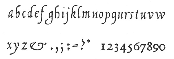
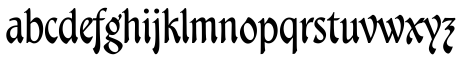
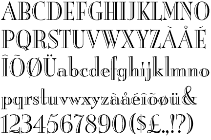
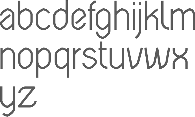
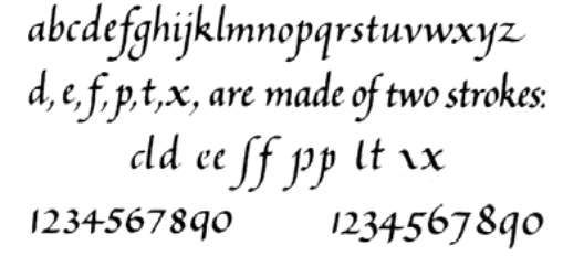
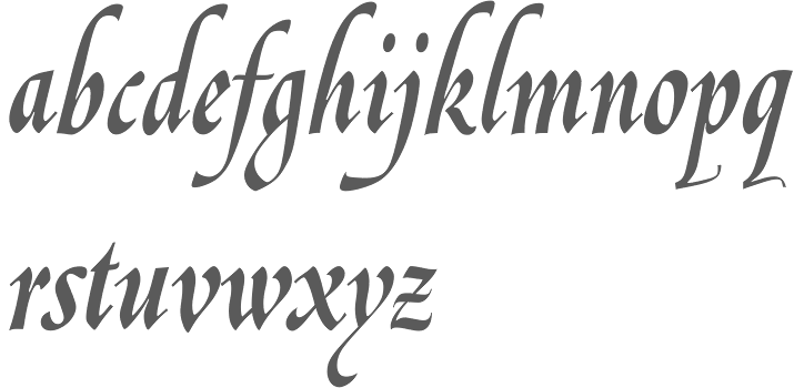
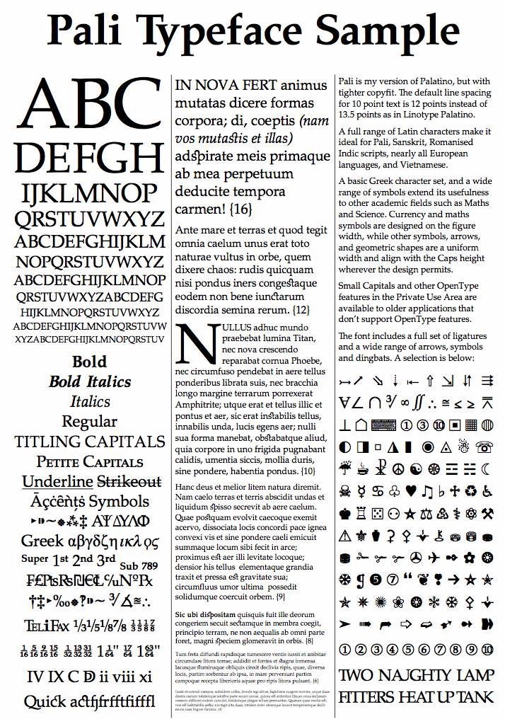
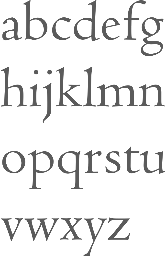
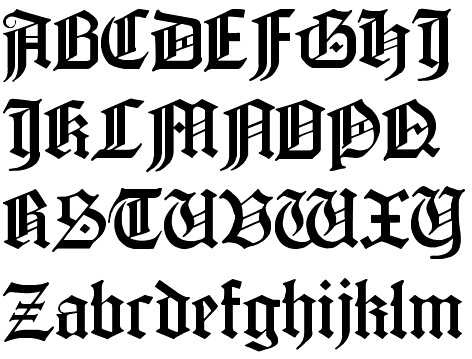
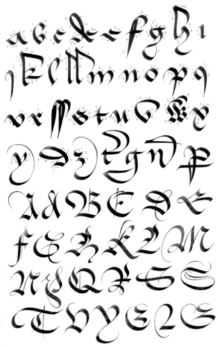
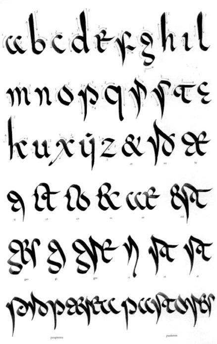
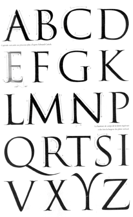
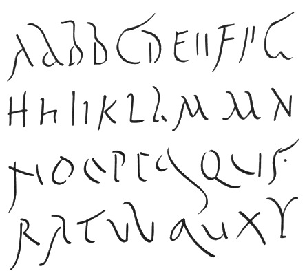
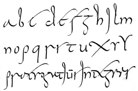
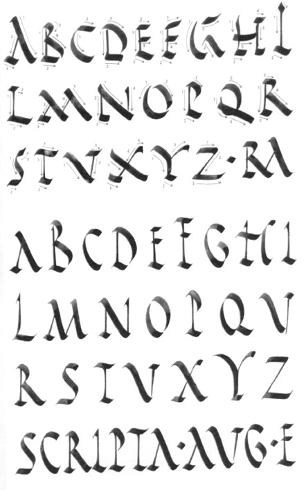
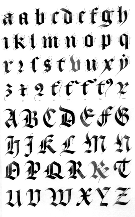
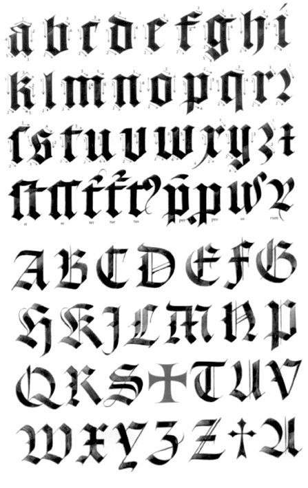
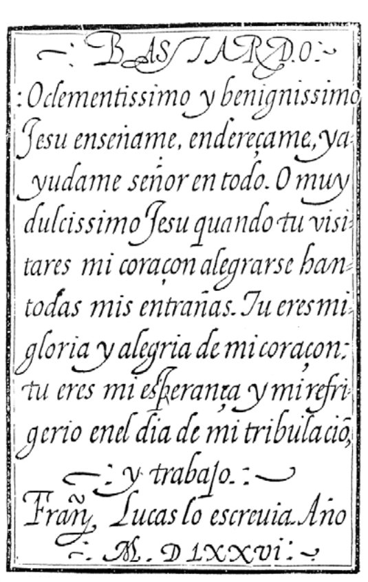
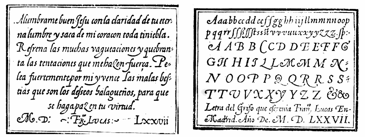
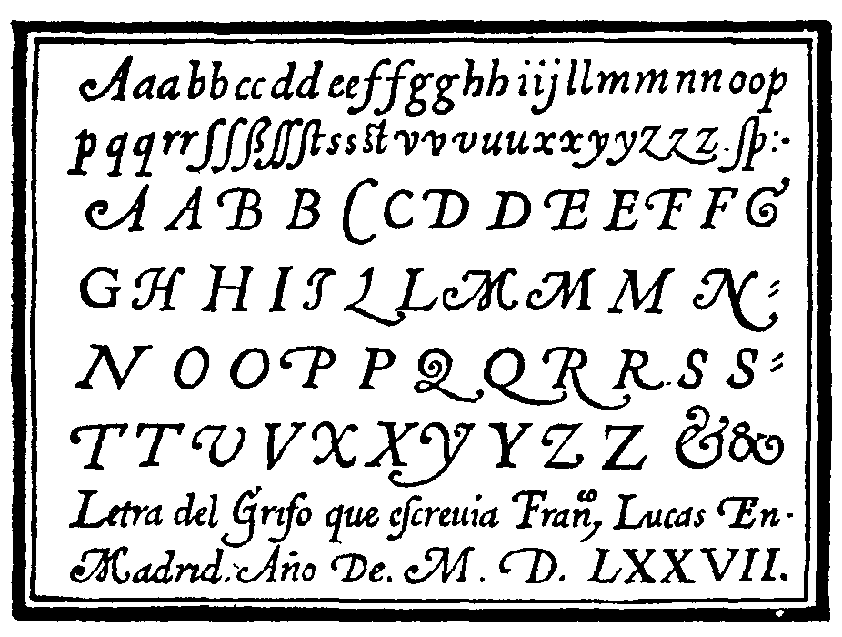
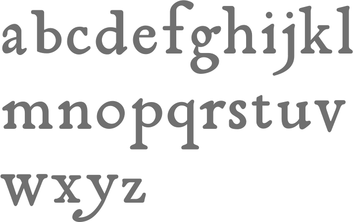
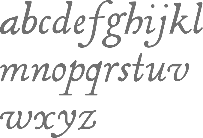
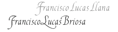
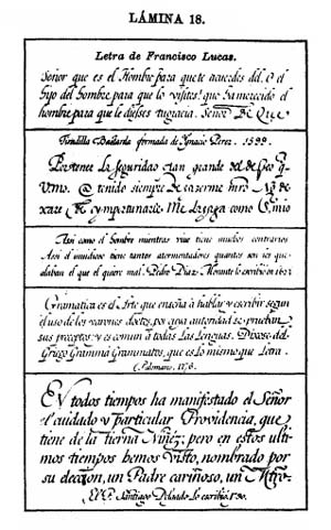
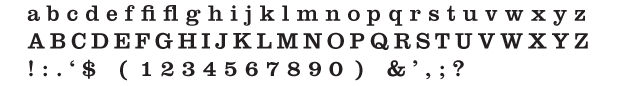
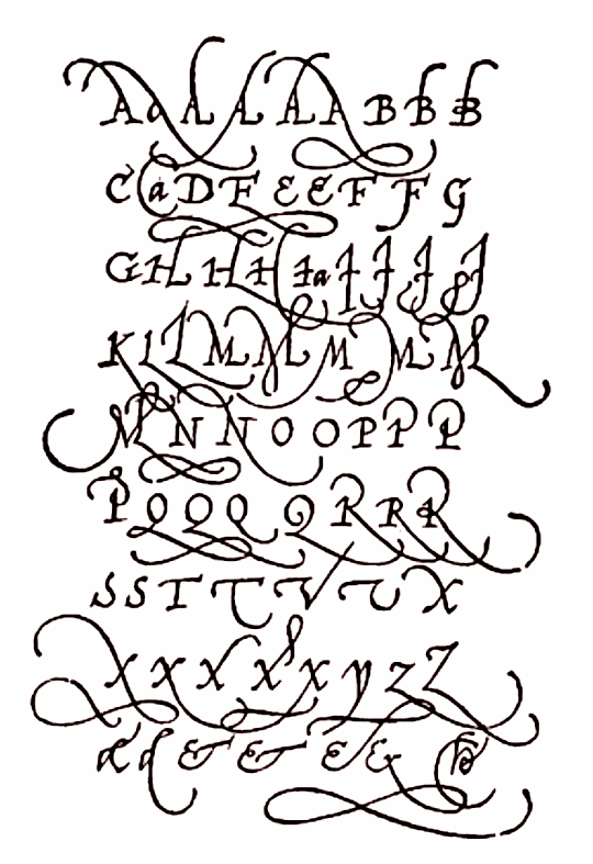
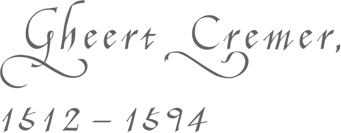
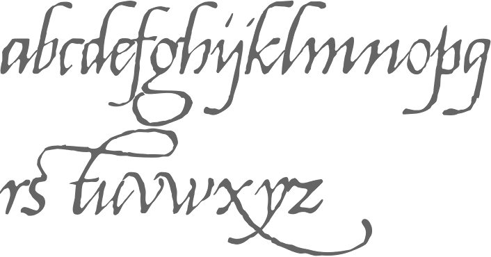
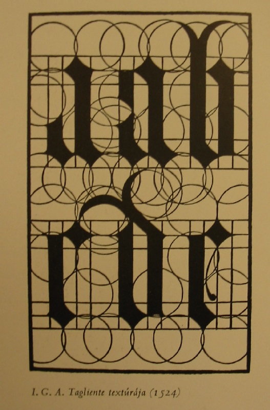
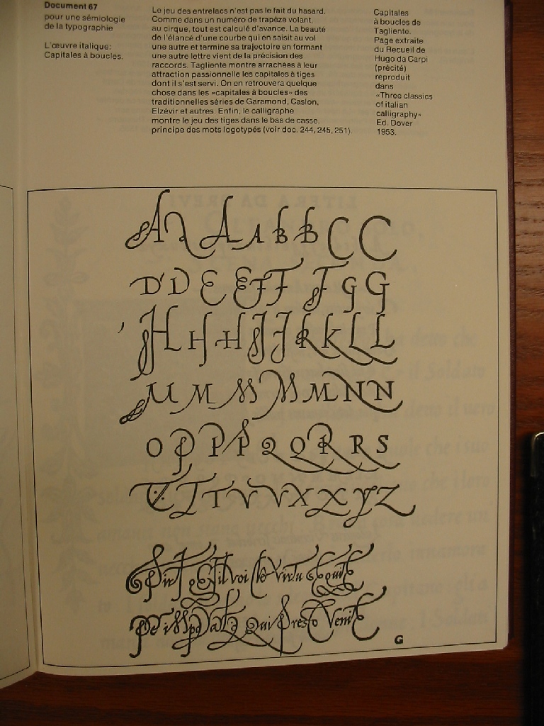
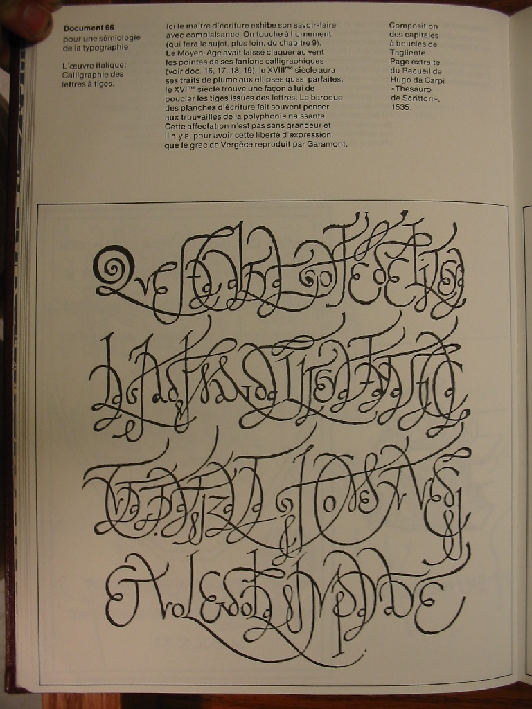
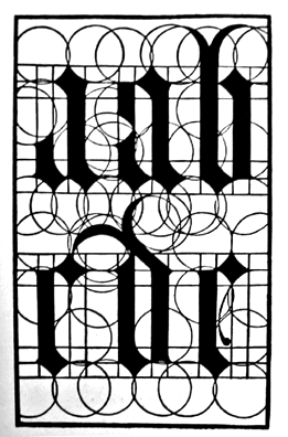
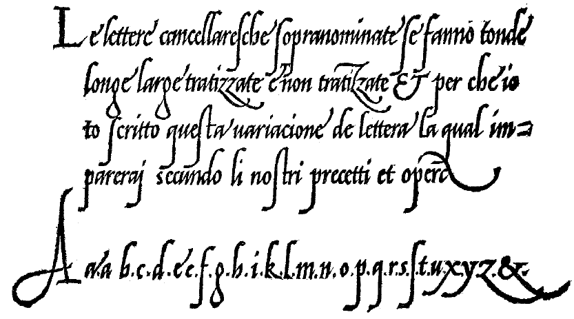
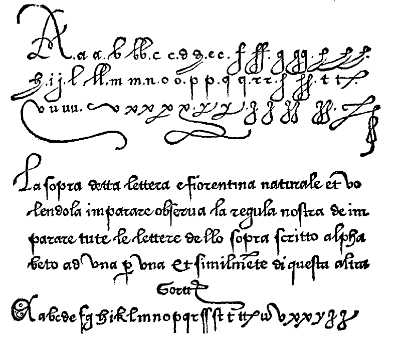
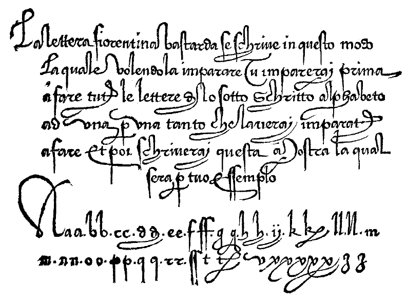
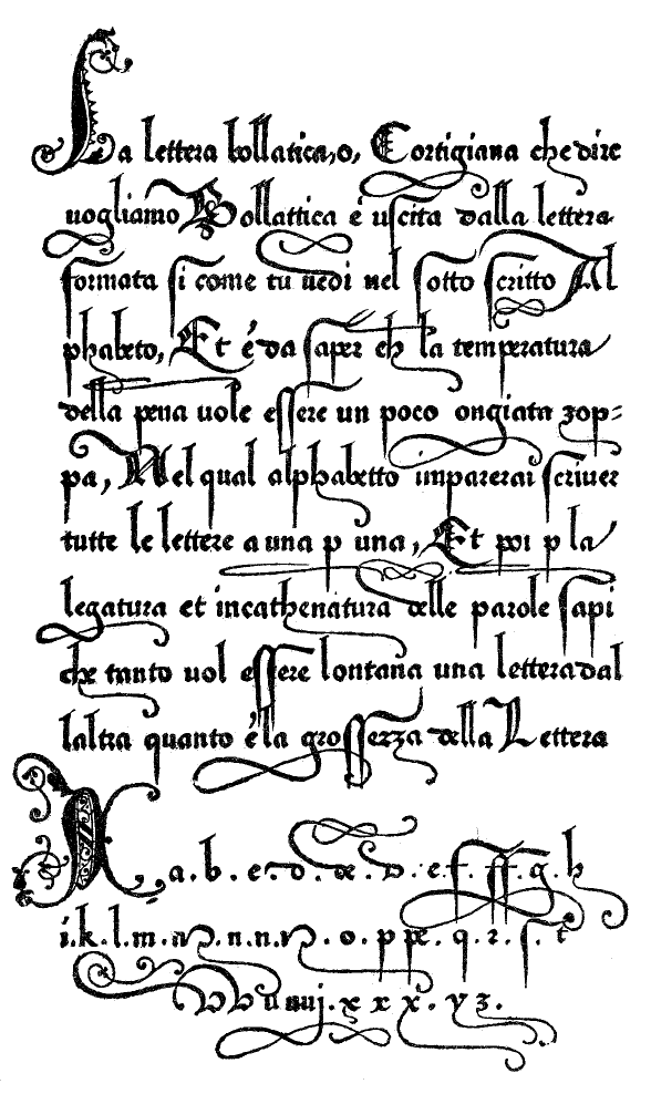
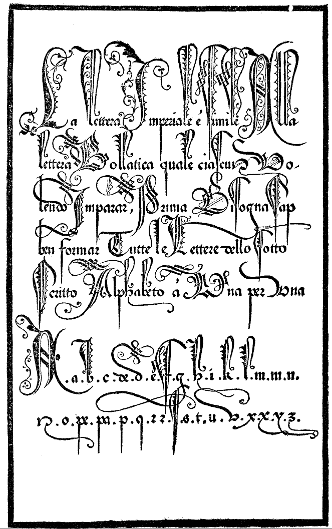
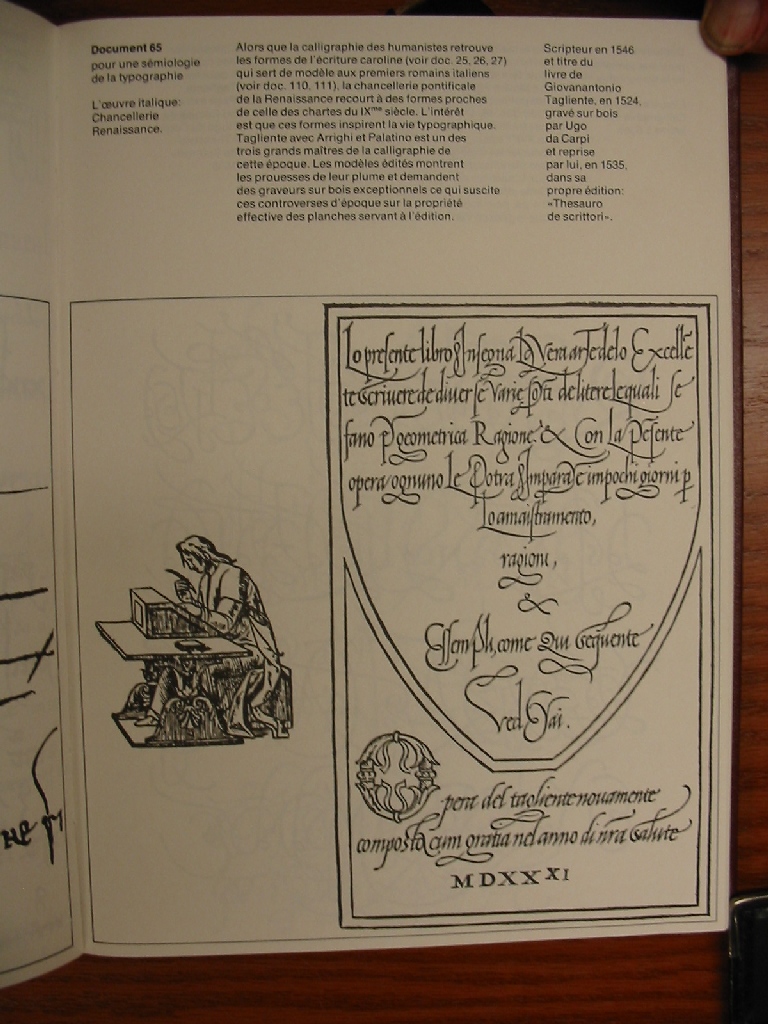
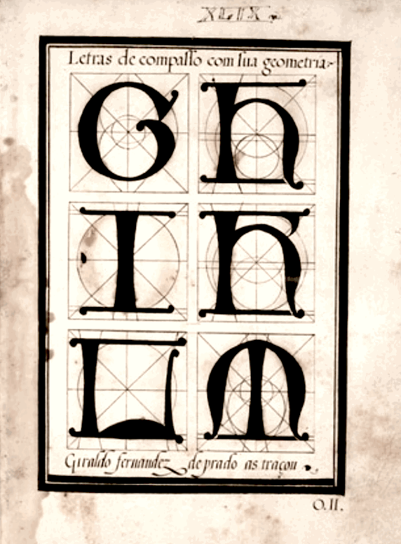
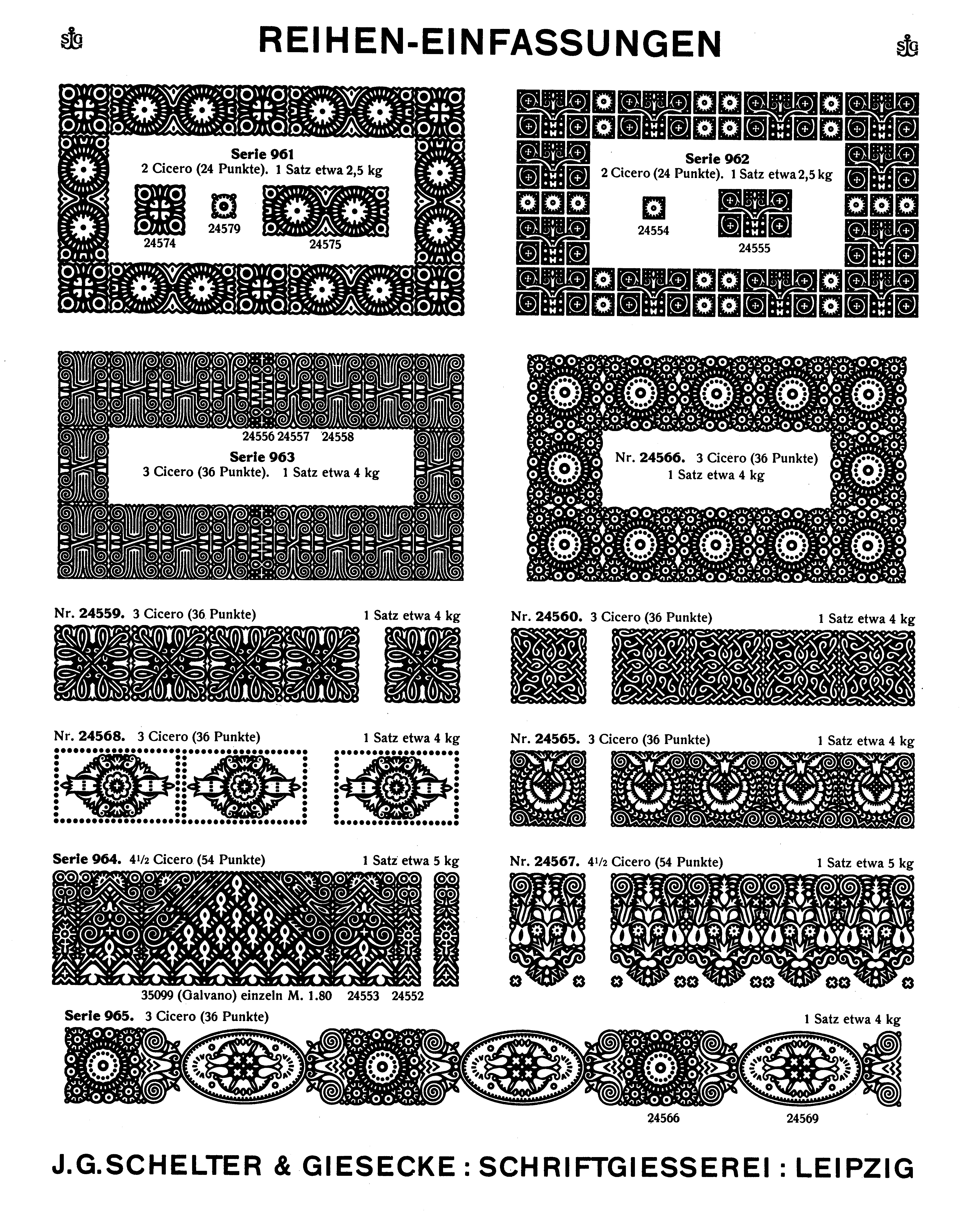
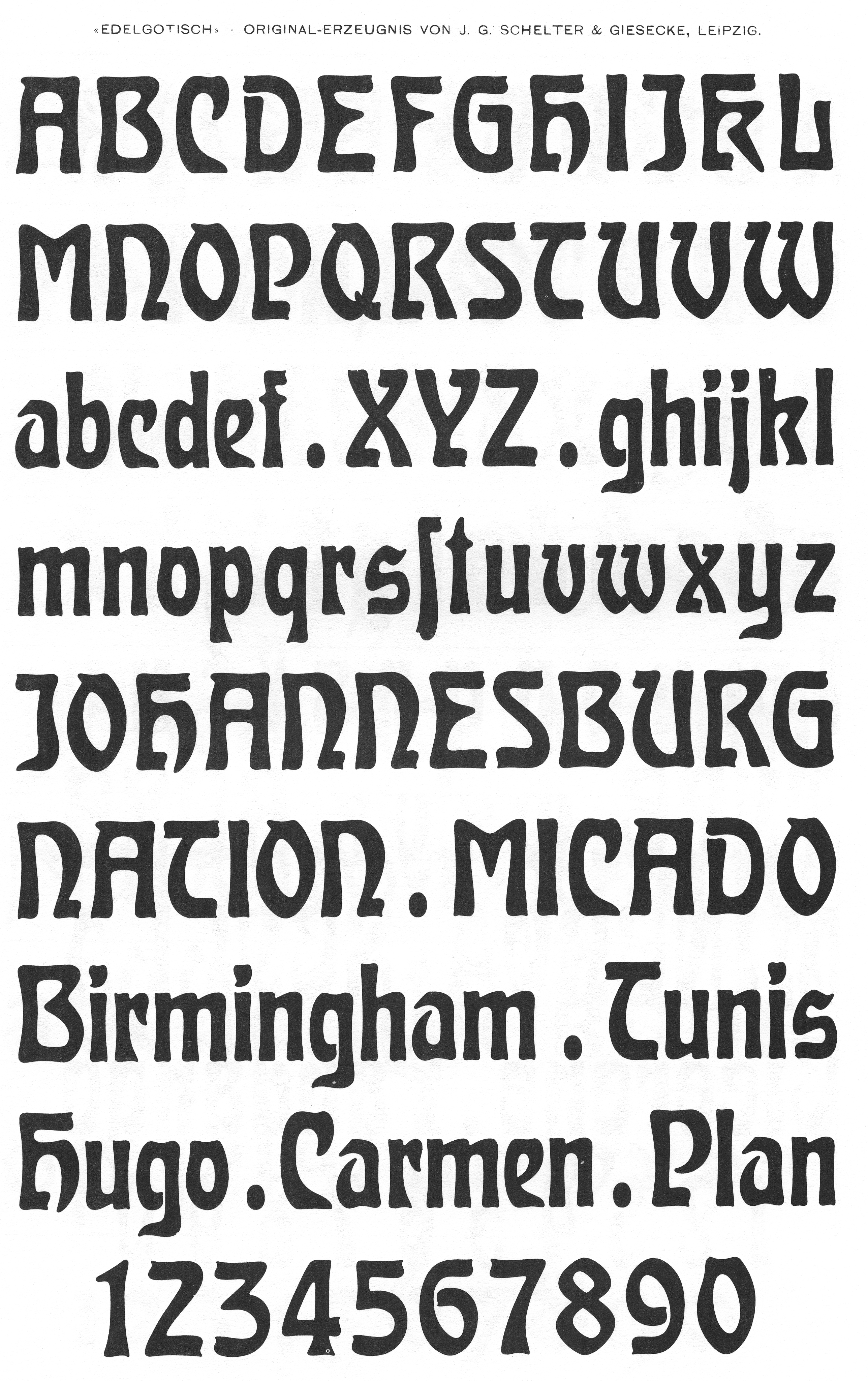
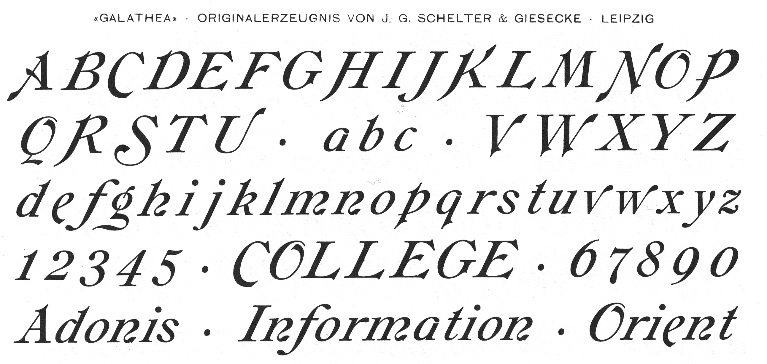
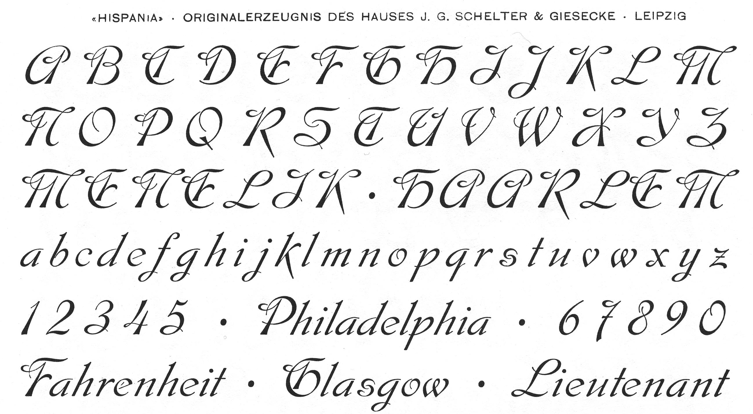
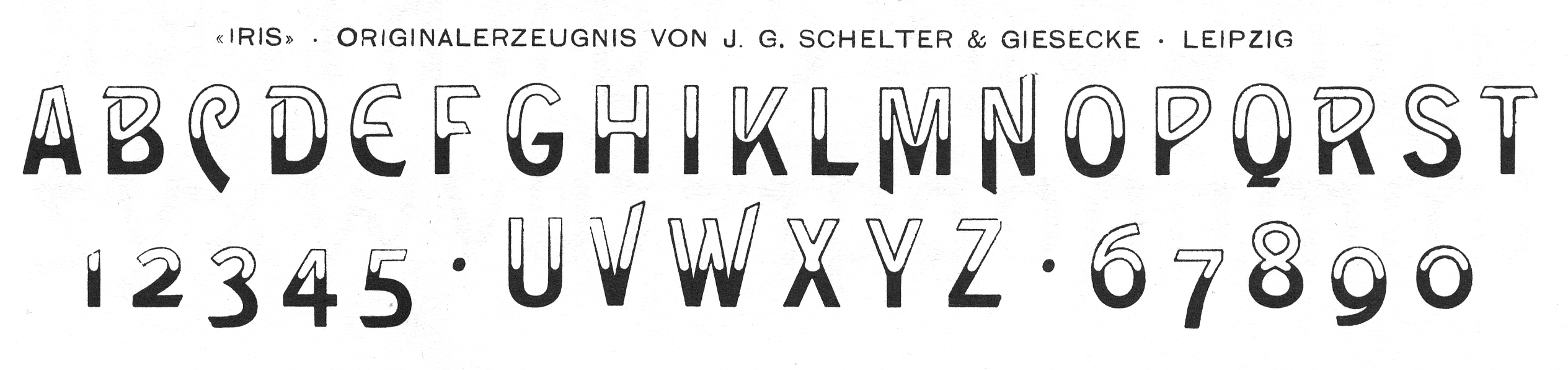
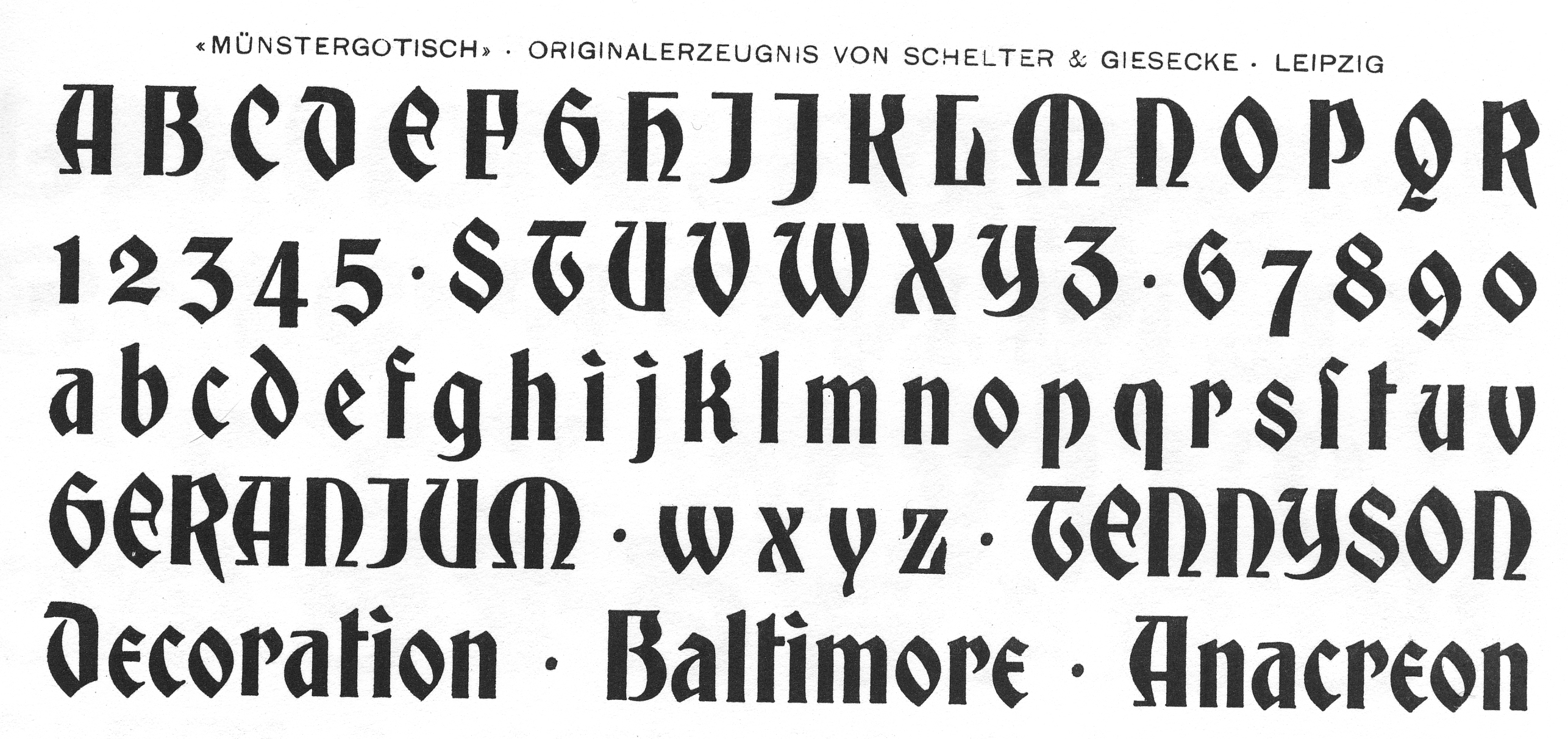
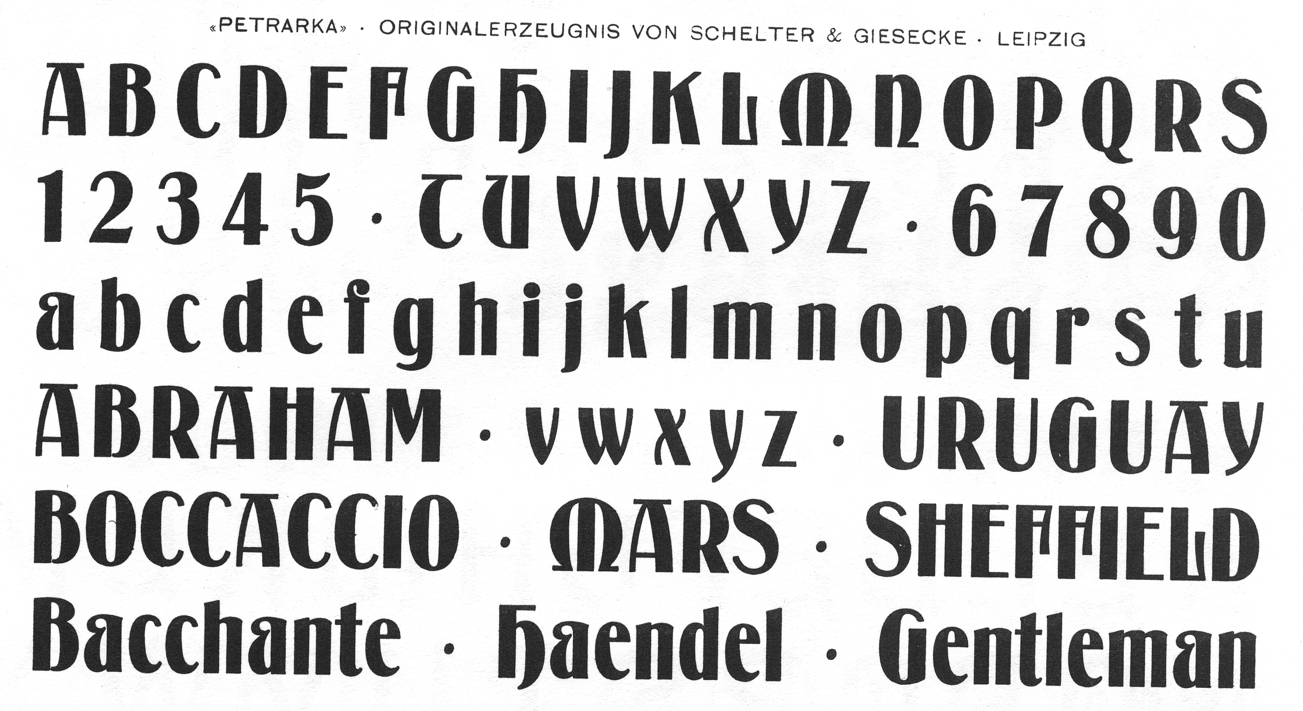
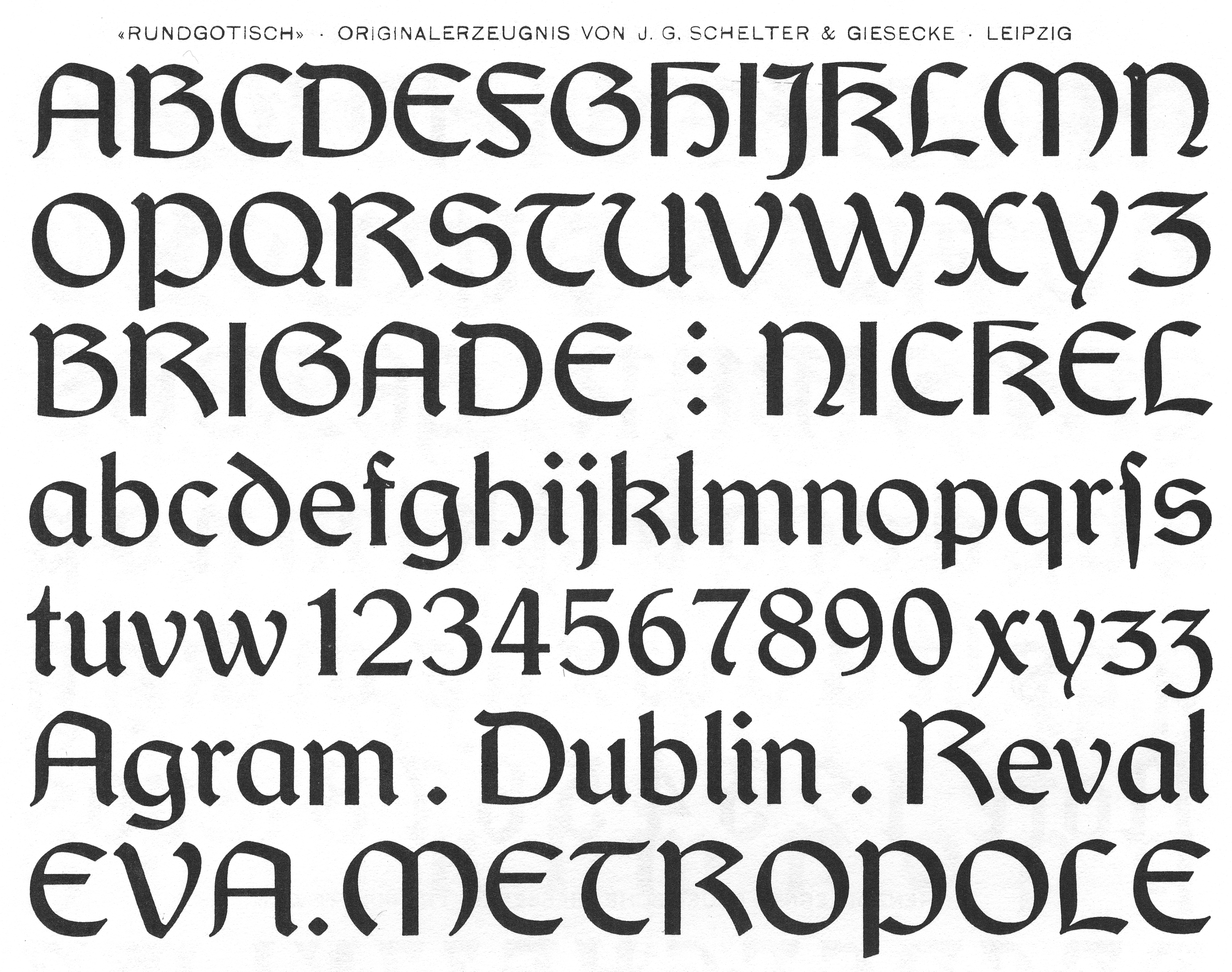
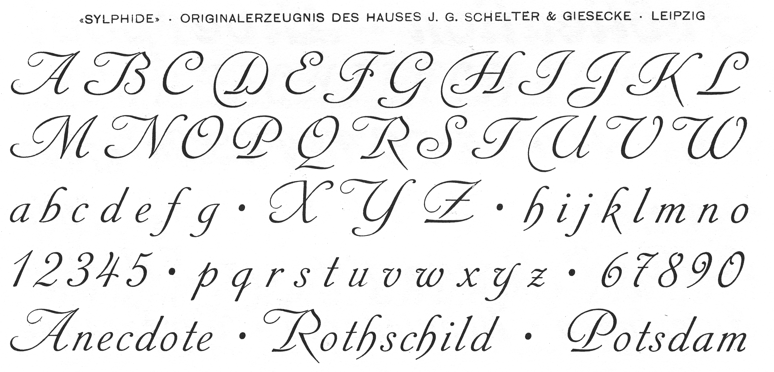
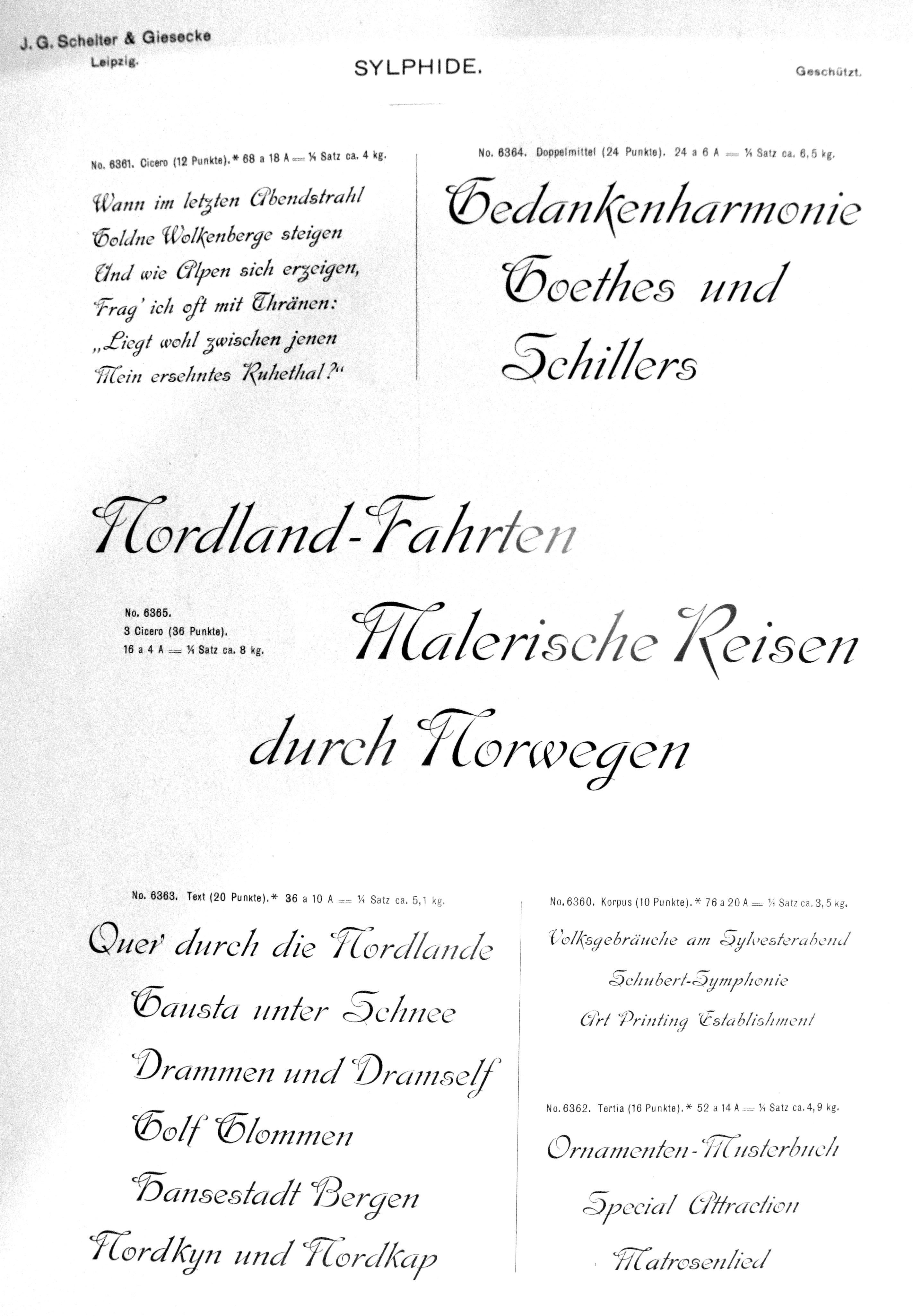
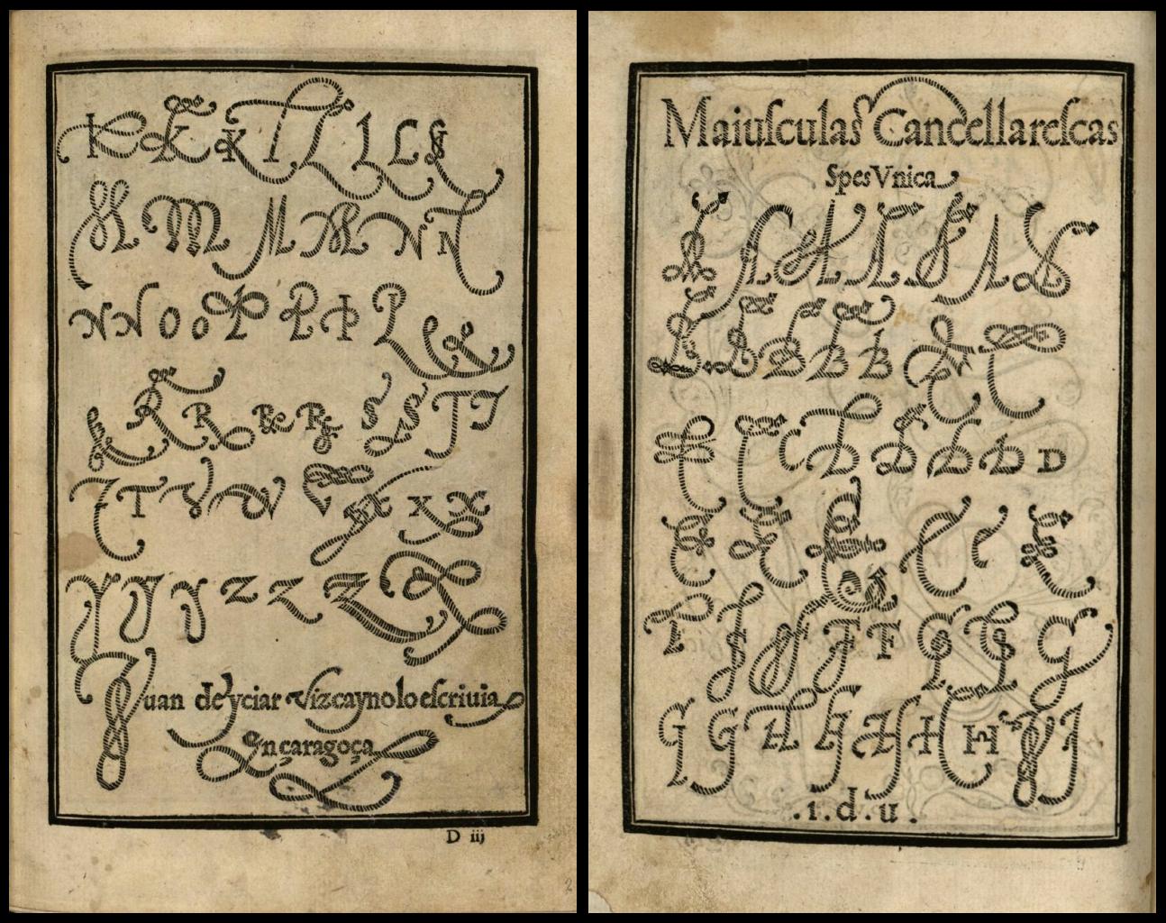
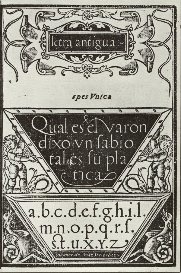
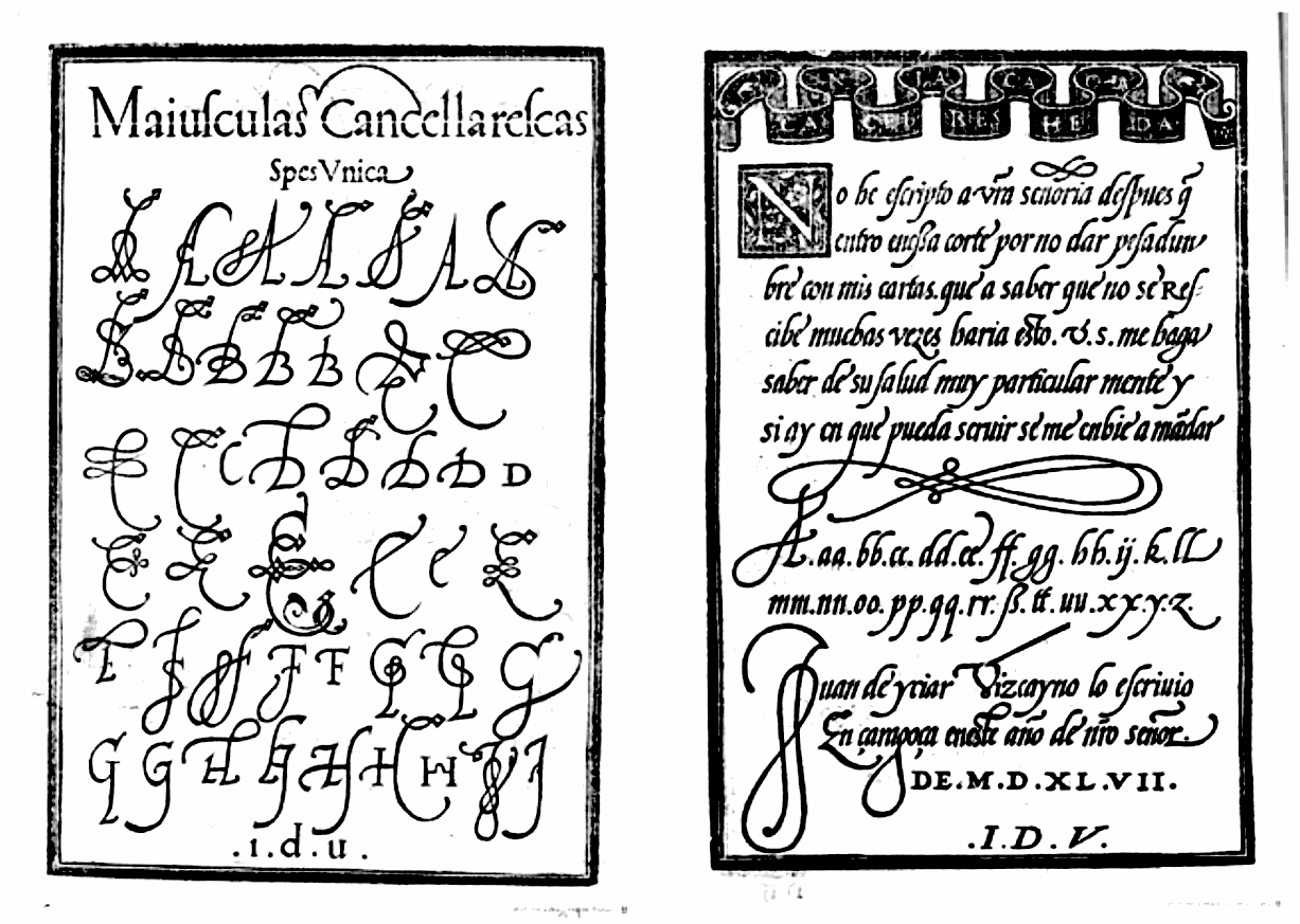
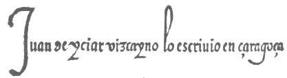
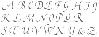
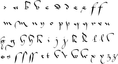
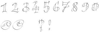
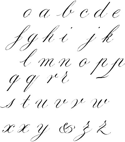
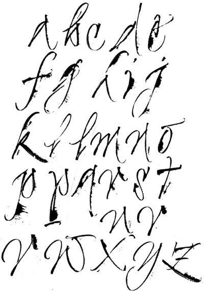
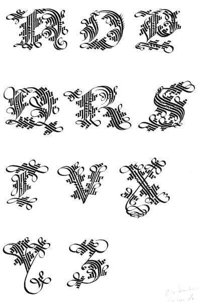
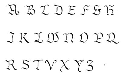
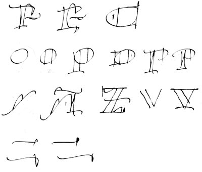
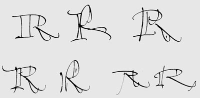
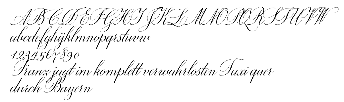
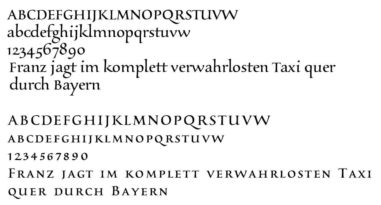
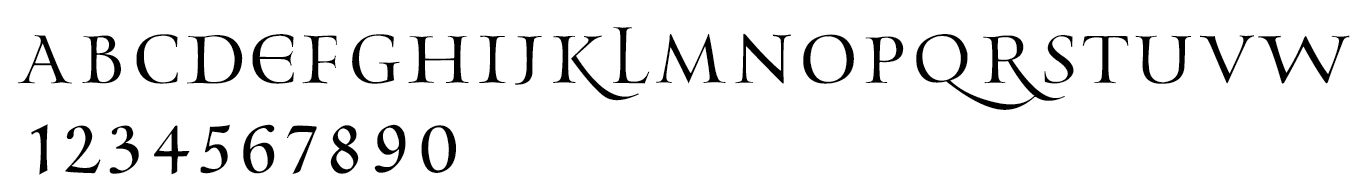
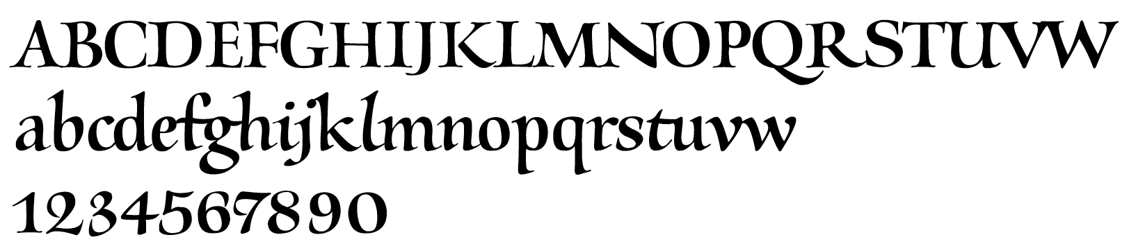
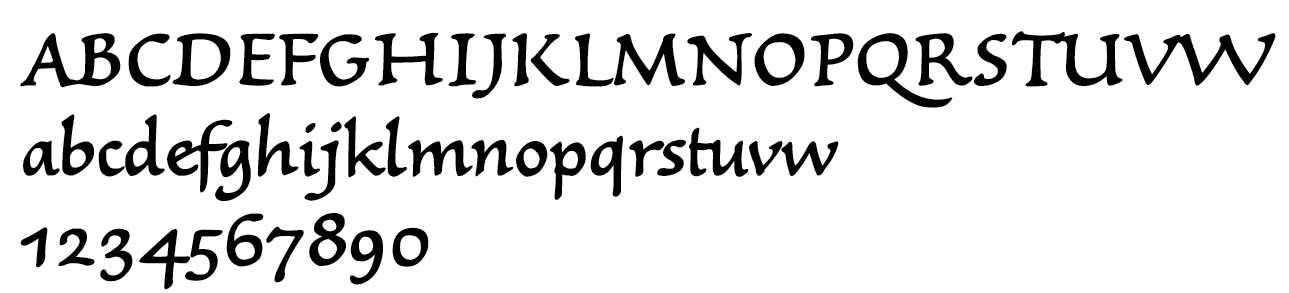
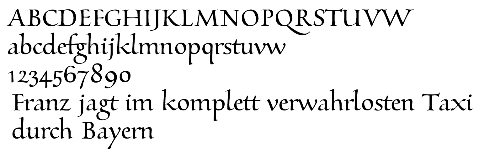
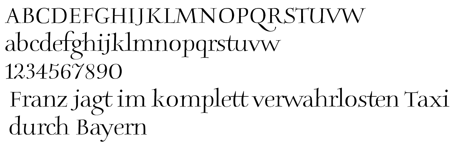
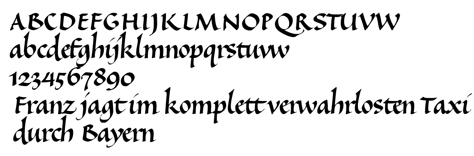
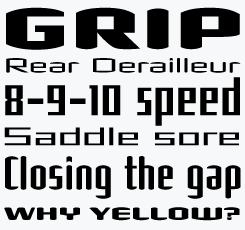
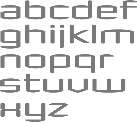
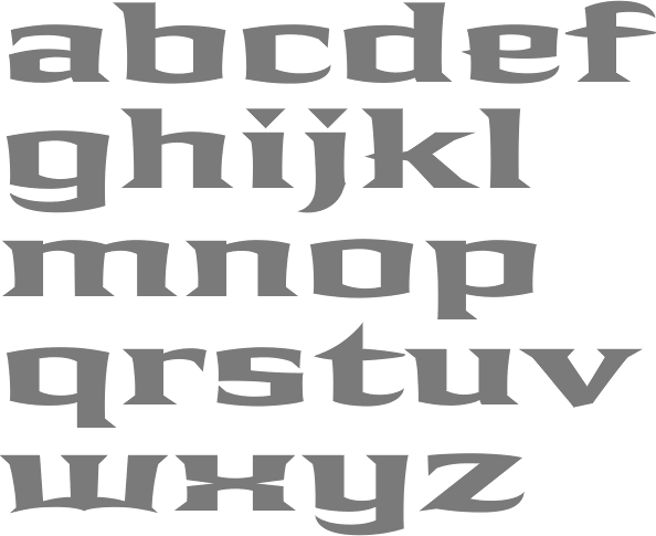
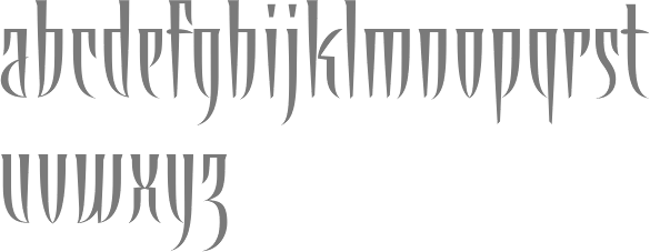
![La Operina, da imparare di scrivere littera cancellarescha, which was the first one for popular use. La Operina contains the first printed example of Chancery Cursive. In 1523, he wrote a sequel, Il modo de temperare le penne, a beautiful and influential typographic manual. Roderick Cave writes in his The Private Press: The first part of this was printed entirely from wood blocks, but the second part, Il Modo di Temperare le Penne, contains several pages printed in a very fine italic typeface modeled on the cancellaresca formata hand. The type was fairly obviously derived from the hand used by Arrighi himself; it seems likely that the punches were cut by his partner, who can with reasonable certainty be identified as Lautizio de Bartolomeo dei Rotelli, of whose skill as an engraver of seals Benvenuto Cellini speaks with respect in his Autobiography. He started printing in 1524 and designed his own italic typefaces for his work, which were widely emulated. His letterforms were revived in the 20th century by designers such as Plumet (1925), Stanley Morison (Monotype Blado (1923, Stanley Morrison) is based on Arrighi's lettering---it was unfortunately named after the printer Antonio Blado who used the type in the 1530s; the name Monotype Arrighi would have been more appropriate), Frederic Warde (in his Arrighi Italic, 1925), Robert Slimbach (one could say that his memory lives on through fonts like Adobe Jenson Multiple Master), Ladislav Mandel (Cancellaresca), Willibald Kraml (Vicentino, 1992), Paulo W (as Volitiva), Gunnlaugur S.E. Briem (Briem Operina), James Grieshaber (P22 Operina), Michelle Dixon (Arrighi Copybook), Gilles Le Corre (1522 Vicentino, 2011) and Jonathan Hoefler (Requiem Text). Arrighi's last printing was dated shortly before the sack of Rome (1527), during which he was probably killed. Sample pics: Fantastic ornamental capitals (1522), roman capitals (1522), Italian capitals, Italian minuscule. [Google] [MyFonts] [More] ⦿](LudovicoDegliArrighiVicentino--LaOperina--Roma-1522.gif)
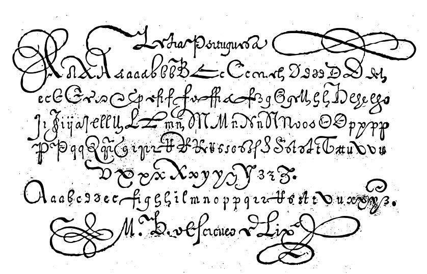
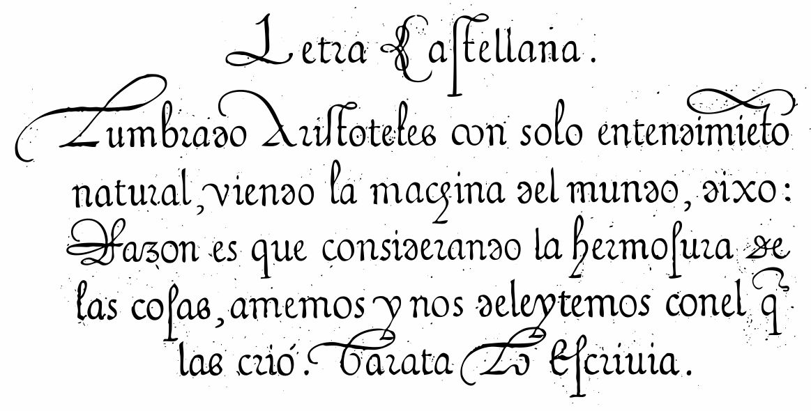
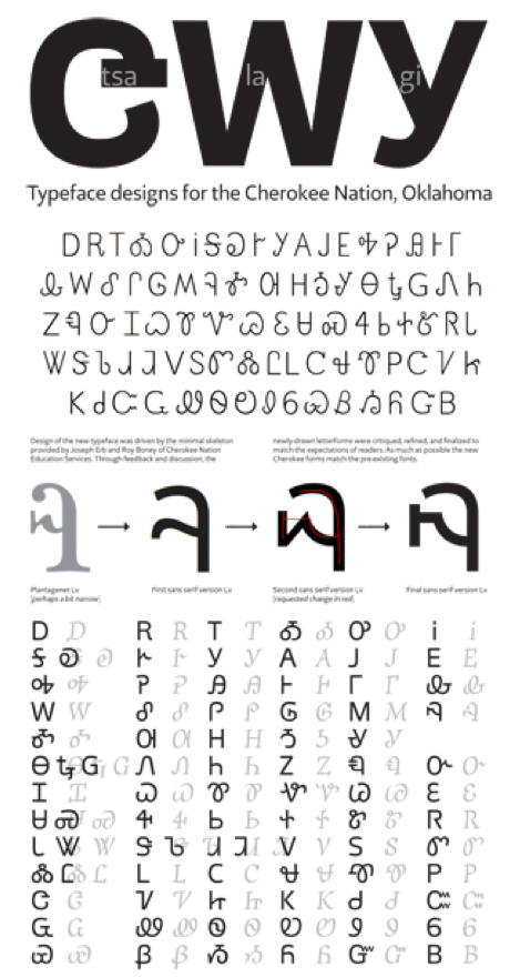
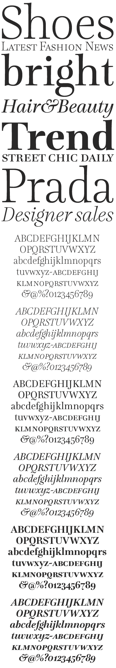
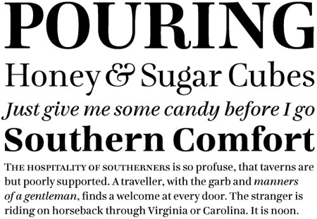
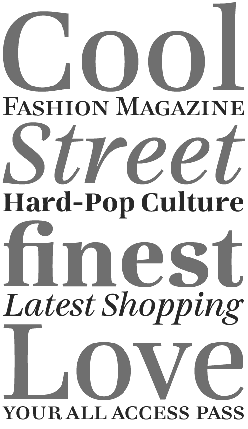
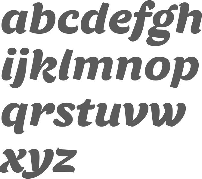
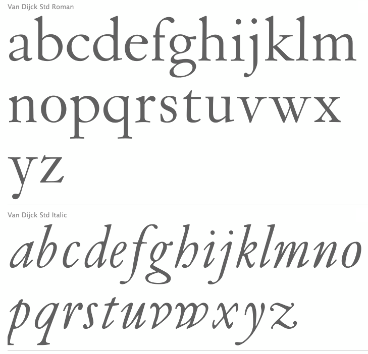
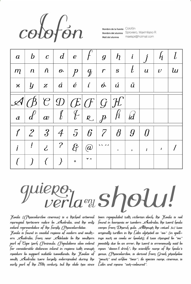
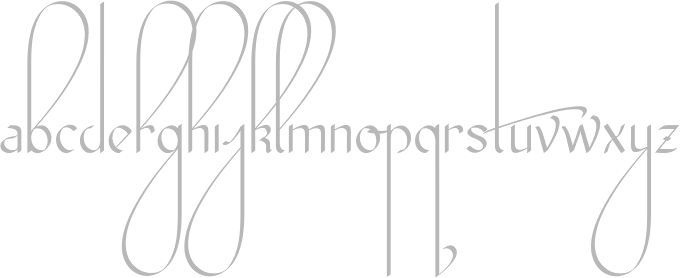
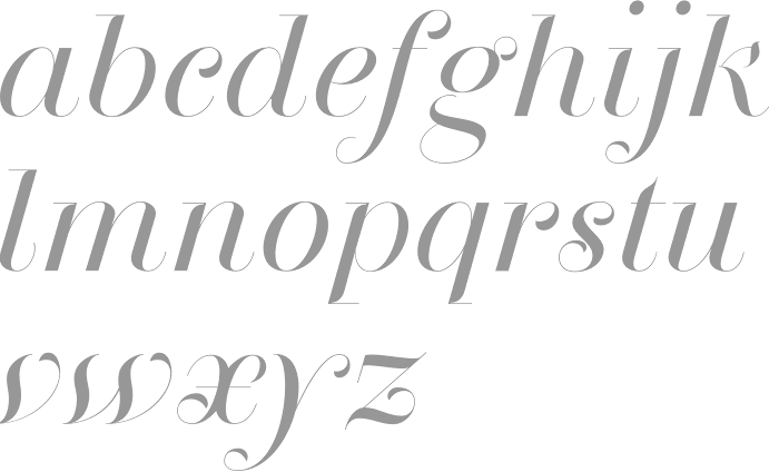
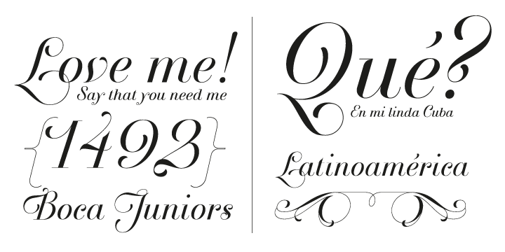
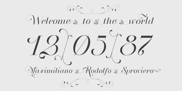
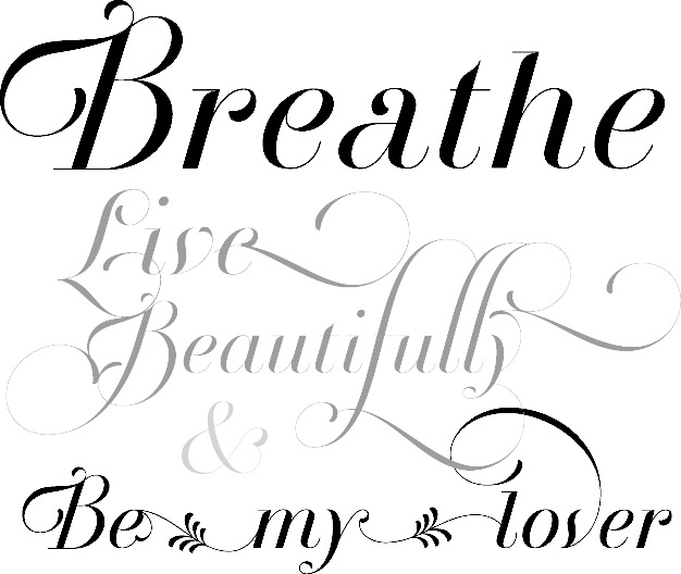
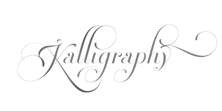
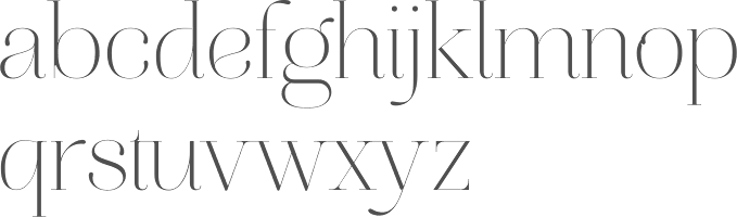
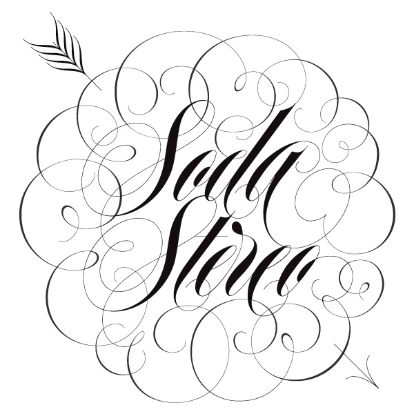
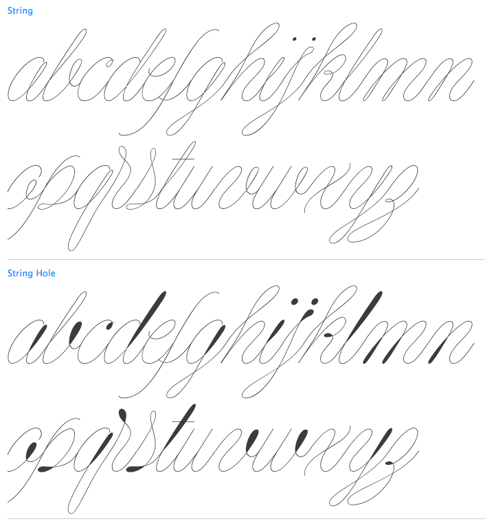
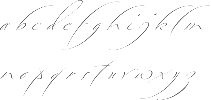
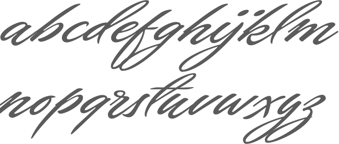
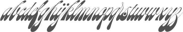
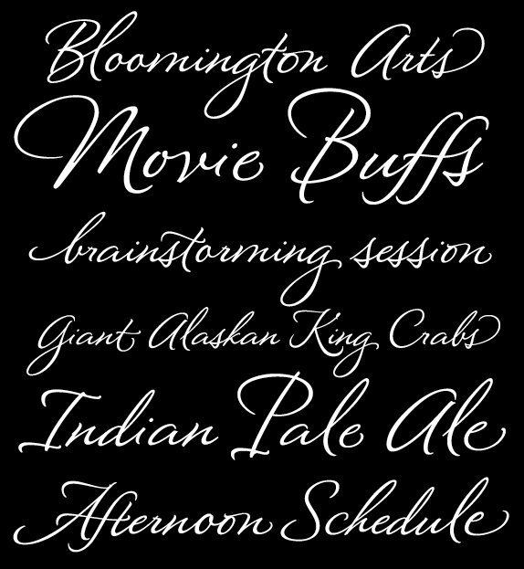
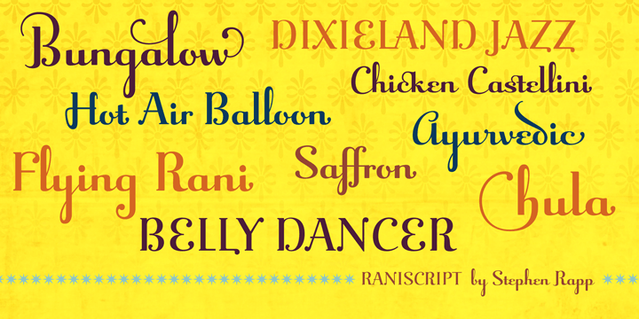
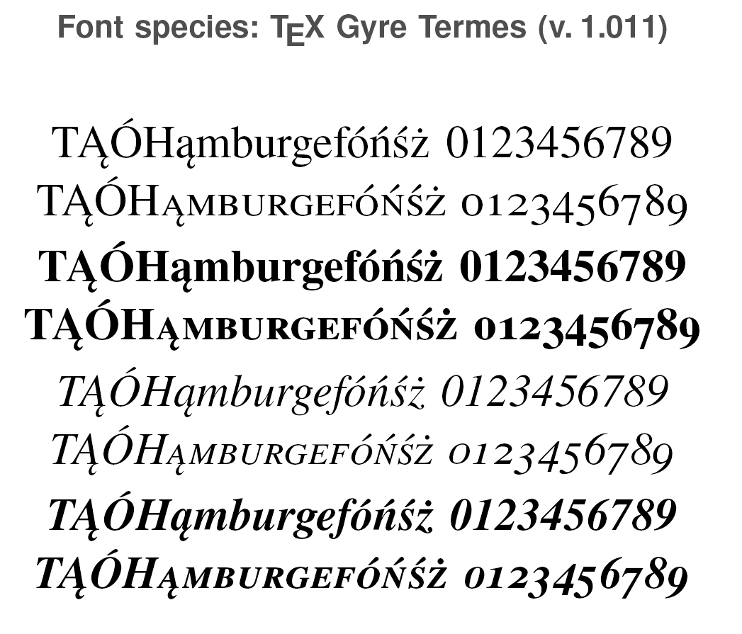
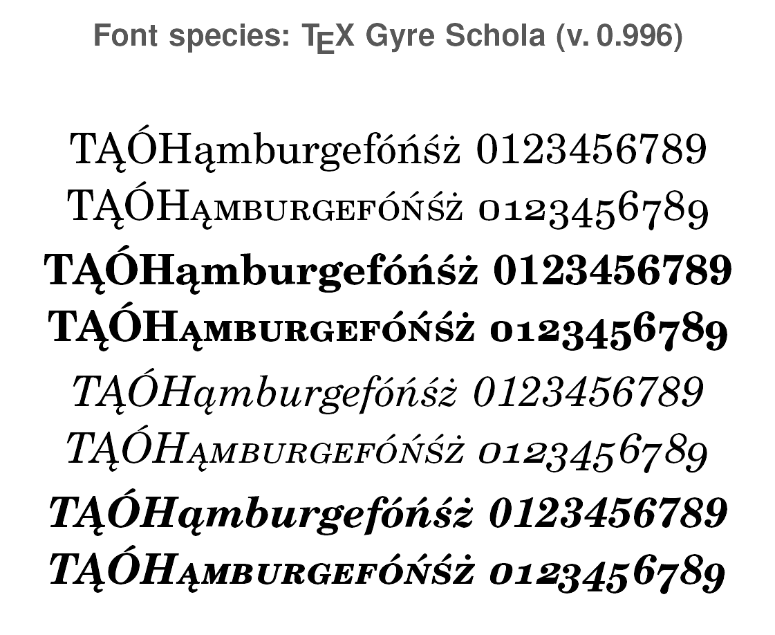
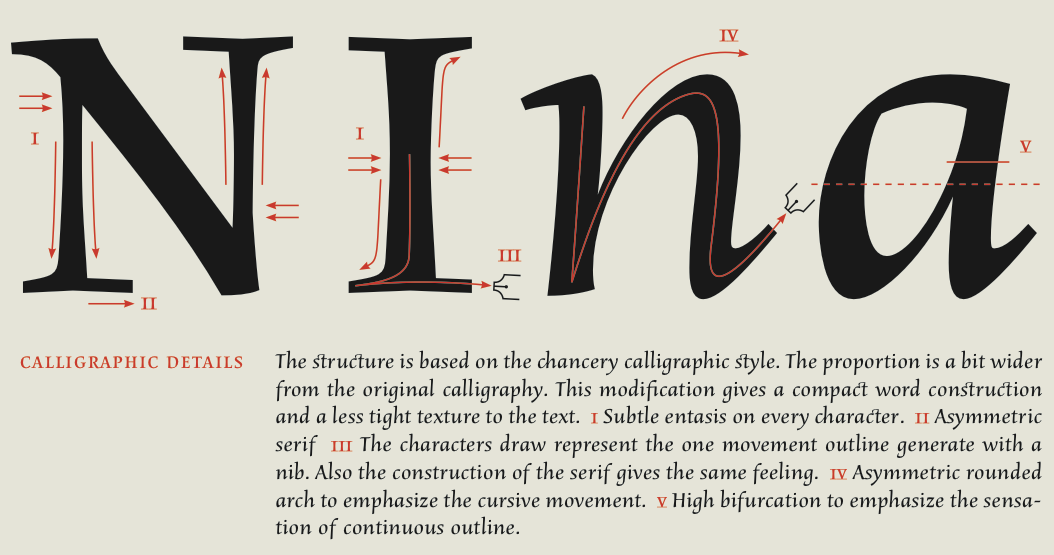
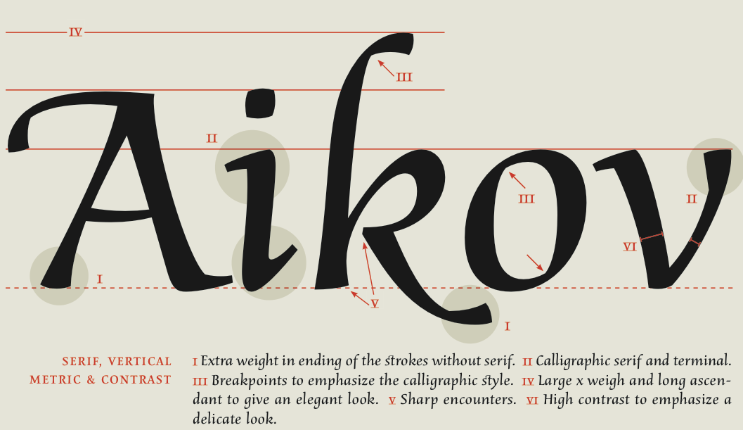
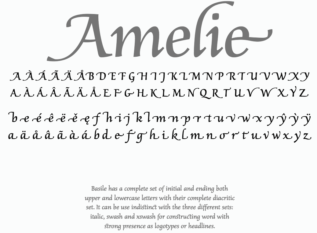
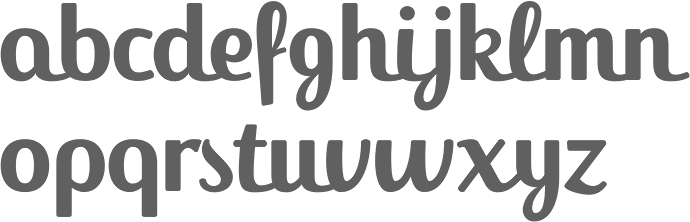
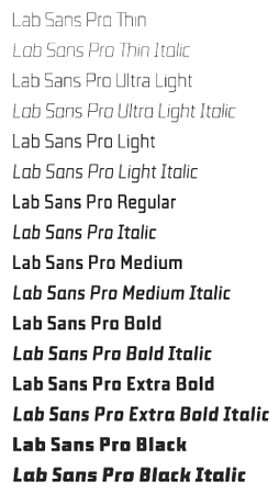
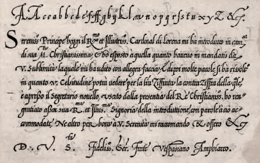