| | |
A. Pat Hickson

|
 Britsh designer for ITF, most of whose fonts were mainly published by Red Rooster. After 2017, she started contributing to her husband's foundry, London Type. List (all ITF/Red Rooster unless otherwise specified):
 - Alghera Pro (1996): hand-printed, based on a handwritten Portuguese wine label design.
- Alys (1995): Calligraphic.
- Appleyard (1992): based on an old Monotype design, Prumyslava.
- Badger (1992): comic book style. In 2010, this was Steve Jackaman and Ashley Muir as Badger Pro.
- Basset, Basset Five, Basset Four, Basset One, Basset Six, Basset Three (1997): headline family.
- Bellini (1992): a garalde typeface based on Progreso (1923, Richard Gans Foundry). See Veer, where the font is sold as "Bellini". Linotype sells Greco (DsgnHaus, 1996) which according to some typophiles really is Progreso.
- Byron (1992, by Paul and Pat Hickson): a calligraphic font originally cut in the 1980s for QBF based on a design in Printing Types of the World (1931, Pitmans). Later redone in digial form as LDN Piccadilly (2019) at London Type.
- Coliseum (1992, ITF), co-designed with Julie Hopwood. Steve Jackaman completely redesigned, redrew, and improved the Coliseum family in 2017 and called it Coliseum Pro. That redesign also produced the sister typefaces Clydesdale and Torpedo.
- Dundee, Dundee Condensed (1993), inspired by the various headlines used in children's comic books in England, published by D.C. Thompson of Dundee, Scotland.
- Erasmus (1992): based on a design of Sjoerd Hendrik de Roos, 1923, Amsterdam Foundry.
- Forum Titling (1994): based on the Frederick Goudy design first shown in 1912, which was produced as a foundry typeface by Lanston Monotype in 1924.
- Gilmore Fahrenheit and Gilmore Sans (1992): ugly typefaces based on Eric Gill designs.
- Grove Script (1992).
- Javelin (1994): a connected fifties diner typeface in the style of Continental Railway Magneto Bold, Parkway Hotel, Permanent Waves, and Raceway.
- ITC Mona Lisa (ITC, 1992, and Elsner&Flake, 1991), ITC Mona Lisa Recut (ITC, 1991): an interpretation of a 1930 tall modern type by Albert Auspurg for Ludwig&Mayer.
- Rivoli Initials. Based on the William T. Sniffin design for ATF, circa 1928.
- Roller, Roller Shadow (1997): based on Iberica by Carlos Winkow for Fundicion Nacional, ca. 1942.
- Sinclair Script (1992).
- Stirling (1992).
- Venezuela (2000, Red Rooster) is a decorative Mexican simulation font based on the typeface Vesta by Albert Auspurg, circa 1926.
- Heseltine (2014) was designed by Paul & Pat Hickson in Text & Titling weights. The Heseltine typeface family was originally produced as a gift from Haymarket Media Group to Lord Heseltine for his 75th birthday.
- London Belgravia (2019, by Paul and Pat Hickson). An art deco sans.
- With Paul Hickson, she designed the floriated initial caps font LDN Garamond Initials (2020), which accompanies Paul's LDN Garamond (2020), which is a faithful revival of Claude Garamond's typeface.
MyFonts link. FontShop link. Klingspor link. [Google]
[MyFonts]
[More] ⦿
|
Advertisers Modern
|
A typeface made in 1930 by Frederic Goudy. D.J.R. Bruckner: Goudy could not recall why he started this design or even if all the drawings were finished, but because he had cut all the master patterns he concluded he had done all the other work. It was made for Manuel Rosenberg of Chicago, the publisher of The Advertiser, for his annual Sketch Book. [Google]
[More] ⦿
|
Advertisers Roman
|
A typeface made in 1917 by Frederic Goudy. D.J.R. Bruckner: Patterns were never cut and the drawings were lost in the 1939 fire. Goudy felt it was just as well they perished, "for I don't think they were any too good." [Google]
[More] ⦿
|
AIGA medalists
|
 The medal of the AIGA is awarded to individuals in recognition of their exceptional achievements, services or other contributions to the field of graphic design and visual communication. On numerous occasion since its inception in 1920, the medal went to famous typographers or influential type personalities. Included are Daniel Berkeley Updike (1922), Bruce Rogers (1925), Frederic W. Goudy (1927), William A. Dwiggins (1929), Henry Lewis Bullen (1934), Rudolph Ruzicka (1935), Thomas M. Cleland (1940), Stanley Morison (1946), Jan Tschichold (1954), Josef Albers (1964), Paul Rand (1966), Giovanni Mardersteig (1968), Herbert Bayer (1970), Milton Glaser (1972), Herb Lubalin (198), Saul Bass (1981), Massimo Vignelli (1982), Matthew Carter (1995), Zuzana Licko and Rudy VanderLans (1997), Lucian Bernhard (1997), Steven Heller (1999), and P. Scott Makela (2000). [Logo designed by Jimmy La (2010).] [Google]
[More] ⦿
The medal of the AIGA is awarded to individuals in recognition of their exceptional achievements, services or other contributions to the field of graphic design and visual communication. On numerous occasion since its inception in 1920, the medal went to famous typographers or influential type personalities. Included are Daniel Berkeley Updike (1922), Bruce Rogers (1925), Frederic W. Goudy (1927), William A. Dwiggins (1929), Henry Lewis Bullen (1934), Rudolph Ruzicka (1935), Thomas M. Cleland (1940), Stanley Morison (1946), Jan Tschichold (1954), Josef Albers (1964), Paul Rand (1966), Giovanni Mardersteig (1968), Herbert Bayer (1970), Milton Glaser (1972), Herb Lubalin (198), Saul Bass (1981), Massimo Vignelli (1982), Matthew Carter (1995), Zuzana Licko and Rudy VanderLans (1997), Lucian Bernhard (1997), Steven Heller (1999), and P. Scott Makela (2000). [Logo designed by Jimmy La (2010).] [Google]
[More] ⦿
|
AJPT
[Alan Jay Prescott]
|
 Pottstown (Philadelphia)-based designer and PostScript font hacker who ran Prescott Design and now Alan Jay Prescott Typography, but was also involved in other ventures such as the Black Walnut Winery. Originally from Greenfield, MA, he graduated from Saddleback College, and worked for some time as a typesetter in New York. He advertizes himself as a leader in PostScript Open Type Font development specializing in the revival of print-only letterforms into digital typographic materials. He operates as APT and more recently as AJPT. In 2019, he announced that he would stop making typefaces altogether. His work can be partitioned into time periods. For this reason, Prescott's oeuvre is split over several pages:
 - His late period (2017-2019). In these three years, he showcased his work on Facebook, and was mainly involved in reving 19th century typefaces, about half of which were from the Victorian era. The annotations in the list below are quoted from Prescott's pages.
- Absolution Cursive (2017). When I was a typesetter in New York City, I had one of the largest collections of typefaces from CompuGraphic's library available for setting. One of the faces I never used in two decades of work was a rather ungainly decorative font called Abel Cursive. Apparently it was designed by Bernie Abel (perhaps one of CompuGraphic's employees) and I'm not sure it got much use, since I don't recall seeing it anywhere except my type catalog. Before I sold my equipment and closed my business for good, I made a scan of every typeface at 72-point size that I owned for future development, if there ever came a time to work on something crazy like that. Most of those 2,000 scans were lost when I changed computers a long time ago, but Abel Cursive survived and I made a down-and-dirty mow-and-blow font back then. I have recently worked on it extensively to make it usable as a multilingual slightly redesigned font in OTF format. I would classify it is as neo-Victorian medium-contrast decorative italic. It is definitely an oddball and may never see use.
- Algol (2017). Based on a scan from Dan X. Solo, Algol is a vastly expanded character set for Algernon, a typeface that clearly presages Machine and other "octics." I don't have any source material for the original design, but it may have been a Dan Solo original.
- Aloysius and Aloysius Ornamented (2017). This is a digital revival of the original Algonquin, cut by J.F. Cumming in the late 1880s for the Dickinson Type Foundry in Boston. While this was not my most challenging project, it was a doozy.
- Alpenhorn Roman (2017). Another oddball typeface is revived here, renamed from the design called Alpine by Henry Schuenemann for the Cleveland Type Foundry in the 1880s. Buried in the "gingerbread" of this weird face is technically a Latin serif, but otherwise it is an entirely unique letterform for which I had a heart soft enough to revive here in digital form.
- Androgen Roman (2017). I know next to nothing about this ultra-geometric blackletter called Anderson that I found displayed in a Dan X. Solo catalog, but it is another oddball that is attractive and very simple to revive in digital format. It is one of those projects I would recommend to a beginning revivalist who wanted to cut his or her teeth on a moderate challenge after mastering some basic tools in font development software.
- Angolan Text (2017). I found Angular Text in a Solo catalog and revived it as a digital font with diacritics and other characters for expanded typesetting possibilities. It was designed by Herman Ihlenburg in 1884 for MacKellar, Smiths & Jordan, which information I found in a link from Tom Cruz for a fellow named Toto who revived the font as well; he has several glyphs I do not have and I like his showing better. Interesting to see what others have done with the exact same typeface and scan and some research for tantalizing missing glyphs...kudos.
- Antiochia Series (2017). This collection of typefaces represents a revival of several bold slab-serif wood types with the name Antique that are related. Their individual histories will follow at another time, but note that several here are useful derivatives that add to the variety of this letterform's impact.
- Azurine Roman (2017). Azurine is a digital revival of a typeface known as Aztec, drawn by an unknown designer for the Union Type Foundry before 1889.
- Beltane Roman (2017). The very complicated story behind the work on this revival is too long for this space (and perhaps too boring to most), but suffice it to say that this letterform started out in 1886 as drawn by the great Herman Ihlenburg as Artistic and assigned to MacKellar Smiths & Jordan. Dan Solo called this face Belmont but only showed caps and was suspect anyway. I was able to find specimens elsewhere and a motherlode of other interesting things in the Inland Printer. I developed my first full-featured OTF using this typeface and designed Greek and Cyrillic glyphs as well. I also fitted it out with a set of small caps to make a font that now has 4,000 glyphs for nearly every non-Asian language. To top it off, Robert Donona revived the decorative caps for this typeface, an excruciating task that I once considered for myself but was lucky enough to have this other crazy person take up. The number of hours dedicated between Robert and myself in reviving this complete series digitally is probably unprecedented.
- Bernhard Swirl (2019). This is a digital revival of the letterform of the same name. It is equipped only with the upper case, an ampersand, a spacer dingbat and the numerals. The numerals are quirky, not only in design, but the fact that they seem to have been intended as old-style figures with the exception for the 4 and 7. Lucian Bernhard is either the designer of this limited-use typeface or inspired a reworking of his "wobbly" poster typefaces for which he is known as an innovator. I have reworked the scanned samples I had used as templates and drew them with a little more consistency than the originals to improve color on the page.
- Bireme Roman (2017). Below is a digital revival of a typeface called Bijou. As I have come to understand, several people have revived this face already. It is similar to Flirt in many respects. I will update information as I come across it, but I wanted to post my version here for your appreciation.
- Blackguard (2018). This is a digital revival of a typeface known as Black Cap. William E. Loy writes that Black Cap was designed and cut by Charles H. Beeler Jr. for MacKellar, Smiths & Jordan. The earliest-known commercial specimen was advertised in the January 1891 edition of The Inland Printer, so he probably created it in 1890.
- Blackminster (2017). One of the more interesting treatments of blackletter forms in the 19th century is this beauty called Black No. 544 designed by Henry Brehmer in 1889, who assigned the rights to Bruce Type Foundry. Originally I was unable to locate certain key glyphs in this font, but they were graciously supplied by others in our crazy network of type geeks. More information on the people behind these projects will follow in other articles.
- Bleak (2017). Bleak is a series based closely on a typeface called Stark. As with nearly all typeface names, there are several unrelated fonts developed in recent years that bear no resemblance to this gorgeous sans serif.
- Brotherly Roman (2017). Among many "antiqued" letterforms developed in the late 19th century, Ben Franklin was offered by Keystone Type Foundry in Philadelphia. Several glyphs were missing from my best showing of the font, but I was luckily able to find them, as well as logotypes, two ornaments, several alternate characters and some punctuation. There had already been a digital revival of this typeface kicking around as shareware in the 1990s, but it was very poorly drawn and incomplete. I believe it has been rendered nicely and consistently here for posterity.
- Busker Contour (2017). Burlesque was the name given by Solo to a typeface originating through Caslon or Figgins around 1843 and shown in German specimens a couple of years later.
- Cane Gothic (2018). Cane Gothic was designed and cut by Edwin C. Ruthven c.1886; he patented it in March–April 1886 and assigned the rights to David Wolfe Bruce (son of George Bruce, holder of the first design patent in US history). The Bruce catalog number is unknown. The tradename Cane Gothic, an apt description of the caning patterned background, may have been assigned by Dan X. Solo, who had revived the face for his photo-lettering service, but it has previously been considered impossible for digitizing. Although the average character in this font contains something like 3,000 Bézier control points, it turned out to be doable once I figured out the original mathematics that Ruthven must have used to guide his design objectively. It is digitized for posterity and I thank Anna Allen once again for the patent specimen (No. 16,643) indicating, if extremely faintly, five missing glyphs from my otherwise excellent scan. Thus I've generated the border glyphs and a pound Sterling symbol to augment this letterform. As far as I can determine, this character set is complete, and I have generated three fonts in order to accommodate chromatic typesetting with very little effort.
- Cantini Casual (2019). This is a digital revival of the typeface of the same name (or at least that is the name Solo gave it in the type specimen book from which it was scanned). It is a great example of the exuberant fancy characters that came to ascendance during the 1960s and 1970s. It is a medium-weight Latin italic with unusual decorative details in addition to crazy swash choices. I do not have any information on the history of this trippy face, but it is likely it was revived at some time in the recent past. It includes a large number of alternate glyphs as well.
- Capulet (2017). This is a revival of a typeface called Caprice that was patented in 1888 by Arthur M. Barnhart and assigned to Barnhart Bros. & Spindler of Chicago. This letterform is a prime example of the explosion in design ideas occurring before the turn of the century, hundreds of which remain to be translated into digital format.
- Carmenite Roman (2017). This beautiful digital revival covers a letterform drawn by the Bauer Type Foundry of Stuttgart, Germany sometime before 1896. It was originally called Carmen and has been referred to as Carmencita in the Solo books.
- Centrum Text (2017). This is my digital revival of one of the more complex decorated blackletters, among my favorite and most difficult projects to work on and just finished today. It is identified as Celebration Text on p. 18 of Solo's "Gothic and Old English Alphabets." The lowercase for this letterform is also presented for two other typefaces, Testimonial Text and Innsbruck in his larger catalog, presenting some confusion. But I believe all three were drawn by the same designer, although I have no idea how old they are. The lowercase may simply have been used for all three decorated capitals, since they are a very good match. Intentional, who knows? It is a real beauty and I'm going to perhaps revive the other two in this triplet of great examples of decorated capitals.
- Chapterhouse Roman (2017). This is an interesting typeface known as Ecclesiastic from Caslon around 1870. It was also known as Albion and Chapel Text No. 30. Most of those names were applied to completely unrelated designs, adding to the confusion that permeates typographic development and history to this day (and only gets worse over time). There are probably more alternate characters out there, but this is the best showing I could make with the resources I have and it is now available from me as a digital font.
- Chapterhouse Roman (2017). This is an interesting typeface known as Ecclesiastic from Caslon around 1870. It was also known as Albion and Chapel Text No. 30. Most of those names were applied to completely unrelated designs, adding to the confusion that permeates typographic development and history to this day (and only gets worse over time). There are probably more alternate characters out there, but this is the best showing I could make with the resources I have and it is now available from me as a digital font.
- Clarence Roman and Dotted (2017). Clarence Roman is a revival of Clown Alley and Clarence Dotted that of Cooktent (also called No. 515). Wood typeface Cooktent comes from W.H. Page before 1890 and the other looks to be a back-formation from it.
- Commissioner Script (2017). The typeface known as Commercial Script was designed by Morris Fuller Benton in the early twentieth century and enjoyed widespread use for decades. There have been many variations from other foundries, varying mostly in contrast; but as far as I know there was ever only one rather bold weight produced. I have redesigned the letterforms for consistency on the way to producing the ten weights shown here. It is interesting to see the font in lighter weights that accentuate the beauty lurking in this standard, and the heavier weights to see that the design still holds up under even heavier lifting.
- Courtesan Roman (2017). Among the dozens of wood types I have revived digitally is Courier, here called Courtesan. Many of these letterforms have been revived by others, all slightly different in their interpretations. More information on wood types will follow in articles I plan to write in the future on various areas of interest in the field of revival in particular and typography in general.
- Cranston Ornamented (2017). This is one of the most difficult digital revivals I have worked on. It started as Crayon, another masterful design from the prolific Ihlenburg, available at MSJ in 1885. There are sister fonts in an Open and a Solid that differ slightly in design and will be available from me at some point in the future.
- Creekside Playful and Calligrapic (2018). These are two digital casual scripts of my own creation based loosely on hand-drawn types from the 1950's. One is a calligraphic interpretation and the other is a more mono weight design that is a bit more slanted, both available for multi-language setting.
- Criticism (2017). This is a digital revival of Critic, a typeface designed by William F. Capitain in the mid-1880s with rights assigned to Marder, Luse & Co. Several logotypes had been designed for this letterform and many alternate glyphs. I added a few of my own, as well as diacritic marks, for balance to this surprisingly modern face that can be rendered multilingually as well.
- Crosby Roman (2017). This is a digital revival of the typeface known as University Text, designed in 1862 and shown by MacKellar, Smiths & Jordan in 1869 as Crosier. It was also known much later as Morningside. It is a stylized Latin with great charm.
- Crossan Roman (2017). This is digital multilingual OTF revival of a typeface called Cross Gothic, another one of those unique, nearly unusable letterforms I adore. I got a million of 'em.
- Cullane Roman (2017). Cullane is a digital revival of Herman Ihlenburg's Culdee, patented in 1885 and offered through MSJ. Others helped me scour the literature for missing glyphs and no one is sure we've got them all, but this is a wonderful showing of what we think is available until something randomly shows up in the future.
- Currier (2018). J.B. Lieberman, Ph.D. identifies it as Deberny & Peignot Lettres Ombrés Ornés (ornamented shaded letters) and adds that it was originally cut by Gillé in 1820, thus making it one of the oldest typefaces I have revived digitally. It is an exuberantly decorated engraved shadowed heavy-weight Egyptian.
- Danuvius (2017). Danube is the original name for this letterform, again found in a Solo catalog, and its links with medieval letterforms is obvious despite the trends toward modernization at the time it was first produced. I otherwise have no information on this face.
- Devonian Roman (2017). This is a digital revival of a wood typeface known as DeVinne. More information updated later.
- Dorothy Series (2017). The original Doric Chromatic was designed as a wood typeface and made its appearance in the United States in the 1850s, though it probably got its start in France in the 1840s according to Rob Roy Kelly.
- Doughboy Roman (2017). This series of decorative caps is shown as Dodge City in Solo. I am not sure it is very old; it may very well have been a photographically slanted version of an older wood typeface in the Thunderbird category with flourishes added on at the same time. This has been revived before because of its simplicity, but I made my own version a little more consistent and they make attractive drop caps.
- Enclave Roman and Expanded (2017). These two related digital revivals represent Enchorial in two versions. The roman came out of the Caslon Type Foundry in 1884 and was extremely popular (sometimes known as London). Petzendorfer showed the expanded Enchorial around 1903.
- Esteban (2017). Esteban is an original design I developed around 2010, named after the recently deceased Esteban Arriaga, a leading seascape painter in the area of Málaga in Spain. It is a medium-contrast sans serif produced in nine weights plus italics. Currently it is available only for the Macintosh OS, but an OTF cross-platform font is anticipated.
- Euclid, Euclid Initials,Euclastic, Elberon, Astral, and Auroral (2018). Elberon existed by November 1886 from Cleveland Type Foundry in The Inland Printer. Euclid (a lighter version of Elberon with a few different glyphs) is an obvious derivative from Illinois Type Founding Co. in Chicago in August 1890. Euclid appears with several Euclid Initials, a full sample of which appears as "Grant Iniitials" from Minnesota Typographic Co. Auroral (basically a shaded form of Elberon) appears in January 1887 from Central type foundry. Astral, also from Central type foundry, (the almost exact shading concept) whose base form is a condensed, heavier form than Euclid) appears in December 1886. Euclastic is my name for a complete set of weights, from a Hairline at the extreme end of lightness, through Black at the other extreme, using redesigned examples of Euclid and Elberon.
- Farmerboy and Farmergirl (2017). Although these two typefaces have both been called Fargo in the past, they are distinctly not the same letterform despite sharing some characteristics. They are both probably late 1850s, early 1860s and some sources say they are German. In any case, two interesting oddballs with no usage in the last century-and-a-half are revived digitally by AJPT.
- Fastidious Series (2017). The typeface known as Fashion started out in 1876 and was patented by Andrew Little for A.D. Farmer & Son. There are a total of five related typefaces in the same design: the prototype, condensed, ornamented, antique and extra-condensed. It turned out that the samples I had available when I originally revived these two were rather suspect and I have to consider going back to these and try to figure out what the "real" glyphs are. I believe that the Solo ornamental showing was rather a hatchet job on the base font, so I consider these two on hold pending further research, but they are interesting to view how they are so far.
- Flare Serif Striped (2018). This is a digital revival of a face called Ornamented 1,079. This over-the-top candy-cane-with-curls design was created by Henry Brehmer, who patented it in December 1884–January 1885. The application was submitted and approved on the same days as Ornamented No. 1,077 (Hermann Ihlenburg), and the rights to both were assigned to David W. Bruce of the Bruce TF (New York) [USPTO D15748]. It was advertised in The Inland Printer of October 1885. Thanks again to Anna Allen Conroy for the background on Ornamented 1,079 and for the patent samples giving a good idea of the design of glyphs missing from the catalogs. I have produced AE and OE ligatures as well as a decent set of diacritical marks for setting in a few important languages, but it is not at OTF font at the moment and exists only as PostScript for Mac only.
- Flippant Roman (2017). This fun font is a revival of a typeface known as Flirt. Although it has that 1960s feel, like many fonts popular then, I believe it has a much older pedigree. I will supply more information as I come across it. (There is currently an unrelated script font called Flirt on the market now, designed in 2009.)
- Fusion (2017). i developed three weights (including small caps) for the popular typeface Futura, all of them lighter than the Futura Light that is widely available. You can never be too thin.
- Gallantry Roman (2017). The earliest known specimen of the original Gazelle is found in the 1893 catalog of ATF in Cleveland and designed by Henry Schuenemann. This digital revival has multilingual capabilities and is quite unusual, demonstrating again the almost limitless possibilities of type design over the centuries.
- Gamut (2017). The Gamut series of very condensed sans serifs is based on a wide range of typefaces that all began with the letter "G": Galaxy, Gable, Garfield, Giant, Gamma, etc. (Their italics began with the letter "E", perhaps to come at a later time). I produced these typefaces under the same name to keep them all in one place, all ten weights that are floating around somewhere undigitized until now. They are currently available from me as Mac-only fonts, but OTF may be developed over time. They are members of the large "family" of typefaces whose members can be difficult to separate, such as the Helveticas, Trade Gothics, Standard Gothics, etc. I believe this was a well-designed condensed face that has nice nuances.
- Gironde and Gironde Extended (2017). Giraffe is the original name for this digital revival. It has been difficult to find a complete character set for this typeface, as I'm sure whatever existed in the roman also existed for the extended version. I revived what I could find, but it is a rather simple design and other characters can be imagined that are congruent with what is seen here. I'm not sure how much use these two oddball typefaces got in their time, but they were designed by Charles Beeler, Jr. in 1891for MacKellar , Smiths & Jordan.
- Gothic Decorated (2018). This is my temporary name for the digital revival of a typeface once called Ornamented 1,078. In the past couple of weeks, I have revived the "ornamenteds" on either side of this number. I have no information on this other than that it appears in the Inland Printer of October 1885 from George Bruce's Son & Co. TF in New York City.
- Goudy Flare Extra Bold (2019). This is a digital revival of another typeface in the Goudy superfamily, titled originally as simply Goudy Flare. I don't know the provenance of this particular letterform, but it was found in a Solo publication and could very well be one of his own creations, since I have never seen it used in print. It turns out that this is a modification of Goudy Old Style Extra Bold, and so I was able to find a suitable digitized version that matched the base forms very closely and modified the existing characters to accommodate these rather simple swashes. A reader added: "Goudy Flair was created by Mr. Phil Martin of Alphabet Innovations, that is he took Goudy Extra Bold and added swashes to this."
- Goudy Long Fancy (2019). This is a digital revival of the typeface of the same name, again another addition to the large Goudy family. There is a tremendous selection of swashes and alternate characters in this font, especially the upper case. It is an extra bold italic Goudy whose slant is less steep than normal for this family. There are no figures or punctuation provided for this letterform; those provided in the scan from which I worked were incorrect, and possibly back-formations from a different Goudy, so they were not produced for this version.
- Goudy Swash Heavy Italic (2019). This is a digital revival of the typeface of the same name. There are literally hundreds of revivals of letterforms in the Goudy "family" of typefaces. Nearly every foundry has produced its own version of this popular form, with many nuances between them. There are many weights, italics, various alternate characters and swashes galore, but I haven't seen a revival of this particular set of gorgeous swashes and alternates. Thus, I worked on very good printed samples, perhaps from a photolettering catalog half a century ago.
- Goudytype Antique (2019). This is digital revival of a typeface designated as Goudytype in a Solo catalog, with a slight twist. There is no punctuation for this font, but several nice swash alternates, a dollar sign and an ampersand. I decided to draw this as an "antique," because the ink spread in the original lent itself to this sort of treatment. Although a bit tedious, it can be used in the same way as other faces, such as Packard, Benjamin Franklin, Caslon Antique, Papyrus (heaven forbid) and others. Although one would assume this is in the Goudy superfamily, there are some characteristics that set it apart. The stresses and some other features are rather reminiscent of Palatino. And the slant is so slight as to make it unlike both typefaces' italics.
- Gracile (2019). Gracile is based closely on Greyhound Script, but has been expanded and standardized to include weights on either side of the two available in Solo. It is a semi script, since not all characters can be joined, and thus has a more casual feel. It is a strictly monoweight letterform in all six stroke thicknesses, with several alternate glyphs. There are digital versions in two medium strokes available from others, but those I was able to locate are rather poorly realized despite having diacritical marks for foreign languages. They can readily be designed and added to my interpretations, but I have chosen to do this later if anyone requires them.
- Griego Wood Series (2017). Several typefaces classified as Grecian were produced in wood for large sizes. Here I show Full Faced (William Page, 1859); Condensed and X Condensed (Wells & Webb/L. Johnson, 1846); X Condensed Bold (probably handmade, Nebraska, before 1885), and XX Condensed (John Cooley, 1859). I had revived some of these digitally years ago, but I revisited them recently and gave them a real facelift. They have undoubtedly been revived before because of their relative simplicity.
- Grosgrain (2017). This is a revival of a typeface called Grotesque No. 120. The lineage of the most famous typeface in the world, Helvetica (and, sort of, Arial) is evident in the early "grotesques." Although there are distinct differences in many of the characters of this very light typeface designed for mostly display use with alternate flourished glyphs, its resemblance to the later sans serifs of the twentieth century is striking. Marder, Luse & Co. of Chicago shows this face in 1885. Another similar typeface from around the same time called Circular Gothic is even closer to the Helveticas and derivatives of today. The alternate characters are revived from the sister font called Grotesque Fancy.
- Grounded Series (2017). I have revived Abramesque again, this time in congruence with the series from which it originated, thus it is called Grounded Ornamented. The original types started with Gothic Rounded. There was a Roman, an Outline, an Open and an Ornamented. The story behind these beauties is (as usual) too long, but briefly, information from Anna Allen: Old Bowery and Abramesque were originally called Rounded Open and Rounded Ornamented and have led interesting lives. Nicolette Gray identifies them with Caslon c1844. As a teenager, Rounded Open visited the Bruce TF (c1854), where she was called Ornamented No. 1007. After a suspected Bruce facelift as Gothic Round Shaded (≤1869), she was reintroduced by ATF as Old Bowery in 1933. McGrew writes, “Old Bowery is an ATF revival, in 1933 and again in 1949, of Round Shade No. 2, originated by Bruce , one of its predecessor companies, about 1854, as Ornamented No. 1007.“ Only an ornamented version, different from Abramesque and not illustrated by Gray, is shown in Bruce 1856. At a recent Oak Knoll event, Nick Sherman shot a photo of the page in Caslon's 1844 catalog showing Rounded, the solid prototype of these faces (not documented by Gray) and shared it at flickr.com. Albert-Jan Pool (designer of DIN and keen historian of sans-serif faces) observed that the footer is dated “September 1836,” so it was reprinted (probably as a stereotyped page) from an earlier Caslon publication. Until then, the earliest specimen examined by THP is shown in Caslon 1841. All agree that, so far, it is the earliest-known rounded sans-serif face in history—and this pleasingly plump family of three is as appealing today as ever! Of a very similar wood-type face tradenamed Gothic Round, Kelly reports: “First shown by George Nesbitt in his 1838 specimens. … The Nesbitt design was an Outlined or Rimmed Gothic Round. The Caslon Foundry issued several Gothic Round designs, of which an ornamented one (Abramesque), in particular, came into general usage in America around mid-century.” George Nesbittt, a New York printer, distributed wood types produced by Edwin Allen (Windham, CT ). Sherman adds that “Miguel Sousa at Adobe is in the process of making a digital revival of this face (Gothic Round|Old Bowery) for the Hamilton Wood Type Foundry.”
- Heraldry Roman (2017). This is a digital revival of a typeface called Heraldic, patented by John K. Rogers in 1880, an agent of the Boston Type Foundry.
- Hinterland (2017). Attached is a revival of an exuberant, heavy sans serif called Hibernian in Solo's catalogs. I've included alternate glyphs that I know of, but there may be some floating out there somewhere. The origin of this typeface is obscure, but there is some evidence it may have been from Genzsch & Heyse around 1893 according to one knowledgeable source.
- Hopscotch Roman (2017). Hopscotch is a revival of a wood typeface known as Hopkins.
- Jackdaw (+Open) (2017). This is a revival of a wood typeface known as Jackpot in Solo's catalogs, but was originally named Tuscan Shade No. 1. I have also produced a derivative called Jackdaw Open. Otherwise, I have little information on this bizarre beauty.
- Jeffers Contour (2017). Another decorative cap discovered as Jeffrey in a Solo catalog has been digitally revived here.
- Jeremiad (2018). A digital revival of Jenson Old Style, a typeface cut by Hamilton with the permission of American Type Founders in 1906. It has undoubtedly been revived before, as many wood types already have, but this is my interpretation and has been given a measure of consistency without losing its charm. I post this now, but it was produced a couple of years ago and I overlooked posting
- Joshua Contour (2017). I found a rather odd display typeface called Joseph in a Solo catalog, and it seems not to have a history longer than that, so who knows?
- Juvenilia Roman (2018). Juvenilia is a revival of a semiserif medium-weight typeface called Jumbo. Anna Allen's description follows: This slick stylized sans serif was designed and patented by Ernst Lauschke in 1887; he assigned the rights to Arthur M. and Alson E.Barnhart. This letterform is very unusual in having the tops of the characters generally devoid of the expected serif. Overall the design has medium contrast, which would be expected of a serif face. Several characters reflect missal-style influences (e.g. T, M), which was common for the time, but they are sprinkled in with standard types. The ampersand is influenced by wood types of the era. It is a distinctly odd species, another Lauschke innovation and unique.
- Katy Beth (2017). I discovered in the Inland Printer typefaces called Katherine and Elizabeth that were identical to each other and I was able to piece together a complete set of glyphs between the two to make a full digital revival.
- Kodiak (2017). Kodiak is a revival of Komet, an exuberant calligraphic sans serif produced by Roos & Junge Type Foundry around 1902
- Latchkey Roman (2018). This is a digital revival of Lattice, a face designed by Carl/Charles E.Heyer (1841 Berlin–1897 Chicago). He patented it in October–December 1883 and assigned the rights to Arthur M. and Alson E. Barnhart by name (the firm was not yet incorporated). Among other things, his unique hooked C was probably inspired by the hint of a hook in Copley (a sign-painter face dated before or in 1877 and cut by J.F. Cumming in 1881-1884). As Heyer's talent flourished at BBS (Chicago, 1868–1929), he led his new employer from one loathed by traditional TFs for bartering stolen designs for newspaper advertising space to one at the forefront of truly innovative display types. In the history of this TF historically regarded as great, he conceived at least 50% of their designs. Thanks to Anna Allen for the background on Lattice. Thanks to Dan X. Solo for the complete specimen, which although inconsistent and ink-heavy for some characters, was complete as far as I know. I have substantially reworked this typeface to bring a consistency for modern-day typesetting, but it is entirely faithful to the original cutting. Several of the characters are adventurous for their time (the C and ampersand, for example).
- Latin Fancy (2018). The Latin Fancy Engraved Shade version of these three fonts (the two others are derivatives) started life as Ornamented No. 1,077. Thanks again to Anna for the research that follows and for a patent specimen that gave a very rough idea of glyphs that did not appear in the catalog showings. It has ben digitally revived for posterity and is available for now as Mac-only. It appeared in October 1885 in the Inland Printer. Herman Ihlenburg, usually associated with MacKellar, Smiths & Jordan (Philadelphia), designed and cut this sizzling all-caps Latin face for the Bruce TF (New York). The patent application, submitted and approved on the same days as the one for Ornamented No. 1,079 (Brehmer), was likewise assigned to David W. Bruce (New York) [USPTO D15752]. A caveat for purists out there: The "A" has been drawn to compensate for a cutting or design error that appears in all examined versions of the typeface. No alternate has been provided for the misdrawn A.
- Lipo Caps Series (2017). Lipo Caps is a typeface series whose members are related in the sense that they have never existed as digital fonts (as far as I know), they are hand-lettered (probably by the same person), they were unlikely ever to have been developed as typefaces at the time they were drawn, and they were found in the same publication of bizarre letterforms. I have given them consistency without sacrificing the hand-drawn qualities and produced two versions of each one that I found, five fonts altogether (with "undecorated" versions as the lower-case keystrokes in each case). It is interesting to see great drawing technique that nevertheless never resulted into typography until now.
- Livornese Roman (2018). This is a digital revival of Livonia, an art nouveau-inspired typeface for which I have no information. There is a full set of alphanumerics, but no punctuation. It is a monoweight bold condensed sans serif with minimal descenders and an x-height that is at the maximum allowed visual percentage of cap height. This is another example of a face I revived in the 1990s but has been tightened up considerably for consistency and professional typesetting.
- Lubricious (2018). This strictly monoweight rounded sans serif typeface was referred to as Lute Medium in a Dan X. Solo publication, but I otherwise have no information on this letterform. It is influenced by the Art Nouveau movement and I have drawn a plausible Light and Bold as well; it seems that either one or both must have existed if it was referred to as a medium and I have made a rough guess as to the stroke weight. I think this face is quite pretty and has several innovations that are not over the top.
- Luring Series (2017). Luring is a faithful rendition of MacKellar , Smiths & Jordan's Luray and patented by Charles H. Beeler around the mid-1880s. Because the lining work in each was different depending on the point size of the metal type used (in order to achieve the same visual "grayness" when printed), I have developed each of these in such a way that when the same size is selected for each font, the optimal relative size is actually produced. The same technique was used for the equally challenging typeface called Tinted.
- Luscious (2017). This is a revival of a typeface called Lulubelle found in Solo's catalogs. It has been rendered in 7 weights, several of which correspond to known weights of this interesting sans serif condensed Art Deco-influenced letterform.
- Maggie Tried (2018). This is my digital revival (there have been others) of a typeface called Margit. According to sources I believe to be reliable, it was designed in 1969 by Phil Martin. An inquiry from a follower of this page generated a look back at a face I had once revived in the 1990s, but it was not as well-rendered as it could have been. I started from scratch and brought it back to life in a way more congruent with my current skills. It is a lovely example of letterforms developed in the late 1960s and early 1970s.
- Maltic (2018). In the six original sizes advertised and an additional three sizes to fill the gaps: This is a revival of the typeface by the same name, since it may not have been patented or trademarked by anyone until further notice. This typeface may never have been used and certainly is rather odd, but it can be seen that it must be one of the oldest forerunners of typefaces that were built from discrete "pieces" into a dot pattern, presaging the use of pixelation on monitors a hundred years later, as well as many other examples of typefaces built from pixels, dots, rectangles, stars and numerous other doodads and dingbats. In this case, the strict grid is violated for diagonals and many other interesting work-arounds; there are actually three different shapes used to build this geometric sans serif letterform. Information by Anna Allen: "Maltic is an interesting sans-serif face built from geometric motifs, was shown by the Illinois Type Foundry in The Inland Printer edition of December 1886. The specimen is marked patented, but extensive THP research finds no verification of this claim. This typeface is a complete mystery to me, as is the Illinois TF [Chicago, 1872–1892]… Annenberg (who bewails the lack of history details) reports that it was originally a distributor for the BruceTF (New York) and no record exists of any types that were originated by the Illinois Type Foundry. A showing of ornamental borders in the August 1890 edition of The Inland Printer advertises that they were Western Agents for Conner (New York) types as well."
- Margarethe (2017). It is hard to believe, but the original typeface was shown by Eduard Haenel (Berlin) in 1847 and was later adopted by American type houses. Eventually it was called Marble Heart, but most samples show only the upper case. Eventually I was ably to put together a large character set for multilingual setting after a rare, complete lower case specimen was discovered. This digital revival also covers typefaces variously known as Ornamented No. 11, 13 and 33. It is an early forerunner of faces known as grotesques (sans serifs that resemble Helvetica, Standard Gothic, etc.) This is another very difficult drawing exercise, but made all the more enjoyable after valuable sleuthing for missing glyphs by Anna at Type Heritage Project.
- Minster (2018). Minster was yet another style ground-breaker by Herman Ihlenburg, who patented the design in May–June, 1878 with assignment to MacKellar, Smiths & Jordan. This rimmed dual-case ornamented Latin beauty was consistently shown by MSJ and by ATF as late as 1897. It was also distributed by the Franklin TF (Cincinnati) [aka Allison & Smith]. Charles H. Smith, foreman, was the son of Lawrence Johnson's former partner (Johnson & Smith, 1833–1843). It has been digitally revived for posterity and took about two weeks to produce the full set of glyphs. Thanks to J. Choi and Anna Allen for very good specimens of printed materials.
- Molto (Fiorito, Ombreggiato and Nero) (2018). Molto Fiorito is a digital revival of MoléFoliate, whose history below has been researched by Anna Allen. Ombreggiato is a derivative with just the shadow, and Nero is the central characters adapted for separate setting, Bodoni or Didone letterform with high contrast and thin slab serifs. It has been produced in multiple sub-fonts for a wide variety of pin-register multicolor setting. Researching the topic on Fonderie Générale (Paris, 1834–1912) raised some perplexing questions about the history of this famous ornamented Didone. Twentieth-century historians attribute the design to Joseph Moléin c1819. Indeed, the conservative styling is compatible with fonts intended for title pages of scholarly and literary books, mainstay of the publishing industry during this period. The 1835 catalog issued by Tarbé (Molés successor) states that text, titling and display faces are offered therein. Even so, none resembling MoléFoliate is shown by any Molésuccessor in five digital specimen books dated 1835–1896. On the contrary, surface ornamentation is limited almost exclusively to Tuscans and Egyptians. Jaspert et al. (2001) note the then-current letterpress font source as Stephenson Blake & Co. Ltd. (Sheffield). Millington explains that the face was "redrawn by S.L. Hartz from a design by the Parisian typefounder Molé". Sem L. Hartz was associated with the Enschedé TF (Haarlem). SB introduced it in 1958 as "An Exotic Display Type". Did Molétransfer rights to this design before Tarbé's acquisition in 1835? If so: to SB? Enschedé? Another TF in existence at the time? Did Moléhimself design the leafy ornamentation attributed to him today? Or… Did Hartz superimpose his own concept on the surface of a MoléDidone roman? An anonymous developer digitized free revivals of this font and a matching plain one in 1997. They are difficult to find now [and are poorly executed].
- Montrose Roman (2017). Montrose is a display typeface with many interesting features, an example of numerous "banner style" letterforms produced at the time, such as Stephen Ornate and Arboret. It was called Motto (a design claimed by John P. Rogers for the Boston Type Foundry in 1879) and I understand there is still a typesetter who has the original metal matrices. Mine was produced from rather poor scans, so some interpretation was necessary. It came out quite nicely, but not quite exacting enough for some standards. It is definitely of historical interest.
- Moocher Roman and Moocher Open (2018). These digital revivals are based on Moorish and Moorish Open as described below: Moorish was designed, cut and patented by German immigrants Julius Schmohl and Ernst Lauschke, who assigned the rights to Barnhart Brothers & Spindler in April–May 1891. Commercial specimens consistently showed Moorish Open on the same page or in a spread. As advertised, this handsome stylized Latin was meant for multi-color effects.
- Morton Roman (2017). It is plausible for reasons too long to explain here that Ludwig S. Ipsen of Boston designed the typeface known as Mother Hubbard sometime before 1886 when it was offered by Dickinson Type Foundry. There were numerous swashes and alternate characters for this typeface, and I'm certain some will never be discovered. (The unadorned caps of this font bear a close resemblance to Monopol from Petzendorfer in 1903 and I have heard a rumor that a lower case alphabet was designed in modern times. As with many typefaces, the stories behind the letters are sometimes fascinating to those who are interested to know more.)
- Muralla Text (2017). This is a digital revival of Music Hall text. I have no information about it except that it appears in one of Dan X. Solo's publications, but it is quite pretty. Robert Donona added: "This was called Teuton Text, shown in MacKellar, Smiths & Jordan type specimen books, it is also shown in the 1898 book entitled Shriftatlas by Ludwig Pfetzendorfer of German and also shown in some German Printing periodicals entitled Archiv für Buchdruckerkunst by Alexander Waldow, this publication ran from 1864 to the early 20th century."
- Mystica (2019). Mystica was found in a Dan Solo publication on swash alphabets. It consists of the upper and lower case only, but is a very pretty example of a slightly quirky calligraphic letterform that appears to have been hand-drawn. There are several features that I retained when digitizing, and there are others I standardized without sacrificing the overall feel. I'm not sure whether this was ever really a typeface; until now it probably would have been classified as ephemera.
- National Pride (2018). This is a digital revival of a typeface known as National or National Gothic that is surprisingly old, and more surprisingly, not digitized until now despite being a rather obvious project. It was completed a few weeks ago, but it required a little massaging to get a few parameters more in line with afterthoughts I had. Thanks to Anna again for research and some good specimens to go with mine. In his correspondence with William E. Lo , German immigrant Julius Herriet Sr. (then in his 80s, with a life-long career in type design/cutting) recalled producing this face during the few years he worked in Philadelphia. As was customary at the time, his boss, the "hyper-active" Lawrence Johnson, patented it in 1856 [USPTO D760]. Johnson's patent affidavit explains that the design was geared to chromatic separations for printing with blue and red inks with white paper as the third color. What a great idea 150+ years later! Incidentally… It is said that Mr. Johnson [1801-1860] "worked himself to death." In the process, he promoted three of his employees to partners and groomed them to succeed him: Thomas MacKellar, John F. Smith and Richard Smith (sons of his first partner, Johnson & Smith). Together with Peter A. Jordan (the CFO of his time), these men built on Johnson's foundation to become the "largest and most celebrated type foundry in the world."
- New Orange (2017). New Orange is a revival of a typeface called New Orleans but originally called Romantiques No. 3 in catalogs from the 19th century. The Decorated is the original design and the roman is one I created for special interest. Like many of these decorative typefaces from the 19th century, they can be produced as dual fonts for chromatic separations on special request.
- Nile (2017). Nile is an original work based loosely on typefaces called Egyptians, particularly that of VGC. I've greatly expanded the possibilities of this letterform by generating 8 weights with accompanying italics and small caps, suitable for a wide range of languages as well as English, both text and display.
- Nova Sandra Script (2017). Novelty Script has been revived as Nova Sandra. I've produced the typeface as an Extra Light, Light, Roman, Medium, Bold, Extra Bold and Black. (The Bold is a revival of the Novelty Script available from specimens.) The six other weights were added as an extra-special challenge. It is a beautiful connected script that has many unusual quirks unique to this design. There are several alternate characters and I have supplied a full set of “beginning forms” as well. I have also created a reasonable set of punctuation that did not exist in the original. It is a connected script, and therefore, one of the most difficult projects to undertake.
- Octic Latin Drop Shade (2018). This is my digital revival of a typeface that started out life around 1884 at Illinois Type-Founding as Octagon Shaded. Several typefaces over the years have had "Octagon" somewhere in their name, but this is really an octic Latin with distinctive features such as a certain curviness where one would expect linearity, so not a true octagon type, and it in any case has a Latin serif, which was itself applied differently in later Latin designs. It has a wonderful drop shade that gives it great depth. There is no known lowercase for this font and the showing in Inland Printer was nearly complete.
- Octuple (2017). This is a digital revival of a very old wood typeface called Octagon, which seems to have been first shown by George Nesbitt in specimens from 1838, believed to have its origins in France.
- Partisan Ornamented (2017). One of the most challenging projects I've undertaken in the digital preservation of antique letterforms is this remarkable typeface that started off as a reference to "French 1838" and what Figgins showed as Parisian in 1843. Johnson & Smith showed it as Ornamented in 1841, but it was also known elsewhere as Dandy and Ornate No. 6. The principal trouble (beyond the sheer work involved in reviving this monster) lies in assembling anything like a complete character set. Showings in catalogs for nearly all typefaces have been several letters and perhaps a figure or two, but it is often impossible to get enough glyphs from even a dozen showings; Q, X, Z, J are commonly not shown. I revived the letter N to see whether it was even feasible to start the project and estimated it would take two months to complete, even if the missing letters could be found. Beyond my wildest dreams, several people were able to track down every missing letter and even the numerals and the AE and OE ligatures, in varying degrees of resolution from ancient catalogs. I was able to generate this type over many enjoyable, hellish hours.
- Pattycake Condensed (2017). Attached is a digital revival of a lovely monoweight casual serif font called Pastel Condensed. I have seen revivals of this typeface, but I believe mine is a more complete and consistent version, and includes diacritical characters for setting in a wide variety of languages.
- Paymaster Roman (2017). This wood typeface was called Painter's Roman and cut by both Page and Wells, being made available in the 1870s. It was revived a while ago by a major font developer with many glyphs added, but my cut retains some of the quirkiness of the sample I had available from Rob Roy Kelly's masterpiece, American Wood Type 1828–1900. Its numerous specimens are the source of many of my wood type digitizations.
- Pencilings (2018). Pencilings has been digitally revived in three versions known to exist. Pencilings One was originally shown as Paragon Pencilings. Pencilings Two was originally shown as Paragon Pencilings No. 2 and uses the same caps as Pencilings with the lower case characters at 75% the size of No. 1 and with different cuts; both showings have several ligatures and alternates. Pencilings Three is a rendition of Solo's version, which was much heavier and was shown in "Grunge Alphabets" on page 65. The alphabet I scanned for One and Two is shown by Marder, Luse & Co., January 1885 in The Inland Printer. This is a lovely if somewhat inconsistent example of early explorations of typefaces that mimicked handwriting, particularly printing as opposed to calligraphy or penmanship. As such, these irregular examples are sometimes called casuals, a large group that includes brushes and bounces.
- Pisa Semiscript (2017). A seldom-used font available from Bitstream, Piranesi Italic is nevertheless a lovely letterform whose designer I do not know. I have discovered that there was also a bolder version at some time in the past, but have never seen it except in type catalogs existing before digital typography, so quite rare. Despite its being called an italic, there never was a "Piranesi Roman." I have produced nine weights, both lighter and heavier than the original, completely redrawn for consistency and available in OpenType PostScript multilingual cross-platform fonts.
- Precocious (2017). Preciosa was the original name for this little gem and it dates from around 1898 from Bauer & Co. in Stuttgart. It has been fonted before as freeware from Klaus Johansen of Svendborg, Denmark, but did not include lowercase. I'm not quite sure the lowercase I came across is the one designed for that face, as it comes from a Solo catalog, and occasionally he used lowercase alphabets from other faces to accompany his perhaps all-caps blackletter fonts, so who knows? More on that subject later as I revive a couple other drop-cap Gothic beauties whose lowercase characters are the same.
- Protagonist (2018). This series is a digital revival of a face known as Program. Thanks to Anna Allen for the following research as well as a few critical scans from materials I didn't have in my possession: According to William E. Loy, this typewriter-like Egyptian was designed and cut by William F. Capitain [1851–1915]. Carl Müler, an executive of Marder, Luse & Co. (Capitain's employer since November 1874), patented the design in November 1881–April 1882 and assigned the rights to [USPTO D13862]. Contrary to USPTO regulations effective in 1874, he got away with identifying the intended commercial tradename. It was advertised in The Inland Printer of April 1885. In February–May 1885, Capitain himself patented Inclined Program, a dual-case back-slant derivative [USPTO D161054]. Like Program, it was shown in the Marder, Luse catalogs issued in 1889 and 1890. Unlike Müler, he retained the rights.
- Rochelle (2017). This series is intended as an extension of Herb Lubalin's 1970 creation, Ronda. It has always been available in several weights, but I extended the utility of this face to some lighter forms as well as the inclusion of small caps (except in the bold).
- Rose Madder (2017). This is another example of reviving a letterform that may never have been a typeface. It was found unnamed in Carol Belanger Grafton's "Bizarre & Ornamental Alphabets" on pp. 96–97.
- Rosemary Series (2017). Rosemary is a revival of various Roman woods found in "100 Wood Type Alphabets," by Rob Roy Kelly. Ornamented (p. 230) first shown by George F. Nesbitt in 1838 specimens (Shadow and Expanded are derivatives); X Condensed (p. 234) same Nesbitt; Condensed (p. 233) same; Extended (p. 231) same; Roman (p. 232) first shown by Darius Wells 1828.
- Ruinous Titling (2018). This is a digital revival of a face called Parable that appears in one of Dan X. Solo's publications. It would be strange if no one has revived this face, and I do so solely as a demonstration of how it is that people get into doing the sort of work I do, even as an occasional hobby and nothing more. With the right software and a little determination to learn something new, the average person can produce a typeface in a few hours, albeit one this simple and lacking anything more than the capital letters. It whets a lot of folks' appetites for something more challenging, but rarely ending up where I am at a level of astonishing self-inflicted pain! The typeface was less than two hours from turning on the scanner, through drawing and spacing to a usable font.
- Rye Roman (2017). This is a digital revival of a typeface identified as Ryan Jackson on p. 85 of Solo's "Victorian Display Alphabets," but I have found no other reference so far as to its origins before that publication. Technically, it is a moderately decorated low-contrast Latin.
- Saluzzo font (2017)> Giambattista Bodoni, one of the first rockstars of typography and printing, flourished in the latter half of the eighteenth century in Parma, Italy. His fans included Benjamin Franklin, Napoleon and Pope Pius VII. The typeface we know as Bodoni has been developed by numerous foundries, particularly in the late twentieth century, no two of which are identical. It has generally been drawn as a high-contrast serif and was itself based on some of the transitional forms originating in Baskerville's studios at the time Bodoni ran his printing business. I have developed a unique Bodoni myself, slightly lower in contrast to render it more readable at smaller sizes. I have produced the letterform in Open Type PostScript format for cross-platform use in eleven different weights, italics and small caps (in the roman only), for a total of 33 multilingual fonts. Saluzzo is named for Bodoni's birthplace in Italy.
- Santa Claus (2018). This is a self-named digital revival of Santa Claus and Santa Claus Initials, both No. 1 and No. 2. This irresistible pair of fun faces was introduced by Central TF in the December 1885 edition of The Inland Printer. A patent pending notice was displayed in at least one commercial specimen; no such patent exists and none was claimed in the post-ATF catalog issued by the Central /Boston TFs in 1892. According to policies of the US Patent and Trademark Office in effect at the time, Santa Claus was positively new, novel and non-obvious and absolutely worthy of a design patent. No approved applications for design patents were filed by Central executives nor assigned by others after 1886. Apparently this notice was of the "beware of the (non-existent) dog" variety. The designer is unknown. William E. Loy does not account for Santa Claus in his biographies of Gustave F. Schroeder or Nicholas J. Werner, Central's staff type designers/punch-cutters until 1889, when they partnered an independent business. In 1891, Schroeder moved to California; he and Werner continued to contract design commissions from Central and other clients.
- Saprophyte Roman (2018). Saprophyte is a digital revival of a typeface that started out as Ornamented No. 1060. Thanks to Anna Allen for the commentary on its provenance. This Latin gingerbread face was designed and patented by Julius Herriet, Sr. in 1878–1879. He assigned the rights to David Wolfe Bruce , the last family member involved with the Bruce TF. After the USPTO established the trademark division in 1870–1874, the Bruce TF switched from naming its new faces to numbering them. Presumably, this expedient circumvented payment of additional attorney and registration fees. The name Safari may have been dubbed by Dan X. Solo. Those comparing my version with Solo's and the patent specimen will find there to be discrepancies with Solo. The patent specimen was poor but indicated significant changes that occurred by the time Solo had samples. I went as best I could by indications from the patent application of 1878 in regards to overall form and design and had to rely on Solo for only several details. It is my creation based on the information I have available and is nevertheless stunning and unique.
- Shifty Wide (2017). Shifty is a revival of a typeface identified as Shimmer Wide in Solo's "Victorian Display Alphabets," p. 88. I don't otherwise know the origin of this letterform, but because of its regularity I don't believe this was a wood type, or at least the version I'm seeing comes from a metal face that may have been based on a wood design. There is a resemblance to Antique Tuscan No. 1, a wood face from the 1850s.
- Snitch Script (2017). Based squarely on one of the most familiar scripts, Snell Roundhand, my version has several major design changes. Charles Snell developed this letterform many decades ago and it was translated by Matthew Carter into phototype in the mid-1960s with a total of three weights made available. I have developed a total of 12 weights of this very difficult connected script, all the way from a Hairline to an Extra Black, beyond the ranges previously available—keeping in mind that this form has some very different glyphs in place of the originals, and quite a bit of standardizing in ways the original designer would perhaps find offensive. But I love it, so there.
- Solomonic, Cliffhanger and Deerfield (2017). I revived Solar, Climax and Dearborn Initials consecutively, since they had been shown in many catalogs adjacent to one another and were offered by Barnhart Brothers & Spindler in the late 1880s. They are decidedly modern-looking display faces, and as I always say, all of our best ideas were stolen by designers of the past!
- Spiral Swash (2019). This is a digital revival of the typeface of the same name, found in one of Solo's publications. Technically it is a higher-contrast extra-bold, wide, extreme flare-serif with ball swashes. It is reminiscent of the Euclids I revived last year and would work well as drop caps with the entire range of undecorated forms from that revival. It is equipped with a very nice range of alternate characters, but there is no punctuation supplied. I don't know the designer of this face or the time period, but it looks to be something that would have appeared in a photolettering catalog in the late 1960s and early 1970s.
- Springfield Roman (2017). This is a revival of a previously undigitized typeface called Spangle in some catalogs but has been also named Uncle Sam, Carnet de Bal, Ornate No. 3, Ornamented No. 851 and Romantiques No. 1; which demonstrates with one font the tremendous problem in type identification. In any case, it's hard to believe this was designed in the 1830s by Laurent & de Berny of Paris, calling it Ornamented No. 1071.
- Sprinkle Roman (2017). Based on the original typeface called Spring, this is a display letterform that I digitized a few years ago from one of Dan X. Solo's catalogs. It is notable for containing a huge number of alternate characters that make it a lot of fun to work with for a distinctly retro feel. Also called Bonaparte by Photo-Lettering, and Radiant Flair by OptiFont.
- Stakeholder Roman (2017). This wood typeface was called Staccato by Solo, but was originally released as Tuscan Extended by W.H. Page before 1872. I suspect this is another letterform that has been revived by others.
- Stengel Roman (2018). This is a digital revival of Sterling. There have been other unrelated typefaces with the same name, but the history of Sterling follows. Again, thanks to Anna Allen for the sleuthing: A far cry from ATF Sterling (Morris F. Benton, 1917), this suave stylized Latin has just the right slinky curves! The designer, Charles E. Heyer, reprises his trend-setting hooked C and extends the style to the G with a new interpretation for this stunning all-caps alphabet [with two alternates, an E and an L]. His patent application was promptly approved in September–October 1890; rights were assigned to Barnhart Brothers & Spindler, his employer since 1878. It was shown by BBS until at least 1909. A few of my own comments on this letterform follow. For its time, it is certainly a departure from standard interpretations of alphabets. To begin with, we are finding terminals in some of the characters that are unexpected, swashes where we would expect traditional terminals. The A is square with a swash crossbar, echoed in the H, and the H itself is like the M and H in being bandy-legged. The W is practically an inverted M. The J and the U are very wide. All characters are quite a bit wider than usual, in line with Clipper, which it resembles in some respects; but the question mark is super-condensed. The A, B, E, F, H, P and R have compressed upper stories, giving the face a top-heavy look, which became very popular in the Art Nouveau craze. The curves are much thicker than expected, perhaps a bit outside acceptable for good color, so a high contrast in places where you would not expect. The serif is minimal and difficult to discern in my specimens, so I interpolated somewhat. Its modern sort-of-equivalent look is like Newtext, Americana or the modern Copperplates. I worked mostly from the patent specimen, because it was quite different from all the printed materials I examined.
- Stigmata (2018). Only rock-solid project management, determination and a tolerance for tedium will get a typographic revivalist though the gantlet in bringing back to life one of the most complex typefaces ever designed, Stipple. The history of this unique letterform is provided by Anna Allen as follows: The brilliant Herman Ihlenburg completed design of this masterpiece in 1889; in January–February 1890, he patented it and assigned the rights to MacKellar, Smiths & Jordan [USPTO D19660]. Concurrently, he patented a set of related ornaments for line finials and a semi-rectangular frame [USPTO D19659]. The earliest commercial specimen examined was shown in the June 1890 edition of The Inland Printer by Shniedewend & Lee Co., then MSJ's Chicago agent. Widely considered unvectorizable, it was thus a challenge I undertook because the number of good specimens was high enough to consider the challenge. The rest of the story of this revival is too long and technical to relate, so I will describe this is as a maximally decorated modified bold Latin banner typeface. Just one of these characters contains around 2,000 data points, close to the maximum possible to create a font that will not crash. Thanks to all and sundry for a few rare specimens and particularly the US Patent Office for its poor but complete specimen of the 48-point characters; and several others for the serendipitous discovery of a couple important 36-point characters. The bang, question, period, comma and colon were designed by me to make the font more usable. Stipple is now available for the first time in 130 years.
- Sundog (2019). This 9-weight series is a revival of a typeface shown as Sunningdale (in three weights from Dan X. Solo). It is a slab face Egyptian italic with very nice swashes, but there is no punctuation for this letterform. It contains a large range of alternate characters. Although I don't know the origin of this typeface, it is almost certainly the same designer as Whitley Sans, revived most recently by me. The lighter weights in this series are almost strictly monoweight, but there is an increase in contrast from Light through Heavy, as in the original forms.
- Sunnybrook Script (2019). This is a very light monoweight upright semiscript of my own design with a lot of features found in traditional scripts of 150 years ago. The exuberant swash capitals are very loosely based on Flemish Script but have been modified a great deal and standardized across several glyphs. It can be set in a wide variety of languages.
- Superior (2018). This is a digital revival of Superior, whose first showing I have as April 1886 from Great Western Type Foundry in Chicago. It is a slightly decorated extra-light condensed Latin existing only in caps as far as I can tell. There is a full set of numerals and minor punctuation. Superior is a rather simple revival in relative terms and requires only a few hours because of that simplicity and paucity of other glyphs. It has perhaps been revived by other developers, but I am not sure.
- Tanglewood (2017). This revival ranks in the top five of the most difficult projects I've undertaken, not only because of the sheer amount of work involved in drawing the characters but in addition because of the number of glyphs that happened to be available. The name of this face was originally offered as Conner Ornamented No. 43, patented by James M. Conner in 1881. My undying thanks must go to Robert Donona, who supplied an incredibly good specimen from Graphic Compositions, Inc.'s phototype specimen book wherein the typeface is called Tangier. Diacritical marks, superior and inferior characters and basically enough glyphs to complete a large OTF file were evident in the specimen. Specimens of such completeness are rare in the world of typography, but having them available for viewing makes the revival process a time-consuming, if satisfying, venture. It required an absolutely stupid amount of time to finish. Several people have said this is my magnum opus...so far at least!
- Tasty Gothic (2018). This is a digital revival of typefaces variously known as Tasso, Gotham and No. 205). 1890 (Tasso, Gotham), Barnhart Bros. & Spindler; 1895 (No. 205) George Bruce's Son. Some hunting around was necessary to find missing glyphs, but my version appears to contain everything that was originally designed for this very pleasant monoweight gothic.
- Tender Regard (2018). This is a digital revival of a graceful letterform originally known as Tendril. The design for Tendril was patented by Herman Ihlenburg [1843–1905] in 1878. Along with Camelot (Goudy-Phinney/ATF Boston 1900), his application was one of the fastest-approved in 19th-century history. Rights were awarded in less than three weeks during November and assigned to MacKellar, Smiths & Jordan [MSJ ] of Philadelphia.
- Thursday Roman (2017). Attached is my digital revival of Thurston, a letterform appearing in one of Dan Solo's numerous type specimen books. I don't have any information on the source of this form, but like other postings here, this will be updated at some point in the future for the curious. This face is strongly reminiscent of the Peignot types, sans serifs with relatively strong contrast, but in this case with quirky ornamentation.
- Tiberius (2017). Tiberius is a revival of a typeface called Tirolean. This is another strange letterform that has distinct Art Nouveau influences, but I'm not at all sure of the history of this face except that it was found in a Solo catalog.
- Tinting Series (2017). Tinting is a faithful rendition of MacKellar, Smiths & Jordan's Tinted and patented by Charles H. Beeler around 1885. Because the lining work in each was different depending on the point size of the metal type used (in order to achieve the same visual "grayness" when printed), I have developed each of these in such a way that when the same size is selected for each font, the optimal relative size is actually produced. The same technique was used for the equally challenging typeface called Luray.
- Trinitro (2018). This super-sophisticated stylized Latin (known originally as Trinal) was patented by British immigrant William F. Capitain [b1850] of Chicago in September–October 1888. The Marder Luse Type Foundry (a.k.a. Chicago Type Foundry ), his employer since 1874, advertised it in The Inland Printer edition of November 1888. It was shown by ATF until c1900. Trinal has been digitized, containing many of the variously decorated characters that make up a large font. I am not at all sure I found everything, and it took the sleuthing of several other fanatics to find anything like a final set of everything that may have been produced.
- Tunbridge Shadow Ornamented (2017). This is a revival of Tungsten, another oddball ornamented style probably originating in the late 19th century.
- Unitary Roman (2017). Unitary is a revival of a wood type published as Unique. I have no other information as to the provenance of this typeface except that it was taken from a Dan X. Solo publication.
- Valor Shade and Rimmed Shade (2017). These digital revivals started out in 1847 at V & J Figgins and there were several other variants in wood type at the time. Van Horn, Zebra and Tuscan Condensed Shade were other names used over the years, but the latter best describes the letterform. This is a moderately challenging revival that can be made available for chromatic separations, as many of these complicated characters were intended originally.
- Venetian Tulip Wood (2018). The story of this revival is unfolding, but to make it short, this was digitized from a very large point-size specimen of what purports to be wood type from Kelly's collection. But upon further investigation, it is unclear whether this sample was a drawing made from an impression (or printed specimens) or whether it is an actual impression of wood type itself. I suspect the former, but it is indeed a legitimate typeface (and an important early 19th-century face) that existed in several different decorated forms. It is unclear which came first, the metal or the wood letterform. Technically this is an exuberantly decorated drop-shadow concave Tuscan.
- Vicarage Initials (2017). This challenging revival took many hours to complete for digital font use, but well worth it. Vatican Initials was found in a Solo publication and much has been done here to achieve consistency of color and design without sacrificing the nuances of this rare beauty.
- Warpath (2017). Warpath is a revival of a wood typeface called Wampum in Dan Solo's publication; otherwise, I don't know the provenance of this letterform.
- Whitestone Sans (2019). This is a digital revival of a very unusual face called Whitely Sans, found in a Solo publication. It is a medium-weight sans serif italic with very nice swashes and an interesting treatment of shading. There is a wide variety of alternate glyphs, including rare "ending forms," several of which I produced on my own to make it a little more consistent with typefaces supplied with ending forms.
- Wood Types Numbers 154, 500, 506, 508 & 510 (2017). These are five unrelated wood types that were occasionally used in foundries setting metal type because of their availability in large sizes. No. 154 is a modified Tuscan; Nos. 508 and 510 are flared sans serifs; and Nos. 500 and 506 are Latins. Like most wood types, the character availability was usually quite limited.
- The free sans typeface families done in 2003: Clemente, Ultima, Passion Sans (a Peignotian family).
- His 19th century series, all made in 1995 or 1996: APT New Abramesque, APT New Alferata (psychedelic), APT New Armenian, APT New Belmont (Victorian), APT New Brenda, APT New Cabinet, APT New Caprice, APT New Dawson, APT New Euclid, APT New Linden, APT New Madison, APT New Moorish, APT New Mystic, APT New Rollo (Victorian), APT New Slapstick (wooden plank font), APT New Spiral, APT New Stephen Ornate, APT New Teahouse, APT New Viola, APT Novelty Script.
- The wood type collection of Alan Jay Prescott.
- APT Antique Wood Double Outline Shaded 1995, APT Antique Wood Extended 1996
- APT Caslon Wood w: Alts 1996
- APT Clarendon Wood Extended 1996
- APT Columbian Wood w: Alts 1996
- APT Courier Wood 1997
- APT Doric Wood 1995
- APT Gothic Wood (+Alts) 1997
- APT Grecian FullFaced Wood 1996
- APT Jenson Old Style Wood 1996
- APT Kurilian Wood w: Decorated Alts 1997
- APT Modified Gothic Wood Cond 1997
- APT New Venetian Wood 1996
- APT New Woodcut Shaded Initials 1995 (Houtsneeletter)
- APT Roman Wood 1994-1995
- APT Tuscan Antique Wood (+Alts) 1995-1996
- APT Tuscan Concave Wood 1996-1997
- APT Tuscan Contour Wood 1996
- APT Tuscan Gothic 1 Wood 1996, APT Tuscan Gothic 2 Wood Cond w: Alts 1996, APT Tuscan Gothic 3 Wood Cond w: Alts 1997, APT Tuscan Gothic Pointed Wood w: Alts 1997 (Ironwood)
- APT Tuscan Italian Wood 1997
- APT Unique Wood 1995
- APT Wood 1995-1997
- APT Wood No. 501 1996 (orig Wm.H. Page 1887), APT Wood No. 508 1997, APT Wood No. 51 1997, APT Wood No. 510 1997, APT Wood No. 515 1996
- Stencil typefaces designed in 1995 and 1996: APT Crystal Ship (1995), APT New Acapulco Light (1995; after the phototype Acapulco Light VGC), APT New Alpha Midnight (1996; after a typeface from 1969 sold by John Schaedler), APT New Beans w/ Alts (1996, after Beans by Dieter Zembsch, 1973), APT New Checkmate (1995---not a stencil type, really, but rather a modular typeface; after the film type Checkmate), APT New Zephyr (1996).
- Computer fonts designed in 1995 and 1996: APT Bugsy (1995), APT New Quote (1996: bilined).
- Art nouveau typefaces designed in 1995 and 1996: APT New Abbott (1995; after Joseph W. Phinneys' abbott Old Style, 1901), APT New Ambrosia (1995, after Peter Schnorr's 1898 Jugendstil typeface), APT New Baldur (1996; after Baldur by Schelter (1895) and Julius Klinkhardt (1903)), APT New Jagged w/ Alts (1996), APT New Jason (1996), APT New Livonia (1996), APT New Margit w/ Alts (1996), APT New Nightclub (1995), APT New Quaint (1995), APT New Quaint Open (1995).
- Decorative typefaces designed between 1995 and 1997: The Bizarre series (decorative caps), Advertisers Gothic PD (2010: a large family based on Robert Wiebking's ugly original from 1917), APT Antique, Crayon PDS (2013, a decorative Victorian family), APT Caslon 76 (1997, based on a Compugraphics original), APT Feinen Inline (1997, after Henry Mikiewicz, 1983), APT Millais (1995, unknown origin), APT New Abel Cursive (1996, a revival of Bernie Abel's Abel Cursive (Compugraphic, 1974)), APT New Artcraft (1996), APT New LSC Book (1996, after a 1970 original by Lubalin Smith Carnese), APT New Classic Rubber Stamp (1996: based on DeVinne by G.F. Schroeder, 1890; F.W. Goudy 1898), APT New Hearst (1995, based on an original from Inland Type Foundry, 1901, which was famously ripped off from Goudy; the Italic was by Carl Schraubstadter, 1904), APT New Ticonderoga (1995-1996), APT New Woolly West (1995), APT Horizon Initials (1995), APT New Gill Floriated (1995), Old Gothic Initials Plain (1995: Lombardic caps), Pfister Bible Gothic APT Cameo (1997, blackletter caps), APT Saint Nick (1995: snow-themed caps), APT Black Dog (1995), APT Blacksmith Heavy (1995), APT New Airedale (1995, after an original tattoo / poster from the 1930s), APT New Blade Display w/ Alts (1996), APT New Cugat (1995; a wedge serif letterpress emulation typeface), APT New Fieldstone (1995), APT New Static (1995), APT New Trump Gravur (1995; after Georg Trump, 1954), APT New Yagi Bold (1996), APT New Courtier Italic (1996, Vanity Fair), APT New Harlequin (1996), APT New June (1996, after Fournier le Jeune).
- Avant Garde typefaces: APT Avant Garde Alts and Display (1997), APT Lubalin Graph Alts (1997; to be used with BT Lubalin Graph, Ed Benguiat, 1974).
Local download of some of his fonts. [Google]
[More] ⦿
|
Alan Jay Prescott
[AJPT]
|
 [More] ⦿
|
Aldo de Losa
[Tipitos Argentinos]
|
 [MyFonts]
[More] ⦿
[MyFonts]
[More] ⦿
|
Alphabet Innovations International -- TypeSpectra (Was: MM2000)
[Phil Martin]
|
 Born in Dallas in 1923, and retired in Florida, Phil Martin had an exciting life, which started as a bombardier in WWII, and went on as a piano bar singer, publisher, cartoonist, comedian and typographer. He died in October 2005.
 Phil established Alphabet Innovations International in 1969 and TypeSpectra in 1974, and designed most of his 400 typefaces (read: film fonts for use in the VGC Photo Typositor) there: Agenda (1976), Americana (1972), Arthur (1970, by Roc Mitchell), Aurora Snug (1969), Avalon (1972), Baskerville (1969), Beacon (1987), Bluejack (1974), Borealis (1970, by Roc Mitchell), Britannic (1973), Bulletin (1971), Celebration (1969, by Roc Mitchell), Century S (1975), Cheltenham (1971), Clearface (1973), Cloister (1975), Corporate (1971, by Roc Mitchell), Corporate Image (1971, by Roc Mitchell), Courier B EF (2004, originally done at Scangraphic), Didoni (1969, a knock-off of Pistilli Roman with swashes added), Dimensia and Dimensia Light (1971, by Roc Mitchell), Dominance (1971), Egyptian (1970), Eightball (1971, some report this incorrectly as a VGC face, which has a different typeface also called Eightball: it was digitized by FontBank as Egbert. Alphabet Innovations' Eightball had other versions called Cueball and Highball, and all three were designed by George Thomas who licensed them to AI), Fat Chance (Rolling Stone) (1971), Fotura Biform (1969), Franklin (1981), Garamond (1975), Globe (1975), Goudy (1969), Harem (1969, aka Margit; digitized and revived in 2006 by Patrick Griffin and Rebecca Alaccari as Johnny), Helserif (1976---I thought this was created by Ed Kelton; anyway, this typeface is just Helvetica with slabs), Helvetica (1969), Introspect (1971, revived in 2012 by SoftMaker as Looking Glass, and by Castcraft as OPTI Looking Glass), Jolly Roger (1970, digitized in 2003 by Steve Jackaman at Red Rooster; Martin says that Jolly Roger and Introspect are his two most original designs), Journal (1987), Kabell (1971), Kabello (1970), King Arthur [+Light, Outline] with Guinevere Alternates (1971, by Roc Mitchell), Legothic (1973), Martinique (1970), Mountie (1970), News (1975), Palateno (1969), Pandora (1969), Pazazzma (1980), Perpetua (1969), Plantin (1973), Polonaise (1977; digital version by Claude Pelletier in 2010, called Chopin Script), Primus Malleable (1972), Quaff (1977), Quixotic (1970), Report (1971), Romana (1972), Scenario (1974), Sledge Hammer (1971), Son of Windsor (1970), Stanza (1971, by Roc Mitchell; this angular typeface was later published by URW), Stark (1970), Supercooper (1970), Swath (1979), Threadgil (1972), Thrust (1971), Timbre (1970), Times (1970), Times Text (1973), Trump (1973), Tuck Roman (1981), Viant (1977), Vixen (1970), Weiss (1973), Wordsworth (1973). In 1974, he set up TypeSpectra, and created these type families: Adroit (1981), Albert (1974), Analog (1976), Bagatelle (1979), Cartel (1975), Caslon (1979), Criterion (1982), DeVille (1974), Embargo (1975), Heldustry (1978, designed for the video news at the fledgling ABC-Westinghouse 24-hour cable news network in 1978; incorrectly attributed by many to Martin's ex-employee Ed Kelton: download here), Innsbruck (1975: revived in 2018 by Olexa Volochay as Tyrol), Limelight (1977), Oliver (1981), Opulent [Light and Bold] (1975, by George Brian, an amployee at Alphabet Innovations), Quint (1984), Sequel (1979), Spectral (1974), Welby (1982). His fonts can be bought at MyFonts.com and at Precisiontype. He warns visitors not to mess with his intellectual property rights, but I wonder how he can have escaped the ire of Linotype by using the name Helvetica. In any case, the fonts were originally made for use on photo display devices and phototypesetters. Some are now available in digital format. Near the end of his life, Phil's web presence was called MM2000 (dead link). Check his comments on his own typefaces. URW sells these typefaces: URW Adroit, URW Agenda, URW Avernus (after Martin's design from 1972), URW Baskerville AI, URW Beacon, URW Bluejack, URW Cartel, URW Cloister, URW Corporate, URW Criterion, URW Didoni, URW Fat Face, URW Globe, URW Goudy AI, URW Heldustry, URW Helserif, URW Introspect, URW Legothic, URW Martin Gothic, URW Martinique, URW Pandora, URW Polonaise, URW Quint, URW Scenario, URW Souvenir Gothic, Souvenir Gothic Antique (the Souvenit Gothic family was designed by George Brian, an employee of Alphabet Innovations at the time: it was AI's first text family), URW Stanza, URW Stark, URW Timbre, URW Viant, URW Wordsworth. Interview. Bye Bye Blackbird performed by Phil Martin in Largo, Florida. The final message on his last web page, posted posthumously read: MARTIN, PHIL, 82, of Largo, died Tuesday (Oct. 4, 2005) at Largo Medical Center. He was born in Dallas and came here after retiring as a writer, singer-songwriter, commercial artist, and comedian. As a high school student, he worked as an assistant artist on the nationally syndicated Ella Cinders, and at 18 wrote and drew Swing Sisson, the Battling Band Leader, for Feature Comics. He was an Army Air Forces veteran of World War II, where he served as a bombardier in Lintz, Austria. On his 28th mission shelling the yards in Lintz, his B-24 was hit and he was listed as missing in action until the war in Europe ended. He was a comedian on The Early Birds Show on WFAA in Dallas. As a commercial artist, he founded two multinational corporations to market typeface designs and is credited for designing 4 percent of all typefaces now used. He also wrote columns and articles for typographic publications. Locally, he sang original lyrics to old pop standards in area piano bars, and in 1999 produced 59 issues of the Web book Millennium Memorandum, changing the title to MM2000 when he issued the first edition of the new Millennium on Jan. 3, 2000. Survivors include his wife, Ann Jones Martin; and a cousin, Lorrie Hankins, Casper, Wyo. National Cremation Society, Largo. Phil Martin's digital typefaces. FontShop link. Klingspor link. [Google]
[MyFonts]
[More] ⦿
|
Aries
|
A typeface made in 1926 by Frederic Goudy. D.J.R. Bruckner: Made for Spencer Kellogg's Aries Press in Eden, New York, and begun in 1925, this face was based on the Subiaco type used by St. John Hornby at the Ashendene Press. It has a very Gothic look and was the parent of the much more successful Franciscan face done years later for Edwin Grabhorn. The Aries Press printed at least one book in this type, and there may be more. Digital versions include P22 Goudy Aries (2004) by Richard Kegler and Colin Kahn over at P22. [Google]
[More] ⦿
|
Ascender Corporation
|
Elk Grove Village, IL-based company established in 2004, which specializes in font development, licensing and IP protection. It rose from the ashes of a major fire at Agfa/Monotype at the end of 2003. Its founders are Steve Matteson (type designer, formerly with Agfa/Monotype), Thomas Rickner (of Microsoft fame, where he hinted many Microsoft families), Ira Mirochnick (founder and President of Monotype Typography Inc in 1989 (where he was until 2000) and a Senior Vice President and director of Agfa Monotype Corporation (2000-2003), a self-proclaimed expert in font licensing issues and IP protection), and Bill Davis (most recently the Vice President of Marketing for Agfa Monotype). Also included in this group are Josh Hadley, Brian Kraimer, Jim Ford (since 2005), and Jeff Finger (as Chief Research Scientist, since 2006). On December 8, 2010, Ascender was acquired by Monotype for 10.2 million dollars. Their typefaces include Endurance (2004, Steve Matteson, an "industrial strength" Grotesk designed to compete with Helvetica and Arial; it supports Greek, Cyrillic and East European languages). In April 2005, Ascender announced that it would start selling the Microsoft font collection, which is possibly their most popular collection to date. They also started selling and licensing IBM's Heisei family of Japanese fonts in April 2005: Heisei Kaku Gothic, Heisei Maru Gothic and Heisei Mincho. Ascender's version of the CJK font Heiti is called ASC Heiti. Also in 2005, they started distributing Y&Y's Lucida family. In October 2005, Ascender announced the development of Convection, a font used for Xbox 360 video games. Their South Asian fonts cover Bengali, Devanagari, Gujarati, Gurmukhi, Kannada, Malayalam, Tamil and Telugu, and include Ascender Uni, Ascender UniDuo and Arial Unicode for general use across all Indic languages, and, in particular, the Microsoft fonts Vrinda (Bengali), Mangal (Devanagari), Shruti (Gujarati), Raavi (Gurmukhi), Tunga (Kannada), Kartika (Malayalam), Latha (Tamil) and Gautami (Telugu). Khmer SBBIC (2011) is a Khmer font at Open Font Library. It does more type trading and licensing than type creation, although Steve Matteson has contributed fairly well to their new typefaces. Their brand value took a hit when they started selling scrapbook, handwriting and wedding fonts under the name FontMarketplace.com. Recent contributions: Crestwood (2006, a house face, possibly by Steve Matteson) is an updated version of an elegant semi-formal script typeface originally released by the Ludlow Type Foundry in 1937. In 2009, they started a subpage called GoudyFonts.Com to sell their Goudy revivals. In 2010, they announced a new collection of OpenType fonts created specifically for use in Microsoft Office 2010: Comic Sans 2010 (including new italic and bold italic fonts), Trebuchet 2010 (including new black&black italic fonts), Impact 2010, Pokerface 2010, Rebekah 2010 and Rebus Script 2010. Ligatures in Comic Sans? New releases. View Ascender's typefaces. [Google]
[MyFonts]
[More] ⦿
|
Association for Insight Meditation (or: Aimwell)
[Bhikkhu Pesala]
|
 Bhikkhu Pesala, a Buddhist monk based in London, designs free fonts. His original we page was called Aimwell (Association for Insight Meditation). On that site dedicated to Pali fonts, there was a file with Bhikkhu Pesala's free fonts. Most of Pesala's fonts have well over 1000 glyphs, cover Latin, Vietnamese and Greek, and have an enormous set of symbols including chess symbols and astrological signs.
 The present list of fonts, with some older ones removed: - Acariya (2016): a Garamond style typeface derived from Guru, but with suboptimal kerning.
- Akkhara (2006). Derived from Gentium.
- Balava (2014): a revival of Baskerville derived from Libre Baskerville.
- Cankama (2009). A Gothic, Black Letter script.
- Carita (2006). An all caps roman.
- Garava (2006). Designed for body text. It has a generous x-height and economical copy-fit. The family includes Extra-Bold and Extra-Bold Italic styles besides the usual four. Typeface Sample
- Guru (2008). A condensed Garamond style typeface designed for economy of copyfit in Buddhist publications. 100 pages of text set in the Pali typeface would be about 94 pages if set in Garava, or 92 pages if set in Guru.
- Hari (2016): a hand-writing script derived from Allura by Robert E. Leuschke, released under the SIL license.
- Hattha (2007). A felt marker pen typeface.
- Jivita (2012): an original sans typeface for body text.
- Kabala (2009). A sans serif typeface designed for display text or headings. Kabel?
- Lekhana (2008). Pesala's version of Zapf Chancery.
- Mahakampa (2016): a hand-writing script derived from Great Vibes by Robert E. Leuschke.
- Mandala (2007). A geometric sans designed for decorative body text or headings. Has chess symbols.
- Nacca (2016): a hand-writing script derived from Dancing Script by Pablo Impallari.
- Odana (2006). A calligraphic almost blackletter brush font suitable for titles, or short texts where a less formal appearance is wanted.
- Open Sans (2016): a sans font suitable for body text. Includes diacritics for Pali and Sanskrit.
- Pali: Pesala's version of Hermann Zapf's Palatino.
- Sukhumala (2014): derived from Sort Mills Goudy.
- Talapanna (2007). Pesala's version of Goudy Bertham, with decorative gothic capitals and extra ligatures in the Private Use Area.
- Talapatta.
- Veluvana (2006). A heavy brush style. The Greek glyphs are from Guru. Small Caps are greater than x-height.
- Verajja (2006). A Pali word meaning "variety of kingdoms or provinces." It is derived from Bitstream Vera.
- Verajja Serif.
- Yolanda (2008). Calligraphic.
[Google]
[More] ⦿
|
ATF 1923 Catalog: Copperplate Gothic
|
 Various pages from the 1923 ATF catalog with Copperplate Gothic. Most of these typefaces are due to Frederic Goudy. [Google]
[More] ⦿
Various pages from the 1923 ATF catalog with Copperplate Gothic. Most of these typefaces are due to Frederic Goudy. [Google]
[More] ⦿
|
ATF 1923 Catalog: Goudy Series
[Frederic Goudy]
|
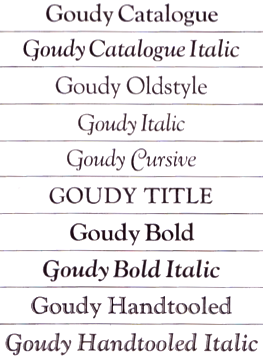 Showcasing the best pages from the Goudy Series in the ATF 1923 Catalog. Fonts by Frederic Goudy in this book include Goudy Bold (+Italic), Goudy Catalogue (+Italic), Goudy Cursive, Goudy Handtooled (+Italic), Goudy Italic, Goudy Oldstyle and Goudy Title. [Google]
[More] ⦿
Showcasing the best pages from the Goudy Series in the ATF 1923 Catalog. Fonts by Frederic Goudy in this book include Goudy Bold (+Italic), Goudy Catalogue (+Italic), Goudy Cursive, Goudy Handtooled (+Italic), Goudy Italic, Goudy Oldstyle and Goudy Title. [Google]
[More] ⦿
|
Atlantis
|
A typeface made in 1935 by Frederic Goudy. D.J.R. Bruckner: In A Half-Century of Type Design Goudy said that of designs numbered 87, 88, 95, 96, 98, 99, 102, 103, and 104 in The Record of Goudy Types assembled by him and Earl Emmons "absolutely nothing remains after the fire either in proof or in my recollection." He added that "the designs as we named them were: Goudy Book, Hudson, Textbook Old Style, Hasbrouck, Atlantis, Millvale, Mercury, and sketches for two unnamed." In a footnote he said: "These names sound as though copied from Pullman sleepers!" [Google]
[More] ⦿
|
Avil
|
Inland Type Foundry font made in 1904. With its tall ascenders and small x-height, and irregular edges, it is similar to Pabst Old Style (1902, Goudy). Avil was in the 1911 ATF catalog, but not in the 1923 ATF catalog. People suspect that ATF went with Pabst Old Style, and chose not to continue Avil. For a full specimen, see Sheperd in Dan X. Solo's Rustic and Rough-Hewn Alphabets: 100 Complete Fonts by Dan X. Solo (1991, Dover). Mac McGrew: Advil was advertised by Inland Type Foundry in 1904 as "a new typeface, most excellent for fine booklet and catalog work." It follows a popular style of the day, with tall ascenders, small x-height, and irregular edges. It is very similar to Pabst Oldstyle (q.v.), but narrower. [Google]
[More] ⦿
|
Barron's Boston News Letter
|
A typeface made in 1904 by Frederic Goudy. D.J.R. Bruckner: This face was designed for Joseph Barron's financial newsletter in Boston. American Type Founders had Robert Wiebking in Chicago cut matrices for it. But forty vears later Goudy could not recall "just what sort of letter I did" for Barron. [Google]
[More] ⦿
|
Barry Schwartz
[Crud Factory]
|
[More] ⦿
|
Berkeley Oldstyle versus FB Californian versus LTC Californian
|
The experts at Typophile compare (ITC) Berkeley Oldstyle and FB Californian in a battle of Venetian typefaces. - Gerald Giampa: "The source for our "California Oldstyle is lead patterns made by Goudy at his studio. They are the only known Goudy patterns to survive. Goudy's other patterns were lost in his fire at Deepdene."
- William Berkson: "Berkeley Old Style is soother and less mannered than Goudy's original and the Font Bureau version, which is closer to the original. (Bringhurst compares the two in his 'Elements'). I think Berkeley Old Style is very well done, and in being less mannered may be of wider usability than the original."
- Jim Rimmer: "Goudy's "Typologia" is a master work worth reading. It was written by him as a kind of magnum opus on his method of cutting type, and at the same time concerned with how he went about designing the typeface for the University. Goudy went through a lot of discussion with the institution, wherein he wished to name the type simply "University Oldstyle". The director of the Press thought the name to be too generic, so they settled on "University of California Oldstyle. It was a bit of a mouthful, but the school wanted to have their name on it. Lanston Monotype did the production work on the type, making matrices for the use of the University. Some years later the type was licensed to Lanston, and they sold it under the name "Californian". The patterns that Gerald Giampa has in his possession are of the lead "boilerplate" type, devised by Goudy, and were made by Goudy himself at Deepdene. These are the only full suite of patterns to survive the fire at Deepdene, simply because they were in use by Lanston at the time of the fire. The book is well worth having for more than one good reason. It shows Goudy's approach to a design, his method of rendering the design in metal, and his philosophy of type and design."
Apparently, the University of California's current digital version is drawn by Richard Beatty who has interpreted several other Goudy typefaces, and is supposed to be really really close to the original. In 2006, the Lanston/P22 version, LTC Californian (OpenType), digitized by Paul Hunt, was discussed here. The LTC version seems to be closest to the original. The factual history: In 1938, Goudy designed California Oldstyle, his most distinguished type, for University of California Press. In 1958, Lanston issued it as Californian. Carol Twombly digitized the roman 30 years later for California; David Berlow revised it for Font Bureau with italic and small caps; Jane Patterson designed the bold. In 1999, assisted by Richard Lipton&Jill Pichotta, Berlow designed the black and the text and display series. [Google]
[More] ⦿
|
Bertham
|
A typeface made in 1936 by Frederic Goudy. D.J.R. Bruckner: In May 1936, Laurence Siegfried, editor of The American Printer, asked Goudy for an article on his one-hundredth typeface. Goudy said that the ninety-eighth and ninety-ninth were not done (his word) at the time, but he set to work on this one, named for his wife Bertha M. who had died the year before, and finished it in sixteen days. He based it on a book set in type derived from one used by Leonard Holle to print the Geographica of Ptolemy at Ulm in 1482. Since the Ashendene Press had been using a tvpe made by Emery Walker based on the Holle types, it can be assumed Goudy referred to that face. Digital versions: Bertham Pro (2009, Ascender). [Google]
[More] ⦿
|
Bhikkhu Pesala
[Association for Insight Meditation (or: Aimwell)]
|
 [More] ⦿
|
Blackboard Bold
|
For blackboard bold (or "doublestroke") mathematical symbols in TEX, you have six options: - Use a type 1 font, and select from the thousands of great fonts. I personally use GoudyHandtooledBT (Bitstream).
- Use the metafont doublestroke by Olaf Kummer.
- Use the metafont bbm by Gilles F. Robert.
- Use the metafont bbold by Alan Jeffrey.
- Use the metafont amsyb by the AMS.
- Make your own metafont or type 1 font.
[Google]
[More] ⦿
|
Booklet Old Style
|
A typeface made in 1916 by Frederic Goudy. D.J.R. Bruckner: This face was named for Goudy's first press and was designed for American Type Founders. Since A.T.F. never displayed it in specimen books, presumably they found it unacceptable. That is a pity: for its time it is a good face and might have had a good influence. Mac McGrew: Booklet Old Style was designed by Frederic W. Goudy for ATF in 1916, as one of the types called for by an arrangement to design exclusively for that company. Goudy speaks of it as a letter simple in construction, plain and unobtrusive, and not terribly distinctive. It is named for the first press established by Goudy in Chicago in 1895. It does not seem to appear in any ATF specimens or literature, nor in the list of ATF matrices inventoried in 1930. [Google]
[More] ⦿
|
Brian Schorn
|
Brian Schorn was a design student at Cranbrook. For his thesis, he made a font called AddMorph based on drawings of Trajan as found in the book The Alphabet by Frederic Goudy. The digital version of the font was created using proprietary drawings of Adobe Trajan digitized by Carol Twombly. He wanted to publish AddMorph with Emigre, but Adobe, when contacted, denied Emigre the right to use Adobe's digital version of Trajan. To this date AddMorph has not been released. [Google]
[More] ⦿
|
Bruce Rogers
|
 Albert Bruce Rogers was a celebrated American type and book designer (b. 1870, Linnwood, IN, d. 1957, New Fairfield, CT). A graduate from Purdue in 1890, he worked in book design. It was not until 1901 that he cut his first typeface, Montaigne, a Venetian style typeface named for the first book it appeared in, a 1903 limited edition of The Essays of Montaigne. In 1912, Rogers moved to New York City where he worked both as an independent designer and as house designer for the Metropolitan Museum of Art. It was for the Museum's 1915 limited edition of Maurice de Guérin's The Centaur that he designed his most famous type-face, Centaur (1914). Like Montaigne, it was based on the Venetian typefaces of Nicolas Jenson. Wikipedia: Rogers considered this typeface to be a substantial improvement on his early Montaigne, both because his design had matured and because, on the advice of Frederic Goudy, he had employed Robert Wiebking as the punch-cutter, and Rogers used Centaur extensively for the rest of his career. The Centaur was produced by Rogers in Dyke Mill at Carl Rollins' Montague Press and is now one of the most collectible books ever printed.
 In subsequent years, he designed books for Mount Vernon Press, and Harvard University Press, and served as typographic advisor at Lanston Monotype. To produce the Oxford Lectern Bible for Oxford University Press, an italic complement to Centaur was needed. Wikipedia: As he did not feel capable of designing the sort of chancery typeface that he thought appropriate, Rogers chose to pair Centaur with Frederic Warde's Arrighi, a pairing retained to this day. Rogers died in New Fairfield, CT, and donated his books and papers to Purdue University, where they are in the Beinecke Rare Book and manuscript Library. His typefaces: - Montaigne (1901, privately cast). Punches cut by John Cumming. Mac McGrew: Montaigne was designed by Bruce Rogers in 1901, and privately cast for the Riverside Press in Cambridge, Massachusetts. It was derived from one page printed in the noted type of Nicolas Jenson, and made in one size only, approximately 16-point, with punches cut by John Cumming of Worcester. Massachusetts. Compare Jenson, Cloister, Centaur, Eusebius.
- Centaur (original) (1914). Development continued until 1931. Privately cast by Barnhart Brothers&Spindler. Matrices cut by Robert Wiebking of the Western Type Foundry. Centaur is a modern version of Nicolas Jenson's Venetian typeface Centaur. There are many digital age descendants of Centaur. Bitstream got that ball rolling with Venetian 301 (Cyrillic version by Dmitry Kirsanov, Paratype, 2006), and SoftMaker has its Cambridge Serial (2010). Type families called Centaur exist at Adobe, Monotype and Linotype. Related typefaces, but without Centaur's flaring, include Phinney Jenson (Tom Wallace) and Nicolas Jenson SG (Spiece Graphics). See also Centurion, Centus (URW), Coelacanth (2014, a free 36-style typeface family by Ben Whitmore), and Arrighi Italic .
- Centaur (Monotype) (1929, Monotype Ltd. and Mackenzie&Harris). Matrices re-cut for machine composition by British Monotype. Further developments based on or related to this typeface: LTC Metropolitan (Lanston; with Frederick Warde; also called Metroplitan Oldstyle; digital version by Lanston/P22), Poster (1918-1919), Goudy Bible (1947, designed with the collaboration of Sol Hess for Lanston Monotype). Mac McGrew: Centaur was designed by Bruce Rogers in 1914, based on the beautiful roman type first used by Nicolas Jenson in 1470, and a refinement of Mon- taigne (q.v.), designed a decade earlier by Rogers. Centaur was first cut by Robert Wiebking of BB&S as a private type for the Museum Press of the Metropolitan Museum of New York. In 1929 it was recut under the joint sponsorship of Lanston Monotype and Monotype Corporation, England, but issued only by the latter. Some critics have called it the best recutting of the Jenson letter. Arrighi (q.v.) was cut as an italic companion to Centaur. Compare Cloister, Eusebius, Italian Old Style, also Jenson. Discussion of Centaur by Don Hosek. About Centaur Monotype (1929), and its digital version, Dean Allen writes: Like Bembo, released for the Monotype machine the same year, Centaur was an exceptionally beautiful and eminently readable revival of Renaissance type. Unfortunately, the producers of the digital version made a common mistake: the shapes are based on the most basic starting point of Bruce Rogers designs. These designs were intended for metal type that would press into paper, the ink spreading as it absorbed into the fibre. The resulting printed shapes had a good deal more visual force than the original designs. The process was total: design anticipating application. This version of Centaur suffers from the perfection of the process of digital design and offset printing: the original shape is printed coldly intact, and thus its very difficult to set a well-made page in Centaur. In 2014, Jerry Kelly and Misha Beletsky coauthored The Noblest Roman (RIT Cary Graphic Ars Press) on the history of Centaur types by Bruce Rogers. The blurb: The history of the Centaur type, likely the most important American typefeace ever designed, has been recounted untold times in very general terms, following the official version of events, purported by its designer in several publications. Yet, as the new research by Jerry Kelly and Misha Beletsky shows, there is a number of gray areas to the story. The new data, culled from archival documents, some unpublished, as well as from a variety of published sources presents this important design and its history in a new light.
- LTC Fleurons Rogers (2005, P22 / Lanston) is a digital font based on fleurons drawn by Rogers.
Linotype link. FontShop link. Klingspor link. [Google]
[MyFonts]
[More] ⦿
|
Cade Type Foundry
[Philip Cade]
|
 Cade Type Foundry is the private foundry of Philip Cade. He cut his first (metal) typeface in 1972. The foundry is an outgrowth of the Juniper Press. Cade published a Specimen book Type Borders Ornaments and Bras Rule in 1976 (Juniper Press, 24 GinnRoad, Winchester, MA). Local download.
 Typefaces include Jenson Old Style No. 58, Goudy Lanston No. 279, and Caslon Old Style Italic 3371. [Google]
[More] ⦿
|
Camelot
|
 An art nouveau-era typeface made in 1896 by Frederic Goudy. D.J.R. Bruckner: This is the first tvpe attributed to Goudy based on letters he drew and sent to the Dickinson Tvpe Foundry. He made only the capitals, and the foundry men added a lower case.
 McGrew states: Camelot or Camelot Oldstyle was the first typeface designed by Frederic W. Goudy. He offered it to Dickinson Type Foundry (part of ATF) in Boston, which accepted it and sent him $10, twice what he had modestly asked for it. This was in 1896; it was apparently cut and released the following year as drawn, without lowercase. In February 1900 a design patent was issued in the names of Goudy and Joseph W. Phinney, and assigned to ATF. Phinney was a well-known designer for Dickinson-ATF, and apparently it was he who added the lowercase alphabet. Its success encouraged Goudy to make a distinguished career of type designing, and this typeface was included in ATF specimen books as late as 1941. Compare Canterbury. Digital typefaces: LTC Camelot (Lanston, 2007), Pettiford JNL (Jeff Levine, 2020). [Google]
[More] ⦿
|
Carl Schraubstadter
|
The Inland Type Foundry in Saint Louis was established in 1892 by the three sons of Carl Schraubstadter (1827-1897), William A. Schraubstadter (1864-1957), Oswald Schraubstadter (1868-1955) and Carl Schraubs Jr. (1862-1947). Carl had run the Central Type Foundry in Saint Louis and sold it to ATF (American Type Founders) in 1892, and the sons reacted by setting up Inland. Until 1911, Inland was one of the most successful foundries in the United States. In 1911 Inland was purchased by ATF and its equipment divided between that foundry and Barnhart Brothers and Spindler (BBS). Carl Junior is credited with a typeface that was later digitized by Dan Solo (Solotype) as Hearst Roman and Hearst Italic. Goudy claimed that these were designs stolen from him. Solo mentions the date 1904. Alan Jay Prescott made New Hearst Roman and Italic in 1995. A further digitization of these types is due to Nick Curtis in 2006: Ragged Write NF, Ragged Write NF Italic. In 1905, Schraubstadter patented a slab serif typeface. [Google]
[MyFonts]
[More] ⦿
|
Caron Twice
[Martin Cincar]
|
 Martin Cincar (Prague, Czechia) designed these typefaces:
 - The sans typeface Atwic (2019).
- The large typeface family Copperplate New (2019), which is modeled after Frederic Goudy's Copperplate Gothic (1901-1904).
- The 4-style sans typeface Susie (2021). This was inspired by Susan Kare's 1984 Apple system font Chicago.
- Calligraphic Afera Beauty (2021). A sharp display serif; the name calligraphic refers perhaps to some terminals. Two variable fonts are available as well.
- Little Micro Sans (2021). A sans with contrast).
- Pixel Grid (2021). A dot matrix superfamily with 220 styles.
- Sans Atwic Modern (2021). A 19-style sans.
- Wild Title Sans (2021). An experimental sans in 11 styles.
[Google]
[MyFonts]
[More] ⦿
|
Castcraft Software Inc (or: OptiFont)
|
Castcraft [3649 W Chase Ave Skokie, IL 60026], showed off a comprehensive library of fonts, all with extended character sets for multi-language typography. OptiFont is a trademark filed in 1990 by Fredric J. Kreiter of Castcraft. Castcraft sold a CD-ROM Type Library Volume 1 at 200 USD. Its entire font collection was sold for 1000 USD. It also made some custom fonts. Most post-1990 fonts have the prefix OPTI. For example, OPTI-Peking is an oriental simulation font. OPTI-Favrile is a copy of Tom Carnase's Favrile (WTC). A visitor warned me that there is absolutely zero security when you order from this outfit, so you are warned--this is a dangerous site! It seems that Manny Kreiter (d. 2005) was the last President&CEO, and that his family (Abe, Harry and Ned Kreiter) have been at it since the days of metal type (1936) starting as Type Founders of Chicago. I found this on their pages: Castcraft has licensing [sic] the entire 20,000 TypeFaces from "Type Films of Chicago" and the entire "Solotype Alphabets" collection. Mike Yanega claims that most of their fonts are clearly not original any more than most of Bitstream's are original, and like them they re-name many of their fonts to avoid copyright issues. Their fonts all appear to be a "dead collection" of copies of relatively old designs that have already appeared in many other collections from the likes of WSI and SSi. In 2010, John Brandt reports: Castcraft, aka Type Founders of Chicago, moved decades ago from Hubbard St in Chicago to a close-in suburb (Skokie? Niles?) and was still operating within the past few years when I happened to drive by. I failed to find any current incarnation, but they used several names even years ago as a prominent pirate. Besides pirated fonts (Typositor to later, generally poor digital), they were a big metal vendor (I have a partial metal set of Helvetica gifted as they left downtown in the 1970s), and also had a guy (whose name escapes me) who did fabulous high-end signage, from sand-blasted glass to the created-on-building inscribed metal logo for a well-known Michigan Ave mall. Longtime owner Manny Kreiter died in 2005, but whether Boomie or any of the others who may still be around kept it going is unknown. Aside from simply having ANY version of their many offerings, most would consider their collection worthless. Anyone who has a digital "OPTIfont" and a font editor can readily view the problems, including usually several times too many Bezier points within any character. I counted 78 control points on a minimal character, for instance, that should have had less than a dozen. Mark Simonson: Castcraft was notorious in the sixties and seventies for pirating film fonts for headline setting machines, such as the Typositor. They would acquire a film fonts from franchisees of VGC (who also made the Typositor) or Filmotype or Alphabet Innovations, and then make duplicates and sell them to typesetting houses, usually changing the font names. Companies like Alphabet Innovations even put deliberate mistakes into individual fonts sent to franchisees just to try to see where Castcraft was getting them. Florian Hardwig: OPTI is a label used by Castcraft (also/previously known as Typefounders of Chicago and Type Films of Chicago) for digital fonts they produced around the early 1990s. My understanding is that virtually all of them are based on designs by others, made and distributed without authorization and without compensating the original designers or IP holders. Technically, many were likely based on the copies Castcraft previously made for phototype. They typically have names different from the original to avoid trademark issues. The company is long defunct and, ethical issues aside, the fonts are of subpar quality. Listing of Castcraft fonts (compiled by myself). The 802 fonts listed here are all dated between 1990 and 1994. I know there are at least 1,000 digital fonts made by them, so my list is incomplete. This link maintained by alt.binaries.fonts regulars contains most OPTI fonts for free download. It contains in particular some scans of one-line listings (i, ii, iii), and lists of name equivalences (i, ii). Mediafire link. Picture of Ned, Abe, Harry and Manny Kreiter. Defunct Castcraft Software link. Typophile discussion. Font name equivalences (by Philippededa, 2012). List of equivalences of Castcraft names. List of Castcraft typefaces as of July 2014. [Google]
[More] ⦿
|
Castle Type
[Jason Castle]
|
 Designs by Jason Castle from San Rafael, CA, who studied psychology at Dominican University of California. He does custom font design and sells commercial typefaces through MyFonts and FontShop. Blog. These include:
 - A: AfrikaBorders, Afrika Motifs, Agency Open (M. F. Benton, 1934, revival Jason Castle), Agency Gothic Inline, Ampersands, Azbuka (2005, a heavy slab serif).
- B: Brasileiro (2007, an art deco face).
- Carisma (2007, a clean geometric sans), Carlos (art deco inspired by Elektra), Castle Fleurons, Chinoise (2008, based on hand lettering that is reminiscent of a style of ancient Chinese square-cut ideograms), Cloister Black, Copperplate Script, Cradley (2015, a Caslon titling family with Greek and Cyrillic, named after the birthplace of William Caslon).
- D: Deko Initials (1993, discontinued in 2007; based on NADA0 drawn in 1972 by Marcia Loeb), Dionisio (2008, didone).
- E: Eden (Bold, Light; originally designed by Robert H. Middleton in 1934).
- F: Fat Freddie, Futura CT and Futura CT Inline (2007, based on Futura ND, but discontinued after only a few weeks).
- G: Goudy Lombardy (Lombardic), GoudyStout, Goudy Text, Goudy Trajan (1994-2010, free; +alternates).
- H: Handsome (2002, nice finger dingbats, aka fists).
- J: Jensen Arabique (left field art deco, based on work of Gustav Jensen, 1933).
- K: Koloss (art deco).
- L: Latin CT (2008, 6 styles), Latin Wide, Laureat, Lise Informal (2008, hand-printed), Lombardy.
- M: Maximilian CS (Rudolf Koch, 1917), Metropolis Bold and Shaded (based on the 1932 Stempel cut as designed by W. Schwerdtner), Minotaur (2008, an original monoline design based on an Oscan votive inscription from the second century BC; looks like simulated Greek).
- N: Norberto (2009, an all-caps Bodoni; +Stencil).
- O: Ogun (2008, inspired by an Egyptian-style Russian block alphabet and useful for athletic lettering; formerly named Azbuka).
- P: Plantain (2002, a digital version of Plantin Adweight, a 1913 typeface by F. H. Pierpont), Plantain Stencil (2009), Progreso (2010, a condensed, unicase, serif gothic type design inspired by the hand-lettering on Russian posters from the 1920s).
- R: Radiant, Radiant Extra Condensed CT (both Radiants are revivals of Roger Middleton's typeface by that name, 1940), Ransahoff (2002, ultra condensed didone), Rudolf (1992, based on Rudolf Koch's German expressionist work such as Neuland).
- S: Samira (2008, art nouveau style; based on Peter Schnorr's Schnorr Gestreckt, from 1898), Shango (1993, based on Schneidler Initials by F.H.E. Schneidler (1936), and including a digital version of Schneidler Cyrillic (1992); extended in 2007 to Shango Gothic and in 2008 to a 3-d shadow version, Shango Chiseled, and in 2009 to Shango Sans), Sculptura (2005, an all caps typeface based on Diethelm's Sculptura from 1957), Sencia (2008, based on Spanish art deco stock certificate lettering from 1941), Sonrisa (2009, art deco family---Sonrisa Thin is free), Standard CT (a neo-grotesque family), Standard CT Stencil (2012: free).
- Tambor (Light, Black, Inline, Adornado) (1992) (note: Jason claims that it was remotely based on Rudolf, which in turn was based on calligraphy of Rudolf Koch), Trio (an art deco sansserif), Trooper Roman (discontinued).
- V: Vincenzo (2008, a slabby didone), Warrior (2009, a 3d font based on Ogun; +Shaded).
- X: Xavier (art deco family based on Ashley Crawford by Ashley Havinden, 1930, revival by Jason Castle in 1992).
- Z: Zagora, Zamenhof (2011: an all caps poster face with constructivist ancestry, named after the inventor of Esperanto), Zuboni Stencil (2009, Latin and Cyrillic, constructivist and perhaps even military).
Klingspor link. Behance link. View Jason Castle's typefaces. [Google]
[MyFonts]
[More] ⦿
|
Caxton Initials
|
A typeface made in 1905 by Frederic Goudy. D.J.R. Bruckner: The great San Francisco printer John Henry Nash was fond of this set of capitals, but Goudy considered it "a rather clumsy form of Lombardic capitals." American Type Founders issued it for many years. Mac McGrew: Caxton Initials were designed by Frederic W. Goudy in 1905. He says of them, "These are a rather clumsy form of Lombardic capitals. At this time had not given text letters much study and while the forms of these capitals are correct enough, they lack the delicate hairlines which I learned later are an important feature of letters of this kind." The font includes only the 26 letters shown and a small leaf ornament. Compare Lombardic Capitals. Digital versions: 1479 Caxton Initials (GLC), Caxton Initials (2012, Alter Littera). [Google]
[More] ⦿
|
Charles Herman Becker
|
ATF matrix and pattern maker. Born in Germany, he died in 1948. He was involved in the design of Cloister Cursive Handtooled (Cloister Handtooled Italic, 1923), Goudy Handtooled (1923; see Goudy Handtooled BT) and Novel Gothic (1928-1929, a heavy art deco face), all in cooperation with Morris Fuller Benton. He created Quick-Set Roman&Italic in 1918, also at ATF. Stephen Coles writes: Novel Gothic was frequently used for record covers in the 1960s-1970s particularly John Berg's designs at Columbia Records, such as Miles Davis: Bitches Brew. There are many digital typefaces in this 1920s showcard style (such as Kobalt), and many poor digitizations of Novel Gothic, but no faithful revival currently exists. Telenovela NF is a digital interpretation with an additional highlight effect, while Napoli and Naked Power are attempts to tame Novel Gothic's comical personality into large, straightforward sans families. FontShop link. Klingspor link. [Google]
[MyFonts]
[More] ⦿
|
Cheshire Dave
|
San Francisco-based commentator and artist. Writer and director of the video clip Behind the Typeface in which he showcases Cooper Black (1922) and Goudy Heavyface (1925), its Monotype rip-off by Goudy himself. Interview by Karen Huang. [Google]
[More] ⦿
|
Cloister Initials
|
 A typeface made in 1918 by Frederic Goudy. D.J.R. Bruckner: Goudy allowed that this set of capitals was not, strictly speaking, a typeface. American Type Founders had asked for an alphabet in the style of the large center capital A in The Alphabet, and Goudy drew an entire set for them. He said he had not intended it to be cut, but A.T.F. made matrices and sold the type for a while.
 Digital versions: LTC Goudy Initials (Miranda Roth for Lanston and P22, 2005: based on the original proofs of large sizes of Cloister Initials), Cloister Initials (2006-2007, Group Type), Initials ATF Cloister (Alter Littera, 2012), Goudy Initials (2008: a free font by Dick Pape), PF Goudy Initials (Paratype). [Google]
[More] ⦿
|
Colin Kahn
|
 Type designer from Buffalo, NY. His typefaces were mostly developed at P22. Klingspor link. A partial list of his fonts:
 - In 2008, he revived and extended Cigno, a 1950s script typeface by Aldo Novarese, and called it P22 Cigno.
- LTC Circled Caps.
- P22 Civilité is a joint effort of Colin Kahn, Richard Kegler and Milo Kowalski.
- P22 Curwen. P22 Curwen Poster is a digitized version of a rare wood type used by the Curwen Press in England in the early 20th Century for poster work. P22 Curwen Maxima is a new hyper-stylized re-interpretation of Curwen Poster.
- The great display/comic book font Ebin (and Ebin Outline).
- In 2006, he created the P22 Gauguin font family (Regular, Alternate, Brush and Extras), a script font set based on the writings and sketches of post-impressionist artist Paul Gauguin.
- Glamour (2006, P22/Lanston; also called LTC Glamour Grotesque) is based on the 1948 design by the same name done at Lanston Monotype, which in turn is based on Imre Reiner's Corvinus.
- P22 Goudy Aries (2004, P22, by Richard Kegler and Colin Kahn). This typeface revives Goudy's aries from 1926.
- Goudy Sans (2006, P22/Lanston, 6 styles): Goudy Sans Bold was originally designed by Frederic Goudy in 1922 as a less formal gothic and finished in 1929. The Light was designed in 1930 and the Light Italic in 1931. Colin Kahn digitized them in 2006 to make a 6-style Goudy Sans family, which includes a Goudy Sans Hairline.
- In 2008, he revisited Richard Kegler's P22 Platten, which was based on lettering found in German fountain pen practice books from the 1920s, and created the extended typeface P22 Platten Neu.
- Internship (2003), or St G Schrift. P22 swrites: St. G Schrift (2005, P22) is a font based on the type designs of German poet Stefan George. This sans-serif typeface features a few variations found in books published by George in Berlin. Includes P22 St. G Schrift One, P22 St. G Schrift Two and P22 St. G Italic (an art nouveau version of the roman, newly designed). The original font was cast in 1907 by a small foundry in Germany and was used primarily for the works of George as well as other books including a monumental edition of Dante's Divine Comedy. This may or may not contradict the fact that Marcus Behmer designed Stefan George-Schrift in 1904.
- P22 Tuscan Expanded is a digitization of the mid-19th century wood type font Antique Tuscan Expanded - Wells&Webb 1854.
- P22 Vale (2007, in Roman and Kings Fount styles) are based on types by Charles Ricketts that were used by the Vale Press (which in turn were based on Jenson). The Kings Fount is originally dated 1903.
- In 2007 still, he revived Zebra (P22), a font originally designed in 1963-1965 by Karlgeorg Hoefer.
View Colin Kahn's typefaces. [Google]
[MyFonts]
[More] ⦿
|
Collier Old Style
|
A typeface made in 1919 by Frederic Goudy. D.J.R. Bruckner: Even Robert Wiebking, who cut the matrices, thought this type was odd. In 1909 Goudy had seen in the South Kensington Museum in London a page printed bv Palme Isingrin in Basle in 1534 that had a peculiar serif on the lower case d. Goudy assumed the serif had been damaged, but he found it interesting and designed an entire face based on it. It was made for Allen Collier of the Procter and Collier advertising agency in Cincinnati, which represented the Procter and Gamble Company. It is a precursor of Goudy Antique, begun in the same year. Mac McGrew about Collier Old Style: Collier Old Style was designed by Frederic W. Goudy in 1919 as a private type for Proctor&Collier, a Cincinnati advertising agency, which had its own printing plant. Matrices were engraved by Robert Wiebking. Goudy has remarked that this typeface "seemed to me to give a quality akin to that given by William Morris's Golden type without, however, imitating that famous letter." Fonts were apparently cast for Goudy by ATF, for these matrices were among those given by ATF to the Graphic Arts Division of the Smithsonian Institution in 1970, and used for a special revival casting in 1982 by the Out of Sorts Letter Foundery. [Google]
[More] ⦿
|
Companion Old Style (+Italic)
|
 A pair of typefaces made in 1927 by Frederic Goudy. D.J.R. Bruckner: The 1927 date is Goudy's. The type w as actually delivered in March 1928. It was drawn at the request of Henry B. Quinan, art director of The Woman's Home Companion magazine. Goudy thought it "one of the most unusual types I have ever made. It incorporates features which deliberately violate tradition as to stress of curve, but which are so handled that attention is not specifically drawn to the innovations introduced." Not many designers now would agree with his notion that it is reticent about its innovations, but it is truly strange.
 Mac McGrew: Companion Old Style and Italic were designed by Frederic W. Goudy in 1927 as a private typeface for headings in Woman's Home Companion maga- zine. After Aries, cut only in one size, this was Goudy's first experience in cutting an extensive series of sizes, as well as roman and italic. As he says, he learned the business of typefounding while working on this face. And of the face itself, Goudy says, "I believe that Companion Old Style and its italics show greater consistent original features than any other typeface I have ever made." From types cast in his matrices, Monotype made electro matrices for the typesetters of the magazine. And when that plant was liquidated several years ago, the matrices were acquired by Lester Feller, a private typecaster in Illinois, and a few fonts were cast for other private printers. There are no italic figures, and no plain versions of v or w, which would be necessary for good appearance within words. Digital revivals include Companion Old Style (2021, Steve Matteson). [Google]
[More] ⦿
|
Cooper Black versus Robur
[Patrick Griffin]
|
 An excellent piece written by Patrick Griffin in 2010 when he and Kevin King published Robur at Canada Type, in which they explain the chronology of the machine age ad typefaces starting with Peignot. Reproduced here without Patrick's permission.
 It shouldn't be a surprise to anyone that these letter shapes are familiar. They have the unmistakable color and weight of Cooper Black, Oswald Cooper's most famous typeface from 1921. What should be a surprise is that these letters are actually from Georges Auriol's Robur Noir (or Robur Black), published in France circa 1909 by the Peignot foundry as a bolder, solid counterpart to its popular Auriol typeface (1901). This typeface precedes Cooper Black by a dozen of years and a whole Great War. Cooper Black has always been a bit of a strange typographical apparition to anyone who tried to explain its original purpose, instant popularity in the 1920s, and major revival in the late 1960s. BB&S and Oswald Cooper PR aside, it is quite evident that the majority of Cooper Black's forms did not evolve from Cooper Old Style, as its originators claimed. And the claim that it collected various Art Nouveau elements is of course too ambiguous to be questioned. But when compared with Robur Noir, the "elements" in question can hardly be debated. The chronology of this "machine age" ad typeface in metal is amusing and stands as somewhat of a general index of post-Great War global industrial competition: - 1901: Peignot releases Auriol, based on the handwriting of Georges Auriol (the "quintessential Art Nouveau designer," according to Steven Heller and Louise Fili), and it becomes very popular.
- 1909-1912: Peignot releases the Robur family of typefaces. The eight styles released are Robur Noir and its italic, a condensed version called Robur Noir Allongée (Elongated) and its italic, an outline version called Clair De Lune and its condensed/elongated, a lined/striped version called Robur Tigre, and its condensed/elongated counterpart.
- 1914 to 1918: World War One uses up economies on both sides of the Atlantic, claims Georges Peignot with a bullet to the forehead, and non-war industry stalls for 4 years.
- 1921: BB&S releases Cooper Black with a lot of hype to hungry publishing, manufacturing and advertising industries.
- 1924: Robert Middleton releases Ludlow Black.
- 1924: The Stevens Shanks foundry, the British successor to the Figgins legacy, releases its own exact copies of Robur Noir and Robur Noir Allongée, alongside a lined version called Royal Lining.
- 1925: Oswald Cooper releases his Cooper Black Condensed, with similar math to Robur Noir Allongé (20% reduction in width and vectical stroke).
- 1925: Monotype releases Frederick Goudy's Goudy Heavy, an "answer to Cooper Black". Type historians gravely note it as the "teacher steals from his student" scandal. Goudy Heavy Condensed follows a few years later.
- 1928: Linotype releases Chauncey Griffith's Pabst Extra Bold. The condensed counterpart is released in 1931.
When type production technologies changed and it was time to retool the old typefaces for the Typositor age, Cooper Black was a frontrunning candidate, while Robur Noir was all but erased from history. This was mostly due to its commercial revival by flourishing and media-driven music and advertising industries. By the late 1960s variations and spinoffs of Cooper Black were in every typesetting catalog. In the early- to mid-1970s, VGC, wanting to capitalize on the Art Nouveau onslaught, published an uncredited exact copy of Robur Black under the name Skylark. But that also went with the dust of history and PR when digital tech came around, and Cooper Black was once again a prime retooling candidate. The "old fellows stole all of our best ideas" indeed. So almost a hundred years after its initial fizz, Robur is here in digital form, to reclaim its rightful position as the inspiration for, and the best alternative to, Cooper Black. Given that its forms date back to the turn of the century, a time when foundry output had a closer relationship to calligraphic and humanist craft, its shapes are truer to brush strokes and much more idiosyncratic than Cooper Black in their totality's construct. [Google]
[More] ⦿
|
Copperplate Gothic
|
 An ATF all-caps face made from 1901 until 1904 by Frederic W. Goudy and Clarence C. Marder. Digital descendants include Copperplate New<./a> (2019, Martin Cincar), Copperplate Gothic (Bitstream), Griffon (Flat-it), Copperplate Gothic (Linotype), Copperplate Gothic (Adobe), Copperplate Gothic (Tilde), Copperplate Gothic Hand (Wiescher Design), Quimby (Match + Kerosene), Copper Penny (The Fontry), Copperplate Script (CastleType), CopperPot (Corel), Copperplate Gothic (Softmaker), Copperplate 001 (Bitstream), Spartan (Monotype), Copperplate EF (Elsner&Flake), Copperplate (URW++), Copperplate Deco (Gert Wiescher), Copperplate SH (Scangraphic), Copperplate SB (Scangraphic), Copperplate Classic (Gert Wiescher), Biondi (Typodermic). Infinitype has a number of styles called Copperplate Gothic or Copperplate-Cd. American Gothic (URW) is Copperplate Gothic with an added lowercase. [Google]
[More] ⦿
An ATF all-caps face made from 1901 until 1904 by Frederic W. Goudy and Clarence C. Marder. Digital descendants include Copperplate New<./a> (2019, Martin Cincar), Copperplate Gothic (Bitstream), Griffon (Flat-it), Copperplate Gothic (Linotype), Copperplate Gothic (Adobe), Copperplate Gothic (Tilde), Copperplate Gothic Hand (Wiescher Design), Quimby (Match + Kerosene), Copper Penny (The Fontry), Copperplate Script (CastleType), CopperPot (Corel), Copperplate Gothic (Softmaker), Copperplate 001 (Bitstream), Spartan (Monotype), Copperplate EF (Elsner&Flake), Copperplate (URW++), Copperplate Deco (Gert Wiescher), Copperplate SH (Scangraphic), Copperplate SB (Scangraphic), Copperplate Classic (Gert Wiescher), Biondi (Typodermic). Infinitype has a number of styles called Copperplate Gothic or Copperplate-Cd. American Gothic (URW) is Copperplate Gothic with an added lowercase. [Google]
[More] ⦿
|
Copperplate Gothic
|
Lookalike/copycat fonts of the Copperplate Gothic variety, according to David Thometz: [Google]
[More] ⦿
|
Copperplate Gothic
[Frederic W. Goudy]
|
A typeface made by Frederic Goudy in 1903. Mac McGrew: Copperplate Gothic Heavy was designed in 1903 by Frederic W. Goudy, who is much better known for his classic roman typefaces. Other weights and widths were drawn shortly thereafter by Clarence C. Marder of ATF, except the Shaded, designed by Morris F. Benton in 1912. A rather wide, monotone, conventional gothic with the added feature of minute serifs, Copperplate Gothic is imitative of the work of engravers, as suggested by the name. It became ATF's all-time best seller, being used extensively for stationery and form work, especially in the small neighborhood printshops of the letterpress era. It is the typical lining gothic face, featuring four sizes each on 6- and 12-point bodies, and two sizes each of 18- and 24-point in foundry (composing-machine sizes differ somewhat), so that a wide variety of cap-and-small-cap combinations can readily be set. Before Monotype developed its "Plate Gothic arrangement" (see under "Design Limitations" in Introduction) in 1919, permitting the keyboarding of all four sizes of 6- or 12-point at once, that company had made the Copper plate Gothics simply as cap-and-small-cap combinations, typically in 5-, 6-. 8-,10-, and 12-point plus display sizes. Hence most of these gothics have two different series numbers on Monotype, the lower number for display sizes and the obsolete cap-and-small-cap combinations, the other for the four-size combination. Several versions of Steelplate Gothic (q.v.) from BB&S were near duplicates of Copperplate Gothic, although a few characters differed slightly and the extended versions were not quite as wide. Hansen had Engravers Gothic in several versions, differing apparently only in the R as shown in the specimen. Compare Plate Gothic, Whittier; also see Bank Gothic, Blair, Boxhead Gothics. D.J.R. Bruckner lists the date as 1905 and writes: Goudy's recollection was that this hodgepodge was done for American Type Founders. It was made for Marder, Luse and Company and then taken on by ATF and can still be found in old ATF specimen books and their old fonts.. Digital versions: Copperplate Gothic (Linotype), Copperplate Gothic (Adobe), Copperplate Gothic (Bitstream), Copperplate Gothic Hand (Wiescher Design), Opti Copperplate (Castcraft), Copperplate Gothic, Copperplate New (2019, Martin Cincar), Copperplate CC (2020, Owen Earl). [Google]
[More] ⦿
|
Crud Factory
[Barry Schwartz]
|
 Barry Schwartz (b. 1961) is a scientist who lives in St. Paul, MN. He grew up mostly in Kendall Park, NJ, and studied electrical engineering from 1984 until 1990 at Rutgers. He is a fervent and exemplary supporter of the idea of Open Source fonts and software. He runs Crud Factory. His fonts:
 - BonvenoCF-Light (2006). A geometric OpenType format typeface for Latin scripts, having all the letters for Esperanto.
- Fanwood Text (2011, a Venetian old style typeface). This is a free version of Fairfield (1940-1947, Rudolf Ruzicka). For a commercial version, check Bitstream's Transitional 551.
- Goudy Bookletter 1911 (2008) is a revival of Goudy's Kennerley Old Style Roman from 1911.
- Goudy Old Style 14-point (2009).
- Juvelo (2009). A delicate roman serif face.
- Linden Hill (2010, OFL). A two-style (roman, italic) revival of Goudy's Deepdene.
- Prociono CF (2007). See also here.
- OFL Sorts Mill Goudy (2009). A revival of Goudy Oldstyle and Italic.
- KisStMTT (or: Sorts Mill Kis) (2010). Based a bit loosely on the early-20th-century revival of Jenson / Kis drawn by Sol Hess for Lanston Monotype.
- He adapted some glyphs of Gentium for better display with Adobe Reader, and called the new type family Temporarium (2007-2008).
- Valley (2009). A take on Walbaum.
Links: Another URL. Dafont link. OFL link. Font Squirrel link. Googlecode link. Devian tart link. The League of Moveable Type. Abstract Fonts link. Kernest link. Klingspor link. Google Plus link. [Google]
[More] ⦿
|
Dave Howell
|
Seattle-based creator of Magic Medieval (1996, based on Goudy Medieval, modified by Dave Howell for use on Magic: The Gathering cards). Fontspace link. [Google]
[More] ⦿
|
David Farey
|
 Type designer who was born in London in 1943. Dave Farey runs Housestyle Graphics with Richard Dawson in London. He was well-known for running the successful auctions at many ATypI meetings. His typefaces for various foundries:
 - Panache Typography: the artsy typeface Cupid, Azbuka (sans family).
- ITC: ITC Beesknees (1991), the sans-serif family ITC Highlander (1993), ITC Ozwald (1992, a beautiful fat face), ITC Johnston, and ITC Golden Cockerel family (1996, with Richard Dawson, an Eric Gill revival). The former three are part of the Linotype library. ITC Beesknees has been remade and extended by Nick Curtis as Arbuckle Remix (2008). Another revival, by Thomas E. Harvey, is BeesWax (1992-1993).
- Agfa: Zemestro (2003, a 4-weight sans tapped as a typeface for television). His Creative Alliance typefaces: Abacus (art nouveau), Blackfriar, Bodoni Unique, Breadline Normal, Cachet, Cavalier, Classic, Cupid, Font Outline, Gabardine, ITC Golden Cockerel, Greyhound Script, ITC Johnston, Little Louis, Longfellow, Maigret (art nouveau), Revolution Normal, Stanley, Stellar, Virgin Roman Normal (art nouveau), Warlock.
- Galapagos: Ersatz (2002, with Richard Dawson, at Galapagos, originally done at Panache).
- HouseStyle Graphics: ClassicFranklin family (2000-2001).
- FontHaus: Aries (1995), a font designed by Eric Gill (1932).
- Monotype: Azbuka (2008-2009): a 20-style sans family by Richard Dawson and David Farey.
- Elsner&Flake: Caslon EF Black.
- OEM work: TimesClassic (2000-2001) for The London Times.
- P22: In 2021, he was part of a big effort by P22 to revive and extend Johnston's Underground to P22 Underground Pro [Richard Kegler (1997), Paul D. Hunt (2007), Dave Farey (2021), James Todd (2021) and Patrick Griffin (2021) contributed at various stages]. Farey's contribution was to the italics.
View David Farey's typefaces. FontShop link. Klingspor link. Biography at Agfa. [Google]
[MyFonts]
[More] ⦿
|
David Pankow
|
 Editor of American Proprietary Typefaces (New York: American Printing History Association, 1998). This book has contributions by the following people:
 - Susan Otis Thompson: American Arts & Crafts Typefaces
- Martin Hutner: Type of the Merrymount Press
- Herbert Johnson: Montaigne and Centaur Types of Bruce Rogers
- Cathleen Baker: Typefaces of Dard Hunter, Senior & Junior
- Mark Argetsinger: Frederic Warde, Stanley Morison, and the Arrighi Type
- Jerry Kelly: Joseph Blumenthal's Spiral/Emerson Type
- Dwight Anger: Frederic Goudy's Kaatskill Type
- W. Gay Reading: Victor Hammer's Uncial Types
- John Kristensen: The Experimental Types of W.A. Dwiggins
- Paul Hayden Duensing: Contemporary Private Types.
[Google]
[More] ⦿
|
De Vinne Roman
|
An oldstyle typeface designed by Frederic Goudy in 1898. D.J.R. Bruckner: A book face based on the display type designed by Theodore De Vinne and made on the order of Walter Marder of the Central Type Foundry of St. Louis, Missouri. This account by Bruckner is wrong, as De Vinne never designed the types named after himself. The most likely creator is Gustav Schroeder. Mac McGrew: In 1898 Frederic W. Goudy was asked to take the famous display type [DeVinne, by Central Type Foundry] and make a book typeface of it. The resulting DeVinne Roman, Goudy's second type design, was cut the following year by the Central branch of ATF. DeVinne Slope, essentially the same design but sloped rather than a true italic, was cut by the foundry about the same time, perhaps from the same patterns as the roman. Digital versions: [Google]
[More] ⦿
|
De Vinne types
|
Below is a verbatim reproduction of what Mac McGrew writes about the De Vinne types. De Vinne types were designed and named for Theodore L. De Vinne, one of the most prominent American printers of the late nineteenth and early twentieth centuries. His De Vinne Press pioneered in various methods of producing high-quality books and magazines, and De Vinne himself had considerable influence on typeface design as well as printing methods and other aspects of the business, and was the author of several books on the subject; however, he was not the actual designer of these typefaces. DeVinne, as produced by Linotype in 1902, is a legible but plain version of modern roman, with long, thin serifs and considerable contrast. It does not appear in the 1907 book, Types of the DeVinnePress, although there are other very similar types. Other typefaces bearing the De Vinne name, described below, are more distinctive and much better known. They might be considered the first large type family, although they developed helter-skelter from several sources rather than being created as a unified family. DeVinne, the display face, is credited with bringing an end to the period of overly ornate and fanciful display typefaces of the nineteenth century, and with restoring the dignity of plain roman types. It is derived from typefaces generally known as Elzevir or French Oldstyle (q.v.). DeVinne says of it, This typeface is the outcome of correspondence (1888-90) between the senior of the De Vinne Press (meaning himself) and Mr. J. A. St. John of the Central Type Foundry of St. Louis, concerning the need of plainer types of display, to replace the profusely ornamented types in fashion, of which the printers of that time had a surfeit. The DeVinne Press suggested a return to the simplicity of the true old-style character, but with the added features of thicker lines and adjusted proportion in shapes of letters. Mr. St. John approved, but insisted on grotesques to some capital letters in the belief that they would meet a general desire for more quaintness. Mr. Werner of the Central Type Foundry was instructed to draw and cut the proposed typeface in all sizes from 6- to 72-point, which task he executed with great ability. The name given to this typeface by Mr. St. John is purely complimentary, for no member of the DeVinne Press has any claim on the style as inventor or designer. Its merits are largely due to Mr. Werner; its few faults of uncouth capitals show a desire to please eccentric tastes and to conform to old usage. The new typeface found welcome here and abroad; no advertising typeface of recent production had a greater sale. Thus De Vinne himself credits the typeface to Central Type Foundry and its design to Nicholas J. Werner, but Werner says, To correct the general impression that Theodore L. De Vinne was the designer of the typeface named after him, I would state that it was the creation of my partner, Mr. (Gustav) Schroeder. The design was patented under Schroeder's name in 1893. Central was part of the merger that formed American Type Founders Company in 1892, but continued to operate somewhat independently for a few more years. Meanwhile, DeVinne was copied by Dickinson, BB&S, Hansen, and Keystone foundries, and perhaps others-in fact, Keystone advertised that it patented the design in 1893, Connecticut Type Foundry copied it as Saunders, and Linotype as Title No.2. Dickinson called it "a companion series to Howland" (q.v.). When Monotype developed an attachment in 1903 to cast display sizes, DeVinne was the first type shown in their first announcement. Later ATF specimens showed this typeface and several derivatives as DeVinne No.2, probably because of adjustments to conform with standard alignment. DeVinne Italic and DeVinne Condensed were drawn by Werner and produced by Central in 1892 and copied by some other sources. Howland, shown by Dickinson in 1892, is essentially the same as DeVinne Condensed No.3, later shown by Keystone. ATF introduced DeVinne Extended in 1896, while BB&S showed DeVinne Compressed, Extra Compressed, and Rold in 1898-99. Keystone's DeVinne Title is another version of bold, not as wide as that of BB&S. In 1898 Frederic W. Goudy was asked to take the famous display type and make a book typeface of it. The resulting DeVinne Roman, Goudy's second type design, was cut the following year by the Central branch of ATF. DeVinne Slope, essentially the same design but sloped rather than a true italic, was cut by the foundry about the same time, perhaps from the same patterns as the roman. DeVinne Open or Outline and Italic also originated with Central. In the roman and smaller sizes of italic only the heavy strokes are outlined; in larger sizes of italic, certain thin strokes are also outlined. Monotype cut the open typefaces in 1913. DeVinne Shaded is another form of the outline, created by Dickinson in 1893; parts of the outline are much thicker than others. DeVinne Recut and Recut Outline, shown by BB&S, are not true members of this family, but are a revival of Woodward and Woodward Outline, designed by William A. Schraubstadter for Inland Type Foundry in 1894; there were also condensed, extra condensed, and extended versions, all "original" by Inland. DeVinneRecutItalic was a rename of Courts, by Werner about 1900, also from Inland. Compare McNally. [Google]
[More] ⦿
|
Deepdene
|
 A typeface made in 1927 by Frederic Goudy. Mac McGrew on Deepdene: The roman of this series was designed and cut by Frederic W. Goudy in 1927 for his own Village Letter Foundery, and named for his estate at Marlboro-on-Hudson, which in turn was named for the street in Forest Hills, New York, where Goudy worked before moving to Marlboro in 1923. The accompanying italic was designed the following year, with matrices for the first trial size being cut by the designer's wife, Bertha M. Goudy. Of this italic, Goudy says, "I chose more or less to disregard tradition in an attempt to follow a line of my own, and drew each character without reference to any other craftsman's work. I think this italic shows a disciplined freedom which retains the essential quality of legibility." It has been described as having "an acid, typey quality," with interest, color, movement, and quaintness. Like many of Goudy's italics, the inclination is slight. When Monotype obtained rights to reproduce Deepdene, slight adjustments were necessary to adapt it to mechanical requirements in keyboard sizes. Goudy resented not being asked to make these adjustments, as some of them displeased him although they are not apparent to others. Deepdene Medium was designed by Goudy in 1931, and he cut one size. Monotype assigned a number to this face, but no evidence has been found that it was ever cut for that machine. Deepdene Bold and Italic were designed by Goudy in 1932-33 for Monotype, and released in 1934. Goudy says, "The Deepdene Bold Italic drawings gave me more trouble than any italic I had hitherto attempted. I finally scrapped all of my preliminary sketches and began a design that would not be merely a heavier facsimile of the italic Deepdene, since I had come to believe that a bold letter can do little more than approximate in form the roman it is to complement." Compare Californian. Deepdene was recut with the addition of swash letters and redesign of several other characters by Richard Ellis, with Goudy's approval, for a Knopf edition of Arthur Waley's Translations From the Chinese.
 He continues: Deepdene Open Text was designed by Frederic W. Goudy in 1931 as a heading type for Edmund G. Gress's book, Fashions in American Typography. for which Goudy had been asked to write an introduction. His Deepdene type was being used for text. Finding that nearly all letters were required for the many headings, Goudy completed the font. All letters are highlighted with a white line in the heavy strokes. The capitals are somewhat similar to Lombardic Caps, while the lowercase is somewhat like Goudy Text Shaded (q. v.). but much less rigid. Later Goudy cut the same typeface with the white line of the lowercase letters filled in, and called it Deepdene Text (1931). Also see Tory Text. Digital versions: LTC Deepdene (Lanston Type Company), Deepdene BQ (Berthold), D690 (Softmaker), Opti Deligne (Castcraft), Opti Deepdene (Castcraft), Linden Hill (2010, Barry Schwartz: free), URW Deepdene. [Google]
[More] ⦿
|
Design Lab SRL, Milan
[Jane Patterson]
|
 Jane Patterson founded Design Lab SRL in Milan, Italy. She is a partner in Design Lab with Sebastiano Castiglioni. Jane Patterson designed or co-designed
 - FB Californian (1994). Based on Goudy's California Oldstyle from 1938. Lanston issued Californian in 1958. The Font Bureau story: Carol Twombly digitized the roman for California in 1988. David Berlow revised it for Font Bureau with italic and small caps. Jane Patterson designed the bold. In 1999, assisted by Richard Lipton and Jill Pichotta, David Berlow designed the black and the text and display series.
- FB Cheltenham (1992). Ingalls Kimball sketched the basic weight while architect Bertram Grosvenor Goodhue completed drawings in 1901. Morris Fuller Benton finished the ATF version in 1902, beating Mergenthaler by two years. In 1906 he drew Bold Extra Condensed, which David Berlow adapted for the SF Examiner, later a Font Bureau release.
- Eldorado (1993-1994). W. A. Dwiggins's Eldorado was released by Mergenthaler in 1953. He followed an early roman lowercase, cut in the 16th century by Jacques de Sanlecque the elder (Granjon). Berlow, Frere-Jones, and Rickner revived and expanded the series in 1993-1994 for Premiere magazine, with versions not only for text and display, but a Micro for six point and smaller.
- Skyline (1992). Skyline was commissioned from Font Bureau by Condé Nast as headletter for Traveler magazine. This typeface dating from 1929-1934 by Imre Reiner was known in Europe as Corvinus.
- John Downer's Simona.
[Google]
[MyFonts]
[More] ⦿
|
Dick Pape
[Dick Pape: Initials]
|
 [More] ⦿
|
Dick Pape: Initials
[Dick Pape]
|
 Dick Pape revived hundreds of initial caps typefaces. Some came from collections. The unclassified ones include these fonts from 2009 (unless date specially mentioned): Antique Alphabet, Avante Light (2010, avant garde caps), Babylon Initials (2009), Bird Drawings Alphabet (2008), Boast Feder Bold (2010, horizontally-striped caps), Boast Plain Bold (2010), BoldCameo (2009), Clea Initials (2010, nudes), Command (2010), Dover Old Fashion Alphabet (2010, silhouettes), Fancy Nouveau (2010, art nouveau caps), Floral Initials (2010), Flotner Anthropomorphic (2010), Flower Panels Outline (2010), Flower Panels (2010), Flower Vines (2010), Flowery Alphabet (2010), Framed Alphabet (2010), Frankfurt Stempel-Series 52 (2011), Frankfurt Stempel-Series 55 (2011), Garden Nouveau Initials (2010: great art nouveau initials), Genteliza Hand (2011), Gothic Metal Initials (2008), Goudy Initials (2008), Haas'sche 1925 (2010), Humanistic Alphabet 107 (2011, uncial), Humanistic Alphabet 109 Swash (2011), Humanistic Alphabet 110 (2011), In Bloom Alpha (2010), Iniciales Greco (2010, after Richard Gans, 1922), Initialen Feder Grotesk (2010, after Jakob Erbar's 1908-1910 typeface at Ludwig & Mayer), Lichte Jonisch (2008), Light Me Up (2010), Madeleine (2010), Nelma (2011), New Music (2010), Rankin-Initialen (2010: Celtic), Rosart Initials (2010), Sacon Initials (2010: birds, beasts and flowers by Jacques Sacon, Lyon, 1519), Schmale Jonisch (2008), Schriftgiesserei Series 56 (2013: after D. Stempel, 1915), Victorine Embellished (2010).
 Download here. [Google]
[More] ⦿
|
Dieter Steffmann
|
 FontShop was the name of Dieter Steffmann's foundry in Kreuztal, Germany (not to be confused with the FontShop foundry and font vendor). He made about 600 self-proclaimed "old-fashioned" fonts, and among these many Fraktur fonts. His site became too expensive to run, and was for about two decades hosted by Typoasis. His fonts can now de downloaded afrom 1001 Fonts. Alternate URL. Current list of fonts. See also here. New stuff. Fontspace link. A nice essay about Fraktur fonts accompanies the fonts. News. As Dieter puts it: I am not a designer but I add missing letters to public domain fonts in order to get a complete character set and I hint the fonts and create new weights (shadow, inline etc.) His Christbaumkugeln font, and how it was made. The font families:
 - Acorn Initialen (2000), Adine Kirnberg (2000, after David Rakowski's Adine Kirnberg Script, 1991), AI Parsons (1999: a simple conversion to truetype of AI Parsons (1994, Inna Gertsberg ans Susan Everett), which in turn revived Will Ransom's Parsons from the 1920s), Albert Text (2000), Alpine (2000), Altdeutsche Schrift (1998: a rotunda), Alte Caps (2000: white on black), Alte Schwabacher (2000, +Shadow), Ambrosia (2000), American Text (2000: a blackletter), Aneirin (2000: Lombardic), Angel (2000: an ironwork font), Anglican Text (2000: a frilly blackletter), Angular (1999: +Inline, +Shadow), Ann-Stone (2000: boxed art nouveau caps), Antique No. 14 (2000: fuzzy hand-crafted letters), Arabella (2000: script), ArabesqueInitialen (2002), Argos George (1999, an art nouveau font after Georges Lemmen's George-Lemmen-Schrift (1908); Steffmann added Argos Geirge Contour), Aristokrat Zierbuchstaben (2002, after a house font at Ludwig&Mayer, 1911), Ariston Script (2000: a formal calligraphic script), Art Nouveau Initialen (1999), Attic Antique, Augusta (2000: a rotunda; +Shadow).
- Baldur (2000: art nouveau; +Shadow, +RoughSliced; after a schelter typeface from 1895), Ballade Bold (2002, a Schwabacher font based on Ballade Halbfette designed by Paul Renner in 1937; +Contour, +Shadow), Barock Initialen (2002: an incomplete decorative initials typeface), Becker (1999; +Shadow, +Inline), Beckett-Kanzlei (2001), Behrens-Schrift (2002: an art nouveau-inspired blackletter typeface based on an original by Peter Behrens), Belshaw (2000: a Victorian decorative serif), Belwe (2002, after an original by Georg Belwe, 1913; Gotisch, Vignetten), Benjamin Franklin Antique (2000, after a warm wood type designed in 1991 by Walter Kafton-Minkel simply called Benjamin), Berlin Squiggle Condensed, Bernhard Schmalfett, Bier und Wein Vignetten (2002, based on drawings from the Bauersche Giesserei), Billboard, Bizzaro, Black Forest (2000, blackletter; +Text, +ExtraBold), Black Knight (1999: blackletter), Blackletter (2001; +ExtraBold, +Shadow), Blackwood Castle (2000: an almost Lombardic blackletter; +Shadow), Breitkopf Fraktur (2000), Bretagne Gaelic (1999), Brian James Bold (2000, +Contour), Bridgnorth, Broadcast Titling (2000, 3d caps), Broadway Poster, Brock Script (2000: formal calligraphic script).
- Cabaret (2000: all caps, +Contour, +Shadow), Campanile (2000: Victirian), Camp Fire (2000: wooden plank font), Canterbury Old English (2001: blackletter), Cardiff (2000: textured caps), Cardinal (2000: almost Lombardic; +Alternate, +Anglican), Carmen (1998: art nouveau style; +Shadow), Carrick Caps (2000), Caslon Antique, Caslon Fette Gotisch, Cavalier (2000), Celtic Frames (2000), Celtic Hand (2000), Challenge (2000; +Contour, +Shadow), Chelsea (2000: a serif), Chopin Script (2000, a formal penmanship script identical to Polonaise), Christbaumkugeln (1999: art nouveau alphadings consisting of Christmas ornaments), Chursächsische Fraktur, Cimbrian (2001: blackletter), Circus Ornate Caps (2001, a Western or circus font), Cloister Black Light (2001: blackletter), Coaster Black (2001, +Shadow), Coelnische Current Fraktur (2000), Colchester Black (2001: an ornamental blackletter), College, Courtrai (2000: a decorative blackletter), Coventry Garden, Cruickshank (2000: art nouveau caps).
- Damn Noisy Kids (2002: a heavy brush font), Davy's Dingbats, Debussy, Decorated Roman Initials (2003), Deutsch Gotisch (2002: an expressive blackletter font; +Dutesch Gotisch Heavy, +Outline, +Shadow), Deutsche Uncialis (+Shadow) (2000), Deutsche Zierschrift (2002, after Rudolf Koch, 1919-1921), Devinne Swash (2000), Digits (2000), Direction (2000: letters with embedded arrows), Dobkin Script (2000: after David Rakowski, 1992, Domino, Domo Arigato (1999: oriental emulation), Dover, Driftwood Caps (2000: a wooden plank font), Due Date (2000: a grungy stencil typeface), Duerer Gotisch (2001), Duo Dunkel (+Licht), Durwent (2001: a rotunda).
- Easter Bunny (after a 1994 font by Apropos Creations), Easter Egg (2001; after a 1994 font by Apropos Creations), Eckmann Initialen (2002, after the famous art nouveau typeface from 1900 by Otto Eckmann), Eckmann Plakatschrift (2002), Eckmann-Schrift (2002), Eckmann Titelschrift (2002), Eckmann Schmuck (2002), Egyptienne Zierinitialen (2002), Egyptienne Zierversalien (2002), Ehmcke-FrakturInitialen (2002), Ehmcke-Schwabacher Initialen (2002), Eichenlaub Initialen (2000), Eileen Caps (2000; after David Rakowski, 1992), Eisenbahn (2002, based on train vignettes at Bauersche Giesserei), Elzevier Caps (2000; after David Rakowski), Enge Holzschrift (2000; +Shadow), English Towne Medium (2000: a Fraktur), Epoque (1999; an art nouveau typeface; +Shadow, +Inline), Erbar Initialen, Estelle, Evil of Frankenstein, Express (1999).
- Faktos (1998; a rip-off of Cory Maylett's Faktos, 1992; +Striped, +Contour, +Shadow), Fabliaux (2000: Lombardic caps), Fancy Card Text (2000: a textura), Fat Freddie (2000: a fat all caps font; +Shadow, +Outline), Faustus (2000: a Schwabacher), Fenwick Woodtype (blackletter: 2001), Fette Caslon Gotisch (2001), Fette Deutsche Schrift (2002, a revival of a Rudolf Koch font from 1908), Fette Egyptienne, Fette Haenel Fraktur (2000), Fette Kanzlei (2002), Fette Mainzer Fraktur (2001), Fette Steinschrift (2002), Fette Thannhäuser (2002; after Herbert Thannhäuser, 1937-1938; +Schattiert), Fette Trump Deutsch (20002, after Georg Trump, 1936), Firecat, Flaemische Kanzleischrift (2000: calligraphic), Flowers Initials (2000: floriated caps), Forelle (2002: a retro script; +Shadow), Fraenkisch Spitze Buchkursive (2002; after Lorenz Reinhard Spitzenpfeil, 1906), Fraktur Coelnische Current (2000), Fraktur Schmuck (2001: ornaments), Fraktur Shadowed (2001), Fraktur Theuerdank (2000: a Schwabacher), Frederick Text (2001: a blackletter), Futura Script.
- Gabrielle (1999: a retro script), Ganz Grobe Gotisch (2000), Gebetbuch Fraktur (2000: a Schwabacher), Gebetsbuch Initialen (2001), Germania (2001, a revival of the 1903 blackletter typeface by Heinz König called Germania as well), Germania-Versalien, Gille Fils Zierinitialen (2002, after Gillé Fils, ca. 1820), Gingerbread Initials (Victorian initials, after an original from ca. 1890), Globus, Gloucester Initialen (2001), Gorilla Black (2000: rounded elephant feet font), Gotenburg A+B (2002, after Friedrich Heinrichsen), Gothenburg Fraktur (2000), Gotische Initialen (two different sets with the same name, one from 2000 and one from 2002), Gotisch Schmuck (2002, Fraktur), Goudy Initialen (2000), Goudy Medieval (2000), Goudy Thirty (2000), Grange (1999), GrenzschInitials (2001), Grusskarten Gotisch (2001), Gutenberg Textura (2000).
- Haenel Fraktur Fett, Hansa (1999: art nouveau), Hansa Gotisch (2001: a textura), Hansen (1998; +Contour, +Shadow), Happy Easter (1994, by Apropos Creations: art deco caps), Harrowgate (2001: a textura), Hazard Signs (2000), Headline Text (2001: a textura), Hercules (1999: art nouveau), Herkules (2004: art nouveau), Hermann-Gotisch (2002; after an original by Herbert Thannhaeuser, 1934), Herold (2002), Hippy Stamp (2000: after rubber stamps from the 1960s), Hoedown (2000; +Shadow), Holla (2001; after Rudolf Koch), Holidayfont, Holtzschue(2000: a circus font, after David Rakowski, 1992), Honey Script (2000: a retro script), Horror Dingbats (2000; after Letters from the Claw, 1998), Houtsneeletter, Humboldt Fraktur (2002-2005; after a Schwabacher font by Hiero Rhode, 1938; +Zier, +Initialen).
- Iglesia Light (2002), Iron Letters (2000), Isadora Original.
- Jan Brad, Journal Dingbats, Jahreskreis (seasonal dingbats, 2002), JSL Blackletter Antique (2000, by Jeffrey S. Lee), Jugendstil Fraktur (originally designed by Heinz Koenig, 1907-1910), Jugendstil Ornamente (2002, art nouveau ornaments, after Schelter & Giesecke).
- Kabinett Fraktur, Kaiserzeit Gotisch (2001), Kanzle (2001)i, Kanzlei Initialen (2002), Kalenderblatt Grotesk (2000), Kashmir (2001: an arts and crafts typeface), Kinder Vignetten (2002), KingsCross (2001: blackletter), Kinigstein Caps (2000: art nouveau initials after David Rakowski, 1990), Klarissa (2000), Kleist Fraktur + Zierbuchstaben (2002, after Walter Tiemann, 1928), Koch Antiqua (2002), Koch Antiqua Zierbuchstaben (2002), Koch Initialen (2000, after Rudolf Koch, 1922), Koenigsberger Gotisch (2001), Koenig-Type (2002; a Jugendstil Fraktur originally designed by Heinz Koenig, 1907-1910), Kohelet (2001), Koloss, Konanur Kaps (2000, after David Rakowski, 1991), Kramer, Krone Bold.
- La Negrita (2000, +Shadow), Latina (2001: script), Lautenbach (2001, +Zierversalien), Legrand (1999: art nouveau), Lemiesz (2000), Lettres ombrées ornées (2002, based on a typeface by Schriftgiesserei J. Gillé, 1820), Linolschrift (2000, +Heavy, a linocut font as in the Munch paintings), Lintsec (2000, a stencil typeface, after David Rakowski, 1992), Liturgisch + Zierbuchstaben (2002, after Otto Hupp, 1906), Logger (2000, after David Rakowski, 1991), Lohengrin Fraktur (2000), Long Island Antiqua, Louisianne (1998-2000: +Contour, +Shadow; a bold upright connected script), Ludlow Dingbats (2000, after Ludlow, 1930), Luthersche Fraktur (2000).
- Mainzer Fette Fraktur, Marker Felt (2001), Marketing Script (1999, +Shadow, +Inline), Marlboro (2000), Maximilian (2002, a Fraktur font and decorated caps based on Rudolf Koch, 1914; +Zier), Mayflower Antique (2000), Mediaeval Caps (2000), Medici Text (2002: an ornamental blackletter), Menuetto (1994, after K.R. Field), Messing Lettern (2000), Metropolitain (2000, an art nouveau font like the ine used for the Paris metro; +Contour, +Condensed), Middle Saxony Text (2001), Moderne Fraktur (1999), Monats-Vignetten (2002, based on drawings by Franz Franke for Bauersche Giesserei, 1920), Montague (2000), Monument (2002, after Oldrich Menhart, 1952), Mordred (2000), Morgan Twenty-Nine (1999: Victorian caps), Morris Roman Black (2002, after William Morris, 1893), Morris Initialen (2000, after William Morris).
- Napoli Initialen (2000), Neptun Gotisch (1999), Neugotische Initialen (2002, after an original from 1890), North Face (2000), Nougat (2000), Nougat Nouveau Drop Caps (2000), Nubian (after Walter T. Sniffin's font from 1928).
- Olde English, Old English Five (2000: blackletter), Old Town (2000: Western), Old London (2000: blackletter).
- Packard Antique (2000), Paganini Text (2000: blackletter), Pamela (2000: an ornamental blackletter), Paris Metro (1998; +Outline), Parsons Heavy (2000, after Bill Ransom, 1918), Paulus Franck Initialen (2002), Penelope (2000, Victorian), Peter Schlehmil (2002, after Walter Tiemann, 1918-1921), Peter Schlemihl Fraktur, Picture Alphabet (2000; after an original from 1834), Pilsen Plakatschrift (2000), Pinewood (2000, like wooden branches), Pinocchio (based on a psychedelic typeface by Gustav Jaeger, TypeShop, 1994), Plakat-Fraktur (2001), Plakat Antiqua, Plastisch (2002: ornamental caps), Plastische Plakat Antiqua (2002), Plum Script (2000: an upright script)), Pointage (2000; after David Rakowski, 1992), Polonaise (1999: a formal calligraphic script), Polo Semi (2000), Powell Antique (2000), Prince Valiant (1999: blackletter), Printer's Ornaments One (after Blake Haber, 1994), Prisma (2003, a four-line typeface inspired by Rudolf Koch's Prisma), Progressive Text (2001), Puritan (2000, +Swash).
- Quentin Caps (2001: Tuscan).
- Rediviva (2002), Rediviva Zierbuchstaben (2002: a Schwabacher font after a 1905 typeface at Benjamin Krebs designed by Franz Riedinger), Reeperbahn (1999; aka Rope), Regatta Relief, Reiner Script, Relief Grotesk (2003), Revue Decor, Reynold Art Deco (2000: arts and crafts; +Contour), Rheinische Fraktur (1999: after a 1905 Stempel font called Arminius Fraktur and Rheinische Fraktur), Rio Grande, Rockmaker (2000, after David Rakowski, 1992), Roland 92000. +Shadow, +Contour), Rolling No. 1 ExtraBold (2000), Roman Antique (+Italic) (2000), Romantik Initialen (2000), Romantiques (2002: ornamental caps, perhaps a circus font), Rondo, Rosemary Roman (2001: a great calligraphic script based on Rosemary Hall's Rosemary Roman), Roskell (1998: a poster font, +Bold, +Shadow), Roslyn Contour (2000), Rossano (2000, +Shadow), Rothenburg Decorative (2000: a frilly blackletter), Rothenburg Fraktur, Royal Initialen (1999), Roycroft Initials (2000), Rudelsberg (Schrift, Initialen, Schmuck: a typeface family in Munch Jugendstil style, based on Otto Eckmann's Eckmann from 1901).
- Saddlebag Black (2000: Western), Saloon ExtraBold, Saltino, Salto, Sans Plate Caps (2000), San Remo (2000: a Parisian art nouveau typeface), Sans Serif Shaded (2000, after a font by Stephenson Blake), Savings Bond, Schampel Black (2001: a blackletter), Schmalfette Fraktur (2000; +Schattiert), Schluss-Vignetten (2002, also from Bauersche Giesserei), Schmale Anzeigenschrift + Zierbuchstaben (2002, after Rudolf Koch's Deutsche Anzeigenschrift, 1916-1923), Schmuck Initialen (2001), Schwabacher (2002), Sebaldus-Gotisch (2002, a blackletter after H. Berthold's Sebaldus Gotisch from 1926), Sentinel (decorative caps from 2001), Sesame (2000, +Shadow), Shaded (2002, a take on Sans Serif Shaded by Stephenson, Blake & Co. Ltd., Sheffield), Sholom (1999: Hebrew emulation), Showboat Caps (2000), Shrapnel (2000: in the font, we find a reference to David Rakowski, 1992), Siegfried (2001, art nouveau, based on a typeface by Wilhelm Woellmer), Simplex, Sixties, Snowtop Caps (2001), Starburst (2000; after a 1990 font by David Rakowski), Steelplate Textura (2002), Stencil Display, Subway (2001: Black, Shadow), Supermarkt.
- Tanach (2003: Hebrew emulation), Tannenberg (Fette Gotisch, Fett, Umrandet, Schattiert: after Emil Meyer, 1933-1935), Thannhaeuser Fette Fraktur, Thannhäuser Zier (2002; original by Herbert Thannhauser, 1937/38), Theuerdank Fraktur (2000; after Schoensperger's Theuerdank, 1517), Thorne Shaded (2002, a shaded didone based on a Robert Thorne design of 1810), Tierkreiszeichen (2002, zodiac signs, based on drawings by Franz Franke for Bauersche Giesserei), Tintoretto (2000, after a Schelter & Giesecke original), Titania (2001; after Titania by Haas, 1906), Titling Roman Antique, Tobago Poster (2001; +Shadow), Tone And Debs (2002; after a 1991 snow capped font by D. Rakowski; identical to Snowtop Caps in 2001), Tonight (2002: a marquee font), Topic, Toskanische Egyptienne Initialen (2003: after a 1889 font by Schelter & Giesecke), Transport Pictorials, Tribeca (2001, after a David Rakowski original), Trocadero Caps, Trucker Style ExtraBlack, Turtles (2000; an extension of Turtles by Neale Davidson), Typographer Caps (2000), Typographer Fraktur (2002), Typographer Gotisch (2002), Typographer Holidayfont (2002: Christmas dingbats), Typographer Rotunda (2002), Typographer Subway (2011), Typographer Textur (2002, Fraktur), Typographer Uncial Gotisch (2002), Typographer Woodcut Initials (2002), Typographer's Schmuck-Initialen.
- Uechi Gotisch, Uncialis Deutsche, Unger Fraktur Zierbuchstaben (2002; after an ornamental caps typeface by Julius Nitsche done in 1908), Unicorn (2000).
- Vadstena Rundgotisch, Varah Caps, Ventura Bold (2000), Verve (+Shadow, 2000), Victorian Initials (2001), Victorian Text (2001), Viking (2000), Vivian (2000, +Shadow), Vogeler Initialen (2002, aka Vogeler Caps), Volute (1999: art nouveau caps).
- Walbaum Fraktur (after Justus Erich Walbaum, 1800), Wallau Deutsch, Wallau Rundgotisch, Wallau Unzial and Wallau Zierbuchstaben (2002; originals by Rudolf Koch 1925-1930), Walthari Text, Washington Text, Waterloo Relief, Wave, Weiß Initialen (2000), Weiss Lapidar (2002, revival of a typeface by Emil Rudolf Weiss), Weiss Rundgotisch (1998; Bold and Shadow), Werbedeutsch (2002, original by Herbert Thannhaeuser, 1934), Westminster Gotisch (2001: Lombardic), Wharmby (2000, a shadow font), White Bold (2003, a shadow font), Wieynk Fraktur (2002, +Initialen, + Caps Round; after a Schwabacher by Heinrich Wieynck, 1912), Wieynk Fraktur Vignetten (2001), Will-Harris Caps (2002, after David Rakowski, 1992), Woodcut.
- Yellow Submarine (1995; after Stanley Davis's Amelia, 1966), Yentus (2001: Hebrew emulation), Yonkers (2001: a Rundgotisch font), Yorktown (2000: a Western wood type emulation font).
- Zallman Caps (2000, after David Rakowski, 1991), Zentenar Fraktur (2003: after Friedrich Hermann Ernst Schneidler, 1937), Zentenar Zier (2002; after F.H.E. Schneidler, 1937), Zierinitialen 1 (2002, after an original from ca. 1800), Zierinitialen Two (2002; based on Deutsche Zierschrift by Rudolf Koch), Ziffern und Pfeile, Zither Script, Zodiac Pictorials.
A set of TeX service files for many of the decorative caps fonts was published by Maurizio Loreti from the University of Padova. The collection is now also available in OpenType. 1001Fonts link. Fontsquirrel link. Dafont link. Fontspace link. Abstract Fonts link. Home page. [Google]
[More] ⦿
|
D.J.R. Bruckner
|
Author of Frederic Goudy (Masters of American Design) (1990, Harry N. Abrams Publishers, New York). Synopsis copied from an anonymous source: First edition. A great new biography of this famous type designer. Well illustrated, including many examples of his designs and a complete showing of all types he designed. Goudy (1865-1947) was an American innovator in typeface design and manufacture, creator of more than 100 faces, many still popular today. In this first major critical study--the second volume in a projected biographical series on major figures of 20th-century American design---New York Times Book Review editor Bruckner presents a lively and informative survey of Goudy's varied careers as author, type designer, and businessman (founder of the Village Press, an influential private printing press). The author analyzes in detail many of Goudy's typefaces and airs conflicting opinions regarding his contributions as a designer. Numerous, well-chosen illustrations attest to Goudy's design skills. Recommended for large graphic design collections. [Google]
[More] ⦿
|
D.J.R. Bruckner: Opinions on Goudy
|
Quoting from the introduction of Frederic Goudy (Masters of American Design) (1990, D.J.R. Bruckner for Harry N. Abrams Publishers, New York). During the last twenty-five years of his life, F. W. Goudv was a famous man. He was a popular speaker who traveled across the country and the Atlantic, year after year giving talks to students, businessmen, clubs---almost anyone who would listen. His books on lettering and the alphabet had wide influence. His home became a place of pilgrimage for his followers. He was talked about and interviewed on network radio: a Hollywood studio made a film about him and his work: he was a regular presence in newspapers and magazines---not just those addressed to people in printing, publishing, and advertising but in Sunday supplements, national news magazines, even The New Yorker and Popular Mechanics. He never made much money but he did have fame. Forty vears after his death even people in the world of print know little about him except that his name is attached to many typefaces. And there are strange misapprehensions about him, the oddest being that he was a formidably serious presence. That would have amused Goudy. He was a great raconteur with a large repertory of funny stories, and he enjoyed jokes on himself. He was keenly aware of how different he was from most of his colleagues in design, and he knew very well how to use his eccentricity to his advantage. He was a thoroughly democratic man typical of the generation of the Middle West after the Civil War and in his long battle for order and clarity in the printed word he carried the fight down to printers, compositors. mechanics, and the general public in a way few of his contemporaries did. It is that aspect of his personality, in fact, that drew criticism of him during his life and that continues to inspire derogatory remarks about him now. He was certainly overpraised by his admirers while he was alive, but he has been belittled by opponents with a harshness that is hard to understand and impossible to justify. Among those who remember him---by now all are people who came to know him only after he was famous---some of the old attitudes persist. Joseph Blumenthal, the printer, who has written a valuable history of printed books, says "He was a great self-promoter and he was a lot of fun to be with. But he was not the great printer or typographer, and I do not think he was even the greatest American designer of type. You would not put him with Daniel Berkeley Updike in printing or Bruce Rogers in typography. And I think Rogers designed the best American type, Centaur." But Blumenthal has also pointed out that Goudy was the one person in the world of printing who had a great reputation outside that world. Horace Hart, one time president of the Lanston Monotype Company, says that "Goudy was surely the great American type designer and one who has few equals anywhere, ever. I don't know how many types he made and I am not sure that matters. He designed eight or ten or even a dozen that are classics, who else in the history of type has done that?" Herbert Johnson of the Rochester Institute of Technology (R.I.T.), whose knowledge of Goudy's work is unequaled, says, "Goudy was just too democratic for those Eastern guys who were already setting themselves up as an establishment in this business when Goudy came along. He had too much fun for them." And Alexander Lawson. also of R.I.T., thinks "Goudy's strength was the strength of his personality. He understood where the people of the country were moving, deep down some place, and he made his campaign for ideas a personal one. He achieved a lot because people responded to him personally. That is also the source of the criticism. Goudy was a very strong individual." Dr. Robert Leslie, the heart and soul of the Typophiles organization in New York longer than anyone could remember (he was only about twenty years younger than Goudy yet lived until 1987), thought Goudy's strengths and weaknesses were both exaggerated but said, "He inspired printers and compositors and a lot of people no one paid much attention to, and he gave them some dignity. He deserves honor for that, as much as for his types. He loved to be honored, too. Why not? He deserves that." Goudy was an actor who made his start at an age when serious people in professions ought to be already established. He offended the snobbish among his peers by seeking the reward they would never accept---applause. But he used his popularity to change the perceptions of his audience and make it more discriminating. His zeal for good design was infectious, if subversive. One of the legacies of John Ruskin and William Morris, who in the nineteenth century had started the movement that gave rise to the whole modern notion of design, was the idea that good design was the possession of the few who know, and from them it should be passed down to the masses. By the time Goudy began designing, it was thought the standards could come only from dedicated scholars and were to be seen in the best work of private presses or a few university presses. Goudy was about as theoretical as the metal he worked in. But he understood the crowd and wanted the crowd to know. He did not pretend to talk much about what he never tried to do. But he loved to talk about craftsmanship and its standards, and his tradiing was extraordinarily effective. Instinctively he was a cowboy, and he thought every person had a right to make his own mark. His talks and his writing were the old populist cry of the American heartland, and he tended to treat the great masters of type design of the fifteenth and sixteenth centuries as honored and intelligent colleagues, not as unapproachable figures in a pantheon. He ran his own press, the Village Press, for more than thirty-five years and his own foundry for fifteen. He designed scores of types for the two largest foundries in the country as well as for his own. He wrote books and pamphlets about type and design and founded a journal of type design that is of great historical importance in the history of American design. And, as Herbert Johnson said, he had a lot of fun doing it all. Bruckner himself likes Goudy Modern, Goudy Newstyle, and Italian Old Style, and writes I think the type that brings together most characteristics of Goudy types the best and has the most distinctive appearance is Deepdene. It is not as exciting or singular as some others, but it is essential Goudy. Every part of its production was done by his hands. [Google]
[More] ⦿
|
DTP Types Limited
[Malcolm Wooden]
|
 DTP Types Ltd was launched in 1989 by Malcolm Wooden (b. London, 1956) from Crawley, West Sussex, England. Wooden worked at Monotype for over 20 years just before that. Malcolm Wooden joined Dalton Maag early 2008 to work on font engineering and production. DTP Types does/did custom font work, and sells hundreds of retail fonts.
 In the Headline Font Collection (50 fonts), we find reworked and extended designs (Apollo, New Bodoni (1996-2002), Camile, Engravers, and so forth), as well as fresh typefaces (Hellene handwriting, Finalia Condensed, Birac, Delargo Black, Delargo DT Rounded (comic book family), Dawn Calligraphy). In the Elite Typeface Library, there are type 1 and truetype typefaces for Western and East-European languages. For example, Elisar DT (1996, see also Elisar DT Infant) is a humanist sans family made by Malcolm and Lisa Wooden. Fuller Sans DT (1996) is a grotesk family by Malcolm Wooden. Greek and Cyrillic included. Other typefaces: Garamond 96, Pen Tip (Tekton-like). Fonts distributed by ITF and MyFonts.com: Berstrom DT, Beverley Sans DT (2007, comic book style face), Birac DT, Century Schoolbook DT, Convex DT, Delargo DTInformal, Delargo DT Infant, Engravers DT (1990), Finalia DT Condensed, Garamond DT, Garamond Nine Six DT, Goudy Old Style DT, Graphicus DT (1992, a 24-style geometric sans family), Kabel DTCondensed, Leiden DT (1992: after Dick Dooijes's Lectura), Macarena DT, Modus DT (2007), New Bodoni DT (1992), Newhouse DT (1992, a large neo-grotesque family), Office Script DT (1994, copperplate script), Pelham DT (1992), Pen Tip DT, Pen Tip DT Infant, Pretorian DT (a revival of an old Edwardian font by P.M. Shanks done by Ron Carpenter and Malcolm Wooden in 1992; for a free version, see Vivian by Dieter Steffman), Solaire DT, Triest DT, Vigor DT (2000---a slab serif family). Discussion: Something I don't get is that Vecta DT (2006) is based on Vecta (2005, Wilton Foundry)---same name, same sans family, what gives? Duet DT (2006, a calligraphic script) is by Robbie de Villiers of Wilton, based on his own Duet (2004). MyFonts page. The typophiles reserve harsh judgment: I recognize these designs by their original names. Slightly manipulating Times Roman, Optima, Icone, Franklin Gothic, Sabon, Tekton, does not make them new or original. Many of the designs are identical to the originals they're derived from (Carl Crossgrove), The DTP Types outfit sells the usual rip-off fonts under new and old names (e.g. Century Schoolbook DT, Engravers DT, Goudy Old Style DT, Kabel DT, etc.) (Uli Stiehl). Typefaces from 2007: Rustikalis DT (after a phototype by VGC from the 1960s), Appeal DT (a revival of the Victorian typeface Apollo designed ca. 1900 by Aktiengesellschaft für Schriftgiesserei und Maschinenbau), Fatbrush DT, Kardanal DT, Pamela DT (semi-blackletter). In 2008, DTP announced a new newspaper and magazine text family, Arbesco DT (PDF), based on a 1980s photolettering family (see also here), and a simple 24-style architectural sans family called Sentico Sans DT (elliptical). They also published the marker family Pen Tip DT Lefty in 2008. In 2009, the calligraphic Trissino DT was published: it was named after Gian Giorgio Trissino (1478-1550) the Italian Renaissance humanist, poet, dramatist, diplomat and grammarian who was the first to explicitly distinguish I and J as seperate letter sounds. In 2020, he released Hastrico DT (a 13-style grotesque family), Hastrico DT Condensed. View the DTP Types typeface library. [Google]
[MyFonts]
[More] ⦿
|
FontSite
[Sean Cavanaugh]
|
Online font site run by Sean Cavanaugh (b. Cape May, NJ, 1962) out of Camano Island, WA. This used to be called Title Wave Studios. Since 1996, Sean Cavanaugh is the head of FontSite. In the archives, one can/could find essays on writing style, rules of typography, and a comparison by Thomas Phinney (program manager of Latin Fonts at Adobe) of T1 and TTF. The Fontsite 500 CD (30 USD) offers 500 classical fonts with the original names, plus a few names I have not seen before, such as Bergamo (=Bembo by Francesco Griffo), Chantilly (=Gill Sans), Gareth (=Galliard), Noveo sans (=Neuzeit Grotesk), Palladio (=Palatino), Savoy (=Sabon), URWLatino, Unitus, Toxica, Publicity, Plakette, Pericles, Opus (=Optima), Melville, Function, Flanders, Cori Sans, Binner. Uli Stiehl provides proof that many of the fonts at FontSite are rip-offs (identical to) of fonts in Martin Kotulla's (SoftMaker) collection. This is perhaps best explained that Sean Cavanaugh's last real job was director of typography for SoftMaker, Inc., where he oversaw the development and release of SoftMaker's definiType typeface library and associated products [blurb taken from Digital Type Design Guide: The Page Designer's Guide to Working With Type, published in 1995 by Hayden Books]. Free fonts: Bergamo, CartoGothic (1996-2009), CombiNumerals. At MyFonts, the CombiNumerals Pro and CombiSymbols dingbat families are available since 2010. The site has a number of fonts with the acronym FS in the name, so I guess these are relatively original (but I won't swear on it): Allegro FS, Beton FS, Bodoni Display FS (+ Bold, Demibold), Bodoni No 2 FS (+ Ultra, Bodoni Recut FS (+Bold, Demibold), and so forth. His 500 Font CD has these fonts: - Garalde, Venetian: Bergamo, Bergamo Expert, Bergamo SC&OsF, Caslon, Caslon Expert, Gareth, Garamond, Garamond Expert, Garamond SC&OsF, Garamond Condensed, Garamond Modern, URW Palladio, URW Palladio Expert, Savoy, Savoy Expert, Savoy Small Caps&OsF, Vendôme.
- Slab Serif: Clarendon, Glytus, Typewriter, Typewriter Condensed.
- Script: Commercial Script, Deanna Script, Deanna Swash Caps, Hudson, Legend, Mistral, Park Avenue, Phyllis, Phyllis Swash Caps, Vivaldi.
- Uncial: American Uncial, Rosslaire.
- Blackletter: Fette Fraktur, Fette Gotisch, Olde English.
- Borders and symbols: Celtic Borders, Deanna Borders, Deanna Flowers, Picto, Sean's Symbols.
- Transitional: URW Antiqua, Baskerville, Baskerville Expert, New Baskerville.
- Didone, modern: Bodoni, Bodoni Expert, Bodoni Small Caps&OsF, Modern 216, Walbaum.
- Sans serif: Chantilly, Franklin Gothic, Franklin Gothic Condensed, Franklin Gothic Cnd. SC&OsF, Function, Function Small Caps&OsF, Function Condensed, Goudy Sans, Opus, Opus Small Caps&OsF, Syntax, Letter Gothic.
- Decorative: Ad Lib, Algerian, Arnold Boecklin, Binner, Caslon Antique, Chromatic, Copperplate Gothic, Davida, Delphian Open Titling, Function Display, Glaser Stencil, Goudy Handtooled, Handel Gothic, Hobo, Honeymoon, Horndon, Mercedes, Mona Lisa, OCR-A&OCR-B, Plakette, Reflex, Salut, Stop, Toxica, VAG Rounded.
Some more fonts: Alperton, Anaconda, Arizona, Bamboo, Bellhop, Bellows Book, Bernhard Modern FS (2011), Boehland (a revival of Johannes Boehland's Balzac, 1951), Le Havre. MyFonts link. Fontspace link. His art deco fonts, as always without "source" and confusing Victorian, art nouveau, and psychedelica with art deco, include Rimini, Arnold Boecklin, Eldamar, Erbar Deco, Rangpur, Pinocchio, Azucar Gothic, Boyle, Busorama FS, Winona, Abbott Old Style, Almeria (after Richard Isbell's Americana) and Adria Deco, Bernhard Modern FS (2011). FontSpring link. [Google]
[MyFonts]
[More] ⦿
|
Forum Capitals
|
An all caps Venetian typeface by Frederic Goudy released by Lanston Monotype in 1911. Berry, Johnson and Jaspert: Designed by F.W. Goudy under the inspiration of Roman inscriptions. The serifs have pen-stroke qualities like other Goudy designs. The U has the lower-case design and the upper limbs of the Y are curved. Capitals and figures only. [Google]
[More] ⦿
|
Forum Title
|
 A caps only typeface designed by Frederic Goudy in 1911. D.J.R. Bruckner: This elegant capital face was based on inscriptions Goudy had made rubbings from on Trajan's column and the Arch of Titus in Rome in 1910. It was a favorite of Sir Francis Meynell and Bruce Rogers, among others.
 Mac McGrew: Forum or Forum Title was designed by Frederic W. Goudy in 1911, originally intended for headings in a book to be set in Kennerley. The letters are based on rubbings Goudy had made during a visit to Rome the previous year; some of these were on the Arch of Titus in the Roman Forum, hence the name. This is a font of capitals only, as lowercase letters were not in existence for several hundred years after Roman times, but they reflect inscriptional lettering at its classic best. Also see Kennerley, Beacon. For digital versions see LTC Forum Title (Lanston Type Company), Forum Titling (Pat Hickson for Red Rooster Collection), OL Forum Titling (Dennis Ortiz-Lopez), Quay (1985, David Quay), Goudy Twenty (by John Nolan), or Goudy Forum Pro (2009, Tom Ricker for Ascender). [Google]
[More] ⦿
|
Franciscan
|
A typeface designed by Frederic Goudy in 1932. D.J.R. Bruckner: Goudy had recut the Aries face first made in 1926, intending to "use it for my own printing rather than to offer it for general sale," but he was persuaded to sell it to Edwin Grabhorn, who suggested the new name. Mac McGrew: Franciscan is the redesigned and recut Aries typeface of Frederic W. Goudy, renamed in 1932 by Edwin Grabhorn, an eminent San Francisco printer, who used it for several distinctive and award-winning books. Monotype made mats from the types cast by Goudy for private use of the California printer calling the design Goudy Franciscan. Digital versions: Franciscan Caps NF (2008, Nick Curtis). [Google]
[More] ⦿
|
Frank H. Riley
|
Advertising artist (b. 1894, Joseph, Missouri) influenced by Oswald Cooper and Frederic Goudy, with whom he collaborated. He worked first as a lettering artist in New York and then as a free-lancer in Chicago. Designer at American Typefounders of the condensed and stocky slab serif typeface Contact (1944: see the TS Colonel family by TypeShop for a digital version) and the calligraphic script font Grayda (1939, ATF; +Initials). Grayda was digitized, expanded and modernized by Rebecca Alaccari as Genesis (2007). McGrew writes: - Contact Bold Condensed and Italic were designed by Frank H. Riley for ATF about 1942, but not released until 1948 because of war-time conditions. They are narrow and vigorous, with a large x-height and short ascenders and descenders, intended for newspaper and general advertising display. Other widths and weights were projected, but there is no evidence that they were completed. Compare John Hancock Condensed, Bold Antique Condensed.
- Grayda is an unusual and striking script designed by Frank H. Riley and introduced in 1939 by ATF. Lowercase letters are weighted at top and bottom. giving a strong horizontal emphasis; they are close fitting but not connected. Two sets of capital letters are available, designated Narrow and Swash. The IS-point size is cast on a 24-point body, the smallest size for which angle-body molds are used.
Klingspor link. [Google]
[MyFonts]
[More] ⦿
|
Frederic Goudy
[ATF 1923 Catalog: Goudy Series]
|
 [More] ⦿
|
Frederic Goudy
[Typologia]
|
[More] ⦿
|
Frederic Goudy: Digital typefaces
|
 A list of various digital typefaces that are based on Frederic Goudy's designs. The digital revivals include these fonts: Berkeley Oldstyle (Adobe), Goudy Old Style (Bitstream), LTC Goudy Oldstyle (Lanston Type Company), Copperplate (URW++), Copperplate Gothic (Linotype), LTC Pabst Oldstyle (Lanston Type Company), Goudy Handtooled (Monotype), Goudy Old Style (Monotype), LTC Goudy Ornate (Lanston Type Company), Italian Old Style (Monotype), Copperplate Gothic (Adobe), Goudy Ornate MT (Monotype), LTC Record Title (Lanston Type Company), LTC Goudy Text (Paul D. Hunt for Lanston Type Company; this includes LTD Goudy Text Lombardic Caps), LTC Goudy Initials (Lanston Type Company), LTC Remington Typewriter (Lanston Type Company), WTC Goudy Swash (URW++), LTC Kennerley (Lanston Type Company), LTC Deepdene (Lanston Type Company), Goudy Modern MT (Adobe), Hadriano (Monotype), Hadriano (Adobe), LTC Californian (Lanston Type Company), LTC Goudy Open (Lanston Type Company), Goudy Text (Monotype), Goudy Text (Adobe), LTC Goudy Handtooled (Lanston Type Company), Cloister Initials (GroupType), Hadriano (Linotype), LTC Camelot (Lanston Type Company), LTC Village No 2 (Lanston Type Company), LTC Powell (Lanston Type Company), LTC Forum Title (Lanston Type Company), Copperplate EF (Elsner+Flake), Goudy Handtooled EF (Elsner+Flake), Goudy Sorts (Monotype), ITC Berkeley Oldstyle (ITC), Goudy Trajan Pro (CastleType), Village (Font Bureau), Copperplate Gothic (Bitstream), Goudy Modern MT (Monotype), Copperplate Gothic Hand (Wiescher Design), Goudy Heavyface (Bitstream), Goudy Forum Pro (Ascender), LTC Goudy Sans (Lanston Type Company), Tickety Boo NF (Nicks Fonts), Friar Pro (Ascender), Franciscan Caps NF (Nicks Fonts), Scripps College Old Style (Monotype), Bertham Pro (Ascender), LTC Goudy Extras (Lanston Type Company), LTC Hadriano (Lanston Type Company), Goudy Stout CT (CastleType), National Oldstyle NF (Nicks Fonts), ITC Goudy Sans (1986, ITC), Goudy Handtooled (Linotype), LTC Italian Old Style (Lanston Type Company), Monotype Goudy (Monotype), Goudy Catalogue (Linotype), Goudy Catalogue (Bitstream), Goudy 38 (Red Rooster Collection), LTC Kaatskill (Lanston Type Company), Monotype Goudy Catalogue (Monotype), LTC Garamont (Lanston Type Company), Goudy Catalogue EF (Elsner+Flake), Californian FB (Font Bureau), Goudy Handtooled (Bitstream), Kennerley BQ (Berthold), Deepdene BQ (Berthold). [Google]
[More] ⦿
A list of various digital typefaces that are based on Frederic Goudy's designs. The digital revivals include these fonts: Berkeley Oldstyle (Adobe), Goudy Old Style (Bitstream), LTC Goudy Oldstyle (Lanston Type Company), Copperplate (URW++), Copperplate Gothic (Linotype), LTC Pabst Oldstyle (Lanston Type Company), Goudy Handtooled (Monotype), Goudy Old Style (Monotype), LTC Goudy Ornate (Lanston Type Company), Italian Old Style (Monotype), Copperplate Gothic (Adobe), Goudy Ornate MT (Monotype), LTC Record Title (Lanston Type Company), LTC Goudy Text (Paul D. Hunt for Lanston Type Company; this includes LTD Goudy Text Lombardic Caps), LTC Goudy Initials (Lanston Type Company), LTC Remington Typewriter (Lanston Type Company), WTC Goudy Swash (URW++), LTC Kennerley (Lanston Type Company), LTC Deepdene (Lanston Type Company), Goudy Modern MT (Adobe), Hadriano (Monotype), Hadriano (Adobe), LTC Californian (Lanston Type Company), LTC Goudy Open (Lanston Type Company), Goudy Text (Monotype), Goudy Text (Adobe), LTC Goudy Handtooled (Lanston Type Company), Cloister Initials (GroupType), Hadriano (Linotype), LTC Camelot (Lanston Type Company), LTC Village No 2 (Lanston Type Company), LTC Powell (Lanston Type Company), LTC Forum Title (Lanston Type Company), Copperplate EF (Elsner+Flake), Goudy Handtooled EF (Elsner+Flake), Goudy Sorts (Monotype), ITC Berkeley Oldstyle (ITC), Goudy Trajan Pro (CastleType), Village (Font Bureau), Copperplate Gothic (Bitstream), Goudy Modern MT (Monotype), Copperplate Gothic Hand (Wiescher Design), Goudy Heavyface (Bitstream), Goudy Forum Pro (Ascender), LTC Goudy Sans (Lanston Type Company), Tickety Boo NF (Nicks Fonts), Friar Pro (Ascender), Franciscan Caps NF (Nicks Fonts), Scripps College Old Style (Monotype), Bertham Pro (Ascender), LTC Goudy Extras (Lanston Type Company), LTC Hadriano (Lanston Type Company), Goudy Stout CT (CastleType), National Oldstyle NF (Nicks Fonts), ITC Goudy Sans (1986, ITC), Goudy Handtooled (Linotype), LTC Italian Old Style (Lanston Type Company), Monotype Goudy (Monotype), Goudy Catalogue (Linotype), Goudy Catalogue (Bitstream), Goudy 38 (Red Rooster Collection), LTC Kaatskill (Lanston Type Company), Monotype Goudy Catalogue (Monotype), LTC Garamont (Lanston Type Company), Goudy Catalogue EF (Elsner+Flake), Californian FB (Font Bureau), Goudy Handtooled (Bitstream), Kennerley BQ (Berthold), Deepdene BQ (Berthold). [Google]
[More] ⦿
|
Frederic W. Goudy
[Copperplate Gothic]
|
[More] ⦿
|
Frederic William Goudy
|
 One of the great type designers of the twentieth century, 1865-1947. Born in Bloomington, IL, he made over 125 typefaces. He founded the Village Press with Will H. Ransom at Park Ridge, IL, in 1903. From 1904 until 1906, it was in Hingham, MA, and from 1906-1913 at 225 Fourth Avenue, New York City, where a fire destroyed everything except the matrices on January 10, 1908. From 1913 until 1923, it was located in Forest Hill Gardens, Long Island, and from 1923 until his death in 1947 at Deepdene, in Marlborough-on-Hudson, NY. He was an art consultant for Lanston Monotype from 1920-1940.
 His life's work and his ideas on typography can be found in his great book, Typologia, Studies in Type Design \& Type Making (1940, University of California Press, Berkeley), but his views are already present in Elements of Lettering (1922, The Village Press, Forest Hill Gardens, New York). His own work is summarized, shown and explained in his last book, A Half-Century of Type Design and Typography 1895-1945, Volume One (1946, The Typophiles, New York). See also Frederic Goudy by D.J.R. Bruckner for Harry N. Abrams Publishers, New York. In 1936, Frederic Goudy received a certificate of excellence that was handlettered in blackletter and immediately stated, Anyone who would letterspace blackletter would steal sheep. He also wrote: All the old fellows stole our best ideas, and Someday I'll design a typeface without a K in it, and then let's see the bastards misspell my name. His 116 fonts include - Camelot (1896, Dickinson Type Foundry). He sold another design in 1897 to that foundry, but it was never published. McGrew writes: Camelot or Camelot Oldstyle was the first typeface designed by Frederic W. Goudy. He offered it to Dickinson Type Foundry (part of ATF) in Boston, which accepted it and sent him $10, twice what he had modestly asked for it. This was in 1896; it was apparently cut and released the following year as drawn, without lowercase. In February 1900 a design patent was issued in the names of Goudy and Joseph W. Phinney, and assigned to ATF. Phinney was a well-known designer for Dickinson-ATF, and apparently it was he who added the lowercase alphabet. Its success encouraged Goudy to make a distinguished career of type designing, and this typeface was included in ATF specimen books as late as 1941. Compare Canterbury.
- De Vinne Roman (1898)
- Copperplate (1901): See Copperplate Gothic Hand (2009, Gerd Wiescher), Copperplate URW, or Copperplate EF (Elsner&Flake).
- Pabst Roman (1902)
- Village (1902). Some say 1903. Village was originally designed by Frederic Goudy in 1903 for Kuppenheimer & Company for advertising use, but it was decided it would be too expensive to cast. It was later adopted as the house face for Goudy's and Will Ransom's Village Press. The matrices were cut and the type cast by Wiebking. The design was influenced by William Morris's Golden Type. This Venetian typeface was digitized by David Berlow (1994, FontBureau), by Paul D. Hunt (2005), and by Steve Matteson (2018), who simply called his revival Village. Hunt's version was eventually released in 2016 by P22 as LTC Village. Ivan Louette (Belgium) is working on a fine version of Village as well.
- Bertham (1936), his 100th typeface, named for his wife, Bertha.
- Copperplate Gothic (ATF, 1905): The Bitstream version was done by Clarence Marder.
- Goudy Old Style (ATF, 1914-1915): A 15% heavier weight was made by Morris Fuller Benton in 1919. Bitstream and URW++ sell that as Goudy Catalogue. See also Goudy Catalogue EF (Elsner&Flake), Bitstream's Goudy Old Style, Scangraphic's Goudy Old Style SB (2004), Infinitype's Goudy Old Style, Bitstream's Venetian 522, and Softmaker's G790.
- ATF Cloister Initials (1917-1918). This was revived digitally by several foundries: Alter Littera did Initials ATF Cloister (2012). Group Type created Cloister Initials (2006).
- Goudy Handtooled (1916): A decorative font. Elsner&Flake and Bitstream have a digital version. The Bitstream version used to be called Venetian 523.
- Goudy Modern (Lanston, 1918): Goudy Modern MT is the Agfa-Monotype version. Adobe's version is confusingly called Monotype Goudy Modern.
- Hadriano (1918): Agfa-Monotype has a digital version, as does Adobe.
- Goudy Heavyface (ATF, 1925-1932): Created as a possible competitor of Cooper Black. Bitstream has a digital version.
- Goudy Newstyle (1921): additional letterforms are provided to distinguish different pronunciations. This legible semi-Venetian typeface was cut by Wiebking and recut in 1935. It was sold to Monotype in 1942. Revival by Steve Matteson in 2018 as Newstyle.
- Italian Oldtyle (+Italic) (ca. 1925): made after Dove, Monotype's president, prompted Goudy to make a Venetian typeface to compete with ATF's Cloister Old Style.
- Venezia Italic (1925), to accompany Venezia. George W. Jones of the English Linotype company had it made by Linotype.
- Aries (1925-1926): a kind of blackletter typeface in the style of Subiaco done for Spencer Kellogg for his new private press (he never used it).
- Goudy Dutch: based on handwriting on an envelope from Holland. Goudy lost the drawings.
- Companion Old Style and Italic
- Deepdene (1927). See D690 Roman on the SoftMaker MegaFont XXL CD, 2002. Deepdene became a Berthold font, and at Berthold it was digitized and refreshed by G.G. Lange from 1982-1983. URW also has a Deepdene family. But above all, one could pick up a free two-style revival by Barry Schwartz, Linden Hill (2010, OFL). View various Deepdene implementations.
- Goudy Text (1928). Based on the textura blackletter types of by Johann Gutenberg in the fifteenth century, Goudy Text has a narrow, ordinary lowercase. It can be used in display advertising and on certificates and invitations. Goudy Text is a "blackletter" type first used in 1928 by Goudy in a Christmas card from type cast at his own foundry. Among the digital versions, see LTC Goudy Text (P22 and Lanston; by Paul D. Hunt; this family includes LTC Goudy Text Lombardic Caps) and Goudy Text CT (Jason Castle).
- Kaatskill (1929, Lanston Monotype): a beautiful old style figures font originally done for an edition of Rip van Winkle. Mac McGrew: Kaatskill is a private typeface designed and cut by Frederic W. Goudy for use in an edition of Rip Van Winkle which he made for The Limited Editions Club, in 1929. Goudy says that what he had in mind was merely to design a type "as simple, legible, vigorous, clear, and effective in detail as could, and which would at the same time show no note of strangeness in the mass. ...I feel that Kaatskill owes nothing in its design to any existing face. and the type therefore is as truly an American type as anything so hidebound by tradition as type can be." It is named for the Catskill mountains, which were the locale of Goudy's home and workshop as well as of the story. See Trajan Title.
- Remington Typewriter (1929)
- Kennerley (1930) (see his book A Novel Type Foundery for specimens). The Berthold foundry, where the types can now be bought in digital form, mentions the dates 1911-1924.
- Ornate Titling (1931). See LTC Goudy Ornate (Lanston) and Goudy Ornate (2002, Ascender).
- Kennerley Bold and Bold Italic, and Kennerley Open Caps, to accompany Kennerley Old Style.
- Goudy Heavy Face (+Italic), made to please Harvey Best, the successor of Dove at Lanston Monotype.
- Marlborough (1930s): a typeface whose design was sold in 1942 to Monotype, but nothing came of it.
- Tory Text (1935). A blackletter typeface inspired by the lettre batarde used by Geoffroy Tory in his Champs Fleury.
- University (of California) Old Style (1938). Also called Californian (1938). A commercial version of this is ITC Berkeley Oldstyle by Tony Stan (1983). Font Bureau published FB Californian (1994, Carol Twombly, David Berlow, Jane Patterson).
- Bulmer (1939)
- Goudy Sans: ITC Goudy Sans (1986), LTC Goudy Sans (2006, Colin Kahn), Goudy Elegant (SoftMaker), Moon Cresta (Ray and Chikako Larabie, 2010) and Goudy Sans EF (now gone?) are digital revivals of Goudy's Goudy Sans family from 1929. GoudySorts MT, an Agfa Monotype font consisting of beautiful ornaments.
- Goudy Thirty. Mac McGrew: When Monotype suggested that Goudy design a type that that company might bring out after his death, to be called Goudy Thirty (from the newspaper term for the end of a story), he thought of a design he had started for a western college. That commission had fallen through, so the design was unfinished. Then, as Goudy relates, "This design struck me as particularly adapted to the purpose. As I worked on it I had determined to make it, as far as I was able, my last word in type design, a type in which would give my imagination full rein, and a type by which as a designer would be willing to stand or fall." Completed in 1942, it was kept under cover by Monotype and not released until 1953-long after his death in 1947. But he designed several types after this one, so it was not the last one from his hands. Goudy Thirty is a fine recreation of a fifteenth-century round gothic, excellent for period pieces. For digital versions, see LTC Goudy Thirty (Lanston, now P22 Lanston) and Goudy Thirty (a free font by Dieter Steffmann).
- Nabisco (1921).
- Garamont (1921).
- Goudy Initials. These are floriated caps.
- New Village Text (1938). A hybrid consisting of the capitals of Tory Text and the lower case of Deepdene.
Several foundries specialize in Goudy's types. These include P22/Lanston, which has an almost complete digital collection, Ascender Monotype, and Castle Type, which offers Goudy Trajan (2003), Goudy Text, Goudy Stout and Goudy Lombardy. WTC Goudy was digitized ca. 1986 by WTC. Links: Bio by Nicolas Fabian. Alternate URL. Andrew R. Boone's article on Goudy in Popular Science, 1942. Goudy's typefaces listed by Paulo W. Obituary, May 13, 1947, New York Times, Time Magazine, November 6. 1933, Amy Duncan's thesis at BSU entitled "Howdy Goudy: Frederic W. Goudy and the Private Press in the Midwest", A 2009 lecture on Goudy by Steve Matteson (TypeCon 2009, Atlanta), Melbert B. Cary Jr. collection of Goudyana. Wikipedia: List of typefaces designed by Frederic Goudy. Linotype link. FontShop link. [Google]
[MyFonts]
[More] ⦿
|
Frederic William Goudy
[Goudy's typefaces]
|
[More] ⦿
|
Frederic William Goudy
[National Old Style and Nabisco]
|
[More] ⦿
|
Friar
|
A typeface designed by Frederic Goudy in 1937. D.J.R. Bruckner: Goudy's comment was that he designed this type for his own amusement. He said he based the capitals on the "square capitals" of the fourth century, and the "rustic hands" of medieval scribes. The lower case derived from uncials of the fourth, fifth, sixth, and eighth centuries and from types designed by Victor Hammer and Rudolf Koch. Digital versions: Friar Pro (Ascender). [Google]
[More] ⦿
|
Garamond
|
 Hersh Jacob's partial list of 20th century Garamond/Jean Jannon typefaces (to which I added Porchez's family):
 - Deberny&Peignot Garamond (1912-1928), Supervised by Georges and Charles Peignot.
- ATF Garamond (1917), designed by M.F. Benton and T.M. Cleland
- Monotype Garamond (1924), designed by F.W. Goudy
- Stempel Garamond (1924)
- Ludlow Garamond (1930), designed by R.Hunter Middleton
- Mergenthaler Linotype Garamond 3 (1936), based on the designs of M.F. Benton and T.M. Cleland
- Simoncini Garamond (1958-1961), designed by F. Simoncini and W. Bilz
- Grafotechna Garamond (1959), designed by Stanislav Marso
- Berthold Garamond (1972-1975), designed by Gunter Gerhard Lange
- ITC Garamond (1976-1977), designed by Tony Stan
- Adobe Garamond (1989), designed by Robert Slimbach
- 1530 Garamond (1993-1994), designed by Wm Ross Mills
- Granjon (1928-1931), designed by George W. Jones
- Nebiolo's Garaldus (1956), designed by Aldo Novarese
- Sabon (1964), designed by Jan Tschichold
- Garnet (1992)
- Linotype Sabon Next (2002), designed by Jean-François Porchez
[Google]
[More] ⦿
|
Garamont and Garamont Italic
|
A typeface designed by Frederic Goudy in 1921 for Monotype. D.J.R. Bruckner: Perhaps too much has been written about this type ever since it first appeared. Stanley Morison, who had persuaded the English Monotype Company to produce its own version of Claude Garamond's type, and disliked Goudy's terribly, wrote Updike that he assumed Goudy had simply reproduced the letters found at the end of F. A. Duprat's "Histoire de l'Imprimerie Imperiale de France". In fact, they came from the four-volume edition of Claudin's "Histoire de l'Imprimerie en France au XV et XVI Siècle", so Morison's guess was close enough. Goudy's supporters at the time caused considerable irritation in the world of printers by writing extravagant appraisals of the face, which, they claimed, showed all kinds of interesting Goudyesque variations on the Garamond. Frederic Goudy said that Its final form as drawn by me was not the result of inspiration or genius on my part, but was merely the result of an attempt to reproduce as nearly as possible the form and spirit of the "Garamond" letter. I made no attempt to eliminate the mannerisms or deficiencies of his famous type, realizing that they came not by intention, but rather through the punch-cutter's handling, to his lack of tools of precision and his crude materials.... Digital versions: LTC Garamont (Lanston Type Company). Mac McGrew: When Frederic W. Goudy joined Monotype as art advisor-in 1920, he persuaded the company to cut its own version of the types attributed to Claude Garamond, rather than copying the foundry face. The result was named Garamont, also at Goudy's suggestion, to preserve the distinction between the different renderings. Both spellings of the name had been used in Garamond's lifetime. A comparison of ATF Garamond and Monotype Garamont, especially in the small sizes, demonstrates opposing views of two outstanding type designers, although the two typefaces are very similar in many ways. In most typefaces, the proportionate width increases as the size decreases, to overcome optical illusions and maintain legibility. Benton carried this idea beyond usual practice; his 6-point Garamond is a little more than one third the width of 24-point. But Goudy believed in strict proportions; his 6-point Garamont is only very slightly more than one fourth (26 percent) the width of 24-point; thus in 6- and 8-point sizes Garamont seems smaller than Garamond. This, incidentally, is what makes it impossible to combine Garamont with Garamond Bold for typesetting in one operation. Note also the characters EF JL in Garamont, which are closer to Benton's original Garamond designs than to Cleland's revision. Garamont has the short J in display sizes, but a long one in keyboard sizes. In the Garamont specimens, the last group of characters, both roman and italic, was obtained from a different source and is proofed much more heavily; actually the weight is uniform with the rest of the font. [Google]
[More] ⦿
|
Gary S. Dykes
|
Gary S. Dykes made 21 free public domain truetype fonts for Roman, Greek, Hebrew, Syriac (2002), Coptic, Ugaritic, Sabaean, Aramaic, including a beautiful Greek Minuscule font: Aram44, BLDGrk.ttf (2000), Coptic44 (2000, for all Sahidic and Bohairic typography), DISP_44 (2002), G100XTRA (2002), Greek44 (1997-2002), GARYS (2002, a blackletter font), GoudyHundred (2001, based on Stephen Moye's version of Goudy's Bertham), Goudy_B (2002), Goudy_IT_BD (2002), Goudy_It (2000), Greek44s (2002, has some Byzantine glyphs), HEB44a (2003), HEB44b, HEB44c, HEB44d, MINU44a (2003), MINU44b (2003), My_XTRA (2002), SABAEN44 (2002), Syriac44 (2001, for Estrangelo), Ugar_44 (2001). Some of the fonts are under the label "Fraktur Fonts". [Google]
[More] ⦿
|
George William Jones
|
 British printer and typographer (born 1860 in Upton-on-Severn, died 1942 in Worcestershire). From 1921 until his retirement in 1938, he was "printing adviser" to Linotype&Machinery Ltd in Britain. He was director of typography for the British Printer, and reached the acme of his career as Printer to the King and Queen of Belgium. All his typefaces except Venezia are Linotype typefaces. His typographic work includes these typefaces:
 - About 1913, when at the press "At the Sign of the Dolphin" located in Gough Square off Fleet Street, he developed Venezia, a new typeface exclusive to his press. He retained Edward Prince to cut the punches and based his design on a Jenson precedent found in Caesar's "Commentaries" printed around 1470. Jones had the matching italic designed by Frederic Goudy. He sold the punches and matrices to Stephenson Blake in 1927. MacMcGrew: Venezia was produced by Keystone Type Foundry and first shown in 1899. It appears to have been inspired by the same models as Jenson Oldstyle, but features more generously bracketed serifs and a generally more pleasing appearance. Except for the unusual link between the bowls of the g, it is very agreeable. For a later modification of this design, see Laureate.
- Granjon Old Face, first shown in the British trade press of December 1924. He based this on books produced by the Parisian printers Jacques Dupuys in 1554 and Jean Poupy in 1582 (according to Lawrence Wallis). Its roman is a true Garamond. Linotype states that it was based on the typeface sample of the Frankfurt font foundry Egenolff from the year 1592, with the romans by Claude Garamond and the italics by Robert Granjon. Linotype's Granjon gets a date of 1928, and is attributed jointly to George W. Jones and Chauncey H. Griffith. Image of Linotype Granjon. Berry, Johnson and Jaspert write: [Mergenthaler Linotype; Linotype (London) 1928-1931] Designed for Linotype under the supervision of George W. Jones. Although named after another French type designer, Robert Granjon, this roman is the best reproduction of the Garamond type we have. It was based on a sixteenth century Paris book printed in a roman which appears under the name Garamond on a specimen sheet of the Egenolff-Berner foundry at Frankfurt, 1592. The capitals are tall in comparison with Bembo, but sufficiently narrow and light to prevent their being too conspicuous. The middle strokes of the M are slightly overhanging, the bowl of the P is not closed, the R ends in a foot serif on the line. The lower-case Garamond g with a small bowl is well reproduced. The italic is less distinguished than the true old-face italics. The A is rather like CASLON. There is a straight shanked h and a number of swash capitals. The large bowl of the g differentiates this design from the Garamond, so-called, italics.
- Estienne (1928-1929, Linotype London and Mergenthaler Linotype). Berry, Johnson and Jaspert write: Another Garamond design due to G.W. Jones, named after the famous family of Paris printers. This roman differs from Granjon in the greater height of the ascenders and length of the descenders. It is also lighter in colour. Other distinguishing marks are, the R which tapers off and descends below the line, and the g with a larger bowl. The italic has less inclination than the Granjon. The Q has a tail after the Goudy model. In the lower case the serifs on the tops of ascenders are inclined; the curve of the bowl of the p continues beyond the main stroke. The Haas Estienne is an entirely different design. Mac McGrew: Estienne is a distinguished book typeface designed by George W. Jones, the eminent English printer, and released by Linotype in 1930. It is related to Garamond but more delicate, with longer ascenders and descenders. The roman makes a distinctive and very attractive appearance in text, but the italic is rather loosely fitted, necessitated by fitting the long ascenders and descenders to straight matrices. It is named for a distinguished sixteenth- century French printing family. Compare Granjon, Garamond.
- Drawings for Linotype Baskerville are dated 1930 and the first public showing occurred in The London Mercury of November 1931. Jones wanted this to be a true revival, as close to the original as possible. Also, see ITC New Baskerville.
- (Linotype) Georgian (1931-1932) goes back to 18th century type by Alexander Wilson in Scotland. It was probably never digitized. Berry, Johnson and Jaspert relate it to Stephenson Blake font, and write about it: A transitional roman dating from c. 1790, perhaps from the Fry Foundry, but its early history is obscure. The serif formation and differentiation of colour are approaching the modern face. The capitals, in larger sizes, are rather heavy. Descenders are short. The g has a curled ear. The italic supplied with Georgian seems to be an earlier design, a Fry copy of Caslon's italic. Cf. the slope of the A, the swash J and T. Linotype Georgian is similar to the Stephenson Blake design, but there are a number of small differences, e.g., the serif on the lower arc of the C and the straight serifs on the arms of the E.
- Early on in his career, he designed a number of decorative caps alphabets, including the art nouveau style Grange and Dorothy.
Adobe write-up. Bio by Lawrence Wallis. Klingspor link. View typefaces designed by George William Jones. [Google]
[MyFonts]
[More] ⦿
|
Gerald Giampa
[Lanston Type Co]
|
 [MyFonts]
[More] ⦿
[MyFonts]
[More] ⦿
|
Gert Wiescher
[Wiescher Design]
|
 [MyFonts]
[More] ⦿
[MyFonts]
[More] ⦿
|
Globe Gothic: Benton versus Goudy?
|
Globe Gothic is a typeface that came to ATF via Central Type Foundry's Quentell. Its career path is described by Mac McGrew: Globe Gothic is a refinement of Taylor Gothic, designed about 1897 by ATF at the suggestion of Charles H. Taylor of the Boston Globe, and used extensively by that paper. But Taylor Gothic has mostly the same lowercase as Quentell, though with hairlines heavied a bit. ATF's Central Type Foundry branch in St. Louis claims to have originated Quentell (q.v.) in 1895 or earlier. The conversion to Taylor Gothic was designed by Joseph W. Phinney, while the redesign as Globe Gothic in about 1900 is credited to Morris Benton. It is a serifless, thick-and-thin face, distinguished by the high crossbar on E, F, and H. The angular end on the stems of V, W, and most lowercase letters. But there is a slight controversy as to whom designed Globe Gothic Bold, Benton, or Goudy, or others, McGrew: Globe Gothic Condensed, Extra Condensed, and Extended were designed by Benton about 1900. Globe Gothic Bold and its italic are also credited to Benton, in 1907 and 1908 respectively. But Frederic W. Goudy, in the book on his typefaces, says, "This type (Globe Gothic Bold), drawn at the suggestion of Joseph Phinney, followed in the main certain points which he wished brought out. It never had much vogue and is the least satisfactory (to me) of all my types." This is puzzling, as the bold departs somewhat from the style of the lighter weights, but is not at all characteristic of Goudy's work-nor of Benton's, for that matter. Studley of Inland Type Foundry was similar. Compare Ryerson Condensed, Radiant, Matthews, Pontiac, World Gothic. In the digital era, we find Globe Gothic MN by Mecanorma and a more extensive family at Lanston Monotype called LTC Globe Gothic (2005). Colin M. Ford also created a digital typeface called Globe Gothic. Eli Hernandez's Magnolia (2019) was inspired by Globe Gothic. [Google]
[More] ⦿
|
Globe Gothic Bold
|
A typeface designed by Frederic Goudy in 1905. D.J.R. Bruckner: Draw II for American Type Founders at the suggestion of Joseph Phinney, the manager of its Boston branch, this was "the least satisfactory (to me) of all my types." Goudy said. There are other Globe Gothics in A.T.F. catalogues with which this should not be confused---if it matters. Digital versions: LTC Globe Gothic (2005, lanston). [Google]
[More] ⦿
|
Goethe and Goethe Italic
|
A typeface pair designed by Frederic Goudy in 1932. D.J.R. Bruckner: Goethe was drawn for a specimen Goudy sent, at request of the organizing committee, to the Goethe Centenary Exhibition in Leipzig. "In the main," he said, it was "a lighter version, with slight changes and refinements, of Goudy Modern." Walter Tracy of English Monotype has found this face reminiscent of the late eighteenth-centurv Binny and Ronaldson type used by Daniel Berkeley Updike in "Printing Types: Their History, Form and Use." His question is apt. About Goethe Italic: The companion type to Goethe. It was used in the Limited Editions Club's Frankenstein, where its eminent qualities as a book face are apparent. Mac McGrew: Goethe is essentially a lighter version of Goudy Modern, with slight changes and refinements. Frederic W. Goudy, the designer, says, "It was drawn and cut specially to print a specimen I contributed to the Goethe Centenary Exhibition held in Leipzig in 1932." The italic was cut the following year "for use in the Limited Editions Club edition of Frankenstein, for which I had cut the 12- and 14-point sizes of the roman especially." Goethe has been called "a blending of modern and old style characteristics which produces a distinctively new result." [Google]
[More] ⦿
|
Goudy Antique / Goudy Lanston
|
The Goudy Antique typeface was designed by Frederic Goudy in 1919. D.J.R. Bruckner: The date (1919) marks the beginning of the designs, which were first shown at the American Institute of Graphic Arts printing show in 1921. The matrices, the first Goudy cut himself, were finally engraved in 1926. Berry, Johnson and Jaspert write: [Lanston Monotype, Caslon c. 1922] Begun, says F.W. Goudy, in 1919. It is a Venetian in some respects, but it was intended as a Bold Face, and has the abbreviated descenders of such faces. The H has a high bar and there is the usual Goudy Q. In the lower case note the narrow f and the position of the dot over the i and j. The name RATDOLT ROMAN, after the Venetian printer, appears to be due to the Caslons. Italics were not cut to this face. Goudy Antique is the name, first indeed applied to Goudy's design No. 22 of 1912, cut by Lanston Monotype and rechristened Goudy Lanston, also cast (but not originated) by Stephenson Blake as Ratdolt Roman, but it was later applied to design No. 39, designed in 1919, cut in 1930 by Goudy himself. Mac McGrew gives different dates: Goudy Antique was designed by Goudy in 1919, but except for a few characters it was not cut until 1930, when three sizes were completed. Goudy says, "My intention was to design a letter which would displace the monotonous Bookman of the same color or weight, the individual letters of my Antique show a greater variety in their forms." Also see Goudy Lanston. Mac McGrew tells the story of Goudy Lanston: Goudy Lanston is the ultimate and best-known name for a typeface with a confusing set of earlier names. When Frederic Goudy designed it in 1912 for a private book project, he called it Goudy Old Style, and cut it in 16-point only. When the book project fell through, he offered the type for sale through his own Village Letter Foundery. Three years later, when he drew a new typeface for ATF, that company requested permission to use the name for this new face, so Goudy renamed his older typeface Goudy Antique. A dozen years later, Lanston Monotype arranged to put this typeface on their machine, but asked permission to call it Goudy Lanston, in honor of Tolbert Lanston, inventor of the machine. In announcing this typeface in 1912, Goudy said, "It is a sturdy letter free from affectation or caprice. ...Mr. Goudy believes that in this new letter he has rediscovered a principle in spacing individual letters used by letter founders before the 16th century, but not since, a principle to which the harmonious quality of a page of Jenson is largely due. Each letter stands on solid serifs of unusual shape which are so planned as to make each letter form conterminous with the type body, while permitting sufficient white space to set each letter off from its neighbor without destroying the unity of the word formed by its separate characters, thus permitting close spacing and avoiding looseness of composition." Caslon and Company of London acquired English rights to the face, but, in Goudy's words, "ruined the typeface (in my estimation) by putting it on standard line, and shortening the descenders to fit; also adding insult to injury by calling it 'Ratdolt.' It does not resemble Ratdolt's famous letter in any particular. The Caslons cut matrices and sent them to this countryman act contrary to customary ethics, since they owned English rights only---giving Hart, Schaffner&Marx the 'exclusive' right to the face. To this I protested, but took no other action. ..." In the widespread search for specimens for this book, a typeface which is surely this "exclusive" casting turned up in the cases of an Iowa private press operator, Rick von Holdt. He had acquired the type from a San Francisco typographer who knew nothing of its background. The typographer had shown it in his specimen book as Foster, although the cases were labeled Moore. It has the pin-mark of BB&S, but appears to match specimens of Ratdolt as shown by Stephenson Blake, successors to Caslon and Company. It has the shortened descenders which Goudy disliked, and a number of other little departures from his design. But surprisingly there is also a matching italic, likewise pinmarked BB&S. A line in a 1948 magazine refers to such a face---undoubtedly this one---as having been designed by Richard N. McArthur, advertising manager of that foundry at the time of that design. A footnote: That original book project in 1912 came from Robert Hewitt of Ardsley, New York, who had commissioned Frederic Trevor Hill to write a book about Abraham Lincoln and had asked Goudy to design a new type for it. Hewitt died before the book was set in type, and Goudy, who had not been paid, named the face Goudy Old Style and put it on the market. Revivals of Goudy Lanston include Goudy Lanston N. 279 (1976, ade Type Foundry). [Google]
[More] ⦿
|
Goudy Bold Face
|
A typeface designed by Frederic Goudy in 1932. Goudy proclaimed Why I made it, I can't imagine. Goudy Bold Face has no relationship to Goudy Bold, issued by American Type Founders, for which Goudy had no responsibility. [Google]
[More] ⦿
|
Goudy Cursive
|
A typeface designed by Frederic Goudy in 1916. Goudy said that it was his own interpretation of early Roman cursive writing. It was drawn at the suggestion of Clarence Marder (then of Marder, Luse and Company). According to Mac McGrew, Goudy Cursive was designed by Goudy in 1916, on the suggestion that his Goudy Italic might have more utility if he added some characters to give it a still greater appearance of freedom and informality and something of the quality of hand lettering. Digital versions: Opti Goudy Cursive (Castcraft). [Google]
[More] ⦿
|
Goudy Dutch
|
A typeface designed by Frederic Goudy in 1927. The drawings were lost in the 1939 fire. The design was inspired by handwriting on an envelope addressed to Goudy by a correspondent in Holland. [Google]
[More] ⦿
|
Goudy Heavy Face (+Italic)
|
A typeface family designed by Frederic Goudy in 1925. Berry, Johnson and Jaspert write: [Monotype 1926] A type bolder than Goudy Bold and approaching Cooper Black. The serifs are less blurred. The M is wider than in Cooper. Q has the Goudy tail. The e has an oblique stroke to the eye; in the b the upright tapers to a point below the line. There is no italic. Ludlow Black, 1924, is a similar design and weight. The e is as in Cooper Black, but the w has no middle serif. Intertype Rugged Black, 1929, is again similar, but more condensed. Mac McGrew: Goudy Heavyface and Italic were designed by Goudy in 1925 in response to a strong request by Monotype for a distinctive typeface on the order of the very popular foundry Cooper Black. Such typefaces had little appeal for Goudy, and he always felt that Monotype was disappointed in his efforts, but the result is more informal than other similar types, and has had considerable popularity. Note the extra set of figures and the unusual number of tied characters and ornaments in the font. Goudy Heavyface Open is a variation produced by Monotype in 1926, probably designed by Sol Hess, who designed Goudy Heavyface Condensed in 1927. Compare Cooper Black, Ludlow Black, Pabst Extra Bold. Digital versions: Goudy Heavyface (Bitstream), Goudy Heavyface (Adobe), Goudy Heavyface (URW++), Goudy Heavyface (Tilde), Goudy Heavyface Pro (2015: SoftMaker), Goudy Heavyface SB (Scangraphic Digital Type Collection), Goudy Heavyface SH (Scangraphic Digital Type Collection), LTC Goudy Heavyface (Lanston Type Company). Lookalikes include Tomate (Re-Type), and its precursor, Cooper Black (1921, Oswald Cooper). In fact, Oswald Cooper was quite upset when he discovered the similarities between Goudy Heavy Face and his own Cooper Black. In that genre of round-and-fat, Cooper Black is, in my view, superior and certainly more vintage and daring, than Goudy Heavy Face. [Google]
[More] ⦿
|
Goudy International Center for Font Technology and Aesthetics
|
Part of the Rochester Institute of Technology, for a fee, you can request a font name search in a 30,000 name database. [Google]
[More] ⦿
|
Goudy Italic
|
A typeface designed by Frederic Goudy in 1921. Goudy drew the typeface to accompany Goudy Roman, but it never proceeded beyond drawings, which were destroyed in the 1939 fire. For an attempt at a digital revival, see Gouda Italic (2018) by Michael Vokits. [Google]
[More] ⦿
|
Goudy Modern and Goudy Open
|
 The first of these types designed by Frederic Goudy was Goudy Open (1918), which Goudy says was suggested by the caption of a French engraving. MacMcGrew: The letter forms have a modern feeling, something the designer had not attempted before, but without the formal rigidity of modern types such as Bodoni. Serifs are slightly bracketed and curves are more generous, suggestive of more traditional forms. After the Open roman was produced, Goudy experimented with filling in the white line; the effect pleased him, so he ordered the cutting of a solid face from the same patterns. The result is Goudy Modern. Both of these typefaces were designed in 1918, matrices were cut by Robert Wiebking, and type was cast by Goudy's Village Letter Foundery. Both typefaces were copied by Monotype in 1924. Goudy Modern Italic was designed the following year to accompany the roman face; in this case the solid typeface was made first. Goudy Open Italic was also made in 1919; it is identical to the Modern Italic except for the white line. In these italics, cap C and S have the lowercase form, with ball shapes instead of serifs. In the specimens, only the Modern Italic is not quite complete. Note the redesigned J and Q of 60-point Goudy Open; the 60- and 72-point sizes have caps only, practically full body size-no lowercase or figures. Also see Goethe.
 D.J.R. Bruckner on the French engraving that inspired Goudy for Goudy Open: Goudy said the face was suggested by the caption on a French engraving used as a frontispiece to Alfred Pollard's "Fine Books". Walter Tracy has shrewdly suggested that the inspiration for going to such a source was the success of the Cochin type, issued bv Lanston Monotype in 1916, adapted from the Cochin issued in Paris in 1912 by Deberny and Peignot, based on lettering in eighteenth-century French engravings. He also points out that there are only seventeen lower case letters and four capitals in the inscription in the Pollard book, so the rest of the Goudy face must have been his own. Berry, Johnson and Jaspert give the dates 1918 (at lanston Monotype), 1928 (at Monotype) and 1929 (at Caslon). Digital versions: Goudy Modern MT (Adobe), Goudy Modern MT (Monotype), LTC Goudy Modern (Lanston Type Company), Goudy Modern 94 (Franko Luin, 1994). [Google]
[More] ⦿
|
Goudy Newstyle
|
Mac McGrew: Goudy Newstyle was designed by Frederic Goudy in 1921, and cut in 18-point only for his Village Letter Foundery. At the time Goudy was interested in using different forms of letters to represent different pronunciations and added twenty-some alternate characters to this font. However, he never made any general use of the added characters. The basic font, though, was used for several books, notably by the Grabhorn Press in San Francisco. In 1935 Goudy recut the typeface without the special characters, and added other sizes. In 1942 he sold the design to Monotype, which later issued it with revisions as Goudy Bible (q.v.). Revivals: Newstyle (2018, Steve Matteson). [Google]
[More] ⦿
|
Goudy Old Style and Goudy Old Style Italic
|
 Goudy Old Style is a typeface designed by Frederic Goudy in 1915. Goudy Old Style Italic followed in 1916. Inspired by the Froben capitals believed to have been cut by Peter Schoeffer the Younger, son of Gutenberg's apprentice, this design is neither strictly a Venetian nor an Aldine. Bitstream: The archaic approach and lack of the Aldine model lead us to place the face in the Venetian group. The design owes more to Goudy than to Schoeffer.
 Berry, Johnson and Jaspert write: [American Typefounders 1915-1916; Monotype; Intertype (F)] The capitals were modelled on Renaissance lettering, as F.W. Goudy himself relates. The serifs are small. The lower case is marred, as the designer himself says, by its short descenders. The ear of the g projects upwards. The italic is nearly upright, in fact m and n are upright. Goudy's designs were cut by Robert Wiebking, as indeed most of his work after 1911 until 1926, whereafter Goudy also cut his own types. Several bold versions were designed by Morris F. Benton. Goudy Catalogue is one of M.F. Benton's adaptations. The Q has the external tail seen in other Goudy designs. The lower-case g has the ear pointing north-east. Descenders are short. The italic is of slight inclination. There is a swash G, and the vertical m and n and cursive v and w are Goudy forms. Goudy Handtooled is a shaded letter based on this design. Mac McGrew: Goudy Oldstyle was Goudy's 25th design, but his first for ATF, drawn in 1915. He based it on a few letters of classic form which he had copied from a portrait painting, although later he was never able to identify the exact source. He says, "The face, as finally produced, was, I felt, almost as great an innovation in type as my Kennerley. ...I am almost satisfied that the design is a good one, marred only by the short descenders which I allowed the American Type Founders to inveigle me into giving p, q, g, j, and y---though only under protest." Monotype offers alternate long descenders for small sizes of its 1930 adaptation of this face, but these were probably not designed by Goudy himself. The typeface is distinguished by its slightly concave serifs, longer on one side than the other, and its diamond-shaped dots on i,j, and punctuation marks. ATF also provides a set of Greek caps, perhaps not designed by Goudy. Goudy Oldstyle Italic, issued in 1918, was a problem for the designer, who had previously attempted only two italic designs. In studying classic typefaces, he found that some of the best italics had little or no slope, but were distin- guished in other qualities. A slight inclination became standard in most of Goudy's italics. He says, "Taking the Aldine italic [developed by Aldus Manutius in 1500 from Italian cursive handwriting] as a starting point for my new font I began my work, and succeeded in producing an original letter which. believe, constituted the first distinctive italic in modern times." Goudy Cursive was designed by Goudy in 1916, on the suggestion that his Goudy Italic might have more utility if he added some characters to give it a still greater appearance of freedom and informality and something of the quality of hand lettering. Goudy Title was made by ATF by enlarging Goudy's small capitals to a height almost that of the type body, thereby increasing the weight of the letters. Goudy says, "To permit a larger typeface without kern, the 'Q' was redesigned at the foundry to a form which irritates me mightily." ATF credits this adaptation to Morris Benton, in 1918. Goudy Bold and its italic were designed by Benton in 1916 and 1919 respectively, as heavier companions to Goudy Oldstyle. They are probably the most popular and widely used members of the family. When these bold typefaces were put on Monotype in 1928, Sol Hess added a series of cursive capitals and terminals to the italic, comparable to Goudy Cursive. About 1940, Goudy Bold was modified by ATF to eliminate its few kerns; [...] a few letters were redesigned, while j was repositioned on the body. These are similar to the characters required by the matrices of Intertype and Ludlow. Goudy Catalogue and its italic were added by Benton in 1919 and 1921 as a medium weight of the same design. They are 15 percent heavier than the Oldstyle, just about the same as Goudy Title. In 1922, Goudy Handtooled and its italic were designed. This pair of typefaces, like Goudy Bold and Italic except for a white line in the heavy strokes, has been credited to Charles H. Becker by some authorities, and to Morris Benton and Wadsworth A. Parker by others. Again, Sol Hess added a set of cursive capitals and terminals to the Monotype version. In 1927 Benton further expanded the family with the addition of Goudy Extrabold and Italic. Ludlow simply calls its copies of Goudy Oldstyle and Goudy Bold its Number 11 series, cut in 1924. Digital versions: Goudy Old Style (Bitstream), Goudy Old Style (Monotype), Goudy Old Style SH (Scangraphic Digital Type Collection), Goudy Old Style SB (Scangraphic Digital Type Collection), Goudy Old Style (Adobe: individual weights are just called Goudy, Goudy Bold, etc.), Goudy Old Style (URW++), Goudy Old Style (Tilde), Goudy Old Style DT (1992, DTP Types), Goudy Old Style (Linotype), Gascogne Serial (Softmaker), Goudy Old Style (Softmaker), Goudy Old Style Two (Softmaker), Goudy Old Style Osf (Softmaker), Venetian 521 (Bitstream), Goudy Old Style (Corel), Goudy Old Style 14-point (2009, Barry Schwartz), LTC Goudy Oldstyle (Lanston Type Company). Digital versions of Goudy Catalogue: Goudy Catalogue (Linotype), Goudy Catalogue (Bitstream), Monotype Goudy Catalogue (Monotype), Goudy Catalogue EF (Elsner+Flake), G790 (SoftMaker). [Google]
[More] ⦿
|
Goudy Roman
|
A typeface designed by Frederic Goudy in 1914. D.J.R. Bruckner: The date is for completion of the original drawings. Louis Orr of the Bartlett Press had asked for a new type. Goudv took his drawings to London to be east by Caslon, but, because there were war rumors that summer and Caslon could not be sure of the future supplies of materials, it refused to make the type. Goudy then returned his fee to Orr. Later Barnhart Brothers and Spindler in Chicago cut trial matrices, which Goudy did not like. Finally, "when I was engraving matrices myself, I revamped the design, renaming the face Goudy Roman." For an attempt at a digital revival, see Gouda Roman (2018) by Michael Vokits. [Google]
[More] ⦿
|
Goudy Stout
|
 A fat poster typeface designed by Frederic Goudy in 1939, about which Goudy wrote, In a moment of typographic weakness, I attempted to produce a black letter that would interest those advertisers who like the bizarre in their print. He was too modest, as the typeface almost started its own genre.
 Digital versions: Goudy Stout CT (Jason Castle of CastleType: Latin and Cyrillic), Poster Paint (2012: a creative revival by Jim Rimmer for Canada Type). [Google]
[More] ⦿
|
Goudy Text
|
A textura blackletter typeface designed by Frederic Goudy in 1928. D.J.R. Bruckner: Ultimately, Goudy said, this black face was based on the Gutenberg forty-two-line Bible, via letters he had made for lines in Typographica No. 5 and Elements of Lettering. "My drawings show a trait on the lower-case b, h, k, l, which properly belong only to the l. The trait is a little pointed projection on the left side of the straight stem of the l at the height of the lower-case middles and (I think) was used to differentiate the l from the figure one (1). In my ignorance I put a trait on the other straight ascending stems where it was not needed, a lapse I never expect to live down, although no one, as yet, has called me for it---praise be. Mac McGrew: Goudy Text or Goudy Black was designed and cut by Goudy in 1928. Its design began with the style of letter in Gutenberg's 42-line Bible, the first printed book, but evolved into a freely rendered Gothic letter (in the old sense), composite in form from various sources. Monotype sought permission to copy the face, and to change the name to Goudy Text, as it is now generally known. Goudy's Lombardic Capitals (q. v.) are designed and cast for use as alternates with this face. The shaded version was added by Monotype. Compare Cloister Black, Engravers Old English. Digital versions: Goudy Text (Monotype), Goudy Text (Adobe), LTC Goudy Text (Lanston Type Company), Goudy Text CT (CastleType), Opti Goudy Text (Castcraft). [Google]
[More] ⦿
|
Goudy Thirty
|
A pen-drawn calligraphic typeface designed by Frederic Goudy in 1942. Mac McGrew: When Monotype suggested that Goudy design a type that that company might bring out after his death, to be called Goudy Thirty (from the newspaper term for the end of a story), he thought of a design he had started for a western college. That commission had fallen through, so the design was unfinished. Then, as Goudy relates, "This design struck me as particularly adapted to the purpose. As I worked on it I had determined to make it, as far as I was able, my last word in type design, a type in which would give my imagination full rein, and a type by which as a designer would be willing to stand or fall." Completed in 1942, it was kept under cover by Monotype and not released until 1953-long after his death in 1947. But he designed several types after this one, so it was not the last one from his hands. Goudy Thirty is a fine recreation of a fifteenth-century round gothic, excellent for period pieces. For digital versions, see Goudy 30 (a free font by Dieter Steffmann) and LTC Goudy Thirty (Lanston, now P22). [Google]
[More] ⦿
|
Goudy versus Inland
|
P22 reports this story about the foundry's theft of a design by Goudy: In 1900 Frederick Goudy was commissioned by W.W. Denslow to letter his edition of Mother Goose stories for the McClure, Phillips Co. of New York. (Denslow was the Illustrator of the original Wizard of Oz and also an occasional Roycroft illustrator.) The lettering that Goudy designed featured short ascenders and descenders, as well as a tall x-height. Shortly thereafter the Inland type foundry of St. Louis released a typeface that was a direct copy of Goudy's lettering. Goudy seemed to be more offended that the font was named "Hearst" after the notorious newspaper mogul, than by the fact that they copied his designs. As Goudy had put it: "To my surprise, a little later on, the Inland Type foundry of St. Louis, without consultation with me, brought out a new type copied--not inspired--from my Denslow lettering, and added insult to injury by naming it "Hearst." Goudy's reaction was to create his own type typeface for release. The result of Goudy's attempt to outdo a copy of his design evolved into the Pabst type face. Created for the Pabst Brewing Company, this type design has some similarities to Hearst, but is clearly its own unique face. The ascenders are much taller than Hearst and the x-height is reduced. The distressed edging of the letters and the caps bear a similarity, but clearly these are two distinct typefaces. Five years later in 1907, Goudy's "Powell" typeface was created for the Mandel Brother department store in Chicago. This "Powell" typeface bears a closer similarity to "Hearst." The Hearst Roman typeface was later digitized by Dan Solo (Solotype) and by Nick Curtis in 2006 as Ragged Write NF. Alan Jay Prescott made New Hearst Roman and Italic in 1995. [Google]
[More] ⦿
|
Goudy's typefaces
[Frederic William Goudy]
|
 List of Goudy's typefaces, with dates, compiled by Paulo W.
 - 1896 Camelot.
- 1897 Unnamed, A Display Roman.
- 1898 DeVinne Roman.
- 1902 Pabst Roman.
- 1903 Pabst Italic, Powell, Village.
- 1904 Cushing Italic, Boston News Letter, Engravers Roman.
- 1905 Copperplate Gothics, Caxton Initials, Globe Gothic Bold, Caslon Revised.
- 1908 Monotype No. 38-e, Monotype No. 38-e Italic.
- 1910 Norman Capitals.
- 1911 Kennerley Old Style, Kennerley Open Caps, Forum Title.
- 1912 Sherman, Goudy Lanston.
- 1914 Goudy Roman.
- 1915 Klaxon, Goudy Old Style, Goudy Old Style Italic.
- 1916 Goudy Cursive, Booklet Old Style, National Old Style (often used in silent movies), Goudy Type.
- 1917 Advertisers Roman, An Unnamed Design.
- 1918 Kennerly Italic, Cloister Initials, Hadriano Title, Goudy Open, Goudy Modern.
- 1919 Collier Old Style, Goudy Modern Italic, Goudy Open Italic, Goudy Antique.
- 1921 Nabisco, Lining Gothic, Garamont, Garamont Italic, Goudy Newstyle. Mac McGrew: National Oldstyle was designed by Frederic W. Goudy for ATF in 1916. It is based on lettering he had done about fifteen years earlier for National Biscuit Company, hence the name. It was moderately popular for a while for publication and advertising display work, and for titles for silent motion pictures. Compare Nabisco.
- 1924 Goudy Italic, Italian Old Style, Italian Old Style Italic, Kennerly Bold, Kennerley Bold Italic.
- 1925 Goudy Heavy Face, Goudy Heavy Face Italic, Marlborough, Venezia Italic.
- 1926 Aries [image by Nikolas Matses].
- 1927 Goudy Dutch, Companion Old Style, Companion Old Style Italic, Deepdene, Record Title, Goudy Uncials.
- 1928 Deepdene Italic, Goudy Text.
- 1929 Strathmore Title, Lombardic Capitals, Sans Serif Heavy, Kaatskill, Remington Typewritter.
- 1930 Inscription Greek, Trajan Title, Sans Serif Light, Mediaeval, Hadriano Lower-case, Advertisers Modern, Goudy Stout, Truesdell.
- 1931 Truesdell Italic, Deepdene Open Text, Deepdene Text, Ornate Title, Sans Serif Light Italic, Deepdene Medium.
- 1932 Goethe, Franciscan, Deepdene Bold, Mostert, Village No. 2, Quinan Old Style, Goudy Bold Face, Goudy Book.
- 1933 Goudy Hudson, Goethe Italic, Deepdene Bold Italic.
- 1934 Saks Goudy, Saks Goudy Italic, Saks Goudy Bold, Hadriano Stone Cut, Village Italic, Hasbrouck.
- 1935 Tory Text, Atlantis, Millvale.
- 1936 Bertham, Pax, Mercury, Sketches Unnamed, Sketches Unnamed.
- 1937 Friar.
- 1938 University of California O.S., University of California Italic, New Village Text, Murchison.
- 1939 Bulmer.
- 1941 Scripps College Old Style.
- 1942 Goudy Thirty.
- 1943 Spencer Old Style, Spencer Old Style Italic.
- 1944 Hebrew, Scripps College Italic, Marlborough Text.
[Google]
[More] ⦿
|
Goudytype (or: Goudy Type)
|
 A Venetian typeface designed by Frederic Goudy in 1916 and realeased by American Typefounders. D.J.R. Bruckner: The design was done for American Type Founders, for a type to be used where "a touch of quaintness" was wanted. "I was pleased with it at the time of its making." Goudy said, "for I felt it represented a liveliness of handling not hitherto expressed in type... but that in itself was not enough to make it a good type."
 Mac McGrew: Goudytype was drawn for ATF in 1916 by Frederic W. Goudy, but not released by ATF until 1928. It is an original, lively design, slightly suggestive of his Hadriano, designed a little later. The swash capitals are unusual in a roman face. Although cut and marketed in a full range of sizes, it never achieved great use. Steve Matteson revived Goudytype as Goudy Type in 2018. [Google]
[More] ⦿
|
Guillaume Jean-Mairet
[Wraith Types (or: Fantomas Types)]
|
[MyFonts]
[More] ⦿
|
Günter Gerhard Lange
|
 Known to his peers as GGL. German type designer, born in Frankfurt-an-der-Oder in 1921, d. 2008. He fought in World War II and lost his leg in a battle in France. Starting in 1941, Lange studied as apprentice of Georg Belwe at the Academy of Graphic and Book Arts in Leipzig. After graduation in 1945, until 1949, he was assistant of Professor Walter Tiemann, while also practicing painting and graphic design independently. In 1949, he continued his studies with Professors Hans Ullmann and Paul Strecker at the Hochschule für Bildende Künste in West Berlin. From 1950 onwards, he worked at Berthold AG in Berlin, where he designed his first type, Arena in 1951. In 1955, he became Reader in Typography at the Meisterschule für Graphik, Druck und Werbung in West Berlin. One of his many students was Manfred Klein. He also was Advisor in Visual Communications and Reader at the U5 Academy of Graphic Design and Art Direction Munich, and Instructor at the School of Applied Art in Vienna. H. Berthold AG's artistic director from 1961 to 1990, Lange was responsible for the creation and meticulous production of many of Berthold's typefaces. According to Dieter Hofrichter, his motto was 8 point is the moment of truth (when proofing typefaces). In 1989 he received the Frederic W. Goudy Award from the Rochester Institute of Technology (RIT). Recipient of the year 2000 TDC medal. After ten years of retirement from his position as Berthold AG's artistic director, Lange resumed his design activities in 2000 at Bertholdtypes (now Berthold Direct Inc) in Chicago. Bio at ATypI.
 Lange's own designs include his revivals of many classical typefaces. Here is a list, all Berthold typefaces: - Akzidenz Grotesk AG Book (1969-1972; see Atkins on the SoftMaker MegaFont XXL CD, 2002), AG Book Stencil Pro, AG Old Face (1984), AG Schoolbook.
- Arena (1951-1959): a condensed stocky roman. Now called Arena New.
- Berthold Baskerville (1961). Berthold Baskerville Book appeared in 1980.
- Berthold Bodoni Old Face (1983; see Giambattista on the SoftMaker MegaFont XXL CD, 2002).
- Bodoni Antiqua (1935).
- Boulevard (Berthold, 1955). Imitated by Opticast (Brandenburg), Greenstreet (Koepenick), Lanston (Francis No.982) and in Regency. Boulevard was revived digitally by P22 as LTC Francis in 2018.
- Caslon Buch (1977).
- Champion (1957, a paint brush typeface revived in 2010 by Ray Larabie as Gloss).
- Concorde (1969; see C791 Roman on the SoftMaker MegaFont XXL CD, 2002, CJ by Itek, Chinchilla by Scangraphic, Transport by Varityper, Contus by URW, Dutch 809 by Bitstream, and Concept by SoftMaker), Concorde Nova.
- Deepdene (1982-1983), a revival of Frederick Goudy's Deepdene of 1927-1934.
- Derby (1952-1953). This script typeface was digitally revived by Gerhard Helzel, and in 2019 by Ralph M. Unger as Turnier.
- El Greco (1964).
- Franklin Antiqua (1976; see F820 Roman on the SoftMaker MegaFont XXL CD, 2002).
- Berthold Garamond (1972).
- Imago (1982).
- Publica. This Peignotian sans typeface was the source of inspiration for Ralph M. Unger's Bravura Pro (2013).
- Berthold Script (1977; see B690 Script on the SoftMaker MegaFont XXL CD, 2002).
- Solemnis (1952-1953, refreshed in 2003; a hybrid uncial remade by Harold Lohner in 2000).
- Walbaum Buch (1975) and Walbaum Standard (1976).
- Whittingham (with Dieter Hofrichter, 2000).
Yvonne Schwemer-Scheddin writes a day after his death: Dear type friends, yesterday morning, the 2nd of December 2008, Günter Gerhard Lange died, 87 years old. We lost an upright, steadfast fighter for quality in type design. Not only Berthold's artistic director, but a friend and objective adviser to many who needed personal help or an evaluation in type design. GGL was Berthold. For Berthold GGL "enhanced" many type designs of other well known type designers. His valued critizism was a great help, because it came from a positively tuned man. GGL transferred the lead heritage and its classical type typefaces into photocomposition and into the digital format on a high aesthetic and historically authentic level - as for instance Garamond or Van Dijk. Akzidenz-Grotesk is not thinkable without GGL. Bodoni Old Face one of the best contemporary text typefaces. With his sans serif Imago you can be different and yet classical. And the Americans should be pleased with the revival of Deepdene, which he also turned into a well working textface with a distinct character. But perhaps most important of all, he relentlessly encouraged the young, teaching and talking up to almost the end. Thus opening fences, eyes and hearts to art, architecture, literature and for the values of studies and love for the correct details without which the whole would not function. He was a rare communicator, because he lived his convictions and values. He became an example, a light of orientation. We lost a passionate type lover and expert---an authentic man. An era has come irreversible to its end. Credit for some images below: Danielle West. [Google]
[MyFonts]
[More] ⦿
|
Hadriano
|
A typeface designed by Frederic Goudy. Berry, Johnson and Jaspert write: A set of capitals of heavier weights than Forum, designed by F.W. Goudy for the Continental Typefounders Association after a Roman inscription seen in the Louvre. The A has an extended apex, the M is unusually wide and the Q has the swash form. The serifs, here large, have the usual Goudy pen qualities. In 1930 Goudy cut a lower case for these capitals. It is No. 71A in his A Half Century of Type Design. There is also an outline called Hadriano Stone Cut. Mac McGrew: While visiting the Louvre in Paris, Frederic W. Goudy was impressed by an inscription in marble from the first or second century A.D., and made a rubbing of the letters P, E, and R. Several years later, in 1918, he drew a set of capitals to harmonize with those three letters. The name "Hadriano" was part of the original inscription, and this became the name of Goudy's type, for which matrices were cut by Robert Wiebking. In 1930 Monotype asked him to add a lowercase. Goudy says, "I did not want to attempt a lowercase for a purely inscriptional letter, but the foundries say printers ask for lowercase regardless of the esthetics, and I allowed myself to be persuaded. I made what I thought was a good companion for the capitals, but the type looked entirely too much like Kennerley Bold. I cut one size only and turned the type over to the Monotype. I do not think anything was ever done with it---praise be!" Apparently nothing was done with that lowercase, but in 1932 Monotype issued Hadriano with the actual Kennerley Bold lowercase, which is not quite the same. The capitals alone are quite distinctive; with lowercase the typeface is much less impressive. About 1932 Sol Hess at Monotype tried the experiment of cutting a white line through each of the caps of the design, making Hadriano Stone Cut. Goudy says, "A proof of the changed letters pleased me so much that immediately gave permission to issue matrices of the characters." Digital versions: Hadriano (Monotype; between 1977 and 1981, Compugraphic added new weights and regularized the 1930 Monotype version of Hadriano somewhat), Hadriano (Adobe), Hadriano (Linotype), LTC Hadriano (Lanston Type Company). [Google]
[More] ⦿
|
Hoefler (was: Hoefler&Frere-Jones, and Hoefler Type Foundry)
[Jonathan Hoefler]
|
 Born in 1970 in New York, Jonathan Hoefler ran the Hoefler Type Foundry (or: HTF) in New York. It employed Tobias Frere-Jones, Josh Darden, and Jesse Ragan. In 2004, it was renamed Hoefler&Frere-Jones, or HFJ for the cognoscenti. However, a legal problem between Jonathan and Tobias led to a corporate divorce in 2014---the company is renamed again The Hoefler Type Foundry. In September 2021, Monotype acquired Hoefler, and that is the end of that chapter. Their typefaces:
 - Acropolis.
- Archer (2001, by Jonathan Hoefler and Tobias Frere Jones). A humanist slab serif originally designed for Martha Stewart Living. It has a great range of features, including a classy hairline style. However, I see trouble down the road with the name Archer which has been used previously by several other foundries such as SignDNA, Arts&Letters and Silver Graphics. Some say that Archer is just Stymie with some ball terminals. Nevertheless, it became a grand hit, and has been used by Wes Anderson in The Budapest Hotel, and in Wells Fargo's branding. David Earls on Archer: with its judicious yet brave use of ball terminals, and blending geometry with sexy cursive forms, all brought together with the kind of historical and intellectual rigour you fully expect from this particular foundry, Archer succeeds where others falter.
- Champion Gothic.
- Chronicle Text. In 2007, HFJ published the "blended Scotch" newspaper serif text family Chronicle, which led to Chronicle ScreenSmart in 2015. See also Chronicle Display. In 2016, Hoefler published Chronicle Hairline. In Wired Magazine, Margaret Rhodes writes that it is for men who wear dress shoes without socks. Chronicle Hairline is a didone that breaks the didone rules. It is rounder, asymmetric (as in the mouth of the C), and as Hoefler puts it, more musical. As of 2016, the Chronicle typeface family consists of the display styles Chronicle Hairline, Chronicle Display (+Condensed, +Compressed), and Chronicle Deck (+Condensed), and the 60-style Chronicle Text family, which comes in G1, G2, G3 and G4 subfamilies.
- Many custom and branding typefaces, including, e.g., General GG (2005-2007) and typefaces for The New York Times Magazine, Times Mirror, Esquire and McGraw-Hill (1995, free download). Time.com provides previews of fonts made for Esquire, Lever House, eCompany Now, The Guggenheim Museum, The New York Times, and the Whitney Museum.
- Cyclone.
- Decimal (2019). A sans based on early wristwatch typefaces, i.e., the microscopic letters used by Swiss watchmakers in La Chaux-de-Fonds.
- Didot. HTF carefully designed and complete families include HTF-Didot (1991) in 42 weights/variations, originally designed for Harper's Bazaar; based on the grosse sans pareille no. 206 of Molé le jeune.
- Eyes Only (2019). A stencil typeface.
- Forza (2010). A sans typeface. Not to be confused with the 2007 font Forza by Michel Luther at Die Gestalten.
- Geometer Screen Fonts. Free Mac fonts.
- Giant.
- Gotham (2003). The stylish sans typeface made famous by Obama. See also Gotham Rounded.
- Historical Allsorts. This includes Historical-EnglishTextura, Historical-FellType, Historical-GreatPrimerUncials and Historical-StAugustin.
- Hoefler Text (+Ornaments). This antiqua text typeface consists of 27 fonts made in 1991-1992, and is distributed with many Apple products.
- Hoefler Titling.
- Ideal Sans. A slightly flared humanist sans. In the 1996 Morisawa Awards competition, Hoefler received a bronze prize for Ideal Sans. In 2011, HFJ writes it up beautifully: Typefaces are born from the struggle between rules and results. Squeezing a square about 1% helps it look more like a square; to appear the same height as a square, a circle must be measurably taller. The two strokes in an X aren't the same thickness, nor are their parallel edges actually parallel; the vertical stems of a lowercase alphabet are thinner than those of its capitals; the ascender on a d isn't the same length as the descender on a p, and so on. For the rational mind, type design can be a maddening game of drawing things differently in order to make them appear the same. Twenty-one years ago, we began tinkering with a sans serif alphabet to see just how far these optical illusions could be pushed. How asymmetrical could a letter O become, before the imbalance was noticeable? Could a serious sans serif, designed with high-minded intentions, be drawn without including a single straight line? This alphabet slowly marinated for a decade and a half, benefitting from periodic additions and improvements, until in 2006, Pentagram's Abbott Miller proposed a project for the Art Institute of Chicago that resonated with these very ideas. As a part of Miller's new identity for the museum, we revisited the design, and renovated it to help it better serve as the cornerstone of a larger family of fonts. Since then we've developed the project continuously, finding new opportunities to further refine its ideas, and extend its usefulness through new weights, new styles, and new features. Today, H&FJ is delighted to introduce Ideal Sans, this new font family in 48 styles. Ideal Sans is a meditation on the handmade, combining different characteristics of many different writing tools and techniques, in order to achieve a warm, organic, and handcrafted feeling.
- Idlewild (2012). A wide sans typeface family.
- Isotope (2018). A squarish typeface family. Not to be confused with Isotope by Fábio Duarte Martins, designed six years earlier.
- Inkwell (2017). Hoefler writes: Inkwell is provided in a range of styles with which readers already have clear associations: a bookish Serif and a cleanly printed Sans, a conversational Script, a ceremonial Blackletter, a fancy Tuscan for decoration, and a stately Open for titles. Each style is offered in six weights, from a technical pen Thin to a graffiti marker Black. Inkwell is a name used as far back as 1992 by Sam Wang, and additional older fonts called Inkwell exist by Dan Solo, Philip Cronerud and MXB Foundry.
- Knockout. The Knockout collection was designed to celebrate the beauty and diversity of nineteenth century sans serif wood types.
- Knox.
- Landmark (2013). In Regular, Inline, Shadow and Dimensional styles. A collection of architectural caps which started out as a custom typeface for Lever House in New York.
- Leviathan.
- Mercury Text and Mercury Display.
- Nitro & Turbo (2016). Hoefler writes: We designed Nitro for Pentagram's Michael Bierut, as part of a new identity for the New York Jets football team. Originally named Jets Bold, Nitro is rooted in the styles of lettering used by the team throughout its fifty-year history: even as its logotype evolved, it consistently used heavy, slanting forms to imply force and movement. and ends with corporate babble: Nitro embodies this indomitable spirit in the context of a fresh, contemporary design. About the naming: AF Nitro was made by Sylvia Janssen at the very popular Die Gestalten Studio in Germany, in 2001. It will be fun to watch that battle between giants. Not to mention that lesser known players also made commercial fonts called Nitro more than a decade earlier---these include Jack Wills at Sign DNA and Markus Schroeppel (in 2004).
- Numbers. In 2006, HFJ published the Numbers family, 15 fonts with nothing but numbers from various sources: Bayside (based on a set of house numbers produced around 1928 by H. W. Knight & Son of Seneca Falls, New York), Claimcheck (inspired by ticket stubs), Delancey (from tenement doorways), Depot (modeled on vintage railcars), Deuce (based on playing cards), Dividend (from an antique check writer), Greenback (based on U. S. currency), Indicia (inspired by rubber stamps), Premium (after vintage gas pumps), Prospekt (based on Soviet house numbers), Redbird (inspired by New York subways), Revenue (from cash register receipts), Strasse (after European enamel signs), Trafalgar (inspired by British monuments), Valuta (after Hungarian banknotes).
- Obsidian. In 2015, Jonathan Hoefler and Andy Clymer cooperated on the decorative copperplate engraved emulation typeface Obsidian. Various kinds of 3d illumination in Obsidian were obtained by an algorithmic process. Not to be confused with about ten other fonts called Obsidian--for example, we have Obsidian (pre 2003, Silver Graphics), Obsidian (2014, Steffi Strick), Obsidian (2012, Krzysztof Stryjewski), Obsidian Deco (2013, Yautja), Obsidian (2005, Sparklefonts), and Obsidian Chunks (pre 2002, Jeni Pleskow).
- Operator, Operator Mono, Operator Screensmart and Operator Screensmart Mono. The non-typewriter typewriter type..
- Peristyle (2017). A stylish condensed typeface family with piano key elements, and described by Hoefler as dramatic.
- Quarto.
- Requiem (1991-1994).
- In 2003, they published Retina (which was originally designed for the stock listings in the Wall Street Journal), but that font disappeared from their listing.
- Ringside.
- St. Augustin Civilité: St. Augustin Civilité is a digitization of Robert Granjon's extraordinary type of 1562, now in the collection of the Enschedé type foundry, Haarlem. This typeface is reproduced in Civilité Types by Harry Carter and H. D. L. Vervliet (Oxford Bibliographical Society, by the Oxford University Press, 1966.) As figures and punctuation were lacking in the original, these have been borrowed from two other Granjon types, the Courante and Bastarde of 1567. (The remainder of the character set has been invented.)
- Sagittarius (2021). A soft-edged compact semi-futuristic headline sans. In keeping with tradition, Hoefler dismisses or ignores the fact that the name Sagittarius was taken by a handful of other fonts since about 22 years ago.
- Saracen.
- Sentinel. Sentinel (1999) is HFJ's take on a Clarendon. I can't understand why they picked a name already taken by many foundries such as Graphx Edge Fonts, Comicraft, Dieter Steffmann and Sentinel Type. Anyway, in 2020, Sentinel got un upgrade (with smallcaps and ornaments) in 2020 in Sentinel Pro.
- Shades (2003). In Cyclone, Topaz, Giant and Knox weights.
- Surveyor (2014). An exquisite mapmaker and newsprint didone font family with Fine, Display and Text subfamilies.
- The Proteus Project.
- Topaz.
- Tungsten (2009) and Tungsten Rounded. Their sales pitch: That rarest of species, Tungsten is a compact and sporty sans serif that's disarming instead of pushy - not just loud, but persuasive. Douglas Wilson compares Tungsten with Alternate Gothic No. 3 (Morris Fuller Benton). Not to be confused with Tungsten (2005, Sparklefonts).
- Uncategorized early typefaces: Gestalt-HTF, Fetish-HTF (blackletter modernized, 1995), Ehmcke-HTF.
- Verlag (2006). A 30-style art deco-inspired semi-Bauhaus geometric sans family based on six typefaces originally designed for the Guggenheim. HFJ writes: From the rationalist geometric designs of the Bauhaus school, such as Futura (1927) and Erbar (1929), Verlag gets its crispness and its meticulous planning. Verlag's fairminded quality is rooted in the newsier sans serifs designed for linecasting machines, such as Ludlow Tempo and Intertype Vogue (both 1930), both staples of the Midwestern newsroom for much of the century. But unlike any of its forbears, Verlag includes a comprehensive and complete range of styles: five weights, each in three different widths, each including the often-neglected companion italic.
- Vitesse (2010). The typophiles react to the slab family with praise: I think they're chasing Cyrus Highsmith, Dispatch and Christian Schwartz, Popular on this one. Doing a pretty good job of it too! [...] Looks to me like the love-child of Eurostile and City. In 2020, Jonathan Hoefler added the inline Cesium, which forced him to modify the glyphs somewhat.
- Whitney. In 2004, they produced an amazing 58-weight sans serif family, Whitney (by Tobias Frere-Jones), designed for use in infographics. Whitney's sales blurb: While American gothics such as News Gothic (1908) have long been a mainstay of editorial settings, and European humanists such as Frutiger (1975) have excelled in signage applications, Whitney bridges this divide in a single design. Its compact forms and broad x-height use space efficiently, and its ample counters and open shapes make it clear under any circumstances. See also Whitney Condensed and Whitney Narrow.
- Ziggurat.
Hoefler received Bukvaraz 2001 awards for HTF Guggenheim, HTF Knockout, HTF Mercury (1997, no relationship with Goudy's Mercury of 1936) and HTF Requiem. At ATypI in 2002, he received the Charles Peignot award. FontShop link. [Google]
[MyFonts]
[More] ⦿
|
Infinitype
|
 German company that sells 9999 fonts on a CD for 229 USD. In 2017, Infinitype 4 has 7444 fonts for 299 USD. One can download 20 fonts for free, as a teaser. The company is run by Martin Kotulla, owner of Softmaker, who also made the MegaFont CD. Many (most?) fonts are licensed from URW and come with a performance guarantee. Font catalog. Most fonts cover all European languages. Font catalog. Direct download of that catalog. Font name equivalences. The list: Aargau, Abott Old Style, Accent, Accolade, Adelon (lapidary), AdLib, Advertisers Gothic, Aldebaran, Alfredo, Allstar, Alternate Gothic, Alte Schwabacher, American Text, Ancona, Ancona Condensed, Ancona Extended, Ancona Narrow, Antigone, Antigone Compact, Antigone Nord, Antigone Condensed, Antiqua, Artistic, Avignon, Avignon Condensed, Avignon PS, Ballad Script, Ballantines (a broad-nib script), Balloon, Barbedor, Barbedor Osf, Baskerville, Baskerville Nova, Baskerville Old Face, Bay Script, Belfast Serial (a remake of Forsberg's Berling), Belfort, Bellboy, Benjamin [based on ITC Benguiat; identical to Softmaker's B693 Roman], Benjamin Condensed, Benjamin Gothic [free here; this comic book style typeface is based on ITC Benguiat Sans (1979-1980) and is similar to B691 Sans from Softmaker)], Benson, Bergamo, Bergamo Osf, Bernhard Condensed, Bernhard Fashion, Bestseller, Bilbao, Birmingham, Bluff, Boa Script, Bodoni, Bodoni Display, Bodoni No. 2, Bodoni Recut, Bodoni Recut Condensed, Bodoni Standard, Bonita, Book PS, Boston, Boulder, Bravo, Bristol, Broadway, Broadway Engraved, Brush Script, Bryce, Calgary, Calgary Osf, Cambridge, Cambridge Serial, Canossa, Canyon, Carlisle, Casablanca, Casad, Caslon, Caslon Antique, Caslon Osf, Caslon Elegant, Casual, Cathedral Open, Centrum, Century Old Style, Century Expanded, Century PS, Century Schoolbook, Chandler, Chantilly, Chantilly Condensed, Chantilly Extra Condensed, Chantilly Display, Chantilly Serial, Chatelaine, Cheltenham, Cheltenham Condensed, Cheltenham Old Style, Cheltenham Extra Condensed, Cimarron, Clarendon, Clarendon Serial, Clearface, Clearface Serial, Cleargothic, ClearGothic Serial, Colonel, Comix, Commercial Script, Compressed, Computer, Concept, Concept Condensed, Congress, Cooper Black, Copperplate Gothic, Copperplate Condensed, Cornered, Courier PS, Curacao, Curzon, Deco B691, Deco Black, Deco C720, Deco C790, Deco F761, Delano, Delaware, Denver, Derringer, Diamante, Digital, Durango, Disciple, Egyptian Wide, Egyptienne Standard, Elegant Script (revival of the 1972 Berthold formal calligraphic typeface Englische Schreibschrift), Elmore, Ennis, Entebbe, Estelle, Ewok, Expressa, Falcon, Farnham, Fette Engschrift, Fette Mittelschrift, Flagstaff, Flipper, Florence Script, Fraktur, Franklin Gothic, Franklin Gothic Condensed, Franklin Gothic Condensed Osf, Franklin Original, Frascati, Fremont, Front Page, Fuego, Function, Function Condensed, Function Display, Function Script, Gainsborough, Gandalf, SoftMaker Garamond, SoftMaker Garamond Condensed, SoftMaker Garamond No. 7, Garamond Elegant [based on Letraset Garamond], Garamond Nova, Garamond Nova Condensed, Garamond Original, Garamond Standard, German Garamond"> [based on TypoArt Garamond], Giulio, Glasgow Serial [based on Georg Salden's Polo, 1972-1976], Glendale Stencil, Gotisch, Goudita, Goudy Catalogue, Goudy Handtooled, Goudy Old Style, Goudy Heavyface, Granada, Grenoble, Grotesk, Handmade Script, Harlem Nights, Helium, Henderson, Hobo, Hoboken, Hobson, Honeymoon, Horsham, Hudson, Huntington, Iceberg, Illinois, Imperial Standard, Inverserif, Isonorm, Istria, Italian Garamond [based on Simoncini Garamond], Japanette, Jessica, Joseph Brush, Jugendstil, Kaleidoscope, Karin, Kingston, Koblenz, Kremlin Script, Leamington, Letter Gothic, Lingwood, Litera, Livorno, Lyon, Macao, Madeira, Malaga, Marriage, Marseille, Marseille Serial, Maurice, Medoc, Melbourne, Melville, Mercedes, Metaphor, Mexico, Micro, MicroSquare, MicroStencil, Moab, Mobil Graphics, Montreal, Napoli, Neutral Grotesk, Nevada, Newcastle, Nicolas [after Lanstpn's Nicolas Cochin], OCR-A, OCR-B, Oklahoma, Old Blackletter, OnStage, Opus, Organ Grinder, Orkney, Ornitons, Osborne, Otis, Palazzo, Palladio, Palmer, Pamplona, Park Avenue, Pasadena, Pedro, Pelota, Peoria, Persistent, Persistent Condensed, Persistent Osf, Philadelphia, Pizzicato [based on Letraset's Plaza], Plakette, Pollock, Prescott, Prestige, Quadrat, Raleigh, Roman PS, Salmon, Sans, Sans Condensed, Sans Diagonal, Sans Extended, Sans Outline, Sans PS, Sans PS Condensed, Savoy, Savoy Osf, Saxony, Scott, Seagull, Sebastian [based on ITC Serif Gothic], Sigvar [based on ATF's Baker Signet], Soledad, Square Serif, Stafford" [based on Rockwell MT], Stafford Serial, Sterling, Stratford, Stymie, Sunset [a version of ITC Souvenir], Sunset Serial, Sydney Serial, Tabasco, Tampa, Tampico, Tioga Script, Toledo [based on Trooper VGC], Typewriter, Typewriter Osf, Typewriter Condensed, Unic, VAG Rounded, Velo, Veracruz, Verona, Violin Script, Winona, Worcester. [Google]
[More] ⦿
German company that sells 9999 fonts on a CD for 229 USD. In 2017, Infinitype 4 has 7444 fonts for 299 USD. One can download 20 fonts for free, as a teaser. The company is run by Martin Kotulla, owner of Softmaker, who also made the MegaFont CD. Many (most?) fonts are licensed from URW and come with a performance guarantee. Font catalog. Most fonts cover all European languages. Font catalog. Direct download of that catalog. Font name equivalences. The list: Aargau, Abott Old Style, Accent, Accolade, Adelon (lapidary), AdLib, Advertisers Gothic, Aldebaran, Alfredo, Allstar, Alternate Gothic, Alte Schwabacher, American Text, Ancona, Ancona Condensed, Ancona Extended, Ancona Narrow, Antigone, Antigone Compact, Antigone Nord, Antigone Condensed, Antiqua, Artistic, Avignon, Avignon Condensed, Avignon PS, Ballad Script, Ballantines (a broad-nib script), Balloon, Barbedor, Barbedor Osf, Baskerville, Baskerville Nova, Baskerville Old Face, Bay Script, Belfast Serial (a remake of Forsberg's Berling), Belfort, Bellboy, Benjamin [based on ITC Benguiat; identical to Softmaker's B693 Roman], Benjamin Condensed, Benjamin Gothic [free here; this comic book style typeface is based on ITC Benguiat Sans (1979-1980) and is similar to B691 Sans from Softmaker)], Benson, Bergamo, Bergamo Osf, Bernhard Condensed, Bernhard Fashion, Bestseller, Bilbao, Birmingham, Bluff, Boa Script, Bodoni, Bodoni Display, Bodoni No. 2, Bodoni Recut, Bodoni Recut Condensed, Bodoni Standard, Bonita, Book PS, Boston, Boulder, Bravo, Bristol, Broadway, Broadway Engraved, Brush Script, Bryce, Calgary, Calgary Osf, Cambridge, Cambridge Serial, Canossa, Canyon, Carlisle, Casablanca, Casad, Caslon, Caslon Antique, Caslon Osf, Caslon Elegant, Casual, Cathedral Open, Centrum, Century Old Style, Century Expanded, Century PS, Century Schoolbook, Chandler, Chantilly, Chantilly Condensed, Chantilly Extra Condensed, Chantilly Display, Chantilly Serial, Chatelaine, Cheltenham, Cheltenham Condensed, Cheltenham Old Style, Cheltenham Extra Condensed, Cimarron, Clarendon, Clarendon Serial, Clearface, Clearface Serial, Cleargothic, ClearGothic Serial, Colonel, Comix, Commercial Script, Compressed, Computer, Concept, Concept Condensed, Congress, Cooper Black, Copperplate Gothic, Copperplate Condensed, Cornered, Courier PS, Curacao, Curzon, Deco B691, Deco Black, Deco C720, Deco C790, Deco F761, Delano, Delaware, Denver, Derringer, Diamante, Digital, Durango, Disciple, Egyptian Wide, Egyptienne Standard, Elegant Script (revival of the 1972 Berthold formal calligraphic typeface Englische Schreibschrift), Elmore, Ennis, Entebbe, Estelle, Ewok, Expressa, Falcon, Farnham, Fette Engschrift, Fette Mittelschrift, Flagstaff, Flipper, Florence Script, Fraktur, Franklin Gothic, Franklin Gothic Condensed, Franklin Gothic Condensed Osf, Franklin Original, Frascati, Fremont, Front Page, Fuego, Function, Function Condensed, Function Display, Function Script, Gainsborough, Gandalf, SoftMaker Garamond, SoftMaker Garamond Condensed, SoftMaker Garamond No. 7, Garamond Elegant [based on Letraset Garamond], Garamond Nova, Garamond Nova Condensed, Garamond Original, Garamond Standard, German Garamond"> [based on TypoArt Garamond], Giulio, Glasgow Serial [based on Georg Salden's Polo, 1972-1976], Glendale Stencil, Gotisch, Goudita, Goudy Catalogue, Goudy Handtooled, Goudy Old Style, Goudy Heavyface, Granada, Grenoble, Grotesk, Handmade Script, Harlem Nights, Helium, Henderson, Hobo, Hoboken, Hobson, Honeymoon, Horsham, Hudson, Huntington, Iceberg, Illinois, Imperial Standard, Inverserif, Isonorm, Istria, Italian Garamond [based on Simoncini Garamond], Japanette, Jessica, Joseph Brush, Jugendstil, Kaleidoscope, Karin, Kingston, Koblenz, Kremlin Script, Leamington, Letter Gothic, Lingwood, Litera, Livorno, Lyon, Macao, Madeira, Malaga, Marriage, Marseille, Marseille Serial, Maurice, Medoc, Melbourne, Melville, Mercedes, Metaphor, Mexico, Micro, MicroSquare, MicroStencil, Moab, Mobil Graphics, Montreal, Napoli, Neutral Grotesk, Nevada, Newcastle, Nicolas [after Lanstpn's Nicolas Cochin], OCR-A, OCR-B, Oklahoma, Old Blackletter, OnStage, Opus, Organ Grinder, Orkney, Ornitons, Osborne, Otis, Palazzo, Palladio, Palmer, Pamplona, Park Avenue, Pasadena, Pedro, Pelota, Peoria, Persistent, Persistent Condensed, Persistent Osf, Philadelphia, Pizzicato [based on Letraset's Plaza], Plakette, Pollock, Prescott, Prestige, Quadrat, Raleigh, Roman PS, Salmon, Sans, Sans Condensed, Sans Diagonal, Sans Extended, Sans Outline, Sans PS, Sans PS Condensed, Savoy, Savoy Osf, Saxony, Scott, Seagull, Sebastian [based on ITC Serif Gothic], Sigvar [based on ATF's Baker Signet], Soledad, Square Serif, Stafford" [based on Rockwell MT], Stafford Serial, Sterling, Stratford, Stymie, Sunset [a version of ITC Souvenir], Sunset Serial, Sydney Serial, Tabasco, Tampa, Tampico, Tioga Script, Toledo [based on Trooper VGC], Typewriter, Typewriter Osf, Typewriter Condensed, Unic, VAG Rounded, Velo, Veracruz, Verona, Violin Script, Winona, Worcester. [Google]
[More] ⦿
|
Italian Old Style
|
A Venetian typeface designed by Frederic Goudy in 1924. Mac McGrew: Italian Old Style was designed by Frederic W. Goudy for Lanston Monotype in 1924. It is based on early Venetian types of the latter part of the fifteenth century. Bruce Rogers, in a handsome booklet introducing the face, says it "reminds me most strongly and admirably of Ratdolt's fine Roman." However, Goudy says this was not the source. Goudy also says he persuaded Monotype to cut this original rendition rather than copy ATF's Cloister Oldstyle, which was quite popular then, and which was based on similar sources. This typeface is a little more delicate and individual than Cloister, and is larger in relation to the body size, but makes a very distinctive and impressive page. Compare Centaur. Italian Old Style Wide was drawn by Sol Hess, also in 1924. It is slightly heavier and substantially wider than Goudy's design. Berry, Johnson and Jaspert relate Goudy's face to Phinney's Jenson: [Italian Old Style was] designed originally as Jenson by Jos W. Phinney for American Typefounders. This type resembles Veronese, in colour, in its slab serifs and short ascenders and descenders. But the serifs on the tops of ascenders extend both sides of the main strokes. The italic is the roman inclined, even the a preserving the two-storeyed form, p and q are without foot serifs, the k has an enclosed, angular bowl. The Italian Old Style of F.W. Goudy is another recutting of Jenson, made for the Lanston Monotype. It has an unusual italic with some swash capitals. Typefaces like Goudy's Italian Old Style. The most direct digital revivals are Italian Old Style (Monotype), LTC Italian Old Style (2007-2001, Lanston Type Company), Goudy Italian Old Style (1992, Richard Beatty), and Monotype Italian Old Style (Adobe). [Google]
[More] ⦿
|
Ivan Louette
|
 Belgian designer of the free dingbat font Botarosa (1999-2000). Louette lived in Chaumont-Gistoux, where he was affiliated with Roseraie communale de Terre Franche. He now resides in Louvain-La-Neuve and will soon move to Liège. His typefaces:
 - In 2014, he set out to improve on Georges Auriol's art nouveau type, Auriol, and created Blobby Georg Gras, which is based on Auriol's original idea---a predecessor of Auriol---that was used, e.g., in J.K. Huysmans's 1903 novel A Rebours. This typeface is more rounded, warmer and stencilized---a real charmer. In the end, the typeface was renamed George A Rebours (2015). Other Auriol revivals include French Light 2 Regular (2014), French Light 4 Regular (2015), French Elongated Bold (2014), French Elongated 4 Bold (2015), George Labeur Corps 10 (2015) and Georges Labeur Corps 8 (2015).
- Cabotine Sans Asymetrique 2 et 3 Medium (2015), Cabotine en Stress (2014) and Cabotine en Plastoc (2014).
- Geranium (2015-2017) is Louette's take on Venetians, influenced by typefaces such as Centaur and Hightower Text---it is rounded like liquid drops, subtly curvaceous as if Goudy himself held his pen, yet very Venetian. Not surprisingly, he then set his eyes on a revival of Goudy Village (2016), which led to Village 1903 (2019).
- In 2018, he designed the Jensonian typeface family Uccello.
- In 2020, he added a garalde typeface, Gustine, which was inspired by 16th century punchcutter Pierre Haultin's Augustine.
- Hilfea is a tall text family designed in 2021. It revisits Francesco Griffo's Bembo.
[Google]
[More] ⦿
|
Jane Patterson
[Design Lab SRL, Milan]
|
 [MyFonts]
[More] ⦿
[MyFonts]
[More] ⦿
|
Jason Castle
[Castle Type]
|
 [MyFonts]
[More] ⦿
[MyFonts]
[More] ⦿
|
Jim Rimmer
|
 Jim Rimmer (b. Vancouver, 1934, d. 2010) was one of the great contemporary type designers whose creations had a lot of flair, individuality, and charm. Based in New Westminster (near Vancouver, BC), Jim Rimmer was also an illustrator. Obituary in the Globe and Mail, dated April 27, 2010.
 He designed Albertan (Albertan No.977, Albertan No.978 Bold) and Cloister (2000; a roman type family originally done by Morris Fuller Benton) in the Lanston collection. He also designed typefaces like Juliana Oldstyle (1984), Nephi Mediaeval (1986), Kaatskill (1988; a 1929 typeface by Goudy, revived and optimized for Lanston in type one format; the Kaatskill Italic was done by Rimmer based on Goudy's Deepdene), RTF Isabelle (Roman and Italic; 2006. A pair of delicate serif typefaces based on typefaces by Elizabeth Friedlander) and Fellowship (1986). ATypI link. Jim began work as a letterpress compositor in 1950. He entered the field of graphic design in 1963, working as a designer lettering artist and illustrator, and freelanced in this capacity from 1972 to 1999 in the same capacity. In 1960, he began collecting letterpress printing and typefounding equipment, and operated a private press and foundry (Pie Tree Press&Type Foundry). FontShop link. His metal typefaces at Pie Tree Press include: - Juliana Oldstyle (1981; McGrew says 1984): It represents my first attempt at cutting a metal type. I drew my letters completely freehand, hoping to capture a punchcut look. My artwork was then reduced and made into a dry transfer sheet, which I rubbed onto type-high typemetal blanks. I then cut the letters and electroformed copper matrices.
- Nephi Mediaeval (1983, for private use; McGrew gives the date 1986): It was inspired by the Subiaco type of the Ashendene Press and by its inspiration, the type of Sweynheym and Pannartz. My design breaks away from those types slightly in form and is softer in general feeling. In time I will cut other sizes.
- Fellowship (1984; McGrew says 1986). Designed and cut by Jim Rimmer, and cast by him for private use: The design is the result of the feeling of joviality and 'fellowship' I experienced at the meeting (American Typecasting Fellowship in Washington, D.C.). The design was not so much drawn as it was written. The letters were written quickly in a calligraphic manner with an edged pencil and then enlarged and inked to make a dry transfer sheet. As in my two previous designs (see Juliana Oldstyle and Nephi Mediaeval), Fellowship was cut not in steel, but in type metal, and then electroplated to make castable matrices.
- Albertan 16pt, 1985
- Garamont [not entirely sure that this was done in metal]
- Cartier Roman 14pt, 2004
- Cree Syllabic 14pt, 2006
- Duensing Titling 12, 14, 18, 24, 36, 48&60pt, 2004-07. Duensing in use.
- Hannibal Oldstyle 18pt, 2003
- Quill 14pt, 2006
- Stern 16pt, 2008. This was his last completed typeface.
In 1970, Jim made his first film type, Totemic. This sturdy text type was revived in 2015 by Canada Type as Totemic, and contains as an extra a et of stackable totems. Jim has designed and produced a collection of digital types, and over the past 20 years has designed and cut six metal types. He recently completed a Monotype Large Comp type named Hannibal Oldstyle, is currently cutting 14 point matrices for Cartier Roman, and is making drawings for the cutting of a 14 point Western and Eastern Cree. Samples and discussion of his Cree typeface. Jim in action in 2003. According to Gerald Giampa from Lanston, Jim is the most talented type designer alive in 2003. About his typefaces, I quote McGrew: Fellowship was designed and cut by Jim Rimmer in Vancouver in 1986, and cast by him for private use. He says, "The design is the result of the feeling of joviality and 'fellowship' I experienced at the meeting (American Typecasting Fellowship in Washington, D.C.). The design was not so much drawn as it was written. The letters were written quickly in a calligraphic manner with an edged pencil and then enlarged and inked to make a dry transfer sheet. As in my two previous designs (see Juliana Oldstyle and Nephi Mediaeval), Fellowship was cut not in steel, but in type metal, and then electroplated to make castable matrices." Juliana Oldstyle was designed and cut in 1984, as a private type. He says, "It represents my first attempt at cutting a metal type. I drew my letters completely freehand, hoping to capture a punchcut look. My artwork was then reduced and made into a dry transfer sheet, which I rubbed onto type-high typemetal blanks. I then cut the letters and electroformed copper matrices." Nephi Mediaeval was designed and cut in 1986, for private use. He says it "was inspired by the Subiaco type of the Ashendene Press and by its inspiration, the type of Sweynheym and Pannartz. My design breaks away from those types slightly in form and is softer in general feeling. In time I will cut other sizes." In 2012, Rimmer Type Foundry was acquired by Canada Type. The press release: Canada Type, a font development studio based in Toronto, has acquired the Rimmer Type Foundry (RTF) from P22 Type Foundry, Inc. The RTF library contains the complete body of work of Canadian design icon Jim Rimmer (1934-2010), who was an enormous influence on Canadian type design and private press printing, and the subject of Richard Kegler's documentary, Making Faces: Metal Type in the 21st Century. The RTF library contains many popular font families, such as Albertan, Amethyst, Credo, Dokument and Stern, as well as quite a few analog designs that were never produced in digital. Now that Rimmer's work has been repatriated, it will be remastered and expanded by Canada Type, then re-released to the public, starting in the fall of 2012. Jim's analog work will also be produced digitally and available to the public alongside his remastered and expanded work. Once Jim's designs are re-released, part of their sales will be donated to fund the Canada Type Scholarship, an award given annually to design students in Canada. This will be done in coordination with the Society of Graphic Designers of Canada (GDC), the national professional association that awarded Jim Rimmer with the prestigious GDC Fellowship in 2007. Jim Rimmer digitized Elizabeth (+Italic). From 2006 until 2012, the Rimmer Type Foundry collection was offered by P22. It included: - RTF Albertan: A great text family developed between 1982 and 2005. In 2013, it as remastered by Canada Type and reissued as Albertan Pro, calling it a first post-Baskerville-post-Joanna typeface.
- RTF Alexander Quill: An artsy fartsy (in the good sense) and slightly 1920s Czech type family.
- RTF Amethyst: A tall ascender serif family.
- RTF Cadmus: A stone slab or Greek simulation face. P22 writes: Rimmer's re-working of a design done by Robert Foster, a hand lettering artist. Foster's type, named Pericles, is a style that he used for a time in lettering magazines and advertising headings. The design is based closely on early inscriptional Greek, but is less formal than the sans types of Foster's time. Cadmus keeps the proportions of Pericles but is overall less quirky than the Foster design. This was further expanded by Canada Type as Cadmus Pro (2016).
- RTF Cotillion (1999): A tall ascendered Koch inspired sans family. Looks quite like Bernhard Modern.
- RTF Credo: A six-weight sans family.
- RTF Dokument: An extensive sans family: Dokument was my attempt to make a Sans Grotesque in the general weight of News Gothic (for the Dokument regular) but took nothing from News Gothic. I used some of the basic forms of my Credo series, but made many on-screen changes and broke away entirely from Credo on the range of weights. My plan was to make a typeface that will fill the requirements of financial document setting; things like annual reports and other such pieces of design. It is my hope that the large family of weights and variants will suit Dokument to this kind of work. This family was created in 2005 and published in 2006. A reworking by Patrick Griffin at Canada Type eventually led to Dokument Pro (2014).
- RTF Elizabeth: An elegant tall ascender typeface about which Rimmer writes: Elizabeth Roman and its companion Italic were designed as a pair by Elizabeth Friedlander, and cut and cast for decades by the historic Bauer foundry of Germany.
- RTF Fellowship: A standard script.
- RTF Lancelot Titling: A roman titling typeface with Koch-like influences.
- RTF Lapis: A calligraphic serif, inspired by Rudolf Koch.
- RTF Posh Initials: A formal script.
- RTF Poster Paint: A fat irregular poster font inspired by Goudy Stout.
- RTF Zigarre Script: A bouncy brush script with rough outlines.
- RTF Canadian Syllabics (2007): This font was developed as a metal typeface by Jim Rimmer for a special project and is now available in digital form. Containing over 700 glyphs in OpenType format, this font covers most Canadian Aboriginal Languages. RTF Canadian Syllabics is a more calligraphic version of the syllabary developed by Reverend James Evans for the languages of the native tribes of the Canadian provinces in the early 1800s. Jim Rimmer originally designed the characters for the Eastern and Western dialect Cree to be cut as a metal font. The digital version then grew to include all the characters of the Canadian Syllabics Unicode block.
- Nephi Mediaeval (2007), a type heavily reflective of the semi roman of Sweynheim and Pannartz (in Jim's words).
- Stern (2008, RTF) was simultaneously released both digitally and in metal. Named after the late printer Christopher Stern (WA), it is an upright italic intended for poetry. Colin Kahn (P22) has expanded the Pro digital version (originally designed by Jim Rimmer) for a variety of options. The set features Stern Aldine (Small x-height Caps with standard lower case), Regular, Tall Caps (with standard lc)&Small Caps with x-height caps in place of lc). Youtube. David Earls writes: I've heard people say that letterpress gives warmth, but I prefer to think of it as giving humanity. That the types interaction on a page is so dependent on the punch cutter, the caster, the compositor, the printer, the humidity, the papermaker and inkmaker gives it a humanity, not a warmth, and decries the demise of letterpress. In 2013, Canada Type remastered Stern as Stern Pro---this typeface now covers Greek, and is loaded with Opentype features.
- RTF Loxley (2010): The style of Loxley is based on early Roman typefaces, such as the "Subiaco" type of the late 1400s that was also inspirational to Frederick Goudy for his "Franciscan", "Aries" and "Goudy Thirty" type typefaces. Loxley displays some of Jim's particular left handed calligraphy and is in a similar style to his "Fellowship" and "Alexander Quill" typefaces, both of which were made in metal and digital formats. In 2013, Canada Type published a remastered and expanded version simply called Loxley.
FontShop link. Jim Rimmer passed away early on January 8, 2010. His friend Richard Kegler (P22) wrote this obituary the next day: Jim was a multi-talented type designer, graphic artist, bookbinder, printer, letterer, technician and a most generous teacher. He was never glory-seeking and turned down most speaking engagements offered to him, not out of vanity or indifference, but rather thinking that he was not worthy of being given a spotlight. Jim offered free typecasting instruction to anyone who asked and came to visit him in his studio in New Westminster BC. He took as much time as needed and was generous to a fault. Anyone who took him up on this open invitation can attest to the intense and elegant chaos of his studio and work habits. I was fortunate enough to know Jim but for only a few years. What started as a business arrangement grew into a mutual respect and ongoing correspondence that I can only describe as life changing for me. His kindness and generosity were exceptional and his diplomacy even when given the opportunity to speak ill of anyone else was measured and kind. Jim's dedication to the craft of type design and related arts was beyond most if not all contemporaries. After his "retirement" from his professional life as a graphic artist and illustrator, he tirelessly worked on type designs for book projects where all aspects of his skills were applied. His book "Leaves from the Pie Tree" (I encouraged him to change the title from his original plan to call it "Droppings from the Pie Tree"...a truly self-effacing Jim Rimmerism) is the best single tome that summarizes his life and work. He designed the book�s typeface in Ikarus (as he had with the 200+ other type design he created), cut the matrices and cast the type, wrote the text using an autobiographical introduction and continued to explain the process he used to cut pantographic matrices for his metal typefaces. The multi-colored lino cut illustrations, book design, individual tipped in sheets and attention to press work and binding would be impressive for one specialist to complete on each component. The fact that Jim did all of this himself is awe inspiring. A trade edition of this book has been printed by Gaspereau press but does not hint at the grandeur of the beautiful book that is Pie Tree. Jim's follow up of his edition of Mark Twain's Tom Sawyer (set in his Hannibal Oldstyle font designed for and fitted onto on a monotype composition caster) was recently completed and is equally if not more imposing as a fine press book, but with a sympathetic humor and humanity that would knock the stuffing of any other fine press attempt at the same material. Almost two years ago I visited Jim for a week and filmed footage for a documentary on his cutting of the Stern typeface. For various reasons the finishing of the film has been delayed. I truly regret that Jim could not see the finished version. With the film and his Pie Tree book, Jim generously conveys information on making metal type that has otherwise been largely lost and previously limited to a now defunct protective guild system. It was his wish that the information and craft be kept alive. Jim's last email to me was in classic Jim form hinting at his tireless dedication to his work: details of a new type family for a new book. He was one of the great ones. He will be missed. Sumner Stone: Jim's insights into Goudy's typefaces in particular, and his devotion to doing everything in his own shop made me think he was perhaps Fred's reincarnation, but it took me awhile to realize this due to the self-deprecating personality you so accurately describe. His passing is truly a great loss to our craft. Rod McDonald: I would like to relate a telephone conversation I had with Jim last month because I believe it shows his incredible spirit, and wonderful sense of humor. My wife and I visited Jim in November and were delighted to hear that his doctors had pronounced him cancer free. He looked good, just a little tired, but that was to be expected after his recent radiation treatment. Of course he was also anxious to get back to work. Less than two weeks later I received an email from him informing me that they had discovered that the cancer had spread to his lungs and, not only was it inoperable, he now only had six months to live. This sudden turn of affairs was devastating for me and I called him, hoping I think, to hear that it wasn't as bad as it sounded. He said it was bad and apparently nothing could be done. However he felt he would outlive the six months and in fact we even talked of getting together in the fall. The conversation then turned to his latest type family and when I gently asked him how long he thought it it would take to complete he simply said "I've got lots of time, after all I'm only going to be dying during the last fifteen minutes". I knew Jim for thirty-five years and will miss him more than his work, and that's saying a great deal. In 2012, Canada Type, which had purchased Rimmer's designs started publishing some of Jim's lesser known designs. These include Cotillion Pro (2012, a very graceful typeface with high ascenders), Fellowship (2013, calligraphic), Poster Paint (2012, a take on Goudy Stout), Zigarre Script and Zigarre Rough (2012, brush scripts that were actually drawn with a marker), and Alexander Quill (2012, a calligraphic monastic typeface). In 2013, Canada Type remastered several of Rimmer's typefaces, including in particular Isabelle Pro: Isabelle is the closest thing to a metal type revival Jim Rimmer ever did. The original metal typeface was designed and cut in late 1930s Germany, but its propspects were cut short by the arrival of the war. This was one of Jim's favourite typefaces, most likely because of the refined art deco elements that reminded him of his youthful enthusiasm about everything press-related, and the face's intricately thought balance between calligraphy and typography. Not to mention one of the most beautiful italics ever made. Lancelot Pro (2013) is a calligraphic all caps typeface based on Rimmer's digital original from 1999. Pictures: Jim Rimmer casts 48pt ATypI keepsake (by John Hudson), Remembering Jim Rimmer (Facebook group), In his studio, a picture taken by the Globe and Mail. Another pic. Making Faces (trailer) (movie by Richard Kegler). Klingspor link. ContentDM collection. Jim Rimmer at the Fine Press Book Association. Rimmer Type Foundry link. View all typefaces by Jim Rimmer. An alphabetical listing of Jim Rimmer's typefaces. Catalog of Jim Rimmer's typefaces. [Google]
[MyFonts]
[More] ⦿
|
John Colletti
[QualiType]
|
[More] ⦿
|
Jonathan Hoefler
[Hoefler (was: Hoefler&Frere-Jones, and Hoefler Type Foundry)]
|
 [MyFonts]
[More] ⦿
[MyFonts]
[More] ⦿
|
Joseph Warren Phinney
|
American type designer, 1848-1934. He worked in Boston, first at the Dickinson foundry, and later at ATF, where he was vice-president. He designed these typefaces: - Aesthetic (1882, Dickinson). This Victorian typeface was revived by Aridi as Spring.
- Cloister Black (Kinsley/ATF, 1904, available from Bitstream). According to McGrew, Cloister Black (or Cloister Text) was introduced by ATF in 1904. Its design is generally credited to Joseph W. Phinney, of ATF's Boston foundry, but some authorities give some or all of the credit to Morris Benton. It is an adaptation of Priory Text, an 1870s version of Caslon Text (q.v.), modernizing and eliminating the irregularities of that historic face, and making it one of the most popular versions of Old English. Flemish Black (q.v.), introduced at the same time, has the same lowercase and figures but a different set of capitals. Note the alternate V and W, and tied ct. ATF also makes a double lowercase l, while Monotype makes f-ligatures and diphthongs. Compare Goudy Text, Engravers Old English.
- Italian Old Style (1896, cut the punches; note--this is the Stephenson Blake name, who bought the typeface from ATF; the original name was ATF Jenson, and it in turn was modelled after Morris's Golden Type, according to Eason). Berry, Johnson and Jaspert relate Goudy's Italian Old Style typeface to Phinney's Jenson: [Italian Old Style was] designed originally as Jenson by Jos W. Phinney for American Typefounders. This type resembles Veronese, in colour, in its slab serifs and short ascenders and descenders. But the serifs on the tops of ascenders extend both sides of the main strokes. The italic is the roman inclined, even the a preserving the two-storeyed form, p and q are without foot serifs, the k has an enclosed, angular bowl. The Italian Old Style of F.W. Goudy is another recutting of Jenson, made for the Lanston Monotype. It has an unusual italic with some swash capitals. Tom Wallace explains the origins of his own Phinney Jenson in 2007: In 1890 a leader of the Arts & Crafts movement in England named William Morris founded Kelmscott Press. He was an admirer of Jenson's Roman and drew his own somewhat darker version called Golden, which he used for the hand-printing of limited editions on homemade paper, initiating the revival of fine printing in England. Morris' efforts came to the attention of Joseph Warren Phinney, manager of the Dickinson Type Foundry of Boston. Phinney requested permission to issue a commercial version, but Morris was philosophically opposed and flatly refused. So Phinney designed a commercial variation of Golden type and released it in 1893 as Jenson Oldstyle. Phinney Jenson is our version of Phinney's version of Morris' version of Nicolas Jenson's Roman.
- Abbott Oldstyle (1901). According to McGrew: Abbott Oldstyle is an eccentric novelty typeface designed in 1901 by Joseph W. Phinney for ATF. Upright stems taper inward slightly near the ends, while most other strokes are curved. Like many other typefaces of the day, each font contains several alternate characters, logotypes, and ornaments as shown. Some early specimens call it Abbot Oldstyle, without the doubled t. It bears ATF's serial number 1 because it headed the alphabetical list when the numbering system was introduced about 1930, rather than being their oldest face. Walter Long, who supplied the specimen, writes: All the fonts (sizes) are the same as to content and every item is shown on the specimen proof. So this may be the first complete font proof published, as the typeface was obsolete before founders and printers began showing all characters, and advertising typographers were still far in the future. However, a few characters in the specimen are worn or broken. Compare Bizarre Bold. For a digital version, see Abbott Old Style (2010, by SoftMaker). See also Brendel's Monsignore (1994), Alan Jay Prescott's New Abbott Old Style APT (1995), Opti/Castcraft's Abbess Opti (1990-1993), FontBank/Novel's Abbess (1990), SSI's Mandrita Display (1994), and Nick Curtis's Abbey Road NF.
- Bradley. McGrew's comments: Bradley (or Bradley Text) was designed by Herman Ihlenburg---some sources credit it to Joseph W. Phinney---from lettering by Will H. Bradley for the Christmas cover of an Inland Printer magazine. It was produced by ATF in 1895, with Italic, Extended, and Outline versions appearing about three] years later. It is a very heavy form of black-letter, based on ancient manuscripts, but with novel forms of many letters. Bradley and Bradley Outline, which were cut to register for two-color work, have the peculiarity of lower alignment for the caps than for the lowercase and figures, as may be seen in the specimens; Italic and Extended align normally. The same typeface with the addition of German characters (some of which are shown in the specimen of Bradley Extended) was sold as Ihlenburg, regular and Extended. Similar types, based on the same source and issued about the saUte time, were St. John by Inland Type Foundry, and Abbey Text by A. D. Farmer&Son. They were not as enduring as Bradley, which was resurrected fora while in 1954 by ATF. Also compare Washington Text. For a free digital revival, see Bradley Gratis (2005, Justin Callaghan).
- Camelot (1896). McGrew states: Camelot or Camelot Oldstyle was the first typeface designed by Frederic W. Goudy. He offered it to Dickinson Type Foundry (part of ATF) in Boston, which accepted it and sent him $10, twice what he had modestly asked for it. This was in 1896; it was apparently cut and released the following year as drawn, without lowercase. In February 1900 a design patent was issued in the names of Goudy and Joseph W. Phinney, and assigned to ATF. Phinney was a well-known designer for Dickinson-ATF, and apparently it was he who added the lowercase alphabet. Its success encouraged Goudy to make a distinguished career of type designing, and this typeface was included in ATF specimen books as late as 1941. Compare Canterbury.
- Cheltenham Old Style&Italic. McGrew's historical comments: The design of Cheltenham Oldstyle and Italic is credited to Bertram Grosvenor Goodhue, an architect who had previously designed Merrymount, a private press type. For Cheltenham he had the assistance of Ingalls Kimball, director of the Cheltenham Press in New York City, who suggested and supervised the face. Original drawings were made about 14 ' inches high, and were subjected to much experimentation and revision. Further modification of the design was done by the manufacturers. Some historians credit this modification or refinement to Morris F. Benton; another source says it was done at the Boston branch of ATF, which suggests that the work may have been done by Joseph W. Phinney. In fact, Steve Watts says the typeface was first known as Boston Oldstyle. Mergenthaler Linotype also claims credit for developing the face, but it was first marketed by ATF. Trial cuttings were made as early as 1899, but it was not completed until about 1902, and patented in 1904 by Kimball. It was one of the first scientifically designed typefaces.
- Engravers Old English (McGrew writes: a plain, sturdy rendition of the Blackletter style, commonly known as Old English. It was designed in 1901 by Morris Benton and another person identified by ATF only as Cowan, but has also been ascribed to Joseph W. Phinney.).
- Flemish Black (1902) (McGrew: It has the same lowercase as Cloister Black, which was introduced at the same time, but a distinctly different set of capitals. Cloister Black attained much greater popularity and longer life.).
- Globe Gothic (McGrew: a refinement of Taylor Gothic, designed about 1897 by ATF at the suggestion of Charles H. Taylor of the Boston Globe, and used extensively by that paper).
- Jenson Oldstyle&Italic, about which McGrew expounds: Jenson Oldstyle, though a comparatively crude typeface in itself, did, much to start the late nineteenth-century move toward better types and typography. Designed by J. W. Phinney of the Dickinson Type Foundry (ATF) and cut by John F. Cumming in 1893, it was based on the Golden Type of William Morris for the Kelmscott Press in 1890; that in turn was based on the 1470-76 types of Nicolas Jenson. Morris had established standards for fine printing, in spite of the fact that he did not design really fine types. Serifs in particular are clumsy, but the Jenson types quickly became popular. BB&S introduced Mazarin in 1895-96, as a revival of the Golden type, redesigned by our artist. But it was a poor copy, and was replaced by Morris Jensonian. Inland's Kelmscott, shown in 1897, was acquired by BB&S and renamed Morris Jensonian in 1912; Keystone had Ancient Roman (q. v.); Crescent Type Foundry had Morris Old Style. Hansen had Hansen Old Style (q. v.); and other founders had several other typefaces, all nearly like Jenson. It is hard to realize that Jenson was inspired by the same historic type as the later and more refined Centaur, Cloister, and Eusebius. ATF spelled the name "Jensen" in some early specimens, and added "No. 2" to the series, the latter presumably when it was adapted to standard alignment or when minor changes were made in the design. A 5-style family that includes LTC Jenson Heavyface and LTC Jenson Regular was published in 2006 at P22/Lanston. HiH produced its own typeface in 2007, called Phinney Jenson.
- Jenson Oldstyle Heavyface, introduced at the same time as the roman. McGrew: "ATF advertised Phinney's Jenson Heavyface in 1899 as "new and novel-should have been here long ago." Jenson Condensed and Bold Condensed were introduced in 1901."
- Satanick (McGrew: [..] issued by ATF in 1896, was called "the invention of John F. Cumming of Worcester, Massachusetts." It has also been credited to Joseph W. Phinney of ATF; probably Cumming cut it from Phinney's drawings. However, it was a close copy, though perhaps a little heavier, of the Troy and Chaucer types of William Morris. De Vinne called it "a crude amalgamation of Roman with Blackletter, which is said to have been modeled by Morris upon the style made by Mentel of Strasburg in or near the year 1470." See Morris Romanized Black.).
- Taylor Gothic (McGrew: ATF's Central Type Foundry branch in St. Louis claims to have originated Quentell in 1895 or earlier. The conversion to Taylor Gothic was designed by Joseph W. Phinney, while the redesign as Globe Gothic in about 1900 is credited to Morris Benton).
- Vertical Writing (McGrew: Vertical Script is a simple-almost childish-monotone upright script design, produced by Hansen in 1897. Although letters connect, they are widely spaced. The Boston foundry of ATF introduced a similar Vertical Writing, shown in 1897 and patented in 1898 by Joseph W. Phinney. Both are oversize for the body, with kerned descenders.).
Wiki. FontShop link. Klingspor link. [Google]
[MyFonts]
[More] ⦿
|
Josiah Stearns Cushing
|
 Born in 1854, died in 1913. Boston-based book printer who is usually credited with the design of Cushing in 1896 at Monotype. McGrew writes: Cushing is a group of typefaces rather than a family, for some members have little in common with each other, and were not intended to work together. Some accounts credit the design of these typefaces to Josiah Stearns Cushing, who in the late nineteenth century was president of the Norwood Press Company in Norwood, Massachusetts. Cushing was one of the most prominent printers of the day, but it seems more likely that he merely spelled out what he wanted in typefaces for his particular purposes, and that they were executed by others.
 Cushing and Cushing Italic were cut about 1897 by ATF. They are conventional roman and italic in basic design, but are almost completely uniform in weight of stroke throughout, with small oldstyle serifs, They were intended to provide a letter particularly adapted for book work, to print clearly and readably, and to reproduce well by electrotyping. A few years later they were shown as Lining Cushing No.2 and Italic, the added words probably indicating that some adjustment had necessarily been made to adapt them to the new standard alignment. BB&S had a copy of this roman under the name of Custer. in 1925 it was reissued as Bookman Lightface, in the same sizes. Compare Cardinal, Hunnewell. Frederic W. Goudy, the eminent type designer, includes Cushing Italic in his list of typefaces. In the book of his type designs, he says, "While in Hingham, Clarence Marder had me draw for him an italic to accompany the Cushing Roman already produced. ...Whether the italic shown in the specimen of today is the one I drew I cannot be sure. ..." It isn't; he went to Hingham in 1904; this Cushing Italic had been shown in 1898 or earlier. Cushing Oldstyle (later known as Lining Cushing Oldstyle No.2) was cut in the mid-1890s by ATF, and copied by Monotype in 1901. It is a sturdy, compact face, with a large x-height. In small sizes it is medium weight; from 18-point up it is a little heavier. The large, bracketed serifs and general style are similar to the early lonics, Dorics, and Clarendons. A copy of this typeface was made by Keystone under the name of Richelieu (named for Cardinal Richelieu), Linotype had it as Title No.1, and BB&S had a very similar face, Custer Bold, which in 1925 was renamed Bookman Bold. Lining Cushing Oldstyle Italic was cut about 1906 by ATF. It was cut for Monotype in 1910; the Monotype roman follows the original, being a little heavier in larger sizes, but the italic is wider than the original and uniform throughout, as patterns for the modified composition sizes were apparently used for display sizes as well. Cushing Monotone was cut about 1899, a refinement of an earlier typeface of the same name. It is generally a lighter version of Cushing Oldstyle, but not as light as Cushing [No. 2]. It is neat but undistinguished for either text or display, somewhat similar to Bookman but lighter. Uniline was a similar typeface shown later by Linotype. Also compare Cardinal. Cushing Antique was designed by Morris Benton for ATF in 1902, but not cut until 1905. An ATF announcement said of it, "Entirely redrawn and cut from new patterns. Conforms to approved outlines for antique typeface but modified to meet present-day requirements. Unquestionably the most complete and accurate series of antique made." It was copied by Ludlow in 1927. An italic was planned by ATF but not completed. Digital interpretations include ITC Cushing by Vincent Pacella (1982), Revival 721 (Bitstream), Calgary (SoftMaker), Bushing by David Bergsland (2010), and File Clerk (2020, Jeff Levine). [Google]
[MyFonts]
[More] ⦿
|
Kaatskill
|
Frederic Goudy's Kaatskill was designed in 1929 for Lanston Monotype. This beautiful old style figures font was originally done for an edition of Washington Irving's Rip van Winkle. Mac McGrew: Kaatskill is a private typeface designed and cut by Frederic W. Goudy for use in an edition of Rip Van Winkle which he made for The Limited Editions Club, in 1929. Goudy says that what he had in mind was merely to design a type "as simple, legible, vigorous, clear, and effective in detail as could, and which would at the same time show no note of strangeness in the mass. ...I feel that Kaatskill owes nothing in its design to any existing face. and the type therefore is as truly an American type as anything so hidebound by tradition as type can be." It is named for the Catskill mountains, which were the locale of Goudy's home and workshop as well as of the story. See Trajan Title. Digital revivals: - LTC Kaatskill (2006, Lanston Type Company). This face was one of the first digital typefaces released by the Lanston Type Co. Ltd in 1988. Jim Rimmer did a faithful revival. Goudy had never designed a specific italic to accompany this face. The italic completed by Rimmer is a variation on Deepdene Italic. The font set was re-mastered in 2006 by Colin Kahn.
[Google]
[More] ⦿
|
Kennerley
|
Kennerley is a Venetian typeface family designed by Frederic Goudy in 1911 (Kennerley Old Style, Kennerley Open Capitals), 1918 (Kennerley Old Style Italic) and 1924 (Kennerley Bold and Bold Italic). Mac McGrew on Kennerley Old Style: Like many types designed by Frederic W. Goudy, Kennerley was executed in response to a particular need. In 1911, Mitchell Kennerley, a New York publisher, asked Goudy to design a book, The Door in the Wall, by H. G. Wells [the father of science fiction]. Goudy had some trial pages set in Caston Oldstyle-Goudy refers to it as Caston Old Face, but a reproduced example is the looser Caston Oldstyle. If Goudy or Kennerley had used the tighter English version of Caslon, perhaps this typeface would not have been designed. But as the effect did not satisfy Goudy, he obtained the publisher's permission to design and cut a new typeface which he would later cast and attempt to sell to "discriminating printers" to recoup at least part of the expense of producing it. Kennerley, named for the publisher, has much less contrast and angularity than Caslon, and sets very compactly, giving a solid appearance to a page. It far exceeded Goudy's expectations for popularity, and he gradually added other sizes for his own sales. In 1920 he sold reproduction rights in this country to Lanston Monotype. Meanwhile, in 1915 Goudy had drawn a companion italic (it was shown in that year, although Goudy later gave the date as 1918). [...] Sol Hess provided Kennerley Open Capitals for Lanston in 1925 by opening each letter with a white line. In 1924 Goudy designed bold and bold italic for Kennerley, at the request of Monotype. Goudy was never enthusiastic about bold typefaces, but says, "I think I kept the Kennerley character in my bold rendition as well as could have been done." The lowercase of this typeface was later used with Hadriano capitals. Intertype adapted Kennerley to its machine in 1923, first announcing it under the same name. A little later this name was changed to Kenntonian. Digital versions: LTC Kennerley (Lanston Type Company), Kennerley BQ (Berthold), TCKingsley (Steve Jackaman, 1999), Kennerley (1991, Richard Beatty). MyFonts link for Michell Kennerley. [Google]
[More] ⦿
|
Klaxon
|
A typeface designed by Frederic Goudy in 1914. Mac McGrew: Klaxon was designed by Frederic W. Goudy in 1914 as a private type for the manufacturers of the Klaxon Auto Warning Signal, an accessory auto horn in the days when this item was not standard equipment. The type is suggestive of Kennerley, but slightly heavier, with some little quirks of design that make it more successful for its intended use as a publicity type rather than for book work. Matrices, which were cut by Robert Wiebking, were lost in Goudy's fire of 1939. [Google]
[More] ⦿
|
Lanston Type Co
[Gerald Giampa]
|
 The Lanston Type Co was based in PEI, Canada, moved in 2002 to Vancouver, and moved later that year to Espoo, Finland. In 2004, Lanston was sold to P22. Its fonts can be licensed via P22 and The Type Founders. It has classic and wonderful offerings such as Albertan, Bodoni, Caslon, Deepdene (Frederic Goudy, 1929-1934; see D690 Roman on the SoftMaker MegaFont XXL CD, or URW Deepdene, or Barry Schwartz's Linden Hill (a free font)), Goudy Oldstyle, Jacobean Initials, Kennerly, Kaatskill, Water Garden and Jefferson Gothic. Owned by Gerald Giampa (b. 1950, d. Vancouver, 2009), who wrote me this: Frederic Goudy worked for us for 29 years. We manufactured Monotype casters and keyboards. The English sister company sold casters to England and the Commonwealth and we sold to the Americas and wherever else practical. Tolbert Lanston, our founder, was the inventor of Monotype. We still sell matrices and were punching them until several years ago. Soon we expect to have the equipment moved and operational once again. We are placing it into America's largest printing museum which is in Andover close to Boston. However there is a possibility that it will end up in Hull Québec. Our previous type director was Jim Rimmer of Vancouver, noted type designer. He designs, cuts and cast type in lead. Our typeface Albertan was designed by Jim and is very successful. John Hudson and Ross Mills of Tiro were directly inspired by our facilities in Vancouver. I encouraged them towards type design. The beautiful Bodoni 26 (unicase) can be bought at FontShop. Atlantic 35 (1909-1935) is a modern family first used by the Atlantic Monthly in 1909.
 The fonts: Albertan No. 977, Albertan Bold No. 978, Albertan Title No. 980,&Inline No. 979, Bodoni No. 175, Bodoni Bold No. 2175, Bodoni 26 (a Lanston unicase based on an interpretation by Sol Hess), No. 175, Caslon Old Style No. 337, Caslon Bold No's 637,&537, Deepdene No. 315, Figures Square No. 132, Flash No. 373, Fleurons C, Fleurons Granjon Folio, Fleurons Folio One, Forum No. 274, Francis No. 982, Garamont No. 248, Globe Gothic No's 240,&239,&230, Goudy Initials No. 296, Goudy Old Style No. 394, Goudy Thirty No. 392, Goudy Village (#2) No. 410, Hadriano Stone-Cut No. 409, Hadriano Title No. 309, Jacobean Initials, Jefferson Gothic No. 227, Jenson Old Style No. 508, Kaatskill No. 976, Kaufmann (Lanston Swing Bold) No. 217, Kennerley Old Style No. 268, Metropolitan No. 369, Obelisk No. 2577, Pabst Old Style No. 45, Pabst Old Style Open, Spire No. 377, 20th Century No. 605, Vine Leaves C, Vine Leaves Folio One, Vine Leaves Folio Two, Water Garden Ornaments. P22 writes this about Lanston: In the late 1800s, Tolbert Lanston licensed his technology to an English sister company and became a major international force. Lanston grew rapidly with America's pre-eminent type designer, Frederic Goudy, holding the position of art director from 1920-1947. The Philadelphia-based Lanston Monotype eventually parted ways with its English counterpart. English Monotype became simply known as Monotype from that time forth. Lanston was acquired by American Type Founders in 1969. After a series of other owners, the company found its way to master printer Gerald Giampa, who moved it to Prince Edward Island in 1988. During its time of transition, Lanston continued supplying the American market for monotype casters until January 21, 2000, when the hot-metal component of Lanston was tragically destroyed by a tidal wave. Giampa was one of the earliest developers of PostScript fonts. After the loss, he focused on digitization to an even greater extent. Under his stewardship, Lanston's classic typefaces were digitized in a style that was true to the sources, which are the brass and lead patterns from which the metal type was made. The past few years have seen Giampa and Lanston travel from Canada to Finland, and back again. Now, Lanston has completed another journey back to the United States to come under the care of a new steward: P22. Giampa is answering the call of the sea. He has traded his type founder's hat for that of a ship's captain to sail the northern Pacific coast. During his shore leaves, Giampa will act as typographic consultant to Lanston-P22. The P22 Lanston collection (2005-2006) was designed wih the help of people such as Paul Hunt and Colin Kahn. It includes these typefaces: - LTC Archive Ornaments (2014, Richard Kegler and Miranda Roth).
- LTC Artscript.
- LTC Athena.
- LTC Bodoni 175. Digital version by Paul Hunt. This is supposed to be close to the original Bodoni.
- LTC Bodoni 26.
- LTC Bodoni Bold.
- LTC Broadway. By Sol Hess.
- LTC Californian.
- LTC Camelot.
- LTC Caslon Remix.
- LTC Caslon.
- LTC Christmas Ornaments.
- LTC Circled Caps.
- LTC Cloister.
- LTC Creepy Ornaments.
- LTC Deepdene.
- LTC Figures.
- LTC Flash.
- LTC Fleurons Garamont.
- LTC Fleurons Granjon.
- LTC Fleurons Rogers.
- LTC Forum Title.
- LTC Fournier Le Jeune. A decorative all caps combines the font designed by Simon Fournier for the Peignot Foundry in 1768 with a more elaborate "Vogue Initials" caps offered by ATF in the 1920s.
- LTC Garamont.
- LTC Glamour. LTC Glamour was originally released by Lanston Monotype in 1948. It is based on Corvinus, designed by Imre Reiner. P22 designer Colin Kahn has added some unusual variants.
- LTC Globe Gothic.
- LTC Goudy Extras.
- LTC Goudy Handtooled.
- LTC Goudy Heavyface.
- LTC Goudy Initials.
- LTC Goudy Modern.
- LTC Goudy Oldstyle.
- LTC Goudy Open.
- LTC Goudy Ornate.
- LTC Goudy Sans. Goudy Sans Bold was originally designed by Fredric Goudy in 1922 as a less formal "gothic" and finished in 1929. The light was designed in 1930 and the Light Italic in 1931. Colin Kahn digitized them in 2006 to make a 6-style Goudy Sans family at P22/Lanston, which includes a Goudy Sans Hairline.
- LTC Goudy Text.
- LTC Goudy Thirty.
- LTC Hadriano.
- LTC Halloween Ornaments.
- LTC Hess Monoblack.
- LTC Holiday Ornaments.
- LTC Holly Leaves.
- LTC Italian Old Style (2007, by Paul Hunt, after Goudy Italian Oldstyle, 1924). Remastered in 2011 by Paul Grieshaber as LTC Italian Old Style Pro: LTC Italian Old Style is not to be confused with the English Monotype font also called "Italian Old Style", which is an earlier design from 1911 based on William Morris's Golden Type that is based on Nicholas Jenson's Roman face. Goudy went back to Jenson's original Roman and other Renaissance Roman typefaces for his inspiration and the result is what many consider to be the best Renaissance typeface adapted for modern use. Bruce Rogers was one of the biggest admirers of Italian Old Style and designed the original specimen book for Italian Old Style in 1924 using his trademark ornament arrangement. These ornaments are now contained in the pro versions of the Roman styles- Regular Pro and Light Pro.
- LTC Jacobean Initials.
- LTC Jefferson Gothic.
- LTC Jenson. LTC Jenson Oldstyle was designed by J. W. Phinney of the Dickinson Type Foundry in 1893 and is based on Morris's Golden Typeface. This remastered set features a true italic based on the 1893 ATF italic version as well as a newly digitized Jenson Regular (P22) and Jenson Heavyface (P22) based on Phinney's design of 1899.
- LTC Kaatskill. The italic was completed by Jim Rimmer.
- LTC Kennerley.
- LTC Keystone Ornaments.
- LTC Law Italic (Lanston's digital version from 2006). Mac McGrew: Law Italic is said to have originated as an imitation of formal styles of penmanship used for legal documents. The most common of several substantially different varieties is ATF's Law Italic No. 520, which originated with Marder, Luse about 1870. Several of the capitals are swash-like, while lowercase f and g have distinctive shapes. It has long thin serifs and sharp contrast between thick and thin strokes. Inland called the same design Caledonian Italic. Hansen had Barrister Italic. Monotype's Law Italic No. 23 is a sloped roman, somewhat similar to Ronaldson. Other Law Italics are obsolete.
- LTC Metropolitan.
- LTC Nicolas Cochin.
- LTC Obelysk Grotesk. A reconstruction of Sol Hess's Spire (1937) (digital versions first by Gerald Giampa and then by Colin Kahn).
- LTC Octic Gothic.
- LTC Ornamental Initials. Floriated caps.
- LTC Ornaments Animalia.
- LTC Ornaments One.
- LTC Ornaments Three.
- LTC Ornaments Two.
- LTC Pabst Oldstyle.
- LTC Powell.
- LTC Record Title.
- LTC Remington Typewriter.
- LTC Spire.
- LTC Squareface. By Sol Hess.
- LTC Swing Bold.
- LTC Tourist Gothic. By Sol Hess.
- LTC Twentieth Century.
- LTC Village No 2.
- LTC Vine Leaves.
- LTC Water Garden Ornaments.
- LTC Winchell (2021, Richard Kegler). A revival of Inland Type Foundry's Winchell (1906).
Fonts can be purchased from MyFonts where all fonts have the prefix LTC. Obituary of Giampa and links to obituaries. Catalog of the Lanston typeface library. View the typefaces designed by Lanston. A more extensive page of Lanston Monotype typefaces. [Google]
[MyFonts]
[More] ⦿
|
Leslie Usherwood
|
 The most famous Canadian type designer (1932-1983). Usherwood studied at the Beckenham School of Art, and practiced as a lettering artist in the commercial art field for 15 years. Typesettra was created in 1968, and had more than four type designers in the early eighties. In 1977, Typsettra began designing original typefaces for Berthold, Letraset and ITC. Usherwood's typefaces:
 - Melure (first typeface, designed in 1965 for Headliners International, New York).
- Caslon Graphique (1980). Digital versions: Caslon Graphique (URW++), Caslon Graphique (ITC), Caslon Graphique EF (Elsner+Flake), Caslon Graphique SH (Scangraphic Digital Type Collection).
- Caxton Light Italic (Letraset, 1981), Caxton Roman Bold (Letraset, 1981), Caxton Roman Book (Letraset, 1981), and Caxton Roman Light (Letraset, 1981).
- Flange, a family created for a government program in 1972; a Typesettra font since 1980; a Berthold font since 1981; see Fleming on the SoftMaker MegaFont XXL CD, 2002; it is also in the Scangraphic collection as Flower. Aka Frascati.
- ITC Leawood (1982). ITC Leawood was begun by Les Usherwood and finished in 1984 by his staff at Typsettra in Toronto after his untimely death. See also OPTI Lemery Book by Castcraft.
- Lynton (1980-1981, Berthold).
- Marbrook (1983, Berthold).
- ITC Usherwood (1983).
- Several headline typefaces were conceived by Leslie Usherwood for Berthold in the early 1970s, such as Graphis Extra Fett (1971, a very bold headline face), Statesman (1973, a high contrast large x-height serif face) and Oktavia (1973, a large x-height face). They are also Typesettra typefaces.
- Several of his typefaces were published/revived by Red Rooster Type foundry, such as TCAdminister (by Steve Jackaman), Argus (by Paul Hickson), Beckenham (by Paul Hickson, named after the Beckenham School of Art where Usherwood studied), TCCentury (1996, by Steve Jackaman), Chelsea (1993, by Steve Jackaman).
- At Red Rooster: Alexon (1993: the digital version was done by Steve Jackaman in 1999. This typeface is a relative of the flared-extremity typeface Friz Quadrata), Elston, TCKingsley (digital version by Jackaman, 1999: based on Goudy's Kennerley Old Style, 1911-1924), Lesmore (digital version by Paul Hickson), Claremont (digital version by Paul Hickson), TC Administer (digital version by Jackaman), Sycamore (digital version by Jackaman), Maximo (digital version by Jackaman), Kingsrow (digital version by Jackaman), Goudy 38 (digital version by Jackaman), Extension RR (digital version by Jackaman), Chelsea (digital version by Jackaman), Argus (digital version by Paul Hickson), Beckenham (digital version by Jackaman), Equestrienne (digital version by Paul Hickson), Stanhope (digital version by Paul Hickson; Usherwood's based the design on a turn-of-the-century typeface of the same name from the Soldans&Payvers foundry, circa 1904), Century New Style (digital version by Jackaman), Waverly (digital version by Jackaman).
Linotype link. FontShop link. Klingspor link. [Google]
[MyFonts]
[More] ⦿
|
Lisa Wade
[Mentor Type]
|
[More] ⦿
|
Malcolm Wooden
[DTP Types Limited]
|
[MyFonts]
[More] ⦿
|
Marlborough
|
A typeface designed by Frederic Goudy in 1925. Mac McGrew: Marlborough was designed in 1925 by Frederic W. Goudy for a printer who lost interest before it was completed. As matrices for the 16-point size had been cut by Robert Wiebking, Goudy cast a few fonts, but was not pleased with the results. Revisions were drawn, but were not completed before his I. workshop was destroyed by fire in 1939. In 1942 the design was sold to Monotype, but there is no evidence that they did anything with it. The name is from the town in New York where Goudy lived and worked. In fact, Goudy died in 1947 in Marlborough-on-Hudson, NY. [Google]
[More] ⦿
|
Martin Cincar
[Caron Twice]
|
[MyFonts]
[More] ⦿
|
Matteson Typographics
[Steve Matteson]
|
 Foundry, est. 2016 by Steve Matteson, the designer of Open Sans, Monotype's Futura Now and branding typefaces for clients such as Toyota, Microsoft and Unilever. His typefaces range from revivals of early letterpress fonts by Fred Goudy to contemporary branding designs. A partial list:
 - Open Sans and Open Serif (2018). He describes Open Serif as not quite Veronese, not quite Egyptian. It has interesting Open Serif Open and Open Serif Inline subfonts. Open Sans was a major open source typeface, but despite its name, Open Serif is, quite illogically, not free.
- Open Sans Soft (2021). A rounded version of Open Sans, in 20 styles.
- Provan Formal (2020; 16 styles), Provan Inline (one style) and Provan (16 styles). Provan is a contemporary humanist sans serif with roots in calligraphy and incised letters.
- Revivals of typefaces by Frederic Goudy in 2018, except when explicitly indicated:
- Goudy National: Frederic Goudy designed National Old Style Roman in 1916. It is loosely based on a logo he lettered for the National Biscuit Company in 1901. Steve Matteson expanded on Goudy's original by designing a bold, semibold and matching italics.
- Newstyle (2018). After Goudy's Newstyle (1921), a semi-Venetian typeface.
- Tory. A digitization of the blackletter typeface Tory Text, designed in 1935 by Frederic Goudy in the spirit of the lettres batarde found Geoffroy Tory's Champs Fleury.
- Goudy Titling. It is based on the two inch wood engravings Frederic Goudy made for his book The Trajan Capitals.
- Goudy Type (2018). A revival of Goudtype (Frederic Goudy, ATF, 1916). One of Goudy's least memorable, even mediocre, esigns.
- Village. Frederic Goudy's Village typeface was originally used exclusively for his Village Press publications. Designed in 1902, Village is a Venetian book face with sturdy, open forms. Matteson's revival joins those of David Berlow (1994), Paul Hunt (2005) and Ivan Louette (2016).
- Companion Old Style (2021). After a 1927 typeface by Goudy.
- Sweet Nancy (2018): a monoline connected script typeface with a nostalgic, yet modern feel.
- Union Station (2018) is a rugged Americana typeface based on the transit scroll lettering displayed in Denver's Union Station.
- Futura Now (2020, Monotype). A 107-style family by Steve Matteson, Terrance Weinzierl, Monotype Studio and Juan Villanueva, that includes variable fonts as well as subfamilies called Text, Display, Headline, Inline, Outline, Shadow and Script.
- Bierstadt (2021). A possible replacement of Calibri in some Microsoft apps in 2021. Steve Matteson: Microsoft had requested a new typeface in the grotesque sans serif genre, a style defined by block-style letters without calligraphic flourish or contrast between thick and thin strokes. Helvetica, created by Switzerland's Haas Type Foundry in 1957, is the most famed example. Swiss typographers gravitated to grotesque designs like Helvetica because of their suitability for grid-based typography. In today's world, I believe a grotesque typeface's voice needs a bit of a human touch to feel more approachable and less institutional. Bierstadt's systematic design contains organic touches to help humanize digital environments and soften the regimented order of grid typography. Microsoft already has Arial---which has many attributes from grotesque types preceding Helvetica---and my approach was to design a sans serif which would contrast with Arial by being far more mechanical and rationalized. The terminal endings are precisely sheared at 90 degrees---modern note contrasting the softer, angled endings in Arial---and a lack of somewhat fussy curves found in Arial's a, f, y and r..
Interview by Laura Busche in 2022. One answer stands out in Laura's piece, when she asked What makes a good typeface, in your opinion? Steve's reply: I see a lot of student work where they will try to make every letter unique. While there is a place for that, the trick in a typeface is to build harmony throughout. If you introduce something that is really disruptive, or not part of the DNA, it looks foreign. People might also stumble on reading it. There is a tendency to say "I want to do a lot of swash caps and flourishes," but you have to think again about what Chuck Bigelow said: is it solving a problem, to have all of these extra features? It may be satisfying to the designer, and there is nothing wrong with that, but when you think of the end-user and how they might put these letters together, it may be very complex. When shopping for type, don’t let tons and tons of alternates necessarily sway you. That might be a lot of frosting with no cake. I think that typography should be such that it sustains the rhythm and contains enough flourish to retain the interest of the reader. There is a fine balance there. [Google]
[MyFonts]
[More] ⦿
|
Matthew Butterick
[Typography for Lawyers]
|
[More] ⦿
|
Mentor Type
[Lisa Wade]
|
Lisa Wade is a type designer who did a version of Goudy Medieval and of Harquil. Alternate URL. Fontspace link. [Google]
[More] ⦿
|
Michael Scarpitti
|
 Mike graduated from Ohio State University with a degree in philosophy. Prolific Columbus, OH-based designer (b. Columbus, OH) whose fonts are mainly available through Scriptorium. Many of his fonts were influenced by roman inscriptional or Trajan types. These include Caesario (1993, a Trajan column font based on Goudy's drawings from 1936), Minerva (1993), Falconis and Vespasiano. Other typefaces with ancient origins include DeBellis, Pomponianus, Praitor, Jerash (1993, with Nalle), Macteris Uncial (1993), Antioch (1993), and Corbei Uncial.
 He prepared a set of fonts based on a medieval Latin British manuscript (Pontifica, 1999) and another one called Orlock (1993), a linocut style typeface based on the lettering in a poster for the German German expressionist silent film Nosferatu. Pontifica was redesigned in 2009 based on the source manuscripts from the Papal Archive. He writes: Pontifica is an example of protogothic calligraphy, a style developed at the monestery of St. Gall in the 12th century to replace Carolingian minuscule with a more efficient and compact system of lettering. Ultimately it became the progenitor of the gothic lettering styles of the late Medieval period. View Michael Scarpitti's typefaces. [Google]
[MyFonts]
[More] ⦿
|
Michael Vokits
|
Michael Vokits (Michigan State University; based in Mt. Pleasant, MI) created Drunken Calligrapher (2001), as well as A Lurker's First Face (2005, serif face). In 2018, he was working on revivals of Goudy typefaces: his revivals are called Gouda Roman and Gouda Italic. Home page. [Google]
[More] ⦿
|
Monotype blackletter typefaces
|
 Old metal era blackletter typefaces at Monotype: Armin-Fraktur (1904), Helen-Fraktur (Robert Haas), Halbfett Kasseler Fraktur, Wittenberger Fraktur (or Mars-Fraktur) (1904), Würzburger Fraktur. Their digital blackletter typefaces include LucidaBlackLetter, ClementeRotunda, Cresci Rotunda, Gothique, OldEnglish, Old English Text, Rudolph, Wedding Text, Engravers Old English, Goudy Text.
 View Monotype's blackletter typefaces. [Google]
[More] ⦿
|
Monotype Imaging Inc
|
 In 2004, Monotype Imaging Inc was created when TA Associates bought Agfa-Monotype from Agfa. Its headquarters are in Woburn, MA. Agfa had bought the previous incarnation of Monotype in 1998. Before that, Agfa, a well-known photographic film, chemicals and paper manufacturer and Bayer subsidiary, entered the typography scene in 1982 by acquiring an interest in Compugraphic Corporation, the American phototypesetter company. From the press release: Based in Wilmington, MA, with regional offices in the U.K., Chicago, Redwood City, Calif., Japan and China, Monotype Imaging provides fonts and font technologies to graphic professionals, software developers and manufacturers of printers and display devices. Formerly Agfa Monotype Corp., the company also provides print drivers and color imaging technologies to OEMs (original equipment manufacturers). Monotype Imaging is home to the Monotype typeface library, a collection that includes widely used designs such as the Arial, Times New Roman and Gill Sans typeface families (now in OpenType in 21 weights). Monotype Imaging offers fonts and industry-standard solutions for most of the world's written languages. Information about Monotype Imaging and its products can be found on the company's web sites at www.monotypeimaging.com, www.fonts.com, www.monotypefonts.com, www.customfonts.com, www.fontwise.com, www.itcfonts.com and www.faces.co.uk. [...] Robert M. Givens remains as president and chief executive officer of the company. [...] Senior vice presidents Doug Shaw and John Seguin of Monotype Imaging have been named to its board of directors along with Givens and Johnston. Jonathan Meeks, a principal at TA Associates, has also joined the board. Dave McCarthy remains as vice president and general manager of Printer Imaging, and Al Ristow continues as vice president of engineering. The senior management team of Monotype Imaging also includes Jeff Burk, vice president of finance, Geoff Greve, vice president of type development, John McCallum, managing director of Monotype Imaging Ltd., David DeWitt, general manager of the U.S. consumer division, and Pattie Money, director of human resources.
 In 2006, Monotype Imaging acquires Linotype, one of the last truly dedicated and honest large type companies. In 2007, Doug Shaw succeeds Robert M. Givens as president and chief executive officer. In 2010, Monotype acquires Ascender. In 2011, Monotype buys Berthold Types, Bitstream and MyFonts. Images of their best-selling typefaces in 2011: i, ii, iii. Full catalog of Monotype's typefaces [large web page warning]. View the Monotype typeface library. [Google]
[MyFonts]
[More] ⦿
|
Morris Fuller Benton
|
 Prolific American type designer (b. 1872, Milwaukee, d. 1948, Morristown, NJ), who published over 200 alphabets at ATF. He managed the ATF type design program from 1892 until 1937. Son of Linn Boyd Benton. MyFonts page on him. Nicholas Fabian's page. Linotype's page. Klingspor page. Unos tipos duros page. His fonts include:
 - 1897: Cloister Old Style (ATF). [Stephenson Blake purchased this from ATF and called it Kensington Old Style, 1919] [Cloister (2005, P22/Lanston) is based on Jim Rimmer's digitization of Benton's Cloister.]
- 1898: Roycroft. Mac McGrew on Roycroft: Roycroft was one of the most popular of a number of rugged typefaces used around the turn of the century, when printing with an antique appearance was in vogue. It was inspired by lettering used by the Saturday Evening Post. then a popular weekly magazine, and has been credited to Lewis Buddy, a former Post artist and letterer, but ATF says it was designed "partly" by Morris Benton, about 1898. Gerry Powell, director of typographic design for ATF in the 1940s, says, "Roycroft was first known as Buddy, changed when it was adopted by Elbert Hubbard for the Roycroft Press." Henry L. Bullen, ATF librarian and historian, says, "The first font of type to be made from matrices directly engraved on the Benton machine was 24-point Roycroft. October 4, 1900." While the machine was originally designed in 1884 to cut punches rather than matrices, it is doubtful that no fonts of mats were cut before 1900. Roycroft is also said to be the first typeface for which the large size of 120-point was engraved in type metal, with matrices made by electrotyping. Many typefaces of the day had a number of alternate characters. For this face. ATF gave specific instructions for their intended use: "M with the short vertex, in words the letters of which are open; R with the long tail, as a final letter in all-cap words; the wide h, m, and n, as a final letter only; t with the swash tail, as a final letter but not too frequently; u with the descending stroke, in words having no descending letters; ct ligature, wherever possible; the long s and its combinations, in antique work." Roycroft Open was cut in 1902, probably from the same patterns as the parent face. Roycroft Tinted is a very unusual face, in which the typeface is engraved with the equivalent of a halftone screen of about 25 percent tone value, with a black shadow on the right side; this typeface was cut by the Dickinson Type Foundry branch of ATF in Boston, and includes the same special characters as Roycroft. Compare Post Oldstyle.
- 1900: Century Expanded (1900: poster by Heather Leonhardt). This was a complete redraw of Century Roman which was designed in 1894 by his father, Linn Boyd Benton, for Theodore Low DeVinne, the publisher of Century Magazine. Digitizations by Elsner&Flake, Bitstream and URW.
- 1901: Linotext (aka WedddingText).
- 1901-1910: Engravers.
- 1901: Wedding Text (some put this in 1907), Old English Text, Engravers' Old English (a blackletter font remade by Bitstream). Wedding Text has been copied so often it is sickening: Wedding Regular and Headline (HiH, 2007), Dan X. Solo's version, Comtesse, Elite Kanzlei (1905, Stempel), Meta, Lipsia, QHS Nadejda (QHS Soft), Blackletter 681, Marriage (Softmaker), Wedding Text TL (by Tomas Liubinas).
- 1902: Typoscript.
- 1902-1912: Franklin Gothic. Digital versions exist by Bitstream, Elsner&Flake (in a version called ATF Franklin Gothic), Red Rooster (called Franklin Gothic Pro, 2011), Linotype, and ITC (ITC Franklin Gothic). Discussion by Harvey Spears. Mac McGrew: Franklin Gothic might well be called the patriarch of modern American gothics. Designed in 1902 by Morris Fuller Benton, it was one of the first important modernizations of traditional nineteenth-century typefaces by that designer, after he was assigned the task of unifying and improving the varied assortment of designs inherited by ATF from its twenty-three predecessor companies. Franklin Gothic (named for Benjamin Franklin) not only became a family in its own right, but also lent its characteristics to Lightline Gothic. Monotone Gothic, and News Gothic (q.v.). All of these typefaces bear more resem- blance to each other than do the typefaces within some other single families. Franklin Gothic is characterized by a slight degree of thick-and-thin contrast; by the double-loop g which has become a typically American design in gothic typefaces; by the diagonal ends of curved strokes (except in Extra Condensed); and by the oddity of the upper end of C and c being heavier than the lower end. The principal specimen here is Monotype, but the basic font is virtually an exact copy of the ATF typeface in display sizes, except that Monotype has added f- ligatures and diphthongs. Franklin Gothic Condensed and Extra Condensed were also designed by Benton, in 1906; Italic by the same designer in 1910; and Condensed Shaded in 1912 as part of the "gray typography" series. Although Benton started a wide version along with the others, it was abandoned; the present Franklin Gothic Wide was drawn by Bud (John L.) Renshaw about 1952. Franklin Gothic Condensed Italic was added by Whedon Davis in 1967. Monotype composition sizes of Franklin Gothic have been greatly modi- fied to fit a standard arrangement; 12-point is shown in the specimen-notice the narrow figures and certain other poorly reproportioned characters. The 4- and 5-point sizes have a single-loop g. Gothic No. 16 on Linotype and Inter- type is essentially the same as Franklin Gothic up to 14-point; in larger sizes it is modified and more nearly like Franklin Gothic Condensed. However. some fonts of this typeface on Lino have Gagtu redrawn similar to Spartan Black. with the usual characters available as alternates; 14-point is shown. Western Type Foundry and later BB&S used the name Gothic No.1 for their copy of Franklin Gothic, while Laclede had another similar Gothic No. 1 (q.v.). On Ludlow, this design was originally known as Square Gothic Heavy with a distinctive R and t as shown separately after the Monotype diphthongs; when the name was changed to Franklin Gothic in 1928, it was redrawn, closer to Franklin Gothic but still a bit top-heavy; the unique R was retained in standard fonts but an alternate version like that of ATF was made available separately; also a U with equal arms, a single-loop g, and a figure 1 without foot serifs. Ludlow Franklin Gothic Italic, partially shown on the third line of the specimen, is slanted much more than other versions, to fit the standard 17 -degree italic matrices of that machine. Modern Gothic Condensed and Italic (q.v.) are often though not properly called Franklin Gothic Condensed and Italic, especially by Monotype users. Also see Streamline Block.
- 1903: Alternate Gothic (ATF). See Alternate Gothic Pro Antique (Elsner&Flake), Alternate Gothic No2 (Bitstream), Alpin Gothic (by Team77), League Gothic (2009-2011, The League of Movable Type), and Alternate Gothic No1, No2 and No3 (see the URW version). Mac McGrew: Alternate Gothic was designed in 1903 by Morris F. Benton for ATF with the thought of providing several alternate widths of one design to fit various layout problems. Otherwise it is a plain, basic American gothic with no unusual features, but represents a more careful drawing of its nineteenth-century predecessors. The Monotype copies in display sizes are essentially the same as the foundry originals, with the addition of f-ligatures. The thirteen alternate round capitals shown in the first line of Alternate Gothic No.1 were designed by Sol Hess in 1927 for Monotype, hence the "Modernized" name; with these letters the design is sometimes referred to as Excelsior Gothic. Monotype keyboard sizes, as adapted by Hess about 1911, are considera- bly modified to fit a standard arrangement; caps are not as condensed as in the original foundry design. In 6-point, series 51 and 77 are both the same width, character for character, but some letters differ a bit in design. Note that these two narrower widths are simply called Alternate Gothic on Monotype, while the wider version is Alternate Gothic Condensed! Alternate Gothic Italic, drawn about 1946 by Sol Hess for Monotype matches No.2, but may be used with other widths as well. Condensed Gothic on Ludlow, is essentially a match for Alternate Gothic No.1, but has a somewhat different set of variant characters, as shown in the third line. There is also Condensed Gothic Outline on Ludlow, introduced about 1953, essentially an outline version of Alternate Gothic No.2. On Linotype and Intertype there is Gothic Condensed No.2 which is very similar to Alternate Gothic No. 1 in the largest sizes only, but with even narrower lowercase and figures. Also compare Trade Gothic Bold and Trade Gothic Bold Condensed. For a free version of Alternate Gothic No. 1, see League Gothic (2009-2011, The League of Movable Type).
- 1904: Bold Antique, Whitin Black [see OPTI Bold Antique for a modern digitization], Cheltenham (digitizations by Bitstream and Font Bureau, 1992), Cloister Black (blackletter font, see the Bitstream version: it is possible that the typeface as designed by Joseph W. Phinney).
- 1905: Linoscript (1905). Originally at ATF it was named "Typo Upright". Clearface, about which McGrew writes: Clearface was designed by Morris Benton with his father, Linn Boyd Benton, as advisor. The bold was designed first, in 1905, and cut the following year. The other weights and italics were produced through 1911. As the name implies, the series was intended to show unusual legibility, which it certainly achieved. The precision of cutting and casting for which ATF is noted produced a very neat and handsome series, which had considerable popularity. Clearface Heavy Italic has less inclination than the lighter weights, and is non-kerning, a detail which helped make it popular for newspaper use; the specimen shown here is from a very worn font. Some of the typefaces have been copied by the matrix makers. But the typeface Monotype calls Clearface and Italic is the weight called Bold by other sources. Monotype also includes Clearface Italic No. 289, a copy of the lighter weight. Revival and expansion by Victor Caruso for ITC called ITC Clearface, 1978. Also, American Extra Condensed, an octagonal mechanical typeface revived in 2011 by Nick Curtis as Uncle Sam Slim NF.
- 1906: Commercial Script (versions exist at Linotype, URW, Bitstream (called English 144), SoftMaker (2012), and Elsner&Flake), Miele Gothic, Norwood Roman.
- 1907: Lincoln Gotisch, named after Abraham Lincoln. This found found its way from ATF to Schriftguss, Trennert und Sohn, and Ludwig Wagner. Digital revivals include Delbanco's DS Lincoln-Gotisch. Compare with Comtesses, Lipsia, Elite Kanzlei, Lithographia and Wedding Text.
- 1908: News Gothic, Century Oldstyle (digital versions by Bitstream, Elsner&Flake, and URW), Clearface Gothic (1907-1910: digital revivals include Clear Gothic Serial (ca. 1994, SoftMaker) and Cleargothic Pro (2012, SoftMaker). McGrew: Clearface Gothic was designed by Morris Benton for ATF in 1908, and cut in 1910. It is a neat, clean gothic, somewhat thick and thin, which incorporates some of the mannerisms of the Clearface (roman) series. However, it can hardly be considered a part of that family. There is only one weight, and fonts contain only the minimum number of characters.
- 1909-1911: Rugged Roman. McGrew: Rugged Roman was designed for ATF by Morris F. Benton in 1909-11. It was patented in 1915, but the earliest showing seems to have appeared in 1917. It is a rugged face, as the name says, of the sort that was popular early in the century, but appears to have no relation to other typefaces having the name "Rugged." It somewhat resembles Roycroft, but is lighter. But to add to the uncertainty, fonts contained a number of ligatures of the kind which were more common in the early 1900s, in addition to the usual f-ligatures.
- 1910: Cloister Open Face, Hobo (1910, strongly influenced by the Art Nouveau movement; Hobo Light followed in 1915), ATF Bodoni (Bitstream's version is just called Bodoni, and Adobe's version is called Bodoni Book or Bodoni Poster or Bodoni Bold Condensed, while Elsner&Flake call theirs Bodoni No Two EF Ultra; Font Bureau's version has just two weights called BodoniFB-Bold Condensed and Compressed). McGrew writes about Hobo: Hobo is unusual in two respects---it is drawn with virtually no straight lines, and it has no descenders and thus is very large for the point size. It was designed by Morris F. Benton and issued by ATF in 1910. One story says that it was drawn in the early 1900s and sent to the foundry without a name, which was not unusual, but that further work on it was continually pushed aside, until it became known as "that old hobo" because it hung around so long without results. More time elapsed before it was patented in 1915. The working name was Adface. Hobo was also cut by Intertype in three sizes. Light Hobo was also drawn by Benton, and released by ATF in 1915. It is included in one list of Monotype typefaces, but its series number is shown elsewhere for another Monotype face, and no other evidence has been found that Monotype actually issued it.
- 1911-1913: Venetian, Cromwell. Mac McGrew: Cromwell is a rather playful typeface, designed by Morris Benton in 1913 but not released by ATF until three years later. It uses the same capitals as Cloister (q.v.) and has the same small x-height with long ascenders and descenders, but otherwise is quite different, with much less formality. Notice the alternate characters and the double letters including overhanging f's.. Cromwell was digitized by Nick Curtis in 2010 as Cromwell NF. Mac McGrew on Venetian: Venetian and Italic were designed by Morris F. Benton for ATF about 1911, with Venetian Bold following about two years later. They are rather reserved transitional typefaces, almost modern, instead of classic designs of Venetian origin as the name implies. The result is closer to Bodoni than to Cloister. The working title was Cheltenham No.2, but the relationship to that family is not apparent. It is carefully and neatly done, but never achieved widespread use. Compare Benton, a later typeface by the same designer, which has similar characteristics but more grace and charm.
- 1914: Adscript, Souvenir, Garamond (with T.M. Cleveland).
- 1916: Announcement, Light Old Style, Goudy Bold. Mac McGrew writes: Announcement Roman and Announcement Italic were designed by Morris F. Benton in 1916, adapted from steel or copperplate engravings, but not completed and released until 1918. These delicate typefaces have had some popularity for announcements, social stationery, and a limited amount of advertising work, but are a little too fancy for extensive use. Oddly, some of the plain caps shown in the specimens, both roman and italic, do not seem to appear in any ATF specimens. Foundry records show that a 48-point size of the roman was cut in 1927, but no other listing or showing of it has been found. In fact, sizes over 24-point were discontinued after a few years, and all sizes were discontinued in 1954.. Digitizations: Announcement Roman was revived by Nick Curtis in 2009 and called Society Page NF. Rebecca Alaccari at Canada Type revived it as Odette in 2004. See also Castcraft's OPTI Announcement Roman.
- 1916-1917: Invitation. For a digital revival, see Sil Vous Plait (2009, Nick Curtis).
- 1917: Freehand.
- 1917-1919: Sterling. Digitizations include Howard (2006, Paul D. Hunt), Argentina NF (2009, Nick Curtis), and Argentina Cursive NF.
- 1918: Century Schoolbook (1918-1921). (See ITC Century (Tony Stan, 1975-1979), or the Century FB-Bold Condensed weight by Greg Thompson at Font Bureau, 1992. For Century Schoolbook specifically, there are versions by Elsner&Flake, Bitstream and URW. Bitstream has a monospaced version.) URW Century Schoolbook L is free, and its major extension, TeXGyre Schola (2007) is also free.
- 1920: Canterbury. Mac McGrew: Canterbury is a novelty typeface designed by Morris F. Benton for ATF in 1920, when trials were cut, but not completed for production until 1926. It features a very small x-height, with long ascenders and descenders; monotone weight with minute serifs; and a number of swash capitals. It is primarily suitable for personal stationery and announcements. Compare Camelot Oldstyle. Digital versions were done by Nick Curtis in his Londonderry Air NF (2002-2004), and Red Rooster in the series Canterbury, Canterbury OldStyle, and Canterbury Sans.
- 1922: Civilité. Mac McGrew on the ATF Civilité: Civilite in its modern adaptation was designed by Morris Benton in 1922 and cut by ATF in 1923-24. The original version was cut by Robert Granjon in 1557 to imitate the semi-formal writing then in vogue, and is believed to be the first cursive design cut in type. It became popular for the printing of poetry and for books of instruction for children, where the type itself could serve as a perfect model of handwriting. The first of these books was titled La Civilite puerile, printed at Antwerp in 1559. The books were so popular that the design came to be known as "civility" type. Other interpretations of the letter have been made, including Cursive Script, cut in the nineteenth century in 18-point only from French sources by ATF predecessors and by Hansen, but Benton's seems more attractive and legible to modern eyes. The French pronunciation of ci-vil'i-tay is indicated by the accented e, which was used only in ATF's earliest showings. The many alternate characters were included in fonts as originally sold; later they were sold separately and finally discontinued, although the basic font was still listed in recent ATF literature. Also see ZapfCivilite. Compare Freehand, Motto, Verona.
- 1924: Schoolbook Oldstyle.
- 1926-1927: Typo Roman.
- 1927: Chic (American Typefounders; doubly shaded capitals and figures), Gravure, Greeting Monotone, Goudy Extra Bold. The art deco typeface Chic was revived by Nick Curtis as Odalisque NF (2008) and Odalisque Stencil NF (2010).
- 1928: Parisian, Bulmer (revival of William Martin's typeface from 1792 for the printer William Bulmer; digital forms by Monotype, Adobe, Linotype, and Bitstream), Broadway (1928-1929, see two styles offered by Elsner&Flake, Linotype, Bitstream, and 11 weights by URW), Goudy Catalogue, Modernique, Novel Gothic (ATF, designed with Charles H. Becker), Dynamic. Novel Gothic has seen many digital revivals, most notably Telenovela NF (2011, Nick Curtis), Naked Power (Chikako Larabie) and Novel Gothic SG (Jim Spiece). Images of Bulmer: i, ii, iii, iv, v, vi, vii, viii, ix, x, xi, xii.
- 1929: Louvaine. McGrew: Louvaine series was designed by Morris F. Benton for ATF in 1928. It is an adaptation of Bodoni (the working title was Modern Bodoni), and many of the characters are identical. Only g and y are basically different; otherwise the distinction is in the more abrupt transition from thick to thin strokes in this series. In this respect, Ultra Bodoni has more affinity to Louvaine than to the other Bodoni weights. The three weights of Louvaine correspond to Bodoni Book, Regular, and Bold. This series did not last long enough to appear in the 1934 ATF specimen book, the next complete one after its introduction. Compare Tippecanoe.
- 1930: Benton, Engravers Text, Bank Gothic (see Bitstream's version), Garamond-3 (with Thomas Maitland Cleland), Paramount (some have this as being from 1928: see Eva Paramount SG by Jim Spiece). McGrew: Paramount was designed by Morris Benton in 1930 for ATF. It is basically a heavier companion to Rivoli (q. v.), which in turn is based on Eve, an importation from Germany, but is heavier than Eve Bold. It is an informal typeface with a crisp, pen-drawn appearance. Lowercase is small, with long ascenders and short descenders. Vertical strokes taper, being wider at the top. It was popular for a time as an advertising and announcement type.
- 1931: Thermotype, Stymie (with Sol Hess and Gerry Powell). Stymie Obelisk is a condensed Egyptian headline face---the latter was revived by Nick Curtis as Kenotaph NF (2011).
- 1932: Raleigh Gothic Condensed (the digital version by Nick Curtis is Highpoint Gothic NF (2011)), American Text (blackletter). Mac McGrew: Raleigh Gothic Condensed was designed by Morris F. Benton for ATF in 1932. It is a prim, narrow, medium weight gothic face, with normally round characters being squared except for short arcs on the outside of corners. The alternate characters AKMNS give an even greater vertical appearance than usual. At first, this typeface was promoted with Raleigh Cursive as a stylish companion face, although there is no apparent relationship other than the name. Compare Phenix, Alternate Gothic, Agency Gothic.
- 1933: American Backslant, Ultra Bodoni (a great Bodoni headline face; see Bodoni FB (1992, Font Bureau's Richard Lipton). About Agency Gothic, McGrath writes: Agency Gothic is a squarish, narrow, monotone gothic without lower- case, designed by Morris F. Benton in 1932. It has an alternate A and M which further emphasize the vertical lines. Sizes under 36-point were added in 1935. Agency Gothic Open was drawn by Benton in 1932 and introduced in 1934; it follows the same style in outline with shadow, and probably has been more popular than its solid companion. Triangle Type Foundry, a Chicago concern that manufactured matrices, copied this typeface as Slim Open, adding some smaller sizes. ATF's working titles for these typefaces, before release, were Tempo, later Utility Gothic and Utility Open. Compare Raleigh Gothic Condensed, Poster Gothic, Bank Gothic. Digital versions include Warp Three NF (2008, Nick Curtis), which borrows its lowercase from Square Gothic (1888, James Conner's Sons), FB Agency (1995, David Berlow at FontBureau), Agency Gothic (by Dan Solo) and OPTI Agency Gothic (by Castcraft).
- 1934: Shadow, Tower (heavy geometric slab serif), Whitehall. Font Bureau's Elizabeth Cory Holzman made the Constructa family in 1994 based on Tower. Digital versions include Warp Three NF (2008, Nick Curtis), which borrows its lowercase from Square Gothic (1888, James Conner's Sons), FB Agency Gothic (1995, David Berlow at FontBureau) and Agency Gothic by Castle Type. Eagle Bold followed in 1934. McGrew: Eagle Bold is a by-product of the depression of the 1930s. The National Recovery Administration of 1933 had as its emblem a blue eagle with the prominent initials NRA, lettered in a distinctive gothic style. Morris Benton took these letters as the basis for a font of type, released later that year by ATF, to tie in with the emblem, which businesses throughout the country displayed prominently in advertising, stationery, and signs; naturally it was named for the eagle. Compare Novel Gothic. USA Resolute NF (2009, Nick Curtis) is based on Eagle Bold.
- 1935: Phenix. This condensed artsy sans was revived in 2011 at Red Rooster by Steve Jackaman and Ashley Muir as Phoenix Pro.
- 1936: Headline Gothic. For a digital version, see ATF Headline Gothic (2015, Mark van Bronkhorst, Igino Marini, & Ben Kiel at American Type Founders Collection).
- 1937: Empire. This ultra-condensed all caps skyline typeface was digitally remade and modernized by Santiago Orozco as Dorsa (2011). Jeff Levine reinterpreted it in 2017 as Front Row JNL. Bitstream also has a digital revival.
Linotype link. FontShop link. Picture. Typefaces alphabetic order: - Adscript
- Agency Gothic (+Open
- Alternate Gothic No.1 (+No.2, +No.3)
- American Backslant
- American Caslon&Italic
- American Text
- Announcement Roman&Italic (1916). For digital revivals or influences, see Friendly (2012, Neil Summerour), Odette (2004, Canada Type) and Society Page NF (2009, Nick Curtis).
- Antique Shaded
- Bank Gothic Light (+Medium, +Bold, +Light Condensed, +Medium Condensed, +Bold Condensed). For digital versions, see Bank Gothic AS Regular and Condensed (2008, Michael Doret).
- Baskerville Italic
- Benton (Whitehall)&Italic
- Bodoni&Italic (+Book&Italic, +Bold&Italic, +Bold Shaded, +Bold Open)
- Bold Antique (+Condensed)
- Broadway (+Condensed). The prototyical art deco typeface (1928-1929).
- Bulfinch Oldstyle (1903).
- Bulmer&Italic
- Canterbury
- Card Bodoni (+Bold). 1912-1916.
- Card Litho (+Light Litho)
- Card Mercantile
- Card Roman
- Century Expanded&Italic
- Century Bold&Italic (+Bold Condensed, +Bold Extended)
- Century Oldstyle&Italic (+Bold&Italic, +Bold Condensed)
- Century Catalogue&Italic
- Century Schoolbook&Italic (+Bold)
- Cheltenham Oldstyle&Italic (+Condensed, +Wide)
- Cheltenham Medium&Italic (+Medium Condensed, +Medium Expanded, +Bold&Italic, +Bold Condensed&Italic, +Bold Extra Condensed&Title, +Bold Extended, +Extrabold, +Bold Outline, +Bold Shaded&Italic, +Extrabold Shaded, +Inline, +Inline Extra Condensed, +Inline Extended)
- Chic
- Civilite
- Clearface&Italic (1907, +Bold&Italic, +Heavy&Italic)
- Clearface Gothic: a flared version of Clearface.
- Cloister Black
- Cloister Oldstyle&Italic (+Lightface&Italic, +Bold&Italic, +Bold Condensed, +Cursive, +Cursive Handtooled, +Title&Bold Title)
- Commercial Script
- Copperplate Gothic Shaded
- Cromwell.
- Cushing Antique (1902).
- Della Robbia Light
- Dynamic Medium
- Eagle Bold
- Empire (1937). A skyline typeface.
- Engravers Bodoni
- Engravers Old English (+Bold)
- Engravers Bold
- Engravers Shaded
- Engravers Text
- Franklin Gothic&Italic (+Condensed, +Extra Condensed, +Condensed Shaded)
- Freehand (1917). Mac McGrew: Freehand, a typeface based on pen-lettering, was designed for ATF by Morris Benton in 1917. The working title before release was Quill. Derived from Old English, it is an interesting novelty, and has had quite a bit of use. Compare Civilite, Motto, Verona.
- Garamond&Italic (+Bold&Italic, +Open)
- Globe Gothic (+Condensed, +Extra Condensed, +Extended, +Bold&Italic)
- Goudy Bold&Italic (+Catalogue&Italic, +Extrabold&Italic, +Handtooled&Italic, +Title)
- Gravure
- Greeting Monotone
- Headline Gothic
- Hobo&Light Hobo (1910). For digital versions, see Informal 707 (Bitstream), Hobbit (SF), Homeward Bound (Corel), Hobo No2 (2012, SoftMaker), Bogo (2016, Harold Lohner), and Hobo (Bitstream).
- Invitation (+Shaded)
- Light Oldstyle
- Lightline Gothic&Title (1908). For a revival, see Benton Gothic Thin NF (2014, Nick Curtis).
- Lithograph Shaded (1914, with W.F. Capitain).
- Louvaine Light&Italic (+Medium&Italic, +Bold&Italic)
- Miehle Extra Condensed&Title
- Modernique
- Monotone Gothic&Title
- Motto (1915). Mac McGrew: Motto is a calligraphic typeface designed by Morris F. Benton for ATF in 1915. It is similar to the same designer's Freehand, drawn a couple of years later, but has plainer capitals, heavier thin strokes, and shorter descenders. But letters combine into legible words with a pleasant, hand-lettered appearance. Also compare Humanistic, Verona. For a digital version, see Motto by Juan Kafka.
- News Gothic (+Condensed, +Extra Condensed&Title)
- Norwood Roman
- Novel Gothic
- Othello
- Packard (+Bold)
- Paramount
- Parisian
- Pen Print Open
- Phenix
- Piranesi Italic (+Italic Plain Caps, +Bold&Italic, +Bold Italic Plain Caps)
- Poster Gothic (1934).
- Raleigh Gothic Condensed (1934).
- Rockwell Antique
- Roycroft
- Rugged Roman
- Schoolbook Oldstyle
- Shadow
- Souvenir (1914). Revived in 1977 by Ed Benguiat as ITC Souvenir, but a total failure as a type design. Simon Garfield: Souvenir was the Comic Sans of its era, which was the 1970s before punk. It was the typeface of friendly advertising, and it did indeed appear on Bee Gees albums, not to mention the pages of Farrah Fawcett-era Playboy. Mark Batty from International Typeface Corporation (ITC) on one of his best-selling fonts: A terrible typeface. A sort of Saturday Night Fever typeface wearing tight white flared pants. Garfield also retrieved this quote by type scholar Frank Romano in the early 1990s: Real men don't set Souvenir. Digital revivals also include Sunset Serial by Softmaker, and ITC Souvenir Mono by Ned Bunnel.
- Sterling&Cursive
- Stymie Light&Italic (+Medium&Italic, +Bold&Italic, +Black&Italic)
- Thermotypes
- Tower Condensed (1934). Revived by Photo-Lettering Inc as PL Tower.
- Typo Roman&Shaded
- Typo Script and Typo Script&Extended (1902)
- Typo Shaded
- Typo Slope
- Typo Upright&Bold
- Ultra Bodoni&Italic (+Condensed, +Extra Condensed)
- Venetian&Italic (+Bold)
- Wedding Text&Shaded
View Morris Fuller Benton's typefaces. A longer list. A listing of various digital versions of News Gothic. More News Gothic-like typefaces. Even more News Gothic-like typefaces. [Google]
[MyFonts]
[More] ⦿
|
MyFonts: Copperplate
|
MyFonts hit list for copperplate scripts. [Google]
[More] ⦿
|
MyFonts: Copperplate URW
|
Most relevant typefaces at MyFonts related to Copperplate URW, which is based on Goudy's original Copperplate Gothic. [Google]
[More] ⦿
|
MyFonts: Goudy
|
Top-ranked fonts at MyFonts related to the oeuvre of Goudy. [Google]
[More] ⦿
|
National Old Style and Nabisco
[Frederic William Goudy]
|
 Two Goudy fonts, from 1916 and 1921, respectively. Goudy wrote about them, as reported in A Half-Century of Type Design and Typography: 1895-1945, Typophiles Chap Books XIV, 1946 at pages 99 and 110:
 - National Old Style (1916). Clarence Marder asked me later that same year whether I could use the lettering I had done for the National Biscuit Company in 1901 or 1902 and make a type approximating it in character. I called his attention to the fact that the lettering he referred to consisted of capitals only, and while it would be easy enough to make a type of those, it would be more difficult to make a lower-case which would not be rather freakish to go with them. However, I went ahead with the design, adding a lower-case in harmony with the capitals, and it is shown in the specimens of the company. I see it occasionally in printing; one use of it, I recall, is on the cover and title page of _Graphic Arts_ issued by the _Encyclopaedia Britannica_ for a selection of articles from its 14th edition. It has also been used for captions for movies, owing to its strong but even color. As a display letter it probably compares favorably with many others we could do without.
- Nabisco (1921). In Chicago, in 1901 or 1902, I had hand-lettered the words "National Biscuit Company" for that concern. The commission came through their advertising executive, James Fraser, who did not tell me that twenty-five or more designers also had been given the same commission at the same time. A few days after I had delivered my drawing to Fraser, I received a telephone message from him requesting my presence at his office. On arriving there I was shown some forty other drawings of the same words I had drawn, and was then told that mine had won the competition. If I had known it was a competitive affair I might not have accepted the order at all, although _all_ the drawings were to be paid for. One nice thing occurred when I presented my reasonable bill: Fraser surprised me by tearing it up in my presence, and asked me to make out another for double the amount. Practically twenty years later, the New York advertising representatives of the company asked me to make a type for the National Biscuit Company, using letters of the character of those drawn so long before. I didn't like to tell them that I was not sure those letters were the sort that would make a good type to use for their announcements, booklets and advertisements; or that, since I had already made a type for the American Type Founders Company along the same lines, I feared any new attempt might prove too reminiscent of that type. However, I made drawings and had several sizes engraved by Wiebking. The Company named it "Nabisco" and used it frequently for booklets and small advertisements. Of late years I have not seen it so often, but I imagine it still is in occasional use. In 1912 one day while seated at my desk on Madison Avenue, a man came in with a package under his arm. He said he was a lithographer, and had an order to reproduce a drawing which by constant use over a period of years was in pretty bad shape for satisfactory reproduction ; he wondered if I could make a good copy of it for him. On opening the package I was amazed to find it was the original drawing I had made in Chicago in 1901 for the National Biscuit Company!
Mac McGrew: National Oldstyle was designed by Frederic W. Goudy for ATF in 1916. It is based on lettering he had done about fifteen years earlier for National Biscuit Company, hence the name. It was moderately popular for a while for publication and advertising display work, and for titles for silent motion pictures. Compare Nabisco. Mac McGrew on Nabisco: Nabisco was designed by Frederic W. Goudy in 1921 as a private type for National Biscuit Company, based on hand-lettering of the company name he had done about twenty years earlier. As he had in the meantime drawn National Oldstyle (q.v.) for ATF, based on the same lettering, this typeface is consciously different although retaining the same general characteristics. Several sizes were cut by Robert Wiebking. The baking company was pleased. and used it frequently for several years. For a revival of National Oldtsyle, see National Oldstyle NF (2014, Nick Curtis). For a revival and extension to bold, semibold and italics, see Goudy National (2018, Steve Matteson. [Google]
[More] ⦿
|
Nicholas Joseph Werner
|
 Born in Belleville, IL, in 1858. He died in 1940. Typefounder, author, artist, editor and printer, all in one. Involved at some point with the Inland Type foundry and the Central Type Foundry. His typefaces:
 - Antique No. 6 (ca. 1883, Inland Type Foundry).
- Avil (1904, Inland Type Foundry).
- Becker Series (1899, Inland Type Foundry), blackletter face.
- Bizarre Bold (1895, Inland Type Foundry) oe Edwards (the original name) or Inland Series. This typeface adds many Victorian or steampunk elements to a didone skeleton. McGrew says: It was renamed, most appropriately, by BB&S in 1925 after that foundry took over Inland. A companion typeface called Inland, by the same designer, was produced at the same time using some of the same characters but with even more unusual twists to others. Compare Francis. In 2010, Claude Pelletier made two digital versions, called Bizarre and Bizarrerie. Vivien Gorse (Toulouse, France) revived Inland Series in 2014-2015.
- Brandon (1898, Inland Type Foundry): According to McGrew, "a thick-and-thin title face, similar to Engravers Roman, named for a printer in Nashville, Tennessee. Like a number of other such typefaces, it has no lowercase but was cast in several sizes on each of several bodies so numerous cap-and-small-cap combinations could easily be made. This style was popular for stationery and business forms. Hansen called the typeface Plate Roman. On Linotype and Intertype Bold Face No.9 is essentially the same typeface but a little narrower; typesetters not infrequently call it Engravers Roman. There was also a Brandon Gothic, cut only in two small 6-point sizes, which was similar to Combination Gothic, but with a letterspaced effect."
- Bruce Title / Menu Roman / Skinner: McGrew reports that Menu Roman is the BB&S rename, for the 1925 specimen book, of Skinner, which was shown by Inland Type Foundry about 1885, and ascribed to John K. Rogers as well as to Nicholas J. Werner. Menu Title, formerly Lining Menu, was Inland's Bruce Title, by Werner. Menu Shaded was Acme, designed in 1886 or earlier. The latter has only a very general relationship to the other typefaces which are nearly monotone, with long serifs tapering to sharp points. Compare Paragon.
- Caxton Bold (Marder, Luse). Codesigned with William F. Capitain.
- Central Lining Antique (ca. 1892, Central Type Foundry).
- Corbitt (1900, Inland): McGrew states [...] a heavy, thick-and-thin typeface with tiny serifs [...] Although still showing many of the quaint design details of nineteenth-century types, it is somewhat more mature. Condensed Corbitt was advertised by Inland in 1902 as their "latest addition." Both versions were cast by ATF after Inland merged with that foundry in 1911, but only the Condensed seems to have survived until matrices were inventoried in 1930. Digital revival by Chuck Mountain in 2020 as Murden CF.
- Courts (1900, Inland): later renamed DeVinne Recut Italic.
- De Vinne: McGrew writes about this: DeVinne, the display face, is credited with bringing an end to the period of overly ornate and fanciful display typefaces of the nineteenth century, and with restoring the dignity of plain roman types. It is derived from typefaces generally known as Elzevir or French Oldstyle (q.v.). DeVinne says of it, "This typeface is the outcome of correspondence (1888-90) between the senior of the De Vinne Press (meaning himself) and Mr. J. A. St. John of the Central Type Foundry of St. Louis, concerning the need of plainer types of display, to replace the profusely ornamented types in fashion, of which the printers of that time had a surfeit. The DeVinne Press suggested a return to the simplicity of the true old-style character, but with the added features of thicker lines and adjusted proportion in shapes of letters. Mr. St. John approved, but insisted on grotesques to some capital letters in the belief that they would meet a general desire for more quaintness. Mr. Werner of the Central Type Foundry was instructed to draw and cut the proposed typeface in all sizes from 6- to 72-point, which task he executed with great ability. "The name given to this typeface by Mr. St. John is purely complimentary, for no member of the DeVinne Press has any claim on the style as inventor or designer. Its merits are largely due to Mr. Werner; its few faults of uncouth capitals. ..show a desire to please eccentric tastes and to conform to old usage. The new typeface found welcome here and abroad; no advertising typeface of recent production had a greater sale. Thus De Vinne himself credits the typeface to Central Type Foundry and its design to Nicholas J. Werner, but Werner says, "To correct the general impression that Theodore L. De Vinne was the designer of the typeface named after him, I would state that it was the creation of my partner, Mr. (Gustav) Schroeder." The design was patented under Schroeder's name in 1893. Central was part of the merger that formed American Type Founders Company in 1892, but continued to operate somewhat independently for a few more years. Meanwhile, DeVinne was copied by Dickinson, BB&S, Hansen, and Keystone foundries, and perhaps others-in fact, Keystone advertised that it patented the design in 1893, Connecticut Type Foundry copied it as Saunders, and Linotype as Title No.2. Dickinson called it "a companion series to Howland" (q.v.). When Monotype developed an attachment in 1903 to cast display sizes, DeVinne was the first type shown in their first announcement. Later ATF specimens showed this typeface and several derivatives as DeVinne No.2, probably because of adjustments to conform with standard alignment. DeVinne Italic and DeVinne Condensed were drawn by Werner and produced by Central in 1892 and copied by some other sources. Howland, shown by Dickinson in 1892, is essentially the same as DeVinne Condensed No.3, later shown by Keystone. ATF introduced DeVinne Extended in 1896, while BB&S showed DeVinne Compressed, Extra Compressed, and Rold in 1898-99. Keystone's DeVinne Title is another version of bold, not as wide as that of BB&S. In 1898 Frederic W. Goudy was asked to take the famous display type and make a book typeface of it. The resulting DeVinne Roman, Goudy's second type design, was cut the following year by the Central branch of ATF. DeVinne Slope, essentially the same design but sloped rather than a true italic, was cut by the foundry about the same time, perhaps from the same patterns as the roman. DeVinne Open or Outline and Italic also originated with Central. In the roman and smaller sizes of italic only the heavy strokes are outlined; in larger sizes of italic, certain thin strokes are also outlined. Monotype cut the open typefaces in 1913. DeVinne Shaded is another form of the outline, created by Dickinson in 1893; parts of the outline are much thicker than others. DeVinne Recut and Recut Outline, shown by BB&S, are not true members of this family, but are a revival of Woodward and Woodward Outline, designed by William A. Schraubstadter for Inland Type Foundry in 1894; there were also condensed, extra condensed, and extended versions, all "original" by Inland. DeVinneRecutItalic was a rename of Courts, by Werner about 1900, also from Inland. Compare McNally. There are several modern day interpretations, such as C790 (Softamker), Columbus, Roslindale (2018, David Jonathan Ross) and ITC Bernase (1970, Thomas Paul Carnase).
- Edwards (1895, Inland Type Foundry). Revived and interpreted in digital version by Nick Curtis as Inland Edwards NF.
- Era Condensed No. 5 (with Gustav F. Schroeder) (1891, Barnhart Bros & Spindler).
- Flemish Condensed (1905), a typeface bought by Stephenson Blake from the Inland Type Foundry. Flemish Expanded (1890, Stephenson Blake; co-designed with Eleisha Pechev).
- Gothic No. 8 (1890, Inland Type Foundry).
- Hermes (1887, Central Type Foundry). This pure art nouveau typeface was co-designed with Gustav F. Schroeder.
- Inland (1895, Inland Type Foundry).
- Johnston Gothic (1892, Central Type Foundry). A pre-art nouveau typeface codeveloped with Gustav F. Schroeder.
- Mid-Gothic (1892, Central Type Foundry): According to McGrew, Mid Gothic was designed by Nicholas J. Werner for Central Type Foundry, probably just before that St. Louis foundry joined the merger that formed American Type Founder s in 1892. It is an undistinguished gothic of nineteenth-century style, but is an intere sting example of the way many of the earlier types were modified for Monotype. The original copy of this typeface for machine typesetting (6- to 12-point) was necessarily reproport ioned to meet mechanical requirements; the same patterns were then used for display size s and the result is series 176. Later the foundry design was copied much more exactly, w ith little or no modification, as series 276. Both versions have been shown in Monotype literature as Lining Gothic, Mid-Gothic, or Mid-Gothic No.2 at various times. The No.2 designation was applied to many foundry typefaces around the turn of the century when they were adapted to standard alignment or when other slight changes were made. Hansen copied this typeface as Medium Gothic No. 7, and made an inline version as Boston Gothic (q.v.).
- Multiform No. 1 through No. 4, with Gustav F. Schroeder (1892, Central Type Foundry).
- Novelty Script (ca. 1891, Central Type Foundry). An Arabic simulation typeface co-designed with Gustav F. Schroeder.
- Pastel series: according to McGrew, "Pastel began as Era, designed for BB&S about 1892 by Nicholas J. Werner and Gustav Schroeder. Lightface Era and Era Open were added about 1895, and Era Condensed about 1898. Around the turn of the century the name was changed to Pastel, perhaps when Pastel Bold was added in 1903. Era and Pastel are identical, except that Era had only the characters with extended strokes, shown as Auxiliaries with Pastel, where they were replaced with more conventional characters in regular fonts. Pastel is virtually a monotone design, with tiny, pointed serifs. There are several unusual characters, including the splayed M and the N with the curved diagonal. Pastel was quite popular for subtitles in motion pictures, before the advent of sound. It was recast by ATF in 1954. Intertype's cutting of Pastel is essentially the same as the foundry's Pastel Lightface. Intertype also cut a sloped version as Pastel Italic."
- Quentell (1894, Central Type Foundry): Quentell was drawn for ATF's Central Type Foundry branch in St. Louis; it has been ascribed to N. J. Werner, but a design patent was issued in 1895 to William S. Quentell, advertising manager of Armour&Company of Chicago, for whom the typeface was made. Two years later it was redrawn as Taylor Gothic by Joseph W. Phinney for ATF, and later redesigned as Globe Gothic (q.v.). Meanwhile, the original Quentell was slightly modified as Quentell No.2, and in that form continued to be shown in specimens along with its altered forms. See Pontiac. (McGrew)
- Skinner (1896, Inland Type Foundry).
- Victoria Italic (1891, Central Type Foundry). With Gustav F. Schroeder. Mac McGrew: Victoria Italic is a nineteenth-century design that retained its popularity for many years, and has been made under several names by a number of sources. ATF's Central Type Foundry branch showed it as early as 1893, in usual form without lowercase, but with several sizes on each of several bodies in the manner of Copperplate Gothic. In 1898 the Pacific States Type Foundry in San Francisco showed the typeface with lowercase as Pacific Victoria Italic, and about the same time ATF showed Regal Italic with essentially the same lowercase. Victoria Italic without lowercase has also been shown by Keystone and Hansen, as well as Monotype and Ludlow. It is a wide, monotone design with thin, pointed serifs, and was popular for a time for business forms and stationery as well as general printing. Compare Paragon Plate Italic. Keystone also had Keystone Victoria, a similar upright design, without lowercase.
- Woodward Condensed and Extended (1894) and Woodward Extra Condensed (1901), all published by Inland Type Foundry.
Klingspor link. Read about Werner in The Inland Printer in 1898-1899, in an article by William E. Loy entitled Designers and Engravers of Type. No. XIX, Nicholas Joseph Werner. [Google]
[More] ⦿
|
Nick Curtis
[Nick Curtis: Typefaces from 2007]
|
 [MyFonts]
[More] ⦿
[MyFonts]
[More] ⦿
|
Nick Curtis
[Nick Curtis: Typefaces from 2008]
|
[MyFonts]
[More] ⦿
|
Nick Curtis: Typefaces from 2007
[Nick Curtis]
|
 Typefaces made by Nick Curtis from 2007, not listed elsewhere on these pages: Dundee Castle NF (based on lettering by Harvey Hopkins Dunn, 1930), Sheik Of Araby NF (2007), Aethelred NF (a unicase typeface, with alternate characters in several of the lowercase positions, is patterned after Mosaik, designed by Martin Kausche for Schriftgiesserei Stempel in 1954; Sultan (2005, Canada Type) is also based on Mosaik). Cerulean NF (a sans based on Lining Gothic No. 71 (BBS and ATF, 1907)), Rimshot NF (script), Jaunty Gent NF (based on the upright connected script Forelle, aka Rheingold Kräftig, by Erich Mollowitz in 1936-1937 for the Hamburg foundry of J. D. Tennert&Sohn), Baby Cakes NF (a bubblegum face based on a 1974 release by Karlgeorg Hoefer at the Ludwig&Mayer foundry called Big Band), Amper Sans NF (after Hobby, a script designed in 1956 by Werner Rebhuhn for Schriftgießerei Genzsch&Heyse), Wacky Duck NF (2007), By George Titling NF (inspired by silent movie lettering), Dinky Rink NF (partially based on Steile Futura), Fuller Brush NF (a bouncy signage script from The New Lone Pine ABC of Showcard and Ticketwriting by Australian author C. Milnes), Tiddly Winks NF (2007), Iraan (a stars and stripes typeface based on the ATF typeface Rodeo), Haut Relief (a 3d typeface based on a 1960s typeface called Sculpture), Fiddle Sticks (based on West Banjo (Dave West, 1960s)), Djibouti (an African theme font modeled after African Queen (Dave West, 1960s), Wacky Duck NF (2007), Turing Car NF (2007, a monospaced typeface based on a lineprinter font from the 1960s, the Unisys 0776), Route 66 NF (based on the typefaces used on U.S. Highway signs from the 1930s to the 1950s), Anna Nicole NF (2007, based on the upright semiscript Mirabelle (1926, Wagner&Schmidt); Nick Curtis: Round, firm and fully-packed, it is sure to get attention anywhere it is used.), Keynote Speaker NF (an awkward blocky typeface patterned after Bloomsbury (1920s, P. M. Shanks&Sons)), Twitty Bird NF (2007, an architectural drawing font based on Dan X. Solo's Conway), Balder Dash NF (the caps are based on Breda-Gotisch (1928, H. Berthold AG) and the lowercase on Goudy Text)), Outer Loop NF (2007), Tutti Paffuti NF (after Stymie Black Flair by Dave West for Photolettering), Weedy Beasties NF (after a variation of Seymour Chwast's Blimp), Bully Pulpit NF (2007), Keepon Truckin NF (a 3d typeface based on Milton Glaser's Baby Fat). In the 1970s, Vincent Pacella made a Photolettering Egyptian headline typeface called Blackjack, which was digitized in 2007 by Nick Curtis as Flap Jacks NF. ITC Jeepers and Woodley Park (based on Naudin) won awards at the TDC2 Type Directors Club's Type Design Competition 2002. Artone (Seymour Chwast, 1968) was revived as Loose Caboose NF (2007). Edwin Sisty's upright curly semiscript Belcanto (1970s, Photolettering) was revived in 2007 by Nick Curtis as Glissando NF. F.W. Kleukens' Kleukens Antiqua (1910) was digitized by Nick as Kleukens Antiqua NF (2007). Holo Fernes NF (2007) is based on Christian Heinrich Kleukens' Judith Type (1923), a hookish hell-inspired face. Pudgy Puss (2007) is an ultra-fat modern display type based on Fat Face (Herb Lubalin, Tom Carnase). Omaha Bazoo (2007) is patterned after Viola Flare, issued by Franklin Photolettering in the 1970s. Lateral Incised NF (2007) is an engraved old style typeface originally released in 1929 as Gravure by the London foundry of C. W. Shortt. Tall Scrawl NF (2007) is an original Curtis hand-printed font. Alfred Riedel's Domino (Ludwig&Mayer, 1954) was revived as Idle Fancy NF (2007). Boxcar Willie NF (2007) is a quaint curly face. [Google]
[MyFonts]
[More] ⦿
Typefaces made by Nick Curtis from 2007, not listed elsewhere on these pages: Dundee Castle NF (based on lettering by Harvey Hopkins Dunn, 1930), Sheik Of Araby NF (2007), Aethelred NF (a unicase typeface, with alternate characters in several of the lowercase positions, is patterned after Mosaik, designed by Martin Kausche for Schriftgiesserei Stempel in 1954; Sultan (2005, Canada Type) is also based on Mosaik). Cerulean NF (a sans based on Lining Gothic No. 71 (BBS and ATF, 1907)), Rimshot NF (script), Jaunty Gent NF (based on the upright connected script Forelle, aka Rheingold Kräftig, by Erich Mollowitz in 1936-1937 for the Hamburg foundry of J. D. Tennert&Sohn), Baby Cakes NF (a bubblegum face based on a 1974 release by Karlgeorg Hoefer at the Ludwig&Mayer foundry called Big Band), Amper Sans NF (after Hobby, a script designed in 1956 by Werner Rebhuhn for Schriftgießerei Genzsch&Heyse), Wacky Duck NF (2007), By George Titling NF (inspired by silent movie lettering), Dinky Rink NF (partially based on Steile Futura), Fuller Brush NF (a bouncy signage script from The New Lone Pine ABC of Showcard and Ticketwriting by Australian author C. Milnes), Tiddly Winks NF (2007), Iraan (a stars and stripes typeface based on the ATF typeface Rodeo), Haut Relief (a 3d typeface based on a 1960s typeface called Sculpture), Fiddle Sticks (based on West Banjo (Dave West, 1960s)), Djibouti (an African theme font modeled after African Queen (Dave West, 1960s), Wacky Duck NF (2007), Turing Car NF (2007, a monospaced typeface based on a lineprinter font from the 1960s, the Unisys 0776), Route 66 NF (based on the typefaces used on U.S. Highway signs from the 1930s to the 1950s), Anna Nicole NF (2007, based on the upright semiscript Mirabelle (1926, Wagner&Schmidt); Nick Curtis: Round, firm and fully-packed, it is sure to get attention anywhere it is used.), Keynote Speaker NF (an awkward blocky typeface patterned after Bloomsbury (1920s, P. M. Shanks&Sons)), Twitty Bird NF (2007, an architectural drawing font based on Dan X. Solo's Conway), Balder Dash NF (the caps are based on Breda-Gotisch (1928, H. Berthold AG) and the lowercase on Goudy Text)), Outer Loop NF (2007), Tutti Paffuti NF (after Stymie Black Flair by Dave West for Photolettering), Weedy Beasties NF (after a variation of Seymour Chwast's Blimp), Bully Pulpit NF (2007), Keepon Truckin NF (a 3d typeface based on Milton Glaser's Baby Fat). In the 1970s, Vincent Pacella made a Photolettering Egyptian headline typeface called Blackjack, which was digitized in 2007 by Nick Curtis as Flap Jacks NF. ITC Jeepers and Woodley Park (based on Naudin) won awards at the TDC2 Type Directors Club's Type Design Competition 2002. Artone (Seymour Chwast, 1968) was revived as Loose Caboose NF (2007). Edwin Sisty's upright curly semiscript Belcanto (1970s, Photolettering) was revived in 2007 by Nick Curtis as Glissando NF. F.W. Kleukens' Kleukens Antiqua (1910) was digitized by Nick as Kleukens Antiqua NF (2007). Holo Fernes NF (2007) is based on Christian Heinrich Kleukens' Judith Type (1923), a hookish hell-inspired face. Pudgy Puss (2007) is an ultra-fat modern display type based on Fat Face (Herb Lubalin, Tom Carnase). Omaha Bazoo (2007) is patterned after Viola Flare, issued by Franklin Photolettering in the 1970s. Lateral Incised NF (2007) is an engraved old style typeface originally released in 1929 as Gravure by the London foundry of C. W. Shortt. Tall Scrawl NF (2007) is an original Curtis hand-printed font. Alfred Riedel's Domino (Ludwig&Mayer, 1954) was revived as Idle Fancy NF (2007). Boxcar Willie NF (2007) is a quaint curly face. [Google]
[MyFonts]
[More] ⦿
|
Nick Curtis: Typefaces from 2008
[Nick Curtis]
|
Typefaces made by Nick Curtis from 2008, not listed elsewhere on these pages: Dave West's Nickelodeon was revived by Curtis as Lily Hilo NF (2008). Funky Rundkopf NF (2008) is an adaptation of an LED simulation font of Ray Larabie, called Dignity of Labour. Daffadowndilly NF (2007-2008) is based on art work by Alf Becker from the 1940s. Babes In Toyland NF (2008) has some of the Rennie Mackintosh charm and is based on "Sheet music for Babes in Toyland, USA, 1903". Anagram Shadow NF (2008) is based on handlettering from a 1928 poster for a steamship line by renowned British artist Austin Cooper. Kandinsky NF (2008) is based on shapes found on Kandinsky's painting Succession (1935). An experimental typeface by Jeremy Pettis, illustrating the concept of kangaroo, inspired Pal Joey NF (2008). One of René Knip's experiments, a unicase typeface with an Arabic feel, was digitized by Nick Curtis as Turban Hey NF (2008). Calamity Jane (2008) is a stylish Edwardian script based on a 1930s logotype for the Theatre Moderne in Paris. Orion Radio NF (2008) is a 1930s style display typeface on an African theme. Quinceanera NF (2008) is a a new take on an old dry-transfer standard from the 70s named Barrio. Jobber Wacky NF (2008) is a bouncy handlettering font based on designs of Alan Denney found on greeting cards in the 1950s and 1960s. Franciscan Caps (2008) is based on a 1932 typeface by Frederic Goudy called Franciscan. Morning Glory (2008) is a simple display typeface that goes back to the Cleveland Type Foundry, 1893. Tickety Boo (2008) is a take on Goudy Fancy (or: Goudy Black Elongated Swash). Yo Quiero Taquitos uses letters taken from Rotalución Decorativa (Barcelona, 1940s), Disco 79 (2008, multiline), Eclectic Crumpany (2008, multiline monocase neon or paperclip typeface based on The Electric Company TV Show), Fire Down Below (2008, block gothic), Joufflou NF (2008, very fat), Bala Cynwyd NF (2001) is an Arts&Crafts style poster typeface inspired by lettering of Dard Hunter. Csiszarz Latein NF (2008) recreates an old typeface (ca. 1910) of J.V. Csiszarz. Owah Tagu Siam NF (2008) is a faux Thai font. Langoustine Rouge NF (2008) is based on Dan Solo's Sorbonne. Cecil Wade again provided inspiration for Bloc Party NF (2008). My Little Eye NF (2008) is an elegant piano key font. Roundabout NF (2008) is rounded octagonal. Neubank NF (2008) is Nick Curtis's take on Bank Gothic. Warp Three NF (2008) is a Bank Gothic-style family with an uppercase as in Agency Gothic (1932-1933, Morris Fuller Benton) and a lowercase from Square Gothic (1888, James Conner). [Google]
[MyFonts]
[More] ⦿
|
Oswald Bruce Cooper
|
 Influential designer and type designer, motivated by beautiful advertising type (b. Mountgilead, Ohio, 1879, d. Chicago, 1940). Picture. He was angry at Goudy for his Goudy Heavyface (1925), which resembles Cooper Black a bit too much (check this 2002 video). MyFonts link. Cooper died of cancer. His typefaces include:
 - The well-known Cooper family done at Barnhart Brothers&Spindler: Cooper (1918-19), Cooper Stencil (1921), Cooper Black (1922; Linotype version, acquired from Barnhart Brothers&Spindler in 1924 by Schriftguß AG in Dresden; Elsner&Flake version; other versions exist by ParaType, Bitstream, Scangraphic, Mecanorma, Adobe, and URW++), Cooper Italic (1924), Cooper Old Style (1919), Cooper Initials (1925), Cooper Hilite (1925), Cooper Black Condensed (1926), Cooper Black Italic (1926), Cooper Fullface (1928). Bitstream offers an 11-style Cooper family. Cooper Black made it to American Typefounders (ATF). One of the original drawings for Cooper Fullface was rejected by ATF but digitally revived by Nick Curtis in 2008 as Ozzi Modo Plump NF and Ozzi Modo Squooshed NF in 2008.
Ian Lynam revived many styles from 2010-2013, under names such as Cooper Old Style, Cooper Initials, Cooper Italic, Cooper Fullface Italic. Lynam writes: Cooper OldStyle is the result of Barnhart Brothers&Spindler type foundry representatives Richard N. McArthur and Charles R. Murray having met with Oswald Cooper and his business partner Fred Bertsch in 1917. Due to other commercial design firms adopting Cooper's style of lettering throughout the Midwest, both companies came to an agreement to create a family of types based on Cooper's advertising lettering. McArthur and Murray saw the biggest potential in the super-bold advertising lettering that would become Cooper Black, but agreed that a roman weight old style should be executed first, the logical progenitor to a family or related types. The foundry requested that the roman have rounded serifs so as to more specifically correlate to the planned bold. This was the first of many tactical strategies in type design between type designer and foundry, most specifically McArthur and Cooper, whose back-and-forth relationship in designing, critiquing, and modifying letterforms was integral in shaping the oeuvre of type designs credited to Cooper. While it was Cooper's sheer talent in shaping appealing and useful alphabets that made his work so popular, McArthur's role as critic and editor has gone largely un-noted in the slim amount of writing of length about Cooper's work. Cooper and McArthur went back and forth over the design of the roman typeface for nearly two years with Cooper, constantly redrawing and revising the typeface to get it to a castable state. The capitals were successively redrawn by Cooper, with particular care paid to the "B" and "R" to make them relate formally. The lowercase was redrawn numerous times, as were experiments in shaping the punctuation. McArthur requested a pair of dingbats to accompany the typeface, along with a decorative four leaf clover ornament "for luck". Cooper included a slightly iconoclastic, cartoonish paragraph mark, as well as decorative end elements, a centered period, and brackets with a hand-drawn feel. The final typeface is a lively, bouncy conglomeration whose rounded forms dazzle and move the eye. Originally called merely "Cooper" in early showings, the name was later revised to "Cooper Oldstyle". The typeface met with a warm reception upon release in 1919, the public favoring its advertising-friendly, tightly-spaced appearance. Sales were moderate, and the typeface was considered a success. Cooper originally drew the figures the same width as the "M" of the font, but revised them to the width of the "N" at the request of McArthur. Early versions of drawings of the slimmer figures are noted as "cruel stuff" in accompanying notes by Cooper, though they were versioned out into far more elegant numerals than the earlier stout figures. Both versions of the numerals are included in the digital release, as are the ornamental elements. In 1925, McArthur and Murray requested a set of ornamental initials. Cooper designed the initials open-faced on a square ground surrounded by organic ornament. The initials were "intended to be nearly even in color value with that of normal text type". The letterforms themselves are a medium-bold variation on the Cooper OldStyle theme, lacking the balance of Cooper's text typefaces, but charming nonetheless. SoftMaker did a complete Cooper Black Pro series in 2012, including Cooper Black Pro Stencil. - Oz Handicraft BT (Bitstream, 1991) was created by George Ryan in 1990 from a showing of Oswald Cooper's hand lettering found in The Book of Oz Cooper (1949, Society of Typographic Arts, Chicago). In that book, you can also find two great essays by Cooper written in 1936-1937, Leaves from an Imaginary Type Specimen Book and As an experiment: 15 serifs applied to stems of similar weight to test serif influence in letter design. Modern Roman Capitals.
- Fritz (Font Bureau, 1997) was created by Christian Schwartz who was inspired by a characteristic handlettered ad from 1909, as well as the single word "Robusto" drawn for Oz Cooper's own amusement. In 1998, Fritz was honored by the NY Type Directors Clubs TDC2 competition.
- Boul Mich. Mac McGrew: Boul Mich. During the period of "modernistic" typography of the 1920s, BB&S, the large Chicago type foundry, brought out Boul Mich in 1927, the name being an advertising man's idea for a tie-in with the fashion advertising of the smart shops on Chicago's Michigan Boulevard [Avenue], according to Richard N. McArthur, then advertising manager of BB&S. An unidentified clipping with a bit of hand-lettering had been sent to the foundry; Oswald Cooper of Cooper Black fame was asked to sketch the missing letters to guide the foundry's pattern makers in cutting a new face, but he disclaimed any credit for the design. Apparently there is no truth in the persistent myth that Boul Mich was named for Boulevard Saint-Michel in Paris. Compare Broadway. Digitally revived in 2010 by Ian Lynam at Wordshape and a few years earlier by Dan Solo as well.
- Dietz Text.
- Packard, first handlettered for use in ads for the Packard Motor Company in 1913, and later converted to metal by BB&S. The bold weight is credited to Morris Fuller Benton (ATF, 1916), but it is highly probable that Benton did the adaptation for both weights. A digital version of this was done by Nick Curtis in 2008 under the name Packard Patrician NF. Steve Jackaman and Ashley Muir created Packard New Style in 2011, and the slightly grungier Packard Old Style also in 2011. Mac McGrew: Packard is ATF's adaptation of a distinctive style of lettering done by Oswald Cooper in advertisements for the Packard Motor Car Company, in 1913. Packard Bold followed in 1916. The latter is credited to Morris Benton, again closely following Cooper's original lettering, and it is quite likely that Benton did the actual adaptation of the first typeface also. These typefaces retain a handlettered appearance partly by the slightly irregular edges of strokes, partly by a number of alternate characters. Both were quite popular for several years.
- Pompeian Cursive (1927): a calligraphic script designed for BBS to compete with Lucian Bernhard's Schoenschrift. Ian Lynam found the original drawings and based his Pompeian Cursive (2010) on it.
- Cooper's handlettering also inspired Matt Desmond, who created the beautiful typeface Cagliostro (2011, free at Google Web Fonts).
- The Bitstream font Oz Handicraft BT (1991) was created by George Ryan in 1990 from a showing of Oswald Cooper's hand lettering found in The Book of Oz Cooper, published in 1949 by the Society of Typographic Arts in Chicago). A refresh was done in 2016.
Klingspor link. FontShop link. Linotype link. [Google]
[MyFonts]
[More] ⦿
|
P22 Type Foundry
[Richard Kegler]
|
 Richard Kegler's fun Buffalo-based foundry, which he founded in 1995 together with his wife, Carima El-Behairy. Currently, on staff, we find type designers James Grieshaber and Christina Torre. In 2004, it acquired Lanston Type. P22 has some great unusual, often artsy, fonts. In 2021, P22 jopined The Type Founders as a distribution outlet.
 The fonts are: Industrial Design (an industrial look font based on letters drawn by Joseph Sinel in the 1920s---this font is free!), LTC Jefferson Gothic Obliquie (2005, free), Sinel (free), P22Snowflakes (free in 2003 and P22 Snowflakes (retail) in 2020, finishedd by Richard Kegler and Terry Wüdenbachs), Acropolis Now (1995, a Greek simulation typeface done with Michael Want), P22 Albers (1995; based on alphabets of Josef Albers made between 1920 and 1933 in the Bauhaus mold), Arts and Crafts (based on lettering of Dard Hunter, early 1900s, as it appeared in Roycroft books), Ambient, Aries (2004, based on Goudy's Aries), Arts and Crafts ornaments, Atomica, Bagaglio (Flat, 3D; in the style of Il Futurismo), P22 Basel Roman (2020, Richard Kegler: an update of a 2015 typeface, P22 Basel, based on a garalde font used by Johannes Herbst (aka Ioannes Oporinus) in 1543 to publish Andreas Vesalius' On the Fabric of the Human Body (De humani corporis fabrica) in Basel), Bauhaus (Bauhaus fonts based on the lettering of Herbert Bayer), Bifur (2004, Richard Kegler, after the 1929 original by Cassandre), Blackout, P22 Brass Script Pro (2009, Richard Kegler; based on an incomplete script fond in a booklet from Dornemann&Co. of Magdeburg Germany, ca. 1910 entitled Messingschriften für Handvergoldung; for years, P22 and MyFonts claimed that Michael Clark co-designed this, but Michael does not want any credit, as he did only about 20 letters), Cage (based on handwriting and sketches of the American experimental composer John Cage), P22 Casual Script (2011, Richard Kegler, a digitization of letters by sign painter B. Boley, shown in Sign of the Times Magazine), Cezanne (Paul Cezanne's handwriting, and some imagery; made for the Philadelphia Museum of Art), Child's Play, Child's Play Animals, Child's Play Blocks, Constructivist (Soviet style lettering emulating the work of Rodchenko and Popova), Constructivist extras, Czech Modernist (based on the design work of Czech artist Vojtech Preissig in the 20s and 30s), Daddy-o (Daddy-o Beatsville was done in 1998 with Peter Reiling), Daddy-o junkie, Da Vinci, Destijl (1995, after the Dutch DeStijl movement, 1917-1931, with Piet Mondrian inspired dingbats; weights include Extras, P22 Monet Impressionist (1999), Regular and Tall), Dinosaur, Eaglefeather, Escher (based on the lettering and artwork of M.C. Escher), P22 FLW Exhibition, P22 FLW Terracotta, Folk Art (based on the work of German settlers in Pennsylvania), Il futurismo (after Italian Futurism, 1908-1943), Woodtype (two Tuscan fonts and two dingbats, 2004), P22 Woodcut (1996, Richard Kegler: based on the lettering carved out in wood by German expressionists such as Heckel and Kirchner), Garamouche (2004, +P22 Garamouche Ornaments; all co-designed with James Grieshaber), GD&T, Hieroglyphic, P22 Infestia (1995), Insectile, Kane, Kells (1996, a totally Celtic family, based on the Book of Kells, 9th century; the P22 Kells Round was designed with David Setlik), Koch Signs (astrological, Christian, medieval and runic iconography from Rudolf Koch's The Book of Signs), P22 Koch Nueland (2000), Larkin (2005, Richard Kegler, 1900-style semi-blackletter), London Underground (Edward Johnston's 1916 typeface, produced in an exclusive arrangement with the London Transport Museum; digitized by Kegler in 1997, and extended to 21 styles in 2007 by Paul D. Hunt as P22 Underground Pro, which includes Cyrillic and Greek and hairline weights), Pan-Am, Parrish, Platten (Richard Kegler; revised in 2008 by Colin Kahn as P22 Platten Neu; based on lettering found in German fountain pen practice books from the 1920s), P22 Preissig (and P22 Preissig Calligraphic, 2019), Prehistoric Pals, Petroglyphs, Rodin / Michelangelo, Stanyan Eros (2003, Richard Kegler), Stanyan Autumn (2004, based on a casual hand lettering text created by Anthony Goldschmidt for the deluxe 1969 edition of the book "...and autumn came" by Rod McKuen; typeface by Richard Kegler), Vienna, Vienna Round, Vincent (based on the work of Vincent Van Gogh), Way out West. Now also Art Nouveau Bistro, Art Nouveau Cafe and the beautiful ornamental font Art Nouveau Extras (all three by Christina Torre, 2001), the handwriting family Hopper (Edward, Josephine, Sketches, based on the handwriting styles of quintessential American artist Edward Hopper and his wife, Josephine Nivison Hopper, and was produced in conjunction with the Whitney Museum of American Art), Basala (by Hajime Kawakami), Cusp (by James Grieshaber), P22 Dearest (calligraphic, by Christina Torre and Miranda Roth), Dwiggins (by Richard Kegler), Dyrynk Roman and Italic (2004, Richard Kegler, after work by Czech book artist Karel Dyrynk), Gothic Gothic (by James Grieshaber), La Danse (by Gábor Kóthay;), Mucha (by Christina Torre), Preissig Lino (by Richard Kegler), P22Typewriter (2001, Richard Kegler, a distressed typewriter font), the William Morris set (Morris Troy, Morris Golden, Morris Ornaments, based up the type used by William Morris in his Kelmscott Press; 2002), Art Deco Extras (2002, Richard Kegler, James Grieshaber and Carima El Behairy), Art Deco Display, the Benjamin Franklin revival font Franklin's Caslon (2006), Dada (2006) and the Art Nouveau font Salon (bu Christina Torre). In 2006, Kegler added Declaration, a font set consisting of a script (after the 1776 declaration of independence), a blackletter, and 56 signatures. Many of the fonts were designed or co-designed by Richard Kegler. International House of Fonts subpage. Lanston subpage (offerings as of 2005: Bodoni Bold, Deepdene, Flash, Fleurons Granjon, Fleurons Garamont, Garamont, Goudy Thirty, Jacobean Initials, Pabst, Spire). Bio and photo. In-house fonts made in 2008 include Circled Caps, the Yule family (Regular, Klein Regular, Light Flurries, Heavy, Klein heavy, Heavy Snow, Inline; all have Neuland influences). Kegler / P22 created a 25-set P22 Civilité family in 2009 based on a 1908 publication from Enshedé, the 1978 English translation by Harry Carter, and a 1926 specimen also from Enshedé. P22 Declaration (Script, Signatures, Blackletter, 2009) is based on the lettering used in the 1776 Declaration of Independence. At ATypI 2004 in Prague, Richard spoke about Vojtech Preissig. Speaker at ATypI 2010 in Dublin, where he presented Making Faces: Metal Type in the 21st Century about which he writes: This film has the dual aim of documenting the almost-lost skill of creating metal fonts and of capturing the personality and work process of the late Canadian graphic artist Jim Rimmer (1931-2010). P22 type foundry commissioned Mr. Rimmer to create a new type design (Stern) that became the first-ever simultaneous release of a digital font and hand-set metal font in 2008. At ATypI 2011 in Reykjavik, he showed Making Faces. Typefaces from 2014: LTC Archive Ornaments (Richard Kegler and Miranda Roth). Typefaces from 2020: Showcard Script (by Terry Wüdenbachs, based on an original of Beaufont at the Hamilton Wood Type Museum, custom designed by the Morgan Sign Machine Company of Chicago). Typefaces from 2021: P22 Glaser Houdini (a layerable family, after Glaser's Houdini from 1964), P22 Glaser Babyteeth. Kegler writes: In 2019, P22 Type Foundry met with Milton Glaser (1929-2020) to initiate the official digital series of typefaces designed by Glaser in the 1960s and 70s. P22 Glaser Babyteeth is the first family released in the series. Milton Glaser's inspiration for his Babyteeth typeface came from a hand painted advertisement for a tailor he saw in Mexico City. He was inspired by that E drawn as only someone unfimilar with the alphabet could have concieved. So he set about inventing a completelly ledgible alphabet consistant with this model. P22 Glaser Babyteeth was based on original drawings and phototype proofs from the Milton Glaser Studios archives. Over the years there have been many typefaces that borrowed heavily from the Glaser designs, but these are the only official Babyteeth fonts approved by Milton Glaser Studio and the Estate of Milton Glaser. The solid and open versions are designed to overlap for two-color font effects and can even be mixed and matched for multi layer chromatic treatments. In 2021, he published the 3d art deco shadow font P22 Glaser Kitchen which is based on Big Kitchen (1976). MyFonts interview. View Richard Kegler's typefaces. View the IHOF / P22 typeface library. [Google]
[MyFonts]
[More] ⦿
|
Pabst
|
McGrew writes: Pabst Old Style or Pabst Roman is an early design by Frederic W. Goudy. Lettering he had done for advertisements of Pabst Brewing Company attracted the attention of the advertising manager of a Chicago department store, who asked Goudy to design a typeface based on that lettering. Drawings were delivered and paid for, but owing to the cost of engraving matrices and producing type, the project was abandoned at that point. Later an arrangement was made with ATF, whereby several sizes were cut, with the department store having exclusive use of it for a limited time, after which it became the property of the foundry and was offered for general sale. It was named, however, for Col. Fred Pabst of the brewing company. In a popular style of the day, Pabst retains a hand-lettered feeling through slight irregularities in the edges of lines, carefully preserved in the metal. [...] Pabst was designed in 1902, and the following year ATF commissioned Goudy to draw an italic to accompany it. Matrices for both designs were cut by Robert Wiebking for the foundry, Goudy's first business contact with the man who was to cut many of his types over the next two decades. Caps of the Monotype copy of Pabst Oldstyle, released in 1912, are a little narrower than the foundry original. Pabst Old Style Condensed is a modification by Linotype; it is very similar to the proportions of the Monotype copy of the regular face. Compare Avil, Powell. He continues: Pabst Extra Bold is not related to Pabst Oldstyle. This family was designed for Linotype in 1928, and the condensed version in 1931, by C. H. Griffith, as an interpretation of the extra bold letter typified by Cooper Black. There is considerable resemblance, but in this typeface the tops and bottoms of serifs are flat instead of rounded. Also compare Ludlow Black. [Google]
[More] ⦿
|
Patrick Griffin
[Cooper Black versus Robur]
|
[More] ⦿
|
Paul D. Hunt
[Pilcrow Type]
|
 [MyFonts]
[More] ⦿
[MyFonts]
[More] ⦿
|
Peter Bain: Film Type
|
Peter Bain surveys the era of photo-typography. His introduction: In the 20th century photo-typography fully displaced a 500-year-old tradition of metal type, only to be superseded itself shortly thereafter. Yet most appraisals of type technology and histories of proprietary typefounding still favor type for text instead of eye-catching display. One characteristic feature of 20th century typography was the great effort devoted to ephemera and advertising. This survey is a local view of a half-century, concentrating on display type in New York City. Since New Yorkers have been said to believe they are at the center of the planet, it is fascinating to find a time when it could appear nearly so, typographically. He goes on to explain why and how New york became the typographic center of the globe: The city in the first half of the 20th century was an established communications center for a burgeoning national market. There is ample evidence of local interest in unique letterforms. Sometime Queens-borough resident and typeface designer Frederic Goudy received a commission from retailer Saks Fifth Avenue. The successful New York illustrator and letterer Fred G. Cooper had his distinctive forms included in the same publications that featured an unrelated Windy City designer, Oswald Cooper. Architect H. Van Buren Magonigle and industrial designer Walter Dorwin Teague had both skillfully rendered capitals for print, while their Manhattan offices pursued projects in three dimensions. One of the more curious examples of this fluency in letterforms was a 1943 booklet issued by the Brooklyn-based Higgins Ink Co. The largest portion was a portfolio of thirty-two script alphabets and fictitious signatures by Charles Bluemlein, each accompanied by a handwriting experts interpretation of the admittedly invented specimens. The requirements of publicity and publishing helped drive the demand for handlettering. By 1955, one knowledgeable estimate placed over 300 professional lettering artists working in New York at both comprehensive (layout) and finished levels. It was in a landscape of album covers and bookjackets, magazine and newspaper advertising, trademarks and slogans, store signatures and letterheads, billboards and signs (created by sign artists, not usually graphic designers) that display phototype was emerging in sharp focus. This may have been the peak of market demand for lettering. [Google]
[More] ⦿
|
Phil Martin
[Alphabet Innovations International -- TypeSpectra (Was: MM2000)]
|
 [MyFonts]
[More] ⦿
[MyFonts]
[More] ⦿
|
Philip Cade
[Cade Type Foundry]
|
[More] ⦿
|
Pilcrow Type
[Paul D. Hunt]
|
 Type and graphic designer from Joseph City, AZ. His first degree was from Brigham Young University. He was a type designer at P22/Lanston from 2004-2007. In 2008, he obtained an MA in typeface design from the University of Reading where he designed the typefaces Grandia and Grandhara (Indic). In January 2009, he joined Adobe just after Thomas Phinney left. He lives in San Jose, CA. His talk at ATypI 2014 in Barcelona was entitled The history of non-Latin typeface development at Adobe.
 He created Howard (2006, a digitization of Benton's Sterling), P22 Allyson (2006, based on Hazel Script by BB&S; a winner at Paratype K2009), the P22 FLWW Midway font family (2006-2018: Midway One, Two and Ornaments; based on the lettering found on the Midway Gardens working drawings of Frank Lloyd Wright from 1913---tall-legged and casual), Kilkenny (2005, P22), a Victorian-style font based on the metal types named Nymphic and Nymphic Caps which were designed by Hermann Ihlenburg in 1889. This typeface has almost 1000 glyphs and comes in OpenType format. It includes Cyrillic characters. Check the studies here and here. For another revival of Nymphic Caps, see Secesja by Barmee. Designer of the display typefaces Seventies Schoolbook (2004) and Interlocq (2004). Hunt also digitized Goudy's Village (2005). Village was originally designed by Fredric Goudy in 1903 for Kuppenheimer & Company for advertising use, but it was decided it would be too expensive to cast. It was later adopted as the house face for Goudy's and Will Ransom's Village Press. The matrices were cut and the type cast by Wiebking. The design was influenced by William Morris's Golden Type. This Venetian typeface was digitized by David Berlow (1994, FontBureau) and by Paul D. Hunt (2005). Hunt's version was eventually released in 2016 by P22/Lanston as LTC Village. He revived Hazel Script (BB&S), which he renamed Allyson (2005). Still in 2005, he created a digital version of Sol Hess' Hess Monoblack called LTC Hess Monoblack. In 2006, he published a nice set of connected calligraphic script fonts, P22 Zaner. Bodoni 175 (2006, P22/Lanston) is a revival of Sol Hess' rendition of Bodoni. He was working on Junius (2006), a revival/adaptation of Menhart Antiqua. Frnklin's Caslon, or P22 Franklin Caslon, was designed in 2006 by Richard Kegler and Paul Hunt in collaboration with the Philadelphia Museum of Art. This slightly eroded font set includes faithfully reproduced letterforms digitized directly from images of impressions made by Benjamin Franklin and his printing office circa 1750. It comes with a set of ornaments. In 2007, he used Goudy's 1924 typeface Italian Old Style in the development at P22/Lanston of LTC Italian Old Style. That typeface was remastered and extended to cover several languages by James Grieshaber in 2011. In 2014, Paul Hunt finished work on the wood type revival font HWT Bulletin Script Two (P22 & Hamilton Wood Type). This backslanted psychedelic typeface can be traced back to the wood type manufacturers Heber-Wells (Bulletin Condensed, No. 5167), Morgans and Wilcox (Bulletin Script No. 2, No. 3184), Empire Wood Type (1870: Bulletin Script), Keystone Type Foundry (1899: Bulletin Script), Hamilton (117), and Wm. H. Page & Co (No. 111 through No. 113). Free fonts at Google Web Fonts: Source Sans Pro (2012; Source Sans Pro for the TeX crowd), Source Code Pro (2012, a companion monospaced sans set by Paul D. Hunt and Teo Tuominen). Source Serif Pro, its Fournier-style relative, was developed at Adobe by Frank Grießhammer. They can also be downloaded from CTAN and Open Font Library. Fun creations at FontStruct in 2008-2009: Possibly (a stencil loosely based on the Mission Impossible series logo), Probably (same as Possibly but not stenciled), Med Splode, Arcade Fever, negativistic_small, New Alpha_1line, New Alpha_4line, New Alpha_bit, New Alpha_dot [dot matrix font], New Azbuka [after Wim Crouwel's New Alphabet from 1967], positivistic, slabstruct_1, slabstruct_too, structurosa_1, structurosa_bold, structurosa_bold_too, structurosa_caps, structurosa_faux_bold, structurosa_leaf, structurosa_script, structurosa_soft, structurosa_tape, structurosa_too, structurosa_two, Slabstruct Too Soft, Structurosa Clean Soft, Structurosa Script Clean, Structurosa Clean, Structurosa Clean Too, Structurosa Clean Leaf, Structurosa Boxy, Stucturosa Script Heavy. In 2010, he designed he programming font Sauce Code Powerline. Well, this is probably a renaming of Source Code by some hackers. Just mentioning that sauce Code is on some Github pages. Klingspor link. Google Plus link. [Google]
[MyFonts]
[More] ⦿
|
Powell
|
A typeface designed by Frederic Goudy in 1903. D.J.R. Bruckner writes: Mr. Powell was Goudy's first Kennerley, obviously. Five years after he had been midwife and more to the Pabst, he moved to the Mandel Brothers department store in Chicago and commissioned this type Mac McGrew: Shortly after the successful introduction of Pabst Oldstyle, the department store advertising manager who had commissioned that type---a Mr. Powell---left that store and became ad manager of another large store. Again he approached Frederic W. Goudy to design a type for him, similar to Pabst but necessarily somewhat different. The result this time was named Powell. Caps are much like those of Pabst, but the lowercase, instead of being very small with long ascenders as in that face, is larger with more normal ascenders. Powell was cut by Keystone Type Foundry and released in 1903. Compare Pabst, Hearst. The foundry later designed a companion italic, ignoring Goudy's suggestion that he do so. Powell Italic was advertised in June 1908 as the first "non-kerning" italic, in which no characters overhang the rectangular type body. Favorable reception to this idea encouraged the foundry to cut several other non-kerning series. Digital revivals: LTC Powell (Lanston Type Company). [Google]
[More] ⦿
|
QualiType
[John Colletti]
|
 Southfield, MI-based company founded in 1991 by John Colletti. The 150-strong collection of their fonts was created in 1992, a few years after the Bitstream/Corel collection. Their web page stated: Founded in 1991 as a digital type foundry and developer of leading font management software tools for Windows, QualiType Software has been a pioneer in Windows font management technology with their FontHandler software and the patented QualiType Font Sentry system for Automatic Font Management. In 2000, the company entered into an agreement with Extensis Group at CreativePro.com, which grants Extensis the exclusive rights to market and develop future versions of QualiType FontHandler. This was a de facto takeover.
 In 2009, Colletti agreed to let me host the collection for free download. The Qualitype font package from 1992 was rejuvenated in 2009 and repackaged with OpenType versions. Qualitype's license. CTAN link (maintained by Daniel Benjamin Miller). Downloads: In addition, we have the same fonts as above with the original (shorter, Windows DOS 8.3) file names: truetype, opentype, type 1. For those interested in lists and encyclopedic information: the font names are QTAbbie, QTAgateType-Bold, QTAgateType-Italic, QTAgateType, QTAncientOlive-Bold, QTAncientOlive, QTAntiquePost, QTArabian, QTArnieB, QTArtiston, QTAtchen, QTAvanti-Italic, QTAvanti, QTBasker-Bold, QTBasker-Italic, QTBasker, QTBeckman, QTBengal-Bold, QTBengal, QTBlackForest, QTBlimpo, QTBodini-Bold, QTBodini-Italic, QTBodini, QTBodiniPoster-Italic, QTBodiniPoster, QTBookmann-Bold, QTBookmann-BoldItalic, QTBookmann-Italic, QTBookmann, QTBoulevard, QTBrushStroke, QTCaligulatype, QTCanaithtype, QTCascadetype, QTCaslan-Bold, QTCaslan-BoldItalic, QTCaslan-Italic, QTCaslan, QTCaslanOpen, QTCasual, QTChanceryType-Bold, QTChanceryType-Italic, QTChanceryType, QTChicagoland, QTClaytablet, QTCloisteredMonk, QTCoronation, QTDeuce, QTDingBits, QTDoghaus, QTDoghausHeavy, QTDoghausLight, QTDublinIrish, QTEraType-Bold, QTEraType, QTEurotype-Bold, QTEurotype, QTFloraline-Bold, QTFloraline, QTFlorencia, QTFraktur, QTFrank, QTFrankHeavy, QTFrizQuad-Bold, QTFrizQuad, QTFuture-Italic, QTFuture, QTFuturePoster, QTGaromand-Bold, QTGaromand-BoldItalic, QTGaromand-Italic, QTGaromand, QTGhoulFace, QTGraphLite, QTGraveure-Bold, QTGraveure, QTGreece, QTHandwriting, QTHeidelbergType, QTHelvet-Black, QTHelvet-BoldOutline, QTHelvetCnd-Black, QTHelvetCnd-Light, QTHelvetCnd, QTHoboken, QTHowardType, QTHowardTypeFat, QTImpromptu, QTJupiter, QTKooper-Italic, QTKooper, QTKorrin-Italic, QTKorrin, QTKung-Fu, QTLautrecType, QTLetterGoth-Bold, QTLetterGoth-BoldItalic, QTLetterGoth-Italic, QTLetterGoth, QTLinoscroll, QTLinostroke, QTLondonScroll, QTMagicMarker, QTMerryScript, QTMilitary, QTOKCorral-Cnd, QTOKCorral-Ext, QTOKCorral, QTOldGoudy-Bold, QTOldGoudy-Italic, QTOldGoudy, QTOptimum-Bold, QTOptimum-BoldItalic, QTOptimum-Italic, QTOptimum, QTPalatine-Bold, QTPalatine-Italic, QTPalatine, QTPandora, QTParisFrance, QTPeignoir-Lite, QTPeignoir, QTPiltdown, QTPristine-Bold, QTPristine-BoldItalic, QTPristine-Italic, QTPristine, QTRobotic2000, QTSanDiego, QTSchoolCentury-Bold, QTSchoolCentury-BoldItalic, QTSchoolCentury-Italic, QTSchoolCentury, QTSlogantype, QTSnowCaps, QTStoryTimeCaps, QTTechtone-Bold, QTTechtone-BoldItalic, QTTechtone-Italic, QTTechtone, QTTheatre, QTTimeOutline, QTTumbleweed, QTUSA-Uncial, QTVagaRound-Bold, QTVagaRound, QTWeise-Bold, QTWeise-Italic, QTWeise, QTWestEnd. [Google]
[More] ⦿
|
Quinan Old Style
|
A typeface designed by Frederic Goudy in 1932. D.J.R. Bruckner writes: Named for the editor of The American Mercury, who was looking for a new face for the magazine's heads. Goudy drew the letters for the magazine's consideration, but the design was rejected. The drawings perished in the 1939 fire. [Google]
[More] ⦿
|
Ralph Fletcher Seymour
|
American designer, artist and publisher, b. Milan, IL, 1876, d. Batavia, IL, 1966. McGrew writes: Seymour is a private press type, designed by Ralph Fletcher Seymour for his Alderbrink Press in Chicago. In a 1945 book, the designer says, "With Goudy's help and Wiebking's matrice cutting and fitting machines I got my first typeface of type designed, cut, and finally cast and my first book printed from the type." The book he referred to was dated 1902. The type seems never to have been named-it could have been Seymour for the designer or Alderbrink for the press. [Google]
[More] ⦿
|
Ramiro Espinoza
[Re-Type]
|
 [MyFonts]
[More] ⦿
[MyFonts]
[More] ⦿
|
Record Title
|
A typeface designed by Frederic Goudy in 1927. MacMcGrew: Record Title was designed in 1927 by Frederic W. Goudy as a private ype for The Architectural Record magazine, commissioned by Charles De Vinne, art director of the magazine and grandson of Theodore L. De Vinne. Goudy based his work on a treatise on classic letter design printed at Parma by Damianus Moyllus in 1480, but soon found that the geometrical proportions advocated by that work had to be modified considerably for good appearance as type. But Goudy considered this one of the most satisfactory commissions of his career. The magazine used the type for several years, until the popularity of sans serifs displaced such classic roman letters. Digital revivals: LTC Record Title (2001; by Jim Rimmer for Lanston Type Company). [Google]
[More] ⦿
|
Red Rooster Collection (was: Red Rooster Type Foundry)
[Steve Jackaman]
|
 Red Rooster is a Cedars, PA-based foundry run by Steve Jackaman (b. 1954, Greenwich, London). Steve started out at London's Face Photosetting. Red Rooster was founded in Philadelphia in 1990 and has about 500 fonts, mostly complete text families in the classical mould, revivals of Ludlow and other foundries, and revivals of fonts by Canadian designer Les Usherwood from the phototypesetting era.
 Families of fonts: - Alexon (1993, by Les Usherwood), Alghera Pro (1996, Pat Hickson), Alphabet Soup (2007, a delicatessen signage typeface based on an 80s font he did while at Typographic House in Boston), Alys (calligraphic), Appleyard (1992, A. Pat Hickson), Aquarius (2007, based on a VGC font by that name), Argus (1992, Les Usherwood and Paul Hickson)
- Badger, Bannock Brae Gothic, Banque Gothique, Barnsley Gothic (2017, a copperplate relate to Steelplate Gothic), Bassuto, Beckenham (1992, Les Usherwood and Paul Hickson), Bellini (an Egyptian family), BlockGothic (1996, Steve Jackaman at the Rabbit Reproductions Type foundry), Bodoni Black Condensed (after R.H. Middleton, 1930), Bodoni Campanile Pro (1998 and 2017, after R.H. Middleton, 1930), Byron
- Cameo, Canterbury, Canterbury Old Style (1992, by Ray Vatter and Steve Jackaman after a 1920 original by Morris Fuller Benton at ATF), Canterbury Old Style Pro (2017, a remastering by Steve Jackaman), Canterbury Sans (a tall-ascender sans family based on the 1920-1926 design by Morris Fuller Benton for ATF), Casablanca (1997, avant-garde typeface based on Carlos Winkow's Electra), Caslon Extra Condensed (based on a Ludlow face), TCCentury (1996, Les Usherwood and Steve Jackaman at the Rabbit Reproductions Type foundry), Century New Style, Chamfer Gothic (after a condensed Ludlow typeface, ca. 1898), Chase, Chelsea (1993, Les Usherwood and Steve Jackaman), Claremont, Coliseum (1992, by A. Pat Hickson and Julie Hopwood for ITF). Steve Jackaman completely redesigned, redrew, and improved the Coliseum family in 2017 and called it Coliseum Pro. That redesign also produced the sister typefaces Clydesdale and Torpedo), Commander (1994, Steve Jackaman), Consort (1994, Steve Jackaman), ConranScript, Creighton (2009, a sans family), Coronet (after a 1937 typeface by R.H. Middleton).
- Dominus, Dundee (1993, A. Pat Hickson), Dungeon (based loosely on a VGC design by Dick Jensen, Serpentine, 1972).
- El Paso (2011, a Western/Mexican simulaton typeface based on El Paso from the Face Photosetting collection), Elston, Equestrienne, Erasmus, EuropaGrotesque, Extension
- Faust (1993: based on a 1958 typeface by Albert Kapr), Flexion Pro (2007, by Hal Taylor and John Langdon), Florentine Cursive (after a 1956 script by R.H. Middleton), ForumTitling, Franklin Gothic Pro (2011, with Ashley Muir), French Fries (2017, handcrafted), Frenchy.
- Garamond RR Light (after a 1929 typeface by R.H. Middleton), Gargoyle RR (Based on an Adrian Williams design, circa 1976 and Brook Type in 1903 designed by Lucien Pissarro for his private press, Eragny Press), GilmoreFahrenheit, GilmoreSansExtBolExtCondTitl, Gothic Extension, Gothic Medium Condensed (after a 1939 Ludlow typeface), GoudyY38, Grand Canyon (2002, a condensed slab serif family based on wood type). GroveScript
- Hancock Pro (2017), Hauser Script (after a 1934 Ludlow font by Georg Hauser), Helium (1994, a mini slab serif face), Hess Old Style (1993, a revival of the garalde typeface Hess Old Style by Sol Hess for Lanston, 1920-1923), Honduras
- Inverness, Iron Maiden RR
- Jardine, Javelin, Jolly Roger (2003, a digitization of a 1970 font by Phil Martin), Jubilee
- Keyboard, Kingsley, Kingsrow
- Leighton, Lesmore, Los Alamos (2007, a condensed sans companion of Grand Canyon), Lodestone Pro (2017; based on Marvin (1970) by Face Photosetting).
- Madrid (based on Nacional, a 1941 typeface by Carlos Winkow), Maximo, Mechanic Gothic DST, Megaphone, Motorcross (2008, after an art deco font from 1930 by Ludwig&Mayer)
- NewJohnston
- PallMall, Phoenix Pro (2011: after Morris Fuller Benton's condensed typeface Phenix American, 1935), Phosphate (based on Phosphor by J. Erbar, 1922-1930; contains a nice Inline; Phosphate Pro Solid and Inline was done with Ashley Muir in 2010), Pipeline, Poor Richard, Portobello (loosely based on Aldo Novarese's Pontecorvo)
- Quest
- Radiant RR (after a 1938 typeface by R.H. Middleton), Railroad Gothic Pro (2017: an American caps-only grotesque based on a Ludlow original, ca. 1900), Raleigh, RRRaleighGothic, Razor Bill (based on the original typeface from Face, London, circa 1972), Ribbit, RivoliInitials
- Rocklidge Pro (2011, with Ashley Muir). Based on Jana (Richard D. Juenger, VGC, 1965).
- Roman Tyres (1997).
- SaintLouis, Salzburg, Schiller Antiqua (based on Nacional's Hispalis), Sandbox (2017, after a typeface from the Robert D. DeLittle Foundry, ca. 1888), Schindler, Secret Service Typewriter (2002, based on a 1905 proof of an early Remington typewriter font from the Keystone Type Foundry), Shinn, Shortwave Gothic, Silverado, Sinclair, Sphinx (1992, Steve Jackaman, based on a 1925 design by Deberny&Peignot), Stanhope, Steelplate Gothic Pro (1993 and 2017: a copperplate gothic based on Robert Wiebking's original, ca. 1918), Stirling, Superba Pro (1992 and 2017, after Hass's Superba, 1928-1930), Sycamore
- TCAdminister (1994, Les Usherwood and Steve Jackaman), Tempo, Thingbat, TitanicCondensed, Triple Condensed Gothic (a movie credit font)
- Ultraduck, Ultra Modern RR (after a 1928 art deco typeface by Douglas McMurtrie).
- Venezuela (2000, Mexican simulation face, based on Albert Auspurg's Vesta from 1926, created by Pat Hickson), Veronese
- Waverly, Willard Sniffin Script (2007, based on Willard Sniffin's 1930s ATF brush script called Keynote)
- Yeoman Gothic
- Xctasy Sans (2002, an avant-garde family influenced by the 1960s typeface Design Fineline)
FontShop link. MyFonts link. Text listing of their typefaces. Alphabetic catalog of the Red Rooster typeface library [large web page warning]. [Google]
[MyFonts]
[More] ⦿
|
Remington Typewriter
|
A typeface designed by Frederic Goudy in 1927. Mac McGrew about Goudy Remington Italic Typewriter: This is one of the more unusual typefaces designed by Frederic W. Goudy, which he undertook at the request of the president of the Remington company, about 1929. As standard typewriters allot the same horizontal space for each character, letters which are normally wide or narrow must be squeezed or stretched to minimize the appearance of uneven spacing. Goudy did this by giving the letters a slight italic effect, which allowed him to lengthen the serifs of narrow letters and shorten those of wide characters. In his thorough way, Goudy made patterns, cut matrices, and cast enough type to set a trial paragraph. Monotype later copied the design as produced by Remington. Digital revivals: LTC Remington Typewriter (Lanston Type Company). [Google]
[More] ⦿
|
Re-Type
[Ramiro Espinoza]
|
 Argentinian designer Ramiro Espinoza (b. Santa Fe, 1969) studied at the Universidad Nacional del Litoral in Santa Fe. He dabbled in fonts at his gorgeous (but now defunct) Jazz Futurezone site. In 2007, he founded Re-type, where he heads a group of designers including Yomar Augusto, Leo Beukeboom and Ricardo Rousselot. Ramiro graduated from the Type and Media's KABK (Den Haag) in 2004. He taught typography at the Universidad Nacional del Litoral, Universidad de Buenos Aires and the Escola d'Art i Superior de Disseny in Valencia, Spain. At FontShop International, he was in a team that converted more than 50 font families to OpenType. He freelances occasionally for David Quay's studio. He joined Type Network in 2017. He is currently located in Amsterdam. His typefaces:
 - Mabella (2001), a free font dedicated to the Argentinian feminist activist Mabel Bellucci. It was for some time available at Sudtipos but discontinued there. It is still at Dafont.
- Bellucci (2008), a commercial redesign of Mabella.
- The display font Mariabrug (2002). This too is no longer available--it was redesigned and marketed as Kurversbrug, one of the ReType's fonts. Kurversbrug (2007) is a revival of the famous letters appearing on Amsterdam's bridges: the letters were probably designed by Anton Kurvers (b. Den Haag, 23 July 1889; d. Amsterdam, 29 January 1940).
- At Union Fonts: Lula (2002-2003).
- Maitena (2003), a free font based on the hand of an Argentinian comic artist, Maitena Burundarena.
- Lavigne (2004-2010): Lavigne Display is the first release of a type-family aimed at publications such as interior design and women magazines-anywhere a touch of distinction is to be desired. Lavigne Display won an award at TDC2 2010. Lavigne Display and Lavigne Text (a modern serif family) were both winners at Tipos Latinos 2010.
- Tomate (2008) is a brush lettering / signage script font influenced by Goudy Heavyface Italic. It won an award at Tipos Latinos 2010.
- Barbieri (2009) is a signage face.
- Work on Severino (2004) has been abandoned.
- Smidswater Italics (2009): Smidswater is a Dutch graphic design studio with offices in The Hague and Breda. They had a corporate font (designed by Paulus Nabbe and Onno Bevoort) but wanted to expand the package adding italics and light weights. Ramiro Espinoza was commissioned for this and now Smidswater Font is a complete set extensively used in the studio's indentity.
- Bath (2010-2011) is a Dutch typeface developed with David Quay for the signage and orientation in the city of Bath.
- Winco (2012) is a glyphic (flared, incise) type family created from scratch. Espinoza mentions Arpke Antiqua and Globus Cursive as indirect influences on his new type family. It won an award at Tipos Latinos 2012.
- Krul (2012) is an interpretation of the Amsterdamse Krulletter style of calligraphic signage. This was presented at ATypI 2013 in Amsterdam. A book entitled Amsterdamse Krulletter by Rob Becker and Ramiro Espinoza was published by Lecturis.nl in 2014. The English edition, The Curly Letter of Amsterdam followed in 2015.
- Dulcinea (2012), a chancery / penmanship typeface. He writes: Dulcinea looks at Spanish Baroque calligraphy's most extreme tendencies, and especially at some of those produced by the writing masters Pedro Diaz Morante and Juan Claudio Aznar de Polanco. These 17th and 18th century alphabets with their plentiful calligraphic flourishes represented a marked break with the harmonic and angular Renaissance Cancellaresca style. It was Morante who first introduced and popularized the use of the pointed quill in Spain, and although his famous text entitled Arte Nueva de escribir(first volume published in 1616) contains alphabets that have much in common with traditional broad nib Cancellaresca calligraphy, most of the examples therein are outgrowths of the new models put forward by the Italian master Gianfrancesco Cresci. The swashes are complex and intricate, but at the same time they feature a profusion of defects. Many of them sometimes come close to ugliness. However, these pages contain an artistic essence that bears a relationship to the ironic and sometimes somber character of Spanish Baroque.
- Medusa (2013) is a delicate copperplate penmanship script based upon renowned master Ramón Stirling. Helped in the type production by Paula Mastrangelo, Ramiro looked very carefully at the original manner in which glyphs connected. This typeface will win awards. Well, I wrote the previous sentence on the day I first saw Medusa. Medusa won an award at TDC 2014. In March 2014, it won an award at Tipos Latinos 2014.
- Laski Slab, co-designed with Paula Mastrangelo, won an award at Tipos Latinos 2014. It is based on Paula's thesis work in 2012. Ramiro Espinoza kept on developing that typeface and published Laski Sans in 2016.
In 2017, he published Guyot Headline (a revival of Françcois Guyot's types). Guyot Text followed later in 2017---it is very legible even at small print sizes and is a sturdy workhorse overall. Winner at Tipos Latinos 2018 of a type design award for Guyot. Guyot also won an award won an award at TDC Typeface Design 2018. In 2020, Guyot was selected as a typeface for Garcia Media's redesign of the major German finacial newspaper, Handelsblatt. - Reiher Headline (2018). A typeface family inspired by two fonts displayed in the famous Ploos van Amstel specimen, first printed in Amsterdam in 1767. The Reiher Headline romans were based on the handsome N° 1 Groote Paragon Romein, a rather condensed typeface whose punchcutter has not yet been identified. Reiher Headline's italics were based on the Aszendonica types attributed to Nicholas Kis. Several of the ornaments included in the Reiher types have been ascribed to J.F. Rosart. Espinoza further expanded the possibilities of his new family with Reiher Headline Open, a decorative inline version of Reiher Headline Bold. Reiher Headline was designed for magazine and newspapers.
- Dejanire and Dejanire Headline (2019), a typeface family loosely inspired by an anonymous display typeface found in the type specimen of Claude Lamesle, published in Paris in 1742. It takes its name from Deianira, a Calydonian princess in Greek mythology and the wife of Heracles. Lamesle introduced it under the blah name of Gros canon deux points de gros romain. Ramiro Espinoza set out to improve Lamesle's typeface by fixing its flaws while preserving its freshness. It was followed in 2020 by Dejanire Sans and in 2022 by Dejanire Text and Dejanire Jewel (a baroque, profusely ornate set of capitals inspired by a set of titling capitals found in a religious decree printed in 1800 by Pedro Battle in Barcelona).
- Kranto (2021). A 144-style sans serif typeface inspired by British and German grotesque typefaces from the first half of the twentieth century. It features weights from thin to black, widths from regular to condensed, and x-heights from small to large (called text, normal and display).
MyFonts interview in 2012. Speaker at ATypI 2018 in Antwerp. Fontspace link. Dafont link. Behance link. Type Network link. [Google]
[MyFonts]
[More] ⦿
|
Rex Parker
|
American artist, designer and illustrator Rex Parker (b. near Decatur, IL) runs Rex Parker Design in Park Ridge, IL. Known for his uniquely colorful art deco-inspired and retro collectible posters, he is involved in the revival of the Park Ridge Art Colony. Rex Parker's work is available for public viewing in a variety of galleries, museums, universities, and other permanent collections throughout the United States and abroad. Of particular interest to the type community is his exhibit at the McLean County Museum of History in Bloomington, IL, Goudy's hometown, Frederic Goudy: Titan of Type, October 13 through November 24, 2018. NPR interview. Youtube talk at the University of Illinois at Urbana-Champaign entitled Frederic Goudy & H. G. Wells: The Time Traveler's Typeface (2019). [Google]
[More] ⦿
|
Richard Beatty
|
 Richard Beatty (Colorado) died on May 14, 2018. He made beautiful fonts, often revivals and interpretations of old typefaces and calligraphic designs, and was influenced by Frederic Goudy. In the 1990s, he operated as Richard Beatty Designs, making over 500 typefaces. Most were only for private or corporate use. Richard's typefaces:
 - Baxter New Style (1988), Baxter Old Style (1988)
- Beatty Victoriana (1991): a set of five Victorian era fonts---Wanted, Spiral, Recherché, Hermosa and Childs (1985). Hermosa and Childs are nearly art nouveau. Childs is a revival of an 1892 typeface by Hermann Ihlenburg. Puzzling note: the Linotype catalogue says that Kismet was designed in 1879 by John F. Cumming. When you look at Spiral by Richard Beatty, you find a close copy of Kismet; Beatty says it's an "edited version of Kismet", but he holds the copyright. Is this another case of legal cloning? Finally, Wanted is based on an ATF typeface, Fantail, that was already shown in 1889 by the Franklin Type Foundry.
- Benjamin (2002, BeattyType): from sketches by Ed Benguiat.
- BernardsHand (beautiful medieval hand)
- Borders (1990, some designed by R. Mitchell and R. Beatty)
- Calligraph Initials (1997): a Lombardic face.
- Childs. After a design from 1893 by Hermann Ihlenburg.
- Civilite
- Cooper
- Desdemona (1994, +Black): art nouveau
- Doric
- Doves Type (2006). After the famous Venetian typeface designed by Emery Walker and T.J. Cobden-Sanderson, 1900.
- Duchy Blackletter, Duchy Initials (2002): A blackletter typeface based on a sketch by Ed Benguiat of Benton's Dutch Initials.
- Elizabeth RB. After Frederic Goudy, 1900.
- Elizabeth (1994, BeattyType): An all caps almost uncial face.
- Fanny Mitchell, Fanny Mitchell Initials (2005).
- GeneralMenou
- Goodhue (2005).
- Goudy Claremont (1993: based on Scripps College Old Style, 1941).
- Goudy Italian Old Style (1992).
- Goudy Mediaeval (1992).
- Goudy Saks (1990: based on a typeface designed in 1934 by Goudy for Saks Fifth Avenue in New York).
- Hermosa (1991). a Victorian typeface.
- Kennerley Old Style (1986, after Goudy's 1911 design)
- Jensen Eusebius, Jensen Eusebius New Style (1989). A Venetian typeface.
- 11LivingstonJCL
- Lucianard
- Mediaeval Calligraphy
- Ornaments (based on 1928 figures drawn by E. Adler)
- Overdressed (2002): based on a sketch by Edward Benguiat for his Phototype Company.
- Prairie Poster (Plain, Fancy): arts and crafts face.
- Quillsong (calligraphic)
- Recherché (1991). A curly Victorian typeface.
- Rene Louis (1992)
- Rolls Royce.
- Spiral (1991). Revival of John F. Cumming's Victorian typeface.
- Troyer
- University Old Style. After Frederic Goudy, 1938.
- Velda (2005, connected hand): the handwriting of Velda Burgess Will, classmate of the designer.
- Wanted RB (1991). A western font.
- White Tie, White Tie Relaxed (2005): roman lettering.
[Google]
[More] ⦿
|
Richard Kegler
[P22 Type Foundry]
|
 [MyFonts]
[More] ⦿
[MyFonts]
[More] ⦿
|
Robert Foster
|
Designer, sculptor and type designer, b. 1895. His type designs include: - Foster Abstract (1931). Mac McGrew writes: Foster Abstract is a very heavy, serifless type of futuristic design, in which parts of some letters are suggested rather than actually presented. It was designed by Robert Foster in 1931, and matrices were cut by Frederic W. Goudy for private casting. Some letters are much like Sans Serif Extrabold. Compare Pericles. Foster Abstract was revived in 2006 by John Bomparte as Abstrak BF.
- Pericles (1934, ATF), a Greek simulation or stone cut style typeface. Mac McGrew writes about Pericles: Pericles is a distinctive font of sans-serif capitals designed in 1934 for ATF by Robert Foster, based on hand-lettering he had been doing for several years for magazine and advertising headlines. It is much more informal than other sans serifs of the time, such as Futura or Bernhard Gothic, with more of an inscriptional feeling. Some characters are derived from classical Greek forms. A 72-point size is said to have been cut but never issued. For an extension and digitization of Pericles, see Pericles Pro (2005, Ascender, Steve Matteson), a 433-glyph OpenType font. Pericles was reworked by Jim Rimmer as RTF Cadmus. P22 writes about this version: Rimmer's re-working of a design done by Robert Foster, a hand lettering artist. Foster's type, named Pericles, is a style that he used for a time in lettering magazines and advertising headings. The design is based closely on early inscriptional Greek, but is less formal than the sans types of Foster's time. Cadmus keeps the proportions of Pericles but is overall less quirky than the Foster design. A further extension (including Greek, Cyrillic and Hebrew) was done by Canada Type as Cadmus Pro (2016).
[Google]
[MyFonts]
[More] ⦿
|
Robert Wiebking
|
 Born in Schwelm, Germany, 1870, Robert Wiebking emigrated to the United States in 1881 with his father Hermann Wiebking, and became an apprentice engraver in Chicago. After another apprenticeship in 1884, with C.H. Hanson in Chicago, he became an independent professional matrix engraver in 1892 in that city for several American and English founders and for Ludlow, who cut many of Goudy's types, as well as types for Bruce Rogers and Robert H. Middleton. In 1894 Robert Wiebking and Henry H. Hardinge (also from Chicago) built the first successful machine for engraving type matrices. In 1896, they became partners and set up Wiebking, Hardinge & Co in 1901, manufacturing matrices for type foundries. This led them to set up the Advance Type Foundry in Chicago. He died in 1927 in Chicago.
 Designer of these typefaces: - Advertiser's Gothic (Regular and Condensed, Outline, Condensed Outline) (1917, Western Type foundry). This was interpreted as an art deco typeface by Nick Curtis in his Bellagio NF (2006). It was revived by HiH as Advertisers Gothic (2008). HiH's blurb: Advertisers Gothic is bold and brash, like the city it comes from, Chicago. It was designed by the accomplished German-American matrix engraver, Robert Wiebking, for the Western Type Foundry in 1917. As its name suggests, it was designed for commercial headliner work, much as Publicity Gothic by Sidney Gaunt for BB&S 1916. See our Publicity Headline. In 2010, SoftMaker did its own revival, called Advertisers Gothic. Personally, I find this Wiebking typeface ugly and useless.
- Artcraft&Bold&Italic (display typefaces originally designed for Barnhart Bros&Spindler (1911-1913; Jaspert lists Artcraft as a 1930 publication at Ludlow, and Klingspor as western Type Foundry typefaces from 1911-1913). Mac McGrew: Artcraft was designed in 1912 by Robert Wiebking and featured under the name of Craftsman in the first ad for his short-lived Advance Type Foundry, operated by Wiebking, Hardinge&Company, in Chicago. A short time later, the typeface was advertised as Art-Craft, and later as one word---Artcraft. Advance was soon taken over by Western Type Foundry, for whom Wiebking designed Artcraft Italic and Artcraft Bold a year or two later. Western in turn was taken over by Barnhart Brothers&Spindler in 1918. BB&S was already owned by ATF but operated separately until 1929; in the meantime, though, Artcraft and a number of other typefaces were shown in ATF specimens as well as those of BB&S. Artcraft has an unusual roundness in some of its serifs and line endings and a line of it produces a rolling feeling; some characters have curlicues, such as the long curl at the top of the a and and the exaggerated ear on the g. A number of auxiliary characters were made for roman and italic fonts; as these were sold separately, they were overlooked by many printers and typographers. The boldface has fewer eccentricities. Artcraft was a popular typeface for a number of years; the roman was copied by Monotype in 1929 without the fancy characters, and all three typefaces were copied by Ludlow. Adaptation in 1924 of Artcraft Italic to the standard 17-degree slant of Ludlow italic matrices was the second assignment of Robert H. Middleton (after Eusebius, q.v.) at that company. Hansen called it Graphic Arts. One source attributes the Artcraft family to Edmund C. Fischer, otherwise unidentified, but the details stated here are more generally accepted and seem to fit known facts better. For digital versions, see OPTI Artcraft (by Castcraft), Artcraft Pro (Jim Ford at Ascender), Artcraft URW (2001), Heirloom Artcraft (2013, Nathan Williams) or Federlyn NF (2011, Nick Curtis).
- Bodoni Light&Italic (Ludlow), Bodoni Bold&Italic.
- Caslon Clearface&Italic (1913, BB&S).
- Caslon Catalog (1925, BB&S), Caslon Light Italic.
- Collier Old Style.
- Engraver's Litho Bold&Condensed (1914, BB&S), Engraver's Roman&Bold (available as Engravers EF Roman), Engravers Litho Bold, Engravers Litho Bold-Condensed.
- Invitation Text (1914, Western Type Foundry).
- Laclede Old Style (1920, Laclede Type Foundry). The Laclede Type Foundry was absorbed by BB&S, and the typeface was renamed Munder Venezian.
- Modern Text (1913, Advance Type Foundry).
- Munder Venezian&Italic (1924-1927, BB&S, aka Laclede Oldstyle).
- Square Gothic.
- Steelplate Gothic (1907) and Steelplate Gothic Shaded (1918), both at Western Type Foundry. A Copperplate Gothic style typeface. Digital revival by Steve Jackaman as Steelplate Gothic Pro (2017).
- True-Cut Bodoni&Italic.
- World Gothic&Italic (both also with Condensed).
- Venus Bold Extended (1924). The Venus typeface was at Bauersche Giesserei from 1907 until 1927. Digital descendants (mostly not copies) include Venusian Ultra NF (1924, Nick Curtis), Venus (URW++), Venus SB (Scangraphic Digital Type Collection), Venus (Linotype), Eurydome (2010, by Stephen Boss at Emboss), Akazan (2007, Typodermic), Scout (2008, Cyrus Highsmith for Font Bureau).
Bio at No Bodoni. FontShop link. Linotype link. Klingspor link. [Google]
[MyFonts]
[More] ⦿
|
Rod McDonald
|
 Born outside Pince Albert, Saskatchewan, Rod McDonald is perhaps the greatest Canadian type designer ever. First based in Toronto and later in Lake Echo, Nova Scotia, he designed the great Cartier Book family in 2000 based on the work of Carl Dair, who had started Cartier in the sixties, but died in 1968 with his Cartier unfinished. He won an award at the TDC2 2003 competition for his text family Laurentian---a typeface commissioned by Macleans magazine as part of a design project to refresh the 96-year-old publication. McDonald began as a lettering artist in the 1960s, and was a freelance type designer for most of his life, contributing custom creations to Mclean's Magazine, General Motors and Toronto Life magazine. He runs Smashing Type, and Rod McDonald Typographic Design, and he used to run Stylus Lettering&Typography Inc, 131 Bogert St, North York, ON. He was professor of typography at the Ontario College of Art, Toronto, ON, and also taught at NSCAD University in Halifax.
 The Stylus fonts included Bodoni Open Condensed (Rod McDonald, 1993), Fanfare Recu (Louis Oppenheim, 1927, revival by Rod McDonald, 1993; reworked in 2012 by Canada Type as Louis; see also here), Goudy Globe Gothic (revival by Rod McDonald, 1993), Loyalist Condensed (Rod McDonald, 1993), Regency Gothic (Rod McDonald, 1992: in the movie credit genre). He designed ITC Handel Gothic at ITC. In 2004, he designed Smart Sans, a bold, compressed, sans serif design in three weights, suited for setting headlines and display copy) as a tribute to the late Sam Smart, a Canadian type designer (d. 1998) who helped establish the first Type Directors Club in Toronto. In 2007, he became a Design Fellow for Monotype Imaging where he creates new and revived typefaces. In 2006, he created Slate (an 18-style sans family) and in 2008, Egyptian Slate. Both typefaces were released by Monotype. Slate became quite popular and was used in the Blackberry. In 2011, Slate was reissued and given a second life, but now as Gibson, with the help of Patrick Griffin and Kevin King at Canada Type. The Gibson typeface family sells for less than one style of Monotype's Slate. For other digital brothers of Egyptian Slate, we refer to Rockwell, Stafford Serial (Softmaker), Rambault (Softmaker), Roctus (URW), Slate (Bitstream) and Geometric Slabserif 712 (Bitstream). Rod McDonald created the 14-style Classic Grotesque (2011, Linotype) which is based on the older German grotesks, Ideal Grotesk and Venus (1907), and is related to the Monotype Grotesques, ca. 1926 that gave rise to Arial. In 2016, Monotype published the vastly expanded 54-style Classic Grotesque. Metronews Canada tells the story of Classic Grotesque. At a TDC meeting in New York, Patrick Griffin said: One thing he's not saying, because this guy doesn't like to toot his own horn: it's the biggest thing to ever be released by a Canadian. It's the largest and the longest, just in terms of how much time it took. It's the biggest thing to ever come out of Canada in terms of type design. In 2013, Rod McDonald launched Goluska, named to honor the late Canadian typographer Glenn Goluska, whose letterpress collection was acquired by Gaspereau Press in 2012. Glenn Goluska admired Dwiggins's work, and so Goluska was influenced to some extent by Dwiggins's Caledonia. The Goluska typeface was finished in 2021 with production assistance of Patrick Griffin at Canada Type. In 2021, he published Louis at Canada Type. Louis is a faithful digital rendition and expansion of a design called Fanfare, originally drawn by Louis Oppenheim in 1927. It was also expanded into three variations, including a soft-cornered style, and a rough woodcut one. Author of A Glossary of Typographic Terms (2013). Keynote speaker at ATypI 2017 Montreal. Youtube video of that talk entitled "Type Night In Canada". FontShop link. Linotype link. Agfa-Monotype link. Klingspor link. View Rod McDonald's typefaces. [Google]
[MyFonts]
[More] ⦿
|
Rod McDonald
[Stylus]
|
[More] ⦿
|
Saks Goudy
|
A typeface designed by Frederic Goudy in 1934. Mac McGrew: Saks Goudy and Italic were designed and cut by Frederic W. Goudy in 1934 as private types for the Saks Fifth Avenue department store in New York. Although having the classic proportions of most of this designer's romans and italics, these typefaces achieve distinction through many small details, such as the tapered strokes of K, R, V, W, etc. As the small caps were quite small in relation to the regular caps, Goudy used their patterns to cut caps of full height, thus producing a bold face. No record has been found of the sizes produced. Digital versions include Richard Beatty's Saks Goudy from 1990. [Google]
[More] ⦿
|
Scangraphic
|
 This company evolved in 1983 from Dr Boeger Photosatz GmbH (est. ca. 1934). The timeline:
 - 1934: Marius Böger founded the first company to manufacture and market photocopying machines and reprographic devices.
- 1950: Dr. Böger Duplomat Apparate GmbH was founded. Its objective is the production of diazo (blue-printing) machines, equipment for diffusion transfer processing and photographic reproduction.
- 1955: One of the company's first innovative products comes onto the market, the first vertical reproduction camera.
- 1958: Intercop, a Dr. Böger subsidiary, started marketing a range of rapid processing machines, vertical repro cameras and processors for proofs and offset plates.
- 1969: Dr. Böger Photosatz was founded.
- 1976-81: Dr. Böger Photosatz develops its Copytronic phototypesetter. This machine worked on the basis of an opto-mechanical principle, and was set out to compete with Berthold's Diatronic. Hundreds of fonts from the headline library were reworked to meet the needs of the new machines. Although a small number of around 10 machines could be built and sold in Germany and Switzerland, many technical problems with the new equipment drained the financial resources. Thus the Copytronic machine is withdrawn from the market. The company survives by producing its succesful reproduction cameras for Agfa Gevaert. After a few difficult years, Dr. Böger Photosatz sets out to develop its digital typesetting system called Scantext. The output device is a CRT-machine with a resolution of 1000 lines per cm. The Copytronic type library is digitized using a video camera with a typical resolution of 512 x 512 pixels to the em quad. Bernd Holthusen proudly describes it as the fastest type digitizing system in the world. From 1971 until the mid 1980s, it designed and manufactured a family of photolettering machines for headline typesetting and offered a library of more that 1000 film fonts for that application. These were popular under the brand name VISUTEK in the UK (In the rest of Europe they were labelled and sold as Copytype, a trademark by Dr. Böger Photosatz GmbH). Additionally they were the creators and makers of a wide range of process cameras and film processing systems marketed worldwide under the Agfa brand
- 1981: The company produces the phototypesetting system Scantext 1000. By the beginning of 1985 around 750 Bodytypes were available for the Scantext system.
- 1983: The company evolves into Scangraphic. More than 2000 fonts were digitised by the Scangraphic company under the personal supervision of Bernd Holthusen, principally by Volker Küster (1984-1989), Jelle Bosma (1988-1991) and Albert-Jan Pool (1987-1991). These fonts were produced originally for the proprietary "Scantext" CRT digital output device and subsequently for the Scangraphic family of laser imagesetters. Quoting Pool: By the time we had completed the Ikarus Database in order to be able to convert our headline fonts to Postscript, URW had finished its Type1 converter. Our first PostScript product was a Macintosh-CD Rom with the complete library of headline fonts (those with Sh in the name) on it. The fonts were released in Type1 format for the Macintosh environment starting in 1991.
- 1984: Scangraphic starts working on its library of headline fonts, using a proprietary high resulution short vector format which enables output sizes up to 90 mm cap height. After developing its own digital outline font format, Scangraphic starts making use of URW's Ikarus technology to produce a library of headline fonts. As from 1989, Ikarus outlines were made to fit the metrics of the Scangraphic library of bodytype fonts in order to replace the proprietary pixel based font format by digital outlines. Thus the basis was laid for converting the complete library of headline and bodytype fonts into the PostScript Type1 format.
- 1989: The owner/partners sold the business to the large German company Mannesmann AG (and the font collection is sometimes referred to as the Mannesmann-Scangraphic collection), becoming Mannesmann Scangraphic GmbH in Wedel near Hamburg.
- 1994: Mannesmann breaks the umbilical chord and the company becomes Scangraphic Prepress Technology GmbH.
- 2004: the company moves from Wedel/Hamburg to Seligenstadt, Germany. The company still operates on the European mainland making and selling high resolution film and plate imaging systems. The font department is no longer in operation.
- End of 2004: Elsner&Flake buy the font collection, and start selling the fonts under the Elsner&Flake umbrella. The 2500-strong font collection has names that either have a suffix SB (for body types) or SH (for headline types, also called supertypes). Among the tens of examples, we find classics such as Jakob Erbar's Koloss SB.
- 2006: Ulrich Stiehl publishes a document in which he discusses the collection of fonts. He reports clear correspondences with known font families, examples including Ad Grotesk (=Akzidenz-Grotesk by Berthold), Artscript No 1 (=Künstlerschreibschrift fett by Stempel/Linotype), Black (=Block by Berthold), Chinchilla (=Concorde by Berthold), Cyklop (=City by Berthold), Esquire (=Excelsior by Linotype), Europa Grotesk (=Helvetica by Linotype), Europa Grotesk No. 2 (=Neue Helvetica by Linotype), Flash (=Okay by Berthold), Freeborn (=Frutiger by Linotype), Gentleman (=Glypha by Linotype), Grotesk S (=Neuzeit Buch by Stempel), Madame (=Madison by Stempel), Matrix (=Melior by Linotype), October (=Optima by Linotype), Parlament (=Palatino by Linotype), Paxim (=Palatino by Linotype), September (=Sabon by Linotype), Synchron (=Syntax by Stempel), Vega (=Volkswagen VAG Rundschrift). There are also originals like Volker Küster's Today Sans Serif and Neue Luthersche Fraktur, Zapf Renaissance by Hermann Zapf, and Forlane by Jelle Bosma. Küster, Pool, Zapf and Bosma have nothing to do with the non-original fonts in the collection. The typophile community shrugs Stiehl's complaints off.
- 2008: The Scangraphic collection can be bought at Elsner&Flake.
Examples of Scangraphic fonts: Pi Travel+Transportation, Pi Greek Maths, Pi Communication, Pi Signs+Symbols, Futura Round SB, Futura Round SH. A technical discussion by Yves Peeters. MyFonts link. Link to Scangraphic PrePress Technology GmbH in Seligenstadt. Elsner&Flake shop. Home page. View the Scangraphic typeface library. Another link to the Scangraphic typeface library. [Google]
[MyFonts]
[More] ⦿
|
Scripps College
|
A typeface by Frederic Goudy from 1941. The Italic followed in 1944. Mac McGrew: Scripps College Old Style was designed and cut in 1941 by Frederic W. Goudy, as a private typeface for the school of that name in Claremont, California. Goudy calls it a straightforward, simple design that displays no freakish qualities. It was used by students at the school for experimental design projects which were printed on an old handpress. The italic was cut three years later. Digital revivals: - Scripps College Old Style (1997, Monotype), by Sumner Stone. Scripps College commissioned this digital revival of Scripps College Old Style.
- Richard Beatty's Goudy Claremont (1993).
[Google]
[More] ⦿
|
Sean Cavanaugh
[FontSite]
|
[MyFonts]
[More] ⦿
|
Sean Cavanaugh
|
Author (b. Cape May, USA, 1962) of Digital Type Design Guide (Hayden Books, ISBN 1-56830-190-1, 1995), which for 45 US dollars comes with a CD with 220 useful PostScript and TrueType fonts (not designed by Sean though). A second 260-font CD for 30USD. He runs The Fontsite, where you can download free versions of CombiNumerals 4.0 (circled numbers), ATF Antique (ATF Antique was first released by the Barnhardt Bros.&Spindler type foundry in 1842. It was designed for sign cutting, and saw much use throughout the latter 19th century. Its popularity led to its re-introduction by ATF in 1905 under the name Antique 1. It is the precursor to the typefaces Bookman and Rockwell.), Goudy Sans, US Flag Font, Mini 7 and Mini 7 Tight (pixel fonts). Earlier, there were also Dynamo and Rosie. Commercial typefaces of his include the CombiSymbols family. Free fonts at FontSite: Bergamo, CartoGothic, CombiNumerals. Font Squirrel link. [Google]
[MyFonts]
[More] ⦿
|
Sherman
|
A typeface designed by Frederic Goudy in 1912. Mac McGrew: Sherman was designed in 1912 by Frederic W. Goudy as a plate type for Frederick Sherman, a publisher and fine printer. Since Sherman already had an earlier type drawn by Goudy, the designer felt that a new type for him should be decidedly different. While the drawings were pleasing, the type as cut in 14-point was a disappointment to Goudy. Due to his inexperience, he says, he had believed that close fitting was essential to a typeface, and in this design he went to extremes. However, a quantity of the type was cast and shipped to Sherman. This was dumped after Sherman's death. Later a special casting was made by ATF for Syracuse University, where this specimen was obtained. In 2017, Pentagram and Chester Jenkins of Village type revived Sherman for Syracuse University after that university's Special Books curator William T. La Moy discovery of Sherman in the university's archives. For the occasion they made a completely new typeface, Sherman Sans, as a companion for Sherman Serif. [Google]
[More] ⦿
|
Sol Hess
|
American typographer and type designer, b. 1886, Philadelphia, d. 1953. He was a man with class and style, who influenced many through his work. He managed the Lanston library from early in the 20th century (he joined Lanston in 1902) until the second World War. He created many of its typefaces himself, and commissioned many from Frederic W. Goudy. His typefaces (LTC stands for Lanston Type Company): - Alternate Gothic Modernized.
- LTC Artscript (Lanston Monotype, 1940; digital version in 2005 at P22/Lanston). McGrew: Artscript is a delicate calligraphic letter designed by Sol Hess for Monotype, which calls it "an attempt to convert into rigid metal the graceful penmanship of the ancient scribe. ..based on the writing of Servidori of Madrid (1798)." It was designed in 1939 but not released until 1948, because of wartime restrictions. It is a pleasing design for limited use, but its delicacy requires special care in handling. Compare Heritage, Lydian Cursive, and Thompson Quillscript.
- In 1928, he created the now famous Broadway Engraved. P22 writes: LTC Broadway was originally designed by Morris Benton. Sol Hess added a lower case in 1929 and also drew Broadway Engraved for Lanston Monotype. That font is now available in digital format from LTC/P22. Other digital fonts include OPTI Broadway Engraved from Castcraft, Broadway Inline (Softmaker), B820 Deco (Softmaker), B821 Deco (Softmaker), Deco 901 (Bitstream) and Bravo (Corel).
- Bodoni 26: a unicase interpretation of Bodoni by Hess at Lanston, designed by Giampa; digital version at P22/Lanston in 2005.
- Bodoni No. 175 (remastered in 2006 by Paul Hunt).
- LTC Bodoni Bold.
- Bruce Old Style No. 31: a transitional font at Lanston Monotype in 1909. Now a Bitstream face. Based on Bruce Old Style No. 20 from Bruce Foundry (1869).
- Linotype states that Sol Hess is responsible for a version of Cochin Bold (1921): Georges Peignot designed Cochin based on copper engravings of the 18th century and Charles Malin cut the typeface in 1912 for the Paris foundry Deberny&Peignot. The font is named after the French engraver Charles Nicolas Cochin (1715-1790) although its style had little to do with that of the copper artist's. The font displays a curious mix of style elements and could be placed as a part of the typographical Neorenaissance movement. Cochin is especially large and wide and was very popular at the beginning of the 20th century. Note: Cochin is now sold by Linotype, Adobe, Monotype, URW++ and Bitstream (as Engravers' Oldstyle 205).
- English Caslon no 37.
- Flash.
- Goudy Bible (1948). Mac McGrew: Goudy Bible is a modification of Goudy Newstyle (q.v.), adapted by Bruce Rogers with the assistance of Sol Hess for use in the Lectern Bible Rogers designed for World Publishing Company in 1948.
- Goudy Bold Swash.
- Goudy Heavyface Open (1926) and Condensed (1927). Mac McGrew: Goudy Heavface and Italic were designed by Goudy in 1925 in response to a strong request by Monotype for a distinctive typeface on the order of the very popular foundry Cooper Black. Such typefaces had little appeal for Goudy, and he always felt that Monotype was disappointed in his efforts, but the result is more informal than other similar types, and has had considerable popularity. Note the extra set of figures and the unusual number of tied characters and ornaments in the font. Goudy Heavyface Open is a variation produced by Monotype in 1926, probably designed by Sol Hess, who designed Goudy Heavyface Condensed in 1927. Compare Cooper Black, Ludlow Black, Pabst Extra Bold. See LTC Goudy Heavyface, or Goudy Heavyface (Bitstream).
- Hadriano Stone-Cut.
- Hess, Hess Bold (1910). Mac McGrew: Hess Bold was designed by Sol Hess for Monotype about 1910, as a companion typeface for Goudy Light, drawn earlier by Frederic W. Goudy. Of medium weight, it accurately reflects the characteristics of the lighter face with a high degree of legibility, but neither typeface is distinguished. There is also an italic by Hess.
- Hess Monoblack. A great display poster typeface that looks like a hand-drawn version of Nicolas Cochin. Mac McGrew: Hess Monoblack is a Monotype typeface that no doubt was drawn by Sol Hess, but it has not been found in any accounts of his work nor in the regular specimen books. The showing here is reproduced from Monotype's "specimen on request" sheet; no other information has been found except that there are only two sizes with seventy-seven characters each, a practical minimum for cap-and-lowercase fonts. Compare Greco Bold. See P22/Lanston for a digital version called LTC Hess Monoblack done by Paul Hunt in 2005.
- Hess New Bookbold (1946). Mac McGrew: Hess New Bookbold was designed for Monotype in 1946 by Sol Hess. with italic the following year; both were released in 1948. An adaptation of Garamond Bold, the typeface was reproportioned to fit a new standard arrangement which was intended to make it readily available for use with several standard oldstyle typefaces still in common use at the time, but little use seems to have been made of it. Ascenders and descenders are shorter than in Garamond, anticipating later phototype trends, weight is slightly greater, and letters are more tightly fitted.
- Hess Old Style (1920-1923). Mac McGrew: Hess Old Style was designed about 1920 (one source says 1912) by Sol Hess for Monotype, which says it was modeled after a typeface shown by Nicolas Jenson about 1479. It is neat, but does not have much in common with Centaur, Cloister, and other typefaces based on Jenson's work. However, it is a little heavier than most of them and so works to good advantage on smooth papers. The italic followed in 1922. Revived by Steve Jackaman in 1993 as Hess Old Style RR.
- Hess Neobold (1933-1934). Mac McGrew: Hess Neobold was designed by Sol Hess for Monotype in 1934. It is a narrow, bold, and very squarish gothic with small serifs, designed for attention-getting display in a style of the day, but never made in more than one size. Compare Airport Tourist (Futura Display), Othello.
- Hess Title (+Italic, 1910). Mac McGrew: Hess Title and Italic were the first type designs drawn by Sol Hess. Produced in 1910 as advertising types, they were designed for and first used by a prominent New York department store. Only the roman was made in display sizes.
- Italian Old Style Wide.
- Janson.
- LTC Jefferson Gothic: an adaptation of News Gothic Extra Condensed drawn by Sol Hess in 1916; digital version at P22/Lanston in 2005. Mac McGrew: Jefferson Gothic was originally Monotype's copy of News Gothic J Extra Condensed, using the same foundry name. In 1916 Sol Hess designed several alternate round capitals; matrix fonts include both styles of these letters, but no lowercase. Baltimore Type called it Tourist Extra Condensed. Compare Phenix.
- Kennerley Open Caps.
- Laurentian.
- Martin (+Italic). Mac McGrew: Martin and Italic are listed as a Monotype production of 1945, adapted by Sol Hess from old sources, but no specimen or further information has been found.
- New Bookman.
- Onyx Italic (1939, for Monotype). The italic version of Gerry Powell's 1937 ATF typeface Onyx, a condensed version of Poster Bodoni.
- Pendrawn (1934). Mac McGrew: Pendrawn was designed for Monotype about 1933 by Sol Hess. It retains much of the quality of sixteenth-century hand-lettering, and is generally modem in character without the severity typical of most modem types. Serifs are long and thin, slightly concave, but those at the top of lowercase stems are slanted as in oldstyle types. Stems taper slightly toward the ends, and figures are hanging. Round letters tend toward an egg shape, with the small end down. It has been made only in two sizes: regular 36-point as a complete font and 36H4 as oversize capitals only.
- Postblack Italic.
- Post-Stout Italic.
- Poster or Hess Poster. Mac McGrew: Poster or Hess Poster is a heavy, narrow, very compact gothic designed by Sol Hess for Monotype. Its general appearance suggests a contemporary serifless design but in fact there is a slight hint of serifs. The slightly splayed M and the single-bowl g are suggestive of British grotesques. Ascenders and descenders are short, giving a large x-height, and the typeface is closely fitted.
- Slimline (1939). Mac McGrew: Slimline was designed by Sol Hess in 1939 for Monotype. It is a lightweight, very narrow, monotone typeface with tiny serifs and a number of alternate round characters. It has had some use for stationery. Compare Huxley Vertical.
- Spire (1937): a condensed didone, see the digital LTC Spire in the Lanston collection. Mac McGrew: Spire is a modernization of the old modern roman extra-condensed style. drawn by Sol Hess for Monotype in 1937. There is no lowercase, but there are several alternate round characters. Compare Greenwich, Modern Roman Extra Condensed, also Empire, Slimline. Spire is also the name of a dissimilar BB&S face, cut in 1898 or earlier and shown as late as 1927. Spire has been digitized/revived by Ann Pomeroy under the same name for FontHaus and then Group Type. LTC Obelysk Grotesk was designed by the Lanston Drawing Office in the late 1980s. This typeface is a reconstruction of Spire. The skeleton of Spire Roman stands with the serifs removed. Like Spire, this font has no lower case, but does offer alternate cap styles in some of the lower case positions.
- Squareface (1940). Now available digitally as LTC Squareface from LTC/P22. Mac McGrew: Squareface was designed by Sol Hess in 1940 as a variation of Stymie Extrabold. A number of characters are the same for both typefaces, but normally round letters have been squared considerably, with only slightly rounded corners. It makes a vigorous display face, and harmonizes well with other square-serif designs.
- Stationers Gothic (1942-1948). Mac McGrew: Stationers Gothic Light and Bold were designed by Sol Hess for Monotype in 1942, and Medium in 1944, but wartime and post-war conditions delayed their release until 1948. They are similar to the Bank Gothics. following a style of squared letter popular for copperplate engraved stationery and announcements, and in effect constitute a more contemporary form of the style typified by Copperplate Gothics. Like the others, there are several sizes on each of several different bodies, making various cap-and-small-cap combinations easily practical.
- Style Script (1940). Mac McGrew: Style Script was designed by Sol Hess for Monotype in 1940. It is a popular bold thick-and-thin cursive style, which has had considerable use in advertising. It is somewhat like the earlier Coronet Bold of Ludlow, but heavier and with a greater x-height; some characters seem to make a conscious effort to differ.
- Stymie.
- Tourist Gothic (Lanston, 1909; now available digitally as LTC Tourist Gothic from LTC/P22). Mac McGrew: Tourist Gothic is a Monotype copy of Modern Condensed Gothic with a set of several round alternate caps designed by Sol Hess in 1928. (Sizes under 14-point continued under the Modern Condensed Gothic name, without the alternates.) In 1938 Hess drew a matching Tourist Gothic Italic, which added to the popularity of the face, although it lacks the round characters. The Outline Gothic Medium Condensed (or Franklin Gothic Condensed Outline) from some sources is actually an open version of Tourist Gothic. Tourist Extra Condensed of Baltimore Type is a copy of Phenix (q.v.) in 24- to 48-point sizes, and is Jefferson Gothic (q.v.) in larger sizes.
- Twentieth Century was designed by Hess between 1936 and 1947 as a monoline version of Paul Renner's Futura. Mac McGrew: Twentieth Century is Monotype's copy of Futura (q.v.), and in display sizes is essentially an exact copy, while composition sizes are only slightly modified. Several additional versions were drawn for Monotype by Sol Hess, including Twentieth Century Bold Italic and Extrabold Italic in 1937, Extrabold Condensed Italic in 1938, Ultrabold in 1941, Ultra bold Condensed in 1944, and Medium Condensed Italic and Ultra bold Italic in 1947. Some of these weights have different names than their counterparts in the original Futura series or other copies; see the list under Futura for comparison of these names as well as technical data. The main version is sold by Monotype as Twentieth Century MT. The digital type foundry Lanston, or LTC, sells LTC Twentieth Century. Hess Gothic Round NF (2008, Nick Curtis) is based on Twentieth Century. The design was reinterpreted by Herb Lubalin as Avant Garde in the 1970s. Curtis' version softens the harsh geometry of the original designs with rounded line endings. Revivals and derivations of Twentieth Century Poster include Renard Moderne NF (2010, Nick Curtis).
- Ward (1942). McGrew: ard or Montgomery Ward is an adaptation by Sol Hess in 1942 of Memphis Light, specially redesigned for use in the large catalogs of that mail-order company. Strokes are lightened a bit, and the x-height is increased slightly. It was cut by Monotype for private use. One reference says there were light and medium weights; another says there were roman and italic in normal width and also an extended version. The latter account seems more authentic.
Digital descendants of Sol Hess: LTC Hess Monoblack (Lanston Type Company), Hess Old Style (Red Rooster Collection), Hess Gothic Round NF (Nicks Fonts), Twentieth Century (Monotype), LTC Squareface (Lanston Type Company), Broadway Engraved SH (Scangraphic Digital Type Collection), Bruce Old Style (Bitstream), LTC Jefferson Gothic (Lanston Type Company), LTC Spire (Lanston Type Company), LTC Swing Bold (Lanston Type Company), LTC Artscript (Lanston Type Company), LTC Twentieth Century (Lanston Type Company), LTC Tourist Gothic (Lanston Type Company), Renard Moderne NF (Nicks Fonts), Goudy Heavyface (Bitstream), Broadway (Monotype), LTC Broadway (Lanston Type Company), Broadway (Linotype), LTC Hadriano (Lanston Type Company), Cochin (Linotype), LTC Bodoni 175 (Lanston Type Company), Stymie (Bitstream), Engravers Oldstyle 205 (Bitstream), LTC Bodoni 26 (Lanston Type Company), LTC Obelysk Grotesk (Lanston Type Company), Century Gothic (Monotype), Spire (GroupType), Havel (T4), Alternate Gothic Pro Antique (Elsner+Flake). Klingspor link. FontShop link. Linotype link. [Google]
[MyFonts]
[More] ⦿
|
Stealing sheep
|
In 1936, Frederic Goudy received a certificate of excellence that was handlettered in blackletter and immediately stated, Anyone who would letterspace blackletter would steal sheep, and this hurt the calligrapher's feelings. Goudy's statement has been misquoted for many years as Anyone who would letterspace lowercase would steal sheep. [Google]
[More] ⦿
|
Stephen G. Moye
|
 Designer from Cranston, Providence, RI, b. 1947, who made these free typefaces:
 - Architext (1991). An octagonal typeface. Artlookin (1991) and Trooklern (1991) are identical.
- CiviRegular (a free version of Civilite by Moye and Beatty).
- Fleurons A (1991-1993). Based on A Suite of Fleurons by John Ryder.
- Goudy Hundred (1999). A rendering of Goudy's Bertham font, which in turn was named after Goudy's wife Bertha. The drawings and matrices were lost in a fire in 1939.
- Hook Read (1991).
- Kellnear (1991).
- Koch (1991). A rendering of Rudolf Koch's Antiqua.
- Lichtner (1991). Livia (1991) is identical. A Trajan pair of typefaces.
- Paddington (1997, a simulation of Edward Johnston's writing for the London Transport in 1918).
Author of Fontographer: Type by Design (MIS Press, 1995), a book set in Livingston, a font Moye designed himself. Moye was saddened by the demise of Fontographer at the hands of Macromedia, and elated by its resurrection at FontLab in 2005. He also wrote Tex TypeSpec [free PDF at CTAN]. Dafont link. Abstract Fonts link. [Google]
[More] ⦿
|
Steve Jackaman
[Red Rooster Collection (was: Red Rooster Type Foundry)]
|
 [MyFonts]
[More] ⦿
[MyFonts]
[More] ⦿
|
Steve Matteson
|
 Rochester Institute of Technology's School of Printing graduate who lived in California and in Holland, MI, and now resides in Louisville, Colorado. He was a disciple of Chuck Bigelow and Kris Holmes. MyFonts page on him. In 1990, he started work at Monotype in Palo Alto to create the Windows truetype core fonts Arial, Times New Roman and Courier New. He stayed with Monotype and then Agfa/Monotype until 2003 (when he was probably fired, but that is only an unreliable guess), directing type development from the design office in Palo Alto, CA. Bio at Agfa/Monotype. He has directed branding projects such as Agilent Technology's corporate sans serif and Microsoft's corporate font family 'Segoe'. At the same time, he was involved in producing bitmaps and outline fonts for cell phones and TV set top environments. He has worked extensively designing Greek, Cyrllic, Thai, Hebrew and Arabic alphabets to satisfy the requirements of customers such as IBM, Microsoft, Nokia, Sun and Sybase. In 2004, he co-founded Ascender Corporation in Northbrook, IL, where he remained Type Design Director until Ascender was bought by Monotype, where he now heads the type design team (12 people in all, as of 2013).
 CBC interview in 2012. Fontspace link. FontShop link. At ATypI 2011 in Reykjavik, he spoke on typefaces for Android OS. His typefaces: - Amanda.
- Andale Mono (Monotype), Andale Mono (Ascender). This is a monospace sans-serif typeface designed for terminal emulation and software development environments. It was originally created by Monotype. Andalé Mono was first distributed as an Internet Explorer 4.0 add-on under the name Monotype.com. In version 1.25 of the font, it was renamed to Andale Mono, distributed with Internet Explorer 5. It is often used by programmers, and is bundled with Mac OS X.
- Andy (Monotype), his first face, a design based on a friend's lefty handwriting. Published at Agfa's Creative Alliance.
- Arimo (2010). A free sans family at Google Web Fonts that is metrically compatible with Arial. TeX support and further downloads on CTAN.
- Ascender Sans Mono (2004-2008, Ascender). Metrically compatible with Courier New. Ascender Serif (2005, 4 styles) is metrically compatible with Times New Roman.
- Ascender Uni Duo is a fixed-width comprehensive Unicode-compatible font available with support for the Unicode Standard. Ascender Uni Duo is a 39MB TrueType font with approximately 53,000 glyphs. The Latin and related glyphs (designed by Steve Matteson) are Sans Serif, with Gothic ideographs drawn in Japanese style, and complementary styles for other scripts. There are also versions of Ascender Uni that provide localized support for Korean, Simplified Chinese and Traditional Chinese. OpenType layout support is included for Arabic (initial, medial, final, isolate, and required ligature forms, as well as basic mark positioning), and vertical writing for CJK locales (consisting mostly of Latin, symbol, punctuation, and kana glyph variants). Character Set: Latin-1, WGL Pan-European (Eastern Europe, Cyrillic, Greek and Turkish), Chinese, Japanese, Korean, Thai, Vietnamese, Hebrew, Arabic. Ashley Crawford.
- Ascender Sans (Ascender).
- Ascender Serif (Ascender).
- Ayita (2006, Ascender), a decorative sans family co-designed with Jim Ford.
- Bertham Pro (2009, Ascender). Four styles including Open, after Goudy's Bertham.
- Bierstdat (2021). A sans typeface that could replace Calibri later in 2021 as Microdoft's go-to font in Microsoft 365 apps.
- Blueprint (1993).
- Binner Gothic (Monotype).
- Blueprint (Monotype).
- Cambria (Ascender).
- Carnero (2019, Monotype). Steve describes this sans family as a feisty hybrid of precise geometry and calligraphic flair.
- Chicory (2006, Ascender). A calligraphic script face.
- (2010). A free family at Google Code that is metrically compatible with Courier New. See also OFL.
- Creepy (Ascender Corporation): a Halloween font designed with Carl Crossgrove.
- Curlz (1995, Monotype). Done with Carl Crossgrove, based on wrought iron on chairs.
- Dempster (2016, with Jim Ford at Ascender). The original iangular industrial design, by Jim Ford, goes back to 2010.
- Droid Sans Mono Pro (Ascender), Droid Sans Pro (Ascender), Droid Serif Pro (Ascender). and Droid Sans Mono: a font family designed in 2006-2007 by Steve Matteson at Ascender for Google's Android project, mobile phone software for handsets. Free download at CTAN.
- Dujour (2005, Ascender): an art deco revival of the 1930's typeface Independant by Joan Collette and Jos Dufour for Plantin. Compare with the free Independant by Apostrophic Labs.
- Endurance Pro (2009, Ascender): neo-grotesque sans. Endurance Pro Cond (Ascender).
- Facade (Monotype).
- Fineprint (Monotype). A design loosely based on his own penmanship ("on a good day"). Another Creative Alliance face.
- Friar Pro (2009, Ascender): Friar Pro is a revival of Frederic W. Goudy's "Friar" typeface. Goudy described this typeface design as a 'typographic solecism' as it combines a lowercase of half-uncial forms from the 4th through 7th centuries with an uppercase of square capitals from the 4th century. Friar was originally designed in 1937 and used to print a Christmas keepsake produced by Goudy and printer Howard Coggeshall. The fire that burned Goudy's studio in 1939 destroyed the drawings and matrices before many metal fonts were cast. Of all that was lost in the fire, Goudy once said he missed Friar the most.
- Futura Now (2020: a 107-style family by Steve Matteson, Terrance Weinzierl, Monotype Studio and Juan Villanueva, that includes variable fonts as well as subfamilies called Text, Display, Headline, Inline, Outline, Shadow and Script).
- Georgia Pro (Ascender).
- Gill Floriated Caps.
- Goudy Fleurons (2010, Ascender).
- Goudy Modern MT (Monotype).
- Goudy Ornate (2002). Unsure if Matteson made this or Carl Crossgrove.
- Kennerley. Based on Goudy's Kennerley family.
- Kidprint (Monotype).
- Kootenay (2006, Ascender), a sans family.
- LeBeau (Ascender): a signage font.
- Liberation Mono, Sans and Serif (2007-2009, Ascender). A set of free open source fonts done for Red Hat Inc.
- Lindsey Pro (2006, Ascender): a cursive script based on his niece's hand.
- Louisville Script (2008, Ascender): ordinary handwriting.
- Massif (2006-2011, Monotype). Odd name, since Jean Joveneaux made a font called Massif in 1957. How can Monotype get away with a trademark for this is beyond me.
- Mayberry (2008, Ascender): a 14-font sans family with extremely large x-height and strange proportions. Mayberry semibold is free. Mayberry Pro (Ascender).
- McZee, a Microsoft symbols font.
- Miramonte Pro (2006, Ascender). A geometric-meets-humanist sans after the typeface Marsuv Grotesk by Stanislav Marso at Grafotechna, 1960.
- Open Sans (2010, Ascender). A free family by Steve Matteson. See also at Google Fonts. In 2021, he added the rounded companion, Open Sans Soft (20 styles).
- Overpass and Overpass Mono (2011-2019), designed by Delve Withrington, Dave Bailey, and Thomas Jockin. A free open source sans font. The design of Overpass is an interpretation of the well-known Highway Gothic letterforms from the Standard Alphabets for Traffic Control Devices published by the U.S. Federal Highway Administration in 1948. It was created for Red Hat Inc. Dedicated web page. Link at Delve Fonts.
- Newstyle. Based on Goudy's 1921 typeface, Newstyle. See also Newstyle (2018, Steve Matteson).
- Pericles Pro (2005, Ascender): an Ascender typeface based on the work of Robert Foster who created the original for American Type Founders in 1934), a 433-glyph OpenType font for Greek simulation or stone cut looks.
- Pescadero Pro (2005, Ascender),
- Pescadero Pro: a serif face.
- Rockwell Team (Ascender): an athletic lettering face.
- Rebus Script (2009, Ascender): done with Terry Weinzierl.
- Scooter Script (2009, Ascender): comic book style face.
- Segoe Chess (Ascender), Segoe Mono (Ascender), Segoe TV (1997-2004, Ascender: done for MSNTV).
- Tinos (2010). A free serif family at Google Fonts that is metrically compatible with Times New Roman. Download at CTAN, where one also finds TeX support maintained by Bob Tennent. Nerd Fonts patch.
- Tipperary eText (2012-2013), Monotype.
- Titanium Motors (2012, Monotype), Titanium (2006, Ascender): techno typefaces.
- Truesdell (1994, Monotype): a revival and extension of the "lost" Goudy types cut in 1931. Also at Creative Alliance. Also includes Truesdell Sorts.
- Tucker Script (2009, Ascender): ordinary handwriting face.
- Twentieth Century Poster (2002), an art deco display font straight from the late 1920s.
- VAG Rounded Next (2018, Monotype). Developed under the direction of Steve Matteson, this revival of the 1979 classic corporate font of Volkswagen AG has new weights and adds support for Greek and Cyrillic. The MyFonts site co-lists Tom Grace as designer.
- Verdorgia (2010): an ugly duckling.
Klingspor link. Fontspace link. View Steve Matteson's typefaces. [Google]
[MyFonts]
[More] ⦿
|
Steve Matteson
[Matteson Typographics]
|
 [MyFonts]
[More] ⦿
[MyFonts]
[More] ⦿
|
Stone Type Foundry
[Sumner Stone]
|
 The Stone Type Foundry in Guinda (ex-Rumsey and ex-Palo Alto), CA, is Sumner Stone's outfit, which he founded in 1990. Born in Venice, Florida in 1945, Sumner Stone is a major designer, and creator of the Stone family. He studied calligraphy with Lloyd Reynolds at Reed College in Portland, Oregon, and then went to work for Hallmark cards as a lettering artist. In 1979, he became type director at Autologic, and in 1984, he became the Director of Typography at Adobe Systems (until 1989). His typefaces:
 - ITC Stone Sans (1992, Linotype), ITC Stone Sans II (2010, ITC), ITC Stone Sans (Adobe), ITC Stone Sans (ITC), ITC Stone Sans (Linotype). The ITC Stone family was co-designed by John Renner.
- Stone Phonetic (with John Renner, 1992).
- ITC Stone Informal (ITC), ITC Stone Informal (Adobe), ITC Stone Informal (Linotype).
- ITC Stone Serif (ITC), ITC Stone Serif (Linotype), ITC Stone Serif (Adobe).
- ITC Stone Humanist (2005, ITC).
- Stone Print (Stone Type Foundry, 1991). Designed for Print: America's Graphic Design Magazine.
- Magma II (Stone Type Foundry, 2014), Magma (2004), Magma Halo (2004) and Magma Thin (2009). These are extensive informal humanist sans text families that could be used as Greek simulation typefaces.
- Tuff (Stone Type Foundry, +Halo, +School, 2008-2009) started from his Magma. This flared informal typeface is slightly Greek in its vision, and has hints of Morris Fuller Benton's Souvenir, Stone's own ITC Stone Informal, and Dennis Pasternak's Maiandra.
- Munc (Stone Type Foundry, 2005). The uncial version of Magma. It has some Basque influences.
- Silica (Stone Type Foundry, 1993). A humanist slab serif.
- Arepo (Stone Type Foundry (1995). A modern text family related to his SFPL family developed for the San Francisco Public Library in 1999 and 2003.
- SFPL (Stone Type Foundry: minipage). Part of a new identity of the San Francisco Public Library.
- Sator (1995, Stone Type Foundry), Popvlvs (2010, Stone Type Foundry), Davanti (2010, Stone Type Foundry). Roman inscriptional typefaces.
- Cycles (Stone Type Foundry, 2004). Cycles comes in 7 optical scales: 5, 7, 9, 11, 18, 24 and 36pt, each in numerous weights and figure styles.
- Basalt (Stone Type Foundry). Basalt won an award at Bukvaraz 2001 and was first used for signage at the Cecil H. Green Library of Stanford University.
- Leaves + Straw (Stone Type Foundry). A dingbat font.
- Nvma Titling (Stone Type Foundry). Numa Titling is an Etruscan letterform used in centuries -7 through -3. While roman, it is runic and chiseled in appearance. See also Numaiota.
- Scripps College Old Style (Monotype, 1997). Scripps College commissioned his revival of Scripps College Old Style (1997, Agfa-Monotype), originally designed by Frederic Goudy. Compare with Richard Beatty's Goudy Claremont, another good revival of that family.
- From 1994-1995: ITC Bodoni Six (ITC), ITC Bodoni Twelve (ITC), ITC Bodoni Seventy-Two (ITC), ITC Bodoni Seventy-Two Std (Linotype), ITC Bodoni Seventy-Two (Linotype), ITC Bodoni Seventy-Two Pro (Linotype), ITC Bodoni Twelve (Linotype), ITC Bodoni Ornaments (ITC), Bodoni Display Figures. Based on Bodoni's original designs, there are 6, 12 and 72-point optical sizes. The family was developed under Stone's guidance who was partially aided by Holly Goldsmith (Six Roman), Janice Prescorescott-Fishman (Seventy-two Roman) and Jim Parkinson (Six Italic).
- Dignitas (2011). Commissioned by Hallmark.
At ATypI 2007 in Brighton, he spoke about The foundation of the humanist sans serif. As of 2008, his entire collection can be licensed for 20 computers in an educational lab for just 300 dollars. Scripps College pages. CV at Agfa. Bio at Linotype. Page at Emodigi. His lecture in 2007 on W.A. Dwiggins. PDF file of his work. Signature. 2012 Newyear's card. Interview by MyFonts in 2014. FontShop link. Klingspor link. View Sumner Stone's typefaces. Summary overview of Sumner Stone's typefaces. [Google]
[MyFonts]
[More] ⦿
|
Strathmore Title
|
A typeface designed by Frederic Goudy in 1929. D.J.R. Bruckner: This was made for Goudy's own convenience when he was designing a booklet for the Strathmore Paper Company about their "0ld Strathmore" paper. He drew an entire alphabet of capitals, but cut only fourteen letters before he abandoned it. [Google]
[More] ⦿
|
Stylus
[Rod McDonald]
|
Headline and revival type by this Toronto-based company (Stylus), run by Rod McDonald. Fonts include Bodoni Open Condensed (Rod McDonald, 1993), Fanfare Recu (Louis Oppenheim, 1927, revival by Rod McDonald, 1993; Canada Type made Louis in 2012), Goudy Globe Gothic (revival by Rod McDonald, 1993), Loyalist Condensed (Rod McDonald, 1993), Regency Gothic (Rod McDonald, 1992: in the movie credit genre). [Google]
[More] ⦿
|
Sumner Stone
[Stone Type Foundry]
|
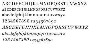 [MyFonts]
[More] ⦿
[MyFonts]
[More] ⦿
|
The Font Company
|
 Dan Barthell's Phoenix, AZ-based foundry, was founded in 1988. It produced about 400 fonts. It was merged into Precision Type Foundry in 1993. Its fonts can now be bought via URW or Ascender.
 Stuart Sandler (The Font Diner) explains: Dan Barthel was the owner of The Font Company out of Phoenix, AZ and now lives in Ft Myers, FL . . . I have his phone number if you wanted to REALLY get all the inside scoop . . . Generally speaking, he was among the first groups along with a handful of young employees he trained to scan and digitize fonts from filmstrips and did a number of conversions for Harry Brodjian of Alphatype typefaces in the late 1980s. Among those included were Parade and Contemporary Brush Bold which were eventually licensed by Robert Norton for Microsoft . . . I'm certain they used the Ikarus system to make their digitizations . . . The Font Company eventually went on to digitize a good amount of typefaces and nearly all of them were distributed by the Precision Type Company until it closed its doors in the mid-2000s . . . Get your hands on one of those catalogs to see the entire library they released . . . At some point in the 1990s Dan decided to close up shop and tossed all the assets digital or otherwise and start over in another business but walked away from the font business all together regardless . . . The fonts: Abbey, Accolade, Adelon (patterned after Albertus MT), Adroit, Advertisers, Aggie, Amanda, Amber, American, Annual, Apache, April, Art Gothie, Artcraft, Ashley, Atrax, Avalon, Avon, Baker Signet, Ballantines, Balloon, Balzac, Baucher Gothic (a headline, tall and geometric typeface designed by URW Studio in 1995 according to some sources---unclear where it originated), Bauer Topic, Beacon, Beale, Bee, Benjamin, Bernhard, Bible, Bluejack, Boa Script, Brittany, Bulmer, California Grotesk, Cartel, Cartoon, Casablanca, FC Caslon, Century Expand, Charter Oak, Chevalier, Chinat, Cloister, Contemporary Brush, Continental, Cooper Old Style, Corporate, Corvinus Skyline, Craw Modern, Criterion, Danmark, FC Deepdene, Diamante, Didoni, Digital, Din 16, Disco, Egizio, Elaine, Erbar, Expressa, Fanfare, Firmin Didot, Florentine, Frency, Gatsby, Geshexport, Glamour, Glasgow, Globe, Gorden, Harem, FC Heldustry, Helenic, Helium, Helserif, FC Highway Gothic, Hildago, Hobo, Holly Script, Howland, Hudson, Huxley Vertical, Impact, Introspect, Inverserif, Japanette, Jay Gothic, Kelles, Kennerley, Kenneth, Koloss, Largo, Leasterix, Legothic, Lightline Gothic, Lucida Type, Marcato, Martin Gothic, Martinique, Mr Big, Napoli, Nashville, Newport Land, Novel Gothic, Neuland, Ondine, Organ Grinder, Ornitons Heavy, Paladin, Pandora Black, Parade, Pasadena, Pekin, Permanent Headline, Philly Sport, Pinnochio, Plakat, Polonaise, Precis, Pretoria, Promoter, Publicity, Quratz, Quint, Racer, Radiant, Regency, Reiner, Rochester, Roger, Rolling Stone, Roman Shaded, Roman Stylus, Roman Solid, Ronda, Roundest, San Serif, Scenario, Sevilla, Shotgun, Siegfried, Souvenir Gothic, Spire, Stanza, Stark, Thor, Ticonderoga, Timbre, Toledo, Torino, Umbra, Veracruz, Viant, Viking Gothic, Village, Vixon, Woodcut, Wordsworth, Yorkshire, Zanzibar and Zola. Other fonts: AGBuch, AGrotesk, Accent-Normal, Aggie-Normal, AlternateGothic, AmericanGothic, AntiqueOlive, Apache, BAVGarde, BOSGoudy, BakerSignet, Bauer Topic (1999-2002), BernhardModern, BrodyNormal, CaslonC224, CaslonC37, CaslonC637, Centaur, CenturyExpanded, Cochin, DisneyPrint, ECBGill, Exquisit, Flash, Folio, GaramondM, Grotesk, IceAge, ImpactCondensed, Imprint, Jenson, Latin, Laudatio, Lynton, MagicSymbols, MBrighton, Michelangelo (a roman caps typeface based on Hermann Zapf's Michelangelo from 1950), NewportLand, NovelGothic, Nueland, Panache, QuaySans, RealtyExecutives, Roman, SpiritCraw, Univers, Venus. In 2009, the elegant transitional---almost modern--- high-legged typefaces Roman Solid and Roman Stylus (outlines) are shown as part of the URW++ collection. Ascender sells these fonts: Accent, Amber, Amber Italic, Amelia, American Text, American Uncial Regular, April, Artcraft Pro, Avon, Balloon Bold, Balzac, Baucher Gothic, Bernhard Gothic Light, BoaScript, Cartoon, Chinat, Contemporary Brush, Cowgirl, Devinne, Digital, N 16, Erbar, Expressa, Fanfare, Florentine, Geshexport, Glasgow ExtraBold, Handel Gothic, Hastings, Hobo, Hobo Bold, Holly Script, Hudson, Koloss, LeAsterix, Nashville, Novel Gothic, Nueland, Nueland Inline, Opportunity, Pasadena Family, Philly Sport, Pretoria, Quartz, Reiner, Resonance, Souvenir Gothic, Stanza, Thor, Ticonderoga, Umbra, Viant, Woodcut, Zanzibar, Zola. [Google]
[More] ⦿
|
The Typographic Archives
|
Also called Graphion's Online Type Museum, or earlier, Graphion, a site by Michael sanbon that disappeared in 1999. Subsections: [Google]
[More] ⦿
|
The Village Press and Letter Foundery
|
Frederic Goudy's foundry based in New York [2 East 29th Street] published a delightful little specimen book, A Novel Type Foundry (1914), which is about type in general, and presents Village Press borders, florets and ornaments, as well as type designs by Frederic Goudy such as Kennerley and Forum Title. [Google]
[More] ⦿
|
Thomas A. Rickner
|
American type designer, born in Rochester in 1966, who has worked for various foundries including Monotype. He graduated from the Rochester Institute of Technology. He lives in Madison, WI, and is currently employed by Monotype, after a short period at Ascender. He co-designed a revival of W.A. Dwiggins' beautiful Eldorado family, Amanda (1996), Hamilton, the Western font Buffalo Gal (1992-1994, TTGX variations font done while he was at Apple). He worked at Monotype from 1994 onwards, where he hinted Carter's Georgia, Tahoma, Nina and Verdana fonts, for example, commissioned by Microsoft. While employed by Apple Computer, Tom oversaw the development of the first TrueType fonts to ship with Apples System 7. He worked on a freelance basis for Font Bureau for the last 12 years. He has worked on custom font solutions for companies such as Adobe Systems, Apple Computer, Hewlett-Packard, IBM, Lexmark, Lotus, Microsoft and Nokia. His custom fonts include a revival of Bodoni to serve Lexmark as their new corporate typeface. His experience with non-Latin scripts is broad, having designed fonts for the Greek, Cyrillic, Hebrew, Thai, Thaana and Cherokee scripts. Tom also played a key role in the development of fonts for Agfa Monotype's proprietary stroke font format. In his own words, However I did the bulk of the drawing for Siegel's Graphite, and I did about 1/2 of the Tekton MultipleMaster (with Jill Pichotta and Tobias Frere-Jones on the other half of the masters) while in Palo Alto. In 2004, he co-founded Ascender Corporation, where he published - Arial Mono (Ascender).
- Buffalo Gals (1992 and 2016): Buffalo Gals is one of the very first variable fonts, originally made in 1992 for an Apple TrueType GX developer CD. It was intended to push the boundaries on the number of stylistic axes in a font, with 6 axes in total, none of them being weight or width. Based upon wood type of the late 1800s, Buffalo Gals enables control over features with names like Cookies, Fringe, Hooves, Concavity and Bracketing. It offers 144 distinct combinations of these attributes, and seemingly infinite intermediate interpolations as well. Free download here.
- Circus Poster Shadow (2005): based an 1890s Tuscan style wood type.
- Goudy Borders (2009) and Goudy Forum Pro (2009), a revival and expansion Frederic W. Goudy's "Forum Title" (1911, inspired by Roman inscriptions on the Trajan's column monument).
- Hamilton (Ascender). A wood type face.
- Rebekah Pro (2006): a revival of ATF's Piranesi family, the regular being designed by Willard Sniffin, and the remaining weights designed by Morris Fuller Benton. Tom Rickner first revived Benton's Italic for use in his wedding invitations for his marriage to Rebekah Zapf in 2006. He completed the character set in 2009.
Will-Harris interview. Agfa bio. Ascender Corporation bio. FontShop link. MyFonts link. Klingspor's PDF. [Google]
[MyFonts]
[More] ⦿
|
Tipitos Argentinos
[Aldo de Losa]
|
 Tipitos Argentinos is Aldo de Losa's foundry in Argentinaa, and Estudio Digit is his graphic design studio. His undergraduate studies were carried out at the University of Buenos Aires, Argentina. Since 1996 he is professor of typography at University of Buenos Aires.
 He designed Goudald Serif (1996-1999) based on Goudy's work. It was published in 2006 at Tipo. He also designed Matutina Serif (2005). At Tipos Latinos 2012, Aldo de Losa won an award in the display type category for Papusa Ultra. Pituca Rounded won an award at Tipos Latinos 2014. He drew the striong all caps sans typeface Malba for the Museo de Arte Latinoamericano de Buenos Aires (MALBA). This was extended and modified in 2017 by Yevgeniy Anfalov and called Malba Sans. In 2018, he published the creamy inktrapped Nougat Script at Sudtipos. Codesigner with Pablo Cosgaya of Sansita Swashed (2018). Github link. Google Fonts link. Aka Aldus de Losa. [Google]
[MyFonts]
[More] ⦿
|
Tom Carnase
|
 Type designer Thomas Paul Carnase was born in The Bronx, New York City in 1939. He graduated from New York City Community College in 1959. Carnase started making fonts in the photolettering era, and lived through the transition to digital. In the 1960s, he opens the studio Bonder & Carnase Inc. From 1969 until 1979, he is vice-president and partner of the agency Lubalin, Smith, Carnase Inc. In 1979, he founds the Carnase Computer Typography studio. In 1980, Carnase becomes co-founder and president of the World Typeface Center Inc., an independent type design agency. He manages the in-house magazine Ligature published by the World Typeface Center from 1982 to 1987. Besides type design, Carnase has designed graphics for packaging, exhibitions, corporate identities and logos for numerous clients, including ABC, CBS, Coca-Cola, CondéNast Publications, Doubleday Publishing and NBC. He has held teaching positions at the University of Cincinnati in Ohio, the Pratt Institute in New York, the Herron School of Art in Indiana, the Parson's School of Design in New York, the Cleveland Institute of Art in Ohio, the University of Monterrey in Mexico, and the Rochester Institute of Technology in New York, among others. His fonts include:
 - Fonts at WTC: WTC Carnase Text, WTC Favrile (1985), WTC Goudy (sold by URW++), WTC Our Bodoni (with Massimo Vignelli), WTC Our Futura, WTC 145. Clones of Favrile abound: OPTI Favrile (Castcraft), Fascinate (NovelFonts), Francois (Serials).
- At LSC (LSC stands for Lubalin Smith Carnase Inc, an agency he co-ran in the 70s), he created a number of typefaces such as LSC Book, LSC Condensed and LSC Caslon No. 223.
- ITC Busorama, a geometric titling typeface that started with an ad for a bus company. Busorama, despite its innate ugliness, has been copied tens of times. Nick Curtis managed to turn it into an art deco typeface in 1999 with his Ritzy Normal.
- With Herb Lubalin, he designed L&C Hairline (ca. 1966, VGC) and L&C Stymie Hairline (1973, VGC).
- At ITC: ITC Manhattan (1970), ITC Avant Garde Gothic (with Herb Lubalin and Ed Benguiat, 1970), ITC Bolt Bold (with Ronne Bonder, 1970), ITC Gorilla (with Ronne Bonder, 1970), ITC Grizzly (with Ronne Bonder, 1970), ITC Grouch (with Ronne Bonder, 1970: this Caslon headline typeface was mimicked and extended in 2011 by Tomi Haaparanta as Grumpy Black; see also Softmaker's Zepp and Bitstream's Dutch 791), ITC Machine (with Ronne Bonder, 1970), ITC Pioneer (with Ronne Bonder, 1970), ITC Ronda (with Ronne Bonder, 1970), ITC Tom's Roman (with Ronne Bonder, 1970), ITC Fat Face Western, ITC Pioneer No. 2, ITC Honda, ITC Didi (a high contrast didone revived in 2013 by Jason Anthony Walcott as Domani CP), ITC Bernase Roman, ITC Neon (1970; jointly by Ronné Bonder and Tom Carnase; based on Prisma, and initially shown by Photo-Lettering as Neon; Prisma in turn was based on Rudolph Koch's Kabel; digitizations include Neptune (FontBank, 1990-1993) and the free shadowed Multistrokes (Manfred Klein, 2003)), and Milano (with Ronne Bonder).
- L'Eggs, ca. 1969. A custom font for a line of hosiery to be called L'eggs by designer Roger Ferriter and Tom Carnase.
Author of Type: the best in digital classic text fonts (1995, Graphis, with Baruch Gorkin), about which Hrant Papazian writes: I just went through the Carnase/Gorkin book - I'd forgotten how lousy it is---please don't buy it. FontShop link. Klingspor link. View Tom Carnase's typefaces. [Google]
[MyFonts]
[More] ⦿
|
Tony Stan
|
New York-based type designer at ITC, 1917-1988. Tony Stan did a version of Jean Jannon's Garamond (ITC Garamond, 1977). Other typefaces: ITC American Typewriter (1974, with Joel Kaden), ITC Garamond (1977), ITC Cheltenham (1975-1978), ITC Cheltenham Handtooled (with Ed Benguiat), ITC Century (1975-1979; see Modern Century by SoftMaker), ITC Berkeley Old Style (1983, a Venetian typeface; after Frederic Goudy), Pasquale, Ap-Ap. About ITC Garamond, Andreas Seidel writes: That one is a modern recreation that in my view breathes much of the 1970s feel and is generally considered the least historical "Garamond". The high x-height does not improve readability, as you will have to adjust the line-spacing accordingly. The Garamond wiki is equally negative about ITC Garamond. Happy (2005, Canada Type, Patrick Griffin) is the digital version of one the most whimsical takes on typewriters ever made, an early 1970s Tony Stan film type called Ap-Ap. Some of the original characters were replaced with more fitting ones, but the original ones are still accessible as alternates within the font. We also made italics and bolds to make you Happy-er (quote by Canada Type). The 1975 revival of Cheltenham by Goodhue (1896) and later by Morris Fuller Benton, resulted in a Cheltenham with increased x-height. Not everyone was pleased with that. Digital versions of ITC Berkeley Oldstyle besides that of ITC include University Oldstyle (SoftMaker), Californian (Font Bureau), B695 Roman (SoftMaker) and Venetian 519 (Bitstream). Linotype link. FontShop link. Klingspor link. View Tony Stan's typefaces. [Google]
[MyFonts]
[More] ⦿
|
Tory Text
|
A blackletter typeface by Frederic Goudy, designed in 1935, and modeled after the lettre batarde used by Geoffroy Tory in his Champs Fleury. Mac McGrew: Tory Text was a frankly archaic type designed and produced by Frederic W. Goudy in 1935. For a small edition of a twelfth-century story which he intended to print, Goudy chose a sixteenth-century type design to express the qualities he had in mind. This was redrawn in an attempt to make it more legible for modern readers while retaining the ancient spirit. Goudy describes Tory Text as one of his favorite types, and says that he enjoyed every minute of its making. See Village Text. For a digital revival, we refer to Steve Matteson's Tory (2018). [Google]
[More] ⦿
|
Trajan Title
|
A typeface designed by Frederic Goudy in 1930. D.J.R. Bruckner: The face derives from an inscription at the base of Trajan's Column in Rome, which Goudy had seen twenty years earlier. He had made some letters based on it for the Limited Editions Club Rip Van Winkle. Later he was asked to design a capital font for a list of subscribers to the building of the Community House in Forest Hills Gardens, and he made the Trajan. Mac McGrew: Trajan Title was designed by Frederic W. Goudy in 1930 to fulfill a commission to print a list of subscribers to the building of the community house in his old home town of Forest Hills Gardens, Long Island. The previous year, Goudy had lettered the principal line on the title page of a limited edition of Rip Van Winkle, for which he had designed the typeface Kaatskill (q. v.). Now he completed that alphabet, feeling that it would be ideal for this purpose. Goudy calls this one of his favorite designs, and it is indeed an impressive inscriptional style of letter. It is based on letters inscribed at the base of the Trajan Column at Rome, erected about 114 A.D., but not copied slavishly. He cut several sizes, and states that it has been widely used. English and Continental rights were sold to the English Monotype Company. No digital versions are known, but compare with LTC Form Title (Lanston), which is based on Goudy's other Trajan typeface, Forum Title (1911). [Google]
[More] ⦿
|
Truesdell
|
A typeface designed by Frederic Goudy in 1930. Mac McGrew: Truesdell and Italic were designed and cut by Frederic W. Goudy in 1930-1931, for setting a prefatory note he had written to an article to appear in "The Colophon." The article itself was set in Goudy's Mediaeval. Truesdell was his mother's maiden name. Digital revivals include Truesdell (1994, Steve Matteson for Monotype). [Google]
[More] ⦿
|
Typographie et Civilisation
|
Typography site maintained by Jean-Christophe Loubet Del Bayle. Has sub-pages on Bertham, Bookman, Chelthenham, Clarendon, Copperplate Gothic, Garamond, Garamond ITC, Garamond No3, Goudy Mediaeval, Goudy Old Style, Goudy Sans, Granjon, Optima, Sabon, Stempel, Collection Claude Garamond, Collection Frederic Goudy. [Google]
[More] ⦿
|
Typography for Lawyers
[Matthew Butterick]
|
 Great pages about typography and the choice of fonts for law documents. Written by type designer and civil litigation attorney, Matthew Butterick. Eloquent and convincing, these pages are good reading for any typographer. Summarizing his advice:
 - Typography is always important because presentation is always important.
- Good typography makes your written documents more professional and more persuasive.
- Sure, typography is important because presentation is important. But the substance of your argument and the quality of your writing is still the most important of all.
- Straight quotes should never, ever appear in your documents.
- You must always put exactly one space between sentences.
- In a printed document, don't underline. Ever.
- If everything is emphasized, then nothing is emphasized.
- Centered text is generally overused. It is like ordering plain cheese pizza--safe but boring.
- All-caps text, meaning text where all the letters are capitalized, is best used sparingly.
- A paragraph mark or section mark should always be followed by a nonbreaking space so that the mark stays joined with the numerical reference that follows.
- A nonbreaking space should usually be used in front of any numerical or alphabetic reference. It should definitely appear after paragraph marks and section marks.
- Novelty fonts, weird fonts, outline fonts, shadow fonts have no place in any document created by a lawyer. Save it for your next career as a designer of breakfast-cereal boxes.
- Avoid using the core operating system fonts in printed documents. On Windows, that means Arial, Calibri, Cambria, Candara, Comic Sans, Courier, Georgia, Helvetica, any flavor of Lucida, Palatino, Trebuchet, and Verdana. On the Mac, that means Arial, Courier, Helvetica, Palatino, Skia, and Verdana. Subject to a few exceptions, you should also avoid Times New Roman.
- Monospaced fonts were invented to suit the mechanical limitations of the typewriter. They were not invented because anyone liked them. Monospaced fonts are hard to read and they waste space.
- Hyphenation does not improve text legibility, so other things being equal, you should turn it off.
- Avoid squishing type (or stretching it to get expanded type). If you need a condensed or expanded typeface, get one that was designed for the purpose.
- Real small caps are so rare that when they actually show up in a legal document, it's like a beacon of classiness. As far as bang for the buck, there are few deals in this website better than small caps. Once you use them, you won't go back.
- I like fonts that seem to be at home in a legal document---clean, authoritative, but not relentlessly humdrum or self-consciously offbeat. I also look for fonts that have noncontroversial italic and bold styles, because lawyers use those frequently. [He mentions Galliard, Sabon, Stempel Garamond, Minion, Arno, Goudy Old Style and Bembo, and warns about Bodoni, Bookman and any sans face.]
[Google]
[More] ⦿
|
Typologia
[Frederic Goudy]
|
 The full title of this book is "Typologia, Studies in Type Design \& Type Making" (1940, University of California Press, Berkeley). At the TypeArt Reference Library, you can find 5 chapters of it. This is Frederic Goudy's magnum opus, his life's work, giving his vision on many typographic things. It contains the story of the proprietary typeface University (of California) Old Style. It even has a big section on the history of legibility. [Google]
[More] ⦿
The full title of this book is "Typologia, Studies in Type Design \& Type Making" (1940, University of California Press, Berkeley). At the TypeArt Reference Library, you can find 5 chapters of it. This is Frederic Goudy's magnum opus, his life's work, giving his vision on many typographic things. It contains the story of the proprietary typeface University (of California) Old Style. It even has a big section on the history of legibility. [Google]
[More] ⦿
|
Venezia Italic
|
A typeface designed by Frederic Goudy in 1925. D.J.R. Bruckner: This face was made at the request of the London designer and typographer George W. Jones, to accompany his Venezia Roman. Stanley Morison said Goudy's face was based entirely on a French italic font cut by Claude Garamond around 1535. Goudy insisted, however, that he had made the design with reference only to Jones' roman. Mac McGrew: Venezia Italic (quite unlike Venezia) was designed by Frederic W. Goudy in 1925 to accompany a typeface which George W. Jones, a well-known English printer and designer, had drawn for the English Linotype Company. It is somewhat similar to Cloister, but with stronger serifs. [Google]
[More] ⦿
|
Village by Frederic Goudy
|
 Village is a Venetian typeface designed by Frederic Goudy in 1903. Mac McGrew writes about its genesis: Village was designed by Frederic W. Goudy in 1903 on commission from Kuppenheimer&Company, a clothing store, as a private typeface for their advertising. Drawings were approved and paid for, but no type was produced for this account. Later in that year, Goudy and Will Ransom established a printing business which they called the Village Press. This type design was cast to become the private design of this press, and used as such or several years, while the business was in Park Ridge, Illinois. Though used on the classic Jenson type, this typeface has a number of novel details. The matrices were later purchased by Frederick Sherman, a publisher and fine printer, who used the typeface for printing the monumental Catalog of Dutch Paintings of the Metropolitan Museum. Miraculously, the mats survived and were recently used by Theo Rehak of The Dale Guild to cast new fonts, the source of the specimen shown here. For years Goudy wanted something to replace his Village type-not to duplicate it, but to have something for similar uses. In 1932 he designed and cut another type which he called Village No.2, and a year or two later cut an accompanying italic. These are more mature designs, without the unique details of the original design, and have been used for a number of fine booklets. Monotype obtained reproduction rights to these later typefaces, and produced them for machine composition in two sizes. The matrices of Goudy's Village were cut and the type cast by Wiebking, Hardinge and Co of Chicago.
 This Venetian typeface was digitized by David Berlow (1994, FontBureau), by Paul D. Hunt (2005), and by Steve Matteson (2018), who simply called his revival Village. Hunt's version was eventually released in 2016 by P22 as LTC Village No. 2 and in 2020 as LTC Village. Ivan Louette (Belgium) is working on a fine version of Village as well. [Google]
[More] ⦿
|
Village Text or New Village Text by Frederic Goudy
|
Village Text or New Village Text is a typeface designed in 1938 by Frederic Goudy. Mac McGrew writes: This typeface by Frederic W. Goudy is really a hybrid, combining the capitals of Tory Text with the lowercase of Deepdene Text. When the Grabhorn Press in San Francisco ordered a large amount of Deepdene Text for a proposed book about Caxton, England's first printer, Goudy was not satisfied that this was the best choice for the subject. After quite a bit of study, he hit upon the idea of substituting the Tory Text capitals. Grabhorn approved a proof of this combination. Earlier, Goudy had applied the name Village Text to his redesign and cutting of Aries, but Grabhorn renamed it Franciscan when they used that face for an award-winning book. This left the name available for the later face. [Google]
[More] ⦿
|
Vincent Pacella
|
 American lettering artist and type designer from New York. Creator of ITC Cushing (1982) and ITC Pacella (1987). MyFonts.com hints that he may have died. According to Linotype, ITC Cushing has a long history. The font was originally designed [for ATF] by J. Stearns Cushing [in 1897], a Boston-based book printer, and famous American type designer Frederic Goudy expanded it to include an italic weight [in 1904]. These early ATF typefaces became known as Lining Cushing Oldstyle No. 2 and Italic. ATF also brought out a Lining Cushing No. 2 and Italic, Cushing Antique, and Lining Cushing Monotone 553.] A Ludlow version featured narrow capitals and an oblique crossbar on the lowercase t. A Monotype version in one weight of roman and italic had small, inclined serifs, wide capitals, short ascenders and descenders. In 1901, Lanston Monotype introduced Cushing Oldstyle, a slightly condensed typeface with large bracketed serifs and fairly uniform weight. It has little relationship to the ATF and Monotype Cushing.
 Under a special license from the American Type Founders, Vincent Pacella modified the design for ITC and added some additional weights. ITC Cushing is slightly condensed with large, bracketed serifs. Pacella changed the capital letters to better complement the lower case and replaced the sloping serifs of the italics to linear type serifs to produce ITC Cushing. ITC Pacella was fashioned in the tradition of Century Schoolbook, Corona and Nimrod, accordung to Linotype. In the 1970s, he made a Photolettering Egyptian headline typeface called Blackjack, which was digitized in 2007 by Nick Curtis as Flap Jacks NF. His 1970s semi-psychedelic typeface Carousel became Nick Curtis's Vinnie Culture NF (2007). His Pacella Vega Extended 10 (Photolettering, 1960s) was digitized by Nick Curtis as Palo Pinto NF (2010). MyFonts also credits Pacella with AT Stratford Bold, a thick slab serif. His PhotoLettering fonts Pacella Barrel and Pacella Colossus inspired Nick Curtis to create the beautiful ultra fat western slab serif Earmark NF (2009). The Western poster font Pioneer was revived by Nick Curtis as Trailblazer NF (2010). Bingham (done for PLINC) led Nick Curtis to design the angular octagonal typeface Binghamton NF (2010). Designer of Plinc Goliath, a fat slab serif, based on Film No. 6206 in the PhotoLettering archive. Originally drawn in 1970 by Pacella, Goliath was digitized by Ben Kiel with Adam Cruz in 2011 for House Industries. [Google]
[MyFonts]
[More] ⦿
|
Vrest Orton
|
Vermont-based author (b. 1897) of Goudy, Master of Letters (Black Cat Press, Chicago, 1938; published in 1939; see also here), about the life of Frederic Goudy (1865-1947). The book has quite a bit of historic detail such as a vivid description of the fire that destroyed Goudy's workplace at Deepdene. But there are virtually no type specimens or typographic images. [Google]
[More] ⦿
|
Wadsworth A. Parker
|
 Printer, typefounder, and head of the ATF specimen department (1864-1938). Designer of the caps font Modernistic (1927, ATF, which is in the spirit of Gallia), Gallia (1927, art deco headline face), Graybar Book, Lexington, Stymie Compressed, Stymie Compressed Inline Title and Bookman (+Italic).
 Mac McGew: Gallia is a unique decorative letter designed by Wadsworth A. Parker for ATF in 1927, and copied by Monotype the following year. It is a severe thickand-thin style, with main strokes divided by two white lines into a thick and two thin lines. There are flourished alternate forms of several letters, for use as initials or terminals. Compare Modernistic. Nick Curtis made Metro Retro Redux (2001), an art deco font, based on Modernistic. Gallia has seen many revivals including Gallia (Monotype), Galleria (Corel) and Gambler (Softmaker). FontShop link. [Google]
[MyFonts]
[More] ⦿
|
Wiescher Design
[Gert Wiescher]
|
 Gert Wiescher was born in Braunsbach am Kocher, Germany, in 1944. Based in München, Gerd Wiescher designed many classy and classic Bodoni families, as well as New Yorker Type (1985). All of his typefaces are carefully fine-tuned and balanced. Wiescher founded first Munich Type and then Wiescher Design and Autographis. He is known as a hard, fast and prolific worker. His exquisite typefaces can be bought at MyFonts. Catalog of his bestselling typefaces. Interview in 2008. Wikipedia page. Creative Market link. List of typefaces:
 - Scripts: Prima Script (2017: for menus and cookbooks), Marmelade (2015, +Fruits, a set of dingbats), Triana (2014, a thin monoline penmanship script named after a Spanish sailor on the Pinta who in 1492 was the first to see America---in this case the Bahamas), Floral Script (2014, copperplate style script), Sherlock Script (2014: this comes with Sherlock Stuff (fingerprints) and Sherlock Stuff Dots (ink stains)), Felicita (2013, a swashy copperplate script), Vividangelo (2013, after the handwriting of a real person), Dreamline (2013, connected monoline cursive wedding scripts in A, B and C styles), Fiorentina (2012, a renaissance style script with 650 characters), Excelsia Pro (2012), Delicia Pro (2012, a fat brushy signage script), Nono (2011, formal swashy calligraphic family), Dyane (2011), Penn (2011), Lettera (2011, hand-drawn formal face), Tosca (2010, a high-contrast calligraphic typeface with 730 glyphs), Grandcafe (2010), Loulou (2010, curly and of extreme contrast), Schoolblock (2010, hand-printed school font), Grandezza (2010, calligraphic family; +Xtra), Sixtra (2010, a curly didone script), English Script (2010, classic Spencerian calligraphic script), Savage Initials (2009), Morning News (2009), Revolte (2009, a brush script for demonstration signs), Estelle (2009), Scriptofino (2008, 4 calligraphic styles to give Zapfino a run for its money), Exprima (2008), Daiquiri (2008), Lisa Bella, Lisa Fiore and Lisa Piu (2008, connected and calligraphic), Tati (2008), Movie Script (2007), Cake Script (2007), Eddy (2007, grungy calligraphy), Pointino (2007), Bohemio (2007, a great oriental-brush script), Artegio (2007, two calligraphic scripts), Xylo (2006, in the tradition of the 18th-century English calligrapher George Bickham and the 19th-century American calligrapher Platt Rogers Spencer), Tamara (2005, art-deco script based on some initials for Semplicita made in the 1930s by the Nebiolo foundry), Tecon, Ellida (2005, inspired by the elaborate scripts of 18th-century English calligrapher George Bickham, with additional influences from 19th-century American calligrapher Platt Rogers Spencer), Eloise (2009, a high-contrast version of Ellida), Nadine Script (2005, an elegant script inspired by a set of initials the French designer and artist Bernard Naudin drew for Deberny&Peignot in the 1920s), Royal Classic (2005, unbelievable script based on a design that has initially been comissioned by King Ludwig I of Bavaria for in-house-use), DesignerScript, Filzer Script (1995, handwriting), Futuramano-Condensed-Bold, Futuramano-Condensed, Futuramano-Plain, Futuramano-Thin, Giambattista, Scriptissimo-Plain, Scriptissimo-Forte, Scriptissimo-Swirls, Squickt (1989), Konstantin A, B and C (2005), Konstantin Forte (2005), MyScript, GrocersScript, Swanson (2006). Scriptissimo (2004) has versions named Start, Middle and End, tweaked for their position in the word, and there are plenty of ligatures. Check also Bodoni Classic Chancery (2007) and Bodonian Script (2012).
- Sans: Brute Sans (2018), Xpress (2018), Xpress Rounded (2019), Classic Sans (2017, a revival of Theinhardt Grotesk), Classic Sans Rounded (2017), Maxi (2017), Nic (2017), Azur (a large almost geometric sans famly with 1950s Roger Excoffon-style French flavours, called a Medterranean grotesk by Wiescher himself), Royal Sans (2017, after Theinhardt's Royal Grotesk---the forerunner of Akzidenz Grotesk--- from 1880), Docu (2016, a workhorse elliptical sans family), Viata (inspired by Bauhaus), Noticia (2016, in the Bauhaus tradition, with very pointy v and w, and a bipartite k; not to be confused with the 2011 Google Web Font Noticia Text by José Solé; followed in 2019 by Noticia Rounded), Avea (2015), Aramis, Nota Bene (2015: squarish, narrow, technical), Nota (2015, technical and cold: the rounded version, Nota Rounded, followed in 2019), Dylan Condensed (2014), Dylan Copperplate (2014), Supra (2013, grotesk: Supra Thin is free. See also Supra Condensed (2013), Supra Mezzo (2013, between regular and condensed), Supra Extended (2013), Supra Rounded (2015), Supra Classic (2014), and Supra Demiserif (2013, slab serif derived from Supra)), Dylan (geometric sans), Franklin Gothic Raw (2013, like Franklin Gothic but with raw, not rough, outlines, only visible at very large sizes), Blitz (2012, a flared family), Blitz Condensed (2012), Contra Sans (2011, which led to Contra Slab, Contra Condensed and Contra Flare), Vedo (2011, a Bauhaus style family that include a hairline weight), Germania (2011, a useful and beautiful monoline sans family), Geometa (2011, +Rounded, +Rounded Deco, +Deco: all based initially on Renner's Futura), Geometra Rounded (2011, a rounded family based on Futura and "much less boring than DIN"), Bombelli (2010, ultra-wide architect's hand), Bluenote Demi (2010, a grungy Franklin Gothic Condensed), Perfect Sketch (2010, sketched grotesque), Unita (2009), Antea (2009), Eterna (2009, sans with a swing), Pura (2008, an uncomplicated grotesk family), Purissima (2010, a decorated extension of Pura; +Bold), Copperplate Gothic Hand (2009, after a 1901 design by Goudy), Copperplate Alt (2011), Copperplate Wide (2011), FranklinGothicHandDemi (+Shadow), Franklin GothicHandCond (2009), Franklin Gothic Condensed Shadow Hand (2010), and Franklin Gothic Hand Light (2009, a hand-drawn version of Franklin Gothic), Papas (2005, sturdy, slightly curly), Julienne (2005, a condensed sans family; see the new versions Moanin and Julienne Piu, 2017), Cassandra (1996, an art deco style after Adolphe Mouron Cassandre), Futura Classic (2006), Cassandra Plus (2012), Ela Sans (2005, a large family), Mondial-Bold (2004), Mondial-Demi, Mondial-Light, Mondial-Medium, Mondial-Normal, Mondial-XBold, Monem-Bold, Monem-Medium, Monem-Normal, Monem-Roman.
 Serif: Imperia (2011, a Trajan column caps face), Monogramma (2012, a Trajan family for monograms), Imperium (2005, a precursor of Imperia with a Relief shadow style included), Hard Times (2011), Fat Times (2011, retraced Times), Elegia (2011, slightly Victorian family), Breathless (2010, a spiky family, inspired by nouvelle vague movie posters), Bodoni Classic 1, Bodoni Classic 2, Bodoni Classic 3, BodoniClassic-Condensed, BodoniClassic-Handdrawn, BodoniClassic-Swashes, BodoniClassic-Text, Bodoni Classic Deco, Bodoni Classic Swirls (2009), Bodoni Classic Pro (2011), Bodoni Classic Inline (2012), Bodoni Classic Fleurs (2014, ornamental caps), Bodoni Comedia (2010, one of my favorites: a funny "live one day at a time" curly Bodoni cocktail), Bodoni Classic Swing (2010), Bodoni Classic Free Style (2010, curly), Bodoni Classic Ultra (2010), La Bodoni Plain (+Italic, 2008), Take Five (2005, a jazzy take on Bodoni Classic), DonnaBodoniAa, DonnaBodoniBe, and DonnaBodoniCe (three scripts named after Bodoni's wife, Margharita dell'Aglio, who published his complete works, the Manuale Tipografico, in 1818, five years after his death), Edito, Robusta. A great series, some of which were originally published at Fontshop, see, e.g., FFBodoniClassic (1994). MyFonts: When the first of Wiescher’s Bodoni Classic fonts came out in the 1993, there was nothing like it. Up to then, virtually all Bodoni revivals had been given clear-cut forms and square serifs. But Bodoni’s originals from the late 1800s were never as straight and simplistic as is often assumed: they had rounded serifs and slightly concave feet. Wiescher digitized a wide range of Bodoni letterforms, including a wonderful script-like family called Chancery and a nice series of Initials. Having accomplished his mission twelve years later, he began making personal additions to the family, such as the more decorative Bodoni Classic Swashes. Recently a useful little family was added to the clan: LaBodoni is sturdier and less optically delicate than most Bodonis, and therefore more usable as a text face. Wiescher made Metra Serif (2009), Principe (2008) and Paillas (2009). Prince (2009) is a curlified didone. Serif: Imperia (2011, a Trajan column caps face), Monogramma (2012, a Trajan family for monograms), Imperium (2005, a precursor of Imperia with a Relief shadow style included), Hard Times (2011), Fat Times (2011, retraced Times), Elegia (2011, slightly Victorian family), Breathless (2010, a spiky family, inspired by nouvelle vague movie posters), Bodoni Classic 1, Bodoni Classic 2, Bodoni Classic 3, BodoniClassic-Condensed, BodoniClassic-Handdrawn, BodoniClassic-Swashes, BodoniClassic-Text, Bodoni Classic Deco, Bodoni Classic Swirls (2009), Bodoni Classic Pro (2011), Bodoni Classic Inline (2012), Bodoni Classic Fleurs (2014, ornamental caps), Bodoni Comedia (2010, one of my favorites: a funny "live one day at a time" curly Bodoni cocktail), Bodoni Classic Swing (2010), Bodoni Classic Free Style (2010, curly), Bodoni Classic Ultra (2010), La Bodoni Plain (+Italic, 2008), Take Five (2005, a jazzy take on Bodoni Classic), DonnaBodoniAa, DonnaBodoniBe, and DonnaBodoniCe (three scripts named after Bodoni's wife, Margharita dell'Aglio, who published his complete works, the Manuale Tipografico, in 1818, five years after his death), Edito, Robusta. A great series, some of which were originally published at Fontshop, see, e.g., FFBodoniClassic (1994). MyFonts: When the first of Wiescher’s Bodoni Classic fonts came out in the 1993, there was nothing like it. Up to then, virtually all Bodoni revivals had been given clear-cut forms and square serifs. But Bodoni’s originals from the late 1800s were never as straight and simplistic as is often assumed: they had rounded serifs and slightly concave feet. Wiescher digitized a wide range of Bodoni letterforms, including a wonderful script-like family called Chancery and a nice series of Initials. Having accomplished his mission twelve years later, he began making personal additions to the family, such as the more decorative Bodoni Classic Swashes. Recently a useful little family was added to the clan: LaBodoni is sturdier and less optically delicate than most Bodonis, and therefore more usable as a text face. Wiescher made Metra Serif (2009), Principe (2008) and Paillas (2009). Prince (2009) is a curlified didone. - Romain du roi: In 2008, Wiescher designed the two-style Royal Romain, which is based on the Romain du Roi of Philippe Grandjean, which was completed in 1745 after Grandjean's death by Grandjean's successor Jean Alexandre and Louis Luce. Wiescher: The Romain du Roi was for the exclusive use of the Louis XIV. It was never sold or given to any other king or government. The king of Sweden tried to scrounge a set, but the king refused. This font is the basic design for such famous fonts as the Fournier and Bodoni. Just so the Romain du Roi doesn't get lost in the digital turmoil I set out to redesign it in 2004 and finished now in early 2008. I did a lot of research in France's National Library. A good excuse to visit Paris is always welcome!!!
- Engravers: Dylan Copperplate (2014), Cavaliere (2010), Guilloche A (2009), Guilloche B (2013, op-art borders), CopperplateClassic-Plain, CopperplateClassic-Round, CopperplateClassic-Sans, Copperplate Classic Light Floral (2009), Cimiez-Bold, Cimiez-Roman (2004), Ela-Demiserif, Ela-Sans (2004), Eleganza (2008).
- Blackletter/Fraktur: Renais (2011, renaissance initials), Flipflop (2011), Fraktura and Fraktura Plus (2008), Royal Bavarian (2004, based on a typeface commissioned by King Ludwig 1st of Bavaria about 1834), Royal Blossom (2009), Royal Bavarian Fancy (2004), Bold Bavarian (2010, a heavy version of Royal Bavarian), Monkeytails (2008), Fat Fritz (2006, rounded endings), Ayres Royal (2005, blackletter typeface based on drawings of London's calligrapher John Ayres, ca. 1700; to be used with RoyalBavarian; followed in 2010 by BoldAyres).
- Slab serif: Slam Normal (2017), Slam Rounded (2017), Suez (2017: with extra tall ascenders and descenders), Egyptia (2010), Egyptia Rounded (2010).
- Typewriter: Lettera (2014), Lectra (2011), QuickType-Bold, QuickType-Plain, QuickType-Sans.
- Decorative: Tric (2017, art deco), Franklin Gothic Raw Semi Serif (2015), Frank Woods (2013, letterpress simulation based on Franklin Gothic Heavy), Ohio Bold (2012, a rough headline type in the tradition of Louis Oppenheim's Lo-Type from 1913), Viking Initials (2012), Cannonball (2012, a psychedelic typeface derived from a jazz record-sleeve for Cannonball Adderley), Byblos (2011, derived from the logo of St. Tropez's famous Hotel Byblos), Blockprint (2013, early 1900 German expressionist grunge face, renamed Bannertype after 24 hours), Ferrus (2010, inspired by Cassandre's Acier Noir, 1936), Petite Fleur (2009, flowery embellishments and the capitals of his redesigned Royal Romain, which in turn is based on the famous romain du roi), Glass Light (2012, a decoirative art nouveau type family based on Glass Light by Franz Paul Glass, 1912), Penstroxx (2009, 5 fonts that are based on the powerful, expressive Traits de plume (penstrokes) designed in Paris around 1930 by Alfred Latour), Liquoia A, B and C (2008, decorative scripts), Modernista (2008, an art nouveau headline face, based on an 1898 sample by Peter Schnorr), Ornata A, B, C, D, E, F and G (2008-2009: ornaments), Fleuraloha (2008), Floralissimo (2008: flowery ornaments), Frank Flowers (2011), Scrolls A (2010, penman's dingbats), Bacterio (2007), Alpha Bravo, Alpha Charlie, Alpha Echo (2006), Barracuda, Cacao (2005, fifties style), Cassandre Initials (2004, Elsner&Flake, after the 1927 original by Adolphe Mouron Cassandre), Contype, Fleurie (2005), Fleurons Two (2006), Fleurons Three (2006), Fleurons Four (2006), Fleurons Initials (2007), Fleurons Six (2008), Fleuron Labels (2008), HebrewLatino, Julius, Lunix (2006), MyHands, NewYorkerType (1985; extended in 2011 to NewYorker Plus, and in 2020 to New Yorker Type Classic and New Yorker Type Pro; after Rea Irvin's well-known typeface for The NewYorker), Venice Initials (2006, after a 15th century find, but Wiescher added about half of the caps), Ventoux, Vivian (2005), Woody.
- Pixel and/or futuristic: Nexstar (2013: this octagonal typeface is also useful or athletic lettering), Alpha Fox (2007), Alpha Juliet (2010), Alpha Papa (2010), Alpha Square (2010), Alpha Jazz (2010), Alpha Papa (2010, LED meets stencil).
- Stencil typefaces: Dripps (2010, handpainted, perhaps brutalist), Red Tape Plus (2014).
- Comic book fonts or brush fonts: Breezy (2015), Caboom (2014).
- Dingbats: Wayside Ornaments (2012), XX Century Ornaments (2012), Thistle Borders (2012), Greenaway Mignonettes (2012, after Kate Greenaway (1846-1901), author and illustrator of childrens books), Collins Florets (2012), Flourishes A (2010), Jingle Doodles (2010).
- Art deco: Trix (2017), Zelda (2017, named after F. Scott Fitzgerald's wife).
- Commissioned and special typefaces include a version of the logotype for the Munich's newspaper Abendzeitung, Maxi (variable width sans), NIC Grotesk, Tric (art deco), a Cyrillic version of Bodoni Classic for Vogue Moscow, a special Bodoni Classic for Ringier Publishers in Zurich, and Red Tape, a typeface that is on permanent exhibition at the German National Library in Leipzig.
- Typefaces from 2019: Elita (a condensed sqaurish typeface), Artis Sans, Sigma Condensed and Sigma (simplified readable sans families), Cosma (an elegant high-contrast text family with tapered upstrokes and crossbars, but otherwise didone roots), Quincy (a bebop typeface that started from some letterutouts), Phoebe (an elliptical techno family), Phoebe Rounded, Polygon A, Polygon I, Polygon X.
- Typefaces from 2020: Bullets Bannertype, Alpha One (a counterless experiment), Exec (a 14-style sans family), Exec Corners, Exec Demiserif, Penta (a grotesque family with large counters that make the ExtraLight style quite striking), Penta Rounded.
Author of many books, including Zeitschriften & Broschüren (Systhema-Verlag, München, 1990), Schriftdesign (Systhema-Verlag, München, 1991), and Blitzkurs Typografie (Systhema-Verlag, München, 1992). The following text was excerpted from his wikipedia page: At 14 years of age, Wiescher went to Paris to study fine art. He financed his stay by doing portraits on the Place du Tertre on Montmartre. In the sixties Wiescher studied graphic design at the Berlin Academy of Fine Arts. (Since November 2001, Berlin University of the Arts.) He financed his studies by sidewalk painting and drawing portraits. While doing sidewalk paintings, he met the typeface designer Erik Spiekermann, who inspired his love of this branch of design. After two years he quit his studies, and went to Barcelona where he worked at the offices of Harnden & Bombelli, for whom he designed the OECD-Pavilion of the 1970 Osaka World Expo. In 1972 he moved on to Johannesburg working as an art director at Grey and Young advertising . In 1975, he returned to Germany, working first for DFS+R-Dorland, and then for the "Herrwerth & Partner" ad agency. At Herrworth, he was involved in introducing IKEA into the German market. In 1977 he became a creative partner in the Lauenstein & Partner ad agency, creating mainly campaigns for large German retail chains. In 1982 he started his own design office, creating work for editors (Markt & Technik, Systhema and Langen-Müller-Herbig), computer companies (House of Computers, FileNet) and he worked for Apple Computers designing their publications (Apple-Age and Apple-LIVE). View Gert Wiescher's typefaces. Wikipedia link. [Google]
[MyFonts]
[More] ⦿
|
Will Ransom
|
American designer, letterer, author and type designer (1878-1955) who was associated with ATF. In Chicago, he and Frederic Goudy started the private Village Press in 1903, which was a popular meeting place for typophiles, including Cooper and Dwiggins. Bio by Eason&Rookledge. - In 1918, he created Parsons for Barnhart Brothers&Spindler, which was named after the artistic director of a Chicago-based department store. This was the basis of the typeface AIParsons (1994) by Inna Gertsberg and Susan Everett at Alphabets Inc. Nick Curtis' Parsnip family (2004) is based on Parsons. Jess Latham also digitized Parsons. Finally, Dieter Steffmann converted the Gertsberg / Everett revival in 1999 to truetype while keeping the name AI Parsons.
- He created Clearcut Shaded Capitals (1920s, Barnhart Brothers&Spindler). This was extended to a full font by Nick Curtis in 2005 as Ransom Clearcut NF).
Klingspor link. [Google]
[MyFonts]
[More] ⦿
|
William Addison Dwiggins
|
 Martinsville, Ohio-born illustrator, calligrapher, typographer, book designer, author, type designer and puppeteer, 1880-1956 (Hingham, MA). Pic (1955). All his typefaces were designed for the Mergenthaler Linotype Company, where he worked for 27 years. He also was Acting Director of the Harvard University Press, 1917-1918. In 1919, he founded the Society of Calligraphers, Boston, and was in fact an accomplished calligrapher, who drew many ornaments and designed many jackets. Dwiggins studied lettering under Goudy in Chicago while a student at Frank Holme's School of Illustration. When Goudy moved to Hingham, Dwiggins followed and was to work there for the rest of his life. As a puppeteer, he often used the pseudonym Dr. Hermann Puterschein. His papers:
 - Some why's and wherefore's of the shapes of roman letters (1919), a short essay full of quotes, some good, but mostly derogatory, regarding the main text types in vogue at the time, such as Century, Caslon, Cheltenham, Pabst, Cadmus and Scotch.
- WAD to RR, a letter about type design, Department of Printing and Graphic Arts, Harvard College Library, Cambridge, MA, 1940. In this letter to a friend, RR, entirely written in a beautiful hand, he explains how to make type.
His typefaces: - Arcadia (1943-1947). Mac McGrew: Arcadia was an experimental typeface designed by William A. Dwiggins for Mergenthaler in 1943-47, used in Some Random Recollections, by Alfred A. Knopf for the Typophiles as Chapbook XXII in 1949.
- Caledonia (1938-1939). Known as Transitional 511 at Bitstream, New Caledonia at Adobe, and New Caledonia at Linotype. See C651 Roman on the SoftMaker MegaFont XXL CD, 2002. Nicola Caleffi complains that New Caledonia and BT 511 are too weak and miss old style figures.
Mac McGrew: Caledonia and Caledonia Italic were designed by William A. Dwiggins for Linotype in 1938, with Caledonia Bold and Bold Italic added two years later. A Bold Condensed version was produced by Lino for newspaper head- line use. Caledonia has been described as a modernization of Scotch Roman (and Caledonia is the ancient name for Scotland), but it is more than that. It also shows the influence of the Bulmer typeface, with a large portion of Dwiggins' individuality. He describes the typeface as having a "liveliness of action. [...] quality is in the curves---the way they get away from the straight stems with a calligraphic flick, and in the nervous angle on the under side of the arches as they descend to the right." Being designed specifically for the Linotype and its mechanical limitations, rather than being adapted from a foundry face, Caledonia Italic is particularly successful, and the whole family has become very popular. In text sizes, short descenders may be cast on nominal body sizes, while the more handsome long descenders (not made for italics) require one point larger body size. Compare Baskerville, Bulmer, Scotch. - Caravan Borders (1938). Four fonts available at Linotype (1976).
- Charter (1946). Mac McGrew: Charter was an experimental, special-purpose typeface designed by William A. Dwiggins for Mergenthaler between 1937 and 1942. An upright script, only the lowercase and the few other characters shown were completed. For tests, these were combined with Electra caps. It was used in a limited edition book, The Song Story of Aucassin and Nicolete, designed and printed in 1946 by S. A. Jacobs at the Golden Eagle Press, Mt. Vernon, New York, with Electra small caps in place of regular caps. Between 2010 and 2018, Cristobal Henestrosa developed the titling typeface Royal Charter, a digital revival of Charter. With the help of Oscar Yanez, this became a retail typeface at Sudtipos called Mon Nicolette.
- Eldorado (1953). Berry, Johnson and Jaspert give an earlier date, 1951. Created after a 16th century early roman lowercase by Jacques de Sanlecque the elder. Revived in 1993 at Font Bureau as Eldorado by David Berlow, Jane Patterson, Tobias Frere-Jones, and Tom Rickner. Mac McGrew: Eldorado is a contemporary roman designed by W. A. Dwiggins for Linotype about 1950, based on early Spanish models. The lowercase is compact, with a small x-height and long ascenders. Several italic letters have cursive or decorative forms; also notice the cap Y, with curved, serifless arms.
- Electra (1934-1935), a text typeface with a distinctive Q but otherwise unobtrusive glyph shapes. Known as Transitional 521 at Bitstream. Mac McGrew: Electra is a contemporary modern typeface designed by W. A. Dwiggins for Linotype. The light weight was drawn in 1935, the bold a few years later. Aside from its readability and distinctive character, Electra is distinguished by a choice of italic forms. Electra Italic is really a sloped roman, while Electra Cursive, released in 1944, is more nearly a conventional italic form; only the lowercase is different. Like a number of the better Linotype typefaces, Electra also has a choice of short descenders, which will cast on the nominal body, or long descenders, which must be cast one point larger. Compare Fairfield. A digital revival was done by Jim Parkinson in 2010: Parkinson Electra. Parkinson did another revival in 2017, Aluminia, exclusively for use in Bruce Kennett's 2017 book on W.A. Dwiggins. In 2018, Laura Garcia attempted a revival while studying at Type West.
- Experimental 267D.
- Falcon (published in 1961) is an experimental font at Mergenthaler Linotype. Mac McGrew: Falcon was designed during World War II for Linotype by William A. Dwiggins and released in 1961. It seemed to him, he said, "to hit the middle ground between mechanical exactitude and the flow and variety of a written hand-suggesting some of that flow and variety but controlling it, so the letter can be repeated."
- Hingham (1937-1943). Mac McGrew: Hingham was an experimental newspaper face, originally called Newsface, designed between 1937 and 1943 by William A. Dwiggins, for improved readability. Only the 7-point size was cut by Mergenthaler, and it was used only for tests.
- Metro (1929-30). This famous sans serif family was published by Linotype in 1936-1937. It is also called Metroblack, and sometimes dated 1928. In digital format, it is known as Geometric 415 at Bitstream, and Metro Office, Metro #2, Metrolite, Metromedium and Metroblack at Linotype. It is DH Sans at FontHaus. It was revived as Examiner NF by Nick Curtis (2009). It lives another life as Grosse Pointe Metro at Group Type. Mac McGrew: Metrolite and Metroblack were designed by William A. Dwiggins and introduced by Linotype in January 1930, as the first American typefaces to join the trend to sans serif started by Futura and Kabel. These typefaces are less mechanical than the European imports, and were promoted as being less monotonous and illegible. The first two weights were soon followed by Metrothin and Metromedium. In 1932 several characters were redesigned; thereafter the series was promoted as Metrothin No.2, Metrolite No.2, Metromedium No.2, and Metroblack No.2, including the redesigned characters, but the original characters were available as extras. Metrolite No.2 Italic was shown in 1935, along with Lining Metrothin and Lining Metromedium, which are like the small caps of the regular typefaces. Italics for Metromedium No.2 and Metroblack No.2 were shown in 1937. Metrolite No.4 Italic and Metrothin No.4 Italic are essentially the same design but narrower, for mechanical purposes. Unique Capitals are made for some sizes of Metrothin and Metromedium. Alternative figures are made as follows: Gothic No. 39, for Metrothin No.2, similar to Spartan Light. Gothic No. 40, for Metrolite No.2, similar to Spartan Medium. Gothic No. 41, for Metroblack No.2, similar to Spartan Black. Gothic No. 42, for M etrothin No.2, similar to Kabel Light. Gothic No. 43, for Metrolite No.2, similar to Kabel Medium. Gothic No. 44, for Metromedium No.2, similar to Kabel Bold. Gothic No. 45, for Metroblack No.2, similar to Sans Serif Extra Bold.
- Stuyvesant (1942-1947). Mac McGrew: Stuyvesant and Stuyvesant Italic were designed in 1942-47 by William A. Dwiggins, inspired by a quaint Dutch type cut by J. F. Rosart about 1750, and used in 1949 in The Shelby Letters, from the California Mines, 1851-1852, published by Alfred Knopf. An entirely different Stuyvesant, a novelty design, was made by Keystone before 1906, perhaps before 1900.
- Tippecanoe (1944-1946). McGrew writes: Tippecanoe was an experimental typeface designed in 1944-46 by William A. Dwiggins for Mergenthaler, on the Bodoni-Didot theme. It was used in a book by Elizabeth Coatsworth, a friend of Dwiggins, The Creaking Stair, published in 1949 by Coward-McCann. Compare Louvaine Bold [by Morris Fuller Benton]..
- Winchester (1944). Revived as ITC New Winchester by Jim Spiece. Mac McGrew: Winchester Roman and Winchester Uncial with their italics were completed in 1944 by William A. Dwiggins, the Uncial being an experiment aimed at making the English language easier to read by eliminating some of the ascenders and descenders typically used in this language. Italic caps and other characters were drawn in 1948 but not cut. Although made on Linotype matrices by Mergenthaler, fonts of hand type were cast and used only by Dwiggins and Dorothy Abbe beginning in 1950 at the Puterschein-Hingham Press, where they were partners until his death in 1956. In the specimen shown here, the uncial f appears in both italic alphabets. A regular italic f was cut but apparently not cast.
- He worked with multiple typewriter manufactures including Underwood, Remington Rand, and IBM, but none of them were finished. He left a number of intriguing drawings which are now kept at the Boston Public Library. In his Dossier, Toshi Omagari combined these materials to make a cohesive monospaced typeface family: the upright was taken from a drawing of monospaced lowercase for an unknown client, and the italic was from the work he did for Underwood which he called Aldine.
Matt Desmond created Dwiggins Deco in 2009 and writes: This typeface was originally designed in 1930 by W.A. Dwiggins as the cover for the book "American Alphabets" by Paul Hollister. Only the 26 letters of the alphabet were included on the cover, so the rest of the numbers, punctuation, symbols, and accented characters have been crafted in a matching [art deco] style. A free version called Dwiggins Initials KK was designed in 2012 by John Wollring. Noteworthy also is Stefan Hattenbach's Dwiggins Script (2018), developed together with Glenn Sjökvist. Books about Dwiggins include Bruce Kennett's W.A. Dwiggins A Life in Design (2017, Letterform Archive). Linotype link. FontShop link. Klingspor link. MyFonts link. Bio by Nicholas Fabian. Flickr picture group for Dwiggins. View digital typefaces based on the work of Dwiggins. View W.A. Dwiggins's typefaces. [Google]
[MyFonts]
[More] ⦿
|
William Caxton
|
 William Caxton, the first English printer, was born in the Weald of Kent, in 1420, 1421 or 1422. In 1438, he became apprenticed to Robert Large, a leading textile merchant who became the mayor of London the following year. After Large's death in 1441, Caxton moved to Bruges, and built a successful textile business. By 1463 he became acting governor of the Merchant Adventurers in the Low Countries. Caxton was hired as an advisor to Charles the Bold's new duchess, the former Princess Margaret of York, sister of Edward IV. It was at the request of the duchess Margaret that he resumed his abandoned translation of a popular French romance, The Recuyell of the Historyes of Troye from the French of Raoul le Fèvre. After spending a year in Cologne learning the art of printing, Caxton returned to Bruges and set up a printing press, where he published his translation of The Recuyell, the first printed book in the English language, around 1474. His next publication, The Game and Play of Chess Moralised (1476), was a translation of the first major European work on chess, and was the first printed book in English to make extensive use of woodcuts.
 In 1476, he returned to England and set up a printing shop at Westminster at the sign of the Red Pale. Here, Caxton published such major works as Troilus and Creseide, Morte d'Arthur, The History of Reynart the Foxe, and The Canterbury Tales. Over the course of 14 years, he printed more than 70 books. The typefaces used by Caxton were all varieties of blackletter or gothic type. His earlier works were set in an early form of French lettre bâtarde. By 1490, he had acquired a more round and open typeface, a textura originally used by the Parisian printer Antoine Verard and later favored by Caxton's successor, Wynkyn de Worde. He died in 1491 in Westminster. Many fonts were named after Caxton, such as the Lombardic-styled Caxton Initials (1905, Frederic Goudy, ATF, revived by Alter Littera in 2012), and the ITC Caxton Roman family. His life's story can be found in Typophiles Chapbook: William Caxton and His Quincentenary (John Dreyfus). See also the Typographic Archives (1999). [Google]
[MyFonts]
[More] ⦿
|
World Typeface Center (WTC)
|
New York company founded by Tom Carnase before the digital era started. Its typefaces include most prominently, WTC Our Bodoni (1990, Massimo Vignelli) and Goudy WTC. WTC Veritas was designed by Ron Arnholm for WTC. WTC Cursivium was designed in 1986 by Jelle Bosma. David Weinz designed WTC Neufont (1987). Tom Carnase designed or had a hand in WTC Carnase Text, WTC Favrile (1985), WTC Goudy (sold by URW++), WTC Our Bodoni (with Massimo Vignelli), WTC Our Futura, and WTC 145. The current president seems to be Bert DePamphilis, who as director of Presstek has been sued for securities/stock violations. DePamphilis was a member of ATypI. [Google]
[MyFonts]
[More] ⦿
|
Wraith Types (or: Fantomas Types)
[Guillaume Jean-Mairet]
|
Swiss designer of the Venetian typeface WT Mediaeval (2019: a revival of a font designed by Goudy in the 1920s) and WT Fallen (2019: a revival and modernization of Peter de Walpergen's Fell Types from 1693). In 2020, he released the bastarda typeface WT Arthas (which has a great Enf=raved style) and the large type system WT Volkolak, which he describes as the ultimate serif-sans-grotesque tribrid. Typefaces from 2021: WT Solaire (in Text and Display versions; a 20-style wedge serif that is based on the "charmingly quirky weights of the Fell Types designed by Peter De Walpergen"). [Google]
[MyFonts]
[More] ⦿
|

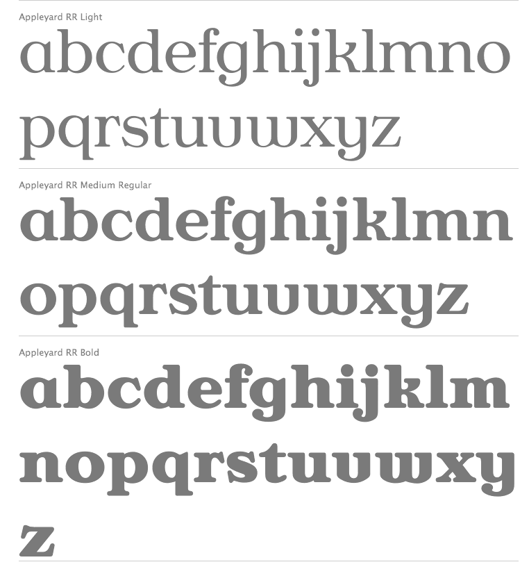
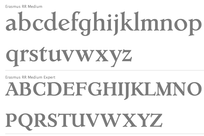
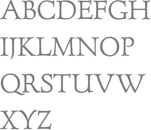
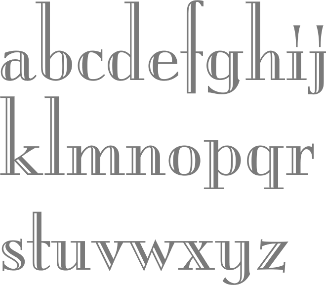
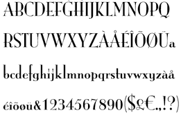
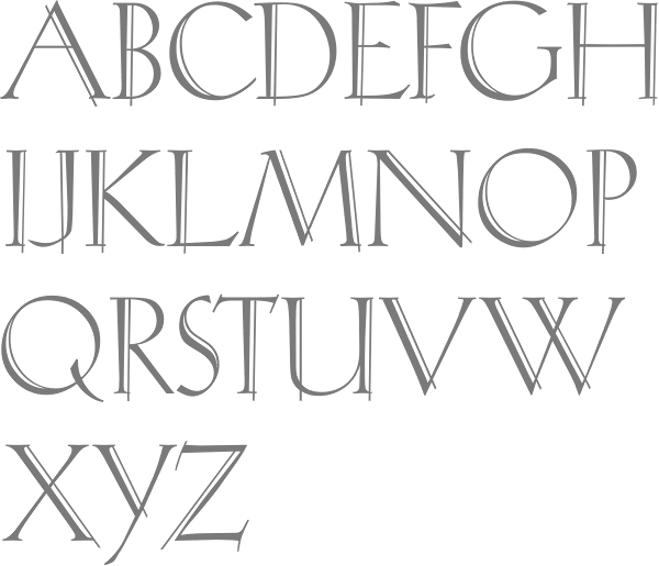
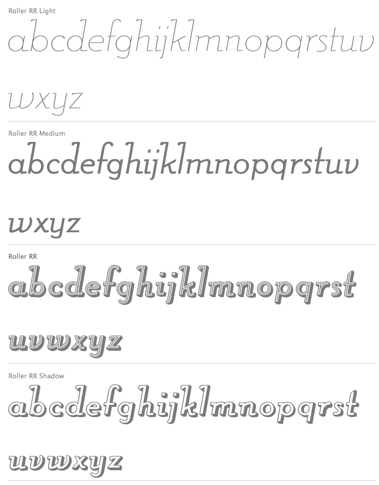
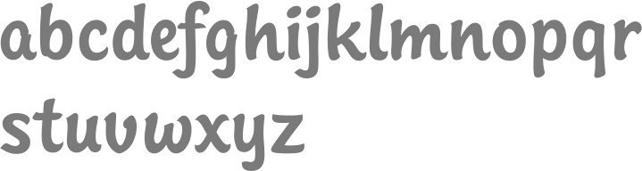
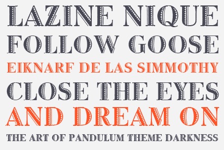
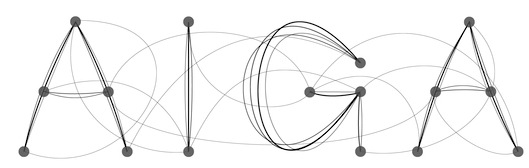
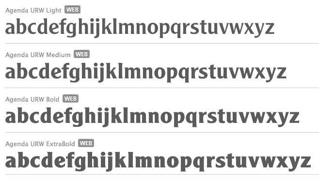
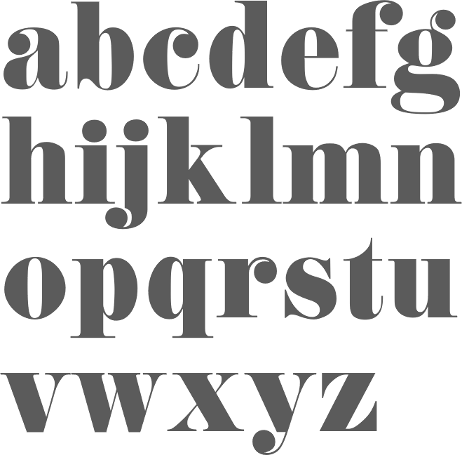
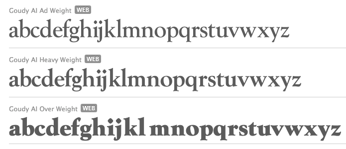
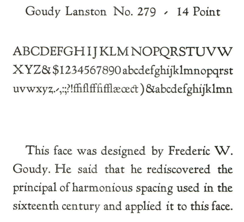
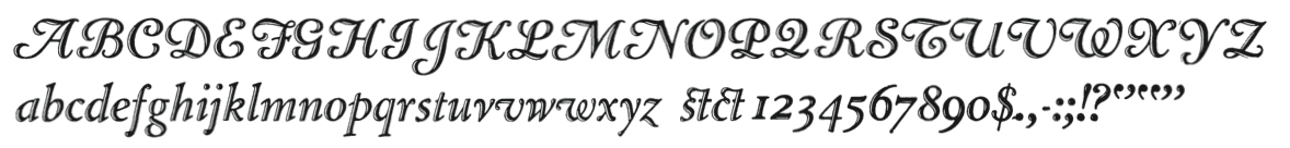
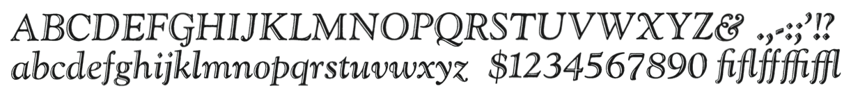
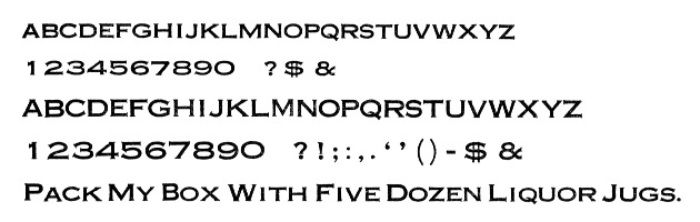
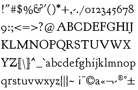
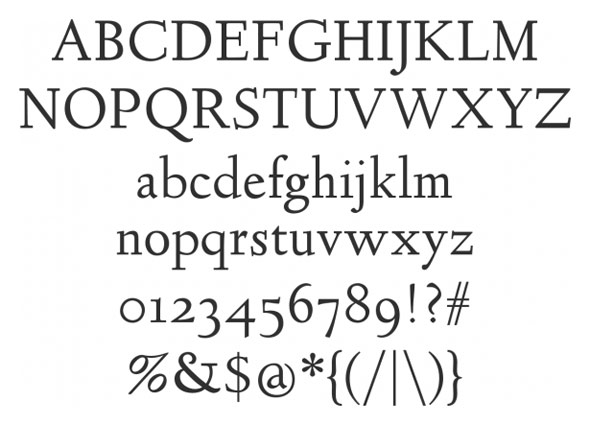
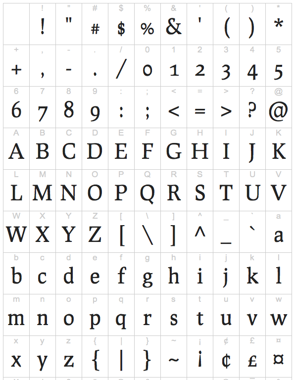
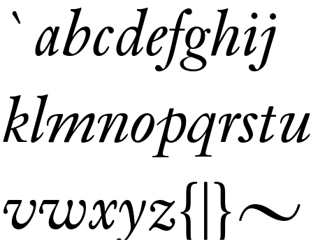
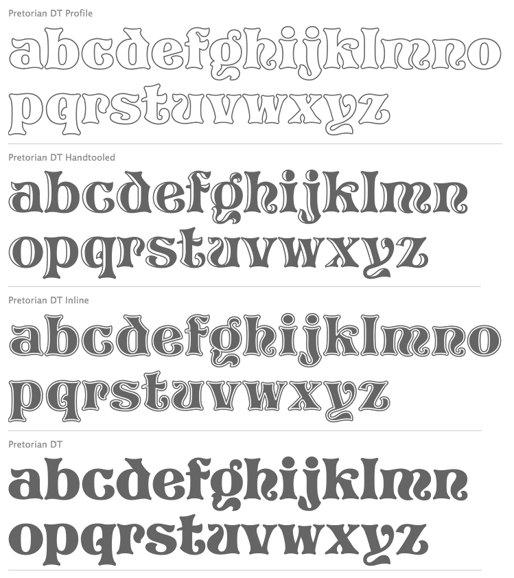
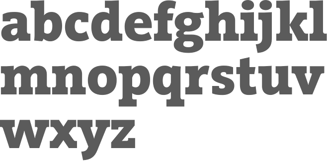
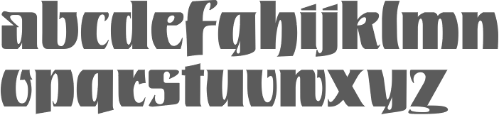
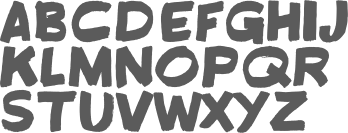
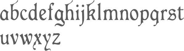
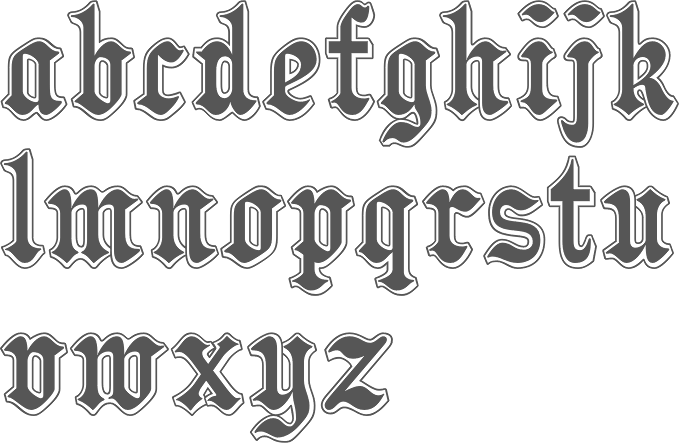
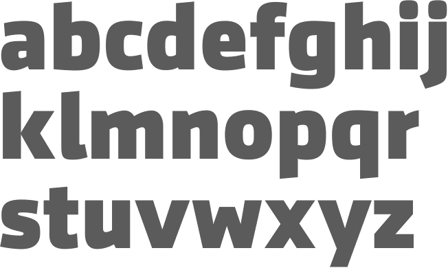
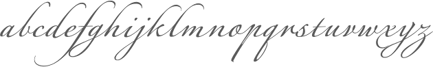
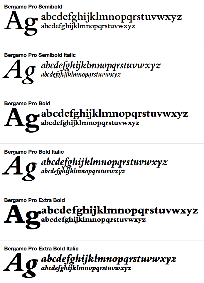
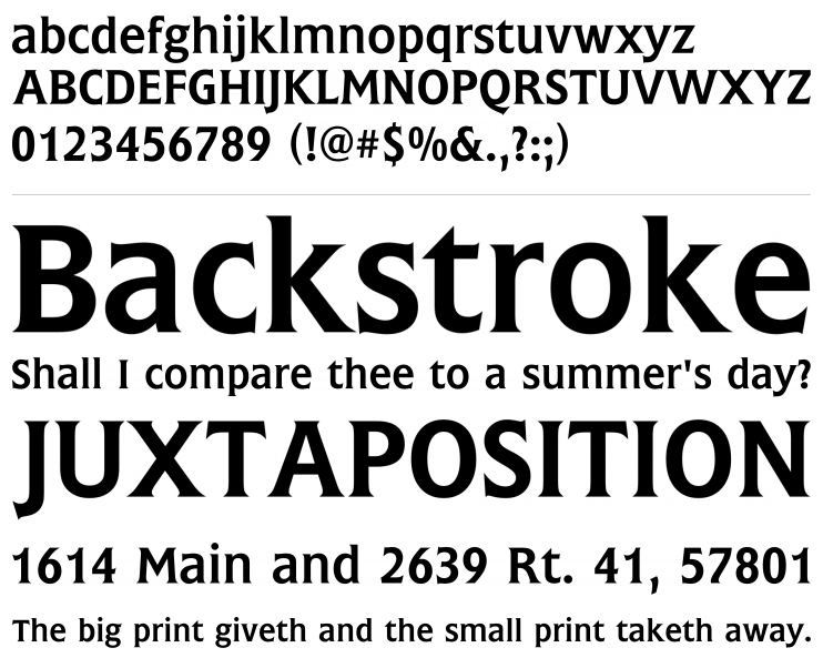
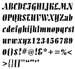
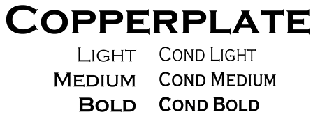
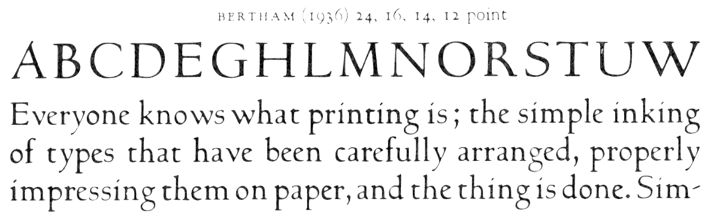
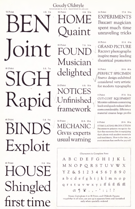
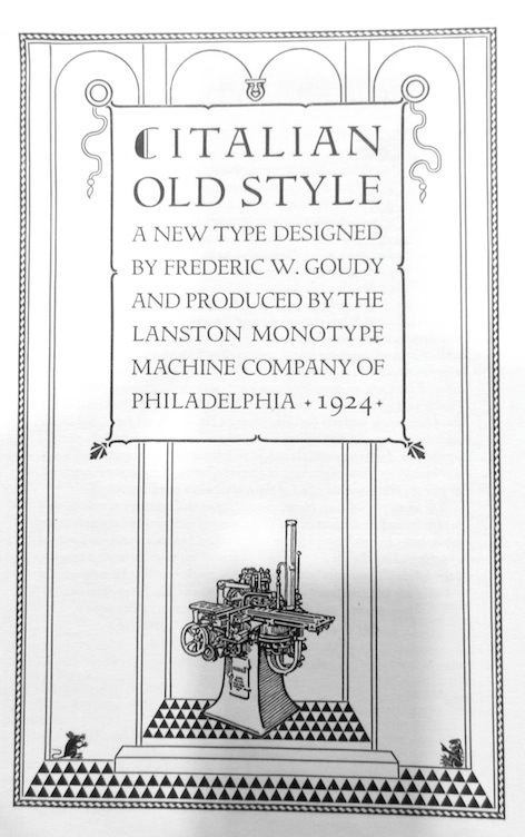
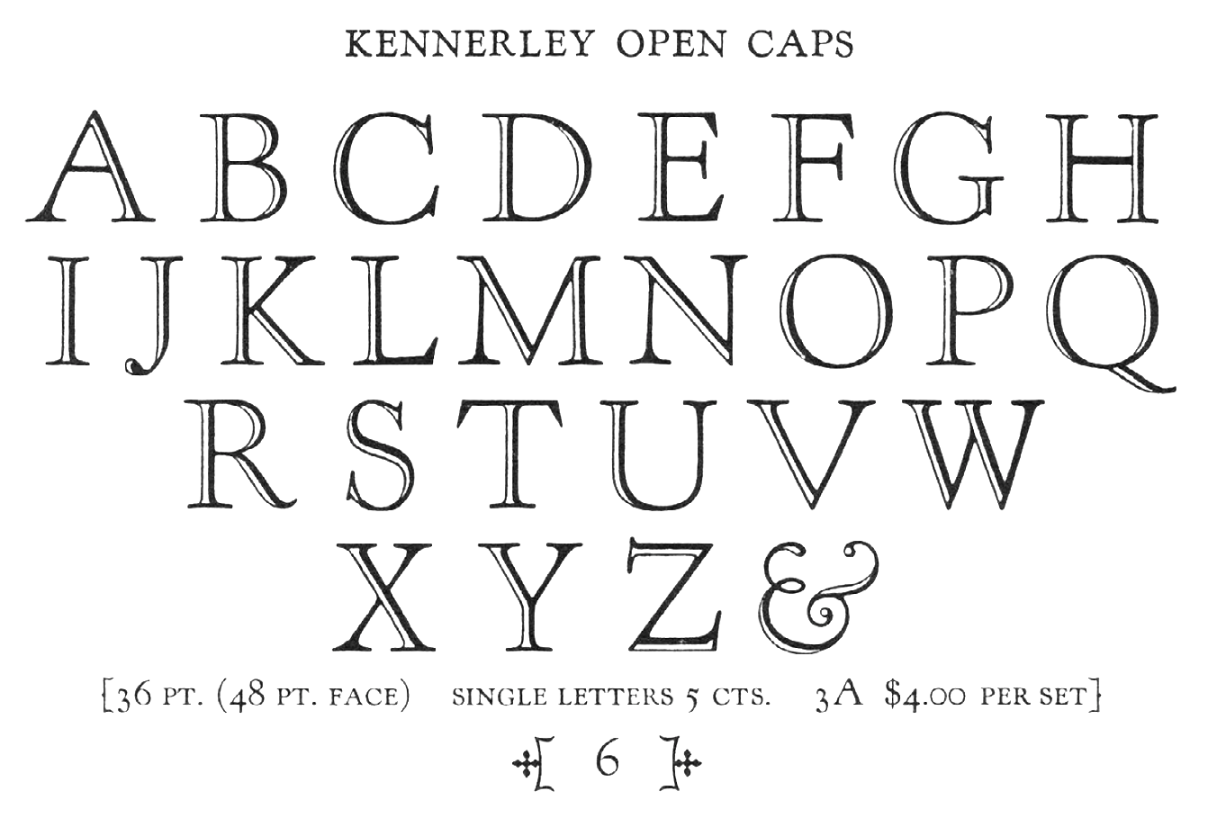
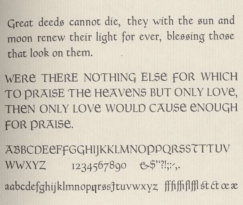
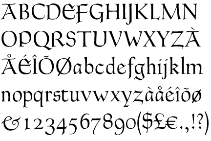
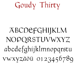
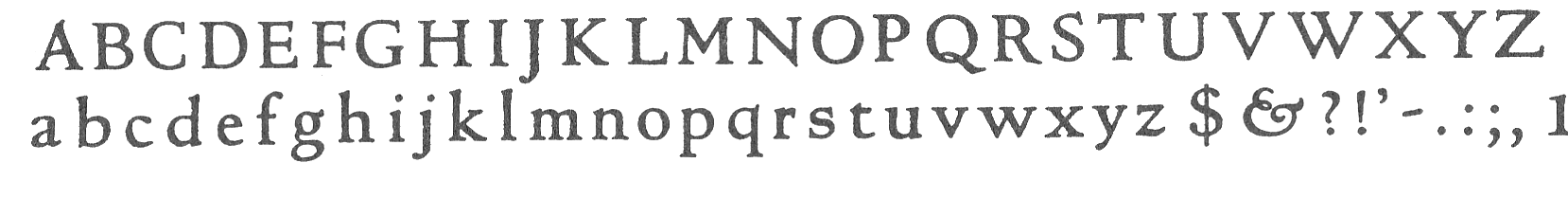
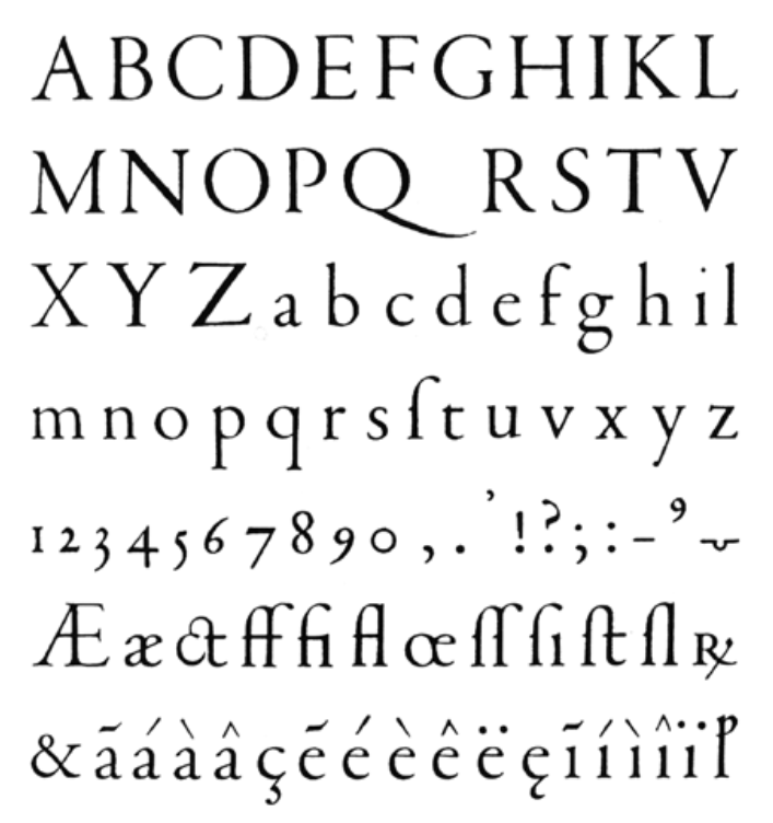
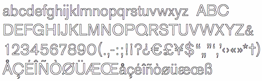
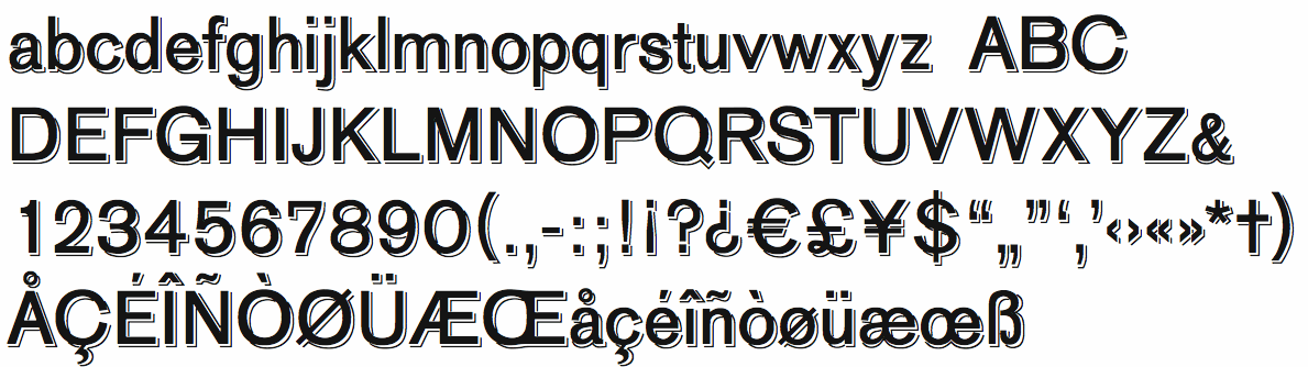
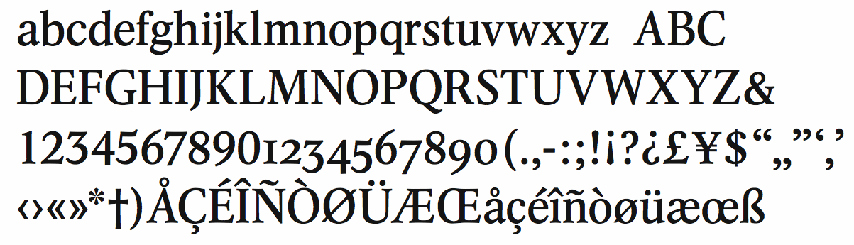
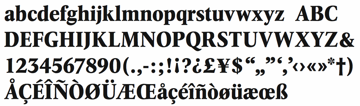
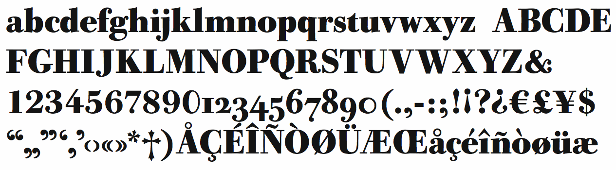
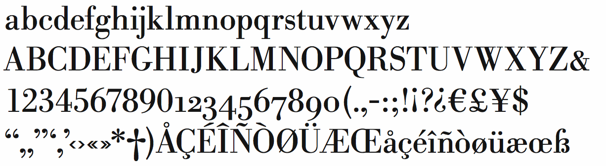
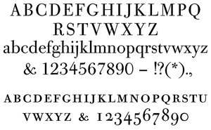
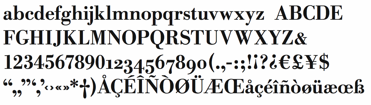
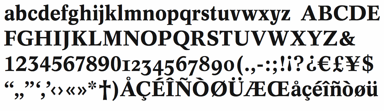
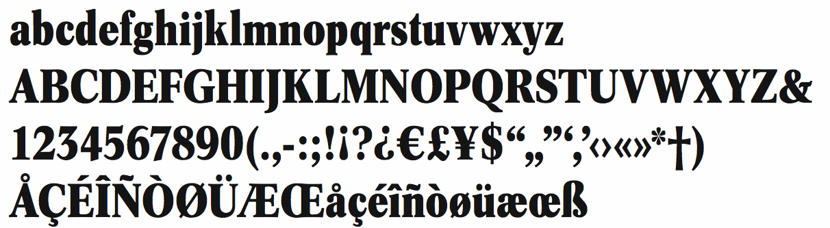
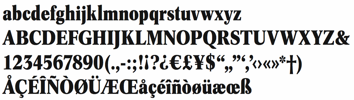
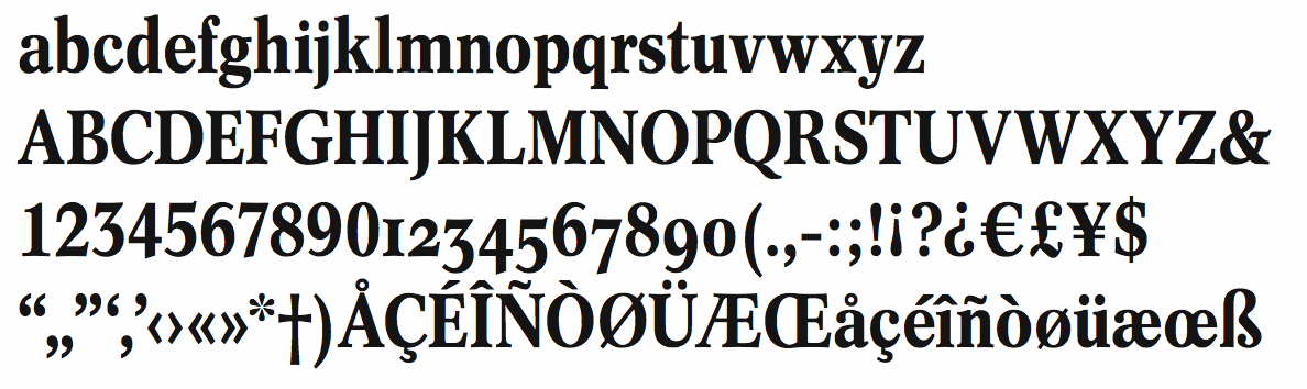
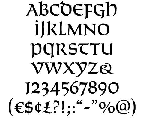
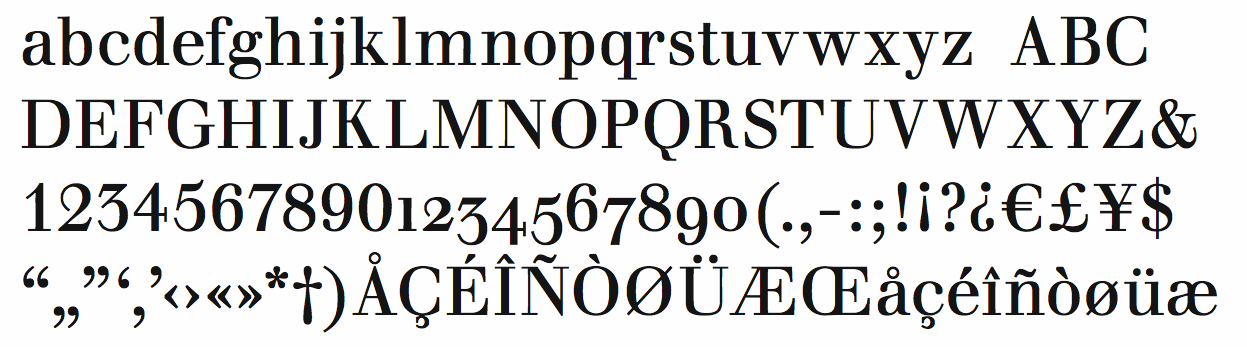
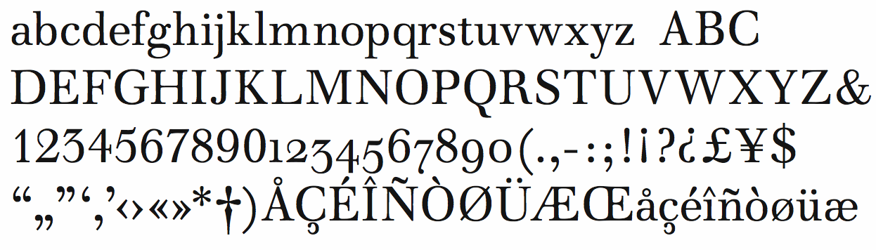
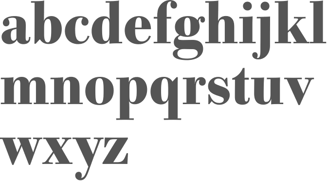
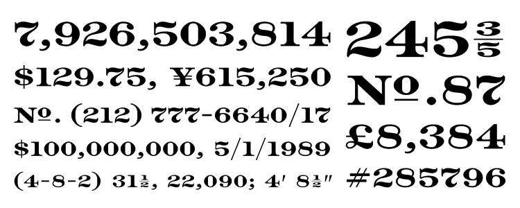
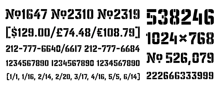
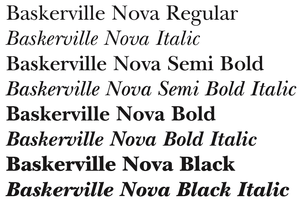
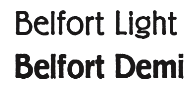
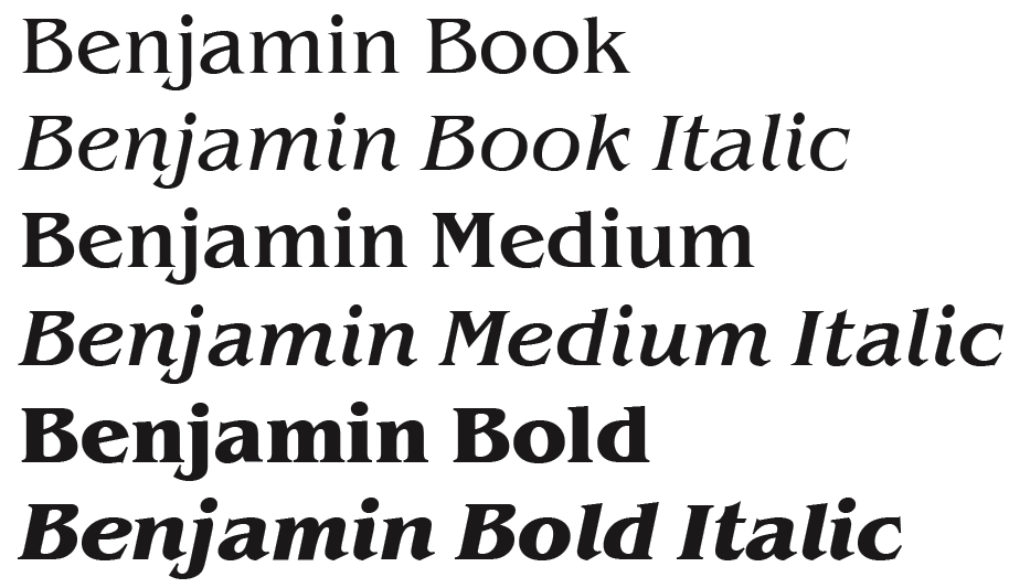
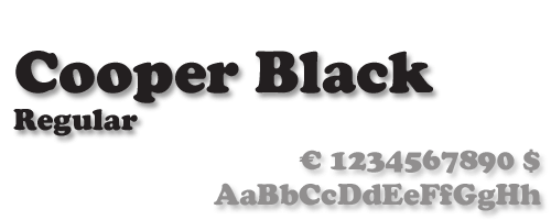
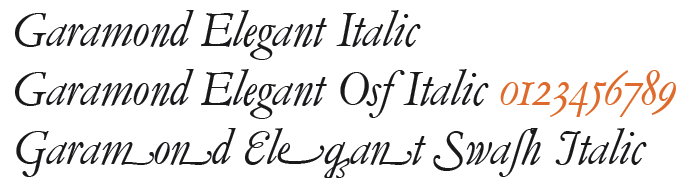
![German Garamond"> [based on TypoArt Garamond], Giulio,](Infinitype--GermanGaramond--basedonTypoartGaramond.png)
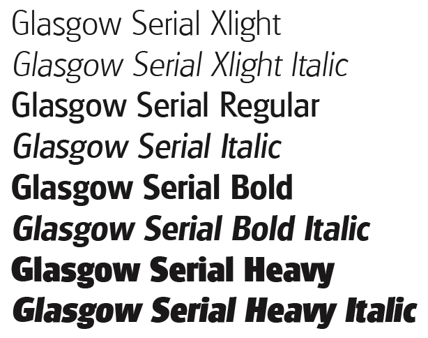
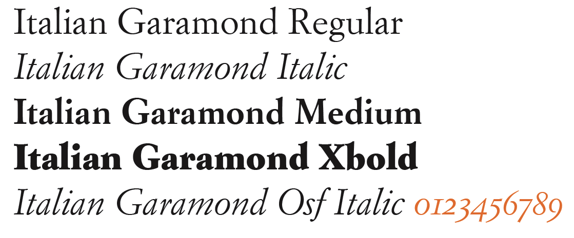
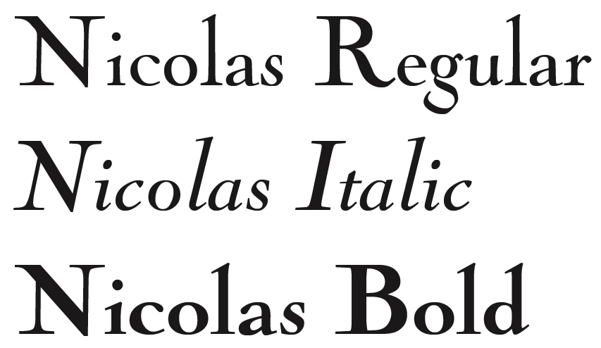
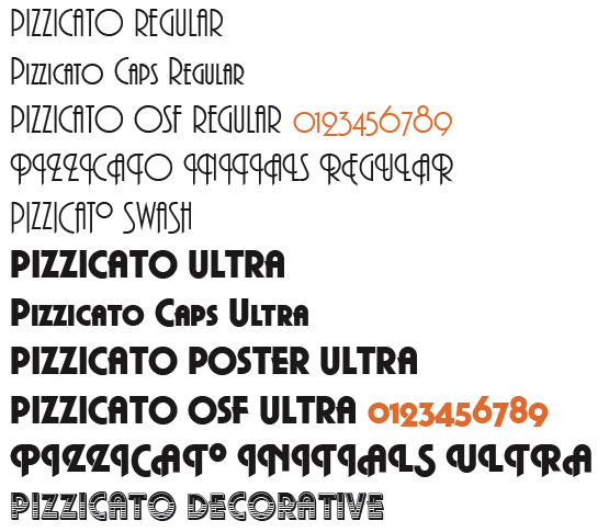
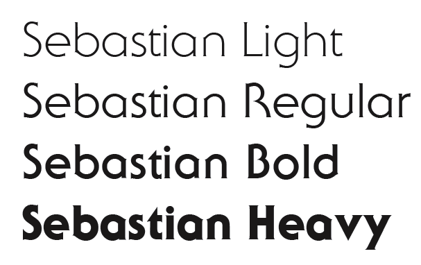
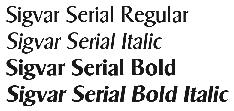
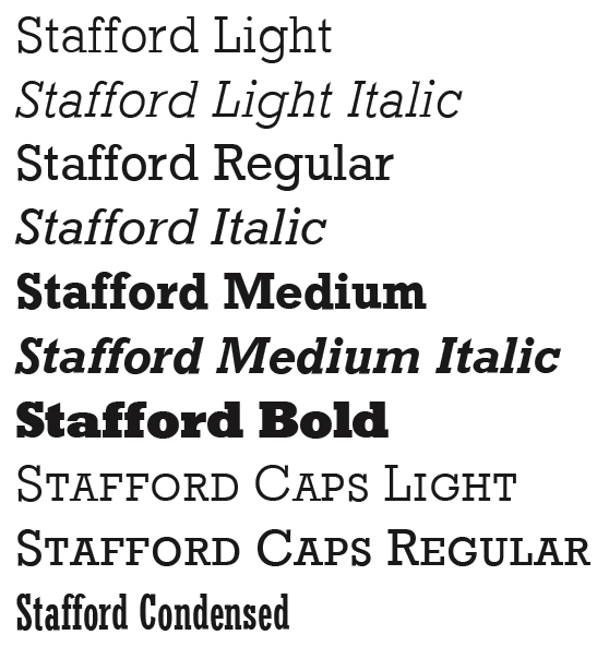
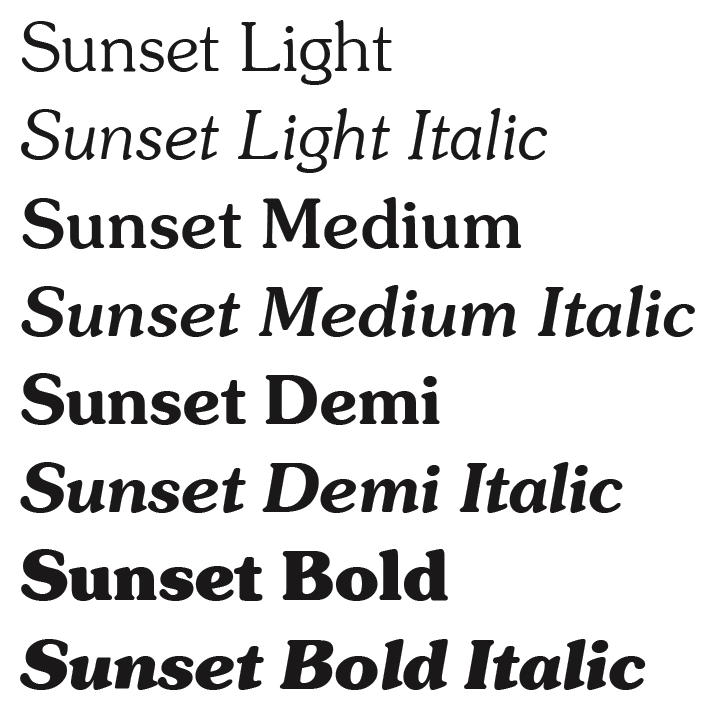
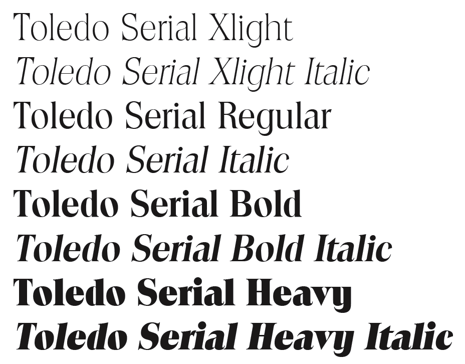
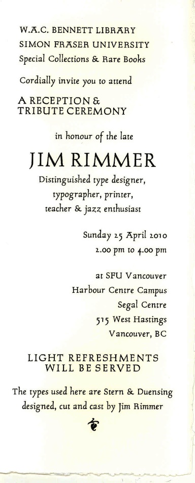
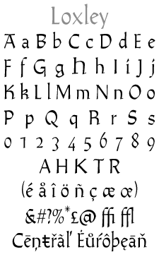
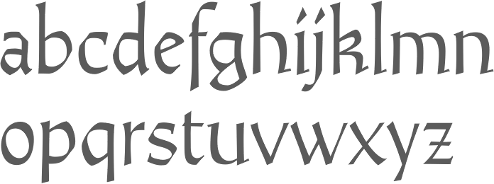
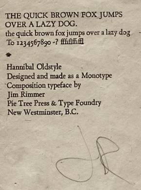
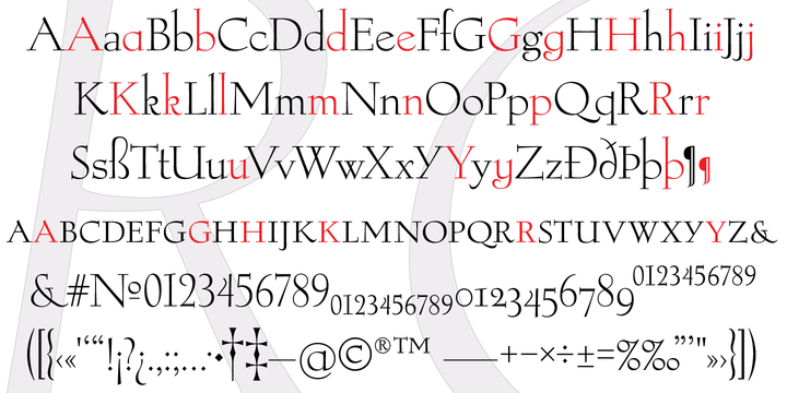
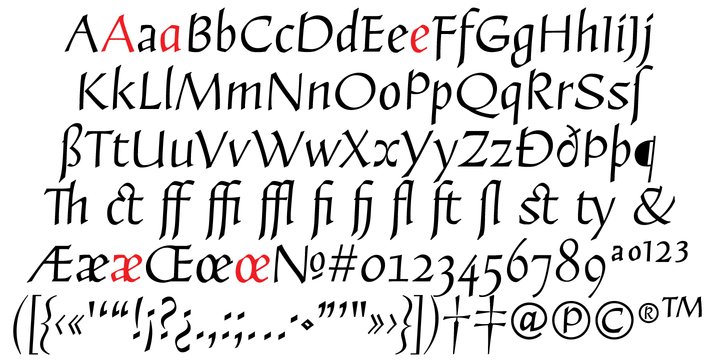
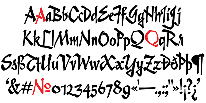
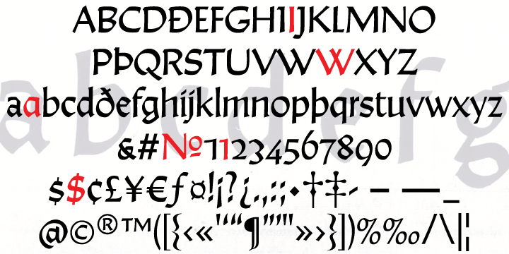
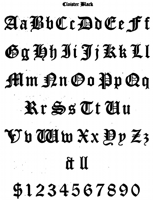
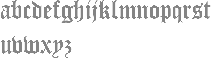
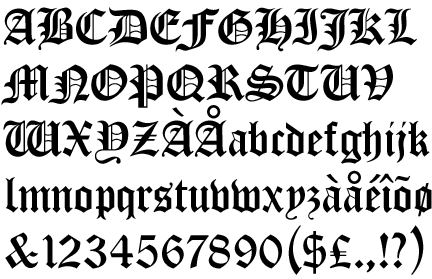
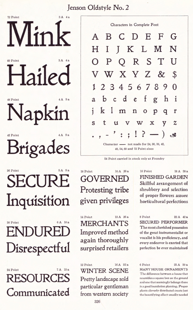
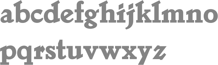
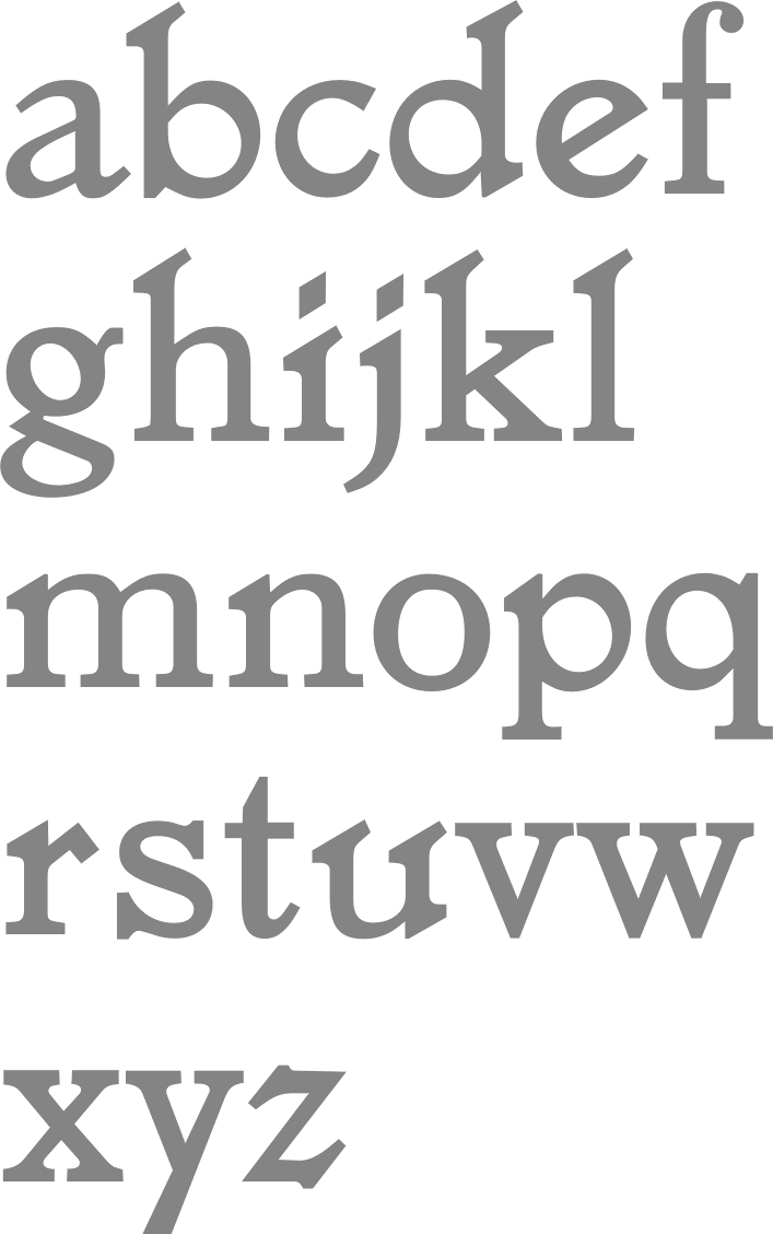
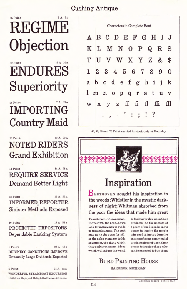
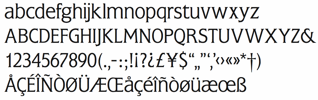
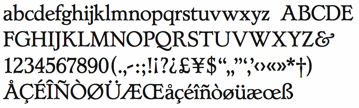
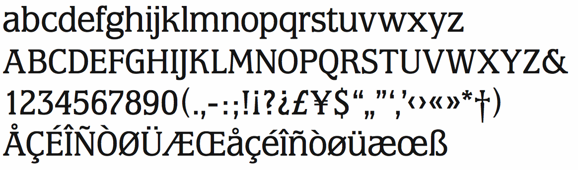
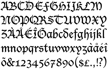
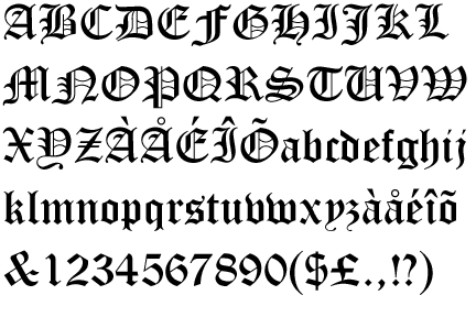
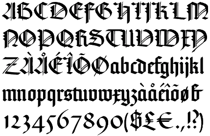
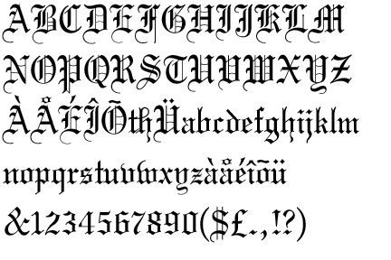
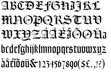
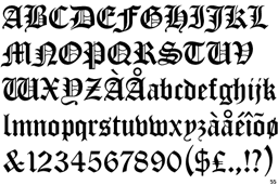
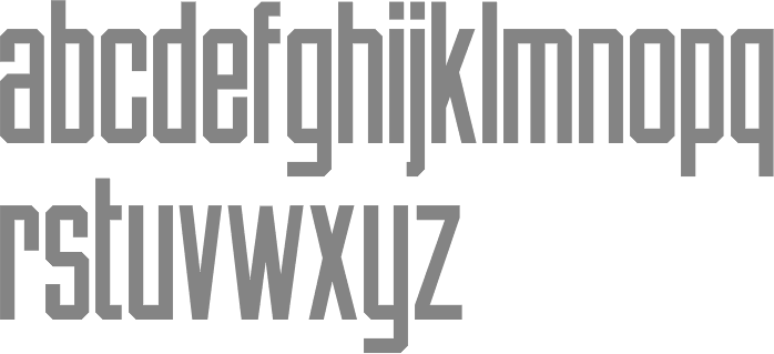
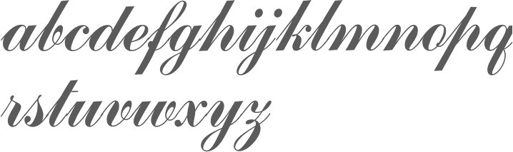
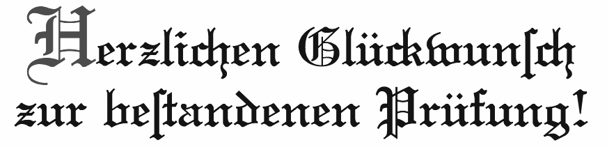
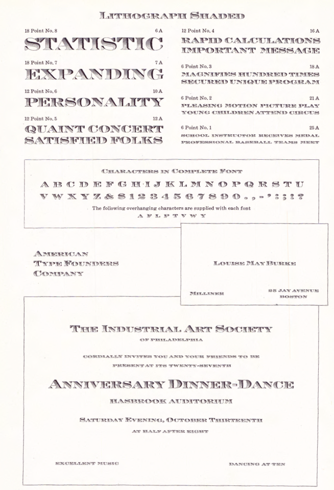
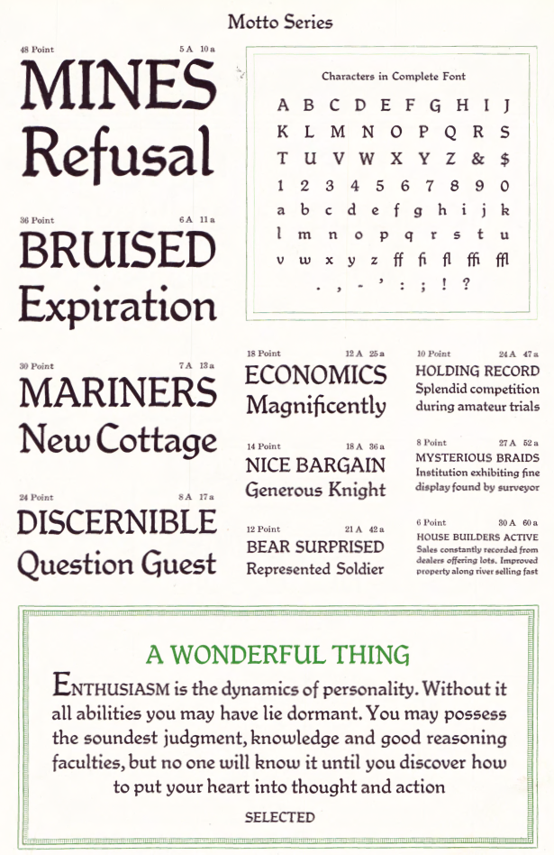
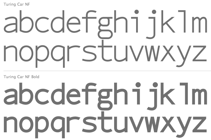
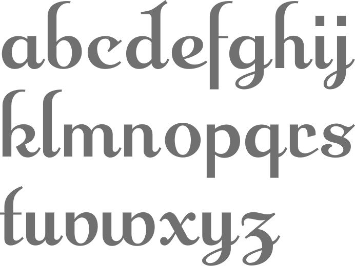
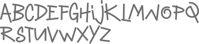
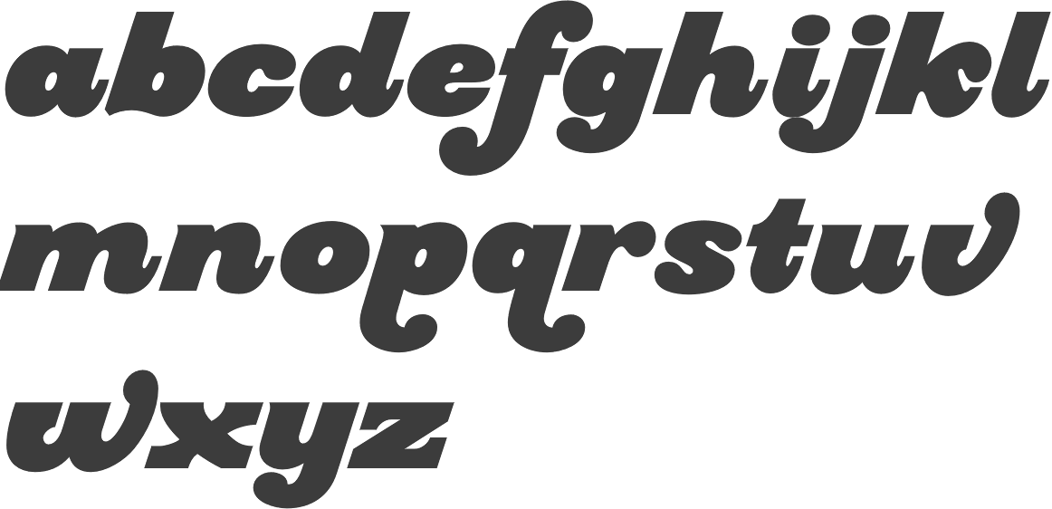
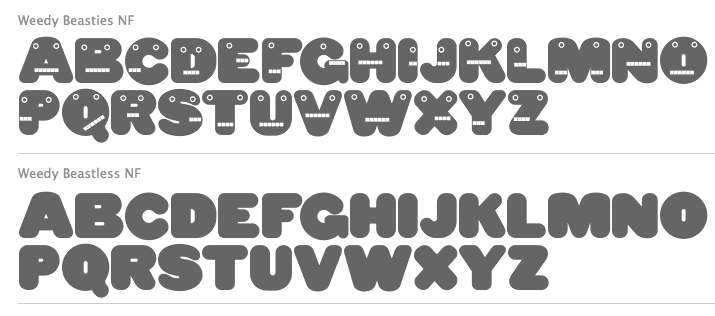
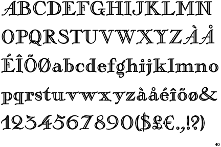
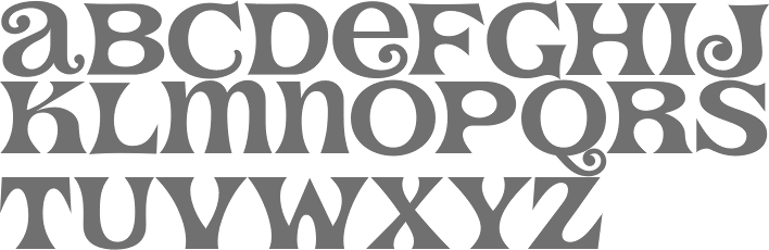
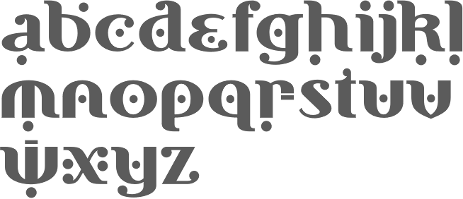
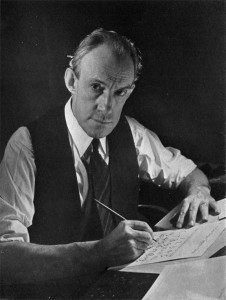
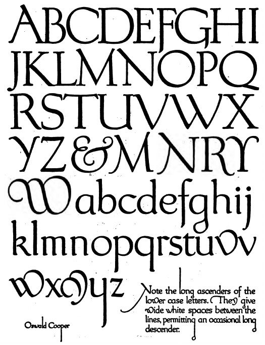
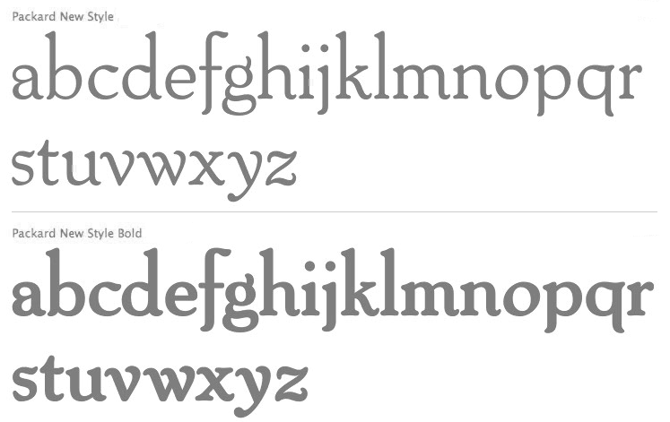
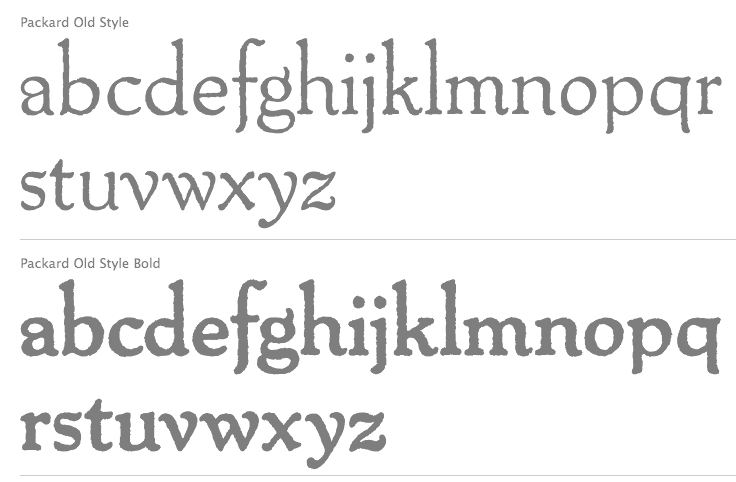
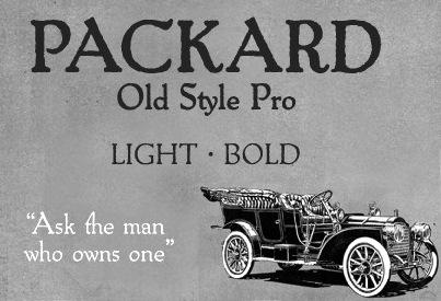
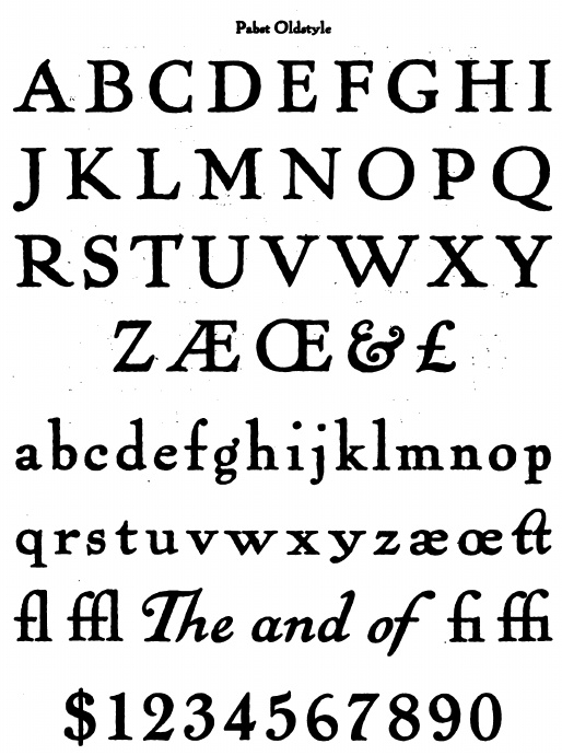
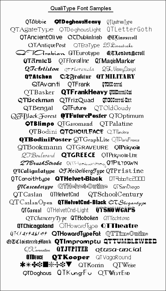
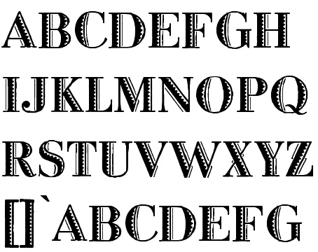
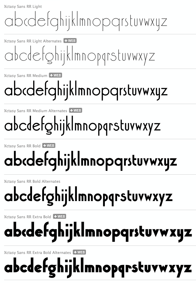
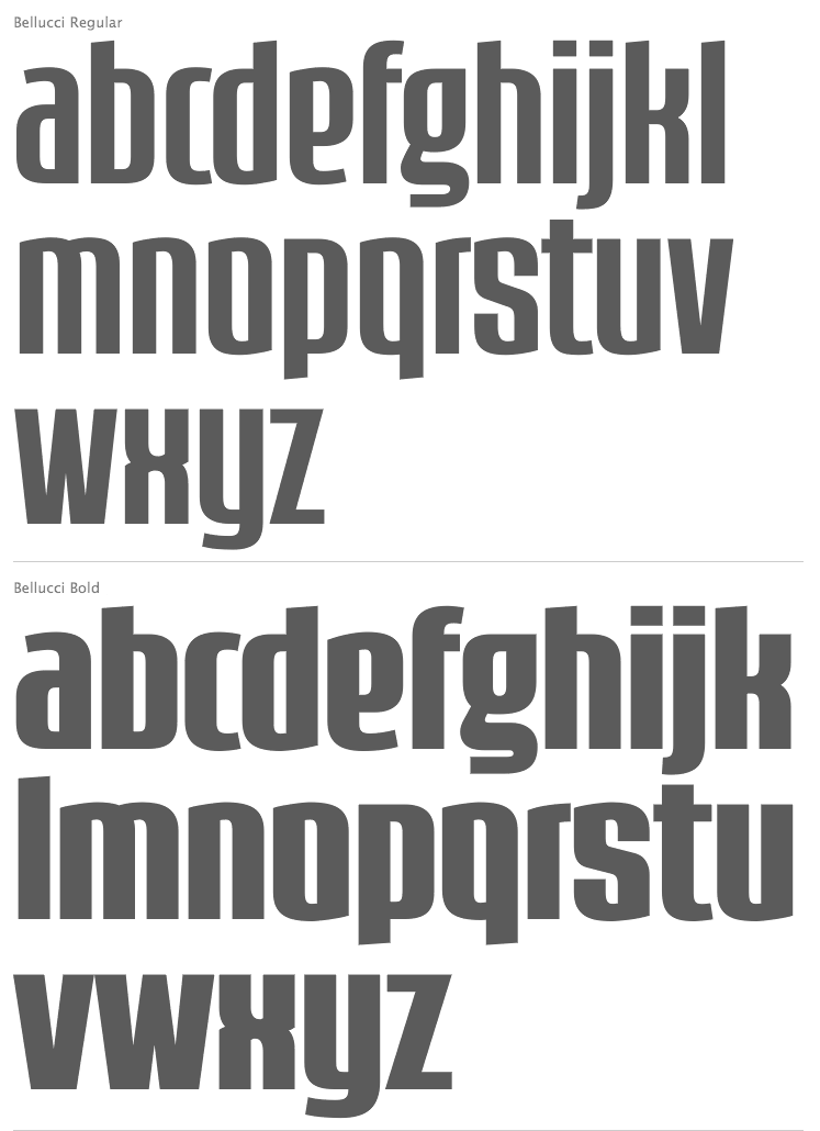
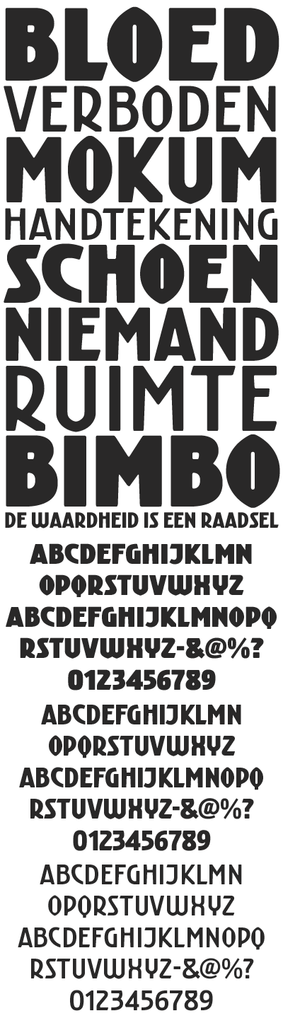
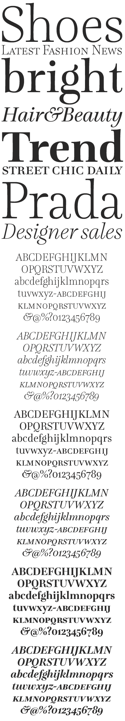
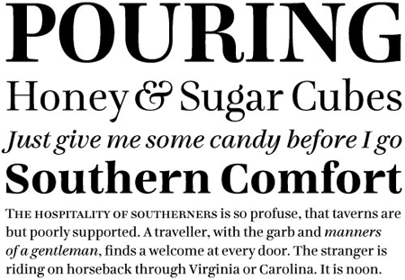
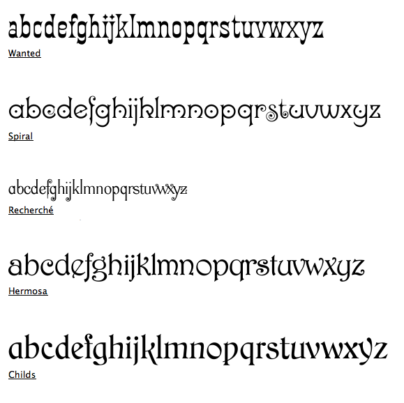
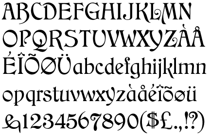
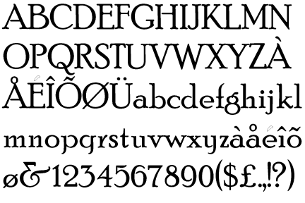
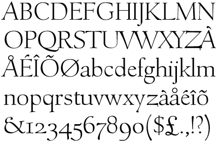
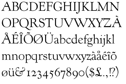
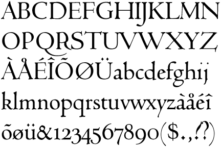
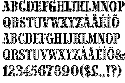
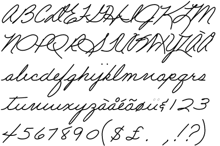
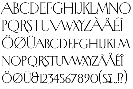
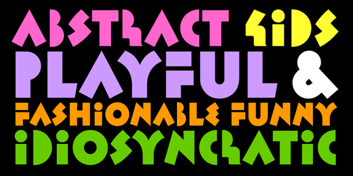
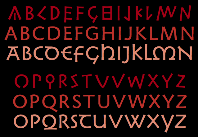
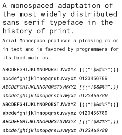
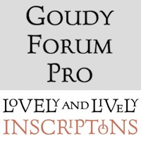
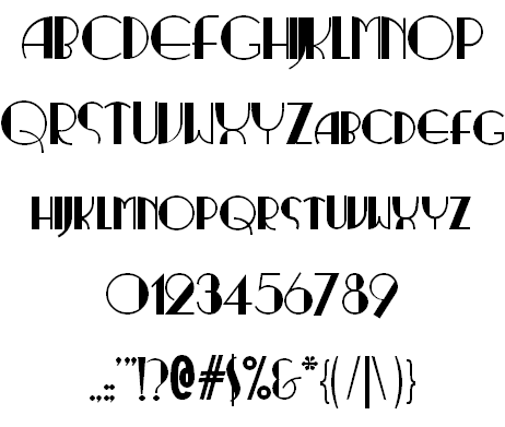
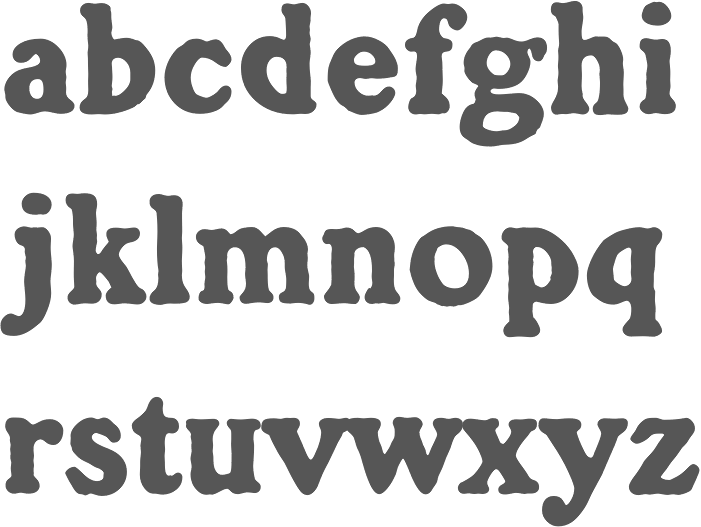
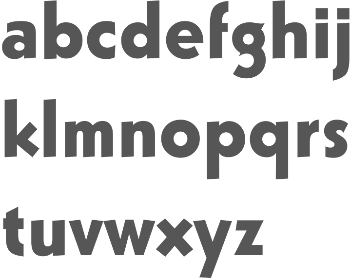
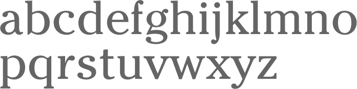