| | |
Adrian Williams
[Club Type]

|
 [MyFonts]
[More] ⦿
[MyFonts]
[More] ⦿
|
Albert Boton
[BVS Boton]
|
 [MyFonts]
[More] ⦿
[MyFonts]
[More] ⦿
|
Alexander Rühl
|
Alexander Rühl studied at Kunstschule Alsterdamm and worked for URW. Presently, he runs the graphic design studio Ruehl Design. Creator of the flared text family ITC Lennox Book in 1996: ITC Lennox Bold (1996), ITC Lennox Book (1996), ITC Lennox Medium (1996). FontShop link. Klingspor link. [Google]
[MyFonts]
[More] ⦿
|
Alias
[Gareth Hague]
|
Alias is a type foundry and graphic design agency founded in 1996 by David James and Gareth Hague. It is based in London. Their fonts can be bought through T-26, ITF and/or FontWorks UK. They also did substantial corporate type design work. Partial font list: AES (1995, David James), August (1996, a fifties font by Gareth Hague), Caustic (2012, calligraphic script family), Elephant (1994-1995, Gareth Hague), Enabler (1995, David James), Factory, Granite (1995, Gareth Hague), Harbour (1998, Gareth Hague), Intimo (2000), Jackdaw (1997, Gareth Hague), Jude, Key, Klute (1997, Gareth Hague), Mantis (1996, Gareth Hague), Metropolitan (1996, Gareth Hague), Metsys, Sister (1995, Gareth Hague), Text (1995, Gareth Hague). Typefaces from 2015: AnoStencil, Capo (a pinched sans family), Sabre (an incised wedge serif). Corporate typefaces include Prada Candy (2012). Old link. View the Alias typeface library. [Google]
[MyFonts]
[More] ⦿
|
Alphabet Innovations International -- TypeSpectra (Was: MM2000)
[Phil Martin]
|
 Born in Dallas in 1923, and retired in Florida, Phil Martin had an exciting life, which started as a bombardier in WWII, and went on as a piano bar singer, publisher, cartoonist, comedian and typographer. He died in October 2005.
 Phil established Alphabet Innovations International in 1969 and TypeSpectra in 1974, and designed most of his 400 typefaces (read: film fonts for use in the VGC Photo Typositor) there: Agenda (1976), Americana (1972), Arthur (1970, by Roc Mitchell), Aurora Snug (1969), Avalon (1972), Baskerville (1969), Beacon (1987), Bluejack (1974), Borealis (1970, by Roc Mitchell), Britannic (1973), Bulletin (1971), Celebration (1969, by Roc Mitchell), Century S (1975), Cheltenham (1971), Clearface (1973), Cloister (1975), Corporate (1971, by Roc Mitchell), Corporate Image (1971, by Roc Mitchell), Courier B EF (2004, originally done at Scangraphic), Didoni (1969, a knock-off of Pistilli Roman with swashes added), Dimensia and Dimensia Light (1971, by Roc Mitchell), Dominance (1971), Egyptian (1970), Eightball (1971, some report this incorrectly as a VGC face, which has a different typeface also called Eightball: it was digitized by FontBank as Egbert. Alphabet Innovations' Eightball had other versions called Cueball and Highball, and all three were designed by George Thomas who licensed them to AI), Fat Chance (Rolling Stone) (1971), Fotura Biform (1969), Franklin (1981), Garamond (1975), Globe (1975), Goudy (1969), Harem (1969, aka Margit; digitized and revived in 2006 by Patrick Griffin and Rebecca Alaccari as Johnny), Helserif (1976---I thought this was created by Ed Kelton; anyway, this typeface is just Helvetica with slabs), Helvetica (1969), Introspect (1971, revived in 2012 by SoftMaker as Looking Glass, and by Castcraft as OPTI Looking Glass), Jolly Roger (1970, digitized in 2003 by Steve Jackaman at Red Rooster; Martin says that Jolly Roger and Introspect are his two most original designs), Journal (1987), Kabell (1971), Kabello (1970), King Arthur [+Light, Outline] with Guinevere Alternates (1971, by Roc Mitchell), Legothic (1973), Martinique (1970), Mountie (1970), News (1975), Palateno (1969), Pandora (1969), Pazazzma (1980), Perpetua (1969), Plantin (1973), Polonaise (1977; digital version by Claude Pelletier in 2010, called Chopin Script), Primus Malleable (1972), Quaff (1977), Quixotic (1970), Report (1971), Romana (1972), Scenario (1974), Sledge Hammer (1971), Son of Windsor (1970), Stanza (1971, by Roc Mitchell; this angular typeface was later published by URW), Stark (1970), Supercooper (1970), Swath (1979), Threadgil (1972), Thrust (1971), Timbre (1970), Times (1970), Times Text (1973), Trump (1973), Tuck Roman (1981), Viant (1977), Vixen (1970), Weiss (1973), Wordsworth (1973). In 1974, he set up TypeSpectra, and created these type families: Adroit (1981), Albert (1974), Analog (1976), Bagatelle (1979), Cartel (1975), Caslon (1979), Criterion (1982), DeVille (1974), Embargo (1975), Heldustry (1978, designed for the video news at the fledgling ABC-Westinghouse 24-hour cable news network in 1978; incorrectly attributed by many to Martin's ex-employee Ed Kelton: download here), Innsbruck (1975: revived in 2018 by Olexa Volochay as Tyrol), Limelight (1977), Oliver (1981), Opulent [Light and Bold] (1975, by George Brian, an amployee at Alphabet Innovations), Quint (1984), Sequel (1979), Spectral (1974), Welby (1982). His fonts can be bought at MyFonts.com and at Precisiontype. He warns visitors not to mess with his intellectual property rights, but I wonder how he can have escaped the ire of Linotype by using the name Helvetica. In any case, the fonts were originally made for use on photo display devices and phototypesetters. Some are now available in digital format. Near the end of his life, Phil's web presence was called MM2000 (dead link). Check his comments on his own typefaces. URW sells these typefaces: URW Adroit, URW Agenda, URW Avernus (after Martin's design from 1972), URW Baskerville AI, URW Beacon, URW Bluejack, URW Cartel, URW Cloister, URW Corporate, URW Criterion, URW Didoni, URW Fat Face, URW Globe, URW Goudy AI, URW Heldustry, URW Helserif, URW Introspect, URW Legothic, URW Martin Gothic, URW Martinique, URW Pandora, URW Polonaise, URW Quint, URW Scenario, URW Souvenir Gothic, Souvenir Gothic Antique (the Souvenit Gothic family was designed by George Brian, an employee of Alphabet Innovations at the time: it was AI's first text family), URW Stanza, URW Stark, URW Timbre, URW Viant, URW Wordsworth. Interview. Bye Bye Blackbird performed by Phil Martin in Largo, Florida. The final message on his last web page, posted posthumously read: MARTIN, PHIL, 82, of Largo, died Tuesday (Oct. 4, 2005) at Largo Medical Center. He was born in Dallas and came here after retiring as a writer, singer-songwriter, commercial artist, and comedian. As a high school student, he worked as an assistant artist on the nationally syndicated Ella Cinders, and at 18 wrote and drew Swing Sisson, the Battling Band Leader, for Feature Comics. He was an Army Air Forces veteran of World War II, where he served as a bombardier in Lintz, Austria. On his 28th mission shelling the yards in Lintz, his B-24 was hit and he was listed as missing in action until the war in Europe ended. He was a comedian on The Early Birds Show on WFAA in Dallas. As a commercial artist, he founded two multinational corporations to market typeface designs and is credited for designing 4 percent of all typefaces now used. He also wrote columns and articles for typographic publications. Locally, he sang original lyrics to old pop standards in area piano bars, and in 1999 produced 59 issues of the Web book Millennium Memorandum, changing the title to MM2000 when he issued the first edition of the new Millennium on Jan. 3, 2000. Survivors include his wife, Ann Jones Martin; and a cousin, Lorrie Hankins, Casper, Wyo. National Cremation Society, Largo. Phil Martin's digital typefaces. FontShop link. Klingspor link. [Google]
[MyFonts]
[More] ⦿
|
Andrea Leksen
[Leksen Design]
|
[MyFonts]
[More] ⦿
|
Andrea Tartarelli
|
 Andrea Tartarelli studied at the Academy of Fine Arts of Carrara and worked as a marble sculptor before turning to graphic and type design. He continued his studies at the Plantin Institute at Antwerp, and now teaches type design at IED Florence. He designed Tarif (selected by Fontspring.com among the Best fonts of 2019), Malik (shortlisted for the Communication Arts Typography awards 2021) and has been co-designer on dozens of typefaces at Zetafonts including the award winning Blacker (selected by Myfonts as one of the best new families of 2019), Monterchi (CA typography award 2020, Myfonts hidden gem 2019) and Stinger (CA typography award 2021). He works and lives in Pietrasanta (Tuscany, Italy). His graphic design outfit is called Surface Studio. Tartarelli's typefaces:
 |
Andreas Stötzner
[SIAS (or: Signographical Institute Andreas Stötzner)]
|
 [MyFonts]
[More] ⦿
[MyFonts]
[More] ⦿
|
Andreu Gallart Ruiviejo
|
 Vic, Spain-based designer of the blackletter typeface Kalika (2018), the connected script typeface family Andarina (2018), the free black lapidary serif typeface Gilland (2018: an extension of Gary Elfring's free font Alonse (1993) from 100 to nearly 500 glyphs), the octagonal typeface family Gridger (2018) and the decorative inline typeface Linocut Deko Shade (2018).
 Buy his fonts at Etsy. [Google]
[More] ⦿
|
Andrij Shevchenko
[Andrij Type]
|
 [MyFonts]
[More] ⦿
[MyFonts]
[More] ⦿
|
Andrij Type
[Andrij Shevchenko]
|
 Andrij Shevchenko (b. 1973) (aka Andrij Che) is the Berdyansk-based Ukrainian designer of the following typefaces, somne of which can also be had from MyFonts. Behance link.
 In 2012, he started Ukrainian Type. - Agarsky (2006, a bold casual script face) which used to be called Agara until Berthold complained about the possible confusion with Agora.
- Zion Train (2007, an experimental sans in 20 styles).
- Andrij Script. See here.
- Andrij Hand (a Cyrillic handwriting font, 2002-2006; see discussion).
- Strudel (2002, informal handprinting).
- ALS Agrus (2005-2006, a script face, Art Lebedev Studio).
- Machinegun (2005, octagonal military look).
- Magela (2003, a Cyrillic sans).
- Hajdamaka (2004, a bouncy Latin/Cyrillic script).
- Also check out his lettering (not fonts) in Kozaku (2005, a flowing Cyrillic script), XLibna (2005, another Cyrillic script) and here (2005).
- The semi-serifed Oksana (2007, 6 styles), Oksana Sans (2007, +Condensed), Oksana Text (2008), Oksana Cyrillic (2007), Oksana Greek (2007), and Oksana Text Swash (2008). This was followed by Oksana Text Narrow (2011), Oksana Sans (+Wide) and Oksana Sans Compressed (2011), which have hairline weights.
- Osnova Pro (2010): a sans family that covers Cyrillic, Greek and Latin.
- Ababa (2002, Cyrillic lettering).
- Turbota (2010) is a rounded Latin / Cyrillic type family that was was developed as part of an identity system for Turbota, a center for disabled children in the Ukraine.
- Arsenal (2011). A free typeface that won a national Ukrainian type competition called the Mystetsky Arsenal contest.
- Seaside (2011) is a Peignotian face.
- Bandera Pro (2011) is a useful workhorse square serif type family that covers Latin, Greek and Cyrillic. Accompanied by Bandera Text (2014) and Bandera Display (2014).
- Arsenal (2012) is a workhorse sans family for Latin and Cyrillic. It won the Mystetsky Arsenal contest, and is free.
Zion Train Pro (2012, +Stencil): Originally ZionTrain was built as a (probably first in Cyrillic!) navigation typeface for the Kharkiv identity project and Kharkiv subway and airport navigation systems. We wanted comprehensible, distinctive letterforms, that can help everybody on the way from Babylon to Zion. The project was used in Kharkiv promotion at homeland and abroad, but was rejected by the new government. As a corporate typeface it was used for a few cultural projects. Now it is equipped with Slavic Cyrillic and Monotonic Greek. - Humus (2007-2022). A ten-style humanist / lapidary Latin / Ukrainian Cyrillic / Greek typeface that is characterized by flared terminals.
Additional URL. MyFonts interview. Showcase of Andrij Shevchenko's typefaces at MyFonts. [Google]
[MyFonts]
[More] ⦿
|
Antonio Lechuga
[Antonio Mejia Lechuga]
|
 Mexico City-based designer, b. Huauchinango. He studied graphic design at Universidad del Valle de Mexico in Queretaro City, and received a diploma in corporate identity from LISAVA in Barcelona in 2005. He opened his own graphic design studio in Mexico City in 2016.
 With the Latinotype team, he designed the high-contrast fashion mag headline typeface family Gabriela Stencil (2016), which was inspired by 19th century didones. Gabriela Stencil won an award at Tipos Latinos 2018. In 2018, Antonio Mejia Lechuja designed the handwriting typeface Handasa (programming by Ivan Moreno, Veracruz, Mexico). Handasa imitates the handwriting of architect Pedro Pablo Velasco Ochoa in his thesis Handasa: La epica en la arquitectura. In 2019, he added Gabriela (Latinotype) and Trust Sans (Latinotype Mexico: for corporate branding). Typefaces from 2021: Planetazul (a corporate font for Planeta Azul), Bruna (a 16-style sans family named after Dutch children's book illustrator Dick Bruna (1927-2017)). In 2021, he designed Gatopardo Display for the Mexican magazine Gatopardo, as well as Mestiza (a 12-style serif with sharp terminals). Typefaces from 2022: Mestiza Sans (a 12-style flared lapidary sans). [Google]
[MyFonts]
[More] ⦿
|
Antonio Mejia Lechuga
[Antonio Lechuga]
|
 [MyFonts]
[More] ⦿
[MyFonts]
[More] ⦿
|
ArtOne CreativeWorks (was: Locomotype)
[Arwan Sutanto]
|
ArtOne Digital (formerly Locomotype) is the type foundry of Arwan Sutanto, a graphic designer in Yogyakarta, Indonesia, who also owns ArtOne Creativeworks. Arwan created the elliptical sans face Fonquero (2014), the free brush typeface Belepotan (2014, +Italic), Fonesia (2014), Fonesh (2014), Fonia (2014), and the free outline typeface Fonarto XT (2014; updated in 2019 to Fonarto v2). Fondian (2014) is a commercial rounded Comic Sans style typeface. Fonago (2014) is a vintage font. Tinta Script (2014) is an upright script. Typefaces from 2015: Fonesia, Cemara (brush script typeface), Garris (monoline script), Fonstyle, Fonari, Fonderful, Fonjava (a rhythmic script), Fonjazz, Fonino (brush script). Typefaces from 2016: Om Telolet Om (free), Sumptuous (sans), Sumptuous Light, Boldero Brush (inspired by graffiti art), Hotline (a monoline connected signage script), Jogjakartype, Jogjakartype Logos. Typefaces from 2017: Endeavora, Bahagia (signature script), Windtalker, Asalasik, Fonalux, Fonquero Sedo, Wolesbro, Morning Dew, Eufoniem (upright connected script), Delicy, Matahati (script). Typefaces from 2018: Hokyaa, Jankador, Dephion (font duo), Bakso Sapi, Lemoo. Typefaces from 2019: Crimstone (a weathered octagonal typeface), Noiry (script), Bonega (an all caps inscriptional sans), Pantura (a playful casual font), Kaftice, Redsniper (Victorian), True Happiness, Harmona (Script, Sans), Pestapora, Lendiga (a monoline script), Zoelander, Wkwk, Romantick, Sweet Pancake (calligraphic script). Typefaces from 2020: Reffort (a fourteen-style sans showing emotion in its counters), Sandega (a stencil font), Halokia (a condensed monoline connected sans), Shelda, Nilakandi (an upright script), Bakso Sapi, Komikula, Antario (a stylish sans), Giga Sans (an 18-style geometric sans), Toska (squarish). Typefaces from 2021: Gunterz (a macho all caps hardware store techno typeface), Filarion (a polygonal typeface in the style of Ben Shahn), Kanzaki (a 10-style playful script). Typefaces from 2022: Bradia (a condensed Victorian typeface). Home page. [Google]
[MyFonts]
[More] ⦿
|
Arwan Sutanto
[ArtOne CreativeWorks (was: Locomotype)]
|
[MyFonts]
[More] ⦿
|
Asier Fernandez Huesca
|
Illustrator and graphic designer in Sevilla, Spain, who created the lapidary roman caps typeface Cartuja in 2015. Inspiration came from a tomb in the Monasterio de la Cartuja de Sevilla. [Google]
[More] ⦿
|
Astigmatic One Eye
[Brian J. Bonislawsky]
|
 Astigmatic One Eye (AOE) has lots of nice original fonts by Brian J. Bonislawsky (b. 1973, Pittsburgh, PA). Many are free, others are not. AOE joined Font Brothers Inc in 2006. Brian Bonislawsky currently lives in Las Vegas, NV.
 Fontsquirrel link. Dafont link. Fontspace link. A partial list of the AOE fonts made in 2011: Engagement (2011, a free brush script at Google Web Fonts), Fascinate (2011, an art deco typeface at Google Web Fonts; +Inline), Original Surfer (2011, a free Google Web Font inspired by a vintage advertisement for the "California Cliffs Caravan Park"), Smokum (2011, a Western / Italian face), Yellowtail (2011, signage face), Redressed (2011), Special Elite (2010, a free old typewriter face), Aclonica (2011). Typefaces from 2008 or before: Horseplay AOE (2008, Western style), Cake and Sodomy AOE (2008), Good Eatin AOE (2008), Paradiso AOE (2008, inspired by logotype of the Paris Resort and Casino in Las Vegas), Montelago AOE (2007, a script inspired by the logotype of the Mirage Resort and Casino in Las Vegas), Jack Chain AOE (2007), Henhouse (2007), Schnitzle (2007), Luxurian AOE (2007, inspired by the logo of the Luxor Hotel&Casino in Las Vegas), Digital Disco AOE (2007), Mighty Tuxedo AOE (2007), Makeshift AOE (2007), Clarity AOE (2007, slab serif headline; + grungy version), Red Pigtails AOE (2007), Run Tron 1983 (2002), Eyeliner AOE (2006, Tekton-like), Mother Hen (2007), Gloversville (2007, comic book style), Mighty Tuxedo AOE (2007, condensed sans), Quick Handle AOE (2007), Surfing Bird (2007), Hydrogen (2004), Hardliner (2004, fifties diner style), Big Ruckus (2004), SS Antique No. 5 (2004), Europa Twin (2003), EuroMachina (2003, techno), Lord Rat (2003: papercut sans), Love Anxiety (2003), BuzzSaw (2003), Skullbearer (2003, skull dingbats), Beatnick Blue (2002), Geisha Boy (2002), Mardi Party (2002), Midcrime (2002), Ocovilla (2002), Ruthless (2002), Saltie Doggie (2002), Whiskers (2002), Royal Gothic, Family, Eggit, Jericho, Wild Monkeys (2002), 5FingeredGothSW, AlienArgonautAOE, AlphaMackAOE, AmphibiPrint, AngiomaAOE, AntiChristSuperstar, AntiChristSuperstarSW, AstigmaSolid, BigLimboAOE, BigLimbodOutAOE, BoneRollAOE, BoneRollAOEBold, BoundAOE, BrailleAOE, BulletBallsAOE, ButterflyChromosome, ButterflyChromosomeAOE, ButtonButton, ButtonButtonAOE, CType, CTypeAOE, CelticLionAOE-Bold, CelticLionAOE-BoldItalic, CelticLionAOE-Italic, CelticLionAOE, CharailleAOE, ChickenScratch, ChickenScratchAOE, ClunkerAOE, ClunkerAOE-Bold, CropBats, CropBatsAOE, CropBatsIIAOE, DarkNightAOE, DeadGrit, DeliveryMatrixAOE, DetourAOE, DigitalDiscoAOE, DigitalDiscoAOEOblique, DingleBerries, DoggyPrintAOE, DraxLumaAOE, DungeonKeeperII, DungeonKeeperIIBold, DungeonKeeperIIItalic, EggItAOE, EggitAOE-Italic, EggitOutlineAOE, ElectricHermes, ElectricHermesAOE, ElectricHermesAOECharge, FearAOE, FilthAOE, FishyPrintAOEOne, FishyPrintOneAOE, FishyPrintTwoAOE, FutharkAOE, FutharkAOEInline, FutharkAOEInline, GateKeeperAOE, Ghoulish Fright AOE (2006), GlagoliticAOE (1999, grungy glagolitic), GorgonCocoonAOE, Gotik, GreyAlienSW, HAL9000AOE, HAL9000AOEBold, HAL9000AOEBoldItalic, HAL9000AOEItalic, HandageAOE, HandageAOEBold, HauntAOE, HybridLCDAOE, IDSupernovaSW, IslanderAOE, JokerWildAOE, KillMeCraig, KillMeCraigAOE, Kinderfeld, KittyPrint, KittyPrintAOE, Kornucopia, KornucopiaAOE, LinusFace, LinusFaceAOE, LinusPlayAOE, LinusPlaySW, Lochen, LovesickAOE, Manson, MasterPlan, Mervale Script Pro (2012: a brushy script based on the 1940's Fawcett Publications Mary Marvel comic), Microbe, MooCowSW, MotherlodeLoadedAOE-Italic, MotherlodeLoadedAOE, MotherlodeStrippedAOE-Italic, MotherlodeStrippedAOE, MysterioSWTrial, NightmareAOE, OrnaMental, Pantera, PapaManoAOE, PenicillinAOE (described as a bacterial stencil typeface), PixelGantryAOE, PixelGantryAOEBold, PixelGantryAOEBoldItalic, PixelGantryAOEHeavy, PixelGantryAOEHeavyItalic, PixelGantryAOEItalic, PixelGantryHiliteAOE, PixelGantryHiliteAOEItalic, PoppyAOE, PoseidonAOE, Prick, QuiltedAOE, QuiltedAOEBlack, QuiltedTrial, RippleCrumb, RippleCrumbUltraCon, ROCKY, ROCKYAOE, RustedMachineSW, SSExpAntiqueAOE, Schizm, Schrill, SchrillAOE, SchrillAOEOblique, Scrawn, ScrawnAOE, ScrawnCyrAOE, ScrawnKOI8AOE, ScrewedAOE, ScrewedAOEOblique, ScrewedSW, SeaweedFireAOE, SenthAOE, ShampooSW, ShottyTransferTrial, SkinnerAOE, SlurCrumb, SpatCrumb, SpikeCrumbGeiger, SpikeCrumbSwizzle, SpikeCrumbSwollen, SteelcapRubbingTrial, StruckSW, StrutterAOE, SunspotsAOE, SurferComicTrial, TRANSHUMANALPHABET10, TRANSHUMANKATAKANA20, TannarinAOE, TannarinAOEOblique, TibetanBeefgardenAOE, TibetanBeefgardenAOE, TouristTrapAOE, TransponderAOE, TransponderGridAOE, UglyStickAOE, VanguardIIIAOE-Bold, VanguardIIIAOE-BoldOblique, VanguardIIIAOE-Oblique, VanguardIIIAOE, Ventilate, VentilateAOE, Y2KPopMuzikAOE, Y2KPopMuzikOutlineAOE, YoungItchAOE, ZeichensSW, ZenoPotionAOE, Zombie, BeatnikBlueAOE, BeatnikBlueFillAOE, GeishaBoyAOE, MardiPartyAOE, MindCrimeAOE, OcovillaAOE, PolynesianTouristAOE, RuthlessAOE, SaltyDoggieAOE, SpruceAOE, WhiskersAOE-Oblique, WhiskersAOE, WhiskersAltCapsAOE-Oblique, WhiskersAltCapsAOE (2002), Habitual, Automatic (techno), Bitrux, Filth (an eerie brush script), Cake&Sodomy, Gulag, Bad Comp, Detour, Alien Argonaut, Dark Night, GateKeeper (Halloween font), Gargamel Smurf, Invocation, Neuntotter, Geisha Boy, Saratoga Slim, Gobe, Stingwire, Lavatype, Tapehead, Islander, Clunker, Digelectric, Gargamel, Krulo-Tag, Krelesanta, SurferComic, Bound, Culture Vulture, Intruder, Cavalier, Anoxia, Synchrounous (IBM logo style lettering), Luna, Data Error, Lunokhod, Jericho. There are many techno and gothic fonts. Kill Me Craig is the first 26 death scene dingbat font (scenes by Craig Dowsett). KittyPrint takes the LinusFace font concept to more realistic cat head dingbats. Krelesanta (not free) is a funky font inspired by the band Kreamy Electric Santa. The free ButtonButton is useful for making buttons. Lovesick AOE is a scrawly, lovelorn typeface, i's dotted with hearts. Strutter AOE is based on the KISS logo. Senth AOR is a runic font. Charaille is one of the many dot matrix fonts. Cavalero is inspired by the logotype of the Chevy Cavalier. At Bitstream in 2001, AOE published Cavalero, Stingwire and Tannarin. And in 2002, he published the comic book font Big Limbo, Euro Machina BT and Islander there. Bio at Bitstream. In 2005, Bonislawsky and Sandler realeased 500 fonts, via Bitstream and MyFonts, under the label Breaking The Norm. In 2006, Astigmatic published their typewriter collection, which includes Military Document, Bank Statement, State Evidence Small Caps, State Evidence, Urgent telegram, Library Report, Overdrawn Account, Customs Paperwork, Incoming Fax and Office Memorandum. From the bio and various pieces of information, one is led to believe that Brian was born in Poland, and now lives in Miami, but that may be wrong. In 2010, he placed a free font at the Google Directory, Syncopate. Along the same lines, we find the derived square serif typeface Stint Ultra Condensed (2011, Google Web Fonts) and Stint Ultra Expanded (2012). In 2011, several other typefaces followed there, like Ultra (fat didone), Maiden Orange, Special Elite (2010, a free old typewriter face), Just Another Hand, Crushed, Luckiest Guy (comic book face), Aclonica, Redressed, Montezuma (a curly connected upright script), Devonshire (brush script), Fondamento (calligraphic lettering), Yellowatil (connected retro script), Righteous (free at Google Web Fonts: inspired by the all capitals letterforms from the deco posters of Hungarian artist Robert Berény for Modiano), Ribeye and Ribeye Marrow> (cartoon and/or tattoo style lettering---free at Google Web Fonts), Spicy Rice (2011, free festive display typeface at Google Web Fonts). Contributions in 2012: Marcellus (2012, Trajan, flared roman, at Google Fonts and CTAN), Eagle Lake (a free calligraphic font at Google Web Fonts), Uncial Antiqua, Jim Nightshade (2012, free at Google web fonts), Dynalight (2012, a retro script inspired by a vintage luggage tag for the Southern Pacific 4449 Daylight steam locomotive), Yesteryear (a retro script loosely based on the title screen from the 1942 film The Palm Beach Story), Parisienne (Google Web Fonts: casual connected script based on a 1960s ad for bras), Shojumaru (Google Web Fonts: an oriental simulation typeface inspired by a poster for the Marlon Brando movie Sayonara), Berkshire Swash (Google Web Fonts), Audiowide (Google Web Fonts), Romanesco (Google Web Fonts: a narrow calligraphic style), Galindo (Google Web Fonts), Oregano (Google Web Fonts: based on cartoon style lettering of calligrapher and logo designer Rand Holub. This style of hand lettering adorned many retro brochures and advertisements of the late 40's through the 1960's), Peralta (Google Web Fonts: an Egyptian comic book face), Eagle Lake (Google Web Fonts: calligraphic), McLaren (Google Web Fonts: comic book style alphabet), Freckle Face, Hanalei Fill, Hanalei [Polynesian bamboo or tiki lettering], Purple Purse, Margarine, Risque, Clicker Script [image], Stalemate [a gracious script, by Jim Lyles for AOE], Mouse Memoirs, Quintessential [Google Web Fonts: chancery hand], Bigelow Rules, Englebert [Google Web Fonts: from the title screen of the 1930's film titled Der blue Engel, starring Marlene Dietrich], Sacramento [Google Web Fonts: connected script]. Typefaces from 2013: Freckle Face (grunge), Grand Hotel, Purple Purse (Purple Purse draws its inspiration from a vintage Ivory Soap ad from the 1950's. Somewhat of a cross between Bodoni and Pixie, this font finds that it never truly takes itself seriously). Stiggy & Sands is the American type foundry of Brian Bonislawsky and Jim Lyles, est. 2013. Their first commercial typefaces, all jointly designed, are Luckiest Guy Pro (a fat comic book font based on vintage 1950s ads) and Marcellus Pro (a flared roman inscriptional typeface with both upper and lower case, originally published in 2012 by Astigmatic). Typefaces from 2014: Franken Jr AOE Pro (inspired by the title screen from the 1966 Hanna Barbera cartoon Frankenstein Jr), Good Eatin Pro AOE (inspired by the title screen from the 1942 Warner Bros. cartoon Dog Tired), Ghostkid AOE Pro (comic letter style). Typefaces from 2015: Shanks Antique 5 AOE (after the newspaper typeface Memorial (1865, Stevens, Shanks & Sons)), Reliquaire AOE (a somber blackletter typeface inspired by Memorial (1881, Boston Type Foundry)). Typefaces from 2016: Mailuna Pro AOE (a gothic sans), Kentish AOE Pro (art deco). Reardon AOE (a digitization of a film typeface called Joyce Black by LetterGraphics), Berkmire AOE (1970s style robot-inspired techno font), Blackheath Pro AOE (this typeface started as a digitization of a film typeface called Roberts Square by LetterGraphics), Delaware Pro AOE (art deco), Rutland AOE (a futuristic font that is a digitization of a film typeface called Maccaro by LetterGraphics). In 2016, Brian J. Bonislawasky and Jim Lyles published the rugged octagonal mega typeface family Tradesman at Grype. In 2017, they added the art deco typeface Cowling Sans AOE (which is based on alphabet from "Lettering for Commercial Purposes" by Wm. Hugh Gordon). In 2018, they published the letterpress emulation typeface Prison Pro, Pink Sangria (50s style movie font), Manic Tambourine, Motenacity (a Martian cartoon font), the old typewriter font Office Memorandum Pro, and the Flintstone font Strongman. Typefaces from 2021: Klutz AOE Pro (a condensed all caps beatnik font), Data Error AOE Pro (based on early dot matrix printers), Customs Paperwork AOE Pro (based on the NuMode Type No. 61 vintage typewriter), Rinzler AOE Pro (a great stencil font that revives LetterGraphics' Caren), Restraining Order AOE Pro (an old typewriter font), Brazarri AOE Pro (an Aztec emulation font based on MacKeller, Smiths and Jordan's Bizarre from 1884). View Astigmatic's typeface library. View the typefaces made by Brian Bonislawsky. Fontsquirrel link. Dafont link. Fontspace link. Creative Market link. [Google]
[MyFonts]
[More] ⦿
|
Ata Syed
|
 Ata Syed (Karachi, Pakistan) has a dual identity at FontStruct, where he is one of the most prolific contributors. He is known there as thalamic and as minimum. Behance link.
 Typefaces made in in 2008 as thalamic: Hello (connected upright script), Epilogie (blocks), WimSoft (+U/C), Chunk Chip, Konstruct (Russian constructivism face), Sensei Says, FS Tributary, Twotype Font, Urge (fat octagonal), Subliminal, FS United One, The Game of Type, Anaximander Zooom!, Corrupt and Corrupt Ed (piano key stencil fonts), Blueprint, Monomum, Synergy, Insert Coin Italic, Write I Careful, Write I Casual, Write I Dump, Loop UC, Loop LC, Emergic, Prick!, Insert Coins Pixels, Retro Electro, Bubble Lab IJ, Bubble Lab Bang, A Needle Pulling Thread, Send, Scan (IBM logo look), Intermittent and Intermittent Sans (stencil typefaces), Melt x DR and Melt x tDR (dot matrix), Oval x DR and Oval x tDR (original design by theDesignersRepublic for Issey Miyake), On Grid, Indigo (almost blackletter), orange_2 (dot matrix), Scan (horizontal stripes), Bass, Grape (simple pixel face), Nachahmung and Nachahmung Block (fat and extra condensed, Wim Crouwel simulation typefaces), Nachahmung Block Serif, Conjunction, Interjection, Is It, Sangular (nice experiment), Anonon (nails in square letters), Purple and Purple Very (slab serif headline typefaces, pixelized), Arc Echo (biline and strutted), The Question (a fantastic 3d paper fold imitation face), FS Minimal (a fantastic ultra fat decorative face), FS FontStructor, Vibrant (multiline labyrinthine or op-art face), Writ (upright pixel script), Castor, Ooki (octagonal), Industrial, The I Flat, The I, Indiscrete, Analog (connected script), Dent (mechanical), Digital (connected script), Hello Hello, and Sensei Says. In 2009, he made Clone It, Entwined, C64, Helix, Fontsration, Bent, Stripe Zoo, Dull, Indent (stencil), Quartertined (kitchen tile), Firox, Orfix, A Priori, Ignore, Confused, S-Ookii, Ookii (octagonal), Very Becoming, Crisis Averted, Crisis (neat bold octagonal face), Penmanship, Up All Night, Sleep All Dayi, Chunk Chip, Grayletter (upright script), Soso, Mostly Harmless (textured face), Etched, La Cross, Twotype, Etched Bare, Aught (One, Two, Three), as: Inflate (Pop, Pfft, Puff, Poof), Istic, Very Becoming, Ignore, Ought, Balance, Broken, Dry Flat (dot matrix), La Cross, Etched (+Bare), Fontsration (+Refined: multilined beauties), FS Institutional (fat multiline face), FS Industrial, FS Pixelayers. Additions in 2010 as thalamic: fs Section, fs Reboot, fs Easy DNA Auto Stencil, fs Institutional (+Ho, +Elements), fs Quartertined, fs Stencil 2.0, fs Rivet, fs Intaglish, fs Dumb Italic, fs Loop Gap, fs GoTeam (stencil), fs ITilic, fs Kerplunk (Startrek face), fs Dumb Italic, fs Ribbon, fs Beringer, fs Ooki Woodcut, fs Croissant (stencil), fs 45 (octagonal stencil), fsXO, fs Pipe, fs Confused Less. Fonts from 2011 as thalamic: fs Xenon (a paperclip face), fs Instant, fs Twist, fs WIP (blackletter), fs Sparc, fs Reboot (texture face), fs Pod, fs Flute Tune, fs Special, fs Watch Out (stencil), fs Etched Nyle (labyrinthine face), fs No Kerning Required (2011, connected upright script). Creations in 2012 as thalamic: fs Flip, fs Mom, fs Noise, fs Noise II, fs Junk, fs You Are Here, fs Flash (outlined), FS Easy Too (paperclip face), FS Strict, FS Fix, fs in three (octagonal stencil face), fs Single, fs Wakarimasen, fs r-failed (white on black), fs Permutation X, fs Pan Am, fs Institutional, fs Institutional 2, fs Chunky (counterless), fs Grayletter (textured face), fsXply (op-art). Creations in 2013 as thalamic: fs So Not Right, fs Grid Urdu (pixel face), fs Not So Right, fs Six Sticks, fs Half (octagonal family), fs Bored, fs Make it Happen, fs Salvage, fs To Be Discarded, fs Connect (stencil), fs Whomp, fs Praxis, fs Fez (3d face), fs Input, fsTramp, fs Five Alive, fs Hote-Zyd (labyrinthine), fs Patterns (Layers, Quarters), fs Five Alive (origami font), fs Go To Sleep (retro speed font), fs Vaerktoj (inspired by the brand identity of Hoejmark Cycles), fs Permutation B, fs Jester, fs Permutation XII (op-art), fs Insatiable, fs Electronic, fs Carbon (a nice chequered face), fs When We Were Young (multiline typeface), fs Shogun Tiny (a lined kitchen tile typeface), fs Optical, fs When We Were Young (multilined), fs Slate, fs Shogun (gridded), fs Iie (+Filled), fs Blocky (dot matrix), fs Thalamic. Creations in 2014 as thalamic: fs Perhaps, fs Perhaps Perhaps, fs Stability (Turmoil, Flux), fs Industrial (an artsy fat dot matrix face), fs Rehash, fs Ah, fs Curly, fs So, fs Flint, fs ICK (blackboard bold style), fs Wiggle, fs Grid, fs Ah. Creations from 2015 as thalamic: fs B-Chain (bike chain font), fs Risque (art deco), fs Squangular (Impair, Square, Flair, Pair), fs Oval, fs MIP, fs Flower (kitchen tile face). Creations as minimum: fs Chips (2014), fs Oh (2014, piano key style), fs Stack (2014, +Overflow), fs llljjj (2014), fs Turn Off The Sun (2014, beveled), fs Zag (2013 textured), fs Zig (2013, textured), fs Mullions (2013), fs The Italic (2013), Gridlock (2009), Mingle Minx (2009), Mingle Co (2009), Mingle (2009, gridded letters), Bevel (2009, 3d beveled family), illiij (2009, multiline family), m.ove.r (2009, multiline family), Grayscale (2009, multiline family), fs Cubed (2010, 3d-face), Bas Relief (2009, 3d face), Silver (2009, 3d face), Tin (2009), Lead (2009), Bevel (2009), Bevel Just (2009), Bevel Just Shadowed (2009), Ceci n'est pas une vague (2009), A Fault in Reality (2009, optical effect font), Blit Slash (2009, experimental), Blit Hack (2009), Dot Dot Hex (2009), Super Black (2009), fs Overlap (2010), fs Fabric (2010, texture font), fs Original (2010), fs Ink Blot (2010), fs Dots and Dashes (2010), fs I Square (2010), fs Squared Up (2010), fs Super Black (2010), fs Unoriginal (2010), fs Minimum (2010, geometric stencil face), fs Pin and Thread (2010, stitching face), fs Shade (2012, 3d face). FontStructions from 2011: fs Perpetual (dotted line face), fs Slither, fs No Escape, fs Prompt (a DNA-inspired biochemical lab face), fs Plus H (horizontally striped face), fs Arc Test 2:2 (a modular blackboard bold face), fs V Simple (2010, textured face), fs Instant, fs Permutation V, fs Rehash Monoic (labyrinthine), fs Meta (texture face), fs Scroll, fs Scroll Not (stencil). FontStructions from 2012: fs Translucent (a texture face), fs Bank, fs Shade, fs Confined (white on black), fs Institutional (+Vo, +HeVe, +Ho, +He, +Ve: texture typefaces), fs Bang, fs Random (textured face), fs Random Pattern, fs Lead, fs Tin, fs Silver, fs Tungsten. Klingspor link. Abstract Fonts link. Behance link. [Google]
[More] ⦿
|
Bean & Morris
[Keith Morris]
|
 Lettering artist Keith Morris (b. Sydney) ran Keith Morris Logo&Type Design in Sydney, Australia until his retirement in 2022. Keith has designed and completed typefaces for clients for corporate and branding use. He also designs general logos and brand logos although a good deal of his work is commercial lettering for Australian and International Design and Advertising Agencies mainly in FMCG. He created the bouncy Morris Freestyle (ITC).
 Via MyFonts, where he is listed under Bean&Morris (a collaboration of two prolific personalities in Australian lettering, logo design and typography, Russell Bean and Keith Morris), one can buy his typefaces, such as Lilianesque (2012), Libran (2009), Rumo Script (2009), Empire Display (2010), Shire Script (2010) and Waratah Gothic (2010). Typefaces from 2012: Emporia Roman (a Trajan column typeface with a delicate roman). See also Emporia OT (2016), which includes an italic. Typefaces from 2016: Aysiano. Klingspor link. View the typefaces of the Bean & Morris foundry. [Google]
[MyFonts]
[More] ⦿
|
Beatrice L. Warde
|
Born in New York in 1900, she died in London in 1969. A typographer, writer, and art historian, she worked for the British Monotype Corporation for most of her life, and was famous for her energy, enthusiasm and speeches. Collaborator of Stanley Morison. She created a typeface called Arrighi. She is famous for The Crystal Goblet or Printing Should be Invisible (The Crystal Goblet, Sixteen Essays on Typography, Cleveland, 1956, and Sylvan Press, London, 1955), which is also reproduced here and here. The text was originally printed in London in 1932, under the pseudonym Paul Beaujon. Here are two passages: - Imagine that you have before you a flagon of wine. You may choose your own favorite vintage for this imaginary demonstration, so that it be a deep shimmering crimson in colour. You have two goblets before you. One is of solid gold, wrought in the most exquisite patterns. The other is of crystal-clear glass, thin as a bubble, and as transparent. Pour and drink; and according to your choice of goblet, I shall know whether or not you are a connoisseur of wine. For if you have no feelings about wine one way or the other, you will want the sensation of drinking the stuff out of a vessel that may have cost thousands of pounds; but if you are a member of that vanishing tribe, the amateurs of fine vintages, you will choose the crystal, because everything about it is calculated to reveal rather than to hide the beautiful thing which it was meant to contain.
- Bear with me in this long-winded and fragrant metaphor; for you will find that almost all the virtues of the perfect wine-glass have a parallel in typography. There is the long, thin stem that obviates fingerprints on the bowl. Why? Because no cloud must come between your eyes and the fiery heart of the liquid. Are not the margins on book pages similarly meant to obviate the necessity of fingering the type-page? Again: the glass is colourless or at the most only faintly tinged in the bowl, because the connoisseur judges wine partly by its colour and is impatient of anything that alters it. There are a thousand mannerisms in typography that are as impudent and arbitrary as putting port in tumblers of red or green glass! When a goblet has a base that looks too small for security, it does not matter how cleverly it is weighted; you feel nervous lest it should tip over. There are ways of setting lines of type which may work well enough, and yet keep the reader subconsciously worried by the fear of 'doubling' lines, reading three words as one, and so forth.
Drawing of her by Eric Gill. Life story. Beatrice Warde was educated at Barnard College, Columbia, where she studied calligraphy and letterforms. From 1921 until 1925, she was the assistant librarian at American Type Founders. In 1925, she married the book and type designer Frederic Warde, who was Director of Printing at the Princeton University Press. Together, they moved to Europe, where Beatrice worked on The Fleuron: A Journal of Typography (Cambridge, England: At the University Press, and New York: Doubleday Doran, 1923-1930), which was at that time edited by Stanley Morison. As explained above, she is best known for an article she published in the 1926 issue of The Fleuron, written under the pseudonym Paul Beaujon, which traced types mistakenly attributed to Garamond back to Jean Jannon. In 1927, she became editor of The Monotype Recorder in London. Rebecca Davidson of the Princeton University Library wrote in 2004: Beatrice Warde was a believer in the power of the printed word to defend freedom, and she designed and printed her famous manifesto, This Is A Printing Office, in 1932, using Eric Gill's Perpetua typeface. She rejected the avant-garde in typography, believing that classical forms provided a "clearly polished window" through which ideas could be communicated. The Crystal Goblet: Sixteen Essays on Typography (1955) is an anthology of her writings. Wood engraved portrait of Warde by Bernard Brussel-Smith (1950). [Google]
[MyFonts]
[More] ⦿
|
Ben Jones
[Protimient.com]
|
 [MyFonts]
[More] ⦿
[MyFonts]
[More] ⦿
|
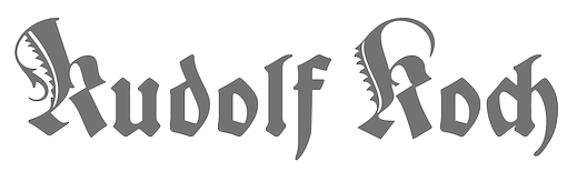
Berthold Wolpe
|
 German type designer (b. Offenbach, 1905, d. London 1989), who studied under Rudolf Koch from 1924-27 at the Kunstgewerbeschule in Offenbach. With the help of Stanley Morison, he emigrated to England in 1935 because of his Jewish background. Wolpe taught at the Camberwell College of Art (1948-53), at the Royal College of Art in London (1956-75) and at the City&Guilds of London School of Art (from 1975 onwards). From 1941 until 1978, he worked as a book designer for Faber&Faber in London, designing over 1500 book jackets. He published Schriftvorlagen (Kassel 1934), Marken und Schmuckstücke (Frankfurt am Main, 1937), A Book of Fanfare Ornaments (London, 1939), Renaissance Handwriting (with A. Fairbanks, London 1959), and Architectural Alphabet. J. D. Steingruber (London, 1972). Designer of
 - Albertus (Monotype, 1932-1940) is a famous lapidary roman with thickened terminals. The Bitstream version is called Flareserif 821. The Ghostscript/URW free version is called A028 (2000). The Softmaker and Infinitype versions are both called Adelon. The original Monotype version is Albertus MT. The letters are flared and chiseled, and the upper case U looks like a lower case u. The northeast part of the e is too anorexic to make this typeface suitable for most work. Some say that it is great for headlines. It is reminiscent of World War II. See also Albertus Nova (2017) by Toshi Omagari for Monotype.
- Cyclone (Fanfare Press). A travel poster typeface family.
- Fanfare. Revived by Toshi Omagari at Monotype in 2017 as Wolpe Fanfare.
- Hyperion (1931, Bauersche Giesserei). Berry, Johnson and Jaspert write: An angular pen-lettered design, with several unusual letters. The right hand serifs of upper- and lower-case V and W run inwards, the Y descends below the line and has a pronounced serif running to the right. Also done by Berthold in 1952.
- Pegasus (1938, Monotype). Monotype's digital revival, Wolpe Pegasus, was done in 2017 by Toshi Omagari for Monotype.
- Tempest (1936). Digital revival in 2017 by Toshi Omagari at Monotype as Wolpe Tempest.
- The blackletter typeface Sachsenwald-Gotisch (1936-1937, Monotype). In 2017, Monotype published the digital revival Sachsenwald by Toshi Omagari. Sachsenwald was originally called Bismarck Schrift, when it was first designed by Wolpe in the early 1930s.
- The blackletter typeface Deutschmeister (1934, Wagner&Schmidt, Ludwig Wagner). Revival by Gerhard Helzel in 2009. Warning: The German type community believes that this typeface was not designed by Wolpe, so further research is needed. See also the revival called Deutschmeister by Ralph M. Unger in 20017.
- Decorata (1950).
- Johnston's Sans Serif Italic (1973).
- LTB Italic (1973). Done for the London Transport, and unpublished.
In 2017, Toshi Omagari designed the Wolpe Collection for Monotype, all based on Berthold Wolpe's distinctive typefaces: Wolpe Pegasus, Wolpe Tempest, Wolpe Fanfare, Sachsenwald, Albertus Nova. Bio at Klingspor. FontShop link. Wiki page. Linotype page. View Berthold Wolpe's typefaces. Klingspor link. [Google]
[MyFonts]
[More] ⦿
|
Boris Kochan
|
 Principal of Kochan & Partner Design Agency in München, b. 1962. Codesigner with Robert Strauch (Lazydogs Type Foundry, München, Germany) of Streets of London (2013), a lapidary typeface family that extends an alphabet created by David Kindersley for London's street signs. His talk at ATypI 2014 in Barcelona was entitled Design and Identity---Between global types and local characters. [Google]
[More] ⦿
Principal of Kochan & Partner Design Agency in München, b. 1962. Codesigner with Robert Strauch (Lazydogs Type Foundry, München, Germany) of Streets of London (2013), a lapidary typeface family that extends an alphabet created by David Kindersley for London's street signs. His talk at ATypI 2014 in Barcelona was entitled Design and Identity---Between global types and local characters. [Google]
[More] ⦿
|
Brian J. Bonislawsky
[Astigmatic One Eye]
|
 [MyFonts]
[More] ⦿
[MyFonts]
[More] ⦿
|
Bureau Borsche
[Mirko Borsche]
|
Bureau Borsche, a graphic design studio in München, Germany, was founded in 2007 by Mirko Borsche. They made almost exclusively bespoke typefaces. These include: - Isar, Tush Extra (2012: a flared typeface), Archive and Alston (2012, The Entente) for Tush Magazine.
- A custom typeface for Tunica Magazine.
- Tweety for Korakrit Arunanondchai.
- Super Paper Grotesque for Super Paper.
- Moroi (2013, by Galle Renaudin) for (R)evolution by Danton Denk Raum.
- Libreville (2012: derived from Libre Baskerville) for SEPP Magazine.
- Felipe (by Geoffrey Pellet) for I Iz Felipe Fanzine.
- Muenchen Regular (2012, by Bureau Borsche and Tobias Weber: a Trajan caps typeface). For the Bavarian State Opera.
- Harial for the Bavarian State Opera.
- Andri3000 for BR Orchestra.
- Dalhem for Bjoern Dahlem Theorie des Himmels.
- Sumatra for Mickey Mao book (ECAL).
- Dorothy for Horst Magazine.
[Google]
[More] ⦿
|
BVS Boton
[Albert Boton]
|
 Albert Boton is a Parisian type designer and teacher, born in 1932 in Paris. Boton died in 2023. In 1957 he started work at Deberny&Peignot under Adrian Frutiger. From 1958 to 1966 he helped create several typefaces for the Hollenstein phototype catalog. In 1968 he became the art director for Robert Delpire publishers, but continued designing typefaces for the Hollenstein collection and later for Mecanorma and Typogabor. From 1968 to 1997 he was a teacher of type design and calligraphy at the École nationale des arts décoratifs (ENSAD) in Paris. From 1988 to 1998 he taught type design at the Atelier National de Recherche Typographiques. In 1981 he became art director and head of type department at the design agency Carré Noir. Interview in the ENSAD Journal B. His company is called BVS Boton.
 He is the designer of Berthold's Boton family (1986), FF Bastille Display package (2002, consists of FF Aircraft, FF Aircraft TF, FF District Bold, FF District Bold TF, FF Studio, FF Studio TF, FF Zan), FF Elegie (2002, art nouveau, a take on Auriol), Agora (1990, Berthold: a lapidary typeface), Chadking (1958), Roc (1959), Brasilia (1960), Primavera (1963), Rialto (1964), Black Boton (1970), PL Brazilia (PhotoLettering, a sans family), Zan (1970), Pharaon (1971, a great fat slab, eventually digitized by Monotype), Pampam (1974), Hillman (1972, an Egyptian family at Mecanorma), Tzigane (1973, a condensed family at Mecanorma), Chinon (1973, Mecanorma), Hudson (1973), Boton and Navy Cut (1986, for Mecanorma), the Scherzo family (at the Agfa Creative Alliance), Carré Noir (1996, also at Agfa), Bellini, Praxitel, Albotoni Book (made in 1974 originally), Kit, FF Page (2003, in PageSans and PageSerif families). Since 1998, he distributes his own fonts through BVS Albert Boton: - Agora BQ (Berthold).
- Boton BE (Berthold), Boton BQ (Berthold), and Boton Pro (Berthold). Created in 1986. See also B790 Slab in the Softmaker collection.
- Carre Noir (Monotype).
- Chinon (Mecanorma Collection).
- FF Aircraft (FontFont).
- FF Cellini Pro (FontFont), FF Cellini Titling Pro (FontFont) and FF Cellini (2003, FontFont). Boton's take on Bodoni.
- FF District (2004, FontFont). A squarish sans family.
- FF Elegie (FontFont).
- FF Page Sans (FontFont) and FF Page Serif (FontFont).
- FF Studio (FontFont).
- FF Tibere (2004, FontFont). A classic roman family.
- FF Zan (FontFont).
- Hillman (Mecanorma Collection).
- ITC Elan (1985, ITC). A lapidary typeface.
- ITC Eras (1961-1976, ITC, Adobe). ITC Eras, a weird high x-height and open-bowled-a fashion victim of the 1970s, was copied by many---see, e.g., E820 Sans in the Softmaker collection.
- Linex Sans (Monotype) and Linex Sweet (Monotype). These fonts were first published by Agfa in 2003.
- Memo (Monotype).
- Pompei (1993, Monotype).
- Scherzo (Monotype).
- Tzigane (Mecanorma Collection).
Albotoni Book (made in 1974 originally), Kit, FF Page (2003, in PageSans and PageSerif families), FF Tibere (2003, a classic roman family), FF District (2004, a squarish sans family) are some his latest typefaces. Citroen's logo font at Delpire. Klingspor link. Bio at FontFont. Pictures of an exposition in 2003. Linotype link. FontShop link. MyFonts link. Aude Degrassat wrote a thesis on Boton in 2008 at Estienne. Picture. View Albert Boton's typefaces. Announcement of his death. [Google]
[MyFonts]
[More] ⦿
|
Calligraphics
[Paul Veres]
|
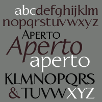 Calligraphics is Paul Veres' outfit in Berkeley, CA. Paul Veres was born in 1944 in Budapest, and started out as a calligrapher and graphic designer. He is the creator of Caterina (1999-2004, Psy/Ops; a calligraphic sans used in some places by movie director Francis Ford Coppola), and of Linotype Banjoman Roman (1996, an avant-garde font) and Linotype Aperto at Linotype (1995-1996: a lapidary typeface).
 Fonts at Calligraphics: Caterina (1998), Aperto (1995, a stressed sans family), Harmonica (2005, script), DemiTasse (2001), Gargoyle (2001, a rounded informal script) and Espresso (2001). FontShop link. Linotype link. Klingspor link. View Paul Veres's typefaces. [Google]
[MyFonts]
[More] ⦿
|
Chiara Di Terlizzi
|
Visual designer in Milano, who created the (virtual) type and identity for Agfa in 2012 starting from their old logo. Around the same time, Mirko Landi, another designer in Milan, did a similar thing. I wonder if they were not doing a school assignment. In 2014, she created the lapidart sans typeface Xanto. Behance link. [Google]
[More] ⦿
|
Chiara Picano
|
 During her studies at Accademia delle Arti e Nuove Tecnologie, Chiara Picano (Formia, Italy) designed the striking flared roman caps typeface Stygius Light (2014: free). [Google]
[More] ⦿
During her studies at Accademia delle Arti e Nuove Tecnologie, Chiara Picano (Formia, Italy) designed the striking flared roman caps typeface Stygius Light (2014: free). [Google]
[More] ⦿
|
Christelle Hayek
|
 During her studies in Saida, Lebanon, Christelle Hayek created the lapidary typeface Chrisel (2014), an angular rhythmic Arabic typeface (2014), and Map Design Pictograms (2014). [Google]
[More] ⦿
During her studies in Saida, Lebanon, Christelle Hayek created the lapidary typeface Chrisel (2014), an angular rhythmic Arabic typeface (2014), and Map Design Pictograms (2014). [Google]
[More] ⦿
|
Christian Richter
[Glyphicon]
|
 [More] ⦿
|
Club Type
[Adrian Williams]
|
 Original typefaces designed by Rosemary Sassoon and Adrian Williams (b. Bridgwater, Somerset, 1950), an English advertising typographer and type designer. Located in Red Hill, Surrey, Club Type was founded in 1985 by Williams and Sassoon. Before that, Williams had been been converting many established metal designs for the new filmsetting devices in 1969, and continued with conversions into the digital era. This led to the production of custom made fonts for Renault, Marks&Spencer, Jaguar Cards and Foster's Lager among others. Wide font services. Sassoon worked on scripts with joined letters. She is most famous for her Sassoon Primary font family (primary school writing). Adrian Williams designed the following families: Admark (1990), Bulldog (1999, a grotesque family based on 1870 Figgins), Bulldog Slab (2009), Bulldog Hunter Std (2010, another slab version), Club Type (1998-2002: his inspiration was the lettering used for cartoon captions in the Mercurius Aulicus, England's first regular newspaper, from 1642 to 1647), Club Type Script Pro (quill pen script), Column (1992), Congress Sans (1992), Eurocrat (1991), Leamington, Mercurius (1989, a bouncy typeface inspired by the lettering used for cartoon captions in the Mercurius Aulicus, England's first regular newspaper, from 1642 to 1647), Monkton (1990: incised, with a bit of Trajan, and a bit of gravestone type), Monkton Aged (2020), Monkton Book Condensed (2020), Monkton News (2020), Monkton Incised (2020), Poseidon (1991), Raleigh (1977, with Carl Dair and Robert Norton; see Softmaker's R651 Roman and Raleigh Serial, and Bitstream's Calligraphic 631), Rileyson (2010, humanist sans family; +Great, +Teen, +Parent), Seagull, Stratford [see Stratford SH, Scangraphic], Veronan and Worcester Rounded and Worchester.
 FontShop link. Klingspor link. Typeface library. View Adrian Williams's typefaces. [Google]
[MyFonts]
[More] ⦿
|
Connary Fagen
[Connary Fagen Fonts]
|
 [MyFonts]
[More] ⦿
[MyFonts]
[More] ⦿
|
Connary Fagen Fonts
[Connary Fagen]
|
 Art director, designer and consultant who grew up in Colorado and is now based in Heber City (was: Park City and before that Salt Lake City), UT. In 2021, he joined The Type Founders. He created the commercial Latin / Cyrillic geometric sans font family Venti CF in 2014---Venti can be purchased here. His second typeface is the geometric / techno typeface Filter CF (2014).
 In 2015, he created Waverly (avant garde caps), Articulat CF (an 18-style Swiss sans typeface), Argent CF (a 13-style display serif family), Ironfield (bold husky brutalist display font), Visby CF (geometric sans), Visby Round CF, Quincy CF (a warm serif text face), and Manifold CF (a squarish cold utilitarian sans with 16 styles; extended to the corporate typeface Manifold DSA in 2017). See also Manifold Extended CF (2022; 16 styles). Typefaces from 2016: Vanguard CF (a strong ultra-compressed sans in 16 styles), Addington CF (a 14-style text typeface family), Cartograph CF (monospaced sans), Greycliff CF (sans), Turismo CF (a wide rounfded open sans inspired by midcentury motorsports, technology, and business). Typefaces from 2017: Gryffith (angular), Visby Slab CF, Filter v2 CF (hipster style), Couplet CF (humanist sans), Integral CF (an all caps titling font). Typefaces from 2018: Argent Pixel (free), Artifex CF (a 9-weight serif family), Artifex Hand CF (a flared version of Artifex), Criteria CF (a geometric sans with horizontal and vertical terminal endings), Roxborough CF (a sharp-edged roman typeface). Typefaces from 2019: Wayfinder CF (a sharp-edged display typeface). Gumroad site, where one can download free trial versions of many of his fonts, and purchase licenses for the other ones. Typefaces from 2020: Hexaframe CF, Olivette CF (a sharp-edged angular and contrast-rich typeface family), Ellograph CF (a rounded monoline sans in 16 styles). Typefaces from 2021: Mielle CF (a monolinear script), Greycliff Thai CF, Greycliff Arabic CF, Greycliff Hebrew CF, Quiverleaf CF (ten flared / lapidary styles). Typefaces from 2022: Quiverleaf Arabic CF. Interview by MyFonts in 2021. [Google]
[MyFonts]
[More] ⦿
|
Cosimo Lorenzo Pancini
|
 Born in Firenze in 1969. Cofounder with Francesco Canovaro and Debora Manetti of the Italian design firm in Firenze called Studio Kmzero. He co-designed some typefaces there such as Arsenale White (2009). In 2002, Pancini developed Targa, TargaMS and TargaMSHand (for comic books?), basing his design on the peculiar sans serif monospace typeface with slightly rounded corners and a geometric, condensed skeleton that Italy had been using for its license plates. In 2022, Francesco Canovaro redesigned this font into a versatile multi-weight typeface, Targa Pro, which includes Targa Pro Mono (which keeps the original monospace widths), Targa Pro Roman (with proportional widths), both in five weights plus italics, the handmade version Targa Hand, and Targa Pro Stencil.
 The handwriting of Lord Byron led Pancini to develop the brush script typeface Byron (2013, Zetafonts). MyFonts credits him with the rounded avant garde sans family Antipasto (2007), but elswhere we read that this typeface is made by Matteo di Iorio, so there is some confusion. It was extended in 2017 by Pancini as Antipasto Pro. In 2014, Cosimo Lorenzo Pancini and Francesco Canovaro co-designed Amazing Grotesk (+Ultra). He also designed the calm bold geometric rounded sans typeface Cocogoose (2014; replaced by Cocogoose Pro in 2017) and the stylish deco font Offensive Behaviour. Cocogoose Letterpress is free. Cocogoose is part of the Coco Gothic family, a collection of twelve typefaces each inspired by the fashion mood of every decade of last century, named after fashion icon Coco Chanel. Cocogoose is Coco Gothic for the 1940s. See also Coco Gothic Pro (2021). In 2015, Pancini published the grand family Coco Gothic. This Latin / Greek / Cyrillic typeface family features a small x-height and sligghtly rounded corners to make the avant garde and geometric sans typefaces in vogue in the 1970s come alive again, ready for 21st century fashion magazines. It comes with substyles that recreate many moods, including art nouveau and arts and crafts (Cocotte), Italian propaganda style and Italian deco (Cocosignum), hipster style (CocoBikeR), or Bauhaus (Cocomat). Coco Gothic was initially developed as a corporate font for Lucca Comics & Games Festival 2013. The rounded geometric sans family Cocomat (by Cosimo Lorenzo Pancini, Deborah Manetti and Francesco Canovaro) was inspired by the style of the twenties and the visions of Italian futurists like Fortunato Depero, Giacomo Balla and Antonio Sant'Elia. Updated in 2019 as Cocomat Pro. Still in 2015, Cosimo and Zetafonts published the connected creamy baseball script Bulletto, the grungy handvetica Neue, and the calligraphic wedding typeface Hello Script. In 2015, at Zetafonts, Cosimo Lorenzo Pancini designed CocoBikeR (2015) to celebrate the hipster and bike cultures. CocoBikeR (for Latin, Greek and Cyrillic) is part of the successful Coco Gothic typeface family. In 2017, Pancini designed the 1930s Italian art deco typeface families Cocosignum Maiuscoletto and Cocosignum Corsivo Italico. In 2021, he published the 48-style (+variable) font family Coco Gothic Pro. This is a redrawn and expanded set of fonts: Inspired by a biography of Coco Chanel and trying to capture the quintessential mood of classical fashion elegance, Cosimo Lorenzo Pancini designed Coco Gothic looking for the effect that the first geometric sans typefaces (like Futura, Kabel or the italian eponyms like Semplicita) had when printed on paper. The crisp modernist shapes acquired in printing charme and warmth through a slight rounding of the corners that is translated digitally in the design of Coco Gothic. [...] A distinguishing feature of Coco Gothic Pro is the inclusion of ten alternate historical sets that allow you to use the typeface as a true typographic time machine, selecting period letterforms that range from art deco and nouveau, to modernism and to eighties' minimalism. Equipped with such an array of historical variants, Coco Gothic Pro becomes an encyclopedia of styles from the last century. There is also attention to Darkmode and there is coverage of Cyrillic and Greek. Typefaces from 2016: Adlery (a curly brush script), Kitten (Fat, Swash, Swash Monoline, Slant, Bold: signage script family), Adlibitum (a blackletter typeface by Cosimo Lorenzo Pancini and Francesco Canovaro), Morbodoni (a display didone by Cosimo Lorenzo Pancini and Francesco Canovaro). In 2016, Cosimo Lorenzo Pancini, Andrea Tartarelli, Giulia Ursenna Dorati and Andrea Gaspari co-designed the 1940s vintage brush script typeface Banana Yeti, which is based on an example by Ross George shown in George's Speedball 1947 Textbook Manual. The Zetafonts team extended the original design to six styles and multilingual coverage. The ExtraBold is free. Still in 2016, Pancini designed Calligraphunk, an experimental typeface that mimicks polyrythmic calligraphy, by alternating two sets of lowercase letters to emulate handwriting. In 2016, Cosimo Lorenzo Pancini, Matteo Chiti, Luca Chiti and Andrea Tartarelli co-designed the retro connected brush script font family Advertising Script, which is based on an example from Ross George's Speedball 1947 Textbook Manual. Beatrix Antiqua (2016, by Francesco Canovaro, Cosimo Lorenzo Pancini and Andrea Tartarelli). This humanist sans-serif typeface is part of the Beatrix family (Beatrix Nova, etc.) that takes its inspiration from the classic Roman monumental capital model. Its capitals are directly derived from the stone carvings in Florence's Santa Croce Cathedral. Beatrix keeps a subtle lapidary swelling at the terminals suggesting a glyphic serif, similar to Hermann Zapf's treatment in Optima. Amazing Grotesk (2016) is based on a logo designed by Francesco Canovaro. Studio Gothic (2017, by Francesco Canovaro, Cosimo Lorenzo Pancini and Andrea Tartarelli) is an 8-style geometric sans family based on Alessandro Butti's geometric sans classic, Semplicita. Hello Script and Hello Sans can be used for layering and coloring. The Christmas-themed version is Hello Christmas. Pancini designed the 64-strong typeface family Body Grotesque and Body Text in 2017-2018, together with Andrea Tartarelli. It was conceived as a contemporary alternative to modernist super-families like Univers or Helvetica. In 2017, Cosimo Lorenzo Pancini and Andrea Tartarelli co-designed the sans typeface family Kabrio, which gives users four different corner treatment options. Anaphora (2018). Anaphora is a contemporary serif typeface designed by Francesco Canovaro (roman), Cosimo Lorenzo Pancini (italic) and Andrea Tartarelli. It features a wedge serif design with nine weights from thin to heavy. Its wide counters and low x-height make it pleasant and readable at text sizes while the uncommon shapes make it strong and recognizable when used in display size. Anaphora covers Latin, Greek and Cyrillic. Canovaro's Arista served as a basis for the 29-style monolinear rounded sans typeface family Aristotelica (2018) by Cosimo Lorenzo Pancini and Andrea Tartarelli. See also Aristotelica Pro (2020). In 2018, he designed the italics for Cosimo Lorenzo Pancini's Domotika typeface family. Between 2018 and 2021, Cosimo Lorenzo Pancini and Andrea Tartarelli developed the 8-weight humanist sans typeface Domotika for Latin, Cyrillic and Greek, further into the 18-style Domotika Pro (2021). In 2018, he published Radcliffe, with Andrea Tartarelli, a Clarendon revival with Text and Casual subfamilies. Radcliffe (a Clarendon revival by Cosimo Lorenzo Pancini and Andrea Tartarelli), and added the layerable condensed Cocogoose Narrows to the Cocogoose family. Codec (2018) by Cosimo Lorenzo Pancini, Francesco Canovaro and Andrea Tartarelli is a geometric sans typeface family in which all terminal cuts are horiontal or vertical. See also Codec Pro (2019). His Double Bass (2018) is a jazzy 4-style typeface family that pays tribute to Saul Bass's iconic hand lettering for Otto Preminger's The Man with the Golden Arm film title sequence and other movies, Bass's vibrating, almost brutal cut-out aestethics, and the cartoonish lettering and jazzy graphics of the fifties. In 2018, he published the sharp wedge serif typeface Blacker to pay homage to the 1970s. In 2019, that was followed by Blacker Pro (Cosimo Lorenzo Pancini and Andrea Tartarelli, who write: Blacker Pro is the revised and extended version of the original wedge serif type family designed by Cosimo Lorenzo Pancini and Andrea Tartarelli in 2017. Blacker was developed as a take on the style that Jeremiah Shoaf has defined as the "evil serif" genre: typefaces with high contrast, oldstyle or modern serif proportions and sharp, blade-like triangular serifs). Still in 2018, he designed the swooping polyrhythmic calligraphic typeface Calligraphunk. In 2018, Cosimo Lorenzo Pancini and Andrea Tartarelli designed Holden, a very Latin cursive sans typeface with pointed brush aesthetics and fluid rhythmic lines. In 2019, Cosimo Lorenzo Pancini, Francesco Canovaro and Andrea Tartarelli published the monolinear geometric rounded corner amputated "e" sans typeface family Cocogoose Classic, the sans family Aquawax Pro, and the condensed rounded monoline techno sans typeface family Iconic. In 2019, Cosimo Lorenzo Pancini, Andrea Tartarelli and Maria Chiara Fantini at Zetafonts published a slightly calligraphic Elzevir typeface, Lovelace. In 2019, the lapidary typeface family Beatrix Antiqua (Francesco Canovaro) was reworked by Cosimo Lorenzo Pancini together with Andrea Tartarelli and Maria Chiara Fantini into a 50-style type system called Monterchi that includes Text, Serif and Sans subfamilies. Monterchi is a custom font for an identity project for a famous fresco in Monterchi, developed under the art directorship of Riccardo Falcinelli. Tarif (2019) is a typeface family inspired by the multicultural utopia of convivencia---the peaceful coexistence of Muslims, Christians and Jews in tenth century Andalusia that played an important role in bringing to Europe the classics of Greek philosophy, together with Muslim culture and aesthetics. It is a slab serif typeface with a humanist skeleton and inverted contrast, subtly mixing Latin zest, calligraphic details, extreme inktraps, and postmodern unorthodox reinvention of traditional grotesque letter shapes. The exuberant design, perfect for titling, logo and display use, is complemented by a wide range of seven weights allowing for solid editorial use and great readability in body text. Matching italics have been designed with the help of Maria Chiara Fantini and Cosimo Lorenzo Pancini, while Rania Azmi has collaborated on the design of the arabic version of Tarif, where the humanist shapes and inverted contrast of the Latin letters find a natural connection with modern arabic letterforms. Late in 2019, Cosimo Lorenzo Pancini released the fun typeface family Hagrid at Zetafonts, which writes: Crypto-typography---the passion for unknown, weird and unusual character shapes---is a disease commonly affecting type designers. Cosimo Lorenzo Pancini has celebrated it in this typeface family, aptly named Hagrid after the half-blood giant with a passion for cryptozoology described by R. K. Rowling in her Harry Potter books. Extreme optical corrections, calligraphic counter-spaces, inverted contrast, over-the-top overshoots: all the inventions that abound in vernacular and experimental typography have been lovingly collected in this mongrel sans serif family, carefully balancing quirky solutions and solid grotesque design. In 2020, Pancini released Stinger (2020, a 42-style reverse contrast family by Francesco Canovaro, Cosimo Pancini, Andrea Tartarelli and Maria Chiara Fantini) and Boring Sans (a typeface family designed along two variable axis: weight and weirdness). As part of the free font set Quarantype (2020), Cosimo Lorenzo Pancini designed Quarantype Embrace, Quarantype Hangout, Quarantype Hopscotch, Quarantype Joyride, Quarantype Sackrace, and Quarantype Uplift (with Maria Chiara Fantini). In 2020, Cosimo Lorenzo Pancini and Mario De Libero revived Nebiolo's Carioli (1928) as Cairoli Classic and Cairoli Now at Italian Type / Zetafonts. They extended the original weight and width range and developing both a faithful Classic version and a Now variant. The Cairoli Classic family keeps the original low x-height range, very display-oriented, and normalizes the design while emphasizing the original peculiarities like the hook cuts in curved letters, the high-waisted uppercase R and the squared ovals of the letterforms. Cairoli Now is developed with an higher x-height, more suited for text and digital use, and adds to the original design deeper inktraps and round punctuation, while slightly correcting the curves for a more contemporary look. Cairoli Variable has a weight and width axis. In 2020, Cosimo Lorenzo Pancini and Mariachiara Fantini---with the help of Solenn Bordeau---released Erotique at Zetafonts. Erotique evolved from Lovelace, an earlier Zetafonts typeface. Zetafonts describe this evil serif as follows: it challenges its romantic curves with the glitchy and fluid aestethic of transmodern neo-brutalist typography. Late in 2020, they added Erotique Sans, the sans version of Erotique, also designed by Cosimo Pancini and Maria Chiara Fantini. Late in 2020, he co-designed the 46-style font family Eastman Grotesque together with Francesco Canovaro and Andrea Tartarelli. This monolinear sans with a tall x-height comprises an interesting Eastman Grotesque Alternate subfamily with daring and in-your-face glyphs. The typeface evolved from Zetafonts' earlier Bauhaus-inspired typeface Eastman (2020). Later fonts in this family include Eastman Condensed (2021, by Francesco Canovaro, Cosimo Pancini and Andrea Tartarelli). In 2020, Cosimo Pancini, Andrea Tartarelli and Mario De Libero drew the 60-style Cocogoose Pro Narrows family, which features many compressed typefaces as well as grungy letterpress versions. Sunshine Pro (2020, Zetafonts) was designed by Cosimo Lorenzo Pancini and Solenn Bordeau expanding the original Sunshine design by Francesco Canovaro, part of the Quarantype collection (2020), which in turn was designed as a typeface for good vibes against Covid-19. Sunshine Pro is an experimental Clarendon-style font with variable contrast along the weight axis---contrast is reversed in light weight, minimized in the regular weight and peaks in the bold and heavy weights. Coco Sharp (2021) is a 62-style sans feast, with two variable fonts with variable x-height, by Francesco Canovaro, Cosimo Pancini and Andrea Tartarelli. Co-designer of Heading Now (2021), a 160-strong titling font (+2 variable fonts) by Francesco Canovaro, Cosimo Pancini, Andrea Tartarelli and Mario De Libero that provides an enormous range of widths. Keratine (2021, Cosimo Pancini, Andrea Tartarelli and Mario De Libero). A German expressionist typeface that exists in a space between these two traditions, mixing the proportions of humanistic typefaces with the strong slabs and fractured handwriting of blackletter calligraphy. Pancini, its main designer, writes that it explores the impossible territory between antiqua and blackletter. Geppetto (2021) is a frivolous Tuscan font that started out as a revival of a condensed Tuscan wood type family appearing in the 1903 Tubbs Wood Type catalog and which was probably derived from an 1859 typeface by William Hamilton Page. Pancini built a variable font on top of it and calls it a font for fake news. In 2021, Pancini added Coco Tardis as a variable font with a time travel slider to the Coco Gothic family. Millard Grotesque (2021) is a true "grot" in the Akzidenz Grotesque sense of the word. This typeface family was designed by Cosimo Lorenzo Pancini and Andrea Tartarelli. Pancini's Descript (2021) is a variable script font with two axes, slant and speed of writing. Milligram (2021) is a very tightly set grot by Cosimo Pancini and Andrea Tartarelli. [Google]
[MyFonts]
[More] ⦿
|
Creative Ultra (was: Creative Whoa, Symufa, or Creative Tacos)
[Syed Faraz Ahmad]
|
 Lucknow, India-based designer who started out as Symufa, and then as Creative Whoa. Designer of the handcrafted Rushda (2016), Papercutting (2016), Aiza Shine Serif (2016), Holiday Craft Girly (2016, by Aiza Fatima), Christmas Script (2016), Emily Gold Awesome (2016), Slim Taco (2016) and Ibrat (2016), the fat brush script font Usama (2016) and the brush typeface Symufa Flow (2016).
 Typefaces from 2017: Damean, Candace, Christmas Script, Ulyssa, Hanma, Carla, Abasalom, Amidala, Vanett, Kaayla, Habel, Cabales, Barden, Zayley, Ceica, Maleah Sans, Vannah, Ireene Serif, Jerrick, Perkin, Talissa, Stay Wanderer, Immani, Acacio serif, Charlton, Earwyn Serif, Catheryn, Ailish (free), Adney, Ackley, Lisandro, Janecia Serif (angular style), Hagito Serif, Abiah Sans, Hadwin Serif, Erynn Serif, Ethan (wedge serif), Alodie, Ainsley Sans, Adyson Sans, Jesusa Serif, Jerricca Serif, Chrys Sans, Cartland Serif, Brydon Serif, Orrick Slab Serif, Adenn Sans, Dayleen Sans, Cordaro Sans, Carra Serif, Adriell Sans, Diedra Serif, Cleantha Serif, Cordaro Serif, Carra Serif, Birtle Serif, Axell Serif, Ahijah, Aderes Serif, Achazia Serif, Brycen Serif, Jaavon (fashion mag serif typeface), Cheston Slab Serif, Treyton, Shaaron, Severn Sans, Darrion (slab serif), Naava (slab serif), Tabner, Garvin (slab serif), Jotham, Sumer, Sharis serif, Jerrad, Orrick (slab serif), Ethan (wedge serif), Zack Thin, Abril, Haytham Slab Serif (free), Khwaja, Jennet Brush, Asma (curly script), Jaraad Script, Yessica Sans, Rockley (sans), Cason, Carita (text typeface), Glennda, Starlyn, Hommer (mini-serifed), Adouliss Mag (a great angular design), Wrenn Sans, Medric Serif, Erica Script, Timm Serif (high contrast fashion didone), Veera Serif, Sondra Serif (lapidary, flared), Abira Sans, Montrell Serif, Spark Serif, Jassmine Hand Written, Berton Sans, Beacher (sans), Varina, Mercuric Fancy, Deron Sans, Edina Sans, Adley (sans), Aariel (sans), Hurst (sans), Azel, Aaliyah (fashion font), Barnes Serif, Zimra Serif, Zisel (sans), Bethan (sans), Abner, Abed Serif, Aludra (serif), Myron Serif, Aster Slab Serif, Anaan (sans), Aara Serif, Zack Serif, Alex Sans, Vengeance (sans), Aaron (sans), Aaron Serif, Adon, Alex, Maaz Serif, Thomas Mag (fashion mag family), Zahra, Zack, Aagaz, Barden, Erica, Asbah, Aiden, Anzil, Zahra, Alayna, Aaminah, Atifa Serif, Barkat, Adouliss, Amirah, New Year 2017, Dr. Usama, Yadon (a fashionable Peignotian), Tyra, Abell (an angular typeface family), Akiva. Typefaces from 2018: Saarah Fresh, Pierson, Moisses, Wensley (roman caps), Cammron Serif (roman caps), Enrique Sans, Zevida, Aimen Serif, Aarianna, Farhan, Nasya, Mahlon, Jadrien, Ahsan, Gayora Slab, Haana Slab, New Year 2018 Brush, Carolin, Galvin Slab Serif, Sharoon, Bellinor, Fonzy, Hacca, Abeetha. Typefaces from 2019: Adrina, Solomon, Qanaya, Yarelli, Edingu, Eadita, Daecca, Cansu, Madelin, Caelan, Banquo, Haddie, Aabel, Hyman, Maiah, Walcot, Hyogo, Fabyen, Gerard, Hadasa, Yafeu Sans, Benett, Yahir, Raanan, Geldwine, Karlton, Abrasha, Linnett (a geometric sans), Cador (a fashion mag font), Daaron (sans), Yessica, Ammar, Eadfrid, Boulia, Stay Writer, Soulmarker, Dusty Chalk, Xantheus, Adallyn, Badrick, Paulose, Labor Union Serif. Aka Symufa. Creative Market link. Dafont link. Home page. Aka Creativewhoa. Creative Fabrica link. [Google]
[More] ⦿
|
Cynthia VDT
|
Spanish designer of a lapidary typeface in 2017 that is based on the type used on the gravestone of Perafan de Ribera in the Monasterio de la Cartuja de Sevilla. [Google]
[More] ⦿
|
Dan Reynolds
[TypeOff]
|
 [MyFonts]
[More] ⦿
[MyFonts]
[More] ⦿
|
David Rudnick
|
 Born in 1986, David Rudnick is a graphic designer in the UK. He created quite a number of typefaces ca. 2013. These include:
 - Sans: Caszius Caps (titling sans, +Hebrew), Caszius Hallow, Zoa (+Zoa Wassenaar, a sans after Piet Zwart), Amos, Poptimo Blast (heavy and condensed beauty), Ezekiel, J Smith (named after signwriter and typographer Percy J. Smith, 1882-1948).
- Grotesks: Clinic Grotesk, Erhard Grotesk (after Nuremberg-based woodcutter Erhard Schön, 1491-1592), Erbar Grotesk Light (after Jakob Erbar).
- Avant garde sans: Specter.
- Rune simulation: Jerusalem (straight-edged).
- Geometric display types: KapilDev.
- Lapidary / flared: Neu Symbol (after Philip Bouwsma's Neuhengen), Alsatian.
- High contrast fashionable sans: Arcelor.
- Octagonal/techno: F Type.
- Trajan: Petrus.
- Blackletter: Hyperzeit (2013).
- Pixelish: Eclipser (2020).
Typefaces not listed above: Alastor, Etude, Ezekiel, HyperTerra, HyperZoa, Kala Light, ManMake, Mandem, Marathon, Tranz Mono, Unity Terminal, Verseau. [Google]
[More] ⦿
|
David Thometz's top 10 favorite text typefaces
|
- Hightower (Font Bureau: Tobias Frere-Jones, 1994-1996, based on Nicolas Jenson) and Cloister Old Style (Font Company/URW++; Nicolas Jenson; Morris Fuller Benton, 1897): "Nicolas Jenson's model is, in many typophiles' judgement, simply the best roman ever designed. Morris Fuller Benton's Cloister Old Style is by far my favorite of all the attempts to revive Jenson. ITC's Legacy Serif is too sterile, Adobe Jenson Pro lacks the same charm, and Monotype's Centaur is just a bit too spindly. Monotype's Italian Oldstyle and Jim Parkinson's Parkinson are good, but diverged a bit too much from the original form. Cloister Old Style has enough meat on its bones to print well at small sizes, but its forms are intriguing enough to keep it interesting at larger sizes. The Font Company/URW++ cut is the best that I've found, although its outlines are on the klunky side. Tobias Frere-Jones' Hightower is another font based on the same form. I haven't had it long enough to judge it completely fairly, but so far it has satisfied my expectations. It is slightly more sterile than Cloister, but not such that it completely loses its charm, and its outlines are better that any cutting of Cloister that I've yet come across. "
- Cheltenham Old Style (Bitstream; Hannibal Ingalls Kimball, Bertram Grosvenor Goodhue, Morris Fuller Benton, 1896-1911; 1990): "Demand the original design, as Bitstream's version has followed, and burn all copies of ITC's bastardization. Cheltenham Old Style is absolutely not for everyday use. Still, for those occasions when it is appropriate, it's a font you can kick off your shoes by the fire to read."
- Stempel Garamond (Stempel/Linotype AG; Claude Garamond, c.1480-1561; 1924): "This is a truly beautiful text font, and the only "Garamond" in which both the roman and the italic are based on Claude Garamond's work, and not Jean Jannon's."
- Mrs Eaves (Emigre; Zuzana Licko, 1996): Emigre's version of Baskerville isn't particularly true to Baskerville's design, but Zuzana Licko's alterations result in a fresh, new typeface that is well-suited to the realities of today's digital printing demands. The italic is especially beautiful, and the range of ligatures is (with a few exceptions) a bonus.
- FF Scala and FF Scala Sans (FontShop; Martin Majoor, 1990).
- HTF Didot (Hoefler Type Foundry; Firmin Didot, c.1784; Jonathan Hoefler, c.1992?) and Didot LH (Linotype AG; Firmin Didot, c.1784; Adrian Frutiger, 1992): "Didot is currently my favorite of the didone fonts, and both of these versions are good, each having different strengths. Still, Berthold Bodoni Old Face, Berthold Bodoni Antiqua, Bauer Bodoni and Berthold Walbaum slip into my top tier from time to time."
- Perpetua (Linotype AG; Eric Gill, c. 1925-1930; 1959; 1991): Strangely, Perpetua's flowing grace and stately structure is often too beautiful to be used for certain texts, which is why I don't use it even as often as I'd like.
- Serapion (Storm Type Foundry; Frantisek Storm, 2001): Serapion is klunky and untamed, but filled with a beautiful energy. William Berkson says in 2012: Well, I don't think Serapion is a good text face, because it's color is too uneven. You can get variety by doing uneven color, easily. To get variety while also getting even color to me is the challenge. Storm is a good designer, but to me this one is not a success. Large it's ugly as well, if you ask me. To me it's visually incoherent.
- Plantin (Agfa-Monotype; Frank Hinman Pierpont, ?): The original is much better than its descendant, Times New Roman.
- Bookman/Old Style (Ludlow, 1925; Merganthaler-Linotype, 1936; Agfa-Monotype ?): AGFA-Monotype has the best version that I've found; Bitstream's is okay. Avoid ITC's parody.
[Google]
[More] ⦿
|
Device Fonts
[Rian Hughes]
|
 Rian Hughes studied at the LCP in London before working for an advertising agency, i-D magazine, and a series of record sleeve design companies. Under the name Device he now provides design and illustration for the advertising, entertainment, publishing, and media industries. He works from Richmond, UK, as a comic book artist, letterer and typefounder---his foundry is called Device. He creates mostly display type. List of fonts. Interview. Review by Yves Peters. Monotype Imaging page. Interview by Die Gestalten. Various (overlapping) font listings, still unorganized.
 - Dingbats: Pic_Format, Mastertext Symbols, MacDings, RiansDingbats, Autofont.
- FontFont fonts: Identification (1993), Revolver, Rian's Dingbats, LustaOneSixtySans, Knobcheese, CrashBangWallop, and Outlander.
- [T-26] fonts: English Grotesque (1998), Data90 (2003; a free FontStruct typeface that is virtually identical to Data90 is Bitrate by Kummaeno (2010)), Flak Heavy (2003, stencil), Flak (2003, stencil), Freeman (2003), Klaxon (2003, kitchen tile font), Cordite, Substation (2003), September (2003), West Way (2003), Egret (2003), Paralucent Complete (2003), Paralucent Condensed, Paralucent Stencil (2003), Mercano Empire (2003), Iconics (2003), Cantaloupe (2003), Gravel (2003), Acton (blocky screen font, 2002), Ainsdale, Amorpheus, Anytime Now (alarm dingbats), Bingo, Blackcurrant (Blackcurrant Cameo (1997) is free), Bordello, Elektron, Haulage (U-Haul lettering, 2002), WexfordOakley, Telecast, Terrazzo, Transit, Untitled, Scrotnig, Skylab (2002), Silesia (1993), SlackCasual, Ritafurey, Reasonist-Medium, Regulator, GameOver, Novak, Quagmire, PicFormat, Jakita Wide (2000, techno font), Metropol-Noir, Motorcity, Mastertext, Mystique (2002), MacDings, Lusta, Laydeez, Sinclair, Paralucent (sans serif), Judgement, Bullroller, Zinger (a fifties font), Citrus (2002), Popgod (2003), Range (2000, a futuristic font), Hounslow, Jemima, Griffin, GranTurismo, Gargoyle, Foonky, DoomPlatoon, Darkside ("remixed" by FontStructor Kummaeno in his Ubangi (2011)), Kallisto (2010), Kallisto Lined (2010), Cyberdelic, Contour, and the very original Stadia Outline family (Stadia is a kitchen tile font).
- List of all fonts by Rian Hughes, as of 2004: Acton, Ainsdale, Amorpheus, Anytime Now, Bingo, Blackcurrant, Bordello, Bull Roller, Chascarillo, Contour, Cottingley (1992), FF CrashBangWallop, Cyberdelic, Darkside, Data90, Doom Platoon (1996), Elektron, English Grotesque, Flak, Foonky, Freeman, Game Over, Gargoyle, Gran Turismo, Griffin, Haulage, Hounslow, Iconics, FF Identification, Jakita, Jemima, Judgement, FF Knobcheese, Laydeez Nite, Lusta (big family), Mac Dings, Mastertext, Men Swear, Metropol Noir, Motorcity, Mystique, Novak, FF Outlander, Paralucent, Pic Format, Platinum, Quagmire, Range, Reasonist, Register (A and B), Regulator, FF Revolver, FF Rian's Dingbats, Ritafurey, Scrotnig, September, Silesia, Sinclair, Skylab, Slack Casual, Space Cadet, Stadia, Substation, Telecast, Terrazzo, Transmat, Untitled One, Vertex, Westway, Wexford Oakley, Why Two Kay, Zinger.
- At Veer, in 2005, these Device fonts were published: Gentry, Gridlocker, Valise Montreal, Custard, Box Office (moviemaking letters), Sparrowhawk, Monitor, Moonstone, Miserichordia, Yolanda (a great playful medieval text typeface in three styles: Duchess, Princess, Countess), Gusto, Dauphine, Rogue, Ritafurey, Dynasty, Radiogram, Xenotype, Roadkill (grunge), Payload (stencil family comprising Regular, Outline, Spraycan, Narrow, Narrow Outline, Wide, Wide Outline), Catseye, Electrasonic, Absinthe (psychedelic style), Straker, and Chantal (brush).
- In 2006, Veer added these: Profumo, Ironbridge, Cheapside, Battery Park (grunge), Forge, Shenzhen Industrial, Hawksmoor (grunge), Coldharbour Gothic, Wormwood Gothic (grunge), Chase (grunge), Diecast, Roadkill Heavy, Tinderbox (fuzzy blackletter), Dazzle (multiline face), Nightclubber (art deco), Klickclack (2005, comic book or cartoon caper typeface), Vanilla (art deco), Wear it's at (grunge), Diecast, Drexler, Box Office (movie icon font).
- Fonts from 2007: DF Conselheiro (2007, grunge), DF Glitterati (2007), Indy Italic (script), DF Apocrypha (2006, rough outline), DF Quartertone (2007), DF Lagos (2007, rough stencil), DF Pulp Action, DF Reliquary #17 (2006, grunge didone), DF Dukane (2007, octagonal grunge), DF Strand (2007, striped stencil), DF Rocketship from Infinity (2006, futuristic), DF Appointment with Danger (2006), DF Las Perdidas (2006, grunge stencil), DF Kelly Twenty (2007, grunge stencil), DF Heretic, DF Roadkill, DF Ironbridge, DF Forge, DF Shenzhen Industrial, DF Hawksmoor, DF Cheapside, DF Battery Park, DF Saintbride, DF Profumo, DF Coldharbour Gothic, DF Wormwood Gothic, DF Tinderbox, DF Flickclack, DF Vanilla (multiline art deco face), DF Chase, DF Nighclubber (art deco jazz club face), DF Diecast, DF Dazzla, DF Zond Diktat (grunge), DF Yellow Perforated, DF Mulgrave (grunge), DF Ministry B, DF Ministry A (with a hairline weight), DF Gridlocker, DF Gentry, DF Valise Montréal (grunge), DF Custard, DF Box Office, DF Roadkill, DF Payload Wide, DF Payload Narrow, DF Catseye Narrow, DF Catseye, DF Yolanda, DF Xenotype, DF Telstar, DF Straker, DF Sparrowhawk, DF Rogue Serif, DF Rogue Sans Extended, DF Rogue Sans Condensed, DF Rogue Sans, DF Ritafurey B, DF Ritafurey A, DF Radiogram, DF Pitshanger, DF Payload (stencil), DF Outlander Nova, DF Moonstone, DF Monitor, DF Miserichordia, DF Interceptor, DF Gusto, DF Glitterati, DF Galicia (2004), DF Galaxie, DF Electrasonic, DF Dynasty B, DF Dynasty A, DF Drexler, DF Dauphine, DF Chantal, DF Absinthe, DF Register Wide B, DF Register Wide A, DF Register B, DF Register A, DF Quagmire B, DF Cordoba (2007, grunge), Mellotron (2004, stencil), Seabright Monument (2007), Charger (2007, grunge).
- T-26 releases in 2007: Klickclack, Hawksmoor (grunge), Heretic, Ironbridge (old letter simulation), Battery Park (grunge), Chase (grunge), Cheapside (grunge), Dazzle (multiline art deco), Diecast (grunge), and Forge (grunge).
- T-26 releases in 2008: Automoto (fat multiline deco face), Straker (organic). Also from 2008: Mission Sinister (grunge), Gonzalez (grunge).
- FontBros release in 2009: Filmotype Modern. Other Filmotype series fonts include Filmotype Miner (2012), Filmotype Manchester (2012), Filmotype Meredith (2012), Filmotype Marlette (2012), Filmotype Mansfield (2012), Filmotype Power (2012) and Filmotype Major (2012: this is based on a typeface used as the titling font for the popular children's book by Dr. Seuss entitled One Fish Two Fish Red Fish Blue Fish, 1960). Other 2009 fonts: Degradation (grunge).
- Creations in 2010: Pod (2010, fat round stencil), Korolev (2010, a 20-style monoline sans family based on communist propaganda from 1937), DF Agent of the Uncanny (2010, brush face), DF Destination Unknown (2010, Kafkaesque brush), DF Maraschino Black (a sleek, sophisticated high-contrast swash capital font).
- Creations in 2011: DF Capitol Skyline, DF Capitol Skyline Underline and DF Capitol Skyline Capitals (a multi-weight all-caps pair that epitomizes Streamline Moderne), DF Korolev (a 20-weight sans serif family based on lettering by an anonymous Soviet graphic designer who did the propaganda displays at the Communist Red Square parade in 1937. Named in honor of Sergey Pavlovich Korolyov, or Korolev, considered to be the father of practical astronomics). In 2018, Korolev was expanded to Korolev Rounded and Korolev Rough.
- Typefaces from 2012: Ember (informal script), Kane (based on the Batman logo), Glimmer Glossy, Glimmer Mate, Galleria (avant-garde caps), Clique (flared sans).
- Typefaces from 2013: Wulf Utility (grungy), Charterhouse (an aggressive black sans), Filmotype Melon (after a 1959 original, this is an offbeat Googie era doo-wop typeface), Filmotype Melody (similar to Melon), Filmotype Mellow (also similar to Melon), Raw (worn wood type), Cadogan (a rhythmic connected script), Whiphand (brush face), Steed (heavy codensed masculine sans inspired by the titles of the Avengers TV show), State Stencil (Clean and Rough: in the style of Futura Black), Korolev Military Stencil (named after Sergei Korolev, father of Soviet astronautics, and based on signs from the Red Army parade of 1932), Armstrong (a 1950s automobile font).
- Typefaces from 2015: 112 Hours (numerals font).
- Typefaces from 2016: Typex (an angular yet rounded monospaced typewriter or OCR-style typeface based on the lettering used on Alan Turing's and Tutte's famous code-breaking machine at Bletchley Park, the Bombe, and the subsequent British answer to the German Enigma machine, the Typex), Serenity (a legible sans family).
- Typefaces from 2017: Pitch (a heavy block sans in chrome and solid variants), Shard (originally commissioned for Nickelodeon's 3D reboot of the Teenage Mutant Ninja Turtles franchise), Championship Inline, Mood (a great liquid deco font), Grange, Grange Rough, Dazzle Unicase, Urbane (sans), Urbane Rounded, Albiona (a modern take on Clarendon; includes Albiona Heavy Stencil), Albiona Soft (a rounded version of Albiona), Pact (a modular geometric font).
- Typefaces from 2018: Rutherford, Salvation (a potato cut font), Kano (inspired by the work of Dutch furniture designer and architect Gerrit Rietveld, one of the principal members of the Dutch artistic movement De Stijl), Rogue Sans Nova, Fairtrade (rough-edged font), Goddess (Victoriana), Neuropa (a five-weight semi-extended sans that projects a muscular corporate authority), Worthington Arcade (a caps-only lapidary typeface), Zeno (a piano key stencil typeface), Vektra (an experimental crosshatch-textured typeface), Recon (a quartz display font), Kinesis (Kinesis is inspired by the work of Dutch furniture designer and architect Gerrit Rietveld, one of the principal members of the Dutch artistic movement De Stijl. It is a modular headline font, constructed from white, black and grey overlapping rectangles), Freehouse (Freehouse is a reinterpretation of the well-remembered Watney's logo, a brewery and pub chain infamous for its poor quality beer and brutalist decor.), Zipline (a great multiline typeface), Argent Sans, Craska (a multiline font), Panther Black, Carilliantine (art nouveau with many interlocking letter pairs), Regulator Nova, Broadside, Bubblegum Pop, Heft (a heavy slab serif), Faction (stencil style), Metaluna (techno, engineering), Magnetron (futuristic), Urbane Rough, Urbane Adscript (a monoline semi-linking sans), Revolver (original from 1992), Albiona Inked (a Clarendon).
- Typefaces from 2019: Gerson Rand, Gravesend Sans (an all caps sans family based on the unique typeface used for the iconic grass-green signage for the now-defunct Southern Railway in England).
- Other: Customised Foonky Starred, Altoona, DfAncestorITC, DfAttitudesPlain, HotRod (2002).
- Typefaces from 2020: Breach (a display typeface with partitioned capital letters), Epiphany (stencil), Aurore Grotesque (an elegant geometric art deco sans family with small x-height), Faculty (a geometric sans with large x-height), Fathom (a flared serif typeface), Atomette (a stylized comic book typeface family), Conquera (a stylish extended caps-only font in five weights plus an inline), Dare (a tape font, that borrows a pinch of the hand-drawn swagger of Bauer's Cartoon (designed in 1936 by H. A. Trafton), used as Dan Dare's signature logo in the British boy's comic Eagle, and also the upward-pointing serifs of machine-moderne typefaces such as Dynamo (designed by K. Sommer for Ludwig & Mayer in 1930), Urbane Condensed.
- Typefaces from 2021: Maximum (a blocky techno or sports font), Paralucent Slab (a monolinear slab serif), Guildhall (a 10-style strong-willed mechanical font family), Broadside Text (14 styles), Cynosure (a 14-style elliptical sans), Valvolina (a geometric display typeface inspired by Italian Futurismo), Chassis (a sci-fi or computer game font), Fomalhaut (a space exploration font), Disclosure (a grungy font), Sheffield Fiesta (a squarish font based on the brutalist concrete landmark nightclub in Sheffield, now the Odeon Cinema), Grange Text (a 14-style sans), Wilko (a fat rounded poster typeface), Farthing (a 5-style wedge serif).
- Typefaces from 2022: Bradbury Five (a vernacular / bubblegum / supermarket / cartoon typeface in 18 styles), Tracker (an inline space-age disco font from the 1960s or 1970s, reminiscent of the Mexico City olympics font), Salient (a 12-style didone).
FontShop link. Klingspor link. [Google]
[MyFonts]
[More] ⦿
|
Diana Raileanu
|
Iasi, Romania (and before that, Chisinau, Moldova)-based designer of the octagonal pattern-themed typeface Carpatic (2017) and the incised / flared typeface Diametra (2018). [Google]
[More] ⦿
|
Dima Pole
[Slovolitni de Grande Tartaria]
|
 [MyFonts]
[More] ⦿
[MyFonts]
[More] ⦿
|
District (was: CV Type)
[Galen Lawson]
|
 CV Type, since 2013 called District, is Galen Lawson (b. Greensboro, NC, 1975), an artist who specialized first in graffiti type and logotypes and then expanded to cover all bases, including several distinctive masterpieces such as Blancmange and Hoban. He lives in Washington, DC. In 2013, CV Type became District.
 His creations from 2010 until 2012: Aeron (2010, semi-serifed family, with a crippled lower case h), Hijinx (2009, a headline face), Verlico (2009, a take on Optima), and Frusta (2010, a 5-style slab serif family), Level (2010, an elliptical sans family), Reverie (2011, a curly sans), Encoder (2011, a slabby stencil family), Blancmange (2012: a tall informal semi-brush family), Reverie OT (2012). Typefaces from 2013: Hoban (Light and Bold, a pair of high-contrast fashion mag typefaces), Fair Sans (unicase), Fair Sans Text. Typefaces from 2014: Coupler (Coupler is a sturdy text face with low contrast, airy counters, and a strong baseline for smaller sizes and extended reading), Fair Sans Text. Typefaces from 2015: Steady Sans (a sans with curvy dynamics), Emeritus (a lapidary typeface influenced by carved letters found on buildings and monuments in Washington, DC). Klingspor link. Behance link. View Galen Lawson's typefaces as CV Type. View Galen Lawson's typefaces as District. [Google]
[MyFonts]
[More] ⦿
|
Dmitrij Greshnev
[Green Type]
|
 [MyFonts]
[More] ⦿
[MyFonts]
[More] ⦿
|
Dmitry Rastvortsev
|
 Ukrainian type designer (b. 1977, Buryn) who graduated from Sumy State University in 1999. Since 2002, he creates digital fonts. He also works at Dancor advertising in Sumy, Ukraine, since 1997. Very prolific, his work includes a substantial number of commissioned typefaces for magazines and companies.
 He received a TypeArt 05 award for the display family DR Galushki (and DR Galushki Hole, 2011), which was designed for children's books. Other creations: LQ Wow and LQ Anisett (2010, for women's magazine LQ), LQ Didot (2011, also for LQ), Dekapot (grunge), Gomorrah (2013), Usquaebach (2013), Kinescope (2013), Goshen (2013), Rhode Black (2014), UT Magazine (2014), Madmix (2014, for Esquire), Variety Square (2015, for the nmagazine Variety), DR Agu (comic book face), DR Agu Sans (2013), DR Agu Script (2016), DR Trafaret (army stencil face), DR Vixi, DR UkrGotika Sans, DR UkrGotika Serif, Tsar Peter, Pelican (for Esquire magazine), Fugue. In 2014, Gayaneh Bagdasaryan and Dmitry Rastvortsev created the Latin / Cyrillic sans typeface family Brutal Type (Brownfox) that is genetically linked to DIN. His funny DR Krokodila won an award at Paratype K2009. In 2014, Dmitry Rastvortsev, Lukyan Turetsky, and Henadij Zarechnjuk cooperated on the design of the free Latin / Cyrillic handwriting typeface Kobzar KS, which is based on the handwriting of Taras Shnvchenko, a famous Ukrainian poet, artist and philosopher. In 2016, he designed the op-art typeface family DR Lineart. In 2017, he published the military stencil font DR Zhek. In 2018, he designed DR Ukrainka, which is inspired by the lettering works of these Ukrainian artists of the 1920s: Vasyl Yermilov, Vasyl Krychevscky, Heorhiy Narbut. He also designed Sumy for the branding type for the city of Sumy, Ukraine. Rastvortsev won an award in the kanji category at the 22nd Morisawa Type Design competition in 2019 for DR Kruk Single. In 2019, on commission for Banda for the National Art Museum of Ukraine, Dmitry Rastvortsev designed the Cyrillic (and Latin) family Namu, which has substyles according to various eras, from 1400 until today. On commission for Vinnytsia, he designed the free typeface family Vinnytsia ((a lapidary) Serif, Sans, City). He finished 2019 with the free sans-serif-display superfamily Kyiv Type, which consists of KyivType Variable, KyivType Sans, KyivType Serif, and KyivType Titling. Typefaces from 2020: DR Krapka Rhombus, DR Krapka Round, DR Krapka Square (a set of dot matrix typefaces). Behance link. Klingspor link. [Google]
[MyFonts]
[More] ⦿
|
Dragan Pesic
[Pesic]
|
 [MyFonts]
[More] ⦿
[MyFonts]
[More] ⦿
|
Dusan Jelesijevic
|
 Serbian graphic designer located in Gornji Milanovac, Serbia. Cofounder in 2009 with Slobodan Jelesijevic, his father, of the Serbian foundry Tour de Force. Creator of these typefaces:
 - Dusan Script (2009, Ascender: a monoline informal hand-printed script).
- Artvod (2009, slabby and octagonal at the same time).
- Qiltray (2009, handwriting for long texts).
- Punkerro Crust (2009, delicious scratchy type).
- Rough the Type (2009, blackboard style).
- Shuma (2009, handwriting).
- Dolina Script (2010).
- Econs (2010, ecology dingbats).
- Sensor (2010, an ink-trap monoline face).
- Enforcer (2010, an elliptical headline sans).
- Epruveta (2009).
- Passage (2010, a great art deco family, including Initials and Borders).
- Amanet (2011). A flared display face.
- Osmacka azbukovica (2011). A Cyrillic font made by his kids in school.
- The clean-cut semi-humanist sans family Centim (2011).
- The Egyptian typefaces Saxophone Soprano and Saxophone Baritone.
- Debelly (2011), one of the best typefaces to come out of Tour de Force. They say about this elegant fat poster face: Debelly is catchy fat typeface, with lovely geometric shapes. Inspired with contrast strokes, with square joins, Debelly gives an impression of retro style combined with contemporary trends. It is designed specially for packaging, posters, logotypes or headlines, even it can be pretty handfull in smaller sizes. Contains 375 glyphs.
- Epitet (2011). A simple monoline family built around elegant elliptical shapes.
- Refren (2012): A monoline script face.
- Equator (2012): An avant-garde caps headline family.
- Brisko Sans (2013). A straightforward sans family. Extended to Brisko Display (2012).
- A day before Serbia was crushed by the Belgian soccer team, Dusan published the organic sans typeface Publio (2013).
- Kamenica (2013). A display sans. Followed in 2017 by the gorgeous Kamenica Texture typeface family.
- Nervatica (2013). A children's book font.
- Lasta (2013) is an informal serif typeface advertized as poetic.
- Selektor (2013). A geometrical almost techno sans family. This was followed by Selektor Slab (2013).
- Bartender (2013). A copperplate typeface.
- Lumier (2013). An all caps geometric sans family inspired by art deco posters from the interwar period. Followed by Lumier Texture and Lumier Rounded (2018).
- Scholle (2014). A bouncy two-style inline family with cartoonish elements.
- Hedon and Hedon Display (2014). A hedonistic sans that exhibits the sort of contrast one finds in inscriptional types.
- Lumberjack (2014). A bouncy fat cartoon typeface. Not to be confused with Thiago Bellotti's Lumberjack (2013, Mushroom Type), it was renamed 24 hours after its first appearance to Lumberjacky.
- Trampoline (2014). A funky typeface.
- Dondolare (2014). A primitive hand-drawn typeface.
- Balcon (2014) and Balcon Round (2014, a condensed rounded sans).
- Scripton (2015). An urban wall brush type.
- Manzello (2015: a workhorse text typeface).
- Pleyo (2015). Hand-crafted, perhaps for children's books.
- Dusan Script (2015).
- Fartitudo (2015). Just for the name alone, this typeface deserves a medal. Fartitudo is a 3-style handcrafted all caps poster family in a genre that was kickstarted by Pintassilgo in Brazil.
- Avram Sans (2016).
- Dambera (2016) and Dambera Retro (2016). A connected script, perhaps suitable for children's books. Crazymond (2016). Hand-crafted semi-connected script.
- Lunatino (2016). A poster script.
- Plonker (2016). An all caps hand-printed typeface.
- Fine New Bonbons (2016). A quaint candy store script.
- Napolitanka (2016). A delicate high-fashion hifgh-contrast didone.
- Businessland (2016). A rough handcrafted poster typeface.
- Escondida. A high-contrast connected script.
- Alonga (2017). A serif family with considerable contrast characterized by sharp triangular serifs.
- Nula (2017). A 22-style humanist sans typeface family.
- Mymoon (2017: a geometric sans in 22 styles), Mymoon Stencil, Mymoon Stencil Texture.
- Landsick (2018). An intense script.
- Blond (2018). A sans family that tends towards the humanist side.
- Penfriend (2018). A script typeface.
- Modny (2018). A fashion mag Peignotian sans family with a gorgeous inline style.
- Stropha (2018). A compact slab serif family.
- Hlad (2018). A distinguished 5-weight incised / lapidary typeface family.
- Masny (2019). A no-nonsense modern sans family in 22 styles.
- Connectica (2019). A retro connected script.
- Dietal (2019). A condensed squarish military parade slab serif. Accompanied by Dietal Sans (2019).
- Mondish (2019). A stylish sans family, perhaps best suited for fashionable environments.
- Edicia (2019). A charming serifed typeface family.
- Plaisir (2020). A serifed text family that oozes style.
- Roanne (2020). a 44-style sans family characterized by a yawning lower case a.
- Prego (2020). A 23-style Peignotian sans.
- Prelom (2020). A retro wedge serif family in 15 styles.
- Hartia (2020). A 10-style serif.
- Silqa (2020). An art deco typeface on Novichok.
- Finoteca (2020). A beatnik font.
- Kondes (2020). A 20-style condensed squarish sans with variable styles.
- Lupio (2021). In 20 styles: a variable and static geometric sans family.
- OK Moral (2021). A Western font.
- Ragazzi (2021). A 21-style with a didone skeleton but dwarfed serifs and sharper terminals.
- Metropola (2021). A Victorian era sans accompanied by a variable font.
- Stray (2021). An 18-style geometric sans for Latin and Cyrillic, with pinched connections.
- Ancress (2021). A wide geometric sans in 14 styles.
- Klaud (2021). A 14-style slab serif of Clarendon pedigree.
- Fabular (2021). A twelve-style display serif.
- Cat Fight (2021).
- Bottled Moon (2021). A Victorian serif.
- Povetarac (2021) and the superfamily consisting of Povetarac Didone, Povetarac Display, Povetarac Sans (2022). Each subfamily has 6 or 12 styles and contains a variable font.
- Poruka (2022). A monolinear script.
- King of August (2022). A retro signage script.
Behance link. MyFonts link. His most popular typefaces showcased. Fontspring link. Klingspor link. View Dusan Jelesijevic's typefaces. [Google]
[MyFonts]
[More] ⦿
|
Edouard Spriet
|
 Graduate of L'École de communication visuelle in Lille, France, ca. 2014, who became art director at Production Type. Creator of the angular wedge serif titling caps typeface Ceremony (2015, with influences of stone cutting), the cursive typeface Unanime (2014) and the hybrid font Asylum (2015). Together with Clement Gillard, he created the rounded organic sans typeface Kimono (2015) for wayfinding applications---it uses the circle as a basic building block and is developed with chromatic use in mind.
 Typefaces from 2016: Cineris (an all caps lapidary typeface). Typefaces from 2017: Resonance. [Google]
[More] ⦿
|
Eiichi Kono
|
 Japanese type designer. He started out in the photo optical industry in Tokyo with Carl Zeiss and American Optical. He studied type design at the London College of Printing and the Royal College of Art. From 1979 until 1985 he worked at the graphic design firm Banks&Miles in London. There he redesigned Johnston Underground Sans for text setting as well as display use, now known as New Johnston, and carried out a feasibility study for space saving and legibility for the BT telephone directory, proving that Matthew Carter's Bell Centennial was the best suited typeface for the purpose. He also taught typography at Middlesex Polytechnic between 1980 and 1988. With Matthew Carter, he developed the full Roman and kanji OpenType font family Meiryo (2004), as part of Microsoft's ClearType project. Other participants on this project included Takeharu Suzuki of C&G and Yukiko Ueda. Meiryo won the Tokyo TDC 2007 award. He is currently a senior research fellow at University of Brighton, leading research into Edward Johnston's legacy. From 2015 until 2016, he is president of Double Crown Club in London, a dining club and society of printers, publishers, book designers and illustrators in London that was founded in the 1920s.
 At ATypI 2007 in Brighton, he spoke about Sustainability and typography. In 2012, he designed CC Art Sans for CCA Kitakyushu. With Lida Lopes Cardozo, he designed Kindersley Street Italic, a typeface created to accompany Kindersley Street (2005), which in turn is a revival of David Kindersley's MoT Serif (1952). In 2020, he published LDN Kono and LDN Kono Hairline at London Type. LDN Kono is a clean humanist sans family originally designed by Eiichi Kono for the Center for Contemporary Art Kitakyushu under the name CCAArt Sans. [Google]
[More] ⦿
|
Ellmer Stefan
[The Pyte Foundry]
|
 [More] ⦿
|
Ellmer Stefan & Johannes Lang
[Stefan Ellmer]
|
 Stefan Ellmer is a Norwegian type designer based in Oslo. In 2014, he set up the commercial type foundry Ellmer Stefan & Johannes Lang with Johannes Lang.
 Codesigner with Joakim Jansson and Dag Laska of the bespoke typeface Aker Brygge Display (2012). For an architecture magazine, he created Corvus Corax at Skin Designstudio. The Science typeface family was commissioned by Work AS. In 2013, Stefan is in the stages of publishing Essay, a wonderful very readable angular text typeface, at Type Together. Ellmer was finally published in 2014 as Essay Text. Other typefaces in development include Amalgam and Yorrick Tristram (a baroque typeface). He also designed the grotesque typeface family Georges. Still in 2013, Johannes Lang and Stefan Ellmer co-designed the free display typeface Brevier Viennese (Langustefonts). It is based on a Victorian typeface called Viennese by the Fann Street Foundry from 1874. In 2014, he created Ur 1927 and writes: Ur 1927 is a digital reanimation of the original sketches by Paul Renner made for the typeface that later became Futura as part of the social-housing program Das Neue Frankfurt in 1927. Ur 1927 is not an auto-traced imitation neither an interpretation of the original source---like other revivals of pre-digital type---but an attempt to grasp the inherent design principles of the original design and the ideological impetus intended by its maker. Ur 1927 is sticking stubbornly to the sketches made in 1927---not performing any optical compensations or deviations from geometrical construction. In addition it incorporates all (!) alternative---radical even to contemporary eyes---letter shapes drawn by Renner. Schouss Plass (2014) is an angular display typeface developed for Schous Plass, a youth café and concert hall in Grünerløkka, Oslo. In 2014, Johannes Lang and Stefan Ellmer revived the frilly Victorian typeface Stencil Gothic originally designed by John West in 1885. Sentralen Oslo (2016). They write: A set of 3 text and one display typefaces for the branding of a new multidisciplinary cultural site based in the old town of Oslo, Kvadraturen. The text styles are based on the former stationary of the Oslo Sparebank, which later became the foundation responsible for the redefintion of the old bank building. The display typeface is a derivate of the logotype (not shown) and is intended for use in the site's wayfinding system. These typefaces were commissioned by and developed in close collaboration with Metric Design, Oslo. Levvel Script (2016) is a brush script based on illustrator Bjørn Rune Li's distinct handwriting style. It was commissioned by Scandinavian Design Group. Gustav Display (2018) is an exclusive (lapidary, roam, inscriptional, wedge serif, all caps) typeface for the celebration of Gustav Vigeland's 150th birthday in 2019. Commissioned by the Vigeland Museum in Oslo, it was designed by Ellmer Stefan under the Art Direction of Anders Hofgaard (NODE Berlin Oslo), and is based on an inscription accompanying one of Vigeland's sculptures. In 2018, Ellmer Stefan designed a custom sans typeface for Diller Scofidio + Renfro. Behance link. [Google]
[MyFonts]
[More] ⦿
|
Emil Rudolf Weiß
|
 German typographer, graphic artist, book artist, painter, type designer, poet and teacher, b. 1875, Lahr, d. 1942, Meersburg. His typefaces include
 - Weiss Roman (1926). Digital versions include one at Adobe.
- Weiss-Fraktur (1909). This was commercialized in 1913 by Bauersche Giesserei. Digital versions: Weiss Fraktur (2004, Petra Heidorn and Manfred Klein), Emilia Fraktur (2021, Ralph Unger).
- Weiss-Fraktur Kursiv (1923-1924, Bauer).
- Weiss Antiqua (1928). Digital versions: W 690 Roman (SoftMaker), Emilia (2016, Ralph Unger), Weiss Antiqua (URW). In 2019, Rutherford Craze did his own revival.
- Weiss Lapidar mager (1931). Revived as Weiss Lapidar in 2002 by Dieter Steffmann.
- Neue Weiss-Fraktur (1935).
- Lichte Initialen (1935). Revived by Manfred Klein in 2005 as WeissGotnitials.
- Weiss-Gotisch (1936). A Textura typeface at Bauer, revived by Petra Heidorn in 2004 under the same name, by Delbanco as DS-Weiss-Gotisch, and by Ralph Unger as Emilia Gotisch in 2016.
- Weiss-Kapitale (1931).
- Weiss-Rundgotisch (1937, Bauer). Digitized by Fraktur.de, Nick Curtis (as Garmisch Rund NF, 2009), Elsner and Flake (as Weiss Rundgotisch), and Softmaker (as Gothic).
- Weiss Rundgotisch Inititalen (1939), at the Bauersche Giesserei.
- Rundgotisch and Uhlen Rundgotisch (1937), at Hansestadt Letter Foundry. Uhlen Rundgotisch became a Monotype font in 1938.
- Weiß Initials (Series I, II, II Bold, III), the 1920's. Digital versions: Wellsbrook Initials SG (2004, Spiece Graphics), URW Weiss Titling, and Quadrivium NF (Nick Curtis).
In 2011, Gerald Cinamon published E.R. Weiss: The Typography of an Artist (Oldham: Incline Press). Bio at Linotype, and at DdS. Footnote: Many textbooks incorrectly credit Weiss with Memphis (Stempel, 1929)---these include Mac McGrew, Rookledge, and Jaspert&Berry. Memphis was made by Rudolf Wolf. View Emil Rudolf Weiss's typefaces. Klingspor link. FontShop link. [Google]
[MyFonts]
[More] ⦿
|
Enric Crous-Vidal
|
 Type and graphic designer born in Lerida, Spain (1908), who lived and worked mostly in Paris, where he had emigrated to during the Spanish Civil War (1936-1939). He died in 1987 in Noyon. All his fonts are available from Neufville. He was the founder of the movement that is known as Grafía Latina (or La Graphie Latine), which promoted the need to create a new system of typically Latin (as opposed to cold geometric nordic) typographic structures, graphics, alphabets and decorative ornaments.
 As art director of the Fonderie Typographique Française, he designed these fonts: Bibliography: Enric Crous-Vidal. Un carácter en tipografía (Andreu Balius, 2008). View Enric Crous-Vidal's typefaces. Klingspor link. French wikipedia link. FontShop link. [Google]
[MyFonts]
[More] ⦿
|
Enrique Raimundez
|
 Graduate in graphic design from EASD Antonio Faílde of Ourense. Born in Ourense, he still lives there. He created the free lapidary sans typeface Galaica Neue (2012), about which he writes: This typographical project proposes to merge Galician classic character and modern typographic structure, while maintaining readability and balance the result is a new typeface expressively cautious but with enough charisma to define a personality and it identifies that the idiosyncrasies of Galicia. Behance link. [Google]
[More] ⦿
Graduate in graphic design from EASD Antonio Faílde of Ourense. Born in Ourense, he still lives there. He created the free lapidary sans typeface Galaica Neue (2012), about which he writes: This typographical project proposes to merge Galician classic character and modern typographic structure, while maintaining readability and balance the result is a new typeface expressively cautious but with enough charisma to define a personality and it identifies that the idiosyncrasies of Galicia. Behance link. [Google]
[More] ⦿
|
Eric de Berranger
|
 French designer (b. 1973) whose early fonts could be bought from 2Rebels in Montreal, and at La Fonderie. These are now available via FontHaus. Some creations at 2Rebels: Malcom Light and Malcom Light Expert, Coeval (1998), Coeval Expert (1998), Garaline (1998), Garaline Expert (1998), Hector 1, Hector 2, Helwissa, Jandoni (great didone titling face!), Malcom (1999), Malcom Expert, Troiminut (1998, perhaps created in under three minutes).
 He also made typefaces at ITC. These include ITC Octone (1998, a great flared lapidary typeface family), ITC Octone Expert (1998), ITC Berranger Hand and ITC Oldbook. Typefaces at Agfa / Monotype / Linotype include the Mosquito family (Agfa, 2001; Mosquito Formal appeared in 2003), Maxime (garalde family), and Koala. Other typefaces include Yesselair (1998, La Fonderie), Hamely, Klory, Kolinear (2009, angular), Merlin, Collos (hexagonal), Pack Trash (another name for Yesselair?), NLE2B210, EricMainDroite, June (an elegant garalde / antiqua /Venetian crossbreed). With Stéphane Gambini, he started La Fonderie. He does visual identity stuff for companies in France, most notably, the logo and logo font for Renault (2004). In 2005, he revived a 1972 didone of Hollenstein Studio as Natalie (no sales or downloads). In 2006, he created a 6-weight legible sans family for the STIP (Brussels transport society) called Brusseline. In 2007, he created the bold gothic headline typeface LFP Bold for the Ligue de Football Professionnel. In 2008, he published the stunning connected script Hermès Scripte used by the fragrance company by that name, and Martini (for the aperitif brand). Klingspor link. FontShop link. View Eric de Berranger's retail typefaces. [Google]
[MyFonts]
[More] ⦿
|
Eric Gill
|
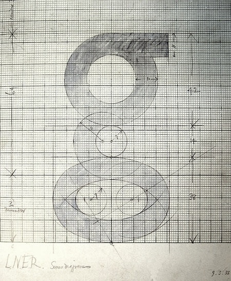 British stone carver, wood engraver, essayist and type designer Arthur Eric Rowton Gill was born in Brighton, England in 1882. He died in 1940. He was a student of Johnston and worked for some time for the Golden Cockerell Press in London. He became one of the most influential English type designers of the 20th century.
 The text book Eric Gill (Fiona McCarthy, Faber and Faber Ltd) describes his life. Publishers Weekly writes: An English artist-craftsman in the tradition of William Morris, Eric Gill (1882-1940) exemplifies the search for a lifestyle to heal the split between work and leisure, art and industry. He is remembered today for his fine engravings and stone carvings, his legendary typefaces and book designs for the Golden Cockerel Press. Yet there was another side to the man, downplayed by previous biographers: a fervent convert to Catholicism and leader of three Catholic arts-and-crafts communes, Gill had a hyperactive libido which extended to incest with his sisters and daughters, as well as numerous extramarital affairs, according to British writer MacCarthy. He rationalized his penile acrobatics by inventing a bizarre pseudoreligious theory. In MacCarthy's candid portrait, Gill, who preserved the outward image of a devout father-figure, was neither saint nor humbug, but a highly sexed creative artist trapped by his Victorian concept of masculinity. This charismatic firebrand was a renegade Fabian socialist, a bohemian friend of Augustus John and Bertrand Russell. His adventurous life, as re-created in this beautifully written, absorbing biography, is disturbingly relevant to our time. A follow-up article by McCarthy in The Guardian, 2006. Canicopulus Script (1989, Barry Deck) is a font named to remember one of Eric Gill's favorite extracurricular activities. Author of An Essay on Typography (1931, revised in 1936). For a French edition, see Eric Gill Un Essai sur la Typographie (Boris Donné and Patricia Menay, Ypsilon Editeur, 2011). Gill once said: There are now about as many different varieties of letters as there are different kinds of fools. His typefaces include - Gill Sans (1927). Revivals include Bitstream's Humanist 521 and its Cyrillic extension Paratype's Humanist 521. An obscure style called Gill Sans Shadow 338 (1929, Monotype) was digitized by Toto in 2011 as K22 EricGillShadow. Image of Gill Sans by Katharina Felski. Image of Gill Sans's g by John Bakhan (Seoul). Image of Gill Sans by Tori Estes. Over at Infinitype and SoftMaker, the typeface sells under the name Chantilly or Chantilly Serial. Niteesh Yadav, a graphic designer in New Delhi, created a great PDF file on the topic of Gill Sans. For a major digital update and revival, see Gill Sans Nova (George Ryan, 2015, Monotype). It extends Gill Sans MT from 18 to 43 fonts. Several new display fonts are available, including a suite of six inline weights, shadowed outline fonts that were never digitized and Gill Sans Nova Deco that was previously withdrawn from the Monotype library. And it covers Greek and Cyrillic.
- Golden Cockerell Roman (1929), forv the Golden Cockerel Press. Berry, Johnson and Jaspert write: Designed by Eric Gill, a rounder form of his Perpetua. It has the modest capitals, horizontal serifs and slight differentiation of colour of Gill's other romans. The M is somewhat splayed. The g has a rather large bowl. The t is very short. The italic, cut only for the 14 pt. size, is a sloped roman except for the a and with it are used the roman capitals, as in the case of Joanna.
- Perpetua (Monotype, 1928-1929). This is the prototypical lapidary typeface. The Bitstream version is called Lapidary 333. The SoftMaker versions are called P700 and persistent. See also here. Images of Perpetua: i, ii, iii, iv, v, vi, vii, viii, ix, x, xi.
- Solus (1929)
- Cunard (1934; sold to L. E. Deval, Elkin Matthews Limited, and listed as Jubilee (1952) by Stephenson Blake)
- Joanna (1930): a slab serif based on work by Granjon. Monotype's metal typeface Joanna dates from 1958. Berry, Johnson and Jaspert write: Designed by Eric Gill for Hague & Gill in 1930. A light roman with small horizontal serifs and little differentiation of colour. The type is remarkable for the smallness of the capitals, which do not reach the height of the ascenders, themselves not tall. The bowl of the g is rather large. The italic is the roman inclined except for a and g. The inclination is very slight. There are no specially cut capitals, but the modest roman capitals are used. This was the practice of Aldus, the first printer to use italic. Eric Gill's Essay on Typography, 1931 is printed in Joanna. In 2015, Monotype set out to remaster, expand and revitalize Eric Gill's body of work, with more weights, more characters and more languages to meet a wide range of design requirements. As part of that, it published a revival / extension in 2015 by Ben Jones, Joanna Nova. This 18-font series covers Greek and Cyrillic. There is an excursion into the sans world based on Joanna by Terrance Weinzierl, also in 2015, Joanna Sans Nova (2015, Monotype: 16 fonts).
- Aries (1932): see the 1995 revival at FontHaus by Dave Farey.
- Floriated Capitals (1932).
- Bunyan (1934). See also Bunyan Pro (2016, Patrick Griffin and Bill Troop).
- Pilgrim (1934), originally designed for a book published by the Limited Edition Club of New York. This serene typeface with incised features was re-cut by Walter Tracy for Linotype in 1950. For digital versions, see Pilgrim (Linotype, based on a cut by Walter Tracy), Palermo Serial (1999, Softmaker), Bunyan Pro (2016, Patrick Griffin and Bill Troop), and perhaps OPTI Porque (Castcraft).
- Kayo (1936). In 1980, it was redone by Esselte (and Monotype?). In digital form, we have Gill Kayo Condensed by ITC.
- Corporate typefaces such as this one for W.H. Smith&Sons (1903-1907). Revivals or derived typefaces include Gill Facia (1996, Monotype) and Dear Sir Madam (2011, Radim Pesko).
- Gill (ca. 1932): While Gill was living in Israel, he designed a Hebrew alphabet which he cut into walls. After Gill's death in 1940, the carvings were used by Moshe Spizer to design the Gill typeface, which was then cut by Alphonso Ioso. The typeface Gill, however, never caught on.
Klingspor link. FontShop link. Linotype link. [Google]
[MyFonts]
[More] ⦿
|
Erik Faulhaber
|
 Type designer involved with Linotype. He studied design in Karlsruhe with Kurt Weidemann and others. His mentor is Adrian Frutiger. Since 1996 he is an independent designer. He has taught typography at the universities of Halle, Weimar and Wuppertal. He helped develop Frutiger Next at Linotype. However, after that effort, Linotype did not give him credit in the way he thought he deserved (the credited designer for Frutiger Next is Adrian Frutiger / Linotype Design Studio). He also worked on the Compatil family (Linotype), Vialog (Linotype: 22 weights commissioned by Professor Werner Schneider, originally developed for the signs in the Munich subway), Heidelberg Gothic (Linotype: for Heidelberger Druckmachinen AG), and corporate typefaces for the city of Milan (Milano), BMW (tracking adjustments for BMW Helvetica), Microsoft (Microsoft SC), and IBM (Greek and Vietnamese characters for the IBM corporate typeface). Wiki page. In 2006, he published Generis (Linotype) type system which consists of slab serif, serif, sans, and simple sans sub-systems, all compatible and loosely in the spirit of American gothic styles.
 His Aeonis font family (2009) contains 42 sans styles about which Linotype brags: Lapidary inscriptions from Ancient Greece spurred Faulhaber on to create this typeface's basic sans serif forms. This clarity is visible in the simplified form of the typeface's capital A. Further inspiration came from a domed lamp designed in 1952 by Wilhelm Wagonfeld; this went on to inspire the roundness in Aeonis. Faulhaber sees the conflict between antiquity and modernity as a struggle between angular and round forms. Author of Frutiger Die Wandlung eines Schriftklassikers (Niggli Verlag). Free lance designer since 1996. About the Frutiger Next flap: - Erik Faulhaber was interviewed and expressed his ideas about Frutiger and Frutiger Next in Frutiger Die Wandlung eines Schriftklassikers (2004, Niggli Verlag).
- Adam Twardoch (Linotype) explains: No doubt, Erik Faulhaber has worked on the Frutiger Next project but the extent of that work is disputable. This is a typical case of getting credit. Type design only recently became an individual effort. Previously, a large team of people worked on a particular type, and yet typically, only one person got the credit as the designer. Even today, when FF Meta Pro is published, the credited designer is Erik Spiekermann and not Spiekermann, van Rossum, de Groot, Schäfer, Lipton, Schwartz, Safayev, Chayeva, Haratzopoulos et al. If it were so, it would be quite ridiculous anyway. If you want personal credit, you need to negotiate it upfront in the contract. Christian Schwartz and Erik Spiekermann collaborated on FF Unit and on FF Meta Headline. Schwartz does get personal credit for FF Meta Headline but not for FF Unit. This is obviously result of different negotiations in different projects. The credited designer for Frutiger Next is Adrian Frutiger / Linotype Design Studio. This means that Linotype chose not to personally credit the other designers who worked on the project, including Erik Faulhaber. This is similar for Linotype Univers. This is different for other projects, e.g., Avenir Next is credited to Adrian Frutiger / Akira Kobayashi, just like Palatino Nova and Optima Nova are credited Hermann Zapf / Akira Kobayashi. Altogether, such decisions are made on a per-project basis, and surely depend on the actual creative input of the other designer. Sometimes, designers arrange collaborations by themselves they might hire a collague to draw the small caps or florins in their own typeface if there is a tight deadline. Whenever youre a junior designer and embark on such a project, make sure to clarify issues such as personal credit *upfront*. Erik Faulhaber seemingly has not. He has seemingly agreed to hide his name behind the Linotype Design Studio label but now is trying to change reality retroactively. This is not how you work with other people.
- Bruno Steinert (type manager, Linotype) retorts: the idea for Frutiger Next originated from discussions between himself, Adrian Frutiger, Professor Reinhard Haus, and Otmar Hoefer (marketing, Linotype). Linotype guided and financed the development and paid Faulhaber on an hourly basis. Frutiger and Faulhaber never worked together outside Linotype.
In 2013, he published Xenois, Xenois Semi Pro, Xenois Sans Pro, Xenois Serif Pro, Xenois Soft, Xenois Super and Xenois Slab at Linotype. In 2017, he published Qantis Sans and Qantis Soft. Klingspor link. [Google]
[MyFonts]
[More] ⦿
|
Estudio Calderon
[Felipe Calderón]
|
 Felipe Calderón Arteaga is a graduate of the Academy of Professional Drawing in Cali, Colombia, who runs Calderon Design and Calderon Estudio Type Foundry. As an illustrator, calligrapher and graphic designer based in Cali, he won an award in the display type category at Tipos Latinos 2012 for Letrista Script (a signage script).
 In 2013, he designed the signage script typeface Tulipan, which comes with Broken Caps (+pro in 2014) and several sets of ornaments. Typefaces from 2014: Risotto Script (a calligraphic signage script with slightly rough edges), Planet Express. Typefaces from 2015: Trendy (a brush script) and Hollie Script Pro, which won an award in the TDC 2015 Type Design competition. Trendy Script won an award at Tipos Latinos 2016. Typefaces from 2016: Pistacho (a handcrafted font family for coffee shops), Ruth Script (a retro brush style signage script family influenced by signs in bars, billiard halls, motels and night clubs). Typefaces from 2017: Melts Script (based on Colin Brignall's Harlow Solid; followed in 2018 by Melts Script Rough), Saltbush Rough, Saltbush (handcrafted script/sans pair). Typefaces from 2018: Bordonaro Script, Bordonaro Spur (influenced by old beer labels and includes some serifs based on Frederic W. Goudy's Copperplate), Bordonaro Script Rounded, Bordonaro Spur Rounded, Fregata Sans (a playful solid and inline sans) and Fregata Script Inline (a rope font). Typefaces from 2019: Vallejo Serif (a flared titling typeface inspired by the Stephen King's book covers), Vallejo Serif Rounded, Sussan (a handlettered typeface family, +Sussan Extras by Jhony Velasco). In 2020, Felipe Calderon and Jhony Velasco co-designed the compressed typeface Compilation Grotesk. With Ritmo Estudio he designed the inscribed lapidary typeface RT Singular (2020). Typefaces from 2021: Sweep Poster (a 7-style sharp serif), Blunch (a vintage all caps typeface with flared terminals), Masantina (a meaty decorative sans, designed by Ritmo Estudio), RT Austin Plain (a retro beer label script). Typefaces from 2022: Prody (a warm serif family in three styles inspired by Cheltenham, Belwe and Souvenir). Blogspot link. Behance link. [Google]
[MyFonts]
[More] ⦿
|
Eurotypo
[Olcar Alcaide]
|
 Institute in Benalmadena, Spain (was: Santa Severa), where one can take 4-week courses at 1450 Euros a shot on the Etruscan alphabet, Trajan, Cuadrata and Rustic Roman Capital letters, and related subjects. They also organize lettering tours in Italy and guided tours in various musea. The teachers are Alberto Di Santo (Professor of the visual communication, Tor Vergata University, Rome; Professor of Graphic Design, Istituto Europeo di design, Rome; Professor of editorial design, La Sapienza University, Rome; Professor of Typography, C.F.P. Sinalunga, Siena) and Olcar Alcaide (b. 1952, Argentina, Professor of Graphic and Typography Design, University of Buenos Aires; Professor of Typography, University of Lanús, and Professor of Graphic Design, Marbella Design School, Spain). Type link jump page.
 Eurotypo is also the foundry of Olcar Alcaide. Catalog of Olcar Alcaide's typefaces. In 2010, he published the text family Antium and the warm signage typefaces Mijas Ultra and Lila Pro Heavy. Typefaces from 2011 include Lila pro, Atenea (a humanist sans family), Agerola Script (a fat flowing signage face), Teja (signage face), Zalea (yet another signage face), and Nabu Pro (a connected signage script). Equalis (2011M, with Juan Lavalle) is a monoline slab typeface with a huge x-height and wide open counters. It was followed by Equalis Stencil (2011). Ravel (2011) is a fat signage script face. Atenea Egyptian (2011) is a solid slab serif family. Berta (2011) is a signage brush typeface with connected and unconnected versions. Optic Art (2011) is an ornamental typeface with building blocks that can be used for overlays. Creator of Eurotypo Bodoni Bold (2011). Typefaces from 2012: Cubus (dingbats), Saxo Deco (art deco), Moliere (2012, an elegant didone family with outspoken ball terminals), Melon Script (a fat curvy signage script family), Riky (comic book family), Chipa (a signage and package design script), Heket (an expressive curly script), Lenga (a slab serif typeface family), Mikal (brush script). Duktus is a 1940s style script in the style of Donatello (1935, Wagner & Schmidt), Troubadour (1927, Wagner & Schmidt), Liberty Script (1927, Willard T. Sniffin), Trafton Script (1933, Howard Allen Trafton), and Coronet (1937, R.H. Middleton). Picture. Typefaces from 2013: Dignus (influenced by Bank Gothic and Eurostile), Bague (old Dutch style with little contrast, in the style of Jan Van Krimpen), Lugo (a heavy signage or advertising script), Brittes (copperplate script), Talis (contrast-rich sans family), Fiesole (display family with an awkward back-curled lower case d), C Duflos (after a bâtarde coulée by Claude Duflos, a French engraver who was acitve around 1690). Typefaces from 2014: Talks (creamy signage script), Fiume (calligraphic script), Predy, Daevon (copperplate script), Beily (letterpress style), Ritts (a heavy script-like display family), Ritts Cursive (in the style of the brush signage scripts descending from Robert E. Smith's Brush Script for ATF in 1942). Typefaces from 2015: Valentia (a semi-copperplate calligraphic script followed by Valentia Condensed in 2016), Stabia, Digatte Quill (connected script), Digatte (connected monoline cursive script). Typefaces from 2016: Duero (signage script), Turia (calligraphic script), RRollie (a lapidary typeface based on the roman inscriptions), Valentia Nit (a copperplate typeface enriched with swashes and extensions). Typefaces from 2017: Citix (a great calligraphic / penmanship script), Citix Two Condensed, Alfabetica (humanist sans), Merick. Typefaces from 2018: Fortezza (a stiifened didone), Portoluce, Hotdogger (a cursive brush font family), Hotdogger Extras (dingbats), Favarotta, Vikive (a grotesque family), Aretino (a renaissance text typeface), Mirabella, Lectio. Typefaces from 2019: Palio (a condensed tall didone), Fractus (blackletter), Blackduck (blackletter), Sgraffio (copperplate script). Typefaces from 2020: Eolia A (a 12-style low contrast grotesque typeface), Breda (a 12-style geometric sans), Breda Two (six additional condensed styles), Marcus Traianus (in the Trajan style, with lowercase included as well), Eurotypo Sans, Eurotypo SII, Eurotypo BKL (a Baskerville-inspired family), Cannoli (a retro brush lettered signage script). Typefaces from 2021: Zornale (a 7-style text family inpsired by the Zornale, an original manuscript that contains a daily record of the books acquired by the Venetian bookseller Francesco de Madiis, between 1481 and 1488), Alacant (a 14-style slab serif with elliptical shoulders), Tre Giorni (a carefully designed script in solid and outline styles), Due Giorni (a rhythmic calligraphic script), Sagasti (a text typeface with straight serifs), Calcis (a 10-style sans), Rufolo (an 8-style lapidary typeface influenced by Robert Hunter Middleton's Stellar (1929), William A. Dwiggins' Albertus (1932) and Hermann Zapf's Optima (1952)). Typefaces from 2022: Zornale Title. Creative Market link. Klingspor link. [Google]
[MyFonts]
[More] ⦿
|
Faire Type Foundry
[Sabrina Nacmias]
|
Sabrina Nacmias is a New York-based graphic designer, who graduated from Pratt Institute, and started studies at Type@Cooper in 2020. She co-founded Faire Projects in 2016 and Faire Type Foundry in 2020 with her partner Maxime. Based in Brooklyn, Faire Type Foundry published these typefaces in 2020: - Knotel. An all caps display sans.
- Ladonia. Hipster style.
- Myron. A lapidary typeface.
- Octave. A text typeface.
- Palme. A sans typeface.
- Sprig. A text typeface.
- Via. An angular text typeface.
[Google]
[More] ⦿
|
Familjen Sthlm
[Isabelle Rudström-Österlund]
|
Advertising and design-bureau located in Stockholm, Sweden, est. 2011. As part of their business, they design principally custom and corporate typefaces. These include Vasakronan Serif (2019: design lead Isabelle Rudström-Österlund), AIK Display (2021, with a vintage feel), Karnov Display (2021, an angular lapidary typeface for Norstedts Juridik), Northvolt Grit (+Italic) (2021, for the Swedish battery maker), Ica Rubrik Black (2021), Vattenfall Bold (2021). Designers of the free sans font family Familjen Grotesk (2022, a multi-style inktrapped variable font family by Anders Wikstroem, Jonas Baeckman, Matilda Gysing and Kristian Moeller; Google Fonts). Github link for Familjen Grotesk. [Google]
[More] ⦿
|
Felipe Calderón
[Estudio Calderon]
|
 [MyFonts]
[More] ⦿
[MyFonts]
[More] ⦿
|
Felix Braden
[Floodfonts]
|
 [MyFonts]
[More] ⦿
[MyFonts]
[More] ⦿
|
Ferdinand Ulrich
|
German typographer and type historian normally based in Berlin. He studied visual communication at Berlin University of the Arts and typography at the School of Design, Carnegie Mellon University in Pittsburgh. Since 2015 he is pursuing a PhD at the University of Reading, researching the discourse of type design technologies in the early digital era. With Erik Spiekermann he explores the possibilities of post-digital letterpress printing at p98a.berlin. Designer of Hesse Antiqua (2018), a lapidary all caps typeface created for Monotype / FontShop / Linotype to celebrate the 100th birthday of Gudrun Zapf von Hesse. It is based on Gudrun's brass cut type first shown in 1947 on the cover of a specimen book of the Bauersche Giesserei. Speaker at ATypI 2017 Montreal. FontShop link. [Google]
[More] ⦿
|
Filip Karaga
[Typofactura]
|
[MyFonts]
[More] ⦿
|
Filipe Costa
|
London, UK-based designer of Filipe (2018: a lapidary font based on street sign lettering in Viseu, Portugal) and a monoline typeface (2018) inspired by the work of Herb Lubalin. [Google]
[More] ⦿
|
Finaltype
[Hans Heitmann]
|
 Hans Heitmann or Hans-Richard Heitmann. Typography teacher (b. 1951) at the Fachhochschule Augsburg, Germany. Designer of the Fraktur-Roman hybrid font Fraktoer (1996). He also made the lapidary sans family Galathea (1990, Berthold).
 After he set up Finaltype, he released these fonts: - Geoso (2019). A 47-style low-contrast geometric sans family.
- Monoflow (2019). By Hans Heitmann and Johannes Ammon. Monospaced and perhaps useful for programmers.
- Romis (2020). In the Trajan style.
- Byzan (2020). A heavy brush font.
- Distel (2019). An uncial font.
- Benedikt (2021). a 14-style sans and serif display family.
- Legit Sans (2021). A very legible sans text typeface family. Followed by Legit Sans Soft, Legit Serif and Legit Serif Soft in 2021.
Fontsquirrel link. [Google]
[MyFonts]
[More] ⦿
|
Floodfonts
[Felix Braden]
|
 Floodfonts has freeware fonts by Felix Braden (b. Koblenz, Germany, 1974, an ex-student at the Trier College of Design). In 2000 he founded the free-font site Floodfonts with Peter Hoffmann. After working for five years as an art director for Gaga-Design, Koblenz, he decided to set up his own graphic design studio in Cologne. He now lives in Cologne working as a freelance designer and as a art director for MWK Cologne. In 2016, he set up his own Felix Braden type foundry.
 His free fonts at Floodfonts included Polaris (2011), Floodicons (2003), Hydrophilia (2003. He writes: Hydrophilia family was created in 2003 by Felix Braden as a further development of Moby and comes with two fonts: The gothic typeface (liquid) is a revised version of the pixel font (iced). Hydrophilia liquid got a lot of letterforms with a diagonal axis, which reminded me of the technical fonts used on early liquid crystal displays.), Squid (2002, free), SquidCaps (2002), Ninetwist (2002), Catherine (2002), Moby (2002, a Bauhaus style corporate and headline font for the Cologne based design bureau Glashaus), Babelfish (2002), Blendfontsexperiment (2001), Incpot (1997), Hammerhead (2001: an angular constructivist typeface---free), HammerheadBlack (2001), HammerheadBold (2001), HammerheadMedium (2001), Multikultur (1997, Fraktur font), MultikulturExtraBold (2001), Orchidee (2001), Sadness (2001), Wuestling (1997). His commercial typefaces at Floodfonts include Kontiki (2018: a woodprint emulation typeface family; a grungy version of Clarendon), Capri Pro (2011-2015): an expressive constructed sans serif typeface in the tradition of Kabel and Avant Garde, partly constructivist, and partly hipster. Peter Hoffmann designed Alita (2001) and Lacuna (2001). Commercial fonts at Fountain: Grimoire (since 2015 at Floodfonts), Sadness (2001). In 2004, he cofounded Timetwist with Pia Kolle, where you can download Rabbits (2004, Kolle), Pirates Stoertebecker (2004, Braden at Floodfonts, a ransom note face), Pirates Drake (2004, Braden at Floodfonts), PiratesBlackbeard (2004, Braden at Floodfonts), PiratesBonney (2004, Braden at Floodfonts), Bigfish (2009, a Western billboard face). At Ductype, Braden published Timetwisteight (2005, a pixel face). At URW++, he published the Supernormale family (part techno, part pixel) in 2006. At Volcano, he made the rounded display face Bikini (2010). At Fountain, he published the original version of Capri in 2011. After Fountain's demise, it reappeared as Capri Pro at Floodfonts in 2015. The Orchidee project started in 1999 led to a fantastic free font. Felix: Orchidee was created as a part of the business stationary of the restaurant Orchidee located in the luxory hotel Quellenhof in Aachen, Germany. After the founding of the restaurant the hotel manager realized that there earlier was a bordello in the city with the same name, so he wanted to change the name. At the time when our agency had to presentate the logotype the name was not appointed so I created the font. The restaurant was specialized on crosscultural european-asian cuisine. Because of that I wanted to mix up some elements of traditional asian typography with european typography. The letters are designed in freehand by the repetition of just a few basic elements. To create the rough outline I used xerox-copier because I wanted to have some chaotic elements to give the font a handmade touch. Other free fonts: Coraline (2012), Sonar Script (2013), Rollmops (2013). At FontShop, he published FF Scuba (2012), as an offline companion to Verdana. It was one of the winners of the Communication Arts Typography Annual 2013. In 2019, he published Pulpo, a ten-style family inspired by Century Schoolbook and Clarendon. In 2020, he released Turbine (at Fontwerk: a 14-style neo-grotesque family), and Arpona, an 18-style lapidary flared typeface with slight wedge serifs. Typefaces from 2021: Capitana (an 18-style geometric sans with large counters; not as severe as Futura), Arpona Sans (a 20-style humanist sans with rhombic tittles). FontShop link. Klingspor link. Fontspace link. Dafont link. Behance link. Fontsquirrel link. Personal page. Another Behance link. Fountain Type link. Home page of Felix Braden. [Google]
[MyFonts]
[More] ⦿
|
Florian Philipp Martin Runge
|
 Designer in London, who was born in Flensburg (Germany) and studied for four years in Aarhus (Denmark).
 He made the contemporary informal typeface Jula (2012). Asgaard was created during the one-week typeface design workshop tipoRenesansa in Trenta, Slovenia (February 2012). It is specially designed for street signage. Runge writes: To achieve great legibility the design paid much attention to features such as: large x-height, open counters, tiny serifs, slightly rounded corners, square terminals as well as inktraps. Research leading to asgaard is described in Runge's paper The echo of architecture in Danish type design of the 20. century. In 2013, Florian graduated from the MATD program at the University of Reading. His graduation typeface was Nomad. In 2016, he published the flared lapidary typeface Sherpa Sans at Rosetta. The naming caused a bit of a stir, not so much because of Oskar Boscovitz's Sherpa Sans (2002), but because of an unpublished font by a competitor. Rosetta took the moral high ground (even though it could have fought this trademark and won) and decided to rename Sherpa Sans Gitan. In 2018, Borna Izadpanah, Fiona Ross and Florian Runge co-designed the free Google Font Markazi Text. They write: This typeface design was inspired by Tim Holloway's Markazi typeface, with his encouragement, and initiated by Gerry Leonidas as a joint University of Reading and Google project. The Arabic glyphs were designed by Borna Izadpanah and design directed by Fiona Ross, they feature a moderate contrast. It takes its cues from the award-winning Markazi typeface, affording a contemporary and highly readable typeface. The complementary Latin glyphs were designed by Florian Runge. It keeps in spirit with its Arabic counterpart, echoing key design characteristics while being rooted in established Latin traditions. It is an open and clear design with a compact stance and an evenly flowing rhythm. Four weights are advertized at Google, but only the Regular is available. Behance link. Cargo collective link. [Google]
[MyFonts]
[More] ⦿
|
Francesca Quaranta
|
Glasgow-based graphic designer. Creator of the flared lapidary typeface Orsini (2013). She writes: Orsini is an inscriptional font, designed for titling and advertising. The goal of this project was to create a peculiar typeface capable to give a strong personality to words and sentences. Orsini features, as large apertures, high contrast and particular terminals, were designed in order to stress the unmistakable character of this font. Orsini was inspired by an inscription placed on the facade of the Basilica di Santa Maria Sopra Minerva in Rome. These letteres have nothing to do with Roman capital letters as those on the Trajan Column. The inscription was engraved in 1453 to mention Conte Orsini's aid to the construction and many imperfections reveal an untrained hand. [Google]
[More] ⦿
|
Francesco Mistico Canovaro
[Zetafonts (or: Studio Kmzero, or: ZeroFont)]
|
 [MyFonts]
[More] ⦿
[MyFonts]
[More] ⦿
|
Frank Kleinsorge
|
At The Pennsylvania State University, Frank Kleinsorge (State College, PA) designed the flared sans typeface Alpha Omega (2017). [Google]
[More] ⦿
|
Frantisek Storm
[Storm Type Foundry]
|
 [MyFonts]
[More] ⦿
[MyFonts]
[More] ⦿
|
Galen Lawson
[District (was: CV Type)]
|
 [MyFonts]
[More] ⦿
[MyFonts]
[More] ⦿
|
Gareth Hague
[Alias]
|
[MyFonts]
[More] ⦿
|
General Type Studio
[Stéphane Elbaz]
|
 General Type Studio is a New York-based type foundry founded by Stéphane Elbaz, a graduate of ENSAD in Paris, class of 2004. Since 2008, he lives in New York, where he is a freelance designer and teaches at Cooper Type. As of 2018, the font production is in the hands of Mathieu Réguer.
 In 2003 at ENSAD, Elbaz co-designed the experimental typeface Caffeine with Benjamin Raimbault and Eric Bricka. His Geneo (2008: an eight style nearly transitional serif) won an award at TDC2 2009. Geneo was published in 2012 by Typofonderie. Now an established designer, he created didone titling typefaces for the Stiletto mag in 2008. Other typefaces designed before General Type Studio was started: Sephora Pro (2015, ZeCraft), Galante (2005, a text typeface), Primota (2008, a strong grotesque), Etan (2008, an eroded text face), and PSFournier (2016, Typofonderie: a great revival of Fournier's French transitional typefaces). Typefaces at General Type Studio: - Mier A and Mier B (40 styles, 2018). A sans family that marries the grotesque and geometric styles.
- Cambon (16 styles). A contemporary flared serif influenced by Louis Perrin (1795-1865) and Berthold Wolpe (1905-1989).
- Pilat (48 styles). They write: Pilat is a constructed grotesque developed with a large range of weight and width variations. Its base structure, commonly called a superellipse or Lamé curve, could be described as a circle trapped inside a box. Though the letter-shape predates the 20th century, it is mostly seen as an expression of the post World War II era---a glorifying combination of craft and technology. Pilat won an award at the Type Directors Club's Type Design Competition 2019.
[Google]
[MyFonts]
[More] ⦿
|
Gerard Sierra
|
 Barcelona-based designer of these typefaces:
 - Centcelles (2018). A typeface that is inspired by the calligraphic shapes of the Capitalis Rustica.
- Rhinob (2020). A custom octagonal / industrial / soccer / sports font for the identity of Rhinob.
- Hooligan (2020). An ultra-condensed octagonal family custom-designed for Palco23. It was inspired by Matt Willey's Timmons, the previous corporate typeface used.
- BigSlab Quadrata (2020). Each letter occupies a full square, and the reverse stress provides a Western aura.
- Triomf Display (2020). Triomf is an experimental cubist display face inspired by a Spanish civil war poster . The designer also claims inspiration from Herb Lubalin and Avant Garde.
- Derrida (2021). A lapidary poster typeface.
[Google]
[More] ⦿
|
Gerard Unger
|
 Dutch type designer, born in Arnhem, The Netherlands, in 1942, d. 2018. He studied at the Gerrit Rietveld Academy in Amsterdam, and taught at the Rhode Island School of Design, the University of Reading, and at the Gerrit Rietveld Academy in Amsterdam. From 1974 on, he designed type, starting his career at Hell in Kiel in 1986. Until the end of his career, he taught at Reading and Rietveld. Unger designed stamps, coins, magazines, newspapers, books, logo's, corporate identities, annual reports and many other objects. But he was best known for his typefaces:
 - Markeur (1972), not available as digital type. Unger's first typeface, designed for Enschedé's Pantotype system.
- M.O.L. (1974), not available as digital type. M.O.L. is the type used in the Amsterdam subway.
- Demos (1975-1976, Linotype). Unger said once that this was his first face, and that he made it at Hell in Kiel in 1974 (but I am confused then as to the date of Markeur then).
- Demos (new version 2001), available from Visualogik. In 2015, Gerard published Demos Next (done together with Monotype's Linda Hintz and dan Reynolds) at Linotype.
- Praxis (1976, Linotype). Revived in 2017 as Praxis Next, also at Linotype. Linotype writes that the design is by Gerard Unger, Linda Hintz and the Monotype Design Studio.
- Hollander (1983, Linotype).
- Flora (1984). There is also ITC Flora (1980-1984). Named after Unger's daughter, this is an upright sans italic.
- Swift (1985). This sturdy transitional typeface is his most popular design. It is used by many Dutch and Scandinavian newspapers, and got Unger the Gravisie-prijs in 1988. In 2009, Linotype published Neue Swift (a 1995 design by Unger), i.e., Swift with old style figures thrown in. See also Swift 2.0 (1995).
- Amerigo (1986), available from Bitstream. This was originally designed for 300dpi laserprinters. It is a tapered almost lapidary typeface family. In the Bitstream collection, Amerigo is called Flareserif 831.
- Oranda (1987), available from Bitstream. This is a slab serif originally drawn for the European hardware manufacturer Océ in 1968.
- Cyrano (1989).
- Argo (1991), available from Dutch Type Library.
- Delftse Poort (1991), a stencil typeface not available as digital type.
- Decoder (1992), available from Font Shop. This was a font from the FUSE 2 collection.
- Gulliver (1993). This typeface was used by USA Today and the Stuttgarter Zeitung. Can be bought from URW++ from 2009 onwards.
- OCW Swift (1995-1997, for Ministerie van OC en W, Zoetermeer - NL, by Visualogik Technology&Design).
- ANWB fonts (1997), available from Visualogik.
- Capitolium (1998). Capitolium was designed in 1998 at the request of the Agenzia romana per la preparatione del Giubileo for the Jubilee of the Roman Catholic Church in 2000. It was not used though for the millennium celebrations. In 2002, Capitolium was picked as the serif font for the material of ATypI in Rome. It was accompanied in that advertising by Unger's sans serif font Vesta (2001), loosely based on the lettering at the Vesta temple in Tivoli. He developed Capitolium futher to make Capitolium News and Capitolium News 2 (2011, Type Together), so that the adapted glyphs would be more legible (large x-height) and fit better on a page (more glyphs per line). The modern typeface Capitolium News 2 was published by Type Together in 2011.
- Paradox (1999), available from Dutch Type Library. This is a Didone font done in 1999, for which he won a Bukvaraz award in 2002.
- Coranto (2000). In 2011, Coranto2 was published at TypeTogether: Coranto 2 is originally based on Unger's typeface Paradox, and arose from a desire to transfer the elegance and refinement of that type to newsprint.
- Vesta (2001). The sans serif Vesta (designed as a possible candidate sans serif for the Rome 2000 project) won an award at Bukvaraz 2001. It is available now as Big Vesta (2003).
- Linotype Library is the licenser of the German government's new corporate design typefaces Neue Demos (Antiqua, 2004) and Neue Praxis (sans-serif, 2004) by Unger. The typefaces are to be used for all official correspondence, brochures and advertisements.
- Allianz (2005) is a corporate type system with sans and serif typefaces developed with the firm of Claus Koch of Düsseldorf. The typefaces were designed in collaboration with Veronika Burian, London, and were produced as fonts by Visualogik, 's-Hertogenbosch.
- Alverata (2013). A lapidary flared typeface with a huge x-height influenced by roman ("romanesque") lettering from the XIth and XIIth centuries. Alverata consists of three different fonts: Alverata, Alverata Irregular and Alverata Informal. For the development of the Greek letterforms, Unger collaborated with Gerry Leonidas (University of Reading) and Irene Vlachou (Athens). He cooperated with Tom Grace for the Cyrillic letterforms. Alverata was published by Type Together in 2014 and 2015. It appears to have Vesta's skeleton and dimensions. Alverata won the type design prize at Tokyo Type Directors Club 2016. PDF file.
- Sanserata (2016, Type Together). The blurb: Sanserata is an articulated sans that mirrors Alverata's creativity and concept. Its bright and unflappable nature make it perfect for positive and casual brands, and its accentuated terminals improve legibility in text, especially on screens where light emission tends to round off the endings of glyphs.
Gerard Unger lived in Chicago and Bussum, The Netherlands. Besides the awards mentioned in the list above, he received global prizes for his typography, such as the H.N. Werkman Prize (1984), the Maurits Enschedé-Prize (1991), the 2009 SOTA Typography Award and the TDC Medal (2017). Author of Terwijl Je Leest (Amsterdam, 1997) and Theory of Type Design (2018). Books about Gerard Unger include Gerard Unger Life in Letters (2021, by Christopher Burke, De Buitenkant). Interview by John L. Walters. At ATypI 2004 in Prague, he spoke about type for dailies, and also on Neue Demos and Neue Praxis. At ATypI 2008 in St. Petersburg, he spoke about letterforms in inscriptions from the 10th, 11th and 12th centuries. FontShop link. Klingspor link. View Gerard Unger's typefaces. [Google]
[MyFonts]
[More] ⦿
|
Ghostscript fonts
|
 Yet another ghostscript font archive, with the following URW++ truetype fonts made in 2000: A028-Ext, A028-Med (lapidary), A030-Bol, A030-BolIta, A030-Ita, A030-Reg, AntiqueOlive-Bol, AntiqueOlive-Ita, AntiqueOlive-Reg, ClarendonURW-BolCon, Coronet, Dingbats, GaramondNo8-Ita, GaramondNo8-Med, GaramondNo8-MedIta, GaramondNo8-Reg, LetterGothic-Bol, LetterGothic-BolIta, LetterGothic-Ita, LetterGothic-Reg, Mauritius-Reg, NimbusMon-Reg, NimbusMon-Reg, NimbusMono-Bol, NimbusMono-BolIta, NimbusMono-Ita, NimbusMono-Reg, NimbusRomanNo4-Bol, NimbusRomanNo4-BolIta, NimbusRomanNo4-Lig, NimbusRomanNo4-LigIta, NimbusRomanNo9-Ita, NimbusRomanNo9-Med, NimbusRomanNo9-MedIta, NimbusRomanNo9-Reg, StandardSymL, U001-Bol, U001-BolIta, U001-Ita, U001-Reg, U001Con-Bol, U001Con-BolIta, U001Con-Ita, U001Con-Reg, URWClassico-Bol, URWClassico-BolIta, URWClassico-Ita, URWClassico-Reg. All these fonts come with complete East-European accent sets, as well as Greek symbols. [Google]
[More] ⦿
Yet another ghostscript font archive, with the following URW++ truetype fonts made in 2000: A028-Ext, A028-Med (lapidary), A030-Bol, A030-BolIta, A030-Ita, A030-Reg, AntiqueOlive-Bol, AntiqueOlive-Ita, AntiqueOlive-Reg, ClarendonURW-BolCon, Coronet, Dingbats, GaramondNo8-Ita, GaramondNo8-Med, GaramondNo8-MedIta, GaramondNo8-Reg, LetterGothic-Bol, LetterGothic-BolIta, LetterGothic-Ita, LetterGothic-Reg, Mauritius-Reg, NimbusMon-Reg, NimbusMon-Reg, NimbusMono-Bol, NimbusMono-BolIta, NimbusMono-Ita, NimbusMono-Reg, NimbusRomanNo4-Bol, NimbusRomanNo4-BolIta, NimbusRomanNo4-Lig, NimbusRomanNo4-LigIta, NimbusRomanNo9-Ita, NimbusRomanNo9-Med, NimbusRomanNo9-MedIta, NimbusRomanNo9-Reg, StandardSymL, U001-Bol, U001-BolIta, U001-Ita, U001-Reg, U001Con-Bol, U001Con-BolIta, U001Con-Ita, U001Con-Reg, URWClassico-Bol, URWClassico-BolIta, URWClassico-Ita, URWClassico-Reg. All these fonts come with complete East-European accent sets, as well as Greek symbols. [Google]
[More] ⦿
|
Giulia Russo
|
Designer in Rome of the sharp-serifed typeface Settembre (2016), which is inspired by the work of the stonemasons of the monument to the Bersagliere at Porta Pia in Rome. [Google]
[More] ⦿
|
Glyphic or incise typefaces
|
Glyphic typefaces have flared strokes or tapered waistlines. They emulate letters carved into stone or bronze. Most of them are not serifed, but they can hardly be called sans typefaces either. Classical examples include Optima (Hermann Zapf), Albertus (Berthold Wolpe) and Pascal (José Mendoza). More recent glyphic or incise typefaces include Ideal Sans (Jonathan Hoefler), Carter Sans (Matthew Carter and Dan Reynolds, 2010, ITC) and Winco (Ramiro Espinoza). [Google]
[More] ⦿
|
Glyphicon
[Christian Richter]
|
 Christian Richter (Glyphicons, Garbsen, Germany) created the following typefaces: Melanchthon (1999, +Italic), Lichtenberg Condensed (1999, +Italic), Rudolf Koch (2003, this is a revival of Koch Fraktur), Kraftfeld (1999, +Italic: lapidary, +Extra Bold, +Condensed Bold), Luxotel (1999), Yvonne Discaps (2013, art deco), Störtebeker (2003), Unisymbols (2009, dingbats).
 Of these typefaces, these are free: Lichtenberg Condensed (1999, +Italic), Rudolf Koch (2003), Unisymbols (2009). Klingspor link. [Google]
[More] ⦿
|
Goffredo Puccetti
|
 Goffredo Puccetti (Goffredo Associates) started out in France but is now located in Abu Dhabi, UAE. At Type@Paris in 2015, he designed the lapidary humanist typeface Saadiyat. [Google]
[More] ⦿
Goffredo Puccetti (Goffredo Associates) started out in France but is now located in Abu Dhabi, UAE. At Type@Paris in 2015, he designed the lapidary humanist typeface Saadiyat. [Google]
[More] ⦿
|
Green Type
[Dmitrij Greshnev]
|
 Green Type is the foundry of creative Russian type designer Dmitrij Greshnev (b. 1975, Lengingrad). Still based in Leningrad, Dmitrij received a TypeArt 05 award for the display family Multicross (2003-2004), which can be bought at ParaType. He will win many more awards.
 His typefaces include Stopwatch (2010, LED face), Sokol (Old Slavonic Latin simulation face), Slavica (2010), Reliant (2010, with Iza W at Intellecta Design), Reliant Beveled (2012, free), Logistica (2010, army stencil), Danger (2010, another army stencil), Dusk Thin (2010), and Multicross (2003-2004, stitching font). Typefaces from 2011: Zoo300 (techno sans; +Shadow, +yrillic). Behance link. In 2012, he created Patriciana (a Peignotian typeface for Latin and Cyrillic) and Directo. Typefaces from 2013: Finch, Hypermarket (dirty typewriter). Typefaces from 2014-2015: Trali-Vali (a children's book or party font family), Moveo Sans (with Condensed and Extended subfamilies, 80 fonts in all covering Latin, Greek and Cyrillic), Artica Pro (a flared all-caps typeface family for Latin, Greek, and Cyrillic that is based on classical roman (Trajan) letterforms) and Artica Rough Pro (2015). Typefaces from 2016: Festa (a brush typeface for Latin, Greek and Cyrillic). Typefaces from 2017: Festa Classica (a happy all caps hand0crafted typeface family), Normative Pro (a neutral techno sans with glyphs tending towards the rectangular), Normative Lt. Typefaces from 2018: Streetline. Typefaces from 2019: Hubba (a modular squarish typeface family; has a variable font). Typefaces from 2020: Danger Neue (a military stencil). Typefaces from 2021: Fason (a flared fashion mag typeface family). Typefaces from 2022: Esquina Rounded (an octagonal typeface), Esquina College (an octagonal varsity typeface), Esquina Outline, Esquina Stencil (12 styles). Behance link. Creative Market link. Hellofont link. MyFonts link. Klingspor link. View Dmitry Greshnev's typefaces. [Google]
[MyFonts]
[More] ⦿
|
Greyletter
[Neil Patel]
|
 Greyletter is Neil Patel's type foundry in Portland, Maine, est. 2009. It morphed into Tetradtype in 2016. Neil Patel is a semiconductor process engineer who was introduced to type design by his wife, a graphic designer. His typefaces:
 - Pinion Display (2010). A Victorian display face.
- Dynatherm (2013). A custom sci-fi stencil font for Cartoon Network's Toonami programming block.
- Rieux (2013). Neil writes: Named after the steadfast doctor from Albert Camus' The Plague, Rieux is an even-tempered slab-serif that is confident without being cocky and approachable without being casual. The aesthetic of Rieux is inspired by the industrial age. While the design is not directly derived from typefaces of that era, the shapes of letter-forms are informed by images of over-sized steel machines and the monolithic brick buildings that housed them.
- Grafton Titling (2014). A classical lapidary titling typeface.
- Custom fonts: Inside Voice (2014, for IDEXX Laboratories), Hugo's (2014: a logotype for Hugo's in Portland).
- Texttile (2014). A system of heavy sans titing typefaces for chromatic overlays and simulating textile textures.
[Google]
[MyFonts]
[More] ⦿
|
Guillermo Vizzari
[Yaniguille]
|
 [MyFonts]
[More] ⦿
[MyFonts]
[More] ⦿
|
Gumpita Rahayu
[Toko Type (was: Formika Labs, or: Studio Formika, or: Absolut Foundry)]
|
 [MyFonts]
[More] ⦿
[MyFonts]
[More] ⦿
|
Hans Eduard Meier
|
 Swiss type designer in Obstalden, Switzerland, born in 1922 in Horgen am Zürichsee, who was associated with ETH Zurich for a long time. He died in 2014. In his obituary, Meier's long-time friend and former publisher Erich Alb wrote: He was a tireless, quiet craftsman, alone in his room, away from everything, who worked with endless stamina. The high quality of his calligraphic work, his sure eye in drawing letterforms, his teaching skills, his drawing, painting and graphic work distinguish him as a unique international figure. Meier created these typefaces:
 - Barbedor (1984) and Barbetwo.
- The school fonts BasisSchrift Eins EF (2002), ABCSchrift Drei EF (2001-2002), ABCSchrift Eins EF and ABCSchrift Zwei EF. See this school script web page. In 2016, this ws formally published by Elsner and Flake as ABC Basisschrift.
- The calligraphic family Elysa EF (2002).
- Lapidar. Linotype Syntax Lapidar (1995). Syntax Lapidar Serif (2001).
- Oberon (1992). Done as an OEM for Institut fuer Computersysteme in Zürich. Available from Elsner&Flake as OberonEF.
- SNB Alphabet (1994). Designed for the Swiss National bank) as an adapted version of Helvetica Condensed. The notes themselves were designed by Joerg Zintmeyer.
- Syntax, Meier's humanist sans chef d'oeuvre, started in 1954, and is inspired, according to Meier himself, by Tschichold's Sabon. An intermediate version was called Ur-Syntax (1964). Syntax was first released in 1968-1972 by Stempel. The last metal typeface produced by Stempel AG, it was available in just two weights of roman and a single italic design. When the design was digitized in the late 1980s, additional roman weights were added. Meier completely reworked and enlarged Syntax in 2000 and renamed it Syntax Next. The modern Bitstream version of Syntax is called Humanist 531. See also Saxony and S841 Sans on the SoftMaker MegaFont XXL CD, 2002. Compugraphic's identical clone is CG Symphony. Other copies of Syntax include Synthesis, Cintal, and Synchron. URW has its own version. Linotype Syntax (2000), a reworking of his original Syntax, earned Meier a Bukvaraz 2001 award. Derived or related typefaces: Syntax Serif (1999), Syntax-Letter (1992), and Neue Syntax, all by Meier. Links to some of the digital versions of Syntax: Humanist 531 (ParaType), Humanist 531 (Tilde), Humanist 531 (Bitstream), Syntax Series (URW++), Linotype Syntax (Linotype), Saxony Serial (SoftMaker), Syntax Next (Linotype), Linotype Syntax Serif (Linotype), Linotype Syntax Lapidar (Linotype), Linotype Syntax Letter (Linotype), Syntax (Adobe), Linotype Syntax Lapidar Serif (Linotype), Syntax (Linotype).
- ITC Syndor (1988).
- Elysa (2002).
- Gestickte Antiqua (2004).
His books include Die Schriftentwicklung (published in 1995 by Syntax Press in Cham, Switzerland). This teaching book contains over sixty of Meier's calligraphic specimens, as well as a historical survey of scripts from ancient Greece to today. One of Meier's specimens, entitled Roman Lapidary 1st Century, was worked into a digital typeface family by Elsner and Flake as Meier Kapitalis (2013). References: Superb analysis of his life and contributions by Roxane Jubert (in French). See also Swiss Typographic Magazine Nr 3: Hans Eduard Meier 1922-2014, by Erich Alb, Cham, Switzerland, 2014 [Erich Alb, who knew Meier quite well, spoke about Meier's life at ATypI 2015 in Sao Paulo]. Linotype link. FontShop link. MyFonts link. Klingspor link. View Hans Eduard Meier's typefaces. View various digital versions of Syntax and Humanist 531. [Google]
[MyFonts]
[More] ⦿
|
Hans Heitmann
[Finaltype]
|
 [MyFonts]
[More] ⦿
[MyFonts]
[More] ⦿
|
Heidi Rand Sørensen
|
 Aka Hejheidi. Danish graphic designer who studied at Designskolen Kolding, class of 2011. In the TypeMedia program at KABK in Den Haag, Heidi Rand Sørensen designed Charma for her graduation in 2015. The jury wrote about this lively typeface: Heidi's graduation project is centered around finding a typographic language for labelling and advertising sustainable biological products. The result, called Charma, is an ambitious and well-spirited organic type family. She currently lives in Aarhus, Denmark.
 In 2019, Sijya Gupta and Heidi Rand Sorensen designed the experimental monolinear sans typeface Hedra at Indian Type Foundry. In 2020, he assisted Manushi Parikh at Indian Type Foundry with Begum Sans, a tapered lapidary high-contrast sans inspired by Florentine inscriptional lettering during the Renaissance. Linkedin link. [Google]
[More] ⦿
|
Henri Avecunk
|
 Sollentuna, Sweden-based creator (b. 1973) of Parsley Path (2016), Ignoreland A (eroded style), Ombudsman Stencil (2016), Chateau de Garage (2016, a heavy slab serif), King of Rome (2016, heavy wedge serif), Backboard Outline (2016, athletic lettering), Jollysight Sans (2016), Horseback Slab (2016), Playoff (2016), Bellet (2016, Peignotian, caps only), Strejka (2016, grungy and handcrafted), Promenade de la Croisette (2016, a condensed all caps movie credit font), Fogle Hunter (2016, a tall-ascender antiqued treasure map typeface), Ground Control (2016, a techno typeface), Hello Euroboy (2016), I Am A Rock (2016), the condensed handcrafted typeface Tamales (2015), Discoteca Rounded (2016), Entschuldigung (2016, squarish sans), Discoteca (2016, rounded sans), Mouthpiece (2016), Jumping The Couch (extremely condensed film noir font), the Peignotian typeface Nizza (2016), the athletic lettering font Be True To Your School, and the narrow handcrafted Stem Panini (2016).
 Typefaces from 2017: Wermland Gothic, Fields of Cathay, Chrobot, Grenade Stencil (military stencil), Camargue Serif, Krechanstaud Gothic (grungy), Spettekaka Serif, Boulodrome (heavy rounded sans script). Typefaces from 2018: Les Champs, Backcountry, Manhandle Slab, Out of My League (sans). Typefaces from 2019: Budokan Rounded, Edsbacka Flare Serif, Bonard, Generalissimo, Airside Sans, Haute Corniche (art deco caps), Danderyd Gothic. Typefaces from 2020: Big Star (octagonal). [Google]
[More] ⦿
|
High Contrast Serifs: Stephen Coles's List
|
 Stephen Coles points out the jewels in the FontShop store.
 [Google]
[More] ⦿
|
Identity Letters
[Moritz Kleinsorge]
|
 Moritz Kleinsorge (Düsseldorf, Germany) studied at Rhine-Waal University. He attended the Expert Class Type Design in Antwerp and completed his Master in Communication Design at Peter Behrens School of Art in Düsseldorf. After graduating, he was mentored by Pilar Cano from LetterJuice via the Alphabettes mentorship program while developing his first retail font, Bw James (2017, Branding With Type), a 14-style sans typeface family that introduces many elements from handwriting and features subdued ball terminals.
 In 2018, he designed the geometric typeface Flink, the Peignotian typeface Bw Vivant (with Alberto Romanos), the fresh grotesque typeface Klainy, and the humanistic "upright italic" sans typeface Campuni. Typefaces from 2019: Faible (a soft and friendly sans), Kisba (a wedge serif workhorse). Typefaces from 2020: Compiler (a 32-font family that consists of 16 sans styles and 16 proportionally spaced typewriter or programming styles), Leifa (a flared serif in 16 styles), Glance Slab (an almost stencil style), Allrounder, Allrounder Antiqua (Granjon inspired) and Allrounder Monument (inspired by ancient inscriptions on columns, monuments and buildings in Rome), Allrounder Grotesk (from a hairline Air weight up to a strong Black). Typefaces from 2021: Baghira (an 8-style text family with sharp teeth by Christian Gruber and Moritz Kleinsorge), Kisba Nova (a wedge serif), Werksatz (a 20-style family inspired by early grotesque typefaces such as Akzidenz Grotesk and Venus, this evergreen grotesque ages like fine wine), Werkdruck (a Scotch roman), Glance Sans (14 styles; a sans that tries to decide if it wants to be a stencil font). I Love Typography link. [Google]
[MyFonts]
[More] ⦿
|
Insigne Type Design Studio (was: Dooley Type)
[Jeremy Dooley]
|
 Insigne Type Design Studio (est. 2006) is run by Jeremy Dooley, b. Columbia, SC, 1981, who received a masters in graphic design at Savannah College of Art and Design in 2005. He lived in Atlanta, GA, and is now in Knoxville, TN. From 2004 until 2006, he ran Dooley Type in Greenville, SC. Behance link. Klingspor link. Font squirrel link. Creative Market link. MyFonts interview. His fonts:
 - 44th President (2009, based on Obama's handwriting).
- Aberlyth (2006). An informal script face.
- Ainslie (2014), Ainslie Slab (2014), Ainslie Sans (2014) and Ainslie Contrast (2020: a 42-style sans).
- Antigen (2007) is futuristic.
- Arendahl (2007) is a connected but irregular handwriting font.
- Ashemore (2012). Production assistance for Ashemore was provided by Lucas Azevedo and Marcelo Magalhaes. Followed by Ashemore Softened (2012).
- Avaloc (2006) is an expanded sans.
- The Aviano superfamily. Aviano Wedge (2012), Aviano Slab (2007), Aviano Serif (2008), 2009 Aviano Didone (2009), Aviano Flare (2010), Aviano Sans (2010), Aviano Future (2011), Aviano Contrast (2012), Aviano Gothic (2013), Aviano Sans Layers (2013), Aviano Copper (2018), Aviano Didone (2019). Aviano Titling (2007) is inspired by Trajan. Aviano Silk (2015) is a bilined decorative titling typeface. Aviano Royale followed in 2016.
- Barcis (2013). An organic sans family.
- Beastias (2006). An informal script face.
- Belda (2017). An elegant serif family of fonts that grew from the ancient roman capital. Followed by the 54-style Belda Didone (2020). A 54-style didone family without ball terminals.
- Biortec (2004).
- Biscuit Boodle (2008) is a fun and crazy script from Portland Studios illustrator Justin Gerard. Biscuit Boodle Ornaments (2009, dingbats).
- Blue Goblet (2005) is a Treefrog-style script developed for the pending illustrated childrens book from Portland Studios, The Blue Goblet. It was co-designed by Cory Godbey of Portland Studios and Jeremy Dooley. In 2011, Cory Godbey added Blue Goblet Christmas Ornaments.
- Boncaire Titling (2012) was iInspired by the type elements of 17th century map of Curacao made by Dutch cartographer Gerard Van Keulen.
- Brigette (2007) is an ink-splattered calligraphic script.
- Cabrito (2013). A typeface for children's books. Followed by Cabrito Inverto (2014) for reversed stroke stress---some of its heavier styles have a Western appearance. In 2014, Cabrito Sans was added to the set. Cabrito Semi followed in 2015, the playful Cabrito Didone in 2016, Cabrito Contrast in 2018, and Cabrito Flare and Cabrito Serif in 2019.
- Caridade.
- Carta Marina is a family of medieval map text typefaces and dingbats (2007).
- Cartes (2020). A charming 54-style family with chancery ascenders, and a roaring twenties handcrafted appeal.
- Cavole Slab (2011).
- Celari Titling (2014).
- Chatype is a geometric slab serif typeface family designed in 2012 for the city of Chattanooga, TN, by Robbie de Villiers and Jeremy Dooley.
- Chennai and Chennai Rounded (2007) are playful display sans typefaces. Chennai Slab (2009).
- Chypre (2017). A techno sans family.
- Civane (2017). A flared inscriptional typeface family.
- Coegit (2012). A sans family that offers Compressed, Compact and Condensed subsets.
- Cohort (2010, elliptical sans).
- Coupe (2003).
- Dever (2015) is a 107-style family of rough and weathered letterpress typefaces with industrial octagonal skeletons.
- Dienstag (2008, 8 styles).
- Daito (2018). A welcoming soft slab serif typeface family.
- Donnerstag (2010, extended slab serif).
- Dulcian (2017). A bright open sans family.
- Eigerdals (2010, rounded sans family).
- Enocenta (2013). A penmanship typeface family done with Cecilia Marina Pezoa.
- Enzia (2009, an elegant sans family).
- Evalfey (2021). Formal calligraphic.
- Fizgiger (2006). An informal script face.
- Florencia (2007) is a vintage script.
- Foverdis (2010, a calligraphic family that includes a hairline).
- Gineso (2016). A set of 48 slightly condensded and squarish headline typefaces. Followed by Gineso Titling (2016) and Gineso Soft (2018).
- Grayfel (2015). A 42-style sans typeface family characterized by flush horizontal or vertical terminal endings.
- Grenale (2013). A flashy in-your-face didone family from Thin to Heavy. Grenale #2 (2013) is a curvy sans that is almost a monoline. In 2015, Dooley launched Grenale Slab.
- Haboro (2016). A 54-font strong didone family with wedge serifs replacing the standard rectangular ones. It has no ball terminals. Followed by Haboro Slab (2016), Haboro Soft (2016), Haboro Serif (2016), Haboro Sans (2016), Haboro Contrast (2017), and Haboro Slab Soft (2020).
- Honeydrop (2017). A brush script.
- Insigne Abstractions (2007) and Insigne Fleurons (2008) are dingbats.
- Jon Cary (2004, the handwriting of John Kerry).
- Kairengu (2007) is a comic book family.
- Kasuga (2008) and Kasuga Brush (2009) are fresh new scripts with oriental undertones.
- Kidela (2007) is a sassy scrapbook family. Kidela Sketch (2009).
- Kochi (2015). A 54-font rounded organic sans typeface family.
- Le Havre (2008) is a gorgeous 8-style geometric art deco sans with tall ascenders. In 2010, the Le Havre Sketch family was added. We also have Le Havre Rough (2014, a bit of letterpress feel thrown in), Le Havre Rounded (2009), Le Havre Titling (2012), Le Havre Layers, Le Havre Hand (2015) and Le Havre Width (2017).
- Look (2015). In Sans, Script, and Serif subfamilies, this super-collection blends a bit of vernacular signage with weathered letterpress.
- Lorelei (2007, Insigne) is a bouncy script family.
- Lourdes (2007) is an informal script.
- Madeleine (2007) is a basic handwriting face.
- Madurai (2012). A simple monoline sans superfamily. Madurai Slab (2013) has 54 styles.
- Mahalia (2008) is a retro script.
- Majidah and Majidah Potens (2006) are medieval scripts.
- Mandrel (2017). A typeface with sharp serifs. Followed by Mandrel Didone (2021: a 54-style didone).
- Marintas (2012).
- Maris (2015). A curly script.
- Massif (2008) is an aggressive sans family.
- Metairie (2018). A connected high-contrast script.
- Mirantz (2019). A 54-style text typeface family.
- Mittwoch (2009, organic serif).
- Montag (2007) is a casual rounded sans family in six styles.
- Mr Darcy (2015). A Tuscan all-caps typeface.
- Mynaruse Flare (2018). An update of Mynaruse (2010), which is a roman inscriptional titling family---it is characterized by skinny flared serifs.
- Nanumunga (2007) is a comic book style face.
- Natalya (2007) is a connected calligraphic script. Natalya Monoline (2007). Natalya Swashes (2009, calligraphic).
- Newcomen (2008) is a 4-style roman titling face.
- Obline (2004, sans).
- Oita (2014). An octagonal typeface family.
- Olidia (2008) is calligraphic.
- Orewelia (2004, grunge face).
- Pauline Didone (2011, a curly didone family). Pauline Script (2008) is a monolinear retro script.
- Pershal (2021). A 54-style family, described as an oddball sans.
- Plathorn (2014). Inspired by the Wild West, this generous typeface family uses flaring in a thousand ways to recreate the feel of that era.
- Promethian (2005, futuristic).
- Quarca (2013). A 36-font sans family with a sturdy rounded square look.
- Quatie (2013). A curvaceous family: Quatie draws much of its inspiration from the industrial brawn of the railroad and the unique characteristics of Cherokee letterforms, giving it an atypical form not usually found in an industrial slab (accring to Dooley).
- Questal (2007) is a unicase serif face.
- Qurillian (2006, legible sans).
- Radona (2021). A 54-style geometric sans described as the typeface version of Synthwave.
- Ranelte (2016). A condensed sans series with techno or DIN appeal. The textured versions are collected in Ranelte Deco (2017).
- RendtPhysic (2006).
- Ript Cure (2005).
- Sabler Titling (2016). An all caps typeface family with tapered flared strokes.
- Sancoale (2011, an organic sans family, from Thin to Black). Sancoale Narrow (2011). Sancoale Softened (2012). Sancoale Slab (2012). Sancoale Slab Soft (2013), Sancoale Gothic (2022: 48 styles; a subdued and calming version of Sancoale, with quiet futurism).
- Sangli (2015). A 54-style rounded organic sans typeface family.
- Savigny (2011). Images: Savigny Black Extened, Savigny Regular Condensed.
- Savory Paste (2007). Grunge.
- Schorel (2019). A 54-style Scotch roman.
- Senlot (2018). A 54-strong sans family. In 2019, Senlot Sans and Senlot Serif (2019) were added. Senlot Didone followed in 2021.
- Serofina (2010, a calligraphic face).
- Shrike2003 (2003).
- Sildetas (2010, a high-contrast script typeface with tear drop terminals).
- Sociato (2022). A 54-style baroque text family with didone roots. The typeface was inspired by a declaration published during the French Revolution that extolled the development of a new religion, the cult of the Supreme Being.
- Solitas (2015). A rounded 42-style geometric sans family. Followed by Solitas Slab (2015), Solitas Serif (2017) and Solitas Contrast (2021; a 42-style display sans family described as sensual by Jeremy Dooley).
- The sans family Sommet (2008; see also Sommet Rounded (2008), Sommet Slab, 2010, and Sommet Serif (2011, a wedge serif family)) is futuristic. Sommet Slab Rounded (2011).
- Sophima (2021). A weathered script family.
- Soprani (2020). A 54-font set with considerable flaring and thorny serifs, based on a vintage plaque from the 1920s.
- Sovba (2009, upright italic).
- Steagal (2013). A geometric sans with a 1930s American feel.
- Steam Court (2015). A combination of steam punk and blackletter.
- Stefania (2007) has two calligraphic/chancery styles. Its aged version is called Stefania Antique (2008).
- Stratham (2007) is a medium to black family of legible sans typefaces.
- Terfens (2007) is an informal and quite rounded sans serif with inspiration from chancery scripts like Stefania. Terfens Contrast (2021) is an 48-style sans with calligraphic traits.
- Torcao (2013). An elliptical anthroposophic typeface family.
- Ultine (2016), an utilitarian sans family.
- Valeson (2020). A vintage display typeface with a kneeling art nouveau lower case n.
- Valfieris (2006). Valfieris Aged (2007) imitates medieval printing.
- Varidox (2019). A variable font with a roundish slab serif design.
- Verao (2018) and Verao Ornaments. A calligraphic script.
- Vergils (2021). A 54-style sans that tries to instill the spirit of the eighties and electronic music genres like Synthview.
- Waialua (2019). A script typeface with a variable font option.
- Waimea (2019). A variable script font produced with the help of Lucas Azevedo.
- Winsel (2019). A flared typeface influenced by British nostalgia, vintage signage and typographic ancestors like Edward Johnston and Eric Gill. Perfect for typesetting speeches by Winston Churchill.
- Wreath (2016). A script typeface family.
- Xalapa (2008) is a grunge family.
- Yevida and Yevida Potens (2006, scripts).
- Yorkten (2015): 54-style monoline sans family. See also Yorkten Slab (2017).
- Youngblood (2008, +Youngblood Antique, 2010) is non-connected.
Catalog of their typefaces. View Jeremy Dooley's font library. View Jeremy Dooley's typefaces. Adobe link. [Google]
[MyFonts]
[More] ⦿
|
Ira Lensberr
|
 Talented lettering artist, calligrapher and type designer in Volgograd, Russia, who graduated from BHSAD in Moscow in 2014. Ira's typefaces include Stuff (2014), Filum (2014, thin, techno face), Koolhaas (2014: inspired by architect Rem Koolhaas; renamed Gebouw), Staket (2014, a war movie font), Bodler (2014, named after Charles Baudelaire, this inky calligraphic typeface is exceptionally beautiful). All fonts cover Latin and Cyrillic.
 In 2014, Ira finished Manola, an expressive flared lapidary sans typeface family with applications in stone carving, developed under the guidance of Alexander Tarbeev. [Google]
[More] ⦿
|
Isabelle Rudström-Österlund
[Familjen Sthlm]
|
[More] ⦿
|
Italian penmanship and calligraphic teaching books
|
Nice set of articles by Gio Fuga on some Italian penmanship books from the late 19th and 20th centuries---see also here and here. He discusses - Modello di Calligrafia---Metodo La Manna (Prof. Francesco La Manna 1947-1948, Casa Editrice Carlo Signorelli di Milano).
- Modelli di Calligrafia (Prof. Primo Scapellato, 1953, Casa Editrice Giuseppe Principato di Milano).
- Stile---Corso di bella scrittura (Enrica Magenta Piatti and Sergio Franchini, 1950s).
- La Calligrafia nelle Scuole medie (Prof. Angelo Mona).
- Modelli di Calligrafia per le Scuole Medie. Metodo Lamanna (approvato dal Ministero della Pubblica Istruzione) (Prof. Cav. Francesco La Manna). La Manna worked at the Reale Scuola tecnica Bonaventura Cavaliera di Milano. [Sample of the Metodo La Manna.]
- Metodo razionale di calligrafia, ad uso delle scuole tecniche, normali, complementari, commerciali e degli aspiranti al diploma di calligrafia (1921, Prof. Tullio Giaconi edited in Livorno by R. Giusti).
- Metodo di Calligrafia (1938, Prof. Gaetano Filosa). Other publications by Filosa include Trattato di calligrafia (1904, Litografia Democratica), Corso completo di calligrafia, per le scuole medie, professionali, commerciali e militari (1911), L'arte calligrafica nelle scuole medie: Raccolta di prospetti, intestazioni commerciali e composizioni calligrafiche (1913, Tipografia G. Federici), and Metodo di calligrafia (1958, ed. A. Garzanti).
- Modello di calligrafia (1899, Eliodoro Andreoli, Milano). Andreoli was a renowned calligrapher.
- La Calligrafia. Metodo teorico pratico (Prof. Giovanni Tonso). Tonso taught at Regio Istituto Sommeiller and at la Scuola Lagrange di Torino at the end of the 19th century. This book is not just about teaching calligraphy---it also covers writig for professionals, for the industry, the government and schools, and is a comprehensive manual on penmanship.
- Il bello scrivere. Studio completo di calligrafia svolto con i più moderni sistemi e con procedimento teorico, pratico, nazionale (Giuseppe Ferrini, ca. 1902). This is a series with instructions for English, gothic (blackletter), Lapidary, Aldine, and Rotunda. Samples: i, ii, iii.
- Calligrafia Moderna (Prof. Nicola D'Urso): this was used in high schools and graphic arts schools. [Sample of scrittura italiana, and of scrittura rotonda.]
- La Calligrafia per le Scuole Medie. Metodo teorico-pratico diviso in 15 quaderni (Antonio Agostini): published in the early part of the 20th century in Treviglio, this book won a silver medal at the Fifth Esposizione Internazionale di Roma in 1903.
- Manuale di Calligrafia per uso delle classi elementari (Cav. Michele Favaloro, Palermo).
- The didactical worksof Bologna-based Fausto Saggiotti such as Esemplare di scrittura con massime di ben vivere per uso delle Scuole tecniche e normali (1882, Litografia G. Wenk, Bologna), Metodo per apprendere con facilità l'arte dei contorni per saggi di calligrafia, disegni, ecc. (1888, Stab. Litografico F. Barbieri, Bologna), Metodo di calligrafia (1888, Lit. G. Wenk, Bologna).
- Metodo teorico---pratico illustrato (Prof. Giovanni Mundici, Società Tipografica Modenese). Sample of calligrafia inglese.
- Metodo Teorico Pratico di Calligrafia (Prof. Ettore La Creta, Libreria Editrice Baroni, Lucca).
- Metodo Cobianchi (Pietro e fratelli Cobianchi, Intra).
- Metodo di calligrafia per le scuole elementari (Carlo Rossi). This book series was approved in Udine in 1878 and used in Friuli.
- Metodo di Calligrafia (1889, Torello Bianchi): used in Umbria.
[Google]
[More] ⦿
|
Jan van Krimpen
|
 Major Dutch typographer and type designer, b. Gouda, 1892, d. Haarlem, 1958. He studied at the Koninklijke Academie van Beeldende Kunsten in Den Haag (1908-1912) and joined Enschedé in 1925. He had a considerable influence on the next generation of type designers. His typefaces include:
 - Cancellaresca Bastarda (1934-1935, Enschedé). 100 Types writes: Cancellaresca Bastarda is a graceful narrow italic with long descenders and ascenders, and a large array of character variations and swashes. The uppercase and lowercase alone ran to 167 characters including ligatures, anticipating large-family calligraphic fonts such as Poetica Chancery by at least 50 years. Jan van Krimpen's types have been called 'austerely beautiful' but are little known outside of his native Holland. The Enschedé Foundry for whom he worked in the mid 20th century still rigidly controls his types, and none of these have been cross licensed, redistributed or pirated. As a result, Cancellaresca Bastarda is one of the rarest typefaces.
- Haarlemmer (1938). Berry, Johnson and Jaspert write: Designed by Jan van Krimpen, and commissioned in 1938 by the Vereeniging voor Druk- en Boekkunst. This originally private type was intended for an edition of the Staten Bijbel to be printed in small folio format. The type has the qualities of an old face. The serifs on the capitals are thin; on the lower case they are stronger and not quite horizontal. The capitals are wide, especially the M. The g has a large bowl. The italic is slightly inclined and has angular beginning strokes; the g has a calligraphic tail; v and w have cursive forms. Two styles of figures are provided. Now digitized as DTL Haarlemmer and DTL Haarlemmer Sans (1994). Frank E. Blokland published it at Monotype in 1998, and later at his own type foundry, Dutch Type Library. This is a prototype example of a design that is totally destroyed by one glyph, the lower case g in the italics.
- Lutetia (Enschedé, 1924). Berry, Johnson and Jaspert write: The type shares some of the qualities which we have found in a number of contemporary types, small serifs and unobtrusive capitals. The capitals are wide, note especially E and F. U has the lower-case design. In the lower case the e has an oblique stroke to the eye, the g a large bowl, and the t is very short. The figures are old style. In the italic there is a swash series of capitals with prolonged strokes in A, K, M, N and R. The lower case, very slightly inclined, resembles Blado in the angularity of the begininng strokes, but the serifs on ascenders are flat. The g has a calligraphic form. It is an italic which, again like Blado, will stand on its own. The roman alphabet shown here is the first Lutetia of 1925 designed 1923-1924. With the co-operation of Jan van Krimpen an American printer, Porter Garnett, had it revised in 1928. The present Enschedé Lutetia is of the first form with the exception of the horizontal bar to the e. Monotype Lutetia was adapted by the designer to the Mono-unit system. Lutetia Open was cut about 1930 on the model of handtooled capitals which the designer had been using occasionally. Lutetia was digitally revived as Lutetia Nova Book in 2014 by Ralph M. Unger, and as Lutetia Open by ARTypes in 2007. For her type revival project at KABK, Barbara Bigosinska picked Lutetia (2013) and writes: Lutetia was designed as a commission from Enschedé by Jan van Krimpen. The drawings of the typeface were ready in the middle of 1924 and first cut and cast in 16 point size in the Enschedé Type Foundry. For the first time the typeface was used in the book dedicated to the exhibition that took place in Paris in 1925. Therefore the name Lutetia refers to the Roman name of Paris. Essay by Doyald Young on Van Krimpen and his Lutetia.
- Open Roman Capitals (or: Open Kapitalen, revived in 2006 by Ari Rafaeli; see also Open Capitals by ARTypes, 2007).
- Romanée (Enschedé, 1928). For a digital revival, interpretation and extension, we refer to Holger Koenigsdoerfer's Renommée (2017-2018, published at Lazydogs).
- Romulus (Enschedé, 1931 for the Capitals and 1936 for the Open version). Romulus Kapitalen and Romulus Open were revived in 2006 by Ari Rafaeli. See also Romulus Capitals and Romulus Open in 2007 by ARTypes. Now digitized as DTL Romulus (2002).
- Curwen Initials, done in 1925 for The Curwen Press at Plaistow, London. Digitized by ARTypes as Curwen Initials (2008, Ari Rafaeli).
- Spectrum (Monotype, 1952--a very beautiful modern type family, legible, and flexible in all situations; part of the Linotype library). MyFonts writes: Spectrum is based on a design by Jan van Krimpen, who worked on his typeface from 1941 to 1943 for use in a Bible of the Spectrum publishing house in Utrecht. The bible project was later cancelled but the typeface was so beautifully formed and universal that the Monotype Corporation in London completed it.
- Van Dijck.
Van Krimpen had a difficult character. Lines&Splines wrote this: Alastair Johnston, from an issue of Ampersand, once posed the question, "Do you have to be an asshole to be a good type designer?" Gerard Unger replied to the effect that even to this day, people will look over their shoulders before discussing Van Krimpen. One can almost imagine Van Krimpen waving one of his sharp serifs over his head like a stick, flailing against the difficulties of his everyday relations, his nostrils flared as they were in every portrait taken of him. MyFonts page. CV at Linotype. FontShop link. Some of his work and correspondence can be found at the University of Amsterdam. Klingspor link. A list of typefaces based on Jan Van Krimpen's work: Author of On Designing and Devising Type (1957, New York: the Typophiles, & Heemstede). [Google]
[MyFonts]
[More] ⦿
|
Janice Fishman
[Janice Prescott]
|
Janice Fishman (Sunnyvale, CA) was previously known as Janice Prescott. Her typefaces include - Together with Holly Goldsmith, Jim Parkinson and Sumner Stone, Janice Fishman designed the following families: ITC Bodoni 12 Book (1994), ITC Bodoni 6 Book (1994), and ITC Bodoni 72 Book (1994).
- Shannon (1982, Agfa / Monotype). A slightly flared typeface developed with Kris Holmes.
Linotype link. FontShop link. MyFonts link for Janice Prescott. Monotype link for Janice Prescott. FontShop link for Janice Prescott. Klingspor link. [Google]
[MyFonts]
[More] ⦿
|
Janice Prescott
[Janice Fishman]
|
[MyFonts]
[More] ⦿
|
JB Foundry
[Jean Boyault]
|
 JB Foundry was established by Jean Boyault (b. 1960, Suilly La Tour, France), a type designer who lives in Suilly La Tour. He is the designer of the cursive and other school fonts for teachers, all free and made in 2006-2007: JBCursive, JBEtude-Regular, JBMatrice, JBBatonRond-Bold, JBBatonRond-Extra, JBBatonRond-Italic, JBBatonRond-Regular, JBChantier, JBCursive++Feutre, JBCursive++Marqueur, JBCursive++Normal, JBFil, JBRond, JBScolaireT1-Bold-Italic, JBScolaireT1-Bold, JBScolaireT1-Italic, JBScolaireT1, JBScolaireT2-Bold-Italic, JBScolaireT2-Bold, JBScolaireT2-Italic, JBScolaireT2.
 Typefaces made after 2007: Simple Ronde (2011, upright connected script), JB Etude (2007), JB Script (2010), JB Haut>, JB Lames (2008), JB Elegant (2008), JB Cursive, JBStyle (2008), JB Fil Std (2009) and JB Calli (2008). Commercial typefaces: JB Davayé (2010, connected upright script), Belladone (2010, a graceful display family), Maceriam (2010, +Nova, +Putri, +Lapide: letters cemented into walls---a great idea). From 2011: Old French School Bold (upright connected script), Filature (a monoline connected upright script). Typefaces from 2012: Only One Dollar (a shaky script), JB Cursive 3, Purple Line, Purple Deco, Suilly La Tour, Typha Latifolia, Bouclettes (a curly upright typeface). Typefaces from 2013: Friandise (a decorative typeface reserved for chocolate enthusiasts), Capucine (a chocolate store pair of typefaces), Cuivrerie (a flared interlocking typeface based on lapidary inscriptions found in Bourgogne), Suilly La Tour (calligraphic script), Gaston (a large script family), Typha, Centaurea (a beautifully executed layered type system based on a didone with curved serifs), Toubib (hand-printed). Typefaces from 2014: Hirondelle (connected script), Lecteur Heureux (connected upright loopy script), Happy Reader (connected script), Hopeful Giraffe (a very tall and thin upright script). Typefaces from 2015: HopefulGrasshopper (a fun printed script), Henri Modeste (an experimental didone typeface), Gaston (upright connected ronde script), R+C (the ultimate explicit ruler-and-compass technical drawing typeface with filled, outlined and sketched substyles). Typefaces from 2016: Belle Allure (connected upright school script). Typefaces from 2017: Badinerie (flowery semi-connected connected script), Badinerie Love (with hearts added), badinerie Christmas. Fontsy link. Klingspor link. Dafont link. [Google]
[MyFonts]
[More] ⦿
|
Jean Boyault
[JB Foundry]
|
 [MyFonts]
[More] ⦿
[MyFonts]
[More] ⦿
|
Jean-François Porchez
[ZeCraft]
|
 [MyFonts]
[More] ⦿
[MyFonts]
[More] ⦿
|
Jeremy Dooley
[Insigne Type Design Studio (was: Dooley Type)]
|
 [MyFonts]
[More] ⦿
[MyFonts]
[More] ⦿
|
JFS Fonts
[John F. Sherman]
|
Graphic designer who teaches at Notre Dame University in Indiana. His typeface Felicitas (2003, JFS Fonts) is based on the lapidary typeface Perpetua (1929) by Eric Gill. [Google]
[More] ⦿
|
Jim Lyles
[Stiggy & Sands]
|
 [MyFonts]
[More] ⦿
[MyFonts]
[More] ⦿
|
Jim Lyles
|
 Type designer (b. 1955, Indiana) who lives in Michigan City, IN. While living in NYC, he began working for Mergenthaler Linotype, learning the craft of letter drawing and typeface design. For the next 32 years, Jim worked in the Type group at both Linotype and Bitstream. When Monotype acquired Bitstream early 2011, Jim chose to go solo by founding Stiggy & Sands together with Brian Bonislawsky. He is also a partner at BluHead Studio, where he digitizes old photo fonts by Joseph Churchward. Jim is also active in Stuart Sandler's Filmotype project, where he has resurrected several typefaces, including Filmotype Reef and Filmotype Jade.
 At Bitstream, he did in-house work, and had his signature on Candy Bits (1996, an M&M simulation font), Prima Sans (1998), Prima Serif (1998), Prima Sans Monospace (Bitstream, with Sue Zafarana, 1998) and Bitstream Vera (2003). According to Lyles, Bitstream Vera is actually a detuned Bitstream Prima. Gnome asked that we modify some of the characters in the monospace, particularly for coding legibility. We added a center dot to the zero and modified the lcase l to distinquish it from the figure one. Although I designed Vera (Prima), it was actually Sue Zafarana who adapted it to a mono version, at times a very challenging task. The Vera fonts are also here. Vera Sans is at the basis of Menlo (2009), a Snow Leopard system font, about which Apple writes: Apple's Menlo is based upon the Open Source font Bitstream Vera and the public domain font Deja Vu. He revived some Filmotype fonts from the 1950s: Filmotype Jade (2012, based on an original connected script typeface from 1955), Filmotype Reef (2011), Filmotype MacBeth (2007), and Filmotype Austin (2009, brush face). In 2012, he created a gracious upright script face, Stalemate, which can be downloaded from Google Web Fonts. The upright connected script Grand Hotel (2012, Google Web Fonts, with Brian Bonislawsky for Astigmatic) finds its inspiration from the title screen of the 1937 film "Cafe Metropole" starring Tyrone Power. The free Rum Raisin was published at Astigmatic One Eye. Stiggy & Sands is the American type foundry of Brian Bonislawsky and Jim Lyles, est. 2013. Their first commercial typefaces, all jointly designed, are Luckiest Guy Pro (a fat comic book font based on vintage 1950s ads) and Marcellus Pro (a flared roman inscriptional typeface with both upper and lower case, originally published in 2012 by Astigmatic; CTAN link). At Hamilton Wood Type, he designed HWT Roman Extended Fatface (2014), which is based on 19th century didone wood styles. In 2016, Brian J. Bonislawasky and Jim Lyles published the rugged octagonal mega typeface family Tradesman and the techno typeface Offroad at Grype. In 2018, he published the connected script typeface Michiana Pro at BluHead Studio. Another MyFonts link. Klingspor link. P22 link. [Google]
[MyFonts]
[More] ⦿
|
Jim Rimmer
|
 Jim Rimmer (b. Vancouver, 1934, d. 2010) was one of the great contemporary type designers whose creations had a lot of flair, individuality, and charm. Based in New Westminster (near Vancouver, BC), Jim Rimmer was also an illustrator. Obituary in the Globe and Mail, dated April 27, 2010.
 He designed Albertan (Albertan No.977, Albertan No.978 Bold) and Cloister (2000; a roman type family originally done by Morris Fuller Benton) in the Lanston collection. He also designed typefaces like Juliana Oldstyle (1984), Nephi Mediaeval (1986), Kaatskill (1988; a 1929 typeface by Goudy, revived and optimized for Lanston in type one format; the Kaatskill Italic was done by Rimmer based on Goudy's Deepdene), RTF Isabelle (Roman and Italic; 2006. A pair of delicate serif typefaces based on typefaces by Elizabeth Friedlander) and Fellowship (1986). ATypI link. Jim began work as a letterpress compositor in 1950. He entered the field of graphic design in 1963, working as a designer lettering artist and illustrator, and freelanced in this capacity from 1972 to 1999 in the same capacity. In 1960, he began collecting letterpress printing and typefounding equipment, and operated a private press and foundry (Pie Tree Press&Type Foundry). FontShop link. His metal typefaces at Pie Tree Press include: - Juliana Oldstyle (1981; McGrew says 1984): It represents my first attempt at cutting a metal type. I drew my letters completely freehand, hoping to capture a punchcut look. My artwork was then reduced and made into a dry transfer sheet, which I rubbed onto type-high typemetal blanks. I then cut the letters and electroformed copper matrices.
- Nephi Mediaeval (1983, for private use; McGrew gives the date 1986): It was inspired by the Subiaco type of the Ashendene Press and by its inspiration, the type of Sweynheym and Pannartz. My design breaks away from those types slightly in form and is softer in general feeling. In time I will cut other sizes.
- Fellowship (1984; McGrew says 1986). Designed and cut by Jim Rimmer, and cast by him for private use: The design is the result of the feeling of joviality and 'fellowship' I experienced at the meeting (American Typecasting Fellowship in Washington, D.C.). The design was not so much drawn as it was written. The letters were written quickly in a calligraphic manner with an edged pencil and then enlarged and inked to make a dry transfer sheet. As in my two previous designs (see Juliana Oldstyle and Nephi Mediaeval), Fellowship was cut not in steel, but in type metal, and then electroplated to make castable matrices.
- Albertan 16pt, 1985
- Garamont [not entirely sure that this was done in metal]
- Cartier Roman 14pt, 2004
- Cree Syllabic 14pt, 2006
- Duensing Titling 12, 14, 18, 24, 36, 48&60pt, 2004-07. Duensing in use.
- Hannibal Oldstyle 18pt, 2003
- Quill 14pt, 2006
- Stern 16pt, 2008. This was his last completed typeface.
In 1970, Jim made his first film type, Totemic. This sturdy text type was revived in 2015 by Canada Type as Totemic, and contains as an extra a et of stackable totems. Jim has designed and produced a collection of digital types, and over the past 20 years has designed and cut six metal types. He recently completed a Monotype Large Comp type named Hannibal Oldstyle, is currently cutting 14 point matrices for Cartier Roman, and is making drawings for the cutting of a 14 point Western and Eastern Cree. Samples and discussion of his Cree typeface. Jim in action in 2003. According to Gerald Giampa from Lanston, Jim is the most talented type designer alive in 2003. About his typefaces, I quote McGrew: Fellowship was designed and cut by Jim Rimmer in Vancouver in 1986, and cast by him for private use. He says, "The design is the result of the feeling of joviality and 'fellowship' I experienced at the meeting (American Typecasting Fellowship in Washington, D.C.). The design was not so much drawn as it was written. The letters were written quickly in a calligraphic manner with an edged pencil and then enlarged and inked to make a dry transfer sheet. As in my two previous designs (see Juliana Oldstyle and Nephi Mediaeval), Fellowship was cut not in steel, but in type metal, and then electroplated to make castable matrices." Juliana Oldstyle was designed and cut in 1984, as a private type. He says, "It represents my first attempt at cutting a metal type. I drew my letters completely freehand, hoping to capture a punchcut look. My artwork was then reduced and made into a dry transfer sheet, which I rubbed onto type-high typemetal blanks. I then cut the letters and electroformed copper matrices." Nephi Mediaeval was designed and cut in 1986, for private use. He says it "was inspired by the Subiaco type of the Ashendene Press and by its inspiration, the type of Sweynheym and Pannartz. My design breaks away from those types slightly in form and is softer in general feeling. In time I will cut other sizes." In 2012, Rimmer Type Foundry was acquired by Canada Type. The press release: Canada Type, a font development studio based in Toronto, has acquired the Rimmer Type Foundry (RTF) from P22 Type Foundry, Inc. The RTF library contains the complete body of work of Canadian design icon Jim Rimmer (1934-2010), who was an enormous influence on Canadian type design and private press printing, and the subject of Richard Kegler's documentary, Making Faces: Metal Type in the 21st Century. The RTF library contains many popular font families, such as Albertan, Amethyst, Credo, Dokument and Stern, as well as quite a few analog designs that were never produced in digital. Now that Rimmer's work has been repatriated, it will be remastered and expanded by Canada Type, then re-released to the public, starting in the fall of 2012. Jim's analog work will also be produced digitally and available to the public alongside his remastered and expanded work. Once Jim's designs are re-released, part of their sales will be donated to fund the Canada Type Scholarship, an award given annually to design students in Canada. This will be done in coordination with the Society of Graphic Designers of Canada (GDC), the national professional association that awarded Jim Rimmer with the prestigious GDC Fellowship in 2007. Jim Rimmer digitized Elizabeth (+Italic). From 2006 until 2012, the Rimmer Type Foundry collection was offered by P22. It included: - RTF Albertan: A great text family developed between 1982 and 2005. In 2013, it as remastered by Canada Type and reissued as Albertan Pro, calling it a first post-Baskerville-post-Joanna typeface.
- RTF Alexander Quill: An artsy fartsy (in the good sense) and slightly 1920s Czech type family.
- RTF Amethyst: A tall ascender serif family.
- RTF Cadmus: A stone slab or Greek simulation face. P22 writes: Rimmer's re-working of a design done by Robert Foster, a hand lettering artist. Foster's type, named Pericles, is a style that he used for a time in lettering magazines and advertising headings. The design is based closely on early inscriptional Greek, but is less formal than the sans types of Foster's time. Cadmus keeps the proportions of Pericles but is overall less quirky than the Foster design. This was further expanded by Canada Type as Cadmus Pro (2016).
- RTF Cotillion (1999): A tall ascendered Koch inspired sans family. Looks quite like Bernhard Modern.
- RTF Credo: A six-weight sans family.
- RTF Dokument: An extensive sans family: Dokument was my attempt to make a Sans Grotesque in the general weight of News Gothic (for the Dokument regular) but took nothing from News Gothic. I used some of the basic forms of my Credo series, but made many on-screen changes and broke away entirely from Credo on the range of weights. My plan was to make a typeface that will fill the requirements of financial document setting; things like annual reports and other such pieces of design. It is my hope that the large family of weights and variants will suit Dokument to this kind of work. This family was created in 2005 and published in 2006. A reworking by Patrick Griffin at Canada Type eventually led to Dokument Pro (2014).
- RTF Elizabeth: An elegant tall ascender typeface about which Rimmer writes: Elizabeth Roman and its companion Italic were designed as a pair by Elizabeth Friedlander, and cut and cast for decades by the historic Bauer foundry of Germany.
- RTF Fellowship: A standard script.
- RTF Lancelot Titling: A roman titling typeface with Koch-like influences.
- RTF Lapis: A calligraphic serif, inspired by Rudolf Koch.
- RTF Posh Initials: A formal script.
- RTF Poster Paint: A fat irregular poster font inspired by Goudy Stout.
- RTF Zigarre Script: A bouncy brush script with rough outlines.
- RTF Canadian Syllabics (2007): This font was developed as a metal typeface by Jim Rimmer for a special project and is now available in digital form. Containing over 700 glyphs in OpenType format, this font covers most Canadian Aboriginal Languages. RTF Canadian Syllabics is a more calligraphic version of the syllabary developed by Reverend James Evans for the languages of the native tribes of the Canadian provinces in the early 1800s. Jim Rimmer originally designed the characters for the Eastern and Western dialect Cree to be cut as a metal font. The digital version then grew to include all the characters of the Canadian Syllabics Unicode block.
- Nephi Mediaeval (2007), a type heavily reflective of the semi roman of Sweynheim and Pannartz (in Jim's words).
- Stern (2008, RTF) was simultaneously released both digitally and in metal. Named after the late printer Christopher Stern (WA), it is an upright italic intended for poetry. Colin Kahn (P22) has expanded the Pro digital version (originally designed by Jim Rimmer) for a variety of options. The set features Stern Aldine (Small x-height Caps with standard lower case), Regular, Tall Caps (with standard lc)&Small Caps with x-height caps in place of lc). Youtube. David Earls writes: I've heard people say that letterpress gives warmth, but I prefer to think of it as giving humanity. That the types interaction on a page is so dependent on the punch cutter, the caster, the compositor, the printer, the humidity, the papermaker and inkmaker gives it a humanity, not a warmth, and decries the demise of letterpress. In 2013, Canada Type remastered Stern as Stern Pro---this typeface now covers Greek, and is loaded with Opentype features.
- RTF Loxley (2010): The style of Loxley is based on early Roman typefaces, such as the "Subiaco" type of the late 1400s that was also inspirational to Frederick Goudy for his "Franciscan", "Aries" and "Goudy Thirty" type typefaces. Loxley displays some of Jim's particular left handed calligraphy and is in a similar style to his "Fellowship" and "Alexander Quill" typefaces, both of which were made in metal and digital formats. In 2013, Canada Type published a remastered and expanded version simply called Loxley.
FontShop link. Jim Rimmer passed away early on January 8, 2010. His friend Richard Kegler (P22) wrote this obituary the next day: Jim was a multi-talented type designer, graphic artist, bookbinder, printer, letterer, technician and a most generous teacher. He was never glory-seeking and turned down most speaking engagements offered to him, not out of vanity or indifference, but rather thinking that he was not worthy of being given a spotlight. Jim offered free typecasting instruction to anyone who asked and came to visit him in his studio in New Westminster BC. He took as much time as needed and was generous to a fault. Anyone who took him up on this open invitation can attest to the intense and elegant chaos of his studio and work habits. I was fortunate enough to know Jim but for only a few years. What started as a business arrangement grew into a mutual respect and ongoing correspondence that I can only describe as life changing for me. His kindness and generosity were exceptional and his diplomacy even when given the opportunity to speak ill of anyone else was measured and kind. Jim's dedication to the craft of type design and related arts was beyond most if not all contemporaries. After his "retirement" from his professional life as a graphic artist and illustrator, he tirelessly worked on type designs for book projects where all aspects of his skills were applied. His book "Leaves from the Pie Tree" (I encouraged him to change the title from his original plan to call it "Droppings from the Pie Tree"...a truly self-effacing Jim Rimmerism) is the best single tome that summarizes his life and work. He designed the book�s typeface in Ikarus (as he had with the 200+ other type design he created), cut the matrices and cast the type, wrote the text using an autobiographical introduction and continued to explain the process he used to cut pantographic matrices for his metal typefaces. The multi-colored lino cut illustrations, book design, individual tipped in sheets and attention to press work and binding would be impressive for one specialist to complete on each component. The fact that Jim did all of this himself is awe inspiring. A trade edition of this book has been printed by Gaspereau press but does not hint at the grandeur of the beautiful book that is Pie Tree. Jim's follow up of his edition of Mark Twain's Tom Sawyer (set in his Hannibal Oldstyle font designed for and fitted onto on a monotype composition caster) was recently completed and is equally if not more imposing as a fine press book, but with a sympathetic humor and humanity that would knock the stuffing of any other fine press attempt at the same material. Almost two years ago I visited Jim for a week and filmed footage for a documentary on his cutting of the Stern typeface. For various reasons the finishing of the film has been delayed. I truly regret that Jim could not see the finished version. With the film and his Pie Tree book, Jim generously conveys information on making metal type that has otherwise been largely lost and previously limited to a now defunct protective guild system. It was his wish that the information and craft be kept alive. Jim's last email to me was in classic Jim form hinting at his tireless dedication to his work: details of a new type family for a new book. He was one of the great ones. He will be missed. Sumner Stone: Jim's insights into Goudy's typefaces in particular, and his devotion to doing everything in his own shop made me think he was perhaps Fred's reincarnation, but it took me awhile to realize this due to the self-deprecating personality you so accurately describe. His passing is truly a great loss to our craft. Rod McDonald: I would like to relate a telephone conversation I had with Jim last month because I believe it shows his incredible spirit, and wonderful sense of humor. My wife and I visited Jim in November and were delighted to hear that his doctors had pronounced him cancer free. He looked good, just a little tired, but that was to be expected after his recent radiation treatment. Of course he was also anxious to get back to work. Less than two weeks later I received an email from him informing me that they had discovered that the cancer had spread to his lungs and, not only was it inoperable, he now only had six months to live. This sudden turn of affairs was devastating for me and I called him, hoping I think, to hear that it wasn't as bad as it sounded. He said it was bad and apparently nothing could be done. However he felt he would outlive the six months and in fact we even talked of getting together in the fall. The conversation then turned to his latest type family and when I gently asked him how long he thought it it would take to complete he simply said "I've got lots of time, after all I'm only going to be dying during the last fifteen minutes". I knew Jim for thirty-five years and will miss him more than his work, and that's saying a great deal. In 2012, Canada Type, which had purchased Rimmer's designs started publishing some of Jim's lesser known designs. These include Cotillion Pro (2012, a very graceful typeface with high ascenders), Fellowship (2013, calligraphic), Poster Paint (2012, a take on Goudy Stout), Zigarre Script and Zigarre Rough (2012, brush scripts that were actually drawn with a marker), and Alexander Quill (2012, a calligraphic monastic typeface). In 2013, Canada Type remastered several of Rimmer's typefaces, including in particular Isabelle Pro: Isabelle is the closest thing to a metal type revival Jim Rimmer ever did. The original metal typeface was designed and cut in late 1930s Germany, but its propspects were cut short by the arrival of the war. This was one of Jim's favourite typefaces, most likely because of the refined art deco elements that reminded him of his youthful enthusiasm about everything press-related, and the face's intricately thought balance between calligraphy and typography. Not to mention one of the most beautiful italics ever made. Lancelot Pro (2013) is a calligraphic all caps typeface based on Rimmer's digital original from 1999. Pictures: Jim Rimmer casts 48pt ATypI keepsake (by John Hudson), Remembering Jim Rimmer (Facebook group), In his studio, a picture taken by the Globe and Mail. Another pic. Making Faces (trailer) (movie by Richard Kegler). Klingspor link. ContentDM collection. Jim Rimmer at the Fine Press Book Association. Rimmer Type Foundry link. View all typefaces by Jim Rimmer. An alphabetical listing of Jim Rimmer's typefaces. Catalog of Jim Rimmer's typefaces. [Google]
[MyFonts]
[More] ⦿
|
John D. Boardley
[Old Style typefaces]
|
 [More] ⦿
|
John F. Sherman
[JFS Fonts]
|
[More] ⦿
|
Jonathan Hoefler's Type Styles 101
|
Hoefler reviews Lapidary, Inscriptional, Venetian, Aldine, Garalde, French Old style, Dutch Old style, English Old Style, Transitional, Modern, English Vernacular, Fat face, Egyptian, and Clarendon, and muses about reviving types. [Google]
[More] ⦿
|
Jordi Embodas
[Tipografies]
|
 [MyFonts]
[More] ⦿
[MyFonts]
[More] ⦿
|
Jose SK
|
Graphic designer in Segovia, Spain. In 2015, he created the typeface Laude, which is based on the characters of the seventeenth-century headstones of Cathedral of Santa María of Segovia. [Google]
[More] ⦿
|
Josie Maszk
|
 During her studies at Anderson University, Josie Maszk (Charleston, SC) created the inscriptional roman typeface Sancro (2014), which is based on a 13th century inscription in the basilica of Santa Croce in Florence, Italy. The typeface is intended for the church's use on signs, tickets, and other material. Behance link. [Google]
[More] ⦿
During her studies at Anderson University, Josie Maszk (Charleston, SC) created the inscriptional roman typeface Sancro (2014), which is based on a 13th century inscription in the basilica of Santa Croce in Florence, Italy. The typeface is intended for the church's use on signs, tickets, and other material. Behance link. [Google]
[More] ⦿
|
Julia Artamanova
[Julia Krysanova]
|
 [More] ⦿
|
Julia Krysanova
[Julia Artamanova]
|
 Graduate of BHSAD in Moscow, class of 2013. Aka Julia Artamanova, she presently is a graphic designer in Moscow. Julia created the flared (lapidary) Latin / Cyrillic text typeface Flandria in 2013 together with Sergey Pleshkov. This typeface has its dedicated site. Flandria comes in Regular, Italic, Display and Poster (stencil). [Google]
[More] ⦿
Graduate of BHSAD in Moscow, class of 2013. Aka Julia Artamanova, she presently is a graphic designer in Moscow. Julia created the flared (lapidary) Latin / Cyrillic text typeface Flandria in 2013 together with Sergey Pleshkov. This typeface has its dedicated site. Flandria comes in Regular, Italic, Display and Poster (stencil). [Google]
[More] ⦿
|
Keith Bates
[K-Type]
|
 [MyFonts]
[More] ⦿
[MyFonts]
[More] ⦿
|
Keith Morris
[Bean & Morris]
|
[MyFonts]
[More] ⦿
|
Kidstudio
[Marco Innocenti]
|
 Kidstudio (Firenze, Italy) was founded in 1997 by Luca Parenti and Marco Innocenti (b. Firenze). In 2013, Innocenti co-designed Kidot with Anastasia Yakovleva: Kidot font was created as a corporate font for KIDSTUDIO. It was born from professional passion to design & typography. A child of bauhaus and modernism. Honest & pure.
 In 2014, Kidstudio published the lapidary all caps typeface Vexilla. Behance link. [Google]
[MyFonts]
[More] ⦿
|
Kostic Type Foundry
[Nikola Kostic]
|
 Nikola Kostic is a graphic design graduate from the Faculty of Applied Arts (Belgrade), 2003. He works as graphic and type designer in Belgrade, Serbia. Together with his father, type designer Zoran Kostic, he set up Kostic Type Foundry in 2010. His first commercial font there is the Old Slavonic simulation face Taurunum (2011). He also made the Battlefin text family (2011), the organic Pagewalker (2011), and the slab family Battleslab (2011).
 Typefaces from 2012: Kostic Serif (2012) is a classical transitional family co-designed by Nikola and Zoran. Argumentum is a balanced and stylish display face. Breakers is a sans typeface family that covers all weights, from Thin to Ultra. Its companion is Breakers Slab. Typefaces from 2013: Bicyclette (a wonderful sans family, from Thin to Black, with small x-height, wide spacing, and gentle understated rounding). Typefaces from 2014: Taurunum Ferrum (an octagonal iron and steel style typeface), Chiavettieri (a robust text typeface that won an award at Modern Cyrillic 2014), Briller (a gorgeous extra-wide display sans typeface in six weights). Typefaces from 2016: Mongoose (a great condensed sans serif made for posters, headlines and logotypes). Typefaces from 2017: Altivo (a wiorkhorse sans family with wide proportions, generous x-height, loose spacing, ink traps, large apertures and low stroke contrast, ideal for information design). Typefaces from 2018: Rizado Script (a great copperplate calligraphic script that coording to Kostic epitomizes la dolce vita: it won an award at the Type Directors Club's Type Design Competition 2019), Monotalic, Roc Grotesk (a sans serif grotesk inspired by American wood types). Typefaces from 2020: Allotrope (a 100-strong technical sans family ranging from Compressed to Wide). Klingspor link. Behance link. Behance link. Fontspring link. View the Kostic Foundry typeface library. [Google]
[MyFonts]
[More] ⦿
|
Kris Holmes
|
 Born in Reedly, CA, in 1950. She studied calligraphy at Reed College with Lloyd Reynolds and Robert Palladino, and she studied roman brush writing in a workshop with Fr. Edward Catich. In New York, she studied lettering with Ed Benguiat at the School of Visual Arts. Later she studied calligraphy and type design with Hermann Zapf at Rochester Institute of Technology. She received her B.A. from Harvard University and her MFA from UCLA School of Theater, Film and Television, specializing in Animation. In 2012, she was honored with the Frederic W. Goudy Award in Typography from Rochester Institute of Technology, for her achievements in the lettering and typographic arts. Kris Holmes teaches type design at the Rochester Institute of Technology.
 Kris Holmes worked as a staff designer at Compugraphic Corporation in type design. She was part of the team that helped design the city fonts for Apple: Chicago, Geneva, Monaco, New York. [Kris did the truetype versions.] She founded the Bigelow&Holmes foundry in 1976 with Charles Bigelow. Kris Holmes has created over 300 typefaces, including the scripts Isadora, Kolibri, Apple Chancery, and Apple Textile. With Charles Bigelow, she co-designed Apple Capitals. Creator of the ubiquitous Lucida family around 1985 (with Charles Bigelow): Lucida Blackletter, Lucida Bright, Lucida Calligraphy, Lucida Casual, Lucida Console, Lucida Fax (1985), Lucida Handwriting, Lucida Math, Lucida Mono, Lucida Sans, Lucida Sans Typewriter, Lucida Typewriter (1994), Lucida. includes Greek, Cyrillic, Arabic, Hebrew, Thai, and Devanagari scripts. In addition to their popularity in computer operating systems like Macintosh OS X, Microsoft Windows, and Plan 9 from Bell Labs, Lucida typefaces have been widely used for scientific and technical publishing in Scientific American, Notes of the American Mathematical Society, and other mathematical, technical and scholarly books. Also with Bigelow, Kris designed the Lucida Icons, Stars, and Arrows fonts, which Microsoft later purchased and reassembled into Wingdings fonts. Other type designs by Holmes include ITC Isadora (1983), Sierra (1983, Hell: font now sold by Linotype), Leviathan (1979), Baskerville (revival in 1982), Caslon (revival, 1982), Galileo (1987), Apple New York (1991), Apple Monaco (1991), Apple Chancery (1994 [the Bitstream version is Cataneo]), Kolibri (1994, URW, since 2005 available as OpenType Pro with over 1200 glyphs), Wingdings (1990-1992, a dingbat font made with Charles Bigelow, now owned by Microsoft and Ascender) and AT Shannon (a simple lapidary sans family, with Janice Prescott, 1982, Agfa; now owned by Monotype Imaging). For the Go Project, Kris Holmes and Charles Bigelow designed the free typeface families Go and Go Mono in 2016. The font family, called Go (naturally), includes proportional- and fixed-width faces in normal, bold, and italic renderings. The fonts have been tested for technical uses, particularly programming. These fonts are humanist in nature (grotesques being slightly less legible according to recent research) and have an x-height a few percentage points above that of Helvetica or Arial, again to enhance legibility. The name Go refers to the Go Programming Language. . Fontsquirrel link. FontShop link. Klingspor link. Kernest link. View Kris Holmes's typefaces. [Google]
[MyFonts]
[More] ⦿
|
K-Type
[Keith Bates]
|
 K-Type is Keith Bates' (b. 1951, Liverpool) foundry in Manchester, UK, est. 2003. Keith works as an Art&Design teacher at a Salford High School. They custom design type, and sell some of their own creations.
 Commercial typefaces: - Adequate (2012). A basic geometric monoline sans family.
- Adventuring (2010, comic book style)
- Alan Hand (2005, based on some blobby lettering, handwritten by printer and mail artist, Alan Brignall)
- Alex (2002-2004)
- Alright (2004, cursive script)
- Anna (2002-2007).
- Argot (2019). Characterized by square counters, this typeface family exhales brutalism and industrialism. See also Argot Machine (2019).
- Artist Hand (2019).
- Axis
- Bank of England (2012, blackletter): Bank of England is loosely based on blackletter lettering from the Series F English twenty pound banknote introduced in 2007. The font also takes inspiration from German Kanzlei (Chancery) typefaces and the 17th century London calligrapher, John Ayres.
- Banks & Miles (2018). Inspired by the geometric monoline lettering created for the British Post Office in 1970 by London design company Banks & Miles, a project initiated and supervised by partner John Miles, which included Double Line and Single Line alphabets. The new digital typeface is a reworking and extension of both alphabets.
- Barbica (2015). A glyphic typeface.
- Bricola (2020).
- Brush Hand New (2013): Brush Hand New is a full font based on a copy of Flash Bold called Brush Hand marketed by WSI in the 1990s and more recently distributed through free font sites. Brush Hand was an anonymous redrawing of Flash which simplified, slightly lightened, smoothed out ragged edges, and improved the legibility of the original classic created by Edwin W. Shaar in 1939.
- Building&Loan (2007, engaved face)
- Bigfoot (2005, a Western font based on the slab capitals used by Victor Moscoso in his 1960s psychedelic rock posters)
- Bolshy (2009)
- Bolton750 (2003, a mechanical typeface done with John Washington).
- Chancery Lane (2021). An italic text typeface that is based on chancery scripts.
- Charles Wright (2016). A set of fonts based on the UK license plate fonts.
- Chock (2009)
- Circa (geometric sans)
- Cloudbuster (2019). Inspired by Imre Reiner's Corvinus Skyline of 1934.
- Club.
- Coinage Caps (2017). Coinage Caps is a trilogy of small caps fonts based on the roman lettering used for the designs of British coinage. Coinage Caps Eric Gill is a regular weight, spur serif style drawn by Eric Gill for silver coin designs in the 1920s which were rejected by the Royal Mint. Coinage Caps Humphrey Paget is a medium weight serif based on the lettering of Thomas Humphrey Paget, designer of the Golden Hind Halfpenny first struck in 1937. This font simulates the soft, slightly rounded corners of the minted letterforms. Coinage Caps Kruger Gray is a glyphic, flare serif font typical of the bold style engraved by George Kruger Gray for numerous British and Commonwealth coins during the 1920s and 30s. This font also simulates the slightly rounded corners of the minted letterforms.
- Collegiate (2009)
- Component (2012). A font for lost civilizations and dungeon rituals.
- Context (experimental)
- Credit Card (2010, font for simulating bank cards)
- Curwen Sans (2018). A monoline sans from the early 1900s originally created for in-house use at the Curwen Press in London.
- Cyberscript (2006, connected squarish face)
- Deansgate (2015). Deansgate and Deansgate Condensed are based on the clearest and most distinctive of the sans-serif letterforms used on Manchester street nameplates, and easily identified by a pointy Z and pointed middle vertices on M and W.
- Designer
- Digitalis
- English
- Enamela (2013). Keith writes: Enamela (rhymes with Pamela) is based on condensed sans serif lettering found on vitreous enamel signage dating from the Victorian era and widely used in Britain for road signs, Post Office signs, the plates on James Ludlow wall postboxes, railway signs, direction signs and circular Automobile Association wayfinding plaques throughout the first half of the twentieth century. The original model goes back to Victorian times, ca. 1880.
- Engravia (2018). Engravia is a didone display typeface supplied in three varieties of engraving---Inline, Shaded and Sawtooth---plus a plain basic font.
- Example (2017). A workhorse neo-grtesque typeface family.
- Excite
- Flip (2011), a western grotesk billboard face.
- Flyer (2009, techno)
- Frank Bellamy (2009, an all-capitals family based on the hand lettering of English artist Frank Bellamy, who is most famous for his comic art for Eagle and TV21, and his Dr Who illustrations for Radio Times)
- Future Imperfect
- Gill New Antique (2003)
- Greetings
- Helvetiquette
- Hapshash (2010): an all capitals font inspired by the 1960s psychedelic posters of British designers Hapshash and the Coloured Coat (Michael English and Nigel Waymouth), in particular their 1968 poster for the First International Pop Festival in Rome. A dripping paint font.
- Irish Penny (2016). An uncial typeface based on the lettering from Percy Metcalfe's influential pre-decimal coinage of Ireland, the Barnyard Collection.
- Ivan Zemtsov (2009)
- Kato (2007, oriental simulation face)
- Keep Calm (2015). A geometric sans inspired by a British war poster from 1939.
- Keith's Hand
- Klee Print (2010, Klee Print is based on the handwriting of American artist Emma Klee)
- Latinate (2013). A vintage wedge serif wood style typeface, and a rough version.
- Lexie (an improved or "adult" version of Comic Sans) and Lexie Readable (2006, modified in 2015). Keith writes: Lexie Readable (formerly Lexia Readable) was designed with accessibility and legibility in mind, an attempt to capture the strength and clarity of Comic Sans without the comic book associations. Features like the non-symmetrical b and d, and the handwritten forms of a and g may help dyslexic readers.
- Licencia (2016). A blocky typeface inspired by the tall, soft-cornered lettering on vehicle licence and registration plates world-wide.
- Londinia (2016).
- Matchbox
- Max
- Ming
- Modernist Stencil (2009).
- Monterey Pop (2020). A psychedelic / popart typeface based on Tom Wilkes's poster lettering for the Monterey International Pop Festival in June 1967.
- Mythica (2012). A slightly condensed lapidary roman with copperplate serifs.
- Modulario (2010): a contemporary sans.
- New Old English (2010, blackletter)
- Norton (2006)
- Nowa (2004, a play on Futura)
- NYC (octagonal)
- Openline (2008, an art deco pair)
- Oriel Chambers Liverpool: A Lombardic small caps font based on the masonry lettering on Peter Ellis's 1864 building, Oriel Chambers, on Water Street in Liverpool.
- Pentangle (2008, based on album lettering from 1967)
- Pixel
- PixL (2002-2004)
- Plasterboard (2004-2005)
- Pop Cubism (2010) is a set of four texture fonts, combining elements of cubism and pop art.
- Poster Sans (2006). A wood type family based on Ludlow 6 EC. See also Poster Sans Outline.
- Rick Griffin (2006, more psychedelic fonts inspired by a 1960s Californian artist)
- Rima (2020). A stencil typeface with heavy slabs.
- Roundel (2009, white on black)
- Runestone (2010, runic).
- Sans Culottes (2008, grunge)
- Serifina
- Solid State (2008, art deco blocks)
- Solus (2004, a revival of Eric Gill's 1929 typeface Solus which has never been digitized; read about it here)
- Stockscript (2008, down-to-earth script based on the pen lettering of the writer, Christopher Stocks)
- Susanna (2004)
- Ticketing (2011): pixelish.
- Total and Total Eclipse (2004, squarish display typefaces based on the four characters of Jaroslav Supek's title lettering for his 1980s mailart magazine, Total)
- Transport New (2009: a redrawing of the typeface designed for British road signs. In addition to the familiar Heavy and Medium weights, Transport New extrapolates and adds a previously unreleased Light weight font originally planned for back-lit signage but never actually applied. Originally designed by Jock Kinneir and Margaret Calvert beginning in 1957, the original Transport font has subtle eccentricities which add to its distinctiveness, and drawing the New version has involved walking a tightrope between impertinently eliminating awkwardness and maintaining idiosyncrasy.)
- Union Jack (octagonal)
- Victor Moscoso (2008, psychedelic)
- Wanda (2007, art nouveau)
- Waverly
- Wes Wilson (2007, psychedelic, inspired by 1960s psychedelic poster artist Wes Wilson).
- 3x5
- Zabars (2001): a Western face.
His free fonts: - Blue Plaque (2006: a distressed font based on English heritage plaques)
- Blundell Sans (2009)
- Celtica (2007) has Celtic influences
- Dalek (2005, stone/chisel face: Dalek is a full font based on the lettering used in the Dalek Book of 1964 and in the Dalek's strip in the TV21 comic, spin-offs from the UK science fiction TV show, Doctor Who. The font has overtones of Phoenician, Greek and Runic alphabets). See also Dalek Pinpoint (2018).
- Designer Block (2006)
- Flat Pack (2006)
- Future Imperfect (2006, grunge)
- Gommogravure (2005)
- Greetings (2006), Greetings Bold (2006)
- Insecurity (2005, experimental) won an award at the 2005 FUSE type competition.
- International Times (2006, inspired by the masthead of the International Times underground newspaper of the 1960s and 1970s)
- Keep Calm (2011). Related to London Underground.
- Kindersley Sans (2017). A modernized version of David Kindersley's 1950s type used for many street name plates in Britain, about which Bates writes: Kindersley Sans is a humanist sans-serif that conserves the Gill-inspired character and some of the calligraphic qualities of Kindersley's lettering, it retains the Roman proportions and its Britishness, but traditional prettiness and intricacy are discarded in favour of a clean modernity.
- Klee Capscript (2005: based on the handwriting and capitals drawn by artist Emma Klee (USA) for her Color Museum Mail Art invitation. The upper case is based on Emma's capitals and the lower case is freely adapted from her script)
- Lexia and Lexia Bold (2004)
- MAGraphics (2004)
- Magical Mystery Tour (2005, outlined shadow face), Magical Mystery Tour Outline Shadow (2005), Magica (2015, a serifed titling typeface family).
- Mailart (2004), Mailart Rubberstamp (2004), Mailart Rubberstamp Sans (2018).
- Mandatory (2004, a UK number plate font based on the Charles Wright typeface used in UK vehicle registration plates).
- McKnight Kauffer (2021). A retro poster font in the style of poster artist Edward McKnight Kauffer.
- Motorway (2015), a companion typeface to Transport, the British road sign lettering. This is an extension of an original design by Jock Kinneir and Margaret Calvert: The Motorway alphabet was created for the route numbers on motorway signage, and is taller and narrower than the accompanying place names and distances which are printed in Transport. However, for Motorway Jock Kinneir and Margaret Calvert created only the numbers 0 to 9, the capitals A, B, E, M, N, S and W, ampersand, slash, parentheses and a comma. So, although the lettering made its first appearance on the Preston bypass in 1958, K-Type Motorway is the first complete typeface and contains all upper and lower case letters, plus a full complement of punctuation, symbols and Latin Extended-A accented characters. As with the Transport alphabet the starting point was Akzidenz Grotesk, Motorway taking inspiration from condensed versions. Changes were mainly driven by a quest for legibility, resulting in some reduced contrast between horizontal and vertical strokes, and Gill-esque straight diagonal limbs on the 6 and 9, and high vertex for the M.
- Penny Lane (2014). A a sans serif derived from twentieth-century cast-iron signs displaying Liverpool street names.
- Possible (2020). A 10-style mini-serif typeface.
- Provincial (2014). A Victorian set of outline fonts.
- Ray Johnson (2006-2008)
- Roadway (2005, based on New York roadside lettering).
- Romanica (2017). A humanist sans.
- Sam Suliman (2020). A condensed squarish typeface which was inspired by lowercase lettering on a Sarah Vaughan album cover designed by Sam Suliman in 1962. Suliman was born in Manchester, England in 1927. After working for McCann Erikson in London, he moved to New York where he took on freelance work designing album covers, particularly celebrated are his striking minimalist designs for jazz records. He moved back to England in the early 1960s, designing many book jackets, film titles and fabrics, also working in Spain and India before settling in Oxford in the 1980s.
- Savor (2011). An art nouveau family.
- Sgt Peppers Lonely Hearts Club (2014).
- Sinkin Sans (2014, free) and Sinkin Sans Narrow (2015, commercial). Open Font Library link.
- Soft Sans (2010)
- Subway Ticker (2005)
- Taxicab (2016). A squarish style.
- This Corrosion (2005).
- Toppler (2018). A modern and full range top-heavy cartoon font family that includes a Popdots style. Bates was striving to improe on 1990s clasics such as Baby Kruffy (Ben Balvanz), Comix Heavy (WSI) and Startling (Dave Bastian).
- Wildcat (2016). An athletics typeface family.
- Zinc (2018). A monoline sans with diagonal nubs.
- Colnage Caps Kruger Gray (2018). Coinage Caps is a trilogy of lapidary small caps fonts based on the Roman lettering used for the designs of British coinage.
- Dalek Pinpoint (2018). Based on Dalek comic book lettering from the 1960s.
- Icky Ticket Mono (2018). IckyTicket Mono is a monospaced font based on the coarsely printed numbering from 1960s bus tickets.
- Sexbomb (2018). A psychedelic typeface family.
- Mancunium (2019). A monoline sans family.
- Straight Line (2020). An outlined font with chamfered corners and straight edges, possibly useful as a blackboard bold type.
- We The People (a blackletter font based on the peamble of the American constitution).
- Bowdon (2021). A six-style warm, Bodoni-inspired English Modern, influenced by the 1930s lettering of designer Barnett Freedman.
- Oxford Street (2021). A condensed grotesque with horizontal and vertical stem terminals; it is a street a signage font that began as a redrawing of the capital letters used for street nameplates in the borough of Westminster, which in turn were designed in 1967 by the Design Research Unit using custom lettering based on Adrian Frutiger's Univers 69 Bold Ultra Condensed.
Custom / corporate typefaces: With Liverpool-based art director Liz Harry, Bates created a personalized font, loosely based on Coco Sumner's handwritten capitals, for the band I Blame Coco. Medium and Semibold weights of Gill New Antique were commissioned by LPK Design Agency. Stepping Hill Hospital and Bates created Dials, a pictorial font to help hospital managers input data about improvements. A custom font was designed for Bolton Strategic Economic Partnership. Abstract Fonts link. View Keith Bates's typefaces. Dafont link. Yet another URL. Fontspace link. Fontsy link. Behance link. [Google]
[MyFonts]
[More] ⦿
|
Kyiv Type Foundry
[Yevgeniy Anfalov]
|
 Born in Kyiv, Ukraine, in 1986, Yevgeniy Anfalov moved to Germany in 2003. He studied Visual Communication at Hannover University of Applied Sciences and Arts, and he launched his own design practice in 2010, two years before graduation. From 2015 to 2017, he completed the MA Art Direction at ECAL/University of Art and Design Lausanne, with a major in Type Design. He obtained an award of excellence for his graduation book project on the history of electronic music, ROTARY. Geschichte des Studios für elektronische Musik WDR Köln 1951-1981. Yevgeniy is working primarily in the fields of editorial design, visual identities, bespoke typefaces and online projects.
 Founder of Kyiv Type Foundry, which aims to offer new perspectives on Cyrillic type design. His typefaces: - LL Heymland (2018-2020, Lineto). An all caps flared typeface for Latin and Cyrillic that was influenced by a pen drawing of Koch's Koch Antiqua found in Solomon Telingater's estate.
- The cyrillization of Stephan Müller's Chernobyl, a graphic stencil font designed in the late 1990s.
- The custom typeface Malba Sans (2017) for Museo de Arte Latinoamericano de Buenos Aires (MALBA). He explains: Malba Sans is a corporate font of the museum, whose capital letters were drawn in-house (Aldus De Losa) and served the titling purposes. We were asked by the museum's graphic design team to analyse and update the capital letters, draw the lowercase letters, based upon the improved model and extend the character sets to cover more languages. The new version, named Malba Sans is characterised by a stronger vertical accent and more consistency due the reshape of all the letter forms. A new tighter spacing contributed to the better titling function. Malba Sans was fully kerned and is going to be implemented in the museum's upcoming identity in 2018. The font was exclusively drawn for the internal use and is not available for licensing.
Lineto link. [Google]
[More] ⦿
|
Kylie Dressman
|
During her studies at the University of Kansas in Lawrence, KS, Kylie Dressman designed the flared stem typeface Nolan (2017). [Google]
[More] ⦿
|
Lance Hidy
|
 Lance Hidy (b. 1946, Portland, Oregon) studied art at Yale in 1964. After Yale, he studied calligraphy with Lloyd Reynolds and printing with Leonard Baskin and Harold McGrath at Gehenna Press before co-founding the publishing house David R. Godine (Brookline, MA) in 1969. Art director for the Harvard Business Review. He designed monographs of the work of Ansel Adams and Arnold Newman. He also made some postage stamps and silk screen posters. A resident of Merrimac, and of Newburyport, MA, he is a freelance designer of posters and books.
 Designer of the Adobe multiple master font Penumbra (1994). In its four styles, from Penumbra sans to Penumbra Flare, Penumbra Half Serif and Penumbra Serif, we see a gradual interpolation between a geometric sans and a Trajan-like classical roman serif headline face. Discussion by Phinney. MyFonts link. [Google]
[MyFonts]
[More] ⦿
|
Lazydogs Type foundry
[Oliver Linke]
|
Lazydogs Type foundry is a German foundry located in München (and before that, Augsburg), est. 2005, by Oliver Linke, Robert Strauch and Kai Büschl. Strauch left in 2014. They do custom and retail type work. Oliver Linke (b. 1971, Odenwald, Germany) studied graphic design at the University of Applied Sciences Augsburg, Germany and the University of Missouri, Kansas City (19931-1998). He continued his studies in art history, art education and philosophy (2000-2005) at the University of Augsburg. He teaches type design and typography at the Designschule München (and before that, at the Blocherer Schule) and Augsburg. By 2017, Lazydogs was run by just two of its founders, Oliver Linke and Kai Büschl. Lazydogs published some commercial typefaces, such as Fabiol (2005, a garalde by Robert Strauch), a winner at the TDC 2005 type competition. Oliver Linke created the Lazydogs Finn family (2006, a gorgeous delicate sans). At ATypI 2007 in Brighton, he spoke about Masterpieces of Johann Neudörffer the Elder (1497-1563). In 2007, Oliver Linke and Christine Sauer published Zierlich schreiben Der Schreibmeister Johann Neudörffer der Ältere und seine Nachfolger in Nürnberg (Beiträge zur Geschichte und Kultur der Stadt Nürnberg 25, Typographische Gesellschaft München / Stadtbibliothek Nürnberg). Other typefaces: Pandera (2008, Robert Strauch), Vela (2010, a text typeface), North (2008, Trine Rask), Alena (2012-2017, Roland Stieger). Typefaces from 2013: Streets of London (a complete lapidary font family out of a capital alphabet designed by the British stone cutter and type designer David Kindersley (1915-1995), a former apprentice of Eric Gill). Typefaces from 2018: the didone families LD Moderne Antiqua (+Fat) and LD Moderne Slab by Kai Büschl. Typefaces from 2019: LD Grotesk (Regular, Condensed, Wide), LD Fabiol Pro. Typefaces from 2020: LD Elsnac (a roman typeface family), LD Genzsch Antiqua (by Michael Wörgötter: a revival of Genzsch Antiqua (or Nordische Antiqua)). Typefaces from 2021: LinkeHand Pro. [Google]
[MyFonts]
[More] ⦿
|
Léon Renier
|
Charles Alphonse Leon Renier (b. 1809, Charleville, d. 1885, Paris) was a French type historian and epigraphy expert. In 1847, he was appointed assistant librarian at the library of the Sorbonne. He was commissioned by the Institute in 1850-1852 to collect Roman inscriptions in Algeria. In 1856 he was elected member of the Académie des Inscriptions et Belles-Lettres. Later, in 1861, he was made chair of epigraphy and Roman antiquities of the College de France and, in 1864, of the Ecole pratique des hautes études. In 1854, he produced Latin épigraphique. Charles Mazé (2021) explains the context: n the early 1850s, the publication of several epigraphic publications by the Imprimerie impériale in Paris is accompanied by the production of new typefaces for the reproduction of ancient texts, based on the studies and surveys done by the books' authors. The first of these typefaces, Latin épigraphique is produced in 1854 under the guidance of historian Léon Renier (1809-1885), one of the major figures of French epigraphy. [...] In 1854 Renier had been tasked with collecting rubbings, sketches and squeezes (paper casts) of all the inscriptions of Gallo-Roman monuments in France, with a view to produce a general publication of the inscriptions of Gaul. These documents are now in the Bibliothèque Mazarine in Paris. The majority of the records from the period 1850-1855, are the work of archaeologist and historian Eugène Germer-Durand (1812-1880). [...] Latin épigraphique was used for the first time in the Recueil des Inscriptions romaines de l'Algérie, published between 1855 and 1858 and considered the first French scientific work of Latin epigraphy. [Google]
[More] ⦿
|
Leksen Design
[Andrea Leksen]
|
 Andrea Leksen (Leksen Design, Seattle, WA) has a Master of Design degree from Duncan of Jordanstone College of Art & Design, Dundee, Scotland, and a BA in Music Arts Administration from Whitworth University, Spokane, WA. She has been a freelance designer since 2003. She teaches at Seattle Pacific University. Her typefaces include:
 - Nordique (2015). A circle-based simple Scandinavian-style sans typeface. It is related to Nordeco (2020).
- Bemis (2013). Based on the engraved type on the historical Bemis building in Seattle, this is a typeface with a large x-height. The peppermint-striped Christmas version is called Candy Cane Lane (2015).
- Cristoforo Italic (2013). Done with Thomas Phinney, this is a Victorian H.P. Lovecraft typeface. In 2012, Thomas had started work on Cristoforo, a revival of Hermann Ihlenburg's Victorian typeface Columbus (1890, ATF) and its accompanying American Italic, also by Ihlenburg. Kickstarter project. Phinney notes that it is known as the typeface of Call of Cthulhu, the H.P. Lovecraft roleplaying game, and as the original logo for Cracker Jack.
- Mr Gabe (2022). A didone display typeface.
Creative Market link. [Google]
[MyFonts]
[More] ⦿
|
Leo Colalillo
|
 Milan, Italy-based type designer who graduated from IED in 2007 and attended the Master of Type Design program at Politecnico di Milano. He has been working in the world of visual communication since then for clients such as Chianti Classico, Moretti, Amnesty International and UAAR. In 2019, he started teaching at IED (Istituto Europeo di Design) in Rome.
 His early typefaces include the hand-printed Peake, Grill Trump (2012: a typeface derived from Gill Sans together with Valentina Aufiero, Francesca Sperti, Natale Ventre and Alejandra Sepulveda at Politecnico di Milano), BetaQin, and the heavy angular display typeface Grosser (2013), which was earlier called Größe (2012). This octagonal typeface covers Greek and is loaded with opentype features. In 2018, he designed the ultra-condensed blackletter typeface Guglia. In 2020, he released the all caps anthroposophic / lapidary typeface Caudine. It was inspired by the Oscan alphabet used by the Samnites, an pre-roman Italic culture from south-central Italy. Home page. [Google]
[MyFonts]
[More] ⦿
|
Lewis McGuffie
|
 British graphic designer and sign painter who was at some point in Tallinn, Estonia. Graduate of the MATD program at the University of Reading, class of 2019.
 Old German Baltic maps gave him the inspiration for the signage family Livo Display (2014). Other typefaces, all done in 2015: Imperija Roman (2015, an impressive Trajan typeface for posters and editorial use; Lewis explains: The original letters were drawn from a memorial engraving in Ljubljana, Slovenia), Trout Beer (display type), Andra Roman (a humanist sans based on a letter sample dated around 1920 found in the Estonian History Museum), Cream (an Italian western type based on an original wood type), Gauss (a pointy stencil type), Heath Egyptian (based on Caslon's Two-Line Egyptian: a custom type for London-based craftsman Daniel Heath), Poison, Titanik Tuleva, Hebden (a grotesque and incised pair inspired by the original signs at Hebden Bridge train station in Yorkshire). Typefaces from 2016: Fleischer Display, Bobik (a sans / slab / wedge serif triplet of fonts initially developed based on basic principles described in Jean Alessandrini's Codex 80), Cindie Mono (four monospaced fonts of widely varying widths), Cenotaph Titling (a free engraved titling typeface influenced by Eric Gill's inscriptions). Typefaces from 2017: Osselian Demi (lapidary), Borough Grotesk (free; updated to Pro in 2018), Tusker Grotesk (a headline grotesk in the tradition of Haettenschweiler, Impact and Helvetica Inserat; influences include Inland Type's Title Gothic No.8 and Stephenson Blake Elongated Sans No.1), Gardner Sans. Typefaces from 2018: Chicken Shop Gothic (a condensed grotesk published by Typeverything: partly inspired by Benguiat's 1968 sample book Psychedelitype and part-nod to the stretched tacky stick-on-vinyl lettering on the windows of late-night takeaways, Chicken Shop is a variable font with a super-size height axis), Zierde Grotesk (a take on early advertising, small-copy grotesks of the late 19th/early 20th century, and is largely inspired by Miller & Richard's own range of grotesques. The ornaments were inspired by J.G Schelter & Giesecke's 1913 type specimen book Die Zierde). Sortie Super (Italian stress Western font). During his studies at Ecole Estienne (Paris), Manuel de Lignières (Montpellier, France) published Waba (2018) with Lewis McGuffie. Inspired by woodblock types and art nouveau, Waba is a bit of love letter to Estonia, the Baltics and the visual history of Eastern Europe. The free variable font Waba Border (2018) was added by Lewis McGuffie. Find Waba at Typeverything. Typefaces from 2019: Cham (heavy, octagonal, based on fascia lettering from 1875 in Liverpool; released by Typeverything), Chicken Shop Gothic (a condensed poster sans, with a variable type option), Columba (a variable font done for his graduation at MATDi with Latin, Greek, Cyrillic & Hebrew coverage and optical size and weight axes; Grand Prize winner at Granshan 2019). Typefaces from 2020: Salford Sans (an 8-weight headline sans family; a collaboration between Lewis McGuffie (Latin, Greek, Cyrillic), Dave Williams of Manchester Type (Latin, Arabic) and Elsa Baussier (symbols)), Jooks Script (in the style of Kurrent and Sütterlin; reviving Walter Höhnisch's Werbeschrift), Auroc (a flared incised petite-serif), Cindie 2 (an extension of Cindie Mono, this family has 26 monospaced widths). Typefaces from 2021: Tekst (a Latin / Greek / Cyrillic font family based on Literaturnaya---a book type popular in the Soviet Union; it comprises ekst A (Analog for print), Tekst D (Digital for screen) and Tekst M (M for Mono)). Typefaces from 2022: Mushy (a soft-edged joining script display type with four substyles, Cheese, Butter, Yoghurt and Cream), Rulik (unicase, uncial), Narwa (a wonderful all caps poster typeface). Future Fonts link. Type Department link. [Google]
[MyFonts]
[More] ⦿
|
Lida Lopes Cardozo
[The Cardozo Kindersley Workshop]
|
[MyFonts]
[More] ⦿
|
Lipton Letter Design
[Richard Lipton]
|
 Calligrapher, sign painter, and graphic and type designer from Milton, Mass., who was born in New York, studied design and photography at Harpur College there (graduating in 1975), did some lettering in Syracuse until 1977, worked for Bitstream in Boston from 1983-1991, and made a career afterwards as a staff type designer at Boston's Font Bureau. In 2016, he joined Type Network, where his fonts can be bought. Since 2021, Richard Lipton is senior type designer at The Type Founders in New York. MyFonts page. MyFonts interview in which his modesty comes to the fore. His typefaces:
 - Alhambra: a calligraphic typeface.
- Apotek: based on lettering on old medicine bottles seen in Oslo.
- Arrus BT (Bitstream, 1991). This is a serif typeface with heavy calligraphic influences. The capitals are roman inscriptional. More typefaces in this style are to come, he promised in 2010.
- Avalon (1995, calligraphic): based on the calligraphic writing of Austrian artist Friedrich Neugebauer.
- Bennet Text, Bennet Display (36 styles: a wedge serif news text family), Bennet Banner (36 styles). This high contrast didone-themed superfamily (but for the wedge serifs) can't shed that "look at me" vibe. The initial idea for Bennet came from Moth Design's logotype and stationery system for the North Bennet Street School in Boston.
- Benton Modern Display (2008, co-designed with Richard Lipton at Font Bureau: Benton Modern Text was first prepared by Font Bureau for the Boston Globe and the Detroit Free Press. Design and proportions were taken from Morris Fuller Benton's turn-of-the-century Century Expanded, drawn for ATF, faithfully reviving this epoch-making magazine and news text roman. The italic was based on Century Schoolbook.). See also here.
- Bickham Script (1997, Adobe): The 2004 OpenType Pro version has hundreds of ligatures and substitute forms. See also Bickham Script 3 (2014). Review of Bickham by Timothy Rolands. Bickham Script is based on examples from Bickham's The Universal Penman. Poster by Fernanda D'Andrea (2013). Bickham Script 3 won an award at Modern Cyrillic 2014.
- Bodoni FB (1992, Font Bureau, a headline bold based on Benton's 1933 Ultra Bodoni).
- Bremen (Bitstream), Bremen (1992, Font Bureau). This German art deco face was influenced by the poster lettering of Ludwig Hohlwein in 1922. Munich is an angular version of Bremen.
- Bureau Grot. One of Font Bureau's bestsellers.
- Canto (2011, Font Bureau) is a 32-style roman family that started out from the Trajan inscriptions via a few styles called Canto Brush to smooth and delicate styles such as Canto Pen. New styles were added in 2017.
- Cataneo BT (Bitstream, 1993; with Jacqueline Sakwa): an elegant chancery cursive based on the calligraphic work of the 16th-century writing master Bernardino Cataneo.
- Ecru
- Escrow Banner (2016). An extension of Cyrus Highsmith's Scotch Roman, Escrow (2006).
- Hoffmann (1993): a display family that is based on lettering by Lothar Hoffmann.
- Meno (1994, Font Bureau). Lipton explains his oldstyle design: the romans gain their energy from French baroque forms cut late in the sixteenth century by Robert Granjon, the italics from Dirk Voskens' work in seventeenth-century Amsterdam. In 2016, he extended Meno to a 78-style superfamily. In 2021, MyFonts released Meno Text and in 2022 Meno Display (36 styles) and Meno Banner (36 styles).
- Miller Banner (2010, Font Bureau): a completion of Matthew Carter's Scotch family Miller, that has banner and titling styles, and adds styles with extreme contrast and hairline serifs.
- Moderno FB
- Munich.
- Nutcracker.
- Rocky (2008, Font Bureau, with Matthew Carter).
- Savanna Script (2013). A connected tightly spaced calligraphic script in three weights.
- Shimano: an industrial geometric font.
- Shogun (with Margo Chase, 1995).
- Sloop Script (a penmanship script, 1994), inspired by the lettering of Raphael Boguslav. Sloop Script won an award at Modern Cyrillic 2014. Type Network published Sloop Script Pro in 2018. MyFonts relesed Sloop Script Pro in 2021.
- Talon
- Tangier (2010, Font Bureau): a Spencerian calligraphic family that was part of the 2008 redesign of Glamour Magzine.
A redesign of Matthew Carter's Postoni (1997), called Stilson (2009, with Jill Pichotta and Dyana Weissman): Since 1997, The Washington Post's iconic headlines have been distinguished by their own sturdy, concise variation on Bodoni, designed by Matthew Carter. For the 2009 redesign, Richard Lipton, Jill Pichotta, and Dyana Weissman expanded the family with more refined Display & Condensed styles for use in larger sizes. Originally called Postoni, the fonts were renamed in honor of The Post's founder, Stilson Hutchins. - Delaney (2016).
- Collier (2018). A 150+-style lapidary flared stem typeface family ranging from Compressed to Extra Extended widths.
- Englewood (2022). A script whose inspiration for Englewood came from the calligraphic hand of Philip Grushkin.
I Love Typography link. Klingspor link. FontShop link. Type Network link. MyFonts interview. View Richard Lipton's typefaces. [Google]
[MyFonts]
[More] ⦿
|
Lo-ol Type foundry
[Loris Olivier]
|
 Talented type and graphic designer based in Morgin and/or Grand-Lancy, Switzerland. After obtaining a BFA from the Academy of Art University of San Francisco, he started a Masters in the TypeMedia program at KABK in Den Haag, graduating in 2015. After the KABK, he started working from Geneva on editorial identity, branding, editorial, graphic and type design. His spouse, Noheul Lee, is also a type designer. Loris's typefaces:
 - Animax (2016). A lineale geometric consisting of text and display.
- Aragon (2014). A transitional serif for display.
- Arancia (2016). A lineale geometric consisting of text and display.
- Bachus (2016). A heavy brush script.
- Brienz (2019).
- Chablaix (2015). A neo-textura.
- Civilitate (2016-2018). A blackletter with roots in Robert Granjon's Civilité..
- Cozette (2016). A didone.
- Fanny (2014). An exquisite display family.
- Fournier (2014). A revival.
- Gloubi (2019). A psychedelic font.
- Groo (2013). A lineale neo-grotesk for text and display.
- Kartel (2014). A lineale neo-grotesk for text.
- Katchka (2014). An all caps typeface for Latin and Cyrillic.
- Lemanic (2015). His graduation typeface at KABK. This large transitional text typeface family Lemanic is accompanied by a decorative blackletter typeface. Loris writes: The different weights and styles are made for magazine or newspaper environements. The entire family is constructed in order to decrease the usage of images next to the text. The shapes of the book weights and its inspiration are taken from the fluidity and the rhythm of the work of Fournier and certain shapes of the Romain du Roi.
- McQueen Superfamily (2020). A 20-style sans family in Display and Grotesque subfamilies by Loris Olivier, Noheul Lee and Katja Schimmel, realeased by Fontwerk.
- Medley (2015). A transitional serif for display.
- Merle (2016). A slab serif.
- Milwaukee (2014). A text typeface, + Stencil Bold.
- Misc (2013). A serif, sans and script trio.
- Moritz (2015). A slab serif.
- Orniere (2016). A lineale humanist sans, slightly flared and lapidary, for text and display.
- Phantom (2016). A transitional monospace serif (text and display).
- Phily (2015). A lineale geometric consisting of headline and display.
- Rouka (2015). A lineale neo-grotesk stencil typeface.
- Saudade (2013). A transitional serif in text and display versions.
- Scarpelli (2012). An étude in ball terminals.
- Soprana (2014). A transitional serif in text and display versions.
- Susanfe (2016). A sans typeface.
- Tuilots (2014). A gorgeous calligraphic text typeface.
- Tweelo (2014). A garalde.
- Volpe (2015). A transitional serif for display.
- Wicht (2016). A humanist serif.
Home page. Future Fonts link. Fontwerk link. [Google]
[More] ⦿
|
Loris Olivier
[Lo-ol Type foundry]
|
 [More] ⦿
|
Lucas Franco
[Now Type]
|
 [More] ⦿
|
Lucas Poisson
|
During his studies at Beaux Arts Lyon (France), Lucas Poisson designed the lapidary typeface Monolithes (2017). [Google]
[More] ⦿
|
Lucia Escalera
|
Designer of the free flared typeface Vainilla (2019). [Google]
[More] ⦿
|
Luis A. Diaz-Alejandro
|
At Type@Paris 2016, Luis A. Diaz-Alejandro designed the lapidary typeface Monumenta. [Google]
[More] ⦿
|
Luis Alejandro Vazquez
|
At Type@Paris 2016, Luis Alejandro Vazquez designed the lapidary typeface Inscripta. [Google]
[More] ⦿
|
Manushi Parikh
|
 Indian type designer associated with the Indian Type Foundry. Manushi's typefaces:
 - Torrent (2015). An angular wedge serif text typeface with large x-height.
- Director (2015). A modular Latin techno typeface family.
- Begum (2015; a text typeface related to Caslon, Fleischmann or Times). It supports Latin, Devanagari and Tamil. In 2020, he added Begum Sans, a tapered lapidary high-contrast sans inspired by Florentine inscriptional lettering during the Renaissance; developed together with Heidi Rand Sørensen.
- Teko (2014: Google Fonts). Teko is an Open Source typeface that currently supports the Devanagari and Latin scripts. This font family has been created for use in headlines and other display-sized text on screen. Five font styles make up the initial release. Codesigned with Jonny Pinhorn.
- Hind (2014: Google Fonts). Hind is an Open Source typeface supporting the Devanagari and Latin scripts. Developed explicitly for use in User Interface design, the Hind font family includes five humanist sans styles. Each font in the Hind family has 1146 glyphs, which include hundreds of unique Devanagari conjuncts. These ensure full support for the major languages written with the Devanagari script. Codesigned with Satya Rajpurohit.
- Sarpanch (2014, Indian Type Foundry is an Open Source squarish typeface supporting the Devanagari and Latin scripts. The Medium to Black weights of the Sarpanch family were design by Manushi Parikh at ITF in 2014. Jyotish Sonowal designed the Regular weight. Download at Google Web Fonts.
- Mute (2015, Indian Type Foundry). A humanist sans family in the spirit of Jim Lyles's Prima Sans.
- Hind Guntur (2015) is a free Google Font designed by Manushi Parikh and Hitesh Malaviya at Indian Type Foundry for use in Telugu. Github link.
- At Type@Paris 2016, Manushi Parikh designed the contemporary slab serif typeface Format.
- Manushi Parikh and Barbara Bigosinska released the octagonal athletics font Fielder at Indian Type Foundry in 2019. Somehow this octagonal typeface seems to have been evolved into the 5-style free typeface Nippo at Fontshare.
- Chillax (2019-2021) is a free 6-style monolinear minimalist geometric Bauhaus sans family that comes with a variable font on the side.
- Diodrum Rounded (2020, by Manushi Parikh, Jérémie Hornus, Clara Jullien and Alisa Nowak). A spurless organic sans family.
- Syphon (2020: a neo-grotesk).
- Pencerio (2021). A hairline monolinear Spencerian script.
[Google]
[MyFonts]
[More] ⦿
|
Marc Fernandez
|
As a student in Barcelona, Marc Fernandez designed an experimental typeface in 2016 that reflects the work of Kasimir Malevich. Later in 2016, he designed the text typeface Alego, which is influenced by stone cut types from the 18th century found in Tarragona. [Google]
[More] ⦿
|
Marco Innocenti
[Kidstudio]
|
[MyFonts]
[More] ⦿
|
Margaux Saulou
|
 During her studies at ECV Paris in 2017, Margaux Saulou and Solenne Deslandes co-designed an italic / sans / serif typeface family called Sailor. She also designed Bookness (2017), a revival of A. C. Phemister's Bookman (1858). At TypeParis 2017, she designed the lapidary text typeface family Opaline. [Google]
[More] ⦿
During her studies at ECV Paris in 2017, Margaux Saulou and Solenne Deslandes co-designed an italic / sans / serif typeface family called Sailor. She also designed Bookness (2017), a revival of A. C. Phemister's Bookman (1858). At TypeParis 2017, she designed the lapidary text typeface family Opaline. [Google]
[More] ⦿
|
Maria Chiara Fantini
|
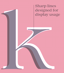 Maria Chiara Fantini is a graphic designer and letterer in Florence, Italy. In 2019, Cosimo Lorenzo Pancini, Andrea Tartarelli and Maria Chiara Fantini at Zetafonts published a slightly calligraphic Elzevir typeface, Lovelace.
 Kitsch (2019, Francesco Canovaro, Andrea Tartarelli and Maria Chiara Fantini) mixes angular medieval elements and old style letterforms. In 2019, the lapidary typeface family Beatrix Antiqua (Francesco Canovaro) was reworked by Cosimo Lorenzo Pancini together with Andrea Tartarelli and Maria Chiara Fantini into a 50-style type system called Monterchi that includes Text, Serif and Sans subfamilies. Monterchi is a custom font for an identity project for a famous fresco in Monterchi, developed under the art directorship of Riccardo Falcinelli. Tarif (2019) is a typeface family inspired by the multicultural utopia of convivencia---the peaceful coexistence of Muslims, Christians and Jews in tenth century Andalusia that played an important role in bringing to Europe the classics of Greek philosophy, together with Muslim culture and aesthetics. It is a slab serif typeface with a humanist skeleton and inverted contrast, subtly mixing latin zest, calligraphic details, extreme inktraps, and postmodern unorthodox reinvention of traditional grotesque letter shapes. The exuberant design, perfect for titling, logo and display use, is complemented by a wide range of seven weights allowing for solid editorial use and great readability in body text. Matching italics have been designed with the help of Maria Chiara Fantini and Cosimo Lorenzo Pancini, while Rania Azmi has collaborated on the design of the arabic version of Tarif, where the humanist shapes and inverted contrast of the Latin letters find a natural connection with modern arabic letterforms. In 2020, she released Quieta at Italian Type. Quieta is a 12-style humanist serif typeface inspired by the aesthetics of Italian Renaissance and by the empowering history of the painter Artemisa Gentileschi, first woman to be admitted to an Academy of Fine Arts in Italy. Fantini used sharp flat-nib calligraphic strokes to make the letters come alive. Still in 2020, she co-designed Stinger (2020, a 42-style reverse contrast family by Francesco Canovaro, Cosimo Pancini, Andrea Tartarelli and Maria Chiara Fantini). As part of the free font set Quarantype (2020), Maria Chiara Fantini designed Quarantype Uplift (with Cosimo Pancini). In 2020, Cosimo Lorenzo Pancini and Mariachiara Fantini---with the help of Solenn Bordeau---released Erotique at Zetafonts. Erotique evolved from Lovelace, an earlier Zetafonts typeface. Zetafonts describe this evil serif as follows: it challenges its romantic curves with the glitchy and fluid aestethic of transmodern neo-brutalist typography. Late in 2020, they added Erotique Sans, the sans version of Erotique, also designed by Cosimo Pancini and Maria Chiara Fantini. In 2021, Maria embarked on a project to create a font based on Antonio Sinibaldi's calligraphic material in Libro d'Ore di Lorenzo de Medici, now in possession of the Biblioteca Medicea Laurenziana di Firenze. Her first rough font was called Antonio. She also studied Raffaello Bertieri's Sinibaldi font done in 1928 at the Nebiolo Type Foundry when she designed her own digital version of Sinibaldi (2021). The latter font was regularized and smoothed in her final typeface in this project, Magnifico (2021). [Google]
[MyFonts]
[More] ⦿
|
Maria Fontenelle
|
Brazilian graduate of the MATD program at the University of Reading, class of 2019. Maria's graduation typeface there was Libri, a family of 11 styles across the Latin, Cyrillic and Arabic scripts. Libri is intended for use in cultural or historical projects, brands, and publications, andis lapidary in conception. The Arabic script is in the Naskh style. [Google]
[More] ⦿
|
Marianne Harrison
|
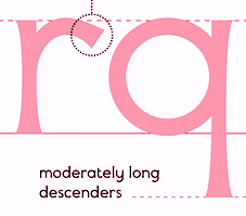 Graduate of RISD. Providence, RI-based designer of the flared typeface Pardalote (2016). [Google]
[More] ⦿
Graduate of RISD. Providence, RI-based designer of the flared typeface Pardalote (2016). [Google]
[More] ⦿
|
Marianne Stoico
|
Roman designer of the free angular chiseled typeface Incise (2014). [Google]
[More] ⦿
|
Martina Zanini
|
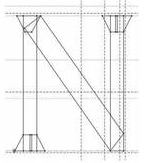 Martina Zanini lives in Lodi, Italy. While studying in 2010-2011 with James Clough at the Politecnico di Milano, she created the roman flare serif typeface Bulino (2011). Wolpe's Albertus and Gerard Unger's Amerigo served as models for its development. [Google]
[More] ⦿
Martina Zanini lives in Lodi, Italy. While studying in 2010-2011 with James Clough at the Politecnico di Milano, she created the roman flare serif typeface Bulino (2011). Wolpe's Albertus and Gerard Unger's Amerigo served as models for its development. [Google]
[More] ⦿
|
Matthew Carter
|
 Matthew Carter (born in London in 1937, and son of Harry Carter) is one of today's most influential type designers. He trained as a punchcutter at Enschedé in 1956. In 1963 he was hired by Crosfield, a firm that pioneered the new technology of photo-typesetting, to lead their typographic program. He worked for Mergenthaler Linotype (1965-1981), and co-founded Bitstream Inc. with Mike Parker in 1981, adapting many fonts to digital technology. In January 1992, he founded Carter&Cone with Cherie Cone, and often collaborated with Font Bureau. In 1995, he won the Gold Prize at the annual Tokyo Type Directors Club competition for Sophia. In 1997, he received the TDC Medal for significant contributions to the life, art, and craft of typography. In 2010, he received a MacArthur grant. He lives in Cambridge, MA.
 John Berry on Carter's art (2002). Apostrophe comments on Berry's article. Interview. His fonts: - The Microsoft screen fonts Verdana (1996), Georgia (1996), Georgia Greek, Georgia Cyrillic, Nina and the humanist sans typeface Tahoma (1994). Georgia (in roman and italic only) is a screen version of Miller, Carter's Scotch design. Nina was designed to address the requirements on smaller screens such as phones, and was used in Windows Mobile smartphones before Microsoft switched to Segoe. The Greek and Cyrillic versions of Nina were developed by François Villebrod. Georgia Pro (2010, Ascender) was developed from Georgia with the help of Steve Matteson. For Verdana Pro (2010, Ascender), Carter was assisted by David Berlow and David Jonathan Ross.
- Apple's Skia (1993), a sans serif designed with David Berlow for Apple's QuickDraw GX technology, now called AAT. [Carter's Skia and Twombly's Lithos are genetically related.]
- Monticello (2003), based on Linotype's Monticello (1950), which in turn goes back to Binny&Ronaldson's Monticello from 1797, a typeface commissioned by Princeton University Press for the Papers of Thomas Jefferson. It is in the Scotch roman style.
- Miller (1997, Font Bureau), an extremely balanced family co-designed by Carter, Tobias Frere-Jones and Cyrus Highsmith. Carter explains: Miller is a Scotch Roman, a style that had its beginnings in the foundries of Alexander Wilson In Glasgow and William Miller in Edinburgh between about 1810 and 1820. It is considered that the punchcutter Richard Austin was responsible for the types of both Scottish foundries. Miller is a revival of the style, but is not based on any historical model. Now, there is also a 16-weight newspaper version, Miller Daily (2002), and an 8-weight Miller Headline (2002). This was followed by News Miller, a typeface designed for the Guardian. Note: Georgia (1996) is a screen version of Miller, and Monticello (2002) is a later modification. A comparison of these typefaces.
- Alisal (1995, +Bold).
- ITC Galliard (1978), a recreation of Robert Granjon's garalde letters. This typeface was originally conceived in 1965. Bringhurst recommends a Carter and Cone version of this font, called Galliard CC: it has old style figures and small caps. Further versions include Aldine 701 (Bitstream), Matthew (Softmaker), ITC Galliard Etext (2013, Carl Crossgrove, Linotype), and Gareth (Softmaker).
- The ITC Charter family (1987 for Bitstream and known as Bitstream Charter; licensed to ITC in 1993; see the Elsner&Flake version of ITC Charter). An upgraded commercial version was released by Bitstream in 2004 under the name Charter BT Pro.
- Vincent (1999), a font commissioned for use in Newsweek. It is named after Vincent Figgins, an English foundry owner and punch cutter who lived in the late 18th century.
- Walker (1994), designed for The Walker Art Center.
- Ionic Number One (1999, Carter&Cone).
- Mantinia (1993, Font Bureau), based on inscriptional forms, both painted and engraved, by the Italian renaissance artist Andrea Mantegna.
- Big Caslon (1994, Font Bureau), a display typeface based on the largest romans from William Caslon's foundry.
- Big Figgins (1992) and Big Figgins Open (1998, based on the decorative didone types shown in the specimens of Vincent Figgins of 1815 and 1817). Big Figgins was called Elephant and Elephant Italic in Microsoft's Truetype Fontpack 2.
- Sammy Roman (1996), loosely based on the 17th century romans of Jean Jannon. A beautiful typeface designed to accompany kanji and kana typefaces produced by Dynalab in Taiwan.
- Sophia (1993, Font Bureau), a mix with Greek, uncial and classical Roman influences.
- Shelley Script (1972), a family of formal scripts, split into Andante, Volante and Allegro. It is based on intricate English scripts of the 18th and 19th centuries attributed to George Shelley.
- Cochin (1977, at Linotype). MyFonts writes: In 1913 Georges Peignot produced a typeface based on Nicolas Cochin's eighteenth century engravings. In 1977, Matthew Carter expanded this historic form into a three part series.
- Bell Centennial (Linotype-Mergenthaler, 1975-1978), a legible heavily ink-trapped family designed by Matthew Carter as a replacement of Bell Gothic at Mergenthaler. There are also digital Linotype and Bitstream versions. AT&T commissioned the font to replace their previous typeface choice Bell Gothic for their 100th Anniversary.
- Cascade Script (1965-1966, Linotype, now also known as Freehand 471 BT in the Bitstream collection). Paratype's extension of Freehand 471 to Cyrillic is by Oleg Karpinsky (2011).
- New Century Schoolbook was designed from 1979-1981 in the New York Lettering office of Merganthaler Linotype based on Morris Fuller Benton's Century Schoolbook from 1915-1923. It was the second face, after New Baskerville, that was digitized and expanded using Ikarus (digital technology). The Bitstream version [Century Schoolbook] is a virtually exact copy, only being moved from a 54 unit to a 2000 or so unit design.
- Auriol (Linotype), an art nouveau family (including Auriol Flowers 1 and 2 and Auriol Vignette Sylvie) based on the lettering of the painter and designer Georges Auriol. MyFonts explains: Auriol and Auriol Flowers were designed by Georges Auriol, born Jean Georges Huyot, in the early 20th century. Auriol was a French graphic artist whose work exemplified the art nouveau style of Paris in the late 19th and early 20th centuries. In 1900, Georges Peignot asked Auriol to design fonts for Peignot&Sons. The resulting Auriol font was the basis for the lettering used by Hector Guimard for the entrance signs to the Paris Metro. It was re-released by Deberny&Peignot in 1979 with a new bold face, designed by Matthew Carter. These decorative fonts with a brush stroke look are well-suited to display settings. The Peignot drawing office insisted on a more normal appearance in the boldface, calling it Robur. Matthew Carter has returned to Auriol's original design for the whole series.
- Helvetica Greek (Linotype).
- Helvetica Compressed (Linotype, 1974, with Hans-Jörg Hunziker).
- Wilson Greek (1995), compatible with Miller Text, and based on a type cut by Alexander Wilson for the Glasgow Homer of 1756. See here.
- Olympian (1970, Linotype), designed for newspaper use. This is Dutch 811 in the Bitstream collection. The custom typeface Milne (Carter&Cone) done for the Philadelphia Inquirer is based on Olympian.
- Gando, a French "ronde" typeface based on the work of Nicholas Gando (mid 1700s), and designed for photo-typesetting at Mergenthaler by Carter and Hans-Jörg Hunziker in 1970. Very similar to Bitstream's Typo Upright.
- Fenway (1998-1999, Carter&Cone), commissioned by Sports Illustrated to replace Times Roman.
- Snell Roundhand (1965-1966): a connected cursive script based on the 18th-century round hand scripts from English writing masters such as Charles Snell. Early in the digital era, Matthew published this in the Bitstream collection as Roundhand BT. A Cyrillic version by Isabella Chaeva and Vladimir Yefimov was released by ParaType in 2013.
- Auriga (1970). (Wallis dates this in 1965 at Linotype.)
- CRT Gothic (1974).
- Video (1977).
- V&A Titling (1981).
- Deface (in the FUSE 18 collection).
- Madrid (2001), done for the Spanish newspaper El País.
- Milne, done for the Philadelphia Inquirer (a revised version of Olympian). Not available.
- Durham, a sans serif family for US News&World Report.
- Airport.
- Century 725 (Bitstream, for the Boston Globe: after a design by Heinrich Hoffmeister).
- For Microsoft: Georgia, Verdana, Tahoma (1994), Nina.
- Freehand 471 (Bitstream). A chunky slightly angular script.
- New Baskerville. [Matthew Carter says that this is wrongly attributed to him. It was directed by John Quaranta.]
- Postoni [or Post-Bodoni], for the Washington Post, which is still using it. See here.
- Le Bé, a Hebrew typeface that was used in the Pennyroyal Caxton Bible.
- Rocky (2008, Font Bureau, with Richard Lipton), for the Herald in Scotland.
- Time Caledonia.
- Wiredbaum, for WIRED.
- Wrigley (for Sports Illustrated). Matthew Carter designed Roster in the 1990s, and it was adopted as a display face for Sports Illustrated under the name Wrigley. Jesse Ragan was instrumental in later expanding the family from its original seven styles to the current 60. In 2015, Carter & Cone and Font Bureau released an expanded 60-style family of this typeface under the new name Roster.
- Benton Bold Condensed (for Time Magazine).
- Foreman Light (for the Philadelphia Inquirer).
- Newsbaum (for the New York Daily News).
- Carter Latin: Matthew was commissioned in 2003 to create a new design to be cut in wood type by the Hamilton Wood Type&Printing Museum in Two Rivers, WI. He came up with an all-caps, chunky, Latin-serif design.
- Times Cheltenham (2003), which replaces in 2003 a series of headline typefaces including Latin Extra Condensed, News Gothic, and Bookman Antique.
- The Yale Typeface (2004), inspired by the late fifteenth-century Venetian typeface that first appeared in Pietro Bembo's De Aetna, published by Aldus Manutius. This extensive family is freely available to members of Yale University.
- DTL Flamande (2004, Dutch Type Library), based on a textura by Hendrik van den Keere. Since 2018, available from URW++. Additions to DTL Flamande by Lukas Schneider.
- Meiryo UI, Meiryo UI Bold, Meiryo UI Bold Italic, Meiryo UI Italic (2004). Meiryo is a modern sans serif Japanese typeface developed by Microsoft to offer an optimal on screen reading experience and exceptional quality in print, as part of the Cleartype project. The Japanese letterforms are generously open and well-proportioned; legible and clear at smaller sizes, and dynamic at larger display sizes. The beauty of Meiryo is that it sets text lines in Japanese with Roman seamlessly and harmoniously. Meiryo was designed by a team including C&G Inc., Eiichi Kono, Matthew Carter and Thomas Rickner. It won a 2007 type design prize from the Tokyo Type Directors.
- Suntory corporate types (2003-2005), developed with the help of Akira Kobayashi and Linotype from Linotype originals: Suntory Syntax, Suntory Sabon, Suntory Gothic, Suntory Mincho.
- Rocky (2008, Font Bureau): A 40-style high contrast roman family that is difficult to classify (and a bit awkward). Developed with Richard Lipton.
- Carter Sans (2010, ITC), based on epigraphic letters used in inscriptions. Created for the identity of the Art Directors Club 2010 class of its Hall of Fame, one the laureates in the 2010 Hall of Fame. Codesigned by Dan Reynolds, this chiseled typeface is loosely based on Albertus.
- In 1997, he designed Postoni for the The Washington Post's headlines, a sturdy Bodoni.
- MS Sitka (2013). A typeface with six optical sizes that are chosen on the fly if an appropriate application is present. Developed at Microsoft with the help of John Hudson (Tiro Typeworks) and Kevin Larson (who carried out extensive legibility tests). German link. Typophile link. Sitka won an award at Modern Cyrillic 2014.
- Van Lanen Wood Type (Hamilton Wood Type, 2002-2013). Carter started work on the wood type in 2002, but technical accuracy issues postponed the implementation. Digital versions were finally done in 2013 by P22's Hamilton Wood Type.
- Big Moore (2014, Font Bureau): A 1766 specimen by Isaac Moore, former manager of Joseph Fry's foundry in Bristol, England, shows many types inspired by John Baskerville. But a century later, standardization had foisted inept lining figures and shortened descenders upon these designs. Matthew Carter remedies the tragedy with Big Moore. Oldstyle figures, full-length descenders, and historic swashes are restored to this regal serif in two styles. Big Moore won an award in the TDC 2015 Type Design competition.
- Role (2019, Sans, Slab, Serif, Soft). A superfamily published at Morisawa and Fontelier. Matthew Carter, Shotaro Nakano, and Kunihiko Okano co-designed Role Serif at Morisawa.
Speaker at ATypI 2013 in Amsterdam. Speaker at ATypI 2019 in Tokyo on the topic of Expressing Vocal Tones through Typography. Linotype link. FontShop link. Favorite quote: Watching me work is like watching a refrigerator make ice. Another quote: A typeface is a beautiful collection of letters, not a collection of beautiful letters. View Matthew Carter's typefaces. Matthew Carter's fonts. The typefaces made by Matthew Carter. See also here. Wikipedia page. Klingspor link. [Google]
[MyFonts]
[More] ⦿
|
Matthieu Cannavo
|
 French type and graphic designer who graduated from Ecole Estienne in Paris. Artistic Director at Magic Bridge Agency. Home page in Vilnius. French home page and Type specimen PDF.
 In 2013, he created these typefaces: Ororo, Mixo (Velvetyne: a free font based on the Saga of Amber by Roger Zelany published in the 1970s), Facio (related to Eric Gill's Gill Facia), Pandoro, Goldino (lapidary), Futuro (geometric sans). Matthieu Cannavo at Velvetyne. [Google]
[More] ⦿
|
Mauricio Astete Brito
|
 Or Mauro Andres. Concepcion, Chile-based designer at Latinotype of the upright copperplate script and accompanying lapidary sans typeface family Antonietta (2016, Script and Caps), which is inspired by the eccentricity of the rococo style and Queen Marie Antoinette's wild personality. Winner at Tipos Latinos 2018 of a type design award for Antonietta.
 In 2020, Mauro Andres published Universo (+Stencil) at Peggo Fonts. This display font family includes a nice hairline weight. Universo was initially made for Caos Sagrados and was inspired by Aldo Novarese's style (Microgramma, Eurostile) and other retro-futuristic fonts and poster designs of the 1950s. The work was started in 2018. Typefaces from 2022: Hardbop (in eight ultra-condensed styles: Hardbop is a typographic system inspired by hardbop jazz. It is also inspired by the prolific graphic work of Reid Miles for the covers of Blue Notes Records in the '50s, Japanese jazz album covers of the '70s and condensed and grotesque hand painted signs). [Google]
[MyFonts]
[More] ⦿
|
Max Privalov
[Prive Studios (was: Government Studios, or: GVMNT)]
|
 [MyFonts]
[More] ⦿
[MyFonts]
[More] ⦿
|
Mehmet Abaci
[Studio Typo]
|
 [More] ⦿
|
Michael Harvey
|
 Stonecutter and renowned carver (b. 1931, d. 2013), cyclist, and type designer. Michael was a visiting lecturer in the Department of Typography&Graphic Communication at the University of Reading, and is the author of several books on the lettering arts. CV and picture. He worked from his studio in Bridport (Dorset). At ATypI 2007 in Brighton, he analyzed the work of Frederic Goudy, Hermann Zapf, Eric Gill, Georg Trump, and Jan van Krimpen, and took the listener from analog to digital.
 Obituary by Yves Peters, who quotes Sumner Stone: We will miss the presence of his marvelous big smile and the twinkle in his eye that went with it. That twinkle always seemed to be there above his ruddy cheeks and one quickly learned that it was a true transmission of his inner state. He was a tall leprechaun, full of laughter. He had a subtle and perennial sense of humor and just being in his presence lifted you up. He could float on the jazz piano clouds of Ellington and Strayhorn, and named typefaces after each of them. He was also a serious thinker, a scholar, and always ready to engage in a discussion of the finer points. His achievements in the lettering arts are numerous and numinous. By any measure he was prolific. He carved letters in stone and wood, drew them for hundreds of book jackets, wrote books about them, taught them to graduate students, and made them into typefaces that ranged from goofy to sublime. He was a true master in every respect. Klingspor link. FontShop link. In 2001, he and Andy Benedek founded Fine Fonts, an independent digital type foundry in Cheltenham, UK. His typefaces: - Aesop Script (Fine Fonts).
- Andreas (1996), an outline font, and Moonglow , an all-caps typeface, two stone-cutting fonts published by Adobe.
- Balthasar (2002, Fine Fonts).
- Braff (2003, Agfa and later, Fine Fonts).
- Conga Brava MM, a fluid stencil font published by Adobe.
- DTL Unico. An extensive all-purpose family at the Dutch Type Library.
- Ellington (1990) and Strayhorn (1995), both at Monotype.
- Fine Gothic (blackletter).
- Frieze (Andy Benedek and Michael Harvey, Fine Fonts). The original font dates from ca. 1990. They explain: The origin of this font was a frieze in the RAF Chapel in Westminster Abbey which Michael Harvey was commissioned to design and create. It was comprised of the names of the top brass in Bomber Command, namely Dowding, Harris, Newall, Tedder, Portal and Douglas. The Brief was to cut the letters in bronze and guild them. Instead, they were cut in perspex and guilded. Some twenty years later, the missing upper-case letters were drawn together with the lower-case letters and Frieze, the font, was born.
- Marceta Uncial (Fine Fonts).
- Mentor (Fine Fonts).
- The multiple master Mezz at Adobe.
- Quirky (Fine Fonts).
- Ruskin (2008, Andy Benedek and Michael Harvey, Fine Fonts). This display serif typeface was originally created as a commission for Michael Harvey to design a signage font for the Dean Gallery in Edinburgh.
- Songlines (Fine Fonts).
- Studz (at Adobe).
- Tisdall Script (Fine Fonts).
- Victoriana (2002, Andy Benedek and Michael Harvey, Fine Fonts). A Victorian typeface named after cyclist Victoria Pendleton.
- Zephyr (at Ludlow).
[Google]
[MyFonts]
[More] ⦿
|
Mirko Borsche
[Bureau Borsche]
|
[More] ⦿
|
Monotype ESQ Fonts
|
Monotype's ESQ fonts (enhanced screen quality) are designed for TVs and monitors. A list of their fonts: Albertus, Albany, Andalé LineDraw, Andalé M Sans, Andalé Mono, Andalé Mono bold, Andalé Mono CP437, Andalé Mono CP737, Andalé Mono CP850, Andalé Mono CP852, Andalé Mono CP855, Andalé Mono WGL, Andalé Sans, Andalé Sans bold, Andy, Andy bold, Apollo, Apollo italic, Apollo semi bold, Arial, Arial black, Arial black italic, Arial black Latin 1/2/5, Arial black WGL, Arial bold, Arial bold italic, Arial bold italic Latin 1/2/5, Arial bold italic WGL, Arial bold Latin 1/2/5, Arial bold WGL, Arial CE, Arial CE bold, Arial CE bold italic, Arial CE italic, Arial italic, Arial italic Latin 1/2/5, Arial italic WGL, Arial Latin 1/2/5, Arial Monospaced, Arial Monospaced bold, Arial Monospaced bold oblique, Arial Monospaced oblique, Arial Narrow bold italic Latin 1/2/5, Arial Narrow bold Latin 1/2/5, Arial Narrow italic Latin 1/2/5, Arial Narrow Latin 1/2/5, Arial Rounded, Arial Rounded bold, Arial Tur, Arial Tur bold, Arial Tur bold italic, Arial Tur italic, Arial WGL, Monotype Baskerville, Monotype Baskerville bold, Monotype Baskerville bold italic, Monotype Baskerville bold italic Latin 1/2/5, Monotype Baskerville bold Latin 1/2/5, Monotype Baskerville italic, Monotype Baskerville italic Latin 1/2/5, Monotype Baskerville Latin 1/2/5, Bell, Bell bold, Bell bold italic, Bell italic, Bembo, Bembo bold, Bembo bold italic, Bembo italic, Monotype Bernard condensed, Binner Gothic, Blueprint Web, Blueprint Web bold, Monotype Bodoni book, Monotype Bodoni book italic, Book Antiqua bold italic Latin 1/2/5, Book Antiqua bold Latin 1/2/5, Book Antiqua CE, Book Antiqua CE bold, Book Antiqua CE bold italic, Book Antiqua CE italic, Book Antiqua italic Latin 1/2/5, Book Antiqua Latin 1/2/5, Bookman Old Style, Bookman Old Style bold, Bookman Old Style bold italic, Bookman Old Style bold italic Latin 1/2/5, Bookman Old Style bold Latin 1/2/5, Bookman Old Style italic, Bookman Old Style italic Latin 1/2/5, Bookman Old Style Latin 1/2/5, Buffalo Gal, Century Gothic bold italic Latin 1/2/5, Century Gothic bold Latin 1/2/5, Century Gothic italic Latin 1/2/5, Century Gothic Latin 1/2/5, Century Schoolbook, Century Schoolbook bold, Century Schoolbook bold italic, Century Schoolbook bold italic Latin 1/2/5, Century Schoolbook bold italic WGL, Century Schoolbook bold Latin 1/2/5, Century Schoolbook bold WGL, Century Schoolbook CE, Century Schoolbook CE bold, Century Schoolbook CE bold italic, Century Schoolbook CE italic, Century Schoolbook italic, Century Schoolbook italic Latin 1/2/5, Century Schoolbook italic WGL, Century Schoolbook Latin 1/2/5, Century Schoolbook WGL, Monotype Clarendon, Monotype Corsiva Latin 1/2/5, Courier CE, Courier CE bold, Courier CE bold italic, Courier CE italic, Courier LD, Courier LD bold, Courier LD bold italic, Courier LD italic, Courier New bold italic Latin 1/2/5, Courier New bold italic WGL, Courier New bold Latin 1/2/5, Courier New bold WGL, Courier New CP437, Courier New CP437 Bold, Courier New CP737, Courier New CP737 Bold, Courier New CP850, Courier New CP850 Bold, Courier New CP852, Courier New CP852 Bold, Courier New CP855, Courier New CP855 Bold, Courier New italic Latin 1/2/5, Courier New italic WGL, Courier New Latin 1/2/5, Courier New WGL, Courier Tur, Courier Tur bold, Courier Tur bold italic, Courier Tur italic, Creepy, Creepy Latin 1/2/5, Cumberland, Curlz, Cyrillic: Arial, Cyrillic: Arial bold, Cyrillic: Arial bold inclined, Cyrillic: Arial inclined, Cyrillic: Courier, Cyrillic: Courier bold, Cyrillic: Courier bold inclined, Cyrillic: Courier inclined, Cyrillic: Times Bold A, Cyrillic: Times Bold inclined A, Cyrillic: Times New Roman A, Cyrillic: Times New Roman inclined A, EraserDust, EraserDust Latin 1/2/5, Facade Condensed, Felix Titling, Footlight, Footlight light, Monotype Franklin Gothic extra condensed, Monotype French Script, Forte, Monotype Garamond, Monotype Garamond bold, Monotype Garamond bold italic, Monotype Garamond bold italic Latin 1/2/5, Monotype Garamond bold Latin 1/2/5, Monotype Garamond bold WGL, Monotype Garamond italic 156, Monotype Garamond italic 156 WGL, Monotype Garamond italic Latin 1/2/5, Monotype Garamond Latin 1/2/5, Monotype Garamond WGL, Gill Alt One bold italic Latin 1/2/5, Gill Alt One bold italic WGL, Gill Alt One bold Latin 1/2/5, Gill Alt One bold WGL, Gill Alt One italic Latin 1/2/5, Gill Alt One italic WGL, Gill Alt One Latin 1/2/5, Gill Alt One WGL, Gill Sans, Gill Sans ALT1, Gill Sans bold, Gill Sans bold ALT1, Gill Sans bold condensed, Gill Sans bold extra condensed, Gill Sans bold italic, Gill Sans bold italic ALT1, Gill Sans bold italic Latin 1/2/5, Gill Sans bold italic WGL, Gill Sans bold Latin 1/2/5, Gill Sans bold WGL, Gill Sans condensed, Gill Sans condensed bold Latin 1/2/5, Gill Sans condensed Latin 1/2/5, Gill Sans extra bold, Gill Sans extra bold Latin 1/2/5, Gill Sans extra condensed bold Latin 1/2/5, Gill Sans italic, Gill Sans italic ALT1, Gill Sans italic Latin 1/2/5, Gill Sans italic WGL, Gill Sans Latin 1/2/5, Gill Sans light, Gill Sans light ALT1, Gill Sans light italic, Gill Sans light italic ALT1, Gill Sans shadow, Gill Sans Shadow Latin 1/2/5, Gill Sans ultra bold, Gill Sans ultra bold condensed, Gill Sans ultra bold condensed Latin 1/2/5, Gill Sans ultra bold Latin 1/2/5, Gill Sans WGL, Ginko, Ginko Latin 1/2/5, Gloucester bold, Gloucester bold condensed, Gloucester bold extended, Gloucester Old Style, Glowworm, Glowworm Latin 1/2/5, Haettenschweiler, Haettenschweiler Latin 1/2/5, Haettenschweiler WGL, Impact, Impact Latin 1/2/5, Impact WGL, Imprint Shadow, Kidprint, Kidprint Latin 1/2/5, Monotype Letter Gothic, Monotype Letter Gothic bold, Monotype Letter Gothic bold oblique, Monotype Letter Gothic Latin 1/2/5, Monotype Letter Gothic LineDraw, Monotype Letter Gothic LineDraw bold, Monotype Letter Gothic oblique, Monotype Letter Gothic WGL, Letter Gothic CP437, Letter Gothic CP437 Bold, Letter Gothic CP737, Letter Gothic CP737 Bold, Letter Gothic CP850, Letter Gothic CP850 Bold, Letter Gothic CP852, Letter Gothic CP852 Bold, Letter Gothic CP855, Letter Gothic CP855 Bold, Monotype Lydian, MICR, Monotype News Gothic, Monotype News Gothic bold, Monotype News Gothic bold condensed, Monotype News Gothic bold italic, Monotype News Gothic bold italic Latin 1/2/5, Monotype News Gothic bold italic WGL, Monotype News Gothic bold Latin 1/2/5, Monotype News Gothic bold WGL, Monotype News Gothic CE, Monotype News Gothic CE bold, Monotype News Gothic CE bold italic, Monotype News Gothic CE italic, Monotype News Gothic condensed, Monotype News Gothic Cyr, Monotype News Gothic Cyr bold, Monotype News Gothic Cyr bold inclined, Monotype News Gothic Cyr inclined, Monotype News Gothic Gre, Monotype News Gothic Gre bold, Monotype News Gothic Gre bold inclined, Monotype News Gothic Gre inclined, Monotype News Gothic italic, Monotype News Gothic italic Latin 1/2/5, Monotype News Gothic italic WGL, Monotype News Gothic Latin 1/2/5, Monotype News Gothic WGL, Nimrod, Nimrod bold, Nimrod bold italic, Nimrod italic, Monotype Old English Text, Monotype Onyx, Ocean Sans bold, Ocean Sans book, OCR-A, OCR-B, Pepita, Perpetua, Perpetua bold, Perpetua bold italic, Perpetua italic, Plantin, Plantin bold, Plantin bold EXPERT, Plantin bold italic, Plantin bold italic EXPERT, Plantin EXPERT, Plantin italic, Plantin italic EXPERT, Rockwell, Rockwell bold, Rockwell bold condensed, Rockwell bold italic, Rockwell condensed, Rockwell italic, Rockwell light, Rockwell light italic, Sabon, Sabon italic, Sabon semi bold, Sabon semi bold italic, Sassoon Infant Pro, Sassoon Infant Bold, Sassoon Sans, Sassoon Sans Bold, Monotype Script bold, Monotype Sorts, Swing bold, Theatre Antoine, Theatre Antoine Latin 1/2/5, Thorndale, Times New Roman bold F, Times New Roman bold italic F, Times New Roman bold italic Latin 1/2/5, Times New Roman bold italic WGL, Times New Roman bold Latin 1/2/5, Times New Roman bold WGL, Times New Roman CE, Times New Roman CE bold, Times New Roman CE bold italic, Times New Roman CE italic, Times New Roman F, Times New Roman italic F, Times New Roman italic Latin 1/2/5, Times New Roman italic WGL, Times New Roman Latin 1/2/5, Times New Roman Tur, Times New Roman Tur bold, Times New Roman Tur bold italic, Times New Roman Tur italic, Times New Roman WGL, Twentieth Century bold, Twentieth Century bold condensed, Twentieth Century bold italic, Twentieth Century bold italic Latin 1/2/5, Twentieth Century bold Latin 1/2/5, Twentieth Century condensed bold Latin 1/2/5, Twentieth Century condensed medium Latin 1/2/5, Twentieth Century medium, Twentieth Century medium condensed, Twentieth Century medium italic, Twentieth Century medium italic Latin 1/2/5, Twentieth Century medium Latin 1/2/5, Twentieth Century ultra bold, Twentieth Century ultra bold Latin 1/2/5. [Google]
[More] ⦿
|
Monotype Imaging Inc
|
 In 2004, Monotype Imaging Inc was created when TA Associates bought Agfa-Monotype from Agfa. Its headquarters are in Woburn, MA. Agfa had bought the previous incarnation of Monotype in 1998. Before that, Agfa, a well-known photographic film, chemicals and paper manufacturer and Bayer subsidiary, entered the typography scene in 1982 by acquiring an interest in Compugraphic Corporation, the American phototypesetter company. From the press release: Based in Wilmington, MA, with regional offices in the U.K., Chicago, Redwood City, Calif., Japan and China, Monotype Imaging provides fonts and font technologies to graphic professionals, software developers and manufacturers of printers and display devices. Formerly Agfa Monotype Corp., the company also provides print drivers and color imaging technologies to OEMs (original equipment manufacturers). Monotype Imaging is home to the Monotype typeface library, a collection that includes widely used designs such as the Arial, Times New Roman and Gill Sans typeface families (now in OpenType in 21 weights). Monotype Imaging offers fonts and industry-standard solutions for most of the world's written languages. Information about Monotype Imaging and its products can be found on the company's web sites at www.monotypeimaging.com, www.fonts.com, www.monotypefonts.com, www.customfonts.com, www.fontwise.com, www.itcfonts.com and www.faces.co.uk. [...] Robert M. Givens remains as president and chief executive officer of the company. [...] Senior vice presidents Doug Shaw and John Seguin of Monotype Imaging have been named to its board of directors along with Givens and Johnston. Jonathan Meeks, a principal at TA Associates, has also joined the board. Dave McCarthy remains as vice president and general manager of Printer Imaging, and Al Ristow continues as vice president of engineering. The senior management team of Monotype Imaging also includes Jeff Burk, vice president of finance, Geoff Greve, vice president of type development, John McCallum, managing director of Monotype Imaging Ltd., David DeWitt, general manager of the U.S. consumer division, and Pattie Money, director of human resources.
 In 2006, Monotype Imaging acquires Linotype, one of the last truly dedicated and honest large type companies. In 2007, Doug Shaw succeeds Robert M. Givens as president and chief executive officer. In 2010, Monotype acquires Ascender. In 2011, Monotype buys Berthold Types, Bitstream and MyFonts. Images of their best-selling typefaces in 2011: i, ii, iii. Full catalog of Monotype's typefaces [large web page warning]. View the Monotype typeface library. [Google]
[MyFonts]
[More] ⦿
|
Monotype: The Eric Gill Series
|
 In 2015, Monotype set out to remaster, expand and revitalize Eric Gill's body of work, with more weights, more characters and more languages to meet a wide range of design requirements. The series also brings to life new elements inspired by some of Gill's unreleased work, discovered in Monotype's archive of original typeface drawings and materials of the last century. So, expect a number of large families coming to a web site near you. The releases:
 - Joanna Sans Nova (2015, Terrance Weinzierl). Sixteen sans fonts, loosely based on Gill's slab serif, Joanna, so technically, this is not a Gill revival, but a Gill extension. A well-balanced family with a medium-to-large x-height. But the italic g is disturbing.
- Joanna Nova (2015, Ben Jones). A great 18-font update of Gill's original slab serif, Joanna. There is covergae now of Greek and Cyrillic.
- Gill Sans Nova (2015, George Ryan). The popular Gill Sans was extended from 18 to 43 fonts. Several new display fonts are available, including a suite of six inline weights, shaded outline fonts that were never digitized and Gill Sans Nova Deco that was previously withdrawn from the Monotype library. Again, Greek and Cyrillic coverage.
[Google]
[More] ⦿
|
Moritz Kleinsorge
[Identity Letters]
|
 [MyFonts]
[More] ⦿
[MyFonts]
[More] ⦿
|
Morula Type (or: Type01 Foundry, or: T1 Foundry)
[Valerio Monopoli]
|
 Barcelona-based designer of these typefaces:
 - Gatwick or MRL Gatwick (2019, Pangram Pangram). He writes: Gatwick is a wide incise sans that grows in funkiness as it gains weight. Vaguely vintage and fiercely syncopated, it is the perfect choice when it comes to displaying names of kung fu movie stars, pretentious yachts and sci-fi convention speakers.
- MRL Curata.
- MRL Giro (2019). A seriously ink-trapped typeface with some tapering of the stems.
- Skeleton.
- MRL Migra (2019). A sharp-serifed text typeface. Published at Pangram Pamgram as Migra Serif (2020), now a 16-style spiky serif typeface inspired by the features in migratory birds.
- Plotwist Serif (2019). A transitional (Times-Roman-like) typeface.
- Arcuata.
- Pillow (2019). A geometric sans.
- Quasar Grotesk (2019).
- T1 Korium (2021). A soft condensed (variable) display typeface and sharp, even angry, counters. And variable fonts.
- Pangram Sans V2 (2021). With Mathieu Desjardins of Pangram Pangram. This font has 144 styles, and a 3-axis variable font version. Followed by Pangram Sans Rounded (2021).
- Gil Modern (2022, CAST). Gil Modern is a distinctive low-contrast display typeface featuring Lombardic / Basque capitals and rounded lowercase letters also suitable for small-size typesetting. Inspiration came from a medieval parody developed within the context of the Catalan Art Nouveau movement. Gil Modern is named after Pau Gil i Serra, the patron of the Hospital de la Santa Creu i de Sant Pau in Barcelona, a masterpiece of the Catalan art nouveau movement in the late part of the 19th century.
- PP Rader (2021, free at Pangram Pangram). An experimental typeface that mixes art nouveau with DIN with a stunning result.
Type department link. [Google]
[More] ⦿
|
MyFonts: Chiseled typefaces
|
Chiseled typefaces in the MyFonts library. [Google]
[More] ⦿
|
MyFonts: Flared serif typefaces
|
A list of flared serif typefaces available via MyFonts. [Google]
[More] ⦿
|
MyFonts: Flareserif typefaces
|
A list of flared serif typefaces on the MyFonts site. Important members of this class include the Albertus subfamily (gradual flaring) on one end and the Friz Quadrata subfamily (extremity flaring) at the other end. [Google]
[More] ⦿
|
MyFonts: Lapidary typefaces
|
Typefaces tagged lapidary at MyFonts. The main representatives are Eric Gill's Perpetua and Berthold Wolpe's Albertus MT. [Google]
[More] ⦿
|
Neil Patel
[Greyletter]
|
 [MyFonts]
[More] ⦿
[MyFonts]
[More] ⦿
|
Nikola Kostic
[Kostic Type Foundry]
|
 [MyFonts]
[More] ⦿
[MyFonts]
[More] ⦿
|
Nils Thomsen
[Nils Types]
|
 [MyFonts]
[More] ⦿
[MyFonts]
[More] ⦿
|
Nils Types
[Nils Thomsen]
|
 Nils Thomsen or Nils Thomsen-Habermann, (Kiel, Germany) is a graduate of the Masters program in type design at KABK, 2010. Before that, he did a Bachelor of Arts in 2009 at Muthesius Academy of Arts and Design Kiel, Germany. From 2011 Nils Thomsen worked at Bureau Johannes Erler in Hamburg for two years. He set up Nils Types in 2013 and co-founded Typemates with Jakob Runge (Ortenbach) and Lisa Fischenbach (Hamburg).
 During this time he participated in the redesign of the German daily, the Süddeutsche Zeitung, ca. 2012, contributing to its new corporate typeface, SZ (Serif, Sans, Sans Condensed, Text, 40 fonts in all). Nils writes: In 2011 and 2012 I participated on the corporate typeface for the German daily, "Süddeutsche Zeitung", at the office "Bureau ErlerSkibbeToensmann". Hand in hand with type designer Henning Skibbe and art director Christian Tönsmann the different styles and weights were carefully designed. The technical part was edited by fontshop.com. SZ Text is based on Excelsior (Chauncey H. Griffith, 1931). The new typeface got narrower and the capitals smaler and lighter. To this we added lots of new details, which worked better and made it overall more efficient in tight columns and line spacing. SZ Serif is based on SZ Text and replaced the "Times" (Stanley Morison, 1931). Higher contrast and slightly narrower letter shapes makes it more useful for headline typography. SZ Sans is designed for strong headlines and replaces "Helvetica" (Max Miedinger, 1957). Simple and silent shapes gives the right touch to the neutral character of "Süddeutsche Zeitung". SZ Sans Condensed is made for tables in the sport or economy segment. It replaces FF Unit (Erik Spiekermann & Christian Schwartz, 2003-2011). His typefaces: - Conto Compressed, Conto Narrow, Conto Condensed, all made in 2015.
- Jabana (2014), Jabana Alt (2015) and Jabana Extras (2015). A compressed rounded font family, with dingbats, designed for menus. It is the first font in his own foundry, Nils Types, est. 2013. It was inspired by having a Schorle at Hamburg's coffee bars. There also is a custom version of Jabana for Lufthansa Magazin.
- Meret (2010) was his KABK graduation project. Meret is a typeface family for news, designed for tight columns and narrow interlinear space. The family includes six weights from light to black in upright and italic style. Christian Schwartz selected Meret in 2011 for use in the American magazine Fast Company. Meret won an award in 2013 at the Communication Art Magazine competition, and in 2011 at the Letter.2 type design competition, organized by the Association Typographique Internationale. It is now part of the OurType foundry collection.
- Perpetua (revival): Done at KABK in 2009-2010.
- Tretton (2009): an elliptic sans that constituted his Bachelors graduation project.
- Conto (2014). A minimalist sans family. Extended some time later in 2014 to Conto Slab.
- In 2016, Lufthansa Magazin commisioned Nils Thomsen and Max Nelles (of G+J Corporate Editors) to create a fun hand-drawn font.
- Comspot and Comspot Tec (2017). A large typeface family with rounded corners and a typewriter feel.
- Mikkel (2018, TypeMates). A versatile creamy / bouncy grocery market or cartoon script family.
- In 2019, Jakob Runge, Nils Thomsen and Lisa Fischbach released Halvar and wrote: Halvar, a German engineered type system that extends to extremes. With bulky proportions and constructed forms, Halvar is a pragmatic grotesk with the raw charm of an engineer. A type system ready to explore, Halvar has 81 styles, wide to condensed, hairline to black, roman to oblique and then to superslanted, structured into three subfamilies: the wide Breitschrift, regular Mittelschrift and condensed Engschrift. Halvar Stencil, which was released simultaneously, is a German engineering stencil font family.
[Google]
[MyFonts]
[More] ⦿
|
NovelFonts
|
This company used to sell fonts ca. 1994. A partial list: Adriatic, Ajile, Alexina, Alpist, AlpistPrimer, AltastGreeting, AltastGreeting, AmammaInline, Ammonite, Amossa, Amphora, AmphoraOpenface, AquaticHeavy, AquaticOutline, AquaticOutline, Artista, Auralle, Baltane, BankenScriptBold, Banque, Barber, Barston, Basquerole, Beanstalk, Beanstalk, Beanstalk, Belton, Benjamin, BenjaminSupplement, Berman, Bethany, BisteckBold, Bonhomi, Booster, BostonianUltra, BrintonCondensed, Brunella, Bursten, Calliope, Camanetti, Carlotta, Carolissa, Carpens, Catullus, Cecily, CentarraNova, Cetan, Chamois, Chapell, Chatten, Cheever, Chichester, Cincin, Circuit, Claritan, Claustrum, ConsidineShadow, Cortege, Crinoline, Danton, Debut, Delmonica, DeltaicItalic, Deroon, Destiny, Deweese, Dispando, Distance, Divinity, Dolmen, Dommono, Dragoon, Dryad, Easterly, Ecstatic, Eddmond, EddmondBold, Edifice, Eglentine, Eider, Elspeth, Energetic, Engine, Epworth, Evangel, Famoose, Fansilla, Fanzine, Fascinate, FascinateSpecialBoldItalic, Faysie, Fleece, Fluorine, Folderol, Foster, Frabbel, Framina, Frieze, FuseeBold, Galina, Galton, Gamina, Gasteur, Gautane, Girth, Gittani, Gleeson, Greenwood, Grettin, Guernsey, Hassan, Hostel, Houghton, Houston, Huckleberry, Ignatius, Immediate, Issabella, Ittery, Izzard, Jacquard, Jenkins, Johnson, Justine, Keeple, Kingman, Kisstelle, Kollman, Koloss, Korilly, Lagniappe, Lapidary, Latiara, Lattinum, Laurell, Leagus, Lender, Lentule, Lesline, Lichten, Litelle, Lorrenne, Lufton, Macklen, Madama, Malloy, MansourContour, Marpelli, Marsdale, Mazurka, Mearschaum, Mearschaum, Micheline, Microlla, Mirth, Modellen, Montague, Montague, Naushen, Navinno, Newsel, Novella, OakenShaded, Obbsidda, Opalone, Paliard, Passtine, Paxolla, Penki, Phaeton, Phineas, Picott, Pillsdon, Plastone, Powhatten, Prancer, Precipice, Presscon, Professor, Purcell, Quantum, Quotidien, Raffia, Rickover, Rodding, Roskell, Rostrina, Rublof, Sanctus, Sanderson, SandersonShaded, Scythe, Scythe, Sentian, Shantung, Shattuck, Shonnen, Simmissa, Spinoza, Spoleto, Standle, Stillen, Stillen, Swanson, Sylph, Tamago, Theodora, Valhalla, Vantage, Ventura, Voltaire, Wasserman, Windewood, Xebec, Yonkers, YvesScript, Zapotec, Zirkon. Most (all?) fonts are revivals of other typefaces. Examples: Amossa = Amati (1951, Georg Trump), Baltane = Biltmore (in Rookledge Typefinder; Yanega thinks Baltane is the only existing digitization), Brunella = Brudi Mediaeval (1953-1954, Walter Brudi), Cheever = Chesterfield (1977, Alan Meeks, Letraset), Elspeth = Elizabeth (1937, Elizabeth Friedlander, FTN, and 2006, Elizabeth by Jim Rimmer), Fascinate = Favrile (1985, Tom Carnase, WTC), Justine = Wolf Antiqua (1966, Hans-Juergen Wolf, VGC), Madama = Magna Carta (1974, Vladimir Andrich, Alphatype), Naushen = Nova Augustea (1951, A. Butti and A. Novarese, Nebiolo), Paliard = Packard (1913, Oswald Cooper, ATF; see also Varityper and Photo-Lettering), Parsnip = Parsons (1918, Will Ransom and 1994, Inna Gertsberg, A*I), Sentian = Serlio (Linotype), Valhalla = Richmond Oldstyle (1920s, Blackfriars). [Google]
[More] ⦿
|
Now Type
[Lucas Franco]
|
 Brazilian type foundry run by Lucas Franco (Italian Brazilian, b. 2001), his father Claudio Rocha (Italian Brazilian, b. 1957) and his mother, Milena Mainieri (Italian Brazilian, b. 1969), which is currently based in The Netherlands. Their typefaces:
 - Comic Voss (2017): Alain Voss was a comics artist born in France, he spent his early life in Brazil, and moved to France in 1972. From 1975 he worked for the experimental Metal Hurlant, Tobiaze, parodies of famous comics characters such as Popeye, Asterix and Superman, the series Anarcity (influenced by Phillip K. Dick's work), and the strip Zensetos. He returned to Brazil in 1981, and during the rest of his life collaborated with Brazilian publishers. In 1982 he won the European Album of the Year Award for Adrénaline. Comic Voss is the work of digitalisation of the hand letters present is Alain Voss' comic books and graphic works. The font has an informal look and a slight inclination, that gives a sense of speed and unconventionality. The typeface has 4 weights (regular, medium, bold and black), 26 ligatures, arrows and a complete set with 256 glyphs.
- Antonio Maria (2017): Antonio Maria, a font by Claudio Rocha and Lucas Franco, takes its shapes from the lettering found in the cover of Afixação Proibida (Display Prohibited), a book by the Portuguese poet Antonio Maria de Lisboa (1928-1953). In fact, Antonio Maria was the leader-writer of Afixação Proibida, a collective manifesto from 1949, that initiated the surrealist movement in Portugal. It is an inverted-contrast typeface with 150 ligatures and a large character set.
- Ciclope (2017): Ciclope was launched during the 1930s by the Fonderia Tipografica Reggiani, a type foundry based in Milan. The font was created under the guidance of Guido Modiano, a modernist typographer. The typeface has a strong and bold look, characteristic of the Italian art deco style.
- Maggiore (2017): Maggiore, designed by Lucas Franco, takes inspiration from the 1930s Italian Art Deco style, with strong geometrical shapes, synthetic forms with no counters at all. The upper case keyboard keys offer straight and economical letterforms, while the lower case keyboard keys contain letterforms with subtle and angled nicks.
- Mefistofele. A revival in 2018 by Claudio Rocha and Lucas Franco of the modular stencil typeface Mefistofele (1930, Reggiani foundry).
- Rudolf Titling (Lucas Franco and Claudio Rocha), a typeface that won an award at Tipos Latinos 2018.
- Franco Titling (Lucas Franco). Winner at Tipos Latinos 2018 of a type design award.
- Agora Titling Extra Light (2018). By Claudio Rocha.
- Peterson Titling (2020). A condensed titling typeface with slab vertical serifs that pays homage to the Canadian jazz pianist Oscar Peterson.
- Franco Stone (2018-2020, Lucas Franco). A tapered display typeface. Buy it at CAST.
- Rudolf Antiqua and Rudolf Initials (2018). A faithful revival of Rudolf Koch's Koch Antiqua (1922). Followed by Rudolf Text (2017-2020, Lucas Franco and Claudio Rocha).
- Doctrine (2019-2020< Lucas Franco). Chiseled and almost uncial.
- Aurelio Titling and Aurelio Unicase (2018, Lucas Franco and Claudio Rocha). Originally, it was created as a logotype for the Ultima Forma design studio in the 1990s. Based on 19th century wood types. The unicase font is a Bradbury Thompson's Alphabet 26 reboot.
- Woodeco. An art deco wood type. No date. No designer.
- Georges Deco (2017, Lucas Franco and Claudio Rocha). Georges Deco is based on the ornate lettering found in the Art Deco lettering book, Modèles de Lettres Modernes, published in 1939 by the French interior designer Georges Léculier.
- Solferini (2019). A rounded squarish typeface by Natalia Solferini, Lucas Franco and Claudio Rocha, based on the lettering of Brazilian artist Gil Duarte (aka Binario Armada).
- Pierre Deco. A wide octagonal typeface inspired by letters in the title page of the 1929 edition of Vies imaginaires, a collection of twenty-two semi-biographical short stories by Marcel Schwob, published by French book club association Le Livre Contemporain, which showcases wood engravings by Pierre Bouchet of George Barbier's illustrations. No date. No designer identified.
- Entulho (2011-2018). A stencil typeface by Ricardo Mayer, Lucas Franco and Claudio Rocha.
- Scarpa Titling (2019, Claudio Rocha and Lucas Franco). An all caps typeface based on a nameplate found on the front door of a shoemaker in Treviso, Northern Italy.
- Anton (2020, by Claudio Rocha and Lucas Franco). An art deco typeface modeled after a Dutch deco type seen on the Anton Antonius Kurvers's cover of Wendingen in 1927.
- Spinface (2020). An experimental turned letter font by Claudio Rocha and Lucas Franco.
- Etna Futurist (2020, Claudio Rocha & Lucas Franco). Digital interpretation of Etna, a wood type produced by the Italian type foundry Xilografia Meneghello & Belluzzo, in the 1920s.
- Hendrik (2021, by Claudio Rocha & Lucas Franco). A revival of Simplex (Sjoerd Hendrik de Roos, 1937).
[Google]
[More] ⦿
|
Océane Moutot
|
 French designer in 2018 of the typefaces Alma, Victoria and Villa Extra Bold.
 In 2020, she set up her own typefoundry, and released the sans typeface Honesty (2020), a 16-style flared, lapidary or incised sans typeface family that took inspiration from the Trajan column carvings and Berthold Wolpe's Albertus (1938). Typefaces from 2021: Sincerity Stencil (14 styles), Lakshmi (a lava lamp / genie bottle typeface), Sincerity (in 14 styles---take a didone, replace the serifs by wedges and the ball terminals with razor-sharp endings, mix well, and voilà, you are ready for Haute Couture). Typefaces from 2022: Hecate (a 16-style text typeface with garalde influences). [Google]
[MyFonts]
[More] ⦿
|
Olcar Alcaide
[Eurotypo]
|
 [MyFonts]
[More] ⦿
[MyFonts]
[More] ⦿
|
Old Style typefaces
[John D. Boardley]
|
 A useful introduction to old style (or garalde) types by John D. Boardley. The types can be recognized by the horizontal crossbar on the "e", and more contrast between thick and thin (compared to humanist typefaces). The serifs have wedges, and the letterforms are smooth and refined. They were in vogue for almost 200 years, starting with Bembo in 1495 (Aldus Manutius and Francesco Griffo) and Francesco Griffo's first italic type in 1501. The French caught on 40 years later, and the Garamond-style typefaces saw the light ca. 1540, thanks to Claude Garamond and Robert Granjon. Christoffel van Dijck and Mikós Kis were doing garaldes in the Dutch region ca. 1600 (see styles like Ehrhardt). Finally, Caslon (William Caslon, ca. 1725) is also classified as a garalde. Old style digital typefaces include Berling, Calisto, Goudy Old Style, Granjon, Janson, Palatino, Perpetua, Plantin, Sabon and Weiss. [Google]
[More] ⦿
A useful introduction to old style (or garalde) types by John D. Boardley. The types can be recognized by the horizontal crossbar on the "e", and more contrast between thick and thin (compared to humanist typefaces). The serifs have wedges, and the letterforms are smooth and refined. They were in vogue for almost 200 years, starting with Bembo in 1495 (Aldus Manutius and Francesco Griffo) and Francesco Griffo's first italic type in 1501. The French caught on 40 years later, and the Garamond-style typefaces saw the light ca. 1540, thanks to Claude Garamond and Robert Granjon. Christoffel van Dijck and Mikós Kis were doing garaldes in the Dutch region ca. 1600 (see styles like Ehrhardt). Finally, Caslon (William Caslon, ca. 1725) is also classified as a garalde. Old style digital typefaces include Berling, Calisto, Goudy Old Style, Granjon, Janson, Palatino, Perpetua, Plantin, Sabon and Weiss. [Google]
[More] ⦿
|
Oleh Lishchuk
[Pepper Type]
|
 [MyFonts]
[More] ⦿
[MyFonts]
[More] ⦿
|
Oliver Linke
[Lazydogs Type foundry]
|
[MyFonts]
[More] ⦿
|
Omega Type Foundry
[Toshi Omagari]
|
 Toshi Omagari is a Japanese type designer who grew up in Fukuoka and studied typography and type design at Musashino Art University in Tokyo. After graduating in 2008, Toshi taught graphic design in Fukuoka. He joined the University of Reading in the summer of 2010 and graduated in 2011. He is a type designer at Monotype.
 His graduation typeface Marco (<2011), which is named after Marco Polo, covers Latin, Mongolian, Greek, and Cyrillic, and has sans and serif versions. Inspiration for Marco goes back to Italian humanist typography such as those of Nicholas Jenson or Aldus Manutius, and general influences from calligraphy. Marco is a true superfamily, with wide utility and superb legibility---not surprisingly, it won an award at Modern Cyrillic 2014. The text styles were professionally produced in 2015 by Type Together in 2015---each style has over 1900 glyphs. His chancery hand typeface Tangerine (2010) is part of the Google font directory (for free web fonts). Typefaces from 2013: Metro Nova (Linotype: a sans family with a strangely circumcised lower case f). Metro Nova won an award at TDC 2014. Typefaces from 2014: Neue Haas Unica and Neue Haas Unica Pan European. A digital update of the Helvetica alternative Haas Unica, which was originally released in 1980 by the Haas Type Foundry for phototypesetting. In 2015, he made Cowhand (Monotype: a Western typeface). All words typed in Cowhand are of equal width, whether they contain one character or twenty (the maximum the font allows). For Monotype, he made the custom typeface Quentin Blake (2016) that emulates the irregular handwriting of Sir Quentin Blake, acclaimed illustrator of Roald Dahl's novels. In 2017, Toshi Omagari designed the Wolpe Collection for Monotype, all based on Berthold Wolpe's distinctive typefaces: Wolpe Pegasus, Wolpe Tempest, Wolpe Fanfare, Sachsenwald (blackletter: a revival of Berthold Wolpe's Sachsenwald from 1936), Albertus Nova. In 2018, Linda Hintz and Toshi Omagari published the large geometric sans typeface family Neue Plak that revives and extends Paul Renner's Plak (1928). Nadine Chahine and Toshi Omagari collaborated with Akira Kobayashi and Monotype Studio on Avenir Next Arabic (2021). At his own foundry, Omega Type, he released these typefaces in 2021: Klaket (a bold and monolinear Arabic display typeface that was inspired by classic Egyptian film posters in a free form Ruqah style), Platia (a modern revival of the 19th century font Hellenic Wide). At ATypI 2011 in Reykjavik, he spoke about Mongolian scripts. At ATypI 2015 in Sao Paulo, he revealed his research on the Siddham (post-Brahmian). Speaker at ATypI 2016 in Warsaw on BubbleKern (a new kerning algorithm). Speaker at ATypI 2017 Montreal on Sini: Arabic calligraphic styles from the Far East. Fontsquirrel link. Dafont link. Klingspor link. I Love Typography link. Google Plus link. Interview by MyFonts in 2022. [Google]
[MyFonts]
[More] ⦿
|
Panos Vassiliou
[Parachute]
|
 [MyFonts]
[More] ⦿
[MyFonts]
[More] ⦿
|
Parachute
[Panos Vassiliou]
|
 London, UK, and Athens and Kifissia, Greece-based type foundry started in 2001 by Panos Vassiliou. It specializes in fine multilingual (usually Latin, Greek and Cyrillic) typeface families. He is a graduate of the University of Toronto, Canada with a major in Applied Science and Engineering. Following his University of Toronto graduation, he studied Graphic Communications at Ryerson University. Panos Vassiliou has conducted numerous seminars for Canadian companies such as Bank of Nova Scotia, Royal Bank and Sony Canada. He graduated from the University of Toronto/Canada, where he studied Applied Science and Engineering. He has been Creative Director for the Canadian design firm AdHaus, former Publisher of the monthly magazine DNA (Greece) and Secretary-General for the Hellenic Canadian Congress (Ontario, Canada). He has been designing typefaces since 1993, including commercial fonts as well as commissions from Vodafone, Nestlé, Ikea and National Geographic. He started Parachute in 2001 setting the base for a typeface library that reflected the works of some of the best contemporary Greek designers, as well as creatives around the world obsessed with type. Apart from its commercial line of typefaces, Parachute offers bespoke branding services for corporate typefaces and lettering. Customers include Bank of America, the European Commission, UEFA, Samsung, IKEA, Interbrand, National Geographic, Financial Times, National Bank of Greece, Alpha Bank and many others.
 Myfonts link. Behance link. Other type designers at Parachute include Kanella Arapoglou, Alexandros Papalexis, Dimitris Foussekis, Aggeliki Skandalelli, Helen Gabara, Babis Touglis, Vangelis Karageorgos, George Toumbalis, Eva Karapidaki, Charis Tsevis, Pavlos Levendellis, Panos Vassiliou, and George Lygas. At Granshan 2010, Vassiliou won Second Prize in the Greek text typeface category for PF Encore Sans POro, and First and Second Prizes in the display typeface category for PF Regal Pro and PF Champion Script Pro, respectively. Typefaces: - Adamant
- PFAgora Pro: Agora Sans, AgoraSerif, AgoraSlab.
- Amateur
- PF Archive Pro (2004). He received a design award for his typeface Archive at the E AWARDS 2004. It has special typographic features and multilingual support for all European languages including Greek and Cyrillic.
- Armonia
- Astrobats
- Bague Universal and Bague Sans (2014). A geometric grotesk that dares to be different. Accompanied by Bague Slab Pro (2014), PF Bague Inline Pro (2014), and PF Bague Round Pro (2014).
- Baseline
- Beatnick
- Beau Sans (2011). Inspired by Bernhard Gothic.
- A custom didone font for Greece's Benaki Museum (2020-2021).
- PF Benchmark Pro (2014).
- Bodoni Script (2009).
- PF Brummell (2016). A sans characterized by sharp angled terminals and a diamond dot on the i.
- Bulletin Sans (2000-2005)
- Centro (Centro Sans, Centro Serif, Centro Slab) a typeface originally developed for the redesign of the Financial Times Deutschland. PF Centro Pro family (Sans, Serif, Slab, a trillion styles) won an European Design Award in May 2008 in Stockholm and at Paratype K2009. It was completed by PF Centro Serif Compressed, PF Centro Sans Condensed and PF Centro Sans Compressed in 2015. In 2016, he published PF Centro Slab Press.
- PFChampion Script Pro (2004-2008). A much lauded connected calligraphic script that is based on a calligraphic script by Joseph Champion, 1709-1765. Winner at Paratype K2009 and Granshan 2010. Images: i, ii iii, iv, v. The 4245-glyph family comprises Cyrillic, Latin and Greek subfamilies.
- Cosmonut (sic) (2002). A retro futuristoc typeface made by Dimitris Foussekis.
- PF Das Grotesk Pro (2014). Panos writes: Das Grotesk was inspired by earlier nineteenth-century grotesques, but it is much more related to American gothic designs such as those by M.F. Benton.
- DaVinciScript (2001-2006). A Treefrog-style script typeface by Vassiliou and Dimitris Foussekis.
- PF Dekka (2014). This solid elliptical sans family was influenced by Monaco's outline version called MPW. It includes PF Dekka Mono.
- PF DIN (2010): PF DIN Display (2002-2005), PF DIN Mono, PF DIN Serif (2016; this great serif version of DIN---a first---contains a wealth of goodies: just look at the great weather icons; it won an award at Granshan 2016), PF DIN Stencil Pro (2010), PF DIN Stencil, PF DIN Stencil B (2016), PF DIN Text Pro, PF DIN Text Condensed, PF DIN Text Compressed, PF DIN Text Arabic, and PF DIN Text Universal. With Latin, Cyrillic and Greek coverage, each font has about 1300 glyphs. The designs go back to the lettering of the Prussian railways around 1900. In 2013, PF Din Text Pro was published. In 2021, the three-axis (weight, width, italic) variable type system PF DIN Max saw the light.
- Eco Park. A 3d outline face.
- PF Encore Sans (2009). A rich and versatile sans family supporting Greek, Latin and Cyrillic.
- PF Fuel Pro
- PF Fusion Sans (1996-2006)
- PF Garamond Classic.
- PF Goudy Intials and PF Goudy Ornaments. A winner at Paratype K2009.
- PF Grand Gothik (2019). A large grotesque typeface family with three subfamilies and a variable font option. He writes: Grand Gothik is a postmodern, multiscript, multifaceted and variable type system which shines at its heavier extended versions with its hip, expressive, almost brutal energy. Grand Gothik's design space includes 3 axes for weight, width and one for italics. It is available as a variable font or as five separate opentype families---compressed, condensed, normal, wide and extended. Each family comes with 9 weights spanning from Extra Thin to Black plus italics.
- PF Handbook (2005-2007, sans family)
- HausSquare
- HellenicaSerif. Chiseled look, Greek simulation face.
- PF Highway Sans (2001-2015). Highway Sans Pro is based on the standard typefaces used for highway signs and other byways open to public travel in the United States. These standards were established by the US Federal Highway Administration in 1966 following several studies which were conducted at the California Department of Transportation in the 1940s. It covers Latin, Greek and Cyrillic.
- House Square. A Bank Gothic lookalike.
- PF Isotext (2005). Meant for technical documentation, it is modeled after Isonorm.
- Kids, KidsStuff
- Libera
- Lindemann and PF Lindemann Sans (2012).
- PF Marlet (2019). A sharp-edged humanist sans family fit for fashion mags: Marlet Titling, Marlet Finesse, Marlet Swash, Marlet Display, Marlet Text. PF Marlet, collected three awards one after the other, a year after appearing on Luc's best-of-2019 list. First, the coveted TDC Certificate of Typographic Excellence 2020 (at 23RDC), followed by another one from European Design Awards, a third distinction from Tokyo TDC and a fourth crown, Red Dot Award 2020, all in 2020.
- Mechanica A and B, 2002-2006. Octagonal families.
- PF Mellon (2019). A modernist variable grotesque influenced by nineteenth and early twentieth century condensed sans serif typefaces such as Stephenson Blake's Grotesque No.77 and ATF's Alternate Gothic.
- PF Monumenta (2002-2006). A majestic lapidary roman family.
- Muse
- Online (One, Two and Three). Pixelish family.
- PF Ornamental Treasures (2008). Byzantine ornaments and borders.
- PF Pixelscript
- Playskool
- Psychedelia (2003, Dimitris Foussekis). A psychedelic typeface.
- Regal Pro and Regal Finesse Pro: Award-winning high fashion display didone families, 2010-2012, originally designed for the Grazia magazine. Awards include Red Dot Awrd 2012, Communication Arts Annual Competition 2012, Creative Review Type Annual 2011, European Design awards 2011, EBGE awards 2011, Granshan Awards 2010. See also PF Regal Swash and PF Regal Stencil.
- PF Reminder Pro (2003). A hand-printed typeface.
- Scandal
- PF Spekk (2020). A simple versatile geometric sans for Latin, Greek and Cyrillic.
- PF Square Sans Pro, PF Square Sans Condensed Pro (2013).
- PF Stamps (2002-2006). A grungy stencil typeface by Panos Vassiliou and George Lygas.
- PF Synch Pro (2006). An industrial strength slab-serif typeface.
- PF UEFA Super Cup (2013).
- PF Uniform
- PF Venue (2017). Semi art deco, and free-spirited, a great poster typeface family.
- VideoText
- PF Wonderbats (2003). Funky and strange animals.
- Wonderland (2006). By Dimitris Foussekis.
Their type blog is called Upscale typography. Catalog. View all typefaces designed by Parachute. Klingspor link. MyFonts interview. [Google]
[MyFonts]
[More] ⦿
|
Paul Veres
[Calligraphics]
|
[MyFonts]
[More] ⦿
|
Pauline Fourest
[Spaghetype]
|
[More] ⦿
|
Paulo Goode
|
 English designer in West Cork, Ireland. In 2014, he designed the classical roman caps typeface Carrig---not Trajan, but still influenced by stone carving. He also created the similar typefaces Carrig Roman (2015), Carrig Italic (2015), Carrig Refined (2015), Carrig Rough (2016), Carrigeen (2014), and Carrig Pro (2017). Woodford Bourne (2015, 8 weights for 16 fonts in all, from Hairline to Black) is a 19th century grotesque typeface that pays homage to the historic stone cast type in the building façades of the former Woodford, Bourne & Co. in Cork City, Ireland. It was imprioved and extended in 2016 as Woodford Bourne Pro. Arundel (2015) is a beveled medieval typeface.
 Typefaces from 2016: Didonesque (didone headline typeface characterized by a large x-height and slightly curved v, w and y), Fnord (a serif family designed with a mischievous streak), Fnord Display (in Engraved, Inline and Woodcut styles), Eponymous (an experiment with chunky serifs), Pseudonym (a subtly falred sans with interlocking and unicase features). Typefaces from 2017: Didonesque Ghost (a stylish very contrasted didone typeface family), Banjax (humanist sans, followed in 2018 by Banjax Notched), Faded Grandeur (inspired by stone engravings that have withered and decayed over time), Torus (a rounded monoline organic sans; see also Torus Variations (2018): Torus Notched, Torus Inline, Torus Outline and Torus Biline), Meccanica (an intoxicating nuts and bolts-style engineering typeface). Typefaces from 2018: Eurocine (this is in the wide elliptical sans genre: This typeface attempts to capture the mood of movie credits from European Cinema in the 1970s, with a focus on Giallo films in particular. In terms of style, Eurocine sits somewhere between Walter Baum and Konrad Friedrich Bauer's Folio, and Aldo Novarese's Eurostile), Polyphonic (a 60-font slab serif family), Majesty (flared, incised), Verbatim (a 60-font sans family that was inspired by the best (and worst) of 1970s science fiction TV shows and movies, and aims to extract the essence of futuristic type from that era). Typefaces from 2019: Didonesque Script, Modica (an 18-style geometric sans that came from Technica), Technica (a more conservative rounded geometric sans / techno family than his earlier Meccanica), Rhetoric (a semi-cursive typeface), Quorthon (blackletter, in Black, Dark and Grey substyles), Yolk (a sans family based on the shape of an egg yolk), Transcend (an all caps titling typeface), Ergonomique (a humanist sans in 18 styles), Eloquence (a renaissance font family), Didonesque Stencil. Typefaces from 2020: Rodia (an 18-style oddball (sic) geometric typeface inspired by the iconic RADIO signage that was once in place at 5041, Pico Boulevard, Los Angeles in 1985), Arise (an 18-style text typeface family characterized by hooked terminals), Slabber (a slab serif inspired by 19th century wood type), Audacious (a 20-style decorative serif), Cream (a warm text family, with the heavier weights leaning towards Cooper Black), Sqwared, Logik (sci-fi). Typefaces from 2021: Evoque (a 36-style contrast-rich text typeface; followed in 2022 by the 16-style family Evoque Text which includes two variable fonts), Sienna (14 styles and two variable fonts; a warm soft serif with some angular design elements that make it a great choice as a text typeface), Torus Pro, Harmonique (a 32-style incised serif). Creative Market link. MyFonts link. Fontsquirrel link. [Google]
[MyFonts]
[More] ⦿
|
Pedro Leal
|
 Pedro Leal graduated in graphic design and advertising from the ESEIG-Escola Superior de Estudos Industriais e de Engenharia in Vila do Conde, Portugal, and lives in Porto. In 2010 he obtained a degree in type design at ESAD (Escola Superior de Artes e Design, Matosinhos) and started working at DSType. MyFonts link. Behance link.
 He used FontStruct in 2008 to create the pixel typeface Minimal 8pt (514 glyphs!). In 2010, he created the text family Mafra at DSType. This was followed a bit later by Mafra Display (2010; +Medium, +Black). Apud and Apud Display (2010, DSType) are high-contrast typefaces. Penna (2011) is a calligraphic type system. Braga (2011, Dino dos Santos and Pedro Leal, DS Type) is a layered font design family. Dino writes: Braga is an exuberant baroque typeface, named after a Portuguese city, also known as the baroque capital of Portugal. Our latest typographic extravaganza comes with a multitude of fonts designed to work like layers, allowing to insert color, lines, gradients, patterns, baroque, floral swashes, and many other graphic elements. Starting with Braga Base, you can add any of the twenty-three available styles, to create colourful typographic designs. In 2012, he designed User, User Stencil and User Upright>/a>, a monospaced type family with 30 styles, from Hairline to Bold. This too will many awards. Girga (+Italic, +Engraved, +Banner, +Stencil) is a strong black Egyptian family designed together with Dino dos Santos at DS Type. Solido (2012, with Dino dos Santos, DS Type) is a versatile type system with five widths: Solido, Solido Constricted, Solido Condensed, Solido Compressed and Solido Compact. In total there are 35 fonts. In 2020, a variable font was added to Solido. In 2012, he created the sans family Global, with its own dedicated web site, The Global Font. In 2013, he followed that up with the Global Stencil typeface family. In 2013, Dino dos Santos and Pedro Leal published Diversa, a set of nine very different fonts that are jointly kerned so that letters can be swapped out and replaced at will. Diversa Std (2014) extends this to include Stencil, Inline and other decorative styles. Pedro Leal's main typeface of 2013 is Aparo, a script that is calligraphic, yet keeps the characteristics of penmanship scripts, and the pizzazz of a good fashion font. In 2014, he published Ocre and Ocre Poster in sans and slab serif substyles inspired by W.A. Dwiggins, Torio, a penmanship script based on a style used in Arte de Escribir por Reglas y con Muestras (1798, by Spanish penman Torcuato Torío de la Riva y Herrer). Torio received the Communication Arts Type Award of Excellence in 2014. In 2015, he created the large Rudo and Rude Slab typeface families that exhibit many humanist traits: Rude ExtraWide, Rude Icons, Rude SemiCondensed, Rude SemiWide, Rude Wide, Rude, Rude Condensed, Rude ExtraCondensed, Rude Slab, Rude Slab Condensed, Rude Slab ExtraCondensed, Rude Slab ExtraWide, Rude Slab SemiCondensed, Rude Slab SemiWide, Rude Slab Wide, Rude Slab, Rude Slab Condensed, Rude Slab ExtraCondensed, Rude Slab ExtraWide, Rude Slab SemiCondensed, Rude Slab SemiWide, Rude Slab Wide. Early in 2015, he also did a custom typeface family for the Jornal de Notícias, including sans, serif and micro sub-styles. Dino dos Santos and Pedro Leal published Jules and Jules Text in the summer of 2015---a fat fashion mag didone 45-style family inspired by several plates from Portuguese calligrapher Antonio Jacintho de Araujo; it comes in Big, Colossal and Epic. Ecra is a workhorse slab serif, also done in 2015. Viska (2015, by Dino dos Santos and Pedro Leal) is designed for small print. Finally, TCF Zellige (2015, TypeCult) is a modular typeface inspired by the tiles that can be found in Southern Europe and North Africa. Typefaces from 2016: Oposta (Italian, Western style pushed to the esthetic extreme; received the Communication Arts Type Award of Excellence in 2017), Ardina (with Dino dos Santos: a text typeface family with three optical sizes). Typefaces from 2017: Scrittore (a heavy dark Italian bastarda influenced by the connected hand of Giovanniantonio Tagliente and Robert Granjon's Civilité; at DS Type), Zart (a voluptuous ebullient black didone, or fat face; +Script). Fusta (a gorgeous wood-type inspired poster typeface), Ordem (a low-contrast contemporary Capitalis Monumentalis). Typefaces from 2018: Glitched (an experimental variable spacing font), Striver (a crisp contrasted curvy display typeface), Certo Slab and Certo Sans, Foreday (a forward-looking typeface family with associated variable font, covering sans, serif, semi-sans and semi-serif), Perfil (an inline and swashy high end script). Typefaces from 2019: Akut (a purely angular typeface with some rounded corners), Denso (by Dino dos Santos and Pedro Leal: a great condensed variable font with weight, serif and optical size axes), Jornada (a multistyle family with a Fraktur, a chancery, a bookish style called Libro, a news text serif, a clean sans, a slab serif, a monospace, and a penmanship script, all in one family dubbed hygienic post-punk by Leal). In 2020, Dino dos Santos and Pedro Leal designed Larga, which was inspired by the typefaces shown in the specimens of the Fundiçãao Typographica Portuense from 1874. Larga is a wide all caps family and comes with a variable opentype format. Pedro also designed Effigy (a text typeface with slightly ballooning stems), Haste (a typeface that flirts with reverse contrast), Mescla and Enorme (an ultra massive and modular 3000-glyph mastodont of a font, together with Dino dos Santos; based on constructivist principles) in 2020. Typefaces from 2021: Orla (a straightforward interpretation of the Skeleton Antique No2 from the Stephenson, Blake & Co. foundry; for the sans, the serifs were removed), Elaine (+Ombre, +Fleurer; a complete baroque / Elzevir family influenced by Jacques-François Rosart in its ornamental styles). [Google]
[MyFonts]
[More] ⦿
|
Pedro Medina-Leansry
[Pedroglifos]
|
[MyFonts]
[More] ⦿
|
Pedroglifos
[Pedro Medina-Leansry]
|
San Juan, Puerto Rico-based designer of these typefaces in 2022: Deliria (what letters look like after a Delirium Tremens), Fusil (a 5-style display typeface that crosses genres), Matria (a curvy stencil typeface), Nimba (a 6-style paintbrush family), Quiron (an 8-font + variable squarish sans), Zafrada (a 13-style lapidary rustic family for which the designer took inspiration from sugar cane). [Google]
[MyFonts]
[More] ⦿
|
Pepper Type
[Oleh Lishchuk]
|
 Odessa, Ukraine-baded designer of the Peignotian sans typeface Alethia Pro (2016, Mint Type) for Latin and Cyrillic. In 2016, Oleh Lishchuk and Andriy Konstantynov co-designed the rounded scientific or technical paper font Midpoint Pro. In 2017, they published the 64-style geometric grotesque sans-serif typeface family Opinion Pro, which is characterized by its extra-large x-height. Deposit Pro (2017) is a wide slab-serif family with low x-height.
 In 2018, Oleh published Rolleston (a rigid 42-style serif font family with peculiar spiky serifs), the music poster Latin / Cyrillic typeface family Stereonic (Mint Type) that features multiline, stencil, inline, contour, overline and underline styles. He published the programming font Vin Mono Pro in 2018 at Mint Type. Vin Mono Pro is a squarish monospaced font family with extra-large x-height and rounded corners. Related typefaces include Vin Sans Pro, Vin Slab Pro Typefaces from 2019: Ditch (octagonal), Spaceland (a minimalist sans), Alethia Next, Mazzard (a 54-style geometric grotesque with three different x-heights), Mazzard Soft. Typefaces from 2020: Daikon, Monospaceland (a 21-style monospaced monolinear organic sans), Mantonico (a small x-height transitional text family), Ruberoid (described as a squarish geometric sans-serif family reminiscent of Italian designs of 1950s and 1960s, but featuring considerably rounder shapes to give it a more contemporary feel), Geraldton (a geometric sans family), Shtozer (a chamfered typeface family). Typefaces from 2021: Zerno (an 18-style flared lapidary typeface family), Golca (a 16-style geometric sans for Latin, Greek and Cyrillic), Steclo (an 18-style tall condensed minimalist sans). [Google]
[MyFonts]
[More] ⦿
|
Perpetua
|
 Designed by Eric Gill in 1925 (Monotype). Dean Allen at Textism [defunct site] plainly hated Adobe's digital version of this great transitional display face.
 Digital versions include View digital versions of Perpetua. Yet another list of Perpetua fonts and descendants. [Google]
[More] ⦿
|
Pesic
[Dragan Pesic]
|
 Dragan Pesic's foundry, Pesic, is located in Kraljevo, Serbia. Dragan created the grungy typeface Missing Stone (2013) and the lava lamp typeface Owl (2013). These typefaces, like nearly all his typefaces, cover both Latin and Cyrillic.
 In 2014, he created the flared lapidary typeface Epigraph, the grungy typeface Macalature, the sans typeface Tact (a techno / Wall Street sans), Tact Slab, and the techno sans typeface Big Bang. Typefaces from 2016: Narration (a crisp serif font family), Tact Slab New, Train Of Thought (based on vintage and retro posters of the 19th and 20th centuries; with Ana Pesic), Tact New. Typefaces from 2017: Days Like This (2017, an angular handcrafted dadaist counterless pair of typefaces; with Ana Pesic). Typefaces from 2018: Glint (a redesign of the elliptical typeface BigBang). [Google]
[MyFonts]
[More] ⦿
|
Peter Langpeter
|
 German illustrator, cartographer, calligrapher, and logo and typedesigner who has his own studio, LP Design, since 1995. Designer of the classical script typeface LP Pinselschrift (2009, URW++), the bush script LP Pinsel Satt (2013, URW++), and the signage / bamboo script typeface LP Bambus (2009, URW++).
 LP Saturnia (2013, URW++) and LP Saturnia Sans (2017, URW++) is a roman antiqua typeface: The aim was to create a modern interpretation of the classical Roman letters (Capitalis Monumentalis or Trajan by Carol Twombly), avoiding the archaic look of these letter forms. LP Philharmonia (2014; +Outline in 2017) is a one-style didone typeface. In 2015, he designed the Peignotian typeface family LP Lazise (Regular, Lapidar, SemiSerif, Serif), and published it in the URW Fontforum collection. In 2016, still at FontForum URW++, he published LP Hand Eins and the slightly tapered lapidary typeface LP Cervo. Typefaces from 2017: LP Harmonia (calligraphic). LP Horizont Caps. Klingspor link. [Google]
[MyFonts]
[More] ⦿
|
Phil Martin
[Alphabet Innovations International -- TypeSpectra (Was: MM2000)]
|
 [MyFonts]
[More] ⦿
[MyFonts]
[More] ⦿
|
Prive Studios (was: Government Studios, or: GVMNT)
[Max Privalov]
|
 Max Privalov's foundry, Government Studios (was: GVMNT), was based in Los Angeles. Government Studios was originally a film studio, designing fonts for future film projects.
 Typefaces from 2012: the bamboo cut-tipped caps typeface Envy Races (with possible use in fashion mags), the Peignotian typeface Counterfeit Black, and the wide wedge-serifed slightly engraved high-contrast titling typeface Black Feud. In 2014, Government Studios designed the spiky all-caps typeface Spotlight and the flared typeface Opium (which was designed using the herbarium specimens of Papaver somniferum). In 2016, the Government Studios label was replaced by Prive Studios, and Max Privalov became Max Prive. As Max Prive, he designed the sans typefaces Skin in 2016 and Muguet in 2017. Typefaces from 2018: Merrant (a 3-style geometric grotesk straight from the Futura era). HypeForType link. [Google]
[MyFonts]
[More] ⦿
|
Protimient.com
[Ben Jones]
|
 Ben Jones (b. 1980, Buckinhamshire, UK) was a student of typography and graphic communication in Reading (2000-2004). He got his Masters in Typeface Design from the University of Reading in 2011. MyFonts link for Protimient.
 His typefaces: - Billingsley (2005, Protimient: a script based mainly on a writing specimen of the penman Martin Billingsley, originally published in 1618).
- Buxus (2005, T26: a shaded display family).
- Cale (2004).
- Caligne (2004), Caligne Sans (2004).
- Clarence (2007) is a sturdy 2-style serif family.
- Eksja (2009) is a humanist slab serif family which to me feels a lot like a sans family---the slabs added as an afterthought.
- Emrys (2011) is his graduation typeface at Reading: Emrys is a modulated sans typeface for scripts including Latin, Greek, Armenian, Arabic and Cyrillic. Emrys won Third Prize at Granshan 2011. Emrys morphed into Amrys, which was published in 2019 by Monotype.
- Gilibert (2005, T-26, a decorative didone face).
- Greenwood (2006, Protimient: a monospaced, cursive typewriter script, based on a typewritten letter from a Mr J. G. Greenwood Esq. to a branch of the National Westminster bank in Oxfordshire, Great Britain, dated 6th June 1904).
- Joanna Nova (2015, Monotype). A great 18-font update of Gill's original slab serif, Joanna. There is coverage now of Greek and Cyrillic.
- Lightbox (2004, Protimient). A legible monoline sans family. See also the different later design Lightbox 21 (2021: an 18-style rather pure geometric sans family that runs the range from hairline to very black).
- ModernModern (2004, Protimient: a squarish didone).
- Nosta (2006, a nice modern text family).
- NotanuthaSerif1 (2005, text face; see also here).
- Pasquinade (2005, blackletter).
- Stobart (2006) is a script font based on the characters written in a letter by Henry Stobart, dated 1899. It is an Opentype handwriting typeface with 1200 glyphs with heavy character substitution.
- Travis (2005, Protimient: a legible sans family).
View Ben Jones's typefaces. [Google]
[MyFonts]
[More] ⦿
|
Radek Lukasiewicz
|
 Radek Lukasiewicz studied printmaking at Nicolaus Copernicus University in Poland. He worked as a graphic designer and type designer in London. In 2019 he moved to Reading to study for an MA in Typeface Design, and graduated there in 2020. His graduation typeface was Squeak and Roger. He writes: Roger is a text family that eludes the categorisatioon of serif or sans. It is taking characteristics from both models to achieve optimal reading. The letter shapes have been developed with consideration for all scripts supported: Latin, Cyrillic, Greek and Arabic. Squeak is a sans serif typeface, tailored for captions, side notes, and short paragraphs that sets aptly in small sizes. After Reading, he started working for CAST and Three Dots Type.
 Other typefaces: - The text typeface family Calisia (2014, at T-26).
- Chorda (Gestalten).
- four typeface families at FontFont, published in 2020: FF Kaytek Rounded, FF Kaytek Headline, FF Kaytek Slab, FF Kaytek Sans.
- Szymborska (2014). In 2014, he won the Type Szymborska competition in Poland with a typeface specifically designed for the poetry of Wislawa Szymborska.
- Radius (2021, at Three Dots Type). A polygonal (and variable) typeface family.
- Mora (2019). A sans and serif supertype family for Latin, Greek and Cyrillic.
- Jantar Flow (2019-2021, CAST) and Jantar Sharp (2019-2021, CAST). Jantar Flow is a humanist sans typeface tailored for continuous reading for both printing and screen. With its large x-height and low contrast it also performs very well in captions, side notes, and short paragraphs set in small sizes. Jantar Sharp is a lapidary text family with flared terminals that eludes the categories of serif or sans.
[Google]
[MyFonts]
[More] ⦿
|
Raul Israel Meza Lorca
|
 Architect who studied at Universidad Austral de Chile (Valdivia, Chile), who co-founded Compañía Tipogáfica de Chile). Now located in Santiago (Chile), he created the angular typeface Tejuela (2015; published in 2019 first at TipoType and eventually at Underground), which was influenced by the shapes of old churches of Chiloe, in southern Chile. In 2020, it became LC Tejuela at Compañia Tipogáfica de Chile.
 In 2017, he published the monolinear rounded condensed display typeface Forjada at Latinotype, which was inspired by wrought iron window and door grills on facades of historic buildings. In 2018, he designed the neo-humanist typeface Costanera at W Foundry. Typefaces from 2019: LC Gianluca (a flared or glyphic typeface; at Compañia Tipogáfica de Chile), Centenario (free: a sans typeface based on the street signs of Chiloe, in southern Chile). Typefaces from 2020: LC Marichiweu (a German expressionist typefaces inspired by Rudolf Koch's calligraphy). Typefaces from 2021: LC Timaukel (a serif family in the Dutch tradition). [Google]
[MyFonts]
[More] ⦿
|
Rian Hughes
[Device Fonts]
|
 [MyFonts]
[More] ⦿
[MyFonts]
[More] ⦿
|
Richard Lipton
[Lipton Letter Design]
|
 [MyFonts]
[More] ⦿
[MyFonts]
[More] ⦿
|
Robbie Smith
[Smith Hands]
|
[MyFonts]
[More] ⦿
|
Robert E. Leuschke
[TypeSETit]
|
 [MyFonts]
[More] ⦿
[MyFonts]
[More] ⦿
|
Robert Foster
|
Designer, sculptor and type designer, b. 1895. His type designs include: - Foster Abstract (1931). Mac McGrew writes: Foster Abstract is a very heavy, serifless type of futuristic design, in which parts of some letters are suggested rather than actually presented. It was designed by Robert Foster in 1931, and matrices were cut by Frederic W. Goudy for private casting. Some letters are much like Sans Serif Extrabold. Compare Pericles. Foster Abstract was revived in 2006 by John Bomparte as Abstrak BF.
- Pericles (1934, ATF), a Greek simulation or stone cut style typeface. Mac McGrew writes about Pericles: Pericles is a distinctive font of sans-serif capitals designed in 1934 for ATF by Robert Foster, based on hand-lettering he had been doing for several years for magazine and advertising headlines. It is much more informal than other sans serifs of the time, such as Futura or Bernhard Gothic, with more of an inscriptional feeling. Some characters are derived from classical Greek forms. A 72-point size is said to have been cut but never issued. For an extension and digitization of Pericles, see Pericles Pro (2005, Ascender, Steve Matteson), a 433-glyph OpenType font. Pericles was reworked by Jim Rimmer as RTF Cadmus. P22 writes about this version: Rimmer's re-working of a design done by Robert Foster, a hand lettering artist. Foster's type, named Pericles, is a style that he used for a time in lettering magazines and advertising headings. The design is based closely on early inscriptional Greek, but is less formal than the sans types of Foster's time. Cadmus keeps the proportions of Pericles but is overall less quirky than the Foster design. A further extension (including Greek, Cyrillic and Hebrew) was done by Canada Type as Cadmus Pro (2016).
[Google]
[MyFonts]
[More] ⦿
|
Robert Strauch
|
 Born in 1973, he studied graphic design at the University of Applied Science Augsburg, Germany from 1994-1999, and attended a year at the École Supérieure des Arts Décoratifs in Strasbourg, France. He founded his own shop in 2001 and teaches calligraphy, type design and typography in various workshops and seminars. One of the three cofounders of Lazydogs Type foundry in Augsburg, Germany. Robert left the foundry in December 2014 to concentrate on his main business in graphic design.
 His (fabulous---in my view) garalde typeface Fabiol (2005) was a winner at the TDC 2005 type competition. In 2008, he created the Pandera typeface family. In 2013, Boris Kochan and Robert Strauch co-designed Streets of London, a lapidary typeface based on London street signs developed by David Kindersley. [Google]
[More] ⦿
|
Rodrigo López Fuentes
|
 Chilean type designer who studied at Universidad de Chile and teaches at Pontificia Universidad Catolica de Chile. Santiago, Chile-based co-founder, with Sergio Leiva Whittle, of Untype in 2017.
 He won an award in the display type category at Tipos Latinos 2012 for Needham Black, and at Tipos Latinos 2010 for his text typeface Amaranta. In 2016, he published the humanist sans typeface family Aromo at Underground and the likable slab serif Rogliano at TipoType. Rogliano Pro followed in 2019 at Untype: Rogliano Pro is a 70-font humanist slab serif super family (7 weights on 5 styles each plus matching italics) that while maintaining a strong and direct backbone, sustains a warm undertone that nods to the lettering and lithographic posters of the Victorian era. It contains William Morris-influenced borders. Co-designer, with Sergio Leiva Whittle, of the 18-style wedge serif typeface family Nikola (2017), which won an award at Tipos Latinos 2018. In 2018, they published the humanist sans typeface family Axios. In 2018, Lopez Fuentes published the major workhorse sans typeface Wozniak, which is named after Steve Wozniak as a tribute to the pioneers of the digital revolution, and has all the bells and whistles of a modern typeface. Typefaces from 2020: Madero Slab (monolinear, in 42 styles; with Sergio Leiva Whittle), Mondo (a great display typeface characterized by incised terminals and a humanist ductus), Mondo News (20 styles), Tectonica (a decorative didone by Rodrigo López Fuentes, in Poster, Engraved and Swash styles: it appears to be almost identical to his 2019 font family Tectonic). Typefaces from 2021: Suave Pro (an 18-style humanist sans with rounded terminals). [Google]
[MyFonts]
[More] ⦿
|
Ronald Arnholm
|
 Professor of Art Graphic Design at Lamar Dodd School of Art, part of the University of Georgia, Athens. Born in 1939 in Barre, VT, Arnholm designed the lapidary typeface ITC Legacy Sans family (1992, a 51-font remake of the 1960s Arnholm Sans), and the ITC Legacy Serif family (1992, Venetian). In 2009, ITC Legacy Square Serif and ITC Legacy Serif Condensed were added. ITC Legacy Square Serif won an award at TDC2 2010.
 His early fonts were released at VGC, the Visual Graphics Corporation: VGC Aquarius (2, 4, 5, 6, 7, 8, Outline) (1967) (this was digitized in 2007 by Steve Jackaman as Aquarius), VGCArnholm Sans Bold (1965), VGC Fovea (1977). Arnholm also designed WTC Veritas for the World Typeface Center, New York, 1981-85. He created these headline typefaces for the Los Angeles Times, 1980: L.A. Times Regular, L.A. Times regular italic, L.A. Times Bold and L.A. Times Bold Italic. MyFonts page. Linotype bio. FontShop link. Klingspor link. View Ronald Arnholm's typefaces. [Google]
[MyFonts]
[More] ⦿
|
Rosario Nocera
|
 Naples-based designer of the connect-the-dots typeface Doretypo (2013). In 2013, he set up his own commercial foundry. In 2014, Rosario published the display typeface family Remah (improved to Remah Pro in 2020), and the Edwardian wedding script Paulette (+Paulette Eroded). In 2015, he designed Remah. In 2016, he published Romina (a neoclassical typeface family) and Cajito (a sans developed for numerous uses, ranging from app to website and catalogue to corporate and logo design).
 Typefaces from 2017: Koara (hand-ccrafted), Marek Slab. Typefaces from 2018: Scorno (geometric sans). Typefaces from 2019: Maraka (a painted font), Zachar (a lapidary roman caps font designed for horror or thriller games). Typefaces from 2020: Chamy (a vernacular or supermarket typeface), Osaca (a 6-style display sans with square counters). Typefaces from 2022: Thima (a fluid display typeface). Behance link. Newest Behance link. [Google]
[MyFonts]
[More] ⦿
|
Ruben Tarumian
|
 Ruben Tarumian, aka Ruben Hakobyan (b. 1963, Yerevan), is an Armenian architect and font designer, and son of architect Khachatur Hakobyan. In 1985 he graduated from the Faculty of Architecture and Construction of Yerevan Polytechnical Institute. He started designing typefaces in 1986. In 1989 he created one of the first computer fonts in Armenia, for Xerox Ventura Publishers. Since 2006 he is the chairman of NGO "Association of Type Designers".
 His typefaces include ArTarumianAnpuit (Rage Italic extension, I guess), ArTarumianBakhum, ArTarumianBarak (really BernhardFashionBT), ArTarumianErevan, ArTarumianGovazdItalic, ArTarumianGrig, ArTarumianHamagumar, ArTarumianKamar, ArTarumianPastar, ArTarumianAfrickian, ArTarumianAnpuit, ArTarumianGrqiNor, ArTarumianGrqiNorBold, ArTarumianGrqiNorBoldItalik, ArTarumianGrqiNorItalic, ArTarumianHeghnar, ArTarumianMHarvats, ArTarumian Ishkhan (for Latin and Cyrillic), ArTarumianMatenagir, ArTarumianMatenagirBold, ArTarumianMatenagirBoldItalic, ArTarumianMatenagirItalic, ArTarumianNorMatenagir. These fonts from 1994-1995 are Armenian generalizations of Latin fonts. Arian was created in 2007. In 2019, he published ArTarumianKhachatur (a fantastic architectural drafting or blueprint font) and ArTarumianVard (a lapidary or stone-carving font). Typefaces from 2020: Ar Tarumian Behrens Initialen (a revival of the art nouveau typeface Behrens Initialen by Peter Behrens; for latin, Cyrillic and Armenian), ArTarumianGrigNor (a comic book font). [Google]
[MyFonts]
[More] ⦿
|
Sabrina Nacmias
[Faire Type Foundry]
|
[More] ⦿
|
Salih Kizilkaya
|
 Ankara, Turkey-based designer. In 2019, he created these typefaces: the squarish SK Kape, the semi slab serif SK Karl, the sans typeface SK Rotun, the angular typeface SK Pila.
 Typefaces from 2020: SK One Block (a squarish typeface inspired by Arabic Kufic), SK 1980 Unicase (squarish, in seven styles), SK Reykjavik (16 slab and 16 geometric sans styles), SK Aristo (a 10-style monolinear sans with a flagging left wing in the lower case t), SK Falcon (a 24-style geometric semi-serif), SK Akropol, SK Payidar (a 16-style geometric sans for Latin, Cyrillic and Greek), SK Kalender (a monolinear display typeface), SK Bade (a mini-serif), SK Asya (a demi-serif typeface with flared, almost lapidary, terminals). Typefaces from 2021: SK Goldilocks (a 14-style grotesque), SK Merih (a 12-style nearly monolinear simple sans), SK Selanik (a 40-style monolinear almost humanist sans; for Latin, Cyrillic and Greek), SK Clarke (a 20-style display sans), SK Moreau (a 12-style geometric sans), SK Greenland (a 14-style humanist sans that has totally succumbed to hipsterism, especially in its coathanger f), SK Seren (a flared incised typeface family), SK Monaco (a 16-style humanist sans), SK Yok Deve (hand-printed), SK Barbicane (a monolinear organic sans), SK Boncuk (an eight-style industrial sans), SK Ilke Mono (a 22-style monospaced geometric sans, useful as a programming font), SK Zweig (a quirky 52-style serif family inspired by Stefan Zweig's work), SK Anatolia (a display font inspired by Anatolian culture), SK Gothenburg (a 48-style grotesk), SK Curiosity (a 40-style geometric sans). [Google]
[MyFonts]
[More] ⦿
|
Sandrine Nugue
|
 Type and graphic designer who graduated from the program Typographie et langage at ESAD in Amiens, France, in 2013. Her lapidary wedge serif graduation typeface, Ganeau (2013) is named after type designer François Ganeau. In 2011, she created the informal sans typeface Stanislas.
 Speaker at ATypI 2013 in Amsterdam on the topic of the ESAD in Amiens. Winner of a font contest in 2014 for the French CNAP (Centre national des arts plastiques). Her winning entry is the free lapidary typeface Infini (2015). Infini also won an award at TDC 2016. Finally, she designed Orientation Stencil (at Commercial Type, for Thanh Phong Le and Bathilde Millet Architects), Boll Injurial (lapidary; at 205TF), Moulin (a lapidary typeface; at Commercial Type), and Parangon (a roman typeface with inline styles). Orientation won an award at the Type Directors Club's Type Design Competition 2019. Instagram link. [Google]
[More] ⦿
|
Sandro Dujmenovic
|
 Zadar and/or Zagreb, Croatia-based designer. Creator of Renedi Sans (2007), a 21st century version of Didot.
 In 2014, he designed Réal, a fashion mag typeface family (Homme, Serif, and Femme) that is imagined as a custom type for Yves Saint Laurent. Réal Serif is a lapidary typeface, while Réal Homme is a contrasted almost Peignotian sans typeface. [Google]
[More] ⦿
|
Sardiez
[Sergio Ramírez Llamas]
|
 Sardiez is a foundry located in Medellín, Colombia, and is run by Sergio Ramírez (b. 1988). He created the ornamental stencil typeface Sra stencil (2008), which was inspired by Colombian colonial times. His typeface Sister won an award at Tipos Latinos 2008 in the non-text typeface category. Trochera (2009) is a Tuscan face. Systopie (2010) is a techno family.
 Codesigner with Manuel Ernesto Corradine of Canciller (2012), an italic roman script. At Tipos Latinos 2012, Sergio Ramírez won awards for the following typefaces: Papermov (in the text category) and Panclasta (in the display category: co-designed with Carlos Fabian Guerrero). Neuron (2012) is a fantastic 16-style rounded elliptical sans family created together with Manuel Eduardo Corradine over at Corradine Fonts. Tecna (2012) is an 8-style techno sans family also done with Manuel Eduardo Corradine over at Corradine Fonts. Quarzo (2012, with Corradine as well) is a formal copperplate script. In 2013, together with Manuel Eduardo Corradine at Corradine Fonts, he created Neuron Angled, Alianza Script (a packaging script), Alianza Italic and Alianza Slab (a good-looking slab family). Mayonez (2013, Sergio Ramirez) is a friendly elliptical text typeface for Latin and Cyrillic. Whisky (2015) is a large blackletter family with inlines and fills for layering co-designed with Manuel Corradine. Related to German expressionism, it won an award at Tipos Latinos 2016. Typefaces from 2019: Brutman (inspired by brutalist architecture, he explains that he wanted to create a typeface that reimagined the incise style for the 21st century). Overview of his work and interview. Behance link. Klingspor link. Fontspring link. Creative Market link. [Google]
[MyFonts]
[More] ⦿
|
Selina Bernet
|
Type designer in Sankt Gallen, Switzerland. Graduate of HBK in Bern, and the Typemedia program at KABK, class of 2016. Her KABK thesis typeface, Junior, is lapidary and flared. Yassin Baggar (Fatype) designed the high-contrast Peignotian sans family Beausite Fit and Beausite Grand in 2014 at Fatype. It comes with subfamilies called Grotesk, Grand and Slick, and has fashion mag appeal. Beausite Classic is a more standard sans. Between 2014 and 2018, with the help of Anton Koovit and Selina Bernet, it grew to 56 styles. She also did Nana Mouskourim Greek (2016), a Greek addition to the lapidary typeface Albertus. [Google]
[More] ⦿
|
Sergey Pleshkov
|
Together with Julia Krysanova (or Julia Artamanova), Moscow-based Sergey Pleshkov designed the flared (lapidary) Latin / Cyrillic text typeface Flandria in 2013. This typeface has its dedicated site. Flandria comes in Regular, Italic, Display and Poster (stencil). [Google]
[More] ⦿
|
Sergey Titov
[Titov Design Studio (or: Reformer)]
|
[MyFonts]
[More] ⦿
|
Sergio Ramírez Llamas
[Sardiez]
|
 [MyFonts]
[More] ⦿
[MyFonts]
[More] ⦿
|
Shirley Smith
|
Photo era designer of typefaces. These include the Photolettering fonts Gothica 3, 4 and 5, which are all semi-calligraphic sans designs with flaring. [Google]
[More] ⦿
|
SIAS (or: Signographical Institute Andreas Stötzner)
[Andreas Stötzner]
|
 Andreas Stötzner (b. 1965, Leipzig) is a type designer who lives in Pegau, Saxony. Graduate from the Hochschule für Grafik und Buchkunst Leipzig and the Royal College of Art in London (1994). Since then, free-lance. Started making typefaces in 1997. He edits the sign and symbol magazine Signa. He spoke at Typo Berlin 2004 and at ATypI 2005 in Helsinki where his talk was entitled On the edges of the alphabet. Coauthor with Tilo Richter of Signographie : Entwurf einer Lehre des graphischen Zeichens. He set up SIAS in 2006-2007 and started selling fonts through MyFonts.
 He created Andron Scriptor (2004, free), with original ideas for Greek and Cyrillic alphabets. The Andron project intends to extend this Venetian text typeface in many directions: right now, it covers Latin, Greek, Coptic, Gothic, runes, Cyrillic, Etruscan and Irish scripts, musical symbols, astronomical and meteorological symbols, and many dingbats. The Andron MC Corpus series (2012) contains Uncial, Mediaeval and Capital styles. He also created Andron 1 Monetary (2014), Andron 1 Alchemical and Andron 2 ABC (2014, for children's literature). On or before 2006, he created a few typefaces for Elsner & Flake. These include EF Beautilities, EF Ornamental Rules, EF Squares, EF Topographicals, EF Typoflorals, EF Typographicals, EF Typomix, EF Typosigns, EF Typospecs, EF Typostuff. Fonts from 2007-2010: Gramma (2007, three dingbats with basic geometric forms), Andron Corpus Publix (2007, dingbats including one called Transport), SIAS Freefont (2007, more dingbats), SIAS Lineaturen (2007, geometric dingbats) SIAS Symbols (2009), Andron Freefont (2009, text font), Andron 1 Latin Corpus (2009), Andron 1 Greek Corpus (2009), Andron Kyrillisch (2009, consisting of Andron 1 CYR, Andron 2 CYR and Andron 2 SRB where SRB stands for Serbian), Andron 2 English Corpus (2010, blackletter-inspired alphabet), Andron 2 Deutsch Corpus (2010), Andron Ornamente (2012), Reinstaedt (2009, blackletter family), Crisis (2009, economic sans). Lapidaria (2010) is an elegant art deco sans family that includes an uncial style and covers Greek. Hibernica (2010) is a Celtic variant of Lapidaria. Symbojet Bold (2010) is a combination of a Latin and Greek sans typeface with 400 pictograms. Rosenbaum (2012) is a festive blackletter face, obtained by mixing in didone elements. In 2013, he published Arthur Cabinet, a six-style inline art deco caps collection of typefaces, with accompanying Arthur Ornaments and Arthur Sans. Meanwhile, Andron Mega grew to 14,700 unicode glyphs in 2013. Typefaces from 2014: Behrens Ornaments (art nouveau ornaments based on Behrens Schuck by Peter Behrens, 1914), Fehlian (an open capitals typeface family with Plain, Gravur and Precious styles), Happy Maggie (a hand-drawn script based on Maggie's sketches when she was 13 years old), Abendschroth (for lullabies, girl's literature, murder poems, short stories and Christmas gift books), Abendschroth Scriptive, Albyona English No. 1 (as Andreas writes, suitable for children's books, fantasy literature, crime novels, natural food packaging and poison labeling, for infancy memories, vanitas kitsch items, dungeon museum bar menu cards, introductions to herbalism and witchcraft manuals), Lindau (a Venetian Jensonian typeface with considerable flaring in the ascenders), Grund (based on the 1924 art deco signage in Leipzig's Untergrundmesshalle Markt whose architect was Otto Droge), Leipziger Ornamente (based on variopus buildings in Gohlis, Leipzig, dating from the 1920s-1950s), Kaukasia Albanisch (ancient writing system of the Caucasus region, allegedly created by Mesrop Mashtots who also invented the Armenian alphabet in 405). Commissioned fonts include Runes (commission by Ludwig Maximilian University Munich), Lapidaria Menotec, Old Albanian, Dania (a special notation for Danish dialectology. Font extension of Latin Modern Italic (Open source), commissioned by the Arnamagnanean Institute, Copenhagen Universit). Typefaces from 2015: Andron 2 EIR Corpus (uncial, Gaeli), Artemis Sans (Greek version of Arthur Sans), Ardagh (a Gaelic / Irish version of Arthur Sans). Don Sans (a sturdy sans). Typefaces from 2016: Popelka (an uncial fairy tale font modeled after the opening sequence of the 1973 movie Drei Haselnüsse für Aschenbrödel). MyFonts. Behance link. Abstract Fonts link. Klingspor link. Showcase of Andreas Stötzner's typefaces at MyFonts. View the SIAS typeface library. [Google]
[MyFonts]
[More] ⦿
|
Siobhan Brown
|
Graphic designer in Cambridge, UK, who created March Vernacular and Ely Vernacular in 2014 for the towns of March and Ely, respectively. Her Mary Hare font (2014) is based on a gravestone from 1688. In 2016, she designed the Tuscan typeface Cordelia Gothic (renamed from Harriett Gothic) for the Mill Road Cemetery near Cambridge. Behance link. [Google]
[More] ⦿
|
Slovolitni de Grande Tartaria
[Dima Pole]
|
 Dima Pole (Slovolitni de Grande Tartaria, Yalta, Russia) is a Russian type designer [as a joke, he claimed on Behance to be from Russellstown, Ireland and on Hellofont he said that he was in Berjozovskii, Iceland].
 Designer of the clean sans typeface Hinton (2016), the lapidary typeface Gor (2016), and the handcrafted typefaces Pocherk 26, Zelo (calligraphic), Rusich, Etruria (based on Etruscan inscriptions, this handcrafted font tries to accurately simulate the writing of the Etruscans; published in 2018), Hors, Fufluns, and Fufluns Luna. Most of his fonts cover both Latin and Cyrillic. In 2017, he designed Garuspik (ultra-condensed; in Krug, Original and Kvadrat styles), Konung, which is a mixture of various medieval central European styles for Latin and Cyrillic. He also designed the contrast-rich typeface Retra, the blackletter typeface Getman, the eroded typeface family Hors, the Celtic typeface Keltichi, and the angst-ridden Dubrove (which was inspired by Moravian angular type design of 1930-50s) in 2017. Typefaces from 2018: Tartaria, Osovec (a wedge serif text typeface in one style), Maribor, Vinneta (a Latin / Cyrillic italic). Typefaces from 2019: Arkaim (East Slavic simulation style). [Google]
[MyFonts]
[More] ⦿
|
Smith Hands
[Robbie Smith]
|
Smith Hands (was: Smiths Hands Collection) is the foundry of type designer Robbie Smith in London. I cite that source: Robbie Smith is a graduate of Reigate School of Art&Design (under calligrapher Gaynor Goffe and sign-writer John Gibbs) and went on to work in Richard Kindersley's letter carving studio in London. Now a freelance type designer in London trading under the moniker of Smith Hands, Robbie is focusing on incorporating the pattern and drive of calligraphy into modern styles of lettering that will fit beautifully into the modern corporate world. Robbie Smith designed these typefaces: - Brushed Sans (2018). Inspired by sign-writing.
- English Engravers Roman (2010). A lapidary / chiseled text typeface---inspired by the beauty and eccentric detailing of British stone carved lettering.
- Hoplight (2010).
- Snag (2013). A copperplate sans--he calls it a typeface with embryo serifs.
[Google]
[MyFonts]
[More] ⦿
|
Spaghetype
[Pauline Fourest]
|
Paris-based type designer who graduated from ESAD Amiens in 2017 with a blackletter / roman / italic typeface family, Pandore. She writes: The typeface is a combination of fraktur, roman and italic, all based on the same x height. It has three weights, totaling a range of nine different typographic colors. These three styles are a free, minimal and contemporary interpretation of three historical examples. First a fraktur blackletter from work by Rudolf Koch (c. 1910-1920). Then a roman from the alphabet designed by Eric Gill as a guide for sign-writers (1905). Finally, an italic from the cancellaresca model and Robert Granjon's Galliard, along with its revival by Mathew Carter (1978). At Future Fonts, she released the incised typeface Giboula (2018) and the rounded supermarket sans Mayonnaise (2021) which was inspired by the 1914 book Specimen de caractères pour affiches Olliere & Cie. Personal home page. Future Fonts link. [Google]
[More] ⦿
|
Stan Partalev
|
 Type designer at Fontfabric in Sofia, Bulgaria, who writes about himself: Starting as a graffiti artist, I have been interested in visual arts and design since I can remember. That led me to the National Academy of Art, Sofia, where I graduated in Poster and Visual Communication BA, and Poster MA. I then joined a renowned type foundry, where I was able to develop and improve my understanding of typography and type design skills. In 2020 I became a part of the newly created foundry Spacetype..
 He was part of the Fontfabric team that designed the 521-font family Zing Rust, Zing Sans Rust and Zing Script Rust in 2017. In 2018, he published the free all caps lapidary typeface Colus at Fontfabric. In 2019, Svet Simov, Radomir Tinkov and Stan Partalev designed the 72-strong Noah family of geometric sans typefaces, which is partitioned into four groups by x-height from small (Noah Grotesque) to medium (Noah and Noah Text) to large (Noah Head). With Plamen Motev and Ventsislav Djokov, he co-designed Panton Rust and Panton Rust Script in 2019. In 2020, Mirela Belova and Stan Partalev co-designed the 22-style (+variable) geometric sans family Gogh at Spacetype. Typefaces from 2021: Code Next (a 20-style geometric sans by Svetoslav Simov, Mirela Belova and Stan Partalev; it includes two variable fonts). Garet (2021) is a 22-style (+variable) geometric sans family by Mirela Belova and Stan Partalev. Dedicated page. Co-designer with Mirela Belova of Steam (2021), a 13-style layerable Western family that emulates wood type. [Google]
[MyFonts]
[More] ⦿
|
Start a design career
|
 The typophiles were asked in 2003 to list the 20 essential typefaces to start a design career. Here we go, unedited:
 - Sean Glenn: MetaPlus (FontShop), Helvetica Neue (Adobe), Mrs. Eaves (Emigre), Gotham (Hoefler Type Foundry), 20th Century (Monotype), Base (Emigre), Agency (Font Bureau), Simian (House Industries), Agenda (Font Bureau), OCR-B (Adobe), Formata (Adobe), Caxton (Adobe), Scala Sans (FontShop)
- Letter Tiep: Akzidenz Grotesk BQ, Univers, Frutiger Next (or Avenir?), Today Sans (or Syntax / Gill Sans?), The Sans, Trade Gothic (or News Gothic/Vectora?), Futura, Minion, Palatino, Berthold Baskerville (or Storm's John Baskerville / Monotype Bulmer), Filosofia, Lexicon nr2 ($$$), Officina Sans&Serif (or the FF Info series), Adobe Caslon, Bembo (or HTF Requiem), Stempel Garamond, Joanna (or Scala?), Clarendon (or Giza?)
- Jay Wilkinson: Akzidenz Grotesk BQ, Helvetica neue, Avenir (or Futura), Frutiger, Trade Gothic, Franklin Gothic, Optima, Bodoni (or Didot but not filosofia), Adobe Garamond, Adobe Caslon, Minion, Hoefler, Dante, Sabon, Perpetua, Requiem (or Bembo), Centaur, Clarendon, Shelly (or Snell Roundhand), Fette Fraktur (or Goudy Text)
- John Gordon: Blackletter, Centaur, Janson, HTF Requiem, Bembo, Caslon, Garamond, Baskerville, Palantino, HTF Didot, Perpetua, Electra, Clarendon, Akzidenz Grotesque, Helvetica Neue, Futura, Franklin Gothic, Trade Gothic, Poetica, Shelly
- Keith Chi'hnag tam: Minion Pro, Myriad Pro, Sabon Next, Monotype Baskerville (or Berthold), HTF Didot, Perpetua, Monotype Gill Sans, Berthold Akizidentz Grotesk, Thesis Sans, Swift, ITC Charter, FF Meta, PMN Caecilia, Adobe Caslon Pro, FB Miller, Adobe Syntax, ITC Franklin Gothic, Bitstream Futura, Monotype Bembo, Snell Roundhand
- H.D. Schnellnack: Neue Helvetica, FF DIN, Clarendon, Thesis Sans, Garamond Pro OTF or Neue Sabon, Myriad Pro OTF, Mrs Eaves OTF, FF OCR or FF Letter Gothic, Rotis Sans and SemiSans, Futura, Scala, TAZ III OTF, Univers, Bauer Bodoni, Franklin Gothic or Bureau Grotesque, Bell Gothic or Interstate (1993, Tobias Frere-Jones), Jenson Pro OTF or Warnock Pro or Kepler, Thesis Serif or Thesis Mono, Zapfino
[Google]
[More] ⦿
|
Stéphane Elbaz
[General Type Studio]
|
 [MyFonts]
[More] ⦿
[MyFonts]
[More] ⦿
|
Stefan Cristian Cioroianu
|
Romanian designer of these free fonts in 2007: Antique roman (2 styles), Artistic swash, Caslon Swash, Cioroianu font (handwriting), Collage anonymous (ransom note), Fraktur, Human letters (scanbat face: an old erotic capitals face), Lapidary roman, Title page 1600 (scanbats). In 2008, he made the "aged" didone typeface 1600 and Century Modern Italic. In 2010, he created Century Modern TT Regular, Century Modern Shadow, and Ornament Borders. Another Fontspace link. A third Fontspace link. [Google]
[More] ⦿
|
Stefan Ellmer
[Ellmer Stefan & Johannes Lang]
|
 [MyFonts]
[More] ⦿
[MyFonts]
[More] ⦿
|
Stefan Tabencki
|
Graphic designer in Los Angeles who created the very flared typeface Conflux in 2017. Behance link. [Google]
[More] ⦿
|
Stiggy & Sands
[Jim Lyles]
|
 Stiggy & Sands is the Arvada, CO-based type foundry of Brian "Stiggy" Bonislawsky and Jim "Sands" Lyles, est. 2013. Their first commercial typefaces, all jointly designed, are Sante Pro (2013, a tall upright connected script), Rum Raisin (2013, inspired by the lettering from a vintage Kellogg's Raisin Bran cereal box), Maiden Orange (2013), Luckiest Softie Pro (2013, a rounded comic book typeface that was inspired by hand-lettered vintage 1950s advertisement), Smokum Pro (2013, a Western typeface), Carioca Script Pro (2013, inspired by the lettering on the RCA Records Stereo Action Series in the 1960s), Uncial Antiqua Pro (2013), Spicy Rice Pro (2013: psychedelic or disco), Ultra Pro (2013: a Clarendon or wood style slab serif), Quintessential Pro (2013: calligraphic), Bruno Ace Pro (a techno/automoive font, followed in 2018 by Bruno Ace Pro Rounded), Aclonica Pro (2013), Special Elite Pro (grungy typewriter), Audiowide Pro (2013: organic techno face), Peralta Pro (2013: a bouncy cartoon font), Englebert (2013: inspired by the title screen of the 1930s film Der Blaue Engel starring Marlene Dietrich), McLaren Pro (2013: comic book style), Galindo (2013: a comic book typeface with square counters), Margarine Pro (2013), Righteous Pro (2013), Mouse Memoirs Pro (2013, cartoonish), Risque Pro (2013, funky style), Luckiest Guy Pro (a fat comic book font based on vintage 1950s ads), Original Surfer Pro (2013, an an offbeat sans serif font bursting at the seams with lively personality. Inspired by a vintage advertisement for the California Cliffs Caravan Park, this font exudes all of the fun of a summer vacation anytime of the year), and Marcellus Pro (a flared roman inscriptional typeface with both upper and lower case, originally published in 2012 by Astigmatic; CTAN page).
 Typefaces from 2014: Purple Purse Pro (an offbeat didone based on a vintage Ivory Soap ad from the fifties). Typefaces from 2015: Shojumaru (an oriental simulation font inspired by a movie poster for the 1957 film titled Sayonara, starring Marlon Brando), Sacramento (connected script), Bazaruto (a decorative set of typefaces inspired by wrought iron, Letters and Lettering by Carlyle and Oring, and didones), Maiden Orange Inline Pro. Typefaces from 2016: Syncopate Pro (unicase), Kapture (a great romantic script), Stint Pro (slab serif spanning condensed to expanded widths), Grand Hotel Pro (upright connected script), Ribeye Pro, Shojumaru Pro (oriental style), Freckle Face Pro. Typefaces from 2017: Dear Sans (rounded sans family), Glorious Song (a display serif typestyle that was inspired by the poster lettering for the 1948 movie Words and Music), Montez Pro. Typefaces from 2018: Croft (a revival of Lewis Buddy III's ATF classic, Roycroft, 1912), Navarone (a Greek simulation font inspired by the titling sequence of the 1962 movie "The Guns of Navarone"), Distressed Telegraph (based on the typewriter font Large Elite Type No. 44), Gimbel Script (a tall monolinear upright vintage script), Bigelow Rules Pro (a beatnik font), Eagle Lake Pro, Husk (a digitization and extension of a film typeface called Maile by LetterGraphics), Boilermaker (a digitization and extension of a film typeface from LetterGraphics dubbed Flair G100), Eagle Lake (calligraphic), Bruno Ace. Typefaces from 2019: Fascinate Pro (a soft-shelled art deco typeface), Artisinal (an art deco typeface that revives John W. Zimmerman's Cubist Bold from 1928). Modulate (a blocky modular typeface), Lorette (based on the film font Laurel from LetterGraphics), Quandor (based on the Lettergraphics film font Impacta), Magnate (a digitization of the film typeface Wilshire from LetterGraphics), Toastie (based on the film font Flair 312 by Lettergraphics), Latitude Sans (a heavy sans based on Lettergraphics' Free). Typefaces from 2020: Bugleboy (this font family revives and expands the film font Wood Grotesk by LetterGraphics), Berkshire Pro (a plump display typeface), Mervale Script Pro (a brush script originally done in 2012 at astigmatic One Eye). Typefaces from 2021: Huerto (a geometric angular sans), Pennyroyal Pro (an elephant feet font with irregular outlines), Pennyroyal (an elephant foot almost cutout font). Typefaces from 2022: Pardner (a hand-painted spaghetti Western font). MyFonts link. [Google]
[MyFonts]
[More] ⦿
|
Storm Type Foundry
[Frantisek Storm]
|
 Storm Type is a major Czech foundry that offers the inspiring work of Frantisek Storm (b. 1966, Prague). Most typefaces are made by Storm himself. The typefaces:
 - Aaahoj: a ransom note font.
- Abald (2005): Abald adds to the number of "bad-taste" alphabets as seen on faded commercial inscriptions painted on neglected old houses.
- Academica: Josef Týfa first published Academia in 1967-68. It was the winning design in a competition for scientific typefaces, announced by Grafotechna. It was cut and cast in metal in 1968 in 8 and 10 point sizes in plain, italic and semi-bold designs. In 2003 Josef Týfa and Frantisek Storm began to work on its digital version. The new name Academica distinguishes the digital execution (and modifications) from the original Academia. In 2021, Frantisek Storm added Academica Sans.
- Aichel: originally designed for use in architecture (in this particular case for a UNESCO memorial plaque for a church built by Jan Santini-Aichel on Zelenà Hora). It has a stone-chiseled look.
- Alcoholica
- Alebrije (2015). A 42-cut exaggerated cocaine-driven typeface family with instantly recognizable v and w that have slabs on their baselines.
- Amor Sans and Amor Serif (2005).
- Amphibia (2016). A lapidary typeface family.
- Andulka (2004): 24 weights for use in books, mags and newspapers. Extended in 2011 to Andulka Sans.
- Antique Ancienne, Moderne&Regent (2000): Baroque typefaces.
- Anselm Sans and Serif (2007): 20 styles about which Storm writes The ancestry of Anselm goes back to Jannon, a slightly modified Old Style Roman. I drew Serapion back in 1997, so its spirit is youthful, a bit frisky, and it is charmed by romantic, playful details. Anselm succeeds it after ten years of evolution, it is a sober, reliable laborer, immune to all eccentricities. It won an award for superfamily at TDC2 2008. It covers Greek as well.
- Areplos (2005): Based on Jan Solpera's 1982 typeface with serifs on top and serifless at the bottom.
- Bahnhof: poster typeface from the 1930s.
- Baskerville Original Pro (2010) comprising Baskerville 10 Pro, Baskerville 10 Cyr, JBaskerville, and JBaskerville Text. This is an important and thoroughly studied execution starting from photographs of prints from Baskerville's printing office, ca. 1760.
- Beletrio and Beletria (2018). Beletria (26 styles) is intended as a modern book type. Beletrio is a peaceful accompanying sans.
- Bhang (2011) is a flat brush signage family of exceptional balance.
- Biblon (2000; note: ITC Biblon is a watered down version of Biblon, so please go for the original, not the ITC version). Biblon Pro (2006) is even better; 6 weights.
- Briefmarken (2008): letters that look dented like postage stamps.
- The 64-style Carot type system (2020), which consists of Carot Sans, Carot Display, Carot Slab and Carot Text.
- Clara Sans and Clara Serif (2014). Based on sketches by Rotislav Vanek, and published at Signature Type Foundry.
- Clichee
- Cobra (2001)
- Comenia Script (Radana Lencov&acaute;), an upright script with a handwritten look for teaching writing.
- Comenia Text (2006): a serif family for school books. Also called Comenia Pro Serif.
- Compur (2000).
- Coroner (2018). A blackletter first sketched in 1988.
- Defender (2008): a heavy slab family.
- Digita (2004)
- Dracula (2017). A great blackletter family.
- Dynamo Grotesk (1995): Storm's 60-weight sans family going back to the early sans traditions. In 2009, this was updated to Dyna Grotesk Pro.
- Enamelplate (2011).
- Etelka (2005, 42 styles): a corporate identity sans family, which became commercial in 2006. Four Etelka Monospace styles were added in 2008. Etelka Sans and Etelka Slab were released in 2019.
- Evil
- Excelsior Script (1995-1996), perhaps renamed Excelsor Script around 2000.
- Farao (a great Egyptienne font in 3 weights)
- Friedhof (2011). A family based on tombstone lettering from ca. 1900. It contains handtooled and shaded (Geist + Deko) variations.
- Gallus Konzept (2007, in many weights):
- Carolingian-Roman-Gaelic-Uncial script, or an exploration into how the Latin alphabet could look were the evolution of the Carolingian Minuscule to stop in the 8th century AD in Sankt Gallen.
- Genre: a modern face.
- Fenix 21 through 23 (2010): An elliptical sans family that includes a hairline (21).
- Header (2009): a magazine headline family.
- Hercules (2001). A didone family originally influenced by Monotype's fat face Falstaff (1935).
- Hexenrunen (2006, + Reverb): a runic simulation face.
- Ideal Gothic
- Inicia (2018). A sans originally drawn in the 1980s.
- Jannon (this is a formidable Garalde family). Jannon Pro appeared on MyFonts in 2010.
- Jannon Sans (2011).
- Jannon Text Moderne (2001): thicker hairlines and smaller x-height than Jannon Text, thus more generally useful
- Jasan (2017). A 36-strong sans family with lots of wide styles.
- JohnBaskerville (2000)
- JohnSans (2001, a 72-weight sans version of Baskerville)
- Josef Sans (2013, with Jan Solpera). A humanist sans family related to Josef Tyfa's Tyfa Roman (Tyfa Antikva).
- Juvenis (2003)
- Kompressor: techno typeface
- Lexicon Gothic: newspaper and magazine type family, created in 2000. Renamed Lexon Gothic.
- Libcziowes: based on the oldest lettering found in Bohemia, on a gravestone in Libceves dating from 1591
- LidoSTF (2001, free): a redrawn Times with lots of individuality, yet still a newspaper typeface
- Lokal Script (2009): a large hand-printed letter family.
- ITC Malstock (1996-1997), a condensed film poster face.
- Mediaeval
- Metron (2004, a digital version by F. Storm and Marek Pistora after a huge sans design from 1973 by Jiri Rathousky, which was commissioned by the Transport Company of the Capital City of Prague in 1970 to be used in the information system of the Prague Metro. In 1986, the metro started using Helvetica): this typeface is eminently readable!
- Modell: techno
- Monarchia [The Monarchia family, consisting of three designs, is a transcription of "Frühling" of the German type designer Rudolf Koch, enriched by a bold and text design]
- Moyenage (2008): a 25-style blackletter family for Latin and Cyrillic, almost an experiment in blackletter design and flexibility. Winning entry at Paratype K2009.
- Mramor (1988-2013). A roman caps typeface with lower case added. Storm: The text designs are discontinued since they were replaced by the related Amor Serif family (along with its -sans version). Even so, ten display styles are left.
- Negro
- Ohrada: condensed upper case
- Ornaments 1+2
- Ozdoby 1+2 (great dingbats): The set includes heraldic figures, leaves, decorative endings, various skull forms, weather signs, borders and many more.
- Patzcuaro
- Pentagramme
- Pentagraf: a slab serif
- Pepone and Pepone Stencil. Designed for setting belles-lettres, this serifed family defies classification.
- Pivo (2006), a connected diner script inspired by Bohemian beer labels.
- Plagwitz (2000, blackletter). Plagwitz poster by Lissa Simon (2012).
- Politic (2004): a clunky fat octagonal family made for billboards, flyers, posters, teabags, and matches for the green Party in the 2004 Czech elections. Caps only.
- Preissig Antikva + Ornaments: a 1998 digitization and interpretation of Preisig's polygonal type from 1925. The Pro version is from 2012.
- Preissig 1918: a typeface by Vojtech Preissig cut in linoleum
- Preissig Ozdoby
- Regent Pro (2015): a rustic Baroque typeface that oozes energy out of its semi-transitional semi-didone orifices.
- Quercus Whiteline, Quercus 10, Quercus Serif, and Quercus Sans (2015). Four large families, created for informational and magazine design, corporate identity and branding. The sans has a Gill flavor.
- Regula Text and Regula Old Face. Regula is named after the secular monastic order Regula Pragensis. Initially, the digitized font (regular old Face, which is now free) had jagged edges and a rather narrow range of applications until the summer of 2009, when Storm added text cuts. Regula was a baroque alphabet faithfully taken over from a historical model including its inaccuracies and uneven letter edges.
- Rondka (2001)
- Sebastian (2003, a sans with a funky italic), about which he writes: Sans-serif typefaces compensate for their basic handicap---an absence of serifs---with a softening modulation typical of roman typefaces. Grotesques often inherit a hypertrophy of the x-height, which is very efficient, but not very beautiful. They are like dogs with fat bodies and short legs. More# Why do we love old Garamonds? Beside beautifully modeled details, they possess aspect-ratios of parts within characters that timelessly and beauteously parallel the anatomy of the human body. Proportions of thighs, arms or legs have their universal rules, but cannot be measured by pixels and millimeters. These sometimes produce almost unnoticeable inner tensions, perceptible only very slowly, after a period of living with the type. Serifed typefaces are open to many possibilities in this regard; when a character is mounted on its edges with serifs, what is happening in between is more freely up to the designer. In the case of grotesques, everything is visible; the shape of the letter must exist in absolute nakedness and total simplicity, and must somehow also be spirited and original.
- Serapion (a Renaissance-Baroque Roman typeface with more contrast than Jannon)
- SerapionII (2002-2003): early Baroque
- Solpera (digitization of a type of Jan Solpera, 2000)
- SplendidOrnamenty (1998, a formal script font)
- Splendid Quartett: an Antiqua, a sans, a bold and a script. Stor writes: The script was freely transcribed from the pattern-book of the New York Type Foundry from 1882, paying regard to numerous other sources of that period.
- St Croce (2014). Based on worn-out lettering on tombstones in the St. Croce Basilica in Florence, this is a flared lightly stenciled typeface family.
- Technomat (2006): this typeface takes inspiration from matrix or thermal dot printers.
- Tenebra: a combination of the Baroque inscriptional majuscule with decorative calligraphic elements and alchemistic symbols
- Teuton (2001): a severe sans family inspired by an inscription on one German tomb in the Sudetenland
- Traktoretka
- Trivia Sans (2012), Trivia Serif (2012, a didone), Trivia Serif 10 (2012), Trivia Grotesk (2012, 48 cuts), Trivia Gothic (2013), Trivia Slab (2012), and Trivia Humanist (2013, a strong wedge serif family: I wanted a clear and majestic typeface for book jackets, LP cover designs, posters, exhibition catalogues and shorter texts).
- Tusar (2004): a digitization of a type family by Slavoboj Tusar from 1926
- Tyfa ITC + Tyfa Text: Designed by Josef Týfa in 1959, digitized by F. Storm in 1996.
- Vida Pro (2005), a big sans family designed for TV screens. Vida Stencil Demo is free.
- Walbaum Text (2002). Walbaum 10 Pro (2010) and Walbaum 120 Pro (2010) are extensive (and gorgeous!) didone families, the latter obtained from the former by optical thinning. Storm quips: I only hope that mister Justus Erich won't pull me by the ear when we'll meet on the other side. Advertised as a poster sans family, he offers Walbaum Grotesk Pro (2011).
- Wittingau (2016). A wonderful decorative blackletter typeface family, with a great set of Wittingau Symbols.
- Zeppelin (2000): a display grotesk
This foundry cooperates in its revivals with experienced Czech designers Ottokar Karlas, Jan Solpera and Josef Týfa. Alternate URL. Myfonts write-up. At ATypI 2004 in Prague, he spoke about his own Czech typefaces, on his Czech Typeface Project, and on the life of Josef Týfa. Linotype link. FontShop link. Klingspor link. [Google]
[MyFonts]
[More] ⦿
|
Stuart de Rosario
[Stuart de Rozario]
|
 [MyFonts]
[More] ⦿
[MyFonts]
[More] ⦿
|
Stuart de Rozario
[Stuart de Rosario]
|
 Senior type designer at Fontsmith in London, since 2012. Before that, from 2001 until 2012, he was font engineer and senior designer at Foundry Types Ltd in London. He specializes in the technical aspects of type design. He graduated from the College of North East London. He set up The Foundry Types with David Quay.
 In 2008, Stuart de Rozario and Freda Sack co-designed the Egyptian typeface Foundry Origin. In 2015, de Rozario released the 17-style FS Millbank, which is marketed as a wayfinding or information design typeface family. It is accompanied by an extensive set of icons, FS Millbank Icons. FS Lucas (2016) is a geometric sans by Stuart de Rozario. In 2018, he designed the flared sans typeface family FS Benjamin with creative direction from Fontsmith founder and creative director Jason Smith. The Lost & Foundry family of fonts was designed in 2018 by Fontsmith's designers Stuart de Rozario and Pedro Arilla together with M&C Saatchi London: FS Berwick FS Cattle, FS Century, FS Charity, FS Marlborough, FS Portland, FS St James. The campaign was developed by Fontsmith, M&C Saatchi London and Line Form Colour. The crumbling typefaces of Soho were recovered to be sold online as a collection of display fonts, to fund the House of St Barnabas's work with London's homeless. Co-designer with Andy Lethbridge at Fontsmith of FS Koopman (2018). Designed by Andy Lethbridge and Stuart De Rozario, this hybrid sans workhorse takes inspiration from Swiss grotesks, American gothics and early British grotesques. [Google]
[MyFonts]
[More] ⦿
|
Studio Typo
[Mehmet Abaci]
|
 Mehmet Abaci (b. 1978) is based in Istanbul. In 2014, he established Studio Typo, where one can buy his typefaces. Limited forms of the fonts can be downloaded fpr free from the Dafont site.
 Creator of the elegantly plump rounded sans typeface Vinyl Cuts (2013), Samatya (2013, a unicase piano key typeface), Boldie (2013), Laundry Day (2013, alphadings), and the wood log typeface Timbers (2013). Typefaces from 2014: Smush, Slim Fir (athletic lettering), Typonome, Typo Slab, Neons, E-Square (sci-fi typeface), Screamer, Typoline (piano key typeface), Omniblack (flared display face), Papillons (flared caps), Typoster (a great fat geometric slab serif typeface family accompanied by an equally great shaded outline style), Typo Comica (a family drawn to compete with Comic Sans), Tipo Press, Manyeto (calligraphic), Quatroline (prismatic typeface), Wardoom, Cabold Comic, Digiform, Akaju (oily fat typeface with lighting effects), Almira, Bonebastic, Comic White Rabbit, Sinema (a bit of retro movie art deco), Sober, Cali Brush, Tiny Plate, College Player, Smart Kid, Barbed, Wideroy, Angella (+outline: a poster family), Megi Sans. Typefaces from 2015: Bro 4D (outlined 3d capitals), Typo GeoSlab, H&B Sketch (a gorgeous sketched didone), Mixiva (a six-style athletic lettering slab serif family), Typo Sketch (sketched font), Malter Sans, Parole Script, Degaws (a great sketch font), Typo Comics, Gribal, Gribal Shadow, Early Times (a sans family), Quizma (an elegant sans family), Super Seven (shaded), Typo Slab Inline, Type Slab Irregular, Geoma (hairline geometric sans), Double Bubble (bubblegum typeface), Mona Bella, Typo Grotesk, Typo Grotesk Rounded, The Matic, Typografix (avant garde sans), Move X (techno family), Savaro Stencil (in the geometric style that is characteristic of Futura Black), MindBlue (sans), A Space. Typefaces from 2016: Wox Striped (multiline typeface), Wox Modelist (organic sans), Aprikas (sans), Meltix (techno sans family), Widolte (sans family), Mayeka, The Wireframe, Typo College (athletic lettering), Halftone Poster, Chocolate Bar (oily and gleaming), Type Round (circle-based sans typeface family). Typefaces from 2017: Zelta Six (octagnal), Wida Round (round sans), Prestij (geometric sans), Typo Style, Naughty Squirrel (fat poster typeface family that includes hatched and shadow styles), Typo Quik, Ageta (bubblegum style), Rock On (glaz krak typeface), Typo Square, Typo Angular Rounded, Planetium-X (monoline, techno), Big Pixel (octagonal), White Festive, Watchword Hairline. Typefaces from 2018: At the Midday, Typo Hoop (rounded circle-based sans family), Typo Longest (tall condensed sans), Maccos (a multilined font family), Asectica, Magettas (rounded monoline sans), Bluefish, Bluefish Eroded, Bluefish Scratched, Quesat (rounded sans), Quesat Striped. Typefaces from 2019: Manti Slab College, Pesta Stencil, Type Draft (a drafting font), Pages Grotesque (a caps only geometric sans), Typo Cut-Out, Swera, Minalis (futuristic). Typefaces from 2020: Typo Cut-Out Shaky, Typo Oval, Typo Formal (a tall monolinear sans), Typo Ring (circle-based, monolinear), Manti Slab, Manti Sans (+Fixed), Geco Strong (a fat sans), Tually, Slabten (an inline typeface), Minalis Double (an inline typeface). Home page. Fontspace link. [Google]
[More] ⦿
|
Syed Faraz Ahmad
[Creative Ultra (was: Creative Whoa, Symufa, or Creative Tacos)]
|
 [More] ⦿
|
Tamara Ristic
|
 Graphic designer in Belgrade, who designed the lapidary typeface family Monarch in 013 for Latin and Cyrillic. [Google]
[More] ⦿
Graphic designer in Belgrade, who designed the lapidary typeface family Monarch in 013 for Latin and Cyrillic. [Google]
[More] ⦿
|
Taylor Lane
[Taylor Lane Typography]
|
[More] ⦿
|
Taylor Lane Typography
[Taylor Lane]
|
Sexy compositions of letters in the shapes of pin-ups by LIDA Agency in the UK. Creative and Art Director: David Harris. Typographers: David Harris, Justin Shill, Stuart Addy, Jan Hansen. Additional URL. Miss Bodoni, Miss Meta, Miss Sabon, Miss Serifa, Miss Perpetua, Miss Bembo, Miss Joanna, Miss Gothic. [Google]
[More] ⦿
|
TeGeType
[Thierry Gouttenègre]
|
 Thierry Gouttenègre is a Belgian designer (b. 1961), who is located in Tullins-Fures, France. After a stint as type director of Alfac-Decadry in Belgium, Thierry Gouttenègre moved to the south of France and started his own Design Studio in the mid 90s. In 2007, he set up TeGeType. He is one of my favorite type designers. His fonts:
 - Aldogizio (2013). The name gives the font away, an amalgamation of Aldo Novarese and Egizio---this is a slab serif fest.
- Batarde Bourguignonne: a medieval blackletter.
- Carcel (2009): striped letters.
- Cinio (2009): used for signage by several French cities. For use on screen, he slightly rounded the corners and released the result as Cinio Text in 2019.
- David Aubert (1992, Alfac): a bastarda (bâtarde bourguignonne) named after David Aubert, the calligrapher of Philippe Le Bon and Charles Le téméraire, both dukes of Burgundy who worked and lived in Brussels in the 1500s.
- Dickens (1995, Fonderie Barthélémy).
- Dilectus (2019). Originally intended for musea, this lapidary typeface takes inspiration from paleochristian engravings.
- Falace (2008): a contemporary interpretation of the Didone typefaces.
- Firmin Didot (1989, Alfac).
- Fournier (1990, Alfac).
- Fraktur (1990, Alfac).
- Grégoire (1994, Fonderie Barthélémy).
- Alipe Script (2014). A calligraphic connected (wedding, chancery, greeting card, divrce) script.
- Hugo (1995, Fonderie Barthélémy).
- Kafka (1994, Fonderie Barthélémy).
- Limine (2008), a 3D beveled typeface family in styles called Creux and Relief.
- LouisJou (2000).
- Majuscule (1991, Alfac).
- Neutre (1997, Fonderie Barthélémy). A sans family specially designed for signposting applications. This type family is used by several cities in France.
- Oculi Magni (2020). Specially designed for small and tight texts, the glyphs have maximal x-height.
- Otsu Sans (2011) and Otsu Slab (2013).
- Poltrone (2010), a great titling family inspired by 19-th century public inscriptions.
- Rome (1995, Fonderie Barthélémy).
- Rosart (1991, Alfac), named after the 18th century Belgian typefounder, J.-F. Rosart.
- Sand (1996, Fonderie Barthélémy).
- Sursum (2009): a roman almost-typewriter family.
- Tolstoï (1994, Fonderie Barthélémy).
- Varvara (2017: a weathered all caps constructivist typeface created as a tribute to Barbara Stepanova (1894-1958)).
- Vizille (1998-2009): a phenomenal Fournier text family made for the Musée de la Revolution Française in Vizille.
- WebType (2002): a techno family.
Klingspor link. View Thierry Gouttenègre's typefaces. [Google]
[MyFonts]
[More] ⦿
|
Terrance Weinzierl
|
 Grand Rapids, MI-based graphic designer trained in Chicago. Terrance worked as a graphic designer for the university book store while earning a bachelor of fine arts degree with an emphasis in graphic design from Grand Valley State University in 2008. After graduation, he joined Ascender Corporation where he worked closely with Steve Matteson. After Ascender folded, he became an in-house type designer at Monotype where most of his time is dedicated to custom fonts.
 His early typefaces include TW Geo Slab (2007), Dux (2007, ornamental Victorian type), Wingman (2006, handwriting) and Weinzierl Slab (2006, see also here). He joined Ascender and created there the stencil blackletter typeface Stenblak (2010), informal script typeface Rebus Script (2009, with Steve Matteson) and Romany (2009), a non-connecting script which was originally designed by A.R. Bosco and released by American Type Founders in 1934. In 2012, he created Feldman Engraver and JMC Engraver. Fonts from 2015: Kairos (Monotype: an octagonal typeface based on 19th century Grecian wood type). In 2015, Monotype set out to remaster, expand and revitalize Eric Gill's body of work, with more weights, more characters and more languages to meet a wide range of design requirements. As part of that project, Terrance Weinzierl designed Joanna Sans Nova (2015: sixteen fonts, loosely based on Gill's slab serif, Joanna, so technically, this is not a Gill revival, but a Gill extension. A well-balanced family with a medium-to-large x-height. But the italic g is disturbing). Fonts from 2016: Terry Junior Basic (free), Kairos Sans (which accompanies his 2015 typeface Kairos; both cover Latin and Greek). The octagonal typeface Kairos Sans became Monotype's first variable font---it is free at GitHub. Also in 2016, he added some Greek, Cyrillic, weights and widths to Kobayashi's Eurostile Next, for a grand total of 50 styles in this popular Linotype font family. Pizza Press (2013) won an award at TDC 2014. In 2017, Jeong-Sook Lee, John Pompa, Terrance Weinzierl and the Monotype team won a Red Dot award for the 72-style typeface family 72 designed for SAP Fiori. Fonts from 2018: Terry Junior (Monotype; a brush script perhaps with uses for children's books). Typefaces from 2019: Monarda (Monotype), Terrance Weinzierl's take on the loud and splashy brush scripts of the 1950s. Typefaces from 2020: Futura Now (a 107-style family by Steve Matteson, Terrance Weinzierl, Monotype Studio and Juan Villanueva, that includes variable fonts as well as subfamilies called Text, Display, Headline, Inline, Outline, Shadow and Script). Typefaces from 2021: Tellumo (a 12-style humanist geometric sans with a tidy look and large x-height) and Tellumo Variable. Klingspor link. Linotype link. [Google]
[MyFonts]
[More] ⦿
|
The Cardozo Kindersley Workshop
[Lida Lopes Cardozo]
|
Lida Lopes Cardozo was born in Leiden, The Netherlands, in 1954, and was married to David Kindersley. A well-known letter cutter, she organized David Kindersley's Workshop in 1987. Coauthor with David Kindersley of Letters Slate Cut (Taplinger Pub Co, 1981). After Kindersley's death in 1995, she set up a stonecutting / handwriting / type design site called The Cardozo Kindersley Workshop, to continue what Kindersley started. The list of typefaces published by The Cardozo Kindersley Workshop: - Emilida (Timothy Guy and Lida Lopes Cardozo).
- Kindersley Grand Arcade (2005, The Cardozo Kindersley Workshop). Lida writes: Kindersley Street (aka Kindersley Grand Arcade), our new typeface based on Kindersley Mot, is being designed, for the Grand Arcade, Cambridge. It will have a newly designed lower-case to fit the original capitals from David Kindersley's drawings which have now properly digitised. It is the official revival of Kindersley's MoT Serif (1952) [a design that had been submiited for use on UK signs to the British Ministry of Transport]. This typeface is free.
- Kindersley Street Italic (Lida Lopes Cardozo and Eiichi Kono). An italic to compliment Kindersley Street.
- Pulle (Lida Cardozo): A new titling typeface with a difference. It's called Pulle, and instead of different weights it has 1000 different heights, starting from tall and getting taller. Lida named it after her brother, Paul Pulle, who sadly died in the year 2000. Lida has been drawing and cutting this particular letterform for over 20 years. The typeface was used publicly for the first time for a glass panel in the recently refurbished Cambridge Central Library.
[Google]
[MyFonts]
[More] ⦿
|
The Font Company
|
 Dan Barthell's Phoenix, AZ-based foundry, was founded in 1988. It produced about 400 fonts. It was merged into Precision Type Foundry in 1993. Its fonts can now be bought via URW or Ascender.
 Stuart Sandler (The Font Diner) explains: Dan Barthel was the owner of The Font Company out of Phoenix, AZ and now lives in Ft Myers, FL . . . I have his phone number if you wanted to REALLY get all the inside scoop . . . Generally speaking, he was among the first groups along with a handful of young employees he trained to scan and digitize fonts from filmstrips and did a number of conversions for Harry Brodjian of Alphatype typefaces in the late 1980s. Among those included were Parade and Contemporary Brush Bold which were eventually licensed by Robert Norton for Microsoft . . . I'm certain they used the Ikarus system to make their digitizations . . . The Font Company eventually went on to digitize a good amount of typefaces and nearly all of them were distributed by the Precision Type Company until it closed its doors in the mid-2000s . . . Get your hands on one of those catalogs to see the entire library they released . . . At some point in the 1990s Dan decided to close up shop and tossed all the assets digital or otherwise and start over in another business but walked away from the font business all together regardless . . . The fonts: Abbey, Accolade, Adelon (patterned after Albertus MT), Adroit, Advertisers, Aggie, Amanda, Amber, American, Annual, Apache, April, Art Gothie, Artcraft, Ashley, Atrax, Avalon, Avon, Baker Signet, Ballantines, Balloon, Balzac, Baucher Gothic (a headline, tall and geometric typeface designed by URW Studio in 1995 according to some sources---unclear where it originated), Bauer Topic, Beacon, Beale, Bee, Benjamin, Bernhard, Bible, Bluejack, Boa Script, Brittany, Bulmer, California Grotesk, Cartel, Cartoon, Casablanca, FC Caslon, Century Expand, Charter Oak, Chevalier, Chinat, Cloister, Contemporary Brush, Continental, Cooper Old Style, Corporate, Corvinus Skyline, Craw Modern, Criterion, Danmark, FC Deepdene, Diamante, Didoni, Digital, Din 16, Disco, Egizio, Elaine, Erbar, Expressa, Fanfare, Firmin Didot, Florentine, Frency, Gatsby, Geshexport, Glamour, Glasgow, Globe, Gorden, Harem, FC Heldustry, Helenic, Helium, Helserif, FC Highway Gothic, Hildago, Hobo, Holly Script, Howland, Hudson, Huxley Vertical, Impact, Introspect, Inverserif, Japanette, Jay Gothic, Kelles, Kennerley, Kenneth, Koloss, Largo, Leasterix, Legothic, Lightline Gothic, Lucida Type, Marcato, Martin Gothic, Martinique, Mr Big, Napoli, Nashville, Newport Land, Novel Gothic, Neuland, Ondine, Organ Grinder, Ornitons Heavy, Paladin, Pandora Black, Parade, Pasadena, Pekin, Permanent Headline, Philly Sport, Pinnochio, Plakat, Polonaise, Precis, Pretoria, Promoter, Publicity, Quratz, Quint, Racer, Radiant, Regency, Reiner, Rochester, Roger, Rolling Stone, Roman Shaded, Roman Stylus, Roman Solid, Ronda, Roundest, San Serif, Scenario, Sevilla, Shotgun, Siegfried, Souvenir Gothic, Spire, Stanza, Stark, Thor, Ticonderoga, Timbre, Toledo, Torino, Umbra, Veracruz, Viant, Viking Gothic, Village, Vixon, Woodcut, Wordsworth, Yorkshire, Zanzibar and Zola. Other fonts: AGBuch, AGrotesk, Accent-Normal, Aggie-Normal, AlternateGothic, AmericanGothic, AntiqueOlive, Apache, BAVGarde, BOSGoudy, BakerSignet, Bauer Topic (1999-2002), BernhardModern, BrodyNormal, CaslonC224, CaslonC37, CaslonC637, Centaur, CenturyExpanded, Cochin, DisneyPrint, ECBGill, Exquisit, Flash, Folio, GaramondM, Grotesk, IceAge, ImpactCondensed, Imprint, Jenson, Latin, Laudatio, Lynton, MagicSymbols, MBrighton, Michelangelo (a roman caps typeface based on Hermann Zapf's Michelangelo from 1950), NewportLand, NovelGothic, Nueland, Panache, QuaySans, RealtyExecutives, Roman, SpiritCraw, Univers, Venus. In 2009, the elegant transitional---almost modern--- high-legged typefaces Roman Solid and Roman Stylus (outlines) are shown as part of the URW++ collection. Ascender sells these fonts: Accent, Amber, Amber Italic, Amelia, American Text, American Uncial Regular, April, Artcraft Pro, Avon, Balloon Bold, Balzac, Baucher Gothic, Bernhard Gothic Light, BoaScript, Cartoon, Chinat, Contemporary Brush, Cowgirl, Devinne, Digital, N 16, Erbar, Expressa, Fanfare, Florentine, Geshexport, Glasgow ExtraBold, Handel Gothic, Hastings, Hobo, Hobo Bold, Holly Script, Hudson, Koloss, LeAsterix, Nashville, Novel Gothic, Nueland, Nueland Inline, Opportunity, Pasadena Family, Philly Sport, Pretoria, Quartz, Reiner, Resonance, Souvenir Gothic, Stanza, Thor, Ticonderoga, Umbra, Viant, Woodcut, Zanzibar, Zola. [Google]
[More] ⦿
|
The Pyte Foundry
[Ellmer Stefan]
|
 The Pyte Foundry was established in 2015 by Ellmer Stefan in Oslo, Norway. During the course of the year 2016 Ellmer Stefan released a new free display font every consecutive Monday. They explain: Paying tribute to the typographic diversity of the 19th century, this project's aim is not historical accuracy---none of the typefaces are strict revivals of specific typefaces produced in the Victorian era. It is rather a revival in spirit---indulging into stylistic manifoldness and idiosyncratic hyperbolism. The digital fonts are generated using a component-based system that globally applies changes made to independently adjustable letter parts, such as stems or serifs. This approach mirrors the production methods envisioned for the making of wood types around 1880: in American Wood Type 1818-1900 (Van Nostrand Reinhold Company, New York; 1969) historian Rob Roy Kelly refers to a series of inventions by William H. Page using interchangeable modules in the creation of wood type letters enabling the rapid manufacturing of new styles.
 The list of typefaces from 2016: Prhyme, Alcove, Mortar, Plakat, Cabaret, Antique, Galore (piano key style), Lyrics, Protocol, RoutineA, RoutineB, Routine C, KinkA, Kink B, Moloch, Symptom, Residue (ultra-condensed), Perdu (Western, Italian), Turmoil, Polymer, Houdini (wide slab serif), Umbra (shaded style), Montage (mechano style), Flounce (Tuscan Western font), Throng (piano key style), Italian (reversed stress style), Epitome (ultra-condensed didone), Overdose (Italian), Overdone, Gyrator, Henry I, Plumb A, Blockage, Seryph (stitching font), Octango (a chiseled typeface), Potpourri (decorative caps), Persiflage, Radiator Italic, Ortho (octagonal), Nihilist, Errata, Dosage, Radiator, Vulture, Filocalus, Latency, Postulate, Syzygy, Cuneiform, Cuneimorf, Absolu (a great decorative titling typeface family), QFWFQ. In 2016, he designed Levvel Script (brushy), and Sentralen Oslo. Skald (2017) is a set of three typefaces designed for a series of classics issued by Norwegian publishing house Skald Forlag. In 2018, he designed the custom type system Diller Scofidio + Renfro (for the New York-based architecture firm). In 2019, they released Triptych (Roamn, Italick, Grotesque). He writes: Triptych consists of three distinct styles amplifying the notion of structural differentiation within a typeface family. The triplet of Roman, Italick [sic] and Grotesque is designed to take on clearly defined hierarchical functions in a typographic system. Roman and /Italick are irreverently free interpretations of the sturdiest of all sturdy book faces ever produced, namely O.S. (Old Style Antique No.7 by Miller & Richard of Edinburgh first issued in 1858). Most probably not designed by Miller & Richard's prime punchcutter Alexander Phemister. Despite its name, Triptych is of secular, utilitarian nature: its unsentimental, at times mechanical drawing makes for a stubbornly robust and economic design. Bare any bourgeois flamboyance it is suited for confident and hardworking typography. Where other typefaces are promoted as workhorses, this one is a mule. Also, for the celebration of Norwegian sculptor Gustav Vigeland's 150th birthday in 2019, he released the wedge serif roman inscriptional capital typeface Gustav Display. Still in 2019, he added the bespoke flared lapidary typeface Hamran and the custom typeface Aurlands Display. In 2020, he designed the economical sans family Oslo Sans for the City Council of Oslo. He also released Compagnie, a set of three typefaces that are a digest of various French and Swiss wood type Grotesques from the second half of the 19th century. [Google]
[More] ⦿
|
Thierry Gouttenègre
[TeGeType]
|
 [MyFonts]
[More] ⦿
[MyFonts]
[More] ⦿
|
Tim Girvin
|
Principal of GIRVIN / Strategic Branding&Design, Seattle, involved in branding for the entertainment industry (e.g., the movie The Matrix). He studied calligraphy with Lloyd Reynolds at Reed College in Portland, Oregon. Speaker at ATypI in Rome in 2002. He designed many custom typefaces, some of which with the creative director at Girvin Seattle, Chie Sharp Masuyama. A partial list of Girvin's commissioned typefaces: - 1201 Third Ave. A typeface for a neo classicist skyscraper in Seattle. Done with Jon Runstad, this is a roman caps typeface for a building by Kohn Pedersen Fox.
- 48 Hours. A titling font done for CBS.
- Bardessono. A curvy deco typeface.
- Castalia.
- Girvalia. Girvin's in-house corporate font.
- Girvenza. A font for FIFA's posters.
- Girvpetua. An lapidary typeface based on the stone-cutting style of Eric Gill's Perpetua.
- A custom typeface for Kettie Brand.
- A roman display typeface for Nordstrom.
- Projetto Italiano. One of several campaign fonts for windows, shopping bags, merchandising and print advertising at Nordstrom.
- A custom typeface for Travel & Leisure. This was done with his long time collaborator in the early part of his career, Bob Ciano at Life Magazine.
- A custom techno / speed typeface for Viathon.
- Vignelli: a custom type (with Massimo Vignelli and Michael Bierut) for a building.
[Google]
[More] ⦿
|
Tina Smith
|
 Tina Smith is an independent art director and designer in New York City who specializes in typography-driven branding, editorial design, and art direction. She has worked on brand identities, campaigns, editorial design, films, websites and packaging for Google, The New York Times, and Target. She also has an independent practice of lettering and type design. She holds a BFA in Graphic Design from Montana State University and studied at The Cooper Union in 2018 and 2019. Her typefaces:
 - Porphyry (2021). A lapidary display typeface inspired by chiseled, stonework forms.
- Fizia (2021). Fizia is a display typeface with sharp, angular terminals developed between 2018 and 2021.
- A fantastic display alphabet, ca. 2021.
[Google]
[More] ⦿
|
Tipografies
[Jordi Embodas]
|
 Jordi Embodas is a Barcelona-based graphic designer, b. 1977. After studying at ELISAVA (1995-1999) and at GH Essen, Germany, he started working at Estudi Juste Calduch in Barcelona (from 2001 onwards). He designs type since 2005 and set up Tipografies in Barcelona for that purpose in 2010. Jordi teaches typography at the design schools from Barcelona Elisava and Idep. His typefaces:
 - Orenga (2005-2008).
- Pona (2009, text face). Pona can be considered as a a calligraphic sans family, with flared glyphs. Pona Display followed in 2011.
- Bulo (2012, a legible sans family, from Hair Blond to Ultra Black). Noe Blanco has helped with the development of Bulo Rounded, and Max Saladrigas with Bulo Extreme.
- Trola (2013, a text serif family). Trola Text was co-designed with Noe Blanco. In 2017, the Trola family was updated, improved, and expanded to Cyrillic. The Cyrillic version was designed by Letterjuice (Pilar Cano & Ferran Millan) under the supervision of Ilya Ruderman and Yury Ostromentsky.
- Nomada (2014). A 4-style sans family specially designed for the web and screens. Followed in 2018 by Nomada Incise, a solemn typeface family with flared stems, and one of the best lapidary typefaces of the past five years. Still in 2018, Maria Ramos and Jordi Embodas co-designed Nomada Didone, and Jordi Embodas added Nomada Slab (2019), Nomada Sans and Nomada Serif (2019).
- For Universitat Oberta de Catalunya, he designed UOC Sans and UOC Serif in 2016.
- Cuatrecasas (2017). A flared custom sans and serif typeface family done for Mucho.
- Folha Grafico (2018) and Folha Texto (2018).
- Kymco (2019). A wide all caps sans family done for the motorcycle company Kymco.
- Tinta Broken Coated, Tinta Broken Uncoated, Tinta Coated (2021). A 12-style flared sans. Followed by Tinta Uncoated (2021).
Behance link. Village link. Another link. Klingspor link. Interview by Unostiposduros. Juste Calduch link. [Google]
[MyFonts]
[More] ⦿
|
Titov Design Studio (or: Reformer)
[Sergey Titov]
|
Homel, Belarus-based designer of the lapidary Latin / Cyrillic typeface Persea SST (2017: free demo) and the fantastic techno typeface family Technoir SST (2017). Behance link. Creative Market link. Newest Creative Market link. [Google]
[MyFonts]
[More] ⦿
|
Tobias Banning
|
 German type designer. At the 13th Typeclinic in Slovenia in 2016, Tobias Banning designed Aurel (an angular lapidary typeface). [Google]
[More] ⦿
German type designer. At the 13th Typeclinic in Slovenia in 2016, Tobias Banning designed Aurel (an angular lapidary typeface). [Google]
[More] ⦿
|
Toko Type (was: Formika Labs, or: Studio Formika, or: Absolut Foundry)
[Gumpita Rahayu]
|
 Gugum Gumpita Rahayu (b. Bandung) is a graphic designer based in Bandung and Jakarta, Indonesia, b. 1991. In 2013, he set up Absolut Foundry. In 2015, he started Gumpita Rahayu (Foundry) and Toko Type. In 2016, he founded Studio Formika, which became Formika Labs in 2017.
 Creator of the rounded sans typeface Tracks Type (2013, free at Fontfabric). Yuma is a free tweetware alchemic typeface. It is based on navajo patterns. Kurve (2013) is a sans headline typeface. Biere (2013) is a modular display typeface. Mojave (2013) is an all caps sans typeface. In 2013, he created Rocca, which is modeled after spurred wood type display styles from the Victorian era. Warenhuis de Vries is inspired by the signage on a 19th century colonial Dutch heritage building---the De Vries building, which today houses the OCBC NISP Bank---in Bandung, Indonesia. This font was renamed Oud Warenhuis (2013). Dutch colonial tropical architecture in Bandung led to the West Indian art deco typeface Bandoengsche (2013). Companion League (2013) is an octagonal Latin / Cyrillic signage typeface. Driekleur (2013) is pure Dutch colonial deco based on signage in a 1930s building (called De Driekleur) in Bandung built by Dutch architect A.F. Aalbers. March (2013) is a display family that includes beveled and inline styles. Free typefaces from 2013 include Swarha (in Neue and Rounded styles; an art deco sans named after the Swarha Islamic Building in Bandung made by Dutch architect Wolff Schoemaker between 1930 and 1935), Mohave (all caps sans, expanded in 2018 to a free typeface) and Flagship Slab Rounded. Typefaces made in 2014: Metrisch (a wide tall x-height geometric sans family; the Behance page attributes it jointly to Gugum Gumpita Rahayu and Deni Anggara), Luzern (a neutral industrial Swiss sans family---two free weights), Dealers. Typefaces from 2015: Catesque (grotesque). Typefaces from 2017: Celaras (flared, lapidary; renamed Celaraz), Monier (wayfinding sans), Eksikal (sans), Makro XM, Nomina (a 16-style + variable font grotesk family trying to emulate Venus and Akzidenz Grotesk; done in 2021, it is very different from his 2017 typeface called Nomina, which was an angular wedge serif---I can't explain the discrepancy), Gramatika (sans), Median Layer (layered colorable typeface family). Typefaces from 2020: Frasa (a 10-style transitional typeface influenced by Caslon), Stroma (a sharp-edged transitional typeface family). Typefaces from 2022: Plus Jakarta Sans (a free (variable) geometric sans family n the Neuzeit Grotesk and Futura mould; the fonts were originally commissioned by 6616 Studio for Jakarta Provincial Government program's +Jakarta City of Collaboration identity in 2020) Dafont link. Behance link. Creative Market link. Old URL. Studio Formika link. Fontsquirrel link. Google Fonts link. Github link. [Google]
[MyFonts]
[More] ⦿
|
Toshi Omagari
[Omega Type Foundry]
|
 [MyFonts]
[More] ⦿
[MyFonts]
[More] ⦿
|
TypeOff
[Dan Reynolds]
|
 Typeoff was an Offenbach-based German type collective, est. 2004 by Daniel John Andrew Reynolds (b. 1979, Baltimore, MD), who blogs happily and frequently. Dan grew up in various cities in the USA, received a BFA in graphic design from the Rhode Island School of Design (RISD) in 2002, and moved to Germany in 2003 to study typography with Professor Fritz Friedl at Hochschule für Gestaltung in Offenbach. Dan was an intern at Linotype, and is still affiliated with Linotype. In 2004, he founded Typeoff.de. In 2007 he moved to the University of Reading for an MA in typeface design. Afterwards, he returned to Germany where he is based in Berlin and, for some time. In 2017, he helped Jan Middendorp set up the new foundry Fust & Friends. In 2018, he submitted his type history PhD dissertation at the University of Braunschweig, Germany, and joined LucasFonts in Berlin.
 Typefaces created by the collective include Argos, AT Stencil, Disco 3000, Ignaz Text, Ignaz Titling, India Gothic, Janus, Jeans, Pater Noster, Proportia, Sweet Pea, Teppic, Used to Love Her. The designers include the founder Dan Reynolds, and his collaborators David Borchers, Lara Glück, Till Hopstock, and Lukas Schneider. Dan's own typefaces at TypeOff include Ignaz Text (2004, originally called Ignaz Textura, and based on letters he found on a sepulchral memorial outside of St. Ignaz church in Mainz (Germany)), Ignaz Lombard Caps (2004), Ignaz Titling (2004), Janus (2004, a pixel face), Pater Noster (2004-2009, an uncial), Proportia (2004, a geometric sans), Sweet Pea (2004, an octagonal face), and Used to Love Her (2004, experimental). He is working on a Lombard Capitals face (2004), Teutonia Serif (2005, based on Teutonia, a geometric display typeface that was cut in Offenbach by the Roos & Junge type foundry in 1902; this squarish family is released under the name Mountain at Volcano Type in 2006) and Farewell Street (2004, sans family). Working on this condensed didone (2007). In 2007, he worked with Kobayashi at Linotype to produce a revival and extension of a 1930 sans family of Morris Fuller Benton, and named it Morris Sans (+Small Caps), which could be viewed as an organic version of Bank Gothic. Morris Sans was published in 2008 by Linotype. In 2008, he designed the serif family Martel in partial fulfilment of the requirements for the MA in typeface design at the University of Reading---it covers Latin and Devanagari. Martel Sans was published in the (free) Google Fonts collection in 2015. It was finished in 2014 in cooperation with mathieu Réguer. Github link. He is working on a Condensed Serif. Malabar (2008) won an award at TDC2 2009. Malabar also won the German Design Prize in Gold 2010. See the Linotype version Malabar Etext (2013). In 2013, Dan did a digital revival of Harold Horman's Western reverse stress typeface Carnival at House Industries. The original dates back to the 1940s when Horman co-founded PhotoLettering Inc. Codesigner with Matthew Carter in 2010 of Carter Sans (ITC), a flared lapidary typeface family. With Mathieu Réguer, he created the libre a monolinear, geometric sans typeface family Biryani (2015, Google Web Fonts) for Latin and Devanagari. In 2017, he published Rustic. In 2020, Eben Sorkin, Pria Ravichandran, Inga Ploennigs and Dan Reynolds co-designed the sans family Karow at URW. Type events of 2008 reviewed by Dan. Volcano Type link. Speaker at ATypI 2010 in Dublin and at ATypI 2011 in Reykjavik. Klingspor link. Speaker at ATypI 2013 in Amsterdam and at ATypI 2014 in Barcelona. Speaker at ATypI 2016 in Warsaw on Did photography kill punchcutting?. Speaker at ATypI 2018 in Antwerp on the topic of Jean Midolle's typeface Midolline. Volcano Type link. [Google]
[MyFonts]
[More] ⦿
|
TypeSETit
[Robert E. Leuschke]
|
 Rob Leuschke was born in and lives in St. Charles, MO. A former lettering artist at Hallmark Cards (1983-1987), Rob Leuschke had his own design businesses, Alphabytes, and set up TypeSETit in 2004. He earned a BFA in graphic design at the University of Missouri at Columbia, and started freelancing in 1987. Rob has created over 250 custom typefaces. In addition, he made tens of calligraphic and other script typefaces, and has to be considered as one of America's most prominent and talented script typeface artists.
 Ambiance BT (Bitstream) was Rob's first typeface. Also, early on, he created the free emoticon font AairChat (1995). An incomplete list of his creations: AlexBrush, Cherish, Ephesis, Inspiration, Jackie-O, Licorice, Kolker Brush (2004, Western version of Japanese calligraphy), Love, Neanderthaw, Ruge Boogie (2004), Saliere, Updock, Whisper, TheNautiGal (2006, connected script), Water Brush, Love Light, Passions Conflict (2004), Mea Culpa, Beau Rivage (2004: calligraphic; Github link), Good Vibrations (the commercial version of his free font Great Vibes), Lovers Quarrel, Grechen Fuemen (2003-2021), Moon Dance (2004), MsMadi (a monolinear script), Bonheur Royale (2005), Fuzzy Bubbles, LA Heat (2005), Qwigley ROB (2005), Vujah Day, he added Kings Honor (2006), Kings Quest (2006), Kings Dominion (2006), RUSerius (2007, curly handwriting), QwitcherBychen (2007, calligraphic), Arizonia (2007, calligraphic, based on lettering seen on a truck), Road Rage ROB (2008, grunge), Grey Qo (2008, calligraphic), FleurDeLeah (2008, flowery calligraphic), My Soul (2008), MooLahLah (2008, cow-spotted letters). MyFonts sells Alex Brush, Allison (an inky script that is free at Google Fonts), Ambiance BT, ITC Arid (1997), Arizonia, Babylonica (2008, a great connected brushy script), Bilbo, Bilbo Swash Caps (2011, Google Web Fonts), Bonheur Royale, Caramel (Crunch, Candy, Nuggets), Carattere, Cherish, ITC Chivalry, Corinthia (calligraphic but with slope errors on some connections such as between "o" and "r"), Ephesis, FleurDeLeah, Fuzzy Bubbles (free at Google Fonts), Good Vibrations (2003), Grapenuts, Great Vibes (2012, Google Web Fonts), Gwendolyn (free at Google Fonts), Holiday Font, Hurricane (brush script), Imperial Script (2008), (2018-2022, Google Fonts), Inspiration (2004), Jackie O, Kings (script), Kolker Brush (2004), LA Heat, (2018-2022, Google Fonts), Licorice (2004), Love Light (2003), Lovers Quarrel (since 2012 at Google Web Fonts), Mea Culpa (2003-2021), MooLahLah (2003-2021), Moon Dance (2004), Ms Madi, MySoulOne, Neonderthaw, Oh Ley, Ole (2008), Oooh Baby (2004-2021), Passions Conflict, Petemoss, Puppies Play (2009-2021: a curly script), Qwigley, QwitcherBychen, Qwitcher Grypen (2007-2021), RoadRage, Roelandt BT (2002), RUSerius, Ruthie (2003), Saliere, SassyFrass ROB (2008-2021: calligraphic), (2018, Google Fonts), Shalimar (a great calligraphic script, 2004-2021), Square Peg, Tapestry, TheNautiGal (2013-2021), Twinkle Star (2003), Updock (classical calligraphy), VujahDay (2003), Water Brush, Waterfall (2011) and Whisper. Fonts released in 2009 at P22: Babylonica, RobsPickles, RoadRage, QwitcherBychen, the Caramel family (including Crunch, Candy, Nuggets). In 2009, he also published Italianno ROB. Typefaces made in 2010: Allura (see Google Web Fonts), Estonia Nouveau (based on calligraphy by Villu Toots), Estonia Regular, Estonia Swash, Island Moments, Neon Derthaw (neon light face). Typefaces from 2011: Robs Pickles, Waterfall, Monte Carlo (a free formal calligraphic script at Google Fonts), Genos (anthroposophic; includes Cherokee; in 2021, a variable font pair was added), Bilbo (free at Google Web Fonts), Playball (free connected signage or baseball script face at Google Web Fonts). Designs from 2012: Fuggles, Explora (a delicate calligraphic script face). Typefaces from 2013: Style Script (an upright retro script; free at Google Fonts). Typefaces from 2014: Praise Pro (signage script), Ise Sport (flared font). Typefaces from 2015: Festive, Luxurious (free at Google Fonts), Luxury script, Comforter, Comforter Brush, WindSong (a connected script, not to be confused with the famous calligraphic script Windsong (1998, Bright Ideas); also at Google Fonts), Alumni Sans (an organic sans family with large x-height; +Collegiate, +Inline; free at Google Fonts). Typefaces from 2016: Glory (an organic sans family, free at Google Fonts, and a pay font at MyFonts), Hurricane (connected script family). Typefaces from 2017: Splash (ink splatter script), American Calligraphic, Smooch (a brush scriptthat is free at Google Fonts), Smooch Sans. Typefaces from 2018: Angeletta (at Monotype), Meow Script. In August 2018, he published his Smorgasbord series: Grape Nuts, (Google Fonts), (2022, Google Fonts), Kings Honor, Kings Quest, Kings Dominion, Moon Dance One, Moon Dance Two, Ms Madi, My Soul, Pickles, RUSerius, (2018, Google Fonts), Vujahday Plain, Vujahday Script, Vujahday Flourish. Typefaces from 2019: Birthstone. Typefaces from 2021 (including updates of earlier fonts), all published by Google Fonts: Are You Serious, Birthstone, Birthstone Bounce, Bonheur Royale, Caramel, Carattere, Cherish, Ephesis, Explora, Fleur De Leah, Gideon Roman, Fuggles (script), Festive (a free curly script). [Google]
[MyFonts]
[More] ⦿
|
Typofactura
[Filip Karaga]
|
 Type designer in Croatia. His typefaces include Novantico (2018). Novantico is a lapidary all capitals typeface, influenced mainly by roman inscriptional capitals and renaissance typefaces. It features a roofed Basque capital A. [Google]
[MyFonts]
[More] ⦿
Type designer in Croatia. His typefaces include Novantico (2018). Novantico is a lapidary all capitals typeface, influenced mainly by roman inscriptional capitals and renaissance typefaces. It features a roofed Basque capital A. [Google]
[MyFonts]
[More] ⦿
|
Untype
|
This Chilean foundry was set up in 2017 in Santiago by Sergio Leiva Whittle and Rodrigo Lopez Fuentes. Its first release was the 18-style wedge serif typeface family Nikola (by Sergio Leiva Whittle and Rodrigo Lopez Fuentes), which won an award at Tipos Latinos 2018. In 2018, they published the humanist sans typeface family Axios. Typefaces from 2020: Mondo (a great display typeface characterized by incised terminals and a humanist ductus), Mondo News (20- styles), Tectonica (a decorative didone by Rodrigo López Fuentes, in Poster, Engraved and Swash styles). Facebook link. [Google]
[MyFonts]
[More] ⦿
|
Valérie de Berardinis
|
Paris-based Italian type designer (b. 1972) who designed Estrella (1996), a Basque font based on research she did at L'école Estienne (1996) on Basque lapidary engravings in cemeteries. Her mentor there was Gérard Blanchard. Rustica (1996), also done during her studies, is based on Latin calligraphy from the Vth century. Valérie taught typography for a while at Beaux-Arts de Rennes, but is now a freelance designer in Paris. Behance link. [Google]
[More] ⦿
|
Valerio Monopoli
[Morula Type (or: Type01 Foundry, or: T1 Foundry)]
|
 [More] ⦿
|
Walter J. Diethelm
|
Born in Zürich, 1913. Died in Zürich, 1986. Designer of Diethelm Antiqua (or Diethelm Roman) (Haas, 1948-1950; Linotype, 1957: a stocky text typeface), Sculptura (1957), Arrow (1966, VGC, a Peignotian or lapidary face), Abacus, Aktiv, Capitol, and Gloriette. Digitizations include Sculptura (by Jason Castle in 2005), Seta Reta NF (2010, Nick Curtis, after Arrow), and Diethelm AR (2011, Ari Rafaeli, after Diethelm Antiqua, 1945). Klingspor link. Swiss type design link. Swiss Type Design on Diethelm Walter. [Google]
[MyFonts]
[More] ⦿
|
Wilzon Design
[Wilzon Guaman]
|
 Brooklyn, NY-based designer of these typefaces in 2018: Luzy, Vogu, Wythe (a flared typeface), Prime Type. [Google]
[More] ⦿
Brooklyn, NY-based designer of these typefaces in 2018: Luzy, Vogu, Wythe (a flared typeface), Prime Type. [Google]
[More] ⦿
|
Wilzon Guaman
[Wilzon Design]
|
[More] ⦿
|
Yaniguille
[Guillermo Vizzari]
|
 Guille Vizzari is the Argentinian designer of the gorgeous experimental pixel-script typeface Beautiful Pixel (2006). He also created the equally gorgeous connected copperplate script typeface Ragazza Script (2012, Latinotype). His graduation work in 2012 at FADU-UBA (University of Buenos Aires) is the Trajan / roman caps typeface Esmeralda.
 In 2013, he published the lapidary flared serif typeface Esmeralda Pro at Sudtipos. Esmeralda Pro won an award at Tipos Latinos 2014. In 2014, Yani Arabena and Guille Vizzari published Abelina Pro at Sudtipos. It is based on Yanina's thesis project in 2011-2012 at FADU/UBA simply called Abelina, which was mentored by Ale Paul and Ana Sanfelippo. Abelina won an award at Tipos Latinos 2016. For the 3rd edition of Masticar (2014), an Argentine Gourmet fair, an exclusive hand-drawn poster typeface was developed by Yani Arabena and Guille Vizzari for use in the identity of the fair. In 2015, Alejandro Paul, Yani Arabena and Guille Vizzari combined forces in the signage script typeface Quotes (Script+Caps) (2015, Sudtipos). Envelove (2017) is a script typeface family consisting of Script, Icons, and Caps, designed at Sudtipos by Yani Arabena, Guille Vizzari, and Alejandro Paul. Winner at Tipos Latinos 2018 of a type design award for Envelove. Still in 2017, Guille Vizzari designed the great Moleskine notebook-inspired typeface family Proprietor at Sudtipos. Proprietor comes in Script, Icon, Deco, Wide, Open and Roman styles. Co-designed with Alejandro Paul, it won an award at Tipos Latinos 2018. In 2018, Yani Arabena and Guille Vizzari published the lively vernacular signage typeface family No Molestar, which won an award at the Type Directors Club's Type Design Competition 2019. Typefaces from 2019 include Buddies, a retro brush lettering font released by Sudtipos. Designer of the vintage handcrafted typeface Espiritu (2021, Sudtipos), together with Agus Pizarro Maire. Typefaces from 2022 by Yaniguille: Maison Maioli Text (a custom typeface for a floral boutique in London). Old URL. Facebook page. Behance link (joint page with Yani Arabena). Joint web page with Yani Arabena. [Google]
[MyFonts]
[More] ⦿
|
Yevgeniy Anfalov
[Kyiv Type Foundry]
|
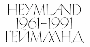 [More] ⦿
|
ZeCraft
[Jean-François Porchez]
|
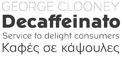 ZeCraft (Clamart, France) was founded by Jean-François Porchez as a vehicle for bespoke typefaces. An outgrowth of Typofonderie Porchez, it has created fonts for Arjowiggins, the Baltimore Sun, Beyoncé Knowles, Le Monde, Louis Vuitton, Public Transport in Paris (RATP) and Yves Saint Laurent Beauté. Some samples:
 - Retiro was specially designed for the Madriz magazine in Madrid. Based on the stereotypical Didot masthead of women's magazines like Tatler, L'Officiel and Vogue, and named after a park in Madrid, Retiro is a daring interpretation of Spanish typography. Retiro is a Castilian and Andalusian vernacular didone. Started in 2006, it became a retail font at Typofonderie in 2015. It won a Granshan award in 2012 and a certificate of excellence at the Type Directors Club 2010 competition.
- Parisine is a large family used for maps and external communication in the Parisian train network, the RATP. It comprises the dot matrix family Parisine Girouette, the 4-style sans family Parisine Office, and the 12-style sans family Parisine Plus. This is Porchez's main sans workhorse family, and was being updated and extended almost annually between 1998 and 2016. Currently it has 32 fonts, including Compressed and Narrow subfamilies. Porchez: It can be considered as a more human alternative to the industrial-mechanical DIN.
- Déreon was custom made for Beyoncé.
- Henderson BCG was created for the Boston Consulting Group.
- Vuitton Persona and Vuitton Malletier are layered typefaces done for Vuitton. This was completed by adding Vuitton Cabinet d'Ecriture.
- AW Conqueror was done for Arjowiggins.
- Singulier is a beautiful geometric sans family created for Yves Saint Laurent.
- The Costa typeface family began life as a corporate typeface for Costa Crociere, an Italian cruise company which still uses it. Costa is based on ligatured logotype Costa designed by Landor Associates. In 2000, Costa won a TDC award for bespoke typefaces.
- Bienvenue is an exclusive corporate typeface designed for France Telecom in conjunction with Landor Associates, which was in charge of a new corporate identity.
- Endless Story is an exclusive corporate typeface designed in 2007 by Jean-François Porchez for the Russian Vozrast group. It was inspired by Eric Gill's Perpetua, and developed in conjunction with Aaron Levin and Stories Design. It covers Latin and Cyrillic.
- Alpha Poste is custom sans typeface designed by Jean-François Porchez in January 2005 for the identity and logotype of La Banque Postale launched in January 2006 in France as a subdivision of Groupe La Poste.
- Macif is an all caps exclusive bespoke typeface designed by Jean-François Porchez in April 2006 for the new identity and logotype of the insurance company Macif launched in 2006 by BETC Design group.
- Lion is a corporate typeface designed in 1999 by Jean-François Porchez for Automobiles Peugeot. The bespoke typeface, developed in conjunction with EuroRSCG Design, Paris, is used by Peugeot for all the brand names used on their cars.
- It is possible to work for two enemies. After Peugeot in 1999, JFP did a custom typeface for its arch-enemy Renault, called Renault Identité in 2004. This was done in cooperation wirth Eric de Berranger.
- Tron Uprising is a bespoke inline all caps typeface designed in 2012 for the American animated science fiction television series for excluse use by Walt Disney Company.
- Script Fleury Michon (2013) is a bespoke typeface done for the ready-meals products created by Fleury Michon (France & Canada).
- Hinduja (2013) is a wide all caps custom font for the Indian conglomerate Hinduja.
- Nespresso (2014) for the Nespresso brand. An elegant art deco geometric monowidth sans family, wasted on poor coffee---especially the Nespresso capsules are quite bad, but marketing and good brand design does miracles.
- GL Bader (2015) is rooted in the long history of the Galeries Lafayette which was founded in 1894 by Théophile Bader and Alphonse Kahn in Paris. This neo-grotesque sans serif family, along with GL Kahn, accompanies the new visual identity and communication campaign launched in September 2015. The design of GL Bader is influenced by the brand created by Peter Knapp and Jean Widmer in 1958. Accompanied by GL Kahn.
- For the Boston Consulting Group, ZeCraft developed BCG Henderson.
- TypeCon Counter for TypeCon 2017 in Boston. Creative director: Bobby C. Martin, extremely contrasted stencil didone typeface designed by Zecraft on the basis of AW Conqueror Didot.
Behance link. [Google]
[MyFonts]
[More] ⦿
|
Zetafonts (or: Studio Kmzero, or: ZeroFont)
[Francesco Mistico Canovaro]
|
 Italian design firm in Firenze consisting of three graphic designers, Francesco Canovaro, Debora Manetti, and Cosimo Lorenzo Pancini. It has evolved into Italy's premier and most prolific type foundry. Canovaro's Behance link. Also called ZeroFont and Zetafonts, this type foundry exhales joy---in every design and presentation, the passion of the designers bubbles to the surface. Blending a delicious sense of humour and a great aesthetic taste, Zetafonts is a typographic delight. Their typefaces:
 - Adlibitum (2018). A textura blackletter typeface family.
- Anaphora (2018). Anaphora is a contemporary serif typeface designed by Francesco Canovaro (roman), Cosimo Lorenzo Pancini (italic) and Andrea Tartarelli. It features a wedge serif design with nine weights from thin to heavy. Its wide counters and low x-height make it pleasant and readable at text sizes while the uncommon shapes make it strong and recognizable when used in display size. Anaphora covers Latin, Greek and Cyrillic.
- Aliens and Cows (2016). An ultra-condensed all aps sans family by Canovaro.
- Arturo (2018), by Francesco Canovaro.
- Atlantica (2017). A signage script family.
- Lightstrike (2016). A thin (and free) brush font by Canovaro.
- Byom (2016). A tweetware organic sans typeface family by Francesco Canovaro.
- Adlery (2016, +Cyrillic). A brush script by Cosimo Lorenzo Pancini.
- Adlibitum (2016). A blackletter typeface by Cosimo Lorenzo Pancini and Francesco Canovaro.
- Morbodoni (2016). A display didone by Cosimo Lorenzo Pancini and Francesco Canovaro.
- Altair (2016). A display sans by by Francesco Canovaro based on Digitalino.
- Aquawax (2015). A sans family by Canovaro and the Zetafonts team. Extended in 2019 to Aquawax Pro by Francesco Canovaro, Cosimo Lorenzo Pancini and Andrea Tartarelli.
- Armonioso (2014). A creamy connected signage script.
- A Day Without Sun (2014, by Cosimo Lorenzo Pancini).
- Another Shabby (2014, a primitive script by Francesco Canovaro).
- Antipasto (2007, by Matteo Di Iorio). A clean elegant sans by Canovaro.
- Arista (2007) and Arista 2.0 (2010). A simple rounded bold sans typeface designed by Francesco Canovaro and Adolfo Monti. In 2017, Francesco Canovaro updated these to Arista Pro.
- Arsenale White and Arsenale Blue (2009). Children's hands, done by Cosimo Lorenzo Pancini, Francesco Canovaro, Andrea Mi, Debora Manetti, Katiuscia Mari, and Jonathan Calugi.
- Beatrix Antiqua (2016, by Francesco Canovaro, Cosimo Lorenzo Pancini and Andrea Tartarelli). This humanist sans-serif typeface is part of the Beatrix family (Beatrix Nova, etc.) that takes its inspiration from the classic Roman monumental capital model. Its capitals are directly derived from the stone carvings in Florence's Santa Croce Cathedral. Beatrix keeps a subtle lapidary swelling at the terminals suggesting a glyphic serif, similar to Hermann Zapf's treatment in Optima. Some weights are free.
- Bimbo >(2018). A child emulation handwriting font developed as an extension and redesign of the original Arsenale White typeface created with italian illustrator Jonathan Calugi.
- Bistecca (2005). A bellissima extra-condensed serif font created for ego[n] 5 and for the cover of ego[n] 4.
- Braciola (2006). Monospaced and octagonal, with stencil styles added.
- Brushstrike (2015). By Canovaro.
- Byron (2006). Handwriting.
- In 2010, Canovaro designed the plumpish bubblegum typefaces Bubblebody Fat and Bubbleboddy Extra Light. These fonts were discontinued in 2016 and replaced by Bubbleboddy Neue.
- Bulletto (2015). A retro baseball script.
- Cibreo. A basic sans typeface by Canovaro and Monti.
- Cinematografica (2017). An ultra condensed small caps movie typeface used in the advertising campaign for Lucca Comics 2017 Festival. This film noir family features eight weights from thin to heavy with open type alternate glyphs and some full word ligatures.
- The rounded geometric sans family Cocomat (2015, Zetafonts, by Cosimo Lorenzo Pancini, Debora Manetti and Francesco Canovaro) was inspired by the style of the twenties and the visions of Italian futurists like Fortunato Depero, Giacomo Balla and Antonio Sant'Elia. Updated in 2019 as Cocomat Pro.
- Cocosignum (2017). Cocosignum Corsivo Italico and Cocosignum Maiuscoletto are both based on Italian art deco styles.
- Codec (2018) by Cosimo Lorenzo Pancini, Francesco Canovaro and Andrea Tartarelli is a geometric sans typeface family in which all terminal cuts are horiontal or vertical. See also Codec Pro (2019).
- Delizioso (2008). Art deco.
- Digitalino (2013).
- Docporn (comic book style).
- Duepuntozero Pro (2006-2008). A condensed rounded sans famly by Adolfo Monti and Francesco Canovaro. The Pro version was released in 2019.
- Filetto (2009). A sans modeled after DIN 1451 done by Canovaro, Debora Manetti and Katiuscia Mari.
- Florentia (2017). An 18-style lapidary typeface family influenced by the renaissance and luxury.
- In 2018, Debora Manetti and Francesco Canovaro designed the brush handwriting font Freehand Brush.
- Handvetica (2005). Arched.
- Happy Frush Zero (2014). A random note font.
- Happy Funghetto (2015). Fifties style lettering.
- Heading Pro (2017). A condensed sans typeface by Francesco Canovaro. Followed in 2018 by Heading Pro Ultra Compressed, Heading Pro Extended, and Heading Pro Text.
- Hello Script (2015). Curly and calligraphic.
- Modulo3 (2008). An artsy beauty.
- New Romantic (curly grunge).
- Panforte (2013) and Panforte Serif (2013): hand-drawn typefaces. Panforte Pro followed in 2017.
- Prozak. Consists of zProzak-Bold, zProzak and zProzakLight (2006). A basic sans typeface by Canovaro and Monti.
- Sala de Fiestas (2005-2006). Free download at OFL.
- Square80 (2009).
- Studio Gothic (2017, by Francesco Canovaro, Cosimo Lorenzo Pancini and Andrea Tartarelli) is an 8-style geometric sans family based on Alessandro Butti's geometric sans classic, Semplicita.
- Sugo (2007). By Canovaro and Monti.
- Taller (2009, ultra-condensed), Taller Evolution (2009), Tallest (2009, ultra-condensed).
- Targa Monospace. Inspired by license plate lettering.
- Targa (2002), TargaMS (2002), TargaMSHand (2002). Cosimo Lorenzo Pancini, who developed Targa in 2002, based his design on the peculiar sans serif monospace typeface with slightly rounded corners and a geometric, condensed skeleton that Italy had been using for its license plates. In 2022, Francesco Canovaro redesigned this font into a versatile multi-weight typeface, Targa Pro, which includes Targa Pro Mono (which keeps the original monospace widths), Targa Pro Roman (with proportional widths), both in five weights plus italics, the handmade version Targa Hand, and Targa Pro Stencil.
- Tutor (2006). Rectangular, pixelish---what I call a piano key font.
- Zerocalcare is a typeface family created for the branding of Lucca Comics & Games Festival 2016. It is based on the digitised handwriting of italian comic artist Zerocalcare, and it uses open type substitutions to mimick the flow of real handwriting. Free at Dafont.
- Double Bass (2018): A jazzy 4-style typeface family that pays tribute to Saul Bass's iconic hand lettering for Otto Preminger's The Man with the Golden Arm film title sequence and other movies, Bass's vibrating, almost brutal cut-out aestethics, and the cartoonish lettering and jazzy graphics of the fifties.
- Another Shabby (2018) is a brush script typeface family designed by Francesco Canovaro for Zetafonts with Cyrillic letters designed by Alina Golovan.
- Sugo Pro (2018, Francesco Canovaro, Andrea Tartarelli). It was designed in 2006 by Francesco Canovaro in two weights (regular and extralight) and later used by Cosimo Lorenzo Pancini as base inspiration for the design of the successful Zetafonts' Cocogoose Pro typeface. In 2018 the family was completely redesigned by Andrea Tartarelli, expanding the original glyph set to include Cyrillic and Greek and adding three extra weights and italics. The restored and revamped version is named Sugo Pro Classic. In 2020, Cosimo Pancini, Andrea Tartarelli and Mario De Libero drew the 60-style Cocogoose Pro Narrows family, which features many compressed typefaces as well as grungy letterpress versions.
- Extenda (2018) is a thin-to-wide grotesque advertising or movie credit family with some of the DNA of Impact or Compacta. By Francesco Canovaro and Andrea Tartarelli.
- In 2019, Blacker Sans (Francesco Canovaro, Andrea Tartarelli) and Blacker Pro (Cosimo Lorenzo Pancini and Andrea Tartarelli) were released. The 63-strong fashion mag powerhouse Blacker Sans Pro (Francesco Canovaro, Andrea Tartarelli) followed in 2020. Zetafonts writes: Blacker Pro is the revised and extended version of the original wedge serif type family designed by Cosimo Lorenzo Pancini and Andrea Tartarelli in 2017. Blacker was developed as a take on the style that Jeremiah Shoaf has defined as the "evil serif" genre: typefaces with high contrast, oldstyle or modern serif proportions and sharp, blade-like triangular serifs.
- The extreme wedge serif and reverse stress typeface family Blackest (2018, Andrea Tartarelli and Francesco Canovaro).
- In 2019, Cosimo Lorenzo Pancini, Francesco Canovaro and Andrea Tartarelli published the monolinear geometric rounded corner amputated "e" sans typeface family Cocogoose Classic and the condensed rounded monoline techno sans typeface family Iconic.
- Klein (2019) is (in their words) Zetafonts' love letter to the grandmother of all geometric sans typefaces, Futura. Starting from a dialogue with Paul Renner's iconic letterforms and proportions, Francesco Canovaro and Andrea Tartarelli decided to depart from its distinctive modernist shapes with slight humanist touches and grotesque solutions---with some design choices evoking the softness of humanist sans serifs like Gill Sans. The end result is a workhorse superfamily of 54 fonts with full coverage of Latin, Cyrillic and Greek. The original display-oriented family, developed in nine weights with matching italics (from the hairline thin to the sturdy black), has been paired with a text version (with slightly higher x-height, better readability and maximum legibility at small point size) and with a condensed version, to be used for space-saving display solutions in editorial and advertising formats. With a name that is both a nod to its humble functionality and an homage to French nouveau realiste artist Yves Klein, this typeface aims to become your next trusted companion in all your adventures in print, digital and motion design.
- Kitsch (2019, Francesco Canovaro, Andrea Tartarelli and Maria Chiara Fantini) mixes angular medieval elements and old style letterforms. Thicker (2020, by Francesco Canovaro and Andrea Tartarelli). They write: A geometric sans typeface on steroids, it was first designed in the muscular extrablack weight with the aesthetics of high-power dynamic typefaces used in sports communication, and then developed in the lighter weights where the shapes show some vintage-inspired proportions and the slightly squared look that nods to Novarese famous Eurostile, eponymous with retro-futurism..
- Stinger (2020, a 42-style reverse contrast family by Francesco Canovaro, Cosimo Pancini, Andrea Tartarelli and Maria Chiara Fantini).
- As part of the free font set Quarantype (2020), Francesco Canovaro designed Quarantype Chillout and Quarantype Sunshine. Sunshine Pro (2020, Zetafonts) was designed by Cosimo Lorenzo Pancini and Solenn Bordeau expanding the original Quarantype Sunshine design by Francesco Canovaro, which in turn was designed as a typeface for good vibes against Covid-19. Sunshine Pro is an experimental Clarendon-style font with variable contrast along the weight axis---contrast is reversed in light weight, minimized in the regular weight and peaks in the bold and heavy weights.
- Eastman (2020, by Francesco Canovaro and Andrea Tartarelli with help from Solenn Bordeau) is a 178-font geometric sans workhorse family with Bauhaus genes developed for maximum versatility both in display and text use, with a wide weight range and a solid monolinear design featuring a tall x-height. It comes with a two axis variable font (weight, italic angle). It was followed by the 46-style font Eastman Grotesque (2020, by Francesco Canovaro, Cosimo Pancini and Andrea Tartarelli), which comprises an interesting Eastman Grotesque Alternate subfamily with daring and in-your-face glyphs, and the 88-style Eastman Condensed (2021, by Francesco Canovaro, Cosimo Pancini and Andrea Tartarelli).
- Garbata (2020). A round typeface loosely based on Windsor and Cooper Black, having a variable type option that offers many weights. Between sans and serif.
- Bogart (2020, Francesco Canovaro and Andrea Tartarelli). An homage to the low-contrast oldstyle fat faces, like Cooper Black (Oswald Bruce Cooper, 1922), Windsor and Goudy Heavy Face (Frederic W. Goudy and Sol Hess, 1925-1932), and more recently, Bookman.
- Stadio Now (2020). A revival by the Zetafonts team of Aldo Novarese's Stadio (1974), a reverse contrast sans that was published only as a rub-on transfer typeface. It comes with a multi-axis variable font that greatly enlarges the design space.
- Amazing Slab (2021). A 20-style typeface family designed by Francesco Canovaro, Mario de Libero (who did the inline versions), Sofia Bandini and Andrea Tartarelli, developed from the Amazing Grotesk family designed by Cosimo Lorenzo Pancini. Characterized by outward-pointing top serifs, this typeface is designed for use in athletic lettering, logos and titling. Zetafonts writes: Mixing an Egyptian serif, low contrast approach with the curved endings and open shapes of humanist sans grotesques, it was developed to embody the energetic and friendly nature of the startup scene---a feeling of innovation, information and energy, with a desire for simplicity and straightforward communication. The basic design shapes for the font come from the strong personality of the extrabold letterforms drawn by Francesco Canovaro for his StartupItalia logo, that informed the display design of the four darkest weights (from medium to black).
- Coco Sharp (2021). A 62-style sans feast, and two variable fonts with variable x-height, by Francesco Canovaro, Cosimo Pancini and Andrea Tartarelli.
- Arsenica (2021). A 43-style decorative serif by Francesco Canovaro for Zetafonts, and developed by a design team that included Mario De Libero, Andrea Tartarelli and Cosimo Lorenzo Pancini. It comprises two variable fonts and subfamilies Display, Text, Alternate and Antiqua.
- Asgard (2021). A 72-strong experimental display sans superfamily with a 3-axis (weight, width, slant) variable font, designed by Francesco Canovaro, Andrea Tartarelli ans Mario De Libero.
- Heading Now (2021). A 160-strong titling font (+2 variable fonts) by Francesco Canovaro, Cosimo Pancini, Andrea Tartarelli and Mario De Libero that provides an enormous range of widths.
- Salad and Salad Interlock (2021-2022). These typefacea are based on vernacular signpainting, extending Debora Manetti's Sala de Fiestas.
- Bakemono (2021). Canovaro writes: the design space of fixed vs. proportional width, mixing the lessons of mechanical typewriter technology with the intuitions of eastern brush calligraphy. The name of the typeface comes from the Japanese shape-shifter monsters that could change their form freely between human and animal, and aptly describes the metamorphic nature of this wide superfamily coming in proportional, monospace and intermediate subfamilies. bakemono supports Latin, Cyrillic, Aarabic and kana, and comes with a variable font option.
Corporate typefaces were designed for Lucca Comics and Games, Digitalic Magazine, Kair, Unicoop, and Istituto Europeo di Design. Behance link. Zetafonts home page. View the Zetafonts library. Abstract Fonts link. I Love Typography link. MyFonts link. Type Department link. [Google]
[MyFonts]
[More] ⦿
|
Zoran Kostic
|
Zoran Kostic (b. Belgrade, 1947) graduated from the Faculty of Geodesy of Belgrade University and completed post graduate studies of photogrammetry at ITC Enschede, The Netherlands. He started out as a programmer for geodesy and photogrammetry, and then opened a DTP studio in Yugoslavia in 1987. In 1987, out of necessity, he designed a PostScript Cyrillic font in type 3. He cyrillicized many Latin typefaces: AvangardaCyr (Avantgarde), DINGraverCyr (DINEngshrift), ErazmoCyr (Eras), FuturCyr (Futura), FuturCyrCond (Futura Condensed), GilesCyr (GillSans), HelvetiaCyr (Helvetica), HelvetiaCyrCond (Helvetica Condensed), LitografCyr (Lithos), LubalinCyr (LubalinGraf), MasinaCyr (Industria). He also made these original typefaces: DesignerRound (Cyrillic and Roman), Resavac, KosticSans (Cyrillic and Roman), KosticSerif (Cyrillic and Roman), Sketch (Cyrillic and Roman), Oktoih. Oktoih is one of the few fonts that reproduce the earlist Slavonic printings. Designs at Linotype: Linotype SimpleSquare (Cyrillic and Roman) and Linotype DesignerSquare (Cyrillic and Roman), as well as Lapidary Capitals (2005, roman capitals), WhySquare (2004) and JustSquare (2004). The Square series, 56 weights in all, were designed during the Serbian war in 1999. So was the monoline geometric sans family Designer RD (1999). In cooperation with the Belgrade typographer Djordje Zivkovic who designed them, he made FlahScript, Garamond, LepiScript, Manasija, Naisus, Ravanica, Traian. Finally, he published "HilandarskiUstav", which was reconstructed on the basis of handwriting gospels "Cetvorojevandjelje of Patriarh Sava IV", found at the Monastery Chilandarios, Mount Athos, in the 14 century. It is a font with 4.356 glyphs and symbols. Old URL. He made the Old Slavic scripts Monah (6.400 characters), Glagoljica and Gradjanica. Together with his son Nikola Kostic, he set up The Kostic Type Foundry in 2010 in Belgrade, Serbia. He co-designed the Old Slavonic simulation face Taurunum with Nikola Kostic in 2011. Batke (2011) is a rounded sans family. Kostic Serif (2012) is a classical transitional family co-designed by Nikola and Zoran. Behance link. Klingspor link. Fontspring link. View the Kostic Foundry typeface library. [Google]
[MyFonts]
[More] ⦿
|

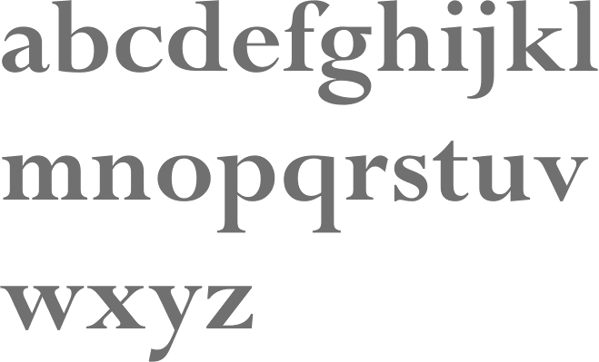
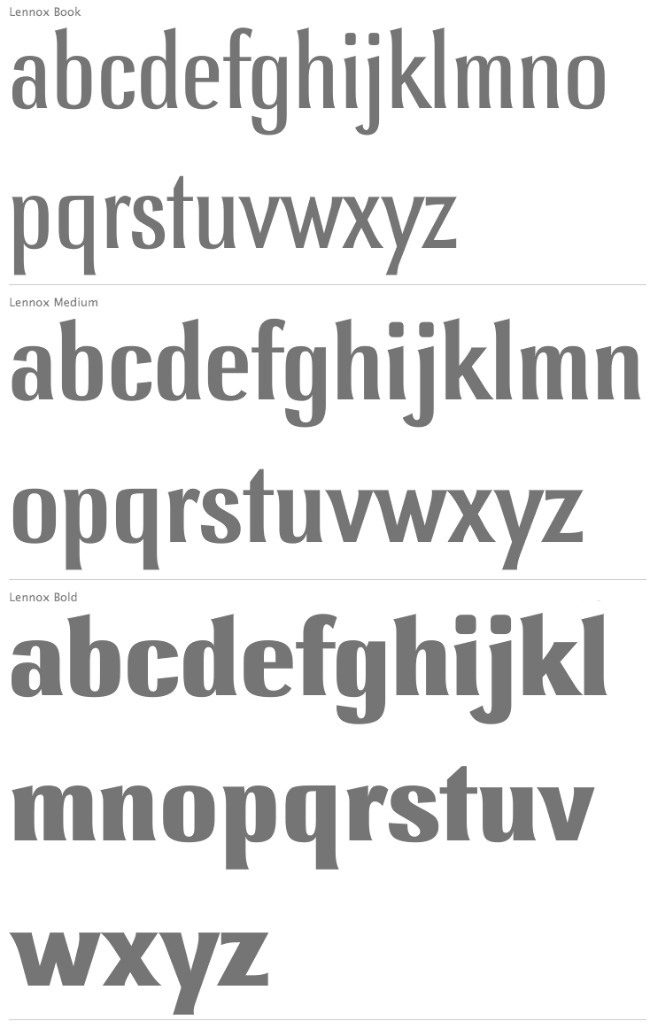
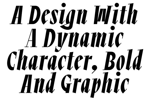
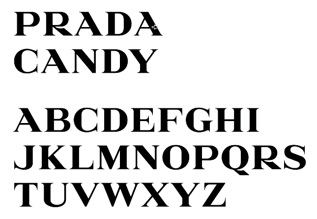
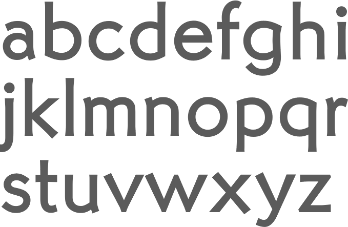
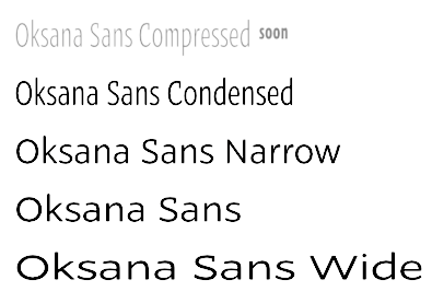
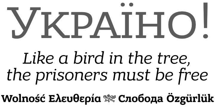
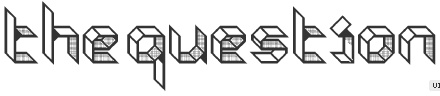
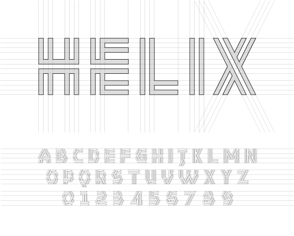
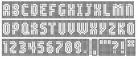
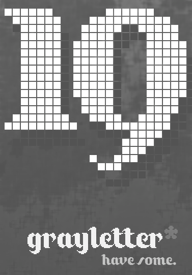
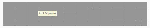
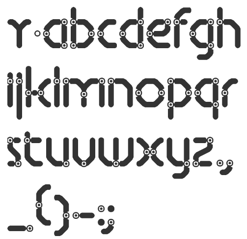
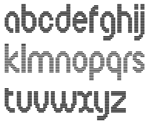
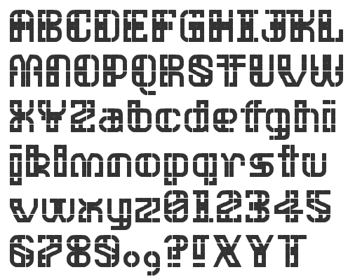
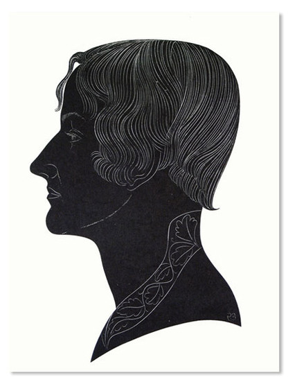
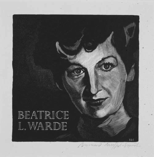
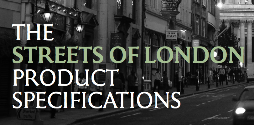
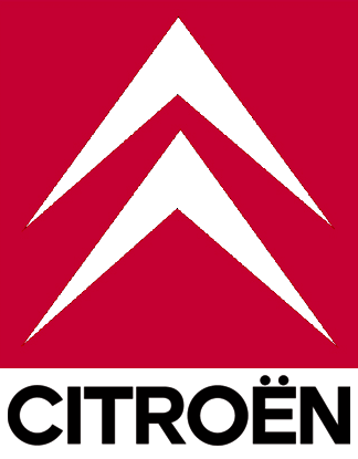
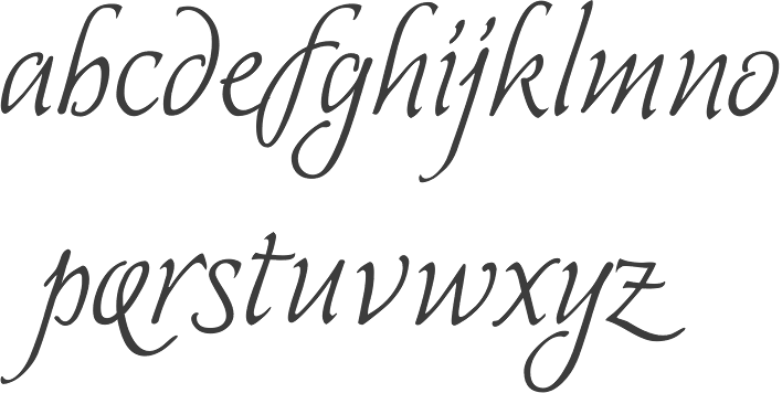
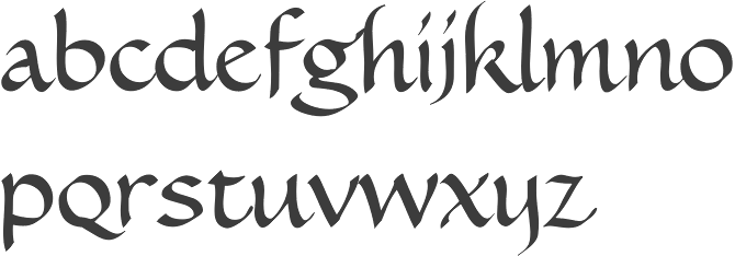
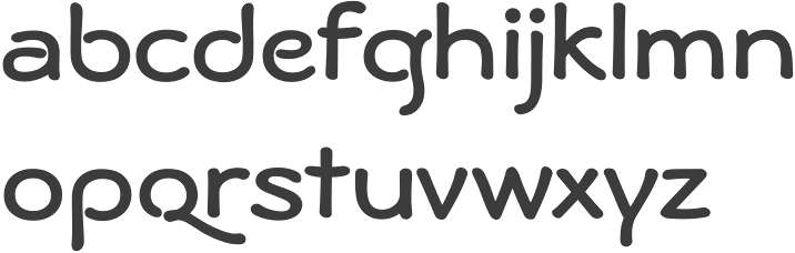
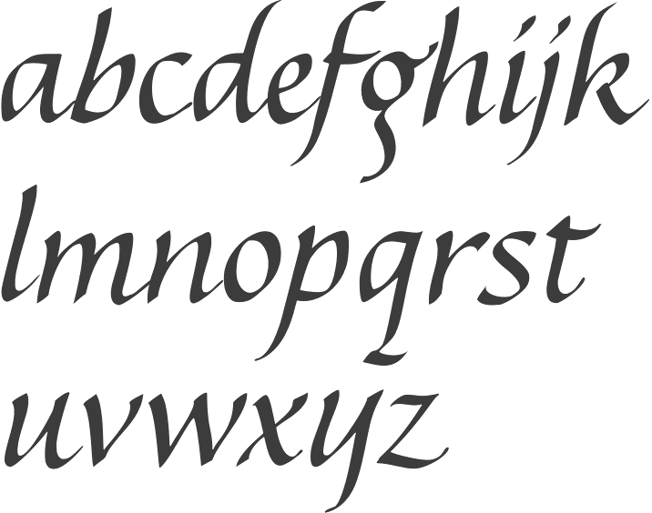
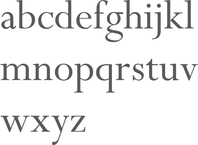
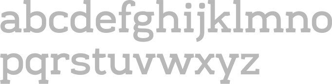
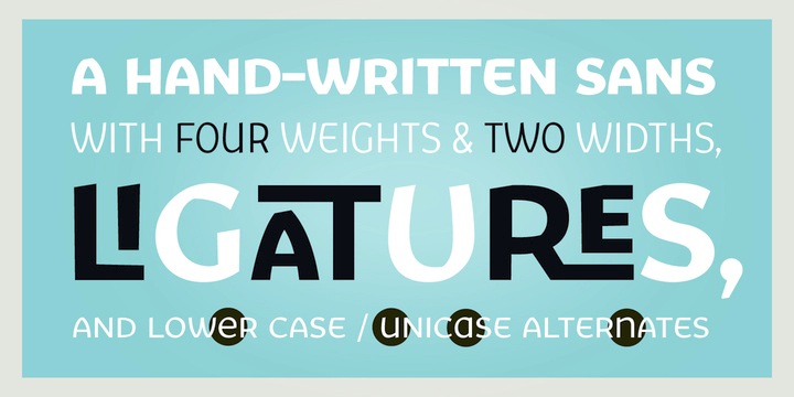
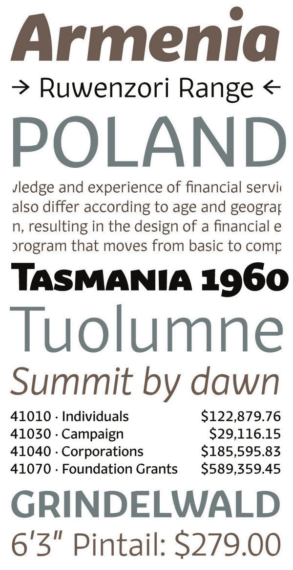
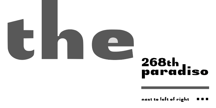
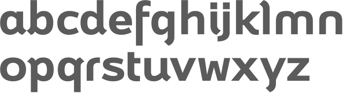
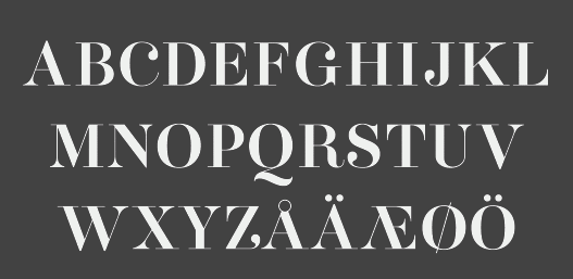
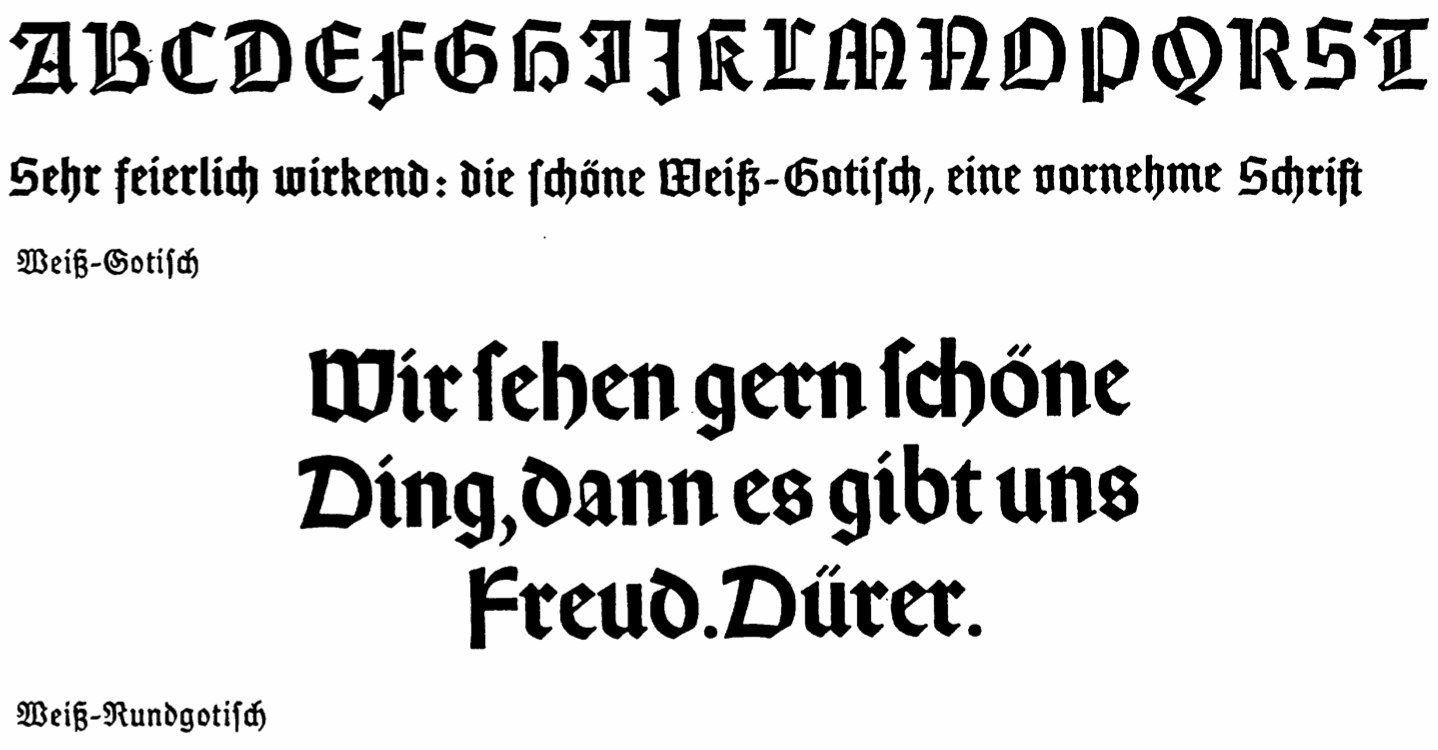
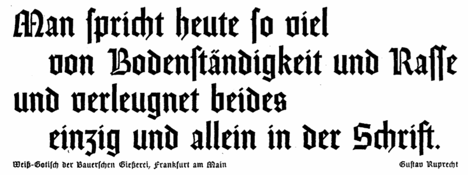
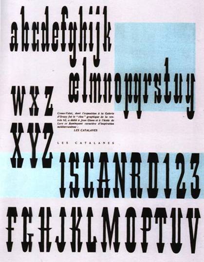
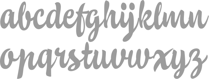
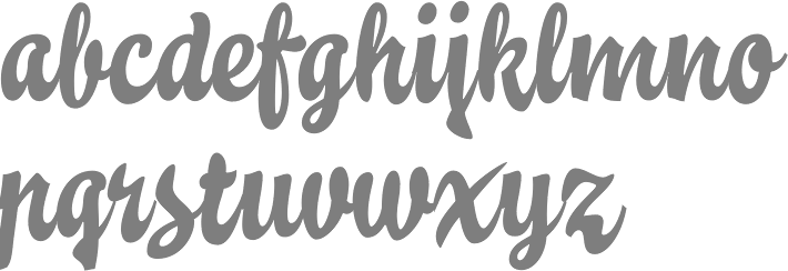
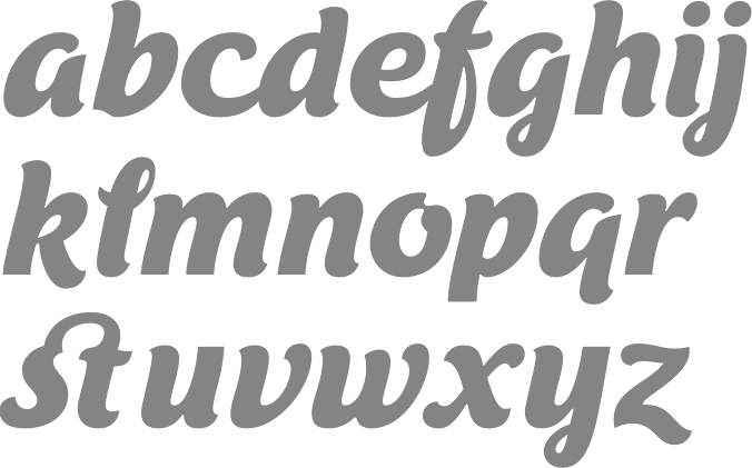
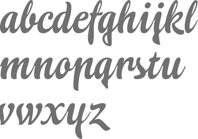
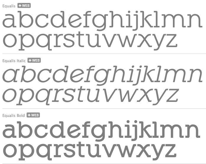
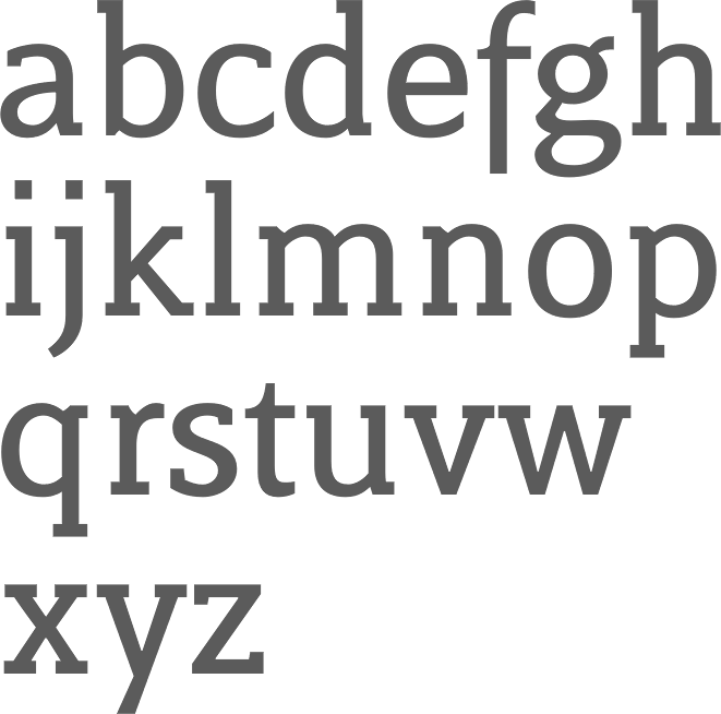
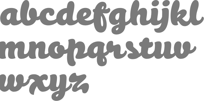
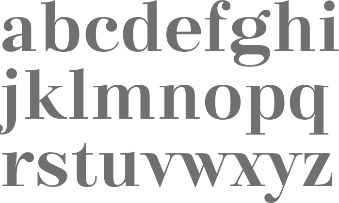
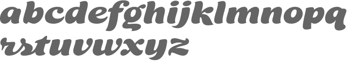
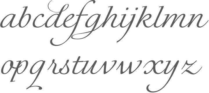
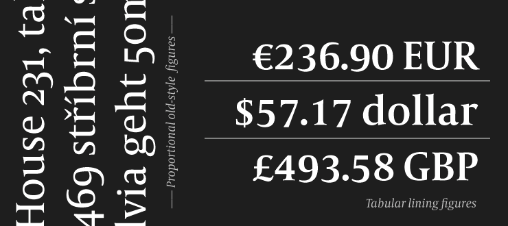
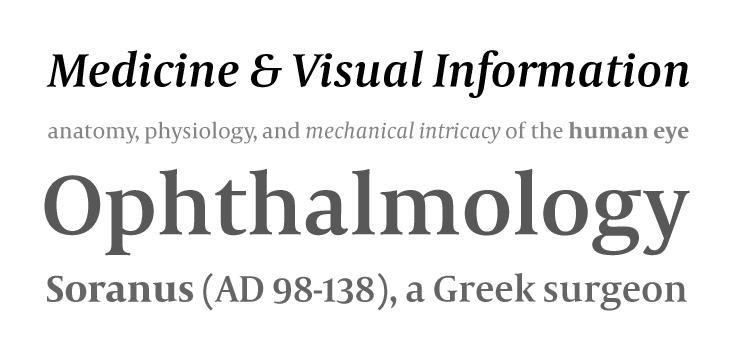
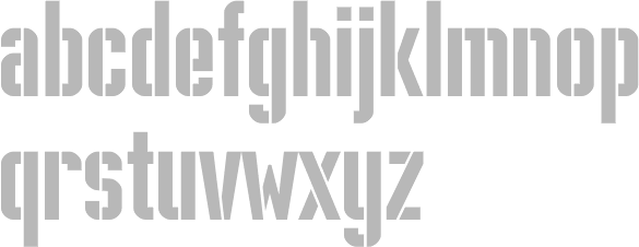
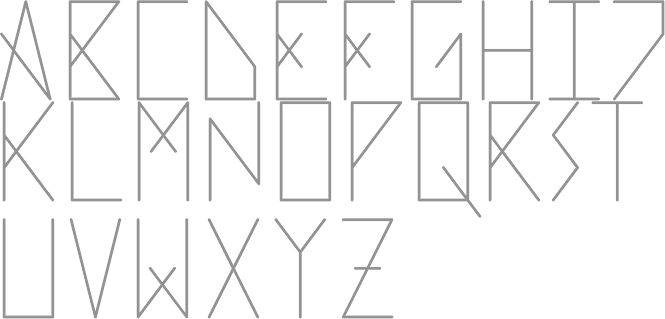
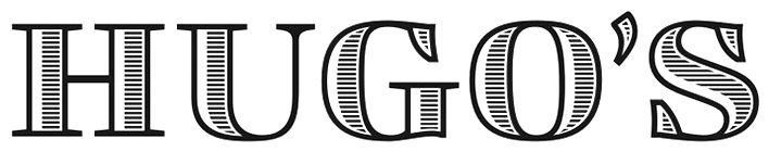
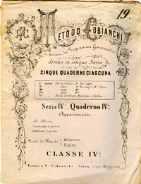
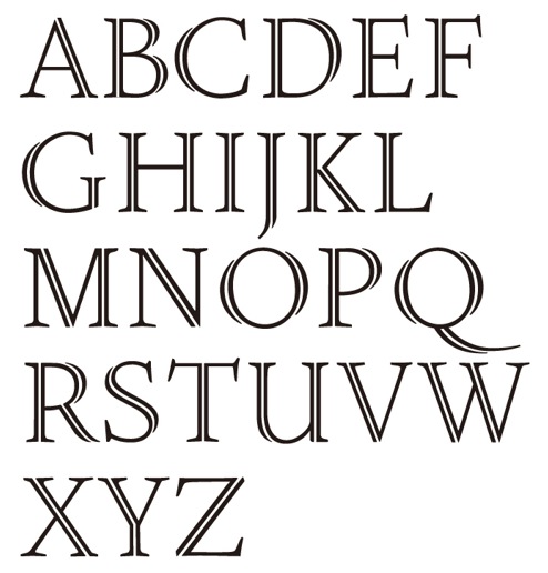
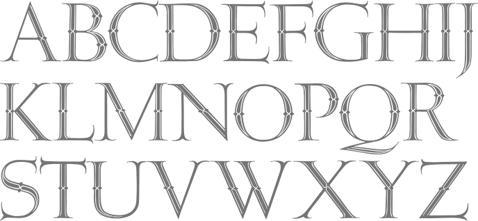
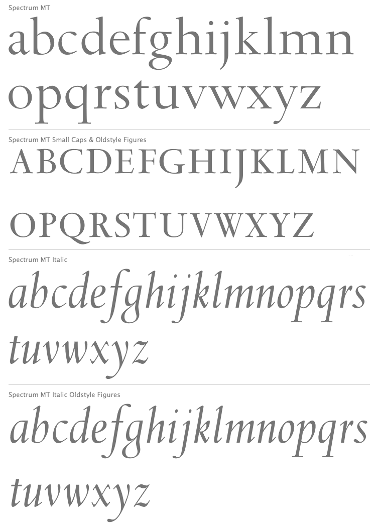
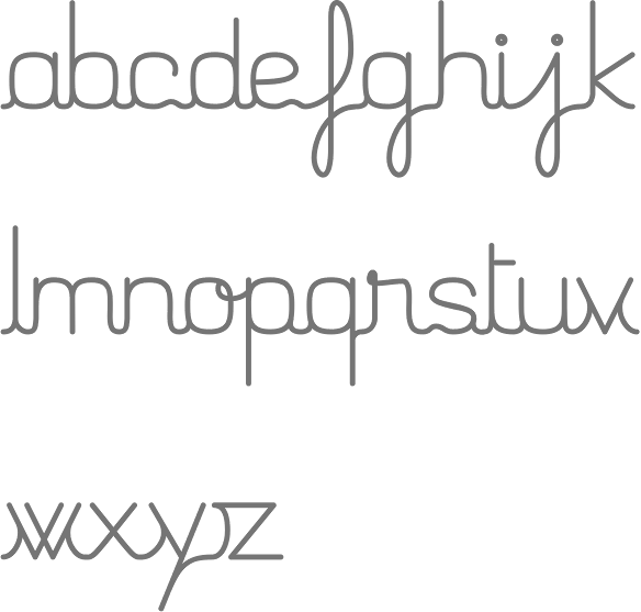
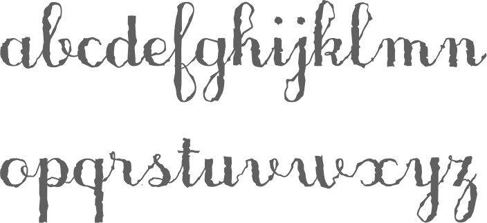
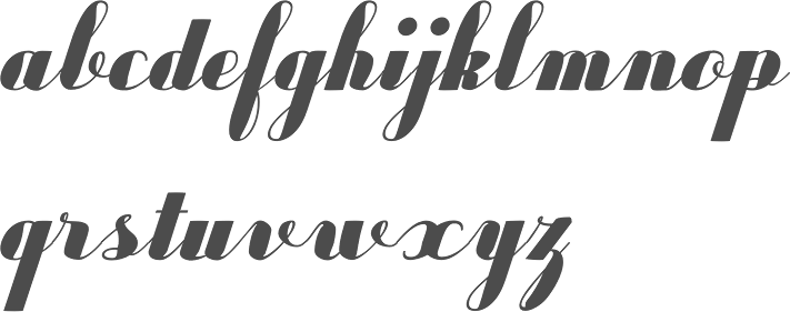
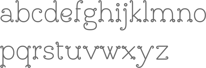
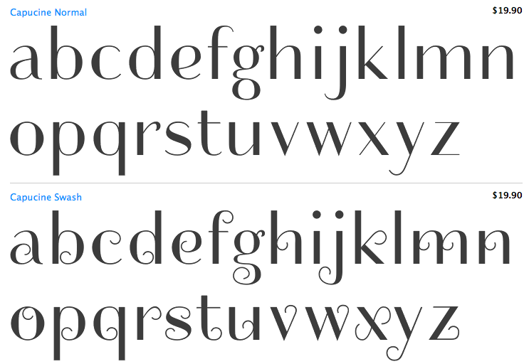
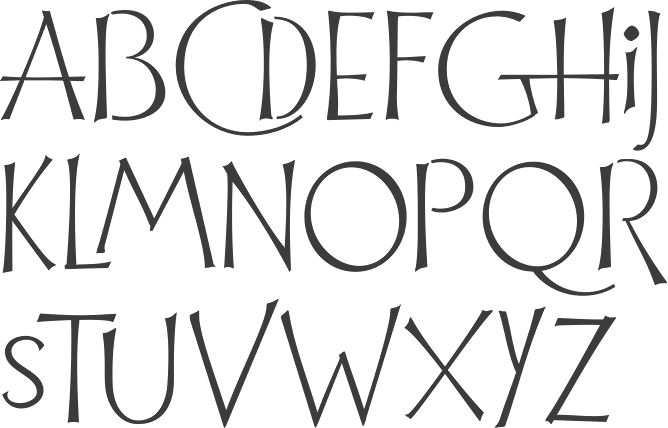
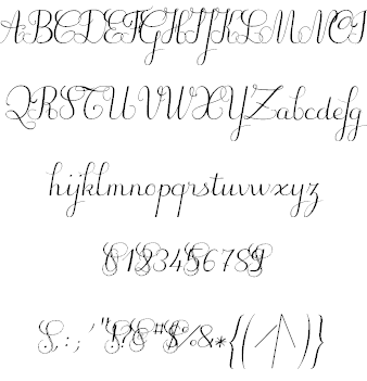
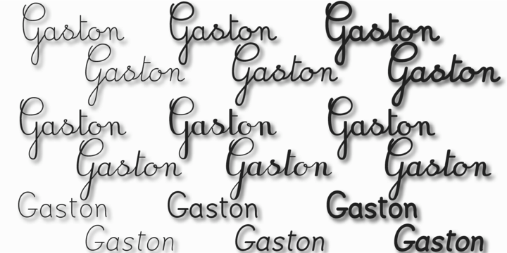
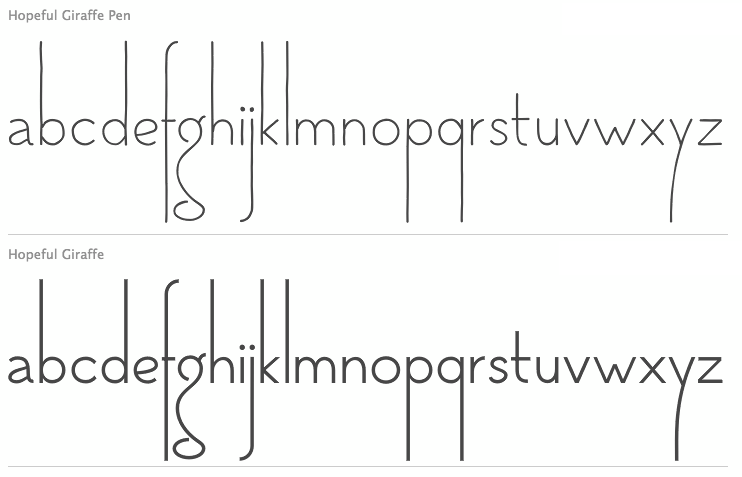
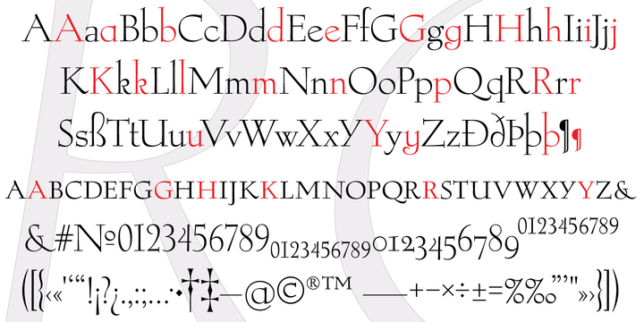
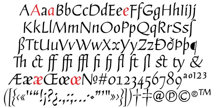
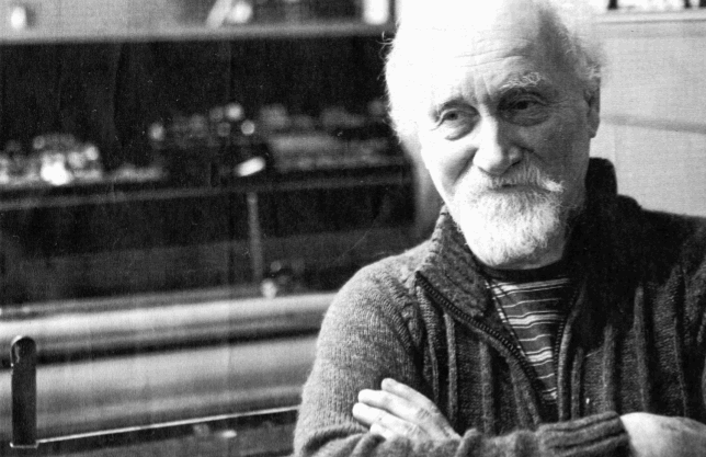
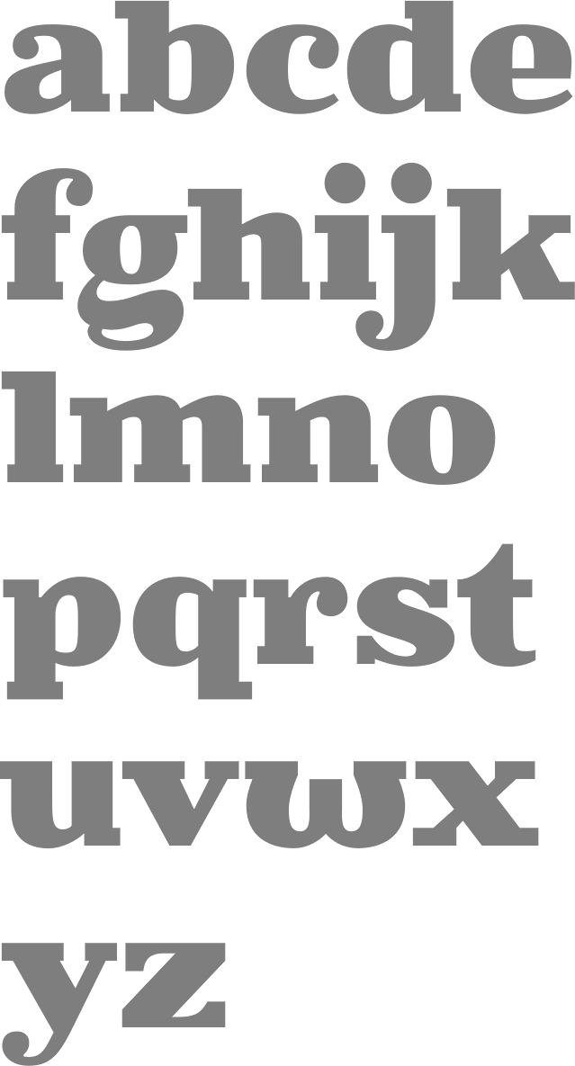
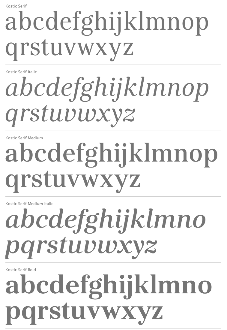
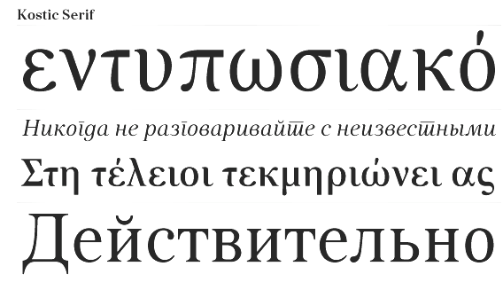
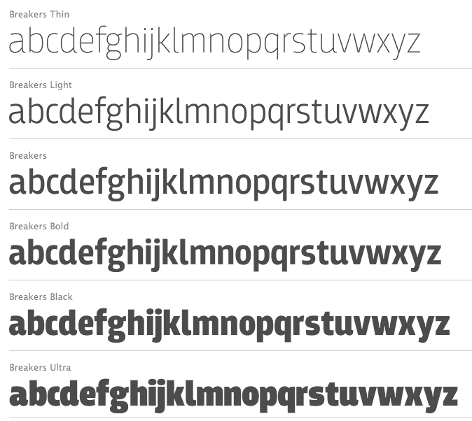
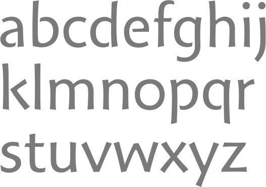
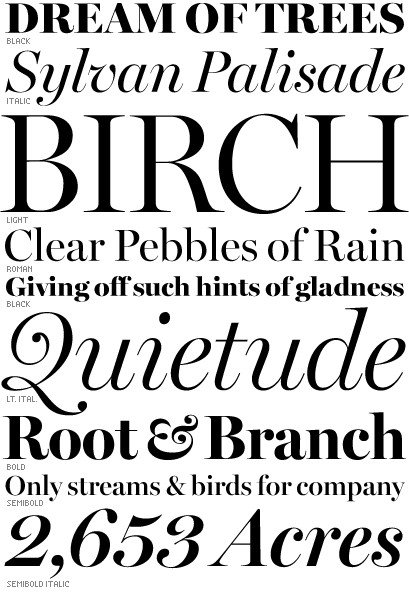
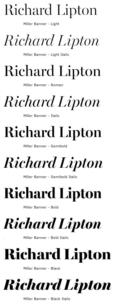
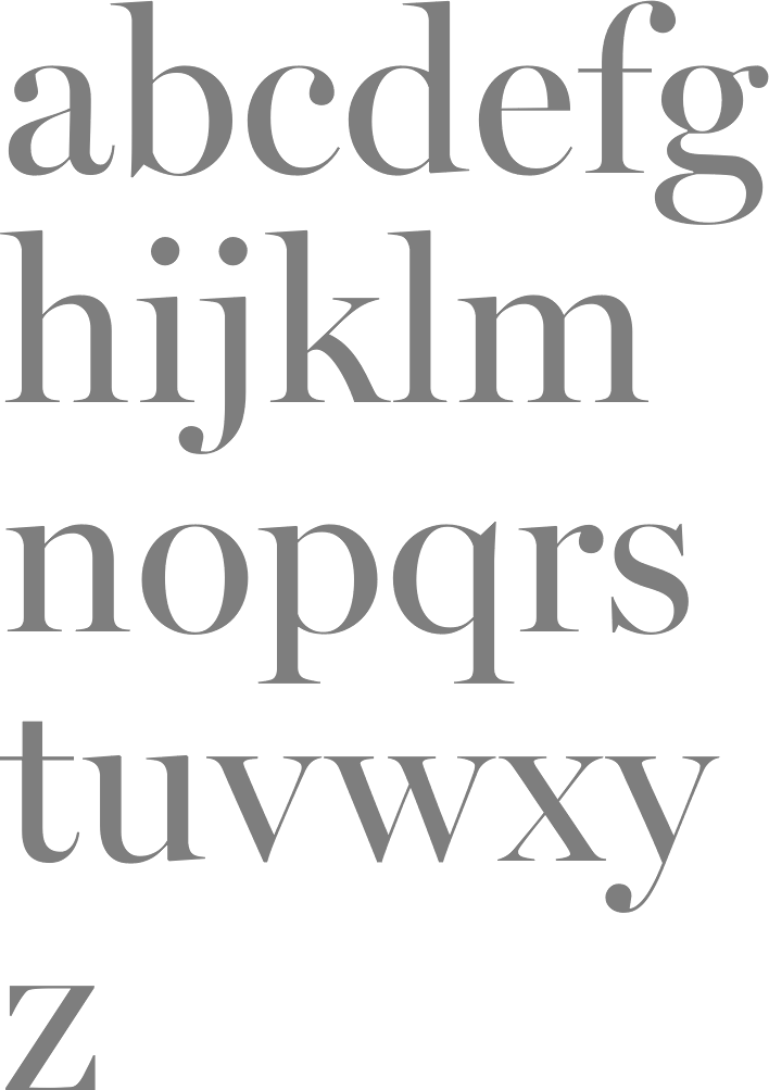
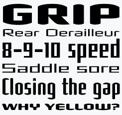
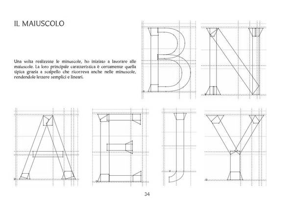
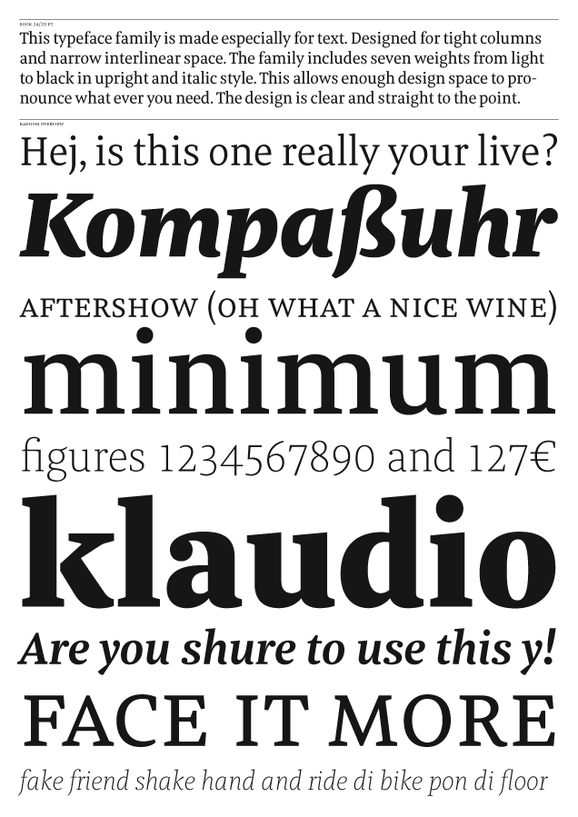
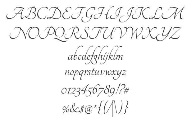
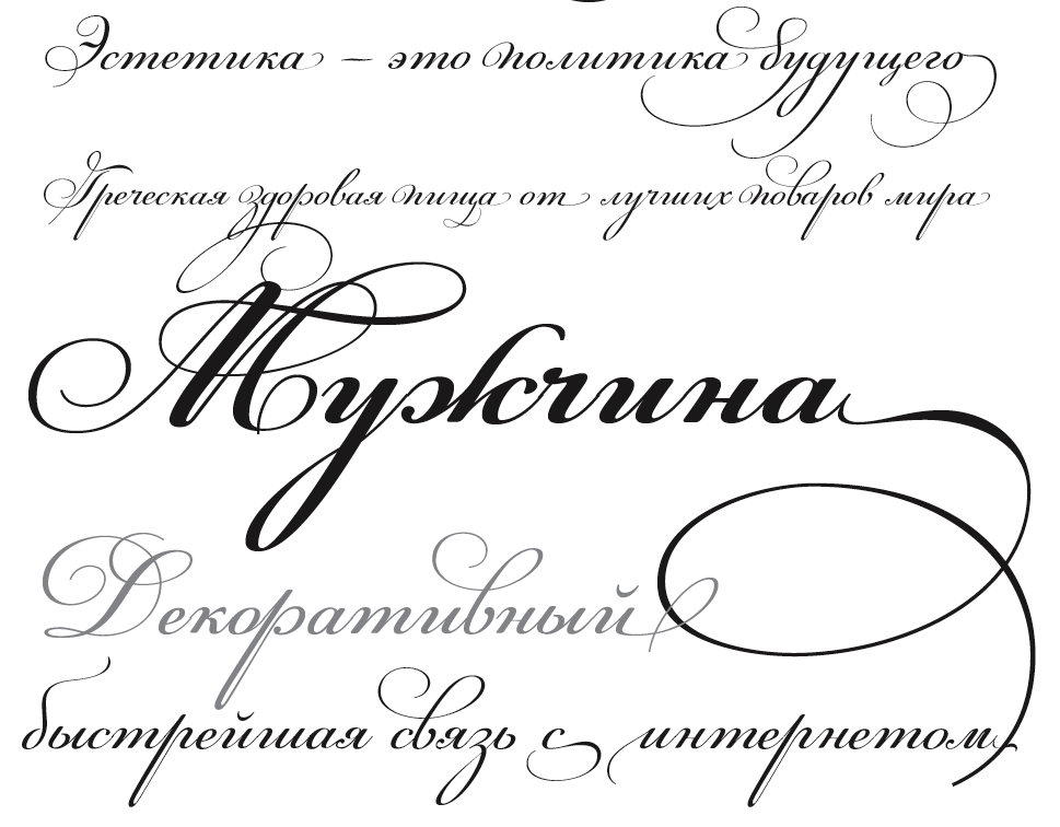
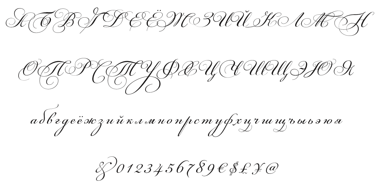
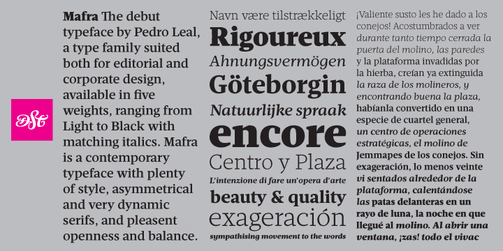
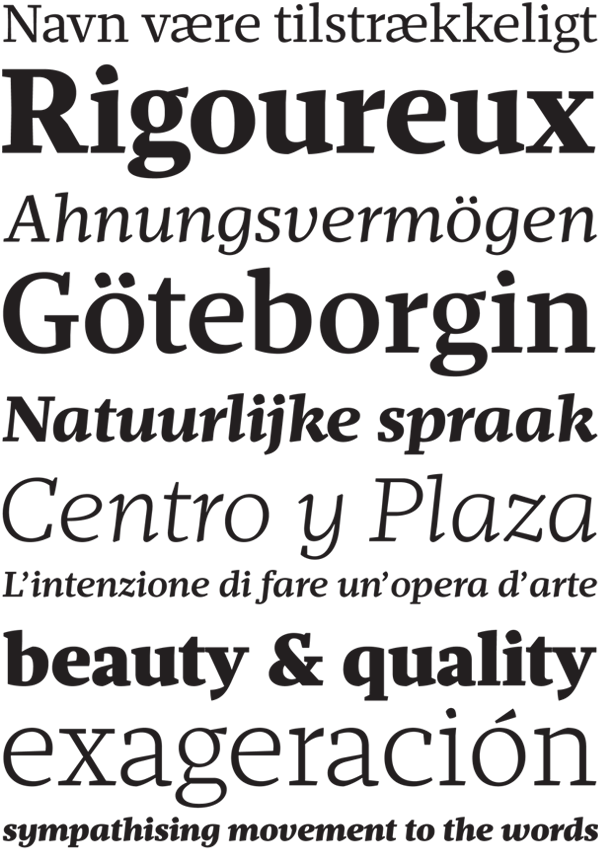
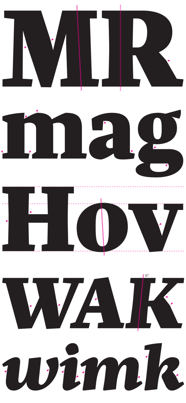
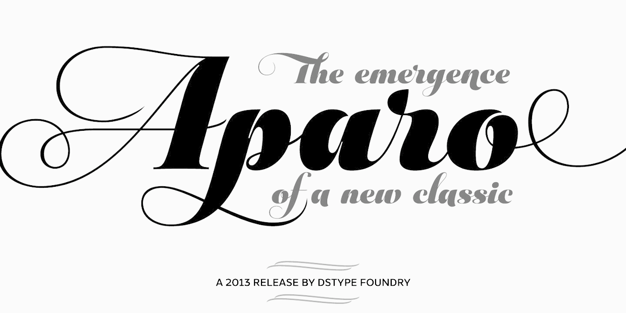
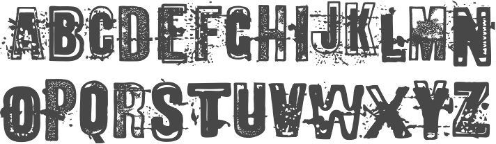
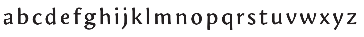
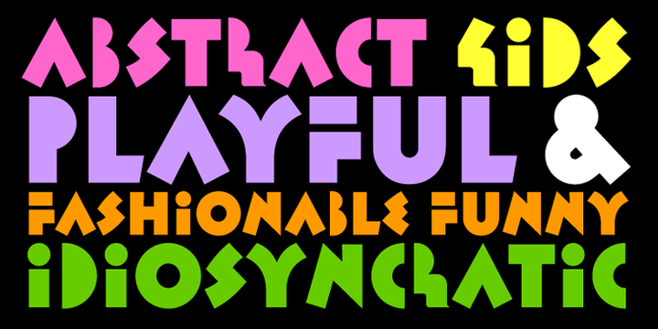
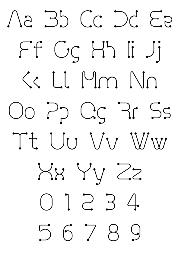
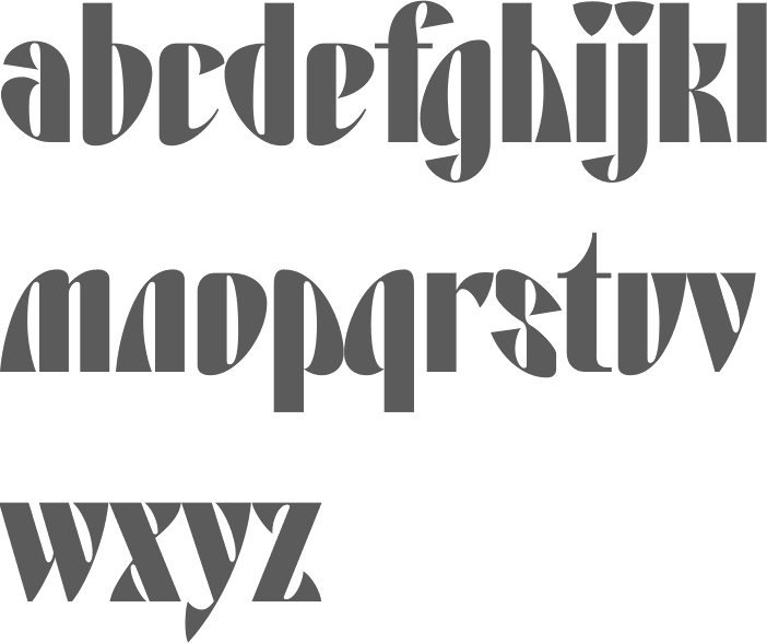
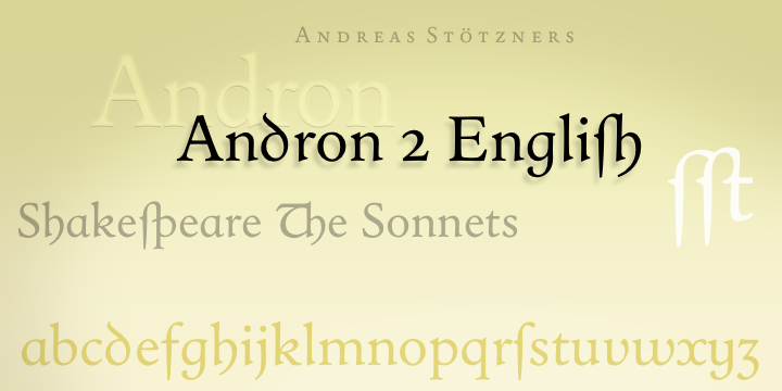
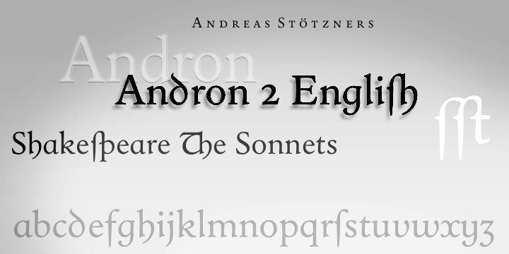
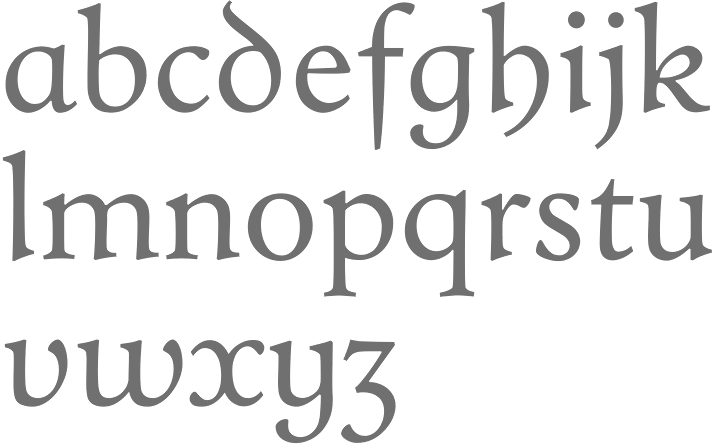
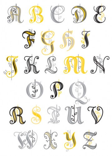
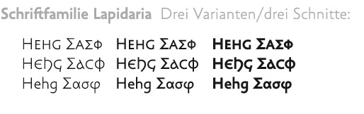
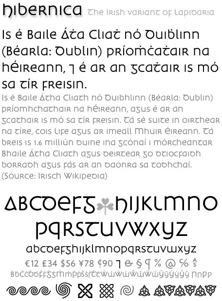
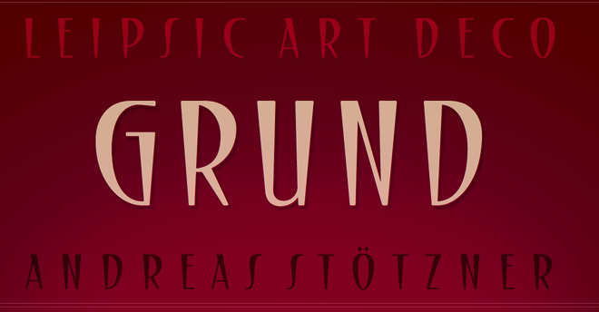
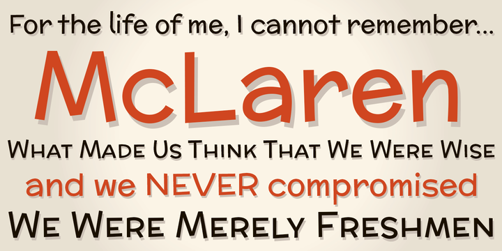
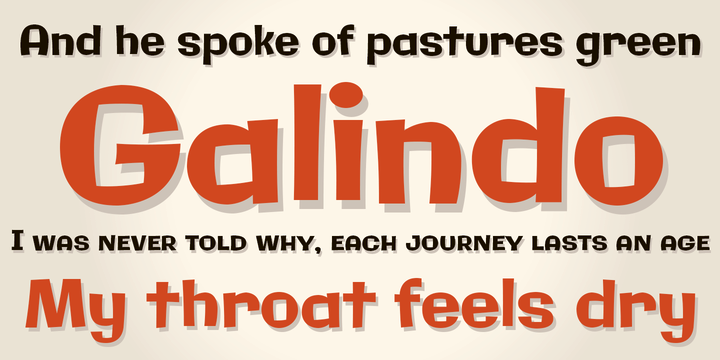
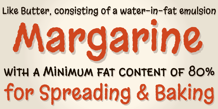
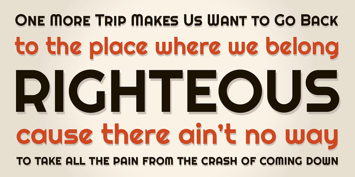
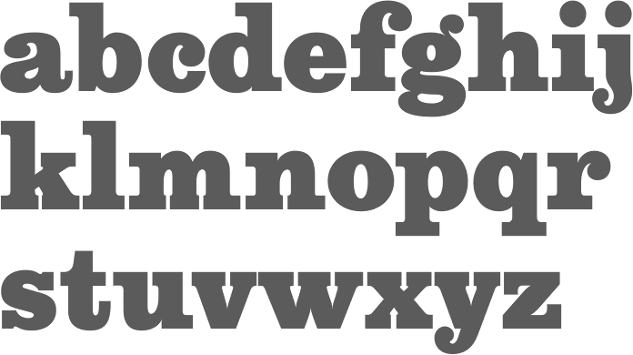
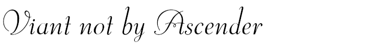
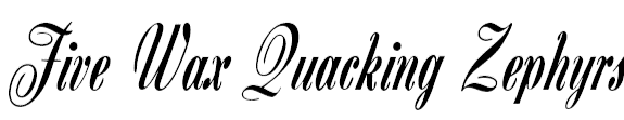
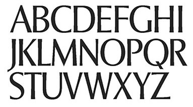
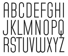
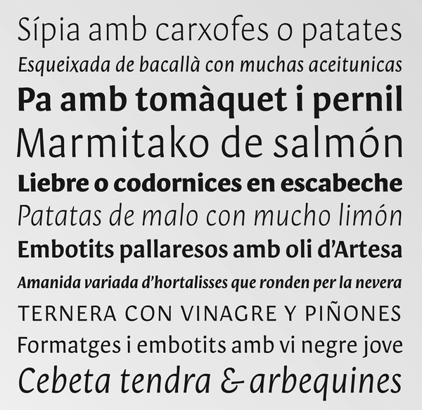
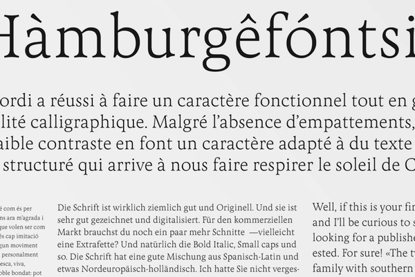
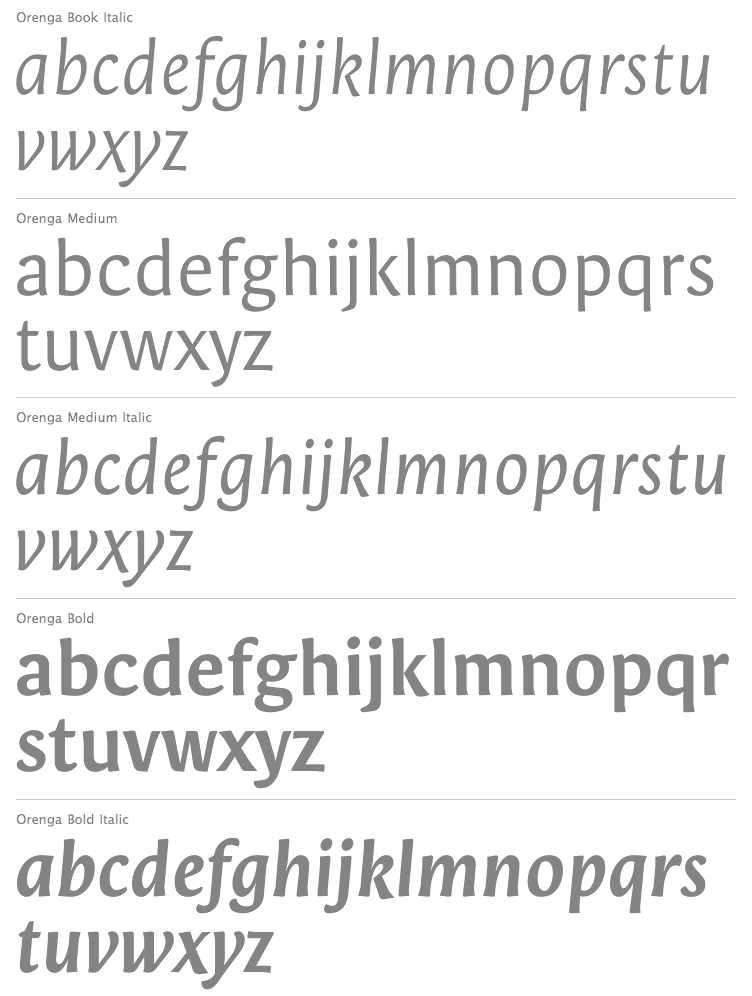
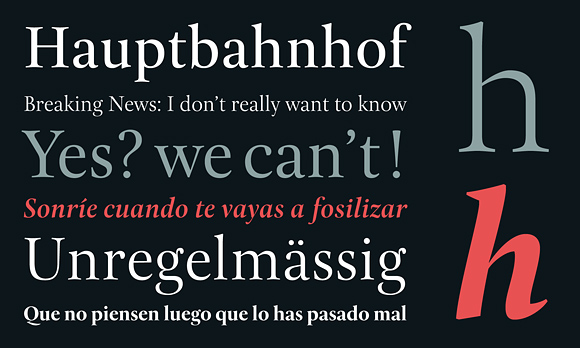
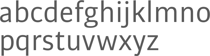
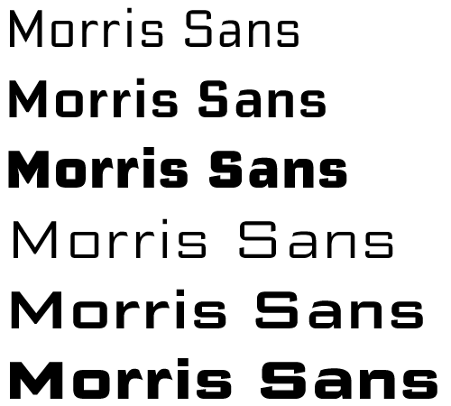
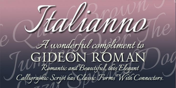
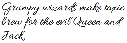
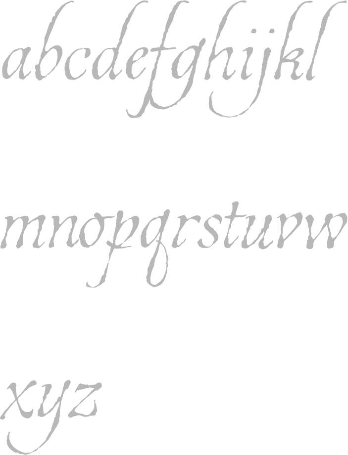
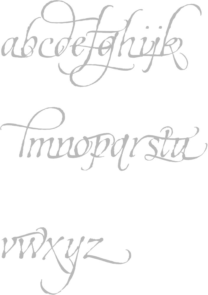
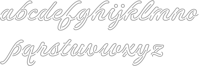
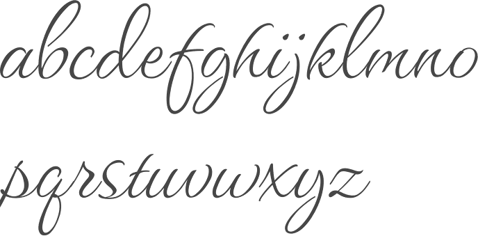
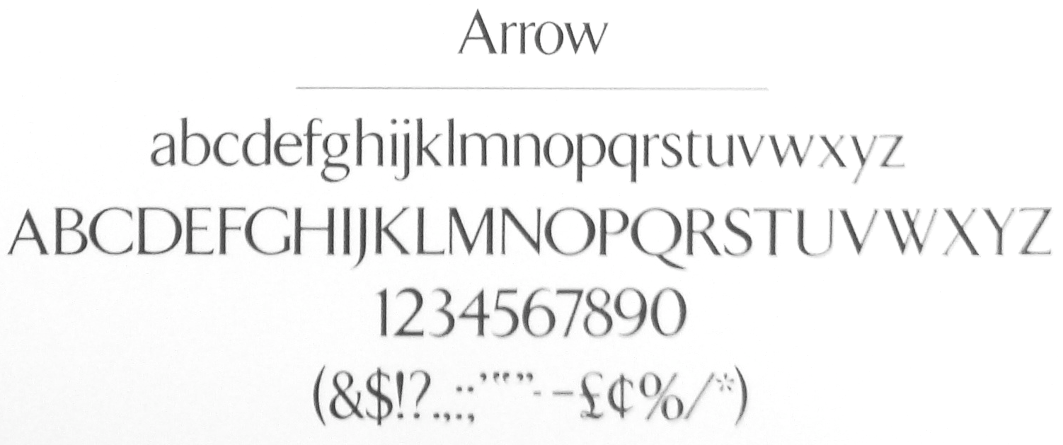
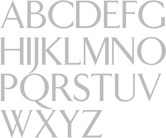
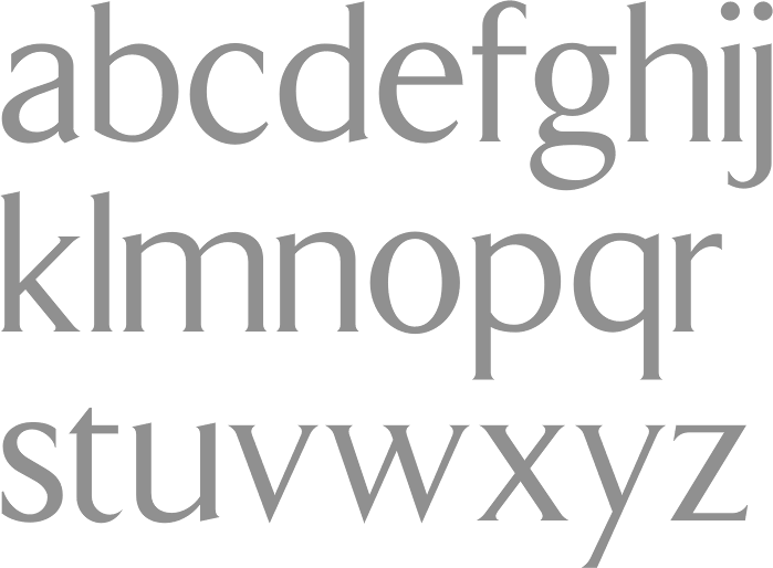
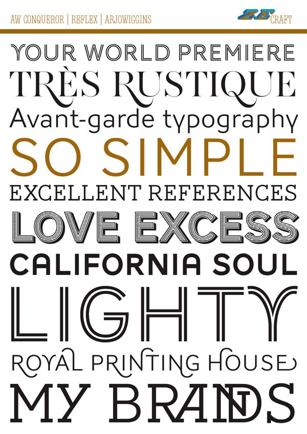