| | |
4th February
[Sergiy Tkachenko]

|
 Sergiy Tkachenko (b. 1979, Khrystynivka, Cherkasy region, Ukraine) lives in Kremenchuk, Ukraine, and has been a prolific type designer since 2008. Sergiy graduated from Kremenchuk State Polytechnic University in computer systems and networks in 2007. Various other URLs: Microsoft link, Identifont, 4th February, Behance, Klingspor link, Revision Ru, Russian creators, CPLUV Fontspace, Twitter. Kernest link. Sergey Tkachenko's typefaces:
 - 2008: the techno typefaces Bladi One 4F, Bladi One Slab 4F, Bladi Two 4F, Abia Wide 4F Thin.
- 2009: Wrongo 4F, Zantiqa (an über-serif), Serifiqo (a (free) thin didone fashion mag display face), Codename Coder 4F (monospace programming font), Droporado 4F (using circles only), Tovstun (futuristic, ultra-fat and rounded), Perfocard 4F, Modularico (five modular typefaces based on a logo from Master Kremenchug a company for which Sergiy worked for 4 years), Boldesqo Serif 4F (a splendid informal fat didone, now with Greek support), Tkachenko Sketch, Unicase Slab (a techno slab), Laftatic, Logofontik 4F (techno), PC.DE Stencil (+Italic; custom stencil font), Stenciliqo 4F, Tiap Liap 4F (handwriting), Nut Kit 4F, Rezzzistor 4F, the inline modular face Grand Hotel, and Bijou 4F.
- 2010: Roboo 4F (a bubblegum typeface family), PädIn (a custom typeface for Pädagogische Initiative e.V.: rounded fat informal face), Fat Quad (in the fatty trend), Veselka (a free multiline face), Smeshariki Black (+ Gleams: a bubble gum font made for an animation company), Republica 4F (a fat family), Rodeqa Slab 4F, ComFi (semi-octagonal), Grotesqa 4F, Nowy Geroy 4F, Fabryka 4F (a monospaced typewriter family), Placarto4F-Italic (an ultra fat art deco), Lavina 4F (a hairline sans with lachrymal terminals).
- 2011: Squartica (octagonal), Decomart (free), Model 4F Unicase (a unicase fat didone released in 2013 only), Fontatigo 4F, Kylie 4F (bilined and geometric), Waldemar 4F (a large didone style fat typeface family), Dinesqo (2011, a monoline sans of utter simplicity), Qargotesk (+Cyrillic) [images: i, ii, iii, iv], Neultica 4F (black unicase family), Squartiqa 4F (2011, constructivist), Clarenta 4F Black (after Clarendon---a great family), Designosaur (free sans), Perfopunto (based on perforated circles and squares), OlaScript 4F, Bayadera 4F (a tamed upright monoline script), Febrotesk4FUnicase (squarish unicase family).
- 2012: Targo 4F (rounded typeface with stencil and non-stencil styles), Myra (free font), Myra 4F Caps (free), Cedra (wide monolined sans face), Fontatica 4F (rounded techno grotesk), Akzentica 4F, Ukraintica 4F Wide (a monoline wide-bowled sans family), Laventa 4F, Sports World (free athletic lettering font), Web Serveroff (free computer geek font), Octin Spraypaint Cyrillic (a rough stencil done exclusively for Ninja Theory).
 2013: Condesqa (modular sans), Esqadero (an uncomplicated monoline sans), Vanyla 4F Unicase (monoline), Esqadero FF CY (a free wide sans, Cyrillic), Bond (a confident no-frills sans), Attentica (free sans font for Latin and Cyrillic), Cedra 4F Wide Thin. 2013: Condesqa (modular sans), Esqadero (an uncomplicated monoline sans), Vanyla 4F Unicase (monoline), Esqadero FF CY (a free wide sans, Cyrillic), Bond (a confident no-frills sans), Attentica (free sans font for Latin and Cyrillic), Cedra 4F Wide Thin. - Cyrillizations: several typefaces such as Lavoisier (by Alec Julien), Budmo Jiggler (Ray Larabie) and JoAnne Display (Sandy Cerovich), Gnuolane (of a Ray Larabie font), Paranoid Cyrillic (based on Kevin Lo's Paranoid), Movavi Grotesque Black (+Cyrillic; image; numerals), Azoft Sans (made for Azoft, and free here and here).
- Custom fonts: Blue Pill, Sansus Webissimo (since 2011 free at Open Font Library), Minaeff ECT (2011, a free legible family for Latin and Cyrillic, custom-made for and downloadable from WebhostingRating.com), Webhostinggeeks.Com (2011), Web Serveroff, OnlinePharmacyCheck.Com (2011), 1800Flowers.com (2011), DesignStudio.com (2011, free), ArchyStudio.Com (2011, free download, Movavi Grotesque (2011, free), Azoft Sans, PÄd In, Smeshariki, Fat Cow (2010: free condensed sans), ComFi (2010, free), PC.de (2009: free techno family, including a stencil face), League Gothic (2009-2011, The League of Movable Type) Cyrillic, Paranoid Cyrillic, 28 Days Later Cyrillic, Acid Label Cyrillic, Dead Secretary Cyrillic, Rezland Cyrillic, Sweet Leaf Cyrillic, Droid Cyrillic, Jo Anne Display Cyrillic, Gnuolane Free Cyrillic, Bosox Cyrillic, Budmo Jiggler Cyrillic.
- Typefaces from 2014: Laqonic 4F (unicase sans), Cubynets 4F, Blogger Sans (free rounded organic sans), Boncegro (free Western typeface, briefly called Vaquero before a name change), Motor 4F (based on Russian car license plates), Monitorica (a futuristic typeface made for ipHostMonitor.com, free at OFL), Areqo (condensed titling sans), Architect's Daughter Cyrillic (architectural lettering), GetVoIP Grotesque (a free typeface commissioned by GetVoIP), Meeneralca (unicase sans inspired by the logo of the mineral water Borjomi from Georgia), Glasoor (free oil spill or jelly bean font), Robotesqa.
- Typefaces from 2015: Croogla (a circle-based informal sans), Blackentina 4F (free ultra-black squarish typeface), Dart 4F (neo-grotesque), Kent 4F (a layered family for letterpress emulation).
- Typefaces from 2016: Brent 4F (original design going back to 2013), a custom typeface for the labels used in the Ukrainian Armed Forces, Economica Cyrillic Pro (with Vicente Lamonaca).
- Typefaces from 2018: Indi Kazka 4F (Indic simulation).
Abstract Fonts link. Dafont link. Creative Market link. Behance link. Hellofont link. Open Font Library link. View Sergiy Tkachenko's fonts. [Google]
[MyFonts]
[More] ⦿
|
Aaron Bell
[Saja TypeWorks]
|
 [MyFonts]
[More] ⦿
[MyFonts]
[More] ⦿
|
Adam Greasley
[Wearecolt]
|
[MyFonts]
[More] ⦿
|
Adam Katyi
[Hungarumlaut (was: Cila Design)]
|
 [MyFonts]
[More] ⦿
[MyFonts]
[More] ⦿
|
Adobe Edge Web Fonts
|
 Adobe offers a free web font service in partnership with Google. Initially, there are about 500 fonts to choose from. They appear to coincide largely with the Google Web Fonts. Adobe's contributions consist of Source Sans Pro (2012), Source Serif (2014, see also here, and at CTAN), and Source Code Pro. They can also be downloaded from CTAN. In 2021, Frank Griesshammer updated Source Serif. This new version of Source Serif supports six weights and five optical sizes, both in static and variable formats. Design changes were made from the original Source Serif Pro.
 They write: Adobe will be applying its considerable font expertise to improving and optimizing a number of the open source fonts that are available in both Google Web Fonts and Edge Web Fonts. The teams from Typekit, Adobe Type, and Google Web Fonts are working to identify which fonts will benefit the most from our attention, and how we can best approach improving their rendering and performance. Efforts will include hinting some fonts for better rendering at smaller sizes, plus a number of other optimizations. All of these contributions will themselves remain open source. Since the Adobe font preview is anemic, Yvo Schaap published this font preview. Peter Chon has another preview. And here is Tony Stuck's preview. Github download site. CTAN archive link. Source Serif Pro at Google Web Fonts. Source Serif at Github. Source Sans Pro at Google Web Fonts. Source Sans Pro for the TeX crowd. Source Serif Pro for the TeX people. [Google]
[More] ⦿
|
Agaric Type
[B. Agaric]
|
Designer of the Agave font between 2013 and 2019. He writes: Agave was an attempt at making a small, monospaced, outline font that would be geometrically regular and simple. The endeavor was motivated by a deep adoration of old-school console bitmap fonts, of Consolas, of Pragmata Pro, as well as a novice's curiosity for typographical design. When it came to establishing a "simple" design scheme, the natural inclination was to separate the glyph design concerns into that of "frame" and "trait". By frame, we refer to the naive geometric extent of a glyph and its parts. And by trait, we mean, for example, the "way" in which a stroke curves, or the relationship between one part of a glyph and another. Adhering to personal tastes, bone-deep laziness, and the quirky spirit of old computer terminal fonts, the delineations of frame and trait amounted to two mathematical patterns: the power of two and the golden ratio. That is of course an understatement. This wonderful font has almost 5000 glyphs, half of them useful icons. To be sure, many of these glyphs were added by Ryan McIntyre in his Nerd Fonts version of Agave in 2020. Earlier (pixel) fonts by Agaric include Autonoe [autonoe is a fixed-width, 7x14, bold-only, unicode, bitmap typeface] and Ino. Github link. [Google]
[More] ⦿
|
A.J. Marx
|
Aka chickenmeister. Located in Pennsylvania, A.J. Marx created the monospaced programming font Smooth Bunny (2009). [Google]
[More] ⦿
|
Alan Dague-Greene
|
 Type designer (formerly Alan Greene) who is presently at MvB Design in charge of font production. Before that, he was head of custom font creation at FontShop San Francisco, and was also briefly at T26.
 His typefaces: - The huge serifed family FF Atma (2001).
- Indispose (T26).
- MVB Peccadillo (2002, MVB). Done with Holly Goldsmith.
- MVB Sirenne family (2002). Done with Mark van Bronkhorst, this large family is based on an 18th century design, with optical sizes.
- The free font family Courier Prime (2013), created for John August and Quote Unquote Apps, made for screenwriters: Courier Prime is optimized for 12 point size, and matches the metrics of Courier and Courier Final Draft, so you can often swap it out one-for-one. Other Couriers just slant the letters to create faux italics. We give you a whole new typeface [with true italics], modeled off the script of vintage typewriters. The competition was Mac Courier [the 1990 Apple system font made by Bitstream] and Courier Final Draft [used in the Final Drafdt screenwriter software]. At Open Font Library, we find Courier Prime Code (for programmers) and Courier Prime Sans, both designed in 2015. Finally Courier Prime was added to Courier Prime in 2019. Github link.
- Codesigner at American Type Founders Collection of ATF Alternate Gothic (2015, Mark van Bronkhorst, Alan Dague-Greene, David Sudweeks, Igino Marini, & Ben Kiel). ATF Alternate Gothic is a new, significant digital expansion to 40 fonts of Morris Fuller Benton's classic 1903 design.
- MVB Salis. A 16-style corporate sans family.
[Google]
[MyFonts]
[More] ⦿
|
Alan Mattano
|
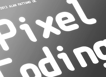 Milan, Italy-based designer of the rounded monospaced programming font PixelCoding (2013-2015). Alan says that he was inspired by Elysium Film Hex. Behance link. Alan is senior designer at Ferrari and Pininfarina. [Google]
[More] ⦿
Milan, Italy-based designer of the rounded monospaced programming font PixelCoding (2013-2015). Alan says that he was inspired by Elysium Film Hex. Behance link. Alan is senior designer at Ferrari and Pininfarina. [Google]
[More] ⦿
|
Alex Bergin
|
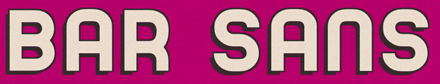 Graphic designer in Detroit, MI. Designer at FontStruct in 2009 of the extra condensed typeface Vertigo. In 2012, he made Bar Sans, a free headline sans that was inspired by all of the old hand made signage found along Eight Mile Boulevard in Detroit. Good Enough (2012) is a free monospaced programming font. [Google]
[More] ⦿
Graphic designer in Detroit, MI. Designer at FontStruct in 2009 of the extra condensed typeface Vertigo. In 2012, he made Bar Sans, a free headline sans that was inspired by all of the old hand made signage found along Eight Mile Boulevard in Detroit. Good Enough (2012) is a free monospaced programming font. [Google]
[More] ⦿
|
Alexander Lubovenko
|
 Talented Russian graphic and type designer who works for ParaType in Moscow. His typefaces:
 - In 2015, he and Alexandra Korolkova co-designed Circe Rounded, which is an extension of the Circe typeface (2011), both published by Paratype. Circe is named for the circular nature of many of its glyphs.
- In 2015, Alexandra Korolkova and Alexander Lubovenko published Aphrosine at Paratype, a typeface based on pointed pen script and situated somewhere between handwriting and calligraphy. Many alternatives and smart OpenType features help Aphrosine look like real handwriting.
- Carol Gothic (2015, Alexandra Korolkova and Alexander Lubovenko, Paratype) is a traditional blackletter face closest to Linotype's Old English.
- Liberteen (2015) is a playful tongue-in-cheek take on 19th century slab serifs, including Clarendons. For Latin and Cyrillic, from Thin to Black. Dessert Script (2015, Paratype). A smooth-outlined advertising script for Latin and Cyrillic.
- In 2016, Alexander Lubovenko and Manvel Shmavonyan co-designed the 30-style Latin / Cyrillic workhorse sans typeface family Mediator which was followed in 2017 by Mediator Serif. Later in 2016, Alexander Lubovenko designed the heavy slab serif family Bombarda.
- Hypocrite (2017, Paratype).
- He created some additional styles for Zakhar Yaschin's Mojito script font.
- in 2018, he designed Clincher at Paratype, a set of monospaced and duospaced fonts that were specifically developed for program coding and user interface design.
- Wak (2018). By Aleksander Lubovenko and Viktor Fitzner.
- Journal Sans New (2018).
- Six Hands (2018). This is a collection of six handcrafted typefaces: Black, Brush, Chalk, Marker, Condensed and Rough, by Alexandra Korolkova, Alexander Lubovenko, and the Paratype team.
- Stapel (2020, Paratype). A 57-style Latin / Cyrillic sans family with a sci-fi look and thin stroke joints.
- Vast (2021, Paratype). A 56-style sans family, and three variable fonts, by Manvel Shmavonyan and Alexander Lubovenko. Choices are from thin to black and regular to extra wide.
- In 2021, Paratype designers Isabella Chaeva, Vasily Biryukov and Alexander Lubovenko created DIN 2014 Rounded, an extension of the industrial sans serif DIN 2014. The six-style typeface supports all European languages based on Latin, Cyrillic, and Asian Cyrillic (Tatar, Kazakh and Kyrgyz) and has a variable version.
Paratype link. [Google]
[MyFonts]
[More] ⦿
|
Alexander Sperl
|
 German designer (aka laynecom) at FontStruct in 2008 of band, blokk_2, maiden, substance, Fette Serif (fat, octagonal), Runde Pixelig, Velvet, Thin Sans, Constr, Clear Serif, Blokk.
 Added in 2009: Russisch Brot, Block Out (3d face, +Filled1, + Filled2), Bold Stencil Sans, Script Pixelig, Dorky Corners Sans, Haus der Kunst (inspired by the building in München by that name), Fraktur Test, Fette Sans (nice), Emilia, Runde Pixelig (pixel script). Creations in 2010: Fraktur Test, The Plot (octagonal, architectural), 80s Metal Band, Fieldwork Font (pixel), Black Metal, I slabbed the Seriff, Play (curly face). Creations in 2011: Obvious Stencil (Bauhaus, or piano key), Supercali (a psychedelic font inspired by the cover for A.R. Kane's "I"), Manuale (with straight slabs; +Manuale Giocoso, 2012), Graphite (fat and rounded), Graphite 2, Hinterland Italic (quaint Victorian face). From 2012: Linea Fraktur (extended in 2013 to Linea Runde), Black Organic (spiky blackletter), Green Organic (a spurred blackletter), Standard Sans, Modular Blackout Bold Condensed, Viva Las Vegas, Helios, Faux Pas Serif (Egyptian typeface), Nova Thin Extended (this hairline sans is a tour de force---it is the first successful hairline sans typeface ever made by anyone using FontStruct), Bencraft. Fonts from 2013: Meadow Bold, Lush Capitals, SwiftStroke, Its Slab To Be Square, Mellow Doubt, Ligure Black, Beige Organic, Trafo, Trafo Evolution, Codester Mono (a programming font), Swash Buckle, Nova Thin Extended (a hairline sans), Meson Sans, Burgwald Exquisite Bold Condensed, Editoriale, Coalescimen, A La Carte, Hampton Italic, Baby Elephant (fat grotesque). Fonts from 2014: Terminal One (a basic sans), Fanomino, Fontris (like Tetris), Schlaraffenland (+Variant: great rounded sans family), Crystalline, Tick Brush, Manuale Neue Bold, Terminal One, Sanspura, Italics Study, Mundane Black Extended, Heavy Grain, Wineshop Stencil, Folds and Rhizones, Viva Las Inline. Fonts from 2015: Augustine, Coleridge, Framtid, Licht-Sans, Quire-Bold, Quire, Static-Grotesk, Tattoo-Parlour, The-Gift-Serif, Tuileries-Black, Usual-Type, Ziseleur, Zungenschlag, Blackesteverblack. Klingspor link. [Google]
[More] ⦿
|
Algol Revived
[Michael Sharpe]
|
AlgolRevived is a free revival in 2017 by Michael Sharpe of the (photo)font Algol by Adrian Frutiger whose sole use was for printing ALGOL code in a manual: It is not meant to be a general purpose text font---the spacing is not optimized for that, being designed instead for printing computer code, where each letter should be distinct and text ligatures are banished. It seems to work well with the listings package, designed for exactly that purpose. Unusually for such a font, it is not monospaced, though perhaps this is no longer the issue it was in the days of FORTRAN. [Google]
[More] ⦿
|
Allison James
[Chequered Ink]
|
 [More] ⦿
|
ALT Foundry
[Andreas Leonidou]
|
 ALT is the type foundry of prolific type designer Andreas Leonidou from Limassol, Cyprus, b. 1986. His main work is commercial, but there is also a substantial collection of free fonts.
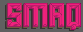
 He created Foldgami, Apollo 13 (techno, futuristic), Fatgami, Origamia, Paper Roll, Alt Retro (2010, multilined family), Alt Tiwo (2010, fat counterless), Alt Matey (2010, a family that includes a multiline style; the piano key typeface Alt Matey V2 followed in 2012), ALT Lautus (2010, a minimalistic monoline sans family), Japanese Cities Type Experiment (2010), ALT Alternatice (2010), ALT Vxt11 (2010, a high-contrast art deco octagonal face), ALT Aeon (2010, a unicase but multiline family), Alt Re 32 (2010, techno), ALT Mun (2010, a curlified family), ALT Breo (2011, octagonal family), ALT Exline (2011), Jun Script (2011, connected contemporary upright script), ALT Ayame (2011, condensed squarish family ain the piano key style, +Long), Alt UAV31 (2011, an octagonal experiment), Alt Moav (2011, a striking geometric caps face. Images: i, ii, iii), Alt Geko (2011, an art deco caps face), and Archetype (unicase, Bauhaus). Free fonts at Devian Tart: Alt Retro (2010, multilined family), ALT Hiroshi (2011, ornamental), ALT Deville (2011, spurred). Typefaces made in 2012: DNR001 (hipster style), ALT Kora (for the identity of Drone), ALT Fat (monospaced squarish caps face), ALT Exodus (sci fi face), Alt Wet (a paint splatter face), Alt Sku (ornamental didone face), Alt Robotechnica (pixel face), Exodus (a blackletter style straight-edged typeface), Juk01 (an ornamental mechanical, or steampunk, typeface), Alt Sake (a thin condensed poster typeface). Typefaces from 2013: Modu (alchemic, hipster style), Modu Deco, Bely (a severe-looking almost constructivist Latin/Cyrillic typeface). Typefaces from 2014: Ren (a free vintage display typeface family). Typefaces from 2015: ALT Hazer (a great free shadow sans), ALT Smaq (a family of eight free beveled styles for Latin and Greek). The free fonts as of 2015: ALTBELY, AltJoli, AltPixelsGoneBad, AltRe32-Duo, AltRe32-Normal, AltRenDuo, AltRenRegular, AltRenRetro, AltRenShadow, AltRetroBlack, AltRetroBold, AltRetroLight, AltRetroRegular, AltRetroThin, Alt-Twitchy, AltVxt11, Altapollo13, AltAeon-Black, AltAeon-Bold, AltAeon-Light, AltAeon-Medium, AltAeon-Thin, AltAeonRegular, AltAxlDeco, AltAxlRegular, AltDEVILE, AltGeko-AltGeko, AltMateyv2-Black, AltRobotechnica, AltSku, AltSkuItalic, AltUAV31, AltWet, Altapollo13-Black, Altapollo13, althazer, altsmaq2.8, altsmaq4.8, altsmaq6.8, altsmaq8.8, altexodus, altfatgami, altfatitalic, altfatregular, altfoldgami. Typefaces from 2016: Sadistic (a free scratchy font), System Code (free programming font). Typefaces from 2017: Rekt, Rogue (free). Typefaces from 2018: Alt Catwalk (a fashion mag typeface family), Frantic, Looper (a compass-and-ruler font), Silent Scream (a free dry brush font). free). Flickr link. Behance link. Hellofont link. Devian Tart link. Klingspor link. Creative Market link. View Andreas Leonidou's typefaces. Home page. [Google]
[MyFonts]
[More] ⦿
|
Amin Abedi
|
Tabriz, Iran-based designer (b. 1990) of these typefaces: - The paperclip typeface First Shine (2016).
- The outline typeface AAR (2017).
- The programming font Cherry (2017).
- The calligraphic typeface Perfection (2017).
- The monoline Arabic/Latin typefaces Estedad (2017-2018) and Mikhak (2018).
- The monospaced sans typeface AzarMehr Monospaced (2018). For Arabic and Latin. It has a great arched background font.
- The fancy Persian font Fandogh (2017).
Github link. [Google]
[More] ⦿
|
Andrea Braccaloni
[Leftloft]
|
 [MyFonts]
[More] ⦿
[MyFonts]
[More] ⦿
|
André Berg
|
Computer and software specialist. He made the Meslo LG font in 2010. As he says, Meslo LG is a customized version of Apple's Menlo-Regular font (which is a customized Bitstream Vera Sans Mono). He did not like certain spacing decisions in Menlo, and so decided to make Meslo LG, where LG stands for Line Gap. The free family, made in 2009-2010, consists of these styles: MesloLGL-Bold, MesloLGL-BoldItalic, MesloLGL-Italic, MesloLGL, MesloLGM-Bold, MesloLGM-BoldItalic, MesloLGM-Italic, MesloLGM, MesloLGS-Bold, MesloLGS-BoldItalic, MesloLGS-Italic, MesloLGS. [Google]
[More] ⦿
|
Andreas Larsen
|
 Copenhagen-based designer (b. 1986) of Tal (2014), a full set of numerals in many weights for use on small devices. Tal is advertized as free, but there are no download buttons anywhere.
 In 2014, he also created the Open Source fonts Gidole Play (later renamed Gidolinya) and Gidole Sans [micropage], which is patterned after DIN 1451 and uses Euler spirals. Dedicated page for Gidole Sans. Github link for Gidole. In 2015, he published Gidole Regular and the monoline sans programming font families Monoid and Mono 16, which cover Latin, Greek and Cyrillic. Gidole was forked and extended in 2016 at Open Font Library by Cristiano Sobral as Normung. He modified the free M+ font to design MonoMusic for chords and tabs. Behance link. Dafont link. Open Font Library link. Use Modify link. [Google]
[More] ⦿
|
Andreas Leonidou
[ALT Foundry]
|
 [MyFonts]
[More] ⦿
[MyFonts]
[More] ⦿
|
Andrew Kensler
|
Designer of the free font family Luculent (2014, Open Font Library), scalable, monospaced, geometric sans serif screen fonts designed for programmers. Both Latin and Cyrillic are covered. [Google]
[More] ⦿
|
Andrey Makarov
|
Russian type designer. He created the free monospaced Anka Coder family in 2010, which was developed for printing of source code. The fonts cover Latin and Cyrillic, among other things. The font names: AnkaCoder-C75-b, AnkaCoder-C75-bi, AnkaCoder-C75-i, AnkaCoder-C75-r, AnkaCoder-C87-b, AnkaCoder-C87-bi, AnkaCoder-C87-i, AnkaCoder-C87-r, AnkaCoder-b, AnkaCoder-bi, AnkaCoder-i, AnkaCoder-r. Download sites: Google Code Archive, Google, Open Font Library. [Google]
[More] ⦿
|
Anton Kokoshka
|
Ukrainian designer and illustrator, b. 1993, Kharkov. In 2021, he released the 42-style monospaced sans typeface Voyager Mono (+Condensed). [Google]
[MyFonts]
[More] ⦿
|
Apple Fonts
|
 Alternate URL. The history of all fonts used and produced by Cupertino, CA-based Apple. A brief summary of this:
 - Corporate fonts and brand identity
- Motter Tektura (designed by Othmar Motter of Voralberger Graphic in 1975): before the first Macintosh, Apple used Motter Tektura to accompany the Apple logo. "According to the logo designer, Rob Janoff, the typeface was selected for its playful qualities and techno look, in line with Apple's mission statement of making high-technology accessible to anyone."
- Apple Garamond, the new corporate font used when the Macintosh was introduced in 1984. ITC Garamond (Tony Stan, 1977) was condensed to 80% of its normal width by Bitstream, who also adjusted and hinted it. Apple Garamond was used in most of Apple's marketing. The Wikipedia comment: "Many typographers consider ITC Garamond in general, and Apple Garamond in particular, to be poorly designed typefaces. A common viewpoint is that the algorithmic scaling distorted the typeface."
- Myriad Pro: starting in 2002, Apple began using Myriad Pro Semibold (a sans serif face) in its marketing, gradually replacing Apple Garamond. MyriadPro and MyriadApple can be downloaded here.
- Gill Sans Regular: used in the marketing of the Newton PDA.
- Fonts of the original Macintosh All but one of these bitmap fonts were due to Susan Kare. The fonts were originally named after stops along the Paoli, Pennsylvania commuter train line: Overbrook, Merion, Ardmore, and Rosemont. Later, under pressure from Steve Jobs, names of world cities were chosen. A number of different variants of each font were algorithmically generated on-the-fly from the standard fonts. Bold, italic, outlined, underlined and shaded variations were the most common.
- Cairo: a bitmap dingbat font, most famous for the dogcow at the 'z' character position.
- Chicago (sans-serif): the default Macintosh system font in System 17.6.
- Geneva (sans-serif): designed for small point sizes and prevalent in all versions of the Mac user interface.
- London (blackletter): an Old English-style font.
- Los Angeles (script): a thin font that emulated handwriting.
- Monaco (sans-serif, monospaced): a fixed-width font well-suited for 912 pt use.
- New York (serif): a Times Roman-inspired font family. Freely avaliable from Apple.
- San Francisco: a ransom note face.
- Venice (script): a calligraphic font designed by Bill Atkinson.
- Fonts in Mac OS X
- Lucida Grande: the primary system font in Mac OS X (all versions). Lucida Grande looks like Lucida Sans, but has more glyphs. It covers Roman, Cyrillic, Hebrew, Arabic, Thai and Greek. Many of its 2800+ glyphs were added by Michael Everson to the original collection.
- Mac OS X ships with a number of high-quality typefaces, for a number of different scripts, licensed from several sources.
- LastResort (designed by Michael Everson of Evertype): used by the system to display reference glyphs in the event that real glyphs needed to display a given character are not found in any other available font. Wikipedia states: "The glyphs are square with rounded corners with a bold outline. In the left and right sides of the outline, the Unicode range that the character belongs to is given using hexadecimal digits. Top and bottom are used for one or two descriptions of the Unicode block name. A symbol representative of the block is centered inside the square. By Everson's design, the typeface used for the text cut-outs in the outline is Chicago, otherwise not included with Mac OS X. The LastResort font has been part of Mac OS since version 8.5, but the limited success of ATSUI on the classic Mac OS means that only users of Mac OS X are regularly exposed to it."
- Apple Symbols (2003-2006): a 4000+-glyph dingbat font that complements the symbols from Lucida Grande, inttroduced first in Mac OS X 10.3 ("Panther").
- Zapfino (a calligraphic typeface designed by and named after renowned typeface designer Hermann Zapf for Linotype, based on an example he first drew in 1944): Zapfino utilizes the most advanced typographic features of the truetype format, and is partially included in OS X as a technology demo for ligatures and character substitutions.
- Mac OS X Snow Leopard comes with four new fonts in 2009: Chalkduster (emulating chalk on a blackboard), Menlo (a monospaced family based on Bitstream's Vera Sans Mono that replaces Monaco for applications such as Terminal and code editors; see also Deja Vu Sans Serif Mono), Heiti SC and TC and Hiragino Sans GB.
- Fonts used in other devices
- Espy Sans: designed in 1993 by Apple's Human Interface Group designed the typeface Espy Sans specifically for on-screen use. It was first used for the Newton OS GUI and later integrated into Apple's eWorld online service.
- eWorld Tight: a bitmap font used for headlines in Apple's eWorld. The metrics of eWorld Tight were based on Helvetica Ultra Compressed.
- Chicago (see above): bitmap typeface used in Apple's iPod music player since 2001.
The Apple Design team won two awards at 25 TDC in 2022, pne for SF Arabic (a contemporary interpretation of the Naskh style with a rational and flexible design; this extension of San Francisco serves as the Arabic system font on Apple platforms. Like San Francisco, SF Arabic features nine weights and variable optical sizes that automatically adjust spacing and contrast based on the point size of text. The typeface features an extensive repertoire that covers numerous vocalization, tone and poetic marks, extended vowel signs, honorifics and Quranic annotations. SF Arabic provides support across the following languages: Arabic, Kashmiri, Kurdish, Sorani, Mazanderani, Northern Luri, Pashto, Persian, Rohingiya, Sindhi, Urdu, and Uyghur) and SF Symbols 3 (over 600 new symbols including representations of devices, game controllers, health, communication, objects, and tools; it prides greater control over how color is applied to symbols, and has a variable font srtyle as well). [Google]
[More] ⦿
|
Archetype Foundry
[Sujan Sundareswaran]
|
 Chennai, India-based designer of the monospaced programming font Dita Grotesk (2018). [Google]
[More] ⦿
Chennai, India-based designer of the monospaced programming font Dita Grotesk (2018). [Google]
[More] ⦿
|
Arrow Type (or: Typefloundry, or: Recursive Design)
[Stephen Nixon]
|
 Stephen Nixon (b. South Dakota) was an undergraduate student at the University of Minnesota in the Twin Cities. After that, he moved to New York City to work as a product designer at IBM. There, he focused on visual design & UX for software products, then moved into brand experience design within IBM Watson. Stephen lives in Brooklyn, NY, where he operates Arrow Type, taking on freelance type design & development work. In 2018, he graduated from the TypeMedia program at KABK in Den Haag. He runs Arrow Type. Since 2021, Stephen Nixon is font engineer at The Type Founders in New York. His typefaces:
 - The free angular text typeface Killam (2012).
- His KABK graduation typeface, Recursive (Mono, Sans), released in 2018. He explains its multiple uses: Recursive Mono & Sans is a variable type family inspired by casual script signpainting and designed for better code & UI. In programming, recursion is when a function calls itself, using its own output as an input. Recursive Mono was used as a tool to help build itself: it was used to write Python scripts to automate work and generate specimen images, and it was used in the HTML, CSS, and JS to create web-based proofs & prototypes. Through this active usage, Recursive Mono was refined to be not just warm, but also deeply useful for all-day work. Recursive Sans borrows characters from its parent mono but adjusts many key glyphs for comfortable readability in text. Its metrics are superplexed---glyphs take up the same horizontal space across all styles. As a 3-axis variable font, this allows for fluid transitions between weight, slant, and expression (casual to strict letterforms), all without text or layout reflow. In turn, this enables new interactive possibilities in UI and makes for a uniquely fun typesetting experience. This typeface was followed by Recurso Sans (2019; free at OFL). Github page where we learn that contributors besides Stephen Nixon include Katja Schimmel, Lisa Huang and Rafal Buchner. In 2019, these authors published Recursive as a variable font with five axes---mono, casual, weight, slant and italics. Dedicated page. Google Fonts link.
- He contributed a variable font version to Nikita Prolopov's Fira Code.
- Name Sans V2 was published by Future Fonts in 2020. Name Sans is a modern interpretation of the tile mosaic name tablets of the New York City subway.
- Lang Syne (2021). A semi-slab family derived from grave carvings in the Green-Wood Cemetery of Brooklyn, NY.
Fontsquirrel link. [Google]
[More] ⦿
|
B. Agaric
[Agaric Type]
|
[More] ⦿
|
Beatrice D'Agostino
|
Italian designer of Iki Mono (2020, at CAST) Iki Mono is a multifaceted monospaced typeface designed for publishing and coding. It has two variable styles. [Google]
[MyFonts]
[More] ⦿
|
Belleve Invis
[Renzhi Li]
|
 Programmer and font technologist in Hefei, China. He wrote a parametric program that can create fonts. His first adventure is the gorgeous (monoline monospaced) programming font Iosevka (2015), which is completely free: for the source code, see Github. It has 7 weights and 6 styles and is entirely programmed. Belleve says that he was inspired by Pragmata Pro, M+ and PF DIN Mono. Github link to the releases. The font covers Latin, Greek and Cyrillic, and is narrower than many fonts in order to be compatible with CJK characters. A tour de force that deserves an award. The 27-style Iosevka Extended was released in 2020. Jozsika (2015-2017) is a customized version of Iosevka Curly. Github link. Aardvark Sans (2020) by a mystery author is also based on Iosevka.
 In 2019, he released the free semi-monospaced font Zapus Sans. It is based on his earlier typeface Iosevka Aile. Sarasa Gothic (2020) is a CJK programming font based on Iosevka and Source Han Sans. Github link. [Google]
[More] ⦿
|
Ben Harris
|
 Designer of the multistyle free monospaced octagonal and pixel font family Bedstead (2017), covering, Latin, Greek, Cyrillic, Hebrew, mathematics, and a slew of other things. He explains: Bedstead is an outline font based on the characters produced by the Mullard SAA5050 series of Teletext Character Generators. The SAA5050 is familiar to those of a certain age as the chip that produced the MODE 7 display on the BBC Microcomputer. It generates characters from a 5x9 pixel matrix, smoothing diagonal lines to produce an interlaced 10x18 matrix for each character. Bedstead extends that algorithm to continuity, converting a 5x9 pixel grid into an outline with smooth diagonals. [Google]
[More] ⦿
Designer of the multistyle free monospaced octagonal and pixel font family Bedstead (2017), covering, Latin, Greek, Cyrillic, Hebrew, mathematics, and a slew of other things. He explains: Bedstead is an outline font based on the characters produced by the Mullard SAA5050 series of Teletext Character Generators. The SAA5050 is familiar to those of a certain age as the chip that produced the MODE 7 display on the BBC Microcomputer. It generates characters from a 5x9 pixel matrix, smoothing diagonal lines to produce an interlaced 10x18 matrix for each character. Bedstead extends that algorithm to continuity, converting a 5x9 pixel grid into an outline with smooth diagonals. [Google]
[More] ⦿
|
Bernhard Leiner
[The perfect programming font]
|
[More] ⦿
|
Bigelow&Holmes
[Charles Bigelow]
|
 Bigelow&Holmes was founded by Charles Bigelow and Kris Holmes. Charles Bigelow (b. 1945, Detroit) is a type designer and teacher, who runs his own studio, Bigelow&Holmes. Bigelow was a colleague of Donald Knuth at Stanford University when Knuth developed his Computer Modern typeface family for TeX. In mid-2006, Bigelow accepted the Melbert B. Cary Distinguished Professorship at Rochester Institute of Technology's School of Print Media. Before that, he taught at Stanford University, Rhode Island School of Design, and other institutions. Typefaces designed by Bigelow:
 - The Lucida family (1985). Lucida is used in several scientific publications such as Scientific American. Its origins go back to Computer Modern. I find it more appropriate for screens than paper, but that is just a personal view. The Lucida family contains LucidaConsole (1993), LucidaSansTypewriter (1991), LucidaFax, LucidaCalligraphy, LucidaBright, Lucida Blackletter (1991, a bastarda) and Lucida Handwriting. It has been recently expanded to comply with the Unicode Standard, and includes non-Latin scripts such as Cyrillic, Greek, Arabic and Hebrew. Charles Bigelow created the font families Lucida Math (with Kris Holmes, 1993), Lucida Sans (with Kris Holmes, 1985), Lucida Typewriter Sans (with Kris Holmes, 1985) and Lucida Serif (with Kris Holmes, 1993). The paper by Charles Bigelow and Kris Holmes, The design of a Unicode font (Electronic Publishing, 1993, pp.289-305), explains the design issues such as letter heights, readability studies, and typeface designs for readers versus non-readers of the various scripts.
- Syntax Phonetic.
- Leviathan (1979).
- Apple Chicago (1991), Apple Geneva (1991).
- Microsoft Wingdings (1992).
- For the Go Project, Kris Holmes and Charles Bigelow designed the free typeface families Go Sans and Go Mono in 2016. The font family, called Go (naturally), includes proportional- and fixed-width faces in normal, bold, and italic renderings. The fonts have been tested for technical uses, particularly programming. These fonts are humanist in nature (grotesques being slightly less legible according to recent research) and have an x-height a few percentage points above that of Helvetica or Arial, again to enhance legibility. The name Go refers to the Go Programming Language. CTAN link.
Ascender link. Wikipedia link. FontShop link. Klingspor link. Font Squirrel link. Ascender link. Lucida Fonts is a dedicated commercial site. [Google]
[MyFonts]
[More] ⦿
|
Bold Monday
[Pieter van Rosmalen]
|
 Bold Monday is an independent font foundry established by Paul van der Laan and Pieter van Rosmalen and based in Eindhoven, The Netherlands (and before that, The Hague). Pieter van Rosmalen (Eindhoven, The Netherlands) studied advertising and graphic design at Sint Lucas in Boxtel and graduated from the postgraduate Type & Media program at the Royal Academy of Art (KABK) in The Hague in 2002. He runs Bold Monday's Eindhoven office.
 In 2018, Bold Monday joined The Type Network. Pieter van Rosmalen has designed retail as well as custom typefaces for clients worldwide, such as NBC Universal, Audi AG, General Electric and KPN. One of Pieter's designs is used for street signs in South Korea. Pieter's retail typefaces in the Bold Monday catalog include - Aniek (2009: a children's script).
- Bilo (2018: a grotesque).
- Capibara (2007).
- Dico (2004-2020). A varied suite of 45 typefaces by ncompassing eight proportional and monospaced sub-families (Sans, sas Soft, Mono, Code One, Code Two, Typefwriter, Slab, Mono Slab). It circles around a sans-serif van Rosmalen started in 2004 for design studio Teldesign, comprehensively updated and expanded upon in 2020. The monospaced script styles are loosely based on Corinthian Script for the IBM Selectric.
- Nitti (2008: monospaced), Nitti Grotesk (2012-2014), Nitti Mostro (2015, +Stencil, +Disco, a splendid multiline headline typeface), Nitti Typewriter (2009).
- Panno (2008, a sans), Panno Sign, Panno Text (2008-2010). By Van Rosmalen and van der Laan).
- Pinup (fat rounded sans, done in 2008). In 2013, he published Pinup Dotted (a textured typeface).
- Stanley (headline face, done in 2008; includes a stencil).
- Puffin, Puffin Display (rounded informal sans families) and Puffin Arcade (a large bitmap font family).
Bold Monday also has typefaces by other designers. In 2012, Bold Monday published the trompe l'oeuil typeface Macula (Jacques Le Bailly) which is based on designs by Oscar Reutersvärd. Oskar (2002-2013). They write: Oskar, designed by Paul van der Laan, is a typeface inspired by Dutch architectural and advertising lettering from the early 20th century. Particularly the style of lettering that was painted on walls and shopfronts, or executed in metal on buildings. This kind of typography did not exist as metal printing types, but was instead painted manually by sign painters, or drawn by architects. Initially the typeface was designed in 2002 for the lettering of a monumental school in The Hague, designed by architect Jan Duiker in 1929. In 2012, they published the trompe l'oeuil typeface Macula (Jacques Le Bailly) which is based on designs by Oscar Reutersvärd. Further typefaces include Feisar (techno), Flex (sans), Naomi (1999) and Pixel Package. GE Inspira Sans and Serif (Mike Abbink, Paul van der Laan and Pieter van Rosmalen, Bold Monday) won an award in the TDC 2015 Type Design competition. In 2018, Pieter published the experimental pixel-inspired typeface family Alterego. Typefaces from 2021: Stanley: Bold and broad-shouldered, Stanley is a poster typeface collection in three styles rooted in the first sans-serif designs of the 19th century---the grotesques. Stanley is available in Normal, Stencil, and Stencil Rough. Pieter designed custom typefaces for worldwide clients amongst others Agis, Audi, Teldesign, KPN, The government of South Korea (road signing), The Ministry of Transport, Public Works and Water Management (OV Chipcard), USA Today (Futura Today, 2012, with Paul van der Laan), and NBC Universal. For Holland Festival in 2014, Paul van der Laan designed the stencil typeface HF Stencil (in collaboration with design studio Thonik, Amsterdam, and Diana Ovezea), a design inspired by Glaser Stencil. Logo. FontShop link. Adobe link. Type Network link. [Google]
[MyFonts]
[More] ⦿
|
Bourgeois Bear
[Jason Stewart]
|
Eubank, KY-based software expert at Eggplant Systems and Design. Creator of the free programming font DaddyTimeMono (20170-2019). [Google]
[More] ⦿
|
Brian Dunn
|
Designer at Open Font Library of these free fonts: Deja Vu Markup (2016, a modification of Bitstream's free font Deja Vu Sans mono from 2003), Inconsolata LGC Markup (2016, based on Inconsolata LGC (2006, Raph Levien)). [Google]
[More] ⦿
|
Brian Suda
[Optional Is]
|
[More] ⦿
|
Charles Bigelow
[Bigelow&Holmes]
|
 [MyFonts]
[More] ⦿
[MyFonts]
[More] ⦿
|
Chequered Ink
[Allison James]
|
 Chequered Ink (est. 2015) is a two-man design studio consisting of Daniel Johnston (b. 1993) and Allison James (b. 1991; Allison is a reincarnation of Andrew McCluskey). Their business is based in Bath, England but they currently reside in Newport, Wales. Before 2015, Andrew McCluskey operated as NAL Games. That font collection was merged with Chequered Ink. As of early 2019, they designed 912 fonts, virtually all downloadable at Fontspace. For detailed attributions, we have:
 Typefaces from 2015, mostly made with FontStruct: Heartbeat Synchronicity, Sawchain, Man Flu, Ace Adventure, Disco Nectar, Hex Girlfriend, Future Now, Lycra, Rygarde (pixel font), Empire Straight (avant garde caps), Kitty Katastrophe, Gang Wolfik Craze, O.K.Retro, Xxrdcore, the blocky sans serif Horticulture, the modular angular Heartbreaker, Ninja Thing, Fort Brewith, Urgently, Baxter's Slab (heavy octagonal style), Lady Radical (pixel font), Provisionary, Quickfyr, Vermin Vore, Even Stevens. Typefaces from 2016: Sportscream, Assvssin, Brandsom (ransom note font), BromineCocktail, DestinationMercury, Eviscera, Halloween*Heresy, IReallyReallyReallyReallyReallyReallyLikeFonts, Viadukt, Yetimology, Indocorno, Overdose Sunrise (dry brush), Happy Talk, Camaraderie, Death Hector (sci-fi), Scones And Crossbows, Casual Softcore, Notepads & Roleplay, Order in Chaos, Stencil of Destiny, ViceVersus, Magenta Flow, Prick Habit, Go Faster, BlackboardRovers, Caperput, Chavelite, Lovecraftimus, RawhideRaw2016, SmackLaidethDown2016, SmackLaidethDown2016Oblique, Pelode, The Nineties Called They Want Their Font Back, You Can't Kill Old School, Thoroughbred, Card Shark, Sheeping Dogs, Zen Monolith, The Joy Facade, Cerulean Nights, Pounds of Violence, Altered Quest (octagonal), Thrash Decision (dripping paint font), Afroed Dizzy Yak (handcrafted style), Circulus (octagonal style), 53 Dollars and 92 Cents, Endless Boss Battle (pixel font), Guest Circus Paradiso, Niagaraphobia (sans), Noseblood (squarish italic), Shake Your Plums, The Light Brigade (trekkie font), Beautiful Heartbeat (handcrafted), Poisoned Paradigm (dripping paint font), Development Hell (modular), Energetic Star (stencil), Men Down (display or poster type), Apple Korea (Hangul emulation typeface), Zdyk Capricorn, CQ Mono (a rounded monoline monospaced sans programming font), Pyrsing, Executionist, Mono a Mano (pixel typeface), Toxico, Swiggity (hexagonal), Mono a Mano (pixel font), Dissolved Exchange, Thundercover, Hors d'oeuvres The Garter, Distortion Dos Digital, Acetate, Arcapulse, ChelseaSmile, Headshots, Here&NotFound, IregulaTo, Japers, MidnightsontheShore, RallyBlade, Sothin (a great ultra-condensed squarish typeface), VerminVibes4Helium, 6Cells, DistortionDosAnalogue, SpotMonkey, Summoners, UnderwearProtest (Piano key style), VerminVibes4, Shapeshifters, Puerto Magnifico (Mexican party style font), Zdyk Gemini (intergalactic font), Bones To Your Generic Script Font, Breathe Fire (medieval style), Escalatio (hipster style), Pocket Monka (beatnik style), Jack Frost, Hiruleon, Cfour, CrystalCathedral, DigitalDust (LED font), DotLirium, Griefmachine, KillerCollege, OfMaidsandMen (oriental emulation typeface), Red Dragons, Grimeplex, Iron Amore, Twizzled, ZedSaid, Vermin Vibes, Major League Duty (military stencil), Moist (dripping paint font), Wondertribute, Of the Blue Colour of her Eyes, Anastasia (script). Typefaces from 2017: Technoma (rounded sans), Gothiqua, Tune Up De Ting, Diary of an 8-bit mage, Night Machine, The Wastes of Space, Nuernberg Messe, Torque Sense, Crevice Stencil, Glitch Slop, Balloonatic, Typist's Pseudonym, Flob Out A Bork, Tumbling Down (grungy), Onomber, Have a Banana (angular style), Not The Far East (oriental simulation font), Electric Shocker, Lady Radical 2 (pixel), AmidVerrion, Basilisk, Beillingsday, Butcher the Baker (a gory brush), CQ-Full-Stretch, Chillit, Diagon, Durmstrong, Embryonoid, Gravedigger, Gridget (gridded), Gridlocked, Hannover-Messe-Sans, Hannover-Messe-Serif (pixel), Ineptic, I Shot the Serif, JesusFrank, Messe Muenchen (slab serif), Ode-to-Idle-Gaming, Punishment (grungy stencil), Rumutocu (squarish), Slitter, Slim Stradiva, Supercarver, Technoma, VitruvianMan, VoiceInMyHead, Riemann Theatre (art deco), The Messenger, Revengeance, Pimlico, North to South, Qui Finn, Oganesson, Xmas Sweater Stitch, Tinsel Christmas, Inky Thin Pixels, Saint Knick Knack, Cookie Cutter Culture, Talking Baseball, Balls of Bastille, Vegan Abattoir, Oxen Crossbow, Thumbs Down, Enter the Harbinger, Im Not Like Most Fonts, We Used To Be Friends, Trendgetter, Strings Theory, Carnival trash, The Life of Flight, Sci Auralieph (rounded sci-fi style), Foreplayer, Pixel or GTFO, Block Stock, Unability, Swore Games (military stencil), Clintwood (Western, spurred), Floral Compass, Skull and Void, Weymouth Ribbon (7 pixel font), Four Mad Dogs, Blaize, Chisholm Heliport, ConfettiWestern, EdgyMarker, Ganymedian, Klein Bottle, LeipzigerMesse, LifeInTheFastLane, Messe-Duesseldorf, MilestoneOutline, Oilrig, QueenofClubs, Peking Assignment, Racetrack-Stencil (trilined typeface), RodentRage, Spoopy Ghost Pixels, SquareRaising, Whisperer, ZdykLibra, Equalize (sci-fi), Helicopta (sci-fi), Saveloy, Hangar Nine, Robo Arriba (a font with Mexican-patterned texture), Clutching Toth, Freestyling Centipede, Idiot Stax, Lorra Lorra Dates (an image font simulated on FontStruct), Rampant, Typingrad (constructivist), Lovesauce (squarish), Scaremonger, Happy Accidents, Aztechno (Mexican Aztec culture emulation typeface), BeastofRage, ComicKhazi, DaisyRoots, DogRough (ink splatter font), Drowsy, FrankfurtMesse-Serif, FrankfurtMesse-Wide, FrontPageSupplement, HipsterHandGrenade, MerrimentHelicopter, OffspringRemorse, PlacktheHanet, RevolutionWillBeHypnotised, SomersetBarnyard, Almond Rocks, Gridking, Rollcage (circle-themed sans), Satire, Some Kinda Madness, Blackletter Buffoonery, Toe the Lineless, Merriment Helicopter, Revolution Will Be Hypnotised, Long Haired Freaky People, Sui Coward, Pirates of Cydonia, Old School Adventures (pixel style), Mersey Cowboy, Disco Everyday Value, Koln Messe-Deutz, Stress Genesis, Vermin Vibesy, Madness Hyperactive, Nebulous Content, Toe The Line, Chunky Felt, Madness Hyperactive, Member Kinglify, Bristol and Bath, Dirty Princess, Modern Bohemian, Chocolate Cavalcade, Capital Clickbait, Frogotype, Ipscrik, Front Page Supplement, Sex Drugs and Fidget Spinners, Pickle Pushing, Thickedy Grunge (crayon font), Knockout Grunge, League of Extraordinary Justice, Thickedy Quick, Avenged for Yourself, Zoon Hoot, Ambidextrose, Thinly Handled, Sketchit Means Sketchit, Return of the Grid, Fierce Brosnan, Chubby Thumbs, Pseudonumb, West End Knights, Cybercrime 2004, Reflecques, Death Knell, Fake News, Zealousy, Aquamarina (rounded sans), Amateur Camcorder, Mighty Squidge, Track & Shield (multilined), Wander Z, Gardenfreude, The Wild Breath of Zelda, Effective Power, Techno Agony, LED Specimen (textured), Projectionist, Splinter Wonderland, Shiny Eyes, Uncopyrightable, Hallowed Grad, Peace and Equality, Steriliser (heavy sans), Electro Shackle, Castforce (titling sans), Butterfly Reflect. Typefaces from 2018: January Fair, Scared of the Unknown, Teddy Bears, Wicked Jumps, Enter The Grid 2, Chump Change, Take Me Out, Breathe Fire II, Toon Around, Tabloid Scuzzball, The Jjester, Play Pretend, A Friend In Deed, Girlesque, Bumblebear, Joyful Theatre, Snow Deep, Car Lock, Digital Display (an LED font), Game Played, Seldom Scene, The Shape Of Things, Candy Beans, Internal Rainbows, Pride Thusly, Armwarmer, Futuristic Armour, Refresher (dry brush), Brick Shapers, Frostbite Boss, Armed and Traitorous (a rough-edged stencil typeface), Ambystoma Mexixana, The Slug and Lion, Gourmet Hearth, Virtu, Star Doors, Winter Spice Cake, Canvas Bags, Shocking Headline, Tiny Islanders (pixel font), Yumi, Nobody Talks, Finished Sympathy (white on black), One Slice, Somerton Dense, Sunday Afternoon, Close & Open, Another Flight, Kuiper Belt, Platonica, Smoother, Ladders, Cold Warm, Name Smile, Shepherdy, Friend Head, Kevlar Underwear, Scrambled Tofu, Dillydallier, Joy Kim, Office Square, You've Gotta Point, District Four, Scare Arms (grunge), 22 September, Alimony, Xmas Fairy Lights, Segreteria, Leg Hug, Coded Message, Madeleina Sans, Trample Over Beauty, Emerald Grey, Fine Allie, Bottled It, Glee Finder, Pill Anthropic, Achtung! Polizei, Say the Words, Outcome, First In Line, Brain Wants, Green Strand, Die Grinsekatze, Eight Bit Dragon (a pixel typeface), KreepTown, Loudhailer, Progesterone, Insomniax, Quick Fuse, Rowdy Space Pirates, Oestrogen, Whisper Quiet, Zosilla, Construction Lines, Construction Lines, Juxtaposer, Tommi, Under The Weather, Xero's Punishment, Betryal of Mind, Rustic Love Tattoo, Younger Love (heavy octagonal typeface), Gossamer Girls (a pixel font), Dispence, Time Won, Blessings of Babylon, Requires Moonshine, Stroud, Hot Bleb, Nightmare Codehack, Manilla Cellos, Teeny Tiny Pixls, Ava Meridian, Wonders of the Orient, Float The Boat, Cute Zealand, Super Renewables, Lean Foreword, Mister Fisher, Love Nature, Exposure Salary, A Goblin Appears (pixel type), Project H, There Must Be, Charlestoning, Sportsquake, Violet Wasteland (dry brush), Clubbed to Life (sans), Moonwalk Miss, Best Tease, Reach The End (art deco), Slalom, A Grazing Mace, Boomer Tantrum, Disarmer (military stencil), Hell Underwater, Carnival Centenary (Tuscan), Mahalo Brother, Glue Gun, Tyrannothesaurus, Casanova Scotia, Fatherland Faker, Daughter Of A Glitch, Sparkles, Europhonic, Betelgeuze, Goregeous, Supermarketed, All The Way To The Sun, Russia Five, Soccer Scoreboard, Cinqcent, Megan June, Big Old Boldy, 501, Earthshattering, Sheeping Cats, Thousandyard, Closet Dwellers, Clicky Bricks, Painter Decorator, The 27 Club, Adventure ReQuest, Miamagon, Nineteen Ninety Seven, Vermin Verile, Great Attraction, Great Attraction, Zirconia, Oh Beehive (hexagonal), Gofuyo (experimental geometric sans), Wideboy, Im Spiegelland, Battenberg and Custard, Bugfast, Robotic Harlequin, Scouser Ste, Blend Her, Ancient Venusian, Sivereign State (constructivist), Daily Mix 3, Brushstroke Horror, Hellgrazer, Corporation Games (sci-fi), Pride Cometh (dry brush), Squirk (stone cut), Mecklabecka (octagonal), Nineteen Ninety Three (pixel), Dominian (octagonal), Perfectly Together, Super Comic, Nrvsbrkdwn, Bottom Brazil, Don't Delay Act Now, Nu Home, Just My Type, techno at Dusk, Starbirl, Hate Agent, Fool's errand, Bullet Rain, Orchestra of Strings, One Pill Makes You Larger, Interlewd, Fandomonium, Ball Bearing, Jamboree, Hot Thin Roof, No Added Sugar, X Termination, Real Fun Time, Der Neue Spargel, Nineteen Eight Seven (pixel), Bittypix Countdown, Nineteen Ninety Six, Fasterisq, Peekavous, Modest Felt, Im Wunderland, Megarok, Sunk Foal Brother, Skydiver, Chasing Rabbits, Background Noise, Viridian College, Sacred Hertz, Sawyers Whitewash, Brittle, Cupcake Smiles, Machine Gunk, Dubspikes, Onslaughter, Eyes Wide Suicide, Boatycabiners, All Square Now (pixel), Hawking Bowen (octagonal), Style Thief, Tagon (octagonal), Withheld Data (LED font), Dubstep Blackletter, Pixabubble, Hopelelessly in Lurve, Springtime Daydream, Techno Til Dawn, Fluid Lighter, Rush Rush (stencil), Incompetent Landlord, Danger on the Motorway (dot matrix), Hippopotamus Apocalypse (hexagonal), Homunculus, Bittypix Monospace (pixel font), Unicorn Scribbles, Rockout, Truly Madly Dpad, Tincture, Virtual Pet Sans (dot matrix font), How Are You Today (ultra-condensed), Juicebox, Chemical Superior, Organic Teabags, Broadsheet Bubble, Document Two, Slope Opera, Blockbrokers, Off The Haze, Gang Wolfik, Gnorts Mr A, Radiator Falls, Take Me On, Cyberspace Raceway, Rocket Rinder, May We, The Citadels, Life Is Okay, Astrolab, Simple Stitch, Feeding A Moment, Gooseberry Juice, Namso, Rabbit Fire, Texas Drop, Short Xurkit, Maiden Crimes, Hysterix, Introducing Pretentiousness, Lullaby Weight, Slumbers Weight, Vampires, Veal Nerve (a neurotic typeface), Be Kind To Earth, Aardvark Sk8, Ancient Modern Tales (blackletter), Spider Talent (Halloween font), Pooch Doo, Plan G, Rhapsodies (art deco), Lab Pulsar (sci-fi), Hamburg Messe (blackletter), Xide, Scrawling Pad, Bun Ting, Speedeasy, Itty Bity Notebook. Typefaces from 2019: Hindsight 2020, Provicali, Go Everywhere, Smack Laideth Down 2019, China Fad, Monster Twenty, Into Deep (sci-fi), Mandatory Plaything, Galaxy Girl, San Marino Beach (a shadowed font), Acorn Caravan (a rounded sans stencil), Hairy Beard, Phonograph, Sterelict (futuristic), Egosurf, Bankruptcy, Wayfarer's Toy Box (a pixel font), Fox Cavalier, Heartisan, Modular Amplitude (heavy octagonal, Dolphin with a Massive Shotgun (a glitch font), Jasmine Laslo, Earth Spirit, Nemesis Grant, Daily Mix 4 (an all caps blackboard bold typeface), Uplifting, Ministry of Moron (a heavy sans), Extinction Event, Cut Deep, Q For The Memories, Wozcott, Super Legend Boy (pixelish), Chopsic, Lesotho Beach (octagonal), Illiead, Ten Pin, Isite, Motorstrike, Hwyl Fawr Hello, Undersided, Shut Up and Love Me (shaky letters), Terminal Day, I Am A Designer, Born to Grille (a semi-stencil), Amuse-Bouche, Die Frau, Err Hostess (octagonal), Cthulhu's Calling, Fresh Eaters, Gamma Orionis, Greatsby Gat, Hands Oversaturation (sans), Joy Multiplication, Kotoba, Midnight Champion (an extra tall sans), She Smiles, Read Wharf, Ohno (poster sans), Prodigy Forever (a blood and paint splatter font), Questrian 2 (sans), Nau Sea (squarish), The Macabre, Long Fox, Roll Accurate (stencil), Princess Saves You (pixel font), Clone Machine, Cyberpunk Sealion, Misery Garment, Klimaschutz, Space Obsessed, Serpentire, Squidgy Sweets (fat rounded sans), Yokelvision (fat letters), Coral Colour, None Away From The Moon (counterless), Squidgy Sweets, Yokelvision, Coral Colour, None Away from the Moon, Robot Roc, Figure Things, Gaeilge Kids, FoughtKnight Haymaker, Medical Shape, Revenant (octagonal), Pinch My Ride, Dire Gramme, Assembled from Scratch, Premier 2019 (squarish). Typefaces from 2020: Hardigan (a titling sans), Petrichor Sublimey, Bardolatry, Star Trebek, Fast Hand (sci-fi), Bonk Robbers, Neuterous, Demoness, Lucid Streams (sci-fi), Fosterama (an elliptical sans), Woman, Shock Mint Fund (octagonal), Milletun (an all caps slab serif), Mille, Vudotronic, Elder Head, Dead Revolution, Charge Off, Asleepytiming, Questrian3, SplendidConfusion, XXIX, Septacharge, Dark Seed, Hawkeye, Dustfine, We Are Survivors, Be A St, Computo Monospace, Dealer Strikes, Zdyk Virgo, Bathrind, Honk, Revamped, Clease Plap, Zdyk Cancer, Cyberway Riders, Memorial Lane, Doubleplus, Ominus (italic), Army Buster (stencil), Tudor Victors (a grungy stencil), Romantic Chemicals, Migraine Machine, Warhead (constructivist), X-Heighting. Dafont link. Creative Market link. Fontspace link. [Google]
[More] ⦿
|
Chiawen Tsau
|
Hong Kong-based type designer who co-designed the 5-style sans family HF HySans in 2020 with Jiying Lee at HyFont Studio. In 2021, Tsau released the 5-style monospaced typeface HF Monorita (2021). [Google]
[MyFonts]
[More] ⦿
|
Chris Pine
|
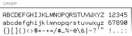 Designer of the pixel / programming typeface Crisp which can be downloaded at Proggy Fonts. [Google]
[More] ⦿
Designer of the pixel / programming typeface Crisp which can be downloaded at Proggy Fonts. [Google]
[More] ⦿
|
Chris Simpkins
[Source Foundry]
|
[More] ⦿
|
Christopher Simpkins
|
 Christopher Eric Simpkins (1974-2025), of Hanover, NH, grew up in Gainesville, Florida, and attended the University of Florida. He earned his medical degree from the Johns Hopkins University School of Medicine. Quoting from his obituary, Chrise was a skilled and dedicated transplant surgeon whose work saved many lives. His gentle bedside manner and concern for his patients and colleagues earned him respect and admiration throughout his career. Chris was honored with numerous teaching awards and affectionately known by colleagues and patients as the Gentle Giant for his calm, kind demeanor. In recent years, he served as a Senior User Experience Program Manager at Google, with a special interest in font development. Chris initiated and guided the creation of Google Sans Code, a new brand font designed specifically for reading and writing code, and he program-managed the design and development of other Google font families that were recognized with both internal and international design awards. Throughout his time at Google, Chris led a broad network of vendors and partnered with teams across the company to integrate these fonts to major Google platforms.
 As a principal of Sourve Foundry in Baltimore, MD, he designed the free (open source) monospaced typeface Hack (2015) specifically for writing source code. Dafont link. Open Font Library link. Behance link. Sourcefoundry link. Official obituary. [Google]
[More] ⦿
|
Christopher Widdowson
[Monospace fonts: Christopher Widdowson]
|
[More] ⦿
|
Code Saver
[Ryoichi Tsunekawa]
|
 Code Saver (2018) is a monospaced programming font published by Ryoichi Tsunekawa in 2018. It pays attention to the curvatures, and optimal use of space. Free version at Dafont. [Google]
[More] ⦿
Code Saver (2018) is a monospaced programming font published by Ryoichi Tsunekawa in 2018. It pays attention to the curvatures, and optimal use of space. Free version at Dafont. [Google]
[More] ⦿
|
Coji Morishita
[M+ Fonts]
|
 [More] ⦿
|
Cormullion
|
Exeter, Devon, UK-based designer of the free programming font Julia Mono (2020). [Google]
[More] ⦿
|
Courier Code
|
A free typewriter typeface family published in 2014 at the Open Font Library: Bitstream's Courier 10 Pitch v. 2.0 was donated to the X Consortium under the MIT license in 1990. The license permits modifying and distributing the font. Courier Code is Bitstream's Courier 10 Pitch with two minor modification. The lowercase "L" has been altered to distinguish it more clearly from the number one. The zero has been modified to more clearly distinguish it from the uppercase "O". These changes make it more suitable for use in programming. [Google]
[More] ⦿
|
Crestaco
[Javier Cos]
|
Crestaco is a design and software development studio founded by Javier Rodriguez Cos (aka Madonna Mark II, b. 1972, Tarragona, Spain) and located in El Morell, Spain. Javier Cos is a graphic, type, and video game designer. His first typeface is Anvylon (2012), which is monospaced for use in programming and tabular material. Its rounded monoline design is reminiscent of the type used in early video terminals and line printers. Seleniak (2012) is based on the logo of the eponymous MSX video game. [Google]
[MyFonts]
[More] ⦿
|
CSDN
|
 This Chinese page compares fonts for coding and for small screens: Courier New, Andale Mono, Monaco, Profont, Monofur, Proggy, Droid Sans Mono, Deja Vu Sans Mono, Consolas and Inconsolata. [Google]
[More] ⦿
This Chinese page compares fonts for coding and for small screens: Courier New, Andale Mono, Monaco, Profont, Monofur, Proggy, Droid Sans Mono, Deja Vu Sans Mono, Consolas and Inconsolata. [Google]
[More] ⦿
|
Dae-Hoon Hahm
|
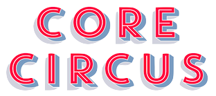 Type designer from Seoul, Korea. At S-Core, he co-designed the squarish Latin/Hangul typeface Core Dodam (2011), the shadow outline typeface Core Bandi (2012) and the hand-printed Core Narae (2011) with Hyun-Seung Lee. Hyun-Seung Lee, Dae-Hoon Hahm and Min-Joo Ham jointly designed the programmers' typeface Eco Coding (2012) and the huge Core Sans, Core Sans G (geometric), Core Sans M and Core Sans N, Core Sans NR, and Core Sans N SC families (supported codepages are MS Windows 1252 Latin1, MS Windows 949 Korean (Hangul) consisting of 11,172 letters and KS Symbols (Korean Symbols)).
 In 2013, Hyun-Seung Lee, Dae-Hoon Hahm and Min-Joo Ham jointly designed the layered type system Core Circus---as a reaction to the hugely successful Trend typeface by Latinotype, I guess. The slab version is Core Magic (2014). See also Core Circus Rough (2014) and Core Magic Rough (2014), both jointly designed by Hyun-Seung Lee, Dae-Hoon Hahm and Dong-Kwan Kim. Core Slab M (2013) is a 31-style companion of Core Sans M---it is a soft rounded slab with some seriffy tails mixed in with standard slab terminals. Core Mellow (2013) is a condensed organic rounded sans family that comes in 21 weights. In 2014, Hyun-Seung Lee, Dae-Hoon Hahm and Min-Joo Ham co-designed Core Sans D, Core Sans A, Core Rhino, Core Narae Pro (a Comic Sans alternative) and Core Deco (a 14-style art deco family). Core Escher (A and B) (2014) is a typeface family with impossible optical illusions, created by Hyun-Seung Lee and Dae-Hoon Hahm. Core Paint (2014) is a grungy paint-splatter typeface family by Dong-Kwan Kim, Hyun-Seung Lee and Dae-Hoon Hahm. In 2015, Hyun-Seung Lee, Dae-Hoon Hahm and Dong-Kwan Kim co-designed the grotesque typeface family Core Sans E and added the soft and rounded Core Sans R to the S-Core Sans series, as well as Core Sans B. In 2016, they added the rounded small x-height family Core Sans BR and the geometric sans family Core Sans C. The rounded version of Core Sans A, called Core Sans AR was designed in 2016 by Hyun-Seung Lee and Dae-Hoon Hahm. The rounded version of Care Sans C, called Core Sans CR, was designed in 2016 by Hyun-Seung Lee, Dae-Hoon Hahm, and Dong-Kwan Kim. The neutral Core Serif N was added in 2016 by Hyun-Seung Lee, Dae-Hoon Hahm and Dong-Kwan Kim. [Google]
[MyFonts]
[More] ⦿
|
Damien Guard
[Envy Technologies Ltd]
|
[More] ⦿
|
Dan Benjamin
[Hivelogic: Top 10 Programming Fonts]
|
[More] ⦿
|
Dan Mecklenburg
|
Aka Code Warrior. American creator (b. 1965) of the squarish typeface Smooth Pet (2015), which is based on the font used on the Commodore PET. He also made DEC Terminal Modern (2015), which is based on the font of the Digital Electronics Corp's VT220 video terminal (circa 1983). Dafont link. [Google]
[More] ⦿
|
Daniel Gamage
|
 Portland, ME-based designer of the free polka dotted typerface Tilastia (2015).
 In 2017, he designed the monospaced typeface family Alloca Mono. Even though it has hipster elements, it could be used as a programming font. Behance link. [Google]
[MyFonts]
[More] ⦿
|
David B. Lamkins
|
Designer, with Susan G. Lesch, of a free Mac bitmap font: Anonymous is a nonproportional or monospaced 9 point bitmap font designed for programming, and for distinguishing between characters that can easily be confused in the Macintosh reserved ROM font Monaco 9. Mark Simonson created the freeware monospace truetype version Anonymous (2001). See also here. [Google]
[MyFonts]
[More] ⦿
|
David Jonathan Ross
[DJR Type]
|
 [MyFonts]
[More] ⦿
[MyFonts]
[More] ⦿
|
Degarism Studio
[Deni Anggara]
|
 Berlin, Germany and/or Medan, Indonesia and/or Bandung, Indonesia-based designer who set uo first Degarism Studio and, in 2017, Formatype Foundry.
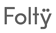
 His typefaces from 2016: Formatif Std (sans), Fortika Display (first published by Regario), Mono RGO (an octagonal typeface family first published by Vial Work, it has one free weight), and Metrisch (first designed with Gumpita Rahayu). I have no clue as to who is who in this Indonesian conundrum. I suspect that Deni Anggara only did the artwork and not the fonts, but it would be great if he could say that up front. He designed Fold No.21 Mono and Neutrif Pro. Typefaces from 2017: Neutrif Studio (a geometric sans), Neurial Grotesk (published in 2018 by Indian Type Foundry), Biotif (grotesque), Folty (a geometric sans), Mono RGO Pro. Typefaces from 2018: Monorama (a squarish octagoinal caps only typeface family published at Indian Type Foundry), Alliance (an 28-style grotesk sans), Rileno Sans (geometric sans). Typefaces from 2019: Regio Mono (a great monospaced choice, even as a programming font), Folito (a stylish modernist sans at Indian Type Foundry), Blimone and Blimone Inktrap, Aktifo (a geometric sans by Deni Anggara and Boyan Nurdiansyah). Aktifo, in 28 styles, covers Latin and Cyrillic. Typefaces from 2020: Bombay Mono (an octagonal typeface at Indian Type Foundry), Fracktif (geometric and grotesk at the same time). Behance link. Another Behance link. Cargo Collective link. Creative Market link. Old studio Formika link. [Google]
[MyFonts]
[More] ⦿
|
Deni Anggara
[Degarism Studio]
|
 [MyFonts]
[More] ⦿
[MyFonts]
[More] ⦿
|
Dharma Type
[Ryoichi Tsunekawa]
|
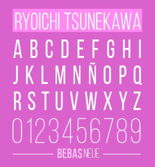 Yet another foundry of Nagoya, Japan-based designer Ryoichi Tsunekawa, who also runs Flat-It, Prop-A-Ganda, and Holiday Type. The first download is the industrial grotesk typeface Bebas Neue (2010), which was followed in 2014 by Bebas Kai, in 2018 by Bebas Neue Semi Rounded and Bebas Neue Rounded, and in 2019 by Bebas Neue Pro. Bebas Neue can now be had for free at Open Font Library and at FontFabric, where new weights and a Cyrillic were added. Bebas Neue v2 is free at Github and Google Fonts. Dedicated web site.
 The connected signage typeface Sneaker Script and the 19th century set of ornaments Gothic Extras followed in 2012 and 2011, respectively. Great Victorian (2012) follows the prototypical Victorian style. In 2015, Dharma Type published the great ultra-black creamy signage script Piepie. In 2016, he published the powerful layered Mighty Slab. Typefaces from 2017: Pansy Bo (calligraphic), Nothing (script), Daisy Lau (calligraphic), Banana (script), Lily Wang (calligraphic), Calling Code (monospaced programming font), Commuters Sans (elegant wide sans), Mighty Slab, Rigid Square (octagonal), Taro (sans), Concrete Stencil. Typfaces from 2018: Victorian Orchid (a transitional text typeface characterized by a Victorian era A and a frolicking lower case g), Dr Slab (an extraordinary layerable and colorable rounded slab poster typeface), Code Saver (a condensed monospaced programming font), Sometype Mono (a free programming font family; MyFonts link). Typefaces from 2019: City Boys Soft, City Boys (sans), Slow Tempo (a relaxed sans family), Baby Baby (an experimental layerable font), Dharma Gothic Rounded. Like Dharma Gothic, it is an antiqued condensed sans serif designed inspired by 1800s-style wood type. It comes in 42 styles. Typefaces from 2022: Debugger (a 6-style octagonal monospaced programming font). Dafont link. Creative Market link. Behance link. Graphicriver link. Adobe link. [Google]
[MyFonts]
[More] ⦿
|
Dimitre Lima
[HiType (was: DMTR.ORG)]
|
[MyFonts]
[More] ⦿
|
DJR Type
[David Jonathan Ross]
|
 DJR Type (Conway, MA, and before that, Deerfield, MA, and before that Los Angeles, CA, and before that, Lowell, MA) stands for David Jonathan Ross Type. Originally from Los Angeles, he was a student at Hampshire College in Amherst, MA, where he studied information design and typographic tradition. In 2007, he joined Font Bureau as a junior designer and was assisting with custom projects and expanding Font Bureau's retail library. Soon after that, het set up DJR Type. In 2016, DJR Type joined Type Network and pulled all his typefaces from MyFonts. He also runs Font of the Month Club.
 In 2018, he was the tenth winner of the Charles Peignot Prize. His typefaces: - Manicotti (2010). An ultra reversed-stress Western saloon style typeface that won an award at Modern Cyrillic 2014. DJR Manicotti won an award at TDC2 2007. For a free lookalike, see Plagiacotti (2009, Saberrider).
- Lavinia.
- Climax Text (2006) is a text and display series that was designed for Hampshire's student newspaper.
- Trilby (2009, Font Bureau). Trilby is based on a 19th century French Clarendon of wood type fame.
- Condor (2010, Font Bureau). This is a 60-style art deco family. By 2020, it had a 3-axis (weight, width, italic) variable version.
- Turnip (2012) is an angular and manly text face, also published at Font Bureau.
- In 2013, Ross and Roger Blcak revived Nebiolo's Forma for the redesign of Hong Kong Tatler, a fashion mag, supervised and commissioned by Roger Black, who was then based in Hong Kong. Read about the whole process in this piece by Indra Kupferschmid. Page specially dedicated to DJR Forma. In 2021, Belgian national broadcaster VRT picked DJR Forma for all its entire range of media.
- Bungee (2013, Google Fonts) won an award at TDC 2014. This homeless typeface, which comes in Regular, Hairline, Inline, Outline and Shade versions, is free: Bungee is a font family that celebrates urban signage. It wrangles the Latin alphabet to work vertically as well as horizontally.
- In 2014, David Jonathan Ross created the formidable 168-style programming font family Input (Font Bureau). Input is free for private use. It won an award at Modern Cyrillic 2014 and in the TDC 2015 Type Design competition. See also the proportionally spaced typewriter family Input Sans.
- Gimlet (2016). A 112-style Opentype family loosely based on Georg Trump's 1938 typeface, Schadow, and advertized as funky and functional. Ross writes: Gimlet is half Schadow, half imagination, and nothing else. And like its namesake beverage, Gimlet is a little tart, a little sweet, and can really pack a punch. Gimlet Variable Bold Condensed followed in 2019. Gimlet XRay (2020) is an An experimental colorized version of Gimlet that exposes what goes on under the hood of a variable font, visualizing control points, bounding boxes, kerning, etc. Amazingly, this variable color font has six axes, weight, width, oncurve point size, offcurve point size, glyph utline weight and point outline weight.
- Fern and Fern Micro (2014, Font Bureau). A Venetian typeface designed for screen.
- Output Sans.
- Fit (2017, by David Jonathan Ross and Maria Doreuli). A tall black display family that runs from ultra-compressed to very wide. It screams Use me for the Oscars! Fit was first developed as a variable font. It won an award at Granshan 2017.
- DJR Lab, or Lab Variable (2017), is a free pixelish variable font.
- Under miscellaneous, we find an untitled French Clarendon and an untitled semi-serif.
- Font of the Month Club fonts from 2017: Nickel, Roslindale (Roslindale is a text and display serif that takes its inspiration from De Vinne, a Victorian oldstyle typeface named for the nineteenth century printer and attributed to Gustav Schroeder and Nicholas Werner of the Central Type Foundry), Zenith (blackboard bold), Crayonette (a revival of Henry Brehmer's scriptish Crayonette, 1890), Bild (a compressed headline font based on the American gothic type styles from the 20th century; a variable font followed in 2019), Pappardelle Party (spaghetti Western style), Roslindale Text, Klooster (followed in 2021 by Klooster Thin).
- Font of the Month Club fonts from 2018: Bradley DJR (a revival of the blackletter typeface Bradley, 1895, William H. Bradley), Extraordinaire, Rhody (slab serif), Map Roman (an all caps vintage mapmaker font), Output Sans Hairlines, Rumpus Extended, Roslindale Light, Merit Badge (a variable color font).
- A tech type virtuoso, he charmed me with his art deco variable font Extraordinaire (2018) that was influenced by the diamond-shaped forms found in the center of the city of Sao Paulo, Brazil.
- Typefaces from 2019: Heckendon Hairline, a condensed Clarendon.
- Typefaces from 2020: Dattilo (a variable style revival of Aldo Novarese's slab serif Dattilo (1974)), Pomfret.
- Typefaces from 2021: Rustique (rustic capitals), Megazoid (a chunky geometric sans), Job Clarendon (with Bethany Heck, who wrote: Job Clarendon is an homage to job printing---display-heavy designs made for posters and flyers in the heyday of letterpress printing. This style of Clarendons was wildly popular in this genre of work, and I've always been interested in how adaptable they were. The style was fattened, squished and stretched to accommodate lines of text both short and long and type foundries across the globe each found their own unique features to contribute to the Clarendon stew. Ross pulled the design to both extremes but had his work cut out as he explained: The chasm between Hairline and Black was far too wide to interpolate across effectively, so I incorporated new drawings in the Extra Light, Regular, and Bold weights to act as additional tentposts to support the design).
Speaker at ATypI 2016 in Warsaw and at ATypI 2017 in Montreal. Klingspor link. Home page. Adobe link. [Google]
[MyFonts]
[More] ⦿
|
DX4WIN Software
|
Fonts with slashed zeros. Download. This file includes: - Andale Mono (Monotype, 1993-1997).
- Crystal (Jerry Fitzpatrick).
- Glass Gauge (URW, 1998). Rounded and octagonal.
- Ham. By DTP Software.
- Hyperfont (1993).
- K9YY_B1, K9YY_B2, K9YY_B3, K9YY_C1, K9YY_C2, K9YY_C3. From DTP Software.
- Slashed Zero Arial (Seagull Scientific Systems, Inc, 1998).
- T93Y.
- VAG Round (Digital Typeface Corp, 1991).
[Google]
[More] ⦿
|
Eduardo Manso
[Emtype]
|
 [MyFonts]
[More] ⦿
[MyFonts]
[More] ⦿
|
Emtype
[Eduardo Manso]
|
 Emtype is the foundry in Barcelona that was founded in 1997 (in Buenos Aires) by Eduardo Manso. Eduardo was born in Buenos Aires in 1972 and studied graphic design at the Escuela de Artes Visuales Martín A. Malharro and at the Universidad Nacional de Mar del Plata, both in Mar del Plata. Art director of the Argentinian graphic design mag "el Huevo". He currently lives in Barcelona. His typefaces include the pixel font family Dixplay (2003, Emtype), the grunge font Eroxion (1997) and Rina Linea and Rina (2001), all at Bitstream, the Scotch roman text family Bohemia (2004), Andromeda ([T-26]), Garadonis, Fluxus, Ovalus (2005, free dot matrix face), Relato (2005, advertised as a muscular serif family), Relato Sans (2005, which won an award at TDC2 2006), Merss (2000, ITC), Argot (2004, winner of an award at TDC2 2004), Flour, and Flour Inline.
 Argot was renamed Bohemia (published in 2004 with Linotype), and won an award at the Linotype International Type Design Contest 2003. EMT Lorena won an award at TDC2 2007. He custom designed Sunday Times Modern (2008) for the Sunday Times. Still in 2008, he published Geogrotesque, a semimodular geometric display typeface in 7 styles. Geogrotesque won an award at Tipos Latinos 2010. This was followed in 2009 by Geogrotesque Stencil and in 2015 by Geogrotesque Stencil Italic, Geogrotesque Compressed, Geogrotesque Condensed, and Geogrotesque Extra Compressed. In 2016, he added Geogrotesque Slab, in 2018 Geogrotesque Cyrillic, in 2019 Geogrotesque Expanded and in 2020 Geogrotesque Sharp (98 styles, and a variable font). He created the custom typeface La Grilla. Periodico (Text, Display) was originally commissioned by the Spanish daily newspaper 'ABC', and was published as a 30-font family with lots of old Spanish ingredients in 2011. In 2012 the London agency GBH commissioned Emtype to develop a custom typeface for the Puma football teams for use in the Brazil World Cup 2014 as well as in the national competitions. Ciutadella (2012) was originally commissioned by Mario Eskenazi's studio. It is a versatile geometric sans serif, a simple, clean and direct family. In 2015, Emtype published Ciutadella Rounded and in 2016 Ciutadella Slab and Ciutadella Display. Typefaces from 2014: Shentox. This squarish nearly monoline typeface family started out from British license plates. Camber (2015) is a workhorse sans typeface, slightly squarish and on a geometric base. Eduardo's keen eye strikes again in the variable width grotesque typeface family Akkordeon (2017), whose black weight will give Impact serious competition. Akkordeon Slab< (2017) is equally impressive. Other typefaces from 2017: Isotonic (a rounded almost monoline sans typeface based on Ciutadella). Corporate typefaces: Sunday Times, Lorena Serif (newspaper type; certificate of excellence in TDC2 2007). Typefaces from 2018: Steradian (a geometric sans), Aribau Grotesk (a low contrast geometric sans). Typefaces from 2019: Approach (a low contrast sans in the style of the earliest grotesques, with slightly angled terminals and plenty of elbow pipes, and a characteristic snub nose "1"). Typefaces from 2020: Approach Mono (a typewriter or programming font family derived from Approach), Majorant (a stocky monoline avant-garde geometric sans). Typefaces from 2021: Classike (a 13-style high contrast squarish display typeface inspired by art deco), Chiaroscura (Eduardo writes: inspired by an art technique, Chiaroscura is a display typeface that conveys elegance and finesse; it has high contrast, sharp terminals and compact vertical proportions that makes it ideal for headlines), Inklination (a low x-height neo-grotesque with five romans, ten italics, five monospaced versions and 50 fun fists and icons). Interview in 2013. Myfonts page. Linotype page. Behance link. FontShop link. Klingspor link. Catalog of Eduardo Manso's typefaces. View Eduardo Manso's typefaces. View even more of Eduardo Manso's typefaces. [Google]
[MyFonts]
[More] ⦿
|
Envy Technologies Ltd
[Damien Guard]
|
Damien Guard (Envy Technologies Ltd) resides in the parish of St. Peter Port, capital of an island called Guernsey that sits just off the coast of France in the English Channel. He created the screen font families Envy Code A, Envy Code R and Envy Code B (2006). FON and/or truetype formats. See also here. Typedia link. He used iFontMaker to draw the fat typeface Damien Typewriter (2011) and Damien Vertical (2011). FontStructor of Curvature (2008-2011), Atari ST (2011), Amstrad CPC (2011), Lickable 5 (2011), Magic 5 (2008), Magic 5 Bold (2008), Subpixel5 (2011), Tiny (2008). Most of these are screen or pixel fonts. [Google]
[More] ⦿
|
Epic Coders (or: Epic Shop)
|
Timisoara, Romania-based designer of Epic Outlines (2015, an icon font with 1000+ vector format icons). It seems trhat there is also a programming font embedded in it. Creative Market link. [Google]
[More] ⦿
|
Eric Hamiter
|
Designer of the monospaced programming font Edlo (2011), which is a minor modification (in the zero and the lower case ell) of Stephen G. Hartke's Aurulent Sans (2007). [Google]
[More] ⦿
|
Etcetera Type Company (or: ETC; was: Finck Font Co)
[Tyler Finck]
|
 Graphic designer and musician (b. 1982) at the New York studio AWP who grew up in Maine and is currently based in Ithaca, NY. In 2018, he founded Etcetera Type Company, which is based in Spencer, NY.
 His typefaces: - The fat counterless caps typefaces Blackout and Blackout Midnight (2008). Blackout Sunrise (2013) is an outlined face and Blackout 2am is a reversed font. Blackout Noon followed in 2014. Free download of Blackout at the League of Movable Type.
- Ostrich Sans (2011). This typeface comes in many weights, including a beautiful Ostrich Sans Inline and a hairline. In 2016, this was followed by the layered monoline sans typeface family Ostrich Proper (+Inline).
- Knewave (2011, Google Web Fonts). A brush signage face. League of Movable Type link.
- Porter Sans (2013). A large wide headline type family. It has a free inline outline weight. Later additions include Porter Sans Ink (2014) and Porter Rough (2016). Porter FT, which includes new rounded styles, was added in 2017.
- Elm (2013). Hand-printed.
- Lickety Split (2013). A crayon or brush face.
- Almost (2013). A poster typeface.
- Guilder (2011-2013). A free typeface family with an inline thrown in.
- Ithaca Sans (2013).
- Fartlek Sans (2014). A handcrafted poster typeface.
- Katahdin (2014). A free font.
- Upstater (2014). A a classical American gothic with shaded and layered styles.
- Grandstander (2014). A comic book face. Grandstander Classic (2017). In 2020, Grandstander became a free Google font---and a two-axis variable font was added for the occasion.
- Boo City (2014). A pixel face.
- Didactic Display (2014). A grungy typeface.
- Upstater Ink (2014). A grungy typeface.
- Finck32A (2014).
- Saturnight (2014). A heavy brush typeface.
- Typocopia (2014). A letterpress emulation typeface.
- Taurus Mono (2014). An outline font.
- Southpaw (2014). A nice informal hand.
- Chawp (2014). A crayon face.
- Mr. Brunch (2014). A brush face.
- Gluten FT (2014).
- Flabbergast (2015). A didone.
- Korsque (2015). A layered typeface.
- Bico (2015). A rounded condensed organic typeface.
- Ichabod (2016). An antiqued serif typeface.
- Altitude Condensed (2016).
- Imbue (2016). A condensed didone poster typeface (also called a skyline typeface) at Google Fonts. See also Imbue FT (2017). ETC Imbue (2019) is a variable font version of Imbue with a variation in optical size from Text to Display.
- Retrograde (2016). A monoline and monospaced organic sans.
- Plainview (2016). A squarish and fat typeface.
- Nonesuch (2016). A condensed sans.
- Juju (2016). An octagonal layered typeface family.
- Atiga (2017).
- Mr Brunch FT (2017). A children's book font.
- League Mono (2017). A free font.
- ETC Gluten (2018). An organic font family.
- ETC Epilogue (2018). A variable sans font. Github link. Google Fonts link. Prologue (2020) is a reworking of ETC Epilogue.
- ETC Anybody (2018-2020). A 72-style variable font with weight, width and slant axes. Free at Google Fonts. He writes: Anybody is a big family that combines an affinity for Eurostile plus a heavy dose of 90s inspiration. It's flexible enough to adapt to a variety of situations. From UltraCondensed to ExtraExpanded, type set in Anybody can take up a tiny amount of horizontal space or so much space that you'll need several lines. Its high x-height and low cap height help exaggerate extreme widths and weights. Github link.
- Furrow (2018). A grungy sans.
- Cease (2018). A squarish techno typeface.
- ETC Trispace (2019). A variable font with weight and width axes, based on League Mono.
- ETC Tourney (2019). A variable octagonal font, playing on the theme of outline versus inline. Free Google Fonts download (2020-2021). Github link.
- Struthio (2019). A rounded sans.
- Birdo (2020). An inline typeface.
- Gluten (2021). A free script font family at Google Fonts.
Alternate URL, called The League of Movable Type. Typedia link. Kernest link. League of Movable Type link. Creative Market link, Klingspor link. Dafont link. Home page. Creative Market link. Abstract Fonts link. Google Plus link. YWFT link. Old home page. Behance link. Github link. [Google]
[MyFonts]
[More] ⦿
|
Fábio Duarte Martins
[Scannerlicker (was: Loligo Vulgaris)]
|
 [MyFonts]
[More] ⦿
[MyFonts]
[More] ⦿
|
Fabrizio Schiavi
[Fabrizio Schiavi Design (or: FSD)]
|
 [MyFonts]
[More] ⦿
[MyFonts]
[More] ⦿
|
Fabrizio Schiavi Design (or: FSD)
[Fabrizio Schiavi]
|
 Fabrizio Schiavi was born in Ponte dell'Olio in the Piacenza province in 1971. FSD Fabrizio Schiavi Design in Piacenza was opened in 1998. With Alessio Leonardi, he co-founded Fontology. He also co-launched the experimental graphics magazine Climax in 1994.
 Bio at FontFont where he made FF Mode 01, FF 0069, FF GeabOil, FF9600, FF Trade 01, FF Steel Mix, FF Steel Ring, FF Steel Jones. [T-26] designer of D44 (1994), Lithium (1994, dingbats), Moore895 (1994), Moore899 (1994), Sidewalker (1994), Exit (1988). Many of his typefaces are grungy such as Washed (1994). Some are minimalist, such as Monica Due (1999), Monica (1999), and Eco (2001, developed from a logo in the 70s for Ageco). The latter three fonts are very geometric in nature. Other fonts: Washed (1994), Parakalein, Aurora Nintendo (1995), Aurora CW (1995), Mode01 (1995), GeabOil (1995), 9600/0069 (1995), Fontology (1995), CP Company (2000: a corporate sans), FSDItems (2001), FSDforMantraVibes (2001), Pragmata (2001, monospace, designed for programs), PragmataFlash (2002, a pixel font), Pragmata Pro (2011, still monospaced), Sys (2002), SysFlash (2002, a pixel font), Sys 2.0 (2012, a condensed sans designed for very small print), Virna (2003, a multiline typeface for Italian MTV, discussed here). The Pragmata and Sys series were optimized for screen usage. In addition, Sys has many ink traps, so it prints well at small sizes, and is more legible than Verdana. He does some custom typeface design, such as the innovative sans serif family called CP Company (2000). Other clients include Al Hamra Complex Kuwait, Nike, MTV, YU, Beretta, Abitare magazine, Ferrari and Philip Morris. In 2007, he produced a stencil and signage font, Siruca (see also here), for the Al Hamra Complex, one of highest skyscrapers in the world, located in Kuwait. Siruca Pictograms (2008) is free. In 2015, he followed that up by a non-stencil rounded sans called Sirucanorm: Designed using golden ratio formulas, it's inspired to DIN and Isonorm typeface. In 2013, he published Sys Falso, Abitare Sans (30 weights, originally commissioned by the group Rizzoli Corriere della Sera. Abitare is an Italian magazine). Typefaces from 2014: Nove (a German expressionist typeface inspired by B movie typography: Nove freshly reworks exploitation film era movie poster lettering, refitting the genre to a contemporary audience. The expressive typeface was done for a Nike Italy spoof campaign featuring 1970s cult film director Enzo Castellari and a recently found film reel from his archives, featuring several current Italian athletes and American basketball star Kobe Bryant). The rounded sans typeface Widiba Bank (2015) was co-designed with Jekyll & Hyde in 2015 for the brand identity of the new bank of Gruppo Monte dei Paschi di Siena. In 2016, he designed the custom corporate typeface R&M in art nouveau style. In 2020, he released the (variable) retail version of CP Company called oook. In 2021, he released Nure (a 54-style sans font family that includes a three-axis (weight, optical, width) variable font). At ATypI in Rome in 2002, he spoke about the need for more fonts. Hellofont link. FontShop link. Font Squirrel link. Showcase of Fabrizio Schiavi's typefaces. [Google]
[MyFonts]
[More] ⦿
|
Face Type
[Marcus Sterz]
|
 Austrian foundry located in Vienna, est. in 2008 by Marcus Sterz (b. 1971) and Andrej Waldegg. MyFonts link. Unless exlicitly mentioned, all typefaces are by Marcus Sterz. You Work For Them link.
 - Adria Grotesk (2013). This was followed by Adria Slab (2014).
- Aldrans (2009, minimal sans).
- Anymals (2008) is one of my favorites: it has dingbats of imaginary undersea monsters.
- Asimov (2009). What is this?
- Baustelle Thin (2009, hairline sans).
- Bikra (2010, Plain and Stencil).
- Blitzplakat (2009). A poster face, white on black.
- Darjeeling (2010) is a display family inspired by both Optima and Bodoni.
- Doll (2008), Dollbats (2008).
- Flint (2008). A hand-drawn squarish face.
- Gerber (2009, pixel face).
- Grafinc (2009). An ultra fat art deco. See also Grafinc Rounded.
- Hausbau (2009, experimental).
- Idrans Medium (2010). A poster face.
- With Georg Herold-Wildfellner, he created the Victorian family Ivory in 2009.
- Letterpress (2009) is an experimental grungy family in which he mixes glyphs of three classics, Jakob Erbar's Phosphor (Ludwig&Mayer Foundry, ca. 1923), Aurora (1912, Johannes Wagner Foundry) and Permanent Headline or simply Headline (Karlgeorg Hoefer).
- Lignette Script (2011) is an extensive loopy monoline script font.
- Loki (2009). A decorative pixel family.
- The Marlowe family (2010) is pure art deco elegance---a play on geometric forms and elegance. Subfamilies include Marlowe Cocktail and Marlowe Swirl.
- Moki (2011).
- Mono Lisa (2020) by Marcus Sterz, in collaboration with programming experts Andrey Okonetchnikov and Juho Vepsäläinen. A commercial programming font to compete with Fira Code, Source Code, and Jetbrains Mono.
- Motto (2009). An art deco typeface in the style of the Italian Futurismo of the 1920s, designed for using with two colors.
- Mouse (2008-2009, pixel), Mousedings (2008).
- Newcastle (2014).
- Notdef (2009). A strange experiment.
- The handwriting typeface Palma (2008).
- Pinback (2009, techno).
- Plaquette (2018). A collection of retro typefaces ranging from Victorian to Bauhaus to the sixties.
- Publica Sans (2016). A clean geometric sans typeface family. Publica Play (2016) is a playful, and even more organic, sans that exploits many OpenType features. Publica Slab (2017) and Publica Sans Round (2021) complete the collection.
- Scrap Outline (2008).
- Slug (2009). A geometric typeface made for bicoloring.
- Status (2009, super fat art deco).
- Strangelove Next and Strangelove Next Slab (2010). This beautiful typeface was inspired by Stanley Kubrick's movie Dr. Strangelove. The original titles were designed by Pablo Ferro, who is one of the most acclaimed film title designers, especially famous for his hand-drawn lettering. Dr. Strangelove is a hairline face.
- Substance (2013). A sans family.
- Wenzel (2009). Handprinted.
Facetype's typeface library. See also here. View Marcus Sterz's typefaces. Klingspor link. Behance link. Fontspring link. [Google]
[MyFonts]
[More] ⦿
|
Filip Kraus
|
 Filip Kraus (b. 1986) studied at the Type Design and Typography Studio of the Academy of Arts, Architecture and Design in Prague, class of 2014. His graduation typeface was Exalt. He designed the BC Mikser typeface (2014: monospaced and perhaps a programming font) and several other typefaces, among them the new typeface for Prague street signs. As a graphic designer he collaborates regularly with Jan Novak. Since 2012 he has worked as a teacher at the Michael Secondary School in Prague. His typefaces are published by Briefcase Type. BC Mikser won an award at TDC 2016. [Google]
[More] ⦿
Filip Kraus (b. 1986) studied at the Type Design and Typography Studio of the Academy of Arts, Architecture and Design in Prague, class of 2014. His graduation typeface was Exalt. He designed the BC Mikser typeface (2014: monospaced and perhaps a programming font) and several other typefaces, among them the new typeface for Prague street signs. As a graphic designer he collaborates regularly with Jan Novak. Since 2012 he has worked as a teacher at the Michael Secondary School in Prague. His typefaces are published by Briefcase Type. BC Mikser won an award at TDC 2016. [Google]
[More] ⦿
|
Finaltype
[Hans Heitmann]
|
 Hans Heitmann or Hans-Richard Heitmann. Typography teacher (b. 1951) at the Fachhochschule Augsburg, Germany. Designer of the Fraktur-Roman hybrid font Fraktoer (1996). He also made the lapidary sans family Galathea (1990, Berthold).
 After he set up Finaltype, he released these fonts: - Geoso (2019). A 47-style low-contrast geometric sans family.
- Monoflow (2019). By Hans Heitmann and Johannes Ammon. Monospaced and perhaps useful for programmers.
- Romis (2020). In the Trajan style.
- Byzan (2020). A heavy brush font.
- Distel (2019). An uncial font.
- Benedikt (2021). a 14-style sans and serif display family.
- Legit Sans (2021). A very legible sans text typeface family. Followed by Legit Sans Soft, Legit Serif and Legit Serif Soft in 2021.
Fontsquirrel link. [Google]
[MyFonts]
[More] ⦿
|
Flat-It
[Ryoichi Tsunekawa]
|
 Japanese foundry in Nagoya that offers free and commercial Latin fonts made by Ryoichi Tsunekawa, who also runs Bagel & Co, Dharma Type, HolidayType and Prop-A-Ganda. Most of his work was done at Flat-It. His typefaces:
 - 2021: Best Choice (a monospaced sans), Short Films (an art deco sans in twelve styles), Golden Decades (a 16-style sans that borrows from several sans genres).
- 2019: Mid Century Sans, Tamba Sans, Rama Gothic Rounded, Bio Sans Soft.
- 2018: Fairweather (clean sans), Kaneda Gothic (a basic severe condensed gothic), Vincente (a tall condensed display didone family).
- 2017: Calling Code (monospaced programming font), Commuters Sans (elegant wide sans), Mighty Slab, Rigid Square (octagonal), Taro.
- 2016: Bio Sans, Gomme Sans, Quiet Sans, Siro (sans).
- 2014: Pero (condensed rounded organic sans), Kiro (minimalist organic sans), Graphie (modern geometric sans), Compasse (semi-condensed sans), Como (rounded sans).
- 2013: Spoon (organic, rounded, monoline sans family), Antoinette Monogrammes (based on early 1900s embroideries by Janon Co; with frames), Clonoid (a sci-fi family that pays tribute to arcade game logos in 80s and 90s), All Round Gothic Demi (a sans based on perfect circles), Griffon (copperplate titling face), Antique Spenserian (based on Spencerian Script by Mackellar, Smiths and Jordan).
- 2012: Geom Graphic (a retro sci-fi family that can be considered as a squarish version of Eurostile), Sheepman (modular), House of Cards, Space Colony (a lovely monoline futuristic techno family), Rama Slab (an antiqued wood-style slab serif), Rama Gothic. An antiqued sans serif family that recalls the wood type era), Diamond Ring (an art deco typeface inspired by Japanese cosmetics-packaging designs and posters from the late 19th and early 20th centuries), Controller (techno meets organic in this rounded squaris sans family), Revolution Gothic (an extended version of PAG Revolucion), 2008, which was inspired by retro propaganda posters and wallpainting in Cuba from the 60s to 80s; Revolution Gothic P followed in 2014), Diamond Ring (art deco).
- 2011: Yummo (monoline organic sans), Sheepman (based on the wood type No. 506 of William Page), Onick (2011, an art deco neojaponist fat display face done for Wordshape), Shiva (2011, hairline sans), Mocha Mattari (2011, grunge), Dharma Slab (2011, inspired by 1800s-style wood type), Dharma Gothic (2011, +P), Rama Gothic (2011, also inspired by 1800s-style wood type), Dimensions (2011, squarish), Design System (2011, a large family based on 70s style techno typefaces), Speedometer (2011, condensed piano key face).
- 2010: Stereo Gothic (2010: an extended all caps slightly techno sans family), Behrensmeyer Vigesimals (2010, a pixel format connected script), Civilite Vigesimals (2010, pixelized Civilite), Flat10 Arts and Crafts (2010), Flat20 Hippies, Flat10 Segments (2010), Flat10 Antique (2010), Flat20 Gothic (2010), Flat20 Streamer (2009, pixelized ribbon font), Flat10 Fraktur, Flat10 holy, Flat10 Holly, Flat10 Stencil, Flat20 Headline, Flat10 Artdeco, Word From Radio (2008-2010). Cigarette (2007, Bauhaus/Peignot-style).
- 2009: African Elephant Trunk (2009), Concrete Script, Concrete Stencil (2009, a stencil calligraphic script), Perfect Magic (2009), HT Maison (2009, signage face), HT Farmacia (2009, connected school script), HT Espresso (2008, upright script), HT Cartoleria (2008, connected script), HT Cafe (2009), Sneaker Script (2009).
- 2007-2008: Bistro Mono (2007, an awkward monoline face), Thousands (2007), Balaghat (2008), Garash Script (2008, a Halloween face), Woodstamp (2008), Banana (2008, brush script), Rebel Train Goes (2007, a piano key font), Rouge (2007, an elegant lipstick-on-the-bathroom-mirror pair of typefaces), Yasashii (2007, a great geometric art deco Broadway-style family, famous for being used in Damien Chazelle's La La Land, the 2017 blockbuster movie), Lily Wang (calligraphic script), Nothing (2007), Garash (2007, Arabic simulation), Moon Star Soul (2007, Western saloon font), Grandes Vacances (+ Une, Deux) (2007), Pansy Bo (calligraphic), Dremie (2007, an art deco headline typeface with Open and Fill weights), Grandes Vacances (2007, based on 19th century billboard letters), Xesy (2007, a fantastic "ronde" high-contrast upright connected script), Deluta Black (2007, a soft blackletter), Cotoris (2007, a 4-style family that takes inspiration from Koch Antiqua and the art nouveau movement).
- 2006: Daisy Lau (calligraphic), Agedage Luxeuil (based on a monasteric script from the 8th century), Agedage Cancellaresca, Agedage Beneventan, Agedage Simple Versal (2006, Lombardic caps simplified), Amsterdam Modern (art nouveau influences), Flat10 [Holly, Holy, Stencil, Fraktur] (a set of pixel typefaces), Machiarge (a heavy connected brushed signage script), Chic Hand (connected script), Double Dagger (geometric stencil family), Fault (an art deco striped lettering face), Killernuts (headline serif typeface with brush stroke endings), Underconstructionism! (a rectangular look family with associated dingbats), Machia (decorative script), Kiwi (geometric hairline), Bagel (roundish comic book face), Jaguarundi (distressed), Boycott (distressed), Tokyotrail (futuristic techno family), Coconut (noisy outline face), Coconut Split, Fresh Tomato (LED simulation), El Piedra (letterpress emulation), Dried Tomato (LED simulation), Dutch Style, Mocha Harrar (great stencil face), 103 (experimental, Bank Gothic style), Airhead, ArealBlack, Awkward, BagelNew, BagelOld, Banbino, Bebas (2005, industrial sans), Bebas Kai (2014: free!), Bebas Neue (2010: free!), Bebas Neue Bold, Berlin89, Blackout (redesigned in 2011 as the ulta-narrow Dimensions), Boycott (grunge), Built-1970, Bunyan, Busted, Camera (2007), Canstop, Chiangmai (Thai simulation face), DBLline, Dijkstra, Dutchstyle, Fling, Graphite, Harcomaso, Hiexplosive, Hitech, Honeycomb, Junkmix, Kanatypo, KemikalHi, Machia (a calligraphic family), Meegoreng, Mikrob, Natsupopy, Overwork, Palsu, Plamo, Plasitico, REC001, REC002, REC003, Resistance, SQRT, STdigi (LED font), Shandy, Superstar, Tembaga, Tenaga, Tomodachi, Tragedia, Trucker, VRdigital, VRembroidery, Welcome2M, Workaholic, Zeebraa, plot-A, plot-K, Appendix 3, Gesso (grunge), Pusab (ultra round; one free weight), Sushitaro, Typewrong, Celtics Modern (a Celtic family of fonts). At T-26, he published CRZ (2006), Guppy, Ohana (octagonal), Picnica (2006), and Wearetrippin.
MyFonts link. Fontsquirrel link for their free fonts such as Bebas (2005, industrial sans), Boycott, Gesso, and Pusab. Typefaces from 2022: Senpai Coder, Madromit (a layerable futuristic font inspired by the early computer fonts), Tokyo Olive (art deco), Poipoi (a layerable 3d or bubblegum font). YWFT link. Bagel & Co. link. Klingspor link. Dafont link. Dafont link. Interview. View Ryoichi Tsunekawa's typefaces. Kernest link. Adobe link. [Google]
[MyFonts]
[More] ⦿
|
Fontesk
[Mikhael Khrustik]
|
Saint Petersburg, Russia-based designer of the monospaced programming font Lilex (2019), which is based on IBM Plex Mono (by Mike Abbink, Paul van der Laan and Pieter van Rosmalen) and inspired by Fira Code. Fontesk link. [Google]
[More] ⦿
|
Fonts for coding
[Ron Domingue]
|
Ron Domingue compared fonts used for programming such as Monaco, Inconsolata, Anonymous. In 2001, Mark Simonson designed Anonymous, a TrueType version of Anonymous 9, a freeware bitmap font developed in the mid-90s by Susan Lesch and David Lamkins. It was intended as a legible alternative to Monaco, the mono-spaced Macintosh system font. Raph Levien's monospaced programming font Inconsolata (2005) (see also here) is a relative of Franklin Gothic. [Google]
[More] ⦿
|
Generic
|
 Designer of free fonts at Open Font Library, such as Generic Mono II Regular (2014) and Generic (2014: +Medium, +Bold, +Regular). A user comments: It's functional on non-offensive, but its limited coverage and lack of bold and italics hold it back. It's hard to fault its basic design though. [Google]
[More] ⦿
Designer of free fonts at Open Font Library, such as Generic Mono II Regular (2014) and Generic (2014: +Medium, +Bold, +Regular). A user comments: It's functional on non-offensive, but its limited coverage and lack of bold and italics hold it back. It's hard to fault its basic design though. [Google]
[More] ⦿
|
Georg Seifert
[Schriftgestaltung]
|
[MyFonts]
[More] ⦿
|
Georgia Tech Research Corporation: 3270
|
The free octagonal monospaced programming font simply called 3270 was started in 1989 by Georgia Tech Research Corporation (GTRC), Atlanta, GA. Later updates were made by Jeff Sparkes (1990), Dick Altenbern (2004), Don Russell (2004-2005), Paul Mattes (1993-2011), Ricardo Banffy (2011-2017) and finally Ryan McIntyre of Nerd Fonts (2017), who added a plethora of icons. [Google]
[More] ⦿
|
Gianluca Sandrone
|
 Gianluca Sandrone is a graphic designer in Perugia and Bolzano. He started working at LaMatilde Studio in Turin, and obtained an MA in communication and graphic design from ISIA in Urbino, Italy, in 2014. In 2015 he started working as a collaborator at Bcpt and CoModo coop. in Perugia. In 2018 he began teaching editorial and graphic design at IID in Perugia.
 His typefaces: - In 2021, CAST released the wonderful monospaced Bauhaus-inspired typewriter family Xanti Typewriter by Gianluca Sandrone.
- BCPT Norcia (2019) is a custom didone stencil typeface designed for the brand identity of Renzini, one of the market leaders in the cold meat industry, a company with deep roots in Umbria.
- BCPT LG Corporate (2017). Sandrone writes: LG Corporate font was created more than 20 years ago, when Listone Giordano decided to move from traditional Bodoni used in its communications to a variation with much visual impact for redesign of its logo. [...] Therefore the studio decided to evolve the trademark into a complete titling font to be used systematically for the entire product collections.
- Issra (2021). A titling typeface.
- CocaCola (2017). A multiline display typeface custom designed for Mauro Bubbico, which now is officially part of the graphic identity of the Cola Cola Museum in Gravina di Puglia. It is inspired by lettering seen in Federico Fellini's d film credits.
[Google]
[More] ⦿
|
Good Programmer Typeface
|
A wiki on good typefaces for programming (distinguishing between 0 and O, i, 1 and l, 2 and Z, 5 and S, 8 and B, quotes, and so on, are important issues). As of this writing, the list includes the following, with Andale Mono and Bitstream Vera the clear winners: - Andale Mono (by The Monotype Corporation, free from Microsoft)
- BitstreamVera Sans Mono (by Bitstream, Inc.)
- Fixedsys or 8514OEM (Windows-specific)
- JMK/Neep
- Lucida Console
- ProFont
- Trebuchet MS
- Monaco
- Computer Modern
- Proggy Clean, Proggy Square, Proggy Small, and Proggy Tiny
[Google]
[More] ⦿
|
Göran Söderström
[Letters from Sweden]
|
 [MyFonts]
[More] ⦿
[MyFonts]
[More] ⦿
|
Grazil Ltd
|
Company in Brighton, UK, that sells the programming font Dank Mono (2018). [Google]
[More] ⦿
|
Griffin Moore
[Monolith Foundry (was: Pilgrim Fonts)]
|
[MyFonts]
[More] ⦿
|
Guillaume Vivies
|
During his AI studies at the University of Toulouse III, Guillaume Vivies designed New Code (2020), a free programming font with ligatures, forked off Office Code Pro (2015), which in turn is forked off Source Code Pro, the monospaced sans serif originally created by Paul D. Hunt for Adobe Systems Incorporated. [Google]
[More] ⦿
|
Hamish Macpherson
[The typography of code]
|
[More] ⦿
|
Hans Heitmann
[Finaltype]
|
 [MyFonts]
[More] ⦿
[MyFonts]
[More] ⦿
|
Hao Chi Kiang
|
Sweden-based designer / programmer who developed a free mono-spaced version of Alexey Kryukov's popular didone font Old Standard, and called it New Heterodox Mono (2019-2021). It is intended as a programming font. [Google]
[More] ⦿
|
Hasklig
|
The Hasklig monospaced programming font family was designed by Paul D. Hunt and Teo Tuominen from 2010-2012. At (Brazilian UI developer) Thiago Lucio Bittencourt's Github site. Another Github site. [Google]
[More] ⦿
|
Henning von Vogelsang
|
Designer who was based in Zurich and is now in London. In 2013, he started work on the sans family Hikari. He writes: Before the Haas Type Foundry released Helvetica in 1957, constructivist sans serif fonts were classified as Grotesk, a term that reflected the dismissive notion of typesetters in previous times. It was Art Deco and the Bauhaus movement, along with modernist architecture, fresh ideas and stricter shapes in interior design, a style influenced by industrial and technological developments, that made Grotesk fonts more popular over time. Ever since the introduction of Helvetica Neue, classicistic sans serif fonts have been domineered by this Swiss style. Over the last six decades, typesetters, designers and typographers remembered and used other constructivist sans serif styles, like Futura and Neuzeit. In the late 1980s, American classics like Trade Gothic and Franklin Gothic were used again in Advertising, so the American newspaper title style has been a second strong influence on sans serif fonts and Adrian Frutiger’s typeface for the Parisian airport, Frutiger, sparked a rennaissance of humanist sans serif fonts. It seems impossible to reimagine a constructivist or classicistic sans serif without taking one of these previous styles in account. However, its tone of voice can still be different. [..] We interpret new things with the language we learned from existing things. It's interesting to see how typefaces like Helvetica Neue gained popularity in Japan, a country and culture that in the last century stood for discipline, strictness, but also beauty and simplicity in design and architecture. But it was used for English words, an inspill of Western influenced cultural elements, or the Japanese interpretation of those elements. Hikari is a font with a Japanese touch. It is primarily a Latin font with no relations to Hiragana, Kanji or Katagana. And yet, the sense for proportions, a strict architecture and its overall feeling transmits a faint memory of Japanese post war culture assimilating and accumulating Western typography. In 2014, he created the monospaced programming font Bot Mono. Home page. [Google]
[More] ⦿
|
HiType (was: DMTR.ORG)
[Dimitre Lima]
|
Dimitre Lima is a Sao Paulo-based Brazilian designer (b. 1979) who created a few typefaces in his Fluid Typeface Project in 2005. In 2005, Dimitre Lima set up DMTR.ORG and started selling his fonts at MyFonts. These include O AFerrugem (unicase, techno), Opus (2005, a computer-look modular sans), Gatu (2005, futuristic semicircle face), Clave de Fá (2006, experimental), O Geena (2007, straight-lined outlines), Arame (2006, an octagonal family including a stencil version), Velocipede (2009) and O Decomputer (techno sans). In 2010, he started HiType [initial catalog]. Typefaces from 2012 include Geena Mono (a techno or programming monospaced font). In 2015, he created the metalband typeface Metal. HypeForType link. Klingspor link. View Dimitre Lima's typefaces. [Google]
[MyFonts]
[More] ⦿
|
Hivelogic: Top 10 Programming Fonts
[Dan Benjamin]
|
Hivelogic is published by Dan Benjamin, a writer, software developer, usability designer, and broadcaster. He listed his top ten fonts for showing computer code in (all comments are quotes by Dan, not me): - 1. Inconsolata: Inconsolata is my favorite monospaced font, and it's free. Shortly after discovering it, it quickly supplanted Deja Vu Sans Mono as my go-to programming font. I use it everywhere, from Terminal windows to code editors. It has a certain sublime style that's unique without being over the top, and it looks fantastic at both large and small sizes. I use this font when I show code samples in a presentation, and it's the font we use in Terminal and TextMate windows when filming PeepCode screencasts. Inconsolata is designed to be used with anti-aliasing enabled, but it's surprisingly legible even at very small sizes. A big thanks to Raph Levien for creating this font, and for making it free.
- 3. Deja Vu Sans Mono: The Deja Vu family of fonts are one of my favorite free font families, based on the excellent Vera Font family. The Deja Vu fonts have been updated with a wider range of characters while maintaining a similar look and feel to that of Vera. This was my go-to font family for many years. It looks great at any size with anti-aliasing turned on. Panic ships a font with it's Coda application called “Panic Sans” which is based on this font. Gruber says via email that when he compared Panic Sans against Vera, he noted that “Panic had noticeably crisper punctuation chars” and that it seemed like they had improved the hinting on some characters as well.
- 4. Droid Sans Mono: The Droid font family (available for download here) is a nice font family designed for use on the small screens of mobile handsets, like Android, and licensed under the Apache license. Droid Sans Mono makes for a great programming font. It's got a bit of flair, and stands out among the other monospace fonts I've listed, and its only real flaw is the lack of a slashed zero.
- 5. Proggy: Proggy is a clean monospace font that seems to be favored by Windows users, although it works fine on a Mac. It's a clean font intended to be used only at smaller points, and without anti-aliasing.
- 6. Monofur: Monofur is a unique monospace font that looks great anti-aliased at all sizes. It's a fun font with a distinct look that is vaguely reminiscent of Sun's OPEN LOOK window manager, which ran Solaris (aka SunOS) systems back in the late 80's. If you're looking for something a bit different, try this font, but make sure you have anti-aliasing turned on, even at small sizes.
- 7. Profont: Profont is a Monaco-like bitmap font available for Mac, Windows, and Linux (there's also a modified version for Mac OS X called ProFontX by a different author). They're best at smaller sizes, and make a great alternative to Monaco if you're on a non-Mac platform and want really tiny fonts and the eyestrain that goes along with them. Profont (and ProFontX) is intended for use at 9-points with anti-aliasing turned off.
- 8. Monaco: Monaco is the default monospace font on the Mac and has been since its inclusion in System 6. It's a solid, workhorse font that really shines at smaller font sizes with anti-aliasing turned off. I loved this typeface back when my eyes could tolerate staring at a 9-point font for hours, but those days are behind me. This font looks great at 9 or 10-points (Figure 4), and doesn't look too shabby anti-aliased at higher sizes (Figure 3). As far as I know, you can only get Monaco as a part of Mac OS, but there are alternatives, so keep reading.
- 9. Andale Mono: A bit better than the Courier family, Andale Mono is still relegated to the “default font” category as it ships with some systems, and you wouldn't want to download or use it if it wasn't already there. The character-spacing is a bit too clumsy and the letters are a bit too wide for my tastes.
- 10. Courier: All systems ship with a version of Courier (sometimes Courier New), and unfortunately, many have it set as the default font for terminal and editor windows. It does the job, but it's a bit dull and boring, lacking style and class. I don't recommend this font if you have any other choice — and fortunately, you do. If you use this font, please bump the size and turn on anti-aliasing.
[Google]
[More] ⦿
|
Hugo Chargois
|
French designer of Gohufont (2010): Gohufont is a monospace bitmap font well suited for programming and terminal use. It is intended to be very legible and offers very discernable glyphs for all characters, including signs and symbols. Free, in BDF and PCF formats. Github link by Guilherme Maeda, who created truetype versions of Chargois's fonts in 2015. The pixel fonts cover Latin, Greek, Hebrew, Cyrillic, Braille and mathematical symbols. [Google]
[More] ⦿
|
Hungarumlaut (was: Cila Design)
[Adam Katyi]
|
 Adam Katyi, who hails from Sopron, Hungary, has three degrees. He has a BA from the University of West Hungary at Institute of Applied Arts, Sopron in 2010, and an MA from Moholy-Nagy Art and Design University, Budapest in 2012. In 2013, he graduated from the Type & Media program at KABK in Den Haag. In 2014 Adam founded his own type foundry, Hungarumlaut. Between 2015 and 2016 he worked for Miles Newlyn at Newlyn Ltd, as a part time font engineer and type designer. Since 2014, he teaches at the Moholy-Nagy Art and Design University. He is currently located in Graz, Austria. His typefaces:
 - In 2009, he created 9Pixel.
- In 2010, he designed a typeface called Ringua, and the great Totfalusi Sans Serif, his BA final project at Sopron's Institute of Applied Art.
- In 2012: Ursin (techno, octagonal), Ursin Rounded.
- His KABK graduation typeface is a large sans typeface family, Westeinde, which has caption, text and display subfamilies, and weights going from hairline to black. The geometric family shows influences from Bauhaus and constructivism. In addition to being drop-dead gorgeous, this family has optical sizes as well.
- In 2013, Adam Katyi created Gewaard, an interpretation of Halfvette Aldine, shown in the Lettergieterij Amsterdam specimen of ca. 1906. This didone with bracketed serifs was a revival project at KABK under the guidance of Paul van der Laan.
- Also in 2013, he published Infinity Space Icons.
- Nubu (2014). A thin fashion mag sans custom made for the fashion design group NUBU.
- Telkmo: A Custom font by Adam Katy and Miles Newlyn for Telkom South-Africa.
- In 2015, he designed the monospaced typeface Menoe Grotesque for Latin, Greek and Cyrillic, which was inspired by an old Continental typewriter. Menoe can be used as a programming font.
- Ost (2016). A custom typeface for Ost Konzept, is a clothing brand established in 2016 in Hungary by Aron Sasvari and Oliver Lantos, and named after the German word for East, as a symbol of the formerly isolated Eastern-European reality, the results a disorted viewpoint of fashion.
- Magen. Magen is a one-style, headline typeface with translation contrast, based on sketches with a broad-edged pen. A custom design for The Revere, a bi-weekly, student-run, foreign affairs periodical.
- For the Laszlo Moholy-Nagy Design Grant (named after Bauhaus artist Laszlo Moholy-Nagy), he created the ink-trapped custom typeface Mohol in 2017.
- Kleine Titel is a custom typeface for the Styrian Kleine Zeitung daily newspaper.
- Laslo (2018) is a sans typeface with variable widths. It was inspired by the letter a of a Bauhaus Tapetenmusterbuch from 1934.
- Amen Display (2018). This didone grew out of Gewaard: I made the first sketches and digital files at my Type and Media studies as a revival project under the name Gewaard. Project leader: Paul van der Laan. The Medium weight is an interpretation of Halfvette Aldine, shown in the Lettergieterij Amsterdam specimen of c.1906. I have found the original typeface in an old prayer-book, from Butzon and Bercker, Kevelaer, 1904. The type was set in large size, in 24 pt. Since 2013 I have redrawn the letters several times, but I've found its clear voice only five years after the first sketches. In 2018 I redesigned all the characters with more geometric details and a comletely new italic style.
- Supergravity (2018-2020).
Behance link for Cila Design. Cila Design. Behance link for Hungarumlaut. Type Today link. Yet another Behance link. [Google]
[MyFonts]
[More] ⦿
|
Hyun-Seung Lee
|
 Type designer from Seoul, Korea. He started as a participant at the Koren typefoundry S-Core, and set up his own foundry, Cretype, in 2017. At S-Core, he published the Latin / Hangul typefaces Core Gaon, Core Bori, Core Narae (hand-printed), the shadow outline typeface Core Bandi (2012) and Core Dodam (squarish, with Dae-Hoon Hahm) in 2011. With Min Joo Ham, he created Core Label (2012). Hyun-Seung Lee, Dae-Hoon Hahm and Min-Joo Ham jointly designed the programmers' typeface Eco Coding (2012) and the huge Core Sans, Core Sans G (geometric), Core Sans M and Core Sans N, Core Sans NR, and Core Sans N SC families (supported codepages are MS Windows 1252 Latin1, MS Windows 949 Korean (Hangul) consisting of 11,172 letters and KS Symbols (Korean Symbols)).
 In 2013, Hyun-Seung Lee, Dae-Hoon Hahm and Min-Joo Ham jointly designed the layered type system Core Circus---as a reaction to the hugely successful Trend typeface by Latinotype, I guess. The slab version is Core Magic (2014). Core Slab M (2013) is a 31-style companion of Core Sans M---it is a soft rounded slab with some seriffy tails mixed in with standard slab terminals. Core Mellow (2013) is a condensed organic rounded sans family that comes in 21 weights. In 2014, Hyun-Seung Lee, Dae-Hoon Hahm and Min-Joo Ham co-designed Core Sans D, Core Sans A, Core Rhino, Core Narae Pro (a Comic Sans alternative) and Core Deco (a 14-style art deco family). Core Escher (A and B) (2014) is a typeface family with impossible optical illusions, created by Hyun-Seung Lee and Dae-Hoon Hahm. Core Paint (2014) is a grungy paint-splatter typeface family by Dong-Kwan Kim, Hyun-Seung Lee and Dae-Hoon Hahm. In 2015, Hyun-Seung Lee, Dae-Hoon Hahm and Dong-Kwan Kim co-designed the grotesque typeface family Core Sans E. The rounded versions of the Core Sans E, D and G families were designed in 2015 by Hyun-Seung Lee, Dae-Hoon Hahm and Dong-Kwan Kim under the names Core Sans ES, Core Sans DS, and Core Sans GS. Still in 2015, Hyun-Seung Lee, Dae-Hoon Hahm and Dong-Kwan Kim added the soft and rounded Core Sans R and Core Sans B to the S-Core Sans series. In 2016, they added the rounded small x-height family Core Sans BR and the geometric sans family Core Sans C. The rounded version of Core Sans A, called Core Sans AR was designed in 2016 by Hyun-Seung Lee and Dae-Hoon Hahm. The rounded version of Care Sans C, called Core Sans CR, was designed in 2016 by Hyun-Seung Lee, Dae-Hoon Hahm, and Dong-Kwan Kim. The neutral Core Serif N was added in 2016 by Hyun-Seung Lee, Dae-Hoon Hahm and Dong-Kwan Kim. In 2017, Hyun-Seung Lee published the Hangul / Latin font Core Gothic D, the great 9-weight sans workhorse family Core Gothic E, the 72-style modern sans serif typeface family Artico, Artico Soft, Behance link. Typefaces from 2017: Core Gothic N (a large Korean / Latin workhorse sans), Crepes (25 fonts for layering and textures), Geon Soft, Geon (an organic sans family with 54 fonts), Segaon, Segaon Soft, Caros (a clean geometric sans), Caros Soft, Coben (futuristic, rounded). Typefaces from 2018: Jiho (an organic monoline sans), Jiho Soft. Typefaces from 2020: At Rojotype, Hyunseung Lee released William Sans, an eight-weight sans serif family. YWFT link. Behance link. [Google]
[MyFonts]
[More] ⦿
|
Ignacio Casco
|
London, UK-based designer of Wyde (2017, a wide all caps slab serif), Poliveau (2017, text typeface), Mindwash (2017, stencil), and Furtive Mono Sans, Slab and Code (2017). Behance link. [Google]
[More] ⦿
|
Indestructible Type
[Owen Earl]
|
 Owen Earl (Indestructible Type, Seattle, WA) takes a new look at old classics. He reinvents them from scratch, and redesigns each glyph very carefully. Some of his work is completely free, and other typefaces are commercial. His fonts:
 - Besley (2017). A redesign of Robert Besley's Clarendon. For modern times, the x-height has been increased, and a totally new italic has been added. Buy it at FontSpring. A Fatface weight was added in 2020, and the font family is now entirely free.
- The free sans typeface Geo (2013).
- The free sans typeface Quizzical (2015).
- Renner (2017). A revival, from scratch, of Paul Renner's Futura. Totally free! Github link. FontSpring link. Open Font Library link. A major update, Renner 3.0, followed in 2018---it includes a variable font, a blacker Black and the thinnest Hairline ever. And due to a trademark dispute Renner became Jost in August 2018. In 2019, Cyrillic characters were added to Jost. Google Fonts link. See also the derived family Venryn Sans (2020).
- Bodoni (2015). With Bodoni 6 and Bodoni 12 subfamilies. Includes a delicious Bodoni 6 Fatface. Extended in 2020 to amny optical sizes (6, 11, 16, 24, 36, 48, 72, 96), and a variable font. Github link. Google Fonts link for Bodoni Moda (2020; 64 styles). Bodoni Moda has optical choices in the static fonts, and is accompanied by a 2-axis (weight, italic) variable font. Github link.
- Jones (2016).
- Miedinger (2015). A clone of Helvetica. Only two weights were ever finished. Github link.
- Umbra (2017). A variable Opentype font with two sliders---distance of the shadow, and time of the day.
- Gnomon (2017). A free variable font: Gnomon is the first font ever to respond to the user's actual time. The shadow of Gnomon changes location throughout the day in relation to the time.
- Copperplate CC (2020, at the Cowboy Collective).
- Railroad Gothic CC (2020, at the Cowboy Collective).
- Engraving CC (2020, at the Cowboy Collective).
- Tiffany Gothic CC (2020, at the Cowboy Collective).
- Drafting Mono (2021). A typewriter-like font but in which slabs are added not just to the lower case i and l as was the practice in the past. In eight styles.
Aka Ewon Rael. Github link. Another Github link. FontSpring link. Facebook page. Fontsquirrel link. [Google]
[More] ⦿
|
Ingo Preuss
[preussTYPE]
|
 [MyFonts]
[More] ⦿
[MyFonts]
[More] ⦿
|
ISIA Urbino
[Luciano Perondi]
|
 Italian Institute with type classes led by Luciano Perondi. Aka Accademia di Belle Arti di Urbino. In 2008, they made the typewriter typeface Lekton (free), about which they write: The typeface has been designed at Isia Urbino by the students Luna Castroni, Stefano Faoro, Emilio Macchia, Elena Papassissa, Michela Povoleri, Tobias Seemiller, and the teacher Luciano Perondi (aka galacticus ineffabilis). Lekton is inspired by some of the typefaces used on the Olivetti typewriters. We thank Gianmaria Capello for his precious support. This typeface has been designed in 8 hours. Lekton is an open source project to which other people are invited to contribute. Dafont link. Open Font Library link. Google Fonts link. Between 2008 and 2010, the following people contributed: Paolo Mazzetti, Luciano Perondi, Raffaele Flato, Elena Papassissa, Emilio Macchia, Michela Povoleri, Tobias Seemiller, Riccardo Lorusso, Sabrina Campagna, Elisa Ansuini, Mariangela Di Pinto, Antonio Cavedoni, Marco Comastri, Luna Castroni, Stefano Faoro, Daniele Capo, Jan Henrik Arnold. Minimal adaptations of Lekton (like a dotted zero) led to Lekton Code (2017), a programming font.
 In 2009, this was followed by another open source type family, Titillium, a clean organic sans that became quite popular. This huge typeface family made it to Google Web Fonts in 2012. The team says: The aim of the project is the creation of a collective fonts released under OFL. Each academic year, a dozen students work on the project, developing it further and solving problems. Any type designer interested in the amendment or revision of Titillium is invited to co-operate with us, or develop their own variants of the typeface according to the terms specified in the Open Font license. Besides Luciano Perondi, people involved in the direction of the project include Marcello Signorile, and Manuel Zanettin. Diego Gusti developed the first prototype of Titillium. ISIA Urbino used to hold type design workshops. Examples: a monogram done in 1997-1998 by Michela Beccacece, another monogram from 1997-1998, the techno outline face Oracle (2002-2003) by Daniele Frattolin, Annamaria Mileo, Laura Testasecca, and Violetta Troina, Broderbund (2002-2003) by Laura Agostinelli, Francesca Ballarini, Elvira Pagliuca, and Alice Silvestri, the slab typeface Vivitar (2003-2004) by Alessandra Bicchi, Claudio Collina, Cinzia Quaglia, Margherita Vecchi, Dario Volpe, and Diego Zappelli, the futuristic typeface Syntellect (2002-2003) by Alessia Travaglini, Denis Imolesi Faraoni, Luca Piraccini, and Marco Comastri, the techno typeface Aspes (2003-2004) by Bisiac, Caroni and Comelli, the StarTrek typeface Fieldcrest (2002-2003) by Alessandra Schweiggl, Cornelia Hasler, Luca, and Giovanni Munari, the heavy display caps typeface Sharp (2003-2004) by Caterina Fattori, Marta Lettieri, Antonella Lorenzi, Alice Piazzi, and Roberta Paolucci, the typeface Canon (2002-2003) by Sonia Cattaneo, Sivia Pignat, Giulia Rizzini, and Claudia Stefanelli that was based on the logotype for Canon, the futuristic typeface Air New Zealand (2002-1003) by Chiara Cardascia, Giovanni Munari, Elisa Pellacani, and Susanna Tosatti. Fontsy link. Font Squirrel link. Fontspace link. [Google]
[MyFonts]
[More] ⦿
|
Jakub Samek
[Makes Type]
|
[MyFonts]
[More] ⦿
|
Jan Fromm
|
 Jan Fromm (b. 1976, Berlin) is a freelance graphic designer who has studied graphic design at the University of Applied Science in Potsdam. He works in the fields of illustration, web, corporate and type design for several firms in Berlin. Since 2004 he has worked for Luc(as) de Groot at FontFabrik.
 He created the legible and very simple sans family Camingo (2006: 7 weights, 56 styles in all; read comments), Camingo Dos (2008, 28 styles, elliptic roundings), CamingoDos Condensed and SemiCondensed (each with a further 28 styles), Camingo Dos Office (2011), Camingo Code (2013, a free family for programming), Camingo Mono (2013) and Camingo Slab (2017). Rooney (2010) is a warm rounded serif family. Rooney Sans (2012) is a rounded humanist sans. In 2015, he published the 16-style sturdy subtly stressed sans family Komet (and Komet Pro). In 2019, he released Capito at Future Fonts: Capito originates from experimenting with different angles of the broad nib pen, in order to find the right form for a sturdy and readable serif typeface. As a result, Capito has a slightly reversed contrast that emphasizes the horizontal flow, while preserving the character and readability of classical serif letters. In 2022, Jan Fromm released the versatile (variable) type system Nice at Fontwerk. Nice transports the baroque aesthetic to 2022, and includes four optical sizes and 56 styles in total. Proof&Co writes that Nice is a real masterclass in serif design. FontHaus link. . Behance link. Future Fonts link. View Jan Fromm's typefaces. [Google]
[MyFonts]
[More] ⦿
|
Jangs Müller
[Jangs Müller Type Foundry]
|
[More] ⦿
|
Jangs Müller Type Foundry
[Jangs Müller]
|
Type foundry, est. 2012 by Jangs Müller in New Haven, CT. Typefaces as of 2018: - Arquare. Squarish.
- Asialphabet. Oriental simulation font.
- August. A sans.
- Bernhard. A sans.
- Biti. A sans.
- Bottomi. A pixel typeface.
- Closed. A heavy super condensed typeface.
- Commencement.
- Flutter.
- Fraktur.
- Futulabyrinth.
- Heritageo. Bilined and of variable width.
- Knedgei (2015). A wedge serif typeface family.
- Mies.
- Opcode. Vintage computer screen emulation font.
- Rebuild. Bilined.
- Rocle.
- Rubend.
[Google]
[More] ⦿
|
Jany Belluz
|
 French creator of the Latin / Greek programming font Comic Sans Neue Mono (2013, free at OFL). Predictably, within one week, Jany was forced to rename that typeface Cosmic Sans Neue Mono, and then a third time to Fantasque Sans Mono (2014). Github link. Jany explains: Inspirational sources include Inconsolata and Monaco. I have also been using Consolas a lot in my programming life, so it may have some points in common. [Google]
[More] ⦿
French creator of the Latin / Greek programming font Comic Sans Neue Mono (2013, free at OFL). Predictably, within one week, Jany was forced to rename that typeface Cosmic Sans Neue Mono, and then a third time to Fantasque Sans Mono (2014). Github link. Jany explains: Inspirational sources include Inconsolata and Monaco. I have also been using Consolas a lot in my programming life, so it may have some points in common. [Google]
[More] ⦿
|
Jason Stewart
[Bourgeois Bear]
|
[More] ⦿
|
Javier Cos
[Crestaco]
|
[MyFonts]
[More] ⦿
|
Jérémie Hornus
|
 Frenchman Jérémie Hornus studied typography at Le Scriptorium de Toulouse, France and the University of Reading, where he graduated in 2006. He worked at Dalton Maag, where he designed Tornac (which became a retail typeface in 2013 at Dalton Maag), a connected script face, and was involved in brand identity for clients such as Burberry, Toyota, HP, Nokia, Danish Industries, Dubai Metro, Manchester Metrolink, and the city of Southampton.
 Currently located in Paris, he set up his own commercial foundry in 2013. He also started publishing some of his typefaces at the French type coop Fontyou in 2013. His typefaces: - Kefa (2006), a Latin/Ethiopic family with slab serif origins and a futuristic twist. Kefa is an Apple system font. In 2013, he published Kefa II Pro and in 2020 Kefa III (at Black Foundry).
- Schoiffer Sans. A soft slightly flared sans inspired by Enschedé's Roman No6, also known as the Scheffers or Quentell types.
- Together, Jérémie Hornus and Franck Montfermé designed the feminine italic typeface Maryleen FY (2013, Fontyou).
- The connected script typeface Tornac (retail typeface from 2013 at Dalton Maag).
- Beaurencourt FY (2013). A vintage 19th century connected secretary's hand script codfesigned with Gia Tran.
- Booster FY (2013, with Alisa Nowak and Luis Gomes). Luis Gomes, Jérémie Hornus and Alisa Nowak co-designed the rounded sans typeface family Booster Next FY in 2014.
- Gauthier FY (2013, with Alisa Nowak). A transitional typeface family. In 2014, Jeremie Hornus and Julien Priez co-designed the hairline typeface Gauthier Display FY.
- Lean-O FY (2013, with Alisa Nowak and Benjamin Lieb). A slab serif with leaning asymmetrical brackets. Has a hairline weight. See also LeanO Sans in 2014.
- Marianina FY (2013, with Alisa Nowak). A contemporary condensed 24-style headline sans family with simple strokes. Characterized by kinks in the ascenders.
- The slender display typeface Sérafine FY (2013) was co-designed by Jason Vandenberg, Jérémie Hornus and Alisa Nowak.
- Gregori Vincens, Gia Tran, J&eacxute;rémie Hornus and Alisa Nowak co-designed the humanist sans typeface Klaus FY (2013).
- At the end of 2013, Jason Vandenberg and Jérémie Hornus co-designed the groovy poster typeface Jack FY.
- In 2013, he collaborated with Alisa Nowak and Fabien Gailleul at FontYou on the design of the astrological simulation typeface Astral FY. The same group of three collaborated in 2014 on Naive Gothic FY.
- In 2014, Adrien Midzic, Jason Vandenberg, Jérémie Hornus, Julien Priez and Alisa Nowak co-designed the creamy script Vanilla FY. With Midzic and Nowak, Hornus co-designed the very humanist sans typeface family Saya FY (2013) and Saya Semisans FY.
- Joao Costa co-designed the thin lachrymal typeface Zitrone FY in 2014 at FontYou with Jérémie Hornus and Alisa Nowak.
- In 2014, Monica Munguia, Alisa Nowak and Jérémie Hornus co-designed the blackletter typeface Blackmoon FY.
- In 2014, Matthieu Meyer, Alisa Nowak and Jérémie Hornus co-designed the wedge serif typeface Ennio FY at FontYou.
- The punchy poster typeface Kraaken FY (2014) was designed by the FontYou team of Bertrand Reguron, Alice Resseguier, Valentine Proust, Julien Priez, Gia Tran, Jérémie Hornus, and Alisa Nowak.
- In 2014, Joachim Vu, Jérémie Hornus and Alisa Nowak co-designed the classical copperplate script typeface Vicomte FY.
- Wes FY (2014). A sans family modeled after Futura.
- Hansom FY (2014) and Hansom Slab FY (2014, Gia Tran, Jeremie Hornus and Alisa Nowak). An organic sans and slab with very large bowls.
- In 2014, Julien Priez, Hugo Dumont, Jérémie Hornus and Alisa Nowak co-designed Rowton Sans FY, a sans family patterned after Gill Sans in six weights, from Hairline to Bold---named after Arthur Eric Rowton Gill, it has the Gillian lower case g but italic lowercase is a bit too far afield for my own taste, especially the squeezed g.
- In 2015, Jérémie Hornus, Clara Jullien and Alisa Nowak co-designed the spurless / organic slightly inflated sans typeface family Diodrum at Indian Type Foundry.
- In 2015, Jérémie Hornus and Clara Jullien co-designed Eurosoft (Indian Type Foundry). Eurosoft is an elliptical monoline techno sans typeface family that is especially attractive in the heavier weights.
- Volkart (2015, Indian Type Foundry). An 18-style neo-grotesk.
- At Indian Type Foundry, Jérémie Hornus and Julie Soudanne co-designed the Spencerian calligraphic copperplate style script typeface Spencerio (2016).
- Tabular (2016): a monospaced programming font by Jérémie Hornus and Julie Soudanne for Indian Type Foundry.
- Intercom (2016). A bare bones sans with tapered terminals and very short ascenders and descenders.
- In 2016, as Black Foundry, Jeremie Hornus, Gregori Vincens, Yoann Minet, and Roxane Gataud (and possibly Riccardo Olocco) designed the free Google web font Atma for Latin (in comic book style) and Bengali.
- Switzer (2015-2021, Fontshare). A free 18-style neo-grotesk, named Switzer for its Swiss style roots. The terminals are slightly rounded and the appearance is timeless. This seems to Hornus's take on Helvetica.
- In 2016, Google Fonts published the free Latin / Bengali signage font Galada (2015). It is based on Pablo Impallari's Lobster (for Latin). The Bengali was developed as a studio collaboration by Jeremie Hornus, Yoann Minet, and Juan Bruce at Black Foundry in France.
- In 2016, he designed the connected calligraphic script typeface Rosaline (free version at Fontshare) and the heavy slab serif poster typefaces Thug and Thug Rough for Indian Type Foundry. Github link.
- In 2016, Julie Soudanne and Jérémie Hornus designed the condensed movie title and credit typeface Title.
- Alpinist (2016) is a humanist sans with a small x-height optimized for magazine design and other editorial applications. The edges are slightly rounded for easy reading. Designed by Jeremie Hornus and Alisa Nowak. Somehow, it evolved into Alpino at Fontshare.
- In 2016, Gaetan Baehr and Jeremie Hornus co-designed Hate at Indian Type Foundry. This is the best Halloween and horror movie font ever made, period. The font has 510 glyphs, and each letter has three variants. Letters have spooky-looking hairs or roots sprouting from their zombie outlines.
- Supreme (2016-2021, by Jérémie Hornus and Ilya Naumoff at Fontshare). A 14-style engineering sans with straight-sided almost monolinear letters.
- In 2017, Jérémie Hornus, Théo Guillard, Morgane Pambrun, Alisa Nowak and Joachim Vu co-designed Bespoke Sans, Bespoke Serif and Bespoke Slab at Fontstore / Fontshare. In 2020, Bespoke Stencil was added.
- In 2017, Jérémie Hornus, Julie Soudanne and Alisa Nowak designed the attractive titling didone typeface Zesta.
- Associate Sans (2019, Jérémie Hornus and Alisa Nowak). A sans family with an American gothic look. Matching font families include Associate Slab, Associate Sans Stencil, Associate Slab Stencil, and Associate Sans Mono.
- Diodrum Rounded (2020, by Manushi Parikh, Jérémie Hornus, Clara Jullien and Alisa Nowak). A spurless organic sans family.
- Zodiak (2021, Jérémie Hornus, Gaetan Baehr, Jean-Baptiste Morizot, Alisa Nowak, and Théo Guillard at Fontshare). A free 24-style text family with Century-like newspaper roots and sturdy bracketed slab serifs that was originally named Claire (2020).
Klingspor link. Old URL. Behance link. [Google]
[MyFonts]
[More] ⦿
|
Jens Kutilek
|
 Jens Kutilek studied Communication Design in Braunschweig. After graduating he founded the web design agency Netzallee. He works at the font technology department at the Berlin office of FSI (FontShop International) since 2007. Jens Kutilek had a small typology page proving that Arial is not Helvetica, Courier is not Courier New, and Times-Roman is not Times-New Roman. That page disappeared. His typefaces:
 - Azuro (2011). Designed by Georg Seifert and fine-tuned by Jens Kutilek, and published by FontShop.
- Bulette Bold (2008). A fat octagonal / mechanical design.
- The free font Comic Jens (2007-2009), a free alternative to Comic Sans: see here. See also the update Comic Jens UI (2014).
- Conta: A coding font. Monospaced and proportional variants, italics.
- The sturdy 6-style typeface family FF Hertz (2015) that was influenced by German cartographic alphabets.
- FF Uberhand. An 11 style marker pen font family---casual and informal---that could serve as a replacement and improvement of Comic Sans.
- Grotesk 812: A condensed grotesque typeface.
- Helvers (2011). A blend of Univers and Helvetica.
- Homecomputer (2019). Two-axis variable interpretations of monospaced pixel fonts for the Commodore 64 and Amiga home computer systems from the 1980s, with adjustable effects to simulate artifacts of old CRT displays. Github link for the open source fonts. Particular fonts include Workbench and Sixtyfour.
- Malerblock: A signpainter's typeface.
- Mergenthaler Antiqua (2012). A digitization of a forgotten typeface by Hermann Zapf.
- Pathos: A monumental sans-serif with classical proportions.
- Selectric Century: A digitization of the Century typeface from IBM's Selectric Composer.
- Soccer Sans: A constructivist sans with extra low legibility. Ideal for soccer kits.
- Stecker: A typeface made of round elements.
- Sudo (2009-2013). A programming font family developed from Experimental 710.
- Topography: A version of the classic German cartography typeface.
Github page with many of his unfnished typefaces. Github page with free programming and system fonts such as Arimo, Clear, Cousine, Droid, Fira, Material Icons, Noto, Open, Roboto, Source, Special Elite, Tinos, and WinJS Symbols. [Google]
[MyFonts]
[More] ⦿
|
Jeong-Hwan Yoon
|
In 2015-2016, Yong-Rak Park, Jeong-Hwan Yoon and Sang-Min Lee designed the huge programming font D2Coding for NHN. It covers Latin, Hangul, Cyrillic and simplified Chinese. [Google]
[More] ⦿
|
Jesse M. Ragan
|
 Originally from North Carolina (b. 1979), Jesse Ragan studied type design at Rhode Island School of Design. After college, Jesse designed typefaces at Hoefler&Frere-Jones, where he had a hand in Gotham, Archer, and several other families. Since 2005, he has worked independently in Brooklyn, developing typefaces and lettering for a variety of clients. His work can be found at Font Bureau, House Industries, and Darden Studio. He also teaches typeface design at Pratt Institute and Cooper Union. He won an award at Bukvaraz 2001 for Gotham, co-designed with Jonathan Hoefler and Tobias Frere-Jones. In 2017, he set up XYZ Type with Ben Kiel, who is based in Saint Louis, MO. XYZ Type is part of Type Network since 2018.
 His typefaces: - Afri Sans (2011). A custom typeface for the Museum for African Art in Manhattan.
- Athenian Extended (2011). By Matteo Bologna and Jesse Ragan. This "playfully peculiar face" (their words) was custom designed for Typography 32, the annual of the Type Directors Club. A revival of the 19th century classic Athenian.
- Cedar. An angular typeface designed during his studies at RISD. It was later published at XYZ Type.
- Epiphany (2001). A hookish face.
- Export (2012). A vernacular typeface based on signage seen in New York's Chinatown. This all caps typeface features square counters and comes with a stencil version.
- Hoefler & Frere-Jones, 2001-2005. Assistance with the production of several typefaces at HFJ: As a full-time typeface designer for Hoefler & Frere-Jones from 2001 to 2005, I designed a full type family for Smirnoff Vodka (art directed by J. Walter Thompson and H&FJ). Working closely with Tobias Frere-Jones and Jonathan Hoefler on a number of other typefaces, I designed bits and pieces such as hairline weights, Italics, and news grades. These include Mercury, Chronicle, Hoefler Titling, Sentinel, Surveyor (2014)), Gotham, and Archer (a type family done for Martha Stewart Living and designed with Hoefler and Frere-Jones).
- Omnes (2006). A monowidth rounded sans designed by Joshua Darden. Ragan assisted in the production and design process.
- Ruzicka Collection (2012). Digital versions of the alphabets shown in Rudolf Ruzicka's 1968 portfolio Studies in Type Design. This collection led in 2018 to the robust 12-style typeface family Study at XYZ and in 2020 at MyFonts.
- Showcard Stunt (2008). Lower case of a comic book/signage typeface originally drawn by Ken Barber, House Industries. Inspiration from Dom Casual (1950s, Peter Dombrezian).
- Smirnoff (2003). A custom typeface commissioned by J. Walter Thompson for Smirnoff.
- The Bruins (2006). An athletic lettering typeface commissioned by Reebok for The Boston Bruins in 2007-2008.
- USA Today Condensed (2012). He writes: I designed this headline typeface for the dramatic relaunch of USA TODAY, which was overseen by Wolff Olins. The condensed style complements the paper's proprietary version of Futura, but without resorting to the familiar elliptical shapes of Futura Condensed.
- V Magazine (2011). A condensed high-contrast fashion mag headline typeface done for V Magazine.
- Carlstedt Script (2013, with Ben Kiel: a custom signage typeface for Aldo Shoes based on the handwriting of Swedish illustrator Cecilia Carlstedt). Cortado Script (2014) was designed by Jesse Ragan and Ben Kiel. It too was inspired by Cecilia Carlstedt's hand-painted lettering and is quite close to Carlstedt Script.
- In 2017, Jesse Ragan published Aglet Slab and Export at XYZ Type. In 2019, he added Aglet Sans, and in 2020 Aglet Mono. The three Aglet families explore roundness. Aglet Mono, in particular is quite striking, and could be useful for programmers.
- Escalator and Elevator (2021). Two multipurpose geometric sans families following in the footsteps of Block and Futura. Ragan writes: Escalator & Elevator grew from a client commission to replicate existing signage for the renovation of a landmark New York City skyscraper. They take inspiration from prefabricated letterforms of the 1950s, which manufacturers offered in so-called Block and Futura styles, by swapping in a few different shapes. Our interpretation increases the distinction between the two styles, pulling from surplus glyphs created for customizations of the design for other clients. No one really needs another geometric sans, but Escalator & Elevator claim their own aesthetic territories in an abundant genre. Both families are delivered as variable fonts, providing full access to a wide weight range. The optical size axis addresses the specific needs of different type sizes with adjustments to the structure, tapering, and spacing. From small text to the appropriately-named Huge, these typefaces evoke architectural lettering and the era of phototypesetting.
- Polymode Sans (2021, by Jesse Ragan and Ben Kiel). A variable font with a realness axis.
Interview. Behance link. Interview by Lovers Magazine. [Google]
[MyFonts]
[More] ⦿
|
Jetbrains
[Konstantin Bulenkov]
|
 In 2020, Philipp Nurullin (type designer, Saint Petersburg, Russia) and Konstantin Bulenkov (project lead) published the carefully designed free programming font family JetBrains Mono for Latin and Cyrillic. Google Fonts link. [Google]
[More] ⦿
In 2020, Philipp Nurullin (type designer, Saint Petersburg, Russia) and Konstantin Bulenkov (project lead) published the carefully designed free programming font family JetBrains Mono for Latin and Cyrillic. Google Fonts link. [Google]
[More] ⦿
|
Jim Knoble
|
Jim Knoble's screen fonts for X Windows include Neep, a font recommended for programming. [Google]
[More] ⦿
|
Joe Lauer
|
 Joe Lauer and MFizz Inc designed the free font FontMFizz (2014-2017) with icons representing programming languages, operating systems, software engineering, and technology. Free download of a TeX package prepared by Kevin Dungs. CTAN link. [Google]
[More] ⦿
Joe Lauer and MFizz Inc designed the free font FontMFizz (2014-2017) with icons representing programming languages, operating systems, software engineering, and technology. Free download of a TeX package prepared by Kevin Dungs. CTAN link. [Google]
[More] ⦿
|
Johannes Ammon
|
 Designer with Hans Heitmann of the monospaced programming font Monoflow (2019). [Google]
[More] ⦿
Designer with Hans Heitmann of the monospaced programming font Monoflow (2019). [Google]
[More] ⦿
|
Johannes Hoffmann
[Johannes Hoffmann]
|
 Düsseldorf, Germany-based creator of Vivala Media Icons (2013) and Vivala Unicase (2012).
 In 2014, he made the monoline superelliptical sans family Monia and Signatia, which is inspired by Polish children's books. In 2014, he finished Vivala Line, Vivala Slab, and Vivala Coffee House Icons. In 2015, he added Vivala Black, a mammoth weight type, Vivala G Slab, and Vivala Sans Round. In 2016, he published the rounded sans typeface Edigna, the programming font Vivala Code and the soft-edged Vivala Milk. Typefaces from 2017: Macella (the proportional version of the monospaced Vivala Code). Typefaces from 2019: Vivala BL (blackletter). Typefaces from 2020: Vivala Pix. Typefaces from 2022: Vivala Re (an inline version). [Google]
[MyFonts]
[More] ⦿
|
Johannes Hoffmann
[Johannes Hoffmann]
|
 [MyFonts]
[More] ⦿
[MyFonts]
[More] ⦿
|
John Nahmias
[Jonah Fonts]
|
 [MyFonts]
[More] ⦿
[MyFonts]
[More] ⦿
|
Jonah Fonts
[John Nahmias]
|
 Type and logotype company in Polanco (and now Mexico City), Mexico, run by John Nahmias (b. 1935, New York City). John is a graphic designer who started his career in 1952 in a New York studio with Lucian Bernhard. He left that company in 1958. He now lives in Mexico where he paints and runs his own studio. John's typefaces, mostly but not exclusively scripts, are sold by MyFonts.
 - A: Advent (2015: slab serif), Agave (2017: sans), Altura (2007, a serif family for covers), Amplia (2008, connected script in the style of Mistral; see also New Amplia (2010) and Amplia Pro (2017)), Angelviews (2020), Annabel Lee (2011, upright connected monoline script), Applaud (2017), Aquarel (2014), Aristide (2007, grunge), Aros (2009) Arroba (2010, a directionally challenged heavy slab serif), Artichoke (2011, fat signage script), Artistica (2019), Atlantica (2021: a ten-font sans with surgical cuts).
- B: Bernhard Signature (2019: after the letters in a small logo that Lucian Bernhard used on his art), Bonafide (2009, sans family), Bonnie Bay (2017), Bonnie Bay Roman (2017), Botegga (2018), Brougham (2012, techno), Brush Swipe (2016), Buggy Ride, Bulwark (2011, oddly-serifed), Burgerbun (2014).
- C: Caravan Script (2007), Caseta Slab (2014), Caseta Sans (2014), Caseta Regular (2014), Casual Brush (2007), Catapult (2020), Chatter Pro (2010-2019, influenced by signage), Cherry Lane (2011, fat round signage face), Chit Chat (2009, comic book style), Circuitry (2007, rounded octagonal face), Claxon (2009), Clic (2012: rounded comic book style family), Coliseum (2007), Cornerstone, Cornerstone Flair, Cornerstone Pro (2014), Credititle (2009), Crotona (2014), Crotona Sans (2014), Cuppa Tea (2015, cursive script).
- D: Designers Gothic (2009, a poster sans family), Dogwood (2019).
- E: Epoch (2009, organic), Espada (2015), eSpectrum (2019), Etiquette (2009, casual script).
- F: Fabius (2008, a fat-nibbed pen face), Feather Pen (2007), Fidelity Caps (2009), Flavian (2013, a text typeface), Fountain Pen (2007), Front Page (2011; followed in 2015 by Front Page Pro), Frugality Pro (2014, an antiqua).
- G: Gallivant (6 styles), Garabato (2008, informal hand), Gavel (2016), Georgie (2011, upright connected script), Gianna (2016: a connected calligraphic script), Goya (2012, a heavy signage script), Granada (2014).
- H: Hacienda (2008, hand-printed), Honcho (2007). Lucian Bernhard's Magnetype font series is being revived in 2010 by John Namias, starting with Bernhard's Community Low and Community Condensed, which is called Harpsichord. Hebron Hebrew (2019). Hi Five is an art deco typeface.
- I: Interum (2007).
- J: Janagrace (2007, flowing script), Jonah Brush (2010, basic signage font), Jonahpad (2008, hand-printed), Joyscript (2007; Joyscript Two was done in 2013), Juggler (2010, signage / comic book face), Juke Box (2009, calligraphic).
- L: La Quinta (a creamy cursive typeface) (2021), La Rotonda (2009), Lyanna (2008, brush script).
- M: Manor Script (2013, connected), Mark (2010, a grungy marker script), Mavin (2015, a vintage serifed typeface), Medalist (2008, flat-nibbed pen script), Meridia Script (2009), Metrolite (2011), Metrolite Pro (2014), Micron (2016), Monoreal (a monospaced programming font) (2022), Montego (2014, monoline sans), Mulberry Road (2011, fat retro diner script).
- N: Nebbiolo (2012, a monoline fashion mag sans family), New Epoch (2020: a solid sans), Newmark (2014: techno sans), Newmark Hebrew (2018), Novela (uncial) (2021).
- O: Open Air (2014, a stencil font---caps only), Organo, Oregano Sans.
- P: Pageantry (2020: based on Souvenir), Pageantry Hebrew (2021), Palazzo (2007), Paloma (connected script), Palomar (2012, condensed organic sans), Papagayo (2020: a 4-style sans with almost amputated descenders and ascenders), Pantext (2015), Pedigree (2020), Pennyscript (2014, a connected brush script), PenPal (penmanship script), Pine Nuts, Pine Nuts United (2017), Pinot Noir (2009, calligraphic), Poncho (2013, signage script), Pony Tale (2009, signage face; the Pro and Pony TailLight Pro versions appeared in 2014), Potus Uncial (2021), Puzzle Face (2019).
- Q: Qualico (2009, semi-serif 1970s family), Quickline Slab,(2020), Quickline (2020: a sans), Quintana (2017). The Hebrew verson of Quintana Light is Komunidad Hebrew Script (2019).
- R: Ratatouille (2020: inspired by wood type), Rave (2011), Regalo (2010, an organic family; see also Regalo Pro, 2014), Reto (2012).
- S: Saguenay (2017), Scriptonah Pro (2014), See Saw (a dancing baseline font) (2022), Sevoya (2012, fat signage script), Scriptelle (2007), Scriptonah (2007; John Downer writes: Scriptonah, in any of its four weights, is not particularly pretty or delicate, but it is far from homely. It is firm and fibrous. It is raw.), Scriptonite (2010, a packaging script), Showtime (2011), Sideline (2018, a music nib font), Sign Brush (2010, a lively signage face), Single Tyne (a display serif) (2021), Singular (2009), Snowpuffs (2013), Stage (2015), Starlette (2009), Starry Eyed (2018), Steletto (2007, condensed), Steletto Oldstyle, Steletto OS Flair, Steletto Serif, Steletto Neue (2015), Stumpy (2011, display sans), Suite Slab (2011), Summit (2015, hexagonal circuit font).
- T: Taglocaps (2017), Talento (2007, script), Tiggly Wiggly (2009, hand-printed), Tingle (2009, comic book face), TransRim Display (2018), Trebla Square (2020), Trumpet (2013), Tubo, Twiggs (2009, hand-printed), Twopenny (2013, bilined), TypeOgraf Pro (2018), Typogravure (a flared family, in 12 styles) (2020).
- U: Unico (2013: a condensed geometric sans), Unigram (2011, monoline unicase family).
- V: Vantage (2013, a humanist sans).
- W: Whisk (2017), Wordscript (2007, almost a brush script).
- Y: Yacqui (2009, Mayan look face), Yom Tov (Latin and Hebrew) (2021), Yonkers (2014).
- Z: Ziggy (2007).
View John Nahmias's typefaces. [Google]
[MyFonts]
[More] ⦿
|
Jordan Mulcahey
|
Las Vegas, NV-based designer of the free pixel font LispM Monospace (2015): The Lisp Machine console font is a version of the monospace font used on the consoles of the MIT, Symbolics, and Texas Instruments Lisp Machines. It is based on Juanjo Garcia's PCF bitmap conversion of the CPTFONT from the original MIT Lisp Machines. The fonts in this repository are vector fonts based on the 13-point PCF included in the src directory. [Google]
[More] ⦿
|
Josh Finklea
|
 Josh Finklea grew up in Austin, Texas. Finklea received a Bachelor of Fine Arts in Graphic Design at Art Center College of Design (Los Angeles). He has worked as a designer in Los Angeles, Amsterdam, New York City (where he worked at Design:MW), and is currently based in Austin, Texas. His typefaces were published at Incubator and Sharp Type:
 [Google]
[More] ⦿
|
Josh Krämer
|
 German typophile based in Heidelberg. Board member of Bund für die deutsche Sprache. His typefaces include:
 - Donnersberg (2013). Donnersberg is a gothic block-letter typeface designed for easy handwriting. It is based on forms of the gothic cursive and of other blackletter styles. Its simple letter forms are suitable for both broad-nib and pointed-nib writing. Started in 2008, it was finished in 2013.
- Gorton. Josh writes: Gorton is a revival of the default typeface for the Gorton engraving machines. That typeface and typefaces derived from it have been used for a wide range of products, from aircraft instruments to computer keyboards. URW offers a digital font named Gordon that seems to be based on the Gorton typeface but it is quite different, has no lowercase letters and its quality is poor.
- Grid15 (2015). A programming font.
- Lenzing (2015). A Fraktur and a gothic cursive, created in cooperation with Peter Gericke.
- Britannica (2018).
[Google]
[More] ⦿
|
Joshua Deakin
|
Designer of the free 1920s style monospaced sans typeface Monodeco (2015), which could serve as a programming font. Open Font Library link. [Google]
[More] ⦿
|
Josue Acevedo Maldonado
|
 Computer engineer and professor at the Instituto Tecnologico de Oaxaca, Mexico. In 2019, he published the free monospaced programming fonts Neomatrix Code and Acevedo. Open Font Library link. [Google]
[More] ⦿
Computer engineer and professor at the Instituto Tecnologico de Oaxaca, Mexico. In 2019, he published the free monospaced programming fonts Neomatrix Code and Acevedo. Open Font Library link. [Google]
[More] ⦿
|
Julia Hanft
|
German designer of the friendly monospaced typewriter-styled typeface Louisa (2020). The 4-style font family is designed for coding and tabular layout in particular, and for communication design in general. [Google]
[MyFonts]
[More] ⦿
|
Julie Soudanne
|
 French type designer. Her typefaces include:
 Behance link. [Google]
[MyFonts]
[More] ⦿
|
K Projects
[Simone Giorgio]
|
 Simone Giorgio (K-Projects, Varese, Italy; b.1985) is a Fontstructor who created the Western typefaces W Bill (2010) and K Bill (2009), which were inspired by an old Italian comic called Cocco Bill.
 Simone wiorks as graphic and type designer He also designed the octagonal Antique Angles (2009), the counterless Simple Pop (2010), Xetra (2009), Alfabeto (2010) and the 3d shadow typeface Shadow45 (2010). In 2012, he created the Italian wood style typeface East Wood, and a beautiful rounded suarish mionospaced typeface called Monocolo. This typeface family comes with an icon and emoticon set. In 2014, Kprojects published the monospaced monoline programming font Monocolo and the Italian / Western typeface Rockwood. Behance link. [Google]
[MyFonts]
[More] ⦿
|
Kaishaku: Comparison of programmer fonts
|
Programmer fonts or code fonts are fonts used to represent pieces of code on screen and in books, all ranked by "Kaishaku" by preference: - Raize 12 (by Raize Software)
- Fixedsys 11
- Envy Code A11
- Vera Sans Mono 11
- Vera Sans Mono 12
- Consolas 14
- ProFont Windows 14
- Courier New 13
- Consolas 12
- Lucida Console 12
- Sheldon 9
- ProFont Windows 9
- Cdoa (Hrant Papazian)
[Google]
[More] ⦿
|
Katja Schimmel
|
Type designer (b. 1992) based in Essen (and before that, Berlin), Germany. Graduate of Bauhaus University Weimar, and later the TypeMedia program at KABK, class of 2018. Her graduation typeface, Tweak, was released by Future Fonts in 2018. Tweak comes in two groups of styles, Tweak Text and Tweak Display. After graduation, she became a font engineer at Alphabet-Type in Berlin, and wrked briefly with Grilli Type. Contributor in 2019 to the variable programming font Recursive Sans+Mono, the brainchild of Stephen Nixon. Github page where we learn that contributors besides Stephen Nixon include Katja Schimmel, Lisa Huang and Rafal Buchner. In 2019, these authors published Recursive as a variable font with five axes: mono, casual, weight, slant and italics. Dedicated page. It will be added to Google Fonts at some point. Co-designer with Loris Olivier and Noheul Lee of McQueen Superfamily (2020, at Fontwerk), a 20-style sans family. Fontwerk link. [Google]
[More] ⦿
|
Koen Lageveen
[Programming Fonts]
|
[More] ⦿
|
Konstantin Bulenkov
[Jetbrains]
|
[More] ⦿
|
Kris Holmes
|
Born in Reedly, CA, in 1950. She studied calligraphy at Reed College with Lloyd Reynolds and Robert Palladino, and she studied roman brush writing in a workshop with Fr. Edward Catich. In New York, she studied lettering with Ed Benguiat at the School of Visual Arts. Later she studied calligraphy and type design with Hermann Zapf at Rochester Institute of Technology. She received her B.A. from Harvard University and her MFA from UCLA School of Theater, Film and Television, specializing in Animation. In 2012, she was honored with the Frederic W. Goudy Award in Typography from Rochester Institute of Technology, for her achievements in the lettering and typographic arts. Kris Holmes teaches type design at the Rochester Institute of Technology. Kris Holmes worked as a staff designer at Compugraphic Corporation in type design. She was part of the team that helped design the city fonts for Apple: Chicago, Geneva, Monaco, New York. [Kris did the truetype versions.] She founded the Bigelow&Holmes foundry in 1976 with Charles Bigelow. Kris Holmes has created over 300 typefaces, including the scripts Isadora, Kolibri, Apple Chancery, and Apple Textile. With Charles Bigelow, she co-designed Apple Capitals. Creator of the ubiquitous Lucida family around 1985 (with Charles Bigelow): Lucida Blackletter, Lucida Bright, Lucida Calligraphy, Lucida Casual, Lucida Console, Lucida Fax (1985), Lucida Handwriting, Lucida Math, Lucida Mono, Lucida Sans, Lucida Sans Typewriter, Lucida Typewriter (1994), Lucida. includes Greek, Cyrillic, Arabic, Hebrew, Thai, and Devanagari scripts. In addition to their popularity in computer operating systems like Macintosh OS X, Microsoft Windows, and Plan 9 from Bell Labs, Lucida typefaces have been widely used for scientific and technical publishing in Scientific American, Notes of the American Mathematical Society, and other mathematical, technical and scholarly books. Also with Bigelow, Kris designed the Lucida Icons, Stars, and Arrows fonts, which Microsoft later purchased and reassembled into Wingdings fonts. Other type designs by Holmes include ITC Isadora (1983), Sierra (1983, Hell: font now sold by Linotype), Leviathan (1979), Baskerville (revival in 1982), Caslon (revival, 1982), Galileo (1987), Apple New York (1991), Apple Monaco (1991), Apple Chancery (1994 [the Bitstream version is Cataneo]), Kolibri (1994, URW, since 2005 available as OpenType Pro with over 1200 glyphs), Wingdings (1990-1992, a dingbat font made with Charles Bigelow, now owned by Microsoft and Ascender) and AT Shannon (a simple lapidary sans family, with Janice Prescott, 1982, Agfa; now owned by Monotype Imaging). For the Go Project, Kris Holmes and Charles Bigelow designed the free typeface families Go and Go Mono in 2016. The font family, called Go (naturally), includes proportional- and fixed-width faces in normal, bold, and italic renderings. The fonts have been tested for technical uses, particularly programming. These fonts are humanist in nature (grotesques being slightly less legible according to recent research) and have an x-height a few percentage points above that of Helvetica or Arial, again to enhance legibility. The name Go refers to the Go Programming Language. . Fontsquirrel link. FontShop link. Klingspor link. Kernest link. View Kris Holmes's typefaces. [Google]
[MyFonts]
[More] ⦿
|
Leftloft
[Andrea Braccaloni]
|
 Leftloft is a visual communications studio in Milan, founded in 1997 by graphic designer Andrea Braccaloni (b. Bologna, 1973), Francesco Cavalli, Bruno Genovese and David Pasquali. The studio is mainly engaged in corporate identity, and now also has an office in New York. Andrea Braccaloni teaches visual communication at the III Faculty of Architecture/Design at the Politecnico di Milano. At ATypI in Rome in 2002, he spoke about new typefaces he designed the old-fashioned way, as a handicraft. Within the studio, there is a small lab for type design, called "Die kleine Fonderie", at which Andrea Braccaloni and Veronika Burian are active. Designs include LL Egeo (1999, shifted letters), LL Mila (2002, a condensed sans with a trademark "g"), LL Etica (2001-2002, a sans family that derives its name from Helvetica, and has soft strokes and wide apertures---in 2009, Etica Seriffo was published by Type Together as the "trappist type family"; see also LFT Etica Sheriff in 2016, and LFT Etica Mono in 2019), LL Chicane (2001, geometric and experimental, between paperclip and neon sign), LL Impresa (2001, octagonal-themed font), LL SanSiro (masculine sans family), LL EU (a delicate sans), LL Alice ditalunghe (transitional text face), LL Officiel (extreme didone titling face, developed for French fashion magazine L'Officiel, in collaboration with Patricia Sartori), LL Crudo (experimental, now LFT Crudo), LL Ubu Re (2002, made by lines and circles only), Lemon (1998), L'Amante Perduto (1999), Solferino Text (2007, with Luciano Perondi, for Corriere della Sera), Brera (2007, a sans family by Leftloft and Molotro).
 In 2014, Leftloft published the semi-techno wayfinding typeface family LFT Iro Sans at Type Together. It has a unicase set of styles. In 2020, he released the flared humanist sans typeface LFT Arnoldo at TypeTogether. Klingspor link. [Google]
[MyFonts]
[More] ⦿
|
LetterMaker
[Teo Tuominen]
|
 Teo Tuominen is a fearless Finnish type designer and letterer based in Helsinki. Teo has a background in graphic design and has a masters degree in type design from the TypeMedia program in Den Haag, The Netherlands, class of 2013. Designer of Kaiser (2011, a sans designed for print and screen), developed at the tipoRenesansa 3rd international type design workshop in Ljubljana, Slovenia.
 From 2010 until 2012, Paul D. Hunt (Adobe) and Teo Tuominen developed the monospaced programmimg font family Hasklig. Creator of the round signage / cartoon typeface Winnie the Hoop (2012, inspired by Winnie the Pooh). In 2013, he graduated from the Type & Media program in Den Haag, with a typeface family called Binky that was inspired by wood type. Before that, he graduated from the Pekka Halonen Academy in 2009 and the Lahti Institute of Design in 2012. He also designed Tartufe (2013), and drew the italics of Source Code Pro for Adobe in 2014. In 2015, Emil Karl Bertell and Teo Tuominen joined forces at Fenotype when they designed the retro connected signage script typeface Tea Biscuit. Typefaces from 2016: HK 1917 (originally drawn as custom lettering for the label of a gin called Helsingin. HK 1917 is based on the headline font used in the set of statutes from 1917 that started the prohibition in Finland), Paradise Sans (a custom typeface family designed for Paradise City Beverage Company; it includes a stunning stencil style), Warrior Sans (a custom typeface for specialty coffee company Warrior Coffee). Typefaces from 2017: Wolby (brush-lettered), Trevor (a kind slab serif), Floki (condensed sans), Wolt Display (for the food delivery service Wolt), Walter (Type Together; Teo writes that Walter originally began as a revival of an unidentified typeface used in a Dutch version of the play Tartuffe by Molière), Kaarna, Winnie The Hoop (signage script), Airo (a monospaced slab serif with reversed contrast). Typefaces from 2018: Geria (a hand-drawn sans), Papillon Script (a monoline script; with Emil Karl Bertell, at Fenotype), Calton and Calton Stencil (a utilitarian workhorse sans serif family), Quida (a flared display duo with sans and script, +Quida Rough), Vieno, Banto (wedge serif), Dallas Print Shop (a display family by Teo Tuominen and Emil Karl Bertell), Capital (a sans and serif family by Teo Tuominen, Erik Jarl Bertell and Emil Karl Bertell), Maestri (a classical connected scrupt by Teo Tuominen and Emil Karl Bertell). At Future Fonts, he published the wedge serif typeface Banto (2018) and the experimental typeface Chippo (2018). Typefaces from 2019: Portland (a reverse contrast typeface by Emil Bertell, Erik Bertell and Teo Tuominen), Taurus (an all caps logotype family by Emil Bertell, Erik Bertell and Teo Tuominen), Zeit (a transitional text typeface by Emil Bertell, Erik Bertell and Teo Tuominen), Avion (a sans family by Emil Bertell, Erik Bertell and Teo Tuominen), Fabrica (a decorative frilly didone by Emil Bertell, Erik Bertell and Teo Tuominen), Tapas (2019, by Emil Bertell, Erik Bertell and Teo Tuominen: a Serif, Sans, Deco and Script collection), Morison (a great 32-style wedge serif typeface by Erik and Emil Bertell and Teo Tuominen), Saiga (Future Fonts). In 2019, he released Luna at Future Fonts. Luna features high contrast and dashing details. Typefaces from 2020: Laurel (by Teo Tuominen, Emil Bertell and Erik Bertell: a 4 style sans with amnay wedge elements), Resolve Sans (by Teo Tuominen, Emil Bertell and Erik Bertell: an extensive grotesk super family of 124 fonts: from compressed to extended, thin to black), Rockford Sans (2020: an 8-style geometric sans with large x-height and slightly rounded corners; Emil Bertell, Erik Bertell and Teo Tuominen), Ompu (Future Fonts: a heavy condensed sans serif), Walden (a heavy rustic serif typeface by Emil Bertell, Erik Bertell and Teo Tuominen), Klik (a geometric sans family with Bauhaus influences, by the dynamic trio of Emil Bertell, Erik Bertell and Teo Tuominen). Typefaces from 2021: Imagist (a 12-style sharp-edged serif by Emil Bertell, Erik Bertell and Teo Tuominen), Alonzo (a 24-style Peignotian sans by Emil Bertell, Erik Bertell and Teo Tuominen), Maine (a 12-style modernized book antiqua by Emil Bertell, Erik Bertell and Teo Tuominen), Lagom (a 16-style slab serif with some Clarendon charm; by Emil Bertell, Erik Bertell and Teo Tuominen), Wonder (a 12-style rounded serif in the style of Windsor; by Emil Bertell, Erik Bertell and Teo Tuominen), Grand Cru (a refined serif family with 36 styles; by Emil Bertell, Erik Bertell and Teo Tuominen). Future Fonts link. [Google]
[MyFonts]
[More] ⦿
|
Letters from Sweden
[Göran Söderström]
|
 Göran Söderström (b. 1974) is based in Stockholm and has been designing typefaces since 2006. He worked at Gernandt and started Autodidakt (MyFonts link). Fountain sold many of his typefaces. Behance link. Interview in 2010. In 2011, he set up Letters from Sweden with and Fredrik Andersson. Fredrik is no longer associated with it though. His fonts, now all at Letters From Sweden:
 - The beautiful understated modern Neptuna sans family, on which he has worked for 14 years. This font eventually became Exemplar Pro (1996-2008, PsyOps).
- Autostyler (2006). A free comic book style face.
- Trentor (2006): octagonal and bi-lined. This is accompanied by Trentor Script (2006, octagonal).
- Shabash (2008). Shabash is rooted in an identity design project for Kashmir, an Indian restaurant in Stockholm.
- Navelfluff (2008, grunge).
- Flieger (2006-2007). A great grid-based connected retro script at Fountain. The accompanying Flieger Dingbats were by Lotta Bruhn.
- Meadow (2009). A rounded sans family at Fountain.
- In 2009, Göran Söderström and Peter Bruhn published Trailering Heroine, which was inspired by the typeface Windsor, designed by Eleisha Pechey in 1905. Windsor is the typeface used in the titles of many Woody Allen movies. The 9-style family Heroine was published at Fountain.
- SEB Basic is the new sans type family for Skandinaviska Enskilda Banken AB (2009).
- The Satura Suite (2010, with Peter Bruhn). A versatile set of fonts from sans to zwans: Satura Pro, Satura Parts, Satura Text (elliptical), Satura Core.
- Meadow Pro (2009-2010) and Meadow Pro Condensed (2010). A strong headline sans family, done at Fountain.
- FF Dagny (2009). FF Dagny OT Thin is free! This family was created with O. Nordling.
- LFS Siri (2011, Letters from Sweden) is a variable contrast humanist sans family.
- Trim (2012). A large x-height sans family whose letters were squeezed through a narrow door. In 2014, he published Trim Mono, which is advertized at once as a programming and a typewriter font. The sans family Trim (2017) is influenced by the style of Knud V. Engelhardt, who used to trim away unnecessary elements of glyphs.
- Kumla (2013, monoline squarish caps face).
- Lab Grotesque (2014).
- Brace (2015, a slab serif).
- Eksell Display (+Stencil) was created in 2015. It revives the one of two typefaces designed (in 1962) by Olle Eksell (1918-2007). Eksell's other typeface, Eksell Sans (1973), was revived by Letters from Sweden in 2021.
- In 2010, Peter Bruhn started a typeface but he died before it was finished. In 2015, Rui Abrey and Göran Söderström finished it as Bruhn Sans (Fountain Type). In 2010 Peter was commissioned to design a wordmark for the documentary Harbour of Hope. The type was to ellicit Malmö's harbor, and Peter found inspiration from the painted type of industrial tankers docked in his hometown.
- Ivar (2017). A transitional typeface that is influenced by Times. In Text, Headline and Display substyles. Dedicated to Ivar Gustafsson, and initially created for the redesign of Tidskriften Arkitektur by Malmsten Hellberg. In 2018, it was followed by Ivar Nostalgi, which reflects on the exuberant and extravagant display type of the 1970s with its large x-height, tight-but-not touching letterspacing, and extreme contrast. The whole collection, including Ivar Soft and Ivar display Condensed, was released for retail in 2019.
- Together with Ramiro Oblitas, Göran Söderström designed the polytope-and-circular-arc typefaces Mikro (2016-2020) and Mikro Super (2021).
- Funkis (2018).
- In 2019, they revived the chunky slab serif Adtype by William F. Capitain (1903, ATF) as Capitaine, which the Swedes describe as a good-humoured slab serif.
- Gothia Sans and Gothia Serif (2019) were originally designed for the Swedish newspaper Göteborgs-Posten as part of their rebrand by Brandwork. The design was based on historical Dutch types by Hendrik van den Keere and Christoffel van Dijck.
- Eklips (2019). A fun display typeface with hipster influences.
- El Taco Truck (2020). A custom all caps sans for the El Taco Truck company.
- Inline (2020-2021). A variable font with width and optical size axes, designed with Stefania Malmsten, who first used this super-heavy typeface in the documentary Maj 68.
- Rund Display (2021) and Rund Text (2021). These families are based on classical geometric sans typefaces like Neuzeit Grotesk, Futura and Avenir but are characterized by subtly concave terminal endings.
Letters from Sweden is an agency whose sole focus is type design. Göran Söderström was previously instrumental in Familjen Pangea's type design department and is a well-known commissioned type designer who has drawn typefaces for C&A, Zeta, ICA, Posten Frimärken, Expressen, ATG, SEB, WyWallet, Ulf Rollof and collaborated with Stockholm Design Lab, Stefania Malmsten, Pompe Hedengren, Hummingbirds, Designkontoret Silver, The Kitchen and Bold Stockholm. His retail typefaces listed above have been used by Red Bull, SVT, Expressen, The New Republic, Pitchfork Music Festival, Helsingborgs Dagblad, Lassila & Tikanoja, Rodeo Magazine and others. View the typeface collection of Letters From Sweden. [Google]
[MyFonts]
[More] ⦿
|
Lewis McDonald
|
Designer of the monospaced sans / programming font Roter (2016). [Google]
[More] ⦿
|
Lisa Huang
[Polyform]
|
[More] ⦿
|
Lucas de Groot
[LucasFonts (and: FontFabrik)]
|
 [MyFonts]
[More] ⦿
[MyFonts]
[More] ⦿
|
LucasFonts (and: FontFabrik)
[Lucas de Groot]
|
 Luc(as) de Groot (b. 1962, Noordwijkerhout, The Netherlands) studied at the Royal Academy of Fine Arts in Den Haag and worked from 1989-1993 as a freelancer at the design bureau Premsela Voonk. From 1993 until 1997, he was with Meta Design in Berlin as typographic director in charge of many corporate design projects. In 1997, he set up FontFabrik and in 2000 LucasFonts in Berlin. He creates retail and custom fonts, and made his reputation with his humongous font family Thesis. Originally, he published most of his retail fonts with FontFont, but his "FF" fonts were withdrawn from FontFont in 1999, and renamed with LF instead of FF, where LF stands for LucasFonts. His most popular typefaces include Thesis (the superfamily that includes TheSans, TheSerif, TheMix and The Antiqua), Calibri (a default font at Microsoft), Sun, Taz and Corpid. He is also well-nown for his Anisotropic Topology-Dependent Interpolation theory which roughly states that a 50% interpolation is not the optical middle between two weights. He teaches type design at the University of Applied Sciences in Potsdam, Germany. His typefaces:
 - Agrofont (1997, for the Dutch Ministry of Agriculture, Environment and Fisheries) and Agro Sans, developed in collaboration with the Dutch design bureau Studio Dumbar.
- BellSouth Basis, Serif and Bold, developed with Dutchman Roger van den Bergh.
- BolletjeWol (1997, Fontshop).
- Calibri. Done for Microsoft, Calibri is the default typeface in MS Word. Calibri received a TypeArt 05 award and won an award at the TDC2 2005 type competition. For a yet-to-be-revealed reason, Google decided to support a metric-compatible free clone of Calibri for its Chrome OS system, Lukasz Dziedzic's Carlito (2014). Calibri became the standard font for all Microsoft 365 apps, but will be replaced some time in 2021 by one of five candidates, Bierstadt (by Steve Matteson), Grandview (by Aaron Bell), Seaford (by Tobias Frere-Jones, Nina Stössinger, and Fred Shallcrass), Skeena (by John Hudson and Paul Hanslow) or Tenorite (by Erin McLaughlin and Wei Huang).
- Consolas. Done for Microsoft, this typeface was intended as a successor for Courier.
- Corpid III (2002-2007). A sans family with support for Cyrillic, Greek and Turkish.
- Floris (a ball terminal text typeface in 18 styles, Floris was developed on a four-dimensional grid of several axes or parameters: weight, width, x-height and ascender/descender height).
- Fohla Serif (2001). Designed for a Brazilian newspaper in Sao Paulo. This collection includes a multiple master font, FohlaMM.
- FF Jesus Loves You all, now LF Jesus Loves You all.
- Koning (2017), co-designed by Luc(as) de Groot, Martina Flor, Jan Fromm, Phillipp Neumeyer and Daria Petrova. Koning won an award at TDC Typeface Design 2018. The first retail release of this flared typeface family came in 2019: Koning Display (a 20 style sans with Peignotian traits and occasionally, flared terminals).
- LucPicto (dingbats for private use at FontFabrik). Not available to the world.
- LeMonde (2002, new headline family). An OEM family made for LeMonde in 2001 includes Lucas-Bold, Lucas-BoldItalic, Lucas-ExtraLight, Lucas-ExtraLightItalic, Lucas-Italic, Lucas-Light, Lucas-LightItalic, Lucas-SemiBold, Lucas-SemiBoldItalic, Lucas.
- MetaPlus (1993, with Erik Spiekermann).
- MoveMeMM (erotic multiple master font)
- FF Nebulae, now LF Nebulae.
- LF Punten: Punten Straight, Punten Extremo and Punten Rondom.
- Spiegel and Spiegel Sans, originally designed for Der Spiegel. The retail versions are called Spiegel Sans (a 32 style American gothic family) and LF Spiegel Serif.
- Sun (1997, for Sun Microsystems) later became a retail font, also called Sun, a 28-style humanist compact sans typeface in the genre of industrial era American newspaper headlines.
- LF Taz (sans family, 2002), Taz III (2003, including a hairline weight) and Taz Text (for "taz", the magazine), sans typefaces designed for use in newspapers. Are these the same fonts as Tazzer and Tazzer Text? Taz has grown as follows: TazText, Taz Condensed (2010), Taz Text Small Caps (2011), Taz Wide (2013-2014), Taz Textended (2013-2014). By 2021, the Taz family contained 128 styles.
- Thesis (1994-1999) originally known as FF Thesis. This consists of many subfamilies all starting with the prefix The. MyFonts links for the Thesis family: TheAntiqua, TheMix, TheSans, TheSerif. Thesis includes
- LF TheAntiqua (a 14-style medium contrast oldstyle typeface), LF TheAntiquaSun, Qua Text (a newstext version of TheAntiqua developed in close collaboration with the Berlin newspaper Die Tages�zeitun taz), TheAntiquaB (1997; 1999 Type Directors Club award), TheAntiquaE, TheAntiquaSun. TheAntiqua received a TypeArt 05 award.
- LF TheMix (69 styles: semi-serif), TheMix Mono (48 styles; a monospaced version of TheMix), The Mix Classic, The Mix Basic, The Mix Office. TheMix is part of the Thesis superfamily. It originated as an alphabet for the logotypes of the Dutch Ministry of Transport, Public Works and Water Management drawn by Luc(as) while working at BRS Premsela Vonk in Amsterdam. The alphabet later became the starting point of the entire Thesis system.
- Thesis Mono.
- LF TheSans, The Sans Classic, The Sans Basic, The Sans Office, The Sans Condensed, The Sans Mono (48 styles), The Sans Mono Dc, The Sans Mono 11pitch, The Sans Mono Cd Office, The Sans Typewriter (a monospaced and grungy version of TheSans). First published in 1994 as a descendant of Franklin Gothic, The Sans is a modern classic.
- LF TheSerif (52 styles), The Serif Classic, The Serif Basic, The Serif Office. TheSerif is part of the Thesis superfamily. The Serif's ancestors include Linotype Rotation.
- The Stencil (2021).
- SPD 2002 TheSans. An OEM for the SPD party.
- Grundfos TheSans (2007).Another commissioned font.
- Transit and Transit Pict (both at FontShop).
- Volkswagen Headline and Volkswagen Copy (1996), extensions of Futura. Note: the other Volkswagen house font is VW Utopia, a descendant of Utopia.
DeGroot designed custom fonts for newspapers such as Folha de S.Paulo, Le Monde, Metro, Der Spiegel, taz.die tageszeitung, Freitag and Jungle World. In addition, he created corporate type for international companies such as Sun Microsystems, Bell South, Heineken, Volkswagen and Miele. Speaker at many international conferences. At ATypI 2015 in Sao Paulo, he spoke about his Folha Sao Paulo newspaper typeface. In 2021, LucasFonts joined Type Network. FontShop link. Klingspor link. I Love Typography link. View the typeface library at Lucasfonts. View Lucas de Groot's typefaces. [Google]
[MyFonts]
[More] ⦿
|
Luciano Perondi
[ISIA Urbino]
|
 [MyFonts]
[More] ⦿
[MyFonts]
[More] ⦿
|
Lucida Fonts
|
 Dedicated commercial site for the Lucida font family developed by Charles Bigelow and Kris Holmes. One can also buy the fonts at TUG. TeX support for these fonts. That family comprises these typefaces:
 - Lucida Sans (Roman, Italic, Oblique)
- Lucida Sans Standard (Roman, Italic)
- Lucida Sans Narrow (Roman, Italic, Oblique)
- Lucida Casual (Roman, Italic, Oblique)
- Lucida Casual Narrow (Roman, Italic, Oblique)
- Lucida Handwriting (Italic, Narrow Italic)
- Lucida Calligraphy (Italic, Narrow Italic)
- Lucida Grande (Roman, Italic, Oblique)
- Lucida Grande Narrow (Roman, Italic, Oblique)
- Lucida Grande Mono (Roman, Italic)
- Lucida Grande Mono Narrow (Roman, Italic)
- Lucida Console (Roman, Italic)
- Lucida Console Narrow (Roman, Italic)
- Lucida Retro (Roman, Italic)
- Lucida Retro Narrow (Roman, Italic)
- Lucida Marker Italic
- In 2015, Bigelow and Holmes, at the request of Donald Knuth, made a super-elliptical O for the monospaced programming fonts Lucida Console and Lucida Grande Mono, to distinguish the big "oh" from "zero". They are called Lucida Console DK and Lucida Grande Mono DK. Read about it in Charles Bigelow's TUGBoat article from 2015, vol. 36, pp. 191-199, entitled "About the DK versions of Lucida".
TeX and math support files are here, courtesy of Herbert Voß. References: Charles Bigelow and Kris Holmes: The design of Lucida: an integrated family of types for electronic literacy, in Text Processing and Document Manipulation. Proceedings of the International Conference, edited by J. C. van Vliet, Cambridge: Cambridge University Press, 1986, pp. 1-17. [Google]
[More] ⦿
|
M+ Fonts
[Coji Morishita]
|
 Free font producer in Japan that started out as a bitmap font specilaist. The M+ Fonts Project is jointly run by Coji Morishita, Hiroki Kanou, Imazu Kazuyuki and Taro Muraoka.
 All fonts are totally free: Unlimited permission is granted to use, copy, and distribute them, with or without modification, either commercially or noncommercially. . Download page. Free monospaced and variable width outline fonts containing kana, kanji (97% coverage of jinmeiyo), Chinese (81% coverage of traditional Chinese), Korean, Cyrillic, Greek, Hebrew, and Latin (sans), all made between 2006 and 2016 and still being developed: mplus-1p-black, mplus-1p-bold, mplus-1p-heavy, mplus-1p-light, mplus-1p-medium, mplus-1p-regular, mplus-1p-thin, mplus-2p-black, mplus-2p-bold, mplus-2p-heavy, mplus-2p-light, mplus-2p-medium, mplus-2p-regular, mplus-2p-thin. In 2018, they published MPlusRounded1c at Google Fonts. Additions in 2021: M Plus Code Latin, M Plus 1 Code. Mplus 1 Code is a sans serif programming font with seven weights from Thin to Bold, supporting 5,700+ kanjis for Japanese with GF Latin Plus. iM Plus Code Latin is a multi-weight programming font for Latin only. Both have variable fonts as well. Open Font Library link. Local download of the M+ family. Google Fonts link. Github link. [Google]
[More] ⦿
|
Makes Type
[Jakub Samek]
|
 Jakub Samek (b. 1988) studied at the Art High School of Vaclav Hollar and now continues his studies at the Studio of Typography at the Academy of Arts, Architecture and Design in Prague. He is a co-founder of studio Mütanta (2011). At Briefcase Type, he published the monospace typeface BC Reformulate (2014).
 In 2019, after having set up makes Type, he released Diagram Display. [Google]
[MyFonts]
[More] ⦿
|
Marcus Sterz
[Face Type]
|
 [MyFonts]
[More] ⦿
[MyFonts]
[More] ⦿
|
Mark Frömberg
|
 Berlin-based and Berlin-born illustrator and designer whose first degree is from the University of Applied Sciences (Berlin 2012). Graduate of the Type & Media program at KABK in Den Haag in 2014, where his graduation typeface was Shequalin.
 He made the semi-calligraphic script typeface Faistra (2010) renamed Canary (2011, to be published by Die Gestalten), and the rounded informal typeface Calcine (2011, Die Gestalten). Pigment (2012) is a chromatic typeface. For his graduation project at the KABK in 2014, he created Shequalin, a text typeface for humoristic applications, Mark writes about this quirky but very pleasant and readable typeface: Shequalin is a text typeface designed for sophisticated humoristic literature and all kinds of typographic shenanigans. Be it satirical or dadaistic poetry, escapist or fictive novels, playful Shequalin seamlessly suits works by masters of the comical word. For the reader;s alertness, it rhythmically drops in oddities without distracting from the reading flow. In order to create a more severe and fervent contrast, the roman and italic were designed independently and merged later, creating a dynamic sense of tension and blatancy in Shequalin. In 2016, he designed the monospaced programming font family Gintronic at Carrois and bBox Type. Typefaces from 2019: Nunki (Future Fonts: a warm almost playful text typeface). Co-designer of the free Google Fonts typefaces IBM Plex Sans Thai (2019; by Mike Abbink, Paul van der Laan, Pieter van Rosmalen, Ben Mitchell and Mark Frömberg) and IBM Plex Sans Thai Looped (2019; by Mike Abbink, Paul van der Laan, Pieter van Rosmalen, Ben Mitchell and Mark Frömberg). In 2020, Minjoo Ham and Mark Frömberg set up Hypertype in Berlin, a studio that specializes in Latin and Hangul scripts. They promptly designed Neutronic and Neutronic Hangul, which are proportional descendants of Mark Frömberg's earlier monospaced typeface, Gintronic. At Github, Minjoo Ham and Mark Frömberg published the Latin / Hangul typeface family Hahmlet (2020). Hahmlet is inspired by a poster for the Korean Hamlet movie from the 1940s, created by an unknown letterer. Free download at Google Fonts. Home page. [Google]
[More] ⦿
|
Marnen E. Laibow-Koser
|
A programmer, music composer and performing musician living in Randolph, Massachusetts. Designer of the programming font Borg Sans Mono (2016), which is based on Google's Droid Sans (2007). [Google]
[More] ⦿
|
Mass-Driver
[Rutherford Craze]
|
 British graduate of Falmouth University in 2018. Graduate of the Type Media program at KABK in Den Haag, The Netherlands, class of 2019. He interned at Fontsmith, UK. In 2020, he founded Mass-Driver, which is based in Den Haag, The Netherlands. His typefaces:
 - Apothek (2018). A type project at TypeMedia.
- Battalion (2018). His degree project at Falmouth University. A wide monospaced programming font.
- Chasmata (2017). A blocky interlocking typeface.
- Greymarch (2019). His graduation typeface at KABK: a sturdy slabby serif with angular counters, and many references to humanist calligraphy.
- Heliumgold (2018). An experimental variable font with extreme width contrast.
- M74 (2017). A 1970s style sci-fi font.
- MD IO (2021). A clean monospaced programming font.
- MD Nichrome (2020). He explains: Nichrome is a display face referencing the typography of paperback science fiction from the 70s and early 80s.
- Weiss Antiqua (2019). A revival of Emil Rudolf Weiss's Weiss Antiqua (1928), done for a school project at KABK.
- MD System (2021). A grotesque family.
- MD Eight (2021). Based on an 8x8 pixel font, similar to those uyse in early computers.
- MD Primer (2021). A sans family influenced by early grotesques.
Future Fonts link. [Google]
[More] ⦿
|
Mathieu Desjardins
[Pangram Pangram Foundry]
|
 [More] ⦿
|
Matt Cole Wilson
|
 Kansas City, MO-based designer of the free monoline rounded sans typeface family Podriq (2016), and a free set of vector format icons and dingbats.
 Typefaces from 2017: Anvyl (free; the Cyrillic characters were designed by Dmitry Sivukhin), Baywulf (a minimalist beer label blackletter typeface), Deimos (a free monospaced programming font). Typefaces from 2018: Geizer (a free all caps copperplate. Typefaces from 2019: Sorta (modular sans). [Google]
[More] ⦿
|
Matthias Tellen
|
Designer of Mononoki (2015), a free monospaced programming font. [Google]
[More] ⦿
|
Mediumextrabold (or: M XB Foundry)
[Philip Cronerud]
|
 Commercial type foundry based in San Francisco. Their typefaces, some of which were made by Philip Cronerud:
 - From 2016: Edie Text, Maud (a fashion mag display typeface), Galleri.
- From 2015: Atelier (sans), Blanche, Practice (sans), Everyday (sans), Deursen (sans), North (serifed display typeface), Inkwell (sans).
- From 2014: System (monospaced system font), Wired (a display typeface inspired by Richard Kostelanetz rigorous arrays of lines and grids), Grotezk or MXB Grotesk (a geometric sans), Pavilion (a bespoke prismatic typeface for Printed Pages), Duplex (geometric sans).
[Google]
[More] ⦿
|
Michael Hoffmann
|
 Michael Hoffmann studied Japanology at Germany's University of Hamburg and traveled in the early years of his professional career frequently to Japan, where he taught URW's Ikarus font production tools to Japanese customers. At URW++, where he has worked for over 30 years, he contributed to the technological progress. Codesigner with Anita Jürgeleit of the stamped font URW Urban (2013). In 2014, he designed the readable sans family Arsapia (2016, URW++) and the accompanying programming font Arsapia Mono. Arsapia is multiplexed---all styles have the same space metrics. [Google]
[MyFonts]
[More] ⦿
Michael Hoffmann studied Japanology at Germany's University of Hamburg and traveled in the early years of his professional career frequently to Japan, where he taught URW's Ikarus font production tools to Japanese customers. At URW++, where he has worked for over 30 years, he contributed to the technological progress. Codesigner with Anita Jürgeleit of the stamped font URW Urban (2013). In 2014, he designed the readable sans family Arsapia (2016, URW++) and the accompanying programming font Arsapia Mono. Arsapia is multiplexed---all styles have the same space metrics. [Google]
[MyFonts]
[More] ⦿
|
Michael Sharpe
[Algol Revived]
|
[More] ⦿
|
Michael Sharpe
[Nimbus 15]
|
[More] ⦿
|
Microsoft
|
Seattle-based company involved to some extent in typography. Until 2002, the fonts developed by them were free. That is no longer the case. They are major players in multilingual typeface development, type for on-screen use, and type formats such as OpenType. A listing of their typefaces: - Andale: a monospaced TrueType font by Microsoft developed specially for Web applications by Steve Matteson. Formerly known as Monotype.com from Monotype.
- Impact: designed by Geoffrey Lee, based on an issue by the Sheffield foundry, Stephenson Blake.
- Arial: a sans serif family. Functional, but ugly.
- Times-New Roman and Courier are the bread and water.
- Comic Sans: designed by Vincent Connare.
- Verdana (sans serif) and Georgia (serif): font families by by Matthew Carter.
- Trebuchet: a humanist sans serif by Vincent Connare.
- Webdings: designed in 1997 as a collaborative work between Microsoft's Vincent Connare and top Monotype designers Sue Lightfoot, Ian Patterson and Geraldine Wade. The images are intended for web designers who wish to include live fonts as a fast way of rendering graphics.
- Nina: the latest typeface (2000), a pixel font signed by Matthew Carter. Hinted by Tom Rickner, it is designed to show well on screen at small point sizes.
- Calibri and Consolas (2004): a sans and a monospaced/typewriter font family by Luc(as) de Groot developed as part of the ClearType project. Calibri received a TypeArt 05 award.
- Candara (2004): a playful sans font family by Gary Munch developed as part of the ClearType project. Candara received a TypeArt 05 award.
- Cambria (2004): a font family by Jelle Bosma developed as part of the ClearType project.
- Corbel (2004): a simple sans font family by Jeremy Tankard developed as part of the ClearType project.
- Constantia (2004): a beautiful serifed text font family by John Hudson developed as part of the ClearType project. [Personal note: the name Constantia is already used for over a decade by Foster and Horton.]
- Meiryo UI, Meiryo UI Bold, Meiryo UI Bold Italic, Meiryo UI Italic (2004). Meiryo is a modern sans serif Japanese typeface developed by Microsoft to offer an optimal on screen reading experience and exceptional quality in print, as part of the Cleartype project. The Japanese letterforms are generously open and well-proportioned; legible and clear at smaller sizes, and dynamic at larger display sizes. The beauty of Meiryo is that it sets text lines in Japanese with Roman seamlessly and harmoniously. Meiryo was designed by a team including C&G Inc., Eiichi Kono, Matthew Carter and Thomas Rickner. It won a 2007 type design prize from the Tokyo Type Directors.
Download the Microsoft core fonts in one file from a German site maintained by Dirk Burghardt. See also here and here. Consolas download. And from this Russian archive. Download the Meiryo family here or here. The information below was written by Microsoft itself. The Typography Group at Microsoft is responsible for both fonts and the font rendering systems in Windows. Since version 3.1 the primary font system built into Windows has been the TrueType system, licensed from Apple in a deal (with hindsight) remarkably beneficial to Microsoft. Working with Monotype, the Microsoft Typography Group produced fine TrueType versions of Arial, Times New Roman and Courier New, tuned to be extremely legible on the screen; these were all ready for the launch of Windows 3.1. Since then these core fonts have been developed to cover more and more of the world's languages. In the mid-1990s under Robert Norton a program of truly new type designs was begun, using TrueType technology to render faithfully the bitmaps and outlines designed by Matthew Carter (Verdana, Georgia, Tahoma) and by in-house designer Vincent Connare (Trebuchet, Comic Sans). Until August 2002 these core fonts were offered freely over the Web, where they made an undoubtedly positive contribution in terms of legibility and font choice. In 1996 the OpenType initiative with Adobe was announced; this is touted as "the end of the font wars", whereby advanced multilingual text layout becomes available, native rendering of PostScript fonts becomes part of Windows 2000, and unwieldy font formats are rationalized. In 1998 the group announced ClearType. This is a very ingenious method to increase legibility on color LCD screens, individually targeting the 3 subpixels (red, green and blue) that make up each pixel. Such a leap forward in readability on these screens is a crucial element to the success of nascent eBook technology. Simon Daniels at the Group's website keeps font fans and font developers up to date with most aspects of the digital typography scene, and communicates the technicalities of how fonts work in Windows. Updating us about the current (October 2000) activity of the Group, Simon notes: 1999 saw several members of the group leave to join Microsoft's eBooks group. These included technical lead Greg Hitchcock, developers Beat Stamm and Paul Linerud as well as former Monotype hinters Michael Duggan and Geraldine Wade. On August 12, 2002 Microsoft discontinued the free availability of the core fonts, noting that the downloads were being abused in terms of their end-user license agreements. Most commentators took this to mean the company objected to the fact that the fonts were being installed with Linux distributions. View Microsoft's typefaces. [Google]
[MyFonts]
[More] ⦿
|
Mihail JP
|
 Creator at Open Font Library (OFL) of the free blackletter typeface Deutsche Altdruckschrift (2009) and the large free Textura family Textura Libera (2014). This font is based on Unicode Symbols, which in turn is due to George Doulos under a free software license.
 In 2015, he published Inconsolata LGC, a Cyrillization and Hellenization of Raph Levien's programming font, Inconsolata. [Google]
[More] ⦿
|
Mikhael Khrustik
[Fontesk]
|
[More] ⦿
|
Milan Pleva
|
 Milan Pleva is a freelance Slovak graphic designer who focuses mainly on logo, branding, visual identities and book design. In 2020, he set up his own type foundry, and promptly released the techno-industrial font Astronoma, and the bold rounded rum bottle serif typeface Creolia.
 Typefaces from 2021: Monograf (a monospaced technical sans), Florensans (all caps, Peignotian). Typefaces from 2022: Chocolatier (an all caps display serif). [Google]
[MyFonts]
[More] ⦿
|
Min-Joo Ham
|
 Min-Joo Ham (Seoul, South Korea, b. 1985) is a type designer, typographer and a graphic designer who studied graphic design at the Seoul Women's University (2005-2009). After that, she designed typefaces at the Korean type foundry S-Core. In 2015, she graduated from the TypeMedia program in Den Haag, and settled in Berlin. Future Fonts link.
 During her Bachelor's studies, she created the experimental Latin / Hangul typeface Bang. She designed Core Label (2012, S-Core": with Hyun-Seung Lee). Hyun-Seung Lee, Dae-Hoon Hahm and Min-Joo Ham jointly designed the programmers' typeface Eco Coding (2012) and the huge Core Sans, Core Sans G (geometric), Core Sans M and Core Sans N, Core Sans NR, and Core Sans N SC families (supported codepages are MS Windows 1252 Latin1, MS Windows 949 Korean (Hangul) consisting of 11,172 letters and KS Symbols (Korean Symbols)). In 2013, Hyun-Seung Lee, Dae-Hoon Hahm and Min-Joo Ham jointly designed the layered type system Core Circus---as a reaction to the hugely successful Trend typeface by Latinotype, I guess. The slab version is Core Magic (2014). See also Core Circus Rough (2014) and Core Magic Rough (2014), both jointly designed by Hyun-Seung Lee, Dae-Hoon Hahm and Dong-Kwan Kim. Core Slab M (2013) is a 31-style companion of Core Sans M---it is a soft rounded slab with some seriffy tails mixed in with standard slab terminals. Core Mellow (2013) is a condensed organic rounded sans family that comes in 21 weights. In 2014, Hyun-Seung Lee, Dae-Hoon Hahm and Min-Joo Ham co-designed Core Sans D, Core Sans A, Core Rhino, Core Narae Pro (a Comic Sans alternative) and Core Deco (a 14-style art deco family). The rounded versions of the Core Sans E, D and G families were designed in 2015 by Hyun-Seung Lee, Dae-Hoon Hahm and Dong-Kwan Kim under the names Core Sans ES, Core Sans DS, and Core Sans GS. In 2015, Min-Joo Ham designed the Latin / Hangul typeface Koppla (2015) as a graduation project from the TypeMedia program of KABK, Den Haag. Koppla comes in title, bold, book, text and italic styles. In 2017, at Fust & Friends, where she is part of the founding group of designers, she published the layered colorable retro script typeface family Teddy, which is loosely inspired by an alphabet drawn by Ernst Bentele in 2017. The family was awarded at TDC Typeface Design 2018. In 2019, she released Dunkel Sans at Future Fonts and wrote: Dunkel Sans is a buzzing heavy weight display font, perfect to leave a fierce impression on posters and signage applications. Seol Sans (2018) is a full Korean font family developed by Minjoo Ham, Akira Kobayashi and the Monotype Design Team. It features Neue Frutiger (an extension of Adrian Frutiger's Frutiger) for its Latin glyphs, and works harmoniously with Neue Frutiger World and Monotype's CJK typefaces: Tazugane Gothic (Japanese) and M XiangHe Hei (Chinese). Variable fonts published in 2022: M XiangHe Hei SC Pro Variable, M XiangHe Hei SC Std Variable, M XiangHe Hei TC Variable, Seol Sans Variable, Tazugane Gothic Variable, Tazugane Info Variable. In 2020, she released Blazeface Hangeul at Future Fonts. In 2020, Minjoo Ham and Mark Frömberg set up Hypertype in Berlin, a studio that specializes in Latin and Hangul scripts. They promptly designed Neutronic and Neutronic Hangul, which are proportional descendants of Mark Frömberg's earlier monospaced typeface, Gintronic. At Github, Minjoo Ham and Mark Frömberg published the Latin / Hangul typeface family Hahmlet (2020). Hahmlet is inspired by a poster for the Korean Hamlet movie from the 1940s, created by an unknown letterer. Free download at Google Fonts. Adobe link. [Google]
[MyFonts]
[More] ⦿
|
Minor Praxis
[Rully Prayogi]
|
 Bandung, Indonesia-based designer of the monospaced Iverse Mono (2020), the dark techno font Huben (2019) and the programming font Ingram Mono (2019). [Google]
[MyFonts]
[More] ⦿
Bandung, Indonesia-based designer of the monospaced Iverse Mono (2020), the dark techno font Huben (2019) and the programming font Ingram Mono (2019). [Google]
[MyFonts]
[More] ⦿
|
Misha Panfilov
[Russian Fonts]
|
 [MyFonts]
[More] ⦿
[MyFonts]
[More] ⦿
|
Mono Lisa
|
 Type designer Marcus Sterz (Vienna, Austria) collaborated with software developers Andrey Okonetchnikov and Juho Vepsäläinen who contributed their expertise in programming to create the coding (programming) font family Mono Lisa (2020). Priced at 345 Euros or over 400 dollars for 14 styles, the authors compare their font with the free fonts Fira Code, Source Code and Jetbrains Mono. [Google]
[More] ⦿
Type designer Marcus Sterz (Vienna, Austria) collaborated with software developers Andrey Okonetchnikov and Juho Vepsäläinen who contributed their expertise in programming to create the coding (programming) font family Mono Lisa (2020). Priced at 345 Euros or over 400 dollars for 14 styles, the authors compare their font with the free fonts Fira Code, Source Code and Jetbrains Mono. [Google]
[More] ⦿
|
Monolith Foundry (was: Pilgrim Fonts)
[Griffin Moore]
|
Griffin Moore is a designer based in Brooklyn, New York. While studying at Rochester Institute of Technology he was taught and inspired by Charles Bigelow. In 2014, Moore launched Pilgrim Fonts. Griffin Moore designed the versatile monospaced / programming font Range Mono in 2015. [Google]
[MyFonts]
[More] ⦿
|
Monospace fonts: Christopher Widdowson
[Christopher Widdowson]
|
Christopher Widdowson (Quiji, Australia) listed, showed, and compared these monospaced fonts for showing computer code, but that page disappeared. Here is that list. - Andale Mono - Version 2.00 (Agfa, Microschoft, Ascender)
- Bitstream Vera Sans Mono (Bitstream, Gnome)
- Consolas (Microschoft)
- Courier New (Microschoft)
- Crisp (Proggy Fonts)
- DIN Schablonierschrift (sendung.de)
- DPCustomMono2 (Distributed Proofreaders)
- FigurineCrrCB (comes with ChessBase)
- Futurist Fixed-width (WSI)
- HellasCour (Pouliadis Associates)
- HyperFont (Hilgraeve Inc)
- Publisher Hilgraeve Inc
- TR Larabiefont Bold (FontShop Sherlock)
- Letter Gothic (WSI)
- Letter Gothic MT (Monotype)
- Lucida Console (Bigelow&Holmes)
- Lucida Sans Typewriter (Bigelow&Holmes)
- Monospac821 BT (Bitstream)
- MS Mincho (Ricoh, Microsoft)
- OCR A Extended (WSI)
- Orator10 BT (Bitstream)
- Prestige (IBM)
- SImPL (Amadeus Information Systems)
- Ti92Pluspc (Texas Instruments)
- VerdanaMono
[Google]
[More] ⦿
|
Monospaced typefaces: Wikipedia
|
The list of monospaced typefaces gatheed at Wikipedia, in 2009, includes Andale Mono, Consolas, Courier, DejaVu Sans Mono, Drois Sans Mono, Everson Mono, Fixedsys, Lucida Console, Monaco, Prestige, Tex Gyre Cursor, Williams Monospace and UM Typewriter. [Google]
[More] ⦿
|
monospacifier.py
|
Convert variable-pitch fonts to monospace (useful for unicode and indentation-friendly programming). [Google]
[More] ⦿
|
MyFonts: Coding
|
A list of typefaces for coding / programming, available via MyFonts. [Google]
[More] ⦿
|
MyFonts: Programming
|
A list of typefaces for coding / programming, available via MyFonts. [Google]
[More] ⦿
|
MyFonts: Slashed zero typefaces
|
A list of typefaces for coding / programming, available via MyFonts. Slashed zero typefaces have a slashed zero to better distinguish it from the upper case O. [Google]
[More] ⦿
|
MyFonts: Susan Kare
|
MyFonts selection for Susan Kare. [Google]
[More] ⦿
|
Nathan Rutzky
|
In 2015, Nathan Rutzky developed the monospaced Office Code Pro typeface family, which is a customized version of Source Code Pro, the monospaced sans serif originally created for Adobe Systems Incorporated by Paul Hunt. The customizations were made specifically for text editors and coding environments, but are still very usable in other applications. Github link. Free download at Open Font Library. Font Squirrel link. Github link for Nathan Rutzky. [Google]
[More] ⦿
|
Nathanael Dorange
[Par Défaut]
|
[MyFonts]
[More] ⦿
|
Nathaniel Sabanski
|
Nathaniel Sabanski converted the Dina ".fon" format programming fonts to truetype pixel fonts in 2008. The fonts are called Dinattf and DinattfBold. [Google]
[More] ⦿
|
Nerd Fonts (or: Ryanoasis)
[Ryan L. McIntyre]
|
Seattle, WA-based application developer who set up Nerd Fonts. Github link. As far as i understand, Ryan patched and fixed many public domain and open source fonts and included hundreds of icons in each of them. The patched fonts as of 2019 include 3270, AnonymousPro, Arimo, AurulentSansMono, BigBlueTerminal, BitstreamVeraSansMono, Blex (a renamed version of IBM Plex), CodeNewRoman, Cousine, DejaVuSansMono, DroidSansMono, FantasqueSansMono, FiraCode, FiraMono, Go-Mono, Gohu, Hack, Hasklig, HeavyData, Hermit, Inconsolata, InconsolataGo, InconsolataLGC, Iosevka, Lekton, LiberationMono, MPlus, Meslo, Monofur, Monoid, Mononoki, Noto, OpenDyslexic, Overpass, ProFont, ProggyClean, RobotoMono, ShareTechMono (which he had to rename Shure Tech Mono Nerd), SourceCodePro, SpaceMono, Terminus, Tinos, Ubuntu, UbuntuMono. Big Blue Terminal is a monospaced pixel font, designed for use in fixed- width textual environments (consoles/terminals, text/code/hex editors and so on) and based on the Px437 and PxPlus fonts of VileR (2015). It follows the metrics and dimensions of Windows' old Terminal font (at the 9pt/12px size), but the appearance is closer to the classic IBM PC text mode character sets. Home page. [Google]
[More] ⦿
|
Nicolien van der Keur
[VanderKeur]
|
 [MyFonts]
[More] ⦿
[MyFonts]
[More] ⦿
|
Nikita Prokopov
|
 Moscow-based designer of the free monospaced programming font Fira Code (2015), which is based on Fira Mono (by Carrois and Edenspiekermann). GitHub link for FiraCode. Open Font Library link.
 There is a variable font with light weight in the Fira Code package. Elswehere we read that the variable version was contributed by Stephen Nixon. Github link for Nikita Prokopov. [Google]
[More] ⦿
|
Nimbus 15
[Michael Sharpe]
|
 Nimbus 15 (2015-2016) is a free font package developed and maintained by UCSD's Michael Sharpe. The package is intended to provide a set of basic Latin (OT1, T1 and TS1), Greek and Cyrillic based on the Nimbus Core 2015 released by Artifex in October 2015. That core contains the URW++ clones of Courier, Helvetica and Times. The individual fonts in this package, with prefixes zco (Courier, 3 weights), zhv (Helvetica, 2 weights) and ztm (Times, 2 weights), are provided in both otf and pfb format. The font named zcoN-Regular is a narrow version of zco-Regular, and is much better suited to rendering code than the latter. [Google]
[More] ⦿
Nimbus 15 (2015-2016) is a free font package developed and maintained by UCSD's Michael Sharpe. The package is intended to provide a set of basic Latin (OT1, T1 and TS1), Greek and Cyrillic based on the Nimbus Core 2015 released by Artifex in October 2015. That core contains the URW++ clones of Courier, Helvetica and Times. The individual fonts in this package, with prefixes zco (Courier, 3 weights), zhv (Helvetica, 2 weights) and ztm (Times, 2 weights), are provided in both otf and pfb format. The font named zcoN-Regular is a narrow version of zco-Regular, and is much better suited to rendering code than the latter. [Google]
[More] ⦿
|
Oleh Lishchuk
[Pepper Type]
|
 [MyFonts]
[More] ⦿
[MyFonts]
[More] ⦿
|
Optional Is
[Brian Suda]
|
Reykjavik, Iceland-based design and software company. At CERN Hackday in 2013, they designed the free monospaced computer programming font Meyrin or Meyrin CERN terminal): First you need to create an SVG file for each glyph. There is a template.svg which can be used to create new glyphs. There is a descender of two units and ascender of 3 units. This is used for diacritics. Once each glyph is an individual SVG file, you can import them into a font creation tool. We used the online service http://icomoon.io From this we upload and map each SVG file to a specific unicode code point. We did some final tweaks in font forge to get the space character and additional metadata. We completed all the characters which are available on the IBM System 6000 keyboard. We ran a simple script to output all available characters, took screenshots and tried to create these as well. This is not a complete Unicode font, but you are welcome to fork the repo and create additional glyphs as needed. Open Font Library link. Use Modify link, where Meyrin is attributed to Brian Suda. [Google]
[More] ⦿
|
Oren Watson
|
Oren Watson is a computer programmer from Canada. Designer of the free pixel font Neoletters (2016). It has 8653 glyphs, including about 1600 Chinese ones. [Google]
[More] ⦿
|
Owen Earl
[Indestructible Type]
|
 [More] ⦿
|
Pangram Pangram Foundry
[Mathieu Desjardins]
|
 Mathieu Desjardins (Pangrampangram) is a senior art director in Montreal, who created the free geometric sans typefaces Charlevoix Bold, and Pier Sans (2015), and the condensed sans typeface Stellar in 2015. However, at Graphicriver, we learn that he is selling Charlevoix Bold (2015), Stellar (2015) and Pier Sans (2015).
 In 2016, he designed Supply Mono (which could be used for programming), the (free for personal use) 7-weight geometric sans font family Pangram and the (free for personal use) Fuji Sans. In 2017, he published Chronos Serif, which is also free for personal use. In 2018, he designed the grotesque typefaces Formula Condensed, Neue Montreal (together with Sebastien Tremblay; advertized as a great replacement of Helvetica) and Radio Grotesk, the warm and fluid text typeface Woodland, the wide display sans Monument Extended (version 2 appearing in 2020), Casa Stencil and Gosha Sans (influenced by Futura and Russian constructivism; contains Cyrillic as well). Typefaces from 2019: Hatton (a collaboration with London-based design studio Two Times Elliott, Hatton is a homage to the history of the London diamond trade district, Hatton Garden), Editorial New (a partly free editorial text font family), Neue Machina (inspired by the aesthetics of robotics and machines, this powerful variable opentype typeface family is characterized by monospace/geometric features and deep ink traps; designed by Mathieu Desjardins and Vasjen Katro / Baugasm). It is inspired by the aesthetics of robotics and machines). Typefaces from 2020: Neue World (an 48-style and variable cut modern serif with roots in vintage display type). Typefaces from 2021: Pangram Sans V2 (with Valerio Monopoli: 144 styles, and a 3-axis variable font; Pangram Sans was originally published in 2015; followed by Pangram Sans Rounded (2021)), Editorial New Version 2.0. Graphicriver link. Personal home page. [Google]
[More] ⦿
|
Par Défaut
[Nathanael Dorange]
|
 French designer of these typefaces:
 - New Odyssey (2020). An 14-style informal sans.
- Basique Black (2020). A heavy geometric sans typeface for Latin, Greek and Cyrillic.
- Basique Pro (2020). A 5-style geometric sans typeface for Latin, Greek and Cyrillic.
- Block S (2021). A squarish blocky family in 98 styles.
- Stallman (2021). A squarish font family with 100 styles, +a variable font. Stallman Round (98 styles) followed layter in 2021. It is unknown whether these typefaces are named after the Free Software guru Richard Stallman.
- Decart (2021). A retro display font.
- Rouge Gorge (2021). A warm and fuzzy serif family in 42 styles, with two variable fonts.
- Rollman (2021). A squarish typeface family.
- Lonie (2021). An 11-style monolinear rounded for Latin, Greek and Cyrillic. It includes a variable font. Followed by Lonie Soft (2021).
- Codeworld Mono (2021). An 11-style geometric monolinear sans family.
- Maincode Mono (2022). In seven weights, seven widths, +oblique, and a variable font. Followed by Maincode (2022), which also has 98 styles.
[Google]
[MyFonts]
[More] ⦿
|
Paul D. Hunt
[Pilcrow Type]
|
 [MyFonts]
[More] ⦿
[MyFonts]
[More] ⦿
|
Paula Nazal Selaive
|
 Santiago de Chile-based creator of Selaive (2011, Latinotype), a geometric monoline sans with an extreme hairline weight, a bold, and several curly alternates. She also made the curly swashy script typeface Dulce (2011; Dulce Pro appeared in 2013 at Latinotype). Dulce has slight teardrop terminals.
 In 2012, she and Daniel Hernandez created the Bosque family at Latinotype, which comes with six variants, Normal, Wood, Shadow, Wood Shadow, Dingbats and Shadow One. Julieta is a curly swashy thin monoline typeface family. Romeo (Latinotype) is a swashy curly condensed unicase typeface. In 2013, with Daniel Hernandez, she designed the layered type system Trend, also at Latinotype. See also Trend Rough (2014). In 2014, together with Daniel Hernandez, she created the upright good-spirited coffee shop script Showcase. It is morally supported by a set of Ornaments and a few Sans and Slab styles. Revista (2015, Paula Nazal Selaive, Marcelo Quiroz and Daniel Hernandez, at Latinotype) is a typographic system that brings together all the features to undertake any fashion magazine-oriented project. It has Revista Script (connected style), Revista Stencil, Revista Dingbats, Revista Inline and the didone Revista all caps set of typefaces. Revista won an award at Tipos Latinos 2016. In 2016, she designed the delicate display didone typeface family Camila (Latinotype), for which she was influenced by Coco Chanel. In 2017, Paula Nazal and Daniel Hernandez co-designed Trenda, a geometric sans family based on the uppercase of Trend. The rounded edge version of Trenda is Boston [corrections and review by Alfonso Garcia and Rodrigo Fuenzalida]. In 2018, Paula Nazal and Daniel Hernandez co-designed the monoline connected script font Save The Date. Facundo (2020, Paula Nazal Selaive and Daniel Hernandez, at Latinotype) is a 14-style geometric sans family. [Google]
[MyFonts]
[More] ⦿
|
Pepper Type
[Oleh Lishchuk]
|
 Odessa, Ukraine-baded designer of the Peignotian sans typeface Alethia Pro (2016, Mint Type) for Latin and Cyrillic. In 2016, Oleh Lishchuk and Andriy Konstantynov co-designed the rounded scientific or technical paper font Midpoint Pro. In 2017, they published the 64-style geometric grotesque sans-serif typeface family Opinion Pro, which is characterized by its extra-large x-height. Deposit Pro (2017) is a wide slab-serif family with low x-height.
 In 2018, Oleh published Rolleston (a rigid 42-style serif font family with peculiar spiky serifs), the music poster Latin / Cyrillic typeface family Stereonic (Mint Type) that features multiline, stencil, inline, contour, overline and underline styles. He published the programming font Vin Mono Pro in 2018 at Mint Type. Vin Mono Pro is a squarish monospaced font family with extra-large x-height and rounded corners. Related typefaces include Vin Sans Pro, Vin Slab Pro Typefaces from 2019: Ditch (octagonal), Spaceland (a minimalist sans), Alethia Next, Mazzard (a 54-style geometric grotesque with three different x-heights), Mazzard Soft. Typefaces from 2020: Daikon, Monospaceland (a 21-style monospaced monolinear organic sans), Mantonico (a small x-height transitional text family), Ruberoid (described as a squarish geometric sans-serif family reminiscent of Italian designs of 1950s and 1960s, but featuring considerably rounder shapes to give it a more contemporary feel), Geraldton (a geometric sans family), Shtozer (a chamfered typeface family). Typefaces from 2021: Zerno (an 18-style flared lapidary typeface family), Golca (a 16-style geometric sans for Latin, Greek and Cyrillic), Steclo (an 18-style tall condensed minimalist sans). [Google]
[MyFonts]
[More] ⦿
|
Peter Fonseca
|
 San Francisco, CA-based designer of the rounded monospaced sans typeface Neha Mono (2016). In 2017-2018, he published the free typeface Brass Mono: A free retro monospaced font inspired by 70's electrical and mechanical design. It's open source, a solid choice for writing code, and pairs well with shellectric colors. [Google]
[More] ⦿
San Francisco, CA-based designer of the rounded monospaced sans typeface Neha Mono (2016). In 2017-2018, he published the free typeface Brass Mono: A free retro monospaced font inspired by 70's electrical and mechanical design. It's open source, a solid choice for writing code, and pairs well with shellectric colors. [Google]
[More] ⦿
|
Philip Cronerud
[Mediumextrabold (or: M XB Foundry)]
|
 [More] ⦿
|
Philipp Nurullin
|
 Or Phill Nurullin. Designer from Saint Petersburg, Russia, specializing in type design, typography and web design, active at TypeType. His typefaces include TT Backwards (2017): an experimental script and grotesque font family inspired by the typographic scenery in the USSR in the late 70s and early 80s, designed by Tanya Cherkiz, Sergey Kotelnikov, Philipp Nurullin and the TypeType Team.
 In 2017, Vika Usmanova, Philipp Nurullin, Olexa Volochay and the TypeType Team designed the condensed modular geometric grotesk typeface TT Tunnels. In 2018, Phill Nurullin, Nadyr Rakhimov, Olexa Volochay and the TypeType Team designed the humanist sans typeface family TT Wellingtons, while Nadezhda Polomoshnova, Vika Usmanova, Phill Nurullin, Nadyr Rakhimov and the TypeType Team co-designed TT Jenevers. In 2018, Sofia Yasenkova, Philipp Nurullin, and Vika Usmanova designed the modern serif TT Tricks at TypeType. TT Tricks has many stencil styles. In 2018, Ivan Gladkikh, Alexander Kirillov, Philipp Nurullin, Vika Usmanova, Marina Khodak, and Nadyr Rakhimov published TT Severs. Still in 2018, Sergey Kotelnikov, Philipp Nurullin, Nadezhda Polomoshnova, Marina Khodak and the TypeType Team designed the not-quite-geometric 18-style typeface family TT Smalls, which is characterized by a small x-height and modulated joins. The TT Rounds family was reworked in 2018 into TT Rounds Neue by Ivan Gladkikh, Philipp Nurullin and the TypeType Team. TT Firs Neue (2018) is a cold Scandinavian sans family by Philipp Nurullin and Ivan Gladkikh, characterized by polyline early-Futura-like glyphs. Typefaces from 2020: TT Runs (a 20-style sports sans by the TypeType team in cooperation with Vika Usmanova, Antonina Zhulkova and Philipp Nurullin). In 2020, Philipp Nurullin and Konstantin Bulenkov published the free programming font family JetBrains Mono for Latin and Cyrillic. Google Fonts link. Fontsquirrel link. [Google]
[MyFonts]
[More] ⦿
|
Pieter van Rosmalen
[Bold Monday]
|
 [MyFonts]
[More] ⦿
[MyFonts]
[More] ⦿
|
Pilcrow Type
[Paul D. Hunt]
|
 Type and graphic designer from Joseph City, AZ. His first degree was from Brigham Young University. He was a type designer at P22/Lanston from 2004-2007. In 2008, he obtained an MA in typeface design from the University of Reading where he designed the typefaces Grandia and Grandhara (Indic). In January 2009, he joined Adobe just after Thomas Phinney left. He lives in San Jose, CA. His talk at ATypI 2014 in Barcelona was entitled The history of non-Latin typeface development at Adobe.
 He created Howard (2006, a digitization of Benton's Sterling), P22 Allyson (2006, based on Hazel Script by BB&S; a winner at Paratype K2009), the P22 FLWW Midway font family (2006-2018: Midway One, Two and Ornaments; based on the lettering found on the Midway Gardens working drawings of Frank Lloyd Wright from 1913---tall-legged and casual), Kilkenny (2005, P22), a Victorian-style font based on the metal types named Nymphic and Nymphic Caps which were designed by Hermann Ihlenburg in 1889. This typeface has almost 1000 glyphs and comes in OpenType format. It includes Cyrillic characters. Check the studies here and here. For another revival of Nymphic Caps, see Secesja by Barmee. Designer of the display typefaces Seventies Schoolbook (2004) and Interlocq (2004). Hunt also digitized Goudy's Village (2005). Village was originally designed by Fredric Goudy in 1903 for Kuppenheimer & Company for advertising use, but it was decided it would be too expensive to cast. It was later adopted as the house face for Goudy's and Will Ransom's Village Press. The matrices were cut and the type cast by Wiebking. The design was influenced by William Morris's Golden Type. This Venetian typeface was digitized by David Berlow (1994, FontBureau) and by Paul D. Hunt (2005). Hunt's version was eventually released in 2016 by P22/Lanston as LTC Village. He revived Hazel Script (BB&S), which he renamed Allyson (2005). Still in 2005, he created a digital version of Sol Hess' Hess Monoblack called LTC Hess Monoblack. In 2006, he published a nice set of connected calligraphic script fonts, P22 Zaner. Bodoni 175 (2006, P22/Lanston) is a revival of Sol Hess' rendition of Bodoni. He was working on Junius (2006), a revival/adaptation of Menhart Antiqua. Frnklin's Caslon, or P22 Franklin Caslon, was designed in 2006 by Richard Kegler and Paul Hunt in collaboration with the Philadelphia Museum of Art. This slightly eroded font set includes faithfully reproduced letterforms digitized directly from images of impressions made by Benjamin Franklin and his printing office circa 1750. It comes with a set of ornaments. In 2007, he used Goudy's 1924 typeface Italian Old Style in the development at P22/Lanston of LTC Italian Old Style. That typeface was remastered and extended to cover several languages by James Grieshaber in 2011. In 2014, Paul Hunt finished work on the wood type revival font HWT Bulletin Script Two (P22 & Hamilton Wood Type). This backslanted psychedelic typeface can be traced back to the wood type manufacturers Heber-Wells (Bulletin Condensed, No. 5167), Morgans and Wilcox (Bulletin Script No. 2, No. 3184), Empire Wood Type (1870: Bulletin Script), Keystone Type Foundry (1899: Bulletin Script), Hamilton (117), and Wm. H. Page & Co (No. 111 through No. 113). Free fonts at Google Web Fonts: Source Sans Pro (2012; Source Sans Pro for the TeX crowd), Source Code Pro (2012, a companion monospaced sans set by Paul D. Hunt and Teo Tuominen). Source Serif Pro, its Fournier-style relative, was developed at Adobe by Frank Grießhammer. They can also be downloaded from CTAN and Open Font Library. Fun creations at FontStruct in 2008-2009: Possibly (a stencil loosely based on the Mission Impossible series logo), Probably (same as Possibly but not stenciled), Med Splode, Arcade Fever, negativistic_small, New Alpha_1line, New Alpha_4line, New Alpha_bit, New Alpha_dot [dot matrix font], New Azbuka [after Wim Crouwel's New Alphabet from 1967], positivistic, slabstruct_1, slabstruct_too, structurosa_1, structurosa_bold, structurosa_bold_too, structurosa_caps, structurosa_faux_bold, structurosa_leaf, structurosa_script, structurosa_soft, structurosa_tape, structurosa_too, structurosa_two, Slabstruct Too Soft, Structurosa Clean Soft, Structurosa Script Clean, Structurosa Clean, Structurosa Clean Too, Structurosa Clean Leaf, Structurosa Boxy, Stucturosa Script Heavy. In 2010, he designed he programming font Sauce Code Powerline. Well, this is probably a renaming of Source Code by some hackers. Just mentioning that sauce Code is on some Github pages. Klingspor link. Google Plus link. [Google]
[MyFonts]
[More] ⦿
|
Polyform
[Lisa Huang]
|
 Lisa Huang was born and grew up in France, and is currently based in Paris. Lisa studied mostly in Paris in graphic design before going further in type and typography with Type@Cooper Condensed program in 2015 in New York City and a couple of years in design companies such as BETC Design and type foundry Black[Foundry] both in Paris. In 2018, she graduated from TypeMedia at the KABK in The Hague.
 Lisa's specializes in multi-cultural projects, especially mixing Latin / French and Chinese cultures. In 2019, she founded a graphic and type design studio with her partner Thomas Kim called Polyform Studio (Paris). At Type@Paris 2016, Lisa Huang designed the warm text/sans typeface pair Julie et Julien. Her graduation typeface at KABK was Model Sans and Display (2018). She writes: I paid my attention to the balance between conventional structures of sans serif typefaces, optical corrections for legibility, and details from hand drawn shapes to give it personality. Contributor in 2019 to the variable programming font Recursive Sans+Mono, the brainchild of Stephen Nixon. Github page where we learn that contributors besides Stephen Nixon include Katja Schimmel, Lisa Huang and Rafal Buchner. In 2019, these authors published Recursive as a variable font with five axes, Mono, casual, weight, slant and italics. Dedicated page. It will be added to Google Fonts at some point. [Google]
[More] ⦿
|
preussTYPE
[Ingo Preuss]
|
 Ingo Preuss studied art at HBK Dresden (1976-1980) and graphic design from 1984-1989. In 1989, Ingo Preuss launched Cubus, a graphic design studio. Since then he also does freelance type design and illustration. Preusstype (est. 2003 in Dossenheim, and now Ladenburg, Germany) is his present foundry. In 2007, he also started an affiliation with The German Type Foundry.
 - Adora (2010-2015). An information design superfamily that consists of Adora Compact PRO, Adora Normal PRO, Adora Compressed PRO, and Adora Condensed PRO.
- Amita. A contemporary sharp serif.
- Anthea (2014). A transitional text typeface family.
- Arventa (2010): Arventa Sans Pro was the basis for the system, but the Slab is not just a Sans with sticking Serifs. Arventa Slab Pro is delicately crafted form the outlines of the Sans.
- Athanasius (2017-2018). a baroque font family.
- Aureata (2015). A vintage text typeface family (+Inline) that reminds me of the style of Lucian Bernhard in the early part of the 20th century.
- Babine (2003). Children's handwriting.
- Badgirls (2003). Hhandwriting.
- Barocco (2017). In Text and Display subfamilies. A traditional book font.
- Baroque Borders A and Baroque Borders B (2004).
- Battista (2005). A fat Bodoni family in Regular, Italic, Open, Stroke&Ornate.
- Care Instructions Pi (2005). With US and EU symbologies.
- Colombo (Normal, Outline). A revival of Columbian (1891, Hermann Ihlenburg).
- Daphne (2004). After a calligraphic script by Hildegard Korger.
- Daring. A revival of Hermann Ihlenburg's art nouveau font Childs (1892).
- Compressa (2006). A strong condensed grotesk.
- Floridana. A digital version of Hildegard Korger's handwriting font from 1965.
- Ebura (2004).
- Elara Sans and Elara Round.
- Fleischmann Gotisch PT (2004). A digital revival of Fleischmann's gorgeous Fraktur typeface Groote Canon Duyts (1744).
- Gekko (2003). In the style of Treefrog.
- Instance (2014-2016). A high-contrast almost Peignotian sans family characterized by a karate chop k.
- Korger Hand (2004). After the 1965 calligraphy of Hildegard Korger.
- Language Code.
- Lavina Sans. A humanistic sans.
- Linotype Scrap (1997) and Linotype Funny Bones (1997).
- Moto Guzzi Logo (2020). A logo font.
- Neue Steinschrift (2006). A 6-style condensed geometric sans. The Pro version contains 814 glyphs.
- Phoenica Std (2007, +Mono (for programming), +Hairline). A 12-style
- PicNic (2003). Handwriting.
- Placebo (2003).
- Prillwitz (2005). A didone typeface of 1790, cut by Johann Carl Ludwig Prillwitz well before the first Walbaum. Prillwitz Pro was published in 2015.
- Rosalia (2004). Based on the 1964 brush typeface Stentor by Heinz Schumann.
- Scooter (2003).
- Scootting.
- Scribana. An Italian renaissance script.
- Sebaldus. A heavy blackletter typeface, after Sebaldus Gotisch (1926, H. Berthold).
- Sinkwitz Gotisch (2007). A revival of a 1942 typeface by Paul Sinkwitz.
- Sipora (2016). A classic grotesque.
- Spitting Image (2003).
FontShop link. View Ingo Preuss's typeface library. [Google]
[MyFonts]
[More] ⦿
|
Proggy Fonts
[Tristan Grimmer]
|
 This pixel and bitmap font site is the home of the Proggy programmer's fonts (Proggy Clean, Proggy Square, Proggy Small, and Proggy Tiny, all made in 2004 by the website owner, Tristan Grimmer) as well as a number of contributed programming fonts (Crisp (2003, by Chris Pine), Speedy (by Walter Reel), CodingFontTobi1 (by Tobias Werner), PixelCarnageMonoTT (2004, by Roman J. Lewis, aka "The Wolf"), and Opti and Opti Small (by Nicolas Botti)). It is also the home of two other proportional bitmap fonts for use on web pages (Webby Caps and Webby Small). Several people have contributed to these fonts: Karl Landström to Proggy Clean, Christian Winkler to the Proggy fonts, and Simon Renstrom to Proggy Clean. Another URL where one can download ProggyCleanTT, ProggyCleanTTSZ, ProggyCleanTTSZBP, ProggySmallTT, ProggySquareTT, ProggySquareTTSZ, ProggyTinyTT, ProggyTinyTTSZ.
 Designer of readable FON-type bitmap fonts fixed width for printing code: Proggy Clean, Proggy Square. He also made Webby Webby Small and Webby Caps, proportionally spaced pixel fonts. Alternate URL. Dafont link. [Google]
[More] ⦿
|
Programming fonts
|
 Some of the main programming fonts as of 2014:
 - Input (2014, Font Bureau).
- Andale Mono (Steve Matteson, the Monotype cartel).
- Consolas (Lucas De Groot, Microsoft).
- Deja Vu and Menlo (Apple), both based on Bitstream's Vera Sans Mono.
- Envy Code R (Damien Guard).
- Liberation Mono (Steve Matteson, Red Hat Inc).
- Monaco (Susan Kare, Apple), the grandmother of programming fonts.
- Pragmata Pro (Fabrizio Schiavi).
- Source Code Pro (Paul Hunt and Teo Tuominen, Adobe).
[Google]
[More] ⦿
|
Programming Fonts
[Koen Lageveen]
|
Koen Lageveen is a photographer and UX Designer at Peppered in Delft. His pages about programming fonts are wonderful. They include an on-line app for comparing them. Github link, where most of the programming fonts in his study can be downloaded. In 2021, these included agave, anka-coder, anonymous-pro, apl2741, apl385, aurulent, average, b612-mono, bedstead, binchotan-sharp, bitstream-vera, borg-sans-mono, bpmono, bront-dejavu, bront-ubuntu, camingocode, cartograph, cascadia-code, code-new-roman, comic-shanns, consolamono, courier-prime, courier-prime-code, cousine, cozette, cutive, d2coding, daddytimemono, dejavu, dm-mono, droid-sans, edlo, effects-eighty, ellograph, envy-code-r, fairfax, fairfax-hd, fairfax-serif, fantasque-sans, fifteen, fira, firacode, fixedsys, fixedsys-ligatures, font3270, generic, gintronic, gnu-freefont, go-mono, hack, hasklig, hermit, ia-writer-mono, inconsolata, inconsolata-g, iosevka, jetbrainsmono, julia-mono, latin-modern, league, lekton, liberation, lilex, luculent, luxi, mensch, meslo, monoflow, monofur, monoid, mononoki, mplus, nanum-gothic-coding, notcouriersans, noto, nova, office-code-pro, opendyslexic, overpass, oxygen, plex-mono, press-start-2p, profont, proggy-clean, proggy-vector, pt, quinze, recursive-mono-linear, roboto, sax, share-tech, sk-modernist, sometype-mono, source-code-pro, space, sudo, terminus, tex-gyre-cursor, ubuntu, unifont, verily, victor-mono, vt323. Home page. [Google]
[More] ⦿
|
Programming Fonts
|
A collection of over 100 programming fonts. [Google]
[More] ⦿
|
Prosa GmbH
[Ulrich Proeller]
|
Designer of the free monoline programming typeface family Codetta (2017). [Google]
[More] ⦿
|
Quan Ika
|
 Chicago, IL-based designer of the monolinear octagonal typeface family ATC Saturn (2015, Avondale Type Company) and the high-contrast fashion mag didone typeface Madison (2015).
 In 2016, he designed the very functional monospaced programming font ATC Harris. Behance link. [Google]
[More] ⦿
|
Rafal Jozef Buchner
|
 Graduate of Warsaw Academy of Fine Arts. Type designer for Tygodnik Powszechny weekly magazine, History Meeting House and others. In 2016, as part of Warsaw Types, he designed the thick poster typeface Aprobal and writes: In the old Warsaw urban slang, Apropal means a small time crook. This font is inspired by the Czytelnik bookstore, the information signs from Warsaw's Zoo, and designs found in the Lettering Techniques book manual, by Jan Wojenski.
 In 2018, he graduated from the TypeMedia program at KABK in Den Haag. His graduation typeface is called Gamer. He writes: Gamer is a typeface which originates from nostalgia for the games, films, and technology I grew up with. The main aim of the project is to make letterforms that work well both on low and high-resolution screens. To accomplish this, the core shapes of the typeface are drawn on top of pixelated letters. The wider-than-usual proportions are informed by the logos of technology companies. The squarish letterforms are inspired by fonts that commonly appear in sci-fi movies. Contributor in 2019 to the variable programming font Recursive Sans+Mono, the brainchild of Stephen Nixon. Github page where we learn that contributors besides Stephen Nixon include Katja Schimmel, Lisa Huang and Rafal Buchner. In 2019, these authors published Recursive as a variable font with five axes, mono, casual, weight, slant and italics. Dedicated page. It will be added to Google Fonts at some point. In 2021, Buchner released the free 10-style rounded monolinear inktrapped slab serif family (+a variable font) Chubbo at Fontshare. In 2021, Barbara Bigosinska, Rafa Buchner and Diana Ovezea set up Blast Foundry. At Blast foundry, he released the variable typeface Ehrie with one axis that makes letters disappear. Typefaces from 2022: Duplet (a 14-style geometric sans with a techno vibe; by Diana Ovezea and Rafal Buchner at Indian type Foundry), Duplet Rounded (also 14 styles), Duplet Open (the 14-style companion of Duplet). [Google]
[MyFonts]
[More] ⦿
|
Raph Levien
|
 Type and technology expert and computer scientist presently working for Google in Mountrain View, CA. His blog was totally dedicated to free and open software. Raph Levien is a software engineer and tech lead of Android Text on the Android UI Toolkit team at Google. A well-known software guru, he was a lead developer for Gfonted and Spiro (a font editor), and helped out with Gimp, among many other things. Raph's previous work includes Google Fonts and the open source Ghostscript PostScript/PDF engine. The topic for his PhD in Computer Science from the University of California, Berkeley, is on better techniques for interactively designing curves, and he also used these tools to design Inconsolata, one of the fonts available on the font API (see CTAN).
 Inconsolata (2005) became an instant hit as a monospaced programming font. It was modified by Raph Levien and Kyrill Tkachev as late as 2011. Further modifications were done by Michael Sharpe. CTAN link. See also Open Font Library for this relative of Franklin Gothic. Raph is working on a revival of ATF Century Catalogue, and proposes it as a replacement for the skinny Computer Modern fonts used in TeX. Other fonts in the pipeline include Century Catalogue, Bruce Rogers' Centaur types, Museum Caps, LeBe Titling, LeBe Book, ATF Bodoni and ATF Franklin Gothic. Raph's type page, where one can download his didone fonts ghr10 and ghmi10 (2009) and look at Soncino Italic (2009), a lively informal text font. In 2007, he finally published the Museum Fonts package (see also Open Font Library) based on historical metal Centaur fonts, all free. He writes: - Museum Sixty is based on 60 point metal Monotype Centaur. The source for A-Z& is the specimen page opening American Proprietary Typefaces, ed. David Pankow. The primary source for the lowercase is the original Centaur specimen booklet by Lanston Monotype, London, 1929.
- Museum Fourteen is based on 14 point metal Monotype Centaur. The primary source is the text of Americal Proprietary Typefaces.
- Museum Bible is based on 18 point metal Bible Centaur. The source is the booklet, "An Account of the Making of the Oxford Lectern Bible", Lanston Monotype, Philadelphia, 1936.
- Museum Foundry is based on the 14 point original foundry version of Centaur, as cut by Robert Wiebking of Chicago. The source is "Amycus et Célestin", printed at the Museum Press in New York, 1916.
Speaker at ATypI 2011 in Reykjavik and at ATypI 2015 in Sao Paulo. Klingspor link. [Google]
[More] ⦿
|
Raphël Bastide
|
Raphaël Bastide, graphic designer, hacker, open source evangelist, was born in 1985 in Montpellier, France. He currently lives in Paris and works as a freelance graphic designer and artist. FontStructor who made the pixelized typeface Terminal Grotesque (2011, OFL) for which he was inspired by Radim Pesko and Paul Renner. He also made the pixel typeface LYPC (2009). He proposes Unified Typeface Design for the standardization of typeface design in an open source context. It also aims for the promotion of open source typography by introducing a transversal and flexible classification. Technically, UTD is a folder architecture to organize font sources, inspirations and references. It is also a JSON file containing useful meta informations about the typeface and its repository. Further font software by him includes Ofont, a tool to list and organize fonts online. At Velvetyne, he published the free pixelish typeface Terminal Grotesque (2014). Avara (2013) is a free polygonal typeface. Avara Two (2013) is a derived typeface by Raphaël Bastide, Wei Huang and Lucas Le Bihan. Whois Mono (2014) is a monospaced sans typeface (perhaps for programming applications) that can be downloaded from Open Font Library. Open Font Library link. Github link. Fontsquirrel link. Raphaël Bastide at Velvetyne. Fontsquirrel link. [Google]
[More] ⦿
|
Ray Larabie
[Typodermic]
|
 [MyFonts]
[More] ⦿
[MyFonts]
[More] ⦿
|
Red Hat Inc
[Steve Matteson]
|
 This web site describes itself as follows: On May 9, 2007, Red Hat announced the public release of these fonts under the trademark LIBERATION at the Red Hat Summit. There are three sets: Sans (a substitute for Arial, Albany, Helvetica, Nimbus Sans L, and Bitstream Vera Sans), Serif (a substitute for Times New Roman, Thorndale, Nimbus Roman, and Bitstream Vera Serif) and Mono (a substitute for Courier New, Cumberland, Courier, Nimbus Mono L, and Bitstream Vera Sans Mono). The fonts are now available for you to install.
 At Fontspace, one can download these families by Red Hat Inc: Overpass (Delve Withrington), Liberation Serif, Liberation Sans, Liberation Mono. The Liberation fonts were made by Steve Matteson from 2007 until 2009 at Ascender. Liberation Sans is also available at Open Font Library. Overpass and Overpass Mono were created in 2011 by Dave Bailey and Delve Withrington. It is a free open source typeface family based on the U.S. interstate highway road signage type system. Google Fonts link. See also Transpass (2011-2019). So What created a poster for Liberation Serif in 2014. RedHat Display, Text and Mono (2021) are open source fonts that were originally commissioned by Paula Scher / Pentagram and designed by Jeremy Mickel / MCKL for the new Red Hat identity. Mickel writes: Red Hat is a fresh take on the geometric sans genre, taking inspiration from a range of American sans serifs including Tempo and Highway Gothic. The Display styles, made for headlines and big statements, are low contrast and spaced tightly, with a large x-height and open counters. The Text styles have a slightly smaller x-height and narrower width for better legibility, are spaced more generously, and have thinned joins for better performance at small sizes. In 2021 we added Light and Light Italic styles, and a Monospace family. Variable fonts with a weight axis are available. RedHat's official site. [Google]
[More] ⦿
|
Renzhi Li
[Belleve Invis]
|
 [More] ⦿
|
Robey Pointer
|
A software guy and musician from San Francisco, Robey did not like the monospaced Menlo font that comes with Max OS X.6. He tweaked it and created the better-looking free typeface Mensch (2010). Mensch, as Menlo, is a font for showing computer code. [Google]
[More] ⦿
|
Ron Domingue
[Fonts for coding]
|
[More] ⦿
|
Rully Prayogi
[Minor Praxis]
|
[MyFonts]
[More] ⦿
|
Rune Bjørnerås
|
Norwegian designer of the free monolinear monospaced typeface Victor Mono (2019). It comes in seven weights and Roman, Italic and Oblique styles, and covers Latin, Greek and Cyrillic. Font Squirrel link. [Google]
[More] ⦿
|
Russian Fonts
[Misha Panfilov]
|
 Misha Panfilov (Russian Fonts, St. Petersburg, Russia) created the free Cyrillic simulation Latin/Cyrillic font Tsarevich (2014). Later in 2014, he published Pribambas (free poster font), Shadow (a strong sans), Galaktika (a rounded sci-fi typeface), the free hand-drawn typeface Beryozki (Latin & Cyrillic) and the free poster typeface Fantazyor.
 In 2016, he designed the Latin / Cyrillic display typeface Ogonyok, the Latin / Cyrillic typeface Gora (+Stencil) and the free constructivist / art nouveau / pre-Petrine Latin / Cyrillic typeface Dobrozrachniy (with Aleksander Moskovskin). Typefaces from 2017: RF Rostin (monospaced, ideal for programming), RF Rufo (condensed sans), Krabuler (a fun free children's book or comic book font; free; by Cyril Mikhailov and Misha Panfilov), RF Barbariska (handcrafted and friendly). Typefaces from 2018: RF Tone (a geometric sans with short descenders), RF Dewi. Typefaces from 2019: RF Takt (a geometric sans). Behance link. Home page. Creative Market link. Behance link for Russian Fonts. [Google]
[MyFonts]
[More] ⦿
|
Rutherford Craze
[Mass-Driver]
|
[More] ⦿
|
R.V. Klein
|
Canadian software expert. Designer of the free monolinear monospaced orgaic sans (programming) typeface Binchotan Sharp (2016). [Google]
[More] ⦿
|
Ryan L. McIntyre
[Nerd Fonts (or: Ryanoasis)]
|
[More] ⦿
|
Ryoichi Tsunekawa
[Sometype Mono]
|
[More] ⦿
|
Ryoichi Tsunekawa
[Dharma Type]
|
 [MyFonts]
[More] ⦿
[MyFonts]
[More] ⦿
|
Ryoichi Tsunekawa
[Flat-It]
|
 [MyFonts]
[More] ⦿
[MyFonts]
[More] ⦿
|
Ryoichi Tsunekawa
[Code Saver]
|
[More] ⦿
|
Saja TypeWorks
[Aaron Bell]
|
 Aaron earned a Bachelor's degree in Asian Studies, with a minor in Japanese, at Whitman College in Walla Walla, WA. Aaron is a graduate of the University of Reading in 2011, where he earned an MA in typeface design. His graduation typeface was Saja (2011), which covered Latin and Korean. In the Fall of 2011, he joined the Microsoft Typography team.
 In 2015, at Microsoft, he designed the free sans typeface Selawik, which is metrically compatible with the infamous Segoe UI. Selawik now also exists as a variable font. In 2016, het up his own type foundry in Seattle, Saja TypeWorks. At Saja TypeWorks, he published the sans-serif typeface Salish, which is inspired by the art of the Salishan tribes in the Northwest Americas: It draws heavily on the concept of the ovoid, a wide ovular shape that is flat on the bottom and top heavy, that is central to the art style known as Formline. Language support includes some 200 Latin-based languages as well as the necessary orthographies for all Salishan languages, including: Comox, Sliammon, Klahoose, Pentlach, Sechelt, Squamish, Halkomelem, Nooksack, Straights Salish (Saanich), Lushootseed, S'Klallam, Quinault, Upper Chehalis, Lower Chehalis, Cowlitz, Bella Coola, Ditidaht, Tseshaht, Nuu-chah-nulth, Ehattesaht-Nuchatlaht, Kwak'wala, Shuswap, Lillooet, Thompson River Salish, Coeur d'Alene, Columbia-Moses, Colville, Okanagan, and Montana Salish. Haida (a non-Salishan language) is also supported. At FontStruct, he designed Syzygy. In 2017, he published HWT Aetna at P22. Aetna is a sturdy roman wood type first see in William H. Page's 1870 specimens. Aaron Bell digitized the free logo font Air America in 2018. He writes: This font was produced for William G. Sherman who recreated this alphabet from samples of the logo and other sources from the airline company Air America. In 2018, he published the free DIN-based sans typeface Bahnschrift for Microsoft at Open Type Library. The font posted at Open Font Library is flawed (look at the capital A), so I wonder if that post was done by an impostor. Bahnschrift was the basis of his 2021 typeface, Grandview, which could be tipped by Microsoft to replace Calibri---in use since 2007--in its Microsoft 365 apps and Office products. Typefaces from 2019: Industrial Spill (with Dave Savage), Tipsy Waitress (beatnik, cartoonish; with Dave Savage), Super Chill MC (with Dave Savage). For Microsoft's Windows 10, he designed the open source monospaced font Cascadia Code. The plan is to add support for Greek, Cyrillic, Vietnamese, Arabic and Hebrew during 2020. TeX support for Cascadia Code. Speaker at ATypI 2012 in Hong Kong: Seeking the Korean true italic. Speaker at ATypI 2013 in Amsterdam: Directionality in Korean type design. Fontsquirrel link. [Google]
[MyFonts]
[More] ⦿
|
Salih Kizilkaya
|
 Ankara, Turkey-based designer. In 2019, he created these typefaces: the squarish SK Kape, the semi slab serif SK Karl, the sans typeface SK Rotun, the angular typeface SK Pila.
 Typefaces from 2020: SK One Block (a squarish typeface inspired by Arabic Kufic), SK 1980 Unicase (squarish, in seven styles), SK Reykjavik (16 slab and 16 geometric sans styles), SK Aristo (a 10-style monolinear sans with a flagging left wing in the lower case t), SK Falcon (a 24-style geometric semi-serif), SK Akropol, SK Payidar (a 16-style geometric sans for Latin, Cyrillic and Greek), SK Kalender (a monolinear display typeface), SK Bade (a mini-serif), SK Asya (a demi-serif typeface with flared, almost lapidary, terminals). Typefaces from 2021: SK Goldilocks (a 14-style grotesque), SK Merih (a 12-style nearly monolinear simple sans), SK Selanik (a 40-style monolinear almost humanist sans; for Latin, Cyrillic and Greek), SK Clarke (a 20-style display sans), SK Moreau (a 12-style geometric sans), SK Greenland (a 14-style humanist sans that has totally succumbed to hipsterism, especially in its coathanger f), SK Seren (a flared incised typeface family), SK Monaco (a 16-style humanist sans), SK Yok Deve (hand-printed), SK Barbicane (a monolinear organic sans), SK Boncuk (an eight-style industrial sans), SK Ilke Mono (a 22-style monospaced geometric sans, useful as a programming font), SK Zweig (a quirky 52-style serif family inspired by Stefan Zweig's work), SK Anatolia (a display font inspired by Anatolian culture), SK Gothenburg (a 48-style grotesk), SK Curiosity (a 40-style geometric sans). [Google]
[MyFonts]
[More] ⦿
|
Sam Radian
|
 Colombo, Sri Lanka-based designer of the monospaced sans programming font Code New Roman (2014, Open Font Library). Alternate download site. Dafont link. [Google]
[More] ⦿
Colombo, Sri Lanka-based designer of the monospaced sans programming font Code New Roman (2014, Open Font Library). Alternate download site. Dafont link. [Google]
[More] ⦿
|
Sang-Min Lee
|
In 2015-2016, Yong-Rak Park, Jeong-Hwan Yoon and Sang-Min Lee designed the huge programming font D2Coding for NHN. It covers Latin, Hangul, Cyrillic and simplified Chinese. [Google]
[More] ⦿
|
Scannerlicker (was: Loligo Vulgaris)
[Fábio Duarte Martins]
|
 Graphic and media designer and art director in Espinho, Portugal, b. 1984, who founded first Loligo Vulgaris and then Scannerlicker. He is the son of an Arts and Crafts teacher and grandson of a typographer.
 Fábio has designed some typefaces, such as Illiad Sans (2008-2012, a modular family), Exablock (2008, modular ultra-fat face), Moo (2010, another fat geometric face), and Space Mace (2008, pixel face). Moo (2009) is a free geometric outline font. His octagonal Geomelia was renamed Gerusa (2009, OCR-like face). Typefaces from 2010: Menta (an organic monoline sans), Gerusa (minimalist sans), SuperBlack (fat, counterless), Tucátulá 2010 (hand-printed, with Ricardo Gomes and Carla Estrada). Other typefaces include Catorze (geometric sans; substyles include Catorze 27 Style 1 (2011)), Horta (slab serif), Illiad, Menta (2010), Ulular, and Pixelmixel. Typefaces from 2012: Isotope (a large family in the Isonorm style). Fonts from 2013: Maoos (a layered textured typeface). Fonts from 2014: Quosm (a rounded sans), Conia (free icon font), Letreiro (underlined letters). Fonts from 2016: Grafista (monospaced programming font), Forja. Fonts from 2018: Electrica (a typewriter family inspired by IBM Selectric), Maquina (monospaced). Fonts from 2019: Fester (a geometric sans done for custom work), Optician Sans (free; Anti Hamar hired Martins to produce a bespoke typeface for one of their clients, Optiker-K, a family-held Norwegian business, providing optometrist services since 1877). Typefaces from 2010: Uivo (a grotesque). Behance link. Another Behance link. Klingspor link. Abstract Fonts link. YWFT link. [Google]
[MyFonts]
[More] ⦿
|
Schriftgestaltung
[Georg Seifert]
|
 Georg Seifert (Schriftgestaltung) is a Bitterfeld-Wolfen and/or Jena, Germany-based designer, born in Halle in 1978. He was a student at the Bauhaus University Weimar and runs Schriftgestaltung.de. He is best known for the free font editor Glyphs, released in 2011. Seifert lives and works in Berlin. His typefaces include
 - Olive Green Mono (2008). A monospaced typeface designed for his own use in email and programming code. Covers Greek and Cyrillic. Published by Schriftgestaltung.
- Rosa Stencil (2008). A calligraphic stencil typeface. Published by Schriftgestaltung.
- Azuro (2011). A 4-style screen family developed by Georg Seifert and fine-tuned by Jens Kutilek.
- Graublau Sans (2005), GrauBlau Sans Kursiv. Has a Cyrillic style. The design of Graublau Sans Pro (20 styles with over 1000 glyphs each) took Georg Seifert over 5 years. Graublau Sans Web is free. Retail versions at MyFonts: Graublau Sans Pro (2008, FDI), Graublau Slab Pro (2012, FDI).
- Pen (2006). A handwriting font.
At ATypI 2009 in Mexico City, he introduced his (free) font editor Glyphs to the world. Speaker at ATypI 2013 in Amsterdam. Speaker at ATypI 2016 in Warsaw. Klingspor link. Behance link. Older German URL. [Google]
[MyFonts]
[More] ⦿
|
Scott Fial
|
Creator of the free monospaced pixel programming font Tamsyn (2011). He writes that two styles were derived from Gilles Boccon-Gibod's Monte Carlo face. Other inspiration came from Gohufont, Terminus, Dina, Proggy, Fixedsys and Consolas. Scott Fial is with Fial Incorporated in Oregon City, OR. Scribus link. [Google]
[More] ⦿
|
Sergiy Tkachenko
[4th February]
|
 [MyFonts]
[More] ⦿
[MyFonts]
[More] ⦿
|
Shapes for Cash
[Timothy Donaldson]
|
 British calligrapher, signwriter, lettering artist, and type designer. He teaches typography at Stafford College and is a Research Fellow at the University of Lincoln. His typefaces:
 - At ITC: ITC Cyberkugel, ITC Digital Woodcuts, ITC Farmhaus Normal, ITC Farmhaus Not So Normal (he says that Farmhaus is where Neil Young meets Paul Renner), Flight (1995), Pneuma, Scruff, Spooky, Telegram, Trackpad, ITC Humana Serif, ITC Humana Script Light, Medium, and Bold, John Handy, ITC Klee, ITC Talking Drum (1990s, interpreted in 2007 by Nick Curtis as Monkey Business), ITC Musclehead, ITC Riptide, Ruach, Ulysses, ITC Airstream, ITC Angryhog, Etruscan, Green, ITC Jellybaby, Neo Neo, Orange (1995, a liquid font).
- At Letraset: Pink (Peter Hanley's review of Pink), Uffington, TwangLetPlain (scribbly).
- At FontFont: Fancy Writing (or: FF Fancy, 1996).
- At Adobe: Immi 505, Postino, Banshee, Coriander.
- At the Indian Type Foundry: Rozha One (2014, free Google web font). This is a heavy didone typeface with large x-height, high contrast, and a harmonious balance between its Devanagari (designed by Tim Donaldson and Jyotish Sonowal) and Latin (designed by Shiva Nallaperumal). Github link.
- At his own type foundry Shapes for Cash (est. ca. 2018): Donaldsans Code (2019: a programming font), Billy Mozz (2019), Amadeo (Timothy: this is a 20-year old design that won a prize in a Morisawa competition in the 1990s. It is a deliberately crude, unevenly weighted set of simulated incisions that now attempts to challenge the chocolate-box hegemony of perfect Instagraphy, and maybe to invoke the spirit of Imre Reiner), Cowgirl, Hipsterpotamus (a chubby puppy, a chunky monkey, a bestially bloated beauty of corpulent cuteness), Pointyhead (an exercise in absurdity; to create the most atrociously spiky, thorny blackletter; to give it a set of roman uppers along with brutal fraktur majuscules).
- Other fonts: Cult.
He runs Kingink. At ATypI 2004 in Prague, he spoke about The world's even bigger Hamburgefonts. At ATypI 2008 in St. Petersburg, he spoke about the resurrection of the pencil. He states in the abstract: During research for my recently published book, "Shapes for sounds", I investigated the Glagolitic alphabet created by the brothers Cyril and Methodius. This alphabet was the mother of Cyrillic. I learned to write the letters, an activity that took on a life of its own and led to a body of interpretation bordering on the obsessive. My talk will focus on the history, development, and subsequent abandonment of the Glagolitic alphabet and will show the new drawings, sculptures, scripts and typefaces I have produced as a result of this investigation. Speaker at ATypI 2010 in Dublin. Speaker at ATypI 2011 in Reykjavik. In 2012, he won the Akashi award in the Latin category of the Morisawa Type Design Competition for Jara (a fat signage script). Klingspor link. Linotype link. View Timothy Donaldson's typefaces. [Google]
[MyFonts]
[More] ⦿
|
Simone Giorgio
[K Projects]
|
 [MyFonts]
[More] ⦿
[MyFonts]
[More] ⦿
|
Sometype Mono
[Ryoichi Tsunekawa]
|
 A free programming and table font designed in 2017 by Ryoichi Tsunekawa. Open Font Library link. MyFonts link. [Google]
[More] ⦿
A free programming and table font designed in 2017 by Ryoichi Tsunekawa. Open Font Library link. MyFonts link. [Google]
[More] ⦿
|
Source Foundry
[Chris Simpkins]
|
Christopher Eric Simpkins (1974-2025), of Hanover, NH, grew up in Gainesville, Florida, and attended the University of Florida. He earned his medical degree from the Johns Hopkins University School of Medicine. Quoting from his obituary, Chris was a skilled and dedicated transplant surgeon whose work saved many lives. His gentle bedside manner and concern for his patients and colleagues earned him respect and admiration throughout his career. Chris was honored with numerous teaching awards and affectionately known by colleagues and patients as the Gentle Giant for his calm, kind demeanor. In recent years, he served as a Senior User Experience Program Manager at Google, with a special interest in font development. Chris initiated and guided the creation of Google Sans Code, a new brand font designed specifically for reading and writing code, and he program-managed the design and development of other Google font families that were recognized with both internal and international design awards. Throughout his time at Google, Chris led a broad network of vendors and partnered with teams across the company to integrate these fonts to major Google platforms. As the principal of Source Foundry in Baltimore, MD, he wrote these free font tools: - font-unicode. A command line application that performs searches for Unicode character names by Unicode code points, and for Unicode code points by character names. It supports the Unicode standard v8.0.0. The query results are supplemented with the Adobe Glyph List for New Fonts v1.7 glyph names where applicable.
- compare-typefaces. Simple browser tool to compare a string between several typefaces, intended to judge the legibility of easily confusable glyphs.
- ufodiff. A command line UFO source file diff tool for collaborative typeface development projects.
- ufolint. A source file linter for typeface development in Unified Font Object (UFO) source code. It was designed for continuous integration testing of UFO source contributions to typeface projects.
- font-line: OpenType vertical metrics reporting and font line spacing adjustment tool.
- font-ttfa: A command line TTFA table reporting tool for fonts hinted with ttfautohint.
- fontname.py: Font renaming script for otf and ttf fonts.
- font-tables: An OpenType font table reporting tool for ttf and otf font files.
In addition, Chris designed the free programming font Hack (2018), a fork of Deja Vu SansMono. Github link. Use Modify link. Official obituary. [Google]
[More] ⦿
|
ssaamm
|
 FontStructor who made these fonts in 2009: 5x5 (pixel face), SignaPix (pixel script), MegaPixel, Steamwriter, Minimalista (4x4 pixel face), Square Off (programming font), 12segment (pixel face), Oriental Theatre, (+Smooth: condensed piano key typefaces), 7x7:1 basic Serif (pixel face), 7x7:2 Classic (pixel face), Square On, Sharp Perforation, Modern Monospace.
 In 2010, he created Squeaky, Texico (a gorgeous Tex-Mex party headline face), Dutts Sans, Dutts Serif (dotted typefaces), Concrete Block (octagonal). Squareplane (+Sharp) and Tacky (a coffee bean font), Cancerous (pixl), Squrave (pixelish), Variable (pixel face), Impossible (pixel), Super (dotted), S-Video Real, Odds and Ends, Edward, Reversey, Rocky, Tacky (dotted), It Pops (athletic lettering), Bulge, Brick Block (3d face), Whoops, Gradient, Uniform Heavy, Uniform 2, Here Is Your Receipt, Filmstrip, 4444, Offf, Leave It To The Mind, Wayvee, Illusiyellow, Thunky, Jot It Down, QweABC, Bleach, 5x7 Practicali, Fancy 5x7 (pixel), Crispy, NoNoNo, S-Video, Blockish. Creations from 2012: Hardclips (military stencil). Typefaces from 2013: Expection. [Google]
[More] ⦿
|
Stephen Nixon
[Arrow Type (or: Typefloundry, or: Recursive Design)]
|
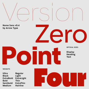 [More] ⦿
|
Steve Matteson
[Red Hat Inc]
|
 [More] ⦿
|
Steve Matteson
|
 Rochester Institute of Technology's School of Printing graduate who lived in California and in Holland, MI, and now resides in Louisville, Colorado. He was a disciple of Chuck Bigelow and Kris Holmes. MyFonts page on him. In 1990, he started work at Monotype in Palo Alto to create the Windows truetype core fonts Arial, Times New Roman and Courier New. He stayed with Monotype and then Agfa/Monotype until 2003 (when he was probably fired, but that is only an unreliable guess), directing type development from the design office in Palo Alto, CA. Bio at Agfa/Monotype. He has directed branding projects such as Agilent Technology's corporate sans serif and Microsoft's corporate font family 'Segoe'. At the same time, he was involved in producing bitmaps and outline fonts for cell phones and TV set top environments. He has worked extensively designing Greek, Cyrllic, Thai, Hebrew and Arabic alphabets to satisfy the requirements of customers such as IBM, Microsoft, Nokia, Sun and Sybase. In 2004, he co-founded Ascender Corporation in Northbrook, IL, where he remained Type Design Director until Ascender was bought by Monotype, where he now heads the type design team (12 people in all, as of 2013).
 CBC interview in 2012. Fontspace link. FontShop link. At ATypI 2011 in Reykjavik, he spoke on typefaces for Android OS. His typefaces: - Amanda.
- Andale Mono (Monotype), Andale Mono (Ascender). This is a monospace sans-serif typeface designed for terminal emulation and software development environments. It was originally created by Monotype. Andalé Mono was first distributed as an Internet Explorer 4.0 add-on under the name Monotype.com. In version 1.25 of the font, it was renamed to Andale Mono, distributed with Internet Explorer 5. It is often used by programmers, and is bundled with Mac OS X.
- Andy (Monotype), his first face, a design based on a friend's lefty handwriting. Published at Agfa's Creative Alliance.
- Arimo (2010). A free sans family at Google Web Fonts that is metrically compatible with Arial. TeX support and further downloads on CTAN.
- Ascender Sans Mono (2004-2008, Ascender). Metrically compatible with Courier New. Ascender Serif (2005, 4 styles) is metrically compatible with Times New Roman.
- Ascender Uni Duo is a fixed-width comprehensive Unicode-compatible font available with support for the Unicode Standard. Ascender Uni Duo is a 39MB TrueType font with approximately 53,000 glyphs. The Latin and related glyphs (designed by Steve Matteson) are Sans Serif, with Gothic ideographs drawn in Japanese style, and complementary styles for other scripts. There are also versions of Ascender Uni that provide localized support for Korean, Simplified Chinese and Traditional Chinese. OpenType layout support is included for Arabic (initial, medial, final, isolate, and required ligature forms, as well as basic mark positioning), and vertical writing for CJK locales (consisting mostly of Latin, symbol, punctuation, and kana glyph variants). Character Set: Latin-1, WGL Pan-European (Eastern Europe, Cyrillic, Greek and Turkish), Chinese, Japanese, Korean, Thai, Vietnamese, Hebrew, Arabic. Ashley Crawford.
- Ascender Sans (Ascender).
- Ascender Serif (Ascender).
- Ayita (2006, Ascender), a decorative sans family co-designed with Jim Ford.
- Bertham Pro (2009, Ascender). Four styles including Open, after Goudy's Bertham.
- Bierstdat (2021). A sans typeface that could replace Calibri later in 2021 as Microdoft's go-to font in Microsoft 365 apps.
- Blueprint (1993).
- Binner Gothic (Monotype).
- Blueprint (Monotype).
- Cambria (Ascender).
- Carnero (2019, Monotype). Steve describes this sans family as a feisty hybrid of precise geometry and calligraphic flair.
- Chicory (2006, Ascender). A calligraphic script face.
- (2010). A free family at Google Code that is metrically compatible with Courier New. See also OFL.
- Creepy (Ascender Corporation): a Halloween font designed with Carl Crossgrove.
- Curlz (1995, Monotype). Done with Carl Crossgrove, based on wrought iron on chairs.
- Dempster (2016, with Jim Ford at Ascender). The original iangular industrial design, by Jim Ford, goes back to 2010.
- Droid Sans Mono Pro (Ascender), Droid Sans Pro (Ascender), Droid Serif Pro (Ascender). and Droid Sans Mono: a font family designed in 2006-2007 by Steve Matteson at Ascender for Google's Android project, mobile phone software for handsets. Free download at CTAN.
- Dujour (2005, Ascender): an art deco revival of the 1930's typeface Independant by Joan Collette and Jos Dufour for Plantin. Compare with the free Independant by Apostrophic Labs.
- Endurance Pro (2009, Ascender): neo-grotesque sans. Endurance Pro Cond (Ascender).
- Facade (Monotype).
- Fineprint (Monotype). A design loosely based on his own penmanship ("on a good day"). Another Creative Alliance face.
- Friar Pro (2009, Ascender): Friar Pro is a revival of Frederic W. Goudy's "Friar" typeface. Goudy described this typeface design as a 'typographic solecism' as it combines a lowercase of half-uncial forms from the 4th through 7th centuries with an uppercase of square capitals from the 4th century. Friar was originally designed in 1937 and used to print a Christmas keepsake produced by Goudy and printer Howard Coggeshall. The fire that burned Goudy's studio in 1939 destroyed the drawings and matrices before many metal fonts were cast. Of all that was lost in the fire, Goudy once said he missed Friar the most.
- Futura Now (2020: a 107-style family by Steve Matteson, Terrance Weinzierl, Monotype Studio and Juan Villanueva, that includes variable fonts as well as subfamilies called Text, Display, Headline, Inline, Outline, Shadow and Script).
- Georgia Pro (Ascender).
- Gill Floriated Caps.
- Goudy Fleurons (2010, Ascender).
- Goudy Modern MT (Monotype).
- Goudy Ornate (2002). Unsure if Matteson made this or Carl Crossgrove.
- Kennerley. Based on Goudy's Kennerley family.
- Kidprint (Monotype).
- Kootenay (2006, Ascender), a sans family.
- LeBeau (Ascender): a signage font.
- Liberation Mono, Sans and Serif (2007-2009, Ascender). A set of free open source fonts done for Red Hat Inc.
- Lindsey Pro (2006, Ascender): a cursive script based on his niece's hand.
- Louisville Script (2008, Ascender): ordinary handwriting.
- Massif (2006-2011, Monotype). Odd name, since Jean Joveneaux made a font called Massif in 1957. How can Monotype get away with a trademark for this is beyond me.
- Mayberry (2008, Ascender): a 14-font sans family with extremely large x-height and strange proportions. Mayberry semibold is free. Mayberry Pro (Ascender).
- McZee, a Microsoft symbols font.
- Miramonte Pro (2006, Ascender). A geometric-meets-humanist sans after the typeface Marsuv Grotesk by Stanislav Marso at Grafotechna, 1960.
- Open Sans (2010, Ascender). A free family by Steve Matteson. See also at Google Fonts. In 2021, he added the rounded companion, Open Sans Soft (20 styles).
- Overpass and Overpass Mono (2011-2019), designed by Delve Withrington, Dave Bailey, and Thomas Jockin. A free open source sans font. The design of Overpass is an interpretation of the well-known Highway Gothic letterforms from the Standard Alphabets for Traffic Control Devices published by the U.S. Federal Highway Administration in 1948. It was created for Red Hat Inc. Dedicated web page. Link at Delve Fonts.
- Newstyle. Based on Goudy's 1921 typeface, Newstyle. See also Newstyle (2018, Steve Matteson).
- Pericles Pro (2005, Ascender): an Ascender typeface based on the work of Robert Foster who created the original for American Type Founders in 1934), a 433-glyph OpenType font for Greek simulation or stone cut looks.
- Pescadero Pro (2005, Ascender),
- Pescadero Pro: a serif face.
- Rockwell Team (Ascender): an athletic lettering face.
- Rebus Script (2009, Ascender): done with Terry Weinzierl.
- Scooter Script (2009, Ascender): comic book style face.
- Segoe Chess (Ascender), Segoe Mono (Ascender), Segoe TV (1997-2004, Ascender: done for MSNTV).
- Tinos (2010). A free serif family at Google Fonts that is metrically compatible with Times New Roman. Download at CTAN, where one also finds TeX support maintained by Bob Tennent. Nerd Fonts patch.
- Tipperary eText (2012-2013), Monotype.
- Titanium Motors (2012, Monotype), Titanium (2006, Ascender): techno typefaces.
- Truesdell (1994, Monotype): a revival and extension of the "lost" Goudy types cut in 1931. Also at Creative Alliance. Also includes Truesdell Sorts.
- Tucker Script (2009, Ascender): ordinary handwriting face.
- Twentieth Century Poster (2002), an art deco display font straight from the late 1920s.
- VAG Rounded Next (2018, Monotype). Developed under the direction of Steve Matteson, this revival of the 1979 classic corporate font of Volkswagen AG has new weights and adds support for Greek and Cyrillic. The MyFonts site co-lists Tom Grace as designer.
- Verdorgia (2010): an ugly duckling.
Klingspor link. Fontspace link. View Steve Matteson's typefaces. [Google]
[MyFonts]
[More] ⦿
|
Sujan Sundareswaran
[Archetype Foundry]
|
[More] ⦿
|
Susan G. Lesch
|
Designer, with David B. Lamkins, of a free Mac bitmap font: Anonymous is a nonproportional or monospaced 9 point bitmap font designed for programming, and for distinguishing between characters that can easily be confused in the Macintosh reserved ROM font Monaco 9. Mark Simonson created the freeware truetype version Anonymous (2001). See also here. [Google]
[More] ⦿
|
Susan Kare
|
Born in 1954 in Ithaca, NY, Susan designed some of the original bitmap fonts for the original Mac in 1983-1984, including Chicago, New York, Monaco (download), FiveDots, Geneva, Cairo (dingbat font), LosAngeles, Athens and San Francisco (1984, ransom note font), while being a Creative Director at Apple (1982-1985). For Danger Research, she created the bitmap fonts Hamilton 5, Hamilton 6, Waverley 5, Waverley 6, Bryant 7 (2000). Interview with Cybergrrl. Atomic Media sells these pixel fonts of hers: Kare Five Dots (family), Ramona (script pixel font), Harry, Everett, Kare Six Dots (family), Biology (dings), Kare Dingbats, MiniFood, Ned, Sampler. MyFonts catalog. Interview. She explains the choice of names for the original Mac fonts: The first Macintosh font was designed to be a bold system font with no jagged diagonals, and was originally called "Elefont". There were going to be lots of fonts, so we were looking for a set of attractive, related names. Andy Hertzfeld and I had met in high school in suburban Philadelphia, so we started naming the other fonts after stops on the Paoli Local commuter train: Overbrook, Merion, Ardmore, and Rosemont. (Ransom was the only one that broke that convention; it was a font of mismatched letters intended to evoke messages from kidnappers made from cut-out letters). One day Steve Jobs stopped by the software group, as he often did at the end of the day. He frowned as he looked at the font names on a menu. "What are those names?", he asked, and we explained about the Paoli Local. "Well", he said, "cities are OK, but not little cities that nobody's ever heard of. They ought to be WORLD CLASS cities!" So that is how Chicago (Elefont), New York, Geneva, London, San Francisco (ransom note font), Toronto, and Venice (Bill Atkinson's script font) got their names. Kare is also known for the original set of Mac icons. The Apple fonts shown below are outline fonts made by Bigelow & Holmes on commission, based on Susan Kare's original pixel fonts. Susan Kare did not design the outline fonts sold by Apple at MyFonts. [Google]
[MyFonts]
[More] ⦿
|
Tabular Type
[Toshi Omagari]
|
 Tabular Type was set up in the United Kingdom by Toshi Omagari. In 2019, he designed Comic Code (a monospaced programming font created to compete with Comic Sans; see also Comic Code Ligatures), Tabulamore Script, which combines a monoline monospaced wide script with a casual architect's style. Other typefaces from 2019 include Belinsky Text and Belinsky (a monospaced sans).
 William Dwiggins worked with multiple typewriter manufacturers including Underwood, Remington Rand, and IBM, but none of them were finished. He left a number of intriguing drawings which are now kept at the Boston Public Library. In his Dossier (2020), Toshi Omagari combined these materials to make a cohesive monospaced typeface family: the upright was taken from a drawing of monospaced lowercase for an unknown client, and the italic was from the work Dwiggins did for Underwood, called Aldine. Typefaces from 2021: Codelia (a 26-style humanistic monospaced programming font). [Google]
[MyFonts]
[More] ⦿
|
Taner Ardali
|
 Turkish art director and graphic designer in Istanbul. He was born in 1985 in Kircaali, Bulgaria. In 2009 Taner Ardali graduated from Anadolu University, Faculty of Fine Arts. Creator of the Embrio family of typefaces in 2009. In 2015, Taner designed the brush type Flow Handscript and the rounded elliptical organic sans typeface family Iogen, an outgrowth of Embrio.
 Typefaces from 2016: Santral (geometric sans), Antre (free handcrafted monoline connected script typeface). Typefaces from 2020: Antikor (a monoline sans for programming and play). Typefaces from 2021: Planc (a 20-style geometric sans). Alternate URL. Creative Market link. Home page. [Google]
[MyFonts]
[More] ⦿
|
Teo Tuominen
[LetterMaker]
|
 [MyFonts]
[More] ⦿
[MyFonts]
[More] ⦿
|
The perfect programming font
[Bernhard Leiner]
|
Recommendations on fonts to use with gvim, by Bernhard Leiner. With practical UNIX / X-Windows recommendations. [Google]
[More] ⦿
|
The typography of code
[Hamish Macpherson]
|
Hamish Macpherson discussed and illustrated his five favorite fonts for showing programs, after discussing the pioneering code font, Courier (1956, Howard Kettler for IBM). Blog readers also suggested Osaka Mono 13pt, Deja Vu Mono (an update of Bitstream Vera Mono), Kyle, Panic Sans (rehinted version of Deja Vu Mono), Proggy Clean 11pt, Droid Sans Mono, Akkurat, Inconsolata, Terminus (bitmapped), Rockwell, Verdana, ProFont, Monaco, Dina. [Google]
[More] ⦿
|
Thomas Bagnall
|
During his studies at Canterbury College, UK, Thomas Bagnall (London, and before that, Ashford, UK) designed Paper Cut Typeface (2013), X-Code (2013, a circular typeface), and the modular typeface Quadratix (2013). In 2016, he designed the octagonal typeface family System. In 2017, he published Adept Sans. [Google]
[More] ⦿
|
Ti92Pluspc
|
The Ti92Pluspc font family by Texas Instruments (1998): a typewriter/monospace font with Latin and Greek glyphs. The font is very similar to Menlo. The copyright is with Monotype, 1991-1999. The Unicode problems were fixed by Steve Sterpe (San Jose, CA). [Google]
[More] ⦿
|
Timothy Donaldson
[Shapes for Cash]
|
 [MyFonts]
[More] ⦿
[MyFonts]
[More] ⦿
|
Toshi Omagari
[Tabular Type]
|
[MyFonts]
[More] ⦿
|
Tristan Grimmer
[Proggy Fonts]
|
[More] ⦿
|
Tyler Finck
[Etcetera Type Company (or: ETC; was: Finck Font Co)]
|
 [MyFonts]
[More] ⦿
[MyFonts]
[More] ⦿
|
Typodermic
[Ray Larabie]
|
 Ray Larabie (b. 1970, Ottawa, Canada) ran Typodermic in Mississauga, ON, which opened in the Fall of 2001. In 2006, it moved to Vancouver, BC, and in 2009 it moved on to Nagoya, Japan. Dafont page. Ray Larabie has been making fonts since 1996, but those early fonts were freeware. His pre 2001 fonts are grouped under the label Larabie Fonts. In 2001, he set up Typodermic. Latest additions.
 The Typodermic fonts: - 2022: Biphoton (a monospaced sans with the same proporions as Letter Gothic 12), Valve (an industrial muffler shop font), Deception (a sub-pixel typeface with ten captivating effects---Deception Array (wide blocks), Deception Bars (text viewed through lenticular glass), Deception Blocks (as in heavy JPEG degradation), Deception Diamonds, Deception Lines (for a grayscale effect), Deception Particles, Deception Plusses, Deception Process (simulates grayscale LCD text or a thermal printer on the fritz), Deception Scanline (television picture tube text rendering), Deception System (1-bit dithering gone haywire)), Monofonto (a monospaced sans), Encercle Draft (permitting users to create numbers in borders), Encercle Sans, Heavy Heap (a groovy psychedelic typeface with a scorching look, reminiscent of 1960s hot-rod culture and die-cast toy vehicles), Ggx89 (a 48-style tightly spaced Swiss style sans family).
- 2021: Quadrillion (a 12-style rounded monoline sci-fi family), Mochon (a wall writing or chalk font based on the lettering of Donald Mochon, dean of the RPI School of Architecture until 1966; the Mochon samples were provided by an ex-student of Mochon, Karl A. Petersen), Steelfish Hammer (a subtly rustic version of Larabie's most popular typeface, Steelfish), Wavetable (sci-fi), Xyzai (an LED emulation font, described by Ray Larabie as a hardcore, Y2K-style techno typeface), Geoparody (a 12-style squarish typeface inspired by a late 1960s font called Anonymous), Typewriter Spool (122 fonts, modeled after the Underwood No. 5 typewriter font).
- 2020: Gravtrac (a 56-style condensed to crushed slab serif family inspired by mid-twentieth century classics like Univers 59 Ultra-Condensed, Helvetica Inserat and Compacta; +Greek, +Cyrillic), Vinque Antique (a rustic handcrafted blackletter in eight styles).
- 2019: Dealerplate (17 license plate styles for various states and provinces in the USA and Canada, current as of 2019; included are California, New York, New Jersey, Ohio, Illinois, Pennsylvania, Florida, Maryland, Michigan, Wisconsin, Massachusetts, Missouri, Washington, North Carolina, Virginia, Quebec, and Ontario), Kenyan Coffee Stencil, Good Timing, Steelfish Rounded, Bitcrusher (a consumer electronics / techno font), Galderglynn 1884 (a nineteenth-century style sans-serif typeface that exp[ands his Galderglynn Esquire).
- 2018: Cybermontage, Crack Man (a pac man font), Propaniac (a 1980s-style postmodern typeface inspired by a Pointer Sisters record sleeve which was designed by Shoot That Tiger Creative Services), Zelega Zenega, Spectrashell.
- 2017: Minicomputer (MICR style), Squirty, PCTL9600, PCTL4800 (retro techno), Ultraproxi (semi-monospaced and influenced by the high speed computer printers from the 1950s to 1970s), Toxigenesis (techno sans), Venus Rising, Vanchrome (a compact sans-serif headliner with chromatic layers), Krait (a layered geometric typeface designed for architectural display), Xylito (a layered font for chromatic or 3d effects).
- 2016: Refuel (octagonal, based on military aircraft markings), Expressway Soft (a sans-serif font family inspired by the U.S. Department of Transportation's FHWA Series of Standard Alphabets, also known as Highway Gothic), Conthrax (squarish, techno), Cornpile (cartoonish), Electric, Evensong (art deco), Fledgling (a very tall typeface), Gymkhana (sans), Remissis (sans), Sunday Evening (a reverse contrast typeface), Meloche (Meloche is a unique grotesque sans-serif typeface influenced by hand-painted French signs of the late nineteenth century. It's available in 7 weights and obliques).
- 2015: Canada 150 (a custom font for the Canadian government; see here, here, this coverage regarding the Inuktitut part of the font, and this reaction by the curmudgeons in Toronto who complain that Ray did this work for free), Autoradiographic (sans family), Built Titling (for compact headlines), Chickweed Titling (cartoon titling font), Cardigan Titling (flared headline face), Bench Grinder Titling, Kleptocracy Titling, Palamecia Titling (rounded black comic book typeface), Quasix Titling, Galderglynn Titling (all caps sans family from hairline to black), Mixolydian Titling, Stormfaze (a sci-fi font started in 1996 and finished in 2015), NK57 Monospace (a 60-style programmer typeface), Gargle, Athabasca (a sans family designed for the rugged Canadian oil patch).
- 2014: Mesmerize (a large free sans family), Kingsbridge (a large slab serif family with sharp points on the A, M, N, V and W), Manbow (a layered geometric art deco display font which includes solid, clear, stripe, polka-dot and screen patterns), Breamcatcher (an all caps art deco font inspired by the piano sheet music for With Every Breath I Take which was featured in the Bing Crosby/Kitty Carlisle musical comedy film, Here is my Heart), Kilsonburg (Dutch deco based on an old Vogue magazine cover), Uchiyama (poster typeface), Goldsaber (art deco design), Vexler Slip (unicase), Rakesly, Dacquoise, Pretender, Rimouski (a rounded geometric font family), Nulshock (techno), Recharge (techno/industrial font), Interrogator Stencil, Strange Alphabets (arts and cratfs font), Angerpoise Lampshade (free).
- 2013: Numbers With Rings, Shookup (funky cartoon font), Pastrami on Rye (cutout comic book style), Chickweed, Built (a condensed headline sans), Fluctuation (a softly rounded elliptical sans family), Astrochemistry (sci-fi, techno with rounded edges), Snasm (sci-fi).
- 2012: Engebrechtre (2000-2012), Die Nasty (1999-2012: free), Strasua (1999-2012), Planet Benson (1997-2012), Husky Stash (1998-2012), Barbatrick (1999-2012: a speed emulation font), Zero Hour (1997-2012), Urkelian (1998-2012: very condensed), Zolasixx (inspired by the video game Zaxxon), Ampacity (neon font), Chromakey (a space deco headline font inspired by box art classic video games including Matrix Marauders and Magical Chase), Disassembler (1980s style bitmap font), Zerbydoo (a dot matrix family), Superego (a geometric-techno font inspired by the cabinet graphics for the 1981 Stargate arcade game), Rukyltronic (a set of dot matrix typefaces), Nerdropol (pixel family), Gulkave (rounded pixel font), Cyclopentane, Palamecia (a fat finger poster face), Gameness (a 1990 retro industrial deco font), Camulogen (headline face), Color Basic (a pixel typeface inspired the by TRS-80 Color Computer), Triac Seventy One (a funky face), Acroyear (retro all-caps headline font), Troll Bait, Strenuous (unicase), Permanence (a retro=futuristic font based on Alvin Toffler's cover of Future Shok, 1970), Clockpunk (octagonal and quaint), Battlemaze (trekkie face), Mixolydian (industrial sans).
- 2011: Ugocranis (a brutalist typeface), Clipwave, Wheaton (MICR-inspired), Mango Scribble, TRS Million (dot matrix face), Ugogranis (constructivist), Gomoku (paper cut face), From The Internet.
- 2010: Cranberry Gin (2010, octagonal), Restore (all caps, geometric sans), From The Stars (an elliptical techno family done with Chikako Larabie), Thrusters (space age face), Dream Orphanage, Dream Orphans (2000-2012), Kengwin (rounded slab serif), Gleaming The Cube (Greek simulation face), Vectipede (a slab serif family), Great Escape (an elliptical sans family), Subrocs (connected script), Hackensack (with Chikako Larabie), Polarband (bilined stackable headline face), Naked Power, Special Forces (a great macho slab serif headline face---watch for awards to roll in), Warugaki (handpainted), Warmer, Honfleur (art deco; with Chikako Larabi), Voivode (a headline typeface done with Chikako Larabie), Hachimitsu (Asian look face, done with Chikako Larabie), Kadeworth (rounded retro look sans, done with Chikako Larabie), Gnuolane Jump (2010, with Chikako Larabie), Markerfield (brush), Board of Directors (Bank Gothic style family, done with Chikako Larabie), GGX88 (a Swiss sans family), Body Goat, Reversal, Gord (techno), Computechnodigitronic (LED, LCD geek-look font), Bench Grinder, Inklea (a bubbly face), Skygirls (retro brush script), Gloss (a paint brush typeface based on Champion, 1957, G.G. Lange), Galderglynn Esquire.
- 2009: Maqui (an industrial headline sans family), Zingende (art deco family: caps only), Misadventures, Gaz (large retro sans family), Acrylic Brush, Enamel Brush (a digitization of Catalina, 1955, Emil J. Klumpp), DDT (neutral sans), Thump (fat, casual), Desperate Glamour, Pricedown (an update of his free 1990s font, patterned after the lettering on The Price Is Right show), Mitigate (monoline and slabbed; has some typewriter styles), Catwing, Walken (slab serif stencil), Silicone (soft rounded sans family), Movatif (sans), Gunplay (a stencil family inspired by the poster for the 1972 Steve McQueen/Ali MacGraw film The Getaway), Fragile Bombers (octagonal), Forgotten Futurist (techno sans, 19 styles), Bullpen (slab serif), Coolvetica (35 styles), Duality, Good Times, Strenuous, Shlop (paint-drip style), Dirty Baker's Dozen (stencil), Junequil (VAG Rounded style), Owned (graffiti), Domyouji, Threefourtysixbvarrel (stencil), Enacti, Uniwars (futuristic, 16 styles).
- 2008: Madawaska (a rugged slab serif), Ebenezer (grunge), Gnuolane Stencil, Raincoat, Report School (avant garde sans), Jesaya, Carouselambra (art nouveau), Debusen (rounded), Barge (military font), Renju (2008, potato or rubber stamp print face), Otoboke (handlettered), Hit (informal hand), R6 D8 (futuristic sans family), Rexlia (an octagonal machinistic family), Hybrea (a display sans with TV screen rounding), Sweater School, Tussilago (2008, a neutral sans family), Presicav (extended sans), Hover Unit, Addlethorpe (grunge), Scheme (rounded sans), Usurp (bouncy poster lettering), Negotiate (technical sans family), Divulge, Sewn, Gnoulane (condensed sans), Moja, Teeshirt (old typewriter face), Pound (art deco marries grunge), Graveblade (heavy metal font), Synthemesc (psychedelic anti-Starbucks font), Chysotile (white on black grunge), Cardigan (sans), Gurkner (balloon style), Reagan (grunge).
- 2007: Tight (a copy of Dean Morris's 1976 Letraset chrome font Quicksilver), Headlight, Meloche (a 3-style grotesk), Octin Spraypaint (grunge stencil), Octin Vintage (grunge), Bouffant (script), Octin Prison (stencil), Octin Sports (octagonal), Octin College (octagonal, for sports jerseys), Octin Stencil (free octagonal font family), Burnaby Stencil (stencil), Superclarendon, Conceal, Ohitashi, Stud (grunge), Bristles (grunge), Skirt, Cotton (grunge), Kelvingrove (a bit of copperplate gothic, rounded and shaved), Augustine, Containment, Snowa, Veriox, Scrubby, Transmute, Sheaff, Injekuta (techno), Rinse (grunge), Polyflec, Domyouji (square sans), Winthorpe (old style), Cutiful (script), Flyswim (grunge), Dirtstorm (spray-painted stencil), Shnixgun (grunge), Neuzon (grunge), Oxeran (old typewriter), PRINTF (grunge all caps monospaced), Akazan (sans), Nyxali (a metal tag face), Nesobrite (25 styles of Bank Gothic lookalikes), Meloriac (a heavy headline sans inspired by Futura), Walnut (graffiti face), Gnuolane (a narrow superelliptical sans), Edifact (a damaged computer font), Darkheart, Stampoo (squarish), Raymond (rough script), Hayate (oriental look), Telephoto. The entire Octin series is free at DaFont.
- 2006: Octynaz (grunge), Paltime (ornamented), Jolie Ecriture Desard (children's hand), Mango (comic book face), Desard (child's hand), Bulltoad, Lerku (eroded serif), Charbroiled (also eroded), Ceroxa (eroded stencil), Nagomi (a chiseled-look Asian font based on calligraphy of Chikako Suzuki from Nagoya), Whiterock, Yellande, Chilopod (a futuristic typeface inspired by the logo from the 1980s videogame, Atari Centipede), Order, Goldburg (based on a typeface by George Bowditch, 1957), Laserjerks (2006, brutalist), Milibus (futuristic), Bonobo (serifed), Ohitashi, Sarasori (TV-tube shaped typeface in the style of Oban), Structia (an octagonal family), Betaphid (octagonal), Gendouki (futuristic stencil), Slugger (athletic lettering), Marianas (a gorgeous art deco face), Lineavec (octagonal), Corzinair (serif family), Buxotic (a great caps face), Cinecav X (for closed caption TV and DVD), Salsbury (comic book face), Lonsdale (loosely based on a font called Parkway Script, which was designed by Emil Hirt in 1964), Alepholon (futuristic), Kwokwi, Mikadan (a tribute to Stephenson Blake's Verona from 1948, which was in turn based on William Dana Orcutt's Humanistic from 1904), Marion (2012: a beautiful transitional family adopted as a standard Mac OS X font), Quasix (hookish), Skraype (grunge stencil), Bleeker (casual lettering), Linefeed (monospaced line printer font), Draculon (a casual typeface inspired by the letterforms of William Orcutt's humanist font from 1904 which was in turn based on an Italian manuscript from 1485), Mahavishnu (a mix between 1970s psychedelics and art nouveau), Doradani (a corporate identity sans family), Korotaki (futuristic).
- 2005: Beat My Guest, Kadonk (a Halloween face), Report (a VAG-Rounded style face), Croteau (a poster face), Heroid (ook face), Barrista (informal script), Wyvern (sans serif), Wubble (like puddles of water), Caryn (casual script), Folder (a rigid sans family), Venacti (a futuristic family), Xenara (a keyboard lettering family), Emory (a destructionist sans family), Ligurino (neat sans&serif family), Biondi (update of Copperplate Gothic; followed in 2010 by Biondi Sans; these copperplate style typefaces are in the style of AT Sackers), Byington (Trajan column lettering), Sayso Chic, Expressway (28 weights, a highway signage family), Algol (pixel type), Meposa (fat display face), Tandelle (condensed), Vigo, Maychurch, Mecheria, Vactic (dot matrix), Zosma, Topstitch, Windpower, Llandru, Soap (a creative extension of Cooper Black, with dingbats), Kleptocracy (1999-2005), Owned, Rimouski (sans), Burnstown Dam (2005, a wooden plank font), Sinzano (sans with opentype ligatures galore; compare, e.g., House Ed Interlock), Zamora.
- 2004: Affluent, Threefortysixbarrel (stencil face), Tank, Telidon (dot matrix face), Funboy, Neuropol X, Neuropol Nova, Mufferaw (comic book face), Larabiefont, Zekton (techno), Strenuous 3D, Silentina (advertised as "a silent movie font"), Amienne (brush script), Fenwick Outline (free), Betsy Flanagan (1998, a keyboard face), Boopee (children's handwriting), Pirulen (in the general Bank Gothic style), Zalderdash.
- 2003: Zupiter, Blue Highway.
- Before 2002: the dot matrix family Telidon, Telidon Ink, Butter Belly, Almonte (1999), the architectural font Jillican (octagonal), Snowgoose, Bomr, Pakenham, Neuropol, Nasalization, Fenwick, Kleptocracy DLX, Sui Generis, Dirty Bakers Dozen (faded stencil), Minya Nouvelle, Asterisp, Chinese Rocks, Jillsville (great artsy Courier), Ulian, Wevli (including Wevli Dingbats), Sappy Mugs (funny mugshots), Sofachrome (1999, inspired by Pontiac car emblems), Eden Mills (1999).
MyFonts interview. Fontspace link. Fontspring link. Catalog of the typefaces in the Larabie Fonts collection. Klingspor link. Catalog of the Typodermic library in decreasing order of popularity. Extensive (large page warning) Typodermic catalog. Font Squirrel link. Creative Fabrica link. Fontsquirrel link. Fontdaily link. [Google]
[MyFonts]
[More] ⦿
|
Ulrich Proeller
[Prosa GmbH]
|
[More] ⦿
|
VanderKeur
[Nicolien van der Keur]
|
 Graduate from the Art School HKU in Utrecht, The Netherlands, who founded her own studio in 1999. Born in Utrecht, she graduated in 2007 from the University of Reading, with a project entitled Sirba, a Latin and Greek type family designed for dictionaries and small print documents. This typeface was published by Typetogether in 2010. They write: Sturdy and functional in the Dutch tradition---dark, warm and legible. ... Dark? ...
 In 2020, she released Typist Code (a 12-style monospaced font family for programmers) and Typist Slab (a monospaced typewriter family). [Google]
[MyFonts]
[More] ⦿
|
Velvetyne Type Foundry Workshops: Font Fonk Fork
|
 Regular workshops held by Velvetyne Type Foundry at La Générale in Paris. These workshops result in a number of hybrid or derived typefaces that are free to use. Download link for all fonts. A list of initial typefaces, all named Coupeur (after the French pronunciation of Cooper in Cooper Hewitt):
 - Alexandre Lescieux, Hadrien Bulliat: Haltère.
- Hugo Dumont: Coupeur Jack (2016).
- Anton Moglia: Coupeur Bricoleur (2014).
- Clément Baudouin: Coupeur de Légumes.
- Anonymous: Coupeur Bold Block (2014).
- Arthur Dinant: Coupeur Skull .
- Aurélia de Azambuja: Coupeur Crise (2016: angular typeface).
- Jeanne Frantz, Vincent Ricard, Camille Rigou-Chemin: Coupeur Carve (2014).
- Antoine Gros, Gil Ndjouwwou: Coupeur Rounded (2016).
- Martin Campillo, Laurie Giraud: Coupeur Monospace (2016, a programming font family).
- Léa Rolland: Coupeur Texte (2016).
- Yohanna My Nguyen: CoupeurDeco (2016, a neon or popart font).
- Domitille Debret, Florian Michelet, Margaux Saulou: Coupeur Reverse (2016).
- Thomas Bouillet: Coupeur Almeida (2014).
- Pauline Pourcelot, Fanny Guilhen, Tibo: Coupeur Ligadom (2016).
- A dingbat font jointly designed by all participants in 2020, Imago Mundi Mei. The glyphs placed side by side (typometry) allows one to draw emotional, conceptual, psychological landscapes (psychogeography). Open Font Library link.
[Google]
[More] ⦿
|
Vicente Lamónaca
|
 This Montevideo-based designer (b. 1967, Mexico City) has a degree in Graphic Design from the University ORT Uruguay. He lives in Montevideo since 1985. Since 2000, he teaches in the area of publishing in the Faculty of Communication and Design at University ORT in Montevideo, in the Faculty of Communication and Design. Since 2005 he is also teaching Typography II. He is a partner of the design studio Taller de Comunicación. Economica is said to be the first digital typeface made in Uruguay. Lamonaca is Director of Tipografia-Montevideo, Uruguay's first site dedicated entirely to typography. In 2011, he started his own blog, type portal and foundry, called Fábrica de tipos. Many of his recent typefaces are published with TipoType.
 Lamonaca created the experimental typefaces Quetzal and Equis Normal. He also made Chau Trouville (2010, a slab serif), Chau Philomène (2010, Google Web Fonts), Chau La Madeleine (2010, slightly elliptical), and Chau Marbella. Other typefaces: Muzarela (2011), Económica Sans Serif (2007, see also MyFonts or Google Web Fonts), Economica Cyrillic Pro (2016, with Sergiy Tkachenko), Economica Next (2017, with José Perdomo), Wurz and Wurz Display (2013), St Patrick (2013, TipoType---the oblique version of San Benito), Korn (2013, grunge), Arya (2013, a solid, bilined or trilined all caps sans family, Tipotype; extended in 2017 to Arya Rounded), Prevya (2013, inspired by the metalwork of the early twentieth century), Yapa (2013, a display titling typeface followed by Yapa Rough in 2014), and San Benito (2012, bold blackletter style). Editor of Tipografía Latnoamericana (2013, Wolkowicz Publishers), a book with contributions by Zalma Jalluf, Ewan Clayton, Julio Ferro, Eduardo Rodríguez Tunni, Fernando Díaz, Lautaro Hourcade, Viviana Monsalve, Patricia Benítez, Fabio Ares, María Laura Fernández, Miguel Catopodis, Alejandro Valdez, Juan Heilborn, César Puertas, Ignacio Martínez-Villalba, Felipe Cáceres, Francisco Calles, Crist&ocute;bal Henestrosa, María Teresa Bruno, Juan Pablo del Peral, Fábio Lopez, Fábio Haag, Tony de Marco, Francisco Gálvez, Marcela Romero, Aldo de Losa, Henrique Nardi, Gustavo Wojciechowski, Marina Chaccur, Juan Carlos Darias, Víctor García, Marina Garone Gravier, Juan Pablo de Gregorio, Cláudio Rocha, Cecilia Consolo, Pablo Cosgaya, Alejandro Paul, Rubén Fontana, Diego Vainesman, Oscar Yáñez, Dave Crossland. In 2017, Tipotype published Vicente Lamoncaca's 48-font family Arazati which was inspired by Edward Johnston's (humanistic sans) typefaces, although its design is not based on a literal reconstruction. Two monospaced variants called Arazati Codex are free. Arazati is the name of the place in Uruguay where Johnston was born in 1872. Arazati moved over to Underground in 2019. In 2018, he published the exclusive angular text typeface Alacena---only 220 licenses will be sold. Bio. Google Plus link. Klingspor link. View Vicente Lamonaca's typefaces. [Google]
[MyFonts]
[More] ⦿
|
Viktor Nübel
|
 Freelance graphic designer in Berlin, b. 1977. In 2005, he graduated from the Design Akademie Berlin with a thesis entitled Type Attack. His typefaces:
 - The stencil-inspired PTL Attack (2006, Primetype).
- Ostblock (pixelish).
- Modul72. A modular typeface in the spirit of Meek's FontStruct). Modul22 and Ostblock were heavily inspired by events and lettering in former East Germany.
- The decorative Oliva (2009), which has a hint of psychedelica.
- Viktor Nübel and Hendrik Möller created some hand-printed fonts with two glyphs for each letter, to better simulate reality.
- The large PTL Attention sans serif typeface family (2013, Primetype).
- Babetta (2013). An all-caps typeface (with an inline called Babetta Neon) that was inspired by an illuminated vintage shop sign at Karl-Marx-Buchhandlung in Berlin. It has some elements of art deco.
- FF Attribute Mono (2017) and FF Attribute Text (2017). These FontFont typefaces emualte typewriter and programming types.
MyFonts link. Behance link. Viktor Nübel foundry. Klingspor link. Fontspring link. Volcano Type link. Fontshop link. [Google]
[MyFonts]
[More] ⦿
|
Wearecolt
[Adam Greasley]
|
Adam Greasley (Colt Creative Design, or Wearecolt, Bradford, UK) made Bessington (2012, a hand-printed blackboard bold typeface), Giddelham (2012, a flowing italic family), Quickrest (2012, a tall poster face), Iamblock (2012, fat counterless octagonal typeface), Adams Hand (2010), the hand-drawn condensed typeface Craft Sign, and Quick Death (2012, a hand-drawn poster family). In 2013, he published the classic curvy roman display typeface Curvesta and the hand-drawn slab serif Bowler Hand. In 2014, Adam published the 4-style clean-shaven sans family Adget Sans. Typefaces from 2015: Oxblood No1 (a handcrafted tattoo font). Typefaces from 2016: Dead Meat (all caps, handcrafted). Typefaces from 2018: Beloid Gothic (blackletter), Titch (a brush font), Pronk Clean, Deft Brush. Typefaces from 2019: Kinship Sans (a grotesk), Stroom Script. Typefaces from 2020: Pronk (in Clean, Rough and Outline styles). Typefaces from 2021: Kin Grotesque, Gather Serif (a delicate serif), Codo Mono (a 12-style wide monospaced programming font, and two variable fonts), Take Note, Take Note, Something New (a sharp and edgy display serif). [Google]
[MyFonts]
[More] ⦿
|
Windows Vista fonts
|
Microsoft's new Cleartype collection (released in 2006 after years of preparation) available here for free download in truetype format (and also sIFR format). These fonts are now sold by Ascender. The fonts are: Calibri, Calibri-Bold, Calibri-Italic, Calibri-BoldItalic, Cambria, Cambria-Bold, Cambria-Italic, Cambria-BoldItalic, Candara, Candara-Bold, Candara-Italic, Candara-BoldItalic, Consolas, Consolas-Bold, Consolas-Italic, Consolas-BoldItalic, Constantia-Regular, Constantia-Bold, Constantia-Italic, Constantia-BoldItalic, Corbel, Corbel-Bold, Corbel-Italic, Corbel-BoldItalic. See also here and here. The OpenType versions are automatically installed when one downloads the beta 2 of Office 2007 or The Microsoft Office Compatibility Pack for Word, Excel, and PowerPoint 2007 File Formats (Beta 2). Comments by Poynter Online. Another download site. Candara download. Zip file with the fonts. Calibri source. Jeff Atwood claims that Consolas, which was designed for ClearType, can barely be used without it. [Google]
[MyFonts]
[More] ⦿
|
Wojciech Kalinowski
|
Wojciech Kalinowski was born in Wroclaw, Poland in 1969. Since 1990, he has designed and carved inscriptions and reliefs in stone, commemorative plaques, and gravestones. He also deals with computer graphics, digital typeface and logo design, and wallpapers. His typefaces are free and are available from the Open Font Library (or OFL). He created New Shape (2012, organic sans), Medieval Sharp (2011, blackletter), which originated 15 years earlier from a stone inscription alphabet. Consola Mono (2011, OFL) is a monoline monospaced sans for Latin, Greek and Cyrillic. Classica (2011) is a classical roman family. SquareAntiqua (2011, OFL) is a wavy informal face. Cursive Sans and Cursive Serif (ca. 1997, OFL) and Modern Antiqua (1997, OFL) are also based on stone inscriptions. Klaudia and Berenika (2011) is a Celtic style family. Roundstyle (2011) is a sans display family. Modern Antiqua (2011) has a strange name for a font that is neither modern (i.e., didone) nor Antiqua---it is an organic, or liquid, typeface with the gothic flavor of Jonathan Barnbrook's types. Kalinowski started the NovaCut typeface ca. 1986. Around that time, he developed Gothica, which served as a model for Nova Cut. Gothica was released in 2020. The uncial typeface family Celtica was released in 2020 and can be downloaded at Open Font Library. He created the free monospaced "programming" fonts NovaCut, NovaFlat, NovaOval, NovaRound, NovaSlim, NovaSquare, and NovaMono (2011, OFL): NovaMono is the monospace font especially created for programming, text editors and for terminal-use. NovaMono contains a large number of symbols, operators and other miscellaneous signs. NovaMono is a missing part of NovaFont Family. Nova Font is the family of six fonts. There are: NovaCut, NovaFlat, NovaOval, NovaRound, NovaSlim and NovaSquare. Now, the seventh part of the family - NovaMono. The following Unicode ranges are supported: - Controls and Basic Latin - 0000-007F (all)
- Latin 1 - 0080-00FF (all)
- Latin A - 0100-017F (all)
- Latin B - 0192, 01C4-01CC, 01E4, 01E5, 01F1-01F3, 01FA-021B, 0237
- Spacing Modifier Letters - 02C6, 02C7, 02C8, 02D8-02DD, 0308
- Greek and Coptic - 0370-03FF (all)
- Latin Extended Additional - 1E0C-1E0F, 1E24, 1E25, 1E36, 1E37, 1E80-1E89, 1E9E, 1EF2-1EF5, 1EF8, 1EF9
- General Punctuation - 2000-206F (all)
- Superscripts and Subscripts - 2070-209F (all)
- Currency Symbols - 20A0-20CF (all)
- Letterlike Symbols - 2100-214F (all)
- Number Forms - 2150-218F (all)
- Arrows - 2190-21FF (all)
- Mathematical Operators - 2200-22FF (all)
- Miscellaneous Technical - 2302, 2308-230B, 2310, 2319, 231C-2323, 2329, 232A, 2335, 239B-23AE, 23B0-23B7
- Geometric Shapes - 25A0, 25A1, 25A3, 25AA-25CC, 25CF-25D7, 25E0-25FF
- Miscellaneous Symbols and Arrows - 2B12-2B1C, 2B1F-2B28, 2B2C-2B2F, 2B53, 2B54
In 2020, he published Simply Sans. Klingspor link. Open Font Library link. Fontspace link. [Google]
[More] ⦿
|
Yong-rak Park
|
Yong-rak Park is the Korean codesigner, with Yi-hee Yoon, of the Latin/Hangul serifed text font Nanum Myeongjo (2010, NHN Corporation), which is an Apple system font. URL for NHN. Google Fonts link: Nanum Myeongjo. In 2015-2016, Yong-Rak Park, Jeong-Hwan Yoon and Sang-Min Lee designed the huge programming font D2Coding for NHN. It covers Latin, Hangul, Cyrillic and simplified Chinese. [Google]
[More] ⦿
|
Zevv
|
Developed by an anonymous Dutchman, Zevv-Peep is a programming font developed for high resolution screen. It is based on Jim Knoble's Neep. [Google]
[More] ⦿
|

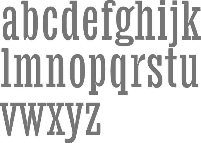
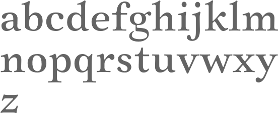
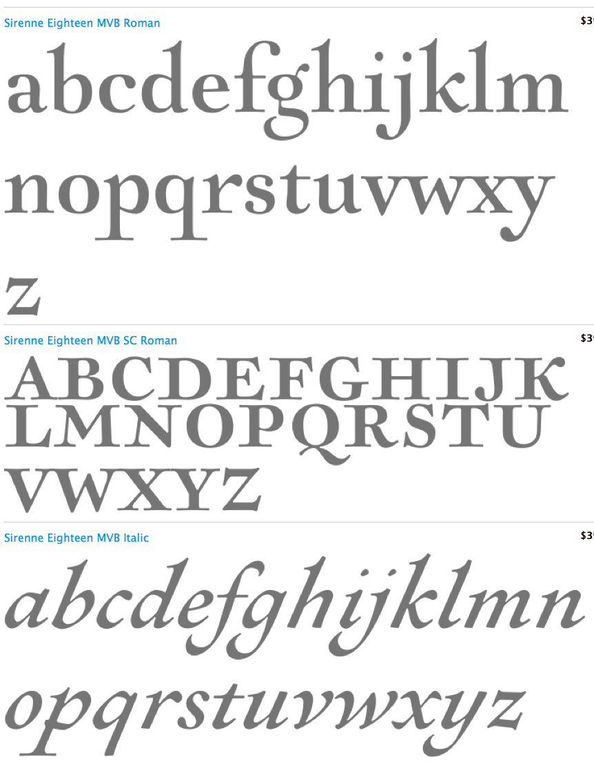
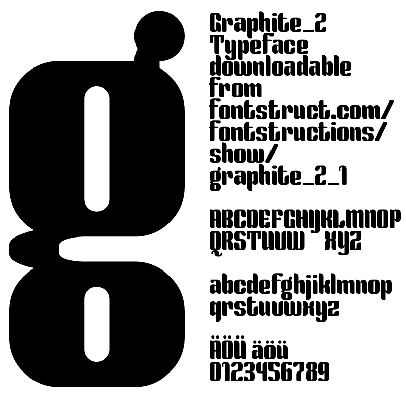
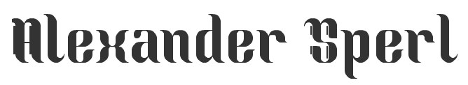
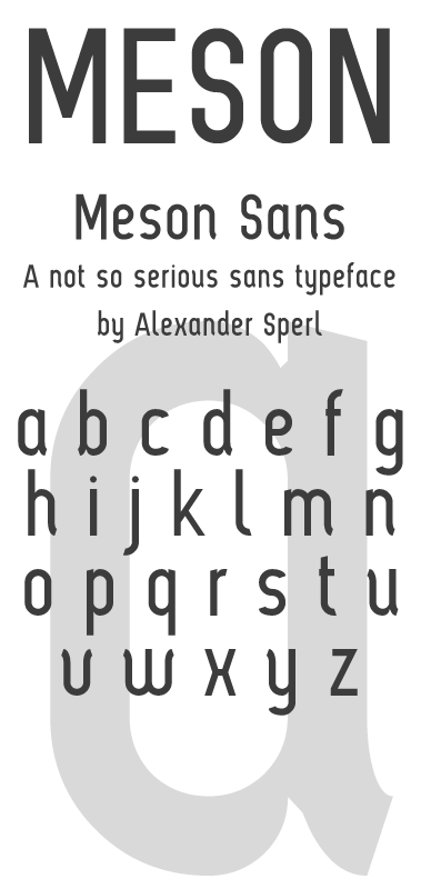
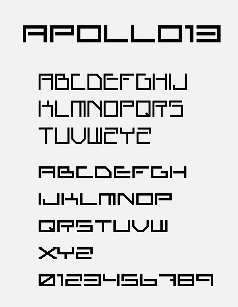
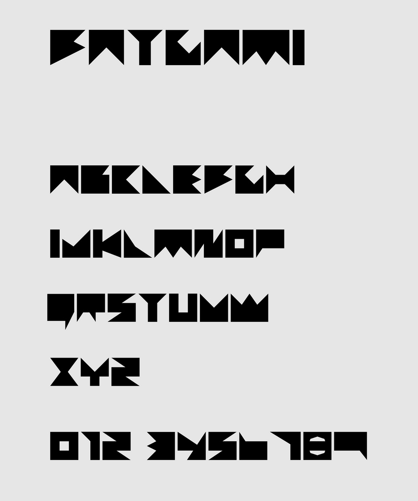
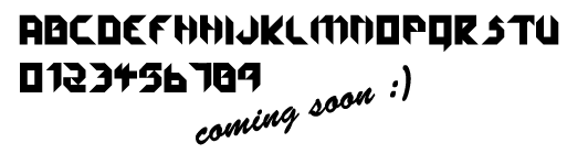
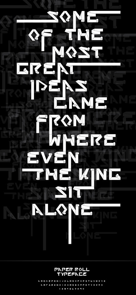
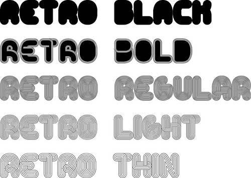
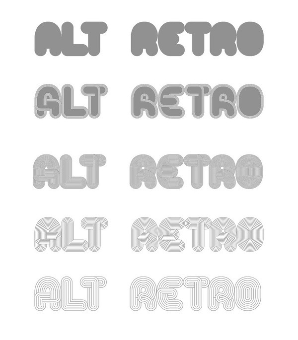
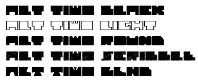
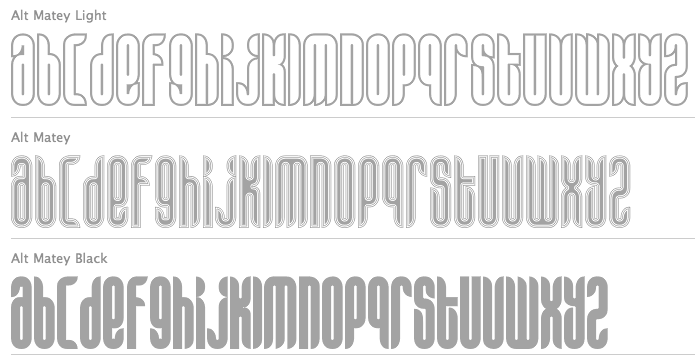
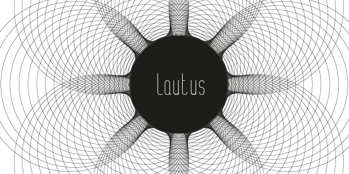
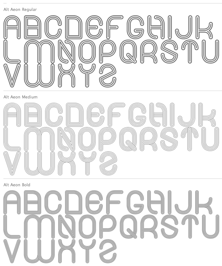
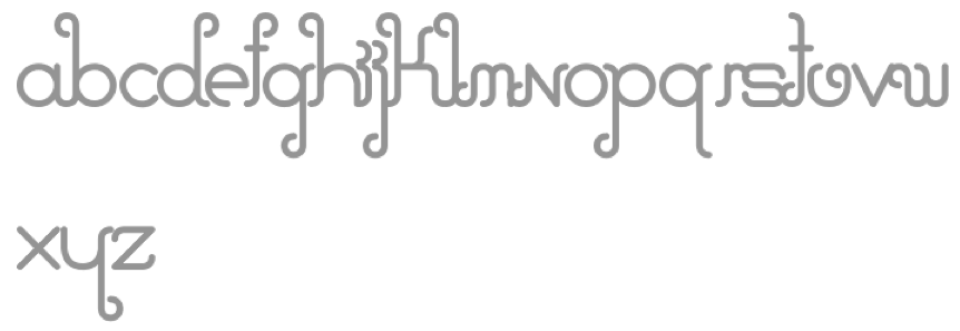
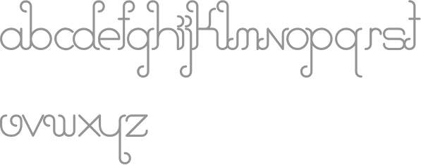
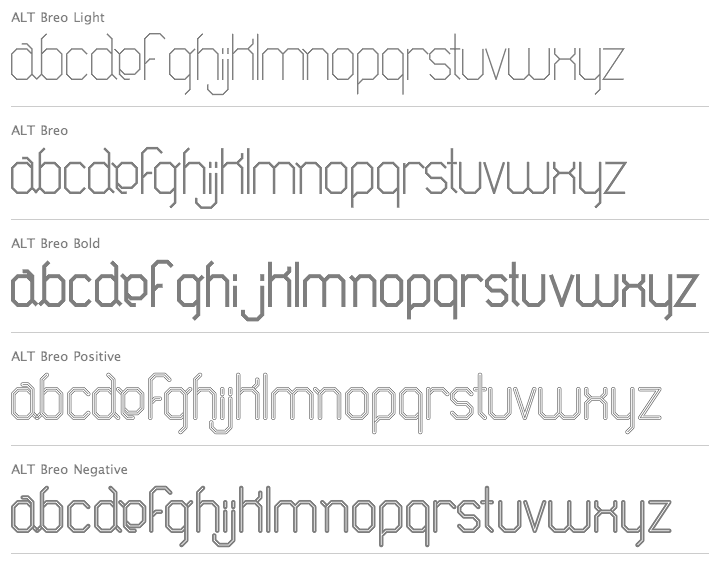
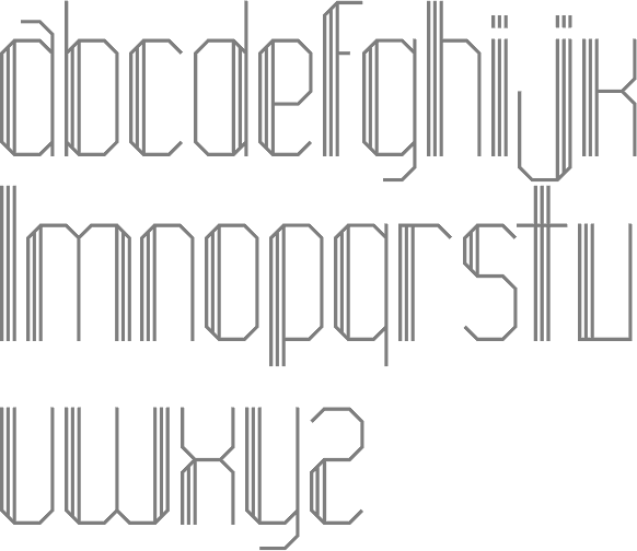
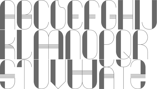
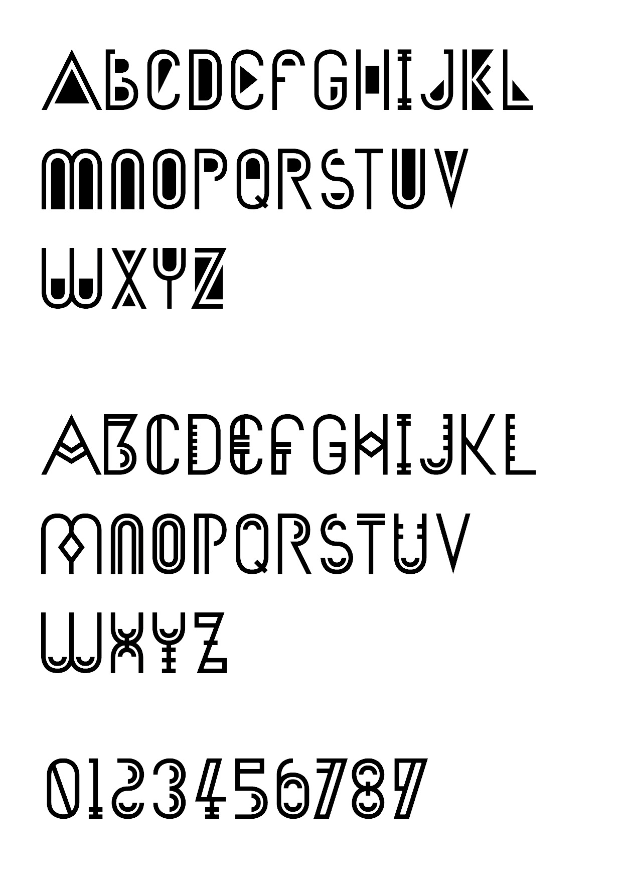
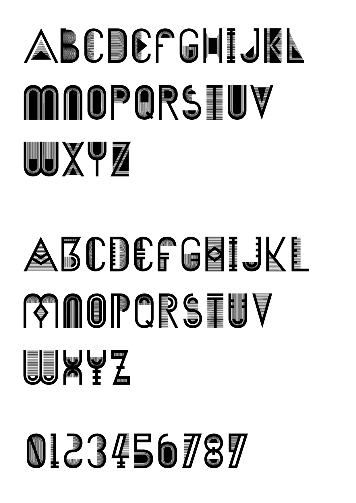
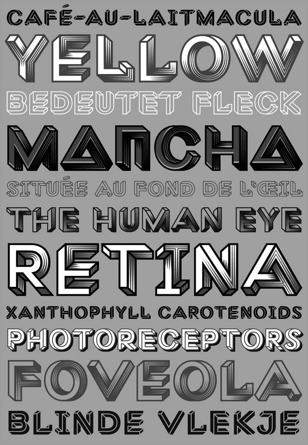
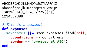
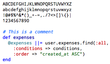
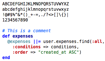
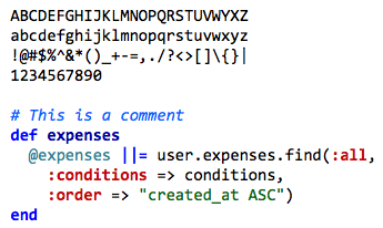
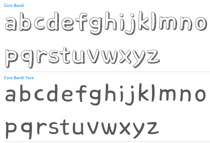
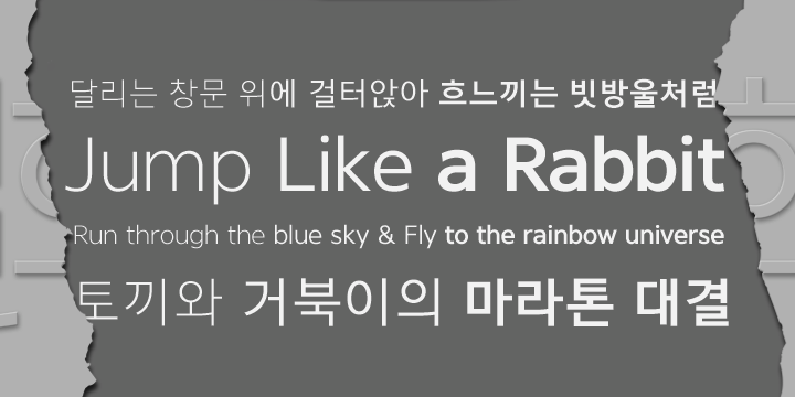
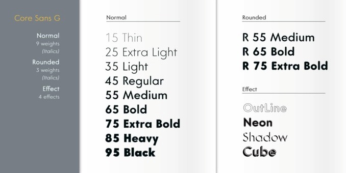
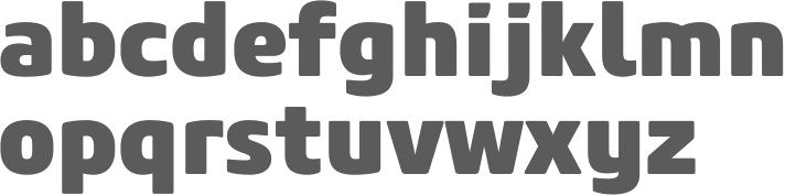
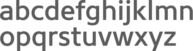
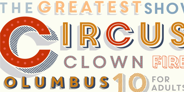
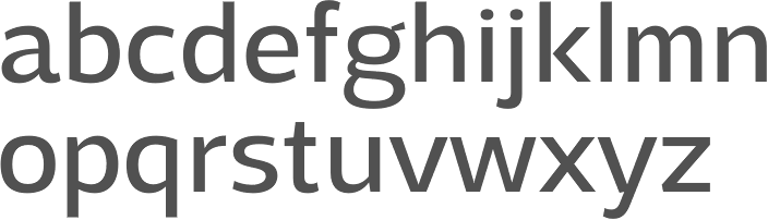
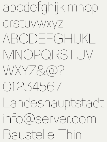
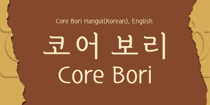
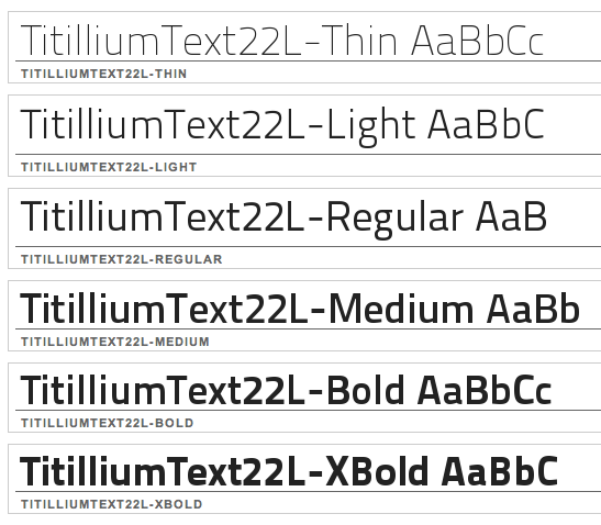
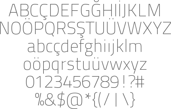
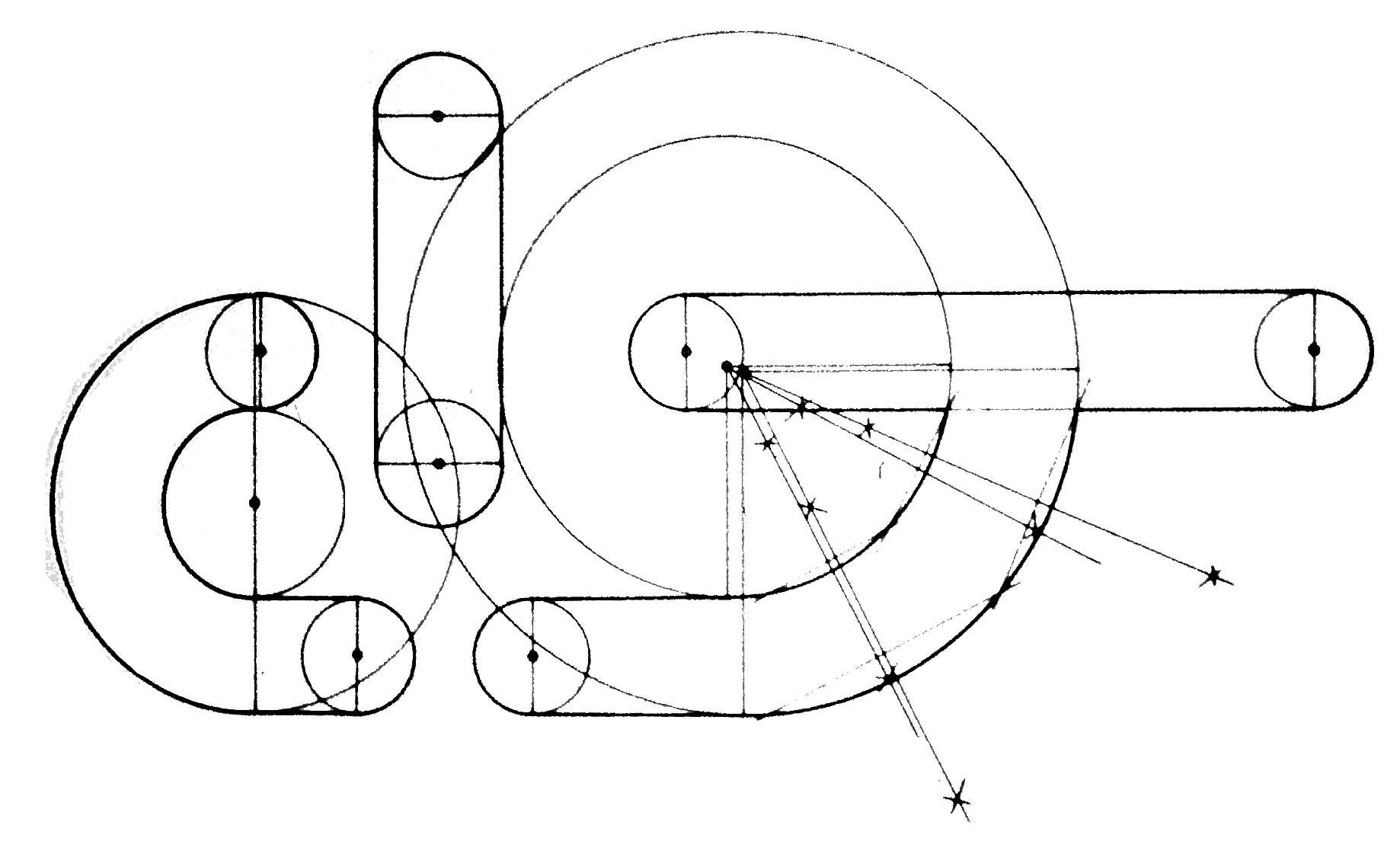
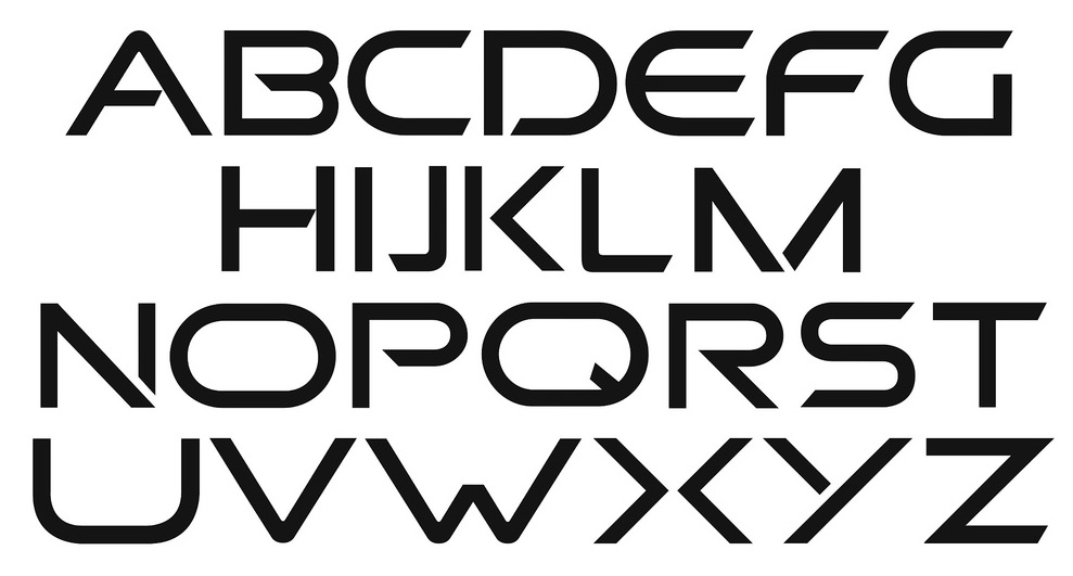
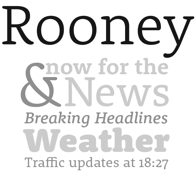
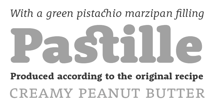
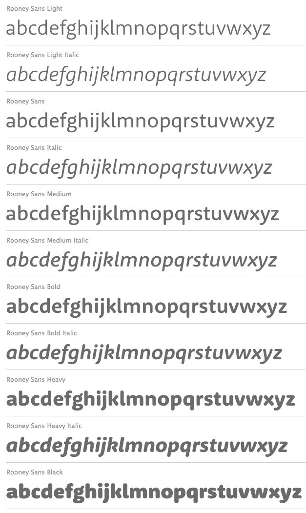
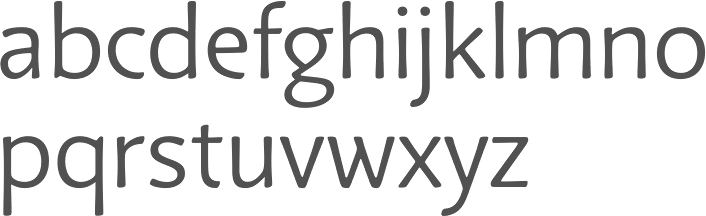
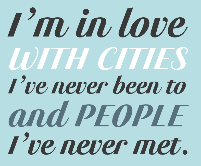
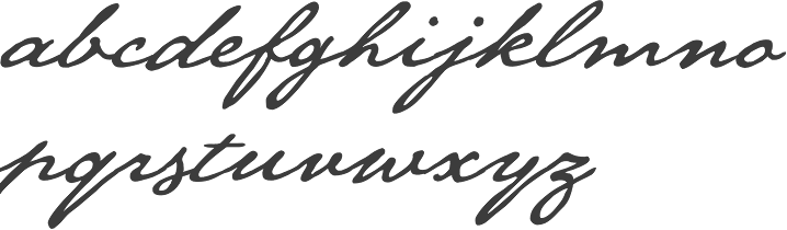
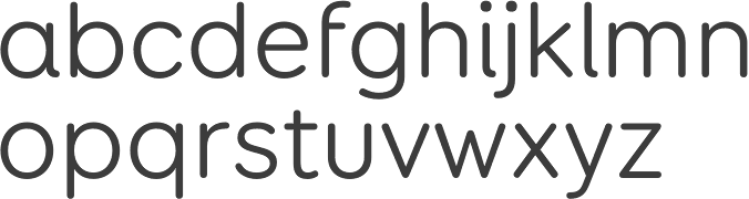
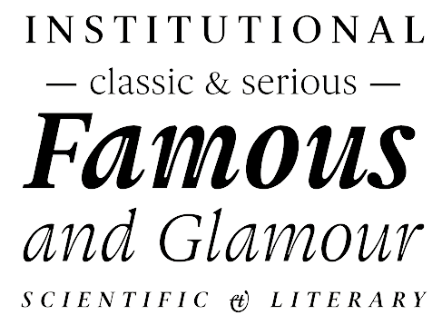
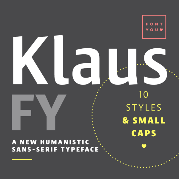
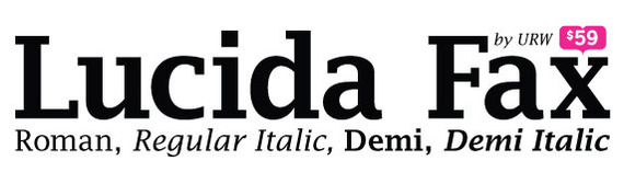
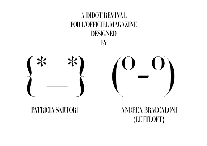
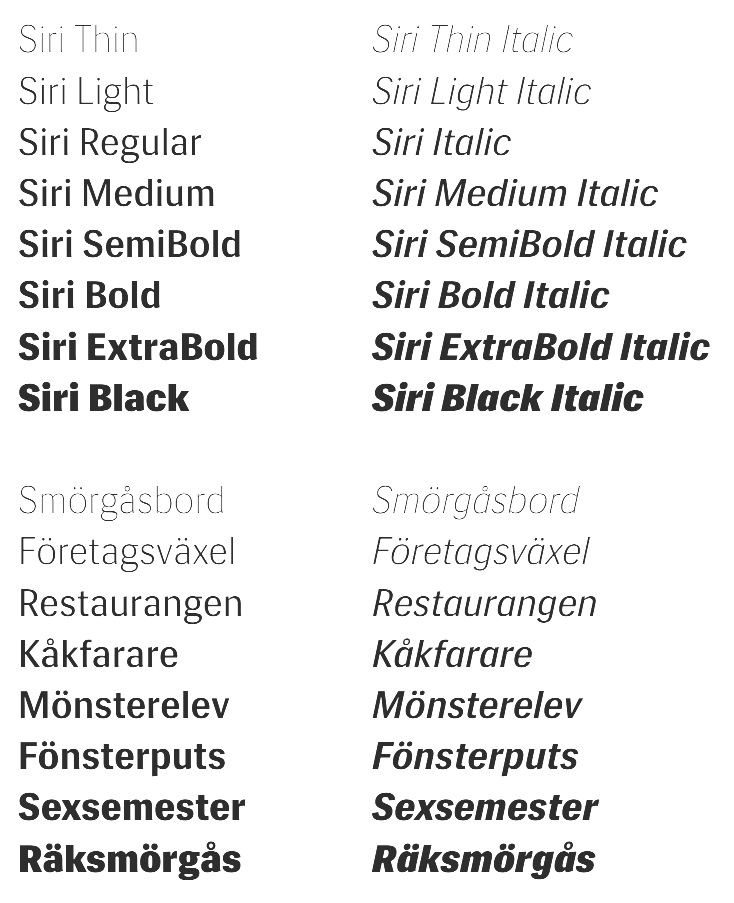
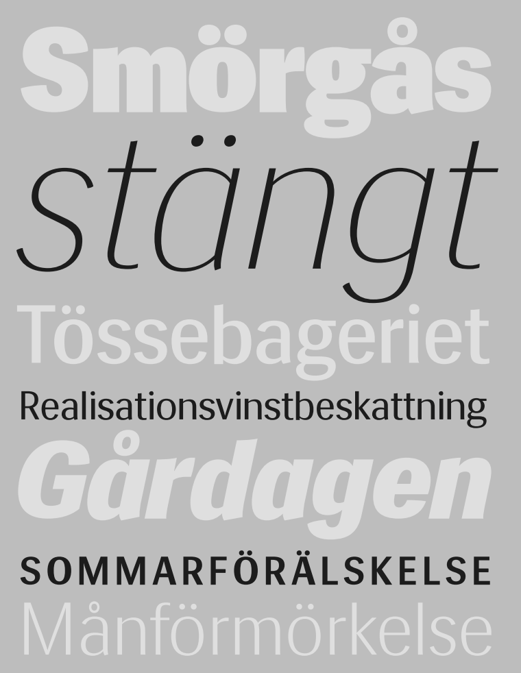
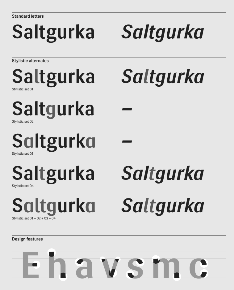
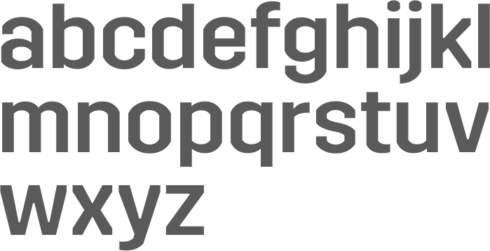
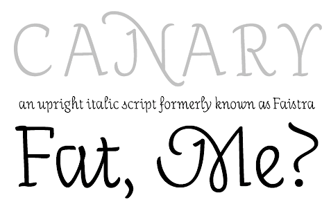
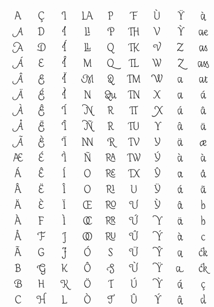
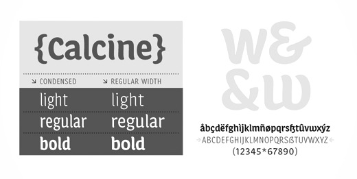
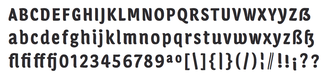
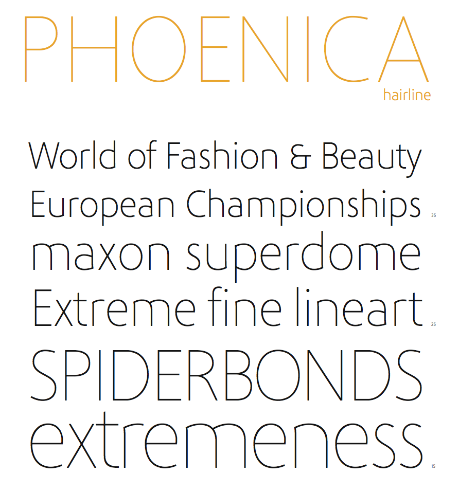
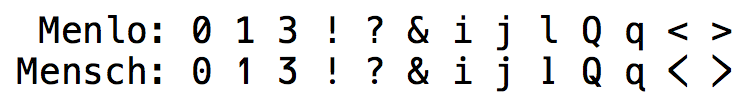
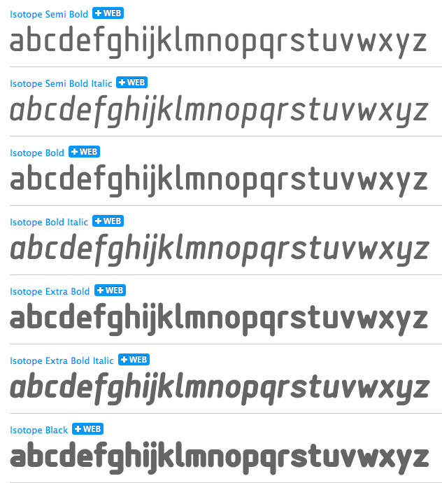
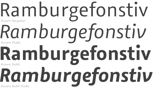
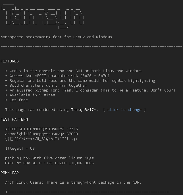
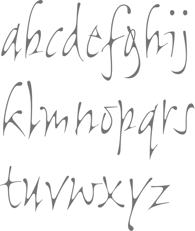
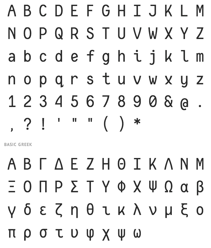