TYPE DESIGN INFORMATION PAGE last updated on Fri May 1 17:03:43 EDT 2026
FONT RECOGNITION VIA FONT MOOSE
|
|
|
|
|
Type design in France | ||
|
|
|
|
SWITCH TO INDEX FILE
123 Buero
|
In 2014, Timo designed Patron at Milieu Grotesque, a typeface inspired by type designers Günther Gerhard Lange and Roger Excoffon. [Google] [More] ⦿ |
French type foundry with headquarters in Lyon that sells typefaces made by French type designers Matthieu Cortat, Roxane Gataud, Damien Gautier, Thomas Huot-Marchand, Yoann Minet, and Alice Savoie. These include:
| |
256tf
|
His typefaces are distributed by 205tf (was: 205 Corp, or 256tm):
|
4-Paris
| Grégori Vincens is the French type designer who designed the text fonts Albia in 1997, and Firenzia in 1998. He lives in Viroflay, near Paris. He won a judge's award at the Sixth Morisawa type competition in 1999. In 2002, he received a nomination for "Lipton Ice Tea", a corporate identity font, at the Trophées d'Or du salon Intergraphic de Paris. In 2003, he set up 4-Paris, a graphic and typographic design company. In 2013, he started Fontyou, where he is CEO of a commercial font coop. |
French designer (b. 1978) of the dingbat fonts Social Shapes (2015, social media icons), World CXup 2k14 (2014), Social Logos (2011), Clubz (2007, shields of European soccer teams), 2006 Team (2006, soccer team emblems), IT Logos (2005), OpenLogos (2007) and Illustrate IT (2005). Dafont link. Yet another URL. Old URL. [Google] [More] ⦿ | |
5ive
| 5ive is the design studio of Fabrice Bats, a Parisian who has moved to Oslo. His lettering includes a couple of alphabets called Kinky (2010). Dafont link. Devian Tart link. [Google] [More] ⦿ |
Spanish designer of the hipsterish display typeface Belle de Mai (2020), a variable display typeface inspired in the cultural shock between high cost zones and the lowest suburbs near big metropolitans cities like Paris, and in the French culture, especially in the hood of La Belle de Mai, where it takes the name from. Typefaces from 2021: Galipo or Galipos (a Latin / Cyrillic display typeface inspired by Andalusian society and culture). [Google] [More] ⦿ | |
| |
A group of designers at Velvetyne who published some free fonts. These include:
| |
A Is For (was: Aisforapple)
|
In 2007, she started work under the guidance of Alejandro Lo Celso and Philippe Millot on a revival of the first type printed in France, at the Sorbonne, by Ulrich Gering. This work is based on a 1478 edition of Virgilius. Grotesque 6 (2009) is based on a typeface published in 1880 by Stephenson Blake. In 2010, she founded Aisforapple, where she published Jaakko (signage), Coline Cursive, Coline Première, Coline Extrême, Grotesque 6, David (2014) and BTP (polygonally-outlined typeface). In 2016, the type foundry published Knif Mono Regular, which was designed by Axel Pelletanche-Thévenart under the art direction of Guillaume Grall and Benoit Santiard. It was produced by Emilie Rigaud. In 2017, Émilie Rigaud published the sharp-edged typeface Tongari, which was modeled after samurai blades. Tongari Display followed in 2020. In 2018, she designed Naoko, a 7-style wide sans with short descenders, named after astronaut Naoko Yamazaki. Typefaces from 2020: Pachinko (six rounded almost typewriter styles including many monospaced fonts and italics), Olympe Mono (a monospaced and monolinear typeface revived from an old typewriter). Speaker at ATypI 2017 in Montreal. Old URL: Mouton Sauvage. Klingspor link. Personal site. [Google] [More] ⦿ |
Bordeaux-based foundry. Their work can be found in Épreuves des caractères de la fonderie A. Laplace&cie (Paris, Bordeaux, ca. 1860) and in Épreuves des caractères de la Fonderie bordelaise. A. Laplace&comp (Bordeaux, Imp. de mad. V. Laplace, née Beaume, rue du Parlement, 19. [ca. 1850]). [Google] [More] ⦿ | |
Type designer at Deberny & Peignot who, with P. Roy, cut Cochin, Moreau-le-Jeune, and Nicolas Cochin (1912) at Deberny & Peignot. Moreau-le-Jeune was later copied by Ludwig & Mayer as Sonderdruck. [Google] [More] ⦿ | |
Typefounder in Paris. His work can be found in Quelques caractères de la fonderie Pinard, rue de la Harpe, 88. Paris (Paris, ca. 1840). No full type showings in that publication, which mostly has filets, borders and vignettes. [Google] [More] ⦿ | |
Designer of the French school font AA Cursive. [Google] [More] ⦿ | |
Typefounder in Paris. His work can be found in Fonderie typographique A. Saintignon (Paris, 5, rue Notre-Dame-des-Champs, 1889). This small booklet has no full character sets. [Google] [More] ⦿ | |
An analysis of the handwriting in the Floyd Landis Tour de France doping case shoots down at least one of the arguments of Landis's lawyer. By yours truly. [Google] [More] ⦿ | |
A Tribute to Pierre Bézier (1910-1999)
| This tribute to Bezier states: At least two mathematicians solved the problem before Bezier: Airplane designer James Ferguson, and engineer Paul de Casteljau who worked for Citroen. The latter's work is mathematically equivalent to Bezier, in fact the formula listed above is De Casteljau's. Unfortunately, their discoveries were closely guarded industrial secrets and were not published until after Bezier. [Google] [More] ⦿ |
The association of Assyro-Chaldeans in France offers an archive of Assyrian fonts, including CarloAtor (1997, Timm Erickson, Summer Institute of Linguistics), GabrialAtor (1997, Timm Erickson, Summer Institute of Linguistics), Issa-&GilianaClassic (1997), Nisibus (1998, a font modified by Tony Khoshaba), SPEdessa (1998, based on Leiden Peshitta, Estrangela). [Google] [More] ⦿ | |
Art director in New Delhi and Paris who created the illustrative New World Typeface (2012) and DaKali Font (2013). [Google] [More] ⦿ | |
ABC Typo (was: Bonté Divine)
| Olivier Nineuil (b. 1964) created Bonté Divine around 1998, and renamed it ABC typo in 2001. He teaches at the La Sorbonne Nouvelle University in Paris. Olivier does custom work and has published fonts in the Agfa Creative Alliance such as Comedia. Other typefaces by Nineuil: P'tit François, Bolobolo, Cassecroute, Garatoi, Maboul, Fiston, Jeuve-upa, Faidodo, Badaboum, Bigoudi, Japapeur, Giboulette, Garamome. Custom work: Club Med (1996), Hachette Multimédia (1998), Polaris (1995, Autoroutes). Bonté Divine fonts: Picasso (1997), Bonté Divine! 007 (1996), Bonté Divine! 015 (1996), Bonté Divine! 022 (1996), Bonté Divine! 031 (1996), Bonté Divine! 036 (1996), Bonté Divine! 044 (1996), Bonté Divine! 061 (1997), Bonté Divine! 066 (1997), Bonté Divine! 077 (1997), Bonté Divine! 092 (1997), Bonté Divine! 097 (1997), Bonté Divine! 105 (1998), Bonté Divine! 112 (1998), Bonté Divine! 117 (1998), Bonté Divine! 121 (1998). [Google] [MyFonts] [More] ⦿ |
French graphic designer Abed Loutfi created the octagonal typeface Antec (2011), the honeycomb-inspired Mecanorganic (2011) and the piano key typeface Muse (2011). [Google] [More] ⦿ | |
Abneurone Typografix (or: Abneurone Trauma Types, or: Neurone Error, or: Abneurone Fluid Types, or: Cirque Traumaccord)
|
Their first commercial fonts are ATT49 Fanfare, ATT48 Thrax, ATT47 Candies, ATT46 Exlixir, ATT45 Transfix, ATT44 X-Cute, ATT43 Small Proteus, ATT42 Childhook, ATT41 Arcane, ATT40 Lysergic4a, ATT39 Liquor, ATT38 Once Upon A Damned, ATT37 Innocence, ATT36 Kidding, ATT35 Bestiaire (2011), ATT34 Lysergic 2a (2011), ATT33 Koan (2011), ATT32 Faun Call (2011), ATT31 Paraphilia (2011), ATT30 Lysergic 1b (2011), ATT29 Mad Hatter (2011), ATT28 Minimori (2011), ATT27 Tripton (2011), ATT26 Lysrergic3a (2011), ATT25 Multicoloured Rythm (2011), ATT24 Swallow (2011), ATT23 Artlien (2011), ATT22 Dopamine (2011), ATT21 ABTOY (2011), ATT20 Rankle (2011), ATT19 Ink Lust (2011), ATT18 Overabundance (2011), ATT17 Ink Circus (2011), ATT16 The Orgians (2011), ATT15 For Whom The Bell Tolls (2011), ATT10 Stereo (2011), ATT11 Heterodoxa (2011), ATT12 Psilocybine (2011), ATT13 Sync (2011), ATT14 Prehisto (2011), ATT8 Human Decay (2011), ATT9 Eroded Eclosion (2011), AT4 Parallax (2011), ATT7 Medieval Sweet Shop (2011), ATT6 Detected Future (2011), ATT5 Hard Sync (2011), ATT4 Chalice (2011), ATT3 Outer Christ (2011), ATT2 Macpanic (2011), ATT1 Nimal Nimoy (2011), AT54 Intermezzo (2011), AT26 Metamorph Candies (2011), AT29 Dystrogonyx (2011), AG2 Placenta (2011), AT17 Farandole (2011), AT27 Innocence (2011), AT3 Nuclear Project (2011), AT38 Nanogonyx (2011), AT49 Neuromicr (2011), AT16 Faun Call (2011), AG1 Neuroticons (2011), AT55 Neo Geo (2011), AT36 Mad Hatter (2011), AT51 Pharmaceutic (2011) and AT5 Childhook (2011). The FontStruct production in 2011: 00dot 5 TRANSFIX, 00dot 15 DYSTROPHIE POLYGONALE, 00dot 20 CURSED, 00dot 13 PARALLAX, 00dot 12 NUCLEAR TARGET, 00dot_7_nimal_nimoy, 00dot 17 SYNDROME F.K., 00dot 9 NEW TO, 00dot 6 DECLINE AND CODE, 00dot 3 ROBOX, 00dot 2 MINIDECO, 0dot 26 INKSECTS, 00dot 32 STEREO, 00dot 10 SMART PLAYGROUND, 00dot 33 FUTURE NOW, 00dot 23 BLING STREET, 00dot 4 TOXINE, 00dot 31 FAUN CALL, 00dot 19 ELIXIR, 00dot 30 DWARF LOGIC, 00dot 8 THRAX, 00dot 14 A NEW FORM OF BEAUTY, 00dot 22 HETERODOXA, 00dot 27 KIDDING, 00dot 21 INNOCENCE, 00dot 34 PICTORIAL ABUSE, 00ne Stretched Empty Cow (2011, a piano key stencil face), 00ne Empty Cow (2011), 00ne Medication (2011), 00ne Pills, 00ne Minipills, 00ne Stency, 00ne Neurelm, 000tag6 LYSERGIC, 000tag4 ROBOX, 000tag NUCLEAR WARFARE, 00ne dat / dot, 00ne Bat Kidding (+Stencil, +Stencil Quadrillé), 00ne Stencirc, 00ne Neurocirc Neue Deco, 00ne Neurocirc, 00ne Neurologo, 00ne Nutech, 00ne Nutech Black, 00ne Top Pix (+Clean), 00ne Not So Atroce Pixels (+Black), 00ne Videotech, 00ne Videotech Tamagochi, 0One Bad Video, 0One Exagg Superstrong, 00ne Blockollida, 00ne Minicut, 00ne Neuromoog, 00ne Exagg, 00ne XChurch, 00ne NeuroNeoq, 00ne Imprimante Matricielle, 00ne C64 NeurOOpart2, 00ne Heterodoxa, 00neZnorg, 00ne Znorg Heads, 00ne Zwrappearing (dotted and textured), 00neVideotech, A Present for Intaglio (2011, cloned from Intaglio's Wallachia), Inicial 1 (2010, an improvement of a typeface by Infotipografia), Neo Geo (2011), NE XS, NE 4x4 Technirement, NE Religious Migraine, NE Abtechre. NE Churching, NE Strange Light Pax Pact, NE Cellphone Cutie Punched Cards, NE Cellphone Cutie, NE Obl. NE Pax Pact, NE Pictorial Abuse, NE Charlie Chaplin Cybernetic Brains, NE Chaplin Cyborg, NE Unknown Remix, NE Neurofat, NE Neurocompressor, NE Neurocompressed Pictograms, NE Alien Orders, NE Filament Techneriment, NE Strange Light Pax Pact, NE The Eye, NE Moving Parallels, NE Alien Orders, NE Reordered Alien Orders, the NE New Newbix family, Parallax (2011). Typefaces made in 2012 at FontStruct: AFT1 Heterodoxa, AFT2 Forbidden Apple, AFT3 Kidding, AFT4 Spacelab Parallax, AFT5 Detected Future, AFT6 Lysergic 2b, AFT7 Lysergic 2a, AFT8 Transfix, AFT8 Smart Kids, AFT10 Candies, AFT12 Neo Geo, AFT13 Arcane, AFT15 Hard Sync, AFT17 Cortech Hallucination, AFT18 Lysergic1b, AFT20 Abtech, AFT21 Bling Chief Story, AFT22 Ink Lust, AFT23 Faun Call, AFT24 Toying, AFT27 Fluffy Clown, AFT30 Koan, AFT31 Innocence, AFT33 ETPheuneHeume, AFT34 Neuromicr, AFT35 Tripton, AFT36 Intermezzo, AFT37 Rankle, AFT38 Dark Rankle, AFT39 Rankle Distone, AFT40 Smart Kids, AFT41 Smart Playground, AFT42 Lysergic 4a, AFT43 Small Proteus, AFT44 Lysergic 3a, AFT45 New Forgee, AFT46 Space Connect, AFT47 Mondrian Drone, AFT48 Bark At The Code, AFT49 Stereo, AFT50 Artlien, AFT51 Liquor, AFT52 Neuromecha, AFT53 Lysergic 1a, AFT54 Dinoxyde, AFT55 Human Decay, AFT56 Eroded Eclosion, AFT57 Outer Christ, AFT58 Boing Code, AFT59 Nimal Nimoy, AFT60 X-Church, AFT61 Macpanic, AFT62 Lovely Breeze, AFT63 Mad Hatter, AFT64 The Orgians, AFT65 Chalice, AFT66 Ssaammothrax, AFT67 Panthrax, AFT68 Less Is More Neuromicr 2, AFT69 Paraphilia, AFT70 Psilocybine, AFT71 Childhook, AFT72 Once Upon A Damned, AFT73 For Whom The Bell Tolls, AFT74 Medieval sweetshop, AFT75 Nanoprehistoryx, AFT76 Pictorial Abuse, AFT77 Bestiaire, AFT78 Fanfare From Outer Space, AFT79 X-Cute, AFT80 Medication, AFT81 Wrong DNA, AFT82 Wrong DNA, AFT83 Minimal Disto, AFT84 Abacadabra, AFT85 Pharmaceutical, AFT86 Code Flu, AFT89 High-Diving Blindness, AFT90 Nopix, AFT91 Floppy Disk O, AFT100 Farewell dawn, AFT104 Locked-in Glow, AFT105 Vivant, AFT106 Sharp Gloss, AFT107 Madame Guillotine, AFT108 Newbic, AFT109 Ataxie, AFT110 Strenuous MICR, AFT111 Effaceur, AFT113 Zeppelin Legacy, AFT1010 Jabbering, AFTN1, BUT1 Quarx, BUT2 Newbix, BUT3 Disto Matricielle, BUT4 Tomono, BUT5 Blurred Clown, BUT7 Religious Pill, BUT8 Nopix (octagonal), BUT9 Tipi Video, BUT10 Slanxic Acid, BUT11 Metamphetamental, BUT12 Znorgs, BUT13 Soyokaze, BUT15 Stick Tech, BUT16 Uninteresting Tech. In the Testament series from 2012 until 2013, we mention Testament 132 New Indication, Testament 131 The New Orgians, Testament 128 Camphre, Testament 126 Neuromoog, Testament 122 Dissecting Geometry, Testament 115 Placenta Numérique, Testament 116 Abnormal Fairy, Testament 109 Madame Guillotine, Testament 85 Axone, Testament 84 Keen, Testament 83 Minimixture, Testament 52 Neuromecha, Testament 51 Liquor, Testament 50 Artlien, Testament 49 Stereo, Testament 48 Bark At The Code, Testament 56 Eroded Eclosion, Testament 55 Lysergic 1a, Testament 54 Inflated, Testament 59 Nimal Nimoy, Testament 60 X-Church, Testament 64 The Orgians, Testament 67 Panthrax, Testament 66 Human Decay, Testament 69 Chalice, Testament 47 Mondrian Drone, Testament 44 Lysergic3a, Testament 42 Lysergic 4a, Testament 27 Arcane, Testament 11 Minimori, Testament 8 Transfix, Testament 7 Lysergic2a, Testament 6 Lysergic 2b [The Lysergic series is about very large (around 200 cases high) grid pixel fonts with a severe inclination to psychedelism], Testament B Formaldehyde, Testament C Neuroticons, Testament Artefact, Testament Back Home, Testament 1 Heterodoxa, and Testament 12 Neo Geo. He also created an Archive series in 2012, which features an ornamental caps typeface called Archive 10, a geometric typeface called Archive 5, TEST PPain, and a textured typeface called Archive 8. He has a Trauma series that features Trauma 145 Razzmatazz Architect, Trauma 126 Lysergeek Boy, Trauma 127 Lysergeek Girl. Typefaces from 2014: Trauma 155 Overly, Trauma 151 Migraine Bit. In 2017, Abneurone allowed me to host his 120-strong Abtox series, which grew out of the FontStruct collection between 2014 and 2016. Download directory. All fonts in one zip file. The complete list: Abtox 1 ATAXIE, Abtox 10 GRIEF, Abtox 100 CORRODED SPACESHIP_0, Abtox 101 LYSERGIC GAMMA_1, Abtox 102 TOXIC DATA, Abtox 103 NEUROTIC CHURCH_3, Abtox 104 SCHIZOPHRENIA TYPE_1, Abtox 105 TWO STAGES OF CONTAMINATION_2, Abtox 106 DINOXYDE_1, Abtox 107 FAUN CALL_0, Abtox 108 SMART KIDS_9, Abtox 109 FORBIDDEN APPLE_1, Abtox 11 SANTA CLAWS, Abtox 110 DYSTOPIAN GEOMETRY_0, Abtox 111 CHEMICAL ABERRATION_1, Abtox 112 DOUBLE-DEALING_3, Abtox 113 FORBIDDEN PLANET_4, Abtox 114 KARMIC_4, Abtox 115 DIZZY MOLECULES, Abtox 116 COMPUTING ELSEWHERE_0, Abtox 117 DEEP LOW_2, Abtox 118 MODULOTNIK, Abtox 119 DATACIDE_3, Abtox 12 CLOUD BLOOD, Abtox 120 CLOSE ENCOUNTERS_7, Abtox 13 CHILDHOOK_C, Abtox 14 BACTERIA_0, Abtox 15 ALCESTE_3, Abtox 16 PSILOCYBINE_1, Abtox 17 AXONE_1E, Abtox 18 GALACTIC ORGAN_0, Abtox 19 NEUROMOOG_1, Abtox 2 TANTRISME_1, Abtox 20 UFOLOGY, Abtox 21 PAIN PDJ_4, Abtox 22 MY VALENTINE_0, Abtox 23 SUCROKID, Abtox 24 FLOPPY DISK CODE, Abtox 25 VERKIDGO, Abtox 26 NEO GEO_1, Abtox 27 MANDRAGORE_F, Abtox 28 HORNS TO COME_1, Abtox 29 NITROX BEAT_7, Abtox 3 DECORATORIO, Abtox 30 FLYBUTTER_1, Abtox 31 MATRIX YELL_0, Abtox 32 BUBBLE GUMMY_A, Abtox 33 SPAWN_2, Abtox 34 SQUARRY_0, Abtox 35 BUBONIC AK47_0, Abtox 36 VINAIGRE GOTHIQUE_3, Abtox 37 NEO POMPOUS, Abtox 38 EFFACEUR GLUED_1, Abtox 39 EFFACEUR BAROQUE_8, Abtox 4 OVERLY_6, Abtox 40 EFFACEUR SOLID_3, Abtox 41 EFFACEUR CODA_5, Abtox 42 DARK ATROXID_1, Abtox 43 LUMINOUS ATROXID_9, Abtox 44 DRUGGED UP ATROXID_0, Abtox 45 NEUROMECHANIC, Abtox 46 CAMPHRE_4, Abtox 47 FEAST OF UNIQUE RITES, Abtox 48 CHALICE, Abtox 49 SPACE DRUG_0, Abtox 5 NEW PUPPY_0, Abtox 50 TRONIXHALLEY_1, Abtox 51 NO DUMMY, Abtox 52 LOST CHILDHOOD_1, Abtox 53 TRAUMATOLOGY_0, Abtox 54 THE NEW ORGIANS_7, Abtox 55 AMOEBA PUNK_2, Abtox 56 MEDICATION, Abtox 57 SIDE EFFECTS_3, Abtox 58 RE-VOLT_1, Abtox 59 CYBERNODE_1, Abtox 6 RAZZMATAZZ ARCHITECT_1, Abtox 60 OUTER CHRIST, Abtox 61 NEW CIRCUS_0, Abtox 62 ART DRONE, Abtox 63 COAXIAL_2, Abtox 64 PONG !_2, Abtox 65 LYSERGEEK GIRL_0, Abtox 66 NEWBIC_1, Abtox 67 BRAIN SURGERY_4, Abtox 68 RETROFUTURE PRECIOUS_0, Abtox 69 TRIPTONITE_2, Abtox 7 LOG_3, Abtox 70 NEUROMICR_8, Abtox 71 HUMAN DECAY, Abtox 72 INK LUST_0, Abtox 73 PANTHEIST_2, Abtox 74 X-CUTE_6, Abtox 75 DATAXY_4, Abtox 76 FRAGRANCE_0, Abtox 77 TOOTH AXIS_2, Abtox 78 MADAME GUILLOTINE_0, Abtox 79 NARCO_2, Abtox 8 KOAN, Abtox 80 GENOMETRY_1, Abtox 81 SAFE TRAIN_4, Abtox 82 NO ISLAND, Abtox 83 LOCKED-IN GLOW_5, Abtox 84 ABNORMAL FAIRY_A, Abtox 85 ACME_0, Abtox 86 GLITCHY ELIXIR_1, Abtox 87 BLACK ELIXIR, Abtox 88 NEW INDUCTION_0, Abtox 89 MECAMYTHIC_3, Abtox 9 ABSTEREO_4, Abtox 90 MEDIEVAL SWEETSHOP, Abtox 91 PARAPHILIA_0, Abtox 92 HARD SYNC_3, Abtox 93 SECT TOY_1, Abtox 94 ARTEFACT_2, Abtox 95 SPACE LAB, Abtox 96 WAX, Abtox 97 E.T. PHEUNE HEUME_C, Abtox 98 COLD FLOWERS_2, Abtox 99 INJECTING DOPAMINE_0, Abtox ALIEN TOYS_14, Abtox NEUROTICONS_13, Abtox X-HEADZ_37. Dafont link. [Google] [MyFonts] [More] ⦿ |
| |
Type designer based in Paris, who makes experimental commercial fonts at "For Home or Office Use" (Frankfurt). One of his families is called Lini (2000, semi-technical). Others: 2Try-Strich, 3Try-Straight, 4Try-kerned, 7Try-Medserif, 8Try-Micro, 12Try-Lego, 131Try-Klinspor, 161Try-Bitter, 172Try-Reg, 1722Try-Fliess Fett, 1721Try-Reg Inline, 174Try-Serif, 1742Try-Serif Fett, 18Try-Annette, Densite, Ouvert, Knubb, Knubb-20, Lini Eins, Lini Drei, Lini-Viers, Love-1, Love-10, NEW FEw, NEW GEw, NEW Klein, sBit34, WIR 2, WIR 3, WIR 4, WIR 6Vi, WIR 7Vi, WIR 7Vi Fat. Achim also runs Vier5 with Marco Fiedler, a graphic design studio. At Vier5, he published the experimental typeface SVT (2010) and the futuristic angular Shake (2010), which was originally designed for the Centre d'art Contemporain de Brétigny in France. [Google] [More] ⦿ | |
Acmé-Paris
|
Typefaces from 2015 include the multiline neon font Neo Neon. In 2016, Acmé Paris designed the copperplate style poster typeface Aylak, the titling sans Truck, the art nouveau typeface Bertand, the art deco typeface Beaumont, and the avant-garde typeface Cattolica. In 2017, they designed the artsy rounded sans typeface Kasha. Typefaces from 2022: Madrid (inspired by vintage posters from the Spanish Civil War). [Google] [More] ⦿ |
Paris-based student-designer of the techno typeface Diodr (2018). [Google] [More] ⦿ | |
French creator (b. 1993) of the primitive hand-printed typeface Adenote (2012). Dafont link. [Google] [More] ⦿ | |
Graphic designer, living in Paris, b. 1986. From 2007 until 2009, she studied type design at Ecole Estiene in Paris. In 2010, Budapest inspired her to create the open organic typeface Buda, which is characterized by large counters. Free download at Google Fonts. Home page. Klingspor link. Google Plus link. [Google] [More] ⦿ | |
| |
Strasbourg, France-based designer of the nature-themed typeface Nature (2016), which was a school project at Université de Strasbourg. [Google] [More] ⦿ | |
During her studies, Lyon, France-based Adèlle Onnillon designed the handcrafted poster typeface Lehre (2016). Behance link. [Google] [More] ⦿ | |
Rouen, France-based designer of Paperclip Type (2015). [Google] [More] ⦿ | |
Ex-student at l'Ecole Estienne in Paris, who wrote a thesis on the SuperVeloz typeface of Joan Trochut Blanchard (the exact reference is: Supertipo Veloz, Fundición José Iranzo, 1942). She digitized the typeface to some degree. [Google] [More] ⦿ | |
Lille, France-based designer of a sharp-edged typeface in 2016. Behance link. [Google] [More] ⦿ | |
Parisian graphic designer who created the logotype font Samaritaine (2013). This modular slightly anorexic sans display typeface was influenced by the new architectiural identity of the department store. [Google] [More] ⦿ | |
| |
Parisian graphic designer. She created the experimental typeface CLAP (2012) to represent rhythm, and illustrated it on the Serge Gainsbourg song Des clip crap des bang des vlop et des zip. Behance link. [Google] [More] ⦿ | |
Or Adolf Rusch von Ingweiler, who was active in Strasbourg from 1460 until 1489. The first roman antiqua north of the Alps is ascribed to him in 1464. The consensus is that this was not as pretty as the later types by Griffo et al. Nevertheless, Shane Brandes did a large digital revival of his antiqua in 2013 and called it Rusch. Revivals by Alexis Faudot and Rafael Ribas in 2018 during a type design workshop at ESAL Metz and Bibliothèque municipale de Metz, France:
| |
He created these typefaces:
Books: A.M. Cassandre, "L'architecture, l'art que je préfère à tous les autres." (2008) is a small PDF file/essay by Estienne student Antoine Stevenot. In 1988, Letraset published Baseline 10 The Cassandre issue, a fifty-page magazine volume edited by Mike Daines and art directed by Newell and Sorrell. References:
Klingspor link. FontShop link. Home page. Wikipedia link. [Google] [MyFonts] [More] ⦿ | |
French type designer (1855-1933) who made Giraldon (Fonderie Deberny, 1900), an ornamental serif typeface undoubtedly influenced by Grasset and Auriol. [Google] [More] ⦿ | |
Frutiger's books include Type Sign Symbol and Signs and Symbols. Their Design and Meaning (1989, with Andrew Bluhm, published by Studio Editions, London; Amazon link). Linotype link. FontShop link. Adrian Frutiger, sa carrière française (2008) is Adèle Houssin's graduation thesis at Estienne. Klingspor link. Wikipedia link. View Adrian Frutiger's typefaces. View some digital versions of Avenir. Vimeo movie on Frutiger by Christine Kopp and Christoph Frutiger entitled "Der Mann von Schwarz und weiss: Adrian Frutiger". More Vimeo movies. [Google] [MyFonts] [More] ⦿ | |
French type and graphic designer. His typefaces include Adrianistique, Ad Scriptum, Coffea and Ixoxi (logotype). [Google] [More] ⦿ | |
During his studies, Adrien Ballanger (Nantes, France) created Sorry Mom (2014), a typeface that was inspired by Quaver Serif (2011, Nick McCosker, Tipple Type). Behance link. [Google] [More] ⦿ | |
As a student in Suresnes, France, Adrien Bourmault designed the artistic typeface Point Type in 2013. Behance link. [Google] [More] ⦿ | |
In 2015, he created the commercial sans display typeface Panama. Behance link. Another Behance link. Creative Market link. [Google] [More] ⦿ | |
French designer of the 4-weight decorative sans typeface Grisaille (2020): Grisaille has a strong square base and contrasting rounded aesthetics. [Google] [More] ⦿ | |
Valleiry, France-based designer of the school project typeface Galbe (2015). [Google] [More] ⦿ | |
Lille, France-based designer of the connected monoline script font Dum Dum (2013). [Google] [More] ⦿ | |
| |
At a workshop held in his home town of Mulhouse, France, Adrien Joufflineau designed an avant-garde typeface family (2016). [Google] [More] ⦿ | |
Adrien Kerros (Sokrea, Paris) created the free circle-based typeface Ablax in 2015. Behance link. Dafont link. [Google] [More] ⦿ | |
French designer (b. 1990), aka Neo Keitaro, of Graphic Trash (2006, scribbly hand). [Google] [More] ⦿ | |
During his studies, Adrien Levavasse (Faverges, France) drew a charcoal origami alphabet (2013). [Google] [More] ⦿ | |
Bordeaux, France-based designer of the simplified sans typeface Police (2018). [Google] [More] ⦿ | |
Adrien Menard
| |
Fonts made in 2010: The ETH family (art deco sans). Custom typefaces by Midzic: Aquitaine (2013, for Région Aquitaine), Nilka (2013, for his personal identity), No End (2013, a fat didone), Ethon Serif (2013, a perked up serif typeface for Penguin Books), Kasai Est (2011, for the Congo-based Kasai Est Magazine), Festival De Film Documentaire (2011), Nevenka (2011, condensed sans). In 2014, Adrien Midzic, Jason Vandenberg, Jérémie Hornus, Julien Priez and Alisa Nowak co-designed the creamy script Vanilla FY. It was renamed Vanille FY after a few days. Still in 2014, Adrien Midzic, Jérémie Hornus and Alisa Nowak co-designed the very humanist sans family Saya FY and Saya Semisans FY. Adrien Midzic and Joana Correia co-designed Saya Serif FY (2015). At the free font cooperative Velvetyne, he published the sans typeface Lack (2014). In 2015, he made the 3-style sans typeface Suber for an art fair in Paris. The roman transitional typeface Bota Serif (2015), which was inspired by Cochin (designed by Charles Peignot in 1912) is a custom font designed for Hotel des ventes de Poitiers. In 2017, it was finally released for retail. In 2016, Adrien designed the bold titling typeface Debeo and the modern condensed Latin/Arabic typeface 29LT Adir (with Naji El Mir; at 29 Letters). In 2017, he published the piano key typeface Mixal, which became a large experiment on variable fonts and is free for everyone. Typefaces from 2018: Kern, Kern Office (a sans with some Futura features), Forno (sans), VTF Lack (a free single weight monoline geometric sans for Latin, Greek and Cyrillic, published by Velvetyne), Metal (an all caps multi-width variable font originally designed for marché Dauphine), Orelo (a 120-style high-contrast fashion mag font family; +Orelo Hangul, 2020). Typefaces from 2019: Ultra Solar (experimental), 1871 Mane (a custom sans typeface), Wasa (a tense sans in seven styles), Shrill, Gangster Grotesk (free), Stupid (a hacker / hipster font), Kern (geometric sans). Typefaces from 2020: Shreck Issue (very tall and ultra-condensed), Metal (brutalist), Version ACT (a two-axis variable font), Debeo (a heavy sans), Dozza (a hybrid family named after ITC Mendoza by Jose Mendoza Almeida), XMX (experimental). Typefaces from 2021: Campingo (a roundish informal typeface inspired by camping and outdoor life), Bota (with Ines Davodeau: first designed for Boissnot&Tailliez, Bota is a modern interpretation of Georges Peignot's Cochin (2012)), Pleasure (hipsterism pushed to the fringe of addiction), Model Standard (ModelStandard Mono, ModelStandard SemiMono, ModelStandard Sans). Dafont link. Klingspor link. Behance link. Another Behance link. Hellofont link. Velvetyne link. [Google] [MyFonts] [More] ⦿ | |
Student creator in Paris of the thin blackboard bold typeface A Deux C'est Mieux (2014) and the display / logotype typeface Palais de Tokyo (2015). [Google] [More] ⦿ | |
Adrien Tétar
| |
With John Morgan, he founded Abyme in 2017. At Abyme, he published these typefaces:
| |
Adrien Zammit
| |
French outfit that designed the bullets/pixel dingbat font Signotek (free) in 2000. [Google] [More] ⦿ | |
Afterlounge.com
| Afterlounge.com is run by Ion Lazarescou (b. 1976), a Frenchman from Levallois-Perret who since 2000 is the artistic director for APM Publicité. He designed Helltime and Fuconexbo at Typograsfree. [Google] [More] ⦿ |
Parisian graphic designer. Creator of Evolutive Typeface (2013, alchemic). [Google] [More] ⦿ | |
During her studies, Agathe Challeton designed the free typeface Wisigotik (2020). [Google] [More] ⦿ | |
During her graphic design studies in Nantes, France, Agathe Nedelec designed the art deco typeface Stroke (2016). [Google] [More] ⦿ | |
Aix-en-Provence-based designer of the bold sans typeface Pina (2016). Behance link. [Google] [More] ⦿ | |
Agathe Richard
| |
Flickr page by Agence Eureka, which has scanned many lettering books from the art deco era and the immediate post-war era. [Google] [More] ⦿ | |
Parisian type foundry. In 1882, they published a specimen book, Spécimen des caractères de labeur de l'imprimerie typographique A.-H. Bécus. Scans: Bretonnes, normandes, initiales, initiales allongées, elzevier. [Google] [More] ⦿ | |
As a student at ENSAD in Paris, she co-designed Rosart (2002), a font based on lettering by the famous 18-th century Belgian typographer. [Google] [More] ⦿ | |
Parisian graphic and web designer who created a cursive typeface and Thing Icons in 2014. In 2015, he/she created a multicolored circle-based alphabet. Home page. [Google] [More] ⦿ | |
Commercial fonts include these made by Atelier Télescopique: Stone Heure (2007, multiline), Ader, Bepierre (pixel), Beye (pixel), Birinte (experimental), Boureuse (an elegant geometric sans), Byme, Capulco, Ciceron (dot matrix), Delory (clean sans), Dicion (dot matrix), Dixca (pixel), Fisher, Fluo (2012-2014, a stencil font by Xavier Meurice and Sébastien Delobel), Hic, Kune (sans family), Lailuya, Lienne, Mentable (dot matrix), Mento (clean sans), Merik, Miante, Micale, Mulette, Naconda, Nalfabait (dings), Natomi (techno), Nibalsmith (ultra-fat), Norak, Normal, Peindice, Rabik (paperclip face), Raoul, Rijsel (2013, sans), Rondie (kitchen tile), Rubal, Scard, Screenex, Stone Heure (prismatic), Singolo, Sphiquesy, Steroid, Stuce, Tino, Tomica, Treen, Varo, Velinge (dings), Veu, Vrette, Vure, Yoli (dings), Xatif, Zofage. Corporate typefaces by them include the Quechua family (for the sports company Quechua in Domancy, France), which consists of four typefaces, Bionnassay (for cross-country skiing), Forclaz (mountain hiking), Arpenaz (for recreational hiking) and Capcir (for Nordic skiing). | |
Ainsifont (was: Atelier Telescopique, or: Fonderie Nordik)
|
Font list: Font list: Scard (2000, Xavier Meurice), Stonehenge, Dixca (free pixel font), Fish, Delory, Lienne (2001, with Delobel), Bizeau, Raoul, La Cidulée, Ader (Xavier Meurice, 2002), Tex (2002, pixel font by Xavier Meurice), Normale (free), PSUS (Xavier Meurisse, 2000), Bépierre, Péro, SV01 (dings), Cicerond (free dot matrix font), Réka (2001, Meurice and Delobel), Nuk, Stéroide, Rosoir (2002, Xavier Meurice, dingbats), Equinox, Acropik, Wazemmes, Kune, Stoneheure (2001, Xavier Meurice), Sphiquesie (Xavier Meurice, 2002, an octagonal font), Nyctalope (2002). Xavier Meurice participates in the type cooperative Ainsifont in Lille. His typefaces there include:
|
B612 is a free Google font published in 2018 by a team of designers. They explain: B612 is a highly legible open source font family, designed and tested to be used on aircraft cockpit screens. Its design makes it particularly suitable for degraded contexts (ensuring legibility and readability of data), with a positive effect on reducing visual fatigue and cognitive load. Particular attention was given to the uniformity of the typeface, whether being used for isolated terms, reading information on a map, mixing capital letters and numbers, waypoint lists, long or abbreviated texts, specific terms and data in the aeronautical field. In 2010, Airbus initiated a research collaboration with ENAC and Université de Toulouse III on a prospective study to define and validate an aeronautical font: the challenge was to improve the display of textual data information on all cockpit screens, concerning more specifically legibility, readability and reading comfort, and to enhance the overall cockpit consistency. The typographical research was conducted through iterations from experimentation to design. Two years later, Airbus came to Intactile DESIGN in order to design and develop the eight variants of the font. Baptized B612 in reference to the imaginary asteroid of the aviator Antoine de Saint-Exupéry, the font has been optimised following a calligraphic approach, in order to preserve the readable qualities of humanist typefaces like réales and incises, but also the technical and functional image of sans serif or bitmap. B612 is a two-weight font family including roman and italic styles but also a monospaced variation, B612 Mono. It was designed in 2012 by Nicolas Chauveau, Thomas Paillot and Jonathan Favre-Lamarine from the design agency Intactile DESIGN, and Jean-Luc Vinot from ENAC (French National University of Civil Aviation) Interactive Informatics Team for Laurent Spaggiari from the Airbus Human Factors department---prior research by Jean-Luc Vinot (DGAC/DSNA) and Sylvie Athènes (Université de Toulouse III). In 2017, Airbus agreed to publish the font with an open source license (Eclipse Public License) within the Polarsys project, an industry-oriented project hosted by the Eclipse foundation. B612 project was awarded the Observeur du Design: Industry Star in 2018. Github link for B612. Google Fonts link for B612 Mono. [Google] [More] ⦿ | |
Akalollip
|
Creator of the free font family Fengardo Neue (2012, Velvetyne Type Foundry and Open Font Library), a (very) humanist sans with a Gillian lower case g. In 2015, he designed the didone typeface family Trianon at Production Type, in Text, Grande and Caption sub-families. Benedikt Bramböck writes: Weighing in at a total number of forty-two styles spread out over four size-specific families, it is certainly not another blunt revival of a Didot typeface. Even more remarkable than the size of the type system is the stylistic scope it covers, including elaborate italics, monolinear Lights, heavily slab-serif-flavored Caption cuts, and Grande styles that verge on becoming stencils---all referencing different works from the golden era of the Didots. With this pluralism of style and character, Trianon almost commands you to use it in all the "wrong"ways, exhibiting flamboyant shapes, flexibility, and individuality. In 2016, he added the gorgeous fat didone typeface Trianon Normande, which was done with the aid of Sandra Carrera, Roxane Gataud and Yoann Minet at Production Type. Fontsquirrel link. Loïc Sander at Velvetyne. [Google] [More] ⦿ |
Paris-based designer of the great custom vintage typeface Illusions of Grandeur (2017). Behance link. [Google] [More] ⦿ | |
French designer (b. 1972) of the Celtic look typeface Akvaleir (2007). Dafont link. Aka Ysengrin. [Google] [More] ⦿ | |
Rennes, France-based designer of Fire Stone (2018) and Trombone (2018). [Google] [More] ⦿ | |
Lyon, France-based designer of the art nouveau-lettered illustration Metadream (2014). [Google] [More] ⦿ | |
Ex-student at Scriptorium de Toulouse who created this roman inscription face. [Google] [More] ⦿ | |
| |
| |
Alan Marshall worked at the Musée de l'imprimerie in Lyon, France, from 1995 until his retirement in 2015. He was director of the Museum from 2002 until 2015. A type and book expert, Alan Marshall published Tout le monde connaît Roger Excoffon (2011). Musee de l'imprimerie link. [Google] [More] ⦿ | |
In 2020, he published the text family Big Daily at Production Type, which writes: Big Daily is inspired by daily newspaper typefaces---not ubiquitous headline display fonts, but the small copy. At its best in small point sizes from 6pt - 12pt, its contrast is both significant and sturdy, avoiding the clunky, zoomed-in nature of many fonts designed for this size. . [Google] [More] ⦿ | |
French creator of the scratchy hand-printed typeface Alban (2011). [Google] [More] ⦿ | |
Albert Boton
| |
Albert Hollenstein
| |
Nantes, France-based designer of the high-contrast tweetware typeface Punctuation (2014). [Google] [More] ⦿ | |
Graphic designer in Paris, who created the textured decorative caps typeface Wykinanki (2015) [Google] [More] ⦿ | |
Montreuil, France-based designer of Brickcity (2013), a pixelish modular typeface. [Google] [More] ⦿ | |
Alejandro Lo Celso
| |
Graphic designer in Paris, who created the Latin / Cyrillic Slova Stencil typeface in 2015. Behance link. [Google] [More] ⦿ | |
His typefaces include:
Speaker at ATypI 2013 in Amsterdam: Forma, Dattilo, Modulo. Nebiolo's last effort to produce a 'universal' typeface. Organizer of ATypI 2017 in Montreal. Speaker at ATypI 2018 in Antwerp. [Google] [MyFonts] [More] ⦿ | |
Alex André
| |
Alex Chavot
| |
Graphic designer in Toulouse, France, who created a geometric solid font and an experimental textured font in 2018. [Google] [More] ⦿ | |
During his studies at l'Institut Supérieur des Beaux Arts de Besançon, France, Alex Roux designed a hipster typeface. [Google] [More] ⦿ | |
Based in Nates, France, Alexandra De Assunçao created the experimental typeface Le Renard Qui Court in 2013. Behance link. [Google] [More] ⦿ | |
Photographer and designer in Lyon, France, who created the curly vampire typeface Madlex (2016). Behance link. [Google] [More] ⦿ | |
Graphic designer in Versailles, France. In 2015 she created Manel, a typeface that consists of letters drawn by a class of eight-year old children. She also designed the monoline sans typeface Leer (2015). [Google] [More] ⦿ | |
Parisian art director who created the squarish modular typeface La Recalle (2011). [Google] [More] ⦿ | |
Alexandre Bassi is a type designer and researcher. He specializes in art direction, visual indentity and type design. During Type Paris 18, Alexandre Bassi designed Optika, a text typeface that was influenced by Dwiggins. At ANRT, he designed the free script font Chaumont Script (2021), which is based on the handwriting of Chantal Jacquet, a sign painter in Chaumont (Haute-Marne, France) in the 1980s. [Google] [More] ⦿ | |
During his studies at ESAG-Penninghen, Paris, Alexandre Carre designed an unnamed modular typeface (2013). [Google] [More] ⦿ | |
Dijon, France-based designer of the all caps display typeface Alphabetica (2016). [Google] [More] ⦿ | |
Graduate of the DSAA program at Ecole Estienne in Paris. In 2018, he released the grotesque typeface family Sonar at E162. [Google] [More] ⦿ | |
During his studies in Bordeaux, France, Alexandre Delvert created the stencil typeface Bitmap Alphabet (2014). [Google] [More] ⦿ | |
Alexandre Dimos
| |
Parisian illustrator and graphic designer who created the spurred typeface Peak (2013). [Google] [More] ⦿ | |
In Lyon, France, Alexandre Guerrero designed the typeface Chambrine (2016) and Charmille (2016) for a school project. Behance link. [Google] [More] ⦿ | |
Alexandre Laügt
| |
Graphic designer in Toulouse, France (b. 1990, Tours, France). Creator of Typo 3D (2014). [Google] [More] ⦿ | |
Graduate of ESAD Grenoble Valence, France in 2006. In 2012, Stéphanie Vilayphiou, Alexandre Leray, Coline Sunier and Charles Mazé co-designed the readable typeface Dauphine, which can be downloaded from Github and Open Font Library. See it in action on the web site of ESAD (Ecole Supérieure d'Art et de Design). Dauphine is a sans-serif font inspired by lettering in late 19th and early 20th century maps. ESAD Groble Valence link. [Google] [More] ⦿ | |
As a student at ENSAD in Paris, he co-designed Poinçons (1999), a typeface based on a design of Fournier. [Google] [More] ⦿ | |
Alexandre Liziard
| |
French youngster (b. 1994) who created the simple hand-drawn typeface Newjosh (2012) and the grungy typeface Smoky Cloud (2012). He also made the African look caps typeface Tribalistik Tatwu (2012). [Google] [More] ⦿ | |
| |
| |
Parisian creator of the very experimental typeface Typographie Modulaire (2012). [Google] [More] ⦿ | |
Parisian graphic designer who created experimental typefaces such as Futidot (2013), and 1 Point Dudh (2013). Le First (2013) is a squarish typeface. [Google] [More] ⦿ | |
In 2020, he published the rounded display typeface Caspar Condensed at Future Fonts. Caspar Github link. Future Fonts link. [Google] [More] ⦿ | |
Graphic designer in Bordeaux who created the 3d engineering typeface Bocave in 2016. [Google] [More] ⦿ | |
ANRT Nancy link. Github link. [Google] [More] ⦿ | |
Parisian student-designer of the modular typeface STWO (2015) at ESAG Penninghen. Home page. [Google] [More] ⦿ | |
During his studies, Alexis Gunkel (Strasbourg, France) designed the grungy Track Ink typeface (2016). [Google] [More] ⦿ | |
French Lyon-based Creative Alliance designer of Esquisse (1996-1997) and Equilibre Gauche (1997-1998). He also designed Labeur (1998). Bio. Equilibre Gauche won the Morisawa award. Klingspor link. FontShop link. Linotype link. [Google] [MyFonts] [More] ⦿ | |
As a student at Iscom Lille, France, Alexis Renard designed the Greek simulation font Horion (2016). [Google] [More] ⦿ | |
Graduate of ESMA (Ecole Supérieure des Métiers Artistiques) in Nantes, France. As a student in 2016 at Ecole Sup de Pub in Bordeaux, he designed a bicolored modular typeface. [Google] [More] ⦿ | |
Alfab
|
At ATypI Montreal 2017 Bruno Bernard spoke on Excoffon Book, the last typeface by Roger Excoffon? [Google] [MyFonts] [More] ⦿ |
Alfred Moustache (b. 1980) lives in France's Medoc. I did not know that Moustache was a family name in France, but I guess it must be. He created the straight-line high-contrast geometric typeface Auf Blik (2010). [Google] [More] ⦿ | |
Bordeaux, France-based student-designer at ECV of the display typeface Typoney (2017). [Google] [More] ⦿ | |
Alice Bottigliero
| |
Parisian designer of the shaded poster display typeface 45 Degrees (2014). [Google] [More] ⦿ | |
During her studies, Loos, France-based Alice Deparis designed the triangulated typeface Graphic (2015). [Google] [More] ⦿ | |
Alice Doan (Paris, France) created the thin display typeface Bambou (2013) starting from Neue Helvetica. [Google] [More] ⦿ | |
Parisian student-designer of the painter's font Karel Appel (2018). [Google] [More] ⦿ | |
During her studies in Paris in 2016, Alice Hien designed the school script typeface Guariguette and the squarish titling typeface Jean. [Google] [More] ⦿ | |
| |
Free-lance art director and photographer who graduated from Esag Penninghen, Paris. Designer of the sketched poster typeface Cocorosie (2014), which was developed during her studies at ESAG Penninghen. [Google] [More] ⦿ | |
| |
Grenoble, France-based designer of the pixelish video game typeface Space (2016) and the blocky color font Modular (2016). Behance link. [Google] [More] ⦿ | |
During her graphic design studies at ESAG Penninghen (Paris), Alice Pruvost created the artistic typeface Twist (2013). [Google] [More] ⦿ | |
French type designer who contributes to FontYou. In 2014, Alice Resseguier co-designed the punchy poster typeface Kraaken FY with fellow FontYou designers Bertrand Reguron, Valentine Proust, Julien Priez, Gia Tran, Jérémie Hornus, and Alisa Nowak. Bertrand Reguron, Alice Resseguier and Gia Tran co-designed the retro signage script typeface Coco FY (2014). Alice Resseguier and Gia Tran co-designed the girly script typeface Lola Lola FY (2014). This typeface was forcibly renamed Chelly FY a few days after its first appearance, possibly because there already was a typeface called Lola by Laura Messeguer. [Google] [MyFonts] [More] ⦿ | |
Alice Savoie
| |
Alice Savoie, Frenchtype
|
Between 2008 and 2010 Alice joined Monotype as an in-house type designer, working mainly on custom type designs for international clients (The Times, Turner Broadcasting, Ogilvy, etc.). She has also contributed to the design of new typefaces for the Monotype library, such as the Ysobel type family (in collaboration with Robin Nicholas), and Rotis II Sans. Her type family Capucine is distributed by Process Type Foundry. In 2012 she collaborated with John Hudson/Tiro Typeworks over the development of the Brill typeface family for the Dutch publisher Brill. Since September 2013 she teaches typeface design at the Atelier National de Recherche Typographique in Nancy, and at ESAD Amiens (France). Her type foundry is called French Type. She holds an MA and a PhD from the University of Reading (UK). She collaborates with design studios and type foundries on the design of multi-script typeface families. In 2018 she released the typeface family Faune, commissioned by the Centre national des arts plastiques (CNAP) in partnership with the Groupe Imprimerie Nationale. Alice teaches and supervises research projects at ANRT Nancy and ENSBA Lyon (FR). She is the principal Post-doctoral Researcher on the Leverhulme-funded project Women in Type under the supervision of Fiona Ross at the University of Reading. Her typefaces:
Typecache link. Klingspor link. At ATypI 2014 in Barcelona she spoke about phototypesetting. Speaker at ATypI 2016 in Warsaw on Typefaces for telephone directories, a talk in which she and Dorine Sauzet describe Ladislas Mandel's oeuvre. Speaker at ATypI 2018 in Antwerp. Behance link. Estienne link. Reading link. Another link for the University of Reading. Fontsquirel link. [Google] [MyFonts] [More] ⦿ |
Alice Wolski
| |
Paris-based designer of Genesis Mono (2018), a display typeface that is influenced by nuclear disasters such as the one in Fukushima in 2011. [Google] [More] ⦿ | |
As a student at ENSAD in Paris, he co-designed Bertrand (2003), a typeface based on work by the Fonderie Bertrand (end of 19th century). [Google] [More] ⦿ | |
With Sebastien Degeilh, she is a partner in Nowak & Degeilh, a French type foundry started in 2012. At Nowak & Degeilh, she created the 3d geometric overlay font family Carton (2012). For the next few yours, her work was published by Fontyou:
In 2015, Jérémie Hornus, Clara Jullien and Alisa Nowak co-designed the spurless / organic slightly inflated sans typeface family Diodrum at Indian Type Foundry. Diodrum Rounded (2020, by Manushi Parikh, Jérémie Hornus, Clara Jullien and Alisa Nowak) is a spurless organic sans family. In 2016, Alisa Nowak, Julie Soudanne and Jean-Baptiste Morizot co-designed Graphico (Indian Type Foundry): Its letterforms are industrial and square-sided. The typeface looks like the product of precision mechanics: it should be featured together with tech---either old tech like appliances or watches, or new tech like apps and laptop stands. In 2016, Alisa Nowak designed the all caps art deco / avant garde typeface family Inbox that comes with many great ligatures and interlocking glyph pairs. It was published at Indian Type Foundry. Alpinist (2016) is a humanist sans with a small x-height optimized for magazine design and other editorial applications. The edges are slightly rounded for easy reading. It was designed by Jeremie Hornus and Alisa Nowak. Somehow, it evolved into Alpino at Fontshare. In 2016, Jeremie Hornus and Alisa Nowak released Associate Sans and Slab (+Stencil), and Associate Mono at Indian Type Foundry. This is a family with an American gothic look. Vesterbro (Jeremie Hornus, Alisa Nowak, Ilya Naumoff, Black Foundry, 2017) is a high-contrast Latin / Cyrillic typeface with a Viking feel that won an award at Granshan 2017. Papelli (2016) is an informal typeface family by Alisa Nowak and Julie Soudanne. At Fontstore / Fontshare, she released the 6-weight sans typeface Excon in 2017. Excon is named after and a tribute to French designer Roger Excoffon (1910–1983). Excon's letters are top-heavy, a rarely-explored idea in type design Excoffon himself experimented with. In 2017, Jérémie Hornus, Théo Guillard, Morgane Pambrun, Alisa Nowak and Joachim Vu co-designed Bespoke Sans, Bespoke Serif and Bespoke Slab at Fontstore / Fontshare. In 2020, Bespoke Stencil was added. In 2017, Jérémie Hornus, Julie Soudanne and Alisa Nowak designed the attractive titling didone typeface Zesta. Zodiak (2021, Jérémie Hornus, Gaetan Baehr, Jean-Baptiste Morizot, Alisa Nowak, and Théo Guillard at Fontshare) is a free 24-style text family with Century-like newspaper roots and sturdy bracketed slab serifs that was originally named Claire (2020). In 2020, Jeremie Hornus, Theo Guillard, Morgane Pambrun, Alisa Nowak and Joachim Vu co-designed Bespoke Stencil (2020, Fontstore). [Google] [MyFonts] [More] ⦿ | |
Lorient, France-based co-designer, with Justine Herbel, of the modular display typeface KWay (2018). In 2017, she designed the experimental hybrid typeface Jukebox. [Google] [More] ⦿ | |
During her studies at ESAG Penninghen in Paris, Alizée Thily designed the hipster typeface Yung Lean (2016) for the Swedish music group Yung Lean. [Google] [More] ⦿ | |
| |
During his studies at ESAG Penninghen in Paris, Allen O'Toole created an outline typeface (2014). In 2015, he designed Subway Round (based on the principle of the bent paperclip), System A and a pixelish typeface. His graduation project in 2016 was the incised Midi typeface. Behance link. [Google] [More] ⦿ | |
Almarena
|
Typefaces from 2021: Miju (a sharp-edged display font inspired by Japanese culture), 1769 Display (an elegant and modern serif typeface inspired by the history of France and more particularly the romantic movement (1700s and 1800s): the roundness of its characters and its numerous ligatures reflect the grace, refinement and sensitivity that were omnipresent during the 18th century), Almarena Mono (a hipster sans). [Google] [MyFonts] [More] ⦿ |
Aloïs Ancenay
| |
This Lesbian erotic alphabet was published ca. 1910 by an anonymous French artist in Livre d'heures ou guide de la Dégrafée parisienne. [Google] [More] ⦿ | |
| |
Digital fonts that were inspired by Mucha:
CV. One of his alphabets. Viennese Secession link. View commercial fonts that descend from Mucha's work. [Google] [MyFonts] [More] ⦿ | |
Altay
| Graphic designer in Istanbul, b. 1988, who now resides in Pornic, France. He made the free modular counterless futuristic typeface Beams (2012, OFL). Typefaces from 2014 include Misket (created in Onur Yazicigil's class at Sabanci University). [Google] [MyFonts] [More] ⦿ |
Altay Dagistan
| |
Graphic designer in Boulogne-Billancourt, France, who created the curly caps typeface Onduline in 2014. [Google] [More] ⦿ | |
As a student in Bordeaux, France, Amandine Dijoux designed a modular typeface (2016), and a rounded text typeface, Bellaria (2016). [Google] [More] ⦿ | |
Paris-based student at ECV Digital in 2016. Designer of the art deco typeface Aventure (2016). [Google] [More] ⦿ | |
French designer of the stick font Tokyo (2019). [Google] [More] ⦿ | |
Amaury Hamon (Lille, France) created the alchemic typeface Modulando in 2013 during his graphic design studies. Behance link. [Google] [More] ⦿ | |
amb+
| André Baldinger is the Swiss typographer and type designer (b. 1963) who made the Newut (1996, all letters of equal size, and thus a semi-unicase) and the B-Dot (pixel) families (1998). His outfit in Lausanne is called amb+. In 1994, he graduated from the Atélier National de Création Typographique (ANCT) in Paris. Since 1995, he teaches typography at the École supérieure d'arts visuels de Lausanne. He lives in Paris. Together with Philippe Millot, he heads the type design unit of the Creation and Innovation Research Centre (EnsadLab) at ENSAD Paris. He teaches typography and type design at the École Nationale Supérieure des Arts Décoratifs (ENSAD) and the Zurich University of the Arts (ZHdK). He was involved in projects such as the logotype for the Cité Universitaire and a custom type for the Eiffel tower. He also digitized the Frutiger-Hunziker typeface CGP (used in the Centre Georges Pompidou, originally designed in 1974) in 1997. The full list of his typefaces: AB BaldingerPro Font, AB BDot Font, AB BLine Font, AB CiteInter Font, AB Eiffel Font, AB Newut Font. Speaker at ATypI 2010 in Dublin where he introduced the Gering project. I cite: Based on a close analysis of typefaces created by Ulrich Gering at the Atelier de la Sorbonne and the Soleil d'Or workshop in the 1470s, the first typefaces produced in France, postgraduate students Timm Borg, Anthony Dathy, Perrine Saint Martin and Ok Kyung Yoon have been working on a versatile, modern font family for the last 2 years under the guidance and watchful eyes of André Baldinger and Philippe Millot. Focusing on two of Gering's designs --- a sturdy roman font that closely imitates the texture of blackletter and a roman with blackletter influences --- the EnsadLab team has developed a complete family, reviving the work of the father of the printed word in France and bringing together aesthetics rarely seen in such an ensemble. Working only a few hundred metres from the original site of Gering's workshop they have thoroughly reworked the letterforms found in the extant incunabula available in the Bibliothèque Nationale, complementing the original characters with italics, small caps, and supplementary weights, as well as all of the glyphs necessary in a 21st century font. |
AmboboDesign
| Ambroise Maupate (was AmboboDesign) made the pixel typeface B.M. Pixel (2008) and the handwriting typeface Binetruy Script (2011). Ambroise was born in 1989 and lived in Besançon, France. He joined Rezo Zero in Lyon. Home page. Dafont link. [Google] [More] ⦿ |
| |
Member of the famous French printers family, 1790-1876. Author of Essai sur la Typographie. Paris, typographie de Firmin Didot frère (1851). Bigmore & Wyman mention that This work, an excerpt from the "Encylopédie Moderne," contains the result of the author's lengthened experience, and of his vast theoretical and practical knowledge of the subject. The early history of printing is treated with great clearness and a thorough acquaintance with the best authorities. [Google] [More] ⦿ | |
Ambroise Maupate
| |
Her typefaces include
Typecache link. [Google] [More] ⦿ | |
French type designer (b. 1977) currently based in Paris, who created Cargoth (2001), a hybrid of Carolingian and Gothic. Other typefaces by her include Pelleport in 2004 and Trente-trois in 2006. She is involved now in type design and corporate identity projects at Porchez Typofonderie. As a student at ENSAD, she co-designed the Garamond typeface Recréation (2000). Typofonderie link. [Google] [MyFonts] [More] ⦿ | |
| |
Amélie Dugon graduated with a Bachelor en arts plastiques visuels et de l'espace from ESA Saint-Luc in Tournai, Belgium, class of 2016. Strasbourg, France-based designer of a typeface that was inspired by Frank Gehry's architectural style. Just called Gehry (2015), it has the wavy look of early art nouveau types. [Google] [More] ⦿ | |
| |
At LISAA in Rennes, France, Amélie Ruellan designed a display typeface (2018). [Google] [More] ⦿ | |
Marseille, France-based designer of the Memphis style color font Aigu (2017). Behance link. [Google] [More] ⦿ | |
During her graphic design studies in Lyon, France, Amélie Valverde created the experimental geometric typeface Moveo (2015) and Kutch (2015). [Google] [More] ⦿ | |
Parisian designer of Alphabet Impossible (2012), in Escher's style. Behance link. [Google] [More] ⦿ | |
French designer of the graffiti typeface Ameze (2005). Web page. Yet another URL. [Google] [More] ⦿ | |
At ECV in Nantes, France, Ana Lou designed the display typeface Capsule (2017). Behance link. [Google] [More] ⦿ | |
Ana Parracho
| |
Limoges, France-based designer of the sans typeface Moncada (2016) and the rounded slab serif typeface Copperfield (2015). [Google] [More] ⦿ | |
During her studies, Paris-based Anais Barthélémy designed the futuristic circle-based typeface Astronaut (2015). [Google] [More] ⦿ | |
During her studies in Paris, anais Mendes designed the circuit font Elektron (2016). [Google] [More] ⦿ | |
During her studies, Toulouse, France-based Anais Racaud designed a weathered typeface (2016). [Google] [More] ⦿ | |
Paris-based designer of the De Stijl typeface La Flottante (2017). Behance link. [Google] [More] ⦿ | |
Parisian designer of the circle-based modular typeface Scolastifont (2012). [Google] [More] ⦿ | |
During her studies in Rennes, France, Anaïs Marie designed the decorative color typeface Pastel (2019). [Google] [More] ⦿ | |
Anaïs Valentin, a graphic designer in Avignon, France, created the Thai simulation typeface Thaï Type (2012). [Google] [More] ⦿ | |
Ana's Fonts
|
Typefaces from 2017: Reckless (thick brush), Bloxhall (art deco titling sans), Delirium (brush style), Blue Fires, Unexpected Typewriter, Wild Creatures (brush script), A Pompadour (11 styles, from retro sans to display), Night Wind Sent. Typefaces from 2018: These Days (brush SVG font), Soft Notes (blackletter), Popless (Serif, Script), Pitch or Honey, Be Cool, Honolulu (a hand-drawn blackboard bold typeface), Floret, Landslide, Bellevue (brush), BigRiver (+Script), Farewell Angelina (a display family in Sans, Serif and Text substyles), Siren Song, Something Exquisite (signature font). Typefaces from 2019: Amateur Typewriter, Be Cool, Big River (Sans, Script), Soul Drifter, Fletcher Typewriter, Rockford, Gumball (sans), Unika (a signature font). Typefaces from 2020: Thesis Typewriter (an old typewriter font family), The Voyager (a decorated full-bodied sans), Leaves and Twigs (dingbats), Notes and Quotes, Honey and Smoke, Summer Days (a monoline fat finger font), Smoke Signals, Secretary Typewriter, Clockwise (a friendly sans), Calling Cards (a condensed sans), Pitch Or Honey, Porchlight (a text typeface inspired by vintage French types). Typefaces from 2021: Little Things (a children's hand), Moon And Stars (handwriting and doodle bats), Dramatico Script (a rough-edged chancery script), Populaire Typewriter, Garden Song (a handcrafted text typeface), Morning Magpie (a fat finger font). Typefaces from 2022: Handy Typewriter, Linoblox (a linocut font; +Ornaments). [Google] [MyFonts] [More] ⦿ |
Rennes, France-based student-designer of the display typeface Straight Lines (2017). [Google] [More] ⦿ | |
André Allaguy-Salachy
| |
André Baldinger
| |
Printer in Bordeaux, France, 1767-1836. In 1808, he published Epreuves des caractères de l'imprimerie d'André Brossier à Bordeaux, rue Royale. Local download. [Google] [More] ⦿ | |
French designer of Club (1972), Go (1972) and Or (1970), all at Hollenstein Phototypo. [Google] [More] ⦿ | |
Basque type designer and lettering artist in Biarritz, France. Runs La Negresse there. [Google] [More] ⦿ | |
French type and photography historian, b. 1927, who is the son of Paul Jammes, who founded Librairie Paul Jammes in Paris in 1925. Author of many books. Those relevant to typography include:
| |
Author of [Etude publicitaire pour la fonderie] Deberny et Peignot. [Caractères d'imprimerie] (1932, Paris). [Google] [More] ⦿ | |
Quebec City-based designer of a piano key typeface for the identity and logo of the Musée du Jouet de Nantes (France) in 2011. [Google] [More] ⦿ | |
French type designer, b. 1955, who drew the calligraphic Le Griffe in 1973 (Letraset). Fontshop link. Klingspor link. Linotype link. [Google] [MyFonts] [More] ⦿ | |
Bordeaux-based designer of KNKTR, a severe modular typeface (2009). Behance link. [Google] [More] ⦿ | |
French graphical artist. During his studies, he designed the modular octagonal typeface Oriza (2013). Behance link. [Google] [More] ⦿ | |
Creator (1936-1995) of the following phototype fonts at Studio Hollenstein: Arc en ciel (multilined), Indigo (1972; ornamental, art deco), Or (1967: prismatic). Or was digitally extended in 2016-2020 by Arve Båtevik as Store Norske Tyggis. Indigo was revived as a colour remix in 2021 by Arve Båtevik as Store Norske Stilig. [Google] [More] ⦿ | |
During her studies at ESAG Penninghen, Paris-based Angèle Banus designed the bilined display typeface Eso (2017). [Google] [More] ⦿ | |
During her studies at ESAG Penninghen in Paris, Angèle Banus designed the bilined display typeface Esoteria (2017). In 2015, she designed two experimental typefaces as a tribute to Belgian singer Stromae. [Google] [More] ⦿ | |
Trélguier, France-based student-designer of Nova Stella (2019). [Google] [More] ⦿ | |
During her studies in Paris, Angele Cha designed two modular typefaces dedicated to Stromae (2015). [Google] [More] ⦿ | |
Angelfires
| French free font outfit offering work by Mathieu Texier, who is based in Bordeaux. Fonts include Angel Tribal, Funky Tribal and New Gothic. Dafont link. Klingspor link. [Google] [More] ⦿ |
During her studies, Toulouse, France-based Angelique Boutaud designed a deconstricted brushy version of DIN (2016). [Google] [More] ⦿ | |
As a student at ENSAD in Paris, he co-designed Bertrand (2003), a typeface based on work by the Fonderie Bertrand (end of 19th century). [Google] [More] ⦿ | |
Paris, France-based designer of the experimental typeface Cercle in 2018. [Google] [More] ⦿ | |
Yerevan, Armenia-born and Paris-based graphic designer. Creator of Shape Type (2012, an octagonal or paper fold typeface). Behance link. [Google] [More] ⦿ | |
French designer of the experimental all caps typeface Magnets (2019). [Google] [More] ⦿ | |
| |
Parisian designer of Retro (2016), a geometric solid typeface inspired by the Café Français in Paris. [Google] [More] ⦿ | |
| |
Junior art director in Paris. Designer of the deco typeface Le Récit (2016). [Google] [More] ⦿ | |
With the help of fellow students Claire Maroufin, Pauline Ah-Fa, Marie Peyrat and Mathilde Vogt, Annaelle Gobé designed the modern lapidary stencil typeface La Radica in 2017. [Google] [More] ⦿ | |
Graphic designer in Lyon, France. She created the colorful textured geometric solid typeface Dyslexie (2013), the geometric display typeface Codex (2016), and the connect-the-dots electronic circuit typeface Le Lien (2016, FontStruct). [Google] [More] ⦿ | |
Paris-based designer of Iris de Moüy (2011), a typeface that is based on the handwriting of illustrator Iris de Moüy. Behance link. [Google] [More] ⦿ | |
As a student at ENSAD in Paris, he co-designed Bertrand (2003), a typeface based on work by the Fonderie Bertrand (end of 19th century). [Google] [More] ⦿ | |
Parisian creator of the multiline school project typeface Rature (2013) and of the curvy display typeface Boa (2014), which started out from the letters B, O and A, and tries to emulate the movements of a snake. [Google] [More] ⦿ | |
Lyon, France-based designer of the experimental typefaces Tangram (2017) and Alphabody (2017). Behance link. [Google] [More] ⦿ | |
During her studies at ESAG-Penninghen in Paris, Anne Kieffer designed the Peignotian typeface Rhoap (2012) and the modular display typeface Archer (2012). [Google] [More] ⦿ | |
In a workshop led by Laurent Bourcellier, Anne Lefebvre (Saint-Quentin, France) designed the hipster typeface Phasme (2016). [Google] [More] ⦿ | |
Parisian type designer (b. 1968) who designed the dingbat font Microbe, 1997. [Google] [More] ⦿ | |
| |
Paris-based illustrator and graphic designer. Creator of the poster or logo type Gambette's Tyography (2012). [Google] [More] ⦿ | |
Anne-Dauphine Borione
| |
During her studies at the École de Communication Visuelle ECV Aquitaine, Bordeaux-based Anne-Lise Bertrand designed the origami-style typeface White Shape (2012). [Google] [More] ⦿ | |
As a student at ENSAD in Paris, she co-designed Métis (1998). [Google] [More] ⦿ | |
Parisian typographer and graphic designer. She created the experimental typeface called Brush (2012). [Google] [More] ⦿ | |
Bordeaux-based designer who created the modular deco typeface Cir (2012). [Google] [More] ⦿ | |
French designer of the rounded sans typeface SpeedBurger (2017). [Google] [More] ⦿ | |
Toulouse, France-based designer of the nicely lettered piuece Leimotov (2016). [Google] [More] ⦿ | |
Anouk Hinoran
| |
Anouk Hinoran
| |
The Atelier national de recherche typographique (ANRT) in Nancy is headed by Peter Keller (b. 1944, Basle, Switzerland). It is part of the École nationale supérieure d'art, BP 3129, 1, avenue Boffrand, 54013 Nancy Cedex, France. Tél : 03 83 41 62 82. Fax : 03 83 41 51 93. Peter Keller asked me to insert this blurb: " In 1985, the French ministry of Culture launched the National Institute for Typographic Research (ANRT), for the promotion of typography and type design. The educational approach of the Institute invites students to project themselves towards the future, to keep an open eye on the demands of the creative and industrial world. Experimental research should therefore be closely linked to the constraints of economic reality, while integrating th= e constantly changing cultural and technical factors. The program offers students the possibility of completing research in the area of their choice. Close ties and frequent contacts with respected designers and specialists in the field underline the openness of the Institute and its close links with the professional world. To apply : Candidates (graduate students from visual art schools, designers, artists=8A) who wish to be considered for the 2001/2002 term should send their application to the Administrator before 30 April 2001. After the initial selection procedure, retained candidates are requested to present their portfolio during an interview with the selection committee at the end of May 2001. The successful candidates will be notified by post.The term commences in October 2001 and ends in June the following year. Each year, the Institute offers a one year grant to students or professionals who wish to pursue research in these areas." [Google] [More] ⦿ | |
French creator of Gagaille Premiere (2005) and Gagaille Seconde (2005). Dafont link. [Google] [More] ⦿ | |
French graphic designer, illustrator and type designer (b. 1982) who graduated from LISAA in 2006. His typefaces: Danoise (+Bold) (art nouveau influences, 2006), Station Debout (2006, sans), Krug (2006, irregular handwriting), Digitaline (2006), Forficula (2006, artsy). Bossard lives in Rennes, where LISAA is located. Dafont link where one can download Danoise. [Google] [More] ⦿ | |
Anthony Dathy is a graphic and type designer. He graduated from the École Nationale Supérieure des Arts Décoratifs in Paris in 2008 with a degree in graphic design. Since then he followed the type design programm of André Baldinger and Philippe Millot and worked as freelance designer on a variety of design projects, including identity, editorial and interactive design. Speaker at ATypI 2010 in Dublin. In 2009-2010, with fellow ENSAD students Timm Borg, Perrine Saint Martin and Ok Kyung Yoon, he developed a complete family of fonts that extend blackletter and roman typefaces by Ulrich Gering that go back to the 1470s. [Google] [More] ⦿ | |
Freelance designer in Paris who made the modular display typeface Seraphin (2010). [Google] [More] ⦿ | |
Parisian designer of the modular typeface Dropline (2014) and the fluffy typeface Mouton (2014). [Google] [More] ⦿ | |
From the University of Poitiers, France, Anthony Phan's math symbol package (in metafont) is called mathabx (2002). It extends the Computer Modern mathematical symbol set. Other series by him, all in metafont: Mbb (2000, blackboard outline), Mcalligra (2001), Mxy (2002), Mgrey (2000). In 2011, type 1 outlines were made by Kohsaku Hotta. [Google] [More] ⦿ | |
During his studies at ECV Nantes, Anthony Pinna designed the decorative typeface Impromptu (2016). [Google] [More] ⦿ | |
Nantes, France-based designer of the free textured typeface Alegreto Lettrine (2015), which was finished during his studies at ECV Nantes. [Google] [More] ⦿ | |
| |
Antique Olive
|
Digital revivals:
Digital typefaces influenced by Antique Olive:
|
French type designer and punchcutter, ca. 1490-1534, and teacher of Claude Garamond in Paris. He was one of the first French to engrave roman letters, when other French printers were mostly using blackletter. He began to work for Robert Estienne, one the first Parisian printers to use this type. Influential in creating a French typographical look, he was hanged for printing a poem without permission. George Abrams' rendering of Garamond, called Augereau [digitized by Charles Nix], is a wonderful text family! Klingspor link. [Google] [MyFonts] [More] ⦿ | |
French designer who has made some typefaces. [Google] [More] ⦿ | |
Nantes, France-based designer of the decorative geometric didone alphabet Palansia (2017). [Google] [More] ⦿ | |
Antoine Brun is a French graphic designer based in Paris. After a bachelors in graphic design at LTAA Auguste Renoir Paris (class of 2019), he specialized in identity, editorial graphics and typography. Designer of the phantasmagoric typeface Kaliste (2020) at Lift Type. During a workshop led by Yoann Minet, he designed Liza, which was inspired by Benguiat Caslon, and under the supervision of Julien Priez, he created the letterpress typeface Emily. Commissioned typefaces by Brun include Hic&Nunc (a brush type), and Opie. Finally, he created the modular typeface Module. [Google] [More] ⦿ | |
Foundry in Paris, operational from 1688 until 1706, when Antoine Chrétien fils (the son) died. Cover of his 1689 specimen book. [Google] [More] ⦿ | |
Antoine Colombeau
| |
Antoine Crama
| Vincennes, Paris-based designer of the sans typeface Locutio (2014). His web site also called Locutio. In 2020, he went public at MyFonts. His first font released on that platform was the nine-style humanist sans family AC Texto, which was meant to be used for sending text messages. [Google] [MyFonts] [More] ⦿ |
| |
Antoine Derouineau
| |
Designer at Autre planète with Thierry Charbonnel of the ink splash dingbat typeface Oups (2006). [Google] [More] ⦿ | |
During his studies at ESAIG Estienne in Paris, Antoine Elsensohn designed the reversed stress typeface Navigator (2016) under the guidance of Franck Jalleau and Michel Derre. Ballast (2016) is a bold supermarket typeface. Damocles (2017) is a demi-contrast lapidary typeface. Tactic (2018) is a wide sans. Tactic, Navigator and Damocles were all released at E162. Tumblr link. [Google] [MyFonts] [More] ⦿ | |
Graduate of ESAD Valence. French designer of the free font Autopia (2014) that can be downloaded from Open Font Library: This project was initiated during the Summer School of OSP in August 2013. The particularity of this fonts is in the process of developing its shape. The skeleton was generated through Autotrace Program (a program that converts bitmaps to vector graphics). Calligraphic forms were drawn with Python Fontforge's code. Github link. In 2015, he released Career. In 2019 he designed the free typeface Meta Old French using the Plancton font editor, based on Luuse's Hershey Old French (2018). [Google] [More] ⦿ | |
Lille, France-based designer of the blocky 3d typeface Typo Architecturale (2016), which is inspired by the architecture in Lille. [Google] [More] ⦿ | |
Parisian designer of an untitled modular typeface in 2014. [Google] [More] ⦿ | |
Parisian designer of a reverse contrast serif typeface in 2017. Behance link. [Google] [More] ⦿ | |
During his studies at DSAA Design Graphique, Lycée La Martinière Diderot in Lyon, France, Antoine Mauron created Tubular (2014) and mauron Display (2015). Behance link. [Google] [More] ⦿ | |
Antoine Perrenot
| |
Strasbourg, France-based designer of Diagonale (2015), Vel Textus Nova (2014, inspired by both Textura and Suetterlin Schrift), the monospaced typeface Wisconsin Monospaced (2014), of Cro-Magnon Antique (sans) and of the maritime sans Fsk (2013). Behance link. Tumblr link. [Google] [More] ⦿ | |
Famous Parisian printer and publisher (1450-1512 or 1519), who also on occasion illustrated and even wrote texts. The link shows a Venetian wide-feathered alphabet of initial caps made around 1500. [Google] [More] ⦿ | |
During his studies at ECV Nord Europe, Antoine Veronneau (Lille, France) created the modular display typeface Volcano (2015) and the cursive font Velvet (2016). Behance link. [Google] [More] ⦿ | |
Carvin, France-based designer of an outline compass-and-ruler typeface in 2019. [Google] [More] ⦿ | |
AntoineCrama-Locutio-2014b.png
| |
During her studies at ESAG Penninghen in Paris, Antoinette de Maintenant designed the 1970s era typeface Pepite (2018). [Google] [More] ⦿ | |
Anton Moglia
| |
| |
In 1856, Antonin Caulo published many alphabets, including Alphabet De Personnages and Alphabet des Diableries in Nouvelle collection de lettres de différents genres à l'usage de MM les peintres et graveurs (chez Caudriller, Paris). The latter book showcases about 50 decorative all caps alphabets. An earlier version, published by Grim, is dated 1846. It can be downloaded from Google Books. Local download. [Google] [More] ⦿ | |
During his design studies in Lyon, France, Antonin Schéou-Archibald created the art deco typeface Nausicaa (2015). [Google] [More] ⦿ | |
Antony Squizzato
| |
Graphic designer in Reims, France, where he runs bertholet&villéger, a multidisciplinary design studio. Behance link. He created a special elliptical sans face for his logo in 2010. [Google] [More] ⦿ | |
Anybo Design
| French designer of the free typeface Subotype (2018). Open Font Library link. [Google] [More] ⦿ |
AP Fonts
| Paris-based type foundry set up in 2006 by Thierry Charbonnel, Nicolas Hoffmann and Michel Welfringer as a commercial outlet for Les Designers Anonymes (Hoffmann&Welfringer) and Autre planète's fonts (Charbonnel). Hoffmann and Welfringer designed Normale (2006) and Edibulle (2006). Charbonnel created Digital Planet (2006, futuristic) and Oups (2006, ink splashes; with Antoine Doury). [Google] [More] ⦿ |
Apex Type Foundry
|
Aka UnderNoControlTypofoundry. Creations in 2012 include the free font Modul (OFL), Lavoir (OFL, based on an old art-deco public bath sign in Lyon), Interval (OFL, monospaced) and Modulo (OFL). In 2016, he designed the delightful fat sans display typeface Marsel Black, and writes: What could have happened if Roger Excoffon and Eric Gill gathered in Marcel Olive's backyard in Marseille to share a few Pastis back in the days? In some way, Marsel could be the result of this hypothetical experiment. A colourful fat sans with uncanny high contrasts and utter personality. While flirting with the strangeness of Gill's Kayo, Marsel primarily stands as a very distant hommage to Excoffon's mythical Antique, a reminiscence of a Latin taste for exuberance. Typefaces from 2018: Pyros (a didone with Hebrwew influences), Peckham (transitional). Typefaces from 2019: Kellar (a smashing quirky headline didone named after Thomas McKellar). Typefaces from 2020: Gortex (an agate typeface), Hazel Display Nerw (stencil), Smithee (a condensed American gothic; Alex writes: The basis for Smithee was found in an old French foundry's wood type specimen in the archives of the Musée de l'imprimerie et de la communication graphique, in Lyon), Almeria (a display typeface developed between 2015 and 2020). Typefaces from 2021: Practical Grotesk (a Swiss sans), Granit Display (based on granite headstone engravings). [Google] [More] ⦿ |
Paris-based designer of Gambadi (2014), an organic sans typeface that was inspired by dance. This typeface was finished during her studies at ESAG Penninghen. [Google] [More] ⦿ | |
Applied Meta Projects (was: Tunera Type Foundry, Ariel Graphisme)
|
In 2018, he designed the display typeface CMT and the free typeface Ouroboros (at Velvetyne), a font for alchemists, witches, heretics and outsiders that has art nouveau elements. In 2021, he improved some curves and added some symbols suggested by artist Hélène Mourrier. Typefaces at Tunera:
Behance link. Open Font Library link. Old link to Ariel Graphisme. Ariel Martin Pérez at Velvetyne. [Google] [More] ⦿ |
In 2013, he designed Level 01, Bombing, Quenelles, La Bande en Baskets (baseball script), Super Cube, Smoke The World, Mr. Poppey, Haricot Magique, Moulin Rouge, Slam (a confident script face), Je n'aime pas le lundi, Love You Mom (+Shadow), Felix (brushy script), Carte Postale (neatly hand-printed letters), Dos Campos, Promotion (grungy caps), Shoes Center, Vertige, Sold Out, Chomage (a textured typeface), Origine du Monde, Metropolis, Crazy Cookies (a 3d face), Spectro, Sea&Turtle, Vamos A La Playa, Bad Boy (dingbats), Yo Mama (outlined typeface), Fat & Cap, Miaou, Basscrw, Fluid LCD, Jam Session, and Fluid Maska (grunge), La Chim de 23:50, Milk Shake Fraise, Made in France, Quand Tu N'es Pas La (a shaded typeface), Souvenir, Filament Galactique, Street Hunter, Eau de Rose, Good Life, Poker Style, Painterz, Spoutnik (constructivist typeface), Jeans de Nîmes, Clothing Brands (script), Moulin Rouge, Mexican Fiesta (Victorian ornamental typeface). Typefaces from 2014: This Night (grunge), Mirabelle (fat brush script), Kaleidoscopic Vision (dingbats), Kaleidoscopic Mind (dingbats), Chrome, Ghetto Fabulous, Pink Vapor (upright connected brush script), Cargo, Snack, Queen of Today (script), Trouble (grunge), Hip Hop Lab 1, Grind, Road Trip (graffiti font). Typefaces from 2015: Moi Je M'en Fous (brush script), Peinture Fraiche (fresh paint sign emulation). Typefaces from 2016: Bigiliw Patterns (ornaments). Typefaces from 2020: Whole Trains (a graffiti font). Home page. Dafont link. Creative Fabrica link. [Google] [More] ⦿ | |
Parisian creator of a poster for a Kurt Schwitters exhibition in Paris in 2012. [Google] [More] ⦿ | |
| |
Ariel Martin Perez
| |
French creator of the rune font Rune (2007). [Google] [More] ⦿ | |
Arkandis Digital Foundry
|
His typefaces:
Kernest link. [Google] [More] ⦿ |
Arkilion
| French designer of Awax (2020), which Nicolas refers to as a typeface for ancestral Zen. [Google] [MyFonts] [More] ⦿ |
Paris-based designer, b. 1993, of the alien language fonts Verlanerand (2018) and Wind Listener Graphic (2018). [Google] [More] ⦿ | |
During her studies in Nantes, France, and in particular, during a workshop led by Jack Usine, Armelle Danjour designed the display typeface Gothak (2016). Behance link. [Google] [More] ⦿ | |
French designer of the spurred display typeface Folia (2016). [Google] [More] ⦿ | |
Graphic designer and illustrator in Nantes, France, who designed the reverse stress display typeface Louisette in 2019. [Google] [More] ⦿ | |
Arnaud Chemin studied applied arts in Reims, graphic design in Paris, typography at ESAD Amiens and type design at Ecal (in a Masters program). He worked at Typofonderie and Black Foundry before embarking on the TypeMedia program at the Royal Academy of Art (KABK) in Den Haag, The Netherlands, where he graduated in 2020. His graduation typeface at KABK was called Epitre---a roman text typeface in which he tries to bring the italic closer to the lower case roman. In 2021, he released the ten cut gorgeous in-your-face-deco-didone typeface NN Didot Moderne at Nouvelle Noire. That typeface was renamed NN Didot Modern a few days after its release. [Google] [More] ⦿ | |
| |
During his studies in Rennes, France, Arnaud Laly created the geometric solid alphabet Transparence Typographie (2015). Behance link. [Google] [More] ⦿ | |
Parisian graphic designer who created Meneïde (2013, a free blackletter stencil) and Foresee (2013, a free geometric display typeface). In 2014, he created the free experimental typeface Coda as a tribute to Paul Renner. [Google] [More] ⦿ | |
Illustrator and graphic designer in Saint-Germain-en-Laye near Paris. He created a beautiful poster for his city in 2010. [Google] [More] ⦿ | |
Villeparisis, France-based designer of the hexagonal typeface Cube (2014), the elliptic typeface Hybrid (2015), and the squarish typeface Straight (2016). [Google] [More] ⦿ | |
Grenoble, France-based designer of Kashi Condensed (2014). Behance links. [Google] [More] ⦿ | |
Based in Marseille, France, Arnaud Saunier created the free experimental typeface Polygonal in 2015. Behance link. [Google] [More] ⦿ | |
Creator of the hand-drawn bilined script typeface Polisse Palisse (2013). He also made the grungy My Sketch Font (2013) and the hand-printed Je ne t'oublierai jamais (2013), Le Futur Attendra (2013), Les Jours Heureux (2013), Pataques (2013, +Pataques Brush), Caligstroy (2013). Typefaces from 2014 include 24 Janvier. In 2015, he made Quand tu dors. [Google] [More] ⦿ | |
Student graphic designer in Avignin, France. He created the signage script Pencils (2012) and a graffiti face (2012). [Google] [More] ⦿ | |
An Italian graphic designer in Paris, b. 1983. Creator of Arnold (2009, outline face). Another link. Dafont link. [Google] [More] ⦿ | |
In 2020, he released Balter Serif (a handcrafted layerable font inspired by sign painting, 1960s movie posters and jazz album lettering) and the all caps hand-printed typeface Jazzy Croquette. In 2021, he released Bangel (a fat display typeface) and Flexible (a sans headline typeface in 18 styles, with a variable font thrown in; the typeface was created for animations and allow its user to play with width and height). [Google] [MyFonts] [More] ⦿ | |
Gaspard sells 26 illustrations, one for each letter, showing people in interesting positions. He sells similar sets called Fish, Danse, T-Bone (skeletons), M.I.B. (men in black), Bonne Année and Acid. [Google] [More] ⦿ | |
As a student at LISAA Rennes, Arthur Chamaret designed the modular typeface Sandbox (2016). [Google] [More] ⦿ | |
Parisian designer of several display typefaces in 2017. Behance link. [Google] [More] ⦿ | |
Parisian designer of Trenellographie (2014), a series of grungy typographic posters. He created the sans typeface Thaurr Caps in 2015. Behance link. [Google] [More] ⦿ | |
Paris-based designer of the modular typeface Chet (2018). [Google] [More] ⦿ | |
| |
Graduate of Estienne in Paris who created Brussel Typeface (2015). [Google] [More] ⦿ | |
| |
Asenso
| Asenso is the design studio of Romain Diant (art director; he founded Asenso in 2005) and Samuel Roger, located in Béziers, France. In 2018, Romain Diant designer the art deco typeface Braciola for the branding of Le Boucanier, a bistro in Sète, France. Typefaces from 2021: Baissanoi (a curly all caps typeface by Romain Diant and Samuel Roger). [Google] [MyFonts] [More] ⦿ |
Bordeaux, France-based designer of the 16-style rounded squarish sans typeface family Norden Round (2022) and the 12-style comapnion font Norden Display. [Google] [MyFonts] [More] ⦿ | |
During her studies in Nantes, France, Astrid Ogereau designed the 3d typeface Isométrie (2017) [Google] [More] ⦿ | |
Atelier About
|
|
Paris-based graphic designer and illustrator, who made a decorative caps alphabet in 2016. [Google] [More] ⦿ | |
Consortium of French type designer in Strasbourg (see also here for font downloads). Web site disappeared. Designers include
Dafont link. [Google] [More] ⦿ | |
Atelier de Design Holistique
|
In 2017, he designed Sharpness Grotesk. Typefaces from 2018: Joplin (a free experimental pair of typefaces that play on positive and negative spaces), 518 (a free color font), Meta (a courageously named emoji-enriched free monoline rounded sans; I am sure that under pressure from FontShop, it was renamed 518 after a few weeks), Spectacle (free), Fracture (a free blackletter font). Typefaces from 2019: Abac (free). Typefaces from 2020: Spectacle (free). Behance link. Another URL. Yet another URL. [Google] [More] ⦿ |
Atelier Graphique
| Vincent Menu (born in Rennes) is the French designer who runs Atelier Graphique in Rennes. Designer of the great screen/pixel fonts Carré, CarréLié and Petite. Associated with Typotek, where you can buy Tampons (2000), Cut (2000), Carré (2000), Space (2001). [Google] [More] ⦿ |
Atelier Pariri
| Jerôme Corgier (Atelier Pariri, Montreuil, France) created the poster sans typeface Pariri (2015). Behance link. [Google] [More] ⦿ |
Interesting font links. In French, by Yves Perrousseaux. Jef Tombeur describes this as follows: "The Atelier Perrousseaux is a small publishing house having on its catalogue the founder's books but also books, essays, studies by the late Gérard Blanchard, Adrian Frutiger, Ladislas Mandel, François Richaudeau (a linguist) and, soon, René Ponot." [Google] [More] ⦿ | |
As a student in Paris, Athenais Borg designed the display typeface Gemini (2017, based on FontStruct). Behance link. [Google] [More] ⦿ | |
French on-line mag by Benoit Godde, who has designed about ten beautiful typefaces. [Google] [More] ⦿ | |
ATypI meeting held in Lyon from 23-26 October 1998. [Google] [More] ⦿ | |
Porchez's 2001 report on the type situation in France in 2001. Report for 2000. [Google] [More] ⦿ | |
ATypI 2020 was to be held in Paris, but got canceled due to COVID-19. It was then rescheduled in Paris in 2021. And then again to May 2023, still in Paris. [Google] [More] ⦿ | |
ATypI 2021 was supposed to take place in Paris. It was postponed to May 2023 in Paris. [Google] [More] ⦿ | |
Parisian foundry, which made typefaces such as Antique Old Style No.2 (1869), purchased by Stephenson Blake. [Google] [More] ⦿ | |
Student who graduated in 2008 from Ecole Estienne in Paris. She wrote a thesis on Albert Boton, and developed a gothic typeface that was published in the magazine Etapes. She presently works at Uzik in Los Angeles. [Google] [More] ⦿ | |
Nantes, France-based co-designer of the trekkie / alchemic typeface family Yoda (2018), which was developed together with Yuting Tang, Oriane Noguès-Lassaigne and Doriane Ono-Dit-Biox at ECV Nantes. [Google] [More] ⦿ | |
Nantes, France-based designer of the rounded sans typeface Around (2018). [Google] [More] ⦿ | |
Parisian designer who created the modular typeface Bento in 2010. Behance link. [Google] [More] ⦿ | |
Paris-based creator of the grunge font Mixité (2015). Behance link. [Google] [More] ⦿ | |
London-based designer, b. Paris, who created the script typeface Arrow (2013). [Google] [More] ⦿ | |
Multimedia designer in Paris. In 2013, Audrey created the Zemo typeface in a larger project of a gameboard for explaining children about different emotions. [Google] [More] ⦿ | |
Graphic designer in Ann Arbor, MI. Her hipster typeface Tatter was created in 2014 as part of a typography course at the University of New South Wales College of Fine Arts. Behance link. [Google] [More] ⦿ | |
French designer (b. 1984). Creator of the free monowidth sans typeface Cjust (2006). [Google] [More] ⦿ | |
Author (1811-1868) of Geoffroy Tory, peintre et graveur, premier imprimeur royal, réformateur de l'orthographe et de la typographie sous François Ier (2e édition, entièrement refondue) (1865, E. Tross, Paris). Local download in PDF [13.8MB]. In 1856, Auguste Bernard published Les Estienne --- Les types grecs de François premier, in which he presents 16th century Greek typefaces known as les grecs du roi. [Google] [More] ⦿ | |
| |
French type designer at the ADT (Atelier de decoupage typographique). Designer of Le Vincent (1998). [Google] [More] ⦿ | |
Born in 1986 in Paris, Aurélie Attuil studied graphic design and typography at École Estienne, Paris, where she obtained a Masters in Type Design & Graphic Design (DSAA Création Typographique) in 2009. Her typefaces include Bricklane (2014) and Galim (for Hebrew). [Google] [More] ⦿ | |
| |
| |
Paris-based designer of Adami (2016), a typeface that is based on the handwriting of Valério Adami. Behance link. [Google] [More] ⦿ | |
Freaky Typeface (2013) is a collaborative experimental school project of Aurélien Guerout and Michael Descharles at Ecole d'Art Maryse Eloy under the supervision of Eva Kubinyi and Jean Widmer. Aurélien lives in Montreal. Behance link. Linkedin link. [Google] [More] ⦿ | |
Orleans, France-based designer of a city-inspired decorative caps alphabet in 2015. [Google] [More] ⦿ | |
Now based in Vincennes near Paris, he designed an experiment type based on Frutiger called L'in-vu. In 2017, he created his first real typeface, Prosaic, at Typofonderie under the guidance of Jean François Porchez. Typofonderie describes Prosaic as a postmodern vernacular sans. They write: Prosaic Black is comparable to the Antique Olive Nord, while the thinner versions can refer to Frutiger or some versions of the Ladislas Mandel typefaces intended for telephone directories. To a lesser extent, the search for forms and counterforms can be reminiscent of Jeremy Tankard's Fenland or certain Evert Bloemsma typefaces such as FF Balance or FF Legato. Interview by Porchez. [Google] [MyFonts] [More] ⦿ | |
Graphic designer in Aix, France. Creator of Origami (2010). [Google] [More] ⦿ | |
Parisian designer of a squarish alphabet in 2015. [Google] [More] ⦿ | |
During her studies at Ecole Intuit Lab in Paris, Aurore Mathieu created an untitled hipster typeface (2014). [Google] [More] ⦿ | |
During her studies at École de design Nantes Atlantique, Aurore Salvi created a deco typeface perhaps called Ordre Grec (2016). [Google] [More] ⦿ | |
Autre planète
| Autre planète is run by Thierry Charbonnel in Paris. Designer of the futuristic typeface Digital Planet (2006) and of the ink splash dingbat typeface Oups (2006, with Antoine Doury). Fonts are sold through AP Fonts. Autre planète home page. [Google] [More] ⦿ |
Graphic designer in Paris who created these typefaces: Institut du Monde Arabe (2018), Maya (2018). [Google] [More] ⦿ | |
Studio in Paris founded by Quentin Berthelot, Johan Mossé and Adrien Weibel. In 2011, they designed the German expressionist typeface Guillemet, which is available at Die Gestalten and FontShop. Behance link. [Google] [More] ⦿ | |
While studying in Versailles, France, Awista M created the display typeface Destruct (2015). [Google] [More] ⦿ | |
French calligrapher who designed some (mostly hand-drawn) typefaces in 2011-2014. These include Utah (2011), Les Caves Populaires, [Google] [More] ⦿ | |
Art director in Nantes, France, who created the free display sans typeface Bizon in 2014. Behance link. [Google] [More] ⦿ | |
Art director and photographer in Paris. He experimented in 2009 with gridded typefaces. Behance link. [Google] [More] ⦿ | |
French designer of
| |
| |
For a type design class in Nantes, France, Axelle Billon created Roundness (2014), a typeface that is based on Clarendon. [Google] [More] ⦿ | |
Tarbes, France-based designer who made Idea (2011). Behance link. [Google] [More] ⦿ | |
Artistic director in Paris who designed a geometric siolid and several other experimental typefaces in 2017. [Google] [More] ⦿ | |
Parisian art director who created the bespoke typeface Institut Laser Biotherm in 2016. [Google] [More] ⦿ | |
Baba
|
|
Studio in Paris that created Glace Sans (2015), which was inspired by the concert hall Le Brise Glace in Annecy, France. Behance link. [Google] [More] ⦿ | |
Babel Font
|
Gia Tran is a self-taught calligrapher and type designer. He has worked for Dragon Rouge, 4uatre and A&Mcreative in Paris, as well as Saffron Brand Consultants in Madrid. Gia was the Type Director at the French foundry Fontyou. He also teaches calligraphy and type design at various graphic design and visual communication schools such as Strate College Designer, Intuitlab and ESAV Marrakech. Brahim Boucheikha (b. Morocco) studied graphic design at the ECV in Paris and was an apprentice of Arabic calligraphy expert Abdallah Akar. He joined the branding agencies Landor (Dubai) and Dragon Rouge (Paris). He has worked at the ESAV (School of Visual Arts) in Marrakech since 2009 as head of the Arabic typography laboratory. Salaheddine Bellizi is a typographer and 3D designer at Babelfont Studio. He studied at the ESAV (School of Visual Arts) in Marrakech, Morocco, and specializes in Arabic calligraphy and typography. He also works intermittently as an assistant at ESAV Marrakech. [Google] [More] ⦿ |
| |
Bai Mellon
| |
Typefounders in Paris. Their work can be found in Spécimen des caractères de la fonderie Bailleul et cie, rue des Boucheries St.-G. 38. Premier cahier (Paris, Imprimé chez Paul Renouard, rue Garancière, n.5. [ca.1850?]). This is a very ordinary book with only text samples in the typical post-Didot style. For a digital revival, see the free didone typeface Bailleul Roman (2019) by Guillaume Litaudon. [Google] [More] ⦿ | |
Bamboo Types
| Foundry that grew out of the now defunct and controversial Gasoligne in Brest, France, which was run by Yves Patinec (Roubaix) and his brother. The Bamboo Type fonts rescued from Gasoligne in 2008 are Neborg Sans (2008, organic and techno), Mignone (2011, fat organic face), Bambhout Connect Trial (2010), Bambhout (2009, experimental), Oxea (2008, organic), Magenta (2009, italic display type inspired by Inverserif from Infinitype, which in turn has roots in Speedway from FontBank, Concorde from Brendel Informatik, OptiIambic from Castcraft, and so forth), and Veeko, Veeko Wide (informal and organic). Bamboo Types says that the fonts were designed by freelance designer Florian Bambhout. I don't believe that for a second----that name was made up. Typefaces from 2014: Meditation. |
Bank Graphic Design Today
|
Laure Boer and Sebastian Bissinger published their all caps license plate font Guida at Colophon Type Foundry. Guida is based on an Italian license plate that was in use some time between 1980 and 1990. [Google] [More] ⦿ |
Banzai Tokyo
| Experimental foundry in Toulouse. Run by Sergey Epifanov (b. 1978, Kostroma, Russia), a graphic designer and an illustrator, it sells fonts like Banzai Moloko (2009) via MyFonts. In 2013, Banzai Tokyo published the icon font Web Hosting Hub Glyphs Essentials. Klingspor link. [Google] [MyFonts] [More] ⦿ |
During her studies in Strasbourg, France, BaoMy DangTrong designed Octogon Type (2015). Behance link. [Google] [More] ⦿ | |
During his studies in Paris, Baptiste Bernazeau designed the display typefaces Dragon (2017), Agrafe (2016), Chimera (2016) and Brique (2016). Behance link. [Google] [More] ⦿ | |
Graphic designer in Rennes, France, who created the über-modular typeface One Curve (2015), in which each glyph is either a rectangle or a quarter circle. He also made the free monoline sans typeface Crossed Type (2015) [careful: the zippyshare download site has viruses]. Behance link. [Google] [More] ⦿ | |
During his studies in Rennes, France, Baptiste Chlx designed an angular typeface called Gothype (2012) and Cross Type (2013). [Google] [More] ⦿ | |
Graduate of ESTEL, now based in Bordeaux, France. Designer of the stylized typeface Edgedrop (2016). [Google] [More] ⦿ | |
I think that if one is going to experiment, then there should be no limits to how far one can go---explore, enjoy and explode. In this spirit, I presume, Parisian Baptiste Datin created his Chromosome Alphabet (2013). [Google] [More] ⦿ | |
Nantes, France-based designer of the deformed Baskerville typeface Skerfold (2014). This was a school project at l'École de Design Nantes Atlantique. [Google] [More] ⦿ | |
Baptiste Gios (Yerres, France) created the school project typeface Mango (2014), which has the curvature of anthroposophic typefaces. [Google] [More] ⦿ | |
He released the semi-experimental typeface Agate at the Swedish foundry So Type. Agate was originally designed to be used as a display font for Strates, an architecture magazine edited by Baptiste Gerbelot Barillon who took part in the early days of the project. [Google] [More] ⦿ | |
| |
Baptiste Liquard (Nantes, France) designed the modular typeface La Ressourcere de l'Ile (2012), the multilined octagonal typeface Book Font (2013) and the origami typeface Foldee (2013). In 2014, he made Misère, a spurred piano key stencil typeface that has the characteristics of a FontStruct font. [Google] [More] ⦿ | |
French designer of the sci-fi / techno typeface Hatove (2012). [Google] [More] ⦿ | |
Paris-based type designer at the open source type foundry Velvetyne in Paris. His creations include Treefamily (2014). [Google] [More] ⦿ | |
In 2016, he created the squarish futuristic Renegade. In 2017, he designed New Bosozoku and Tropic. Behance link. [Google] [More] ⦿ | |
As a student at Ecole d'art Maryse Eloy (Paris), Barbara Alaimo created the modular stencil typeface Split (2016). [Google] [More] ⦿ | |
| |
Freelance motiondesigner and illustrator, currently living in Paris. She created the modular geometric typefaces Doves (2011) and Elephants (2011). Behance link. [Google] [More] ⦿ | |
Font made exclusively for the Centre George Pompidou in Paris in 1995 by the Atelier de création graphique. The designing group consists of Pierre Bernard, Cyril Cohen, Uli Meisenheimer, Johannes Bergerhausen. [Google] [More] ⦿ | |
Barsky and Bézier
|
|
Parisian graphic designer. He made the techno pixel typeface FFZX (2010). [Google] [More] ⦿ | |
Lyon, France-based designer of several typefaces in 2015, such as a textured typeface, a copperplate typeface and a Bauhaus-inspired typeface. [Google] [More] ⦿ | |
Toulouse, France-based designer of the brushy caps typeface Walkyrie (2014). [Google] [More] ⦿ | |
Bastien Sozeau
| |
| |
Commercial music fonts at this French site: Virtuoso, Charleston, Grupetto, Staccato, Vivace, Espressivo, Koechlin, Fingering, Ars Nova, Flamenco, Oratorio, Timpani. [Google] [More] ⦿ | |
bbm
| bbm is a serifed blackboard bold math symbol (meta)font by Gilles F. Robert from Ecole Normale Supérieure in Lyon. See also here. [Google] [More] ⦿ |
At ECV in Paris, Bénédicte Lacapère designed the Tuscan typeface Borsetta (2015). [Google] [More] ⦿ | |
French typefoundry. Specimen books by them include
| |
Beaumarchais
| French editor, author, printer and typefounder (b, 1732, d. 1799) who ran a foundry in Kehl (Germany) from 1781 onwards. He had acquired the types, punches and matrices of John Baskerville (Birmingham) from John Baskerville's widow in 1775 for 3700 pounds. In 1795 the Beaumarchais foundry was partly sold to Franz Laurent Xavier Levrault (1762-1821) who ran the Levrault family print shop in nearby Strassbourg (est. 1675). Levrault in turn was sold in 1854 and became Berger-Levrault. The latter company resettled in Nancy, France, in 1873. Beaumarchais's ex-employee Jaquot continued as independent typefounder in Strassbourg. Beaumarchais was the first to print the complete work of Voltaire, best known as the Kehl edition, under the name "Imprimerie de la société littéraire typographique". The name Beaumarchais also pops up in type designs. For example, David Nalle designed a typeface called Beaumarchais. The typeface 1785 GLC Baskerville (2011, Gilles Le Corré) was inspired by one of the types sold to Beaumarchais by Baskerville's widow. [Google] [More] ⦿ |
Freelance web designers Francis Chouquet and Aurélien Foutoyet, both based in France, run a type blog, reporting on great finds. [Google] [More] ⦿ | |
Beeline
| Free Beeline fonts by "Miss Claude" (Claude Derieppe) and "The Font Goddess": Alpha3D, AlphaBalloon, AlphaBalloons2, AlphaBizzyBee, AlphaBones, AlphaBoy, AlphaCar, AlphaClouds, AlphaCrooner, AlphaCutOut, AlphaDishes, AlphaElephant, AlphaElfin, AlphaFitness, AlphaFlowers, AlphaFunky1, AlphaFunky2, AlphaGarden, AlphaInky, AlphaMan, AlphaMusicMan, AlphaNails, AlphaPaint, AlphaParty, AlphaPencils, AlphaRemember, AlphaRope, AlphaRunning, AlphaSausage, AlphaSausage, AlphaScribble, AlphaSkyParty, AlphaSmoke, AlphaSports (2002), AlphaSquiggle, AlphaSurvivor, AlphaThin, AlphaTopiary, AlphaTrees, AlphaUnleaded, AlphaUnplugged, AlphaWizard, AlphaWoman, AlphaWomanHair, AlphaWood, Baby, BabyBeeline, BizzyBunny, CarBeeline, DinosBeeline, HeliumHeaven, TicketCapitalsImpressed, TicketCapitalsRepressed, WormAlpha, WormBeeline. Fontspace link. [Google] [More] ⦿ |
Designer (b. 1985) in Reunion Island of the fat finger typeface Ben Brousseau (2017). [Google] [More] ⦿ | |
During his studies in Paris, Ben Mensah designed various untitled modular typefaces (2013). He created the decorative Feather Font (2013). [Google] [More] ⦿ | |
Parisian designer of the experimental typeface GBG (2014). [Google] [More] ⦿ | |
BenBenWorld (or: BB Bureau)
|
Designer of the pixel fonts Logotix (2004), Latham and 5x7 Negatie Moyenne. In 2010, he made the paperclip typeface Pipo (first published in 2011 by Die Gestalten, and in 2017 by bb-bureau). He created the commercial angular sans typeface S-L (2006) which was originally made for the University of Arts Saint-Luc in Tournai. It was published by Volcano. Commercial typefaces include S-L Bold (2012, a hexagonal typeface based on his design at St. Luc in 2006), Zigzag (2012, Volcano Type; a font originally made for the Vivat theater), and Marianne (2012, BenBenWorld: an inline and modular typeface family). In 2013, he published the stencil / fractured typeface Mineral. In 2014, he designed the experimental triangle-based Bauhaus-inspired Side A typeface. In 2016, Bodhuin designed the expressive Italian typeface family BB Book A and bb-book Contrasted. He added the wedge serif BB Book B, BB Book Mono and BB Book Text to that series in 2018. Typefaces from 2017: Brutal, Elastik. Typefaces from 2019: Grotesk Remix (extended to Grotesk Remix Monospace and Grotesk Remix Variable in 2020), Tme (experimental: an update of Sl drawn in 2006 for the University of Arts Saint-Luc de Tournai), Standard-bb, Pickle Standard (extravagant and thought-provoking). Typefaces from 2020: Gikit (in Text and Title version, for a perfect gridnik feel), Ballpill (designed for printing at very small sizes). Typefaces from 2021: Bilibot (an experiment with overlapping strokes), Pimpit (rounded, condensed and with reverse stress), Volcano Type link. View Bodhuin's commercial typefaces. [Google] [MyFonts] [More] ⦿ |
In 2019, Ilya Naumoff and Benjamin Blaess co-designed the variable font Grtsk at Black Foundry. Its three axes, weight, width and slant, combine for 126 styles, that are all captured in one variable font. Mini-site. [Google] [More] ⦿ | |
Benjamin Boukagne
| |
During his graphic design design studies in Marseille, France, Benjamin Campana co-designed Helado (2014) together with Sabrina Ekecik and Simon Becker. He created the thin sans titling typeface Kim (2014) with Julia Lambert for the Lana del Rey's video clip Summertime Sadness. Behance link. [Google] [More] ⦿ | |
Designer in Amiens, France. In 2014, Clio Chaffardon and Benjamin Dennel co-designed the ink-trapped typeface Calico Monospace. [Google] [More] ⦿ | |
Parisian graphic designer who created the Arcfu typeface in 2012. [Google] [More] ⦿ | |
French designer of the programmed typeface Typorond (2017). [Google] [More] ⦿ | |
Benjamin Gomez
| |
In 2011, he published the wavy typewriter face Treza at Die Gestalten, which is umbilically linked to ITC American Typewriter. It was developed in collaboration with Maroussia Jannelle for a technical book with many tables. [Google] [More] ⦿ | |
French creator of Hand of Ben (2013), a free hand-prnted typeface. [Google] [More] ⦿ | |
At Fontyou, Benjamin Lieb, Gia Tran and Julien Priez co-designed the hand-drawn typeface Brixton FY (2013). Not to be confused with two earlier typefaces called Brixton, one by Tom Chalky, and one by Luke Ferrand. Since two of the three Brixtons are commercial, I expect FontYou to change the name imminently. With Jeremie Hornus and Alisa Nowak, he designed the slab serif typeface Lean-O FY (2013) and Lean O Sans FY (2014). In 2014, still at FontYou, Benjamin Lieb and Gia Tran co-designed the 4-style retro display family Belleville FY. [Google] [MyFonts] [More] ⦿ | |
During his studies at ECV in Bordeaux, France, Benjamin Martinez designed the monoline rounded sans poster typeface Beach Craft (2017). Behance link. [Google] [More] ⦿ | |
French creator (b. 1981) of SMD Black (2010, a squarish face). Klingspor link. [Google] [More] ⦿ | |
As a student at the Axe Sud school in Toulouse, France, Benjamin Noguera created the display typeface Carmine (2013). In 2015, based in Epinal, he created the Inuit display typeface in cooperation with Noemie Mangin, as well as the blocky Bloc Font. Behance link. [Google] [More] ⦿ | |
Motion designer in Versailles, France, who created the hexagonal psycho typeface Opium in 2015. Quartz (2015) is a modular typeface based on shapes of minerals. [Google] [More] ⦿ | |
French type designer who created these typefaces in 2011: Al-kimiya Font (typewriter style with fun variations), Le Méliès SOFT, Le Méliès (sans), Dinette Ultra (rounded and fat), Dinette (based on DIN), Archipel (thin slab face). . Typecache link. [Google] [More] ⦿ | |
Benoît Bodhuin
| |
| |
Lyon, France-based founder of the BlueRats (les rats bleus) foundry, Frenchman Benoit Desprez (b. 1967) designed many fonts:
Klingspor link. [Google] [MyFonts] [More] ⦿ | |
Dafont link. [Google] [More] ⦿ | |
Graphic designer in Paris, b. 1980. Teacher at the École d'Architecture de la Ville&des territoires in Marne-la-Vallée. Cofounder, with Guillaume Grall, of Building Paris. Creator of the traffic-like sans typeface capitale (2009) for the signage of a concert hall. Werkman Letterpress (2009) is a font designed from letterpress woodblocks. It was inspired by the first issue of the magazine The Next Call (1923) by Hendrik Nicolaas Werkman. UnkleBenz (2009) is based on his own handwriting. [Google] [More] ⦿ | |
Art director in Paris who designed the art deco typeface Veloztica (2016) and the display typeface Anguline (2016). [Google] [More] ⦿ | |
Benoit Desprez
| |
French designer of Fazioli (2017: a piano key typeface) and Mo (2018: a geometric solid typeface). [Google] [More] ⦿ | |
Lille, France-based graphic designer who created an unnamed typeface in 2012. Behance link. [Google] [More] ⦿ | |
French creator of the pixel typeface Invade My Type (2009, FontStruct). [Google] [More] ⦿ | |
Benoit Sjöholm
| |
Bernard Anne (Bordeaux, France) created the experimental circle-based geometric typeface Circa (2012). [Google] [More] ⦿ | |
Ex-director of Scriptorium de Toulouse, calligrapher, teacher and typographer. Michael Levy took these pictures of him in 2004: Arin drawing, sketching a Trajan typeface on a stone. [Google] [More] ⦿ | |
French type designer who designed the Piccolo family, 1998. [Google] [More] ⦿ | |
Naudin also designed Tradition (related to Nicolas Cochin), which formed the basis of the Scriptorium decorative script font family Interlude (2001). Naudin taught drawing at the Académie Colas-Rossi in Paris. Champlevé was revived in 2006 by Ari Rafaeli. Woodley Park (2001, Nick Curtis) is also based on Naudin Champlevé. Gert Wiescher's Nadine Script (2005) is a formal script based on Naudin's work. Klingspor link. [Google] [MyFonts] [More] ⦿ | |
Frenchman Bernard Vivier made some wonderful school handwriting fonts (with rulers) between 1998 and 2003: BV_Api, BV_Batboi, BV_Baton, BV_Baton_Italiques, BV_Rondes, BV_Rondes_Boite, BV_Rondes_Ital, BV-Cursive-Ital-Italic, BV_Baton-Boite, BV_Rondes2, BV_Rondes2-ital, BV_Rondes_Ital, Bv-Arial-Boite. Old dead URL. [Google] [More] ⦿ | |
| |
During her studies at E-Art Sup in Paris, Bertille Nadaud designed the neo deco typeface New Wave (2017). Behance link. [Google] [More] ⦿ | |
Parisian codesigner with Virginie Poilièvre and Graphica of the art deco typeface family Séduction (2014). [Google] [More] ⦿ | |
Author of La Chronique du bibliophile: La typographie des Didot. [Google] [More] ⦿ | |
Bertrand Loeulliet
| |
French designer known as Zorg78. After a stint in Montpellier, he settled in Cannes. His type creations include Dripping Alphabet (2011). [Google] [More] ⦿ | |
Codesigner of Kaili FY (2013: an exotic typeface with crazy ligatures, inspired by Indian scripts, by Gregori Vincens, Bertrand Reguron, Gia Tran and Alisa Nowak) at Fontyou. The EPS format display typeface Alice FY (2013) was co-designed by Alisa Nowak, Micaela Neustadt, Gia Tran, Bertrand Reguron and Valentine Proust at Fontyou. It was inspired by Adrien Genevard's lettering. Sub-themes are Alice in Wonderland and playing cards. The EPS format frilly script typeface Lullaby FY (2013) was co-designed by Alisa Nowak, Micaela Neustadt, Gia Tran, Bertrand Reguron and Valentine Proust at Fontyou. It too was inspired by Adrien Genevard's lettering. Exquise FY (2013) is a fashion mag didone co-designed by Bertrand Reguron, Alisa Nowak, Valentine Proust, Elvire Volk and Gia Tran at Fontyou. Gia Tran, Alisa Novak, Micaela Neustadt, Bertrand Reguron and Grégori Vincens co-designed the curvy stressed elliptical sans typeface Bruum FY (2013). In 2013, Denis Moulin, Bertrand Reguron, Valentine Proust and Laurène Girbal co-designed the hipster typeface Theory FY (2013, alchemic). In 2014, Gia Tran and Bertrand Reguron co-designed the zombie script Vidok FY (free at Dafont). The punchy poster typeface Kraaken FY (2014) was designed by the FontYou team of Bertrand Reguron, Alice Resseguier, Valentine Proust, Julien Priez, Gia Tran, Jérémie Hornus, and Alisa Nowak. Bertrand Reguron, Alice Resseguier and Gia Tran co-designed the retro signage script typeface Coco FY (2014). [Google] [MyFonts] [More] ⦿ | |
Louis-Marie-Charles Bertrand-Pottier was a printer in Bordeaux, France, 1779-18xx. In 1809, he published Epreuves des caractères de l'imprimerie de Bertrand-Pottier. Local download. [Google] [More] ⦿ | |
| |
French designer (b. 1982, Paris) of Mossy (2011, hand-printed): as skinny as Kate. In 2014, he/she created Thin Fingers (hand-printed). Dafont link. iFontmaker link. [Google] [More] ⦿ | |
As part of the Ecole Supérieure Estienne (18, boulevard Auguste-Blanqui, 75013 Paris, Tél : 01 55 43 47 47: subway Place d'Italie), this library has many books on typography. Free, 9-12 and 1-5, Monday to Friday, except Wednesdays and during the school holidays. [Google] [More] ⦿ | |
Bibliothèque virtuelle de livres de typographie
| Jacques André (IRISA-INRIA, Rennes, France) has compiled a great bibliography of type. [Google] [More] ⦿ |
The national library of France. Has nice Samples of lettrines, including Alphabet de Paulini (1570), Alphabet des diableries, in Nouvelle collection de lettres de différents genres à l'usage de MM. les peintres et graveurs, A. Caulo (1856), Les Cris de Paris no1 (Paris, Maison Basset, vers 1845), Alphabet comique de Daumier (1836), Alphabet, Kate Greenaway (London, 1885), Alphabet diabolique (1837), Les polichinelles utiles ou l'origine des lettres (1826). Sandrine Maillet accepts donations and specimen of typographic work. They specialize in rare books and historical typographical pieces, but present day work is also being collected right now. Address: Réserve des livres rares, Quai François Mauriac, 75706 Paris Cedex 13. [Google] [More] ⦿ | |
Located at 1, rue du Figuier, 75004 Paris, this quaint old library is rumored to have unpublished Deberny&Peignot typefaces in its archives. [Google] [More] ⦿ | |
BiViTy: Bibliothèque virtuelle de typographie
| Jacques André's site that lists all digitally available type specimen books. [Google] [More] ⦿ |
biz-yod
| Type designer at the open source type foundry Velvetyne in Paris. Jil's creations there include Bizmeud (2014, a hipster typeface co-designed with Quentin Bodin). [Google] [More] ⦿ |
Black Foundry
|
|
Nancy, France-based designer of the display typeface Bipolaire (2016). [Google] [More] ⦿ | |
Blackmoon Foundry (was: La Letteria, or: Anatole Type Foundry)
|
At the Rencontres de Lure 2005, she spoke about OpenType and Latin characters. Her typefaces:
Alternate URL. MyFonts link. Behance link. Klingspor link. Google Plus link. [Google] [MyFonts] [More] ⦿ |
French graphic designer who has a BA from La Cambre in Brussels, and an MA from the Royal College of Art, London, 2012. Her MA project involved the development of seven handwriting typefaces (called Blanche) to be used in email. This was done together with Stina Gromark. She also created an experimental typeface called Typemotif (2012). Unrelated to type design, Blanche is responsible for a fun verbalized text utility called Ohhhhhhhhh. [Google] [More] ⦿ | |
Blaze Type Foundry (was: Adèle Type Foundry)
|
Behance link. I Love Typography link. Cargocollective link. Type Network link. [Google] [More] ⦿ |
In 2013, she graduated from the Plantin Institute's type design program under Frank E. Blokland. Her graduation typeface there was the children's storybook font Calina. At Plantin, she also attempted a Jacques Francois rosart revival. She writes that for Google Fonts, she developed Dinah (for Latin and Devanagari), but there is no record of that at Google Fonts. Custom fonts by Blondina include Barefoot (for bare Greetings greeting cards) Presently, she is a PhD student at the Aix-Marseille University, and is based in Aix-en-Provence. Since 2015, she organizes Typote, mobile workshops for training in calligraphy, lettering, typeface design and graphic design. [Google] [MyFonts] [More] ⦿ | |
Bluefonts.com (was: theblueratsfontsarchives, or les rats bleus)
| The Blue Rats Fonts Archives is a French font archive, maintained and nicely presented by Lyon-based cartoonist Benoit Desprez. Many free fonts, and a few commercial fonts sold by [T-26] such as BlueBrush, BlueCentury, BlueGlobal (2001) and BlueType. Some really nice irregular or graffiti fonts in the bluefonts collection: BlueAkkrobat, BlueApplet, BlueArsenal, BlueBond, BlueBurnt, BlueCake, BlueCalcium, BlueCarnage, BlueExpeditt, BlueLacke, BlueLittleHorn, BlueNorma, BluePax, BluePugg, BlueSkin (my favorite Treefrog-like font), BlueStorm, BlueStuff, BlueTone, BlueJussi, BlueTrash, BlueVelvet, BlueCake Full, BlueFaxSimili, BlueFlag, BlueNylon, BlueSandBlast, BlueSmolt, BlueSpent, BlueVibes. Commercial: BlueBrush, BlueCentury, BlueType, BlueKayack, BlueCookie, BlueKompakt, BlueVertue, BlueCopy, TestFrogRemix, BlueFish Sans (2005, Comic Sans competition?), BluePlanet, BluePadd, BlueScript, BlueMecca, BlueAlpha, BlueGribouille, Camille, BlueLustic, BlueLiner, BlueBeard, BlueLimace, BlueDingbats Heads. [Google] [MyFonts] [More] ⦿ |
Behance link. [Google] [More] ⦿ | |
Bob Nickas
| |
Designer at Clear Studio in Bordeaux, France. In 2009, he made the straight line experimental typeface KNKTR. Behance link. [Google] [More] ⦿ | |
Bonjour Monde
|
Future Fonts link. Gitlab link. Type Tomorrow link. Fontsquirrel link where one can find some free fonts such as Syne. [Google] [More] ⦿ |
| |
French designer of the free spurred sans typeface Bonzer-SanFrancisco (2014), the free blackletter typeface Bonzer Dresden (2014), and the free multilined typeface Bonzer Herzogenaurach (2014). In 2015, he made Bonzer Bruxelles. Dafont link. [Google] [More] ⦿ | |
Borho Studio
| Lyon, France-based designer of the reverse stress display sans typeface Fadoli (2017). In 2018, he co-founded Pizza Typefaces with Adrien Midzic. [Google] [More] ⦿ |
Parisian graphic designer who created several unnamed modular display typefaces in 2013. In 2012, he designed the sans caps typeface Type 41. In 2013, he created Bofur, which was inspired by A.M. Cassandre's Bifur. Le Parfait Pictograms (2013) has restaurant dingbats. [Google] [More] ⦿ | |
As a student at ENSAD in Paris, he co-designed Jannet (2001), a typeface based on Jannet's garalde revivals, ca. 1860. [Google] [More] ⦿ | |
Behance link. [Google] [More] ⦿ | |
Typefaces from 2021: Faust (an experimental typeface that expresses the agony and corruption of Faust, a character in German legend. The deformed serifs and wide alternates create a drastic rhythm throughout the typeface and is available in two styles---Wagner and Mephisto), Plage (Text, Display: playful, stuffed with ligatures), Tartuffo (a mischievous 10-style display serif published by Lift Type). [Google] [More] ⦿ | |
French designer of Linotype Afroculture (dingbats) and Linotype Dinosaures (2004). Linotype link. FontShop link. Klingspor link. [Google] [MyFonts] [More] ⦿ | |
French designer of the pixelish typeface Losange (2017). [Google] [More] ⦿ | |
Located in Paris, BQ Studio designed the experimental typeface Air in 2014. Behance link. [Google] [More] ⦿ | |
Braczyk (aka esbe, sandman and moa) is the French designer of Jules (2002). [Google] [More] ⦿ | |
Brahim Boucheikha
| |
Parisian student-designer (at ECV) of the pixel typeface Game Over (2014). [Google] [More] ⦿ | |
During her graphic design studiers at ECV in Bordeaux, France, Brenier Mathilde created a decorative typeface (2015). In 2016, she co-designed the display typeface Bobeche with Agathe De Roquefeuil. Behance link. [Google] [More] ⦿ | |
Bretagne Type Foundry
| French graphic and type designer who studied at Ecole Estienne, class of 2016. After graduation, he worked with Raphael Bastide and Large. A frequent contributor to Velvetyne, he set up Bretagne Type Foundry in 2016. Creator of the vintage typeface Nanook (2015, free at Open Font Library; see also Github). Nanook is based upon lettering of Robert Flahert's documentary, Nanook of The North. He also was involved in the creation of the transitional curveless typeface Avara Two (2013). Originally developed by Raphaël Bastide, it was later adjusted by Wei Huang and Lucas Le Bihan. Typefaces at Bretagne Type Foundry: Fontsquirrel link. [Google]
[More] ⦿
|
Art director in Lille, France. Designer of the blackletter typeface vengeresse (2017). [Google] [More] ⦿ | |
Art director in Lille, France. Designer of the decorative typeface Enlarge (2015), the display typeface Organic (2015) and the blackletter typeface Vengeresse (2017). Behance link. [Google] [More] ⦿ | |
| |
Designer of the black compact sans typeface Postillon (2019), which was originally created for Le Postillon, a newspaper published in Grenoble, France. [Google] [More] ⦿ | |
Frenchman who graduated in Applied Art at Teesside University, UK, and who has a Master's degree in Applied Arts fromn Ecole de Cond&eaciute; in Paris. Now based in London, he created the heavy octagonal typeface family Geogothic in 2014. Behance link. [Google] [More] ⦿ | |
French foundry, located in Paris. Its work can be found in Épreuve des caractères de la fonderie de Briquet (Paris, Cloître Saint Benoît, 1757). Audin tells the story of the foundry. The senior Briquet bought a foundry in The Netherlands in 1720, but he died around 1725, leaving the business to his son. In 1728, his son became associated with Loyson, who had his own foundry since 1727, and the foundries were joined. Son Briquet died some time between 1728 and 1751, leaving behind a widow. Loyson wasted no time and married her. Loyson and the Briquet widow operated from 1751 until 1758. In 1757, they left the business to her son [note: Loyson's father-in-law was named Briquet, and his son-in-law was named Briquet...], who in 1758 left the foundry business. So, in 1758, Loyson and Veuve Briquet became Vincent Cappon (b. Carrières sous Conflans, d. 1783, Paris), who was Loyson's student. After Cappon's death in 1783, the business was run by Cappon's widow until 1785. Finally, from 1785 until 1837, the foundry was run by Pierre Louis Wafflard, apprentice of J. Gill&aeacute;. Publications include Epreuve des caractères de la fonderie de Loyson et Briquet (1751, Paris, Rue de la Parcheminerie). Local download. [Google] [More] ⦿ | |
Based in San Francisco, CA, Brittany Metz created the ornamental typeface Scorpion Sans in 2014. [Google] [More] ⦿ | |
French designer (b. 1995) of the horror font Killing (2020). [Google] [More] ⦿ | |
Bruno Allard
| |
Bruno Bernard
| |
Toulouse, France-based creator of the graffiti typeface Billybop Maj Tag (2011) and the tall hand-printed typeface Billybop Miniskuli (2011). Dafont link. [Google] [More] ⦿ | |
French graphic designer. His typefaces include the experimental MetaMecane and Bell-Pae. [Google] [More] ⦿ | |
Building Paris
| Design studio in Paris that has created several typefaces, often as part of a branding project. These include La Vallée and Knife. It is run by Benoît Santiard and Guillaume Grall. [Google] [More] ⦿ |
Bulldozer (Labomatic)
| French designer Pascal Béjean has designed Son in 1996 for Bulldozer. Available at Typotek. Bulldozer (Labomatic) was created in 1995 in Paris by 4 designers interested in a wide variety of graphical expressions. Gaël Etienne designed Labomatic (1999). [Google] [More] ⦿ |
| |
Bureau 205 (was: Trafik)
|
At Typotek, he designed LeQuincaillerie (fifties font, 2000), LeMenuiserie (2000), LeConfiserie (2000, an electronic panel font), LeConfiserie Couleur, L'ekran Dix (a pixel font), LeBoucherie-Ornament (2000), LeBeaune (1995-2011, a flared roman lettering typeface created at first for the town of Beaune in Burgundy), Alcala (1994). For Salomon (the ski company brand font), Damien Gautier received a Trophée d'Or nomination at the Integraphic Congress in Paris in 2003. MyFonts, where his foundry is called Trafik, and then Damien Gautier, then "205", Editions 205, and finally Bureau 205, sells these typefaces: Colonel (stencil), Laikran (pixel family), Le Bazar, Le Beaune, Le Chaufferie, Le Confiserie, Le Confiserie Couleur, Le Gendarmerie, Le Menuiserie, Le Quincaillerie, Pam (2005, counterless), Plaak (2013-2014, a large sans caps family inspired by French street name signs; co-designed with Olivier Raimbaud and Corentin Noyer), Robin (2010, a dingbat typeface with arrows, co-designed with Delphine Sigonney). In 2010, Gautier created Caporal (an elegant clean stencil face), Le Francois (a set of stylish capitals). In 2009, Damien Gautier designed Bloo (a wedge-serifed typeface). Salomon is a corporate typeface family. Typefaces of Damien Gautier and Quentin Margat in 2010: Amiral (cargo stencil), Alcala (started in 1994, finished in 2010, this text family is based on renaissance forms and was used to print a Bible). With Quentin Margat, he created some typefaces in 2011 such as Maax (an information design sans family), Norr (styles include a didone, a slab serif, and two sanses), Colonel, and Beretta (dot matrix family). In 2013, Damien Gautier designed Maax Mono and Maax Rounded, both at Editions 205. In 2019, he published Plaax as an extension of Plaak. Subfamilies include Sathonay (super-condensed), Griffo, Pradel, Terme, Foch and Ney, from super-condensed to wide. In 2021, Damien Gautier published the experimental sans typeface Heliuum in which letters can have different baseline heights. View Damien Gautier's typefaces. Interview by Type Today. [Google] [MyFonts] [More] ⦿ |
Bureau Brut (was: Extra Brut)
|
|
Bureau d'Investigation Graphique
| French designer based in Lille. He designed the video game typeface Arcade and the experimental hipster typefaces Music and Moebius. [Google] [More] ⦿ |
Bureau Nuits
| Bureau Nuits, est. 2019, is a creative studio offering graphic design, photography and typography services from their offices in Bordeaux, France. Its two founding designers are Julien Fesquet and Romain Pedeboscq. Theire first typeface is Uxum Grotesque (2019), self-described as a quirky sans-serif with high x-height, short descenders, and tight line spacing. The ink-trapped Uxum has plenty of hipster features such as the almost decapitated lower case t and a guillotine capital G. [Google] [More] ⦿ |
BVS Boton
|
He is the designer of Berthold's Boton family (1986), FF Bastille Display package (2002, consists of FF Aircraft, FF Aircraft TF, FF District Bold, FF District Bold TF, FF Studio, FF Studio TF, FF Zan), FF Elegie (2002, art nouveau, a take on Auriol), Agora (1990, Berthold: a lapidary typeface), Chadking (1958), Roc (1959), Brasilia (1960), Primavera (1963), Rialto (1964), Black Boton (1970), PL Brazilia (PhotoLettering, a sans family), Zan (1970), Pharaon (1971, a great fat slab, eventually digitized by Monotype), Pampam (1974), Hillman (1972, an Egyptian family at Mecanorma), Tzigane (1973, a condensed family at Mecanorma), Chinon (1973, Mecanorma), Hudson (1973), Boton and Navy Cut (1986, for Mecanorma), the Scherzo family (at the Agfa Creative Alliance), Carré Noir (1996, also at Agfa), Bellini, Praxitel, Albotoni Book (made in 1974 originally), Kit, FF Page (2003, in PageSans and PageSerif families). Since 1998, he distributes his own fonts through BVS Albert Boton:
Citroen's logo font at Delpire. Klingspor link. Bio at FontFont. Pictures of an exposition in 2003. Linotype link. FontShop link. MyFonts link. Aude Degrassat wrote a thesis on Boton in 2008 at Estienne. View Albert Boton's typefaces. Announcement of his death. [Google] [MyFonts] [More] ⦿ |
Byte Foundry
|
URL for Prototyp. Old URL. [Google] [More] ⦿ |
French engraver who lived in Paris (at Grande-Rue-Saint-Marcel, No. 4, Saint-Denis). In 1827, Jules Didot the Elder published this book: Didot. Recueil des vignettes et fleurons gravés sur cuivre et acier et polytypés par C. Deschamps, graveur, Grande-Rue-Saint-Marcel, No. 4 a Saint-Denis (Paris: Imprimerie de Jules Didot ainé). [Google] [More] ⦿ | |
Lyon, France-based designer of the display typeface Césure (2017). [Google] [More] ⦿ | |
Paris-based designer of the free AI format rounded sans typeface family Vibra Type, which comes in these styles: Rounded Bold, Rounded Regular, Straight, s\and Volume. [Google] [More] ⦿ | |
Paris-based designer of the free rounded monoline sans typeface Vibra (2018). [Google] [More] ⦿ | |
Calligraphia
| Christophe Badani's French site dedicated to calligraphy. [Google] [More] ⦿ |
Calligraphr
| A free and optional commercial handwriting font service based on templates. Calligraphr was launched in February 2017 by Maklabu GmbH. Maklabu GmbH was founded by Anouk Hinoran (France) and Tobias Reinhardt in 2016 and is headquartered in Basel, Switzerland. In 2018, Anouk herself designed the handcrafted typefaces Bloody Saturday, Chelsea Brush, Tohmrelief, Dots, Sjouke Kloostra, Insular Old English and End of Summer, and the brush typeface Pinceau in 2018. In 2019, Anouk published the children's font Kiddo. Behance link for Anouk Hinoran. [Google] [MyFonts] [More] ⦿ |
Graphic designer in Lyon, France, who created the high contrast display typeface Midnight Vice (2019). [Google] [More] ⦿ | |
Camilia
| |
Bayonne, France-based designer of Cardinal (2019: a revival of a modern text typeface), Justine (2019: a typeface with injuries), and Ligatur (2019). [Google] [More] ⦿ | |
| |
Parisian designer of Wim Crouwel Type (2015, together with Sabine Condiescu and Julie Soudanne) and the experimental typeface Akot (2015). Behance link. [Google] [More] ⦿ | |
| |
Marseille, France-based designer of the experimental monolinear sans typeface family Bebel (2021). [Google] [More] ⦿ | |
He defines free software in this manner: You can use without restrictions. You can copy and distribute freely (as in freedom), and therefore often for free (gratis). You can study by reading its source code, its recipe. You can change to improve. In addition to the philosophical choice, there are three reasons behind my choice of free software, despite my initial training on the Adobe suite and 3ds Max. (1) Software and updates at no cost, even if I donate to projects. (2) Sustainability of my data, thanks to open formats. In 20 years, I will have access to my files, so my creations, without having to seek permission from Adobe! (3)Technical stability of Linux and theses softwares in general, which is a real working comfort. | |
| |
During her studies at ECV in Paris, Camille Demaimy co-designed the warm newsprint typeface families Gazette and Gazette Sans (2016) together with Flore Meier and Romain Grucker. Behance link. [Google] [More] ⦿ | |
Bordeaux, France-based designer of the modular typeface Pachanga (2014). Behance link. [Google] [More] ⦿ | |
During her studies at Supcrea school in Grenoble, France, Camille Flammier created an untitled modular typeface (2014). Behance link. [Google] [More] ⦿ | |
Roubaix, France-based designer of the curly Victorian ironwork typeface Alistina (2016, done for a school project). Behance link. [Google] [More] ⦿ | |
| |
One of the partners of Studio Ravages in Paris, together with other ex-graduates of ENSAAMA. Camille designed some typefaces but is now mainly active as graphic designer. [Google] [More] ⦿ | |
| |
Or Camille Laurent-Dánielfy. During her studies at École Supérieure d'Arts et Médias de Caen, France, Camille Laurent designed Blanchardscript (2014), which is based on the handwriting of type designer and typographer Gérard Blanchard. This typeface was developed together with Julie Patat (École Estienne) and Sara Frigault (ESAM Caen) in a workshop led by Franck Jalleau at l'Institut Mémoires et Édition Contemporaine. Together with Marie Dubois, she created the suggestive typeface Pigalle (2015). [Google] [More] ⦿ | |
Paris-based designer of Cut Up Font (2016, dadaist). Behance link. [Google] [More] ⦿ | |
Toulouse, France-based graphic designer who created the display typeface Breakbot (2014). Behance link. [Google] [More] ⦿ | |
Graphic designer in Saint-Tropez, France. In 2012, she created a set of typographic icons called Signe. [Google] [More] ⦿ | |
French designer of Frei Type (2013, pixelish typeface). [Google] [More] ⦿ | |
Graphic designer in aix-en-Provence, France, who designedc the deco typeface Twist (2016) and the comissioned display typeface Unfair Amsterdam (2016). Behance link. [Google] [More] ⦿ | |
| |
Motion designer at Kid Pixel in Valence, France, who created the animated brush typeface Splash (2015). Behance link. [Google] [More] ⦿ | |
A shop sign for the Fontainas Bar in Brussels inspired her to design the vernacular typeface Fontainas (2015) Behance link. [Google] [More] ⦿ | |
| |
During her studies, Chambéry, Camille Pelard designed the teardrop typeface Janedoe (2017). [Google] [More] ⦿ | |
Nantes, France-based designer of a display typeface in 2019. [Google] [More] ⦿ | |
Lille, France-based designer of the connected script typeface Hippolyte (2014), which was a school project at ECV Lille Europe. Behance link. [Google] [More] ⦿ | |
Montbéliard, France-based designer of Origamix (2013). Behance link. [Google] [More] ⦿ | |
C&C (or: Cataloged)
|
Typecache link. [Google] [More] ⦿ |
Strasbourg, France-based designer of the De Stijl-genre typeface Mondrian (2016). [Google] [More] ⦿ | |
Captain Ludd represents the children of the Rosa Parks school, and is based in saint Etienne, France. They created some simple fun typefaces such as the paper cutout typeface Frechette (2019), the color font La Platine (2019), and the straight-edged La Rosa (2019). [Google] [More] ⦿ | |
Caractères d'imprimerie, 1853
| Essay bu Paul Dupont on the history of typography, in French. [Google] [More] ⦿ |
French designer of the human figure silhouette font C Comme Corps (2015). [Google] [More] ⦿ | |
Art director and illustrator in Lille, France, who created the decorative caps typeface Lace Effect in 2015. Behance link. [Google] [More] ⦿ | |
During their studies at ECV in Nantes, France, in 2018, Julie Bertrais, Solenne Pagès, Clara Tourneux, Carla Salaun and Constance Reygrobellet codesigned the super-heavy typeface family Mauer, to commemorate the Berlin Wall that came down in 1989. [Google] [More] ⦿ | |
Carlos Silva (Bernay, France) runs Lusi Design in Paris. He made the techno typeface Flight Maybe (2012), the outlined hand-printed children's book font Alpha Street (2010), and the grunge typeface Immoral Pact (2010). Behance link. [Google] [More] ⦿ | |
Roman graphic designer, b. Paris, who studied at the Accademia delle arti e nuove tecnologie. Creator of the droopy-serifed New Forty Five (2012), the bubblegum font Gummy (2014). Behance link. [Google] [More] ⦿ | |
During her studies in Aix en Provence, France, Carolane Pernice created some experimental typefaces (2013). [Google] [More] ⦿ | |
Carole Gautier
| |
During her studies at AGR in Nantes, France, Carole Guihard designed the decorative caps typeface Typo Contraire (2017). [Google] [More] ⦿ | |
| |
| |
Nantes, France-based designer of the tennis-themed display typeface Wimbledon (2017). Behance link. [Google] [More] ⦿ | |
| |
During her studies in Lyon, France, Caroline Daubriac designed the modular typefaces Les Minions (2018) and Karmi (2018) and the Memphis Group typeface Basilar (2019). [Google] [More] ⦿ | |
Bordeaux, France-based designer of the hipster typeface Degres 45 (2019) and the display typeface Galbe (2019). [Google] [More] ⦿ | |
As a student at ENSAD in Paris, she co-designed Poinçons (1999), a typeface based on a design of Fournier. [Google] [More] ⦿ | |
During her graphic design studies in Nanterre, France, Caroline Prudhon created the experimental typeface Quitte ou Double (2016) and the bubblegum typeface Chewie (2016). [Google] [More] ⦿ | |
As a student in Intuit Lab in Paris, Caroline Remy designed the typefaces Dr. Frnknfurter (2016) and Brocken Back (2016). [Google] [More] ⦿ | |
Graphic designer in Montauban, France. During her studies in 2014, she created these typefaces: Cactoustype (stencil), Hublot (stencil), Scoblitch (modular blackletter). [Google] [More] ⦿ | |
Art student in Strasbourg, France. Creator of the modular geometric typeface Quart (2012). [Google] [More] ⦿ | |
French designer who has some nice typographic experiment called Alphabetempo (1994), based on the chronological decomposition of letters. [Google] [More] ⦿ | |
Masters student in Bordeaux, France, who created the display typeface Allare (2012). [Google] [More] ⦿ | |
During her type design studies at Ecole Estienne in Paris, Cecile Legnaghi created the artificial languuage font Somamica (2015). Her portfolio contains these type designs:
| |
During her studies in Toulouse, France, Cécile Wu created the hexagonal typeface Symmetry Type (2014), the stencil typeface Symétrie (2013) and the origami typeface Origamis (2013). [Google] [More] ⦿ | |
French creator of the hacker typefaces Minusculke Digits (2012) and Cursive Digits (2012). [Google] [More] ⦿ | |
As a student at ENSAD in Paris, he co-designed Poinçons (1999), a typeface based on a design of Fournier. [Google] [More] ⦿ | |
Lille, France-based designer of a display typeface in 2019. [Google] [More] ⦿ | |
Parisian designer of the rounded circular stencil typeface Neon (2014). Behance link. [Google] [More] ⦿ | |
Graphic designer in Metz, France, who created Akzidenz Modern in 2017. Behance link. [Google] [More] ⦿ | |
During her studies in Bordeaux, France, Céline Moreno designed a decorative caps alphabet (2016). [Google] [More] ⦿ | |
Independent graphic designer in Strasbourg, France. Behance link. She created an erotic typography poster in 2012. [Google] [More] ⦿ | |
During her studies at ESAG Penninghen, Parisian Cecile Heidemann created the display typeface Alphabet Modulaire (2015, later renamed Gemila) and the bilined typeface Grome (2015). Typefaces from 2019: Scoop (a font family designed with type designers Margaux Chambon and Marie Boulanger modeled after Vulcan, a typeface from the XIXth century), Montaigne (a serifed typeface). Typefaces from 2020: BTP (modular, blocky). | |
French comic book illustrator who created various comic book or hand-drawn typefaces in 2010: Gribouille, Corbeau, RIFFC8310, Zinzozo. Prefelectique (2014) is a modular techno typeface. In 2016, she designed Cailloux. Dafont link. [Google] [More] ⦿ | |
During her studies at Edouard Branly Lyceum in Amiens, France, Celia de Leiris (Paris, France) created a triangulated typeface family (2015) that was inspired by precious stones. Behance link. [Google] [More] ⦿ | |
Lyon, France-based designer of the dingbat typeface OK (2019), the custom typeface Piña (2017), the circle-based experimental typeface Equinoxe (2015) and the Belgian blackletter beer label fonts Baston (2016) and Bxl (2016). [Google] [More] ⦿ | |
| |
As a student in Paris, Celia Salmon designed the display typeface La Trace (2016). [Google] [More] ⦿ | |
Graphic designer in Paris who created a custom typeface for GQ France in 2015. [Google] [More] ⦿ | |
Student in Bordeaux, France, who designed the modular monoline sans typeface Pachanga (2013). [Google] [More] ⦿ | |
Printer in Paris. C.F.L. Panckoucke (b. 1780, Paris, d. Meudon, 1844) ran a printing shop (imprimerie) in Paris, succeeding his father Charles there, who had moved to Paris from Lille. [Google] [More] ⦿ | |
Typefounder and engraver in Paris. His work can be found in Extrait du Spécimen de caractères de la fonderie Ch. Doublet, graveur (Paris, Gravure et fonderie typographiques, 60, avenue d'Orléans [1890?]). They also published Spécimen de caractères d'imprimerie (Paris, Ch. Doublet, ca. 1900, 356 pages). Scan of an art nouveau face. [Google] [More] ⦿ | |
During her studies at ECV (Ecole de Communication Visuelle) in Aix-en-Provence, France, Charlène Grimaud created several experimental typefaces (2014), and finished a modern set of numbers (2013) for use on the walls of an underground parking garage. [Google] [More] ⦿ | |
| |
| |
Specimen books include Beaudoire & Cie., fonderie générale de caractères français et étrangers (18xx, by Théophile Beaudoire). In 2012, Parisian graphic designers Thomas Bizzarri and Alain Rodriguez co-designed Thermidor, a revival based on the work of Baudoire---it was a custom design for the Feu Sacré books. [Google] [More] ⦿ | |
During a type design workshop organized by Emmanuel rey in Switzerland, Gabrielle Gatti (Marseille, France) and Charles Connoué (Aix, France) co-designed the great poster typeface Germanonetta (2013). Behance link. [Google] [More] ⦿ | |
Saint-Malo, France-based designer of the textured all caps typeface OK Coral (2017), and a custom decorative caps typefacefor a museum (2017). [Google] [More] ⦿ | |
Graduate of ESAD in Amiens, France, class of 2017. His graduation typeface is a sturdy book font, Léonie, specially designed for e-book readers. [Google] [More] ⦿ | |
Digital descendants include Derriey Vignettes (2012, Iza W), Tuscan (2016, Stefan Chirila) and Luxurious Flourishes (2013, Vincent Le Moign). [Google] [MyFonts] [More] ⦿ | |
Charles Laboulaye
| |
| |
| |
In 2009, he started a revival of Mercator, a sanserif typeface by Dick Dooijes and G. W. Ovink designed in 1959 at the Amsterdam Type Foundry. He set up Cataloged in Brussels with Coline Sunier. In 2012, Stéphanie Vilayphiou, Alexandre Leray, Coline Sunier and Charles Mazé co-designed the readable typeface Dauphine Regular, which can be downloaded from Github and Open Font Library. See it in action on the web site of ESAD (Ecole Supérieure d'Art et de Design). Dauphine is a sans-serif font inspired by lettering in late 19th and early 20th century maps. Github link for Dauphine. He works with Coline Sunier since 2009. They were fellows at the French Academy in Rome's Villa Medici in 2014 and 2015, and are now graphic designers in residency at Contemporary Art Center CAC Brétigny. Charles is part of the teaching staff of Atelier National de Recherche Typographique (ANRT) in Nancy, France. At Abyme, he published two typefaces:
| |
In 1977, Matthew Carter expanded Peignot's revival into the three style family Cochin---the digital versions are sold, e.g., by Linotype. Another family by Linotype is Nicolas Cochin LT (2004)---it is a variation that is taller, rounder, and less archaic than Cochin. Finally, we find a digital version by URW simply called Nicolas Cochin. For an Arabic extension, see Badr (1970, Osman Husseini, Linotype). Cochin is now one of the standard Apple fonts---it is in the basic font set on the iPad and elsewhere on Apple computers. View and compare various digital typefaces related to Cochin. [Google] [MyFonts] [More] ⦿ | |
In 1796, Charles Paillasson wrote L'arte di scrivere: tratta dal Dizionario d'arti e mestieri dell' Enciclopedia metodica (Padova, Appresso Niccolo Bettinelli). The date, 1796, is a bit puzzling, but The Getty Research Institute writes: The text is a separate publication of the section on handwriting from an Italian edition of the Encyclopédie méthodique, originally published in Geneva by C.J. Panckoucke, 1783-1790. The 15 leaves are copies of those first published in: Encyclopédie, ou, Dictionnaire raisonné des sciences, des arts et des métiers. Recueil des planches, v. 2. Paris, Chez Briasson, David, Le Breton, Durand, 1763. The engraved leaves consist of 2 leaves showing position of the hand and writing posture, and 13 writing samples, engraved by Pasquali. Local download. [Google] [More] ⦿ | |
| |
French type designer affiliated with FontYou. Rag FY (2013) is a wavy brush typeface co-designed by Julien Priez, Sofia Proisy and Charles Privé at FontYou. [Google] [MyFonts] [More] ⦿ | |
French typefounder, illegitimate son (with farmer woman) of Alexandre de Berny who ran the Laurent&Deberny type foundry. Tuleu inherited the firm in 1881 upon the death of Alexandre, and ran it until 1914. He added many fine typefaces, including a series of ancient Latins, many scripts and neo-elzeviriennes, and a collection of foreign alphabets. In 1914, a childless Tuleu proposed the merger of his business with that of the family of his wife, Jeanne Peignot, the sister of Georges Peignot, who ran Peignot et Cie, a rival type foundry. Jeanne refused to be associated with her brother and thus prevented any collaboration between the firms. Tuleu teamed up instead with an old school friend, Robert Girard. Ownership of the business passed to Girard in 1921 when Tuleu retired. The firm was renamed Girard et Cie. Talks were started with Peignot about a merger. Deberny&Peignot was incorporated on July 1, 1923. Charles Peignot now controlled Deberny's classic punches and matrices, the Peignot moderns, and two typefounding factories in Paris and Corneuve. Link. [Google] [MyFonts] [More] ⦿ | |
Aka Le Corbusier. Swiss architect, designer, urban planner, sculptor, writer, modern furniture designer, and painter. Born in La Chaux-de-Fonds, Switzerland, in 1887, he died in Roquebrune-Cap-Martin, France, in 1965. His lettering inspired the Letraset rubdown dry transfer typeface Charrette. He also inspired many digital fonts:
| |
French designer of Misshapen Sticks (2016). [Google] [More] ⦿ | |
| |
Paris-based designer of the free modular monoline sans typeface CLM Rallye 02 (2017). [Google] [More] ⦿ | |
Art director in Aix-en-Provence, France, who designed the angular display typeface Anode in 2017. Behance link. [Google] [More] ⦿ | |
Parisian art director who created the lachrymal typeface Gouttype in 2014. Behance link. [Google] [More] ⦿ | |
Art director in Paris who designed the high-contrasty didone typeface Gouttype (2017). Behance link. [Google] [More] ⦿ | |
During her studies at L'Ecole de Design Nantes Atlantique in Nantes, France, Charline Finster created the inky typeface Knochen (2014) and an experimental alphabet called Crease (2014). Behance link. [Google] [More] ⦿ | |
During her studies, Charline Miermon (Nimes, France) designed the display typeface Fuga (2016). Behance link. [Google] [More] ⦿ | |
Lyon, France-based codesigner with Patrick Lallemand, project leader, of a grid-based typeface in 2015 that uses the Plaque Typographique Universelle. Behance link. [Google] [More] ⦿ | |
Lille, France-based designer of a typeface in 2018 that was inpired by the art of Swiss dada era painter / sculptor Jean Tinguely (1925-1991). [Google] [More] ⦿ | |
Creator of Alphabet Gothique (2013), a calligraphic alphabet, during her studies at ECV in Lille, France. I wonder if she is also not Charlotte Cosmoa, who created an unnamed blackletter calligraphic alphabet in 2013. [Google] [More] ⦿ | |
During her studies at ECV in Bordeaux, France, Charlotte Faurisson created a bitmap alphabet (2014). [Google] [More] ⦿ | |
Paris-based designer who graduated in 2013 from Université Paris-Est with a Masters in innovation, design, luxe. During a workshop mentored by Laure Boer and Sebastian Bissinger of the Berlin-based Bank Studio, Charlotte created the experimental geometric typeface La Déco (2014). [Google] [More] ⦿ | |
During her studies at ESAG Penninghen in Paris, Charlotte Gontier designed the thin modular typeface Joe Hisaishi (2016), which is named after the Japanese music composer. [Google] [More] ⦿ | |
| |
During her graphic design studies at ESADHar in Le Havre, Charlotte Utrecht (Bordeaux, France) created Absence (2014, a minimalist sans typeface), Lakof (2015, drug-fueled typeface), BW (2015, deco sans), and Delusion (2015, a multistroke font also designed under the influence of drugs). Behance link. [Google] [More] ⦿ | |
Graphic designer in Paris. Creator of the display sans typeface Pompier (2017). In 2020, she designed Eliskir Display and Begonia (a revival of Cheltenham). [Google] [More] ⦿ | |
During her graphic design studies in Paris, Charlotte Weil created Alphabet Modulaire (2013). [Google] [More] ⦿ | |
| |
Lyon, France-based designer of the art deco typeface Au Revoir Nicholas (2018). [Google] [More] ⦿ | |
CheapProfonts
|
Designer at FontStruct in 2008 of cowboy_hippie and Syndrome X (DNA-look typeface inspired by Syndrome BRK by Brian Kent). Nelsson's fonts are Classic Trash BRK Pro, Dynamic BRK Pro, Galapogos BRK Pro, Genotype BRK Pro, King Cool KC Pro (kid's hand; done with Kimberly Geswein), Lamebrain BRK Pro, Matrise Pro and Matrise Text Pro (dot matrix), Phorfeit BRK Pro, Syndrome BRK Pro, Technique BRK Pro, Vigilance BRK Pro, Grapple BRK Pro. The "BRK" refers to Brian Kent, the original free font designer. In 2009, he added a number of fonts that were done by Nick Curtis some years before that (hence the "NF"): Boogie Nights NF Pro (art deco face), Copasetic NF Pro, Coventry Garden NF Pro, Pro, Fontleroy NF Pro, Hamburger Heaven NF Pro, Monterey Popsicle NF Pro, and Wooden Nickel NF Pro. Trypewriter Pro (2009) is based on Kevin King's Trypewriter. Helldorado Pro (2009) is a Tuscan wood type style typeface based on a font by Levente Halmos. Designer of Isbit Pro (2012, a magnificent melting ice cube-shaped superlliptical typeface family), Familiar Pro (2011, designed with the same metric as Helvetica but "better than Arial"), Bloco Pro (2010, fat counterless face), Trump Town Pro (2009, athletic lettering slab serif), Geometric Soft Pro (2009), Geometry Script Pro (2010, upright connected script), DIN Fun Pro (2011), Infantometric Pro (2012), Foobar Pro (2012) and Cheap Pro Fonts Serif (2009). Typefaces from 2013: Adultometric Pro (narrow monoline sans). Dafont. Fontspace link. Fontsquirrel link. Catalog of Nelsson's bestselling typefaces. [Google] [MyFonts] [More] ⦿ |
Parisian designer, b. 1975. Creator of the futuristic typeface Astroneo (2010). Home page of his company, Astroneo. [Google] [More] ⦿ | |
In 2016, during her studies at Lycée Jeanne d'Arc in Rouen, France, Chelsea Weaver published Neue Zapf Schabalone, which is a stencil typeface based on Zapf Chancery. [Google] [More] ⦿ | |
During his studies in Reims, France, Cheng Peng designed the book cover typeface En Traversant Le Jardin (2014). [Google] [More] ⦿ | |
Cherub Alphabet (ca. 1900) was published in Le peintre de lettres recueil d'alphabets décoratives et inédits l'usage des peintres (Paris). [Google] [More] ⦿ | |
Chevalvert
| French graphic and type design studio involved in type branding. Typefaces by them include the sans typeface GreenHorse. It is run by Paris-based Patrick Paleta, who graduated in 2004 from Ecole Estienne. Designer of Foldera (2013). Behance link. [Google] [More] ⦿ |
| |
During her studies in Paris, Chloe Azuley created Outline Surf font (2014). She also made the sweeping brush typeface John Butler Trio (2014). [Google] [More] ⦿ | |
Parisian designer of a glitched version of Bodoni called Filoni (2020). [Google] [More] ⦿ | |
During her graphic design studies in Lyon, France, hloe Camille created the display typefaces Le Vigneron (2014) and La Coquine (2014). Behance link. [Google] [More] ⦿ | |
During a type design class of Alice Savoie, Chloe Camille (Lyon, France) created an unnamed angular display typeface in 2013. Behance link. [Google] [More] ⦿ | |
Lille, France-based desifgner of the patterned typeface Mezzanie (2018). [Google] [More] ⦿ | |
During her studies in Bordeaux, France, in 2015, Chloe D'eimar de Jabrun designed Alphabet Cyrillique (a textured Cyrillic alphabet), Circuit Electrique (a circuit font), and Alwa (a font that only uses triangles). [Google] [More] ⦿ | |
During her studies in Limoges, France, Chloe Pelloquin designed the decorative typeface CirteMoeg (2017). [Google] [More] ⦿ | |
Grenoble, France-based designer of a handcrafted typeface in 2017. Behance link. [Google] [More] ⦿ | |
Chloe Sova (Limoges, France) designed a condensed piano key typeface in 2013. She also made the bilined typeface Double Typo (2013). [Google] [More] ⦿ | |
During her studies in Paris, Chloé Develle designed the papercut blackletter typeface Gotch (2017) and the wedge serif typeface Baleton (2017). [Google] [More] ⦿ | |
French graphic designer who graduated from EESAB Rennes in 2020. In 2018, she released the 5-style monospaced typeface Compagnon at Velvetyne. Compagnon---a joint effort of Chloé Lozano, Juliette Duhé, Léa Pradine, Sébastien Riollier, and Valentin Papon---was inspired by the online archives of Typewriter Database specimens and combines different periods of the history of typewriter typefaces. [Google] [More] ⦿ | |
In 2013, she used Giacometti's sculptures to create a Giacometti lettering alphabet. Nahkoa (2013) is an angular typeface that is inspired by the native American culture. [Google] [More] ⦿ | |
| |
Chloé Vézole (Metz, France) created the tall partly art nouveau typeface Feu Sauvage (2014). Behance link. [Google] [More] ⦿ | |
Art director in Lyon, France, who designed the textured futuristic Moon Font in 2017. [Google] [More] ⦿ | |
French designer (b. 1928) who made the type 3 font Delorme in 1986 with Jacques André. [Google] [More] ⦿ | |
Ex-student at Scriptorium de Toulouse who created this ultra light modern face. [Google] [More] ⦿ | |
Designer of Zarbres (2004), a typeface used in the book Nouvelles des arbres, by Gérard Bialestowski. This is a private face, as he explained to Jef Tombeur: Quelques mots sur le Zarbres. Je ne trouvais pas ce qui me plaisait ni en plomb, ni en fonte informatique. Alors je l'ai créé, mais avec un cahier des charges bien précis. Il devait s'approcher du résultat qu'on obtient en gravant dans du bois ou du lino pour s'harmoniser avec les illustrations. Pour cela, il devait être gras, d'un dessin un peu maladroit (taillé à la serpe), quelques lettres hors norme (avec une e bdc à la barre trop oblique, la u bdc un peu onciale, etc.), comme dessiné par un amateur qui ne connaît pas la typo et qui cherche à imiter, à obtenir une hauteur d' assez importante pour réaliser, sans interlignage, des compositions d'un gris très foncé. J'ai fait ainsi un romain, un italique et les deux polices expertes correspondantes (petites capitales et ligatures). Pour l'instant le Zarbres est reste une police exclusive qui ne sort pas de mon ordinateur. Author of Histoire de l'écriture typographique: Le XIXe siècle français (2013, with Jacques André). From the blurb: Pour montrer toute la richesse de cette période, les auteurs ont choisi d'en raconter les aventures successives: les Anglais avec l'invention des caractères gras, des égyptiennes et des sans-sérifs; la fonderie Gill?é qui devient celle de Balzac puis de De Berny et qui rejoindra, à l'aube du XXe siècle, celle des Peignot; la saga des Didot, de la rigueur de Firmin à l'extravagance de Jules; l'Imprimerie royale, puis impériale ou nationale, ses caractères orientaux et ceux de labeur, qui perdureront tant qu'il y aura du plomb; Louis Perrin, qui réinvente les elzévirs; les grandes fonderies françaises, qui rivalisent d'invention et de copies, et, enfin, les évolutions techniques de tout le siècle. [Google] [More] ⦿ | |
From MyFonts: Punchcutter for the Imprimerie Nationale, Paris, where he works with Nelly Gable. Author of La Lettre - La Gravure du Poinçon typographique / The Punchcutting (Wissous, 1998). He works at the Cabinet des poinçons. [Google] [MyFonts] [More] ⦿ | |
Christian Perez (Troyes, France) reated a cubist / Mondriaan style typographic poster in 2013, entitled Hurricane as a Girl. [Google] [More] ⦿ | |
Nantes-based designer of a free chess font for "fairy" chess called 1Echecs. His font 2Echecs (1996) is here. [Google] [More] ⦿ | |
| |
Fresh French graduate of the Ecole Estienne in Paris. Designer of a revival of an old text font, called Sammuel (2003). [Google] [More] ⦿ | |
Frenchman Christian Verchery has been making school fonts, with and without lines for elementary school education in France. Some reported to me that Christian Verchery died in 2000. His fonts include the Plum (PlumBAE, PlumBAL, PlumBDE, PlumBDL, PlumNAE, PlumNAL, plumNDE, plumNDL), Seyes (SeyesBDE, SeyesBDL, SeyesNDE, SeyesNDL) and Crayon (CrayonE, CrayonL) series, some with lines as for first graders. Alternate URL. Yet another URL. Dafont link. Another link. [Google] [More] ⦿ | |
Parisian illustrator who created Grid Font, Font Reboot, and a modular typeface in 2014. [Google] [More] ⦿ | |
Parisian creator of Grid Font, and of an unnamed modular typeface in 2013. [Google] [More] ⦿ | |
Graphic designer in Orly, France, who created Curvam Finis (2015). [Google] [More] ⦿ | |
| |
Christine Sejean (Reims, France) made a psychedelically-lettered poster entitled Paul McCartney (2012). [Google] [More] ⦿ | |
French designer in Saint Rémy de Provence. Dafont link. He created the high-contrast organic typeface Botanic (2011). [Google] [More] ⦿ | |
French designer (b. 1972) of ZyxTof (2003), an artificial language font. Dafont link. [Google] [More] ⦿ | |
Christophe Badani
| |
Christophe Badani
| |
Christophe Beaumale designed the free upright script educational handwriting fonts, Cursif and Cursif&Lignes (without and with lines). Dafont link. [Google] [More] ⦿ | |
Christophe Caignaert
| |
Christophe Chelmis
| |
Marseille, France-based designer of a swashy decorative and a 3d typeface in 2016. Behance link. [Google] [More] ⦿ | |
Christophe Martin
| |
The Plantin typeface was created in the 1570s. The modern day version at Bitstream is called Aldine 721. Plantin-Moretus Museum in Antwerp. Britannica entry. Biography. The Golden Compasses The History of the House of Plantin-Moretus (Leon Voet, 1969, 1972) is freely downloadable. Books on Christoffel Plantijn (in Dutch). [Google] [MyFonts] [More] ⦿ | |
| |
French designer of the didone stencil typeface Modulo (2016). Behance link. [Google] [More] ⦿ | |
A brief explanation and discussion of Civilité, the script typeface made by Robert Granjon in 1556 as a typical "French cursive". It was imitated and extended by Aimé Tavernier (1559), Hendrik van den Keere (1575), Richard Breton (1597), Philippe Danfrie (1597), Jean de Tournes (1598), Fleury Bourriquant (early 17th century: his type was called Civilité honneste), Pierre-Simon Fournier (1766), Matthias Rosart (1777, the Gros Romain Civilité), and Morris Fuller Benton (1922). Many have since created their own versions. We cite a few of the contemporary type designers: Klaus Burkhardt, Manfred Klein, Stephen Moye (CiviRegular), Ingo Zimmermann (almost a copy of Moye's version), Richard Beatty, Hans J. Zinken (civi4, 1996), Hermann Zapf (1984: Zapf Civilité), George Thomas (CivilitéMJ), and Tim Ryan (CivilitéTR). [Google] [More] ⦿ | |
CJ2B
| Lagny sur Marne, France-based designer at Velvetyne of the pixel font VG5000 (2020). He writes: The VG5000 takes its name from the homonymous computer manufactured by Phillips, released in 1984. Its video processor displays bitmap characters built in a common matrix of 8x10 dots. Github link. Open Font Library link. Justin Bihan at Velvetyne. [Google] [More] ⦿ |
| |
As a student at Ecole de Design de Nantes Atlantique in Nantes, France, Claire Béduneau designed the sharp-edged display typeface Kenaz (2016). [Google] [More] ⦿ | |
During her studies at Ecole de Design Nantes Atlantique in Nates, France, Claire Chalbos designed a graffiti-style typeface (2015). [Google] [More] ⦿ | |
Prague-based graphic designer, typographer and type designer. She was working on Qualtagh in 2010. Born in Paris, she studied design in the UK and briefly worked in Belgium in 2008-2009. [Google] [More] ⦿ | |
Grenoble, France-based designer of the experimental typeface bold Grotesk (2016). [Google] [More] ⦿ | |
French type designer. Lan Huang and Claire Ghyzel co-designed Brunswick Black (2011, Letterbox). Brunswick has upside down serifs and is rounded to avoid injuries, a bit in the Cooper Black style. [Google] [MyFonts] [More] ⦿ | |
Graphic design student at ECV in Paris. She created the modular counterless geometric typeface Tici (2011). [Google] [More] ⦿ | |
During her design and architecture studies at the University of Strasbourg, France, Claire Louyot created the ink splatter typeface Ink Font (2013). [Google] [More] ⦿ | |
During her studies in Paris in 2018, Claire Perlot designed the counterless typeface Pijama (2018). [Google] [More] ⦿ | |
Lille, France-based designer of the ornamental caps typeface Roubaix (2015), which is inspired by the decoration found in Roubaix's city hall. [Google] [More] ⦿ | |
Strasbourg, France-based codesigner with Ioana Archontaki and Iordanis Passas of the free brush typeface Abys (2015). Behance link. [Google] [More] ⦿ | |
Athis-Mons, France-based designer of the pixel school font Bubble school (2016) during her studis at Lisaa. [Google] [More] ⦿ | |
Graphic designer in Nantes, France, who designed the geometric solid typeface Impasse in 2018. [Google] [More] ⦿ | |
| |
Clara Richard (Swansinsky, Paris, France) created the pointillist all caps typeface Seurat in 2015. Behance link. [Google] [More] ⦿ | |
During her Masters studies at ERG school in Brussels, Clara Sambot designed the monolinear polygonal typeface Cirrus Cumulus (2020, Velvetyne). [Google] [More] ⦿ | |
Avignon, France-based creator of the squarish typeface Georges (2014) and the pre-didone typeface Le Fabla (2015). [Google] [More] ⦿ | |
During her studies at ESMA in Nantes, France, Clarisse Ferré designed the wavy sans typeface La Vague (2016). Behance link. [Google] [More] ⦿ | |
Claude Derieppe
| |
Klingspor link. FontShop link. Linotype link. Bio by Nicholas Fabian. | |
Printer in Strasbourg, France, who set up shop in 1784, together with "Rolland". They were known as Rolland&Jacob. He was the student of Baskerville. Specimen. Deux Points de Gros Romain (1780-1790). Deux points de petit texte (ca. 1785). Some of his fonts also made it to the J.P. Lindh foundry in Stockholm in 1818. Jacob's revival of Baskerville was distributed by the Berger-Levrault Foundry from 1815. It was sold there as Caractères dans le genre Baskerwille, and is closer to Didot than Baskerville. That revival in turn was digitally revived in 2018 by the ANRT (Atelier National de Recherche typographique) students as Baskervville (with two v's). Github link. Google Fonts download link. The students involved graduated in 2017 from ANRT: Alexis Faudot, Rémi Forte, Morgane Pierson, Rafael Ribas, Tanguy Vanloeys, and Rosalie Wagner. [Google] [More] ⦿ | |
Among many other types, Lamesle's 1742 text book shows a Civilité. Revivals:
| |
His typefaces:
Examples of calligraphic alphabets drawn by him and shown in his Histoire de la calligraphie française (2006): Bastarda, Cancellaresca, Carolingian, Cursive gothic 1410, Luxeuil, Roman Capitals, Roman cursive 1st century, Roman cursive 4th century, Rustica 1st century, Textura 14th century, Textura 15th century, , Tourneure 15th century, Uncial 4th century. Klingspor link. [Google] [MyFonts] [More] ⦿ | |
Claude Melle Derieppe
| |
Typefounder in Nantes, b. 1704, d. 1760, Nantes. Until 1743, he was typefounder in Paris, and settled in Nantes some time between then and 1754. His work can be found in Épreuves des caracteres de la fonderie de Claude Mozet, fondeur&graveur de caractères d'imprimerie (Nantes, 1754), and in Épreuves des caracteres de la fonderie de Claude Mozet, fondeur&graveur de caractères d'imprimerie (Paris, 1743). In 1760, Mozet's foundry was taken over by J. Fr. Hémery, who was based in Paris, where he had been director of the Fournier foundry (the elder and the younger) for over 30 years. [Google] [More] ⦿ | |
French designer of Ayla (2008, geometric sans), NoblaCS (white on black sans), and Ideocs (scribbly hand). Fontsy link. graphicCS (2006) contains graphical dingbats. [Google] [More] ⦿ | |
During her studies in Lyon, France, Claudine Stepien designed a grid-based typeface based on the principles explained in Manuel de Création Graphique by Armin Hofmann. [Google] [More] ⦿ | |
During his design studies in Annemasse, France, Clavel Anthony created the ornamental caps typeface Leopard Boy (2013). [Google] [More] ⦿ | |
At ECV Nord Europe in Lille, France, Clémence Delcroix designed the fish-themed cdisplay typeface Sardinhas (2017). [Google] [More] ⦿ | |
Lyon, France-based designer of the experimental geometric typeface Holes (2020). [Google] [More] ⦿ | |
Parisian graphic designer who created the deco typeface Barrée (2015) which has a blackboard bold outline style. [Google] [More] ⦿ | |
At E-Art Sup in Paris in 2016, Clémence Poitras created a kitchen tile typeface, and a blackletter typeface (called Cersei Lannister). [Google] [More] ⦿ | |
During her graphic design studies in Lyon, France, Clémence Taillez created the connect-the-dots typeface Skeletica (2013) and the script typeface Noname (2014). [Google] [More] ⦿ | |
Graphic design student in Lyon. Creator of Antarctica (2012), and Miles Davis (2012, an inline art deco typeface). [Google] [More] ⦿ | |
| |
Clément Barbé
| |
Parisian art director who designed the modular semi-blackletter display typeface Piano (2017). [Google] [More] ⦿ | |
Graphic designer in Angers, France, who proposed a grid for creating circle-based outline typeface s in 2015. [Google] [More] ⦿ | |
Graphic design student in Lyon, who created an art deco prismatic typeface called Striped (2012). [Google] [More] ⦿ | |
| |
Clément Chandelier
| |
Graphic designer in Nantes, France who created Typo 1 (a threaded typeface) and Typo 2 (a textured typeface) in 2015. Behance link. [Google] [More] ⦿ | |
Ozoir-la-Ferrière, France-based designer of the decorative brush alphabet Oroborus (2015). [Google] [More] ⦿ | |
French student who is studying graphic arts at the Winchester School of Art in the UK. He created a thin and moody typeface called Decay (2011). [Google] [More] ⦿ | |
Typefaces from 2016: Writna (feels like a runic font, although the authors claims inspiration from old Asian sources). [Google] [More] ⦿ | |
| |
Clément Lefevre
| |
Designer in 2017 of Immortel, a long text typeface based on an elegant 1559 typeface, Immortelle, a Long Primer Italic by influential French punchcutter Robert Granjon. It was developed as part of a research project at l'Atelier National de Recherche Typographique (ANRT) in Nancy. In 2020, he joined 205TF. At 205TF, he further developed Immortel, which was commercially released in 2021 with four variants, each named after one of the four fluids in the Hippocratic theory of humors:
| |
| |
Clément Nicolle
| |
Graphic designer in Lyon, France. Creator of the stylish open typeface Yin (2010), of Mister Jun (a display face) and of Kilimandjaro (2010). Behance link. [Google] [More] ⦿ | |
| |
Clément Simon studies in Nantes, France. Creator of the free display typeface Krokow (2015), a school prooject at L'Ecole de l'image. [Google] [More] ⦿ | |
During his studies in Paris, Clément Tremblot co-designed the modular typeface Grams in 2013 with Olivier Do and Lucas Peilleron. [Google] [More] ⦿ | |
| |
Parisian designer of the art deco typeface W (2014). Her studio is called III Design. Behance link. [Google] [More] ⦿ | |
During her studies in Paris, Clemence Theure created the typeface Imbalance (2014). [Google] [More] ⦿ | |
French co-designer, with Malou Verlomme of Ionic No 5 (2021), a ten-style Clarendon that revives and refreshes a classic Linotype Clarendon-style serif for Monotype. Noteworthy is that the designers replaced Clarendon's ball terminals by 21st century serifs, even including the hipsterish coathanger f. The ball terminals are relegated to the "alternates". [Google] [MyFonts] [More] ⦿ | |
Clement Goossens
| |
French designer in London who has a Masters from Maryse Eloy Art School in Paris, 2011. Behance link. Dünn (2012) is a thin blackletter font created in collaboration with Claire Doghmi during a workshop with Jean Widmer. Dünn is the skeletal version of Fette Gotisch. [Google] [More] ⦿ | |
Toulouse, France-based designer of the free modular typeface Brandtastica (2019). [Google] [More] ⦿ | |
Parisian designer of the grungy caps typeface Monster Font (2015). [Google] [More] ⦿ | |
Art director at Studio B C in Amiens, France, and at Mirage Studio in Rome, Italy. In 2014, Clio Chaffardon and Benjamin Dennel co-designed the ink-trapped typeface Calico Monospace. In 2018, she designed the basic monoline sans typeface Bosatlas (2018). [Google] [More] ⦿ | |
During her studies at ECV Lille, Cloe Petit designed Ecotype (2018), an ink-saving hollowed out version of Times Roman. [Google] [More] ⦿ | |
| |
Clovis Vallois
| |
Typefounders in Paris. Their work can be found in this specimen book (Paris, ca. 1890). No full specimens in this publication, which has many of the useless typefaces of the late 19th century. The No. 549-553 typefaces are of the "Ronde" script style. Also standing out is No. 670, the Initiales Ornées Vénitien Romain, a very light typeface with frivolous border-like ornaments in the glyphs. [Google] [More] ⦿ | |
French designer of the pixel typeface Volter (2006). [Google] [More] ⦿ | |
Paris-based art director. Creator of the free octagonal typeface Thedus (2020). Thedus is a powerful all caps font that was inspired by the Weyland-Yutani logo, from the saga Alien. For Havas Paris, he designed the corporate hipster typeface Havas Paris (2020). [Google] [More] ⦿ | |
During her studies at École de Design Nantes Atlantique, France, Coline Kupiec created the condensed fashion mag typeface Essertine (2014) and the plumpish didone typeface Roundness (2014). Behance link. [Google] [More] ⦿ | |
Coline Sunier
| |
Collectif en Huit Lettres (Lyon, France) consists of Benjamin Depardon and Jerome Dupraz. Designers of the free hipster typeface Mijuscule (2017). [Google] [More] ⦿ | |
Small group of French type designers who created Amiens in 1996-1998. Members: Caroline Bapt, Delphine Le Fort, Christèle Cliquet, Carole Grandin, Virginie Rio, Alice Lagny, Ingrid Valette and Laurent Hembert. [Google] [More] ⦿ | |
Tumblr link. Behance link. Old URL. Typeface catalog [PDF]. [Google] [More] ⦿ | |
French design group that published the free ampersand typeface Saintjean in 2018 at Velvetyne. In 2017, Pauline Cormault, Esther Michaud, Claire Mucchieli, Merlin Andreae, Raphaël Maman, Pedro Gomes-Cardoso, Juliette Nier, Gabrielle Meistretty and Damien Bauza co-designed Résistance during a three-day workshop with Martin Desinde, Julien Imbert, Raphaël Bastide and Jérémy Landes. [Google] [More] ⦿ | |
Colorbean
| Antoine Colombeau (aka Colorbean) is the French designer of the free circle-based typeface Nonchalance (2015). [Google] [More] ⦿ |
Wood engraver in Bressuire, Deux-Sèvres, France, active in the 1880s. Revivals of his work include Audebaud (2010, Mad Type), which is a French Clarendon. Audebaud's work appeared in the 1880s in the Deux-Sèvres département of France. [Google] [More] ⦿ | |
For a revival of a didone typeface by them, see Constantin (2017) by Miklos Ferencz. [Google] [More] ⦿ | |
Jef Tombeur's site on orthotypography (in French). One can buy at this site the comprehensive book by Jean Meron entitled Orthotypographie : recherches bibliographiques (2002), which has a preface by Fernand Baudin. [Google] [More] ⦿ | |
Nantes, France-based designer of the wavy typeface Decadent (2019) and the art deco typeface Modern (2019). [Google] [More] ⦿ | |
Toulouse, France-based student-designer of a display typeface in 2016. [Google] [More] ⦿ | |
Graduate of ENSAD. Paris-based designer of Monocle (2018). [Google] [More] ⦿ | |
Based in the space industry capital of France, Toulouse, Corentin Allerdet designed the hairline futuristic typeface First Step Typo (2013). [Google] [More] ⦿ | |
Graphic designer in Vannes, France, who created the display typefaces Isometric and typo No 2 in 2017. [Google] [More] ⦿ | |
Graphic designer from INK Studio in Brussels, who studies in Paris. She created Hexo Type (2012). Behance link. [Google] [More] ⦿ | |
Corentin Noyer
|
|
Corentin Noyer
| |
Toulouse, France-based graphic design student who created the brushy typeface Typo Ex Machina in 2015. [Google] [More] ⦿ | |
During his studies at Graphic Arts School (AGR) in Nantes, France, Corentin Riviere designed the free font College Stencil (2018). He writes: It began as an experimental project as a tribute to the College de France and is now a fully functioning classically styled font. [Google] [More] ⦿ | |
French designer of the pixel typeface Pixel 12x10 (2019). [Google] [More] ⦿ | |
A collection of information-packed pages aboiut the history of French type, maintained by the Musée de l'imprimerie de Lyon. [Google] [More] ⦿ | |
For a school project at ESAG Penninghen (France), Cosme Ghizzo designed the minimalist sans typeface Arca Modular (2015). [Google] [More] ⦿ | |
Foundry in Paris, operational from 1714 until 1762. [Google] [More] ⦿ | |
Crashtype Foundry
|
|
Cubo
|
In 2008, Florent started selling fonts at Myfonts: Cyclo (which used to be free), Cortex (2010, monoline sans), Maline (2008, an upright script), Phylactere (2008, a technical, almost architectural, script), Mercurio, Delicate (2009, connected script typeface renamed Delikaat some time later). In 2009, Florent added Chaman (Tibetan influences) and Pixo (named after the graffiti style in Sao Paulo, pixação). The 3d interlocking character font family Volume was designed in 2011. In 2012, Florent Courtaigne and Grégoire Pierre co-designed the Leonardian typeface family. Courtaigne created Liliming (2012), a slab serif family that was orginally designed for Liliming, a famous Shanghainese feminine fashion brand. Typefaces from 2013: Crealab (an organic techno font family originally designed for CREALAB, a company in Shanghai). In 2014, Courtaigne made the circuit font poster Hack Yizu. Typefaces from 2022: Fluid (a fluid, liquid typeface). Klingspor link. Dafont link. Behance link. Old URL for Cubo. View all typefaces by Cubo Type / Florent Courtaigne. [Google] [MyFonts] [More] ⦿ |
French pages on French typography. Links, a bit of recent history, and a list of French typefaces. [Google] [More] ⦿ | |
Parisian-Chinese graphic designer who created Celsius (2015), Megève (2013), Apollo (2012, a monoline avant-garde typeface), Comma (2012, a geometric typeface), FoldFont (2011), Croxxtypo (2011, octagonal), and CrossTypo (2011). | |
| |
During his studies in Lille, France, Cyril Cathelain created the decorative didone typeface Awaken The Muses (2015). [Google] [More] ⦿ | |
During his studies, Habsheim, France-based Cyril Kimmerlin designed the free expressive typeface Cognitype (2017) that was inspired by OpenDyslexic (by Abelardo Gonzalez) and Montreuil (by Julien Priez). In 218, he designed the free psychedelic typeface DDouglas Regular. Cargocollective link. [Google] [More] ⦿ | |
| |
Valenciennes, France-based creator of the free squarish typeface Crypo (2015). In 2017, he designed the free rounded hexagonal typeface family Hypo Regular. Behance link. [Google] [More] ⦿ | |
Graphic design student in Paris in 2013, who created two unnamed modular sans typefaces in 2013. [Google] [More] ⦿ | |
D. Duvillé was a professor at Ecolesdes arts de Paris. Author of Art du tracé rationnel de la lettre (1934, Société Française d'Éditions Littéraires et Techniques, Paris). The text shows how to trace letters in different styles. There are some digital typefaces that are based on Duvillé's alphabets:
| |
Dadakool
| Dadakool (or DK) was founded by Parisian Gregory Flajszer and Padovan Alex Mazzuccato Mezzoccoli in 2005, after they met each other during their studies in Paris. They created the 3d experimental typefaces DK01 (2005) and DK Stencil (2006). [Google] [More] ⦿ |
Dae Huen Lee
| |
Dafont
| Useful French archive with nice categories such as Cartoons, Horror, Tech, Fantasy, Script, Symbols, Famous fonts, pixel fonts, typewriter, Gothic. It has grown to be the number one site in the world for publishing new free fonts. All designers are clearly identified, and all font information is easily accessible. Links. About 10000 fonts now, with monthly additions. Newest stuff. Links to all designers. All pre-October 2009 fonts in one 660MB download file. Run by Rodolphe Milan (France, b. 1972). [Google] [More] ⦿ |
Dame Yucca is a creative graphic design studio based in Paris, founded by Géraldine Glisic and Jonathan Budenz, graphic designers and art directors who graduated from ESAG Penninghen. In 2017, they published the geometric solid typefaces Quartz and Ombre. In 2018, they published the decorative typeface Beautiful. [Google] [More] ⦿ | |
A 2011 graduate of École supérieure d'art et de design (2011) in Amiens, France, where he was supervised by Titus Nemeth. His type family, called Milosz, won the Type Design International Student Competition Milosz 2011. His thesis on the origins of italic script. In 2013, he joined Dalton Maag in London to work as a junior font designer. At Dalton Maag, he worked on Intel Clear Arabic, which won an award at Granshan 2014. He also published Lemance (2016) there. [Google] [More] ⦿ | |
Damien Gautier
| |
In 2016, Bordeaux, France-based Juliette Capdevielle and Damien Gimeno co-designed the Peignotian (serifless Didot) typeface Gisele. Behance link. [Google] [More] ⦿ | |
Parisian designer (b. 1981) of PixArrows (2010, pixelized arrows), BeijingWigoWhat (2005, Indic simulation face), Coin Locker Datura (2005), Fucked Plate (2005, grunge typeface entirely based on old license plates), Destroyed License Plate (2005), BonesBummer (2005, scratchy handwriting), VerArmy (2005, stencil), Knife Fight (2005), Veru Serif (2005), Belgian Army (2005, no longer offered), Bnko (2005, no longer offered), Abuse (2005, handwriting) and Sweeep (2005, typewriter simulation), PoscaMadThrasherz (2009, graffiti), Rififi Serif (2010, pixel face), Sorcery 6128 (video game font) and Satan 1981 (2018). Typefaces from 2020: Boulder Dash 6128 (a pixel font), 8Bit Arcade (a video game font), Popincourt 1981 (a condensed squarish sans), Blackletter 97, Turfu 97, Peng Chau Nights (squarish), Eighty Nine 75020, Discomobile 1972 (Western), Lavomatic 2000. Alternate URL. [Google] [More] ⦿ | |
Damien Guard
| |
Paris-based designer of the display typeface Diriol (2019) and the decorative caps typeface Bestiaire Chimérique Antique (2019). [Google] [More] ⦿ | |
Graphic designer in Toulouse, France, who created the kitchen tile typeface 50Cinq in 2015. In 2017, he created the dry brush typeface Brush Grotesk. [Google] [More] ⦿ | |
During his studies at ECV in Bordeaux, France, Damien Poeymiroo designed the hipster typeface Labyrinthe (2017), the deco typeface Teapo (2016, with Sophie Bauduin) and the pixelish typeface Float Sting (2015). Behance link. [Google] [More] ⦿ | |
Damien Raymond
| |
DBS is a multidisciplinary visual design studio based between Brussels, Paris and Bordeaux. They are selling three commercial typefaces, Harring Stone (2011, squarish modernist), Aert Deck (2011, Victorian), and Qlacic (2011, more Victorian fare). Qlacic is attributed to Tom Haas. | |
French developer of the school script font Cursive Dumont (2016). [Google] [More] ⦿ | |
Daniel East (Marseille, France) created the octagonal typeface Duxford in 2015. Duxford was inspired by the characters used on the tail fin and fuselage of military aircraft at the Duxford Air Museum in the UK. Behance link. [Google] [More] ⦿ | |
Erewhon-Math is a Utopia-based opentype mathematical font. The mathematical symbols and Greek letters are borrowed or derived from Michel Bovani's Fourier-Gutenberg. The Latin letters and digits are borrowed from Michael Sharpe's Erewhon font. It requires LuaTeX or XeTeX as engine and the unicode-math package. Erewhon-Math provides all glyphs supplied by Fourier-Gutenberg plus all glyphs available in the amssymb and latexsym packages and many more. The coverage of Unicode math glyphs is a bit less than in STIX Math Two. In 2019 and 2020, Daniel Flipo provided free opentype versions of Christophe Caignaert's math font family, KpFonts. His package consists of sixteen Text OpenType fonts, a Roman family KpRoman (in eight shapes and weights), a Sans-Serif family KpSans, a TypeWriter family KpMono (in four shapes and weights), and five Math OpenType fonts, KpMath. See also KpFonts OTF. In 2022, Daniel Flipo developed a free OpenType font based on Ulrik Vieth's Metafont Concrete Math, also called Concrete Math. [Google] [More] ⦿ | |
Marseille, France-based designer of the display sans typeface Laruelle Sans (2017) and the architectural typeface Amsterdam (2017). [Google] [More] ⦿ | |
Daniel Taupin (1936-2003) held a degree of the ESPCI school and was a doctor in physics. He was a researcher in a solid-state physics lab at Orsay University (Physique des Solides, University Paris-Sud). Obituary. Another obituary with details of his mountain climbing career and death in the mountains. He published ttfmf2t1, a free C program, to clean up the output of Oleg Motygin's ttf2mf program that converts ttf files installed (!!) in Windows to metafont format. Metafont sources for Garamond, Times, Arial, Book Antiqua and Bookman Oldstyle are also at this site. He also codeveloped OpusTeX and Musixtex (for music notation) with Andreas Egler and Ross Mitchell. He published Les polices TTF converties en Metafont and MusiXTeX: L'écriture de la musique polyphonique ou instrumentale avec TEX. Designer of the metafont fraktur font families CM Fraktur and DM Fraktur. CM Fraktur, or cmfrak, is based on Yannis Haralambous' font yfrak (1990). [Google] [More] ⦿ | |
French type designer at the ADT (Atelier de decoupage typographique) who designed fonts like La Daphnée and L'Olivier (1998). Dafont link. [Google] [More] ⦿ | |
Parisian illustrator and designer. Creator of JPO (2012), a squarish typeface named after the event it was created for, les Journées Portes Ouvertes des Gobelins. He also made Irregular (2012, a paper cutout face), History (2012), an experimental typeface that uses various layers of overlays. Tribu (2012) is hand-drawn. [Google] [More] ⦿ | |
During his graphic design studies, Valenciennes, France-based Dath Hugo created the round display typeface Slot (2014), the austere typeface family Bauhaus (2014), aand the experimental organic sans font Mobius (2014). [Google] [More] ⦿ | |
Toulouse, France-based designer of a paper fold typeface in 2012. [Google] [More] ⦿ | |
David Bart
| |
In 2015, he made the crazy arts-and-craftsy typeface Whaye, the geometric script typeface Fibule (which has starter, middle and end glyphs), and the hacker typeface Gaio. Typefaces from 2016: Aldgate (inspired by London transport signs), Dragonfly, Rallonge (a circle-based typeface designed to be stretched). [Google] [More] ⦿ | |
Designer (b. 1978) at [T-26] of the techno/dot matrix font family Zink (2002), which has a connect-the-dots style called Zink-Boned. That font also appeared at Typotek. He graduated in 2001 from Ecole Estienne in Paris, where for his thesis, he created a type family called Villeneuve, which revived a type made in 1732 by engraver and type designer Jean de Villeneuve (Vilanova) for the Royal Academy of History of Portugal. He wrote another thesis there entitled Le Champfleury de Geofroy Tory. Manuel de typographie ou divagation esthétique autour de la lettre?. Klingspor link. [Google] [MyFonts] [More] ⦿ | |
French creator of the grunge font Hacked (2014). Dafont link. [Google] [More] ⦿ | |
Typefaces from 2018, all free: Typochok, Louizede, Absortile, LodisZit, Guasmally, Feedjique, Matea 3, Valiere 4, Wattafont Gras, Smartryck (grunge), Destruck (grunge), Schuwmatik (a fun take on Excoffon's style from the 1950s), Surprise (grunge), Thao Sao (retro comic book script; with Hung Lan Nguyen). In 2020, he released Plastik (a handcrafted typeface), Plastik Deco, Umberto (a fat brush face), Vefirdix, and the grungy typeface Destruck V1. Home page. Open Font Library link. [Google] [More] ⦿ | |
David Millhouse has a Masters degree in design and illustration from the University of Brighton, UK, class of 2006. During this period he developed his first typefaces. In Paris, he worked in close collaboration with Editor Sico Carlier on the magazine Currency in conjunction with clients seeking typographic formulae. Extending on principal typographic systems, David often incorporates the bespoke typefaces into the relative development of branding and packaging. He also operated the (now defunct) UK-based graphic design office Defalign. He will start the MATD program at the University of Reading in the UK in September 2019. His typefaces include: Caesura, Solit, DCapital, Obiter, Turing, Gottlieb, DInterf. [Google] [MyFonts] [More] ⦿ | |
| |
French graphic designer, journalist and photographer. In 2004, he started work in Istanbul for a branding company. Director of the collection Atelier Perrousseaux, and frequent speaker at design and type meetings. Author of
Creator of a nice poster for a Turkish debate held in November 2011 on the theme of freedom of expression, entitled Ghetto. [Google] [More] ⦿ | |
David Rondel Cambou
| |
David Sporn
| |
Stains, France-based creator of the free hipster font New Vera (2014) and the free alchemic typeface Totem (2015). Behance link. [Google] [More] ⦿ | |
Daytona Mess
|
In 2018, she designed the free typeface Neuro and the electrical arc font Grigio, which was inspired by some Lady Gaga merchandise. Her Lobby Display (2018) is an ultra-black block font which was inspired by the writings of Jack Kerouac on jazz music. Typefaces from 2019: Pron (a revival of Souvenir), Dinguerie. In 2020, she joined Type Department, where she promptly released Alienor Display, which was co-designed by Lou Rainaldo and Anne-Dauphine Borione. Typefaces from 2021: Cxfein (a grungy typeface made with her eyes closed after drinking way too much coffee), Nautila, Ladio (a rounded blocky cyberpunk typeface). Typefaces from 2022: Untitled, Bulato, Guchi Culver Grotesk, Zeeth, Yandera, Zireael, Lithops (a free textured typeface at Velvetyne). Type Department link. [Google] [More] ⦿ |
DCO (or: dcoxy medina, or: Atelier Oxydes)
|
Typefaces from 2013: Felicity (ornaments), Gross Brush (grunge), Dark Forest, Follow The Arrow, Snow for Santa, Eat My Cookie, Cooking Set (dingbats), Florality, Big Bang Comix, Babydoll (geometric monoline sans, with a shadow style), Dirty Macadam, Elegance Two (frames), My Sweet Sunshine, Lucie Mandragore, Pimp My Christmas (dingbats), Magic Kiss, Women and Shoes, Halloween Bell, Dust Scratches, Elegance (ribbon ornaments), Dumbass Town, Meaning of Life, Life Style Memory, Tribal Tattoo Addict, Ornaments Soul, Lost Area, Funny Toys, Space Dude, Sick Crew, Teubé 5, Teubé 3, Teubé Hat, Teubé Bot, Plastic Pets, Girl Power, Alien Dude, Formes 2, Alien DCO2, Teubé2. Typefaces from 2014: Gants de Soie, Anne Exilum, Kaboom & Bang, Dcoxy Stamp (a baby-themed dingbat font), Rooster Serif, King Rooster (constructivist), Speak Easy, Skater Girls Rock, TheCinthia Edito, Bad Spirit, Birdy Game (creamy typeface), Shell Gate (tattoo font), Mandala Home, Macaroni&Cheese, Holy Moly (rounded comic book sans), Delphine et Mathias Script (tattoo font), Limonade de Camomille (signage script), Indians Lives (signagecscript), Ether Cute Poison (signage script), Tartare de Violettes (vampire or tattoo script), Karl Wright Script, Bubble & Soap, Break The Silence, Spooky Night, Right Balance, Peanut Butter Cookies, Rabbit Hole (brush script), Smile Parade, Radio Trust, Oakland Sista, Dust & Blast, Psycho (weathered shadow typeface), Bowling Shoes (connected script), Ornament Mix (dingbats), Shuriken Dance Like A Tiger (script), Arthus Hightone (tattoo script), Dark is the Night, City of Angel, From Brush to Caps, Donovan Quidaw (a ronde), Not A Drope (brush face), Karl Wright, Kerala Quest, Rock and Roll Street, Ray Morgan Style, Wind of Change, Mama Love, Mama Punch (athletic lettering), Queen Luna, Kelly Brush The World, Shadow Boxing (an upright connected script), Header Ornament, Sweet Dreamz, Zombie Morning (brush typeface), Dragonfly on my Nose, Estella Cello, Djah Beat, Roses Kingdom (uopright connected script), Buddha Moon, War Brush, Icarus Kharma, Cheese Cake, Badiane (upright loopy script), Meny Please, Young Shark (spurred typeface), Keep It Up (heads), Purple Shadow (Victorian decorative typeface), Tears of Joy (flourishes), Hilarious, Teubé Tribute. Typefaces from 2015: Radical Beat (tattoo script), Raisin des Sables (script), Bandits (tattoo script), Vinegar Stroke, Mad Rats, Sliced by Hand, Ready to Ride, Chardons, Mr Sunshine, Chardons Brush, Gueules de Loup, Atlantic Mail (rhythmic script), Daily Quantum, La Maison de Papier, Friday Night (supermarket signage style), Butter Kings (tattoo script), Lady Bohemia (tattoo script), Kilowatts, Akodia (a lava lamp typeface), Moustache Club, Brioche au Potiron (avant garde sans), Bisous (signage script), Deadly Inked (tattoo script), Spider Monkey (poster font), Qualité Deluxe Platinium (signage script), Distillated, Blood Shade, Ribambelle (thin script), Burning Man, Amandes Salées (tattoo script), Bring Me That Glyph (alchemic), Mad Potato Bill, Authentic Ratatouille, Fugu + Maki (a great set of thin-veined poster fonts), Une Sale Histoire de Yak (script), Pamela Wants to Ride, Sani Andrew des Kiwis, Grilled Chicken, Ancestral Katana Sword, Magic Bean Salade, Alice And The Wicked Monster, Rhum Banane, Honey Moon (borders and filets), Rookies Showtimes (signage font), Digging The Grave. Typefaces from 2016: Watch Out (brushed typeface), America Stars, Grown Localy (sic), Winter in Alaska (glaz krak style), Dusty Muffin, Gillie & Hilda, Chatelain des Radis, Manhattan Avenue (heavy script), Seasider, Suburban Pledge, Baldaquin, Original Woody, Your Fear (vampire script), Drone Nation, Big Car Short Gun, Cameltoe Kalypse, Doctor Cosmicucumber, La Cithare (connected script), Agatha Needs Flesh (script), Bostella (script), Jonquilles, La Cité des Mille Reines, Shotgun, Thunder Strike, Atelier Omega, Aldebaran, Bichette, Bulldozer (brush font), La Citadelle des Papillons. Typefaces from 2017: Polibrush (monoline sans), Endless Wall, Chicken Socks, Barry Kades, Sansaul Petronika, Stubborn Shark, Sharky & Meduza, Oblivion (script), Brainfish Rush, Summer Fever, Bethanie Snake, Last Shade (weathered), Raku (heavy brush), Lily of the Valley, The Bully (grungy signage script), Stick & Kick, Sketch (brush script), Joly Death (blood drip type), Bambino, Gatalike, Lucia (connected monoline script), Gatalike, Island of Dreams, Snow Riders, Amtrash, Stardust (signage script). Typefaces from 2018: Mustardy, Wawie Patch, Anathematise, Delich (an SVG dry brush font), Sweet Spot (doodles), Detrimental, Shitzu & Porko (a comic book font family), Detective Bildo, Daylight & Moonlight (brush script), Deadline Countdown, Rotten Pumkin (sic), Rhapsodize, Chunks (heavy script), Shenanigans (dry brush), Cassandre, Ridiculous, Slam, Lithium Hill (dry brush), Litchis Island (a painted script), Snowballs City, Litchis on Velvet, Brainfish, Burglar, Action Protocol, Snowballs Season, Shania & Heinz (brush script), Slamers, Madera studio, Chaude Sourie, Barber Street. Typefaces from 2020: Pickle Juice, Klaxon Gaston, Mezalia Sumatra (hatched), Bozos (squarish), Niktalope, Livie (a fat finger script), Ornamentis, Artisanalerie, Marbles Trick, Komou, Black Swan, Historic Seattle, Iconic Poopies (yes, poop-shaped icons!), Thurdy Sticks, House Marker, Zorgho, Blue Mist, Dreambats (dingbats), Strike Block (dingbats), Esteban+Solina, Rusty+Gosh. Typefaces from 2021: Shelter (script), Seekers, Game On (sketched, 3d), Green Room (a marquee font), Madame Viviane (script), Lemon Sangria (inline), Chicken Pot Pie (arched), Wombats (squarish), Chico Rocket (inline), Red Bee (a half-black typeface). Dafont link. Old URL. [Google] [More] ⦿ |
De Passe&Menne
| Dutch foundry from 1842-1856, bought by Nicolaas Tetterode in 1856. Formerly, De Passe&Cie in 1841. Jean Baptist De Panne (b. Brussels, ca. 1806, d. Amsterdam, 1844) was a Belgian who had been a foreman of Firmin Didot in Paris. Kornelis Elix, an Amsterdam based typefounder, asked him to come to Amsterdam, where De Passe worked for him from 1837 on. In 1841, De Passe created his own foundry, only to die in 1844, a year after his first specimen was published. That specimen derived mostly from the Th. Lejeune foundry in Brussels, which was active there from 1836-1838. Specimen in the Amsterdam University Library. [Google] [More] ⦿ |
de Valence
| de Valence is a graphic design and type design bureau in Saint-Ouen, France, run by Alexandre Dimos and Gaël Étienne. Their typefaces: Dada Grotesk (2007, Optimo), Dodo Grotesk (2005), Trois-cent quinze (2003), Le Gras (2004), Manuel (2003, stencil), Sweet Sweat (2004), Le Gros (2003), Sansas (2005, futuristic). [Google] [More] ⦿ |
Dépli
|
|
Désigne (was: Calame Design)
| Désigne (which was Calame Design is run by Benoit Sjöholm from Rennes, France, b. 1980. Creator of the double-lined Margarette 01 (2008), the piano key typeface Désigne (2010), the sans display typeface Explora (2010), the elliptic Bagadek (2010), Fontastique (2010), Rajkeys (2010), the geometric sans Violette01 (2009), the octagonal typeface Yllia (2008), Nioubes (2008, very geometric hairline face), Julie01 (2008), Frida01 (2008, organic slab serif), Thamara01 (2008, sans), Linea (2008, outlined), and the ultra-contrast typefaces Lamia (2008, like leaves), Olivia (2008, art deco), Kanis (2009, organic), Kamalo (2009, upright connected script), Ageone (2009, organic), Agnes Serif (2009), Dollis (2009, elliptical), Johanna (2009, upright multiline script), Jalane Light (2009, techno sans), Yatis Black (2009, almost blackletter), Cilogie (2009, organic), Ageone Serif (2009), Kabys (2009), Kyma (2009), DekerS (2009, sans family), Sixty Queens (2009), Alice (2009), Genikas (2009), Naya (2009), Genikas, Cross (2009), Johanna (2009, multiline face), Johanna Bold (2009), Kamalo (2009, +Bold), Sakiane (2009, a counterless geometric face), Balkeno (2010, display sans), Nolla (2008). Typefaces created in 2011: Rachel (minimalist sans), Marilou (elliptical monoline sans), Melody, Sophie, Judit, Monika (hand-printed), Fabrik, Eve Isabelle, Marilyn, Charlotte. Typefaces from 2012: Constance (rounded bold sans), Emmanuelle (extended sans), Behatrice (techno), Georgiquas (a wide all caps face). Typefaces made in 2013: Kabegnos (elliptical sans), Henorias (elliptical sans). FontVila link. Dafont link. Old URL. Fonts and font blog. [Google] [More] ⦿ |
An in-house Garamond at Deberny&Peignot whose creation was supervised by Georges and Charles Peignot from 1912 until 1914. It was also called Le Garamont. Based on the originals of Jean Jannon held at the Imprimerie Nartionale, it was finished in 1926 by Henri Parmentier at Deberny & Peignot, and is now sometimes referred to as Garimond with a d. Reference: Wikipedia. [Google] [More] ⦿ | |
Strasbourg, France-based graphic designer who created the grungy typeface Archetype in 2017. [Google] [More] ⦿ | |
As a student at ENSAD in Paris, she co-designed Rosart (2002), a font based on lettering by the famous 18-th century Belgian typographer. [Google] [More] ⦿ | |
French codesigner of the arrows typeface Robin (Editions 205, with Damien Gautier). [Google] [MyFonts] [More] ⦿ | |
During his studies in Lyon, France, Denis Billou created the display typeface Prozac (2016). [Google] [More] ⦿ | |
| |
French type designer affiliated with FontYou. In 2013, Denis Moulin, Bertrand Reguron, Valentine Proust and Laurène Girbal co-designed the hipster typeface Theory FY (2013, alchemic). [Google] [MyFonts] [More] ⦿ | |
Parisian creator (b. 1949) of Bibracte (1997, Creative Alliance), a Greek simulation typeface designed with Michel Redon. [Google] [More] ⦿ | |
Denis Roegel
| |
Denoel Andre, who runs Wanker Studio in Rennes, France, created the wavy typeface Fluide in 2013, and the experimental geometric typeface Fabrik Art in 2014. Behance link. [Google] [More] ⦿ | |
Design & typo
| Peter Gabor's type blog and type education site in Paris, started in 2005. In French and English. [Google] [More] ⦿ |
| |
During her graphic design studies in Paris, Diane de Viry created the typeface Typo (2014). [Google] [More] ⦿ | |
Graphic designer in Paris, who created the artsy font Yué in 2017 together with Robin Guillemin. Behance link. [Google] [More] ⦿ | |
| |
Didot family
| A wiki page on the Didot dynasty in France, started by François Didot (son of Denis Didot), a merchant born in Paris in 1689. He died there in 1757. In 1713 he opened a bookstore called La Bible d'or ("The Golden Bible") on the Quai des Grands-Augustins. François Didot was a learned man, and held by his colleagues in great esteem. His most famous sons were François-Ambroise Didot (1730-1804) and Pierre-François Didot (1732-1795). But it was only the third and fourth generations of Didot heirs that made an impact on type design by the creation and commercialization of the modern high-contrast and ultra-rational typefaces now known as didones. [Google] [MyFonts] [More] ⦿ |
Bordeaux, France-based designer of the display typeface Picot (2014) and Farandole (2014, a script face), which were finished for a school project at ECV in Bordeaux. In 2015, he added the curved sans typeface Orgasm. [Google] [More] ⦿ | |
Dimitry Hamekink
| |
Diskultur Type Foundry
| Frenchman, b. 1988, who works in New Caledonia's studio La Fabrik as a designer. He does some type work, which includes the stylish slightly techno sans family called Neuforma (2009), Litteratur (2013), and Reitag Regular (2011, sans). HypeForType link. YWFT link. Home page. Klingspor link. Behance link. [Google] [More] ⦿ |
| |
DMZL Studio
| French designer of Warning (2020) and the monolinear sci-fi typeface Atmos (2020). [Google] [More] ⦿ |
Paris-based designer of the kitchen tile font Abbesses (2015). His inspiration though came from the French subway signs: Typographic play inspired by the tile metro signs on my commute and shitty metro posters. Behance link. [Google] [More] ⦿ | |
French creator (b. 1981) of Naive (2013, hand-printed) and Comic Neue Sans ID (2013, a parody of Comic Sans, done with iFontMakerM). Dafont link. [Google] [More] ⦿ | |
Designer of the free music font Rousseau (1999). Based in Ledignan, France, Montel is responsible for the Berlioz music software. Berlioz link. [Google] [More] ⦿ | |
Poilly-sur-Tholon, France-based graphic designer who drew a funny alphabet in 2010. Here is his first complete font, called The First One (2010). Behance link. [Google] [More] ⦿ | |
In 2019, ENSAD alumni Donald Choque and Yoann Le Goff set up Atelier Choque Le Goff in Paris. Together they published Sharknose Thin (2020). [Google] [More] ⦿ | |
Web and graphic designer in Lyon, France, who created several display typefaces in 2014. Behance link. [Google] [More] ⦿ | |
Donia Farid
| Donia Tarek (or Donia Farid, Cairo, Egypt) created the Latin sans typeface Taweel in 2016. [Google] [More] ⦿ |
Donia Tarek
| |
Grenoble, France-based designer of the circle-based typeface Omahas (2016). Behance link. [Google] [More] ⦿ | |
In 2018, Dorine Sauzet and Quentin Schmerber co-designed the angular typeface Framboisier at Future Fonts. Framboisier was inspired by the work of Marcel Jacno. [Google] [More] ⦿ | |
As a student at ENSAD in Paris, she co-designed Métis (1998). [Google] [More] ⦿ | |
Douglas C. McMurtrie
| |
French designer of the beautiful futuristic font Dream Forge Classic (2006). [Google] [More] ⦿ | |
French digital artist who created Curves (2007, a curly font). [Google] [More] ⦿ | |
During his studies at ECV Paris, Dylan Cornet designed the bilined typeface Evil Snake (2016). [Google] [More] ⦿ | |
A metal type letter setting machine, also called Fondo-Composteur. Invented by Joseph Pinel for Jules Dierrey, a French printer, in 1904, it had a 43-key keyboard that was able to set 267 different symbols. However, this ingenious machine never took off commercially. [Google] [More] ⦿ | |
French art nouveau era artist who created, ca. 1894, a typical art nouveau typeface digitized in 2007 by HiH and called Mulier Moderne. [Google] [MyFonts] [More] ⦿ | |
In her dissertaion at ESAD Amiens in 2021, Emma Marichal designed the typeface Ploquine based on the Ploquin specimen from 1883. [Google] [More] ⦿ | |
19th Century foundry in France. Below is a sample of their ornamental typeface from 1837 called Pompadour. Digital revivals of their typefaces include Antiques FSL (2017) by Pierre Pané-Farré at Forgotten Shapes: Antiques FSL is the digital re-issue of Antiques advertised in "Epreuves de caracteres" by E. Tarbe & Cie. (Fonderie Generale) around May 1839 in Paris. Antiques was available in the sizes of Corps 220, Corps 252 and Corps 280. The design was the sans serif counterpart to Allongees---a condensed Egyptian display typeface. [Google] [More] ⦿ | |
A type foundry and type site by and for the students in the DSAA program at Ecole Estienne in Paris. In 2021, their catalog showed typefaces by Loan Bottex, Quentin Creuzet, Alexandre Debelloir, Antoine Elsensohn, Victor Fonseca, Léo Guibert, Fanny Hamelin, Cécile Legnaghi, Guillaume Letellier, Axel Pelletanche-Thévenart, Samuel Pin, Rafael Ribas, Marc Sacier, Marion Sendral, My-Lan Thuong and Gabriel Vaury. [Google] [More] ⦿ | |
Author of Modèles de Lettres D'Art Nouveau (Imp. Firmin Didot & Cie, Paris). This book of art nouveau alphabets inspired several digital recreations, such as Dick Pape's Lettres Majuscules Fantasie and Lettres Minuscules Fantasie in 2013. Download Pape's fonts here. [Google] [More] ⦿ | |
Élodie Mandray
| |
French graduate of the postgraduate program in type design at ESAD Amiens (France), 2018-2020. Her graduation typeface was Néel, a multi-script Latin-Tibetan type family designed to meet the composition needs of printed newspapers. [Google] [More] ⦿ | |
Ecole Municipale Supérieure des Arts et Techniques de la Ville de Paris | School in Paris, commonly called EMSAT, founded in 1983. Its students included Jean-François Porchez. The school is now EPSAA. [Google] [More] ⦿ |
The ACT (Atelier de Création Typographique) at the Ecole superieure Estienne (18 boulevard Auguste-Blanqui, 75013 Paris) was created in 1991 by Franck Jalleau and Michel Derre. Tél : 01 43 36 96 19. Fax : 01 47 07 20 58. Current typography professors: Franck Jalleau, Michel Derre, Margaret Gray, Jean-Louis Estève. Link to DSAA Design Typographique. [Google] [More] ⦿ | |
| |
Ecritures du monde
| Michel Bottin's pages (in French) on the world's writing systems. He spends some time on the major Unicode fonts, Bitstream Cyberbit (downloadable), Titus Unicode (by Jost Gippert), Code 2000 (by James Kass), and Ballymon RO (by M. Ronald Ogawa). There are also pages on Unicode and standardization. [Google] [More] ⦿ |
Eddie Baret
| |
French designer of L'Autre Plain (Letraset), Anamorphosee (1999), Logos Mylène Farmer (2001), Sans Logique (2000, with Brian Powers), and Innamoramento (1999). Alternate URL. Dafont link. [Google] [More] ⦿ | |
As a student in Limoges, France, Eddy Dezuraud designed the bribeware / tweetware font Brice (2016). [Google] [More] ⦿ | |
French designer of the grunge typeface Dark Flame (2006). [Google] [More] ⦿ | |
Edition Studio
|
Custom typefaces were done via Edition Studio for NY Nike Headquarters and Darcstudio. [Google] [More] ⦿ |
Editions 205
|
There is also a publishing component to Editions 205. Works published by them include Tout le monde connaît Roger Excoffon (2011), which was written by Alan Marshall (director of the Musée de l'imprimerie, Lyon), Tony Simoes Relvas, and Thierry Chancogne. Behance link. Klingspor link. [Google] [MyFonts] [More] ⦿ |
French publisher which has a nice series of books on writing. These include "Le Verbe géomètre Numérographies et écritures mathématiques" (Valère-Marie Marchand, 2004), "Lettres Latines Rencontre avec des formes remarquables" (Laurent Pflughaupt), "Les alphabets de l'oubli Signes et savoirs perdus" (Valère-Marie Marchand), "Le Bruissement du calame Histoire de l'écriture arabe" (Sophia Tazi-Sadeq), and "Entre Ciel et Terre Sur les traces de l'écriture chinoise" (Shi Bo). [Google] [More] ⦿ | |
Designer of L'Alphabet du petit Charles (1877). [Google] [More] ⦿ | |
During his graphic design and photography studies at ECV Lille, France, French Londoner Edouard de Pelleport created an untitled cursive typeface (2013). Behance link. [Google] [More] ⦿ | |
Parisian designer of the circle-based monoline sans Typo Exp (2013). [Google] [More] ⦿ | |
| |
Typefaces from 2016: Cineris (an all caps lapidary typeface). | |
| |
Paris-based designer who works mainly for the fashion industry. In 2015, Efi created the Escher-style Penrose Triangle font. [Google] [More] ⦿ | |
During his studies at ECV, Egon Swaels (Lille, France) created the fat finger font Charleston (2015). Designer of the free linocut typeface Printito (2019). [Google] [More] ⦿ | |
Typefounders in Paris. Their work can be found in Épreuves des caractères de la fonderie de E.-J. Bailly, place Sorbonne, 2 (Paris, ca. 1855). [Google] [More] ⦿ | |
During their studies at ESAG Penninghen, Paris-based Eléonore Bacher and Léna Consigny co-designed the experimental unicase typeface Michael Bublé (2017). [Google] [More] ⦿ | |
During her studies in Lille, France, "Electric Blue Cat" designed the decorative caps typeface Futurama (2016). [Google] [More] ⦿ | |
Elena Albertoni
| |
Elena Joland
| |
During her studies in Lyon, France, Eleonor Pellerin created Fantaisie (2015), a teardrop-themed typeface family. [Google] [More] ⦿ | |
During his studies in Paris, Elie Mimoun created the display typeface Atelier des Friches (2014). [Google] [More] ⦿ | |
Nevers, France-based designer of Typographie Lumineuse (2016). [Google] [More] ⦿ | |
During her studies at AGR l'Ecole de l'Image in Nantes, France, Elisa Bihan designed a deconstructed Celtic ornamental caps alphabet called Couture Haut de Casse (2016), and City Futuriste (2016). Behance link. [Google] [More] ⦿ | |
Graduate of ESAD in Amiens, France. Her graduation typeface there is Ambra (2013). She writes: Ambra is a character originating from calligraphy which was designed for typesetting, magazines and literature made up of a roman and an italic type. I wanted to create a character inspired by humanist typefaces and I started the process with pencil drawing and calligraphy. I was mainly influenced by the work of Bram de Does and Albert Boton. [Google] [More] ⦿ | |
During her studies in Amiens, France, Elisa Vanrullen created an untitled piano key typeface (2015) and the display typeface Libellule (2015). [Google] [More] ⦿ | |
Amiens, France-based designer of the cursive typeface La Rondine (2018). [Google] [More] ⦿ | |
Together, Elliott Amblard (France) and Gia Tran created the bold signage / retro baseball script typeface Paname FY at FontYou in 2014. At Long Type, he created Oradour: Inspired by french vernacular lettering, it is also a very contemporary re-interpretation of Eurostile typeface (Aldo Novarese) by stripping it from this dated aesthetic. FontYou link. In the TypeMedia program at KABK in Den Haag, he designed Emil for his graduation in 2015. Emil is situated between a text typeface and a slab serif typeface. It is characterized by convex stems and low contrast and includes a Hairline weight. In 2016, he published Yuzu at Indian Type Foundry. It is a simple yet effective straight rounded sans typeface family. Guide (2016), also published by Indian Type Foundry, is a wayfinding and traffic sign sans typeface family. In 2017, Elliott Amblard and Théo Guillard designed Read Greek Condensed, which won an award at TDC Typeface Design 2018. In 2018, Elliott Amblard and Jérémie Hornus co-designed the information design humanist sans typeface family Drive. It is accompanied by the more typewriter-styles families Drive Mono and Drive Prop, and published by Black Foundry. Angus (2018) is a multiplexed rounded sans typeface family by Elliott Amblard that includes a variable font. [Google] [MyFonts] [More] ⦿ | |
| |
During her studies in Montreal, Elodie Deseve created a decorative typeface that is based on AG Schoolbook (2014). [Google] [More] ⦿ | |
Lyon, France-based designer of the typeface Fabrica (2015). [Google] [More] ⦿ | |
Graphic design student in Montpellier, France, in 2015, aka Klelo. Designer of the free handcrafted typeface Klelo (2015). [Google] [More] ⦿ | |
Nice, France-based designer of the display typeface Tanoshi (2017). Behance link. [Google] [More] ⦿ | |
Parisian designer of the modular ornamental typeface Brazurban (2013). [Google] [More] ⦿ | |
French graphic designer who graduated from ENSAD Paris (2013), ANRT Nancy (2014) and CELSA Paris (2015) and is now based in Paris and Nancy. In 2021, with the help of Jerome Knebusch, she published the (commercial) didactical modular rounded sans typeface Prelettres. [Google] [More] ⦿ | |
| |
Student in Nice, France, who designed Pasta Box in 2017. [Google] [More] ⦿ | |
| |
Exquise FY (2013) is a fashion mag didone co-designed by Bertrand Reguron, Alisa Nowak, Valentine Proust, Elvire Volk and Gia Tran at Fontyou. Designer at Hubert & Fischer in 2014 of Rubik One and Rubik Mono One, freely downloadable from Google Web Fonts. These slightly rounded heavyweight fonts were designed under the art direction of Hubert & Fischer. They were originally created for the branding of the Rubik's Cube Exhibition "Beyond Rubik's Cube" the Liberty Science Center, Jersey City. Github link. In 2016, she created Meroweg, a font for monetary inscriptions. She also revived a Pierre-Simon Fournier typeface called Lilliputien, which is intended to be used at 5pt size. For the Musée de la Toile de Jouy, she created a didone stencil typeface. Finally, for the identity of IMEC (l'Institut Mémoire de l'Édition Contemporaine) she designed a sturdy typeface. [Google] [MyFonts] [More] ⦿ | |
During her studies at ESAG Penninghen in Paris, Ema Sarfati designed the handcrafted typeface Kanye West (2017, also called Scratchy). [Google] [More] ⦿ | |
Toulouse, France-based designer of the sans typeface Neue (2015). [Google] [More] ⦿ | |
Foundry in Paris. Its work can be found in Spécimen des caractères de la fonderie typographique de Émile Darmoise, 5, rue Notre-Dame-des-Champs, 5 (Paris, Imprimerie Poitevin, rue Damiette, 2 et 4 [ca.1860?]). [Google] [More] ⦿ | |
Graduate of the University of Toulouse, class of 2019. Toulouse, France-based designer of the art nouveau typeface Viaticus (2019). [Google] [More] ⦿ | |
During her studies, Grenoble, France-based Emilie Clairefond designed a display sans typeface with square counters (2016). [Google] [More] ⦿ | |
Toulouse, France-based designer of the Braille/Latin combination font Monster (2018). [Google] [More] ⦿ | |
During her studies in Lille, France, Emilie Messiant created a retro script typeface. [Google] [More] ⦿ | |
French designer, with Hubert Munier, of the display typeface L'Esperluette (2016). [Google] [More] ⦿ | |
Emilie Rigaud
| |
French art student who created the electric circuit-themed font Saccade (2011). [Google] [More] ⦿ | |
Multidisciplinary graphic designer based in Paris. In 2020, she designed the sharp-serifed Lapicide Light and Korosu (inspired by the Kill Bill character O-ren Ishii). Type Department link. [Google] [More] ⦿ | |
In 2021, he took part in the development of Helvetica Now Variable (Monotype). Helvetica Now Variable was designed by Max Miedinger, Charles Nix, Monotype Studio, Friedrich Althausen, Malou Verlomme, Jan Hendrik Weber and Emilios Theofanous and published by Monotype. Monotype writes: Helvetica Now Variable gives you over a million new Helvetica styles in one state-of-the-art font file (over two-and-a-half million with italics!). Use it as an extension of the Helvetica Now family or make custom-blends from its weights (Hairline to ExtraBlack), optical sizes (four point to infinity), and new Compressed and Condensed widths. It contains 144 static styles. [Google] [More] ⦿ | |
Marseille, France-based designer of the decorative caps typeface Barbershop (2016). Behance link. [Google] [More] ⦿ | |
Parisian designer of the outlined typeface Bonobo (2013). [Google] [More] ⦿ | |
During their studies at Ecole Design Nantes Atlantique, Emma Brossaud and Fiona Bernaerts designed the decorative monoline sans typeface Phranakhon (2017), which is inspired by the spires of Bangkok. [Google] [More] ⦿ | |
Emma Marichal
| |
During her graphic design studies at ESAAB Nevers, Emma Rigoli (Clermont-Ferrand, France) designed the purely geometric typeface Hommage a Fanette Mellier (2014). [Google] [More] ⦿ | |
Art director in Lyon, France. FontStructor who made the brutalist typeface Hexafiles Bold (2015). FontStruct link. [Google] [More] ⦿ | |
Parisian illustrator and art director. She created some experimental typefaces in 2012. [Google] [More] ⦿ | |
University link. [Google] [More] ⦿ | |
In 2018, his road signage typeface Signal PK was published by Production Type. The pictograms in the font were drawn by Donald Choque. Art direction by Julien Lelièvre. Production Type explains: Signal is a typeface that leans on a significant part of the French typographic landscape, the "Caractès" for road signage. These alphabets made by norm, with obscure origins, are present all across the French road network since the 1970s, and are emblematic of its typographic identity. Signal fulfils the broken promise that these alphabets used to make: until now, Caractères existed only in their normative shape (4 incomplete styles named L1, L2, L3, and L4: two of uppercase-only, two of italics only). The few digital fonts available are equally incomplete and mediocre digitization attempts, with poor execution. Specifically designed with urban signage, interface and exhibition design, in mind, this new series (Signal) completes and extends the existing typefaces. The current palette consists in previously unseen romans in two weights and their matching italics, a complete set of accents for multilingual typesetting, numerous arrows and pictograms, and characters for mathematical typesetting. An extra style, Condensed, deformed and excessive, wittily tops the typeface family. As a new ensemble, its demultiplies the potential uses of Caractères, beyond their original purpose, making them notably suited for interface design. In 2020, Production Type launched Signal Mono, and advertized it as a straightforward bureaucratic typeface. It was made by Emmanuel Besse, who was assisted by Julien Lelièvre (art direction), Hugues Gentile (Cyrillic) and Laurane Perrot. Together with the Production Type team of Quentin Schmerber and Hugues Gentile, he designed the severe-looking mechanical typeface family Kreuz, which is also a sign of the times---the rise of threatening right-wing dictators in Europe and America. Designer of Enduro (2020, Production Type), a sturdy 44-style no-nonsense sans having a Cyrillic that was designed by Marion Sendral. Typefaces at Large Projects include Principal (sans) and Norman (condensed sans). [Google] [More] ⦿ | |
| |
Nantes, France-based designer of the futuristic blackletter typeface Oracle (2019). [Google] [More] ⦿ | |
Graphic designer in Toulouse, France, who created the free hipster typeface Blanka (2014, see also here). In 2016, he designed the free futuristic typeface Anurati and the molecular typeface Kodein. In 2017, he designed the futuristic typeface Ykar and the bâtarde flamande typeface Figure. In 2018, he improved Anurati to Anurati Pro. [Google] [More] ⦿ | |
French government site about illuminated initials. [Google] [More] ⦿ | |
As art director of the Fonderie Typographique Française, he designed these fonts:
Bibliography: Enric Crous-Vidal. Un carácter en tipografía (Andreu Balius, 2008). View Enric Crous-Vidal's typefaces. Klingspor link. French wikipedia link. FontShop link. [Google] [MyFonts] [More] ⦿ | |
Italian designer (b. Rome, 1973) who studied Industrial Design and Visual Communication at Rome University. He works sometimes in Paris. For the magazine 2A+P, he created the monospaced font 2A+P (2000) which evokes robots and synthesized voices. Mènil (1999) is a fluid informal sans family. He also made Jollymusic. Solid Script and Streetfont were made in 2004 for the French mag Worldsigns. [Google] [More] ⦿ | |
| |
Envy Technologies Ltd
| Damien Guard (Envy Technologies Ltd) resides in the parish of St. Peter Port, capital of an island called Guernsey that sits just off the coast of France in the English Channel. He created the screen font families Envy Code A, Envy Code R and Envy Code B (2006). FON and/or truetype formats. See also here. Typedia link. He used iFontMaker to draw the fat typeface Damien Typewriter (2011) and Damien Vertical (2011). FontStructor of Curvature (2008-2011), Atari ST (2011), Amstrad CPC (2011), Lickable 5 (2011), Magic 5 (2008), Magic 5 Bold (2008), Subpixel5 (2011), Tiny (2008). Most of these are screen or pixel fonts. [Google] [More] ⦿ |
Epok Design was founded in 2009 in Paris by Manu and Marine. They created the compass-and-ruler typeface Ready in 2017, together with Lionel Bouvet. Behance link. [Google] [More] ⦿ | |
Paris-based designer of Peinture (2020) and Knee Play (2020), an animated font based on the play Einstein on the Beach. [Google] [More] ⦿ | |
The text Epreuves de caractères et lettres de deux points sur différens corps: dont les poinçons en acier ou matrices en cuivre seront vendus, le mardi 17 août 1824, Grande salle de l'Hôtel Bullion, rue J.J. Rousseau (1824) shows matrices and punches for typefaces that were originally part of the imprimerie royale in Paris. Local download. [Google] [More] ⦿ | |
Eragny Press
|
|
Designer at You Work For Them who created Victrola, Metal Face, NYMN, DropBit Rnd, DropBit Hrzn, DropBit 50, HLLVTKA (a grungified Helvetica: see here), HLLVTKA Round, Connery, OffHand, Adderley, Offhand Round (simple handwriting), OffHand Sharp, and OffHand Script, ca. 2007-2008. [Google] [More] ⦿ | |
He also made typefaces at ITC. These include ITC Octone (1998, a great flared lapidary typeface family), ITC Octone Expert (1998), ITC Berranger Hand and ITC Oldbook. Typefaces at Agfa / Monotype / Linotype include the Mosquito family (Agfa, 2001; Mosquito Formal appeared in 2003), Maxime (garalde family), and Koala. Other typefaces include Yesselair (1998, La Fonderie), Hamely, Klory, Kolinear (2009, angular), Merlin, Collos (hexagonal), Pack Trash (another name for Yesselair?), NLE2B210, EricMainDroite, June (an elegant garalde / antiqua /Venetian crossbreed). With Stéphane Gambini, he started La Fonderie. He does visual identity stuff for companies in France, most notably, the logo and logo font for Renault (2004). In 2005, he revived a 1972 didone of Hollenstein Studio as Natalie (no sales or downloads). In 2006, he created a 6-weight legible sans family for the STIP (Brussels transport society) called Brusseline. In 2007, he created the bold gothic headline typeface LFP Bold for the Ligue de Football Professionnel. In 2008, he published the stunning connected script Hermès Scripte used by the fragrance company by that name, and Martini (for the aperitif brand). Klingspor link. FontShop link. View Eric de Berranger's retail typefaces. [Google] [MyFonts] [More] ⦿ | |
Montreal-based French designer in 2014 of the free fonts Crack, Slurp (wide and monospaced), KC Regular (octagonal), Wigz and Ligne. Behance link. Dafont link. Fontspace link. [Google] [More] ⦿ | |
French designer of the connected educational font A La Main (2005). [Google] [More] ⦿ | |
| |
| |
Eric Wannin
| |
Creator of OM12 (2012), a free font available from abfonts. This font is based on the organic lettering used on the jerseys of Olympique Marseille soccer team during the 2011-2012 season. [Google] [More] ⦿ | |
French printer based in Mulhouse. In 1907, Marcel Meininger published the catalog Spécimen des caractères typographiques de l'imprimerie Ernest Meininger, Mulhouse. [Google] [More] ⦿ | |
French designer interested in medieval and renaissance art. He created two free fonts at Devian Tart: Gothique Cursive V.II (2007, a medieval hand), 1413 Cursive (2006) and Hans Holbein (2006, decorative caps based on Hans Holbein's work: La Danse Macabre, 1523, and L'Alphabet des Enfants, 1532). See also here. [Google] [More] ⦿ | |
| |
At the ESAC in Pau, France, one can take type design courses. Teachers include Patrice Chaminade. [Google] [More] ⦿ | |
| |
The excellent postgraduate type design school in Amiens, France, produced these graduates:
| |
The text family Messine (2012) was created as a cooperative project in workshops at ESAL led by Alejandro Lo Celso and Jérôme Knebusch. Contributors were Céline Kriebs, Romain Gamba, Bernard Gissinger, Aude Schmittheisler, Gaía Fyot, Eric Chapuis, Francis Ramel, Audrey Perreira, Fanny Woimant and Isaline Rivery. Image of Messine Titrage. Image of Messine Quotidienne. Facebook page. Their seminar series is called Let's Type. [Google] [More] ⦿ | |
Estelle Jonaseck (Lille, France) designed a circle-based geometric display typeface in 2016. [Google] [More] ⦿ | |
During her studies at Ecole de Condé in Lyon, France, Estelle Scalzo designed the monoline handcrafted typeface rewalk (2017) and the display typeface La Neon (2017). [Google] [More] ⦿ | |
Designer of Sprat (2020), an 18-style variable font with two axes (width and weight) that was inspired by Eric Gill. It features long sharp serifs and high contrast between thin and thick. Free download. Other typefaces from 2019 and 2020 include the architecturally inspired Structa and the decorative text typeface Talona, which is rooted in Didot. At Blaze Type, he designed Niances and Homie. At WrittenShape Type Foundry, Raphaël de la Morinerie and Ethan Nakache co-designed Reptil (2025), a contemporary interpretation and extension of the psychedelic typeface Turtle (1971, Bob Newman ay Letraset). Interview in 2025 by Giacomo Checcucci. Github link. Type Department link. Fontsquirrel link. Use Modify link. [Google] [More] ⦿ | |
As a student at ENSAD in Paris, Étienne Chaillou co-designed Bertrand (2003), a typeface based on work by the Fonderie Bertrand (end of 19th century). [Google] [More] ⦿ | |
Paris-based designer of a typeface for the Sogdian alphabet. [Google] [More] ⦿ | |
French designer of Pix Chicago (2006, pixel font). Dafont link. Yet another URL. [Google] [More] ⦿ | |
Etienne Mineur
| |
Drench designer, with Alexandre Liziard, of the open source font family Manifont Grotesk (2015, with Alexandre Liziard), which is based on Vremena Grotesk (Abstrkt) and of Gap Sans (2015, with Alexandre Liziard; based on Sani Trixie Sans typeface by GrandChaos9000). Github link for Gap Sans. Use Modify link for Gap Sans. [Google] [More] ⦿ | |
Etienne Ozeray
| |
French TV graphics personality who uses woodtype samples to set logos. In many cases, he also uses digital characters, but he resizes them and distorts them a bit. See also here and here. Artistic director of Canal+, and designer of the typeface used by Canal+ (in France). Additional URL. [Google] [More] ⦿ | |
EtienneOz WebfontGenerator
| Free web font generator starting from an OTF or TTF font, created by Etienne Ozeray. It generates EOT and WOFF files. [Google] [More] ⦿ |
Parisian designer of Stretch (2013, alchemic typeface) and Igygraphie (2015, an artificial language font). Behance link. [Google] [More] ⦿ | |
Author of Grand Alphabet Amusant (1890), published by Pellerin in France. [Google] [More] ⦿ | |
The theme of EuroTeX 2003 was "Back to typography". This conference, masterfully organized by Yannis Haralambous, was held in Brest, France, from 24-27 June 2003. Pictures of Christian Paput, George Williams, Sivan Toledo, Thomas Milo and Jef Tombeur. Report by Jef Tombeur [navigate to August 29, 2003]. A proceedings will be published in 2005. Its contents:
| |
Euskara Typeface Box
| Basque font company headed by Thierry Arsaut from Biarritz, France. Sells about 12 Basque typefaces. Has a history of Basque letters. Thierry Arsaut designed the commercial Basque typefaces Koldaka (2002), Sculpturas, Euskara Classic, Euskara Emakhor, Euskara Etxeak, Euskara Old, Euskara Ferrus, Euskara Gernika, Euskara Haritzaga, Euskara Irouleguia, Euskara Karako, Euskara Kaxko, Euskara Kutxas (farm dingbats), Euskara Moderna, Euskara Ostoa (with Ramuntxo Partarrieu), Euskara Eskultura. His typefaces can be bought here. Basque Classic is discussed here. [Google] [More] ⦿ |
During her graphic design studies in Toulouse, Eva Benarrous created the modular typeface Spades (2013). [Google] [More] ⦿ | |
During her studies in Paris, Eva Iannetti created the hand-printed typeface Sauvage (2013). [Google] [More] ⦿ | |
During her graphic design studies at ECV in Paris, Eva Le Parc designed the molecular typeface Hybride (2014). [Google] [More] ⦿ | |
With Olivier Nineuil at Bonté Divine, this French designer made P'tit François in 1997. [Google] [More] ⦿ | |
Ewen Prigent
| |
Based in Nantes, France, Ewen Ribot created a decorative typeface (2016). [Google] [More] ⦿ | |
Typefounder in Paris. Its work can be found in Specimen des caractères anglais, français et autres de la fonderie de mm. F. Du Closel&co (Paris, rue Petrelle, no.7. 1838). This is a rather uninteresting book. [Google] [More] ⦿ | |
French author of Histoire De L'imprimerie Impériale De France, Suivi Des Spécimens Des Types Étrangers et Français De CetÉtablissement (Paris, l'Imprimerie Impériale, 1861). This 578 page tome is descrbed by Bigmore and Wyman as follows: An account of the different state printers of France from the time of Francis I, who instituted the distinction of Printer to the King. Robert Estienne was one of the first royal printers before he went to Geneva. The history of the printing establishment originally known as L'Imprimerie Royale is then detailed, and an account of its successive directors follows. To this succeeds an elaborate description of the present establishment, its system of business, its productions, machinery, materials etc, even to the associations for charitable or educational purposes which have been formed by the workpeople. In an appendix there is a statement of the French laws relating to printing and statistics as to the position of the art. [Google] [More] ⦿ | |
Faak and Paat Studio
| French design studio in Bordeaux set up in 2012 by Julien Fesquet and Benoit Baron, who were joined by Julien Taddei in 2013. Designers of the free display typeface Cascade Grotesk (2014), which is an experimental hybrid between Cascade Script and Brandon Grotesque. They also created the free high-contrast font Delicate (2014) and the free varied caps typeface 26 (2013). In 2016, they finished the Escher style typeface Deus. LVtiK (2017) is a take on Helvetica. Khodja (2016) is a piano key typeface. Slantit (2017) is an experimental stone cut typeface. Behance link. [Google] [More] ⦿ |
| |
Fabien Aubert (aka Fabien Graphiste) is a graphic designer in Aix en Provence and Marseille, France. Creator of the fantastic font Aniikla (2010) and of Natural Writing (2012) and Elegance (2012). [Google] [More] ⦿ | |
Dafont link. Aka The Wondermaker. Dividing time between Paris and Montreal. Old URL. [Google] [More] ⦿ | |
| |
In 2013, he collaborated with designers Jérémie Hornus and Alisa Nowak at FontYou on the design of the astrological simulation typeface Astral FY. The same group of three collaborated in 2014 on Naive Gothic FY. In 2014, fabiel Gailleul and the Fontyou team co-designed Seawave FY. Behance link. [Google] [MyFonts] [More] ⦿ | |
French graphic designer who is Fabulous Design. Behance link. He used Clarendon as an outline to make a floriated experimental typeface in 2010. [Google] [More] ⦿ | |
Frenchman who started out in Grenoble in Paris, but is now based in Montreal. Designer of the octagonal paper fold typeface Danses Libres (2012) and the titling font Nougatine (2012). These fonts are free. In 2014, he created the great free mechanical octagonal typeface Motorless, which was made with FontStruct. | |
Fabien Roché
| |
Lille, France-based designer of the modular typeface family La Croisette (2014), he hexagonal typeface La Rubis (2015), the display typeface La Carabosse (2015), and Bunraku (2015). Solidarité 77 is an intertwined paperclip-style typeface created in 2016 by Fabien and Vincent Roché for the Association Solidarité Femmes Le Relais 77 which helps women that were victims of domestic violence. Behance link. [Google] [More] ⦿ | |
French type designer at the ADT (Atelier de decoupage typographique) who designed La Fabienne and La Fafabienne. [Google] [More] ⦿ | |
Fabrice Bats
| |
Fabrice Ducouret
| |
French author of Lettrenrébus, which offers letter puzzles. The lettering was done by Jean-Baptiste Levée. [Google] [More] ⦿ | |
Designed the handwriting font Visible (1997) and the grunge typeface Garage (1997) at Garcia fonts. Lives and works as a graphic designer in Saint-Germain les Corbeil near Paris. [Google] [More] ⦿ | |
Fabulous Rice Fonts
| Fabrice Ducouret (Fabulous Rice, b. 1981) was a Paris-based film maker and designer. He uses the funny pseudoname Subarashi Sakana. His home town is Chatenay-Malabry but he currently lives in Berkeley, CA. Fabrice created Kwaliteit (2007, dymo label font), Message in a bottle (a simple hand-printed face), Scrawling, Smoothie (primitive hand), Diskoboll (2002), Colcothar (2008, African bold sans), April 16 (2008, child's script), Fly Leg (another children's hand), No Futur (2008, grunge), GeoffDarrow (3d hand-printed outline face), Fabrice Handwriting, and Anthracite (2003, shaded metal surface simulation). In 2010, he went commercial. His commercial typefaces include Tar Teen (2010, an art deco all caps family). In 2012, he published commercial versions of these fonts: Smoothie (hand-printed), Peau Lisse (ornamental caps), Open Hype (hand-printed), Kwaliteit (grunge), Herod (grunge), Fontaine (hand-printed), Ferric (hand-printed caps), Fabrice (hand-printed), Dumb Thick (hand-printed), Deadly Thin (hand-printed), Darrow (outlined 3d face), Colcothar (a great hand-drawn poster face: based on a calligraphic alphabet I often use for my comic books, my film title sequences, or my notebooks), Bold Mine (hand-printed), Ask for Damage (hand-printed), April 16 (child's hand), Anthracite, 3X3 (dot matrix). Sworded (2015) and Metal Cry (2015) are great layerable typeface families. View Fabrice Ducouret's typefaces. Dead Dafont link. Behance link. Klingspor link. [Google] [MyFonts] [More] ⦿ |
Their list of true Garamonds:
| |
| |
French type designer who designed Brito in 1997 at Blaustudio. [Google] [More] ⦿ | |
French designer of a very creative rhombic multicolor layered font system called Circus. The picture below is taken from the thesis of Thomas L'Excellent. [Google] [More] ⦿ | |
French graphic and type designer in Paris. Between 1997 and 2007, she created these fonts (no downloads or sales though): Simplette (sans), Anthrite (experimental), Futurenner, Machine, Insitu, Annabelle (connected upright script), Régule, Singe, Serafine, Chantilly (VAG Round style), Remix 1, Remix 2, Elico (octagonal, mechanical), Fracture, Poule (dot matrix), Texto (experimental, dot matrix). [Google] [More] ⦿ | |
Paris-based designer of the experimental didone typeface Les Rita Mitsuoko (2016), custom-designed for the group. [Google] [More] ⦿ | |
During her studies at ECV in Bordeaux, Fanny Branger created the display typeface Cyrillique (2014). [Google] [More] ⦿ | |
Typefaces from 2014: Pontiac Inline (by Fanny Coulez and Julien Saurin---a classy almost art deco inline caps font with layering and shadow and other effects). Typefaces from 2015: Pontiac (also with Julien Saurin). Typefaces from 2016: Naive Line Sans, Naive Line. A great all caps handcrafted sans serif font designed by Fanny Coulez and Julien Saurin. Followed in 2017 by Naive Sans and Naive Deco Sans. Typefaces from 2018: Papercute Inline, Colette (an inky script). Typefaces from 2021: Almarose (an 18-style geometric sans). Typefaces from 2022: The Hand Wide (hand-printed). [Google] [MyFonts] [More] ⦿ | |
In 2013, Fanny Garcia and Jack Usine co-designed Excursion, which was inspired by designs seen during a walk through the streets of Marseille. She writes: Excursion is a real bouillabaisse of decorative all capitalized typefaces. Among these, we find the art deco typeface Excursion Poste and the dingbat font Excursion Fadabats. Justice (2004-2018) was designed by Jack Usine and Fanny Garcia. [Google] [MyFonts] [More] ⦿ | |
Designer of Savon (2020: a Garamond) and the textured reverse stress display typeface Giana (2020), an all caps design that mixes typographic and kaleidoscopic ornaments in bold and display styles. In 2021, she released the Scotch roman typeface Selva and an accompanying script at Colophon. Home page. [Google] [More] ⦿ | |
Grenoble, France-based designer of an unnamed rounded monoline display typeface (2013). Behance link. [Google] [More] ⦿ | |
Nantes, France-based designer of a minimalist typeface in 2016. [Google] [More] ⦿ | |
During her studies in Nimes, France, Fanny Lecuivre designed the Futura-inspired display typeface Trigul (2016). [Google] [More] ⦿ | |
Fanny Separt (Toulouse, France) designed the pixelish typeface Eaten (2013). [Google] [More] ⦿ | |
During her studies at EPSAA in 2019, Paris-based Fanny Serrin designed some handcrafted versions of classical typefaces such as Garamond, Baskerville, Futura and DIN. [Google] [More] ⦿ | |
Pantin, France-based designer of the fun typographic logo Yummyogurt (2012), which was created during her studies. [Google] [More] ⦿ | |
Mexican type designer (b. 1986) who graduated from Universidad Autonoma Metropolitana in Mexico City and ESAD in Amiens (2016-2018), France and now works in both paris and Mexico City. Winner at Tipos Latinos 2018 of a type design award for Cardone (2016-2018), her graduation typeface at ESAD. She wrote about Cardone Serif: Cardone is a contemporary typeface that has its roots in the early modern model of Scottish faces, a model that would be later called Scotch Roman. It explores the right balance between elegance and a studier feel through the combination of pronounced curves, abrupt lines and vertical stress. Later, she added Cardone Grotesk Regular and Black. In 2021, Cardone was published by 205TF. Presently, she collaborates with Bureau 205 and 205TF. [Google] [More] ⦿ | |
Paris-based designer of a blackboard bold typeface in 2018. [Google] [More] ⦿ | |
Paris-based designer. During a workshop at Type Paris 2018, she designed the Scotch roman typeface Victoriana, which was inspired by Lewis Carroll's Alice in Wonderland from 1865, which was set in a Scotch roman typeface. [Google] [More] ⦿ | |
Felix Farjas
| |
Designer in Strasbourg, France. Behance link. Together with Anaîs Lecomte-Boinet, he took aerial pictures of the Roseraie garden behind La Maison romane in Épinal, and then developed a geometric display typeface from it, called RoseTyler (2012). That font was then used to decorate walls of buildings, both indoors and outdors. [Google] [More] ⦿ | |
Parisian designer of a green grunge typographic poster entitled 1979 (2010). [Google] [More] ⦿ | |
| |
Strasbourg, France-based designer of the modular circle-based typeface Neon Type (2019). [Google] [More] ⦿ | |
During their studies at Ecole Design Nantes Atlantique, Emma Brossaud and Fiona Bernaerts designed the decorative monoline sans typeface Phranakhon (2017), which is inspired by the spires of Bangkok. [Google] [More] ⦿ | |
During her graphic design studies at ECV in Bordeaux, Fiona Marangoni created the typeface Metricolor (2013). [Google] [More] ⦿ | |
Parisian creator of an untitled bicolored geometric typeface in 2013. In 2014, she made Dotery and Breathy, while studying towards a Masters in Global Design. [Google] [More] ⦿ | |
Digitizations of his typefaces:
Biography by Nicholas Fabian. Linotype link. FontShop link. MyFonts link. Wikipedia. [Google] [MyFonts] [More] ⦿ | |
| |
Born in Buenos Aires, Floh Pitot grew up in Paris. For a student project, she designed the geometric poster typeface Vault (2017). Behance link. [Google] [More] ⦿ | |
During her studies in Strasbourg, France, Flomaryne Colombier designed a Djibouti-themed typeface (2016). [Google] [More] ⦿ | |
Nantes, France-based designer of the Peignotian typeface Liberty (2015). Behance link. [Google] [More] ⦿ | |
Graphic designer in Paris. In 2016, she created Kitch, a Victorian typeface that is based on Campanile (1881, the Cincinnati Type Foundry). She also drew an alphabet called Fraktur (2016). [Google] [More] ⦿ | |
During her studies at HETIC, Paris-based Flora Michalon designed the futurist typeface Embas in 2017. [Google] [More] ⦿ | |
During her studies, illustrator and graphic designer Flora Monnin (Nantes, France) created the trembling typeface Terreur (2017). [Google] [More] ⦿ | |
Behance link. [Google] [More] ⦿ | |
During her studies at ECV in Paris, Flore Meier co-designed the warm newsprint typeface families Gazette and Gazette Sans (2016) together with Camille Demaiamay and Romain Grucker. She also designed the tree-themed decorative caps alphabet Typographink (2016). Behance link. [Google] [More] ⦿ | |
During her studies at ESAG Penninghen, Paris, Flore Vincent designed the sans typeface Didact (2017). [Google] [More] ⦿ | |
Graphic designer in Strasbourg, France, who created Meerschweinchen in 2014. Behance link. [Google] [More] ⦿ | |
During her studies in Paris, Florence Cousergue designed the modular pixelized Music Bands Font (2014). [Google] [More] ⦿ | |
During her studies at axe Sud School in Toulouse, Florence Simonne designed the display typeface Lungs (2013). Behance link. [Google] [More] ⦿ | |
Florent Courtaigne
| |
Lyon, France-based designer of the thin display typeface Test (2017). [Google] [More] ⦿ | |
Graphic designer in Antony, France, who created Berlisco (2012) and Molieriste (2012). [Google] [More] ⦿ | |
Graphic designer in Amiens, France, who designed the display typeface Nocher in 2017. [Google] [More] ⦿ | |
Nantes, France-based designer of an untitled inline typeface in 2014. [Google] [More] ⦿ | |
During his studies in Marseille, France, Florent Scafalini designed the modular rounded techno display typeface Le Sérail (2013). [Google] [More] ⦿ | |
In 2013, he created the great high-contrast poster font Kafka to evocate the oppressive aspect of Kafka's stories. It is a clear reference to emprisonment and jail. Behance link. Old URL. [Google] [More] ⦿ | |
Florian Bambhout
| |
French creator of the pixel typefaces Slim Thirteen Pixel (2014), Thirteen Pixel Fonts (2013, FontStruct, +3d) and Graph 35+ pix (2012). [Google] [More] ⦿ | |
French creator of the hand-printed outline font Ice Age (2009). [Google] [More] ⦿ | |
| |
Parisian designer of the blocky typeface Gunkanjima (2014), named after a man-made Japanese island. This typeface was developed during his interior architecture studies at Ecole Bleue. [Google] [More] ⦿ | |
Graphic designer in Lyon, France, who created the poster typeface Porto in 2015. [Google] [More] ⦿ | |
French designer, aka Mseek, (b. 1988) of the pirate fonts Caribbean (2006), Caribbean Island (2008) and Caribbean's Treasure (2006), and the headline font Fleet Street (2008; "borrowed" from Larabie?) inspired by the movie Sweeney Todd. Alternate Dafont link. He writes about Caribbean Island, a Times Roman clone: This remarkable typeface first appeared in 1932 in The Times of London newspaper, for which it was designed. It has subsequently become one of the worlds most successful type creations. The original drawings were made under Stanley Morison's direction by Victor Lardent at The Times. It then went through an extensive iterative process involving further work in Monotype's Type Drawing Office. Based on experiments Morison had conducted using Perpetua and Plantin, it has many old style characteristics but was adapted to give excellent legibility coupled with good economy. Widely used in books and magazines, for reports, office documents and also for display and advertising. [Google] [More] ⦿ | |
French designer of Uspenski (2019), which was inspired by the Finnish Uspenski cathedral. [Google] [More] ⦿ | |
Graphic designer in Paris, France. Creator of the typefaces Ponctype (2016), Dreieck (2015: a triangulated style) and Crumple (2015: a crumpled Helevetica). Behance link. [Google] [More] ⦿ | |
French designer who made the decorative didone typeface Didonnette (2011) and the handcrafted Homemade (2014). [Google] [More] ⦿ | |
Floriane Rousselot
| |
Paris-based designer of the very narrow font La Grandéphine (2018). [Google] [More] ⦿ | |
French foundry from the late 19th century, est. 1871. A revival of a roman typeface was attempted by a group of Porchez's students at ENSAD in 2003: see here and here. [Google] [More] ⦿ | |
| |
Fonderie de Bertrand Loeulliet
| Fonderie de Bertrand Loeulliet was a Paris-based foundry specializing in foreign languages in the 19th century. Léon de Rosny and Bertrand Loeulliet published Spécimen de caractères japonais Kata-Kana / gravés par Bertrand Loeulliet; sous la direction de Léon de Rosny in 1858. This 4-page folio is available at the Bibliothèque royale de Belgique in Brussels. [Google] [More] ⦿ |
Foundry in Paris. Its work can be found in Fonderie de E. Tarbé : successeur de Molé, rue de Madame, n. 4. Deuxieme cahier (Paris : Imprimé chez Paul Renouard, novembre 1836). This small book has nothing special to offer. [Google] [More] ⦿ | |
Fonderie de N.F. Gromort
|
|
Many specimen books were published by them. For their vignettes, see Spécimen de vignettes typographiques (Paris, Rue Visconti, 17, près le Palais des Beaux-Arts, faubourg Saint-Germain. [1870]) and Vignettes typographiques: attributs mélanges armes, médales (Paris, 1886). Early work is shown in Les créations de la fonderie typographique Deberny et cie depuis 1878 (1889) and in Les nouvelles creations de la fonderie typographique Deberny&cie (1895). Fancy type is shown in Les caractères d'affiches. Extrait du Livret typographique (Paris, 1905). Older fleurons are in Nouvelle série des fleurons de la fonderie de Laurent et Deberny (ca. 1844). Other publications by them include Album de clichés et gravures (1934), Premières épreuves du Caractère Peignot dessiné par A. M. Cassandre (Paris: 1937). Digital revivals include Sonderduck Antiqua (2008, Gerhard Helzel). Sphinx (1925) was revived by Steve Jackaman as Sphinx RR (1925), and by Douglas Olena as FFD Sphinx (1995). View the digital typeface that are descendants of Deberny. References: Wikipedia. History of Peignot, by Georges Peignot's grandson Jean-Luc Froissart. Rochester Institute of Technology: History of Deberny et Peignot [dead link]. And finally, the book L'or, l'âme et les cendres du plomb. L'épopée des Peignot, 1815-1983 (2004, Jean-Luc Froissart: Paris: librairie Tekhnê). [Google] [MyFonts] [More] ⦿ | |
Typefounder in Paris who specialized in ornaments and vignettes. Its work can be found in Specimen des vignettes et ornements typographiques de la Fonderie Deschamps et Fessin (Paris, 1839) and Vignettes / gravées par Deschamps (Paris, ca. 1839). Both publications offer very little. The owner of the foundry was C. Deschamps. [Google] [More] ⦿ | |
Lyon, France-based typefoundry. It published Epreuve des caractèlres, de la Fonderie d'Etienne Allègres et compe, graveurs et fondeurs (ca. 1799, Lyon). Local download. In 1810, Etienne Allègre published Epreuve des caractèlres, de la Fonderie d'Etienne Allègre et comp. Local download of that book. [Google] [More] ⦿ | |
Fonderie du sieur Delacolonge
| French foundry in Lyon, est. 1720 by Alexandre de Lacolonge. The foundry was run by his widow, veuve de Lacolonge, from before 1742 until 1754, and by the widow and her son from 1754-1766. In 1766, Louis Delacolonge took the reins and ran the foundry until some time after 1789. Their specimen appeared in Les caractères et les vignettes de la fonderie du sieur Delacolonge (Lyon, 1773). Harry Carter published a facsimile of this, The Type Specimen of Delacolonge (1969, Amsterdam). Local download. Gallica link for the 1773 book. [Google] [More] ⦿ |
French foundry. Designers of some beautiful often didone typefaces, such as the fat face Liliom (see Slimblack for a similar typeface). They also produced well-known Victorian decorative capitals under the names Romantiques No. 1 through 5. The Egyptian typefaces are called just that, Egyptiennes (Narrow, Bold, Italic). Henry Chaix made the display roman typeface Editor in 1937. Revivals include Liliom Pro (2012, Ralph M. Unger). [Google] [More] ⦿ | |
Fonderie Générale
| Paris-based foundry. Their work can be found in Épreuves de caractères. Aphe René&cie, successeurs de Firmin Didot, Molé, Lion, Tarbé, Crosnier, Éverat, Biesta, Pasteur, Laboulaye (Paris, Fonderie générale des caractères français et étrangers, 30, rue Madame, 30. Typographie Adrien Le Clere, 29, rue Cassette, 1858) and in Épreuves de caractères. Ch. Laboulaye&cie (Paris, Fonderie générale des caractères français et étrangers, rue de Madame, 30, Faubourg Saint-Germain, [ca.1852]; BnF Gallica mentions 1853). The foundry grew out of the fonderie de Lion et Laboulaye frères as this title suggests: Specimen des caractères de la fonderie de Lion et Laboulaye frères, rue Saint-Hyacinthe-Saint-Michel, 33 (Paris, Imprimerie de Casimir, 1838). The early "graveurs" in the foundry were Vibert, Jacquemin and Lombardat. Later, artists such as Loeillet, Porthaux and Ramé (creator of nice imitations of "caractères anglais") were added. Charles Laboulaye lived from 1813 until 1886. Several characters in Porchez's Ambroise, such as the "y" and "g", can be found here in the Neuf (or petit romain no. 5) and Onze (ou Cicéro no. 1). < [Google] [More] ⦿ |
French foundry which was started under the simple name Deberny ca. 1828 by Alexandre de Berny (1809-1881), who had been given the printing business of Honoré de Balzac by his mother, Mme. de Berny, who was Balzac's first mistress. Balzac had bought the typesetting firm of Jean-François Laurent in 1827 [funded partly by money borrowed by his mistress, and incorporated by Balzac with the help of typesetter André Barbier, who left the business in 1828 after it sank into debt due to the spendthrift of Balzac], and so, de Berny and Laurent worked together until 1840, when de Berny bought Laurent out in full. During this time, they made an extensive type library, and bought the wood-engraved letterstock of Pierre DuRouchail. De Berny changed his business name to Deberny. In 1877, Deberny associated himself with Charles Tuleu, his illegitimate son (with farmer woman). Tuleu inherited the firm in 1881 upon the death of Alexandre, and ran it until 1914. He added many fine typefaces, including a series of ancient Latins, many scripts and neo-elzeviriennes, and a collection of foreign alphabets. In 1914, a childless Tuleu proposed the merger of his business with that of the family of his wife, Jeanne Peignot, the sister of Georges Peignot, who ran Peignot et Cie, a rival type foundry. Jeanne refused to be associated with her brother and thus prevented any collaboration between the firms. Tuleu teamed up instead with an old school friend, Robert Girard. Ownership of the business passed to Girard in 1921 when Tuleu retired. The firm was renamed Girard et Cie. Talks were started with Peignot about a merger. Deberny&Peignot was incorporated on July 1, 1923. Charles Peignot now controlled Deberny's classic punches and matrices, the Peignot moderns, and two typefounding factories in Paris and Corneuve. [Google] [More] ⦿ | |
Fonderie Long Type
|
|
Foundry in Paris, also called La Fonderie Laval et Cie, Paris. Its work can be found in this specimen book (Paris, 1886, 201 pages). I made this scan from a catalog published in 1888. [Google] [More] ⦿ | |
Fonderie Olive
|
|
Many specimen books were published by them. For their vignettes, see Spécimen de vignettes typographiques (Paris, Rue Visconti, 17, près le Palais des Beaux-Arts, faubourg Saint-Germain. [1870]). Early work is shown in Les créations de la fonderie typographique Deberny et cie depuis 1878 (1889) and in Les nouvelles creations de la fonderie typographique Deberny&cie (1895). Fancy type is shown in Les caractères d'affiches. Extrait du Livret typographique (Paris, 1905). Older fleurons are in Nouvelle série des fleurons de la fonderie de Laurent et Deberny (ca. 1844). Peignot foundry genealogy. MyFonts hit list for typefaces by Peignot or in the style of Peignot's typefaces. Compare Peignotian typefaces. [Google] [More] ⦿ | |
Paris-based foundry operational in the early part of the 20th century. (Metal) typefaces by them include Denises. [Google] [More] ⦿ | |
Digital versions of this typeface include Metropolitain EF (1985, Elsner&Flake) and Metropolitaines P (URW), both all caps typefaces. [Google] [More] ⦿ | |
In 1880, they had acquired the Fonderie Charles Derriey. The major specimen book, Spécimen général de la fonderie Turlot, Henri Chaix, gendre, et cie successeurs (1910, 508 pages) [see also here] seems to indicate that the foundry was sold to Henri Chaix in 1910. The latter book is comprehensive. The "Néo-Didot" series mentions Fonderie J.-V. Éon, Turlot, successeur. Other niceties: "signes mathématiques", signes divers, the "Javanaises" (oriental simulation fonts, p. 103), the gorgeous vignettes (ex.: hibou, Japonaise, Nénuphar, Galvanos Modernes), and the hilarious "silhouettes reclames". This book has many illustrations of the start of the art nouveau style. Finally, in 1914, they published Spécimen Général (1914, Fonderie Turlot, Henri Chaix et cie, Paris: 454 pages). Scan of the caps typeface Lettrines Renaissance. Scans from the 1885 specimen book: Elzevir No. 3, Elzevir No. 3, Filets Elzeviriens, Gothiques blanches, Initiales Elzeviriens. [Google] [More] ⦿ | |
Berlintypes published the contents of the 454-page Spécimen Général, Fonderie Turlot (Henri Chaix et cie, Paris, 1914). By chapter:
| |
The foundry of Gustave Mayeur, which existed from 1882 until 1919, evolved from Battenberg, starting first via a joint venture called Veuve Battenberg et Mayeur (est. 1872), and from 1880 onwards, just Gustave Mayeur. [Google] [More] ⦿ | |
| |
In the 1930s, it published a geometric sans series called Universelles, just a few years after Renner had reaped success with his Futura. It was a French renamed version of Hans Möhring's Elegent Grotesk (1928-1938). That typeface family was digitally revived in 2013 by Matthieu Cortat (Nonpareille) as Battling. Another typeface family, inspired by Nicolas Cochin, is called Jean-Jacques. [Google] [More] ⦿ | |
Font Kitchen
|
In 2019, he released the rounded geometric sans typeface Pastrami. Typefaces from 2020: Latte (a vintage serif family in 16 styles and a variable font). Fontsquirrel link. Open Font Library link. [Google] [MyFonts] [More] ⦿ |
Fontastica
| Fontastica is a foundry that was established in 2006 by illustrator and art director Antony Squizzato, who lives in Vic-le-Comte, France. He is the designer at Periscope Creations of the pixel fonts Zboldiner (2003), Zflegmata (2003) and Zpixknit (2002). Pixel fonts found at Fontastica include the Z_periscope family, the Z-teatime family, Zpix2, Zpix1, Z_knitomatic (2006), Z-bunker (2007) and the Z_bobold family. All fonts are free. Creator of the black metal typeface FrameRangers (2008). Behance link. Home page. Home page. [Google] [More] ⦿ |
Fontmenu.com
| Michel Bujardet (a Frenchman living in West Hollywood, CA) runs Matchfonts, and started Fontmenu.com in August 2001. Commercial fonts, and free demos in all formats. A partial list of fonts:
Alternate URL for his shareware typefaces. MyFonts link for his commercial typefaces. Alternate MyFonts link. Fontspace link. Dafont link. [Google] [MyFonts] [More] ⦿ |
Fontself
| Lausanne and/or Paris-based type site related to a project conceived and designed by two graphic designers, Franz Hoffman and Pierre Terrier from studio koilinen, and a software developer, Marc Escher. A quote: It provides the ability to create fonts that preserves the gestures of a given handwriting and the original look of the drawing appliance (ball-point pen, pencil, ink, paper, etc.) Fontself allows one to make fonts directly in Adobe Illustrator and Adobe Photoshop. It appears that one can create, with their commercial software an Opentype font by simple dragging and dropping an image with the individual letters. It works on both Mac and Windows. This, in turn can be used to simulate handwriting. Fonts (format unclear, not downloadable) include grunge typefaces (Agrotesk, Linexspray), handwriting (Psycho, Mascara, Meriem, Bic, Ehcadnarac, Manu, Signo, Manuscript), and scanned text typefaces (Baskerville, Garabig, Franklin Multi, Sabon, Gothique, Dido). Fontself also provides an editor for creating color fonts. Creative Market link. [Google] [More] ⦿ |
FontYou
|
Based in Viroflay, Gregori designed the text fonts Albia (1997) and Firenzia (1998). He won a judge's award at the Sixth Morisawa type competition in 1999. In 2002, he received a nomination for "Lipton Ice Tea", a corporate identity font, at the Trophées d'Or du salon Intergraphic de Paris. In 2003, he set up 4-Paris, a graphic and typographic design company. In 2013, he started Fontyou, where he is CEO of a commercial font coop. At Fontyou, he published a few remarkable typefaces, including
Klingspor link. Black Foundry link. [Google] [MyFonts] [More] ⦿ |
Formes Vives
| Adrien Zammit is one of three politically active and utopian graphic designers that collectively form Formes Vives. The others are Nicolas Filloque and Geoffroy Pilon (Nantes). It is located between Brest, Nantes and Marseille. Their typefaces, all designed between 2009 and 2013, include: 2RuedArcueil (2009), 36QuaiDesOrfevres (2011, muscular titling sans), 40RueBarbes (2009, a hipster font by Nicolas Filloque), 44RueDesGravilliers (2011, an art deco beauty based on the font used on the posters of Spanish anarchists in the Civil War), 86PalatineRoad (2011, hipster), Brest (2011, hipster style), Dalby (2013, handcrafted), Estaque, Fontblanche (2012), Gahard (2012, a grotesque family), Keredern (2011, a squarish sans), Metropolis (2010), Montilla (2011, based on the calligraphic work of Leonor Canales), PetiteSiouville (2012), PlaceLazareGoujon, PlaceVoltaire, Plogoff (2012, handcrafted), QuatreMoulins (2013, handcrafted by Nicolas Filloque), QuatreChemins, RueBruat (2012, a titling sans), RueErnestRenan (2012, handcrafted), RueFranciscoFerrer (2012, by Geoffroy Pilon), RueJacquesCoeur (2012, by Geoffroy Pilon), RueLatouche (2011, handcrafted), RueVauban (2011: a grotesque), RuedelaBaclerie (2012, a Comic Sans lookalike), RuedelaManutention (2012, hand-drawn font by Geoffroy Pilon), SaintRenan (2009, absed on the hand of Nicolas Filloque), SainteBaume (2011, art deco), Totnes (a condensed monospace). [Google] [More] ⦿ |
Metafont code by Yannis Haralambous for various Fraktur and Gothic fonts: yfrak, yswab, yinit and ygoth. Type 1 versions generated by Torsten Bronger. [Google] [More] ⦿ | |
During his studies, Leipzig-based François Abboud created the blocky typeface Cubix (2015). [Google] [More] ⦿ | |
His fonts:
| |
Alternate URL. Dafont link. Abstract Fonts link. [Google] [More] ⦿ | |
Author of Pixaçao: Sãp Paulo Signature (2007, XGPress), and Cholo Writing: Latino Gang Graffiti in Los Angeles (2009, Dokument Press). [Google] [More] ⦿ | |
French craftsman who is an expert in lead type printing. [Google] [More] ⦿ | |
French penman who published Le Paranimphe de Lescriture Ronde financière & italienne de nouuelle formes prompte enriches de diuers traictez des inuentions de françois Desmoulins escriuain. Le tout faict & grauépar luy mesme in Lyon in 1625. [Google] [More] ⦿ | |
François Didot
| |
French typefounder in the Gando family line. Author of Local download. He was also involved in a controversy with Pierre-Simon Fournier and penned Observations sur le Traité historique et critique de Monsieur Fournier le jeune, sur l'origine et les progrèl;s des caractèl;res de fonte, pour l'impression de la musique (1766: Chez Moreau, Paris; authored by Gando (père et fils) and A. Berne). [Google] [More] ⦿ | |
FontShop link. Klingspor link. [Google] [MyFonts] [More] ⦿ | |
In 2003, Frank Heine published Tribute at Emigre as a creative revival of a 1565 typeface by Guyot. I received this email from a typographer: Did you see Frank Heine's Tribute font at Emigre? They're claiming that it's a Guyot! What a slaughter! I don't know what he was thinking when he made the A, V and W there... and why use a Century Q in a Garalde?. Bill Troop calls Tribute a Frankenstein of a font: see here or here. He supports Apostrophe's interpretation of the Roman and Frank Blokland's interpretation of the Italic. The lower case letters of the italic of DTL VandenKeere are based on Guyot's Ascendonica Cursief of 1557. In 2017, Ramiro Espinoza selected the most interesting elements from the Gros Canon and Ascendonica sizes and assembled them into a consistent family of contemporary detailing, called Guyot Headline. Guyot Text followed later in 2017---it is very legible even at small print sizes and is a sturdy workhorse overall. Sample of his Ascendonica Romaine (Gros Parangon). [Google] [MyFonts] [More] ⦿ | |
François H. Villebrod
| |
French type founder who together with his brother Adolfo creater the print shop Lallemant in Lisbon. There, Libanio da Silva was introduced to typography and printing. [Google] [More] ⦿ | |
| |
François Moissette was born in 1972 in France. After training in communication and in graphic design, he worked at Michel Lepetitdidier (AGI), at the Triways Agency, and finally at the Infinirouge agency in Metz, where he is a graphic designer. He also collaborates with the people at Images d'écritures. He designed a character for Building Letters (Fleurons of Hope) and created a pair of flag dingbat typefaces called The Birth of a Nation (2005), which won an award at the 2005 FUSE competition. PDF file. [Google] [More] ⦿ | |
During his studies at Ecole Cifacom, this Parisian designer created a modular typeface (2014). [Google] [More] ⦿ | |
François Thibaudeau
| |
François Thibaudeau: La Fonderie Typographique Française Album d'alphabets (1920) | Specimen of typefaces from La Fonderie Typographique Française showcased by François Thibaudeau in his 1920 book, Album d'alphabets pour la pratique du croquis-calque, édité spécialement pour le Manuel français de typographie moderne (imp. G. de Malherbe, Paris). The alphabets in this book:
|
French penman. Author of Cahier d'écriture fait par François Weyren, élève des Frères de l'école Chrétienne de la ville de Carpentras (Carpentras, 1838), a book that showcases calligraphic alphabets and includes penmanship drawings of birds. [Google] [More] ⦿ | |
French graphic designer whose studio is called Pour La Gloire. He created a free kitchen tile font with FontStruct in 2009 called Macrobloc. [Google] [More] ⦿ | |
Older son of the Didot printing business founder, François Didot, 1730-1804, Paris. François-Ambroise Didot inherited the work of his father François. Appointed printer to the clergy in 1788. He published "Artois" (Recueil de romans français, 64 volumes), "Dauphin" (a collection of French classics in 32 volumes, edited by order of Louis XVI), and a bible. More importantly, he invented a new printing-press, improved typefounding, and was the first to print on vellum paper. About 1780 François-Ambroise Didot adapted the point syste for sizing typefaces by width, using units of 1/72 of the pre-metric French inch. His "point", later named the didot after him, became the prevailing unit of type measurement throughout continental Europe and its former colonies, including Latin America. In 1973 it was metrically standardized at 0.375 mm for the European Union. Meanwhile, the English-speaking world adopted a "point" based on 1/72 of the smaller English inch. [Google] [MyFonts] [More] ⦿ | |
Mid-19th century designer of illustrated alphabets, 1833-1910. His Alfabetos was published by J. Rouam in Paris, ca. 1890. [Google] [More] ⦿ | |
French type designer (b. 1969) who designed Oncia in 1993. [Google] [More] ⦿ | |
Graphic designer in Paris, who designed the avant garde display typeface Tuba Sans in 2016. It was inspired by the first drawing of Paul Renner's Futura. [Google] [More] ⦿ | |
Francis Ramel
| |
Franck designed several typefaces for Agfa, Editions Magnard, city of Brive-la-Galliarde, for the NGO ATD Fourth World Movement, etc. In 1987, he engraved the Movement's message in stone, which was installed first at the Place de Trocadéro in Paris, and then at the United Nations in New York, the European Parliament in Strasbourg, the Basilica of St. John Lateran and in Reims Cathedral. Franck Jalleau won the Prix des Graphistes in 1988 and has received several international awards, including the Morisawa Award (Japan) in 1987 and 1996. He has taught type design at the École Estienne since 1991, and he offers training courses in character design in art schools both in France (Toulouse, Caen, Amiens) and abroad. His typefaces:
| |
As a student at ENSAD in Paris, he co-designed Rosart (2002), a font based on lettering by the famous 18-th century Belgian typographer. [Google] [More] ⦿ | |
Parisian type designer (b. 1972) who made the classical (old-style ligature) text font family Arcis and Arcis Sans in 1997. In 2010, he published the retro script Creamy Script at T26. In 2013, he joined the Fontyou and co-designed the ball terminal beauty Squirrel FY with Gia Tran. The letters of this ultra-fat didone reveal audacious geometric smoothness at large sizes. Together, Jérémie Hornus and Franck Montfermé designed the feminine italic typeface Maryleen FY (2013, Fontyou). Behance link. Klingspor link. [Google] [MyFonts] [More] ⦿ | |
French graphic designer. Creator of the typefaces Robinson (decorative caps), Mondaine, Girofle, and Pixel. [Google] [More] ⦿ | |
Frank Adebiaye
| |
Creator of Caracteres L1, L2 and L4 (2003-2004), free fonts that cover L1, L2 and L4, the French traffic sign alphabets. Not to be confused with the German type designer Frank Rausch. Download the fonts here. [Google] [More] ⦿ | |
Designer of the pixel typeface Minitel (2020). [Google] [More] ⦿ | |
French creator in Marseille of a monoline geometric sans face in 2011. Home page. [Google] [More] ⦿ | |
Typefounder in Rouen. His work can be found in Caractères de la fonderie de Marie le jeune, rue Étoupée, no 29, a Rouen (Rouen, ca. 1815). [Google] [More] ⦿ | |
French designer of the medieval script typeface 1550 (2005). Dafont link. [Google] [More] ⦿ | |
In 2012, he created the grungy poster typeface Mezzanine, the condensed pixelish typeface Hauptbahnhof, the grungy In The Streets Of Europe, the techno typeface Platform Eight, Mastodont (in the obese category), the noisy Second-Hand Shop, the grungy Zagreb Underground, the striped game font Press Any Key To Continue, Dusty Matchbox (children's hand), Slaughterhouse (grungy), the pixel typeface Back Label Pixel, Please Hold The Line, Under The Bed (grunge), Refrigerator, I Fink U Freaky (a severe sans), Night Prowler (scary dusty caps face), Six Weeks Ago (texture face), Dimension (3d face), Ernestine, Frenchy (thin face). Typefaces from 2013: Hostile Headline (textured typeface), Emergency Exit (grunge), Lazy Sunday (shaded outlined face), Moon of Jupiter (octagonal sci-fi face), Birthmark (grungy and condensed), Ruxandra (scribbly face), Auricom, Arcade Nightmare, Volga (grunge caps), Urban Brigade, Evil Conspiracy (poster fonts, +Shadow), Container (grungy stencil), Peach Milk (paper cut face), Brouhaha (a 3d face). Typefaces from 2014: Lazing on a Sunny Afternoon, Old School United (athletic lettering family; +Stencil). Dafont link. Behance link. [Google] [More] ⦿ | |
| |
Frenchman based in Nice. Creator of Hand of Cre (2012, caps-only and hand-printed), Muscle Cre (2013, grunge face), Brushy Cre (2013), Papercutcre (2013), Dirty Hand of Cre (2013), Lighty Cre (2013), Vintage Cre (2013), Another Hand of Cre (2013), Cutty Cre (2013), and Inky Cre (2013). Typefaces from 2014: Handbrush Cre, Waterbase Cre, Marker Cre, Vanity Cre (brush script), Hand Left Cre. Typefaces from 2015: Bloody Cre (horror movie font), Bio Hand, Tag Cre (graffiti font). Typefaces from 2017: Minus Cre, One Finger, Zero Cre, Black Water. Typefaces from 2018: Game Over Cre (a video game pixel font). Typefaces from 2019: Bitcre, Dopecre, Yellow Cre. Typefaces from 2020: How High Cre (a shadow font), Easy Cre, Survee Cre, Pixiiecre. [Google] [More] ⦿ | |
Parisian art director. Behance link. Creator of the ornamental typeface Villa Font (2012). [Google] [More] ⦿ | |
| |
Frederic Rayar
| |
French Baguette Fonts
| French Baguette Fonts: Tonnerre, Correo Typewriter, Beverly Pills, TallyHand, Loki, Riad, and NoHandscript. Sold for 10 dollars per face. Downloadable test font versions available. Fonts made by Paul Soldermann, aka "frenchie". [Google] [More] ⦿ |
The French TeX specialists, in 2014, as listed by Frank Adebiaye:
| |
A free font project in 2012 that involved Alice Jauneau, Margot Baran, Lorene Ceccon and "Vincent". They developed a family of fonts called La Roquette (2012) that can be downloaded from Open Font Library. [Google] [More] ⦿ | |
The French type scene, compiled by Frank Adebiaye (2014). [Google] [More] ⦿ | |
Fridaythethirteenth
| French youngster (b. 1991) who lives in Dourdan. He created the geometric sans typeface Tacoma (2008). Alternate URL. [Google] [More] ⦿ |
Dutch/French book seller with hundreds of old type books for sale. Their outlet is at 26, Rue des Béguines, 41100 Vendôme, France. [Google] [More] ⦿ | |
Graphic and type designer in Paris and Bordeaux. He created a retro family that was inspired by the famous fifties car, the Facel Vega. His octagonal Ktulu typeface (2010) is also quite interesting. [Google] [More] ⦿ | |
French graphic designer. About his Prensa and Prensa Serif (2010), he says It is an elegant, twiggy and aerial font that brings weightlessness and respiration to a page. Gabriel lives in Paris, where he graduated in 2009 from the Intuit Lab Design School in Paris. Behance link. [Google] [More] ⦿ | |
As a student at ENSAD in Paris, he co-designed Bertrand (2003), a typeface based on work by the Fonderie Bertrand (end of 19th century). [Google] [More] ⦿ | |
Gabriel Rebufello
| |
Graduate of the DSAA program at Ecole Estienne in Paris. Co-designer, with Léo Guibert of the transitional text typeface Heritier Print (in Book, Italic, Display, Display Italic and Black styles) and Heritier Stencil. [Google] [More] ⦿ | |
Parisian graphic designer who made an untitled display alphabet in 2013. [Google] [More] ⦿ | |
During a type design workshop organized by Emmanuel rey in Switzerland, Gabrielle Gatti (Marseille, France) and Charles Connoué (Aix, France) co-designed the great poster typeface Germanonetta (2013). [Google] [More] ⦿ | |
Paris-based designer of the thin display typeface Milky Way (2016). [Google] [More] ⦿ | |
During her studies in Paris, Gabrielle Magloire created the modular minimalist typeface Gloria (2014). [Google] [More] ⦿ | |
During her studies in Motion Design at Les Gobelins in Paris, Gabrielle Millecam created the experimental vector format typeface Filaire (2014). [Google] [More] ⦿ | |
Typographical links by Thierry Bouche and Gaby Mrörch. [Google] [More] ⦿ | |
Graphic artist and illustrator in Nantes, France, who created ARQ in 2017. [Google] [More] ⦿ | |
Versailles, France-based designer of the lachrymal typeface Gamatiar (2017). [Google] [More] ⦿ | |
Paris-based designer of the display typeface Evil (2018). [Google] [More] ⦿ | |
Bordeaux, France-based designer of a curvy ball terminal stencil typeface in 2018. [Google] [More] ⦿ | |
Typefaces from 2016: Ginumber1. Typefaces from 2015: Happy New Year 2016, School, Gaelle Star, Oeillet (connect-the-dots typeface), Gifont, Happy New Year. Typefaces from 2014: GaelleAbc (iFontmaker), GaelleDEF (iFontmaker), Gaelle Majuscule, Gaelle Number (+1, +2, +3, +4, +5, +6, +7, +8, +9), Clock, Gaelle 001, Enjoy, Gael 427, Gaelle. Typefaces from 2013: the hand-printed typefaces October, Ellega, Gaelling Pates, Gaelle Fine, Manuscrite, Gaelle 2002, Gaelle 307, Plaque, Gaelle 2000, Gaellefont 403, Gaelle 203, Gaelleings Letter, Ecriture, MJ Letter (outlined), MJ Letter2, Funny, AZ (outlined caps), April, Lettre Classique, Relier Les Points (connect-the-dots), Plume, Shiver For You, Galfont, Sur Un Trait, Frissons, I Love You Forever, Stop Please, Pinceau, Collage, Once Upon A Time, Japanese Letter, Shiver For You, Trouverlecode, Brush, Contour de Lettres, Dessin 123, Elegantegaelle, Fleche, Frissons, Highlight, Les Lettres d'Adam, Paille, Pointcarre, Pointgaelle (dot matrix), More Letters, Numero1, Cupidon, Saint Valentin (letters in hearts), Je suis doublée, Lettre Etoile, Les Dunes, Filament (multiline face), Ameno (calligraphic face), Petite Boule, Helveti (fat finger font), Ecolier (children's hand), Cfun, Miss, Vague, Happy New Year 2013, Highlight, Bubblefont. In 2012, Gaelleing created Trait Lettre (vertical striping), Beautiful, I Love You, Once Upon A Time, It's Beautiful, Papoune, Tournicoti (super-curly face), Double, Versaille, Love, Lettre Gaelle (fat finger font), Chouchou, Boule Noel (alphadings with Christmas balls), Inclined Letter, Elganoel, Gaelleing and Gaelleing2. [Google] [More] ⦿ | |
In 2017, the blackletter typeface Aktura was published by Fontstore. At Black Foundry, he designed the emoji font Bluumoji as part of Jean-Baptiste Morizot's brutalist Bluusuuperstar (2017). In 2018, he published Neptune (a 12-style geometric sans family with a dwarf "t") and the organic sans typeface Hongkong at Indian Type Foundry. Finder is a multiscript typeface developed in 2020 at Black Foundry by Jérémie Hornus, Gaëtan Baehr, Changchun Ye and Zhang Miao. This neutral sans is intended for interface design, and covers Arabic, Cyrillic, Greek, Hangul, Hebrew, Japanese, Latin, Simplified Chinese, Thai and Traditional Chinese. Zodiak (2021, Jérémie Hornus, Gaetan Baehr, Jean-Baptiste Morizot, Alisa Nowak, and Théo Guillard at Fontshare) is a free 24-style text family with Century-like newspaper roots and sturdy bracketed slab serifs. It was originally named Claire (2020). [Google] [MyFonts] [More] ⦿ | |
Gaël Chrétien
| |
Cofounder with Alexandre Dimos of de Valence in Saint-Ouen, France. Their typefaces: Dodo Grotesk (2005), Trois-cent quinze (2003), Le Gras (2004), Manuel (2003, stencil), Sweet Sweat (2004), Le Gros (2003), Sansas (2005, futuristic). French designer of Labomatic (1999) at Bulldozer. The font can be ordered from Typotek. [Google] [More] ⦿ | |
Nantes, France-based designer of the decorative caps typeface Calendrier Végétal (2015) and of the bilined typeface Flow (2015). [Google] [More] ⦿ | |
Nantes, France-based designer of the experimental typeface Flow (2015), which was created during a wirkshop led by Christophe Badani. [Google] [More] ⦿ | |
During his studies at Ecole de Condé Lyon (France), Gaëtan Buffon created a typeface based on Google Maps images, called Venise (2014). [Google] [More] ⦿ | |
While studying in Paris, Galadriel Goldberg-Vormès designed the artsy monoline sans typeface Rodrigo y Gabriela (2013), which is named after the Mexican band of Rodrigo Sanchez and Gabriela Quintera. [Google] [More] ⦿ | |
French designer of the corporate sans typeface Moroi Bold (2013), created for (R)evolution by Danton Denk Raum. [Google] [More] ⦿ | |
Wiki page on Garamond, a group of old style serif typefaces that can be traced back to Claude Garamond (1480-1561) and Jean Jannon. Easy to recognize by the small-eyed e, the genuflexing italic h, the small-bowled a and the tall ascenders with downwards sloping serifs, this letter style came to prominence in the 1540s. Garamond was commissioned to create a Greek typeface for the French king François I, to be used in a series of books by Robert Estienne. The French court later adopted Garamond's roman types for their printing. The typeface was widely used in France and Western Europe. Garamond based much of the design of his lowercase on the handwriting of Angelo Vergecio, librarian to François I. The italics of most contemporary versions are based on the italics of Garamond's assistant Robert Grandjon. The only complete set of the original Garamond dies and matrices can be found at the Plantin-Moretus Museum in Antwerpen, Belgium. [Google] [More] ⦿ | |
Garcia Usine Studio
| Established in 2006, this is a graphic design studio in Bordeaux, run by Fanny Garcia and Jack Usine. In 2006, together they designed Soupirs, a family of ornaments. [Google] [More] ⦿ |
Paris-based design student who developed the technio typeface Tronique in 2012 for the techno-trash music band Lords of Acid. [Google] [More] ⦿ | |
Gary Elsinger (Annecy, France) designed the straight-edge techno typeface Helva (2012). [Google] [More] ⦿ | |
Gasoligne Typofonderie
| (Dead link.) Foundry est. 2008 in Brest, France, by two brothers, one of them being Yves Patinec (Roubaix). Their fonts: Urqinoa (2008, sans), Roundabats (2008), Neborg Sans (2008, organic and techno), Oxea (2008, organic), Abalys (organic sans family), Korsen (techno), Consortium (Roman all caps titling family), Veeko, Veeko Wide (informal and organic), Bellila (mini-serifed) and Luvtoner (sales sign script). Barobats and Practicitymap were in the works. MyFonts link. Very soon after the start, we read this allegation of cloning: Urqinoa is identical to Logotypia Pro (by Ralf Herrmann), and Korsen seems like a clone of Aura (by E-lan Ronen, T26, 1998). About a week after the typophiles discussed the cloning case, Gasoligne disappared from the radar. [Google] [MyFonts] [More] ⦿ |
| |
Linotype link. FontShop link. Klingspor link. [Google] [MyFonts] [More] ⦿ | |
Graphic design student in Paris who created the display font Cat Power (2012). [Google] [More] ⦿ | |
Influential French type activist, b. Le Florez, 1927, d. Paris, 1998. Author of Aide au choix de la typo-graphie (Atelier Perousseaux, Reillanne, 1998) and Pour une sémiologie de la typographie (1979). Well-known for leading the Rencontres internationales de Lure for many many years. In 2014, Sabrina Ekecik developed a typeface, Blanchard, that is based on Blanchard's handwriting. [Google] [MyFonts] [More] ⦿ | |
During his art studies at ESAG Penninghen in Paris, Géraud Kettaneh designed the modular octagonal typeface Kaaris (2015). [Google] [More] ⦿ | |
Student in Toulouse who with costudent Laure Afchain and with type designer Alejandro Lo Celso and professor François Chastanet (École Supérieure des Beaux-arts de Toulouse) co-designed Garonne in 2009 for the identity of the city of Toulouse. [Google] [More] ⦿ | |
General Type Studio
|
In 2003 at ENSAD, Elbaz co-designed the experimental typeface Caffeine with Benjamin Raimbault and Eric Bricka. His Geneo (2008: an eight style nearly transitional serif) won an award at TDC2 2009. Geneo was published in 2012 by Typofonderie. Now an established designer, he created didone titling typefaces for the Stiletto mag in 2008. Other typefaces designed before General Type Studio was started: Sephora Pro (2015, ZeCraft), Galante (2005, a text typeface), Primota (2008, a strong grotesque), Etan (2008, an eroded text face), and PSFournier (2016, Typofonderie: a great revival of Fournier's French transitional typefaces). Typefaces at General Type Studio:
|
Geneviève Cugnart is a French-American graphic designer. Born in the United States, she studied graphic design at L'Ecole de Design Nantes-Atlantique before graduating from the MATD program at the University of Reading, class of 2020. Her graduation typeface was Mihuri, a book text typeface intended for typesetting multilingual publications. She writes: Covering Latin, Hebrew, and Ethiopic, each script retains its own structure while matching the on-page texture of the others. Inspired by the high-contrast modulation of Ethiopic broad-nib calligraphy, Mihuri explores what happens when the expansion contrast model is applied to letterforms based on broad-nib construction. [Google] [More] ⦿ | |
Imaginative French illustrator and graphic designer, whose drawings shown in "L'arbre génialogique" (Editions de l'An 2, 2003) would make a fantastic ornamental typeface. In fact, she made a small dingbat typeface called Boo Dudes. More images. [Google] [More] ⦿ | |
Daniel Taupin from the Laboratoire de Physique des Solides, F-91405 Orsay, France, offers open source code for creating PK, GF and TFM files from TTF files. [Google] [More] ⦿ | |
Nice, France-based designer of the free broken stencil typeface Orion (2015), which was done for a school project at EC Arts et Création. [Google] [More] ⦿ | |
Geoffrey Pellet
| |
Geoffroi Duchambon
| |
Geoffroy Pilon is one of three politically active and utopian graphic designers that collectively form Formes Vives. The others are Nicolas Filloque and Geoffroy Pilon (Nantes). It is located between Brest, Nantes and Marseille. They designed about thirty typefaces between 2009 and 2013. [Google] [More] ⦿ | |
French designer of these fonts (no downloads): NSBC (stencil), Opening (octagonal), 2/3 (experimental), Didi, Chatsworth Road (comic book face). [Google] [More] ⦿ | |
Octavo.com sells a CD of the original book. You can also view the text on-line. Essay in Spanish on his life. Page at Columbia University. A French thesis on Geoffroy Tory. PDF of Champ Fleury. Scans, images: Letter I superimposed on a human face, Lettres Fantastiques (caps made from tools), [continued], Lettres Imperialles et Bullatiques (capitals), [continued], Lettres Tourneures (Lombardian capitals), Construction of an S, Construction of a Z, Construction of an A, his Lettres Latines alphabet, Cadeaulx (blackletter caps), [continued]. There have been rather few attempts at making a typeface based on Tory's drawings from Champ Fleury. Gilles Le Corre (GLC) created 1529 Champ Fleury Initials (2010) for example. The text of that book, which was printed by Gilles de Gourmond in Paris, led Gilles Le Corre to develop the rough typeface 1529 Champ Fleury Pro. Christian Küsters designed AF Champ Fleury (1996). Michael Jacoby based his Vitruvia Titling (2016) on the Champfleury typeface. [Google] [MyFonts] [More] ⦿ | |
Linotype page. Web site dedicated to Auriol by Jean-Christophe Loubet del Bayle. Pic. FontShop link. [Google] [MyFonts] [More] ⦿ | |
| |
French type designer and typefounder, b. Paris, 1872, d. Souchez, 1915. His very original typefaces include Grasset, Auriol, Bellery-Desfontaines, Cochin, Garamont Peignot and Naudin. Son of Gustave Peignot (the founder of the Peignot foundry, which Georges took over upon Gustave's death in 1899), and father of Charles Peignot. Georges and his three brothers were killed in WWI. Biography, including the influence of Peignot on the art nouveau movement, by Jean-Luc Froissart, his grandson. Quoting Froissart:En criant a sa section: “En avant !”, le 28 septembre 1915, Georges Peignot a reçu une balle en plein front et s’est effondré pour un mois dans la glaise picarde du no man’s land. Dans ces étendues désolantes balayées par la mitraille et visitées la nuit par les détrousseurs de cadavres, on n’a pu identifier sa dépouille que le 27 octobre. Ses frères André (1914) et Rémy (1915) sont déjà morts. Le dernier, Lucien, devenu le plus intime, mourra en juin 1916. Les quatre frères qu’une profonde amitié unissait ont participé dans leur mort généreuse à la disparition des élites dynamiques de la France. Ils seront remplacés après guerre par les planqués, les couards, les mal venus, les profiteurs, qui se donneront d’autant plus d’importance qu’ils n’auront pas à lutter pour s’imposer faute de concurrence. En 16 ans de gérance, Georges Peignot a transformé une grosse fonderie de blancs en la première Fonderie de caractères de France. Grasset, Auriol, Bellery-Desfontaines, Cochin, Garamond, Naudin, il a créé sans relåche à une époque où les autres copiaient. En voulant toujours une typographie et non un alphabet il a imposé dans la création de caractères la notion d’ensemble typographique permettant les mises en pages harmonieuses (caractères complémentaires et ornements). Avec l’aide précieuse de François Thibaudeau il a lancé sur le marché commercial des caractères d’imprimerie un Specimen et des plaquettes d’une qualité artistique inégalée, forçant ainsi le respect pour la beauté de ses caractères. Assurance-maladie, caisse de retraites, congés payés, ce patron de droite aimait ses ouvriers qu’il savait enthousiasmer pour les causes qu’il leur confiait. Louis Barthou, ancien Président du Conseil, écrit en 1916 à propos de Georges Peignot : “apprécier son intelligence active et ouverte, impatiente d’initiatives, la droiture de son caractère ferme et loyal, sa passion frémissante et réfléchie pour le noble métier auquel il avait voué sa vie”. Georges Lecomte, directeur de l’École Estienne, dit en juin 1918 de Georges et Lucien : “Les frères Peignot avaient conquis l’affectueuse estime de tous les industriels du Livre, imprimeurs et éditeurs, des artisans et ouvriers de la profession, des amateurs de belles éditions, des écrivains attentifs à la manière dont on les imprime” Ils étaient venus en 1914 lui présenter les Cochins et il se souvient de : “leur ton de simplicité grave et de satisfaction très modeste, (…) d’une amabilité raffinée mais sans artifice”. Catalog of digital descendants. View the digital legacy of Georges Peignot. This includes Nicolas Cochin by URW. FontShop link. Linotype link. [Google] [MyFonts] [More] ⦿ | |
French designer of Améthiste (Fonderie Deberny&Peignot, 1954) and Bolide (Fonderie Deberny&Peignot, 1954). [Google] [More] ⦿ | |
French poster artist, 1883-1965. A poster for Piera Nova (1923) inspired Raconteur (2007, Nick Curtis). [Google] [More] ⦿ | |
Parisian designer of the fun sexual innuendo typeface Aimer (2014). [Google] [More] ⦿ | |
As a student at ENSAD in Paris, he co-designed Recréation (2000). [Google] [More] ⦿ | |
As a student at ENSAD in Paris, he co-designed Recréation (2000). [Google] [More] ⦿ | |
Designer in Strasbourg, France, who created the minimalist geometric typeface Imagin (2012). Indiana (2013) is a thin decorative typeface with native Indian symbolisms. [Google] [More] ⦿ | |
Parisian designer of the sharp-edged typeface Machette (2012). Behance link. [Google] [More] ⦿ | |
Get FontName
| A simple script to retrieve a font name from a truetype file. By Paris-based Micky Baladelli. [Google] [More] ⦿ |
GGI Fonts
| GGI stands for Grenoble Graphik It, a French outfit run by Benjamin Boukagne, who is the designer of the dingbat typeface Tha Boukagne's (2005). Dafont link. [Google] [More] ⦿ |
Under the cover of Type Lovers and/or Fontyou in Paris, Gia Tran created the medieval typeface Court Hand (2012) and the blackletter typeface Gothic Fraktur (2012). He also did some great calligraphic pieces. In 2013, together with Gregori Vincens, Alisa Nowak, Valentine Proust, and Elvire Volk at FontYou, Gia Tran created the monoline geometric sans typeface Younion FY. Younion One FY is free at Dafont. With Franck Montfermé, he co-designed the ball terminal beauty Squirrel FY. The letters of this ultra-fat didone reveal audacious geometric smoothness at large sizes. Codesigner of Kaili FY (2013: an exotic typeface with crazy ligatures, inspired by Indian scripts, by Gregori Vincens, Bertrand Reguron, Gia Tran and Alisa Nowak) at Fontyou. The EPS format display typeface Alice FY (2013) was co-designed by Alisa Nowak, Micaela Neustadt, Gia Tran, Bertrand Reguron and Valentine Proust at Fontyou. It was inspired by Adrien Genevard's lettering. Sub-themes are Alice in Wonderland and playing cards. The EPS format frilly script typeface Lullaby FY (2013) was co-designed by Alisa Nowak, Micaela Neustadt, Gia Tran, Bertrand Reguron and Valentine Proust at Fontyou. It too was inspired by Adrien Genevard's lettering. Exquise FY (2013) is a fashion mag didone co-designed by Bertrand Reguron, Alisa Nowak, Valentine Proust, Elvire Volk and Gia Tran at Fontyou. Gia Tran and Jason Vandenberg created the decorative typeface Ella FY (2013, Fontyou). Gia Tran, Alisa Novak, Micaela Neustadt, Bertrand Reguron and Grégori Vincens co-designed the curvy stressed elliptical sans typeface Bruum FY (2013). Beaurencourt FY (2013) is a 19th centery secretary's hand co-designed with Jeremie Hornus. Gregori Vincens, Gia Tran, J&eacxute;rémie Hornus and Alisa Nowak co-designed the humanist sans typeface Klaus FY (2013). At Fontyou, Benjamin Lieb, Gia Tran and Julien Priez co-designed the hand-drawn typeface Brixton FY (2013). Not to be confused with two earlier typefaces called Brixton, one by Tom Chalky, and one by Luke Ferrand. Since two of the three Brixtons are commercial, I expect FontYou to change the name imminently. In 2014, Gia Tran and Bertrand Reguron co-designed the zombie script Vidok FY (free at Dafont). Together, Elliott Amblard (France) and Gia Tran created the bold signage / retro baseball script typeface Paname FY at FontYou in 2014. Minuit FY (2014, by Jason Vandenberg and Gia Tran) is a beautiful angular angry calligraphic display typeface. The punchy poster typeface Kraaken FY (2014) was designed by the FontYou team of Bertrand Reguron, Alice Resseguier, Valentine Proust, Julien Priez, Gia Tran, Jérémie Hornus, and Alisa Nowak. Bertrand Reguron, Alice Resseguier and Gia Tran co-designed the retro signage script typeface Coco FY (2014). Alice Resseguier and Gia Tran co-designed the girly script typeface Lola Lola FY (2014). This typeface was forcibly renamed Chelly FY a few days after its first appearance, possibly because there already was a typeface called Lola by Laura Messeguer. Codesigner with illustrator Quentin Vijoux of the hand-printed typeface Léon FY (2014). In 2014, he published the modular kitchen tile typeface Dorum FY with Julien Thébault. Benjamin Lieb and Gia Tran co-designed the 4-style retro display family Belleville FY (2014). With Evgeny Tkhorzhevsky, he designed the creamy signage script typefaces Maio FY (2014) and Kumiz FY [Maio renamed]. Hansom Slab FY (2014, Gia Tran, Jeremie Hornus and Alisa Nowak). Another URL. Behance link. Dafont link. [Google] [MyFonts] [More] ⦿ | |
Antibes, France-based creator of Ufo Runes (2012). [Google] [More] ⦿ | |
Paris-based designer of the rounded techno typeface Tama (2016). [Google] [More] ⦿ | |
Dafont link. [Google] [More] ⦿ | |
Gilles F. Robert
| |
Art director in Paris, who created the custom typeface Sang Noir in 2014. The theme is oil. [Google] [More] ⦿ | |
Gilles Le Corre
| |
Gilles Poplin is an art director and typeface designer. He commutes between brand identity and editorial design (broadcast, magazine and interface design). He is the head of the Esag Penninghen school. French co-creator with Jean-Baptiste Levée at Production Type of Synthese (2012, BAT Foundry), a grotesk in eight styles. [Google] [More] ⦿ | |
As a student at ENSAD in Paris, he co-designed Recréation (2000). [Google] [More] ⦿ | |
Gina's typefaces:
| |
Lyon, France-based designer of the blackletter-inspired typeface Garland (2016). [Google] [More] ⦿ | |
Girard et Cie
|
Girard designed Astrée (Fonderie Deberny&Peignot, 1921-1923), a recut of a baroque Elzevir-style face. There were three styles, Astrée, Astré italique and Astrée noire. Punches were cut by M. Bourreau. Stephenson&Blake's version is called Mazarin (1926). In his 1924 oeuvre, François Thibaudeau clarifies the influence of Peignot's Nicolas Cochin on Astrée. Servane Vignes did a digital revival in 2017. Henrik Kubel (A2) published its own extension, A2 Mazarin, in 2017. [Google] [More] ⦿ |
Artistic director in Lyon, France. Designer of the experimental typeface Lettre Numérauté (2016). [Google] [More] ⦿ | |
Avignon-based designer who drew a children's alphabet in 2012. [Google] [More] ⦿ | |
French designer of the organic display typeface Typographie (2019). [Google] [More] ⦿ | |
During her studies in Paris, Gladys Pichollet designed an insect-themed all caps alphabet called Abécédaire (2016). [Google] [More] ⦿ | |
GLC --- Gilles Le Corre
|
|
| |
Damien Gosset runs a small type foundry in Paris. He created Bnko (2005) as a derivative of Excoffon's Banco. In addition, he drew the characters of Courier by hand, and used that to make a typeface called Sweeep. This led to a heated discussion between Jean-Baptiste Levée and Damien Gosset regarding what constitutes a derivative. Gosset argued that in both cases, the "distance" between his creations and the originals was sufficient. Nevertheless, some time after the discussion, Bnko was removed from the site when a famous French type designer contacted Linotype to put pressure on Gosset. [Google] [More] ⦿ | |
A traditionalist movement in France in the 1950s that emerged under the impetus of Enric Crous-Vidal and Maximilien Vox. It emerged during the process of change from lead composition to photocomposition, with Vox as a major figure influenced by the theories of his friend Stanley Morison. Its ideology was based on the concept of Latin universalism that considered the Latin alphabet as culturally superior to any other model, in particular the more functional modern typography proposed and practiced by the Germans and the Swiss. Grafia Latina defended a drawn and humanist model of typeface. Their positions and theories were discussed during annual meetings known as the Rencontres de Lure and led to the Ecole de Lure, an organism for disseminating a journal. Contemporary type historians studying this movement include Manuel Sesma, Raquel Pelta, and Sebastien Morlighem. [Google] [More] ⦿ | |
Grafikly
| La Seyne sur Mer, France-based designer (b. 1981) of the handcrafted typefaces Zion (2020) and Lipograf (2016). [Google] [More] ⦿ |
Paris-based designer of corporate typefaces sich as VM (2017, for Vitrine Media). Behance link. [Google] [More] ⦿ | |
French association for the promotion of the typographic arts. Fighting for the survival of the treasures at the Imprimerie Nationale in France. [Google] [More] ⦿ | |
Paris-based designer of a few geometric, experimental, dot matrix, origami and 3d typefaces in 2017. [Google] [More] ⦿ | |
Nantes-based designer of a decorative typeface called Nantes Identity (2015). [Google] [More] ⦿ | |
Grégoire Pierre, who, like so many fellow Frenchmen, has two first names, graduated in graphic design from ENSAD (Ecole normale supérieure des arts décoratifs de Paris). He studied under the direction of J.F. Porchez and R. Meyer. Currently freelancing, he joined CuboFonts in 2009 to distribute his fonts. In 2010, he made Mercurio (futuristic sans display family). In 2012, Florent Courtaigne and Grégoire Pierre co-designed the Leonardian typeface family. [Google] [MyFonts] [More] ⦿ | |
| |
Grégori Vincens
| |
As a student at ENSAD in Paris, he co-designed Bertrand (2003), a typeface based on work by the Fonderie Bertrand (end of 19th century). [Google] [More] ⦿ | |
Greg Médina
| |
Graphic designer in Paris, who studied at LISAA Paris. He created the monoline sans typeface Izi and the modernized transitional serif typeface Azi in 2017. [Google] [More] ⦿ | |
Gregori Vincens
| |
Parisian designer of the gorgeous display bitmap font Canevas, Kind of Rounded, Bagel (2002, display bitmap font) and Huge. In 2002, he made the fantastic 9-pixel Western style bitmap font Reno. In 2003, he created the dingbats Typophilicons. Alternate URL. In 2010, he started dabbling at FontStruct, where he published Reno (2010, a pixel Western face) and Bagel (2011, a rounded pixel face). [Google] [More] ⦿ | |
French type designer at the ADT (Atelier de decoupage typographique). [Google] [More] ⦿ | |
Gregory Flajszer
| |
French designer (b. 1982) of Bifurk (2006). Dafont link. Aka Gragoury. [Google] [More] ⦿ | |
Graphic designer in Bordeaux, France, who created the octagonal typeface Combescure (2013). Behance link. [Google] [More] ⦿ | |
Guilhem Greco
| |
Guilhem Greco
| |
French graphic designer whose graduation thesis in 2010 contains Alphabet Formel [Google] [More] ⦿ | |
Guillaume Benhamou (aka Zmo) was born in Marseille, France, and studies Graphic design and Typography at E.R.G. in Brussels. In 2010, he created a monoline typeface in which each letter was made with one stroke, called D'un trait. [Google] [More] ⦿ | |
Guillaume Berry
| |
During his studies at École de design Nantes Atlantique, in Nantes, France, Guillaume Bougro created a sketched art deco typeface for the signage of Les Poulettes in Nantes. [Google] [More] ⦿ | |
Parisian designer who made an outlined logotype for the music band X-Ray Dog in 2013 during his studies at ESAG Penninghen. [Google] [More] ⦿ | |
| |
Guillaume Crouzet
| |
Graphic designer in Lille, France, who released a display typeface in 2019 that combines and reworks Acier BAT Noir and Futura Medium. [Google] [More] ⦿ | |
Guillaume Dubois (Grenoble, France) created the experimental typefaces Wired and riangular in 2013. [Google] [More] ⦿ | |
Graphic designer in Annecy, Haute-Savoie, France. He created a geometric typeface in three hours in 2012, and the result is not bad on the eye. [Google] [More] ⦿ | |
Guillaume Grall
| |
Guillaume H. (aka Le Doude) is from Toulon, France. He created the geometric typeface Mont (2010). [Google] [More] ⦿ | |
In 2013, he designed Anodin. Home page. Dafont link. [Google] [More] ⦿ | |
The timeline of the foundry:
Digitizations of his work include
| |
Guillaume Litaudon
| |
Toulouse, France-based design student who created the informal hand-printed typeface Dependence ASP (2012). Behance link. [Google] [More] ⦿ | |
Graduate of ECV d'Aquitaine. Bordeaux, France-based designer of the hipster typeface Vindra (2014), which was designed for the visual identity of Maisons d'Érivains et des Patrimoines Littéaires. Edith Type is a condensed sans created in 2014 for Edith Store. Behance link. [Google] [More] ⦿ | |
During his AI studies at the University of Toulouse III, Guillaume Vivies designed New Code (2020), a free programming font with ligatures, forked off Office Code Pro (2015), which in turn is forked off Source Code Pro, the monospaced sans serif originally created by Paul D. Hunt for Adobe Systems Incorporated. [Google] [More] ⦿ | |
During his studies at e-artsup in Paris, Guillaume Zhu designed a modular typeface (2016). [Google] [More] ⦿ | |
Guillaume-Ulrich Chifflot
| |
French type designer (1895-1944) who designed for Projet Espana between 1929 and 1943 these fonts: Alcázar, Andalucía, Aragón, Baleares, Canarias, Castilla La Nueva, Castilla la Vieja, Cataluña, Extremadura, Galicia, Gracián, Grán Cursiva, Iberia, Lusitania, Mendocina, Soleares, Vascongadas, Pascal (with his son José). He also designed Touraine in 1943, which was published in 1947 at Fonderie Deberny&Peignot. [Google] [More] ⦿ | |
gulp-ttf2woff and gulp-ttf2woff2
| Create a WOFF font from a TTF font with Gulp. See also here. By Nicolas Froidure (Lille, France). [Google] [More] ⦿ |
| |
During his studies at Lisaa, Rennes, Gurvan Heurtel designed the experimental 3d typeface Gesloten (2017). [Google] [More] ⦿ | |
Gustave Mayeur
| |
Founder of the 19th century Parisian type foundry Peignot. The business was carried on and extended by his second son Georges. He died in 1899. [Google] [MyFonts] [More] ⦿ | |
Association of the French users of TeX. Has a newsletter, and publishes topical books. Run by Jacques André, University of Rennes. [Google] [More] ⦿ | |
Type designer at Deberny & Peignot who created Guy Arnoux capitales (1914: caps typeface). [Google] [More] ⦿ | |
| |
During her studies at Ecole Estienne in Paris, Gwenaëlle Le Floch designed a stencil typeface (2016). [Google] [More] ⦿ | |
Tourcoing, France-based designer of the cycle-based typeface Disgn Graphiq (sic) (2015). [Google] [More] ⦿ | |
Graphic design student in Lyon, France, who designed Pictura (2015), an angular typeface that is named after Gutenberg's Textura. [Google] [More] ⦿ | |
| |
Graphic designer in Paris who created the elongated church arch-inspired typeface Souffle (2017). [Google] [More] ⦿ | |
During her studies at ECV in Paris, Gwennina Moigne designed the pixelish typeface Pixel Font (2016). Home page. [Google] [More] ⦿ | |
Nantes, France-based designer of the tiki font Tiki Taka (2018). [Google] [More] ⦿ | |
| |
Foundry in Paris. Its work can be found in Specimen des caractères de la fonderie Polyamatype de H. Didot, Legrand et cie, rue du Petit-Vaugirard, no 13 (Paris, Imprimerie de E. Duverger, rue de Verneuil, no 4. 1828). Of course, we have mostly modern typefaces in this book! [Google] [More] ⦿ | |
H. Leymarie
| |
Belgian printer who printed proofs for Théodore Simon Gando in 1828 in Brussels. Gando was French but operated out of Brussels in that year (rue Notre-Dame-aux-Neiges). Remy was located in the rue des Paroissiens in Brussels. [Google] [More] ⦿ | |
Parisian designer. Behance link. Creator of various typefaces such as Neeo (2012, avant-garde), E-Pure (2012, geometric), Pixa (2012, hexagonal), Recompose (2012), TypEra (2012), and an unnamed alchemic typeface (2012). In 2013, Hadrian published the experimental typefaces Texta and Beyond Font and the display sans Modular. In 2015, he designed Deconstruct (experimental type) and Wide (a very narrow pixacao graffiti-inspired font created for the Graphic Design Festival Scotland competition). | |
Hadrien Pouzet (Aix-en-Provence, France) designed a watercolor font, Aquae Sextiae (2015) in the form of Times Roman. [Google] [More] ⦿ | |
Hakeem Abel Ben Youssef
| |
Moroccan/French type designer who created the calligraphic Arabic typeface https://www.myfonts.com/fonts/linotype/hakim-ghazali/ (2005), which won the first prize for calligraphic Arabic type at Linotype's 1st Arabic Type Design Competition in April 2006. That typeface can be bought from Linotype. [Google] [MyFonts] [More] ⦿ | |
Lyon, France-based designer of an unnamed gridded 3d typeface in 2013. [Google] [More] ⦿ | |
During his studies at ECV Nord Europe, Hanggi Merwanto (Lille, France) created the hand-printed typeface Magnificent (2015) and the modular stencil typeface Octorio (2016). [Google] [More] ⦿ | |
Type designer (b. 1938, Switzerland, based in Paris) who studied typesetting in Zürich from 1954-1958. Later he studied with Emil Ruder and Armin Hofmann in Basel (1965-1967). From 1967 until 1971, he was a type designer with Mergenthaler Linotype in Brooklyn, NY, where he worked with Matthew Carter. From 1971 until 1975, he worked with Frutiger in Paris, and became a freelance designer in 1976. From 1990 until 2006, he led some labs at the Atelier de Recherche Typographique, NRT, in Nancy. From 1998 until 2002, he had his own design bureau together with Ursula Held: Atelier H. He has also taught at the Hochschule für Gestaltung und Kunst in Zürich. He codesigned CGP (used in Centre Georges Pompidou; 1974-94, with Jean Widmer, and Adrian Frutiger), Centre Pompidou Pictograms (1974, for the same project in Paris), Cyrillic (in 1970 with Adrian Frutiger for IBM Composer), Frutiger (in 1976 with Adrian Frutiger at Stempel), Gando Ronde (a formal script, with Matthew Carter in 1970; Linotype; called French 111 at Bitstream), Helvetica (with Matthew Carter in 1970; Linotype), Helvetica Compressed (with Matthew Carter, ca. 1974?), Iera Arabic and Iera Roqa Arabic (1983, Institut d'étude et de recherches pour l'arabisation; Honeywell Bull), Metro (in 1970 with Adrian Frutiger; used in the RATP), Univers and Univers Cyrillic (in 1970 with Adrian Frutiger; Linotype), and the Siemens custom type family (in 2001, a cooperation with URW). Siemens (2001-2007, URW++), the project he is best known for, won an award at the TDC2 Type Directors Club's Type Design Competition 2002. Siemens Sans, Siemens Slab and Siemens Serif are here. Siemens Sans Global (4000 Euros) covers Turkish, Baltic, Romanian, Cyrillic, Greek, Chinese Simplified, Chinese Traditional, Japanese, Korean, Thai, Vietnamese, Arabic, and Hebrew. Klingspor link. [Google] [MyFonts] [More] ⦿ | |
Or Harry Graf von Kessler, or Harry Count Kessler, b. 1868, Paris, d. 1937, Lyon. Quoting MyFonts: Wealthy Paris-born, English-educated son of a German-Swiss father and an Irish mother, a diplomat and patron of the arts, Count Harry Kessler established his private press, the Cranach Presse, in Weimar in 1913. In 1904 he came to London to seek the advice of Emery Walker on the design of books for Insel Verlag, the innovative Leipzig publishing house. While there he was introduced to Eric Gill and Edward Johnston, both of whom he commissioned to draw title pages for Insel Verlag. Kessler later asked Walker to produce a type for the Cranach Presse. Just as Walker had done with types whose design he had supervised for other major private presses---Kelmscott, Doves and Ashendene---he chose Edward Prince to cut the punches. Unfortunately for all concerned, and despite help from Johnston, Prince had serious problems cutting the italic, seemingly unable to interpret the designs of Tagliente. The punches were finished only after Prince's death and barely used. Kessler's interests in fine printing were interrupted by World War I and his posting to Poland as ambassador. He left Germany for France in 1933, with the rise of the Nazis. Cranach published classic works by Shakespeare, Virgil, and Petronius, and such contemporary authors as Rilke, van de Velde and Hauptmann. Kessler's life story provides us with a valuable insight into the Weimar period of German history. In 1904, during his work in Weimar, Harry Kessler began to publish a group of bibliophilic books containing artistic compositions that combine original typography and illustrations. In the beginning he cooperated with the German Insel Verlag. He commissioned an alphabet designed for his book's covers. That bespoke typeface was revived by Alaric Garnier in 2019 as Kessler (Production Type). [Google] [More] ⦿ | |
French designer of the bold squarish typeface Conviction (2011). [Google] [More] ⦿ | |
| |
During her graphic design studies in Paris, Hélène Floch created a modular typeface (2015). [Google] [More] ⦿ | |
Designer of the Basque style typeface Bilboboum, the sans typeface family Viparis (2015) and the wide Peignotian display sans typeface La Saumuroise (2015). At Production Type, assisted by Hugues Gentile, she published PVC (2019): PVC is a rambunctious display sans that plays at the edges of width and weight. As those in the plumbing industry know, PVC stands for polyvinyl chloride, but most of us know about PVC because of the pipes and other objects that are made of the hard, plastic polymer. PVC is kind of a wonder plastic, because it is both extremely durable and incredibly versatile. Which is actually a great way to describe PVC, the typeface: the family includes four super-varied styles (Menu, Promo, Banner, and Banner Ultra), all of which share a hearty backbone while flaunting very different shapes. Other typefaces include MahJ (2015: on commission for the musée d'art et d'histoire du Judaisme, and art directed by Malou Verlomme), WNBA (2019: a sports fonts produced with the Production Type team of Hugues Gentile and Marion Sendral, for the WNBA). [Google] [More] ⦿ | |
| |
Graduate of Ecole Estienne, Paris, class of 2017. Paris-based designer of the octopus-themed typeface Typoulpe (2017). Behance link. [Google] [More] ⦿ | |
Swiss/French graduate of Ecole Cantonale d'Art de Lausanne (ECAL), who designed Chiavari (2011), a typeface that won an award at TDC 2012. Hélène Zünd (b. 1983) lives in New York. In 2014, she complained that Studio AnagramaGoogle] [More] ⦿ | |
French designer of Cheap Font (2006, artsy). Updated version of this font. Home page. [Google] [More] ⦿ | |
Hechicero is the French designer of the tattoo typeface Ivalician Gothic (2011), which imitates the font used in the video game Final Fantasy XII (a game by Square-Enix). Similar gibberish language typefaces include Crystal Bearers Script (2011), Pulsian (2011, from the video game Final Fantasy XIII), Clavat Script (2011, from Final Fantasy: Crystal Chronicles), Grace of Etro (2011, from Final Fantasy XIII) and Cocoonian (2011, from Final Fantasy XIII). Final Fantasy Symbols (2011, from Final Fantasy) is a dingbat face. HTML5 Values (2013) is a techno font. [Google] [More] ⦿ | |
Digital implementations of Metropolitaines:
| |
Parisian creator of the experimental and artsy typeface Pierre Mallois (2012). Behance link. [Google] [More] ⦿ | |
Parisian designer. In 2013, he/she made the ornamental caps typeface ABC consisting of the world's tallest buildings. [Google] [More] ⦿ | |
Hello Velocity
| Laurianne Froesel is based in Strasbourg, France. iDuring an internship at Hello Velocity, a digital brand identity studio based in New York and Boston, founded by ex-RISD classmates Kevin Wiesner, Lukas Bentel and JS Tan, Laurianne designed the free color font Brand New Roman (2018), which consists of colored company logos, and pokes fun at capitalism. In 2019, Laurianne released Brand New Roman V2. [Google] [More] ⦿ |
HelloHikimori Type Foundry
| Located in Paris, this design studio is run by Nathalie Melato and David Rondel Cambou since 2004. They created the modular typeface Lace (2009, HypeForType). [Google] [More] ⦿ |
During her studies at ESAG Penninghen in Paris, Heloise Moccafico designed the typewriter typeface Empreinte (2016). [Google] [More] ⦿ | |
Hendrick Rolandez
| |
Wikipedia link. [Google] [More] ⦿ | |
Designer at the FT Française of Editor (1937), a display roman with short ascenders and descenders. Klingspor link. [Google] [More] ⦿ | |
Designer at Française of Editor (1937). Berry, Johnson and Jaspert write: A display roman with short ascenders and descenders. The serifs are thin and flat, and the thins are hair lines. In the M the middle strokes stop halfway. The g has an open tail. [Google] [More] ⦿ | |
| |
| |
Born in Paris in 1765, he died there in 1862. He was the son of Pierre-François Didot (1731-1793), who in turn was the youngest son of the Didot printing business founder, François Didot. Henri is remembered for his microscopic types. For producing type he invented the Polymatype, which consisted of a long bar of matrices into which hot metal was poured. Over a hundred letters could be founded at once. Henri Didot engraved the assignats---the paper money used during the French Revolution. [Google] [MyFonts] [More] ⦿ | |
Of the famous 16th century Estienne family in Paris. [Google] [More] ⦿ | |
Author (1800-1888) of Traité de la typographie (1825, imp. de H. Fournier, Paris). Local download. [Google] [More] ⦿ | |
Wikipedia link. More on his typeface. Another wikipedia link. [Google] [More] ⦿ | |
Author of Receuil et Principes des Differents Genres d'Ecritures Employés dans le Dessin des Plans (Paris, ca. 1910). This is a 4-sheet set showing letters to be used on architectural designs. [Google] [More] ⦿ | |
Henri Rogelet
| |
French designer (b. 1980) who lives in Cannes. Creator of Vincente (2005, a wayfinding sans typeface designed for Caplo Saint Vincent Clinic in Besançon, France), Diamond (2004, with Lars Harmsen and Boris Kahl, for Volcano Type), Xylopohone (experimental), Magny Cours [or Magnicourt, 2005), Typonautique (2008, with Ninja Himbert, for a watersports domain), Abrupte and Rollmops (experimental). Klingspor link. Link to Studio Roussier in Cannes. Behance link. Volcano Type link. [Google] [MyFonts] [More] ⦿ | |
| |
Strasbourg, France-based creator of a geometric typeface that was inspired by a building designed by Le Corbusier (2013). It was finished during his studies in Strasbourg. [Google] [More] ⦿ | |
Herofonts (was: Hypefonts)
|
Typefaces from 2014: Primetime, Polar Vortex (grungy, 3d, beveled), Crushed, Flexsteel (techno), Diamond Dust (an eroded script), Delicacy, Primetime (sans). Typefaces from 2015: Above (thin sans), Quartzo, Stargazer, Neoteric (geometric sans). Typefaces from 2017: Meteora (a slab serif originally coded in Metafont), Blackthorns (squarish sans), Crystal Symphony (calligraphic). Typefaces from 2018: Mirfak, Maybe One Day, Youth Touch (script), Nightmare Pills (grunge). Typefaces from 2019: Moonglade (a sharp monoline sans), Dreamwood, Deadmobil (grungy), Miralight (script). Dafont link. Fontspace link. Creative Market link. Behance link. Creative Market link for Herofonts. [Google] [More] ⦿ |
Roubaix, France-based designer of HB Script (2019) and Font Sales Bold (2019: a textured typeface). [Google] [More] ⦿ | |
French creator (b. 1975) of Asylum (2011, grunge). Home page. [Google] [More] ⦿ | |
High Bold, an information design company in Paris, created several interesting modular typefaces. They married Neo Sans Ultra and Baskerville Italic in Caractère Hybride (2012). Circle (2012) is a modular typeface based solely on circles. Eight Font (2012) is another magnificent modularly designed typeface family. Behance link. [Google] [More] ⦿ | |
During his studies in Rennes, France, Hippolyte Jacquottin designed the masculine typeface Barbaros (2017). Behance link. [Google] [More] ⦿ | |
Hirwen Harendal
| |
French books on the history of typography. [Google] [More] ⦿ | |
French designer of the handwriting fonts Sfontaneus (2006) and Sfontaneus Large (2006). Alternate URL. [Google] [More] ⦿ | |
French printmaker, caricaturist, painter, and sculptor, b. Marseille, 1808-1879. He was perhaps best known for his caricatures of political figures and satires on the behavior of his countrymen. Designer of Alphabet Comique (1836). [Google] [More] ⦿ | |
Honoré de Balzac
| |
HorSujet YG
|
|
French designer (b. 1979) who has a very original web site. He created the free handwriting typefaces Sedna (2010), àKa (2007) and hubbubhum-font (2005), a scratchy script. I like he sense of humour in his "cv": HUBBUB = brouhaha, rumeur, tohu-bohu, tumulte, HUM = bruire, chantonner, fredonner, bourdonnement, grognement, grondement, ronflement, ronronnement, rumeur, vrombissement, saperlipopette. Based in Caen, he can also be found at La Sauce aux Arts and DaFont. [Google] [More] ⦿ | |
Typefaces from 2017: Bim, Bodo Me (a variation on Bodoni), Kit (a piano key stencil typeface). Home page. [Google] [More] ⦿ | |
French designer of Gohufont (2010): Gohufont is a monospace bitmap font well suited for programming and terminal use. It is intended to be very legible and offers very discernable glyphs for all characters, including signs and symbols. Free, in BDF and PCF formats. Github link by Guilherme Maeda, who created truetype versions of Chargois's fonts in 2015. The pixel fonts cover Latin, Greek, Hebrew, Cyrillic, Braille and mathematical symbols. [Google] [More] ⦿ | |
| |
Parisian designer of Glitch Type (2015). Behance link. [Google] [More] ⦿ | |
Bordeaux, France-based designer of several typefaces in 2014, including a bitmap and a slab serif typeface. These were finished during his studies at ECV in Bordeaux. [Google] [More] ⦿ | |
In 2015, he created the uncial typeface Scylla and the display sans Ban (named after Japanese architect Shigeru Ban, Ban was his graduation typeface). From 2015 until 2019, he is doing a Masters at Ecole Nationale Supérieure des Arts Décoratifs de Paris. In 2016, he designed the bitmap-inspired hipster typeface Building (2016). In 2020, he released the humanist sans family Synonym at Fontstore / Fontshare. [Google] [More] ⦿ | |
Bordeaux, France-based designer of the sexual toy-themed typeface queerfuck (2018). [Google] [More] ⦿ | |
During his Master's degree studies at ESAAT (Roubaix, France), Hugo Giffard designed the free display sans typeface Arck (2022). Earlier, he released Pixelis (2020). [Google] [More] ⦿ | |
As part of Typelab in France, Hugo Jourdan designed the futuristic typeface Ornamentum (2020). [Google] [More] ⦿ | |
Graphic designer who during his studies in Lille, France, designed the decorative all caps Rodent alphabet (2016), the angular display typeface Majestik (2016), and the art deco typeface Festival de Dour (2016). [Google] [More] ⦿ | |
| |
Codesigner of a digital revival of Affolter Grotesque (1945, Charles H. Affolter), aka Ouvrière, together with Alex W. Dujet and Dylan Sauty (2011, League, Genève). Other typefaces by him include Algebra Text (2016) and Internazionale Stencil (2016, a comissioned exclusive typeface for Internazionale Italy designed with Atelier Carvalho Bernau). Old (dead) URL. Behance link. [Google] [More] ⦿ | |
Parisian designer of the hand-drawn poster typeface Modular (2014) and the electric lightning font Chroniques Electroniques (2014). [Google] [More] ⦿ | |
Graphic designer in Toulouse, France, who created the piano key typeface telegraph in 2017. [Google] [More] ⦿ | |
Toulouse, France-based designer of the modular piano key typeface Hezyl (017) and the stencil typeface Telegraph (2017). [Google] [More] ⦿ | |
Toulouse, France-based designer of the 690-glyph Strange Textura (2015) and the 1400-glyph Strange Times (2017). [Google] [More] ⦿ | |
Kumar Bengali is driven by the same principles as the Latin, seeking for a coherent combination between the two scripts to optimize legibility. Significant early references have been used such as the Figgins Bengali from 1826 for its fluidity, yet updated with contemporary proportions. Kumar Book italic originates from an interpretation of several italics of Robert Granjon, adapted to work with the roman weight. Marcel (2016) is based on lettering drawn by Marcel Jacno for Caractère in 1949. During his studies in Paris, Hugues Gentile created Ignacius (2014: an angular calligraphic typeface) and drew a blackletter alphabet (2014). In 2019, a senior type designer Production Type, he designed the custom typeface Ormaie for a new Parisian perfume brand founded by Marie-Lise Jonak. In 2020, Hugues Gentile, under the art direction of Jean-Baptiste Levée, designed the extensive text family Newsreader, which is primarily intended for continuous on-screen reading in content-rich environments. It features various optical sizes and comes with variable typefaces. Github link. Google Fonts link (for free download). [Google] [More] ⦿ | |
Perpignan, France-based designer of the experimental typeface Cosmos (2015). [Google] [More] ⦿ | |
Humanabase
| French designer who lives in Besançon. Home page. Creator of the sans typeface Yorkville (2008). [Google] [More] ⦿ |
Designer in Marseille, France, who created a wavy font in 2012. Free AI-format download here. He created another unnamed AI-format font in 2012 as well. Behance link. [Google] [More] ⦿ | |
Iara Principe (aka illustrissima) is a French-Brazilian-Italian freelance illustrator and graphic designer who resides in Paris. She drew a fat roundish face, ABC (2011). [Google] [More] ⦿ | |
Bagnolet, France-based student-designer of Birman (2017), a typeface that emulates Burmese in Latin. [Google] [More] ⦿ | |
Graphic designer in Paris who created the squarish modular Latin / Cyrillic typeface Nevsky (2013). Behance link. [Google] [More] ⦿ | |
La Rochelle, France-based designer of the free mechanical all caps font Blackchurch (2018). [Google] [More] ⦿ | |
Founded in 2007, Ill-Studio is a multidisciplinary platform based in Paris. Headed by Léonard Vernhet and Thomas Subreville, it also brings together Nicolas Malinowsky, Thierry Audurand, Pierre Dixsaut and Sebastien Michelini. Their commissioned typefaces:
Typecache link. [Google] [More] ⦿ | |
Illustrator and designer from Niort, France. Creator of the experimental typefaces Lift (2008, geometric), Bgame (2011), Pen (2011) and Conceptualisation (2008), and of David's Font (2011). Zfont (2011) is an experimental excess done in a moment of mental weakness. In 2013, Ilya designer Ioj Illustration Type (2013, Latin / Cyrillic) and Trait Gras. Old URL. Behance link. Another Behance link. [Google] [More] ⦿ | |
Type Tomorrow link. [Google] [MyFonts] [More] ⦿ | |
| |
In 2011, he published Francobelge (comic book face), Freepress (grunge), Gamix (Western titling face), Inmyroom (dingbats), Majestrick (calligraphic), Onomatopaf (comic book dings), Outerzone, OuterzoneB, Starz (dingbats), Stenstreet (grunge), Tram, Tramix (texture face), TrashToys02, War-Lettersn, Mixagex, Massive Dynamite (grunge), Not Well (grunge), Actu, Blck, Gling (texture face), HeRioz (silhouettes), Brightoon (cartoonish brush face), Muzo (ink spill face), Sharpy, Space Shop (dingbats), Pulp Dance (hand-printed), Essef (art deco), Retro Sign (grunge), Labo (grunge), Exhausted, Komikoz, Puzzled, Toonimals (dings), Penstriped (sketch face), Cashier (grungy), Dan Hand, Hardwell (grungy caps), Colleged (athletic lettering), Goodjean (jeans texture face), Seaside Things (dingbats), Real Tek (techno), Zou (3d hand-printed caps), Painter, Border Line (grunge), Handout (grunge), Tract (grunge), Pulpatone (grunge), Logos I Love, Pal Antic (chancery hand), Twent (fat rounded display face), DoodFlow (dingbats), Afro Add (texture face), Crump (grunge), Big White, Dark Room (grunge), Manifesto (grunge), Tacketil (a FontStruct font), Otto Land (sketch face), Over (outline face), Under (brush dings), Baskertown (grunge), Nursery Tale, Panic (texture face), BlackNDot (ink spill face), Beyond (striped display face), Advert, Car Crash (grunge), Heartz, Starsteel, Smart Faces, Blackflag (a brushed blackletter), Dock 51 (grungy stencil), Lead (3d face). In November 2011, he created a number of texture typefaces: Hotöcop, Pal Mod, Speedy (sketch face), Thirties Gold, Sunset GP. Further 2011 typefaces: Poptivi, Shadow Mole, Super Modern Black. Faces from 2012: Remanence, Winter Days (dingbats), Nowharehouse (grunge), Snuff (grunge), Cup of Tea (3d shadow face), Talk of the wall. Typefaces from 2012: Egirlz (dingbats), Art Post (white on black poster lettering), Volutes (copperplate calligraphic script), From me 2 you (curly script), PS I Love You, Kolossal (caps only), Kraash, Alexandre (3d engraved headline face), Monstres de poche (dingbats), Alternate (grunge), Warning, Dreams (brush face), Headline Crack, Bump Pad (textured typeface), Carton (grungy white-on-black stencil face), Maybe maybe Not, Frames n Riboons (sic), Blackboard (sketched face), Logotronik (a 3d techno face), Big Bad Dogs (dingbats), Libre Expression (engraved copperplate typeface), Mecagothix (textured blackletter face), Destroy, Destroy Helpers, Buy More, Things we said (curly face), Lost Saloon (Tuscan), Salon de Coiffure (beveled), Brighton Pier (grunge), Motel Vacancy (grunge), Bates Shower (dripping blood typeface), Venus Furs (texture typeface), Showmen, True Men Tattoos (dingbats), Quicker (sketch font), Romanum Est (grungy Trajan face), Also (scratchy letters), Lazy Day (3d font), Pusher, Hard Dumb, The Idiot, Overflowing (grunge), Fast Foont (sketched), Melange (grunge), Jumbo Parade (circus font), Happy Monsters, Zozox (experimental), Magic Sound (packaging typeface), Arena Mascaras (dingbats), Top View (3d face), Flagadoum, Last King Quest, Rhythm n Blacks (textured face), Troll Sketched, Superpoz (a 3d painted typeface of exceptional beauty), HalloCuties (Halloween font), Gothik Steel (circus font), Silvestre Relief (3d titling face), Just Like That (comic book face), Numero 10 (athletic lettering), Tet de Mor (skulls), Facelook, Xmas Dad, Instant Marker, Ragtimer, Punk Dots (textured face), Onomato Vlam (comic book balloons), 8th Cargo (textured mechanical octagonal face), Zu Kabarett (creepy curly German expressionist face), Unusual Day One, Happy New One (party font), Xmas Doods, Xmas Doods 2, Higher, Usual Day One, Team 401 (athletic lettering), Doonga (comic strip letters), Killer's Move. Typefaces from 2013: Them (fat brush), Ghost Code, Tiny Heroes (figurines), Over There (sci-fi), Higher than High, Abandon (sketched face), Broken Hearts, True Stories, A wolf at the door (wood style poster face), Elo Hand, Bots n Droids (dingbats), Toonimals 2 (dingbats), Halftoned Backup (textured face), Novlang (textured poster face), Come With Us, Ptits Pirates (pirate figurines), Board Dudes (skateboard dingbats), Big Bro's Watch (grungy), Doonga Slash (comic book face), Round About, Signz, Lethal League (grungy athletic lettering), Dark Times, Dandy Hat Trick, tardots (textured typeface), Dinoz (dinosaur dingbats), Big Surprise (fat script), Comix Loud, Arlequin, Fanzine Title, Scotch Taped, Phoenix (dingbats), Rock's Death (grunge), Tuamotu (textured), Trees Friends (dingbats), King Arthur Legend (blackletter), Fairy Strange, Flame On, Mystery, Money Go Round (ransom note font), Seven of One, Captain's Talk, Peaches en Regalia (sketch font), Wrong Board (textured or crayon typeface), Subito (comic book face), Extra Sales (signage face), Gimme Danger (grunge stencil), Alphabet City (graffiti font), Raleigh Rock, Rysky Lines, Splash, Good Vibers (comic book figurines), Tequilla Sunrise (3d shadow face), Graphers Blog, Star Waves, Splash, Action Comics, Wild Trails (wood plank typeface), Tiki Club (dingbats), Bad Striped (sketched face), Come With Me (paint drip face), Famous Oldies (textured face), Girly Toons (dingbats), Eshop Advert, Full Pack 2025, Dickson's Tale (a great grungy caps face), Hand Typewriter, Campus Relief (athletic lettering), ZalienZ (dingbats), Manga Style (oriental brush), Journal du Soir (letterpress emulation), Royal Delight (3d sketched face), Gothix Fate, Lettrisme (a letterpress ransom note font), NYC Zone 123 (graffiti face), Tedz (teddy bear dingbats), Merry Xmas, Last Day On Earth (textured typeface). Typefaces from 2014: Dite Alla Giovine (flared cursive script), Heavy Gothik (textured blackletter), Comix Bubbles, King of Scotland (textured), Lazy Sketch, Arabica Export (coffee bag texture), Scream Again, Season of the Witch, Soul Festival, Back Ride 342, Cheap-Potatoes, Nine-Feet-Under (grunge), Remingtoned-Type, Search'n-Destroy, Starz-2, Vanished, On The Roof (or: On The Tops), Mad Groove Blast, Another Brick (textured face), Destination Future, Perversionist, Dex's Jobs (Treefrog-style typeface), Ptit Coeur d'Amour, Mickey's School (athletic lettering), One Way or Another (a hand-drawn poster typeface), Californian Cars (license plates), Building State Empire, Back on Lime (shadow face), Next Ups (graffiti face), PatchFun (textured face), Railway to Hells, Shut'em Down, Misunderstanding, Another Brick (textureface), Perversionist (grunge), Destination Future, Linographer, Polish Posterisation, For Girls Only, Half Price 4 You (sketched typeface), Secret Agency (bad ink grunge), Player One (a grungy baseball Script), Raw Notice, Home Mad Popsters, No Silly Walk There, Bad Coma (lovely grunge), Dark Net Warrior (grunge), Cowboy Movie (Western font), Palm Beach (textured typeface), Search n Destroy (textured), Carnaval de mai, Variations (textured), Black Jeans (weathered font), City of Light, Santa's Air Mail (snow-capped letters), Cheap-Potatoes, Nine-Feet-Under, Remingtoned-Type, Search'n-Destroy, Starz-2, Vanished. Typefaces from 2015: Snake Jacket, Big Campus (athletic lettering), Penball Wizard, When The Eagles Dare, Urban Brush Zone (graffiti font), Wild West Pixel, World Black Shadow, Next Custom, Irresponsible Direction (grunge), Doodle Gum (textured), Posthuman (textured), Red Zone (glaz krak face), Smasher 312 (graffiti font), Columbine (dripping blood font), Tarentula's Web, Just Like This (retro funk), Eastern Brush (oriental brush typeface), Pulp Headlines (grungy typeface), War is Over (letterpress emulation), Thirties Relief, Flowers Power (sic) (floral caps), Direct du Gauche (inky brush), Jackpot (3d, sketched), Numero 10 Clean (athletic lettering), Lace Dreams (textured), Right Chalk (chalky crayon font), Lazy Sketch Black, Golden Age (shaded pixel font), Swamp Death (textured), Astounding News, Heavy Metal Rocking, Fifties Movies, Grunge Strokes 01, Cosmik Orchestra, Paysley Sports (sandy athletic lettering), No Safety Zone (grungy stencil), Quicksands (textured), Break It Down (glaz krak font), Naughty Cartoons, Mad Groove Clean (athletic lettering), Outlaw Stars (grungy Western face), Space Comics, Dirty Bowl 86 (athletic lettering), Cheap Potatoes Black (imitating pototo printing?), ExtraBlur (textured), Backside Air, Megalopolis, Curse of the Zombie, After the Goldrush, Avantgardiste 1934, Easy Fashion (textured), Free Thinking's Murder (textured), Phantom Zone (zombie texture), Snake In The Boot, Checkpoint Charlie (grungy stencil), For Girls Only Bold, Playing In The Mood (piano key face), Intergalactik Airlines, Les Mystères de Paris, Season of the Witch Black (blackletter), Resistance Is Futile (a great textured mechanical typeface), On The Tops Lights (matinee signage), Strawberry Fields, Serif of Nottingham, OnomatoBom (cartoon smaks). Typefaces from 2016: Dynamix (a shaded comic book typeface), Black Santa (snowy letters), Astral Delight, Mr. Headlines (titling sans), Sister Spray, Shaka Pow (cartoon font), Jack in the Box, Glitter Campus (athletic lettering), Ghost Crazy (heavy brush), Prezident, Flowers Kingdom (psychedelic), Galaxy Corps (octagonal stencil), Stitchn School, Brown Shoes, Armagedon (dry brush), Smasher 312 (graffiti style), Bad Stories, Master Droid, Heavy Metal Box (grungy letterpress), Outerspace Shoping (sic), Extros Backstage (squarish), Jelly Crazies (jellybean font), Black and White Banners, Ballad of Dwight Frye (grungy), Crazy Sixties, SciFi Movies, Maximum Strength (athletic lettering), Evanescente (sketched typeface), Urban Ghost, Vif Argent (watercolor brush script), Demolition Crack (textured), How to Disappear, Public Market, Pyjama Party, Magician Rings (modular sans), Pale Blue Eyes (brush script), All The Mad men (sketched), Dixociative (white-on-black), White Flame (octagonal typeface), Asian Delight (oriental brush emulation), Candy Shop, Barb Wire Club, Super Weird, My Socks Line. Typefaces from 2017: Scoubidou Rap, Good Morning (cartoon font), Graphik Arts (textured), Danger Zone Warning, Love The One You're With, Are You Hung Up (textured), Keys of Paradise, Mr Headlines Fancy, Game of Brush, Powerful, Ghost Shadow, Quick Menu Boards, Urban Fresh Air, Cheer Lace Leader (textured), Cracked Code (grunge), Very Simple Chalk, Fluo Gums, Very Popular, Personal Service, Blind Signature (crayon font), Blood n Guts, Quarterback Fight (octagonal athletic lettering), Supersonic Rocketship, Reboot Crush, Strange Path (dry brush font), Heroes Legend, Cache-Tampon, Championship (a great horizontally striped typeface), Silver Age Queens, Strange Tales. Typefaces from 2018: Play With Fire, Scrunched, Megalomaniac Headliners, Craps of Paper (white on black), All Things Must Pass (textured), Presque Normal, Interfearence, Pop of the Tops, Universal Knowledge, Digital College, Cold Turkey (a handcrafted horror font), Strange Magic, Grandissimo, Best Prices (sketched), Magician's Daughter, Children's Theater (textured), Magnifico, Lethal Slime, Pop of the Pops, Slow Death, Folk Festival, Strange Marvel, Strong Impact (octagonal), Heavy Metal Blight, Mango Slice, Are You Jimmy Carl Black, Strange Clowns, Mechanical Animals, Fast Forward, Spanish Castles, Vintage Warehouse, Swamp Black, Pixelmania, Enigma key, Vlump (wooden plank font), Guns n Flash Comix, Black Streamer, East Border (military stencil), Bot Craftshop, Super Quick, Don't You Know?, Return of the Flash, Only The Strong (weathered athletics font), Hands Up, Strange Shadow, White on Black, Ed Wood Movies. Typefaces from 2019: Inner Mounting Flame, Playtimes, Game Commands (white on black), Magic Spots (with a spotted texture), Vanishing (with a halftone effect), State Secret (squarish), All My Stitches (a hospital font), Lightyear Design, Ancient Ad, African Style (textured with African patterns), Secret Planet (sci-fi), Universal Ignorance, Give Peace a Chance, Hard Punk Gothic, Vraoum (speed emulation font), Galaxy Travels, Megapoliscape, Red Signal, Perfect Mystery (dry brush), Many Years Ago (mechanical, octagonal), Vintage Display (textured caps), Space Sport (textured, octagonal), Dancing Days, Steam Punk, Splatch (comic book font), Rear Defender (octagonal, stencil), Ghost Factory, Kids Magazine. Typefaces from 2020: Bright Star (sci-fi), Fiesta Rumba (a matinee font), Sergeant Rock (a stencil typeface), Tricky Hearts (a vampire font), Organic Brand, Campus Riot (grungy), Crazy Love Song, Shiny Signature, Evil Highway, Slightly Eroded, Lightyear Shadow, City Player (graffiti), Night of the Deads (a horror font), Ka Blam (an all caps cartoon font), Unforgettable, Corrupted File (grungy, pixelish), Urban Heroes (a dripping paint font), Victorian Art Magic Remains, Kid Games, Restricted Area (a dripping paint stencil), Dark Poestry, Platinum Sign, Tacos de Tijuana (a Mexican party font), Retro Shine, Lower East Side (a graffiti font), Holidays Homework (a chalk font), Deep Shadow, Finger Printed, Crushed (a glaz krak typeface), Bing Bam Boum, Stars Fighters (a Star Trek font). Typefaces from 2021: Baby Party, Shadow Of The Deads, Big Bad Bugs, Boldfinger (bold caps), Paperback Writer (sketched), Comics Tricks, Charming Sixties, Squarely, Mad King Games, Back to School (a varsity font), Youtube Star (an oily typeface), Silver Medal (beveled), Cosmic Blaster. [Google] [More] ⦿ | |
Foundry in Paris. Its work can be found in Épreuves de caractères de la Fonderie et de l'Imprimerie de A. Fain (Paris, 1832) and in Specimen des caractères de la fonderie Polyamatype de H. Didot, Legrand et cie, rue du Petit-Vaugirard, no 13 (1828). [Google] [More] ⦿ | |
| |
French printer, est. Paris, 1618, and in Le Mans in 1751. In 1889, they published Spécimen des caractères de l'imprimerie Edmond Monnoyer (Le Mans) [Other link]. Picture of Edmond Monnoyer. Samples: Anglaise, Cover page, Elzevir, latines lithographiqes, Ronde and écossaise, Ronde and gothique. Antoine Monnoyer was master printer in Paris in 1618, and ran the print shop until 1634, when (his son?) Pierre Monnoyer took over. There is a historical hole after that, until Jean Baptiste Monnoyer (b. 1688, d. 1777, Joinville), who was a printer for the duke of Orleans in Joinville. Charles Monnoyer (b. 1720, joinville, d. 1793, Le Mans) became the printer of the king and the bishop of Le Mans, where he established himself in 1751. He headed the business until 1789. Charles II Monnoyer (b. 1758, Le Mans, d. 1811) was in charge from 1789 until 1811. Charles III Nicolas Monnoyer (b. 1793, Le Mans, d. 1860) headed the firm from 1811 until 1860, and was followed from 1860 until 1889 by Charles IV Edmond Monnoyer (b. 1829, Le Mans, d. 1899). Finally, from 1889 until 1932, the firm was in the hands of Charles V Antoine Monnoyer (b. 1868, Le Mans) and Paul Charles VI Frederic Monnoyer (b. 1903, Le Mans). [Google] [More] ⦿ | |
Imprimerie et Fonderie de J. Pinard
| Printer and typefounder at rue d'Anjou-Dauphine, No. 8, Paris, who introduced a new typeface designed by himself in 1824. That typeface is shown for the first time in the printing of Montesquieu's book Le Temple de Gnide (1824) [Monteqsuieu is Charles-Louis de Secondat, baron de La Brede et de Montesquieu (1689-1755)---the original book is from 1724]. Pinard writes about the typeface specially created for this occasion: Je n'ai rien épargné pour les caractères qui ont été employés dans cet ouvrage. M. Lombardat, auquel la gravure en a été confié, les a refaits plusieurs fois, d'après les dissins que je lui ai remis, et les observations que je lui faisais sur chaque lettre.. Le caractère italique de cet Avertissement a reçu des formes nouvelles.. Toutes les lettres des titres ont été gravées par moi. On remarquera que l'Invocation au Muses est composée avec un caractère différent, mais de même dimension. Ce caractère se distingue par quelques lettres d'un dessin nouveau introduit depuis quelques années dans l'imprimerie. Ce volume est donc en quelque sorte un specimen de quelques types de ma fonderie et de mon imprimerie. In 1826, J. Pinard published Vignettes Politypées de J. Pinard. Later, in 1827, 1829, 1833 and 1835, he introduced other type specimens (according to Bigmore & Wyman). His foundry was subsequently absorbed by other foundries. [Google] [More] ⦿ |
Imprimerie H. Balzac
| Honoré de Balzac (1799-1850), a famous author, got involved in printing in 1826 when he André Barbier (b. 1793), a typesetter, set up a printing and publishing business on the Rue de Marais-Saint-Germain in Paris. At one time, thirty workers were employed at Imprimerie H. Balzac which was funded with 70,000 Francs in borrowed money from Balzac's mother, as well as from his mistress, Laure De Berny. Link. The printing business thrived. In 1827, he bought Laurent's typesetting firm in order to extend his immediate control over all aspects of the printing business. In 1827, he published a specimen book with many Egyptian letter types. Another publication was Specimen des divers caracteres vignettes et ornemens typographiques de la Fonderie de Laurent et De Berny (now republished with a foreword by J. Dreyfus). Earlier that year, he had also bought the famous foundry of Joseph-Gaspard Gillé. See also here. Balzac spent most of his income to access the social circles of his mistress, Duchess d'Abrantès. Barbier left the business in 1828. The Imprimerie went bankrupt that same year. Luckily, Balzac's first mistress, Louise-Antoinette-Laure De Berny (1777-1836), forgave her loan and took over the print shop. As the wife of a high-ranking official in the French royal court and god-child of Queen Marie-Antoinette, Laure De Berny had sufficient financial resources. She entrusted the business to her 19 year-old son, Alexandre De Berny (1809-1881). Balzac left the type and printing business. Laurent&Deberny was born. References include Balzac: A Life (Graham Robb, 1994: New York: W. W. Norton& Company), and an article in Caractère in 1975 entitled Deberny et Peignot: La Belle Époque de la Typographie. [Google] [More] ⦿ |
In 1810, it published Epreuves des caractères français employés à l'Imprimerie impériale à l'usage des protes et correcteurs. Local download. In 1860, Julien-François Turgan (1824-1887) published the descriptive book L'Imprimerie impériale. Première partie: fabrication des caractères, gravure, fonderie, etc, dessiné par E. Bourdelin, gravé par H. Linton (Paris, A. Bourdilliat et Cie). [Google] [More] ⦿ | |
Imprimerie L. Danel was founded in 1698, as a successor of Imprimerie Fache, which existed in Lille since the early 1600s. It has remained a family business, and occupies two factories, one in Lille, and one in Loos. It appears that some original type was made by L. Danel over the years, although it cannot be said that such was the focus of the business. The Livret Typographique L. Danel (Lille, 1935) describes some of its history and typefaces. [Google] [More] ⦿ | |
| |
French printer active ca. 1920. Author of Specimen de caractères (1920). [Google] [More] ⦿ | |
The central French national type foundry from the 17th until the 20th centuries. Books:
| |
At Ecole Estienne (ESAIG) in Paris, Ines Rousset designed the experimental octagonal typeface Milles Plateaux (2016). [Google] [More] ⦿ | |
Ink Cloud Design
| Designer of these handcrafted typefaces in 2020: Nonna, B;ast, Grandpa, Christmas List, Nymera. Pathetic. [Google] [More] ⦿ |
Ink Magazine
| Design magazine. Graphical concept by Patrick Lallemand and Pierre Delmas Bouly. They designed the random modular font Minimal Bloc (2007, Superscript): here modularly decomposed letters can switch between various geometric forms. This was followed in 2008 by Basics, another modular design. Superscript is located in Lyon. [Google] [More] ⦿ |
French designer of a series of neurotic or abstract typefaces. As of 2014, one can purchase these fonts: trAUMa 63 / Abnormal Fairy, TrAUMa33 / Lobotoxine, TrAUMa72 / The Orgians, TrAUMa1 / Tantrisme, TrAUMa30 / Bacteria, TrAUMa41 / Mad Hatter, TrAUMa58 / Pantheist, TrAUMa12 / Neo Pompous, TrAUMa54 / Discordance Matricielle, TrAUMa69 / Medieval Sweetshop, TrAUMa84 / Flacons Et Potions, TrAUMa4 / Mandragore, TrAUMa16 / Happy New, TrAUMa20 / Art Drone, TrAUMa51 / Effaceur Rococo, TrAUMa59 / Neo Geo, TrAUMa15 / No Dummy, TrAUMa19 / Neuromicr, TrAUMa23 / Carnivalesque, TrAUMa24 / Tchouk Tchouk Baroque, TrAUMa34 / Koan, TrAUMa37 / Artefact, TrAUMa43 / Newbic, TrAUMa70 / Goraphobia, TrAUMa78 / Dinoxyde, TrAUMa116 - X-Space, TrAUMa7 / ACME, TrAUMa10 / New Forge, TrAUMa18 / Kid Teeth, TrAUMa26 / Nimal Nimoy, TrAUMa47 / X-Cute, TrAUMa49 / Bubble Gummy, TrAUMa64 / Prehisto Nouveau, TrAUMa92 / Target Climax, TrAUMa110 / Lapdog, TrAUMa111 / Pictorial Abuse, TrAUMa114 / Rankle Distone, TrAUMa22 / Butterflying Lullaby, TrAUMa28 / Stereo, TrAUMa32 / Futuristic Resistance, TrAUMa56 / Effaceur Glued, TrAUMa119 / Modelism Altar, TrAUMa5 / Galactic Organ, TrAUMa6 / Gargoyle Grief, TrAUMa40 / Ataxie, TrAUMa44 / Genometry, TrAUMa76 / Narco, TrAUMa113 / Dark Rankle, TrAUMa120 / Mecamythic, TrAUMa11 / Axone, TrAUMa / trAUMa 25 / Nyctalope, TrAUMa31 / Arcane, TrAUMa48 / Pictechron, TrAUMa53 / Lost Childhood, TrAUMa61 / Next Stop : Twilight Zone, TrAUMa67 / Spawn, TrAUMa73 / Dissecting Geometry, TrAUMa80 / Neurosteptic, TrAUMa89 / Outer Christ, TrAUMa101 / Karmic, TrAUMa104 / Microne, TrAUMa105 / Horns To Come, TrAUMa115 / Lysergic Gamma, TrAUMa118 / Pharmaceutique, TrAUMa122 / Inksects, TrAUMa8 / Neuromoog, TrAUMa14 / Destination : Earth !, TrAUMa27 / My Valentine From Mars, TrAUMa38 / The Watchers, TrAUMa52 / Dizzy Molecules, TrAUMa66 / Tripton, TrAUMa81 / Cyberno, TrAUMa86 / Smart Kids, TrAUMa98 / Bark At The Code, TrAUMa100 / Paraphilia, TrAUMa107 / Dopamine, TrAUMa108 / Heterodoxa, TrAUMa112 / Rankle, TrAUMa9 / Camphre, TrAUMa17 / Feast Of Unique Rites, TrAUMa21 / Neuromecha, TrAUMa36 / Chemical Aberration, TrAUMa45 / Alceste, TrAUMa46 / Spacelab, TrAUMa55 / Minimixture, TrAUMa65 / Play Quo, TrAUMa71 / No Island, TrAUMa77 / Madame Guillotine, TrAUMa85 / Elixir, TrAUMa96 / Coaxial, TrAUMa99 / Faun Call, TrAUMa106 / Multicorporate, TrAUMa3 / New Puppy, TrAUMa13 / Schizophrenia, TrAUMa29 / Primary School, TrAUMa35 / Space Clinic, TrAUMa39 / Locked-in Glow, TrAUMa42 / Abtoy, TrAUMa68 / Transfix, TrAUMa88 / Hard Sync, TrAUMa/ trAUMa 94 / Cloud Blood, TrAUMa102 / Minigami, TrAUMa109 / Lysergic 1a, TrAUMa2 / Space Drug, TrAUMa57 / New Induction, TrAUMa74 / Once Upon A Damned, TrAUMa79 / Floppy Disk Overdrive, TrAUMa82 / Abracadabra, TrAUMa90 / Lovely Breeze, TrAUMa91 / Panthrax, TrAUMa50 / Chalice, TrAUMa60 / Medication, TrAUMa62 / Deep Low, TrAUMa75 / Clown Fate, TrAUMa83 / Ink Lust, TrAUMa87 / Intermezzo, TrAUMa95 / Childhook, TrAUMa97 / Modulotnik, TrAUMa103 / Minimori, TrAUMa121 / Anthrax, TrAUMa93 / Mardi Gras, TrAUMa117 / Human Decay. [Google] [More] ⦿ | |
INRIA Fonts
| Inria is a free font designed by Gregori Vincens and Jérémie Hornus at Black[Foundry] for the INRIA research institute in France. The font is available for free at CTAN and Google Fonts. Github link. It comes with Serif and Sans versions. The maintainer of the package is Nicolas Markey. [Google] [More] ⦿ |
Free typefaces made in 2017 by the Black Foundry. Fontsquirrel link. Github link. [Google] [More] ⦿ | |
At this French institute in Lyon which forms part of the Musée de l'imprimerie de Lyon, there are occasionally courses on typography. For example, in the Book History Workshop from 5-8 April 2004, James Mosley gave a course on Type, lettering and calligraphy 1450-1830. From 25-28 April 2005, he gave a course there on Typographie et calligraphie 1830-1980. We also find a list of books on typography and calligraphy, covering 1450-1830. [Google] [More] ⦿ | |
Integral Ruedi Baur
| Studio in Paris, Zürich and Berlin. In 2008, they were commissioned to make a special identity typeface for Les Beaux-Arts de Paris. Clearly a near-copy of Verdana, the French typophiles react with astonishment and surprise. In 2029, Ruedi Baur released Archives, a heavy octagonal typeface for the visual identity of Archives Nationales. [Google] [More] ⦿ |
International J. Fonts
| Julien Marie (International J. Fonts) is the French designer of the grunge font IJF0400-Crunched (2002) and the handwriting fonts IJF0100 through IJF03000. [Google] [More] ⦿ |
Started in 2006, and edited by Yannis Haralambous (ENST Bretagne, Brest, France), John Plaice (University of New South Wales, Sydney, Australia) and Apostolos Syropoulos. [Google] [More] ⦿ | |
Interstice
| Web presence of software specialists Alexandre Liziard and Etienne Ozeray. Together, they created the open source font family Manifont Grotesk (2015), which is based on Vremena Grotesk (Abstrkt) and Gap Sans (2015, based on Sani Trixie Sans typeface by GrandChaos9000). Free download at Open Font Library. Github link for Gap Sans. Use Modify link. [Google] [More] ⦿ |
At Campus Fonderie de l'Image in Paris, Iñes Popo designed the paperclip typeface Burmania (2017). [Google] [More] ⦿ | |
Into the Type
|
Graduate of the Type & Media program at KABK in Den Haag in 2014, where she created Kin, an unconventional serif type family which explores distinctive styles while maintaining consistency. It has phonetic support and a drop-dead gorgeous black. In 2015, the 72-font family Skolar Sans (see also, Skolar Sans PE, 2016), codeveloped by David Brezina and Slava Jevcinova at Rosetta Type Foundry, won a silver medal at the European Design awards. In 2017, Slavka Jevcinova published Avory Latin at Rosetta Type Foundry. Calling it retro-chic, she writes about this sturdy Latin / Greek / Cyrillic sans typeface family: Avory is a gently condensed sans that challenges convention. Tall, with broad shoulders, easily spotted from afar. Inspired by the lettering work of Czech designer Jaroslav Benda. In 2019, she released the fashionable sans typeface Clarette at Future Fonts. Clarette pays special attention to Vietnamese. In 2019, at Rosetta Type, together with William Montrose and David Brezina, she released the variable font Adapter (with three axes, for Latin, Greek and Cyrillic). Typefaces from 2020: Wilmer (a multilayered three-dimensional ornamental Tuscan type family), Polaire (a monoline cursive stencil). Future Fonts link. [Google] [MyFonts] [More] ⦿ |
French designer of these typefaces in 2019: Bike Typ0, L'Ondulé. [Google] [More] ⦿ | |
Ion Lazarescou
| |
| |
Parisian creator of the triangular display typeface Florence And The Machine (2014). [Google] [More] ⦿ | |
Study typography in the Computer Science unit of the University of Rennes (France) under the supervision of Jacques Andre. [Google] [More] ⦿ | |
Parisian creator of innovative decorative lettering pieces for Roger Tallon (2014). [Google] [More] ⦿ | |
Visual Communication student at ECV Paris, and graphic illustrator. Creartor of the geometric experimental typeface Moon (2011). Behance link. [Google] [More] ⦿ | |
As a student at ENSAD in Paris, she co-designed Métis (1998). [Google] [More] ⦿ | |
Earlier, Isaline Rivery studied at ESAL Metz, where she designed Geomhotic (2012). [Google] [More] ⦿ | |
Brazilian visual designer who is based in Antibes, France. Creator of the tall thin sans typeface Vitral (2013). [Google] [More] ⦿ | |
Paris-based designer. He created the experimental typefaces We Are Enfants Terribles (2012, angular, angry and modular) and Gareth Pugh (2011). In 2017, he designed the monoline sans typeface Mome. Home page. Old Behance link. Behance link. [Google] [More] ⦿ | |
| |
Designer in Pau, France. He made Grafeo (2011, experimental) and Caseo (2011, also experimental). Behance link. Other creations include Rodeo (2011). [Google] [More] ⦿ | |
Ivi Topp
| |
J. Pinard
| |
JAB'M Foundry
| Marco Miniussi (b. 1955, Nancy, France) is a sculptor who lives in Paris. His JAB'M Foundry produces logos, designs and fonts. The latter include the art nouveau Metro New One and Two (2008), which were inspired by Hector Guimard's design for the Paris subway, but extended to lower case. MyFonts link. Klingspor link. [Google] [MyFonts] [More] ⦿ |
Jack Usine
| |
Jack Usine
| |
French art director. Home page Designer in 2000 of UniCase, and in 2008 of Blackfountain (a free modular face, FontStruct) and Azertype (a rounded squarish FontStruct font). Dafont link. [Google] [More] ⦿ | |
Designer of the dotted-endings font Soiree (2008, T-26), which was inspired by the neo-classical façades of modern Paris. MyFonts link. Klingspor link. [Google] [MyFonts] [More] ⦿ | |
Jacques André
| |
Jacques André
| |
Jacques André
| |
Author of Histoire de l'écriture typographique: Le XIXe siècle français (2013, with Christian Laucou). From the blurb: Pour montrer toute la richesse de cette période, les auteurs ont choisi d'en raconter les aventures successives: les Anglais avec l'invention des caractères gras, des égyptiennes et des sans-sérifs; la fonderie Gill�é qui devient celle de Balzac puis de De Berny et qui rejoindra, à l'aube du XXe siècle, celle des Peignot; la saga des Didot, de la rigueur de Firmin à l'extravagance de Jules; l'Imprimerie royale, puis impériale ou nationale, ses caractères orientaux et ceux de labeur, qui perdureront tant qu'il y aura du plomb; Louis Perrin, qui réinvente les elzévirs; les grandes fonderies françaises, qui rivalisent d'invention et de copies, et, enfin, les évolutions techniques de tout le siècle. The book also contains chapters by Alan Marshall, Alice Savoie and Matthieu Cortat. Author of Caractères numériques: introduction, in: Cahiers GUTenberg, 1997, pp. 5-44. Author of Histoire de l'écriture typographique---Le XXe siècle, (Atelier Perrousseaux, Gap, France, 2016). [Google] [More] ⦿ | |
Jacques de Sanlecque started his own foundry in Paris in 1596, and ran it until 1648. Various successors kept it going until it came into the possession of H. Haener in Nancy in 1786. A few details on Jacques de Sanlecque and his successors, in chronological order:
Publications include Epreuves des caractères du fond des Sanlecques (Paris, 1757). [Google] [MyFonts] [More] ⦿ | |
Jacques de Sanlecque the elder
| |
French designer of Theresa (Éditions du Cerf, 1980). Some of his types were digitally revived by Roxane Gataud in 2013 for a school project at ESAD Amiens. [Google] [More] ⦿ | |
Basque lettering artist in Biarritz, France. [Google] [More] ⦿ | |
French publishing house. Enjoy the pictures of old book covers. [Google] [More] ⦿ | |
Jacques Richez (b. Dieppe, France, 1918, d. Brussels, 1994) studied at Académie Royale des Beaux-Arts in Mons, Belgium. After WW2, he started his own studio in Brussels where he mostly worked in advertising. He designed famous logos such as for Belgian Generale Bank (1965), Iris of Brussels (1991) and Expo 58. He became well-known for his poster and identity work for the 1958 Brussels Expo. In 1973 he was chosen as one of the 40 most original artists in experimental photography by Time-Life in their Photography Annual. Jacques Richez wrote Graphic Art Applied to Communication (1964) and Texts and Pretexts: 25 Years of Reflecting on Graphic Design (1980). In 1967 he became vice-president of Icograda and from 1972-76 of AGI (Alliance Graphique Internationale), where he preached ethics and professional integrity. In 1996, Johnny Bekaert designed the Bruxell typeface, which is modeled after a typeface reated by Jacques Richez, ca. 1957, for the Brussels World Exhibition of 1958. [Google] [More] ⦿ | |
Jan Tschichold named his garalde typeface after him in 1964. Jan Tschichold's Sabon is named after Jakob Sabon. Jan Tschichold also penned the book Leben und Bedeutung des Schriftschneiders Jakob Sabon (1967, Frankfurt am Main). Linotype writes about Tschichold's Sabon: In the early 1960s, the German masterprinters' association requested that a new typeface be designed and produced in identical form on both Linotype and Monotype machines so that text and technical composition would match. Walter Cunz at Stempel responded by commissioning Jan Tschichold to design the most faithful version of Claude Garamond's serene and classical roman yet to be cut. The boldface and particularly the italic are limited by the twin requirements of Linotype and Monotype hot metal machines. Bitstream's Cursive is a return to the form of one of Garamond's late italics, recently identified. Punches and matrices for the romans survive at the Plantin-Moretus Museum. [Google] [MyFonts] [More] ⦿ | |
In 2011, Marion Chalvin and Raphaële Mouren (Ecole nationale supérieure des sciences de l'information et des bibliothèques, Villeurbanne, Rhône, Université Lumière, Lyon) wrote Jacques Sacon, imprimeur-libraire lyonnais du XVIe siècle: 1497-1529. [Google] [More] ⦿ | |
Typefounder in Paris from 1755 until 1806. Specimen book cover from 1776. [Google] [More] ⦿ | |
Not to the worst prime minister Canada has ever had. During his studies at Lisaa in Nantes, France, James Harper created the display typeface Carhartt (2015), which showcases typographic variations. [Google] [More] ⦿ | |
Jan Brito (Jean le Breton) was born around 1415 in Pipriac (Brittany) and moved at a young age to Bruges, the Venice of the North and cultural capital of Europe at the time. There he lived his life and printed in French and Flemish. His publications included the poems of Jacob Van Maerlant. In the 19th century, M. Gilliodts published a thesis that would put Brito's first mobile metal characters around 1445, about ten years ahead of Gutenberg, but that thesis was refuted later on, and the date was changed to 1464. The first printer is probably Johannes Genfleisch (aka Gutenberg) in Mainz, but the Dutch claim it is Laurent Coster from Haarlem. Work by Brito can be found in Kortrijk, Brugge, Edinburgh and the national library of France. Brito, also called the Gutenberg breton, died in Bruges in 1484. There is a Musée Jan Brito in Pipriac. [Google] [More] ⦿ | |
Jan Sonntag
| |
Jan Tonellato
| |
Janique Le Bail (Jellygraphers, London, UK, and Paris, France) created Jazz (2013, a rounded typeface for the publishing house Jazz), Tense (2013, a connect-the-dots typeface), Captain (2013, a modular heavy italic, renamed Capitaine), Drop (2013, based on a drop of water), and Antheor (2013, a hexagonal typeface). Behance link. [Google] [More] ⦿ | |
Authors of Fine Hand Embroidery (1914, New York). This book contains many embroidered alphabets and monograms. Janon Co had offices in Paris and New York. Digital typefaces based on their work include Antoinette Monogrammes (2013, Ryoichi Tsunekawa). [Google] [More] ⦿ | |
Parisian graphic designer who created the multiline display typeface L'Intangible (2013). [Google] [More] ⦿ | |
| |
French-Turkish designer of the commercial handcrafted poster typeface Coffee (2016), the connected Footes to Script (2016), the brush scripts Trouble Script (2016), Bob Real (2016) and Yellow Script (2016), and the handcrafted Volstong (2016). [Google] [More] ⦿ | |
Paris-based designer of the free sans typeface Diapason (2015). Behance link. [Google] [More] ⦿ | |
Jaune Wolf
| Jaune Wolf is Jonathan Mignot (b. 1987), a Paris-based illustrator and designer. In 2010, he created some expewrimental typefaces, including a part geometrical / part script typeface Marie Stuart, named after the queen of Scotland. He also has a nice book of drawings of alphabets. Behance link. [Google] [More] ⦿ |
Jay Cobs (Aix-en-Provence and Marseille, France, b. 1994) created the free typeface Abstract Labyrinth Rounded in 2013. Rockbuchet (2014) is a weird split personality typefaces created as a mixture of Rockwell Bold and Trebuchet MS. His chiseled rock font Rockfire (2015) is free. In 2018, he designed the free blackletter font DreiFraktur that is based on a hexagonal grid. Dafont link. Behance link. Tumblr link. FontStruct link. [Google] [More] ⦿ | |
JB Foundry
|
Typefaces made after 2007: Simple Ronde (2011, upright connected script), JB Etude (2007), JB Script (2010), JB Haut>, JB Lames (2008), JB Elegant (2008), JB Cursive, JBStyle (2008), JB Fil Std (2009) and JB Calli (2008). Commercial typefaces: JB Davayé (2010, connected upright script), Belladone (2010, a graceful display family), Maceriam (2010, +Nova, +Putri, +Lapide: letters cemented into walls---a great idea). From 2011: Old French School Bold (upright connected script), Filature (a monoline connected upright script). Typefaces from 2012: Only One Dollar (a shaky script), JB Cursive 3, Purple Line, Purple Deco, Suilly La Tour, Typha Latifolia, Bouclettes (a curly upright typeface). Typefaces from 2013: Friandise (a decorative typeface reserved for chocolate enthusiasts), Capucine (a chocolate store pair of typefaces), Cuivrerie (a flared interlocking typeface based on lapidary inscriptions found in Bourgogne), Suilly La Tour (calligraphic script), Gaston (a large script family), Typha, Centaurea (a beautifully executed layered type system based on a didone with curved serifs), Toubib (hand-printed). Typefaces from 2014: Hirondelle (connected script), Lecteur Heureux (connected upright loopy script), Happy Reader (connected script), Hopeful Giraffe (a very tall and thin upright script). Typefaces from 2015: HopefulGrasshopper (a fun printed script), Henri Modeste (an experimental didone typeface), Gaston (upright connected ronde script), R+C (the ultimate explicit ruler-and-compass technical drawing typeface with filled, outlined and sketched substyles). Typefaces from 2016: Belle Allure (connected upright school script). Typefaces from 2017: Badinerie (flowery semi-connected connected script), Badinerie Love (with hearts added), badinerie Christmas. Fontsy link. Klingspor link. Dafont link. [Google] [MyFonts] [More] ⦿ |
JC Creation Design
| French designer of Abbatya (2020), a medieval typeface that was inspired by Gothic architecture and Celtic letter forms. Typefaces from 2021: Magnadens (a flared display serif). [Google] [MyFonts] [More] ⦿ |
JC Fonts
|
He created the minimal sans serif family Estate (2009, T-26). In 2011, he created the fattish comic book style typeface Bango and the monoline geometric sans family Ando. In 2013, he published the simple condensed sans typeface Hand Gothic and the rounded sans family Korb. Typefaces from 2014: Bango Pro (a heavyweight poster font with a strong cartoon feel), Troika (a free German expressionist or dadaist papercut typeface), Reso (an experimental geometric typeface), Linotte (a rounded sans that can see applications in techno advertising but also children's products and food posters; it is in the round bubblegum style of Sofia Soft and Nokia), Norse (free rune simulation font). Typefaces from 2016: Doblo (blackboard bold family for layering, with choice of textures). Typefaces from 2018: Calima (a humanist sans), Kernel (squarish). Typefaces from 2019: Rikon (a flat top organic sans family). Typefaces from 2020: Bari Sans (an 18-style grotesk). Typefaces from 2021: Surimi (an organic sans). Typefaces from 2022: Galica (a 6-style sans with Celtic roots). Klingspor link. Behance link. Creative Market link. Dafont link. Fontsquirrel link. [Google] [MyFonts] [More] ⦿ |
J.C. Mehring
| |
Jérémie Gauthier
| |
In 2020, he published the free fashionable typeface Bigilla. [Google] [More] ⦿ | |
Jérémie Hornus
| |
Currently located in Paris, he set up his own commercial foundry in 2013. He also started publishing some of his typefaces at the French type coop Fontyou in 2013. His typefaces:
Klingspor link. Old URL. Behance link. [Google] [MyFonts] [More] ⦿ | |
Parisian designer of Wartype (2013), a multilined typeface with a threatening appearance. He also made Glitch (2013) and Rosée (2013, a connect-the-dots typeface). Behance link. [Google] [More] ⦿ | |
Paris-based designer of the free font Japanese Travel Guide Dingbats (2015, Open Font Library). [Google] [More] ⦿ | |
Jérémie Nuel studied graphic design at Strasbourg (France). Afterwards he worked as an independent graphic designer in Lyon (France) for three years. He created BlueMono and Octogone in 2009. Blue Not Mono (2013) is the proportionally spaced version. | |
Teacher at the University of Strasbourg, France, who co-founded Studio 923a and Vaya. His typefaces include Apiaceae (2009, for fennel), and the circle-based Arillo (2008). [Google] [More] ⦿ | |
Jérémy Landes
| |
Type designer at Frank Adebiaye's Velvetyne Type Foundry in France, which is committed to the Open Source movement---all fonts are free. He created the free semi-stencil typeface Rupture (2011). [Google] [More] ⦿ | |
Toulouse, France-based designer (b. 1984) of the dingbat fonts Bubbles (2006) and Aaronfaces (2006). Dafont link. Another URL. [Google] [More] ⦿ | |
French designer of BTP (2011), a polygonally outlined typeface done for the magazine Étapes, in collaboration with Maxime Fittes, Léo Pico and Benjamin Viallard. [Google] [More] ⦿ | |
Jérémy Ruiz
| |
Jérémy Schneider
| |
Graphic designer in Paris, who designed a few experimental typefaces in 2017. Behance link. [Google] [More] ⦿ | |
Behance link. [Google] [More] ⦿ | |
French designer of the graffiti typefaces El&Font Block (2006), El&Font Brush (2006), El&Font (2006), El&Font Destroyl (2011), El&Font Tag (2006), El&Font Gohtic (2006), El&Font Urban Calligraphy (2010, graffiti face), and El&Font Bubble (2006). Abstract Fonts link. [Google] [More] ⦿ | |
Jérôme Knebusch
| |
As a student at ENSAD in Paris, he co-designed Jannet (2001), a typeface based on Jannet's garalde revivals, ca. 1860. He is an independent designer since 1996, who is an active participant in Le Typographe. [Google] [More] ⦿ | |
Graphic and web designer in Paris, b. 1983. He made the art deco blackened out geometric typeface Caligari (2008, German expressionism), the sans typeface Tir-bouchon (2015), the mirror typeface Rivulet (2011) and the martini glass-inspired art deco beauty called Sophia (2008). Home page with incorrect HTML code. Behance link. Klingspor link. Dafont link. Abstract Fonts link. [Google] [More] ⦿ | |
French punchcutter who was the successor of Philippe Grandjean, the developer of the Romain du roi in 1702. The complete set of 21 sizes of roman and italic letters was finished by Grandjean's successor Jean Alexandre and completed by Louis Luce in 1745. [Google] [MyFonts] [More] ⦿ | |
Jean Baptist De Panne
| |
French penman who published L'art d'Ecrire ov Le moyen d'exceler en cet Art sans Maistre in Paris in 1680. The manual of the Parisian writing master Jean-Baptiste Alais (or Allais) de Beaulieu is an important monument in the history of 17th century calligraphy. While keeping alive the great traditions of the Renaissance, Alais emphasizes technical skill in achieving fluency and speed, thus paving the way towards the later developments of cursive writing which eventually culminated in Spencerian script. Besides alphabets and single letters, the engravings show drawings of children writing at a table, writing materials and hands. Alais' work was shown to Grandjean, engraver of the Romain du Roi and served as the basis for the new italic "du roi". [Google] [More] ⦿ | |
Jean Boyault
| |
Influential French master penman, 1538-1620. Jean de Beauchesne and John Baildon published the first writing manual in England: A Booke containing divers sortes of hands, as well the English as French secrataries with the italic, roman, chancelry&court hands (1570-1571, London: Thomas Vautrollier). In 1580, he published Le Tresor d'escriture, auquel est contenu tout ce qui est requis&necessaire à tous amateurs dudict art. His third book was La Clef de l'escriture laquelle ouvre le chemin à la jeunesse, pour bien apprendre à excrire la vraye lettre françoyse&italique (1595, London: G. Boulengier). He also published Specimens manuscrits anglais dédiés à Mme Elizabeth fille unique du roi de Grande Bretaigne (1610, England). Sample of his batarde angloise (1570). Digital typefaces based on his examples include Piacevole (2008, Marc H. Smith). [Google] [More] ⦿ | |
French penman. An undated book by him is Poecilographie Ov diverses escritures propres pour L'Usage Ordinaire avec une methode fort breve et facile pour les bien apprendre par Jean de Beaugrand Parisien Secretaire . . . de la chambre de Roy etc (Paris). [Google] [More] ⦿ | |
French typefounder and printer whose version of Civilité was used in "Galathée (1598). [Google] [More] ⦿ | |
French type founder who worked in Portugal from 1732 on. He was commissioned to create typefaces for the Academia Real de História. His work was of the greatest quality. That type family was recreated in 2001 by David Laranjeira for his 2001 diploma thesis at Ecole Estienne in Paris---it is called Villeneuve. [Google] [More] ⦿ | |
| |
French creator of the (free) connected neatly outlined script typeface GS Open (2014). [Google] [More] ⦿ | |
Frantisek Storm writes this: The engraver Jean Jannon ranks among the significant representatives of French typography of the first half of the 17th century. He was born in 1580, apparently in Switzerland. He trained as punch-cutter in Paris. From 1610 he worked in the printing office of the Calvinist Academy in Sedan, where he was awarded the title "Imprimeur de son Excellence et de l'Academie Sédanoise". He began working on his own alphabet in 1615, so that he would not have to order type for his printing office from Paris, Holland and Germany, which at that time was rather difficult. The other reason was that not only the existing type typefaces, but also the respective punches were rapidly wearing out. Their restoration was extremely painstaking, not to mention the fact that the result would have been just a poor shadow of the original elegance. Thus a new type typeface came into existence, standing on a traditional basis, but with a life-giving sparkle from its creator. In 1621 Jannon published a Roman type typeface and italics, derived from the shapes of Garamond's type typefaces. As late as the start of the 20th century Jannon's type typeface was mistakenly called Garamond, because it looked like that type typeface at first sight. Jannon's Early Baroque Roman type face, however, differs from Garamond in contrast and in having grander forms. Jannon's italics rank among the most successful italics of all time. They are brilliantly cut and elegant. Author of Epreuve de caractères nouvellement taillez A Sedan par Iean [Jannon] imprimeur de l'Académie (1621). In 1927, Paul Beaujon (Beatrix Warde) published a facsimile entitled The 1621 Specimen of Jean Jannon, Paris & Sedan, designer & engraver (London). The headline of this page is set in New G8 (2012, Michael Sharpe), which in turn is a digital descendant of URW Garamond No. 8. For a recent digital revival, see JJannon (2019, François Rappo). Commercial digital typefaces based in Jannon. [Google] [MyFonts] [More] ⦿ | |
There is Monotype typeface named after Barbou, namely the Fournier-genre Monotype 178 Barbou (1925). That typeface is being digitally revived in 2019 by Daniel Benjamin Miller as Regis. A second revival was made by Rory Snow, called Barbou (2021). [Google] [MyFonts] [More] ⦿ | |
At one point director of the imprimerie de la république. Author of Alphabet irlandais, précédé d'une notice historique, littéraire, et typographique (Paris, Imprimerie de la République, nivôse an XII [1804]). This book explains the Irish alphabet, but has little in terms of typographic information. [Google] [More] ⦿ | |
Author of La lettre dans la peinture et la publicité (1957, Editions Charles Massin, Paris: see also here and here). His Futura Stencil-like Le Pochoir (plate 40) was digitally remade by Toto as Le Pochoir (2011), and also by Jan Gerner as Pochoir (2006). Author also of La lettre dans le décor. An art deco typeface from that book was digitally revived by Toto and Dick Pape in 2011 under the name La lettre dans le décor. Free download here. The alphabets of La lettre dans la peinture et la publicité (1957) include many styles, from art deco to blackletter, Victorian and retro. Joveneaux gave them names, so I will list them in alphabetical order: 1erEmpire, AnDeGrace1320, Antiquites, Aquarium, ArtsGraphiques, BalDeNuit, Bar, BeauxArts, Cafe, CompositionDecorative, Constellation, CoursDeStenotypie, DerniereHeure, EclairageFluorescent, Editorial, ElectroStatique, EnExclusivite, Exposition, Illustration, InitiationSportive, JeuDeDominos, LaGrandeParade, LePochoir, LettresOrnees, Massif, Meubles, ModeDEte1950, Motos, Nouvelle, Ordonnance, OrpheeAuxEnfers, PrestigeDeLaSoie, Promotion52, RealisationsGraphiques, RobesDEte, SalonMai1953, Samedi23Mai1953, TissusTousColoris, TouteUneGammeDeLaines, ZoneInterdite. [Google] [More] ⦿ | |
His typefaces: Abécédaire à Renayures (1991, for Collector magazine), Beauté (1966, for Magazine Votre Beauté), Castillejo-Bauhaus (1980, Rapitype Madrid), Catich (1998), Digitale (1974, Hollenstein Phototypo), Gautier (1992, Agence J.-P. Gautier&Associés), Guapo (1973-75, Hollenstein Phototypo), Hollywood Script (1989), Honolulu (1974, Hollenstein Phototypo), Incise Volume (1981, for Cergy Magazine), Jamaica Experience (1978, for Rock Hebdo Magazine), Lancöme (1981, Rapitype, for Lancöme), Larcher (1974, Hollenstein Phototypo), Latina (1987, Mécanorma), Liberté Égalité Fraternité (1985, for the Ministère de l'Éducation Nationale), Logement (1980, Rapitype, for Cergy Magazine), Menhir (1973-75, Hollenstein Phototypo), New Crayon (1980, Rapitype, for Cergy Magazine), Optical (1974, Hollenstein Phototypo), Plouf (1970-74, Hollenstein Phototypo), Rasgueo (1979, for U&lc Magazine), Revival (1979, for 20 ans Magazine), Soleil (1973-75, Hollenstein Phototypo), Super Crayon (1976, Titrage CCT), Tornade (1974, Hollenstein Phototypo), Veloz (1987, Mécanorma), Vibrator (1976, Titrage CCT). 3D Alphabet (by Character) is inspired by an alphabet coloring book designed by Jean Larcher, 1978. | |
FontShop link. Klingspor link. [Google] [MyFonts] [More] ⦿ | |
Annemasse, France-based creator of the Music Typography typeface (2012). [Google] [More] ⦿ | |
French calligrapher and graphic artist, b. 1794, Besançon. He lived and worked in Geneva, Mulhouse, St. Gallen, Strasbourg, and finally, Belgium. Author of Spécimen des écritures modernes (Emile Simon fils press, Strasbourg, France, 1835), a book that contains many chromolithographs. His alphabets include:
| |
Designer in Tarbes, France, who made Gothic Light (2012) based on a wood type specimen from Hamilton, ca. 1857, called Gothic Light No. 21. Dribble link. He specializes in custom retro type and graphic design. Dribble link. [Google] [More] ⦿ | |
Bordeaux-based designer. Behance link. Creator of the experimental geometric typeface No Name Typography (2010). [Google] [More] ⦿ | |
French type designer (b. 1929) who designed Bi-89 1989 (1989, Ministère de la Culture - ANCT) and CGP (1974, with Hans-Jörg Hunziker and Adrian Frutiger for Centre Georges Pompidou). Rather, he was the man who managed the visual identity part of the Centre. [Google] [More] ⦿ | |
Inventor of the classification system Codex 1980 that provoked heated responses from luminaries such as Vox, baudin, Blanchard and Mendoza. Author of Typomanie / Jean Alessandrini; préface de Massin (Paris: La Noria, DL, 1977). In 2013, David Rault wrote the monograph Jean Alessandrini Le poète de la lettre. Klingspor link. [Google] [MyFonts] [More] ⦿ | |
During his studies at ESDAC, Marseille, France-based Jean-Baptiste Franceschetti created the rhombic typeface Opream Sans (2014). [Google] [More] ⦿ | |
Jean-Baptiste Levée
| |
Jean-Baptiste Levée
| |
Jean-Baptiste Morizot
| |
Or Werdet ainé, le père Werdet, Joseph Werdet, or Joseph Verdet. French penman, b. ca. 1770, d. 1854. As a writing master, penman, school script developer and calligraphy expert, he wrote several writing manuals:
Werdet taught penmanship at the Kycée de Bordeaux in 1809. In 1812, he became professor at Ecole Normale Suoérieue in Paris. One of his bâtarde copperplate calligraphic alphabets inspired Josep Patau's Werdet Script in 2017. [Google] [More] ⦿ | |
French designer of the skull dingbats font TotenKopf (2005). Dafont link. [Google] [More] ⦿ | |
Parisian designer of the Bauhaus-inspired Ortaki (2012, with Cyril Barrier). In 2014, he designed the display typeface Norris and the calligraphic typeface Yonne. Behance link. [Google] [More] ⦿ | |
Jean-Claude Gineau is a French font designer who specializes in school fonts to teach handwriting. Designer of the commercial school script Gino School Script (1997). I was puzzled by the many copies and redesigns of this font on the web until Olivier Berten explained it to me: At some point, the bold version did find its way to Dafont. As the windows cmap of that file is corrupted, Antoine Fétet made his version of it, changing the uppercase Q (and some other smaller things) and making a bolder version. Some teacher nicknamed Maternellecolor made some variations on that same file. So did another one in order to add lines for school use. None of them having asked any permission for it or even having managed to get in touch with Jean-Claude Gineau. [Google] [More] ⦿ | |
| |
Jean-François Porchez
| |
Jean-François Porchez
| |
Jean-François Porchez
| |
Jean-François Porchez
| |
Jean-François Porchez
| |
Jean-François Porchez
| |
Jean-Jacques Morello is a French digital craftsman. He has been working in the print and web industry in France and Burkina Faso since 1994 as a graphic designer. Creator of Easy Speech (2012, a free hand-printed typeface) and Grumph (2012, a retro typeface). Home page. In 2012, he set up his own commercial foundry in Pierrevert. [Google] [MyFonts] [More] ⦿ | |
Jean-Jacques Tachdjian
| |
| |
Jean-Luc Vinot
| |
Independent part-time type designer, ex-type teacher at the International Design Academy in Montreal, and presently working at an ad agency in France. Type glossary in French. [Google] [More] ⦿ | |
Graduate of ENSAD (École Nationale Supérieure des Arts Décoratifs de Paris). For an exhibition, Jean-Marie Couchouron (Paris) designed the handcrafted angular poster typeface Le Plateau Frac in 2015. [Google] [More] ⦿ | |
Dafont link. Fontspace link. Dafont link. [Google] [More] ⦿ | |
| |
French wood engaver, b. 1698, Paris, d. 1776, Paris. Son of Jean Papillon, the famous manufacturer of fine wallpapers. He was for a long time employed by the Imprimerie Royale as wood engraver. There, he created numerous ornaments. Author of Traité historique et pratique de la gravure en bois (1766, Paris). Chapters cover cutting of the block, inking and printing, monograms, xylography and block books, cutter's tools, and chiaroscuro prints. Digital typefaces that are based on his work include
| |
Parisian graphic designer. She created the experimental counterless typeface Tritype (2013). [Google] [More] ⦿ | |
During her studies in Rennes, France, Jeanne Duplessis created an untitled counterless typeface (2014). [Google] [More] ⦿ | |
During her studies at ESAG Penninghen in Paris, Jeanne Lepoutre created the modular typeface Rouge Kiwi (2015, for the band Rouge Kiwi). [Google] [More] ⦿ | |
| |
French type designer at the ADT (Atelier de decoupage typographique) who designed fonts like Le JeanPhi, La Stephanie Blue Eyes (1998), La Tania (1998), Les Outils (1998, dingbats), La Edith (1998, after Edith Piaf). [Google] [More] ⦿ | |
French author of Inventaire de la fonderie Le Bé, 1738, Archives nationales, Minutier Central des Notaires, étude LXV L. 324. In 1957, Stanley Morison re-edited this text as Inventaire de la fonderie Le Bé selon la transcription de Jean-Pierre Fournier (André Jammes). [Google] [More] ⦿ | |
| |
Jean-Renaud Cuaz
| |
Typographic aficionado who contributes links to the St. Bride Printing Library in London. This page has links to the main type sites on the web. I can't resist this wonderful short autobiography of Jef, and I do not want to translate it, because it would lose its punch: Jef Tombeur, ex-vagabond professionnel&auto-stoppeur en Europe, au Moyen-Orient et en Amérique du Nord depuis l'âge de 15 ans, s'est rapidement tourné vers le journalisme par désoeuvrement. Vendre à la criée The International Times et The Black Dwarf à Londres, puis Le Monde à Strasbourg, l'y incita. Laissant tomber facs et école de journalisme, il contribua à rédiger, composer, gérer l'hebdomadaire franco-alsacien Uss'm Follik (Issu du Peuple), ce que facilitèrent ses origines bretonnes. Repéré ensuite à Belfort, Niort, Reims, devenant progressivement grand reporter et de moins en moins pigiste pour Libération et d'autres. Chef de desk à l'Agence Centrale de Presse, il en diffusa la dernière dépêche puis retourna à la rue et aux facultés. Ayant traduit divers auteurs anglophones au passage, tel Tom Coraghessan Boyle (cf. www.tcboyle.net), il s'est de nouveau passionné pour la typographie, en devenant le seul journaliste spécialisé français (notamment pour Création Numérique ou Pixelcreation.fr). Envisage de devenir chômeur en fins de droits et propagandiste plénipotentiaire pour Phil Martin en Afrique avant d'avoir atteint, prochainement, si possible, 55 ans. Localisé fréquemment chez Ali (bar La Gitane, près de Strasbourg-Saint-Denis, Paris) ces temps derniers. Author in 2004 of Femmes&métiers du Livre, Women in the Printing Trades, which appeared with Talus in Belgium. It describes women typographers and printers throughout history. [Google] [More] ⦿ | |
| |
During her graphic design studies, Jennifer Lemoy (Valence, France) created the experimental typeface Vibration (2014), Sans Serif No. 3 (2016), and the vernacular typeface Typographie Urbaine (2016). [Google] [More] ⦿ | |
As a student at ENSAD in Paris, she co-designed Métis (1998). [Google] [More] ⦿ | |
Parisian designer. Creator in 2012 of the curly geometric hairline typeface Ipsen for the pharmaceutical lab Ipsen. This is a tour de force, as the user can choose to use between one and seven oparallel lines to compose the glyphs. A beautiful blend from a monoline display typeface to a prismatic wonder. [Google] [More] ⦿ | |
French designer of the free font Oubli Cap (2014), named after a documentary produced by Franck Brudieux. Dafont link. [Google] [More] ⦿ | |
Multimedia student at the University of Strasbourg. Creator of the geometric all caps typeface Ultra Violet (2011). [Google] [More] ⦿ | |
Parisian art director. Designer of the geometric typeface Type01 (2010). [Google] [More] ⦿ | |
Jerome Corgier
| |
Art director in Paris, who designed the wedge serif display typeface Surface in 2016. Behance link. [Google] [More] ⦿ | |
Strasbourg, France-based über-talented illustrator / designer who drew several experimental typefaces including Music Theory, Intuitive, Migration and Surrounding Sound. Behance link. [Google] [More] ⦿ | |
Toulouse, France-based designer of the experimental geometric typeface Temporal (2016). [Google] [More] ⦿ | |
Jessika Granell
| |
Jessy Naudin (b. 1995) is the Bourges, France-based designer of the counterless geometric typeface Devlose (2012) and of the hairline drafting typeface Go To The Sky (2013). [Google] [More] ⦿ | |
As a student at Intuit Lab in Paris, Jian Zhou designed the outlined typeface Fondation Louis Vuitton (2016). [Google] [More] ⦿ | |
As a student at ECV in Paris, Jiayi Cui designed the display typeface Anti Gaspi (2016) to protest wastefulness (anti gaspillage). [Google] [More] ⦿ | |
Jil Daniel
| |
Illustrator in Bordeaux, France. Fontstructor of the minimalist squarish severely restricted free typeface AWSM (2014). Dafont link. Behance link. [Google] [More] ⦿ | |
Janko FY (2014, FontYou) is an informal calligraphic typeface. In 2017, Jérémie Hornus, Théo Guillard, Morgane Pambrun, Alisa Nowak and Joachim Vu co-designed Bespoke Sans, Bespoke Serif and Bespoke Slab at Fontstore / Fontshare. In 2020, Bespoke Stencil was added. [Google] [MyFonts] [More] ⦿ | |
During her graphic design studies in Paris, Joanna Angola Soria created the alchemic typeface Metropolis (2014). [Google] [More] ⦿ | |
Parisian designer of the art deco typeface Croque Mr Font (2013). [Google] [More] ⦿ | |
Périgueux, France-based creator of the free multiline all caps font AAA (2014), the experimental minimalist Pema (2016), and the hair-themed Hair (2016). Behance link. [Google] [More] ⦿ | |
Joel Brogniart from the University of Lyon created the connected school handwriting font Cursiv JB based on Cursif by Christophe Beaumale. [Google] [More] ⦿ | |
French type designer at the ADT (Atelier de decoupage typographique) who designed fonts like Le Joel. [Google] [More] ⦿ | |
French designer of the free fat finger typeface Cigogneau (2013), which was meant for use in comic strips. Other fonts by Joel include Helvetica Grosse Bit (pixelish) and Foie Canape (hand-printed). Dafont link. [Google] [More] ⦿ | |
Joel Maillot
| |
Joël Carrouché
| |
During his studies at E-artsup in Nantes, France, Joffrey Lamirault created the modular typeface Fluid (2015) and the 3d cubic typeface Imbrick (2015). [Google] [More] ⦿ | |
| |
| |
Freelance designer in Marseille, France. He created the angular typeface Guillemet (2011, Gestalten). [Google] [More] ⦿ | |
Paris-based art director who created the free vector format display typeface Savone (2016) and the scribbly Zigzag (2017). Behance link. [Google] [More] ⦿ | |
During his studies at HETIC in Montreuil, France, Johann Desobry designed a free School Icon set (2017) [Google] [More] ⦿ | |
Behance link. [Google] [More] ⦿ | |
As a student at ENSAD in Paris, she co-designed Poinçons (1999), a typeface based on a design of Fournier. [Google] [More] ⦿ | |
Johannes Bergerhausen (b. 1965, Bonn, Germany), studied Visual Communication at the University of Applied Sciences in Düsseldorf. From 1993 to 2000, he lived and worked in Paris. First he collaborated with the Founders of Grapus, Gérard Paris-Clavel and Pierre Bernard, then he founded his own office. He returned to Germany in 2000, where he is Professor of Typography at the University of Applied Sciences in Mainz (since 2002). In 2003, together with Paris-Clavel, he published the font "LeBuro" at ACME Fonts, London. At ATypI 2004 in Prague, he spoke about Decoding Unicode. He describes his Unicode character collection project at Typotechnica 2005. In 2012, he was awarded with the Designpreis in Gold of the Federal Republic of Germany. He is currently working on a digital cuneiform font. Author, with Siri Poarangan, of decodeunicode: Die Schriftzeichen der Welt (2011, Verlag Hermann Schmidt Mainz). This text shows all 109.242 typographic symbols in the Unicode standard at the time of its publication. Speaker at ATypI 2018 in Antwerp, during which (jointly with Morgane Pierson) he published a silkscreen poster with 292 glyphs, representing all 292 known writing systems of the world, together with their names, regions, and timeframes. [Google] [More] ⦿ | |
Designer in Lannion, France, of Sertofont, a metafont for Syriac created in 2001, and improved in steps until 2013. Serto is a form of the syllabic alphabet used for Aramaic (a Western semitic language) which has been spoken in the Near East since at least 1100 BC. More precisely, Sertois used for Syriac which is the variant of Aramaic spoken since the second century AD. [Google] [More] ⦿ | |
Johannes Mentelin (or: Hans Mentelin, Hein Mentelin, Johann Mentelin, Johann Mentlin, Johann Mentelein, Jean Mentel, Jean Mentels, Iohannes Mentelius) was a printer and librarian. He was born in Schlettstadt (Selestat) ca. 1410 and died in Strasbourg in 1478. He lived in Strasbourg from 440 onwrds and started a print shop there in 1458. He printed one of the first bibles (now known as Mentelin's bible), only five years after Gutenberg. His types used in that bible inspired some metal typefaces centuries later. Mac McGrew writes: Satanick, issued by ATF in 1896, was called "the invention of John F. Cumming of Worcester, Massachusetts." It has also been credited to Joseph W. Phinney of ATF; probably Cumming cut it from Phinney's drawings. However, it was a close copy, though perhaps a little heavier, of the Troy and Chaucer types of William Morris. De Vinne called it "a crude amalgamation of Roman with Blackletter, which is said to have been modeled by Morris upon the style made by Mentel of Strasburg in or near the year 1470." See Morris Romanized Black. [Google] [More] ⦿ | |
Graphic designer in Paris who created the decorative erotic caps typeface The Sexy Font (2015) and The Fight Font (2015, modular construction). [Google] [More] ⦿ | |
Johnny Feron
| |
French web designer who created the octagonal modular typeface Order of Elephants (2020) for his music band. [Google] [More] ⦿ | |
Johnny Vigne
| |
Parisian designer of the oddly angular typeface Arsenal (2014). Behance link. [Google] [More] ⦿ | |
Jonathan Giuntini (Montplellier, France) is a freelance graphic designer. He created the slabby modular headline typeface L'Estoquefiche (2012) and the alchemic hipster typeface Valstarr Neue (2014). Behance link. [Google] [More] ⦿ | |
Graphic designer in Nantes, France, who created Organique (2014, a series of experimental textured typefaces), and the Aztec-inspired Dédale (2014). In 2016, he created Tag (a stencil typeface). Behance link. [Google] [More] ⦿ | |
During his studies in Strasbourg, Jonathan Kleinpeter created the typeface Runica (2014). It consists of Runica True (a runic font) and Runica and Runica Bold, which are runic simulation typefaces. [Google] [More] ⦿ | |
Jonathan Mignot
| |
Jonathan Perez
| |
Vannes, France-based designer of the experimental font combination program Mutafont (2017). It was developed for his graduation from Head in Geneva. [Google] [More] ⦿ | |
Jorgensen Fonts
|
MyFonts link. Klingspor link. [Google] [MyFonts] [More] ⦿ |
French designer of the outlined 3d typeface The Future (2016). [Google] [More] ⦿ | |
Books about his work:
FontShop link. Linotype link. FontShop link. Wikipedia link. Showcase of Mendoza's typefaces. [Google] [MyFonts] [More] ⦿ | |
Lisbon-based creator of the techno typeface Maria Alberta in 2011. Home page. [Google] [More] ⦿ | |
Lyon, France-based student-designer of a display typeface (2015). [Google] [More] ⦿ | |
French creator of the wonderful decorative caps called Alphabet Pornographique, circa 1880. As an example, the letter C is a nun performing a certain oral service on a hooded monk who is holding a whip. The full set of naughty caps can be seen here. The caps were digitized in 2007 by bobistheowl. For the sake of completeness, here is that alphabet again: A, B, C, D, E, F, G, H, I, J, K, L, M, N, O, P, Q, R, S, T, U, V, W, X, Y, Z. [Google] [More] ⦿ | |
Author of Alphabet Album Collection de soixante feuilles d'alphabets historiques et fleurons (Paris, 1843). Creator of an alphabet in 1834 in which each letter consists of human figures. See also here. The alphabet is referred to as the Silvestre-Girault alphabet, because it was etched by Girault. A digitization by Character (2006) is called SilvestreBodies. [Google] [More] ⦿ | |
| |
Son and successor of Joseph Gillé, a Parisian typefounder who died in 1789. Joseph Gaspard Gillé was one of the promoters of the newer styles of ornament, and offered typographic decoration to the printers of France, in a kind of stereotype, which he felt sure was going to overthrow the aging woodcuts of the ancien r&eacurte;gime. Read about him in Fleuron 6 (pp. 167ff) and in D.B. Updike's A translation of the reports of Berlier & Sobry on Types of Gillé fils. Gillé fils was influenced by Didot in the design of his lush vignettes, borders and rules. His house specialized in ornaments, fancy letters and script letters. In September 1827 it was bought by Honoré de Balzac. Author of Receuil Des Divers Caractères, Vignettes et Ornemens [sic] de La Fonderie et Imprimerie J.F. Gillé (Paris, rue Saint-Jean-de-Beauvais, division du Panthéon, 1808). This book was selling for 18,000 Euros in 2013 and 14,900 Euros in 2016. [Google] [More] ⦿ | |
Joseph Gillé was succeeded about 1790 by Joseph Gaspard Gillé fils. He was one of the promoters of the newer styles of ornament, and offered typographic decoration to the printers of France. His Recueil des divers caractères, vignettes et ornements (1808) also showcases copperplate engraving including copperplate calligraphic alphabets: one part of the book is entitled Trente-huit Caractères d'Écriture Financières, Anglaise et Civilité, depuis le Cicéro jusqu'aux Grosses de Fonte. Later, he published Recueil des divers caractères, vignettes et ornemens de la fonderie et imprimerie de J.G. Gillé, rue Saint-Jean-de-Beauvais, division du Panthéon, Paris (1826) [Local download]. Gillé fils was influenced by Didot in the design of his lush vignettes, borders and rules. His house specialized in ornaments, fancy letters and script letters. In September 1827 it was bought by Honoré de Balzac. On digitizations. In 2011, Jose Jimenez of Celebrity Fontz created Parisian Ornamentals after a design by Gillé. Home Style (2003, Michael Hagemann, Font Mesa) is an exquisitely detailed family based on work by Joseph Gillé, and implemented elsewhere under the names Circus, Roma and Madame. See also Gillé Classic (2004, Michael Hagemann). I think that this is a renaming of Home Style. Initiales ombrées (2007, Ari Rafaeli, ARTypes) is based on Gillé's original all caps typeface (from 1828, it is claimed). [Google] [MyFonts] [More] ⦿ | |
Joseph Jeantet
| |
Frenchman Joseph Pinel called himself a typographical engineer, but was at the time employed as a type draughtsman at the Linotype Works in Altrincham. In 1899 he supervised French 10pt No2, a typical French didone typeface, as well as other typefaces. It appears that this and some other typefaces that he supervised, were, except for use on the Linotype, also meant for manufacturing matrices for the Dyotype, a composing machine invented by Pinel. The Dyotype was a complicated machine and consisted, like the Monotype, of two separate contraptions, a keyboard which produced a perforated paper ribbon and a casting machine which produced justified lines of movable type. Unlike the Monotype which has a square matrix carrier, the Dyotype had the matrices on two drums, hence the name of the machine. The Pinel Diotype company was founded in Paris and a machine was built with the help of the printing press manufacturer Jules Derriey. A lack of sufficient capital prevented the commercializing of this composing machine. Pinel's French 10pt No. 2 was digitally revived by Coen Hofmann in 2014 at URW++ as Pinel Pro. [Google] [More] ⦿ | |
French designer of Dialecte (2002), an extension of Times to accommodate some characters used in the West of France. [Google] [More] ⦿ | |
During his art direction studies in Paris, Joseph Rozier created Stencil Minimal (2013). [Google] [More] ⦿ | |
Typefounder in Paris (d. 1827) who became famous for his borders designed in the 1790s. There are folios of his from around 1808-1810 entitled "Choix de nouvelles Vignettes de la Fonderie de Gille fils, à Paris, rue Jean-de-Beauvais, no. 28". Gille started directing the Fonderie de Gille fils (his father was a famous typographer, so he distinguished himself as Gille fils) in 1789. He was influenced by Didot in the design of his lush vignettes, borders and rules.. His work can be found in Recueil de divers caractères, vignetts et ornemens de la fonderie et imprimerie de J.G. Gillé (Paris, De l'imprimerie de Gillé fils, 1808). This house specialized in ornaments, fancy letters, and script letters. In September 1827, it was bought by Honoré de Balzac. [Google] [More] ⦿ | |
Graduate of the TDi program at the University of Reading, UK, 2017. Koshua is based in Paris. [Google] [More] ⦿ | |
Strasbourg, France-based creator of some gridded typefaces in 2011. [Google] [More] ⦿ | |
Parisian designer of the hairline hipster typefaces Claustrophobia (2014) and Island (2014). [Google] [More] ⦿ | |
Lyon, France-based creator of the modular octagonal blackletter typeface Enigma (2014), the script typeface Je (2014) and the art deco typeface Ballroom (2014). Enigma can be bought at Ten Dollar Fonts. Typefaces from 2019: Villa Douce (art deco), Novelist (script). [Google] [More] ⦿ | |
Lyon, France-based designer of the display typeface Bonjour Satan (2016). [Google] [More] ⦿ | |
Author of Recueil d'alphabets (1870, L. Turgis, Paris). Local download. [Google] [More] ⦿ | |
Fourth generation Didot dynasty member in Paris, 1794-1871. Son of Pierre Didot. Jules Didot is famous for his invention of round-edged initials, to take the place of the sharp-edged ones. In 1817, he took over his father's foundry and ran it until 1825. In 1824, he published two identical books, Livre pour un petit garçon bien sage and Livre pour une petite fille bien sage (both printed by Nepveu, Paris), to help children read. In 1825 he took his printing plant to Brussels and founded the Royal Printing House there. Relevant here is the publication Specimen des caractères de la fonderie normale à Bruxelles, provenant de la fonderie de Jules Didot et de son père Pierre Didot (Haarlem: Joh. Enschedé en Zonen, 1914). After a few years in Brussels, he returned to Paris and published many books and engraved several typefaces, which were shown in Spécimen de la nouvelle fonderie de Jules Didot l'ainé (1842, imp. Bethune et Plon, Paris). Jules Didot had a neurological disease that forced him tto spend the latter part of his life in a psychiatric hospital. [Google] [More] ⦿ | |
As a member of the Italian open source font cooperative Collletttivo, Frenchman Jules Durand designed the free Times-related font Sneaky Times (2019) and the half uncial typeface Sinistre (2020). At Themtyp.es, he published the sharp-serifed typeface Yamas (2020). [Google] [More] ⦿ | |
In 1675, Colbert invites the Acadé'mie des Sciences to make a grand study of all machines used in the arts. In 1696, l'abbé Jaugeon obliges with a study entitled "Etude des Arts de construire les caractères, de graver les poinçons de lettres, d'imprimer les lettres". From 1692 on, Jaugeon created a mathematical/geometric theory of letters, all inscribed in a 48 by 48 grid (for upper case) or a 16 by 48 grid (lower case). This gridding was to lead to the type style associated with Louis XIV, the Grandjean. Fast forward 200 years to Arthur Christian, director of the Imprimerie Nationale from 1895 until 1906, who wanted to prove that Jaugeon's ideas were also esthetically justified by asking Hénaffe (official punchcutter of the Imprimerie, b. Paris 1857, d. Paris 1921) to precisely reproduce Jaugeon's designs (which he did in 1904). The resulting typeface is called Jaugeon or Hénaffe. This page describes more of his work for the Imprimerie Nationale, such as a Telugu set of punches (1901), a Coptic set (called "memphitique"), a Palmyrian set (1899), a Thai set (1903), and a "gothique Christian" type (1902). [Google] [More] ⦿ | |
French type designer who made Visconti 1950 (Novotype). [Google] [More] ⦿ | |
In 2015, during his studies in Paris, Jules created the teardrop-themed typeface Polka Drop. [Google] [More] ⦿ | |
Paris-based designer of an angry straight-edged typeface in 2017. [Google] [More] ⦿ | |
Toulouse, France-based designer of Fat Flat (2018), a reverse stress spaghetti western typeface. [Google] [More] ⦿ | |
Illustrator, born in Fresnes in 1850. In the late 1880s, he published Alphabets (J. Rouam, Paris), a book that featured decorative alphabets. After studying under the ceramicist Ulysse Bernard in Blois, he moved to Paris in 1873, where he spent four years in the atelier of Jean-Léon Gérôme. Later, he was influenced by graphic artist Félix Bracquemond, one of the first "japonists" in France. See also here. [Google] [More] ⦿ | |
Julia
|
|
In 2014, Julia Joffre and the FontYou crew co-designed Sergio FY, an antique wedge serif Latin font family inspired by a 19th century wooden type font found in Gazetta Musicale di Milano, 1897. It is possibly named after spaghetti Western master Sergio Leone. [Google] [MyFonts] [More] ⦿ | |
Graphic design student at ECV, a school for applied arts in Aix-en-Provence. Creator of the playful display typeface Kitten (2012). [Google] [More] ⦿ | |
Marseille, France-based designer of a reinterpretation of Lucida Blackletter in 2014. Julia is associated with Intuit Lab, Aix en Provence. [Google] [More] ⦿ | |
During her studies at ECV in Paris in 2016, Julie Abahouni designed a modular squarish typeface. [Google] [More] ⦿ | |
During their studies at ECV in Nantes, France, in 2018, Julie Bertrais, Solenne Pagès, Clara Tourneux, Carla Salaun and Constance Reygrobellet codesigned the super-heavy typeface family Mauer, to commemorate the Berlin Wall that came down in 1989. Also in 2018, Julie Bertrais and Solenne Pagès co-designed Jauria. [Google] [More] ⦿ | |
FontStructor from Toulouse, France, who made the modular typeface Disparity (2013). [Google] [More] ⦿ | |
| |
Nantes, France-based student-designer of an all-caps Peignotian display typeface for a dance festival called Nijinskid (2018). [Google] [More] ⦿ | |
Julie Chapalian (Lille, France) designed the beautiful ornamental caps typeface Harness (2012). [Google] [More] ⦿ | |
Parisian designer who graduated from ECV there. Behance link. Creator of Gracilis (2011, a geometric modular monoline face). [Google] [More] ⦿ | |
Parisian designer of the octagonal semi-architectural typeface Chiver's (2011). [Google] [More] ⦿ | |
During her studies at Supcrea in Grenoble, France, in 2016, Julie Granados designed two modular typefaces. [Google] [More] ⦿ | |
Lyon, France-based designer of the textured typeface Frontier (2015). Behance link. [Google] [More] ⦿ | |
Art director, photographer and graphic designer in Paris. In 2021, she released the bi-linear typeface Surface. [Google] [More] ⦿ | |
Speaker at ATypI 2012 Hong Kong: Towards typographic diversity. Behance link. [Google] [More] ⦿ | |
Bordeaux, France-based designer of Ice Cream and Sprinkles (2014, a textured typeface). Behance link. [Google] [More] ⦿ | |
Lyon, France-based designer of the semi-experimental typeface Oupsy (2015). [Google] [More] ⦿ | |
Freelance graphic designer in Paris, who created the experimental caps typeface Typototem (2014). Behance link. [Google] [More] ⦿ | |
Paris-based designer of the modular typefaces Raise Fill (2019) and Raise Outline (2019), designed as study projects at LISAA. [Google] [More] ⦿ | |
Paris-based designer of the ball terminal typeface Gaea (2017) for the fashion industry. [Google] [More] ⦿ | |
During her studies at ESAG Penninghen, Julie Noel (Paris) created the decorative caps alphabet Cieslewicz, which is named after Polish graphic artist Roman Cieslewicz (1930-1996). [Google] [More] ⦿ | |
In 2018, she published the Peignotian fashion branding typeface Trigère. Since 2014, Julie is asociated with Novo Typo in Amsterdam as a type designer. [Google] [More] ⦿ | |
Lyon, France-based student-designer of Prune's Beers (2016, beer icons) and a runic typeface (2016). [Google] [More] ⦿ | |
Behance link. [Google] [MyFonts] [More] ⦿ | |
During her studies at ESAG Penninghen in Paris, Julie Troubat designed the angular straight-edged typeface ID (2014). [Google] [More] ⦿ | |
Graphic designer in Paris who created the fat octagonal typeface Fontenay (2012). [Google] [More] ⦿ | |
Julien Alirol
| |
Graphic designer in Tours, France, who created the multiline typeface simply called Grid (2012). In 2013, he added the experimental stick font Antica. [Google] [More] ⦿ | |
Julien Bailleux
| |
| |
Frenchman who has a wonderful historic overview of the calligraphic styles. Here are his categories:
| |
| |
Toulouse, France-based designer of the hipster typeface Minina (2017). [Google] [More] ⦿ | |
Julien Fesquet
| |
In 2019, he published the soft geometric sans typeface Finador and the accompanying Finador Slab. In 2020, he published the 20-style text typeface Spitzkant and Spitzkant Variable, which are characterized by pointed sharp serifs and considerable contrast. Typefaces from 2021: Garino (a 20-style hipster sans, complete with coathanger lower case f), Ardena (a 20-style grotesk with vertical terminals), Ardena Variable. [Google] [MyFonts] [More] ⦿ | |
Born in the Grésivaudan valley in France, Julien Gaillardot went to Lausanne to study graphic design at the University of Art & Design Lausanne (Ecal). He now lives and works in Avignon, France. Designer of PharmaFont (2001) while he was a student at ECAL. Now available as Pharma (2007, Optimo). [Google] [More] ⦿ | |
| |
Designer, with David Poullard, in 2001, of Métropolitaines, a revival of the (Paris) Metro art nouveau typeface originally designed by Hector Guimard in 1901. See also here. Linkedin link. Author of these books at Zeug: Alphabet, Xavier Dupré, itinéraire typographique / typographical itinerary. [Google] [More] ⦿ | |
French designer (b. 1977) of Djuice Writing (2011, hanprinted). Dafont link. [Google] [More] ⦿ | |
Julien Janiszewski
| |
Julien Janiszewski
| |
| |
At Ecole Estienne ESAIG in Paris, Julien Loutrein designed the circle-themeed fony Alphabet Birman (2019). [Google] [More] ⦿ | |
Julien Marie
| |
Julien Martinez
| |
Designer at Typograsfree of Brique, Main Gauche, Rambobinette. [Google] [More] ⦿ | |
Behance link. Julien Priez Drawing link. [Google] [MyFonts] [More] ⦿ | |
Julien Protière
| |
Dead link. French designer (b. 1978) of the free medical dingbats font Dr. Ross (2001), and the futuristic font Camion (2001). Member of the Trafik collective in Lyon. His fonts are available at Typotek. [Google] [More] ⦿ | |
Julien Sarton
| |
Julien Saurin
| |
Creator of the hipster typeface Plusieurs (2015) and the monster alphabet Abecedaire Monstrueux (2015). [Google] [More] ⦿ | |
At Fontyou in 2014, he published the modular kitchen tile typeface Dorum FY with Gia Tran. Behance link. [Google] [MyFonts] [More] ⦿ | |
Julien Tourdot
| |
Julien Tourdot writes about himself: I am Juart Little aka The Digital Blue Collar Worker. I am a graphic&web designer residing in Paris (France). Behance link. Dafont link. Devian tart link. In 2010, he created the script typeface Someothaship, the octagonal typefaces Vador and Bionic, and the hairline face Lafine. In 2011, he made the Juart script face. In 2012, he did Sickofont and Juart (YouWorkForThem). [Google] [More] ⦿ | |
Montrealer who wrote a thesis in 2006 on typography while studying in Paris. It includes a 2-minute video clip on the influence of geometric elements in typefaces, and draws on the work of Kurt Schwitters. He is working on a very original geometric outline font called Carousel (2007) [Google] [More] ⦿ | |
Julien Wacky (Lyon, France) designed the experimental typeface Helgarabo (2013), which was created by fusing Helvetica, garamond and Bodoni. [Google] [More] ⦿ | |
| |
In 2016, Juliette Beraud and Lena Douani co-designed the legible sans typeface family Cinétique as students at ECV Paris. [Google] [More] ⦿ | |
In 2016, Bordeaux, France-based Juliette Capdevielle (b. 1994) and Damien Gimeno co-designed the Peignotian (serifless Didot) typeface Gisele. Behance link. [Google] [More] ⦿ | |
During her studies at Brassart Nantes, Juliette Charpentier designed the partial experimental typeface Curved (2017) based on Century Gothic. [Google] [More] ⦿ | |
| |
Paris, France-based designer of Alphabite (2017), a very manly dingbat font, and Sign Wanguage (2018). Behance link. [Google] [More] ⦿ | |
French graphic designer who graduated from EESAB Rennes in 2020. In 2018, she released the 5-style monospaced typeface Compagnon at Velvetyne. Compagnon---a joint effort of Chloé Lozano, Juliette Duhé, Léa Pradine, Sébastien Riollier, and Valentin Papon---was inspired by the online archives of Typewriter Database specimens and combines different periods of the history of typewriter typefaces. [Google] [More] ⦿ | |
During her studies in Rennes, France, Juliette Glory designed a mechanical decorative caps typeface (2017). [Google] [More] ⦿ | |
As a student at ENSAD in Paris, she co-designed Métis (1998). [Google] [More] ⦿ | |
Graphic designer who made the geometric experimental typeface Tangram (2011). Juliette is now based in Geneva, Switzerland, after previous jobs and training in Paris and Montreal. [Google] [More] ⦿ | |
Graphic designer in Paris who created the italic didone typeface Doucette in 2017 during a workshop led by Jean-Baptiste Levée. Behance link. [Google] [More] ⦿ | |
As a student at Supcrea in Grenoble, France, Juliette Tavares designed a modular typeface (2016). Behance link. [Google] [More] ⦿ | |
French web developer and designer. Creator of the hand-printed typeface Princesse Muffin (2012). Dafont link. [Google] [More] ⦿ | |
Born in South Korea, Jungyeon Shin studied at Beaux-Arts Brest in France in 2015. There, she designed a Latin marker pen typeface. [Google] [More] ⦿ | |
In 2012, he designed Frontage, a layered type system that includes the shadow typeface Frontage 3D. Frontage Outline is free. In 2016, he added Frontage Condensed. In 2014, he published the 3d multiline layered type system Bend, that has its letters on a 14 degree slope and a perspective view from above---a tour de force well worth seeing. In 2015, he published Realtime, Realtime Stencil, Realtime Rounded, Realtime Stencil Rounded, Realtime Text, Realtime Text Rounded, a series of fonts specially created for information design and semi-technical use. Typefaces from 2018: Cobbler (a warm huggable rounded sans family), Patrima (with hatched and shadow styles). Typefaces from 2019: Cobbler Sans (a rounded sans), Rotary Numerals (free). Typefaces from 2020: Fraktion Mono, Fraktion Sans (a mechanical semi-technical grotesk). The Fraktion family is also available from Pangram Pangram. MyFonts link. Foundry link. You Work For Them link. Creative Market link. Klingspor link. Behance link. [Google] [MyFonts] [More] ⦿ | |
Justin Bihan
| |
| |
During her graphic design studies in Bordeaux, Justine Auque created the display typeface Simple Font (2013). [Google] [More] ⦿ | |
Bordeaux, France-based designer of a modular grid-based typeface in 2014. [Google] [More] ⦿ | |
During her studies in Nantes, France, in 2018, Justine Guillon designed Cryptographie and a modular typeface. [Google] [More] ⦿ | |
Angers, France-based designer of a typeface based on lightpainting, called Laserotype (2013). [Google] [More] ⦿ | |
Graduate of Axe Sud in Toulouse France, class of 2014. As a student in Paris in 2015, she created these typefaces: Feather (handcrafted), In Situ (a super-heavy angular typeface in the style of Fakir; done with Amélie Gourbal and Julie Chanimbaud). Behance link. [Google] [More] ⦿ | |
During her graphic design studies in Toulouse, France, Justine Michel created the display sans typeface Feather (2014). [Google] [More] ⦿ | |
During her studies under Muriel Paris at ESAG Penninghen in Paris, Justine Montébrun created the experimental typeface Alphabet Modulaire (2014). [Google] [More] ⦿ | |
During her studies in Bordeaux, Justine Richard created the thin display typeface Walk (2016). [Google] [More] ⦿ | |
Parisian creator of the tall thin typeface Lykkeli (2011, FontStruct, cloned from Ternelles by Doc Iacobus). In 2013, during her studies at ESAG Penninghen, she made an unnamed tall-ascender sans typeface. Behance link. [Google] [More] ⦿ | |
Paris-based designer of the bilined typeface LineUp (2016). [Google] [More] ⦿ | |
| |
Jü Dzign
| Julien Sarton (Jü Dzign, Paris) created the hand-drawn font Main Levée and the spurred Victorian typefaces Western Square and Type Western in 2014. His fonts are free. Typefaces from 2016: Black Sheeep, Type Western 2 Lawson (free), Type Western 3. Dafont link. Behance link. [Google] [More] ⦿ |
Jvne77 Studio
|
|
French-Turkish graphic designer. During his studies at CAD in Brussels, Kaan Eke created the experimental geometric typeface The Grid (2016). [Google] [More] ⦿ | |
Kaen Graphics
| Kaen Graphics is a French studio based in Lille and/or Brussels. He also opertates as Benelux Graphic Designer. They created the experimental typeface Paintedfonts (2012) and the outlined WeWork (2008). Trustin (2012) is a display typeface created for Advertising Brands Magazine. In 2014, Kaen Graphics published Wiggle Font (2014). |
French creator of the lava lamp typeface Old Tulen (2013). [Google] [More] ⦿ | |
Frenchman Karim Latrous (aka JayeW73) designed the techno stencil typefaces Agressiv (2010), Warriorz 73 (2011), and Block Jaye W73 (2010). He also made the beautiful Indian look typeface Dirty Vega (2011) and the experimental typeface Nelly (2011). Home page. [Google] [More] ⦿ | |
Parisian designer who made a techno alphabet in 2011. Behance link. [Google] [More] ⦿ | |
| |
Designer who created a tall sans typeface in 2016 during her studies. [Google] [More] ⦿ | |
French graphic designer based in London when Brexit happned. A few days later, she designed the circle-themed deco sans typeface Black Mamba (2016). Behance link. [Google] [More] ⦿ | |
French designer of the free semi-calligraphic typeface Kazy Craie (2021). [Google] [More] ⦿ | |
Aka Keflouis Vuitton and Keflouis d'Or, and born in France in 1984. Now based in Shanghai, Keflouis designed the free display typeface Flatirone (2013). Behance link. [Google] [More] ⦿ | |
Kelsey Gates (Sarasota, FL) combined Harrington and Lucinda when she developed the blackletter typeface Hybrid Font (2014) during her graphic design studies. [Google] [More] ⦿ | |
| |
Keussel Studio
|
|
Born near Paris in 1991, Kevin Gotkovsky is a French art student. In 2010, he designed the wavy sans typeface Wave. [Google] [More] ⦿ | |
Toulouse-based designer of Dyslexia (2012), a typeface in which parts on one letter are used to create another letter. Behance link. [Google] [More] ⦿ | |
In 2016, he designed the sturdy web serif typeface Abaque (apparently influenced by medieval architecture). Typefaces from 2017 include the monospaced sans typeface Narita, which is inspired by the new signage at Tokyo's airport. Typefaces from 2018: Archetype (a wide architectural sans). [Google] [More] ⦿ | |
Paris-based designer of the sans typeface Uganda (2018). and the wide all caps sans typeface Archetype (2018). In 2017, he designed the free monospaced sans typeface Narita that was inspired by the wayfinding types used in Narita airport in preparation of the 2020 Olympics in Tokyo. [Google] [More] ⦿ | |
Paris-based designer of the text typeface Diodor (2015). [Google] [More] ⦿ | |
Nice, France-based designer of Font No5 (2015), a piano key typeface with ball terminals. He also made Les Eleves du Boudoir No 5 (2015). [Google] [More] ⦿ | |
Khaled Abdelaziz
| |
Khillo Graphics
| Khillo is Khaled Abdelaziz, a Sétif, Algeria-based illustrator and designer, b. 1986. He created Architek (2010) and Burger (a free avant-garde typeface). Behance link. Dafont link. Another URL. [Google] [More] ⦿ |
Nimes, France-based designer of a colorful decorative caps alphabet in 2016. [Google] [More] ⦿ | |
As a student at ECV in Nantes, France, Klervie Hamon designed a text typeface (2018). [Google] [More] ⦿ | |
Graphic design studio in Strasbourg, France, who created the typeface Keter (2014). People at the studio include Korobov and Alexandre Miraut. [Google] [More] ⦿ | |
| |
Kollebolle.com
| Christophe Chelmis is the designer with Olivier Chabanis at KolleBolle in Lyon of the connect-the-dots typefaces 0Pointe-AFaire (2004) and 0Pointe-Fait (2004). He also made A Croker (2006, apple dingbats), 3 Stars (2006), Au Point (2006) and Au Karre (2006, pixel simulation). No downloads. At Dafont, you can download 0Pointe-AFaire (2004) and 0Pointe-Fait (2004). [Google] [More] ⦿ |
Konrad Bednarski
| |
KP Fonts
| A free type 1 font package developed by Christophe Caignaert (Villeneuve d'Ascq, France) between 2007 and 2018 for typesetting text and mathematics as part of his Johannes Kepler project. Christophe Caignaert is a math teacher at the Lycée Colbert in Tourcoin, France. The text typefaces are based on URW Palladio, with approval from URW. Many new mathematical symbols are also included. Since 2020, Daniel Flipo is managing the package. The font collection, originally published in 2007 contains these fonts: Kp--M-Ex-Medium, Kp--M-Ex-Regular, Kp--M-Exa-Medium, Kp--M-Exa-Regular, Kp--M-Italic, Kp--M-Medium, Kp--M-MediumItalic, Kp--M-Regular, Kp--M-Sy-Medium, Kp--M-Sy-Regular, Kp--M-Sya-Medium, Kp--M-Sya-Regular, Kp--M-Syb-Medium, Kp--M-Syb-Regular, Kp--M-Syc-Medium, Kp--M-Syc-Regular, Kp--M-Syd-Medium, Kp--M-Syd-Regular, Kp-Companion-Italic, Kp-Companion-Medium, Kp-Companion-MediumItalic, Kp-Companion-Regular, Kp-Expert-Italic, Kp-Expert-Medium, Kp-Expert-MediumItalic, Kp-Expert-Regular, Kp-Italic, Kp-Medium, Kp-MediumItalic, Kp-Regular, Kp-SC-Expert-Medium, Kp-SC-Expert-Regular, Kp-SmallCaps-Regular, Kp-Smallcaps-Medium, Sf-Kp-Comp-Regular, Sf-Kp-Companion-Medium, Sf-Kp-Exp-Medium, Sf-Kp-Exp-Regular, Sf-Kp-Medium, Sf-Kp-Regular, Sf-Kp-Sc-Exp-Medium, Sf-Kp-Sc-Exp-Regular, Sf-Kp-Sc-Medium, Sf-Kp-Sc-Regular, Tt-Kp-Comp-Medium, Tt-Kp-Comp-Regular, Tt-Kp-Exp-Medium, Tt-Kp-Exp-Regular, Tt-Kp-Medium, Tt-Kp-Regular. There is now a full opentype package on CTAN, maintained by Daniel Flipo in 2019 and 2020. It consists of sixteen Text OpenType fonts, a Roman family KpRoman (in eight shapes and weights), a Sans-Serif family KpSans, a TypeWriter family KpMono (in four shapes and weights), and five Math OpenType fonts, KpMath. [Google] [More] ⦿ |
Krispy Krush
| Marie Antoine (Krispy Krush) is an illustrator and art director in London, b. Gerardmer, France, 1979. Creator of the curvy free font A Taste ofHeaven (2010). Home page. In 2011, she went commercial at MyFonts. Klingspor link. [Google] [MyFonts] [More] ⦿ |
Rennes, France-based designer of experimental hexagonal and circle-based typefaces in 2017. [Google] [More] ⦿ | |
L' Atelier
| L'Atelier is run by Pierre Corbucci since 2001. He designed the free Mac fonts Fraktur, Pierre (handwriting), Meeting and Eloim. Some of these fonts are also available at Typograsfree. Alternate URL. [Google] [More] ⦿ |
L' Encrier
|
Fontspace link. Dafont link. [Google] [More] ⦿ |
Foundry in Paris. Its work can be found in Spécimen des divers caractères, vignettes et fleurons des fonderie et stéréotypie de L. Leger, graveur, neveu et successeur de P.F. Didot (Paris, Place de l'Estrapade, no.28. [ca.1832]). This book has many Didot's (but no full sets), and many bookplates. Leger (1799-1835) was the nephew and successor of P. F. Didot. [Google] [More] ⦿ | |
French designer of Amadis maigre and gras in 1921 at Fonderie Typographique françcaise. [Google] [More] ⦿ | |
La Boîte Graphique
|
Creator of the counterless octagonal fat typeface Bunker (2008), and the organic typeface Ibiscus (2008). In 2009, he created the informal all-caps families Fanfarone, Gram, Quinto, Rondi and Trouble, and the monoline Ficus (2009). In 2010, he added the gothic Rosa. In 2011, he published the informal paper cut family Brams, the hand-printed poster font Nivel, the comic book family Gaspa, the brush typefaces Zoé and Street, and the hand-printed typeface Behance. In 2012, he created Adonide, the beautiful hand-printed outline typeface Prune, the poster typeface Myosotis, the modular typeface Tulipe, and the thorny caps typeface Cactus. Typefaces from 2013 include Kermel (hand-printed caps: followed in 2014 by Kermel Serif), Borden (rounded hand-printed caps), and the wonderful poster typeface Festo. Typefaces from 2014: Regato (gorgeous poster typeface), Kikster (poster typeface), Water (fat finger font), Kermel Serif, Waves, Horror (brush face), Horror Ornaments. Typefaces from 2015: Fringe, Bear (handcrafted poster font). Typefaces from 2016: Poquito (vernacular signage style), Mediafont (a squarish constructivist titling font to add Russian testosterone to a document). Typefaces from 2018: Anel (a great handcrafted titling typeface, ideal for annotating photographs). Typefaces from 2019: Brosha (handcrafted), Tanuki (handcrafted), Shaking (handcrafted). Typefaces from 2020: Makel (a monoline script), Darek (a fat finger font). Klingspor link. Creative Market link. Dafont link. Behance link. [Google] [MyFonts] [More] ⦿ |
French studio run by Alexis Godais and Julien Mession. Designers of the handwriting typeface laCartoonerie. Dafont link. [Google] [More] ⦿ | |
Developers of Pack Scola, a set of school fonts for use in France and Belgium. [Google] [More] ⦿ | |
Lyon, France-based outfit. Creators of Zombie Font (2014). Behance link. [Google] [More] ⦿ | |
Established in 2012. Bordeaux, France-based creator of the octagonal typeface Belight (2013). Dafont link. [Google] [MyFonts] [More] ⦿ | |
Font list: ITC Berranger Hand, Collos, Garaline, Hamely, Hector, Helwissa, Jandoni (a nice Bodoni titling face), June (a Garamond/Jenson like serif family), Koala, Malcom, Maxime, Mosquito, Nle2b210 (old typewriter font by de Berranger and Nicolas Leduc, 1997), ITC Octone, Oldbook, PackTrash or Ysselair (old typewriter/dymo font inspired by FF Dynamo, 1998), Troiminut. [Google] [More] ⦿ | |
La Grande Danse Macabre des Hommes et des Femmes (1862) is an alphabet based on the 1486 edition and subsequent copies by Jehan Lecocq (Troyes, 1539) and Garnier (Troyes, 1641). It was published by Baillieu in Paris in 1862. [Google] [More] ⦿ | |
Typefaces that characterize this movement include those by Enric Crous-Vidal (Flash (1953), Paris (1953), and Île de France (1960)), and some by Mendoza (such as ITC Mendoza). A recent typographic homage to the movement was paid by Argentinian type designer Charlie Zinno in his typeface Latinité (2010). [Google] [More] ⦿ | |
La Laiterie
|
FontShop link. Klingspor link. View Julien Janiszewski's typefaces. [Google] [MyFonts] [More] ⦿ |
The display typeface La Marseillaise (2013) was inspired by the film movement La Nouvelle Vague. It was designed for the streetwear brand Souvenir Perdu. [Google] [More] ⦿ | |
Graphic designer in Paris, who created the compass-and-ruler typeface Czech in 2017. [Google] [More] ⦿ | |
La Vitrine de Trafik
| Alexandre Laügt is a young French designer, born in Lyon in 1975, associated with Typotek. There, he designed Gorb (grand pixelized font, 2000, free). Alternate URL. [Google] [More] ⦿ |
LABF Creations
| Painter in the south of France, who is selling some of her typefaces:
|
Graphic design studio in Paris run by Camille Coëffet and Wendy Lang. They created the minimalist sans typeface Didi in 2012. Behance link. [Google] [More] ⦿ | |
French designer (b. 1993) of Gilles' Comic Handwriting (2008) and Garfield (2008). Home page. [Google] [More] ⦿ | |
| |
Bordeaux, France-based designer of these display typefaces in 2018: Afro (based on the Mandombe alphabet from Congo), Version 2000 (monospaced and modular), Gentille, Diane (angular), Bråthult (wide sans). [Google] [More] ⦿ | |
Lafourmi-freelance
| Toulouse-based Frenchman (b. 1977) who created the Kafkaesque typeface HandNegativ (2007). Dafont link. Fontsy link. [Google] [More] ⦿ |
Parisian designer of an untitled informal typeface in 2014. [Google] [More] ⦿ | |
French school font archive. It also has a few school fonts created by Lakanal itself ca. 2006 such as cursive and beauger. I could not locate the name of the designer or even the name of the web site owner except that Lakanal is related to a school in Lille, a suburb of Belgium. [Google] [More] ⦿ | |
Lyon, France-based illustrator who created a kaleidoscopic dingbat typeface in 2013. [Google] [More] ⦿ | |
Parisian designer of the squarish typeface La Lionne (2014). Behance link. [Google] [More] ⦿ | |
Graduate of the DSAA program at Ecole Estienne in Paris. In 2018, he co-designed Savon Italic with fellow Estienne student Leo Guibert. It was released at E162. Other typefaces at E162 include the brush script Strike (2016), and the text typeface Garamond Grotesk (2017). [Google] [More] ⦿ | |
L'Aractère organizes calligraphy courses given in Paris. During 2002-2003, in the gallery/bookstore Comptoir des écritures of the Beaubourg: Hassan Massoudy, Serge Cortesi, Kitty Sabatier, Béatrice Balloy, Omikado Sachiko, Ouyang Jiaojia, Zhu Ya and Abdallah Akar. In 2010-2011, Claude Mediavilla taught a course. [Google] [More] ⦿ | |
Large Projects
| Large Projects is a multidisciplinary design studio based in Paris and run by Emmanuel Besse and Léo Carbonnet. One of its designers, Geoffrey Pellet, creates custom typefaces such as the unkerned sans typefaces Dorothy Sweet (2011) and Dorothy Rude (2011), and the Felipe (sans) typeface family for I Iz Felipe Fanzine. Typefaces by Large Projects:
|
LaTex Navigator
| Denis Roegel's grand site about fonts and LaTex. This will take months to fully explore and absorb. If you visit only one TEX site in your life, this must be the one. Alternate URL. [Google] [More] ⦿ |
Laudrose
| Graphic designer and illustrator in Rennes, France, who created Gap (2019: an informal typeface) and Maui Moisture (2019). [Google] [More] ⦿ |
Paris-based designer of the squarish Lapita typeface in 2012. [Google] [More] ⦿ | |
During her studies in Lyon, France, Laura Casenne created a modular piano key typeface (2015) and the squarish typeface family Cailleto (2015). [Google] [More] ⦿ | |
| |
Laura Knoops is a French-Belgian designer based in Berlin, Paris and Lille. She created the display typeface I Shot The Courier (2014). Behance link. [Google] [More] ⦿ | |
Parisian designer of the pixel typeface La Richard (2015), which is named after Erwan Richard. Behance link. [Google] [More] ⦿ | |
Paris-based designer of the straight-edged stick typeface La Futurista (2017). [Google] [More] ⦿ | |
Albi, France-based designer of the art deco typeface Picciolli (2018). [Google] [More] ⦿ | |
During her studies in Lyon, France, in 2014, Laura Poinson created a modular piano key typeface. [Google] [More] ⦿ | |
Toulouse, France-based creator of the rounded blackletter typeface Fraktur (2014). [Google] [More] ⦿ | |
During her studies at Gobelins in Paris, Laura Tessier created the cat-themed all caps typeface Le Chalphabet (2015). [Google] [More] ⦿ | |
| |
Laure Boer was professor in the Masters program at ESAAT Roubaix, France, from 2010 until 2020. [Google]
[More] ⦿
| |
During her design studies in Paris, Laure Guilloux created the readable display typeface Nyctalope (2013). FontStructor of the gray-gridded Laure Guilloux (2009-2010). FontStruct link. [Google] [More] ⦿ | |
| |
Laureen Ltz
| |
Strasbourg, France-based designer of the architectural decorative typeface Indus (2017) that is based on the work of Hilla and bernd Becher. [Google] [More] ⦿ | |
In 2014, Laurène graduated from ESAD in Amiens, France. Her graduation typeface there is Gustave (2014). Gustave is a text typeface family that keeps on referring to calligraphic roots. It is crisp, and contains two stencil styles (pochoir) to boot. [Google] [MyFonts] [More] ⦿ | |
Graphic designer in Lyon, France, who drew a decorative architectural alphabet called Konnexion (2016) and the Clarendon/ Capsuula hybrid The Pastemporary (2016, for the antique shop Lecomte Antiquités located near Nantes). Behance link. Another home page. [Google] [More] ⦿ | |
Marion Andrews, Malou Verlomme and Laurence Bedoin collaborated on the school fonts Écriture A and Écriture B which are presented in Modèles d'écriture scolaire (2013), a document issued by the French Ministry of Education. These fonts are available from Eduscol. [Google] [More] ⦿ | |
Professor of Applied Arts who graduated from Ecole Estienne. Designer (with H&eacut;loïse Tissot) of a French school font, which he presented in March 2005 during a meeting held at the National Museum of Edication in Rouen, France. The link given here refers to a PDF which contains the proceedings of that meeting. [Google] [More] ⦿ | |
As a student at ENSAD in Paris, she co-designed Recréation (2000). [Google] [More] ⦿ | |
French school teacher who created Laurene Script in 2015. [Google] [More] ⦿ | |
French designer (b. 1969) of the silhouette typeface Linea1 (2016). [Google] [More] ⦿ | |
| |
French designer at Typotek of Karairond (2002). Lives in Lyon. [Google] [More] ⦿ | |
Parisian designer of Iron lady (2015), a display sans typeface with lively outlines that was inspired by Gill Sans. Laurent calls it a self-mocking typeface. Behance link. [Google] [More] ⦿ | |
French type designer at the ADT (Atelier de decoupage typographique) who made the double script font LaFaFabienne (1998). [Google] [More] ⦿ | |
French game designer, who created the pixel typeface Pix (2012). Dafont link. [Google] [More] ⦿ | |
Parisian artist, art director and photographer. Creator of the sans typeface La Parfaite (2014), a custom typeface for l'Institut du monde arabe (2014), Please (2015), and a few other untitled typefaces. Behance link. [Google] [More] ⦿ | |
| |
French artist and illustrator. Creator of Gugli Ducky Rubber (2009). [Google] [More] ⦿ | |
Frenchman from Strasbourg, b. 1964. He created the comic book typeface Hirn Bold (2009). [Google] [More] ⦿ | |
Parisian designer of the lively hand-printed typeface Lolo2 (2013). Dafont link. [Google] [More] ⦿ | |
Lille, France-based designer of the rounded sans typeface La Cycle Rounded Bold (2017). [Google] [More] ⦿ | |
As a student at ENSAD in Paris, he co-designed Poinçons (1999), a typeface based on a design of Fournier. [Google] [More] ⦿ | |
French artist (b. 1981) from Donzère who created the Little Emma script family (2008), Nightmare Hero v1.0 (2008), a scary font. Other typefaces: Sorry Luthi (2008), LaurentHW (2008, his handwriting), Dream Builder (2009, condensed hand), Waterdrop07 (2007), Gloutix (2009, a fun hand-printed font). At DaFont under the name "n3o", he published the grunge font Mis (2006). Alternate URL. [Google] [More] ⦿ | |
French author (b. Algrange, 1964) of Lettres Latines (Éditions Alternatives, 2003) and Letter by Letter: An Alphabetical Miscellany (2007, Princeton Architectural Press, New York). The latter is a translation of his 2003 book. Calligrapher and activist for calligraphy in the streets of Paris. [Google] [More] ⦿ | |
Faces from 2011: Monotaure, Shady Lane (3d, hand-printed), The Quick Monkey (ransom note face), Cool Hand PK, Figure Writing (Treefrog-style hand), Black Cobra (fat brush face), PK Cobra (chalk font). Creations from 2012: PK Shaman (bilined font), Trout (a circle-based typeface), Cruel Sun, Dragonfly, Manta Ray (grunge). Typefaces from 2013: PK Captain (a wonderful rough army stencil), Burnout (grunge), Fake Smiths, Yo Lobi (hand-printed), Viperine (circle-based sans), Cyclope, Elephant, No Color (counterless), Out of Tune (sketched face), For Winter (speckled grunge font). Typefaces from 2014: Konstructa Humana Stencil, Crystal Lake, Caligula, Bad Caligula (grunge version). Typefaces from 2017: Silure. Typefaces from 2018: 3 Snopes, Major Snopes, PK Like Guston, Deluge (a script on drugs), Albertine. Typefaces from 2019: Print Ogresse. Dafont link. Fontsy link. Fontspace link. Paint Black Editions. Blogspot link. [Google] [More] ⦿ | |
Lille, France-based designer of the custom poster typefaces I'm from Barcelona (2017), Music Festival (2017) and Band (2017). [Google] [More] ⦿ | |
In 2014, Lauriane Cailleau (Limoges, France) designed a typeface that was inspired by lined music sheets. [Google] [More] ⦿ | |
During her studies in Paris, Lauriane Pierlot created the outline typeface Blaah (2013). Behance link. [Google] [More] ⦿ | |
Graphic designer in Paris, who designed Minuscules (2018). [Google] [More] ⦿ | |
Parisian print designer who is working on some experimental typefaces. [Google] [More] ⦿ | |
Laurianne Froesel
| |
Graphic designer in Bordeaux, France, who created the hipster display typeface Tur in 2015. [Google] [More] ⦿ | |
Young French graphic designer who graduated in 2006 from Ecole Estienne. She lives temporarily in Vancouver. Typefaces by her include Personal (handwriting) and Funambule (experimental). Her thesis at Estienne was entitled Baskerville: rupture ou continuité? [Google] [More] ⦿ | |
Art direction student at ESAG Penninghen Paris. She created the horizontally-striped typeface Radiohead (2012). [Google] [More] ⦿ | |
During her studies in Montreal, Laurie-Jane Cloutier-Gagnon created a decorative typeface called Enlacer (2014---inspired by shoelaces and based on ITC Avant Garde Gothic). [Google] [More] ⦿ | |
Pages (in French) on the history of writing and printing. [Google] [More] ⦿ | |
| |
| |
LCT (or: Atelier La Casse)
|
In 2015, he published LCT Sbire (a stylish take on the humanist / renaissance tradition, with ample flaring of the strokes). Typefaces from 2016: LCT Ragnarok PE (a copperplate display typeface for Latin, Greek, and Cyrillic). |
French pages on the ancient history of the alphabet. [Google] [More] ⦿ | |
Le Monde
|
|
Parisian designer of the minimalist experimental typeface Typeaugraphie (2016), created with droplets of water. [Google] [More] ⦿ | |
Le Studio Graphic and Web Design
| Dimitry Hamelink's studio Le Studio in The Netherlands is also based in Cazillac, France. It did the typography in a brush style for the album I am Hunter by Miss Montreal (2012). Behance link. [Google] [More] ⦿ |
This site had a blog and carried type news from "Typographe.com" (or: ATypI France), which was run in French by Jean-François Porchez, Damien Gautier, Jacques André, Nathalie Dumont, Guy Schockaert, Denis Ravizza, Matha Standún, Georges Plumet, Jack Yan and Jef Tombeur. Alternate URL. The team changed a bit in 2004 and included Martin L'Allier, Christophe Badani, Antoine Caillet, Xavier Dupré, Julien Janiszewski, Jean-Baptiste Levée, Georges Plumet, Jean-François Porchez, Jef Tombeur, and Jérôme Vogel. It existed from 2003 until 2012. [Google] [More] ⦿ | |
Artistic director in Paris who created the decorative typeface Miro (2017). [Google] [More] ⦿ | |
Rennes, France-based designer of the evolutive sans typeface Alpha (2019). [Google] [More] ⦿ | |
Graphic designer in Bordeaux, who created the retro titling typeface Alko in 2017. [Google] [More] ⦿ | |
Lyon, France-based designer of a tin straight-edged typeface in 2016. [Google] [More] ⦿ | |
Paris-based designer of Captain Fraktur (2018). [Google] [More] ⦿ | |
Paris, France-based student-designer of the modular display typeface Abe Regular (2015). [Google] [More] ⦿ | |
French graphic designer based in Annecy, France, and London, UK, who studied at National School of Fine Arts (ENSBA), Lyon, class of 2014. She designed these typefaces: Affolter Hertz (2016, wavy), Renner Serif (2016, for Hato Press), Renner Rounded (2015, for Hato Press). [Google] [More] ⦿ | |
Nantes, France-based designer of some pictograms in 2016. [Google] [More] ⦿ | |
Graduate of LISAA Strasbourg, class of 2016. Strasbourg, France-based designer of the heavy handcrafted typeface Bertha (2017), Pictograms (2015), and the hexagonal Hexalea (2015). [Google] [More] ⦿ | |
French designer of the hipster typeface Fougères (2019) and the geometric solid typeface Pyramide (2019). [Google] [More] ⦿ | |
| |
French designer of Youhou (2018) and Saint Valentin (2018). [Google] [More] ⦿ | |
At University of Rennes, France, Lea Morvan designed the Latin / Arabic typeface Dana (2019), which wwas inspired by architect Zaha Hadid (b. 1950, Baghdad). [Google] [More] ⦿ | |
As a student in Paris, Lea Rousse designed a display typeface (2017) that was inspired by the lettering used by graduates at the University of Salamanca when they wrote their names in bull's blood. [Google] [More] ⦿ | |
During her studies in Paris, Lé Bruneau designed a roman capitals typeface, capitale Romaine (2016). [Google] [More] ⦿ | |
During his studies at ENSAAMA, Leo Gratier (Paris, France) designed the display typeface Faustine (2019). [Google] [More] ⦿ | |
During their studies at L'École de design Nantes Atlantique (France), Marie Königsdörfer and Léa Manchajm co-designed the watercolor brush typeface Reykjavik (2019). [Google] [More] ⦿ | |
French graphic designer who graduated from EESAB Rennes in 2020. In 2018, she released the 5-style monospaced typeface Compagnon at Velvetyne. Compagnon---a joint effort of Chloé Lozano, Juliette Duhé, Léa Pradine, Sébastien Riollier, and Valentin Papon---was inspired by the online archives of Typewriter Database specimens and combines different periods of the history of typewriter typefaces. [Google] [More] ⦿ | |
During their studies at ESAG Penninghen, Paris-based Eléonore Bacher and Léna Consigny co-designed the experimental unicase typeface Michael Bublé (2017). [Google] [More] ⦿ | |
| |
During her studies in Rennes, France, Lénaïg Friguel designed a deco typeface (2017). Behance link. [Google] [More] ⦿ | |
His graduation typeface at ESAD was Welfare (Grot and Press), about which he writes: Welfare is rooted in the English Industrial Revolution context and acts as witness to the opposition that existed between typefoundries' commercial typefaces and Private Press Movement's handcrafted revivals. The typeface is composed of two subsets: Grot, a grotesque design inspired by early English sans serifs; and Press, a serif design inspired by Jensonian revivals of the Private Press Movement's typefaces. Co-designer of Cloche d'Or (2016), a custom all caps alphabets done for Minale Design Strategy Brussels. Cloche d'Or was designed by Christophe Badani (lead), Maha Mouidine, and Léo Guibert. It includes Normal, Hatch, Inline Bright, Inline Dark, Stencil and Outline styles. Other earlier typefaces: Covenant (2019: a Scotch roman), Retex (2018: a study into readibility), Savon Italic (2018: with Loan Bottex), Galmi (2017: inspired by Praguese Clay Golem). [Google] [More] ⦿ | |
Designer born in the Var region of France in 1988. Dafont link. Creator of Tim Kid (2011, child's hand) and Comic Note (2012, +Smooth). [Google] [More] ⦿ | |
During his studies in Paris, Léo Michel designed the display typeface Foks (2013) and Cathodique (2015, sci-fi face). Behance link. [Google] [More] ⦿ | |
Designer in Pontarlier, France. Dafont link. He created the children's hand typeface Ultramat (2011). [Google] [More] ⦿ | |
| |
French type designer who designed Dorique with Carlègle in 1927 (Fonderie Deberny&Peignot). [Google] [More] ⦿ | |
Charles Alphonse Leon Renier (b. 1809, Charleville, d. 1885, Paris) was a French type historian and epigraphy expert. In 1847, he was appointed assistant librarian at the library of the Sorbonne. He was commissioned by the Institute in 1850-1852 to collect Roman inscriptions in Algeria. In 1856 he was elected member of the Académie des Inscriptions et Belles-Lettres. Later, in 1861, he was made chair of epigraphy and Roman antiquities of the College de France and, in 1864, of the Ecole pratique des hautes études. In 1854, he produced Latin épigraphique. Charles Mazé (2021) explains the context: n the early 1850s, the publication of several epigraphic publications by the Imprimerie impériale in Paris is accompanied by the production of new typefaces for the reproduction of ancient texts, based on the studies and surveys done by the books' authors. The first of these typefaces, Latin épigraphique is produced in 1854 under the guidance of historian Léon Renier (1809-1885), one of the major figures of French epigraphy. [...] In 1854 Renier had been tasked with collecting rubbings, sketches and squeezes (paper casts) of all the inscriptions of Gallo-Roman monuments in France, with a view to produce a general publication of the inscriptions of Gaul. These documents are now in the Bibliothèque Mazarine in Paris. The majority of the records from the period 1850-1855, are the work of archaeologist and historian Eugène Germer-Durand (1812-1880). [...] Latin épigraphique was used for the first time in the Recueil des Inscriptions romaines de l'Algérie, published between 1855 and 1858 and considered the first French scientific work of Latin epigraphy. [Google] [More] ⦿ | |
Young French designer who created the minimalist experimental typeface Pepper (2011). [Google] [More] ⦿ | |
Leila Yüce
| |
During her graphic design studies in Toulouse, France, Leila-Marie Jreige created the Bauhaus-meets-Didot typeface Baudone (2014) and the angular workhorse typeface Scriba (2014). [Google] [More] ⦿ | |
In 2017, she designed Teelay Sans (with high contrast, inspired by Antique Olive; made under the artistic direction of Maison Solide where she interned) and Concrete (font and dingbats). Behance link. [Google] [More] ⦿ | |
Lyon, France-based designer of the rounded sans color typeface Garage Solidaire (2017) and the color typeface Déplacement (2017). [Google] [More] ⦿ | |
| |
In 2016, during his studies at ESAD Amiens, he designed the creamy black italic typeface Makaar, which is inspired by Arabic and Hindi writing systems. [Google] [More] ⦿ | |
During his studies in Paris, Leo Charpinet created the typeface Relax (2014). [Google] [More] ⦿ | |
Leo Garros
| |
Graduate of the postgraduate program in type design at ESAD Amiens (France), 2019-2021. His typefaces:
| |
His typefaces:
Home page. Type Department link. [Google] [More] ⦿ | |
In 2017, he designed the Peignotian "Parisian chic" typeface Monceau at URW++. Linotype link. FontShop link. Monotype link. [Google] [MyFonts] [More] ⦿ | |
Les Besnardtypo
| The French type designers Michel (b. 1942) and Rosalyne Besnard (b. 1946) live in Rouen. Under the brand Les Besnardtypo, they jointly designed Micmac (Agfa Creative Alliance, 1997), ITC Odyssee (1996), ITC Typados (1997), Rom (Creative Alliance, 1998), Bouchon (Letraset, 2000), Huit (Visual Graphics Corporation, 1972), Sargon (Visual Graphics Corporation, 1974: bilined and futuristic), Migraph (Agfa Monotype, 1999), PistolShot LT Std Normal and Light (Linotype, 2003), Nazca (Monotype Imaging, 2005), Sargon (Monotype Imaging, 2006), First One (Monotype Imaging, 2006: a family for teaching the alphabet to children), Mickros (Monotype Imaging, 2007), Pantin (Monotype Imaging, 2007), De Gama (Monotype Imaging, 2008), Pasta (Monotype Imaging, 2008). As of 2015, Monotype sells De Gama, Filao, First One, Gamira, Huit, Makina, Mickros, Modern B42, Nazca, Pantin, Pasta, Robotool, Sargon, Season. Linotype page. FontShop link. Another FontShop link. View Michel Besnard's typefaces. [Google] [MyFonts] [More] ⦿ |
The history of typography explained (in French) by the French typographers Michel (b. 1942) and Rosalyne Besnard (b. 1946) who live in Rouen. [Google] [More] ⦿ | |
Free demos of the Amazing Webdings dingbat series: Babies n Teens, Lifestyle, Leisure, Cool Tools (four fonts for now). Full versions cost $$. They also sell display fonts. Now also butterfly dingbats in the BombyxConnection font. And religious dingbats: New Age-Channeling (1 through 5), Jesus' Life (1 through 3), and Holy Art (1 through 3). Plus Pict'Animos, Toys'4U, Baby's World, Soccer Dance, Schooldays, Lifestyle Delight, Feast Day, P'tit-Dij, SmaragDings, Flower Show, Music for a while, Paradise's Fruits, Pharaoh, Summer Time, Little Gardener, Lovely Kitchen, Measure Tools, Pretty Pottery, Workshop Dings, Merry Christmas, My World, Chinese Cocktail, Happy Eggs, Paris Perfume, Potato'n Tomato, Bombyx Connection, Alpages, Hot Hat, Light Office. [Google] [More] ⦿ | |
Intro to the Georgian and Armenian alphabets. In French, by Jean-Christophe Loubet del Bayle. [Google] [More] ⦿ | |
Les Estienne
| Paul Dupont tells the history of the Estienne family of printers. [Google] [More] ⦿ |
| |
French web site with information on high quality printing, and lead type. [Google] [More] ⦿ | |
One of the "Trophée d'Or" awards is a typographic award. Like the others, it is handed out at the annual Intergraphic Congress in Paris. Given under the auspices of Agfa Monotype in 2003 and Linotype in 2004 (and who knows in 2005), it rewards the creator of the best typeface for a visual identity or a special use. Faces must be less than 5 years old. Dead link. [Google] [More] ⦿ | |
One of the "Trophée d'Or" awards is a typographic award. Given under the auspices of Agfa Monotype, it rewards the creator of the best typeface for a visual identity or a special use. Faces must be less than 5 years old. The 2003 awards were handed out at the 23rd Intergraphic Congress, held from January 15-17, 2003 in Paris. The winners:
| |
One of the "Trophée d'Or" awards is a typographic award. Handed out at the Intergraphic Congress in Paris in January 2004, it was given to Christophe Badani for his typeface Ubisoft (2003), a sans family developed by Christophe Badani in collaboration with the Seenk agency (design&MixMedia studio) for the video game company Ubisoft. Given under the auspices of Agfa Monotype in 2003 and Linotype in 2004 (and who knows in 2005), it rewards the creator of the best typeface for a visual identity or a special use. [Google] [More] ⦿ | |
List of French typographers and some of their fonts. Beautiful and useful, well worth a visit. Internet archive version. [Google] [More] ⦿ | |
French organization that wants to promote good writing and calligraphy through contests, meetings, seminars, and get-togethers. [Google] [More] ⦿ | |
Foundry in Paris. Its work can be found in this 44-page book of specimen (Paris, 1879). Lespinasse was acquired in 1879 by A. Bertrand&Fils. [Google] [More] ⦿ | |
Lettres françaises
| Downloadable booklet by Jean-François Porchez detailing the history of French typography and its modern situation. First published at ATypI in 1998. [Google] [More] ⦿ |
List of French typographers and typefaces designed for the 20th century. Compiled by Jean Larcher and Jean-François Porchez. [Google] [More] ⦿ | |
In the phototype era, PLINC carried the face as Lettres Ornées, with a variant named Eldorado B where the line fill is missing. Letraset had it as Lettres Ornées (with a Deberny & Peignot credit), and Mecanorma developed it some time before 1971 as 82A Lettres Ornées and Ornées A (with a Haas credit). Digital revivals were attempted by Dieter Steffmann (2002: a free font called Lettres ombrées ornées), FontMesa (2015), Alan Jay Prescott (as "Currier") and Steve Harrison (2021: Lettres Ornes Blonde, Lettres Ornes Noire and Lettres Ornes Lignes). [Google] [More] ⦿ | |
Lettres Vagabondes (or: Fonts by Holyrose)
| Agathe Richard (Lettres Vagabondes) is a French calligrapher from Lyon (b. 1986) who made Holyrose Sale (2005, painted letters) and who has a gallery with breathtaking calligraphy. Alternate URL. Yet another URL. Direct link to her fonts: Midnight Tea (2006, blackletter), Bonbon Gothique (2005, blackletter), holyrose-font-midnightea (2006), Script Gribouillon (2005), BonbonBleu (2006, calligraphic gothic face). Under "grenier" (attic), check out her illuminated caps. [Google] [More] ⦿ |
French type foundry in Strassbourg, est. 1675. In 1795 the Beaumarchais foundry was partly sold to Franz Laurent Xavier Levrault (1762-1821). Levrault in turn was sold in 1854 and became Berger-Levrault. The latter company resettled in Nancy, France, in 1873. Specimen books include Epreuves des caractères de la fonderie de Frères Levrault, à Strasbourg (by François Georges Levrault, 1800). Local download of that book. [Google] [More] ⦿ | |
Christophe Badani's French glossary on calligraphy. [Google] [More] ⦿ | |
Corporate typefaces include From Dirt to Dust (2015: a hipster typeface), Mac Lyon (2016), Printemps de l'Art Conemporain Marseille (2017/2018: by Nicolas Aubert), Occitanie Films (2019), Tartuffo (2021, by Bouk Ra) and Troa Digital (2019). Typefaces from 2022: Sans Plomb (a sans family inspired by 1980's French roads). [Google] [More] ⦿ | |
Lille, France-based designer of the bicolored typeface Beans (2016). Behance link. [Google] [More] ⦿ | |
Illustrator in Toulouse, France. I am not sure what Typictography. (2012) is---Lila says that it is a game between pictures and words, pictograms and typography. [Google] [More] ⦿ | |
L'Ile Foundry
| Jérémy Ruiz is a French graphic designer living and working in Milan, who also lived in Rome, Berlin and Barcelona. During his studies in Visual Communication at ESMA in Montpellier, he completed an internship at Charlie Hebdo in Paris, as a layout designer. He worked for several years as a freelance graphic designer. In 2021, he released the wavy typeface families Kuma, Kuma Rounded and Kuma Square. Typefaces from 2022: Ekko (an interlocking sans). [Google] [MyFonts] [More] ⦿ |
French designer who obtained an MA in typeface design from The University of Reading (2009), based on her Latin/Greek typeface Capoeira, a type family intended for bilingual publications such as brochures, leaflets and magazines, and that includes Latin, Greek and Cyrillic. She lives in Paris. [Google] [More] ⦿ | |
During her studies at Haute Ecole des Arts du Rhin in Mulhouse, France, 2014, Lina Kahal designed the playful geometric typeface family Territoire (2014), the monoline sans typeface Lina Rounded (2014), and the revival typeface Ptolemy (2015). Ptolemy revives Ptolemy, designed iun 1927 by Hornby, Walker and Cockerel for the Ashendene Press edition of Don Quichote de la Mancha (Miguel de Cervantes Saavedra, 1547-1616). This typeface in turn is based on the type created in 1482 by Lienhart Holle in Ulm for Cosmographia, a cartographic classic by Claudius Ptolemaeus. Ptolemy was developed during a workshop led by Jerome Knebusch. Behance link. [Google] [More] ⦿ | |
| |
A book published in Paris in 1636 by Antonium Vitray. Digital version. Local download. [Google] [More] ⦿ | |
Designer (b. Pau, France, 1970) of fonts at Garagefonts, including the pixel font family Kamaro (1999), Karazan, Klif (1999), Klock (1999), Kynzo, GF Mistic Art, Truth (2000-2001). He lives in Ares, near Bordeaux. [Google] [More] ⦿ | |
French designer, with Epok Design, of the compass-and-ruler typeface Ready in 2017. [Google] [More] ⦿ | |
Graduate of Université Paris Diderot who works as a consultant in digital marketing in Paris. Born in 1980, he created the free hand-printed typefaces Carnet de Voyage (2016) and Lionel of Paris (2011). Typefaces from 2020: PMO Dashboard (emojis), Sticks+Spots, Sans Couture, N8ghtmare, Contre-Poincon (handcrafted). [Google] [More] ⦿ | |
During her studies at ECV Bordeaux, France, Lisa Bojko designed Air Max Type (2016, with Gabriel Fellous). Behance link. [Google] [More] ⦿ | |
During her studies at ENSAAMA in Paris, Lisa Bonnion designed the counterless typeface Verybold (2014), the artistic poster typeface Ivresse (2014), the extreme contrast fashion mag typeface Vulpine (2015), Wing Chun stick figure icons (2014), Scan Font (2015), and the fat finger font Dans Ta Face (2014) Behance link. [Google] [More] ⦿ | |
French creator of a geometric experimental face in 2010. [Google] [More] ⦿ | |
Lisa Huang
| |
During her studies at ECV Digital in Paris, Lisa Louvet (Lille, France) created Translucide (2015, an experimental typeface) and Lineaire (2015, a deco typeface with a Super Veloz modular feel). [Google] [More] ⦿ | |
Toulouse, France-based designer. She created a Funny Icons set and an experimental mirrored alphabet in 2014. Behance link. [Google] [More] ⦿ | |
Parisian fashion designer. She created a beautiful hand-printed typeface Guma (2011) which takes its roots in bubblegum. [Google] [More] ⦿ | |
| |
Graphic designer in Paris. Behance link. Creator of the experimental typeface Accent (2011). [Google] [More] ⦿ | |
Italian designer (b. 1983, Bologna) who studied graphic design and visual communication at ISIA in Urbino and illustration at Escola Massana in Barcelona. She currently lives in Toulouse, France. Creator of the free font Ethnic ABC (2015; this font was digitized by Philippe Petitpas). Blogspot link. Dafont link. Behance link. [Google] [More] ⦿ | |
Lists of type books in French and English. [Google] [More] ⦿ | |
| |
Angers, France-based designer of the monoline sans typeface Myro (2018). [Google] [More] ⦿ | |
| |
Charolles, France-based designer of the workshop project didone typeface Villa Zervos (2015). [Google] [More] ⦿ | |
Loïc Sander
| |
Duting her studies at Ecole de design de Nantes Atlantique, Loïse Souklanis created the deco typeface family Obel (2016). [Google] [More] ⦿ | |
During a workshop organized in 2015 by Johannes Bergerhausen and Emilie Rigaud in France, Lola Marguaritte, Mélanie Davroux, Cécile Maingot and Mélissa Raffin co-designed a Cherokee typeface. [Google] [More] ⦿ | |
Nantes, France-based designer of the textured typeface Pigment (2018). [Google] [More] ⦿ | |
During her studies, Loraine Blandin (Nantes, France) designed the children's book font L'Alphabet Des Petits (2018). [Google] [More] ⦿ | |
Or Lorène Ceccon. Teacher at the ENS Paris-Saclay, and doctoral student in industrial arts. Github link. Designer of the free font Zarathustra (2016). She writes: Zarathustra is a revival from a typeface designed by the Brussels-based painter Georges Lemmen at the beginning of the 20th century. It was specifically designed for the 1908 version of Friedrich Nietzsche's book "Thus Spoke Zarathustra" (Insel Verlag, Leipzig). Historically, this book project was initiated by Harry Graf von Kessler to compete with prestigious European presses such as Kelmscott Press and Doves Press. His ambition was to create "the greatest book we ever seen". He consigned the book design to Henry Van de Velde, founder of La Cambre School of Art, Brussels. Henry Van de Velde asked Georges Lemmen to [do] the type design. His design was influenced by Jugendstil and modernity. [...] The revival project was initiated in 2012 during an Erasmus semester in the type design class at La Cambre. [Google] [More] ⦿ | |
Paris-based designer of the experimental Latin-Cyrillic mizxed language typeface Hybrid (2015). Behance link. [Google] [More] ⦿ | |
During his studies in Paris, Lorenei Carusi created Eight 8 Modular (2013), an organic sans typeface that is used for the identity of the environmental awarness museum La Maison de l'air. [Google] [More] ⦿ | |
Parisian designer of Art Nouveau Typeface (2015), Kawa (2015, display typeface) and an untitled modular typeface (2015). [Google] [More] ⦿ | |
Graphic designer in Rennes, France, who created ABC Cartographie in 2015. Behance link. [Google] [More] ⦿ | |
As a student in Lyon, France, in 2015, Lorine Meunier created a chalk-based typeface. [Google] [More] ⦿ | |
Marseille, France-based student-designer of the circle-based typeface Mamac (2015). [Google] [More] ⦿ | |
During her graphic design studies in Lille, France, Lorraine Bayard created a typographic poster in 2013, for which she custom-designed a modular typeface. [Google] [More] ⦿ | |
Quimper, France-based designer of the heavy comic book or signage typeface Fatbuddy (2017). Behance link. [Google] [More] ⦿ | |
| |
Influential French master penman, b. 1589, d. 1670. He published several texts including Les Escritures Financieres Et Italienne Bastarde Dans Leur Naturel (ca. 1650). He is known for his round hand, or "ronde". Hans Eduard Meier's Barbedor (1987, URW) is named after him. The ronde typeface La Petite Ronde (2008, Marc H. Smith) is based upon examples by Barbedor. Portrait. Specimen from 1640. Specimen from 1659. [Google] [More] ⦿ | |
During his studies at ESAG Penninghen, Paris-based Louis Bastelica (b. Toulouse) created a multiline typeface called The White Stripes (2013). [Google] [More] ⦿ | |
During his studies at ECV Atlantique, France, in a workshop led by Christophe Badani, Louis Blain (Nantes, France) created the compass-and-ruler display typeface Helium (2014). Behance link. [Google] [More] ⦿ | |
Louis Braille (b. Coupvray, France, 1809, d. Paris, 1852) is the inventor of the six dot raised Braille reading system for the blind first proposed in his book Method of Writing Words, Music and Plain Songs by Means of Dots for Use by the Blind and Arranged for Them (1829). In fact, the Braille system was based on a method of communication originally developed by Charles Barbier in response to Napoleon's demand for a code that soldiers could use to communicate silently and without light at night, called night writing. Links: Hammill Institute on Disabilities, wikipedia. [Google] [MyFonts] [More] ⦿ | |
Strasbourg, France-based designer of Vault (2018). [Google] [More] ⦿ | |
Louis Delacolonge
| |
Revivals of his work include the free font LF Clipped (2016, Pilaster Davy). Klingspor link. [Google] [More] ⦿ | |
Brest, France-based designer of Modern Jenson (2016). Behance link. [Google] [More] ⦿ | |
French type designer (1916-1993) who made Gauthier (Imprimerie Nationale, 1969) and Luce (Imprimerie Nationale, 1963). The imprimerie nationale, where he worked, had not made any new type since Jaugeon in 1905. Its director in 1948, Robert Blanchot, decided to create a new family, and gave the project to Louis Gauthier, punchcutter at Deberny&Peignot. Romans and italics (in 14, 18 and 24 sizes) were completed between 1969 and 1980, with the aid of punchcutters Michel Portron and Jacques Camus. The typeface has an "incised" style, halfway between garalde and sans serif. [Google] [More] ⦿ | |
Born in Gracia in Barcelona, in 1881, Louis Jou y Senabre was a printer. He died in 1968 in Les Baux, France. Together with Charles Malin, he designed Louis Jou Antiqua and Louis Jou Kursiv. André Macchia wrote a book about him: Louis Jou---Ein Architekt des Buches 1881--1968 (Mainz, 1968). [Google] [More] ⦿ | |
At ESAG Penninghen, Louis mallart (Paris, France) designed the animated caps typeface nobodi. [Google] [More] ⦿ | |
During his studies at Intuit Lab in in Paris, Louis Mesnier designed the pixelish octagonal typeface Darth Vader (2015). [Google] [More] ⦿ | |
| |
| |
The Elzevir style of typeface originated with Louis Perrin. Hrant Papazian writes: While I was looking for something else I ran into the single most important publication about Perrin that I know of: Audin's book on the 1923 Perrin exhibition in Lyon. It's quite rare - it seems only 61 copies were printed. There's a very extensive text (120 pages), a complete catalog of works, and some great facsimiles (as well as actual prints -like pressmarks- from Perrin's own engravings). The paper is very yellowed though. There are two things in there that will probably interesting you most: A facsimile of Perrin's famous specimen sheet, showing two sizes that are basically Marquet's designs: the 11 and the second 14. Some scans shown below were published by Hrant Papazian. Digital typefaces directly linked to Louis Perrin include the all caps typeface Grand Central by Tobias Frere-Jones (1998, Font Bureau), and the great contemporay revival of Augustaux by Mathieu Cortat simply called Louize (2013, +Display). Aventine (2018, Stephen French) is an oldstyle typeface based on Perrin's Lyons Capitals. Bibliography: Laurent Guillo: Louis-Benoit Perrin et Alfred-Louis Perrin, imprimeure à Lyon 1823-1865-1883 (1986, Mémoire, Ecole Normale Supérieure des Bibliothèques, Villeurbanne). [Google] [MyFonts] [More] ⦿ | |
French designer of the Arabic emulation typeface Eurokufic (2021). [Google] [More] ⦿ | |
Strasbourg, France-based designer (b. 1985) of some beautiful techno fonts. His (free) creations include Minimium (2006, pixel face), the dot matrix font Snapix (2007), and Grenouille (2007, specially designed for a cookbook). Abstract Fonts link. Dafont link. [Google] [More] ⦿ | |
| |
Typefounder in Lyon. His work can be found in Épreuves des caracteres de la fonderie de Louis Vernange, fondeur&graveur de caracteres d'imprimerie (Lyon, Place de la Charité [ca. 1780]). [Google] [More] ⦿ | |
During her studies in Paris in 2015, Louise Bresch created a display typeface using FontStruct. In 2016, she designed Forge Type (2016). [Google] [More] ⦿ | |
Graphic designer in Marseille, France, of Algerian origin, who created the Latin / Arabic experimental typeface Dixit (2014), which was inspired by the architecture of the Alhambra. Behance link. [Google] [More] ⦿ | |
Paris-based designer of the Memphis-style geometric typeface Vinyl in 2017. [Google] [More] ⦿ | |
Bordeaux, France-based designer of a modular 3d typeface (2015). [Google] [More] ⦿ | |
As a student at ESAG Penninghen in Paris, Louise Laurent designed the paper cut collage typeface Lunatic (2016). [Google] [More] ⦿ | |
During her studies in Lyon, France, Louise Plate created the experimental minimalist typeface Platon (2015). [Google] [More] ⦿ | |
During her studies at ECV in Nantes, France, Louise Quintin designed the caps typeface Feather Alphabet (2012). [Google] [More] ⦿ | |
| |
French codesigner (b. 1986), with Julien Saurin, of the free graffiti font Vandalism (2007). Dafont link. In 2009, Emmanuel Blanc and Julien Saurin set out to sell their fonts under the name La Goupil (based in Paris). At La Goupil, they co-designed the scratchy hand-printed typeface Carving (2010). MyFonts link. Alternate MyFonts link. Klingspor link. [Google] [MyFonts] [More] ⦿ | |
Louis-Rémi Babé
| |
Type designer, punchcutter and engraver at the Imprimerie Nationale from about 1740 until 1770. He was the engraver of king Louis XV, who took possession of all of Luce's work in 1773, i.e., 7 typefaces, 8 sets of initial caps, some vignettes, some ornaments, and 15 "poetic" typefaces. Three of the typefaces were recut in 1955 and 1963 by Jacques Camus, Louis Gauthier and Christian Paput. Luce is mostly known for completing, with punchcutter Jean Alexandre, Philippe Grandjean's Romain du roi, in 1745. We recall here the digital revival of Romain du Roi by Gert Wiescher in 2005 entitled Royal Romain. Author of Essai d'une nouvelle typographie, Ornée de Vignettes, Fleurons, Trophées, Filets, Cadres & Cartels (1771, Imprimerie Barbou, Paris). [Google] [MyFonts] [More] ⦿ | |
French designer, b. 1989. Blog. Creator of the logo font TV France (2009). [Google] [More] ⦿ | |
Loyson had his own foundry in Paris from 1727-1728. In 1728, he joined his foundry with that of Briquet, and Briquet and Loyson thrived from 1728 until 1751. Briquet had died some time in that period, and Loyson married Briquet's widow. Loyson and Veuve Briquet operated from 1751 until 1758, when the foundry, after a brief one-year passage to widow Briquet's son, was left to Vincent Cappon, Loyson's student. The foundry made the angular Gaelic manuscript typeface Paris (1732-1751). A draft digitization (Páris) exists. Audin's account. Publications include Epreuve des caractères de la fonderie de Loyson et Briquet (1751, Paris, Rue de la Parcheminerie). Local download. [Google] [More] ⦿ | |
Paris-based designer of Fish Skeleton Alphabet (2014). [Google] [More] ⦿ | |
Luc Borho
| |
Le Raincy, France-based designer of the geometric sans typeface family Acronis (2016). [Google] [More] ⦿ | |
In 2012, he made the rounded monoline sans families Sornette, Imbroglio, and Rogaton, as well as the gorgeous art deco family Bonafetti. Typefaces from 2013: Motscroizes, Trognes (dingbats), Boutefeu (matchstick font), Mordu, Domino (dymo label style), Hiatus (a vintage poster font), Brouillis (white on black letters), Bavure (a grungy dymo label font), Tipois (curves and dots face). Pleine Page is his home page. Dafont link. [Google] [More] ⦿ | |
Luca Dotti and Sébastien Dragon (Atelier National de Création Typographique, 2010) made the slightly grungy Times Roman typeface Toothbrush (2010). [Google] [More] ⦿ | |
During his studies in Paris, Luca Gioia designed the brush script typeface Monica (2015). [Google] [More] ⦿ | |
At ESAG Estienne in Paris, Lucas Bernard designed the calligraphic LGB Antiqua (2016), whih has influences from many medieval styles (Carolingian, blackletter, etc). Behance link. [Google] [More] ⦿ | |
Designer of Dutrilin (2016), a mix of sci-fi and runes. [Google] [More] ⦿ | |
Nimes, France-based designer of the display typeface Adrian (2017). Behance link. [Google] [More] ⦿ | |
Lucas Descroix
| |
Lucas Le Bihan
| |
French penman who published Les Oeuvres de Lucas Materot Bovrgvignon Frangois, Citoyen d'Avignon. Ou lon comprendra facilement la maniere de bien et proprement escrire toute sorte de lettre Italienne selon I'vsage de ce siecle in Avignon in 1608. [Google] [More] ⦿ | |
French designer (b. 1993) of the straight-edged alchemic typeface Symbolïzm (2014). [Google] [More] ⦿ | |
During his studies at Beaux Arts Lyon (France), Lucas Poisson designed the lapidary typeface Monolithes (2017). [Google] [More] ⦿ | |
During his studies in Lyon (France), Lucas Potronnat created a piano key typeface (2014) and a modular grid-based typeface (2015). [Google] [More] ⦿ | |
Born in 1987, this Frenchman from StLaurent-Nouan is publishing fonts at Typotek: Ananormal (2001). [Google] [More] ⦿ | |
In 2002, she founded a signage agency, Tous les anges. Trashhand became Naturehand in 2008 when it became the house font of The Body Shop. The Greek and Cyrillic extensions will be done jointly by Luce Avérous and Dalton Maag. Over at Dalton Maag, she designed the technical handwriting typefaces Verveine (2009) and Verveine Corp (2009), which covers Greek as well. I believe that Verveine and Trashhand are identical. Behance link. Dafont link. Klingspor link. [Google] [MyFonts] [More] ⦿ | |
Lille, France-based designer of the pixel blackletter font Methazoa (2013). Crapotine (2013) is an experimental diamond- or rhomboid-inspired ornamental caps typeface. Behance link. [Google] [More] ⦿ | |
Nantes, France-based designer of the circular typeface Round (2015). Behance link. [Google] [More] ⦿ | |
During her studies in Nantes, France, Lucie Burel created a food-inspired decorative typeface, Alphood (2015), and Certes (2015, based on a mixture of Museo Sans and Van Dijck). Behance link. [Google] [More] ⦿ | |
During her graphic design studies in Bordeaux, France, Lucie Chiocchetti created Jardin Botanique (2013), a foliate typeface. Behance link. [Google] [More] ⦿ | |
Graduate od ESAD Amiens. In 2020, she released a computer-generated experimental font. [Google] [More] ⦿ | |
Rennes, France-based designer of the display typeface Lucette (2017). [Google] [More] ⦿ | |
At Ecole Estienne in Paris in 2008, she wrote a thesis on Mendoza. Luxembourg-based designer of the hexagonal stencil typeface Overlap (2015). [Google] [More] ⦿ | |
Lucien Pissarro
| |
Brook Type influenced a 1976 design by Adrian Williams, and that in turn led to Steve Jackaman's digital typeface Gargoyle. [Google] [MyFonts] [More] ⦿ | |
During her studies in Toulouse, France, Lucile Basso designed an eroded version of DIN Condensed Bold (2016). [Google] [More] ⦿ | |
Graphic designer in Lyon, France, who created the ballpoint-laden typeface Mademoiselle in 2015. [Google] [More] ⦿ | |
Parisian designer of the custom display typeface JPO (2014). [Google] [More] ⦿ | |
Lille, France-based student-designer at ECV Nord Europe of the octagonal stencil typeface Tangram (2015). [Google] [More] ⦿ | |
During her studies in Lille, France, Ludivine Bouillot designed the circle-themed typeface DG2 (2018). [Google] [More] ⦿ | |
Born in Besançon, France, in 1983, Ludivine graduated from Ecole Estienne in Paris in 2006 and now lives and works in Brussels as a freelance graphic artist and illustrator for the Speculoos agency. Font creations include the handwritten Alphajet (2005) and the Ethiopian/Latin/Turkish/Hebrew mixed experimental font Kassidy. In 2008, she made NotCourier Sans (Open Font Library, a free typewriter family based on Nimbus Mono; Cyrillic glyphs added by Valek Filippov). Kernest link. [Google] [More] ⦿ | |
During his studies in Lyon, France, Ludovic Delespierre created the free sci-fi typeface Neuro (2014, inspired by Neurofunk and Djent music). Behance link. [Google] [More] ⦿ | |
Ludovic Riffault
| |
French creator of the ultra square (constructivist) typeface QBIK (2012). [Google] [More] ⦿ | |
Saint Peter Port, Guernsey-based designer of a flowing script font in 2015. [Google] [More] ⦿ | |
| |
Machinchouette
| Gaël Chrétien (aka Machinchouette) is the French creator of the FontStruct fonts Comédie (2012: 1800 glyphs), Anguleux (2012: 2888 glyphs), Micursif (2012, an organic typeface with over 2700 glyphs), and Mozart (2012, music font). In 2013, he created the round informal typeface family Rondouillard. Dafont link. [Google] [More] ⦿ |
Techno fonts MMT_001 through MMT_006, made in 2005. Some have pixel influences. Based in Paris. [Google] [More] ⦿ | |
The Deberny foundry traces its origins to three men, Jean-Louis Duplat (1757-1833), Jean-Fran&cccedil;ois Laurent (1818-1823) and Joseph Gillé (1748-1789), who came together in the late eighteenth or early nineteenth century to start a typefounding enterprise. This business eventually passed to Laurent by 1827. In 1826, French writer Honoré de Balzac (1799-1850), incorporated with typesetter André Barbier (b. 1793), in a printing and publishing business on the Rue des Marais-Saint-Germain in Paris. Balzac wished to have a printing press at his disposal for his own oeuvre. At one time, thirty workers were employed at Imprimerie H. Balzac which was funded with 70,000 Francs in borrowed money from Balzac's mother, as well as from his mistress, Mme De Berny. Business started well for Balzac and Barbier who showed no discrimination in the kinds of literature that they printed. By 1827, Balzac bought Laurent's typesetting firm in order to extend his immediate control over all aspects of the printing business. If Balzac had been a prudent entrepreneur instead of a spendthrift, his venture may have succeeded. Instead, Balzac lavished much of his profits on extravagant clothing that was needed to access the social circles of another patron and mistress, the Duchess d'Abrantes. As a result of his financial neglect, his Imprimerie sank into debt. Keen to its demise, Barbier left the business in 1828. Balzac was left with approximately 100,000 Francs in debts and equipment. Fortunately, Balzac had aligned himself with a powerful ally. Louise-Antoinette-Laure De Berny (1777-1836), Balzac's first mistress whom he described as more than a friend, more than a sister, almost a mother and even more than that a sort of visible divinity, forgave her loan and took over the print shop. As the wife of a high-ranking official in the French royal court and god-child of Queen Marie-Antoinette, Mme De Berny had financial options at her disposal. She entrusted the business to her 19 year-old son, Alexandre De Berny, (1809-1881). Balzac abandoned his attempt at free-enterprise and went on to profit from his literary talents instead. [Google] [More] ⦿ | |
Paris, France-based designer of the color font Constellation (2018). [Google] [More] ⦿ | |
Mademoiselle Pixelle
| Web designer and graphic designer in France. FontStructor who made the tall and elegant pixel typeface Little Big Thing (2011). [Google] [More] ⦿ |
Madgas
| Design group in Strasbourg, France, led by Matthieu Leclerc. His typeface Curvelegant (2012) shows high contrast between vertical and horizontal, and as such, tends towards the piano key category. |
French creator of MadnessFont (2005, handwriting). [Google] [More] ⦿ | |
During her studies in Grenoble, Maelle Escoffier designed an art deco typeface (2016). [Google] [More] ⦿ | |
Maelle Keita
| |
Maelle Keita
|
Typefaces from 2017: Adventure of the Old Giant, The Curious Incident, The Fabulous Orchestra, The Butcher factory, Dancing in the Moonlight. Typefaces from 2016: La Bataille du Sanctuaire, The Quest of Discoveries, Sentimental Beach, October Quotes, Hercule vs Goliath, Band of Reality, Street Gathering, Alicia on the Enchanted Highlands, Adventures on the Mountains, League of Giant, Richard True Crime, Dragons and Chickens, The Elves And The Secret Garden, Pokerface, Gentleman on the Rainbow, La Pantoufle en Or (tattoo font), Bulles de Chocolats, Atlantide Starlight, The Golden Flower, Mr Fisherman and the Shoemaker, Catherine de Beaumont. In 2015, Maelle made Gravity of Love (white on black letters), Incredible Angel (beatnik style), The Red Horse, The Spaghetti Movie (Western font), The Hundred King, The King of Lost Towel, les Soeurs Samurai, Mr. Jackson Rankenstein, Mathilde Castleland (calligraphic script), Question and Love (calligraphic script), Chateaux des Olives (calligraphic script), Le Cachalot du Grand Nord (a hilarious funky font), Le Grimoire du Bonheur, The Constellation of Heracles, The Citizens, Secret of the Octopus, Fabulous Vikings, King Arthur (ribbon font), Mademoiselle Catherine, Alfred La Moule, Jackie Talks to You, Les Carottes Sont Fraiches, Claudette aime le Chocolat (connected dessert script), LA-CHAMBRE-77, LACHAMBRE67, LE BAL DES COCHONNES, LE BAL DES COCHONS, LE CABARET DES FOUS, LE SILENCE DES CAFARDS, La Tortue, Le-Jardin-de-Calista (strong brush typeface), ONLY IN THIS CASE, Stink on the Death (signage script). Before 2015, Maelle designed Black December (2014), Une Grenouille Le Soir (2014), La Kame A Leon (2014, heavy brush), The Best Things In Life Are Free (2014), Caviar De Lapin Blanc (2014), La Truite à Papa (2014), Mougatine (2014, a needle thread script), Chicken Chorizo (2014), Ventilla Stone (2014), Mademoiselle Camille (2014, swashy), Authentic Hilton (2014), Olympic Branding (2014), Le Laboratoire du Docteur Steak (2014), The Chicken Love Story (2014), Les Sorcières de la Lune Noire (2014), La Compagnie des Ombres (2014), Les Sensations de Cerise (2014), La Chatte à Maman (2014, a creamy script), Aligot de Mirabelle (2014, a great delicate calligraphic script), L'Antre du Corniche (2014, thin script), Caviar de Diane (2014, thin script), Karine Aime Les Chocolats (2014: a connected script), Death in the Shadow (2014: brush script), Akhenaton (2014: brush script), Mayumi Gumi (2014), Font For Children Indo (2014: dingbats), Anabelle Script (2014, a heavy brush script), Mademoiselle K (2014, a cursive typeface), Anacondas (2014, an upright connected script), Walker on the Moon (2014, connected script), Angelique ma douce Colombe (2014), Pomerole (2014), Paper For Your Ass (2014), Paper Towel (2014), Wolf in the City (2014), Dragon is Coming (2014), J'aime bien le dimanche (2014), Camelia (2014, grungy signage script), Kosmo Cat (2014, a stone age script), Ophelia Script (2014), Monkey Snake (2014), Ventilla Script (2014), Slow Motion (2014), Ail et Fines Herbes (2014: hairline script), Mister Fish : upright curly script (2014), Elephant (2014), Nemo One (2014), Royal Chicken (2014, signage script), Nenuphar of Venus (2013), There Can Only Be One Breaver Im It (2013: flourishes), Ruskof (2013, grunbgy Cyrillic simulation face), Kawaii Food Font (2013, dingbats), Chouette Alors (2013, owls), Eglantine (2013, upright script), Zentai Itacha (2013), Magnolia (2013), God Bless America (2013), Jack And The Beanstalk (2013, upright connected script), Halloween Trick (2013, dingbats), Noyeux Joel (2013, Christmas dings), Angel of Blood (2013), Matriochkas (2013), My Princess Likes A Frog (2013), Skate or Die (2013, dingbats), Chouette Alors (2013, owls), Sleep on the moon (2013), Animox (2013, teddy bear dingbats), It Was A Good Day (2013, ornaments and filets), Ordre de Depart (dot matrix face), Diane de France (2013, calligraphic), Serval (2013, script), Chicago Eskimo (2013, fat outlined signage face), Quality Street (2013, vintage signage script), From The Moment (2013, frames), Arabia (2013, upright connected script), Hector Le Dragon (2013), Fantom Better (2013), Mont Royal, Coccinelle, Ponctuation, Miel & Abeille, La Petite Puce, Yo te amo pero en secreto, Conjecture (a sketch font), Coloscobik (2013, a marquee face), Ejaculator, This Is Not A Font, Tell Me A Secret (2013), Chocolate Cake (2013, plump outline face), Eglantine (2013), Ornamind (2013, floral dingbats), La Grosse Cochonne (2013), Toyzareux (2013, bubblegum font), Oliver Tue Les Fourmis (2013), Two Fingers King (2013, an ornamental blackletter), Piragniac (2013), Marguerite (upright connected script), Gulliver, Arakphobia (2013, a spiderweb font), Gelatina Elemente (connected script), Zenzai Itacha (oriental simulation), Atlas Eternal 78 (2013), Serial MKV 1 (2013), The Black Manba (2013), Gang Bang Crime (2013, a dripping paint font), La Grenouille Verte Qui Devient Toute Rouge (2013), Aracme Waround (2013), Zoa Elephantesque (2013), Estrela Fulguria 1748 (2013, calligraphic), Cirus Quantum Solace (2013), Paint All Time (2013), Jumbo Burn (2013), Allo t'as pas de shampoing, Helene Queen K (2013, script), Not Only The Quake (2013, script), One Day Before Rain (2013), Bullet Campus (2013), Eternal Call (2013, swashy calligraphic font), Kill The Panda (2013, a textured blackletter face), Trash Butterfly (2013, ornamental caps) and In Secret I Love You (2013, hand-printed), A Sweet Melody My Lady (a circular font), Lady Solarus Queen 1789. Fontspace link. Dafont link. [Google] [More] ⦿ |
Graphic design student in Montpellier, France, in 2014, who created a humorous decorative typeface in 2014. [Google] [More] ⦿ | |
Montauban, France-based designer of the Mr Jack modular blackletter typeface (2014) during a workshop led by Malou Verlomme. [Google] [More] ⦿ | |
Graphic designer in Paris who created the Movietone typeface in 2017. In 2018, she designed Castello. Marion Biffaud, Marion Villain and Marie du Garreau added a few widths to expand it for use in fashion magazines. [Google] [More] ⦿ | |
During her studies in Montpellier, France, Magali Raynard designed the compass-and-ruler typeface Big Day (2018). [Google] [More] ⦿ | |
French outfit which produced a fun comic book font, "caricature" (2001). [Google] [More] ⦿ | |
Maître Constantin is responsible, according to research carried out by Stan Knight and published in Historical Types (From Gutenberg to Ashendene) (Oak Knoll Press, 2012) for the original Garamond types. I quote a passage written by Alastair Johnston in his review of that book: Fortunately we have James Mosley, who teaches at Reading, Charlottesville (Virginia) & London Universities, formerly the Librarian of Saint Bride's in London, as a guiding light in the search for typographic truth. Mosley has been blogging about such matters since 2006. His "typefoundry" blog has been a great resource for Knight, particularly in the untangling of Jannon versus Garamond, the actual spelling of Garamont's name, and other details. Many documents have appeared to further the historical discussion, from the series of Type Specimen Facsimiles (under the editorship of John Dreyfus from 1963 onward), to the exemplary Enschedé (1993) & Plantin-Moretus (2004) facsimiles edited by John Lane. Some of the older facsimile works could be revisited with the new approach heralded by Knight, for example the 1592 Egenolff-Berner specimen sheet which was reproduced in 1920 by Gustav Mori in collotype. That sheet was the first specimen broadside to clearly identify Garamond and Granjon as cutters of their types and, as it was printed from newly cast type, was the best possible source for modern interpretations: Adobe Garamond by Robert Slimbach (among others) was drawn from it. But for most of the twentieth century Garamond revivals (and there have been roughly a zillion of them) were based on the wrong type: a poor imitation cut by Jean Jannon in the French province of Sedan in the 1620s. This typographic Lady Gaga, a tragi-comic homage to classic typefaces, should have been left in the dustbin of history but accidentally gained an important place in the story of type development, so Knight has included it. Also included is a text debunking many of the myths about Jannon and Garamond (thanks to Mosley's research). One of the most fanciful stories has Cardinal Richelieu's troops looting Jannon's types to bring them back to the Imprimerie nationale in Paris. This yarn was first spun by Beatrice Warde in 1926 and picked up by Warren Chappell in his Short History of the Printed Word. As late as 1999 Canadian poet Robert Bringhurst was embroidering the fable in his edition of Chappell's book (p. 148), saying that after Richelieu’s armies seized Jannon’s type they felt bad about it so they reimbursed him for them! As technology improves it greatly assists us in seeing what we are looking at (though collotype mentioned above is hard to beat). Up to now many books on type have used small illustrations of large pages shrunk down, printed from line blocks. In the end you cannot see any details. So the next step is to do more books of this kind that show, as closely as possible, the impression and the texture of the paper, and more specialized books. Knight's previous book was Historical Scripts (also from Oak Knoll) with a similar hyper-visual approach to the history of calligraphy. Hendrik Vervliet's recent three volumes on the Paleotypography of the French Renaissance have illustrations from Xerox copies and photostats. Vervliet's images (many composites to show full character sets) were painstakingly assembled over decades and often Xerox was the only service available. It would be a useful task for someone to give the blow-up treatment (shot in high resolution with raking light to show the impression, as well as the paper surface) to his studies (now that we have the key data assembled), and then move into the following centuries. Nevertheless Vervliet's work is the major contribution to the field in the last half century. So it's great to see late-breaking news from the sixteenth century when Knight reproduces a page of revolutionary new type from Henri Estienne (previously attributed to Garamond [see top illustration]) and, thanks to Vervliet, we now have to acknowledge the shadowy Maître Constantin for this massive step-forward in the Aldine style which revolutionized roman letterforms across Europe. [Google] [More] ⦿ | |
Paris-based designer of the display typeface Barry Jones (2017). Behance link. [Google] [More] ⦿ | |
| |
Malou Verlomme
| |
He wrote Technological Shifts in Type Design and Production (2006). His typefaces: Respublika (2013, a humanist sans done with Gregori Vincens, Fontyou), Camille (2010-2011, for Camille Muller), ECAM (2009-2010, for the ECAM theater), Dijon (2011, for the identity of Dijon's Opera house), Arbre (2010, for the identity of the coffee brand L'Arbre de Cafe), Totem, Ficus (2005-2006), Syneas (2009, for Syneas), Digitaline (2007, a Futura-like family done for Agence Digitaline), Vingt-huit (2007), Sabasi (2008), Gem (2007, art nouveau), Oops (2006). Marion Andrews, Malou Verlomme and Laurence Bedoin collaborated on the school fonts Écriture A and Écriture B which are presented in Modèles d'écriture scolaire (2013), a document issued by the French Ministry of Education. These fonts are available from Eduscol. Verlomme set up Long Type in 2012 with Mathieu Chévara, Mathieu Reguer and Thomas L'Excellent. In 2016, for Monotype, on commission for the Transport For London company, he redesigned / tweaked New Johnston, called Johnston100. It will be used in TfL's trains and station signage including for London's new Crossrail Elizabeth line that is scheduled to open in 2018. In 2018, he published the geometric sans typeface family Madera and the revival typeface Placard Next (based on an old Monotype condensed poster typeface) at Monotype. In 2019, he released the 12-style high-contrast Ariata (Text, Display, Stencil) at Monotype. In 2020, he published the superfamily Macklin (Sans, Display, Text, Slab) at Monotype. Influenced by early 19th century designs in Europe, and especially by the work of Vincent Figgins, it is intended for use in headlines and short blocks of text. Variable fonts are also available. Co-designer, with Clement Charbonnier Bouet, of Ionic No 5 (2021), a ten-style Clarendon that revives and refreshes a classic Linotype Clarendon-style serif for Monotype. Noteworthy is that the designers replaced Clarendon's ball terminals by 21st century serifs, even including the hipsterish coathanger f. The ball terminals are relegated to the "alternates". In 2021, he took part in the development of Helvetica Now Variable (Monotype). Helvetica Now Variable was designed by Max Miedinger, Charles Nix, Monotype Studio, Friedrich Althausen, Malou Verlomme, Jan Hendrik Weber and Emilios Theofanous and published by Monotype. Monotype writes: Helvetica Now Variable gives you over a million new Helvetica styles in one state-of-the-art font file (over two-and-a-half million with italics!). Use it as an extension of the Helvetica Now family or make custom-blends from its weights (Hairline to ExtraBlack), optical sizes (four point to infinity), and new Compressed and Condensed widths. It contains 144 static styles. In 2022, he released Boucan (a variable all caps font that can be animated to react to sounds and music). Typecache link. Speaker at ATypI 2017 Montreal. [Google] [More] ⦿ | |
Parisian designer of the modular typeface Turfu (2014). [Google] [More] ⦿ | |
Manon Conti (Aix-en-Provence, France) created the thin cursive typeface Simple in 2014 starting from Bodoni Italic. [Google] [More] ⦿ | |
Toulouse, France-based designer of the angular typeface Manolo (2017). [Google] [More] ⦿ | |
Parisian creator of the ornamental typeface Le Symptome (2013). [Google] [More] ⦿ | |
Rouen, France-based designer of Round Stencil Zelek (2016), which was influenced by Bronislaw Zelek's famous Zelek typeface. [Google] [More] ⦿ | |
Pau, France-based designer of Bridge (2017). Behance link. [Google] [More] ⦿ | |
During her studies in Lille, France, Manon Guibon (now in Paris) designed Ornamentype (2016). Behance link. [Google] [More] ⦿ | |
Manon Guiraut (Lyon, France) created the angular origami typeface Lumières in 2013. [Google] [More] ⦿ | |
Manon Lefebvre (Le Havre, France) drew a few brush alphabets in 2015. She also designed the handcrafted typeface Bikini Test in 2015. Behance link. [Google] [More] ⦿ | |
During her graphic design studies in Grenoble, France, Manon Rouzier created the kitchen tile font Les Moutons Du Berger (2013). In 2014, she added the experimental typeface Eliotte. In 2016, she created The ctcher. Behance link. [Google] [More] ⦿ | |
Manu Delignieres
| |
Manu Script
| Graphic designer in Montpellier, France, who designed the blackletter typeface Kodex in 2017. [Google] [More] ⦿ |
Earlier, in 2017, he published the blackletter font Kodex. [Google] [MyFonts] [More] ⦿ | |
Manuel Schibli
| |
Parisian designer of an unnamed mini-slab serif typeface in 2013. [Google] [More] ⦿ | |
Nantes, France-based designer of the outlined display typeface Horizon (2016). [Google] [More] ⦿ | |
Maous Studio
|
In 2016, Anton Moglia joined Velvetyne. In 2019, Anton Moglia and Jérémy Landes co-designed the intestinal typeface Pilowlava (at Velvetyne), a free font that was originally a custom font for the last issue of Cercle Magazine. In 2012, Anton Moglia joined Ariel Martin Perez's Gulax (2013, Morgan Gilbert). Custom typefaces: La Clef (2021), Pompette (2021, for a restaurant), Equinoxe. |
Belgian-born Paris-based designer and painter whose fonts may be bought from 2Rebels in Montreal. Some creations: LeScript, Manosk (1995, irregular hand), Marker, Maria's Font, Napoléon, Vintage Gothic. His work for Swatch. [Google] [MyFonts] [More] ⦿ | |
Marseille, France-based designer of the minimalst sans typeface Andy (2020). [Google] [More] ⦿ | |
Marc H. Smith
| |
Marc H. Smith
| |
During his studies in Clichy-sous-Bois, France, Marc maran designed the hybrid western typeface Charmed 66 (2016). [Google] [More] ⦿ | |
Cargo collective link. Behance link. Tumblr link. [Google] [More] ⦿ | |
Born in 1987 in Reims, France, Marc-Amaury Legrand studied at ESAD in Reims in 2012. He works as a graphic designer and made the pixelish typeface Swiss Type. [Google] [More] ⦿ | |
Typefaces from 2017: Intra Muros, Paccbet (a free Latin / Cyrillic constructivist typeface that could pass for a unicase style). Behance link. [Google] [More] ⦿ | |
French dada artist, 1887-1968. Several fonts were made that were inspired by his writing, most notably FF DuDuchamp (Dung Van Meerbeeck). Interestingly, Richard Kegler, the founding partner of P22 type foundry in 1994, mentioned that P22 was an outgrowth of his Master's thesis project on Marcel Duchamp. P22 has had its trouble with the Duchamp font of Kegler, which was designed in 1994. As P22 puts it [text by them]:
Footnote: It appears that P22 also designed a set of ornaments called Readymades in the original collection, together with P22 Duchamp and P22 Duchamp Bold. [Google] [More] ⦿ | |
Marion Duval wrote a thesis in 2008 at Estienne on Jacno entitled Marcel Jacno, redécouverte d'un créateur typographique. Klingspor link. [Google] [MyFonts] [More] ⦿ | |
| |
Paris-based creator of the hybrid Gaelic typeface Legrand (ca. 1836). Typefounder in Paris. His work can be found in this specimen book (Paris, 1850, 97 pages). At the Imprimerie Nationale, he was asked in 1846 to cut an arabe maghrébin (the preferred Arabic writing style in Morocco and adjacent regions). He cut anotther weight in 1850. In 2009, Franck Jalleau made a digital version of this, called Le Maghrébin. [Google] [More] ⦿ | |
Marco Fiedler
| |
Marco Miniussi
| |
Marcus Dejean
| |
A graduate of the University of Cincinnati, Ohio and of the Atelier national de Recherche typographique (Paris). She is a professor of applied typography at the Ecole Estienne in Paris since 1994. Her work is centered around the use of writing within an architectural context, as a vehicule of information, or an element of architectural identity. [Google] [More] ⦿ | |
Graphic designer in Paris who created O (2016), a circle-based monoline rounded sans typeface. Behance link. [Google] [More] ⦿ | |
During her studies in Paris, Margaux Heylen designed the prismatic display typeface Prisme (2017). [Google] [More] ⦿ | |
Aix-en-Provence, France-based designer of the hipster typeface family Hormes (2018). Behance link. [Google] [More] ⦿ | |
| |
During her graphic design studies in Paris, Margaux Valadea created a blackletter typeface (2015). Behance link. [Google] [More] ⦿ | |
Le Raincy, France-based designer of a music-evoking typeface in 2018. [Google] [More] ⦿ | |
Marginal Type
| Graduate of Atelier National de Recherche Typographique in Nancy, France, class of 2020. His graduation thesis was entitled Les caract®rave;res gothiques russes [Cyrillic blackletter typefaces]. During earlier graphic design studies at ECV Bordeaux (2012-2017), he created the display typeface Astek (2015) and the circle-based experimental typeface Ecotype (2016). Now located in the Bordeaux area, he is doing some corporate graphic and type design for the local wine industry. In the context of his ANRT thesis, he designed a Latin / Cyrillic blackletter, Tamara Gothic (2018-2020) and a Latin / Cyrillic copperplate script, Sokolov 1821 (2018-2020). In 2020, he also designed the Scotch Roman typeface Album, and revived a Cyrillic didone by Moscow's S. Selivanovsky foundry (done between 1826 and 1834) as a font simply called Selivanovski (2020). [Google] [More] ⦿ |
Tours, France-based designer of the experimental typeface Pli (2017). [Google] [More] ⦿ | |
Between 2019 and 2022, Margot developed the stylish display typeface Ninna. [Google] [More] ⦿ | |
During her studies in Bordeaux, France, Margot Turlan designed the Western / Mexican typeface La Maquina (2016). [Google] [More] ⦿ | |
As a student at ENSAD in Paris, she co-designed Métis (1998). [Google] [More] ⦿ | |
Maria Rosado studied at ESD Madrid and ECV Bordeaux. During those studies, together with Claire Delteil, she designed the hipster typeface Quai Branly for the Musées du Quai Branly in Paris. [Google] [More] ⦿ | |
French designer of the pixel font RetroBound (2019). [Google] [More] ⦿ | |
During her studies at École de design de Nantes Atlantique in Nantes, France, Marianne Guidou designed Schizophrenia (2016). [Google] [More] ⦿ | |
During her studies at ECV Aquitaine, this graphic designer from Bordeaux created the hexagonal grid typeface Cubick (2012). Behance link. [Google] [More] ⦿ | |
Toulouse, France-based designer (b. 1981) of Square (2006, a connected pixel font), Bubble Club (2006, rounded fat sans), Kinkub Flat (2007), and Squaropen (2006). Dafont link. [Google] [More] ⦿ | |
Paris-based student designer of a handcrafted lava lamp typeface in 2017. [Google] [More] ⦿ | |
Marie Antoine
| |
Parisian illustrator who created an untitled experimental typeface in 2013. Behance link. [Google] [More] ⦿ | |
Designer in Nantes, France, of an experimental typeface (2015) that was inspired by the architecture of Ieoh Ming Pei. This typeface was created for a school project at L'Ecole de Design Nantes Atlantique. Behance link. [Google] [More] ⦿ | |
Strasbourg-based designer of the techno typeface Carron (2012). [Google] [More] ⦿ | |
Her typefaces include Aligre (a playful revival of Fleischman Antiqua by Dutch typographer and punchcutter Fleischman), Romane, Manuel, Faubourg (2021, at Positype: a glamorous display serif called Faubourg Display, and an accompanying Peignotian sans, Faubourg Aussi), and Scoop (a font family for use in online publications (with Margaux Chambon and Cécile Heidemann). [Google] [MyFonts] [More] ⦿ | |
Graduate of ECV Lille, France. Her brush typeface Brut (2017) is based on brutalist art art Dubuffet's signature. [Google] [More] ⦿ | |
Graphic designer and illustrator in Bayonne, France. Together with Camille Laurent, she created the suggestive rounded sans typeface Pigalle (2015). [Google] [More] ⦿ | |
During her studies in Rennes, France, Marie Dubois designed the hexagonal typeface Ruches (2013). Behance link. [Google] [More] ⦿ | |
Illustrator and lettering artist located in Paris. In 2018, Magali Castel designed Castello. Marion Biffaud, Marion Villain and Marie du Garreau added a few widths to expand it for use in fashion magazines. [Google] [More] ⦿ | |
At ECV in Paris in 2017, Marie Farcis designed the art deco typeface Palais Tokyo (2017). [Google] [More] ⦿ | |
Marie Fruchart (Lille, France) designed a calligraphic alphabet in 2013. Unclear whether this is an actual digital font. [Google] [More] ⦿ | |
During her studies in Nantes, France, Marie Gauvrit designed a handcrafted textured all caps typwface (2015). [Google] [More] ⦿ | |
Parisian designer of Organo (2013), a bilined display typeface specially designed for organist Eric Lebrun. Behance link. [Google] [More] ⦿ | |
Parisian creator in 2013 of typefaces such as Ryad, Alois and Gabrielle. Behance link. [Google] [More] ⦿ | |
During her studies at ESAG Penninghen in Paris, Marie Jozan created the typefaces Voyou (2016) and The Kills (2014). Cargo Collective link. [Google] [More] ⦿ | |
During her studies at Ecole de Design Nantes, France, Marie Kerbrat created the flamingo-themed alphading typeface Flamand Rose (2015). Behance link. [Google] [More] ⦿ | |
Caen, France-based designer of the electrocardiogram-based experimental typeface ECG (2019) and the sans typeface Ma Vieille Copine (2019). [Google] [More] ⦿ | |
During their studies at L'École de design Nantes Atlantique (France), Marie Königsdörfer and Léa Manchajm co-designed the watercolor brush typeface Reykjavik (2019). [Google] [More] ⦿ | |
Graphic designer in Toulouse, France, who created the dingbat typeface Smelly for her DSAA final project as a student. Behance link. [Google] [More] ⦿ | |
For a school project in 2013, Marie Osscini (Aix-en-Provence, France) designed the alchemic typeface Apache. [Google] [More] ⦿ | |
During her studies at the Université de Nimes, France, Marie Servel designed the art deco typeface Vaptura (2016). [Google] [More] ⦿ | |
As a student at Ecole Estienne in Paris, Marie Sorgius drew a few brush alphabets during one of Jiulien Prez's workshops in 2017. [Google] [More] ⦿ | |
Parisian designer of Origami (2014) and Memory Lake (2014, hipster typeface). [Google] [More] ⦿ | |
Marie-Aude Camus (Paris, France) blended Latin, runic, kana and Braille characters in her design of a new experimental universal alphabet, La Mue (2018). [Google] [More] ⦿ | |
As a student at ENSAD in Paris, he co-designed Bertrand (2003), a typeface based on work by the Fonderie Bertrand (end of 19th century). [Google] [More] ⦿ | |
Paris-based designer of the prismatic typeface Est Ensemble (2017). [Google] [More] ⦿ | |
Perpignan, France-based designer of the hipster typeface Typeine (2014). Behance link. [Google] [More] ⦿ | |
Designer of a multicolor geometric layered font system called Lettrage. This colored alphabet (2009) is from the thesis of Thomas L'Excellent. It consists of basic geometric forms only. [Google] [More] ⦿ | |
Quimper, France-based student-designer of the wavy font Morphos (2017). Behance link. [Google] [More] ⦿ | |
During her studies at ESAIG (Ecole Estienne) in Paris, Marine Ade designed the graceful script typeface Bengale (2016) and the informal calligraphic typeface Aicha (2016). In 2017, she designed the calligraphic print typeface Zadig. [Google] [More] ⦿ | |
Marine Barbaud (Paris) created the weathered poster typeface Farambulle (2013) during her studies. She also does digital illustrations. Behance link. [Google] [More] ⦿ | |
During her graphic design studies, Cambrai, France-based Marine Barbet created the Phoenician or Greek simulation typeface Fenicia (2014). [Google] [More] ⦿ | |
Lille, France-based designer of Abysses (2015, a hybrid typeface that mixes Futura Bk BT and Garton). Behance link. [Google] [More] ⦿ | |
French creator (b. 1983, Nantes) at FontStruct of the dot matrix typeface Schnee (2009) and of Frish (2009, grunge). She also made these typefaces in 2010. Behance link. Home page. Dafont link. She is based in Berlin. [Google] [More] ⦿ | |
Lyon, France-based designer of the experimental typeface Foxessa (2013). [Google] [More] ⦿ | |
| |
Paris, France-based designer of the art deco typeface Circle (2018). [Google] [More] ⦿ | |
At LISAA in Rennes, France, Marine Le Moine designed a geometric solid typeface (2019). [Google] [More] ⦿ | |
French designer, aka Marine Jonas over at FontStruct, where she made Stars In The Sky (2010). [Google] [More] ⦿ | |
| |
French calligrapher from Saint-Laurent-en-Grandvaux. Designer of a French school font, which was presented in March 2005 during a meeting held at the National Museum of Education in Rouen, France. The link given here refers to a PDF which contains the proceedings of that meeting. Marion Andrews's school font has a basic monoline sans caps style tilted at only 5 degrees, and a connected lower case whose rhythm was influenced by the Dryad Writing style of Alfred Fairbank (1932). Marion Andrews won an award for writing organized by the Ministère de l'Éducation nationale in France. Marion organized a workshop on Fraktur/Gothic fonts, from 21-26 July 2003, in the Jura region of France. See also here. Marion Andrews, Malou Verlomme and Laurence Bedoin collaborated on the school fonts Écriture A and Écriture B which are presented in Modèles d'écriture scolaire (2013), a document issued by the French Ministry of Education. These fonts are available from Eduscol. PDF with some of her work. [Google] [More] ⦿ | |
In 2020, she designed the branding typeface Type 01 Regular for the Type 01 web site. Type Department link. [Google] [More] ⦿ | |
Parisian architect and designer. Creator of the multicolored geometric poster typeface Literacy Day (2015, with Gabrielle Millecam), which was created for UNESCO's Day of the Alphabet. Behance link. [Google] [More] ⦿ | |
| |
Parisian graphic and typographic designer. In 2013, Marion created the modular caps typeface Simple Hello Crab and the calligraphic typeface Astride. Behance link. [Google] [More] ⦿ | |
Lyon, France-based designer of the experimental typeface Corps Typographique (2015). [Google] [More] ⦿ | |
Graduate of the University of Reading in 2011 who lives in France. Creator of the garalde face Cassiope (2011), his graduation typeface. Delsuc writes: Cassiope is a small and delicate bookface. It is mainly intended to set the dialogues of plays. Thus, a key element of Cassiope's feel comes in the rather small size of the letterforms, so as to get some delicacy when set in 10-11 point. Yet the counters remain open and the serifs quite robust to ensure legibility in small sizes. There are Latin and Greek styles. [Google] [More] ⦿ | |
Marion Desmonnet (Lyon, France) and Yannick Mathey co-designed the script typeface Allen in 2014. With Alice Savoie, Marion co-designed Naphtaline in 2014. [Google] [More] ⦿ | |
French designer of the art deco typeface Brigitte (2018). [Google] [More] ⦿ | |
French creator of an experimental alphabet that features dots (2014). [Google] [More] ⦿ | |
French designer of Tangram (2014) and Detour (2015: a modular typeface family). [Google] [More] ⦿ | |
Marion Paradis
| |
Lyon, France-based designer of the deco typeface Violaine (2015). [Google] [More] ⦿ | |
Lyon, France-based designer of the modular typeface Eagle (2015). Behance link. [Google] [More] ⦿ | |
| |
Montpellier, France-based designer of the display typefaces Capucine (2014) and Anima (20-14), which were created during her graphic design studies. Behance link. [Google] [More] ⦿ | |
Marion Sendral is a typeface designer at Production Type. She holds an MA degree in typeface design from Ecole Estienne. She assisted with these typefaces: Tesseract (+Display), Proto (including Slab Condensed and Grotesk), Kessler, Signal, Gemeli Mono. Designer of the Cyrillic part of Emmanuel Besse's Enduro (2020, Production Type), a sturdy 44-style no-nonsense sans family. [Google] [More] ⦿ | |
Parisian freelance graphic designer. Behance link. Creator of the deadly sins typefaces such as Gourmandise (2011). [Google] [More] ⦿ | |
| |
Type historian from Lyon, 1872-1951. He had a major influence on the French typographical world before World War II. His son Maurice founded the Musée de l'imprimerie et de la banque in Lyon in 1964, starting from the family's archives. Author (1872-1951) of many books on typography and printing, including
| |
Nantes, France-based designer of a stencil typeface for Musée des arts et métiers (2018). [Google] [More] ⦿ | |
Parisian designer of the decorative Arial Narrow Alphabet (2014). Behance link. [Google] [More] ⦿ | |
Paris-based designer of the modular geometric font Qu (2014), which was finished during his studies. [Google] [More] ⦿ | |
| |
Art director in Annecy, France, who created the prismatic all caps typeface Lido (2015). Behance link. [Google] [More] ⦿ | |
Lyon, France-based designer of Spiky (2015). [Google] [More] ⦿ | |
Marmite de Fontes (was: e753)
|
His typefaces include Chupple (stencil), Sin84, Gelinda, Winslow. [Google] [More] ⦿ |
In 2013, Maroi created Acid Kub and Tech Cut. [Google] [More] ⦿ | |
| |
As a student at ECV Aquitaine in Bordeaux, France, Marque Léa created a rounded modular grid-based typeface called Classy Rose (2015). [Google] [More] ⦿ | |
Type foundry in Lyon. Its work was published in Épreuves des caracteres de la fonderie du sr. Marquet (Lyon, ca. 1770). Even though this appeared in 1770, we already find many types with the characteristic square didone serifs, although with less contrast than a typical Didot face. Many publications from the pre-Bodoni and pre-Didot period already show a convergence towards the didone trend. In 1923 (and reprinted in 1935), Douglas C. McMurtrie published A Mysterious Type Specimen on a typeface by Marqet: page 3, page 4 (where he notices that Marquet's type is difficult to categorize, and is different from anything he had seen in the types of Lammesle, Mozet. Gillé, or Fournier le jeune), a scan of the type, some vignettes. [Google] [More] ⦿ | |
Aix-en-Provence, France-based designer of Bino Slimo (2015). Behance link. [Google] [More] ⦿ | |
Based in Marseille, France, Martin Campillo designed the Olivaw Stencil typeface in 2014. Behance link. [Google] [More] ⦿ | |
French type designer at the open source type foundry Velvetyne in Paris since 2013. His creations include Blocus (2014, a blackletter typeface; Blocus can be downloaded from Open Font Library) and the sturdy wedge-serif typeface Combat (2015), which is an extension of a titling font used by an early XXth century anarchist newspaper published in Limoges, France, called Le combat social. [Google] [MyFonts] [More] ⦿ | |
Parisian designer who created the display typeface Typome (2015). [Google] [More] ⦿ | |
Web and graphic designer in Rennes France, who created the hexagonal typeface Marle in 2016. [Google] [More] ⦿ | |
French creator (b. 1995) of the fat rounded counterless typeface Zitti (2009), the fat angular counterless typeface Kiss Kiss from Paris (2010, dadaist), and the geometric typeface Crazy Loop in Paris (2009). In 2012, he created the brush typeface Durden. In 2013, he added the geometric typeface KV. Dafont link. [Google] [More] ⦿ | |
| |
Paris-based designer of the backslanted typeface Nike (2019). [Google] [More] ⦿ | |
During his studies at Ecole de Design de Nantes, France, Martin Ragaigne created the 3d typeface Geothik (2015). [Google] [More] ⦿ | |
Parisian designer of the experimental typeface Stripes (2012). Behance link. [Google] [More] ⦿ | |
Graduate of ESAD in Amiens, France, class of 2017. His graduation typeface was Nicostrate, a hybrid typeface. He explains: Nicostrate draws from studying a peculiar Italian Renaissance manuscript, Amyris (1478-1480) by Mario Filelfo and juxtaposing this with geometric form inspired by Edward Johnston and Paul Renner. [Google] [More] ⦿ | |
French designer of the fat finger font Twister Fusion (2018). It is a revival of the font used in the video game Asterix & Obelix in 2003. The original developers of that font and the game are Etranges Libellules. They ceased all operations in 2012. [Google] [More] ⦿ | |
Rennes, France-based designer of the modular typeface Leontai (2015). Behance link. [Google] [More] ⦿ | |
Parisian designer of the display typeface Scope (2015), which is a hybrid between Helvetica Neue Light and Modeka Gothic. [Google] [More] ⦿ | |
Graduate of La Martinière Diderot, Lyon. Paris-based designer of some decorative typefaces in 2018, including Martin. In 2017, she designed mostly experimental typefaces such as Diakopi, Katagma, Les Attachées, and Douceur. [Google] [More] ⦿ | |
Match Fonts
|
Interesting typefaces: Boulon (letters with bolts), Bujardet Freres (French restaurant type), Calebasse (1997, semi-psychedelic), Chinoiseries (Chinese look-alike), Cristolikid (LCD), Diodes Light, Grecques, Halloween, Malabars, Metroplitain (art nouveau), Monogram, Octogone, Osselets (bones), Parador, Ruban Dis-Moi, SilBooettes, TSF et Compagnie, Venitienne, Yiddilatin, Zebrues, and the dingbats Dinosotype, Alphabetzier, Nahkt Hieroglyphics, Norman Prince (children's handwriting), Angelots, Sceaux, Seraphiques, Talismans, La Main Guided, La Main Solid (both children's tracing fonts), Bordini, Bordofixed, BoumBoum, ChapClerk, Dactylographe (nice!), Halotique (sans serif), Tortillon (2001, art deco), Normographe (great too!), Normafixed, Oloron, Parlante (serif family), Presse (typewriter), Technicien. Plus handwriting fonts Skrypta, Skryptaag (upright and connected), Willegha. a Morse Code font. The Halloween pack includes Coulures, Halloween, Osselets and SilBooettes. Fixed width fonts include Dactylographe, Oloron, Bordo, Norma. Direct access. Interview and photo. Alternate URL (in French), with many more fonts, such as the handwritten Pierre, Mariette. MICR E13 B font. Fontspace link. [Google] [MyFonts] [More] ⦿ |
Maternellecolor (France) made these school script fonts: Boite-pleine, Boite-vide, Cursive (seems to be based on Cursive by Antoine Fetet, which in tuen is a modification of Jean-Claude Gineau's Gino School Script from 1997), Cursive-Fléchée, Maternellecolor-creuse, Maternellecolor-creusesans, Maternellecolor-cursive-case, Maternellecolor-graphisme, Maternellecolorgraphisme2, Maternellecolor-numération-espace, Maternellecolor-trace-cursive, Picto-Moustache. All these are made in 2005-2006. [Google] [More] ⦿ | |
Mathias Augustyniak
| |
Born in France but based in Chicago, IL, Mathias Coutoux studied at Columbia College Chicago. He designed the straight-edged typeface Révolté in 2014. Behance link. [Google] [More] ⦿ | |
Graphic designer in Paris, who created the delicate multilined typeface Echo (2012). Behance link. [Google] [More] ⦿ | |
| |
Nantes, France-based designer of the squarish Bauhaus-inspired typeface Gropius (2014). [Google] [More] ⦿ | |
He also studied at the École Duperré, École Estienne and collaborates with many typographers and type foundries in France and elsewhere. He cofounded Fonderie Long Type in 2012. With Dan Reynolds, he created the libre a monolinear, geometric sans typeface family Biryani (2015, Google Web Fonts) for Latin and Devanagari. Martel Sans (2014) was published in the (free) Google Fonts collection in 2015. This Latin and Devanagari sans typeface family was co-designed with Dan Reynolds, and grew out of Dan Reynolds's school project font in 2008 at the University of Reading, which was also called Martel. In 2016, he designed Vinci Script Arabic. Since about 2017, he is in charge of font production at Stéphane Elbaz's General Type Studio. Long Type link. [Google] [More] ⦿ | |
Mathieu Texier
| |
During his studies, Villers-Saint-Paul, France-based Mathieu Trancoso designed the modular typeface Fang (2016). [Google] [More] ⦿ | |
During her studies at École de Condé de Lyon, France, Mathilde Davy designed Calligarphie (2016). [Google] [More] ⦿ | |
During her studies in Bordeaux, France, Mathilde favre designed the elliptical sans typeface Gastone (2018). [Google] [More] ⦿ | |
Mathilde Fossy hails from Ile Reunion. At Type@Paris 2016, Mathilde Fossy designed the warm text typeface Alain specifically for the creole language spoken on Ile Reunion. Alain is named after musician Alain Peters from the island. [Google] [More] ⦿ | |
Paris-based designer of the spaghetti Western font Ennio (2018), which was a school project at Les Gobelins. [Google] [More] ⦿ | |
Student at ESAG-Penninghen who lives in Paris. During her studies, she created a nice typographic poster entitled Black and White (2012). [Google] [More] ⦿ | |
Based in Le Kremlin-Bicêtre, France, Mathilde Le Mével designed Alphabet Modulaire in 2019. [Google] [More] ⦿ | |
Born in Paris in 1991, Mathilde Meguira now lives in Toulouse. With Clémence Montigny, she designed the headline typeface MontyMegui in 2012. [Google] [More] ⦿ | |
Mathilde Quentin is a French graphic and type designer based in Paris. At Type Department, she published the display serif typeface Astrance. She writes: Astrance Regular is a font inspired by the Astrantia flower. A serif typeface based on a classical form, Astrance's serif details reference the contrasting soft and strong qualities of the Astrantia flower's forms whilst its classical structure means its appearance is elegantly timeless. The Astrantia has a thorny exterior which conceals gentle, elegant curves; both of which are reflected in the beautifully elongated serifs and curves throughout the bodies of the glyphs. This robust, timeless typeface would look beautiful in branding and editorial settings---calling attention without overpowering other visual elements. [Google] [More] ⦿ | |
Lyon, France-based designer of the stencil typeface Le Point d'Ironie (2017). [Google] [More] ⦿ | |
Aka Ungrund, based in Paris, b. 1988. Designer of the free rounded liquid look typeface Soft Core (2012), Reappeat (2017), and the sans typeface Core (2017). [Google] [More] ⦿ | |
Matt Bailey
| |
French creator of the pixel typeface Little Lego (2012). [Google] [More] ⦿ | |
In 2013, he created these typefaces: Ororo, Mixo (Velvetyne: a free font based on the Saga of Amber by Roger Zelany published in the 1970s), Facio (related to Eric Gill's Gill Facia), Pandoro, Goldino (lapidary), Futuro (geometric sans). | |
Computer and software specialist, b. 1986, France. Designer of Jetmix (2005), a handwriting typeface with a 3d oily look thanks to reflected light. He also made the grunge typeface Hucris (2014). Dafont link. [Google] [More] ⦿ | |
| |
Matthieu Cortat
| |
Partner of sebastian bissinger at BANK, a French/German design agency based in Berlin. It markets its fonts through T-26, starting in 2009. In 2009, Sebastian Bissinger and Matthieu David made the display typefaces Sintra and Yummy. Sintra is a 3d typeface that simulates letters made from folded material---Sebastian Bissinger was inspired by the sign of a shoe shop in Sintra, Portugal. Yummy was inspired by cookie cutters. [Google] [More] ⦿ | |
At l'Ecole des Gobelins in Paris, Matthieu H designed the trilined typeface Unshine (2018). [Google] [More] ⦿ | |
Matthieu Leclerc
| |
French creator of Josephin (2012, an amputated alphabet), Maximilien (2011, squarish) and Frederic (2011, sans). [Google] [More] ⦿ | |
Reims, France-based designer of the thin display typeface French (2016). [Google] [More] ⦿ | |
In 2014, Matthieu Meyer, Alisa Nowak and Jérémie Hornus co-designed the wedge serif typeface Ennio FY at FontYou. [Google] [MyFonts] [More] ⦿ | |
Matthieu Salvaggio
| |
French graphic and type designer. Maud's typefaces include Azimut (2013-2014: an experimental typeface), Archi (2013-2014: display type), Les Phares (2011: octagonal). [Google] [More] ⦿ | |
For a type design class of Alessandro Colizzi at UQAM in Montreal, Maud Pillet (Toulouse, France) designed Simon (2016), a typeface influenced by early humanist French types, and named after Simon de Colines (1480-1547). Behance link. [Google] [More] ⦿ | |
During her studies at ECV Nord Europe in Lille, France, Maureen Caron designed the connected script typeface Nébuleuse (2015). In 2017, she designed the handcrafted typeface Luzatu. Behance link. [Google] [More] ⦿ | |
Designer in Paris. Behance link. She created the experimental typeface Explode (2011). [Google] [More] ⦿ | |
As a student at ENSAD in Paris, she co-designed Poinçons (1999), a typeface based on a design of Fournier. [Google] [More] ⦿ | |
Maurice Ollière
| |
Maurice Ollière et cie
| French foundry located at 25 rue Julie in Paris. Their work can be found in Extrait du spécimen des caractères de la fonderie typographique de Maurice Ollière&cie, successeurs de Lespinasse&Ollière (Paris, 25, rue Julie, 25, Paris [1901?]) [This small booklet has no full character sets], and Spécimen: gravures&vignettes, filets&sujets (Paris : Gravure&fonderie typographiques de Maurice Ollière&Cie, 252 pages). The company designed Garamond Ollière in 1914, a typeface that was at the basis of Garalda designed in 2016 by Xavier Dupré at TypeTogether. Garamond Olliere was developed for and used in the printing of Jean Paillard's book on Garamond, Claude Garamont: graveur et fondeur de lettres: étude historique (1914). [Google] [More] ⦿ |
Parisian motion graphics designer who created DNA Font (2013). [Google] [More] ⦿ | |
Max Esnée
| |
Type designer who published the meaty serif typeface Deauville at FT Française in 1927. Deauville is a fat modern with interesting modifications in letters such as the M and O. Berry, Johnson and Jaspert write: A fat face with modifications. The outer curves of the round letters, D, O, R and the round lower-case letters are unusual. The M has short middle strokes. The arc of the a has a thickened terminal, not a blob. [Google] [More] ⦿ | |
French creator of the free octagonal typeface Anxiolytic (2013). [Google] [More] ⦿ | |
Lille, France-based designer of the art nouveau typeface Verrerie (2018). [Google] [More] ⦿ | |
As a student in Lyon, Maxence Page created a hand-drawn poster typeface in 2013. He also made the textured typeface Filaire (2013). [Google] [More] ⦿ | |
During his studies at ECV Bordeaux, France, Max-Henry de Souys designed the display typeface Robotica (2015). [Google] [More] ⦿ | |
| |
During her studies in Paris, Maxime Cresseaux created a geometric alphabet for an Irma Boom retrospective (2014, done with Nathan Collet). [Google] [More] ⦿ | |
During his studies at ECV in Paris, Maxime Demoncy designed Pixel Cross (2016). [Google] [More] ⦿ | |
| |
French illustrator, designer and art director in Montreal, who created the angular calligraphic typeface Form in 2016. His company is called Bizarre Bizarre. Cargo Collective link. Behance link. [Google] [More] ⦿ | |
Maxime Gau is a French graphic and type designer, living and working in New York City. He co-founded Faire Type, a foundry based in Brooklyn that offers custom type design and retail typefaces, with his partner, Sabrina Nacmias. Together they also run Faire Projects, a graphic design studio focusing on typographic solutions to graphic design projects; primarily branding and visual identity work, websites, and packaging design. Maxime studied graphic design at the Ecole Supérieure d'Arts et Design in Valence, France and pursued a postgraduate in typeface design from the Type@Cooper Extended Program. His typefaces:
| |
Maxime Goudin (Terraube, France) created the thin stick font Barre Light (2013) and of L'Encre Y Est (2013). [Google] [More] ⦿ | |
Strasbourg-based designer of the modular typeface Imagin (2013). [Google] [More] ⦿ | |
Maxime Hoernel
| |
Maxime Hoernel's collection
|
|
Rennes, France-based designer of the stencilish typeface One Way (2015). [Google] [More] ⦿ | |
Junior art director in Paris. In 2017, he created the experimental typeface Bagnolet during a workshop run by Julien Priez. Behance link. [Google] [More] ⦿ | |
Paris-based graphic designer. In 2016, he created the roundish outlined poster typeface Rondular. [Google] [More] ⦿ | |
During her studies at ECV Bordeaux, Maxime Nugues designed the triline typeface Racer (2015). [Google] [More] ⦿ | |
At Ecole Brassart (campus Nantes) in Nantes, France, Maxime Poirier designed Chronodora (2017), a decorative caps typeface basedon Isidora Light. [Google] [More] ⦿ | |
Parisian graphic designer who created the display typefaces Damn New Roman, La Ménagerie (alchemic typeface) and Pop Eye Font (with Nicolas Barlier) in 2013. Behance link. [Google] [More] ⦿ | |
Parisian designer of the rounded sans typeface Louro (2018), the experimental New Braille (2018), and Electronic Pictograms (2018). [Google] [More] ⦿ | |
Lyon, France-based designer of Freelux (2016), a fashion mag typeface. [Google] [More] ⦿ | |
Behance link. [Google] [More] ⦿ | |
Graphic design student in Rennes, France, who designed the display typeface Typostales in 2016 during a workshop led by Jack Usine. Behance link. [Google] [More] ⦿ | |
| |
Éclair was digitally revived in 2014 by Nick Curtis as Rythme NF. Klingspor link. [Google] [MyFonts] [More] ⦿ | |
Maximilien Vox
| |
Mayeur Type Foundry
|
Somehow, Fonderie Mayeur evolved (in an unclear manner, to me at least) from l' ancienne Maison Battenberg, created in 1843 by Battenberg, graveur and fondeur, located in rue du Dragon, 20, Paris. Battenberg's gorgeous engravings include vignettes du moyen age, vignettes raisins, vignettes grimpantes, vignettes rubans, vignettes treillage, tetes de chapitre, culs de lampe, fleurons, titling ornaments and initials. Their specimen books have many jewels, such as this Mauresques Noires (1898). Gustave Mayeur is credited with the Wedding Plate Script typeface. Mayeur died in 1891. Allainguillaume succeeds the widow Mayeur in 1892. The company was bought by Saling in 1904 and later sold to the Fonderie Typographique Française in 1921. Mayeur's work can be found in these publications:
Most of these books are simply magnificent, if only for the splendid use of frilly ornaments and borders, initial caps, Normandes (heavy didone titling typefaces), Italiennes (Western or Egyptian style), and emblems (such as the Armoiries des villes de France). One of the publications by Allainguillaume, ca. 1904-1910, is Clichés typographiques: caractères d'imprimerie Mayeur: gravure, clichés, sujets, attributs divers, médailles (Paris). [Google] [More] ⦿ |
Graphic designer in Toulouse, France, who used Avenir Next as a basis for the creation of the display typeface Solfa (2015). [Google] [More] ⦿ | |
Bordeaux, France-based designer of an untitled circle-based typeface in 2013. [Google] [More] ⦿ | |
McMurtrie: Le Moreau-le-Jeune A Typographical Specimen with an Introduction by Douglas C. Murtrie |
|
McMurtrie: The Didot Family of Typefounders
| Scans of an 8-page booklet by Douglas McMurtrie published in Chicago in 1935: The Didot Family of Typefounders. [Google] [More] ⦿ |
This French outfit specializes in beautiful handwriting fonts, often calligraphic or with an old look. Prices vary from 50 to 200USD per font: Calligraphie Parchemin, Calligraphie Princesse, Ambassador, Karen, Charlotte, Sebastian are some of the fonts. Your personal handwriting font for 360USD. For a few extra dollars, you can have alternate characters made as well, such as dingbats, math, bold characters, signatures, or special accents. They also sell the handwriting fonts of famous people: Delacroix, Rousseau, Van Gogh, Voltaire, Gauguin, Chateaubriand, Monet, Mme de Sévigné, Georges Sand, François Rabelais, Victor Hugo, Rimbaud, Georges Washington, Nostradamus, Léonard de Vinci. For 600 dollars, you can get an 8-font set of your handwriting which, under Word, will make the letters change as you write. Finally, they offer a collection of orthographic fonts for kids (for connected handwriting): abcCP3Lignes, abcCP2Lignes, abcCEMLignes and abcCPEM, the former three being lined. Recent link for purchasing the fonts. [Google] [More] ⦿ | |
| |
Mélanie de Bossoreille
| |
Illustrator and graphic designer in Lyon, France, whose Typocontes (translated: typographic fables), done in 2012, are quite enjoyable and humorous. Behance link. [Google] [More] ⦿ | |
Parisian designer of the typeface (?) Water Crash (2015). [Google] [More] ⦿ | |
Ménestrel
| French medieval and paleotypographic jump page, mostly edited by Marc Smith, École nationale des chartes, Sorbonne, Paris. Marc Smith wrote Du manuscrit à la typographie numérique (Gazette du livre médiéval, no. 52-53, 2008, pp. 51-78), in which he describes the history of digital type and makes interesting comments on their roots and classification. The site is quite extensive---medievalists can spend weeks visiting links and sub-pages. PDF file. Marc Smith also designed some typefaces, notably Piacevole (2008, a 16th century cursive map script typeface after J. de Beauchesne), and the "ronde" La Petite Ronde (2008, after L. Barbedor). [Google] [More] ⦿ |
Their collection includes some great fonts: Access, Artdeco, Artworld, BalloonMN, Brio, BusoramaMN, Campus, CardCamio, Carplate, CaslonAntiqueVL, ChocMN, CircusMN, ComicStripMN, DynamoMN, Galba, Globe-Gothic-Outline, Glowworm, Jackson, LibraMN, MtPlacard, Ortem, Renault, RoslynMN, Sayer, SayerScriptMN, SquashMN, Sully-Jonquieres, Watch-Outline. You can also buy through Atomic Type. Projected new URL, which I am afraid will never be activated because in 1999, the company was bough by the Dutch company Trip Productions. MyFonts sells these typefaces: Access, American Uncial, Anatol, Arnold Bocklin (art nouveau), Artdeco, Artworld (an embossed font), Aster, Balloon (brush font), Blippo Black, Brio, British Inserat, Brush, Bulletin Typewriter, Caligra (blackletter), Campus (athletic lettering), Cardcamio, Carplate, Caslon Antique, Celtic (in the style of University Roman), Chicago (dot matrix / marquee typeface), Chinon, Choc (brush script), Circus (Western font), Classic Script (a copperplate calligraphic script), Comic Strip, Commercial Script, Contest, Cooper Black, Dubbeldik, Dynamo, Egyptienne, Estro (Western font), Eurostile, Forelle, Fumo Dropshadow MN, Galba (Trajan typeface), Globe Gothic, Glowworm (a bubblegum font), Gothique (blackletter), Hansson Stencil, Hillman, Hotel (multilined art deco), Isonorm, Jackson, Jubilee Lines (an engraved money font), Latina, Leopard, Libra (uncial), Michelina (anthroposophic), Milton, Mistral, Normalise Din, Old Style, Olive, Orator, Organda, Ortem, Polka (a brush typeface), Renault, Rondo (retro script), Roslyn, Sayer Interview (old typewriter font), Sayer Script, Sayer Spiritual, Squash, Stencil, Stop (stencil typeface), Studio, Swaak Centennial (pure art nouveau), Tzigane, Viant, Vivaldi, Voel Beat (beveled), Watch Outline (LED font), Windsor, Zambesi (African look font). Designers include Albert Boton, J.H. Crook, Jan van Dijk, J. Dresscher, Roger Excoffon, U. Fenocchio, L. Fumarolo, William Gillies, N. Glason, Lennart Hansson, B. Jaquet, K. Kochnowicz, J. Larcher, C. Mediavilla, José Mendoza y Almeida, L. Meuffels, Aldo Novarese, Georges Renevey, F. Robert, Manfred Sayer, M. Schmidt, J.P. Thaulez, J. Werner and Bogdan Zochowski. The Western slabby font Figaro MT (2004) is ascribed to Mecanorma. A list culled from the web: AccessMN-Bold, AccessMN-Medium, AmericanUncialMN, AnatolMN, ArnoldBocklinMN, ArtdecoMN, ArtworldMN, AsterMN-Demi, AsterMN-Roman, BalloonMN-Bold, BalloonMN-ExtraBold, BlippoBlackMN, BrioMN, BritishInseratMN, BritishInseratMNCondensed, BrushMN, Bulletin-Typewriter, BusoramaMN-Bold, CaligraMN, CampusMN, CardcamioMN, CarplateMN, CaslonAntiqueVL, CelticMN-Bold, CelticMN-Italic, CelticMN, CenturyMNCondensed-BoldItalic, CenturyMNCondensed-Bold, CheltenhamMN-Book, CheltenhamMN-BookItalic, CheltenhamMN-Ultra, ChicagoMN, ChinonMN, ChocMN, CircusMN, ClassicScriptMN, ComicStripMN-Italic, ComicStripMN, CommercialScriptMN, ContestMN, Cooper-Black-Italic, Cooper-Black-Outline, CooperBlackMN, CushingMN-Book, CushingMN-Heavy, CushingMN-HeavyItalic, CushingMN-Medium, DubbeldikMN, DynamoMN-Bold, DynamoMN-Medium, DynamoMN-Shadow, EgyptienneMNCondensed-Bold, ElanMN-Extended, ElanMN-Light, ElanMN-Medium, EnrouteVL, ErasMN-Book, ErasMN-Demibold, ErasMN-Ultra, ErasMN, EstroMN, EurostileMN-Extended, EurostileMN-ExtendedBold, EurostileMN-Medium, FidelioMN, FolioMN-Bold, FolioMN-Extrabold, ForelleMN, FranklinGothicMN-Book, FranklinGothicMN-BookItalic, FranklinGothicMN-Heavy, FrizQuadrataMN-Bold, FrizQuadrataMN, Fumo-DropshadowMN, FuturaBlackMN, GalbaMN, Gillies-Gothic-Bold, Gillies-Gothic-Light, Gillies-Gothic-Ultra-Shadow, Gillies-Gothic-Ultra, GlobeGothicMN-Bold, GlobeGothicMNCondensed-Bold, GlobeGothicMNOutline, GlowwormMN, GlowwormMNCompressed, GorillaVL-Bold, GothiqueMN, HanssonStencilMN-Bold, HanssonStencilMN, HillmanMN, HillmanMNCondensed, HotelMN, IrishUncialVL, IsonormMN, Italia-Bold, Italia-Book, Italia-Medium, JacksonMN, JubileeLinesMN, LatinaMN, LeopardMN, LibraMN, MRunic-Condensed, MSwingBold, MachineMN-Bold, MachineMN, MichelinaMN, MiltonMN-Demibold, MistralVL, MtPlacard-Condensed, NormaliseDinMN, OklahomaState, OliveCompactMN, OliveMNBold, OliveNordMN, OratorMN, OrgandaMN-Bold, OrgandaMN, OrtemMN, PascalMN, PolkaMN-Bold, PolkaMN, PopplExquisitMN, PopplExquisitMN-Alternative, RenaultMN, RenaultMNBold, RondoMN, RoslynMN-Bold, RoslynMN-Bold, RoslynMN-Outline, RoslynMNMedium, SaphireMN, SayerMN-Interview, SayerScriptMN-Black, SayerScriptMN-Bold, SayerScriptMN-Light, SayerSpiritualMN-Italic, SayerSpiritualMN, SloganMN, SquashMN-Outline, SquashMN, StencilAntiqueMN, StencilAntiqueVL, StencilMN, StencilMNOutline, StopMN, StudioMN, SullyJonquieresMN-Bold, SullyJonquieresMN, SwaakCentennialMN, Syntax-Bold, Syntax-Roman, ToucheVL, TziganeMN, ViantMN-Bold, VivaldiMN, VoelBeatMN, WashSymbolVL-Light, WatchMN-Outline, WindsorMN, WindsorMNElongated, ZambesiMN. View Mecanorma's typefaces. [Google] [MyFonts] [More] ⦿ | |
| |
Media Type Foundry
|
Sonia da Rocha is a graphic and typeface designer from Porto, where she gained her first degree in graphic design. She studied for four years at the Vila do Conde School of design. In 2007, she studied calligraphy under Claude Mediavilla in Paris. Since 2009, she works at the Porchez Type foundry in Paris. Earlier, her name was Sonia Caramelo, and under that name she designed the Galadriel script typeface in 2008. With Aurélie Gasche, she designed the dot matrix typeface Insight in 2009. She also has some calligraphy on her web site. From 2010 until 2012, she studied at ESAD Amiens, France. Typefaces:
|
Medieval typefaces: Marc Smith's list
| This list of digital types with roots in the middle age was compiled in 2008 by Marc H. Smith [Ménestrel, and École nationale des chartes, Sorbonne, Paris] in 2008. He introduces a classification of these typefaces. PDF file. [Google] [More] ⦿ |
Parisian, b. 1989, who made Apogee Rounded Sans (2009) and Wheelchair Sans (2009, organic sans). [Google] [More] ⦿ | |
During her studies, Cahors, France-based Megan Dorigo designed the geometric solid typeface Pastorale (2017). [Google] [More] ⦿ | |
Bordeaux-based designer who created some experimental typefaces in 2014. In 2014, he was studying at ESTEI in Bordeaux. [Google] [More] ⦿ | |
Paris, France-based designer of Sanaa (2017). Behance link. [Google] [More] ⦿ | |
During his studies in Toulouse, France, Mehdi Thiriot designed Wyld Sans (2018), the circle-based typeface Macaron (2018), the flared terminal typeface Nova Serif (2018) and the condensed Harajuku Sans (2018). [Google] [More] ⦿ | |
MEKA
|
|
During her studies in Paris, Melanie Pereira Pires designed the lunar phase-themed circle font Alphabet Lunaire (2018). [Google] [More] ⦿ | |
Bordeaux, France-based designer of these typefaces: Circuit Electrique (2016), Alwa (2015, an experimental triangular typeface), and of the textured Alphabet Cyrillique (2015). [Google] [More] ⦿ | |
Author of the small calligraphy booklet Cahier d'écriture par Mercier, dédié à mes bien-aimés parents (St. Etienne, 1858). [Google] [More] ⦿ | |
Parisian designer of a heavy octagonal deco typeface (2015). [Google] [More] ⦿ | |
Daniel Taupin (Université Paris-Sud) used Olyg Motygin's ttf2mf program, and lots of manual adjustments and additions to generate metafont versions of the usual Times, Arial, Arial Narrow, Book Antiqua, Bookman Old Style, Courier, Garamond, Helvetica and Times New Roman fonts, starting from truetype fonts. FTP site. [Google] [More] ⦿ | |
Metro Type
| Article by Jean-François Porchez on typefaces used in the Paris transport system, the RATP. It mainly covers the development of his own Parisine typeface. The time chart:
|
Angers, France-based designer of the experimental display typeface Beat (2013). [Google] [More] ⦿ | |
The EPS format display typeface Alice FY (2013) was co-designed by Alisa Nowak, Micaela Neustadt, Gia Tran, Bertrand Reguron and Valentine Proust at Fontyou. It was inspired by Adrien Genevard's lettering. Sub-themes are Alice in Wonderland and playing cards. The EPS format frilly script typeface Lullaby FY (2013) was co-designed by Alisa Nowak, Micaela Neustadt, Gia Tran, Bertrand Reguron and Valentine Proust at Fontyou. It too was inspired by Adrien Genevard's lettering. Gia Tran, Alisa Novak, Micaela Neustadt, Bertrand Reguron and Grégori Vincens co-designed the curvy stressed elliptical sans typeface Bruum FY (2013). Cargocollective link. [Google] [More] ⦿ | |
French creator of Le Corniaud (2005, after the 1965 movie by Gérard Oury). Dafont link. [Google] [More] ⦿ | |
| |
Michael Amzalag
| |
Assistant of the typographer and master printer François Da Ros, specializing in printing with metal founder's type. Part-time teacher at the Ecole Estienne in Paris. [Google] [More] ⦿ | |
French graphic designer in Paris who studied at the Beaux Arts of Toulouse and the art school Maryse Eloy. Behance link. Creator of the free hairline hand-printed typeface Freaky (2011). [Google] [More] ⦿ | |
Pictures of some famous typographers and artists by Michael Levy. [Google] [More] ⦿ | |
Creators of a type family in 2007 called DIN Interpretation, which comes with a stencil style. Before that, they created PacBit (2009, pixel font), BlaBla (2003, a script typeface for comic books), Empowered (2009, a comic book family for the series BD Empowered), SamSam (2007, hand-printed), Crush (2006, pixelish), Blake & Mortimer (2008, based on the comic books series by E.P. Jacobs entitled Blake & Mortimer), and Caron (2006, a geometric sans family created for the Croulay vineyard). [Google] [More] ⦿ | |
Michel Besnard
| |
Michel Bottin
| |
Fourier Gutenberg is derived from Adobe's Utopia font. [Google] [More] ⦿ | |
Michel Bujardet
| |
Michel Bujardet
| |
Ariège, France-based creator (b. 1958) of Sacre (2013, an alien or religious symbology font). Dafont link. [Google] [More] ⦿ | |
French calligrapher at Atelier de calligraphie Ductus in Paris, b. 1968, Melun, France. The broad-stroked calligraphic Hebrew alphabet shown on his web page (2013) is extraordinary. Alternate URL. In 2008, he got involved in and exhibited his Hebraic calligraphic art. [Google] [More] ⦿ | |
Typography and calligraphy teacher at The ACT (Atelier de Création Typographique) of Ecole superieure Estienne (18 boulevard Auguste-Blanqui, 75013 Paris). In 2014, with the help of the FontYou crew, he published the calligraphic rustic German expressionist blackletter style typeface Algo FY. Michel Derre and Julien Prez jointly won the Bronze Medal in the Latin category for Abelha in 2016 at the Morisawa Type Design Competition 2016. Old URL. [Google] [MyFonts] [More] ⦿ | |
Michel Gelly
| |
Michel Lun
| |
French designer of Bibracte (1999, Creative Alliance), a caps typeface with angles as in gothic cathedrals. Codesigned with Denis Patouillard-Démoriane, it can also be considered as a Greek simulation typeface. Fontshop link. [Google] [MyFonts] [More] ⦿ | |
French designer (b. 1985) of the lively but incomplete comic book typeface Clovis Cheury (2008) and the hand-printed Alyssa Martinel (2011). His blog. [Google] [More] ⦿ | |
Sarreguemines, France-based designer (b. 1954) of the halftone emulation typeface Dot (2021). [Google] [More] ⦿ | |
Michel Welfringer
| |
Michel Wlassikoff
| |
Mickael Popowycz
| |
Mickael Riga
| |
Paris, France-based designer of Fleuron (2021: a floriated sans; includes a fleuron dingbat font) and Clinker (2021: brutalist). [Google] [More] ⦿ | |
Parisian graphic designer who created the bilined paperclip typeface Issue Sans in 2014. Behance link. [Google] [More] ⦿ | |
Micky Baladelli
| |
Art director in Lyon, France, who created the experimental textured typefaces Mise En Page, Empreinte (fingerprints), and Intuitive in 2013. Behance link. [Google] [More] ⦿ | |
| |
In 2019, he released Mozsar, a unicase poster display typeface. In 2020, he revived the 7 pt (colonel) text Dutch oldstyle typeface in which the famous bible of Nicholas Kis is printed in 1685 in Amsterdam. This typeface was his research project at ANRT. [Google] [MyFonts] [More] ⦿ | |
Paris-based designer of the free modular blackletter typeface Aggressif 45 (2017, FontStruct). Behance link. [Google] [More] ⦿ | |
Milho Cozido 38
| Marcus Dejean is the French designer of the hand-printed typeface Milho Cozido (2008, with Andressa Ribeiro). Another URL. Blog. [Google] [More] ⦿ |
Paris-based illustrator and graphic designer who created the vintage typeface Barking (2015). [Google] [More] ⦿ | |
Parisian graphic designer and illustrator who created the Latin / Cyrillic sans typeface Belo in 2012. [Google] [More] ⦿ | |
Ministry of Candy
|
|
Minitype
|
Graduate of the postgraduate type design program at ESAD Amiens, France, class of 2021. Her graduation typeface there was Ploquine, whixh was designed under the supervision of Sebastien Morlighem. Ploquine is a typographic family inspired by wooden typefaces and is intended for editorial use. The family consists of a variable display and 5 styles for text. The drawings for the text are directly inspired by the French specimens of E. Ploquin or the French Typographic Foundry. She writes: With generous serifs and mechanical shapes, this contrasting but solid typeface is perfectly adapted for long texts in exhibition catalogs. |
French creator of Kerbrat (2011, hand-printed). [Google] [More] ⦿ | |
Mircea Piturca
| |
| |
Graphic designer born in French Guiana in 1983, who is currently studying towards a Bachelors in graphic design in Portland, Oregon. Behance link. He created Viscera (2010), an unusual textured ornamental all caps face. [Google] [More] ⦿ | |
French creator of the grungy OblivionFont (2008). Home page. [Google] [More] ⦿ | |
French creator (b. 1990) of the handwriting font Plastic (2008). [Google] [More] ⦿ | |
Born in France and raised in Japan, Mizuki Tsujikawa designed the experimental typeface Cube in 2016 at the School of Visual Art in New York. [Google] [More] ⦿ | |
Illustrator and graphic designer in Toulouse, France, who designed Alpabet Triangulaire in 2013. Behance link. [Google] [More] ⦿ | |
Michael Amzalag and Mathias Augustyniak established M/M (Paris) as a graphic design studio in 1992. Together, they won the Grand Prize in the Tokyo TDC Annual Awards 2020 competition for Galeries Lafayette Champs-Elysées. This project includes a typeface but the name of the typeface was not made public. [Google] [More] ⦿ | |
M/M Paris
| M/M Paris is a studio in Paris run by Michael Amzalag (b. 1962, Paris) and Mathias Augustyniak (b. 1967, Cavaillon), est. 1992. They created the decorative caps typeface Pradalphabet in 2014. It was custom designed for Prada's collection of unique T-shirts. [Google] [More] ⦿ |
M/M Paris
| M/M Paris is a studio in Paris run by Michael Amzalag (b. 1962, Paris) and Mathias Augustyniak (b. 1967, Cavaillon), est. 1992. They created the decorative caps typeface Pradalphabet in 2014. It was custom designed for Prada's collection of unique T-shirts. [Google] [More] ⦿ |
Mockup Bank (was: Trappist Monk)
| Juart aka Juart Little aka Trappist Monk aka Mockup Bank aka Beardman aka Julien Tourdot is a graphic designer living and working in Paris (France). He also calls himself the Digital Blue Collar Worker. His typefaces: JAH (2012, a strong uppercase headline face), Someothaship (2012, a script face), Vador (2012, an octagonal typeface), and Juart (2012, a tattoo typeface). Typefaces from 2014: Deter (graffiti style), Noire (spurred), Occvlte. Typefaces from 2016: Mexica Gothic (free), Droid, Sicko (pixacao graffiti-inspired), Catacombes, ACAB (blackletter font), B.O.M.B. Blood On My Blade (a decorative blackletter typeface). Typefaces from 2017: Children Of The Grave. Behance link. YWFT link. Behance link for Trappist Monk. Graphicriver link. [Google] [More] ⦿ |
| |
Moinzek
| Moinzek is Hendrick Rolandez, a designer in Bethoncourt, France who studied engineering at the institute of technology of Montbéliard. He created the free art deco sans typeface Magna (2012), as well as a free and purely geometric typeface, ORI (2011), specifically for use in the design of logos. In 2012, the condensed high-contrast fashion mag headline typeface Coco, also free, was published in eight styles. The 47 typeface (2012) pays homage to vintage lettering from 1947. In 2013, Rolandez published the free contrasted fashion mag 12-style font family Valkyrie. Still in the didone fashion mag style, we find Glamor (2013), a free 24-font family. In 2014, he created the free fashion mag typeface family Vanity. Typefaces from 2021: Lea (a fashion mag didone). Behance link. Dribble link. Aka Moinzek. [Google] [More] ⦿ |
During his studies at Artsup in Nantes, France, photographer and digital artist Moison Gareth designed Origami Next Gen (2013). [Google] [More] ⦿ | |
Molé Foliate
|
|
A French punchcutter used by the Didot family in the early part of the 19th century. Author of Epreuves de caractères arabes, gravés et fondus par Molé jeune, sous la direction de M. Langlès (1823, Imprimerie Evrat, Paris). Local download. [Google] [More] ⦿ | |
Berber fonts by the association Afus deg Wfus, located in Roubaix, France. See also here. [Google] [More] ⦿ | |
In 2016, Monica Munguia and Jorge Martinez co-designed the elliptical display typeface Maciza. In 2017, she co-founded Tipas Type together with Dafne Martinez and Sandra Garcia, but left Tipas Type by 2020. In 2018, she designed the plump brush pen font Bunny and the neutral sans typeface Porcelanite. In 2019, Dafne Martinez, Monica Munguia, and Sandra Garcia finally released the roundish informal children's book typeface Xantolo and the wood type / slab serif typeface Xihtli. [Google] [MyFonts] [More] ⦿ | |
French type designer who designed Aïda, Monika and Silvia, all in 1972 at Hollenstein Phototypo. [Google] [More] ⦿ | |
Typesetting company in Paris, In 1930, Jean-Baptiste Abrate published Spécimen Caractères Monotypia at Etablissement Monotypia in Paris. [Google] [More] ⦿ | |
Paris-based designer of the free typeface Baboom Extra Black (2019). [Google] [More] ⦿ | |
Type designer at the open source type foundry Velvetyne in Paris. His creations include Gulax (2013, a free hipster typeface). In 2021, Anton Moglia designed Gulax 2.0, an update of Gilbert's Gulax. [Google] [More] ⦿ | |
Morgane Pierson holds a Diplôe supéieur d'Arts Appliqué in Graphic Design from Lille, 2016. She has also been engaged in the personal study of Nsibidi, pictograms and ideograms of Nigeria. Since 2017, Pierson has been a research student at Atelier National de Recherche Typographique (ANRT), Nancy, in the Missing Scripts Program. Speaker at ATypI 2018 in Antwerp. [Google] [More] ⦿ | |
Morgan Sotter (Paris-Plage, France) created the Dalmatian texture typeface Alphabet Lucéen in 2014. [Google] [More] ⦿ | |
| |
| |
French designer. During her studies at ESAG Penninghen, Morgane co-designed the display typeface Bon Iver with Emma Poupy (2017). [Google] [More] ⦿ | |
| |
Paris-based graphic designer and illustrator who created the art deco typeface Mistinguett in 2016. Behance link. [Google] [More] ⦿ | |
During her graphic design studies in Rennes, France, Morgane Planchenault designed two octagonal or angular typefaces, Marcel (2012) and Modular (2012). Dafont link. [Google] [More] ⦿ | |
French designer of the spindly artsy typeface Arthemys (2020), which was inspired by XVIIIth century engraved letter map typography and the work of Nicolas Gando. Just before Halloween 2021, Romain Oudin and Morgane Vantorre designed the free Bouuuuuh Carnage at Lift Type. Type Department link. [Google] [More] ⦿ | |
Hong Kong-based desigtner of the tweetware slab serif typeface EtXetera (1994-1995) which was based on the work of Neville Brody. [Google] [More] ⦿ | |
Nantes, France-based graphic designer who established studio Acetone / Graphik in 2002. Creator of these fonts: Epik (2014, hipster typeface done with Nicolas Galkowski), BisoNaBiso (2014, hipster typeface) and BTD (2014, an ultra-contrast didone with disappearing stems). Behance link. [Google] [More] ⦿ | |
Mostar Design
|
Typefaces: Sofia (2009; a great sans family which includes a hairline weight), Sofia Pro (2012), Sofia Pro Soft (2014: a rounded version of Sofia Pro, soft as a baby's bottom), Sofia Rough (2015, letterpress emulation and layering, in the style of Trend or Nexa Rust), Sofia Rough Script (2015), Hexagon, Microbia, Bucharest, Interval (Condensed, Sans), Neolux (experimental), Riga (sans family), Visoko (striped; Visoko is a playful, geometric typeface inspired by post-modern fonts designed by Mecanorma in the 80s), Glamwords (2009, a 1970's glitter style face), Mozziano (2009, purely geometric), UNIcod Sans Pro (2010, a techno sans family), Kyrial Display Pro (2011, a mini-serifed sans family). In 2012, Olivier Gourvat designed the flared typeface family Kara which was inspired by Basque (Euskaran). Mettro Pro (2013) is an elliptical sans family that could attract a large fan base. Its hairline weight is called Mettro Air. A few weeks later, we learn that this family was renamed Metronic Pro. And a month later, Gourvat published Metronic Slab Pro (2013). It was followed by Metronic Slab Narrow in 2014. Typefaces from 2014: Filson Pro (a geometric sans family with curvy R, k and t). Typefaces from 2015: Univia Pro (a squarish sans family), Strato Pro (not to be confused with Sophie Brown's Strato from 2013; Strato is a legible classical roman serif typeface family), Chronica Pro (a clean geometric sans workhorse). Typefaces from 2016: Interval Next (a successor of Interval Sans Pro), Filson Soft, Fengo (an oriental brush typeface by Olivier and Jean-Claude Gourvat that was influenced by Sino-Japanese and traditional Chinese hieroglyphic characters). Typefaces from 2017: Rival Sans, Magnetic Pro (inspired by typewriter characters; with a mechanical aspect), Rival (slab serif). In 2018, Olivier added Rival Slab and the soft sans serif Marlon Pro. Typefaces from 2019: Archeron Pro (a sharp-edged serif and stencil typeface family), Ariana Pro (a 9-style geometric sans). Typefaces from 2021: Natom Pro (an 18-style chunky low contrast geometric sans), Natom Pro Variable (a geometric sans), Sofia Pro Variable. MyFonts link. Creative Market link. Behance link. Klingspor link. MyFonts interview. Images of some of Olivier Gourvat's commercial typefaces. Fontspring link. [Google] [MyFonts] [More] ⦿ |
French youngster (b. 1989) who lives in Saint-Gaudens. He created Mouk Script (2008) and MK Chinese Brush (2008). [Google] [More] ⦿ | |
French site with Tifinagh (Berber) derived fonts: Amazigh-Algerian Amazigh-AuntJudy, Amazigh-Civitype, Amazigh-GoodCityModern, Amazigh-GraphicLight, Amazigh-Treacyfaces, Amazigh-Arial-Bold-Italic, Amazigh-Arial-Bold, Amazigh-Arial-Italic, Amazigh-Arial, Amazigh-Courier-New-Italic, Amazigh-Arial-Rounded-MT-Bold, Amazigh-Book-Antiqua, Amazigh-Bookman-Old-Style-Bold, Amazigh-Braggadocio, Amazigh-Britannic-Bold, Amazigh-Brush-Script-MT-Italic, Amazigh-Century-Gothic, Amazigh-Colonna-MT, Amazigh-Desdemona, Amazigh-Footlight-MT-Light, Amazigh-Impact, Amazigh-Kino-MT, Amazigh-Wide-Latin, Amazigh-Matura-MT-Script-Capitals, Amazigh-Monotype-Corsiva, Amazigh-Times-New-Roman-Bold-Italic, Amazigh-Times-New-Roman-Bold, Amazigh-Times-New-Roman-Italic, Amazigh-Times-New-Roman, Amazigh-tifinagh-Masensen, Amazigh-tifinagh-Yugurten. [Google] [More] ⦿ | |
Muriel Paris
| |
Muriel Paris (b. 1965) and Alex Singer (b. 1971) are involved in type in Paris. They co-designed the wonderful Zinzolin in 1996, a free adaptation of Polyphème, 1926. Author of Des caractères (IPA Patoux, 2003) and "Petit Manuel de Composition Typographique". [Google] [More] ⦿ | |
Murmure
| Created in December 2009, Murmure is a communication, design, web and art agency. It is composed of four members: Julien Alirol, Graphic Designer, Photographer&Web Designer; Simon Roche, CTO&Illustrator; Paul Ressencourt, Art Director; Cyrille Baekelandt, Programmer&SEO. Headquartered in Caen, its web site is based in Lille. They seem to have moved to Paris. Designers of the ink drip face Typollok (2010), named after Jackson Pollok, who initiated the dripping ink technique. In 2018, Jeremy Landes (Studio Triple), under the art direction of Julien Alirol and Paul Ressencourt, published the great display sans typeface Le Murmure, which won an award at the Type Directors Club's Type Design Competition 2019. [Google] [More] ⦿ |
Jean-François Champollion is the Frenchman who decrypted the Egyptian hieroglyphs. This is a museum dedicated to his work, in the heart of France. [Google] [More] ⦿ | |
This museum has several hundred letter casts from the 19th and 20th centuries! There are also several hundred type specimen books. History of typography. [Google] [More] ⦿ | |
Musée de l'imprimerie et de la communication graphique: Search engine | Search for the history of a French font at the Musé de l'imprimerie et de la communication graphique in Lyon. [Google] [More] ⦿ |
This French museum sells useful books with hundreds of examples of medieval alphabets, illuminations, initial caps, and ornaments. [Google] [More] ⦿ | |
Parisian studio that published the rganic typeface family Belisa in 2014. [Google] [More] ⦿ | |
Metafont code by Berlin-based Johannes Heinecke (Lannion, France) for Georgian. It nowhas type 1 fonts as well. This is a short documentation of the two alphabets used by Georgian and some of its neighbouring languages from the Kartvelian language family. The first alphabet is called Mxedruli. Some letters used by Old Georgian or other languages such as Ossetian are also included. The second alphabet is called Xucuri. Whereas Mxedruli does differentiate majuscules and minuscules, Xucuri distinguishes between majuscules (also called Mrg(v)lovani) and minuscules (K. utxovani). However, in opposition to the Roman, Greek and Cyrillic alphabets in a text either majuscules or minuscules are used. They cannot be combined. Xucuri is now restricted to religious use. CTAN mirror. Another CTAN link. [Google] [More] ⦿ | |
| |
My Name is Wendy
| The Parisian design studio My Name is Wendy was founded in 2006 by Carole Gautier and Eugénie Favre. Their typefaces, often for clients, and nearly always experimental and on the edge, include
|
| |
A collection of commercial typefaces in the French art deco style. [Google] [More] ⦿ | |
MyFonts selection for the tag French. Interesting to see what one finds here, berets and baguettes aside. [Google] [More] ⦿ | |
Parisian typefaces are either from Parisian foundries of the turn of the century (Peignot, Deberny) or typefaces that conjure up that era. [Google] [More] ⦿ | |
| |
French logo and type designer born in Caen, but living in Montreuil near Paris. Graduated in 2003 from the Ecole Estienne with a DMA in typography. Designer of the free roman column typeface Typo3 (2005). Dafont link. [Google] [More] ⦿ | |
French company that published Spécimen des caractères, vignettes et fleurons, de la fonderie de N. Gallay et Grignon (Paris: Imprimerie de Schneider et Langrand, 1 rue d'Erfurth, 1842). [Google] [More] ⦿ | |
French painter in Paris, who published many (painted) alphabets in Album du peintre en bâtiment (1882, ed. Ducher et Cie, Paris). The captions of the alphabets, in alphabetic order: Lettres, Lettres à Boule Fantaisie, Lettres Antiques Monumentales, Lettres Bronze Fantaisie Penchées, Lettres Capitales Antiques, Lettres Capitales Fantaisie, Lettres Capitales Ornées, Lettres Capitales Penchées Fantaisie, Lettres Capitales Romaine, Lettres Capitalesa Gros Deliés, Lettres Demi Monstre Allongées, Lettres Demi Monstre Fantaisie, Lettres Egyptiennes Ou Baton Allongées, Lettres Fantaisie, Lettres Monstre, Lettres Renaissance à Boule Fantaisie, Lettres Romaine et Batarde, Lettres Types Divers. For digital revivals, see the stackable fonts by Lev Berry called Monstre Display (2015) and Fantaisie Display (2015). [Google] [More] ⦿ | |
Parisian designer of the circle and stick deco typeface Arpèl;ge (2016). [Google] [More] ⦿ | |
Graphic designer in Paris. She created an Origami alphabet in 2009. [Google] [More] ⦿ | |
At Ecole de Condé in Lyon, France, https://www.behance.net/Nadir_Ayden_Tegguia designed the modular experimental typeface Mofik (2017). [Google] [More] ⦿ | |
Nadja Cohendy and Kanda Rahamou (Paris, France) co-designed Slogo (2012), a font based on letters from famous logos. Cohendy studies graphic design at Ecole d'Art Maryse Eloy (Paris, France). [Google] [More] ⦿ | |
Naïma Ben Ayed
| |
Naïma Ben Ayed Bureau
|
Future Fonts link. [Google] [More] ⦿ |
In 2016, he designed the modern condensed Latin/Arabic typeface 29LT Adir (with Adrien Midzic; at 29 Letters). Behance link. [Google] [More] ⦿ | |
French creator of the free 3d experimental block font Namafont (2010). [Google] [More] ⦿ | |
Graphic designer in Marseille, France, who created the retro connected signage typeface Brouqueline in 2016. Behance link. Creative Market link. [Google] [More] ⦿ | |
Paris-Plage-based designer of the slinky typeface familyt Typo Rotative (2014). [Google] [More] ⦿ | |
Parisian graphic designer, who created the modular typefaces Structur (2013) and Sucré Salé (2013, a monoline circular arc-based typeface). Behance link. [Google] [More] ⦿ | |
Parisian graphic design student at ECV in Paris. Behance link. [Google] [More] ⦿ | |
Natahalie Ouederni (Amarante Designs) is a French graphic designer and illustrator in Delft, The Netherlands. In 2010, she created a font from direction signs, and started work on an ink splatter font. Behance link. [Google] [More] ⦿ | |
Calligrapher, letterer, photographer and graphic designer in Tours, France, who created the display typeface family Helixo (2014) and the poster typeface family Smoby (2014). [Google] [More] ⦿ | |
During his studies in Paris, Nathan Collet created ID font (2015), a geometric alphabet for an Irma Boom retrospective (2014, done with Maxime Cresseaux) and an experimental typeface, Archive (2014), for a music group. In 2016, Nathan Collet, Antoine Desfilis and François Andrivet created the type design program that uses scanned fingerprints to create skeleton letters. Behance link. [Google] [More] ⦿ | |
Nathanael Dorange
| |
Nathanael Hemon
| |
During her studies in Paris, Nejma Boussaid designed the pixelish typeface FFatty (2016). Behance link. [Google] [More] ⦿ | |
French graphic designer based in Shanghai. In 2016, she created a circle and line-based typeface. [Google] [More] ⦿ | |
Neueform Studio
| Lyon, France-based studio whose typefaces (such as Meteorite (2017) and Transnationale (2017)) are mainly logotypes or experimental. In 2018, Hakeem Abel Ben Youssef published the monoline sans typeface family Droiture as well as a smilarly styled Arabic typeface at Neueform. [Google] [More] ⦿ |
Or Nicolas Gando. French calligrapher, engraver and type founder, d. ca. 1767. He acquired the types of Claude Lamesle: Épreuves générales des caracteres provenants de la fonderie de Claude Lamesle, lesquels se trouvent présentement dans celle de Nicolas Gando, l'aîné (Paris, Cloître S. Julien le Pauvre, 1758). See also Epreuve des caractères de la fonderie Gando (Paris, Cloistre Saint Julien le Pauvre, imprimerie Jacques Guerin, 1745; local download), Recueil d'ornemens qui comprennent les différentes combinaisons des vignettes de la fonderie de N. Gando (1745; local download), and Epreuves des caractères de la fonderie Gando, père et fils (Paris, Cloître Saint Julien le Pauvre, 1760). His son is Pierre-François. He was involved in music typography and wrote an angry response Observations sur le traité historique et critique de M. Fournier (1766) as a reaction to accusations of plagiarism made by Pierre-Simon Fournier in 1765 in Traité historique et critique sur l'origine et les progrès des caractères de fonte pour l'impression de la musique. A 170-page specimen book was published in 1810: Specimen des caractères de la fonderie de N.P. Gando à Paris et de son fils TH. S. Gandon à Bruxelles. [facsimile reprint in 1992 by Lane and Lommen] This shows that his son, Th. S. Gando, had set up shop in Brussels. Nicolas Gando is often associated with the upright connected script style. Digital versions of his typefaces include Gando Ronde (a formal script by H.J. Hunziker and Matthew Carter in 1970; Linotype), French 111 (at Bitstream) and Gando BT (at Bitstream). Typo Upright / Linoscript is a genetically slightly different family of rondes (compare the k's). [Google]
[MyFonts]
[More] ⦿
| |
French graphic designer who has made some typefaces in 2013. Defective web page. Together with Romain Oudin, he set up Lift Type. Designer of a corporate typeface for Printemps de l'Art Contemporain Marseille (2017-2018). [Google] [More] ⦿ | |
During his graphic design studies in Paris, Nicolas Barlier created the display typeface Pop Eye Font (2013) with Maxime Roman. [Google] [More] ⦿ | |
French graphic designer who created the free blackletter font Edelweiss in 2014 (FontStruct). Dafont link. Aka lakoni313. [Google] [More] ⦿ | |
(French?) [T-26] designer of the inkblot font Inspector Clouseau. [Google] [MyFonts] [More] ⦿ | |
During his studies in Lens, France, Nicolas Chretien designed a grid-based typeface (2018). [Google] [More] ⦿ | |
Nicolas Filloque is one of three politically active and utopian graphic designers that collectively form Formes Vives. The others are Adrien Zammit and Geoffroy Pilon (Nantes). It is located between Brest, Nantes and Marseille. They designed about thirty typefaces between 2009 and 2013. [Google] [More] ⦿ | |
In 2014, he designed the free 4-style font family Breite Grotesk which covers multiple languages and was entirely produced with Metapolator. In 2018, he received a Certificate of Typographic Excellence for a custom typeface he created in 2017 for New York Magazine's Fashion Issue. [Google] [More] ⦿ | |
Frenchman Nicolas Frespech designed the Tata Karen grunge font, Karlalala (truetype) and the child handwriting font NicolasFrespech (2009). | |
Nicolas Froidure
| |
During his studies in Paris, Nicolas Gavrilenko designed the experimental typeface Paradox (2016). Dafont link. [Google] [More] ⦿ | |
Graphic designer and illustrator in Les Sorinières and Nantes, France. Creator of the sci-fi / paper fold typeface Oribinary (2012), of the bubblegum alphabet Blob (2013), and of the floriated decorative typeface Bloom (2013). Hellofont link. Behance link. [Google] [More] ⦿ | |
Graphic designer in Paris, who created a modular compass-and-ruler monospaced typeface, Strate, in 2018. [Google] [More] ⦿ | |
Jenson's typefaces influenced many new alphabets:
Brief bio by The Cotsen Institute of Archaeology of UCLA. Linotype link. FontShop link. Klingspor link. [Google] [MyFonts] [More] ⦿ | |
Graphic designer Nicolas Jover (Aix-en-Provence, France) created the compass-and-ruler typeface Savoye Sans (2013). It was based on architectural drawings by Le cirbusier for his Villa Savoye (1929-1931). [Google] [More] ⦿ | |
Nicolas Kadri
| |
French type designer who co-designed NLE 2B210 with Eric DeBerranger at LaFonderie, 1997. [Google] [More] ⦿ | |
Nicolas Markey
| |
Nicolas Millot
| |
French designer (b. 1983) of Puzzle (2007). [Google] [More] ⦿ | |
Parisian designer (b. 1982) of the hand-printed typeface Amiable (2011). Aka Iskoan. [Google] [More] ⦿ | |
Tours, France-based designer of the abstract geometric typeface Kandinsky (2018). [Google] [More] ⦿ | |
Paris-based designer. During a summer course called Type@Paris (2015), Nicolas Portnoï designed a delicate Fournier revival called Manuel (2015). [Google] [More] ⦿ | |
French graphic designer located in Paris who created the experimental rubber band typeface Elasticum (2008). Alternate URL. [Google] [More] ⦿ | |
Graphic designer in Aix-en-Provence, France, who created the experimental typeface Build This Type (2014). [Google] [More] ⦿ | |
French designer in 2004 of these free school fonts: CrayonPoints, CrayonPointsEcriture, CrayonPointsSeyes. Nicolas works for the groupe départemental de la Loire de l'I.C.E.M. Pédagogie Freinet. [Google] [More] ⦿ | |
| |
Parisian designer of the condensed typeface Changes (2015), the bitmap font Pic Ciel (2015) and the octagonal construction sector font Mille (2015). [Google] [More] ⦿ | |
French designer of the sans typeface Alps (2008). [Google] [More] ⦿ | |
French designer (b. 1970) of the squarish typeface Xenois (2015, FontStruct). Dafont link. [Google] [More] ⦿ | |
Nicolas-François Gromort
| |
At Kookmin University, Seoul, South Korea-based Nils Germain (b. France, 1993) designed the free oriental simulation typeface Morning Calm (2017) and the techno display typeface Neou Thin Waveform (2017). Behance link. [Google] [More] ⦿ | |
Nina Mann (Bordeaux, France) created Typostiche in 2014. [Google] [More] ⦿ | |
Graduate of the Regional Institute of Visual Art of Martinique. Parisian designer of Torcii (2012, scratchy hand) and of Clodo Note (2012, grungy). [Google] [More] ⦿ | |
No More Faith Fonts
|
|
As a student in Paris, Noah Askienazy designed Unusual Brush (2017). [Google] [More] ⦿ | |
Paris-based FontStructor who made Loop (2012) and Ring (2012). Behance link. FontStruct link. [Google] [More] ⦿ | |
At Gobelins, Ecole de l'image, Noah Askienazy (Paris, France) designed the glitch font Datamosh (2019) and the sloppy slushy unusual Brush (2019). [Google] [More] ⦿ | |
Paris-based designer of New Wave Font (2015, thin avant-garde sans). Behance link. [Google] [More] ⦿ | |
Parisian designer of Constructura (2013) and Destructura (2013). Behance link. [Google] [More] ⦿ | |
Aix-en-Provence, France-based designer of a set of typographic insects in 2015. [Google] [More] ⦿ | |
Behance link. Poster: Make Love Original. Poster: Pour G. Home page where one can can ogle her creative ornamental caps from 2009. [Google] [More] ⦿ | |
French graphic designer who lives in Chateaubriant. Devian Tart link. Her typefaces (ca. 2011) include Heimiotas, Arabno (Arabic, to match Univers), Gantoise, Laborine (text face), Mécatique (angular, almost blackletter). [Google] [More] ⦿ | |
Noir Typo
|
|
Student at l'Ecole de Communication Visuelle (ECV) in Paris. She created a typeface for the identity of the Picasso Museum in Paris in 2012. [Google] [More] ⦿ | |
Nonpareille (was: Chastellun.net)
|
His typefaces:
Speaker at ATypI 2017 Montreal. View Matthieu Cortat's typefaces. View Nonpareille's font library. [Google] [MyFonts] [More] ⦿ |
Parisian creator of the commercial typefaces Nixon Caps (2012, a slab serif all capsd family), Scrawler (2013, a hand-drawn poster sans), and Bar Cap (2013, headline typeface for signage). He also made the icon sets 80 Sports Icons (2013) and Furnitures. Behance link. [Google] [More] ⦿ | |
North Park (or: Nrth Prk)
|
Graphicriver link. Behance link for North Park. Behance link. [Google] [More] ⦿ |
Nouvelle Etiquette
| Metz, France-based designer of Carolinéale (2017), a monolinear sans based on carolingian letterforms seen in 9th century musical notation manuscripts. The typeface started as a research project at the Atelier National de Recherche Typographique, Nancy, France. Behance link. Home page. [Google] [More] ⦿ |
Studio in Metz, France, that designed crate-and-barrel stencil numbers for the wine label Closerie des Moussis (2014). They also designed the typefaces Titine (2014: developed for the comic book writer Yan Lindingre, from his handwriting) and Messine (2013: a serif typeface designed and developed with a group of students under the direction of Alejandro Lo Celso and Jérôme Knebusch for the magazine of the Ecole Supérieure d'Art de Lorraine-Metz: Le Salon). Behance link. [Google] [More] ⦿ | |
Nouvelle Noire
|
Clovis Vallois (b. Vitry-sur-Seine, Paris) graduated in 2006 after studying visual communication in Freiburg, Germany. He worked for six months at the Studio Philippe Apeloig in Paris and subsequently set up his own design business. Clovis continued his studies in type design at the Zurich University of the Arts and graduated in 2008. Since then he has been working part-time at the Zurich University of the Arts while is running his design studio. In 2009 he was awarded with the Tokyo Type Directors Club 'Prize Nominee Work' for the Unknown Alphabet poster. In 2018, he designed NNNoire. Anton Studer (b. Zürich, Switzerland) graduated as a graphic designer in 2006 and has since been working in the field of visual communication and type design. Anton Studer teaches part time at the Zurich University of the Arts in Zurich and at the Swiss college of textiles in Wattwil. He is the founding member of the Atelier Bubentraum which is an interdisciplinary design collective. Besides working extensively on several experimental font projects he has also worked on typeface projects with André Baldinger in Paris and developed the font Frank which is available at die Gestalten in Berlin and the Archiv Family which won Bronze at the European Design Award in Rotterdam in 2010. Anton was also awarded the Tokyo Type Directors Club 'Prize Nominee Work' for the Archiv typeface he created. In 2012, the people at Nouvelle Noire in Zurich helped produce several of Apeloig's typefaces:
The Nouvelle Noire typefaces:
Behance link. Clovis Vallois and Anton Studer spoke at ATypI 2018 in Antwerp. [Google] [More] ⦿ |
Nowak & Degeilh
| Nowak & Degeilh is the French type design team of Alisa Nowak and Sebastien Degeilh. Together, they designed Carton (2012), a typeface family that can achieve geometric 3d effects by overlays. [Google] [MyFonts] [More] ⦿ |
Number Nine (or: N9)
| N9 is a French experimental type foundry run by Guillaume-Ulrich Chifflot. Chifflot's fonts from 1995-1996 made under the label "N9" or "Number Nine" include AnigGwar, AnigGwarFluffy, AnigGwarLight, BinaryTrash, CodeElizabeth, Drill, DrillBold, DrillDark, DrillDemiBold, DrillExtraBold, DrillExtraLight, DrillFluffy, DrillLight, DrillUltraLight, EdgeHorizontal, Layer, Rise, Rough, RoughBold, RoughDark, RufusOne, RufusOneDark, RufusTwo, Woof, WoofBlack, WoofBold, WoofDemiBold, WoofExtraBold, WoofExtraLight, WoofLight, WoofThin, WoofUltraLight. At some point, he started N9 or Number Nine and went partially commercial. He also made Baseline 303 (1999, commercial), Phuturized (1997, grunge), Computer Waltz (1997), Dodecadarian Remixes (2005), Dodecadarian EP (2005), Dummy XO (2004, free), Dummy (2004, free), Big Bang (1997), Colony-Bold (1995-2000), Colony (1995-2000), Hard Bleep (1997), Bleep (1997), Daedalus (2003), Layer, Rise from the Grave, Octovetica (octagonal), Rough Scholar (1996), Ultrawerk EP (1996), Woof Trash (1996), Rorschach (1996), Gotlib (1996), Burn (1995), Abwher Futura, Abwher Politika, RaveOne (1992), Zim Boom (1991), Dead Bodies Ecstasy (1991), Chaos (1989). His work contains mostly grunge and fonts with a computer theme. Other contributors to N9 include Clarisse Grossier, the designer of the dingbat typeface Tu Parles. Dafont link. [Google] [More] ⦿ |
Dafont link. [Google] [More] ⦿ | |
Based in Vaires-sur-Marne, France, Nyzana Leeloo created the decorative hand-drawn typeface Nyzana (2014). [Google] [More] ⦿ | |
During her studies at Ecole Estienne in Paris, Océane Juvin created the sans typeface OK (2014), the revival text typeface Cicero (2014), and the experimental typeface Code Decode (2015). In 2015-2016, she developed the old style text typeface Dixit. In 2016, she created the paintbrush calligraphic typeface Blue Mood (2016), for which inspiration came from a portrait by Picasso in his blue period. In 2019, she released the physics icon font Physol. Océane Juvin at Velvetyne, where she published Typefesse (2019). Typefesse is a playful butt-shaped typeface in which the letters are rendered in such a way that the reading is done through the folds of the body. Substyles include Claire, Pleine and Obscure. [Google] [More] ⦿ | |
In 2020, she set up her own typefoundry, and released the sans typeface Honesty (2020), a 16-style flared, lapidary or incised sans typeface family that took inspiration from the Trajan column carvings and Berthold Wolpe's Albertus (1938). Typefaces from 2021: Sincerity Stencil (14 styles), Lakshmi (a lava lamp / genie bottle typeface), Sincerity (in 14 styles---take a didone, replace the serifs by wedges and the ball terminals with razor-sharp endings, mix well, and voilà, you are ready for Haute Couture). Typefaces from 2022: Hecate (a 16-style text typeface with garalde influences). [Google] [MyFonts] [More] ⦿ | |
Nimes, France-based designer of the radiating display typeface Herisse (2017). [Google] [More] ⦿ | |
Octotype
| Octotype, or Octopus, is another venture of French designer Maelle Keita / Thomas Boucherie. Creator of the connected script typefaces Monte Cristo (2017), Making The Quality (2017), Malibu Babylon (2017), The Blacklist (2017), Gentlemanly (2017), Barbershop in Thailand (2017), Speciality of Rodrigues (2017), Signature of the Ancient (2017), Atlantic Bentley (2017), Dopestyle (2017), Christmas in Finland (2017), Fortunates December (2017), Enlighten Your Destiny (2017), School Production (2017), Stardust Adventure (2017), Calypsoka (2017), Delightful (2017), Langoustine (2017), Tastysushi (2017), Berstlovers (2017), Lovely Quotes (2017), Mysterious Lovers (2017), Libertinage (2017), Sanctuary Playground (2017), Quicksilver (2017, dry brush), Absolute (2017), Afterschool Festival (2017), Beautiful Fascination (2017, dry brush script), Magnificent Supernatural (2017), Picture of the Romantic (2017), Midnight Valentine (2017), Voice of the Highlander (2017), Goldfinger Kingdom (2017), Moonlights on the Beach (2017), Lights of the Stardust (2017), Walking in Sunlight (2017), Beautiful Creatures (2017), Le Secret de la Guilde (2017), Sensations & Qualities (2017), Birth of the Furious (2017), Washington Basketball (2017), Sabre du Rhinoceros (2017), Snowboarding Only (2017), Captain Redemption (2017), Les Mousquetaires (2017), Snowboarding (2017), Midnight Street (tattoo style), Albondigas (2017), Melancholight (2017), Amontillados (2017, signage), Amontilladios(2017), Boulevard Saint Denis (2017), Labyrinthe du Paradis (2017), Hirondelle des Alpes (2017) and Blanche de la Fontaine (2017). Other typefaces include Jackyshow (2017), Cartoon Sketch (2017), The Chiquitas (2017), Confidentiality (2017), Shanghai Ghost (2017), Dont Flick In The Wood (2017), Light of the Mermaid (2017), Unicorn in Paradise (2017, dry brush), Do Not Disturb (2017, dry brush), Love Brings Freedom (2017), Legend of the White Lion (2017, rounded sans) and Dancing Jungle (2017). Typefaces from 2018: Dirty Bitch, Elegancia Romantica, Chocolate Flavor, Night of the Dragon, Romantic Beach, Generation September, Dancing in the Beat, Congratulation Folding, Hypnotica, Mathilda in Wonderland (formal calligraphy), Madame Cosmetics, Savour Pinacolada, Dumpling, Optimal Solutions, Atlantis The Lost City, Confidential Document, Weekend On The Mountains, Another Day In Paradise, Legendary Hollywood, Walking in the Street, Chocolatines, Something in the Night, The Matchmaker, Avenue du Vapoteur, Chocolatine du Dimanche, Rainmaker in the Shadow, The Blacksmith, After Night, Magic Candy, Beauty and the Dutch. Typefaces from 2019: Charming Strangulation, Chiennes Stimulantes, Contemplation. Typefaces from 2021: Black Rocket, Helena Johnsmith. |
Octotypo
| Foundry started by Julien Janiszewski (France), who earlier ran the La Laiterie foundry. In 2020, he released Antipod (a ten-style sans), Kalpa (an eight-style serif inspired by dial lettering on an old wrist watch) and Nemorosa. [Google] [MyFonts] [More] ⦿ |
A free font tool by Raphël Bastide (Paris) to list and organize fonts online. Published in 2014, it can be used to share references with co-workers or students, to make a foundry portfolio, or as a private tool. View Ofont in action. [Google] [More] ⦿ | |
Ok Kyung Yoon (b. 1975, South Korea) works and lives in Paris. After studying at the Fine Art School in Mulhouse, she started as a freelance graphic designer and works in parallel with her studies at the EnsadLab, notably with the institutions of contemporary art like the Fonds Régional d'Art Contemporain/FRAC Nord-Pas de Calais in France or La Fundación ArtAids, Barcelona. Speaker at ATypI 2010 in Dublin. In 2009-2010, with fellow ENSAD students Anthony Dathy, Perrine Saint Martin and Timm Borg, she developed a complete family of fonts that extend blackletter and roman typefaces by Ulrich Gering that go back to the 1470s. [Google] [More] ⦿ | |
During her graphic design studies in Paris, Olga Lavrentyeva designed the neo deco typeface Culaccino (2017). Behance link. [Google] [More] ⦿ | |
Lyon, France-based designer of Guillotine (2016). Behance link. [Google] [More] ⦿ | |
Discussion (in French) of school scripts appropriate for French classes. [Google] [More] ⦿ | |
Toulouse, France-based designer (b. 1994) of Arta (a tall deco typeface family). [Google] [MyFonts] [More] ⦿ | |
Codesigner with Christophe Chelmis at KolleBolle in Lyon of the connect-the-dots typefaces 0Pointe-AFaire (2004) and 0Pointe-Fait (2004). [Google] [More] ⦿ | |
Bad link. French type designer at the open source type foundry Velvetyne in Paris. His creations include Flaubertine (2011, with Sébastien Hayez), Daubenton (2014, a display typeface inspired by engraved letters found in rue Daubenton in Paris). [Google] [More] ⦿ | |
Olivier Gardera
| |
Olivier Gourvat
| |
Creator of Domus Dingbats (2011). Creator of Pixofont (2003), which has a Black weight (pixelish), an LED weight, and a Destruct style. Meccano (2011) is a nuts and bolts mechanical typeface (2001). Behance link. [Google] [More] ⦿ | |
Olivier Huard
| |
Graphic designer in Grenoble, who designed the squarish bicolored typeface Zibazouges and the stitching typeface Typoz in 2016. Behance link. [Google] [More] ⦿ | |
| |
Olivier Nineuil
| |
Parisian designer of the sci-fi typeface Yengo (2016). Behance link. [Google] [More] ⦿ | |
Parisian graphic designer who created the Japo-techno typeface Yengo (2015). Behance link. [Google] [More] ⦿ | |
Young French designer, born in Ringendorf, associated with Typotek. He lives in Strasbourg. Noted for the font family Les Insectes (first prize in the symbols category of the 1998 ITC type competition; available from ITC) and Linotype Modulo (1997). At Typotek, he designed Coda (1997), Inky (1998), Nouilles (1999), Lysana (interesting dingbats, 1998), Ebe (1998), Error (pixel font, 1998), and Sanstitre (2001). He is also part of L'atelier de découpage typographique, where he designed typefaces such as La Sabine (1998). Yisana won an award at Bukvaraz 2001. He also made the arrow font La Girouette (1998). [Google] [MyFonts] [More] ⦿ | |
Paris-based designer of the techno typeface Bricks (2019) and the sci-fi typeface Edge (2019). [Google] [More] ⦿ | |
Paris-based designer of the firework-themed decorative caps typeface L'Artificielle (2016), the monoline Greek simulation typeface Hydapse (2016), and the modular outlined typdeface La Faculté (2016). Behance link. [Google] [More] ⦿ | |
Aix, France-based designer of Fishy Font (2012) and Tanks in Tate (2016). Behance link. [Google] [More] ⦿ | |
During her studies at Campus de la Fonderie de l'Image, Antony, France-based Ophélie Alzieu designed the polygonally stroked typeface Bilum (2017). Behance link. [Google] [More] ⦿ | |
Besançon, France-based student-designer of Opium (2016), a typeface created to achieve certain experimental optical effects. [Google] [More] ⦿ | |
Brumath, France-based graphic designer who created an interesting rounded monoline molecular sans typeface that is composed of short segments and arcs (2017). [Google] [More] ⦿ | |
orangebleu (was Terra Nova, or 808 State)
| French site proclaiming itself "lieu d'experimentation typographique". Click on "cuisines" and then on the yellow bullets (one per font). Christophe Martin's fonts are for PC and Mac: finished fonts include After 45', Coperniq, BoxRegular, Codex and Lexomil. This site has become an impossible maze. See also here. [Google] [More] ⦿ |
During her studies, Rennes, France-based Oriane Charvieux designed the haircomb typeface Reverber (2018). [Google] [More] ⦿ | |
Orly fonts
| BDF and FON (bitmap) fonts designed by Jean-Luc Vinot [Orly Fonts], an interface designer at CENA in Toulouse, France. He says: "We designed those fonts for X window system radar displays. Building bitmap fonts was a big issue already, and we only needed them by the time we started." Included are nice lettering fonts and some dingbats: orly-clock-b24-v1.0, orly-fixed-m14-v1.0, orly-fixed-o14-v1.0, orly-label-b16-v1.0, orly-label-b17-v1.0, orly-label-m14-v1.0, orly-label-m16-v1.0, orly-label-o14-v1.0, orly-symbol1-v1.0. There is also a Bleriot series of bitmap fonts. [Google] [More] ⦿ |
Frenchman (b. 1986) located in Paris. He created I Shot The Serif (2008), an ultra-black blockish face. [Google] [More] ⦿ | |
As a student at ECV Nord Europe in Lille, France, Oscar Declerck designed a triangulated connect-the-dots poster typeface (2016). Behance link. [Google] [More] ⦿ | |
During his studies at ESAG Penninghen in Paris, Oscar Ginter created the experimental typeface Parchi (2014) that was inspired by the architecture of the bridges in Paris. [Google] [More] ⦿ | |
Ouvrez!!! Police!!!
| From Lille, France, Claude (Chloe) Derieppe's (now Madame Claude Bernollin-Derieppe) wonderful archive with many fonts displayed in an artistic manner. Specializing in music group, movie and animal theme fonts and dingbats. Go here for her own (free) creations: AbcdaireEnfantin, AgendaduDirecteur, AlphaBones, AlphaClouds, AlphaFitness (2005), AlphaGraphics, AlphaMusicMan (2004, letters with instruments built in), AlphaNails, AlphaRunning, Alpha Sports (2004, letters made of athletes), Crazy Zoo (2004, alphadings with animals), Woman Hair (2004), Elephant and Alpha Elfin (2004), Good Fellow (2005, caps typeface made from people), AlphaSmoke, AlphaTrees, Amadeus, AmericanDream, Arbitre, BeMyValentine, Bouhbouh, CDCrossword, CafeduMatin, ChatBada, ChausettesdeNoel, CountryButton, Cuicui, Elles, FirstAid, FleursdeLiane, Georges, GoodFellow, GrazingOnGrass, HalloweenBats, HalloweenSpider, JackO, JoeDiMaggio, Lucky-Font, MixedGrill, MovingCarton, PaquetCadeaux, TheFontWithNoName, Touchdown, Tourbillon, ValentineRibbon, WhiteChristmas, WienerGentilToutou, Zazou, Alpha Unplugged, Patchwork Angel, Alpha Topiary, Alpha Elfin, Alpha Paint, Wiener Gentil Toutou, Grazing On Grass, Hungry Frog, Amadeus, AmericanDream, Aquarium, Arbitre, AStarisBorn, BasicFont, Bestioles, Beurk, Bouhbouh, BrokenGlass, BzzzBee, CanadianAutumn, ChausettesdeNoel, ChloeConfetti, CheeseandMouse, CouteauSuisse, CrazyZoo, DaddyTie, DowntheDrain, DecoStamp, Boum-Boum, ExtravaDance, FleursdeLiane (1999, caps font with branches), Halloween Spider (1999), JoeDiMaggio, LotusPaws, Lucky-Font, MapleLeafRag, Mariposa, MissingPiece, Once-uponatime, PatchworkLetter, Georges, PanierdePaques, PetitsBateaux, RoseNote, RubanExtravaganza, ScaryMonsters, SpottyFont, StrictoSensu, SavageSausage, TavernDoors, Touchdown, Tomate, Zippo (2000), HobbyHeadline, ryp_snata1, PapaNoel, PoleNord, Three Little Pink Pigs, LuckyFont, MixedGrill, Explosif, Abcdaire Enfantin, AgendaduDirecteur, BasicFont, BzzzBee, CafeduMatin, CrackBoum, EroticaCD, FirstAid, MovingCarton, PersonaNonGrata, TacoBox (Mexican simulation face), WalkingAround. Her site featured an erotic font archive with Big Breast Font (Lions Den), Condom Font (Lions Den), Koksure (Les Rowe), StripLetter, Martini Olive (Solar*Sister Fonts/Isabelle Trolio), SexFont (Lions Den), Marlboro (WSI), ScripteaseLetPlain (Letraset), DongCasual (Chank Diesel), Hole (Dieter Schumacher), Pigpen (Thomas Rogerstam), Pornhut (Fontalicious), MargueritaLetPlain (Letraset), and Groupsex (Fish Dicks). Plus links. Many music theme fonts. Warning: Someone reported to me that visiting this site will infect your computer with a nasty script (I could not verify this as this seems to apply to PC users only). Alternate URL. Dafont link. Dafont link. Fontspace link. [Google] [More] ⦿ |
Typefounder in Paris. Their work is described in Spécimen de caractères. Petit carnet (Paris, Berthier et cie, 1882). [Google] [More] ⦿ | |
Foundry in Saint-Germain en Laye. Its work can be found in Épreuves de caractères de la fonderie de P. Digney (Imprimerie L. Toinon, Saint-Germain en Laye, ca. 1860). Digney was succeeded by Warnery Frères located at 49 et 51, boulevard Saint-Jacques, Paris. [Google] [More] ⦿ | |
| |
P. Moreau / Veuve Hérissant
|
|
French printer from the early 20th century. His work is shown in Spécimen : caractéres, vignettes, filets, sujets (Paris : P. Ribadeau Dumas, 192?, 271 pages). [Google] [More] ⦿ | |
Type designer at Deberny & Peignot who, with A. Marty, cut Cochin, Moreau-le-Jeune, and Nicolas Cochin (1912) at Deberny & Peignot. Moreau-le-Jeune was later copied by Ludwig & Mayer as Sonderdruck. [Google] [More] ⦿ | |
Pablo Grand Mourcel
| |
Art director in Paris who designed an art deco typeface in 2019. [Google] [More] ⦿ | |
Pachyderm88 is the French designer from the Vosges region of the skulls dingbat font Totenkopf (2002) [see also here]. [Google] [More] ⦿ | |
| |
Pampa Type
|
|
French creator in Bordeaux of Lutin Paniquangoisse (2011, curly face). Dafont link. [Google] [More] ⦿ | |
Panorama de polices OpenType
| Thomas Linard's list of available OpenType fonts, with some discussion (in French). [Google] [More] ⦿ |
Par Défaut
|
|
Paradiit
| The Paradiit project was started in 2011-2012 at the University of Tours, France, by Frederic Rayar and Jean-Yves Ramel. The project focused on layout analysis, text/graphics separation, Optical Character Recognition (OCR) and text transcription processes dedicated to old books and historical documents. In particular, it can separate glyphs in a text for later use in type design. . [Google] [More] ⦿ |
For a school project at Haute Ecole des Arts du Rhin in Mulhouse, France, Ahmedabad, India-based Parag Chitale designed L'Avenir Dupont (2016), a bridge-themed modification of Avenir Next Light. He is currently studying at the National Institute of Design in India. [Google] [More] ⦿ | |
French design studio. In 2021, it released the snake tongue-serifed display typeface Sanchester. [Google] [More] ⦿ | |
Parisian designer of the caps typeface Soniagraphie (2012). [Google] [More] ⦿ | |
| |
French designer, b. 1972, aka Joe Skull. Creator of Skull Type Wr00 (2003) and Skull Font 00 (2003). Home page. [Google] [More] ⦿ | |
Pascal Béjean
| |
Lyon, France-based student-designer of a kitchen tile typeface in 2015. [Google] [More] ⦿ | |
French type designer (b. 1967) who designed Son, 1996. [Google] [More] ⦿ | |
Type designer, b. 1979, Amiens, France. Cofounder with Elena Albertoni of Anatole Type Foundry. After studies at ESAD in Amiens, he moved to Berlin. He is working on Valora, Schneider and Hélène. [Google] [More] ⦿ | |
French type designer at the ADT (Atelier de decoupage typographique). Designer of Le Antoine (1998). [Google] [More] ⦿ | |
Graphic designer in Nantes, France, who created Agrega (2013), a swirling loopy typeface in motion. In 2014, Pat designed the hipster typeface Kass (2014). Behance link. [Google] [More] ⦿ | |
French designer of these rounded script fonts at Linotype in 2008: Tendria (upright connected signage type) and Saussa (brush face). Tendria was based on lettering she designed for Tendriade. Saussa was conceived for fruit salad packaging. Klingspor link. FontShop link. [Google] [MyFonts] [More] ⦿ | |
Quebec-based computer scientist who has been involved in the multilingual and Unicode world. He was one of the authors of a proposal adding Tifinagh to Unicode. He is currently working with people in France and Niger on the development of OpenType fonts to support Tuareg. He is also involved in other African scripts such as Moroccan and Sahelian Arabic and a recent script from the Congo (Mandombe). [Google] [More] ⦿ | |
Patrick Garbit (Lyon, France), formerly Hey Mate in Grenoble, France, created a pixel typeface called GROSSbit in 2013. Normally, that would be an uneventful event, were it not for the choice of the name [if you are not a French speaker, ask around]. In 2015, he created the textured typeface Sarcophagus. Behance link. [Google] [More] ⦿ | |
Patrick Lallemand
| |
Patrick Paleta
| |
| |
Graphic designer in Tours, France, who designed the hipster typeface Mandruva in 2014. Behance link. [Google] [More] ⦿ | |
| |
Paul Dupont
| |
Paul Dupont
| |
Paul Dupont
| |
During his graphic design studis, Saint-Etienne, France-based Paul Eudeline created the modular typeface Hoffman (2015), which is named after Armin Hoffman. [Google] [More] ⦿ | |
Co-uthor with Isabelle Jammes of Collection de Spécimens de Caractères, 1517-2004 (2006, Paris, edition des Cendres). [Google] [More] ⦿ | |
Angers, France-based designer of the modular grid-based typeface Rétine (2015). [Google] [More] ⦿ | |
French creator of the scratchy typeface New Slender Mans Writing (2013). [Google] [More] ⦿ | |
During his studies in Rennes, France, Paul Perretti designed an experimental typeface (2015). [Google] [More] ⦿ | |
Paul Soldermann
| |
French youngster (b. 1996) who created the special effect typeface BLE (2008). [Google] [More] ⦿ | |
German artist of the Viennese Secession, b. 1878 (Strassburg), d. 1947 (München). Designer of Bürck Schrift (1904, Stempel). [Google] [More] ⦿ | |
As a student at ENSAD in Paris, she co-designed Recréation (2000). [Google] [More] ⦿ | |
Parisian illustrator and designer. He created the modular Benedictine Type (2010) and Triangular Type (2010). But his illustrations are a must-see, especially the Mafia series [more images: i, ii, iii, iv]. Alternate URL. Behance link. [Google] [More] ⦿ | |
Pauline Fourest
| |
French designer in Amsterdam of Till Normal (2019) and Tacite (2017). [Google] [More] ⦿ | |
Montlignon, France-based designer of the kitchen tile typeface Hesitaton (2018). [Google] [More] ⦿ | |
During her studies in Toulouse, Pauline Nouvel designed a decorative scientific typeface (2017). [Google] [More] ⦿ | |
French type and book designer who is coeditor of Typographe.com and Pointypo, a French type news site. She graduated in 2007 from Ecole Estienne with a thesis entitled Pierre-Simon Fournier, typographe absolu, typographe accompli?. | |
Parisian student-designer of the octagonal typeface Octogones (2016) and the rounded monoline mini-serif typeface Penelope (2016). [Google] [More] ⦿ | |
Graphic design student at Ecole de Design Nantes Atlantique in Nantes, France, in 2016, who designed a modular beveled typeface during her studies. [Google] [More] ⦿ | |
Nancy, France-based student-designer of the jagged typeface Voltage (2017). Behance link. [Google] [More] ⦿ | |
Graphic designer in Toulouse, France, who created the decorative modern all caps typeface typeflex in 2017. [Google] [More] ⦿ | |
Artistic director who runs Polmo Corp in Paris. Creator of these typefaces: Raja (2016: an exclusive stencil typeface designed for RAJA, a large packaging supplier, and based on the company's logotype), Polmo Corp (Bold Serif, Regular Sans Serif), My Handwriting (Regular, Alternate), Thin Square, Round Square, Black Dog (blackletter), MyPixel, Propaganda (constructivist), Room 314 (lava lamp font), Deco, XTrem (trekkie font), The First One, Circuit. In 2013, he published La Belle Vie, and the custom typeface Raspoutine. Behance link. [Google] [More] ⦿ | |
PB Types (was: Handmadetypes)
| German designer (now based in Paris) who started out specializing in logotypes, and then spent a few years at URW in Hamburg in the type production department, before moving to Paris as a freelance designer. In 2018, he set up PB Types. His (mostly script) typefaces:
|
Peax Web Design
| French creator of mostly (free) hand-printed fonts. Typefaces from 2019: PW Halloween. Typefaces from 2018: PW Christmas Stars, PW Christmas Time, PW Cartoonist (marker pen font for cartoons), PW Stixs, PW Hairz, PW Foodblog (dingbats), PW Haunted, PW Balloon. Typefaces from 2017: PW Skriptt. Typefaces from 2016: PW Xtra Thin, PW Line Font, Sharp Brush, PW Straight, PW June 16, W Feb16. Typefaces from 2015: PW cartoon marker, PW Fine, PW Xmas 2015, PW Beardfont (sketched), PW Strokes, PW June Font, PW Irregular, PW Irregular 2, PW Kool, PW Mambo, PW Stripes, PW Big Blocks, PW 2015, PW Jazzy. Typefaces from 2014: Gingerbread, Dolphins, Christmas Candles, Tinsel Letters, PW Handy Social Icons, PW Christmas Tinsel, PW Alabama, PW Rectangular, PW Odissey, PW Rounded Scratch (iFontmaker), PW Roughs, PW August, PW Barbecue, PW June Script, PW Bella, PW Another Script, PW Curves and Dots, PW Rounded Script, PW April, PW Ghost (brush face), PW Brusheez, PW Fairy Tales, PW Shaded (3d and shaded), PW Perspective, PW Infinity, PW Dotted, PW Scared, PW Tribe, PW Icons, PW Cactus, PW Filament, PW Opened, PW Toonz (cartoon dingbats), PW Rectangle, PW Squared, PW School Script. Typefaces from 2013: PW Smokey, PW Very Scratchy, PW Oblique, PW Foodicons, PW Scratchy, PW Simple Handwriting, PW Curly Regular Script, PW Loops, PW Twirly, PW Hachures, PW Script 09, PW Narrow (clean hand-printed typeface), PW Stretched, PW Noodle Thing, PW Left Hand, PW01 Script, PW New Arrows, PW Manuel Free, PW Brush Me, PW Arrow Font, PW Signature Two, PW Patchworks, PW Bold Script, PW Small Icons, PW Fatscratch, PW 403, PW Scritch, PW Gothic Style, PW Quick Write, PW Chalk (scratchy face), PW Cinderblox (collage font), PW Little Hearts, PW Scriptease, PW Cool Font, PW Peax Valentine Love, PW Tornado, Peax Drawnicons, PW Verticalized, Peax Webdesign Free Icons, PW Bubbles, PW Broderie, PW Schools Out, PW Scolarpaper, PW Back to School (lined school font), PW Groovy, PW Marker, PW Patchy Work, PW Scratched (sketched face), PW Fly Me To The Moon, PW Dolmen, PW Survival, PW Handscript, PW Script, PW Ornaments, PW Freshpaintings. Typefaces designed in 2012: PW Savane, PW Brush Script, PW Whoops, PW Happy New Year (party font), PW Children, PW Simple Script, PW Double Script, PW She's Amazing, PW Happy Christmas, PW Graffiti, PW Comics, PW Christmas Gifts, PW Circle, PW Worlds End 2112, Peax Webdesign Circles, PW Signature, PW Christmas, Five Years Old, PW Signatures, PW Yummy Donuts, PW Chains, PW Lettres Barres, PW Slimy, PW Windy, PW Zigzag, PW Ficelles, PW Trombone (paperclip style), Sketch Icons, Handylined, PW Fluidhand, PW Serif Scratch (sketched face), Simple Rounded (puffy cloud face), Stripped Rounded, Peax Handwriting, Animaletters (alphadings), Peax Webdesign Arrows, UI Mockup, Friday Free Dots, Sunday Script, Gel Stripped, Cheveux d'ange, Mywriting (fat finger font), Xperience Pasta, Decomposition Phase 1. Fontspace link. Dafont link. Peax Web Design link. [Google] [More] ⦿ |
Père Sébastien Truchet
| |
| |
Pelzin et Drevon
| Printer in Lyon from the 18th century until 1810, when it became A.M. Pelzin (1810-1828), then Cl. J. Pelzin (1828-1833) and then L. Boitel (1833-1852). Léonard (or Léon) Boitel (b. 1806, Rive de Gier, d. 1855, Irigny) published some specimen books. In an 1846 book, he showed a roman alphabet that was designed by H. Leymarie and engraved on wood by Brevière. Laurent Hippolyte Leymarie (b. 1809, Lyon, d. 1844, Saint-Rambert en Bugey) was a painter, illustrator and engraver. Louis Henri Brevière, b. 1797, Forges les Eaux, d. 1869, Hyères) was an illustrator and wood engraver in Rouen and then in Paris. Boitel's printing enterprise was left to A. Vingtrinier (1852-1876), which was then passed to A. Waltener (1880-1894), and on to P. Legendre (1894-1932), to finally become Etablissements Legendre in 1932, still in Lyon. [Google] [More] ⦿ |
Penis Designer
| Graduate of Ecole Estienne, Paris. Using Fonty, Felix Farjas designed a typeface simply called Penis (2019), as well as Vulva typography (2019). [Google] [More] ⦿ |
Peplum
| Besançon, France-based designer of the pixel fonts PEPgenius10 (dingbats) and PEPminus10 (letters). Dafont link. [Google] [More] ⦿ |
Per Baasch Jørgensen
| |
Perrenot et Fils
| Foundry in Avignon active from ca. 1770-1784. Its work can be found in Épreuve des caracteres de la fonderie de Perrenot&fils (Avignon, 1784). Before Perrenot et Fils, the foundry was just called Antoine Perrenot. Antoine Perrenot (d. ca. 1786, Avignon) had run the business from 1747 until 1770, when he involved his son in it. Antoine Perrenot said to have been the successor of a certain Legrand (about whom even Marius Audin admits not knowing anything). [Google] [More] ⦿ |
| |
Perrine Saint Martin was born in France in 1980 and lives and works in Paris. After graduating from the Fine Art School of Toulouse, she has worked in graphic design, more particularly in the field of book design with a special interest in typographical layout. Speaker at ATypI 2010 in Dublin. In 2009-2010, with fellow ENSAD students Anthony Dathy, Timm Borg and Ok Kyung Yoon, she developed a complete family of fonts that extend blackletter and roman typefaces by Ulrich Gering that go back to the 1470s. [Google] [More] ⦿ | |
Strasbourg, France-based designer of the blocky ultra-fat typeface Kristof (2015). [Google] [More] ⦿ | |
| |
Peter Becker
| |
Peter Gabor
| |
| |
Swiss type designer and teacher (b. Basel, 1944). Since 1989, he heads the Atelier national de recherche typographique (ANRT) in Nancy. Before that, he ran type courses at ENSAD (École nationale supérieure des Arts Décoratifs) in Paris (1969), had his own studio in Paris (1970), taught courses at ESAG (École supérieure d'Arts Graphiques) in Paris (1972), and worked as a type consultant for Roger Tallon in Paris (1974). [Google] [MyFonts] [More] ⦿ | |
Pfer
| Pfer is Paris-based Frenchman Pierre-François Hagège (b. 1980). He created the bold round sans display typeface Chamienta Bold (2012), which is motivated as follows: This font is inspired by my logo and my overweight cat called "Chamienta". [Google] [More] ⦿ |
| |
Phantom Foundry
|
In 2015, he switched to the commmercial camp, and cooperated with the Fontyou team in the production of the didone typeface family Télémaque FY, which brings Didot in its most rigid and tuxedoed manner, for the black-and-white fashion mags showing James Bond with a black bowtie and spotless high-contrast shirt. In 2016, Alisa Nowak, Julie Soudanne and Jean-Baptiste Morizot co-designed Graphico (Indian Type Foundry): Its letterforms are industrial and square-sided. The typeface looks like the product of precision mechanics: it should be featured together with tech---either old tech like appliances or watches, or new tech like apps and laptop stands. Still for Indian Type Foundry in 2016, he designed the hipster sans typeface family Bobo---perhaps one of the greatest hipster typefaces of all times. Bobo stands for bourgeois Bohemian---I am not sure it is identical to gauche caviar, but that is the societal class the author of this typographic encyclopedia belongs to. In 2016, Morizot designed the high contrast wedge serif newspaper typeface families Editor and Editor Condensed, the 6-style techno font Technor (free at Fontshare; squarish with inflated horizontal strokes), and the car license plate font License at Indian Type Foundry. In 2017, as part of the new Black Foundry, he extended his free font Bluu and even added a variable font to the set, as well as a collection of emojis. The new name is Bluusuuperstar: Bluu Suuperstar is a brutalist serif typeface featuring very prominent triangular-wedges for serifs and terminals. Bluu Suuperstar's letters have a tall x-height, and the diamond dots are a chief characteristic of the design. Notches like these [diamonds] are found in several blackletter designs; but most-famously in the romain du roi created for Louis XIV. Nothing in Bluu Suuperstar is soft or cuddly; this is a sharp typeface, and you could cut yourself on its letters. The separate emoji font, designed by Gaëtan Baehr, is wittily named Bluumoji, and it includes 73 glyphs. In 2018, Morizot set up Phantom Foundry, where he published Super Fat Bob (2018) and Phantom Sans (2018: trying to bring some warmth to the geometric sans genre, and now also a variable typeface). Typefaces from 2019: Cosmetic (Indian Type Foundry: a high-contrast fashion mag sans family), TXT25 (an unconventional extreme-axis (variable) text typeface). Typefaces from 2020: Karrik (a free britalist font designed with Lucas Le Bihan), Token (at Future Fonts---on purpose, Morizot mixes discordant styles to create a Frankenstein monster of a typeface; he added Token Bebop in 2021), Kola (a molecular rounded stencil typeface published at Indian Type Foundry; free at Fontshare) Typefaces from 2021: Pally (at Fontshare; a 3-style asymmetric rounded sans with a playful children's book or comic strip rhythm), Zodiak (2021, Jérémie Hornus, Gaetan Baehr, Jean-Baptiste Morizot, Alisa Nowak, and Théo Guillard at Fontshare; a free 24-style text family with Century-like newspaper roots and sturdy bracketed slab serifs that was originally named Claire (2020)), NaN Tragedy (an 8-style serif with display and Text subfamilies, and a variable font option; Tragedy is classical and sturdy, yet mischievous and unconventional). Fontshop link. Future Fonts link. Home page. Fontsquirrel link. Jean-Baptiste Morizot at Velvetyne. [Google] [MyFonts] [More] ⦿ |
French designer of the animal silhouette typeface Le monde de Victor (2010). His web site is dedicated to children. [Google] [More] ⦿ | |
Aka Spark 01. French creator in 2014 of the hand-drawn typefaces Coulant, Squelettics, Cubics, Big, Clouté, Dead, and American Horror Story. [Google] [More] ⦿ | |
Since 1992, he has been teaching typography at the Ecole Nationale Superieure des Arts Decoratifs. In 2012, the people at Nouvelle Noire in Zurich helped produce several of Apeloig's typefaces:
Alternate URL. Photograph. Winner in 2009 of the typographic design award of the International Society of Typographic Designers (ISTD). Nouvelle Noire Behance link. Klingspor link. [Google] [More] ⦿ | |
French (Corsican) designer of the semi-calligraphic script typeface Pecita (2009) and of OTFPOC (2012). Home page, which is entirely set in this script, yet is text-searchable and used as a regular font---great example to follow. Pecita also covers Greek, Turkish, Cyrillic, Vietnamese and IPA. In 2014, they published the rounded connected script typeface Aghja at OFL. Fontsquirrel link. Open Font Library link. Kernest link. Fontspace link. Dafont link. Newer OFL link. Google Plus link. [Google] [More] ⦿ | |
Philippe Dabasse
| |
Typefounder and printer in Paris, who made a Civilité in 1597. His oeuvre is explored in the article Danfrie Reconsidered. Philippe Danfrié's (d. 1606) Civilite Types (March 2020, Hendrik D. L. Vervliet, Volume 21, Issue 1, March 2020, Pages 3-45). The abstract of that freely available paper, perhaps the last paper published by Vervliet before his death, reads: Though little known to the general public, to type historians Philippe Danfrie (c. 1532-1606) will be recognized as a competitor to Robert Granjon's claim for being the inventor of the first Civilité type, a mid-sixteenth-century gothic script type that superseded the French bâtarde. The bâtarde was the usual script for vernacular texts north of the Alps (with the exception of German speaking countries): authors such as Caxton or Rabelais were read in this script. In their Civilité Types (Oxford, 1966) Carter & Vervliet described five of Danfrie's founts. This article aims to present an update of their work and to expand it with four more founts. Danfrie's civil career is broadly documented and that may be a help for gaining a closer insight in the characteristics of a late sixteenth-century type production that balanced between an incunabular model of private type ownership and the seventeenth-century norm of sales of cast types through large monopolistic typefoundries. Danfrié cut these Civilité types for or with others:
| |
Zürich-based French designer at Optimo of Editor (2005), modeled after the Swiss typewriter brand Hermes. Creator at Lineto of the stencil typeface Le Corbusier Oldface (2004, with Marco Walser). With Marco Walser of Elektrosmog, he worked on the six weights of LL Brauer Neue (1999-2006), after an original mid-1970s typeface called Brauer by Pierre Miedinger, nephew of Max Miedinger, who created it in 1974 for the Zürich-based brewery called Hürlimann. [Google] [More] ⦿ | |
Philippe et François Blondel
| |
For Citroen, he co-designed the wide sans typeface Cabrio (2016) with Elsa Lorich. Behance link. [Google] [More] ⦿ | |
Romain du roi was digitized by Frank Jalleau under the name Grandjean and in 2008 by Gert Wiescher as Royal Romain (link). Wiescher writes: Royal Romain was commissioned by the most famous king of France, Louis XIV the Sun King. A group of Scientists set off to work on the task of producing the ultimate font for the king of all kings. After years of elaborations Philippe Grandjean then started to cut the final punches for the Imprimerie Royale and finished his part of the work with the fonts first appearance in the magnificent Médailles sur les principaux énvenémens du règne de Louis-le-Grand, avec des explications historiques. (1702). The complete set of 21 sizes of roman and italic letters was finished by Grandjean's successor Jean Alexandre and completed by Louis Luce in 1745. The font went by the name of Romain du Roi and was for the exclusive use of the Louis XIV. It was never sold or given to any other king or government. The king of Sweden tried to scrounge a set, but the king refused. This font is the basic design for Fournier and Bodoni. Another digital versuion exists, Romain BP and Romain BP Headline (2007), by Ian Party of B&P Typefaces. Ian Party writes: Based on the Commission Jeaugeon's models and on Philippe Grandjean's classic character, the Romain BP celebrates the marriage of geometric rationality and elegance, of science and craftsmanship. The Romain BP Text is actually closer to the Commission's model than Grandjean's Romain du Roi. It is more synthetic in its structure, more radical, and thus, more modern. It is a contemporary text typeface based on a structure that was created in 1690, not a revival mimicking Greandjean's shapes.. [Google] [MyFonts] [More] ⦿ | |
In 2014, he designed the beveled typefaces Vernacolare, Prism Rounded, Prism, and Old Prism, and the circle-based display typeface Neo Quadrata. Terzo (2014-2017) is a delightfully excentric compass-and-ruler typeface. Modula (2014) is a minimalist modular typeface. Behance link. Flickr page, where one can find more experimental types, like AbstractMin (2010), AbstractStruct (2010). Home page. [Google] [More] ⦿ | |
Philippe Tassel
| |
Strasbourg, France-based codesigner with Helene Blanc and Adelaide Neveu of Androtype (2017), which is a mix between DIN Alternate and Bilbo INC. [Google] [More] ⦿ | |
During her studies in Nantes, France, Pia Cappone designed a nice art deco poster entitled Fête de l'imprinerie à Nantes (2016). [Google] [More] ⦿ | |
Toulouse, France-based designer of the free Picolcon font (2020) which consists of 703 icons in woff2 or svg format. Github link. [Google] [More] ⦿ | |
Art director in Paris who created a stitching typeface out of Garamond and called it Garaline (2013). [Google] [More] ⦿ | |
Pierre Bézier
| |
Pierre Bézier
| |
Student in Bordeaux who created an ornamental caps face, Type Addikt (2012). [Google] [More] ⦿ | |
Parisian designer of the beautiful logotype The Flying Lotus (2013). Behance link. [Google] [More] ⦿ | |
Cognac, France-based designer (b. 1979) of the dot matrix typefaces Led Panel Station On and Led Panel Station Off (2021), which were inspired by old station and airport panels. [Google] [More] ⦿ | |
During his studies at Lisaa in Nantes, France, Pierre Bouyer designed a poster entitled L'Alphabet Sexuel (2016). He also designed the free vector format connect-the=dots typeface Stelar (sic) (2016), the free vector format dry brush typeface Azade (2016). In 2017, he published the free AI-format dry brush script Müburbs. Behance link. [Google] [More] ⦿ | |
Graphic designer in Paris. During a workshop led by Yoann Minet in 2016, he designed a serf typeface. [Google] [More] ⦿ | |
Pierre Corbucci
| |
French typefounder of the early 18th century. Pierre Cot Type Specimen of 1707 was written by Douglas C. McMurtrie in 1924 (Chicago: Robert O. Ballou). It shows a facsimile of the original 8-leaf booklet of Hebrew and Greek type specimen of Pierre Cot, with a 3-page preface by McMurtrie. [Google] [More] ⦿ | |
Lille-based designer of a ball erminal-experiment called Alpha (2013). [Google] [More] ⦿ | |
Pierre Delmas Bouly
| |
Born in Paris in 1761, he died there in 1853. He was in the third generation of the Didot dynasty of printers, son of François-Ambroise Didot. Wikipedia: Pierre Didot was awarded a gold medal at the exhibition of 1798, for his edition of Virgil. By order of the Government, his presses were established in the Louvre, where they remained during the Consulate. The celebrated Louvre editions are Virgil, Racine, Horace, and La Fontaine. The board of examiners of the 1806 exhibition pronounced the Racine edition "the most perfect typographical production of all ages". Pierre Didot was also a poet and translated in verse the fourth book of Georgies, the first books of Horace's Odes, and wrote a number of original poems. Didot published this book in 1819: Specimen des nouveaux caractères de la fonderie et de l'imprimerie de P. Didot, l'ainé, chevalier de l'ordre royal de Saint-Michel, imprimeur du roi et de la chambre des pairs (Paris). [Google] [MyFonts] [More] ⦿ | |
Pierre di Sciullo
| |
French designer of Golf (Hollenstein Phototypo, 1970). [Google] [More] ⦿ | |
| |
Basque type designer and lettering artist in Biarritz, France. Died in 1976. Type owned by Imprimerie Ferrus, 3 rue Barthou, 64600 Biarritz, France. Tel (33) 05 59 24 00 10. [Google] [More] ⦿ | |
Wikipedia link. [Google] [MyFonts] [More] ⦿ | |
Designer of La Police Coupable, a font that when cut horizontally is such that top halves and bottom halves can be matched almost at will to make new letters. It created controversyt, because "police" (font) also means the police force. So, the font is called "The police is guilty". As a result, the INPI (Institut National de la Propriété Industrielle, the French IP institute) refused the publication and registration of the trademark La Police Coupable. About the same time, Sarkozy accepted 170,000 Euros in cash in a brown envelope from a rich woman, and the corrupt French circus continues---the good are bad and the bad get rich. [Google] [More] ⦿ | |
Parisian designer. Behance link. Creator of the organic caps typeface Hartland (2011). [Google] [More] ⦿ | |
Or Pierre Hammon. Pierre Hamon introduced the chancery script (cancellaresca) in France in his 1561 book, Alphabet de l'invention des lettres en diverses. [Google] [More] ⦿ | |
Mark van Bronkhorst writes about his MVB Verdigris font: MVB Verdigris is a Garalde text typeface for the digital age. Inspired by the work of 16th-century punchcutters Robert Granjon (roman) and Pierre Haultin (italic), Verdigris celebrates tradition but is not beholden to it. Fred Smeijers designed a (private, unreleased, non-revival) typeface, Haultin (2003-2017), based on one of Haultin's types. The second edition of his book Counterpunch (2011) was set in it. That garalde typeface was finally released by Smeijers at Type By: Haultin (2003-2017). Fred writes: Pierre Haultin was a contemporary punchcutter of the well known Claude Garamond and the lesser known Robert Granjon. In the earlier years of their careers, each of them practised for a while in Paris. All three of them were, probably, ambitious young men, descending from families that held a foot in printing and publishing or fine metal work and jewelry. Claude Garamond is the best known, of all three of them, due to his good connections. After all he was commissioned the cut the Greque du Roi. Somehow having connections with the royal court does pay off even centuries later. Robert Granjon comes next, but perhaps Granjon is still overshadowed by a fourth but younger very well known Parisian punchcutter Guillaume le Bé. Robert Granjon had the biggest output of all four, but second is Pierre Haultin. Haultin is however rather unknown, but he is a punchcutter to reckon with. A man with a clear goal and probably the one who fits our image of the early punchcutter best. A person who has a deeper understanding of most of the processes with in the printing trade. Somebody who could cut type, or woodcut illustrations who would make casting moulds and justify matrices. He could not be fooled when it came down to the quality of presswork, who could oversee, and plan the casting of type as well as judging the overall quality of it and, at the same time, having a sense and ambition for publishing. In short, a person not only very familiar but also trained in the all the important stages of printing, and the reach of it. Haultin is a fervent believer in the calvinistic branch of Christian religion. His aim is to help in spreading the only right and holy word, and printing is a good aid in that. For a big part Haultin is cutting type in order to reach a higher goal. In some way he is a true propagandist and in his cutting he is therefore rather pragmatic. It should be readable and efficient concerning space. So Haultin strives for a efficient typography which makes the printing of small, cheap and compact handheld bibles a reality. Concerning true typographic material there is unfortunately little left, except for some matrices of rather small-sized type, either greek or roman, and a few italics. Some of these were still in use well into the early 19th century. In looking at Haultin's original work, we depend mainly on printed material. And from that material, Smeijers distilled what he would call his interpretation of a Haultin-ic roman and italic. Finally, in 2020, Ivan Louette embarked on a revival of one of Pierre Haultin's Augustine, and named his new font Gustine. [Google] [MyFonts] [More] ⦿ | |
Parisian librarian who published a type specimen in 1856 made by him and cut by M. Gouet. With a large x-height and triangular serifs, this specimen is reminiscent of the "Dutch" typefaces and of Fournier. The specimen book entitled Specimen des Nouveaux Caracteres Destinees à l'Impression de la Bibliothèque Eléevirienne is published here. [Google] [More] ⦿ | |
During his studies, Pierre Jungers (Neuilly-sur-Seine, France) created the slightly art nouveau typeface Rhodiana (2015). Behance link. [Google] [More] ⦿ | |
During his studies at ESAG Penninghen in Paris, Pierre Kientz created the sdisplay typeface The Glitch Mob (2014). Behance link. [Google] [More] ⦿ | |
Dictionary publisher in France. In 1867, he published Ornamental lettrines in his Grand Dictionnaire Universel. More ornamental letters followed in the 1936 and 1948 encyclopedias. [Google] [More] ⦿ | |
Author of Belle Prérie où chacun peut voir les lettres, tant romaine que de forme,..., (Paris, 1601). Jan Tschichold printed a facsimile at Dr. Cantz'sche Druckerei in Stuttgart Bad Cannstatt in 1974: Ein Buchstabenbuch von Pierre le Bé, Paris 1601---Modèles de lettres de Pierre le Bé, Paris 1601---A Book of Letter Forms by Pierre le Bé, Paris 1601. [Google] [More] ⦿ | |
Pierre Louis Siret (b. 1745, Evreux, d. 1798, Vitry sur Seine), a grammarian, started a printing business in Paris, but it was short-lived. Marius Audin believes that it operated ca. 1794-1795. [Google] [More] ⦿ | |
Apprentice of J. Gill&aeacute;. He took over the Briquet (or Briquet and Loyson, or Cappon, or Veuve Cappon) foundry in 1785, and ran it in Paris until 1837. Its work can be found in Épreuves des caractères anglais de la fonderie de Vafflard, à Paris (Paris, 1811). This publication shows nothing really original. Bill Troop worked at some point on a typeface called Vafflard's First Manner Type in the 1990s. [Google] [MyFonts] [More] ⦿ | |
During his studies at Ecole Estienne in Paris in 2017, Pierre Maillard designed the angular modular typeface Trinita. [Google] [More] ⦿ | |
Pierre Moreau
| |
Pierre Moreau (ca. 1600-1648) was a notary, calligrapher and "écrivain juré" in Paris in the 17th century. He wrote several books on the art of writing, and designed the six typefaces used to print "Les Saintes Metamorphoses," in a style imitating handwriting. He created a script in 1644 that is discussed here. He endeavoured to cut printing types in the style of handwriting. In 1644, he published these handwriting imitation ideas in "Les Heures de la nouvelle imprimerie inventée par Pierre Moreau, dediées à Madame la Marquise de Senecey, gouvernante du Roy." Fournier, and later Updike and Doyald Young document this attempt. Christian Paput found some of Moreau's alphabets in the Cabinet des Poinçons of the Imprimerie nationale (of France). Isabelle de Conihout wrote a chapter on Moreau in Poésie&calligraphie imprimée à Paris au XVIIème siècle. His script type and ornaments from 1643 can be admired here. [Google] [More] ⦿ | |
Pierre Nguyen (Welcome to Cloud) lives and works in Paris as a graphic designer. His poster typefaces include Papercut (2007, Die Gestalten), Director (2007, octagonal), Toyz (2007, art deco), Helium (2007, bloated glyphs), and Architype (2007, octagonal). Creator of the delicate hairline sans George Anderson (2011) and the similar Johnny Graham (2011). Experimental typefaces by him include Vertical (2010, only vertical lines). Klingspor link. [Google] [More] ⦿ | |
| |
Dead link. French designer (b. 1978) of Ascii (2001, a stitch font), and the dingbat font Celebrity (2001), Celebrity No (2001). Member and co-founder of the Trafik collective in Lyon. His free fonts are available at Typotek. [Google] [More] ⦿ | |
French graphic and type designer (b. 1947) who lives in Strasbourg. He designed Marpessa (1996), Nolico (1998), and the Pastille (1998) pixel family at Sogral. These fonts are also available at Typotek. He teaches at l'École supérieure des arts décoratifs de Strasbourg. [Google] [More] ⦿ | |
French designer of a font for the role play game SimulacreS: CasusBats (1999) [see also here]. He also designed a font based on the handwriting of the comic book artist Enki Bilal. It is unknown where this font can be found, but Jef Tombeur assured me that it exists! [Google] [More] ⦿ | |
As a student at ENSAD in Paris, he co-designed Poinçons (1999), a typeface based on a design of Fournier. [Google] [More] ⦿ | |
Pierre Terrier
| |
Pierre-Augustin Caron de Beaumarchais
| |
Youngest son of the Didot printing business founder, François Didot, 1732-1795 (some sources say 1731-1793, and others 1732-1793). Pierre-François Didot founded a paper factory in Essonne and made improvements in type-founding. [Google] [MyFonts] [More] ⦿ | |
Pierre-François Hagège
| |
Designer in Tours, France, b. 1979. Creator of the monoline sans typeface Climpse (2011). Dafont link. [Google] [More] ⦿ | |
At ESAD in Amiens, France, French designer Pierre-Henri Terrade created the typeface family Arc (2019) for his graduation project. He writes: A family dedicated to augmented reality and mainly dedicated to signage and information at exhibition venues. Based on spatial variables such as distance, perspective, as well as time, this typeface explores the functional typographic family principle. [Google] [More] ⦿ | |
Perpignan, France-based designer of a purely geometric alphabet in 2013. [Google] [More] ⦿ | |
Frenchman living in Taipei, Taiwan. Designer of the modular typeface Banano (2016) and Asian Food Icons (2016). In 2018, he added Dumdum Sans. [Google] [More] ⦿ | |
Typographer who studied at the Ecole Estienne in Paris. Together with Guillaume Crouzet, he founded Zone Opaque in August 2004 in Montreuil, near Paris. He is the first President of Zone Opaque. [Google] [More] ⦿ | |
Pauline Nuñez graduated in 2007 from Ecole Estienne with a thesis entitled Pierre-Simon Fournier, typographe absolu, typographe accompli?. Publications by Pierre-Simon Fournier dit le jeune:
Klingspor link. FontShop link. View some digital typefaces based on designs by Fournier. [Google] [MyFonts] [More] ⦿ | |
This bibliography is on the basis of the study of Jacques André (Rennes, France), who placed a facsimile of Pierre-Simon Fournier's Manuel typographique (1764 and 1766) on his web page.
| |
French graphic designer in Montpellier who made several experimental fonts in 2010, such as Architekt, Progress and Delicious as Hell. In 2011, he added Forest (ultra-black poster face) and Sunrise. [Google] [More] ⦿ | |
PiROG
|
|
News stories and picture galleries related to graphic design and typography in France. [Google] [More] ⦿ | |
Type foundry set up in 2018 in Paris by French type designers Adrien Midzic and Luc Borho. Their fonts are also available on other sites. The initial offering includes many fonts by Midzic (Orelo, Kern, Metal, Bota, Forno) and one by Borho (Fadoli). They intend to offer many variable type fonts. [Google] [More] ⦿ | |
Jean-Christophe Loubet del Bayle's web site on typography. In French. Besides articles, there are also useful type links. Old pages. Temps typographiques. [Google] [More] ⦿ | |
Plomb Type
| Graduate of the EPSAA in Ivry-sur-Seine, class of 2014, and the postgraduate program at ESAD Amiens, class of 2021. Graphic designer in Paris who set up Plomb Type. His typefaces:
Behance link. Github link. [Google] [More] ⦿ |
Typefounders in Paris. Their work can be found in Spécimen de la fonderie nouvelle de Plon frères ... rue de Vaugirard, 36, à Paris (Paris, Typographie Plon frères, 36, rue de Vaugirard. 1851). This book offers ultra contrast "Lettres initiales", liquid style initials, beautiful filets (noirs, composés and ornés), a gorgeous Fraktur face, Gothique allemande Corps 36, and two nice sets of letters made of animals (called Arméniennes). [Google] [More] ⦿ | |
Dafont link. [Google] [MyFonts] [More] ⦿ | |
La Vendée, France-based designer of the hairline sans typefaces Minimism (2016) and Minimism Neue (2016, free). [Google] [More] ⦿ | |
At TypeParis 2018, Poe Chung designed the Chinese alphabet-inspired calligraphic Latin typeface Hoko. [Google] [More] ⦿ | |
Poem Editions (or: Atelier Jerome Knebusch)
|
In 2012, he designed the sans family Instant, which could be bought from BAT Foundry, and, since 2014, directly from his own foundry, Knebusch. In Instant, each style corresponds to a speed or style of writing. After setting up Poem Editions, he designed Almost Roman and Almost Gothic (2012-2019). Almost sails between gothic and roman. All fonts take their inspiration from the period of 1459-1482 with Gotico-Antiqua typefaces like the Durandus (of Fust & Schöffer), the first type to present a humanistic tendency, probably based on the hand of Petrarch. A few years later Sweynheim & Pannartz used a type in Subiaco which some consider to be the first roman although gothic influences remain clearly visible. Roman type was finally defined in 1469-1470 in Venice by the de Spira brothers and Nicolas Jenson. Almost was awarded with the Certificate of Typographic Excellence in 2020 by the Type Directors Club. If (2017-2020) was developed by Jerome Knebusch and Constantin Pfeiffer. They write: Based on Futura Fett, released by the Bauer Foundry in Frankfurt in 1928, the type was pushed to extreme blackness without loosing its historical reference nor becoming a caricature. Decisions Paul Renner took to achieve maximum boldness like opening the counters of some letters were taken even further. The typeface, designed by Constantin Pfeiffer & Jérôme Knebush, was initially created during a workshop at the Gutenberg Museum Mainz on the occasion of the "Futura. Die Schrift" exhibition in 2017. Editor of Gotico-Antiqua, proto-roman, hybrid, 15th-century types between gothic and roman (2021, Atelier National de Recherche Typographique). This text has papers by Olivier Deloignon, Riccardo Olocco, Martina Meier, Nikolaus Weichselbaumer & Mathias Seuret, Dan Reynolds, Christopher Burke, Ferdinand Ulrich, Rafael Ribas & Alexis Faudot, and Jérôme Knebusch, and a foreword by Christelle Kirchstetter and Thomas Huot-Marchand. Knebusch writes about it: The book brings together researchers from the fields of typography, palaeography and incunabula studies, with a particular focus on type and letterforms. The relatively understudied period---after Gutenberg and before the consolidation of Jenson's model---extends from the earliest traces of humanistic tendencies to pure roman type, including many cases of uncertain or experimental design, voluntary hybridisation and proto- or archaic roman. In 1459 in Mainz, Johann Fust and Peter Schöffer printed the Rationale Divinorum Officiorum by Guillaume Durand, using a typeface (now known as Durandus) that looked like no other before. From that point, we can follow a wide variety of developments, partly related to the travels of early printers from the Rhine area to Italy and France. By extension, the private press movement initiated by William Morris and Emery Walker at the end of the nineteenth century in England, revived some of those typefaces before they were once more largely forgotten. Speaker at ATypI 2017 Montreal: Halbgotische, Gotico-Antiqua, Fere-Humanistica. Link for Atelier Jerome Knebusch. [Google] [MyFonts] [More] ⦿ |
French typographical non-profit organization, run by Guillaume-Ulrich Chifflot, but now off-line. It had sections entiteled "Font user's guide', "Anatomy of a font", "Bibliography", "Intro to wood type" (Stephen O. Saxe, 1983), "Font-making tutorial". [Google] [More] ⦿ | |
French language type news site. Its organizers are Jean-Baptiste Levée, Pauline Nuñez, and Jérémie Baboukhian. [Google] [More] ⦿ | |
Polices True-Type Manuscrites
| Original truetype fonts by Philippe and François Blondel 9France): New Bernard (2013), CNC Vector (2012, hairline sans), Braille 1998, Braille 1998 3d version, Braille (2012), Accords (for guitar), Langage des signes (ASL), Signes, Phonetique. He also designed many handwriting fonts: Michelle, Ginette, Sophie, Amandine, Virginie, MissClaude, LalexBigBadaboum, Karine. All these fonts are free. For font services: 40 USD for a handwriting font, 70 for a connected handwriting font, 10 USD for a logo font, 8USD to add the Euro symbol to any font, 50 USD for any on-demand truetype font based on your drawings. Handwriting type designer Philippe Blondel offers some of his handwriting fonts (such as BrandysHand, PatriciasHand, JaninesHand, LisasHand, LaurensHand, FarrahsHand, CarolinesHand, RandysHand, BrooksHand, Philing (1998-2009), Jean-Claude'sHand and Jimmy-Hand) regularly for free. Send in your handwriting on the form he provides: each week, he'll make one of the samples into a TrueType font (for free). Additional fonts include 7LED (2010, LED face), Philippe, Bernard, Adelyne, Georges, Brigitte, Barguzin, Breeze, Fog, Lightning, Monsoon, Stream, Valerie, Jami, and Zephyr. Typefaces from 2014: Shade of Adelyne. Fontspace link. Dafont link. Abstract Fonts link. Alternate URL. Yet another URL. Another Fontspace link. [Google] [More] ⦿ |
Polyform
|
Lisa's specializes in multi-cultural projects, especially mixing Latin / French and Chinese cultures. In 2019, she founded a graphic and type design studio with her partner Thomas Kim called Polyform Studio (Paris). At Type@Paris 2016, Lisa Huang designed the warm text/sans typeface pair Julie et Julien. Her graduation typeface at KABK was Model Sans and Display (2018). She writes: I paid my attention to the balance between conventional structures of sans serif typefaces, optical corrections for legibility, and details from hand drawn shapes to give it personality. Contributor in 2019 to the variable programming font Recursive Sans+Mono, the brainchild of Stephen Nixon. Github page where we learn that contributors besides Stephen Nixon include Katja Schimmel, Lisa Huang and Rafal Buchner. In 2019, these authors published Recursive as a variable font with five axes, Mono, casual, weight, slant and italics. Dedicated page. It will be added to Google Fonts at some point. [Google] [More] ⦿ |
French type and web typography site, with commentary and tips. [Google] [More] ⦿ | |
Nice pages (in French) on the history of letterforms, and in particular, Fraktur and uncial types. [Google] [More] ⦿ | |
Porchez sues Levée
| As reported in the French media company L'Informé in January 2023: Are the millions of Google Docs users the accomplices of a forger? Since the end of January [2023], the debate has been open at a Paris court, where a funny battle, unprecedented in France, opposes two great typeface designers. The famous typographer Jean François Porchez accuses his colleague Jean-Baptiste Levée of having counterfeited one of his creations. According to him [Porchez], "Le Monde Journal", the font he designed for the paper edition of the daily in 1994, was inspired by "Spectral", a typeface sold to Google [by Levé] in 2016. That year, Production Type, Levée's company, had received more than 65,000 euros from the Mountain View giant to design this typeface, which is now available in the free Google Fonts library, and therefore adopted by many sites. It is also found in all the office tools made available by the search engine such as Google Docs and Sheets. The creation even had the honor of a post on Google's website. Jean-Baptiste Levée claimed to have been inspired by an edition of Gargantua dating back to 1882. But Jean-François Porchez does not believe it---the result looks too much like the set of typefaces he himself had designed. The dispute is now in the spotlight of justice. During the hearing organized in the court of law, Porchez,'s lawyers Levée and Google crossed swords. Present on the spot, "L'Informé" tells you the details of an astonishing arm wrestling match, with the decisive outcome for an entire sector. Porchez is asking for 450,000 Euros in damages from one of his principla French rivals. Rivalries like this have been seen in France since the 17th century, so history repeats itself. [Google] [More] ⦿ |
Présence Typo
| Friendly French Agfa Creative Alliance designer (b. 1961) who lives in Baratier. He was an ex-student of José Mendoza at the Imprimerie Nationale à Paris. He started Présence Typo in 2000. He published numerous typefaces in various places:
Klingspor link. FontShop link. Linotype link. View the typefaces designed by Thierry Puyfoulhoux. [Google] [MyFonts] [More] ⦿ |
Agency in Strasbourg, France, that with the help of Pierre Roesch has adapted the handwriting of Uderzo and made it into a multi-accented central European font. Contact: Bernard Maufras. [Google] [More] ⦿ | |
Course by James Mosley at l'Institut de l'Histoire du Livre (IHL) in Lyon, France, from October 14-17, 2002. Limited to twelve persons. 450 Euros. A beautiful course content: Introduction---the writing, of the Roman capital to the tiny Gothic. The discovery of the Roman capital in Italy to the 15 E century. L B Alberti, Felice Feliciano, Luca Pacioli, Geoffroy Tory, Albrecht Dürer. The invention of printing works and Gothic character. The Italian writing: scrittura umanistica and corsiva cancellaresca. Roman characters and italics in Italy and France, 1470-1600. Nicolas Jenson, Francesco Griffo, Claude Garamond, Pierre Haultin, Robert Granjon, Guillaume Bé. Literature of the engraving of the punches and the foundry of the characters: Joseph Moxon (London, 1683), Jacques Jaugeon (Paris, 1704) Pierre-Simon Baker (Paris, 1764). Characters with the "taste hollandois". Hendrik van den Keere, Nicolas Briot, Christoffel van Dijk, Nicolas Kis, Joseph Moxon, William Caslon. Towards a new penmanship 1560-1740 G.F. Cresci, Lucas Materot, Louis Barbedor, Charles Snell, George Bichkam. Of the "Roman of the roi" in Didot. Philippe Grandjean, John Baskerville, Pierre-Simon Baker, François-Ambroise (and others) Didot, Giambattista Bodoni. A new typography: use of the conceited person-face, antique and the Egyptian woman in printed publicity. [Google] [More] ⦿ | |
Graphic designer in Nantes, France, who created the display typeface Variance (2015, with Victoria Dubois). [Google] [More] ⦿ | |
Production Type
|
Speaker at ATypI 2013 in Amsterdam and ATypI 2014 in Barcelona. Speaker at ATypI 2016 in Warsaw. Behance link. Old URL. Klingspor link. Home page of Jean-Baptiste Levée. [Google] [More] ⦿ |
Technical reports available from Project BibOpera, which is concerned with typesetting, document production, and typography. [Google] [More] ⦿ | |
Prototypo
| A kickstarter project by Yannick Mathey and Lyon-based Louis-Rémi Babé that attempts to make type design easy and parametric, with sliders. Yannick Mathey's web page. Others involved in the project include or included Jean-Baptiste Levée, Yann Guillet, François Poizat and Antoine Heber-Suffrin. The commercial app went into beta mode in October 2015. In 2016, there are three typefaces ready in their system: Prototypo Grotesk, Prototypo Fell, and Prototypo Elzevir. In 2018, they launched Unique, an on-line app for selecting after 20 clicks a font that will cost 35 dollars a pop. Speaker at ATypI 2016 in Warsaw on Advances in JS-based font creation technologies and tools and on Versatile Type Design for the Web. [Google] [More] ⦿ |
Strasbourg, France-based designer of Noel Krul Pro (2016) and Steam Stencil (2016). [Google] [More] ⦿ | |
The Cahiers GUTenberg and La Lettre GUTenberg are French publications dealing with all typographical matters. They are situated on the threshold between good typographical practice and the development of related software. Archives GUTenberg. Run from IRISA in Rennes. [Google] [More] ⦿ | |
Calais, France-based designer of the rounded sans typefaces Devra Rounded (2018) and Anita Rounded (2018). In 2020, he released Sergio (a wedge serif), Sidonie (rounded organic sans), Venice Beach (Sans, Script), Sunset Dream, and Cassandra (octagonal). [Google] [More] ⦿ | |
Illustrator and designer in Alsace Lorraine, France. In 2016, he designed a slab serif typeface as well as a squarish typeface called Lurenn. [Google] [More] ⦿ | |
Qamari Ally
| |
Qréalib
| Graphic designer in Veauche, Loire, France. Creator of the free typefaces Aqualib (2012), Rastalib (2012), Erolib (2012, white on black), Ginolib (2012), Qréalib (2012, monoline avant-garde unicase sans), Airlib (2012, grunge), Angelib (2012, fat finger face), and Tramlib (2012, grungy). [Google] [More] ⦿ |
Quartet Systems
| Eric Wannin's French commercial foundry with PC and Mac fonts for all European languages, most Indic languages, Cyrillic, Vietnamese, Amharic, Inuit, Slavonic, Greek, Tibetan, Thai, Lao, Khmer, Burmese, Cri. Hieroglyphic fonts too. Free font family: EuroQuartet. These fonts have one glyph only, the Euro symbol. It has some bar code fonts too. Multilingual fonts. They cover Braille, East European languages, Turkish, Baltic, Cyrillic, Icelandic and Greek. According to the Google] [More] ⦿ |
Montelimar, France-based designer of the 3d gridded typeface Filaire (2019). [Google] [More] ⦿ | |
Graphic design studio in Toulouse, France, established by two graduates from Axe-Sud Toulouse, Ophélie Raynaud and Porte Valentin. In 2016, they designed a couple of custom typefaces. [Google] [More] ⦿ | |
Quentin is based in Bordeaux, France. He developed Unipasta, a Unicode browser. [Google] [More] ⦿ | |
French designer of the handcrafted typeface Spark (2018). [Google] [More] ⦿ | |
Type designer at the open source type foundry Velvetyne in Paris. His creations include Bizmeud (2014, a hipster typeface co-designed with Jil Daniel). [Google] [More] ⦿ | |
Quentin Bohn, a graffiti artist and student at ECV in Lille, France, designed an untitled hipster typeface in 2014. Behance link. [Google] [More] ⦿ | |
| |
Graduate of the DSAA program at Ecole Estienne in Paris. Designer of the old style typeface IJBurg (2018), which was released at E162. [Google] [More] ⦿ | |
Portes-lè-Valence, France-based designer of a couple of square-sized typefaces in 2019. [Google] [More] ⦿ | |
Graduate of EG in Brussels who works in Paris as a graphic designer. In 2017, he created Diakomistika, a typeface inspired by ancient roman and Greek stonecut fonts. [Google] [More] ⦿ | |
| |
Quentin J. Stavinsky
| |
Designer in Paris, who created the oriental simulation stencil typeface Li in 2014i at Fontyou. Behance link. [Google] [More] ⦿ | |
Quentin Margat
| |
Quentin Schmerber
| |
| |
Qui Résiste
| Pierre di Sciullo (b. 1962) is the award-winning Parisian designer of FF Flèches and Minimum. At FUSE17 (1997), he published SpellMe. Creative Alliance designer of Gararond. In 2000, he started QuiRésiste. Bio at FontFont. In FUSE 5, he created the experimental font ScratchedOut. There is also a free pixel family called Aligourane for the Tuaregs (in their national writing system, Tifinagh). Commercial pixel families: Zèbre, Minimum serifs, 3 par 3, and Minus. He also made a medieval-futuristic font Nicolas2000 (nice!), several experimental fonts such as Quantange, Syntetic, Basnoda, Miroir, Epelle-moi, Amanar (2009, runic), Kouije, Sintetik, Quantane, Paresseux, Sonia, and Spell me, as well as more traditional fonts such as Gararond, Gararond Lié, Gararaide, Garadico, Durmou, and destructionist fonts such as Découpé and Paris-Gretz. At Buildingletters, one can buy his Aligourane (1995) in these weights: Contour, Noir, Orner, Leger and Etroit, as well as Amanar (2003) in these weights: Condense, Decor, Demigras, Noir. [Google] [More] ⦿ |
Quicknap.zzz
| Dae Huen Lee is a freelance graphic designer based in Paris. During his studies at Ecole Estienne in Paris, he designed the Genie bottle typefaces Ipisol (2021), Lexir (2021) and Gosna (2021). Type Department link. [Google] [More] ⦿ |
| |
| |
Bordeaux, France-based designer of Stencil Font (2018). [Google] [More] ⦿ | |
| |
Radiateur Fontes (ICI)
| Really killer type designs by Lille-based Frenchman Jean-Jacques Tachdjian (b. Lille, 1959). Fonts: ADNFont, BlueNote, Cécarré, Cathedrale, Dia, Kijno, Pabo, Plastico, Salon, ALTERNA, AVATAR, Alex (1995), Alex2, AlternaBlack, Atom (1998), BAROK (1996), Bdni, Bobold, CAVERN, CCARR, CDU, CYBERTYPE, Carrement, Centauri-Bold, DINER, Disfit, Elck, Elevation, Fili, GRIS, Granul, HLIOSBasdeCasse, Lachienne, Nobodi, Numero, ORTI, Plastic, SATURN, SEPTENTRION-Medium, SQUEEZE, TEKST, USINE-Bold, YCARE, ATOM#1, EUROPIC, FRIA, HEAD (1995), ORTA, PABO, POTAGER, ZONE1, ZONE2, ZONE3. Brief bio. Fonts distributed by Linotype (see Linotype Barock (1999)), Typo-arts, Mindcandy and Typotek. |
Graduate of the DSAA program at Ecole Estienne in Paris. In 2017, he released the Latin / Hangul typeface Daewang at E162. [Google] [More] ⦿ | |
Torcy, France-based designer of the alchemic typeface Tsunami (2013). [Google] [More] ⦿ | |
Ralf Herrmann
| |
Basque type designer and lettering artist in Hasparren, France. [Google] [More] ⦿ | |
Paris-based designer of the display typeface Combattant Africain (2012). [Google] [More] ⦿ | |
French designer of the grotesque typefaces Raoul Transport Britannique (2011) and Raoul AUTOROUTE Britannique (2011), which are modeled after the glyphs of British traffic signs. [Google] [More] ⦿ | |
Raoul Audouin is a Paris-based, Amsterdam-raised graphic designer. He regularly collaborates with writers, editors, curators and artists from the Netherlands, Middle East and the U.S. on digital and printed publications and publishing platforms. In 2017, he designed the free ultra-condensed sans typeface Outward at Velvetyne. [Google] [More] ⦿ | |
Tours, France-based designer of the geometric sans typeface Maximilien (2015). Behance link. [Google] [More] ⦿ | |
During his studies at Les Gobelions in Paris, Raphael Quélin designed the free font Mosaique (2017), which is based on the Hagia Sophia monument in Istanbul. [Google] [More] ⦿ | |
Nancy (and now, Epinal), France-based designer of the strong sans titling typeface Anonyme (2015), the variable width typeface Maxéville (2016), and the blocky stencil typeface Clap (2016). Behance link. [Google] [More] ⦿ | |
Marseille, France-based designer of the free font Typoliner (2018). Fontsquirrel link. [Google] [More] ⦿ | |
Home page of this French graphic designer. He created the bewitched angular typeface RqF (2008). [Google] [More] ⦿ | |
Raphaël de la Morinerie
| |
Parisian student in Penninghen, a graphic design school in Paris, who used FontStruct to make the octagonal 3d shadow typeface Beastie Boys (2011). Behance link. [Google] [More] ⦿ | |
Raphaël Ronot
| |
Raphaël Bastide, graphic designer, hacker, open source evangelist, was born in 1985 in Montpellier, France. He currently lives in Paris and works as a freelance graphic designer and artist. FontStructor who made the pixelized typeface Terminal Grotesque (2011, OFL) for which he was inspired by Radim Pesko and Paul Renner. He also made the pixel typeface LYPC (2009). He proposes Unified Typeface Design for the standardization of typeface design in an open source context. It also aims for the promotion of open source typography by introducing a transversal and flexible classification. Technically, UTD is a folder architecture to organize font sources, inspirations and references. It is also a JSON file containing useful meta informations about the typeface and its repository. Further font software by him includes Ofont, a tool to list and organize fonts online. At Velvetyne, he published the free pixelish typeface Terminal Grotesque (2014). Avara (2013) is a free polygonal typeface. Avara Two (2013) is a derived typeface by Raphaël Bastide, Wei Huang and Lucas Le Bihan. Whois Mono (2014) is a monospaced sans typeface (perhaps for programming applications) that can be downloaded from Open Font Library. Open Font Library link. Github link. Fontsquirrel link. Raphaël Bastide at Velvetyne. Fontsquirrel link. [Google] [More] ⦿ | |
Aka Shaashimov. French creator of the free font Tribal Garamond (2010), and the grungy typefaces Raslens Szayel Abedossen (2011), Raslens Shaa Abedossen (2011), Shamsini (2011). Home page. FontM link. [Google] [More] ⦿ | |
Spanish type designer who lives in France. He won an award at Tipo-Q in 2006 for RRhidalgo. [Google] [More] ⦿ | |
French typographer, 1905-2000 (Paris). [Google] [MyFonts] [More] ⦿ | |
Nimes, France-based graphic designer who studied at IFC Montpellier. He created the graffiti typeface Tag It Yourself (2014) and the pixacao-style typeface Niceomi (2015). Dafont link. Linkedin link. [Google] [More] ⦿ | |
RC Graphics
| Toulon, France-based designer of Modia (2018), Standaris (2018: a sans), Harmonial (2018), Aliseo (2018: free) and Basicaline (2018: a free hairline font). In 2019, he published the Peignotian typeface family Gantic, the roman caps typeface Arterio, the display sans typeface Robota, the airport flip card font Skyfont, and the all caps sans Topazia. In 2020, he released the all caps sans serif typeface Kerox and the rounded sans typeface Roundor. [Google] [More] ⦿ |
French designer at Nonpareille who created Goupil (2008) and Glovis (2007, with Matthieu Cortat). Glovis is a monosopaced italic typewriter typeface. [Google] [MyFonts] [More] ⦿ | |
Paris-based foundry that published Petit spécimen des caractères de la fonderie Réjus&cie (1884). This small book has no full type showings. The cover has another title: "Fonderie Universelle. Petit spécimen des caractères des fonderies J. Ristou de Montpellier, E. Constantin de Nancy, Réjus et cie successeurs". [Google] [More] ⦿ | |
Parisian art director who designed a geometric outlined display typeface in 2016. Behance link. [Google] [More] ⦿ | |
During his graphic design studies, Rémi Auvray (Cergy, France) created the minimalist organic sans typeface Cosmos (2014) and the circle-based typeface Birman (2017). [Google] [More] ⦿ | |
In 2021, he designed Fleshy (a blocky ultra-fat font inspired by graffiti writing) and Transylvania (an experimental display font inspired by old school gothic Fraktur). [Google] [More] ⦿ | |
Rémi Lagast lives in Le Soler, Perpignan, France, but is also reported to be in Lille. As a student, he created the modular purely octagonal typeface Aurora (2014) and the free avant garde typeface Gasalt (2014). Asgalt (2014) is a free sci-fi typeface. Creator of the free handcrafted typeface Vulcane (2015), and the free rounded monoline sans typefaces Rhanoll (2015) and Nemesia (2015). Dafont link. [Google] [More] ⦿ | |
Aka Psycho Hedgehog, Frenchman Rémy Demarest designed Psycho (2004), available at Dafont. [Google] [More] ⦿ | |
French type designer, b. Paris, 1924, d. Paris, 1986. Designer of Initiales Cristal (1953-1955, Fonderie Deberny&Peignot). [Google] [MyFonts] [More] ⦿ | |
French designer of Xbox 360 (2005). | |
French designer of Nishuki Pixels (2011). Aka goku 500. [Google] [More] ⦿ | |
Regarfix
| Roubaix-based photographer. At Behance, one can admire his psychedelic font Kubold (2009). [Google] [More] ⦿ |
Rules of French typography (punctuation, etc.), compiled by people at the Université René Descartes in Paris. [Google] [More] ⦿ | |
Graphic designer in Paris who published these techno-grunge typefaces in 2017: RR Builden, Libellule, Tetsuo, Virevolt, RR Odeca (octagonal, 15 fonts in all). From 2018: RR Mythique Sans, RR Ueno (a variable width font). [Google] [More] ⦿ | |
Parisian designer of the display typeface Neovia (2015). [Google] [More] ⦿ | |
Paris-based brand designer who created Raincoat Mono in 2017. [Google] [More] ⦿ | |
Renard Rouge
| Montpellier, France-based designer of the free oriental simulation font Zero Mojo (2018), and the free bold comic book font Comic Porn (2018). See also here. [Google] [More] ⦿ |
Toulouse, France-based student-designer of Dalton (2015), an octagonal display typeface. [Google] [More] ⦿ | |
Renard11
| |
In 2018, he published Varsity (a variable font), and the motor sports sans typeface Force, and the free sans typeface Reno Mono. In 2019, he released the neon font Flow and the 3d alphabet Circle. [Google] [More] ⦿ | |
The French state-owned car company has the rights to the Renault font, commissioned from Wolff Olins in the late 1960s. Pierre Bézier worked there as an engineer. The inventor of Bezier curves was a wizard with splines and mathematical shapes, but the Renault company managed to produce some of the ugliest looking cars anyway. They never made cars as streamlined as the Citroen DS or the Peugeot 203. [Google] [More] ⦿ | |
Rencontres Internationales de Gravure Calligraphie Typographie | Meeting held at the Château de Grouchy in Osny. The meeting is mainly a reunion of ex-students at the Ecole Estienne. [Google] [More] ⦿ |
In the early 50s, Maximilien Vox, Jean Giono and Jean Garcia created a French type association that gets together each year during the last week of August in the picturesque village of Lurs-en-Provence. There is a monthly newsletter. The meetings in Lurs (Lure) have become very popular in the French typographic community. Present president: Jacques Blociszewski. The 2006 meeting was entitled L'é'crit de l'amour. It featured Perinne Rouillon, Rudi Meyer, Peter Bil'ak, Yves Perrousseaux, Monsieur Obertelli, Marc Kopylov, Eric Kindel, Jean-François Porchez, Fred Smeijers, Michel Melot, Claude-Laurent François, Anne et Patrick Poirier and Malte Martin. The 2007 meeting was about universal typography. The 2008 meeting was about money (and the typography of money). Report of the 2008 meeting by Frank Adebiaye. Historic pictures by Jean-François Porchez. Some links: 2012 meeting, 2013 meeting. [Google] [More] ⦿ | |
During his graphic design studies in Nantes, René Mambembé designed the display typeface Meta (2013), which is unfortunately named---it has nothing to do with Spiekermann's Meta, and Knuth's even older MetaFont. [Google] [More] ⦿ | |
French type designer (b. La Houssaye, 1917, d. 2003) whose typefaces include Blason (1978), Continent (1959, Optype - Letterphot), Mopon (1965, Moreau - Lettrage Relief), Nil (1978), Psitt (1954, Fonderie Typographique Française), Castellane&Valensole (Fonderie typographique Française), Roncevalles (1955, Fundicíon Tipográfica Nacional), Solide (1958, Optype - Letterphot), Suresnes, Ulysse (1958, Optype - Letterphot), Uncialis (1950, Optype - Letterphot). A quote from him: La typographie est un art précieux parce qu'elle forme le dernier revêtement de la pensée. Author of Louis Perrin et l'Énigme des Augustaux (Editions des Cendres, Paris, 1998). This book has a history of Perrin as a printer and typographer, with special attention to Perrin's Augustaux type. It contains two fold-out Augustaux type specimens and several examples of Perrin's printing in black-and-white, has a preface by Fernand Baudin, and is printed in Perrin type redesigned by L'Atelier National de Création Typographique in 1986. [Google] [More] ⦿ | |
Reticula.net
| Reticula.net (Reticula.fr) is a web design and web culture site run by Frenchman Vincent Wicky-Demaria, who made the free grunge font Defused (2006), 20 Cents Marker (2005) and the free futuristic stencil font Officer X (2006), as well as Inception (2011, multilined face) and Sweet Confusion (2011). Dafont link. Another URL. And another URL. [Google] [More] ⦿ |
Parisian designer of a curvy modular bilined typeface in 2012. [Google] [More] ⦿ | |
French typefounder based in Lyon. Publisher of Epreuves des caractères de la fonderie de Rey père et fils, graveurs et fondeurs (1812). Local download. [Google] [More] ⦿ | |
As a student in Paris, Reynaud Romeo created the mecano-game inspired modular mechanical typeface Build (2015) and the dot matrix typeface Trame (2015). [Google] [More] ⦿ | |
RGSONE
| Rudy Marc (RGSONE) is the Cambrai, France-based designer (b. 1983) of the futuristic typefaces TYPORM01R (2005) and TYPOM01S (2005). Image. Downloads. Alternate URL. [Google] [More] ⦿ |
Typefounder and printer in the Rue St Jacques, Paris, who made a Civilité in 1597. [Google] [More] ⦿ | |
For his Masters Thesis at the University of Rennes, Richard Simon made a typographically animated short clip of a speech delivered on June 20, 1940 by Charles De Gaulle, then in exile in England, to unite the French resistance in World War II. [Google] [More] ⦿ | |
Riomar Mccartney (Capbreton, France) designed the free hairline sans display typeface Stanz in 2013. Behance link. [Google] [More] ⦿ | |
RNRCFan
| Creator of Sevastopol Interface (2015, FontStruct), a pixel typeface that is inspired by the font in the game Alien: Isolation. [Google] [More] ⦿ |
Designer of the free font Ramundus (2019), which is is based on the epitaph of Ramundus De Sellis (d. 1235) and other 13th century epitaphs held at the Musée des Augustins in Toulouse, France. [Google] [More] ⦿ | |
Book printer, born in Paris in 1503. He died in Geneva in 1559. Of the famous Estienne printer family in Paris and Geneva. He cut an italic alphabet after an Aldine design, and used it in his edition of Cicero's "Opera". Image from Dictionnaire Latin-Français (1532). [Google] [MyFonts] [More] ⦿ | |
Robert Girard
| |
Robert Granjon
|
The Gothic italic typeface Civilité (1566; some say 1557) is also due to him. The first book in this typeface was Dialogue de la vie et de la mort by Ringhieri (1557). The first modern metal version of Civilité is due to Morris Fuller Benton (1922, ATF). Among the digital versions, Ralph M. Unger's Civilité (Profonts / URW++) is noteworthy. W.A. Dwiggins' Eldorado (1953) was based on an early roman lowercase of Granjon. Font Bureau's Eldorado (1993-1994), developed by David Berlow, Jane Patterson, Tobias Frere-Jones and Tom Rickner for Premiere Magazine, was a far-reaching extension of that. Brigitte Schuster did a revival of Monotype Plantin at KABK in 2010. In 1578, he moved to Rome, where he worked on types for Oriental characters needed by the Catholic missionaries: Armenian (1579), Syriac (1580), Cyrillic (1582), and Arabic (1580-1586). He collaborated with Giambattista Raimondi, the scientific director of the Stamperia Medicea Orientale, and Domenico Basa, the technical director of the Stamperia Vaticana, and contributed the earliest printed editions in certain Oriental languages. He also created a Greek typeface, Parangonne Grecque. The Linotype Granjon typeface designed by George W. Jones in 1928 is a Garamond though---Jones used Granjon's work as a model for his italic---, and the name seems to suggest that Granjon created the model for this garamond, which is not the case. Image of Linotype's Granjon. For related typefaces, see ITC Galliard (1978, Matthew Carter). In 2020, Aad van Dommelen released his 4-style revival of Granjon's Ascendonica as Romaine at Fontwerk. He writes: There are two digitizations of Granjon Ascendonica available: the previously mentioned Granjon LT [by Linotype: it deviates too much from the original and shows some inconsistencies] and Matthew Carter's ITC Galliard. Carter's version is quite rightly very popular and widespread, but he allowed himself significantly more freedom, especially with the italic. The fine details of the template led to a special feature of Romaine. While all other digital Garamonds or Granjons have rounded or cut serifs, Romaine has sharp ends. In 2021, Juanjo Lopez published his Graveur, which was based on original artifacts by Granjon kept in the Plantin-Moretus Museum in Antwerp. Also noteworthy is the Granjon-inspired text family Allrounder Antiqua (2020) by Moritz Kleinsorge, who was able to experience first-hand Granjon's work in the Plantin Moretus Museum in Antwerp. References include Maurits Sabbe and Marius Audin: Die Civilité-Schriften des Robert Granjon in Lyon: und die flämischen Drucker des 16. Jahrhunderts. [This is Vol. 3 of Bibliotheca Typographica, 1929]. Images of digital typefaces that descend from Granjon's work. FontShop link. Klingspor link. [Google] [MyFonts] [More] ⦿ |
During his studies at Inseec Bordeaux, Robert Lassalle created the dada style Saul Bass Font (2015). [Google] [More] ⦿ | |
His (fabulous---in my view) garalde typeface Fabiol (2005) was a winner at the TDC 2005 type competition. In 2008, he created the Pandera typeface family. In 2013, Boris Kochan and Robert Strauch co-designed Streets of London, a lapidary typeface based on London street signs developed by David Kindersley. [Google] [More] ⦿ | |
French designer of the geometric / mechanical (variable) font Tosh (2022, Black Foundry), which covers Arabic, Latin and Cyrillic. [Google] [More] ⦿ | |
Bordeaux, France-based designer of the art deco typeface Ellipse (2016) for a school project at ECV Aquitaine. [Google] [More] ⦿ | |
During his studies in Amiens, France, Robin Billaudel designed the geometric poster typeface Cisco (2017) and the broad nib emulation typeface Brave (2017). Behance link. [Google] [More] ⦿ | |
Robin Campistron
| |
As a student in Orleans, France, Robin Fontes designed Type Movie Poster (2016). [Google] [More] ⦿ | |
| |
Graphic designer in Ivry-sur-Seine, France, who created the deco display typeface Beki and the artsy font Yué (with Diane Pelly) in 2017. In 2018, Robin added the stylish Rondes Fesses and the all caps sans typeface Greyhoundredux. In 2020, he released the 1970s style display typeface Pivetta. [Google] [More] ⦿ | |
As a student in Balazuc, France, Robin Moquet designed the multiline typeface Lina (2016) and the stencil typeface NTJ (2016). [Google] [More] ⦿ | |
French typographer who won the Slimbach Prize at the Seventh Morisawa International Typeface Design Awards competition for 2002, for Mounira. [Google] [More] ⦿ | |
French type information site, with a bibliography, a type classification according to Vox, a glossary (in french), and type anatomy pages. [Google] [More] ⦿ | |
| |
Parisian designer of Nagulie (2014), Cheap (2014, based on Brazilian graffiti, called pixacao), Shattered (2014, experimental typeface), Rectangle (2014), Alinea (2014, modular and circle-based), Enigual (2014), Eklipse (2014) and Batonique (2014). [Google] [More] ⦿ | |
Rodolphe Milan
| |
Born in 1938, From 1965 until 2000, he was typography professor at Porrentruy, Genève and Lausanne. Author of Rencontres typographiques (2003, Editions Eracom, Lausanne), coauthor of "Guide du typographe" (1993 and 2000). Author of "Dossier photocomposition" (1976) and "la Typo du journaliste" (1991, 1996). Coauthor of "L'imprimé" (1991), "Le livre à Lausanne, Cinq siècles d'édition et d'imprimerie" (1993), "En français ... dans le texte" (1994), "La lutte continue, 125e anniversaire du Gutenberg" (1997), "Empreintes 25e anniversaire de l'Ecole romande des arts graphiques" (1997). Ex-editor of Revue suisse de l'imprimerie. [Google] [More] ⦿ | |
Famous French calligrapher who wrote "La civilisation de l'écriture" with Herman Grégoire (Fayard, 1976). [Google] [More] ⦿ | |
Roger Excoffon
| |
Books about him:
Visual hommage by Peter Gabor. Picture. Signature. Some drawings by him: i, ii, iii. His typefaces include
Linotype link. Article by John Dreyfus: The Speed and Grace of Roger Excoffon. FontShop link. View Excoffon's typefaces. View Roger Excoffon's type designs and all digital revivals. Subpage with many digital versions of Mistral. [Google] [MyFonts] [More] ⦿ | |
Roger Excoffon
| |
French type designer who designed Pietra Romana in 1970 at Hollenstein Phototypo. [Google] [More] ⦿ | |
Roger S. Nelsson
| |
Parisian art director and graphic designer. Creator of the experimental typeface Numberz (2009), in which all the capitals are made up of pieces of numbers. Other experimental fonts: Seven (only the 7 is used to make up letters), Binary (only 1 and 0 are used), and Suffer (letters made by removing chunks). Creator of CrisisFont (2010), a display typeface created to remmember the Greek finincial crisis of 2010. Its letters are quite geometric and seem lost in confusion. [Google] [More] ⦿ | |
It is difficult to believe, but there is a type designer called Bézier. He lives in Nantes, France, and created his first typeface, an inline deco face, in 2014. [Google] [More] ⦿ | |
Graphic designer in Lyon, France, who created Robotto (2016, with Sandro Salomone), a font designed for Aldebaran's identity. It is based on the original Aldebaran Futura-style logo. [Google] [More] ⦿ | |
Bordeaux, France-based creator of the high-contrast typeface Virgule (2011). Vekst (2013, with Lucile Cazanave) is in the hacker type and/or alchemic type categories. [Google] [More] ⦿ | |
| |
Romain Despaux
| |
Romain Diant
| |
French graphic designer in Copenhagen, who created the experimental typeface Geogrotesk in 2014. Behance link. [Google] [More] ⦿ | |
During her studies at ECV in Paris, Camille Demaimy co-designed the warm newsprint typeface families Gazette and Gazette Sans (2016) together with Flore Meier and Camille Demaimay. [Google] [More] ⦿ | |
Designer in Toulouse who created an interesting typographic music illustration entitled Jazz d'Été (2012). [Google] [More] ⦿ | |
Frenchman Romain Leclerc, who is now based in Vancouver, redesigned Roger Excoffon's Mistral (1953), replacing curved strokes by straight edges. The typeface is called Rafale (2013). Behance link. [Google] [More] ⦿ | |
During his studies at ECV in Aix-en-Provence, France, Romain Marie designed the halftone typeface Strtlight (2017) and the gothic movie font Moonshine (2018). [Google] [More] ⦿ | |
Romain Monbertrand (Toulouse, France) created the hipster typeface Rite in 2013. Behance link. [Google] [More] ⦿ | |
Montpellier, France-based graphic designer, b. Melun, who studied at ECV, and co-founded Lift Type. Romain made some typefaces including the all caps Halloween font Bouuuuuh Regular (2017, Lift Type) and the sans family Gustavo (2019, Lift Type). Just before Halloween 2021, Romain Oudin and Morgane Vantorre added the free Bouuuuuh Carnage. [Google] [More] ⦿ | |
Romain Pedeboscq
| |
Creative director in Paris, whose Galaxy Type Posters showcase various classic fonts in a fresh way, using chords between points on the outlines. Behance link. [Google] [More] ⦿ | |
| |
Châtenay-Malabry, France-based designer of a decorative caps typeface in 2017. Behance link. [Google] [More] ⦿ | |
Ronan le Guevellou
| |
French type designer (b. 1958) who designed Baccarat (1989, for Renault), Credit National (1992, for Credit National), La Mondiale (1992, for La Mondiale), SNCF (1992, at Desgrippes et associés, for the SNCF), Sopexa (1991, for Sopexa), Total (1991, for Total). [Google] [More] ⦿ | |
Graphic designer in Lyon, France, who created the display typeface Yokai in 2016 for a school project. Behance link. [Google] [More] ⦿ | |
Rono Typo
| At TypeParis 2017, Raphaël Ronot designed Raster. He started out from a pixel or bitmap font, and then drew smooth shapes on top of it. The resulting typeface family has a squarish hey-look-at-me adolescent flavor. In 2019, he published the free transitional font family Minipax at Velvetyne. Github link for Minipax. Ronot writes: Minipax is a typeface inspired by the novel 1984, from George Orwell. It has been vaguely influenced by the skeleton of the font used in my edition of the book (printed in 84!). But more importantly, it's been designed to fit with the atmosphere of the Orwellian dystopia. |
During her visual communication studies at ECV Provence, France, 2008-2012, Rosalie Begalla and Clara Lapprand designed the display typeface Medley. In 2015, now based in Miami Beach, FL, Roslaie created Incisive, which serves as a revival of the font used in the opening sequence of Erich Maria Remarque's movie All Quiet on the Western Front. Behance link. Cargo Collective link. [Google] [More] ⦿ | |
Rose Aron, who works at cartier International in Paris as a graphic designer, created Lacroix (2013), an ornamental typeface that was inspired by couturier Christian Lacroix. Behance link. [Google] [More] ⦿ | |
The French type designers Michel (b. 1942) and Rosalyne Besnard (b. 1946) live in Rouen, France. Under the brand Les Besnardtypo, they jointly designed Micmac (Creative Alliance, 1997), ITC Odyssee (1996), ITC Typados (1997, art nouveau), Rom (Creative Alliance, 1998), Bouchon (Letraset, 2000), Huit (Visual Graphics Corporation, 1972), Sargon (Visual Graphics Corporation, 1974: bilined and futuristic), Migraph (Agfa Monotype, 1999), PistolShot LT Std Normal and Light (Linotype, 2003), Nazca (Monotype Imaging, 2005), Sargon (Monotype Imaging, 2006), First One (Monotype Imaging, 2006: a family for teaching the alphabet to children), Mickros (Monotype Imaging, 2007), Pantin (Monotype Imaging, 2007), De Gama (Monotype Imaging, 2008), Pasta (Monotype Imaging, 2008), Gilde (2014: a monoline script), Didosystem (2017: a connect-the-dots font). Linotype page. FontShop link. Another FontShop link. Klingspor link. View Roselyne Besnard's typefaces. [Google] [MyFonts] [More] ⦿ | |
French designer of the calligraphic typeface Marteen Luuther (2017). [Google] [More] ⦿ | |
Le Mayet-de-Montagne, France-based designer of the calligraphic typeface Classic Super Trooper (2016). Behance link. [Google] [More] ⦿ | |
| |
Parisian graphic designer and type designer (b. 1969) who designed Roxane, 1995-1996, which is sold by François Boltana's foundry. Bio. After studies at the École Estienne, the École nationale supérieure des arts décoratifs (where she teaches typography) and the Atelier national de recherche typographique, she became an independent graphic designer and type designer. In parallel, she is studying to get a Ph.D. on the subject of the history of graphic and typographic design at the Sorbonne. She spoke at ATypI in Copenhagen in 2001 on the history and classification of certain typeforms. [Google] [More] ⦿ | |
Design agency, est. 2013, operating in Shanghai and Paris. Creators of the wooden plank or tiki font Beachclub (2020). [Google] [More] ⦿ | |
French graphic designer, b. 1985, who lives in Lyon. He created the experimental typeface Urban (2008). [Google] [More] ⦿ | |
Designer of the scary chalk typeface Vaudoo RF (2005). Rudolf is based in Magny Le Hongre, France. [Google] [More] ⦿ | |
Rudy Marc
| |
Ruedi baur
| |
Illustrator in Paris who designed a silhouette typeface in 2018. [Google] [More] ⦿ | |
Typefounders in Paris. Their work can be found in Specimen de la fonderie S. Berthier&Durey. Caractères d'affiches (Paris, 46, rue de Rennes (place St-Germain-des-Prés), 1893). Metropolitaines (1905). [Google] [More] ⦿ | |
Paris-based designedr who created the decorative typeface Schraub Struktur (2016). Behance link. [Google] [More] ⦿ | |
In 2014, she developed a fat didone typeface characterized by a Q with a ball terminal tail, and a handwriting typeface, Blanchard, that is based on manuscipts by typographer Gérard Blanchard (1927-1998). Still in 2014, Sabrina designed the manicured sans typeface family Helado (with Simon Becker and Benjamin Campana) and the free VAG Rounded-Fette Fraktur hybrid called Vagtur (with Simon Becker). Typefaces from 2015: Paco (a falred display type), Bagnino (an elongated typeface family created for the Bains Douches municipaux de Paris), Berliner (blackletter). https://www.behance.net/Ekeciksabrina">Behance link. Home page. [Google] [More] ⦿ | |
Paris-based designer of the shadow all caps typeface Origa (2016). [Google] [More] ⦿ | |
Graphic design student in Toulouse, France, in 2016, who created a modular triabgle-based typeface called Pythagora (2016). [Google] [More] ⦿ | |
Safari typographique Eitienne Mineur archives
| French found type site by Etinne Mineur, professor at ENSAD in Paris. [Google] [More] ⦿ |
Born in Paris in 1767, he died in St. Jean d'Heurs in 1829. He was the son of Pierre-François Didot (1731-1793), who in turn was the youngest son of the Didot printing business founder, François Didot. He made paper in the Didot factory in Essonne. MyFonts link. [Google] [MyFonts] [More] ⦿ | |
French designer of the modular color font Morphe (2019). [Google] [More] ⦿ | |
Graphic designer in Nantes, France, who created the display typeface Leand in 2013. [Google] [More] ⦿ | |
During her graphic design studies at ECV Provence, Salomé Muqtadir (Aix-en-Provence, France) designed the modular angular typeface Le Bâteau Ivre (2014). Behance link. [Google] [More] ⦿ | |
Bordeaux, France-based designer of the textured typeface Fontfull (2015), whose outlines are based on DIN. Behance link. [Google] [More] ⦿ | |
French designer of the hipster typeface Altfried (2016). [Google] [More] ⦿ | |
| |
French creator of the fat finger font Musocos Variant Comics (2013). Dafont link. [Google] [More] ⦿ | |
French co-designer with Romain Diant of Baissanoi (2021: a curly all caps typeface released at Asenso). [Google] [MyFonts] [More] ⦿ | |
During his studies in Bordeaux, France, Samy Brillaud created the outlined origami typeface Pilage (2015). [Google] [More] ⦿ | |
Parisian designer of Dieselis (2003, techno square sans), Snowslider (futuristic), Saturn (techno sans), Rigolette (2003, bouncy comic book style), Magma, Flembo Text (2001), Flembo Title, Elektra (2006, dot matrix), Fluid Light (2006, grunge typeface), and Normograf (2006, grunge). At 2Rebels in Montreal, he created Faxo and Kaiser. He briefly joined Typotek, where he did Plastik (2002) and Swingo (2002). In 2014, Samy Halim, Antoine Eisensohn and the FontYou team co-designed the haedline typeface Ilya FY, which is characterized by flared stem endings. Since 2003, he is associated with Union Fonts. Behance link. Yet another URL. Dafont link. FontShop link. View Sam Halim's typefaces. Klingspor link. [Google] [MyFonts] [More] ⦿ | |
Sandra Chamaret (b. 1975) is co-principal and co-founder (with Gérald Alexandre) of Sogral (Société graphique d'Alsace), and teaches at l'École nationale supérieure des arts décoratifs de Strasbourg. Sogral was transformed into Fonderie alsacienne de typographie superflue. Designer in 1997 of Mademoiselle Berthe, Bonne Fête Maman and EnHaut-EnBas. In 2010, Sandra Chamaret, Julien Gineste and Sébastien Morlighem wrote Roger Excoffon et la fonderie Olive. [Google] [More] ⦿ | |
Parisian graphic designer who created a compurter emulation typeface and an insect-themed display typeface in 2015. [Google] [More] ⦿ | |
At the MJM Graphic Design School in Nantes, France, Sandra Guy created an octagonal typeface in 2015. [Google] [More] ⦿ | |
Six Fours, France-based designer of the display typeface Territoires Sonores (2013). Behance link. [Google] [More] ⦿ | |
As a student at ENSAD in Paris, she co-designed Jannet (2001), a typeface based on Jannet's garalde revivals, ca. 1860. [Google] [More] ⦿ | |
Speaker at ATypI 2013 in Amsterdam on the topic of the ESAD in Amiens. Winner of a font contest in 2014 for the French CNAP (Centre national des arts plastiques). Her winning entry is the free lapidary typeface Infini (2015). Infini also won an award at TDC 2016. Finally, she designed Orientation Stencil (at Commercial Type, for Thanh Phong Le and Bathilde Millet Architects), Boll Injurial (lapidary; at 205TF), Moulin (a lapidary typeface; at Commercial Type), and Parangon (a roman typeface with inline styles). Orientation won an award at the Type Directors Club's Type Design Competition 2019. Instagram link. [Google] [More] ⦿ | |
Senior designer in Paris. In a moment of psychopathic weakness, Sandrine blended DIN and Didot to create the bipolar typeface Didon (2014). Behance link. [Google] [More] ⦿ | |
Graphic designer in Paris, France, who created Robotto (2016, with Romain Belotti), a font designed for Aldebaran's identity. It is based on the original Aldebaran Futura-style logo. Behance link. [Google] [More] ⦿ | |
During her studies at LISAA Rennes (France) in 2016, Sandy Bellec designed a paperclip typeface. [Google] [More] ⦿ | |
Conference on sans typefacec held at ESAD in Amiens, France, on October 24, 2019. The speakers: Luciano Perondi (Mid-Adriatic Sans serif), Dan Reynolds (Should every foundry have its own sans serif?), Pierre Pané-Farré (Panorama---a reassesment of 19th century poster type), Morgane Pierson (Typographic representation of ancient writing systems: from research to type design), Sandrine Nugue (From Roubaix to Commercial), Hélène Marian (Improvised sans serifs---how intense experimental music listening can lead to sans-serifs typefaces design). [Google] [More] ⦿ | |
Bordeaux, France-based designer of the part hexagonal, part octagonal typeface Grenade (2016). Behance link. [Google] [More] ⦿ | |
Toulouse, France-based creator of the modular geometric typeface Loving (2013). [Google] [More] ⦿ | |
Parisian designer of the display typeface Ephémère (2015). Behance link. [Google] [More] ⦿ | |
As a student at ENSAD in Paris, she designed Scripte (2002), a font based on her own handwriting. [Google] [More] ⦿ | |
Toulouse, France-based designer of Type Spider (2014). Behance link. [Google] [More] ⦿ | |
Sarah Kremer (b. 1987) is a French graphic and type designer originally from the region of Metz. Graduate of ESAD Amiens (France), 2010-2012, and of ANRT in Nancy under the supervision of Thomas Huot-Marchand, 2012-2013. Between 2014 and 2018 she completed a doctoral research project at the Atelier national de recherche typographique (ANRT, Ensad Nancy) in partnership with the linguistics research group Analyse et traitement informatique de la langue française (Atilf, CNRS, University of Lorrraine). Her research looked at the role of typographic formatting in the development of a lexicographic project. Her graduation typeface at Amiens was Bartok (2012). This is a warm typeface with a plump and lasting bouquet. It has four styles: Bartok Book combines references from humanist typography, Bartok Italic uses structures from Chancery Calligraphy, and Bartok Highlight and Poster use block letters inspired by 19th century grotesque typefaces used in advertising. Bartok covers Cyrillic. [Google] [More] ⦿ | |
Designer of the Fournier era family Rameau (2011, Linotype). Linotype writes: Sarah Lahzarevic is a graphic designer and typographer. She has worked for ten years with the photographer Max Yves Brandily. She is now working as a freelance graphic and type designer for clients such as the French Post Office (La Poste), Millau City Council and the International Francophone Organisation. She teaches graphics and typography at the Ecole Professionnelle Supérieure d'Arts Graphiques et d'Architecture de la Ville de Paris (Graduate Training School in Graphic Arts and Architecture in Paris). She is also developing her own work in copper-plate engraving. She derived the italics of Rameau from the manuscript of the opera Les fêtes de l'hymen et de l'amour, the music for which was composed by Jean-Philippe Rameau in 1747. Linotype: In the 18th century, musical compositions were published in the form of impressions from copper plates that had been hand-engraved in contrast with books and other texts, which were printed from moveable lead type. The italic letters of Rameau include many ligatures and are thus typical of the engraving style of the period. Linotype link. Klingspor link. [Google] [MyFonts] [More] ⦿ | |
Bordeaux, France-based designer of the display typeface York (2018). [Google] [More] ⦿ | |
Toulouse, France-based designer of the oriental emulation pine needle alphabet Mikado (2015). [Google] [More] ⦿ | |
Parisian illustrator and designer who created the display typeface Douglas Mawson (2014). Behance link. [Google] [More] ⦿ | |
Parisian designer of the modular typeface Feed Your Head (2013), which is constructed on the basis of circles and semicircles. [Google] [More] ⦿ | |
Graphic designer in Toulouse, France. Behance link. Creator of the wonderful music note-inspired typeface Musica (2011). [Google] [More] ⦿ | |
Parisian designer of the experimental typeface Triangle (2015). Behance link. [Google] [More] ⦿ | |
Third story from 2010 is reported by Mike Masnick. I quote the article: We've been highlighting how Nicolas Sarkozy -- who was the original strong supporter of "three strikes" proposals to kick people off the internet based on accusations (not convictions) -- and his political party have been caught time and time again infringing on the copyright of others. It looks like that's happening again in an even more embarrassing fashion. The organization that's been designated to deal with three strikes in France, Hadopi, unveiled a new logo... that used an unlicensed font, that had been created by France Telecom and had not been licensed for use by anyone else. Hadopi had to scramble and try to find a new font once called on this, and issued an "apology," but will it allow those accused of infringement online the right to "apologize" as well? These may seem like minor issues, but they're actually quite instructive. The point is that due to the way copyright law is set up, people infringe unintentionally all the time. Even the biggest defenders of copyright do so. And that is the problem with any sort of system that punishes people for something as minor as three infringements -- and it's even worse when its three accusations of infringement, rather than actual convictions. It creates a massive liability for the way everyone -- even copyright defenders -- do things every day. But, of course, the big powerful folks -- the ones who passed and support this law -- can just apologize and ignore the consequences. Everyone else? Good luck. [End of quote of Masnick's text] References on the Hadopi case include this piece by François Krug which explains that the offending agency is Plan Créatif and reveals that the whistleblower, type designer Jeran-Baptiste Levée, pointed out that Hadopi was using Jean-François Porchez's font Bienvenue which was made exclusively for France Télécom 2000. Levée points out that the d and p were slightly modified and that the glyphs were slightly stretched horizontally. Apparently, in its corrected form, after the dust had settled on the affair, the Hadopi logo switched to the fonts FS Lola and Bliss. As an afterthought: France Telecom itself has been sued multiple times for illegal business practices, including the 5.74 billion dollar suit by its former German partner, Mobilcom, in 2004 [BBC report]. [Google] [More] ⦿ | |
| |
S&C Type Paris (was: La Goupil Paris)
|
Graffiti fonts: Ruelles (2009), Vandalism Alternate (2008). The original Vandalism (2007, co-designed by Saurin and Blanc) was free at Dafont. The scratchy Carving (2010) is commercial, however. In 2011, Saurin made the pure geometric art deco face Haussmann. With Angela Bolliger, Julien Saurin published the classic avant-gardist hand-drawn typeface Paris (2012, La Goupil). It comes with art nouveau ornaments called Paris Serif Ornaments. Typefaces from 2012: Paper Cute (a paper cut face), Adrenaline (hand-printed), Montmartre (a soft hand-printed typeface family, now retired from the line-up). Typefaces by Julien Saurin in 2013: The Serif Hand (with Fanny Coulez), The Hand (a hand-printed caps typeface done with Fanny Coulez), Naive (a curly hand-printed serif typeface done with Fanny Coulez), Insolente (a connected script done with Fanny Coulez), Neo Phoenician (a straight-edged rune simulation font done with Fanny Coulez). Typefaces from 2014: Pontiac Inline (by Fanny Coulez and Julien Saurin---a classy almost art deco inline caps font with layering and shadow and other effects). Typefaces from 2015: Pontiac (with Fanny Coulez), Insolente (by Julien Saurin and Fanny Coulez), Carving (scratchy hand). Typefaces from 2016: Naive Deco Sans, Naive Line Sans. A great all caps handcrafted sans serif font designed by Fanny Coulez and Julien Saurin. Typefaces from 2017: Majorelle (signage script). Typefaces from 2018: Papercute Inline (with Fanny Coulez), Colette (an inky script). Typefaces from 2022: The Hand Wide (hand-printed). Creative Market link. Fontspring link. MyFonts link. Klingspor link. Behance link for S&C Type Paris. Creative Market link for S&C Type Paris. [Google] [MyFonts] [More] ⦿ |
Schmerber Type (was: JazzMaType)
|
Between 2016 and 2019, he was a type designer at Production Type, working on the retail catalog and custom projects. In 2018, he cooperated there with Jean-Baptiste Levée and Yoann Minet on Cardinal Classic and Cardinal Fruit, a large transitional typeface family. The tightly set and high impact photojournalism typeface family Cardinal Photo was added in 2020. At Future Fonts, he published Leonardo Fascia (an outgrowth of Temeraire) and the angular chiseled type Framboisier (with Dorine Sauzet; inspired by Jacno's work) in 2018. Leonardo Fascia was redrawn and expanded, and a variable font was added, in 2021. Fontstructor (aka styk) who made Greedo Unicase (2012, octagonal). He collaborated briefly with Feliciano Type and did some bespoke type design projects that are still to be revealed. Since July 2019, he has been working exclusively with Swiss Typefaces as a type designer. Home page. Future Fonts link. Future Fonts link for Schmerber Type. [Google] [MyFonts] [More] ⦿ |
Scola is a commercial upright script for schools sold by La Classe in France. [Google] [More] ⦿ | |
During his graphic design studies at ESAG Penninghen, Scott Renau designed the 3d outline typeface Air (2013). He says that the design was influenced bt the French music band Air. [Google] [More] ⦿ | |
Script House
| French commercial outfit that sells script typefaces such as Birds of Paradise (2014) and Primetime. Guilhem Greco started Hypefonts in 2013. Dafont link. [Google] [More] ⦿ |
Typography school located at 246, chemin de Tournefeuille, 31300 Toulouse, France, created in 1968. Tél : 05 61 49 20 09. Fax : 05 61 49 20 09. Director until 2005: Professor Bernard Arin. Famous ex-students include Franck Jalleau, Thierry Puyfoulhoux, Severine Hameau, and Rodolphe Giuglardo. Bernard Arin gives a historical perspective. [Google] [More] ⦿ | |
Creator of Flabby Bums Handwriting (2009). Fontsy link. [Google] [More] ⦿ | |
| |
Designer of these typefaces: Acopik (2000), Bizeau (2002), Byme (2007), Beye (2007), Fish (2001), Fisher (2007), Kune (2008), Lailuya (2007), Equinox (2000, a liquid font), Delory (2002), Lanne (2001, typefaces), Stronote (2002), Nuk (2002), Normal (2000), Merik (2002), Mulette (2005), Normal (2007), Raoul (2007), Rondie (2003), Lienne (with Xavier Meurice, 2001), SV01 (2002, dingbat), the pixel and dot fonts Kune (2002), Le Dixca (2000), and the free dot fonts Steroid (2002), Vabo (2002), Bepierre (2002), LeCicerond (2000-2001). He participates in the type cooperative Ainsifont in Lille. His typefaces there include
| |
In 2011, he created the experimental typefaces Mourier (based on a geometric alphabet created in 1973 by Danish graphic designer Eric Mourier. The font uses square of 7 x 7 units and consists of unclosed lines. The first and only use was in the booklet The Myth about Bird B by Knud Holten), Semicir, BipHop, Broom, Flaubertine (with Olivier Dolbeau), Hangul and Rotunda. In 2013, he added Victorianna (thin Victorian slab serif), Runic Sans (inspired by a runic semi-uncial callygraphy seen on the Book of Kells), Courrrier (with three r's---a monospaced experimental typewriter face), Process (geometric, experimental), Lment (hipster typeface), Gnaw. In 2014, he designed the free font VTF Victoriianna Thin at Velvetyne. In 2020, with Ariel Martin Perez, he released the free typeface Cantique at Velvetyne. Cantique was inspired by some hand-carved titles used in post-romantic French bookplates, both for their ornamental qualities and for their kind of medieval mood. Klingspor link. Velvetyne Type foundry, where one can download most of his fonts. Old URL. Behance link. Sébastien Hayez at Velvetyne. [Google] [More] ⦿ | |
Commune is a typeface family whose design and construction were inspired by the wood display characters of nineteenth century posters. It was developed during a postgraduate degree in type design at ESAD Amiens in 2008. It includes 240 fonts of various width, weight and designs, but all based on the same structure; it is (almost) voluntarily drawn without any optical correction. The name "Commune" refers to the common, banal, raw aspect of its structure, but also to the Paris Commune (1871), a short but emblematic revolutionary episode during which laws and decrees were put up during their development on the walls of Paris, ensuring daily communication to the citizens (during the 2 months of the insurrection 398 posters were composed at the Imprimerie Nationale). In early 2016, Sébastien Marchal participated in General meetings that gave birth to Nuit Debout. When the name "Nuit Debout" was chosen on the electronic lists to designate the future occupation of the Place de la République, he immediately chose within his typeface family "Commune" the narrowest version, the most condensed, the one "standing up" (called "Commune B1San 31" in my nomenclature), to shape this name and to design the poster and the emblem of the event. After the first night of successful occupation, people kept coming back day after and it became clear that this movement would last; the comrades asked Sébastien to design new leaflets and posters every day; a myriad of "commissions" appeared one after the other, and in this joyous disorganization, everybody tried to reproduce it as well as possible the Nuit Debout emblem and its type design that nobody could---and for good reason---to find on the net. So he decided very soon to release for free this version of his typeface family "Commune", under Creative Commons license. Two years after the end of Nuit Debout, this font is now easily available to all thanks to VTF, under the name "Commune Nuit Debout", as a tribute to a movement that has brought hopes, and is more relevant than ever. | |
Professor of the history of typography and type design at Ecole Estienne in Paris (since 1997) and, since 2009, at the Ecole supérieure d'art et de design d'Amiens. Born in 1971, he was trained at the same school by Franck Jalleau and Michel Derre in type design and calligraphy. He holds a PhD from the University of Reading. Morlighem lives in Paris. At ATypI 2009 in Mexico City, he spoke on the contributions of José Mendoza to French typography. José (Martin Majoor and Sébastien Morlighem, introduction by Jan Middendorp, 2010, Bibliothèque typographique) describes Mendoza's contributions. In 2010, Sandra Chamaret, Julien Gineste and Sébastien Morlighem wrote Roger Excoffon et la fonderie Olive. In 2012, he was a Ph.D. student at thE university of Reading and had as thesis topic 'The 'modern face' in France and England (1780-1830): typography as an ideal of progress. Author of the essay Robert Thorne and the origin of the modern fat face (2017, 28 pages): It is usually believed that the typefounder Robert Thorne (1753-1820) was the first to have introduced in the early 19th century the fat face, a swollen offspring of the new modern types then in vogue. Sébastien Morlighem's essay intends to reassess his precise role in its development as well as other English founders. It is built on a re-reading of several key texts and a careful survey of original specimen books from the Thorne, Caslon & Catherwood, Fry & Steele and Figgins foundries. Co-edited with Alice Savoie in the Poem Pamphlet series. Speaker at ATypI 2019 in Tokyo on the topic of The Sans Serif in France: The Early Years (1834-1844). [Google]
[More] ⦿
| |
Graphic designer and alumnus of the Higher European School of Art in Brittany (EESSAB Rennes). In 2018, he released the 5-style monospaced typeface Compagnon at Velvetyne. Compagnon---a joint effort of Chloé Lozano, Juliette Duhé, Léa Pradine, Sébastien Riollier, and Valentin Papon---was inspired by the online archives of Typewriter Database specimens and combines different periods of the history of typewriter typefaces. [Google] [More] ⦿ | |
Sébastien Truchet
|
In 2008, someone started the type foundry Sébastien Truchet and promptly published the modular counterless typefaces Module (2008) and Module 4-4 (2011) and the squarish humanist sans family Humanex (2011). In 2020, Vanessa Zuñiga designed Sébastien, a set of color typefaces inspired by Truchet's tilings. References: Jacques André; The tiling patterns of Sebastien Truchet and the topology of structural hierarchy (1987, Cyril Stanley Smith); Multiscale Truchet patterns<./i> (2018, Christopher Carlson). [Google] [MyFonts] [More] ⦿ |
French type designer (1970-1995) who designed the award winning typeface Romane, 1994. [Google] [More] ⦿ | |
| |
Seb Solignac (Bordeaux, France) created the all caps children's font Allover (2015). Behance link. [Google] [More] ⦿ | |
Sebastian Bissinger
| |
Illustrator (b. 1980) in Paris who does quite a bit of lettering and typographic work. At Behance, one can check some of his typefaces: Tag Me (2010, graffiti-inspired), Big Up (2010, fat brush face), and Sketches (2010, hand-printed). [Google] [More] ⦿ | |
Sebastien Degeilh
| |
French designer of Struct Destruct Serif (2009). [Google] [More] ⦿ | |
See Yüce Soon
| Leila Yüce has a Masters from Ecole De Communication Visuelle (ECV), class of 2017. Paris-based designer of the Peignotian typeface La Chambre (2018). [Google] [More] ⦿ |
Selis Corp
|
|
Sem L. Hartz
| |
Graphic designer in Soustons, France. Creator of Lettrine 2 (2011) and the rounded Tuscan (Western) typeface Brooklyn Type (2011). [Google] [More] ⦿ | |
Illustrator in Montpellier, France. Creator of a decorative handcrafted alphabet of initials in 2014. [Google] [More] ⦿ | |
Serge Cortesi's Studio Cortesi also has typefaces by Christophe Badani and Stéphane Gabrielli. Typecache link. Klingspor link. [Google] [More] ⦿ | |
Serge Lallemant
| |
French creator of a hieroglyphic and a Coptic metafont. He also developed the free Open Source hieroglyphic editor JSesh. JSesh is a word processor for ancient Egyptian hieroglyphic texts. Designer of Egypto Serif, a rather complete font based on DejaVu. [Google] [More] ⦿ | |
Sergey Epifanov
| |
Student in Strasbourg, France, who used the theme of zippers in the design of ZIP (2012). [Google] [More] ⦿ | |
| |
A beautiful French alphabet, ca. 1880, by Joseph Apoux, with couples in 26 different positions. [Google] [More] ⦿ | |
Parisian designer of the art deco typeface Das Pop (2014), a project finished during studies at ESAG Penninghen. In 2015, she finished the scriptish typeface PL Organic for an organic milk product line. In 2018, she created the textured layered font family Sonike. [Google] [More] ⦿ | |
French designer of Think Pink (2012, fat blocky face). Dafont link. [Google] [More] ⦿ | |
As a student at Campus Fonderie de l'Image in Paris, Sherazade Nouraoui designed the high-contrast typeface Barri (2016). [Google] [More] ⦿ | |
SHOM - Service Hydrographique et Océanographique de la Marine | French government site with three free map fonts: DiTimes (2000, the diacritics for Times), Sy1Ca (1998), Sy2Ca (1998). The latter two have nice sets of marine map symbols. All three are copyright of EPSHOM. [Google] [More] ⦿ |
Sideshow
| Eau Claire, WI-based outfit who sell their fonts at MyFonts and Font Diner: Sideshow was developed as an offshoot boutique type foundry of the Font Diner retro display font foundry. Their first work is a collection of calligraphic borders called the Certified Series (2008, by Stuart Sandler of Font Diner and Bai Mellon from France). Other work includes Goofball (2008, retro lettering by David Cohen and Stuart Sandler), Cocktail Shaker (2008, a retro font typical for Stuart Sandler), Bamboozle (2008, wooden plank look by David Cohen and Stuart Sandler), Blackcat (brush typeface by Sam Gambino and Stu Sandler), Creaky Frank (2008), Creaky Solid (2008), Creaky Tiki (2008) [all wood-style typefaces made by Sandler and Derek Yaniger], Blackcat Fever (2008), Weird Bill (2008), Weirdbats (2008, by Cohen and Sandler) and Toylab (2008, by Molly Zakrajsek and Stuart Sandler). Sandler added Derekbats (in cooperation with Derek Yaniger), Savage Hipsters (a bebop curly display face), Weird Bill (with David Cohen), Coffee Drinker (connected script) and Coffee Service (a signage face) in 2008. At Google Web Fonts in 2011: Creepster (Halloween font), Trade Winds (pirate font), Frijole [image], Flavors [link]. Free fonts done in 2012: Rock Salt (hand-drawn). View the Sideshow typeface library. [Google] [MyFonts] [More] ⦿ |
Strasbourg, France-based student-designer of Cache Cache (2017), a partially obscured sans typeface based on DIN. [Google] [More] ⦿ | |
Signes
| L'association signes, histoire et actualité du graphisme et de la typographie was founded by art historian Michel Wlassikoff and a committee consisting of Bernard Baissait, Nathalie Bazoche, Aymeric Dutheil, and Yolaine Médéélice. On its web site, one can find tens of historically important documents related to typography. [Google] [More] ⦿ |
Font work, vendor of fonts, all languages. Based in Saint-Maur, France. Run by Malcolm John and Chris Dubber. [Google] [More] ⦿ | |
Parisian designer of the op-art typeface Victor (2016). He operated briefly as Video Drome, but that name was quickly withdrawn. [Google] [More] ⦿ | |
Simkone Custom
| Lettering artist in Chambéry, France, who designed the vintage typeface Old Farming in 2021. [Google] [More] ⦿ |
Paris-based designer of the modular all caps typeface Modul (2016). Behance link. [Google] [More] ⦿ | |
Born in Normandy, France, in 1979, Simon Carrasco graduated from LISAA (Superior Institute of Applied Arts) in Rennes in 2001. In 2008, he moved to Buenos Aires where he worked for Negro. In 2007, he moved to Montreal where he was artistic director at Cassette. Finally, in 2009, he returned to France to become artistic director for Vanksen Group in Paris. With Kevin Lo and John Stuart, he designed the triangular font Paranoid. His web site is called Grafik War. Behance link. [Google] [More] ⦿ | |
French Renaissance era printer and typographer, 1480-1547. Colines was associated with the elder Henri Estienne and continued his work after his death in 1520. That work included marrying Estienne's widow and running Estienne's press. Robert Estienne I, the son of Henri, entered the business in 1526, by which time Colines had set up his own shop nearby. In 1528 Colines started using italic type. He published Greek and Latin classics, as well as scholarly works in the natural sciences, cosmology, and astrology. He is credited with the design of italic and Greek fonts and of a roman typeface for St. Augustine's Sylvius (1531), from which the Garamond types were derived. In 1525 he published the well-known Grandes Heures de Simon de Colines, with decorations by Geoffroy Tory. Check out Kay Amert's book Intertwining Strengths: Simon de Colines and Robert Estienne (2005, Penn State University Press). [Google] [MyFonts] [More] ⦿ | |
Graphic designer in Paris. Home page. Not a type designer, but his Fuck Putin poster (2009) deserves an award. [Google] [More] ⦿ | |
Limoges, France-based designer of the squarish kanji-inspired Kami Font (2016-2017). Behance link. [Google] [More] ⦿ | |
Simon Kobayashi (Simonkoba) is a Parisian video maker. Creator of the fat finger font Big Ballpen (2013). [Google] [MyFonts] [More] ⦿ | |
Graphic designer in Aix-en-Provence, France, who created the paino key / stencil typeface Zebra (2014-2015). [Google] [More] ⦿ | |
Tours, France-based designer, as a student at ECV Atlantique, of the blackletter alphabet Gothic (2017). Behance link. [Google] [More] ⦿ | |
Graphic and type designer based in Paris. Designer at Production Type of Tuner (2018): Tuner embraces the glitches and quirks of archaic monitors, as well as crude transit displays still in use, and it maintains some effects of a monospace without being one. The benefits of this are many. For titling uses, the fonts don't need to be rectified; at small sizes, readability is maintained. All while packing an element of surprise---the triangular A, select square-sided letters, and fast obliques, keep the eyes alert and engaged. Ultimately, Tuner's sturdy tone transmits confidence, while its cavaliar aspects lead you off-the-grid. [Google] [More] ⦿ | |
Type foundry in Puteaux, France. Creators of the comic book / graffiti font family Cry One (2012). FontM link. [Google] [MyFonts] [More] ⦿ | |
Graphic designer at l'atelier Lieux Communs, Rennes, France. In 2015, she created the grungy typeface Parade. She also designed the experimental minimalist octagonal typeface Manifesto XXI (2015). [Google] [More] ⦿ | |
Slang Graphic Design
| Berlin-based graphic design company. In 2003, Nathanael Hemon (b. 1973, France) designed the free experimental font Brother. Hemon moved first to the US in 1983, and thewn to Berlin in 2000. [Google] [More] ⦿ |
Slavka Jevcinova
| |
SMeltery Fonts
|
In 2006, Usine and Fanny Garcia published Soupirs A through E, nifty ornaments based on the soupiraux found in Bordeaux). Experiments: Toypography (2004), TypoClock (2003). In 2013, Fanny Garcia and Jack Usine co-designed Excursion, which was inspired by designs seen during a walk through the streets of Marseille. They write: Excursion is a real bouillabaisse of decorative all capitalized typefaces. Among these, we find the art deco typeface Excursion Poste and the dingbat font Excursion Fadabats. Alternate URL. MyFonts page. Klingspor link. View Jack Usine's typefaces. [Google]
[MyFonts]
[More] ⦿
|
Marseille, France-based designer of some experimental and art deco typefaces in 2013. One of them is called Klimax. [Google] [More] ⦿ | |
Type designer at Fontyou in Paris. Creator of Stitch FY (2013). Rag FY (2013) is a wavy brush typeface co-designed by Julien Priez, Sofia Proisy and Charles Privé at FontYou. [Google] [MyFonts] [More] ⦿ | |
French foundry / fanzine founded in 1997 by Gérald Alexandre and Sandra Chamaret who were based in Strasbourg at the time. Distributors of some typefaces by designers such as Pierre Roesch. Recent typefaces include Altmodisch, Pastille, Marpessa, and Nolico. Sogral is to France what Emigre is to the USA, in my view, if you like that kind of style. [Google] [More] ⦿ | |
During her studies in France, Solange Bosseur designed the hairline dipaly typeface Delicate (2013). [Google] [More] ⦿ | |
Solène Hébert
| |
Paris-based designer of the pixel typeface Pixel (2016). [Google] [More] ⦿ | |
| |
During their studies at ECV in Nantes, France, in 2018, Julie Bertrais, Solenne Pagès, Clara Tourneux, Carla Salaun and Constance Reygrobellet codesigned the super-heavy typeface family Mauer, to commemorate the Berlin Wall that came down in 1989. Also in 2018, Julie Bertrais and Solenne Pagès co-designed Jauria. [Google] [More] ⦿ | |
Solidarité 77
|
|
Solide
|
|
Sonia da Rocha
| |
Sonntag Fonts (or: S Fonts)
| Jan Sonntag's fonts include the Hildegard family of sans typefaces (2003, Linotype), which won an award at the Linotype International Type Design Contest 2003 and S Beauty (pixel face). He also designed S Anticar (pixel family), S LegoBits, S Montag (based on an old wooden printing type from the collection of Alex Barbaix), S Sterre, S AnnaBeta (designed under the supervision of Gerard Unger while studying at Gerrit Rietveld), and S Takraf. Free fonts include S Spijner, S Guns, S Selfism (dotted line face), S Pincode. Jan Sonntag operates a Dutch web site, and claims, tongue in cheek, to live in Cadillac, France. His address, intriguingly, is Château Haut-Laroque, 33410 Laroque, France. Free fonts of his, designed from 2001-2004, include BomberNumbers, Selfism-Bold, Selfism, Spijner-Extreme, Spijner-Powerplay, Spijner, Takraf-3d, Takraf-Block, Takraf-Linie, Takraf-VEB (based on the old logotype from the VEB Schwermaschienenbaukombinat Takraf). Klingspor link. Kernest link. [Google] [MyFonts] [More] ⦿ |
During his studies at L'institut Supérieur des Arts Appliqués, Sooraj Seshan (Rennes, France; originally from Bangalore, India) designed the modular typeface Geometrico (2015). [Google] [More] ⦿ | |
Illustrator in Le Havre, France. In 2017, she designed the neo deco typeface Nova. [Google] [More] ⦿ | |
Paris-based author, book publisher, gourmet critic and typographer, and co-designer, with Apostrophe at Apostrophic Laboratory, of Independant, a faithful revival of a 1930s font by Collette and Dufour for Maison Plantin in Belgium---a fantastic Art Deco font with Italics, Small Caps and Alternates thrown in as well. Steve Matteson designed a commercial version of the same font called Dujour (2005), but Sophie's font family (with alternates etc.) is of superior quality. Her "nom de plume" is Phynette. [Google] [More] ⦿ | |
| |
Lyon, France-based designer of the military stencil typeface Baton (2018). [Google] [More] ⦿ | |
French creator of a set of icons and pictograms called JSel (2013). [Google] [More] ⦿ | |
During her graphic design studies in Lille, France, in 2014, Sophie Dufour designed an untitled cursive typeface. Her typeface Sweet (2015) is a hybrid of Gill Sans And Rechtman Plain. Hamlet (2016) is based on a a poster by Polish artist Leszek Zebrowski. [Google] [More] ⦿ | |
| |
Parisian creator of an experimental typeface in 2012. [Google] [More] ⦿ | |
| |
Three students in Fort-de-France, Martinique, Sophie M, Vianey V, and Victor E, co-designed the origami typeface Folding Sans (2014). [Google] [More] ⦿ | |
Graphic designer and web developer based in Paris. In 2015, she offered the free fonts Brush, Slim (a display sans) and One (an outlined typeface). In 2016, she designed the bilined tweetware typeface Boston. Behance link. Dribble link. [Google] [More] ⦿ | |
During her studies, Paris-based Sophie Steininger designed the handcrafted typeface SS Type (2016). [Google] [More] ⦿ | |
Spaghetype
| Paris-based type designer who graduated from ESAD Amiens in 2017 with a blackletter / roman / italic typeface family, Pandore. She writes: The typeface is a combination of fraktur, roman and italic, all based on the same x height. It has three weights, totaling a range of nine different typographic colors. These three styles are a free, minimal and contemporary interpretation of three historical examples. First a fraktur blackletter from work by Rudolf Koch (c. 1910-1920). Then a roman from the alphabet designed by Eric Gill as a guide for sign-writers (1905). Finally, an italic from the cancellaresca model and Robert Granjon's Galliard, along with its revival by Mathew Carter (1978). At Future Fonts, she released the incised typeface Giboula (2018) and the rounded supermarket sans Mayonnaise (2021) which was inspired by the 1914 book Specimen de caractères pour affiches Olliere & Cie. |
Spikerog Lab
| Handwriting foundry set up in 2020 by Anouk Hinoran (France), who had earlier launched a free and optional commercial handwriting font service based on templates, called Calligraphr, in 2017. Typefaces from 2020: Isalabella. [Google] [MyFonts] [More] ⦿ |
MySpace link. [Google] [More] ⦿ | |
Sporniket
| Senior ICT software developer in France. He designed Sporniket Nostalgie v2 (2020), a collection of fonts inspired by the Atari ST system---its system fonts ('high resolution' 8x16, 'low resolution' 8x8, 'tiny' 6x6), mouse pointers (standard, bee, ...) and default icons (drive icons, file and folders icons). Github link. [Google] [More] ⦿ |
French foundry which made the modular typeface Module (2008). [Google] [MyFonts] [More] ⦿ | |
| |
Paris-based designer of caricature alphabet Joliment (2014). Behance link. [Google] [More] ⦿ | |
Toulouse, France-based designer, b. 1968, of the handcrafted typeface Simplixi (2018). [Google] [More] ⦿ | |
French designer of the hand-printed typeface Boluge (2007). [Google] [More] ⦿ | |
Type foundry in Montreal. French creator of Cry One Duc (2012), a graffiti font created in memory of CRY1, a graffiti artist in the 1980s. Dafont link. [Google] [MyFonts] [More] ⦿ | |
Stéphane Elbaz
| |
In 2018, he co-designed Veuve Clicquot Ponsardin (2018) with Christophe Badani for the champagne company. [Google] [More] ⦿ | |
Paris-based graphic designer and lettering artist who works mostly with brush pens. One of his alphabets was made into a font, Julietta, by Clément Nicolle at Stereo Type in 2017. Behance link. Home page. [Google] [More] ⦿ | |
Stéphane Mondesir
| |
Parisian art director and designer. Creator of the monoline circle-themed typeface Circula (2017) and the bilined stencil typeface Opening (2017). [Google] [More] ⦿ | |
Parisian designer of a colorful geometric solid typeface for Festival de l'air in Fréjus, France, in 2018. [Google] [More] ⦿ | |
French graphic designer who created a modular minimalist typeface in 2016 perhaps called Liebestraume. [Google] [More] ⦿ | |
| |
French creator of Grutch Grotesk (2008), Grutch Handed (2007), a 3d-oil-stain simulation face. He also made GrutchConstrukt, GrutchLine, GrutchShaded (2008). [Google] [More] ⦿ | |
Mulhouse, France-based designer of an experimental typeface for FRAC Besancon (2015). [Google] [More] ⦿ | |
French designer of the scribbly typeface Salvat Study (2017). [Google] [More] ⦿ | |
His fonts can be obtained at Lineto and FontFont. These include: Aveugle (Braille font, 1995), Berlin-Schnefeld and Berlin-TegelSmallSizes (1995), Parking, FF Gateway (1997 a triangulated font family done with Cornel Windlin), and Grid (1996), FF Chernobyl (1998, from stenciled letters on the Chernobyl plant), Paragon, Batarde Coulee, Shuttle, FE Mittelschrift and FE Engschrift (1997, modeled after the impossible-to-counterfeit German license plate font), 104 (nice geometric font), FF Container, Bitmap-Condensed and Bitmap-Regular (1998), Regular (2004, Lineto, a typewriter family), SMonoHand (2009, a handwritten monospaced Latin font with support for German). FF Screen Matrix (1995) was done with Cornel Windlin. In 2003, he released the LL Numberplate series at Lineto, which covers Austria, Belgium, Finland, France, Germany, Italy, Luxemburg, and Switzerland. Other Lineto fonts include LL Office (1999: an Eurostile-like monospaced font), LL Excellent (2004), LL Freundschaft (2001: a dystiopian / constructivist typeface) and LL Valentine (2002: a typewriter typeface based on the Olivetti Valentine machine from 1969 designed by Ettore Sottsass and Perry A. King). Open Font Library link. View Stephan Mueller's typefaces. [Google] [MyFonts] [More] ⦿ | |
French designer (b. 1975) of the free Mac fonts Panzani Soup V3 (handprinting), Push Tab (based on Heineken beer bottle lettering). In the works are Neolt (based on drawings with Rotring pens) and Dinan. [Google] [More] ⦿ | |
Graphic designer in Les Mureaux, France. Creator of the experimental constructivist typeface Latinoruskov (2012). [Google] [More] ⦿ | |
Issy-les-Moulineaux, France-based designer of the modular typeface Mistral (2016). It is unrelated to Roger Excoffon's famous 1953 script typeface. [Google] [More] ⦿ | |
| |
| |
Stereo Type France
| French designer at Stereotype of the happy wino dingbat typeface Fleur aux Dents. Download it at Dafont. [Google] [More] ⦿ |
Stereotype (was: Zone Erogene, or Dasklem)
|
Dasklem (Zone Erogene) was a French foundry (est. 2002) in Nancy also founded by Clément Nicolle. At Dasklem, he created nice typefaces (with repetitions from the list already mentioned above) such as Frakturika (2004), Phonetica (2003, a semi-phonetic unicase face), C'dans l'air, Irreversible, Migraine Sans (2002), Migraine Serif (2002, unicase), Fleur aux Dents (dingbats by Damien Raymond), 3 Grammes 5 (2002), Arriere Garde (2002), Base 02 (2002), Perestroika (Russian simulation face), Petiote (2003, pixel face), Marcelle (2004, fifties style baseball script), Madredeus, ReclameDingbats, Bagpack (grunge), Barrio 30 (grunge), Morgenstern (electrical circuit font), Today (2008, signage script), Heroin 07 (2008, grunge), Base 05 (2009, grunge). The most recent typefaces: Bugeater (2013, textured typeface), Docktrin (2014, a spurred letterpress-style typeface), Huntress (2015, grungy letterpress style), Wasted (2015, a connected retro script), Bakery (2015, curly script), Bernadette (2016, signage script), Master of Break (2016, free signage script), Magnolia Sky (2016, a wonderfully irregular curly script), Marguerite (2016, signage script), Beyond The Mountains (2016), Mark My Words (2016), Thinking of Betty (2016, retro signage script), Bernadette (2016), Thinking Of Betty (2016, a retro signage script), Bernadette Rough (2017), Work In Progress (2017), Mustardo (2017, signage script), Gloss And Bloom (2017, dry brush), La Guapita (calligraphic), Rose of Baltimore (calligraphic), Broadcast Matter (2017, dry brush script), Mocking Bird (2017, signage script), Hotel de Paris (2017, beveled), Julietta (2017, script based on the lettering of Stéphane Lopes), Meat Buckets (2017, a nervous signage script), Strawberry Blossom (2018: script), Jasmine and Greentea (2018: script), Grand Adventure (2018: script), Silver Charm (2018: script), The Breakdown (2018: script), Rosetta Black (2018: brush style), Rosetta Color (2018: SVG color font), The Perfect Christmas (2018: a starry font), Strawberry Blossom (2019: watercolor brush), Madame (2019: signage script), Mollywood (2019), Badass Moon (2019), Rotten Mangos (2019: made from a fudenosuke brush pen; a renaming of Badass Moon?), Snowballs (2019: Magnolia Sky with snowflakes), Mondaine. Typefaces from 2020: Yellowstone (an inky script), Holly and Berries (a Christmas font), Halloweek (a dripping blood font). Typefaces from 2021: Bergamote (script), Leaves&Ground. Older (dead) URL. Dafont link. The foundry survives as Stereo Type (since about 2005). Another Dafont link. Yet another link. Klingspor link. Abstract Fonts link. Creative Market link. [Google] [MyFonts] [More] ⦿ |
French designer (b. 1994) of the pixel font PixelMaster (2014). [Google] [More] ⦿ | |
Designer of Roxane, a font designed with legibility in mind. Plus an essay on legibility. Stuart Gluth teaches graphic design, leads the Design Research Group at the University of South Australia, and has a master's degree from the ANCT in Paris. [Google] [More] ⦿ | |
Studio 27
|
|
Studio B (or: La Station B)
|
In 2013, he made the alhemic typeface Black. Hellofont link, where his fonts can be bought. In 2019, he set up Studio B and promptly released the icon set Tropical (2019) and the great art deco bold poster and display typeface Coquette (2020). In 2020, he designed the art deco typefaces Yangi, Helite and Richart, and the unicase display typeface Boala. |
Studio Bart
| Graphic designer in Paris who designed the free rounded sans display typeface Super Soupe in 2016. Behance link. [Google] [More] ⦿ |
Studio Hollenstein
| Albert Hollenstein is a Swiss type designer, b. Luzern, 1930, d. Vernazza, 1974. He ran Studio Hollenstein in Paris, which specialized in photographic display typefaces. It was operational between 1957 and 1978. Hollenstein designed Pointille (1975, VGC), Siris (Hollenstein Phototypo, 1972), Tivi (Hollenstein Phototypo, 1968), Brasilia (ABM Hollenstein, 1960, with Albert Boton), Primavera (ABM Hollenstein, 1963, with Albert Boton), Rialto (ABM Hollenstein, 1960, with Albert Boton). With Albert Boton, he designed ITC Eras (1976). ITC Eras, a weird high x-height and open-bowled-a fashion victim of the 1970s, was inexplicably copied by many: Ennis (Infinitype), E820 Sans (Softmaker), Incised 726 (Bitstream), ER (itek), Erie (Corel). Catalog of the serif typefaces at Hollenstein Phototypo. Hommage by Peter Gabor. FontShop link. Klingspor link. [Google] [MyFonts] [More] ⦿ |
Studio Manuel Schibli
| Studio Manuel Schibli is a creative direction and design studio founded by Manuel Schibli in 2012. Based in Paris and Berlin, they work for a wide range of clients in fashion, arts and culture. Manuel Schibli designed some custom fonts such as MSC Max Werner (2013) and MSC Pyrit (2013). In 2012, Manuel Schibli created the custom typeface family Derzeit for Derzeit, the Berlin Fashion Week Daily. It was designed in collaboration with Yassin Baggar at Fatype. [Google] [More] ⦿ |
Studio Pépouze
| Bordeaux, France-based studio set up in 2016 by Alice Bottigliero, a graduate of ENSAAMA, Olivier de Serres. In 2017, she published Memento, a typeface that includes compressed and stretched letters for special effects. Behance link. [Google] [More] ⦿ |
Design studio in Montpellier, France. Behance link. Creators of the heavy metal / tattoo blackletter typeface Blackwars (2010). [Google] [More] ⦿ | |
Studio Triple
| Founder of the graphic design agency Studio Triple. Since 2012, he is active in the Velvetyne type foundry. French designer of the elegant monoline sans typeface family Millimètre (2016), which is free at Open Font Library. He joined Velvetyne Type Foundry, where he designed Hyper Script (2017, a custom design for the Hyper Chapelle exhibition by AAAAA Atelier) and Solide Mirage (2017). In 2018, Landes, under the art direction of Julien Alirol and Paul Ressencourt of Murmure, published the great display sans typeface Le Murmure, which won an award at the Type Directors Club's Type Design Competition 2019. Free download at Velvetyne. Open Font Library link. At Future Fonts, he published the intestinal and accidental art nouveau typeface Digestive (2018, +a variable font): Digestive borrows shapes from the submarine universe (mainly seaweeds) and from anatomic parts, organs and guts. P>In 2019, Anton Moglia and Jérémy Landes co-designed Pilowlava, a free font that was originally a custom font for the last issue of Cercle Magazine. In 2020, Studio Triple released Jaune Grande and Jaune Petite at Future Fonts: Jaune Grande makes everything that can touch, touch. Like an overcooked cheese gratin, Jaune is sticky and really fat and we like it that way. NaN Jaune (2021) features hipster elements and has three optical sizes, Maxi, Mini and Midi. It also has a variable font option. Mayenne Sans used to be a free font but was withdrawn. Landes explains: Mayenne Sans is a custom typeface designed with an art direction by Atelier Julian Legendre for the department of the Mayenne, in the northwest France. To renew the brand image of the department, Atelier Julian Legendre asked Jérémy Landes to draw a display font with his existing font Jaune Grande as a starting point. To distinguish this new font from Jaune and make it more legible, it has been chosen to have big apertures and rounder curves. The resulting typeface is way friendlier and conveys the messages of the territory. Like its source, Mayenne Sans as a tremendous x-height with super short ascenders and descenders, allowing tight leading and making it useful for compact heading paragraphs. [Google] [More] ⦿ |
Studio Voart
| Julien Martinez (Studio Voart, Lyon, France) designed the angular typeface Neo Basik in 2017. In 2018, he designed the ultra-condensed Mosco Bold. [Google] [More] ⦿ |
In 2013, he created the distinctive typeface Auger for Auger Paris: Created by Raymond Jacquet in 1946, the studio, which has the distinction of being one of the last existing typography and wood engraving studios, has been managed by the typographer and engraver Vincent Auger since 2004, who perpetuates this prestigious studio. To improve the image of the studio, the aim of the new identity was to think up a character relating to the book and its history. The design is based on a more contemporary didone, while strongly influenced by Art Deco aesthetics. He joined Studio Dumbar in Rotterdam. Graduate of the School of Applied Arts of Rennes (France) and of DSAA LAAB Academy in 2014. In 2014, he started work at Prologue Films in Los Angeles. At Fontfabric, he published the free Latin / Cyrillic stencil font Rafale (2014) and the art deco font Auger. Behance link. Old URL. Another Behance link. [Google] [More] ⦿ | |
Superscript
|
|
Studio based in Lille, France. In 2016, it designed the bilined poster typeface IC Music, the bespoke titling typeface Raoul Nord Pas de Calais, the video game font Arcade, and the hipster typeface Moebius. Behance link. [Google] [More] ⦿ | |
I am guessing that she probably was a French poster artist at the height of the art deco movement. Nick Curtis claims that his Soda Jerk NF font is based on this poster by Musson entitled Remiremont Vosges, Chemins de Fer de L'est. [Google] [More] ⦿ | |
French creator of the ultra-fat counterless typeface Bloga (2014) and the rounded monoline typeface candyshop (2014). [Google] [More] ⦿ | |
SVN Prod
| Dijon, France-based designer (b. 1988) of the handcrafted Monsieur Pomme (2017), Noemie Script (2017) and Feather Script (2017) and Summer Love (2017), and Pat PaCool (2017, a comic book font). In 2018, he designed Tequila Sunset. Home page. [Google] [More] ⦿ |
| |
Swimming Poulp
| Paris-based designer (b. 1980) of the dot matrix typeface Ventouse of the Poulp (2007), The Block (2007), Paper (2009, horizontally lined), Stick (2009), and the upright connected script A La Nage (2007). Home page. Klingspor link. [Google] [More] ⦿ |
Two French illustrators, who started working in Grenoble in 2015. As part of their trade, they create delicately lettered pieces, and design some decorative floral alphabets. Behance link. [Google] [More] ⦿ | |
Swiss Legacy
| Swiss Legacy is about Swiss design and Swiss type. The page is run by Xavier Encinas, a French Art Director who lives in Paris. He is also known as Rumbero Design. In 2000, he started business school studies at l'Institut Supérieur du Commerce. Since 2004, he works as a freelance Art Director specializing in print, logotype and web design. Most designers mean by Swiss style the forms and ideas that made Sitzerland a dominant force in graphic and type design starting in the 1950s, as characterized by typefaces such as Helvetica (Max Miedinger), Haas Grotesk, Univers (Adrian Frutiger), Frutiger (Adrian Frutiger) and Folio (Konrad F. Bauer and Walter Baum). [Google] [More] ⦿ |
Creator of the free typeface MP SwitchY. Dafont link. [Google] [More] ⦿ | |
French researcher at the University of Amiens, who created these free dingbat fonts: Cartapoints, Cartapoints2, Cartapoints3, Cartacopains from 2004 until 2006. The fonts have 5 by 2 grids with balls drawn in them. Unclear what they are used for. [Google] [More] ⦿ | |
Toulouse, France-based designer of the display typeface Movaizherbe (2008). Behance link. [Google] [More] ⦿ | |
Type designer at Frank Adebiaye's Velvetyne Type Foundry in France, which is committed to the Open Source movement---all fonts are free. He created Aqualove (2014, pixel typeface), Metamorphosis (2011) and Distrikt (2011, an octagonal constructivist face). [Google] [More] ⦿ | |
His typefaces: Ostbahnhof (2016, a blackletter-inspired headline font), Paula (2016, based on the hand of comic book artist Paula Bulling), Bikini (2010, fatty poster face), Skizzenfont (2009), Palast Black (2008, ultra fat), Pestorino (2008). He also did a great typographic job in his Foch Flyer (2010) and Mückenschwein logo (2008). Arapix12 (2012) is a Latin-Arabic pixel font with very special capabilities: every Latin and Arabic glyphs are designed within just 12 pixels, which is especially reduced for fitting Arabic extended ascenders and descenders. Retails as 29LT Arapix. At his own tyefoundry, simply called Sylvain Mazas (est. 2018), he published the German expressionist typeface Ostbahnhof (2018). [Google] [MyFonts] [More] ⦿ | |
Codesigner with Gilles Poplin in 2005 of the art deco typeface Copland (2005). [Google] [More] ⦿ | |
French designer in Paris (b. 1977) who graduated at the École Estienne there. She won an award at Bukvaraz 2001 for Nathan (Sephardi Hebrew). This font was published as Nathan MF in 2003 at Masterfont. Co-designer with Serge Cortesi of the new Gaz de France typeface, called Dolcevita, produced for the studio Plan Créatif. Klingspor link. [Google] [MyFonts] [More] ⦿ | |
Synthview
|
He created Novecento (2011), a useful 32-style uppercase-only sans family that covers every European language, and is loaded with plenty of opentype features. Six weights of it were free. It became a hugely successful commercial typeface in the two years after its publication. In 2013, Novecento Slab was published. In 2016, he added the layered typeface Novecento Carved and in 2020 Novecento Slab Rough. In 2019, he published the high-contrast 5-optical-size didone typeface family Operetta (Fontspring link). In 2021, he released Contralto (a fashionable high contrast sans in 40 styles). Fontsquirrel link. MyFonts link for Synthview. Klingspor link. Behance link. Fontspring link. Home page. Adobe Fonts. [Google] [MyFonts] [More] ⦿ |
System B
| Bob Nickas or Bob Duckas set up System B in the western part of France in 2020. In 2021, he released the all caps typeface Brondi, which is based on an old French wood type. [Google] [MyFonts] [More] ⦿ |
French page with a listing of the tables of international phonetic symbols. [Google] [More] ⦿ | |
Tahar Azzaoui
| |
During his studies in Amiens and at Université Rennes 2 in France, Tanguy Hazart designed a paper cut-out typeface (2015), a modular typeface (2015), the experimental Twist (2016), Deux (2016), Mess (2016, handcrafted), Sherif (2016), Comics (2016), the multilined Cher Wood (2016), and the pixel typeface Coup de Coeur (2016). [Google] [More] ⦿ | |
Lyon, France-based designer of the outlined display typeface Metellina (2016). [Google] [More] ⦿ | |
During his studies in Marseille, France, Tanguy Vanlaeys (b. 1993) created Escobar (2013) and Escobard (2013, a spurred modular typeface created with FontStruct). Behance link. [Google] [More] ⦿ | |
Tao Chen, or just Tao, is the Parisian designer of Chinese Gothic (2012), a Chinese language blackletter typeface. Depot (2012) is a 3d Latin typeface. At FontStruct, a (the same?) Tao Chen made Crunchy (2011). Behance link. [Google] [More] ⦿ | |
Tarin Samuel
| |
Tassiana Nuñez Costa is a Brazilian type and visual designer based in Paris. After graduating in Visual Design at Puc-Rio she moved to Paris, where she pursued a Master's degree in Design and Contemporary Technology at Ensci-Les Ateliers. Finally, she obtained an MA in Typeface Design from ESAD Amiens (France) where she focused on screen typefaces. Along with her work as a service designer at Fjord Paris, she develops self-initiated projects combining visual and type design. Her graduation typeface at ESAD Amiens was Thelo (2015), a wedge serif text typeface for use on screens. Thelo comes in optically adjusted Text, Grand (Display) and Micro styles. Thelo is named after the Thelocactus, a variety of cactus native to Mexico: linking the harsh aspect of on screen display and the arid lands of desert zones. In 2020, she joined 205TF, where Thelo was promptly released. [Google] [More] ⦿ | |
Parisian designer of the typographic poster Clarke & Copeland (2014). [Google] [More] ⦿ | |
TattooFont 3D
| Commercial tattoo fonts. I can't figure this site out. At one point, access will cost you 1000 Euros, but wait, you'll get 50% off right now---that is only 500 Euros to access a site with useless fonts. The guy behind this is Tahiti-based Frenchman André Allaguy-Salachy. There appears to be *one* freeware font, China, but for that you need to register. At Fontspace, we find a number of their fonts for free, such as ATHREEDTOFFUGRADIENTASIAN (2010), ATHREEDTOFFUCUBIC (2010), ATHREEDTOFFUCUBICASIAN (2010), and ATHREEDTOFFUCUBICLOUPE (2010): these are interesting typefaces with a gray gradient. [Google] [More] ⦿ |
La Chapelle-en-Serval, France-based designer of the display typeface Charlie (2019). [Google] [More] ⦿ | |
| |
TeGeType
|
View Thierry Gouttenègre's typefaces. [Google] [MyFonts] [More] ⦿ |
Textes rares
| Pieces of historical value (in French) are making it to the web. Contains a history of French printing (until 1850) by Paul Dupont. [Google] [More] ⦿ |
Archtypical French neoclassic typeface designed by Pierre Simon Fournier in 1742. Monotype made a version in 1924 that to this day has survived (available at Adobe). Textism warns against its use in small sizes. | |
French designer of Ed Wood TFD (2019), which is based on the titling of the movies of film director Edward Davis Wood (1924-1978), [Google] [More] ⦿ | |
Parisian graphic designer who created the display typeface La Gourmande in 2013. [Google] [More] ⦿ | |
Than J
| Johnny Vigne and Nathan Lacroix run Than J in Martinique. They were inspired by Cassandre's Bifur in the design of Lunaticus (2016). [Google] [More] ⦿ |
Deberny&Peignot published Touraine in 1947, after a design of Guillermo Mendoza (the father of José) in 1943. Chambord is a typeface published by Fonderie Olive in Marseille, which was headed by Roger Excoffon. The four basic weights of Chambord were designed by François Ganeau and published by Olive in 1946/1947. Legend has it that Roger Excoffon said he saw proofs of Touraine on Charles Peignot's desk, took the next train to Marseille, drew Chambord at Olive and beat Deberny&Peignot to market. Olive also had a better marketing machine at the time. By the end of the 40's, Charles Peignot tried to go to court over the Chambord/Touraine affair because the fonts were just too similar, but they settled financially out of court. José Mendoza also claims, as reported by Porchez, that Ganeau changed Vendôme after having seen an exhibition of Guillermo Mendoza's type in 1943. All of this may to some extent explain Peignot's initiative to create ATypI to protect typefaces. [Google] [More] ⦿ | |
French creator of Blablahawk (2012). [Google] [More] ⦿ | |
The Mad Castle
| Parisian creator of the free handwriting font Maï-Linh (2013), the free PSD-format Woody Type (81MB), and the free grungy brush typeface Ink Type (2015). Behance link. Dafont link. Aka Here Is Jonas. [Google] [More] ⦿ |
The Paper Town
| French designer of these script typefaces in 2019: ChocoLatte Script, Kingston (brush script, and ink splash dingbats), Marshmallow (handcrafted), Allegoria (calligraphic). In 2020, she released Kotomi Display (a high contrast all caps serif), Maille (a creamy upright script) and Maltese SVG (a watercolor brush font). Typefaces from 2021: Polarity (a text family), Butter Sweet (script), Slick (an SVG brush font). [Google] [MyFonts] [More] ⦿ |
Joinville-le-Pont, France-based designer of the Veljovic / Bodoni hybrid font Bodovic (2018). [Google] [More] ⦿ | |
In 2016, he designed the inline didone typeface Zina at Indian Type Foundry and Fontshare. In 2017, Jérémie Hornus, Théo Guillard, Morgane Pambrun, Alisa Nowak and Joachim Vu co-designed Bespoke Sans, Bespoke Serif and Bespoke Slab at Fontstore / Fontshare. In 2020, Bespoke Stencil was added. In 2018, he designed the great angular typeface Sharpie Script (free at Fontshare). Guillard won the bronze medal in the Latin category at the 22nd Morisawa Type Design competition in 2019 for Easy. In 2019, he released Carmin at Future Fonts. Carmin is like a hipsterized uncial. In 2020, he published the fat stone cut calligraphic typeface Grenat. Future Fonts link. Zodiak (2021, Jérémie Hornus, Gaetan Baehr, Jean-Baptiste Morizot, Alisa Nowak, and Théo Guillard at Fontshare) is a free 24-style text family with Century-like newspaper roots and sturdy bracketed slab serifs that was originally named Claire (2020). Gambarino (2016-2021, Fontshare). A condensed, single-weight serif face for headlines. [Google] [MyFonts] [More] ⦿ | |
Strasbourg, France-based codesigner, with Hugo Serraz, of Rinascita (2014). They claim to have found inspiration in 15th century paintings in Florence. [Google] [More] ⦿ | |
| |
typefaces attributed to him, besides Romana, include Old Roman Stephenson Blake (1878) and Elzevir (1858). Elzevir was also known as French Old Style. Berry, Johnson and Jaspert write in 1953: The upper case is derived from Louis Perrin's Lyons Capitals. Note the splayed M and the tail of the R. The type is somewhat condensed and has short ascenders and descenders. In the c and e the thickest parts of the curves are very low; the g has a steeply inclined tail and there is a tall t. The italic has a slight inclination. Linotype (London) Old Style No. 33 is similar. The scans below include Romain Elzevir (1858) and Elzevir (corps) 14 (1863, Fonderie Generale), which is a copy of Perrin's Marquet 14. As for partial revivals or descendants, we refer to Mercure (Charles Mazé at Abyme, 2010-2021). Mercure is based in part on Beaudoire's Elzévir, but also on Perrin's Augustaux. [Google] [MyFonts] [More] ⦿ | |
Lille, France-based designer of the paper cutout typeface Avenir Cut (2019). [Google] [More] ⦿ | |
Caen, France-based designer, b. 1995, of the modular typeface Black Skull (2019). [Google] [More] ⦿ | |
La Rochelle, France-based designer of the handcrafted typeface Amour Triste (2017) and the extended sans typeface Butter Knife (2017). In 2018, he designed the squarish typeface Neptune. Behance link. [Google] [More] ⦿ | |
Lorient, France-based designer of Homotetik (2014), a school project typeface created as a tribute to Wim Crouwel. [Google] [More] ⦿ | |
Graphic designer in Metz, France, who created a modular geometric typeface in 2015. [Google] [More] ⦿ | |
Graphic and web designer in Paris. He created the octagonal display typeface Révolte (2009). Behance link. [Google] [More] ⦿ | |
Graphic designer in Bordeaux, France, who created Space Monospace in 2018. [Google] [More] ⦿ | |
Theodor de Bry (1528-1598, Johann's father) had been a goldsmith in Liège (in present day Belgium). As a Protestant, he was forced to leave that catholic city in 1570. After living in Strasbourg for several years, he moved to Frankfurt in 1588, where he established himself as a bookseller and publisher. Many of his volumes were illustrated with engravings by his own hand. He was aided in this by his sons Johann Theodor (1561-1623) and Johann Israël (ca. 1570-1611). The de Bry firm issued almost two hundred books, including a renowned series of illustrated accounts of the Americas, emblem-books, and the mystical&alchemical works of Robert Fludd and Michael Maier. He designed the intricate set of caps New Kunstliches Alphabet (1595). In 1596 in frankfurt, they published Human Alphabet. De Bry together with his sons created many non-Latin alphabets as well. [Google] [More] ⦿ | |
Parisian designer of the video game typeface Massive Attack (2014). [Google] [More] ⦿ | |
FontStructor, aka Theo Theo, who made Half Naked (2012), Shu Ling Regular (2012), Song Extended (2012) and Konradz (2012, a condensed borderline unreadable piano key typeface). FontStruct link. [Google] [More] ⦿ | |
Graphic designer in Paris. His typefaces include Shapeflow (experimental, 2009), Narra (2009, all caps, free), and Falcon (2009, shadow headline face, free). Behance link. [Google] [More] ⦿ | |
Paris-based designer the art nouveau font Contreformik (2021). [Google] [More] ⦿ | |
| |
Thibaudeau's classification
| In 1921, François Thibaudeau (1860-1925), a French typographer, proposed a simple classification system based on serifs:
Franços Thibaudeau wrote the art nouveau-styled Manuel français de typographie moderne, faisant suite à "La Lettre d'imprimerie"... Cours d'initiation... par la pratique du croquiscalque, ou manuscrit typographique (1924). He also wrote La Fonderie Typographique Française Album d'alphabets pour la pratique du croquis-calque, édité spécialement pour le Manuel français de typographie moderne de F. Thibaudeau (ca. 1920, impr. de G. de Malherbe, Paris). Local download of the latter book in PDF format [15.7MB]. [Google] [More] ⦿ |
Laval, France-based designer of the grid and compass-based typeface Ox (2014) and the modular typeface Triominos (2014) that uses only triangles as building blocks. [Google] [More] ⦿ | |
Thibault Dietlin
| Alien Foundery used to be called Bsillkrieg. Thibault Dietlin (b. 1987, Besançon) who runs it is located in Annecy (before that, in Besançon). He makes these fonts freely available via Dafont in 2008: Zfonts (grunge), Pee On Face (grunge), Hardcore Pen (graffiti), La Fraktouille (sketched blackletter face), Crustype crust (grunge), Crust Clean (grunge), My Goth Is Better, city burn night after night and we spraypaint the walls 1.0. Additions in 2009: Black Spoon (minimalist sans with exaggerated x-height), Hurray (clean sans), Tes (sans), Urbana (grungy stencil), Boa, The City Burn(grunge), Riot AF (a crayon stencil font), Blind (Braille font). [Google] [MyFonts] [More] ⦿ |
Thibault Dietlin
| |
Thibault Geoffroy
| |
As a student at ENSAD in Paris, he co-designed Poinçons (1999), a typeface based on a design of Fournier. [Google] [More] ⦿ | |
| |
Thibaut Désiront
| |
Bordeaux, France-based graphic design student who created Bitmap Alphabet in 2014. [Google] [More] ⦿ | |
Thierry Arsaut
| |
Swiss designer (b. 1965, Basel) who with the help of URW created the font family Theo Ballmer (2000), based on his grandfather Theo's ideas from the Bauhaus era. Thierry balmer teaches type design at Haute Ecole des Arts du Rhin in Mulhouse, France. [Google] [MyFonts] [More] ⦿ | |
Font connaisseur. Author of "Ce monde odieux" (2001). Bitstream font samples. Other font samples. [Google] [More] ⦿ | |
Thierry Charbonnel
| |
Creative Market link. Behance link. [Google] [MyFonts] [More] ⦿ | |
Thierry Gouttenègre
| |
Thierry Puyfoulhoux
| |
| |
Thomas Boucherie
| |
In 2012, he created Toy Cloud, Pictoserie 7, Kawai Medical (medical dingbats), Square Face, the rhombic typeface Iddi Head, and the dingbat typefaces Animal Kai, Kawaii Eyes, Kokeshi Kawaii, Mustache, Polynesian Etua (dingbats), Kawaii Food II, Pirats (sic) (pirate dingbats), LaLinea Sea (sea dingbats), Toy Kars, Galaxia, and Bow. Typefaces from 2013: Toy Stum, Dead Head, Nox One, Mix One. He also has icon sets. In 2013, Thomas set up a second identity, that of the Swiss woman Maelle Keita. Dafont link. Another Dafont link. And another link. Abstract Fonts link. Old URL. [Google] [More] ⦿ | |
| |
In 2020, he designed Dédale at 205TF. Dédale is a hybrid (sans to slab serif) type family inspired by stone-carved inscriptions in the catacombs of Paris. It has a variable style as well. [Google] [More] ⦿ | |
Art director in Paris who designed the modular display typeface Polarctika (2016). Behance link. [Google] [More] ⦿ | |
Designer of the curvy typeface TZ Birmanie (2016). [Google] [More] ⦿ | |
Graduate of Cifacom in Paris. Designer of the experimental typefaces Juan Gris (2017, named after the abstract painter) and Charm Uy (2017). In 2018, he designed the angular typeface Berlingot. Behance link. [Google] [More] ⦿ | |
Thomas Carrias
| |
Parisian designer of the very detailed typeface Ask The Dust (2014). He writes about this font which was made during his motion graphics studies: Ask The Dust is a highly detailed time-crafted typography. Ready to use with full set of letters, numbers and ten punctuation marks. Ask The Dust is a modular typeface inspired from real bones exposed at the Gallery of Palaeontology and Comparative Anatomy in Paris. More than 250 000 paths are used to fake grey shades. Behance link. [Google] [More] ⦿ | |
Paris-based designer of the experimental geometric cosmic typeface geotiqa (2015). Behance link. [Google] [More] ⦿ | |
French designer of Pandastyle (2006, graffiti face). Home page. [Google] [More] ⦿ | |
Behance link. [Google] [More] ⦿ | |
Graphic designer in Versailles, France. In 2018, he created the art nouveau typeface La Samaritaine. [Google] [More] ⦿ | |
Graphic designer in Paris who created the Indic simulation font Indian Fever (2017), the pixacao fonts Brazurban and Brazurban Soft (2017) and the blackboard bold typeface Bang (2017). [Google] [More] ⦿ | |
French designer of the free techno typeface Warning (2020). [Google] [More] ⦿ | |
Thomas Domezil
| |
During his studies, Thomas Gacon (Bordeaux, France) designed the outline typeface Sonntag (2016). [Google] [More] ⦿ | |
Lyon, France-based designer of the stencil typeface Bruits (2019). [Google] [More] ⦿ | |
Thomas Huot-Marchand
| |
Designer of the free pixel typeface Courneuf (2014). Github link. Home page. [Google] [More] ⦿ | |
French type designer in Vincennes who studied at École des Arts décoratifs de Paris, and is associated with Media Studio Travers and Marge Design. In 2012, he cofounded Fonderie Long Type. His thesis at ENSAD in 2008-2009 deals with type in color: Penser la typographie en couleurs. In it, he argues that using two colors in glyphs might help with readability. Thomas created color-themed experimental / geometric typefaces such as Saubr (2007), Ordinair (2008), Humbl (2008), and Sainpl (2007). [Google] [More] ⦿ | |
Thomas Linard is a specialist on OpenType, Unicode and internationalization. He is based in Strasbourg, France. [Google] [More] ⦿ | |
Thomas Linard
| |
Toulouse, France-based designer of Unspace (Regular, Bold, Deconstruct) in 2012. This is a straight-edged 3d skeletal typeface. [Google] [More] ⦿ | |
Graphic designer in Montpellier, France, who created the round multicolor typeface Futur In Color (2013). Behance link. [Google] [More] ⦿ | |
He created Game Over (2011, an experimental game/pixel font). He was also commissioned by Puzzle SAS in 2011, a company that specializes in assembling real estate transactions, focusing on old buildings. His architecturally-inspired typeface Puzzle is a high-contrast caps face done for them. [Google] [More] ⦿ | |
During his studies, Thomas Schrobiltgen (Besançon, France) designed the tricolored typeface Tricholography in 2015 and an ornamental typeface in 2016. [Google] [More] ⦿ | |
Marseille, France-based designer of the hexagonal dot matrix display typeface AMPM (2016) for the Marseille-Provence identity. [Google] [More] ⦿ | |
Artistic director in Marseille, France. He designed the rounded monospaced sans typeface Etopie (2015) for a branding project. Behance link. [Google] [More] ⦿ | |
Thomas Villain
| |
Aka Mattago. Digne les Bains, France-based designer (b. 1952) of the semi-outline typeface Kiwi (2020). [Google] [More] ⦿ | |
Typefounders in Paris. Their work can be found in Fonderie en caractères de Thorey&Virey, rue de Vaugirard no 90 (Paris, Imprimé par Ducessois, 55, quai des Grands-Augustins. Lacrampe&cie, 2, rue Damiette, 1843). That publication only shows a few (incomplete) modern typefaces. One of their series is called Petit Romain and is numbered from No1 through No11. Link at Musée de l'imprimerie de Lyon. Local download of the 1843 catalog. [Google] [More] ⦿ | |
French FontStructor who made Snakebold (2011, pixel face). [Google] [More] ⦿ | |
Toulon, France-based designer (b. 1983) of the mysterious typeface Secret Thorn (2021). [Google] [More] ⦿ | |
Behance link. Hellofont link. [Google] [More] ⦿ | |
Paris-based designer of the spurred all-caps typeface Freak Show (2014). Behance link. [Google] [More] ⦿ | |
As a student at Penninghen, Paris, Tifène Garrigues designed the lava lamp typeface Soap Kills (2017). [Google] [More] ⦿ | |
French designer of the free font TJK Moost Gras (2012). [Google] [More] ⦿ | |
French designer of the bold monoline typeface Kawa (2019). [Google] [More] ⦿ | |
Graphic designer in Marseille, France, who studied at ECV, class of 2022. In 2021, Tim Vanhille, Léon Hugues and Matthieu Salvaggio co-designed the blackletter font Emeritus at Blaze Type. [Google] [More] ⦿ | |
Born in Sète, France, in 1983, Timm Borg is a graduate type design student at ENSAD, Paris. Speaker at ATypI 2010 in Dublin. In 2009-2010, with fellow ENSAD students Anthony Dathy, Perrine Saint Martin and Ok Kyung Yoon, he developed a complete family of fonts that extend blackletter and roman typefaces by Ulrich Gering that go back to the 1470s. [Google] [More] ⦿ | |
Timo Gaessner
| |
| |
Poitiers, France-based designer of the alchemic typefaces Avlib (2013) and Okey (2013). Behance link. [Google] [More] ⦿ | |
| |
Parisian codesigner, with S. Michel, of La Statistique (2013), an an ornamental (vector format) caps typeface that is based on mathematical charts. Hellofont link. [Google] [More] ⦿ | |
Russian-born designer of the freeware fonts Tangerine, New World Vibes, MacType and the outline typeface Iron Maiden, all 1996 designs for Lucifer Vision (defunct?). Now living in Paris. His fonts are not at his site, but live on at many freeware sites. Alternate URL. Dafont link. Abstract Fonts link. [Google] [More] ⦿ | |
Moscow-based designer of the handcrafted typefaces Kentucky (2017) and Travel (2017, free). The oddest thing is that inside the Travel font, we read that it was designed by the Compiègne, France-based outfit Luzala. [Google] [More] ⦿ | |
Paris-based designer of the decorative typeface Musicatypha (2017). [Google] [More] ⦿ | |
As a student art director in Bordeaux, France, Tiphaine Guise designed the display typeface SCOP Communication in 2015. [Google] [More] ⦿ | |
Parisian designer of the lachrymal typeface Dropdead (2012). [Google] [More] ⦿ | |
During her graphic design studies, Tiphaine Lacroix (Lorient, France) designed a few experimental typefaces (2015). In 2016, he created an angry handcrafted brush typeface, Les Nuits des Villes. Behance link. [Google] [More] ⦿ | |
Nantes, France-based designer of Neon (2019). [Google] [More] ⦿ | |
| |
During her studies in Nantes, France, Tiphaine Petitgas designed the experimental hexagonal typeface Hexa (2016). [Google] [More] ⦿ | |
Originally from Vienna, he specialises in multi-script typeface design with an emphasis on the Arabic script. He lives in Paris. His Masters thesis researched the current state of Arabic newspaper type and typography and found acclaim by experts in the field (The current state of Arabic newspaper type and typography (2006, Reading: University of Reading)). Currently, he teaches type design at ESAD Amiens, France, and is a guest lecturer in the MATD program at the University of Reading. The typeface Nassim (Latin/Arabic, his project at the University of Reading in 2006) was awarded the 'Certificate of Excellence in Type Design' at the TDC 2007, won the first prize in the original typeface design category of the European Design Awards 07 and was shortlisted by the Design Museum London for the exhibition "Designs of the Year 2007" in the category typography. It will be published by Rosetta Type in 2011. Titus Nemeth's research covers technological, linguistic and interdisciplinary aspects of multi-script typography and typeface design. Ph.D. student at the University of Reading in 2012. Thesis topic: Arabic typography 1911-2011. In 2008, he worked as an assistant professor of Graphic Design at Virginia Commonwealth University in Doha, Qatar and continued his work as a freelance designer and consultant. Designer of the futuristic typeface Wallflower (2004; he calls it a humanist stencil) and of Fra Bartolomeo (2004, based on the lettering on a sketch by Italian renaissance artist Fra Bartolomeo). Working on this serif face (2005). His talk at ATypI 2008 in St. Petersburg: Tasmeem, a new software jointly developed by WinSoft and DecoType, offers new perspectives for Arabic typeface design. Titus Nemeth was invited by the developers to be the first third party designer to get insights of the system, its methodologies and to actually design for Tasmeem. He was asked to convert his existing Nassim typeface from an OpenType based rendering, to rendering within Tasmeem. Hiba Studio interview. At ATypI 2009 in Mexico City, he spoke about l'arabe maghrébin. Since 2009 Titus has been teaching typography in Amiens. His typeface Aisha (2009) won an award in the non-Latin category at TDC2 2010, and was published at Rosetta Type in 2010. He states: Aisha is a multi-script typeface for Arabic and Latin. While the Arabic design is a revival of a metal fount inspired by Maghribi calligraphy, the Latin design was newly conceived and drawn to echoe the feel and look of the Arabic. Samples of Aisha: i, ii, iii, iv, v, vi, vii, viii, ix. In 2011, Rosetta published Nassim and in 2016 Skolar Sans Arabic (as part of their large Sklolar Sans project). Codesigner with Joshua Darden of Omnes Arabic. Author of Arabic Type-Making in the Machine Age (Brill, 2017) and Arabic Typography: History and Practice (Niggli, 2022). Speaker at ATypI 2013 in Amsterdam. Speaker at ATypI 2016 in Warsaw on There is nothing Arabic about the Arabic script. Klingspor link. [Google] [MyFonts] [More] ⦿ | |
Frenchman, b. 1992. He created the graffiti fonts Loose Gangster and Death Friends in 2008 and the scribbly kid's typeface Fractrish (2009) and the inkstain handwriting font The Haine Au carré (2009). In 2010, he made the hand-printed Le bain au milieu de la fin d'après-midi vers 17:49. Dafont has a home page URL for him, but clicking on it may bring a virus or spyware to your computer. This guy is bad news all around. Fontsy link. [Google] [More] ⦿ | |
French designer and design studio in Paris. He created SimpleKoelnBonnSymbols (2004), a rounded typeface and appropriate dingbat set for the Koeln Bonn Airport, which was done as part of the design effort of the design studio Intégral Ruedi Baur et Associés. Toan Vu-Huu teaches at ESAD in Amiens. Scan of some experimental fonts made by his students in 2008 at ESAD: My students just finished their second project for this year. The aim was to choose an object from their daily life and create a font out of it. From top to bottom we have Maël Fournier Comte (American Apparel Slip), Auré-Line Lecoq (Tooth Paste), Jérémie Garric (Allium), Céline Bouchez (Chewing Gum), Arnaud Dupond (Nails), Matthieu Laroussinie (T-Shirt). [Google] [More] ⦿ | |
German-born designer who studied in Strasbourg, France. Creator of the thin avant-garde typeface Early Sans Serif (2011) and of the paperclip typeface Trombone (2011). [Google] [More] ⦿ | |
Tom Berry
| |
Lyon, France-based designer of Typavo (a decorative typeface) and several modular typefaces in 2015. [Google] [More] ⦿ | |
French designer and type designer. In 2013, he created the display typefaces Galyum (sans) and Mona (serif). It is unclear if Tom is still associated with La Fabrique, where these typefaces can be seen. [Google] [More] ⦿ | |
During his studies in Paris, Tom Lagersie created the rounded sans typeface Hero (2015). Behance link. [Google] [More] ⦿ | |
French youngster from Brive (b. 1992) who created the fun ransom or crime themed font simply called Tom (2007). He also made afGiHmtV (2007) and Archierotick (2007). Dafont link. Home page. [Google] [More] ⦿ | |
Graphic designer and illustrator in Joinville-le-Pont, France. Creator of the funny decorative caps typefaces glass Box (2018: 3d style), GunGunType (2017) and Detectype (2017). His illustrations are wonderfully mischievous, and so are some of his typefaces such as Typo Gras Filles (2018). [Google] [More] ⦿ | |
During his graphic design studies at Les Gobelins in Paris, Tom Smile created the mechanical bicycle-inspired font Velodroom Meka (2015). This typeface was made for a short film about bicycles in French and Dutch movies. [Google] [More] ⦿ | |
Assieu, France-based student-designer of the experimental geometric typeface Red (2017). [Google] [More] ⦿ | |
Traffic Sign Typefaces: France
| Ralf Herrmann discusses L1, L2, L4 and L5, the French traffic typefaces. Frank Rausch made a free font for these, called Caracteres. Signal (1995, URW++) is a 4-style commercial type family for these alphabets. [Google] [More] ⦿ |
Marseille, France-based designer of the free octagonal typeface Gibi (2014). Dafont link. [Google] [More] ⦿ | |
Parisian graphic designer. He created the dotted outline typeface Discommander (2010). [Google] [More] ⦿ | |
French designer of Mika Teuf (2010) and the grungy Blanc et Noir (2018). [Google] [More] ⦿ | |
During his studies in Paris, Tristan Simon designed an experimental geometric typeface (2016). [Google] [More] ⦿ | |
In 2013, he created Sirena (Phonograph, Retrograph, Typograph), Drowned World, and Perlatique. [Google] [More] ⦿ | |
Trobo
| Trobo is run by Frenchman Gabriel Rebufello. He designed Trobo Sans (1995) and Zonga, both available at Typograsfree. [Google] [More] ⦿ |
Truchet and Types
| A great article by Jacques André and Denis Girou on the lettering of father Sébastien Truchet, 1657-1729. Their thesis: the Romain du Roi font (ca. 1702) is the first digital font, as it has the notion of outlines by arcs of circles, grids as in bitmaps and dpi measurements, and even notions of italic transformations and hinting. PDF file of "Father Truchet, the typographic point, the Romain du roi, and tilings", TUGBoat, vol. 20, pp. 8-14, 1999. [Google] [More] ⦿ |
Trufont
| Free open source software: a cross-platform UFO3 font editor. Written in 2015 by Adrien Tétar (Paris, France). Github repository. TruFont is a font-editing application written with Python3, ufoLib, defcon and PyQt. In 2019, the Trufont group started rewriting Trufont with a wxWidgets GUI (replacing the old Qt one). [Google] [More] ⦿ |
French creator of Trystan's Writing (2013). [Google] [More] ⦿ | |
Tstype
| Philippe Dabasse is a French type designer (b. 1972) based in Paris (and before that, Levallois-Perret) who designed Gange (1996-1998) and Remont (1998, free font at Typotek: lettering as on the traffic signs in St. Petersburg, with versions called Symbol, Latin, Cyrillic). [Google] [More] ⦿ |
French designer of the futuristic techno typeface Bleach (2005). [Google] [More] ⦿ | |
French typography magazine headed by Nicolas Taffin. The editorial board consists of Serge Cortesi, Pierre Di Sciullo, Julien Gineste, Jean-Paul Martin, Frédérique Mathieu, and François Richaudeau. Head office at C&F editions, Caen, France. [Google] [More] ⦿ | |
Graphical artist, typophile and teacher in Strasbourg, France, Pierre Roesch gives an excellent survey of the choice of type for pocket books. His essay (in French) was taken in May 2004 from the French type list Typo IRISA. [Google] [More] ⦿ | |
TypeFolly
|
|
Typelab
| French experimental typefoundry founded by Floriane Rousselot. Their typefaces are by young designers. A partial list of the designers:
|
The 2016 instructors were Jean François Porchez (Typofonderie), Mathieu Réguer, Julien Priez, Alice Savoie, Xavier Dupré, Indra Kupferschmid, Martina Flor, Peter Bilak (Typotheque), Alexandra Korolkova (ParaType) and Lucas Sharp (Sharp Type). The teachers and critics in 2017: Jean François Porchez, Mathieu Réguer, Xavier Dupré, Julien Priez, Indra Kupferschmid, Veronika Burian and Stéphane Elbaz. The teachers and critics in 2018: Xavier Dupré, Indra Kupferschmid, Jean François Porchez, Julien Priez, Mathieu Réguer, Marc Rouault, Rainer Erich Scheichelbauer, Georg Seifert, David Berlow, Nikola Djurek, Laura Meseguer and Alex Trochut. The teachers in 2019 include Xavier Dupré, Jean Fran&cceil;ois Porchez, Mathieu Réguer, Marc Rouault, Julie Soudanne, Rainer Erich Scheichelbauer, Georg Seifer, Erik van Blokland, Antonio Cavedoni, Nick Misani, Neil Summerour and Andrea Tinnes. In 2020, the course runs from June 8 until July 11. The team comprises Jean François Porchez, Mathieu Réguer, Marc Rouault, Gina Serret, Julie Soudanne, Malou Verlomme, Rainer Erich Scheichelbauer and Georg Seifert, with guest appearances by Paul Barnes, David Brezina, Louise Fili, Alexandra Korolkova and Martin Majoor. The 2022 crew consists of Jean François Porchez, Mathieu Réguer, Marc Rouault, Gina Serret, Julie Soudanne and Malou Verlomme, with guest appearances by Rainer Erich Scheichelbauer, Georg Seifert, Paul Barnes, David Brezina, Louise Fili, Petra Docekalova and Martin Majoor. [Google] [More] ⦿ | |
Typiko
| New commercial foundry with a few fonts by François H. Villebrod, such as the sans serif Global Era, Titan and Odyssea Oval. Villbrod also designed the Greek and Cyrillic versions of Matthew Carter's small screen font family Nina. [Google] [More] ⦿ |
46-page article about the design of symbolism and typefaces in the subway systems of Prague, Paris and London. [Google] [More] ⦿ | |
Typofonderie (was: Porchez Typofonderie)
|
FontFont write-up. Adobe write-up. Bio. At ATypI 2004 in Prague, he spoke about Parisine and legibility. In 2014, Adverbum published the French/English book Jean François Porchez L'excellence typographique---The haute couture of typeface design, which has pieces by Karen Cheng, Aaron Levin, Muriel Paris and Sumner Stone. Linotype link. Behance link. Another Behance link. FontShop link. MyFonts link. MyFonts interview in 2009. Behance link. Speaker at ATypI 2010 in Dublin. View the typefaces made by Typofonderie Porchez. Adobe link. [Google] [MyFonts] [More] ⦿ |
Gérard Blanchard (1927-1998) writes one of his last articles on type: Les états de la création typo-graphique contemporaine en France de la fin de la seconde guerre mondiale à l'an 2000. [Google] [More] ⦿ | |
French typographical rules, explained by Yvonne Méchaly from the Université René Descartes. [Google] [More] ⦿ | |
Alex Gulphe's fantastic typographical thesaurus. In French. [Google] [More] ⦿ | |
Useful French typography mailing list started by Jacques André, Thierry Bouche, Alain Hurtig and Olivier Randier. Managed by Jacques André from the University of Rennes. Complete archive of this mailing list. [Google] [More] ⦿ | |
Typographies.fr
|
|
In a workshop led by Laurent Bourcellier at the University of Reims Champagne-Ardenne, a number of students developed some typefaces. These include Cecile Jacob (Coctura), Juliette Inigo (Monk), Helene Poulard (Scarlett), Chloe Vesole (FeuSauvage), Camille Lasselin (NoueauMonde), Sacha Davico (Brouillon), and Clara Boyle (Fragmentee). [Google] [More] ⦿ | |
Typograsfree
| Eddie Baret was born in 1978 in Marseille. He studied graphic design and typography in Paris, Besançon and Brussels. In 2001, he founded, with Clément Lyonnet, the association Typo.gras.free. Eddie Baret designed the handwriting font FF Eddie (2001). He currently works in Paris as a free-lance graphic designer. The Typograsfree fonts are (were) mostly of the deconstructivist kind:
FontShop link. Klingspor link. [Google] [MyFonts] [More] ⦿ |
Typomanie
| |
Typonet
| By French font maker Geoffroi Duchambon: 10 commercial display fonts (with accents!) for 35 dollars. A few free dingbat fonts: Smaragdings, Ptitdej font, Baby's world and Music for a while. The font names: Smaragdings, PtitDéj, Baby's World, Bab-El-Web, Junky Mail, Net Censor, Ebone Fraktur, Beauty Spot, Push Data Irregular, Antiquity, Virusty Jam. Firewall Fever is ugly and costs 50USD. Recently, the site offers free downloads of trial versions, such as FlowerShow, Amazing Dingbats, and so forth. Link went dead. [Google] [More] ⦿ |
Typophage
|
Christophe runs Typophage, a type activity center. Interview with Planete Typographie. Some of his fonts are also at Typotek. In 2004, he joined Ultra Pixel Fonts, where he made the pixel typeface Mr. Pixel. His historical pages explain about things such as Quadrata (first century roman lettering). Dafont link. Klingspor link. FontShop link. Linotype link. Badani's personal site. Behance link. Christophe Badani at Velvetyne. [Google] [MyFonts] [More] ⦿ |
Typorium
|
In 2017, he published Deberny (which was influenced by Italian or Veronese styles of the 18th century). Typefaces from 2019: Pagnol (Cuaz's take on Peignot), French Typewriter. Typefaces from 2020: ITC Ellipse Neo and ITC Ellipse Script (both extensions of his 1996 organic and fluid typeface ITC Ellipse), Brassens (a monoline script based on the handwriting of French poet and musician Georges Brassens (1921-1981); + Brassens Vignettes). L'espace culturel showcases his fonts. Bio chez Porchez. Bio at Agfa. Linotype link. FontShop link. [Google] [MyFonts] [More] ⦿ |
Typositoire
| Olivier Huard runs a French blog entitled Typositoire: Une typo et au lit. Each day, a typeface gets highlighted. [Google] [More] ⦿ |
Dead link! Damien Gautier's type pages, with a bit of history, a bibliography, news, etcetera. In French, well worth a visit. They are open to any proposals, and sell fonts for whoever wants to join, a real community effort. Founded by Gautier, Typotek has some fonts as well. Its typographers with their (mostly commercial) fonts are
| |
Uberfont
|
|
He is generally thought to have made the first typeface in France in the 1470s. Quoting the wiki page with more biographical details of this French printer: Ulrich Gering (active as a printer in Paris from c. 1470 to 1508; died 23 August 1510) came from Beromünster in the diocese of Constance. He was one of three partners to establish the first printing press in France. Invited to Paris in 1469 by the Rector of the Sorbonne, Johann Heynlin, and his colleague Guillaume Fichet, Gering together with Michael Friburger and Martin Crantz set up a printing press within the Sorbonne to produce texts selected and edited by his patrons. The press produced 22 works between 1470 and 1472. By the end of 1472 this subsidised venture came to a close and the three printers left the Sorbonne to set up on their own at the sign of the Soleil d'Or on the rue Saint Jacques in Paris. The partnership came to an end in 1477, after which Gering continued to print on his own, moving in 1483 to the rue de Sorbonne at the same sign. Between 1484 and 1494 books printed at the Soleil d'Or carry the names of Jean Higman (1484-1489) and George Wolf (1490-1492). Gering is found there again in partnership with Berthold Rembolt from 1494 to 1508, after which Rembolt worked alone. At ENSAD in Paris in 2007, Émilie Rigaud started work under the guidance of Alejandro Lo Celso and Philippe Millot on a revival of the first type printed in France, at the Sorbonne, by Ulrich Gering. This work is based on a 1478 edition of Virgilius. Another project at ENSAD, this time headed by André Baldinger and Philippe Millot, in 2009-2010, led to complete revivals of Gering's blackletter and roman typefaces. The graduate students involved in the latter project are Timm Borg, Anthony Dathy, Perrine Saint Martin and Ok Kyung Yoon. They have thoroughly reworked the letterforms found in the extant incunabula available in the Bibliothèque Nationale, complementing the original characters with italics, small caps, and supplementary weights, as well as all of the glyphs necessary in a 21st century font. This Portuguese language site has examples of some types used by Gering. [Google] [More] ⦿ | |
French type designer who designed Flora in 1972 (at Hollenstein Phototypo). [Google] [More] ⦿ | |
Ultrabrain
| Specialist of fashion mag typefaces. Qamari Ally (Ultrabrain, Paris, France) made the delicately thin display types Luxurious (2011) and Qult (2011), and the high-contrast serif script typeface Transition (2011). He also did the grotesk display typeface Pli (2011). Behance link. [Google] [More] ⦿ |
On the history of calligraphy: great French pages. Learn about the differences between Rotunda, Uncial, Textura, Roman, Gothic and Humanist. [Google] [More] ⦿ | |
One can study graphic design at the University of Reims Champagne-Ardenne. Part of the curriculum involves type design, with workshops supervised by teachers such as Laurent Bourcellier. [Google] [More] ⦿ | |
Browse digital versions of old books at the University of Strasbourg. [Google] [More] ⦿ | |
Uplaod
|
He created the free web font Karma (2010, Open Font Library), a slab serif face. Caledo (2010) is a narrow hand-printed church face. Pixacaos (2009) is based on Brazilian graffiti. Castles (2010) is an interlocked design font. Nemoy (2010) is geometric. Strato (2010-2012) is a connected signage script. Bastien's take on Futura is the free typeface family Futura Renner (2011). It simulates the imperfections of the original Futura lead type. In 2013, he added Lil Grotesk (a sans), Beon (a stencil face), Young Serif and LS (a rounded sans designed for the Libertine Supersport party). In 2013, Bastien Sozeau and Jean Gabriel Franchini set up AmoinsB, a free font foundry. The sans serif typeface family Panamera was published in 2015. Github link. Cargo collective link. Open Font Library link. Fontsquirrel link. [Google] [More] ⦿ |
UrCompany
| French company, which made MichelGelly'sScript (2004), Plastica (2004) and Ur Company's Bubbles Fantasy (2004). Perhaps the designer is Michel Gelly. [Google] [More] ⦿ |
Montpellier, France-based designer (b. 2000) of the techno typeface Agora (2020). [Google] [More] ⦿ | |
Uzim
| |
Uzimweb
|
|
Type workshop held on 25, 26 and 27 July 2014 at La Générale in Paris XI. It is organized by Velvetyne Type Foundry (Frank Adebiaye). The event is free. [Google] [More] ⦿ | |
Paris-based Italian type designer (b. 1972) who designed Estrella (1996), a Basque font based on research she did at L'école Estienne (1996) on Basque lapidary engravings in cemeteries. Her mentor there was Gérard Blanchard. Rustica (1996), also done during her studies, is based on Latin calligraphy from the Vth century. Valérie taught typography for a while at Beaux-Arts de Rennes, but is now a freelance designer in Paris. Behance link. [Google] [More] ⦿ | |
| |
Paris-based designer of the display typeface Marmo (2018). [Google] [More] ⦿ | |
In 2018, together with Virgile Flores, Paris-based Valentin Bajolle designed the variable with typeface La Gomme, which was inspired by the Pirelli logotype. In 2015, he made the modular typeface Herbie Hancock. [Google] [More] ⦿ | |
Valentin Besset
| |
During his studies in Le Havre, France, Valentin Daniel created Cataclysm Type (2015). [Google] [More] ⦿ | |
Compiègne, France-based creator of the handcrafted typeface Philippine (2016) and the sans typefaces Golden Ratio (2016), Geomaniac (2016) and Simpleness (2016). Dafont link. Creative Market link. [Google] [More] ⦿ | |
Frenchman who made an alphabet of raised letters for the blind, explained in his 1786 book, l'Essai sur l'éducation des aveugles. Harold Lohner's Valentin script font (2005) is based on this. [Google] [More] ⦿ | |
During his studies in Paris, Valentin Jabaud designed the display typeface Loop (2017), in which every character has at least one loop. Behance link. [Google] [More] ⦿ | |
Graphic designer and alumnus of the Higher European School of Art in Brittany (EESSAB Rennes). In 2018, he released the 5-style monospaced typeface Compagnon at Velvetyne. Compagnon---a joint effort of Chloé Lozano, Juliette Duhé, Léa Pradine, Sébastien Riollier, and Valentin Papon---was inspired by the online archives of Typewriter Database specimens and combines different periods of the history of typewriter typefaces. [Google] [More] ⦿ | |
Rouen, France-based designer of the high-contrast display typeface La boréale (2016). [Google] [More] ⦿ | |
| |
Based in Nantes, France, Valentine Huurneman created several untitled typefaces in 2013. [Google] [More] ⦿ | |
Behance link. Fontyou link. [Google] [MyFonts] [More] ⦿ | |
| |
French graphic designer who graduated in 2014 from ECV in Paris. Her typefaces include Le Bretonne (2014, with Timothé Chiron and Camille Bardes) and the corporate typeface Craftdom (2014, a hybrid of Novecento Wide and Bluu). [Google] [More] ⦿ | |
Valerio Di Lucente
| |
Parisian art director who made a nice personalized metro map / poster called RATP Maligne (2011). [Google] [More] ⦿ | |
Graphic designer in Castelnau-Valence, France, who created the silhouette typeface Townsfolk (2015) and the textured typeface Waling Crowd (2015). Dafont link. [Google] [More] ⦿ | |
Vectorian
|
In 2013, he published Printer's Paradise (430 frames and 179 seamless patterns, taken directly from George Bruce's Son & Co Type Catalog (1882)) and Luxurious Flourishes (543 ornaments and 179 frames taken from Specimen Album catalog, by the Charles Derriey French type foundry (1862)). There is also a list of links to free vintage fonts. [Google] [More] ⦿ |
Type blog in French. The author created the Open Font Library font Vielfalt (2008, ornaments). [Google] [More] ⦿ | |
Velvetyne Type Foundry (or: VTF)
|
Creator of some free (often experimental) fonts in 2010-2011. Cooperators include Sylvain Henri, Jérémy Landes-Nones, and Sébastien Hayez. Frank's typefaces:
Author of a book on the life and work of Fran+çois Boltana (2012, with Suzanne Cardinal). Behance link. Open Font Library link. Klingspor link. Home page. Future Fonts link. [Google] [More] ⦿ |
| |
As a student at Les Gobelins in Paris, Veronica Comin designed the Scream-inspired typeface Chido (2017). Behance link. [Google] [More] ⦿ | |
Master engraver in Paris, ca. 1696. He was mentioned by Marius audin, as well as by La Fonderie Typographique in 1900. [Google] [More] ⦿ | |
| |
Paris-based graphic designer who created the modular pixelish typeface Hama in 2016 during her studies at ECV Paris. Behance link. [Google] [More] ⦿ | |
During her studies in Paris, Victoire Plé co-designed the modular smooth jazz typeface Sade (2017) with Linda Bouyacoub for the music group Sade. In 2018, she designed the titling sans typeface Echo. [Google] [More] ⦿ | |
Graduate of L'École de Design, Nantes, France, now based in New Delhi, India. During his studies, Victor Caristan designed the display typeface Totem (2017). [Google] [More] ⦿ | |
Graphic and type designer who graduated from the DSAA program at Ecole Estienne in Paris. His typefaces include Gamos (2016: a sports font), iBig Poppa (2015, released at E162), Vunica (2019), Etireca (2015), and Knif Mono Italic (2017). [Google] [More] ⦿ | |
Montrealer (or Frenchman in Nantes?) who created the Fuck School display font, Bullet Font, El Dino Font, and the constructivist Post Vivo typeface in 2012. In 2013, he created Zulu Crack (free vector format font). Behance link. Hellofont link. [Google] [More] ⦿ | |
During his studies in Nantes, France, Victor Schirm designed Snag Font (2016). [Google] [More] ⦿ | |
Graphic designer in Nantes, France, who created the hand-drawn biological caps typeface Bonitacaps (2015) and the display typeface Variance (2015, with Priscille Bonachon). Behance link. Behance link. [Google] [More] ⦿ | |
Victoria Heim (Toulouse, France) created the tike font Tiki in 2013, and the informal typeface Eclectic in 2014. [Google] [More] ⦿ | |
During her studies, Lyon, France-based Victoria-Adelaide Bielmann designed the experimental decorative typeface Inception (2017). [Google] [More] ⦿ | |
Vier5
| Vier5 is a graphic design studio, founded 1999 in Germany and located in Paris as of 2002. Run by Marco Fiedler and Achim Reichert. Klingspor link. [Google] [More] ⦿ |
Paris-based graphic designer, who created the display typeface Saruman in 2016. [Google] [More] ⦿ | |
| |
Parisian designer of the decorative typeface Fox (2015). [Google] [More] ⦿ | |
As a student at ENSAD in Paris, he co-designed Rosart (2002), a font based on lettering by the famous 18-th century Belgian typographer. [Google] [More] ⦿ | |
As a student at ENSAD in Paris, he co-designed Bertrand (2003), a typeface based on work by the Fonderie Bertrand (end of 19th century). [Google] [More] ⦿ | |
Graphic designer in Paris, who created Bucky (2012, hexagonal typeface) and Le Punktem (2012, a typeface that was inspired by wood type). [Google] [More] ⦿ | |
Parisian graphic designer who used fingerprints to create Identity Font (2013). [Google] [More] ⦿ | |
As a student at ESAD in Amiens, France, Vincent Herbet designed the experimental hookish typeface Fuzz (2018) and the text typeface Kytos (2018). [Google] [More] ⦿ | |
Paris-based designer of the display typeface Cupor (2016). Behance link. [Google] [More] ⦿ | |
Vincent Lacombe
| |
Vincent Le Moign
| |
French designer (b. 1995) of Vinc (2008, made with FontStruct). Dafont link. [Google] [More] ⦿ | |
Vincent Menu
| |
Vincent Nespoulous (b. 1980) created the display typeface Beetlejuice (2013) during his studies in Chambéry, France. It was inspired by the Beetlejuice movie. In 2017, located in Aix-les-Bains, France, he designed the geometric solid typeface Alfred Geo. [Google] [More] ⦿ | |
Designer of several multicolored type experiments from 2005 until 2008. The pictures below are taken from the thesis of Thomas L'Excellent. [Google] [More] ⦿ | |
Graphic designer, painter and illustrator from Clichy, France. He created Alphabook (2010), an experimental typeface inspired by the folding of books. Blog. Behance link. Home page. [Google] [More] ⦿ | |
Paris, France-based designer Solidarité 77, an intertwined paperclip-style typeface created in 2016 by Fabien and Vincent Roché for the Association Solidarité Femmes Le Relais 77 which helps women that were victims of domestic violence. Behance link. [Google] [More] ⦿ | |
Bordeaux, France-based designer of the art nouveau typeface Bushbush (2016). [Google] [More] ⦿ | |
Montreal-based designer of the free sans typeface Calmont (2012), which was made in Toulouse.C Free download. Behance link. [Google] [More] ⦿ | |
Vincent Wicky
| |
Rotterdam (was: Lyon, France)-based designer of the sans typeface Violaine (2018). [Google] [More] ⦿ | |
In 2018, together with Valentin Bajolle, she designed the variable width typeface La Gomme, which was inspired by the Pirelli logotype. [Google] [More] ⦿ | |
As a student at ENSAD in Paris, she co-designed Poinçons (1999), a typeface based on a design of Fournier. [Google] [More] ⦿ | |
During her studies in Lille, France, Virginie Debeaune designed the architectural typeface Porte de Paris (2018) and the figurine alphabet Natation Synchronisée (2018). [Google] [More] ⦿ | |
Type design graduate (b. 1983) of ENSAD in Paris, class of 2012. She is presently located in Levallois-Perret, France, and works as a graphic designer. In 2014, she co-designed the art deco typeface family Séduction with Bertille Saunier. [Google] [More] ⦿ | |
Paris-based marketplace for designers, where one can buy the sans typeface Jovial (2016, Tom Chalky), the techno typeface Animus (2016, Ryan Welch), and many other designs. Behance link. [Google] [More] ⦿ | |
Parisian designer of Typographie Contrast&eeacute;e (2013). [Google] [More] ⦿ | |
During her studies at Ecole Bleue in Paris, Viviane Shuhmacher created the decorative typeface Downtown (2014). [Google] [More] ⦿ | |
Vivien Bertin (Caribara, Paris) designed the sans typeface family Egg (2013). Behance link. [Google] [More] ⦿ | |
Behance link. [Google] [More] ⦿ | |
Paris-based web and graphic designer who made ElektroKlash (2009, experimental), 2KX (2010), Cosmo Bar (2011) and Hang On Type (2009, fat and counterless). Behance link. [Google] [More] ⦿ | |
VJ Type (was: Violaine & Jérémy)
|
In 2015 Schneider designed Nord and Sud for Théâtre des Bouffes du Nord. In 2016, they designed the (custom) Tuscan typeface Tribute, the gorgeous deco poster typeface Dida and the tall typeface Scali for Théâtre des Bouffes du Nord. Schneider added the expressive and frivolous display typeface Canopée in 2016 as well. In 2017, Violaine Orsoni and Jérémy Schneider published the stylish typeface Traviata. In 2018, Jérémy Schneider designed the stylish typeface family Kobe, and the exquisite but delicate all caps typeface Love. In that same year, VJ Type released the corporate art deco type Archibald, Les Gros mots, Big Fernand, Art Team, Napoleon Stratege, Lukas Dong, and Cage. In 2019, they created the identity, illustrations, fonts and menus for the Parisian restaurants Baba and Mamie (art deco), and the angular display typeface Cako. Jérémy Schneider designed the luxurious fashion mag typeface Voyage in 2019 as well. Typefaces from 2020: Jäger (by Jérémy Schneider), a tribute to fine craftsmanship. Jäger is a display typeface for headlines and short texts. Its first drawings were developed for an exhibition in 2015 at the Musée des Arts Décoratifs in Paris. Jäger is inspired by techniques mastered by craftsmen in their work, such as hollowed-out counter forms reminiscent of engravings, sculptures or chisel work. The angles give the impression of having been cut in wood, while the contours are rounded. Typefaces from 2021: Dahlia (an art nouveau serif by Jérémy Schneider that was influenvced by Italian lake posters from ca. 1910), Mun (a samurai sword caps typeface for the identity of Japanese restaurant Mun Camps Elysées), Kobe (experimental). [Google] [More] ⦿ |
Pages on language and calligraphy, in French. In 2003, Vlad wrote a doctoral thesis on calligraphy: "Le phénomène calligraphique à l'époque du sultanat mamluk" (Paris, Ecole Pratique des Hautes Etudes). [Google] [More] ⦿ | |
Vox type classification
| In 1954, Maximilien Vox published his type classification system:
|
German type designer (b. 1904, Neuenhaus, d. 1944, France) who was associated with Ludwig&Mayer. His typefaces include the humanist sans serif Colonia (Ludwig&Mayer, 1938-1939), which was revived in 2006 by Ari Rafaeli. Klingspor link. [Google] [MyFonts] [More] ⦿ | |
The Musé de l'imprimerie de Lyon lists specimens of these typefaces: Antiques Warnery (1922), Cyrano, Didot, Egyptienne Warnery, Elzévir Warnery, Fantasques Warnery, Gauloises, Goliath, Gras Warnery, Humboldt, Jenson, Machine à Écrire, Mammouth, Mozart, Ophelia (art deco), Papyrus (rounded script), Ronsard, Récamier, Stridon, Universelles Warnery, Vautour, Vignettes Warnery, Vénitiennes, Zéphyr. Among the revivals of these typefaces, a noteworthy contribution was made in 2018 by Juliette Collin at 205TF with her Salmanazar typeface family, which is based on Antiques Warnery No. 1. [Google] [More] ⦿ | |
Wearekern
| Wearekern was established in 2003 by Dylan Jones (graphic designer) and Jean-Baptiste Levée (graphic and type designer). It is located in Paris. Levée's typefaces include Kaffemaschine (2003), Miroslava (2004, made for Kenzo), Cerame (2003), Organon (2004), Panorama (2004, a French road sign font created for his diploma thesis), and Theophraste (2003). Fantastic web page! In 2004, Jean-Baptiste joined the effort at Zone Opaque. [Google] [More] ⦿ |
Webep's Fonts (also: Ainsi)
| Two free handwriting fonts, gib-frog and Test Frog Rehix. By Frenchman Thomas Carrias. Archive will soon open. Temporarily off-line. [Google] [More] ⦿ |
Designer of Savate (2015), a typeface that was inspired by a hand-lettering piece found in the streets of Ivry-sur-Seine in the suburbs of Paris. Wech at Velvetyne. [Google] [More] ⦿ | |
French designer of "Typograpie de l'an 3000" (2017), in which she hypothesizes about what type will look like in the year 3000. [Google] [More] ⦿ | |
During his studies in Paris, William Fonteneau created a logo and a typeface called Meridians (2014). [Google] [More] ⦿ | |
During his studies in Bordeaux, William Guillon created the sharp-edged octagonal typeface typeface Glitter Bolt (2014). [Google] [More] ⦿ | |
French painter, b. 1920. Nick Curtis's Gulfstream NF (2007) is based on a 1934 art deco poster by Mucha for Ouistream Riva Bella, France. [Google] [More] ⦿ | |
French-Italian graphic designer who made an experimental star-studdedc typeface in 2011. Behance link. [Google] [More] ⦿ | |
Hopyl (Hoppyl) was a printer in Paris (1489-1523). He made Textura typefaces (some are now called Hopyl Textura) and his work served as inspiration for many. For example, the Bauersche Giesserei published the Manuskript-Gotisch typeface (Hopyl, 1514) in 1899 (see also Stempel's version), which was digitally revived by Gerhard Helzel and Petra Heidorn (2004). [Google] [More] ⦿ | |
Wood Studio
| Designer in Toulouse, France. In 2016, he/she designed the free squarish blackboard bold typeface family WD La Tour and the free avant garde sans font Solaris Eclipse which is inspired by Andrei Trakovsky. Behance link. [Google] [More] ⦿ |
Woohoo Studio
| Woohoo Studio is a collective of freelance graphic designers recently founded by Solène Hébert and Laurianne Duchemin in Paris. Woohoo Studio created typefaces such as the polyhedral FaceTypo (2012), the octagonal Facette Type (2012), and the hexagonal Hexagraphie (2012). Behance link. [Google] [More] ⦿ |
WrittenShape Type Foundry
| WrittenShape is a Paris-based typefoundry set up by Raphaël de la Morinerie. It specializes in neutral modern sans serif typefaces, 1970s-style display typefaces and renaissance-era serif typefaces. As of 2025, its type catalog included
Raphaël de la Morinerie is a French type and graphic designer who has a Bachelor's degree in graphic and type design from ENSAV La Cambre, Brussels (2019), and who is based in Paris. [Google] [More] ⦿ |
A long interview with Julien Gineste became a book, Xavier Dupré, itinéraire typographique / typographical itinerary (2019, Zeug). [Google] [MyFonts] [More] ⦿ | |
Xavier Encinas
| |
Designer near Paris who created a display font called Vigilante for a project. [Google] [More] ⦿ | |
French designer (b. 1999) of the pixel fonts Scriptmid (2020), Scriptgame (2020), CyberX (2020) and Browser Cyberlink New (2019), and the display typeface The Sky Of Light (2019). [Google] [More] ⦿ | |
Xavier Meurice
| |
| |
Xavier Sallustrau
| |
Yael Gauffier
| |
French designer of the free stencil typeface Proximateus (2020). [Google] [More] ⦿ | |
With Olivier Nineuil at Bonté Divine, this French designer made Bonté Divine 009 in 1996 and Fiston Divin in 1997. [Google] [More] ⦿ | |
Strasbourg, France-based designer of the free industrial sans typeface family Boisu (2018, +Fill, +Full, +Stroke) and the all caps poster typeface Musaika (2018). In 2019, he designed the sans typeface Moineau. [Google] [More] ⦿ | |
Alternate URL. Kernest link. Old home page. Dafont link. [Google] [More] ⦿ | |
Vesoul, France-based designer of a couple of geometric solid typefaces in 2019. [Google] [More] ⦿ | |
Parisian creator of the pointy chiseled typeface Fixen FY (2014, FontYou). Behance link. [Google] [MyFonts] [More] ⦿ | |
During his studies, Yannick Heimendinger (Colomiers and/or Toulouse, France) created two typefaces that are derived from Avant Garde Gothic (2014). In 2016, he designed Tornado. [Google] [More] ⦿ | |
Yannick Mathey
| |
Yannis Haralambous and John Plaice are the authors of Omega typesetting system, which is an extension of TeX. Its first release, aims primarily at improving TeX's multilingual abilities. In Omega all characters and pointers into data-structures are 16-bit wide, instead of 8-bit, thereby eliminating many of the trivial limitations of TeX. Omega also allows multiple input and output character sets, and uses programmable filters to translate from one encoding to another, to perform contextual analysis, etc. Internally, Omega uses the universal 16-bit Unicode standard character set, based on ISO-10646. These improvements not only make it a lot easier for TeX users to cope with multiple or complex languages, like Arabic, Indic, Khmer, Chinese, Japanese or Korean, in one document, but will also form the basis for future developments in other areas, such as native color support and hypertext features. ... Fonts for UT1 (omlgc family) and UT2 (omah family) are under development: these fonts are in PostScript format and visually close to Times and Helvetica font families. Author of From Unicode to Typography, a Case Study the Greek Script, an informatice article written in 1999. Active participant in the GNU Freefont project. With John Plaice, he contributed to these Unicode ranges:
| |
During her graphic design studies in Paris, Yasna Naderi designed a display typeface called Typelace (2013). [Google] [More] ⦿ | |
Graphic and motion designer in Paris, who created the fun display typeface Foster The People (2014). [Google] [More] ⦿ | |
During her studies in Nantes, France, Yelena Pasquier designed the grid-and-ellipse-based typeface Retine (2017). [Google] [More] ⦿ | |
Bordeaux, France-based designer of Tydotnuts (2014). [Google] [More] ⦿ | |
Chinese designer who studied photography at Gobelins in Paris. During her studies at Esag Penninghen in Paris, Ying Lei co-designed the paperclip typeface Fakear (2018) with Yannan Tang. [Google] [More] ⦿ | |
| |
| |
Toulouse, France-based designer of the modular typeface Thumbs Up Sans (2013). [Google] [More] ⦿ | |
Bordeaux, France-based designer of Tape Type (2014). Behance link. [Google] [More] ⦿ | |
Yoann Minet
| |
Interview by Ligature.ch. Personal home page. Behance link. [Google] [MyFonts] [More] ⦿ | |
| |
French print and web designer. Behance link. He created the typeface ID Typography (2011). [Google] [More] ⦿ | |
Other typefaces by her include Pension (2011, a text family done for a French editor), Tipote (2011, a monolinear unicase typeface), Métropoli (2011), and the angular typeface Eddie (2008). At Production Type, she cooperated on the designs of Tesseract (+Display), Proto (including Slab Condensed and Grotesk), Kessler, Signal, Gemeli Mono and the upright script typeface Enfantine. Typecache link. [Google] [More] ⦿ | |
As a student at ENSAD in Paris, she co-designed Métis (1998). [Google] [More] ⦿ | |
Yomli
| Web developer, and editor of Editions Yomli, who is based in Tours, France. Github link. Designer of the free didone typeface Bailleul Roman (2019), which is based on an 1850 typeface by Bailleul et Cie, which in turn was derived from Justus Erich Walbaum's didone from ca. 1800. Bailleul et cie was a Parisian foundry mainly active during the 19th century. Its work can be found in Spécimen des caractères de la fonderie Bailleul et cie, rue des Boucheries St.-G. 38. Premier cahier and L'Eternité par les astres by Auguste Blanqui in 1872. In 2016, he designed Latte, as a slight modification of Lukasz Dziedzic's Lato (2010-2013). [Google] [More] ⦿ |
French graphic designer whose studio, WA75, cofounded with Laurent Meszaros, is located in Paris. In 2010-2011, Yorel made Oslo for wayfinding and signage in Oslo. La Quartier (2008-2011) is a sturdy sans typeface. In 2014, WA75 made the heavy sans typeface Mama, and in 2015, it published the geometric sans Salt. [Google] [More] ⦿ | |
Marbre Sans (2014) is a free Peignotian fashion mag typeface. Still in 2014, Youssef designed the free sans family Kirvy and the free calligraphic connected script typeface Brotherhood Script, which on January 18, 2015, was by almost a factor of two the most downloaded font at Dafont. In 2015, he published the thin calligraphic typeface Distant Stroke, the athletic lettering font Sablon Up (College, College Alt), the textured typeface Sablon Washed and the calligraphic Darleston. Steamster and Beastform are rhythmic pen scripts. Indelible is a dry marker script, while Milton One and Two are copperplate calligraphic scripts. Typefaces from 2016: Tasty Birds (a handcrafted tall all caps didone family), Highjack, Road Rage (angry brush script), Blacksword (a flowing script). Typefaces from 2017: Quinzey (monoline pen font), Crabmeal, Javacom (signature script), Antro Vectra (handwriting), Infinite Stroke (connected script). Typefaces from 2018: Mafakanev, Stingray, Hughs (script), Dulcelin (script). Typefaces from 2019: Reglisse (an oily font), North Wave (a tilted script), Deuxieme Rang (a ronde), Fishes Friends (a fat finger or marker pen font), Spring Romance (wreaths), Retwisted, 62 Dragz (a speed track font), Midnight Drive, Buvard, Sand Dunes (a dry brush script). Typefaces from 2020: Eternate (monoline script), Gavabon (sketched), Superficious. Behance link. Dafont link. Fontspace link. Graphicriver link. [Google] [More] ⦿ | |
As a student at ENSAD in Paris, he co-designed Jannet (2001), a typeface based on Jannet's garalde revivals, ca. 1860. [Google] [More] ⦿ | |
During his studies in Amiens, France, Yulen Iriarte Arriola designed the weathered typeface Walabok (2017). Behance link. [Google] [More] ⦿ | |
Lille, France-based designer of the wide experimental typeface Echo (2019). [Google] [More] ⦿ | |
Yves Gouraud from Montpellier has designed several good free fonts for Greek in 2004: Tadzoatrekei, Tagma, Takeros (in the spirit of Comic Sans), Talaurinos (Arial-like) and Talaurinos étroit. There are no Latin sections in the fonts. [Google] [More] ⦿ | |
Yves Patinec
| |
Author (d. 2011) of Histoire de l'Écriture Typographique (2005), a 2-tome account of typography from the French perspective. The first volume is called Tome I: de Gutenberg au XVIIe siècle. The second one is Histoire de l'Écriture Typographique le XVIIIe siècle. In 1995, he set up L'Atelier Perousseaux. He attended the Lurs meetings almost without interruption from 1980 until 2010. Pic. [Google] [More] ⦿ | |
French design studio. Creators at FontStruct of the grungy The Terriffic Kerganogggg (2009). [Google] [More] ⦿ | |
ZeCraft
|
Behance link. [Google] [MyFonts] [More] ⦿ |
Arc-en-Barrois, France-based designer who used a kitchen knife as inspiration for the typeface Eat Music Only (2012). [Google] [More] ⦿ | |
For a project at École Supérieure d'Art des Pyrénées in Pau, France, Zeinab Momeni (Paris, France) designed a Latin / Arabic sans typeface (2014). [Google] [More] ⦿ | |
Zenkilla Fonts
| Stéphane Mondesir (Zenkilla Fonts) is the French creator (b. 1980) in 2009 at FontStruct of Paperface, Ceed, Dconstruct, LightA, Zen F, Twodays, Bad Bold and Bad Bold College (athletic lettering stencil face). In 2010, he added Erika (+Deco). Home page. He lives in Montreuil sous Bois. Behance link. [Google] [More] ⦿ |
| |
During his design studies at ECV in Bordeaux, France, Ziming Xu created an untitled typeface (2014). [Google] [More] ⦿ | |
Olivier D (b. 1976, living in Villeparisis near Paris) made the graffiti fonts Zit Graffiti and Reskagraf (2000-2002). He also runs Zit's Fonts. Reskagraf is also here. [Google] [More] ⦿ | |
During her studies in Grenoble, France, Zoe Bouillet designed the spurred blackboard bold typeface Whisky (2013). [Google] [More] ⦿ | |
Zone Opaque
| Established in August 2004 in Montreuil, near Paris, by ex-students of the Ecole Estienne. The main founding members are Guillaume Crouzet (engraver, type designer) and Pierre-Marie Jamart (type designer and president of Zone Opaque). They intend to publish using the best historical type processes, and mention that they have rare metal type on hand. They will on occasion also produce digital work, but only if it is created in the correct historical context. The resident type designer is Jean-Baptiste Levée. [Google] [More] ⦿ |
| |
French outfit (site under construction). Designers of Le Zap Sans at Typograsfree. [Google] [More] ⦿ |
|
|
|
|

 123 Buero is Timo Gaessner's graphic design studio, est. 2002 in Berlin. Gaessner studied at the Kunstacademie in Maastricht, at the University of Arts, Berlin, and at G. Rietveld Academie, Amsterdam. He was a founding member of Balcony Magazine in Paris in 2001. His typefaces include 123Naiv (2004), 123Queen (2004), 123Sweater (2005), 123Julia (2001). All of these are characterized by minimalist shapes. Fonts like 123Naiv can also be bought at
 256tm is the foundry of Besançon, France-based designer
  Type designer who created various alphabets and showed them in
 French foundry on the margins of type society, obsessed with psychotherapeutic experiments, hyper-experimental, and indeed mental, typefaces. This outfit goes under various names. At
  Abyme is a type foundry founded by Adrien Vasquez and John Morgan. Their typefaces:
  Acmé-Paris is a design studio in Paris run by Élodie Mandray and Caroline Aufort. Creators of New Gothic Textura (2009), Canevas (2010-2012, stitching font), Acme (2013), Tropique (2011, experimental), Minuscule (2012), Tribute (2012, children's hand), Juicy (2010), Eclipse, Thésard, the music-inspired Swing (2010), the heavy monoline sans typeface
  During her studies at Ecole Estienne in Paris and La Cambre in Brussels, Paris-based Adèle Gallé designed the informal poster typeface Nord Express (2016) and the connected script typeface Sanour (2016).
 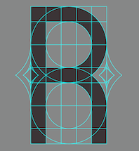 Parisian designer of the modular typeface
 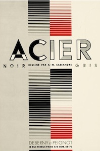 His real name is Adolphe Jean-Marie Mouron, and he was born in Kharkiv, Ukraine in 1901. He committed suicide in Paris in 1968, after the rejection of one of his innovative designs by a German publisher. After studies at the Ecoles des Beaux Arts in Paris, Cassandre adopted France as his country. He produced his first poster Au Bucheron at 22, and became a successful and influential poster artist best known for his epoch-defining
 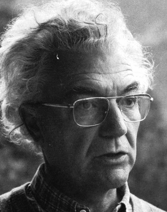 Famous type designer born in 1928 in Unterseen, Switzerland, who died in September 2015. He closely cooperated with Linotype-Hell AG, after having been artistic director at Deberny-Peignot in Paris since 1952. He established his own studio in 1962 with André Gürtler and Bruno Pfaftli. Art director for Editions Hermann, Paris 1957 to 1967. Frutiger lived near Bern, Switzerland, and was very interested in woodcuts. In 2009, Heidrun Osterer and Philipp Stamm coedited
  Web designer in Lille, France, who, despite the nearness of Belgium, managed to design a beautiful display sans typeface, Farray (2014), and the great
  Adrien Jacquemet is a graphic designer based in Paris. His typefaces include Slash (2021), which takes inspiration from Chinese calligraphy. [
 Fatnobrain was Adrien Midzic's design studio in Paris. Born in 1982, he co-founded
  Adrien Vasquez is from Grenoble, France. He studied in Valence and
  French digital type foundry, est. 2007, located in Lille. The type coop includes Stéphane Meurice, Xavier Meurice, Sébastien Delobel (the three founders), as well as Jérémie Perrin and Baptiste Servais.
  Fonderie Nordik was a French type foundry in Wasquehal near Lille, which published some fonts such as
  Loïc Sander (Akalollip) is a Strasbourg-based graphic and type designer, b. Germany. He is associated with
  In 2012, Parisian graphic designers Thomas Bizzarri and Alain Rodriguez co-designed Feu (a sans face) and Thermidor (a revival based on the work of French type designer Charles Beaudoire (end of the nineteenth century), custom designed for the Feu Sacré books). Feu is an original typeface designed for the visual identity and the books of the publishing house Le Feu Sacré. [
 Paris-based designer of the free comic book typeface ACL (2020) and the commissioned typeface Club Med Pictograms (2017). [
 Educated as a sign painter, he now poractices type and book design. Creator at
  [
[ [
[ Alessandro Colizzi (b. Rome, 1966) is associate professor at Milan's Politecnico, Department of Design, where he teaches graphic design history, typography, and type design. He was professor at the Ecole de design of UQAM (Montreal) from 2005 to 2019, and visiting professor at the Design Academy Eindhoven (2014/15). He holds a PhD from the University of Leiden (with a thesis on Bruno Minari), an MA in Type Design from The Hague's
  [
[ Roazhon, France-based designer of Sansandre Script (2019) and the shadowed sketched typeface Red Hook (2020). [
 Paris-based Chilean student-designer of the art deco typeface Palais de Tokyo (2018). [
 Alexis Boscariol is a Paris-based freelance graphic and type designer. He completed his Masters in graphic design at ESAD Valence, before entering the
  In 2019, Alexis Faudot and Rafael Ribas released fifteen free fonts that are all revivals resulting from a 2015 workshop led by Jerome Knebusch at ANRT in Nancy, France, a 2016 workshop at ESAD Valence led by Jerome Knebusch and Thomas Huot-Marchand, a workshop at Hochschule Mainz and Gutenberg-Bibliothek, Mainz in 2016, a workshop at ISDAT in Toulouse, France in 2018, and a workshop at Bauhaus University Weimar and Anna Amalia Bibliothek Weimar in 2018.
  French type and graphic designer (b. 1974) who lives in Asnières-sur-Seine and works in Paris. Educated at Ecole Estienne, Paris, and ANRT, Nancy, he designs custom-made typefaces and has released several commercial fonts including
  Parisian designer of the Peignotian typeface Mystelegant (2015). [
 Parisian designer who created the spurred typeface Changeante (2014). [
 [
[ Alice Savoie is an independent typeface designer and researcher, b. 1984, based in Lyon. She studied graphic design and typography in Paris at Ecole Duperré and Ecole Estienne, and in 2006 graduated from the MA in typeface design from the University of Reading (UK). In 2014 she was awarded a PhD from the University of Reading for the research she carried out in collaboration with the Musée de l'imprimerie in Lyon (France). Her research focuses on the design of typeface in France, the UK and the USA in the postwar period, and for phototypesetting technologies in particular: International cross-currents in typeface design: France, Britain, and the US in the phototypesetting era, 1949-1975. She collaborates with international type foundries such as Monotype, Process Type Foundry, and Tiro Typeworks, and specializes in the design and development of typefaces for editorial and identity purposes. She also designs multi-script type families, including Latin, Greek, Cyrillic and Hebrew. She intends to sell her typefaces via
  French type designer who studied at Fachhochschule Düsseldorf (2009) and at the
  Typefounder in Paris, ca. 1900, whose production included
  Almarena is a creative agency founded in 2006 and based in Lyon and Paris. In 2020, they released the retail font
 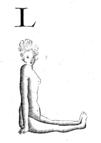 A French naked figure initial caps typeface from 1789.
 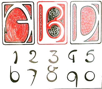 Born in Ivancice, Moravia (Czechia), in 1860, died in Prague in 1939. Famous for his sleek posters of women at the height of the art nouveau movement. In 1885 he studied at the Munich Academy of Art and then moved to the Academie Julian in Paris. In Paris, he took commissions for illustrations, portraits and decorative projects, but became most famous for his poster designs for plays, especially under the patronage of Sarah Bernhardt in the 1890s. The success of his posters led to a commercial career in decorative design for commercial and advertising products. Mucha also created jewelry designs, and briefly taught art in New York. In 1910, Mucha returned to Prague to work on nationalistic art, including murals, postage stamps, stained glass and bank notes.
 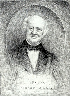 Fourth generation Didot dynasty member in Paris, 1790-1876. Oldest son of Firmin Didot (1764-1836), the most influential of all Didot printers. He headed the Didot house with his younger brother Hyacinthe Firmin Didot. He was mainly a printer, and is known for his improvements in papermaking. [
 French graphic and type designer, b. Paris, who graduated from
 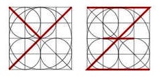 During her graphic design studies at E-Artsup in Lyon, Amélie Brunot created a grid-based compass-and-ruler typeface (2014). [
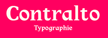 During a workshop at Ensamaa, Paris-based Amélie Guilloux designed the elegant variously stressed text typeface Contralto (2018). She also created the marine-themed decorative caps typeface Undulata (2018). [
 [
[ Paris-based Portuguese designer (b. 1990) of the free old typewriter typeface Ana's Rusty Typewriter (2013) and the sans typeface Squiggly Asta (2013). In 2014, she made
  During her studies at ECV in Bordeaux, Anna Personne created the ornamental Cyrillic caps typeface Cyrillique (2014) and the Bifur-style art deco typeface Modulaire (2015).
 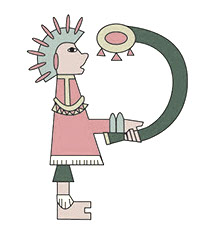 During her graphic design studies in Nantes, France, Anna Rigaud designed the Inca-inspired decorative caps typeface Inca (2015). [
 Parisian editorial designer, who created a typographically interesting calendar in 2011 entitled
  [
[ A grotesque wood type family by Deberny and Peignot, shown in their 1936 specimen book Spécimen Général des Fonderies Deberny et Peignot Tome II.
 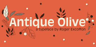 Antique Olive is a brash humanist sans-serif typeface designed in 1959 by French type designer Roger Excoffon for an Air France logo. It was released at Fonderie Olive (Marseille, France) as a retail typeface in 1962 with further development occurring until 1968. In addition to a basic weight, Antique Olive was produced in medium, condensed, wide, bold, condensed bold, extra bold (known as Antique Olive Compact), and ultra bold (known as Nord). Its almost reverse stress disqualifies Antique Olive from use as a body typeface. It was effectively used, e.g., in the Sesame Street credits from 1969 until 1983.
  Baule, France-based designer of a few handcrafted alphabets (2016). [
 Parisian graphic designer who created the fat stencil typeface Fatty Boom Boom (2014), a project finished during his studies at ESAD Amiens. In 2014, Samy Halim, Antoine Eisensohn and the FontYou team co-designed the haedline typeface
  In 2020, at The Type Department, Paul Coumoul, Clothilde Bouan and Antonin Bonnet published the display typeface Octane. It is a variable font with two axes, weight and width. Octane is a free font consisting of a total of 18 weights, but the free version consists in fact only of one variable font and it has no numbers. They explain that Octane was initially created to fit with any car designed by Pininfarina. [
 Lyon and/or Paris, France-based graphic designer and illustrator. He created the geometric fat counterless
  Born in the Canary Islands, Ariel Martín Pérez is a freelance art director and illustrator based in Paris. He set up Ariel Graphisme. In 2020, he founded
  Aquila Quentin (aka Qkila on the fluid) is a French designer, most likely located in Nimes. Creator of the human typeface dingbat font
  Graduate of Ecole Estienne. Based in Paris, she designed the interesting variable width sans typeface Baticol in 2016 for a school project. [
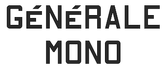 [
[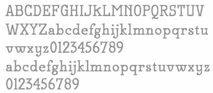 French foundry, est. 2007, which published many extensive free sans and sans serif families by Hirwen Harendal, who supports Open Source projects. The purpose of ADF is to provide a large number of high quality fonts (174 fonts as of the end of August 2007). Harendal has help from Clea F. Rees, most notably on the TeX part and the extensive Venturis family.
  Parisian creator of the warm sans font Ottolino (2014). [
 Paris-based designer and illustrator,
  During his studies in Lyon, France, Arthur Ravenel designed the great concentric circle typeface Typo Cinema (2018). [
 Montigny-lès-Metz, France-based designer of the
  Valentin Besset (Atelier About, Lyon, France) designed Giant Brick (2016: a 3d typeface), Die Geometrische (2016), Fraternity (2016, hipster style) and Point à Point (2016, connect-the-dots typeface).
  Designer in Camboulazet (was: Albi and Toulouse), France, who created the didone display typeface Black Italic in 2014, and the blackletter Gothique, the wavy Dancing Font, Tape Font, Mosaique, the splendid Mono Gorille, Curiosité, the
  French painter, designer, poster artist, book illustrator and caricaturist, b. Paris, 1872, d. Paris, 1955. His early work was influenced by the art nouveau movement. He drew some typographic silhouettes that represent that epoch. His most famous posters are Les Appareils photographiques Demaria frères, La Motocyclette Werner, Spratt's Patent, High Life Tailor, Le Bourgeon, Scala en Bombe, Au Smart Carmen and La Maison du Rire. [
 Parisian designer who is part of
  Parisian graphic designer who created the calligraphic typeface Joe in 2014. [
 Aurélien Vret is a multidisciplinary artist and type designer. Born in Noisy-le-Sec, France, in 1987, he studied visual art at the fine arts school in Toulouse (Isdat). He studied type design with François Chastanet and obtained his B.F.A. in 2010.
  Paris-based designer of the display typefaces Roma (2018), Detroit (2017) and Charlie B (2016). In 2019, he released the sans typeface The Circle Line. Typefaces from 2020 include Dahlia, Atlanta, Grotesk, Blue Velvet, Oklahoma (a slab serif and a blackletter), Monique. [
 Graphic design studio in Paris set up and run by Aloïs Ancenay. In 2017, he designed Ace Regular (2016) and Ace Bold (2017), which were published at Lift Type. [
 Babelfont is a design studio located in Paris and Casablanca that was co-founded by Gia Tran and Brahim Boucheikha. They were later joined by Salaheddine Bellizi. Their typefaces, mostly bespoke, include:
  Designer of
  BANK is a French/German design agency based in Berlin, led by Laure Boer and Sebastian Bissinger. It marketed its fonts through T-26, starting in 2009, but later switched to Colophon. In 2009, Sebastian Bissinger and Matthieu David made the display typefaces Sintra and Yummy. Sintra is a 3d typeface that simulates letters made from folded material---Sebastian Bissinger was inspired by the sign of a shoe shop in Sintra, Portugal. Yummy was inspired by cookie cutters.
  Type designer based in Paris and Stockholm, who graduated with a master's and a bachelor's degree in graphic design from ESAD Valence, in 2016 and 2014 respectively. In 2013, he did a post-graduate diploma in Fashion at Duperré (Paris) after completing a technical degree in visual communication at Estienne (Paris). Baptiste did a five-month internship in 2015 at Underware, working on Cyrillic and learning Python scripting and type design from Bas Jacobs.
  Parisian designer of the constructivist Kodage (2017), the rounded sans typeface Polaire (2017) and the prismatic typeface Linenn (2017). [
 Graduate of ECAL, class of 2015. Originally from Lyon, France, he presebtly is a designer in Evian Les Bains, France. Creator of the spectacular display typeface Bosozoku (2015), which is inspired by Japanese culture and NHRA in the USA. This work was declared Exhibition winner at Pangrame International Student Typeface Design, with a special Coup de coeur of Gerard Unger.
  Paris-based designer (b. 1993) of the free experimental condensed typeface Gestalt (2016).
  Pierre Bézier (born in Paris on 1 September 1910, died on 25 November 1999) was a friend of Brian Barsky, a famous graphics professor at Berkeley, and an ex-graduate of my own university, McGill. Bézier gave Barsky a wonderful Bézier curve drawing, signed and dated 29 November 1997. This is a thing of beauty. [
 [
[ French foundry established in April 2010. It is a cooperative effort of
 Benjamin Blaess (Blah, Strasbourg, France) is a graphic designer and letterer. During a summer course called
  [
[ Benjamin Gomez studied graphic design first at Valence's art school, and then at Ecole Supérieure des arts décoratifs in Strasbourg. He went on to graduate from the Ecole Nationale Supérieure des arts décoratifs in Paris, where he started the design collective Délpi in 2007. The studio provides design solutions in communication, signage, motion design, multimedia, print, and type design.
  Graphic designer in Paris-Plage, France. He made the hand-printed typeface Kitano (2011, after the handlettering of Takeshi Kitano), the semi-blackletter typeface
  [
[ French designer of these free typefaces that can be downloaded at
  French designer of the rough poster font
 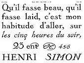 French illustrator, painter, and occasional type designer (b. Châteauroux 1876, d. Paris 1946) who taught drawing at the Académie Colas-Rossi in Paris, and was an active type designer at Deberny & Peignot from 1911-1924. He designed the extraordinarily beautiful
  Graphic designer in Paris. In 2015, Perrine Winkler and Bernie Diril co-designed Brigitte, Karina and Pierrot, three typefaces based on the credits of Jean-Luc Godard's movies. The fonts are named after Brigitte Bardot, Anna Karina and Jean-Paul Belmondo (Pierrot Le Fou). [
 French designer of
  During her graphic design studies in Montpellier, France, Bettina Canet created a fun children's book typeface (2014). [
 Type foundry in Paris, est. 2016 by Jérémie Hornus, who is the design lead. Type designers associated with Black Foundry include Alisa Nowak and Ilya Naumoff. They initially bought the font collection of FontYou. Typefaces not included in the original FontYou collection:
 Lyon, France-based designer founded first Adèle Type Foundry and in 2018 renamed it Blaze Type Foundry. Creator of these typefaces:
  Blondina lived and worked in Martinique, France for eight years. She graduated in 1999 from Insitut régional d'art visuel de la Martinique (IRAVM). Blondina founded Atelier Elms in Cave Hill, Barbados, in 2002. Her clients can be found in the United States, the British Virgin Islands, Martinique, Dominica and Barbados. She returned to settle in Barbados in November 2003.
  Bordeaux-based studio which specializes in hand-made lettering.
  Lucas Descroix is graphic and type designer based in France. After researching at the National Institute for Typographic Research in Nancy, France, and graphic design degrees at Ecole Estienne (2012) and at HEAR (Haute Ecole des Arts du Rhin) in Strasbourg (2015, Masters), he started designing typefaces, books, posters and visual identities. His typefaces:
  Studio in Toulouse, France. Designer of the hipster typeface Psaume (2020), and the monolinear sans typeface Lactarium (2020), about which he/she writes: Lactarium est copieuse, plantureuse, opulente, nourrissante, généreuse, réconfortante, abondante et rassasiante. [
 Parisian designer of these fonts:
  Paris-based designer of the display typeface Hanol (2020-2021, +Cyrillic), a delicate display typeface on the theme of threads of hair.
  Paris-based designer of the calligraphic typeface
  [
[ Bunka (Bunka Design, Paris) is a freelance illustrator and toy designer. He drew a delightful children's book alphabet simply called
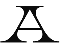 Bureau Brut was founded in 2015 by Julia Joffre, Yoann Minet and Camille Prandi. In 2017 Bureau Brut opened up Extrabrutshop to sell their typefaces. Both are located in Montreuil, France. The original collection of typefaces were all done by
  Albert Boton is a Parisian type designer and teacher, born in 1932 in Paris. Boton died in 2023. In 1957 he started work at Deberny&Peignot under Adrian Frutiger. From 1958 to 1966 he helped create several typefaces for the Hollenstein phototype catalog. In 1968 he became the art director for Robert Delpire publishers, but continued designing typefaces for the Hollenstein collection and later for Mecanorma and Typogabor. From 1968 to 1997 he was a teacher of type design and calligraphy at the École nationale des arts décoratifs (ENSAD) in Paris. From 1988 to 1998 he taught type design at the Atelier National de Recherche Typographiques. In 1981 he became art director and head of type department at the design agency Carré Noir.
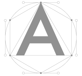
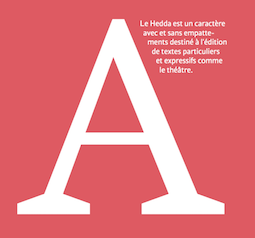 Graduate of ESAD in Amiens, France. Her graduation typeface there is
  Parisian designer of Femina (2014) and Le Bretonne (2014, with Valeria Caro and Timothé Chiron), both strong masculine text typefaces, contradicting the nomenclature. [
 Camille Bissuel, aka Nylnook, is a free spirit, an open source advocate, and French illustrator based in La Roche-des-Arnauds. He introduces himself in this manner: I'm Camille Bissuel and I'm creating free (as in freedom) graphic novels and illustrations about climate change. Sign-up to become one of my readers and receive a free (as in free beer) short comic! His comic strips are free, and even the font he uses, Comili Book (2016), designed by himself, is free. It is also refreshing to see his entire web site bathed in that wonderful nonchalant script.
  French designer who obtained an MA in typeface design from
  Paris-based graphic designer, who created Cut Up Font in 2017.
  Paris-based designer of the experimental wiry typeface Frissons (2019) and the Superveloz-inspired Binome (2019). [
 Aka Kid Pixel. Valence, France-based designer of the animated decorative caps typeface Tidy (2017) and the experimental animated fonts Fire (2017),
  Based in Steenvoorde, France. Designer of the free font
  Paris-based designer of Fattern (2016), an ultra heavy typeface in the didone tradition.
  C&C is the studio of Coline Sunier (who graduated from
  Paris-based creator of
 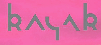 Nantes, France-based designer of the Inuit / Inuktitut simulation Latin typeface Inuktitut (2015) and the modular typeface Panamacoco (2015).
  Graduate of the ECV in Paris who lives in Barcelona. In 2016, she designed the garalde typeface Jannon CC, which is inspired by the XVIIth century Rabelais Jannon.
  During her studies at ECV in Bordeaux, France, Celia Mindren designed the fine-looking display typeface Aurora (2015) and the thick oriental brush script Biming (2015). She also won first prize in a national wine bottle design competition for her Rosé Bordeaux project. [
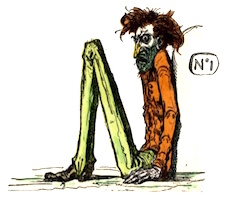 French illustrator, aka Bertall, 1820-1882. In 1861, he published the ABC Trim Alphabet Enchanté. [
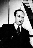 French typographer, born and died in Paris, 1897-1983. Founder of ATypI, son of Georges Peignot, and lifetime director of Deberny&Peignot. Designer of Peignot (with Adolphe Mouron Cassandre). Founder of ATypI. Starting in the late fifties, the company prepared the fonts for Lumitype, European Photon. In the sixties, Charles Peignot invested heavily in Lumitype, which used up some of the money to buy control of Deberny&Peignot, and let Charles go. Deberny&Peignot closed in 1979, at which time the designs passed to the Haas'sche type foundry in Basel/Münchenstein. [
 Nineteenth century typefounder based in Paris. Examples of their work include
  Typefounder, punchcutter and printer in Paris, b. Moissey (in the Jura), 1808, d. Paris, 1877. His work can be found in
  French poster artist (b. Nice, 1892, d. Les Arcs-sur-Argens, 1962) in the 1930s who was one of the main poster artists of his time, together with the three musqueteers, A.M. Cassandre, Jean Carlu and Paul Colin. He was an avantgardist, who contributed mainly in the art deco style. I am aware of the following digital typefaces based on his poster lettering.
  French punchcutter, b. Paris, 1883, d. Paris, 1955. He hand-cut
  Charles Mazé is a graduate of the
 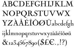 Parisian copperplate engraver, b. Paris, 1715, d. Paris, 1790. His work influenced the letter shapes of Baskerville, Didot and Bodoni. His engraved tall-ascendered letters have been preserved in many fonts bearing the Cochin name. One of the best revivals is by Georges Peignot in 1913. The irregularities of the metal are well preserved in the digital typeface
  French engraver, penman and calligrapher, 1718-1789. Author of Notice historique sur les hommes célèbres de toutes les nations de l'Europe, qui depuis la renaissance des sciences et des arts, se sont distingués dans la configuration des caractères qui composent les diverses Ecritures, which appeared in J. H. P. Pouget, Dictionnaire des chiffres et de lettres ornées à l'usage de tous les artistes (Paris, 1767).
  French type designer who started out as Hayloft". At the open source type foundry
  Art director in Lille, France, who created the rounded sans typeface Eliz Dream (2015) for the French photographer Eliz Dream.
  Parisian designer of the thin condensed high-contrast typeface
  Parisian designer of the stylish fashion mag semi-didone typeface Vague (2014) and of the modular typeface Point Barre (2014). [
 Started in 2008, this web place by Norwegian entrepreneur Roger S. Nelsson (based in Honningsvåg, Norway) sells fonts by Ray Larabie, Brian Kent, Nick Curtis, Derek Vogelpohl and Kevin King that were originally freeware fonts. Nelsson reworked them (more glyphs, more multilingual) and asks about 10 dollars per font now. He says his fonts now cover these Latin languages: Afrikaans, Albanian, Basque, Belarusian (Lacinka), Bosnian, Breton, Catalan, Chamorro, Chichewa, Cornish, Croatian, Czech, Danish, Dutch, English, Esperanto, Estonian, Faroese, Filipino (Tagalog), Finnish, French, Frisian, Galican, German, Greenlandic, Guarani, Hungarian, Icelandic, Indonesian, Irish (Gaelic), Italian, Kashubian, Kurdish (Kurmanji), Latvian, Lithuanian, Luxembourgian, Malagasy, Maltese, Maori, Northern Sotho, Norwegian, Occitan, Polish, Portuguese, Rhaeto-Romance, Romanian, Saami (Inari), Saami (Lule), Saami (North), Saami (South), Scots (Gaelic), Serbian (latin), Slovak(ian), Slovene, Sorbian (Lower), Sorbian (Upper), Spanish, Swedish, Tswana, Turkish, Turkmen, Ulithian, Walloon, Welsh, Yapese.
  During her studies at ESAG Penninghen, Parisian illustrator Chloe Azulay created the brush alphabet John Butler Trio (2013). [
 During her graphic design studies, Chloé Marchand (Paris) designed a poster in 2012 for the exhibition of
 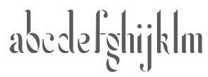 Parisian designer of the curvy art nouveau-ish Feu Sauvage (2015).
  Or just Christian Laucou, b. 1951, ex-graduate of and professor at Ecole Estienne in Paris. Typographer who worked with lead. He started Les Editions du Fourneau, later renamed Fornax. In 2000, he founded l'Ouvroir de typographie potentielle.
  French designer of the free art deco typeface Stencil 1935 (2015) and Screw Round (2015).
  Graduate of ENSAD in Paris. In 2014, she created
  [
[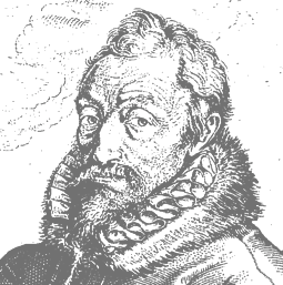 Born in Saint-Avertin, near Tours, in 1514, died in Antwerp in 1589. He left France in 1555 and settled and worked in Antwerp, where he published many books that drew attention because of their beautiful typography. He often used types by Claude Garamond and Robert Granjon. He was the main catholic publisher of the counter-reformation, but he also published material for the protestants. One of his main achievements was the Biblia polyglotta (1569-1573), the eight-volume polyglot Bible in Aramaic, Greek, Hebrew, Latin, and Syrica, with text in parallel columns. For two years, from 1583-1585, he was the official typographer at the newly erected University of Leiden. After his death in 1589, his son, Jan Moretus (1543-1610), carried on his work. Successors after that include Jean Moretus II, and Balthasar Moretus I, II III and IV. Plantin's press, Officina Plantiniana, survives in its entirety as the Plantin-Moretus Museum, sold to the City of Antwerp in 1876. This collection of 16th century typefaces (punches, matrices, the works) is a unique historical treasure.
  Marseille, France-based designer of the great modernist sans display type family Françoise (2018). [
 Claire Agopian graduated in 2007 from
  French type designer based in Paris. Her typefaces:
 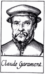 One of the fathers of typography.
  Parisian printer, whose 1742 book
 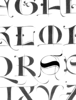 French type designer (b. 1948) who was born in the South of France. He studied typography, calligraphy and painting at the School of Fine Arts in Toulouse. He received the Prix Charles Peignot in 1982. In 1992, the President of France invited him to design the inscriptions for the royal tombs in the Basilique Saint Denis in Paris. He published
  Paris-based designer of Neo Cubika (2017). [
 [
[ French graphic designer who created these typefaces: Publica (a sans workhorse family that started out from Touraine (Cassandre, 1947) but became a more practical typeface in Bonnetin's hands---it is Bonnetin's major contribution to type design), Lausangeles (a grotesque), Touraine (revival of Cassandre's typeface from 1947), Dockside (heavy octagonal). [
 Lille, France-based graphic artist who studied at ECV Lille. Designer of the vernacular typeface Montana (2014-2015), the hybrid typeface Bebas Android (2015), and the condensed sans typeface Gills (2014). Together with Edouard Spriet, he created the rounded organic sans typeface Kimono (2015) for wayfinding applications---it uses the circle as a basic building block and is developed with chromatic use in mind.
  Toulouse, France-based designer of several decorative initial caps alphabets in 2018. In 2017, he designed the stencil typeface Fablab. [
 Clément Le Tulle-Neyret was born in 1986. He graduated from the École nationale supérieure des beaux-arts of Lyon and the Atelier national de recherche typographique in Nancy. He lives and works in Paris as graphic and type designer. He has worked for Télérama, the Centre national des arts plastiques, the museums of the city of Strasbourg, the Cité du design of Saint-Étienne as well as a various museums, publishing houses and art schools.
  For a project called Identity 2015, Clément Mengus (Colmar, France) designed a striking squarish typeface. [
 [
[ Aka Miss Fluff. Paris, France-based designer of the display typeface The Fluff (2016). [
 Creative director based in Paris. In 2016, she designed Walbaum Sans (2016). Any didone with amputated serifs is bound to look like Peignot, and this is not different.
  [
[ Graphic design collective in Orchamps near Besançon, France, est. 2012, consisting of graduates in the Masters program of the École des Beaux-Arts de Besançon, i.e., Clément Moussard, Antonin Buchwalter, and Simon-Pierre Chapuis. Their typeface creations:
  Foundry in Nancy run by E. Constantin, and later by his widow and later still by his son. Constantin's work can be seen in
 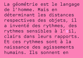 Aspet, France-based type designer. His fonts:
 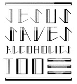 Art director in Paris, who studied at ESAG Penninghen, class of 2013, and launched Crashtype Foundry in 2020. Designer of the art deco typeface family
  Florent Courtaigne graduated in graphic design - ENSAD / Art Décoratifs de Paris. He founded created Cubo Fonts in 2008, and works as a graphic designer and drawing teacher in the LISAA Design School in Paris. Now a graphic designer, illustrator and art director based in Paris, Florent Courtaigne is the creator of the free circle arc and straight-line fonts Cyclo and Cyclo Bold (2006).
  French codesigner with Jean-Charles Abrial of the geometric Bauhaus-inspired typeface Ortaki (2012). [
 Coutances, France-based designer of the great outlined curvaceous typeface Vasy Molo (2010). [
 [
[ French mathematician who is/was at the University of Science and Technology of Lille, France, who is opposed to CETA (the EU-Canada trade deal). Designer in 2019 of the free Math font package
 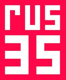 During his graphic design studies in Lyon, France, David Lafourcade created the constructivist typeface Rus 35 (2014), the Trajan typeface Oedipe Antique (2014) and the Fraktur typeface Dornach (2014).
  Aka Malre and Malre Deszik. Melun Val de Seine, France-based designer (b. 1976) of the free handcrafted typeface Metrique (2014), which is based on China ink lettering done with a Rotring pen. In 2015, he created the grungy typeface Internet and the icon font Webs. In 2017, he published the rungy calligraphic typeface Gyiest Old.
  Parisian type designer (b. 1972) who designed
  During her studies at ECV in Paris, Anne-Dauphine Borione (perhaps with alias Daytona Mess) designed the angular typeface Cleankut (2017,
  DCO (or: dcoxy medina, or: Atelier Oxydes) is Greg Médina. Atelier Oxydès is located in St Maurice de Cazevieille, France. He specializes in very funny drawings. Creator of these typefaces in 2012: the fun figurine dingbat typefaces called
  Design and type design studio in Paris founded in 2007 by Vadim Bernard, Aurélie Gasche and Benjamin Gomez (who is the main type designer in this group). Their typefaces are mostly commissioned, but include a few retail typefaces as well:
  Authors in 1751 of
  German cartoonist and animated gif artist (b. 1965) who lives in Lorraine. She designed
  Bios of the main members of the Didot family: François Didot (1689-1757), François-Ambroise Didot (1730-1804), his son, Pierre-François Didot (1731-1795), the second son, Pierre Didot (1761-1853), the oldest son of François-Ambroise, and
  Parisian visual communication student who created
  Designer of a set of pictograms in Emmanuel Besse's road signage typeface
  Graduate of ESAD in Amiens, France. Her graduation typeface there is
  French woodtype manufacturer located in Bressuire. Publisher of
  A metal script typeface published by Fonderie Typographique Française in the interbellum era. This ronde inspired by the renaissance penmanship of Gianfrancesco Cresci (1560-1588) is characterized by inky terminals. [
 French foundry and publishing house, est. 2011 by Damien Gautier and Quentin Margat, and located in Villeurbanne. Their fonts:
  Toulouse, France-based designer of these display typefaces in 2016: Airport (octagonal), Roman Cubic (beveled), Sinusoide, Death in Blue (hipster), Archeotomy, Target, Dubonnet (art deco), Eclipse (experimental geometric), Samba, Grade, Rounded, Blackstar, Cloison, Tool.
  Graduate of L'École de communication visuelle in Lille, France, ca. 2014, who became art director at
  Eduscol is a web site of the Ministère d'Éducation Nationale for French educators. In June 2013, a package of school fonts became available for free download. These are serious writing fonts, with and without lines, that cover upright and italic scripts, and connected and unconnected handwriting. The type designers in charge of the development were Marion Andrews, Malou Verlomme and Laurence Bedoin. For samples of
  [
[ Elliott graduated in graphic design at EPSAA (Ecole Professionnelle Supérieure d'Arts Graphiques et d'Architecture de la ville de Paris, France) in 2012.
  Graphic and type designer based in Paris. Her typefaces:
  Paris-based designer of the Bodoni revival Hello (2015), the warm rounded text typeface Zebu (2016) and the modular condensed sans typeface ModuloOuLipo (2016). For Citroen, she co-designed the wide sans typeface Cabrio (2016) with Philippe Gauthier. She also did a Bodoni revival called Bodoni 1818 (2016). [
 French designer of
  Graduate of ESAD in Amiens, France, where his graduation typeface was Topos (2018). He writes: Topos is a type family designed for contemporary book and poetry publications. [...] In addition to the standard weights, from Light to Black, Topos comes in four grades, all sharing the same spacing for the Book size. This offers the flexibility of choice of colour, without altering the layout: the calibration will remain the same, while the weight is fine-tuned. Historical references from the Baroque era run throughout this type family with more celebrated features visible in the italics. Greek, including polytonic, is supported as well.
  Located at the University of Paris, Emmanuel Beffara designed the
  French art director. In 2014, Yoann Minet made the bespoke typeface Stratos with art direction by Emmanuel Labard. Stratos is retailed in 2016 by
  Type and graphic designer born in Lerida, Spain (1908), who lived and worked mostly in Paris, where he had emigrated to during the Spanish Civil War (1936-1939). He died in 1987 in Noyon. All his fonts are available from Neufville. He was the founder of the movement that is known as Grafía Latina (or La Graphie Latine), which promoted the need to create a new system of typically Latin (as opposed to cold geometric nordic) typographic structures, graphics, alphabets and decorative ornaments.
  This is a gallery and a discussion of the fonts created by the students at ENSAD since 1997. A partial list with the original (now defunct) links:
  Private press of Lucien Pissarro, a French type designer, 1863-1944. Pissarro created Brook Type in 1903 for Eragny Press. Brook Type influenced a 1976 design by Adrian Williams, and that in turn led to Steve Jackaman's digital typeface
  French designer (b. 1973) whose early fonts could be bought from 2Rebels in Montreal, and at La Fonderie. These are now available via
  Paris-based designer who created several experimental geometric typefaces in a series called Monoide (2014). He also created Butterfly Alphabet (2014) and many awe-inspiring techno illustrations.
  Éric Parisot is the French creator of the vertically striped typeface Namaskar (2009,
 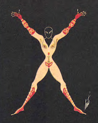 Erté (Romain de Tirtoff) was a well-known art deco era artist. Born in St. Petersburg, Russia in 1892, he died in 1990 in Paris. In 1912, Erté moved to Paris. In 1915, he began an association with Harper's Bazaar by designing covers of each of their magazines for the next 22 years. He became known for elegant lithographs and sculptures for the fashion industry. On my pages, you find an elegant set of capitals and numerals in which the glyphs are formed by elegantly drawn naked women, from The Alphabet Suite (Chicago, 1976).
  AT ESAD Amiens, halfway between Belgium and Paris, one can study type design. The program Typographie et langage was established in 2008. This 16-month international course is taught by Jean-Baptiste Levée, Alice Savoie, Patrick Doan, Dominique Boutet, Sébastien Morlighem, and Titus Nemeth. The work of its graduates is impressive, to the point that ESAD Amiens may be one of the best, if not the best, place in France to study type design (in 2015). The early crew at ESAD included Catherine de Smet, Patrick Doan, Thomas Huot-Marchand, Sébastien Morlighem, David Poullard, and Titus Nemeth. [
 ESAL is the Ecole Supérieure d'Art de Lorraine in Metz. One can study type design there. The active group has established a site with some free fonts made by the students. The free typefaces posted in 2013 include
  French type and graphic designer who graduated has a Bachelor's degree in graphic and type design from ENSAV La Cambre, Brussels (2019), and who is based in Paris. He did internships with Sebastien San Filipo and Black Foundry and has worked with eavyweight Type, Fatype, Frere Jones, DJR, Blast and TDF.
  [
[ French graduate of ESIAJ (Albert Jacquard), class of 2014, who works in Brussels. In 2015, he designed the (great!) free 14-style typeface family Butler, which was influenced by Bodoni and Dala Floda, and includes great styles for use in fashion magazines and on posters, in addition to several stencil styles.
  French designer (b. 1985) of the grunge typefaces
  Graduate of St. Luc, Tournai, Belgium. Graphic designer in Lille, France, since 1997. Creator of the rounded monoline organic sans typeface family Fabiolo (2014), the
  French designer who graduated in 2011 with a DSAA from ESDRA in Lyon. Paris-based creator of
  The typophiles bring up the issue of fake versus true Garamonds, but not one of them gives a precise definition. The fake Garamonds are supposedly based on Jean Jannon's roman, sometimes known as the caractère de l'université:. Here is their list with minor editorial corrections and additions:
 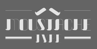 During her studes in Paris, Fan Xiaoxue created the fashion mag typeface
  French designer of
  French designer (b. 1980, Sainte-Foy-la-Grande) with Jack Usine of
  Fanny Hamelin has a DMA in Type Design Ecole Estienne in Paris, class of 2016, and a
  Paris-based outfit that specalizes in interactive design. In 2016, they experimented with that in type design when they exploited some Opentype features in the
 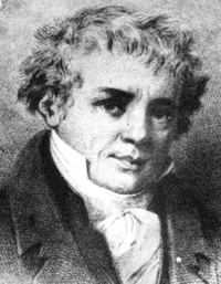 Celebrated Parisian punchcutter (b. Paris 1764, d. Mesnic-sur-l'Estrée, 1836), son of the printer François Ambroise Didot, and grandchild of the Didot printing business founder, François Didot. He produced the earliest modern typeface about 1784. Designer of a sloped script typeface called
 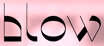 During her studies in Aix-en-Provence, France, Fleur Gimond created Twist (2015).
  Toulouse-based designer of the script typeface
  [
[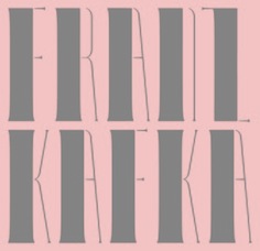 French graphic designer who studied at Rennes. His typefaces include
  French art director, graphic and type designer, and illustrator who lives in Rambouillet. His typefaces include the refined multilined bling typeface
  Paris-based foundry operational in the early part of the 20th century. (Metal) typefaces by them include
  French typefounder based in Paris, d. 1844, who published the specimen books
  The timeline of this French foundry of the 19th century and early 20th century:
  French type foundry in Paris, est. 2012 by Malou Verlomme, Mathieu Chévara, Mathieu Reguer and Thomas L'Excellent. Typefaces:
  Important French type foundry established in 1836 in Marseille and originally headed by Marcel Olive. In the middle of the 20th century, Roger Excoffon became its major type designer. In 1978 or 1979, the rights to all typefaces were transferred to Haas, which in turn was taken over by Linotype in 1989. The
  French foundry established and run by Georges Peignot and his son Charles. In 1923 it merged with Girard Et Cie to become Fonderie Deberny&Peignot. Their collection includes Nicolas Cochin (1912) and typefaces by:
  Foundry in Paris, which made the celebrated art nouveau Paris subway font Metropolitaines in 1905. Also called Berthier&Durey. In 1882, Berthier & Cie published
  Big Paris-based foundry, with an extensive factory. Their work can be found in
  Type foundry in Paris, est. 1843. Maison Battenberg was located in the fashionable rue du Dragon (number 20) in Paris. They also had an office at 15, Rue Madame, in Paris. Battenberg's gorgeous engravings include vignettes du moyen age, vignettes raisins, vignettes grimpantes, vignettes rubans, vignettes treillage, tetes de chapitre, culs de lampe, fleurons, titling ornaments and initials.
  Type foundry in Paris, founded in 1921 by the merger of the firms of Chaix, Marcou, Durey, Huart and Saling. There were several catalogs of their typefaces such as Fonderie Typographique Française Catalogue Général (ca 1925, 798 pages).
 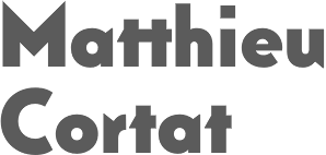 Foundry in Limoges. Its work can be found in
  Bay City, MI-based designer of Spartan MB (2017), a
  Grégori Vincens is the CEO of FontYou in Paris, est. 2013. The font collection of Font You was bought by the nascent
 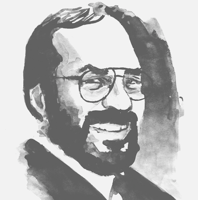 French type designer based in Toulouse, b. 1950, d. 1999. He was an early graduate of Scriptorium de Toulouse (1972). In his lifetime, Boltana achieved a great deal of success, including the Morisawa Prize in 1990. From 1975 until 1997 he was also a freelance graphic designer.
  Cartoonist, illustrator and designer located in Montolivet, France. Creator of these typefaces:
  François Chastanet (b. 1975, Bordeaux) is an architect and a graphic designer in Toulouse, France. He specializes in signage systems for transportation networks. Graduate of the École d'Architecture et de Paysage de Bordeaux, he pursued research in 2001 at the Atelier National de Recherche Typographique in Nancy, and completed a DEA in architectural&urban history at the École d'Architecture de Paris-Belleville in 2002. He currently teaches graphic design and typography at the École Supérieure des Beaux-arts de Toulouse. At ATypI 2006 in Lisbon, he spoke on Pixaçao letterforms, the shantytown graffiti letterforms found in the 1990s in Sao Paulo. In 2009, he and Alejandro Lo Celso cooperated with two students, Laure Afchain and Géraud Soulhiol, on an identity type for the city of Toulouse called
  French designer at Mecanorma of Spiral. [
 Born in Paris in 1912, Ganeau died there in 1983. He worked with Roger Excoffon, and designed
  French punchcutter who lived in the first part of the 16th century. In 1539, he became a resident of Antwerp, and from 1558 until his death in 1570, he delivered letter types to Plantin in Antwerp. His creations were used all over Europe and even in Asia. In his day, he was one of the greatest punchcutters. Day Roman (2002, Apostrophe) is described as follows by its designer: Day Roman, is a digitally redrawn version of what has come to be historically known as the "Two Line Double Pica Roman", a typeface designed by 16th century French punchcutter François Guyot, and used in numerous books between 1535 and 1570, most notable of which are J. Steelsius's printing of The Bible (1541) and Frisius (1551), Gillis Coppens van Diest's printing of Erasmus (1544), Georgius (1544), Serlio (1550) and Horatius (1552), and Rotarius's printing of Livius Brechtius (1549). The type was also used extensively by H. Dunham, and later J. Day, in London (the name Day Roman is simply a reference to J. Day having used the type). Original matrices of Guyot's roman type are now in the
  French codesigner, with
  French type designer, calligrapher, and stonecutter, b. 1962. Franck Jalleau studied at the Ecole des Beaux-Arts de Toulouse and at the Atelier national de Création typographique (ANCT), where he subsequently worked as an instructor until 1990. A type designer, he works primarily in the publishing field and on French administrative documents (the General Tax Code, passports, identity cards, car registration documents, etc.). Since 1990, for the Imprimerie Nationale, he oversees the adaptation of the typographic holdings for digital typesetting. For this effort, the Imprimerie's Garamond was one of the first typefaces he rehabilitated, along with the grecs du Roi. Currently, Franck Jalleau teaches at Ecole Estienne in Paris.
  [
[ French designer (b. 1984) who s based in Montelimar. He created the poster typeface
  Born in 1984, Tracer graduated from the National College of Arts and Design Olivier de Serres in Paris. He is now based in London, where he is a freelance graphic and type designer. His typefaces include
  Fred Wiltshire is an English/French type designer who obtained his Masters in Type Design at the University of Reading in 2021. Designer of these typefaces:
  French creator of a large number of free typefaces, starting in 2012.
  French type designer. In 2016, Gaetan Baehr and Jeremie Hornus co-designed
  French engraver located in Paris. Author of
  Parisian type designer (b. 1974) who designed
  General Type Studio is a New York-based type foundry founded by
 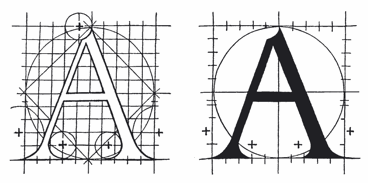 Also Maistre Geofroy Tory de Bourges. Parisian printer, designer and engraver, 1480-1533. As designer and engraver he produced beautiful initials, borders, and illustrations. In
  French lettering artist and type designer, b. Beauvais, 1863, d. Paris, 1938. His real name was Jean-Georges Huyot. He was an
  French author of the art deco lettering book Modèles de lettres modernes par Georges Léculier (1925). Typefaces based on his alphabets include
  Gia Tran is a self-taught calligrapher and type designer. He has worked for Dragon Rouge, 4uatre and A&Mcreative in Paris, as well as Saffron Brand Consultants in Madrid. Gia was the Type Director at the French foundry
 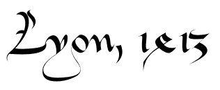 Lyon-based designer of the medieval typeface
  [
[ Graphic designer, lettering artist and calligrapher in Sabadell, Catalunya, who was born in Barcelona. In 2011 she received her Masters in Advanced Typography at EINA (Barcelona). Since 2016, she teaches calligraphy, lettering and typography at several schools/art centres in Spain and France. Author of the brush calligraphy book Caligrafia con Pincel (2018, Ediciones Urano). She also teaches since 2019 at
  Robert Girard (b. 1883, d. 1955) was a school friend of Charles Tuleu, who had inherited Fonderie Laurent&Deberny in 1881. Tuleu teamed up with Girard in 1914 and they cooperated until 1921, when Tuleu retired and the business passed to Girard under the new name Girard Et Cie. Talks were started with Peignot about a merger. Deberny&Peignot was incorporated on July 1, 1923.
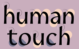 Goffredo Puccetti (Goffredo Associates) started out in France but is now located in Abu Dhabi, UAE. At
 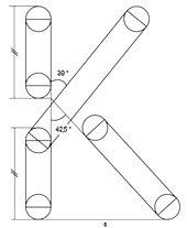 Paris-based designer of the compass-and-ruler stencil font Nero Nemesis (2016), which was developed on the basis of Helvetica Neue during his studies at LISAA. [
 [
[ [
[ [
[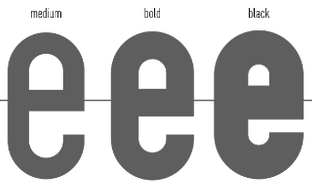 [
[ Bordeaux, France-based designer of the rounded stencil typeface Libournavelo (2015, +icons). This font is used to promote bicycling in the city of Libourne. He also made a flowing hand-printed typeface for La Table de Josephine, a restaurant in the Hotel Kyriad in Bègles, France.
  Nantes, France-based designer (b. 1991) of
  Born in Troyes in 1526, Guillaume Le Bé was a bookseller, engraver and typefounder, who studied under Claude Garamont. He set up his own foundry in 1545 and ran it until his death. In 1561, he became Garamont's successor---he took over Garamont's foundry that year. He was mainly known for his Hebrew fonts, but was also praised for a roman double canon. He died in Paris in 1598. The foundry started by Le Bé kept going until well into the nineteenth century through various successions. Since Robert Estienne's foundry ceased in 1545, Marius Audin speculates, but cannot prove, that Guillaume Le Bé got his start in 1545 by taking over Estienne's foundry. Scott-Martin Kosofsky seems to contradict Audin's observation that Le Bé was Garamont's student: There is no evidence that he was a student of Claude Garamont; rather, what we do know is that he trained in the Paris workshop of Robert Estienne. He lived for some twenty years in Venice (not ten years, as stated in some modern sources), where he worked largely for the major publishers of Judaic literature. After he returned to Paris, he did much work for the Antwerp publisher Christophe Plantin, including the text Hebrews used in the renowned Polyglot Bible (Biblia Regia, 1568-1572).
 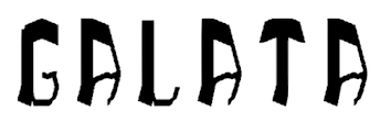 Parisian graphic designer. Creator of the poster typeface
 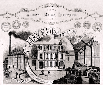 [
[ French creator of the great heavy comic book typeface Grobold (2006). Later, he added Cyrillic and Greek versions called Groboldov and Groboldopoulos, respectively. Guy Buhry is currently working on Guy Script. [
 Graphic designer and 3d modeler in Strasbourg, France, who created the hypnotic experimental decorative caps typeface Random Geometric (2015) by turning each glyph 360 degrees. [
 Designer ca. 1900 of a decorative caps face, shown
  Lille (was: Rouen), France-based designer of the decorative typeface Spleen type (2014) and the lace-themed vector typeface Leontine (2015). [
 Graduate of Ecole Supérieure Estienne, Paris, 2010 who works as a graphic designer, sign painter and lettering artist in Paris. She works for clients from French cultural institutions to American national sport league, and collaborates actively with members of the Parisian experimental music scene. She also teaches lettering at Paris City Hall Graphic Arts School (Epsaa).
  Type designer and associate member at the open source type foundry
  Hector Guimard (b. Lyon, 1867, d. New York, 1942) was an architect, who is widely considered today to be the most prominent representative of the French Art Nouveau movement (1890-1905). Designer in 1901 of the art nouveau font Metropolitaines used in the Paris metro (see
  Prolific Belgian type expert (b. 1923, Antwerp; d. 2020) who graduated in philology from the University of Leuven. He became adjunct director of the Museum Plantin-Moretus in Antwerp and was on the board of governors of the Plantin Instituut voor Typografie, which he helped renovate after the second worrld war together with
  French wood engraver at the Imprimerie Royale who was based in Paris, b. 1800, d. 1867. Author of Illustrations typographiques, recueil de vignettes, alphabets, culs de lampe, attributs, fleurs, fruits gravés et polytypés par Porret (1838-1842, imp. Porret, Paris). Besides engraved ornaments, the book also showcases some decorative initial caps by other designers. Schneider and Langrand are credited with Alphabet Riche, Alphabet Militaire, Alphabet à Toute Fin and Petit Alphabet de Fleurs et Fruits, while Imprimerie Lacrampe got the nod for an untitled set. [
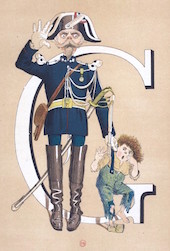 French illustrator Henri de Sta was born in Versailles in 1846 as Arsène Henri Saint-Alary. He began his career around 1882 with La Vie Artistique and the publishing house of Léon Vanier. Coming from a military family, garrison life became a regular theme in his career. De Sta worked as a humorous illustrator for Le Chat Noir since 1892. He also published in Le Paris Bouffon (1885), Le Rire (1897) and Le Charivari (1900). He composed military alphabets, illustrated songs and produced comics for La Chronique Amusante from 1896, and for Les Contes Moraux et Merveilleux of the printing firm Pellerin d'Epinal. He is known for his decoratice caps alphabet Armée Française: Nouvel Alphabet Militaire (1883). de Sta died in 1920.
 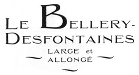 French art nouveau era painter and illustrator, b. 1867 Paris, d. 1909 Les Petites Dalles. He designed a typeface and
  [
[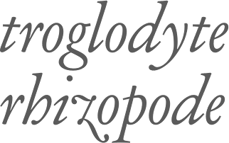 Type designer and cutter who worked for Georges Peignot. Between 1914 and 1926, Parmentier developed a Garamond family for Peignot's foundry. That family was rediscovered by Matthieu Cortat (
 Herofonts (was:
  [
[ Yael Gauffier (HorSujet YG) is a French designer. His first typefaces are all prismatic and geometric, and explore the boundaries of what can be done in these styles. One might call it type as an art form. His typefaces include
  Art director in Versailles, France. For the visual identity of L'Espace Andrée Chedid, Hubert Munier designed an elegant bi-lined typeface family, L'Autre (2016). For a Luxemburg-based African food truck, he created Afrikan Gourmet (2016), a deco typeface with African tribal themes worked in. He also created the fun art deco logotype Le Popcorn Bar (2016), which hearkens back to old Hollywood. For the music label LSM, he created the hipster typeface Les Sales Mômes (2016). For ESAM (Ecole Superieure des Arts Modernes), he designed a piano key stencil typeface, ESAM. He designed a squarish typeface for the fitness club Aqualoft (2016). With Emilie Rad, he created L'Esperluette in 2016. Other typefaces from 2016: Retro Futura (avant-garde), Neo Gothic (hexagonal), Sweet, Tarot (bi-colored and origami), Fitness Type, Now Bretonne (dot matrix), Massive (shadow pixel font). Earlier typefaces include the vertically-striped Riley Type (2012), LSM (2014: a hipster typeface).
  Graphic designer in Lille, France. Codesigner with Adrien Coquet of the rounded monoline display sans semicircle-patterned typeface Slot (2015:
  During his graphic and type design studies at Ecole Estienne in Paris (2013-2015), Hugo Dumont created the Arabic and/or Indic simulation typeface Humanist (2014). Still in 2014, Julien Priez, Hugo Dumont, Jérémie Hornus and Alisa Nowak co-designed
  Paris-based designer at
  Graduate of the
  Graduate of ESAD in Amiens, France. His graduation typeface there is the Latin / Bengali typeface
  Also Ilya Naumov, b. Russia. Paris-based graphic and type designer, whose typefaces are fabulous. His typefaces:
  Graphic design studio in Paris. In 2021, they published Aerobik at
  Frenchman (b. 1957) who started making fonts in 2010, after a career in illustration, comics, and video games. In 2010, he created the free fonts BabyJo (pixel face), Bayday, Chrom (beveled face), LaPresse (grunge),
  French printer. In 1867, they published
  The national French foundry and press from 1640, when it was created, until today. It grew out of the Imprimeurs du roi pour le Grec, which itself was founded in 1538 by king François I. Today, it is entirely state-owned. The imprimerie nationale contains le cabinet des poinçons (where one can find all the old metal types) and a historic library. Between 1985 and 2004, Paul-Marie Grinevald wrote about ten articles on the Imprimerie. [
 Or Slava Jevcinova. Designer from Bardejov, Slovakia, now located in Nice, France, whose first degree was an MA from J.E. Purkyne University in Czechia. She interned at Mota Italic in Berlin, and then started working for Fontwerk, a company specicializing in TrueType hinting. Since 2013 she is a freelancer and she regularly collaborates with the Rosetta Type foundry.
 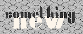 During her studies in Paris, Irene Burlet designed the display typeface Ronda in 2018. [
 Graduate of
 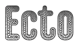 Paris-based designer who published the experimental rounded typeface
  [
[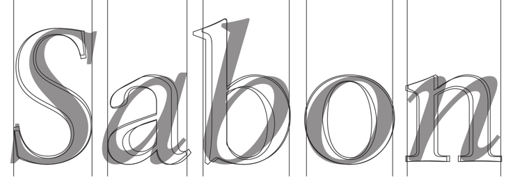 Jakob or Jacques Sabon (b. Lyon, 1535, d. Frankfurt am Main, ca. 1580-1590) was a typefounder who worked at the Egenolff Foundry in Frankfurt in 1555, and briefly at the Plantin Foundry in Antwerp in 1563. After Garamond's death, Plantin and Sabon both shared in his heritage. Sabon's widow married Konrad Berner in Frankfurt.
  French typographer in Lyon, b. Romano Canavese, Italy, ca. 1472-1530, also known as Saccon, Sachonus, Zachonus, Zacconi, Zachone, Zachoni, Zacchoni and Zachon. He drew an initial caps alphabet in 1519 that depicted birds, beasts and flowers. Revival in 2010 by
  [
[ French creator of the Latin / Greek programming font
 JC Fonts is the foundry, est. 2009, of
  [
[ Nantes, France-based student-designer of the
  [
[ Frenchman Jérémie Hornus studied typography at Le Scriptorium de Toulouse, France and the University of Reading, where he graduated in 2006. He worked at Dalton Maag, where he designed
  [
[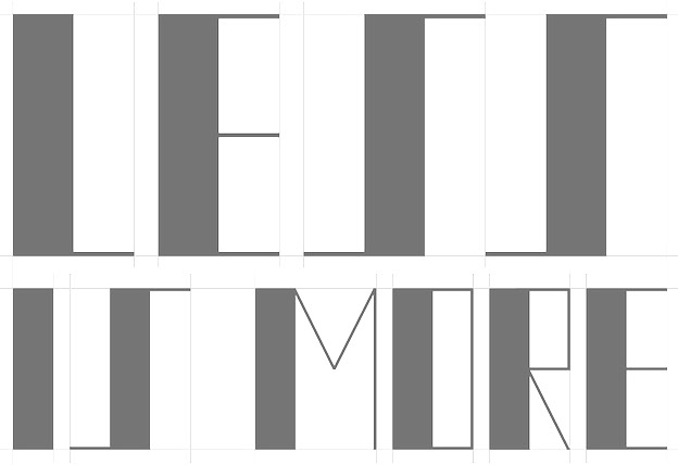 In 2014, Jérôme Bruley was studying design in Lille, France. In that same year, he created a Bauhaus-style typeface called LMVDR, which is named after Mies Van Der Rohe, architect and director of the Bauhaus school, on who's work the font is based. In particular, the piano key glyphs are inspired by the German Pavillion in Barcelona (1929). He also created Sail Font (2014) and the
  [
[ [
[ Fred Smeijers writes: Jean Gabriel Bery was a Paris stencil maker whose atelier was located on the Pont Notre-Dame. His work is mainly known from the stencil set he supplied to Benjamin Franklin in 1781, now at the American Philosophical Society in Philadelphia. Bery's confident sense of design and the excellent production of his stencils rank him among the best stencil makers of any period. Bery's roman letters exemplify the blend of calligraphic, engraved and typographic qualities found in French stencil letters throughout the eighteenth century. As a consequence, Fred designed the stencil typeface
  French type designer and punchcutter, 1580-1658, born in Switzerland, who worked at the Estienne printing atelier in Paris before escaping to Sedan, to avoid persecution for his Protestant beliefs. He then worked as a printer for the Calvinist Academy where he began to cut his own letters. In 1641, he received a commission from the Imprimerie Royale from which Caractères de l'Universit�é originated. Until the middle of the 20th century, his letters were misattributed to Claude Garamond. Many of today's Garamond style typefaces are in fact due to Jannon, as first pointed out by Beatrice Warde.
  French printer, 1683-1752. The Barbou's had a printing business starting with Jean Barbou, who printed in Lyon in 1539. The Barbou family printing shops remained active until 1808.
  French type designer and calligrapher (b. 1947, Rennes, d. 2015) who worked mostly in Cergy-Pontoise. From 1962-1965, he studied typographic art in a school under the Paris Chamber of Commerce. From 1973 until 1985, Jean Larcher, who had studied calligraphy as well, worked as a freelance calligrapher in and around Paris. From 1985, he taught calligraphy both inside and outside France. He wrote several books, including Character Traits (2014). While calligraphy was his passion, Jean was also fascinated by op-art and geometric patterns. His fonts are all phototypes except for the metal font Latina.
  French designer (b. 1939), calligrapher by training, who lives in Villeneuve-Saint-Georges. He is the designer of
 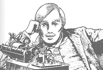 Type designer, graphic designer and illustrator, born in Marseille in 1942. Allessandrini (sometimes spelled Alessandrini in various publications) used to work at Paris Match, Lui and Elle. His typefaces:
  [
[ [
[ French type designer at Olivier Gourvat's type foundry, Mostar Design. In 2016, Olivier and Jean-Claude Gourvat co-designed the oriental brush typeface
  [
[ [
[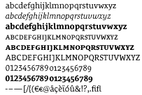 [
[ French type designer (b. 1968) who designed
  Jean-Marie Douteau (France) made free school handwriting fonts (with and without rulers):
  Jean-Michel Moreau (Moreau Le Jeune) was a French draughtsman, illustrator and engraver, 1741-1814. Born in Paris, he produced drawings of
  During her graphic design studies, Jeanne Rolfe (Tours, France) created a geometric solid typeface in 2013 under the supervision of Malou Verlomme.
  Marseille and/or Paris, France-based designer (b. 1961) of Argor Fast Scaqh (2015), Argor Priht Scaqh (2007, blackletter), Argor Brujsh Scaqh (2007, blackletter), Argor Cwar Scaqh (2006, pixel blackletter), Argor Biw Scaqh (2006, blackletter), Argor Flahm Scaqh (2001, blackletter), Argor-Got-Scaqh (2001, blackletter) and Argor-Man-Scaqh (2001). The author's fonts can be used for his artificial language Silarg.
  Paris-based designer of the modular geometric hipster typeface Form (2017). [
 Type designer who contributed to FontYou. In 2014, Joachim Vu, Jérémie Hornus and Alisa Nowak co-designed the classical copperplate script typeface
  [
[ Graphic designer in Paris, who made the wavy cursive typeface Galliano in 2014.
  French designer of the free font
  Based in Rennes, France, Johanna Grandgirard published the industrially-inspired decorative typeface
  [
[ [
[ Foundry in Copenhagen which sells the fonts made by
 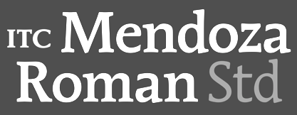 Influential French type designer, born in Sèvres in 1926, d. 2018. He worked with Maximilien Vox in the early 1950s. From 1954 to 1959 he was the assistant of Roger Excoffon at the Fonderie Olive, Marseille. From 1985 until 1990, he was a professor at the Imprimerie Nationale, Paris, where his students included Thierry Puyfoulhoux, Frank Jalleau, and Poul Søgren.
  Born in Marseille (1907-1978), under the pseudonym of Berto, Bertocchio designed Berto in the 50s as a lithographer. In 2000,
  Among French type-founders at the end of the eighteenth century, the two Gillé's, père et fils, held a prominent place. The elder Gillé, Joseph, was a distinguished Parisian type-founder. He died in 1789. His work can be found in Epreuves des caractères de la fonderie Joseph Gillél; (1773), and in Caractères de la fonderie de J. Gillé, graveur et fondeur du roi pour les caractères de l'imprimerie de la loterie royale de France,&autres (Paris, Rue&petit marché Saint-Jacques, 1778). The latter book still shows mainly transitional typefaces, with slight hints of the start of the geometric trend in typography. Gillé seems to be mostly remembered for being the author of the ornamental typeface called Madame.
  Julia is Valerio Di Lucente (Italy), Erwan Lhuissier (France) and Hugo Timm (Brazil). They met at the Royal College of Art in London having come from different professional backgrounds in editorial design, web and art direction. The studio Julia was founded in 2008 upon their graduation. Together, they work on books, typefaces, posters, websites, identities and exhibition design. They teach as visiting lecturers at Kingston University. Typefaces:
  Paris-based type designer affiliated with
  Julie Caron\0Konaté studied at ECV Lille. Lambersart or Lille, France-based designer of the oriental mood typeface Rising Sun (2017), the display typeface Dita von Teese (2016), Transparence (2016, based on the architecture in Lille), and the stencil typeface Suggestion (2016).
  Sociologist and typeface designer. Born in France, Julie is based in London. Graduate of the
  During her typography studies at Ecole Estienne in Paris, Julie Patat created the unicase font
  French type designer. Her typefaces include:
  French designer based in Nancy. Creator of the free display typeface Atlantico (2014, OFL), which was developed at the ERG School in Brussels. In 2014, he created Cholo, a hexagonal (school project) typeface based on the cholo writing of the Latino gangs in California.
  During his studies at ECV in Paris, Julien Clergeaud created a modular typeface (2015). In 2016, he designed the display typeface Demeter, which consists of Demeter Italic and Demetaire Script. [
 Julien Fincker is a French designer in Stuttgart, Germany, where he is art director at Sieber & Wolf. In 2018, he designed the great art deco typeface
  Aix-en-Provence-based designer of the blackletter-style Cursibve Typeface (2014) and the art deco silent movie typeface Random Type (2014).
  Born in 1985, Julien Laureau studied in Grenoble, Villefontaine, Limoges, and finally Strasbourg (at the Ecole Superieure des Arts Decoratifs, class of 2011). He currently is artistic director in Paris. He designed the all caps art deco sans typeface Voyageur, which comes with an Inline version. He also created Scriptus (cursive typeface), Gothic (a blackletter), Mona (sans), Neutra (sans), and Intes (a rope font). [
 Julien Priez (b. 1986, Montreuil, France) studied typography and type design at Ecole Supérieure Estienne des Arts et des Industries Graphiques in Paris (2006, 2008). In 2010, he worked at Atelier Pierre di Sciullo in Montreuil. Recently, he was affiliated with the French type foundry FontYou. His typefaces:
  [
[ Frenchman from Montpellier who left France for North America in 2009. He created the display typefaces
  Graduate of the Ecole Estienne in Paris (2012 and 2014), where he specialized in typography and type design. He now works as a graphic and type designer in Paris. His typefaces:
  French type designer active at 205TF, where she designed the industrial sans family Salmanazar (2018) and writes: Salmanazar is a typeface which has its roots in nineteenth century French type design, and in particular, the specimen of Antique Warnery no.1, published in 1922. Originally intended to be used for the composition of titles (the smallest body size being 20pt), its undecided yet vigorous strokes have been updated for contemporary use, while retaining its typically strong details from the belle-époque typefaces. [
 Swiss art director (b. Empoli, 1979), currently living and working in Paris. His type family
  Art director in Lille, France, who designed the great
  Warsaw, Poland, and now Paris, France-based designer of the hand-drawn typeface Delirium (2014) and of the vintage handlettered typeface Franek Type (2015).
  Lyon, France-based designer (b. 1977) of these typefaces:
  Parisian designer of the icon font
  Paris-based co-designer, with Magali Castel and Leila Yüce, of the typeface family Movietone (2018), which contains Serif, Sans and Condensed subfamilies. [
 French type and graphic designer who joined
  Graphic designer and illustrator in Lille, France, who created the display typeface Apparence (2015) and the rounded bold display typeface Sable (2015).
  Creator of the African-style hand-printed Kokekoko (2009).
  [
[ Philippe Tassel at L'Encrier made free school handwriting fonts: Beaumale,
 La Fonderie is a new French group of young typographers that may be consulted on all matters typographic. Based in Paris, and led by typographers Stéphane Gambini and Eric de Berranger. All fonts are by de Berranger.
 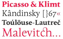 Artistic movement that took place in France during the 1950s and early 1960s. It supported the human calligraphic gesture and the elegance of the mediterranean typographic style. It was
  La Laiterie is a foundry started by Paris-based Julien Janiszewski (b. 1973), who received a bachelor's degree in graphic design from Besançon and later graduated from Ecole Estienne in Paris. His creations include:
  Born in 1921 in Transylvania, he trained at the Fine Arts Academy of Budapest (Hungary) and then at the Beaux-Arts in Rouen (Normandy, France). Ladislas Mandel was a stonecutter, painter and sculptor. However, he spent his life in France, mostly as a type designer at Deberny&Peignot, where he worked since 1954. In 1955, he headed the type atelier. He was taught by and cooperated with Adrian Frutiger during nine years at Deberny, finally succeeding Frutiger in 1963 as type director. In 1955, he was in charge of the transformation of the Deberny type repertoire from lead to phototype. He created original designs under the label International Photon Corporation, and turned independent designer in 1977. After that, he specialized in typefaces for telephone directories, and made, e.g., Colorado in 1998 with Richard Southall for US West. He cofounded the ANCT in Paris in 1985 and taught there and at Paris VIII. In 1998, he published the book Ecritures, miroir des hommes et des sociétés (éditions Perrousseaux), which was followed in 2004 by
 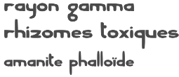 French graphic designer in Nantes, who made an elegant extended organic sans typeface called
  Graduate from
  Parisian designer of
  French type designer affiliated with
  A resident of Aulnay-sous-Bois, he specializes in scientific typefaces. Laurent lives in Scherwiller, France. He is a freelance graphic and type designer who is working at Porchez's foundry in Sèvres. Graduate of
  Art director in Paris, who created these typefaces: Special Deluxe (2008), Roger That (2015, organic sans), Obtus (2015, a hexagonal pair of typefaces), Kurtz Schluss (2015, a thin octagonal, almost scientific, typeface).
 Type foundry in Marseille. Its work can be found in
  French designer of the free plump outline typeface Happy Brown Cat (2015), the playful Twisted (2017), the connected monoline script typeface Glam Queen (2017), and the handcrafted typeface Family+Friends (2017). [
 LCT stands for La Casse Typographique, a graphic and type design studio in Nantes, France, started in 2013. One of its partners, Quentin J. Stavinsky, created the didone caps typeface
 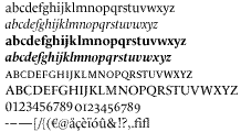 Character set for the typeface used by Le Monde and designed by Jean-François Porchez in less than three months. It was used by Le Monde from 1994 until 2005. In 2002, the headlines were replaced by a typeface designed by Lucas De Groot (but
  Paris-based graduate of LAAB Rennes, who designed the wedge serif display typeface Lécluze in 2018. [
 French designer, with the help of the Fontyou team, of
 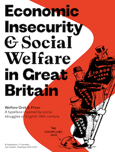 French type designer based in Paris. He graduated in 2020 from the postgraduate program in type design at
  Author of Les Menus & Programmes Illustrés---Invitations---Billets de Faire-Part---Cartes d'Adresses---Petites Estampes du XVIIème Siècle jusqu'à nos jours (1898, G. Boudet, Paris). This book has many art nouveau style illustrations with plenty of examples of art nouveau lettering. [
 In 2016, Juliette Beraud and Lena Douani co-designed the legible sans typeface family Cinétique as students at ECV Paris. Lena also did a odular stencil typeface, TDC62, in 2015, and a great Romain du Roi revival in 2016.
  During her digital arts studies in Paris, Lena Pinot created the deco typeface Geochic (2015).
  Montreuil, France-based designer of Malesuko (2015, an experimental typeface based on inline railroad station lettering used by Northern Italy's Vigezzina railway), Beluga (2015, a bold blackletter typeface), and Craignos (2015, a collection of comic book style typefaces inspired by the lettering in 1950s monster movie posters).
  British/French type and graphic designer currently who started his MFA studies in type design at Ecole Estienne in Paris in 2020. In 2018, he interned at Typofonderie (Zecraft). In 2019, he obtained a BA degree in type design from Ecole Estienne. In 2020, he joined Neil Summerour's
  Lepré Vinci is the alias of the French creator at
  Graphic design studio in Paris, est. 2008. Designers include Maxime Tétard and Romain Rachlin. It is mainly involved in corporate identity and occasionally designs fonts for clients. Typefaces as of 2017 include Alsace (2012: modular all caps display typeface), Amsterdam (2012: an exercise in high contrast), Athènes (2009: experimental), Berline (2012: in Grotesk and Calligraphique substyles), Craft (2012: hipster style), Frankfort (2012), Intervalle (2016), Sofia (2011: Peignotian), Linbourg (2013), Rive (2010), and Lorraine (2011). [
 Famous decorative caps typeface originated by the Paris-based foundry of Joseph Gillé (ca. 1820). Later versions included one by Wood & Sharwoods (ca. 1842), Laurent & Deberny (ca. 1867: in various size variations, (Lettres ornées No 101, No 103 and No 89)), Deberny & Peignot and Haas.
  Graduate of
  As a student in Paris, Lise Takeno designed the Futura / Didot hybrid Gatsby (2016). [
 Parisian designer of
  Graphic designer in Marseille, France, who created some powerful typographic posters in 2015.
  [
[ During his DSAA typographie studies at École Estienne in Paris, Lou Reichling recreated a didone typeface and called it Phèdre (2013). He based it on a typeface by Pierre Didot, 1819. [
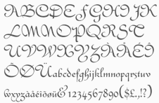 French type designer at FT Française who made the simple linear script font Clipper (1951). He is also credited at Identifont with a version of
  French illustrator who illustrated, e.g.,
  Graduate of ESAD in Amiens, France, class of 2018. He writes about his graduation typeface, Grand Tourisme, which thrives on stress and tension: Grand Tourisme is a large typeface system designed for editorial purposes, and especially for magazines. It takes inspiration from the concept of tuning and imagines type as a car frame on which one applies any kind of transformation. [
 French punchcutter (1795-1865) who lived in Lyon. He designed Lyons Titling (1846, a roman titling font published by Chiswick Press) and
 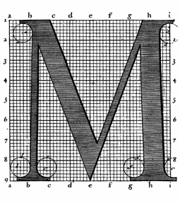 Engraver at the Imprimerie Royale in Paris, b. Orleans, 1654, d. Paris, 1727. He drew and worked on the
  Louise Rigaux studied at ESA in Pau, France, and at La Cambre in Brussels from 2010 until 2013 and from 2013 until 2014, respectively. During her studies, she designed the typeface Beken (2014). In 2013, she created an upright connected script typeface out of the 1930 Peugeot logo. [
 Saint-Pierre-lès-Elbeuf, Rouen, France-based creator of the free typefaces
  [
[ Ex-student at Scriptorium de Toulouse (2001) who published some of her fonts at
 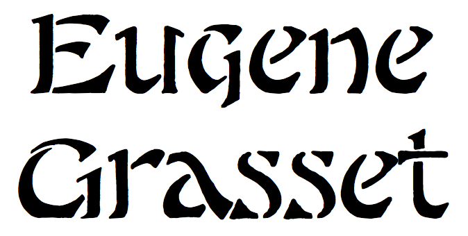 French typographer from the art nouveau era. One of his alphabets was made into a digital typeface by
  Maelle Keita is the second identity of
  French designer for
  [
[ French type designer who graduated from l'Ecole Duperré in Paris and the
 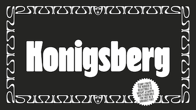 During his studies at Ecole Estienne (Paris), Manuel de Lignières (Montpellier, France) published Waba (2018) with Lewis McGuffie. Inspired by woodblock types and art nouveau, Waba is a bit of love letter to Estonia, the Baltics and the visual history of Eastern Europe. The
  Graphic and type designer in Paris and Marseille, France, who was born in Marseille. He created the
  During his studies at ECV Nord Europe in Lille, France, Marc-Antoine Allard designed Hexhale (2015). In 2014, he designed the script typeface Pangolin. Numero (2016) is a monospaced font inspired by the early ages of computer programming. Magnus (2016) is an angular text typeface.
  Born in Paris in 1904, died in 1989. Jacno, whose real name was Marcel Jacnovitch, was a poster designer who did the cover of the Gauloises cigarettes. He was an ardent designer and user of stencil fonts. His typefaces:
  Designer at Fonderie Turlot of a
  During her studies at ECV Paris in 2017, Margaux Saulou and Solenne Deslandes co-designed an italic / sans / serif typeface family called Sailor. She also designed Bookness (2017), a revival of A. C. Phemister's Bookman (1858). At
  During her studies at ECV in Paris, Margot Leveque designed the rectangular segment typeface Robott (2015). In 2017, she designed Reliqua. In 2018 and 2019, she developed the striking fashion mag text typeface Romie. In 2019, she released the rounded serif text typeface Kalice, to which any red-blooded Québecois would reply Tabernakle. Kalice is a revival of Elzevir Anglais (1880).
  Paris-born and London-based independent type designer. She originally studied graphic design at Ecole Estienne in Paris, and worked for publishing and branding agencies in Europe and North America. She obtained an MA in Design & Typography at ECV Paris, class of 2018, under the direction of Jean François Porchez. Earlier, she studied linguistics at University College London. The debate on gender-inclusive writing in France sparked the idea for her original and engaging MA thesis XX, XY: Sex, Letters & Stereotypes, investigating the gendered identity of letter shapes and presented (December 2018). In 2020, she started teaching graphic design at Kingston University in London, and joined Neil Summerour's
  Parisian creator of interesting threaded letters in 2014. [
 Graduate of ESAD in Amiens, France. Her graduation typeface there is
  London-based graphic and type designer who graduated from the London College of Communication, but is French and grew up in Amsterdam. In 2020, she released the
  During her studies, Rueil-Malmaison, France-based Marion Caillet created great lettering for Moba Magazine (2015), and drew the decorative type Je Suis Vicieuse (2015). [
 Marion Ranché (Paris, France) designed the experimental typeface Graphite (2014). [
 During her studies in Nantes, France, Marion Videlin Roy created the alchemic typeface Aventura (2015) and the decorative caps typeface Kata (2015: created for the catalog of Grandir d'un monde à l'autre). [
 Mark Zhu is a remarkable type designer and photographer in Paris, France, who focuses on multi-script type design and calligraphy. Graduate of
  Marmite de Fontes (and before that,
  Parisian designer, aka Design by Human, of
  French designer of these typefaces Turone (2015), Dramatique (2015), Onda (2005-2013, dot matrix type), Materiology (2008), DuBuisson (2004, modular and counterless), TypoTape (2010), Elsewhere Filaire (2004), Treza (2010, with Benjamin Gomez at Dépli). [
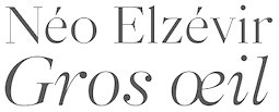 During his studies at ESAD in Amiens, France, Martin Pasquier created Pittoresque (2014, grotesque typeface) and Neo Elzevir Gros Oeil (2015, a revival of a typeface from the Peignot type foundry). His graduation typeface in 2016 is called
  Match Fonts is the West Hollywood, CA-based foundry led by Michel Bujardet (b. Bordeaux, France, 1951), who is Mike Budge on alt.binaries.fonts. They make and sell interesting font paks. A particular favorite of mine is the
  Frenchman who obtained an MA in typeface design from the University of Reading in 2008. His graduation type family,
 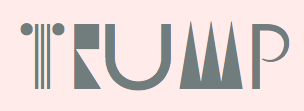 French type and graphic designer who graduated from Ecole Estienne in Paris. Artistic Director at Magic Bridge Agency.
  Graphic designer in Besançon, France, who created the minimalist monospaced typefaces
  [
[ [
[ French designer (b. 1999) of the squarish sans typeface Gaz (2021). [
 Graduate of the DSAA Design Typographique program of the Ecole Estienne in Paris, class of 2011. He works now as a designer at Atelier Chevalvert. He created these typefaces in 2011:
  [
[ Thousands of font collections flood the internet, but for Maxime Hoernel's collection, I will make an exception---he has some nice practical and "real life" set of fonts that I can relate to. Here it goes:
  Illustrator from Paris, Toulouse and/or Pau, France. He created the prison wall writing font
  Lille, France-based designer of the wonderful monokine connected cursive script typeface Rollercoaster (2014). [
 French type designer, cartoonist, illustrator, theorist, type historian and journalist, b. Condé-sur-Noirau, 1894, d. Lurs-en-Provence, 1974. His real name was Samuel William Théodore Monod. Founder of the famous
  The Mayeur Type Foundry was based at 21 Rue de Montparnasse in Paris and operated from 1882 until 1919 under the direction of Gustave Mayeur (1837-1891).
  Scans of an 8-page booklet by Douglas C. McMurtrie published in Chicago in 1936: Le Moreau-le-Jeune A Typographical Specimen with an Introduction by Douglas C. Murtrie. McGrew writes about
  Parisian designer of the display typeface La Super Typo (2015), a custom job for Galerie Sakura. [
 French graphics lettering company initially involved in instant lettering (made by Trip Productions), and some original typeface designs. From 1989 until 1994, Mecanorma worked with another Dutch company
  French designer, b. 2004, of Robot Medoclone (2019), a great robot-themed decorative caps typeface. [
 Media Type Foundry was created in 2010 by type designers Sonia da Rocha, Claude Mediavilla and Joel Vilas Boas (aka J85). It is an independent type foundry based in Paris. Thanks to Mediavilla and his ex-student da Rocha, the emphasis is on type that is deeply rooted in calligraphy.
  Thibaut Désiront (b. France) is an art director and illustrator in Montreal. His company is called MEKA or Chez Meka. In 2014, he created the handcrafted poster slab serif typeface Bleed, and the condensed display typeface NYC (or: New York City). In 2015, he designed the (commercial) rounded blackletter / tattoo typeface Hell Gothic. In 2018, he published the fat blocky sci-fi typeface Mech.
  Type designer at Fontyou in Paris. Creator of the EPS format techno typeface
  Graphic designers in Paris.
  French designer of the (free) Fourier-GUTenberg package (dated 2003) for Latex, which includes a number of mathematical type 1 fonts that are new: Fourier-Alternate-Black, Fourier-Alternate-Bold, Fourier-Alternate-BoldItalic, Fourier-Alternate-Italic, Fourier-Alternate-Roman, Fourier-Alternate-SemItalic, Fourier-Alternate-SemiBold, Fourier-Math-BlackBoard, Fourier-Math-Cal, Fourier-Math-Extension, Fourier-Math-Letters-Italic, Fourier-Math-Letters, Fourier-Math-Symbols. By 2020, the package features Fourier-Orns (ornaments, including fists and fleurons) and opentype files.
  Michel Sabbagh is a Montreal-based lettering artist and calligrapher, who studied at Laval University in Quebec and then at ESAD in Amiens, France. His graduation typeface there in the postgraduate course in type design was
  His business is Ministry of Candy. London-born graphic designer and artist (b. 1983) who works in Nantes, France, although Behance says he is in Lyon, which leads us to the board game Find Ronan and the titillating movie sequel Free Ronan. Creator of
 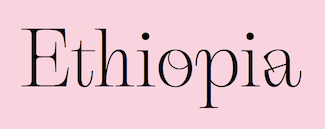 Emma Marichal (Lyon, France) is one of four designers at the French foundry
  Lille, France-based designer of the floriated typeface Yves Rocher Type (2015) which was based on the logo for Yves Rocher.
  Paris-based designer of Latin / Arabic typefaces including Babybars (2020: inspired by the Mamluk Thuluth calligraphic style, covering latin, Arabic, Persian and Urdu) and Rotger-Arabic (2020: an Arabification of Central Type Company's Rodger by Tarek Al-Sawwa and Mohamed Gallah). [
 Molé Foliate is a great floriated caps font designed by the Parisian founder Molé, with floral decorations inside the open typeface 3d letters Redrawn by S.L. Hartz at Stephenson Blake (1960) and/or Enschedé. Digital implementations include Mole Foliated (1997, unknown designer,
  Monica Munguia (Mexico City) studied graphic design at Universidad del Pedregal and has a Masters in typeography from Centro de Estudios Gestalt in Veracruz, Mexico. She was associated with
  Parisian designer of fantastic futuristic lettering pieces, including one for Sophie Taeuber (2014) and one for an exhibition called Retrospective Albert Hollenstein (2014). [
 During her graphic design studies in Lille, France, Morgane Castellanos created the wonderful art deco typeface Dalia (2016).
  French type designer in Paris who created the text typeface Toine in 2016 during her studies at Ecole Estienne. In 2017, Jérémie Hornus, Théo Guillard, Morgane Pambrun, Alisa Nowak and Joachim Vu co-designed
  Graphic and type design studio founded in La Boissière-d'Ans and/or Cubjac, France by
  French creator of the beautiful free gothic font
  Thuong attended ESAD Amiens for Graphic Design and later pursued a career in type design. In 2018, she received an MFA in Type Design from the Ecole Estienne in Paris. She collaborated with type foundries Coppers and Brasses and Type Network prior to joining New York City-based
 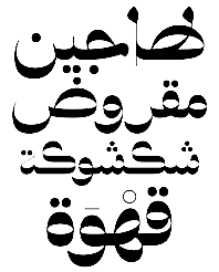 [
[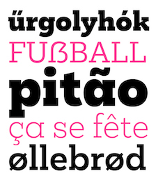 Naïma Ben Ayed (b. 1984, Provence, France) graduated from Ecole Estienne in Paris in 2009. She also studied at KABK in Den Haag. She designed Arabic and Latin fonts at Dalton Maag London from 2012 to 2018, where she is still based. She took part in the 3rd edition of the
  Naji is a French Lebanese graphic designer, type designer and animator. He studoed graphic design at the Lebanese American University. He also holds a Bachelors degree in Applied Arts from the University of Toulouse Le Mirail, and a Master's degree in interactive multimedia design from the Sorbonne University. Paris-based designer of the Kufi geometric style Arabic typeface Branji (2015) and the Kufi calligraphic Arabic typeface madid (2015).
  London-based graphic designer and art director. He studied at Ecole de Condé (Lyon, France), Ecole Normale Superieure des Beaux-Arts de Lyon, and ECAL (Lausanne), where he obtained a Masters of Arts in Art Direction and Type Design. He has worked as a graphic designer at Google Zurich (2014), Sang Bleu (2015-2017), Laurence King Publishing (2017-2019), TTTISM (2019-2020) and Lymited (from 2020 onwards). Designer of élancé (2008,
  Or Nicholas Jenson. French printer and artist born in Sommevoire, France in 1420. He worked mostly in Venice as a printer, type designer, punch cutter, and engraver from 1468 until his death in Venice in 1480. In 1475 he was made a papal count by Pope Sixtus IV. He produces his first roman type in Cicero, Epistolae ad Brutum (1468), which is described as perfect and unequaled. A Greek typeface which is used for quotations was made in 1471. In 1473, he creates a blackletter typeface which he uses in books on medicine and history. In 1475, he founds his first book trading company, Nicolaus Jenson sociique, whose partners include the Frankfurt businessmen Peter Ugelheimer and Johann Rauchfass. In 1480, his second book trading company is launched under the name Johannes de Colonia, Nicolaus Jenson et socii.
  Lille, France-based designer of the high contrast display sans Kabond (2020). [
 [
[ Graduate of the London College of Communication who works in Paris, where he set up No More Faith Fonts. He is presently based in Dubai. His list of typefaces:
 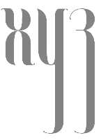 Parisian graphic designer and
  Noir Typo is a graphic and type design studio set up in France by Olivier Gardera in 2014. His typefaces:
 Auckland, New Zealand-based graphic designer who sells his creations as NrthPrk and North Park (located in Paris). designer of the signage-inspired retail typeface Bar Cap (2015), the slab serif Nixon Caps (2013), and Scrawler (2013, all caps sans serif). He also made Sustainable Resource Icons (2015) and Sport Icons (2013).
  Type and graphic design studio in Zurich, run by Clovis Vallois and Anton Studer.
  French creator in Lille of the free script fonts
  Graduate of Ecole estienne in Paris, whi joined Velvetyne in 2019 annd is currently working as a type design researcher in ANRT, Nancy.
  French designer in 2018 of the typefaces Alma, Victoria and Villa Extra Bold.
  [
[ [
[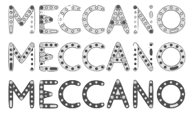 French graphic designer who lives in Vincennes.
  With a name like that, this web and print designer should move from France to Quebec and experience real cold. His (free) typefaces, available from
 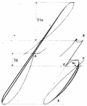 French author of Recueil Méthodique de Principes d' Ecriture (ca. 1920, Limoges). Samples:
  The print shop and foundry of Pierre Moreau was operational in Paris from 1640 until 1792. It had various directors, listed here in chronological order:
 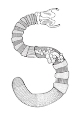 Parisian fine artist. Creator of an intricate caps typeface called
  Alejandro Lo Celso, a graphic and type designer born in 1970 in Córdoba, Argentina, was art director at several publishing media in Buenos Aires. He has written several articles for typo magazines, and taught typography at the University of Buenos Aires. In 2000 he completed his MA in Typeface Design at the University of Reading (UK). In 2001, he obtained a post-diploma at the Atelier National de Recherche Typographique, Nancy (France). He teaches typography at the Universidad de las Americas in Puebla, Mexico, and at Centro Gestalt in Veracruz, and is Principal of Pampa Type in Mexico City. As Pampa Type grew, it brought several excellent type designers on board, such as Jorge Iván Moreno Majul and type designers Francisco Gálvez Pizarro, Francis Ramel, and Oscar Yáñez. In 2021, pampa type joined
  French designer of these typefaces:
  The parti Socialiste de France offers a free download of its workhorse and identity sans face, Jaurès. [
 French designer of
 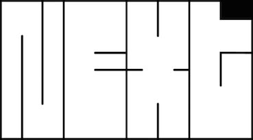 Paris (was: Nantes), France-based designer at ECV Nantes of the ultra-fat blocky typeface Next (2019). Perhaps this was co-designed with
  French creator at FontStruct in 2009 of textured or 3d typefaces such as Perspective (+Gras), Pliages (+Gras), Relief Plein, Zebrures, Bambou, Georges, Damiers, Relief Gras, Perspective Gras, Lozanges, Circles, Grilles, and Relief. He also created Fil de fer, Parchemin (parchment alphadings) and Fantaisie. [
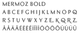 Born in Budapest in 1957, but Parisian since 1957. Designer and type artist who made many custom and magazine fonts.
 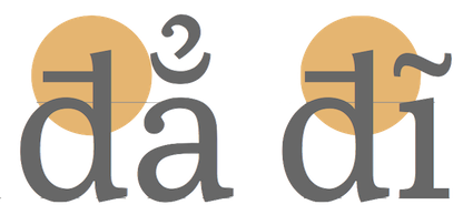 Vietnamese graphic and type designer who is Professor of Typography at the Hanoi Architectural University, Vietnam, since 2011. He studied at ESAD in Amiens, France. His graduation project at ESAD was a Latin / Vietnamese typeface family called
 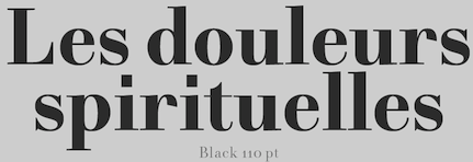 Type designer at the open source type foundry
 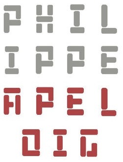 French type designer (b. Paris, 1962) who designed the experimental fonts Carré, Octobre (a stencil in the De Stijl genre), and
  During his studies at ECV in Paris, Philippe Gauthier created several typefaces, including Pixfont (2015, pixel font) and Gaulab (2015). In 2015, he revived one of Peter Schoeffer's 15th century typefaces as Schoeffer GP Roman (see also Enschedé English-bodied Roman No. 6).
 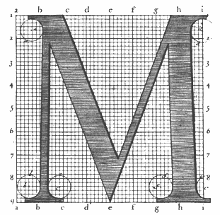 Engraver, b. Macon (1666), d. Paris (1714). In 1695, king Louis XIV of France commissioned a typeface, which until today is described as the first digital font, and at least as the first mathematicallly defined type, the
  French graphic designer who lived in Perugia, Italy, and is now in Nantes, France. I would call him an experimental typographer. He likes experimenting, for example, with modular typeforms, as is apparent from his typefaces called
  Wood engraver located in Paris. Author of
  French engraver and punchcutter who worked with Paulo Manucius from 1588 on, and who was commissioned to create a typeface for the Vatican. He cooperated with Granjon. Although he cut roman and Greek types, he was mmainly known for his music types---for example, he started using musical notes with parts of lines attached to make a second impression unnecessary.
  Illustrator in Marseille, France, who graduated in 2003 from ESA Institut St. Luc in Brussels with a Bachelors degree in plastic arts. In 2011, he created a
 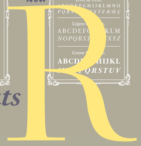 French typefounder (b. Paris, 1712, d. Paris, 1768) also called Fournier le jeune.
  Free school fonts by Frenchman Henri Rogelet, ca. 2000: Abaque (2011, abacus font), Alphonetic, AlphoneticGB (two phonetic fonts),
 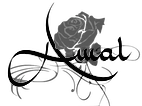 Parisian type designer, b. 1988. He created the calligraphic Arabic look type family
  Poem is an independent publishing initiative related to text, type and typography directed by Jérôme Knebusch and located in Frankfurt am Main. Knebusch, who also runs Atelier Jerome Knebusch, is a French type designer who graduated from l'École nationale supérieure d'art de Nancy and from l'Atelier national de recherche typographique. In 2008, he started teaching graphic and type design at ESAL (Ecole Supérieure d'Art de Lorraine) in Metz. He also taught at National Institute for Typographic Research, Nancy, France.
  Lisa Huang was born and grew up in France, and is currently based in Paris. Lisa studied mostly in Paris in graphic design before going further in type and typography with Type@Cooper Condensed program in 2015 in New York City and a couple of years in design companies such as BETC Design and type foundry Black[Foundry] both in Paris. In 2018, she graduated from
  Jean-Baptiste Levée is a French type designer based in Paris. He is a co-founder of the Bureau des Affaires Typographiques, and teaches typeface design at ESAD Amiens (and before that, at the Caen-Cherbourg school of Arts & Media and at the University of Corte). His latest work is mostly published at
  French designer of the display typeface
  Strasbourg, France-based designer of the blackboard bold typeface Pirou (2014), which can be bought
  [
[ [
[ French illustrator and cartoonist who, together with Gia Tran at FontYou, co-designed the hand-printed typeface
  Author of
  At Editions Guérinet (Paris) in 1931, R. Panzani published
  Free artificial language / game or role playing fonts by Rackham Fonts in France: Akkyshan, Alahan, Cynwaell, Daikinee, Drune, Goblin, Griffon, Keltois, MidNor, Mortvivant, Ork, Syhar, TirNaBor, Yllia-and-Vile-Ti. All the fonts were made in 2003 and depict some artificial scripts used in computer games. [
 Montpellier, France-based designer of these display typefaces in 2019: Orpheus, Arkham, Auriga, Neo Sapiens, Hydra, Zephyr, Leviathan, Mythologics, Scarab, Scythe, Heretics.
  Parisian graphic designer and motion type artist, currently based in London. o-founded the Motion Design Studio Panoply in 2015 where he worked for Nike, Louis Vuitton and others.
  Born in Rome, Robert Granjon (1513-1589) worked for various printers in Lyon, Paris, Frankfurt, Antwerp, and Rome. In Lyon, he was active as librarian, printer, and engraver of typefaces. Granjon is an exponent of the French renaissance. Granjon's designs live on in the balanced Plantin family, designed by Frank Hinman Pierpont in 1913 at Monotype, and available at Linotype (and elsewhere).
  Born in 1973, he studied graphic design at the University of Applied Science Augsburg, Germany from 1994-1999, and attended a year at the École Supérieure des Arts Décoratifs in Strasbourg, France. He founded his own shop in 2001 and teaches calligraphy, type design and typography in various workshops and seminars. One of the three cofounders of Lazydogs Type foundry in Augsburg, Germany. Robert left the foundry in December 2014 to concentrate on his main business in graphic design.
  Parisian graphic designer who created a bicolored circle-based typeface called Graphic Stroke (2014), Something In The Way (2015, a rounded monoline stencil font), Impossible Font (2015, inspired by Escher), and Pattern Font (2015).
  French graphic and type designer from Villaudric (b. 1965) who designed the
  [
[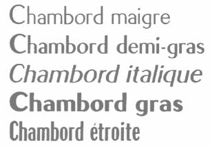 Born in Marseille in 1910, Roger Excoffon died in Paris in 1983. Co-founder of the Urbi et Orbi advertising agency in Paris, he was a graphic artist and type designer. He created the image of Air France, designed the symbols of the 1968 Winter Olympics in Grenoble, and designed many fonts.
  Graphic designer in Toulouse, France, b. 1983.
  During her studies in Paris, Romane Hupel designed a modular typeface (2017). In 2018, she added the Latin / Cyrillic didone typeface Garasir. [
 Type and graphic designer in Paris (b. 1991) who studied at Ecole Estienne in Paris (class of 2010), ESAAB Nevers (class of 2012), and finally at ESAD Amiens (class of 2014), where she was in the postgraduate program on typography and language. She won the
  During her studies at Ecole Estienne in Paris, Sabrina Ekecik created the experimental typeface
  Parisian graphic and web designer. He created the kitchen tile typeface
  Type and graphic designer who graduated from the program Typographie et langage at ESAD in Amiens, France, in 2013. Her lapidary wedge serif graduation typeface,
  Ex-student at the Ecole Estienne in Paris (b. Estonia) whose diploma work consisted of the creation of
  Grenoble, France-based designer of Moderne (2015), a tall didone revival created in a workshop in 2014 led by Jean-Baptiste Levée and Yoann Minet.
 Type designer presently based in Berlin (and before that, London). Graduate of the Ecole Nationale Supérieure des Arts Décoratifs (ENSAD) in Strasbourg, France (BA) and the Ecole Supérieure d'Art et Design (ESAD) in Amiens, France (MA), class of 2016. His graduation typeface family Temeraire pays tribute to the English letter ca. 1800, and includes some Clarendon-ish features. Each of its styles addresses a specific part of 19th century British lettering tradition, such as gravestone cutting, fat faces, master penmanship, copperplates, Egyptians, and Italians.
  Grenoble, France-based designer of the didone typeface Type Moderne in 2014, during a workshop given by Jean-Baptiste Levée and Yoann Minet.
  French designer, b. 1972, Lille. He graduated from the École Supérieure des Arts décoratifs de Strasbourg, and cofounded
  Type and graphic designer and art teacher, b. 1978, Lyon, France, who is based in Villeurbanne. He was artistic director at Crescend'O and curator of sifgners-book.com (2009-2018) and agfronzoni.com (2012-2018). His typefaces are mostly released at Frank Adebiaye's
  French designer of the free octagonal typeface Commune Nuit Debout (2018). It includes a stencil style "Pochoir" and a Regular solid style. The social motivation behind this typeface:
  French type designer in Lyon, 1657-1729, whose name at birth was Jean Truchet. He was famous for his Truchet tiling system. Sébastien Truchet designed a modular typographic system during his last year in the School of Fine Arts of Besançon. His work was summarized in a thesis he wrote in 1704, and which is also reflected in
  Senior art director in Paris, France, who created the multiline prismatic typeface Maxam and the spurred display typeface Acan in 2018. [
 Designer between 1990 and 2001 of the dingbat fonts Emergency Workplace Signs, Paint Industry Symbols, Risk Phrases, Transport Hazard Diamonds, and Warning Signs, which were initially sold through Agfa (which later became Agfa Monotype). He set up SeLis type foundry in 2004. [
 French graphic and type designer who makes mainly typefaces for companies. His oeuvre:
  Parisian codesigner (with Gaelle Perot) of the great display typeface family Circus (2017). In 2016, she revived Robert Girard's Astré (1913). At
  [
[ SMeltery is the French foundry of
  Graduate of Ecole Estienne in Paris, class of 2019. She quickly turned into one of the world's top designers. Her typefaces:
  Solidarité 77 is an intertwined paperclip-style typeface created in 2016 by Fabien and Vincent Roché for the Association Solidarité Femmes Le Relais 77 which helps women that were victims of domestic violence.
  Solide is a Parisian studio founded in 2015 by Alexandre Essayie, Pablo Grand Mourcel and Benjamin Varin. Their typefaces include Teelay Sans (2016), Benjamin Grotesk (2015), Dinette (2011), Arkit (2015), Le Méliès (2009) and Rally (2014).
  Graduate of ESAD in Amiens, France. Her graduation typeface there is
  Bordeaux, France-based designer of Hello (2018: a floriated stencil typeface), the ransom note font Chus (2018), and the experimental geomtric typeface Luna (2018). [
 During her studies at ESAG Penninghen, Paris-based Sophie Larivière created tthe calligraphic display typeface Pièce Montée in 2015. Earlier, she made a handcrafted typeface and a connected script, Ecriture Epistolaire (2015). [
 Parisian who designed Skate or Die (grungy capitals and skateboard scanbats), and
  Brighton, UK-based but French designer of the gridded compass-and-ruler fonts Fontastic (2014), Prototype (2014) and Angulstar (2014).
  Born in 1983 in Lyon, he obtained arts degrees from Sèvres and Ecole Estienne. He is presently located in Plaisir, France. Stéphane cooperates on type design projects with Christophe Badani, with whom he co-designed the custom typefaces Darty (2013), Elior (2011), Kwixo (2010), Rolland Garros (2009), Rhodia (2009), Dassault Systèmes (2009),
  Swiss graduate (b. 1965) of Luzern School of Art and Design, who settled in Berlin in 1997. Co-founder with Cornel Windlin in 1993 of Lineto, with Cornel Windlin and Andreas Eigendorf in 2014 of
 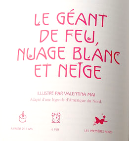 Sterenn Bourgeois (Trait pour trait, France) studied graphic and type design at Ecole Estienne in Paris. She created several typefaces, including Nature (a great children's book typeface created for Mille Ans de Contes, ed. Milan), Québec (same purpose as Nature), Titi (hand-drawn), Super Héros, Ariol (comic book face), Gabri, PLR (license plate sans) and a set of initial caps done for Editions Ex Nihilo in 2011. [
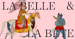 Design agency in Paris. Designers of Belbet (2015), a display typeface that is based on Islamic and Indian frames, tiles and buildings. They used the font in an art catalogue, La Belle et la Bête, for the Islamic and Indian art gallery Alexis Renard. [
 Stereotype is Clément Nicolle's web outfit. He designed these (free) fonts between 2004-2006: 3grammes5, BagpackDemo (grunge), Base02 and
 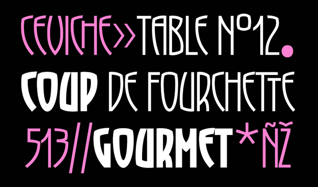 Paris-based art director. Her charming typefaces:
 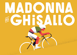 Paris-based graduate of ESAG Penninghen (where he took courses from, e.g., Muriel Paris) who made a custom
  Istanbul-born graphic designer and typographic researcher, now located in Geneva, Switzerland. During his studies in the Master of Graphic Design program in Rennes (France), he created
  French graphic design and typographic company, est. 2006 in Lyon by Patrick Lallemand and Pierre Delmas Bouly. Typefaces created by them include various logotypes, as well as
  Parisian creator of the cute figurine alphabet Typo Aimer (2014).
  Born in 1980 in Chambéry, France, he studied at the Kunsthochschule Berlin-Weißensee in 2007, and has been working in Berlin since then, first for seven years as a type designer at LucasFonts, where he specialized in Arabic type, and then as a graphic designer at the Mückenschwein Publishing House, and as a freelance graphic designer and illustrator.
 At
At 
 Toulouse-based designer and illustrator.
  French designer (b. 1970) of the ultra-fat counterless typeface
  Nantes, France-based graphic designer who created the decorative alphabets Trompetto Game and Alphabet Alambique Gloire & Beauté in 2014. In 2015, he created Uptown Valley and Monmort.
  Based in Rennes, France, Thibaut Abou Mrad created the logotype typeface Dantek (2014) for Zit Dantes, a web service company. His layered rounded stencil typeface family Normograph (2014) is created for wayfinding applications. Trix (2014) is a triangulated typeface. Miron (2014), designed for the Miron Rivoli gallery, is a hybrid of Filosophia Grand and Gravur Condensed.
  [
[ French freelance graphic and type designer who started his own commercial type foundry in 2014. Now based in Nantes, Thierry was educated in Nantes and studied Typography & Language at ESAD in Amiens, France, class of 2014. His typefaces:
  [
[ [
[ Based in Montpellier, France, Thomas Boucherie designed the dingbat typefaces Ghost Smileys (2009), Punk Smileys (2009), thomasboucherie (2007), thomasboucherie3 (2008), Pictoserie 5 (2009, Pingbats), pictoserie 6 (2011, dingbats),
  French graduate of the
  French type designer at
  Parisian art director. He did some nice custom work for
  Thomas Perrin obtained a BAC Scientifique, Sciences de l'ingénieur (option Art) from the Lycée des métiers de l'audiovisuel et du design Léonard de Vinci, Villefontaine. From 2011 until 2012 he is studying at DNAP in the Ecole des Beaux arts of Besançon.
  Parisian graphic designer who created a number of vector format commercial typefaces starting in 2012. These include the alchemic typeface
 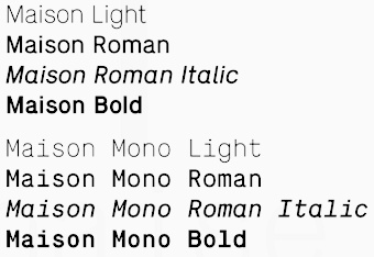 [
[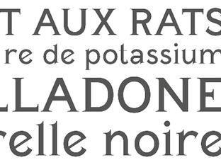 French graphic designer. His typefaces include Poison (2014) and Le Bretonne (2014, with Valeria Caro and Camille Bardes). [
 French design student from Clermont-Ferrand, b. 1991. In 2009, he created Folda (octagonal), Braille, Stencila, and Grafical. Some of these were made with
  Lille, France-based designer of the monoline connected script typeface Celestine (2014). [
 Titus Nemeth runs TNTypography in Paris, and specializes in Arabic typeface design, typography and custom type. A 2006 graduate in the Master of Arts Typeface Design programme at the Department of Typography and Visual Communication, University of Reading, he also studied Arabic script at the École Supérier d'Art et de Design d'Amiens, France. Titus holds a PhD in Typography & Graphic Communication from the University of Reading, UK.
  French creator of the gridded typeface
  A web font tool by Mircea Piturca who used to be at the University of Dijon. TypeFolly is probably the first web typography tool that allows designers to easily create beautiful "type follies". The result is a fully html and css3 compliant code. TypeFolly gives designers the freedom to create beautiful type compositions, test new font combinations and fully enjoy the power of css3. At this time we support the following css properties: font-family, font-size, color, letter-spacing, word-spacing, font-style, font-weight, text-decoration, text-align, z-index, line-height, width, height, opacity, moz/webkit-transform, text-shadow and font-face. [
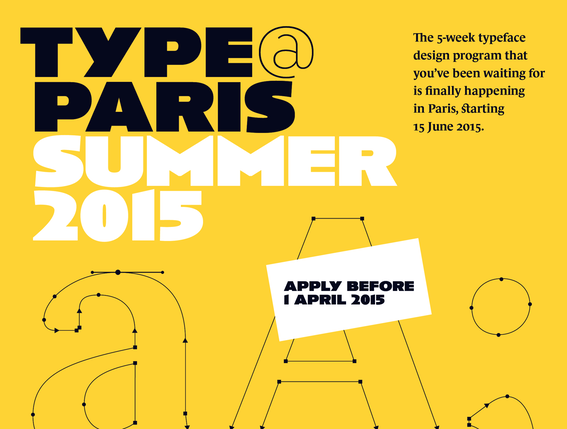 A summer crash course program in June and July 2015, 2016, 2017, 2018, 2019, 2020 and 2022. Founded by Jean François Porchez, the type design teachers in 2015 included Mathieu Réguer (Typofonderie and Longtype), Malou Verlomme, Jean François Porchez (Typofonderie), Julien Priez (type designer and letterer at FontYou) and Frank Jalleau (type designer at Imprimerie Nationale since 1988).
 French foundry, est. 2008, by Jonathan Perez and Laurent Bourcellier. Graduates from the Ecole Estienne in Paris, they have made the following fonts:
  Type blog in French by Muriel Paris. [
 Christophe Badani (b. 1969, Marseilles) is a French type designer. He resides in Boulogne-Billancourt, France. His typefaces:
  Frenchman Jean-Renaud Cuaz (b. 1959) is the principal and type designer at Typorium in Highland Park near Chicago, but has moved back to Paris, where he is a freelance graphic and typeface designer.
  Uberfont is a digital type foundry in Metz, France run by Mickael Popowycz (b. 1986). In 2016, they made Tlaloc (an Aztec-themed ornamental caps typeface), Couscous (a decorative titling font) and Gaston (a cold war propaganda font).
  Typographer and graphic designer, who studied typography at ENSAV La Cambre in Brussels.
  Uzim is a French type designer with a very nice output: 1920, 1920Bold, Acid2, AcidIII, AcidOne, Apocalypse, AtomicPasta, AtomicPastaItalic, Biolid, BlackRoses, BruisedFifty, BruisedFive, BruisedHundred, BruisedTen, BruisedTwentyFive, BruisedZero, BurningLight, BurningNormal (scratchy hand), ClearTypewriter, Distorted Faith (2001, a hacker font), Ephotical, FStein, FilthySunshine, Fishinthebathroom, Handmade, HerbeRouge, Index29, Jungle, Klassenarbeit, LiquidNewspaper, MoonyCat, November, OrganicDisease, Origin, Pantheon,
  French graphic designer who spent 2007-2009 at Ensaama Olivier de Serres in Paris. He does experimental type. His creations include Fake,
  Graphic designer in Lyon, France, who created the signage icon set Signalétique Bellecour (2015) and exquisite didone lettering for a milk bottle company called Maison Nacrée (2015). [
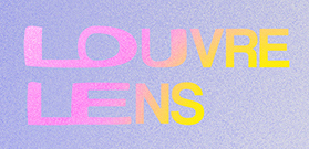 Lille, France-based designer of the visual identity typeface Louvre Lens (2017). [
 [
[ Velvetyne Type Foundry (or
  Regular workshops held by Velvetyne Type Foundry at
  French typefounder, born ca. 1775. Vibert, Vibert Pè et Fils, and Vibert Fils, operated a foundry in Paris from 1797 onwards. He was the Didot family's punchcutter. There is a publication in 1805 entitled Epreuves des caractères de la fonderie de Vibert et Luy, Paris (16 pages). Deberny named a didone typeface after him,
  Besançon, France-based designer of Aspirat (2018) and Re:Caravelle (2018), which were inspired by Enric Crous Vidal's Caravelle (1957). Aspirat's lower case a though suffers from a bad bout of midriff atrophia. He also designed the high-contrast didone Comté (2018), and the sans typeface Valdamour (2018), which was commissioned by the Communauté de Communes du Val d'Amour.
  [
[ For a school project in Paris, Virgile Flores designed the deconstructed typeface Derrida Sans (2016) in homage of the French deconstructionist philosopher Jacques Derrida (1930-2004). In 2017, she designed the wonderful extremely ink-trapped typeface Laeken.
  Vivien Gorse (Toulouse, France) is a freelance designer who created these typefaces:
  In 2011, Violaine Orsoni and Jérémy Schneider set up their studio, Violaine & Jérémy, in Paris. Schneider studied at Ecole Professionnelle Supérieure d'Arts graphiques et d'Architecture de la Ville de Paris (EPSAA). Their work is fashionable, elegant, unique, ground-breaking and delightfully experimental.
  Foundry in Paris that succeeded P. Digney. It was founded in 1857 in Saint-Germain-en-Laye by Digney who used to be director of the Fonderie Générale in Paris. Its work can be found in Spécimen de la Fonderie de caractères et de blancs Warnery frères (Paris, Usine et bureaux: 8, rue Humboldt, maison de vente: 6, rue Des Forges (place du Caire), June 1882 [1884]). A similarly-titled specimen was also published in 1899. More than half of their 1922 catalog consists of vignettes. In 1934, they published Catalogue Général.
  French type designer (b. 1977), who studied graphic design in Paris as well as calligraphy and typography at the Scriptorium de Toulouse. From 1999 to 2001, he worked as a type designer in a packaging design agency. He collaborated with Ladislas Mandel on Renaissance writings. Since 2001, he lives at least part of the time in Asia. During this period, he designed Latin and Khmer typefaces for NGOs in Cambodia, for example. On his web site, he says that he enjoys full freedom in his work. When he is not designing typefaces, he spends time in nature or prepares vegetarian food and pastries. His work was
  [
[ French graphic designer who lives and works in Montreal. He created
  [
[ French graphic designer who moved to New York in 2007. Designer of
  [
[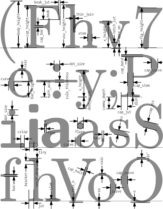 Metafont/TEX font and font software developer, specializing in non-Latin fonts and their integration in TEX. Ran
  At ESAD in Amiens, France, Ying Tong Tan created the graduation typeface family Graye (2019) and writes: Graye (Gray + Grave) is a concise family inspired by carved inscriptions which shares a cohesive gray value across its styles. It aims to be compact yet eclectic, catering towards the design of simple characteristic layouts. Its sans, serif and italic variants are all derived from different origins and differ in their skeleton structures. [
 Bordeaux, France-based designer of Architectural Ground Plan (2015, a typeface based on architectural drawings), Alphabet Modulaire (2015, based on intersections of circles) and the beautiful geometric experimental Alphabet Cyrillique (2014).
  During his studies at E-Artsup in Nantes, France, Yoann Rapinel designed a modular typeface for Théâtre de La Colline (2013-2014). [
 Born in France in 1985, Yohanna-My Nguyen is a graduate of the
  Strasbourg and now Metz, France-based creator of
 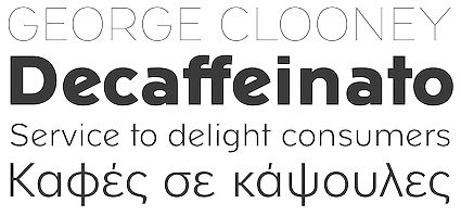 ZeCraft (Clamart, France) was founded by Jean-François Porchez as a vehicle for bespoke typefaces. An outgrowth of Typofonderie Porchez, it has created fonts for Arjowiggins, the Baltimore Sun, Beyoncé Knowles, Le Monde, Louis Vuitton, Public Transport in Paris (RATP) and Yves Saint Laurent Beauté. Some samples:
  Zim&Zou is a French graphic design studio based in Nancy, France. The team is composed of graphic designers Lucie Thomas and Thibault Zimmermann.
  Chinese designer in Paris who created the creamy display typeface Extravertis (or Extravertie) (2015). [