TYPE DESIGN INFORMATION PAGE last updated on Wed May 6 16:03:34 EDT 2026
FONT RECOGNITION VIA FONT MOOSE

|
|
|
|
|
David and Goliath | ||
|
|
|
|
SWITCH TO INDEX FILE
Twentieth Century Fox, through its lawyers, Dennis L. Wilson Keats McFarland&Wilson LLP (Beverly Hills) was harassing several font enthusiasts regarding the posting of "Buffy", Graham Meade's font. See also here. If you check on google, you will find hundreds of similar threatening letters. [Google] [More] ⦿ | |
2-free.net
| I do not know why I even bother. This site is like many others---a gathering place for parasites. Advertised as a free font site, most clicks will take you right away to Monotype Imaging (fonts.com), without any warning. Can someome explain the connection between the name "2-free.net" and Monotype please? Most other stuff you click on is commercial as well. Do not waste your time here. And *please*, Monotype, stop this deceptive advertising---it borders on the criminal. Another sub-link. [Google] [More] ⦿ |
Another *$#@!*& collection of fonts, offered by Manay Software. Their web page is tricky: first fill out some form, giving away all your private details, because the CD is "free". Then click "continue" and learn that it is not so free after all. Only, too late--you have already given away your information. This scam should be prosecuted in some country. Luckily, some time between 2005 and 2012, Manay's link disappeared. [Google] [More] ⦿ | |
Richard Kinch discusses the ruling in 1988 of the US Copyright Office. From the Federal Register, Vol 53, No 189, Thursday, September 29, 1988: "The purpose of this notice is to inform the public that the Copyright Office has decided that digitized representations of typeface designs are not registrable under the Copyright Act because they do not constitute original works of authorship. The digitized representations of typefaces are neither original computer programs (as defined in 17 USC 101), nor original databases, nor any other original work of authorship. Registration will be made for original computer programs written to control the generic digitization process, but registration will not be made for the data that merely represents an electronic depiction of a particular typeface or individual letterforms. If this master computer program includes data that fixes or depicts a particular typeface, typefont, or letterform, the registration application must disclaim copyright in that uncopyrightable data." [Google] [More] ⦿ | |
Abattis
|
Dave dreams of a free culture of visual communication around the world, so he decided to free fonts. His Masters Thesis written in 2008 at the University of Reading is entitled The Free Font Movement. In 2009, for his MA work at Reading, he designed Cantarell, a free humanist sans family, done together with Jakub Steiner, free at CTAN, Github and Open Font Library. OFL page. Cantarell was there at the launch of Google Fonts and has become widespread. In 2010 it was selected as the default User Interface font for GNOME 3. Petra Sans (2017) is a further development of Cantarell by Cristiano Sobral. Irene Vlachou added Greek support for Cantarell in 2018. The current state of Cantarell as reported on Github: After the GNOME project adopted the typeface in November 2010, minor modifications and slight expansions were made to it over the years. Pooja Saxena initially worked on the typeface as a participant of the GNOME outreach program and later developed her own Devanagari typeface Cambay, which included a redesigned Latin version of Cantarell. It was backported to the GNOME branch of Cantarell by Nikolaus Waxweiler, who also performed other janitorial tasks on it. The overall quality of the design was however far from good, given that the regular and bold face were worked on seperately and without consistency and had low quality outlines, and the oblique variants were simply slanted uprights without much correction. The GNOME design team also requested lighter weights. Up to this point, the work on Cantarell was mainly done with libre tools such as FontForge. Given the decaying state of FontForge (arcane user interface, heaps of quirky and buggy behavior) and the very early development status of alternatives such as TruFont, Nikolaus Waxweiler started redrawing Cantarell in the proprietary and Mac-only Glyphs.app under mentorship from Jacques Le Bailly ("Baron von Fonthausen"). Later, Alexei Vanyashin and Eben Sorkin reviewed the design. Finally, in 2009 or 2010, he started work on the Google Font Directory. Dave works as a typographic consultant to the Google Fonts project and gives financial support to libre type projects including FontForge, Glyphr Studio and Metapolator. Klingspor link. Kernest link. Google Plus link. Font Squirrel link.. [Google] [More] ⦿ |
Abelardo Gonzalez is the New Hampshire-based dyslexic creator of Open Dyslexic (2011), a free font specially designed for dyslexia, developed on the basis of Bitstream Vera Sans. The trick he used, a thickening of the bottoms of the characters, had been used earlier by Dutch designer Christian Boer in a font called Dyslexie, which sells for $69 $USD per single-use license. Boer did not like the fact that Gonzalez's font was cheaper. Boer sent a cease-and-desist letter, even though the two fonts in question are quite dissimilar. Quoting Abelardo's reaction: Legal threats are not awesome. And making threats of violence against others to prevent competition is not very nice. It's really just preventing others from filling a gap in the market. And, if his work is really high quality work, he shouldn't have to resort to threatening me to succeed. He would succeed without them. I don't like seeing legal threats happen to others, and I really, really did not like it happening to me. His demands were also unreasonable. The end result? Abelardo's typeface is now free, and the dyslexic community has a great free font for its own use. [Google] [More] ⦿ | |
Adam Twardoch
| |
Paul King argued in 2002 why the patent of Adobe Minion (Slimbach, Adobe, 1993) is invalid. The link died. [Google] [More] ⦿ | |
Adobe is asking people to snitch on each other, and report pirates. There are many things wrong with this: Adobe should pay their own inspectors, of course. Furthermore, their licensing page starts with "Fonts are software, too. In fact, each font is a short software program. Fonts are protected under intellectual property law and are subject to the same legal usage restrictions as other software." The correct statement should be that some fonts are software (type 3 fonts, for example, are PostScript programs). Most fonts (type 1, e.g.) are merely tables of data. No programming can be done with them. One can only change numbers and names. In this sense, fonts are data files. The reason Adobe starts its page with this (false) sentence is that this is the heart of the matter, and they know it. If people read it often enough, they will believe it. [Google] [More] ⦿ | |
Reported by Seth Noble in July 2003 under the title "Adobe Store Security Breach": "A few months ago I purchased Adobe Acrobat from the Adobe online store. As usual, I created a custom email alias for the transaction and used a credit card with a low limit that I only use for Internet purchases. About a month ago the Adobe only email address started receiving spam of the worst "herbal viagra" or "get a better job" variety. Since the only time that email address has ever been used was in that one purchase from the Adobe store, I reported this as a security breach via "Report security vulnerabilities or incidents." I have not received any response from Adobe, but I have gotten more spam.Disabling the email address is easy enough for me, but I do wonder if whoever extracted it from my transaction also got my credit card number. I will be watching my statements closely and I won't be doing any more business with the Adobe store." [Google] [More] ⦿ | |
Adobe is sued by Agfa/Monotype in 2002 on the basis of the DMCA (the Digital Millenium Copyright Act). Adobe has been licensed to sell ITC and Monotype fonts, and claimed the right to permit its customers to embed those fonts in electronic documents such as its own Acrobat. Agfa/Monotype does not want that embedding. There could be many results of this case that may change the landscape: (1) ITC and Monotype fonts might disappear from the Adobe collection, as the Berthold fonts did a few years ago, and that would leave them just with a bare-boned Slimbach-Twombly-Stone based collection. (2) If the suit is pushed to the limit, the DMCA may be declared unconstitutional (as it should, by the way). Since I side against that repressive DMCA, I hope that Adobe wins this one. The irony, of course, is that Adobe itself has used the DMCA to jail Russian programmer and Ph.D. student Dmitry Sklyarov for selling software in Russia to disable Adobe's eBook protection. [Google] [More] ⦿ | |
Heidelberger Maschinen (which owns (?) Linotype) sues Adobe. [Google] [More] ⦿ | |
In its 2007 quarterly holdings report, Monotype (Linotype) states that it was sued by Adobe. I quote: On October 30, 2006, Adobe Systems filed an action in the United States District Court of the Northern District of California against Linotype alleging that Linotype breached its obligations under agreements between Linotype and Adobe by failing to pay all royalties due under those agreements, submitting inaccurate royalty reports, and using the fonts licensed under those agreements improperly and without authorization. Adobe requests unspecified money damages, a declaratory judgment, costs and attorneys fees. On March 2, 2007, the court entered an order staying the action. The parties have moved jointly to extend the existing stay until November 15, 2007. We intend to vigorously contest the action. Monotype realizes though that it can't live without Adobe: f Hewlett-Packard or Adobe were to discontinue their use of our text imaging solutions in their products, our business could be materially and adversely affected. Because of their market position as industry leaders, the incorporation by Hewlett-Packard, or HP, of our text imaging solutions in its laser printers and the incorporation of our text imaging solutions by Adobe Systems, or Adobe, in its PostScript product promote widespread adoption of our technologies by manufacturers seeking to maintain compatibility with HP and Adobe. If HP or Adobe were to stop using our text imaging solutions in their products, the market acceptance of our technologies by other CE device manufacturers would be materially and adversely affected, and this would in turn adversely affect our revenue. So, Monotype finds itself in a tough position. As a minimum, they should pay Adobe all due royalties on fonts and become good corporate citizens. [Google] [More] ⦿ | |
A discussion on the Type Design list and the Typophiles regarding Adobe Trajan (by Carl Twombly) and Father Edward M. Catich (d. 1979), of St. Ambrose University in Davenport, Iowa, who created many of the forms and did much of the research on which Trajan was presumably based. [Google] [More] ⦿ | |
Adobe is taking legal action against Agfa over Adobe's right to use certain Agfa-owned fonts in its Acrobat electronic-document software. Agfa had threatened to pursue its rights to the fonts under the Digital Millennium Copyright Act (DMCA). Adobe claims its licensing agreement supersedes the DMCA. Document Font Embedding states: There has only been one case that has been brought to court which tested the usage of these embed flags. It was a case that Agfa Monotype brought against Adobe Systems for the software that Adobe produced which did not respect these embed flags. The court noted that embedding bits do not effectively control access to a protected work. Court notes. My own take: Adobe ignored Agfa's embedding flags---fair enough. But then Adobe loses the moral right to go after anyone who tampers or ignores Adobe's own embedding flags on any of their products. They have to choose one side of the track. [Google] [More] ⦿ | |
Bill Troop submitted a typeface he was working on to the Type Directors club type competition, and gets the boot from Adobe for breach of contract. [Google] [More] ⦿ | |
February 1998 ruling in the case of Adobe versus Southern Software Inc, Paul King's company. Adobe and The Learning Company (TLC, formerly SoftKey) announced a settlement in Adobe's lawsuit. Adobe had in fact sued TLC for infringement of software copyright and design patent related to TLC's licensing of font software from Southern Software (SSi). TLC settled for 2 million US dollars, plus the withdrawal of the company's font CDs (1555, 3003 and two other series). Same text at AMSYS Hot News. Wired News. Link at Emigre. Adobe's take on the matter. Note that "the court grants Adobe's motion for summary judgment on its claim of copyright infringement of its Utopia software program," but "denies Adobe's motion for summary judgment on the patent claims". Ian N. Feinberg's interpretation of the result. [Google] [More] ⦿ | |
A sad story of how Adobe misled the world about the origins of Robert Slimbach's Cronos family, which was modeled after Kuester's Today Sans Serif, available from Mannesmann-Scangraphic. [Google] [More] ⦿ | |
Adobe lists those fonts in its library (Font Folio) that can be fully embedded ("editable embedding") and those that are for preview and print only. The latter are basically all ITC, Monotype/Agfa and Linotype typefaces in their collection. It is interesting that all their fonts came originally without embedding restrictions. Then Adobe was sued by Agfa about this, and while I do not know the outcome of this case, it is clear that Adobe conceded a lot, as it now has to sell its Font Folio with more restrictive embedding conditions. And, ironically, it has to charge its customers some money for this "upgrade". If companies and art directors will have to keep "license permission lists", the convenience of font libraries is lost. The embedding hoopla is what the companies asked for: embedding information can be used (and set) in truetype and OpenType, but not in type 1 (there would have been no reason to sue if the Font Folio had remained a type 1 collection!), hence the push to move away from the "too convenient" type 1 format. Together with digital signatures in fonts, and the oppressive DMCA (which Adobe used to have a Russian computer scientist jailed!), welcome to the era of comfortable typography, which is going the way of comfortable air travel. Adobe pushed for OpenType, and will pay dearly for that short-sighted decision. I say, hurrah to Agfa for rubbing Adobe's nose in its own dirt. [Google] [More] ⦿ | |
[Text written in 2003] I am getting more and more upset with deception in corporations, and although I have pointed this major Agfa deception out earlier, I will repeat it here. Go, for example, to Fonts-Free.Com, which sports the title "Fonts Free Font List". You would think that this is a free font archive. Now click on the item "Cabarga Cursiva", and you end up here, where it says "Click Here to Download Cabarga Cursiva". Then see yourself being airlifted to Agfa's commercial site, where there is no download, and certainly not a free one. It gets even better: just do a search on google for "Maranallo font" (Maranallo was made by Graham Meade) and note the top ten hit page http://www.fonts-free.com/font/maranallo-italic-regular-win.html: however, this leads nowhere, as Maranallo is not even a subpage on the site. Somehow, Fonts-free (and possibly Agfa) managed to attract google hits to their site by using font names of designers that have nothing to do with Fonts-free. [Graham is rightly upset.] And how about free-font-download.com? You can be lulled into believing that this is a free font download site, but oh oh, clicking the download button takes you once again to Agfa, where you can buy the critter. In an era when every major corporation is fraudulent, presidents and prime ministers lie to wage war, and corruption pollutes the highest offices, the only thing we can do is fight it all the way. [Google] [More] ⦿ | |
Alex Corjon
| |
Quoting from the comp.fonts FAQ by Norman Walsh, which in turn was based on an article by Charles Bigelow: "As a few examples of registered typeface trademarks, there are Times Roman (U.S. registration 417,439, October 30, 1945 to Eltra Corporation, now part of Allied); Helvetica (U.S. registration 825,989, March 21, 1967, also to Eltra-Allied), and Lucida (U.S. reg. 1,314,574 to Bigelow&Holmes). Most countries offer trademark registration and protection, and it is common for a typeface name to be registered in many countries. In some cases the registrant may be different than the originator. For example, The Times New Roman (Times Roman) was originally produced by the English Monotype Corporation. In England and Europe, most typographers consider the design to belong to Monotype, but the trademark was registered by Linotype (Eltra-Allied) in the U.S., as noted above." [Google] [More] ⦿ | |
A manifesto by Alphabettes dated June 14, 2020 that was hotly debated on-line. Published in the wake of George Floyd's brutal murder and the failure of the orange presdident to condemn racism, it is a call to action. Their recommendations include the condemnation of racism, the need to diversify educators, students, and curricula, and two other items that caught some attention. They argue that we need to stop using the term "non-Latin": It is exclusionary, and loaded with bias. The single item that drew most in most reactions was this: We need to discontinue the practice of designing for scripts we did not grow up reading and writing for custom/client projects. Somehow, the last point seems to suggest to go back to putting people in labeled boxes, where instead, we should strive for an equal world without borders and passports. Additional responses by Nicole Dotin, Behdad Esfahbod and Tanya George are noteworthy. Alphabettes is a group of about 250 women in type design, started through the joint effort of Indra Kupferschmid and Amy Papaelias in 2015. [Google] [More] ⦿ | |
Additional revivals: Yellow submarine (1995, unknown designer), Amelia (Tilde), Amber (2019, Softmaker). [Google] [MyFonts] [More] ⦿ | |
Quote: "... If this master computer program includes data that fixes or depicts a particular typeface, typefont, or letterform, the registration application must disclaim copyright in that uncopyrightable data. To be registerable and copyrightable, a work must constitute an original work of authorship. 17 U.S.C. 102. Useful articles are not protected except to the extent the articles contain artistic features capable of existing separately and independently of the overall utilitarian shape. Variations of typographic ornamentation [or] "mere lettering" are not copyrightable. 37 CFR 202.1(a)." [Google] [More] ⦿ | |
An open letter to John Warnock
| On August 28, 2006, ex-Adobe employee and designer Andrei Michael Herasimchuk asks John Warnock to please release a set of core fonts in the public domain. Part of his request: Please consider releasing eight to twelve core fonts into the public domain. The amount of revenue lost from a small core set of fonts surely can't have a significant impact on Adobes bottom line. And the gesture of releasing such a set into the public domain would have many positive ripple effects for years to come. I'm sure many designers have a different list of what those eight might be. I know my list would include the likes of Adobe Caslon Pro, Adobe Jenson Pro, Franklin Gothic, Frutiger, Futura, Gill Sans, Helvetica Neue, Univers and your new namesake, Warnock Pro. I know other designers would have a slightly different list. I'm not sure what is the best way to determine a list of core fonts, but I know I'd be happy if you sat down with the typographers from Adobe and made the decision amongst yourselves which fonts would be deserving of becoming part of the core set for the next millennium. I'm sure I'd agree with whatever Robert Slimbach and the other typographers at Adobe would choose for such a set. By releasing a few core fonts into the public domain, the next step would be get both Steve Jobs and Steve Ballmer to include these fonts in the Mac and Windows operating systems, including them into their next system updates. [Google] [More] ⦿ |
On this tacky site, we find, unbelievably, an ad for Linotype and Letterhead, next to a 2000-fonts-for-9.95USD link (each of its fonts is stolen or renamed from somewhere else). [Google] [More] ⦿ | |
Andrei Michael Herasimchuk
| |
"Paralegal" person at Agfa/Monotype who sends threatening emails to website owners. One such owner had posted a font derived from Times Roman, but it was far from the text font we are used to. Still, reason enough to apply the pressure. On another occasion, in February 2000, she threatened Graham Meade with a lawsuit just because his use of the name ArialicHollow was an infringement of Monotype's trademark. [Google] [More] ⦿ | |
Anonymity and aliases
| [A personal opinion.] The internet is a strange beast---for the first time in history, people all over the world can lead multiple lives under a collection of aliases and identities. In principle, that should be a good thing, and surely, it is a reality we will have to learn to live with. Except... Blogs on news sites, and many of the early type design blogs, are and were battle grounds that showed the ugly side of many posters, the vast majority of whom are using aliases. The sudden opportunity to express opinions to everyone has been misused and abused. On the positive side, the anonymity permits the masses at the bottom of the pile to have a voice and to deliver to those atop atop the same pile a healthy dose of reality pills. They can also insult each other, but what is the point of that, really? The leaders and power brokers can ill afford an alias---imagine the consequences when the alias is uncovered---, and so are largely quiet in the public brawl. In the type design world, we find with some exceptions a similar world. The top of the pile does not use an alias. The top takes responsibility for its actions and published opinions. [There a few exceptions though...] But I cannot understand why the newcomers, the upstart foundries and designers, are so convinced that they can build up a business and a reputation on the basis of an adopted name. I can see the CV now---from 1992 until 1997, Cougar71 worked at Design-by-night, and then became art director and chief type designer at MammaMia. For some reason, Cougar71 did not make it to Adobe, and her designs did not win at the last TDC competition. I wonder why. But why do I care? It's a struggle to climb the ladder in the world, so this is yet another mechanism to detect weaknesses. It becomes a problem when Cougar71 or TRikki_D email me with a font question---I receive about 20 of those each day. What has happened is that the internet has actually changed the perception of an entire generation---it can live and function under the assumed names. To them, it is perfectly acceptable to operate in this manner. And what are we to do with fonts designed by these people? Are we wading into a new legal morass? The next couple of decades will surely have a few surprises for all of us. [Google] [More] ⦿ |
The Digital Millennium Copyright Act is a war on education, and will ultimately mean a loss of freedom for everyone. Read here why. [Google] [More] ⦿ | |
Some foundries have started putting codes in their type 1 fonts that allow them to trace back any font to an initial purchase. For example, the Agfa vendor Professionalfonts.com has this to say: "Each font downloaded from Professional Fonts is encoded with a unique transaction identifier. This makes it possible for us to track illegally distributed fonts back to the original purchaser. This anti-piracy feature does not violate your privacy in any way, only our database can relate the embedded code to a specific purchase. Do not redistribute the fonts you purchase from Professional Fonts, we will pursue copyright violaors." So, here is what one could do with a type one font "protected" in this manner: install the t1utils package, and look for t1disasm. Applying t1disasm yields an ascii file. Look for "currentfile eexec", and check the next few lines. All those that start with %, just following the eexec line can be safely removed: they are comments, and contain the juicy info alluded to above. Then apply t1asm to reassemble the font. Of course, disassembling fonts is considered by some to be illegal, so please ignore what I just said---it is all nonsense. But then, didn't Professionalfonts.com have to disassemble the fonts to put that information in them in the first place? [Google] [More] ⦿ | |
Reporting on a legal letter I received for marketing a font called Marsek. A Google search quickly reveals that I am not marketing any fonts, that I am in general not related to any of the designers on my site and that the real designer, E.R. Florendia, is based in Blitar, Indonesia. So, poor research on the part of the lawyers representing their client. Somehow, the world should know about the constant harrassment people face from big corporations. I can only imagine the wars companies wage between themselves. Anyway, under the alias Mocosans, Florendia created a typeface called Marsek in 2018 and offered it for free download on some sites, and for a small fee on other sites. It appears to be made based on the six letters of the logo of the Maersk company---a logo designed in June 1972 in Denmark by Acton Bjørn. Maersk was not happy about that. And then, on March 11, 2022, I received a legal letter. [Google] [More] ⦿ | |
Replay of an exchange on comp.fonts from May 2, 1999, regarding Emigre's methods. The italic text is what is commented on by Apostrophe, and the non-italic text is his. Here we go. [Frank Werner]: You surely had this discussion here before, but forgive me, I'm new here. So what do you mean they have no fonts to protect? If Zuzana Licko (IMHO one of the greatest type designers of our times) decides to sell her fonts, what's wrong with that? You don't have to buy them if you don't like them. And if Zuzana and Rudy Vanderlans tell Tim to protect their copyrights, what's your problem? My problem is Starback's methods. My problem is Emigre's sky-high pricing and ruthlessness. Of course you don't think that I care much for the designers, but that's just misinformation on your part since you just got here and don't know much about me or the way things happen in this group. Tell me, Frank: how much do you think Emigre pays the designers from the sale of their fonts? And tell me, Frank: do you like the font policing templates that you saw on Starback's page? [Frank Werner: I admit font copyrights are treated a little different this side of the pond but I think stealing is still stealing or how do you call it when you put some fonts (which aren't yours) on your website and do nothing more than calling them Jungle Jane or so? Personal revenge? It seems that not many people understood what I did. My point with those fonts was that nobody can do anything about fonts being posted. Not legally, anyway. Did you check those fonts yourself?? Are you absolutely sure that those fonts were exact replicas and not knockoffs or clones like ones legally done on a regular basis by WSI and Brendel and Softmaker and URW and Bitstream and Adobe and oh so many people out there for the sake of nothing but financial gain?? When Starback contacted Geocities with his highly heated "send me his contact info ASAP" demand, was he absolutely sure that the fonts on TypeWrong were Emigre's?? He sure wasn't, because there were some clones of Emigre fonts that were there that he didn't even notice, with GIFs as big as his head. All these so-called "foundries" out there have so many clones/knockoffs it's incredible. Of Emigre fonts and everyone else's. But what does Starback elect to do instead of going after those? Of course, go after the ones who are not even benefitting from cloning the fonts. Doesn't that strike you as fundamentally wonky? Don't you think that the "real" cloners who want to make money from their clones are the ones with the restitution that Starback and his likes seek? Do you think accusing people of being thieves just because they ask about a font is even civilly acceptable? I think you feel like Typography's Robin Hood but I guess EMIGRE is not the Sheriff Of Nottingham. You just seem to attack individuals all the time. you never said a single word that honored the designers or if you consider their fonts unique. And they must be great or why do all the people always want their fonts (for free)? I've said many words about the designers. Go to www.dejanews.com and run a search on Apostrophe (') and read up. The designers are not the ones playing cops and robbers. Most designers don't give a damn. Many designers give out their fonts and are honoured that their fonts are being collected. On your other point here, some Emigre fonts are good, but not great by a mile. People want their fonts mostly because of Starback's methodology. Trying to control a public medium causes this sort of backlash. Seems that Emigre are very short-sighted in their mighty strive for exclusivity. First they hire a bulldog who knows nothing about their own fonts to police the net for them, then they don't see that the bulldog's methods are not working at all. And in their own little spotlight, their independent designers get a wing and a prayer when their work is sold, and they seem to think that exclusivity is reason enough for robbing people blind. You just seem to deal (see, I didn't say "steal :-) with objects, maybe I would see things different if you showed at least a little bit of typographic passion. EMIGRE took graphic design a big step further and I only wish you'd recognize this instead of being destructive. A step further? How so? I don't think they did. Most of their good designs are by Barnbrook and Deck. Barnbrook and Deck sell their fonts through other companies as well. Not the Emigre ones, of course, because Emigre wants exclusivity. But do you really think that we wouldn't have seen the fonts sold by Emigre if Emigre wasn't around? Think again. If you think that Tarzana and Modula and Hypnopaedia are the best fonts in the world, then I regret to tell you that your taste is in perils. If Licko and Vanderlans want to sell their fonts for a million bucks, that's their business. But Barnbrook and Deck sell their stuff for much cheaper elsewhere, and Emigre doubling up prices because of exclusivity doesn't say much for humanity in terms of anything other than plain old drooling over the buck and taking advantage of other people's hard work. Do you know the story behind the Mason font, how Mason is not Mason? If not, look it up and see. You ask me to respect the designers, but what about asking Emigre to respect theirs? And proving a point is not being destructive. I've had Starback threatening me with his lawyers forever, but barking remained barking. I received a letter a day for weeks from the guy. Same thing in every one of them: take the fonts down or we'll sue you. Didn't take the fonts down, and they didn't sue me. Instead they contacted Geocities, and Xoom, and Freeservers. Where's the damn lawsuit?? I have lawyers waiting to eat Emigre alive on this one. But no. Emigre, once respected by many people, now are just hollow threats, lies, scare tactics, greed and plastic reality in the eyes of the people because of Starback. It's sad to see you waste your indisputable powers on the wrong side, how about posting the entire SSI archive? I like the side I am on just fine. I didn't take this side just because taking this side was contrary to the norm. For every post like yours I get against me, I get 100 thank you noted from people who support my beliefs and encourage me. The SSI archive has been posted many times when Paul King used to hand around here. You never know. It might get posted again. So keep an eye out. P I didn't experience Rich and Tim's "ways of protecting fonts are questionable. inconsiderate and intellectually insulting". What makes you think so? At least you admitted there must be something like a protection of fonts. And...haha...what did (that nice guy) Ethan Dunham do to be filed under "sheep"? Accusing people of being thieves the first time you meet them is inconsiderate and intellectually insulting. Legal threats that can't be backed up are intellectually insulting. Dunham was a nice guy at one point, and he may still be a nice guy for all I know. But there was a time a few months ago when he was trying to police the web the same way Starback does, with the exact Starback wording and chill. What's a nice guy like Dunham doing acting like that? To his credit, his prices are what should be the norm out there, and I do appreciate his realism about designing for a living. I don't much like the we-support-typeright link he has on his site, but then again, we're not on each other's Christmas list, so no love lost there. ' Maybe I should reconcile with you a little and tell you that I agree with you when it comes to Bruno :-) (But mostly because of his awful English.) [Google] [More] ⦿ | |
April 6, 2000: Apostrophe summarizes the sad state of the type business, and provides further discussion of the Bitstream CD and Cronos vs Today stories. [Google] [More] ⦿ | |
Read about a court case and its resolution involving Apostrophe and about ten foundries. Emigre and PsyOps published a press release, which was later analyzed by Apostrophe himself. Hoefler's version. Court case listed at the Federal Court of Canada. Heated discussion on Typophile Forum. Apostrophe's reply on April 9, 2002. [Google] [More] ⦿ | |
Nancy Hanger reports on the Greenbay CD ROM that is selling the Lab's fonts, even though the Lab's web page states clearly that the fonts are freeware and are not be sold under any circumstances. [Google] [More] ⦿ | |
In a lively discussion in May 2015, Adam Twardoch defends the position that fonts are programs, while Dave Crossland doubts it. The truth is that fonts are not programs. I quote passages from their arguments: Adam Twardoch (MyFonts, ex-FontShop): The general legal assumption (which the other party can challenge, of course) is that digital fonts are computer programs: The type designer uses a font editor to create a computer program, and that process is considered the process of the creation of a work of authorship. The font rasterization engine executes this program snd produces images of characters. Therefore, the digital font is protected just like any other computer program. The digital images the font produces are generally not protected. This method of protection is based on the assumption that the designer places outline points in a creative act and that the individual point placements cannot be automatically inferred from the glyph image. Manually set hinting instructions are slso considered part of the computer program that is protected. In a way, this paradigm of protection assumes that, as a designer, you're using a GUI tool to write a PostScript program by hand. If someone takes your digital outlines and modifies them, the current legal assumption is that it's equivalent to taking the source code of a 3rd party's computer program and modifying it without permission. Computer programs generally enjoy stronger copyright protection than other works, also in Germany. But this paradigm of protection is based on a handful of 20+-years old U.S. court rulings (Adobe vs. SSi), and has not really been verified or challenged in other jurisdiction---so there is just assumption of protection. Dave Crossland (Google): Adam, I know that Adobe folks have been claiming for years and years that "fonts are programs too" but my understanding of the SSI case is that this claim was never substantiated by that court. Indeed, I think its disingenous to claim fonts (by which we assume SFNT fonts) are computer programs. They may contain computer programs - TT hinting instruction rendering programs, and AAT state machine layout programs - but they are mostly data. (I believe the difference is that programs are executed, while data is used as input to a program. In the LISP family of programming languages, program code is written in a way that the output data of a program's function can itself be executed; and compiler programs process code as a data input, translate it from 'source' form to 'object' form, and output a binary file object that can be executed. There are some non-SFNT based formats, like PostScript Type 3 and METAFONT, which are truly programs. But Type 1, CFF and TTF outlines are not executed, they are parsed as input to rendering systems. Since UFO is XML, UFOs are clearly not programs; and even the .fea files inside them are not, because - like HTML and CSS - they contain markup data that is parsed to the OpenType Layout Engine programs like Harfbuzz.) However, what the SSI case did substantiate was why fonts can be claimed to be subject to artistic copyrights: the assumption that the designer places outline points in a creative act and that the individual point placements cannot be automatically inferred from the glyph image But its important to note that typeface designs themselves - glyph images - and not the Bezier points that express them, are not subject to copyright restrictions in the USA, and probably in many other places. And that Ralph, is the core of the dispute about them willfully infringing your copyright. The museum is talking about the typeface design, but you have deduced that their font data is derived from your font data, and is thus a derivative work under copyright, and they need to settle with you pronto. This 'in principle it could have been original' stuff is cute, because indeed they could have made the design that their fonts displays by hiring a type designer to create new font data of that design, and then they would be legally legitimate. But it seems that this is not what they did! And so they have put themselves in jeopardy. This is exactly the error that SSi made with Adobe's fonts in the famous SSi case Adam refers to. However, unlike SSi, it seems that they were an licensee, and thus bound by your EULA contract. This to me seems like your strongest card to play, because if this is the case, the copyright status of fonts and designs is entirely irrelevant. There was a famous Monotype vs ITC lawsuit in the 1990s that turned on such a contractual obligation by Monotype not to copy designs by ITC. (The lawyer Paul Stack led the case for Monotype that they did not copy the designs exactly, and thus were legitimate, and Michael Twyman was a star witness that testified that they were not exact copies.) However, in Germany there may be a 25 year copyright on typeface designs themselves, in addition to the regular artistic copyright term (life+70 years or whatever) on the font data. The reason the case turned on contract and not copyright is because copyright restrictions don't apply to type in the USA at all. [Google] [More] ⦿ | |
Arial: ein Nekrolog
| German article by Ralf Turtschi (Swiss, b. 1955) on the history of Arial from its genesis in 1982 as a Helvetica "clone" to its present status as most-used font. Ralf goes on to warn his readers that Microsoft is repeating history by pushing, very soon, its own Segoe, a Frutiger clone. Notable German quotes in which he performs a damning autopsy on Arial: Die Arial ist weder als Textschrift noch als Headlineschrift zu empfehlen, da fehlt einiges an Klasse. [...] Eine unausgeglichene Laufweite, also die Proportionen und der Abstand zwischen den Zeichen, gibt der Arial einem miserablen Grauwert. Das Verhältnis von schwarzen Linien und weissen Flächen lässt sie plump und charakterlos auf dem Papier kleben. Besonders hässlich sind die angeschrägten Endstriche bei a, e, s und t. Die Proportionen und die Form des t sind eine Zumutung und das a sieht wie nach einem Hagelschlag verformt aus. [...] Die Arial ist lieblos, unausgeglichen und verbeult, sie hat mir noch nie Freude bereitet. About the Segoe drama (Trauerspiel), he writes: Die Geschichte wiederholt sich hier, Die Segoe atmet den Geist der Frutiger von Adrian Frutiger, die sich in den 80er-Jahren zur Alternative der viel benutzten Helvetica anbot. Hier springt Microsoft 20 Jahre zu spät dem vermeintlichen Lifestyle nach, und statt eine eigenständige Schrift zu entwickeln, kupfert die Branchenführerin eine der erfolgreichsten und schönsten Schriften ab. Man könnte ja auch eine bestehende Schrift ordentlich lizenzieren. Ein Trauerspiel. So, why did Microsoft not properly license Frutiger from the man himself? After Adobe had to rip off Frutiger with its Myriad, now Microsoft joins the corporate theft business. Why not reward type designers properly? Fontshop joined Turtschi in his analysis. See also this brilliant piece by Fred Nader from 2003. [Google] [More] ⦿ |
"giving shit away, or having it pirated begats GROWTH in a lot of situations. Software companies like Id and Microsoft grew huge by having their shit pirated. What? stolen means they didn't get paid and it made them bigger? Yes. See, I installed my buddie's copy of Doom2.. and fell in love.. so I bought Quake, Quake2 and will do so again with Quake 3. Same deal with Corel Draw and Photoshop..... I feel that giving students and up and coming artists a "slightly illegal" copy of software or fonts, is actually good for your business. why? Because when they are professionals they will remember that shit, and "dance with the one that brung ya". Why is Photoshop the "big" graphics app when Corel's Photo Paint can hang with it and out do it in many ways for 1/4 or less the price? Loyalty. If Chank's stuff gets in the hands of someone now, they might end up the graphics director for MS, and make him rich... and besides, didn't he do fonts for Pepsico? I am sure they pay VERY well...." [Google] [More] ⦿ | |
Apostrophe laments the little credit art directors get in font design, and cites Sumner Stone, Jeff Level, Alex Kaczun and Albert-Jan Pool as examples. [Google] [More] ⦿ | |
Welcome to the sewer of the internet. For 78USD per year, you can subscribe to this service, which offers lots of font downloads (almost 6000, they claim). Not only are the fonts rather standard, but upon inspection of the fonts (Erik's Hand, Stencil, Snowcaps, HotTamale, etcetera), it is clear that these guys are asking money for access to freeware/shareware fonts made by others! Holy cow! So, I did some digging and learned that ArtToday.com is owned by Zedcor Inc, 5232 E. Pima St. Suite 200C Tucson, AZ 85712. The head parasite seems to be Peter Gariepy, tel: (520) 881-8101 520-881-1841. Gariepy has become rich (at least judging from his hobbies and other information culled from the web), so, as is often the case in this world, the bad guy won. [Google] [More] ⦿ | |
The ATypI list suspends Hrant Papazian from the discussion list. Most list subscribers are up in arms about this. He happens to be the most entertaining, lively and interesting cyber-typographer, and now he has to be muzzled? Adam Twardoch starts a Free Hrant movement. [Google] [More] ⦿ | |
The Code Morale was the reason Peignot set up the ATypI. It states that one of the aims of the Association Typographique Internationale is To fight by all means in its power against unauthorized copying; and to insist on the observance of industrial property laws and copyright legislation, and to uphold among its members the principles of professional ethics expressed in its moral code. [...] Members of the Association Typographique Internationale agree to honour the following Moral Code: Members consider it to be incompatible with their professional ethics to make a reproduction of another member's typeface, whether identical or slightly modified, irrespective of the medium, technique, form or size used. In 1986, Charles Bigelow complained: Members of ATypI agree to abide by a moral code that restricts plagiarism and other forms of depraved behavior (pertaining to typography). These are noble goals, but some members (especially corporate members) of ATypI, confronted with the pressures and opportunities of commercial reality, nevertheless plagiarize typefaces of fellow members, the moral code notwithstanding. Since ATypI is a voluntary organization, there is very little that can be done about most such plagiarism. Some years back, a world-famous type designer resigned from the ATypI Board of Directors in protest over the organization's flaccid attitude toward plagiarists among its ranks. He has since agreed to sit on the board again, but criticism of the organization's inability to prevent type rip-offs by its own members, not to mention by non-members, continues to be heard. Tension mounted during the free-for-all nineties, and finally, in 2004, with corruption at every level of industry and government at its peak, ATypI agrees that "the Moral Code of the Association Typographique Internationale" ("Code Morale") is no longer conforming to the Associations objectives and therefore decides to retire the Code Morale document without replacement. [Google] [More] ⦿ | |
The Association Typographique Internationale was created by Charles Peignot. It is interested in the development and protection of fonts, organizes an annual meeting on typography, and has a large international membership. [Google] [More] ⦿ | |
ATypI is the main international type organization. It has been struggling recently with its goals and mission. Survey taken in 2004 on its goal and usefulness. See also here. Extracts:
| |
The proposed statutes of ATypI in 2011 include the following item: Members consider it to be incompatible with their professional ethics to make a reproduction of another member's typeface, whether identical or slightly modified, irrespective of the medium, technique, form or size used, unless the owner of the typeface has given his written agreement on terms granting a license. If, after a minimum period of fifteen years of the typeface first being offered for sale, the owner refuses to grant a license, members may copy the typeface provided that the unlicensed copy is sold under a name which is in no way connected with the original name. The manufacturer of a copy made under these circumstances must not contravene trade mark rights, industrial property rights, copyrights, laws against unfair competition etc., or private agreements. Finally, a rule that is closer to what has always been practiced by the community. [Google] [More] ⦿ | |
Australian Faces
| Robert Oster (b. Tanunda, Australia, 1959) is the founder of AustralianFaces (est. 1999 in Redfern, with a new headquarters in Melbourne, and now also in Strawberry Hills NSW), and his fonts are copyright "Oopie Family Trust". His commercial fonts include AFF Australian Sans (2000), Batmin, BlackJack, Broad, AFF Bumpy Ride, Copperplate, Outback, Grotesque 9, Evolution A, Evolution B, FAQ, Grace, Old Chicago, Mardigras, One Dollar Font (wow, a competitor for LettError's Federal font), Acid Caps, Jelf Script, Scrunch, Bluegum. He also does custom font work. MyFonts page. The typophiles object: Beauchamp looks surprisingly like the wonderful Mantinia from The Font Bureau, with a badly modified B and G. [...] Deftone is a Larabie font. UntitledAF is Solaris. Old Chicago is just the old Mac system font run through a filter. [Google] [MyFonts] [More] ⦿ |
Autotracing
| The issue of autotracing existing fonts and creating new fonts in that manner is discussed by the typophiles. This reply by James Montalbano to the person who asked the autotrace question stands out: It's not the lowercase sans serif I or l or i you **** idiot, it's the whole damn thing. Take your **** auto-traced I or l or i and make a whole font from it. Make it new, make it fresh. You really have to auto-trace a simple rectangle. Lame-ass Mother ****? I hate this shit. Mother ****. Gravy sucking pig. [Google] [More] ⦿ |
Linotype family from 2000-2003. The Linotype site says: "Basic Commercial is a font based off of historical designs from the hot metal typeface era that began appearing around the year 1900. [...] Basic Commercial was distributed for many years in the United States under the name Standard Series. The typeface worked its way into many aspects of daily life and culture; for instance, it became the typeface chosen for use in the New York City subway systems signage." Linotype says at MyFonts that the typeface was designed by Morris Fuller Benton ca. 1900 (not true). What Linotype never states is that Basic Commercial is equal to Akzidenz Grotesk--I mean--electronically identical to Adobe's Akzidenz Grotesk except for the copyright/trademark notices and the name (they should do that). This was detected by Ulrich Stiehl and is documented in this file. Akzidenz Grotesk started out as a Berthold family, which Linotype distributed under license for about 20 years. Bruno Steinert finally explains on behalf of Linotype: Since the 1950ies, Linotype sold its own design adaptions of some weights of Akzidenz Grotesk as matrices for Linotype typesetting machines. Over the years, Linotype created phototypesetting versions and digital fonts of these typefaces. In 1989, Adobe licensed Linotype's version of Akzidenz Grotesk from Linotype as Type 1 fonts. In 1990, Adobe licensed, together with more H. Berthold AG fonts, Berthold Akzidenz Grotesk, from H. Berthold AG. H. Berthold AG went bankrupt in 1993 and ceased to exist forever. In 2000, Berthold Types Ltd. obtained trademark registration for Akzidenz Grotesk. The same year, Linotype started to sell Basic Commercial. Berthold Akzidenz Grotesk is not identical to Basic Commercial. But if one compares older Linotype outline data with newer Linotype outline data, there might be very close similarities. Morris Fuller Benton has nothing to do with Basic Commercial or Akzidenz Grotesk. Akzidenz-Grotesk is a registered trademark of Berthold Types Limited. Linotype formerly offered typeface fonts under the name "Akzidenz-Grotesk" under license from H. Berthold AG. Linotype discontinued sale of those typeface fonts in approximately 2000. "Akzidenz-Grotesk" is offered by Berthold Types Limited of Chicago, Illinois. "Basic Commercial" is in the style of H. Berthold A.G.'s "Akzidenz-Grotesk" typeface fonts. Case closed. [Google] [More] ⦿ | |
A design of Lucian Bernhard from 1929. Elizabeth Bond wrote me this from California, when she wanted to buy a copy of Bernhard Fashion: There are four vendors on MyFonts for Bernhard Fashion! They are: Elsner+Flake, Bitstream, Linotype, and URW++. Three of them (not URW++) credit the design to Bernhard in 1929. But two of them (E&F and Linotype) claim ownership of the design! The other two (including URW++) say that Kingsley/ATF own it, ATF being the company that employed Bernhard. I determined that the character maps differ between the offerings, some considerably. Linotype's doesn't even have an @-sign or currency marks, which seem fairly necessary in today's world, even in a Display/headline font. Bitstream's @-sign is not in character with the original font at all, just plopped in from another font. The other two are complete, with appropriate (if different) choices in the modern additions. I'm not sure how an ethical choice can be made, when the type-style pre-dates computers and even the paper-trail ownership has changed hands over the years! [...] I applaud you (and McGill) for the candid (perhaps even brash?) treatment of the cloners and out-right thieves in the industry... but what can be expected of a business whose most powerful player is Bill Gates of Microsoft, with *his* history? This email summarizes the legal and ethical mess we are in with companies making up their own rules as they go. [Google] [More] ⦿ | |
Berthold Standard BQ was explained by Fred Nader as follows, ca. 2005: The latest example of the Hunts' attitude towards their customer base and their intelligence is in the so called 'new' release of the Standard set. To call this a 'new' release and to issue it and charge prior customers money for it is insulting at best, not to mention a knockoff of their own library. Standard was the name Berthold used for Akzidenz Grotesk when it was marketed as metal type in english speaking countries. There were no other differences. In this case, they have added a Euro symbol and changed the name, so that users will hopefully be lulled into paying $249 for what amounts to an added glyph that every other major foundry offers at no charge. For some, this is an indicator of how low the new Berthold will stoop for a dollar. This opinion misses the point though that, in fact, Berthold Standard BQ is actually a rename of a digitized form of a low point size Helvetica previously named Helvetica BQ. Update: Each style now sells for 350 dollars, or 3500 dollars for the ten-weight collection. Credit for some images below: Danielle West. [Google] [More] ⦿ | |
Berthold Types Limited
| The link recalls the history of this new company owned by the Hunts in Chicago. They bought the trademarks and some outlines from the bankrupt Berthold Types GmbH, but are not the successors of that famous German company. Since its creation, Berthold Types Limited has been sending (frivolous) legal letters usually related to alleged trademark violations. The typophiles discuss the situation, which turns a lot around the issue of Berthold not paying the original designers, such as Albert Boton. Erik Spiekermann is particularly (and rightfully) upset about the situation. A partial list of the "victims":
Things unraveled in 2008: Berthold fonts were possibly going to be sold by Linotype, which turned out not be the case. The news of Melissa's possible departure from the font scene in 2008 prompted this response from Erik Spiekermann: As quite a few people here could testify, Melissa Hunt was very much a part of this business. I certainly have been at the receiving end of many documents written on behalf of her husband. I certainly hope she has quit the type business for good, as that may put an end to a lot of arbitrary legal actions that have cost a lot of us time, money and sleep. Harvey Hunt was born in 1949 in Lincoln, UK. He died in Jacksonville, FL, in 2022. His wife Melissa, an attorney, is still involved in type. Ironically, Hunt's obituary mentions that Harvey will be remembered in the type industry as a maverick who fought to build a market for independent digital type, despite stiff competition and rampant online piracy. [Google] [More] ⦿ |
Nick Curtis was sued by Berthold over the use of the nouns City and Boulevard in some of his typefaces. He explains: Several years back, BertholdType chose to sue me because I used the words Boulevard and City in some of my typeface names. Had they simply made a polite request, I would have happily complied. Instead, a game of legal gotcha ensued, which generated several reams of paper, with rebuttals and amended complaints and amended rebuttals, and so on. However, a lot of legal work is research, and BertholdType--rather foolishly--chose to sue an English major with an IQ that places him in the top .001% of the population (okay: I'm too smart for my own good). When the second rebuttal essentially nailed Berthold's lawyers for fifteen counts of Fraud by Omission under the U.S. Code, the charm offensive--a.k.a., Melissa Hunt--suggested that we settle the matter amicably--in other words, in precisely the same manner as we would have if they had made a polite request in the first place. Go figure. [Google] [More] ⦿ | |
Bertholdgate I: Die selbsternannten Rechtsnachfolger der Aktiengesellschaft H. Berthold AG |
|
Before its bankruptcy in 1993, H. Berthold AG had a total of 823 employees, whereas the annual sales dropped from 220 million Deutsch Mark in 1990 down to 149 million DM in 1991, so that the salaries of the employees could not be paid. The Hunts, who own Berthold Types Limited in Chicago, now also called Berthold Direct Corp., claim to have become the legal successor of H. Berthold AG. They would have had to pay these 800+ employees, and settle the demands of the creditors. It is unlikely that Berthold Types did that---they are not the legal successors. For German readers, the economic data on H. Berthold AG are here. Compare this with the economic data of Linotype, which also went through bankruptcy: in that case, Heidelberger Druckmaschinen AG waited until the stock had declined so much that they could buy all the shares for 180 million Deutsch Mark. Linotype thus has a legal successor. [Google] [More] ⦿ | |
Popelka is a typeface designed by Andreas Stötzner in 2016. At the end of that year, MyFonts, which was selling Popelka for Andreas, removed it from their line-up. Andreas writes: On request by Berthold Direct Corp. (Chicago) MyFonts has excluded my font Popelka from sales on Dec. 30, 2016. Berthold's claim is, according to J. Collins of MyFonts, "that the name sounds confusingly similar to Berthold's trademark for Poppl". I regard this action being unjust and harassing and I have informed MyFonts that I demand my font being put back alive to sales. As it turns out, Berthold seems to have conducted more such affairs over the past years against other parties. If you're a type designer or company having faced such intimidating behaviour, please report your story here and now. It is important to stop this kind of aggression in the type industry. It is interesting to note that Popelka does not at all look like Poppl, and that Adobe's Poplar, which also sounds similar, remains in MyFonts' catalog (probably because it is an Adobe font---size matters). [Google] [More] ⦿ | |
Fantastic article by Charles Bigelow on typeface protection. [Google] [More] ⦿ | |
Bill Davis graduated from the Rochester Institute of Technology with a Printing Management degree. He was Vice President for Marketing at Agfa Monotype in 2003, and quit around early 2004. In 2004, he co-founded Ascender Corporation, where he was VP Business Development. Wnen Ascender was bought by Monotype, Bill made the jump to Monotype. At ATypI 2003 in Vancouver, his talk was entitled Steal this font: Fonts are at risk now more than ever before compared to traditional forms of software piracy. Type designers may not understand all the new software applications and technologies that allow End Users to distribute fonts with their documents on the Internet. What can type designers and font vendors do to address the threats and opportunities of these new technologies? This presentation will review the role of the EULA (End User License Agreement) and a variety of software applications and formats such as PDF, Flash and SVG. This abstract is subversive, starting with the innocent-sounding phrase "software piracy", as if fonts are software---they are not: they are just tables of data representing geometric forms. When I vectorize a Picasso painting, the data are not a program! This misreprentation is typical of Agfa and now Monotype. On various Agfa web sites (some of which pretended to be something else), the word "download" was used to invite friendly clickers, only to discover that in Agfa speak, "download" means "buy". It is ironic, then, that this deceptive marketing company joined forces in 2003 with the heavy-handed FAST (Federation Against Software Theft), as if "theft" is bad and "misleading" is not. On Typographica, Bill Davis says: We have worked for some time now to get FAST to recognize fonts in their software compliance programs. Fonts are software too. Almost every message of his pumps out this fiction, since, clearly, if fonts are not software, then there is no software copyright protection. On his web site, he is proud to be a policeman: Bill led the company's efforts to develop custom software to track unauthorized use of its trademarks and copyrights on the Internet, and to evolve their font software licenses to target the needs of e-books, web servers and other applications. Speaker at ATypI 2013 in Amsterdam: Enhanced Web Typography with OpenType fonts. [Google] [MyFonts] [More] ⦿ | |
He worked at SWFTE in Hockessin, Delaware. His CV states: "Cofounder and Vice President of Research and Development. Created Glyphix font software, the first ever on-the-fly font generator for DOS based systems, which sold over 50,000 copies. Executed 10 different product releases and library of 100 scalable fonts. SWFTE has since been bought by Expert Software." [Google] [More] ⦿ | |
Bill Dettering
| |
Bill Troop
| |
Bill Troop
| |
About restrictions placed by foundries on their fonts and what you can and cannot do with them, including interpolations and so on: "Isn't this perverse? Nobody's selling any fonts. So now designers are spending all their time trying to figure out how to get people not to use the fonts they aren't selling anyway. Perhaps it would be better to look at why some fonts make money for their designers and don't get pirated. Let me take as an instance Carter's Caledonia for Time Magazine. This font has never been pirated, except for some almost worthless pdf extractions. The same is true for most of Carter's other magazine fonts. Nobody has copies, other than the magazines, the designer, and a very few copies Carter has let some trusted associates see. How is it that nobody at the magazines has pirated these most interesting fonts? I imagine (though I don't know for sure, and I think I will check into this further) that the contract terms impose a stiff penalty for any release of the font. Carter can, I presume, impose these terms, because his work is considered valuable enough to make these terms seem viable and sensible. The work is considered worth paying quite a lot for, and worth spending a considerable amount of time and technology to protect. And all of this occurs without the fonts being anything other than normal Mac Postscript fonts. The rest of us, sitting at home in splendid isolation, should be focussing on learning how to make work of that quality, if we want any material reward for our labors. Otherwise we should treat what we are doing as a challenging and delightful hobby." [Google] [More] ⦿ | |
| |
Bitstream wrote on the origins of the collection: The Bitstream Typeface Library was developed under the supervision of Matthew Carter, the creator of such esteemed typefaces as ITC Galliard; Snell, Bitstream Charter and Swiss Compressed. Carter, who also serves as Bitstream's Senior Vice President of Design, set uncommonly high standards for the company's highly-skilled design staff. Working from the earliest-generation artwork available, each character of every typeface is hand-digitized on advanced workstations specially programmed by Bitstream's engineers. In building the library, Carter has overseen the licensing of typefaces from such respected international sources as the International Typeface Corporation (ITC), Kingsley-ATF Type Corporation, and Fundicion Tipografica Neufville SA, among others. Bitstream also develops new and original designs. Many countries provide for the legal protection of typeface names only, not the designs themselves. This means that the original names of many typefaces can only be used with a license from the owner. The majority of Bitstream typefaces in this catalog have licensed names (on which royalties are paid), or have historical names that reside in the public domain, or have names to which Bitstream owns the rights. In these cases, the name is used. When the original name is not available for use by Bitstream, an alternative name appears. For example, Swiss 721 is the name that Bitstream uses for its version of the typeface popularly known as Helvetica? Because the original name of that typeface is not widely licensed, there are many offerings of the design with completely different names. It is important to note that the use of an alternative name has no bearing on the inherent quality or authenticity of the typeface design. Bitstream sold a nice 500-font CD for 39 USD around 1996, with all the great text families. This was a fantastic buy, as proved by this quote from John Hudson: I have said it before and I will say it again: I think the development of the original Bitstream library was one of the worst instances of piracy in the history of type, and it has set the tone for the disrespect for type shown today. (A bit of background: Bitstream asked Linotype if they could digitize Linotype's library of fonts. Linotype refused, but Bitstream went ahead anyway.) On this issue, read these pages by Ulrich Stiehl and Typophile. Bitstream was offering a 250-font CD. Type Odyssey Font CD (2001). Bitstream has added Greek, Cyrillic, OldStyle versions to many of its families. New releases in July 2001: Artane Elongated, Cavalero, Drescher Grotesk BT, FM Falling Leaves Moon, FM Rustling Branches Moon, Picayune Intelligence (by Nick Curtis), Raven, Richfont, Rina, Sissy Boy, Stingwire, Tannarin. In November 2001, Serious Magic entered into a long-term agreement to license 25 Bitstream outline fonts for its new visual communication products. Bitstream has been an exemplary corporate citizen, occasionally producing license-free fonts for the masses, such as their Vera collection. Bitstream's own overstated blurb about itself: Bitstream Inc. (NASDAQ: BITS) is a software development company that makes communications compelling. Bitstream enables customers worldwide to render high-quality text, browse the Web on wireless devices, select from the largest collection of fonts online, and customize documents over the Internet. Its core competencies include fonts and font technology, browsing technology, and publishing technology. Finally, together with its spin-off, MyFonts, Bitstream was sold to Monotype Imaging in 2011. Catalog of typefaces [large web page warning]. [Google] [MyFonts] [More] ⦿ | |
Blake Fry studied law at the University of Kansas (BA, 2001) and at Lewis&Clark Law School (JD, 2009). He wrote Why typefaces proliferate without copyright protection. This is a thoroughly interesting paper. The text below are the author's conclusions. This paper has demonstrated how several mechanisms collaborate to create an environment in which an abundance of typefaces are designed, even though typefaces in the United States cannot now, or maybe ever, be copyrighted. Typefaces are functional objects, necessary for literate societies who print words on paper or display them on screens. As such, some typefaces must exist. And as long as some exist, the type design industry will be subject to the mechanisms that allow it to be innovative. Technology is one of those mechanisms. Because different technologies have limitations that affect typefaces, new designs, compensating for the limitations, have to be made when a technology is introduced. New technologies also allow typefaces to have features or benefits that were not previously possible. The market demands, and is willing to pay for, access to these features and benefits. Technology has also lead to the digitization of the type design process. This has caused an explosion in the number of type designers, and typeface designs. Though digitization of the industry has decreased the quality of designs in some cases, it has just as often increased quality. Because the type design industry is relatively small and close-knit, norms within the industry are effective at mitigating plagiarism within it. This phenomenon comports both with general theories of norms, and with observations from other industries in intellectual property law’s open areas that also effectively employ norms to reduce copying. Even when norms fail, typefaces, especially those that require the most time and investment to design, are resistant to plagiarism. Typefaces are also subject to the vagaries of artistic movements and fashion-like cycles. As tastes change, which they do rather quickly, new typefaces have to be made to comport with the new aesthetic. Advertising and the advertising industry is an important cog in this process helping, among other things, to speed the fashion-cycle. Typefaces are also non-rivalrous, almost always existing as digitized computer fonts. They are therefore subject to file-sharing, like any other digital media. However, file-sharing probably has not damaged the type design industry. Among the most likely culprits for the reduction in the price of computer fonts is the practice of bundling computer fonts with operating systems and other software. This is especially true among software geared to graphic design professionals. Adobe, among the largest foundries in the world, primarily creates new typefaces to make its software, which is a much more lucrative business for it, more attractive. Other analyses of industries operating in the open areas of intellectual property law have shown how they, too, can be innovative, creating significant new expressive works. The more interesting question is not how any one industry operates in intellectual property law's open areas, but whether any industry now protected by intellectual property laws would be sufficiently innovative if protection were taken away. The small number of industries that have been examined so far are probably not a large enough sample set from which an answer can be derived. More observations are therefore needed. What might become apparent upon such a cataloging is a general principle. This paper has shown how many mechanisms work together to encourage innovation in the typeface industry. This suggests that other industries could also have several mechanisms that work together, often in unexpected ways that could never be predicted by mere theory, to produce innovation in expressive works without protection from copyright or other intellectual property laws. [Google] [More] ⦿ | |
A recent post on BoingBoing caused a debate about US copyright protection of typefaces. Here are some quotes.
| |
Yahoo basically proposed "the royalty-free, perpetual, irrevocable, non-exclusive and fully sublicensable right and license to use, reproduce, modify, adapt, publish, translate, create derivative works from, distribute, perform and display" any files at their sites. Unbelievable stuff, if you think about it. Greed is the only explanation I have. [Google] [More] ⦿ | |
Under the title NBCUniversal Sued for $3.5 Million Over Font Theft...Again (Exclusive), Eriq Gardner reports on July 19, 2012, on a suit by House Industries, via font lawyer Frank Martinez, of NBC, over the unauthorized use of Chalet on its web sites. Passages of that text: Meet Frank Martinez, a Brooklyn lawyer who has crafted one of the strangest legal practice areas. Some might call him a font troll. On behalf of various font designers, Martinez has previously filed separate multi-million dollar claims against CNBC, Universal Studios, and TNT for allegedly stealing fonts on products ranging from Harry Potter merchandise to Falling Skies screen credits. Martinez is back again with a new one. On Wednesday, client Brand Design Co. filed a $3.5 million claim against NBCU for allegedly breaching copyrighted font software on the its websites. In the past, all of the font theft lawsuits have settled. Martinez has not only come to resolution in claims made against CNBC, Universal Studios, and TNT, but also avoided litigation after sending cease-and-desist letters to other targets, including mega-selling recording acts who allegedly were less-than-careful about crafting the lettering on their album cover art. The deals could mean that Martinez is making multi-million dollar claims but extracting much less via settlement as defendants weigh the cost of litigation versus ponying up a few bucks to make the nuissance go away. But some companies like NBCU keep getting hit again and again in lieu of testing the plaintiff's copyright claims in court. In the latest lawsuit, Brand Design alleges that its records show NBCU subsidiary Oxygen Media purchased a "basic, 36 workstation (users) license to use the Chalet typeface font software." Just a comment here: Fonts are not software, so Brand Design is wrong. I know that some argue that the hinting portion of a truetype or opentype font makes it a program. No computer scientist will support that opinion. I continue with fragments: But the plaintiff says the licensing agreement did not permit the use of copyrighted font software on NBCU's websites. In addition, NBCU is accused of using a free font software conversion utility offered by an organization called Font Squirrel to convert and alter the typeface font into a format suitable so that it could be embedded onto Internet websites. This purportedly violates licensing terms on modification. The complaint says that "approximately 20,000 unauthorized and infringing downloads of plaintiff's copyrighted CHALET typeface font software has occurred via the nbcuni.com website." The $3.5 million damages calculation is the result of multiplying 20,000 by the $175 cost of purchasing the Chalet software. As we've noted before, fonts can't be copyrighted, but software can be. [Google] [More] ⦿ | |
Brendel Informatik GmbH
| Wilhelm Welsch's Cologne-based outfit that sells all the standard fonts, many under new names. Typically about 1DM per font (in packs of 500). Goes also under the name Quick Brown Fox (QBF), and is related to (identical to?) Softmaker. In the seventies, they made some original fonts at Brendel Type Studio such as Diamante and Dragon, but what is the relationship between Brendel Type Studio and Brendel Informatik? Their collection grew and included many semi-clones from major foundries (example: Equipe is like Emigre's Mason, and so forth). In 2000, FontShop sued them for placing 17 of their fonts on their CD, and Brendel lost and had to cough up a lot of money. Mark Johannson explains: The B+P fonts seem to be the earliest and now float freely between Brendel Informatik and Softmaker 's, sometimes renamed, sometimes not. Brendel also did fonts for Serif software (Page Plus, Draw Plus etc.) using the SF suffix. It is not unusual, if you open the SF/Softmaker/Brendel/BP fonts up with a font editor, that you'll find one of the other company's names for it still buried in there in either the TT or T1 ID field!! I'm guessing Softmaker (in Nuremberg) was a software publisher who acquired some type of rights along the lines. They still make software (Softmaker Office is their biggie) and still sell fonts. Brendel still operates out of Cologne and still sells fonts under the "Quick Brown Fox" foundry name. The catalogs between them are pretty identical even down to most font names. [Google] [More] ⦿ |
Brian Schorn was a design student at Cranbrook. For his thesis, he made a font called AddMorph based on drawings of Trajan as found in the book The Alphabet by Frederic Goudy. The digital version of the font was created using proprietary drawings of Adobe Trajan digitized by Carol Twombly. He wanted to publish AddMorph with Emigre, but Adobe, when contacted, denied Emigre the right to use Adobe's digital version of Trajan. To this date AddMorph has not been released. [Google] [More] ⦿ | |
Discussion at the FontWorks site of British typeface/font law, with some private interpretations. FontWorks UK is a type vendor. [Google] [More] ⦿ | |
| |
Born in 1945, Steinert started out with Linotype in 1973 in several functions. In 1996, he created Linotype Library GmbH, where he was Managing Director from 1997-2006. Under his guidance, Linotype managed to publish some impressive text families. Throughout his career, he has been heavy-handed and quick-triggered in the enforcement of trademarks. However, he has also collected the praise of many for being one who defended the development of high quality fonts. As reported by Ulrich Stiehl, who documents the demise of Linotype in 2006 and its sale to Monotype, Steinert once called Monotype's fonts nefarious evil knock-off clones (probably referring to Book Antiqua, a Monotype forgery of Hermann Zapf's Palatino, Arial, a Monotype forgery of Max Miedinger's Helvetica, and Segoe, a Monotype forgery of Adrian Frutiger's Frutiger). The irony is that Monotype acquired the Linotype GmbH from the Heidelberger Druckmaschinen AG in August 2006, and that was the end of the line for Steinert and Linotype. [Google] [More] ⦿ | |
John D. Banks reports about how his freeware font Budhand was sold on a 100-font 10-dollar CD by Compuworks. On checking Compuworks, I discovered that they forgot to change the original PostScript font names in the truetype name tables. For example, Upbeat is really JazzPosterICG from Image Club Graphics, and so forth. [Google] [More] ⦿ | |
From their site: "The Business Software Alliance is the foremost organization dedicated to promoting a safe and legal digital world. BSA is the voice of the world's commercial software industry and its hardware partners before governments and in the international marketplace. Its members represent the fastest growing industry in the world. BSA educates consumers on software management and copyright protection, cyber security, trade, e-commerce and other Internet-related issues. BSA members include Adobe, Apple, Autodesk, Avid, Bentley Systems, Borland, Cadence, Cisco Systems, CNC Software/Mastercam, Dell, Entrust, HP, IBM, Intel, Internet Security Systems, Macromedia, McAfee, Inc., Microsoft, PTC, RSA Security, SAP, SolidWorks, Sybase, Symantec, UGS Corp. and VERITAS Software." Just from this list, you can see that the BSA is a vehicle for protecting business interests. They lobby governments so that they can financially control the digital world. [Google] [More] ⦿ | |
Business Software Alliance: eight golden rules for font software licensing | The BSA's golden rules for font software licensing are:
|
Vendor. PostScript fonts and TrueType fonts (in link). All the fonts are rip-offs, period. This outfit sells fonts made by others at about 2 dollars a shot. [Google] [More] ⦿ | |
Jan Middendorp explains the similarities between Matthias Noordzij's Caecilia and Lucas DeGroot's TheSerif by tracing them back to Gerrit Noordzij's teaching. No plagiarism here, he says: Caecilia is a text font, and TheSerif is for shorter texts. [Google] [More] ⦿ | |
Cali Ruchala does not think that the attacks on shareware and freeware sites are being done in a haphazard manner. Read on. [Google] [More] ⦿ | |
Microsoft's Calibri, wich was designed by Lucas DeGroot in 2007, was involved in some political intrigue in 2017. The story made headlines in The New Yorker on July 31, 2017. Pakistan's Prime Minister Nawaz Sharif was linked to the 2016 Panama Papers, an archive of 11.5 million documents from the Panama law firm Mossack Fonseca which revealed that some of Sharif's children were listed as beneficiaries for previously undisclosed offshore companies with real estate holdings in London. Sharif was accused of tax sheltering, money laundering, and acquiring such wealth through unethical means, given his political position. In an effort to clear her family name, Sharif's daughter, Mariam Safdar, released documents that claimed she was not a beneficiary of these companies, but merely a trustee. But forensic handwriting and document expert Robert W. Radley pointed out that Safder's documents were dated to 2006, while the Calibri font that was used was only released in 2007. The Panamagate Joint Investigation Team (JIT) has since accused Safdar of presenting fake documents. BBC calls the affair Fontgate. In a parallel development, R. Eric Thomas noted that Donald Trump Jr.'s emails are set in Calibri as well and writes: Honestly, I just hate Calibri. I'm a serif queen, what can I say? Letters should have hats and shoes and I won't apologize for my opinions. Make Fonts great again. [Google] [More] ⦿ | |
A rip-off outfit. The Cambridge Fontworks rascals left the original names of the fonts in the "PostScript" name field of the truetype fonts, so it is easy to see what is what. In most cases, many of the punctuation symbols were also omitted, so this is a pretty useless collection. At one point, they put old shareware fonts from others on their CD without the owners' permissions, and changed the copyright to "Cambridge Fontworks". Included were fonts such as Treefrog and Texas Hero by 3IP. Their Poverty 5 was CooperCnd-Heavy, and so forth. Some fonts are here (Atari 1, Deranged). Green Mountain 3 is here. Ashes is here. [Google] [More] ⦿ | |
He defines free software in this manner: You can use without restrictions. You can copy and distribute freely (as in freedom), and therefore often for free (gratis). You can study by reading its source code, its recipe. You can change to improve. In addition to the philosophical choice, there are three reasons behind my choice of free software, despite my initial training on the Adobe suite and 3ds Max. (1) Software and updates at no cost, even if I donate to projects. (2) Sustainability of my data, thanks to open formats. In 20 years, I will have access to my files, so my creations, without having to seek permission from Adobe! (3)Technical stability of Linux and theses softwares in general, which is a real working comfort. | |
Herminio Javier Fernandez tells the story of the rip-off typeface Valencia from its roots. Here is the timeline:
| |
Opinion on what foundries pay type designers. [Google] [More] ⦿ | |
Vincent Connare (Microsoft designer of Comic Sans MS) claims that Apple's Chalkboard font created in 2003 and shipped with its Jaguar software, is too close to Comic Sans. I believe this is an outrageous claim. It's like saying that all casual chalkboard-style scripts descend from Comic Sans or attempt to replace it. If Comic Sans had been designed anywhere but at Microsoft, nobody would have known about it. It got a lucky ride. To stake a claim and mark territory because of this is wrong. Nick Shinn has another view: This kind of plagiarism is legal in North America, as there is apparently no "point piracy" involved (but you could do a comparison of physical parameters). Technically it may be illegal in Europe. No self-respecting type foundry or designer would put their name to it, but Big Silicon can publish this font without damaging its reputation; Apple has no qualms about doing to Microsoft what Microsoft has done several times to others, most notoriously its copy of Palatino. Also, there is no general outrage, because Comic Sans is a much despised face--so again, there is a double standard. The fact that this is a free (bundled) font may also effect the optics, further lessening the stigma. However, despite Comic Sans and Chalkboard being "infra dig" with professional designers, Chalkboard has never acquired the cachet of Comic Sans, even amongst Mac users. [Google] [More] ⦿ | |
Charles Biddle heads Bay Animation, a maker and vendor of about 8000 fonts, mostly renamed or redesigned fonts. In August 2000, Charles asked me if I had more information about a certain web site where Bay Animation fonts are being distributed. I quote him: This group does not hold a valid license to distribute any Bay Animation software and is in direct violation of International Copyright Law. Thank you for any assistence you can render. Please immediately remove any links to pirated Bay Animation, Inc. copyrighted software from your site. Sincerely, Charles Biddle, President Bay Animation, Inc. Ironic, isn't it, when Biddle himself took the Bitstream collection and replaced the copyright notices [e.g., Zapf Elliptical became Bid Roman]? [Google] [More] ⦿ | |
Charles Bigelow
| |
Charles Ying (1949-2010) was the CEO of Bitstream, and creator of the successful site MyFonts.com. In 1999, he wrote to the ATypI 99 registrants a message, which started out: Dear ATypI 99 attendee, I am inviting you to a sneak preview of a new web site, myfonts.com. Our goal is to create an easy way for any computer user to find and purchase fonts. Our vision is for myfonts.com to become the amazon.com of fonts. (Etcetera.) I do not mind the spam at all, and I applaud Ying's business acumen, but what I do object to is that ATypI gave the list of emails of the attendees to a private company. If Bitstream/MyFonts paid for that list, it looks really bad for ATypI. If they did not pay, it also looks bad for ATypI. Ironically, ATypI states: We do not pass email adresses to third parties. That is a blatant lie. When will organizations and companies learn to publically admit mistakes? [Google] [More] ⦿ | |
Typophile discussion on the merits of Microsoft's ClearType font package. Some quotes:
| |
Clipart.com is a parasite site where you can download, so they say, an unlimited number of images and fonts (from a 5000+ font collection) at 7.95 USD a week. It's a bottom feeding outfit, asking money for fonts that are freeware and or shareware. Now, click on "Fonts" and you are transported to Agfa/Monotype. How about that? Owned by DNSADMIN@gettyimages.com, Getty Images, 601 North 34th Street, Seattle, WA. [Google] [More] ⦿ | |
Clive Bruton's site. Clive was electronically harassing me. He has bombarded me with email during a February week-end in 1999, and has gone down my list of links sending unwanted emails to other people as well. In other words, he seems to be using my list of links to police other sites. In an email to a third party, he admitted using my list to find that person's site. And in the same email to that person: "If you have any doubts as to the authenticity of my claim you are welcome to leave the picture on your site and wait for me to contact your ISP about its removal. And the consequential escalation thereof." [Google] [More] ⦿ | |
"Creator" of the connected script typeface Dringosler (2014), the chalkboard font Grocery Round (2014), and the signage typeface La Chiploito (2014). Upon closer inspection, it turns out that Dringosler is a blatant copy of Dragon Is Coming (by Maelle Keita) and that La Chiploito is an unauthorized copy of La Chatte à Maman (also by Maelle Keita). The fact that Maelle Keita's originals are free and that the copies are sold by Creative Market makes this a very sad case indeed. I hope that Creative Market will send all the past proceeds to Maelle Keita and ban Code Shop from its line-up. [Google] [More] ⦿ | |
Columns by Chank Diesel on font making, copyrights, and other things. [Google] [More] ⦿ | |
| |
The comp.fonts FAQ on typeface protection. [Google] [More] ⦿ | |
On July 6, 2005, the European Union parliament dismissed the EU commission proposal concerning software patents with a 95 per cent majority with the consequence that in EU states, computer programs in general and hence also font programs are not protectible by patent. This rejection was the result of a heated discussion in recent months. [Google] [More] ⦿ | |
A shady outfit that published hundreds of fonts in 1994 and 1995 merely by renaming fonts from the major foundries and the shareware circuit. They forgot to change the PostScript names in the truetype fonts, and so we find that Bandy is really BroadbandICGRegular, Digital Display is DigitalICG, Upbeat is JazzPosterICG, Longwood is WainwrightICG, Father is Zirkle, Bitmap is NewGenevaNine, Phantasy Dingbats is Davys Regular, and so forth. You can still buy their CD here (100 truetype fonts for 6USD). To help with this mess, I made a table of equivalences, as culled from the information in the fonts themselves! Free fonts at Dafont include Bandy, Ghostly and Pharaoh Glyph (hieroglyphic face). Dafont link. [Google] [More] ⦿ | |
Interesting article by Rudy VanderLans in Emigre vol. 38 on font copying and font sampling. [Google] [More] ⦿ | |
Article by Paul F. Schaffner written in 1995. A bit dated, but very legalistic and US-centered (as if the only law in the world is the US law--how tiring and repetitive), it makes nevertheless for a good read. I disagree with all but ten percent of the article, because it accepts, as a starting point, that the law is everything and common sense or ethical considerations are irrelevant. [Google] [More] ⦿ | |
October 2008: President Bush on Monday signed into law legislation creating a copyright czar, a cabinet-level position on par with the nation's drug czar. Two weeks ago, the House sent the president the "Enforcement of Intellectual Property Rights Act", a measure the Senate approved days before creating a cabinet-level copyright czar charged with implementing a nationwide plan to combat piracy and "report directly to the president and Congress regarding domestic international intellectual property enforcement programs." The White House successfully lobbied the Senate to remove language tasking the Department of Justice with suing copyright and trademark infringers on behalf of Hollywood, the recording industry, manufacturers and software makers. But the Bush administration also said it didn't want a copyright czar, a position on par with the nation's drug czar Congress created in 1982 to wage the war on drugs. Lawmakers, however, sent him the package anyway and the president signed. Right, another law that will instantly make millions of Americans criminals, while the real pirates have yet to be punished (Monotype for pirating Book Antiqua off Zapf's Palatino, and many other examples, too numerous to mention). Will the jails be large enough? The Fall of the American Empire continues and no one is speaking up. Reaction by the typophiles is swift and predictable:
| |
A Linotype document discussing the situation in 2007. [Google] [More] ⦿ | |
Presentation (in PDF) by Linotype's Thomas Caldwell at TypoTechnica 2003. [Google] [More] ⦿ | |
I was floored last week when I saw the New York Times (February 28, 2005) list of top five Windows software products sold in January 2005. In fifth position, after various versions of Office, was COSMI's "1000 Best Fonts" CD, which retails for 8 or 9 US dollars. I refuse to pay any money to this company, so I would appreciate any help from readers about the contents of this CD so that I can make an informed opinion. About themselves, COSMI writes: COSMI Corporation is a privately held leading developer and publisher of software for the home and office. With corporate headquarters in Carson, CA, COSMI is the #1 publisher in productivity software as tracked by NPD Techworld, an independent research company. Since 1982, COSMI has been committed to delivering quality products and customer service for a value price. With products covering all major categories including: productivity, business, utilities, education, entertainment and PDA software, COSMI has proven itself to be a formidable player in the market. Building upon its relationships with customers and its distribution strengths, COSMI is poised for continued growth in all consumer software categories. With the evolution of new technologies and the resulting consumer needs, COSMI will continue to provide products that meet and exceed their needs. Check their font 66 (1994, blackletter). [Google] [More] ⦿ | |
Reported in 2009 in a case that pits Chinese foundry Zhongyi against Microsoft: A Chinese court has ruled Microsoft Corp. infringed a Chinese company's intellectual property rights by including certain fonts in its operating systems, the companies confirmed Tuesday. Beijing's No.1 Intermediate People's Court found Microsoft had exceeded the scope of a previous agreement to use and sell fonts owned by Zhongyi Electronic Ltd, Lan Fei, a spokeswoman of Beijing-based company told AFP. The decision came during US President Barack Obama's visit to China and at a sensitive time in the trade relationship between the two countries. The US has been pressing China for tougher intellectual property law enforcement. However, Microsoft said in a statement that it disagreed with the Monday-dated court ruling. "We plan to appeal the decision for the Zhongyi fonts case," Microsoft said. "Microsoft respects intellectual property rights... We believe our license agreements with the plaintiff cover our use of the fonts." Zhongyi said the court agreed Microsoft installed and used the fonts in eight of its operating systems without its express permission and had ordered the US company to stop selling those operating systems in China. The spokeswoman said the company was studying the ruling and could seek compensation from Microsoft for damages. "The case dragged on for a long time and the scale and impact of the case was very large. It involves a large figure. We are still checking and studying the form and amount (of the compensation)," Lan said. The case, which was filed in April 2007, does not appear to affect Microsoft's latest operating systems, including Windows 7, which went on sale last month. The court rejected Zhongyi's claim that Microsoft's use of Zhengma software, which enables computer users to type Chinese characters using Western keyboards, also violated its intellectual property rights. [Google] [More] ⦿ | |
List of books compiled by Jay Vegso at the Computing Research Association regarding the advantages and disadvantages of copyright. [Google] [More] ⦿ | |
In June 2019, Stuart Sandler and other professional type designers decided to drop Creative Market as an outlet for their fonts. The reason is a new desktop license that reads: [...] The licensed font can appear in unlimited commercial and personal projects including, but not limited to, physical end products, social media, broadcast, packaging, and paid ads.[...] [Google] [More] ⦿ | |
John Hudson writes this in 2011 when the Google Web Font project was siscussed by the typophiles: The trouble with all this talk about 'the new age of copyright' and its travails is the widespread failure to recognise that we're still, also, living in the old age of copyright. The corporate exploitation of intellectual property law, the use of such law not as a protection of creative work but as a business model, the ranks of lawyers and lobbyists, tend to obscure our memory of what copyright has done and should do: protect the right of creative individuals to commercially exploit their work and to limit the unremunerated exploitation of that work by others, including or especially exploitation by companies whose resources could not otherwise be opposed by individual creators. The fact that the owners of capital have found ways to exploit copyright and other intellectual property law for their own purposes simply confirms the nature of capital, it doesn't render the protective function of such law obsolete. So while the pundits and the lawyers are busy debating copyright in the context of new media possibilities and old media intransigence, there are still creative individuals whose work is open to various kinds of exploitation, including exploitation by multi-billion dollar corporations whose resources allow them to leverage far more value from the work than the individual creator could. One of the ways in which this old exploitation takes place in new dress takes advantage of open source and libre idealism, by which companies avoid paying fees commensurate with the value they derive from creative works by convincing young and naïve designers to give their work away for free because it is good for society, the digital community, etc.. I'm getting tired of people representing major corporations writing to me asking me to consider making this or that font available under the Open Font License. They want the fonts because they can derive value from them that will in one way or another -- it hardly matters what the engame is -- add to their profits. So they can damn well pay for the fonts. [Google] [More] ⦿ | |
Cynthia Hollandsworth
| |
In Expression, Selection, Abstraction: Copyright's Golden Braid, 55 SYRACUSE L REV 593, 615 (2005), Dan Burk writes: A letter, no matter how elegantly designed, standing alone, is simply a building block for larger units, words, that convey information. In the same way, when we give copyright protection to the design of buildings, we do not protect individual bricks because they are fungible. We protect collections of bricks. At this atomistic level, letters look very functionala. An argument against typeface protection. [Google] [More] ⦿ | |
Dave Crossland
| |
Dave Crossland
| |
In a forum in which Adrien Tetar's Trufont UFO font editor was discussed in 2015, the conversation turned to free versus proprietary software. Many argued that you get what you pay for. Dave Crossland had one beautiful (long) reply to many questions or objections, in favor of free software for making fonts. To the comment I guess I just don't understand what it is that you cannot get from proprietary software, other than "free", he replied: "Freedom" is a pretty wooly term, and clearly hasn't conveyed the idea to you. I'll try to explain another way: I get personal responsibility, or, control of my design process. Consider the times you've experienced a crash in a program that went unfixed longer than you wanted, or had an idea for a feature of a program that has never been implemented. Sure, you can get along with those negative outcomes, say to yourself "well, I paid my fees and this is what I get, I take it or leave it." But it kind of sucks, right? Most people are willing to go along with that arrangement until the crashes or the bug or the missing features become really annoying. Then what can they do? Today in our community, some people are petitioning Adobe to add what they see as 'missing features' for font OpenType Features. How do you feel about that? For the last few years, many people here have been asking FontLab Inc to fix crashes in FL5. What was that like? Why do those negative outcomes happen? I think that they happen because the developers have a monopoly on those programs; only they can decide when a crash is fixed or when a feature is added. They are totally, 100% responsible. The argument of a pro-proprietary poster: One gets what one is willing to pay for; it has always been that way. Otherwise there is little or no motivation for software developers to continue to make their product better. Dave Crossland's reply: There has been little or no motivation for Adobe to make OpenType Font features conveniently accessible to users; there has been little or no motivation for FontLab to fix bugs knowns about for years. Sometimes proprietary software is available without a fee, and sometimes libre software requires a fee to access a copy. You got what you paid for, and that was it. RoboFont calls this being a "victim" in its design principles. What I want to get is the ability to get involved in how my tools work, so that when those inevitable moments arrive when I want the tool to work in a way that the developers are not providing, then I can take personal responsibility to get what I want to happen, happening. That kind of ability is a particular one, I think accurately called freedom. A new commentary: I have looked at libre products in other areas in the past and while I was impressed by the effort involved on the part of the programmers, the end result was not as good as that of commercial versions. David Crossland retorts: I'm going to nit-pick here, because I think your phrasing raises an important point. You say "the end result," as if the program was never going to need to be changed ever again. There is one program I am aware of that is at that 'end result' stage, Donald Knuth's TeX: it has not had any bugs identified in years, and works exactly as it was specified and is documented. But the world is always changing around us. Other pieces of software are being written that each program could be combined with. But if there is a monopoly on development, can it? This is not a technical question; it is a social question, "who decides?" If TeX was not libre, I doubt that it would ever reach that 'end result' stage. And because it is, its 30+ year history continues: The original TeX can't interface with OpenType fonts, so a version of it was made that can, XeTeX. But in turn XeTeX can not easily typeset multi-script documents, so the SILE project was started; a clean start that yet still includes parts of TeX. So an important point about why tool freedom matters is that a tool's utility value isn't just what it can do today, but what its future/potential utility can be. If only one person or organization can decide, that is not a market monopoly, but a monopoly de facto. But really your point here is that in your experience, the overall result of libre programs is not as good as proprietary ones. I can agree that the overall result of many software projects is less than satisfying, but for me the balance is in favour of libre ones. All too often I want to do things that the program can not yet do, and through somewhat bitter experience I have come to the conclusion that there is a principle that tools I use ought to be libre. Next objection: Profit is the best driver. Dave's reply: Many libre software projects are developed for-profit, though :) So I totally agree that when libre software projects are not backed by full time - waged - developers, then the overall result is more likely to be dissatisfying than if it is only developed by part time hobbyists. The greatest thing about a capitalist mode of production where companies offer customers something they want so much they will pay enough that the company is profitable, is that focus on what users want. The problem for users is about the monopoly on development this often entails. But for-profit development isn't incompatible with libre software development. Many libre software projects are developed for-profit! :) For me, the paid development of libre software is really the sweet spot, and I work hard to raise funds to pay people to work on libre software and fonts. I feel sad indeed that almost all of the libre graphics applications are developed by hobbyists, and are inadequate for many professional designers. Blender and Krita stand out as exceptions. Red Hat Inc is the largest example of a for-profit company like this; it is public traded on the NASDAQ. The business model works just like one that many proprietary software companies use: users pay a subscription to the developers, and the developers earn the money by developing software that users want. Happy customers continue to pay, unhappy customers shop elsewhere. I very much hope that someone starts a business developing TruFont like that. Next comment: I can't speak for Dave, but as a software developer there are times when it's frustrating that you can't crack open some piece of software to either fix some issue or to add some missing functionality. . Dave's reply: Most frequently it is people who have learned some programming who care about this ability, people who can say with a straight face, "I am a software developer." I'm rather unusual in that respect, as I don't know much about programming, but I really value my freedom to use, study and modify my design tools. When I was studying to be a designer, I expected to have revenue from clients for whom I would perform design services, and I planned to use some of that revenue to hire people with programming skills to make the changes that I wanted. I was much influenced by those classes and keynotes in the type community about 'designing the design process,' where the importance of designers being able to work on their design tools, as well as with them, is highlighted. That is really what the software freedom movement is about, for me. One more comment: That being said, that means that GUI OSS is going to be a fairly limited appeal if that's the only additional draw. Dave: Jack, you're an active user of RoboFont. Are you completely happy with it? Are there things you think that Frederik will never fix or support? I must admit that I rather bristle when people paint the idea of software freedom being a wooly, abstract, impractical concept. To me it is an entirely practical thing. If all else is equal, who would prefer a proprietary tool to a libre one? Of course I understand, as stated in the design principles, that RoboFont is built as a platform. "The extensibility of its object model allows a designer to build whatever they can think of on the base of RoboFont." Therefore some RoboFont users might say that it doesn't matter if Frederik will not fix or support something, because one can write your own version of whatever you need that runs inside RoboFont. The problem I have with this is that for some things, I would need to have access to the internals of RoboFont; this things are not available to each user, only to Frederik. A few years ago I discussed this with Frederik and he kindly said that, well, in a real situation like this I would only have to email him and he'd share the source code I needed. That's a wonderful offer, but what if he says "no"? I hear RoboFont users complaining about the speed of the program in various ways. I suspect that it isn't possible for RoboFont users to improve the speed, without complete access to the source code. However, TruFont is built with PyQt5, so it should be able to fix all speed problems that arise. In the FAQ there are a number of questions to which the answer is simply and firmly, "No." Chief among them is if there'll ever be a version of RoboFont for computers running something other than Mac OS X. Adrien runs Windows, and doesn't want to use a Mac. Thus, TruFont. [Google] [More] ⦿ | |
One of my favorite bloggers and type software guys, with solid and sound opinions on copyright, DRM and so forth. [Google] [More] ⦿ | |
Author in 2009 of Downloadable font formats for the Web. [Google] [More] ⦿ | |
David Berlow's views on the font copyright issue, as taken from a July 14, 1999 posting on the Type Designers Forum. [Google] [More] ⦿ | |
David Crossland: The Free Font Movement
| Masters Thesis written in 2008 at the University of Reading by David Crossland that explains the free font movement in detail. I reproduce its Abstract: This dissertation examines the emerging free font movement, a small part of the larger free software and free culture movements. Part A provides an overview of key concepts in the free software and culture movements. It starts by describing the hacker culture of the 1970s, the origins of Richard Stallman's GNU project, and his ethical basis for free software. Business and copyright practices are exam- ined, and the cultural values of projects are described. This is followed by an account of Stallman's theory of culture, and the Wikipedia and Creative Commons projects that are associated with this theory. Debates within the movement are explored, such as how Wikipedia develops, the role of non-commercial licensings, and the definition of free culture. Part B explores the implications of the principles of free culture for typeface design, attempting to answer whether typeface designs and fonts ought to be free. To do this it examines what typefaces are, who the users of typefaces are, and how type connects to Stallman's theory of culture. It then discusses the relation of typefaces to font software, the different forms of digital type, and how font software connects to Stallman's theory. The legal status of typefaces and fonts is also considered. Part C looks at what it means for fonts to be free, such as what font source code is. It examines how fonts are made free. The effects of various licensing practices and the ways font freedom is exercised are explored, such as collaborative community development processes. A business model for sustainable commercial typeface design within the free culture movement is suggested, and a motivation for non-commercial typeface design activity is posed. Finally, areas for further research are suggested. [Google] [More] ⦿ |
David Earls' reaction to the Hoefler press release regarding the out-of-court settlement between Apostrophe and about ten foundries: "I think congratulations are in order, but it seems an almighty shame that what amounts to grand theft cannot be dealt with by criminal proceedings rather than private suits." According to Earls, font posters on newsgroups should be criminally pursued! But then, how about the Hotline or Carracho servers? Does he draw the line at newsgroups? I sure hope so, because otherwise about half of the practicing professional typographers should be behind bars. Does he *really* know what is going on out there? And can he explain why Hotline servers are fine, but newsgroups are not? [Google] [More] ⦿ | |
David Earls hit the roof when Chank started offering a handwriting font service at 95USD. Here are his words: "Pay Chank to help him make money. This, as they say, is a bit of a cheek. Earlier this week I, and a few other typo news sites, reported on Chank's latest wheeze - give him $94.99 and he will lovingly craft you a font from your own handwriting. Well, here's the small print for you, as reproduced from the bottom of the submission form in, what, 3pt or something: "By submitting your handwriting and this form to The Chank Company, you agree that The Chank Company shall retain all rights to the digital typeface we create for you from your handwriting. Those rights include the right to reproduce and sell or freely distribute copies of software containing the typeface we create from your handwriting. In the event that we decide to distribute a font based on your handwriting we will not use your name or likeness without your permission." [Google] [More] ⦿ | |
David Glenn is in Microsoft Typography's program manager. He often posts on alt.binaries.fonts, and his messages/replies are typically like this post of his: " Why don't you just buy the fonts? Sometimes fonts come with programs so you can upgrade and get the fonts. They are legal copies and the foundry won't get ripped off. If you want the font bad enough to use it, support the maker or distributor." While this is a perfectly good idea, it is wrong to think that paying for a font supports a font maker. It supports the distributor, yes. But I would rather like to pay the farmer directly. Many type designer I know feel totally ripped off by the distributors, vendors, or major font companies. One I know was sure that the vendor sold at least 25 copies one year, but got only paid for two. How can she check? [Google] [More] ⦿ | |
On alt.binaries.fonts, people often ask where they can find a certain font for free. Those who reply are often harassed off-line. One of these overactive watchdogs is David Glenn (Microsoft Typography) who wrote Paul Sullivan recently: " Hi Paul, This is in response to your reply to someone looking for Lucida Calligraphy. The Lucida family is not freeware. The Lucidas were designed by Chuck Bigelow and Kris Holmes. The fonts are sold through various foundries and products. Pointing people to alt.binaries.fonts will just keep the pirates posting. If a font is shareware or free then it's just as easy to point them at a search engine. If the font is a commercial font, the search engine will tell them that as well. It still provides the user with a font or a pointer to it but it doesn't promote piracy." [Google] [More] ⦿ | |
In January 2002, David Glenn, then head of typography at Microsoft, posted this as a reply to some questions on comp.fonts: Some of the fonts you have listed (Linotype, Braganza, etc.) are commercial so you won't *legally* find them without getting them with a product or buying them. While I realize that comp.fonts readers and posters are not your average Windows customers, I do learn a lot by reading the posts and questions. I try to step in when I see MS fonts being pirated. I also try and help others find fonts they're looking for or answer questions. If some interpret that as "Dave being the font cop for Micro$oft..." then so be it. There is a big difference between speeding and robbery. The same difference could be said between one person making a copy for their desktop and laptop, or sharing a font or two with a friend. But, large scale distribution of commercial fonts, by web-site or newsgroup posts, is not the right thing to do. It's also pretty easy to educate and control if enough folks help out rather than just direct people to alt.binaries.fonts or some ftp site. There is a lot of knowledge in these newsgroups. I too would like to see more discussions of typography and fonts. What do users want out of the Fonts folder in Windows? What types of richer typography do users want to see in the OS? In email or word processing applications? Etc., etc. [Google] [More] ⦿ | |
Dead History
| Dead History (Emigre: Scott Makela, 1990, redrawn "from scratch" by Zuzana Licko in 1994) has some characters that do not seem to be redrawn from scratch, as Emigre claims. It sure looks like they were borrowed from VAG Rounded (an Adobe font) and thrown in a font editor for a minor touch-up. [Google] [More] ⦿ |
This is the title of the German language article by legal experts Till Jaeger and Olaf Koglin which appeared in Die TeXnische Komödie 2/02, pages 35-46, 2002. It describes font protection in Germany and Europe. A summary:
| |
Taken from comp.fonts, April 15-18, 1999: André Moreau (Belgium), who wanted to make a derivative work of a Microsoft font: I have tried to reach microsoft.com to have a look on licensing conditions but never found the right page. During this time (2 days) I have began to create a new arial narrow font. using the original one. I transform each character, reducing the number of points of Bezier curves and saving each one by one. It seems possible to do that in a reasonable amount of time. So many thanks for your help. Rich Webb (Norfok, VA): Not recomended. Please read and understand the material at http://www.typeright.com concerning derivative works. And the associated legal actions. Jeff Rankin-Lowe: I'm not being a smart ass and this isn't a troll. I truly want to understand this. How is it that the designers of Arial, Geneva, Swiss, etc get away with copying Helvetica, yet someone who changes a font so that it's different (I am not sure by how much) is warned against doing so? Rick Harrison: You're not part of the cartel. Become a big corporation and you will be able to steal typeface designs from the greatest living and dead designers with impunity. But if you are just an individual. you will be warned (e.g., by the odious Typeright website) not to copy a single curve from an existing font. (I'm surprised they haven't patented the very idea of using curves and straight lines in fonts...) [Google] [More] ⦿ | |
Tibor Kalman gives his eloquent views on corporate interventions in design matters. [Google] [More] ⦿ | |
Dieter Steffmann, who started out as a typesetter before the digital age, has made about 400 fonts in his career. Initially, he corrected or extended public domain fonts, but later on he created several original typefaces. He explains why he offers them for free: Since I consider fonts to be cultural heritage, I do not agree with their commercialization. Fonts once made out of metal type obviously had a price along with their metal value, and the cost of designing, cutting and casting is convincing, particularly since the buyer also acquired ownership of the purchased fonts! Anyone who believes that they can buy a magazine nowadays and then have the property acquired as in the times of metal setting, is wrong: The font foundries only sell "licenses" for a file of nothing but "zeros and ones" with no real material value, and the buyer usually does not become the owner, but only a licensee! For all these reasons I am giving out my fonts to everyone for free for commercial purposes without any restrictions and I hope you enjoy in these fonts as much as I and many other font-friends around the world do! [Google] [More] ⦿ | |
Further legal support for the thesis that fonts are just tables of data---not computer programs or software. In a letter on August 8, 2018 directed to Frank Martinez, C. DiFolco (Copyright Examiner, US Copyright Office) writes: We received your application to register a claim in "computer program" for "[redacted] COMPUTER PROGRAM." As explained in sec. 3 l 3.3(D), Compendium of U.S. Copyright Office Practices, Third Edition, the Copyright Office cannot register a claim to copyright in typeface or mere variations of typographic ornamentation or lettering. The Office may, however, register computer programs that generate a typeface provided that they contain a sufficient amount of literary authorship. In this case, however, the XML code you have submitted is not a computer program for copyright purposes. The copyright statute defines a computer program as "a set of statements or instructions to be used directly or indirectly in a computer to bring about a certain result." By contrast, XML code is a type of markup language. Markup languages are designed for the processing, definition, and presentation of text. They do not instruct the computer to perform any operational functions. As a result, while XML code may under some circumstances be copyrightable, it cannot be registered as a computer program. Since our practices stipulate that the Office may register a computer program that generates a typeface, a work consisting of markup language which creates a typeface does not meet this requirement. We must, therefore, refuse registration. In accordance with our practices, we will keep the application, copy, and non-refundable fee. This letter is for your information only; no response is necessary. [Google] [More] ⦿ | |
Microsoft explains digital signatures in fonts. [Google] [More] ⦿ | |
Dirk Uhlenbrock
| |
The Digital Millennium Copyright Act (DMCA) is being used to silence researchers, computer scientists and critics. Corporations are using it against the public. Public/College radio stations can no longer afford to webcast. The Russian programmer and Ph.D. student Dmitry Sklyarov is arrested when traveling to the United States. "The ultimate goal (of the law) is to prohibit security research under the guise of protecting authors," said Jon Orleton, a network security specialist from California. [Google] [More] ⦿ | |
Don't say "download" when you mean "click here and you will get taken to a place where you can buy my font". "Pay to download" is better. It's at par with Coca Cola saying that their drinks have no cholesterol, or Trump insisting that he has never groped a woman. Just don't. [Google] [More] ⦿ | |
It is difficult to avoid the confusing jibberish that companies keep throwing at us. Ascender Corporation is especially good at this. In this extraterrestrial-sounding 2007 announcement of the Droid type family, there are many beauties.
| |
One of the world's parasites. They advertise on nice sites like this one as follows: Download exciting fonts. That leads to Efont.com, which is only a shell with five links---Adobe, Agfa/Monotype, Linotype, ITC and Ultimatefontdownload. Talking about the fox sleeping with the chickens. It gets better: if you click "free fonts" at Efont.com, you get 4 additional links, including the Monotype and Linotype links mentioned above. None of the four links leads to a free font site. And it is incomprehensible, but not surprising in view of their recent behavior, that Monotype engages in this kind of false advertising---I, for one, have been on their case for at least six years on this very issue. [Google] [More] ⦿ | |
Ellen Lupton
| |
Excellent article by Matt Deatherage on the embedding bits broohaha involving plyers like Agfa, the DMCA, and Tom Murphy, the creator of "embed.c". [Google] [More] ⦿ | |
In 2000, Farl, who runs this site had his home raided by the FBI in San Diego, and his computers seized, after Emigre, House Industries, Phil's Fonts and Arts Parts complained about his storage and download site. He avoided jail. Archive of that posting. An excerpt: Tim Starback of Emigré, said when I asked him what they would like me to do, that he wanted me to go to jail and lose all my money and computer. The FBI raided my house and seized my computer and all peripherals. The FBI then raided my house and seized my computer. To their credit, I must say the FBI handled it in a very professional and courteous manner, and I have no complaints with their actions. The companies made several claims to the FBI that they had asked me to remove the materials in question on several occasions (which they never did), and that I had refused them. When I later spoke to the FBI and asked them if they had received any proof of this, they claimed that they had not. [Google] [More] ⦿ | |
The Emigre fonts were downloadable at idrive for a while (one week, I think). They are at many other sites as well if one looks hard enough. This idrive account was terminated after a threatening letter by Tim "Timmy Poo" Starback that was cc'ed to Peter Beruk, vice-president of anti-piracy, and Adam Ayer, litigation assistant, both at the SPA Anti-Piracy Group in Washington, DC, a subgroup of the Software Information Industry Association. And a further cc to William Portanova (picture), the assistant U.S. attorney in Sacramento (near Starback's home town), who recently helped put a 21-year old hacker-kid in jail for computer break-in (Portanova later told me that this involved theft of private credit card information). Finally, a glimmer of hope for the rest of the world to catch up economically with the United States, now that their own pathetic lawyers are draining the blood from its veins. [Google] [More] ⦿ | |
Read what Emigre did to Hrant Papazian after it learned that he was using one of their fonts without paying for it. [Google] [More] ⦿ | |
The font policeman at Emigre is Tim Starback, so watch out. Starback harasses people who post their fonts on alt.binaries.fonts in a very unpleasant manner using threats, subpoenas, psychological pressure and chilling lawyer-talk (just check some recent posts on alt.binaries.fonts). KatGyrl, who runs a nice font site, wrote on May 25, 1998: All I know is the people at emigre are stark raving mad... they've threatened to sue me twice over the last year&i'd never even heard of them or had one of their fonts on my hard drive or font site... when I asked them to tell me exactly what the name of the font(s) in question was they refused to respond. Personally after being harassed by these twits I wish them the worst... and it bares mentioning that after looking over their font catalogue I was highly insulted that anyone would assume my needs would be satisfied by such pallid&commonplace designs. Hmmph. [Google] [More] ⦿ | |
Entity's farewell speech on alt.binaries.fonts, dated December 29, 1998. [Google] [More] ⦿ | |
[Written in September 2008.] When a web page designer wants you to see a page in a certain font, one simple solution would be to provide a copy of the font with the web page. But fearing yet another loss of precious font data, and unaware that even scarier things will be served in the next few years, Adobe and Microsoft (as explained by Thomas Phinney) are plugging another font format to be attached to web pages, the EOT or Embedded OpenType file format. Again, there is nothing Open about this format, as it was initially designed to have an obfuscated structure. In 2008, the specs came out, but the EOT format was not directly usable in common operating systems. Adobe hoped that people would feel more secure about putting fonts up for download in EOT format. Phinney: If an end user wants to take an EOT file and convert it, there won't be anything physically stopping them. But it will be difficult for them to be unaware that what they are doing is usually wrong and illegal (dependent on the copyright and licensing status of the font in question). Adobe and Microsoft hoped that EOT would take off. The truth is that if it does, then surely someone will write a good font converter to extract the font data. At that point, Adobe and Microsoft will probably suggest something else. The success of EOT will be its undoing. In the meantime, Adobe was proactive (still in 2008): Adobe is strongly supportive of the effort to make Microsofts EOT web font format an open standard. Indeed, Adobe pays for Steve Zilles' time, and he will be chairing the EOT standardization effort, should the W3C accept the proposal in principle. We will be updating our licensing FAQ to make it clear that our existing font license terms allow EOT usage, and do not allow linking to original fonts placed on web servers. And simultaneously, the race is on for young computer scientists: who will write the first EOT to TrueType or OpenType converter? Please liberate us from yet another "font format"! Note added in 2009: EOT seems to lose out against WOFF, according to the reactions heard at ATypI 2009 in Mexico City. [Google] [More] ⦿ | |
[Written in September 2008.] EOT is the Embedded OpenType file format proposed by Adobe and Microsoft for embedding into web pages. OT is the well-known OpenType format. Adobe wants to convince font designers that it is safe to let people use EOT. But think about it---if EOT does a good job, then it must contain the same information as OT. In other words, from an information-theoretic viewpoint, they are equivalent. Just consider these scenarios.
| |
This one is from Fonthead Design (Boca Raton, FL) and barks like a bulldog. He orders people around who have archives in which they accidentally placed a copyrighted font of theirs with threats like Please remove the font from your website immediately. What you are doing is illegal. When you have done so, please email me back, otherwise I will be contacting your ISP regarding this matter. Here is a question: how does a user know whether a TrueType font is copyrighted? Is everyone supposed to have software to open all fonts? Is opening a font not illegal (most licenses allow you to use fonts, but not look at the data)? Ironically, in 2009-2010, Ethan Dunham himself started cashing in on fonts made by others through his web font service, Fontspring. [Google] [More] ⦿ | |
The email exchange between Linotype's Kiki Janson ("Kikita") and Eugene Vanaman about the availability of one ITC and one Letraset font on his archive. Kiki Janson, using the Linotype email address linotype@internet.de, starts out with "What the fuck", so you'll be the judge. Alternate site. [Google] [More] ⦿ | |
Examples of what can be done with licensed fonts from diufferent foundries. [Google] [More] ⦿ | |
Facsimile Fonts
| Foundry which offers fonts by Robert Trogman, a graphic designer now living in Palm Springs, CA, where he runs Trogman Signs. His fonts include
He writes for Recognition Review as Dr. Type and gives seminars on typographic design. A type consultant, he was at one point lecturer on typographic layout and design for California State University at Los Angeles. As Trogman explains to Harold Lohner about Roberta: I originally hand cut this font in 1962. It is based on a Belgian restaurant sign. I named it after my daughter Roberta. Many Mexican food companies used this font, but they didn't know it was from Europe. Dan Solo was going to digitize it for me, but he retired from the font business last year. Just give me credit for the design and it is all yours to do what you want. Trogman's picture. Roberta D was remade by Ralph M. Unger in 2003 for URW. Trogman, however, is upset with URW: URW++ has been warned by me to stop selling typefaces I originally licensed to Berthold Fototype, Stempel, Bitstream, Mecanorma and Letraset. They have never responded to my accusation of piracy. He is a graduate from the University of California at Santa Barbara. [Google] [MyFonts] [More] ⦿ |
Dead link. This was a particularly misleading press release by Agfa on its relationship with FAST, The Federation Against Software Theft, forged in August 2003. Annotated press release. Discussion and condemnation by typographers at Typographica. [Google] [More] ⦿ | |
FDRC (Font Designer's Rights Coalition)
| Stating that fonts are software, this site that is less than 300 words big, manages to use this vocabulary to make us all feel better: Interpol, piracy, software theft, FBI, federal prison, $250,000 fine, legal action, illegal, criminal. But the organization itself had to rent a web sirte by proxy, and the site will expire on December 6, 2009. Janet Moore from New York City is the self-proclaimed ring leader. I am not sure if she is a real person, but she clarifies: FDRC is a collective of foundries, individuals and others concerned that the DCMA laws that apply to commercial software are also being applied to fonts. We have an confidential advisory board that helps further our mission and I am the typeface behind the curtain. If you have any questions, would like to use our services or report a shared commercial font, please do not hestiate to contact me directly either by email janet@fdrc.org or clicking on the link on our site: piracy@fdrc.org. [Google] [More] ⦿ |
Argument against copyright on-line: very entertaining reading based on moral rights. Did you know that MS-DOS is not the result of the genius of Bill Gates, who is merely its producer, distributor, and vendor. The true author of the original release is Tim Paterson, whose name seems to have been forgotten by everyone, and whose moral rights have evidently been dispossessed. [Google] [More] ⦿ | |
Great article by Adrian Hanft on font freedom, which was immediately criticized by the typophiles. Adrian's opening argument goes like this: There is something absurd about typography on the web. Think about these scenarios: You don't need to own a font to read a book set in Goudy. You don't need to own Futura to watch a Wes Anderson film. You don't need to own Times to read the Times. You don't need to own any fonts to watch television. Why not? Because that would be insane. And yet this same logic doesn't apply on the internet. Online, a person needs to own a fully licensed version of a font in order to view it in a web browser. You are reading Arial right now. That's right, Arial. Why? Because everybody on Earth has a licensed version of Arial on their computer. The great democracy of the internet has failed to produce typography any better than the least common denominator of system fonts. As a designer, I hope you are outraged and offended. So what can you do about it?
| |
Fraudulent company that lures visitors with a "Free Font" URL name and "Free Font" on its web site. All you get is an invitation to download 3000 fonts for 8 dollars (all freeware and shareware fonts made by others!!!), and links to MyFonts and Linotype, where no free fonts can be found. [Google] [More] ⦿ | |
Font bundling is the practice of packaging many fonts with certain software products. On a 2005 Typophile discussion, Nick Shinn puts it succinctly: I think piracy is a bit of a red herring, as an intellectual property concern for "the type industry. For most foundries, font bundling by the oligarchs --- Microsoft, Adobe, and Apple --- is the questionable practice which is most detrimental to their business. For two reasons. First, as Capthaddock observes: "they just accumulate the fonts that have gotten bundled with software over the years, sharing them with customers, printers, and other design firms as needed." This practice has become established for all fonts, not just "free" bundled fonts. Meta as shareware. Secondly, of course, by providing most of the fonts most people need, bundling marginalizes the retail font market. "The type industry" is not, as one contributor at FontLeech seems to think, monolithic. Although we do all get together and sing from the same book for typefests such as TypeCon and ATypI, the interests of the independent foundries are not the same as those of the software oligarchs, who call the tune. [Google] [More] ⦿ | |
I will copy this October 2009 story in its entirety. It involves Font Bureau (via their lawyers, The Martinez Group) and NBC, who seems to have used the Font Bureau fonts on more than one computer. Reaction from other typophiles. Font Bureau is asking for over 2 million dollars in damages. The report: NBC's legal team has one more headache on its hands. On Tuesday afternoon, the company was served with a lawsuit by the Font Bureau, one of the country's leading typographic design firms and the company responsible for crafting typefaces for the likes of Apple, Microsoft, and the New York Times Co. What would prompt a company that designs fonts to wage a legal assault on the media conglomerate? It seems NBC didn't secure the rights to use a handful of Font Bureau's trademarked typefaces. The same ones, we should add, that have been used as part of NBC's fall marketing campaign to tout shows like The Jay Leno Show, Saturday Night Live and Late Night with Jimmy Fallon. In a trademark and copyright infringement lawsuit filed in U.S. District Court, Font Bureau argues that NBC only paid for a single license-which would only permit the company to install the typefaces on a single computer-and only paid to use a limited number of fonts. But NBC went ahead and copied the fonts to a bunch of other computers within the company, Font Bureau claims, and also started using several other fonts for which licenses were never obtained. (In case you're wondering, the typefaces in question include Bureau Grotesque, Interstate and Antenna.) The Boston-based company is now asking for "no less than $2 million" in damages, since it argues NBC's unauthorized use has "caused injury to Font Bureau's relationships with present and prospective customers," will make it more difficult for Font Bureau to enter into licensing deals with other companies, and "will cause confusion, mistake and deception as to the source of Font Bureau's trademarks." Presumably NBC will seek to settle the suit rather than run the risk of turning up in court to hear that they've been barred from using the fonts until the case is settled (and then have to redo all their fall marketing materials). We contacted a spokesperson at NBC for comment but have yet to hear back. In the meantime, you can look over the lawsuit-which was filed in Times New Roman, by the way-and exhibits below. Capitalism...a love story. [Google] [More] ⦿ | |
Event by Microsoft on April 3-4, 2008, by invitation only. The program includes in-depth analysis of font related law from noted attorney Paul Stack who has represented Monotype for many years. In addition there will be panel discussion regarding font IP protection, analysis of the state of font embedding, font EULAs and an exploration of new font related technologies, with participation from Adobe, Bitstream, Monotype Imaging, Microsoft and others. It's about control and money. Stack, noted for his wonderful correspondence with a Carnegie-Mellon student, and Monotype, known for a creative redefinition of the word "download" and for impeccable ethical standards, are the main features of this amazing event. [Google] [More] ⦿ | |
Font download link site. Seems like some links lead to commercial fonts. Yet, the main advertiser is fonts.com (Monotype)---incredible, but true. [Google] [More] ⦿ | |
Under the title "Font Folio 10: Pay More For Less", Bill Troop laments Adobe's 2499 USD Font Folio 10 release in 2003. Bill starts this way: "According to the press release for Adobe's Font Folio "Open Type Edition", the new edition can be obtained as an upgrade for existing owners of Font Folio 8 or 9, for merely $2,499. What does this upgrade offer? Multi-platform and multi-lingual functionality, as well as wonderful tricks such as expanded glyph sets and optical weights. So far, so good." He then lists the four problems with this release.
| |
Adobe's Font Folio 11 released in 2007 is an OpenType-based update of Font Folio 10. For five computers, it can be had for 2600 US dollars. Adobe's announcement speaks of Adobe Font Folio 11 software, in its continuing lobbying and brainwashing effort to make people believe that fonts are software. [Google] [More] ⦿ | |
Readable essays by SSi's Paul King, filled with juicy stories about the practices at some foundries. Link died. [Google] [More] ⦿ | |
Graham Meade draws an analogy between commercial font vendors and prostitutes (from an abf posting on March 27, 2002). [Google] [More] ⦿ | |
Font Plague: Century Gothic
|
Credit: The poster atop this page was made in 2012 by Studio Jess. The careful reader should pick up the inconsitencies in Boicozine's rant---Arial is far from a bastard child of Helvetica, and calling Sol Hess a little known typographer is like performing harakiri during ATypI's opening ceremony. [Google] [More] ⦿ |
Apostrophe's reply to a poster on alt.binaries.fonts, on August 7, 2002, regarding "you get what you pay for": "I don't know about that. That all depends on the foundries that are reputable in one's little black book, I suppose. Adobe, probably the most "reputable" foundry by virtue of the fact that they invented postscript and consequently type 1 fonts, don't kern their accented characters. A lot of my custom font work comes from companies that do multi-lingual work but the retail fonts they buy don't accommodate that sort of thing. Who else is "reputable"? Emigre? They don't know how to space their fonts properly. Same goes for Hoefler and P22 and about 90% of the folks who sell their stuff on myfonts.com. Comicraft? You'd be lucky to get proper punctuation and encoding, let alone good spacing and/or kerning and full character sets. T-26? Don't get me started on them. Fontshop? Have you seen their latest 3 releases? I was starting to think that all the freeware and shareware designers who had just vanished from the scene were actually taking up new names and publishing their old rehashed junk with Fontshop. This just goes to show that "quality" is a multi-holed sink that can suck you in if you stare at it too long. When Bitstream were doing knockoff fonts, they were producing VERY high quality stuff, but nobody gave a damn about that because everyone was either buying the stuff like bread, or complaining about meanie Bitstream turning every known alphabet out there into obscurely named/numbered fonts. If you want to speak of really high quality that can fit just about anywhere these days, only a few names come to mind right off the bat... Berlow, Quay, deGroot (but even he makes some naive mistakes sometimes) and about 5 or 6 type technologists who avoid the spotlight like the plague. Even the Dutch compulsives, Enschedé, DTL and Letterror, just aren't what they used to be anymore. In short, if a type house doesn't have a quality control department, you can count on a lot of junk being on their retail list. And I do mean quality control department, where 3 or 4 people push the envelope on every font every which way but loose before it's packaged for retail, not just one guy getting paid $10 an hour to be a "font engineer," and certainly not the owner of the outfit applying his/her design and technology prejudices to the work of every one of their designers. Adobe had a QC department way back when, but it was always slippery with all the red tape about what was good testing practice and what wasn't. Now, QC dept no more. Just Slimbach and his three shadows. Bitstream had a great QC center. Those guys are now some of the best font technicians out there. Too bad they all had to leave and the department now is just a caffeine-strung room of web programmers. When Berthold were in Germany, they had a pretty good QC department. Now that they're operating out of a Chicago house full of legal code books, there's just Harvey Hunt and nobody else, with complete trust vested in the designers' sense of technology as well as design... and on and on. URW's QC department is one of the best out there, but over the past few years they've been more occupied with OEM work rather than retail packages. Berlow still has some of the strongest technicians in his QC department, and nobody can really say anything bad about Font Bureau fonts. Foundry Studio has some veteran folks on board there. They know what they're doing probably more than every other font house in England. Believe it or not, there are a few type houses all over the world that do not deal at all in retail, and make most of their living by offering technological services to foundries, designers, and people who buy fonts and are not satisfied with them (of which there are many). So, no, you don't get what you pay for. In most font buying scenarios, you get a hell of a lot less than what you pay for. This is kind of funny in conjunction with people who like to argue that fonts are software "programs". If the software industry had 100,000 buggy programs circling around, investors would have long given up on technology altogether. Enough, enough... Shane Stevens, here I come. '" [Google] [More] ⦿ | |
Font Radar
| Self-appointed font vigilante Alex Corjon (Paris, France) started Fonts Ninja and later Font Radar. He explains: Font Radar scans more than 20k new websites every day and monitors 98 000 fonts from 650 foundries worldwide. Our proprietary algorithm will identify if your fonts are used on any of them. Even if the font file is renamed, the metadata cleared, or even the character table subsetted, we'll still be able to identify your fonts. We'll help you contact the website creators/owners to check licenses' validity and try to find an arrangement if you witness an infraction. If the violators don't want to settle, we'll work with your lawyers (or provide one) to bring it to the court. [Google] [More] ⦿ |
A great 1000+ font archive, well-managed by "pheanix". Type 1 and TT for the PC. Support Pheanix because he was unfairly harassed by ITC's Tom Dunbar for copyright infringement. Has a great dingbats page now. Check also his low graphics page. Plus many links. dingbats-Thin however, is a carbon copy of Zapf Dingbats. Direct access. [Google] [More] ⦿ | |
FontBank
| FontBank was Jerry Saperstein's outfit in Evanston, IL. A sub-project was called Alphabets&Images Inc. At first sight, this company seems to have created a collection by extrapolation and adjustment around 1992-1994, but that appears not to be the case (read on). The collection was posted on abf in January 2001, and used to be be downloadable from the Font Bank Lounge. It seems to have survived as part of Xara. List of FontBank fonts. Jerry Saperstein's reply to my original description: Your conclusion with regard to the original 325 fonts published by FontBank is incorrect. The fonts were not "created a collection by extrapolation and adjustment." For better or worse, all those fonts were hand-rendered in a totally legal manner from photographic enlargements of analog type specimens. In fact, after the Adobe ruling, FontBank received settlements from other "publishers" who had appropriated our code. (Confidentiality agreements prohibit me from naming those parties.) Obviously, if FontBank were unable to establish the original nature of its code, no one would have settled infringement claims with us. (...) The genesis of Alphabets&Images, Inc. also bears some explanation. It was not an "alias" for FontBank, Inc. Rather, it was the name of a joint venture between FontBank, Inc. and Photo-Lettering, Inc. Photo-Lettering, as may you may know, was the king of display film fonts, hosting such luminaries as Ed Benguiat. FontBank was their chosen vendor for digitizing their film fonts. The venture failed when Photo-Lettering went bankrupt. I believe UTC licensed the Photo-Lettering, Inc. collection thereafter. You would, in fact, be quite surprised to learn who FontBank did rendering for, but alas, confidentiality agreements prevent me from disclosing that information as well. Big, big companies seem to insist on clauses like that. Voilà. Homework for my readers: can you recognize Bastion, Borealis, Brandish, Colbert, Coolsville, and Dayton? [Google] [More] ⦿ |
This report is dated February 2016. Font Bros (Minnesota) published Generation B, a typeface designed by Harold Lohner and inspired by The Parent Trap, a 1961's Walt Disney movie. Toy maker Hasbro has been using Generation B in its My Little Pony line of toys and videos. The lawsuit against the toy maker company is filed in a New York federal court. Font Bros alleges that Hasbro created unauthorized copies of the font. It is suing the toy maker for $150,000 per violation and is reported to have contacted Hasbro regarding the matter. See also here. [Google] [More] ⦿ | |
Another joke page by the white collar gang at Fonts.com (ex-Agfa, now Monotype Imaging): the URL says http://www.font.com/free, so you'd expect free fonts. Click on the link and you are transported to the real Fonts.com (with an s, without "free"), where you can indeed download the fonts, but for a price. Misleading advertising, some would say. A crime, in my book. By not taking action now, all those in supervisor positions at that company should be held responsible. [Google] [More] ⦿ | |
A discussion on the web in which a FontLab employee called Cyril seems to suggest that some OpenType fonts (or at least the VFB files) have watermarks of serial numbers. I guess he is referring to serial numbers of the FontLab software. If this is true, this would be quite puzzling, but not surprising. [Google] [More] ⦿ | |
A lively discussion on font piracy at Fontleech. If you read only one article in this long exchange, please check out "St. Claude of Garamond". [Google] [More] ⦿ | |
Font police stories by the owner of typOasis. Some of these stories are also discussed elsewhere on this page. Especially the Linotype story stands out. [Google] [More] ⦿ | |
Henk Gianotten has a FAQ on fonts and font licenses (PDF, in English, last version dated 2003). It is a translation of the Dutch version found at the Koninklijk Verbond van Grafische Ondernemingen (KVGO) (see also here). [Google] [More] ⦿ | |
Translation of a publication for the members of the Association of Printers KVGO (Koninklijk Verbond van Grafische Ondernemingen: www.kvgo.nl) and the Association of Prepress and Prepublishing Companies OPPO (Organisatie van Prepress en Prepublishing Ondernemingen: www.oppo.nl) in the Netherlands. First release October 2001, second version April 2002. Author: Henk Gianotten, Giarte Media Group BV, Amsterdam. The basic information for this document was provided by Adobe Systems Benelux BV, Agfa Monotype Typography and Linotype Library GmbH This impressive document gives a company-centered view of fonts and font software. It starts out with In what cases are software licences needed? Answer: In principle, you need a valid user's licence for each piece of software you use. OK, so this document cuts out the entire FSF (Free Software Foundation) and nearly all software produced for UNIX systems. Technically speaking, the answer is wrong. Here is another beauty: What is meant by the editing of PDF files? Answer: Editing a PDF file means making changes (of text and/or image) to the PDF file. To make any changes to text in a PDF file, you need a licence for the font in which the changes are to be made. Again, wrong. Many fonts have unlimited use provisions. Bitstream Vera, the Ghostscript collection, the Computer Modern mega-family, and hundreds of other fine font families have no restrictions. Another one: Font software and software packages that have been obtained or transferred from other parties and for which no original invoices are available in one's own name are deemed illegal. Completely wrong, for the reasons stated above. [Google] [More] ⦿ | |
Fonts are not media. Fonts are software. What do you suggest as a revenue model for distributing fonts? is what Stephen Coles (FontShop) says on Mark Pilgrim's blog. Mark supports the @font-face idea, and Stephen makes a wrong point in his remark. Fonts are dead data. Software, programs, execute things. Fonts are just lists of numbers that decribe where the ink goes on a piece of paper or which pixels should be turned on on a screen. A program has an input, interactive or not, to whichit reacts, and it produces an output. There is no input to a font. Put 100 computer scientists in a room to discuss this matter, and I believe that you will get unanimous agreement on this---fonts are not programs, fonts are not software. Why does this matter? Well, if fonts are not software, then they not fall under the copyright act in the United States and possibly some other places as well. Hence the lies. [Google] [More] ⦿ | |
In 2015, while semi-defending the fonts are programs falsehood, Adam Twardoch suggested that fonts could in fact be considered as databases, a position that is quite logical, as fonts are merely lists of tables. He writes: If a court does not consider your font protectable as a computer program, there is a fallback strategy: you can claim that your font is a database. There is EU law that protects databases for 15 years (i.e., much shorter than copyright but still). That protection is actually very solid and is pretty much guaranteed to work IMO. [...] I'm still surprised that I haven't yet seen the database protection scheme written into EULAs as a fallback protection. Most EULAs base the protection claims on the computer program scheme only, which is rather volatile---if it's challenged and falls apart then you are left with very little. [...] References: [Google] [More] ⦿ | |
Group of three people who sent email messages around the beginning of 1999 to many people, and who signed their messages as follows: Font Police, The Self-Appointed Champions (we are three) of Integrity and Fairness in the Use of Fonts. They were visiting many web sites that offered free fonts, and sent incorrect and unpleasant messages asking people to remove fonts. In a recent case that was mentioned on alt.binaries.fonts, they asked CybaPee to remove a font called Cupertino, which (according to them) "is a copyrighted font requiring purchase from the foundry". It turned out that there was no copyright notice in the font, and that it was shareware by A.W. Beck. They asked to remove the fonts "in honor of the artist(s) which work so hard to create fonts". Has it occurred to them that some designers would be proud to have their fonts displayed and passed on? Read about the details. [Google] [More] ⦿ | |
A font licence control service by Monotype, that was severely criticized by some in the type community (see here). Mainly, the complaints are about the wisdom of using this service in view of Monotype's near-monopoly after the recent acquisitions of ITC, Agfa and Linotype. [Google] [More] ⦿ | |
Fontwise is a part of Agfa Monotype. In September 2003 it was launched under the directorship of John McCallum. It intends to help companies manage their fonts. In particular, it has a few EULA (end user licensing agreement) templates that may be helpful, according to them. None of their prototype licenses include unlimited use of any font purchased, and in fact, Fontwise is associated with the infamous FAST police and with known font thieves [Agfa ripped off a Zapf design], and Fontwise's site on licensing contains incorrect information [it proclaims that "a font is the software that describes the letterforms and glyphs in a typeface", while in fact, a description of letterforms in electronic format is just like a passive stream of data, just like an electrionic file containing a grocery list or a jpg picture file]. [Google] [More] ⦿ | |
In 1983, U&LC showed Fotura in the Mergenthaler / Linotype / Stempel line-up. That font family was an obvious rip-off of Futura, Paul Renner's successful typeface from 1927. No one seemed to care about the advertisement of Fotura and many other blatant copies. The 1980s were a free-for-all. Ulrich Stiehl (Sanskrit web) points out that Linotype also had further Futura lookalikes, Spartan and Tempo. But Fotura takes the crown, in my view. Today, in 2017, we can ask Why didn't anyone speak up? To make matters worse, the same people who marketed Fotura and other rip-offs, Bruno Steinert and the Linotype management, were sending cease-and-desist letters to young designers whose font names were a bit too close to Helvetica or other Linotype names. The irony! Why did the editors of a respected publication like U&LC say nothing? Why did they accept ads for Fotura in their publication? Has anyone apologized? [Google] [More] ⦿ | |
A 2007 court case accepted by the Beijing Higher People's Court. Quote: The9 Limited (NASDAQ: NCTY), operator of US game developer Blizzard Entertainment's online game World of Warcraft, said it is holding internal discussions over the case filed against Blizzard by Founder Electronics regarding patent on a character font used in the game. The9 declined to give further comment. Founder Electronics, a wholly owned subsidiary of the Founder Group, filed the lawsuit against Blizzard asking for compensation of 100 mln yuan (note: about 13 million US dollars). According to Founder Electronics, the Chinese edition of World of Warcraft has used the Chinese character font developed by Founder without its permission. [Google] [More] ⦿ | |
FOX complained that Graham Meade made a font called Buffied, which looks to much like the letters from the "Buffy the Vampire Slayer" television series owned by FOX. Graham counters that he made the font from scratch and that letterforms cannot be protected. In June 2000, Graham's web site was pulled by Fortunecity. Then Graham Meade called his font Rebuffed. But now, ironically, FOX itself is using new letters that are directly taken from Graham's Rebuffed font. But what can you expect from the network that brought TV down the gutter with Temptation Island? See also here. [Google] [More] ⦿ | |
Frank Adebiaye
| |
Frank Martinez
| |
Freddy Nader
| |
Free Font Manifesto
| Blog devoted to the support of free fonts. Ellen lupton's proposal of 2006, which she presented as keynote speaker at ATypI 2006 in Lisbon, is as follows: What if every type foundry on earth gave away one great typeface to humanity? Ellen Lupton gives five reasons:
|
Truetype fonts render well on screen thanks to special hinting "programs" in each font. Freetype, a free truetype font renderer, is not allowed to use these hinting programs because of a series of 3 patents held by Apple. So, to be safe, Freetype2 saw was created, in which there is auto-hinting, bypassing the font hinting instructions. Note however that the auto-hinting may be disabled by toggling a parameter. [Google] [More] ⦿ | |
I quote Seward and Yanofsky: Hoefler & Frere-Jones, the preeminent digital type foundry, has broken out into civil war. Type designer Tobias Frere-Jones claims he has been cheated out of his half of the company by his business partner, Jonathan Hoefler. In a blistering lawsuit filed today in New York City, Frere-Jones says he was duped into transferring ownership of several fonts, including the world-famous Whitney, to Hoefler & Frere-Jones (HFJ) on the understanding that he would own 50% of the company. In the most profound treachery and sustained exploitation of friendship, trust and confidence, Hoefler accepted all of the benefits provided by Frere-Jones while repeatedly promising Frere-Jones that he would give him the agreed equity, only to refuse to do so when finally demanded, the suit claims. Hoefler couldn't immediately be reached for comment. Messages left at the offices of HFJ weren't immediately returned. Frere-Jones joined the company that would come to be called HFJ in 1999. The suit portrays Frere-Jones as the firm's design genius, and Hoefler as the business and marketing man. In public, the pair have generally been regarded as equals. But the contract that made it so, according to the lawsuit, was never written down and signed. Frere-Jones claims he had an oral contract with Hoefler that entitles him to half the company. The dispute came to a head last year. "Stop it. I'm working on it. Stop harassing me," Hoefler allegedly wrote to Frere-Jones last summer. The suit claims, On October 21, 2013, for the first time, Hoefler explicitly reneged on his personal agreement to transfer 50% of HTF to Frere-Jones. (HTF refers to the Hoefler Type Foundry, the company's original name.) Frere-Jones's lawyer, Fredric Newman, a senior partner at Hoguet Newman Regal & Kenney, said in a phone interview, "The two partners tried to resolve it, but couldn't, and so Mr. Frere-Jones had no choice but to sue to enforce his rights." The firm is perhaps the most important type designer of the 21st century. Its fonts have graced the branding of billion-dollar companies, and the covers of glossy magazines. Movie-trailer warning labels in the United States are set in Gotham, an HFJ typeface that was also famously used by Barack Obama's 2008 presidential campaign. HFJ's typefaces have won admiration from designers by taking advantage of the limitless environment of digital design. Where most typefaces only had two weights and two styles in one width, HFJ became known for creating typefaces with several weights and several styles in several widths that included advanced features like alternate characters, and support for multiple alphabets. Jonathan Hoefler's reaction, one day later: Last week, designer Tobias Frere-Jones, a longtime employee of The Hoefler Type Foundry, Inc. (Hoefler & Frere-Jones), decided to leave the company. With Tobias's departure, the company founded by Jonathan Hoefler in 1989 will become known as Hoefler & Co. Following his departure, Tobias filed a claim against company founder Jonathan Hoefler. Its allegations are not the facts, and they profoundly misrepresent Tobias's relationship with both the company and Jonathan. Whether as The Hoefler Type Foundry, Hoefler & Frere-Jones, or Hoefler & Co., our company has always been a great place for designers, which is why it's always been and will continue to be a great place for design. It goes without saying that all of us are disappointed by Tobias's actions. The company will vigorously defend itself against these allegations, which are false and without legal merit. In the meantime, we're all hard at work, continuing to create the kinds of typefaces that designers have come to expect from us for more than 25 years. The monetary value of the suit is unclear. Some claim it is 80 million dollars plus half of HFJ plus punitive damages. Aaron Souppouris, a report for The Verge, pins it down at 20 million dollars. Frere-Jones himself says that in 1999, he came with many fonts in his backpack (including Whitney, Whitney Titling, Elzevir, Welo Script, Archipelago (Shell Sans), Type 0, Saugerties, Greasemonkey, Vive, Apiana, and Esprit Clockface) and sold them to H&FJ for 10 dollars, while their royalty value is estimated by him at 3 million dollars. Businessweek report by Joshua Brustein, May 2014. [Google] [More] ⦿ | |
The events regarding the quarrel earlier in 2014 between Tobias Frere-Jones and Jonathan Hoefler are summarized and analyzed by Henk Gianotten in an article (in Dutch) in Publish, vol. 4, 2014. Titled TFJ en de rat, passages of Henk's article are shown below. The first one relates his own experience with Hoefler. After explaining that TFJ left Font Bureau in 1999 for Hoefler's company in New York in 1999 with a promise that he would be 50% owner, a promise that would never become reality, he ends with a strong-worded paragraph (second quote below) in which he invents a new Dutch word, letterrat. [Google] [More] ⦿ | |
Reporting on a lawsuit brought by Hannah Tal, daughter of Henri Friedlaender who designed the famous Hebrew typeface Hadassah in 1958, in 2009 against the Israeli type foundry Masterfont. The quotes below, in italics, are from a 2011 article in Haaretz written by Yuval Saar. Exclusive rights to the Hadassah Hebrew typeface belong to the daughter of the man who designed it about 70 years ago, a Jerusalem court ruled this week. In 2009, Hannah Tal filed a NIS 4.5 million copyright infringement suit against the Israeli company Masterfont for selling the popular typeface created by her father, Henri Friedlaender, for many years without her consent. Ayala Tal, Hannah Tal's daughter and Friedlaender's granddaughter, works at Haaretz as a graphic artist. On Monday, Jerusalem District Court Judge Refael Yacobi announced that Tal owned the digital as well as the print rights to Hadassah, having inherited them from her father at his death. The court now must determine whether Tal suffered financial damage as a result of Masterfont's copyright infringement. If so, the court will set the amount of compensation the company owes her. "After around five years of legal battles and many more years in which Hadassah was sold in a piratical and unethical manner, I'm happy for the opportunity to ensure the future of the typeface in the manner that it and its creator deserve," Tal said. Together with Koren, Narkisim, Aharoni and Frank-Ruehl (the typeface used by the Hebrew Haaretz), Hadassah is one of the most important Hebrew typefaces. The German-born Friedlaender began developing it in the Netherlands after fleeing there to escape Nazi anti-Semitism, and continued to work on it during World War II, which he spent hidden in an attic by his wife. After immigrating to Israel, he continued to study, teach and work in typography, and in 1971 he was awarded the Guttenberg Prize. "Hadassah is a unique and original work of art that experts have described as groundbreaking stylistically," Tal said. According to Tal's attorney, Narda Ben-Zvi, Masterfont owners Piki and Zvika Rosenberg do not deny using and selling Hadassah. "Zvika Rosenberg even admitted in court that such actions constituted an infringement of the copyright owner's rights," Ben-Zvi said. "What's left now is to determine the appropriate payment for damages, taking into consideration the use made of the typeface and the copyright infringement." Attorney Jacob Calderon, whose firm represented Masterfont, slammed the verdict and the judge. "The judge didn't read what he should have read and didn't understand what he did read," Calderon said. "Anyone reading the court transcripts can see that in 1950, Friedlaender renounced all his rights to the typeface. Now a judge comes and issues a ruling on God knows what grounds. I wouldn't say he was afraid, but in the oddest way he didn't consider the evidence and conducted every session in a unilateral manner. There's a serious problem with the judge's integrity and his comprehension. Apparently he was somewhere else, presiding over a different case with different evidence." Calderon added that Masterfont intends to appeal the verdict. [Google] [More] ⦿ | |
Reporting on a 1.5 million USD lawsuit brought by Hannah Tal, daughter of Henri Friedlaender who designed the famous Hebrew typeface Hadassah in 1958, against Microsoft. The quotes below, in italics, are from a 2013 article in Winbeta. Microsoft is apparently facing a lawsuit for using two particular Hebrew type fonts in its Office productivity suite without permission. The fonts in question are Guttman Hodes and Monotype Hadassah. Henry Friedlander was hiding from the Nazis around 70 years ago were he designed and perfected the Hebrew type font called "Hadassah". His daughter, Hannah, claims that Microsoft is using and advertising the font to millions of users without her permission. Microsoft responded to her claims stating that her father transferred his rights to the font over to a foundry in the Netherlands in 1950. That foundry then provided licenses to other parties to use the font and eventually transferred the rights to the font to Microsoft. Microsoft denies that Hannah owns any rights to the original font. Microsoft states, "Friedlander never made any claims during his life about the widespread use of the Hadassah font. On the contrary, he expressed satisfaction that the font was so widely spread by the Dutch printing house." Microsoft also adds that the company began uses the font in digital versions back in 1993 in a version called Guttman Hodes. Microsoft also states that the statute of limitations applies to the lawsuit and that filing the lawsuit now is flagrant and in bad faith. "Hadassah is a special, precious, and festive font, an original work of art, praised by experts as groundbreaking in terms of design and style. The Hadassah font is based on extensive historical research into the shapes and development of Hebrew letters," Hannah claimed in her lawsuit. Hannah states that Microsoft never received permission to use the font, nor were they allowed to adopt it into two different fonts called Guttman Hodes, and Monotype Hadassah. She adds that these two fonts are a falsification of the original font and distort her fathers work. Haaertz writes in 2013: The copyrights over the Hebrew type fonts known to Office users as Guttman Hodes and Monotype Hadassah are the focus of a lawsuit recently filed against Microsoft at a Lod District Court. About 70 years ago, as he was hiding from the Nazi horrors in an attic in the Netherlands, the artist Henry Friedlander began designing a Hebrew print font. Friedlander, of German descent, escaped to the Netherlands, and there, in that attic, he continued to design and perfect a Hebrew type font. In 1958, to commemorate the tenth anniversary of Israel's independence, he completed his design, and called the font Hadassah. Hannah Tal, Friedlander's sole heir, claims that by using and advertising the font to millions of users without her permission, Microsoft is committing copyrights violations. In response, Microsoft has claimed that Tal is hiding from the courts the fact that her father transferred his rights to the font to a foundry in the Netherlands in 1950. That foundry then provided licenses to other parties to use the font, which in turn transferred the rights to the font over to Microsoft. The company also says that Tal does not own exclusive rights to the original font. Friedlander, winner of the Johann Gutenberg prize in 1970, and an honorary professor at the Leipzig Academy of Visual Arts, died in 1996, aged 92. He left all of his property, including copyrights in his name, to his only daughter. "Hadassah is a special, precious, and festive font, an original work of art, praised by experts as groundbreaking in terms of design and style," Tal said a recent lawsuit. "The Hadassah font is based on extensive historical research into the shapes and development of Hebrew letters." The designer's daughter adds that her father created the font over a period of some 30 years, and that each and every letter was meticulously designed, preserving the uniqueness of each letter, while at the same time adapting the same style to all of the letters. Tal claims that even though Microsoft never received permission to use the font, it has done so by adapting it for two groups of fonts, including Guttman Hodes, and Monotype Hadassah. The names as well, claim Tal, mistakenly claim that they are connected to the original Hadassah font. These fonts, Tal says, are a falsification of the original, and distort Friedlander's original work. According to Tal, "saying that Friedlander would turn over in his grave if he knew what was done to his work is not an exaggeration at all." In its defense Microsoft has said, "the late Friedlander never made any claims during his life about the widespread use of the Hadassah font. On the contrary, he expressed satisfaction that the font was so widely spread by the Dutch printing house." Microsoft also said it began using the font in digital versions in 1993, in a version called Guttman Hodes, which was created by the late Samuel Guttman, after it received permission to do so. Finally, Microsoft says the statute of limitations applies to the lawsuit, and filing it now is flagrant, and in bad faith. Several other articles exist on the matter, including an article by Publish (in Dutch, dated 2013) that explains that Lettergieterij Tetterode is the Dutch company that had signed the first contract with Friedlaender. It sublicensed the fonts to Intertype, IBM, AM, Bitstream, and in 2000 to Linotype. The latter deal was brokered in part by Henk Gianotten. Gianotten claims that Tal has no chance of winning. A more legalese article was written by Itzhak Dannon for Jewish Business News. [Google] [More] ⦿ | |
Frieze Didot is a free font designed by Amy Preston and Joe Porter for Frieze Magazine in 2016. At Typedrawers, Frode Bo Helland decries the fact that they have knicked the outlines of a free font, Theano Didot by Alexey Kryukov, and that some time earlier they were caught stealing the outlines of Linotype Didot. [Google] [More] ⦿ | |
The web is full of junk---web readers have come to expect it, and are too tired to denounce bad practice or bad habits. But sorting out the junk in the web's gutters is educational, once in a while. When visiting Acidfonts earlier today, a "typical" free font archive by today's standards, several things bothered me. Like many "free" sites, there is a premium service that allows you to download fonts more comfortably----this is a fee for downloading fonts that one can find in many places and that are made by individuals who have nothing to do with the site. There is even a membership. If you can sell snow on EBay, then why not? Well, there is a more obscure source of income---the site attracts a decent amount of traffic, and so there are many clickable ads leading via click-counting sites to Monotype, Fonts.com (also Monotype) and ITC (also Monotype). It sure looks like either this is a Monotype front (I doubt it, but never say never), or it indirectly accepts money from Monotype via a pay-per-click service (and Monotype does not object to it since this has been going on for some time). In fact, in its list of fonts, we find nothing but links to Fonts.com. On the one hand, Linotype (part of Monotype) has been complaining about clones of its fonts for years and has shown a distaste for free font designers and free font sites, so why would it support the parasitic business practices of Acidfonts? If it's a front for Monotype, Acidfonts should say so on page one. If the income is mainly from clicks on Fonts.com links, Acidfonts should say so on page one. Monotype is like a bad tourist trap restaurant that needs to send out shady characters into the street, menus in hand, to lure them in. [Google] [More] ⦿ | |
Julien Janiszewski won a Bukvaraz award in 2001 for Frothy, a grunge font. He writes about this in Language Culture Type: Frothy was made after I took a walk in the Père Lachaise cemetery in Paris. I was doing typographic bearings there, and a week later I went home and did this old-tombstone-style font. John Downer, unable to shed his military plumes, pointed out to the Bukvaraz jury that Frothy was based on ITC Stone Sans. The jury then disqualified Frothy. If this derivation from Stone Sans is indeed true, then it means that (1) Janiszewski's blurb is irrelevant and even misleading; (2) the Bukvaraz jury was not perfect. If all derivations, no matter how remote (and Frothy is far from Stone Sans: at worst, it was electronically manipulated in an editor to the point that it is not even in the same category as Stone Sans), are disallowed by Bukvaraz, then may I politely suggest that there are other candidates for disqualification in the list of Bukvaraz winners? More likely than not, a line of what was "acceptable" was drawn during the deliberations. This line should not be redrawn later (to exclude Frothy but not other designs), no matter who complains about this. I am very sorry to see this damage done to young Janiszewski by typographical gerrymandering. After reading Julien's apology and explanation, I think most people will agree that Bukvaraz went perhaps a bit too far. [Google] [More] ⦿ | |
Bill Troop comments on Microsoft's copy of Frutiger, called Segoe. Excerpts: This masterpiece of fidelity is so hard to distinguish from Frutiger that, as we learnt in the EU ruling today, Microsoft now takes the official position that there is no difference between the two designs. [...] The latest news in this saga is that the EU trademark and design registration office has declared Linotype the winner and invalidated Microsoft's registration of Segoe as an original typeface. [...] Sadly, Le Times must note that Frutiger won't be able to discuss his typeface with Microsoft this time around. Now seventy-five, and ill with lung disease, it seems he doesn't have the strength to concern himself with the matter. But there is good news too!!!! We expect that Microsofts shareholders will be grateful to Microsoft for hitting upon this delightful method of saving money. Before commissioning Segoe, Microsoft did, Le Times has heard from Linotype, try to license Frutiger, but baulked at Linotype's price: one penny per OS sold. Kudos to Microsoft for realizing that pennies add up to an unacceptable and unfair shareholder burden. We expect there will be some carpers out there who fancy it unfair that Frutiger will be deprived of substantial royalties for his work. We can allay their anxiety by advising them to consider the practical, shareholder-driven view: Frutiger will soon no longer be with us. We ask everyone in the design community to join us in endorsing Microsoft on this felicitous occasion. It takes an entity of Microsoft's philanthropic resources to be able to deliver this final tribute to a great designer on his sickbed. Note that the penny story is called pure fiction by Bruno Steinert (Linotype). However, Bill Troop's reply to that is most interesting: I got this information in 2004 from a source at Linotype. I have the interview on tape. I will not disclose my source. I have a feeling someone is going to eat crow soon---how do you say crow in German? [Google] [More] ⦿ | |
Bill Troop explains the Myriad/Frutiger controversy. The present design patent system is practically useless as the examiner seems to take the case as presented, regardless of merit. But had we a system such as the German one that found Segoe was virtually identical to Frutiger, then Myriad would probably also be considered identical to Frutiger. No less an authority than Frutiger himself considered it so. Adobe had what seemed like a good idea: Myriad was supposed to be a completely characterless sans serif - that's why two designers, Robert Slimbach and Carol Twombly, were assigned to it. The reasoning was that the two designers would cancel out each others' egos. Very good reasoning, but it didn't take sufficient account either of Robert's ego or his vampyrism. As the project moved on, Carol had less and less input on the design and, as she has remarked, the design grew more and more to look like Frutiger. (Amusingly enough Frutiger and even Segoe are cited in the most recent patent applications for Myriad.) It's an astonishing thing but for years very few people, other than Frutiger, noticed that Myriad was so close to Frutiger that it had to have been traced over it. You couldn't come that close without tracing. Frutiger complained vehemently, and was rewarded by the famous seven-page letter from Fred Brady of Adobe, explaining all the various ways in which Myriad was not a copy of Frutiger. Who to believe? Brady or Frutiger? Well, of all the non-entities in 20th century type history, Fred Brady is one of the non-est. And of all the masters of 20th century type, Adrian Frutiger is one of the greatest. That's a clue. In justice to Twombly, it is clear that she was not a willing participant. Carol is not a bad person, unless you think it is bad to choose to remain silent when something bad is unfolding. The same thing happened, a few years later with Cronos, a knockoff of Volker Kuester's Today Sans Serif. I know that Fred knew about this in advance, but precisely when? I'll never forget the phone call when I suggested to Fred that Adobe should take on Today Sans Serif. Hmmmm, he said. 'Scangraphic? Let me have a look at their specimen book. (Rustle of pages.) Today Sans Serif? Very nice. Well Bill, if you like Today Sans Serif, you're gonna love Robert's new Cronos.' I have subsequently wondered: was that the moment when he, who I think was technically Robert's manager, discovered that Today and Cronos were one and the same? Or was it a put-on for my benefit. One thing I'm surer of. When, some time later, I was talking to Carol and pointed out the near identity of Today and Cronos, the way she said, 'Not again!' seemed spontaneous. Carol did not know, until that moment, what had happened. So there we are. No company has been more active in seeking copyright protection than Adobe. But Adobe's record is so tarnished that I find myself unable to take much interest in font copyright. Was there another way for Adobe? There was, and they could have taken it, had the font group been possessed of sufficient mettle. There is the Font Bureau model. Font Bureau has produced numberless superb knock-offs. Each one is impeccably researched and executed, and each one is impeccably sourced. Font Bureau never stoops to assert that its knockoffs are original, much less worthy of patent. But it makes a superb case, which happens to be largely true, that its knockoffs are substantial improvements, technically, aesthetically, and functionally. I have been thinking about Font Bureau's model for years, and the more I think about it, the better I think it is. Type cannot and should not be over-protected. The key, as in all else, is honesty. [Google] [More] ⦿ | |
Fuck The Foundries
| Mark Pilgrim's blog-format page on font licensing. His opening statement, written as a reaction to restrictive licenses or permission tables: This, then, is my current thinking about embedded web fonts: FUCK THE FOUNDRIES. Seriously. Fuck them. They still think they're in the business of shuffling little bits of metal around. You want to use a super-cool ultra-awesome totally-not-one-of-the-11-web-safe-fonts? Pick an open source font and get on with your life. I know what you're going to say. I can hear it in my head already. It sounds like the voice of the comic book guy from The Simpsons. You're going to say, "Typography is by professionals, for professionals. Free fonts are worth less than you pay for them. They don't have good hinting. They don't come in different weights. They don't have anything near complete Unicode coverage. They don't, they don't, they don't... And you're right. You're absolutely, completely, totally, 100% right. "Your Fonts" are professionally designed, traditionally licensed, aggressively marketed, and bought by professional designers who know a professional typeface when they see it. "Our Fonts" are nothing more than toys, and I'm the guy showing up at the Philadelphia Orchestra auditions with a tin drum and a kazoo. "Ha ha, look at the freetard with his little toy fonts, that he wants to put on his little toy web page, where they can be seen by 2 billion people ha h.. wait, what?" Let me put it another way. Your Fonts are superior to Our Fonts in every conceivable way, except one: WE CAN'T FUCKING USE THEM. There are hundreds of replies. Dan Paluska goes: Prevention of copies is not a sustainable business model. Copyright is dead. People just aren't used to it yet. The issue is not about "right" or "wrong" or protecting your work, it is about the simple reality that copying information is free, be it a font or an mp3. Napster happened. Bittorrent happened, youtube happened, etc. Copying is not theft. It is replication. Evolution likes replication and mutation. You can't stop digital replication. So, given this fact of life, what is your funding model? it's probably something like work for hire, job by job. You can't expect to spend a year in secret designing a typeface and then release it under DRM and expect revenue. Probably you will get hired to produce a custom font for someone, then it exists for all. This is a major advantage to individuals over corporations. Free distribution to the world is the most awesome thing an independent designer could ever want. The future is awesome, it will just take us a while to get through the rough transition spots. [Google] [More] ⦿ |
The Typophile discussion is about Adobe's EULA (license agreement). Let's sit back and have some fun with that.
| |
Garrett Boge is a type designer, and owner and principal of LetterPerfect Fonts, and recently asked CybaPee to remove a font from her site that he claimed was cloned from his font Florens. His message: If you continue to distribute this font or other LetterPerfect font software without permission, we will notify your web hosting service and ask that they remove your site from their server. The font in question was FlorenZEtAliud, which had no copyright notice to LetterPerfect or Garrett Boge, and--I suspect--CybaPee had no way of knowing what the origin of the font was. [Google] [More] ⦿ | |
Gary Godby complained bitterly to archivers who have a copy of a modified (and free) version of Monika created by HypoTypo, which he deemed too close to one of his own fonts. Gary Godby makes a living copying images from century-old catalogs and selling vectorized images and revival fonts. In other words, Godby takes royalty-free pictures, derives an income from them and then complains when others rip off his own rip-offs. Some of Gary's work:
| |
Gary Munch (Stamford, CT) writes frequently on copyright on alt.binaries.fonts. Here are some statements as a reaction to someone who posted a font on that newsgroup. The discussion turned to the presence of a copyright notice in the font. Gary writes "The lack of a copyright notice does not make an image or artwork public domain. " Agreed, but this is at least a very confusing situation. Surely, consumers cannot be assumed to be expert enough to know who owns copyright to what if there are no notices. And how can they distinguish freeware from payware? Forgetting to place a copyright notice in a font is just unforgivable sloppiness on the part of a font producer. Even Paul King's SSi fonts have copyright notices. He goes on: "It is the heart of copyright that only the artist or the heirs or assignees of the artist can determine the disposition of the images in the artwork. The first person who makes an unauthorized copy and distributes it infringes that copyright. Each subsequent copying, by whoever copies the image, still represents an infringement." The first problem with this is the application to fonts. In many countries, fonts are not considered art, and in the USA, font shapes (the arts contents) cannot be copyrighted. So, assume that we are in a country where such font copyright protection exists. Then no one can use any font downloaded from anywhere because the copyright notice may be fake or may have been deleted by someone else. Indeed, where should a consumer turn to for help? Even if you buy a 1000 dollar CD, you may be infringing on someone's copyright. No ordinary consumer can reasonably be expected to know the font world well enough to figure out who owns the copyright on his/her own. Gary goes on: " Copyright holders -have the right- to protest the wrongful posting of their work. The diminishing of the effectiveness of one copyright holder's rights diminishes that of all copyright holders. " [Google] [More] ⦿ | |
Gasoligne Typofonderie
| (Dead link.) Foundry est. 2008 in Brest, France, by two brothers, one of them being Yves Patinec (Roubaix). Their fonts: Urqinoa (2008, sans), Roundabats (2008), Neborg Sans (2008, organic and techno), Oxea (2008, organic), Abalys (organic sans family), Korsen (techno), Consortium (Roman all caps titling family), Veeko, Veeko Wide (informal and organic), Bellila (mini-serifed) and Luvtoner (sales sign script). Barobats and Practicitymap were in the works. MyFonts link. Very soon after the start, we read this allegation of cloning: Urqinoa is identical to Logotypia Pro (by Ralf Herrmann), and Korsen seems like a clone of Aura (by E-lan Ronen, T26, 1998). About a week after the typophiles discussed the cloning case, Gasoligne disappared from the radar. [Google] [MyFonts] [More] ⦿ |
Luc argues for the creation of generic fonts (copyright and trademark protection disappear after about ten years) in a piece entitled "the font patrimony" (2003). [Google] [More] ⦿ | |
Designer with Paul Nelson of the Syriac font EstrangeloEdessa (2000, Syriac Computing Institute). This font was used in the Unicode charts. available for free from Beth Mardutha The Syriac Institute. It is also bundled with various operating systems. Not unexpectedly, Ascender charges 49 dollars for this font. [Google] [More] ⦿ | |
Gilberto Gil, Brazilian musician and minister of culture, spoke at McGill University in February 2008 on new models needed to deal with copyright. Citing from the article: Brazil has shown some of the boldest counter-cultural initiatives when it comes to copyright. A few years ago, the Brazilian government warned American pharmaceutical companies that if they refused to lower their prices on life-saving AIDS drugs for the country's poor, they would simply break the patents and offer their own generic versions. When Microsoft offered to install Windows computers in Brazil's public schools, the country declined in favour of cheap open-source alternatives. A government official then compared Microsoft to a "drug dealer" - the first hit is free, then you get hooked. [Google] [More] ⦿ | |
Jeff Gillen (Mincandy) insults Jami (TrueType Resource). Find out how and why. [Google] [More] ⦿ | |
Github: How Github became the web's largest font piracy site | An article by Roel Nieskens on how Github became a font piracy site. Using the Github API search, Nieskens verified that about 100,000 copies of Helvetica are on Github. Also at least 25% of the MyFonts fonts are on Github, and half of Type Network's fonts. In September 2017, these were the numbers of copies of famous typefaces on Github: Helvetica (100,194), Proxima Nova (67,810), Myriad Pro (38,794), Avenir (32,327), Museo (31,825), Lucida (27,225), Futura (20,872), Fraktur (18,908), Nexa (7,071), Courier (6,644). [Google] [More] ⦿ |
Gody recently posted a great common sense advice to type designers: if I would create a font, I would like to be respected in this way:
| |
GOEMO
| Another parasite has entered and left the font world. GOEMO is Goetz Morgenschweis's site in Karlsruhe, Germany. He had his own "creations". Yvonne and Yvonne Script are just Freebooter (Meade) and Scriptina (Apostrophe), with the copyright removed and replaced. So, we have to assume by extrapolation that all his 51 "fonts" were made in the same way. The downloads stopped working recently (luckily!). The "fonts" are gone, only to be replaced by more pop-ups. [Google] [More] ⦿ |
Goetz Morgenschweis
| |
[German page.] Spiegel reports in January 2010 that a Chinese hacker seems to have used the metadata in Opentype fonts to carry a virus that would affect Google / Internet Explorer. [Google] [More] ⦿ | |
Damien Gosset runs a small type foundry in Paris. He created Bnko (2005) as a derivative of Excoffon's Banco. In addition, he drew the characters of Courier by hand, and used that to make a typeface called Sweeep. This led to a heated discussion between Jean-Baptiste Levée and Damien Gosset regarding what constitutes a derivative. Gosset argued that in both cases, the "distance" between his creations and the originals was sufficient. Nevertheless, some time after the discussion, Bnko was removed from the site when a famous French type designer contacted Linotype to put pressure on Gosset. [Google] [More] ⦿ | |
P22 reports this story about the foundry's theft of a design by Goudy: In 1900 Frederick Goudy was commissioned by W.W. Denslow to letter his edition of Mother Goose stories for the McClure, Phillips Co. of New York. (Denslow was the Illustrator of the original Wizard of Oz and also an occasional Roycroft illustrator.) The lettering that Goudy designed featured short ascenders and descenders, as well as a tall x-height. Shortly thereafter the Inland type foundry of St. Louis released a typeface that was a direct copy of Goudy's lettering. Goudy seemed to be more offended that the font was named "Hearst" after the notorious newspaper mogul, than by the fact that they copied his designs. As Goudy had put it: "To my surprise, a little later on, the Inland Type foundry of St. Louis, without consultation with me, brought out a new type copied--not inspired--from my Denslow lettering, and added insult to injury by naming it "Hearst." Goudy's reaction was to create his own type typeface for release. The result of Goudy's attempt to outdo a copy of his design evolved into the Pabst type face. Created for the Pabst Brewing Company, this type design has some similarities to Hearst, but is clearly its own unique face. The ascenders are much taller than Hearst and the x-height is reduced. The distressed edging of the letters and the caps bear a similarity, but clearly these are two distinct typefaces. Five years later in 1907, Goudy's "Powell" typeface was created for the Mandel Brother department store in Chicago. This "Powell" typeface bears a closer similarity to "Hearst." The Hearst Roman typeface was later digitized by Dan Solo (Solotype) and by Nick Curtis in 2006 as Ragged Write NF. Alan Jay Prescott made New Hearst Roman and Italic in 1995. [Google] [More] ⦿ | |
Graham Meade is an ozzie type designer who wrote this on March 10, 1999 on alt.binaries.fonts: " Don't know if anyone has been following the saga at Typoasis in regard to font police and clones. Well, I have nothing against people who 'kindly' email others letting them know that they have a copyrighted font available at their site. But in regard to clones, yes it is taking away customers, but is it illegal ? What is a clone. Well, a properly made clone is a font made from scratch (NOT USING THE ORIGINAL IN ANY WAY) that is similar to another font, therefore the work in the font is totaly original, not copied. That is not illegal. If so, then all the commercial foundries are in breach of a major amount of copyright. Imitation is used in every walk of life and nature. What about B grade films that are remarkably similar to a box office smash, I don't hear any screams about copyright. With literally thousands of font around, how many of them are just copies of another, and who has the right to determine this. Not those currently doing it! (As long as no part of an original font is used in the creation of another, there can be no copyright breach) If I wan't to make a font that is similar to another, I will. This is my site (http://members.tripod.com/grimbo2/gemfont.htm) and if I get an email about any of my fonts I will ignore them. I created them, so they are mine. If anyone wishes to copy them, go ahead, I would be flattered that someone found a font of mine somehow worthwhile. If my site mysteriously shuts down, well, lets just say payback will be a bitch for those found responsible." [Google] [More] ⦿ | |
"Major commercial font foundries have not yet come to realise that you do not need them, they need you. You do not need, nor require any of their fonts at all. You may prefer to use their fonts, but it is not a requirement of computer use, or internet use. They, on the other hand, definitely do need you. You buy and use their fonts (hopefully). Unfortunately (in my opinion) they seem to want to release a lot of substandard work for prices, much like their own egos, that are overinflated. They are dependant upon you, and therefore should fairly price their fonts. But greed has crept into the hardened carbuncles that reside within the framework of their ribcages. People who create font should deserve a fair wage for the work they put into the fonts. But the operative word here is CREATE. Clones, revivals ripoffs and scanjobs should be free for they have used no imagination, creativity or honest toil in making these fonts. You control profits the foundries make, not the foundries." [Google] [More] ⦿ | |
Gary Munch complains constantly about cloning and copyright. Here is Graham Meade's reply: "It seems a bit unusual that Mr. Munch takes such a hard stand against cloning and copyright, when it seems he, himself, is guilty of this same thing. Wodensday a new font? Don't think so. It seems as if it is an adaptation of Daniel Steven Smiths 'Runenglish' TTF. Remarkable similarities between the two. If the company that he did this 'original' work for payed him, they should be asking for their money back." [Google] [More] ⦿ | |
Greedy distributors
| Nick Shinn (Shinn Type, Toronto) wrote this message in May 2012: In the past several weeks, I have received two separate distribution agreements from entities with whom I have done business, and which I find rather alarming. Both agreements contain non-disclosure provisions---but, since I haven't signed the agreements yet, I don't feel bound by them; nonetheless, the parties shall remain nameless, and you can fill in the blanks. In one instance, an established entity has offered to market my fonts for a 60% take; in the other, for negotiating OEM licenses, another entity wants 80% of the take. However, in both cases, these entities want zero percent of the liability, in the event that anyone files suit for copyright or patent infringement, or whatever. That's right: the distributors want 60% or 80% of the upside, and 0% of the downside. Is it just me, or does this seem to be a gross abuse of what is effectively market monopolization? [Google] [More] ⦿ |
Absolutely crooked outfit that downloads fonts from web sites (such as Apostrophic Labs, Larabie Fonts, and Shy Fonts), and sells them for about 12 USD on CDs such as Font Studio 2002. The company operates out of Sunnyvale, CA. Administrative contact: Shan Chi of Compact Media, Inc., 6987 Calabazas Creek Circle, San Jose, CA 95129. If you want to call this parasite: +1 408 982 9888 (FAX) +1 408 257 2180. Alternate URL. [Google] [More] ⦿ | |
Greenstreet Technologies (also: Greenstreet Software and GST Technologies) | Cambridge, UK-based publisher of cheap font collections called 100 Fonts True Type, 500 Fantastic Fonts, 1000 Professional Fonts, 500 Fantastic Fonts, 500 Elegant Fonts, and 2000 Fonts Collection. They were sued in 2001 by Linotype for copyright infringement of their typefaces Arcadia, Duc de Berry, Herculanum and Neue Helvetica, and lost in September 2001, although there is no financial settlement. See also here. Ulrich Stiehl researched the matter and provides this pdf file describing the five CDs. He states: The forgery "Chanson" contained on the "500 Fantastic Fonts" CD and provided by the forgers in Cologne with the false copyright notice "(C) 1994 Brendel Informatik GmbH" is a forgery of the font "Arcadia" designed by Neville Brody in 1990. Note that all five Greenstreet CDs are still sold today in 2005 including the forgeries of "Arcadia" etc. [Google] [More] ⦿ |
Harry Wakamatsu
| |
Harvey Hunt
| |
German company that sells PDF Handshake. This page explains the "Berthold Types Ltd. vs. European Mikrograf Corp" suit in 2000: "Plaintiff Berthold Types Limited filed a five-count complaint against defendants European Mikrograf Corp., Helios Software Gmbh, and Helmut Tschemernjak alleging counterfeiting (Count I), trademark infringement (Count II), false designation of origin and unfair competition (Count III), deceptive trade and business practices (Count IV), and unjust enrichment (Count V). [...] Plaintiff alleges that defendants market and sell font software as part of a software package called PDF Handshake, which includes font software for over 340 typefaces identified by the Berthhold trademarks, without permission or authorization. [...] Defendants Helios Software ("Helios") and Helmut Tschemernjak have filed a motion to dismiss plaintiff's complaint as to them for lack of personal jurisdiction. For the following reasons, defendants Helios and Tschemernjak's motion to dismiss is granted." [Google] [More] ⦿ | |
Interesting: the link has three HelveticaCondensed fonts, in which we find the following information: "Helvetica is a trademark of Allied Corporation". For those who thought it was a trademark of Linotype, one should know that Allied Corporation was the parent company in the USA of Mergenthaler Linotype in the first half of the 20th century (see MyFonts). [Google] [More] ⦿ | |
One day, I will have to investigate this in depth. According to some, Holsatia was a clone of Helvetica made by Dr. Hell AG (strange, because Helvetica itself grew out of Haas Grotesk!). Linotype, Helvetica's owner, bought Hell to become Linotype-Hell, despite this annoying event. Holsatia then disappeared. [Google] [More] ⦿ | |
Tiffany, on Typophile, states this: I consider all fonts licensed a business expense. I only send PDFs to printers. It solves the problem of having to send fonts to printers. I also only give clients PDFs as proofs. I never give the client the raw materials. And, unfortunately, yes. We were all violating the EULAS to which we had agreed when licensing the fonts. O:^o That is the rub. If you have to give the printer the files they must have a license to the fonts. The only other work-a-round is to only license fonts from foundries that allow this. There are very, very few of these foundries. If you have to give the client the raw files then anyone who gets the file needs to have a license for the fonts. You can always build this into your estimate on the job and then license for them. [Google] [More] ⦿ | |
Iain's opinion on the support of type designers. In a nutshell, fonts should float around freely for inspection, but for final products, one should purchase licenses. [Google] [More] ⦿ | |
Commercial barcode vendor since 2000 that wove an intyricate web of various web sites and company names. It seems to be run by Brant Anderson from AdvanceMeants. Other business names: BizFonts.com, AdvanceMeants.com, MicrEncodingFonts.com, PostnetFonts.com. In any case, they sell almost all imaginable barcode fonts, including PDF417, Code 39, Interleaved 2 of 5, Code 128, POSTNET (POSTal Numeric Encoding Technique: used for US zip codes by the US Postal Service), PLANET (a new US Postal Service barcode), FIM (Facing Identification Mark: US Postal barcode for classifying mail), 4-State, RM4SCC (Royal Mail 4 State Customer Code: British barcode), and Australia Post Address bar code fonts. The demo fonts IDAutomationSC128L, IDAutomationSI25L, IDAutomationSOCRa, IDAutomationSPLANET, IDAutomationSPLANETn, IDAutomationSPOSTNET, IDAutomationSPOSTNETn can be found here. IDAutomationHC39M Code 39 Barcode (2014) is free. They also sell other things such as MICR and OCR fonts. The PDF417 font costs 300USD per user for one computer. Postnet, Planet, OCR fonts evaluation package. There is a free Code 39 font, but the same page issues the following incredible warning: In many cases, other barcode fonts distributed as "freeware" or fonts that are sold very cheap are illegal counterfeits. You and your organization may be held liable for using and/or distributing these illegal software products. Beware of companies that distribute "free" fonts from unverifiable sources with copyright notices from companies that do not exist. Learn more about how to identify and report illegal counterfeit barcode fonts. Fear tactics are well known to politicians. To see them used by a company is particularly disturbing. First of all, barcode fonts are the easiest thing on earth to make. There are totally free barcode packages that cover *all* barcode schemes, and they were built from the ground up. Their campaign asks readers to report suspicious barcodes - huh? ID Automation's definition of "suspicious" is "different from ID Automation fonts". This is bottom of the gutter stuff, and if I were in the market, I would say no to ID Automation. Fontspace link. Dafont link where one can find IDAutomationHC39M [Google] [More] ⦿ | |
This one will surprise many: suppose you and your neighbor both buy the same font from LetterPerfect or Linotype, say. You install it on your computers--this usually requires running an "exe" file if you are on a PC. Good, the fonts are now installed. Well, your font is different from your neighbor's. The good old "exe" placed up to five of the computer identification numbers on your network in the font itself (check the first few lines just past the "exec" in type 1 fonts--they will show up as comments or "Notices" if you run t1disasm from the t1utils package). What if you are connected on the internet while installing the fonts? Will your computer's IPL be stored? Scary thought, isn't it? It's like buying a car and the seller decides to engrave your credit card number on the bumper. Wake up, this is exactly what Linotype and LetterPerfect and possibly others are doing today! [Google] [More] ⦿ | |
This story developed in December 2004 on Typophile, when ITC announced four new typeface families. The typophile community reacted angrily and lots of juicy tidbits surfaced. I summarize for the lazybones: Stephen Coles did not like the word "exclusive" in the ITC ad, as others (Agfa Monotype, Linotype) are selling the fonts as well. Another reader complained about ITC's exaggerations everywhere (failing to mention that ITC Anna has its roots in Stephenson Blake's Casablanca, stating that "ITC Wisteria was designed by Michael Stacey, a Florida-based artist and graphic designer", while in fact it is an exact reproduction of an alphabet design copyrighted in multiple 1938 through 1952 popular publications by Ross F. George, co-inventor of the Speedball pen). Others wondered what the deal was when ITC president Mark Batty gave Linotype the right to sell their fonts. At that point, the conversation turned to Linotype. Dan Reynolds (Linotype) states: "Although Linotype purchased rights to the ITC library for a one-off fee, we still pay all ITC designers royalties on sales". And then the bombshell by Erik Spiekermann, who has a stake in the matter via his ITC Officina: "Linotype has not been paying any fees to the ITC designers up until now. I should know: ITC Officina is one of the best sellers in the library, and I've not been getting a penny. Only after constant nagging and me taking the issue to a limited public has Bruno Steinert agreed to (voluntarily) start paying me and perhaps others. But this only now, after 5 years. And only from now, and only 5%, when it would have been 20% from ITC under the original contract. And Linotype isn't doing this out of moral, let alone legal obligations, but simply because I am a well-known and respected (?) designer who has threatened to sue ITC. That would have made Lino look less than perfect because they never asked any questions when Mark Batty assured them that the deal would not create any problems with anybody. Which, legally, it didn't. Most of the other ITC designers still don't even know what happened. They still get license fees from the Agfa sales and don't even know that they are missing out on Lino's worldwide sales. They haven't noticed because their fees have been less substantial than mine --- or at least should have been. The letter announcing this "voluntary" payment arrived 2 weeks ago, five and a half years after the sale of the library." [Google] [More] ⦿ | |
In October 1996, David Lemon provides the history: Like many traditional type companies, Monotype had a number of "similar-to" or analogue designs in their library, dating from the years when type was tied to a specific platform, and each hardware company had to offer the popular designs in order to keep their hardware business viable. However, when they entered the cross-platform world of digital type, Monotype stopped this design plagiarism for a while and focussed on their great collection of classic designs. After a time, it seems that Linotype's dominance of the PostScript market (due to a more extensive library and to jumping onto the PostScript bandwagon much earlier, as well as owning part of the printer font set) was too threatening, and they decided they had to have core-font equivalents. The precedent, Times New Roman PS, was easy to justify. When Monotype came out with their first PostScript imagesetter, they were offended at the idea of having Linotype's Times in the RIP, considering Times originated with Monotype. They prepared a modified version of the original Times New Roman in which the glyphs were fitted onto the widths used in the 12-point Times of the LaserWriter set. I did the Type 1 production for the ROM font. Several years later, things got more serious, and Monotype created Arial. I've been told that the decision to make this an analogue of Helvetica was a late decision by new upper management, but others are certain the direction was there before that change transpired. Monotype had definitely returned to the slipperly slope, and continued with Z-Antiqua. Not much later Monotype became bedfellow with Microsoft, which was developing a PostScript clone (later scuddled) and had licensed TrueType. The motivation on Monotype's part is easy to understand; not only did TrueType offer the possibility of recovering from their belated adoption of PostScript, but Monotype was on extremely thin ice financially, and needed a large cash infusion to keep their heads above water. The Microsoft motivation stemmed from their business model, which involves never paying royalties. The core set consists of designs trademarked by ITC and Linotype (except for Courier, which is public domain, and Symbol, an un-trademarked Adobe design partly based on Times). ITC and Linotype will consider any serious offer about royalties, but "none" isn't in their vocabularies. When Microsoft released the Monotype analogues, ITC sued Monotype for breach of contract. The standard contract signed by companies which licensed ITC designs (which included Monotype) stipulated that the companies would not sell "similar" designs into the same markets. Thus the case turned on the question of whether the Monotype analogues were too similar to the ITC designs (Avant Garde Gothic, Bookman, New Century Schoolbook, Zapf Chancery and Zapf Dingbats). Although it's clear that the Monotype fonts weren't outright clones (harder to say in the case of Book Antiqua) I was surprised that Monotype found a fellow at Reading who was willing to testify they were not similar, and the court bought it. Personally, I'm still a bit bewildered about how Corsiva just happens to be swashed in the same way as Zapf Chancery... I'd speculate that the broken relations between ITC and Monotype, which remains a major font-seller, were one of the factors that pushed ITC into rethinking its model of subsisting on font license fees and royalties, and into trying its hand at selling fonts directly. Ira Mirochnik, president of Monotype in the late 1990s, explains://web.mit.edu/jmorzins/www/typetalk.html">here: As an ITC subscriber, ITC felt that Monotype should not be able to produce a set of typefaces which were competitive (functional equivalent) with the 10 ITC typefaces which were in the LaserWriter 35 collection. ITC never really claimed that the Monotype's new typefaces were ripoffs, they just claimed that we could not do what we had done. These typefaces were very important to ITC and they were interested in protecting their market. Monotype, on the other hand, was interested in addressing the needs of Microsoft and the Windows market for an alternative set to the existing standard typefaces. The dispute, in simple terms was primarily centered around anything in the subscriber agreement which Monotype may have voilated. ITC was making claims in the marketplace that Monotype had violated the agreement. Monotype was of the belief that it had not violated the agreement. Monotype decided to ask the Federal District Court for a declaratory judgement that it had not violated its agreement with ITC, as it felt that the issue was hurting its marketing efforts. The legal battle culminated with a trial. At the conclusion of the trial, the district court ruled that Monotype had not violated its agreement with ITC. In the end, Monotype and ITC have continued to work together very well and the whole issue is far behind us. [Google] [More] ⦿ | |
On October 23, 2002, Anna McCullough is alleged to have posted a bunch of Red Rooster (ITF) fonts on alt.binaries.fonts. ITF reacts by sending a letter (via their lawyers, Ballard Spahr Andrews&Ingersoll) in which they threaten to ask 22,500 dollars in damages ***per download***. Analysis and details in this web page. [Google] [More] ⦿ | |
Agfa's rasterizing technology for truetype fonts and bitmaps that works well on environments (mobile phones, PDAs) that have restricted memory. It includes the possibility of describing fonts compactly based on strokes and should thus be useful for Asian languages. See also here. On July 16, 2002, it was licensed to HP for its OpenVMS Operating System, together with 14 fonts, 12 of which are clones of Arial, Courier and Times New Roman, called Albany[tm], Cumberland[tm] and Thorndale[tm]. The absurdities in naming fonts due to the excessive use of trademarking are polluting the font landscape like never before. By the way, I thought that geographical names (such as Albany) could not be trademarked. | |
Professor of Law, Co-Director, Center for Law, Technology, and the Arts, Associate Director, Frederick K Cox International Law Center, Director, Cyberspace Law and Policy Office, Case Western Reserve University School of Law, Cleveland, OH. She wrote an authoritative article on digital typeface protection entitled To Copyright or Not to Copyright? Copyright and Innovation in the Digital Typeface Industry (2009). Abstract: Intellectual property rights are often justified by utilitarian theory. However, recent scholarship suggests that creativity thrives in some industries in the absence of intellectual property protection. These industries might be called IP's negative spaces. One such industry that has received little scholarly attention is the typeface industry. This industry has recently digitized. Its adoption of digital processes has altered its market structure in ways that necessitate reconsideration of its IP negative status, with particular emphasis on copyright. This article considers the historical denial of copyright protection for typefaces in the United States, and examines arguments both for and against extending copyright protection to digital typefaces. It compares copyright law with alternative methods of protection for digital typefaces. It also suggests that the digital typeface industry may be a useful lens through which to consider broader claims about the application of intellectual property law to IP's negative spaces in the digital age. The article is meant for the US market, and, while really well-researched, it is a bit vague in its recommendations---it does not take any strong position. It is cautious (most lawyers are), and seems to want more typeface design protection laws (most lawyers do). In her conclusions, Lipton states Because copyright protection can potentially chill innovation, it is necessary to consider relevant market factors in more detail before making a determination about the need to extend copyright to digital typeface designs as such, or to their code. If such an extension is to be made, copyrights granted for digital typefaces should only be thin. Copyrights should also only be available prospectively and not retroactively. This should mitigate concerns about propertization of the public domain. PDF file of Lipton's 2009 article at the University of Califnia Davis. Local link. [Google] [More] ⦿ | |
Parry discusses and compares a number of sans typefaces and their uses. And he adds a bit of oil on the fire surrounding Zapf's Palatino, and how Zapf may have been paid off by all parties to stay quiet on the matter, stating "Hermann Zapf has designed some great typefaces but he went over to the dark side". [Google] [More] ⦿ | |
James Montalbano
| |
Author of the essay entitled Copyright&Fonts In The Age of Cyber Space. Jane Patterson designed or co-designed
View Jane Patterson's typefaces. [Google] [MyFonts] [More] ⦿ | |
Janet Moore
| |
Jason Hogrefe
| |
Jean-François Porchez
| |
Jeremy Tankard: Understanding the Type Industry's pro-active approach to Software Theft and protection of Intellectual Property, I was beside myself with anger yesterday. It transpired that Agfa Monotype had amended the Bliss typeface for corporate use some months ago. No clarifying name alteration, so not to confuse with other retail versions. More alarming, no request for permission from the owner of the Font Software. As we understand that fonts seem to run through hands like grains of sand, there is little way to trace this rogue version. [Google] [More] ⦿ | |
Jerry Saperstein
| |
Dead link. John Downer does not like Precision Type because it took them 4 long years to create a web page showing Downer's 24-weight Simona family. [Google] [More] ⦿ | |
Attorney-At-Law at Forte Software who posted this on the alt.binaries.fonts newsgroup around 2000: A mass-mail program has been instituted to locate email addresses for each of you involved in this piracy / hacking / cracking / stolen serial numbers. The penalty for software piracy is quite intense, and it is hoped that the threat of such will cause you to cease and desist immediately, or risk prosecution. Perhaps a holiday in Guantanamo? [Google] [More] ⦿ | |
Since 2016, Joyce Ketterer is the CEO of Darden Studio, where she is responsible for writing and enforcing the studio's EULA. [Google] [More] ⦿ | |
Juan Villanueva
| |
A German company in Ellerbek which in 2007 released a DVD containing 31,006 TrueType fonts. The contents, listed by Ulrich Stiehl, is here and here. It sells for 13.79 Euros on Ebay. The contents consists of fonts from nearly every known foundry and type designer in the world, including freeware, shareware and commercial fonts. Yet another crooked company exposed by Stiehl. [Google] [More] ⦿ | |
The typophiles first reacted stunned (Hrant Papazian calls TEFF's behavior font squatting; Scott-Martin Kosofsky said that many organizations and individuals claim copyright to things in which they have no rights whatsoever). Kosofsky argues that a 1928 font that has been studied in schools and textbooks is important cultural material, and that in view of the new (digital) medium, anyone should be allowed to make a digital interpretation. He also offers the idea of setting up a US corporation or partnering with one since in the USA typefaces are not subject to copyright protection. The earlier case in which Lucas Sharp based his Eros (2017) directly on TEFF's Lexicon was discussed. In that case, there was no public outcry. Then the discussion turned to more practical and legal items. Dan Reynolds and Scott-Martin Kosofsky wisely recommend not using the name Romanée. In reply to Artur Schmal, Kosofsky writes: This is not about evading copyright, but how to evade bullying. He continues: I would interpret this [the Dutch Copyright Act] to be applicable [to] the act of making a digital font based upon one that had been made originally in metal and therefore outside any rights or claims of TEFF or Joh. Enschedé or the heirs of Jan van Krimpen. The Dutch Copyright Act: Reproductions of a literary, scientific or artistic work in a modified form, such as translations, arrangements of music, cinematographic and other adaptations and collections of different works shall be protected as separate works, without prejudice to the copyright in the original work. Chalk one up for Kosofsky in this discussion. Finally, Lazydogs caved in and called their typeface Renommée. It was published in 2018. In 1995, Romanée was digitized for TEFF by Peter Matthias Noordzij and Fred Smeijers in cooperation with Bram de Does. It was used for the publication Adieu Aesthetica en Mooie Pagina's (ISBN 90 70 386 739) that accompanied an exhibition of the work of Jan van Krimpen in The Hague. This digitized Romanée has not been commercialized since, thus explaining Papazian's font squatting remark. [Google] [More] ⦿ | |
Kannada Font Piracy
| A huge case of font piracy is documented here by U.B. Pavanaja. The victim here is Cyberscape Multimedia Limited, Bangalore (developers of Akruti Software for Indian Languages) which has released over the years many fonts for Indic scripts now known as the Akruti fonts. Their spokesperson is S.K. Anand. Pavanaja discovered that several fonts found in Indic font software use the glyphs from Akruti without permission. These include:
|
"Keep Design Alive" is a 2005 campaign by Monotype Imaging against piracy. Statements include If you share or copy a font you are stealing another designer's work [Monotype not only copied Palatino, but also is still selling it as Book Antiqua against the designer's wishes. Also, fear mongering aside, how can one steal from Garamond or Didot, I would like to know.], You and your company could be at risk of prosecution by your customer if you have created work for them using unlicensed font software [Fear campaigns have been used by all great dictators past and present], Without an income font designers will cease to exist. That means less diversity of fonts, less ability for graphic designers and others to differentiate their work [More doomsday scenarios, and quite hypocritical, as if Monotype Imaging cares about its font designers---when you buy a copy of Book Antiqua, not a dime goes to Zapf; Goudy's descendants also do not receive compensation; Plantin's descendants are in the same boat], Help us make font piracy history in the creative community. Register your company's support here and receive our KDA PACK [Creation of an old boys club--if you are not with us, you are against us]. The hypocrisy has no limits--it is at the level of the Exxon and BP ads for a greener world. [Google] [More] ⦿ | |
Kevin Theophile
| |
Kimberly has a one-person web design outfit in Nassau, NH, and sells her services there. Recently, she wrote to a non-commercial font site owner: "I have been working with Iwona Albrecht of Corel's Legal Department and Rosa Lopez of Dover Publishing to nab clip art "thieves". So, I turned your site in to Corel Corporation, Iwona Albrecht to be exact. So, when you get your cease and desist letter from Corel's legal department, don't be too shocked." [Google] [More] ⦿ | |
Apostrophe muses on knockoffs and revivals and reveals a few trade secrets along the way. For student typographers: please compare the typefaces mentioned in his writings carefully, and you will learn a lot! [Google] [More] ⦿ | |
A random comment by a typophile named Koeiekat [John Wollring] at MyFonts regarding the moral health of the commercial type community: Why does Abbeyline look exactly like Amazone? Why do Bitstream fonts look exactly like Linotype ones and still have a different name? Why is it that Adobe, who have never designed a font claims the copyright over fonts like the Goudy, Garamond, Bodoni, Didoni ...? Why is it that AtypI abandoned their moral code explicitly not replacing it by any other code? It is a jungle out there. [Google] [More] ⦿ | |
Ray Larabie calls Apostrophe (Fred Nader) "The Hitler of Fonts". And Jill Bell calls him the OJ of fonts. [Google] [More] ⦿ | |
Ray Larabie accuses Graham Meade of ripping off commercial fonts by slight changes of outlines. Examples include Bog Standard (Futura), Berthside (Cooper with perspective), College Halo (Futura), Arialic Hollow, Battered Cooper, and Time Pundits. [Google] [More] ⦿ | |
A discussion in October 1996 on the Typetalk mail group. In it, we find a discussion of an ITC versus Monotype lawsuit, and a claim by David Lemon that Courier is in the public domain. It also chronicles the choice of the basic set of 35 laserwriter fonts, and Steve Jobs' involvement in that process. [Google] [More] ⦿ | |
Assistant General Counsel at Bitstream in Cambridge, MA. In 2000, she started sending emails to site owners about Bitstream fonts on their web sites, based on information contained in my pages. Now, how again did Bitstream start its font collection? And are they not hiring technicians to modify fonts from other foundries and release them as Bitstream fonts? A typical Bazarian letter is quite polite actually. It goes as follows: "It has come to our attention that you have offered for free the font, (fill in any name), to a requester at the alt.binaries.font newsgroup. Please be advised that (fill in any name) is a font which is proprietary to Bitstream Inc. All Bitstream Inc. fonts, which have the letters "BT" at the end of the font menu name, require a valid license for use. To use a Bitstream Inc. font, a user must license the font, which may be done directly from Bitstream Inc. by contacting our sales department at 1-800-522-3668 (US only) or 1-617-497-6222 or by visiting our Website at www.bitstream.com. Kindly cease immediately posting or providing any Bitstream Inc. fonts. In the future, copyright notices for fonts should always be checked to ensure that you do not violate a valid copyright. As you can imagine, we are attempting to halt all free downloads of our fonts in order to protect our rights to these copyrighted fonts. Thank you for your prompt attention to this matter. If you have any questions regarding the foregoing, please do not hesitate to contact me at lbazarian@bitstream.com. Sincerely, Laurie G. Bazarian, Assistant General Counsel, Bitstream Inc., 215 First Street, Cambridge, MA 02142, USA." [Google] [More] ⦿ | |
Thomas Phinney explains the legal protections fonts enjoy in the United States and offers two novel thoughts: (1) It would be interesting to see what the PTO would do if somebody tried to trademark the likeness of a font. After all, (as an example) the distinctive Disney word logo is a trademark, and I'd wonder whether a font which implemented the individual letters of that logo might be considered infringing. So why can't you trademark the distinctive likeness of a font the way you can a logo?, (2) I understand hand-lettering is protected by copyright. So if we hand-letter our designs prior to turning them into a digital font, would the digital font then be a derivative work from the hand-lettering? Wouldn't that mean that the abstract design of the font - as seen in the original hand-lettering - is protected? The article is legalistic in its approach, explaining laws and ways to apply laws to the advantage of font sellers. And it starts from the premise that intellectual property is a good thing. [Google] [More] ⦿ | |
The full text of Phinney's analysis, quoted here for educational purposes, and without permission: One frustrating aspect of making fonts is that they are so easily stolen. I don't mean somebody breaking into my home (or even my laptop) and taking fonts, but rather font piracy. When a single font is only 20K or even 100K, entire families or more can be easily attached to an email or distributed via some "sharing" arrangement. What legal protections do font makers have for their intellectual property (IP)? | |
On font posting in alt.binaries.fonts, Len wrote this piece as a reaction to another post: " 1. I would like to know how you reconcile this position with Monotype's production of Book Antiqua which is a very accurate copy of Hermann Zapf's Palatino. Millions (literally) of copies of this font have been distributed with various versions of Windows. Has Mr. Zapf been paid millions of dollars for his creative work in designing this font? 2. How many people have been convicted for posting a copyrighted font to a newsgroup? At least one lawyer has posted here saying that in his opinion such a conviction could not be obtained. If the statement about illegality is merely your opinion, say so. 3. Microsoft's site contains a number of fonts for free download that say they are copyrighted by Monotype. In your opinion, is it legal to download them? If so, how is one to distinguish between those copyrighted fonts which are legal to download and those which are not. " [Google] [More] ⦿ | |
Agfa Creative Alliance designer Leslie Cabarga has the following thesis: all free fonts are either of poor quality or are in some way pirated. This is a disappointing view from a talented type designer. Clearly, there are top-of-the-line original free fonts out there made by the likes of Apostrophe, Nick Curtis, Manfred Klein, Petra Heidorn and Dieter Steffmann. On the other hand, Cabarga is right about the abundance of poor quality fonts (unfortunately, both free and commercial), and the proliferation of pirated fonts, renamed time and again, but the renaming is mostly done by commercial companies (often cheap CD vendors). The page used to be here. [Google] [More] ⦿ | |
The Martinez Group sends a worrisome letter to US Senator Charles Schumer requesting changes to the practice of the Copyright Office, which recently started requiring that each line of code in a font be written by the author. Martinez fails to mention that fonts are not software but just tables of data, and thus type designers can not seek copyright protection for fonts. It is interesting that the US Copyright Office even accepts demands for font copyright protection, but in any case, it seems like quite a difficult process today (August 2018). Martinez wants to see the burden of proof of authorship reduced. Scott-Martin Kosofsky's reaction points out that type design is art: Regardless of any automation of code lines generated by the font authoring applications, each line is the direct result of a creative and purposeful action taken by the designer, without which there is nothing. The application is, therefore, little more than a pencil, and to claim otherwise would be the equivalent of saying that no artwork can be original unless the artist makes her or his own pencils, brushes, or colors. [Google] [More] ⦿ | |
This item is from 2005. Upset by piracy, Letterhead decides to delay font sales until a secure site is set up for paying customers. However, they go bonkers with this statement: We will not hesitate to bring to justice those who willingly distribute our fonts. Letterhead Fonts will seek criminal or civil prosecution of any offenders. Illegal distribution of software can subject a seller to arrest and felony charges with fines up to $250,000 and prison terms of up to 5 years. Letterhead Fonts will seek damages concerning lost profits, and/or statutory damages of up to $100,000 per product, per infringement, in addition to our attorneys' fees. All those exaggerated lawsuits will eventually bring the USA to its knees. For the first time in two decades, medical doctors are moving from the USA to Canada for that very reason, despite lower salaries. Will we see an exodus of type specialists and a blossoming type trade in Canada soon? Typophiles react as follows: I fear its more of an emotional reaction to piracy than a practical one. [ ... ] New sales is where the money is. There is very little cash to be had from those who pirate. [Google] [More] ⦿ | |
Licensing type: a chain of creative relationships
| Cynthia Hollandsworth (Batty) summarizes the legal relationships between creator, publisher and users of type. Document written in 1998. [I don't agree that fonts are font software, they are just passive data, but more about that elsewhere.] [Google] [More] ⦿ |
Lindsay Holton
| |
In January 2004, Microsoft tried to register its new font, Segoe, as a "registered community design" in the European Union's Designs Department. Typophiles had already reacted with astonishment to Segoe, as it looked so much like Frutiger Next. In February 2004, Linotype, which markets Frutiger Next, reacted and asked the "Invalidity Division" to recognize Frutiger Next as a prior design, and to invalidate the registration of Segoe. In February 2006, the "Invalidity Division" agreed with Linotype and declared the registration of Segoe invalid (in the EU, with implications for other markets I guess, but I am not a lawyer). The champaign is flowing chez Frutiger, and I can hear the cowbells all the way in Canada. A quote from the decision: As rightfully observed by the Applicant [Linotype] and uncontested by the Holder [Microsoft], the prior design [Frutiger Next] and the RCD [Segoe] are to be considered identical. The typefaces of both designs have the same stroke thickness. The ratio from cap-height to descender height is equal. The proportion of character height to character pitch is identical. The type typeface in the specimen text does not show any differences. The minuscule "a", "c", "e" "g" and "t" have the same proportion in the prior design [Frutiger Next] and the RCD [Segoe]. The height of the crossbeam at the "e" is identical. The height of the bow at the "a" is identical. The "c" shows the same shape and the same loophole. The lowercase "s" and the capital "S" show the same sweep. The capital "G" and "S" are totally identical in both designs. The numeric characters "3", "5", "6" and "9" do not show any difference. [Google] [More] ⦿ | |
More harassment in 2001 by Linotype lawyers for people who merely use the word Helvetica, a Linotype trademark. Linotype has to protect its trademarks, yet the military approach it takes with respect to your average internet user is not acceptable. I wrote this article in 2001. In 2007, I came across a (now defunct) Russian link of equivalences with Helvetica: Pragmatica (ParaType), Crash (ParaType), Helvetica Neue (Linotype/2Alex), Helios (TypeMarket), AxxxxHelvetika (Tygra), Arial (Monotype), Artsans (.), Bastion (2Alex), BastionX (Unknown Soldier), Cyrvetica (SoftUnion), Encyclopaedia (!22!), Encyclopedia (Intermicro), Europa Grotesk (Scangraphic), Global Cyrillic (Global), NTHarmonica (IpexR), Hebar (Eurotype), Helga (Intermicro), Helios (Agfa), Helios Black (Anonymous), HelvCondenced (Vita BBS), HelvDL (DynaLab), Helvetica Y (Apple), AZ Helvetica (AzZet), Helvetica (Tilde), NTHelvetica (IpexR), Hylvetica (SoftUnion), Ladoga (MacCampus), AG Letterica (Tilde), Megaron (Tegra), NewhouseDT (DTP Type), Nimbus Sans (URW++), Nimbus Sans (URW++/Valek Filippov), Pragmatica (!22! Soft), Prague (N&L), PromtImperial (PROject MT), Swiss 721 (Bitstream), Swiss 721 (Bitstream/Tilde), Switzerland (Corel), Vanta (Intermicro), Vanta (!22! Soft), Sans (Anonymous, 1991 Font Collection), SvobodaFWF (Cassady&Green). Yet, in 2001, CybaPee was harassed by Linotype for using HelvAssim for a non-Helvetica font. This is not logical, and convinces me that the legal threats were selective, targeting the free font defenders. [Google] [More] ⦿ | |
The lawyers' letters signed by N. Yilmaz continue to flow out of the Linotype offices to unsuspecting typographers such as Dieter Steffmann, Markus Wäger, Dirk Uhlenbrock and others, all claiming trademark violations, and asking for immediate payment of sums ranging from 300 to over 10,000 Euros. This page explains how Linotype itself is "interpreting" the law. (Dead) German language page on the same topic by Cybapee. [Google] [More] ⦿ | |
Ulrich Stiehl from Heidelberg accuses: "In the font forging industry, "nefarious and evil knock-off clones" (quote from Bruno Steinert) are customary. Two forging methods are applied: (1.) Monotype Method: This font forging method at first selects single letters and forges these letters, and then it forges trademark and copyright notices. (2.) Linotype Method: This font forging method does not waste time by the forging of single letters, but straightaway forges trademark and copyright notices. The report forgers.pdf (155 KB, 9 pages) serves the purpose to inform public prosecutors and court judges about the font forging methods in the font forging industry." [Google] [More] ⦿ | |
About Linotype Roemisch, Mark Johannson has this to say on May 10, 2002: "Dennis noticed the strange "kerning"; I notice the lack of it. LinoType should be ashamed to sell this "as is". Your other main choice on this font is Berthold (Roemisch Light thru them). Now theirs is kerned...with their 1000 even k.p.'s. Machine kerned, not by hand. Just as bad as no kerns IMO." [Google] [More] ⦿ | |
In 2002, Linotype harassed Beaumont at Freelang.net and called Times SudEuro, a Monotype font, the "intellectual property of Linotype". This was before Monotype absorbed Linotype. Linotype's lawyer Yilmaz asked an immediate 300 dollar payment from Beaumont for, among other things, posting that Monotype font. [Google] [More] ⦿ | |
"The Register" provides details of Linotype's aggressiveness against people who post fonts exhibiting Linotype trademark names on their web sites. Linotype first lawyer's letter asks for an immediate payment of 30,000DM. There are many similar reports from individuals about this corporate bully. Manners' reply. [Google] [More] ⦿ | |
Linotype forces Harry Decker's Font Emporium to fold under a 25,000 Euro legal threat. Steinert's reign of terror continues. The RISC OS News site reports: The RISC OS forum and resources website, Iconbar has withdrawn its fonts sub-site following a legal threat. Harry Decker's Font Emporium contained thousands of RISC OS fonts and was available for free download in the form of a 300MB archive from fonts.iconbar.com. However, the site's webmaster has claimed that a recent legal threat from Germany has demanded nearly 25,000 Euros in fines, as some of the fonts in the archive allegedly bear an uncanny resemblance to those found in the LinoType library. NoughtPointOne supremo Richard Goodwin, who hosted the sub-site, said he was forced to remove it all following silence from Harry. He added, "It's had a good run, but I'm certainly not going to risk getting sued for such hefty damages. Everything else I've helped build up over the years would be put at risk." The fonts sub-site was last updated in 2003, and we understand that it is unlikely to return. [Google] [More] ⦿ | |
From The Pirate Bay's web site, a case that goes back to Bruno Steinert's management of 2006:
| |
The Pirate Bay is a Torrent site located in Stockholm, Sweden. It is run by Fredrik Neij. In January 2006, Bruno Steinert (Linotype) asked TPB to remove certain fonts and font names from its site, and threatened with a 25,000 Euro penalty per infraction. The Pirate Bay laughed it off. PDF 1 and PDF 2 have Linotype's correspondence. This PDF and this one have Neij's witty replies. [Google] [More] ⦿ | |
Bruno Steinert (Linotype) sent a very nice woman web-site owner in Germany this message: "Durch Ihre unrechtmäßige, weltweite Weitergabe unseres geistigen Eigentums entsteht uns ein massiver wirtschaftlicher Schaden mindestens im sechsstelligen DM-Bereich. Da wir uns nicht vorstellen können, daß Sie sich unseren Schadensersatzansprüchen sowie weiteren juristischen Maßnahmen aussetzen wollen und wir zunächst davon ausgehen, daß Sie Ihre Website in Unkenntnis des rechtlichen Umfeldes betreiben, ersuchen wir Sie hiermit höflichst, diese Site unverzüglich zu schließen und erst dann wieder in Betrieb zu nehmen, wenn Sie zweifelsfrei sichergestellt haben, daß die angebotenen Daten nicht die Rechte Dritter verletzen." Threats of six-figure lawsuits for apparently offering one possible Linotype clone on an archive? Most people would buckle under this, but I find such emails dangerous, and everyone on the web should stand up and revolt against this sort of heavy-handed inquisition by Linotype's manager. [Google] [More] ⦿ | |
This press release from September 2003 states: "Linotype Library gained an important victory at the Frankfurt am Main District Court in the argument regarding the distribution of digital typeface copies by Media Markt GmbH. The Third Civil Division confirmed in all points the view of the international typeface supplier, which wanted to stop the illegal circulation of replicated protected typefaces by the electronics giant. The ruling, which became final on August 22, 2003, strengthens the protection of intellectual property for typographic characters, which are protected by the design patent law and the German "Schriftzeichengesetz"*. On April 22 of this year, Linotype issued a written warning to Media Markt stores in Frankfurt concerning the infringement of rights according to the design patent law and the German "Schriftzeichengesetz"*. Within this warning, the Media Markt chain was called upon to stop the circulation of a typeface CD containing two identical copies of the Linotype fonts Basilia Haas Roman and Basilia Haas Italic. Media Markt thereupon went before the court to appeal Linotype's asserted injunction. In the recent judgement, the court concurred with the arguments of Linotype Library GmbH and dismissed the case by Media Markt as unfounded. [...] [Bruno Steinert] pointed out a declared goal for his company: "customers must be able to more easily, quickly, securely and comfortably buy a typeface than they can - illegally - copy it." Remarks: Media Markt GmbH is a German electronics giant. Also, interesting to note that none of the company goals contain words like art, culture, artist, beauty or creativity. [Google] [More] ⦿ | |
Microsoft was at some point sued by Linotype for trademark violations. As Chuck Bigelow once wrote: "Monotype later made it available under the name Arial, and when Microsoft needed a way out of the lawsuit from Linotype for trademark violations (they'd included bitmap screen fonts named "helv" and "tms rmn" with early versions of Windows (3.0 and before)), they siezed upon the Monotype triumvirate of Arial, Times New Roman and Symbol (and paid them to cook up a version of Courier (CourierNew), since IBM had never troubled to trademark that name (they were busy with anti-trust lawsuits at the time)). Microsoft made use of a cross-license of Apple's then new "Royal" outline font technology to bring these fonts to Windows 3.1. Arial and Times New Roman, etc. did receive man _years_ of effort in hinting for their TrueType versions so as to optimize them for on-screen display though." [Google] [More] ⦿ | |
The Pirate Bay is well-known to downloaders all over the cyber back alleys. It probably got a few threatening letters from Linotype over the years. So, Pirate Bay, located in Sweden, replied publically to tell Linotype to get lost. They chose interesting fonts for their message, which basically says that to provide links to download sites is not illegal in Sweden, and is not different from Nokia or any other communications medium that enables the transmission of links. [Google] [More] ⦿ | |
Essay by Kevin Andrew Murphy about rip-offs and lookalikes. [Google] [More] ⦿ | |
Luc Devroye
| |
Born in 1977, Luis Llabrés obtained a BA in Advanced Graphic Design from IDEP, Barcelona, in 2003, and runs 4L Design. He lives in Amsterdam. In 2003, he created the typeface Scalextric (aka Superslot), based on car game racetracks. He claims that Renault stole his type design and is really surprised how Renault obtained the font data---he suspects that one of the judges of a type competition (Tipografias Urbanas, Barcelona, 2003) leaked it. Renault was sued but the initial judgment was with Renault, claiming that Llabres added nothing new in creating letters based on shapes of tracks in car games. [Google] [More] ⦿ | |
A CD with 1000 truetype fonts for Mac OS/X sold for 30USD and advertised by Creative Pro. This PDF file shows that most fonts are by Ray Larabie, Aenigma and other shareware foundries. I wonder if Ray and Aenigma know about this. For an extra 30USD, you can get an additional 750 fonts on the MoreMacFonts CD. That second CD, whose fonts can be viewed here consists of nothing but renamed stuff from elsewhere. The dubious company, called macXware, is run by Ishan Amin out of Omaha, NE. People on Typophile complained that most are freeware/shareware fonts by people such as Ray Larabie, Tom Murphy and Brian Kent (Aenigma). Amin said he obtained permissions. I do not believe that. And a big booh to Creative Pro. On September 4, 2004, 5 months after my original complaint, Creative Pro is still at it advertising this work. Typophile thread. Finally, on September 21, 2004, macXware withdrew its font collections from the market. [Google] [More] ⦿ | |
Bad link. Very very scary discussion about introducing digital signatures in fonts so that we will all have to pay and pay again for simple uses of fonts in some environments (usually related to Microsoft). Some discussants say that we might as well throw away most of the fonts we own. Well, if you stick to PostScript printers, ghostscript, gimp, and other free software, you will be fine for a long long time. Make the step to UNIX--you will not regret it. [Google] [More] ⦿ | |
Lutz Baar is a German type designer who created the free font Baar Sophia in 2002. He did not allow commercial use. The candidature of Madrid for the Olympic Games 2020 (through the design agency Tapsa) used Baar Sophia in its logo without permission. A settlement of 1,500 Euros was reached. [Google] [More] ⦿ | |
Mai-Linh Thi Truong worked at FontShop in Berlin. Best known for the book coauthored with Jürgen Siebert and Erik Spiekermann: FontBook. Digital Typeface Compendium (= FontBook 4). The Fourth Edition was released in 2006. The original by Siebert and Spiekermann goes back to 1998. At one point Mai-Linh was in charge of policing the net, which on occasion led to false accusations while trying to protect FontFont fonts. Mai-Linh contacted the owner of typOasis complaining about the use of FF Mambo dingbats on the page. The web page owner was asked to remove these pictures. Turns out that the pictures were from Maraca Extras (WSI) and Listemageren's Mexican Ornaments. The Maraca font has this line: "Maraca From the WSI-Font Collection. Copyright [c]1994 Weatherly Systems, Inc. All Rights Reserved." The FF Mambo (MediumInitials) font has a copyright notice 1992 Val Fullard. Both fonts are clearly extremely similar, and from the dates it appears that the Mambo font came first. If you bought the WSI collection, and read their notices, how could you know about this? And why does FontShop not take its complaints to WSI? Why this harassment of simple font users and font enthusiasts? I think that in this case, the user is right, and should keep using a font he/she paid for. If WSI copied the font and made money off it, are they not the real culprits? WSI's boss, by the way, drives a Ferrari. I am sure the typOasis owner does not. So, FontShop erred. But I am not sure even WSI is at fault: A bit of digging allowed us to discover that the Mambo glyphs were first drawn by R.H. Middleton in 1934 (see here). So, BOTH WSI and FontShop based their glyphs on Middleton's work. Now, why should typOasis not have the right to use WSI's version? By the way, over half the symbols in the WSI font are very different from those in the FontFont version! Some find the WSI version superior, both technically and aesthetically. [Google] [More] ⦿ | |
Jack Yan about the demise of Makambo in March 2001, and the future of the font business. [Google] [More] ⦿ | |
In 1948-1949, the Czech typographer Oldrich Menhart designed the typeface Manuskript. Since then, there have been a number of digitizations of the original typeface at Grafotechna, a Czech foundry.
| |
French dada artist, 1887-1968. Several fonts were made that were inspired by his writing, most notably FF DuDuchamp (Dung Van Meerbeeck). Interestingly, Richard Kegler, the founding partner of P22 type foundry in 1994, mentioned that P22 was an outgrowth of his Master's thesis project on Marcel Duchamp. P22 has had its trouble with the Duchamp font of Kegler, which was designed in 1994. As P22 puts it [text by them]:
Footnote: It appears that P22 also designed a set of ornaments called Readymades in the original collection, together with P22 Duchamp and P22 Duchamp Bold. [Google] [More] ⦿ | |
Mark Pilgrim
| |
Martin Kotulla
| |
Martin Kotulla on his MegaFont CD
| Martin Kotulla (of Softmaker) defends his MegaFont CD (5000 fonts for about 60 Euros). Article and blog in German. This CD in particular has made waves because, unlike many (if not all) other mega-font-CD's, Kotulla's offer very original designs and high quality revivals or redigitizations. He explains what can be found:
|
Matt Sephton created an original font called Blockout--a techno font that can still be found here. He had used Fontographer. It was, as he put it, influenced by the tDR font in the Wipeout series of games. He placed a free truetype font on his web site, but was confronted with a threatening letter from tDR and was forced to take down the free .ttf font from his site. They claimed their font 6x6 (even though Matt's is based on a 7x7 grid) was what he was trying to sell. Another instance of corporate bullying. [Google] [More] ⦿ | |
Matthew Butterick
| |
Jesse Burgheimer is the creator of the McLawsuit font in 2000, based on McDonald's lettering for the arches. McDonald's sent him a Cease-And-Desist letter. McDonald's complained about many things, including the use of "Mc" in the name, and the letter M in the font. This would have made for an exciting court case, as letter shapes cannot be protected in the United States, yet the golden arches "M" is protected as a logo. Unfortunately, Burgheimer caved in to their demands and removed the page and the font. I am sure commercial foundries worldwide want to see their work protected, yet if companies start disallowing various letter shapes, the type designers can see their freedom of expression curtailed. For a while, you can still download the font here. And as it sits on millions of computers, just ask your type friends for a copy if you need one. Comments by the general community. Comments by the type community. Similar fonts still out there: "McFont" (free at Adbusters) and "Capitalis Pirata" (free, designed by Roland Henss at Plazm), although the latter only uses the M from the golden arches--it borrows the other letters from other companies. [Google] [More] ⦿ | |
Tim McGuinness runs McGuinnessDesigns.com. He published several cheap font CDs such as Expresiv Art Fonts (1995), Expresiv Brush Script Fonts (1995), Expresiv Classic Fonts (1994), Expresiv Ornamental Fonts (1994), and Expresiv PhotoLettering Fonts (1994). Typophile has a discussion in which these collections are called cheap knock-offs. [Google] [More] ⦿ | |
Graham Meade, the prolific Australian designer from Melbourne who runs GemFonts asked Simon Daniels at Microsoft to place a link to his font site. Simon's reply on January 4, 2000: "Sorry, we promote type design, not archive sites." Graham's reply: "Obviously you haven't looked at the site. It isn't an archive. It is original work." Simon's reply to this: "Are you having a laugh? Since when did loading a font into a font editor, changing a few settings and saving it out become considered 'original work'?" Now, check out Graham's fonts, and see for yourself. It continues on January 5: Graham writes "You believe what you wish, but to castigate without knowing the truth is a basis of stupidity. I do take great offence at your rather offhand, innaccurate remarks. But it will be impossible to convince you of anything, even if I supply you with the illustrator works for my fonts (which I have). While some of my fonts are philtered versions of earlier works of mine, or are similar to other fonts, they are mine. I have spent three years full time at home doing these and you are not going to denegrate them in my eyes. One suggestion, report me as a font pirate and see how far that gets you. For isn't that what you are claiming I am ?" Simon's reply: "Under US law your knock-offs are legal---which is fine with me. Just don't ask me to help promote them. Okay? Si." [Google] [More] ⦿ | |
Big German PC and appliance chain. They however included some fonts pirated from Linotype. Linotype sued them and won in court. [Google] [More] ⦿ | |
Chank's custom type family, Medtronic is shown in this typophile thread to be nearly identical to Martin Majoor's Scala Sans. [Google] [More] ⦿ | |
One of Nick Curtis's fonts that was removed from MyFonts after a complaint by Stuart Sandler who thought that it was too close to his own Honey Script. Nick Curtis obviously does not agree with this decison: [...], a claim which I find questionable, given the age of the original. Nonetheless, MyFonts prefers to err on the side of caution in such instances and gives the complaining party the benefit of the doubt, whether or not the complaint has merit. [Google] [More] ⦿ | |
Stephen Coles claims that Memimas (by Joan Barjau at Type-o-tones) was knocked off by Westwind in its free font Little Days. He suggested that it would be considerate to remove Little Days (2001) from the Westwind archive. My page shows that this is an exaggerated claim and request. [Google] [More] ⦿ | |
A famous court case that may be relevant to type design and the question whether fonts are copyrightable in the United States. Richard Fink explains (and I quote): In that case, the court held that vector depictions of Toyota cars - exactly like fonts are depictions of typefaces - are "slavish imitations" of the cars by digital means and therefore not copyrightable. The appeals court upheld the lower courts ruling, (a good thing for the "strength" of the precedent), and denied the plaintiffs a copyright on the vector-based depictions of the cars. The decision was even humorously apologetic with a "nice try, but sorry, you're screwed" kind of tone to it. The court acknowledged that there was choice, acknowledged that there was great labor, but still, in line with clear precedents, like Feist, in essence told the plaintiffs that their copyright registration was good for nothing. All you have to do is substitute the word "typeface" for "cars" and the reasoning will lead you to exactly the same result. Eldred doesn't even enter into it, but it is, I guess, additional bad news. Meshworks has been written about quite a bit. [Google] [More] ⦿ | |
Article on the art of typography in today's careless society. Features a visit to Sumner Stone's studio, and ideas on type protection and type creation by Carol Twombly and David Siegel. [Google] [More] ⦿ | |
Michael Bojkowski
| |
Just recording this post by Michael Clark in May 2012, on Ed Fella: I believe it was Gunnar who was quoted in Eye about the Cult of Ugly. As I remember it he called it a visual tourettes syndrome, design that says "f**k you" without really meaning it. When I co-anchored an AIGA event with Ed in New Orleans I found him to be out-of-touch, ignorant of contemporary talent and self-absorbed in his own little world of rebellion. Design does not have to be Xanax, but his brand of letter/design concept is beyond my tastes, and devoid of reality. More like puking paint on a canvas. Prior to the lectures he made the statement at the dinner table that all fonts should be free. I almost cold cocked him and several in the restaurant knew and agreed that this was ignorance on parade. [Google] [More] ⦿ | |
Michael D. Adams
| |
London-based company that was sued by Linotype (a subsidiary of Heidelberger Druckmaschinen of Bad Homburg, Germany) over the copyright to typefaces designed by Neville Brody. Allegedly, its CD-Rom entitled PrintMaster Publishing Suite 7.0, has "Industria", "Insignia" and "Duc De Berry". The first two typefaces were designed by Neville Brody for Linotype in 1989, while Duc De Berry was designed by a German, Professor Gottfried Pott, the following year, also for Linotype. [Google] [More] ⦿ | |
November, 10, 2011. Reproducing this important news release in its entirety, because it is so important. Monotype Imaging Holdings Inc. (Nasdaq: TYPE) and Bitstream Inc. (Nasdaq: BITS) today announced they have entered into a definitive agreement for Monotype Imaging to acquire Bitstream's font business in an all cash merger valued at $50 million, subject to adjustments based on the closing net asset value of Bitstream. The transaction has been approved by the boards of directors for both companies. Monotype Imaging intends to acquire Bitstream's popular MyFonts.comsm website, featuring 89,000 fonts from nearly 900 foundries, and Bitstream's widely used WhatTheFont identification service. The transaction will also include the Bitstream typeface library, the company's Font Fusion and Bitstream Panorama font rendering and layout technologies, a range of fonts for embedded and mobile environments, and 10 patents. Approximately 15 employees from Bitstream's U.S. operations, based in Marlborough, Mass., are expected to join Monotype Imaging, in addition to approximately 40 engineers and type designers who work at Bitstream's development facility in Noida, India. The combination of Monotype Imaging's global reach and financial strength with Bitstream's renowned e-commerce site and OEM business is expected to enable Monotype Imaging to serve a broader set of markets, while delivering high-quality user experiences on any publishing medium, platform or device. "This is an important milestone in our history, as we combine two entities that care passionately about type," said Doug Shaw, president and chief executive officer at Monotype Imaging. "The acquisition fits squarely in our stated strategy of expanding IP, growing our customer base, capturing emerging opportunities, and increasing momentum in our growth businesses. Bitstream will bring a strong e-commerce business and a thriving online community that is highly complementary to our strength in serving corporations and brands. We'll also gain an expanded OEM customer base for our Display Imaging business, operations in India, and a team of highly respected type experts to add to our own." "This is a historic marriage," said John Collins, vice president and chief technology officer at Bitstream. "Combining MyFonts' success in bringing together cutting-edge type designs from 21st century designers with Monotype Imaging's huge library of classic typefaces and top-notch design expertise sets up for a strong, exciting future for type." Based on information disclosed in Bitstream's filings, Monotype Imaging estimates that the portion of the business the company will be acquiring had font-related revenue of approximately $17.0 million in 2010. Upon closing, Monotype Imaging anticipates that the majority of revenue will be included in the company's Creative Professional business. The acquisition is expected to be accretive to net adjusted EBITDA and non-GAAP earnings per share, including the impact of non-recurring merger-related costs within the first year of closing. The transaction is expected to close at the end of the first quarter of 2012, pending the satisfaction of customary closing conditions, the approval of Bitstream's shareholders, and the spinoff by Bitstream of its mobile browsing and variable data publishing businesses into a new, standalone company. Monotype Imaging anticipates financing the deal through a combination of cash balances and the company's secured revolving credit facility. [Google] [More] ⦿ | |
The reaction by the typophiles to the purchase, in November 2011, of Bitstream and MyFonts.com, by Monotype, is one of desperation [Where does the Monotype monopoly go next?], hope [Can we start a new MyFonts.com?], and pride [Adam Twardoch, from MyFonts.Com, on the achievements of the MyFonts team]. For the histrorical record, I replay passages of Adam Twardoch's observations in this thread. It's already about 7-8 years ago that a couple of the original team members left the project and since then, MyFonts hired some new people, but practically all of the original team members are still with MyFonts. I joined the team some 9 months after the project's inception and have been working for MyFonts for 11 years now---and I don't intend to go anywhere. One person whom we do miss indeed, and owe a huge lot, is Charles Ying, then-Bitstream Chairman who came up with the MyFonts idea and nurtured the project from its early years. He passed away in 2010. Remember, when MyFonts started, there was much trouble in the air because of the fact that it was Bitstream who started the project. Back then, Bitstream was considered the "bad guys": the knockoff boys who almost killed the industry for bundling 900 fonts with Corel Draw and selling a 500-font-CD collection for $50. I try to judge people based on the quality of the work they do, not based on the labels they carry. When I was joining the MyFonts team in 2000, it was important to me that Bitstream showed its intentions to clean up its licensing mess---and they did. (2003 was the final round when they signed licensing agreements for some Linotype designs which Bitstream still sold under different names, but the designs were finally licensed). From what I'm hearing from the new owners, one of the main reasons why they paid $50 million for MyFonts was because they found our project to be successful, and I like to think that one of the key factors behind its success has always been the team (I think they mentioned that, too). After 11 years now, I can say that it's by far one of the best teams I've ever worked with, or heard that anyone's worked with. The MyFonts people are dedicated, focused and show amazing work ethics (by my standards anyway). It's also true that we've enjoyed great autonomy and freedom in running MyFonts. I for myself cannot imagine starting another online font store. So far, MyFonts has been the place where I could see my best and sometimes craziest ideas come into existence. The spirit and chemistry among the team has been just mind-blowing (without exception, for 11 years---beat that!), and I expect this to continue the same way. What is important: Monotype says that they recognize the way the team operates as a key factor behind MyFonts' success, so I'd be rather surprised if they decided to suddenly change things. Of course, we shall see how it goes---but I don't really think the question would be any less open if anybody else acquired MyFonts (say, an investment bank or whatever). In a sense, while I did recognize the fact that Bitstream was MyFonts' owner, that fact never was of paramount importance. Had MyFonts been owned by Monotype or whomever else from the very beginning, I guess the same would have been true. Economic theories say that monopolistic developments are not good for the market because they slow down innovation and make people lazy. Well---at least from what I've learned from working with the MyFonts people for 11 years is that those folks are anything but lazy or lacking innovation. One thing is certain: consider that Monotype Imaging bought Linotype for $60M and MyFonts for $50M (a rather comparable amount). I still remember the times very vividly when we hit the first 1,000,000 purchases, or when MyFonts broke even financially. It's amazing that within ten years, the humble work of not much more than a dozen people helped generate this value, and that I've had the privilege to be part of it almost from the very beginning. So let's get back to work. As usual, there are many amazing things that we want to do! [Google] [More] ⦿ | |
On May 18, 2020, Monotype acquired Hamburg-based URW, a subsidiary of Global Graphics PLC. This follows recent acquisitions of Fontsmith, MyFonts, FontFont / FontShop, and Bitstream. [Google] [More] ⦿ | |
Typophiles in 2009 object to Monotype's choices of venues for ads. One included a font piracy site. It is much more common though to find them at legit free font archives, where all fonts are truly "free". There two systems are used, the ordinary ad, and the hooking method---what first looks like a download link is in fact a redirect to the fonts.com site, where one has to pay. This practice is wrong because both the web site owners (through fees from ads and clicks and/or contracts) and Monotype profit from the work of type designers who have opted not to charge for fonts, most often under a license which states free for non-commercial use. I know that large companies have no conscience, and the bottom line is the only thing that counts. Can't we ever get out of this way of thinking? [Google] [More] ⦿ | |
On July 12, 2005, plaintiffs Monotype and ITC bit the dust against defendant Bitstream, when the Judge Amy J. St. Eve in Northern Illinois found Bitstream not liable under any of the plaintiffs' claims of contributory copyright infringement, contributory trademark infringement, or infringement under the DMCA. The case was about Bitstream's TrueDoc and PFR software for embedding/porting fonts in web pages. [Google] [More] ⦿ | |
Monotype hides behind the DMCA. So why does Hermann Zapf not collect $5,000 from Monotype for every copy of Book Antiqua sold by Monotype? [Google] [More] ⦿ | |
December 8, 2010: Monotype buys Ascender (which has 12 employees) for 10.2 million dollars in cash and stocks. Most employees will keep on working in the Chicago area for Monotype, so the press release says. Excerpts extracted from the technobabble document: The acquisition enables Monotype Imaging to broaden its font intellectual property offerings and gain significant typeface design and development talent. [...] Ascender is passionate about type and understands its power to secure brand trust, engage everyday communication and enhance creativity, said Doug Shaw, president and chief executive officer at Monotype Imaging. (another beauty) [...] Ascender's e-commerce stores include AscenderFonts.com, which offers thousands of high-quality TrueType and OpenType fonts for design professionals; FontMarketplace.com, which targets creative enthusiasts using Microsoft Office and other applications; and Ascender's FontsLive subscription service, which allows designers to use high-quality Web fonts for Web page design. (They forgot to mention the scrapbooking and Christmas fonts collections) [...] All 12 Ascender employees are joining Monotype Imaging, with most working from Ascender's headquarters near Chicago. In his new role as Monotype Imaging's vice president and general manager of Display Imaging, Ira Mirochnick will report to John Seguin, executive vice president. Mirochnick brings more than 20 years of experience in building and running successful font-related businesses. My reaction? Good riddance. It proves that even in the font world, anyone can build up a small business in six years and then cash in. Hats off to Ascender for having done just that. But their contributions to font design per se and to font software have been rather modest, unless someone finds Droid beautiful (can we have a show of hands?) or agrees that it was just fine for Ascender to develop the Frutiger clone called Segoe. [Google] [More] ⦿ | |
In yet another takeover, Monotype buys Hoefler Co in 2021, Jonathan Hoefler's 32-year old type foundry. Active type designers on Typedrawers react to the event with disbelief and some offer afterthoughts. To preserve these reactions in case Typedrawers disappears, here is a summary. Hoefler's employees learned about this via Twitter, not from Hoefler himself. Matthew Smith: If Monotype drafted a contract which prevented Jonathan from discussing this with his team prior to the public announcement, then that is extremely shady on Monotype's part. But if Jonathon willfully accepted those terms then that is extremely disrespectful. Joyce Ketterer who works for Darden Studio puts it like this: I don't see why he did it. Not at all. He could have retired without selling the company, or sold the company to someone else who'd have kept it whole. [...] I never liked the guy or even had much respect for him professionally, but I did think he had more vision than this. [...] I regard Monotype as an incompetent lumbering giant that survives largely on inertia. Selling to them would completely invalidate everything I worked for (not to mention what Josh Darden worked for). Some things matter more than money. She continues on the topic of the treatment of employees at Hoefler Co, referring to ex-employees and/or partners Joshua Darden and Tobias Frere-Jones: My company only exists because Hoefler sued its founder (after firing him) over a font that Hoefler had no legitimate claim to. If that wasn't enough public evidence of how Hoefler treats staff, all the longer time employees were there when Hoefler claimed that the man he had concisely for years called his business partner had always been an employee, again in order to try and steal successful retail fonts. I wasn't there so I can't say if they were complicate to any of that but they certainly had fair warning they might be next. [Google] [More] ⦿ | |
In August 2006, just before another terrorism panic initiated by the Blair Bush twins, the font world was shocked to learn that Linotype, one of the pillars of innovative font design and creative revivals, was bought by Monotype Imaging, whose "image" has been soiled by several unfortunate events including the Book Antiqua/Palatino/Hermann Zapf affair and the dishonest sales campaigns initiated by some Agfa Monotype staff (no longer with Monotype Imaging; nevertheless, the deceptive advertising continues). I see no major reaction in the type world, except perhaps from Jef Tombeur. But the elimination of Linotype leaves us with virtually no upstanding type companies. According to the press release, Bruno Steinert will continue as head of Linotype, but I can't believe that the old Monotype Imaging and Steinert's Linotype can coexist under the same roof for a long period. [Postscriptum: I learned on August 25, 2006, that Steinert is leaving Linotype on September 1, 2006. I would like to take full credit for my prediction on August 10!] The discussion at typophiles reveals many fun curiosities:
| |
A sensational headline perhaps, but Alex Pankratov (Vancouver) points out that Monotype's Utah is a rip-off of Univers (Adrian Frutiger, Linotype). James Puckett is not surprised: Monotype has developed lots of knockoffs over the years. Ever try comparing Palatino with Book Antiqua? Of course, Monotype now owns Linotype, so what are people complaining about---except of course that Monotype has been selling Utah for years even before theire Linotype takeover. [Google] [More] ⦿ | |
| |
Monotype states: Our Windows Compatible set was specifically designed for software and hardware developers creating products for the New Media market. The Windows Compatible set is part of our Enhanced Screen Quality (ESQ) line of TrueType fonts that have been optimized for viewing type legibly at any resolution. The Albany ESQ, Thorndale ESQ and Cumberland ESQ font families each contain the regular, italic, bold and bold italic styles. Albany, Cumberland and Thorndale were created as metrically equivalent designs to the original Windows core fonts Arial, Courier and Times New Roman. When fonts are designed to be metrically equivalent to a given design, the natural, or linear width is matched. For example, the letter A in both the Arial and Albany fonts is 1366 font units wide (in a 2048 unit em-square). When font widths match, text can be scaled to any size and line lengths set in each of the two fonts will always match. An added twist to metric compatibility, however, is included in the Arial, Courier and Times New Roman fonts that ship with Microsoft Windows. These fonts have TrueType code that allows them to scale non-linearly. In order for a font to be truly compatible to these designs, they must share this non-linear attribute. Hmmm, "specifically designed"? [Google] [More] ⦿ | |
A list of equivalent names for Palatino in the font world. And some more discussion on the rip-off of Zapf's font by the major foundries. This page also shows the original Palatino designed in 1948 at Stempel AG, and proves that all later versions, including Linotype's, are very different. [Google] [More] ⦿ | |
President of Monotype in the 1920s who told Goudy that"he felt that all foundries' types were largely obtained by copying or adapting the types of other concerns here, or from foreign sources" (quote from F.W. Goudy in "Goudy's Type Designs"). In fact, Goudy said that Dove plainly wanted the matrices ofATF's Cloister Old style, and Goudy had a hard time convincing him that he did not think that this was right. [Google] [More] ⦿ | |
MTV and CBS are using Stuart Sandler's free fonts to build a brand identity for two shows. He feels he should get compensated as the brand building is getting serious. None of the stations even tried contacting him. [Google] [More] ⦿ | |
Emil J. Klumpp's Murray Hill script font (ATF, 1956) has been imitated many times. This page shows some of the imitations by several major foundries. It was written as a reaction to a vicious attack on SnapFonts (a small new foundry) by John Butler, who claims that SnapFonts should not imitate MurrayHill [I do not think that John is writing URW, Bitstream, Elsner&Flake, Softmaker, Linotype, Image Club Graphics, or Berthold about removing their imitations]. [Google] [More] ⦿ | |
My Resignation From the Type Directors Club
| On June 23, 2020, Juan Villanueva resigned from the TDC (Type Directors Club), calling it a racist organization. He writes that since joining, I have been steamrolled, suppressed, silenced, and condescended to by the executive board. [...] I’m resigning because the TDC board doesn't foster a collaborative environment and is not truly open to change. [Google] [More] ⦿ |
As far as we can reconstruct, Linotype bought the MyFont.com domain name in April 2005 (see here), in all likelihood to mimic outfits like Agfa to redirect web traffic to Linotype. Shame on them for using the name MyFont.com. The real MyFonts.com probably complained, but we are not sure about that. In any case, this sure looks like a panicky move considering the success of MyFonts.com. No, sleazy is the word: this is the same company that protects the trademark Helvetica against names such as HelvAssim, but it sees no problem in the name MyFont.com when MyFonts.com exists. After pointing this out in 2005, we are astonished to note that in November 2007, the link MyFont.com has not been removed. [Google] [More] ⦿ | |
Just recording what many typographers already know. Adrian Frutiger published his Frutiger family at Linotype, and soon afterwards, in 1992, Adobe published its Myriad family (Carol Twombly, Robert Slimbach, Fred Brady). Adrian Frutiger became furious because of the obvious similarities. Adobe kept defending by pinpointing minor differences (such as in the B). One of the testimonials is by Lucas de Groot (see this and this PDF file). The discussion at Typographica (link on the left) confirms the story to some extent, although it also talks about the Ludlow fonts Adrian and Context, which were virtual copies of Frutiger, and which disappeared from the MyFonts and Ludlow sites quite quickly. See also here for a comparison between Myriad and Frutiger. The typophiles pick up the discussion. Some quotes from that last exchange. Nick Shinn: If it's OK for Adobe and Microsoft to publish similar to typefaces, why cant anybody else in the type community, a tyro for instance, without being raked over the coals? Im asking that question not because I come down firmly on either side, but because I want to hear a plausible explanation for why this situation exists. Bill Troop: Hasn't it been pretty well-established that Robert and Carol were asked to design a characterless sans, and that it was so bad that Robert basically had to turn it into Frutiger to get it off the ground? And isn't that the point where Carol lost input into the basic design? [...] John, the pages of text argument aren't Frutiger and Myriad is a good one, but it is also fatally flawed: you can't have pages of great-looking Myriad without having Frutiger first. Slimbachs brief was to design a completely independent, anonymous sans. He couldn't. As Carol has said, It didn't work. None of us were happy with it. As time went on, the design got more and more to look like Frutiger. Is there really anything more to say? She did _not_ say to me, as far as I remember, that made me uncomfortable or I didn't like that, but it was clear she was uncomfortable and didn't like it. Hence her withdrawal to the peripheries of the project. If he had had any talent as a sans serif designer, he could have designed something else something not the fairly recent work of a living designer whose work he knew intimately. He could have designed something that genuinely was original, like Scala Sans. But he didn't, and a few years later he turned around and did the same thing to Volker Küster with Today Sans Serif. That's the way the guy works. What is really the point of defending people who are stealing and who know they are stealing and who are probably laughing at you for defending them? Its all too sordid! The long and the short of it is that when designs are so close that this kind of passionate argument by real experts can take place, then the designs really are too close. The discussion has no legal effect of course. But neither does it have any moral effect on either Adobe or Robert Slimbach. They have never cared, from the day they made the original presentation to Frutiger, to the day Thomas made his recent presentation, to be either truthful or fully disclosive as regards Myriad. I havent seen the original presentation, but I remember Bruno Steinert discussing it two or three years ago, and he was still all but shaking with rage. From a corporate point of view, you cant realistically ask any of these people to take a different position. What would they look like if they just came out and admitted what happened in the case both of Myriad and of Cronos? But I guess thats the wrong question, because they cant look worse than they do now. Oh, for a breath of candour! [Google] [More] ⦿ | |
Reporting on a court decision in 2010 that pitted famous (now deceased) Hebrew type designers Zvi Narkiss (or Narkis) and Eliyahu Koren (via Masterfont and Zvika Rosenberg, who digitized the typefaces) against Microsoft. Before I quote from Nurit Roth's piece, note that Microsoft [allegedly] argued that fonts cannot be copyrighted, because they are "designs". Interestingly, the Israeli judge decided that fonts can be copyrighted, and ruled in favor of the estates of Narkiss and Koren. On Microsoft's web page, we read though that Narkisim, Narkiss's font used by Microsoft, is in the copyright of Microsoft---how can they have it both ways? Quoting Roth: International software giant Microsoft must receive permission to use Hebrew fonts that were created by groundbreaking Israeli graphic artists during the middle of the last century, the Petah Tikva District Court ruled last week. The fonts, which were created by Zvi Narkis and Eliyahu Koren, are not in the public domain, as Microsoft tried to argue, the court ruled. It said the software giant needs permission from the font makers' estates to use their work. The ruling comes in response to two suits filed by Narkis and by Koren's estates against Microsoft in 2008. The suits alleged that Microsoft was violating the creators' copyrights by including the two men's fonts, named Narkis and Koren respectively, in its Windows operating system in Hebrew. Narkis died two months ago. His eponymous font is the most popular Hebrew sans serif typeface. When it was developed in the 1950s, it was groundbreaking due to its contemporary appearance, as well as the fact that it was the first Hebrew font family with coordinated fonts for different uses, such as headlines, body text and bolded text. Microsoft argued that its use of the font was acceptable, because they had entered the public domain, and therefore were no longer protected intellectual property. Indeed, Microsoft argued against the entire system of copywriting fonts: Fonts cannot be copyrighted; they should be considered designs, Microsoft argued. Designs of objects are protected by law for 15 years in Israel. Judge Ofer Grosskopf sided with the designers' estates, and ruled that fonts are protected by copyright and not design law. He ordered Microsoft to pay them NIS 50,000 in expenses. There is a very legalistic and analytic article by Israeli patent attorney Michael Factor. Excerpts: Microsoft's defence was that the correct form of protection for typefaces is design registration. Since copyright and design are mutually exclusive, type typefaces are not copyright protected. No design registrations were filed and even had they been, they would have lapsed 15 years after filing. Consequently, the fonts are in the public domain. The moral right of the creators is acknowledged as the fonts bear their name. If copyright protected, the protection would last for life of creator + 70 years and the owners could prevent Microsoft using the proprietary fonts, or could demand a royalty. [...] Citing the New Copyright Law 2007, Judge Gruschkopf ruled that legislation in Israel Law prevents something registerable as a design being also protected by copyright. Essentially Section 4 of the New Copyright Law extends Copyright to original artistic works and section 7 excludes designs as covered by the Patents and designs Ordinance, unless not intended as objects of manufacture. In July 2012, a district court in Israel held that the inclusion of Guttman Keren in Microsoft's Office Suite violated the plaintiffs' rights in the font Koren, designed by Eliyahu Koren. Read the decision in Hebrew here and here. [Google] [More] ⦿ | |
In a fun exercise in 2015, Google's Dave Crossland set all parametes in the license of Neue Helvetica to the maximal values allowed, and got a shopping cart total of 3.7 trillion dollars. Something is very wrong in retail font pricing. And it may explain the trend towards custom font design. [Google] [More] ⦿ | |
Nick Shinn
| |
Nick Shinn quotes Adobe's founders, John Warnock and Chuck Geschke from "Inside the Publishing Revolution," Peachpit Press, 2003: "We had been chosen, for better or worse, as primary influencers of an industry with 500 years of tradition, aesthetics, and values. We now had the responsibility to the industry to do the right thing. It became our goal to build a company whose culture and values reflected that responsibility." He goes on: "The right thing to do now would be for Adobe to divest its foundry business." He expplains: " [...] The type culture we have has been homogenized by the massive giveaway of fonts [...] The end result is a dumbed-down font culture dominated by retro (no royalty fees), and utilitarian fonts. Adobe killed the goose that laid the golden egg, in the early 90s. At that time there was a boom in font sales, so they probably didn't think that bundling scores of typefaces on Illustrator and Photoshop CDs would make much difference. The mostly-tawdry fonts they gave away (so as not to pay royalty fees) really infected font culture. I mean, that was the 1990s, did we really need to be defined by Gill Sans (1930) or Serpentine (1970)? Serpentine fulfilled the need for a techno/sporty typeface, so most typographers used it because it was on hand, rather than supporting contemporary type designers who provided the genuine article. [...] What is it with the ubiquity of Trade Gothic and Helvetica? Why do the majority of typographers have such an aversion to the work of contemporary type designers? [...] It's a little too easy to say that fonts are not a consumer product, and that designers' tastes are naturally conservative. I would say that the present day utilitarian, stagnant aesthetic is a direct result of the giveaways by the software giants." [Google] [More] ⦿ | |
Nikolai (Nick) Sirotkin is the Russian designer of fonts such as Taumfel (2007, connected script), Filada (2003), Billiard and Mini. Sirotkin, sometimes successfully, sues companies who illegally use even his free demo fonts: Typedrawers page on Sirotkin versus Eksmo (a Russian publisher) and Sirotkin versus Azertea. | |
On March, 2, 1988, Peter Karow of URW registered the Helvetica clone Nimbus Sans as a new and original font design with the patent office in Munich, Germany. I assume Helvetica had been patented before that, in which case the patent office blundered in granting the patent twice for the same design. If the Helvetica design has not been patented, then I'd call this a shrewd move on the part of Peter Karow. [Google] [More] ⦿ | |
Richard Sine on pirated type. Especially type for the web is discussed here. [Google] [More] ⦿ | |
News bureau that keeps an eye on the large companies and their fight to enrich themselves and deprive others (upstart companies, mainly) by patenting software. Deutsche Bank Research writes: Chances are that patents on software, common practice in the US and on the brink of being legalised in Europe, in fact stifle innovation. Europe could still alter course. [Google] [More] ⦿ | |
A project started by Open source supporters in Belgium (Pierre Huyghebaert, Harrisson, Philip May, Nicolas Maleve and Femke Snelting) and executed by Paulo Silva in Portugal in the form of the free typeface OpenDinSchriftenEngshrift (2009), which is based on the master drawing of DIN for the Prussian Railways. They state: In the coming year, we will be working on a new digital rendering of the classic DIN font with the aim to release it in the public domain. We chose DIN (often referred to as "the German Autobahn typeface") as a starting point for a few reasons. First of all, because it is one of the rare typefaces that was released into the public domain from the moment it was designed in 1932. While the original drawings remain freely available, various type foundries have copyrighted digital renderings (such as FontShop's FF DIN). Secondly because its particular history brings up many questions about standards, their political implications and relations to use. In 1936 the German Standard Committee decided DIN should be employed in technology, traffic, administration, and business, with the idea to facilitate the development of German engineering and industry. [Google] [More] ⦿ | |
Open source fonts
| Based in Ontario, Kevin fights to keep the Open Source sites free of "closed source fonts". These are fonts that, though free, can not be modified if one follows its creator's wishes. He gives as an example the Open Font Library, where one can find Ray Larabie's fonts. As a result of this discussion on Typophile, the Larabie fonts will be removed from Ubuntu, another Open Source site for Linux supporters. [Google] [More] ⦿ |
The FontShop message from Petra Weitz starts like this: Heard all the hullaballoo about OpenType, but bored to death by technical jargon? We don't blame you. and goes on as follows: With its scalability and typographic features, OpenType is clearly the font format of the future. It recommends: OpenType does everything that the old PostScript and TrueType formats can do, and they are compatible with all modern operating systems and software. Ditch those old files and upgrade your favorite fonts to OpenType. OK, time for a reality check: TrueType and PostScript are both scalable and have neat typographic features---they are not different from OpenType features. In its basic form, OpenType is a raw shell around TrueType and PostScript. In its sophisticated form, it offers built-in ligatures and glyph replacement information. One could also have glyph replacement and ligature functionality with PostScript and TrueType, a fact often omitted by the OpenType supporters! I have been using ligatures with type 1 fonts for over 15 years in a TeX environment, so the OpenType hype is quite incredible to some oldtimers like me. To advise people to ditch those old files is just commercial spam: pay a second time for the same fonts, please. To hear all this from FontShop, which I consider one of the best font companies, is quite disappointing. [Google] [More] ⦿ | |
From Eye magazine, read about the origins of Erik Spiekermann's Meta. Gerry Barney and Sedley Place (a London-based company employing Erik Spiekermann at the time) developed PT, the precursor of Meta. The article has an accusation and a reply by Erik Spiekermann. [Google] [More] ⦿ | |
OSP stands for Open Source Publishing (Design Tools for Designers). It is a blog and a news site based in Belgium. OSP is also an open source type foundry. [Google] [More] ⦿ | |
On April 9, 2011, the people at OSP, an open source foundry in Brussels, sent an open letter to Monotype in which they ask for permission to use the digital data of Gill Sans to make a reiniterpretation called Sans Guilt. See also here. It is unclear how Monotype replied. Whatever happened, we find the result for free download at Open Font Library in 2015: Versions of Gill Sans based on three different sources. Sans Guilt MB: Based on a rasterized pdf made with the Monotype Gill Sans delivered with Mac OSX. Sans Guilt DB: Based on early sketches by Eric Gill. Sans Guilt LB: Based on lead type from Royal College of Arts letterpress workshop. [Google] [More] ⦿ | |
P. Scott Makela
| |
This is an exemplary way of explaining type licenses! The first of its kind anywhere. There seems to be a problem between P22 and Starbucks, which Starbucks could have solved very easily by hiring a type designer to custom design a typeface for unlimited use, even if based on P22 Cezanne (remember that in the USA, letter forms are not copyrightable, and in fact, P22 Cezanne itself was based on Cezanne's handwriting--any good type designer could go back to Cezanne's work and make a similar typeface). The moral for the deep-pocketed companies is simple: never license typefaces from type foundries, but instead, purchase a custom unlimited-use design. The P22 page illustrates this point very well. See also the discussion on Typophile. When you license a font from P22, you will read this: "This font set cannot be used as the principle art on products to be sold without the consent or a licensing arrangement from P22/IHOF. For example, You cannot take one of the characters and use it as the primary or sole element on commercial products such as t-shirts." This is clear language. Do not use the font for anything commercial. Again, licensing from P22 basically means that you can look at the font and play with it at home. [Google] [More] ⦿ | |
July 2011: P22 sues NBC Universal for using their font P22 Cezanne without permission on Potter t-shirts, hats, pins bags and more. For 1.5 million dollars in damages. One of my friends suggests that we should all start calling that typeface Potter22. [Google] [More] ⦿ | |
Anti-piracy company in California that helps software vendors protect their products. It is said to be able to protect truetype and OpenType fonts against copying. Full release by the end of 2001. Read about this at ATypI. [Google] [More] ⦿ | |
Discussion on the comp.fonts newsgroup about the (lack of) quality of Linotype Palatino. [Google] [More] ⦿ | |
Essay from 2001 by John Butler on the Palatino story and how Hermann Zapf was duped by Monotype. John Hudson writes: Herr Zapf left ATypI in disgust over the fact that the association was unwilling or unable to do anything to enforce respect for the rights of designers among its members. Monotype had pirated the design of Palatino to make Book Antiqua, and the only response from ATypI seems to have been embarassment that Zapf was rude enough to protest in public. It was, and remains (Monotype are still flogging this pirated face), a shameful episode for the association and the industry. To which David Berlow replied: This episode may have percipitated Zapf's departure, along with a very bad version of fake-Palatino used on a menu at Parma, but it was Compugraphic and Autologic's pirating of whole libraries, incl. Palatino that broke the organization. Major designs and designers were locked up forever and when the designs had to be present in the first wave of computer setters, the old-boy foundries simply would not deal with the new kids on the block. Why the new kids were not ejected from AtypI, why a German designer, or a German company did not seek to block Book Antiqua's sale in Germany, which might have turned things by waking up the world, if not MS, baffles my mind. (Though it is part of the same episode, this had nothing to do with the court case between Monotype and ITC as Andrew implies). Zapf was also interested in doing anything he could to fix the situation, including working on Linotype to license the fonts. He told me this at Parma, and despite Bitstream's earlier work, similar to that of the first wave of pirates, Zapf was hired by Bitstream to consult on Calligraphic 862 or whatever it was. Later, when Linotype licensed Palatino to Apple and Zapf wanted to fix some of the more barbaric treatments of the font over the years, Apple had to pay for Zapf's consultation on the changes. Mircosoft later did the same thing in paying Zapf a consulting fee, I think, to fix some stuff. John Hudson again: The fact that there was a court case in the USA -- a country whose total lack of copyright protection for type design is both well known and generally lamented among type designers -- is not exactly supportive of Monotype's moral position. They are not the first type company, and not the first member of ATypI, to simultaneously claim to want copyright protection for fonts and commercially exploit the present lack of it. John Butler later wrote this: Book Antiqua is an unauthorized knockoff of Palatino for which Herman Zapf receives zero royalties. Personally, I'm baffled that Monotype is still selling the damn thing. I thought the whole Book Antiqua fiasco got settled and that as copmensation Monotype actually did the hinting for the new Palatino Linotype that comes with Win2000 and XP and is available from Linotype Library as well. I could be wrong about this though. Book Antiqua was done in the early 90s or so when Rene Kerfante or somesuch was in charge. It's possible the current management might have no knowledge that the package is still for sale on their website. Either way, if you're going to buy Palatino, buy the "Linotype Palatino" OpenType version for sale at fonts.de, or use the "Palatino Linotype" version that comes with Win2000 and XP. Not sure about why the names are flipped there. MacOS currently ships with an older TT version of Palatino that doesn't contain the extra glyphs or features you get in the OT version. The OT version can be used on both platforms. Also check out Aldus and Zapf Renaissance for variations on the Palatino theme. Aldus has lower x-height and longer extenders. Zapf Renaissance is a finer, more delicate font with strong allusions to Palatino. Aside from the Book Antiqua problem that somehow refuses to die, Monotype is a fine library with some of the world's best hinting. But please consider buying Linotype designs from Linotype. Note that unlike Book Antiqua which was not authorized, there are two Zapf-authorized Palatino lookalikes from Bitstream (Zapf Calligraphic) and URW (Palladio) which I believe were released before Adobe or Linotype started selling digital fonts. But I can see no reason to get either of these instead of the real thing. The prices are pretty much the same. Postmortem, after Monotype ("owner" of Book Antiqua) bought Linotype (owner of Palatino Linotype). As a reaction to the news that Microsoft refuses to retire Book Antiqua, even thought Monotype now has both designs, John Hudsaon, who has consulted for Microsoft on many projects, explains: I was doing work for both Linotype and Microsoft at the time of the development of Palatino Linotype, and had the story from both sides. Bruno Steinert was head of Linotype at the time, and was a good friend, as were many of the people involved in the project on the Microsoft side (Geraldine Wade, Mike Duggan, Greg Hitchcock). Bruno had hoped that Palatino Linotype would replace Book Antiqua, in Windows and Office, but because of existing user documents set in Book Antiqua and the lack of metrics compatibility between the two fonts, Microsoft decided that it could not remove support for that font. But at least, through the Palatino Linotype project, Hermann Zapf and Linotype received money from Microsoft for the licensing of the legitimate type. [Google] [More] ⦿ | |
The typophiles discuss the near-cloning of Chris Costello's successful ugly duckling Papyrus (see also here) by David Bergsland in his Artichoke (2007). Some are also upset at MyFonts for allowing the sales of Artichoke---I guess money talks. [Google] [More] ⦿ | |
With the alias Helene3277, Paul F. Stack, attorney at law and fontcop extraordinaire. Read his posting on abf and Apostrofe's reply. [Google] [More] ⦿ | |
T-26 designer of Aeon (2006), a 6-style hookish sans family. Well, this font was removed by T-26 and MyFonts after typophiles complained that it was an exact copy of Chester's Infinity (Village). [Google] [MyFonts] [More] ⦿ | |
A discussion on Typophiles about the process of extracting fonts from PDF files. The more noteworthy contributions:
| |
Graphic designer (b. Manchester, 1955). Creator in FontShop's FUSE 5 collection of the stencil font Flo Motion. At his site, one can download a number of fonts under the label "N.O." (New Order). These are (I think) Saville's modifications of some typefaces by SSi and Bay Animation: N.O.- Ceremony (of ElseWare: Albertus Medium Regular), N.O.- Substance 1987 (of BodoniBookSSiBook), N.O.- Blue Monday '88 (of Bay Animation: ChiselWide), N.O.- Mesh/1981 - 1982 (of Bay Animation: (FujiExtended), N.O.- 1981 (of Bay Animation: FusiNormal), N.O.- Perfect Kiss/Low-life (of Bay Animation: Geo579Condensed), N.O.- 1993 (of Bay Animation: Hanzel), J.D.- Closer/LWTUA (of SSi: HeliosSSi), N.O.- Movement (seems to be a 1998 original), and N.O.- Brotherhood (of Salina Display SSi). Vitaly Friedman, on advice from Wolfgang Hartmann, states that N.O 1981 is indeed licensed and that other fonts presented in the Peter Saville Graphic Design Fonts Collection are the illegal copies of licensed, copyrighted fonts as well. Dafont link. [Google] [More] ⦿ | |
From alt.binaries.fonts: " A couple of days ago, I first took a look at TypeWrong when it was still on the Geocities server. I identified with it completely, mainly by virtue of the fact that I received a nasty-gram from Timmy a couple of weeks back because I refused to shell out $195 Canadian for a clone. Today, I go to have a look at TypeWrong on Tripod, and Lo! It's NOT THERE! Surprise! What we have here, is a lot people with their heads up their arses. Kiddie porn, I can definitely agree with if someone pulls that off the Net. Same thing with snuff shot. But articles and essays about fonts?! Come on! So infuriated was I, that I'm going to yank all the files for my site from the Tripod server. They'll make a cent of advertising revenue from those accursed banner and pop-ups on my site. I certainly hope Apostrophe will come out on top with this one. Christ, they next thing you'll see is someone wanting to yank The Onion off the Net. Yours, unequivocally, Xenon." [Google] [More] ⦿ | |
Designer of La Police Coupable, a font that when cut horizontally is such that top halves and bottom halves can be matched almost at will to make new letters. It created controversyt, because "police" (font) also means the police force. So, the font is called "The police is guilty". As a result, the INPI (Institut National de la Propriété Industrielle, the French IP institute) refused the publication and registration of the trademark La Police Coupable. About the same time, Sarkozy accepted 170,000 Euros in cash in a brown envelope from a rich woman, and the corrupt French circus continues---the good are bad and the bad get rich. [Google] [More] ⦿ | |
Piracy is progressive taxation
| Tim O'Reilly writes in 2002 about font piracy. Some quotes from that article:
|
We are in 2001. Tim Starback from Emigre does not let up. In this page, he is asking for IDs and passwords for various font hotline sites, such as BibbisCafe.yi.org, Fonts 1000, FontFrenzy, Font Piston, and FontFreak2000, in order to help with the arrest (!!!!) or conviction of copyright font software offenders. What is really interesting is that he is asking others to do the work for him. Is he paying for the information? I don't think so. [Google] [More] ⦿ | |
"Pirates on Parade" is the title of a discussion paper by Clive Bruton in the case of Apostrophe versus ten companies. Please read it with a critical eye, and be careful. Clive calls fonts computer programs (they are not), and he is surprised about Apostrophe's own anger at people who were selling font CDs with his fonts on them (well--Apostrophe never sold anyone else's fonts), and he claims that Apostrophe posted fonts for self-glorification (how about "you shoot at us, so we shoot back" for a reason perhaps). Clive is upset at Apostrophe's remark about "picking a fight at the next ATypI meeting", and considers this a threat (only a hooligan would read "picking a fight" as implying something physical--since Clive is not a hooligan, this remark is just incendiary noise). And, to top it off, Clive breaks down Apostrophe as a type designer (he did make hundreds of commercial fonts, but Clive does not seem to believe that). No mention of course of the fact that Apostrophe's fonts are of the highest professional quality, with complete character sets, alternates, often Cyrillic and other versions, and lots of weights. To "not" mention that in the article is a shame. Apostrophe's reply. [Google] [More] ⦿ | |
Article by Clive Bruton, Alex Bull and Jack Yan detailing the tactics used to track online pirates. When you read their description of the Hong Kong bust, do not worry--that bust had nothing to do with type or fonts (although an innocent reader may be misled into thinking that it did). Clive's fonts Julius and Adams Rounded are slight adjustments of Avenir and VAG Rounded. Now, if they had been exact copies, the font world would have had its very own Captain Hook. [Google] [More] ⦿ | |
Dead link. Anti-piracy site run by Dixon, CA-based Tim Starback from Emigre, ca. 2000. Tim's email on these pages: starback@mother.com. This page is like Police Academy I--how to become a font policeman in five easy lessons. This linked Piracy-Watch.com [link also defunct], a site concerned with software piracy, which was of marginal interest anyway as fonts are not software. [Google] [More] ⦿ | |
Very interesting reading: Aberra Molla of Ethiopian Computers&Software graphically proves plagiarism cases against Ato Yitna Firdyiwek (Modified ModEth to GohaTibeb), and fights the style of Ethiopic practiced by Daniel Yacob, who is also known as Mr. Daniel Mulholland, Ato Fekade Mesfin - Feedel Software, Los Angeles, California, Ato Abass Alamnehe, and Ato Daniel Admasse. He states that the font AmharQ listed at LiveGeez is an illegal (renamed) copy of his GeèzEdit Amharic P font (they took that font and changed the name to AmharQ and passed it on to Dr. Berlin). [Google] [More] ⦿ | |
A Wikisource page on the September 1988 ruling in the United States regarding the copyrightability of digital typefaces. The Copyright Office of the United States summarizes: The purpose of this notice is to inform the public that the Copyright Office has decided that digitized representations of typeface designs are not registrable under the Copyright Act because they do not constitute original works of authorship. The digitized representations of typefaces are neither original computer programs (as defined in 17 U.S.C. 101), nor original databases, nor any other original work of authorship. Registration will be made for original computer programs written to control the generic digitization process, but registration will not be made for the data that merely represents an electronic depiction of a particular typeface or individual letterforms. If this master computer program includes data that fixes or depicts a particular typeface, typefont, or letterform, the registration application must disclaim copyright in that uncopyrightable data. Local link. [Google] [More] ⦿ | |
Porchez sues Levée
| As reported in the French media company L'Informé in January 2023: Are the millions of Google Docs users the accomplices of a forger? Since the end of January [2023], the debate has been open at a Paris court, where a funny battle, unprecedented in France, opposes two great typeface designers. The famous typographer Jean François Porchez accuses his colleague Jean-Baptiste Levée of having counterfeited one of his creations. According to him [Porchez], "Le Monde Journal", the font he designed for the paper edition of the daily in 1994, was inspired by "Spectral", a typeface sold to Google [by Levé] in 2016. That year, Production Type, Levée's company, had received more than 65,000 euros from the Mountain View giant to design this typeface, which is now available in the free Google Fonts library, and therefore adopted by many sites. It is also found in all the office tools made available by the search engine such as Google Docs and Sheets. The creation even had the honor of a post on Google's website. Jean-Baptiste Levée claimed to have been inspired by an edition of Gargantua dating back to 1882. But Jean-François Porchez does not believe it---the result looks too much like the set of typefaces he himself had designed. The dispute is now in the spotlight of justice. During the hearing organized in the court of law, Porchez,'s lawyers Levée and Google crossed swords. Present on the spot, "L'Informé" tells you the details of an astonishing arm wrestling match, with the decisive outcome for an entire sector. Porchez is asking for 450,000 Euros in damages from one of his principla French rivals. Rivalries like this have been seen in France since the 17th century, so history repeats itself. [Google] [More] ⦿ |
The font vendor Precision Type folded in 2004 and blamed it on "free font software on the internet". A discussion at Typophile focuses on other culprits. Here is Nick Shinn's list:
| |
East Hanover, NJ-based font seller. All fonts have a copyright notice to both Adobe and Varityper. This anomaly prompted me to look at things up close, and to decide that their fonts are derived works (like those produced by Brendel, SSi, and WSI). That is, control points on the outlines are slightly moved. Here is a partial list compiled by a good friend: Calligraphiques is Classic Script (Mecanorma), Chaplet is Diskus (Berthold), Calligrapher is Basilica (Agfa), Alexandra is Fine Hand (Letraset), Fredrica is AmazoneBT (Bitstream), Ideal Script is Englische Schreibschrift (Berthold), Mistress is Murray Hill (Bitstream), Florentine is Florentine Script (Agfa), and Francine is Francis (Lanston Type). [Google] [More] ⦿ | |
Paper by Terrence J. Carroll in the Santa Clara Computer and High Technology Law Journal Vol. 10, No. 1 (1994). The author is an Associate in the law firm of Cooley Godward Castro Huddleson&Tatum, Palo Alto, California. The author got assistance and opinions from Charles Bigelow (from Bigelow&Holmes), Terry O'Donnell (Adobe Systems) and Jerry Saperstein (FontBank). The paper presents a lawyer's view of the font copyright issue. Another URL for Carroll's typeface protection proposal. [Google] [More] ⦿ | |
This page explains the term public domain: it is free for use by anyone for any purpose without restriction under copyright law. Public domain is the purest form of open/free, since no one owns or controls the material in any way. But the remainder of the page goes on to warn about different rules in different countries, and it does not really answer any question. Links: [Google] [More] ⦿ | |
A useful discussion on public domain style font licenses by typophiles on the Typedrawers blog, dated April 2017. A summary of the options:
| |
A famous type foundry's sale to a PE-backed giant has rattled the font industry is a well-written and superbly researched article by design journalist Anne Quito as a reaction to the sale of Hoefler's type foundry to Monotype in 2021. It pits Jonathan Hoefler and his wife Carleen Borsella (CEO of Hoefler), and the Monotype phalanx (type director Charles Nix, HGGC (the company that boought out Monotype in 2019) and Ninan Chako (an ex travel services manager but now the new CEO of Monotype)) against ex-Monotype employees such as Nadine Chahine, ex-Hoefler designers such as Tobias Frere Jones, and many unnamed Hoefler employees who will soon be jobless. A few quotes: Monotype has become the Wal-Mart of typography (Nadine Chahine), Monotype's sales-focused ethos will prove to be its downfall (Toshi Omagari), [Monotype is a] kraken eating up the industry (Nina Stössinger). [Google] [More] ⦿ | |
Don Hosek publishes Serif, The Magazine of Type and Typography. He also keeps a watchful eye on alt.binaries.fonts. His latest messages such as "Posting copyrighted materials is a violation of federal law" imply indirectly that Don believes that federal (USA) law applies in Kazakhstan, or at least that Kazakhstan posters would be frightened by his message. It also is wrong, as at the very least the copyright owner must object. Besides, lawyers may even argue whether it is a violation of federal USA law at all. [Google] [More] ⦿ | |
RAF Web Designs (was: ARRF Designs and RA Fonts)
| Randy Ford (Sarasota, FL) has been designing typefaces since 1997. His (free) creations: Angelized, Cool Dots (this face, also called Desiree's-CoolDots, was inspired by randy's niece, Desiree Chubb), Digital Surf, Flakes, Showtime (1998, art deco), CreepyGraves, Tilez (for scrabble), Lizzard (2008, inspired by his son, Ryan), Squaresville, the magnificently beautiful HypnOtik, YearbookMess, Molecular (2008), Barcoding, Futured, Christmas. In 2012, he created Sporedom. Fontspace link. Fontsy link. Dafont link. Abstract Fonts link. MyFonts link. Fontm link. Old URL. [Google] [MyFonts] [More] ⦿ |
Ralf Turtschi
| |
Randy Ford
| |
Ray Larabie proposes flooding the web with low quality fonts. [Google] [More] ⦿ | |
[August 23, 2019] The internet is our best friend and worst enemy. It is quite clear now that it is important to maintain a true unbiased record of history. The facts, please. This is what my site has attempted to do---describe the state of type design, and take a snapshot. Yet, many dozens of type designers have asked me over the years to alter the historic record. Some merely do not want me to show old work of which they are no longer proud, even though it adorned the hallways of the internet for some time. Others do not want us to even mention that they ever made a certain typeface. But I know what I saw. I have seen the designer's name inside the typeface. I can imagine that one day in the future, someone may be looking for exactly that typeface. But there is no trace left. The blood has been wiped from the scene of the crime. Well, no more---if you are looking for a typeface, and suspect that someone asked me to abet in their disappearance act [which, as a good chicken, I normally do], please email me and I will help out---privately. I wish that confident governments would start supporting efforts to create historically accurate snapshots. [Google] [More] ⦿ | |
Font policeman on alt.binaries.fonts, routinely insulting readers and posters, assuming they are thieves as soon as a font request is made, and generally a nuisance (check his post of November 21, 1998). [Google] [More] ⦿ | |
Richard (BlueOfNoon) has a remarkable analysis of the font protection issues. Entertaining reading! [Google] [More] ⦿ | |
Richard Fink
| |
To the question "So my question is, what is the difference between me using FontLab to design my own version of say, Times, using say, the Adobe variant, as my "template" and all the other foundries doing more or less the same thing for all their versions of Times? What makes it unethical for individuals but ok for type foundries?", Richard Kinch replied in March 2003: "It isn't a logically consistent or defensible position, but the position of US font copyright advocates seems to be that you can't copy their Bezier curve control points directly, or derivatively. If you come up with ("fit") your own original curve data to create your version of the same shape, using analogs or bitmaps, then that's OK. The presumption is that you can have slightly different shapes that yield the same visual result, and that somehow choosing such a curve-fit variation is a creative process of human authorship. Hah." [Google] [More] ⦿ | |
Richard Stallman (b. 1953) is an American software freedom activist and programmer who studied at Harvard and MIT. He campaigns for software to be distributed in a manner such that its users receive the freedoms to use, study, distribute and modify that software. Software that ensures these freedoms is termed free software. Stallman launched the GNU Project in 1983, founded the Free Software Foundation in 1985, developed the GNU Compiler Collection and GNU Emacs, and wrote the GNU General Public License. In 1989 he co-founded the League for Programming Freedom. Since the mid-1990s, Stallman has spent most of his time advocating for free software, as well as campaigning against software patents, digital rights management, and other legal and technical systems which he sees as taking away users' freedoms, including software license agreements, non-disclosure agreements, activation keys, dongles, copy restriction, proprietary formats and binary executables without source code. As of 2016, he has received fifteen honorary doctorates and professorships and is the recipient of a MacArthur Fellowship in 1990. Stallman professes admiration for whistleblowers Julian Assange and Edward Snowden; he advocates for Snowden in his email signature, which can be found in several mailing lists, after Snowden leaked the PRISM scandal in 2013: To any NSA and FBI agents reading my email: please consider whether defending the US Constitution against all enemies, foreign or domestic, requires you to follow Snowden's example. Stallman's campaign against software patents, digital rights management, software license agreements, non-disclosure agreements, activation keys, dongles, copy restriction, proprietary formats and binary executables without source code apllies in a general way to fonts if fonts are indeed software (they are not, in my opinion). But they do come with software-style licenses and they are binary executables. Stallman argues in some of his work for reduced copyright---about ten years. I especially applaud his stance on binary formats (like truetype or opentype). Fonts should be available in source code format, readable by ordinary people, and that format should not be proprietary---in other words, neither truetype, nor type 1 nor opentype. Wikipedia link. [Google] [More] ⦿ | |
Roadgeek Fonts
| Memphis, TN-based Michael Adams (Roadgeek Fonts) developed a series of (free) heavy sans US highway sign fonts in 2002: Roadgeek2000SeriesB, Roadgeek2000SeriesC, Roadgeek2000SeriesD, Roadgeek2000SeriesE, Roadgeek2000SeriesEModified, Roadgeek2000SeriesF, RoadgeekTransportHeavy, RoadgeekTransportMedium. In 2005, he extended his font collection to include UK, German and US highway signs:
Additional links: Fontspace link. Fontreactor link. Home page. Download the full Roadgeek 2005 collection. There was some controversy in 2022 when type xdesigners learned that the highway signs in Argentina used Roadgeek 2005, while the license obviously states that use on actual highway signs is not allowed. [Google] [More] ⦿ |
A quote from an interview of Robert Bringhurst, when asked by Delve Withrington In your opinion, what developments or trends in the design industry look dangerous? His reply: The same developments and trends that look dangerous elsewhere: namely, ignorance and greed. The cult of personality and power, and the religion of money. These diseases are as visible in the typographic world as they are in the world of politics. The very fact that there is such a thing as a design **industry** is dangerous. Industries develop momentums and agendas of their own, and they rearrange the world at an other-than-human scale. But, to return to the previous question, one very promising sign in the typographic world is that many people do still work on a cottage-industry scale. Cottages are fit for human habitation. Parking lots and office towers aren't. [Google] [More] ⦿ | |
Robert G. Oster
| |
Robert Trogman
| |
German designer at Plazm of Capitalis Pirata (2001-2004), a free typeface in which each letter represents a well-known logo. For example, the capital M is in the shape of McDonald's golden arches. As reported by Stanley Moss in 2013, McDonald's lawyers wanted that M removed. Plazm wrote: As designers, educators, and artists, we are interested in better understanding the power of corporate iconography in the world today. In an effort to explore the meaning of corporate icons in our world, type designer Roland Henss has created an alphabet called Capitalis Pirata. By placing fragments of corporate icons into the form of an alphabet, Henss challenges the notion of ownership of letterforms. Since a copyright can not be placed on the alphabet itself, this typeface raises issues about the boundaries of ownership and the proprietary nature of letterforms in the public domain. Capitalis Pirata is a fully functioning digital typeface available strictly for education and discussion purposes. Capitalis Pirata is for free distribution only and may not be sold. Roland Henss-Dewald (b. Bonn, 1952, d. 2015) taught at the Peter Behrens School of Arts (Fachbereiche Architektur und Design) ofthe University of Applied Sciences in Düsseldorf, Germany. [Google] [More] ⦿ | |
The Saffron Type System (Saffron) is Mitsubishi's renderer for high quality type on digital displays. Announced in 2004, it is simple and compact: it takes font outline descriptions as input, converts them to an internal (ADF, or "Adaptively Sampled Distance Field") representation and renders them in real time. Here is the kicker: Because Saffron rendering is computationally simple and does not use TrueType or Type 1 hinting required by competing technologies, fonts do not need to be special cased. This is a day of victory for a guy like me who has been going around for ten years claiming that hinting is doomed and will eventually be unnecessary. Smart rendering should be the responsibility of the renderer, not the font. Interestingly, Flash 8 (2005, Macromedia) now uses Saffron, much to the dislike of some type salesmen who are worried about the legalities of font embedding. In January 2006, Monotype Imaging Inc., a global provider of font and imaging software technologies, has entered into an exclusive agreement with Mitsubishi Electric Research Laboratories, Inc. (MERL), a subsidiary of the Mitsubishi Electric Corp., to license to customers its Saffron type rendering technology. [Google] [More] ⦿ | |
Third story from 2010 is reported by Mike Masnick. I quote the article: We've been highlighting how Nicolas Sarkozy -- who was the original strong supporter of "three strikes" proposals to kick people off the internet based on accusations (not convictions) -- and his political party have been caught time and time again infringing on the copyright of others. It looks like that's happening again in an even more embarrassing fashion. The organization that's been designated to deal with three strikes in France, Hadopi, unveiled a new logo... that used an unlicensed font, that had been created by France Telecom and had not been licensed for use by anyone else. Hadopi had to scramble and try to find a new font once called on this, and issued an "apology," but will it allow those accused of infringement online the right to "apologize" as well? These may seem like minor issues, but they're actually quite instructive. The point is that due to the way copyright law is set up, people infringe unintentionally all the time. Even the biggest defenders of copyright do so. And that is the problem with any sort of system that punishes people for something as minor as three infringements -- and it's even worse when its three accusations of infringement, rather than actual convictions. It creates a massive liability for the way everyone -- even copyright defenders -- do things every day. But, of course, the big powerful folks -- the ones who passed and support this law -- can just apologize and ignore the consequences. Everyone else? Good luck. [End of quote of Masnick's text] References on the Hadopi case include this piece by François Krug which explains that the offending agency is Plan Créatif and reveals that the whistleblower, type designer Jeran-Baptiste Levée, pointed out that Hadopi was using Jean-François Porchez's font Bienvenue which was made exclusively for France Télécom 2000. Levée points out that the d and p were slightly modified and that the glyphs were slightly stretched horizontally. Apparently, in its corrected form, after the dust had settled on the affair, the Hadopi logo switched to the fonts FS Lola and Bliss. As an afterthought: France Telecom itself has been sued multiple times for illegal business practices, including the 5.74 billion dollar suit by its former German partner, Mobilcom, in 2004 [BBC report]. [Google] [More] ⦿ | |
Schriftenpaket Osteuropa is a CD of 245 fonts sold mainly in Germany. Each font is a renamed Adobe Font Folio font. The fonts were "made" by the Hemming company, that is, the copyright notices were all changed to Mon Ami 1994, and the fonts were renamed in a predictable manner: Arial became Adorea, Courier is Cora, Futura is Fulv, Eurostile became Europa, Gill Sans is Gisela, and so forth. Thirdly, Hemming insured that all diacritics for East-European languages were available. Ulrich Stiehl, the consummate font detective, collected all Adobe name equivalences in this PDF file. The "Firma Hemming" (later renamed Hemming AG) was founded in 1989 by Olaf Hemming in Landau (Pfalz, Germany). The Schriftenpaket Osteuropa CD went to market in 1994. Olaf Hemming (b. 1967 or 1968) was murdered in May 2001. His handcuffed body was found near Andenne in Belgium. His Audi was found on highway A27 in Polleur, Belgium. Hans-Joachim Ulrich and Ralf Wetzel took over the company. In 2002, his company went bankrupt and was officially liquidated in 2003. The public prosecutor in Landau may have placed copyright charges against the two men (but the internet source for this is not 100% reliable). In 2003, the murder trial of Olaf Hemming took place. We learned that he was killed by a 22-year old German woman who was born in Madagascar. She had been influenced by a 48-year old sectarian (Indian/Islamic) partner who forced her into drugs and prostitution. She also murdered someone else and was accused of two attempted murders as well. The following stores (and probably others too) still sell the CD: Pearl, Multi-Media-Schnäppchen (owned by Daniel Grigat, 51588 Nuembrecht), and Schütz Neue Medien GmbH. [Google] [More] ⦿ | |
A 122-page artcle (PDF file) by Valentin Blank about font protection in Switzerland. Written in 1999 in German, its full title is "Schutz typografischer Schriftzeichen und Schriften im schweizerischen Immaterialguter- und Lauterkeitsrecht". [Google] [More] ⦿ | |
When someone asked on abf, "What is the reason for the high price of fonts?", Scott Arnold replied "The increasingly less than subtle play between generosity and avarice seems to be the only deciding factor. With both free and commercial fonts I have found that you are always just as likely to get less than you paid for than more. To my eye - to mention only one of the more obvious attributes of quality - lack of properly crafted kerning pairs has reached epidemic proportions and, intriguingly, bears little or no relation to the price of the "product"." [Google] [More] ⦿ | |
Segoe: A Second Helping
| Under the title A Second Helping. The Two Ms Do It Again. Meet Segoe!, Freddy Nader eloquently explains in 2003 how Agfa/Monotype and Microsoft are ripping off Frutiger and Linotype in the Segoe font, which is part of Windows Longhorn. Other (dead) links: Discussion at Typophile. Preview of the downright ugly Segoe Script. [Google] [More] ⦿ |
Brian Livingston of Windows Secrets comments on the Segoe/Frutiger Next affair. In particular, he contacted Steve Matteson (Ascender Corporation), Segoe's developer, who was quoted as saying: Microsoft asked us to update several dozen characters in Segoe UI in order for them to produce better letter shapes on screen. This included the Q and&[...] Segoe fonts continue to evolve prior to and following the first time someone pointed out similarities between the fonts on their Web site. In fact today I just finished redrawing the dagger. [...] Although the effect of these changes may have been to move the design even further away from Frutiger that's just a side-effect of continued improvement.. Livingston's article is balanced and raises high-level issues. For example: Since Microsoft wants copyright protection to be respected in countries like China, it weakens the software giant's argument if it's believed to be copying font designs -- even though such copying may be legal in the U.S. That gives the Segoe/Frutiger case a significance far beyond the fonts themselves. [Google] [More] ⦿ | |
Microsoft intends to put a font called Segoe UI (2003, Agfa Monotype) on its Longhorn Windows software to be released in 2005 or 2006. This one is very very very close to Frutiger---the upper cases are identical, and the lower case characters have slightly flattened bowls. But what can one expect from a lawless company like Agfa Monotype that still refuses to withdraw its Book Antiqua, a copy of Palatino? Now, they are stealing another Linotype font---maybe, there is a pattern here. Agfa seems to have replaced Segoe on their web site by "Stack (available soon)" [look under Sans]. Also, ominously, Segoe disappeared from their list of trademarks. [Google] [More] ⦿ | |
The article "Serif Wars: An Argument for the Protection of Typeface Design" by Lillian Abbott Pfohl from Liverpool. NY, discusses typeface protecting in the USA. Quotes: "The only reported decision squarely addressing the issue, Eltra Corp. vs. Ringer, held that typeface designs are uncopyrightable." [...] "Pirated designs will not benefit the public. Rather, new designs that take into account the needs of the new technology will provide the most benefit to the public, and copyright protection has long been the incentive of choice to encourage new graphic work." [...] "Typeface designs should be incorporated into the American scheme of copyright protection as works of authorship. To best press their case in Congress, typeface designers should focus on the incentive copyright provides to create the new designs required by computer-based media. The incentive of exclusive use for a set period of years should spark the design of more typefaces, with fairly little loss of access for the American public." [Google] [More] ⦿ | |
"Shamus" offers this analysis of font copyright in the USA: The Copyright Office has decided that digitized representations of typeface designs are not registerable under the Copyright Act because they do not constitute original works of authorship. The digitized representations of typefaces are neither original computer programs (as defined in 17 U.S.C. 101), nor original databases, nor any other original work of authorship. [...] The Copyright Office finds that no work of authorship is created by the process that fixes or depicts a particular typeface in a digital electronic form. Both the Congress and the Fourth Circuit Court of Appeals in Eltra Corp. vs. Ringer decided that analog typeface designs are not now copyright subject matter. The Copyright Office concludes that typefaces created by a computerized-digital process are also uncopyrightable. Like analog typefaces, digitally created typefaces exhibit no creative authorship apart from the utilitarian shapes that are formed to compose letters or other font characters. In making this decision on registration for digitized versions of typefaces, the Copyright Office has been conscious of the need for caution to avoid a decision that would undermine the clear Congressional and judicial findings that typeface designs are not copyright subject matter. Moreover, a typefont is not copyrightable since it constitutes the useful article itself. Although most comments favored protection of the data/instructions actually depicting particular digital typefonts, our analysis of the copyright statute and relevant judicial precedent, as well as the arguments of the comments that opposed registration (and even the comments of some of those supporting registration of some elements), convinces us that any data that merely transforms an analog visual representation of a typeface or letterform into a digital electronic typefont or letterform is not protectible as a work of authorship. Before the advent of digitized typeface technology, arguments were made that, in creating new typeface designs, artists expended thousands or hours of effort in preparing by hand the drawings of letters and characters that ultimately would lead to the creation of an original typeface design. After several years of consideration and a public hearing, the Copyright Office found that this effort did not result in a work or authorship. He goes on, after someone said "All commercial font software are sold with a license whose rules specifically govern the font software's use and term.": You are not selling "font software"... you are selling fonts. There is a difference. Adobe tried the same trick and lost... The big flaw in Adobe's logic comes with the Copyright Office's definition of an "outline font program"! Please note that "an outline font program" is NOT the outline itself, but merely the Postscript interpreter in the computer or printer that "fills in the outline of the character"! Adobe says their fonts are a "font program". But NOT SO under the official Copyright Office definition section. For greater certainty, in the ruling, the Copyright Office said: "Although the master computer program used to control the generic digitization process is protectible and may be registered, if original, this protection does not extend to the data fixing or depicting a particular typeface or typefont or to any algorithms created as an alternative means of fixing the data". [Google] [More] ⦿ | |
Bio-medical engineer working for Siemens Medical Systems. He is famous for his snide replies to people who request free fonts on "alt.binaries.fonts". On May 22, 2001, he had this to say to poor Vincent Hildebrandt: The Sari font is for sale at this link, https://www.myfonts.com/clickthru?urlid=2960 The Dax font is for sale at this link, https://www.myfonts.com/clickthru?urlid=2808 and they are all new, never been used. I have a few used fonts for sale, the only letters that were used are H and A, only a few times. Also I have a few very used original paintings from 18th century for sale, if you are interested. [Google] [More] ⦿ | |
In reaction to a discussion in January 1999 on comp.fonts, the Head of Graphics at HHCL+P in London posted a lovely message on that newsgroup excerpted here: "I feel you should also be made aware of people such as F.A.S.T. (Federation against software theft)... I would look a little closer at WHY they choose not to pursue you, the crumbs from the giants table. Perhaps because you are simply not worth it. ... So you know a typedesign takes talent. So shouldn't that talent be rewarded? ... you are likely to remain small-fry, out of their (chosen) reach." Mr. Manchipp thus accused one poster of software theft (how he came to that conclusion, only God knows), showed muscle to keep other posters at bay, used erroneous arguments (should every talented person be protected by law to get his/her rewards? It surely would make mathematicians and prostitutes very happy), and added personal insults directed at a person he does not know (nobody in this world is small-fry, but when you are standing on the corporate ladder, you need binoculars to see the people far below). Update in February: in a courageous gesture, Manchipp apologized to the person in question. [Google] [More] ⦿ | |
Type distribution company that was founded in March 2003 by Jayne Moschella in New York City. Its (now defunct) URL was http://www.snapfonts.com. It was shut down after complaints from various sources after it renamed existing fonts. The typefaces sold by SnapFonts were made by a variety of designers (not named on the web page). A list of (mostly fifties style) fonts that could be found on their site: Boltimore, Factor Max, Pop's Type, Retro Clips, Soho, ToyType, Cowboy Angels, Snappy, Lollipop, Suffragette, Brighton, Chelsea, Liverpool, Carnaby Street, Kings Road, Piccadilly, Mersey, Portobello, Regent Street, Manchester, Belair, Jaguar, Cruiser, Stingray, Pink Caddy, Mini, Woody, Riviera, Mustang, Metropolitan, Happy Motoring Clips, Abandonado, CheerDown, DevilInHerHeart, FeverInFeverOut, GenericGirl, Georgia, LaVidaLoca, LessThanZero, RideSallyRide, Seven, ShyFatBoy, SnapOMatic, Woof, YoursSincerely, Big Easy, Bourbon Street, Cajun, Crawfish, Creole, French Quarter, Gumbo, Remy, Zydeco, Clifton Chenier, Benjamin, Color of Money, Euro, Fifty Xu, Galileo, Hell Notes, JFK Font, Sri Lanka, Two Pounds, Yen, Incense&Peppermints, Jeepster, Maria, Prebby Enough, Rent, Survive, Then Year Lie, Thirteen, Time ot Season, Time's Changin', Book of Love, Betrayal, Honor, Judas Mon Coeur, Kiss, Lovers&Liars, PPSI, Tattooed Fingers, Three Cigarettes, True Love Ways. Comments on Typographica: "Are these meant to be original fonts? On this page alone I can see Benguiat Frisky renamed "Metropolitan", House Industries' "Strike!" cunningly disguised as "Woody", and "ITC Anna" masquerading as "Cruiser". Amongst others. (Say, isn't that Brush Script?) Following a couple of links, I see that I can purchase all of these fonts, despite the egregious flouting of copyright laws. [...] They seem to have a good grasp of the import, transformation and weight-change functions in Fontographer (and little else). [...] This Snapfonts thing contains a boatload of crude knockoffs of commercial fonts-Murray Hill, Coronet, TF Avian, and others." So far for Typographica. I only disagree with the Murray Hill comment by John Butler: Elsner&Flake, ICG, Bitstream and others have versions of Murray Hill--can John Butler give us a list of the knockoffs among these, and devote equal time to all knockoffs? [Google] [More] ⦿ | |
This page argues against patents for software, and tries to keep Europe from allowing programs and/or ideas to be patentable. [Google] [More] ⦿ | |
Booooooohh!!! I am trying to find out who/where Duane Nason's Solotech is, but I know this for sure: some of their fonts (if not all) are exact unaltered copies of other people's fonts. For example, LovelyHand is identical to Brian Wilson's 3IP font Treefrog. And, to top it off, the copyright line reads: Copyright \251 1995 Solotech Design. All Rights Reserved. Read Don Synstelien's account of what can be found on the Solotech 299USD CD, where many freeware or shareware fonts are misrepresented as being original. And Duane Nason is making money off them! This company is at the bottom of the barrel. Chris MacGregor's opinion of Solotech: watch out though--if you email Solotech, a copy of that email goes to Chris. [Google] [More] ⦿ | |
Port Charlotte, FL-based company owned by the infamous Paul Eric King (pastor of Harborview Christian Church in the same city, b. Stormlaks, IA, 1954), who has reengineered most of Monotype's and Adobe's fonts in the 1990s. For example, their Just My Type CD ($29.95) had 3360 fonts. It was not a foundry, but copied fonts. The Key Fonts Pro 3003 for Macintosh has the same old rip-off fonts found on the older 1555 Key Fonts Pro CD, plus a few new fonts ripped off from new victims. Incredibly, the Postscript versions came without AFM files and were thus useless. Apparently, the kerning present in the TrueType versions or the IBM PostScript versions is the pits, so the whole set is worthless, and proves that King, who is being sued by Adobe, knows nothing about fonts and does not care about quality. Paul King ignored my email regarding the kerning/AFM matter. The kerning pairs on the 1555 Key Fonts Pro CD in contrast were much better. Also, all his fonts can be extracted from the PDF files if you convert these files to PS. Paul King was condemned in court in February 1998 for violation of copyright. King's legal troubles continued on another front: he was arrested on July 2, 2001, for allegedly paddling a child so hard he left bruises. In all, he faced eight accusations of alleged child abuse. The trial started in August 2002. He was convicted in November 2002 and was sentenced on December 30, 2002. Relevant web sites: crime record, Sun Herald (select "Search News Archives", respond "YES" that you are a subscriber, enter "Paul King" for the search keywords (don't use quotes), click Begin Search), Herald Tribune (select Archives (in the left column under Services), enter keywords "paul king" (you must use quotation marks)), NBC, ABC, Booking document (click on Case Number, enter "01000534F", click on Documents). On December 31, 2002, Paul King was sentenced to three months of jail term (see also here). | |
Bordering on the surreal, the SPA (Software Publishers Association) goes after a minor in court. Proudly posted by Peter Beruk, Director of North American Anti-Piracy. Apparently, Emigre reported a minor who was illegally distributing Emigre font software to the SPA (Software Publishers Association), which in turn prosecuted the case. An out-of-court settlement was reached. [Google] [More] ⦿ | |
The Adobe versus Southern Software Inc ruling by judge Ronald M. Whyte on February 2, 1998, has been discussed on my pages, and was largely picked apart by Richard Kinch back then. In 2011, the typophile blog revisited that key ruling, and with one exception, ex-Adobe employee Thomas Phinney, the blog's visitors seem to be deploring the judgment. For more details, see here and here. Before I quote some passages and interesting new arguments, I reiterate for the n-th time that opentype, truetype and type 1 fonts are not programs, as the term "font program" seems to be promoted by Adobe and other font sellers [for a good reason---programs are protected by copyright, and shapes of fonts are not, at least in the USA]. The US Copyright Act states that a computer program is a set of statements or instructions to be used directly or indirectly in a computer to bring about a certain result. Take a text typed into a file. When that text is shown on a screen, a computer program is required to obtain the "result" that letters are shown on a screen. The text file itself is not a program. It is the input to a program. It is a dead weight, because it contains no instructions. Now take a font file. That font file, in conjunction with a text file or another data file, feeds into a program that creates a "result", a rendering on paper or screen. The font file has "dead" data---a list of coordinates of glyph outlines. These are not instructions, they are "input". They cannot execute anything---they are the objects of execution, just like the letters in a text file. Thus, for judge Whyte to repeatedly use the word "font program" in his ruling can only be explained in two ways---either he never consulted the computer science community, or he did but was influenced by Adobe's lawyers, which, in my view, have to be congratulated for their ingenious obfuscation. Also, the outside "expert" consulted by judge Whyte was Adobe itself---conflict of interest or just excellent mafiotic practice? Now, on to the typophile comments that struck me.
| |
Yet another high-level discussion in 2011 on the topic of copyright and fonts. Richard Finch posted this beautiful argument on January 30, 2011, on why in the United States, fonts are in the public domain. Reproduced verbatim. For comments and discussion, visit the typophile link. First, it has to be noted that all typefaces are unprotectable and in the public domain in the US. It doesn't matter if the typeface was created yesterday or 400 years ago. The title of this thread carries the implication that it could be otherwise - that one typeface could be "more" public domain than another. Hah! Ain't so. In case law, there are four cases that appear to have special significance in light of the Adobe v SSI ruling: When you read these opinions along with their cross-citations in total, it's hard see Whyte's decision in Adobe v SSI as anything other than an abberration. My guess is that King was not a sympathetic defendant. And Whyte was happy to go along with a cherry-picking of the facts and precedent in order to find against him. It happens, and maybe King had it coming and the good guys won. Who knows. Anyway, it's impossible to reconcile SSI with these other decisions. Before the advent of computers all typefaces were public domain. With the advent of computers, a claim was made that, as digital creations, typefaces could be copyrighted as software. And this might partially explain why Uli's dog hasn't barked, that is, why there's been no infringement suits in the US for thirteen years. (But legal costs and the overall effectiveness of licensing can explain it, too.) Note that licensing is contract law and another matter entirely. [Google] [More] ⦿ | |
A verbatim copy of the February 2, 1998 ruling by Judge Ronald NM. Whyte in the case of Adobe versus Southern Software Inc. See also here. Wikipedia page. [Google] [More] ⦿ | |
In 1997, according to Stephen Zapf-von Hesse, the Stephenson Blake foundry transferred its entire archive and all existing copyrights to The Type Museum, London. On the MyFonts.Com page, Steve Jackaman (International Type Founders) claims that "the majority of the typefaces from the Stephenson Blake library are licensed exclusively to International TypeFounders, Inc., (ITF) and are part of the Red Rooster collection." The question then is: who is right? [Google] [More] ⦿ | |
To which Erik Spiekermann replied: while I agree with you, and while I have a problem with double standards at AtypI towards a certain Eastcoast foundry [read: Bitstream], I would like to draw your attention to your own company's versions of certain classics which appeared under different names as system fonts for a large software company in the Northwest [read: Microsoft]. We still recognize Futura, Helvetica et al, even when they've been redrawn and renamed. Things aren't as black and white as you make out, and sometimes companies are forced to lower their moral standards for the sake of survival. As was the case with monotype a few years ago. To which Steve replied: Sorry - but you might remember that the fonts were all redrawn - even the judge saw the differences in the designs. There's copying and then there's downright pillaging... If somebody redigitizes drawings or proofs that's one thing. If somebody renames a digital file and distributes it that's an entirely different, black and white issue! Now that we've got copyright protection for the digital data in the US (thanks to Adobe vs. Southern Software) we must be prepared to follow up on policing this! "Vain Sans" and "Clear Type" are blatantly renamed copies of Rotis and Lucida. I won't mention the foundry here but they've got a nice ATypI link right on their home page! In the case of Adobe vs. Southern Software, the process by which SSI made their Adobe (and others) ripoffs was easily found out and it stood up in court. [Note: Steve is referring to The Electronic Font Foundry.] Matteson worked at Agfa/Monotype and then at Ascender Corp. Reply of Edward Detyna at the Electronic Font Foundry: Yes, I am a member of ATypI and I think we did talk together... No, EFF Vain is not a 'renamed copy' of Rotis as was suggested. But after reading other letters and thinking for while (thinking has a future I think), I decided to withdraw it - it seems an honorable think to do. When I have more time I will explain why I made this font in the first place... [Google] [MyFonts] [More] ⦿ | |
Young ran FontFace (now obsolate). He tried to attract business by buying up popular type site names, such as Typoasis, which is Petra Heidorn's successful site. So Steve bought the names typoasis.org, typoasis.com and typoasis.net, and redirects traffic at those URLs to FontFace, far away from the real TypOasis. At night, he probably checks the garbage cans in his neighborhood. [Google] [More] ⦿ | |
An article written by Steven Heller in 2015 on font piracy. [Google] [More] ⦿ | |
According to Phil Martin, Storch Fonts [Leonard Storch Soft Fonts, 15403 East Alondra Blvd. (HP/IBM) La Mirada, CA 90638 (714) 739-2478] sells pirated fonts. Still according to Phil, Storch placed an ad for their pirate font CD in "The Typographer", a mag for which Phil Martin wrote editorial articles, and from which he promptly resigned. [Google] [More] ⦿ | |
Summit Type (or: macware Inc, or: Summitsoft Corporation)
|
Further investigation reveals that this is the old Macxware company about which I have been writing for almost ten years. From another place on my web site, I quote [note that this was written ca. 2004]: A CD with 1000 truetype fonts for Mac OS/X sold for 30USD and advertised by Creative Pro. This PDF file shows that most fonts are by Ray Larabie, Aenigma and other shareware foundries. I wonder if Ray and Aenigma know about this. For an extra 30USD, you can get an additional 750 fonts on the MoreMacFonts CD. That second CD, whose fonts can be viewed here consists of nothing but renamed stuff from elsewhere. The dubious company, called macXware, is run by Ishan Amin out of Omaha, NE. People on Typophile complained that most are freeware/shareware fonts by people such as Ray Larabie, Tom Murphy and Brian Kent (Aenigma). Amin said he obtained permissions. I do not believe that. And a big booh to Creative Pro. On September 4, 2004, 5 months after my original complaint, Creative Pro was still at it advertising this work. Typophile thread. Finally, on September 21, 2004, macXware withdrew its font collections from the market. Well, it seems they have been resurrected as Summit Type and convinced MyFonts to accept their business. The continuing saga in 2011. MacUpdate bundles free fonts with their software---see here and here. The fonts were made by SummitType---this PDF shows all the fonts. The FontPack Pro 2015 edition contains 7640 fonts. See also here, 4000 Fonts (Amazon), here, and here. Again, nothing but renamed fonts---Mistral is Mystic, Vogue is Vogel, and so forth. Compilation of all font names in the Master Pro collection. List of the 1577 names in the Premium Fonts collection of 128bit Technologies. [Google] [MyFonts] [More] ⦿ |
Supreme Court rejects challenge to Google book-scanning project | On April 18, 2016, the U.S. Supreme Court refused to hear a copyright infringement case against Google for its 12-year-old effort to scan books and allow people to search them, because the massive Google books program falls under so-called fair use exemptions to copyright protections. Fair use allows limited reuse of copyright-protected works for criticism, parodies, education, and other purposes. Fair use also allows for people to transform the original content into a new type of work, and that transformation of the printed books was part of Google's argument in this case. For Google, Wikipedia, my own site, and many other educational and archival sites, this is tremendous news. [Google] [More] ⦿ |
SWFTE
| Swfte started producing thousands of fonts in 1985 by adapting or copying existing fonts. In 1993, they were sued by Adobe, Bitstream, Emigre, FontShop Canada and QED/Fonthaus. From the Seybold report: Adobe, Bitstream, Emigre, FontShop Canada and QED/Fonthaus had asked the court for a preliminary injunction to stop SWFTE from marketing fonts that were alleged to be pirated. The judge denied that request without comment. The five vendors then appealed, hoping that a higher court would grant the injunction. They have now withdrawn the appeal. This action will have no effect on the primary copyright-infringement suit, for which no trial date has been set. Swfte folded in 1995. The Seybold Reports wrote: Expert Software, the supplier of software for composing forms and other applications, has signed an agreement to acquire SWFTE International Ltd., a supplier of fonts. The price was $7 million, plus 320,000 shares of Expert stock. SWFTE, which had revenues of $8.3 million last year, was at the center of a controversy over font piracy two years ago. Five font vendors charged it with illegal use of their fonts. The charges were later dropped after SWFTE changed some of its practices. A bit of digging reveals that Swfte International's cofounder in Hockessin, Delaware, was Bill Dettering. One of the main designers was Rich Roat. At Swfte, Dettering released Glyphix font software, the first ever on-the-fly font generator for DOS based systems, which sold over 50,000 copies, and over 100 scalable fonts. Expert Software is now owned by Activision. Another product is Fantastic Fonts. Ulrich Stiehl's analysis. List of font names. Link to all the fonts. Dafont link, where one can download Garage Shock (which is identical to House Industries' Playhouse). [Google] [More] ⦿ |
The famous Linotype Palatino font and the Linotype Zapfino family are technical nightmares, full of errors, omissions, and sloppy mistakes. Read about the details here. [Google] [More] ⦿ | |
Technorati Fonts is a tag site where people can post links. It has a serious sponsored link component. Among these we find these beauties, side by side:
| |
Erik Spiekermann, the designer of Meta, accuses Linotype of designing Textra (2002, a typeface by Jochen Schuss and Jörg Herz) off an electronic copy of Meta. A quote: I still draw letters, but most of the younger designers go straight to the screen. More often than not, they open an existing font and play around with an outline. Which is a good exercise, very much like me tracing over a print in a specimen book, as I did when I first started drawing type 30 years ago. Through constant sketching --- eventually without the old original in view --- you acquire your own shapes. Working on screen, however, you can hardly ever get rid of the original. Even if you touch every point, the feel of the underlying data will always be there. The ensuing new typeface may look different, but anybody with a bit of experience will know what it was based on. Check this specimen and judge for yourself. [...] This is good old FF Meta, designed almost 20 years ago by myself. I've been accused of having put too many silly details into it, like an oblique top terminal on some of the caps, like the E. Now look at Textra's E. [Google] [More] ⦿ | |
Discussion at Typographica about documents that tell the story of George W. Bush's "National Guard service". Most agree that the documents are fake based upon what could and could not be done in 1972. Thec discussion turns around Times Roman and IBM typewriters. [Google] [More] ⦿ | |
The bad guys
|
In a readme file in 2021, Harry Wakamatsu (UkiyoMoji Fonts) writes: UkiyoMoji Fonts is getting quite fed up with users who do not respect the licence. He then gives a list of free font sites that are especially bad in this respect: If you are from any of the following, you are not allowed to download this font: |
The Bitstream--Linotype controversy
| Adam Twardoch explains the agreement between Bitstream and Linotype when Bitstream created its collection in the 80s by digitizing typefaces from several sources: When Bitstream was launched in the early 1980s, many traditional font foundries such as Linotype and Monotype were not interested at all in digital font. Bitstream and URW++ were the first two digital font companies, and what they did (to large extent) was they digitized existing typefaces from the catalogs of Linotype, Monotype, Berthold, ITC, Bauer etc. They managed to sign agreement with some of the companies but not all Linotype was one of the prominent players that did not agree to license the typefaces to Bitstream. Originally, Bitstream was not really a competitor for Linotype. It was more that the entire digital technology was a competitor to Linotype since Linotype were still interested in selling people their old proprietary typesetting equipment, and were not very fond on DTP and personal computers. It is a fact, however, that Bitstream did not act ethically by digitizing the typefaces that they did not belong to them. At some point, Linotype realized that making digital fonts will bring them money and of course from that point on, Linotype and Bitstream were competing in the field of digital fonts, and Bitstream still did not have authorization to sell for example Humanist 777. For some typefaces, such as Optima or Palatino, Bitstream did not get authorization from Linotype but they got authorization directly from the designer (Hermann Zapf) so they named their version of Palatino Zapf Calligraphic and Zapf Humanist 601, respectively. Unfortunately, in case of Adrian Frutigers typefaces (Univers, Frutiger), Bitstream did not get authorization from the author and yet continued to distribute these. It was only in the late 1990s when this conflict was finally resolved and Bitstream and Linotype agreed on some licensing terms. The facts are that ethical standards change. Copying typeface designs was OK 20 or 30 years ago, just like copying software was. As for typeface designs, companies like Compugraphic, Monotype, Linotype, Letraset made knock-off versions of each others designs. But these were designs made for one particular technology: Letraset had dry transfer, Linotype had their properietary equipment, Monotype had their proprietary equipment etc. There simply was no Helvetica or Frutiger that could work with Compugraphic or Monotype machines, so the vendors made the knock-offs by huge popular demand. Changing the whole technology line only because one needs to use a particular typeface design was not an option: the typesetting equipment cost hundreds of thousands of dollars, and, as I said, the typefaces were tied to a particular model. Copying the designs was piracy, but at least there was some reasonable explanation behind it. And most importantly: the alternative was simply not there. I repeat: there was no Helvetica or Frutiger for the Monotype equipment. So if somebody had Monotype equipment and needed to use Helvetica, he had to revert to a clone. This is why in the 1970s the international typographic association (ATypI, Association Typographique Internationale, http://www.atypi.org) established a Code Morale, a set of rules that under certain conditions allowed copying of typeface designs. Practically all typefoundries were members of ATypI at that time and they essentially institutionalized controlled piracy. With digital font formats, it is different. There is no rational or objective reason to copy somebody elses typeface designs. At last years conference in Prague, ATypI members (who nowadays are individual typographiers and designers as well as delegates from software companies like Microsoft, Adobe, Fontlab, from larger foundries like Linotype, Monotype, FontShop or Bitstream, and from smaller font companies like House Industries, Emigre and many others) retired the old Code Morale so the institutionalized piracy is no longer permitted. The reason for that is simple: all foundries offer fonts in formats that work on all systems and in all applications. So there are no more acceptable reasons to produce knock-offs or clones for newly released typefaces. If somebody needs Minion or TheSans, then he/she should get the original from the respective foundry. Practically all of the worlds fonts are available for sale through easy-to-use Internet webshops like MyFonts.com, Fonts.com or FontShop.com. In additional, many countries have local font distributors that sell fonts from practically all vendors. The vast change in technology has dramatically redefined the rules of play. Today, there is simply no more excuse for font cloning, because the originals simply are available. [Google] [More] ⦿ |
On July 6, 2016, a man's decomposing body was discovered in a metal tool box in the Elbe river near the German town of Vockerode. One year later, the body of the man remains unidentified. He had a ring with the name Michaela engraved on it, and that same name was tattooed on his forearm as well. After some sleuthing, it turns out that the tattoo is based on the Back to Black font made by Misti Hammers in 2016. Misti had originally placed it on the Dafont site, but it eventually made it to several minor download sites as well. Still, the likelihood is great that the victim at some point downloaded it from Dafont, due to the sheer volume of that site's downloads. Police are now trying to get all German IP addresses associated with the downloads of Back to Black in the hope of identifying the victim. Back to Black, according to Misti, was published on May 8, 2017, which places the murder between May 8 and July 6, 2016. News page on this case by the Mitteldeutscher Rundfunk. [Google] [More] ⦿ | |
Deberny&Peignot published Touraine in 1947, after a design of Guillermo Mendoza (the father of José) in 1943. Chambord is a typeface published by Fonderie Olive in Marseille, which was headed by Roger Excoffon. The four basic weights of Chambord were designed by François Ganeau and published by Olive in 1946/1947. Legend has it that Roger Excoffon said he saw proofs of Touraine on Charles Peignot's desk, took the next train to Marseille, drew Chambord at Olive and beat Deberny&Peignot to market. Olive also had a better marketing machine at the time. By the end of the 40's, Charles Peignot tried to go to court over the Chambord/Touraine affair because the fonts were just too similar, but they settled financially out of court. José Mendoza also claims, as reported by Porchez, that Ganeau changed Vendôme after having seen an exhibition of Guillermo Mendoza's type in 1943. All of this may to some extent explain Peignot's initiative to create ATypI to protect typefaces. [Google] [More] ⦿ | |
A post by Forrest on May 6th, 2005, regarding font piracy and the state of type in the United States, originally posted on Typomancy. [Google] [More] ⦿ | |
The manifesto of the TDC (Type Directors Club) in New York read: The TDC celebrates and amplifies the undeniable power of typography. We are a global community united by the shared belief that type drives culture and culture drives type Established in 1946, the TDC today curates a calendar of typographic intrigues designed to: build a community through public events and platforms, support the growth of students and early career professionals, and recognize excellence in type design across the world. On June 25, 2020, after a stinging on-line letter of resignation by Juan Villanueva, which accused the TDC Board of racism, the TDC Board decided to dismantle it altogether. At the time of the end of the TDC, the board consisted of
The text of the message of the TDC Board: This week, Juan Villanueva resigned as a board member of the TDC and posted his resignation letter online, calling the TDC a racist organization. First and foremost, we, the TDC board, apologize to Juan. His commitment and contribution to the TDC during his tenure was invaluable. His leaving is a huge loss, and his experience as a board member, which left him feeling, as he said in his statement, "steamrolled, suppressed, silenced and condescended to" is our failure. Juan's call to action coincides with a moment of change for the TDC. As is known by many, our organization faces serious financial challenges exacerbated by the ongoing COVID-19 emergency. Due to financial pressures that pre-date Juan's statement the Type Directors Club is no longer financially solvent. In light of this financial reality, and confirmed by Juan's experiences, the board has decided to dismantle the organization in its current state and end the lease on the Club's physical space. The board believes the club should be reconstituted in a new, more inclusive form, under different leadership in the future. The current board will do whatever is necessary to support that reconstitution. We thank our members and sponsors for all of their support over the years. We will be in touch in the near future with additional information regarding details of how precisely the current club, and all of its programs, will be reorganized to better serve our community. [Google] [More] ⦿ | |
Roger Black's verbatim post on Facebook on June 25, 2020, the day the TDC in New York shut down: In response to a charge two days ago by Juan Villanueva of Monotype that the Type Directors Club is a racist organization, the board is shutting it down. This cannot be what he wanted. Instead of making sure every type person can share in its 70-year tradition of knowledge and recognition, they closed it. I have been a member of several pathetic design association boards of directors, perhaps even this one (I forget), but never have I seen a board so completely missing its point. First, TDC is a membership association. The board's purpose is to serve the members. How can they shut down without even asking us what we think? Second, the board's responsibility is to insure the prosperity (never mind the survival) of the group. Did the board try to do *any* fundraising or, ahem, reach into their own pockets to make up the shortfall in finances? Non-profit board membership is not an honor, it's a duty. And this board, sadly, has failed. Whatever the merits of Mr. Villanueva's letter of resignation (which started with the group stonewalling his proposal to give free TDC memberships to BIPOC), it was the board's duty to face the accusations, to make honest answers, and to correct inequalities going forward. Instead they just quit. But I will tell you one thing. The long-time executive director, Carol Wahler, is as far from being a racist as anyone I have ever known. She loves every member, encourages all of us, reaches out all over the world to people of every kind to get them to join, to come to exhibits, or to enter the competitions. Farewell, Carol. | |
Out of court settlement between the Learning Company and Adobe. More details. [Google] [More] ⦿ | |
The Lindsay Holton files
| We document the case of Lindsay Holton, who designed the hand-drawn typeface Lindsay in 1980. Players in the sad story about how she was misled, lied to, and cheated, include Letraset, urw++, ITC, Monotype and FontHaus. Typophile discussion. [Google] [More] ⦿ |
The sad story of how Lisa Jenkins ended up removing KitchenTiles from her site. [Google] [More] ⦿ | |
Interesting piece by Kevin Andrew Murphy in which several knockoffs are exposed. [Google] [More] ⦿ | |
The Martinez Group
| Patent attorney Frank Martinez explains intellectual property law. He has several articles on the protection of typefaces. Martinez holds a position on the Board of Directors of the Society of Typographic Aficionados. He is an Adjunct Professor who teaches Intellectual Property Law for designers in the MFA Design Program at the School of Visual Arts in New York City. [Google] [More] ⦿ |
The Monotype--Ascender business plan
|
Bill Troop analyzes Monotype's corporate strategy, after the latest episode in which Linotype's Frutiger Next was cloned by Microsoft/Ascender as Segoe. I quote passages: As I understand it, this font [Segoe] was already in Monotype's library of Frutiger clones (which also include Univers, used by HP, as well as Linotype clones designed by others). Part of Monotype's business model, apparently, is selling Linotype clones. I believe I am not mistaken in asserting that Segoe was available as a Frutiger clone before Microsoft came a-knocking? Am I not also right in assuming that Monotype marketed Segoe as a direct copy? Am I not further right in assuming that Microsoft asked for a few trivial changes to be made? |
An analysis of the mysterious LINO table found in the most recent Linotype truetype and opentype fonts. [Google] [More] ⦿ | |
No, this is not about Matthew Carter's/Microsoft's Nina. And it is not about ParaType's Nina, a handwriting font designed in 1995 by Tagir Safayev. There is a third Nina font family out there that dates from 1996 and that was created for the transliteration of Sanskrit. It is really strange how Microsoft was even able to get the name Nina through the legal channels, but I guess Microsoft writes its own laws. Anyway, that third Nina font series is available here: Nina_1_0_bold, Nina_1_0_italic, Nina_1_0_bolditalic, Nina_1_0. The notice in the fonts said "Copyright (c) 1996 International Journal of Tantric Studies. All rights reserved." That journal states: "The Nina font for Devanagari is based on a totally new encoding, that allows the concurrent use of extended characters for the European languages, and characters for the Devanagari, making it possible for scholars to use just one font for all their publications. These fonts are not a mere redesign, but attempt to (partially, at least) solve a problem that affects the majority of Sanskrit scholars." Ulrich Stiehl has this to say: "It is easily recognizable that "Nina" is identical with "Original Garamond", designed by D. Stempel AG in 1926 on the basis of a typecut attributed to the Renaissance typecutter Claude Garamond. In 1996, the trademark "Original Garamond" was replaced by the fancy name "Nina", and the "International Journal of Tantric Studies" (IJTS), edited by Prof. Michael Witzel (Harvard University), claimed that the IJTS holds the "copyright" in the "Nina" font. Is this the usual method, by which "original" works are created at Harvard? It is assumed that academics are able to understand that the trademark "Original Garamond" should not have been replaced by the fancy name "Nina" and that the original notice should not have been replaced by the notice "Copyright (c) 1996 International Journal of Tantric Studies. All rights reserved.". [Google] [More] ⦿ | |
The SSi/Adobe court case and settlement provoked some reactions. Of all these, the best point was made by Richard Kinch. I extracted his comments and added a few of my own. [Google] [More] ⦿ | |
The Tragicomedy of Digital Fonts
| A poignant article from November 2021 by Frank Adebiaye, after Hoefler sold out to Monotype. Frank gives a bird's eye view of the recent past in digital typography, with Monotype as the villain in the drama. He begins with: Digital fonts are born and killed off over and over again. Due to Windows domination on desktop computers, for most people, Arial, designed in 1982 and released as a TrueType font in 1992 is the typical digital font. It was already a mockery of Helvetica, born in 1957. He reminds us of the popular Comic Sans, Times New Roman (1932), once celebrated but now a bland typeface, and Microsoft's Calibri, now also about to be superseded. Google and Monotype got their hands on the Droid fonts, and the Open Sans and Noto superfamilies that have taken over web typography. He writes: Monotype was saved from bankruptcy by making Arial for Microsoft, preventing the latter from paying huge royalties for Helvetica, then a Linotype asset. Linotype was eventually acquired by Monotype in 2006, so both Arial and Helvetica are Monotype assets now. But Arial and Helvetica are not the same typeface, Arial seems to be a kind of displacement of Helvetica, sharing mostly the same metrics but borrowing its shape from something much older. Google launched Roboto in 2011---a monstrosity or Frankenfont according to type curator Stephen Coles., borrowing from Helvetica, Univers, Myriad, FF Din among others. In 2014, Google developed an improved and more accepted version of Roboto. Today, Noto and Roboto are the leading actors in today's digital font tragicomedy, according to Frank. On to the Montserrat story: Montserrat is also an informative case. From a practical point of view it is an efficient and sufficient substitute for Gotham. Despite its popularity Gotham mostly missed the webfont explosion because of licensing hassle, and the Hoefler&Co pricing strategy for the web. So Montserrat came up and filled that void. However, it seems that Hoefler&Co made some link-building using the Montserrat name to attract customers. If Montserrat is a substitute for Gotham, then Gotham is also a substitute for Montserrat. Anyway, now it is probably too late, I am afraid, Gotham is a Monotype asset, superseded on the web like many Monotype iconic assets are now. Frank illustrates the exit of the type drama by citing Erik Spiekermann's Fira (to replace his own FF Meta) and IBM's Plex (to avoid the licensing hassle of Helvetica). [Google] [More] ⦿ |
Erik van Blokland discusses the value of type, and in particular argues about the added value in good typefaces. He concludes with a commendable argument against the cheap font CDs (blue collar crime), but fails to mention that most rip-offs in the world are actually committed by the major companies (white collar crime), and by nearly every corporate type designer. Does he not remember how Bitstream and URW started? Or how Monotype helped itself to Zapf's Palatino? Or how Tiro's Aeneas is strongly based on a font by Werner Schneider? Article dated 1997. [Google] [More] ⦿ | |
| |
An article on software piracy, from which I quote: Research for the Business Software Alliance, conducted by analysts at IDC, found that 35% new software installed was pirated in 2004. [...] Julie Strawson, marketing manager at Monotype Imaging, a software company in Surrey, said: Although fonts may seem very simple, type designers train for many years and the creation of a typeface is a pain-staking process that requires acute attention to detail. Without the appropriate deterrents in place, many users will continue to believe it is acceptable practice to copy fonts. Unless the creators receive their royalties, they will stop creating. The employers organisation, the Confederation of British Industry, said using pirated software often contained viruses that could disrupt employers work. Dr Jeremy Beale, head of eBusiness at the CBI, said: Companies must ensure their software is licensed and up to date to avoid business disruption caused by viruses, spyware and other pernicious software that is often inserted in pirated copies of the genuine article. Excuse me! Here is a point-by-point rebuttal:
| |
Thomas Phinney
| |
Thomas Phinney The Font Detective
|
|
Tim O'Reilly
| |
We know the font business is in trouble when they need to hire dobermans like Starback. Tim guards the house, and sneaks up behind your back. If you look, he growls and scares the daylights out of you. He has a history of contacting website owners, newsgroup posters and internet providers with threatening lawyer talk. Here is a verbatim email message to a newsgroup manager (cc'ed to the SPA, the Software Publishers Association, and Emigre's legal department):
It has come to our attention that "frostmoth" has posted our commercial copyrighted software to your news server "newsp.newsguy.com". We are deeply concerned about the increase of software piracy on the internet and are vigorously protecting our copyrights. I would hope that you do not encourage or support the transfer of illegally copied software from your system. Would you please issue an immediate cancel of the posts below. Please send the users name, address and phone number to tstarback@emigre.com. If you require a subpoena please send me the mailing address it should be sent to. For proof of ownership please see the copyright notice contained in the font software or call me at 916-451-4344. Regards, Tim Starback | |
Emigre's Tim Starback is at it again. In this piece, he argues in a court case for the introduction in the USA of penalties (to internet posters and web site owners) equal to the losses in sales of software producers. Seems like our field is taken over by lawyers and going the way of malpractice suits. So, if we understand Tim, companies would cash in without actually selling anything. Life on the net and the web will become hell, or will it? Let us see, hundred million users, of which 95% have illegally copied fonts or software. If each one gets sued, the courts will be busy until the year 3000. Great idea, Tim, keep it up. If I make one font, price it a 1 million dollars, and catch one person posting it on the net, can I sue that person for the loss of say one sale, or one million dollars? [Google] [More] ⦿ | |
Times Roman and Times New Roman
|
|
Meeting in Buenos Aires in 2001 to celebrate the 15th anniversary of the magazine tipoGráfica. An extraordinary delegate report by Rubén Fontana was published at ATypI. I cite things I will be quoting for the rest of: In Latin America, we propose to socialise this vast, historic fund of knowledge, by means of an approach to variations of what we know and by learning through the discovery of that which we do not know. Like air, like water, the knowledge itself, like ideas, typography is a social asset that provides people with equal opportunities. A veritable universal heritage. [...] Seven hundred people attended the three-day sessions of tipoGráfica buenosAires, typography for real life. Many travelled from the interior of Argentina, while others arrived from Chile, Colombia, Cuba, Honduras, Mexico, Paraguay, Uruguay and other Latin American countries. [...] Typography must perforce be available to everyone since it is an ingredient inherent to communication. [Google] [More] ⦿ | |
Todd Childers defends copyright: the internet is like life. [Google] [More] ⦿ | |
Tom Murphy from Carnegie-Mellon University wrote a simple free program to change the embed bit in a truetype font to allow his own fonts to be embedded in documents. Paul F. Stack, a Chicago-based lawyer representing Agfa and ITC objected to Tom's program because it could be used to change the embedding bits on their fonts. Apostrophe, never at a loss for words, has this to say: "Ack... those folks never stop. Obviously the lawyers must have told Agfa that they could smell CMU money in this, so it would be worth a shot. Now it's "you can't release a software because it *can* be used to do something". This is pretty much like saying that a company cannot manufacture pencils because the pencils can be used to poke people's eyes. By that same logic, Microsoft is breaking terrorism laws by releasing Microsoft Word, because the word processor can be used to type out bomb-constructing manuals, and Adobe is breaking decency laws by releasing Photoshop, because it can be used to put the president's head on a naked female's body. Trying to back this argument with legal code is even more disturbing." And Tim Murray adds: "He could really infuriate the lawyers by removing the utility, but then following up by adding instructions on which two bits to edit using a hex editor." So, if Tom ever removes his program, I will volunteer my site for it. McGill's lawyers will maked minced meat out of Agfa. [Google] [More] ⦿ | |
The email correspondence between Carnegie-Mellon student Tom Murphy (who wrote embed.c in 1997, a program that sets the embedding bit in truetype fonts to "permit embedding"), and Paul Stack, a lawyer who represents Agfa Monotype Corporation and International Typeface Corporation. The date is 2002. An entertaining read. Just in case this page disappears, here is a local copy. [Google] [More] ⦿ | |
A comp.fonts discussion of copyright between tommy14 and Apostrophe, on August 10-12, 2000. [Google] [More] ⦿ | |
Torrents are the post-2004 way of downloading files of any nature. They operate on the basis of distributed computing. Files are cut into small pieces, and these pieces find their way to the computers of many users, none of whom being aware of what exactly there is on his/her computer. Communication is done via certain protocols that insure that all pieces wanted by a downloader eventually make it home safely. One needs software like Azureus for this, as well as a google-like search tool to find torrents, although increasingly google itself (use "torrent" in the search line) can be used for that. An example of such a google-like "search torrent' is "a href="http://thepiratebay.org/tor/3357124/A_bunch_of_typefaces">Pirate Bay (for an example, see this), but there are hundreds of others. The companies, such as Linotype, are reacting against this with legal action. [Google] [More] ⦿ | |
It is hard to believe, but South African designer Anthony Neil Dart, who now lives in Seattle, has trademarked the name Canada in 2017. Huh? [Google] [More] ⦿ | |
"Try Out" makes a case for letting everyone download all fonts for free in an orgy of free fonts. His/her basic argument: when it really matters, in films, books, published software, and so forth, people better register all software, including fonts; and knowing the fonts from downloads gives them a commercial edge. [Google] [More] ⦿ | |
Type Design Piracy
| Pages by Bill Troop with examples of type design piracy. See also here. Articles include a comparison between Frutiger and Adobe's version of it, Myriad. Elsewhere, Troop states about this case: When Adobe pirated Frutiger in 1993, the designer complained, and Adobe sent Frutiger a letter explaining in seven dense pages, all the true differences there were between Myriad and Frutiger. He also compared Porchez's Le Monde 94 to the 1993 Adobe Times font, which showed rather conclusively that Porchez the digital version of 1993 Adobe Times in point pirating. [Google] [More] ⦿ |
Information by Norman Walsh at the fonts FAQ. [Google] [More] ⦿ | |
Typeface protection in the world
| Uli Stiehl shows that typefaces are not protected by copyright law in Albania, and claims that probably, the same holds for most of the 163 signatories of the Berne Convention. He is upset by the statement Type designers the world over enjoy legal protection for their typefacesexcept those working in the United States found on the web site of TypeRight, and by this: The fact that copyright laws in most developed countries provide protection for the typeface designer further calls the U.S. position into question (found on TypeRight's petition). According to him, both statements are incorrect. To their detriment, the typophiles react by ridiculing Stiehl. [Google] [More] ⦿ |
FontShop's Petra Weitz wrote this to ATypI: A short aside by Erich Alb a few days ago mentioned the fact that FontShop sells a font which Adrian Frutiger considers to be a bad rip-off of one of his typefaces. In the FontBook we have credited the original designer, too. Based on the information supplied by the foundry, Type-ø-Tones of Barcelona, we had no reason to suspect any foul play involved. Here's the copy from Type-ø-Tone's catalogue: Tschicholina and Jeune Adrian are homages to two experimental projects carried out by two of the greatest typographers of all times. Tschicholina was inspired by a project by Jan Tschichold dating from around 1929. It is a *universal* font without distinction between upper and lower cases, and which has always been considered to have very little future; Jeune Adrian is another experiment with the same characteristics, made by the master Adrian Frutiger (everybody stand up!).... For FontShop's own FontFonts, we do make sure that new designs don't conflict with anybody's previous rights, but when it comes to the foundries who license us their fonts for distribution, we have to rely on their information. There have been cases where we thought a "new" font looked like something we'd seen before, and then we went back to the supplier to get the story. In this case, however, we took Type-ø-Tone's word and we are convinced that they naively did not see any harm in it. We will contact Joan Barjau and advise him to contact Adrian Frutiger. [Google] [More] ⦿ | |
A group of type designers, developers, foundries, and aficionados who are worried about the legal protection of type. Check their Ethics Guide. Their mission: to promote typefaces as creative works and to advocate their legal protection as intellectual property. Members of TypeRight. Founders: Brian Willson, Zuzana Licko, Clive Bruton, Chris MacGregor, Ralph Smith, Don Hosek, Don Synstelien, Simon Daniels, Jack Yan. [Google] [More] ⦿ | |
The purpose of this site set up in 2012 in fifty words: TypeSnitch is a community-funded service that helps you keep tabs on where your font files are being publicly shared online. It will monitor popular sources and help you request file takedowns and other tedium related to inappropriate sharing of your files. It has the modest goal of giving you more time to imagine fun places to stick serifs. [Google] [More] ⦿ | |
TypeType
|
Partial font list: Leni, Kazoo, Dandruff, Webmap (2001, dingbats for making a web map), Rung, Dole, ViceVersa, Perform, Girl, CellPics (icon font), Sauerkraut (gothic / blackletter), Hamburgotische (more octagonal than blackletter), Neutrum (futuristic octagonal), Laurel and Hardy, Trans (futuristic), Cyanide, Diet, Race (squarish), Girl, Lollop. Originally called Hellvetica, it lasted a few days before Linotype complained about its name. It is now known as Typetype. Part of Signalgrau Designbureau in Essen, Germany. Dafont link. [Google] [More] ⦿ |
Comments at Typographica regarding the presence of Apostrophe on the staff of Typeworx. [Google] [More] ⦿ | |
Font licensing and font embedding discussion on Typographica, with two interesting contributions by Carl Crossgrove. [Google] [More] ⦿ | |
Typography for Lawyers
|
|
In July 2005, typophiles react to a supreme court decision: We hold that one who distributes a device with the object of promoting its use to infringe copyright, as shown by the clear expression or other affirmative steps taken to foster infringement, is liable for the resulting acts of infringement by third parties. The best reactions:
| |
| |
On August 16, 2011, Typotheque sued RaiseDigital LLC which made a web site for Republican presidential candidate Rick Santorum, for the illegal use of one of its fonts, Fedra Serif. They are asking two million dollars. I quote the Reuters press release in full for fear the page may disappear in a few years: A Dutch company on Tuesday launched a lawsuit against the company that designed the campaign website for Republican presidential hopeful Rick Santorum, accusing the site's designer of illegally using its trademarked font. Typotheque VOF is seeking at least $2 million in damages from RaiseDigital LLC, a Virginia-based consulting company that develops new media strategies for political campaigns and politicians. According to the lawsuit, Santorum's political action committee, America's Foundation PAC, commissioned RaiseDigital to build ricksantorum.com, which serves as Santorum's official 2012 presidential campaign website. But as early as June 30, the site began prominently featuring an "unauthorized derivative version" of a type of font called FEDRA, according to the complaint. Typotheque said it owns the trademark to the FEDRA font, but that it has not seen a dime from RaiseDigital in licensing fees. Neither Santorum nor the America's Foundation PAC are named as parties in the lawsuit. A call to RaiseDigital Tuesday evening for comment was not immediately returned. An attorney for Typotheque had no comment. Santorum, a former U.S. senator from Pennsylvania, finished fourth among six officials Republican presidential contenders in the Ames, Iowa straw poll on Saturday. Following the poll, he said in a statement that he intends to continue on with his bid for the Republican presidential nomination. The case is Typotheque v. RaiseDigital, in the U.S. District Court for the Eastern District of New York, No. 11-3943. For Typotheque: Frank Martinez of The Martinez Group. For RaiseDigital: Not immediately available. | |
Typotheque vs Rick Santorum: Typophile discussion
| Richard Fink points out that those who merely visited the Santorum site while the fonts were being used (allegedly) are being characterized as infringers and the defendant in the case is being asked to provide IP addresses and other identifying information. [...] The suit is a slap in the typeface of every web developer and every web user everywhere. According to the suit, if I had visited Santorum's site during the period those fonts were included in the @font-face rules, I'm an infringer because my browser cached them. Fink recommends that Typotheque be blacklisted until the text of the suit is amended (which won't happen). He also is not at a loss of words for Frank Martinez, Typotheque's lawyer: this suit seems more like a bottom-feeding IP lawyer trying to use the legal costs of defending against a complaint to extract a quick settlement. As was done, successfully I've heard - but I don't know the settlement amount - by Martinez when he represented the Font Bureau against NBC. The real pirates are the ones who know how to craftily use the legal system to their benefit. He adds: Monitoring and targeting deep pocket defendants goes on in the copyright industry all the time. And finally, he takes a stab at Typotheque (Seems like a much better case for sticking with free fonts and avoiding commercial fonts altogether. Why pay Typotheque's prices when you can get more and more good looking, well crafted fonts for free or nearly free?) and sticks a machete in Extensis's belly by reminding people that, unlike claims made by Extensis in its product desscription, Extensis' product [Universal Type Server] won't protect you from mistakes that lie outside it's reach. Or a misunderstanding of the license terms. My own take: while I largely agree with Fink, I think that he forgot to mention a key point, **the** key point: the repeated use by Martinez of the phrase "font software" for a simple font---which is just a file with data---is objectionable. Lawyers like Martinez and the companies he represents keep on using this phrase so that hopefully, after having read this distortion often enough, by osmosis, judges will believe that fonts are software, and that as a result, just like real software, fonts can start receiving copyright protection. Fonts are not software. [Google] [More] ⦿ |
U.B. Pavanaja
| |
Ugnius Kiguolis
| |
Uli Stiehl
| |
Details by Ulrich Stiehl (Heidelberg) on how Monotype's designers Robin Nicholas and Patricia Saunders crafted Arial out of Helvetica by changing only a few glyphs, keeping the Helvetica metrics, sloping some stroke endings (on c and e for example), and inserting new copyright notices. Pic with a comparison. [Google] [More] ⦿ | |
This document collects a number of reported cases where the anti-circumvention provisions of the DMCA have been invoked not against pirates, but against consumers, scientists, and legitimate competitors. Among the many scary examples of abuse due to the DMCA, we find this: In January 2002, typeface vendor Agfa Monotype Corporation threatened a college student with DMCA liability for creating "embed," a free, open source, noncommercial software program designed to manipulate TrueType fonts. According to the student: "I wrote embed in 1997, after discovering that all of my fonts disallowed embedding in documents. Since my fonts are free, this was silly-but I didn't want to take the time to... change the flag, and then reset all of the extended font properties with a separate program. What a bore! Instead, I wrote this program to convert all of my fonts at once. The program is very simple; it just requires setting a few bits to zero. Indeed, I noticed that other fonts that were licensed for unlimited distribution also disallowed embedding.... So, I put this program on the web in hopes that it would help other font developers as well." Agfa Monotype nevertheless threatened the student author with DMCA liability for distributing the program. According to Agfa, the fact that embed can be used to allow distribution of protected fonts makes it contraband under Section 1201, notwithstanding the fact that the tool has many legitimate uses in the hands of hobbyist font developers. That Agfa letter from the offices of Stack and Filpi is here. The whole story. [Google] [More] ⦿ | |
On March 16, 2021, the United States Court of Appeals (District of Columbia) strongly discouraged the use of Garamond in legal briefs. The verbatim text: Preferred typefaces for briefs. Federal Rule of Appellate Procedure 32(a)(5) requires courts of appeal to accept briefs in any proportional typeface so long as the typeface has serifs and is at least 14-point in size. However, the court has determined that certain typefaces, such as Century and Times New Roman, are more legible than others, particularly Garamond, which appears smaller than the other two typefaces. Today the court announces a revision to the Circuit's Handbook of Practice and Internal Procedures to encourage the use of typefaces that are easier to read and to discourage use of Garamond. Mark J. Langer, Clerk. All outraged type experts should send briefs set in Sabon to chief judge Sri Srinivasan. Or write an opinion piece, like Ile Kauppila did. | |
A strange sports font story out of Oregon. The University of Oregon protects its font and its logo, a watered down version of Handel Gothic (a font by Don Handel, 1965, and Robert Trogman, 1980). A local politician, Gordon Smith, started using an extremely similar font, and is being accused of font theft. Darrel Plant says it's a tempest in a teapot (and I tend to agree). [Google] [More] ⦿ | |
UPS contracted FutureBrand for a special font for its identity. FutureBrand took FF Dax (Hans Reichel, FSI) for its derivative job without asking FSI. FSI issued this press release: FSI Fonts und Software GmbH, (FontShop International) announced today that it had reached a settlement with an internationally recognized strategic brand development firm related to a dispute involving the design, creation and licensing of a typefont developed as part of that firms work for one of its clients. The firm has denied and vigorously defended the allegation that the typeface infringed FSIs copyrights or that the typeface was an otherwise unauthorized derivative version of FSIs FF DAX and FF META typefonts. FSI first raised its claims in the beginning of February, 2005. Without any admission of liability, the parties have agreed to resolve this matter pursuant to the terms of a confidential settlement agreement in order to eliminate the uncertainties, burden and expense of potential, protracted litigation. As part of that settlement, the firm has agreed to pay FSI $17,500. The typophiles claimed that some characters such as "g" were taken verbatim from FF Meta: for example, Yves Peters claims that the "g" of FF Meta matches that of UPS Sans to the last Bezier point. This is clearly false. It seems to be true that UPS Sans borrowed a lot from FF Dax (which in turn borrows a bit from FF Sari, ex-FF New Barmen, ex-Barmeno, ex-Barmen, "all" designed by Hans Reichel). The typophiles are also saying that FSI settled for too little. This whole story plays out in the gutters of the font industry, in a society that has lost all its values. FutureBrand was wrong (by settling they implicitly admitted a rip-off, and by extrapolation, they join all the other morally bankrupt corporations), and the typophiles are wrong for putting dollars ahead of sense (17,500 dollars for the equivalent of using one type family????) and supporting the computer count model of "licensing" electronic data, which pushes companies into a corner. For a full report, in German, check Ulrich Stiehl's analysis. [Google] [More] ⦿ | |
US Copyright Office: 1988 Policy Decision on the Copyrightability of Digitized Typefaces | Excerpts: From the Federal Register, Vol 53, No 189, Thursday, September 29, 1988. Copyright Office (Docket No. 86-4) Policy Decision on the Copyrightability of Digitized Typefaces. Agency: Copyright Office, Library of Congress. Action: Notice of policy decision. SUMMARY: The purpose of this notice is to inform the public that the Copyright Office has decided that digitized representations of typeface designs are not registrable under the Copyright Act because they do not constitute original works of authorship. The digitized representations of typefaces are neither original computer programs (as defined in 17 USC 101), nor original databases, nor any other original work of authorship. Registration will be made for original computer programs written to control the generic digitization process, but registration will not be made for the data that merely represents an electronic depiction of a particular typeface or individual letterforms. If this master computer program includes data that fixes or depicts a particular typeface, typefont, or letterform, the registration application must disclaim copyright in that uncopyrightable data. EFFECTIVE DATE: September 28, 1988. Excerpts from the full text: ...Variations of typographic ornamentation [or] "mere lettering" are not copyrightable.... "It is patent that typeface is an industrial design in which the design cannot exist independently and separately as a work of art." [Eltra Corp v. Ringer, 579 F.2d 294 (4th Cir. 1978)]. The decision in Eltra Corp. v. Ringer clearly comports with the intention of the Congress. Whether typeface designs should be protected by copyright was considered and specifically rejected by Congress in passing the Copyright Act of 1978. ...Before the advent of digitized typeface technology, arguments were made that, in creating new typeface designs, artists expended thousands of hours of effort in preparing by hand the drawings of letters and characters that ultimately would lead to the creation of an original type typeface design. After several years of consideration and a public hearing, the Copyright Office found that this effort did not result in a work of authorship. ... There are fewer authorship choices involved in transforming an existing analog typeface to an electronic font than in using the digitization process to create a new typeface design. Yet clearly the typeface design and the process of creating it are uncopyrightable whether the process is digital or analog. ... Typeface users ... in accordance with a congressional decision not to protect typefaces, are entitled to copy this uncopyrightable subject matter. ... The congressional decision ... reflects a concern about inappropriate protection of the vehicles for reproducing the printed word. [Google] [More] ⦿ |
Search the US Patent&Trademark Office's database. Suggested keywords: type, font, or "type font". [Google] [More] ⦿ | |
Typophile thread started in February 2009. I particularly like Uli Stiehl's contribution: Who wants to talk about "ethics" should have read some books about it. For English readers, I recommend G.E.Moore, "Principia Ethica" and "Ethics" - P.H.Nowell-Smith, "Ethics". Scholarly books on ethics reveal puzzling "naturalistic fallacies" (see also http://en.wikipedia.org/wiki/Naturalistic_fallacy). Nowell-Smith wrote in 1954 in his "Ethics" on page 41: "Yes, you have convinced me that it is the right thing to do; but ought I to do it?" I stated above: "It is my opinion that any work should get its adequate remuneration, and this also applies to designers of fonts", and I think that decent people such as Nick Shinn are above reproach and should receive our support. But this industry does not only consist of decent one-man-designer-foundries, but is infested with many companies which rip off the fonts designed by others on a large scale and sell them under their own labels. Those who think that downloading is unethical should modify the question and ask: "Is it unethical to download the fonts of rip-off foundries?" [Google] [More] ⦿ | |
Valerie has this to say about ATypI: " I just received a letter from ATypI in my mail box with a brief note and a credit card receipt. My credit card had been charged for membership dues 2000-01. Since I had not intended to renew my subscription, I feel quite annoyed! This event, and the sudden traffic on the ATypI e-mail list has caused me to revisit the question of paying my dues. I'm a graphic designer, focusing on books, publications, and the occasional web site. Many of the members of this list are designers of typefaces I love. I went to the Boston conference. However, it seems that ATypI is an organization for type designers, exclusively. I thought there would be more for me as a typophile and a typographer (that is: one who uses type). Yet there are no attractive typography examples arriving in my mailbox, the web site doesn't work (I just tried to register as a member and the "submit" buttons didn't function), and the conferences are distant and expensive. My efforts to engage discussion on the old web site about the Boston conference I did attend met with no response. The glowing "reviews" of the conference written by ATypI insiders didn't seem to be concerned with how the organization's big event was perceived by the rank and file members. I know my criticisms were not unique as I heard the same comments from other attendees. Is ATypI interested in engaging type users? Why should I renew my membership? " [Google] [More] ⦿ | |
Hartmut Pilch argues in favor of non-commercialized fonts and font products. [Google] [More] ⦿ | |
International typeface protection deal signed in Vienna in 1973. [Google] [More] ⦿ | |
Brilliant piece by David H. Lynch Jr. on intellectual property rights. [Google] [More] ⦿ | |
Dave Hyatt talks about the WebKit feature of Safari, introduced in 2007: WebKit now supports CSS @font-face rules. With font typeface rules you can specify downloadable custom fonts on your Web pages or alias one font to another. This article on A List Apart describes the feature in detail. All of the examples linked to in that article work in WebKit now. Stephen Coles reacts: For the uninitiated, this means any TrueType font can be called by a style sheet and then downloaded by the web browser. This reopens the legal can of worms that falls off the shelf every time we talk about font embedding. Good fonts cost money. Like most software, each user or CPU must be licensed to use a commercial font. When you start talking about every visitor of a web page downloading the font well you enter very sticky territory indeed. John Gruber: The fonts youre allowed to embed legally aren't worth using; the fonts that are worth using aren't embeddable. [Google] [More] ⦿ | |
Clive Bruton analyzes the early 2002 multi-million dollar lawsuit of about twenty independent foundries against the "masked man", Apostrophe. Lots of sweat about lost creative time, tears about lost income, anger about Apostrophe's flamboyant style, and fear about copycats. The plaintiffs finally abandoned their quest. [Google] [More] ⦿ | |
Richard Kinch on the 1988 ruling by the US Copyright Office's office: US COPYRIGHT OFFICE RULES FONT SOFTWARE NOT COPYRIGHTABLE A Victory for American Freedom of the Press. BELOW IS THE OFFICIAL SUMMARY of the US Copyright Office's September 1988 determination that font software is not copyrightable (For 6 pages of full text, see the Federal Register reference). This decision extended to font software the LONG-STANDING Copyright Office policy and clear intent of Congress that letterforms in general are not copyrightable. The implication is that font software in the form of bit maps, metric files, parametric outline descriptions, and so on may be freely copied; and that ANY COPYRIGHT ASSERTED BY THE ORIGINATOR IS NONSENSE and in fact may endanger the copyright on associated software. The Copyright Office upholds the decision as necessary to freedom of the press, since if fonts were protected by copyright, virtually nothing could be copied since most documents use licensed fonts. It appears to me that computer users are not widely taking advantage of the benefits of this decision, probably because it has not gotten much publicity. OF COURSE THE FONT PUBLISHERS CHARGING AS MUCH AS HUNDREDS OF DOLLARS FOR A SINGLE FONT DO NOT WANT YOU TO KNOW ABOUT THE STATE OF AFFAIRS. While fonts may be freely copied, some restrictions do apply to ancillary items. Computer programs to generate fonts are copyrightable like any ordinary software, except to the extent that they contain data for the fonts. Thus a font scaling program is copyrightable, but the font outlines used by such a program would not be, nor would the bit map or metrics output from the program. Another restriction arises when using trademarks like "Helvetica" without permission of the owner. For example, you can copy the Helvetica font but you cannot call it Helvetica, because that name happens to be a trademark. Perhaps users could standardize on some public-domain "code names" for the trademark names of popular fonts. I have seen some software publishers using their own names for "clone" font software with a note like, "similar to Helvetica" and a fine-print trademark acknowledgement. That is, they hint that you are getting Helvetica, while skirting the trademark issue with the "similarity" language. Or, they use a synonymous name (like "Swiss" for "Helvetica"). Whether these tricks would really protect you against trademark infringement if you tried to peddle third-party fonts is an unsettled matter. Still other restrictions on your copying font software apply if you have signed a license or other contract with the font publisher whereby you agreed to limit your copying of the fonts. Such a license might conceivably prevent you from copying or selling font software sold to you by given publisher. But anyone else whe has not signed such a contract and has gotten possession of a font could copy it freely, even if that publisher only distributes its fonts to licensees. The same would apply to attempts at trade secret protection, although it is hard to see how a font could be protected as a trade secrect since to use it is to disclose it. Bulletin board sysops probably should check the truth of what I am saying with a "competent legal advisor" before they start a bonanza of font uploading. Standard disclaimer: I am not a lawyer. However, when you read the summary below and look up the full text in the Federal Register, I am confident you will agree that the decision is clear and direct to the effect that fonts may be freely copied. I hope that this will permit us as users to start sharing fonts through all convenient means. Richard Kinch Kinch Computer Company 501 S Meadow St | |
The typophiles challenged a freeware font maker, Teagan White, into explaining why in the world anyone would make fonts free (Why should anybody get your font for free? Does your doctor treat you for free if you need treatment that isn't a workplace injury? Does your plumber fix your house for free and only charge when he works at a business?) Her humble and honest reply: I release my fonts as freeware for several reasons... First because font development is a hobby for me, and not something that I am interested in taking to a high level commercially, as I prefer to focus my efforts on my illustration business. Second because I am an amateur and I don't consider my typographic work thus far to be professional enough to charge money for, though hopefully the quality of my work will increase in time. Thirdly because I am of the generation that does not believe in paying for information, be it music, movies, fonts, etc, and I don't expect other people to pay for something I would not pay for myself (no matter how unethical this seems, it is unfortunately the truth). And finally, my fonts are really just creative, aesthetic endeavors, and not terribly practical... When used in graphic design work I think they're really quite tacky, and honestly I'd prefer people to use them less, but if someone wants to use them I'm not about to stop them from doing so. [Google] [More] ⦿ | |
Wilhelm Welsch
| |
WolfBainX writes on type.design@listbot.com: I've a question here concerning the available "clones" on the "type wrong" site... 1) What is the difference between his clones and ones by 5 and 10 dollar CD's readilly available at any staples or computer software store? 2) Why do the ones on his site constitute a criminal act? I'm very curious about this one and would like to understand who,how, and most importantly what US. Law has to say about doing derrivitive works of other designers copyrighted works. Thank you kindly in advance. [Google] [More] ⦿ | |
Three day workshop in which students at the Lycée Charles de Gaulle were taught how to change existing characters in fonts (in this case, Serifa Bold) by the people of Bluerats (Julien Janiszewski). This prompted a violent reaction from Jean-François Porchez who did not like this approach to teaching type design: Cest une très bonne manière de faire de futurs pirates, hugh, cette méthode me reste en travers de la gorge. Il faut pas sétonner si par la suite, certaines fontes bien connues feront des petits dans le dos. Certaines présentés sont déjà, et franchement visible, dans de mauvais draps. Concevoir une fonte, cest pas jouer avec quelques effets daprès une base, et la sauver sous un autre nom. Cest du piratage, pas moins. Cest proprement scandaleux. In any case, eight typefaces resulted from the workshop:
| |
This outfit sells fonts after preview. From the looks of things, they are asking money for renamed shareware and freeware fonts, and even some other fonts. Selling so-called EFF fonts as well. When on Nov 27 1998, Mick Robinson wrote to advertise EFF LondonA, Tiro Typeworks' John Hudson blew his top and replied on alt.binaries.fonts: "EFF LondonA my arse! That's Adobe Garamond, complete and unadulterated. Thanks for the tip, I'm sure Adobe UK's lawyers will be contacting you. Don't you people read copyright laws?" List of names of fonts. [Google] [More] ⦿ | |
Yummy's opinion on the font quality at some major foundries. You don't always get what you pay for. [Google] [More] ⦿ | |
Yves Patinec
|
 Abattis is a free software type foundry launched in 2009 by Dave Crossland. Auto-description on his
 Stanley Davis is the designer of the well-known font Amelia (1964), a winner at an international type competition run by Visual Graphics Corporation (VGC). In this article, we investigate why Stan is mad at Linotype and Bitstream (in his words: [...] Bitstream and Linotype have stolen my Amelia font [...] their renditions of it are pathetic). A comparison is made between these fonts: A770Deco (SoftMaker Software GmbH) [true to the original, a feature of most of the SoftMaker collection], BarbarellaSF (Brendel Informatik&SoftMaker Software GmbH, 1990-1993), PerkleDisplaySSi (Southern Software, Inc, 1992),
  German language article by Ulrich Stiehl regarding the question: Who is the legal successor of H. Berthold AG? And a damning indictment of the Hunts who run Berthold Types in Chicago. The main dates in this sad case, beautifully researched by Stiehl:
  Bill Troop accused Porchez's LeMonde of being too much like Times. [
 Founded in 1981 by Mike Parker, Matthew Carter, Cheri Cone, and Rob Freedman, Bitstream is the first digital font foundry. Not without controversy, though, as many claim that the original digital collection was an illegal copy of Linotype fonts [Note: I disagree with that statement--take out "illegal"]. In 1999, Bitstream created
  A shady company that sold a 10,000+ truetype font CD, ClickArt Fonts 2, for 20 USD, in the late 1990s, early 2000s. Most of these fonts are shamelessly renamed fonts from elsewhere. Some have made it to the free site
  Camille Bissuel, aka Nylnook, is a free spirit, an open source advocate, and French illustrator based in La Roche-des-Arnauds. He introduces himself in this manner: I'm Camille Bissuel and I'm creating free (as in freedom) graphic novels and illustrations about climate change. Sign-up to become one of my readers and receive a free (as in free beer) short comic! His comic strips are free, and even the font he uses, Comili Book (2016), designed by himself, is free. It is also refreshing to see his entire web site bathed in that wonderful nonchalant script.
  Comments by Typeworx in Toronto on Linotype's Zapfino, a famous font family based on calligraphy by Hermann Zapf. Version 1.1d3 is compared with version 4.0d3, a much worse version frought with problems (no kerning, awkward glyph changes, a weird 400 em square, embedding in any documents disallowed, many characters not accessible in Unicode). Typeworx points out that Zapf's work is yet again shown in a bad light thanks to some inept manufacturers. [
 A rant in 2008 by Boicozine about Century Gothic. Quoting some passages: So it was that Arial came to prominence. The poor bastard child of Helvetica, it was produced to get around having to pay to license the real thing. It's Helvetica with crappy bits thrown in to avoid any law suits. Of course, it been around long enough now that a certain mystique have developed around it, helped by the rise of Ascender Corp [ascendercorp.com], who were born out of the ashes of Microsoft's typography division [microsoft.com/typography] clutching a swag of valuable font licenses and continue to hold sway over of computer operating systems the world over. Which brings me neatly round to Century Gothic. Century Gothic is [...] everywhere at the moment from M&S Connoisseur packaging, to the Casino Royale to PC World's recent rebrand to the City of London's collateral and so on. It is essentially Futura or Avant Garde with crappy bits thrown in to avoid licensing costs again. Only this time around Ascender have learnt from criticism levelled at Arial (which they continue to naively contest) and imbued it with an historical context, basing the design, very loosely, on a typeface developed around the 1940s by little known typographer, Sol Hess [linotype.com]. Their choice to work-up a Monotype typeface is ripe too. Monotype have reproduced and renamed a number of replicant typefaces throughout their often dubious history.
  On January 16, 2014, my jaw dropped when I read the report by Zachary M. Seward and David Yanofsky on Quartz entitled Frere-Jones is suing Hoefler for half of the world's preeminent digital type foundry.
  An American type designer and President of Design Lab SRL (in partnership with
  One of the designers at
  Mark Simonson explains Monotype's cheap substitutes for not only Helvetica, but all the other proprietary fonts Adobe has included with PostScript. These were created at the request of Microsoft for inclusion with its PostScript clone, TrueImage, and also included with Windows and Microsoft Office. A quick list:
  In the mail forum at ATypI, the issue of membership arose. Here is what Steve wrote on that topic on February 9, 2001: If advancing the craft means allowing companies to join who flaunt 'original' typeface designs which are merely renamed industry standards then I think we're all in trouble. They know who they are and what they do is wrong yet they proudly advertise their membership to ATypI... If ATypI is in such dire financial straits that it won't police its membership on such a basic level then I think the organization is a farce.
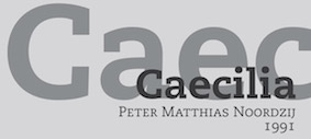 An Egyptian fight! In
  Charles Bigelow on the Times trademark. "Times" refers to the typeface produced for "The Times" by Monotype. Yet, it was trademarked by Allied Corporation (ex-USA parent of Linotype), as Bigelow explains: "During WWII, the American Linotype company, in a generous spirit of Allied camaraderie, applied for registration of the trademark name "Times Roman" as its own, not Monotype's or The Times', and received the registration in 1945. In the 1980's, all this was revisited when some entrepreneurs, desirous of gaining the rights to use the name, applied to Rupert Murdoch, who owned The Times; separately, a legal action was also initiated to clarify the right of Monotype to use the name in the U.S., despite Linotype's registration. The outcome of all of the legal maneuverings is that Linotype and its licensees like Adobe and Apple continue to use the name "Times Roman", while Monotype and its licensees like Microsoft use the name "Times New Roman". " [
 Foundry with free and commercial fonts, started in June 2002 by Dirk Uhlenbrock.
  Great pages about typography and the choice of fonts for law documents. Written by type designer and civil litigation attorney, Matthew Butterick. Eloquent and convincing, these pages are good reading for any typographer. Summarizing his advice:
  An informative discussion of the legal type situation in the United States. A must read. Here is the start of that piece: It is impossible to discuss free fonts or type licensing on the internet without a few uncomfortable facts getting trotted out:
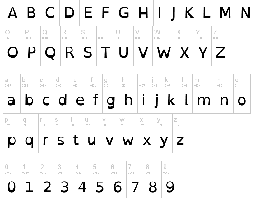
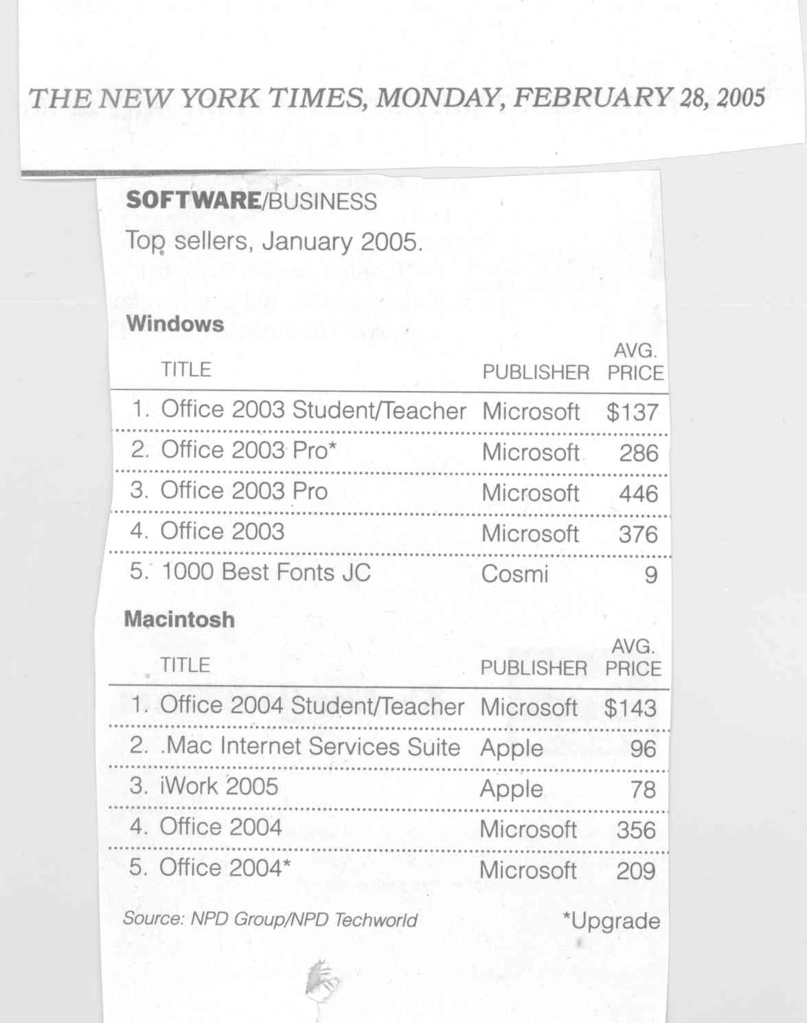
|
|
|
|