TYPE DESIGN INFORMATION PAGE last updated on Tue Aug 26 10:56:18 EDT 2025
FONT RECOGNITION VIA FONT MOOSE

|
|
|
|
|
Hebrew font links | ||
|
|
|
|
SWITCH TO INDEX FILE
| |
Aaron D. Schmiedel
| |
Israeli graphic designer who specilaizes in book design and book covers. Art Director at Modan Publishing House, and Senior lecturer at Wizo Academic Institute in Haifa. Speaker at ATypI 2016 in Warsaw on From forgotten boxes to Three Pioneers of Hebrew Typography, Moshe Spitzer, Franciscka Baruch and Henri Friedlander, who trained and worked in Germany during the 20s, and since the late 30s took major part in the developing Hebrew culture in Israel, each seeking in his or her special way a "new Hebrew type". Ada Wardi edited The Graphic Design of Moshe Spitzer, Franzisca Baruch, and Henri Friedlaender: New Types Three Pioneers of Hebrew Graphic Design (2015, The Israel Museum, Jerusalem). [Google] [More] ⦿ | |
Ada Yardeny (or Yardeni) received her Ph.D. in ancient Semitic languages, paleography and epigraphy from the Hebrew University of Jerusalem. She wrote The Book of Hebrew Script: History, Palaeography, Script Styles, Calligraphy and Design, 1997. 364pp. The second printing in 2002 was done by Oak Knoll Press. At Masterfont, she published the Hebrew typefaces Academia MF, Ada MF, Daphna MF, Hagit MF (2020) and Rephael MF. Letter Arts link. [Google] [MyFonts] [More] ⦿ | |
Israeli type designer at MasterFonts. He created the Hebrew typefaces Vardi MF (2005), and Kikar Dizengof MF (+Square). [Google] [MyFonts] [More] ⦿ | |
Haifa, Israel-based codesigner, with Moshe Sabach, of the experimental geometric Hebrew typeface Shpitz (2013). [Google] [More] ⦿ | |
| |
His Latin/Hebrew typeface Noam (2003) won an award at TDC2 2004. It was eventually published by TypeTogether in 2013, with assistance of Liron Lavi Turkenich. It showed up at as Noam Text at MyFonts in 2020. At ATypI 2005 in Helsinki, he spoke on Hebrew type. Speaker at ATypI 2013 in Amsterdam. Local archive of his 2004 talk at stBride. [Google] [MyFonts] [More] ⦿ | |
AFS Ltd
| Alex, Chaya, Rashi, Ruth Fancy and Tzipporah (1992) are free Hebrew fonts made in 1992 by Aaron D. Schmiedel at AFS Limited: 7815 La Cabeza, Dallas, TX 75248. Download here. [Google] [More] ⦿ |
Akira Kobayashi
| |
Akira Kobayashi
| |
Designer of the Hebrew truetype typeface BenEzra (2002). This free sans-serif font has been created by me for use by the faculty and students at Baptist Bible Seminary. It has a style compatible with the (Greek) Galilee font produced by Dr. Rod Decker. [Google] [More] ⦿ | |
The Computer Duerer fonts are a metafont family developed by Alan Hoenig (John Jay College, City University of New York). This is a set of roman capitals introduced in a TUGboat article in 1990, entitled A Constructed Dürer Alphabet. Alan extended Duerer's design to generate related fonts in a bold, sans serif, typewriter-like, slanted, and casual style. Hoenig also developed Makor, a Hebrew TeX. The fonts in that package include OmegaSerifHebrew (like David), Ezra, Rashi and Hadassah. Another URL. [Google] [More] ⦿ | |
Great Unicode jump page. Has a page showing all fonts that support the various Unicode ranges. Check, for example, his Shavian Unicode sub-page. Unicode font utilities. Some font downloads, including the Unicode font MPH Damase (2005, Mark Williamson). [Google] [More] ⦿ | |
Israeli type designer who created these Hebrew typefaces at Masterfont: Nitsan MF (2002, handwriting), Uri Rounded MF. [Google] [MyFonts] [More] ⦿ | |
Hebrew font foundry located in Israel, and founded by Avraham Cornfeld. Their fonts: Noyland (a rounded geometric typeface by Noy Man), Sticks Stones (army gear dingbats; by Nadav Barkan), Omes (monoline, straight-edges, +Stencil; by Liya Ophir), Parasha (calligraphic; by Shani Barber), Spectrum, Atlas, Museum, Rivka Bau, Mixtape, Caravan, Barlev, Stanga FrankRuehl, Paamon, Poeti, Mugrabi, Taamula (a propaganda font), Asimon, and these typefaces by Avraham Cornfeld: Synopsis, Almoni Tzar, Mekomi, Ambivalenti. [Google] [More] ⦿ | |
AlefAlefAlef (or: Fontimonim)
|
|
Novosibirsk, Siberia-based creator of the free pixelized typeface Upheaval Pro (2012), which is a Greek / Cyrillic extension of Upheaval by Brian Kent. In 2013, he created the pixelish typeface Dusty Pro for Latin, Greek, Cyrillic and Hebrew. It is an extension of Andreas Nylin's Dusty. Symvola (2014) is a free typeface containing basic Latin and Greek characters. The design is inspired by the time machine's interface from Space Quest IV and puzzle panels from The Witness. Omnic Sans (2016) is a free artificial language font that is based on the Omnic script used in the Overwatch by Blizzard Entertainment. In 2016, he also designed the free typeface Starseed Pro. Behance link. [Google] [More] ⦿ | |
| |
Alexander Tarbeev
| |
Israeli type designer who created several Hebrew typefaces at MasterFont: Adama MF, Agita MF, Hoogo MF, Jonni MF, Junior MF, Lasso MF, Yaldey Haprachim MF. [Google] [MyFonts] [More] ⦿ | |
Allan Loder
| |
Israeli type designer. Klingspor link. [Google] [MyFonts] [More] ⦿ | |
Alphabetum
| Juan-José Marcos García (b. Salamanca, Spain, 1963) is a professor of classics at the University of Plasencia in Spain. He has developed one of the most complete Unicode fonts named ALPHABETUM Unicode for linguistics and classical languages (classical&medieval Latin, ancient Greek, Etruscan, Oscan, Umbrian, Faliscan, Messapic, Picene, Iberic, Celtiberic, Gothic, Runic, Modern Greek, Cyrillic, Devanagari-based languages, Old&Middle English, Hebrew, Sanskrit, IPA, Ogham, Ugaritic, Old Persian, Old Church Slavonic, Brahmi, Glagolitic, Ogham, ancient Greek Avestan, Kharoshti, Old Norse, Old Icelandic, Old Danish and Old Nordic in general, Bengali, Hindi, Marathi, Phoenician, Cypriot, Linear B with plans for Glagolitic). This font has over 5000 glyphs, and contains most characters that concern classicists (rare symbols, signs for metrics, epigraphical symbols, "Saxon" typeface for Old English, etcetera). A demo font can be downloaded [see also Lucius Hartmann's place]. His Greek font Grammata (2002) is now called Ellenike. He also created a package of fonts for Latin paleography (medieval handwriting on parchments): Capitalis Elegans, Capitalis Rustica, Capitalis Monumentalis, Antiqua Cursiva Romana, Nova Cursiva Romana (2014), Uncialis, Semiuncialis, Beneventana Minuscula, Visigothica Minuscula, Luxoviensis Minuscula, Insularis Minuscula, Insularis Majuscula, Carolingia Minuscula, Gothica Textura Quadrata, Gothica Textura Prescissa, Gothica Rotunda, Gothica Bastarda, Gothica Cursiva, Bastarda Anglicana (2014) and Humanistica Antiqua. PDF entitled Fonts For Latin Palaeography (2008-2014), in which Marcos gives an enjoyable historic overview. Alphabetum is not Marcos's only excursion into type design. In 2011, he created two simulation fonts called Sefarad and Al Andalus which imitate Hebrew and Arabic calligraphy, respectively. Cyrillic OCS (2012) is a pair of Latin fonts that emulate Old Church Slavonic (old Cyrillic). In 2013, he created Cuneus, a cuneiform simulation typeface. Paleographic fonts for Greek (2014) has ten fonts designed by Marcos: Angular Uncial, Biblical Uncial, Coptic Uncial, Papyrus Uncial, Round Uncial, Slavonic Uncial, Sloping Uncial, Minuscule IX, Minuscule XI and Minuscule XV. These fonts are representative of the main styles of Greek handwriting used during the Classical World and Middle Ages on papyrus and parchments. There is also a short manual of Greek Paleography (71 pages) which explains the development of Greek handwriting from the fourth century B.C. to the invention of printing with movable type in the middle of the fifteenth A.D. He wrote a text book entitled History of Greek Typography: From the Invention of Printing to the Digital Age (in Spanish; second edition, 2018). See also here and here. [Google] [More] ⦿ |
Alvaro Franca
| |
Israeli type designer who made Dakick (1999). [Google] [More] ⦿ | |
During his studies in Tel Aviv, Israel, Amir Gelbard designed the Hebrew display typeface Etztrubaal (or Pinecone) in 2017. [Google] [More] ⦿ | |
Designer of The Ron of the Rings, Ron's Thi (with Ron Benabu: a Hebrew face), Ron's Handwriting (with Ron Benabu: a Hebrew face), and AmGaz. [Google] [More] ⦿ | |
Israeli type designer. At Masterfont, he published Mazlat, Fetish MF and Apolo. [Google] [MyFonts] [More] ⦿ | |
Tel Aviv, Israel-based student at Shenkar College of Engineering and Design. Creator of the free Hebrew blackletter typeface Akusta (2017). [Google] [More] ⦿ | |
Israeli type designer. At Masterfont, he designed the Hebrew fonts Prat Parpar MF (2001), Partom MF, Portugal MF, Prat MF (for sign-making), Prat Pinochio MF, Prat Pluto MF (2008), Prat Prachim MF, Prat Proza MF. [Google] [MyFonts] [More] ⦿ | |
Tel Aviv, Israel-based designer of the Hebrew display typeface Fontikai (2016). [Google] [More] ⦿ | |
Font files related to ancient Hebrew: OLBHEB, Semitic-Early, Semitic-Late, Semitic-Middle, Semitic-Modern. The latter four were made by AHRC. [Google] [More] ⦿ | |
Designer in San Francisco. In 2014, she created Ksztalt (2014). This contemporary sans typeface was inspired by the architecture of the Jewish Museum of San Francisco, and the shapes of modern Hebrew letters. She is motivated by this quote by Antoine de Saimt-Exupery: A designer knows he has arrived at perfection not when there is no longer anything to add, but when there is no longer anything to take away. Behance link. [Google] [More] ⦿ | |
Free downnloads of Ahem, Clockopia, DroidSans-Bold, DroidSans, DroidSansFallback, DroidSansFallback, DroidSansHebrew, DroidSansJapanese, DroidSansMono, DroidSansThai, DroidSerif-Bold, DroidSerif-BoldItalic, DroidSerif-Italic, DroidSerif, MotoyaLCedar-W3-90ms-RKSJ-H, MotoyaLMaru-W3-90ms-RKSJ-H. Droid (2007) and Clockopia (2009) are by by Google (2007) and Motoya is by Motoya Corporation (2010). Ahem (2010, Todd Fahrner) is for the CSS Samurai's browser testing. Motoya was created for mobile machines. [Google] [More] ⦿ | |
Art director, photographer and illustrator in Tel Aviv-Yafo, Israel. Creator of the Hebrew typeface Zelda (2015). [Google] [More] ⦿ | |
Typefaces from 2016: Winter Tales (brush script family), Spring, Tel Aviv, HandsUp, Caramel, Ladybug, Carousel, Rainy Daisy, Quick Walk, White Rabbit, Caterpillar, Eucalyptus Tree, Black Moon, Zenith (blackbiard bold style), Nameless (grainy brush). Creative Market link. Graphicriver link. [Google] [More] ⦿ | |
Anna Tsuranova
| |
Tel Aviv-based graphic designer, b. 1987. Creator of Halal (2009). Behance link. [Google] [More] ⦿ | |
Haifa, Israel-based designer of the Latin display typeface Arlekin002 (2012). Anton was born in Alma-Ata, Kazakhstan in 1982. He graduated from Academy of Design Wizo Haifa. [Google] [More] ⦿ | |
Anton van de Repe
| |
Antonis Tsolomitis
| |
Apostrof
|
Caslon 1821 revives a typeface of Caslon & Livermore, 1821. It covers Latin, Cyrillic and Hebrew. Kyiv (2010, Viktor Kharyk) combines elements of antiqua, Cyrillic, and carving into widely usable Latin and Cyrillic text family. Kyiv was awarded the 2nd prize in the text font category in the first Ukrainian typeface competition Ruthenia in 2010. In 2016, Henadij Zarechnjuk and Viktor Kharyk designed Dnipro for Apostrof. The Cyrillic version of this font follows Ukrainian decorative traditions, initiaited by Georgy Narbut and Mark Kirnarsky in the 1920s and continued until the 1980s. The Latin part has an uncial character. In 2020, Konstantin Golovchenko and Kyrylo Tkachov released the sans typeface family Rock Star at AlfaBravo. In 2020, Viktor Kharyk, Henadij Zarechnjuk and Konstantin Golovchenko released an update and extension of Vasyl Homenko's metal Ukrainian typeface from 1963-1967, called Homenko. A special project published in 2020: 1812 (by Viktor Kharyk and Konstantin Golovchenko). This is a 14-style revival and further development of the typeface 1812 by Lehmann Type Foundry (St. Petersburg). It was created for the centenary of the French invasion of Russia, known in Russia as the Patriotic War of 1812 along the lines of decorative engraved inscriptions and ornamented typefaces of that time, presumably by the artist Alexandre Benois. It was used mainly for the decoration of luxurious elegant publications. Later, in 1917, this typeface was used on the Russian Provisional Government banknotes. In the Soviet period of time '1812' appeared to be one of the few typefaces included in the first Soviet type standard OST 1337. It was produced for manual typesetting until the early 1990s. This typeface could be seen on Soviet letterheads, forms, posters and even air tickets. [Google] [MyFonts] [More] ⦿ |
Hebrew kit for the Mac. Includes these Hebrew fonts (typically truetype): Arial, Corsiva, Eilat, Hermon, New Peninim, Raanana. [Google] [More] ⦿ | |
Vendor of Mac and PC fonts for several languages and from a variety of companies, active ca. 1999. The fonts covered Japanese, Chinese, Russian, Arabic, Hebrew, Persian, Urdu, Tamazight, Turkish, Greek, Indic, Thai, Eastern European, and Korean. [Google] [More] ⦿ | |
The was a commercial site located in West Clinton, Utah, that was run by Scott T. Smith from Clinton, Utah. It had Mayan, hieroglyphs, cuneiform, Syriac, Etruscan, old Greek, old Hebrew and archeological fonts as well as Native American dingbats. [Google] [More] ⦿ | |
Victor Kalashnikov's Greek, Hebrew and Old Church Slavonic truetype font archive. Contains a few goodies such as the dingbats called FaithOrnaments (Proclaim Communications, 1994) and OldChurchSlavonic (Monotype). In all, about 100 Greek, Old Church Slavonic and Hebrew fonts. Among the Hebrew fonts, we find Moses Judaika, Pecan Sonc, and Gideon Medium. [Google] [More] ⦿ | |
Hebrew type designer. He now runs a nice Hebrew type blog and news page. This has a great Hebrew Typography Annotated Bibliography. [Google] [More] ⦿ | |
Ari Rafaeli
| |
There is no italic version---only a regular and bold exist. Arial Unicode MS is normally distributed with Microsoft Office, but it is also bundled with Mac OS X v10.5 and later. It may also be purchased separately (as Arial Unicode) from Ascender Corporation (now absorbed by Monotype), who licenses the font from Microsoft. Regarding the difference with ordinary Arial, we read this technical explanation on Wikipedia: When rendered with the same engine and without making adjustments for the different font metrics, the glyphs that appear in both Arial and Arial Unicode MS appear to be slightly wider, and thus rounder, in Arial Unicode MS. Horizontal text may also appear to have more inter-line spacing in Arial Unicode MS. This is due to larger bounding boxes (Arial Unicode MS needs more room for some of its extended glyphs) and the limitations of renderers, not changes in the glyph shapes. The lack of kerning pairs in Arial Unicode MS may also affect inter-glyph spacing in some renderers (for example the Adobe Flash Player). Arial Unicode MS also includes Hebrew glyphs different from the Hebrew glyphs found in Arial. They are based on the shapes of the Hebrew glyphs in Tahoma, but are adjusted to the weight, proportions and style of Arial. [Google] [More] ⦿ | |
Israeli type designer at MasterFonts. Klingspor link. [Google] [MyFonts] [More] ⦿ | |
Developer (with Ari Rappoport) of LiveType at the Hebrew University in Jerusalem. LiveType is font creation software that uses a parametric model for the fonts and allows the user to specify any number of constraints. Useful for creating multiple master fonts. You may also find some fun font applets at his site. ParamTT is a the complementary font design tool to create and manipulate LiveType characters. [Google] [More] ⦿ | |
Designer in 2008 of WtDoWtlibraryDocMarkup02, WtFoSerifBook, WtGrGrecianBook (Greek), WtHeFrankRihellBook, WtOnOrnament, WtUDiZapfDinItcL. These fonts are seemingly unfinished. [Google] [More] ⦿ | |
ARP's free text utilities (MS-DOS) and TTF-fonts
| Two TrueType fonts: ARP Numfont replaces characters by ASCII values, and Celtic-Iberian is just that. All fonts by Anton van de Repe. Contains an archive of 40 Arabic fonts. [Google] [More] ⦿ |
Greek, Hebrew, Ugaritic and Meroitic font archive. [Google] [More] ⦿ | |
Arta Ltd
|
|
Arta Osherov
| |
Foundry in Israel. Creator of Flies (2011), a typefaces with the strokes made up of images of flies. [Google] [MyFonts] [More] ⦿ | |
ARTypes
|
View the typefaces made by Ari Rafaeli / ARTypes. [Google] [MyFonts] [More] ⦿ |
Israeli type designer at Masterfont. Creations include Alonim MF, Axioma MF, Azili MF, Bauhaus MF, Bazelet MF, Bdeal MF, Cabanos, Casda MF, Cobra MF, Frick MF, Gali MF, Gesharim MF, Hadran MF, Ivritica MF, Kashtit MF, Kayak MF, Klilit, Kneset MF, Koloseum MF, Koryntos, Lakritz MF, Leeron MF, Mag MF, Magal MF, Mesila MF, Naheer MF, Neer MF, Nesharim MF, Netafim MF, Radial MF, Redis Square MF, Shaava MF, Shablul MF, Shanhai MF, Shira MF, Shofarot MF, Simple MF, Strip MF, Strip Saduk MF, Sufle MF, Taar MF, Tapuah MF, Tzach MF, Tzazit MF, Viola MF, Yali MF, Yeelim MF, Yeelot MF, Yuval MF. Klingspor link. [Google] [MyFonts] [More] ⦿ | |
Israeli type designer. His Hebrew typeface family Oron (1966) is available from Masterfont as Oron MF, Oron Tavnit MF, Oron Keshet MF, Oron New, and Oron Koteret MF (2021). Adi Stern explains: In 1966, a new era began. Published that year, the Oron typeface was the first Hebrew typeface deliberately designed as a counterpart, or derivative, of an existing Latin typeface (in this case Adrian Frutiger's Univers). Asher Oron, the designer, declared he wished to reshape the monotone and boring Hebrew x-height zone, and make it somewhat closer to the Latin curved and varied one. Moreover, he spoke decisively in favour of adding circular parts to the Hebrew letter. He believed this could contribute to letter differentiation as well as make the letterforms softer and more pleasing. In describing the design process of the type, Oron said that at a certain stage he found his letterforms too similar to the Latin ones. He ascribed this to his disregard for the Hebrew writing direction as well as to the design of symmetrical high frequency letters. Therefore, later on in the process he did two things: one was to make all symmetrical letters asymmetrical again, and the other was to redesign most of the vertical strokes' upper terminals. Oron believed that in changing the terminals from pure vertical line-ends (i.e. symmetrical and static) to slightly leftward-leaning terminals, he enhanced the reading flow. Klingspor link. [Google] [MyFonts] [More] ⦿ | |
The Hebrew typefaces in the ATF catalog are Hebrew No. 1 and Hebrew No. 2. [Google] [More] ⦿ | |
Born in 1986 in Paris, Aurélie Attuil studied graphic design and typography at École Estienne, Paris, where she obtained a Masters in Type Design & Graphic Design (DSAA Création Typographique) in 2009. Her typefaces include Bricklane (2014) and Galim (for Hebrew). [Google] [More] ⦿ | |
AvanType
|
His Hebrew designs: Casablanca, Derby, Falafil, Girnata, Rituals, Talona. His Latin fonts include Adorey, Alluremda, Granada, Merkory and Stocky. He won an award at Bukvaraz 2001 for Maqsaf. At TDC2 2003, he won a Certificate of Excellence in Type Design for Falafil. His Arabic typefaces include Chiaka, Ghirnata (1996), Sinan (1992), Alwadi (1996), Onwan (1998), Shallal Ultra Light (1995), Saljook (1997), Barhoom (1995), Alkhoury (1997), Sayaf, Maqsaf and Qasab (1998). He won an award at TDC2 2006 for Hogariet (2005, a Hebrew face) and at TDC2 2008 for Al Rajhi (an Arabic text family). [Google] [More] ⦿ |
The original Avenir typeface was designed by Adrian Frutiger in 1988. Unlike Futura, which has partially colored Avenir, Avenir is not purely geometric---it has vertical strokes that are thicker than the horizontals and a lower case o that is not a perfect circle. And just as most fonts from the 1980s, Avenir has shortened ascenders. These nuances aid in legibility but the small x-height makes it less elegant. In 2012, Akira Kobayashi worked alongside Adrian Frutiger on Avenir Next. Akira kept expanding Avenir to cover more languages. Avenir Next World family, released by Linotype in 2021, is an expansive family of fonts that offers support for more than 150 languages and scripts. The subfamilies include Avenir Next Hebrew, Avenir Next Thai, Avenir Next Cyrillic, Avenir Next Arabic and Avenir Next Georgian. Avenir Next World contains 10 weights, from UltraLight to Heavy. Contributors besides Adrian Frutiger and Akira Kobayashi: Anuthin Wongsunkakon (Thai), Yanek Iontef (Hebrew), Akaki Razmadze (Georgian), Nadine Chahine (Arabic), Toshi Omagari (Arabic) and Elena Papassissa (Greek, Armenian). See also Avenir Next Paneuropean (2021; 56 styles; by Akira Kobayashi). [Google] [MyFonts] [More] ⦿ | |
Avi Haltovsky from Givat Shmuel, Israel, designed Papercut, a 3-d on-line font cut from paper, which yields all 26 letters just by turning the paper in the proper manner. [Google] [More] ⦿ | |
Israeli type designer at MasterFonts. Klingspor link. [Google] [MyFonts] [More] ⦿ | |
Israeli type designer at MasterFonts. [Google] [MyFonts] [More] ⦿ | |
During his studies in Haifa, Israel, Aviram Ben Shushan created Lady Gaga Font (2014). [Google] [More] ⦿ | |
Israeli type designer. Designer of Haratza MF (2009, Masterfont; with Tal Aviv). Klingspor link. [Google] [MyFonts] [More] ⦿ | |
Israeli type designer who created Kabuk MF (a Hebrew font at Masterfont). [Google] [MyFonts] [More] ⦿ | |
Avraham Cornfeld
| |
Designer of the Hebrew typeface Malchut MF (2014). [Google] [MyFonts] [More] ⦿ | |
Israeli designer of the Hebrew script typeface Avshalom MF (2010). [Google] [MyFonts] [More] ⦿ | |
Ayala Halevi
| |
As a student in Jakarta, Azhim Ferdaus created the Latin / Arabic / Hebrew typeface family Ben Yehuda in 2013. Behance link. [Google] [More] ⦿ | |
Free software by Basyl K. Malyshev: BaKoMa TeX is a complete TeX system for Microsoft Windows 95/98/NT/2000. It supports type 1, type 3, truetype, OpenType, and TeX PK formats, and enables PostScript in TeX. The system includes about *1500* typefaces in PostScript Type 1 and Type 3 font format including the following fonts: CM (including LaTeX and Logo fonts + vf for T1 with CX, AMS Fonts (Euler, Math Symbols), EC/TC, LH (T2A), Concrete (Math, ECC), Malvern, CMCyr + vf for T2A/LCY, Scripting fonts, CMPica, Punk, Stmaryrd, Wasy, Rsfs, YHMath, BlackBoard (bbm, doublestroke), Lams, Astro Symbols (cmastro, astrosym, moonphase), Barcodes (barcodes, wlean, wlc*), Logical (loggates, milstd), timing, MusiXTeX, Chess/CChess, Go, Backgammon, Dingbats/NiceFrame. PDF output supported. Direct access to the fonts. [Google] [More] ⦿ | |
Barak Floersheim
| |
Barak Kind
| |
Barry Eshkol Adelman
| |
WTLHebraica (1997), WtlHebrew, WtlGreek. Dead link. [Google] [More] ⦿ | |
| |
Israeli type designer. At Masterfont, he designed Bary MF, Club MF, Ifat MF, Kallipso MF, Noya Supreme MF (2003), Popolo MF, Propaganda MF, Starsky MF. Klingspor link. [Google] [MyFonts] [More] ⦿ | |
Free fonts wehad.ttf (Helvetica-David), wehm.ttf (Courier-Shalom Stick). [Google] [More] ⦿ | |
Bee Creations
|
|
| |
Ben Nathan
| |
Ben Truelove
| |
Designer in New Haven, IN, of these free fonts: EarlyAramaic, Greek-Plain, Jerusalem-Linux (1991-2002, The Zondervan Corporation), NacharQuwah (2005, for Aramaic), PaleoBora-Light. [Google] [More] ⦿ | |
BST Greek, BST Hebrew fonts. Free, Mac and PC. [Google] [More] ⦿ | |
Bible Works Fonts
| Free original fonts, bwgrkl, bwgrkn, bwhebb, for Greek and Hebrew. Postscript and truetype. Other fonts include BWVIET, BWEESS, BWEETI, and BYSYMBOL. Check also Maranatha Church. Alternate URL. Alternate URL. Yet another URL. [Google] [More] ⦿ |
Typing Arabic for PCOM GDI printing (1997, Latin/Arabic font based on IBM Courier) and Cumberland Heb (Agfa/Monotype version of Courier for Latin and Hebrew). [Google] [More] ⦿ | |
Bigelow&Holmes
|
|
Hebrew fonts Web-Hebrew-Monospace and Web-Hebrew-AD. [Google] [More] ⦿ | |
From Bitstream's web page: "Bitstream Cyberbit is our award-winning international font. Based on one of our most popular and readable type designs (Dutch 801 BT [note: Bitstream's version of Times and Times New Roman]), it includes all the typographic characters for most of the world's major languages. Cyberbit is now available! The product release includes the roman weight of Dutch 801 BT, a "serif" font. (A serif font has small finishing strokes at the end of the main stems, arms, and tails of characters, while a sanserif font does not.) The font is in TrueType format for Windows 95 and Windows NT. Future releases will provide support for "sanserif" typefaces, other platforms, other font formats, and even more languages. Bitstream Cyberbit is a work in progress. Bitstream is now distributing the roman weight of Cyberbit, free of charge, over the Internet! Remember, this release is in TrueType format for Windows 95 and Windows NT". --- Well, Bitstream no longer offers the font. It is still out there however. Try here, here, here, or here. Has these unicode ranges: Basic Latin, Latin-1 Supplement, Latin Extended-A, Latin Extended-B, Spacing Modifier Letters, Greek, Cyrillic, Hebrew Extended (A and B blocks combined), Thai, Latin Extended Additional, General Punctuation, Currency Symbols, Letterlike Symbols, Number Forms, Arrows, Mathematical Operators, Miscellaneous Technical, Box Drawing, Block Elements, Geometric Shapes, Miscellaneous Dingbats, Alphabetic Presentation Forms, Combining Diacritical Marks, Enclosed Alphanumerics, Arabic, Arabic Presentation Forms-A and -B, CJK (Chinese, Japanese, Korean) Symbols and Punctuation, Hiragana, Katakana, Bopomofo, Hangul Compatibility Jamo, Enclosed CJK Letters and Months, CJK Compatibility, Hangul, CJK Unified Ideographs, CJK Compatibility Ideographs, CJK Compatibility Forms, Small Form Variants, and Halfwidth and Fullwidth Forms. [Google] [More] ⦿ | |
Black Foundry
|
|
Borutta (or: Duce Type)
|
He is the creator of the blackletter-inspired typeface Raus (2012), which also could pass for a Cyrillic simulation font. It was possibly made with Pawel Wypych. He also made Kebab (2012, a fat caps face), Duce (2012, art deco: withdrawn from MyFonts after Charles Borges complained that it was a rip-off of his own Gloria), Fikus (2012), Woodie (2012, a condensed rough wood type face), Polon (2012), Aurora (2012, a German expressionist poster face), Musli (monoline connected script), HWDP (2012, poster font), Wieczorek Script (2012, hand-printed), Hamlet (2012, a sword and dagger typeface, renamed to Prince), Caryca (2012, Cyrillic simulation, done with Pawel Wypych), Bezerro (2012, poster face), Bitmach (2012, pixel face), Meat Script (2012, a caps only market signage brush script), Krac (2012, a tall poster font), Hermes (2012: Ten Dollar Fonts), Berg (2012, a roughened blackletter face), Buldog (2012), Dudu (2012, tall condensed face). In 2012, Polish designer Wojciech Freudenreich and Mateusz Machalski combined forces to design the techno typeface SYN, which is based on an earlier De Stijl-genre alphabet by Freudenreich. In 2020, they released the free typeface family SYN Nova, which includes additional styles and a variable font. Machalski likes old wood types, which inspired him in 2012 to publish a wood type collection of weathered display typefaces: Condom, Hype, Whore, Banger, Buka. Elo (2012) and Duce (2012) are fat weathered wood types. Typefaces made in 2013: Wood Type Collection 2 (which includes Brie, Kaszti, Mader, Modi, Rena, Roast, Ursus), Zigfrid (headline face), Salute (letterpress style), Benito (a letterpress or geometric wood typeface), Bojo (heavy wood style poster face), Picadilly (heavily inktrapped open counter sans family), GIT (a manly headline sans), Lito (an eroded poster typeface), Haine (vernacular caps), Aneba (an organic sans family, renewed in 2016 as Aneba Neue), Vitali (sans), Korpo Serif (slab serif), Korpo Sans (elliptical family; +Greek, +Cyrillic). Typefaces from 2014: Adagio Slab, Adagio Serif, Adagio Sans (a superfamily not to be confused with the 2006 typeface Adagio Pro by Profonts), Adagio Sans Script, Adagio Serif Script, Adagio Slab Script, Tupperware Pro. Tupper Pro (42 styles) was designed by Mateus Machalski and the RR Donnelley team. Typefaces from 2015: Tupper Serif (again with RR Donnelley: a custom superfamily for pairing Latin, Cyrillic, Hebrew an Greek; for Tupperware), Vitali Neue, Legato Serif, Corpo Serif, Corpo Sans, Zigfrid, Picadilly (a great ink-trapped sans typeface family with an erect g). Typefaces from 2016: Nocturne (just like Magiel, this free typeface was designed as part of the Warsaw Types project: this wedge serif text typeface is inspired by the lettering on stone tablets commemorating the victims of World War II, and prewar Jewish shop signage), Favela (an experimental, geometric sans, for headline and fashion magazine use), Gangrena (a weathered typeface system co-designed with Ania Wielunska), Migrena Grotesque (earlier named Enigma Grotesque but probably in view of a clash with the name Enigma used by Jeremy Tankard changed to the appropriately named Migrena Grotesque), Alergia Grotesk (a take on the classical geometric grotesque style, in 60 weights, for Latin, Greek and Cyrillic), Alergia Remix (a hipster / hacker / Futura take on Alergia Grotesque). Typefaces from 2017: Nocturne Serif, Massimo (copperplate semi-serif influenced by New York; originally called Madison, they were frced to change the name to Massimo), Magiel Pro (a geometric display family influenced by Polish banners from the Russian occupatuon era, 1945-1989; it has a charming Black and a hairline, and covers Cyrillic too). A particularly intriguing project in 2017 was Bona, which set out to revive and extend Andrzej Heidrich's old typeface Bona. Mateusz Machalski contacted him for advice on the revival project. The resulting typeface families were published by and are available from Capitalics. The centerpiece is the warm and wonderful text typeface Bona Nova. It is supplemented by the extreme contrast typeface family Bona Title and the inline typeface family Bona Sforza. Participants in the project also include Leszek Bielski, Ania Wielunska and Michal Jarocinski. Google Fonts link for Bona Nova. Github link for Bona Nova. Typefaces from 2018: Bilbao (an innovative blend of sans, slab and mono genres in 18 styles), Cukier (a logo font family inspired by the vernacular typography from Zanzibar). In 2018, Mateusz Machalski, Borys Kosmynka and Przemek Hoffer co-designed the six-style antiqua typeface family Brygada 1918, which is based on a font designed by Adam Poltawski in 1918. Free download from the Polish president's site. The digitization was made possible after Janusz Tryzno acquired the fonts from Poltawski's estate. The official presentation of the font took place in the Polish Presidential Palace, in presence of the (right wing, ultra-conservative, nationalist, law and order) President of Poland, Andrzej Duda. Calling it a national typeface, the president assured the designers that he would use Brygada 1918 in his office. It will be used for diplomas and various other official forms. In 2021, with Anna Wielunska added to the list of authors, it was added as a variable font covering Latin, Greek and Cyrillic to Google Fonts. Github link. Typefaces from 2019: Gaultier (a sans family that is based on the styles of Claude Garamond, Robert Granjon and Eric Gill---a serifless Garamond and Gill Sans hybrid; includes a fine hairline weight), Aioli (a commissioned type system), Promo (a rounded sans family), Sigmund (the main style is inspired by the Polish road signage typeface designed in 1975 by Marek Sigmund: With the increase of weight, Sigmund turns into a geometric display in the spirit of vernacular typography from the signs of Polish streets; followed in 2022 by Sigmund Pro (15 styles)), Podium Sharp (based on Dudu, this 234-style family is a hybrid between different old Polish modular and geometric woodtypes such as Rex, Blok and Bacarat; note that 234=2x9x13, so fonts are numbered in Univers style from 1,1 (ultra-compressed hairline) to 9,13 (ultra expanded heavy)), Harpagan (an experiment in reverse and unusual stresses). Typefaces from 2020: Tyskie (a custom sans for Tyskie Magazine), Habibi Display (an ultra-fat display typeface inspired by bold Arabic headline typefaces), Podium Soft, Afronaut (an experimental Africa-themed font). In 2020, the team at Capitalics in Warsaw, namely Mateusz Machalski, Borys Kosmynka and Ania Wielunska, revived Adam Poltawski's Antykwa Poltawskiego (1928-1931) as Poltawski Nowy. Typefaces from 2021: Alfabet (a 20-style Swiss-inspired sans with narrow connectors, with support for Latin (+Vietnamese), Greek and Cyrillic scripts, including Ukrainian, Bulgarian and Serbian forms), Change Serif (a 10-style Robert Granjon-genre garalde designed as a part of Mateusz Machalski's PhD project, carried out in 2015-2021; the main goal was to create a typeface allowing for the typesetting of complex humanistic texts, containing many historical letterforms; each font contains 4000 glyphs and covers Latin, Cyrillic and Greek), Engram (a soft geometric sans family in 22 styles; close to his own earlier font, Enigma, 2016). Typefaces from 2022: Yalla (inspired by Arabic headline type). Home page. Behance link. Personal Behance link. Behance link for Duce Type. Another link. Fontsquirrel link. [Google] [MyFonts] [More] ⦿ |
Kernest link. My own link to him. Google font directory link. Font Squirrel link. Devian tart link. [Google] [More] ⦿ | |
Publishers of the free font Reader Sans, which covers Cyrillic, Greek, Latin, Hebrew and Slavonic. The copyright says Bitstream. [Google] [More] ⦿ | |
Bruno Maag
| |
Cahya Sofyan
| |
CalSemitic-TR, CalSyriacTR, Web-Hebrew-AD. Made in 1998 for ancient Hebrew and Syriac. [Google] [More] ⦿ | |
Hebrew calligraphy expert. [Google] [More] ⦿ | |
Tel Aviv-based creator of the Hebrew typeface family Rogalach (2015), which was a project in a typeface design class at the visual communication department of Bezalel Academy, Jerusalem. Rogalach is a popular Israeli pastry. [Google] [More] ⦿ | |
Catharsis
|
Catharsis had free typefaces such as the great Arabic simulation typeface Catharsis Bedouin (2004), CatharsisCircular, CatharsisRequiem (a unicase pair), CatharsisRequiemBold, CatharsisCargo, Cirnaja Bookhand and Cirnaja Calligraphy (made for his artificial language, Obrenje), Catharsis Macchiato (2005), CatharsisEspresso (2005). At Catharsis, the commercial foundry, he published Octant in 2013: Octant is an original steampunk display typeface drawing inspiration from Victorian-age steel and brass engineering, as well as from blackletter typography. Gryffensee (2013, in styles called Eins, Zwei and Drei) is designed to be the Futura of blackletter, combining the time-honored gravity and relentlessness of the Gothic script with the clean, contemporary freshness of the geometric sans. It also covers Cyrillic. Backstein (2013), baked brick, took its inspiration from the broken antiqua lettering in Berlin's old subway stations. Volantene Script (2013) is a (free) uncial display typeface inspired by the penmanship of Lady Talisa Maegyr-Stark as seen on HBO's Game of Thrones. Numina (2013, Glamour and Glory substyles) is an extensive condensed fashion-oriented typeface family related to Skyline and Corvinus. Maestrale (2013) adds calligraphic and flamboyant extenders to a decorative text typeface for a dramatic effect. Choose between Maestrale Manual (swashy) and Manuale Text. Blumenkind (2013) is inspired by an instance of metal-strip lettering found on the Bürgermeister Kornmesser Siedlung residential building complex in Berlin from the 1960s. Brilliance (2013) is a glamorous contemporary display blackletter combining the rich tapestry of Textura with a hint of the airy lightness of Spencerian script. Let's say that it is a light-hearted Textura. In 2015, he made the free 45-style classic serif typeface family Cormorant, which includes several unicase fonts. This typeface started out in 2014 as Paramond, a light, contrasted, space-taking Garalde with impossibly tiny counters and long extenders. Links to the Google Font directory: Cormorant, Cormorant Garamond, Cormorant Infant, Cormorant SC, Cormorant Unicase, Cormorant+UprightCormorant Upright. See also CTAN. In 2016, he created the humanist geometric sans typeface family Quinoa for Latin, Cyrillic, Greek and Hebrew. Typefaces from 2017: Tesserae (kitchen tile style), Traction. Traction was originally conceived and designed by Christian Thalmann. Chiara Mattersdorfer and Miriam Suranyi expanded, completed and produced the font family. This typeface sports signature serifs, soft edges and a fluid, organic design. In 2018, Christian started work on a blackletter-themed stencil typeface, first called Komik Ohne (the German for Comic Sans) and later named Kuschelfraktur (2019). Between 2016 and 2019, he developed Eau de Garamond---a sans distilled from the essence of Garamond---, which was later renamed Ysabeau. Github link. In 2020, we find another fork, Isabella Sans. Overbold (2019) is described by him as follows: Overbold is an unapologetic display typeface inspired by an illustration in Eric Gill's Essay on Typography (p.51), in which he demonstrates how not to make letters. In particular, he shows that increasing the weight of the downstroke in a serif A without structural adjustments yields an absurd, overbold result. I found the letter so charming that I decided to blatantly disregard Gill's wisdom and draw an entire overbold typeface. Here is the result. I'm not sorry. 1001 fonts link. Yet another URL. Fontspace link. Behance link. Klingspor link. Dafont link. Open Font Library link. Github link. [Google] [MyFonts] [More] ⦿ |
C.F. Rühl is perhaps best known in the Hebrew community for its Frank Rühl typeface for Hebrew. The original Frank Rühl was designed in 1908 by Rafael Frank in collaboration with Auto Rühl of the C. F. Rühl foundry. A final version was released in 1910. Many Israeli books, newspapers and magazines use Frank Rühl as their main body text typeface in the 20th century. Many digital versions of this font exist. In 2016, Yanek Iontef designed the free Google Font Frank Ruhl Libre for Latin in Hebrew. Iontef's extension and modernization has five styles. [Google] [More] ⦿ | |
| |
Charles Bigelow
| |
Netanya, Israel-based designer of a Hebrew typeface (2014). [Google] [More] ⦿ | |
Israeli type designer who made the Hebrew font Dash MF at Masterfont. [Google] [MyFonts] [More] ⦿ | |
| |
Christ Trek Fonts
|
Tim is working on Brampton. He writes about Squarish Sans: Squarish Sans is not a direct clone of any Bank Gothic. I have made conscious choices to deviate from existing designs. Yet it is strongly inspired by them, of course, particularly Michael Doret's DeLuxe Gothic, in that Squarish Sans has a true lower case as well as small caps. It should fit the bill should you have need of a Bank Gothic face. Motivation for Marapfhont came from the Marathon Trilogy game: Remember the Marathon Trilogy by Bungie Games back in the mid-1990s? If you do, you remember it's iconic logo font, Modula Tall. There are no free alternatives to Modula Tall, and the few similar fonts miss important aspects of its character. I wanted to create a typeface inspired by the appearance of Modula Tall in Marathon. The lowercase of Modula Tall didn't fit the Marathon "feel" at all, for me, so I have redesigned the miniscules, to carry the signature look throughout. Thus, Marapfhont is not a clone of Modula Tall, but may nonetheless be used to generate the "MARATHON" title. In 2013, he finished the pixelish typeface Looks Like Spht. In 2014, Tim Larson published the free Hebrew simulation font Hananiah (2014, OFL), which is based on Ezra SIL. It also includes regular Hebrew. In 2015, he published the German expressionist typeface Abibas [Abibas is a fork/extension of Gamaliel, a blackletter by Rafael Ferran i Peralta]. Typefaces from 2016: Politics As Usual (political dingbats for the United States), Horta (an angular sci-fi typeface). Open Font Library link. Home page. Aka Christ Trekker. [Google] [More] ⦿ |
Christian "Cinga" Thalmann
| |
Christian Justen
| |
FontShop link. Klingspor link. Christoffel Van Dijck's digital legacy. [Google] [MyFonts] [More] ⦿ | |
CJ Hebrew
| CJHebrew (2002) is Christian Justen's package for typesetting Hebrew text. It includes two Hebrew Type1 fonts by him: CJHebLSm (2002), CJHebLtx (2002). eLaTeX is required for the right-to-left typesetting. [Google] [More] ⦿ |
A project by Stefan Hagel at the Austrian Academy of Sciences in Vienna, CTE is a universal (Windows, Mac) text editor for many languages. It has a battery of fonts for various languages, such as Hebrew and Arab. [Google] [More] ⦿ | |
Mark Leisher's creation: "ClearlyU is a set of BDF (bitmap) 12 point, 100 dpi fonts that provides glyphs that can be used for Unicode text. The font contains over 4000 glyphs, including numerous additional glyphs for alternate forms and ligatures. The ClearlyU typeface was originally inspired by Donald Knuth's Computer Modern typeface, but has been slowly evolving into something else." Supported are: Navajo, Armenian, Cyrillic, Georgian, Greek and Coptic, Hebrew, Lao, Thai. [Google] [More] ⦿ | |
Small Hebrew foundry. Carries fonts by a number of designers. We find AhavaBats, BNConcept, BNCombination, IdoBold, IdoNormal, StormtrooperBold, Stormtrooper, Concept, AddamMF-BoldItalicA (pixelfont, 1996, copyright tammy2000), AhavaBats (2001, Meir Sadan, a sexual positions font), BN Combination (2001, arrow dingbats by Ben Nathan), BN Concept (200, Hebrew handwriting by Ben Nathan), Concept (2000, pixel font by Meir Sadan), Ido (2002, pixel font by Itay Kander), Stormtrooper (2002, by Daniel Levy and Ben Nathan). [Google] [More] ⦿ | |
Hebrew fonts Drogulin and Sefer (TrueType). [Google] [More] ⦿ | |
Connary Fagen
| |
Connary Fagen Fonts
|
In 2015, he created Waverly (avant garde caps), Articulat CF (an 18-style Swiss sans typeface), Argent CF (a 13-style display serif family), Ironfield (bold husky brutalist display font), Visby CF (geometric sans), Visby Round CF, Quincy CF (a warm serif text face), and Manifold CF (a squarish cold utilitarian sans with 16 styles; extended to the corporate typeface Manifold DSA in 2017). See also Manifold Extended CF (2022; 16 styles). Typefaces from 2016: Vanguard CF (a strong ultra-compressed sans in 16 styles), Addington CF (a 14-style text typeface family), Cartograph CF (monospaced sans), Greycliff CF (sans), Turismo CF (a wide rounfded open sans inspired by midcentury motorsports, technology, and business). Typefaces from 2017: Gryffith (angular), Visby Slab CF, Filter v2 CF (hipster style), Couplet CF (humanist sans), Integral CF (an all caps titling font). Typefaces from 2018: Argent Pixel (free), Artifex CF (a 9-weight serif family), Artifex Hand CF (a flared version of Artifex), Criteria CF (a geometric sans with horizontal and vertical terminal endings), Roxborough CF (a sharp-edged roman typeface). Typefaces from 2019: Wayfinder CF (a sharp-edged display typeface). Gumroad site, where one can download free trial versions of many of his fonts, and purchase licenses for the other ones. Typefaces from 2020: Hexaframe CF, Olivette CF (a sharp-edged angular and contrast-rich typeface family), Ellograph CF (a rounded monoline sans in 16 styles). Typefaces from 2021: Mielle CF (a monolinear script), Greycliff Thai CF, Greycliff Arabic CF, Greycliff Hebrew CF, Quiverleaf CF (ten flared / lapidary styles). Typefaces from 2022: Quiverleaf Arabic CF. |
An on-line showing of Hebrew letters and lettering curated by the Contemporary Jewish Museum. [Google] [More] ⦿ | |
A resident of Lisbon, Cris Barbosa is a graphic and brand designer who has worked on a Hebrew font, Ivrit (2009). [Google] [More] ⦿ | |
Greek font archive. Has Ralph Hancock's Milan in all formats. Also has the Hebrew font Ezra SIL (2002). [Google] [More] ⦿ | |
Culmus Project
| In 2002, Maxim Iorsh started the Culmus project, aiming at providing the Hebrew-speaking Linux and Unix community with a basic collection of Hebrew fonts for X Windows. The fonts are visually compatible with URW++ Century Schoolbook L, URW++ Nimbus Sans L and URW++ Nimbus Mono L families, respectively. The (free) fonts include David (3 weights; based on Charter), Aharoni (4 weights; based on URW++ Gothic L), Frank Ruehl (4 weights; based on URW++ Century Schoolbook L), CaladingsCLM, DrugulinCLM (2 weights; based on URW++ Nimbus Roman No9 L), ElliniaCLM (4 weights), MiriamCLM (2 weights), YehudaCLM (2 weights; based on Tekton), Nachlieli (4 weights; based on URW++ Nimbus Sans L), and Miriam Mono (4 weights; based on URW++ Nimbus Mono L). The fonts were developed by Maxim Iorsh at the Technion from 2002-2004. Nachlieli-Light is also here. Yoram Gnat designed Taamey Ashkenaz, Shofar, Taamey David CLM, Taamey Frank CLM, Keter Aram Tsova, Keter YG, ca. 2012. Alternate URL. He contributed glyphs to the Hebrew (U+0590-U+05FF) range in the GNU Freefont project. [Google] [More] ⦿ |
D. Paul Alecsandri
| |
Designer of these Hebrew typefaces in 1995: GOLDEN-MCL-BoldItalic, GOLDEN-MCL-Bold, GOLDEN-MCL-Italic, GOLDEN-MCL. Download here or here. [Google] [More] ⦿ | |
Dalit Gadish
| |
Dalton Maag
|
The Dalton Maag team designed these commercial fonts:
Fonts sold at Fontworks, and through the Bitstream Type Odyssey CD (2001). At the ATypI in 2001 in Copenhagen, he stunned the audience by announcing that he would never again make fonts for the general public. From now on, he would just do custom fonts out of his office in London. And then he delighted us with the world premiere of two custom font families, one for BMW (BMWType, 2000, a softer version of Helvetica, with a more virile "a"; some fonts are called BMWHelvetica), and one for the BMW Mini in 2001 (called MINIType: this family comprises MINITypeRegular-Bold, MINITypeHeadline-Regular, MINITypeHeadline-Bold, MINITypeRegular-Regular). Other custom typefaces: Tottenham Hotspur (2006), Teletext Signature (by Basten Greenhill Andrews and Dalton Maag), Skoda (Skoda Sans CE by Dalton Maag is based on Skoda Formata by Bernd Möllenstädt and MetaDesign London), UPC Digital, BT (for British Telecommunications), Coop Switzerland (for Coop Schweiz), eircom, Lambeth Council, Tesco (2002), PPP Healthcare, ThyssenKrup (Dalton Maag sold his soul to these notorious arms dealers; TK Type is the name of the house font), Co Headline (2006), Co Text (2006, now a commercial font), Telewest Broadband, Toyota Text and Display (2008), TUIType, HPSans (for Hewlett-Packard, 1997). His custom Vodafone family (sans) (2005) is based on InterFace. In 2011, Dalton Maag created Nokia Pure for Nokia's identity and cellphones, to replace Erik Spiekermann's Nokia Sans (2002). The Nokia Pure typeface has rounder letters, and is simultaneously more legible and more rhythmic. In 2010, the Dalton Maag team consisted of Bruno Maag and David Marshall as managing and operations directors, and Vincent Connare as production manager. The type designers are Amélie Bonet, Ron Carpenter, Fabio Haag, Lukas Paltram and Malcolm Wooden. In 2015, Kindle picked the custom serif font Bookerly by Dalton Maag for their typeface. Still in 2015, Dalton Maag custom designed the sans typeface family Amazon Ember for Amazon for use in its Kindle Oasis. Free download of both Amazon Ember and Bookerly. Dalton Maag created the custom typeface family Facebook Sans in 2017. Bressay (2016). Stuart Brown led the design and did the engineering for Bressay (design by Tom Foley, Selma Losch, and Spike Spondike, at Dalton Maag, London), which won an award at TDC 2016. Later additions include Bressay Arabic [designers not identified by Adobe] and Bressay Devanagari [designers not mentioned by Adobe]. ATT Aleck is a large custom typeface family designed in 2016. Netflix Sans (2018): Netflix replaced Gotham to combat spiraling licensing costs and commissioned its own bespoke typeface: Netflix Sans under design lead Noah Nathan. Free download. The family include Netflix Sans Icon (2017). Comments by designers at The Daily Orange. In 2018, Dalton Maag designed the custom typefaces Itau Display and Itau Text for Itau Unibanco, a large Brazilian bank. In 2019, Dalton Maag produced a corporate typeface for Air Arabia. Venn (2019, Bruno Maag). A 5 weight 5 width corporate branding sans typeface, with an option to get Venn Variable. Typefaces from 2020: Dark Mode VF (a humanist sans designed specifically for digital user interfaces, offering subtle grade adjustments to counteract the effects of setting light type on a dark background, as is common with many dark mode digital reading environments; it has two axis in its variable type format---weight and dark mode), Highgate VF (a variable humanist sans inspired by traditional British stone carving), Goldman Sans (a free clean sans family that includes three variable fonts; Goldman Sachs lets you use it except to criticize the company or any other capitalist pigs). Interview in 2012 in which he stresses that typefaces should above all be functional. View the Dalton Maag typeface library. Speaker at ATypI 2016 in Warsaw and at ATypi 2015 in Sao Paulo, where he gave an electrifying talk on type design for dyslexics (with Alessia Nicotra). Speaker at ATypI 2016 in Warsaw. Speaker at ATypI 2017 Montreal and at ATypI 2018 in Antwerp. Adobe link. [Google] [MyFonts] [More] ⦿ |
Graphic designer who graduated from Bezalel Academy of Arts and Design, class of 2012, who is now based in Netanya, Israel. Haplakat (2012) is a modern Hebrew typeface designed by him. Behance link. [Google] [More] ⦿ | |
Israeli type designer who created these Hebrew typefaces at Masterfont: Gal MF (2002), Tamar MF. [Google] [MyFonts] [More] ⦿ | |
Tel Aviv-based designer. Creator of this Hebrew sans face (2006). [Google] [More] ⦿ | |
Israeli codesigner with Peter Bilak of Greta Sans Hebrew (2015), which won an award at TDC 2016. His Hebrew typeface Susim won an award at Granshan 2016. [Google] [More] ⦿ | |
At Haaretz, we read: As can be seen in the road signs for Arab communities, to mention just one example, in Israel the Arabic language has been marginalized at the expense of Hebrew. This is further emphasized by the contrast between the square and aggressive Hebrew typefaces of official Israel and the softer and more rounded letters of typical Arabic typefaces, a difference that in fact reflects the balance of powers between the country's Jewish and Arab communities. To achieve visual coordination, equal visibility and presence and peaceful coexistence between these two languages that share a same space while taking a small step for peace, Grumer created Avraham-Ibrahim as his final project as a visual communications major at Jerusalem's Bezalel Academy of Arts and Design in 2014. Grumer, who learned Arabic in the army, got help (over the Internet) from a Jordanian calligraphy designer of Syrian descent. He found another source of inspiration for his typeface in the Hebrew signs written by Arab merchants that "simply make the Hebrew language dance and liberate it from the geometric pressure," he says. His graduation typeface at KABK in 2016 is the perfectly balanced tri-lingual (Latin / Arabic / Hebrew) typeface Abraham. In 2016, he fine-tuned Peter Bilak's November Hebrew: November is a rational, utilitarian typeface inspired by street signage. Unlike most signage types it also handles long texts with ease. It covers Hebrew script, but also Arabic, Cyrillic, Greek and Latin, and is accompanied by a set of wayfinding symbols. Daniel designed the Condensed and Compressed styles. [Google] [More] ⦿ | |
Klingspor link. Fontspace link. Dafont link. Kernest link. Fontsquirrel link. Google Plus link. [Google] [More] ⦿ | |
Ramat, Israel-based type designer. Cocreator at Concept with Ben Nathan of the Hebrew sans serif font Stormtrooper (2002). At Masterfont, he designed Advonit MF (2011), Bicycle MF (2010), Blomfield MF (2010), Ketamine One, Ketamine Two, Metapsim MF (2010), Passport MF (2010), Potentiali MF (2005), Yearot MF (2010, fat round Hebrew comic book face), Nachshon MF (2003), Agamim MF (2003), Liana MF, Requiem MF, Rockstar MF (2010). Alternate URL. Commercial fonts by Daniel Levy include Potentiali, Agamim, Liana, Nachshon. Free fonts at his site: Guznik, Modeler, Painter, Apollo, Spotnik, Kipur, Conquer, Inflation, Bicycle, Normador, Bilbi, Adva, Fontboy. Klingspor link. [Google] [MyFonts] [More] ⦿ | |
London-based illustrator and graphic designer. Creator of Fred Fredburger (2011), the Cartoon Network type family, which covers Latin, Greek, Cyrillic, Arabic and Hebrew. [Google] [More] ⦿ | |
Graphic designer in Tel Aviv, who created the Hebrew typeface Paam in 2016. Behance link. [Google] [More] ⦿ | |
Danny Meirav
| |
Tel Aviv-based designer of the Hebrew paleontological typeface Buga Buga (2016) and the experimental Molecular Font (2016). [Google] [More] ⦿ | |
Darien Valentine
| |
Israeli type designer at MasterFonts. [Google] [MyFonts] [More] ⦿ | |
From 2004 to 2007, he ran his own design studio DAVI, with projects in graphic, web and interface design. Back in Brno, he worked with Tiro Typeworks (Canada) as an associate designer. At ATypI 2008 in St. Petersburg, he spoke about multi-script typography. His typefaces include
Blog. Myfonts link. Klingspor link. Speaker at ATypI 2013 in Amsterdam on the topic of multilingual type design. [Google] [MyFonts] [More] ⦿ | |
Israeli type designer. He created Mishmish MF and Shorashim MF, both published by Masterfont. Klingspor link. [Google] [MyFonts] [More] ⦿ | |
David Hamuel
| |
David J. Perry
| |
Israeli type designer at MasterFonts, where he published Disel MF (2005), a Hebrew typeface. Klingspor link. [Google] [MyFonts] [More] ⦿ | |
Israeli type designer at MasterFonts. In 2004, he created the hand-printed typeface Dudek MF. [Google] [MyFonts] [More] ⦿ | |
David Lerner
| |
Typefaces not listed above: Alastor, Etude, Ezekiel, HyperTerra, HyperZoa, Kala Light, ManMake, Mandem, Marathon, Tranz Mono, Unity Terminal, Verseau. [Google] [More] ⦿ | |
Israeli type designer, b. 1946. At Masterfont, he created the Hebrew typefaces Asaf Berg MF (1994), Asher Outline MF (2013), Emily MF (2010), Gentlementch MF (2014), Haimon13 MF (2013), Hametz MF (2012), Herzel MF (1994), Herzel Open MF (2013), Gugi MF (1994), Han MF (1994), Kofer MF (2012), Lihi MF (2013), Michael 3D MF (2013), Motsaey Shabbat MF (2013), Shahaf MF (2013), Shesh Shesh MF (2013), Yetedot MF (2013), Yetty MF (2014), Margol MF (1994), Michael MF (1994), Segal MF (1994), Ofri MF (2002), Mike MF (2000), Tali MF (2000), Yulla MF (2008). Klingspor link. [Google] [MyFonts] [More] ⦿ | |
Bukvaraz winner in 2001 for the Hebrew font Atzmaut, designed with Yanek Iontef. [Google] [More] ⦿ | |
Alan Rosenbaum's Chicago-based company offering commercial Hebrew fonts. 25 fonts for 50 USD. Hebrew Font Gallery CD. Catskills (15 USD) is a Latin font that simulates Hebrew. The Hebrew Font Gallery contains Altona, Aram Tsova, Ateret, Bodel (free), Dugi, Frank, Gader, Gefanim, Gil, Golem, Kavim, Kehuna, Livorno, Paz, Peer and Ravid. Other Hebrew fonts sold by them include Ada Light, Aharoni Bold, Aharoni Light, Avital, Chayim Bold, Chayim Narrow, Drogulin, Elisheva Light, Frankruhl Bold, Frankruhl Light, Frankruhl Text, Gonen, Hadassah Light, Hadassah Bold, Kastel, Katamon Bold, Katamon, Miriam Bold, Miriam Light, Miriam Medium, Nachlaaot, Nachlaaot Right, Rachel, Rashi, and Stam. [Google] [More] ⦿ | |
Graduate of the Wizo design Academy. Hertsliyah, Israel-based designer of Kita (2013), a Latin serifed typeface developed during Typeclinic 6 in 2013. Its serifs are based on those found in Typical Hebrew typefaces, such as David Itamar's David. That same David also influenced his slab serif typeface Ollophid, which was developed during Typeclinic 7 in 2013. In 2014, he designed Bray as a Latin companion for Hebrew texts. [Google] [More] ⦿ | |
DejaVu Fonts
| The DejaVu fonts form an open source font family based on the Bitstream Vera Fonts. Free download. Its purpose is to provide a wider range of characters (see Current status page for more information) while maintaining the original look and feel through the process of collaborative development. Included are DejaVuSans-Bold, DejaVuSans-BoldOblique, DejaVuSans-Oblique, DejaVuSans, DejaVuSansCondensed-Bold, DejaVuSansCondensed-BoldOblique, DejaVuSansCondensed-Oblique, DejaVuSansCondensed, DejaVuSansMono-Bold, DejaVuSansMono-BoldOb, DejaVuSansMono-Oblique, DejaVuSansMono-Roman, DejaVuSerif-Bold, DejaVuSerif-BoldOblique, DejaVuSerif-Oblique, DejaVuSerif-Roman, DejaVuSerifCondensed-Bold, DejaVuSerifCondensed-BoldOblique, DejaVuSerifCondensed-Oblique, DejaVuSerifCondensed. Authors and contributors comprise Adrian Schroeter, Ben Laenen, Dafydd Harries, Danilo Segan (Cyrillic), David Jez, David Lawrence Ramsey, Denis Jacquerye, Dwayne Bailey, James Cloos, James Crippen, Keenan Pepper, Mashrab Kuvatov, Misu Moldovan (Romanian), Ognyan Kulev, Ondrej Koala Vacha, Peter Cernák, Sander Vesik, Stepán Roh (project manager; Polish), Tavmjong Bah, Valentin Stoykov, and Vasek Stodulka. The idea is to eventually cover most of unicode. Currently, this is covered: Latin (+supplement, extended A and part of extended B), IPA, Greek, Coptic, Cyrillic, Georgian, Armenian, Hebrew, N'ko, Tifinagh, Lao, Canadian aboriginal syllabics, Ogham, Arabic, math symbols, arrows, Braille, chess, and many dingbats. Alternate download site. Wiki page with download information. |
Deniart Systems
|
List of font packages: Aglab, Alchemy Symbols, American Sign Alphabet, Ancient Writings Vol. 1, Ancient Writings Vol. 2, Angelica, The Astrologer Bundle, Astrologer, Aztec Day Signs, Black Magick, Braille Alphabet, Castles&Shields, Celestial Writing, Celtic Astrologer, Certar, Chinese Zodiac, Coptic Alphabet, Daggers Alphabet, Dendera, Dinosauria, Dragons, Egyptian Deities, Enochian Writing, Egypt. Hieroglyphics Vol 1, Egypt. Hieroglyphics Vol 2, Egypt. Hieroglyphics Vol 3, Egypt. Hieroglyphics Vol 4, Futhark, Greco, Hebrew Basic, Hypnotica, Magi Writing, Magick&Mystic, Malachim Writing, Masonic Writing, Maya Day Names, Maya Month Glyphs, Meso Americano, Meso Deko, Morse Code, Old Persian Cuneiform, Passing the River, Phaistos, Pike's Alphabets, Powers of Marduk, Sanskrit Writing, Semaphore Code, Signals&Signs, Skeleton Alphabet, Sublimina, Tengwanda Gothic, Tengwanda Namarie, Theban Alphabet, The Egyptologist, Tolkien Scripts, WhiteMagick, Skeleton Alphabet, Hebrew Basic, Sanskrit Writing. Note: I cannot find an entry for Jan Koehler at MyFonts, where all Deniart fonts are said to have been made by Denise Koehler. [Google] [MyFonts] [More] ⦿ |
Jerusalem, Israel-based designer (b. 1986) of the free Hebrew / Latin / Cyrillic pixel typeface Chava (2016) and Frank Ruhl Condensed Alef Revival (2017). Dafont link. [Google] [More] ⦿ | |
Denis Roegel
| |
| |
MyFonts wrote this analysis of his work: Dennis Ortiz-Lopez is a hugely talented New York type designer. lettering artist&typographer, with around 600 typefaces to his credit. Typographic quality in the magazine market doesn't get much better than Rolling Stone magazine---well, guess who was their typographer (as well as InStyle, Sports Illustrated, People, etc.). Dennis made a successful transition to the digital era around 1989, keeping up his prodigious output. Dennis is also known by his Hebrew name, Siynn bar-Diyonn. Dennis follows the footsteps of great American type designers such as Morris Fuller Benton and Herb Lubalin. And he likes contrasts, too: his typefaces are very narrow or very wide, very thin or very fat. If you love Franklin Gothic but always felt like it's not fat and wide enough. try [Google] [MyFonts] [More] ⦿ | |
Organized font archive. Many subcategories including Party fonts, Holiday fonts, Balloons, Halloween, Christmas, screen fonts, phonetic fonts, African, Balinese, Bengali, Burmese, Cambodian, Croata-glagolitic, Cyrillic, Ethiopic, Georgian, Greek, Hebrew, Hindi, Hmong, Japanese, Javanese, Khmer, Lao, Malayan, Nepali, Nko, runes, Tamil, Vietnamese. [Google] [More] ⦿ | |
Israeli type designer at MasterFonts. Klingspor link. [Google] [MyFonts] [More] ⦿ | |
Israeli type designer who created these typefaces at Masterfont: Dganit MF (2002, handwritten Hebrew), Paz MF. Klingspor link [Google] [MyFonts] [More] ⦿ | |
Amarilis (2011) is an ornamental caps face, which can be bought here. Chicha (2012) is a bouncy curvy layered set of typefaces published by Cocijotype. It is based upon Peruvian market signs. Typefaces from 2018: Papaia (plumpish and curvy, with many dingbats). Winner at Tipos Latinos 2018 of a type design award for Papaia. MyFonts link. Logo. Interview in March 2010. Behance link. Klingspor link. [Google] [MyFonts] [More] ⦿ | |
Digital Type Company (DTC)
|
Catalog of Volker Schnebel's typefaces. He designed Kronos-Trilogie, DTC Hermes, Imperial and Joker DTC (now at URW++). He digitized Hunziker's Siemens family, and made custom type for Swiss Re and ZF. He created FAZ-Fraktur (with G.G. Lange, at URW, the house font of the Frankfurter Allgemeine Zeitung based on Fette Gotisch; well, Times Ten and Eighteen are the other house fonts of that newspaper) and Biblica (with Kurt Weidemann). He created the Handelsblatt newspaper headline font and corporate type for Swiss Re, ZF, Fujitsu, A1 Easy, and other companies. At MyFonts, one can buy Black Market DTC, Hermes DTC and Imperial DTC as well as the SoftMaker families Dirty, Funky, Rough, which come in a total of 37 mostly grungy styles and are dated 1999. In 2010, he created Linda (hand-printed, Profonts), Marita Pro (Profonts), Manuel Pro (Profonts) and Martin (a sans; Profonts). In 2011, he published Justus Pro at URW, a modern Egyptienne with a humanist touch. In 2014, Profonts published his text typeface Martin Pro. In 2008, Volker Schnebel designed all the fonts in Nimbus Sans ME, the Middle East range of Nimbus Sans, including Arabic, Farsi, Cyrillic and Hebrew. It was published by URW Global at MyFonts in 2016. In 2016, URW++ published Schnebel's 48-style typeface family Kronos Sans Pro and Kronos Sans ME (covering Latin, Greek, Cyrillic, Hebrew and Arabic), and his 48-style URW DIN. Still in 2016, URW publised Bernd Möllenstädt's text typeface Classica Pro, which was unfinished when Möllenstädt died in 2013. The missing styles and details were filled in under the guidance of Volker Schnebel. Typefaces from 2017: URW Form (80 styles, based on Futura), and Schnebel Sans Pro (48 styles), actually designed in 2016, and perhaps his crowning achievement. He writes: It took me 12 years to bring this extensive font family to completion. A lot has been changed, transformed, peeled and developed in all those years. For many of my projects I used it as my quarry and so it might have become something like a synthesis of all my imaginations and experiences. To me Schnebel Sans represents the optimal design of a contemporary grotesque that perfectly unites dynamics with statics. For copy text the typefaces are very legible, neutrally and remain in the background, but despite this generate the necessary tension when set as headlines. It is available as a Pro Font, containing West, East Greek, and Cyrillic or as the Schnebel Sans ME, also containing Arabic and Hebrew. It is perhaps a renaming of Kronos Sans Pro. In 2018, he published the 36-style family Schnebel Slab Pro at URW. In 2019, Volker Schnebel (URW) and Arlette Boutros joined forces and published URW DIN Arabic. Catalog of DTC's typefaces. [Google] [MyFonts] [More] ⦿ |
Digital Type Foundry
| Digital Type Foundry is James Banner's (extinct) Seattle-based foundry that produced typefaces such as Angelic, Bamberg-Initials, Bamberg, Burton, Caxton-Initials, Daggers, Enochian, FetteFraktur, Fraktur, Futhark-Gothic, Futhark, Hebrew, Hermetica, Titling-Ornaments-1 and Turkish, around 1991-1992. Some fonts can be downloaded for free at Fontspace. He wrote: I started making fonts in 1988 and still produce work, although as it became more difficult to upload my work or share it using the University of Michigan FTP server, I haven't released much. Most recently, I issued the Geoffroy Tory initial letters as a Type 1 font and separately as EPS files as Freeware. I've produced 20-30 fonts since the DTF Volume Three bundle package came out. The foundry disappeared. The licensing today is unclear. Fontspace link. Old URL. Defunct URL. [Google] [More] ⦿ |
Designer of GRK0 and the Hebrew font Hebreka (1994). [Google] [More] ⦿ | |
Israeli type designer who created these Hebrew typefaces at Masterfont ca. 2002: Floyd MF, Metzada MF, Neo MF, Todaa MF, Tovana MF, Turbina MF. Klingspor link. [Google] [MyFonts] [More] ⦿ | |
Israeli type designer at MasterFont. He designed the Hebrew typeface Karnaf in 2008. [Google] [MyFonts] [More] ⦿ | |
Tel Aviv-based designer of the sans serif Hebrew typeface Telescope (2014). [Google] [More] ⦿ | |
Israeli type designer. At Masterfont, he designed the Hebrew typefaces Abirut MF, Amper MF, BARBOOR MF, Bombay MF, Bursa MF, Chaplin MF (2003), Coconut MF, Context MF, Daniella Small MF, Daniellas MF, Deep Space MF, Dunya MF, Efroni MF, Elvis MF, Gadush MF, Georgia MF, Hamburger MF, Henri MF, Henrietta MF, Ibis MF, Madagaskar MF, Mega Babe MF (handwritten), Missy MF, Morpheus MF, Octane MF, Pitball MF, Sophia MF, Super Block MF, Super Narrow MF, Super Wide MF, Suzana MF (nice scribbly handwriting), Theodore MF, Toleranti MF. [Google] [MyFonts] [More] ⦿ | |
Douglas Lyle McCue Jr
| |
Israeli type designer who created these typefaces at Masterfont: Eizik MF (2003, handwritten Hebrew), Paz MF, Eizik MF. Klingspor link. [Google] [MyFonts] [More] ⦿ | |
At Shirley J. Rollinson's site in Portales, New Mexico, an archive with Greek, Coptic, Hebrew and dingbat fonts. A sampling: AWI105 (Amien World International), Alex, Altrussisch, AltrussischBold, AltrussischBoldItalic, AltrussischItalic, American-PresidentsSAMPLE, AngloSaxonRunes, AngloSaxonRunes1, AngloSaxonRunes2, Animals, Animals2, AntoniousJJencom, AntoniousJJencomHollow, AntoniousJJencomThin, AntoniousJJencomWide, AntoniousNormal, AntoniousNormalHollow, AntoniousNormalThin, AntoniousNormalWide, AntoniousOLOverLine, AntoniousOLOverLineHollow, AntoniousOLOverLineThin, AntoniousOLOverLineWide, Athenian, Athletes, BSTGreek, BSTHebrew, Basics, CU_SYMBL, CarrAnimalDingbats, CarrArrowsfilled, CarrArrowsoutline, CarrDingbats2, CarrDings, CelticPatterns, ChayaBold, ChemCycles, ChristianCrosses, ClassifiedDingbats, CommonBulletsNormal, Coptic-Regular, Coptic-Regular, CopticNormal, Dastafarin-Regular, Dingbat-Cats2, DivChem, DwarfRunes, DwarfRunes1, DwarfRunes2, Eggs, FOOD, Fabeldyr-2, Flower-Show, FontForFree, Futura-Thin, Futura-ThinItalic, GermanicRunes, GermanicRunes1, GermanicRunes2, GideonMedium, Grammata, Greek-Regular, Greek-Regular, Greek, GreekOldFace, GreekOldFaceC, HWGreek, Hebpar, Hebrew-Italic, Hebrew-Regular, Inter, Ismini, KirillicaWincyr, Kitchentile, KoineMedium, Koptos-Regular, Korinthus-Italic, Korinthus, Kur2siv-Italic, Lashon-Tov, Lavra-Plain, Linear-B, LudlowDingbats, MENA-1, Martin-Vogel's-Symbols, Medicine, MendelSiddurBold, MendelSiddurMW-Bold, Milan-Greek, MonitorNormal, New-Dingcats, Noam-New-Hebrew, NovaNormal, Novgorod-Plain, Ornaments, Paleo-Hebrew-NormalA, PecanSoncHebrew, Pni2na, Pointers, QuiltersDelight, RK-Meroitic-(Demotic), RK-Meroitic-(Hieroglyphics), RK-Meroitic-Transscript, RK-Persian-Cuneiform, RK-Sanskrit, RK-Ugaritic-Transscript, RK-Ugaritic, Rashi, Roman-Catholic, RuthFancy, SILDoulosIPA, SILGalatia, SILGalatiaBold, SILGalatiaExtras, SILGalatiaExtrasBold, SILManuscriptIPA, SILSophiaIPA, SPAchmim, SPDamascus, SPDoric, SPEdessa, SPEzra, SPIonic, SPTiberian, Sgreek-Fixed, Sgreek-Medium, ShalomOldStyle, ShalomOldStyle, ShalomScript, ShalomStick, ShebrewMedium, States, Statuer, Symbol-Accentuated, SymbolMW-Bold, SymbolMW-BoldItalic, SymbolMW-Italic, SymbolMW-Normal, TLHelpCyrillic, TattooNo1, TattooNo2, TimesNewRomanNavajo, TimesNewRomanNavajoBold, TimesNewRomanNavajoBoldItalic, TimesNewRomanNavajoItalic, TorahSofer, TransliterationItalic, Tzipporah, Ugarit, VintageDingbats, WarnSymbols1, WarnSymbols2, WarnSymbols3, WarnSymbols4, WarnSymbols5, YourKeys, ZapfDingbats, button_by_fanta, fantas-second, hebrew, persische-Keilschrift. [Google] [More] ⦿ | |
Israeli type designer who created the Hebrew typeface Dror MF (Masterfont). [Google] [MyFonts] [More] ⦿ | |
Dry Heaves Fonts (was: Phil Fonts)
|
The list: BlownDroid, Neatified, HappyLarry, IShotTheSheriff, Alien Marksman, EvilCow, Corporate Suit, BadHairDay, Tiptonian, Philbats. Grouped as Scroll fonts from the dead Sea, we find: Habbakuk Scroll (Hebrew), Manual of Discipline (Hebrew), Parthenon (Greek), Ambrosius, Problem Secretary (old typewriter), DeadCircuit, MoldyPillow, Pastorswrit, RadiatedPancake, StolenLlama, Untitled, WetNapkin, Worn Manuscript (1999, grungy blackletter), DustyWombat, NasalDrip, Alphasnail, CarbonatedFont, RaptorAttack (2001), Warped Greased Monkey, Alphasnail (2001), Beth David (1999, Hebrew), Greased Monkey (2001), Lost City (1999, Hebrew), Missing man out (2001), No Brainer (2001), Raptor Kill (2001), Spazbats (2002, dingbats), Speed of Oatmeal (2001), Troglodyte (2001), Polyphemus (2000), Infestation (2000), Hand Drawn Wasabi (2002, katakana font), I Am A Font Designer (2003, scanbats), Neosight (2003), FirstTemple (2003, an old Phoenician lettering font), ScreamingGuitar (2002, guitar dingbats), DHUgaritic (2003), PeskyPhoenicians (2003). Devian tart link. Alternate URL. Fontspace link. Dafont link. Abstract Fonts link. [Google] [More] ⦿ |
| |
FontStructor who made Erasian Calligraphy (2010), based on South Erasian calligraphy. He also made Mantipan Script (2011). [Google] [More] ⦿ | |
Israeli type designer at MasterFonts. He designed the Hebrew typefaces Hazilim MF (20094, hand-printed) and Roni89 MF. Klingspor link. [Google] [MyFonts] [More] ⦿ | |
Israeli type designer, d. 1993 (or 1998). He created the Hebrew typefaces Mooli Tal MF (1966), and Edgar Tal (1963). These typefaces are available from Masterfont. [Google] [MyFonts] [More] ⦿ | |
Four Hebrew truetype fonts by Kivun (1995) and Davka (1995): FrankruhlBold, FrankruhlLight, FrankRuehl-Bold, FrankRuehl. [Google] [More] ⦿ | |
Edward Detyna
| |
Israeli type designer at MasterFonts. He made Glukoz MF (2005). [Google] [MyFonts] [More] ⦿ | |
Israeli type designer who created these Hebrew typefaces at Masterfont: Symphony MF (2002, handwriting). [Google] [MyFonts] [More] ⦿ | |
Israeli type designer at MasterFonts. He is credited with the Hebrew typefaces Atid MF, BarTal MF, Beebee MF, Belet MF, Corona MF, Dinamo MF, Eser MF, Exodus MF, Humanist MF, Korinty MF, Or MF, Telad MF. [Google] [MyFonts] [More] ⦿ | |
Tel Aviv-based designer of the Hebrew display typeface Seafolox (2014). [Google] [More] ⦿ | |
A 5.6MB file with fixed width fonts: Bitwise-Alpha, ElroNet-Monospace (Hebrew monospaced font by Shmuel Guttman, 1994), Larabiefont, Monofonto, MS-Mincho, Ocelot-Monowidth, VTCorona, CourierNewPSMT, ChromosomeHeavy, CourierNewPSMT, CourierNewPS-BoldMT, CourierNewPS-BoldItalicMT, CourierNewPS-ItalicMT. [Google] [More] ⦿ | |
From Sun: HelmetCondensedBold, HelmetCondensedBoldItalic, HelmetCondensedItalic, HelmetCondensedNormal (1999). Also, OLBGRK, OLBHEB for Greek and Hebrew. [Google] [More] ⦿ | |
OLDGRK (Greek) and OLDHEB (Old Hebrew): free truetype fonts. [Google] [More] ⦿ | |
Designer of the free runic Hebrew typeface Miri (2010) and the constructivist Hebrew typeface Migdal Haemeq (2010). [Google] [More] ⦿ | |
Creator of several free Hebrew font families at Open Font Library, 2011: TNUA Libre, Miri, Migdal Haemeq, Stop Motion (mixed Latin/Hebrew). Catalog. [Google] [More] ⦿ | |
Israeli type designer who created Elamar MF (1995, Hebrew handwriting face, Masterfont). Klingspor link. [Google] [MyFonts] [More] ⦿ | |
Also written Ilan Ronen. He is an Israeli type designer. His typefaces:
Klingspor link. Another MyFonts link. [Google] [MyFonts] [More] ⦿ | |
Electronic Font Foundry
| The Electronic Font Foundry (EFF) in Ascot, Berkshire, UK, sold most classical fonts at about 15 dollars per weight, and made custom fonts. Established in 1984, the foundry had 1300 fonts by 2012. The font designer and owner was Edward Detyna, who died in March 2014. People are reporting to me that the fonts are in limbo, and that Detyna's family is not replying to requests for information. On July 4, 2002, Apostrophe wrote this: I'm currently having a difficult time trying to predict the past of EFF LondonA, EFF Liz, EFF Eric and EFF Formal, to name a few. I have a feeling that these folks just happen to be twins with entities that are currently across the Atlantic from them, namely Adobe Garamond, Cooper Black, Gill Sans and Copperplate Gothic. A friend of Detyna's writes this: When I met him at least twenty years ago, Edward and his associates had a font design studio based in Ascot, near London. He is a mathematician/statistician turned typographer, and was really on top of type design at the time. There are academic articles published on mathematical subjects on the internet. He's an old man now, but still a very smart guy. When he started, with fonts for Acorn RISC-OS (now defunct, but leading-edge British computer of mid-eighties to -nineties), he had very advanced and sophisticated algorithms for anti-aliasing and hinting, and his hand-hinting is still better than almost any other fonts I have used for screen work. He still sells fonts and adapts to user requirements promptly. I recently asked him to adjust the hinting on a font and he turns it around in a day. Jason Koxvold wrote to me in 2017: I knew Edward back in 1990 or so, when I was 13, and he mentored me to a great degree. For a while I worked an internship of sorts at EFF, and then one day, my mother came to see what I was up to---he gave her the job of office manager. He was a tremendously helpful and meaningful person to me then as a very young man with a passion for typography. Closed captioning fonts for TV, made according to the EIA 708-B specifications, include EFF Sans Serif CC, EFF Serif CC, EFF Sans Serif Mono CC, EFF Serif Mono CC, EFF Casual CC, EFF Script CC, EFF Small Caps CC. EFF also has fonts for Vietnamese, Greek, Hebrew, and Cyrillic. EFF Primary is a large family of educational fonts. EFF Utamaru is an oriental simulation font. [Google] [More] ⦿ |
Eli T. Evans
| |
Eliyahu Fried
| |
| |
Useful site by Eli Marmor. 35 PCF fonts and 8 type 1 fonts, downloadable in one big 650K file. Installation notes for the X-Windows screen fonts. [Google] [More] ⦿ | |
Israel-based designer of the decorative typeface Lennon (2018). [Google] [More] ⦿ | |
During her studies at Wizo Design Academy in Haifa, Israel, Enav Sharon co-designed the Hebrew typeface David Jerusalem (2017) with Gal Shneor and Yoav Ofer. [Google] [More] ⦿ | |
Gallery of his typographic posters. Hebrew lettering examples: Suleyman (2010), You Are What You Resolve To Be (2010). | |
Eran Bacharach
| |
Israeli type designer who created these typefaces at Masterfont: Blender MF (2003, with Ido Zemach), Amit MF, May One MF (2004, with Ido Zemach), Caveret MF (2003, octagonal Hebrew face, with Ido Zemach). [Google] [MyFonts] [More] ⦿ | |
Israeli type designer who made the Hebrew typeface Eran MF (2011). [Google] [MyFonts] [More] ⦿ | |
Israeli type designer. His Hebrew typefaces at Masterfont include Shevat MF, Tamuz MF, Tamir, Eldar MF (for sports events), Beresheet Soft MF, Beresheet Hard MF. [Google] [MyFonts] [More] ⦿ | |
Louisville, CO-based designer of the Type Directors Club 1999 award-winning design Risso Light, a Courrier-like display typeface extraordinaire! [Google] [More] ⦿ | |
The text book Eric Gill (Fiona McCarthy, Faber and Faber Ltd) describes his life. Publishers Weekly writes: An English artist-craftsman in the tradition of William Morris, Eric Gill (1882-1940) exemplifies the search for a lifestyle to heal the split between work and leisure, art and industry. He is remembered today for his fine engravings and stone carvings, his legendary typefaces and book designs for the Golden Cockerel Press. Yet there was another side to the man, downplayed by previous biographers: a fervent convert to Catholicism and leader of three Catholic arts-and-crafts communes, Gill had a hyperactive libido which extended to incest with his sisters and daughters, as well as numerous extramarital affairs, according to British writer MacCarthy. He rationalized his penile acrobatics by inventing a bizarre pseudoreligious theory. In MacCarthy's candid portrait, Gill, who preserved the outward image of a devout father-figure, was neither saint nor humbug, but a highly sexed creative artist trapped by his Victorian concept of masculinity. This charismatic firebrand was a renegade Fabian socialist, a bohemian friend of Augustus John and Bertrand Russell. His adventurous life, as re-created in this beautifully written, absorbing biography, is disturbingly relevant to our time. A follow-up article by McCarthy in The Guardian, 2006. Canicopulus Script (1989, Barry Deck) is a font named to remember one of Eric Gill's favorite extracurricular activities. Author of An Essay on Typography (1931, revised in 1936). For a French edition, see Eric Gill Un Essai sur la Typographie (Boris Donné and Patricia Menay, Ypsilon Editeur, 2011). Gill once said: There are now about as many different varieties of letters as there are different kinds of fools. His typefaces include
Klingspor link. FontShop link. Linotype link. [Google] [MyFonts] [More] ⦿ | |
Eric Pement's Hebrew font archive: Alex, BSTHebrew, Chaya-Bold, ChemCycles, David-New-Hebrew, DivChem, Dor, ElroNet-Monospace, ElroNet-Proportional, Futura-Thin-Italic, Futura-Thin, Gideon-Medium, HadasahLight, HadasahShamen, Hebpar, Hebrew-Bold-Italic, Hebrew-Bold, Hebrew-Italic, Hebrew-Italic, Hebrew-Regular, Hebrew-Regular, Kur2siv-Italic, Lashon-Tov, Mendel-Siddur-Bold, MendelSiddurMW-Bold, Miriam, Moses-Judaika-Word, Moses-Judaika, Noam-New-Hebrew, Nova-Normal, Paleo-Hebrew-NormalA, Pecan_-Sonc_-Hebrew, Pni2na-Bold, Qumran-Caves, Rashi, Ruth-Fancy, SPDamascus, SPEzra, SPTiberian, Sgreek-Medium, Shalom-Old-Style, Shalom-Script, Shalom-Stick, Shebrew-Medium, Symbol-MW-Bold-Italic, Symbol-MW-Bold, Symbol-MW-Italic, Symbol-MW, Torah-Sofer, Tzipporah, WarnSymbols1, WarnSymbols2, WarnSymbols3, WarnSymbols4, WarnSymbols5, Web-Hebrew-AD, Web-Hebrew-Monospace. He also has a Greek font archive. [Google] [More] ⦿ | |
Designer of Jdingbats, Josiah (Hebrew), Magilla&Magilla Reverse (Hebrew), ACS (Greek simulation), Handheld, and Attenuator (hand-printed). No downloads. [Google] [More] ⦿ | |
Essqué Productions
| Stephen Knouse (Essqué Productions) is the Alaskan designer in Wasilla (b. 1976) of several free fonts. These include the display typeface Petal Glyph (2007), Avante Go (2008, avant-garde) and Avante Return (2008, avant-garde). He also created the free comic book fonts Happy Sans (2009, beatnik style) and Happy Serif (2008), Diagano (2012, monoline avant-garde sans), the trekkie typeface Dark Future (2011), and Neon 80s (2010, a rounded sans in the style of VAG Round but more so a faux neon font). Spyced (2012) evokes Arabian nights, lava lamps, and Indian mystery. In 2014, Stephen designed Geo Grid 9 (a kitchen tile font) and Tall & Lean. In 2016, he added the octagonal trekkie font Commander Edge. Typefaces from 2021: Power Talks (a bold tuxedoed art deco sans for Latin, Hebrew, Greek and Cyrillic). Dafont link. Fontspace link. Devian tart link. Creative Market link. Behance link. [Google] [MyFonts] [More] ⦿ |
ETC Type
|
Mateo also designed the free fonts Seymaz (2020; a variable condensed octagonal sans family inspired by the Grecian wood type style from the 19th century) and Sabir Mono (2018; a monospaced programming font with support for Latin, Greek, Cyrillic and Hebrew developed as a student project). Fontesk link to his free typefaces. Github link for ETC Type, where one can also download some of his typefaces. [Google] [More] ⦿ |
Jerusalem-based designer of the Hebrew typeface Ahsmbah for Studio Sachaf (2015) in Jerusalem. [Google] [More] ⦿ | |
Israeli type designer who made Rahav, Nisha MF, Nephilim MF, Eventov MF, and Haim MF (1997-1998, designed by Eventov Elizov, Zvika Rosenberg and Pini Hemo). These are all Hebrew typefaces published by Masterfont. Klingspor link. [Google] [MyFonts] [More] ⦿ | |
Every Witch Way
| D. Paul Alecsandri designed the runic fonts Futharc (2001), NewSymbolFont (2000) and Samaritan (2001). We also find the rather complete Unicode truetype font Roman-Unicode (2001), which cover all European, Arabic, Hebrew, Greek, Cyrillic, Thai and Indic languages, and provide kana as well (but not kanji). All parts of unicode covered. See also here. Samaritan (2001) deals with a pre-Samaritan or pre-Babylonian Hebrew. Originally designed for linguistics, the free typeface Chrysanthi Unicode (2001) contains all Unicode Latin characters (including Basic Latin, Latin 1 Supplement, Latin Extended A&B, IPA, and Latin Extended Additional) as well as Greek, Cyrillic, Hebrew, and everal others. Fontspace link. [Google] [More] ⦿ |
Illustrator and designer in Tel Aviv, Israel. Behance link. He created the experimental Hebrew typefaces Otfa (2010) and Otset (2010). [Google] [More] ⦿ | |
Evyoni Fonts has Evyoni Hebrew and ancient fonts for the Ebionite Community. These fonts are made by Shemayah ben-Avraham in 1998 and include EvyoniTNRHPalaeoHebrew, EvyoniHebrewnrk, EvyoniPalaeo, EvyoniHebrewEncodedPalaeo, EvyoniMegawriter. [Google] [More] ⦿ | |
Hebrew truetype font archive: AlexandraH (handwriting, by Sullivan), Amaricainline Antigona (by Meir Sadan, 1999), Betzefer-Regular (by Meir Sadan, 1998), Cafe-Regular (by Meir Sadan, 1998), CarboletMFA (Studio Rosenberg, 1996), Choco-Black (Meir Sadan, 1999), ComicsH (handwriting, by Sullivan), Dybbuk-Regular (Meir Sadan, 1998), EdenMec, Electroni, Fistuk--Aviad, Fistuk--Shag-me, Fistuk-Krembo, Fistuk-Shalom-Regular, Fistuk-Steps (all by Fistuk), Salami (Meir Sadan, 1999), Tml-bar, Tml-blood, Tml-bomb, Tml-bone, Tml-box, Tml-candy, Tml-cat, Tml-clip, Tml-cocoa, Tml-cold, Tml-cool, Tml-dot, Tml-fat, Tml-fire, Tml-gogo (all by Tammy, 1997-1998), bezalelinline, bnaiaMed, eden, ktorahalul. [Google] [More] ⦿ | |
Eyal & Myrthe
|
Eyal Holtzman has designed many corporate and some retail typefaces. typefaces for clients such as The Enschedé Font Foundry and Nationale Nederlanden. His work has been exhibited in many places, including in Museum of the Book---Meermanno in Den Haag. MyFonts writes: In the book Ha, daar gaat er een van mij! (Hey, there goes one of mine!, a chronicle of graphic design in The Hague from 1945 to 2000, 010 Publishers, Rotterdam 2002) he is called "one of the most idiosyncratic letter talents from The Hague" and in Dutch Type (010 Publishers, Rotterdam 2004) expert Jan Middendorp describes his letters as being "among the most original alphabets produced in the Netherlands", (...) "tapping into an idiom that no other type designer working in the Netherlands has ever used". His typefaces:
|
Designer in Israel, b. 1981, Haifa. Eyal studied at Shenkar College in 2009 and runs the Eyal Baumert Graphic Design Studio. Creator of the Latin / Hebrew typefaces Amitay (2012), Baba (2011, rounded sans), Esther (2011), and Q Block (2011). These typefaces can be bought at T26. In addition, Eyal designed several Hebrew fonts that can be bought on his web site. Klingspor link. Cargo Collective link. [Google] [More] ⦿ | |
Eyal Holtzman
| |
Israeli type designer who created these Hebrew typefaces at Masterfont: Avishag MF, Ezer MF (2002), Hila Dror MF, Maayan MF, Ron Dror MF, Ron Round MF, Shuli Curly MF. Klingspor link. [Google] [MyFonts] [More] ⦿ | |
Fake I.D.
| From their web page: "Fake I.D. is Joshua Trees and Yvan Martinez. To the disappointment of many, our design studio doesn't make phony documents. But we do make a living providing art direction and design for print and web." Joshua Trees teaches experimental typography at Art Center College of Design in Pasadena, CA. Based in Los Angeles, CA, Fake I.D. published Ghetto Nuovo, Ghetto Vecchio and Ghetto Novissimo, which were developed in conjunction with SUGO magazine and the Venice Biennial of Visual Arts: these are free Hebrew and Latin fonts complete with numerals, punctuation, accented characters, signs and symbols. In all, 225 characters. Ghetto's naming convention refers to 16th-century Venice, Italy, home of the world's first legally separate neighborhood for Jews and its three historic areas of settlement. [Google] [More] ⦿ |
In 2020, Naipe released Pacaembu. Advertized as a tropical art deco sans, this seven-style sans serif typeface by Alvaro Franca and Felipe Casaprima finds its roots in Brazilian soccer. In particular, it took inspiration from the stone lettering found in the 1940 art deco style Sao Paulo Municipal Stadium, also known as Estadio Pacaembu. A variable style is included. Carlos Mignot and Felipe Casaprima designed the corporate family iN Serif and iN Sans (+Mono) for iN Consultoria de Marcas in 2021. Naipe published Discordia in 2021. Discordia is an experimental type family with various styles of contrast; by Felipe Casaprima and Alvaro Franca; and a Hebrew extension thanks to Ben Nathan. Future Fonts link. [Google] [MyFonts] [More] ⦿ | |
| |
| |
Fixedsys
| Free truetype fonts: Tai Le Valentinum (for the Tai Le script used in China, Burma and Laos), Valentine Arabic, the faux pixel font Sounds of Apathy, and the unicode faux pixel font Fixedsys Excelsior 2.0 (2007). The latter covers Latin, Greek, Cyrillic, Hebrew, Armenian, Tamil, Hylian, N'Ko, Ethiopic, blackletter, Dehong Dai, Pahawh Hmong, Thaan, Arabic, Thai, Ogham, runic, and IPA. All fonts made by Darien Valentine in 2004. See also here. [Google] [More] ⦿ |
Fon Type
| Fon Type is the foundry of Israeli type designer Eliyahu Fried. Before Fon Type, he designed Hebrew typefaces that were published by MasterFonts: Aklimat MF, AleKoteret MF, Baby Shelly MF, Bar Yochay MF, Behetem Lachok MF, Bracha MF, Emuna MF, Frenkel MF, Fried Coteret MF, Gatkes MF, HaverYaldut MF, Kabala MF, Kaffe Shachor MF, Kartisiot MF, Keitana MF, Kluger MF, Kodesh MF, Koresh MF, Ktuviot MF, Maarav Parua MF, Mana Hama MF, Matmon MF, Mechaot Poster MF, Meriza MF, Meruba New MF, Migdnia MF, Mikraot MF, Mimi MF, Minshar MF, Mishkenot MF, Mishpacha MF, Monday MF, Mugdar MF, Neshef MF, Netanya MF, Parshanut MF, Plugim MF, Poligraph MF, Politica MF, Sefel Mashke MF, Sfina MF, Shalgonim MF, Sharkan MF, Shemesh MF, Shfutim MF, Shmuot MF, Sidkit MF, Tashlim MF, Tzoba MF, Yeadim MF, Zchok MF. [Google] [MyFonts] [More] ⦿ |
Fonet
| Barak Kind (Fonet) is the Israeli creator of some free fonts for Hebrew in 2003: BKafifon, BKarik2, BKchina, BKcomics, BKcomicshalol, BKgraphity1, BKhanuka, BKhayehudim, BKtom. The info in the fonts says that they belong to Glyph systems and were made in 1995. Some of his fonts were published by Masterfont. [Google] [MyFonts] [More] ⦿ |
Hebrew language foundry selling 59 Hebrew truetype fonts for 50USD. Families: Acheneli, Atzor, Broadweli, Busroeli, Careli, Coopereli, Frizeli, Gilgal, Hebras, Hobeli, Ivricana, Kabelim, Lublineli, Mehandes, Nekhoshet, Optimeli, Op Two, Peigneli, Revieli, David, Frank, Galed, Hadas, Meiri, Rashi, Sofer, Vilna, Uncieli, Yavaneli. Windows and Mac. Also called "Jewish Software", the company publishes the popular English-Hebrew word processor Dagesh. [Google] [More] ⦿ | |
A 60 dollar pack of 59 Hebrew Mac fonts by "TS Inc": Acheneli, Acheneli Medium, Atzor, Atzor Outline, Broadweli, Broadweli Engraved, Busroeli, Busroeli Extra Bold, Careli Light, Careli Medium, Coopereli, Coopereli Outline, Frizeli, Frizeli Bold, Gilgal, Gilgal Ultra Outline, Hebras Book, Hebras Black, Hobeli, Hobeli Outline, Ivricana Bold, Ivricana Outline, Kabelim Bold, Kabelim Outline, Lublineli, Lublineli Condensed, Lublineli Extra Bold, Lublineli Extra Bold Condensed, Mehandes, Mehandes Bold, Nekhoshet, Nekhoshet Bold, Optimeli, Optimeli Bold, Op Two, Op Two Bold, Peigneli, Peigneli Bold, Revieli, Revieli Heavy, David, David Bold, Frank, Frank Bold, Galed, Galed Bold, Hadas, Hadas Bold, Meiri, Meiri Bold, Rashi, Rashi Bold, Sofer, Vilna, Vilna Bold, Uncieli Outline, Yavaneli, Yavaneli Extra Bold. [Google] [More] ⦿ | |
Fontark
|
The driving force behind Fontark is Ofir Shavit (Israel), an artist, designer, scientist, philosopher, gamer, and creator. He studied industrial design at Bezalel Academy. On September 1, I tried it out and could not get further than the cumbersome registration page. Be prepared to enter your data multiple times and then be told that you must first be approved, if you manage to decipher the difficult captchas... Behance link. [Google] [More] ⦿ |
FontBit
|
Download these Hebrew fonts here: FbAlfi, Fb Kalisher, Fb Reforma, Fb Typo Pas. At Klingspor link. Studio Ayala Halevi. [Google] [MyFonts] [More] ⦿ |
Fontef
| Yanek Iontef is a typeface designer and typographer. Born in the USSR in 1963, he emigrated to Israel at the age of 16 and studied graphic design at Bezalel Academy of Arts and Design, graduating there in 1989. He has worked in London and Tel Aviv (for MetaMark International design studio), and taught typography and type design at the Bezalel Academy and at Shenkar College of Engineering and Design. An award-winning type designer, Yanek runs Fontef, his own foundry specializing in Hebrew type design. His commercial fonts include FF Cartonnage (2003, a sans family with dingbats thrown in for cardboard boxes), New Cast, CaseSeraSera, Erica Sans, Hadasah Friedlaender, Mandatory. Atzmaut (Independence), and Next Exit, are two of his typefaces that won awards at Bukvaraz 2001. In 2016, he designed the free Google Font Frank Ruhl Libre for Latin in Hebrew. The original Frank Rühl was designed in 1908 by Rafael Frank in collaboration with Auto Rühl of the C. F. Rühl foundry of Leipzig. A final version was released in 1910. Many Israeli books, newspapers and magazines use Frank Rühl as their main body text typeface. Iontef's extension and modernization has five styles. Neue Frutiger Hebrew (2018), created by Yanek Iontev and a team of designers and font engineers from the Monotype Studio, under the direction of Monotype type director Akira Kobayashi. Yanek Iontef collaborated with Akira Kobayashi and Monotype Studio on Avenir Next Hebrew (2021). IBM Plex Sans Hebrew (2019, by Mike Abbink, Paul van der Laan, Pieter van Rosmalen and Yanek Iontef) is a free typeface family at Google Fonts. FontShop link. Klingspor link. [Google] [MyFonts] [More] ⦿ |
FONTi
| Free fonts for Hebrew, made by Israeli designer Nave Segev: ANS-chiqui-street, ANS-SmellyCat, ANS-afterfire, ANS-brakim, ANS-broken-glass, ANS-dislekt, ANS-harlem, ANS-linkin-park, ANS-minor, ANS-nagarim, ANS-para, ANS-shenkin, ANS-smiley, ANS-sven. Alternate URL. [Google] [More] ⦿ |
Fontomania (or: Fontilizer)
| Omer Agiv (Fontomania) made freeware Latin, Hebrew and dingbat fonts such as Amraheb, Electroni, Jumang, Krashim-signs, LironAgiv, Moshe, Outline, Samurai, Samuraiheb, Sunnyday, Transport, Worms, arrow, boards, bw, dotty, goggles, krashim, leaves, nuni, nurit, wood-sticks, Dinorific, omerh. Some fonts are commercial. Personal handwriting font service for 55USD (Latin, Hebrew or Arabic). Personal signature for 10USD. Some commercial fonts at 8 to 12 dollars, such as Smily, Cookie (curly), Orenh (handwriting), Geometry, Tal, Jifa, Sun, Hairy, ABC, Chains, Liner, Chinese, Arak, Parkinson, Papio, Tropical Sickness and IceSticks. The free and commercial Hebrew fonts include the Tapuach package (8 fonts). Fontomania also sells the 13-font 44 USD-"Silver Collection" on CD. Free handwriting font download: Janet Luther. At Elifont, one can download Wood Sticks, Samurai, Liron, Ice Sticks, and Boards. Dafont link. Old URL. [Google] [More] ⦿ |
Fonts For Flash
| Toronto-based "Fonts For Flash" (est. April 2002, run by Walter Apai) offers low cost pixel fonts and allows type designers to sell their fonts through the site. Randy caldwell is the name mentioned by dafont. Free crippled demos: FFF Freedom, FFF Reaction, FFF Compact, FFF Agent, FFF Extras. MyFonts site. See also here. In 2003, Fonts For Flash and TRUTH in Design developed the notion of Superpixel fonts, which are pixel fonts with quarter pixels added to certain blank pixels so that the results show well in Flash. An example is Halogen (2003). Dafont has some free fonts, and mentions the name Randy Caldwell. The list of fonts: Abstract, FFFAccess, FFFAccessExtended, FFFAgentCondensed, FFFAgentTrial, FFFAlaska, FFFAlaskaCondensed, FFFAlaskaCondensed, FFFAlaskaCondensed, FFFAntigua, FFFAntiguaBold, FFFAntiguaBoldExtended, FFFAntiguaExtended, FFFAquarius, FFFAquariusBold, FFFAquariusBoldCondensed, FFFAquariusCondensed, FFFAtlantis, FFFAtlantis, FFFAtlantis, FFFAtlantisBold, FFFAtlantisBoldCondensed, FFFAtlantisCondensed, FFFAtlantisTrial, FFFAtlantisTrial, FFFAvantiBoldCondensed, FFFBusiness, FFFBusinessBold, FFFBusinessBoldExtended, FFFBusinessExtended, FFFBytecode, FFFBytecodeExtended, FFFCalypso, FFFCalypsoExtended, FFFCompact, FFFCorporate, FFFCorporateBold, FFFCorporateBoldExtended, FFFCorporateExtended, FFFCorporateRounded, FFFCorporateRoundedBold, FFFCorporateRoundedBoldExtended, FFFCorporateRoundedExtended, FFFCosmos, FFFCosmosCondensed, FFFDaylight, FFFDaylightBold, FFFDaylightBoldExtended, FFFDaylightExtended, FFFDirect, FFFDirectCondensed, FFFDiscotheque, FFFDreamer, FFFDreamerBold, FFFDreamerBoldExtended, FFFDreamerExtended, FFFEnchanted, FFFEnterprise, FFFEnterpriseBold, FFFEnterpriseBoldExtended, FFFEnterpriseExtended, FFFEstudioExtended, FFFExecutive, FFFExecutiveBold, FFFExecutiveBoldExtended, FFFExecutiveExtended, FFFExecutiveTrial, FFFExpresso, FFFExpressoBold, FFFExpressoBoldExtended, FFFExpressoExtended, FFFExtras, FFFExtras2, FFFFamily, FFFFamilyExtended, FFFForward, FFFFreedom, FFFFreedomTrial, FFFFuego, FFFFuegoBold, FFFFuegoBoldExtended, FFFFuegoExtended, FFFGalaxy, FFFGalaxy, FFFGalaxyBold, FFFGalaxyBoldExtended, FFFGalaxyExtended, FFFGalaxyExtended, FFFGalaxyExtraBold, FFFGalaxyExtraBoldExtended, FFFGames, FFFGamesBold, FFFGamesBoldExtended, FFFGamesExtended, FFFGamesThin, FFFGamesThinBold, FFFGamesThinBoldExtended, FFFGamesThinExtended, FFFGardencity, FFFGardencityBold, FFFGardencityBoldExtended, FFFGardencityExtended, FFFGlorious, FFFGloriousBold, FFFGloriousBoldExtended, FFFGloriousExtended, FFFHarmony, FFFHarmony, FFFHarmony, FFFIdea, FFFIdeaCondensed, FFFIntelligent, FFFIntelligentCondensed, FFFIntelligentThin, FFFIntelligentThinCondensed, FFFInterface01, FFFInterface01b, FFFInterface02, FFFInterface02b, FFFInterface03, FFFInterface03b, FFFInterface04, FFFInterface04b, FFFInterface05, FFFInterface05b, FFFInterface06, FFFInterface06b, FFFInterface07, FFFInterface07b, FFFInterface08, FFFInterface08b, FFFLighthouse, FFFLighthouseExtended, FFFMagazine, FFFMagazineBold, FFFMagazineBoldExtended, FFFMagazineExtended, FFFMajestica, FFFMajesticaBold, FFFMajesticaBoldExtended, FFFMajesticaExtended, FFFManagerBold, FFFMetropolis, FFFMetropolisExtended, FFFMinitower, FFFMinitowerBold, FFFMinitowerBoldExtended, FFFMinitowerExtended, FFFMinute, FFFMinuteBold, FFFMinuteBoldExtended, FFFMinuteExtended, FFFModulas, FFFModulasBold, FFFModulasBoldExtended, FFFModulasExtended, FFFMono01, FFFMono01BoldExtended, FFFMono01Extended, FFFNadador, FFFNadadorBold, FFFNadadorBoldCondensed, FFFNadadorBoldTight, FFFNadadorCondensed, FFFNadadorTight, FFFNeostandard, FFFNeostandardBold, FFFNeostandardBoldExtended, FFFNeostandardExtended, FFFNeostandardTrial, FFFPhantom01, FFFPhantom01, FFFPhantom02, FFFPlaneta, FFFPlanetaBold, FFFPlanetaBoldExtended, FFFPlanetaExtended, FFFProfessional, FFFProfessional, FFFProfessional, FFFProfessionalBold, FFFProfessionalBold, FFFProfessionalBoldExtended, FFFProfessionalBoldExtended, FFFProfessionalExtended, FFFProtege, FFFProtegeBold, FFFProtegeBoldExtended, FFFProtegeExtended, FFFReaction, FFFReactionBold, FFFReactionBoldCondensed, FFFReactionBoldExtended, FFFReactionCondensed, FFFReactionCondensed, FFFReactionCondensed, FFFReactionExtended, FFFReactionTrial, FFFRegates, FFFRegatesBold, FFFRegatesBoldCondensed, FFFRegatesCondensed, FFFRegency, FFFRegencyBold, FFFRegencyBoldExtended, FFFRegencyExtended, FFFResolution, FFFResolutionCondensed, FFFSailor, FFFSailor, FFFSilver, FFFSilverExtended, FFFSimplicity, FFFSimplicityExtended, FFFSpacedust, FFFStar, FFFStar, FFFStar, FFFStarBold, FFFStarBoldCondensed, FFFStarCondensed, FFFStrawberry, FFFTimeline01, FFFTimeline02, FFFTraditional, FFFTraditionalExtended, FFFUrban, FFFUrbanBold, FFFUrbanBoldExtended, FFFUrbanExtended, FFFViewpoint, FFFViewpointBold, FFFViewpointBoldExtended, FFFViewpointExtended, FFFZerofactor, FFFZerofactorBold, FFFZerofactorBoldExtended, FFFZerofactorExtended, Lemoine, LemoineExtended, Orgill, OutlinePixel, OutlinePixelExtended, Pixpat10, Pixpat20, RaxelGreek, RaxelGreekBoldBold. Showcase of the typefaces made by Fonts For Flash. [Google] [MyFonts] [More] ⦿ |
Fonts for Scholars
|
Fontspace link. Klingspor link. [Google] [More] ⦿ |
Fontworld
| "Quality-crafted multiple language fonts." Based in New York and run by Mark Seldowitz, they sell Arabic, Russian, Greek, Vietnamese, Hebrew, Baltic and Central European typefaces. Mark sold the Hebrew fonts made by his brother Israel Seldowitz, who studied in Israel with Henry Friedlaender, the creator of the Hadassah typeface. [Google] [More] ⦿ |
Hebrew typefaces in packages at about 12 dollars per face. [Google] [More] ⦿ | |
At Fontworld, commercial Hebrew and Persian typefaces. [Google] [More] ⦿ | |
This Hebrew package has two truetype fonts, RosettaHebrew (1998) and RosettaHebrewScript (1998). [Google] [More] ⦿ | |
Frank Ruehl (or Frank Ruhl, or Frank Rühl, or Frank Rühl Hebräisch) is a Hebrew typeface designed by Rafael Frank in 1908 and published by the C.F. Rühl foundry in Leipzig in 1910. It became the most popular Hebrew typeface of the 20th century. Digital versions of the Frank Ruehl font include:
| |
Graphic designer, b. 1901, Hamburg, d. 1989, Jerusalem. She graduated from Staatlichen Kunstgewerbeschule Berlin and emigrated to Palestine in 1933. Designer of the Hebrew typefaces Rambam, Rahel, Staam Hasofer (1936, now at Masterfont), Schocken Baruch (a custom font), and Stam and Stam Mager (1930, H. Berthold AG). See Stam MF and Staam Hasofer MF at Masterfont. With Leo Ary Mayer, she designed Mayer Baruch (published by J.h. Enschedé). At MyFonts, her name is spelled Franceska Baruch. Reference: Specimen of Stam, Magere Stam, Rambam and Rahel (Berthold AG). Local download. [Google] [MyFonts] [More] ⦿ | |
FreeFonts4All
|
In 2015, he made the 12-style didone family Goral, which has a Peignotian sans set, FF4A Goral, and a serif set, FF4A Goral Serif. In 2016, he designed the sans typeface family Aran. Typefaces from 2017: Adiva (a stunning eccentric typeface with one free weight). In 2018, he designed the Hebrew typefaces OS Villi Stens, OS Gibor, OS Egul and OS Zusha, and a wonderful Latin cursive typeface. Behance link. Free font link. [Google] [More] ⦿ |
Spanish language site for various non-Latin language fonts. A sampling: Afus Deg Wfus 2 (for Berber), AlKatib1 (2001, an Arabic typeface by Naseem Amjad), Albanian, Alice_0 (Lao typeface by by Ngakham Southichack), LAOMAY_5 CHAREUNSILP (Lao typeface by by Soupasith Bouahom), Arial AMU (1999, Armenian typeface by Ruben Tarumian), BaltFrutigerLight, BaltHelveticaMedium, BaltNewCenturySchoolbookMedium, BaltOptimaMedium, BaltTiffanyMedium, BaltUniversityMedium, CarloAtor (1997, Arabic family by Timm Erickson, Summer Institute of Linguistics), Caligraf-W, Ciula (1996, a Romanian typeface by Paul Hodor), Cursiv (Romanian), AnlongvillKhek, GabrialAtor (another Arab family by Timm Erickson), Gin, Greek (1993, by Peter J. Gentry&Andrew M. Fountain), HandSign (1993, Sam Wang), HFMassisShantNUnicode (1990-1994, an Armenian unicode typeface by BYTEC Computers and Massis Graphics), HONGKAD (1994, a family by Dr. Hongkad Souvannavong), IsmarBold, IsmarLight, Lakshmi, X000000A (1994, a lao typeface by Sith Bouahom), LAOMAY_2-CHAREUNSILP, Alice3Medium, Alice0Medium, Langagedessignes (1998, by Philippe and François Blondel), NorKirk (1997, a great Armenian typeface by Ruben Tarumian), NovaTempo (for Esperanto), Pazmaveb (for Armenian), ILPRumanianB100 (1996, by Charles J. Coker), Saysettha-Lao, Saysettha-LaoBold, SenzorgaAnhok, Timok, Tribuno, Turn-W, TimesUnicode, ArialAMU, PoliceTypeAPI (for Armenian), Cieszyn-Regular, PoojaNormal, Shibolet (1995, Hebrew), Shree-Ass-0552 (2000, by Modular InfoTech), Tudor-Semi-Lite, Webdunia, TimesNRCzech, TNRLiboriusVII (2001, a fully accented Times typeface by Libor Sztemon), GreatMoravia (2001 Libor Sztemon, Czechia), Johaansi-ye-Peyravi (2001, a full accent blackletter typeface by Libor Sztemon, Czechia), TimesNREuskaraEuransiEsperanto (2001, Libor Sztemon). [Google] [More] ⦿ | |
Greek and Hebrew fonts: Hebrew (Michael S. Bushell, 1994), OdysseaF (Payne Loving Trust, 1996), SPTiberian (Scholars Press, 1995), SymbolGreekPF (Payne Loving Trust, 1996). Direct access. [Google] [More] ⦿ | |
Reporting on a lawsuit brought by Hannah Tal, daughter of Henri Friedlaender who designed the famous Hebrew typeface Hadassah in 1958, in 2009 against the Israeli type foundry Masterfont. The quotes below, in italics, are from a 2011 article in Haaretz written by Yuval Saar. Exclusive rights to the Hadassah Hebrew typeface belong to the daughter of the man who designed it about 70 years ago, a Jerusalem court ruled this week. In 2009, Hannah Tal filed a NIS 4.5 million copyright infringement suit against the Israeli company Masterfont for selling the popular typeface created by her father, Henri Friedlaender, for many years without her consent. Ayala Tal, Hannah Tal's daughter and Friedlaender's granddaughter, works at Haaretz as a graphic artist. On Monday, Jerusalem District Court Judge Refael Yacobi announced that Tal owned the digital as well as the print rights to Hadassah, having inherited them from her father at his death. The court now must determine whether Tal suffered financial damage as a result of Masterfont's copyright infringement. If so, the court will set the amount of compensation the company owes her. "After around five years of legal battles and many more years in which Hadassah was sold in a piratical and unethical manner, I'm happy for the opportunity to ensure the future of the typeface in the manner that it and its creator deserve," Tal said. Together with Koren, Narkisim, Aharoni and Frank-Ruehl (the typeface used by the Hebrew Haaretz), Hadassah is one of the most important Hebrew typefaces. The German-born Friedlaender began developing it in the Netherlands after fleeing there to escape Nazi anti-Semitism, and continued to work on it during World War II, which he spent hidden in an attic by his wife. After immigrating to Israel, he continued to study, teach and work in typography, and in 1971 he was awarded the Guttenberg Prize. "Hadassah is a unique and original work of art that experts have described as groundbreaking stylistically," Tal said. According to Tal's attorney, Narda Ben-Zvi, Masterfont owners Piki and Zvika Rosenberg do not deny using and selling Hadassah. "Zvika Rosenberg even admitted in court that such actions constituted an infringement of the copyright owner's rights," Ben-Zvi said. "What's left now is to determine the appropriate payment for damages, taking into consideration the use made of the typeface and the copyright infringement." Attorney Jacob Calderon, whose firm represented Masterfont, slammed the verdict and the judge. "The judge didn't read what he should have read and didn't understand what he did read," Calderon said. "Anyone reading the court transcripts can see that in 1950, Friedlaender renounced all his rights to the typeface. Now a judge comes and issues a ruling on God knows what grounds. I wouldn't say he was afraid, but in the oddest way he didn't consider the evidence and conducted every session in a unilateral manner. There's a serious problem with the judge's integrity and his comprehension. Apparently he was somewhere else, presiding over a different case with different evidence." Calderon added that Masterfont intends to appeal the verdict. [Google] [More] ⦿ | |
Reporting on a 1.5 million USD lawsuit brought by Hannah Tal, daughter of Henri Friedlaender who designed the famous Hebrew typeface Hadassah in 1958, against Microsoft. The quotes below, in italics, are from a 2013 article in Winbeta. Microsoft is apparently facing a lawsuit for using two particular Hebrew type fonts in its Office productivity suite without permission. The fonts in question are Guttman Hodes and Monotype Hadassah. Henry Friedlander was hiding from the Nazis around 70 years ago were he designed and perfected the Hebrew type font called "Hadassah". His daughter, Hannah, claims that Microsoft is using and advertising the font to millions of users without her permission. Microsoft responded to her claims stating that her father transferred his rights to the font over to a foundry in the Netherlands in 1950. That foundry then provided licenses to other parties to use the font and eventually transferred the rights to the font to Microsoft. Microsoft denies that Hannah owns any rights to the original font. Microsoft states, "Friedlander never made any claims during his life about the widespread use of the Hadassah font. On the contrary, he expressed satisfaction that the font was so widely spread by the Dutch printing house." Microsoft also adds that the company began uses the font in digital versions back in 1993 in a version called Guttman Hodes. Microsoft also states that the statute of limitations applies to the lawsuit and that filing the lawsuit now is flagrant and in bad faith. "Hadassah is a special, precious, and festive font, an original work of art, praised by experts as groundbreaking in terms of design and style. The Hadassah font is based on extensive historical research into the shapes and development of Hebrew letters," Hannah claimed in her lawsuit. Hannah states that Microsoft never received permission to use the font, nor were they allowed to adopt it into two different fonts called Guttman Hodes, and Monotype Hadassah. She adds that these two fonts are a falsification of the original font and distort her fathers work. Haaertz writes in 2013: The copyrights over the Hebrew type fonts known to Office users as Guttman Hodes and Monotype Hadassah are the focus of a lawsuit recently filed against Microsoft at a Lod District Court. About 70 years ago, as he was hiding from the Nazi horrors in an attic in the Netherlands, the artist Henry Friedlander began designing a Hebrew print font. Friedlander, of German descent, escaped to the Netherlands, and there, in that attic, he continued to design and perfect a Hebrew type font. In 1958, to commemorate the tenth anniversary of Israel's independence, he completed his design, and called the font Hadassah. Hannah Tal, Friedlander's sole heir, claims that by using and advertising the font to millions of users without her permission, Microsoft is committing copyrights violations. In response, Microsoft has claimed that Tal is hiding from the courts the fact that her father transferred his rights to the font to a foundry in the Netherlands in 1950. That foundry then provided licenses to other parties to use the font, which in turn transferred the rights to the font over to Microsoft. The company also says that Tal does not own exclusive rights to the original font. Friedlander, winner of the Johann Gutenberg prize in 1970, and an honorary professor at the Leipzig Academy of Visual Arts, died in 1996, aged 92. He left all of his property, including copyrights in his name, to his only daughter. "Hadassah is a special, precious, and festive font, an original work of art, praised by experts as groundbreaking in terms of design and style," Tal said a recent lawsuit. "The Hadassah font is based on extensive historical research into the shapes and development of Hebrew letters." The designer's daughter adds that her father created the font over a period of some 30 years, and that each and every letter was meticulously designed, preserving the uniqueness of each letter, while at the same time adapting the same style to all of the letters. Tal claims that even though Microsoft never received permission to use the font, it has done so by adapting it for two groups of fonts, including Guttman Hodes, and Monotype Hadassah. The names as well, claim Tal, mistakenly claim that they are connected to the original Hadassah font. These fonts, Tal says, are a falsification of the original, and distort Friedlander's original work. According to Tal, "saying that Friedlander would turn over in his grave if he knew what was done to his work is not an exaggeration at all." In its defense Microsoft has said, "the late Friedlander never made any claims during his life about the widespread use of the Hadassah font. On the contrary, he expressed satisfaction that the font was so widely spread by the Dutch printing house." Microsoft also said it began using the font in digital versions in 1993, in a version called Guttman Hodes, which was created by the late Samuel Guttman, after it received permission to do so. Finally, Microsoft says the statute of limitations applies to the lawsuit, and filing it now is flagrant, and in bad faith. Several other articles exist on the matter, including an article by Publish (in Dutch, dated 2013) that explains that Lettergieterij Tetterode is the Dutch company that had signed the first contract with Friedlaender. It sublicensed the fonts to Intertype, IBM, AM, Bitstream, and in 2000 to Linotype. The latter deal was brokered in part by Henk Gianotten. Gianotten claims that Tal has no chance of winning. A more legalese article was written by Itzhak Dannon for Jewish Business News. [Google] [More] ⦿ | |
Israeli type designer who created these Hebrew typefaces at Masterfont: Hagedi MF (2002). [Google] [MyFonts] [More] ⦿ | |
Israeli type designer at MasterFonts, who created the Hebrew typeface Gad Agada in 2007. Klingspor link. [Google] [MyFonts] [More] ⦿ | |
Israeli type designer who created these typefaces at Masterfont: Aderet MF, Kumran MF. [Google] [MyFonts] [More] ⦿ | |
Israeli type designer. At Masterfont, he published Avnei Gad Hakuk MF, Avney Gad MF (2002), Gad MF, Gad Tech MF, Hagada Mesugnan MF. [Google] [MyFonts] [More] ⦿ | |
Israeli type designer who created the Hebrew typefaces Arsenal, Elegant MF, Internet MF, Hitech, Flipper MF and Ecologi MF. These were all published by Masterfont. [Google] [MyFonts] [More] ⦿ | |
During his studies at Wizo Design Academy in Haifa, Israel, Gal Shneor co-designed the Hebrew typeface David Jerusalem (2017) with Enav Sharon and Yoav Ofer. [Google] [More] ⦿ | |
BibleScript was the product that started Galaxie Software (located in Garland, TX) back in 1991. It was one of the most popular Greek and Hebrew font packages for 20 years. The following fonts can be freely downloaded from their site: GU-Greek (2001), GU-Hebrew (2001), Greek (2001), Greek-Uncials (2005), Greektl, Hebrew (2001), Hebrewtl, OLBGRK (2003), OLBHEB (2003), Scholar (1997). "GU" stands for Galaxie Unicode. [Google] [More] ⦿ | |
Galiad Computers
| The late Shmuel Guttman at Galiad Computers in Jerusalem made fonts such as ElroNet Monospace (1994, Latin characters). Some of his fonts are distributed by ITF, and were marketed as the Guttman Collection. He made these Hebrew fonts in 1991-1993: TopType-Hatzvi-Normal, TopType-Jerushalmi. His ElroNet Monospace (1994) and ElroNet Proportional (1994) were here. He also made these fonts from 1992 until 2000: GuttmanAharoni, GuttmanAram-Normal, GuttmanCalligraphic, GuttmanCourMirNormal, GuttmanDavid-Bold, GuttmanDavid-Light, GuttmanDavid, GuttmanDrogolin-Bold, GuttmanDrogolin-Normal, GuttmanFrank-Bold, GuttmanFrank, GuttmanFrnew-Normal, GuttmanHaim-Condensed, GuttmanHaim, GuttmanHatzvi-Bold, GuttmanHatzvi, GuttmanHodes-Bold, GuttmanHodes-Light, GuttmanHodes-Normal, GuttmanKav-Bold, GuttmanKav-Light, GuttmanKav, GuttmanKeren-Bold, GuttmanKeren-Normal, GuttmanLogo1, GuttmanMantova, GuttmanMantovaBold, GuttmanMantovaDecor, GuttmanMiryam-Bold, GuttmanMiryamLight, GuttmanMyamfix, GuttmanRashi-Bold, GuttmanRashiNormal, GuttmanRashiXBold, GuttmanSoncino-Bold, GuttmanSoncino-Light, GuttmanSoncinoNormal, GuttmanStam1Normal, GuttmanStamNormal, GuttmanToledo-Bold, GuttmanToledo, GuttmanVilna-Bold, GuttmanVilna, GuttmanYad-Brush, GuttmanYad, GuttmanYadLight. Klingspor link. Dafont link. [Google] [More] ⦿ |
UK-based typeface designer, who is no longer a practicing font designer. Her digital fonts are no longer available for sale. In 1994 she designed and coded a series of Hebrew digital fonts to address the very limited computer fonts available in Israel for desktop publishing. Consequently, the fonts became very popular. At Masterfont, who distributed the fonts in Israel, she published the Hebrew typefaces Addam (1994), Arava (1994), Galit (1994), Galit Narrow (1994), Woodstock (1994), Ronni (1994), Lolla (1994), Dimona (1994) and Florentin (1994). [Google] [MyFonts] [More] ⦿ | |
A Cyrillic/Hebrew project that led to the free Hebrew fonts Moses Judaika and Moses Judaika Word, which can be downloaded here. [Google] [More] ⦿ | |
Gary S. Dykes made 21 free public domain truetype fonts for Roman, Greek, Hebrew, Syriac (2002), Coptic, Ugaritic, Sabaean, Aramaic, including a beautiful Greek Minuscule font: Aram44, BLDGrk.ttf (2000), Coptic44 (2000, for all Sahidic and Bohairic typography), DISP_44 (2002), G100XTRA (2002), Greek44 (1997-2002), GARYS (2002, a blackletter font), GoudyHundred (2001, based on Stephen Moye's version of Goudy's Bertham), Goudy_B (2002), Goudy_IT_BD (2002), Goudy_It (2000), Greek44s (2002, has some Byzantine glyphs), HEB44a (2003), HEB44b, HEB44c, HEB44d, MINU44a (2003), MINU44b (2003), My_XTRA (2002), SABAEN44 (2002), Syriac44 (2001, for Estrangelo), Ugar_44 (2001). Some of the fonts are under the label "Fraktur Fonts". [Google] [More] ⦿ | |
Israeli type designer at MasterFont, where he published the Hebrew typeface Gat MF. . [Google] [MyFonts] [More] ⦿ | |
Geneviève Cugnart is a French-American graphic designer. Born in the United States, she studied graphic design at L'Ecole de Design Nantes-Atlantique before graduating from the MATD program at the University of Reading, class of 2020. Her graduation typeface was Mihuri, a book text typeface intended for typesetting multilingual publications. She writes: Covering Latin, Hebrew, and Ethiopic, each script retains its own structure while matching the on-page texture of the others. Inspired by the high-contrast modulation of Ethiopic broad-nib calligraphy, Mihuri explores what happens when the expansion contrast model is applied to letterforms based on broad-nib construction. [Google] [More] ⦿ | |
During her studies in Barcelona, Georgina Soley Garcia designed the Hebrew emulation typeface Anti Contrast (2017), the monoline Jandi (2017), and the modular typeface Klyde (2017). [Google] [More] ⦿ | |
Manchester, CT-based company that sells a font package, as well as a number of fonts for Arabic, Cyrillic, Greek, Hebrew and Thai. See also here. [Google] [More] ⦿ | |
Israeli type designer. At MasterFonts, he created the seemingly identical didone typefaces Shalom MF (2008) and Genuzot MF (2008). Their Hebrew subsets are different however. [Google] [MyFonts] [More] ⦿ | |
Jerusulam-based graphic designer. Klean Regular (2011, octagonal) is a typeface based on Wim Crouwel's New Alphabet. [Google] [More] ⦿ | |
Israeli type designer who made Riksha MF (2010). [Google] [MyFonts] [More] ⦿ | |
Gil Hoban
| Gil Hoban (Gil Hovan) is an Israel-based type designer. At Masterfont, he published Bomba MF (2003), the geometric Hebrew font Gil MF, Hardal MF (a fat rounded sans) and Kishuf. [Google] [MyFonts] [More] ⦿ |
Gil Hovan
| |
Toronto, Canada-based designer of the LED font Conceptual (2016, for Latin and Hebrew), Sports Icon Set (2016), Fastfood Icons (2015), and the Hebrew display typeface BaShalom (in peace). Behance link. [Google] [More] ⦿ | |
Israeli type designer who made the Hebrew typefaces Gilat MF and Baguette MF. [Google] [MyFonts] [More] ⦿ | |
Graphic designer in Toronto, who created the heavy Hebrew typeface Galeria in 2016. [Google] [More] ⦿ | |
Globes: Hebrew fonts for the web
| The Globes fonts for Hebrew were designed in 1996 by Dalid Gadish. They include the Globes-MCL family. [Google] [More] ⦿ |
Font vendor. Custom font design in most languages. MS Arabic Windows distributor in US: additional fonts for $79. P.O. Box 134, Andover, MA 01810, USA. Also sells Hebrew fonts. Seels for Agfa, Alagha Associates, Arthur Baker Designs, ITC, Maverick Designs, Boutros International, and Sakkal Designs. Headed by Steve Reef. For 89USD, get 16 beautiful Arabic fonts: ITC Boutros Rokaa, Koufi, Ousbough, Arabic Borders, Diwani, Architect, ITC Boutros Modern Kufic, AGA Andalus (some of these in multiple weights). For 72USD, get 13 Hebrew fonts (some in multiple weights): Khadeysh, Ktav, Rashi, and Mesorati. The latter fonts, plus Diwani and Architect, are original fonts by Glyph Systems. [Google] [More] ⦿ | |
GNU Freefont (or: Free UCS Outline Fonts)
|
Fontspace link. Crosswire link for Free Monospaced, Free Serif and Free Sans. Download link. [Google] [More] ⦿ |
Chinese truetype fonts. And 20 MB worth of international bitmap fonts. The fonts at the latter link contain PCF and BDF sources, and some truetype and type 1 fonts. Among the bitmap (BDF) fonts: ISO8859 series 1 through 9 (Latin, Greek, Cyrillic), KOI8 (Cyrillic), Indic, Lao, Tibetan, Thai, Vietnamese, Chinese, Japanese, Korean, Ethiopic, Arabic, IPA, Hebrew. Truetype: Latin-X fonts, Vietnamese (VISCII roman). Type 1: Latin-X fonts, Vietnamese (VISCII roman), Thai (TIS620), Thai National Font. The readme goes: "We greatly appreciate the contribution of Yannis Haralambous and Tereza Tranaka. They made free TrueType and Type1 fonts for Latin-X series, Thai, and Vietnamese. They will eventually make fonts for more character sets." The fonts are called OmegaSerif, and were made in 1999. Also included is the Thai National font Nf3, made by Yannis Haralambous and Virach Sornlertlamvanich in 1999. [Google] [More] ⦿ | |
Glenn Wooden and Harry Hahne explain about Greek and Hebrew under MS Windows. Their recommendation in 2000: Both WinGreek and Silver Fonts are good choices for Greek, but Silver Fonts offers higher quality output and greater ease of editing. These two sets also provide economical Hebrew fonts, although editing is easier with Silver Fonts. BibleScript provides a more polished Hebrew text with cantillations, easy Roman transliteration of Hebrew and Greek, and a wide range of Hebrew typefaces. The public domain fonts from Scholars Press are a good choice for displaying biblical and classical texts which use the TLG and Michigan-Claremont text encoding schemes or for those on a limited budget. [Google] [More] ⦿ | |
The timeline of the foundry:
Digitizations of his work include
| |
Affula, Israel-based designer of the Hebrew typeface Afula (2016). [Google] [More] ⦿ | |
Typesetting MPEG4 movie, ca. 1935. To complement its typesetting equipment business activities, Berthold developed the Berthold Exklusiv Collection, a collection of typefaces created solely for Berthold by distinguished designers. Günter Gerhard Lange began his association with Berthold in 1952, and was artistic director from 1961-1990. In March 1991, Adobe Systems and H. Berthold AG announced that Adobe was to produce PostScript versions of numerous Berthold Exklusiv ("BE") typefaces - these typefaces were later to be known as Adobe Berthold BE fonts. Until 1999, Adobe marketed its versions of 365 Berthold Exklusivs under agreements with H. Berthold AG, and later Berthold Types Limited. H. Berthold AG also produced its own digital versions of their entire library using the Ikarus system - some of these fonts are later to be known as Berthold BQ. In 1993 the company reported insolvency. A follow-up company, H. Berthold Systeme GmbH was formed, but it finally was dissolved in 1995. Shortly before dissolution, the Berlin-based H. Berthold company signed license agreements with and transferred certain rights and trademarks to a Chicago-based US company that later took the name Berthold Types Limited, now called Berthold Direct Inc. This company now offers digital versions of the "Exklusiv" Berthold typefaces. Some of its history is explained in this letter. Old blackletter typefaces from the metal era: Ballade (ca. 1927, Paul Renner), Berthold-Fraktur (1909), Bismarck-Fraktur (1860), Breda-Gotisch (1928, house font), Englische Schreibschrift (1972, version One, version Two; for digital versions elsewhere, see English 157 by Bitstream, or Elegant Script by SoftMaker), Deutschland (ca. 1934), Hansa Kursiv (ca. 1895: art nouveau style, the light version of Regina Kursiv), Schraffierte Gotisch (before 1900; aka Stella), Mainzer Fraktur (1901, Carl Albert Fahrenwaldt for Bauer and Berthold), Morris-Gotisch (before 1905, for Bauer and Berthold), Post Fraktur (1935, Herbert Post), Prinzeß Kupferstichschrift (1905, digitized by Ralph M. Unger as Prinzess Gravur in 2010), Regina Cursiv (ca. 1895: revivals include Carlsbad (2018, Ralph M. Unger), Regina Cursiv (2007, HiH), Toffee Script (2010, Tomi Haaparanta)), Sebaldus-Gotisch (1926: revival by Ralph M. Unger in 2019 as Sebaldus; see also the earlier revivals by Ingo Preuss and Dieter Steffmann, both called Sebaldus), Straßburg (1926, a blackletter face; the digital version by Delbanco is called DS Strassburg; see also Strasburg by Gerhard Helzel), Trump-Deutsch (1936, Georg Trump). House typefaces include Isolde (1912, script face), Augustea Kursiv (1906) and Augustea Fett. Hebrew fonts in their collection include Meruba, Stam, Mirjam and Frank Ruehl. Some of the Berthold collection can nowe be bought through Monotype Imaging and Linotype. [Google] [MyFonts] [More] ⦿ | |
H. Berthold's Hebrew catalog from 1924: I, II, III. [Google] [More] ⦿ | |
Israeli type designer. Creator of the Hebrew typefaces Martir MF (2010), Ninth Century MF (2010), Teiman MF (2010, Masterfont) and Sheva Brachot MF (2012, Masterfont). [Google] [MyFonts] [More] ⦿ | |
Habib Khoury
| |
Hacollective
| Israel-based designer of the Hebrew typeface Tzur (2020). [Google] [MyFonts] [More] ⦿ |
Ha-Fontia Shel Ben (was: Bensfonts.com)
|
Hebrew truetype fonts. Direct access to the fonts. Originally, there were many Latin fonts as well, but they are now mostly at TypOasis. His Hebrew fonts: BN88Fingers, BNAmnesia, BNAnnaBold, BNAnna, BNBarvaz, BNBilbo, BNBoxiBold, BNBoxi, BNBulletItalic, BNBulletTall, BNBullet, BNButtercupX, BNButtercup, BNCalculator, BNCapuccino, BNChandeliers, BNCloud, BNDamagia, BNDog, BNElhananBold, BNElhanan, BNElkana3D, BNElkana, BNFlorida, BNGlida, BNGolani, BNGrafity, BNGremlinsBlack, BNGremlins, BNKaramelBold, BNKaramel, BNKolavim, BNLithium, BNMadregotBold, BNMadregotThin, BNMadregot, BNMazlega, BNMichal, BNMiriBlack, BNMiriBold, BNMiri, BNMusic, BNNautilus, BNNextGenartion, BNOldTimes, BNOriaBold, BNOriaThin, BNOria, BNPakistan, BNPinkyBold, BNPinky, BNPixeliom, BNQuadrat, BNRobocop, BNShirly, BNSlayer, BNSleepwalker, BNTorrensBold, BNTorrensThin, BNTorrens, BNTraktor, BNVardaBold, BNVarda, BNZarbobim, BNZikaron. A partial list of his earlier Hebrew/Latin work: BN-ArNoN, BN-BlurryDay, BN-Buzz!, BN-C(Baby), BN-DBenWitchPro, BN-Dragon (techno face), BN-FishEye, BN-Gangsters, BN-Gillian, BN-Hackers, BN-HebrewMonster, BN-JanSpot, BN-Maxi, BN-NoFear, BN-OldFashion, BN-OuterLine, BN-Rock, BN-Smash, BN-Snake, BN-Thenzer, BN-ThugLuv, BN-Willson, BN-Yair, BN-Yiftach, BN-YiftachRough, BN-ZigZag, BN-Zooner, BN3thPlace, BNAmit, BNAmitBlack, BNAohadim, BNBenWitchProject (grungy), BNBlade, BNBoyfriEnd (2000), BNButterfly, BNCalculator, BNConcept, BNCosmicGirl (1999, techno), BNDefect, BNDigitalBomb, BNDog, BNDrank, BNEgyptFixed, BNElements, BNEmulator, BNExpoo, BNEyalZilberberg, BNFontBoy, BNFontBoy3D, BNGolani, BNGrafity, BNHalomotBehakizith, BNHandwrite, BNHanuka, BNInformation, BNIntaglios, BNInternet, BNJNCO, BNKuktus, BNMTAN, BNMachine (octagonal/mechanical), BNMansonNights, BNMansonNightsHebrew, BNMillennium, BNMoogBoy.ttf BNMouse, BNMurman, BNNextGenartion, BNNiv5000, BNOldTimes, BNPassover, BNPay, BNPolice, BNPopBoys, BNSameach, BNShadow, BNShirly, BNSpaceChick, BNStileProject, BNSuckMyBalls, BNSundayKid, BNSvita, BNTamuz, BNWar, BNYear2000, BNZevel, BNZevelBold, BNZrikaRough. At Masterfont, he published BNHazerot MF. In 2006, these fonts were still free: BNElhananBold, BNElhanan, BNChandeliers, BN88Fingers, BNAmnesia, BNAnnaBold, BNAnna, BNBarvaz, BNBegilophim, BNBilbo, BNBoxiBold, BNBoxi, BNBulletItalic, BNBulletTall, BNBullet, BNButtercupX, BNButtercup, BNCalculator, BNCapuccino, BNCloud, BNDamagia, BNDog, BNElkana3D, BNElkana, BNFlorida, BNGlida, BNGolani, BNGrafity, BNGremlinsBlack, BNGremlins, BNKaramelBold, BNKaramel, BNKolavimBold, BNKolavim, BNLithium, BNMadregotBold, BNMadregotThin, BNMadregot, BNMazlega, BNMichal, BNMiriBlack, BNMiriBold, BNMiri, BNMusic, BNNautilus, BNNextGenartion, BNOldTimes, BNOriaBold, BNOriaThin, BNOria, BNPakistan, BNPinkyBold, BNPinky, BNPixeliom, BNQuadrat, BNRobocop, BNShalechet, BNShirly, BNSlayer, BNSleepwalker, BNTorrensBold, BNTorrensThin, BNTorrens, BNTraktor, BNVardaBold, BNVarda, BNZarbobim, BNZika, BNZikaron. At Google Fonts, he extended Vernon Adams's Amatic SC to the Hebrew Amatica SC (2016). Github link. Another Google font is Assistant (2015), a sans for Hebrew to complement Paul Hunt's Latin Source Sans Pro. Github link. In 2021, he released the Latin / Hebrew typefaces Cooperative (a straight up typeface based on a printed example of a vintage handmade wood type from the 1950s) and Leon. At TDC 2013, he won an award for Days and Nights, a custom design for the Bezalel Academy of Art and Design, Jerusalem. Dafont link. Abstract Fonts link. Klingspor link. Fontspace link. Fontsquirrel link. [Google] [MyFonts] [More] ⦿ |
Hebrew fonts and font links, including Elronet, WebHebrew. Page by Kiryat haYovel in Munich. [Google] [More] ⦿ | |
Hagilda is an independent type foundry in Israel est. by Michal Sahar and Danny Meirav, Hatayas (the "pilot"), who both graduated from "Bezalel Academy of Art&Design, Jerusalem" (1996, 1998) and who each runs his own graphic design studio in Tel Aviv. Its Hebrew fonts, mostly made from 2002 until 2007, include everything from signage typefaces to text typefaces: Artic, Kartiv, Infra, Font #37, Arbel Hagilda, Lemon Araq, Maccabi Block, A Glass of Milk Dfus, A Glass of Milk, SpeedMan, Plastic, Blender (+Condensed), The Smoker (Sans, Serif), Sothy, SouthWest, Raanan, Exclam, Alenbi (Sans, Serif), Mann, Semi Comeback, Palestina, Cristyle, New Font, New Hybrid Type, Simple, TLV, Uzi Slanted, Dots, HatzviG, AharoniG, FrankG, MiriamG, HaimG, HaimG Soft. Alef (2012) is free. Fontsquirrel link. [Google] [More] ⦿ | |
Jerusalem-based creator of the Hebrew typeface Haimon (2005). Behance link. [Google] [More] ⦿ | |
Israeli studio. Designers of the free hand-printed typeface Kurzets Type (2010). [Google] [More] ⦿ | |
Commercial font vendor offering fonts such as Kyrillisch Romance, Polnisch Alpina, Lautschrift Metrik, Altgriechisch, Neugriechisch, Hebraisch, Turkisch Courier, Tschechisch/Slowakisch Romance, Kroatisch Romance, Mergensymbole. Between 90 and 390DM per font. [Google] [More] ⦿ | |
Astro-SemiBold, Astro, Elder-Futhark, Moon-Phases, hebrew. [Google] [More] ⦿ | |
Harrisson
| |
Designer (1936-2001) who studied at the School of Visual arts in New York. At Photolettering Inc, he made the phototype font Alef-Bet (Hebrew). [Google] [More] ⦿ | |
Hatayas
| Danny Meirav (Hatayas) is a Hebrew font maker: commercial and free fonts. In 2002, he set up Hagilda (a foundry) with Michal Sahar. [Google] [More] ⦿ |
Israeli type designer who made Frank Ruhl (1936). This typeface was digitized and published by Masterfont. [Google] [MyFonts] [More] ⦿ | |
Links for Yiddish and Hebrew fonts and software. [Google] [More] ⦿ | |
As gleaned from the Oxford University Press, 1693. [Google] [More] ⦿ | |
Hebrew Font Source
| Israeli site with free original Hebrew fonts by Barak Floersheim including Floersheim, HebRapBold, JurassicHebrew, MetalHebrew, MillenniumHebrew, ParparLaila, StarTrekHebrewItalic, StarTrekHebrew, SicotHebrew, Tentaclehebrew, TerminatorHebrew, TribalHebrew, KtavMeugalHebrew, SouthParkHebrew. [Google] [More] ⦿ |
Freeware Hebrew TrueType fonts: David, Noam. [Google] [More] ⦿ | |
Site has a few free TrueType and type 1 fonts mostly licensed from IBM. Plus lots of installation instructions. [Google] [More] ⦿ | |
Hebrew Lite font (2004-2008, by Penticon) for the Palm Pilot. Penticon link. [Google] [More] ⦿ | |
CTAN archives have Hebrew metafonts for DeadSea, OldJaffa, Jerusalem, and TelAviv fonts. Also, Redis (by Jacques J. Goldberg of the Technion, Haifa), hclassic, hcaption (by Joel M. Hoffman), ShalomScript10, ShalomStick10, ShalomOldStyle10 (all shalom fonts by by Jonathan Brecher), Carmel (crml10, by Samy Zafrany of the Technion, Haifa), and three Frank Ruehl fonts. [Google] [More] ⦿ | |
Fourmilab's Hebrew Multimode font in truetype : free, it attempts to correctly display Hebrew documents in three of the most widely-encountered encodings. [Google] [More] ⦿ | |
Hebrew Type
| Informative web site on the history of Hebrew, mainly concerned with typography and bookmaking. It is run by Hillel Smth, a graphic designer and illustrator based in Los Angeles. [Google] [More] ⦿ |
CTAN archive for type 1 fonts DeadSea, Jafo, Jerusalem, OldJaffa, TelAviv. Another site. [Google] [More] ⦿ | |
Mac, PC and UNIX fonts for Hebrew, at the Hebrew University. [Google] [More] ⦿ | |
A Hebrew LaTeX package. It contains the following fonts:
| |
During his studies at National Institute of Fashion Technology, Bhagalpur, India-based Hemant Kumar created SouthWest Hebrew (2015). [Google] [More] ⦿ | |
William C. Fontaine writes in the Dartmouth College Library: In 1931 Henri Friedlaender was the foreman of the typesetting division of the Offizin Haag-Drugulin, an eminent Leipzig publisher that specialized in the printing of books in semitic languages. That year the Schocken Publishing Company placed a request for a twentieth-century, modern Hebrew typeface; it was a query that would captivate Friedlaender for the rest of his life. At the time, he was still a young man of twenty-seven, but another twenty-seven years would pass before his work would come to fruition with the creation of the Hebrew Hadassah typeface. The lack of a modern Hebrew type was acutely felt by the publishing industry in the early twentieth century. All of the existing typefaces were fatally flawed and barely legible. In addition, they had a medieval appearance that was wholly inappropriate for most printing jobs. In order to appreciate the magnitude of this problem, imagine having to read the New York Times in a gothic font because no other typefaces were available. Henri Friedlaender was the first to admit he was ill-prepared for this formidable challenge, but his knowledge of calligraphy and printing, as well as his aesthetic vision, gave him the tools to succeed where others had failed. As with any pioneering effort, the landscape was characterized by the complete absence of any guideposts. He had no idea what the final design would look like; indeed, he did not even know whether or not it would have serifs. His only guides would be his own aesthetic sensibilities and philosophy of typography. He knew the type would have to be simple, modern, and elegant, yet transparent to the reader. Without the quality of transparency, any type design would fail, no matter how good it might be otherwise. In the end, the type would attract too much attention to itself and defeat its efforts to communicate the author's text to the reader. To begin his work, Friedlaender made a survey of the existing Hebrew fonts. While everyone knew the existing Hebrew types were unsatisfactory, no one had made a thorough study to find out what made them so. The main problem, according to Friedlaender's research, was that the Hebrew alphabet never made an adequate transition from manuscript letter to typeface as had Roman letters. The Hebrew typefaces were more or less copies of the manuscript letters, incorporating all of their deficiencies and exhibiting few of their virtues. Some designers tried to apply the principles of Roman typography to Hebrew in an effort to avoid the extensive work that would be required to make this transition. These attempts failed miserably. The principles of Roman typography, known as Didot-Bodoni, emphasized horizontal lines with bold, dark, strokes and minimized vertical lines with hairline strokes. When this technique was used to produce Hebrew type, the result was barely tolerable. Obviously, Friedlaender's new design could not emerge from improving on any of the existing fonts. He would have to design a new typeface from scratch, from the fundamental basic forms of the Hebrew alphabet. Only then would he be able to create a type that would be a true typeface, and not merely a copy of the written letter. It was clear that he would have to conduct a thorough study of Hebrew writing in an attempt to discover its basic, fundamental forms; but a historical catalog of Hebrew letters did not exist, so Friedlaender began the daunting task of compiling his own. He photographed examples of different styles wherever he could find them: from tombstones, manuscripts, books, and anything that contained Hebrew letters from different periods and in different styles. It was here that his training in calligraphy in Leipzig during the 1920s came to the fore. Hermann Delitzsch, one of Friedlaender's teachers, was an expert in the scribal methods of copying old manuscripts. He had taught Friedlaender how to dissect a manuscript letter and determine what kind of writing implement was used as well as the angle needed to produce the various components of each letter. Friedlaender used these techniques to analyze the letters and isolate their most fundamental basic forms. From his study he saw the emergence of two major styles of Hebrew lettering: the Ashkenazi, which is the heritage of the Jews of Europe, and the Sephardi, which is of the Orient and Mediterranean. Written with a wide-nibbed reed, the Sephardi letters had strong horizontal and vertical lines that minimized the contrast among the lines in each letter. However, as the Sephardi style developed, a thinner reed was used to introduce more contrast within the letters. Ironically, the script became less legible. A number of letters could be easily confused. In addition, Friedlaender felt that some of the letters were too dark, especially the aleph. It was this late Sephardi script after which most early typefaces were modeled, and the defects of this script were subsequently inherited by these typefaces. The Ashkenazi style, however, employed a quill instead of a reed, which permitted much more contrast because of its ability to make heavy lines as well as very thin lines. This enabled the scribes to introduce new basic forms that helped distinguish some letters from others. However, this style was very ornate and was by its very nature gothic in appearance. Friedlaender began to see the direction his new type would take when he examined his scroll of Esther, which was copied by a scribe in the late eighteenth century. He could recognize the strengths of the Ashkenazi form as well as the improvements that the scribe made to minimize its weaknesses. In addition, the scribe did not slavishly follow the ornate tendencies of the Ashkenazi style. The result was a script that capitalized on the basic forms in both the Sephardic and Ashkenazic styles and lacked the usual gothic appearance. While Delitzsch's technique for analyzing letters was invaluable, it was his training under Rudolf Koch that he drew upon for designing the new typeface. Friedlaender's first full-time job was in the late 1920s as a typesetter in Ofenbach at the Klingspor workshop, and it was there that he came in to contact with Koch. In the evenings he attended Koch's calligraphy workshop. Although Koch was a gifted artist, Friedlaender noted that what was most important was his contact with the man. For here was an artist whose life embodied the spirituality and beauty that were evident in his work. It was a quality that many remarked on, and it struck a sympathetic chord with Henri Friedlaender, a student of Jewish mysticism and the wisdom of the East. Another source that would influence Friedlaender's project was Hugh J. Schonfield's The New Hebrew Typography, which was sent to him by the typographer Stanley Morison. After reading this book Friedlaender realized that he had to expand his goal from creating a single Hebrew typeface to a family of type: normal, bold, and cursive styles as well as punctuation and numerals. He also faced the question of designing the type for typesetting machines, which would require that each letter be the same width whether it was in normal, bold, or cursive form. As the situation in Germany worsened, it became clear to Friedlaender that he would have to leave. By 1932 the Nazi party had become the largest one in the Reichstag and was growing in power. So, in that year, he left the country where he had spent twenty-two of his twenty-eight years and went to the Netherlands to work as the art director at the Mouton publishing house in The Hague. There he became involved in designing book jackets and doing freelance work for other publishers. In 1936 he began his career as an educator, teaching typography and lettering in Amsterdam. All the while he continued his work on his Hebrew typeface, trying to capture the basic forms in his drawings. By 1941 he completed the first draft. In May of that same year, the Netherlands was invaded by Germany, and Friedlaender knew he would soon have to go underground. In the beginning of 1942, he packed up his drawings and photographs and buried them in his back yard in the hope that both he and his work would survive the war. While he was in hiding, he kept his professional and spiritual life alive through his calligraphy, producing excerpts from Biblical texts as well as wisdom from Hassidic and Eastern sages. The Netherlands was liberated in 1945 and although much of his work was destroyed, the drawings and photographs of his letters survived. Once again, he was able to support himself by doing freelance book-design work. He now began the task of looking for a type foundry that would work with him on casting the type. A number of obstacles stood in the way, the least of which was that the foundries already had more work than they could handle. In addition, no one at the foundries was in a position to evaluate the quality of Friedlaender's design. For all they knew, it would be a complete failure. But with the intercession of G.W. Ovink, a noted Dutch typographer, Friedlaender was able to convince the Lettergieterij Amsterdam to take a chance on his Hebrew type in 1949. A year later, Friedlaender took up the role of teacher by moving to Israel to become the head of the Hadassah Apprentice School of Printing in Jerusalem. There he began training the new generation of Israeli printers and graphic artists. Meanwhile, he continued his work with the Lettergieterij Amsterdam on the new typeface. When the first trial casting was made in 1950, it revealed a number of defects in the type. The normal and bold typefaces were entirely too dark. In addition, they were too stiff and rigid. Here Friedlaender's extensive study of Hebrew characters paid off again. He realized that Hebrew letters, unlike Roman letters, do not consist of any completely straight lines. The only solution was to redraw all the letters using a ruler and a french curve, a time-consuming and arduous process. The problems with the cursive typeface were so extensive that it had to be completely redesigned, and as a result, it was shelved. When the photographic copies of the new drawings came back in 12- and 24-point size, it was clear that more changes needed to be made. The type had a constricted feeling, and it was only after he cut apart the letters into separate pieces that he saw the solution to the problem. A number of letters appeared narrower than they actually were, and by shifting parts of some of the letters (the he, het, and taw), he changed the cramped feeling the type had on the page. Friedlaender described it as a striking confirmation of one of the fundamentals of the 'secret doctrine' of writing -- and mutatis mutandis of all art and all life: the non-written forms, the remaining white space, both between the letters and inside of them, is more significant than the written forms themselves. (Lao-Tze's eleventh Saying already deals with this.) After this breakthrough, a number of other minor corrections were made, and in 1958, the work on the text and boldface type was completed. Named after the Hadassah Apprentice School of Printing, the typeface became very popular both inside Israel and out. Perhaps the reason for this is Henri Friedlaender's guiding principle for type design. The typographer, if he is successful, will remain anonymous to the reader. The type should be pleasant and be a means of artistic expression, but only on a subliminal level; the typographer should remain in the background, focusing the reader's attention on the text. Friedlander's success at following this principle is evident from the many contemporary Hebrew texts using his type. He did, however, receive recognition for his contribution to typography and book design, when in 1971 he was presented the Gutenberg Prize, the highest honor for typographers. The Hadassah Hebrew type came to Dartmouth in an indirect way, a journey which began, in a sense, even before Henri Friedlaender undertook its creation. In 1926 Joseph Blumenthal established the Spiral Press in New York City. His aim was to enjoy himself in the pursuit of his livelihood, which meant producing fine books to the highest typographic standards. He made several trips to Europe, including one in 1928 that took him to Rudolf Koch's workshop in Offenbach. When he met this master printer and typographer, he expected to be granted only a short interview. But instead he was given an extensive tour of the workshop and spent a better part of the day with Koch, discussing graphic arts. His connections to the European world of printing benefited him throughout his professional life. And they paid off handsomely when, in the late 1950s, he was asked by the Limited Editions Club to produce a fine bilingual edition of the section of the Talmud known as Pirke Avot, or 'The Wisdom of the Fathers.' Dissatisfied with the available Hebrew fonts, which he thought 'looked like Kosher delicatessen signs,' he searched for a suitable type. Through his contacts he was able to discover Friedlaender's Hadassah design and obtain an advance casting from Amsterdam. The Spiral Press, which for forty-five years had lived up to its purpose, was closed in 1971 by Joseph Blumenthal. A few years later, Mr. Lathem purchased the remaining printing equipment, including this Hadassah Hebrew type, from Mr. Blumenthal. He presented this equipment to the College when, together with Mr. Lansburgh and Mr. Stinehour, he helped bring about the re-establishment of the Graphic Arts Workshop. Author of Toward a modern Hebrew, Printing & Graphic Arts 7:43-56, 1959, of Modern Hebrew lettering, Ariel: A Quarterly Review of the Arts and Sciences in Israel, 4:6-15, 1962, of Modern Hebrew type typefaces, Typographica, 16:4-9, 1967, and of The making of Hadassah Hebrew, pp. 67-84, in: The development of the square letter by Moshe Spitzer. In his writings, Friedlaender severely criticizes the Hebrew typefaces Chayim and Aharoni. Hadassah, he writes, was influenced by three typefaces from H. Berthold AG (Meruba, Frank Ruehl, Stam), a typeface designed by Marcus Behmer commissioned by the Soncino Gesellschaft der Freunde des Juedischen Buches society, which used it to print the Pentateuch in the Officina Serpentis printing press in Berlin in the 1930s, and letters drawn by Berthold Wolpe. [Google] [MyFonts] [More] ⦿ | |
Hillel Glueck
| |
Hillel Smith
| |
A corporate URW studio sans family published in 2009. The 6-font family sells for over 5000 dollars and covers Turkish, Baltic, Romanian, Cyrillic, Greek, Chinese Simplified, Chinese Traditional, Japanese, Korean, Thai, Arabic, and Hebrew. [Google] [More] ⦿ | |
Type 1 Hebrew fonts in this zip archive: ShalomHebrew, ShalomHebrew-Bold, ShalomHebrew-BoldItalic, ShalomHebrew-Italic, Miryam-Hebrew, Miryam-HebrewBold, Miryam-HebrewBoldItalic, Miryam-HebrewItalic, NarkissTamHebrew, NarkissTamHebrew-Bold, NarkissTamHebrew-BoldItalic, NarkissTamHebrew-Italic, NarkissimHebrew, NarkissimHebrew-Bold, NarkissimHebrew-BoldItalic, NarkissimHebrew-Italic. [Google] [More] ⦿ | |
Graphic design graduate of Shenkar College of Engineering and Design, Israel. He has some logotypes. [Google] [More] ⦿ | |
Israeli type designer. At Masterfont, he published Sraya MF and Bakbuk MF. [Google] [MyFonts] [More] ⦿ | |
"Instructions and freeware fonts necessary for configuring a computer for browsing in Hebrew on the WWW. (PC and Mac)". [Google] [More] ⦿ | |
Useful links related to Hebrew fonts and web pages. [Google] [More] ⦿ | |
Howard M. Berlin
| |
Hrant H. Papazian
| |
Hubert and Fischer
|
Google Creative Lab approached them to design a typeface for the branding of the Rubik's Cube Exhibition "Beyond Rubik's Cube" the Liberty Science Center, Jersey City. They designed a slightly rounded heavyweight font (Rubik, 2015, Rubik One, 2014, and Rubik One Mono, 2014) in which the letters fit perfectly in a single cubelet of the Rubik's Cube. The font was expanded to include Cyrillic and Hebrew characters for the exhibition. Free downloads at Google Web Fonts (see also here), Github and Open Font Library. Rubik One was created by Elvire Volk Leonovitch under the art direction of Hubert and Fischer. Bickerton (2014) is a rhombic typeface. Other commissioned typefaces: Dumpling Grotesk (based on a hand-painted sign of a Chinese restaurant in New York and characterized by a two-legged m), Bickerton (based on the work of artist Ashley Bickerton), Akzidenz Grotesk Mono, Unterwirt Regular, Cold Comfort (2010, a sharp-edged typeface for the exhibition catalogue Cold Comfort of artist Rudolf Reiber), Stripe (by Sebastian Fischer: A signage system typeface developed for the high school Quinta das Flores in Coimbra, Portugal), EDP (by Sebastian Fischer: a thick geometric sans for Latin, Chinese, Hindi and Cyrillic), Oberkofler (a pixel script for the publication Blut im Schuh for artist Gabriela Oberkofler), Tiptop (a sans designed as headline for the publication Jugend Forscht), Morus (a hipster typeface family), Swollen. Behance link. Fontspace link. [Google] [More] ⦿ |
Cargo collective link. Link at Underware. Alternate URL: This is playtime. His typefaces:
| |
French designer of Gohufont (2010): Gohufont is a monospace bitmap font well suited for programming and terminal use. It is intended to be very legible and offers very discernable glyphs for all characters, including signs and symbols. Free, in BDF and PCF formats. Github link by Guilherme Maeda, who created truetype versions of Chargois's fonts in 2015. The pixel fonts cover Latin, Greek, Hebrew, Cyrillic, Braille and mathematical symbols. [Google] [More] ⦿ | |
IBM Plex
|
A later modification / fork is Perplexed by Peter Hull in 2018. Github link. IBM link. Direct download at Github. CTAN link. Local download. IBM Plex Mono at Google Fonts. IBM Plex Sans at Google Fonts. IBM Plex Sans Condensed at Google Fonts. IBM Plex Serif at Google Fonts. CTAN link for TeX support. IBM Plex won an award at TDC Typeface Design 2018. In 2021, Google Fonts added various multilingual versions of IBM PLex: IBM Plex Sans Devanagari (by Mike Abbink, Paul van der Laan, Pieter van Rosmalen, Erin McLaughlin), IBM Plex Sans Arabic (by Mike Abbink, Paul van der Laan, Pieter van Rosmalen, Wael Morcos, Khajak Apelian), IBM Plex Sans Hebrew (by Mike Abbink, Paul van der Laan, Pieter van Rosmalen, Yanek Iontef), IBM Plex Sans KR (by Mike Abbink; Paul van der Laan; Pieter van Rosmalen; Wujin Sim; Chorong Kim; Dohee Lee), IBM Plex Sans Thai (by Mike Abbink, Paul van der Laan, Pieter van Rosmalen, Ben Mitchell, Mark Frömberg), IBM Plex Sans Thai Looped (by Mike Abbink, Paul van der Laan, Pieter van Rosmalen, Ben Mitchell, Mark Frömberg). Google Fonts link. [Google] [More] ⦿ |
Visual designer in Tel Aviv, Israel, who created a vintage Hebrew typeface in 2017. [Google] [More] ⦿ | |
Haifa, Israel-based designer of the experimental Hebrew typeface Blowup (2014, with Efri Katz). [Google] [More] ⦿ | |
Israeli type designer at MasterFonts. He created the Hebrew typefaces Cavert MF (2003), May One MF (2004) and Blender MF (2003), all with Eran Bachrach. [Google] [MyFonts] [More] ⦿ | |
This site carries the Hebrew fonts DavkaSiddur-Bold (Davka Corporation, 1999), HadassahLight (Atech, 1991), KsavYadD (Davka Corporation, 1998), Nachlaot (Atech, 1991). [Google] [More] ⦿ | |
Israeli designer (b. 1986) of Kitbiya Amerikaya (2006), an organic grunge jungle typeface created for the Sterna 2395 comic book series, and Chronicles of Arkmar (2008) and Hebrew Chronicles (2008). Alternate URL. In 2010, he made the Groovy Cursive Hebrew font. [Google] [More] ⦿ | |
Igor Armiach
| |
Igor Labudovic
| |
IL Fonts
|
Still at Facetype, he cooperated with Michael Hager on Stanley Slab (2012), which is an interpretation of wood type combined with the idea of modern stencils. Stanzer (2010, a unicase typeface done with Michael Hager) is an interpretation of wood type combined with the idea of modern stencils. Vendetta (2011) is a multilingual sans & serif text type family that supports Latin and Cyrillic. Wiener is an upright italic created with a bamboo-pen. Typo Passage is a high-contrast piano key display typeface. This is a modification of an original typeface by Mischa Zog at Erwin Bauer's office. In 2013, he graduated from the MATD program at the University of Reading. His graduation typeface was Salom [peace]: Salom is a type family for complex, yet lively typography, supporting Arabic, Hebrew and Latin. The purpose of this typeface is to balance all three scripts in equal harmony, keeping in mind their individual cultural heritage. Salom is designed to bridge challenging typography with the outspoken voice of the streets. The family comes in Light, Regular, Semi Bold, Bold and Black, every weight in three styles, Roman, Italic and Stencil. Salom was published at Schriftlabor as a retail typeface in 2018. In 2014, Hans Renzler, Dmitrij Ritter and Igor Labudovic co-designed the sans serif and slab serif pair of typefaces Donau Neue and Donau Alte. In 2016, Manuel Radde and Igor Labudovic joined forces for the development of the multiline OCL family of fonts and icons, where OCL stands for Open Commons Linz. These were developed for the city of Linz, and are distributed freely: The use, reproduction, alteration, or adaptation of the digital resources is expressly allowed. Still in 2016, he published the custom creamy signage typeface Almdudler and the 1930s style display typeface Schatzhauser. Typefaces done at IL Fonts:
|
Illustrator and designer from Niort, France. Creator of the experimental typefaces Lift (2008, geometric), Bgame (2011), Pen (2011) and Conceptualisation (2008), and of David's Font (2011). Zfont (2011) is an experimental excess done in a moment of mental weakness. In 2013, Ilya designer Ioj Illustration Type (2013, Latin / Cyrillic) and Trait Gras. Old URL. Behance link. Another Behance link. [Google] [More] ⦿ | |
Israeli type designer, aka Inbal Fybish. Designer of the Hebrew typeface Inbal (Masterfont). Klingspor link. [Google] [MyFonts] [More] ⦿ | |
Tel Aviv-based creator of the Hebrew font Marduk (2014), which was inspired by cuneiform writing used on the dead sea scrolls. [Google] [More] ⦿ | |
Inesa Muchnik (Haifa, Israel) designed a grungy Hebrew typeface in 2013. [Google] [More] ⦿ | |
For a school project, Irena Ilyaev (Haifa, Israel) designed the Hebrew typeface family Asimon (2016). [Google] [More] ⦿ | |
Israeli type designer. At Masterfont, he created Bob MF, Bon MF, Paul MF, Polish MF, Retro MF, Safari MF, Tama MF, Tama Serif MF, Tofi MF, Tom MF, TOMsquare MF. [Google] [MyFonts] [More] ⦿ | |
+ism
| The gorgeous fonts by London-based Matius Gerardo Grieck at this commercial foundry include: Dysthymia, Typographiction, Idiosynoptium (very very original), Arsmagna, Transhuman, Xyperformulaic, Requiem (phenomenal face!), Karoshi, Nanoscopics, Kunstware (techno font), Circumcision (1999, simulating Hebrew), CQN-Molecular, Anthropolymorphics (2000), Arsmagna, Dysthymia, Hypertexturion, Karoshi, Metastases, Netopath, Transhuman (has a katakana component), Transkryption (one of the latter fonts in the family was done by Tsuyoshi Nakazako). Great web page (but a bit slow). Some of the fonts are also available at T-26. Another MyFonts link. Klingspor link. [Google] [MyFonts] [More] ⦿ |
Zapf wrote about him: The work of Ismar David can always be identified by his characteristic style. [...] His expressive drawings, with their undulating linear quality and unusual construction, show his elegant style in every detail. Helen Brandshaft and David Pankow wrote and edited the text The Work of Ismar David (RIT Cary Graphic Arts Press, 2005), which covers his entire oeuvre. Typophile discussion. One of his types, David, became a huge success in the digital era, thanks to a digitization by Zvika Rosenberg, although some say that it is not as elegant as the original pre-digital version. In 2012, Monotype published David Hadash (or New David). Substyles include David Hadash Formal, David Hadash Sans, David Hadash Script, and David Hadash Biblical. Meir Sadan was the lead designer in the David Libre project. David Libre, published in 2016 by Google Fonts, is a Libre David Hebrew, based on David Hadash Formal. Google has worked with Monotype to release the three book weights (Regular, Medium and Bold) under the SIL Open Font License and create a new version for use by the public. Some glyphs were updated, such as the Sheqel symbol---it was redesigned to be recognizable by contemporary Hebrew readers, since the original Sheqel symbol is too far from today's standard. Open Font Library link for David Libre. At the University of Reading, Shani Avni wrote a Masters thesis on David. In it, she presents David's design process and ground-breaking results, and tells the story of this lost design and offers reasons for its disappearance. Her graduation typeface there in 2016 was Gozalle. [Google] [More] ⦿ | |
Israel Seldowitz
| |
Web and app designer in Hertsliyah, Israel, who created the delicately stenciled Latin typeface Apocalypto (2012). [Google] [More] ⦿ | |
Israeli type designer. At Masterfont, he designed Itai MF, Soul MF (2001), Tiktak MF. [Google] [MyFonts] [More] ⦿ | |
Itai Tamary
| |
American type designer who made the Hebrew typeface David MF at Masterfont. Klingspor link. [Google] [MyFonts] [More] ⦿ | |
Itamar Lerner is an Israeli-born graphic designer. He first started working as a designer at 2002. During the next three years he was emplyed in several design studios around Tel Aviv. He has been living in Berlin and Hamburg after that. Currently he studies Visual Communication at the Academy of Fine Arts (Hochschule für bildende Künste) in Hamburg, and works in his spare time as a freelance designer. His typefaces include Spuistraat, Ostkreuz, Avidanium (Hebrew), and Hebrew Wax. [Google] [More] ⦿ | |
From Raanana, Israel, Itay Kander (b. 1985) is the designer of beautiful bitmap font family Camilla (2002) and Asa (2003, Hebrew bitmap font) and of the pixel fonts Gaya (2002), QuarkNormal (2001), Hefner (2002), Ido (2002, at Concept), and RinoNormal (2001). Alternate URL. [Google] [More] ⦿ | |
Curator associated with the Universitry Gallery at Tel Aviv University, where he published New Hebrew Letter Type, an exhibition catalog, in 1985. [Google] [More] ⦿ | |
Israeli type designer at MasterFonts, where he published the Hebrew typeface Clipsim MF (2008). Klingspor link. [Google] [MyFonts] [More] ⦿ | |
Israeli type designer who created these Hebrew typefaces at Masterfont: Shir MF (2002, handwriting). His calligraphy. [Google] [MyFonts] [More] ⦿ | |
Jack Kilmon
| |
Jack's Scribal and Epigraphic Fonts
| Houston's Jack Kilmon designed many archaic and epigraphic TrueType fonts. Free for academics. His site also has an archive of some fonts by Reinhold Kainhofer (RK Ancient Fonts), and some Coptic, Hebrew, Hieroglyphic and Greek fonts. A list of his creations: Early Phoenician (8th century BC), Moabite/Mesha Stele Epigraphic, Lachish Ostraca Cursive Palaeohebrew, Elephantine Papyrus Cursive, Jack's Early Aramaic (10th c. BCE), Nabataean Aramaic, Jack's Samaritan, Jack's Siloam Inscription, Jack's Dead Sea Scroll Scribal (or DSS Scribal) (based on Great Isaiah Scroll), Jack's Habakkuk Scribal (based on Pesher Habakkuk), Jack's Meissner Papyrus Cursive, Dead Sea Scroll Scribal, Latin Epigraphic, Roman Rustica (Capitalis Rustica), Latin bookhand from 1st to 6th century, C. Sinaiticus Uncial Greek, Early Greek Epigraphic, Greek Minuscule with Ligatures, Carolingian Minuscule, Insular Minuscule, early Gothic, Gothic Textura Quadrata, C. Sinaiticus Uncial Greek, Early Greek Epigraphic, Greek Minuscule with Ligatures, Jack's Etruscan. Essay on the history of writing. And an archive of Greek, Coptic, Hebrew and hieroglyphic fonts. Dafont link. Marc Smith is not kind in his critique of Kilmon, who he calls an amateur (page 65). He deplores (page 69) that most letters, o, b, p and y included, have the same height in Kilmon's work. [Google] [More] ⦿ |
Professor at the Technion (Haifa) who made the metafont family Redis. [Google] [More] ⦿ | |
Israeli type designer who created Frau Doctor MF (MasterFont). [Google] [MyFonts] [More] ⦿ | |
Jakob Gonczarowski
| |
James Banner
| |
Designer of DTF Volume 3 (has runes and Hebrew). [Google] [More] ⦿ | |
Jan Koehler
| |
Polish designer of the Hebrew typeface Haim (1930s). Adi Stern writes about Haim and another Polish-designed Hebrew font, Sapir: Both typefaces are clearly influenced by the Bauhaus and early modernism and involve simplified, constructed and more geometrical forms. The Haim typeface holds seven symmetrical letterforms while the Sapir has eight of them. The Sapir brings on stage several additional important features. First, as a monolinear sans-serif, it is far more constructed than the Miryam. The Sapir is basically made of simple geometrical shapes, similarly to many Latin faces of the time (e.g. Futura). Second, it uses identical forms, rotated, to make different letters. Third, it introduces---probably for the first time---convex curves instead of flat x-height horizontal strokes. The design of those curves might have been inspired by Hebrew semi-cursive or cursive handwriting, but it is more likely an attempt to simulate the Latin script's x-height curved nature. Digital versions of Haim include Haim MF (1997-1998, Masterfont), which was designed by Eventov Elizov, Zvika Rosenberg and Pini Hemo. [Google] [More] ⦿ | |
Polish graphic and type designer, b. 1907 (or 1908?), Czestochowa. He noticed how bad Hebrew type looked compared to Latin. So, in 1929 he designed the Hebrew alphabet Chaim. This alphabet became very popular in Israel since it departs from its Latin nemesis. [Google] [More] ⦿ | |
Jérémie Hornus
| |
Jean-Michel tells us about Hebrew and Hebrew-English fonts and provides links. All in French. [Google] [More] ⦿ | |
Jeff Kellem
| |
An interview. Alternate URL. Yet another URL with his early free fonts. My pages on him. Dafont link. Abstract Fonts link. MyFonts link. Klingspor link. [Google] [MyFonts] [More] ⦿ | |
Jerry Kelly
| |
This foundry was founded by Moshe Spitzer and Heinz van Cleef in 1954---it was the first type foundry in Israel. Together with his partners, Moshe Spitzer (1900-1982) developed the Hebrew typefaces Hatzi Light, Romema and David. Other typefaces produced by Jerusalem Type Foundry include Peretz (1959). [Google] [More] ⦿ | |
Designer who used FontStruct to make over 40 fonts in2008, including WPA Gothic Hebrew and Bubble Party (dingbats). [Google] [More] ⦿ | |
Jimmy Adair
| |
Creator of the metafonts hclassic and hcaption. [Google] [More] ⦿ | |
Berlin and Frankfurt-based company which published these fonts for ancient Middle Eastern scripts between 1990 and 2001: TitusAncientNeareastNormal, TitusArabic-Farsi, TitusArmenianNormal, TitusAsomtavruliMrglovani, TitusAsomtavruliMrglovani, TitusAsomtavruliNuskhuri, TitusBaltic, TitusBibleGothic, TitusBuzuku, TitusChristianEastNormal, TitusCyrillicNormal, TitusECLINGMxedruli-Normal, TitusECLINGTranscription-Bold, TitusECLINGTranscription-Italic, TitusECLINGTranscription, TitusEastEuropeanNormal, TitusGreekNormal, TitusGreekReverseNormal, TitusHebrew-Normal, TitusHebrewNormal, TitusIndoIranianNormal, TitusIndologyNormal, TitusKroatianGlagolicaNormal, TitusManichean, TitusMiddleIranian-Normal, TitusMxedruliNormal, TitusNearEastNormal, TitusNuskhaKhutsuri, TitusOghamNormal, TitusOldGeorgian, TitusOldPersianNormal, TitusOldPersianNormal, TitusOscanInscriptionsNormal, TitusRoundGlagolicaNormal, TitusRunicNormal, TitusSlavonicNormal, TitusSogdianIntNormal, TitusSyriacEstrangelo, TitusSyriacNestorian, TitusSyriacNestorianNormal, TitusSyriacSerto, TitusSyriacSertoNormal, TitusTaanaNormal, TitusUmbrianInscriptionsNormal, TitusWesternNormal. Downloadable here. [Google] [More] ⦿ | |
One truetype font here (bottom of page, click on Schriftart, the German word for font): Joe. This font has Latin, East-European, Cyrillic, Greek, Hebrew and Arabic characters, and sure looks like a renamed Monotype Times to me. [Google] [More] ⦿ | |
John Hudson
| |
John Hudson
| |
John M. Fiscella
| |
John Nahmias
| |
Jonah Fonts
|
|
In 1990, Jonathan Brecher (Lexington, MA) made the freeware metafonts ShalomOldStyle, ShalomScript and ShalomStick, available at GIMP ort here in type 1 format. They are also on various archives in truetype format. [Google] [More] ⦿ | |
Israeli type designer. At Masterfont, he created Harel MF, Meteor Condensed MF (2000), Meteor MF, Studio MF. [Google] [MyFonts] [More] ⦿ | |
Israeli type designer who made the Hebrew typeface Architekt MF (1992, Masterfont). Klingspor link. [Google] [MyFonts] [More] ⦿ | |
Jonathan's Hebrew page about Hebrew standards and ISO 8859-8. [Google] [More] ⦿ | |
Designer of the Hebrew font Karting MF (2012, Masterfont). [Google] [MyFonts] [More] ⦿ | |
Joshua Trees
| |
Alternate URL. Archive: Altrussisch, Altrussisch-Bold, Altrussisch-BoldItalic, Altrussisch-Italic, Web-Hebrew-AD, BSTGreek, BSTHebrew, Coptic-Normal, Web-Hebrew-Monospace, Cyrillic, Cyrillic-Bold-Italic, Cyrillic-Bold, Cyrillic-Normal-Italic, DSS-Scribal-Normal, Elephantine-Aramaic, Etruscan-Epigraphic-Normal, Netextmo, Netextpro, Greek, Hebrew, IluInternet, Koine-Medium, l562-Minuscule-Normal, Lachish-Bold, Latin-Uncial-Normal, Linear-B, Nippur-Sans-Regular, Macedonian-Ancient, Meroitic---Demotic, Meroitic---Hieroglyphics, Nabataean-Aramaic, Nahkt, Paleo-Hebrew-NormalA, Phoinike, Qumran, RD-Akkadian1, RK-Ugaritic-Transscript, Rashi, SPAchmim, SPAtlantis, SPDamascus, SPEdessa, SPEzra, SPIonic, SPTiberian, Schwaben-Alt-Bold, Sinaiticus-Greek-Uncial, Sorawin-Plain, Ugarit. [Google] [More] ⦿ | |
Free font archive at the Department of Mathematics, University of Haifa, Israel, with about 1000 fonts, including many Letraset and Bitstream fonts. [Google] [More] ⦿ | |
Juan-José Marcos García
| |
Köln, Germany-based designer of several Hebrew calligraphic pieces in 2016. Behance link. [Google] [More] ⦿ | |
Located in Edison, NJ, this company sells Hebrew fonts. Some of the fonts: Hardar, Mirifx, Penina, Rashi, Rolit, Shlomo, Siddur, Torah, Aharon, Essex, Moses, Aryeh, Baluk, Budko, Cursiva, Grau, LCD Hebrew, Malka, Miri, Ora, Redis, Temima, Yerushalmi, Bashi, Leah. [Google] [More] ⦿ | |
Israeli type designer at MasterFonts who created the handwriting Hebrew font Oron Yad MF (2007). [Google] [MyFonts] [More] ⦿ | |
Graduate of Central Saint Martins College of Art and Design, who works in London. In 2013, he created the modular Tuscan typeface Hebrew Type. Behance link. [Google] [More] ⦿ | |
Fonts for reading some religious works. Included are the truetype fonts AraTransRoman (1994, Link Software, Dortmund, Germany), AraTransRomanItalic, bwgrki (1994, Michael S. Bushell, Greek), bwgrkl, bwgrkn, bwhebb (Hebrew), bwhebl (Hebrew), AbdallaUbaAdamu-regular (1996, The Consortium). [Google] [More] ⦿ | |
Designer of the Hebrew font Grapholog MF (2013, Masterfont). [Google] [MyFonts] [More] ⦿ | |
Free Hebrew TrueType fonts: David, Dor (both from Kivun Computers), ShebrewMedium (Silver Mountain Software). Plus a few Latin fonts. [Google] [More] ⦿ | |
Hebrew font archive: DavidD (Davka Corporation, 1997), GOH, Shebrew-Medium (Silver Mountain Software, 1995), David (Kivun Computers), hebrew. [Google] [More] ⦿ | |
Khaled Hosny
| |
Hebrew font manufacturer active in the early nineties [note: the link is to a general archive]. Hebrew fonts made by them in 1991-1993 include: Aharoni-Bold, AharoniBold, David-Bold, David-Reg, DavidFix-Bold, DavidFix-Regular, DavidTransparent, Dor-Bold, Dor-Regular, FixedMiriamTransparent, FrankRuehl-Bold, FrankRuehl, Hadassah-Bold, Hadassah-Regular, Hayim-Bold, Kivun-Pi, Koren-Bold, Koren-Regular, LevenimMT, MF-Graffiti-Regular, MF-Ramot-Regular, Miriam-Regular, Miriam, MiriamFixed, MiriamTransparent, NarkisTam-Bold, NarkisTam-Light, NarkisTam-Medium, Narkisim-Bold, Narkisim-Bold30551, Narkisim, Ophir-Regular, Ophir-Regular30551, Rashi-Regular, Rod, RodTransparent, Sivan-Regular, SnTextFt, Stam-Regular, Stam-Regular30551, Vilna-Bold, Vilna-Regular. [Google] [More] ⦿ | |
Kobi Benezri was born in Jerusalem, Israel, in 1976. He studied graphic design at the Bezalel Academy of Arts and Design in Jerusalem and completed his studies at the Cooper Union School of Art in New York. In 2003 he started working at I.D., the International Design Magazine in New York, and in 2004 he became the Art Director of the magazine. During his work at I.D. he has redesigned the magazine together with Nico Schweizer. In 2008 he opened his own studio, focusing on books, editorial, type, identities, and web design. LL Lettera (2008, Lineto) and Lettera Text (2012, Lineto) are sans serif typefaces designed by Kobi Benezri. They are based on Candia, a typewriter type created in the 1950s for Olivetti typewriters by Josef-Müller Brockmann and cover many languages. He added LL Lettera Mono (2019) and a new version of LL Lettera (2019). Typecache link. Lineto link. [Google] [More] ⦿ | |
Israeli type designer who made Hemdat, Shablul (curly numerals), Koby. [Google] [More] ⦿ | |
Konstantin Golovchenko
| |
Koren Publishers
| Foundry in Israel that continues the work of Eliyahu Koren (1907-2001). They developed two of his font families, Koren Siddur and Koren Tanakh, Raphael Freeman (Jerusalem) was involved in the font production. He wrote in 2010: Koren Siddur and Koren Tanakh were not available digitally until very recently. My first project at Koren was to oversee the digitisation of the Koren Tanakh font (we saw that people were prefering Windows and MacOS over lead for some odd reason :-) ) and now the entire original families are available in OpenType format from Masterfont (who has exclusivity our fonts). There are some very cool features in the font, particularly in the Tanakh Bold. [Google] [More] ⦿ |
Israeli type designer who created these Hebrew typefaces at Masterfont: Hal MF, Moebius MF. [Google] [MyFonts] [More] ⦿ | |
krembo
| Tal Tadaaki Harada's page. Has some fonts, such as Krembo. [Google] [More] ⦿ |
Designer of the remarkable free display typeface Alanesiana (2017)C: Alanesiana is a font created in accordance with the idea to read the text in a slightly insecure form, and supports exactly 5650 characters. Each character has its own character, looks different from the rest, but all are made in a similar style and have a similar thickness, so the text still looks consistent, making it perfect for longer texts as opposed to many other decorative fonts that tire the reader. What is important Alanesiana supports not only Latin alphabet but also Cyrillic, Greek, Hebrew, Armenian, Georgian and phonetic and mathematical symbols as well as some emoticons and other symbols, alphabets such as Coptic. [Google] [More] ⦿ | |
In 2016, she designed the slab serif typeface Josephine. In 2020, she released Sopran through Type Salon, an independent type design studio based in Ljubljana, Slovenia, founded by Alja Herlah and Krista Likar. Sopran is an attractive didone display style in which the traditional ball terminals have been replaced by vertical hairline serifs. Co-designer with Alja Herlah of Spektra (2020, Type salon), a black condensed sans that combines five scripts: Latin, Arabic, Cyrillic, Greek and Hebrew. It also has a variable typeface with an italic axis. In 2021, Krista Likar and Alja Herlah published Plecnik, which is named after Slovenian architect Joze Plecnik. Plecnik is defined by classical elements and shapes, classic proportions, humanist stroke endings and low contast. It has a capital A with an overhang. Plecnik Display is quite different as it features flaring in every stroke. [Google] [MyFonts] [More] ⦿ | |
In 2022, Matthew Grouss, Ksenia Churilova and Pavel Nevsky released the 16-weight constructivist typeface Nowar, a variable typeface that features Latin, Cyrillic and Hebrew scripts. [Google] [MyFonts] [More] ⦿ | |
Israeli graphic designer. At Masterfont, ca. 2002, Ksenia designed Agartal MF, Ariadna MF, Art Nouveaux MF, Buki MF (pen graffiti or children's hand), Classi MF, Esthetic MF, Extra MF, Fifty Five MF, Flamingo MF, Gan Eden MF, Hatuh MF, Iris MF, Ksenia Classi MF, Ksenia MF, Mandolina MF, Musical MF, Napoli MF, Oceanus MF, Ofna MF, Opera MF, Osher MF, Peer MF, Pikanti MF, Plastelina MF, Renessans MF (2004), Roman MF, Roosha MF, Sean MF, Sheli MF, Shoni MF, Start Up MF, Stav MF, Stone MF, Style MF, Tabasco MF, Tango MF, Tuki MF. [Google] [MyFonts] [More] ⦿ | |
Archive with free truetype fonts for Coptic, Hebrew, and Greek. Includes the Scholars Press fonts, Torah Sofer, wgreek. [Google] [More] ⦿ | |
Monotype's TimesNewRoman family in truetype. Each font has all accents for all European languages, Cyrillic, Hebrew and Greek. [Google] [More] ⦿ | |
Laboratory of Digital Typography and Mathematical Software
|
About GFS Complutum, they write: The ancient Greek alphabet evolved during the millenium of the Byzantine era from majuscule to minuscule form and gradually incorporated a wide array of ligatures, flourishes and other decorative nuances which defined its extravagant cursive character. Until the late 15th century, typographers who had to deal with Greek text avoided emulating this complicated hand; instead they would use only the twenty four letters of the alphabet separately, often without accents and other diacritics. A celebrated example is the type cut and cast for the typesetting of the New Testament in the so-called Complutensian Polyglot Bible (1512), edited by the Greek scholar, Demetrios Doukas. The type was cut by Arnaldo Guillén de Brocar and the whole edition was a commision by cardinal Francisco Ximénez, in the University of Alcalá (Complutum), Spain. It is one of the best and most representative models of this early tradition in Greek typography which was revived in the early 20th century by the eminent bibliographer of the British Library, Richard Proctor. A font named Otter Greek was cut in 1903 and a book was printed using the new type. The original type had no capitals so Proctor added his own, which were rather large and ill-fitted. The early death of Proctor, the big size of the font and the different aesthetic notions of the time were the reasons that Otter Greek was destined to oblivion, as a curiosity. Greek Font Society incorporated Brocar's famous and distinctive type in the commemorative edition of Pindar's Odes for the Athens Olympics (2004) and the type with a new set of capitals, revived digitaly by George D. Matthiopoulos, is now available for general use. He also made GFS Solomos (2007) and GFS Baskerville (2007; note that several sites state that GFS Baskerville Classic is due to Sophia Kalaitzidou and George D. Matthiopoulos). In 2010, Tsolomitis published txfontsb, in which he added true small caps and Greek to the txfonts package. These fonts form a family called FreeSerifB, in type 1, that covers Latin, Greek, many Indic languages, Armenian, chess symbols, astrology, music, domino, and tens of other ranges of symbols. GFSNeohellenicMath was published in 2018: The font GFSNeohellenicMath was commissioned to the Greek Font Society (GFS) by the Graduate Studies program "Studies in Mathematics" of the Department of Mathematics of the University of the Aegean, located on the Samos island, Greece. The design copyright belongs to the main designer of GFS, George Matthiopoulos. The OpenType Math Table embedded in the font was developed by the Mathematics Professor Antonis Tsolomitis. The font is released under the latest OFL license, and it is available from the GFS site at http://www.greekfontsociety-gfs.gr. The font is an almost Sans Serif font and one of its main uses is for presentations, an area where (we believe) a commercial grade sans math font was not available up to now. In 2019, Tsolomitis released the free New Computer Modern package. An outgrowth of Knuth's Computer Modern, the fonts cover Latin and accented Latin letters and combinations, Greek (monotonic and polytonic), Hebrew, Cherokee and Cyrillic, and basically any possible math glyph. He writes in 2020: As far as the NewCMMath font is concerned, this is a derivative of lm-math with a huge amount of improvements and new glyphs. Currently the font should at least match STIX fonts in glyph coverage. [...] Finally, a long awaited feature, a Book weight for ComputerModern is added (math included). It produces slightly heavier output suitable for book production with high resolution printing. Further changes were added in 2021. [Google] [More] ⦿ |
| |
Israeli type designer who published the Hebrew typeface Aram Heavy MF at Masterfont in 2005. Klingspor link. [Google] [MyFonts] [More] ⦿ | |
Israeli type designer at MasterFonts. [Google] [MyFonts] [More] ⦿ | |
This used to be an archive with hundreds of truetype and type 1 fonts for Hebrew, and a few for Arabic. The archive is gone. Included were Acheneli-Medium, Acheneli, Aharoni-Bold, AharoniBold, ArabicTransparent-Bold, ArabicTransparent, Atzor-Outline, Atzor, BookmanOldStyle-Italic, Broadweli-Engraved, Broadweli, Busoreli, Busoreli, Careli-Medium, Careli, CityBlueprint, Coopereli-Outline, Coopereli, CordiaNew-BoldItalic, CordiaUPC-Bold, CordiaUPC-BoldItalic, CordiaUPC-Italic, CordiaUPC, CourierMCY-Bold, CourierMCY-BoldOblique, CourierMCY-Light, CourierMCY-LightOblique, David-Bold, David-Reg, DavidFix-Bold, DavidFix-Regular, DavidTransparent, DilleniaUPC, DilleniaUPCBold, DilleniaUPCBoldItalic, DilleniaUPCItalic, Dor-Bold, Dor-Regular, EstrangeloEdessa, EucrosiaUPC, EucrosiaUPCBold, EucrosiaUPCBoldItalic, EucrosiaUPCItalic, EuroRoman, EuroRomanOblique, FixedMiriamTransparent, FrankRuehl-Bold, FrankRuehl, FreesiaUPC, FreesiaUPCBold, FreesiaUPCBoldItalic, FreesiaUPCItalic, Frizeli, Frizeli, Gilgal-Ultra-Outline, Gilgal-Ultra, Hadassah-Bold, Hadassah-Regular, Hayim-Bold, Hebras-Book, HebrasBlack, Hobeli-Outline, Hobeli, IrisUPC, IrisUPCBold, IrisUPCBoldItalic, IrisUPCItalic, Ivricana-Bold, Ivricana-Outline, JasmineUPC, JasmineUPCBold, JasmineUPCBoldItalic, JasmineUPCItalic, Kabelim-Outline, Kabelim, Kivun-Pi, KodchiangUPC, KodchiangUPCBold, KodchiangUPCBoldItalic, KodchiangUPCItalic, Koren-Bold, Koren-Regular, Latha, LevenimMT, LevenimMTBold, LilyUPC, LilyUPCBold, LilyUPCBoldItalic, LilyUPCItalic, Lublineli-Condensed, Lublineli-Extra-Bold, Lublineli-XBold-Condensed, Lublineli, LucidaConsole, MF-Graffiti-Regular, MF-Ramot-Regular, Mangal, Mehandes-Bold, Mehandes, Miriam-Regular, Miriam, MiriamFixed, MiriamTransparent, NarkisTam-Bold, NarkisTam-Light, NarkisTam-Medium, Narkisim-Bold, Narkisim-Bold, Narkisim, Nekhoshet-Bold, Nekhoshet, NimbusSansLCY-Bold, NimbusSansLCY-BoldItalic, NimbusSansLCY-Regular, NimbusSansLCY-RegularItalic, OpTwo-Bold, OpTwo, Ophir-Regular, Ophir-Regular, Optimeli-Bold, Optimeli, PanRoman, Peigneli-Bold, Peigneli, Rashi-Regular, Revieli-Heavy, Revieli, RmzDavid-Bold, RmzDavid, RmzFrank-Bold, RmzFrank, RmzGaled-Bold, RmzGaled, RmzHadas-Bold, RmzHadas, RmzMeiri-Bold, RmzMeiri, RmzRashi-Bold, RmzRashi, RmzSofer, RmzVilna-Bold, RmzVilna, Rod, RodTransparent, RomanT, Romantic, RomanticBold, RomanticItalic, SNHebrewMultimode, SNhebrew, SansSerif, SansSerifBold, SansSerifBoldOblique, SansSerifOblique, ScriptC, ScriptS, Shebrew-Medium, Sivan-Regular, SnTextFt, Stam-Regular, Stam-Regular, SuperFrench, Technic, TechnicBold, TechnicLite, TimelessTCY-Light, TimelessTCY-LightItalic, TimelessTCY-Medium, TopType-Hatzvi-Normal, TopType-Jerushalmi, Uncieli-Outline, Uncieli, Vilna-Bold, Vilna-Regular, Yavaneli-Extra-Bold, Yavaneli. [Google] [More] ⦿ | |
LaTeX Navigator
| General links on typography and fonts, compiled by Denis Roegel (with earlier contributions by Karl Tombre who is no longer involved). Very, very useful. This page contains, among other things:
|
Québec City-based creator (b. 1952) of the octagonal font Vegesignes (2009-2017, FontStruct). This font also appeared in 2010 at Open Font Library. It consists of almost 7,615 glyphs. Designed for: Afrikaans, Aghem, Akan, Albanian, German, Amharic, English, Western Apache, Arabic, Armenian, Asou, Assamese, Asturian, Azerbaijani, Bashkir, Bafia, Bambara, Low German, Lower Sorbian, Basque, Bassa, bemba, bena, Bengali, Belarusian, Burmese, Bodo, Bosnian, Breton, Bulgarian, Cape Verdean, Catalan, Cebuano, Chambala, Checha, Chicacha, Choctaw, Cisena, Cornish, Corsican, Mauritian Creole, Croatian, Danish, Diola-Fogny, Dogri, Douala, Dzongkha, Embou, Erzya, Spanish, Esperanto, Estonian, Ewe, Ewondo, Faroese, Filipino, Finnish, French, Friulian, West Frisian, Ga, Scottish Gaelic, Galician, Welsh, Ganda, Greek, Guarani, Gujarati, Gusii, Hausa, Upper Sorbian, Hawaiian, Hebrew, Hindi, Hungarian, Yakut, Ido, Igbo, Indonesian, Interlingua, Inuktitut, Irish, Icelandic, Italian, Javanese, jju, kabyle, kako, kalaallisut, kalendjin, kamba, kannada, kazakh, khmer, kiga, kikuyu, kinyarwanda, kyrgyz, kölsch, konkani, koyra chiini, koyraboro senni, kpellé, kurd, kurd sorani, kwasio, lakota, langi, Lao, Latvian, Lingala, Lithuanian, Lojban, Luba-katanga, Luo, Luxembourgish, Luyia, Maasai, Macedonian, Maïthili, makhuwa-meetto, makonde, malay, maldivian, malagasy, maltese, manipuri, manx, maori, mapuche, marathe, matchamé, mazanderani, meru, meta', mohawk, mongol, moundang, n'ko, nama, navajo, northern ndebele, Southern Ndebele, Dutch, Nepalese, Ngiemboon, Ngomba, Nkole, Norwegian Bokmål, Norwegian Nynorsk, Nuer, Occitan, Odia, Oromo, Ossetian, Uighur, Urdu, Uzbek, Pashto, Punjabi, Persian, Fulani, Nigerian Pidgin, Polish, Portuguese, Quechua, Romansh, Rombo, Romanian, Roundi, Russian, Rwa, Samburu, Northern Sami, Inari Sami, Samoan, Sango, Sangu, Sanskrit, Sardinian, Serbian, Shona, Sicilian, Sindhi, Slovak, Slovenian, Soga, Somali, Northern Sotho, Southern Sotho, Sundanese, Soureth, Swedish, Swiss German, Swahili, Swati, Tajik, Taita, Tamazight, Tamil, Taroko, Tasawaq, Tatar, Czech, Chechen, Chuvash, Telugu, Teso, Thai, Tibetan, Tigrigna, Tongan, Tsonga, Tswana, Turkish, Turkmen, Tyap, Ukrainian, Venda, Vietnamese, Vunjo, Walloon, Walser, Wolof, Xhosa, Yangben, Yiddish, Yoruba, Zarma, Zulu, Scripts: Arabic, Armenian, Bengali, Burmese, Korean, Cyrillic, Devanagari, Unknown script, Ethiopic, Gurmukhi, Greek, Gujarati, Hebrew, Japanese, Kannada, Khmer, Lao, Latin, N'ko, Nastaliq, Odia, Canadian Aboriginal syllabary unified, syriac, tamil, telugu, thai, thana, tibetan. Dafont link. Fontspace link. Vegesignes download. Home page. Aka Leaurend-Lavie-Hyppere (Laval) Chabon and as Joseph Rosaire Laval Frandey Leaurend Lavie Hyper Chabom. [Google] [More] ⦿ | |
laxj
| 20-font archive with the Howard M. Berlin Hebrew fonts AinYiddisheFontCursiv, AinYiddisheFontModern, AinYiddisheFontTraditional (1997) (see also here), and TorahSofer. Also Boomerang (Harold Lohner), DIVCHEM, Dahrlin (WSI), Fifties (WSI), GothicHijinx and GothicHijinxRough from Omega, Hirosh (AARRGGHH), MendelSiddurBold, ParishMedium (LMNo Designs, Steven Shepard), SymbolMW-Normal (MWSoft), and WarnSymbols5. [Google] [More] ⦿ |
Israeli type designer, b. 1977. He created the Hebrew typeface Leeor MF (Masterfont). Klingspor link. [Google] [MyFonts] [More] ⦿ | |
Greek and Hebrew truetype fonts: Hebreka by Donald P. Reiher, 1994; and "Greek", by Peter J. Gentry&Andrew M. Fountain, 1993. [Google] [More] ⦿ | |
Author of The art of the Hebrew book in the twentieth century (1988), published in A Sign and a witness: 2,000 years of Hebrew books and illuminated manuscripts, Leonard Singer Gold ed., New York Public Library and Oxford University Press. In 2001, Sivan Toldeo comments: Avrin briefly describes the typefaces that were available at the turn of the 20th century, then turns to 20th century typography. She describes the design and manufecture of many Hebrew typefaces, including Frank Ruehl, Miryam, Hadassah, Schocken, David, Koren, Narkiss BLock, Oron, and HATzvi. Avrin conjectures that Miryam was designed by Rafael Frank (the conjecture is proved as correct by Ittai Joseph Tamari, 1996), and points that Henri Friedlaender designed Aviv, Hadar, and Shalom for IBM. She also briefly describes the careers of some of the designers. She also lists and describes particularly finely printed Hebrew books, calligraphers, and significant publishers and printers. [Google] [More] ⦿ | |
Israeli type designer at MasterFonts. Klingspor link. [Google] [MyFonts] [More] ⦿ | |
Lerfu
| Lerfu is Mark E. Shoulson's foundry located in Highland Park, NJ. Creator of a variety of fonts:
|
Letter Muzara
| Russian designer of Qisharon (2019: a stylish sans for Latin, Greek, Cyrillic, Hebrew and Arabic), Omorphia (2019: influenced by the squarish Hebrew Sephardic style; covering Latin, Greek and Curillic) and Cursivica (2019) for Latin and Cyrillic. Typefaces from 2020: Ribuah Sans (a sans serif font with high contrast, inspired by Bodoni and brutalism). [Google] [MyFonts] [More] ⦿ |
Old German Baltic maps gave him the inspiration for the signage family Livo Display (2014). Other typefaces, all done in 2015: Imperija Roman (2015, an impressive Trajan typeface for posters and editorial use; Lewis explains: The original letters were drawn from a memorial engraving in Ljubljana, Slovenia), Trout Beer (display type), Andra Roman (a humanist sans based on a letter sample dated around 1920 found in the Estonian History Museum), Cream (an Italian western type based on an original wood type), Gauss (a pointy stencil type), Heath Egyptian (based on Caslon's Two-Line Egyptian: a custom type for London-based craftsman Daniel Heath), Poison, Titanik Tuleva, Hebden (a grotesque and incised pair inspired by the original signs at Hebden Bridge train station in Yorkshire). Typefaces from 2016: Fleischer Display, Bobik (a sans / slab / wedge serif triplet of fonts initially developed based on basic principles described in Jean Alessandrini's Codex 80), Cindie Mono (four monospaced fonts of widely varying widths), Cenotaph Titling (a free engraved titling typeface influenced by Eric Gill's inscriptions). Typefaces from 2017: Osselian Demi (lapidary), Borough Grotesk (free; updated to Pro in 2018), Tusker Grotesk (a headline grotesk in the tradition of Haettenschweiler, Impact and Helvetica Inserat; influences include Inland Type's Title Gothic No.8 and Stephenson Blake Elongated Sans No.1), Gardner Sans. Typefaces from 2018: Chicken Shop Gothic (a condensed grotesk published by Typeverything: partly inspired by Benguiat's 1968 sample book Psychedelitype and part-nod to the stretched tacky stick-on-vinyl lettering on the windows of late-night takeaways, Chicken Shop is a variable font with a super-size height axis), Zierde Grotesk (a take on early advertising, small-copy grotesks of the late 19th/early 20th century, and is largely inspired by Miller & Richard's own range of grotesques. The ornaments were inspired by J.G Schelter & Giesecke's 1913 type specimen book Die Zierde). Sortie Super (Italian stress Western font). During his studies at Ecole Estienne (Paris), Manuel de Lignières (Montpellier, France) published Waba (2018) with Lewis McGuffie. Inspired by woodblock types and art nouveau, Waba is a bit of love letter to Estonia, the Baltics and the visual history of Eastern Europe. The free variable font Waba Border (2018) was added by Lewis McGuffie. Find Waba at Typeverything. Typefaces from 2019: Cham (heavy, octagonal, based on fascia lettering from 1875 in Liverpool; released by Typeverything), Chicken Shop Gothic (a condensed poster sans, with a variable type option), Columba (a variable font done for his graduation at MATDi with Latin, Greek, Cyrillic & Hebrew coverage and optical size and weight axes; Grand Prize winner at Granshan 2019). Typefaces from 2020: Salford Sans (an 8-weight headline sans family; a collaboration between Lewis McGuffie (Latin, Greek, Cyrillic), Dave Williams of Manchester Type (Latin, Arabic) and Elsa Baussier (symbols)), Jooks Script (in the style of Kurrent and Sütterlin; reviving Walter Höhnisch's Werbeschrift), Auroc (a flared incised petite-serif), Cindie 2 (an extension of Cindie Mono, this family has 26 monospaced widths). Typefaces from 2021: Tekst (a Latin / Greek / Cyrillic font family based on Literaturnaya---a book type popular in the Soviet Union; it comprises ekst A (Analog for print), Tekst D (Digital for screen) and Tekst M (M for Mono)). Typefaces from 2022: Mushy (a soft-edged joining script display type with four substyles, Cheese, Butter, Yoghurt and Cream), Rulik (unicase, uncial), Narwa (a wonderful all caps poster typeface). Future Fonts link. Type Department link. [Google] [MyFonts] [More] ⦿ | |
Libertinus
|
Khaled Hosny was the primary contributor and maintainer from 2012 until 2020, and passed the poupon in 2020 to Caleb Maclennan. Github link. [Google] [More] ⦿ |
Lighthouse
| David Hamuel (Lighthouse) is a Chatsworth, CA-based illustrator and designer. Creator of commercial Hebrew fonts in the Umbrella Type Collection at Veer: Shirah Joie, Shirah 25, Poster 1492, Kitra 77, Hannah Joie, Hamuel Nine Five, Ayasha. These fonts can also be purchased from MyFonts: Ayasha, Hamuel Nine Five, Hannah Joie, Kitra 77, Poster 1492, Shirah 25, Shirah Joie. Most fonts were made in 2006. [Google] [MyFonts] [More] ⦿ |
Graphic designer based in Israel, who graduated from the Department of Visual Communications, Minshar for Art, in 2012. Creator of the Hebrew typeface Klinika (2012). Lihi also designed a font for use on a cover of a Hebrew book on Kurt Schwitters. [Google] [More] ⦿ | |
Jersulaem, Israel-based designer of the Hebrew typeface Renée Sans (2015) and of the Hebrew marker font Kumzitz (2014). [Google] [More] ⦿ | |
Commercial Hebrew fonts for the Mac at Linotype. [Google] [More] ⦿ | |
Petah Tiqva, Israel-based designer of the angular Hebrew typeface Shtut (2012). [Google] [More] ⦿ | |
Haaretz writes this about Aravrit: Lavi Turkenich does not speak Arabic, but she says she made substantial use of the comments she solicited from Arab passengers she approached at random during her daily train commute from her home in Haifa to her studies in Ramat Gan. Lavi Turkenich's Aravrit is somewhat less legible for speakers of both languages than each of the original typefaces from which it was crafted, and the Arabic letters are isolated rather than attached as they are usually written. Lefty (2014) is a Hebrew calligraphic typeface. In 2015, Nick Shinn and Liron Lavi Turkenic co-designed the Google Font Bellefair. Bellefair started life as a Latin typeface designed by Nick Shinn. Then a Hebrew typeface was designed as part of the project by Liron Lavi Turkenich, to be a good match in terms of style, weight and overall color. Github link. Speaker at ATypI 2014 in Barcelona, and essential pillar in the organization of ATypI 2017 in Montreal. [Google] [More] ⦿ | |
Tel Aviv-based designer of a Hebrew typeface (2013) that was inspired by art nouveau furniture. [Google] [More] ⦿ | |
Israeli type designer who made the straight-edged monoline Hebrew typeface Omes (2011, Alefalefalef). [Google] [More] ⦿ | |
Logos Bible Software
| Company located in Bellingham, WA, which is involved in ancient languages. Eli Evans developed some fonts for Ugaritic, a Semitic language written in cuneiform, in use around 1300 bc in the city of Ugarit in modern Syria. The fonts, called Zebel Open, are part of a commercial Ugaritic package. Here we learn that he designed Gotisch (2003) with letters representing the Gothic alphabet, as written by Wulfila and presumably as used by the Goths (pre-uncial). This was followed by a bold version, Gothic 1. He also created the runes font Futhorc. [Google] [More] ⦿ |
Lukas Krakora
| |
Tel Aviv-based graphic designer who made the ultra-experimental typeface TypoGaga (2013). [Google] [More] ⦿ | |
Haifa, Israel-based designer of a decorative caps typeface (2015) that celebrates the hippie days from the 1960s. [Google] [More] ⦿ | |
In their Global Type collection, URW++ has MAN (2012), a private corporate typeface family for the MAN company. There is a limited retail version for the volume at 7,500 Euros. It covers Turkish, Baltic, Romanian, Cyrillic, Greek, Chinese Simplified, Chinese Traditional, Japanese, Korean, Thai, Vietnamese, Arabic, and Hebrew. [Google] [More] ⦿ | |
Greek designer of the pixel font Basis 33 (2019), which contains Latin, Cyrillic, Greek and Hebrew glyphs. It is designed by Manchson based on the Latin-only Proggy Clean font by Tristan Grimmer. [Google] [More] ⦿ | |
Klingspor link. [Google] [More] ⦿ | |
Maria Ramos Silva
| |
Mark E. Shoulson
| |
Mark Goodacre
| |
Mark H. David
| |
Designer of a public domain Unicode font in 2005 called MPH 2B Damase. It can be found here. Created by Mark Williamson, it covers Armenian, Cherokee, Coptic (Bohairic subset), Cypriot Syllabary, Cyrillic (Russian and other Slavic languages), Deseret, Georgian (Asomtavruli and Nuskhuri but no Mkhedruli), Glagolitic, Gothic, Greek (including Coptic characters), Hebrew, Latin, Limbu, Linear B (partial coverage of ideograms and syllabary), Old Italic, Old Persian cuneiform, Osmanya, Phoenician, Shavian, Syloti Nagri (no conjuncts), Tai Le (no combining tone marks), Thaana, Tifinagh, Ugaritic, Vietnamese. See also here. The font is used by the popular Debian Linux software. Mark Williamson also designed a free fonts for Osmanya, Ugaritic and Shavian called Andagii (2003). His Penuturesu covers Linear B. Mark contributed to the GNU Freefont project, which used these ranges:
Dafont link. [Google] [More] ⦿ | |
Marsi Desino
|
Designer of Calada (2013), a workhorse sans serif typeface developed during Typeclinic 6 and Typeclinic 7 in 2013. In 2015, she graduated from the MATD program at the University of Reading. Her graduation typeface, Sastre, is curved, angular, stressed, ink-trapped, and angry. It covers Latin, Greek and Hebrew, and can be used for stitching patterns. In 2016, she finished the fantastic slab serif typeface Knile at Atipo. Two of the sixteen weights are free. In 2018, Noel Pretorius and Maria Ramos set up NM Type. Together, they designed the custom typeface Meister for Jägermeister. Still in 2018, Maria Ramos and Jordi Embodas co-designed Nomada Didone. In 2019, Noel Pretorius and Maria Ramos co-designed Movement, a free experimental variable font inspired by dance movements. In 2021, they created Trisco, a custom font for Centro Galego de Arte Contemporánea. Speaker at ATypI 2018 in Antwerp on the topic of typewriter type. [Google] [MyFonts] [More] ⦿ |
Martin Kadlecik
| |
Prague, Czechia-based designer of the Hebrew typeface Shapirit (2017). [Google] [More] ⦿ | |
Denver, CO-based typographer and graphic designer. He earned his BFA degree from Minneapolis College of Art&Design and MFA from the University of Denver. He is currently Chair: Graphic Design&Interactive Media at Rocky Mountain College of Art&Design in Denver, Colorado. At ATypI 2003 in Vancouver, he traces his ten year journey to develop a digital Hebrew font based in the ancient scribal writings found in the ancient Torah. Creator of the Hebrew typeface Shin. His typeface Torah was released in 2003 by Masterfont Ltd, and this was followed by Torah Neue in 2005. His completed designs (including his Torah font) are now available in Israel. [Google] [MyFonts] [More] ⦿ | |
Martin Schuster
| |
Masterfont (or: Studio Rosenberg)
|
MyFonts page. Designers at Masterfont include Zvi Narkiss, Yaakov Agam, Asher Oron, Pini Hemo, Asher Gat, Yigal Feurstein, Ada Yardeni and many others. Zvika Rosenberg himself designed these typefaces: Abirim MF, Agada MF, Agudal MF, Aharoni Polished MF, Alilon MF (2009, hand-printed), Almenat MF (2008), Balonim MF (2005), Etzada MF (2005), Ribuim MF (2009), Selihot MF, Tachsheet MF (2008), Aluma MF, Autograph, Ayalon MF, Azmaout, Balora MF, Banim MF, Bat Sheva MF, Braun MF, Broadway, Brosh MF, Brutto MF, Butterfly MF, Capital MF, Chilli MF, Chips, Circle Numbers MF, Comics MF (1997), Copy Fax, Corelle MF (1998), Darbuka MF, David MF, Dimdumim, Emda MF, Enzoagada MF, Esheet MF, Eyal, Fantazia MF (a house font---I am not sure Rosenberg did this himself), Finish MF, Garinim Shehorim MF, Graffiti (1993), Greifer MF, Hafgana, Haim Arukeem MF, Haim MF, Havazelet MF, Interes MF, Jeans, Katava MF, Kilshon MF, Klaf MF, Klemantina MF, Ktiva MF, LeBe MF, Linoleum MF, Lippa MF, Litam MF, Lueeza MF, Magazine MF, Marhaba, Marker, Mechola, Melach Haaretz MF, Mishpatim, Molecule MF, Ovech MF, Panda MF, Papaya MF, Parmezan MF, Pergula MF, Petit MF, Pigama MF, Pitka MF, Poema MF, Portal MF, Pronto MF, Protocol MF, MF Ramot (1993), Remington, Rimon, Rosenberg, Rosenberg Naot Square MF, Rosenberg Promo MF, Rosenberg Ski MF, Rosenberg Solo MF, Rosenberg-Naot MF, Rosenberg Textile MF (2010), Shablona, Shanti MF, Shavit MF, Shiboota MF, Shmulik Yael MF (2010, hand-printed), Shmulik Three Egozim MF (2010), Shmulik Kibutz MF (2010), Shmulik Katz MF (2010), Shmulik Hasamba MF (2010, painted letters), Shmulik Dorit MF (2010, signage face), Shmulik Diralehaskir MF (2010), Shooma MF, Shopping MF, Skitsa, Square Numbers MF, Stempa MF, Sucariot, Sweeta MF, Tapuz MF, Tambour MF (2010), Taxi MF, Terminal MF, Tiltan MF, Turmus MF, Unplugged MF, Zeebra MF, Zlafim, Zoola MF. PDF file showing these 2009 fonts: MFTVilna-Bold, Vilna MF (2003, Zvika Rosenberg), MFTDavid-Bold, MFTDavid, MFTNarkisClassic-Bold, MFTNarkisClassic, MFTNarkisClassicLight, MFTNarkisClassicMedium, MFTNewLivorno-Bold, MFTNewLivorno. These fonts feature Nikud, justification alternates and cantillation marks (in Hebrew, Teamim or Teamey Hamiqra), which are used with Biblical texts as notes for reading the text in public. In 2013, he designed the Hebrew typefaces Alphon MF and Aplikazia MF. Other typefaces from around 2013 include Celeb MF (2014), Chalifa MF (2013), Chalifa Serif MF (2013), Couponim MF (2020), Documentary MF (2012), Einsfor MF (2012), Faculta MF (2013), Gizbarut MF (2013), Gizbarut Serif MF (2013), Gulanash MF (2013), Hardal MF (2013), Hardal MF (2020), High Techist MF (2012), Intelect MF (2012), Kafri MF (2012), Kolorabi MF (2012), Kesem MF (2014), Kvisa MF (2012), Lakreeut MF (2014), Malmala MF (2014), Mitkatevet MF (2013), Muskamot MF (2014), Prozdor MF (2013), Revoluzia MF (2012), Rokach MF (2012), Rosenberg Textile Square MF (2012), Rugatka MF (2012), Salame MF (2014: for engraving and signage), Salame MF (2020: a revival of the earlier Salame font), Shoshanim MF (2012), Simania MF (2013), Sveder MF (2013), Teoria MF (2012), Vatik MF (2014), Zrima MF (2013). Besof Hakaitz MF (2014) is a Hebrew typeface that emulates the techno disco style of the 1980s. In 2016, he published the dingbat font Sucariot Menta MF. In 2020, he released Alifut MF (rounded, monolinear), Krakow MF (inspired by old engraving and tombstones in the synagogue in the Jewish quarter in Krakow, Poland), Tmura MF, Vetrena MF, which is based on old hand-painted signs in Tel Aviv. Typefaces from 2021: MF Shtetl (a traditional Biblical font). View Zvika Rosenberg's typefaces. [Google] [MyFonts] [More] ⦿ |
Mateo Broillet
| |
Portuguese designer (b. 1998) of the blackletter font Soaring Pinnacles (2019), and the free display typefaces Evidence (2016) and Caligo (2015). In 2019, he published the squarish typeface Magnetar, the pixel typeface New Gen, which supports Latin, Greek, Cyrillic and Hebrew. [Google] [More] ⦿ | |
Mateusz Machalski
| |
Matius Gerardo Grieck
| |
In 2022, Matthew Grouss, Ksenia Churilova and Pavel Nevsky released the 16-weight constructivist typeface Nowar, a variable typeface that features Latin, Cyrillic and Hebrew scripts. [Google] [MyFonts] [More] ⦿ | |
Max Esnée
| |
Maxim Iorsh
| |
Israeli creator of MDs Crappy Handwriting and Spikey, both made in 2009. Fontspace link. [Google] [More] ⦿ | |
ME Typography
| Czech designer, b. 1974, of the Latin / Hebrew geometric sans typeface family Shapirit (2018). He specializes in Hebrew and Arabic scripts. [Google] [MyFonts] [More] ⦿ |
Meir Sadan
| |
Meir Sadan
| |
Designer of the Hebrew font Hakohenet Hagdola MF MF (2012, Masterfont). [Google] [MyFonts] [More] ⦿ | |
Mekori
| Mekori is a set of Hebrew fonts for the Mac marketed by Panergy. The fonts were designed by Itai Tamary at the University of Köln for Elsner and Flake. Included: Aviv, Aharony, Amir, Drugulin, Hadassa, Hatzvi, Chaim, Saphir, Frank-Ruhl, Tikva, David, Karen. At one point, Tamary was senior lecturer at the Bezalel Academy of Art and Design. [Google] [More] ⦿ |
A corporate URW typeface family published in 2009. The 17-font family sells for nearly 10,000 Euros. There are sans, serif, semi-sans and semi-serif subfamilies. This family started out as a design for the Merck company. URW writes: URW++ is authorized by Merck KGaA to deliver the Merck corporate typeface family for a license fee to external users, i.e. Merck KGaA suppliers such as ad agencies, signmakers and the like. The Merck corporate typefaces are available in four different volumes with correspondingly multi lingual character encoding. All Merck Global Fonts contain approximately over 45,000 glyphs including the complete CJK glyph set (China, Japan and Korea). Besides all Latin, Greek, and Cyrillic glyphs as well as the complete CJK glyph set also cover Japanese Katakana and Hiragana plus Korean Hangual syllables. Furthermore they are supporting Thai and Arabic (including Farsi and Urdu) plus Hebrew and Vietnamese as well. [Google] [More] ⦿ | |
FontStructor who made the Hebrew stencil typeface MDshine (2011). [Google] [More] ⦿ | |
Designer (b. 1939, Bebington, UK) of the free Hebrew font family Mike Hebrew (2005). See also here. He is located in Lunenburg, MA, and works as a painter since 2002. Klingspor link. [Google] [More] ⦿ | |
Israel-based designer of several Latin and Hebrew display typefaces in 2016, including a Latin typeface called Mosher. [Google] [More] ⦿ | |
Designer of the Hebrew font Bartolomeo MF (2012, Masterfont), Nilus MF (2013, Masterfont), Yosef MF (2012, Masterfont). [Google] [MyFonts] [More] ⦿ | |
Michael Kania (Frankfurt am Main) created Hebrew Michol (2011). [Google] [MyFonts] [More] ⦿ | |
Haifa, Israel-based designer of the Hebrew stick figure font Slip Away (2019). [Google] [More] ⦿ | |
Austrian designer of Palm fonts: for Greek: Helbetike, HelbetikeNarrow, Britannike and BritannikeBold. For Hebrew, his Palm fints include EnGedi and BeerSchebar. Finally, he created Makarios (Coptic), and Narrow (a slightly modified version of Narrowfont by Michael Nordström (micke@sslug.dk) and Robert O'Connor (rob@medicalmnemonics.com)). Home page. [Google] [More] ⦿ | |
Michael S. Bushell
| |
Israeli type designer who created these Hebrew typefaces at Masterfont: Michal MF (2002, handwriting). [Google] [MyFonts] [More] ⦿ | |
Israeli type designer at MasterFonts. He created the hand-printed Hebrew typefaces Pheonicy MF and Morell MF (2008). [Google] [MyFonts] [More] ⦿ | |
Hebrew font designer (b. 1970) who launched Hagilda in 2002 with Danny Meirav (aka Hatayas). Both graduated from Bezalel Academy of Art&Design, Jerusalem, in 1996 and 1998, respectively, and both run separate graphic design studios in Tel Aviv. Their fonts: Lemon Araq, Maccabi Block, Maccabi, A Glass of Milk Dfus, Speedman, Plastic, A Glass of Milk, Blender (+Condensed), The Smoker Sans and Serif, South, Southwest, Raanan, Exclam, Alenbi Sans and Serif, Mann, SemiComeback, Palestina, Cristyle, New Font, New Hebrew Type, Simple, TLV, Uzi Slanted, Dote, HatzviG, AharoniG, FrankG, MiriamG, HaimG, HaimG Soft. Most types cover Hebrew and Latin. Sahar designed the Hebrew typefaces Darom, Blender, Palestina (with Oded Ezer) and Alenbi. Award winner at Granshan 2017 and at TDC Typeface Design 2018 for Greta Text Hebrew (the Latin was by Peter Bilak). Scans and posters: Dana Peretz did a poster for Alenbi Serif. Maayan Schorr did one for Palestina. Michal Sahar published several Hebrew typefaces via Google Fonts:
Google Plus link. [Google] [More] ⦿ | |
French calligrapher at Atelier de calligraphie Ductus in Paris, b. 1968, Melun, France. The broad-stroked calligraphic Hebrew alphabet shown on his web page (2013) is extraordinary. Alternate URL. In 2008, he got involved in and exhibited his Hebraic calligraphic art. [Google] [More] ⦿ | |
Designer of these Hebrew fonts in 1993 (that used to be on some archives): Acheneli-Medium, Acheneli, Atzor-Outline, Atzor, Broadweli-Engraved, Broadweli, Busoreli, Careli-Medium, Careli, Coopereli-Outline, Coopereli, Frizeli, Gilgal-Ultra-Outline, Gilgal-Ultra, Hebras-Book, HebrasBlack, Hobeli-Outline, Hobeli, Ivricana-Bold, Ivricana-Outline, Kabelim-Outline, Kabelim, Lublineli-Condensed, Lublineli-Extra-Bold, Lublineli-XBold-Condensed, Lublineli, Mehandes-Bold, Mehandes, Nekhoshet-Bold, Nekhoshet, OpTwo-Bold, OpTwo, Optimeli-Bold, Optimeli, Peigneli-Bold, Peigneli, Revieli-Heavy, Revieli, RmzDavid-Bold, RmzDavid, RmzFrank-Bold, RmzFrank, RmzGaled-Bold, RmzGaled, RmzHadas-Bold, RmzHadas, RmzMeiri-Bold, RmzMeiri, RmzRashi-Bold, RmzRashi, RmzSofer, RmzVilna-Bold, RmzVilna, Uncieli-Outline, Uncieli, Yavaneli-Extra-Bold, Yavaneli. [Google] [More] ⦿ | |
Mike Abbink
| |
At this Korean site, derived truetype fonts for many languages: BwCyrl, BwEeSs, BwEeTi, Bwgrkl, Bwhebb, BwSymbol, Bwviet. [Google] [More] ⦿ | |
Four free truetype fonts: Hebrew (by Andrew M. Fountain&Peter J. Gentry, 1993), NewGreek (by Va in Monario, 1996), GreekMathSymbols, Czar-Normal (Cyrillic). [Google] [More] ⦿ | |
Bitstream font from 2002 that combines Latin glyphs from Monospace 821 and some Hebrew fixed width characters. It was designed for Microsoft. [Google] [More] ⦿ | |
Monotype sells fonts for the following languages: Amharic, Aksara Kaganga, Arabic, Armenian, Balinese, Burmese, Cambodian, Chinese, Coptic, Devanagari (Hindi/Marathi/Nepali), Farsi, Georgian, Glagolitic, Gujerathi, Gurmukhi (Punjabi), Hebrew, Japanese, Javanese, Jawi, Kannada, Korean, Laotian, Lontarak, Malayalam, Old Bulgarian, Oriya, Pushto, Sindhi, Sinhalese, Surat Pustaha, Syriac, Tamil, Telugu, Thai, Urdu, Vietnamese. [Google] [More] ⦿ | |
Hebrew fonts by Monotype: Alachsoni, Andalé Mono Hebrew, Andalé Sans Hebrew, Arial Hebrew, Ave, Monotype Corsiva Hebrew, Hadassah, Levenim, Peninim, Thorndale Mono. [Google] [More] ⦿ | |
Monument Art (was: M-Art)
| Monument Art or "Monumental Art Fonts for cemetery monuments" is run by Reg Owens out of Elberton, GA. Commercial truetype Windows fonts for monuments: Mod Roman, Vermarco, Government Marker, Double Outline, Polished Outline, Double V-Line, Monument Gothic, Monument Block, Monument Shadow, Hebrew, Old English. Dead link. [Google] [More] ⦿ |
Ra'anana, Israel-based graphic motion and print designer. Creator of the Hebrew font Zulta (2013), named after the Israeli rock star Eli Zulta. Behance link. [Google] [More] ⦿ | |
Mordecai Pinchas is a sofer, a scribe. He has excellent resource page for special Hebrew scripts. I quote: The Hebrew script used for sofrut is called K'tav Ashurit. There are basically three types: | |
Israeli type designer. Creator of the paint drip Hebrew typeface Tipot (2010, Masterfont), Plateau MF (2010, Hebrew signage face), Amar MF (1986, Masterfont). Klingspor link. [Google] [MyFonts] [More] ⦿ | |
Editor of an eight-paper collection of papers entitled A Letter is Forever: A Collection of Papers on the Design of the Hebrew Letter, Israel Ministry of Education and Culture, 1989 or 1990. His own article in this collection is The development of the square letter. Sivan Toledo calls this the definitive paper on the Hebrew letter: The paper surveys the development of Hebrew letters from the earliest known uses of the alphabet in the Second Temple Era to the 1960s. The paper displays numerous examples of Hebrew lettering from inscriptions, manuscripts, and printed works. Spitzer discusses and displays several modern Hebrew typefaces: Frank Ruehl, Chayim, Aharoni, Stam, Schocken, Gill, Koren, Hadassah, David, and Hatzvi. He also displays and describes partial typefaces cut by Harry Carter and by Frederic Goudy. [Google] [More] ⦿ | |
Born in 1900 in Boskowitz (Czechia), Moshe Spitzer studied Indology in Kiel, and worked in Berlin before emigrating to Palestine (now Israel) in 1939. In Israel, he set up the Tarshish printing house, and founded his own type foundry in 1942. To improve the quality of Hebrew type, he set up the Jerusalem Type Foundry with Heinz van Cleef in 1954, the first type foundry in Israel. Together with his partners he developed the Hebrew typefaces Hatzi Light, Romema and David. He died in 1982. Ada Wardi edited The Graphic Design of Moshe Spitzer, Franzisca Baruch, and Henri Friedlaender: New Types Three Pioneers of Hebrew Graphic Design (2015, The Israel Museum, Jerusalem), which explains Spitzer's career path. [Google] [More] ⦿ | |
| |
Mota Italic
|
Rob Keller (b. 1981) is a typeface designer from Illinois. He attended the University of Illinois where he earned Bachelor (BFA) degrees in both Graphic Design and Sculpture. From 2006 until 2007 he attended the University of Reading, England, for the MA in Typeface Design program. Immediately following the dissertation submission, Rob moved to Frankfurt, Germany, to work at Linotype GmbH in the Product Marketing department. He left Linotype to be able to do type design full time, first as a freelancer then forming Mota Italic in 2009. Sonja Keller, now Sonja Stange, left Mota Italic in 2013 to join Type Together. From 2014 until 2020, Rob lived in Mumbai. Mota Italic's fonts:
Type blog by Rob Keller. At the University of Reading, he published Linotype Devanagari: an abridged history of the typeface with analysis of the 1975 redesign (2007). Alternate URL for his blog. [Google] [More] ⦿ |
All links for mwfon103, a 600K font file with Greek and Hebrew fonts. Free. [Google] [More] ⦿ | |
View some typefaces that contain the Star of David as a glyph. [Google] [More] ⦿ | |
Hebrew font ShebrewMedium by Silver Mountain Software. [Google] [More] ⦿ | |
John Berry published two PDF files at Adobe with descriptions of Myriad Arabic and Myriad Hebrew. The typophiles offer these suggestions for alternatives for Myriad in 2016: Open sans, Source Sans, Verb, FF Milo, FF Kievit, Seravek, JAF Bernini Sans, Fresco Sans. One could also add Interval Next (Mostar Design), Humanist 777 (by Bitstream), and the typeface it was originally designed to eplace, Frutiger (by Linotype). [Google] [MyFonts] [More] ⦿ | |
Israeli type designer. Creator of the Hebrew typeface Secely MF (Masterfont). [Google] [More] ⦿ | |
Israeli graphic designer. He made the army gear dingbat typeface Sticks Stones (2011, Alefalefalef. [Google] [More] ⦿ | |
Graphic designer in Tel Aviv, Israel, who designed a Hebrew display typeface in 2016. [Google] [More] ⦿ | |
Israeli type designer who made these Hebrew typefaces at Masterfont: Olimpus MF, Rozmarin MF, Klulot MF, Iguana MF, Hangover MF, Bangy, Sharon MF, Kesher MF, Inbar MF, Harakiri MF, Golshim MF, Firma MF, Cola MF. Klingspor link. [Google] [MyFonts] [More] ⦿ | |
Naipe Foundry
|
In 2016, he created the 9-width titling or poster typeface family Bonde and wrote: It is the result of a year long research project on the hand painted lettering used in Rio de Janeiro tramways between 1868 and 1966. The carioca engineers who lettered the original signs used compression and expansion of letters so that station names of all sizes would occupy the same horizontal space. Because they didn't have lettering training or a model to follow, they had to come up with their own unique solutions for the problem of width variation in letterforms. Bonde applies these quirky and ingenious designs to a multi width type family, but adapts letterforms for contemporary use in their original function: signage and wayfinding. In 2016, he designed the informal typeface Noturna. In 2017-2018, he participated in the Type Expert program at the Plantin-Moretus Institute in Antwerp. He won an award at Tipos Latinos 2018 for Discordia (Naipe Foundry and Future Fonts): Developed originally for use in magazines, the goal was to create a concise text family that blurred the lines of type classification, mixing things that normally don't go together but which could be persuaded to play nice this one time. In 2020, Hebrew support was added thanks to Ben Nathan. In 2021, MyFonts published Discordia and credited Felipe Casaprima and Alvaro Franca. In 2020, Naipe released Pacaembu. Advertized as a tropical art deco sans, this seven-style sans serif typeface by Alvaro Franca and Felipe Casaprima finds its roots in Brazilian soccer. In particular, it took inspiration from the stone lettering found in the 1940 art deco style Sao Paulo Municipal Stadium, also known as Estadio Pacaembu. A variable style is included. Future Fonts link. https://fonts.ilovetypography.com/fonts/naipe-foundry">I Love Typography link. [Google] [MyFonts] [More] ⦿ |
Student of Graphic Design at the National Institute of Design, India, in 2014. Bangalore, India-based designer of the Hebrew display typeface Elefent (sic) (2014). [Google] [More] ⦿ | |
Reporting on a court decision in 2010 that pitted famous (now deceased) Hebrew type designers Zvi Narkiss (or Narkis) and Eliyahu Koren (via Masterfont and Zvika Rosenberg, who digitized the typefaces) against Microsoft. Before I quote from Nurit Roth's piece, note that Microsoft [allegedly] argued that fonts cannot be copyrighted, because they are "designs". Interestingly, the Israeli judge decided that fonts can be copyrighted, and ruled in favor of the estates of Narkiss and Koren. On Microsoft's web page, we read though that Narkisim, Narkiss's font used by Microsoft, is in the copyright of Microsoft---how can they have it both ways? Quoting Roth: International software giant Microsoft must receive permission to use Hebrew fonts that were created by groundbreaking Israeli graphic artists during the middle of the last century, the Petah Tikva District Court ruled last week. The fonts, which were created by Zvi Narkis and Eliyahu Koren, are not in the public domain, as Microsoft tried to argue, the court ruled. It said the software giant needs permission from the font makers' estates to use their work. The ruling comes in response to two suits filed by Narkis and by Koren's estates against Microsoft in 2008. The suits alleged that Microsoft was violating the creators' copyrights by including the two men's fonts, named Narkis and Koren respectively, in its Windows operating system in Hebrew. Narkis died two months ago. His eponymous font is the most popular Hebrew sans serif typeface. When it was developed in the 1950s, it was groundbreaking due to its contemporary appearance, as well as the fact that it was the first Hebrew font family with coordinated fonts for different uses, such as headlines, body text and bolded text. Microsoft argued that its use of the font was acceptable, because they had entered the public domain, and therefore were no longer protected intellectual property. Indeed, Microsoft argued against the entire system of copywriting fonts: Fonts cannot be copyrighted; they should be considered designs, Microsoft argued. Designs of objects are protected by law for 15 years in Israel. Judge Ofer Grosskopf sided with the designers' estates, and ruled that fonts are protected by copyright and not design law. He ordered Microsoft to pay them NIS 50,000 in expenses. There is a very legalistic and analytic article by Israeli patent attorney Michael Factor. Excerpts: Microsoft's defence was that the correct form of protection for typefaces is design registration. Since copyright and design are mutually exclusive, type typefaces are not copyright protected. No design registrations were filed and even had they been, they would have lapsed 15 years after filing. Consequently, the fonts are in the public domain. The moral right of the creators is acknowledged as the fonts bear their name. If copyright protected, the protection would last for life of creator + 70 years and the owners could prevent Microsoft using the proprietary fonts, or could demand a royalty. [...] Citing the New Copyright Law 2007, Judge Gruschkopf ruled that legislation in Israel Law prevents something registerable as a design being also protected by copyright. Essentially Section 4 of the New Copyright Law extends Copyright to original artistic works and section 7 excludes designs as covered by the Patents and designs Ordinance, unless not intended as objects of manufacture. In July 2012, a district court in Israel held that the inclusion of Guttman Keren in Microsoft's Office Suite violated the plaintiffs' rights in the font Koren, designed by Eliyahu Koren. Read the decision in Hebrew here and here. [Google] [More] ⦿ | |
Tel Aviv-based creator of a Hebrew font in 2014. [Google] [More] ⦿ | |
For her Masters at Reading, she developed the angular typeface family Raikka (2014). Raikka is a forceful unconventional multiscript typeface family that covers Latin, Greek, Cyrillic and Hebrew. It is characterized by a calligraphic almost fuzzy italic that is in sharp contrast to the more severe regular weight. It was published in 2016 at bBox Type, where she also published Lonne (2017). In 2019, she designed the fat high-waisted art deco typeface Oggle at Future Fonts. Type Department link. [Google] [More] ⦿ | |
Israeli type designer at MasterFonts. Klingspor link. [Google] [MyFonts] [More] ⦿ | |
Israeli type designer who created a number of Hebrew typefaces at MasterFont, ca. 1998: Calligraphy MF, Niflaot MF, Not Symetric MF, Ornafont MF, Scripty MF, Shocolade MF, SoomSoom MF. Klingspor link. [Google] [MyFonts] [More] ⦿ | |
Nave Segev
| |
Israeli type designer. Creator of these Hebrew typefaces at Masterfont: Rubin MF, Rubin Poster MF, Stephan MF, Nelly MF, Elick MF. Klingspor link. [Google] [MyFonts] [More] ⦿ | |
Raanana, Israel-based designer of the wonderful 3d triangulated Hebrew font Polygon (2017). For the mathematically inclined, this is a beauty. In 2017, she added the 3d Hebrew typeface City and in 2019 the color Hebrew font Kashit. In 2019, he designed the colored Hebrew children's font Illustrated Animals. [Google] [More] ⦿ | |
The LucidaSans at this site is a Unicode font covering all European languages, plus dingbats, Arabic, Cyrillic and Hebrew. [Google] [More] ⦿ | |
Hebrew site at Stanford. Free Hebrew web fonts, including Elrofont, made at Stanford (it seems). [Google] [More] ⦿ | |
Neue Frutiger
|
In 2019, the Linotype team developed and released the single variable font Neue Frutiger Variable. [Google] [More] ⦿ |
| |
Free truetype fonts for Greek (Thryomanes by Herman Miller, 2002), Chinese (AR PL SungtiL GB by Arphic Design, 1999), Japanese (Kochi Gothic by Wadalab), Tamil (TSCu_Comic by Thukaram Gopalrao, 1999), Hebrew (Nachlieli Light by Maxim Iorsh, 2002) and Korean (Baekmuk Gulim by Hwan Design, 2000). [Google] [More] ⦿ | |
New Testament Manuscripts Font Collection
| Commercial package by Linguist's Software that includes fonts for the following codices or papyri of the New Testament or distinctive character forms of inscriptions from that period: Codex Vaticanus, Codex Sinaiticus, Codex Alexandrinus, Codex Bezae, Codex Bezae Latin, Codex Washingtonianus, P46, P66, P.Oxy.4401, P39, Konya inscriptions. A blurb from the site: Linguist's Software gratefully acknowledges the original character design work by Allan Loder. All the fonts have been revised by the Payne Loving Trust. Copyright 2003 Allan Loder and the Payne Loving Trust. [Google] [More] ⦿ |
NF Fonts (or: Nicole Fally Fonts)
|
She created the typeface Miss Informed there. It has Latin styles (regular, italic, connected script), as well as Hebrew styles (regular and script). The Latin has one-sided serifs to fit in with the Hebrew. The italic and script styles are soft, smooth and balanced. In 2011, she published Hammersmith One with Sorkin Type / Google Font Directory: Hammersmith One is a very low contrast typeface inspired by the Johnston UK lettering tradition. Hammersmith One shows the quirks of a somewhat naive, handmade, brush written letters including a wider than normal "e" and "s" as well as dark joins between stroke which are normally compensated for in type. The sources for this design have been adapted not just for type but specifically for use as a web type. This font works well to even smaller sizes than was originally expected. Nicole Fally's elegant art deco typeface Limelight (2011, Sorkin Type) can also be found on the Google Font Directory, as well as Ovo (2011). Vast Shadow (2011) is a Victorian slab serif advertising type. Pinyon Script (2011, Sorkin Type) is a (free) romantic round hand script style font. BUT (2012) was first drawn as a logotype for the magazine BUT Bilder und Texte, which was published by an experimentally-oriented non-commercial initiative. This fat poster / headline typeface became the first commercial typeface at NF Fonts. Oldenburg (2012, Google web fonts) is a slabby bouncy poster face. Stoke (2012, Google Web Fonts) is a semi-wide high contrast serifed text typeface. Rye (2012, Google Web Fonts) is a medium contrast design inspired by posters using wood type, and is in the Western style. Google Plus link. Klingspor link. Fontspace link. [Google] [MyFonts] [More] ⦿ |
Nicole Fally
| |
The first versions of Nimbus Sans were digitized in the 1980s for the URW Signus sign-making system. The highest precision of all characters (1/100 mm accuracy) were required because the fonts were to be cut in any size in vinyl or other material used for sign-making. During this period three size ranges were created for text (T), display (D) and poster (P). In addition, URW produced the L-version that was compatible with Adobe's PostScript version of Helvetica. Nimbus was also the product name of a URW-proprietary renderer for high quality and fast rasterization of outline fonts. Also in the 1980s, a new improved and expanded version of the Nimbus Sans, Nimbus Sans Novus, was developed with URW's Ikarus system. Nimbus Sans Novus was modified for Nimbus Sans Round in 2015. Nimbus Sans Devanagari was redesigned in 2016. Nimbus Roman Japanese was refurbished in 2014 by URW. Two releases in 2021: Nimbus Roman No. 9 L, Nimbus Sans L. [Google] [More] ⦿ | |
Together, Nitzan Gelbard and Nimrod Dado designed Iyyov (2013), a Hebrew blackletter typeface, as part of a school project at the Wizo Academy of Design in Haifa, Israel. [Google] [More] ⦿ | |
During his studies at Shenkar College, Tel Aviv, Israel-based Nir halali designed the Hebrew typeface Mekomi (2019). [Google] [More] ⦿ | |
In 2016, he designed the striking octagonal striped typeface Tri, the experimental typeface Portal, and the geometric typeface Eret. Behance link. [Google] [More] ⦿ | |
Jerusalem-based creator of the free Hebrew typeface Carmela (2013). Dedicated site. [Google] [More] ⦿ | |
Designer in Jerusalem, Israel, who created a revival of an ancient Hebrew Script in 2016, Cryptic Hebrew Font. [Google] [More] ⦿ | |
Together, Nitzan Gelbard and Nimrod Dado designed Iyyov (2013), a Hebrew blackletter typeface, as part of a school project at the Wizo Academy of Design in Haifa, Israel. [Google] [More] ⦿ | |
Commercial Hebrew fonts. One free font, Step. [Google] [More] ⦿ | |
Designer of the Hebrew font Otostrada MF (2020, Masterfont). [Google] [MyFonts] [More] ⦿ | |
Israeli type designer who created the Hebrew fonts Afarkeset MF (2013, Masterfont: a monoline style), Afarsemon MF (2013), Alfachores MF (2013), Avril MF (2013), Glam Rock MF (2012), Itstaba MF (2013), Izmargad MF (2013) and Ktiva Tama Square MF (2013), Levontin MF (2012), Marshmelo MF (2012), Mascarpone MF (2013), Paamonit MF (2013). [Google] [MyFonts] [More] ⦿ | |
Israeli type designer of the Hebrew typeface Napolitana at MasterFont. [Google] [MyFonts] [More] ⦿ | |
Israeli type designer at MasterFonts. [Google] [MyFonts] [More] ⦿ | |
Israeli type designer. Designer of Noam MF, Kashiach MF and Noamkashiach MF, all published by Masterfont. Klingspor link. [Google] [MyFonts] [More] ⦿ | |
Tel Aviv-based creator of an unnamed Hebrew typeface in 2013. [Google] [More] ⦿ | |
Nonpareil Type
|
|
During a student exchange in Israel, Noopur Choksi (Ahmedabad, India) created the squarish Hebrew typeface Gavyam (2014). In 2019, Noopur Choksi and Barbara Bigosinska published the sturdy wedge serif text typeface family Sapien at Indian Type Foundry. Designer of the 10-style (+variable) text family Sentient (2021) at Fontshare. [Google] [More] ⦿ | |
Greek and Hebrew font archive run by Eric Pement. [Google] [More] ⦿ | |
Great links page maintained by Reinhard G. Lehmann (Lecturer for Classical Hebrew and Old Aramaic, Johannes-Gutenberg Universitaet Mainz) with links related to Hebrew, old Aramaic, Greek, Coptic, old Syrian, Ugaritic and Phoenician. [Google] [More] ⦿ | |
Hebrew-Regular, NewGreek, GreekMathSymbolsNormal, CzarNormal. [Google] [More] ⦿ | |
Noy Naiman
| |
Oded Ezer
| |
Oded Ezer Design Studio
|
Another designer at the studio is Michel Sahar. Ezer graduated from Bezalel Academy of Art&Design, Jerusalem, with a Bachelor degree in Visual Communication Design (1998). He teaches typography and graphic design in several academies in Israel and other countries, among them the Bezalel Academy for Art&Design, Jerusalem, the Shenkar College of Engineering near Tel Aviv, the Wizo College of Design, Haifa, and the Mimar Sinan University, Faculty of Fine Arts Graphic Design Department, in Istanbul, Turkey. Heebo (2015, Google Fonts link) is a Hebrew and Latin typeface family, which extends Christian Robertson's Roboto Latin to Hebrew. The Hebrew was drawn by Oded Ezer and the font files were mastered by Meir Sadan. Since the Hebrew design of this family is primary, the vertical metrics are different to the original Roboto family. This family is auto-hinted, whereas Roboto is hand-hinted, so the rendering quality of Roboto may be better on older Windows machines. The Heebo project is led by Meir Sadan, a type designer based in Tel Aviv. Github link. Open Font Library link. At ATypI 2005 in Helsinki, he spoke on Contemporary hebrew typography as an expression of a new identity. He spoke at ATypI 2005 in Helsinki on Contemporary hebrew typography as an expression of a new identity. About his award-winning posters. The Oded Ezer Typosperma Project. Ezer's Flickr page. His experimental Hebrew typography is discussed by Uleshka in Ping Mag. It deals with a 3-d lettering experiment called Plastica, and describes many other ingenious projects. Speaker at ATypI 2010 in Dublin. Winner at D&AD 2011 with his typeface Rutz (2011, aka Vesper Hebrew). Klingspor link. [Google] [MyFonts] [More] ⦿ |
Israeli type designer who created these Hebrew typefaces at Masterfont: Gogo MF (2002). Klingspor link. [Google] [MyFonts] [More] ⦿ | |
Designer of the Hebrew font Mantisoft Wind (1998). His outfit is called Advanced Technological Solutions. [Google] [More] ⦿ | |
He writes about his Ziona typeface (2012): Ziona is a new Hebrew serif typeface, inspired by calligraphic manuscripts written by Iberian Jews (Jews who lived in the Iberian Peninsula) during the Middle Ages. The typeface has a modern look, but preserves the unique attributes of the Hebrew calligraphy - specifically those that originated from the "Formal Style" of hand writings. The Formal Style of hand writing was used for 2000 years to write Bibles and other sacred Jewish books. The Ziona typeface is my graduation piece at Shenkar College of Enineering and Design. [Google] [More] ⦿ | |
Ofir Shavit
| |
Ofir Shavit
| |
Ofir Shavit
| |
Israeli type designer at MasterFonts who made the handwriting typeface Tehelet MF (2008). Klingspor link. [Google] [MyFonts] [More] ⦿ | |
FontStructor who made the Hebrew family Deuteronomy:6:4 in 2010. He also made Morse Code (2010). [Google] [More] ⦿ | |
Oketz Fonts
| Hebrew font site run by Tel Aviv-based Meir Sadan. It has (had) these Hebrew fonts: Akitza, AkitzaHeavy, Alima, Anarchy, AnarchyBold, Antiochus, AntiochusBold, Ashem, Betzefer, Boker, Busta, Cafe, Camping, CampingBold, Choco, ChocoBlack, Dlila, DlilaBold, DlilaBoldOblique, DlilaHollow, DlilaHollowOblique, DlilaLight, DlilaLightOblique, DlilaOblique, Dybbuk, Eldad, EldadBold, Fixier, FixierDot1, FixierDot1Oblique, FixierDot2, FixierDot2Oblique, FixierLight, FixierLightOblique, FixierOblique, Gagua, GaguaBold, GaguaLight, Helem, Hofesh, Ilana, Kammer, KammerDiet, Keshet, KeshetBlack, KeshetRomanized, Kurkevan, Motek, MotekDiet, PingPong, PingPongOutline, Plishtim, Putch, Ron, RonBlack, Salami, SalamiBold, Shimshon, ShimshonBold, ShimshonBoldOblique, ShimshonLight, ShimshonLightOblique, ShimshonOblique, ShimshonRound, ShimshonRoundBold, ShimshonRoundBoldOblique, ShimshonRoundLight, ShimshonRoundLightOblique, ShimshonRoundOblique, Shlili, Sinaa, Touring, TouringBold, Yoav, YoavBlack, YoavBold, YoavKtav, YoavKtavBlack, YoavKtavBold, Zaam. Sadan also offers a very readable introduction to Hebrew type. Alternate URL. Another download site had Alima, Alima-Bold, Anarchy, Anarchy-Bold, Antiochus, Antiochus-Bold, Ariana, Ashem-Regular, Betzefer, Busta, Cafe, Dunkleberg, Dybbuk, Dybbuk-Bold, Eldad, Eldad-Bold, Gagua, Gagua-Bold, Gagua-Thin, Haim-Reloaded, Haim-Revolutions, Hatachana-Habaa, Hatachana-Habaa-Full, Ilana-Regular, Kermit.One, Kermit.One-Bold, Kunstlicheberg, Kurkevan, Lakahat, Lakahat-Bold, Latet, Latet-Bold, Motek, Motek-Bold, Petel, Petel-Bold, Petel-Ding, Shaliah-Sans, Shaliah-Sans-Black-Regular, Shaliah-Sans-Bold, Shimshon-Agol, Shimshon-Agol-Bold, Shimshon-Agol-BoldItalic, Shimshon-Agol-Italic, Shimshon-Agol-Thin, Shimshon-Agol-Thin-Italic, Stanger, Stanger-Bold, Stanger-Cursive, Stanger-Cursive-Bold, X_Alima, X_Alima-Bold, X_Anarchy, X_Anarchy-Bold, X_Antiochus, X_Antiochus-Bold, X_Ariana, X_Betzefer, X_Busta, X_Cafe, X_Dunkleberg, X_Dybbuk, X_Dybbuk-Bold, X_Eldad, X_Eldad-Bold, X_Gagua, X_Gagua-Bold, X_Gagua-Thin, X_Haim-Reloaded, X_Haim-Revolutions, X_Hatachana-Habaa, X_Hatachana-Habaa-Full, X_Kermit.One, X_Kermit.One-Bold, X_Kunstlicheberg, X_Kurkevan, X_Lakahat, X_Lakahat-Bold, X_Latet, X_Latet-Bold, X_Motek, X_Motek-Bold, X_Petel, X_Petel-Bold, X_Shaliah-Sans, X_Shaliah-Sans-Black-Regular, X_Shaliah-Sans-Bold, X_Shimshon-Agol, X_Shimshon-Agol-Bold, X_Shimshon-Agol-BoldItalic, X_Shimshon-Agol-Italic, X_Shimshon-Agol-Thin, X_Shimshon-Agol-Thin-Italic, X_Stanger, X_Stanger-Bold, X_Stanger-Cursive, X_Stanger-Cursive-Bold, X_Yoav, X_Yoav-Bold, X_Yoav-Cursive, X_Yoav-Cursive-Bold, Yoav, Yoav-Bold, Yoav-Cursive, Yoav-Cursive-Bold, Zaam-Regular. Meir Sadan is the lead designer in the David Libre project. David Libre, published in 2016 by Google Fonts, is a Libre David Hebrew, based on David Hadash Formal, released by Monotype Corporation in 2012. David Hadash Formal in turn is a modern digitization made from original large scale technical drawings for the typeface drawn by Ismar David. Google has worked with Monotype to release the 3 book weights (Regular, Medium and Bold) under the SIL Open Font License and create a new version for use by the public. Some glyphs were updated, such as the Sheqel symbol---it was redesigned to be recognizable by contemporary Hebrew readers, since the original Sheqel symbol is too far from today's standard. Heebo (2015, Google Fonts link) is a Hebrew and Latin typeface family, which extends Christian Roberton's Roboto Latin to Hebrew. The Hebrew was drawn by Oded Ezer and the font files were mastered by Meir Sadan. Since the Hebrew design of this family is primary, the vertical metrics are different to the original Roboto family. This family is auto-hinted, whereas Roboto is hand-hinted, so the rendering quality of Roboto may be better on older Windows machines. Github link. |
Omer Agiv
| |
Israeli type designer. At Masterfont, he published Adva Patuah MF, Adva Sagur MF, Andrelamusia MF, Bacchus MF, Bank MF, Eshed MF, Extaza MF (handwriting), Gal-galim MF, Hofesh MF, Lehavot MF, Maslul MF, Masoua MF, Nachshol MF, Or Halevana MF, Orient MF, Sixtees MF, Spirala MF, Sticks MF, Tiftuf MF. [Google] [MyFonts] [More] ⦿ | |
Ramat Gan, Israel-based designer of the revival Hebrew typeface Halfon (2015). [Google] [More] ⦿ | |
Some Greek, Hebrew, Aramaic and Coptic font links. Has BSTGreek, BSTHebrew. [Google] [More] ⦿ | |
Free/Libre and Open Source Licensed Unicode Hebrew Fonts collected by The Hierophant. Included are the following fonts:
| |
Open Source Publishing (or: OSP)
|
|
Israel-based designer at HAV Hamburg of David Latin (2020), a Latin counterpart of the famous Hebrew typeface David. [Google] [More] ⦿ | |
Israeli type designer (b. 1980) who lives in Tel-Aviv. His old typefaces include Eccentric (1997). At Masterfont, he designed 1984 MF, Afifonim MF, Avtala MF, Capriza MF, Cinamon MF, Cubist One MF, Cubist Two MF, Flyntstones MF, Goolish MF, Inflazia MF, Milizia MF, Monumental One, Monumental Two, Musa Decor MF, Populist MF, Technocratia MF and Temperament MF. These typefaces were later withdrawn from the Masterfont collection. In 2005, he made Hagalil, which is discussed here. He also created this unnamed pixel typeface (2005). Graduate of the postgraduate type design program at ESAD Amiens, France, class of 2021. His graduation typeface there was the legible slab serif text typeface Ginegar (2021), which is named after a kibbutz. There are also three styles for use at larger sizes: display, head and subhead. These have novel triangular serifs and terminals. [Google] [MyFonts] [More] ⦿ | |
Designer of the Hebrew fonts Hovlim MF (2012, Masterfont) and Kortov MF (2013, Masterfont), Leolam Lo MF (2013, Masterfont), Menton MF (2013, Masterfont), Mifrasit MF (2013, Masterfont), Rega Lifney MF (2013, Masterfont), Shituf MF (2012, Masterfont), Shkufiot MF (2012, Masterfont). [Google] [MyFonts] [More] ⦿ | |
Israeli type designer who created these Hebrew typefaces at Masterfont: Crippy MF (2002, blood dripping face), Glass MF, Guns MF, Lehem MF, Mediterano MF. [Google] [MyFonts] [More] ⦿ | |
OS Type
|
In 2018, he designed the Hebrew typefaces OS Villi Stens, OS Gibor, OS Egul and OS Zusha, and a wonderful Latin cursive typeface. [Google] [More] ⦿ |
3MB font file with Hebrew fonts. Dead link. [Google] [More] ⦿ | |
Otsela
| Otsela is Shmuel Sela's foundry in Israel. He designs and sells quite a few Hebrew font families: Maayan, InfoHead, Hana, Sphinx, Info, Koteret, Magnet, Classic, Frank, Zlaliot, Krystal, Shavit, Shoham, Shmuel, Azil, Salit, Pixels, Mapal, Mesiba, Mango, Michal, Kohavim, Yael, Yahalom, New Yahim, Avaya, Dulphinim, Barsela, Alon, Okyanus. [Google] [More] ⦿ |
In 2008, OtzarStock used to sell a collection of (royalty free) photographs of Jewish daily life and culture. In addition, OtzarStock.com offered a collection of Hebrew fonts at low prices. It is unclear who made these fonts. Its font library at the end of 2008: Ahavah, Haddar, Menasha, Hatzlacha, Melucha, Ziv, Stam, Malchut, Tifereth, Blackletter, Nechmad, Yoel Tovia, Calligraphic, Hinanoth, Shalvah, Velish, M'iry, Torah, Zahala, Ditza, Sfarad, Wilna New, Wilna Classic, Wilna, Wilna News, Lemberg, Tefilah, Sofer, Rashi, RashiNew, Rashi Old, Script, Simcha, Yad, Write. Obsolete URL. [Google] [More] ⦿ | |
The Hebrew rune font PaleoBora (2000). See also here and here. [Google] [More] ⦿ | |
From Encyclopaedia Britannica: Semitic script used in Palmyra, a city on the trade routes between Syria and Mesopotamia, from the 3rd to the 2nd century BC until shortly after the conquest of the city by the Romans in AD 272. Developed from the Aramaic alphabet, Palmyric had 22 letters and was written from right to left. It occurred in two forms: a rounded, cursive form derived from Aramaic about 250 BC and a decorative monumental form. [Google] [More] ⦿ | |
Products include FastFont, a simple TrueType builder, ParaNoise, a builder for PostScript fonts with random contours, FontLab, a universal font editor and ScanFont, a font editor with scanning module. Random, customized fonts. Multilingual fonts including, Latin, Cyrillic, Arabic, Greek, Georgian and Hebrew fonts for Macintosh and Windows. Catalog. Designers. Alternate URL. Famous typefaces by Paratype include Academy, Pragmatica, Newton, Courier, Futura, Petersburg, Jakob, Kuenstler 480, ITC Studio Script, ITC Zapf Chancery, Amore CTT (2004, Fridman), Karolla, Inform, Hafiz (Arabic), Kolheti (Georgian), Benzion (Hebrew). The PT Sans (Open Font Library link), PT Serif and PT Mono families (2009-2012) are free. PT stands for Public Type. Another download site. PT Sans, for example, consists of PTSans-Bold, PTSans-BoldItalic, PTSans-Caption, PTSans-CaptionBold, PTSans-Italic, PTSans-Narrow, PTSans-NarrowBold, PTSans-Regular. Other free ParaType fonts include Courier Cyrillic, Pushkin (2005, handwriting font), and a complete font set for Cyrillic. Type designers include Vladimir Yefimov, Tagir Safayev, Lyubov Kuznetsova, Manvel Schmavonyan and Alexander Tarbeev. They give this description of the 370+ library: The Russian constructivist and avant garde movements of the early 20th century inspired many ParaType typefaces, including Rodchenko, Quadrat Grotesk, Ariergard, Unovis, Tauern, Dublon and Stroganov. The ParaType library also includes many excellent book and newspaper typefaces such as Octava, Lazurski, Bannikova, Neva or Petersburg. On the other hand, if you need a pretty typeface to knock your clients dead, meet the ParaType girls: Tatiana, Betina, Hortensia, Irina, Liana, Nataliscript, Nina, Olga and Vesna (also check Zhikharev who is not a girl but still very pretty). ParaType also excels in adding Cyrillic characters to existing Latin typefaces -- if your company is ever going to do business with Eastern Europe, you should make them part of your corporate identity! ParaType created CE and Cyrillic versions of popular typefaces licensed from other foundries, including Bell Gothic, Caslon, English 157, Futura, Original Garamond, Gothic 725, Humanist 531, Kis, Raleigh, and Zapf Elliptical 711. Finally, ParaType offers a handwriting font service out of its office in Saratoga, CA: 120 dollars a shot. View the ParaType typeface library. Another view of the ParaType typeface collection. [Google] [MyFonts] [More] ⦿ | |
In 2022, Matthew Grouss, Ksenia Churilova and Pavel Nevsky released the 16-weight constructivist typeface Nowar, a variable typeface that features Latin, Cyrillic and Hebrew scripts. [Google] [MyFonts] [More] ⦿ | |
Peter Bilak
| |
Peter J. Allen Ramsey
| |
Designer who created the pixel grid typeface z001-rom (2008), Katerina (2010, almost LED face), Kinryu (2010), Kinryu No. 14 (2009), z001-rom_v10.4, Normal (2009, pixel face), Elektrogothic (2008, futuristic), Laurier Test (2009, serifed), Laurier No. 7 (2009, an extensive Unicode typeface that covers Latin, Greek, Cyrillic, most Indic languages, Thai, Hebrew, Lao, Tibetan, runic, Khmer, and mathematical, chess and other symbols), Kinryu No. 8 Regular (2009, an extension of Laurier towards Japanese), Clucky Duck (2008, rounded), and the double-scratch handwriting typeface Wild Freak (2008). [Google] [More] ⦿ | |
Makers of the Hebrew font PurpleTentaclePD. [Google] [More] ⦿ | |
President of The Payne Loving Trust, which owns Linguist's Software (Edmonds, WA). A selection of the fonts of "Payne Loving Trust" that are floating around in cyberspace includes AradLevelVI, CityBlueprint, CountryBlueprint, EuroRoman, EuroRomanOblique, Graeca, PanRoman, Romantic, RomanticBold, RomanticItalic, SansSerif, SansSerifBold, SansSerifBoldOblique, SansSerifOblique, SuperFrench, Supergreek, TbilisiCaps, TbilisiText, TbilisiText13215, Technic, TechnicBold, TechnicLite. Apparently, Linguist's Software calls upon a battery of nameless typographers for font design. They also sell LaserIPA fonts (IPARoman, IPAKiel, IPAKielSeven and IPAExtras). [Google] [More] ⦿ | |
Creator in 1999 of the following fonts for use in religious texts: pjheg, pjspgrk (Greek), pjspheb (Hebrew). [Google] [More] ⦿ | |
Linotype link. FontShop link. Klingspor link. Portfolio. Testimonial of Kelly's days at Letraset. View several digital typefaces based on Philip Kelly's designs. [Google] [MyFonts] [More] ⦿ | |
Phillip Andrade
| |
French typefounder of the early 18th century. Pierre Cot Type Specimen of 1707 was written by Douglas C. McMurtrie in 1924 (Chicago: Robert O. Ballou). It shows a facsimile of the original 8-leaf booklet of Hebrew and Greek type specimen of Pierre Cot, with a 3-page preface by McMurtrie. [Google] [More] ⦿ | |
Israeli type designer at MasterFonts who created the hand-printed Hebrew typeface Piki MF (2008). As the spouse of MasterFont's Zvika Rosenberg, she deals with the business/legal side of things. [Google] [MyFonts] [More] ⦿ | |
Pini Hemo (or Hamou) is an Israeli type designer at Masterfont. Creations, ca. 1997-2002, include Autonomy MF, Autopia MF, Hadasa Blur MF, Yahav MF, Aadir MF, Algom, April MF, Arela, Bitel MF, Computer, Congres MF, Dahlia MF, Democratia MF, Domino, Evitar, Galileo MF, Goni MF, Ido MF, Ielai MF, Kahos, Keren, Koral, Liri, Migzert Bold, Miriam MF, Misgarot, Naama, Namog, Nastasia MF, Nekudot, Noa Extented MF, Noaa, Omeer MF, Ooptimis MF, Opoos MF, Optimi MF, Orsula MF, Oxford MF, Petra, Petros MF, Pini, Pini Agol, Pixel, Radius MF, Semalim, Shalem MF, Sticker MF, Sticker Gas MF, Tushtush Bold, Yalon, Yarden. Additional URL at MyFonts, where one can buy these Hebrew fonts: Aadir MF, April MF, Arrows MF, Bitel MF, Congres MF, Dahlia MF, Democratia MF, Edipus MF, Evitar MF, Galileo MF, Goni MF, Haim MF (1997-1998, Masterfont, designed by Eventov Elizov, Zvika Rosenberg and Pini Hemo), Ido MF, Ielai MF, Kahos MF, Keren MF, Liri MF, Maya MF, Misgarot MF, Naama MF, Namog MF, Nastasia MF, Nekudot MF, Noa Wide MF, Noaa Square MF, Omeer MF, Optimi MF, Opus MF, Orsula MF, Oxford MF, Petra MF, Petros MF, Pini Agol MF, Pini MF, Pixel MF, Radius MF, Semalim MF, Shalem MF, Sticker Gas MF, Sticker MF, Tepeer MF, Tushtush MF, Yalon MF, Yarden MF, Zorba MF. [Google] [MyFonts] [More] ⦿ | |
Plomb Type
| Graduate of the EPSAA in Ivry-sur-Seine, class of 2014, and the postgraduate program at ESAD Amiens, class of 2021. Graphic designer in Paris who set up Plomb Type. His typefaces:
Behance link. Github link. [Google] [More] ⦿ |
Fonts by Pomoerium: AncientGreekNormal (truetype), TimesPhoneticNormal (truetype), a font with extra characters for Times, such as Hebrew glyphs and accented Latin letters. [Google] [More] ⦿ | |
Designer of these free Hebrew fonts at OFL: Asakim (2010), Paskol (2010), Nehama (2010) and Dragon Fight (2010). [Google] [More] ⦿ | |
Production First Software
| Production First Software offers edriginal, revival and historic designs and specializing in non-latin scripts including Armenian, Cyrillic, Greek, Hebrew, Thai, mathematical symbols and pi characters. It is run by John M. Fiscella in San Francisco since 1990, with most typefaces created immediately after that. John M. Fiscella designed the fonts for symbols and many of the alphabetic scripts for the unicode charts and all typefaces complky with unicode standards. List of typefaces: BernalPF, Blck2LineGothicPF Logo, Blck3LineGothicPF Logo, Blck4LineGothicPF Logo, CourPF, CourPF Bold, CourPF BoldOblique, CourPF Oblique, EdwardianMansePFTitling, EriePF, EuroPF-Bold, EuroPF-BoldOblique, FiftiesPopPF, GrandVictorianPFTitling, HlvPF Bold, HlvPF BoldOblique, HlvPF Medium, HlvPF Oblique, ItalianatePF, ItalianateMulticolor1PF, ItalianateMulticolor2PF, ItalianateMulticolor3PF, ItalianateSansPF, LafayettePF, LosPFBold, MisionPFAntique, MisionPFBold, MisionPFBook, MisionPFBookMetal, MisionPFLight, MisionPFTitling, PalouPFTitling, PiazzaPFScript, RadioPF, RadioCityPF, SymbolPF Bold, SymbolPF BoldItalic, SymbolPF Italic, TexMexPF, TmsPF Bold, TmsPF BoldItalic, TmsPF Cursive, TmsPF Italic, TmsPF Rom +, TmsMathPF Cursive, TmsHebWidePF Rom, UnvPF Bold, UnvPF BoldOblique, UnvPF Oblique, UnvPF Medium, UviewPF Bold, UviewPF BoldOblique, UviewPF Oblique, UviewPF Medium, ZenonPFTitling. [Google] [MyFonts] [More] ⦿ |
The FrankRuehl family (4 Hebrew truetype fonts), by Davka Corp, 1995. Other Hebrew truetype fonts include HadasahLight and HadasahShamen by Davka Corporation. [Google] [More] ⦿ | |
Archive with fonts for Hebrew, Greek, alchemy, Persian, Sanskrit, Coptic and runes. [Google] [More] ⦿ | |
Israeli type designer at MasterFont. He created these Hebrew typefaces ca. 2004: Kilo Meter MF (experimental), Etgar MF (3d outline face), Bool MF (LED face), Ashoor MF, Tiko MF, Vetta Tlat MF, Vetto Round Tlat MF (more 3d typefaces), Kotz MF (experimental), Kottza MF, Still MF. Klingspor link. [Google] [MyFonts] [More] ⦿ | |
Israeli type designer at MasterFonts who made the hand-printed Hebrew typeface Racheli MF (2009). [Google] [MyFonts] [More] ⦿ | |
Rehovot, Israel-based designer of the Hebrew poster typeface Kartiv (2017). [Google] [More] ⦿ | |
A digital version of Frank Rühl Hebräisch was done by Bitstream in 2002 as Frank Ruehl BT. MasterFont offers Frank Ruhl 1924 MF and Frank Ruhl MF (2020). In 2016, Yanek Iontef designed the free Google Font Frank Ruhl Libre for Latin in Hebrew. Iontef's extension and modernization has five styles. For a digital version of Mirjam, see Miriam Libre (2015) by Michal Sahar at Google Fonts. Author of Über hebräische Typen und Schriftarten (1926, Berlin). [Google] [MyFonts] [More] ⦿ | |
Israeli type designer at MasterFonts. Klingspor link. [Google] [MyFonts] [More] ⦿ | |
Israeli type designer who made the Hebrew typeface Rovny MF. Klingspor link. [Google] [MyFonts] [More] ⦿ | |
Ralf Vollmann's page at the University of Graz is now defunct. It featured the Tibetan fonts: Esama, Esamb, Esamc, the Greek font "Greek", the Hebrew font "Hebrew", and the phonetic fonts IPARoman2, IPARoman1, SILDoulosIPA, SILDoulosIPA93Bold, SILDoulosIPA93BoldItalic, SILDoulosIPA93Italic, SILDoulosIPA93Regular, SILManuscriptIPA93Bold, SILManuscriptIPA93BoldItalic, SILManuscriptIPA93Italic, SILManuscriptIPA93Regular, SILSophiaIPA93Bold, SILSophiaIPA93BoldItalic, SILSophiaIPA93Italic, SILSophiaIPA93Regular. [Google] [More] ⦿ | |
Israeli type designer. At Masterfont, he published Tziporen MF, Laguna MF, Harmonya MF, Dolfine MF, Concord MF, and Caspit MF. [Google] [MyFonts] [More] ⦿ | |
Tel Aviv, Israel-based designer of the Hebrew typeface Methusaleh (2016). Behance link. [Google] [More] ⦿ | |
Designer of the Hebrew fonts Barzel MF (2013, Masterfont) and Shearim MF (2013, Masterfont). [Google] [MyFonts] [More] ⦿ | |
Randy Caldwell
| |
Raphael Freeman
| |
From the Department of Physics at the Technion, Jacques Goldberg's REDIS Hebrew (meta)font. [Google] [More] ⦿ | |
Tel Aviv-based designer of an unnamed Hebrew typeface in 2013. [Google] [More] ⦿ | |
Reg Owens
| |
Tel Aviv-based graphic and type designer. Behance link. Creator of the Hebrew type families DBLR Bloop (2009, rounded), DBLR Snack (2009, octagonal), DBLR Solid (2008) and DBLR Milkman (2008). [Google] [More] ⦿ | |
Israeli type designer who created the Hebrew typeface Adler MF (2002) and Helena Gothy MF (2016) at Masterfont. [Google] [MyFonts] [More] ⦿ | |
Israeli type designer at MasterFonts. He created the Hebrew typefaces Drushim MF and Znam Meshoar MF (2008). [Google] [MyFonts] [More] ⦿ | |
Ricardo Rodrigues dos Santos
| |
Graphic designer in Tel Aviv. In 2019, he created the Latin stone cut typeface Epilepsy, and the Hebrew ransom note font Kolboinic. [Google] [More] ⦿ | |
Rob Keller
| |
For Warnock Pro, he got an award at the Type Directors Club (TDC2) 2001 competition. In 1991, he received the Prix Charles Peignot for excellence in type design. Minion Pro Greek, Minion Pro Cyrillic&Greek and Brioso Pro won awards at the TDC2 Type Directors Club's Type Design Competition 2002. At TDC2 2006, he won an award for Garamond Premier Pro. Arno Pro won an award at the TDC2 2007 competition. In 2018, he received the Frederic W. Goudy Award for Typographic Excellence at Rochester Institute of Technology. Bio at Linotype. Minion Pro now ships with Acrobat Reader and covers all European languages, including Greek and Cyrillic. View Robert Slimbach's typefaces. FontShop link. [Google] [MyFonts] [More] ⦿ | |
Israeli type designer at MasterFonts. Klingspor link. [Google] [MyFonts] [More] ⦿ | |
Jerusalem-based typographer and graphic designer who created the experimental minimal FontTape (2010). [Google] [More] ⦿ | |
Designer with Amit Fuchs of Ron's Thi (Hebrew) and Ron's Handwriting (Hebrew). [Google] [More] ⦿ | |
Israeli font designer who made the Hebrew typefaces Afifon MF (hand-printed), Krashim MF (2006). [Google] [MyFonts] [More] ⦿ | |
Israeli type designer at MasterFont. [Google] [MyFonts] [More] ⦿ | |
Rony Koch is a graphic designer based in Tel-Aviv. Her main work includes branding, logo design, print design, UX and UI. Her typefaces include Obege (2021), the Jimbo J branding typeface (2021) and the free Latin / Hebrew Google font Karantina (2021). Github link for Karantina. [Google] [More] ⦿ | |
Illustrator and graphic designer in Tel Aviv. She created New Font (2013, Hebrew). [Google] [More] ⦿ | |
Based in Tel Aviv, Rotem Shamli designed the curvy Hebew display typefacee IratKavod (2013). [Google] [More] ⦿ | |
| |
Israeli type designer. He made Kedma MF (MasterFont). [Google] [MyFonts] [More] ⦿ | |
Student at the KABK in Den Haag from 2004-2005, who is working on various types, including Ribbit (2004), a pixel typeface done as a project in the class of Paul Van Der Laan. Her final project there is entitled "An Exploration of the Hebrew Script and its Relation to Reading Difficulties, Producing the Typeface Derora Lynne -- A semi-cursive Hebrew typeface designed to help beginners and people with reading difficulties." [Google] [More] ⦿ | |
Creator of the Japanese sword-inspired Hebrew typeface Katana (2013). Ruttie lives in Tel Aviv. [Google] [More] ⦿ | |
| |
Sadandotcom (was: Sadantype and before that, Life white on blue)
| Beautiful designs by Meir Sadan (Sadandotcom) of the life-at-the-edge style, like Dalila (pixel font), Samson (checkbook font), Trilok (handwriting), Baklava, Shockheaded, Lovitz, Serena, Quincy, Phank, Carlie, Tfutfu, Pink, Blockquote, Penny, Goola, Chaiee, Freemason, Meiry, Geeker. There also used to be Coola Blah, Plutonite Blah, Turklebutter Blah. Hebrew fonts: Shlili, Zaam and Betzefer. In 2000, he made a bitmap Hebrew font for the Israeli "Concept" magazine, inspired by Bruhn's Sevenet and Gillespie's Mini7. That font is being reworked. |
Sami Artur Mandelbaum
| |
Samtype
| Sao Paulo, Brazil-based designer of Pirkei Avot (2008), a calligraphic Hebrew font modeled after the Hebrew Book by the same name. It has a GNU license and was designed for biblical Hebrew applications. Free download. Another free download. In 2019, he published the Hebrew typeface Tora Calligrasphy. Typefaces from 2020: Magalith Tanach Pro (for a Hebrew prayer book), Magalith (a Hebrew typeface inspired by prayer books from the early 1900s). Typefaces from 2021: Hebrew Dot III, Hebrew Sara, Hebrew Century (from the Xth century), Hebrew Marge, Hebrew Castel, Hebrew Mairi, Hebrew Europa, Hebrew Marge Tanach, Hebrew Kria Tanach, Hebrew Ariel Std, Hebrew Ariel Tanach, Hebrew Text Tanach, Hebrew Karina, Hebrew Caligraphic Stam, Hebrew Tsefat, Hebrew Stam, Hebrew Frank Tanach, Hebrew Dot II, Hebrew Rinat Kids, Hebrew Vilna Old Style Tanach, Hebrew Crown, Hebrew Esther Std, Hebrew Esther Tanach, Hebrew Classic Tanach (as in Hebrew prayer books), Hebrew Torah Sans, Hebrew Dot, Hebrew Rose Pro, Hebrew Vilna Std, Rinat (a Hebrew font), Hebrew Juless. Typefaces from 2022: Hebrew Caligraphic Stam Std, Hebrew Liane Std, Hebrew Le Be Tanach (based on Guillaume le Bé's Hebrew typeface), Hebrew Le Be Std, Hebrew Alter Rebbe of Liadi, Hebrew Gigi Std, Hebrew Sevilha Tanach, Hebrew Julit, Hebrew Moses Std VF, Hebrew Esther Tanach VF, Hebrew Kria Tanach VF, Hebrew Liane Tanach. [Google] [MyFonts] [More] ⦿ |
Professor at the Technion (Haifa) who made the metafonts crml10 and crmlsl10 (Carmel and Carmel Slanted), both bold titling fonts. [Google] [More] ⦿ | |
Scholars Press
| The Scholars Press Fonts are public domain fonts that are designed to work on both Windows computers and Macs. Fonts for Hebrew, Greek, Syriac, Coptic, and Semitic-language transliteration. (Mac and Windows): SPEzra (fixed width Hebrew/Aramaic, 1998) and SPTiberian (Hebrew/Aramaic), SPIonic (Greek, see also here), SPEdessa (Syriac), SPDoric (1999, uncial Greek), SPAchmim (Coptic), SPDamascus (Hebrew, 1998), SPCaesarea (dingbats, 1998), and SPAtlantis (transliteration). All fonts by Jimmy Adair. He states: "Patrick Durusau, formerly my colleague in crime at Scholars Press and now with the Society of Biblical Literature, was instrumental in the design and disseminatation of the SP fonts." FTP access. Truetype archive. See also here. fontspace link. [Google] [More] ⦿ |
Schriftarten für den theologischen Gebrauch
| Two fonts by Martin Schuster (40DM a piece) for use in old theological texts. Fully accented, in truetype: MTS Hebrew BHS, MTS NT Graece. [Google] [More] ⦿ |
Original rune fonts by "Schueler", and some other ones: AlphGeniiFzpg100 (runes by Fuzzypeg), Alphabet-of-the-Magi, Angelic-Regular (Digital Type Foundry, 1992), AntoniousNormalThin (Greek), AntoniousOLOverLineThin, Astro (astrological symbols, Laser Printing Solutions&Cosmorama Enterprises, 1991-1992), DEEnoch (1997), Daggers (Digital Type Foundry, 1992), Enochian-Regular (Digital Type Foundry, 1991), Gary (astrological symbols), KoineMedium (Greek), Malachim (by Fuzzypeg), Schuelers-Enochian, Shalom (1993, Hebrew), ThebGL (Greekish runes by Richard Mitchell, the Underground Grammarian, 1994), Theban. [Google] [More] ⦿ | |
Scott-Martin Kosofsky
| |
Japanese designers of the Hebrew font Yahweh, the rune font Odein, and the angelic font Michael. [Google] [More] ⦿ | |
Sebastian Fischer
| |
During his graphic design studies at the HIT college in Israel, Tel Aviv-based Shachar Erlich created New Hebrew Type (2015). [Google] [More] ⦿ | |
Shahar Ben Sidi
| |
Hebrew fonts: truetype, type 1, metafont, Mac fonts, BDF format. [Google] [More] ⦿ | |
Israeli researcher, typographer and graphic designer who works in Tel Aviv, who graduated from Shenkar College of Engineering and Design, Ramat Gan, in 2006. At the University of Reading (UK) in 2016, she wrote a Masters thesis on Ismar David and his famous Hebrew typeface, David (1954). In it, she presents David's design process and ground-breaking results, and tells the story of this lost design and offers reasons for its disappearance. Speaker at ATypI 2017 Montreal and at ATypI 2018 in Antwerp. [Google] [More] ⦿ | |
Israeli graphic and type designer. She made Apollo (2011, a Hebrew typeface inspired by Hannes von Döhren's Quench Pro), and Parashat Hashavua (2011, a revival of the calligraphic Rashi type; published at Alefalefalef). [Google] [More] ⦿ | |
Shani Meller is a student of Visual Arts in my final year at Holon Institute of Technologies, Israel. She created Rashi Script in 2012, a semi-cursive typeface family for the Hebrew alphabet. It is named for the author of the most famous rabbinic commentary on the Hebrew Bible and the Talmud, Rashi, and is customarily used for printing his commentaries. The typeface is based on 15th century Sephardic semi-cursive handwriting. [Google] [More] ⦿ | |
Tiberias, Israel-based creator of several heavy Hebrew display typefaces in 2014. [Google] [More] ⦿ | |
Tel Aviv-based designer of the decorative caps typeface Font Princess (2014) for Hebrew. [Google] [More] ⦿ | |
Israeli type designer who created these typefaces at Masterfont: Bronsher MF (2003, handwritten Hebrew). [Google] [MyFonts] [More] ⦿ | |
Designer of the Hebrew typefaces Shatz Hadar MF (2010, Masterfont), Shatz Kanaf MF (2010, Masterfont). [Google] [MyFonts] [More] ⦿ | |
Israeli type designer at MasterFont. [Google] [MyFonts] [More] ⦿ | |
Tel Aviv-based designer of the monoline sans typeface Shalosh (2014) for Hebrew. Behance link. [Google] [More] ⦿ | |
| |
Shmuel Guttman
| |
Israeli type designer who made the Hebrew typeface Graffiti MF (Masterfont). [Google] [MyFonts] [More] ⦿ | |
Israeli type designer at MasterFonts. [Google] [MyFonts] [More] ⦿ | |
Shmuel Sela
| |
Israeli type designer. He created Hazvi MF (Masterfont). [Google] [MyFonts] [More] ⦿ | |
Shriftovik Foundry
|
Typefaces from 2019: SK Irrationalist (originally, a free constructivist typeface), SK Primo, SK Eliz (a free pixel font. Typefaces from 2020: SK Concretica (a caps only monumentalist or hipster typeface for Latin, Greek, Cyrilllic, Hebrew, katakana and hiragana), SK Brushwood (co-designed with Alexandra Valuikina), SK Cuber, SK Moralist (a fat finger font), SK Cynic (a pixel emulation font). Typefaces from 2021: SK Shriftovik (constructivist; Latin and Cyrillic), SK Phlegmatica (a square-shaped letter font), SK Glypher (almost a tape font). Behance link for Shriftovik Foundry. [Google] [MyFonts] [More] ⦿ |
Hebrew font archive: AddamMF-BoldItalicA, AddamMF-BoldItalicA, AlicObliq, Amaricainline, Apollyon, Avigail, BNAcla, BNArnon, BNBallsOfSteel, BNBenWitchProject, BNBlade, BNBoxPower, BNBulletHoles, BNClassic, BNCosmicGirl, BNDeepSpace9, BNDots, BNDotsBig, BNDrank, BNEightFour, BNEmulator, BNFunky, BNGolani, BNGoyava, BNHackers, BNHalomotBehakizith, BNHate, BNHipercall, BNIntaglios, BNInternet, BNJNCO, BNMicsov, BNMonster, BNMonsterBlack, BNMoogBoy, BNMoviePoster, BNMuseum, BNNiv5000, BNPlonski, BNSmash, BNSvita, BNWebDesign, BNWorms, BNZarbobim, BNfAtBoy, Bezalelinline, BnaiaMed, CheapFire, ComicsH, Dakick, Dimdumim, EDBIndians, EDBSweatinIt, Floersheim, GaisericDemo, GroovyGhosties, HebRapBold, Ian-Bent, Kremboplain, Ktorahalul, LokiCola, Machine-gun, MantisoftWind, MetalHebrew, MillenniumHebrew, ParparLaila, SouthParkHebrew, Tentaclehebrew, TerminatorHebrew, TushTad, X-Files, YoavKtavBold, yakov-narrow, yakov. [Google] [More] ⦿ | |
Four free fonts that provide most of the symbols needed to reproduce the textual apparatus found in major editions of Greek&Hebrew biblical texts. Based on SIL Charis. [Google] [More] ⦿ | |
Fonts from the Summer Institute of Linguistics, divided into SIL Heb Trans, SIL Heb Trans Caps, and SIL Ezra. Free for the academic community. I quote: "The SIL Hebrew Font System provides an integrated, complete system for entering, displaying, and printing Biblical Hebrew texts, including transliteration from Hebrew into Roman text." Bravo, SIL! [Google] [More] ⦿ | |
Shareware Windows utility for typesetting Greek, Hebrew, Latin and Coptic, with fonts included. The Greek font 5truetype) is called Sgreek. [Google] [More] ⦿ | |
Site dedicated to Hebreww and Latin typography, and how to mix them. For his Master of Arts at the Department of Communication Arts and Design, at Manchester Polytechnic in 1985, he wrote a thesis erntitled Design considerations affecting the simultaneous use of Latin and Hebrew typography. He gives several symbiotic examples: Chaim and Helvetica Bold, Hadassa Medium and Congress Medium, Narkis Medium and Souvenir Medium, New Narkis 45 and Antique Olive Light. [Google] [More] ⦿ | |
German graduate of the MATD program at the University of Reading, class of 2020. His graduation typeface was Chunky for Latin, Hebrew and Arabic. He writes: I am like trousers made from corduroy or a shirt made from flannel. I am the fabric that wraps your words. Warm and cosy. [Google] [More] ⦿ | |
Composer and religious thinker (b. Rustington, UK, 1968) who has designed two unpointed Hebrew fonts, Beckercocks Pointless and Polansky Cursive, as well as a Roman font, Xaara. No downloads. [Google] [More] ⦿ | |
Sivan Toledo is a Professor in the School of Computer Science at Tel-Aviv University. His site has information about Hebrew typography, and contains articles and other materials by typeface designers, as well as technical articles about Hebrew typography and fonts. Mostly in Hebrew. The pages contain an article by Rafael Frank entitled Hebräischen Typen und Schriftarten (Berthold, 1926). Sivan wrote a package to typeset Hebrew with vowel points using a type 3 font to set the vowel points. Mainly but not exclusively for use with TeX. Sivan has cooperated with Zvika Rosenberg (MasterFont Studio) on the production of a large number of Hebrew OpenType fonts in 2002-2003. Annotated bibliography of Hebrew typesetting (2001). [Google] [More] ⦿ | |
Slanted Hall
| Slanted Hall features the type designs of Jeff Kellem, who is located in the Silicon Valley Bay Area, California. In 2012, after a 20+ year hiatus, Jeff Kellem returned to type design. The first typeface release of 2013, 1403 Vintage Mono Pro, includes Latin (including Vietnamese), Cyrillic, Greek, and Hebrew. An updated version was released in early 2016. He writes: 1403 Vintage Mono was inspired by the 1960s era IBM 1403 mainframe line printer and the 52 glyphs on the A and H print chains. It is an all uppercase, monospace (fixed width) font and has been expanded way beyond what the original printer supported. He is working on 1403 Hebrew Sans. In the 1980s, Jeff focused on music notation fonts while working on music notation software research and is also designing new typefaces for scoring, with planned releases in 2020. [Google] [More] ⦿ |
Snoosmumrik (was: Demosthenes' Voice)
| Las Cruces, NM and Israel-based designer (b. 1991) of Elite, a grunge version based on Adobe's Trajan. Creator of the Hebrew fonts Groovy Cursive (2014) and Shakked Pirate (2014). [Google] [More] ⦿ |
About Hebrew fonts and reading Hebrew. Huge, informative page, to be bookmarked. [Google] [More] ⦿ | |
Main site for Hebrew fonts. Has many Mac, PC and UNIX fonts, including TrueType, type 1 and screen formats. Plus FAQs and installation instructions. A few more Hebrew fonts. [Google] [More] ⦿ | |
Society of Biblical Literature
|
|
Type designer for Photo Lettering Inc in New York, specializing in Hebrew type. His typefaces include Israeli Modern (+Rounded), Israeli Oriental, Israeli Script and Torah. [Google] [More] ⦿ | |
Sony Design
| In 2013-2014, Sony Design and Akira Kobayashi (Monotype) created the SST typeface family for corporate use. It is a sharp-edged universal sans that can be used in 93 languages, including Japanese, Arabic, Thai, Russian and Greek, to name a few. Interesting to see that Chinese is not covered, and that the design of a sharp-cornered typeface comes at a time when just about everybody else is into rounded sans typefaces. Akira Kobayashi, Monotype type director and primary designer on the project, turned to a network of local designers around the world for their individual language expertise. Subfamilies include SST Hebrew (2017), SST Arabic, SST Thai, SST Vietnamese, SST Japanese (which is a cooperation of Kobayashi with Isao Suzuki, Hideyo Ryoken and Saori Ooshima of Type Project). The typophiles complain that the Arabic is out of place and wonder what the utility is of yet another Frutiger. [Google] [More] ⦿ |
| |
Links to Hebrew fonts, and some discussion of Hebrew coding. [Google] [More] ⦿ | |
In the late 1990s, SSi used to sell foreign fonts for Arabic, Urdu, Greek, Hebrew, Armenian, Baltic, Burmese, Cherokee, Cyrillic, Cree, Simplified Chinese, Ethiopian, Inuktitut, Gaelic, IPA, Japanese, Korean, Laotian, Mayan. Farsi, Punjabi, Sanskrit, Syriac, South Arabian, Tamil, Thai, Tibetan, Turkish, Ugaritic, and Vietnamese. Plus musical dingbats. Of course, they did not make a single of these fonts themselves. [Google] [More] ⦿ | |
In 2022, Matthew Grouss, Ksenia Churilova and Pavel Nevsky released the 16-weight constructivist typeface Nowar, a variable typeface that features Latin, Cyrillic and Hebrew scripts. [Google] [MyFonts] [More] ⦿ | |
Place to download SPIonic and SPTiberian. Alternate URL. Another URL. [Google] [More] ⦿ | |
The Greek and Hebrew fonts SPAtlantis, SPIonic, SPTiberian. [Google] [More] ⦿ | |
Stepan Roh
| |
Stephen M. Knouse
| |
Designer of the free font K1FS (2015), which is an assembly of the Arabic glyphs from KacstOne V5.0, and the Latin / Cyrillic / Hebrew / Greek glyphs from GNU FreeSans. [Google] [More] ⦿ | |
Steve White
| |
Studio Noyman
| Israel-based graphic design studio of Noy Naiman. At AlefAlefAlef, he published Noyland (2011), a rounded geometric Hebrew typeface. [Google] [More] ⦿ |
Studio Sun (or: Sun Brand Co)
|
In 2016, she co-founded Spencer and Sons with Gilang Purnama Jaya. In 2017, she started Studio Sun in Denpasar, Bali. In 2016, Cahyan published June of Fortune, the free hipster typeface family Soda Popp and writes: The new typeface called Soda Popp is inspired by pop-culture, vaporwave music, and seapunk that emerged in the early 2010s among Internet communities. It is characterized by a nostalgic fascination with retro cultural aesthetics, typically of the 1980s, 1990s, and early-mid 2000s. Typefaces from 2017 at Spencer and Sons: S&S Nickson (a copperplate display font including eight font styles and seven dingbat fonts). In 2018, she published the retro auto racing font Intensa, the extended sans typeface Matrice, and the free flared poster typeface Florent. Typefaces from 2019: Alathena (a decorative Victorian and Arts & Crafts typeface family), Rustob Club (a variable font), Tropiline, Matahari Sans (a large family that includes Matahari Sans Mono). Typefaces from 2020: Rachee (a 6-style renaissance text font), Klose Slab (an ultra-fat variable font), Gulfs Display (a 6-width ultra bold cartoon font family), Gliker (an extraordinary comic book font family; a new take on the Hobo typeface), Radiate Sans (40 styles), Balgin (a large display family that celebrates the 1990s), Brice Pop (a sixties display style; with Syarif Hafidh). Typefaces from 2021: Bethari (a 6-style art deco typeface, including a blackboard bold outline style). Typefaces from 2022: Fragmatika (a 9-style a geometric sans serif typeface with support for Latin, Cyrillic, Greek, Arabic, Armenian, Georgian, Hebrew and Thai). [Google] [MyFonts] [More] ⦿ |
Su Lucas
| |
Su Lucas Fonts
|
Her oeuvre includes SL Christmas Silhouettes (2000), JunariClaws (2002, with Bella Morte), JunariClawsItalic, SLBookArts (2003, book dingbats), SLDividers (2003, used to be called filets), SLForknFont (2000), SLSignLanguage (2001), SLSquareOrnaments (2003), SLZodiacIcons (2002), Boere Tudor (2002, a medieval font), SL Wash, SL Star of David, SL Squiggles, SL Zodiac Stencils, SL Woodcut Faeries, SL Kid's Alphabet, SL Safety, SL Mythological Silhouettes, Back to the Futurex, and Rock Art in South Africa dingbats (2000). About that last dingbat font, she writes: ...This font was made from photographs and drawings of the rock art in South Africa....The Bushmen (San) were the most prolific painters....A lot of the male figures are shown with a semi-erection, as can be seen in q, e, r, and p. This is a physical trait peculiar to the San, called "penis rectus". This characteristic helped with cooling and heat dissipation in the very hot summers experienced in South Africa. A recurrent image is that of one or more crossbars across the penis. The meaning of this is unclear, but it is theorised that the foreskin was adorned with ornaments like pieces of bone and feathers. Fontspace link. Dafont link. [Google] [More] ⦿ |
Sources of language fonts on the internet (about 400 font sources). Fantastic site with pointers to a vast pool of foreign language fonts and links. A must for non-roman language users. Some fonts are here. Examples:
| |
In 2013, she drew many decorative drop caps. [Google] [More] ⦿ | |
Swordfish Design Studio
| Or just Peter Allen. UK-based Peter J. Allen Ramsey owns Swordfish and designed SF Extinction and SF Distro. Co-designer later of Distro (2001) with Apostrophe at Apostrophic Laboratory [dead link]. He is planning a Hebrew version of Distro. Newer versions include Distro II and Distro Bats. Home page. Homepage of Peter A Designer. [Google] [More] ⦿ |
French designer in Paris (b. 1977) who graduated at the École Estienne there. She won an award at Bukvaraz 2001 for Nathan (Sephardi Hebrew). This font was published as Nathan MF in 2003 at Masterfont. Co-designer with Serge Cortesi of the new Gaz de France typeface, called Dolcevita, produced for the studio Plan Créatif. Klingspor link. [Google] [MyFonts] [More] ⦿ | |
His typefaces include
| |
Israeli type designer. Creator of Haratza MF (2009, Masterfont; with Avital Fuks). Klingspor link. [Google] [MyFonts] [More] ⦿ | |
Israeli designer of the Hebrew tape font Akum (2019). [Google] [More] ⦿ | |
Haifa, Israel-based designer of the Hebrew typeface Halacha (2015). [Google] [More] ⦿ | |
Tal Tadaaki Harada
| |
During her studies at WIZO Haifa Academy of Design and Education, haifa-based Tali Megidish designed the rounded monoline Hebrew typeface Noyland (2016). [Google] [More] ⦿ | |
Israeli type designer at MasterFont. [Google] [MyFonts] [More] ⦿ | |
Tamar Fonts
| Type designer from Israel. In 2021, he created Phone Pro and Phone Pro Hebrew and wrote: Designed with the intention of harmonizing between four scripts---Latin, Cyrillic, Greek and Hebrew. The Phone typeface is in a way evoking the feeling of some Gaelic font and of the [Egyptian] Papyrus font (by Chris Costello, though, not being based on neither of those), having an exotic and an exquisite look, under the category of Soft Fonts and Friendly Faces. [Google] [MyFonts] [More] ⦿ |
Israeli designer of the Hebrew typeface Windy (2010). [Google] [More] ⦿ | |
Russian Orthodox font archive with plenty of fonts used by that church. A non-exhaustive list of mostly Cyrillic fonts:
| |
Two free Hebrew fonts by Tammy Mike Laufer, Tml-wini, Tml-step. [Google] [More] ⦿ | |
Hebrew fonts by tammy99, made in 1996: Tml-acro, Tml-aron, Tml-arriba, Tml-asterx, Tml-baby, Tml-bar, Tml-big, Tml-bill, Tml-bis, Tml-buly, Tml-blood, Tml-bug, Tml-cave, Tml-crack, Tml-foll, Tml-ink, Tml-lily, Tml-mama, Tml-matis, Tml-morning, Tml-music, Tml-oil, Tml-pacman, Tml-pig, Tml-pingi, Tml-plop, Tml-poof, Tml-print, Tml-shower, Tml-sixtis, Tml-soap, Tml-time, Tml-vals, Tml-victory, Tml-ballon, Tml-bom, Tml-holly, Tml-jazz, Tml-joker, Tml-metro, Tml-pats, Tml-pop, Tml-roy, Tml-sefi, Tml-suger, Tml-top, Tml-toto, Tml-wini, Tml-woman, Tml-yoyo. [Google] [More] ⦿ | |
Teknike
|
Typefaces from 2016: Ithaka (script). Publisher of these handcrafted typefaces in 2017: Anamorphic, Evangelos, Passagem, Privé, Qipao (momospaced felt marker pen font). Teknike also created Nautis (sans), Cycladic (sans), Vantagram (blackletter), Uny (slab serif perhaps for athletic lettering), Fugues (star-studded textured style inspired by organic geometry as apparent in the work of Antoni Gaudi; started in 2015), Jadeite (sans) and Designator (a squarish modular monospace font). Typefaces from 2019: Omoshiroi (a handcrafted monospace typeface), Cote (a hand-lettered monospace font), Penzance (a monospaced handcrafted typeface), Monadic (a monospaced textured typeface), Chartreux (a geometric monospaced display sans typeface), Originator (a squarish monospaced font family), Quantour, Prive (a display handwriting font). Typefaces from 2020: Receptor (a monospaced squarish typeface), Departe (a dot matrix font), Eleusis (monospace, all caps), UNY (slab serif). All his fonts cover Latin and Greek. Some cover Cyrillic and Hebrew too. Typefaces from 2021: Ermou (a Greek emulation typeface). [Google] [MyFonts] [More] ⦿ |
Finnish designer of the bitmap font Sshlinedraw (Tero Kivinen and SSH Communications Security Oy, linedrawing characters for VT100 terminal, 1997). He also discussed the Microsoft truetype collection, EstrangeloEdessa (by Paul Nelson and George Kiraz, 2000, Syriac Computing Institute), ITC Franklin Gothic, Gautami (Microsoft, 2001), Latha (Microsoft, 2001), LucidaSansUnicode, MV Boli (Agfa-Monotype, 2001), Mangal (Microsoft, 2001), PalatinoLinotype (1998, a Unicode font), Raavi (Microsoft, 2001), Shruti (Microsoft, 2001), Sylfaen (Microsoft, 1999). All of these fonts are basically Unicode for all European languages, Cyrillic, Armenian, Hebrew, Arabic, basic mathematics, and Greek. But the site disappeared. [Google] [More] ⦿ | |
Located in Israel, this studio created the outline caps typeface Alef (2011, FontStruct). [Google] [More] ⦿ | |
TFaces
|
Designer of Cyrillic versions of ITC typefaces like ITC Garamond, ITC Benguiat Gothic, Friz Quadrata and other Cyrillic typefaces. Other typefaces by Alexander Tarbeev include BetinaScript, BigCity, Dagger, DenHaag, Diderot, Gauge, Jakob, Lissitzky, Montblanc, Matterhorn, Pankov, Pollock, Smarty and Tauern. He also designed typefaces for Russian magazines such as Afisha, Bolshoi Gorod, Kak, Smart Money, Ezhenedelny Zhurnal, and (the Russian version of) L'Officiel, and for newspapers such as Vedomosti and Noviye Izvestiya. Alexander Tarbeev is professor and head of type design department at Moscow State University for Printing Arts (currently a branch of Moscow Polytechnic University). He also taught at British Higher School of Art and Design (Moscow), and Moscow State University, Faculty of Journalism.. Showcase of Alexander Tarbeev's typefaces at MyFonts. List of the new designs and the old typefaces designed since 1988 for NPO Poligraphmash, ParaGraph/ParaType and TFaces: Academy, AdverGothic, ITC Anna, ITC Baltica, ITC Benguiat Gothic (1994-1997, ParaGraph; he made the Hebrew typeface Benzion in 1991 based on Benguiat Gothic as well), ITC PT Benzion, FF Beowolf, PT Bernhard, PT BetinaScript (1992, based on the handwriting of the German graphic artist Betina Kuntzsch), PT Bodoni (1989-1997), MathFont 1 (1987, Polygraphmash, based on the math font of Kudryashevskaya Encyclopedicheskaya, 1960-74, a typeface by Nikolai Kudryashev and Zinaida Maslennikova), PT Compact, PT Courier (1997; the original Cyrillic weights were done by Tagir Safayev), PT Crash (1995), PT Dagger (1996), Den Haag, Dots, DoubleClick, PT Drunk (1997), Exposure, PT FixSys (1995, pixel font), ITC Friz Quadrata (1997, ParaGraph, based on the typeface by Ernst Friz for Visual Graphic Corp. in 1965), PT Futuris, ITC Garamond (1993-1995, based on Tony Stan's 1975 version), PT Graffiti (1996, ParaGraph), PT Hermes (1993, ParaGraph), Inform, Izhitsa (1994: he added a shadow syle to Svetlana Yermolaeva's 1988 original), PT Jakob (1994), [kAk), Lazurski, PT Matterhorn (1993), PT MonoCondensed (1990), PT Montblanc (1993), PT Newton (1994, ParaGraph, a phonetic font), PT Pollock (1995), PT Pragmatica (1989), Sketch, PT Star (1995), PT Tauern (1993, extra compressed), Titanic, PT Wind (1995, based on TextBook, 1987, by Emma Zakharova). Honorable Mention at the 3rd International Digital Type Design Contest by Linotype Library for Linotype Den Haag. Free fonts made for fun at FontStruct in 2008: giammba, schlange, squaresans, squaresans_heavy, TFa BCode (extremely condensed), TFa KnightRider. In 2019-2020, he designed the large text, headline and letterpress family Gauge (Type Today). [Google] [MyFonts] [More] ⦿ |
The Black Box
| Four free original Hebrew fonts by Yoav Farhi: Lee, Flydog, Beebop and Arse. Other fonts by him include Blabla. [Google] [More] ⦿ |
The Greek New Testament Gateway: Fonts
| Greek, Coptic, Aramaic and Hebrew font links maintained by Dr. Mark Goodacre. [Google] [More] ⦿ |
The Imagemaster
| Creator of the free Hebrew font RashiAmiti (2007). [Google] [More] ⦿ |
Free Dorovar and SPTiberian (Hebrew) fonts. All formats. [Google] [More] ⦿ | |
The MicroFoundry
| From the Center for Digital Innovation at UCLA, Hrant Papazian designs and works with type, and is a specialist of Armenian. He has even done multiple master fonts for Armenian. Born in 1968 in Beirut, Hrant specializes in Armenian fonts and legibility issues in general. Designer of Linotype Maral. Founder of The Microfoundry, where he practices type design for Latin, Arabic, Cyrillic, Hebrew, Armenian and Georgian. The company is located in Glendale, CA. Latin typefaces: Harrier, TMF Daam (with sub-version Domination, Brutaal and Cristaal, all useful as dungeon typefaces), TMF Paphos, TMF Patria (serif). Armernian fonts: Linotype Maral, TMF Arasan (see here for a download), TMF Roupen. Georgian: TMF Akhalkalak. Other fonts: Brutaal, Cristaal, Trajic NotRoman (unpublished, a destructured version of Trajan, submitted to and rejected by Emigre), and DominationAvailable. In 2004, he joined Ultra Pixel Fonts, where he made the pixel typeface Mana. An entertaining speaker and all-round type boulevardier, he will be remembered for many of his insightful and entertaining quotes. He invented the word Helvomita, and once replied this to a poster: I will now Fartura in your general direction. Bio at MyFonts.com. Bio at Linotype. Bio at ATypI. Interview by Daidala. He won an award at Granshan 2008. Speaker at ATypI 2009 in Mexico City. FontShop link. Speaker at ATypI 2010 in Dublin. [Google] [MyFonts] [More] ⦿ |
The Philidor Company
|
|
The Schoenfieldian script Page
| A web page devoted to Hugh J. Schonfield's reformed Hebrew script. I quote: In his 1932 book The New Hebrew Typography (London: Denis Archer), Hugh J. Schonfield ranted about his dissatisfaction with the Hebrew writing system. His complaints included a limited selection of typefaces, the lack of a capital-lowercase distinction, and finding Hebrew type ugly. His solution was to revise how Hebrew was written. Schonfieldian script has capital and small letters; Hebrew script letters do not have this distinction. Five Hebrew letters have special forms for when they occur at the ends of words; Schonfieldian does not have any final forms. Hebrew letters forms usually are emphasized horizontally; Schonfieldian letters are emphasized vertically like Latin letters. Punctuation and numerals are horizontally flipped versions of the usual Western forms; in Hebrew script, they are not flipped. The pages include four truetype fonts made by Barry Eshkol Adelman, called Schonfield. Schonfield experiments: Cable Light Hebrew (1932), Caslon Old Face Heavy Hebrew (1932). [Google] [More] ⦿ |
Free fonts here include Torah Sofer, the Shalom family, and wgreek. [Google] [More] ⦿ | |
Thoma Kikis
| |
Thomas T. Pedersen
| |
Tikhon Reztcov
| |
Tim Larson
| |
Yannis Haralambous wrote a package called Tiqwah for TeX for typesetting Hebrew with vowel points and cantillation marks. [Google] [More] ⦿ | |
Tiro TypeWorks
|
Klingspor link. [Google] [More] ⦿ |
Free TrueType fonts of old Christian times, Greek, Cyrillic, Hebrew, Christian Oriental, East European, and ancient languages. The TITUS project is run by Jost Gippert in Frankfurt. They intend to develop a special unicode font. TITUS Ogham is an Ogham font. [Google] [More] ⦿ | |
Tofutype
|
In 2018, he addded the calligraphic oriental emulation font Goalthink and the modular typeface CubeFarm Latin (to accompany his Chinese font CubeFarm). Typefaces from 2019: Typori (a rounded sans). Dafont link. Behance link. Home page. [Google] [More] ⦿ |
| |
Hebrew and Yiddish font archive. This subarchive includes Avigail (Yakov Mendelson, 1999), Dakick (Amir Ashkenazi, 1999), Floersheim (Barak Floersheim, 1999), HebRapBold (Barak Floersheim), JurassicHebrew (Barak Floersheim, 1999), Kremboplain (Tal Tadaaki Harada, 1999), KtavMeugalHebrew (Barak Floersheim, 1999), MantisoftWind (Advanced Technological Solutions), MetalHebrew (Barak Floersheim, 1999), MillenniumHebrew ((Barak Floersheim, 1999), ParparLaila (Barak Floersheim), Shaltplain (Tadaaki Harada, 1999), StarTrekHebrew (Tadaaki Harada, 1999), StarTrekHebrewItalic, Stone (Israel Didovsky), Tentaclehebrew (Barak Floersheim, 1999), TerminatorHebrew (Barak Floersheim, 1999), TushTad (Tal Tadaaki Harada, 1999), yakov-narrow, yakov (Yakov Mendelson, 1999). This subpage has Lashon-Tov, Miriam, Gad, Reuven and Dor. [Google] [More] ⦿ | |
Torah Scroll, Malachi Z. Goodman's site, announces a 1MB Hebrew font zip file, but I could not find it. [Google] [More] ⦿ | |
Transkription semitischer Texte
| Ulrich Seeger from Karlsruhe explains about the transcription from/to Hebrew. His nice page (in German) includes free Mac type 1 fonts such as HaifaTimes, GalilTimes, Beyrut, Hatra (a rare script). Plus the Galil family by Ulrich Seeger (1998) for Windows. Also, assur (for Akkadian), Bock and Nebe (for Aramaic), Sima (for South-Arabian), Abbas (for Persian). All these are adaptiations of Times for easy transcriptions. [Google] [More] ⦿ |
Transliteration of Non-Roman Alphabets
| From Copenhagen and Estonia, Thomas T. Pedersen's page on non-Roman alphabets. He specializes in all kinds of Cyrillic alphabets, such as Abaza, Abkhaz, Adyghe, Altay, Arabic, Armenian, Avar, Azerbaijani, Bashkir, Belarusian (Belorussian), Bulgarian, Buryat, Chechen, Chukchi, Chuvash, Crimean Tatar, Dargwa (Dargin), Dungan, Erzya Mordvin (Mordva), Eskimo - Yupik, Even, Evenki, Gagauz, Georgian, Greek, Hindi, Marathi, Nepali, Ingush, Kabardian, Kalmyk, Karachay-Balkar, Karakalpak, Kazakh, Khakass, Khanty, Kirghiz, Komi (Komi Zyryan), Komi-Permyak, Koryak, Kumyk, Lakh, Lezgian (Lezgin), Macedonian, Mansi, Mari: Hill Mari, Meadow Mari, Moksha Mordvin (Mordva), Moldovan (Moldavian), Nanai, Nenets, Nivkh, Nogay (Noghay), Ossetian (Ossetic), Ottoman Turkish, Russian, Rusyn (Lemko&Vojvodinian), Selkup, Serbian, Tabasaran, Tajik, Talysh, Tatar, Turkmen, Tuvinian, Udmurt, Ukrainian, Uzbek, Yakut, Yiddish. [Google] [More] ⦿ |
Graphic design company. They made the Hebrew typefaces PostTI (2009; the Latin version is PostEnglishTI), Tsadock-Nue (2008), Tsadock-Japan (2008), Tsadock-Yad (2008), Tsadock-Lord (2008), and the Latin brush typeface Roughbrush TI (2009), Coffee TI (2009, experimental) and the Latin typeface FreehandTI (2009). [Google] [More] ⦿ | |
Israeli type designer, b. Radomska, Poland, 1909, d. 1981. In 2020, Masterfont released an expanded version of Aharoni's famous typeface as Aharoni MF as well as Aharoni Polished MF (by Zvika Rosenberg). [Google] [MyFonts] [More] ⦿ | |
Typelove Fontworks
| Californian Ben Truelove designed the 70s style computer font family Reboot for Latin and Hebrew in 2019. [Google] [MyFonts] [More] ⦿ |
Typewriterfonts.net
|
In 2012, he made the old typewriter typeface Albertsthal Typewriter. His typewriter typefaces of 2013 include Lucky Typewriter, Hollywood Starfire and Vera Type. In 2014, he made Hermes 1943 (old typewriter font), Susanne Nouveau, Modern Typewriter and Elegant Typewriter. Typefaces from 2017: Earth 2073 (rounded retro-futuristic), Dearborn Type, Oceanside Typewriter, Dresden Elektronik, 1938 Stempel, 1952 Rheinmetall (another old typewriter font). Typefaces from 2018: Prager Headlines. Typefaces from 2019: Speedwriter (an old typewriter font). Typefaces from 2020: Dogtown Typewriter, Victoria Typewriter, Orange Typewriter, Volkszeitung 21 (letterpress emulation). Typefaces from 2021: Mechonat Ktiva font (primarily a Hebrew typewriter font but it also contains basic Latin character set). Home page. Another link. Fontspace link. Abstract Fonts link. Dafont link. 1001 Fonts link. [Google] [More] ⦿ |
typO969
| Douglas Lyle McCue Jr (typO969) created some free and some commercial fonts: Coptic Sahidic, Douglas Hand, Engletan, Systema Encéphale, VAST Nude, Edgar A Poe Hand, Hebrish, James Douglas Morrison Hand (2004), Sterces, Wulfila S-type. Dafont link. [Google] [More] ⦿ |
Typographics Ltd
| Jerusalem-based company headed by designer and font software developer Jakob Gonczarowski. Jakob also wrote (and is now selling) an X-Windows font editor for SUN machines (soon for Linux machines as well). Jakob also made many of the present Hebrew typefaces. [Google] [More] ⦿ |
Typotheque
|
Typotheque also offers its own type utilities: AccentKernMaker and FontAgent. In 2000, with Stuart Bailey, Peter Bilak co-founded art and design journal Dot Dot Dot. Along with Andrej Kratky he co-founded Fontstand.com, a font rental platform. Peter is teaching at the Type & Media postgraduate course at the Royal Academy of Arts, The Hague. Free fonts: Remix Typotheque and RaumSüd. Commercial fonts: Fedra Sans (2001, 30 weights), Holy Cow (2000), Champollion (2000), Eureka (2000), Eureka Phonetik (2000), Eureka Arrows (2000), Eureka Glyphs (2000), Jigsaw (Light and Stencil, 2000, by Johanna Balusikova), Fedra Mono (2002), Fedra Bitmaps (2002), Fedra Serif (2003, 48 weights, with a characteristic shy female A, toes pointing inwards), Fedra Serif Display (2006) and Fedra Arabic (2006) . Greta (2006-2007, Greta Text and Greta Display) is a newspaper type family designed initially for the main Slovak newspaper, SME. Greta Text won an award at TDC2 2007. It is also being used by the Sunday Times (along with Sunday Times Modern by Emtype and Flama by M. Feliciano). Greta Symbol (2012) is a 10-style 1200-glyphs-per-style superfamily of symbols commonly used in newspapers, magazines and online publications. Finally, Greta Mono (by Peter Bilak and Nikola Djurek) saw the light in 2015. Codesigner with Daniel Berkovitz of Greta Sans Hebrew (2015), which won an award at TDC 2016 and was released in 2017. Greta Sans supports Latin, Greek, Cyrillic, Armenian, Arabic, Hebrew, Devanagari, Thai and Hangul. Greta Sans was designed by Peter Bilak, produced together with Nikola Djurek. Irina Smirnova designed the Cyrillic version. The Latin part has been published in 2012, the Cyrillic and Greek in 2015. In 2015, Greta Sans was recognised by the Tokyo TDC. The Arabic version was designed by Kristyan Sarkis and published in 2015. Greta Sans Devanagari was published in 2017, designed by Hitesh Malaviya at ITF under the supervision of Satya Rajpurohit. The Thai version was designed by Smich Smanloh from Cadson Demak, and published in 2019. This Hangul version was designed by Sandoll designers Yejin We and Jinhee Kim, and directed by Chorong Kim. In 2005, Collins Fedra Sans and Serif were published for use in the Collins dictionaries. A slightly modified version of Fedra Sans is used by the Czech Railways. In 2008, Peter Bilak, Eike Dingler, Ondrej Jób, and Ashfaq Niazi created the 21-style family History at Typotheque: Based on a skeleton of Roman inscriptional capitals, History includes 21 layers inspired by the evolution of typography. These 21 independent typefaces share widths and other metric information so that they can be recombined. Thus History has the potential to generate thousands of different unique styles. History 1, e.g., is a hairline sans; History 2 is Peignotian; History 14 is a multiline face; History 15 is a stapler face, and so forth. In 2009, Bilak published the extensive Irma (Sans, Slab) family, which includes a hairline. Typotheque's other designer is Johanna Balusikova. Collection of over 90 articles on type design by by Stuart Bailey, Michael Bierut, Peter Bilak, Andrew Blauvelt, Erik van Blokland, Max Bruinsma, David Casacuberta, Andy Crewdson, Paul Elliman, Peter Hall, Jessica Helfand, Steven Heller, Roxane Jubert, Emily King, Robin Kinross, Rosa Llop, Ellen Lupton, Martin Majoor, Rick Poynor, Michael Rock, Stefan Sagmeister, and Dmitri Siegel. In 2011, he created Julien, a playful geometric display typeface loosely inspired by the early 20th century avant-garde. It is based on elementary shapes and includes multiple variants of each letter. It feels like a mix of Futura, Bauhaus, and geometric modular design. Julien (2012) is a playful geometric display typeface loosely inspired by the early 20th century avant-garde. Karloff (2012, Typotheque: Positive, Negative, Neutral) is a didone family explained this way: Karloff explores the idea how two extremes could be combined into a coherent whole. Karloff connects the high contrast Modern type of Bodoni and Didot with the monstrous Italians. The difference between the attractive and repulsive forms lies in a single design parameter, the contrast between the thick and the thin. Neutral, the offspring, looks like a slab face. They were made by Peter Bilak, Nikola Djurek and Peter van Rosmalen. Lumin (2013) is a family that includes slab-serif, sans serif, condensed and display typefaces, and no attept is made to make them uniform in style. Lava (2013) is a magazine typeface originally designed for Works That Work magazine. It was extended to a multilingual workhose typeface family. It as extended in 2021 to Lava 2.0, at which time they added a variable version of Lava that does this size-specific tracking optimization automatically---Typotheque calls it optical spacing. By 2021, Lava covered Latin, Greek, Cyrillic, Devanagari, Telugu and Kannada. Typotheque collaborated with type designers Parimal Parmar, who drew the Devanagari; and Ramakrishna Saiteja, who drew Kannada and Telugu companions for Lava Latin, designed by Peter Bilak. For Musée des Confluences in Lyon, France, Typotheuqe designed the custom sans typeface Confluence (2014). For Buccellati Jewellery and Watches in Milan, Typotheque made the classy sans typeface Buccellati in 2013. In 2016, Peter Bilak, Nikola Djurek and Hrvoje Zivcic published the Uni Grotesk typeface family at Typotheque. It is based on Grafotechna's 1951 typeface Universal Grotesk, which in turn is based on 1934 design by Vladimir Balthasar. Noteworthy also is the prismatic style Uni Grotesk Display. In 2016, Peter Bilak designed the wayfinding sans typeface family November for Latin, Greek, Cyrillic and Hebrew. Its rounded version is October. November, co-designed by Peter Bilak, Irina Smirnova and Kristyan Sarkis, won two awards at Granshan 2017. November Stencil was published in 2018. The Q Project was conceived in 2016 by Peter Bilak, and published in June 2020. Nikola Djurek produced the Q Shape 01, loosely based on the Edward Catich's basic brush strokes from his book The Origin of the Serif: Brush Writing and Roman Letters. Bilak explains: The Q Project is a game-like [modular] type system that enables users to create a nearly infinite number of variations. Inspired by toys like Lego or Meccano, Q invites you to explore its vast creative space and discover not only new solutions, but also new problems. Q consists of ix uppercase Base fonts and 35 attachments that can be added as individual layers (Q Base and Serifs). It also comes with a variable font with a motion axis (Q Mechanic), as well as three levels of basic shapes that can be combined into new forms (Q Shapes). In 2021-2022, Typotheque custom-designed the humanist sans typeface NRK Sans for the Norwegian broadcaster, NRK. History won an award at ProtoType in 2016. Behance link. Typedia link. [Google] [MyFonts] [More] ⦿ |
Tzu-yuan "Erik" Yin
| |
Israeli font designer. He created the Hebrew typefaces Hermon MF and Eilat MF. [Google] [MyFonts] [More] ⦿ | |
Israeli type designer who created these Hebrew typefaces at Masterfont: Elef Layla MF (brushstroke), Gilo MF (brushstroke), Pirkey Avot MF. [Google] [MyFonts] [More] ⦿ | |
Ulrich Seeger
| |
Tamagotchi, or Umbreon 126, made several fonts with the aid of FontStruct in 2012 and 2013. These include pixel typefaces (FS Rebellion, FS Rept, FS Comic Mono, FS Flower Shop, FS 126 Serif), but also truly large workhorse typefaces. For example, FS 126 Sans (a pixel sans face) has 4871 characters and covers Nko, Lisu, Armenian, Tai Le, Ogham, Thaana, Georgian, Coptic, Kayah Li, Tifinagh, Samaritan, and Lao. The 3114 glyph pixel typeface FS Semioriginal covers Hiragana, Katakana, Arabic, Armenian, Hebrew, Bopomofo, Georgian, Greek, and Cyrillic. The 2000+ glyph pixel typeface FS Unoriginal covers Hiragana, Katakana, Arabic, Armenian, Hebrew, Bopomofo and Tifinagh. Other typefaces include FS Fat Piano, FS Typ Stencil (piano key face), FS Frakletter (blackletter) and FS Stupid Me (white on black typeface). [Google] [More] ⦿ | |
Description of character sets.
| |
The rar file has an enormous number of Hebrew truetype fonts: AkitzaHeavy, Akitza, Alima, AnarchyBold, Anarchy, AntiochusBold, Antiochus, Ashem, BN88Fingers, BNAmnesia, BNAnnaBold, BNAnna, BNBarvaz, BNBilbo, BNBoxiBold, BNBoxi, BNBulletItalic, BNBulletTall, BNBullet, BNButtercupX, BNButtercup, BNCalculator, BNCapuccino, BNCloud, BNDamagia, BNDog, BNElkana3D, BNElhananBold, BNElhanan, BNElkana, BNFlorida, BNGlida, BNGolani, BNGrafity, BNGremlinsBlack, BNGremlins, BNKaramelBold, BNKaramel, BNKolavim, BNLithium, BNMadregotBold, BNMadregotThin, BNMadregot, BNMazlega, BNMichal, BNMiriBlack, BNMiriBold, BNMiri, BNMusic, BNNautilus, BNNextGenartion, BNOldTimes, BNOriaBold, BNOriaThin, BNOria, BNPakistan, BNPinkyBold, BNPinky, BNPixeliom, BNShirly, BNSlayer, BNTorrensBold, BNTorrensThin, BNTorrens, BNTraktor, BNZikaron, Betzefer, Boker, Busta, Cafe, CampingBold, Camping, ChocoBlack, Choco, Dlila, DlilaBold, DlilaBoldOblique, DlilaHollow, DlilaHollowOblique, DlilaLight, DlilaLightOblique, DlilaOblique, Dunkleberg, Dybbuk, EndorAlt, EldadBold, Eldad, FixierDot1, FixierDot1Oblique, FixierDot2, FixierDot2Oblique, Fixier, FixierLight, FixierLightOblique, FixierOblique, Gagua, GaguaBold, GaguaLight, Helem, Hofesh, Ilana, KammerDiet, Kammer, KeshetBlack, Keshet, KeshetRomanized, Kunstlicheberg, Kurkevan, MotekDiet, Motek, PingPongOutline, PingPong, Plishtim, Putch, Ron, RonBlack, SalamiBold, Salami, ShimshonBold, ShimshonBoldOblique, ShimshonLight, ShimshonLightOblique, ShimshonOblique, ShimshonRound, ShimshonRoundBold, ShimshonRoundBoldOblique, ShimshonRoundLight, ShimshonRoundLightOblique, ShimshonRoundOblique, Shimshon, Shlili, Sinaa, TouringBold, Touring, Yoav, YoavBlack, YoavBold, YoavKtavBold, YoavKtavBlack, YoavKtav, Zaam, Mangal-Regular. All of these are by Oketz Fonts/Meir Sadan (2000), except the "BN" series, which is by Ben Nathan (2002). [Google] [More] ⦿ | |
The Korean versions are Nimbus Roman Korean (2014) and Nimbus Sans Korean (2009). The Japanese fonts include Nimbus Sans Japanese (2014). The Chinese font collection includes the Hanyi fonts: Hanyi Bai Qi Jian (2001, simplified Chinese), Hanyi Bai Qing Jian (simplified Chinese), Hanyi Cai Die Jian, Hanyi Cai Yun Jian, Hanyi Chang Mei Hei Jian, Hanyi Chang Yi Jian, Hanyi Chen Pin Jian, Hanyi Fang Die Jian, Hanyi Fang Li Jian, Hanyi Fang Song, Hanyi Gan Lan Jian, Hanyi Ha Ha Jian, Hanyi Hai Yun Jian, Hanyi Hei, Hanyi Hei Qi Jian, Hanyi Hua Die Jian, Hanyi Huo Chai Jian, Hanyi Hu Po Jian, Hanyi Jia Shu Jian, Hanyi Kai Ti, Hanyi Li Hei Jian, Hanyi Ling Bo Jian, Hanyi Ling Xin Jian, Hanyi Luo Bo Jian, Hanyi Man Bu Jian, Hanyi Mi Mi Jian, Hanyi Nan Gong Jian, Hanyi Qing Yun Jian, Hanyi Shen Gong Jian, Hanyi Shou Jin Shu Jian, Hanyi Shuang Xian Jian, Hanyi Shu Hun Jian, Hanyi Shui Bo Jian, Hanyi Shui Di Jian, Hanyi Shu Tong Jian, Hanyi Song, Hanyi Tai Ji Jian, Hanyi Wa Wa Zhuan Jian, Hanyi Wei Bei Jian, Hanyi Xiao Li Shu Jian, Hanyi Xing Kai, Hanyi Xing Shi Jian, Hanyi Xiu Ying Jian, Hanyi Xue Feng Jian, Hanyi Xue Jun Jian, Hanyi Yan Ling Jian, Hanyi Ya Ya Jian, Hanyi Yuan Die Jian, Hanyi Yuan, Hanyi Zhong Li Shu Jian, Hanyi Zhu Jie Jian, Hanyi Zong Yi Jian. In addition, there are Nimbus Sans Chinese (2014) and Nimbus Roman Chinese. [Google] [MyFonts] [More] ⦿ | |
Between 2005 and 2020, URW developed first URW Nimbus Sans---their take on max Miedinger's Helvetica---and later URW Nimbus Sans Global that covers all major scripts: Latin, Greek, Cyrillic, Hebrew, Arabic (+Pashtu, +Urdu), Chinese, Japanese, Korean, and Armenian. Each of the seven styles has 65,000 glyphs and costs 2320 Euros (about 2500 dollars) per style. [Google] [More] ⦿ | |
The 1.5MB rar file has the Arial and TimesRoman families (truetype) with full coverage of all European languages, Turkish, Cyrillic, Hebrew and Arabic. [Google] [More] ⦿ | |
Hebrew fonts from Kivun Computers (1993): Aharoni-Bold, David-Regular, David-Bold, Dor-Regular, Dor-Bold, FrankRuehl-Regular, FrankRuehl-Bold, Hadassah-Regular, Hadassah-Bold, Hayim-Bold, Koren-Regular, Koren-Bold, Kivun-Pi, Miriam-Regular, Narkisim-Regular, Narkisim-Bold, NarkisTam-Medium, NarkisTam-Bold, NarkisTam-Light, Ophir-Regular, Rashi-Regular, Rod-Regular, Sivan-Regular, Stam-Regular, Vilna-Regular, Vilna-Bold. And the Cyrillic fonts CyrillicHelv, CyrillicHelvBold, CyrillicHelvBoldItalic, CyrillicHelvItalic, CyrillicTimesRoman, CyrillicTimesBold, CyrillicTimesBoldItalic, CyrillicTimesItalic by NPO "Polygraph Mash" Moscow (1992). [Google] [More] ⦿ | |
UYIP: Understanding Yiddish Information Processing
| Links to useful sites for Yiddish information processing, maintained by Mark H. David. [Google] [More] ⦿ |
Israeli type designer at MasterFonts who created these Hebrew fonts: Batish MF, Blind Date MF, Degol MF, Kayzi MF (2012), Liti MF, Mabsut MF, Pashkevil MF, Shishki MF. [Google] [MyFonts] [More] ⦿ | |
Vanarchiv
|
In 2014, Aprígio Morgado, Ricardo Santos and Rúben Dias cofounded Tipos dasLetras in Lisbon. Klingspor link. Behance link. FontShop link. Ricardo's early masterpiece is Atlantica (2005), a 28-weight transitional family. His typefaces Insectos Project (1997, geometric sans) Base Geometric Sans Serif (1998, geometric sans) Focus (1999, geometric sans) and Zeit Geist (2000, decorative) are discussed by a type forum. He made the sans families Boom (1997, decorative), Van (1998-2001, geometric sans) Urbis (2001, geometric sans) Baseniv (2001), geometric sans) RS1 (1998, decorative), Mitron (2001, decorative) Van Condensed (1998-2004, geometric sans), Van Dingbats (2004, travel dingbats), Focus and Focus Dingbats (2006, sans), and Lisboa (2000-2005, a humanist sans, with dingbats based on the symbology of Lisbon city, published with Fountain, and later at Vanarchiv as Lisboa Swash (2015), Lisboa (2017), Lisboa Sans (2017), Lisboa Tamil (2018). Lisboa Sans Tamil (2019), and Lisboa Hebrew (2018)). At Tiponautas: Lab Sans Pro (LuisAlonso+RicardoSantos--LabSlabPro-2011b.png">2011, by Luis Alonso and Ricardo Santos) is a geometric sans-serif typeface with a technological and minimalist look and is suitable for use in large sizes. Tramuntana 1 Pro (2012) was inspired by the late Renaissance and Manneiist spirit during 2009 for his Masters in Advanced Typography (Eina-Barcelona). This project was also inspired by Robert Granjon, Garamond and Sabon typefaces. The name tramuntana (Tramontane) is the Catalonian word for the cold wind that comes from the Pyrenees mountains and goes as far as the Balearic Islands. It was designed for editorial proposes (books and magazines). Tramuntana Dingbats (2012) is a set of artistic arrows. Typefaces at Tipos da Letras: TDL Ruha Hairline and Latin (2014, with Abrígio Morgada and Rúben Dias: a modern slab and wedge serif pair). See also TDL Ruha Crown (2017). In 2014, Ricardo Santos designed the geometric humanist sans typeface family Grafia Sans. Typefaces from 2015, at Tiponautas: Xaloc (a Latin text typeface with flaring and stroke modulation, divided over subfamilies called Caption, Text, Subhead and Display). At Vanarchiv, still in 2015, he published the 20-style calligraphic text families Escritura and Escritura Display. In Escritura, Santos worked in elements of chancery and renaissance writing, Its angular open letters make this typeface useful for texts. It was extended in 2017 to Escritura Hebrew. Typefaces from 2016: Aircrew (published at Tiponautas), which is a neutral, humanist sans-serif family optimized for wayfinding and signage applications in display sizes. Aircrew features large x-height, vertical terminals, low contrast, and short ascenders and descenders. Typefaces from 2017: Aquino (by Rui Abreu and Ricardo Santos; a display calligraphic stencil typeface inspired by a liturgic book made by Portuguese friar Tomas Aquino in 1735), Gazeta (text and editorial use). Typefaces from 2019: Gazeta Slab, Gazeta Stencil Ds, Lisboa Sans Hebrew, Lishbona Naskh (an Arabic typeface based on Lisboa Sans). Typefaces from 2020: Linka (2020: a rounded organic sans that can be morphed into a linked cursive script, complete with initial, medial and final forms), Linka Stencil (2020), Nouveau LX Expanded, Nouveau LX Stencil, Nouveau LX (based on Hermann Hoffmann's Herold (1913, Berthold), but with a different capital R). Typefaces from 2021: Miragem (an 18-style serif typeface with wedgy terminals), Typefaces from 2022: Quebra Expa, Quebra Ex Condensed, Quebra (a large slightly techno sans family with large squarish counters), Van Condensed Hebrew. [Google] [MyFonts] [More] ⦿ |
Vasil Stanev
| |
Vered Gilad Friedman
| |
vfont
| Vfont is a distressed font foundry with typefaces by Vered Gilad Friedman, an Israeli digital artist born in 1970. Fonts made by her in 2001-2002: Badpcopyvgfgrunge, Chopchop, Chopchopbig, Copycriptveredgf, Crookiidveredgf, DirtyEnglish (calligraphic), DrunkRomanbyveredgf, FakeAncientveredgf, FatHorse, HandRight, Handwritefill, Pixalong, Pixapointv3veredgfpix, Pixuriav3, Pollockveredgf, Slantorama (handwriting), StableNobyveredgf, Thatsit, Tlatyalduti, Wetsampleveredgf, Blotchyahoo, Akoom, Butterscratch, Doubletrouble, Handmuck, Interloop, Very3. Direct download. In 2005, she finished Akoom. In 2008, she added the hand-printed Not Perfect and the pencilled grunge typeface Strippin Dirty. In 2009, the hand-drawn outline typeface FasType followed, as well as Moody Boys (script), Freekture (grunge), Angry Prego, Prinks (grunge), Grumbling Effect (grunge), MonoMadness, Balballa (grungy script) and CanScan (scratchy script). In 2010: Tracing Blood. Alternate URL. Dafont link. Another URL. [Google] [More] ⦿ |
Vic Fieger
| |
Designer of the Hebrew typeface Victor Habaz MF (2013, Masterfont). [Google] [MyFonts] [More] ⦿ | |
At TypeArt 01, he won first prize with Varbur Grotesque (1999-2001, with Natalia Makeyeva), third prize with Joker (1970-2000), and honorable mention with Abetka. At TypeArt 05, he received awards for UniOpt (2002, Kafkaeqsue Op Art display style) and Blooming Meadow (dingbats). In 2009, his 2006 digitization of Anatoly Shchukin's 1968 typeface Ladoga (+Text, +Display, +Ladoga Armenian) won an award at Paratype K2009. In 2016, Henadij Zarechnjuk and Viktor Kharyk designed Dnipro for Apostrof. The Cyrillic version of this font follows Ukrainian decorative traditions, initiated by Georgy Narbut and Mark Kirnarsky in the 1920s and continued until the 1980s. The Latin part has an uncial character. Typefaces made in 2018: Algor, Zluka (with Henadij Zarechnjuk; named after The Act Zluka, or Ukraine's Unification Act of 1919), XX Sans, Yurch (developed by Henadij Zarechnjuk and Viktor Kharyk by samples of calligraphic lettering by Ukrainian book designer Volodymyr Yurchyshyn), heb? [Google] [MyFonts] [More] ⦿ | |
Volker Schnebel
| |
VSF (or: Vasil Stanev Foundry)
|
In 2010, he made the ornamental all caps Cyrillic typeface Orthodox. In 2011, he created the ornamental caps typeface Floralis (which was finished by Svetoslav Simov) and the experimental typeface Negativ. In 2012, he made Times New Roman Sans Serif. Nexa Rust is a set of 83 weathered letterpress emulation fonts that evolved from Nexa and Nexa Slab. This was a project by Radomir Tinkov, Ani Petrova, Svetoslav Simov and Vasil Stanev. In 2016 and 2017, he designed the mythological typefaces Bugazoo Letterbat and Etymonster, respectively. Typefaces from 2017: Combax (rounded sans), Tengwar Sindarin Latin and Cyrillic, Hel Grotesk Gothiq Cyr (a cyrillization of Kevin Yuen Kit Lo's Hel Grotesk), Celtic Cyr, Jardin Ornatis (decorated caps). Typefaces from 2018: Crona, Etymonster (a letterbat font), Mistnake (Halloween dingbats), Ergam, Cloch, Ufont (an aliens font), Needlephabet, Ornatis (a floriated caps alphabet for Latin, Cyrillic, Armenian and Hebrew). Typefaces from 2019: TDR (a heavy octagonal / mechanical typeface), Talljob, Moxic, Allebagra, Beejuice, Beltenebros, Pepo The Clown, Plump Fiction, Spartechno. Typefaces from 2020: Coque (a tall extra compressed font family). [Google] [MyFonts] [More] ⦿ |
German foundry established in 1800 and based in Leipzig. It became Haag-Drugulin, as ATypI explains: The Offizin Haag-Drugulin has played a significant role in publishing, printing and literary history. Its origins can be traced back to the 18th Century. 1829, when Friedrich Nies from Offenbach acquired the printing workshop, is regarded as the year of its foundation. As early as 1831, Nies had attached a type foundry to the business, which he equipped with typefaces for setting Oriental languages. Since then, the printing workshop has always been a synonym for typographic diversity and quality. At the end of the 19th Century, it was even trying to take the place of the lavishly equipped state printing works in Vienna and Paris in the field of Oriental languages. In spite of these conditions, business did not always develop smoothly. After the First World War the interest for Oriental books waned. And people no longer had any money for lavishly designed books, once a speciality of the company. In 1928 the company merged with the Haag printing house, which had moved into the area, and it has traded as Offizin Haag-Drugulin since that time. Typefaces first developed at Offizin W. Drugulin include Ehmcke Fraktur (1910, F.H. Ehmcke) and this blackletter wood type. The type division was acquired by D. Stempel in 1919. Haag-Drugulin published Anwendungsproben der schönsten Drugulin Schriften erstes heft (1932) [see here]. Hebrew typefaces in their collection include Hebraeisch II, Hebraeisch I, Maruba, Hebraeisch IV, Schreibschrift, and Rabbinische. The story of Drugulin was told by Peter Gericke and Wolfgang Hendlmeier in 1993: I, II, III, IV. [Google] [More] ⦿ | |
The Web-Hebrew-MultiMode font in truetypei, made in 1999 by TorahScroll.com by basically extending/copying ArialMT. [Google] [More] ⦿ | |
| |
Design studio in Berlin and London run by Ani Weinbaum and Nina Stahl. Their typefaces include these:
| |
Tomas Brousil's 72-style family Crabath (2021), which contains subfamilies for Text, Display, Subhead and Intials, is based on samples seen in Crabat's 1761 text. [Google] [More] ⦿ | |
Natan covers Latin and Hebrew in styles that range from regular to chunky. William adjusted both scripts back and forth in function of each other in a process he calls script juggling. He writes: Natan is a punch cutting fantasy turned into Bézier curves. A tribute to craftsmanship sans nostalgia. Chunky elegant curves deriving from a broad scuffed nib, worked into metal with gravers and files. Angular calligraphic strokes, cast in typographic solutions for modern day text setting. In 2019, at Rosetta Type, together with Slava Jevcinova and David Brezina, he released the variable font Adapter (with three axes, for latin, Greek and Cyrillic). At Kilotype, he released Old School Grotesk (2019). In 2021, he added an all-new and extended Oldschool Grotesk 2.0---a 40-font type system in Compressed, Condensed, Compact, and Classic widths, and a weight range from Hair to Heavy. Available individually or in a single variable font file. Engineered by Selma Losch and published at Kilotype. [Google] [More] ⦿ | |
Willie Liu
| |
| |
A corporate geometric URW studio sans family published in 2012. The three-font family sells for over 5000 dollars and covers Turkish, Baltic, Romanian, Cyrillic, Greek, Chinese Simplified, Chinese Traditional, Japanese, Korean, Thai, Arabic, and Hebrew. URW++ is authorized by the Adolf Würth GmbH & Co. KG to deliver the new corporate fonts to external service providers of Würth on the basis of royalty payment. Würth covers Turkish, Baltic, Romanian, Cyrillic, Greek, Chinese Simplified, Chinese Traditional, Japanese, Korean, Thai, Arabic, and Hebrew. [Google] [More] ⦿ | |
Xaviera Comics
|
In 2004, he created Airstrip Four, AlphaEcho, Boston Traffic (a freestencil typeface), Breakaway, CarbonType (old typewriter), Corporate HQ, DataControl (nice octagonal face), DataControlUnifon, Delta Echo, Eurocentric, FormerAirline, GangofThree (oriental simulation), Helsinki (comic book font), IonicCharge (LCD simulation), JamPact, KarmaticArcade, KnowYourProduct (stencil), LandSpeedRecord, MajorSnafu (stencil; Major Snafu Pro (2012) is a cooperation with Cheap Pro Fonts), NervousRex, Osaka-SansSerif (techno), PillboxOpaque (dripping blood face), QuickEndJerk, Refrigeration, SiameseKatsong, Tetroserbogia, Umbrage, Virgo01, Whitehall1212, Xenophone (+Pro version in 2011), Yukarimobile, ZonaArmada. In 2005, he designed FrauleinUnifon, Fraulein, Fraulain II, Fraulein Hex, NukuNuku (oriental simulation face), OffshoreBankingBusiness, PlannedObsolescence, TerryScript, Wunderbar, YachtingType, Zero&Zero-Is, Xerography, FrauleinHex, ICBMSS20, ICBMSS25 (stencil typefaces), Hydrogen Type, Gumbercules, Kremlin (Cyrillic letter simulation; followed in 2010 and 2014 by Kremlin Pro and Kremlin II Pro at CheapProFonts), Johnny Homicide, Lilac Malaria, Motorway, Offshore Banking Business, Planned Obsolescence, Nuku Nuku Paradiso (Asian simulation), Quadrophonic, Ruth Script, Shoplifter (ransom note font), Under Influence (scratchy face), Viva Allende, KarmaticRevolution (with Mike "Karma" Alkire), RanmorianStd-B (artificial language script) and Ex (kana). His 2006 additions, still free: Big in America, Maxine Script, Gisele Script, Siamese Katsong (oriental simulation), Pokopen, Grecian Formula (Greek simulation), Edo (brush; this became Edo Pro in 2010), Armalite Rifle (grunge stencil; a Pro version followed in 2010), Ruth Script, Terry Script, Oil Age Heiroglyphs (grunge), Nyamomobile (gorgeous futuristic stencil face), Q-Bert's Funeral, Xtreme Chrome, Fawn Script, Ukiah Caps (a hip all caps face), Banzai (fake Japanese), 106 Beats That, Azudings1, Fawn Script, Freelance Kamchatka, and Daisy Script. Commercial fonts: Sixpak (2008, pixel face), Jaipur (2007, Indic script simulation), Santa Mensch (2006, brush face), Celonius Mark XIX (2006 geometric design), Argon Type (2006, futuristic), India Echo (2007, futuristic), How to Consume Oxygen (2007, grunge), Statue Of Liberty's Underwear (2007, Russian constructivist style), Moon Corps (2007, katakana), Underwood Champion (2008, free distressed typewriter), Heavy Data (2008, a computer simulation face). Perlmutter (2008) is a Hebrew and Yiddish font designed for the purpose of legibility at great distance (included are niqqud, letters with dagesh, punctuation, sheqel sign, and aleph-lamed ligature). In 2009, he created Edifice Wrecks (graffiti), Damon Script (comic book face) and Maritime Flags and Curses (dingbat face). Fonts made in 2010: Single Sleeve. In 2015, he created Extended Play. Fonts at FontStruct in 2009: Newhome (LED simulation). Free fonts made in 2011: Death to Smudgey (grunge), Lino Chisel (2011). Fontsy link. Font Squirrel link. Fontspace link. Kernest link . Devian Tart link. FontM link. Dafont link. Aka Xaviera Comics. [Google] [MyFonts] [More] ⦿ |
Israeli type designer at Masterfont, where he published Agam MF. [Google] [MyFonts] [More] ⦿ | |
Israeli type designer at MasterFonts who created the Hebrew typefaces Zim Noam MF (2004) and Zim Hagada MF (2004). Klingspor link. [Google] [MyFonts] [More] ⦿ | |
For a typography class at the Wizo Haifa School of Design and Education in Israel, Yakir Naftali created the Hebrew typefaces Modular Drogolin (2014), Bodhi (2014: ornamental) and Moksha (2014: ornamental). It seems that all typefaces were co-designed by Reut Holdengreber pines. [Google] [More] ⦿ | |
Free Hebrew fonts by Yakov Mendelson: Avigail, Dassi-Normal, Haimnew, Leah, Michali, Avigail-new, RochiFun, RachelChayaBold, RachelChaya, Rochele, RocheleBold, RocheleExtraBold, RochiFunHollow, RochelePoint, Shifra, Stamp, Tzipora, Yakov, Yakovthin, Yehonatan, Zinaida. Direct access. [Google] [More] ⦿ | |
Yanek Iontef
| |
| |
Yannis Haralambous and John Plaice are the authors of Omega typesetting system, which is an extension of TeX. Its first release, aims primarily at improving TeX's multilingual abilities. In Omega all characters and pointers into data-structures are 16-bit wide, instead of 8-bit, thereby eliminating many of the trivial limitations of TeX. Omega also allows multiple input and output character sets, and uses programmable filters to translate from one encoding to another, to perform contextual analysis, etc. Internally, Omega uses the universal 16-bit Unicode standard character set, based on ISO-10646. These improvements not only make it a lot easier for TeX users to cope with multiple or complex languages, like Arabic, Indic, Khmer, Chinese, Japanese or Korean, in one document, but will also form the basis for future developments in other areas, such as native color support and hypertext features. ... Fonts for UT1 (omlgc family) and UT2 (omah family) are under development: these fonts are in PostScript format and visually close to Times and Helvetica font families. Author of From Unicode to Typography, a Case Study the Greek Script, an informatice article written in 1999. Active participant in the GNU Freefont project. With John Plaice, he contributed to these Unicode ranges:
| |
A comprehensive Hebrew typography blog and Hebrew type design and typography jump site with the latest news. Israel-based Yaronumus is the author of From Le Be to Days and Nights, which is based on his seminar work [in Hebrew]. [Google] [More] ⦿ | |
Creator of a Hebrew alphabet in 2007. [Google] [More] ⦿ | |
Tel Aviv, Israel-based designer of the Hebrew font Pekterovski (2015). [Google] [More] ⦿ | |
Yehuda Hofshi is an Israeli typographer, design researcher and educator. He graduated from Bezalel Academy of Art and Design, Jerusalem, with a Bachelor degree in Visual Communication Design (1990). After working as an art director for Studio David Tartakover (1991) and Studio Philip Bulakya, Hofshi founded his own independent studio in Tel Aviv, Israel, designing corporate identities, logos and corporate fonts. He was appointed head of the Visual Communication Department at the Technological Institue, Holon (2000-2003). He also teaches typography and graphic design in several academies in Israel, among them the Bezalel Academy for Art&Design, Jerusalem. Speaker at ATypI 2010 in Dublin. [Google] [More] ⦿ | |
James Robert Aarons explains about the use of Yiddish fonts in UNIX (X-Windows) and Windows, and offers some fonts for download: WebHebrew AD, Web Hebrew Monospace. [Google] [More] ⦿ | |
Israeli type designer at Masterfont. He created these Hebrew typefaces: Hut MF, Enigma MF, Bandan Twent Five, Zabar MF, Tornado MF, Templet MF, Keshet MF, Hefkerut MF, Gofrit MF, Ego MF, Bossa Nova, Bandana Twenty Three, Bandana Twenty Six, Bandana Twenty One, Bandana Twenty Four, Aristo. [Google] [MyFonts] [More] ⦿ | |
Israeli type designer who created Zorea MF (Masterfont: a Hebrew face). Klingspor link. [Google] [MyFonts] [More] ⦿ | |
Typefaces from 2020: Ekaliptus (an informal condensed backslanted typeface family), Eklekt (a monolinear sans family with comic book DNA), Tel Aviv (a 9-style hipster sans family). Typefaces from 2021: Dizengof (a squarish yet rounded industrial block font). YWFT link. [Google] [MyFonts] [More] ⦿ | |
Israeli type designer. His Hebrew fonts, all done at Masterfont, include Machbesh MF, Plaasma MF and Yoyo MF. [Google] [MyFonts] [More] ⦿ | |
Yoav Farhi
| |
During his studies at Wizo Design Academy in Haifa, Israel, Yoav Ofer co-designed the Hebrew typeface David Jerusalem (2017) with Gal Shneor and Enav Sharon. [Google] [More] ⦿ | |
Graphic design student at Shenkar Collage in Israel, who says he is from Italy on his Behance site. Flickr page. Creator of the Hebrew typeface Urbanica (2010). [Google] [More] ⦿ | |
Tel Aviv-based designer who created the Hebrew typeface Nuba (2013) for local African events. [Google] [More] ⦿ | |
Israeli type designer (d. 2016) who in the context of the Culmus Project (free Hebrew fonts) made these free Hebrew typefaces:
| |
Israeli type designer who created the Hebrew typeface Font Com MF. [Google] [MyFonts] [More] ⦿ | |
Israeli type designer. At Masterfont, he published the Hebrew typefaces Beeran MF, Beeranit MF, Birana MF, Birana plus MF (2010), Biran Ktav MF (2012), Efrat MF (1999), Kookies MF, Noale MF, Noalle Dak MF (2010), Nookik MF (2000), Talmon MF (2013, Masterfont), MF Talmon (2020, Masterfont: an update), Yotamy MF (2014, Masterfont), MF Yotamy (2020: an update). [Google] [MyFonts] [More] ⦿ | |
Haifa, Israel-based illustrator and graphic designer who created the Hebrew typeface Octava in 2016. [Google] [More] ⦿ | |
Israeli type designer at MasterFonts. Klingspor link. [Google] [MyFonts] [More] ⦿ | |
Yu Li Liu
| Yu Li (Willie) Liu is a type designer at 3type in Shanghai. Holding a bachelor degree in Urban & Rural Planning, he is currently enrolled in the Media & Communication Design Program in TJDI (Tongji University College of Design and Innovation, China). He is the creator of Dinkie Bitmap, an experimental multi-script typeface that tests the legibility of Hanzi in extreme conditions. Designer of Dinkie Bitmap (2018-2020), a pixel typeface for Latin, Arabic, Hebrew, Cyrillic and Chinese. Award winner at 25 TDC in 2022 (with Xiaoyu Liu) for Hanyi YihexianJing. He writes: This typeface was not made by auto-tracing. On the contrary, designers extracted the features of about 100 characters from Qianlong's original calligraphy work. Then the team designed the rest of the 9000 characters. Qianlong's calligraphy was inspired by Wang Xizhi (303AD---361AD), one of China's greatest calligraphers. [Google] [More] ⦿ |
Codesigner of Ghetto, with Joshua Trees, at Fake I.D. in Los Angeles. [Google] [More] ⦿ | |
The Lucida collection (Lucida Blackletter, Lucida Bright, Lucida Bright Math, Lucida Calligraphy, Lucida Casual, Lucida Console, Lucida Fax (1985), Lucida Handwriting, Lucida Sans, Lucida Sans Typewriter, Lucida Typewriter, and Lucida Unicode) is being distributed by Ascender Corporation from 2005 onwards. There is also a dedicated commercial site, Lucida Fonts. [Google] [More] ⦿ | |
Israeli type designer who published some typefaces at MasterFont, including Rosh Gadol MF, Gabriela MF, Korsiva MF, Maxim MF, Rahat MF, and Rolit MF. [Google] [MyFonts] [More] ⦿ | |
| |
During her graphic design studies in Haifa, Israel, Zina Yeremenko created the Hebrew typeface Iris (2014). [Google] [More] ⦿ | |
Jewish dingbat font for 30USD from Nisus Software. Truetype for Mac and PC. [Google] [More] ⦿ | |
Based in Tel Aviv, Zohor Arazi designed a Hebrew typeface in 2013 that is based on Bodoni. [Google] [More] ⦿ | |
Archive with about 10 free Hebrew fonts: Ashem, Betzefer, Cafe, Choco, Dybbuk, Eldad, Fixie, HebRapBold, Helem, Ilana. [Google] [More] ⦿ | |
Hebrew wood type manufacturer in Palestine. In 1938, he published the Hebrew text Wood Type (Haddapas, Tel Aviv). [Google] [More] ⦿ | |
Obituary from which I quote: Narkis was born in Romania in 1921. In 1944 he immigrated to Jerusalem, where he studied painting with Jacob Steinhardt and Mordechai Ardon and then graphics at Bezalel. From 1950 to 1955 he was the chief designer of instructional materials in the Israel Defense Forces and headed the textbook design unit in the air force. In 1955 he opened a graphic design and typography studio, where he worked for more than 50 years designing books, exhibitions, stamps, paper currency, coins, posters and symbols. Among other things he designed two Bibles, for which he created unique typefaces - the Horev Bible and the Hebrew University - Keter Jerusalem Bible. He designed the state of Israel's first tourism poster, the IDF pavilion at the Decade Exhibition (1958), the Victory Medal (1967), the Peace Medal (1977) and several of the Bank of Israel's currency bills. Designer David Tartakover, an Israel Prize laureate for design, says he met Narkis for the first time after completing his studies and was working on the establishment of Israel Television. Narkis was working on creating Israel Television's first symbol. "He was a very special person in his conduct - serious, modest and noble. The modesty was the thing that most stood out with his. He was a man of small gestures," Tartakover said. In 1985 prof. Shimon (Jogol) Sandhaus began working as the designer at the mass-circulation daily newspaper Ma'ariv. Two years later the newspaper came out in a new design, which included a change in the paper's font from FrankRuehl to Narkis. "[He was] the last remnant of the last generation of typeface designers who learned their letters by writing in pen," Sandhaus said. "In contrast to the designers of today, what is interesting in his case is that he very quickly concentrated on designing letters. Designing a font has to take several years, not a month and not one year. I don't know any designer today who concentrates for three years on designing a font." In an interview published in Haaretz (in Hebrew) in 2006 on the occasion of his winning the Emet Prize, Narkis too expressed his regret at the decline of the art of calligraphy and the damage caused to the world of fonts. "For a large number of years now they haven't been teaching calligraphy at Bezalel at all, whereas when I was studying the number of hours of calligraphy was the same as for graphics. I know explicitly that in classes on letter design it has happened that students were told, 'You can take an existing font and change it in your direction.' In this way they only distort other shapes. There has to be prior baggage, because in order to design a worthy letter you have to begin at the beginning." Designer, typographer and typography scholar Yehuda Hofshi, who has been researching and documenting the works of Zvi Narkis, intends to publish a book about his work next year. In a 1985 interview with Simon Prais, he found Latin more interesting than Hebrew and argued that Hebrew latters shopuld be matched in height with Latin ones, but be slightly heavier, and that in nay case one should never try to imitate Latin typography in Hebrew characters. Klingspor link. [Google] [MyFonts] [More] ⦿ | |
Zvika Rosenberg
|
 Shanghai, China-based type foundry, est. 2017, with a foreign office in Berlin. They specialize in multilingual and multiscriptual typography and type matching, in particular for Chinese, Latin, Cyrillic and Arabic. Their font catalog in 2020:
 Israeli type designer Adi Ron (b. Japan) lives in Rishon Le-Zion. In 2012, he created the fresh Latin geometric monoline slab typeface
  Graduate of the
  Avraham Cornfeld is a Tel Aviv, Israel-based type and graphic designer, lecturer and founder of the AlefAlefAlef Type Foundry and
  Karlsruhe-based software developer. Creator of the large (and free) Unicode font
  [
[ [
[ [
[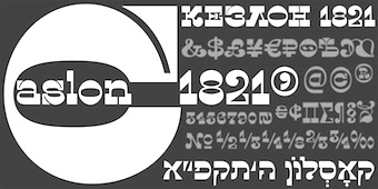 Ukrainian type foundry founded in 2012 by Viktor Kharyk and Konstantin Golovchenko in Odessa. In 2014, they published the Latin / Cyrillic typefaces
  [
[
 Arta Osherov (Arta Ltd) is an Israeli type designer. He created
  ARTypes is based in Chicago, and is run by Ari Rafaeli, earlier possibly known as Richard Everds.
  Israeli designer Habib Khoury (born in Fassouta, Upper Galilee, 1967) is presently Executive Creative Director of Avant Design Communications, which specializes in trilingual typography and communications. The type division, AvanType, offers commercial Latin, Arabic and Hebrew typefaces. He holds a Masters degree from Central Saint Martins College in London. Habib spent several years in Haifa, London, and New York, and is now based in Cathedral City, CA.
  [
[ New York-based designer of the Type Directors Club 1999 award-winning design
  Eran Bacharach (Bee Creations) created
  Designer of the multistyle free monospaced octagonal and pixel font family Bedstead (2017), covering, Latin, Greek, Cyrillic, Hebrew, mathematics, and a slew of other things. He explains: Bedstead is an outline font based on the characters produced by the Mullard SAA5050 series of Teletext Character Generators. The SAA5050 is familiar to those of a certain age as the chip that produced the MODE 7 display on the BBC Microcomputer. It generates characters from a 5x9 pixel matrix, smoothing diagonal lines to produce an interlaced 10x18 matrix for each character. Bedstead extends that algorithm to continuity, converting a 5x9 pixel grid into an outline with smooth diagonals. [
 Bigelow&Holmes was founded by Charles Bigelow and Kris Holmes. Charles Bigelow (b. 1945, Detroit) is a type designer and teacher, who runs his own studio, Bigelow&Holmes. Bigelow was a colleague of Donald Knuth at Stanford University when Knuth developed his Computer Modern typeface family for TeX. In mid-2006, Bigelow accepted the Melbert B. Cary Distinguished Professorship at Rochester Institute of Technology's School of Print Media. Before that, he taught at Stanford University, Rhode Island School of Design, and other institutions. Typefaces designed by Bigelow:
  Type foundry in Paris, est. 2016 by Jérémie Hornus, who is the design lead. Type designers associated with Black Foundry include Alisa Nowak and Ilya Naumoff. They initially bought the font collection of FontYou. Typefaces not included in the original FontYou collection:
  Borutta (or Duce Type) is the creative studio of über-talented Warsaw-based designer Mateusz Machalski (b. 1989), a graduate of Wydziale Grafiki ASP in 2014, and of Warsaw Academy of Fine Arts. His oeuvre is simply irresistible, charming and a worthy representative of the Polish poster style---witness Alergia (2016), Magiel Pro (2017) and Madiso (2017).
 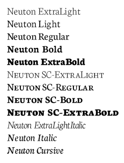 Tennessee-based type designer, b. 1991, PA, who died on February 24, 2023. Before moving to Tennessee, he was based in Newton County, AR. Brian Zick's typefaces include the Times-Roman like family Neuton (2010-2011, which contains both Latin and Hebrew versions;
  [
[ [
[ Catharsis is located in Leiden, The Netherlands. Before that, Christian Thalmann's page
  Leipzig-based foundry. It produced typefaces such as Neuwerk-Type (1908, Georg Schiller's blackletter),
  Type designer.
  [
[ Chi No (Tel Aviv, Israel) and
  Tim Larson (Christ Trek Fonts) is the Minnesota-based creator of the Open Font License fonts
  [
[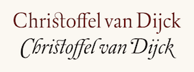 Born in Dexheim, Germany in 1606 or 1608 (some sources say 1601), he died in Amsterdam in 1669. Dutch printer, typefounder, type cutter, and type designer who worked for Elsevier. He had a type foundry in Amsterdam. In texts like Johan Enschedé's
  [
[ Art director, designer and consultant who grew up in Colorado and is now based in Heber City (was: Park City and before that Salt Lake City), UT. In 2021, he joined
  Swiss designer Bruno Maag (b. Zürich) founded Dalton Maag in 1991, and set up shop in Brixton, South London. He serves the corporate market with innovative type designs, but also has a retail font line. Ex-Monotype designer Ron Carpenter designs type for the foundry. In the past, type designers Veronika Burian worked for Dalton Maag. A graduate of the Basel School of Design, who worked at Stempel and was invitedd by Rene Kerfante to Join Monotype to start up a custom type department. After that, he set up Dalton Maag with his wife Liz Dalton. He has built the company into a 40-employee enterprise with offices in London, Boston, Brazil (where the main type designer is Fabio Luiz Haag), Vienna and Hong Kong.
 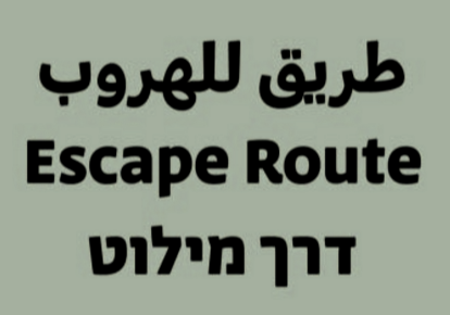 Born in 1985, Daniel Grumer studied at the Bezalel Academy of Arts and Design in Jerusalem. In 2015-2016, he studied type designat in the
  Canadian type designer. His typefaces:
  Czech designer (b. Brno) who graduated with a Masters in Informatics at the Masaryk University in Brno in 2005, spent a term at the Denmark's Designskole in Copenhagen in 2004 and graduated with distinction from the MA in Typeface Design at the
  Born in 1986, David Rudnick is a graphic designer in the UK. He created quite a number of typefaces ca. 2013. These include:
  Great fonts for astrology, hieroglyphics, alchemy and the occult, by Toronto's Jan and Denise Koehler, mostly designed between 1993 and 1995. They moved to Litomerice and then Teplice, the Czech Republic, recently.
  Partner of Jan Koehler in
  Prolific NY-based designer (born in East Los Angeles) who specializes in faithful revivals of old masters and logotype, in Latin and Hebrew. He made over 500 fonts including. He is also a translator and illuminator of Biblical period Hebrew and Aramaic. His clients include The Vatican (Pope John Paul II's Holocaust commemerative CD) and Hadassah, the Women's Zionist Organization of America. His specialties are translations worded in the language and style of the period in which the Biblical text was composed. His translation and enumeration of kabbalistic writings, otherwise known as Hebrew Mysticism and numerology, demonstrate the mathematical base of Biblical miracles.
  Peruvian creator (b. 1984, Arequipa, Peru) at
 Not to be confused with Phil's Fonts, Phil Fonts offers charityware fonts by Phillip Andrade who uses the nicknames Dry Bohnz, neatoguy and
  Sydney, Australia-based designer of
  Influential Israeli graphic and type designer, 1907-2001.
  British stone carver, wood engraver, essayist and type designer
  Geneva, Switzerland-based graphic and type designer, b. 1990, who studied at ECAL in Lausanne. Designer of the Trajan column-inspired display serif typeface
  Eyal Holtzman (Den Haag, The Netherlands) is a graphic and type designer who was born in Haifa, Israel in 1969. He studied at the Royal Academy of Art in The Hague, and teaches typography and graphical arts in various places. He set up Studio Eyal and Myrthe together with Myrthe Stel.
  Brazilian graphic and type designer, who co-founded Naipe Foundry with Alvaro Franca in Rio de Janeiro in 2018. A graduate of ESDI Cartapaccio, Felipe has interned at Coppers & Brasses in Montreal. He is also associated with Rodrigo Saiani's type foundry
  FiraGO (2012-2018) is an outgrowth of the open source Fira Sans typeface family by Carrois and Spiekermann. Script support has been considerably extended from Latin Extended, IPA, Pan African, Cyrillic Extended (+ locl BGR and SRB), and Polytonic Greek, already present in Firs Sans, to Arabic, Devanagari, Georgian, Hebrew, and Thai. Manual basic truetype hinting was done with Glyphs. Copyright of various parts of Firago: Carrois Corporate GbR, HERE Europe B.V., The Mozilla Foundation, Telefonica S.A., and bBox Type GmbH. Credits for the various additons and modifications:
  Hebrew font foundry located in Israel. Its collection of typefaces is quite large. Early fonts include Ayala, Bampy, Chik, Crayola and Organy. Its designers include Ayala Halevi. Ayala Halevi, a graduate of Bezalel Art Institute, published these Hebrew typefaces at Masterfont in 2002: Uri Rounded MF, Ori MF, Nitsan MF.
 The Tel Aviv, Israel-based author of the font editor
  The GNU Freefont is continuously being updated to become a large useful Unicode monster. GNU FreeFont is a free family of scalable outline fonts, suitable for general use on computers and for desktop publishing. It is Unicode-encoded for compatability with all modern operating systems. There are serif, Sans and Mono subfamilies. Also called the "Free UCS Outline Fonts", this project is part of the larger Free Software Foundation. The original head honcho was
  Born in Troyes in 1526, Guillaume Le Bé was a bookseller, engraver and typefounder, who studied under Claude Garamont. He set up his own foundry in 1545 and ran it until his death. In 1561, he became Garamont's successor---he took over Garamont's foundry that year. He was mainly known for his Hebrew fonts, but was also praised for a roman double canon. He died in Paris in 1598. The foundry started by Le Bé kept going until well into the nineteenth century through various successions. Since Robert Estienne's foundry ceased in 1545, Marius Audin speculates, but cannot prove, that Guillaume Le Bé got his start in 1545 by taking over Estienne's foundry. Scott-Martin Kosofsky seems to contradict Audin's observation that Le Bé was Garamont's student: There is no evidence that he was a student of Claude Garamont; rather, what we do know is that he trained in the Paris workshop of Robert Estienne. He lived for some twenty years in Venice (not ten years, as stated in some modern sources), where he worked largely for the major publishers of Judaic literature. After he returned to Paris, he did much work for the Antwerp publisher Christophe Plantin, including the text Hebrews used in the renowned Polyglot Bible (Biblia Regia, 1568-1572).
  H. Berthold Systeme AG was founded in 1858 in Berlin by Hermann Berthold. Also known as H. Berthold Messinglinienfabrik und Schriftgiesserei, the type foundry was the largest in the world by 1918, with offices in Stuttgart, St. Petersburg, Leipzig, Riga, Budapest and Vienna. It grew by acquisitions of many other foundries, see., e.g.,
  [
[ Born in Fulnek, Sudetenland, in 1904, he died in Jerusalem in 1996, after having spent most of his life as head of the Hadassah College in Jerusalem. He designed Hadassah Hebräisch (1958). Winner of the
  Founded by Philipp Hubert (based in New York) and Sebastian Fischer (based in Stuttgart), Hubert & Fischer is a design studio with offices in New York and Stuttgart, Germany with a global client base. The studio specializes in creating editorial design, type design, visual identity, print, application, websites and e-commerce design from concept to production.
  Born in Porto, Portugal, in 1975. From 1994 until 1999 he studied graphic design at the Escola Superior de Artes e Design. In 2000 he became a postgraduate student at the KABK where he wrote a Masters thesis entitled "Type&Media". He joined Underware in the same year. At ATypI 2005 in Helsinki, he spoke on On the edge of legibility, which in fact is a talk about blackletter. Affiliated since 2002 with Underware. He lives in Finland. Also doing business at
  A large free font family created by Mike Abbink and Bold Monday (Paul van der Laan and Pieter van Rosmalen) for IBM's new corporate identity in 2017. It includes the IBM Plex Sans, IBM Plex Serif, IBM Plex Sans Variable, and IBM Plex Mono subfamilies.
  [
[ Vienna-based type designer who joined
  Letterer and calligrapher Ismar David (b. Breslau, 1910, d. New York City, 1996) designed the immensely popular David Hebrew in 1954 (published by Intertype and Stempel). He emigrated to Palestine in 1932 and lived in Jerusalem until 1952. During this period he worked as a graphic designer and developed the David Hebrew typeface. From 1953 onwards, he lived and worked in New York City as a book designer, lettering artist, calligrapher and architectural designer, and as an instructor at the Cooper Union and Pratt Institute. Ismar David's prolific design career was donated in 1997 to the Cary Graphic Arts Collection at RIT.
  [
[ [
[ Prolific type designer in Florida, b. New York, 1952. His fonts were originally free and consisted largely of dingbats. Around 2005 he went commercial, and now sells his work (over 350 fonts as of 2009) via
  [
[ [
[ Type and logotype company in Polanco (and now Mexico City), Mexico, run by
  [
[ During her studies, Ljubljana, Slovenia-based Krista Likar created the exaggerated serif typeface Serifnik (2015) and the gorgeous sans display typeface Kros (2015).
  Illustrator, graphic and type designer, b. 1997 in Moscow. She graduated from MGHPA (Faculty of Graphic Design of the Stroganov Academy) in 2018.
  The Department of Mathematics of the University of the Aegean (Samos, Greece) has established a laboratory on Digital Typography and Mathematical Software in 2006. It supports the Greek language with respect to the TeX typesetting system and its derivatives. Antonis Tsolomitis (who lives in Karlovassi, Samos, and is a professor of Mathematics at that university) writes: After the support for Greek was added by A. Syropoulos and the first complete Greek Metafont font was presented by Claudio Beccari there was an obvious need, to be able to use a scalable Greek font with LaTeX. With this in mind, we developed the first Greek fontfamily in Type1 format with complete LaTeX support, called "Kerkis". Their Greek font
  Born in 1921 in Transylvania, he trained at the Fine Arts Academy of Budapest (Hungary) and then at the Beaux-Arts in Rouen (Normandy, France). Ladislas Mandel was a stonecutter, painter and sculptor. However, he spent his life in France, mostly as a type designer at Deberny&Peignot, where he worked since 1954. In 1955, he headed the type atelier. He was taught by and cooperated with Adrian Frutiger during nine years at Deberny, finally succeeding Frutiger in 1963 as type director. In 1955, he was in charge of the transformation of the Deberny type repertoire from lead to phototype. He created original designs under the label International Photon Corporation, and turned independent designer in 1977. After that, he specialized in typefaces for telephone directories, and made, e.g., Colorado in 1998 with Richard Southall for US West. He cofounded the ANCT in Paris in 1985 and taught there and at Paris VIII. In 1998, he published the book Ecritures, miroir des hommes et des sociétés (éditions Perrousseaux), which was followed in 2004 by
  British graphic designer and sign painter who was at some point in Tallinn, Estonia. Graduate of
  The extensive open source font family Libertinus is a fork of the Linux Libertine and Linux Biolinum fonts that started as an OpenType math companion of the Libertine font family, but has grown as a full fork to address some of the bugs in the fonts. The family consists of:
  Lavi Turkenich graduated at Ramat Gan's Shenkar College of Engineering and Design, Bezalel Academy of Arts and Design, Jerusalem, in 2012. She created Aravrit (Arabic-Hebrew) as her final project. She graduated from the
  [
[ Marcus Michael Douglas Behmer (b. 1879, Weimar, Germany, d. 1958, Berlin) began painting at an early age under the direction of his father who was also a painter. He worked primarily as an illustrator and graphic artist. His early work was heavily influenced by the work of Aubrey Beardsley. He achieved his first success in 1903 when he illustrated Oscar Wilde's Salome. He illustrated for the journals Die Insel, Simplicissimus and continued to do book illustrations until his death. He designed
  [
[ Spanish designer Maria Ramos Silva (
 [
[ [
[ Extraordinarily talented type and graphic designer in New York City, who is the uncontested fashion magazine type designer. Before New York, he was in Jerusalem, where he studied at Bezalel Academy of Art and Design. He also did one exchange student term at OCAD in Toronto. His work is geared toward the fashion industry and fashion publications in general.
  Foundry, est. 2009 by Rob and Sonja Keller. Originally located in Berlin, Mota Italic is a type design studio specializing in unique, extensive type families. It relocated to Mumbai, India, at the end of 2014, and moved back to Berlin in 2020.
 Naipe Foundry is the type design, lettering & font production company set up in 2018 by
  From 2009 until 2013, Natalie Rauch studied towards a Bachelors in Communications Design at the Hochschule für Technik und Wirtschaft Berlin, Germany. In 2014, she obtained a Masters in Type Design at the University of Reading, UK. During an internship at Carrois Type Design in 2012, she created the experimental sharp-edged typeface Kink. For her Bachelors in 2013, she created the modern fashion mag typeface Anouk.
  Neue Frutiger was developed by Akira Kobayashi and the Monotype (ex-Linotype) Design Team, in 2018. An outgrowth of Adrian Frutiger's successful Frutiger font, this wayfinding family was split by Monotype into several packages:
  The Linotype Design team released Neue Helvetica World in 2017. It covers the pan-European area (extended Latin alphabet, Cyrillic and Greek) as well as Arabic, Hebrew, Armenian, Georgian, Thai and Vietnamese. Each font has about 1700 glyphs. Back in 1983, D. Stempel AG redesigned Miedinger's Helvetica typeface and created a digital version. Neue Helvetica World has six additional styles including Arabic, Georgian and a specially-designed Hebrew version. For pairing with languages further afield, Monotype / Linotype recommend these typefaces: Saral Devanagari (for devanagari),
  Nicole Fally started NF Fonts in 2012. She is an Austrian-born graduate of the type design program at the
  [
[ In their Global Type collection, URW++ has its Helvetica clone, Nimbus Sans (2005, 5 fonts, 2000 Euros) and Nimbus Roman (2005, 2 fonts, 2000 Euros). The former is based on Helvetica, the latter on Times New Roman. Meant as workhorses, these fonts cover Turkish, Baltic, Romanian, Cyrillic, Greek, Chinese Simplified, Chinese Traditional, Japanese, Korean, Thai, Vietnamese, Arabic, and Hebrew. Of course, Nimbus Sans can be had for free at
  Graphic designer in Petah Tikva, Israel. In 2014, he and Chi No co-designed the Latin / Arabic typographic poster Made in Jaffa. In 2015, he created a decorative all caps Hebrew typeface simply called Alefbet.
  Type foundry offering exclusive typefaces, often revivals or interpretatins of historic types. Their typefaces include:
  Givatayim, Israel-based Hebrew type design studio in London established in 2000 by one of the main Hebrew type designers of today, Oded Ezer (b. Tel Aviv, 1972). Ezer designed the award-winning font Mayai (Hebrew script: awards at
  Graphic designer/typographer based in Tel-Aviv, Israel, who graduated from the Visual Communication Department (B.Des) at Shenkar College of Engineering and Design, in which he specialized in print, identity, logo, type and book design.
  [
[ Free software project based in Belgium and run by four people (and I quote from their web page):
  OS Type is the commercial branch of Israeli type designer Ofir Shavit. Designer in 2016 of OS Aran: Aran typeface is an 8 weights sans-serif font family (No Italics). It is a Latin expansion of the successful Aran Hebrew typeface created a year earlier by Ofir Shavit from OS-Type. Supports eastern Latin languages and Hebrew. Low contrast, a bit condensed, suitable for text and display. Very clean and non dominant appearance.
  Illustrator, graphic and type designer, and 3d modeler, b. 2001 in Moscow. He graduated from MGHPA (Faculty of Graphic Design of the Stroganov Academy) in 2018.
  [
[ Type designer who runs Philip Kelly Digital Design in the UK. He worked for Letraset from 1969-1994 as a type designer. His type design work there included Arabic and Hebrew letterforms. From 1994 until 1997, he designed typefaces at Signus, and became an independent designer in 1997. His typefaces:
  Late nineteenth century, early twentieth century rabbinical scholar, teacher, and typographer, b. Ischenhausen bei Augsburg, 1867, d. Leipzig, 1920. His typeface
  [
[ [
[ After a start at Autologic in Newbury Park in 1983, this prolific American master craftsman (b. Evanston, IL, 1956) helped pioneer digital type design at Adobe (which he joined in 1987) and created
 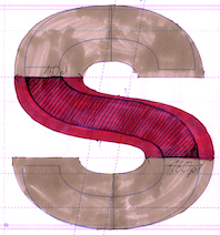 Design studio. In 2015, Mateusz Machalski and RR Donnelley joined forces to produce the 42-style corporate superfamily
  Ryan Hellyer Williamson is an Australian type designer, born in Japan and now based in the UK. After a stint as a graffiti artist in Sydney, he received his BA (Hons) in design from the University of New South Wales, Sydney. Graduate of
  [
[ At ATFI (Moscow) and later Shriftovik Foundry (also in Moscow), Tikhon Reztcov designed the
 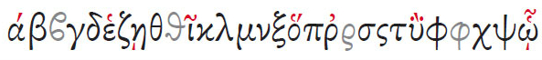 Tiro (John Hudson) is publishing Unicode-compliant typefaces called SBL Hebrew (2003), SBL Greek (2003) and SBL Latin (2003, not sure of the last name though). For now, these typefaces are commercial, but SBL (the Society for Biblical Literature) states: "SBL and the font foundation will lobby Microsoft to distribute the font with its future releases of Windows." Early 2004, the
  Graduate of ESAD in Amiens, France. Her graduation typeface there is
  During her studies in Bandung, Indonesia, Bali-based Cahya Sogyan (b. 1994) created the
  Su Lucas is a South African designer who joined
  Calligrapher and illustrator in Rehovot, Israel. She made some
  Szymon Sznajder (b. 1977) graduated from the Poznan University of Arts. He currently works as a typographer and font and book designer in Poznan, Poland and occasionally teaches at the Poznan University of Arts. He runs or ran Typolis.
  Thoma Kikis is a New York City-based graphic designer, photographer, filmmaker and entrepreneur.
  Alexander Tarbeev is Russian type designer, graphic artist and tutor. He graduated from Moscow Electrotechnical Institute of Communication in 1979 and Moscow Polygraphic Institute in 1988, and worke in the type department of NII Polygrafmash (Institute for Scientific Research of Printing Machinery, Moscow). Between 1989 and 1997, Tarbeev worked as type designer at ParaGraph. He set up the type studio TFaces in Moscow.
 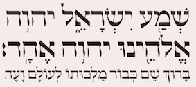 Scott-Martin Kosofsky (b. 1953) was based in Boston for 40 years, and is now located in Rhinebeck, NY, where he heads The Philidor Company. Among many other things, he was also the principal designer of most Titanic Records packaging, and designed a book on the holocaust. He designed a number of Hebrew types for his own use---several are licensed to various major rabbinic organizations. Over the years he has become the leading designer, producer, and editor of the bilingual Jewish prayer books that are used by the majority of Jews in the English-speaking world. Some of his type designs:
  [
[ [
[ John Hudson and Wm. Ross Mills, the co-founders of Tiro Typeworks in 1994, design wonderful top-of-the-line fonts in Vancouver. Their commercial typefaces can be bought from
  Erik Yin (b. 1988) lives in Kaohsiung City, Taiwan. Creator of the gridded rhombic typeface
  Aka Rursus, this Swedish viking calls himself a nerd and a cyber vagabond---exactly my kind of guy! Designer of the slab typewriter font for Latin and Cyrillic called Rursus Compact Mono (2007-2010), an
  Czech designer of the grunge monospace font Urania Czech (2006) and of the didone numbers-only font Stöhr Numbers (2006). In 2009, he made the old typewriter typeface
  Typotheque is an initiative of Peter Bilak and ui42 out of Bratislava (Slovakia), and later, The Netherlands: Typotheque is an Internet-based independent type foundry. It offers quality fonts for PC and Macintosh platforms in standard European character set and in CE (central european) character set. All fonts have full (european) character sets, are thoroughly tested and manually kerned.
  URW++ Global is the foundry name used by
  Ricardo Rodrigues dos Santos (or just Ricardo Santos, b. 1976 in Lisbon) is a Portuguese type designer. He ran VanArchiv (est. 2000) from Loures, Portugal. He changed the name to Ricardo Santos and sells his work through
  [
[ [
[ Ukrainian designer, b. Kiev, 1957. Graduate of the Senior College for Print and Design in Kiev in 1982. Viktor became art director at Sphera in Kiev. Main type designer at Düsseldorf-based company Unique GmbH since 1998. In 2012, he cofounded
  [
[ Typographer and type designer in Sofia, Bulgaria, b. 1982, Sofia, who worked mostly for Svetoslav Simov's type foundry, Fontfabric, before setting up his own shop, VSF (Vasil Stanev Foundry).
  A corporate URW studio sans family published in 2012. The six-font family sells for over 4000 dollars and covers Turkish, Baltic, Romanian, Cyrillic, Greek, Chinese Simplified, Chinese Traditional, Japanese, Korean, Thai, Arabic, and Hebrew. [
 Typefounder Vaclav Jan Krabat (1719-1805) set up his shop in the center of Prague in 1751. His first specimen book was
  German / American type designer who graduated from the
  Tel Aviv, Isarel-based illustrator and designer. Creator of the Hebrew typefaces Shokolad (2019) and Agvania (2019). [
 American graphic designer (b. 1982) located in Medway, MA, who has created many free fonts, and some low cost commercial fonts. He is also known for his web comic, Dubmarine. Until 2006, all his fonts were free, but starting in 2006, he started selling them via
  Yanky Goldman runs a design boutique in Brooklyn, NY, since 2014. In 2018, he created
  Metafont/TEX font and font software developer, specializing in non-Latin fonts and their integration in TEX. Ran
  Israel-based type designer. His typefaces in 2018 include
 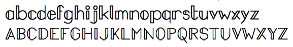 Past foundry of Charles Bigelow, Kris Holmes, and
 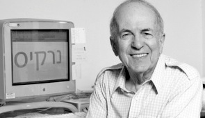 Sometimes spelled Zvi Narkis. Well-known Hebrew type designer, b. 1921, d. 2010. He was academic consultant for the graphic design course of the Technion, Israel's Institute of Technology, and lectured on Graphic Design and Typography. Freelance designer since 1950 of books, posters, stamps and bank notes. The
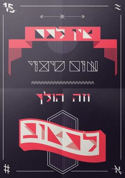
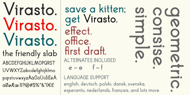
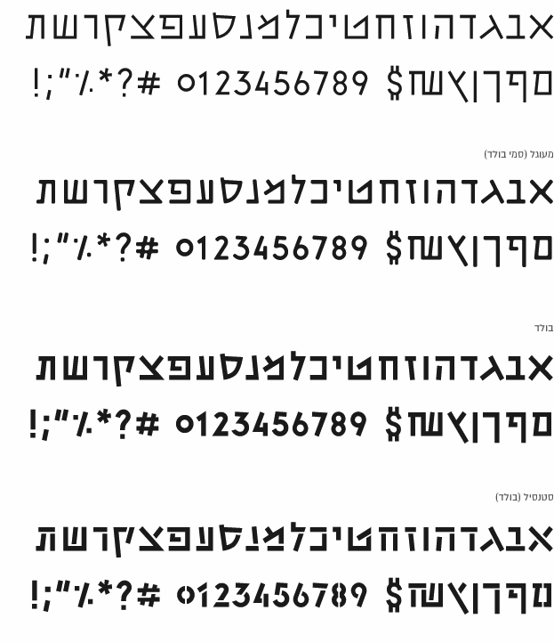
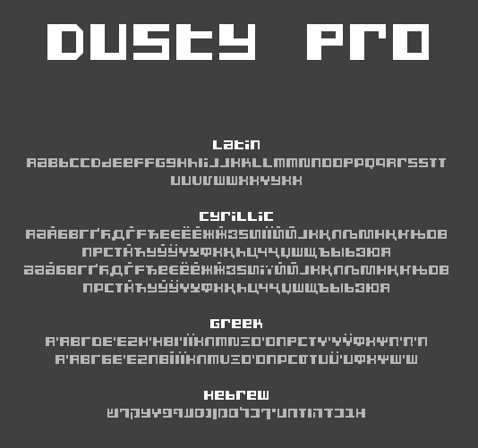
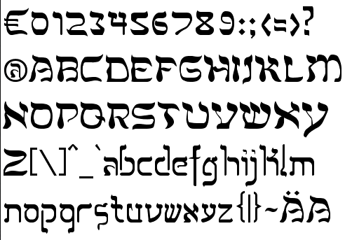
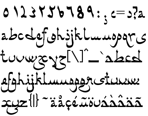
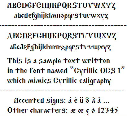
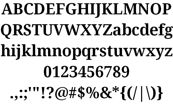
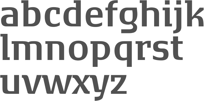
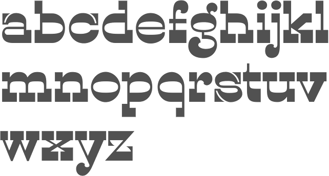
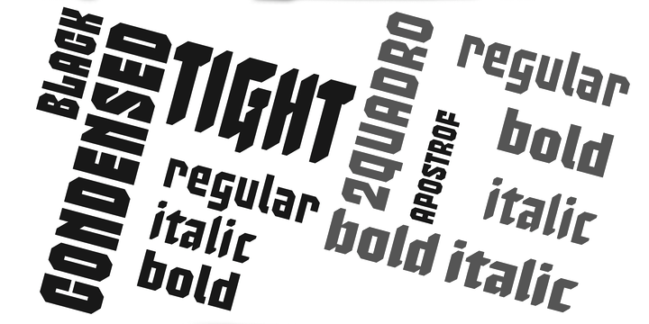
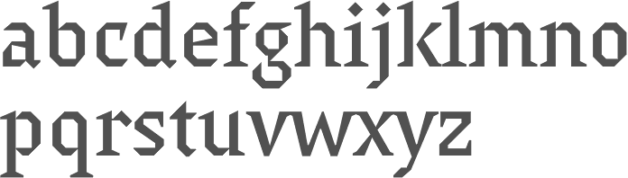
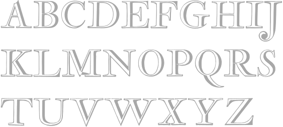
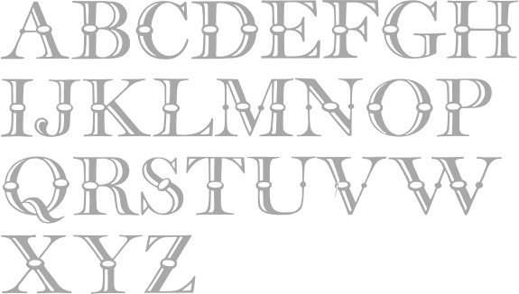
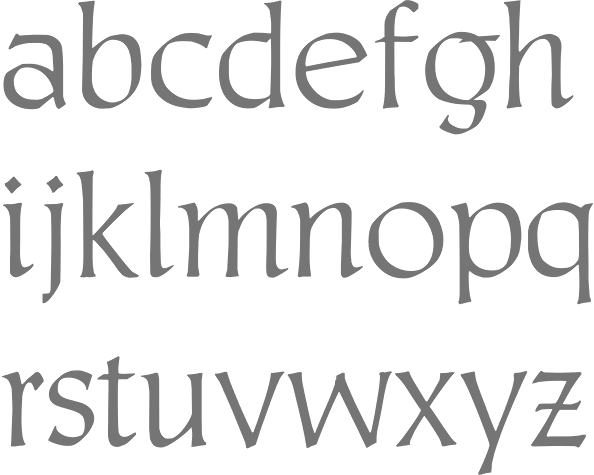
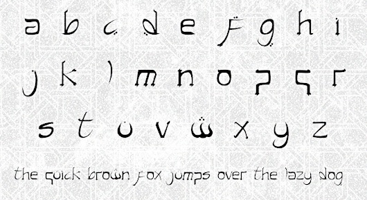
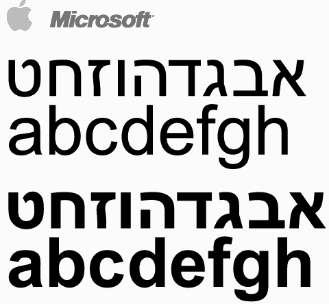
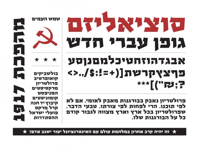
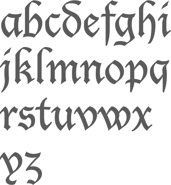
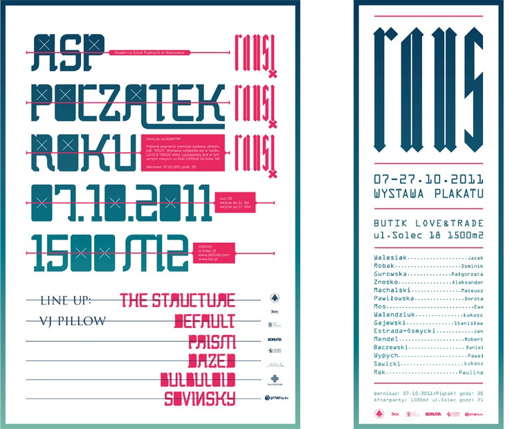
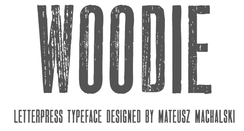
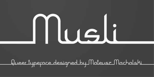
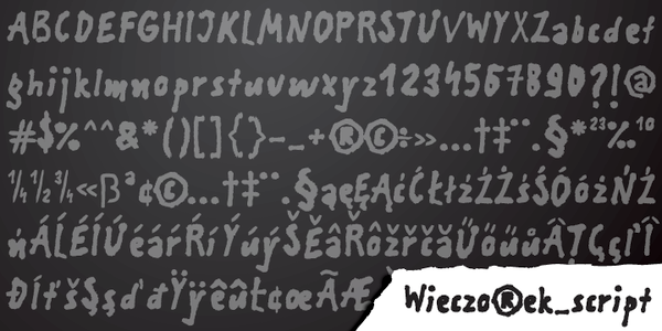
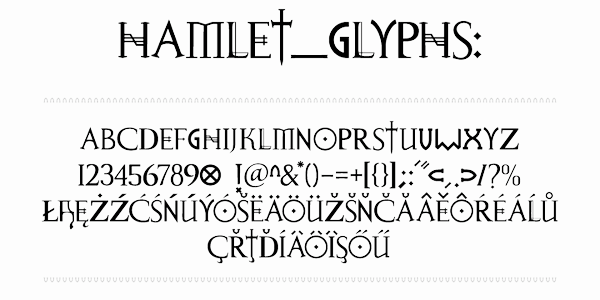
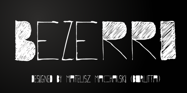
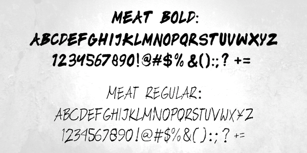
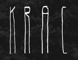
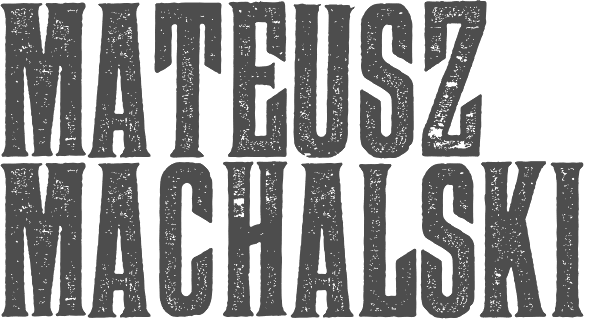
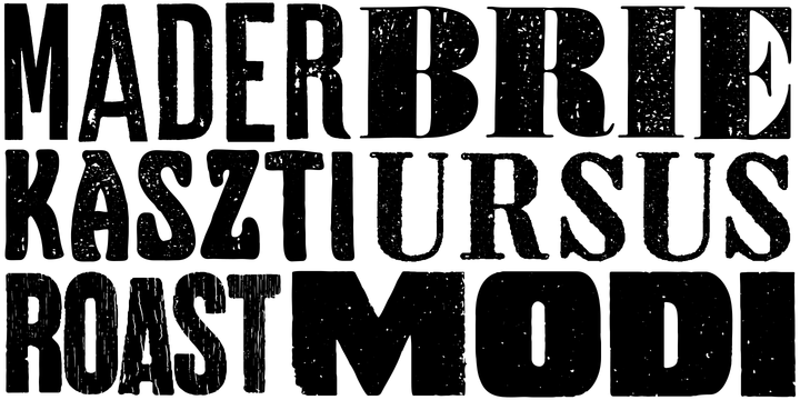
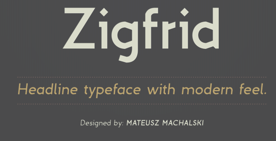
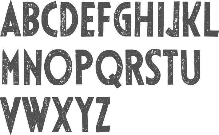
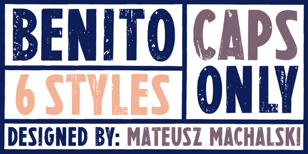
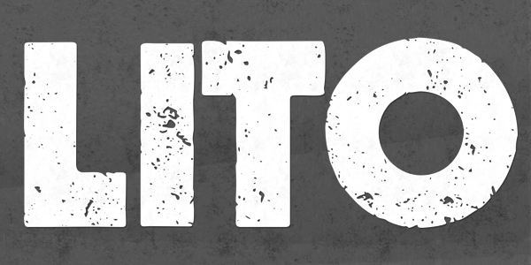
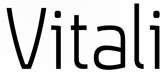
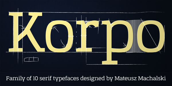
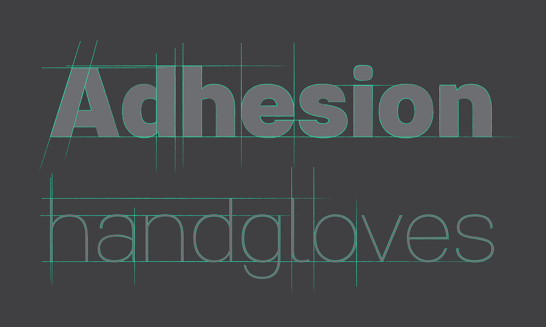
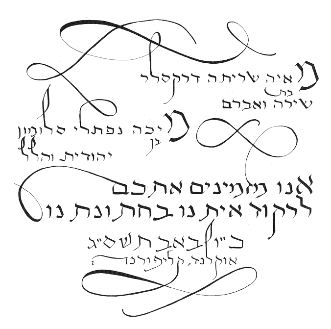
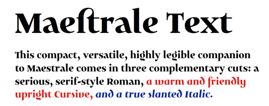
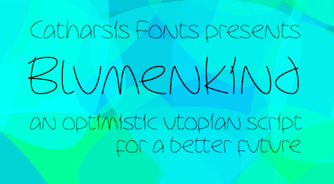
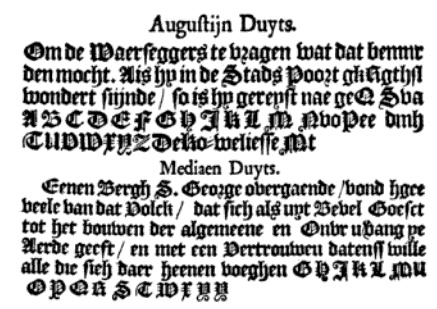
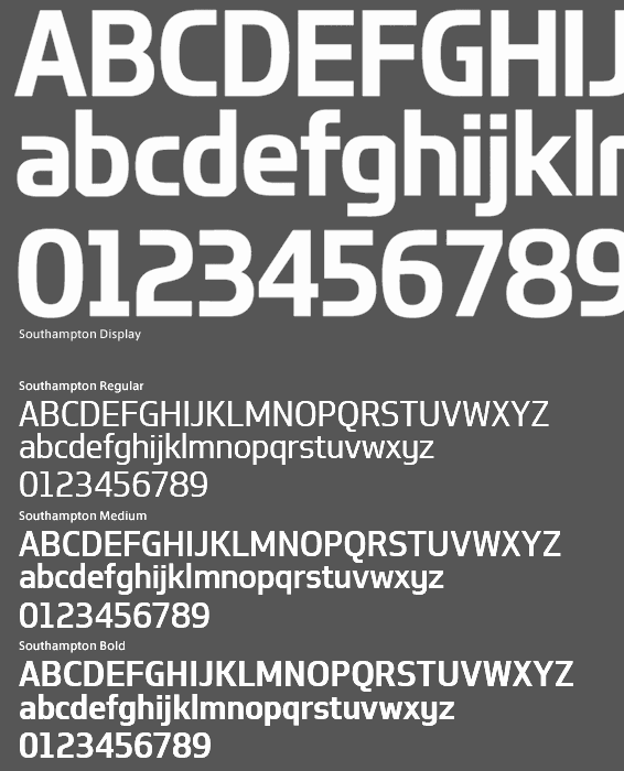
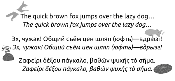
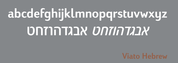
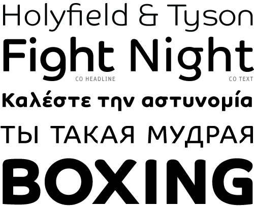
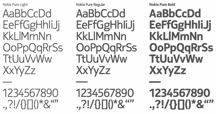
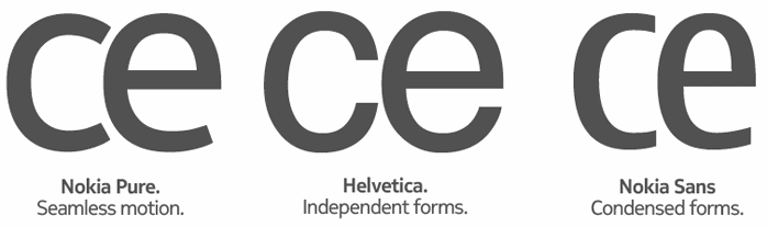
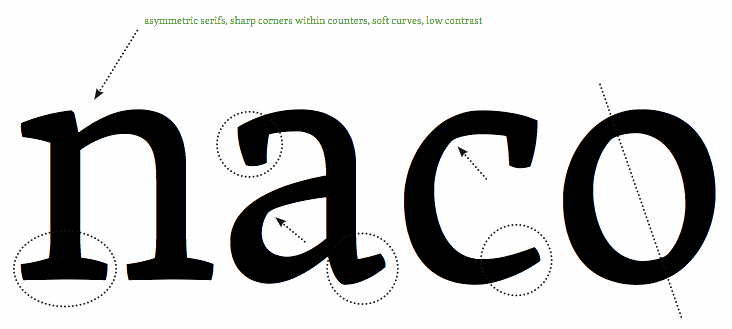
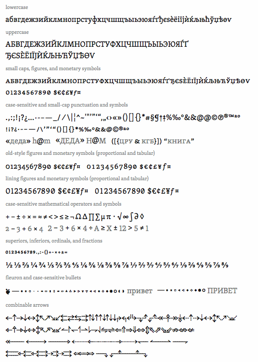
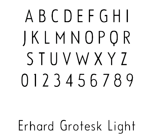
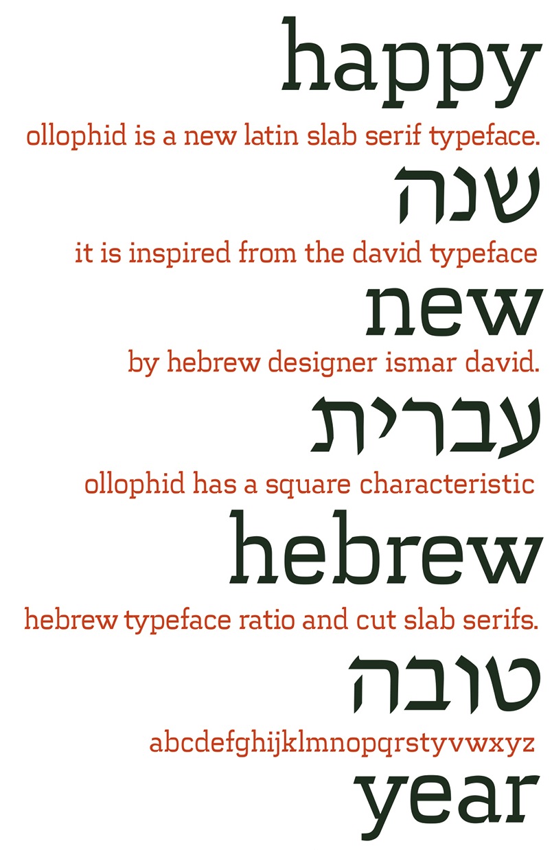
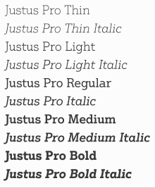
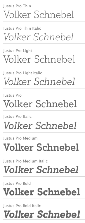
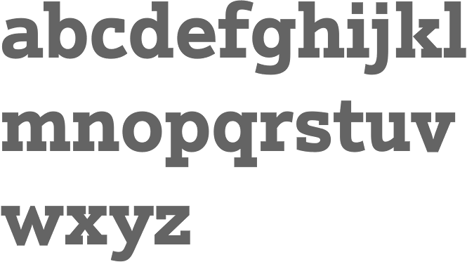
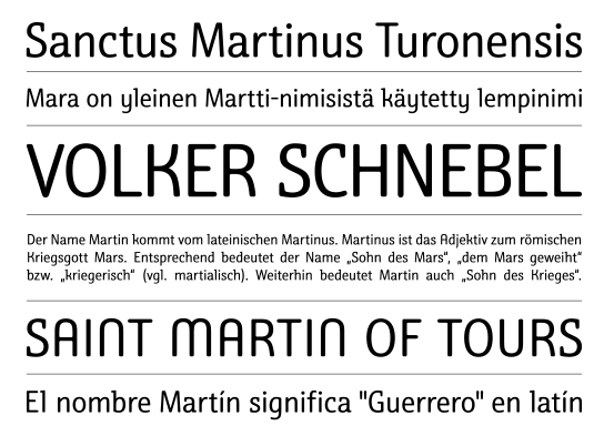
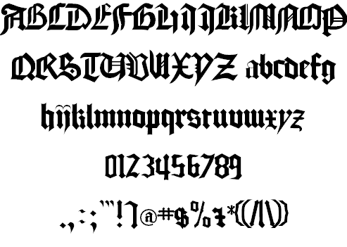
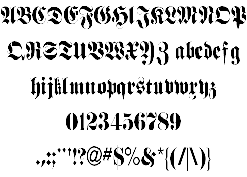
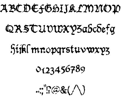
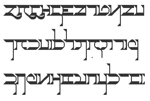
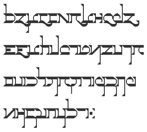
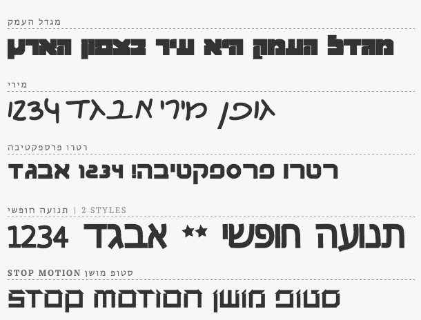
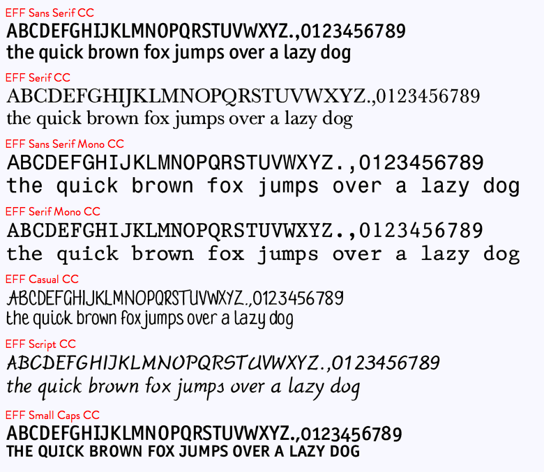
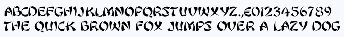
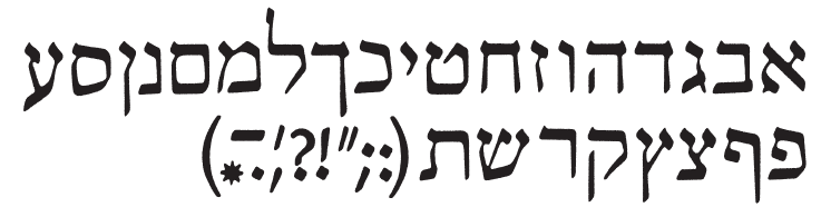
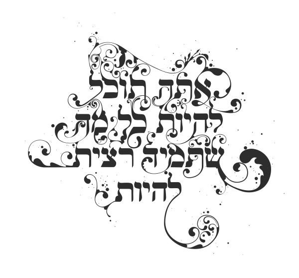
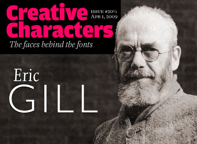
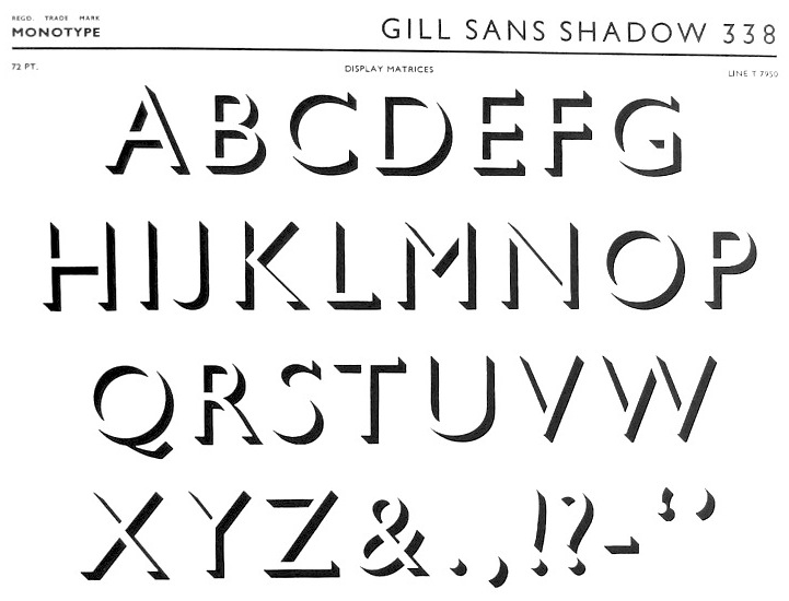
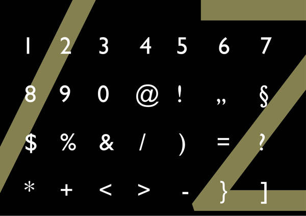
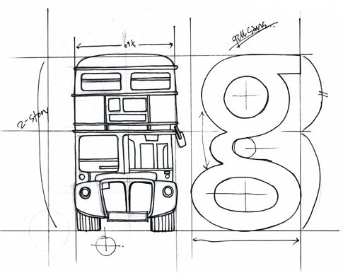
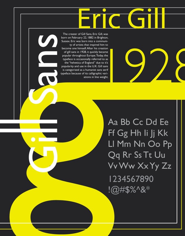
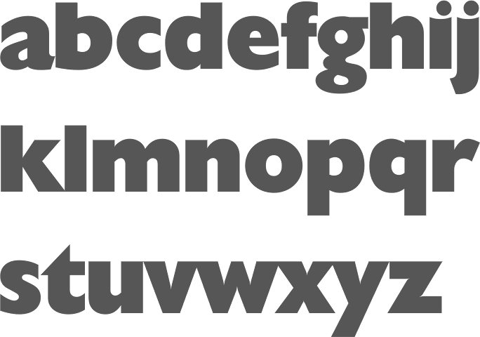
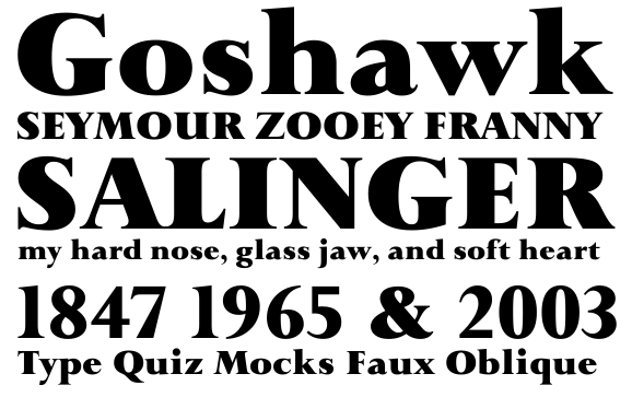
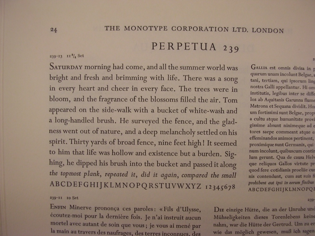
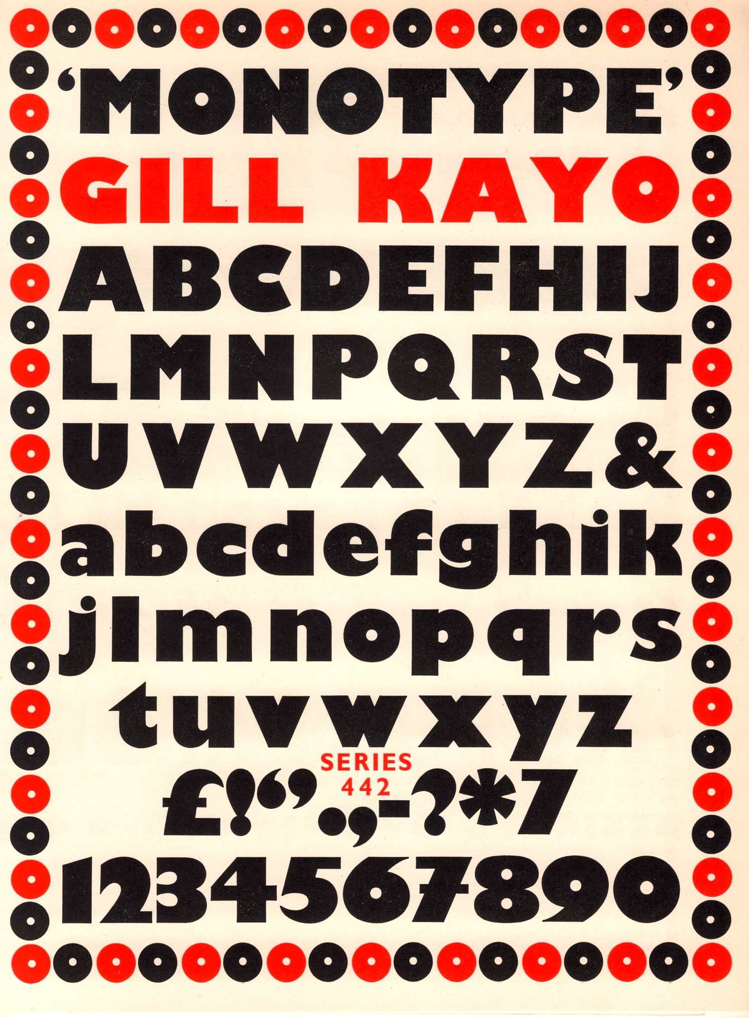
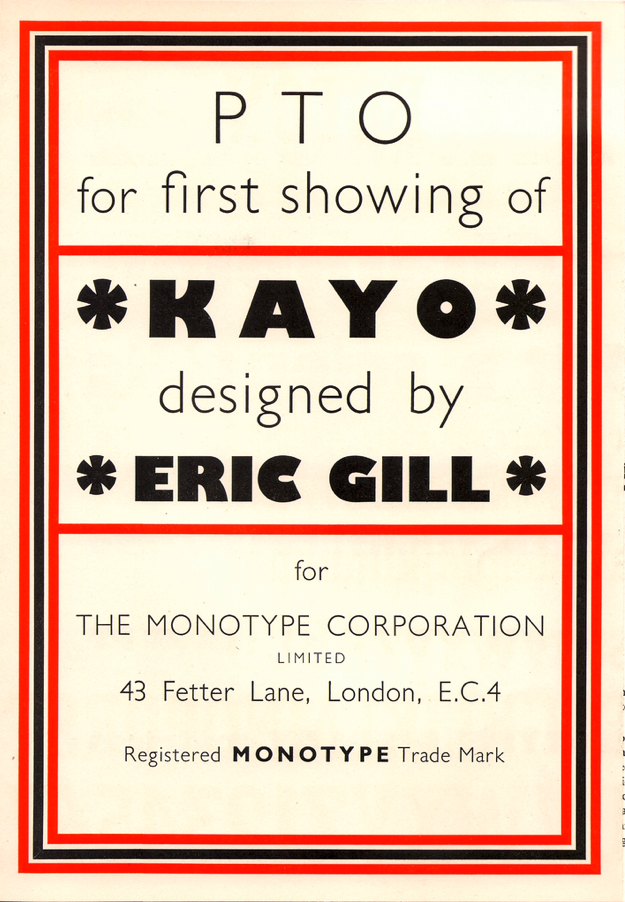
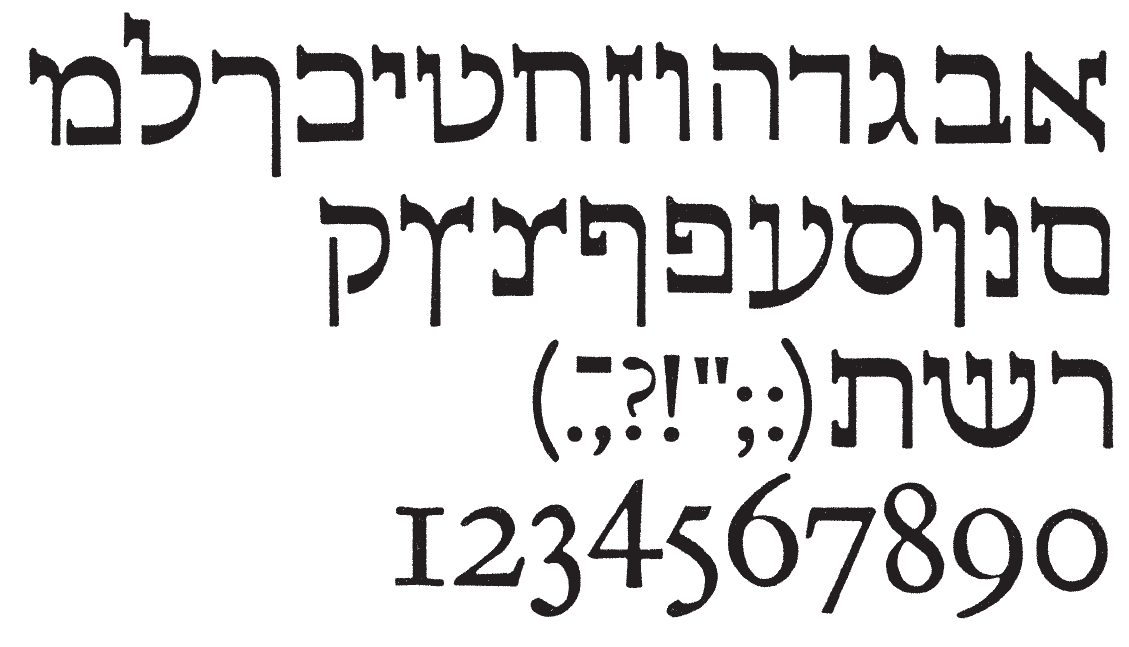
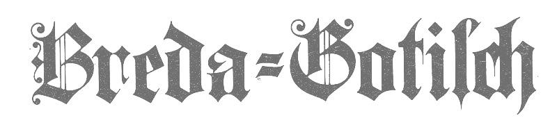
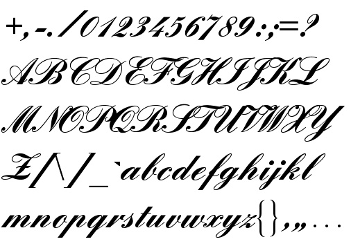
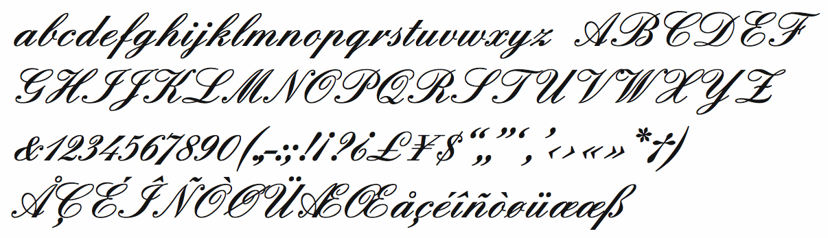
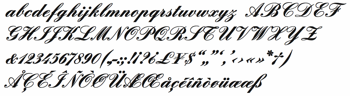
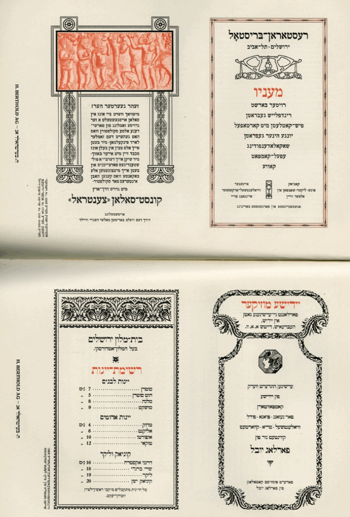
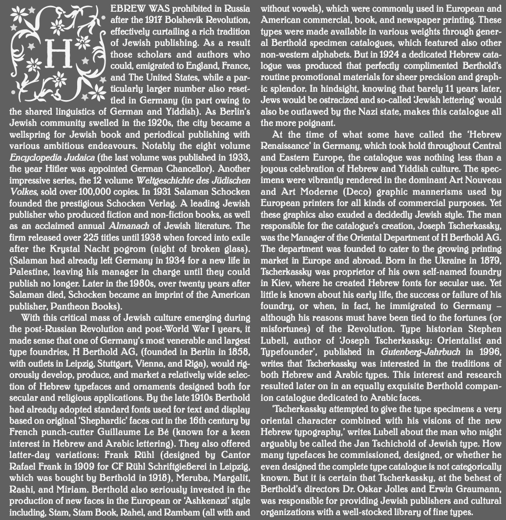
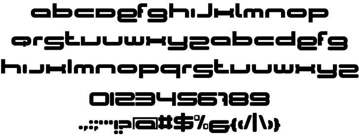
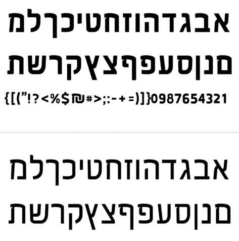
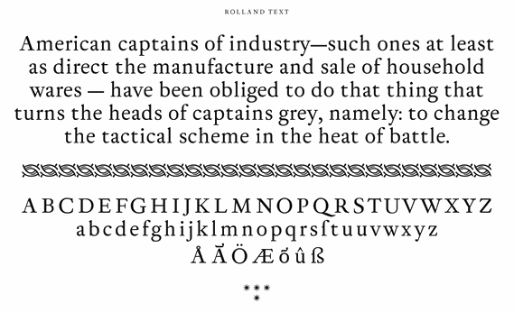
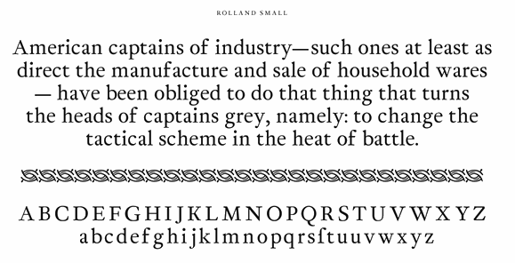
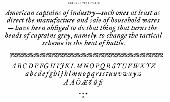
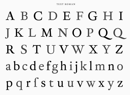
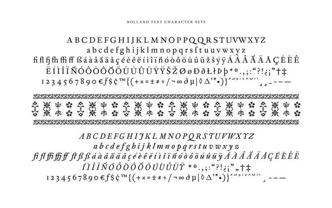
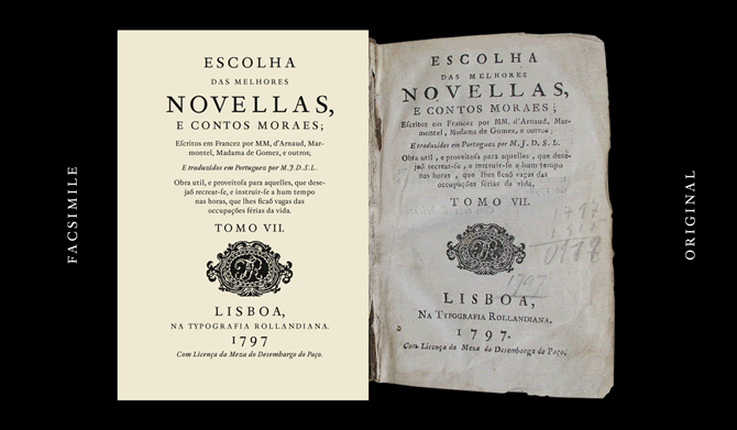
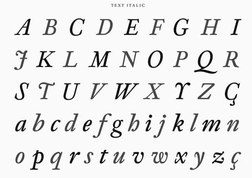
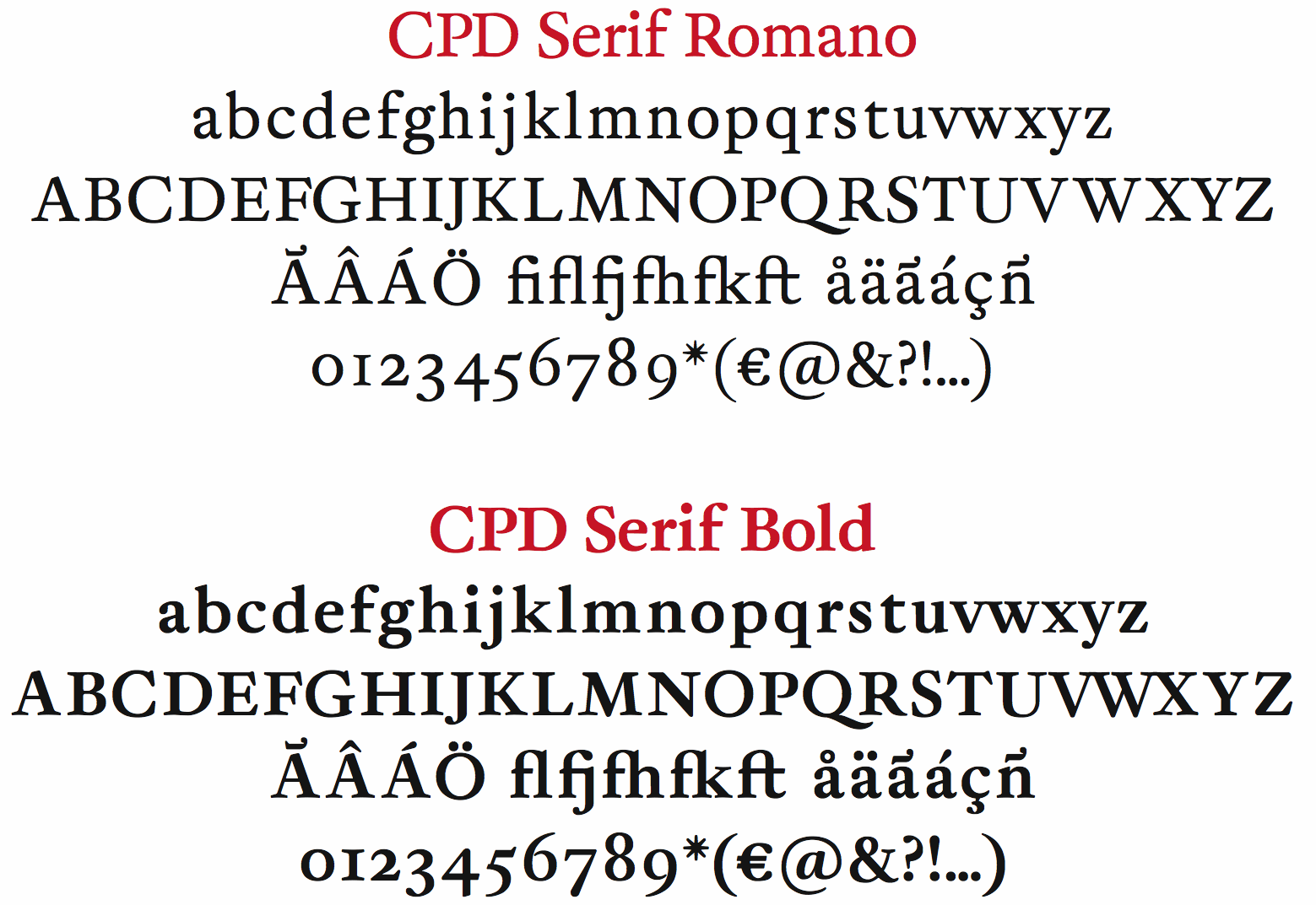
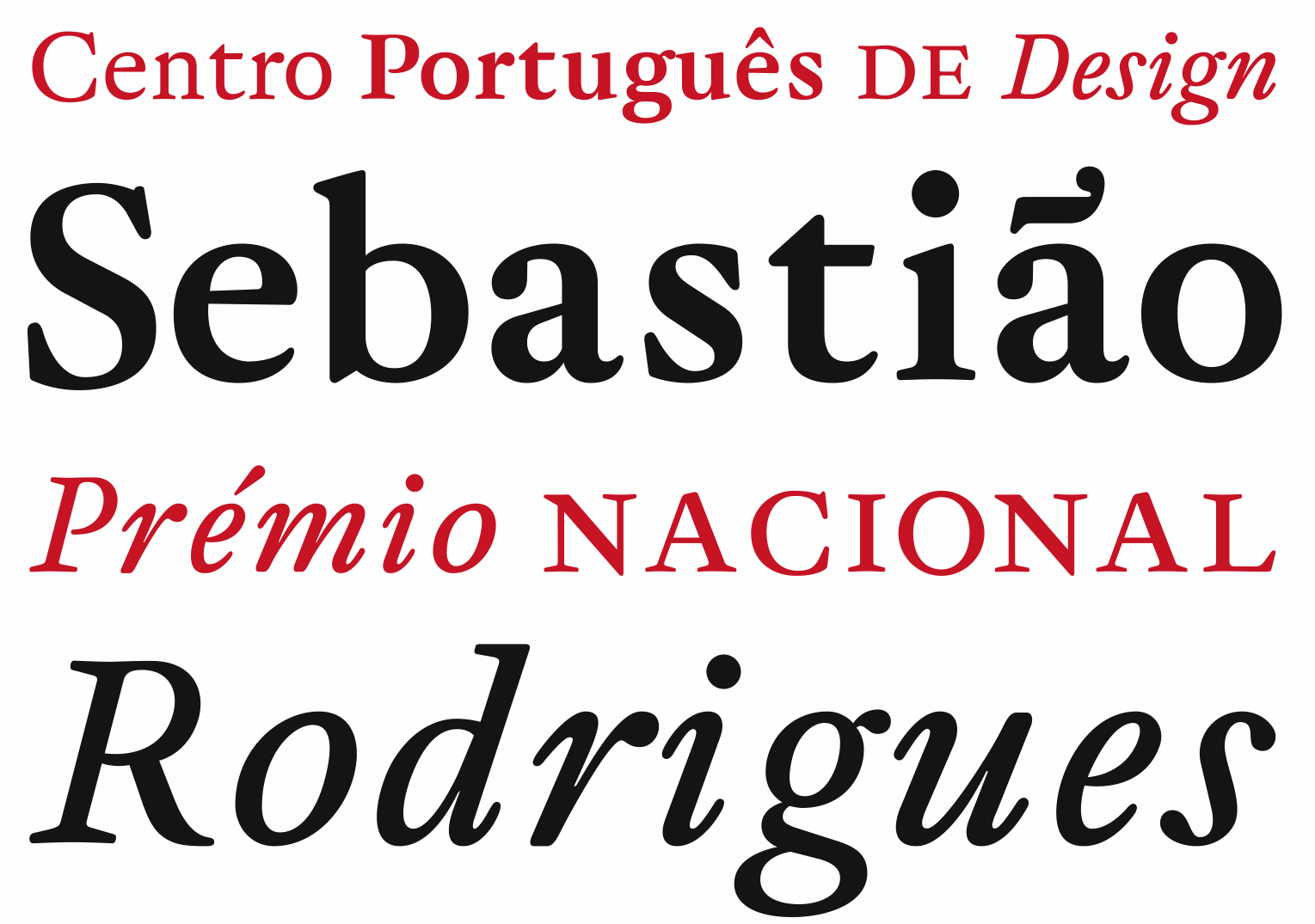
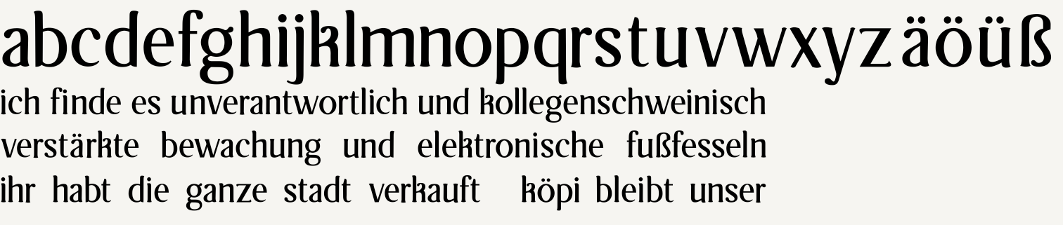
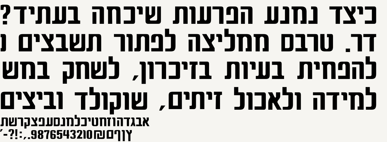
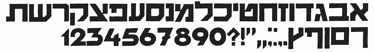
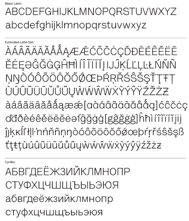
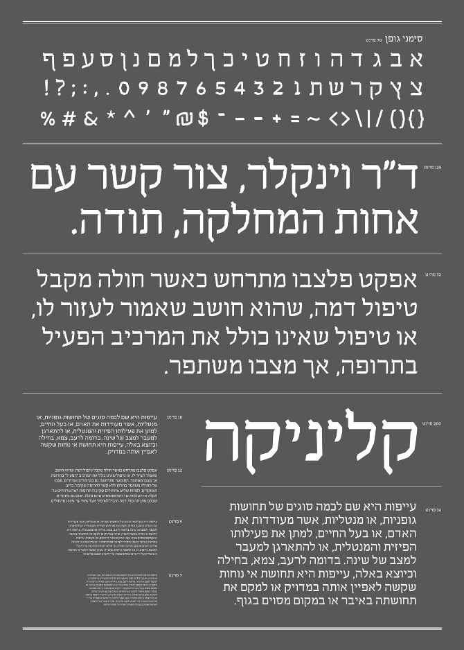
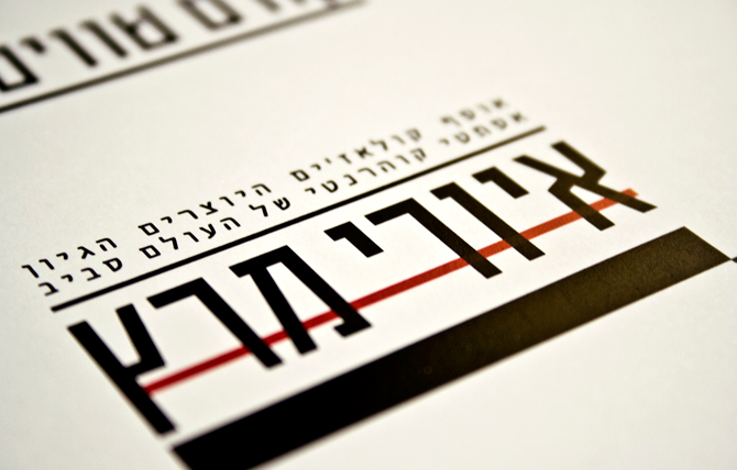
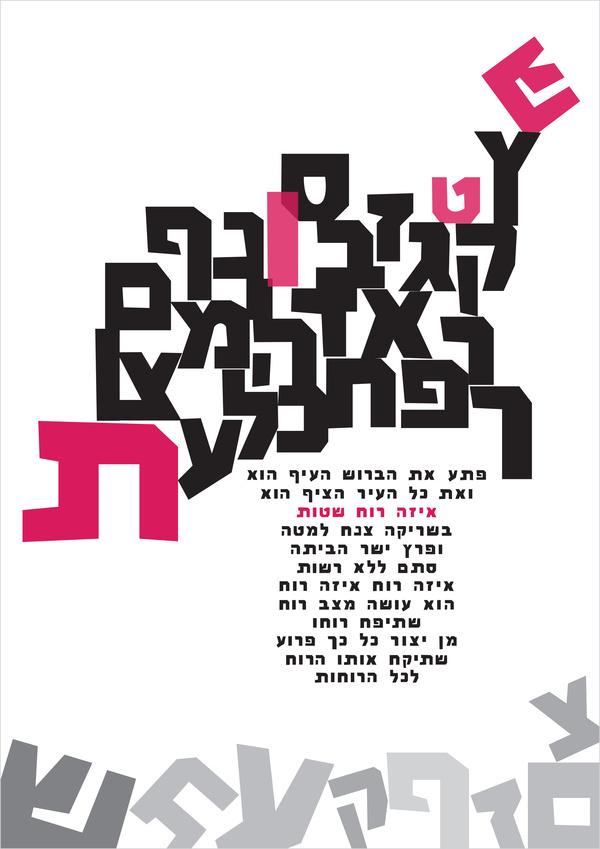
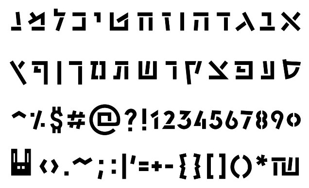
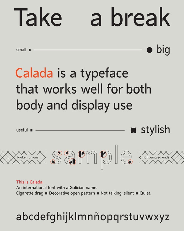
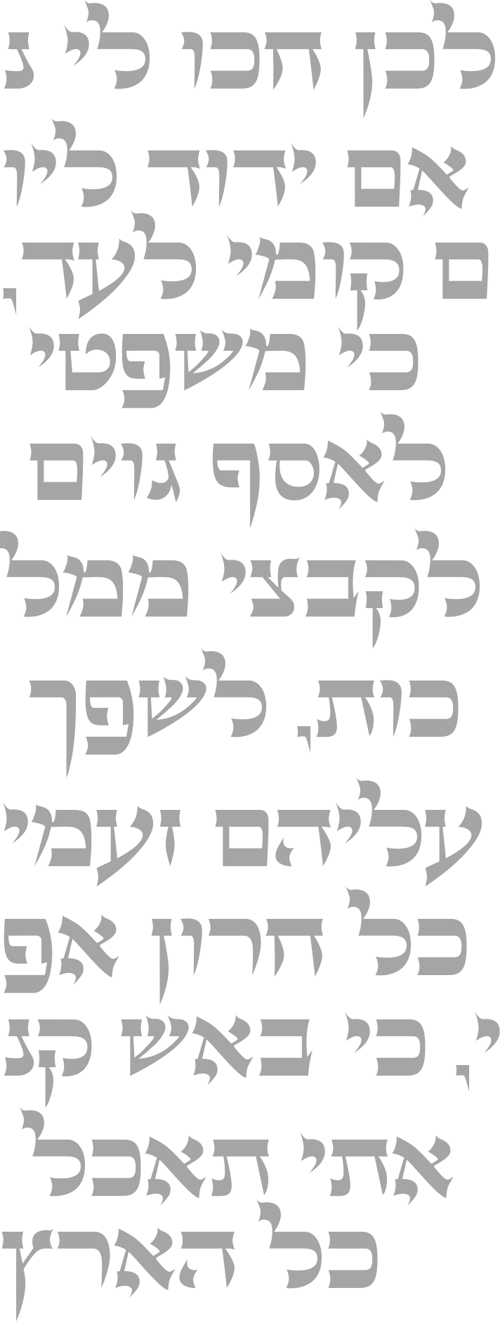
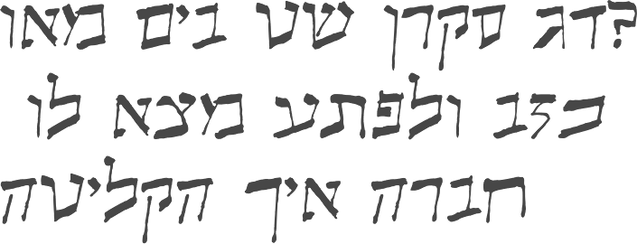
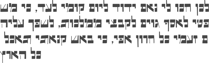
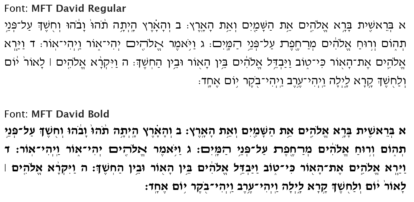
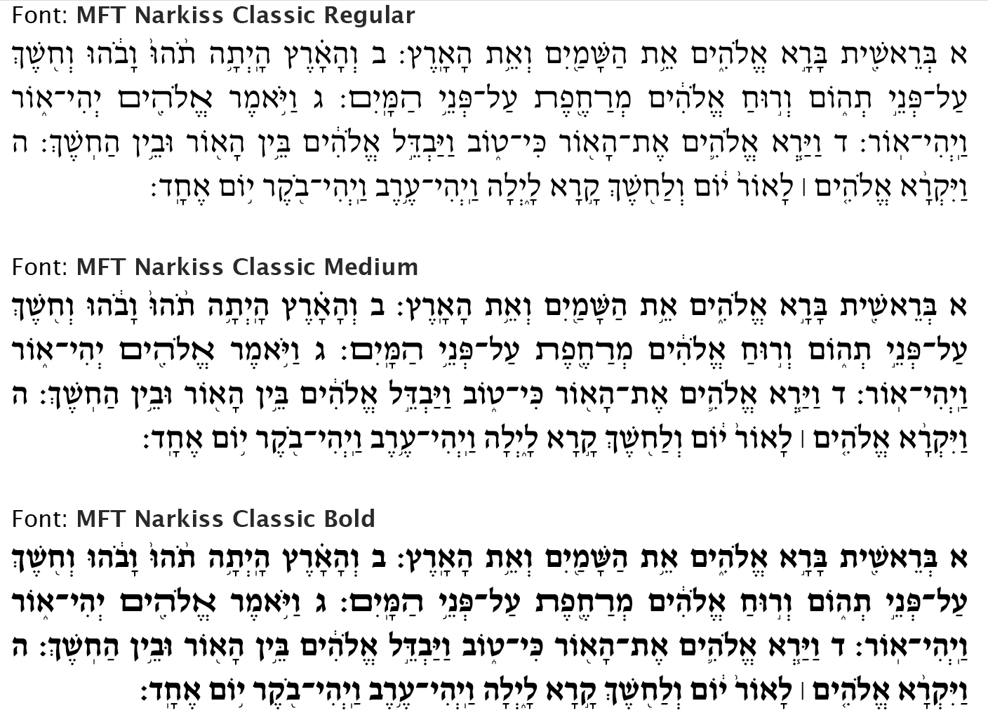
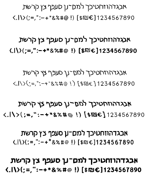
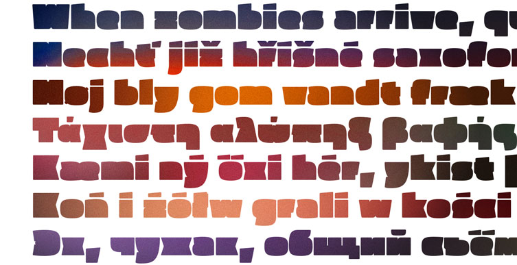
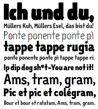
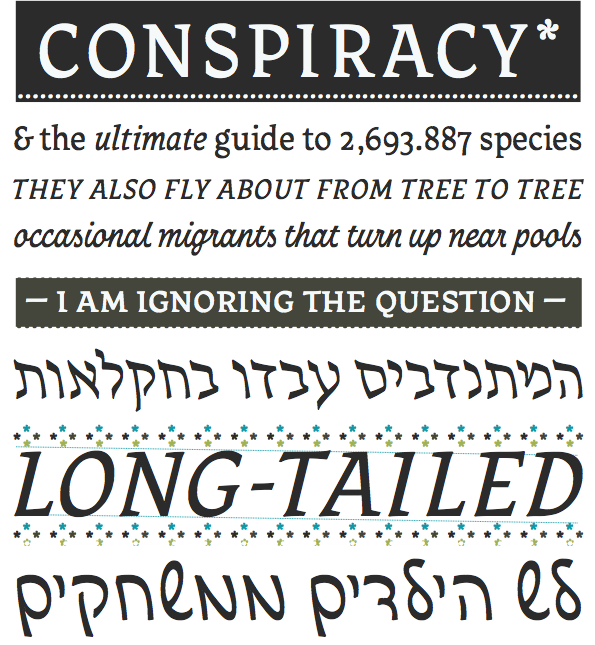
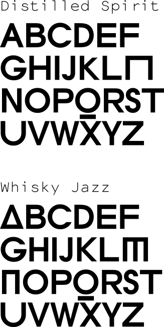
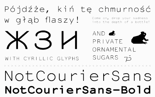
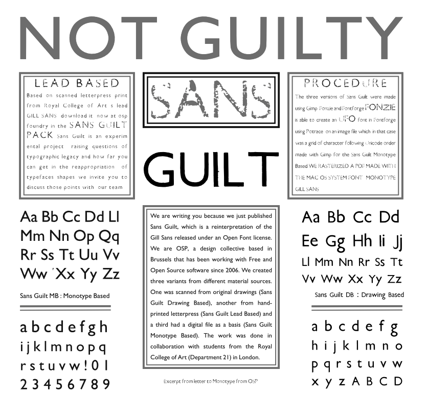
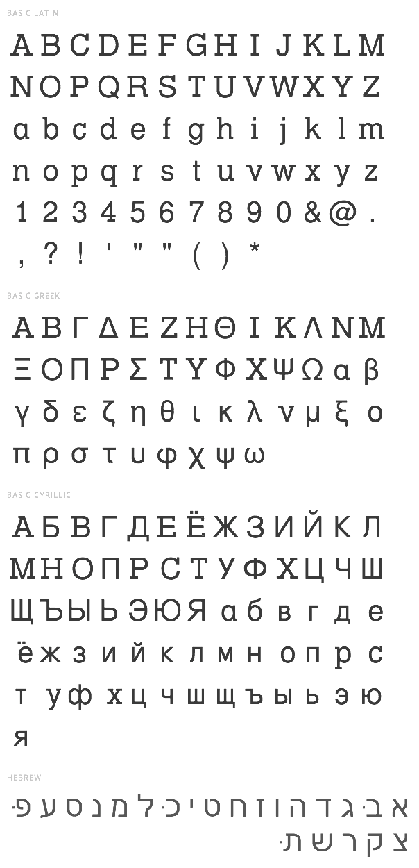
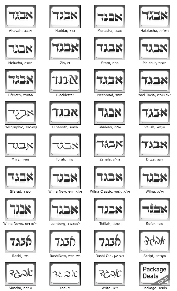
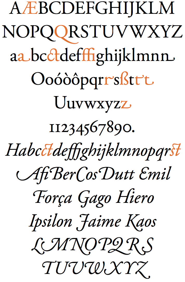
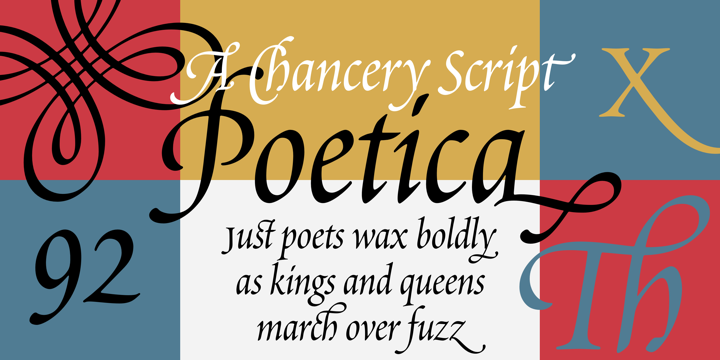
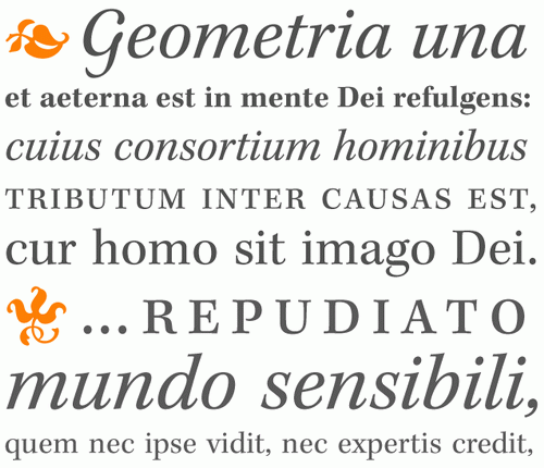
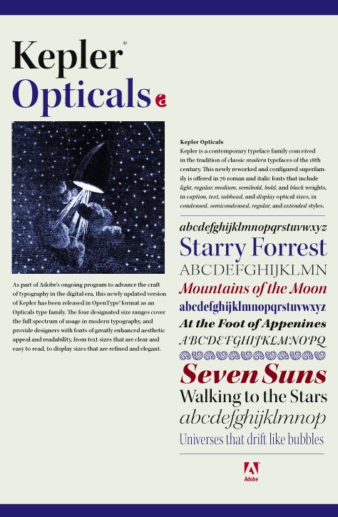
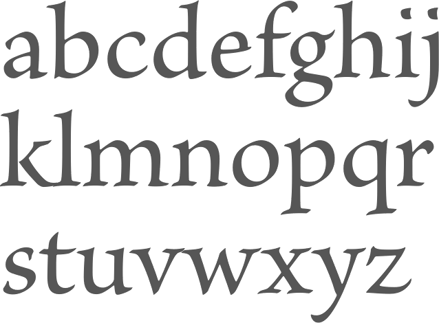
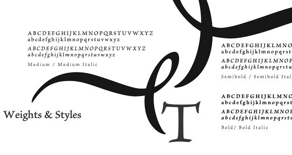
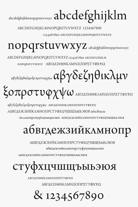
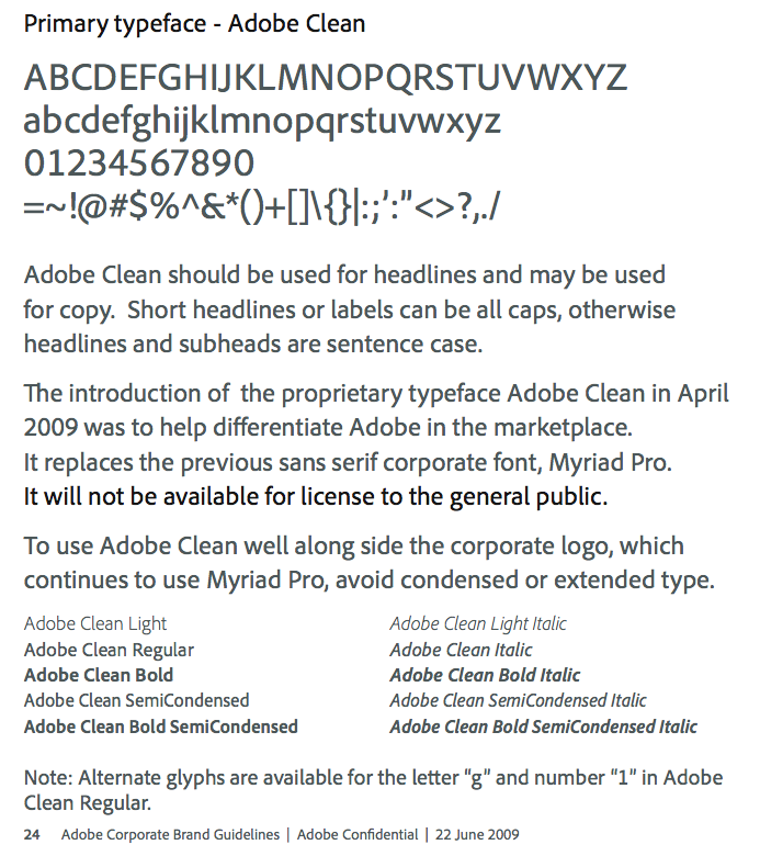
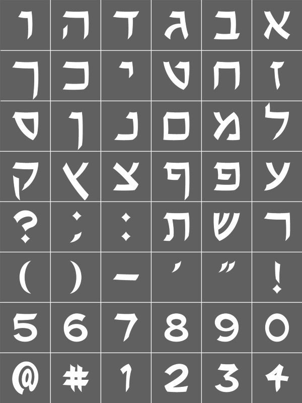
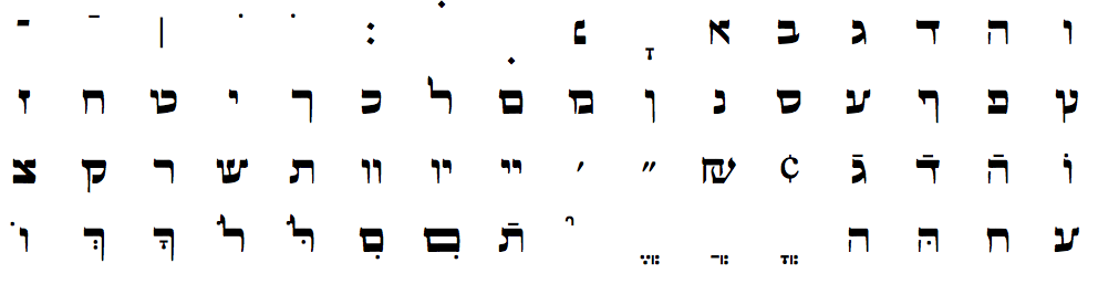
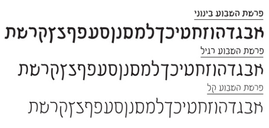
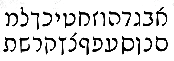
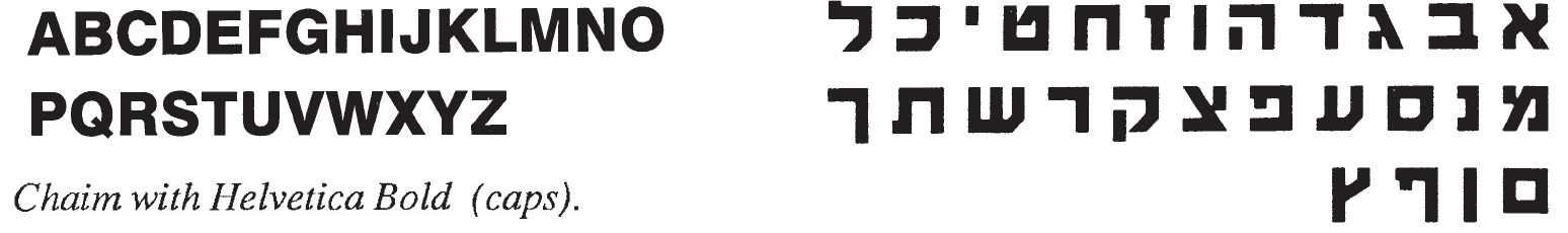
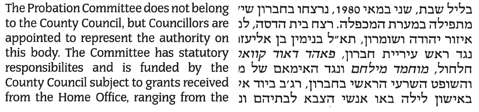
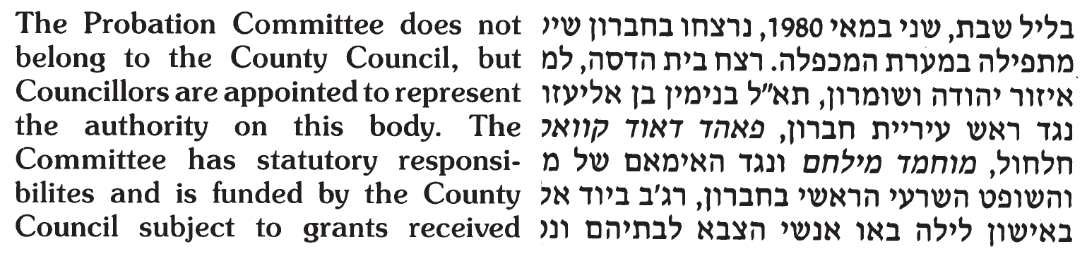
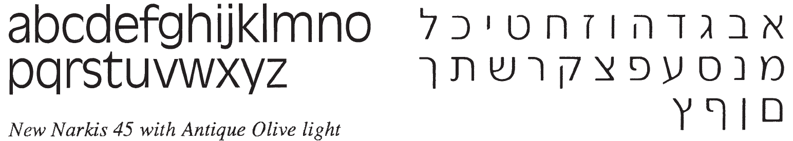
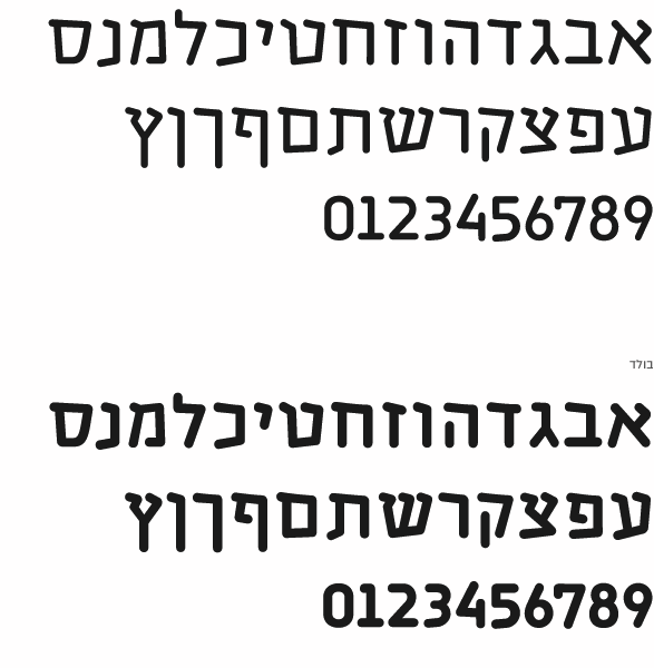
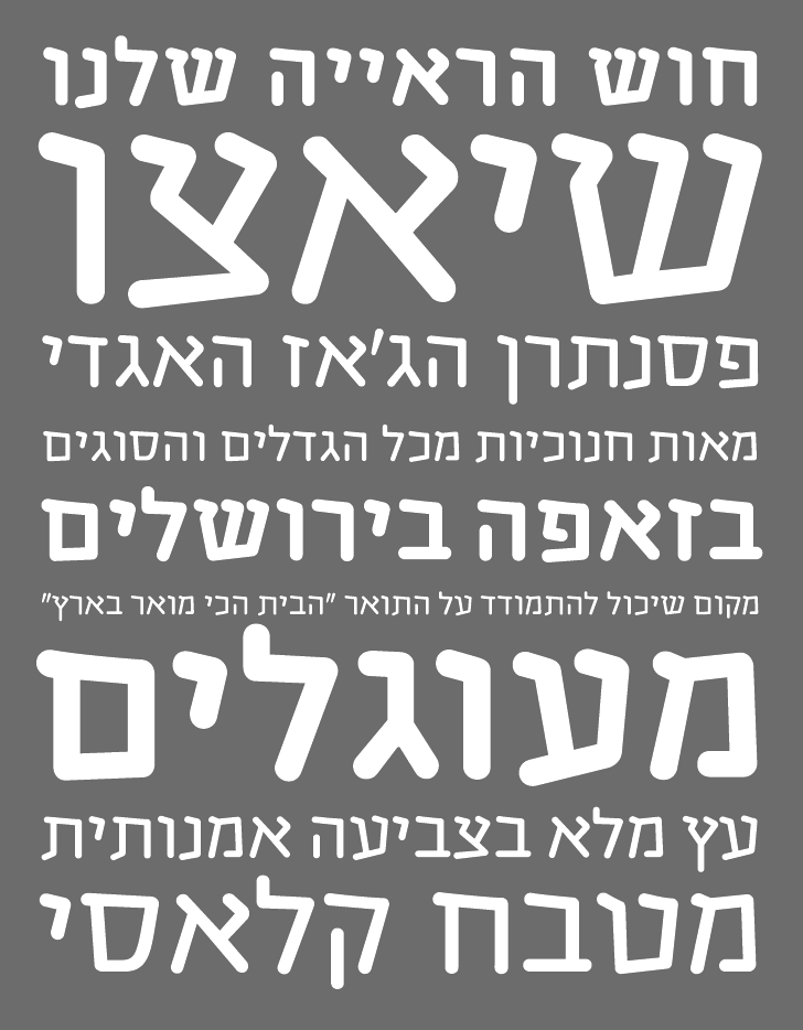
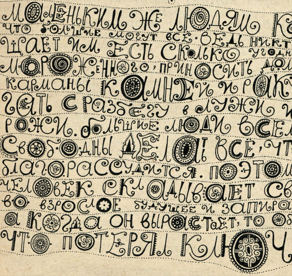
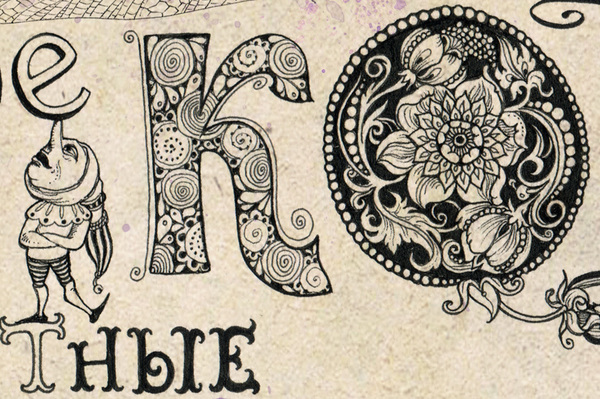
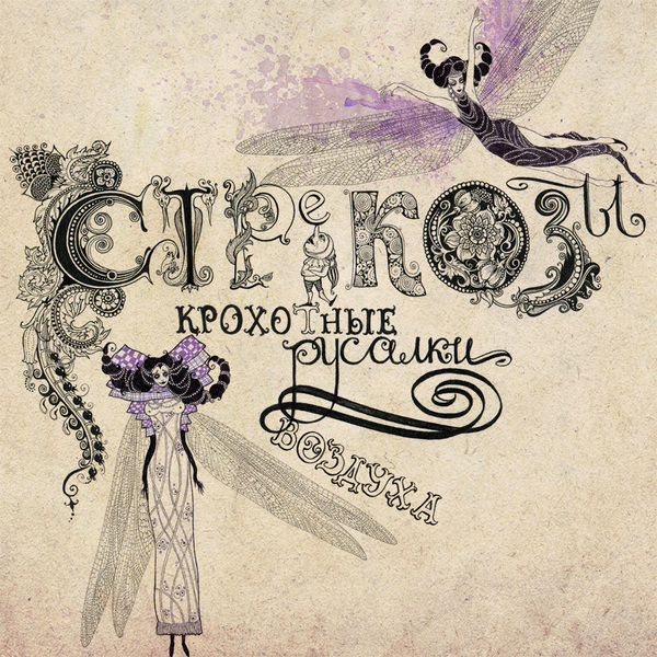
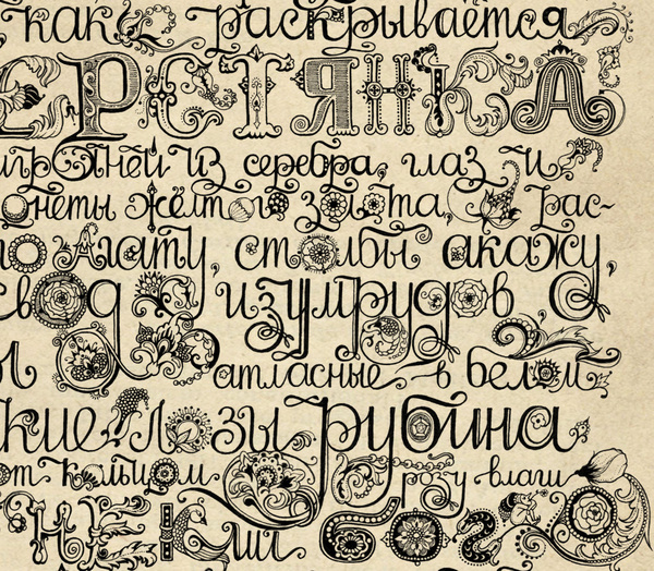
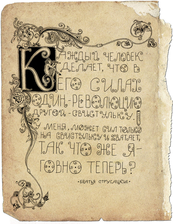
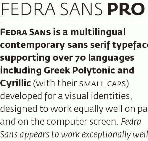
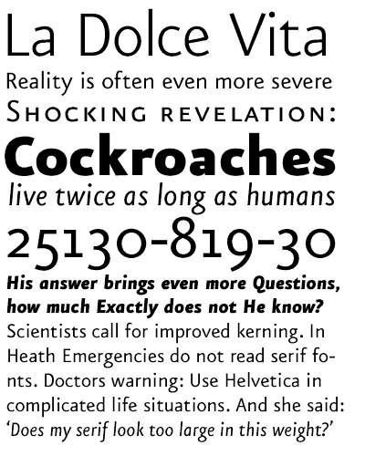
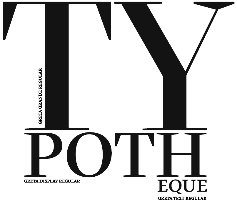
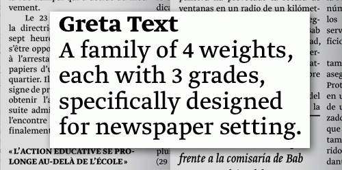
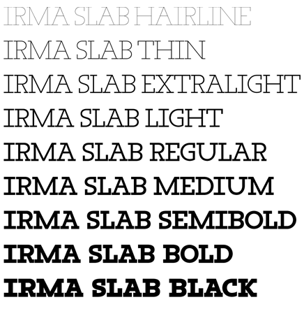
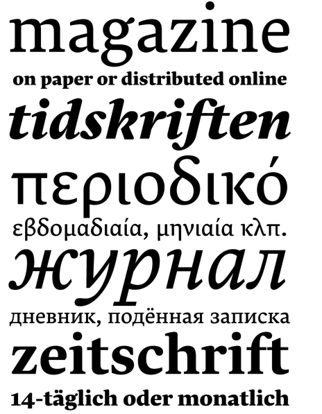
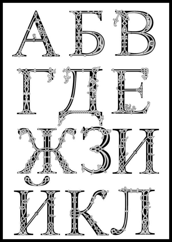
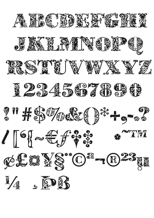
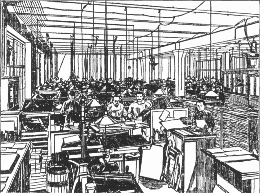
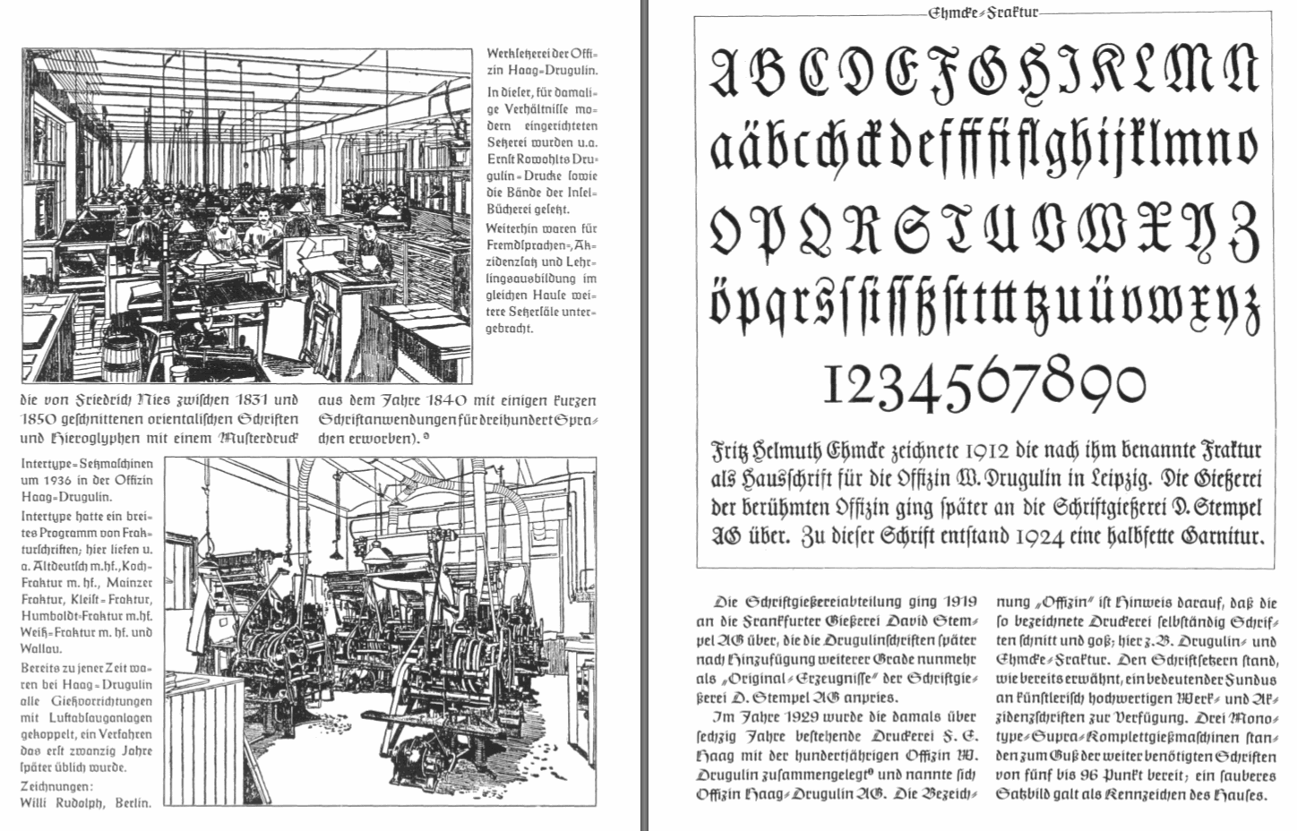
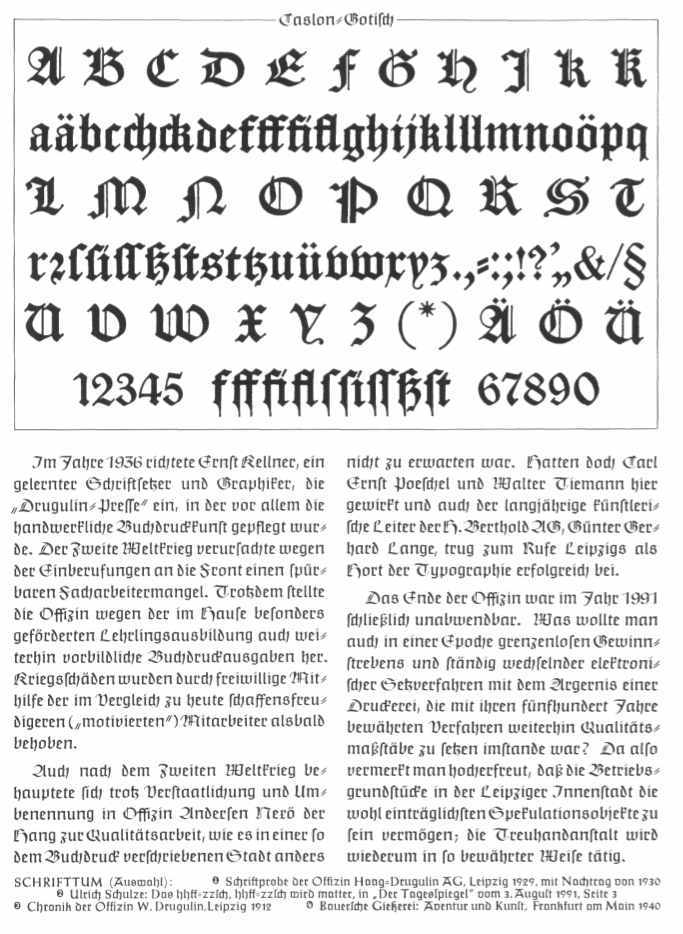
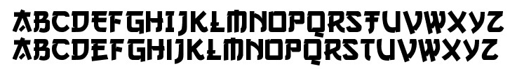
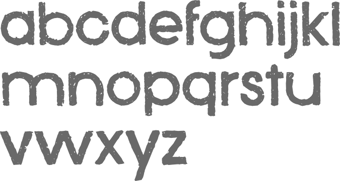
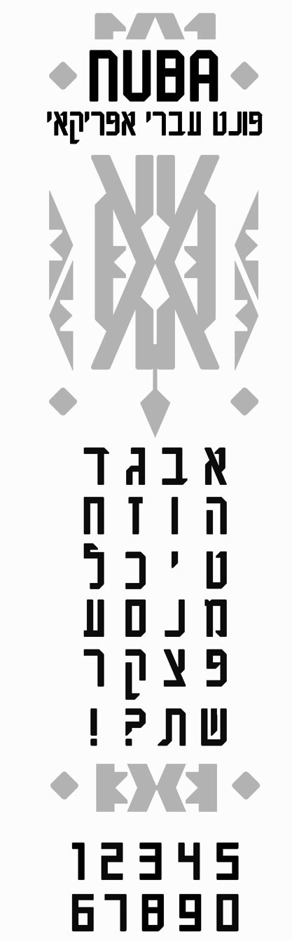
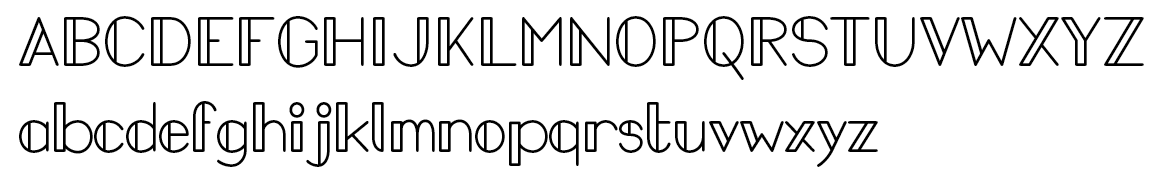
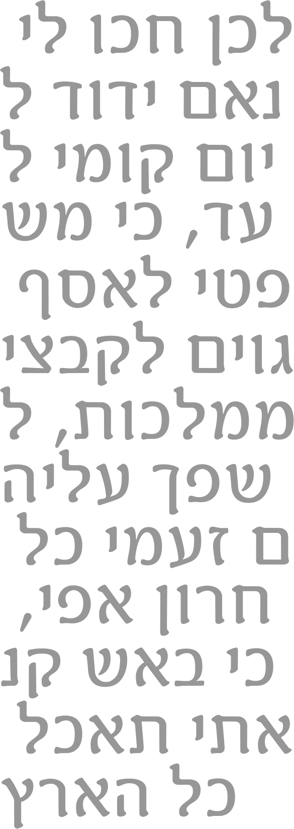
|
|
|
|