TYPE DESIGN INFORMATION PAGE last updated on Mon Jul 13 21:04:34 EDT 2026
FONT RECOGNITION VIA FONT MOOSE

|
|
|
|
|
Type design in Switzerland | ||
|
|
|
|
SWITCH TO INDEX FILE
123 Buero
|
In 2014, Timo designed Patron at Milieu Grotesque, a typeface inspired by type designers Günther Gerhard Lange and Roger Excoffon. [Google] [More] ⦿ |
Original typefaces made in 2001: 2TheLeftDingbats, 3t (pixel font), DepthChargeSemiPhat, HKIMetropol, HKINightlife, LeftOvers, LeftOvers2, LeftOvers3, LeftOvers4, LeftOvers5, LeftOvers6, LeftOversII2, MrQuicke (nice futuristic font), Optimal (like Bank Gothic), Switzerland, YUMYUM, LeftOversII, LeftOversII31, Punavuori (2001). [Google] [More] ⦿ | |
ABC Litera
|
Roland Stieger was born in Kobelwald. After an apprenticeship as a typesetter at the daily newspaper of Rheintal, Altstätten, he studied type design at CAS Type Design at the ZHDK. Creator with Jonas Niedermann of the sans typeface Alena, about which he writes: It all started with the woodcut from Jost Hochuli, published in the year 1980. I found this woodcut in a bookshop around 1992 and was fascinated by it for many years. Until my interest in type design became so huge that I took it as a starting point to design an own typeface, a sans serif, called Alena, which builds on the shapes and proportions of this woodcut. Released in 2019 at Nouvelle Noire. In 2017, LD Alena was released at Lazydogs Type foundry in upright and italic styles in eight weights. Jost Hochuli is a book designer, successful author, and teacher. In 2011, he started work on the clean sans family Allegra. Nicolas (2012) is a new serif typeface by ABC Litera. An 8-minute documentary by Nouvelle Noire about the making of Allegra (by Jost Hochuli) and Alena (by Roland Stieger), produced in 2020 by Nouvelle Noire. [Google] [MyFonts] [More] ⦿ |
Acces Design
|
Typefaces made in 2009: DB72, DBColon, DBPoints Sans, DBCube, and DB13, mostly dot matrix or octagonal fonts. In 2010, these were followed by db Outline, db Stickers, db Stick, DB Cube New, db MOKI (stencil), db Ciao, db Ticket Light, db 72, DBpoints (dot matrix), DBPoin2, and db Kopix (blackletter), db New Points Italic (dot matrix face). In 2011, we find dB Stick, dB Sticker, dB Sticker Mono (a monospaced typewriter face), db Prague (fat sans), db Backjumps (an extraordinary fat poster stencil), db Perl, db Perl 1.2 (texture face), db Quarz (2011, +Mix), and db Nox and db Nox II. Fonts made in 2012: db Como (a simple monospace sans), db Sticker (hairline sans), db Rocko v2 (stencil face), db Today v1 (a beautiful black slab face), db Today v2, db Etroite (2012, in several weights: constructivist), db N3, db Drops (fat counterless face), db Quarz Mix, db Soda, db Klacks, db NQ, db Boxer, db Como (monospaced), db Smoothie (fat stencil face), db Quick Cut (stencil), db Karton (stencil), db Frieda. Typefaces from 2013: db Etroite, db Concierge (hairline serif), db Lineo, db Lucky, db Boxer III, db SIL. Typefaces from 2014: db Darling. db Oh Darling, db Melitta (a fantastic brush emulation typeface), db Sticker T, db Points Sans Oblique (dot matrix font), db Como Splitt, db Quirlo (fat rounded poster typeface), db Quirlo Mix, db Limo (angular angry anthroposophic sans), db Limo N, db Slow (a German expressionist typeface), db Bargo Condensed, db TwoLines (an inline font). Typefaces from 2015: DB Caryptis, DB Oleumi, DB Caroli Plain, DB Caroli, DB Seimeins Serif, DB Seimains, DB Sago, DB Sago II, DB Sthlm (+Light), DB Gertrude, DB Track, DB Track Too. Typefaces from 2016: DB Maquette, DB Largo, DB For You (winner in the 2016 Fontstruct Love competition), DB Bargo Slanted. Typefaces from 2017: DB Jojo, DB Scrape, DB Tape Noir, DB Tape Slab, DB Tape, DB Pins, DB Monoto Sans, DB Mrs Back n Black, DB Dr. Bob, DB Tilda, DB Rondo Mix, DB Rondo, DB Shop. Beate set up Acces Design ca. 2017. The typefaces available there are ad Backjumps (stencil), ad Bargo, ad Como, ad Concierge, ad Darling, ad Oh Darling, ad Frieda, ad Klacks, ad Limo, ad Lucky, ad Magritte, ad Melitta, ad Mill, ad Points, ad Quirlo, ad Slow, ad Soda and ad Soda Plex. Typefaces from 2018: ad Falter (blackletter). Typefaces from 2019: ad Dorma (sans), ad Flieger, ad Louise, ad Hobby, ad Journal, ad Juli (sans), ad Tape, ad Violetts (handcrafted), ad Tape (sans). Typefaces from 2020: ad Ander, ad Sticker Mono, ad Juli (sans), ad Magritte (sans and serif; for posters). Behance link. FontStruct link. [Google] [More] ⦿ |
| |
Swiss type technology expert of Russian origin. At ATypI 2005 in Helsinki, he spoke on Church Slavonic. [Google] [More] ⦿ | |
Adrian Frutiger
| |
Frutiger's books include Type Sign Symbol and Signs and Symbols. Their Design and Meaning (1989, with Andrew Bluhm, published by Studio Editions, London; Amazon link). Linotype link. FontShop link. Adrian Frutiger, sa carrière française (2008) is Adèle Houssin's graduation thesis at Estienne. Klingspor link. Wikipedia link. View Adrian Frutiger's typefaces. View some digital versions of Avenir. Vimeo movie on Frutiger by Christine Kopp and Christoph Frutiger entitled "Der Mann von Schwarz und weiss: Adrian Frutiger". More Vimeo movies. [Google] [MyFonts] [More] ⦿ | |
Ricola AG is the Laufen, Switzerland-based manufacturer (est. 1930) of popular herb-based cough drops. One of Adrian's friends told us one evening during the ATypI meeting in Sao Paulo that Ricola had asked Adrian to redo the script logo, to which Adrian agreed. When asked about remuneration, he declined any form of payment. A few days later, a truck arrived at Adrian's house and delivered 20,000 boxes containing Ricola cough drops. In one of the pictrures below, note the omnipresent of the box of Ricola drops (in red). [Google] [More] ⦿ | |
Designer in Zurich. Creator of the custom typeface Val Mustair (2010), a stitch font: The shape of the font is inspired by the local handwork while the color system is a visualization of the sunrise and sunset and represents the rhythm of life in the valley. Award: ADC Nachwuchswettbewerb 2011. Behance link. [Google] [More] ⦿ | |
Affenprinz Belmondo
| |
Affolter und Gschwind AG
|
Some examples of the types shown, in alphabetical order: Antique Wood MP363 (art nouveau), Antique Wood MP 364 (oriental simulation face) [the Antique Wood series is quite extensive, and is just numbered], B+T Classic (roman), Bernhard Fett, Beton Fine Line (typewriter), Burko (avant garde family), fonts starting with G, Gaston Fett (a squarish gothic typeface also called Gipsy), Gaston Halbfett (also called Grassy), Gemini Computer, Germanic Sans (more avant garde and Lubalin-style glyphs), Hollandse Mediaeval, Hollywood (a 3d decorative family), typefaces starting with K, Lineamarca (slabby), Linear (avant garde, geometric monoline), Melen (experimental, geometric), Meola Bookman swash (decorative), Metro (art nouveau, after the Metroploitaine font), Moraine (squarish), the Old Foundry sub-collection [another mysterious numbered collection; examples include some uncials, and some more art nouveau typefaces, some Victorian ornamental typefaces (F260 through F262), more art nouveau (MP418 through MP420) and blackletter typefaces (MP421)], Pierrot (psychedelic, groovy), Phydian (one of many Western style ornamental typefaces), Ronda, Roulette, Roulette Schattiert (=Rajah) (more Western fare), Ruby (shaded caps), Runic Small (condensed), Rustic (wood log look), typefaces starting with S, Spengler Gothik, St. Clair (ornamental), Zither (calligraphic script). [Google] [More] ⦿ |
Agenturtschi
| Ralf Turtschi's Swiss site that specializes in type publications. A must-buy book for type classification: Schrift vergleichen, Schrift auswählen, Schrift erkennen, Schrift finden (Verlag Hermann Schmidt, Mainz, 1991): 430 pages! Author of TypoTuning (2006) and of Praktische Typografie (1999, Verlag Niggli AG). In 2004, Anatina Blaser made a handwritten style font called Rooster (after Peter Rooster's handwriting), which can be had for free with any order over 59 dollars. [Google] [More] ⦿ |
Nice list of German language books on typography. [Google] [More] ⦿ | |
Designer at FontNest (Switzerland) who made the lively pixel typeface Wellkrau (2010) with Jerome Rigaud and Pierre Terrier. [Google] [More] ⦿ | |
The AIZI research project is spearheaded by the MA programme in Type Design at ECAL/University of Art and Design Lausanne with the support of the HES-SO, University of Applied Sciences and Arts of Western Switzerland and the collaboration of the Computer Vision Laboratory (CVLab) at EPFL, Ecole Polytechnique Fédérale de Lausanne. AIZI is an abbreviation of Artificial Intelligence Chinese Character. Shuhui Shi (ECAL), initiator of the project, was in charge of the design part in collaboration with Kai Bernau, under the supervision of Matthieu Cortat (Head of Master Type Design, ECAL). The Machine Learning process and algorithms were developed by Wei Wang (EPFL), under the supervision of Mathieu Salzmann from the EPFL Computer Vision Laboratory. The AIZI research project offers a unique database of over 93,000 Chinese characters in order to help type designers draw Chinese typefaces. The developers write: Despite being used by some 900 million native speakers, the Chinese writing system currently relies on a small number of digital typefaces, in print or on screen. This is partly due to the quantity of characters. There is no official figure, but some dictionaries reach up to 106,230 glyphs, with the Unicode standard featuring only 20,902 glyphs. A Chinese scholar knows over 13,000 and being able to read a mere quarter of this figure is nothing to be ashamed of in contemporary China. For a designer, creating a Chinese typeface can easily take more than a year and represents a far greater investment, both in time and money, than a Latin (or Greek, or Cyrillic) one. These practical difficulties also limit foreigners' interest in Chinese type design, as the task seems insurmountable. Could Artificial Intelligence (AI) help Chinese type design overcome its current limitations? Is it possible to teach a Machine Learning programme about the rules of Chinese composition and design in order to enable it to create the thousands of glyphs required for a typeface? The initial idea behind the AIZI research project was to define a reduced set of basic seed characters that could be used as training data for an AI system, with the ultimate goals of democratising the design of Chinese typefaces and access to script for beginners and foreigners and to expand the stylistic range for a writing system that is largely dominated by traditional brush-based calligraphic shapes. Eventually, this could lead to greater quality in the production of fonts for Chinese script, explains Shuhui Shi, who launched the project as part of her ECAL Master Type Design programme. [Google] [More] ⦿ | |
ala webstatt
| Digital media firm and pixel font site. You can buy the pixelfonts Baby and Screenie-Folio here. Alexandra Rimaldi and René Etienne Keller run this site. Keller teaches Screendesign at The Fachschule für Gestaltung (HFG) in St.Gallen, Switzerland. I guess, but am not sure, that Keller made the fonts. [Google] [More] ⦿ |
Zurich-based creator of an experimental squarish 3d typeface (2013), tentatively called 360 Degrees. Behance link. [Google] [More] ⦿ | |
Dafont link. [Google] [More] ⦿ | |
Originally from Zürich, he is currently studying graphic design at the Gerrit Rietveld Academie in Amsterdam. Creator of the playful slab typeface Albina Medium (2009). [Google] [More] ⦿ | |
Albert Hollenstein
| |
Some typefaces were influenced by Giacometti's art:
| |
Alessandro Volz
| |
Alex Dujet
| |
Creator of Minora (2011), an organic contemporary 3-style sans family that extends his work done as a student in 2007 at CAS. [Google] [MyFonts] [More] ⦿ | |
Geneva-based designer who also does some type design. He is working on Rotative Mono (2012). He created the sans and mono family Rational (2012) in eight cuts. He also did the identity of Fonderie Kugler (2011). Cofounder in 2007 of the design studio League with Aurélie Vogt and Tony Casimo. [Google] [More] ⦿ | |
Alexander Aeschbach
| |
Alexander Colby
| |
Swiss graphic and type designer who lives in Duebendorf but was born in Arbon in 1982. In 2008, he graduated in Visual Communication from the School of Art and Design Zürich.He created the didone typeface Quick Black (2008). [Google] [More] ⦿ | |
Student-designer in Montreux, Switzerland, who created the free futuristic display typeface Lombok in 2014. [Google] [More] ⦿ | |
Alexis Reigel
| |
Or Alice Kelly. Vaud, Switzerland-based designer (b. 1999) of Kiwii (2014). Dafont link. [Google] [More] ⦿ | |
Altgriechische Zeichensätze
| Lucius Hartmann (Hinwil, Switzerland) at the University of Zürich lists the main fonts that are useful to classicists and users of old Greek. Downloadable fonts include Aisa Unicode (by Hildegund Mueller&Stefan Hagel, 1997-1998). Hartmann himself created Sappho (2002) and Alkaios (2005). [Google] [More] ⦿ |
Altiplano
|
Twitter link. [Google] [More] ⦿ |
Partner with Dario Hofstetter at Monom in Switzerland. Together, they designed 100 pixel and experimental fonts. [Google] [More] ⦿ | |
amb+
| André Baldinger is the Swiss typographer and type designer (b. 1963) who made the Newut (1996, all letters of equal size, and thus a semi-unicase) and the B-Dot (pixel) families (1998). His outfit in Lausanne is called amb+. In 1994, he graduated from the Atélier National de Création Typographique (ANCT) in Paris. Since 1995, he teaches typography at the École supérieure d'arts visuels de Lausanne. He lives in Paris. Together with Philippe Millot, he heads the type design unit of the Creation and Innovation Research Centre (EnsadLab) at ENSAD Paris. He teaches typography and type design at the École Nationale Supérieure des Arts Décoratifs (ENSAD) and the Zurich University of the Arts (ZHdK). He was involved in projects such as the logotype for the Cité Universitaire and a custom type for the Eiffel tower. He also digitized the Frutiger-Hunziker typeface CGP (used in the Centre Georges Pompidou, originally designed in 1974) in 1997. The full list of his typefaces: AB BaldingerPro Font, AB BDot Font, AB BLine Font, AB CiteInter Font, AB Eiffel Font, AB Newut Font. Speaker at ATypI 2010 in Dublin where he introduced the Gering project. I cite: Based on a close analysis of typefaces created by Ulrich Gering at the Atelier de la Sorbonne and the Soleil d'Or workshop in the 1470s, the first typefaces produced in France, postgraduate students Timm Borg, Anthony Dathy, Perrine Saint Martin and Ok Kyung Yoon have been working on a versatile, modern font family for the last 2 years under the guidance and watchful eyes of André Baldinger and Philippe Millot. Focusing on two of Gering's designs --- a sturdy roman font that closely imitates the texture of blackletter and a roman with blackletter influences --- the EnsadLab team has developed a complete family, reviving the work of the father of the printed word in France and bringing together aesthetics rarely seen in such an ensemble. Working only a few hundred metres from the original site of Gering's workshop they have thoroughly reworked the letterforms found in the extant incunabula available in the Bibliothèque Nationale, complementing the original characters with italics, small caps, and supplementary weights, as well as all of the glyphs necessary in a 21st century font. |
AND
|
The studio is run by Jean-Benoît Lévy (b. 1959, Pully, Switzerland). Lévy is a visual communicator who has been active since 1983 in Switzerland. After his studies at the Basel School of Design with teachers such as Wolfgang Weingart and Armin Hofmann, he opened his studio AND in 1987. Jean-Benoit received his green card in 2001 and is now sharing his time between United States and Europe. He designs logos, corporate identities, postage stamps, coins, posters, and books. [Google] [MyFonts] [More] ⦿ |
Co-designer with Ian Party of Suisse International Condensed (2013). Designer of Rouillé (2010-2011 a revival of a French Renaissance typeface from 1581, possibly designed by Robert Granjon), Fokko, Euclid, and Finito (2012: a humanist sans done for a Masters thesis at ECAL in Lausanne). [Google] [More] ⦿ | |
Manno, Switzerland-based creator of the tweetware typeface Monolith (2014). Monolith is an experimental all caps typeface inspired by a poster created by Noël Fontanet in 1946. It was designed for use in posters, headings and logotypes. Behance link. [Google] [More] ⦿ | |
Coauthor with André Gürtler of Die Handschrift, Comedia, edition 02-4, 2002. [Google] [More] ⦿ | |
André Baldinger
| |
André Gürtler
| |
Andreas A. Lorenz
| |
German-Swiss typographer. With Julien Saurin, she published the classic avant-gardist hand-drawn typeface Paris (2012, La Goupil). It comes with art nouveau ornaments called Paris Serif Ornaments. [Google] [More] ⦿ | |
Designer at burodestruct in Bern of the gorgeous font BD GalaQuadra (1999). Klingspor link. [Google] [More] ⦿ | |
During her graphic design studies at Fachklasse Grafik in Luzern, Switzerland, Anina Achermann created a bold sans typeface (2014). Behance link. [Google] [More] ⦿ | |
| |
| |
Product designer in Zurich. Creator at FontStruct (where she is known as Bananna) of the stitching font Stich Miss (2009). [Google] [More] ⦿ | |
Designer of the hand-printed typeface Rooster (2004, Agenturtschi, Switzerland), which can be had for free with any order over 59 dollars from Agenturtschi. [Google] [More] ⦿ | |
Author of "Le maître de Garamond" (Editions Stock, 2002), a beautiful book on the life and death of Antoine Augereau, who was Claude Garamond's teacher and mentor. Anne Cuneo was born in 1936 in Italy and lives in Zürich. Comment by Guy Schockaert: Le 24 décembre 1534, place Maubert, accusé d'hérésie, Antoine Augereau est pendu, son corps et ses mains brûlées. Homme de lettres, érudit, théologien, Antoine Augereau était un grand imprimeur, éditeur et graveur de caractères typographiques. Il modela ceux dont nous nous servons encore aujourd'hui, et avec Clément Marot, inventa l'usage des accents et de la cédille. La publication du Miroir de l'âme de Marguerite de Navarre lui coûtera la vie. La Sorbonne, gardienne jalouse d'une orthodoxie figée, désapprouve la pensée de la soeur de François Ier, mais ne peut la condamner. Antoine Augereau paiera pour elle. Racontée par le plus célèbre de ses disciples, l'histoire passionnante et émouvante d'un humaniste prêt à mourir pour défendre ses idées. UN livre à lire absolument et à offrir. [Google] [More] ⦿ | |
Annik Troxler (b. 1979, Wolhusen, Switzerland) studied graphic design at the Cantonal School of Art of Lausanne (ECAL). Her thesis Vergissmeinnicht won the Swiss Federal Competition for Design 2005. In 2006 she started working as an independent graphic designer in Basel and since 2011 she has taught at the Basel School of Design. In 2006, she was awarded the Grand Prix of the International Poster Triennale of the Museum of Modern Art Toyama, Japan for her poster Intimities 2005. In 2007, she won first prize at the International Poster Festival in Chaumont for Intimities 2007. She created the travel dingbat font Traffic (2002). [Google] [More] ⦿ | |
Anouk Hinoran
| |
Freiburg, Switzerland-based designer of the Greek emulation typeface New Space (2016). Behance link. [Google] [More] ⦿ | |
He co-designed Muoto (2021, 205TF), a variable sans serif font created by Matthieu Cortat, Anthony Franklin and Sander Vermeulen (Base Design). They write: Muoto is the synthesis of a sensitive and human approach to modernist design. This font combines full curves and solid stems, showing that functionalism can actually be warm and softly effective. With its robust structure and subdued proportions, it evokes organic forms dear to Finnish architect Alvar Aalto, who in 1957 wrote: "We should work for simple, good, undecorated things, but things which are in harmony with the human being and organically suited to the little man in the street". [Google] [More] ⦿ | |
Anton Koovit
| |
In 2012, he and Yassin Baggar set up Fatype, a type foundry in Berlin and Neuchatel, Switzerland. His most well known typeface design is Adam BP (2007, B&P Foundry), a 4-weight sans family. He also designed Aleksei (2010, unreleased serif face), GQ Slab, GQ Baton (b Anton Koovit and Yassin Baggar), U8 (2010: a grotesk family based on lettering in the Berlin underground), Arvo (2010: a free slab serif family at Google Font Directory, co-designed with Yassin Baggar). Anton Koovit and Yassin Baggar offer a new take on U8 in their UCity typeface family (2019). Experimental typefaces by him include Kork Sausage, Boudo (collage alphabet), Planton, Velo (geometric). Allan (2010) and Arvo are free at the Google Directory. Fontsquirrel link. Behance link for Fatype. [Google] [MyFonts] [More] ⦿ | |
Anton Studer
| |
Applied Aesthetics
| Swiss-American designer who won an award at Bukvaraz 2001 for the slab serif typeface Tourist. In 2020, he designed the experimental typeface Zigzag. He works at MetaDesign in San Francisco. [Google] [More] ⦿ |
Apsara Flury is a student at the School of Graphic Design in Luzern, Switzerland, where she created a grotesk typeface in 2012. [Google] [More] ⦿ | |
Archivio Tipografico
| Archivio Tipografico is a letterpress printshop in Torino, Italy, which also has a collection of metal typefaces, letterpress machines and type specimens and catalogues. It is maintained and managed by Gabriele Fumero, who graduated from ECAL in Lausanne, class of 2017. At ECAL, he designed the flared typeface Opale (2017). Historically, Archivio Tipografico was the main type design and typography magazine in Italy from 1889 until 1933. Dalmazzo Gianolio (1863-1926), printing department foreman, launched an industry journal, Archivo Tipografico, in 1889 at Nebiolo. Produced regularly until 1933, it included type specimens, advertising, and industry news along with articles on printing arts and technologies. It was printed and directed by Societa Nebiolo under the direction of Dalmazzo Gianolio. [Google] [More] ⦿ |
Arial: ein Nekrolog
| German article by Ralf Turtschi (Swiss, b. 1955) on the history of Arial from its genesis in 1982 as a Helvetica "clone" to its present status as most-used font. Ralf goes on to warn his readers that Microsoft is repeating history by pushing, very soon, its own Segoe, a Frutiger clone. Notable German quotes in which he performs a damning autopsy on Arial: Die Arial ist weder als Textschrift noch als Headlineschrift zu empfehlen, da fehlt einiges an Klasse. [...] Eine unausgeglichene Laufweite, also die Proportionen und der Abstand zwischen den Zeichen, gibt der Arial einem miserablen Grauwert. Das Verhältnis von schwarzen Linien und weissen Flächen lässt sie plump und charakterlos auf dem Papier kleben. Besonders hässlich sind die angeschrägten Endstriche bei a, e, s und t. Die Proportionen und die Form des t sind eine Zumutung und das a sieht wie nach einem Hagelschlag verformt aus. [...] Die Arial ist lieblos, unausgeglichen und verbeult, sie hat mir noch nie Freude bereitet. About the Segoe drama (Trauerspiel), he writes: Die Geschichte wiederholt sich hier, Die Segoe atmet den Geist der Frutiger von Adrian Frutiger, die sich in den 80er-Jahren zur Alternative der viel benutzten Helvetica anbot. Hier springt Microsoft 20 Jahre zu spät dem vermeintlichen Lifestyle nach, und statt eine eigenständige Schrift zu entwickeln, kupfert die Branchenführerin eine der erfolgreichsten und schönsten Schriften ab. Man könnte ja auch eine bestehende Schrift ordentlich lizenzieren. Ein Trauerspiel. So, why did Microsoft not properly license Frutiger from the man himself? After Adobe had to rip off Frutiger with its Myriad, now Microsoft joins the corporate theft business. Why not reward type designers properly? Fontshop joined Turtschi in his analysis. See also this brilliant piece by Fred Nader from 2003. [Google] [More] ⦿ |
Swiss designer and photographer, b. 1919, Baar, d. 1991, Oberwil. He studied typography in Zug, and photography from 1941 until 1943 first at Ecole Photographique de la Suisse Romande in Lausanne and then at the Kunstgewerbeschule Zürich. He was mainly into photojournalism from 1950 until 1957. Codesigner with Walter Haettenschweiler of the famous condensed headline typeface Haettenschweiler (1954). This font was added to the standard Microsoft font library in 1995 and is sold by Ascender. In 1967, he designed the silhoueette alphabet Photo Letter Leonor. [Google] [MyFonts] [More] ⦿ | |
Legendary Swiss type teacher, b. 1920. Hofmann succeeded Emil Ruder as head of the graphic design department at the Schule für Gestaltung Basel (Basel School of Design) and was instrumental in developing the Swiss style of graphic design. His teaching methods were unorthodox and broad-based. He designed, and influenced the design of, books, exhibitions, stage sets, logotypes, symbols, typographical pieces, posters and sign systems. His work is recognized for its reliance on the fundamental elements of graphic form---the point, line, and shape. He retired in 1987. His output includes many fantastic typographic posters. Example. | |
Arnaud Felder (Geneve, Switzerland) designed the hexagonal typeface Costaux in 2014. [Google] [More] ⦿ | |
Geneva, Switzerland-based designer of (a digital version of) Vierkant (2016), the experimental square typeface first proposed by Wim Crouwel. He also designed El Doble (2018), Maximaal (2016) and the Peignotian typeface Gank (2016). [Google] [More] ⦿ | |
Graphic designer in Geneva, Switzerland, who designed the avant garde sans typeface Avok in 2016. [Google] [More] ⦿ | |
Swiss designer of the handcrafted typeface Tohmrelief (2018). [Google] [More] ⦿ | |
Artoftype
| Artoftype in Zürich is run by Swiss typographer Markus Ernst, b. 1966. Designer at URW of Deepspace (2002, writing that aliens would use?), Sepultura (2003, gravestone writing?), Courier-Variationen. Free fonts for Mac and PC: Screenhorn (pixel font), 1873 (erosion font, 2000). [Google] [More] ⦿ |
Arve Båtevik
| |
Atelier Bubentraum (or: Nouvelle Noire)
|
His transitional slightly angular typeface Rekja (2011) won an award at TDC 2012. For Neo2 magazine, he designed the (free) experimental paper-fold font The Folded Font (2008). Other typefaces: Frank (2007, a commercial grotesque blackletter sold by Die Gestalten Verlag), Motion (2008, experimental), Hausbau (2008, free, experimental), Minimeter (2008, free ruler-themed font, for Neo2), Archiv (2008-2010), Goodbye (2009). Together with Clovis Valois, he set up Nouvelle Noire in 2012 in Zurich. At Nouvelle Noire, he published Rekja (2011) and Medien (2011). Klingspor link. Behance link. [Google] [More] ⦿ |
Atelier Carvalho Bernau
|
Kai Bernau (b. 1978) studied graphic design at the University of Applied Sciences Schwabisch Gmünd in Germany before relocating to the Netherlands, where he graduated from the Design & Typography course of the KABK in The Hague in 2005 with his successful Neutral Typeface project. He continued in the KABK's Type and Media Master course where he graduated in 2006. Since 2011, Kai teaches type design in the Master in Art Direction program at ECAL in Lausanne, Switzerland. In 2005, Susana Carvalho and Kai Bernau formed Atelier Carvalho Bernau, which is based in The Hague, The Netherlands. Typefaces:
Klingspor link. [Google] [More] ⦿ |
Atelier für Schriftgestaltung
|
|
Attak Fonts
| Attak is a two-headed graphic design firm formed in 2004 by Peter Korsman (b. 1982) and Casper Herselman. It is based in 's-Hertogenbosch, The Netherlands. In May 2016, Peter Korsman left Attak to start Autograph. Attak has some free and some commercial typefaces. Behance link. Their fonts, ca. 2009: AT AK-47, AT Babyfat, AT Blaser, AT Concours, AT Dienstuhr, AT Discipline, AT FFW, AT Helix, AT Hide and Seek, AT Hieronymus, AT Janus Kiep, AT Kerremus, AT Klaxon, AT Korsakopf, AT Litewriter, AT Mepper, AT Mohawk, AT Moker, AT Monoload, AT Muntel, AT Peetroleum, AT Praktikum, AT Promille, AT Ramseier, AT Riot, AT Sirca, AT Sirca alternate, AT Slyper, AT Snotnose, AT Streeep, AT Tabak, AT T'Atteljeej, AT TCB, AT Timeline, AT Trash Bold, AT Willi, AT With Machines, AT Zippora. Notable products: AK-47 simulates Cyrillic; Helix is a stencil face; Muntel and Concours are fat art deco typefaces; Practicum and Tabak are octagonal; Riot leaks blood; Sirca is based on arcs of circles; Streep is a multiline font. I presume that Peter is the main font designer in the team, as he already made fonts as early as 2003 for Burodestruct (see, e.g., BD Burner, BD El Max, BD Sirca, and BD Bardust, downloadable here). By 2017, their catalog includes AT AK-47, AT Baballero, AT Babyfat, AT Blaser, AT Concise, AT Concours, AT De Palm, AT Dienstuhr, AT Discipline, AT El Muerte, AT Falten, AT FFW, AT Ginn, AT Helix, AT Hide and Seek, AT Hieronymus, AT Hindenburg, AT Imperiale, AT Janus Kiep, AT Kerremus, AT Klaxon, AT Korsakopf, AT Kuhn, AT Litewriter, AT Mepper, AT Mohawk, AT Moker, AT Monoload, AT Muntel, AT Peetroleum, AT Praktikum, AT Promille, AT Ramseier, AT Riot, AT Sang Noir, AT Sirca, AT Sirca alternate, AT Slyper, AT Snotnose Heavy, AT Streeep, AT Syndicate, AT Tabak, AT tAtteljeej, AT TCB, AT Timeline, AT Trash Bold, AT Willem II, AT Willi, AT With Machines, AT Zippora, BD Bardust, BD Burner, BD El Max, BD Sirca. A more detailed breakdown per designer:
|
Or just Theo Ballmer. Swiss designer (b. Lausanne, 1902, d. 1955), who worked for Hoffmann-LaRoche before he went to work at the Bauhaus in Dessau in 1928. The URW font family Theo Ballmer (2000) is based on his ideas, and was digitized by Theo's grandson Thierry Ballmer. The family has many typical Bauhaus ingredients. Another digital revival of this is Architype Ballmer by The Foundry. [Google] [MyFonts] [More] ⦿ | |
Swiss graphic designer who studied at the Haute École d'Art et de Design in Genève. Aurélien created a sketched typeface in 2012: Annual report for the Parisian section of the NGO Secours Populaire Français. A modular typeface was designed for the occasion. As always, the design is guided and inspired by the general identity created for the Secours Populaire Français by Grapus and Pierre Bernard. Creator of Boule de Gomme (2010), Planet (2011, Sans, Serif, Ultralight, Ruler), Dynamo Text (2012, a serif), and Dynamo Titling (2012, a Swiss sans). [Google] [More] ⦿ | |
Aurèle Sack (b. 1977) is a globetrotting Swiss graphic designer specialized in type and editorial design. He focuses mainly on projects within the cultural field. After graduating from ECAL in 2004 (with a sans typeface called AS Gold) Sack worked in Zürich and New York. He currently lives and works in Lausanne, Switzerland. He has been teaching type and editorial design at ECAL since 2010. He has won the Swiss Design Awards three times; in 2006, 2010 and 2014. Codesigner in 2006 with Maxime Buechi of a corporate type for NORM called Rhodesia . In 2009, he made AS Garamond in collaboration with Jonas Voegeli, Zürich for Das Magazine. In 2008, Fleurie (typewriter face) was published. Around 2006, he created Omega Bold (a sans, done with Norm in Zürich; now called Omega CT), AS Turquoise, AS Yellow (a didone), Gallery, and LL Purple (Regular, Italic; a serif typeface published at Lineto and co-designed with Norm). Initiated as a collaborative type design project by Zurich-based designers Urs Lehni and Lex Trüb, LL Brown (2011, Lineto) has been drawn and developed by Aurèle Sack in the geometric style of Edward Johnston's Johnston (1915) and Arno Drescher's Super Grotesk (1930). LL Brown is being re-launched in 2019 with additional weights, additional non-Latin scripts, and additional Narrow and Condensed cuts. Finally, Sack published LL Grey (2004-2016) at Lineto. Lineto link. [Google] [More] ⦿ | |
Newbury Park, CA-based outfit where Slimbach and Stone worked at one point. Its staff designed (and in some cases, imported, via Autologic SA in Lausanne, Switzerland) some nice typefaces in the mid eighties such as the Champfleury family (1985), Geometrica (1985), Kis-Janson (1985), Media (1976, André Gürtler, Christian Mengelt and Erich Gschwind), Melencolia (1985), Signa (1978, André Gürtler, Christian Mengelt and Erich Gschwind) and Trinité (1981, Bram de Does, part Bobst Graphic, part Autologic). [Google] [More] ⦿ | |
| |
The Basel School of Design (Basel, Switzerland) offers an English-language program called Basics in Design, which spans one or two semesters of study. It includes a letterform design course by Lisa Pomeroy, and Wolfgang Weingart's workshop Basics in Typography, and Layout. German page. Alternate link. [Google] [More] ⦿ | |
Bastien Aubry
| |
Student at ECAL in Lausanne who made Ciao (2008), a revival of Italian typefaces done by Caslon in 1821. He is working on a connected script typeface called Afterwork (2010). Scan of his poster called Foam. [Google] [More] ⦿ | |
Swiss typography expert at Microsoft who wrote Visual TrueType, a truetype font hinting program, and who helped out with Cleartype. He is also the author of The Raster Tragedy (1997, updated in 2011). Beat Stamm has a Ph.D. in Computer Science. [Google] [MyFonts] [More] ⦿ | |
Beate Limbach
| |
Begiko 17
| Switzerland-based designer of Begiko 17 (2020), a rounded traced monoline sans family. [Google] [MyFonts] [More] ⦿ |
At ECAL (Lausanne, Switzerland), Benedek Takacs designed the hipster typeface Miniature Display (2019). [Google] [More] ⦿ | |
Benedikt Bramböck studied visual communication in Austria and Switzerland and type design in The Hague. He interned and later was employed by Fontshop International in Berlin. Since 2015 he works for Alphabet Type and is part of the team behind Berlin's Typostammtisch. Speaker at ATypI 2016 in Warsaw. [Google] [More] ⦿ | |
Swiss creator of the beautiful sketch fonts Elliot (2013) and Little Bird (2013). In 2014, he created Trash Mash and Cheeze Wine (connect-the-dots face). [Google] [More] ⦿ | |
International design studio in Basel, Switzerland. Creators of these typefaces: Tight Sans (2014). Behance link. [Google] [More] ⦿ | |
Type and graphic design competition, open to typefaces designed in Germany, Austria and Switzerland. Past winners were often selected for certain corporate projects, not for type design per se. The type awards since 2006 are on-line. The competitions are numbered. For example, 2013 is the 45th competition. [Google] [More] ⦿ | |
German designer who has his own graphic design studio in Dortmund. Behance link. Creator of a great minimalistic logo face for the Swiss company Swyx (2009). [Google] [More] ⦿ | |
Swiss designer at Font Nest of Miss Hardcore (a macho sans), Miss Suisse (revival of an old Swiss dot matrix passport type), Miss Monde, Miss Cosmos (monospaced didone), Miss Vesalis (revival font from the De humani corporis fabrica, written by Andrea Vesalis in 1555), and Miss Potatoe (grunge family, with Jacques Borel). [Google] [More] ⦿ | |
Graduate of Zürcher Hochschule der Künste ZHdK. Creative director in Zurich, Switzerland. Designer of the elliptical sans typeface Curiance (2017). Linkedin link. [Google] [More] ⦿ | |
Bilal Sebei
| |
Binnenland.Ch
|
Klingspor link for Nik Thoenen. [Google] [More] ⦿ |
Aka Redshade Blue. Photographer and painter in Zurich, Switzerland, who studied at Moscow University of Printing Arts. In 2018, she published the script typeface Persian Garden. [Google] [More] ⦿ | |
Bisou
| Graphic designer and self-declared hyperartist based in La Chaux-de-Fonds in Switzerland. Creator of these typefaces in 2020: Hyper Brush, Hyper Flufy (sic), Mathias (a modular sans in regular and shadow versions) and Hyper Cool (a comic book typeface in Bold and 3D versions). Typefaces from 2021: Mathias (a squarish logo font), Hypercreepos (hand-crafted) (a creepy hyper-bold font inspired by the horror comic books of the 60s), Hyper Turfu (a bold mechanical titling font). Typefaces from 2022: Hyper Top (a supermarket typeface). [Google] [MyFonts] [More] ⦿ |
BluGraphic (or: Graphic Pear)
|
Typefaces from 2019: Lemon&Fresh, Germany (script), Cremona (a free fashion sans), Designer (sans). Behance link. BluGraphic link. [Google] [More] ⦿ |
Swiss photo-typesetting company. Among their typefaces, we find the 1977-1978 effort leading to Signa (by André Gürtler, Christian Mengelt, Erich Gschwind), and Trinité (1981, Bram de Does, part Bobst Graphic, part Autologic). [Google] [More] ⦿ | |
Boîte à lettres
| Jean-Claude Siegrist is a Swiss type designer. He designed the text typeface Gradot in 2009 for his graduation work at the Haute école d'art de Zurich (or ZhdK: Z^uuml;rcher Hochschule de Künste). He is working on Béridier, Vorbourg, Brunchenal and Domont. [Google] [More] ⦿ |
Swiss designer of the experimental geometric typeface Boris Light (2011). [Google] [More] ⦿ | |
Swiss type designer from Interlaken who offers one beautiful free script font of his own hand, Excellentia (2005), and, earlier, of Excellentia in Excelsis (2000). For 100 Swiss Francs, he will make your handwriting into a font. Dafont link. [Google] [More] ⦿ | |
B&P Type foundry
| Defunct type foundry in Lausanne, Switzerland, founded in 2005 by Ian Party and Maxime Buechi. From 2000 until 2004, Maxime Buechi studied graphic design&typography at the Ecole Cantonale d'Art de Lausanne (ECAL). His typefaces include Rhodesia , a private type designed with Aurèle Sack for the book African Sniper (for NORM) in 2003 (it was not used there, but was used instead in the book Periferic 7), and a corporate typeface for the Centre for Curatorial Studies Bard&Hessel Museum, New York (2006, with Ian Party). In 2007, the following BP fonts saw the light: Neutral BP (Kai Bernau, a supposedly neutral sans family), La Police BP, Romain BP and Romain BP Headline (as the creator, Ian Parry, states: Based on the Commission Jeaugeon's models and on Philippe Grandjean's classic character, the Romain BP celebrates the marriage of geometric rationality and elegance, of science and craftsmanship. The Romain BP Text is actually closer to the Commission's model than Grandjean's Romain du Roi. It is more synthetic in its structure, more radical, and thus, more modern. It is a contemporary text typeface based on a structure that was created in 1690, not a revival mimicking Greandjean's shapes.). In 2007, they released Esquire, an upright script headline face. Other fonts are listed on my site under the various designers' names. IN 2013, the type foundry morphed into Swiss Typefaces, which is jointly run by Ian Party and Emmanuel Rey. Maxime Buechi now mainly runs a big tattoo parlor in London. [Google] [More] ⦿ |
Gruppo Due (Berlin, London, Karlsruhe and Bern) is a type design platform and foundry offering retail typefaces, alongside bespoke designs resulting from a close collaboration with our commissioners. Gruppo Due was founded in 2019 by Moritz Appich, Massimiliano Audretsch, Jonas Grünwald and Bruno Jacoby. He published these typefaces at Gruppo Due:
| |
Bruno Maag
| |
| |
| |
Buildshape
|
In 2015, Raphael Koch and Mauro Paolozzi co-designed GT Cinetype at Grilli Type. This typeface has outlines consisting of many short straight line segments, thus mimicking the now obsolete pre-digital age technique of laser printing subtitles in movies. At small sizes, the font looks very smooth, but at larger sizes, the straight segments become apparent. His custom typefaces include Blindalley (2001), Backdoor (2001), Spins (200) and Panty Boy (2000), Scsibar (2000). [Google] [More] ⦿ |
Swiss artist of the Viennese Secession era, 1873-1950. [Google] [More] ⦿ | |
burodestruct (or: Typedifferent.com)
|
Free fonts include(d) the gorgeous GalaQuadra (by Angela Pestalozzi, 1999), Eject Katakana (1998), Dippex (1995, grunge font), Ticket (1995), Rocket 70 (1996), Ratterbit (1995, pixel font), Plakatbau (1995), Lodel Fizler (1996), Flossy (1995), Faxer (1995), Console Remix (1998), Cravt (1998, by "Katrin"), Stereotype (1998, by M. Brunner), Brockelmann (1995, free), Kristallo (1997, very original display face) and Billiet (1996). Other fonts: Acidboyz (1998), Alustar (1999), BD Asciimax (1999, ascii art font), BD Billding, Bdr_mono (1999), Brick (1996, like Kalendar), Cluster (1996), Console (1997), Doomed (1998), Eject (1998), Electrobazar (1995), Elside (1995), Globus (1996), Fazer (1996), Lofi (1997), Medled (1995), Paccer (1995), Solaris (1998), Spicyfruits_brush_rmx (1998, a nice high-contrast face), Spicyfruits_rmx, Wurst (free, by Heiwid, 2000), Relaunch (2000), Relaunch Katakana (2000, free), Rainbow (2000), DeLaFrance (2000, free, by Heiwid), Electronic Plastic (2000), Colonius (2001), Cash (2001), Cashbox (2001), Bilding (2001), Meter (2001), Mustang (2001), Bankwell (2001), BD Alm (2001), Balduin (2001), Tatami (2001, oriental look font), Hexades (2001, free), Nippori (2002, techno), Jura (2002), Bonbon (2002, free), Band (2002, free), Navyseals (2002, kitchen tile font), Ritmic (2002), BDR Mono (1999, OCR-like font), Mann (2003, ultra fat stencil), Aroma (2003), Zenith (2003), Nebraska (2003), BD Equipment (2004), BD El Autobus (2004), BD Unexpected (2004), BD Wakarimasu (2004, free kana face), BD Bernebeats (2004, futuristic), BD Deckard (2004), BD Spinner (2004), BD Victoria (2004), BD Designer (2004), BD Kalinka (2005, a curly ultra-fat display face), BD Equipment (2004), BD El Autobus (2004), BD Unexpected (2004), BD Varicolor (2005, stencil), BD Chantilly (2005), BD Memory (2005), BD Emerald (2005, beveled), BD Kalinka (2005, Cyrillic simulation), BD Extrwurst (2005), BD Aquatico (2005), BD Mandarin (2005), BD Polo (2005), BD Beans (2005), BD Tiny (2005, pixel face), BD Times New Digital (2006), BD Panzer (2006), BD Jupiter, BD Jupiter Stencil (2006), BD Pipe (2006), BDR Mono 2006 (2006), BD Fimo Outline (2007, free, by Nathalie Birkle), BD Bermuda (2007, experimental and geometric), BD Smoker (2007, psychedelic), BD Radiogram (2007), BD Mother (2007, exaggerated black Egyptian), BD Fimo Regular (2007, free), BD Demon (2007), BD Reithalle (2007, free), BD Halfpipe (2007, free), BD Broadband (2008, free; not to be confused with the much older fonts BroadbandICG or FLOP Design's Broadband), BD Viewmaster and BD Viewmaster Neon (2008), BD Electrobazaar (2008), BD Motra (2008, stencil), BD Virtual (2008), BD Spacy 125 (2008), BD AsciiMax, BD ElAutobus (2004), BD Equipment (2004), BD Ramen (2003), BD Retrocentric (2009), BDR A3MIK (2009, virile Latin and Cyrillic slab), BD HitBit (2009), BD Unicorse (2010, unicase and techno), BD Telegraph (2011), BD Schablone (2012, stencil face), BD Pankow (2013, stencil), BD Algebra (2014), BD Hiragana Kuro (2014), BD Qualle (2014, a fat poster typeface), BD Tribler (2015, a tribal font). Alphabetical listing of their pre-2015 free typefaces: Algebra, Alm, Apotheke, AsciiMax, Baldrian, Band, Bankwell, Bardust, Beans, Billding, Billiet, Bonbon, Brockelmann, Burner, Cash, Cashbox, Chantilly, Circo, Console, Console Remix, Cravt, Delafrance, Designer, Destination, Dippex, Eject Katakana, ElAutobus, Elmax, Elside, Equipment, Faxer, Fazer, Fimo, Flossy, Fluke, Galaquadra, Geminis, Halfpipe, Hexades, Hiragana Kuro, Jayn Fonta, Kristallo, Lodelfizler, Lofi, Medled, Meter, Mustang, Outline, Paccer, Pipe, Plakatbau, Plankton, Polo, Ragout, Ramen, Ratterbit, Reithalle, Relaunch, Relaunch Ktna, Rocket70, Sirca, Sirca Rmx, Solaris, Spacy125, Spicyfruits, Spinner, Stella, Stencler, Stereotype, Ticket, Times New Digital, TinyFont, Tribler, Unfold, Wakarimasu. Alphabetical listing of their pre-2015 commercial typefaces: A3mik, Acidboyz, Alustar, Aquatico, Aroma, Balduin, BDR Mono 2006, Bermuda, Bernebeats, Breakbeat, Brick, Broadband, Calamares, Central, Cluster (Corporate), Colonius, Deckard, Demon, Discount, Doomed, Edding850, Eject, Electrobazar 2008, Electronicplastic, Elk, Emerald, Endless, Extrawurst, Fontabello, Globus, Good Wood, Hell, Hitbit, Jupiter, Jura, Kalinka, Kameron, Kinski, Las Palmas, Mandarin, Mann, Memory, Mother, Motra, Naranino (2012: a children;s script), Navyseals, Nebraska, Nippori, Nokio, Orlando, Pankow, Panzer, Qualle, Radiogram, Rainbow, Retrocentric, Ritmic, Robotron, Schablone, Showlong, Smoker, St.Moritz, Stalker, Stonehenge, Sweethome, Tatami, Telegraph, Unexpected, Unicorse, Varicolor, Victoria, Viewmaster, Virtual, Wotka, Wurst, Wurst Directors Cut, Zenith. In 2015, Gianfreda designed BD Barbeaux (a condensed typeface with the fashionable chic of the French art nouveau or film noir). Typefaces from 2016: BD Kickrom Mono (LED emulation type). Typefaces from 2018: BD Westwork. Typefaces from 2020: BD Aubergin (an experimental poster font with Bauhaus elements), BD Microna (a pixelish variable font), BD Micron Robots (dingbats). Typefaces from 2021: BD Supper (a food packaging sans), BD Roylac (a stylish poster font that evokes modern furniture), BDRmono 2021 (hipster style techno). Alternate URL. Dafont link. Behance link. View the Typedifferent typeface library. [Google] [MyFonts] [More] ⦿ |
Burri-Preis Graphic Design
| Graphic design bureau in Zürich run by Susanne Burri and Stefanie Preis. Brezel Grotesk (2011, Milieu Grotesque) by Stefanie Preis of Burri-Preis is a sans serif typeface, inspired by the character of classic ninetheen-century grotesques, an unpretentious typestyle, completed by the regular, yet organic shape of a Bavarian pretzel. Readable in small point sizes, yet remarkable at larger sizes, the letters have distinctive terminals. Designed in four weights to function in all text settings, Brezel is suited for a wide range of applications. Unlike most sans serif typefaces of the 19th century Brezel Grotesk comes with a true italic. [Google] [More] ⦿ |
Workshop held at ECAL in Lausanne in 2008, which resulted in the communal creation of the serif typeface Bussigny. The contributing participants were Bertrand Emaresi, Carina Frohburg, Dinh Nguyen, Dominique Boessner, Emmanuel Rey, Fabian Widmer, Jean-François Porchez (the leader and supervisor), Mathieu Meyer, Natacha Kirchner, Nicolas Eigenheer, Sarah Kläy, and Sébastien Fontannaz. [Google] [More] ⦿ | |
Büro Sequenz
|
In 2008, they published the hairy multiline typeface Mink and the linocut emulation typeface Linostate. They also designed the blackletter typeface Heinrich. [Google] [More] ⦿ |
Calligraphr
| A free and optional commercial handwriting font service based on templates. Calligraphr was launched in February 2017 by Maklabu GmbH. Maklabu GmbH was founded by Anouk Hinoran (France) and Tobias Reinhardt in 2016 and is headquartered in Basel, Switzerland. In 2018, Anouk herself designed the handcrafted typefaces Bloody Saturday, Chelsea Brush, Tohmrelief, Dots, Sjouke Kloostra, Insular Old English and End of Summer, and the brush typeface Pinceau in 2018. In 2019, Anouk published the children's font Kiddo. Behance link for Anouk Hinoran. [Google] [MyFonts] [More] ⦿ |
During her studies at IPAC Design in Genève, Camille Perez created the rounded typeface Tcho (2014). [Google] [More] ⦿ | |
Graphic designer and art director in Genève, Switzerland, who created the runic simulation typeface Runiska in 2016. Behance link. [Google] [More] ⦿ | |
Catharsis
|
Catharsis had free typefaces such as the great Arabic simulation typeface Catharsis Bedouin (2004), CatharsisCircular, CatharsisRequiem (a unicase pair), CatharsisRequiemBold, CatharsisCargo, Cirnaja Bookhand and Cirnaja Calligraphy (made for his artificial language, Obrenje), Catharsis Macchiato (2005), CatharsisEspresso (2005). At Catharsis, the commercial foundry, he published Octant in 2013: Octant is an original steampunk display typeface drawing inspiration from Victorian-age steel and brass engineering, as well as from blackletter typography. Gryffensee (2013, in styles called Eins, Zwei and Drei) is designed to be the Futura of blackletter, combining the time-honored gravity and relentlessness of the Gothic script with the clean, contemporary freshness of the geometric sans. It also covers Cyrillic. Backstein (2013), baked brick, took its inspiration from the broken antiqua lettering in Berlin's old subway stations. Volantene Script (2013) is a (free) uncial display typeface inspired by the penmanship of Lady Talisa Maegyr-Stark as seen on HBO's Game of Thrones. Numina (2013, Glamour and Glory substyles) is an extensive condensed fashion-oriented typeface family related to Skyline and Corvinus. Maestrale (2013) adds calligraphic and flamboyant extenders to a decorative text typeface for a dramatic effect. Choose between Maestrale Manual (swashy) and Manuale Text. Blumenkind (2013) is inspired by an instance of metal-strip lettering found on the Bürgermeister Kornmesser Siedlung residential building complex in Berlin from the 1960s. Brilliance (2013) is a glamorous contemporary display blackletter combining the rich tapestry of Textura with a hint of the airy lightness of Spencerian script. Let's say that it is a light-hearted Textura. In 2015, he made the free 45-style classic serif typeface family Cormorant, which includes several unicase fonts. This typeface started out in 2014 as Paramond, a light, contrasted, space-taking Garalde with impossibly tiny counters and long extenders. Links to the Google Font directory: Cormorant, Cormorant Garamond, Cormorant Infant, Cormorant SC, Cormorant Unicase, Cormorant+UprightCormorant Upright. See also CTAN. In 2016, he created the humanist geometric sans typeface family Quinoa for Latin, Cyrillic, Greek and Hebrew. Typefaces from 2017: Tesserae (kitchen tile style), Traction. Traction was originally conceived and designed by Christian Thalmann. Chiara Mattersdorfer and Miriam Suranyi expanded, completed and produced the font family. This typeface sports signature serifs, soft edges and a fluid, organic design. In 2018, Christian started work on a blackletter-themed stencil typeface, first called Komik Ohne (the German for Comic Sans) and later named Kuschelfraktur (2019). Between 2016 and 2019, he developed Eau de Garamond---a sans distilled from the essence of Garamond---, which was later renamed Ysabeau. Github link. In 2020, we find another fork, Isabella Sans. Overbold (2019) is described by him as follows: Overbold is an unapologetic display typeface inspired by an illustration in Eric Gill's Essay on Typography (p.51), in which he demonstrates how not to make letters. In particular, he shows that increasing the weight of the downstroke in a serif A without structural adjustments yields an absurd, overbold result. I found the letter so charming that I decided to blatantly disregard Gill's wisdom and draw an entire overbold typeface. Here is the result. I'm not sorry. 1001 fonts link. Yet another URL. Fontspace link. Behance link. Klingspor link. Dafont link. Open Font Library link. Github link. [Google] [MyFonts] [More] ⦿ |
Cécile + Roger
| Cécile + Roger is a graphic design studio in Geneva, founded in 2013 by Cécile Nanjoud and Roger Gaillard. Gaillard teaches at CFFP Arts in Geneva since 2018. He also co-founded Extraset. His fonts include
|
Graduate of the Type Media program at KABK in Den Haag, The Netherlands, class of 2019. Her graduation typeface, Coat, is a fashionable distinguished sans with subtle flaring. The Roman and Italic live in tetrahedron design spaces, each with four masters spanning three axes (weight, contrast and angle). The result is a variable font that offers a wide range of styles. Before Type and Media, she completed her BA in Graphic Design in Luzern. She works as a graphic designer in Switzerland, where she designs typefaces (independently, and for Lineto), magazines and identities. [Google] [More] ⦿ | |
Swiss graphic designer, typographer and illustrator (b. Wangen, 1922). From 1959 on, he designed many postage stamps for the Swiss post office. He does the corporate identity (including type) for Deutscher Taschenbuch Verlag (1960-), and is best known for murals, posters and over 500 book covers. [Google] [More] ⦿ | |
Cesar Hernandez
| |
Swiss nonprofit organization (Swiss branch of the YMCA) whose identity sans font, CeviBold (1997), can be freely downloaded. [Google] [More] ⦿ | |
Swiss type designer who created Hydrargyrum, Bold&Round, Hopp, Ditter, Dreissiger, Effeu, Halifax1, Kissinger, Manhattan, Moood, Neunziger, Robbery, Rough G, Swirth. [Google] [More] ⦿ | |
Swiss designer of Affolter Grotesque (1945), aka Ouvrière. That typeface was digitally revived by Alex W. Dujet, Dylan Sauty and Hugo Marucco in 2011 (League, Genève). I have been unable to verify this information which was seen on an image shown by Hugo Marucco. [Google] [More] ⦿ | |
Type designer, b. 1866, Geneva, d. 1930 or 1931, London. He designed three fonts, "The Vale," (Vale Press, 1896, Ricketts' house) "The Avon," and "The King's Fount" (1903). He also designed many decorations and initials. Books with his work. Berry, Johnson and Jaspert write about The Kings' Fount: Another black face with heavy serifs and a number of uncial letters, designed by Charles Ricketts. It was first used in an edition of the King's (James I of Scotland) Quair. In the upper case E has the uncial form and in the lower case a, e, and g. f,r and t have the designs of capitals. An exotic, surpassed only by the Endeavour and Prayer Book types. [Google] [MyFonts] [More] ⦿ | |
Aka Le Corbusier. Swiss architect, designer, urban planner, sculptor, writer, modern furniture designer, and painter. Born in La Chaux-de-Fonds, Switzerland, in 1887, he died in Roquebrune-Cap-Martin, France, in 1965. His lettering inspired the Letraset rubdown dry transfer typeface Charrette. He also inspired many digital fonts:
| |
Chhun Keo
| |
Chiachi Chao (b. 1988) received a BFA in Communication Design from Shih-chien University in Taipei in 2013. He worked as an independent graphic designer in Taiwan and later joined an international tech company as a systems designer. From 2019 to 2021, he completed the MA program in Type Design at ECAL/Ecole cantonale d'art de Lausanne. While studying at ECAL (Lausanne, Switzerland), he designed the dynamic script typeface Hemon (2020), which was inspired by the abstract paintings of Dutch artist Sedje Hémon. In 2021, he published the art nouveau typeface Bezier at ECAL Typefaces. Chiachi's diploma project, the elegant modern typeface Kleisch, won a Swiss Design Award in 2023 and was released as a family of three static styles and a variable version at Lineto in late 2024. The quasi-Baroque letterforms are designed to match various Chinese/Japanese/Korean Ming typefaces in a number of features as well as visual parameters, reversing the usual process in Western type design that tries to fit other scripts to the presumed templates of the Latin alphabet. He redrew LL Le Corbusier, a family of four stencil fonts re-launched in spring 2024. [Google] [More] ⦿ | |
Swiss type designer at Fontnest who designed these fonts: Neuro (2006), Lubmin (2008). He writes: The Lubmin typeface is a product of adaption of a standard character set (by VEB Typoart, Dresden) that was applied on roadname signs in the former Democratic Republic of Germany. It is, as far as documented, a production of early Prussian standard typefaces, which were also pattern for nowadays DIN font. The type went into action in many ways: Road signs, railway and military signals and also car plates; so almost anywhere a functional, easy reproduceable type was needed. The original letters were often different from road sign to road sign, because the signpainters had a variable elaborateness in painting the letters; some shapes are much more angular than others. So it had been a way of finding a compromise in this case. Also some points were interpreted in a new way, curves had been changed a little bit to accord readability aspects; but all in all, the Lubmin type is as original as in the time of the #Iron Curtain#. His future site. [Google] [More] ⦿ | |
Christian "Cinga" Thalmann
| |
Swiss artist Christian Goetz designed the labyrinthine typeface Linotype Minos in 1997. He named it after King Minos of Crete (in the Bronze Age). Typical of scripts of that era were the ornamental borders around the characters, found in the palaces of Knossos, Phaistos and Mallia. Linotype page. Klingspor link. [Google] [MyFonts] [More] ⦿ | |
Typedia link. MyFonts link. Linotype link. Behance link. Interview by Linotype. FontShop link. Klingspor link. [Google] [MyFonts] [More] ⦿ | |
Swiss designer of the minimalist typeface FontForum Imagine (2005, URW++). [Google] [MyFonts] [More] ⦿ | |
Christine Gertsch
| |
Born in Zürich in 1941, Gassner is professor at the University of Kassel. He designed Vexier (1973), Leopard (1976), Knirsch (1976). [Google] [More] ⦿ | |
During his studies at the Schule für Gestaltung Basel, Christoph Ruppli created a hexagonal typeface (2014) and a bicolored geometric solid font called Duplex (2014). In 2015, still exploring the geometry of type design, he created Blox and Square. [Google] [More] ⦿ | |
Swiss type designer, b. 1979, Winterthur. He studied graphic design at the Hochschule für Gestaltung und Kunst Luzern. His typefaces:
Together with Megi Zumstein, he set up Hi. [Google] [More] ⦿ | |
Clovis Vallois
| |
Graphic designer in Lausanne, Switzerland, who created the sharp-edged typeface Angespannt (2014). [Google] [More] ⦿ | |
Site run by five guys from the Zürcher Hochschule der Künste. They designed CombitBox, a modular font of basic blackletter pieces. These pieces fit together to make nice blackletter fonts. Included are André Apel (Zürich), Jan Schöttler (München), Kim Hensler (Villingen), Thomas Wimmer, and Tom Prochnow (Dresden). [Google] [More] ⦿ | |
Comedia is a Swiss type magazine established in 2002. It has many interesting articles on typography and type design (in French and German). [Google] [More] ⦿ | |
----copy----foundry
| I was told by Philippe Cuendet (the "fondator" (sic)) that this is a foundry established by Laurence Jaccottet, Gregor Schönborn and Niels Wehrspann, and that more fonts will be arriving soon. Font preview. Gregor Schönborn, who is based in Lausanne, made the Rolecks font based on the Rolex logo. Jaccottet and Wehrspann are the designers of the inline AGIP font (2001) based on the logo of AgipPetroli, digitized for the book "Benzin: Junge Schweitzer Graphik". [Google] [More] ⦿ |
Zug, Switzerland-based designer of the handwriting typeface Epa (2014). Behancve link. [Google] [More] ⦿ | |
Cornel Windlin
| |
Designer (b. 1994) in Bern, Switzerland of Broken n Weak (2011). Tag Tceoretic (2011) is a graffiti face. C8a Tajra (2012) is an experimental typeface. [Google] [More] ⦿ | |
Tauted as an entreprise graphique et utopique, CroCroTraUmAx (the font) was developed in December 1997 during a workshop at écal, école cantonale d'art de Lausanne, Switzerland, organized and headed by Michael Amzalag, Mathias Augustiniak, M/M (Paris) and Cornel Windlin (Zürich). The CroCro Team consists of Angelo Benedetto, Alexandre Bettler, Sara Bochicchio, Anne-Catherine Boehi, Philippe Cuendet, Loic Delcroix, Philippe Desarzens, Ligia Dias, Nicolas Duc, Thomas Egger, Barbara Ehrbar, Aisha Enz, Vincent Greset, Bettina Hempel-Schuster, Cédric Henny, Ivan Liechti, Patrick Monnier, Violaine Pont, Claudia Roethlisberger, Alexandra Ruiz, Dominique Scholl, Gilles Turin, Vincent Turin, Jean-Thomas Vanotti, Niels Wehrspann. Free, Mac only. PC version. [Google] [More] ⦿ | |
Born in Zurich in 1973, this graphic designer created the graffiti fonts Keusta (2011), Cruze (2003) and Cruze2 (2011). [Google] [More] ⦿ | |
| |
Creator at FontStruct of the minimal Hofmann, in the style that (Swiss type teacher) Armin Hofmann used in one of his posters. [Google] [More] ⦿ | |
Dada or Dadaism is a cultural movement that began in Zürich, Switzerland, during World War I and peaked from 1916 to 1922. The movement primarily involved visual arts, literature-poetry, art manifestoes, art theory-theatre, and graphic design, and concentrated its anti-war politics through a rejection of the prevailing standards in art through anti-art cultural works. For many participants, the movement was a protest against the bourgeois nationalist and colonialist interests which many Dadaists believed were the root cause of the war, and against the cultural and intellectual conformity - in art and more broadly in society - that corresponded to the war. Dada was anti-art. It is believed that Dadaism started in October 1916 in Zurich where Hugo Ball, Emmy Hennings, Tristan Tzara, Jean Arp, Marcel Janco, Richard Huelsenbeck, Sophie Täuber, along with others, discussed art and put on performances in the Cabaret Voltaire expressing their disgust with the war and the interests that inspired it. In the Netherlands the Dada movement centered mainly around Theo van Doesburg, most well known for establishing the De Stijl movement and magazine of the same name. The dadaists developed some art techniques such as collages, assemblages (3d collages), photomontages, and readymades. Another encyclopedia. German page on Dada's history. Summary. [Google] [More] ⦿ | |
Dalton Maag
|
The Dalton Maag team designed these commercial fonts:
Fonts sold at Fontworks, and through the Bitstream Type Odyssey CD (2001). At the ATypI in 2001 in Copenhagen, he stunned the audience by announcing that he would never again make fonts for the general public. From now on, he would just do custom fonts out of his office in London. And then he delighted us with the world premiere of two custom font families, one for BMW (BMWType, 2000, a softer version of Helvetica, with a more virile "a"; some fonts are called BMWHelvetica), and one for the BMW Mini in 2001 (called MINIType: this family comprises MINITypeRegular-Bold, MINITypeHeadline-Regular, MINITypeHeadline-Bold, MINITypeRegular-Regular). Other custom typefaces: Tottenham Hotspur (2006), Teletext Signature (by Basten Greenhill Andrews and Dalton Maag), Skoda (Skoda Sans CE by Dalton Maag is based on Skoda Formata by Bernd Möllenstädt and MetaDesign London), UPC Digital, BT (for British Telecommunications), Coop Switzerland (for Coop Schweiz), eircom, Lambeth Council, Tesco (2002), PPP Healthcare, ThyssenKrup (Dalton Maag sold his soul to these notorious arms dealers; TK Type is the name of the house font), Co Headline (2006), Co Text (2006, now a commercial font), Telewest Broadband, Toyota Text and Display (2008), TUIType, HPSans (for Hewlett-Packard, 1997). His custom Vodafone family (sans) (2005) is based on InterFace. In 2011, Dalton Maag created Nokia Pure for Nokia's identity and cellphones, to replace Erik Spiekermann's Nokia Sans (2002). The Nokia Pure typeface has rounder letters, and is simultaneously more legible and more rhythmic. In 2010, the Dalton Maag team consisted of Bruno Maag and David Marshall as managing and operations directors, and Vincent Connare as production manager. The type designers are Amélie Bonet, Ron Carpenter, Fabio Haag, Lukas Paltram and Malcolm Wooden. In 2015, Kindle picked the custom serif font Bookerly by Dalton Maag for their typeface. Still in 2015, Dalton Maag custom designed the sans typeface family Amazon Ember for Amazon for use in its Kindle Oasis. Free download of both Amazon Ember and Bookerly. Dalton Maag created the custom typeface family Facebook Sans in 2017. Bressay (2016). Stuart Brown led the design and did the engineering for Bressay (design by Tom Foley, Selma Losch, and Spike Spondike, at Dalton Maag, London), which won an award at TDC 2016. Later additions include Bressay Arabic [designers not identified by Adobe] and Bressay Devanagari [designers not mentioned by Adobe]. ATT Aleck is a large custom typeface family designed in 2016. Netflix Sans (2018): Netflix replaced Gotham to combat spiraling licensing costs and commissioned its own bespoke typeface: Netflix Sans under design lead Noah Nathan. Free download. The family include Netflix Sans Icon (2017). Comments by designers at The Daily Orange. In 2018, Dalton Maag designed the custom typefaces Itau Display and Itau Text for Itau Unibanco, a large Brazilian bank. In 2019, Dalton Maag produced a corporate typeface for Air Arabia. Venn (2019, Bruno Maag). A 5 weight 5 width corporate branding sans typeface, with an option to get Venn Variable. Typefaces from 2020: Dark Mode VF (a humanist sans designed specifically for digital user interfaces, offering subtle grade adjustments to counteract the effects of setting light type on a dark background, as is common with many dark mode digital reading environments; it has two axis in its variable type format---weight and dark mode), Highgate VF (a variable humanist sans inspired by traditional British stone carving), Goldman Sans (a free clean sans family that includes three variable fonts; Goldman Sachs lets you use it except to criticize the company or any other capitalist pigs). Interview in 2012 in which he stresses that typefaces should above all be functional. View the Dalton Maag typeface library. Speaker at ATypI 2016 in Warsaw and at ATypi 2015 in Sao Paulo, where he gave an electrifying talk on type design for dyslexics (with Alessia Nicotra). Speaker at ATypI 2016 in Warsaw. Speaker at ATypI 2017 Montreal and at ATypI 2018 in Antwerp. Adobe link. [Google] [MyFonts] [More] ⦿ |
Dani Klauser
| |
Dani Klauser Grafik Design (or: DKGD)
|
|
Daniel Bär
| |
Swiss designer (b. 1958, Schaffhausen) and type designer, who started out as a letter carver for 20 years. His typefaces:
| |
Daniel Lüthi
| |
Wil, Switzerland-based creator of a nice type poster of Jan Tschichold. [Google] [More] ⦿ | |
Creative director in Zurich. Designer of Vlad Tepes (2005, blackletter) and Severina (2006, text typeface). [Google] [More] ⦿ | |
In 2014, he designed the sans typeface Fryda (free beta version). Behance link. [Google] [More] ⦿ | |
In 2017, he designed the free wayfinding sans typeface Agané, which is based on Adrian Frutiger's Frutiger and Avenir, FF Transit by Erik Spiekermann and Bob Noorda's Noorda. With Giulia Gambino, he co-designed the free icon font Agane Icons. In 2018, Danilo De Marco and Giulia Gambino codesigned the free blackboard bold typeface K95 for K95, a communication and graphic agency based in Catania, Italy. In 2019, De Marco designed the didone display typeface family Herbert, which is named after Herbert Lubalin. Herbert Regular is free. Still at K95, he published Points & Lines (2019). Still in 2019, he also designed the free geometric color typeface Huber Alphabet, which is named in honor of Max Huber. [Google] [More] ⦿ | |
Italian llustrator rom Fermignano. Graduate of Istituto Tecnico Commerciale Giovanni Calo (Francavilla Fontana, 2008) and Accademia di Belle Arti di Urbino (2015), who is currently (in 2017) based in Geneva, Switzerland. Designer of the free textured typeface Materia (2016). Behance link. [Google] [More] ⦿ | |
Dario Hofstetter
| |
Behance link. shr communication GmbH is his art direction and graphic design business in Hamburg. Klingspor link. FontShop link. Font Bureau link. [Google] [MyFonts] [More] ⦿ | |
Behance link. [Google] [More] ⦿ | |
Monthey, Switzerland-based designer of some typefaces during his studies at ECAV in 2016. [Google] [More] ⦿ | |
Freelance motion designer and art director who grew up in Valencia, Spain, and was born in 1976. He now lives and works in Zurich. Creator of the free geometric font Cubop (2009). Behance link. Dafont link. [Google] [More] ⦿ | |
| |
Based in Yverdon-les-Bains in Switzerland, David Héritier created various display typefaces in 2014. Behance link. [Google] [More] ⦿ | |
In 2020, he joined the Swiss type foundry newglyph. [Google] [More] ⦿ | |
During his studies at ECAL in Lausanne, Switzerland, David Molnar designed the display typeface Parabole (2019) and the text typeface Mediaan (2018). [Google] [More] ⦿ | |
Fonts planned for 2011: the pixel / modular typefaces Interlaken and Avenches, the hand-printed typefaces Furna and Dalpe, the minimalist monoline sans typeface Surpierre, the geometric sans Duvin, and the display typefaces Glaris, Wildberg, Faoug, Carona, Marbach, Montagny, Coeuve, Kaisten (organic), Mathod (a construction face), Kloten, Calpiogna, Hirchberg, Plagne, Reute. iFontmaker link. [Google] [More] ⦿ | |
David Rust
| |
Lausanne, Switzerland-based designer. Various parts of a Swiss army tank influenced the design of the decorative caps typeface Tank Type designed by David Schupbach in 2015. [Google] [More] ⦿ | |
Swiss creator of the fat finger typeface Dave Ulm (2013). [Google] [More] ⦿ | |
Basel, Switzerland-based designer (b. Basel) of the poster typeface Buddy Font (2013) and of Minimal (2013). Behance link. [Google] [More] ⦿ | |
dCTRL
| Andreas A. Lorenz is the Zürich-based designer at dCTRL of the pixel fonts Large (2000) and Fat (2000). For now, available in Mac and PC formats at the HI-TYPE site. Dafont link. [Google] [More] ⦿ |
Dafont link. [Google] [More] ⦿ | |
| |
Design Factory
| Cesar Hernandez is a Peruvian designer who studied in England and makes custom type in Brugg in Switzerland, where he founded Design Factory. A screen font, Loft 04-06 is shown on his home page. [Google] [More] ⦿ |
Design reviver
| Links to 50 nice high quality free fonts. Collected by Mirko Humbert, a freelance designer from Switzerland. Behance link. [Google] [More] ⦿ |
Dice
| In 1998, Thomas A. Heim (University of Basel, Switzerland) created a metafont called Dice with dice in 2d. There is an accompanying Postscript package as well. [Google] [More] ⦿ |
Dieu et mon droit
| Jas Rewkiewicz ("Dieu et mon droit") was a Swiss graphic design student at ECAL (Lausanne) who made Armstrong (a revival of Letraset Neil Bold), Didot MAT (serifless Didot tailored for Man About Town magazine), Didot Builder, Eugenie (a didone), LOL (a clean sans), Miranda Sans, Miranda Serif and Roma 1560. He lived in Lausanne but is now in London, where he works as a graphic designer. Normandia Bold (2007) is in the spirit of the extra-black high contrast Didot caps typefaces. Fournier RD (2007) is his interpretation of the famous Fournier typeface. Doop (2007) is a basic sans made for a client in London. Ultra (2007) is based on a Clarendon, inspired by Beton and finally its borrowing certain details from more extreme fonts like the Gill Sans Ultra Bold and the Maple from Process Type Foundry. Bonbon (2009) is a stylized headline font designed for the unique typographic style of Bon magazine. Industria (2009, Light Italic, Light, and Medium) is a corporate font family of the Saturday Group. Neo Futura Book (2009, in progress) is a contemporary interpretation of Paul Renner's classic. [Google] [More] ⦿ |
Digital type software company headed by Ernest Imhof. Based in Switzerland. [Google] [More] ⦿ | |
Dimitri Bruni
| |
Dinamo
|
Johannes Breyer. Fabian Harb. [Google] [More] ⦿ |
| |
Swiss graphic designer. Creator of My First Font (2012, based on DIN). Behance link. [Google] [More] ⦿ | |
Luzern, Switzerland-based designer of the poster typeface Chaplin Style (2006). [Google] [More] ⦿ | |
Designer from Sankt Gallen, Switzerland, who created the copperplate typeface Arial Serif and the custom typeface Grill (based on Gill Bold) in 2013. Behance link. [Google] [More] ⦿ | |
Graduate of Hochschule für Gestaltung und Kunst Zürich, class of 1992. Designer of Method Bold (1994: Cyrillic), Copy (1995) and Cross (2004, a dot matrix typeface). [Google] [More] ⦿ | |
Dominique Kerber
| |
Dyslexic Font
| The Dyslexic Font designed in 2022 by Lausanne, Switzerland-based artist Rocio Egio (b. Alicante, Spain) and Gurugram, India-based creative designer Pranav Bhardwaj uses colours, inversions and tilted positions. It is meant to emulate Egio's own experience with the alphabet. [Google] [More] ⦿ |
The typefaces:
| |
A brief description of the school can be found in the article écal-typografie restart (Comedia, edition 04-5/6, 2004). It was headed by Pierre Keller. The Masters program is headed by Philippe Egger. Teachers include type designers such as Ian Party (who runs Swiss Typefaces with Emmanuel Rey), Ludovic Balland and François Rappo. Courses are also taught by Frederik Berlaen and Kai Bernau, among others. The visiting staff has included people such as Paul Barnes, David Bennewith, Peter Bilak and Gilles Gavillet. [Google] [More] ⦿ | |
His typefaces include Agile (2007, a sans family done at KABK), Grosse Pläne, Instant Schrift (2000: Redesign of Isonorm 3098 matching the radical restrictions of the Instant design-manual), and Sonic Waves (an experimental typeface that was created for dublab, a radio station based in Los Angeles, and was drawn using sound waves that can actually be played as an audio file). Agile was further developed in 2011 with weights ranging from hairline to fat, and appeared in 2013 as a retail typeface at Incubator / Village. He published the constructed sans typeface family Logical in 2018 at Bold Monday / Type Network. His typefaces at FontSpectrum:
His corporate typefaces:
| |
Swiss typefounder who made the Haas Type foundry as the center of the Swiss movement in the design of typefaces in the 1950s. He directed Max Miedinger in the development of Helvetica, and Hermann Eidenbenz in Clarendon> (1953). FontShop link. [Google] [MyFonts] [More] ⦿ | |
Type meeting on November 25, 2006, held at Technopark, Zürich. Speakers: Michel Poffet, Lucas Stähli, Mats Küpfer, Claudia Wildermuth, Félix Müller and Stephan Rappo, Johanna and Peter Bilak, Daniel Janssen, and Yves Zimmermann. [Google] [More] ⦿ | |
Ives Zimmerman (Basel) on the design of the Euro. In Spanish. [Google] [More] ⦿ | |
Elektrosmog
| Elektrosmog in reality is a design studio in Zürich, run by Valentin Hindermann and Marco Walser. They designed Storno (1999) at lineto. Still at lineto, they published Brauer in 2000, based on a design by Max Miedinger. I was informed that Brauer was at least partially made by Max Miedinger's nephew, Pierre Miedinger. Marco Walser of Elektrosmog and Philippe Desarzens later developed this typeface further into the six weights of LL Brauer Neue. [Google] [More] ⦿ |
Freelancer in Basel, Switzerland, who, during her studies at FHNW in Basel created a teardrop-laden sans typeface (2014). Behance link. [Google] [More] ⦿ | |
Luzern, Switzerland-based designer of the straight-edged monospaced Mexican-themed typeface Mixcoatl Mono (2016, FontForum URW++). This typeface was developed as a part of a course at the Lucerne School of Design and Art in 2016. Based on the book The Empire of the Inca, Mixcoatl Mono is inspired by the graphic language of the South American Empire of the Incas. Behance link. [Google] [MyFonts] [More] ⦿ | |
Graduate of ECAL in Lausanne, class of 2017. At ECAL, he designed the modulated typeface Frivole (2017) and the text typeface New Burns (2018). Now based in Paris and Lausanne, his other typefaces include Alpi (chubby style), Eddy Display (stylish caps), Americana, Kamura (deco caps), Kerozene, Mania (fat rounded caps), Shanelle. [Google] [More] ⦿ | |
| |
| |
Swiss designer at Haas (1906-1948) who made the heavy broad pen script font Bravo (1945) and Chevalier (1946). Bravo was revived in 2007 by ARTypes as Bravo AR (2007). There is also a free digital font by Richard William Mueller called Bravo MF (1994). Chevalier became Maurice at SoftMaker. Klingspor link. FontShop link. [Google] [MyFonts] [More] ⦿ | |
Swiss typographer (b. Zürich 1914, d. Basel, 1970), and type guru in the 50s and 60s. Ruder taught at the Basel School of Design (Kunstgewerbeschule), and founded the International Center for the Typographic Arts in New York, 1962. Author of Typographie: Ein Gestaltungslehrbuch - A Manual of Design - Un Manuel de Creation (Teufen: Niggli, 1967), and Typographie. Ein Gestaltungslehrbuch. Mit über 500 Beispielen (7th edition in 2001, Niggli). The Road to Basel (Helmut Schmid) is an homage to Emil Ruder by Helmut Schmid, one of Ruder's students, who headed a group of other ex-students and organized their contributions. The former students who participated are Harry Boller, Roy Cole, Heini Fleischhacker, Fritz Gottschalk, André Gürtler, Hans-Jürg Hunziker, Hans-Rudolf Lutz, Fridolin Müller, Marcel Nebel, Åke Nilsson, Bruno Pfäffli, Will van Sambeek, Helmut Schmid, Peter Teubner, Wolfgang Weingart, and Yves Zimmermann. Karl Gerstner and Kurt Hauert also contributed. Paul Shaw reviews this book and Ruder's contributions. Quotes from Shaw's piece:
IDEA Mag's special issue #332 entitled Ruder Typography Ruder Philosophy (2009), with articles by Leon Maillet (Tessin), Armin Hofmann (Lucerne), Karl Gerstner (Basel), Kurt Hauert (Basel), Lenz Klotz (Basel), Wim Crouwel (Amsterdam), Adrian Frutiger (Paris), Hans Rudolf Bosshard (Zurich), Andre Gutler (Basel), Juan Arrausi (Barcelona), Ake Nilsson (Uppsala), Fridolin Muller (Stein am Rhein), Harry Boller (Chicago), Maxim Zhukov (New York), Taro Yamamoto (Tokyo), Fjodor Gejko (Düsseldorf), Helmut Schmid (Osaka), and Susanne Ruder-Schwarz (Basel). Article on Ruder by Shane Bzdok, 2008. [Google] [MyFonts] [More] ⦿ | |
Geneva, Switzerland-based designer of several alphabets in 2015, including a blackletter. [Google] [More] ⦿ | |
Swiss designers of the pixel font Large9 (2006). [Google] [More] ⦿ | |
Geneva, Switzerland-based designer of the experimental decorative caps typeface Dingbat (2016). [Google] [More] ⦿ | |
He created Tabloid (2007), a contemporary condensed sans serif font family, specifically designed to be used in big size for newspaper headlines. It comes in ten weights from UltraLight to UltraBlack. In 2010, he designed Euclid, a squarish design. See a version of Euclid in use by the city of Stockholm [called Stockholm Type], and read the (mostly negative) reactions of the typophiles. On Flickr, upon seeing that umlauts were replaced by macrons, Hrant Papazian writes: Pissed androgynous royals rule. At Swiss Typefaces Lab, he added Euclid Stencil (2019) and Euclid Mono Vanguard (2019: a hipster version). Other typefaces by him include Urbaines Medium (2009, grotesk caps), Simplon and Simplon Mono (2010, B+P Swiss Typefaces), Untitled (2010), Krsna (experimental) and Brrr (experimental). Another URL. [Google] [More] ⦿ | |
Emphase
|
Designer of the 6-style monolinear sans typeface Diglu (before 2020) with a large set of pictograms for archaeological research papers. It was developed as part of a research project of the Swiss National Fund for Scientific Research and is part of the doctoral thesis of Fabienne Kilchör. [Google] [More] ⦿ |
EPFL
| Study typography, raster imaging, font recognition and related matters under the supervision of Roger Hersch at the Ecole Polytechnique Federale de Lausanne (Switzerland). [Google] [More] ⦿ |
ERACOM is the Ecole romande d'art et communication de Lausanne. The program has one course on typography and one half course on type design. [Google] [More] ⦿ | |
Lugano, Switzerland-based creator of the sharp-edged typeface Chiron (2013). Behance link. [Google] [More] ⦿ | |
| |
Designer at You Work For Them who created Victrola, Metal Face, NYMN, DropBit Rnd, DropBit Hrzn, DropBit 50, HLLVTKA (a grungified Helvetica: see here), HLLVTKA Round, Connery, OffHand, Adderley, Offhand Round (simple handwriting), OffHand Sharp, and OffHand Script, ca. 2007-2008. [Google] [More] ⦿ | |
Erich Andreas Alb was born in Zürich in 1945. He trained as compositor (lead) and as Monotype keyboard operator, and studied typography and type from 1969 until 1971 at the Basel Gewerbeschule under Robert Büchler (the director was Emil Ruder) and André Gürtler. He has been an instructor for type apprentices in Basel, and a free-lance book designer in Zürich and Cham/Zug since the 80s. He also is owner, publisher and editor at Syntax Press (which he founded in 1964) and later at Syndor Press Cham/Switzerland (from 1996 until 2002). He sold Syndor Press in 2002 to Niggli Verlag Sulgen. Editor of several books by Adrian Frutiger, Hans Ed. Meier and René Groebli (a photographer). Author of "Adrian Frutiger Formen und Gegenformen/Forms and counterforms" (Cham, 1998), "Adrian Frutiger Lebenszyklus/Life cycle" (Cham, 2000), and An Introduction to the History of Printing Types (London, 1998; the original publication was in 1961). He spent much of his time assisting Frutiger, André Gürtler, H.E. Meier, Alfred Hoffmann and other important figures in Swiss typography who are/were also his close friends. [Google] [MyFonts] [More] ⦿ | |
Designer (b. 1947) based in Basel of ITC Avant Garde Gothic Book Oblique, one of many Oblique weights made by Gschwind in 1977 for ITC. He is part of Team 77 together with André Gürtler and Christian Mengelt. At Autologic, those three designers published Media (1976) and Signa (1978). From 2012-2014, Christian Mengelt of Team 77 revived Haas Unica (1974-1980) as Unica 77 at Lineto. Linotype link. FontShop link. [Google] [MyFonts] [More] ⦿ | |
Erich Oswald at ETH Zürich developed several pieces of software, such as OType (free open source), "a package for loading and rendering TrueType fonts within Oberon, comparable to the Freetype project." Also, Gfx, a high-level graphics library that allows one to create EPS files. [Google] [More] ⦿ | |
Swiss designer (b. 1932, Zürich) who studied at the Kunstgewerbeschule under Rudolf Bircher and Walter Käch. He created his own graphic art studio in Zürich where he practiced typography, symbol and logo creation, and packaging design. Creator of Friz Quadrata (1965, Visual Graphic Corp). It was released by ITC in 1974, after Victor Caruso added a bold weight. Two italics were created by Thierry Puyfoulhoux in 1994. Finally, a Cyrillic version was developed at ParaGraph in 1997 by Alexander Tarbeev. Friz Quadrata is part of the Linotype library, but Adobe, Bitstream and ITC all have versions. FontShop link. Klingspor link. Friz Quadrata lookalikes: Friz Quadrata (1965, Ernst Friz for VGC, and 1974-1978, Victor Caruso for ITC; equivalent digital versions by Adobe, Linotype, ITC, URW++ and Scangraphic) include semi-clones like Flareserif 816 (Bitstream), France (Corel), Fremont (Softmaker), Quadrat Serial (Softmaker), OPTI Diamond (Castcraft), and Fremont (Infinitype). Friz Quadrata relatives include Elan BQ (Berthold), FF Angie (FontShop), Icone LT (Linotype), Poppl Laudatio BQ (Berthold, also simply called Laudatio BQ), Vendetta, Alexon (Red Rooster), Beaufort (Nick Shinn), Cyan (Wilton Foundry), Septimus (Scriptorium), Quattrocento (Pablo Impallari), Colosseum (Alan Meeks). [Google] [MyFonts] [More] ⦿ | |
| |
Essences of Design
| Great commercial dingbats by Swiss designer Giada Ghiringhelli (b. 1981): Nav2000v1, JustFrames, Buttons Galore, Interfaces (borders). Linkware: Essbuttons, Essornaments, Esssolare, Essgem, EssInterfaces, EssFrames, EssNav1, WWW Trinkets. Klingspor link. [Google] [MyFonts] [More] ⦿ |
ETC Type
|
Mateo also designed the free fonts Seymaz (2020; a variable condensed octagonal sans family inspired by the Grecian wood type style from the 19th century) and Sabir Mono (2018; a monospaced programming font with support for Latin, Greek, Cyrillic and Hebrew developed as a student project). Fontesk link to his free typefaces. Github link for ETC Type, where one can also download some of his typefaces. [Google] [More] ⦿ |
He made Étrusque (Fonderie Gustave Peignot&fils, 1900), Grasset (Fonderie Gustave Peignot&fils, 1898-1899), Grasset Initialen (Peignot), Grasset Italiques (Peignot), Grasset Antiqua (1900, Genzsch&Heyse) and Römisch Grasset (1913, Genzsch&Heyse). McGrew: Grasset was designed by Eugène Grasset, French [note: McGrew is wrong...] decorative artist, in 1898 for Deberny&Peignot, French typefounders, and cut by ATF in 1904. It was advertised as a chic, up-to-date typeface of the day, but has mannerisms that later became quite dated. The Monotype cutting in 1912 was modified and reproportioned to fit the early restrictions of that machine, but retains the quaintness of the foundry originals. His ex libris. In 2012, Dick Pape created a few typefaces based on Grasset's alphabets. These include LFD Asian Stencilling 205 (original oriental-looking art nouveau drawings by E. Grasset and M. Verneil) and LFD French Printed Type 189 (this warm serif typeface was used in France for books). In the book Divertimento (Editlivre, Paris), Albert Legault (UQAM, Montreal, Canada) published the decorative art nouveau caps alphabet Eugene Grasset (2015). Klingspor link. [Google] [More] ⦿ | |
Swiss designer (b. 1916, Scherzingen) of Profil (Haas, 1946, with his brother Max Lenz). Associated in the late 40s and 50s with Haas. Profil is a set of inclined rimmed capitals and numbers. Profil became Decorated 035 at Biststream. FontShop link. [Google] [MyFonts] [More] ⦿ | |
Europa Type
|
Personal link. [Google] [More] ⦿ |
Swiss outfit that published OCR-B in 1966, Adrian Frutiger's rounded and human readable counterpart to OCR-A. One of Frutiger's rare failures. [Google] [MyFonts] [More] ⦿ | |
| |
Johannes Breyer. Fabian Harb. [Google] [More] ⦿ | |
Graphic designer in Aarau, Switzerland. In 2017, he published the De Stijl font Der Stil. Behance link. [Google] [More] ⦿ | |
Fabian Korn
| |
Fabian Leuenberger
| |
Swiss typographer at Fontnest who designed MonoBD (monospaced sans), Kagi Mono (mini-serifed stencil), Concrete, Puzzle, Museefont (octagonal), Relief (experimental) and Helveliga (with Jerome Rigaud and Sylvain Aerni). He created the stencil typeface Montana at Optimo/Gavillet&Rust. [Google] [More] ⦿ | |
Fabian Widmer
| |
Fabienne Kilchör
| |
Graphic designer based in Switzerland. Designer, with Philipp Herrmann, of Syncro (2020) and Syncro Bold (2021), a new experimental serif that is based on Ronaldson Clarendon (1885: Alexander Kay for L. Johnson & Co). [Google] [More] ⦿ | |
Fabrica / Basel Roman
| The roman pre-Garamond font used by Jacob Herbst (a.k.a. Oporinus) to publish Andreas Vesalius's On the Fabric of the Human Body [De humani corporis fabrica] in Basel in 1543. It has strong affinities with the type used by Swiss printer Johann Froben in Basel in 1526. Stanley Morrsion wrote in 1924 about this typeface: Johannes Froben (1460-1527) was Erasmus's host in Basel for several years and published a number of his books. Updike describes this Roman as "massive and monumental." However, Updike describes the 1543 Fabrica as "a volume not at all of the Froben order, but reminiscent rather of Plantin or some Italian printer. Its noble old style type and delicate italic, delightful initial letters and the careful anatomical engravings . . . make up a remarkable volume." Warren Chappell added in 1970: Johann Froben, the printer, had as his scholar-editor Erasmus, and as his illustrator-decorator the young Hans Holbein. Froben was one of the most renowned publisher of humanist literature, and in the pre-Tory days managed to exert significant influence on European printing, including that of Paris and Lyons... Among the important books printed in Basel was Froben's own New Testament in Greek, with a Latin translation by Erasmus. It appeared in 1516. From the printing office of Michael Isengrim, also of Basel, a large botanical work by Leonhard Fuchs was issued in 1543...An outstanding work on anatomy was brought out by Oporinus in 1568. The author was Andreas Vesalius and the Title De Humani Corporiu Fabrica." Metal font revivals include one by Charles Whittingham of the Chiswick Press called Basle roman. It was cut by William Howard of Great Queen Street, London, soon after the middle of the 19th century. A.F. Johnson writes in 1934: his type was much too exotic to appeal to printers in general, but its antique flavour attracted William Morris. In 1889 he had his prose romance, A Tale of the House of the Wolfigs, set in Basle roman. In another romance, The Roots of the Mountains, 1890 (the book actually appeared in 1889), Morris used the type again, but had a different e cut, one with the bar nearly, but not quite, horizontal. For digital revivals, one should look at P22 Basel by P22, developed bewteen 2008 and 2015, with various type designers, including Colin Kahn and Paul Hunt, contributing to the final set of fonts. The old in-house version of P22 Basel was called P22 Fabrika. [Google] [More] ⦿ |
Fanny Geiser (Biel, Switzerland) graduated from l 'École d'Arts Appliqués de La Chaux-de-Fonds and is now doing a Masters in Communication Design at Hochschule der Künste Bern. She designed the thin sans typeface Ovana in 2015. [Google] [More] ⦿ | |
Fatype
|
U8 started out as a Berlin subway system signage project based on found lettering. Some glyphs had to designed from scratch. The result is an early modernist typeface with elements of DIN and Bauhaus. Anton Koovit and Yassin Baggar offer a new take on U8 in their UCity typeface family (2019). Typefaces from 2012 include Adam Serif (a book and magazine typeface family). In 2013, Anton Koovit and Yassin Baggar co-designed the low x-height typeface family Baton. In 2014, he created Aleksei. In 2017, he designed the free sans font family Aino (+Bold, +Headline) for use by the Estonian government. Behance link. Blog. Klingspor link. Google Plus link. [Google] [MyFonts] [More] ⦿ |
Klingspor link. Linotype link. [Google] [MyFonts] [More] ⦿ | |
Type designer associated with Luzern, Switzerland-based Studio Feixen. In 2021, Robin Eberwein and Felix Pfäffli co-designed Noi Grotesk, a very Swiss typeface that fell pray to the hipster trend in glyphs such as the lower case f and t. [Google] [More] ⦿ | |
Inventor of the Galapagos Game. In 2017, he got together with the Swiss type foundry Dinamo and created the Galapagos Typeface, which consists of 70 modularly composed typefaces. [Google] [More] ⦿ | |
For his Bachelors thesis at HEAD in Geneva, he created the typeface Genève (2014): In developing Genève I was inspired by the typeface used by French printer/editor/publisher Henri II Estienne in his famous book Thesaurus Linguae Graecae, published in Geneva in 1572. This typeface was brought to Geneva by Henri's father, Robert Estienne, who, before settling in Geneva and working as Calvin's printer, was the printer of France's King, François I. This typeface highly influenced the typographers and printers in Geneva at that time. Henri and Robert Estienne's work in Geneva helped it to become one of the most important cities in Europe for print and typography in the sixteenth century. Genève consists of four styles: Classique (humanist serif), Austère (geometric serif), Spontanée (humanist sans-serif) and Alternative (stencil, display version). Graduate of the MATD program at the University of Reading, class of 2015. His graduation typeface was Exentra which was was conceived for publications promoting forward-thinking through a contemporary and experimental vision of modern culture and trends. It supports Latin, Gurmukhi and Greek. In addition, Fermin added the fat face didone / gothic mixture mixture font Black Display for applications in fashion, and the super-angular and scary Franky as sub-styles of Exentra. In 2017, he published Thesaurus, the renaming and outgrowth of Genève, at Typotheque. Thesaurus Display Italic followed in 2018. Well-deserved winner at Tipos Latinos 2018 of a grand prize. In 2019, he designed Brick Pro (Display, Text) for Colophon, which explains: Brick's foundations lie in the signage of three prominent pubs in London's East End, The Jolly Butchers (Brick Lane---now closed), The Royal Oak (Columbia Road), and The Prince Albert (Acton Street). Referencing their Art Deco traits, with a trace of Art Nouveau heritage, Brick is Fermín Guerrero’s re-interpretation and continuation of the vernaculars elegant gestures, brought into the 21st century. [Google] [MyFonts] [More] ⦿ | |
Fidel Peugeot
| |
Zurich, Switzerland-based designer of the art deco typeface The Tramp (2015), which was influenced by Charlie Chaplin. Behance link. [Google] [More] ⦿ | |
ECAL (Lausanne) graduate Filippo Pellini (b. Italy) used to run Alberto Claudia Type. At ECAL in 2014, he designed the fat sans typeface Claudia Shouter. His other typefaces include Alberto Editor, Claudia Columnist and Claudia Insider. [Google] [More] ⦿ | |
Filippo Salmina
| |
Flag is a graphic design studio established in 2002 by Bastien Aubry (b. 1974) and Dimitri Broquard (b. 1969) in Zurich, Switzerland. Flag is involved in art and cultural projects such as catalogues, artists books, magazines and posters. Both founders are teaching in art schools in Switzerland. In 2009, they designed the typeface Fleurie in cooperation with Aurèle Sack. [Google] [More] ⦿ | |
flag.cc
| Zürich-based design firm of Bastien Aubry (a graduate of Schule für Gestaltung, Biel, Switzerland) and Dimitri Broquard, who designed interesting fonts (no sales or downloads though): Bundesrat (2006, octagonal), Macaroni (2006: letters from circles), Courier Fleurie (2006), Flop (2006), Fleurie (2009, by Aurele Sack, Bastien Aubry and Dimitri Broquard). Both graduated from HGK Zürich in 2002. Klingspor link. [Google] [More] ⦿ |
Swiss designer of PixelFJ (2003). See also here. Now also pix PixelFJVerdana12pt (2003) and pix PixelFJDuke16pt (2004), pix-PixelFJDeath16pt (2004). Alternate URL. [Google] [More] ⦿ | |
Flo Weber (b. 1994, Switzerland) designed PixXary (2010, FontStruct). Aka HeyHou. [Google] [More] ⦿ | |
Zurich-based designer of the modular geometric architectural display typeface family Agolia (2014). [Google] [More] ⦿ | |
| |
A collective of mostly Swiss type designers who showcase their designs. The designers are Aimée Hoving, Franz Hoffman, Jacques Borel, Harry Bloch, Matthias Gehri, Sylvain Aerni, Jacques Dousse, Thomas Eberwein, Juerg Lehni, Fabian Monod, Émilie Renault, Jérôme Rigaud and Pierre Terrier. No downloads yet. The list of fonts: Jawut (2002, Franz Hoffman, Juerg Lehni, Jérôme Rigaud, Pierre Terrier): a typeface inspired by André Baldinger's Newut / Puzzle (Fabian Monod) / Troyd (Sylvain Aerni) / Encoda MM (Sylvain Aerni): sans serif / Encoda Anfang (Sylvain Aerni): sans serif / Absinthia (Sylvain Aerni) / Punebot (Sylvain Aerni) / Alchemia (Sylvain Aerni) / Basicrounded (Sylvain Aerni) / Bacted_Flagada_Trigger (Sylvain Aerni): a dirty look font / Crux (Jacques Dousse): a gothic bitmap font / Frankental (Jacques Dousse): a dot matrix font / Multitool (Jacques Dousse): a dingbat font with firemen's tools / Hexagonipus (Jacques Dousse): a kitchen tile font based on lettering on Spitfires / TGV (Jérôme Rigaud) / Lafrui (Jérôme Rigaud): a connected lettering font / Plan De Paris (Jérôme Rigaud): lettering from an old plan of Paris / ScriptedPix (Jérôme Rigaud): a connected screen font / Rhizompix (Jérôme Rigaud): a screen font / Pix2x (Jérôme Rigaud): an experimental screen font / Condpix (Jérôme Rigaud): a screen font / handled_Matrix (Jérôme Rigaud): a dirty screen font / Soul&Funk (2002, Jérôme Rigaud) / Russian (2002, Jérôme Rigaud): a Cyrillic simulation font / mtrxs (Sylvain Aerni and Jérôme Rigaud): a dot matrix font / wellKrau (Pierre Terrier and Jérôme Rigaud): an irregularly tiled font / Minaco (Thomas Eberwein): a screen font family / Tilt (Thomas Eberwein): a dot matrix font. Blog. [Google] [More] ⦿ | |
FontConverter.Org
| Free on-line font format converter from these formats (as input): TrueType, PostScript (Type 1 font), TeX Bitmap Fonts, OTB (X11 bitmap only sfnt), BDF (Glyph Bitmap Distribution Format), FON (Windows), FNT (Windows), OTF OpenType font, SVG, TTC, ABF (Adobe Binary Screen Font), AFM (Adobe Font Metrics File), BDF (Glyph Bitmap Distribution Format), DFONT (Mac OS X Data Fork Font). The output is one of these: TTF TrueType, OTF OpenType, FON Generic font, PFB Printer font binary, dfont Mac OS X data fork font. By T. Reinhardt, Switzerland. [Google] [More] ⦿ |
Fontdesign by Fidel Peugeot
| |
FontPunk
| Free on-line tool for applying effects such as 3d, morphing and outlining to any truetype or opentype font. Developed by Swiss software engineer Tobias Reinhardt. These are the same people who created Paintfont. The internal engine uses Fontforge. I tried it on a sketched font. The 3d effect had errors (see attached file). The outline feature also gave suboptimal results. [Google] [More] ⦿ |
Fontroll
| Zurich, Switzerland-based self-taught type, book and magazine designer. In 2021, he released Klothilde (a teardrop script). [Google] [MyFonts] [More] ⦿ |
Fontself
| Lausanne and/or Paris-based type site related to a project conceived and designed by two graphic designers, Franz Hoffman and Pierre Terrier from studio koilinen, and a software developer, Marc Escher. A quote: It provides the ability to create fonts that preserves the gestures of a given handwriting and the original look of the drawing appliance (ball-point pen, pencil, ink, paper, etc.) Fontself allows one to make fonts directly in Adobe Illustrator and Adobe Photoshop. It appears that one can create, with their commercial software an Opentype font by simple dragging and dropping an image with the individual letters. It works on both Mac and Windows. This, in turn can be used to simulate handwriting. Fonts (format unclear, not downloadable) include grunge typefaces (Agrotesk, Linexspray), handwriting (Psycho, Mascara, Meriem, Bic, Ehcadnarac, Manu, Signo, Manuscript), and scanned text typefaces (Baskerville, Garabig, Franklin Multi, Sabon, Gothique, Dido). Fontself also provides an editor for creating color fonts. Creative Market link. [Google] [More] ⦿ |
Dario Nuevo's big and well-organized font archive. It is very careful about what is posted, so don't expect to find commercial goodies here. Alternate URL. Still another URL. One more URL. [Google] [More] ⦿ | |
Forgotten Shapes
|
|
Format Studio
|
Typefaces from 2016: Boba (free), Bonkers (free), Ultra (paperclip or neon style), Four (free circle-themed font). Typefaces from 2017: Santa Cruz (condensed sans). Typefaces from 2018: Selim (hipster style), Noise (geometric sans). [Google] [More] ⦿ |
Foundations of Typography B
| A so-called web poster exhibition by René Wanner (Switzerland), who runs a quite complete poster page, on the theme of the letter B. [Google] [More] ⦿ |
Swiss boy scout and designer of MorseCode (1999), which can be downloaded here. [Google] [More] ⦿ | |
Swiss Type Design link. Pointypo piece on him. [Google] [More] ⦿ | |
He won a Letraset type competition in 1973 for the starred dot matrix/marquee typeface Astra in 1969, co-designed with Natacha Falda. Some have his name as François Robert Falda [I think he was married to Natacha Falda]. He also designed the bold headline sans typeface Trebor (1970). Swiss type design link. [Google] [MyFonts] [More] ⦿ | |
| |
Zürich-based creator of the dot matrix typeface called Bubbles (1996, Garcia Fonts) and of the curly typeface Loop (1996). [Google] [More] ⦿ | |
Swiss typographer at Fontnest who designed Jawut (2002, with Pierre Terrier, Juerg Lehni, and Jérôme Rigaud: a typeface inspired by André Baldinger's Newut). He cofounded Fontself with Marc Escher and Pierre Terrier: this is a bitmap text engine. [Google] [More] ⦿ | |
Dutch calligrapher and designer in Amsterdam, who created the Letraset font Aura Script (1982-1994) and Aura Sanscript (1973-2008). He studied at Grafische Fachschule Aarau. From 1968 until 1973, he was type compositor apprentice and graphic designer at Ringier & Co AG, Zofingen (Switzerland). Freed writes: Although the typeface Aura Script was digitized by URW in Ikarus as one of the first, it was never published besides their catalogues during 1982 to 1992. Several illustrations by Mark Kelly use Aura Script. Company web site (mainly ecological). Humane airport project. [Google] [More] ⦿ | |
Fresh Fonts
| Barcelona-based designer and type enthusiast, originally from Lausanne, who publishes a curated newsletter, Fresh Fonts, that reviews the best new contemporary fonts from independent designers. Co-curated with Christian Bouche. Home page. Twitter link. [Google] [More] ⦿ |
Wiki entry on Frutiger, the sans serif typeface created by Swiss type designer Adrian Frutiger in 1968 for the newly built Charles De Gaulle International Airport at Roissy, France. This typeface design was initially prepared by Adrian Frutiger for his friend Alfred deVolz at Sofratype. The working drawings were made by Andre Guertler. The typeface was called Concorde (or Concorde Sofratype) and was released in 1968. When Linotype purchased Sofratype, the typeface was withdrawn, and the rights were returned to Frutiger. The design re-appeared in 1970-1971 on the signage for the Charles de Gaulle airport at Roissy outside of Paris. Linotype purchased the design from Frutiger and it was re-released as the typeface Frutiger in 1976. The new typeface, originally called Roissy, was completed in 1975 and installed at the airport the same year. A very legible family, it was released to the public by Stempel in 1976. Corporations worldwide use it for their identity: Raytheon, the National Health Service in Britain, the British Royal Navy, the Canadian Broadcasting Corporation, the Finnish Defence Forces. Road signs in Switzerland are in Frutiger, and the public transport system in Oslo uses it as well. Extensions of it include
| |
FS Design
|
Filippo was born in 1975 in Switzerland. His work is sold through MyFonts. Mimix (2008) is an informal and playful italic serif family. He is massaging Mimix into a sans family that mixes various styles, old and new. Sintesi (2010), Sintesi Sans (2012), Sintesi Semi (2013), and Sintesi SemiSans (2011) are sans typefaces with personality---the former has Peignotian contrast, while the latter two are almost monolined and eem little bit angry with the world. In 2012, he published the humanist italics only sans family Stile. In 2013, Filippo created Pixwar, a typeface in which an opentype feature is used to create a grunge effect. Typefaces from 2014: Xtoxina, Rtoxina, Ptoxina. Typefaces from 2016: Geometrico (geometric sans). Typefaces from 2017: Segno (a monoline informal sans; almost a brush typeface). Typefaces from 2020: Colore (a layerable color font), Teorema (a 24-style geometric sans). Italicfonts.com web site. Mimix web site. [Google] [MyFonts] [More] ⦿ |
Futur Neue
|
|
| |
Swiss creator of the hand-printed Gabriel Weiss' Friends Font (2002). [Google] [More] ⦿ | |
Gabriele Fumero
| |
Graphic designer in Lausanne, Switzerland, b. 1984, who teaches at ECAL and EPFL. With Raphaël Verona, he designed the commercial typeface Thames Capsule (2015-2016), which is based on the Doves Type whose letterpress blocks were thrown into the Thames in 1917 by T.J. Cobden-Sanderson. Robert Green (a PhD student at Central Saint Martins / the University of the Arts, London) claims the following: It's basically a pirated version of my font with some details changed. They used all of my research, took my font and knocked up a quick cash-in. I checked their files, and around 90% of their bezier nodes are in the exact same positions as the version of my Doves Type that was available at the time: a mathematical impossibility if you're creating a revival from scratch. [Google] [More] ⦿ | |
Gaël Goy
| |
Gavillet&Rust
| Gavillet&Rust is a design company based in Geneva. It was founded in 2002 by Gilles Gavillet and David Rust, two ECAL (University of Art&Design Lausanne) alumni. Now a four people studio, they develop projects for a range of institutional and private clients such as JRP|Ringier, Zürich and the EPFL (Ecole polytechnique fédérale de Lausanne). Their type, poster and book designs have been awarded numerous times at the Swiss design awards. In 2006, they received the Jan Tschichold Prize from the Swiss Federal Office for Culture. Type designs include Executive, Cargo (Optimo: a stencil family), Hermes, Index, Montana and Politics. Associated with Optimo in Lausanne. They are doing custom type such as the gorgeous bi-line deco face for the Saks Gallery in Geneva (2010). [Google] [More] ⦿ |
Gemjm
| Young Swiss designers Alessandro Volz and Jona Mantovan made some freeware/shareware fonts in 1997/1998: Joal, Gemypt, Sephiroth, HiSky, Pinkpixel, LaScrituraDalMeNono (5USD), SmartHand (10USD). [Google] [More] ⦿ |
Georg Sommeregger runs the Swiss site Schreibmaschinen. He made two free typewrter emulation fonts, L.C. Smith 5 Typewriter (2010), and Urania Piccola II (2009, made with Fontcapture). Dafont link. [Google] [More] ⦿ | |
Giada Celine Ghiringhelli
| |
German creator of the artistic ultra-fat typeface Lettres Carrées (2009) and of Mono (2009) and SupperzapperI (2010). Gian Wick architecture, a site in Switzerland. Klingspor link. [Google] [More] ⦿ | |
Swiss type designer at Lineto, b. 1990. Giliane Cachin graduated from ECAL with a BA in graphic design in 2014. Subsequently she worked at NORM in Zurich, next to serving as an assistant tutor for Graphic Design at ECAL. In 2015 Giliane became a freelance contributor to Lineto and worked with Alphabet in Berlin. She won a Swiss Design Award for her diploma project, a geography atlas highlighting extreme points in Switzerland. The prize allowed her to live in New York for six months and pursue a self-initiated research project about everyday objects and materials collected in the city. From 2017 to 2019 Giliane worked for Studio Cornel Windlin and for Lineto in Zurich, where she contributed to the design of the new Lineto website. Her research on the history of Bobst Graphic, a pioneering company in the field of phototypesetting, resulted in a book publication in 2019. She is now an independent graphic designer based in Zurich. One of her current projects is the redrawing of LL Simple (2000), which she started in close collaboration with NORM in 2015. She is also working on a publication on the history of Haas Unica, mapping its evolution from Neue Haas Grotesk to LL Unica77. [Google] [More] ⦿ | |
Gilles Gavillet
| |
Ex-student of the University of Art&Design Lausanne (Ecal) and the Cranbrook Academy of Arts. Geneva-based designer at the Lausanne-based foundry Optimo. With Cornel Windlin at lineto in Zürich, he co-designed these fonts in 1999: Pixel Crude, Vectrex, GravurCondensed, Pixel World, Vectrex World (skyline dingbats), Liquid Crystal and Supermax. He designed Autologic (1997, created as a shortcut to make logos), DetroitMM (1997), Kornkuh, Lineto (2001, an octagonal font), Kabin, Chip at Optimo. With David Rust, he cofounded Gavillet&Rust in Geneva in 2002, and co-created these fonts in 2003: Cargo (a stencil face), Hermes (a typewriter family), Index and Politics. In 2004, he created the stencil family Montana (Optimo). In 2005, he and Rust added Hermes Sans to the Hermes family. In 2007, this was followed by Executive, a simple sans family. Klingspor link. [Google] [More] ⦿ | |
Swiss vendors of the "1000 NewDeal Fonts CD by GOCE 1000" for 40 Swiss francs. Reportedly, this contains the Optifont collection. [Google] [More] ⦿ | |
Swiss creator of the free caption font Minikin (2015). [Google] [More] ⦿ | |
Gregor Schönborn
| |
Born in Rheinfelden in 1941, Gret Mengelt-Mergenthaler studied at the famous Schule für Gestaltung (Kunstgewerbeschule) Basel. Since 1962, she works as a graphic designer. She taught at her alma mater from 1975 onwards, and set up an atelier in Blauen, Baselland, in 1987. In 1963, Gret created Texpo with Walter Ballmer for the Schweizer Expo 1964. While this typeface is not generally available, Mindofone made a free version of it, called Hadley Stencil in 2013. [Google] [More] ⦿ | |
Greyscale Press
| An open source font archive. Located in Genève and Neuchâtel, Switzerland, this project is led by Manuel Schmalstieg and groups mostly students of the Haute École d'art et de design in Genève. It intends to show specimens of most open source fonts. In 2012, they published the free font Karmilla (by Manuel Schmalstieg and Raphael Bastide), which is based on Jonathan Pinhorn's Karla from 2011. Fontsquirrel link. [Google] [More] ⦿ |
In 2010, their catalog had four type families: GT Walsheim, GT Haptik, GT Skeletor (monoline grotesk) and GT Lena (avant garde sans). In 2013, that number decreased to three, GT Walsheim, GT Haptik and GT Pressura. GT Pressura was designed in 2013 by Moiré and Dominik Huber. In 2014, they added GT Sectra and GT Eesti. GT Sectra won first prize in the TDC 2015 Type Design competition. In 2021, Grilli was asked, in cooperation with Twitter design director Derrit DeRouen, to design Chirp, a new grotesk to replace Helvetica in Twitter. The reactions from Twitter users are quite damning. Jeffrey Jose compares it with GT America, which Noel Leu and Grilli cite as the source of inspiration. Free download. [Google] [More] ⦿ | |
Grotesk
| Design bureau in Geneva, Switzerland. Here, Kimou Meyer and Vincent Sahli made Cointrin (1998), a font based on the old arrival boards at Geneva's airport. Other fonts: Synchrovision, Tricot, Sumo. [Google] [More] ⦿ |
grotesk cc
| Grotesk cc is Tobias Rechsteiner, Reto Moser, and Simon Renfer in Bern, Switzerland. The former two designed GT Haptik (2009), which is a grotesk typeface in which the letters are optimized to be read blindfolded and by touching them. GT Haptik was published at Grilli Type. Tobias rechsteiner is a graphic designer/type designer working freelance. Together with Daniel Eytan Schneider he co-founded prolog.work, a small digital agency based in Basel. In 2009 he graduated from the Bern University of Arts and worked for three years part-time at the University and part-time under the name grotesk.cc together with Reto Moser. In 2012 he moved to Zurich to join Eclat a branding/communication agency for three years. In 2015, he started to work freelance again, and is now living part-time in Berlin where he is also doing a Master of Business Administration in Management and Innovation. In 2018, he published the heavily ink-trapped GT Zirkon at Grilli Type. It was influenced by old American gothics such as Lining Gothic. Interview by Ligature.ch. Personal home page. [Google] [More] ⦿ |
Gruppo Due (Berlin, London, Karlsruhe and Bern) is a type design platform and foundry offering retail typefaces, alongside bespoke designs resulting from a close collaboration with our commissioners. Gruppo Due was founded in 2019 by Moritz Appich, Massimiliano Audretsch, Jonas Grünwald and Bruno Jacoby. They designed bespoke typefaces for University of Arts and Design, Karlsruhe (Germany), Cafe Bar Mokka, Thun (Switzerland), Frankfurt University of Music and Performing Arts (Germany), and Mustafa Emin Büyükcoksun (Germany and Turkey). The details on the corporate fonts:
Retail typefaces:
| |
Swiss designer of the free circle-themed font GB (2022). [Google] [More] ⦿ | |
Guerilla Grafik
| From Biel, Switzerland, Thomas Balmer's outfit, Guerilla Grafik, offers a few free fonts for download. The page is extremely dangerous (it will take over your screen!), with pop-ups and uncontrollable things happening left and right. Be prepared for a reboot. Anyway, if you risk it, you may find these mostly pixel fonts: GG-Motor, GG-Realpx, GG-Nintendo, GG-Digitalareal, GG-KGB. Working on the simple sans serif typeface GGrapidograph (2002). Non-free fonts: GG-Modul, GG-Formular, GG-Vektor, GG-Eckhardt, GG-Info, GG-Zike, GG-Balmer, GG-Sanchezclone. Mac fonts only. [Google] [More] ⦿ |
During his studies in Lausanne, Switzerland, graphic designer Guillaume Besson created the frivolous Strawberry Thief Grotesk (2015). Behance link. [Google] [More] ⦿ | |
Guillaume Jean-Mairet
| |
Graphic designer in Lausanne, Switzerland, who created the sans typeface Sans Plomb 95 (2012). [Google] [More] ⦿ | |
Swiss designer of the pixel typeface Atari (2007). Alternate URL. [Google] [More] ⦿ | |
View the Haas typeface library. See also here. [Google] [MyFonts] [More] ⦿ | |
Hannes Famira
| |
His books include Die Schriftentwicklung (published in 1995 by Syntax Press in Cham, Switzerland). This teaching book contains over sixty of Meier's calligraphic specimens, as well as a historical survey of scripts from ancient Greece to today. One of Meier's specimens, entitled Roman Lapidary 1st Century, was worked into a digital typeface family by Elsner and Flake as Meier Kapitalis (2013). References: Superb analysis of his life and contributions by Roxane Jubert (in French). See also Swiss Typographic Magazine Nr 3: Hans Eduard Meier 1922-2014, by Erich Alb, Cham, Switzerland, 2014 [Erich Alb, who knew Meier quite well, spoke about Meier's life at ATypI 2015 in Sao Paulo]. Linotype link. FontShop link. MyFonts link. Klingspor link. View Hans Eduard Meier's typefaces. View various digital versions of Syntax and Humanist 531. [Google] [MyFonts] [More] ⦿ | |
Painter and drawer born in Augsburg in 1497, who died in 1543. He is most famous for his woodcut alphabet produced in Basel between 1522 and 1526 entitled The Dance of Death. At the Psymon site, we can find several initial cap alphabets of his in GIF format: these include The Alphabet Of Children (1527-1532) and The Dance Of Death (or: Danse Macabre) of Hans Holbein the Younger (circa 1523). Digital versions abound:
| |
Born in 1929 in Balm/Lotstetten, Germany. He studied typefounding in Schaffhausen from 1944-1948, and worked as typesetter in printing shops in Zürich and Stockholm from 1951-1959. From 1959 until 1994, he taught typographic design in various schools, and from 1993-1998, he was a free-lance book designer associated with Niggli. Author of "Der typografische Raster The Typographic Grid" (Zürich, 2000), and "Typografie Schrift Lesbarkeit" (Verlag Niggli AG, Switzerland, 1996). The latter (highly recommended) book surveys legibility issues in type choices, and closes with a classification of post-1945 typefaces. [Google] [More] ⦿ | |
His iconic work influenced several type designs. Foremost among these is the work by Irina Batkova. In 2010, she commissioned Dick Pape to create an ornamental caps called Irina Batkova HRG [free]. Dick Pape created H R Giger Style Font [2010, free]. Rodrigo Araya Salas created Giger Free in 2013. [Google] [More] ⦿ | |
Hans-Christian Pulver (b. 1941) is a typographer and teacher living in Allschwil near Basel, Switzerland. While studying typography in the early 1960s, he was mentored by Emil Ruder, director of the influential Basel School of Design. During his career as graphic designer, Pulver worked in Switzerland and Germany. He taught letterform design, typography and basic photography at the National Institute of Design in Ahmedabad, India, at Werkkunstschule Krefeld in Germany, at Rhode Island School of Design in Providence (USA), and at the Basel School of Design (1975-2003), where he taught typography in the type workshop, extensively using the school's repertoire of lead and wood types. Among these was also Ruder's Plakatschrift, which Ruder had created in the 1950s for students' use at the workshop. Its digital remake at Lineto (Ruder Plakatschrift; with Arve Båtevik) is Pulver's first contribution to digital type design. [Google] [More] ⦿ | |
Designed Deadtype (1999, dingbats consisting of metal parts of a typewriter, 1999) at lineto. Probably Swiss. Web page. [Google] [More] ⦿ | |
Type designer (b. 1938, Switzerland, based in Paris) who studied typesetting in Zürich from 1954-1958. Later he studied with Emil Ruder and Armin Hofmann in Basel (1965-1967). From 1967 until 1971, he was a type designer with Mergenthaler Linotype in Brooklyn, NY, where he worked with Matthew Carter. From 1971 until 1975, he worked with Frutiger in Paris, and became a freelance designer in 1976. From 1990 until 2006, he led some labs at the Atelier de Recherche Typographique, NRT, in Nancy. From 1998 until 2002, he had his own design bureau together with Ursula Held: Atelier H. He has also taught at the Hochschule für Gestaltung und Kunst in Zürich. He codesigned CGP (used in Centre Georges Pompidou; 1974-94, with Jean Widmer, and Adrian Frutiger), Centre Pompidou Pictograms (1974, for the same project in Paris), Cyrillic (in 1970 with Adrian Frutiger for IBM Composer), Frutiger (in 1976 with Adrian Frutiger at Stempel), Gando Ronde (a formal script, with Matthew Carter in 1970; Linotype; called French 111 at Bitstream), Helvetica (with Matthew Carter in 1970; Linotype), Helvetica Compressed (with Matthew Carter, ca. 1974?), Iera Arabic and Iera Roqa Arabic (1983, Institut d'étude et de recherches pour l'arabisation; Honeywell Bull), Metro (in 1970 with Adrian Frutiger; used in the RATP), Univers and Univers Cyrillic (in 1970 with Adrian Frutiger; Linotype), and the Siemens custom type family (in 2001, a cooperation with URW). Siemens (2001-2007, URW++), the project he is best known for, won an award at the TDC2 Type Directors Club's Type Design Competition 2002. Siemens Sans, Siemens Slab and Siemens Serif are here. Siemens Sans Global (4000 Euros) covers Turkish, Baltic, Romanian, Cyrillic, Greek, Chinese Simplified, Chinese Traditional, Japanese, Korean, Thai, Vietnamese, Arabic, and Hebrew. Klingspor link. [Google] [MyFonts] [More] ⦿ | |
Swiss typographer (b. Zürich, 1939, d. 1998). He had his own studio, Lutz Verlag, in Zürich. He published books such as "Typoundso" and "Ausbildung in typografischer Gestaltung". He taught at the schools of design in Zürich and Luzern for over thirty years, and founded the typography department in Luzern in 1968. [Google] [More] ⦿ | |
Happypets is an experimental lab of graphic designers based in Lausanne, Switzerland. Type experiments only. No fonts. [Google] [More] ⦿ | |
Harry Oesch
| |
Swiss/French graduate of Ecole Cantonale d'Art de Lausanne (ECAL), who designed Chiavari (2011), a typeface that won an award at TDC 2012. Hélène Zünd (b. 1983) lives in New York. In 2014, she complained that Studio AnagramaGoogle] [More] ⦿ | |
Graduate of ECAL in Lausanne, class of 2017. At ECAL, Heejae designed the rational typeface Palais (2017). [Google] [More] ⦿ | |
Heidrun Osterer (b. 1966, Switzerland) is a graphic designer and CEO of Feinherb Visuelle Gestaltung. She is also the co-founder of the Swiss Foundation Type and Typography. In addition, she is a part-time lecturer of screen typography at the Vocational School of Design in Zürich. Consultant of the Swiss Typographic Magazine STM. Since 2001, she carried out research on the professional career of Adrian Frutiger. Her book, coauthored with Philipp Stamm, on Frutiger's life is Adrian Frutiger - Typefaces The Complete Works (2009, Birkhäuser). She spoke about this work at ATypI 2008 in Petersburg. [Google] [More] ⦿ | |
Designer of BD Reihalle (2007, Burodestruct) and BD Halfpipe (2007, Burodestruct). [Google] [More] ⦿ | |
German type designer, b. 1942, Austria, d. 2018, Japan. He started out apprenticing as a typesetter. In the 1960s, he studied in the Basel School of Design in Switzerland under the direction of Emil Ruder, Kurt Hauert and Robert Buchler. Schmid went on to West Berlin and then Stockholm (where he created covers for journal Grafisk Revy). Schmid traveled extensively and worked in Canada, Germany, Sweden, and Japan, before relocating to his permanent home in Osaka in 1977. This was where he developed his iconic design aesthetic that blends European and Japanese elements. One of his most notable works was the brand identity for Japanese sports drink Pocari Sweat, which is still in use in East Asia, Southeast Asia, and the Middle East today. Schmid wrote several essays about typography for global design magazines including Baseline, Idea, and Typografische Monatsblätter. His books include Typography Today, Helmut Schmid: Design is Attitude and Japanische Typographie und Schweizer Typographie, published in Comedia, edition 03-1, 2003. [Google] [More] ⦿ | |
| |
Maxim Zhukov gives a non-exhaustive list of subways that have adopted Helvetica, Helvetica Neue or a custom Helvetica for their signage: Barcelona, Budapest, Chicago, Helsinki, Madrid, Melbourne, Milan, Tehran, Toronto, Vienna, Washington. Others point out additional subway systems, such as the one in Tokyo, and even JR (Japan Rail). [Google] [More] ⦿ | |
Helveticfonts (or: The Swiss Type Foundry)
| Lionel Bovet (Geneva, Switzerland) founded Helveticfonts ca. 2012. He created the Peignotian typeface family La Collongeoise (2012). The following typefaces are being planned: Geometria, Geofil, Geofil Slab, Elbé. Personal web site. Behance link. [Google] [More] ⦿ |
Designer who was based in Zurich and is now in London. In 2013, he started work on the sans family Hikari. He writes: Before the Haas Type Foundry released Helvetica in 1957, constructivist sans serif fonts were classified as Grotesk, a term that reflected the dismissive notion of typesetters in previous times. It was Art Deco and the Bauhaus movement, along with modernist architecture, fresh ideas and stricter shapes in interior design, a style influenced by industrial and technological developments, that made Grotesk fonts more popular over time. Ever since the introduction of Helvetica Neue, classicistic sans serif fonts have been domineered by this Swiss style. Over the last six decades, typesetters, designers and typographers remembered and used other constructivist sans serif styles, like Futura and Neuzeit. In the late 1980s, American classics like Trade Gothic and Franklin Gothic were used again in Advertising, so the American newspaper title style has been a second strong influence on sans serif fonts and Adrian Frutiger’s typeface for the Parisian airport, Frutiger, sparked a rennaissance of humanist sans serif fonts. It seems impossible to reimagine a constructivist or classicistic sans serif without taking one of these previous styles in account. However, its tone of voice can still be different. [..] We interpret new things with the language we learned from existing things. It's interesting to see how typefaces like Helvetica Neue gained popularity in Japan, a country and culture that in the last century stood for discipline, strictness, but also beauty and simplicity in design and architecture. But it was used for English words, an inspill of Western influenced cultural elements, or the Japanese interpretation of those elements. Hikari is a font with a Japanese touch. It is primarily a Latin font with no relations to Hiragana, Kanji or Katagana. And yet, the sense for proportions, a strict architecture and its overall feeling transmits a faint memory of Japanese post war culture assimilating and accumulating Western typography. In 2014, he created the monospaced programming font Bot Mono. | |
Eidenbenz designed numerous posters, logos, and Swiss and German bank notes. From 1932 until 1953, he and his brother Reinhold and Willy ran a graphics studio in Basel. From 1955 until 1967, he was art director at the Reemtsma company in Hamburg. Digital revivals:
Pic. MyFonts link. FontShop link. Klingspor link. [Google] [MyFonts] [More] ⦿ | |
School in Zürichwhere one can study typography. [Google] [More] ⦿ | |
Hi
| Hi is the foundry of Swiss type designer Megi Zumstein, b. 1973, together with Claudio Barandun. Megi is the creator of Albis (2005, squarish, Bringolf Irion Vögeli), Dorfbeiz (2009, HI), Idol Stencil (2004, Bringolf Irion Vögeli), V&A-Outline (2003, Graphic Thought Facility). All her typefaces are in the orbit of DIN and VAG Rounded. House typefaces include New Elante (2007), Roxy (2008), and Countdown (2008, experimental). [Google] [More] ⦿ |
Ian Party
| |
Ian Party
| |
Idealphabet
|
|
In 1992, Manfred Klein made Tokay-MK after one of Reiner's ideas. In 2004, he added VariationsForImre, a playful typeface based on Reiner's lettering, and this was followed in 2005 by Magyarish. Reiner wrote several books, including Modern and Historical Typography An Illustrated Guide (1946, Paul A. Struck, New York, and 1948, Zollikofer and Comp., St. Gallen). | |
in the habit
| Design firm of Tiziana Haug, a Swiss designer who lives in New York. Tiziana has made some custom type such as Typographica (2001, a circle and crosshair dingbat face) and a folded paper-theme alphabet font in 2007 called ADC Paper Expo. Other typefaces: Built (2005), Home Sweet Home (2005, stitching face), Trace (2004, Neon light simulation). [Google] [More] ⦿ |
Ingrama
| Ingrama stands for International Graphic Marketing. Defunct foundry in Vevey (Switzerland) which produced Raleigh (1977, now a Bitstream font family) and Seagull (1978, Adrian Williams, Bob McGrath; now also a Bitstream font). Raleigh's story as told by MyFonts.com: Started by Carl Dair. After Dair's death, David Anderson redrew the design for Typsettra, where it was renamed Raleigh. Adrian Williams at Fonts added three weights as a display series for Conways, while Robert Norton drew the text series. Ingrama was run by Peter Henninger out of Vevey, Switzerland. Modern digital typefaces based on the original Ingrama types include Raleigh Serial (SoftMaker), Digital Serial (SoftMaker), Lingwood Serial (SoftMaker), Expressa Serial (SoftMaker), Pasadena Serial (SoftMaker), Worcester Serial (SoftMaker), Diamante Serial (SoftMaker), Leamington Serial (SoftMaker: based on Adrian Williams' Leamington, 1978), Stratford Serial (SoftMaker), Seagull (Bitstream), Seagull Serial (SoftMaker), Accolade Serial (SoftMaker), Casablanca Serial (SoftMaker), Helium Serial (SoftMaker), Raleigh (Bitstream). The Softmaker typefaces were made in 1994. View surviving Ingrama typefaces. [Google] [MyFonts] [More] ⦿ |
Ini Archibong is the founder of an independent design studio called Design by Ini. He writes that his work is characterised by a deep interest in craftsmanship and integrity to his chosen material. His work draws from architecture, environmental and product design, as well as lifelong passions for mathematics, philosophy and world religions. A son of Nigerian immigrants to the United States, and a resident of the USA, Singapore and Switzerland, Archibong's multi-cultural work has been exhibited globally at design events and in galleries including the Victoria and Albert Museum in London, Alyce de Roulet Williamson Gallery in Pasadena, and Triode in Paris among others. Archibong graduated from the Art Center College of Design and ECAL. Archibong currently lives and works in Switzerland. He designed the Galop d' Hermes watch in 2019. The stylized numerals on those watches, shaped like an inverted stirrup, are designed by him. The numerals are slightly smaller and narrower on the top half of the dial where the watch is thinner in diameter, and they fan out to a larger bottom half. [Google] [More] ⦿ | |
Zürich-based corporate identity and branding company. Designers of the Telekom corporate fonts Tele Antiqua, Tele Grotesk, Tele Logo. These fonts were done in cooperation with URW++, where you can also purchase them. [Google] [More] ⦿ | |
| |
At the School of Applied Arts in La Chaux-de-Fonds, Switzerland, Irini Gleglakou designed the display sans typeface Onoma (2018). [Google] [More] ⦿ | |
Swiss designer. Third prize at the 3rd International Digital Type Design Contest by Linotype Library for Linotype Belle (1999), a casual script typeface. Linotype link. FontShop link. Klingspor link. [Google] [MyFonts] [More] ⦿ | |
| |
Jacques Borel
| |
Swiss type designer at Fontnest who designed these fonts: Crux (a gothic bitmap font), Keytype, Frankental (LED simulation), Padsans (dot matrix), Padtype (dot matrix), Multitool (a dingbat font with firemen's tools), Hexagonipus (a kitchen tile font based on lettering on Spitfires), Code. Cofounder of Home Clothing in Switzerland and Canada. [Google] [More] ⦿ | |
Swiss [T-26] designer of Broken Screen (2004, blackletter pixel face), Diphtong (2003), Blockletter (2009, arched letters), Tivoli (2006, sans family in four styles), Hive (2000, dot matrix face), Ruota (2003, two wheel dingbat fonts), Yr-72 (2000), Jakone (2000, a fantastic techno headline face), DPI (2001, dot matrix font). Home page. MyFonts claims that he was born in Berlin in 1975. View the typefaces of Jakob Straub. [Google] [MyFonts] [More] ⦿ | |
Lausanne-based designer who is working on this triangularly-serifed gothic face (2006). [Google] [More] ⦿ | |
Jamie Oliver Aspinall (Schnuppe Designbureau, Basel, Switzerland) created several designs using typefaces such as FF DIN in 2013. Most of his portfolio consists of illustrations. Behance link. [Google] [More] ⦿ | |
Geneva, Switzerland-based motion and graphic designer. In 2019, he designed the sans typeface family Mire (+Stencil). [Google] [More] ⦿ | |
| |
During her studies at Hochschule Trier in Germany, Jana Hoffmann designed the bold script typeface Sueka Bold that takes elements of the rotunda. After graduating from Trier n 2020, she started masters studies at Fachhochschule Nordwestschweiz FHNW in Basel, Switzerland. [Google] [More] ⦿ | |
| |
Jas Rewkiewicz
| |
Swiss typographer at Fontnest (which he cofounded in 2002 with Pierre Schmidt&Fritz Menzer while studying at ECAL) who designed these fonts at Font Nest: Wellkrau (pixel face, with Peirre terrier and Aimée Hoving), TGV, Lafrui (a connected lettering font), Plan De Paris (lettering from an old plan of Paris), ScriptedPix (a connected screen font), Rhizompix (a screen font), Pix2x (an experimental screen font), CPC (screen font), Condpix (a screen font), Angula (angular face), Thin Flower, P-Text (sans; with Pierre Terrier), Handled_Matrix (a dirty screen font), Soul&Funk (2002), Russian (2002, a Cyrillic simulation font), After The Rain, mtrxs (with Sylvain Aerni: a dot matrix font), Helveliga (with Fabian Monod and Sylvain Aerni), Jawut OT (with Pierre Terrier, Franz Hoffmann, and Juerg Lehni), Circulaheute, Courrierbitmap. He is a digital editor and designer. With Pierre Schmidt and Fritz Menzer he created Electronest (a company). In 2008, he created the experimental type family Futura Domus. Alternate URL. Currently, Rigaud is a London-based artist, designer, digital editor and technologist producing both design and art work for companies, collectors, and institutions. He has a continuing interest in going beyond the traditional boundaries of the art, business, science and technology fields through hybrid collaborations. His type design blog. [Google] [More] ⦿ | |
Frantisek Storm writes this: The engraver Jean Jannon ranks among the significant representatives of French typography of the first half of the 17th century. He was born in 1580, apparently in Switzerland. He trained as punch-cutter in Paris. From 1610 he worked in the printing office of the Calvinist Academy in Sedan, where he was awarded the title "Imprimeur de son Excellence et de l'Academie Sédanoise". He began working on his own alphabet in 1615, so that he would not have to order type for his printing office from Paris, Holland and Germany, which at that time was rather difficult. The other reason was that not only the existing type typefaces, but also the respective punches were rapidly wearing out. Their restoration was extremely painstaking, not to mention the fact that the result would have been just a poor shadow of the original elegance. Thus a new type typeface came into existence, standing on a traditional basis, but with a life-giving sparkle from its creator. In 1621 Jannon published a Roman type typeface and italics, derived from the shapes of Garamond's type typefaces. As late as the start of the 20th century Jannon's type typeface was mistakenly called Garamond, because it looked like that type typeface at first sight. Jannon's Early Baroque Roman type face, however, differs from Garamond in contrast and in having grander forms. Jannon's italics rank among the most successful italics of all time. They are brilliantly cut and elegant. Author of Epreuve de caractères nouvellement taillez A Sedan par Iean [Jannon] imprimeur de l'Académie (1621). In 1927, Paul Beaujon (Beatrix Warde) published a facsimile entitled The 1621 Specimen of Jean Jannon, Paris & Sedan, designer & engraver (London). The headline of this page is set in New G8 (2012, Michael Sharpe), which in turn is a digital descendant of URW Garamond No. 8. For a recent digital revival, see JJannon (2019, François Rappo). Commercial digital typefaces based in Jannon. [Google] [MyFonts] [More] ⦿ | |
Jean-Benoît Lévy
| |
Jean-Claude Siegrist
| |
Jean-Marc Wettach
| |
Jeff Kichang Kim
| |
In 2014, he designed the multicolor layered typeface Bron and Bron Shadline. Bron is based on Zelek, designed in the early 1970s by Polish type designer Bronislaw Zelek at Mecanorma. This typeface was originally made for dry transfer lettering sheets. It is has been redrawn and refreshed by Adatte. Also in 2014, he created Day and Collins Logotype (2014, based on catchwords and fists fond in a 1910 wood type catalog by Day & Collins, London). In 2015, he designed Marcel, an angular upright script typeface that was inspired by Jacno (1948) by French type designer Marcel Jacno. In 2016, Jeremia designed Script Typewriter Rough, which is the very first complete cursive digital typewriter font ever made after the original 1960 Smith-Corona Electra 210 typewriter. Behance link. [Google] [MyFonts] [More] ⦿ | |
Art director and photographer in Geneva, who created The New Black Typeface in 2012. [Google] [More] ⦿ | |
| |
Photographer in Hamburg, Germany. For Jovica Veljoviic's class, she designed the plump typeface Balloon (2016). [Google] [More] ⦿ | |
| |
Basel-based designer of the hybrid typeface Fratiqua (2016). [Google] [More] ⦿ | |
Jessica Tapolcai was born in America, grew up in Switzerland and moved to London to get a BA (hons) s typographic and graphic design at London College of Communication. She created the experimental typeface Picasso (2012). [Google] [More] ⦿ | |
Joe Scerri
| |
Joe Scerri Design
| Joe A. Scerri is a British born Maltese-Australian graphic designer based in Zürich Switzerland. Since graduating with a diploma from Central Metrolpolitan College of Visual Art in Perth Western Australia in 1990, he has worked in publishing, multimedia, advertising and design, both in Sydney and in Basel. For the Spanish magazine Neo2, Joe Scerri created the free experimental dotted line typeface Kassette (2006). In 2005, he made the experimental typeface Faena (no download). [Google] [More] ⦿ |
Basel-based graphic designer, who created nice typographics for an Aston Martin promotion in 2012. Behance link. [Google] [More] ⦿ | |
All old links for Mattsson are dead. These include Beteckna, Kernerst, Linuks, ETH, OFL, and Debian. In 2014, Johan Mattsson developed the free font editor Birdfont. [Google] [More] ⦿ | |
Johann Froben
| Johann Froben [in Latin: Johannes Frobenius] (circa 1460-1527) was a famous printer and publisher in Basel, Switzerland. Froben established a printing house in that city about 1491, and this soon attained a European reputation for accuracy and taste. Froben was friends with Erasmus, who lived in his house when in Basel, and had his own works printed by him from 1514 onwards. Froben employed Hans Holbein the Younger to illustrate his texts. He passed his printing business on to his son Hieronymus, and grandson Ambrosius Frobenius. Digital typefaces directly influenced by the Frobens include Froben Antiqua (2015, Ueli Kaufamnn at the University of Reading), and P22 Basel by P22, developed bewteen 2008 and 2015, with various type designers, including Colin Kahn and Paul Hunt, contributing to the final set of fonts. P22 Basel Roman (2020) is claimed by Richard Kegler, who refers to a garalde font used by Johannes Herbst (a.k.a. Ioannes Oporinus) in 1543 to publish Andreas Vesalius' On the Fabric of the Human Body (De humani corporis fabrica) in Basel. [Google] [MyFonts] [More] ⦿ |
Johann Froben
| |
Johann Terrettazz
| |
Printer in Basel, Switzerland, who had a foundry in his shop, which he ran from 1477 until 1513. He issued over a hundred (mainly religious) books. One of his rotunda typefaces, simply known today as Veröffentlichungen der Gesellschaft für Typenkunde des 15. Jahrhunderts Typ.1:184G GfT883, was digitally revived in 2013 by Shane Brandes as Amerbach 883. [Google] [More] ⦿ | |
Johannes Breyer
| |
Johannes Frobenius
| |
Winterthur, Switzerland-based designer of the pixel typeface Restore Display (2016) and the origami typeface Paper Font (2016). Behance link. [Google] [More] ⦿ | |
Cofounder of the Swiss type foundry ABC Litera together with Jost Hochuli and Roland Stieger. In 2018, he designed the soccer shirt font Gruenweiss for FC Sankt Gallen 1879. Creator with Roland Stieger of the sans typeface Alena, about which they write: It all started with the woodcut from Jost Hochuli, published in the year 1980. I found this woodcut in a bookshop around 1992 and was fascinated by it for many years. Until my interest in type design became so huge that I took it as a starting point to design an own typeface, a sans serif, called Alena, which builds on the shapes and proportions of this woodcut. Released in 2019 at Nouvelle Noire. [Google] [More] ⦿ | |
Jonas Williamsson
| |
London-based designer (b. 1975) who graduated from the Royal College of Art in 2000, where he was a classmate of Laurent Brenner and Alex Rich. At Lineto, he designed the neat typewriter family LL Superstudio (2003), a clean digital version of the IBM Selectrix "12 Dual Gothic". Also at Lineto, he designed the artsy poster font Bart. In the late 2000s, Jonathan moved to Lausanne, and in 2010, he launched the Swiss Design Award’s website, essentially establishing an online archive for their various activities. For many years, he has been advising the Federal Council of the Arts in design matters and has art directed many of their catalogues and publications. He won a gold medal at the Leipzig-based ‘Best Book Design from all over the World’ in 2015 for Architecture from the Arab World 1914–2014. More recently, he has designed publications for the Canadian Centre of Architecture in Montreal. In close collaboration with Cornel Windlin and Jürg Lehni, Jon designed the new Lineto website (2019). [Google] [More] ⦿ | |
Josef-Müller Brockmann (b. 1914, Rapperswil, Switzerland; d. 1996) was a Swiss graphic designer and teacher. He studied architecture, design and history of art at both the University and Kunstgewerbeschule Zurich. In 1936, he opened a design studio in Zurich. He was professor of graphic design at the Kunstgewerbeschule, Zurich from 1957 to 1960, and guest lecturer at the University of Osaka from 1961 and the Hochschule fur Gestaltung, Ulm from 1963. From 1967 he was European design consultant for IBM. He is the author of The Graphic Artist and his Design Problems (1961), History of Visual Communication (1971), History of the Poster (with Shizuko Müller-Yoshikawa, 1971), and Grid Systems in Graphic Design (1981). In 1958 he became a founding editor of New Graphic Design along with R.P. Lohse, C. Vivarelli, and H. Neuburg. He was known for his simple designs and typography that is now known as the "Swiss international style". He designed some typefaces, including a mid-1970s type called Candia (for the Olivetti typewriters). Candia inspired Max Phillips in 2018 for his Ballinger Mono. Kobi Benezri's Lettera (2008) is also based on Candia. [Google] [More] ⦿ | |
Swiss designer (Zofingen, b. 1996) of Elbisch (2013), described as the Elbisch letters for the German language In 2014, he made Handwriting Schwabacher and the runic typeface Zwerge (based on Herr der Ringe by J.R.R. Tolkien). [Google] [More] ⦿ | |
His publications include Book Design in Switzerland, "Book Design: Theory and Practice", Detail in typography (Agfa Compugraphic, Wilmington, 1987), Designing Books: Practice and Theory (with Robin Kinross, 1996), "Book typography" (Agfa Compugraphic, Wilmington, 1990), "Jost Hochuli's Alphabugs" (Agfa Compugraphic, Wilmington, 1990), "Jost Hochuli: Printed matter, mainly books", Buchgestaltung in der Schweiz, "Kleine Geschichte der geschriebenen Schrift" (Verlag Typophil, St. Gallen, 1991, Agfa Compugraphic-Reihe), Das Detail in der Typographie. Buchstaben, Buchstabenabstand, Wort, Wortabstand, Zeile, Zeilenabstand, Kolumne (Compugraphic Corp., Wilmington, 1987), "Bücher machen. Eine Einführung in die Buchgestaltung, im besonderen in die Buchtypographie" (Compugraphic Corp, Wilmington, 1989). Winner of the Gutenberg Prize in 1999. He is part of the type foundry ABC Litera together with Roland Stieger and Jonas Niedermann. At ABC Litera, he designed the sans family abc Allegra (2011). Allegra was released in 2019 at Nouvelle Noire. He writes: The counter shapes of the capital letters follow the model of the Roman Capitalis Monumentalis of the first and first half of the second century AD, whereas the lower case letters derive from the skeleton proportions of early Roman types from the first half of the 16th century. Earlier in his career, he designed quite a few typefaces, including a Trajan woodcut that served Roland Stieger as model for his typeface Alena (2012). An 8-minute documentary by Nouvelle Noire about the making of Allegra (by Jost Hochuli) and Alena (by Roland Stieger), produced in 2020 by Nouvelle Noire. [Google] [More] ⦿ | |
Jürg Lehni (b. 1978) participated in the various design activities of the Transport off-space in Luzern, such as the creation of the Lego Font and Play, which were released through Lineto in 1999 (Lego was done with Urs Lehni and Rafael Koch). About the Lego font, he writes: I was not involved in the creation of the font itself. I wrote the lego font creator as a sort of a interactive font specimen for the lineto site. Later, the tool grew to a real little application with eps vector output. After studying interaction design at Hyperwerk Basel (1999-2001), Jürg graduated from ECAL (Lausanne) in 2002. His thesis project was a vector drawing machine running on ihis Scriptographer, which was also released as a free plug-in for Adobe Illustrator. In another project, Vectorama, he also combines graphic design with programming. | |
| |
Julian Bittiner
| |
Born in the Grésivaudan valley in France, Julien Gaillardot went to Lausanne to study graphic design at the University of Art & Design Lausanne (Ecal). He now lives and works in Avignon, France. Designer of PharmaFont (2001) while he was a student at ECAL. Now available as Pharma (2007, Optimo). [Google] [More] ⦿ | |
Julien Mercier
| |
Swiss type design student at ECAL. Creator of the techno typeface Kreislauf (OFL, 2010) and Dumbo (OFL, 2010). Some of the typefaces he is working on got started under the direction of Ed Benguiat during Julien's exchange semester at the School of Visual Arts in New York. Not to be confused with the other Swiss type designer called Julien Mercier. Open Font Library link. [Google] [More] ⦿ | |
Julien Tavelli
| |
Graphic designer who made the geometric experimental typeface Tangram (2011). Juliette is now based in Geneva, Switzerland, after previous jobs and training in Paris and Montreal. [Google] [More] ⦿ | |
Julmeme
|
The foundry is run by Swiss-born Julien Mercier (b. 1983), who works as a graphic designer in Tokyo. YWFT link. Behance link. Klingspor link. [Google] [MyFonts] [More] ⦿ |
In 2012, he designed Frontage, a layered type system that includes the shadow typeface Frontage 3D. Frontage Outline is free. In 2016, he added Frontage Condensed. In 2014, he published the 3d multiline layered type system Bend, that has its letters on a 14 degree slope and a perspective view from above---a tour de force well worth seeing. In 2015, he published Realtime, Realtime Stencil, Realtime Rounded, Realtime Stencil Rounded, Realtime Text, Realtime Text Rounded, a series of fonts specially created for information design and semi-technical use. Typefaces from 2018: Cobbler (a warm huggable rounded sans family), Patrima (with hatched and shadow styles). Typefaces from 2019: Cobbler Sans (a rounded sans), Rotary Numerals (free). Typefaces from 2020: Fraktion Mono, Fraktion Sans (a mechanical semi-technical grotesk). The Fraktion family is also available from Pangram Pangram. MyFonts link. Foundry link. You Work For Them link. Creative Market link. Klingspor link. Behance link. [Google] [MyFonts] [More] ⦿ | |
During his/her graphic design studies at ECAL, University of Art and Design Lausanne, Switzerland, K. Pensaya created the high-constrast monospace typeface Konsrukt (2012). Finnection (2012) is similar. [Google] [More] ⦿ | |
Kai Bernau
| |
During his studies at ECAL in Lausanne, Switzerland, Kai Lehmann designed the display typeface Rungli (2019). [Google] [More] ⦿ | |
Zurich, Switzerland-based designer of the formal calligraphic typefaces Campar Script (2019) and Graceful (2019). [Google] [More] ⦿ | |
Swiss calligraphy awards with beautiful work by Helga Ladurner, Annikki Rigendinger, Gabriella Garbognani, Annemarie Grunder, and Elisabeth Megnet. [Google] [More] ⦿ | |
Gerstner is best known for his eccentricity in design, and his use of equally eccentric type (often Grotesk) to accompany his designs. The designer as programmer Karl Gerstner Review of 5x10 Years of Graphic Design is a book on Gerstner's influence as a designer, edited by Manfred Kröplien Hatje Cantz. He was trained under Armin Hofmann and Emil Ruder at the School of Design in Basel. He co-founded GGK (Gerstner Gredinger und Kutter), a leading Swiss advertising agency in 1963. GGK has been responsible for a number of promotional campaigns and corporate identities. His books include Integral Typography (1959), The New Graphic Art (1959), Designing Programs (1963), and Compendium for Literates (1970). In 1972, an entire issue of Typografische Monatsblatter was devoted to Gerstner. Also in 1972, he wrote Kompendium für Alphabeten (last edition: 2000, Verlag Niggli AG). Klingspor link. Short video on Gerstner by Melanie Hofmann. Obituary at Swissinfo. Gerstner's work is now available in the Helvetica Archives thanks to his own donation (in 2006) and that of his daughter (after his death). [Google] [MyFonts] [More] ⦿ | |
Swiss designer at RGB107,6 of the handwriting font Omen. [Google] [More] ⦿ | |
Kasper-Florio
| Kasper-Florio (Sankt Gallen, Switzerland) is a joint venture of Swiss designers Larissa Kasper and Rosario Florio established in 2013. In 2018, they published Monument Grotesk at the Dinamo type foundry. It had served up to that point as their in house typeface and was developed in 2014-2015. [Google] [More] ⦿ |
Zurich, Switzerland-based designer of a glitch typeface in 2019. [Google] [More] ⦿ | |
Swiss designer of Teacher's Pet (2008), a kid's handwriting font. [Google] [More] ⦿ | |
Bern, Switzerland-based designer of the techno typefaces Progress (2014), Progress Ordin (2014) and Progress Caps (2014). Monolyth Mono (2014) is a grungy typeface. In 2016, he designed the sans / hipster typeface family Hrglph. Facebook page. Behance link. [Google] [More] ⦿ | |
Khmercenter
| Free Khmer Unicode/Opentype fonts by Chhun Keo, dated 2004: Khmer-Tonlesap, Khmerbattembang-704, Khmertakeo-A705, Krong-Phnompenh. In 2008, he added Ang DaunKeo, Ang DaunPov, Anf Daunsok, Ang DaunTeav, Ang DaunTep, Ang TaPich, Ang Taso, Ang Tasom. He is somehow associated with the Khmer Culture Center in Switzerland. Download here. [Google] [More] ⦿ |
Kiwi (1998) is a family of type 1 fonts that used to be available at this Swiss company. At the parent directory, we could find the FlumRoc fonts. All that seems to be gone now. [Google] [More] ⦿ | |
Kimou Meyer
| |
Kinobrand Design
| Nelio Barros is part of Kinobrand Design in Geneva (and now Lausanne). While they are mostly occupied with graphic and brand design in general, they found the time in December 2011 to design a geometric monoline fashion mag typeface family Nixin: A nixie tube is a technology from the 50s used to display numerals that are composed by metal filaments that light up much like a lamp bulb. Due to their beauty these little numerals (0-9) are a love case for any designer, and formally it's where the inspiration for the Nixin typeface came from. Typophile link. [Google] [MyFonts] [More] ⦿ |
Klaus-Peter Schaeffel
| |
Kombinat Typefounders
| This Dutch-Swiss foundry (est. 2001 by Hannes Famira, b. 1966, Buchholz in der Nordheide) offers interesting font families: Feisar (Paul van der Laan), N&M Hornet (Neeser+Müller), N&M Punkt Schrift (Neeser+Müller), Blocker, InterPol Sans (1992), InterSerif, InterForm (dingbats), H-Stamps, Tieshy, Bubblejet on Steroids, Plantijn (Legib, Legib Small Caps, B-Form, Paradox), and Kugelkopf Letter. Another designer is Hannes Famira, who founded Kombinat. The initial crew also contained Martijn Rijven, but his name is longer there. The team in 2012 included Martin Wenzel, Thomas Lehner and Roland Dill. FontShop link. Klingspor link. [Google] [MyFonts] [More] ⦿ |
KPS Fonts
|
His early commercial collection: KPS Anglaise (calligraphic script), KPS Antiqua (+Kapitälchen), KPS Capitalis (classic Trajan caps), KPS Cicero, KPS Epona (calligraphic), KPS Fein (hand-printed), KPS Hand (calligraphic), KPS Horaz (calligraphic), KPS Iris (calligraphic), KPS Petit (calligraphic), KPS Plinius, KPS Spitzfelder, KPS Vitruv (calligraphy), PAL Bastarda, PAL Cancellaresca, PAL Carolina, PAL Gotisch, PAL Humanistica, PAL Lombarden, PAL Quadrata, PAL Rotunda, PAL Rustica, PAL Textura, PAL Uncialis, PAL Uncialis Roemisch, Weissranken Initialen, Ranken Initialen (Celtic capitals). Since September 2013, all of his fonts are free. They were renamed and have conveniently the date of original creation in the font name. The fonts dated in the 1990s and 2000s are new typefaces or creative revivals by Klaus-Peter. The list of revivals: 0100DeBellisMacedonicis [Pre-uncial letters from the fragment "de bellis macedonicis", ca. 1st century], 0300Petros [Greek hand from the oldest surviving copies of St. Peter's epistles, dated 3th / 4th century], 0362Vitalis [Roman Minuscule Cursive from the so called Vitalis letter, written before 362 on papyrus (Strasburg)], 0480VergiliusRomanus [Capitalis Rustica from the Vergilius Romanus written in Rome, ca. 480], 0500VergiliusSangallensis [Capitalis Quadrata from the Vergil fragments in Stiftsbibliothek St.Gallen], 0512Dioskurides [Greek Uncials from the Vienna Dioskurides (about 512)], 0746Beda [from Beda Venerabilis: Historia ecclesiastica gentis Anglorum, Northumbria, dated 746], 0800Kells [Half Uncials from the Book of Kells], 0800Remedius [So called "Lombardic-Raetic Minuscule" from Codex 348 of the Stiftsbibliothek St. Gallen], 0800 Theophanes [Greek Hand after a 9th century Theophanes manuscript], 0850CarolinaTours [Carolingian Minuscule], 0850Carolinaundulata [Carolingian Minuscule from the Scriptorium of Tours], 0864Folchart [St. Gall Carolingian from the Folachart Psalter], 1012Otto [Late Carolingian Minuscule from the Perikopes of Heinrich II, written at the Reichenau, donated to the dome of Bamberg in 1012], 1258FridericusII [Gothic Rotunda from the falcon book of Emperor Friedrich II, Southern Italy 1258-1266], 1400Wenzel [Bohemian Textura from Vienna], 1450Sebastos [Humanistic Greek hand from Homer, Ilias, Vatican Library], 1455GutenbergB42 [Gothic Textura types from the 42 line Gutenberg Bible], 1458GutenbergB36 [Gothic Textura types from the 36 line Gutenberg Bible], 1470Jenson [an antiqua by Nicolas Jenson], 1475HumanisticaCursiva [Humanistic Cursive of the kind Bartolomeo Sanvito of Padua wrote, after Cod. Pal. Lat. 1508], 1480Humanistica [Humanistic Book Hand from Valerius Maximus: Facta et dicta memorabilia, ca. 1480-1485. The calligraphy is attributed to Antonio Sinibaldi from Florence and the titling capitals to Bartolomeo Sanvito from Padua], 1483Koberger [Incunabula type from the Koberger Bible, printed in Nuremberg in 1483], 1485Grueninger [Incunabula type from the Grueninger Bible, printed in Strasburg in 148], 1493SchedelRotunda [Incunabula type from the Latin edition of Hartmann Schedel's World Chronicles, printed by Koberger at Nuremberg in 1493], 1501Manutius [First printed Italic Antiqua by Aldus Manutius (Venice 1501)], 1513Gebetbuch [Fraktur from Emperor Maximilian's Prayer Book, printed in Augsburg in 1513], 1517Gilgengart [Fraktur type from Emperor Maximilian's 1517 private print "Gilgengart"], 1517Teuerdank [Fraktur type from Emperor Maximilian's "Teuerdank", printed at Augsburg in 1517], 1519NeudoerfferFraktur [Fraktur alphabet from a woodblock model in Johann Neudoerffer the Elder's Calligraphy book "Fundament", Nuremberg 1519], 1739Bickham [Copperplate or running hand after models from "The Universal Penman" by George Bickham, printed in London 1743], 1741Bickham [Bickham's round hand from Universal Penman], 1782Thurneysen [Baroque Antiqua Type of J. Jacques Thourneysen fils, Basel 1782]. Original versions by Schaeffel, with date of design in the font name: 1999Anglaise1, 1999Anglaise2, 1999Cancellaresca, 1999Carolina (Carolingian minuscule), 1999Livius, 1999LiviusBold, 1999LiviusItalic, 1999LiviusSmC, 1999LiviusTitel, 1999Ovidius, 1999Stylus, 1999Textualis, 2000Bastarda, 2000Cicero, 2000Humanistica, 2000Plinius, 2000PliniusItalic, 2000Seneca-Italic, 2000Seneca, 2000TextualisFormata, 2000Uncialis, 2001RotundaFormata, 2002Cato, 2002Horatius, 2002Vitruvius, 2003Epona, 2003Lombarden, 2004CapitalisQuadrata, 2004CapitalisRustica, 2004Iris, 2004UncialisQuadrata, 2004UncialisRomana, 2008-Noeuds-1 [for making Celtic knots], 2008-Noeuds-2, 2008-Noeuds-3, 2009Xenophon, 2010Filigrane, 2010Gouttes, 2010Labyrinthe [squarish], 2010Pointu [a calligraphic blackletter], 2010Vergilius [a great calligraphic face]. |
Kraafts
| Kraafts is the portfolio of Bilal Sebei, a graphic and multi-media designer based in Lausanne, Switzerland, who studied at ECAL. Creator of Mézières Sans (2015) and Statera55 (2017). Behance link. Behance link for Bilal Sebei. Home page of Bilal Sebei. [Google] [More] ⦿ |
Swiss designer of a blocky typeface (2014). [Google] [More] ⦿ | |
Swiss type design mag, started in 2016. Issua A (2016) has these articles:
Issue B (2017) has these articles:
| |
The Group Scout La Roselière (Switzerland) created a free TrueType Morse font and a free hieroglyphs (sic) font. [Google] [More] ⦿ | |
Lafonts
| Lafonts is Marc Rudin's commercial type foundry in Schaffhausen, Switzerland. Marc was born in 1945 in Solothurn, Switzerland. He is a graphic designer and teaches at a design school in Zurich. His typefaces include Trifill, Triface (2013: a purely geometric 3d monospaced font) and Monocto (2013: a monospaced octagonal modular typeface). [Google] [MyFonts] [More] ⦿ |
Laika
| Based in Bern, Nicolas Kunz and Michael Flückiger developed the multiparameter family Laika in 2009. It has five parameters, italic angle, weight, serif radius (at the heel), serif length, and contrast. A fun applet lets you play with this multiple master font in the five-dimensional space. [Google] [More] ⦿ |
Larissa Kasper
| |
Lars Müller edited the book HELVETICA---Homage to a typeface (Lars Müller Publishers, Baden, Swtzerland, 2002). Alternate URL. [Google] [More] ⦿ | |
Lauren Pelfini (Venus Design, Geneva, Switzerland) created a sketched typeface in 2014. [Google] [More] ⦿ | |
Laurence Jaccottet works at //copy// in Lausanne. Laurence Jaccottet and Niels Wehrspann are the designers of the inline AGIP font (2001) based on the logo of AgipPetroli, digitized for the book "Benzin: Junge Schweitzer Graphik". Laurence studied at ECAL in Lausanne. Klingspor link. [Google] [More] ⦿ | |
He lives and works in London, after graduating from the Royal College of Art in London in 2000. Benner is part of Reala. [Google] [More] ⦿ | |
Laurenz Brunner
| |
Workshop held in Lausanne in December 2005, in which Porchez supervised the development of three typefaces, Bussigny, Ligats and Regina (modular). [Google] [More] ⦿ | |
During his studies in Geneva, Leo Rimensberger created a (virtual) set of icons for Geneva's airport (2014) and a bold round display typeface called Vivino (2014). [Google] [More] ⦿ | |
Type workshop held on November 17, 2007 in Lugano. Speakers: Andreu Balius, Patrick Thomas, Alessandro Segalini, Tarek Atrissi. [Google] [More] ⦿ | |
Letterwerk
|
His (free) fonts: Mister Pix&Junior (2004, pixel font), BlackPearl (2005, not finished), Jungle (2005, experimental) and Kreuzfahrt (2005, religious dingbats). His Nomad (2006, a sans family) and Carrosserie (2009, a display sans influenced by the 1930s; in 2011, new styles were added) are not free. Carrosserie showcased. His main work in 2012 is the six-layer stacking display family Modular Roman and Slab. In 2014, they made Stencil Allround. Typefaces from 2015: Nord (a typeface family with Inline, Form, Black and Sun styles; the beveled subfont is especially wonderful). Typefaces from 2016: Fab Figures (several sets of decorative numerals). MyFonts link. Creative Market link. Behance link. Klingspor link. [Google] [MyFonts] [More] ⦿ |
Zurich, Switzerland-based designer (b. 1979) of the free sans typefaces Jeff (2017) and Amateur (2016). Dafont link. [Google] [More] ⦿ | |
| |
Lineto
|
FontFont write-up. Fonts by designers. The Lineto collection has many beautiful trend-setting digital-look typewriter typefaces. From other designers:
|
In 2014-2017, he released the free Metafont (and also, Opentype and truetype) typeface, Fetamont. This 436-font parametric typeface extends Knuth's roundish elliptical logo font for Metafont. It includes a true "randomize" feature. Additional CTAN link. In 2017, he developed the free slab serif Funtauna, again basing his glyphs on Metafont. In 2018, he developed the text typeface Elemaints for Latin and Greek in Metafont. Abstract Fonts link. Dafont link. Open Font Library link. [Google] [More] ⦿ | |
Lionel Bovet
| |
Geneva, Swtzerland-based designer of Gotham Gotham (2016), a gothic typeface based on a triangular grid. Behance link. [Google] [More] ⦿ | |
Type designer active at Swiss Typefaces. At Swiss typefaces, she designed these experimental or avant garde fonts in their Lab: Vogy Smog (2019), Kopy Me (2019). [Google] [More] ⦿ | |
Swiss logo type service outfit located in Winterthur. Makes truetype fonts for money. Free demo font Logo (1997). [Google] [More] ⦿ | |
Lo-ol Type foundry
|
Home page. Future Fonts link. Fontwerk link. [Google] [More] ⦿ |
Lorenz Lopetz Gianfreda
| |
Lorenz Lopetz Gianfreda
| |
Zurich, Switzerland-based designer of the humanist sans serif family East (2014). [Google] [More] ⦿ | |
Lorenzo Geiger
| |
Lorenzo Geiger Typewerk
| Swiss designer who made the commercial typeface families Bastard (6-weight grotesk), Dinomono (typewriter, monospaced) and Trans-Am (octagonal). Born in 1982 in Bern, Geiger studied visual communication at the BFH Haute Ecole des Arts de Berne from 2002 until 2007 and did an internship with Philippe Apeloig in Paris. He works in Bern. MyFonts link. Behance link. Klingspor link. [Google] [MyFonts] [More] ⦿ |
Or Loris Ramon. Swiss designer, b. 1997, of the octagonal typeface Tysla (2019). [Google] [More] ⦿ | |
Loris Olivier
| |
Grenchen, Switzerland-based designer of the display typeface Convincia (2015). [Google] [More] ⦿ | |
Lausanne, Switzerland-based designer of the extended display sans typeface Icar (2016) for Icar Magazine. Behance link. [Google] [More] ⦿ | |
| |
Luca Pellegrini (Lugano, Switzerland, b. 1989) studied industrial design from 2010 to 2012 and Visual Communication from 2013 to 2016 at SUPSI (Scola universitaria professionale della Svizzera italiana). He obtained an MA in Type Design from ECAL/University of Art and Design Lausanne in 2019. In 2019, Luca joined Lineto as a full-time type designer, and he has been an occasional mentor for type design projects at SUPSI. In 2016, Luca Pellegrini designed Xanti32, a high-contrast ball terminal-laden typeface that revives a font from 1932. Xanti32 is related to his graduation thesis, Forgotten typeface, Xanti Schawinsky designer di caratteri (2016). He explains: This is the story of a designer, photographer and artist who has done many things in his life and has enriched the history of the graphic design with significant contributions. But very few people remember him, and most of his work has come to be forgotten, as in the case of his alphabet, found on a dusty page of a delicate magazine dated 1935, found on a shelf in the midst of thousands of other periodicals, in an archive that is rarely open to the public. Xanti32 was published as Xants in the Adobe Originals colection. Adobe gives more details: In 1932, Xanti Schawinsky (1904-1979) designed an alphabet that combines two styles: a neo-classic stroke contrast paired with characteristics of stencil lettering. [...] Luca Pellegrini took on the modern look and re-drew the letterforms, interrupted by subtle spaces where thick and thin strokes meet. He designed the LL Unica77 Condensed family (2020) in consultation with Christian Mengelt, drawing from historical documents provided by the Haas foundry's last director, Alfred Hoffmann. Luca's adaptation and extension of Schawinsky's typewriter font for the Olivetti model Studio 42 is scheduled for a 2021 release at Lineto. [Google] [MyFonts] [More] ⦿ | |
Swiss graphic designer in Lugano. Creator of these alphabets in 2010. [Google] [More] ⦿ | |
| |
Lucia Mercedes Friedrich
| |
Designer in Vissole, Switzerland, who created the free painted display typeface Huis Clos (2011) and of the experimental typeface DIN LAPS (2013). [Google] [More] ⦿ | |
Lucius Hartmann
| |
Lucywho
| In 2020, graphic designer, typographer, artist and tattoo artist Lucia Mercedes Friedrich founded Lucywho, a design studio from Zurich, Switzerland. Her typefaces include Verbindig (2021: a stylish display serif), Kiak (2021: a playful modern serif) and Bero (2021: a stylish display sans). [Google] [MyFonts] [More] ⦿ |
| |
Erlinsbach (AG), Switzerland-based student at Fachklasse Grafik Luzern in 2014. Designer of the free sans typeface Hartl Ayela (2014). Behance link. [Google] [More] ⦿ | |
Bern, Switzerland-based designer of the triangular typeface Diagonal (2014). Behance link. [Google] [More] ⦿ | |
Zug, Switzerland-based designer of the brush typeface Blemished (2008), the ornamental caps typeface Polar Shift (2010), the didone stencil typeface Femoralis (2010), the hand-printed typeface Camille Javal (2012, named after Brigitte Bardot in Le Mépris by Jean-Luc Godard), and the athletic lettering typeface Limbus (2015). Fontsy link. Home page for his illustrations and graphic design. Dafont link. Behance link. [Google] [More] ⦿ | |
Basel-based designer at Hartmann Bopp. Editor of Typografischen Monatsblätter and typography professor at the Haute École des Arts du Rhin in Mulhouse, France. [Google] [More] ⦿ | |
In 2013, he set up his own commercial type foundry in Luzern: Lukas Schiltknecht. His first typeface was a basic sans, Shinokai (2013), which was inspired by FF DIN and ITC Officina. In 2020, he released Maren, a calligraphic font made with a broad-nibbed pen. [Google] [MyFonts] [More] ⦿ | |
Luvburn
|
Behance link. [Google] [More] ⦿ |
Luzi Gantenbein
| |
Luzi Type
|
Luzi made the sans typeface Cadiz in 2013. Cadiz Italic was finished in 2014. Livorno (2013) is a sturdy round-serifed text typeface. In 2014, she created the masculine wedge serif typeface Beirut. In 2015 she finished the titling sans typeface Faro which has two sub-versions, Lucky and Sad. She also published Faro (a typeface that by virtue of stroke curvature emulates sadness or hapiness), Messina Modern, Messina Sans (+Mono), and Messina Serif. Typefaces from 2016: Assembly (a symbol archive for the globalized world), Lynstone (sans), Nantes (transitional text typeface), Koper (a rough woodcut typeface with polygonal outlines that were inspired by Vojtech Preissig). Typefaces from 2018: Recife (an editorial typeface inspired by Times and Plantin). Typefaces from 2019: Spezia (sans). Typefaces from 2021: Portonovo (a Garamond / Caslon style font based on the typeface used in the Martyrologium Romanum; a book printed by the Plantin Press in 1690), Termoli (a Scotch roman inspired by Linn Boyd Benton's Century Roman). Klingspor link. Behance link. Home page. Behance link for Luzi Type. Fontdeck link. Volcano Type link. [Google] [MyFonts] [More] ⦿ |
| |
Graphic designer and digital artist in Lausanne, Switzerland. Creator of the fashion mag high-contrast typeface Mad Matter (2013). [Google] [More] ⦿ | |
Bern, Switzerland-based designer of Monoclaire Sans (2017). [Google] [More] ⦿ | |
As a student at HEAD Genève, Mael Bächtold (Neuchatel, Switzerland) designed the Byzo typeface (2017). [Google] [More] ⦿ | |
Maelle Keita
|
Typefaces from 2017: Adventure of the Old Giant, The Curious Incident, The Fabulous Orchestra, The Butcher factory, Dancing in the Moonlight. Typefaces from 2016: La Bataille du Sanctuaire, The Quest of Discoveries, Sentimental Beach, October Quotes, Hercule vs Goliath, Band of Reality, Street Gathering, Alicia on the Enchanted Highlands, Adventures on the Mountains, League of Giant, Richard True Crime, Dragons and Chickens, The Elves And The Secret Garden, Pokerface, Gentleman on the Rainbow, La Pantoufle en Or (tattoo font), Bulles de Chocolats, Atlantide Starlight, The Golden Flower, Mr Fisherman and the Shoemaker, Catherine de Beaumont. In 2015, Maelle made Gravity of Love (white on black letters), Incredible Angel (beatnik style), The Red Horse, The Spaghetti Movie (Western font), The Hundred King, The King of Lost Towel, les Soeurs Samurai, Mr. Jackson Rankenstein, Mathilde Castleland (calligraphic script), Question and Love (calligraphic script), Chateaux des Olives (calligraphic script), Le Cachalot du Grand Nord (a hilarious funky font), Le Grimoire du Bonheur, The Constellation of Heracles, The Citizens, Secret of the Octopus, Fabulous Vikings, King Arthur (ribbon font), Mademoiselle Catherine, Alfred La Moule, Jackie Talks to You, Les Carottes Sont Fraiches, Claudette aime le Chocolat (connected dessert script), LA-CHAMBRE-77, LACHAMBRE67, LE BAL DES COCHONNES, LE BAL DES COCHONS, LE CABARET DES FOUS, LE SILENCE DES CAFARDS, La Tortue, Le-Jardin-de-Calista (strong brush typeface), ONLY IN THIS CASE, Stink on the Death (signage script). Before 2015, Maelle designed Black December (2014), Une Grenouille Le Soir (2014), La Kame A Leon (2014, heavy brush), The Best Things In Life Are Free (2014), Caviar De Lapin Blanc (2014), La Truite à Papa (2014), Mougatine (2014, a needle thread script), Chicken Chorizo (2014), Ventilla Stone (2014), Mademoiselle Camille (2014, swashy), Authentic Hilton (2014), Olympic Branding (2014), Le Laboratoire du Docteur Steak (2014), The Chicken Love Story (2014), Les Sorcières de la Lune Noire (2014), La Compagnie des Ombres (2014), Les Sensations de Cerise (2014), La Chatte à Maman (2014, a creamy script), Aligot de Mirabelle (2014, a great delicate calligraphic script), L'Antre du Corniche (2014, thin script), Caviar de Diane (2014, thin script), Karine Aime Les Chocolats (2014: a connected script), Death in the Shadow (2014: brush script), Akhenaton (2014: brush script), Mayumi Gumi (2014), Font For Children Indo (2014: dingbats), Anabelle Script (2014, a heavy brush script), Mademoiselle K (2014, a cursive typeface), Anacondas (2014, an upright connected script), Walker on the Moon (2014, connected script), Angelique ma douce Colombe (2014), Pomerole (2014), Paper For Your Ass (2014), Paper Towel (2014), Wolf in the City (2014), Dragon is Coming (2014), J'aime bien le dimanche (2014), Camelia (2014, grungy signage script), Kosmo Cat (2014, a stone age script), Ophelia Script (2014), Monkey Snake (2014), Ventilla Script (2014), Slow Motion (2014), Ail et Fines Herbes (2014: hairline script), Mister Fish : upright curly script (2014), Elephant (2014), Nemo One (2014), Royal Chicken (2014, signage script), Nenuphar of Venus (2013), There Can Only Be One Breaver Im It (2013: flourishes), Ruskof (2013, grunbgy Cyrillic simulation face), Kawaii Food Font (2013, dingbats), Chouette Alors (2013, owls), Eglantine (2013, upright script), Zentai Itacha (2013), Magnolia (2013), God Bless America (2013), Jack And The Beanstalk (2013, upright connected script), Halloween Trick (2013, dingbats), Noyeux Joel (2013, Christmas dings), Angel of Blood (2013), Matriochkas (2013), My Princess Likes A Frog (2013), Skate or Die (2013, dingbats), Chouette Alors (2013, owls), Sleep on the moon (2013), Animox (2013, teddy bear dingbats), It Was A Good Day (2013, ornaments and filets), Ordre de Depart (dot matrix face), Diane de France (2013, calligraphic), Serval (2013, script), Chicago Eskimo (2013, fat outlined signage face), Quality Street (2013, vintage signage script), From The Moment (2013, frames), Arabia (2013, upright connected script), Hector Le Dragon (2013), Fantom Better (2013), Mont Royal, Coccinelle, Ponctuation, Miel & Abeille, La Petite Puce, Yo te amo pero en secreto, Conjecture (a sketch font), Coloscobik (2013, a marquee face), Ejaculator, This Is Not A Font, Tell Me A Secret (2013), Chocolate Cake (2013, plump outline face), Eglantine (2013), Ornamind (2013, floral dingbats), La Grosse Cochonne (2013), Toyzareux (2013, bubblegum font), Oliver Tue Les Fourmis (2013), Two Fingers King (2013, an ornamental blackletter), Piragniac (2013), Marguerite (upright connected script), Gulliver, Arakphobia (2013, a spiderweb font), Gelatina Elemente (connected script), Zenzai Itacha (oriental simulation), Atlas Eternal 78 (2013), Serial MKV 1 (2013), The Black Manba (2013), Gang Bang Crime (2013, a dripping paint font), La Grenouille Verte Qui Devient Toute Rouge (2013), Aracme Waround (2013), Zoa Elephantesque (2013), Estrela Fulguria 1748 (2013, calligraphic), Cirus Quantum Solace (2013), Paint All Time (2013), Jumbo Burn (2013), Allo t'as pas de shampoing, Helene Queen K (2013, script), Not Only The Quake (2013, script), One Day Before Rain (2013), Bullet Campus (2013), Eternal Call (2013, swashy calligraphic font), Kill The Panda (2013, a textured blackletter face), Trash Butterfly (2013, ornamental caps) and In Secret I Love You (2013, hand-printed), A Sweet Melody My Lady (a circular font), Lady Solarus Queen 1789. Fontspace link. Dafont link. [Google] [More] ⦿ |
Concise, Switzerland-based designer of the hexagonal typeface Diamond (2016). Behance link. [Google] [More] ⦿ | |
Reinach, Switzerland-based designer of Lusi (2014), a didone typeface created during his studies at Schule für Gestaltung Basel. In 2015, he designed the Peignotian typeface Bebo. [Google] [More] ⦿ | |
Norm is a graphic design studio in Zürich, run by Dimitri Bruni and Manuel Krebs. They designed Simple (2000), Normetica (1999, a monospace font family) and Prima (1999) at Lineto. Regular (1999, Binnenland) was also done with Dimitri Bruni, but extended later by Nik Thoenen. [Google] [More] ⦿ | |
Manuel Schmalstieg
| |
Freelance Swiss designer (b. Bern, 1978) who graduated in 2004 in visual communication from the Hochschule de Künste in Bern. Creator of the typefaces 3x3-block, 3x3-flat, 3x3-italic, 3x3-outline, 3x3 (2001) and Rotor (2003, sans). He also made Radion (2006), a minimalist futuristic typeface. Dafont link. [Google] [More] ⦿ | |
Designer at burodestruct in Bern of Stereotype (1998). Klingspor link. [Google] [More] ⦿ | |
Proof&Co write about NN Colroy: Colroy is a Clarendon's Clarendon, if that makes any sense, There's something about hte unapologetic nature of the letterforms, the way the serifs stem out just far enough, the way the ball terminals aren't mincing any words, and the way the horizontal stress feels both mathematically and optically correct. The additional symbols and signage glyphs seems to hint at a desired use, which I don't mind. And the alternates are where the veil of propriety drops a little bit to be almost coy. Colroy is a well dressed party goer who impresses with charm and a sharp cuff at first impression, then lets the hair down after a little conversation and gives the whole room a little permission to have fun. [Google] [More] ⦿ | |
Marc Kappeler
| |
Marc Rudin
| |
At Dalton Maag in 2007, he co-designed Kings Caslon with Ron Carpenter. In 2008, he collaborated with Ron Carpenter and Bruno Maag on the humanist sans typeface Aller. Still at Dalton Maag, in 2007, he created the Horus pictogram set. In 2008, he created the sans typeface Toyota, and the hand-printed typeface Globus. In 2009 at Dalton Maag, he did the wayfinding font Metrolink Manchester at Dalton Maag, and the custom typeface McDonalds. Pantograph was extended in 2017 by Eli Castellanos Chavez as Calmetta. [Google] [MyFonts] [More] ⦿ | |
Bern, Switzerland-based creator (b. 1983) of the free typeface Schuboise Handwrite (2013). Aka Harry Schendler. Dafont link. [Google] [More] ⦿ | |
Swiss designer (b. Zürich, 1961) of the successful sans serif families Linotype Mano (1988) and Linotype Veto (1994). He works as an artist in Zürich. Now, Mano really is Avantis BQ, and Veto is a replica of Evo BQ, both Berthold fonts, but Marco does not wish to be associated in any way with Berthold any further, hence the switch. In 2019, Veto Sans was released by Monotype. FontShop link. [Google] [MyFonts] [More] ⦿ | |
Cofounder with Valentin Hindermann of the design bureau Elektrosmog in Zürich. They designed LL Storno (1999) at lineto. It was an interpretation of the numerals of an old Sharp cash register. LL Brauer was Marco Walser's digital revival of Pierre Miedinger's original design for a mid-1970s corporate typeface for the Zurich-based Hürlimann brewery. This was later developed into the six weights of LL Brauer Neue (1999-2006) by Marco Walser and Philippe Desarzens, and has since been extended further (publication pending, scheduled for early 2019). The copyright for LL Brauer Neue is held by Lineto, the author's rights are held by Marco Walser/Elektrosmog. [Google] [More] ⦿ | |
Swiss designer (b. 2002) of the fat finger font Mares Handwriting (2020). [Google] [More] ⦿ | |
Bulle, Switzerland-based designer of the geometric sold typeface Misterica (2017) which was done as a project at Eracom in Lausanne. [Google] [More] ⦿ | |
| |
Graduate of ECAL (Ecole Catonale d'Art de Lausanne) in 2012 and RISD (Rhode Island School of Design) in 2011. With Jack Jennings, she co-designed the avant-garde typeface Pixineo in 2013 for a Boston-based start-up company. [Google] [More] ⦿ | |
Mark Jamra
| |
Markus Ernst
| |
Markus Ernst
| |
Markus Ernst Typografischer Gestalter
| Swiss graphic and type designer Markus Ernst did an internship with Bruno Maag in London in 2003, and set up Artoftype, where he created Screenhorn (free pixel face), 1873 (free eroded face), Deep Space (2002, URW, writing that aliens would use?), Sepultura ((2003, URW, gravestone writing?), and Courier-Variationen. He also made corporate type for K-Tipp and Blick. Ernst is based in Zürich. URW++ link. [Google] [More] ⦿ |
Marlon Ilg
| |
Swiss graphic designer. In 2010, his graduation work led to the bicycle-inspired typeface La Guidonne. Behance link. [Google] [More] ⦿ | |
Born in 1925, died in 2008. Former president of ATypI who was also a board member of a Swiss chocolate company. Unknown to most, he supported many ATypI meetings privately, behind the scenes. I quote a text written by Erich Alb in 2008 which describes part of the history of ATypI: [...] There was never an official language [at ATypI]. But since it was a Swiss based society/association with international focus it was clear and normal, language would be English, French and German. I have a programm from the Budapest congress 1992 in hand, which is printed both in english and German. - Lectures and the General Meeting in the Annual Congress was mostly in english, and has been simultaniously (!!) translated by Gertraude Benöhr, Secretary for Walter Greisner at Stempel Foundry (she worked later in the Gutenberg-Gesellschaft Mainz for decades). I remember in the 70's, when John Dreyfus organized lectures and speaking in the General Assembly, he did that in english and french himself. This was the same when Martin Fehle (also a former President) organized the Meetings. - During the Paris congress mid 80's we all visited the National Museum, when I was translating infos from the guide simultaneously into English and German. Big changes came with Type'90, when a huge load of Americans attended the congress, and from then on suddenly english became the "official language". From that year onwards no translations were done anymore. (Occasionally some professsional simultan-translators have been organized like at Rome, but this has cost a fortune). Sponsoring: It never has been said in public, that prior to Type'90 mostly Type foundries (Haas'sche, Linotype, Agfa et.al) paid/sponsored the congress, and reasonable congress fees were payable by some 100 to 150 attendees. The financer and Board member of a Swiss chocolate company, Mr Fehle, was sponsoring congress' to a large amount from his own pocket, when Foundries closed one after the other. Fehle never wanted people to know that he was helping out, but by being quiet it probably led many guys to think, that the type companies were paying for all of ATypI. Only insiders knew the truth. And that gave a false perspective to the new people taking over ATypI about how the finances were. (BTW: The word "sponsoring" started in late 80's I think, and if one had an idea, he was looking for sponsors first. But earlier we've had an idea and just did it (!), looking afterwards how we maybe could raise some money). Changes came early 90's when the organization needs lots of members to be able to afford fancy conferences. And to get lots of attendees they have to do entertainment ... Earlier Mr Fehle helped bankroll ATypI for many years. An incredible story. But no one knew it (except the Swiss) and so he was treated very rudely. An embarrassment. - Around Christmas '07 his wife died after many years of illness, and Mr Fehle looked after her for a long time. He is now in bad health himself. I always wanted to see him for an interview re early years in ATYPI, but he was too busy as "nurse". I still feel bad for what happened to him at ATypI. That is the reason I'm not member anymore since a few years. Beside that, I didn't like the fancy conferences (in contrast to the serious ones we've had with 100 engaged attendees). After Fehle's death, Alb wrote this to the type board: Mr. Fehle was a very gentle person. He was a long standing member of the Board for Lindt&Sprüngli chocolate company in his home town Kilchberg/Zürich (Switzerland). With his great know how on finance and organisation he was an important consultant. Furthermore he worked for Haas'sche Schriftgiesserei (Type foundry) for almost 30 years, being responsible for the whole licening business and financial consulting. For about 8 years he was President of ATypI end of 80s to early 1990s. He spoke German/French/English, but his English was a bit funny to listen. American members (many joining because of Type 87 and Type90) did not take him seriously and got a bit suspicious who Fehle was. Martin Fehle had been generously financing ATypI. He organized with his close friend Alfred Hoffmann the congress at Basle which was mainly sponsored by Fehle, but also many congresses have been paid by Martin Fehle - probably not many knew that. He wasn't the man to make a big fuss about his own public relation. Sadly he never was accepted much at ATypI, but his big involvement was for Sprüngli chocolate, Haas'sche, and also for the liberal Party in his home town. At his time for ATypI the organization seemed sclerotic and he got voted out. The old board probably never believed they would be booted out. It was a real shame. I have felt very bad for Martin Fehle. He was a great man, very important for ATypI. I was going to visit him last summer but he was ill. I will miss him - he was one of those great sample of the "old generation". [Google] [More] ⦿ | |
Mateo Broillet
| |
Mathias Antonietti
| |
Mathias Zimmermann
| |
Graduate of the KABK in Den Haag in 2008. Originally from Geneva, he created the (serifed) Nelly family as a student at KABK. He writes: I wanted a simple typotoolbox with only a few cuts and substantial differences between them. The initial family tree contained 4 cuts: Text, Italic, Bold&Display (later dropped due to time). Nelly, as a small type family, also explores the boundaries of unity. [...] I felt strongly attached to an elegant high contrast, even for a text typeface. I chose to draw according to my fantasies without following a design concept of style evolution from cut to cut. For example, I started the Text cut with a transitional contrast, concerned with legibility issues. Along the road, encouraged by my classmates, I decided to choose a "strict" pointed pen contrast because of the fun I had writing with it. [Google] [More] ⦿ | |
Matthias Balsiger
| |
Swiss type designer at Fontnest who designed these fonts: Ligatura Regular (2004) and Ligatura Expert (2004). [Google] [More] ⦿ | |
Matthias Guggisberg
| Bern (was: Basel), Switzerland-based designer of the free geometric caps typeface Noir (2014) and the free sketched caps typeface Helvetica Children. [Google] [More] ⦿ |
In 2016, he graduated from the MATD program in Type Design at the University of Reading. His graduation typeface is Amikal, a multi-script (Latin / Greek / Sinhala) typeface with an amicable atmosphere inspired by primary italics from the Renaissance. Drawing on this rich heritage, the typeface comes with a modern look satisfying your sense of current typeface design. Reading a text set in Amikal is like listening to a story told to you with a warm and agreeable voice while sharing a comfortable chair with a purring cat on your lap in front of the fire place. Amikal won an award at Granshan 2016. [Google] [More] ⦿ | |
Matthieu Cortat
| |
Graduate of ECAL in Lausanne, class of 2016. At ECAL, he designed the decorative text typeface Charon (2016). [Google] [More] ⦿ | |
Mauro Paolozzi
| |
Max Bill created the typeface Bill (1949-1950) which is characterized by straight-edged glyphs (the o excepted). Digital typefaces based on his work include the geometric Max Bill (2014, Jack Harley Szukalski), Architype Bill (The Foundry), Bill Corporate Narrow (2015, Oliver Jeschke), Bill Corporate (2015, OGJ Type Design), Bill Display (2015, Oliver Jeschke: Greek simulation style) and Sequel Sans (Oliver Jeschke), Sequel Geo (2022, Oliver Jeschke). Swiss Type Design link. [Google] [MyFonts] [More] ⦿ | |
Swiss type designer and calligrapher, born in Winterthur in 1916. He died in 2004. Designer of Columna (Bauersche Giesserei, 1952-1955, originally a private typeface of the Benteli publishing house in Switzerland; revived in 2006 by Ari Rafaeli, and in 2011 by URW), a slightly-serifed roman capitals face. His teachers included Jan Tschichold and Imre Reiner. Trained as a compositor (1932-1936), het set some jobs from 1936-1943. In 1941-1942, he taught typography at the Allgemeine Gewerbeschule in Basle, and was art director of the Benteli printing works in Bern from 1943-1962. From 1962 until 1981, he was head of the graphics department and typography teacher at the Kunstgewerbeschule in Zürich He consulted on type design for IBM in New York from 1962-1966, for the Bauersche Gießerei in Frankfurt am Main from 1965-1966, and for the Dr. Rudolf Hell company in Kiel from 1972-1989. He worked as type consultant at Adobe since from 1990. Adobe published Caflisch Script (designed by Robert Slimbach). Columna is available from Elsner&Flake (as ColumnaEF), Linotype and URW. Linotype bio. Max Caflisch, Albert Kapr, Antonia Weiss and Hans Peter Willberg published F.H.Ernst Schneidler Schriftentwerfer, Lehrer, Kalligraph (SchumacherGebler a.o., München, 2002). This publication was thoroughly mangled by SchumacherGebler, to the dismay of Caflisch. This story was written up in "Die Chronologie der Schneidler-Monographie 1985-2002: Die 16 Jahredauernde, mühselige Entstehungsgeschichte" (Max Caflisch, 2002, Theo Leuthold Press). Other publications include: "William Morris, der Erneuerer der Buchkunst", Bern 1959; "Kleines Spiel mit Ornamenten", Angelus-Druck, Bern, 1965; "Fakten zur Schriftgeschichte", Zürich, 1973; "Schrift und Papier", Grellingen 1973; "Typography braucht Schrift", Kiel 1978; "Die Schriften von Renner, Tschichold und Trump. Aus Rede und Diskussion", Typographische Gesellschaft, 1990; Schriftanalysen, Band 1 + 2, St. Gallen 2003. Also see the book by A. Berlincourt et al: "Max Caflisch. Typographia practica", Hamburg 1988. MyFonts page. Rudolf Bosshard's article about Caflisch's life (Comedia, 2004, vol. 2). Linotype link. [Google] [MyFonts] [More] ⦿ | |
Swiss designer of Profil (Haas, 1946-1947, with his brother Eugen Lenz). Associated in the late 40s and 50s with Haas. Profil is a set of inclined rimmed capitals and numbers. Profil became Decorated 035 at Biststream. [Google] [MyFonts] [More] ⦿ | |
| |
Erich Alb describes the history of Basisschrift, which I quote here in German: Zusammen mit Max Schläpfer entwirft Hans Eduard Meier vorerst die Basisschrift. Grotesk oder Steinschrift genannt, hat sie keine Bögen und wird in der ersten Primarklasse eingesetzt. Später wird sie in ABC1 umbenannt und in Zusammenarbeit mit Elsner+Flake durch die ABC2 und die ABC4 ergänzt. Der Schriftschnitt ABC3 wird nach den ersten Anwendungsjahren als pädagogisch nicht sinnvoll verworfen. Die ABC2 hat Bogenansätze und wird im zweiten Schuljahr geübt. Die ABC4 ist verbunden geschrieben und wird auch im zweiten Jahr geübt. Alle drei Schriften gibt es aufrecht und kursiv, als Druckfont bei E+F Schriftenvertrieb. Zu diesen Schriften hat Meier Lehrbücher und Übungsbl&aauml;tter gestaltet. In 2016, Elsner and Flake published the entire family as ABC Basisschrift. [Google] [More] ⦿ | |
Maximage Société Suisse
|
In 2013, Maximage published the sans typeface family Programme at Optimo. Programme is entirely modular and derived, by a program, from the letters n and o. Free typefaces at Dafont include Maximage ZhiLong (Chinese simulation font), Maximage Jululu (Chinese emulation), and Maximage Gimbadong (oriental brush simulation). [Google] [More] ⦿ |
Maxime Buechi
| |
A free original Christmas font, MaZiSOFT-Christmas (1998). Truetype and type 1. By MaZiSOFT Informatik AG (Solothurn, Switzerland). [Google] [More] ⦿ | |
Medienwerkstatt Mühlacker
| German commercial school font outfit based in Mühlacker. Free demo fonts. The categories: Lateinische Ausgangsschrift, Vereinfachte Ausgangsschrift, Schulausgangsschrift, Druckschriften, Druckschriften Bayern, Pädagogische Zeichensätze, Zeichensätze für die Mathematik, Weihnachtsfonts, Sekundarfonts. There are subpages for Swiss and Austrian school fonts. Of the many fonts, here are some made by Manfred Klein: KreuzWort, Norddruck, Sdfett, Vahalb, Veraus, Verfett. Ralf Lohuis (from Hünxe) made these fonts: Adam, Atlas, Bausteine, Blackwhite, Boxquestion, Domino, Eisenbahn, FlaggenABC, Geheim, Guitar, KreuzWort, Lapunkt, Lineatur, MatheRechner, MatheTangram, Meteo, Musik, Norddruck, Nordspur, Saspunkt, Sdfett, Sport, Telegraf, Trainee, Vahalb, VeenPikto, Veraus, Verfett, ZahlenABC. Subpage on school fonts. Christmas fonts made between 1999 and 2002, also by Lohuis: Fichten, Lichterglanz, Osterei, Schnee, Tannen, Verschneit, Weihnacht. Sub-page on Swiss school fonts where one finds CH Schrift 1 through 4, and Stein and Stein 1-Linie, Stein 2-Linie and Stein 4-Linie. At the Austrian school font sub-page, we find Druckschrift and Schulschrift 95. There is also a set of Suetterlin fonts. An alphabetic list: ABCKIDS, Abgedeckt, Animalabc, Anlaut, Anlautbilder 1, Anlautbilder 2, Astro, Atlas, Ausdruck, Babylon Keilschrift, Baerchen, Bausteine, BayernOutline, BayernSpur, Bayernband, Bayerndruck, Bayernf, Bayernfine, Bayernline, Bayernmiba, Bayernpunkt, Bayernpunktliniert, Bayernunter, Blackfoot, Blackwhite, Boxquestion, Braille, Briefmarken, CH-1_B, CH-1_L1, CH-1_L2, CH-1_L4, CH-1_R, CH-1_SPF, CH-1_Um, CH-1_ouL, CH-1_out, CH-1_pt, CH-1_ptL, CH-2_B, CH-2_L1, CH-2_L2, CH-2_L4, CH-2_R, CH-2_SPF, CH-2_Um, CH-2_ouL, CH-2_out, CH-2_pt, CH-2_ptL, CH-3_B, CH-3_L1, CH-3_L2, CH-3_L4, CH-3_R, CH-3_SPF, CH-3_Um, CH-3_ouL, CH-3_out, CH-3_pt, CH-3_ptL, CH-4_B, CH-4_L1, CH-4_L2, CH-4_L4, CH-4_R, CH-4_SPF, CH-4_Um, CH-4_ouL, CH-4_out, CH-4_pt, CH-4_ptL, Clocktime, DIN-Schrift Kapitalien, DIN-Schrift bold, DIN-Schrift capitals, DIN-Schrift italic, DIN-Schrift outline, DIN-Schrift shadow, DIN-Schrift, Dinosabc, Dontworry, Dontworry, Druck Au, Eisenbahn, Faces, Faraline, Fichten, First, FlaggenABC, Geheim, Gotisch unicial, Guitar, Gutenberg Druckschrift, Halloween Bilder, Halloween Schrift, Handschrift, Hieroglyphen Monumental, Hieroglyphen Papyrus, Hieroglyphen hieratisch, Isis, Kanzlei kursiv, Keys, Kontur, KreuzWort, Lahalb, Lapunkt, Lapunktliniert, Lateinaus, Latf, Latline, Latmiba, Latout, Lauflos, Launter, Lautgebueden, Lichterglanz, Lineatur, Linequestion, Lokos, Luftballon, Maps, Maramo, Math.Soma, Mathe.Adam, Mathe.Domino, Mathe.Euklid, Mathe.Euler, Mathe.EuroAdam, Mathe.Gaus, Mathe.Geobr, Mathe.Rechner, Mathe.Riese, Mathe.Tangram, Mathematik Bilder 1, Mathematik Bilder 2, Meteo, Mixed, Musik Notensatz, Musik, Noline, Nomiba, NordFaraFu, Norddruck, Nordf, Nordfine, Nordout, Nordpunkt, Nordpunktliniert, Nordspur, Nounter, Novokal, Osterei, Phoenizisch, Phonetic, Phonetic, Puzzle, Rounded bold Bold, Roemer, Saspunkt, Saspunktliniert, Schnee, Schuf, Schul 95, Schulaus, Schuline, Schulout, Schulunter, Schumiba, Schwunguebungen 1 Bilder, Schwunguebungen 2 Bilder, Schwunguebungen 3 Bilder, Schwunguebungen 4 Zeichen, Spiegel, Sport, Ste-1_1L, Ste-1_2L, Ste-1_4L, Ste-1_PL, Ste-1_Pt, Ste-1_SP, Ste-1_Um, Ste-1_bo, Ste-1_no, Ste-1_oL, Ste-1_ou, Ste-2_1L, Ste-2_2L, Ste-2_4L, Ste-2_PL, Ste-2_Pt, Ste-2_SP, Ste-2_Um, Ste-2_bo, Ste-2_no, Ste-2_oL, Ste-2_ou, Ste-3_1L, Ste-3_2L, Ste-3_4L, Ste-3_PL, Ste-3_Pt, Ste-3_SP, Ste-3_Um, Ste-3_bo, Ste-3_no, Ste-3_oL, Ste-3_ou, Suetterlin L2 outline, Suetterlin L4 outline, Suetterlin Lineatur 2, Suetterlin Lineatur 4, Suetterlin bold, Suetterlin normal, Suetterlin outline, Suetterlin, Suedout, Sueline, Suemiba, Sueddruck, Sueddrne, Sueddrnkt, Sueddrnktliniert, Sueddrur, Sueddrter, Tannen, Telegraf, Tiere, Tierspuren, Traffic, Trainee, Uhrzeit, Unterlinie, Vahalb, Valine, Vamiba, Vapuli, Vaunter, VeenPikto, Veraus, Veraus, Verbig, Verf, Verout, Verpunkt, Verpunktliniert, Verschneit, Weihnacht, WinkerABC, Xschrift, Zahlen.ABC, Zahlen.XYZ, Zetadrei, Zetaeins, Zetazwei. [Google] [More] ⦿ |
Medieval Fonts
| Detailed listing of medieval fonts on the web, by Peter Keel (Switzerland), with downloads. Categories:
|
Archive of medieval truetype fonts by Peter Keel from Switzerland. [Google] [More] ⦿ | |
Megi Zumstein
| |
Meik
| A free font by Michael Baumeler with the emblems of the 26 Swiss cantons: Kantonswappen CHFL (1997). [Google] [More] ⦿ |
Metaflop
|
The Metaflop site offers the source code of Metaflop (2012-2016) and several of their Metafonts. They created three metafonts, Fetamont (MF Fetamont (2014) by Linus Romer is an extended version of Knuth's rounded elliptical logo font), Bespoke (sans) and Adjuster (octagonal, techno), both with about fifteen parameters. Visitors can adjust the parameters to generate Opentype fonts that can be downloaded. [Google] [More] ⦿ |
Font editor project by Simon Egli (initiator, Switzerland), and Lasse Fister, Reuben Thomas and Ben Martin (core developers). Metapolator will be a web-based parametric font editor, providing a GUI for designing with UFO fonts and Metafont technologies. Metapolator is intended for type designers to design large font families faster, and for typographically sensitive graphic designers to adjust their libre fonts for their exact needs. For example, expanding a single style design into a family of weights and widths, or fine-tuning the weight and width of a font for your exact needs. Metapolator first provides a typical 'super' interpolation system that works with unlimited numbers of masters and axes, and will load and save normal UFO fonts. Github link. Open source software guru Dave Crossland wrote this opinion in 2015: In early 2013 I'd met Simon Egli, who later that year made an initial PHP prototype for a successor to metaflop, and then a second prototype with Python called mfg. This led in early 2014 to a third project, with Simon and Lasse and Peter Sikking: Metapolator. Today I'm sad to say that I'm not all that happy with how Metapolator turned out; for myself, I think I was too ambitious, and tried to make the project go fast. By the end of 2014 we had a lot of pieces, but not a joined up product: a lot of great ideas from Simon and the other designers he invited (Wei and Nicolas) that went into a detailed UX design from Peter; and a powerful CPS engine led by Lasse all up and running, entirely web based; but not a product useful for type designers. So over this year, that product has been taking shape, mainly thanks to the implementation efforts of Jeroen Breen, and now there's a demo online. But the demo is not (yet) compelling... and I'm not sure when it will be. Maybe never. Github link. [Google] [More] ⦿ | |
Michael Baumeler
| |
Zurich-based graphic and web designer, who created the display typeface Niederdorf (2011). [Google] [More] ⦿ | |
Michael Parson
| |
Michael Reichen
| |
Michael Wenssler or Michael Wennsler, operated a press at Basel betweeen 1472 and 1490. A typeface from 1482 by him was digitized in 2013 by Shane Brandes as Michael Wenssler. [Google] [More] ⦿ | |
Art director in Bern, Switzerland. Creator of the poster typeface Rio 68 (2013). Behance link. [Google] [More] ⦿ | |
Graphic design, posters, flyers, logos and type by Michel Casarramona from Zürich. [Google] [More] ⦿ | |
At Binnenland, he has Relevant (Michael Mischler and Nik Thoenen, 2007; loosely influenced by 'Record Gothic', created by R. Hunter Middleton for the Ludlow Typograph Company in 1927), T-Star Pro, T-Star TW Pro (typewriter face, 2002), Korpus (2012, with Nik Thoenen), Korpus Grotesk (2014), and Catalog (Michael Mischler and Nik Thoenen, 2005). In 2021, Nik Thoenen and michael Mischler released the text typeface family Lexik at Binenland. [Google] [More] ⦿ | |
Swiss designer of these sci-fi fonts in 2017: Warp Drive (circuit font), Exomoon, System Glitch, Neutron Star, Transneptunian. [Google] [More] ⦿ | |
Milieu Grotesque
|
|
Mirco Schiavone
| |
Fribourg, Switzerland-based designer of the decorative caps alphabet Elefont (2013). [Google] [More] ⦿ | |
Mirko Humbert
| |
Modonomat
|
|
Moiré
|
In 2012-2013, Grilli Type published their typeface family GT Pressura (with monospaced and proportional versions), which was inspired by type stamped on shipping boxes. GT Pressura was co-designed by Ruth Amstutz and Dominik Huber. In 2014, Dominic Huber, Marc Kappeler and Noel Leu published the extensive text family GT Sectra (Grilli Type), which, in view if its breadth and angular design will prove to be one the world's major releases of 2014. GT Sectra won first prize in the TDC 2015 Type Design competition. Their blurb: GT Sectra was originally designed for the German-language magazine Reportagen, a bi-monthly publication specializing in literary reporting. Its long-form stories require a typeface that works well in text, but not at the expense of character. GT Sectra strikes that balance. In 2020, Dominic Huber and Marc Kappeler co-designed the 112-style GT Flexa at Grilli Type. Flexa is also a variable type with width, slant and thickness axes, and has a monospaced subfamily. GT Flexa is characterized by simple shapes and penetrating ink traps. [Google] [More] ⦿ |
Monaco Grafico
| Zürich-based design studio run by Paolo Monaco which created the free cigarette-box inspired font Case (2005). [Google] [More] ⦿ |
Monom
| Swiss outfit involved in type design. Run by graphic students at the HGKL, Amadeus Waltenspühl and Dario Hofstetter. They made 100 free truetype/opentype fonts: 001_monograf, 002_drei, 003_itchi, 004_tschiipoint, 005_dock, 006_molekular, 007_dart, 008_retne, 009_deuxtrois, 010_spacetab, 011_profil, 012_fumer, 013_sarger, 014_palcode, 015_chemic, 016_password, 017_river, 018_quader, 019_drugs, 020_cageone, 021_kravall, 022_tabs, 023_secret, 024_mops, 025_gitter, 026_a.dur, 027_fugu, 028_setball, 029_mars, 030_meteor, 031_code, 032_norm, 033_moses, 034_nonono, 035_raserblade, 036_rufio, 037_sugus, 038_xenix, 039_trace, 040_pepper, 041_collaps, 042_groove, 043_trickshot, 044_machine, 045_balk, 045_wood, 046_holeinone, 047_RZ, 048_blocktab, 049_raffel, 050_plaid, 051_bensen, 052_sargo, 053_window, 054_shavetab, 055_ruine, 056_dotsperinch, 057_amenon, 058_ment, 059_darttwo, 060_pointless, 061_skyline, 062_fett, 063_core, 064_enter, 065_arche, 066_screendesign, 067_chemicout, 068_b.dur, 069_korn, 070_salzstreuer, 071_archrune, 072_minim, 073_elloco, 074_opera, 075_fatcap, 076_flash, 077_manson, 078_upper, 079_render, 080_etage, 081_invader, 082_sagur, 083_korsett, 084_nagasaki, 085_mugge, 086_read, 087_macro, 088_amenam, 089_roomate, 090_worms, 091_wirbel, 092_please, 093_keyboard, 094_actop, 095_pina, 096_m.1280, 097_c.dur, 098_bens, 099_insider, 100_cagetwo. These are mostly pixel fonts, or basic shapes for ornaments. None of them are complete, but that is not the point---they are experimental. [Google] [More] ⦿ |
Gruppo Due (Berlin, London, Karlsruhe and Bern) is a type design platform and foundry offering retail typefaces, alongside bespoke designs resulting from a close collaboration with our commissioners. Gruppo Due was founded in 2019 by Moritz Appich, Massimiliano Audretsch, Jonas Grünwald and Bruno Jacoby. He published these typefaces at Gruppo Due:
| |
Mr
| Thun, Switzerland-based designer of the techno typeface Rebnick (2017). Behance link. [Google] [MyFonts] [More] ⦿ |
Typefaces that implement Haas Grotesk, or are derived from it. [Google] [More] ⦿ | |
MyFonts lists the most popular Swiss style typefaces. A longer list of Swiss typefaces. Most of these are Helvetica clones, but there are also a few typefaces merely made by Swiss type designers. Even so, most of them only designed cold-blooded sans typefaces. [Google] [More] ⦿ | |
MyScriptFont
| Maybe the third try is the good one. Fontifier and Fontcapture were two free font services in which scanned alphabets could be converted instantly into truetype fonts. Both went commercial after a short trial period. Now, in October 2010, we have another taker, MyScriptFont, which was developed by T. Reinhardt in Switzerland. It uses Fontforge for part of the work. I tried it out, and it first failed for me, returning an empty file. Then it worked but cut off some letters and had problems with letter spacing. I guess one can train oneself to make this tool useful. [Google] [More] ⦿ |
Nadia Knechtle
| |
During her studies at Eracom in 2014, Nadine Pilet (Switzerland) created an untitled Peignotian sans typeface with a few teardrops strategically added to some lower case letters. [Google] [More] ⦿ | |
Designer of BD Fimo (2007, Burodestruct) in regular and outline versions. Free fonts. [Google] [More] ⦿ | |
Nathalie Stotzer
| |
Nelio Barros
| |
Neo Neo
|
|
Basel-based designer of the renaissance antiqua typeface Actrice (2014). Behance link. [Google] [More] ⦿ | |
Newglyph
|
Additions in 2021:
The team:
|
Dafont link. Alternate URL. [Google] [More] ⦿ | |
Nico Inosanto
| |
Type designer based in Switzerland. In 2020, Nico Yang and Chang Su created the sharp=edged headline sans typeface Glancias. [Google] [MyFonts] [More] ⦿ | |
| |
In 2014, he designed the free 4-style font family Breite Grotesk which covers multiple languages and was entirely produced with Metapolator. In 2018, he received a Certificate of Typographic Excellence for a custom typeface he created in 2017 for New York Magazine's Fashion Issue. [Google] [More] ⦿ | |
Swiss designer of Constructa (2013, a free constructivist all caps typeface). He lives in Bern and was studying graphic design there in 2013. Behance link. Dafont link. [Google] [More] ⦿ | |
Nicolas Kunz
| |
Niels Wehrspann works at //copy// in Lausanne. He designed Ingenieur (1998), a geometric face, and Rubdown (1999, 6 weights), digitized from a transfer sheet. The latter font was revamped as Gravostyle Basic (2007, Optimo), a VAG Rounded relative. Laurence Jaccottet and Wehrspann are the designers of the inline AGIP font (2001) based on the logo of AgipPetroli, digitized for the book "Benzin: Junge Schweitzer Graphik". Niels Wehrspann is the co-founder of Schönwehrs (Schönherwehrs) design studio in Geneva. He studied graphic design at the University of Art&Design Lausanne (Ecal). Klingspor link. [Google] [More] ⦿ | |
Nik Thoenen
| |
Designer (b. 1947, Willisau, Switzerland) of several multicolored type experiments, such as one called Children are the rhythm of the world (2004, stencil letters). The pictures below are taken from the thesis of Thomas L'Excellent. Since 1998, Niklaus teaches at the Staatlichen Akademie der Bildenden Künste in Stuttgart. [Google] [More] ⦿ | |
Zurich, Switzerland-based designer of Nina Tutnix (2018). [Google] [More] ⦿ | |
Nina Stössinger
| |
| |
Noah K (Switzerland) modified Johan Winge's Tengwar Annatar font in 2015 to make Tengwar Eldanaro. He also designed Tengwar Elesil (2015). [Google] [More] ⦿ | |
Noemi Stauffer
| |
| |
Noheul's graduation typeface Areon covers both Latin and Hangul and both scripts are quite nicely harmonized. Areon Hangul was based on Myungjo. Noheul won the gold medal in the Latin category at the 22nd Morisawa Type Design competition in 2019 for Areon. In 2019, Future Fonts released her angular Latin / Hangul typeface Arvana, which won the 6th Bang il young Cultural Foundation Fund Competition for Hangul typefaces in Korea. Co-designer with Loris Olivier and Katja Schimmel of McQueen Superfamily (2020, at Fontwerk), a 20-style sans family. Fontwerk link. [Google] [More] ⦿ | |
His typefaces include the sans family Everett and Everett Mono (2014-2019), available at Weltkern. As a special derived type, he released Everett Lukumi in 2017 for the Lukumi language, which is used mainly by the Yoruba community in Cuba during Santeria ceremonies. Lukumi is a hybrid of Spanish and African Yoruba. He also created the poster typeface Suba (2017). [Google] [More] ⦿ | |
Nonpareille (was: Chastellun.net)
|
His typefaces:
Speaker at ATypI 2017 Montreal. View Matthieu Cortat's typefaces. View Nonpareille's font library. [Google] [MyFonts] [More] ⦿ |
Nootype
|
Fitigraf (2013) is a mix between a classical serif font and graffiti street art. Agilis (2013) is a free text typeface with bulging glyphs. Helia (2013) is a 16-style sans family. Helia Core (2013) is a companion typeface. Dorica (2013) is a 14-style sturdy stocky serif family optimized for small point sizes. Felice (2013) is a classic text family that defies classification. Retrostar (2013) is a sans typeface that mixes some humanism wirth art deco. Typefaces from 2014: Kleide (a scriptish typeface family). Typefaces from 2016: Primera (a wide sans), Stratic Script, Solanel (sans), Devinyl (a potpourri of all caps styles with Inline, Acier, Fold, Inline, Line, Vinyl and Stencil versions), Rubiesque (a mix of humanist and grotesque elements in a sans), Rubis (the serifes companion of Rubiesque). Typefaces from 2017: Solanel (sans). Typefaces from 2018: Qiproko (stencil). Typefaces from 2019: Bric Sans (octagonal; a college font family), Nicolette Script (by Nico Inosanto and Nicky Laatz), Bricbrac (octagonal and layered). Typefaces from 2020: Strikt Sans (an 8-style curvy sans), Lazare Grotesk. [Google] [MyFonts] [More] ⦿ |
Norm
| Norm is a graphic design studio in Zürich, founded in 1999 by Dimitri Bruni (b. 1970) and Manuel Krebs (b. 1970). In 2005, Ludovic Varone (b. 1977) joined NORM. NORM took responsibility for the corporate identity of Swatch watches (2010-2015) and for signage at the SANAA designed Musée du Louvre-Lens (2010-2012). In 2011, they were awarded the Swiss Grand Prix for Design. They designed
Typedia link. Lineto link. [Google] [More] ⦿ |
| |
Bern-based screen font producers and media lab. Free pixel fonts, all made in 2001: fiftyfox, importer, screenfox9, spotdot, zedfoxin, zedfoxout. [Google] [More] ⦿ | |
Nouvelle Noire
|
Clovis Vallois (b. Vitry-sur-Seine, Paris) graduated in 2006 after studying visual communication in Freiburg, Germany. He worked for six months at the Studio Philippe Apeloig in Paris and subsequently set up his own design business. Clovis continued his studies in type design at the Zurich University of the Arts and graduated in 2008. Since then he has been working part-time at the Zurich University of the Arts while is running his design studio. In 2009 he was awarded with the Tokyo Type Directors Club 'Prize Nominee Work' for the Unknown Alphabet poster. In 2018, he designed NNNoire. Anton Studer (b. Zürich, Switzerland) graduated as a graphic designer in 2006 and has since been working in the field of visual communication and type design. Anton Studer teaches part time at the Zurich University of the Arts in Zurich and at the Swiss college of textiles in Wattwil. He is the founding member of the Atelier Bubentraum which is an interdisciplinary design collective. Besides working extensively on several experimental font projects he has also worked on typeface projects with André Baldinger in Paris and developed the font Frank which is available at die Gestalten in Berlin and the Archiv Family which won Bronze at the European Design Award in Rotterdam in 2010. Anton was also awarded the Tokyo Type Directors Club 'Prize Nominee Work' for the Archiv typeface he created. In 2012, the people at Nouvelle Noire in Zurich helped produce several of Apeloig's typefaces:
The Nouvelle Noire typefaces:
Behance link. Clovis Vallois and Anton Studer spoke at ATypI 2018 in Antwerp. [Google] [More] ⦿ |
In October 2016, Nico Inosanto led a type design workhop which led to the development of a communal wedge serif text typeface lovingly called Nino by its participants. The following people were involved (but probably many more): Manuel Schaller (Salzburg, Austria), Gaetan Meyer (Fribourg, Switzerland), Camille Brodard (Fribourg, Switzerland), and Valentine Humbert (Fribourg, Switzerland), Aurélie Ayer. Free download of Nino. [Google] [More] ⦿ | |
OCR-B: Adobe
| Adobe's version of OCR-B, which was originally designed by Adrian Frutiger in 1966 for the European Computer Manufacturer's Association. It is rounded and easier to read than the rounded octagonal OCR-A font, which was designed for machine readability. OCR-B is ugly, malformed and quite useless nowadays. Quoting Linotype: Additional acclaim came after Frutiger was approached to come up with a more pleasing design for the optical character recognition typefaces used for computers. The result was OCR-B, which became the worldwide standard in 1973. Quoting Spiekernmann: The work was commissioned by the European Computer Manufacturers Association ECMA in Geneva. They didn't want to adapt OCR A, which was already used in the USA. Frutiger's job was to make a machine-readable type that was acceptable to the human eye as well. He started in 1963 and designed it on a finer grid than OCR A with its 5x9 squares. Apart from the font for machines he also designed a version for letterpress printing that had lower case characters and subtle stroke variations. The original OCR B was monospaced and had round stroke endings. The second version was proportional and had straight stroke endings. [Google] [More] ⦿ |
OGJ Type Design
|
With Oliver Mayer (Tatin, Basel), he created the avant garde linear grotesk typeface family Version 1 International (2013). The typeface family, characterized by upward diagonal strokes in the f, h, m, n and u, was published by Volcano. Volcano writes: The Version 1 font family is a mannered geometric linear-grotesque, hand-drawn and developed by Oliver Jeschke and Oliver Mayer at Tatin Design Enterprises in Basel, Switzerland and Berlin, Germany. It was created in a three-month training and was further developed in the later stages as OpenType font. In 2015, influenced by the work of Swiss master designer Max Bill, Oliver Jeschke created the Greek simulation typeface family Bill Display, the sans typeface Bill Corporate, and Bill Corporate Narrow. See aso Bill Corporate Mx (2016) and Bill Display Lowercase. Spectators Headline (2016) is a breezy semi-informal notebook sans family. Typefaces from 2017 include Sequel Sans and Sequel Rounded. Calling it a "post-Max Bill design", Sequel Sans was developed in collaboration with the Max Bill Georges Vantongerloo Foundation. In 2018, Sequel 100 Wide and Sequel 100 Black were added to that collection. Typefaces from 2018: Shapiro (a 32-style grotesk in which horizontal and vertical strokes are nearly identical in width), Temper Wide (slab serif). Typefaces from 2019: Shapiro Pro (138 styles), Shapiro Base (sans), Darbee Legend (a sans family with cuts named after famous racehorses). Typefaces from 2020: Sequel Sans VF (the variable font version of Sequel Sans), JT Energy (a great addition to the geometric sans genre featuring optically consistent line thickness; it comes with two condensed styles called JT Energy Placard, and with JT Energy Variable). Typefaces from 2021: JT Collect (a 14-style grotesk used by Nike). Typefaces from 2022: Sequel Geo (an 82-style Swiss sans family).. [Google] [MyFonts] [More] ⦿ |
Oliver Jeschke
| |
Oliver Tatin (Tatin, Basel, Switzerland) co-designed the avant garde linear grotesk typeface family Version 1 International (2013) with Berlin-based Oliver Jeschke. The typeface family, characterized by upward diagonal strokes in the f, h, m, n and u, was published by Volcano. [Google] [More] ⦿ | |
Oliver Schneebeli (b. 1969, Lugano, Switzerland) studied graphic design at the School of Applied Arts in Lugano (1990-1992) and sociology at the University of Lausanne UNIL (1993-1995). In 1999 he became an independent designer in the collective Strates photographers in Lausanne. From 2006 to 2009, he designed and created graphics for the Swiss cultural and social environment. Behance link. In 2008, he dipped his toes in FontStruct as rasmusolli, and created AggloTypoA, ErvibismeTypoG, IconTypoA, and ErvibismeTypoF. Extremely iconic and geometric, his letters could be icons, and his icons could be letters. [Google] [More] ⦿ | |
Ondrej won the silver medal in the Latin category at the 22nd Morisawa Type Design competition in 2019 for Kolektiv. [Google] [More] ⦿ | |
Optimo
| Optimo is a Lausanne-based foundry established in 1997 by ECAL graduates Stéphane Delgado, Gilles Gavillet and David Rust. In 1998, they relocated to Geneva. Over the years, the foundry slowly developed a library of classic typefaces available for print, web, and mobile environments. The company publishes original typefaces designed by type designers such as François Rappo, Ludovic Balland, Joost Grootens and Team 77. All Optimo fonts are available exclusively from their web site. Their early typefaces included Aerial, Chip, Flexo MM (1998, David Rust), Circuit (2002, David Rust; on the CD in Nathan Gale's type 1 book), Didot Elder (2004, a true revival of a family by Pierre Didot, 1819; it has devil-tailed S's and is similar in many places to Porchez's Ambroise. It was designed by François Rappo), Kornkuh, Nova MM, Steiner, Autologic, Detroit MM (1997), Kabin, Normal, 2000, Optimal (a kitchen tile font), Politics (squarish typeface by Gilles Gavillet), Montana (stencil by Gilles Gavillet), CEO (typewriter style by Rappo), Veglia, Zero. Most fonts are futuristic or experimental, with a few sans serif fonts thrown in at well. In 2003, David Rust and Gilles Gavillet co-designed Cargo (stencil), Hermes (typewriter type), Index and Politics. In 2006, Philipp Herrmann created the slab serif typeface Piek. [Google] [More] ⦿ |
Typefounders in Zürich since the mid 18th century. One of its founders was the artist Johann Caspar Füssli, 1706-1782. Their work can be found in Épreuves des caractères de la fonderie de Orell, Gessner, Fueslin&compagnie. A Zuric (Zurich, 1781). This book already shows some didone influences, but its main typefaces are all Fraktur, with sizes in Sabon, Grosze Missal, Kleine Misaal, Grosze Canon, Kleine Canon, Mignone, Garmond and Petit. It offered a Garmond Schwabacher too. Publishers of Épreuves des caractères de la fonderie de Orell, Gessner, Fuessli&compagnie. A Zuric (Zurich, 1782). Local download of the 1782 book. The company still exists today, and specializes in cartography as Orell FüssliKartographie AG. [Google] [More] ⦿ | |
Ormaxx Fonts
| Free PCF and BDF format bitmap fonts (2000-2002) by Swiss Roland Buehlmann, designed for UNIX/LINUX systems. [Google] [More] ⦿ |
Oskar Kokoschka (b. 1886, Pöchlarn, Austria, d. 1980, Montreux, Switzerland) was an Austrian artist, poet and playwright best known for his expressionistic portraits and landscapes. Deemed a degenerate by the Nazis [Kokoschka had commissioned a life-sized sex doll in 1918 which he destroyed during a party], he fled to the United Kingdom in 1938, and lived in Ullapool, Scotland during the war. He became a British citizxen in 1946 and would only regain Austrian citizenship in 1978. He settled and died in Switzerland though. Typefaces based on his lettering include Grafiker (2013, a brush typeface loosely based on the work of designers Oskar Kokoschka (1886-1980) and Jean Carlu (1900-1997)), and Kokoschka (2012, Ricardo Marcin and Erica Jung). | |
Swiss lithographer and poster designer, 1889-1961. Several of his posters influenced digital typefaces:
| |
Out of the Dark (was: Fontseek)
|
Philipp Herrmann designed these commercial typefaces:
Herrmann's home page. [Google] [More] ⦿ |
Page Studio Graphics (or: Pixymbols)
|
The fonts (grouped under the name PIXymbols) include ADA symbols v.2.0, Africa, Alphabox, Alphacircle, Ameslan (ASL), Antorff (blackletter), Antorff Fractions, Apothecary, Arrows, Astrology, Backstitch, Boxkey, BoxNLines, Braille grade 2, Casual, Chalk Casual, PIXymbols Chess, Command Key, Courex (typewriter family), Crossword, PIXymbols Deco Glass (2001), Digit&Clocks (+LED symbols), Dingbats&Online, DOSScreen, Fabric Care, FARmarks (Federal Aviation Regulations lettering), Flagman (semaphore), Fractions, Gridmaker, Highway Gothic (U.S. Department of Transportation's Standard Alphabets for Highway Signs), PIXymbols Highway Gothic 2002, Highway Signs (U.S. Department of Transportation), Hospital&Safety, LCD, Linea (2002, prismatic), Luna, Malkoff (calligraphic font), Marina, Meeting, Mejicana (2001, a Mexican party font), Menufonts, Morse, Musica (instruments), Newsdots, Orchestra, Passkey, Patchwork, PCx, Phone, PIXymbolsMusica, Prescott (2001, Western), Penman (2001, connected script), PrimerD (letters with lines), Recycle, Roadsigns, Shadowkey, Signet (family), Signet Shadow, Squared, Strings, Stylekey, Tolerances&Datum, Travel&Hotel, TV List, Unikey, US Map, Vershen (2001), Xcharting, Xstitch. They also sell EPS files of all Arms of Swiss cantons, and many nice initial caps. Look also for Faux Hebrew (simulated Hebrew), as part of the Faux package that also includes Faux Sanskrit, Faux Runic, Faux Hebrew, Faux Japanese, Faux Arabic, Faux Chinese and Faux Chinese Sans. Alternate URL. Previews at MyFonts. Klingspor link. View the Page Studio Graphics typeface library. [Google] [MyFonts] [More] ⦿ |
Paintfont.com
| Free font generation service based on a template that must be submitted on-line. The service itself is convenient and fast. Paintfont's software uses Fontforge as an engine. Developed by Swiss software engineer Tobias Reinhardt. I tried it on a 60-second sketched font, called Eric Garner to support a good cause. The results were fine, given the limitations of the medium. [Google] [More] ⦿ |
Paolo Monaco
| |
Swiss designer of Wash (2011): Each letter was drawn onto a glass plate which layed on my scanner, after scanning each letter I cut them free. [Google] [More] ⦿ | |
Swiss designer of the city silhouette typeface Skylife (2014, FontStruct). [Google] [More] ⦿ | |
Designers at ECAL (Lausanne, Switzerland) of the text typeface Monty Bundle (2020). [Google] [More] ⦿ | |
As often happens with influential artists, some typefaces were either named after him or influenced by his style. These include work by Anna Postum (2016), Alba Calderon (2013) and Rmbo Dsgn (2012). Commercial typefaces include Klee (Timothy Donaldson, ITC), Klee Print (K-Type), Swiss 921 (Bitstream), Bill Display (OGJ Type Design), and Octin Vintage (Typodermic). View some digital typefaces related to Paul Klee. Monoskop page on paul Klee. [Google] [More] ⦿ | |
| |
Pedro Julien
| |
Behance link. [Google] [More] ⦿ | |
Born in Basel in 1940, Peter Bartl taught typography, graphic design, photography and computer graphics at the University of Alberta. He retired in British Columbia, where he and Jane Merks run PB+J Press. [Google] [More] ⦿ | |
Peter Henninger
| |
Peter Keel
| |
Swiss type designer and teacher (b. Basel, 1944). Since 1989, he heads the Atelier national de recherche typographique (ANRT) in Nancy. Before that, he ran type courses at ENSAD (École nationale supérieure des Arts Décoratifs) in Paris (1969), had his own studio in Paris (1970), taught courses at ESAG (École supérieure d'Arts Graphiques) in Paris (1972), and worked as a type consultant for Roger Tallon in Paris (1974). [Google] [MyFonts] [More] ⦿ | |
Peter Korsman
| |
Swiss designer of the hand-printed typeface Retep Relleum (2013, OFL). [Google] [More] ⦿ | |
Peter Vollenweider
| |
Swiss designer (b. 1969) who published his type designs with URW++. He created Bohemian (2002), Parametra, Bavaroir, Organicon, Phenotype. These display fonts have a nice "je ne sais quoi" and lots of oomph. Philip has a Ph.D. in chemistry. Bio at URW. Klingspor link. [Google] [MyFonts] [More] ⦿ | |
Swiss designer who is now at the University of Plymouth. In 2013, he created the paperclip typeface Ride The Line, the octagonal typeface Link, and the stencil typeface Vertizona. Behance link. [Google] [More] ⦿ | |
| |
Designer at Optimo of the playing cards slab serif font Piek (2006). In 2013, Philipp Herrmann set up the Out of the Dark foundry in Zurich. [Google] [More] ⦿ | |
Philipp Herrmann
| |
Graduate of the Vorkurs program at the Basel School of Design and of Academy of Art and Design Basel, class of 2014. Basel, Switzerland-based designer of the modified and mollified didone typeface Pedal (2014). Behance link. [Google] [More] ⦿ | |
Swiss typographer and author, b. 1966, Schaffhausen. Coeditor with Heidrun Osterer of Adrian Frutiger - Typefaces The Complete Works (2009, Birkhäuser). Creator in 1995 of PhonogrammeF (Feinherb, Visuelle Gestaltung). [Google] [More] ⦿ | |
Zürich-based French designer at Optimo of Editor (2005), modeled after the Swiss typewriter brand Hermes. Creator at Lineto of the stencil typeface Le Corbusier Oldface (2004, with Marco Walser). With Marco Walser of Elektrosmog, he worked on the six weights of LL Brauer Neue (1999-2006), after an original mid-1970s typeface called Brauer by Pierre Miedinger, nephew of Max Miedinger, who created it in 1974 for the Zürich-based brewery called Hürlimann. [Google] [More] ⦿ | |
Devian tart link. Behance link. 1001freefonts link. [Google] [More] ⦿ | |
Pictomato
| Swiss designer of the marker pen / vernacular supermarket signage font Sandwich Marker Pro (2018-2019). [Google] [MyFonts] [More] ⦿ |
Pierre Miedinger (d. 2017) was the Nephew of Max Miedinger, the creator of Helvetica. In the mid-1970s, he designed a corporate typeface for the Zurich-based Hürlimann brewery. That typeface led Marco Walser to a digital revival, LL Brauer, at Lineto. LL Brauer was later developed into the six weights of LL Brauer Neue (2000) by Marco Walser and Philippe Desarzens, and has since been extended further (publication pending, scheduled for early 2019). The copyright for LL Brauer Neue is held by Lineto, the author's rights are held by Marco Walser/Elektrosmog. [Google] [More] ⦿ | |
Pierre Terrier
| |
Swiss typographer at Fontnest who designed these fonts: Jawut (2002, with Franz Hoffman, Juerg Lehni, and Jérôme Rigaud: a typeface inspired by André Baldinger's Newut), WellKrau (with Jérôme Rigaud: an irregularly tiled font). [Google] [More] ⦿ | |
Pirol
| Pirol is a graphic design studio in Zurich, run by Simone farner and Lea Schmidt. Simone designed the grotesk typeface Alpina PRL in 2010. [Google] [More] ⦿ |
Pixelfarm
| Swiss outfit run by a group of five out of Bern. Type design is done by Simon Küffer. I can't find any fonts on their home page, but you can always try here: Pixelfarm Pets (2005, free). [Google] [More] ⦿ |
Puri Gomez
| |
Pyroglyphix
| Daniel Bär (Pyroglyphix) is a talented Swiss designer in Lausanne. Type subpage. Creator of the monoline grotesk typeface GT Skeletor (2009, Grilli Type). This typeface can be stretched and compressed at will without losing its effectiveness. While studying at ECAL in Lausanne, he made the gorgeous fat didone display face Pyrose (2008), the all caps sans headline typeface Pyroplastic (+Fat). At ECAL in 2010, he made the Bauhaus-inspired PYROhbau (a scripted font system based on a skeleton). Behance link. [Google] [More] ⦿ |
Quadraat (or: RP Type)
| Quadraat (or: RP Type) is a design studio based in La Chaux-de-Fonds (Switzerland), set up by Raphael Picard, a graduate of the School of Applied Arts of la Chaux-de-Fonds (class of 2011), and Julien Méille, who graduated from the School of Applied Arts of la Chaux-de-Fonds in 2007). In 2019, he designed Maxy (2019), a super-extended sans family. In 2021, Rapahel Picard designed Basel Stadt (a wide monolinear experimental sans) and Portland Grotesk (a 4-style wide grotesk). [Google] [MyFonts] [More] ⦿ |
| |
Quentin Schmerber
| |
Quersicht
|
Behance link. Font Squirrel link. Klingspor link. [Google] [More] ⦿ |
Swiss penman who wrote Libellus valde doctus elegans utilis, multa varia scribendarum litterarum genera complectens (Zürich, 1549). [Google] [More] ⦿ | |
Radis Noir
| Gaël Goy is a student at the Ecole Romande d'Art et de Communication in Lausanne, Switzerland. He is the creator of the free art deco / Bauhaus typeface Radis Sans (2008). Alternate URL. Open Font Library link. [Google] [More] ⦿ |
Rafael Koch
| |
Ralf Lohuis
| |
Ralf Turtschi
| |
Ralf Turtschi
| |
Raphael Koch
|
Koch co-designed the very original multiline / prismatic typeface family LL Prismaset A (2006-2013, Lineto, with James Goggin, Alex Rich, and Mauro Paolozzi) which is rooted in Rudolf Koch's Prisma (1930). LL Prismaset B (2017-2019) is a later extension. He co-designed Lego in 1999 at Lineto with Urs and Juerg Lehni. In 2015, Raphael Koch and Mauro Paolozzi co-designed GT Cinetype at Grilli Type. This typeface has outlines consisting of many short straight line segments, thus mimicking the now obsolete pre-digital age technique of laser printing subtitles in movies. At small sizes, the font looks very smooth, but at larger sizes, the straight segments become apparent. Koch co-founded Zurich based design agency Noir Associates in 2016. Since 2001, Rafael has been teaching at Fachklasse Grafik. [Google] [More] ⦿ |
Designer in Sankt Gallen, Switzerland, who created an origami typeface for the Rioskilde Festival in 2013. Behance link. [Google] [More] ⦿ | |
Raphael Picard
| |
Swiss graduate of the Fachklasse Grafik in Luzern, class of 2019. Luzern-based designer of Werk Grotesk (2021). [Google] [More] ⦿ | |
Raphaël Verona
| |
Razziatype
|
RT Rondelle was released in 2019. It is inspired by traffic signage typefaces such as the London Airport Lettering signage typeface Matthew Carter drew for Colin Forbes' signage system for the No. 3 Passenger Building of London Airport. Razziatype explains: Carter's design is based on Standard Bold (the English name for Akzidenz Grotesk) but with a lower uppercase and shortened ascenders and descenders, the typical characteristics of a signage typeface. This way the London Airport Lettering was able to achieve larger letterforms on a spatially limited sign area. Note the steep curve with which the descender of the lowercase y changes its direction and the lowercase g, which has a drastically thinned out descender. Other inspiration came from Marek Sigmund's 1975 typeface Polskie Pismo Drogowe for the Polish road signage. [Google] [More] ⦿ |
Reala
|
|
Lausanne, Switzerland-based designer of the blackletter typeface Stella Nera (2016). [Google] [More] ⦿ | |
Rechenzentrum Universität Zürich
| PostScript information and sample programs at RZU. Site by Peter Vollenweider with a ton of information. There is a crash course on Bezier curves, a type 1 version of Frutiger 47, and a random type 3 font, with line by line explanations. In German. [Google] [More] ⦿ |
| |
René Etienne Keller
| |
René Wanner
| |
Grotesk cc is Tobias Rechsteiner, Reto Moser, and Simon Renfer in Bern, Switzerland. The former two designed GT Haptik (2009), which is a grotesk typeface in which the letters are optimized to be read blindfolded and by touching them. GT Haptik was published at Grilli Type. In 2015-2016, Reto Moser designed the sans typeface family GT Eesti at Grillitype. GT Eesti has Soviet roots: It is a free-spirited interpretation of the Soviet geometric sans serif Zhurnalnaya Roublennaya, first released in 1947 and designed by Anatoly Shchukin. Another URL. In 2020, Reto Moser finally released the 70-style workhorse serif family GT Alpina at Grillitype. GT Alpina a three-axis variable font (weight, width, display). [Google] [More] ⦿ | |
RGB is Radio Galibasel. The site carried DIE GUTE FUER ALLE font collection by Fidel Peugeot (Vienna), Karl Rottweiler (Basel), Peggy Boon, Robi Watt, Hermine Demoriane, Quentin Magnus, Christian Anders, Betti Sauter, Feit F. Stauffer, Nadja Z, Cosima v. Gestern and the RGB107,6 crew (Vienna-based outfit): nice handwriting fonts for general use. It seemed like it was a free collection, but the download page was not operational. All this is moot now, as the original font site disappeared. The list of typefaces: Omen (Karl Rottweiler) is great, Gabel (by Fidel Peugeot) is a grunge font, Stukkie (by Peggy Boon) is normal handwriting, Ling (by Fidel Peugeot) is curly handwriting, Cuisinette (by Hermine Demoriane) is childish handwriting, Kanguruh (by Robi Watt) is hurried, HerrKlee (by Fidel Peugeot) is for graffiti, Mokka (by Fidel Peugeot) is for 8-year olds, the Waldmeister family (by Veit F. Stauffer) is for writing with chalk on trees, Sticker (by Christian Anders) is a disaster, Quentin Magnus der Wilde (by Fidel Peugeot) is so-so, Pirona (by Babette) is open and inviting hand-titling, BettisHand (by Betti Sauter) and Dr. R (by Dr. R) are regular handwriting fonts, Erdbeere (by Cosima von Gestern) is a doodling food-based dingbat font, Nadja's Trolle is so-so, and Trompete is Fidel Peugeot's Trumpet dingbat font. [Google] [More] ⦿ | |
Swiss typographer who spoke at the Typocircle in London about Cuban typography on January 23, 2003. Author of Satztechnik und Typografie (GDP Verlag, coauthored with Christine Graber, Renata Minoretti, Martin Sommer), and Plakatkunst der kubanischen Revolution (RiFri-Edition). [Google] [More] ⦿ | |
Swiss graphic arts icon, b. Zürich (1902), d. 1988. [Google] [More] ⦿ | |
Swiss communication designer based in Zürich. In 2009, he created the simple sans typeface Kiosk. Behance link. [Google] [More] ⦿ | |
Studio in Balerna, Switzerland. Designers of the custom Eascher-style impossible typeface Utopia / Utopie [never mind that Utopia already exists as a name of an Adobe typeface] as part of an overall graphic system and identity for Eventi Letterari---a festival of Literary Events in Monte Verità in Ticino. Behance link. [Google] [More] ⦿ | |
| |
Type designer associated with Luzern, Switzerland-based Studio Feixen. In 2021, Robin Eberwein and Felix Pfäffli co-designed Noi Grotesk, a very Swiss typeface that fell pray to the hipster trend in glyphs such as the lower case f and t. [Google] [More] ⦿ | |
Basel, Switzerland-based designer of Dragomooriya (2019), an artificial language typeface fashioned after FE Runes. [Google] [More] ⦿ | |
Rocio Egio
| |
Multidisciplinary design professional born and raised in Mexico. Bern, Switzerland-based designer of Bicircular (2013), a circle-based font for numerals. Behance link. [Google] [More] ⦿ | |
Born in 1938, From 1965 until 2000, he was typography professor at Porrentruy, Genève and Lausanne. Author of Rencontres typographiques (2003, Editions Eracom, Lausanne), coauthor of "Guide du typographe" (1993 and 2000). Author of "Dossier photocomposition" (1976) and "la Typo du journaliste" (1991, 1996). Coauthor of "L'imprimé" (1991), "Le livre à Lausanne, Cinq siècles d'édition et d'imprimerie" (1993), "En français ... dans le texte" (1994), "La lutte continue, 125e anniversaire du Gutenberg" (1997), "Empreintes 25e anniversaire de l'Ecole romande des arts graphiques" (1997). Ex-editor of Revue suisse de l'imprimerie. [Google] [More] ⦿ | |
Roger Gaillard
| |
Roger Hersch
| |
Roger Vershen
| |
Rojotype (was: Kikichi Factory)
|
From 2016 onwards, he is lecturer at Sookmyung Women's University, and from 2020 onwards also at Dongyang University. Later, he started Rojotype in Seoul, South Korea. The typefaces at Rojotype:
|
Roland Buehlmann
| |
Password Hamburgefonstiv. Graduate of the KABK in Den Haag in 2008. Originally from Switzerland, he created the connected signwriter script typeface Caballero as a student at KABK. He also did a revival of Pierpont's Horley Old Style. Alternate URL. [Google] [More] ⦿ | |
Roland Liechti
| |
Roland Stieger
| |
Rollergirl
| Swiss outfit now located in Amsterdam, est. 2003 by Jacques Borel and Harry Bloch, two Swiss graphic designers who graduated from ECAL, the University of Art and Design, Lausanne. At Fontnest, one can ogle their font creations: Pink (semi-stencil), Planp (Swiss sans), Franks (rounded sans headline), and Rudolf (rounded sans with fill-in bowls). [Google] [More] ⦿ |
Graphic designer in Lausanne who created the sans typeface CR Own (2011) and the sans typeface CR Griphen (2014). In 2017, he designed CR Ooner, Jazzy Mono (monospaced), and CR Afty. Behance link. Newer Behance link. [Google] [More] ⦿ | |
Graphic designer in Geneva, who created the squarish display typeface Konstom in 2012. [Google] [More] ⦿ | |
Designer at ECAL (Lausanne, Switzerland) of the text typeface Monty Bundle (2020, with Paul Christ) and the experimental typeface Teta (2021). [Google] [More] ⦿ | |
| |
Roman Type
|
Roman is primarily a web, book and magazine designer, but in 2009, he did create Sung New Roman, a typeface for Latin-Chinese typography, for which he received the award Ars Lipsiensis in 2009. In 2013, he designed a wonderful hand-drawn Chinese typeface, Laowai Song. It has over 28,000 Chinese ideographs, supported by a perfectly matched hand-drawn roman. At 3type, he published Hong Kong Street Face (2015), a Hanzi font that reflects the character of Hong Kong. His typeface Koex Text (2016) aims to meet the requirements of style-switching typography, i.e., the use of a different style for imported words or special context material [examples of this include katakana in Japanese, or roman letters in blackletter text in 16th century Prussia for words of Latin origin]. Designer of the octagonal / techno typeface family 946 Latin (2019), Pivnaya-Cyrillic Greek, Pivnaya-Arabic, Pivnaya-Hebrew and Pivnaya-Latin. Pivnaya, a geometric display typeface inspired by Bauhaus and featuring many triangles. In 2017, Roman Wilhelm and 3type, a Shanghai-based type foundry, released a six-style extension called Freundschafts Antiqua Neue, a revival and extension of the famous Freundschafts-Antiqua made between 1959 and 1962 by Yu Bingnan during his studies and research under Albert Kapr in Leipzig. 3type has also fashioned a sans-serif member of the Freundschafts-Antiqua Neue family. Speaker at ATypI 2012 in Hong Kong on multicultural typography. Speaker at ATypI 2016 in Warsaw on Code Switching, Multi-Style, Diglossia. Speaker at ATypI 2018 in Antwerp on the topic of multilingual typography in Belgium. [Google] [MyFonts] [More] ⦿ |
Roman Wilhelm
| |
Kasper-Florio (Sankt Gallen, Switzerland) is a joint venture of Swiss designers Larissa Kasper and Rosario Florio established in 2013. In 2018, they published Monument Grotesk at the Dinamo type foundry. It had served up to that point as their in house typeface and was developed in 2014-2015. [Google] [More] ⦿ | |
As of 2023, Lineto is the sole owner of Tissi's typefaces. They explain: Sinaloa was first distributed by Letraset from 1974 [onwards] as dry-transfer lettering sheets in three different sizes. Subsequently, Letraset and/or its legal successors created digital realisations of Sinaloa, which was done entirely without the involvement of Rosmarie Tissi. This ultimately led to the font being distributed for decades without compensation through royalties. In the autumn of 2020, Rosmarie Tissi obtained a retroactive compensation payment from Monotype, Letraset's legal successor, and demanded the removal of her typeface from all their distribution platforms. In 2023, Rosmarie Tissi approached Lineto to work closely with her to digitally remaster and expand her typefaces, and republish them exclusively. This is now taking place in th autumn of 2024; on the first of October 2024 we will launch LL Sinaloa and LL Sonora with an event at the AGI congress in Basel. A few weeks later, LL Mindanao will follow. Obsolete FontShop link. Klingspor link. Obsolete Linotype link. Postscript: Lineto states that Tissi's typefaces were illegally sold by both Fontshop and Linotype for many years until Lineto itself gained legal and exclusive rights to Tissi's work. [Google] [MyFonts] [More] ⦿ | |
Lausanne, Switzerland-based designer of Wrong Typeface (2012). [Google] [More] ⦿ | |
Font designer and type historian. Professor at the Zurich University of the Arts (Zürcher Hochschule der Künste). In 2018, Nouvelle Noire and Barmettler joined forces in the design of Rektorat. They explain: In 2001, during a renovation of the Zurich School of Applied Arts and Crafts (today ZHdK), hand lettered signage was discovered hidden behind ancient wallpaper. The letters were individually painted and had been applied by hand in 1930 as signage for the modernist building. The letter designs are assumed to be the work of Ernst Keller. Between 2001 and 2004, Prof. Rudolf Barmettler, in collaboration with students, digitized the letters and combined them into fonts. In conjunction with the recent renovation of the Design Museum, Prof. Barmettler, in collaboration with the Zurich-based type foundry Nouvelle Noire, has drawn Rektorat, a type family based on this historical lettering. [Google] [More] ⦿ | |
Swiss type designer. Author of "The Printer's Terms", designed by Jan Tschichold. And of Technical Terms of the Printing Industry (5th edition was printed in 1995) and Type: eine Auswahl guter Drucktypen; 80 Alphabete klassischer und moderner Schriften (Teufen, Ausser-Rhoden: Niggli, 1958). He also wrote "Type: A Selection of Types" (1949, fgm books, R. Hostettler, E. Kopley, H. Strehler Publ., St. Gallen and London) in which he highlights type made by European houses such as Haas, Enschedé, Deberny and Nebiolo. Jost Hochuli wrote his biography, Epitaph für Rudolf Hostettler (St. Gallen: Typotron, 1993). Selected shots from his 1949 text. [Google] [More] ⦿ | |
Co-founder in 2000 of the Zurich-based design studio Moiré. With Dominik Huber at Grilli Type, she designed GT Pressura (+Mono) in 2013. In 2008, she made the corporate typeface Regina for Regina Gallery in London and Moscow. [Google] [More] ⦿ | |
Comparison between truetype and postscript at Zentrum Informatikdienste of the University of Zürich. Essay on Bezier curves as well. [Google] [More] ⦿ | |
Designer based in Montreal, New York and Bern. Devian Tart link. He created the roundish high-contrast art deco typeface Artificial Timepiece (2011). [Google] [More] ⦿ | |
Swiss designer from Aarau (b. 1986) who used Fontifier to make Sasu's Handwriting (2009), and Scanahand to make FatoftheLand (2009), Initialized (2009, children's hand), Outlines (2009), and Blurry Handwritting (sic) (2009). Outlines (2009) was made with Scanahand. Home page. Dafont link. Alternate URL. Aka Sasu. [Google] [More] ⦿ | |
Sandra interned at Commercial Type during the summer of 2013, where she worked on Marian Text 1554 and Marian Text 1880. Type designer at Production Type since 2014. In 2014, she made the elegant type system Picara with subfamilies for Text (serifed), Text Sans, Display (modern, fashion mag styles), Stripes and Dual (semi-striped). She writes: Pícara is a bookish typeface family, a tool for graphic designers, which takes its roots into the Spanish 18th type design century, while being a free interpretation of a specimen showing the letters of Antonio Espinosa de los Monteros. Its "cut with a knife" shapes and tight curves, give Pícara a digital and contemporary texture as well as a singular identity, while being readable and functional. At Production Type, she cooperated on Countach in 2014: Countach, the tough compact sans supercharged with brawn & brains. Developed for The Crew, a critically acclaimed auto racing video game, Countach evokes the muscular and mechanical dynamics of fast cars and urban adventure. . Countach was developed by Superscript2, J.-B. Levée, Sandra Carrera and Irina Smirnova. Marian Text (2014-2016) is a grand collection of ultra thin typefaces designed at Commercial Type by Miguel Reyes, Sandra Carrera, and Paul Barnes. Marian Text 1554 depicts the old style of Garamond & Granjon; John Baskerville's transitional form becomes Marian Text 1757; the modern of Bodoni, with swash capitals and all, becomes Marian Text 1800, and the early Moderns of the Scottish foundries of Alexander Wilson & Son of Glasgow, and William Miller of Edinburgh, become Marian Text 1812. And like the original, a black letter: Marian Text Black, referencing the forms of Hendrik van den Keere. [Google] [More] ⦿ | |
Sandra De Leon (Luzern, Switzerland) created the sans typeface Sandia Light in 2013. Behance link. [Google] [More] ⦿ | |
Swiss image and type magazine published with the help of B&P Foundry in Lausanne. [Google] [More] ⦿ | |
Sara Sidler (Angry Nomad Design) is the Bern, Switzerland-based designer of Sapphire (2015). Behance link. [Google] [More] ⦿ | |
At ECAL (Lausanne, Switzerland), Sascha Bente designed the transitional text typeface Augustyn Display (2020). [Google] [More] ⦿ | |
Type designer associated with the Swiss foundry Lineto. In 2019, he extended LL Jumping Jack with approval by Dieter Zembsch and Charles Grant. Dieter Zembsch had designed Jumping Jack at Mecanorma in 1975, and Lineto had started work on a digital revival in 2011. LL Jumping Jack Jack was published in 2020. [Google] [More] ⦿ | |
Schaffner & Conzelmann AG (or: Designersfactory)
| Basel-based design company, est. 1976, led by Jean-Jacques Schaffner (b. 1954) and Silvana Conzelmann (b. 1955). Silvana Conzelmann studied in Basel with people such as Armin Hofmann, Donald Brun and Hermann Eidenbenz. She has been an illustrator, design studio manager, and type designer. Alternate page. Check out Alphanumerix. [Google] [More] ⦿ |
Schmerber Type (was: JazzMaType)
|
Between 2016 and 2019, he was a type designer at Production Type, working on the retail catalog and custom projects. In 2018, he cooperated there with Jean-Baptiste Levée and Yoann Minet on Cardinal Classic and Cardinal Fruit, a large transitional typeface family. The tightly set and high impact photojournalism typeface family Cardinal Photo was added in 2020. At Future Fonts, he published Leonardo Fascia (an outgrowth of Temeraire) and the angular chiseled type Framboisier (with Dorine Sauzet; inspired by Jacno's work) in 2018. Leonardo Fascia was redrawn and expanded, and a variable font was added, in 2021. Fontstructor (aka styk) who made Greedo Unicase (2012, octagonal). He collaborated briefly with Feliciano Type and did some bespoke type design projects that are still to be revealed. Since July 2019, he has been working exclusively with Swiss Typefaces as a type designer. Home page. Future Fonts link. Future Fonts link for Schmerber Type. [Google] [MyFonts] [More] ⦿ |
| |
A box of 180 type cards can be bought from this Swiss company. The instructive set was designed by Richard Frick and Samuel Marty. In German. [Google] [More] ⦿ | |
A 122-page artcle (PDF file) by Valentin Blank about font protection in Switzerland. Written in 1999 in German, its full title is "Schutz typografischer Schriftzeichen und Schriften im schweizerischen Immaterialguter- und Lauterkeitsrecht". [Google] [More] ⦿ | |
Sébastien Théraulaz
| |
Type designer in Sankt Gallen, Switzerland. Graduate of HBK in Bern, and the Typemedia program at KABK, class of 2016. Her KABK thesis typeface, Junior, is lapidary and flared. Yassin Baggar (Fatype) designed the high-contrast Peignotian sans family Beausite Fit and Beausite Grand in 2014 at Fatype. It comes with subfamilies called Grotesk, Grand and Slick, and has fashion mag appeal. Beausite Classic is a more standard sans. Between 2014 and 2018, with the help of Anton Koovit and Selina Bernet, it grew to 56 styles. She also did Nana Mouskourim Greek (2016), a Greek addition to the lapidary typeface Albertus. [Google] [More] ⦿ | |
Serpentype
| Serpentype (Zurich, Switzerland) was founded in 2020 by Silvio Meier, a Swiss type and graphic designer. His first custom font was created in 2019 and his initial retail font was released in the following year. Designer of Albula Pro (2021), an 18-style geometric sans family. [Google] [MyFonts] [More] ⦿ |
Seryozha Rasskazov
| |
Swiss creator of the free squarish techno (futuristic) typeface Xolonium (2011, Open Font Library), which covers Latin, Greek and Cyrillic. The typeface was updated in 2016. In 2019, he published another squarish techno family, Oxanium. Google Fonts link. Github link. | |
Graduate of EVAV (Sierre, Switzerland, class of 2014 and HEAD (Geneva), class of 2018. Sion, Switzerland-based designer of the free high contrast fashion mag typeface Shamery (2016), and the free monospaced monoline typeface Goldberg (2017) while studying at the University of Art and Design (HEAD) in Geneva. In 2019, he released the free grotesque typeface Myste. [Google] [More] ⦿ | |
Swiss designer of the ornamental caps typeface Monster Hunter (2014). Dafont link. [Google] [More] ⦿ | |
With a BFA in 1989 from the Basel School of Design and an MFA from the California Institute of Arts in Valencia in 1996, she became art director of the USC School of Architecture in Los Angeles, and she is now working as a designer and art director for institutional publications and she teaches at the University of Houston in the graphic communications program (since 2002). Cholla won at Bukvaraz 2001. She also won an award at Granshan 2008. Kontour joined Type Network in 2016. She designed these typefaces:
CV. Bio at Emigre. FontShop link. Behance link. Interview by MyFonts. Type Network link. [Google] [MyFonts] [More] ⦿ | |
| |
Graphic Design student in 2012 at the Fachklasse Grafik in Luzern, Switzerland. Creator of the modular typeface Bakelit (2012). [Google] [More] ⦿ | |
Luzern, Switzerland-based graphic designer (b. 1973) who worked with Bosch&Butz in Zollikon, and was art director and principal at Planet in Luzern. He created SeebadLTStd (2003), a family that is part of Linotype's Taketype 5 collection. Creator of Mager (2008), a sans face. Fontsy link. FontShop link. Klingspor link. [Google] [MyFonts] [More] ⦿ | |
Silvana Conzelmann
| |
Silvio Meier
| |
In 2012, he was based in New York City. In 2016, Simon published the free superfamilies Sean Slab and Sean Sans. The typeface is about to be renamed Canola. Github link for Metapolator: Canola is the first typeface created using Metapolator. It includes Sean Devanagari. As part of his Biblia Libre project, he addded Bold and Italic to Apostrophic Lab's free Day Roman font family (2020), which is based on François Guyot's 16th century types. [Google] [More] ⦿ | |
Simon Küffer
| |
Simon Mager is a German graphic designer based in Lausanne, Switzerland. He graduated from ECAL with a Masters in Art Direction with the typeface family Rima. He works as a teaching assistant for the Master Type Design at ECAL and together with his partners he founded the Swiss-based design studio Omnigroup. His design practice spans from art direction to graphic and type design. In 2020, he designed Horizontal, which is based on Max Miedinger's 1965 typeface called Horizontal. Speaker at ATypI 2017 Montreal. [Google] [More] ⦿ | |
Hellofont link. Behance link. [Google] [More] ⦿ | |
Simone Farner
| |
Aka Lady Tiger. Goldach, Switzerland-based designer of the display typeface Gruus (2018). [Google] [More] ⦿ | |
During her graphic design studies at Chelsea College of Art, Zurich, Switzerland-based Sina Mueller created Super Serif (2014) and Rio (2014). [Google] [More] ⦿ | |
Graphic designer from Zurich who works in the fields of illustration, lettering and fine arts. He studied architecture at the Swiss Federal Institute of Technology (German: Eidgenössische Technische Hochschule or ETH) in Zurich during three years. He also studied law at the University of Zurich, graduating as a Master of Law, specializing in intellectual property rights. Creator of the simple but quite effective sans caps typeface Wapo (2011-2012). Behance link. [Google] [More] ⦿ | |
Swiss web site. Using iFontMaker, Sketch created Leaded (2011). [Google] [More] ⦿ | |
Smart Chess
| Harry Oesch designed a free TrueType chess font that comes with SmartChess. Old link. [Google] [More] ⦿ |
Sokratype
| Lots of original (truetype) fonts by Swiss psychologist Timm Suess, ca. 1997: AScratchedRemix, BarnettDevice, Catwalk, CoercionNaked, CoercionRegular, ContactNeedsDB, Creaminal.TTF DecibelDingbats, DerangedTabloid.TTF ElGoat, Flyman (1997), Glooper, Harvey, HighTide, IGing (horizontally striped), KoCity, MataHari (erased Arnold Boecklin), Naked Monk, Narcotix (1997, futuristic), PointBrackett, QuoVadis, QuoVadisUltrabold, Screeplot, SevenPoints, SevenPointsFAT, Shattered, SickPostman (1997), Strontium90, Strontium99 (1997), ThoughtPolice, ThoughtPoliceunarmed, TouristEater, Ygnorant. Fonts are free for personal non-commercial use, but cost 10 dollars otherwise. Old Sokrates page. Fontspace link. Dafont link. Abstract Fonts link. [Google] [More] ⦿ |
At ECAL in Geneva, Switzerland, Sophie Soulie designed the dental display typeface Ardentis (2017) and a modular expeimental typeface (2017). [Google] [More] ⦿ | |
At ECAL (Lausanne, Switzerland), Sophie Wietlisbach designed the text typeface Review Mono (2020). [Google] [More] ⦿ | |
For 95 Swiss francs, they will make you a handwriting font. Free sample fonts: Mario02 (1999), Rolando02 (1999), Rolando (1999). [Google] [More] ⦿ | |
Designer at the Lausanne-based foundry Optimo. Designer or co-designer of DetroitMM (1997), Kabin, Kornkuh. [Google] [More] ⦿ | |
Graphic designer and illustrator in Lausanne. He created the experimental typeface Sulu (2009) while taking a course with Clotilde Olyff. [Google] [More] ⦿ | |
Stefanie Preis
| |
His fonts can be obtained at Lineto and FontFont. These include: Aveugle (Braille font, 1995), Berlin-Schnefeld and Berlin-TegelSmallSizes (1995), Parking, FF Gateway (1997 a triangulated font family done with Cornel Windlin), and Grid (1996), FF Chernobyl (1998, from stenciled letters on the Chernobyl plant), Paragon, Batarde Coulee, Shuttle, FE Mittelschrift and FE Engschrift (1997, modeled after the impossible-to-counterfeit German license plate font), 104 (nice geometric font), FF Container, Bitmap-Condensed and Bitmap-Regular (1998), Regular (2004, Lineto, a typewriter family), SMonoHand (2009, a handwritten monospaced Latin font with support for German). FF Screen Matrix (1995) was done with Cornel Windlin. In 2003, he released the LL Numberplate series at Lineto, which covers Austria, Belgium, Finland, France, Germany, Italy, Luxemburg, and Switzerland. Other Lineto fonts include LL Office (1999: an Eurostile-like monospaced font), LL Excellent (2004), LL Freundschaft (2001: a dystiopian / constructivist typeface) and LL Valentine (2002: a typewriter typeface based on the Olivetti Valentine machine from 1969 designed by Ettore Sottsass and Perry A. King). Open Font Library link. View Stephan Mueller's typefaces. [Google] [MyFonts] [More] ⦿ | |
Stephan Müller
| |
Graphic designer in Bern. He created a squarish alphabet called Abdul (2010). [Google] [More] ⦿ | |
Store Norske Skriftkompani
|
Personal site. [Google] [More] ⦿ |
This Swiss outfit sells Opal barcode fonts. Very very expensive. They cover Code 39, Code 128, UCC-128, Code 93, Interleaved 2 of 5, UPC-A, UPC-E, EAN/JAN-8, EAN/JAN-13, Codabar, MSI Plessey and PostNet. [Google] [More] ⦿ | |
Studio Brunner
|
|
In 2021, Robin Eberwein and Felix Pfäffli co-designed Noi Grotesk, a very Swiss typeface that fell pray to the hipster trend in glyphs such as the lower case f and t. [Google] [More] ⦿ | |
Studio Hollenstein
| Albert Hollenstein is a Swiss type designer, b. Luzern, 1930, d. Vernazza, 1974. He ran Studio Hollenstein in Paris, which specialized in photographic display typefaces. It was operational between 1957 and 1978. Hollenstein designed Pointille (1975, VGC), Siris (Hollenstein Phototypo, 1972), Tivi (Hollenstein Phototypo, 1968), Brasilia (ABM Hollenstein, 1960, with Albert Boton), Primavera (ABM Hollenstein, 1963, with Albert Boton), Rialto (ABM Hollenstein, 1960, with Albert Boton). With Albert Boton, he designed ITC Eras (1976). ITC Eras, a weird high x-height and open-bowled-a fashion victim of the 1970s, was inexplicably copied by many: Ennis (Infinitype), E820 Sans (Softmaker), Incised 726 (Bitstream), ER (itek), Erie (Corel). Catalog of the serif typefaces at Hollenstein Phototypo. Hommage by Peter Gabor. FontShop link. Klingspor link. [Google] [MyFonts] [More] ⦿ |
Studio Marlon Ilg
| Marlon Ilg runs his own graphic design studio in Zurich, Switzerland. His typefaces include
|
Zurich, Switzerland-based designer of the all caps geometric sans typeface family Lore (2016), which has one free weight, and several hatched styles. In 2017, Studio Zack designed Lore Texture, Pink, Zick Zack, Olive, Anya and Riya. | |
Subtitude
|
MyFonts site. Dafont link. Behance link. [Google] [MyFonts] [More] ⦿ |
In 2013, he created the distinctive typeface Auger for Auger Paris: Created by Raymond Jacquet in 1946, the studio, which has the distinction of being one of the last existing typography and wood engraving studios, has been managed by the typographer and engraver Vincent Auger since 2004, who perpetuates this prestigious studio. To improve the image of the studio, the aim of the new identity was to think up a character relating to the book and its history. The design is based on a more contemporary didone, while strongly influenced by Art Deco aesthetics. He joined Studio Dumbar in Rotterdam. Graduate of the School of Applied Arts of Rennes (France) and of DSAA LAAB Academy in 2014. In 2014, he started work at Prologue Films in Los Angeles. At Fontfabric, he published the free Latin / Cyrillic stencil font Rafale (2014) and the art deco font Auger. Behance link. Old URL. Another Behance link. [Google] [More] ⦿ | |
Susanna Stammbach (b. 1957) runs her own information systems&signage design studio in Basel and teaches at the Hochschule für Gestaltung in Luzern, Switzerland. [Google] [More] ⦿ | |
Schweizerische Kalligrafische Gesellschaft. [Google] [More] ⦿ | |
The Peripheral Systems Laboratory develops new software and hardware technology for advanced displays, printing devices, phototypesetters and information servers. They have several pages relating to smooth font technology. [Google] [More] ⦿ | |
Swiss Legacy
| Swiss Legacy is about Swiss design and Swiss type. The page is run by Xavier Encinas, a French Art Director who lives in Paris. He is also known as Rumbero Design. In 2000, he started business school studies at l'Institut Supérieur du Commerce. Since 2004, he works as a freelance Art Director specializing in print, logotype and web design. Most designers mean by Swiss style the forms and ideas that made Sitzerland a dominant force in graphic and type design starting in the 1950s, as characterized by typefaces such as Helvetica (Max Miedinger), Haas Grotesk, Univers (Adrian Frutiger), Frutiger (Adrian Frutiger) and Folio (Konrad F. Bauer and Walter Baum). [Google] [More] ⦿ |
Swiss Miss
| Design blog by Tina Roth Eisenberg (Switzerland&New York City). Has subpages on type design. [Google] [More] ⦿ |
Comprehensive pages on 20th century Swiss type design, compiled in 2008 by the Departement of Visual Communication, University of Art and Design Zurich. [Google] [More] ⦿ | |
Swiss Typefaces
|
Klingspor link. [Google] [More] ⦿ |
SwissMad S.A.
| Swiss designer of the free fonts Swiss Made (2006, techno sans) and Swiss Mad (2006, Swiss made stencilized). Home page. [Google] [More] ⦿ |
swissmiss
| Type blog by "Swiss Miss" Tina Roth Eisenberg, who now lives in NYC. [Google] [More] ⦿ |
Swiss type designer at Fontnest who designed these fonts: mtrxs (with Jérôme Rigaud: a dot matrix font), Troyd, Encoda MM (sans serif), Encoda Anfang (sans serif), Absinthia, Punebot, Alchemia, Basicrounded, Bacted_Flagada_Trigger (a dirty look font), Helveliga (with Jerome Rigaud and Fabian Monod). [Google] [More] ⦿ | |
Geneva, Switzerland-based designer of the elliptical didone typeface Sqin (2015). Sqin stands for square and thin. [Google] [More] ⦿ | |
Sylvestre Lucia (b. 1985, Dornarch, Switzerland) studies graphic design at the "Le Corbusiers Art School" in La Chaux-de-Fonds, Switzerland. At AND in 2006, he created the hand signal dingbat font H-AND-S together with Jean-Benoît Lévy, Diana Alisandra Stoen, Mike Kohnke and Joachim Müller-Lancé. [Google] [MyFonts] [More] ⦿ | |
Synergie Ltd
| Jean-Marc Wettach (Synergie Ltd) is the Genève-based designer (b. 1969) of Tsarine Anastasia Script (2002), Moskovia Script (2003, a revival of Phil Martin's Viant), BostonLibraryBook, CanyonElDiablo, EgretteLight, EgretteLightFlourish, FeatherThin, FortLaramie, LunarMoon, LyndaCursiveBold, LyndaScriptBold, LyndaScriptRegular, MarisaBook, MarisaBookBold, MarisaBookItalic, NabokovBook, SaintPetersburg, Kalinka Brush, Morocco Express, SanaaScript, SaphireLightScript, SepteraCoreScript and Anatol Hotel (2003). EgretteLight was removed at the request of Rian Hughes (Device)---too close for comfort? [Google] [More] ⦿ |
TambEdit
| Music software by Daniel Lüthi (Tafers, Switzerland). The demo software, when unzipped, contains TambEdit, a music font for drums by Daniel Lüthi. [Google] [More] ⦿ |
He created an organic display typeface called Doku (2011), which can be downloaded here. Enso (2011) is a rounded stencil face. Zarif (2012) is a versatile caps typeface. In 2012, he set up the commercial foundry Tamer Koseli. Even so, his typeface Patterns (2013, dedicated link to Forage Press) is free. Klingspor link. Behance link. [Google] [MyFonts] [More] ⦿ | |
Swiss creator of the iFontMaker font TPH Hand Ink (2010, hand-printed face). [Google] [More] ⦿ | |
Team 77
|
Gürtler's typefaces:
Linotype link. FontShop link. Klingspor link. [Google] [MyFonts] [More] ⦿ |
Pixel fonts (not downloadable) here include T-Gigafon, T-Megafon, T-Babyfon, T-Mikrofon, Telepong Regular, Telepong Bold, On-Off Condensed. "Telepong Inc. is a telecom start-up based in Pfaeffikon/Zürich, Switzerland and Vienna, Austria. It's main shareholders are UCP AG and the Lomographic Society, the camera maker." [Google] [More] ⦿ | |
Wood type manufacturer in Buttes, Neufchatel, Switzerland, est. by Jean Christian Hermann Tellenbach and Jean Charles Tellenbach in 1911. In 1911, Tellenbach published a specimen book, Manufacture de caractères en bois (publ. Imprimerie Delachaux & Nestlé). Flickr site. [Google] [More] ⦿ | |
| |
Swiss designer (b. 1965, Basel) who with the help of URW created the font family Theo Ballmer (2000), based on his grandfather Theo's ideas from the Bauhaus era. Thierry balmer teaches type design at Haute Ecole des Arts du Rhin in Mulhouse, France. [Google] [MyFonts] [More] ⦿ | |
Between 2017 and 2021, inspired by Japanese pop culture, he developed the rounded sans family GT Maru (maru means round in Japanese). It is accompanied by a bubblegum-like typeface family, GT Maru Mega (which was produced by Huw Williams), and a monospaced family, GT Maru Mono. All three families have variable fonts as well. Grilli Type and Anya Danilova added GT Maru Emoji (in black and white, and color). [Google] [More] ⦿ | |
Thierry Schulé
| |
Thomas A. Heim
| |
Thomas Ballmer
| |
Thomas Boucherie
| |
Swiss typographer at Fontnest who designed these fonts: Kalendar (a screen font?), Minaco (a screen font family), Tilt (a dot matrix font). [Google] [More] ⦿ | |
Fonts made by Swiss designer Thomas Hausheer from Hinwil: Teto (free pixel font), Shalom. [Google] [More] ⦿ | |
| |
Swiss designer of Punktschrift (with Thomas Neeser) at Kombinat Typefounders. Started the Neeser+Müller Grafik design studio in Basel in 1997. [Google] [More] ⦿ | |
Swiss designer of Punktschrift (with Thomas Müller) at Kombinat Typefounders. Started the Neeser+Müller Grafik design studio in Basel in 1997. [Google] [More] ⦿ | |
TierSchule
| TierSchule is Thierry Schulé's studio in Yverdon-les-Bains, Switzerland. Born in 1978, Thierry created the cargo stencil typeface Pack'In in 2014. Dafont link. [Google] [More] ⦿ |
Timm Suess
| |
Timo Gaessner
| |
Timo Gaessner
| |
Tina Roth Eisenberg
| |
Tina Roth Eisenberg
| |
Brazilian/Swiss design student and freelancer in Barcelona. In 2014, during his studies, Tino created the free modular typeface family Paragon (or Paragon Cleaners). In 2017, he designed Massa (a lachrymal typeface) and Grand Finale (a modular sans). Behance link. Home page. Dafont link. [Google] [More] ⦿ | |
Tiziana Haug
| |
Swiss type designer (b. Papua New Guinea) who created the vernacular typeface Geli (2010, Volcano). Behance link. Tobias Gutmann designed the font in 2009-2010 at the Typoclub, which is part of the Hochschule der Künste Bern. Volcano Type link. [Google] [MyFonts] [More] ⦿ | |
Tobias Rechsteiner
| |
Tobias Reinhardt
| |
Tobias Reinhardt
| |
Tobias Reinhardt
| |
Tobias Reinhardt
| |
Additions in 2010: Punchline Filled (athletic lettering), High Voltage, Punchline (ultra heavy octagonal slab; +Filled), Nicotiana (slab serif), Exempla Slab Medium, Punched Out, Exempla Sans Medium (fat octagonal), Pixel Pandemonium, Tradita, Frostletter (blackletter), Scrambled Script (blackletter), Circle Cult (circle-themed sans). Typefaces made in 2012: Apodosa (octagonal). Dafont link. Fontspace link. Blogspot link. Klingspor link. Abstract Fonts link. [Google] [More] ⦿ | |
Swiss developer of a four-glyph font with boxes, called Ahem (1999). Apparently, it is used for browser testing. The font was updated by Paul Nelson in the mid 2000s. Most characters are the em square, except É and p, which show ascent/descent from the baseline. Useful for testing composition systems. IW (2009) is a similar test font. See also here. [Google] [More] ⦿ | |
During his studies at HEAD in Geneva, Tristan Bartoline designed a typeface, L'Inculsif-ve (2020) that through various ligatures allows printed French to become more inclusive and gender neutral. For that typeface, he was awrded the Prix de l'Art Humanité at that school. [Google] [More] ⦿ | |
Type Culture
|
View Mark Jamra's typefaces. Brief bio. Speaker at ATypI 2006 in Lisbon. FontShop link. Speaker at ATypI 2018 in Antwerp on the topic of a multi-script type system for Africa. [Google] [MyFonts] [More] ⦿ |
In 2013, they published the clean nearly (but not quite) monoline slightly tapered 6-style sans typeface family Larsseit. Typefaces from 2014: Sailec (a neutral sans), Elysio (a condensed minimalist humanist sans, with weights ranging from Hairline to Black), Celias (a geometric sans with sharp corners), Revisal (humanist sans), Predige (a modular sans family promoted for use in scientific publications), Predige Rounded, Sarine (a technical sans family), Lasiver (a sans family from Hairline to Black). [Google] [MyFonts] [More] ⦿ | |
Type for type
| I believe, but am not sure, that this site exists to showcase the black blocky typeface Edding (2012). They write: Buro Destruct from Switzerland has developed the first edding typeface. And they go: as soon as you have written something here, the typeface will be made available for download. Yes, that is all nice but I could not figure out how this download might work. [Google] [More] ⦿ |
Typefont
| First open-source library with software to identify the font of a text in an image. By Vasile Peste. [Google] [More] ⦿ |
The site of the Basel Typostammtisch, started in 2011. [Google] [More] ⦿ | |
Typoblog.ch
| Swiss type blog run by Roland Liechti. Type subpage. Free font subpage. [Google] [More] ⦿ |
Swiss foundry which offers several free techno fonts made from 1999 until 2004: Break, Buster, Eva, Fatt, Liner, Quadrron, Quer, Querround, Round, Subby, Tektrron-Regular, Tv, Cake, Fluster, Onky, Racer, Titan, Tektrron-Regular, Zone. Alternate (old) URL. Really old URL. Dafont link. Abstract Fonts link. [Google] [More] ⦿ | |
Typogama
|
Most of Parson's fonts cover both Latin and Cyrillic. In 2004, he made Clans (T-26, blackletter) and Boulas (T-26). In 2006, he released these at T-26: Boutan (Indic simulation face), Heraldry (dingbats), Palm Icons (dingbats for golf), Wingbat (aircraft dingbats). In 2007, still at T-26: Heraldry, Thunderbolt 73 through 76 (from techno stencil to techno sans). In 2008, at T26: Ealing (geometric sans family, with a hairline), Bauhau (6 weights), Jane (a rounded sans in 12 weights), Quean, Halja (a modular sharp-edged blackletter with illuminated capitals), Faddish (a high-contrast vogue family), Big Boy (11 styles, a slab family from grunge to regular, accompanied by BigSigns, a hand sign font). Fonts from 2010: Tinsel (condensed), Rusty (Latin / Cyrillic constructivist typeface inspired by snowboarding), Vindaloo (+Outline, T26), Kimbo (octagonal slabby family), Cyrus (for Latin, Greek and Cyrillic), Calvin (a monoline sans family, +Hairline), Checkpoint (rounded display sans that won an award at Modern Cyrillic 2014), Fuera (2011: a bilined typeface, T26). In 2013, he published Selecta (an organic rounded sans, T26), Thunderbolt (an octagonal army style typeface family with a military stencil, T-26), Xcetera (2011), Ignorance (an American 19th century style penmanship font), Psalta (an octagonal blackletter typeface), Nadsat (a geometric display sans with some interlocking letters), Cobono (organic sans), Prox (sans face), Zurika (a wonderful crazy script face), Faddish (T26: a fashion mag typeface), Heraldry (T26), Cedi (YWFT: a hand-printed typeface family with huge multi-character ligature set to simulate real handwriting), Tcho (T26: a soft rounded sans family that covers Latin, Thai, Arabic, Greek and other scripts), Dejecta (a striking scratched titling face, T26), Nedo (2011, a bold prismatic display typeface inspired by the work of Nedo Mion Ferrario in Venezuela), Quam (2012, an elliptical sans family), Pictypo (2012, a useful icon typeface). In 2014, he updated the interlocking poster display typeface Tinsel (T26---original from 2010) and published the fantastic cartoon / comic book typeface family Bangbang. Siggy (2014) is a funky typeface. Lale (2014), which won an award in the TDC 2015 Type Design competition, uses the opentype features to set up a font system for flowers. Jane (2014) is a rounded sans typeface family. Vulgat (2014) is a vibrant display typeface based on uncial letterforms. Elsuave is a free rounded piano key typeface. Typefaces from 2015: Chickenz, Framez, Jackazz, Raubam (free), Martinaz (signage script). Typefaces from 2016: Auro (rounded sans), Dejecta (rough and ragged), Apollonius (a swashy didone), Rosengarten (vintage type influenced by Lucian Barnhard), Deleplace (influenced by didones), Furius (Tuscan style). Typefaces from 2017: Kurstiva (an informal sans family), Banja (a plump signage script), Bignoy (Wild West, modernized), Kimbo (octagonal), Mensrea (organic sans with beveled, inline, and various layered and graffiti styles), Nibbles (a food truck-inspired dingbat typeface), Huggy (an art nouveau typeface influenced by the work of Heinrich Heinz). Typefaces from 2018: Brinnan (a wide sans), Zoltana (a floriated, abll terminal-laden fancy titling typeface), Genesa, Kufin (a free Kufic emulation typeface), Madden (an angry dry brush poster typeface). Typefaces from 2019: Ahsing (oriental look font), Convexion (a creamy display typeface), Vidocq (based on 19th century woodcut styles). Typefaces from 2020: Fiducia (inspired by the first Swiss banknotes), Gorgonzo (a creamy bold typeface designed for attention grabbing headlines), Thrifty (a clean minimalist sans family). Typefaces from 2021: Oildale (an oily and creamy display typeface), Conica (a fine extra bold condensed poster typeface). Typefaces from 2022: Xotor (a double-inline or prismatic font with octagonal outlines). Behance link. Klingspor link. Hellofont link. MyFonts link. View Michael Parson's typefaces. [Google] [MyFonts] [More] ⦿ |
TM is a Swiss magazine involved in typography. Frequent contributors include Helmut Schmid. It is run by Comedia in Bern. The editor is Jean Pierre Graber from Zürich. [Google] [More] ⦿ | |
Typologic
|
Nina Stoessinger designed her first font in 2001, and obtained a degree in multimedia design in Halle, Germany, in 2008. She created a family of bitmap typefaces called Svenja (2004). Blog. Her funny FF Legato illustration. Speaker at ATypI 2010 in Dublin. In 2010, she and Hrant Papazian set up Armenotype. In 2011, Nina published FF Ernestine (extensions by Hrant Papazian), and writes: FF Ernestine was born from the search for a versatile monoline text typeface that would feel warm yet serious, feminine yet rigid, charming yet sturdy. Its rather large x-height and wide, open shapes enable it to work well down to small sizes; ligatures, stylistic and contextual alternates, a selection of arrows, and two sizes of small caps enrich its typographic palette. Nina Stössinger first drew the Roman as a study project at the postgraduate Type Design programme in Zurich, and the Italic in dialogue with Hrant Papazian's Armenian design. Both the Roman and the Italic (which doubles as a harmonious companion to the Armenian component) are available in four individually drawn weights. In 2013, she published the free dotted typeface Sélavy together with Paul Soulellis: Sélavy is the result of a serendipitous collaboration with Paul Soulellis. For his project Library of the Printed Web, Paul was looking for a dotted typeface reminiscent of the punched-out caps on Marcel Duchamp's 1934 Green Box. As he could not find a typeface close enough, I [Nina] was spontaneously tempted to make one. This is it. Sélavy (named after Duchamp's pseudonym Rrose Sélavy) is a dotted typeface that does not follow a non-dotted model. Mica (2014, KABK) is an attempt to create a serif text typeface with horizontals that are thicker than the verticals. It later was renamed Nordvest, which was published in 2016 by Monokrom and won third prize in the TDC Typeface Design competition in 2017. With Tobias Frere-Jones, she designed Conductor. In 2018, Tobias Frere-Jones and Nina Stössinger co-designed the modernized roman inscriptional typeface Empirica Headline (with contributions by Fred Shallcrass). It has original lower case letters and italics. In 2021, Tobias Frere-Jones, Nina Stössinger and Fred Shallcrass designed Seaford for use in Microsoft's Office. They write: Seaford is a robust, versatile sans serif that evokes the familiarity and comfort of old-style seriffed type. With everyday Office users in mind---professionals typing up reports or correspondence, preparing school handouts or corporate presentations---we designed Seaford to be inviting, engaging, and effortlessly readable. A good font family for a miserable piece of software. Home page. Keynote speaker at TypeCon 2018 in Portland, OR. Interview in 2021. [Google] [MyFonts] [More] ⦿ |
Swiss vendor of Berthold, Bitstream, Galla, Ingram and Jack Yan fonts. Includes a logo/signature service, and font conversion consulting. Swiss type pages by Peter H. Singer, the Berthold man in Zürich. Commercial links, mainly to Berthold. They provide some corporate identity font services as well as font conversions with Fontmonger (??). They also sell a 300 handwriting font collection. Alternate URL. List of type designers. [Google] [More] ⦿ | |
| |
German explanations on fonts in X11. At the RZU (University of Zürich). [Google] [More] ⦿ | |
| |
Urs and Juerg Lehni (from Zürich, Switzerland) and Rafael Koch (from Luzern) designed Lego (1999) at lineto. They now go under the name "Blokes". Urs Lehni created the dngbats Linotype Freak Cabinet (1997) and Linotype Space Balls (1997). [Google] [MyFonts] [More] ⦿ | |
Urs Oswald
| |
Urs Oswald: Bezier Curves
| URS Oswald explains Bezier curves in a simple and authoritative manner. Includes material on MetaPost. [Google] [More] ⦿ |
Valentin designed the Telugu part of Adobe Telugu (while Robert Slimbach did the Latin). Adobe Telugu won an award at the Type Directors Club's Type Design Competition 2019. [Google] [MyFonts] [More] ⦿ | |
Valentin Hindermann
| |
During her visual communication studies in Cadempino, Switzerland, Valentina Lokumcu created the poster font Cube (2014) and the op-art typeface Illusion (2014). [Google] [More] ⦿ | |
For a university project in Geneva, Valentina Shapiro designed the paperclip typeface Schrift (2016). [Google] [More] ⦿ | |
| |
Graphic design student in Zurich. Creator of the hand-printed typeface Rennie (2012). [Google] [More] ⦿ | |
Vasile Peste
| |
Swiss foundry which made SNV Extra Condensed (1972), a font later distributed commercially by URW. This is a license plate font used by various U.S. states and Canadian provinces. Not only is this font family quite ugly, it is also rather unreadable. A Ralf Herrmann explains that it can still be found on older Swiss traffic signs and also in Belgium where it is still the main font on road signs. Since 2003, the swiss use a new font called ASTRA Frutiger, which is based on Frutiger 57 Condensed with slight changes. [Google] [More] ⦿ | |
Codesigner of Cointrin (1998) with Kimou Meyer at Grotesk, a design bureau in Geneva, Switzerland. [Google] [More] ⦿ | |
Viviane Jalil was born and raised in Geneva, Switzerland. She studied at the University of Geneva and then the Rhode Island School of Design in Providence, RI. While at RISD, she created the propaganda poster typeface Dystopia (2014). Behance link. [Google] [More] ⦿ | |
Toto's K22 Stile Ballmer (2011) is a free art deco typeface modeled after Walter Ballmer's typeface designed for Olivetti. The Olivetti logo from 1960 by Ballmer also led to Interno (2004), a type family created by Eli Carrico and Ian Lynam at Wordshape. The Olivetti logo was also extended by Serena Petraglia into a full font (in 2016). In 1963, together with Gret Mengelt-Mergenthaler, he created Texpo for the Schweizer Expo 1964. This custom typeface is not generally available. However, Mindofone made a free version of it, called Hadley Stencil, in 2013. [Google] [More] ⦿ | |
Revivals of his typefaces include Capital Ideas 2 NF (2012, Nick Curtis), which is based on Breitfette Unziale (1958). Schmalfette CP (Jason Walcott and Rob King) revives Walter Haettenschweiler's original titling sans from 1954. [Google] [MyFonts] [More] ⦿ | |
Born in Zürich, 1913. Died in Zürich, 1986. Designer of Diethelm Antiqua (or Diethelm Roman) (Haas, 1948-1950; Linotype, 1957: a stocky text typeface), Sculptura (1957), Arrow (1966, VGC, a Peignotian or lapidary face), Abacus, Aktiv, Capitol, and Gloriette. Digitizations include Sculptura (by Jason Castle in 2005), Seta Reta NF (2010, Nick Curtis, after Arrow), and Diethelm AR (2011, Ari Rafaeli, after Diethelm Antiqua, 1945). Klingspor link. Swiss type design link. Swiss Type Design on Diethelm Walter. [Google] [MyFonts] [More] ⦿ | |
Teacher of Adrian Frutiger, b. 1901, Ottenbach, Switzerland. Pic. Here, you can find wonderful advice for making well-adjusted alphabets. In this wikipedia, we read: At the age of 16, Frutiger was apprenticed as compositor to a printer in the nearby town of Interlaken for four years and attended classes at the Zürich School of Arts and Crafts. (Rauri) Under the tutelage of Walter Käch from 1949 to 1951, students learned type design by rubbing forms from Roman inscriptions. The students then applied the knowledge learned from these ancient letterforms to their own type creations. The students came to realize that the way the inscriptions were made was an outline applied with a pen, and then chiseled into the rock. When students were first learning to design typefaces, they used pens to create flowing letterforms. Then students moved on to work with pencil. No instruments, such as rulers were used- everything was done by eye, and corrections had to be made by scraping the markings off with a knife. Frutiger respected Käch, and felt he was a fine teacher who allowed many different views to be prevalent. However, the young student disagreed with his teacher on how technical and defined forms should be. Käch was a calligrapher, and thought because punch cutters used a grid their forms were too harsh and technical. His typefaces are all dated 1949 and were published by ZHdK Zurich:
Author of the lettering manual Schriften/Lettering/Ecritures (1949), which, according to Peter Bain, establishes a conversation between typeface designers, typefounders, and those who were drawing letters in a typographic age. [Google] [More] ⦿ | |
warehouse type foundry
| From Switzerland, about 20 new designs for Mac and PC, at about 25 USD a piece. Faces: StinkyRat, San Francisco, San Jose, Sharky, Strike, Spacelab, BaseAlpha, RondaXero. All fonts by Johann Terrettazz who lives in Geneva where he runs the twice2 design studio. Page has become a Flash site. Now also Uppercut, Superclub, Gas Station, Dancefloor. WTF New Strike has been lauded as the best futuristic font of all time. [Google] [More] ⦿ |
Wassim Awadallah
| |
Free geographical symbol fonts by WaterGisWeb AG in Bern, Switzerland: WEA_GSK, WEA_Geologie, WEA_Wasserkraft. [Google] [More] ⦿ | |
At ECAL (Lausanne, Switzerland), Weichi He designed the Impact-genre typeface Max Fett (2020). [Google] [More] ⦿ | |
Werner Affolter
| |
Werner Eschmann
| |
Wilhelm Haas the Elder (d. 1800) inherited and led the Haas type foundry in Basel at the end of the 18th century. [Google] [MyFonts] [More] ⦿ | |
Wilhelm Haas the younger (1766-1838) led the Haas type foundry in Basel around 1800. Son of Wilhelm Haas the elder (1741-1800), who led the Haas type foundry before him. Before that, his grandfather Johann Wilhelm Haas took over a foundry in 1737 from Johann Rudolf Genath II. [Google] [MyFonts] [More] ⦿ | |
Author of Typography: Formation and Transformation (2003) and Typography: Macro and Microaesthetics. Kenneth Frampton published an article entitled Willy Kunz Typography: Formation and Transformation in Comedia, edition 04-4, 2004. Amazon link. [Google] [More] ⦿ | |
Swiss typography teacher (b. 1941, d. 2021, Basel) at the Basel School of Design/Switzerland since 1968. Interview. Brief CV. Author of Wolfgang Weingart: Typography (2000), a text called arrogant by Stuart Bailey. I bought the book, and must say that the ratio of message to volume is rather small. Adam Rotmil comments on his exceptional teaching capabilitis just before Weingart's retirement from HGK Basel in 2004. A famous Weingart quote, cited in Revival of the Fittest, Digital Versions of Classic Typefaces (Philip B. Meggs&Roy McKelvey): Four typefaces are enough to address every typographic problem. Every digitization of an old typeface is, for me, a fake. Another quotation: Anyone who uses Helvetica knows nothing about typefaces. | |
Wraith Types (or: Fantomas Types)
| Swiss designer of the Venetian typeface WT Mediaeval (2019: a revival of a font designed by Goudy in the 1920s) and WT Fallen (2019: a revival and modernization of Peter de Walpergen's Fell Types from 1693). In 2020, he released the bastarda typeface WT Arthas (which has a great Enf=raved style) and the large type system WT Volkolak, which he describes as the ultimate serif-sans-grotesque tribrid. Typefaces from 2021: WT Solaire (in Text and Display versions; a 20-style wedge serif that is based on the "charmingly quirky weights of the Fell Types designed by Peter De Walpergen"). [Google] [MyFonts] [More] ⦿ |
Anke Kempkes provides a full biography, from which I quote this passage: When the Bauhaus closed in 1933 Schawinsky first went to Italy. In Milan he worked for [Antonio Boggeri's] Studio Boggeri, the newly founded state-of-the art advertising studio. He designed outstanding poster and product designs for Motta, Illy coffee and Cinzano. He also co-designed for Olivetti the typewriter Studio 42. Schawinsky's posters and products were to become classics of commercial design of the 1930s. Philipp Johnson gave his collection of Schawinsky posters in later years as gift to the Museum of Modern Art in New York. In Nothern Italy the artist met Marinetti and Giorgio de Chirico, whose work co-influenced the growing Surrealist tendency in Schawinsky's work of the 1940s. During this time Schawinsky remained in close exchange with Walter Gropius. He actively promoted the Bauhaus ideas and planned to bring out a book about the Bauhaus years, which remained unpublished. In 1935 the political situation in Italy forced him to leave once more. Schawinsky went to London where he married Irene von Debschitz, the daughter of the director of the Debschitz-School in Munich, an art school having anticipated some of the Bauhaus ideas. In 1936, Hans Albers secured Schawinsky and his wife safe passage to the United States to teach at the later legendary Black Mountain College in North Carolina. In charge of theater arts, Schawinsky expanded his ideas for experimental theater to a multi-media "total experience." His production of Spectrodrama and Danse Macabre at the Black Mountain College demonstrated these ideas and importantly laid the foundations for the work of John Cage and others at the College in the post-war time. It can clearly be argued that Schawinsky brought the radical and avant-garde Bauhaus theater to the United States, a relation that has been receiving special attention recently. Irene Schawinsky also contributed to the College. She collaborated with Anni Albers on clothes designs and she create paper sculptures which became iconic props of Xanti's Spectodrama plays (in the following years Irene used these paper sculptures for shop window designs in New York). He designed a high-contrast ball terminal-laden typeface in 1932 that was revived in 2016 by Luca Pellegrini as Xanti32 in his graduation thesis, Forgotten typeface, Xanti Schawinsky designer di caratteri. Pellegrini's typeface was published as Xants by Adobe Originals. In 2021, CAST released the wonderful monospaced Bauhaus-inspired typewriter family Xanti Typewriter by Gianluca Sandrone. Wikipedia link. [Google] [More] ⦿ | |
Xavier Encinas
| |
Xavier Erni
| |
xyz.ch
|
|
Swiss designer of the display typeface Mandarin Duck (2020). [Google] [MyFonts] [More] ⦿ | |
A collaboration with Anton Koovit on custom typefaces for GQ France led in 2012 to the founding of Fatype, a digital type foundry for retail and custom typefaces. Codesigner with Anton Koovit of the slab serif family Arvo (2010). His graduation work at KABK included the development of Bois (2011): Bois is a Roman Antiqua flirting with Gothic influences. The design, based on calligraphy and craftsmanship, was inspired by the works of Villu Toots, Rudolf Koch, Oldrich Menhart, and William Morris. The name Bois, French for wood, stands for the natural and solid aspect of the typeface. In 2012, he created the custom typeface family Derzeit for Derzeit, the Berlin Fashion Week Daily. It was designed in collaboration with art director Manuel Schibli. Yassin designed the high-contrast Peignotian sans family Beausite Fit and Beausite Grand in 2014 at Fatype. It comes with subfamilies called Grotesk, Grand and Slick, and has fashion mag appeal. Beausite Classic is a more standard sans. Between 2014 and 2018, with the help of Anton Koovit and Selina Bernet, it grew to 56 styles. Anton Koovit and Yassin Baggar offer a new take on Fatype's U8 (the typeface that ios based on lettering in Berlin's subway) in their UCity typeface family (2019). [Google] [More] ⦿ | |
Zurich-based illustrator and art director who made the octagonal typeface Qbik in 2010. Home page. [Google] [More] ⦿ | |
Zeh Foundry
|
We believe that he created the art nouveau typeface Flory (2021) at Zeh Foundry. He may also have been involved in the development of the Latin / Cyrillic hipster family Russian Tourist Brand (2021). [Google] [More] ⦿ |
This Zuricher Kanzleischrift dates back to 1553. [Google] [More] ⦿ | |
Technical college in Zürich where one can obtain two type design degrees, a CAS in Schriftgestaltung (type design) and an MAS in Type Design and Typography. Headed by Rudolf Barmettler, its staff includes Hans-Jürg Hunziker, André Baldinger, and Katharine Wolff. [Google] [More] ⦿ |
 123 Buero is Timo Gaessner's graphic design studio, est. 2002 in Berlin. Gaessner studied at the Kunstacademie in Maastricht, at the University of Arts, Berlin, and at G. Rietveld Academie, Amsterdam. He was a founding member of Balcony Magazine in Paris in 2001. His typefaces include 123Naiv (2004), 123Queen (2004), 123Sweater (2005), 123Julia (2001). All of these are characterized by minimalist shapes. Fonts like 123Naiv can also be bought at
 ABC Litera is the type foundry in Sankt Gallen of Swiss type designers
  Gifted designer from Epalinges, Lausanne, Switzerland. One of the most talented creators of typefaces with FontStruct.
  Adicto Multichannel Agency is a studio located in Sankt Gallen, Switzerland. For the new restaurant Werk 1 in a renovated industrial building built in 1900 Adicto created the new typeface Werk1 (2014). For this typeface, they used the art nouveau font Quaint as a model. The font was developed by
 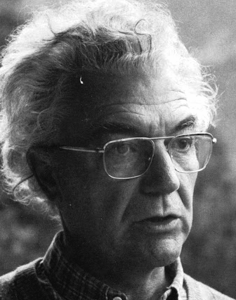 Famous type designer born in 1928 in Unterseen, Switzerland, who died in September 2015. He closely cooperated with Linotype-Hell AG, after having been artistic director at Deberny-Peignot in Paris since 1952. He established his own studio in 1962 with André Gürtler and Bruno Pfaftli. Art director for Editions Hermann, Paris 1957 to 1967. Frutiger lived near Bern, Switzerland, and was very interested in woodcuts. In 2009, Heidrun Osterer and Philipp Stamm coedited
  Werner Affolter ran a phototype and printing company in Basel, Switzerland, called Affolter und Gschwind AG, Fotosatz&Reprotechnik. In 1981, Affolter published an extensive catalog entitled Letterama that showed over one thousand alphabets. Few of those were original, so I suspect he acted as a vendor of sorts, but at least a couple seemed original, or were claimed to be original or exclusive:
  In 2016, Alan Hayward (Lausanne, Switzerland; b. 1993) designed Mebinac, a text typeface based on Thomas James Cobden-Sanderson's Doves (1900). In 2017, he published the ultra-condensed sans typeface
  Swiss sculptor, painter, draughtsman, and printmaker, 1901-1966. He is known for his surrealist and expressionist work. His emaciated sculptures reflect a view that all modern life is empty and superficial.
  [
[ Type designer living and working in Zurich, Switzerland, b. 1971, Männedorf. Alex Meier started out as a multimedia designer. From 2004 to 2006, he studied typography. He studied type design in the CAS Typedesign program at ZHdK in Zurich, where he graduated in 2008. After graduation, he started sharing a studio, Atelier für Schriftgestaltung, with his former fellow student Dominique Kerber.
  Editorial and graphic designer and art director based in Lausanne, Switzerland, who graduated from ECAL in 2009. Since 2012, he teaches typography and type design at Eracom Lausanne---École romande d'arts et communication---and ECAL. He set up ASltiplano in Lausanne. His typefaces:
  Swiss design company, est. in Basel in 1987. It expanded in 2000 and created an office in San Francisco.
 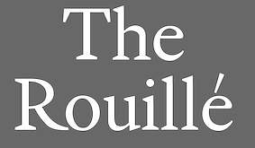 Andrea Anner is a Berlin-based Swiss graphic designer. After a Masters in Art Direction and Type Design at ECAL, she founded the design practice AnnerPerrin together with Martina Perrin. With Thibault Brevet, she has founded a studio for digital development.
 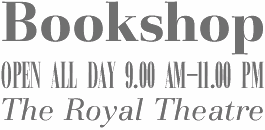 [
[ German illustrator and graphic designer who works at Keller Maurer Design in Munich. Born in Ravensburg in 1982, as a student in 2007, she created
  Swiss designer of the art nouveau-inspired typeface Voluptan (2020) at HAV Hamburg. [
 Anthony is a half Swiss, half English graduate of ECAL Lausanne's visual communication department. He started working for GVA Studio on the visual identity of Geneva Public Transport (TPG). In 2006, he moved to Brussels where he joined Base for the first time as a designer working on projects such as La Monnaie Opera, de Singel and Théâtre National. In 2011, Anthony returned to GVA Studio, where he now leads the design team of BaseGVA (Geneva).
  [
[ [
[ Atelier Bubentraum is Anton Studer, a designer located in Zürich. We also find himn asssociated with
  Foundry and studio run by
  Atelier für Schriftgestaltung (or simply, Dominique Kerber) is the studio of Dominique Kerber (Winterthur, Switzerland) and his former fellow student Alex Meier. Kerber's first and main typeface is the 6-weight 12-style balanced sans typeface family
  The graphic design studio Based is based in Lausanne, Switzerland. It was founded in 2014 by Michael Gaio and Robin Perret-Gentil. Based created the basic custom sans typeface Based and the ink-trapped Intrap in 2015.
  [
[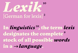 Swiss foundry that made several (typically Swiss) techno-sans families. Their worK:
  BluGraphic (Wassim Awadallah, Beirut, Lebanon; but also claimed to be in Bern, Switzerland) specializes in free vector format graphics and typefaces. These include the modular sans typeface family Form (2014), and a collection of vector format icons (2013), weather symbols (2013) and arrows (2014). In 2017, he designed the tall sans typeface Giraffey, Viana Script, Valencia, Quenos (didone caps), Soigné (italic fashion mag typeface), Rhama Gothic (blackletter), Florence Script, Alvania, Prink Script, Virtuous Slab, Less Sans, Amigo Script and Holland Script. In 2018, he designed Strain and Tempo (a
  [
[ Illustrator who was born in Lisbon and lived in the Northeastern part of the USA for seven years before returning to Lisbon for a few more years and finally settling in Geneva, Switzerland.
  Based in Geneva, Switzerland, Bryan Decoppet created the
  Mauro Paolozzi (b. 1975) studied at Luzern School of Art and Design and graduated from the Royal Academy of Art in The Hague in 2000. After completing the postgraduate class Type & Media (2000-2001), he maintained a platform for audio and visual art in The Hague (2001-2006). He has also been teaching at Fachklasse Grafik in Luzern since 2001. At the Swiss type foundry
 Sankt Gallen, Switzerland-based studio with seven participants: Anna Furrer, Andrea Nolli, Moni Rimensberger, Joa Schmied, Sascha Tittmann, Jürg Waidelich, Amanda Züst. Designers of these free typefaces: Lietz Block (2008, heavy poster sans), Hedge Flow (2008, floriated), Nordstern (2004, a simple organic sans family in Hell, Normal and Dunkel, designed by Rolf Benjamin Fleischmann), Marsmonster (2005, rounded techno style by Affenprinz Belmondo).
  Catharsis is located in Leiden, The Netherlands. Before that, Christian Thalmann's page
  [
[
 Cyril Bays (Zekiko) is a graphic designer in the Vevey-Lausanne-Genève area of Switzerland. He designed a vector format decorative caps typeface in 2016 that mimics the caps used in the new Larousse Illustré. The letters were designed by A. Bosson.
  Swiss designer Bruno Maag (b. Zürich) founded Dalton Maag in 1991, and set up shop in Brixton, South London. He serves the corporate market with innovative type designs, but also has a retail font line. Ex-Monotype designer Ron Carpenter designs type for the foundry. In the past, type designers Veronika Burian worked for Dalton Maag. A graduate of the Basel School of Design, who worked at Stempel and was invitedd by Rene Kerfante to Join Monotype to start up a custom type department. After that, he set up Dalton Maag with his wife Liz Dalton. He has built the company into a 40-employee enterprise with offices in London, Boston, Brazil (where the main type designer is Fabio Luiz Haag), Vienna and Hong Kong.
  [
[ DKGD stands for Dani Klauser Grafik Design. He is a Swiss designer from Luzern who made the free geometric sans typeface Circle (2007). He also made the headline typefaces
  Graphic designer in Sierre and Lausanne (Switzerland). During his studies at ECAL (Lausanne), he made a cinematographic signage typeface called
  Web designer in Milano, Italy (and before that, Lugano, Switzerland, and Catania, Sicily), who created the didone typeface Rachel and the
  Daryl Roske is a British and German national studying and working in Montreux, Switzerland and Hamburg, Germany. He studied visual arts at the College Voltaire in Geneva, graduating in 1991. He has carried out identity designs for Buitoni, The Art Center (Europe), the IDRH, and the Federal Office of Civil Aviation. His typefaces:
  Basel-based designer of the square-spaced typeface
  David Gobber is a graphic designer currently based in Basel, where he is finishing his graduate studies at the FHNW Academy of Art and Design. Before that, he studied Visual Communication under Fons Hickmann at the University of the Arts Berlin. He created the headline typeface Raster (2012, +Decorative), which was designed on a grid. In 2014, he created the nibbed pen typeface Pachner. His latest typefaces include Lucifer (a threatening text typeface) and SQ (a pixelish typeface). [
 Lausanne, Switzerland-based graphic and type designer who studied at Eracom & ECAL. iHis diploma typeface was Ripley. He also designed Neptune (2014: a sans typeface with hipster options;
  Multimedia designer, creative consultant, a brand and identity designer in Saint Cergue, Switzerland, b. 1983. He runs (ran?) a brand design company called
  Swiss designer (b. 1988) of
  Typographer and graphic designer from Geneva. He created
  Dinamo is a Swiss type foundry in Heiden established by Johannes Breyer and Fabian Harb after graduation from schools in Zurich, Basel and Amsterdam. Johannes and Fabian were visiting teachers at the Estonian Academy of the Arts, Tallinn. Johannes is teaching type design at University of the Arts Berlin (UDK) and HfG Offenbach. Fabian is lecturing typography at the School of Design St. Gallen. Their typefaces:
  Partner in Moiré (Zürich) who designs typefaces at Grilli Type in Switzerland. His typefaces:
 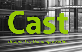 [
[ ECAL Typefaces (est. 2015) is the first online type foundry based within a university (in this case,
  Type and graphic design pages by Edgar Walthert, b. Sursee, Switzerland. In 2007, he graduated from the TypeMedia program at KABK in Den Haag. Since then he is free-lancing. He completed TazIII in 2008 for Lucas de Groot in Berlin. In 2008, he moved to Amsterdam to work as an independent graphic and type-designer. In Amsterdam, he hosts
  Winterthur, Switzerland-based designer of the all caps Peignotian typeface Gloria in 2017. [
 Elizabeth Waterhouse is co-designer of the
  Partner of Ian Party in
  Emphase Inc. is a graphic design agency based in Lausanne and Bern (Switzerland). Fabienne Kilchör received her diploma in visual communication from Geneva University of Art and Design (HEAD) in 2006. Following her studies, Fabienne has gained practical experience in an advertising agency, as a project assistant at HEAD and working continuously as a freelance graphic designer. In 2010 she started Emphase, an agency for visual communication and information design, with project partner Sebastien Fasel. In the years 2008-2012 Fabienne was initiating and conducting research projects at the Bern School of Arts (HKB) in the field of communication design. Fabienne is writing her PhD-thesis at the University of Bern exploring heritage mediation by means of information design. Fabienne and Sébastien lecture at HEAD, teaching courses on portfolio design and data visualisation.
  Swiss designer (b. 1987) who studied at ECAL in Lausanne. Creator of
  Swiss type designer. As
  Geneva, Switzerland-based graphic and type designer, b. 1990, who studied at ECAL in Lausanne. Designer of the Trajan column-inspired display serif typeface
  Swiss decorative artist, poster designer of the art nouveau era, and type designer (b. Lausanne, 1841, d. Sceaux, 1917). Grasset worked in Paris during La Belle Epoque.
  Dinamo is a Swiss type foundry established by Johannes Breyer and Fabian Harb after graduation from schools in Zurich, Basel and Amsterdam. Johannes and Fabian are visiting teachers at the Estonian Academy of the Arts, Tallinn and regularly teach at UDK Berlin and University of Applied Sciences, St. Gallen. Their typefaces:
  [
[ [
[ Foundry, est. in 2012 by Anton Koovit and Yassin Baggar in Berlin, and in Neuchatel, Switzerland. Fatype has designed typefaces for GQ France (such as GQ Baton),
 Born in Carmelo, Colonia, Uruguay in 1983, then based in Geneva, Switzerland, where he studied Visual Communication at the Haute Ecole d'Art et de Design, and now back in Montevideo, Uruguay, this graphic designer created the counterless geometric typeface
  During his studies at the School of Arts in Basel, Switzerland, Florian Weber created the free hexagonal typeface Dimensiva (2015).
  [
[ A project started by Stephan Müller (Lineto's founding partner), Reymund Schröder and Pierre Pané-Farré in 2017. They write: The three designers met at HGB Leipzig, the Academy of Fine Arts where Müller co-directs the type design course, and where their inevitable discussions about the witnessed inflation of digital typefaces led them to explore alternative strategies for the practice of type design, the study of typeforms, their development and their future existence in rapidly developing digital environments. Are there any more challenging and more rewarding methods of publication than the mindless race to discover, scan, trace & refit for a panicked release? That's one of the questions Forgotten Shapes aims to find answers for. Their typefaces:
  During his studies, Schaffhausen, Switzerland-based Fabian Korn (b. Zurich) designed the
  Swiss designer (b. 1955) located at Lake Geneva. Recipient of the
 Lettering and logo design artist who used
 Swiss type designer who co-founded
 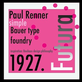 A frequently asked question---which version of Futura should one buy? My personal favorite is the
  German/Swiss foundry established in 1790 (however, see timeline below) and based in Basel/Münchenstein. Many of its shares were acquired by D. Stempel in 1927. Linotype takes over Haas in 1989. Their collection includes:
  Swiss type designer in Obstalden, Switzerland, born in 1922 in Horgen am Zürichsee, who was associated with ETH Zurich for a long time. He died in 2014. In his obituary, Meier's long-time friend and former publisher Erich Alb wrote: He was a tireless, quiet craftsman, alone in his room, away from everything, who worked with endless stamina. The high quality of his calligraphic work, his sure eye in drawing letterforms, his teaching skills, his drawing, painting and graphic work distinguish him as a unique international figure. Meier created
  Hans Rudolf Giger (b. 1940, Chur, Switzerland) is a Swiss surrealist painter, sculptor, and set designer. He studied architecture and industrial at the School of Applied Arts in Zurich, class of 1970. His books of paintings, particularly Necronomicon and Necronomicon II (1985) and the frequent appearance of his art in Omni magazine continued his rise to international prominence. In 1998 Giger acquired the Château St. Germain in Gruyères, Switzerland, and it now houses the H. R. Giger Museum, a permanent repository of his work.
  Linotype's Helvetica, itself derived from Haas Grotesk, has a large number of clones, some of which I will attempt to list here (see
  Swiss type designer (b. Cannanore, India, 1902, d. Basel, 1993). He was associated with the Haas type foundry, where he made
  [
[ [
[ Idealphabet was founded in 2008 by Alexander Aeschbach (Zurich, Switzerland), who studied at ECAL (Ecole cantonale d'art de Lausanne). It sells these typefaces:
  Swiss organization which in the type world is best known for its simple monoline rounded typeface Isonorm proposed in 1980. The font is appropriate for drafting and architectural purposes, as well as for technical charts and graphics. This typeface was digitally implemented by many, including:
  Switzerland-based designer of these fonts:
  Born in Leipzig (1902), died in Locarno, Switzerland (1974). Influential
  Jannuzzi Smith is a cross-media design consultancy based in London and Lugano. It made a sans out of the slabby MT Calvert (by Margaret Calvert, 1936) called
  French type designer and punchcutter, 1580-1658, born in Switzerland, who worked at the Estienne printing atelier in Paris before escaping to Sedan, to avoid persecution for his Protestant beliefs. He then worked as a printer for the Calvinist Academy where he began to cut his own letters. In 1641, he received a commission from the Imprimerie Royale from which Caractères de l'Universit�é originated. Until the middle of the 20th century, his letters were misattributed to Claude Garamond. Many of today's Garamond style typefaces are in fact due to Jannon, as first pointed out by Beatrice Warde.
  Lausanne, Switzerland-based type designer. He created
  Based in Lausanne, illustrator Jerome Viguet created the hilarious caricatural alphabet Alphabet 01 in 2013.
  Designer from Fribourg, Switzerland, b. 1976.
  Swiss or Swedish designer of OCR-A (2008), Atari Small (2007), and
  [
[ Swiss-born
  Swiss typographer and book designer, b. 1933, Sankt Gallen. After study at the Kunstgewerbeschule St.Gallen, he trained as a compositor with the printer Zollikofer and at the Kunstgewerbeschule Zürich; his education as completed in 1959 in Adrian Frutiger's class at the École Estienne. Since then he has practised as a freelance graphic designer, eventually specializing in book design. In 1979 he co-founded the co-operatively run publishing company VGS Verlagsgemeinschaft St.Gallen, for which much of his book design work has been done. He has taught at the schools at Zurich and then St.Gallen since 1967.
  During her studies at IPAC Design Genève, Switzerland, Julia Rajnak created the elegant thin sans typeface Flotte (2014). [
 [
[
 Swiss art director (b. Empoli, 1979), currently living and working in Paris. His type family
  [
[ Born in Basel in 1930, died in Basel, January 1, 2017. Karl Gerstner designed these typefaces:
  [
[ Swiss calligrapher in Basel who made and sells various medieval and historically important script fonts.
  Designer at Lineto of fonts such as Pez, a block letter font (1999). Pez was renamed
 Linda Walter (b. Winterthur, Switzerland) works as a visual communicator in Basel, Switzerland. In 2018, she designed the sans typeface Bishek during her studies under Philipp Stamm at Kunsthochschule für Gestaltung und Kunst in Basel. [
 Swiss creator (aka Fuex) of the free calligraphic font Miama (2009,
 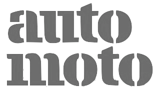 Talented type and graphic designer based in Morgin and/or Grand-Lancy, Switzerland. After obtaining a BFA from the Academy of Art University of San Francisco, he started a Masters in the
  [
[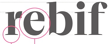 [
[ Geneva-based professor of Gregorian chants.
  Graphic designer in Geneva, Switzerland, who created the logotype and signage typeface Voie 3 in 2016 for the campus of Head Geneva in the Swiss Jura region. [
 Swiss typographer and graphic designer, b. Geneva, who creates new typefaces out of old ones. He graduated from the Basel School of Design, and set up Ludovic Balland Typography Cabinet in Basel in 2006. Since 2003, he has been teaching at ECAL in Lausanne. Ludovic Balland created some retail typefaces as well as many corporate typeface families. His typefaces include:
  Lukas Schiltknecht (was: Lucas Gardener) is a designer from St. Gallen, Switzerland, b. 1982. He created the blackletter typeface Helvedding (2009), the graffiti typeface Hinterwelt (2011), Goodwill (2011), Malice (2011, more graffiti style), and the sans typeface Phat Otto (2010). Until 2011, his typefaces were free.
  Graphic design studio in Geneve, Switzerland, founded by Pedro Julien and Gabriel Comym. Typefaces created by them include Era 21 (2013: a fashion mag high-contrast didone), Quantum (2013: futuristic liquid typeface), She Is Typo (2012: another fashion mag display typeface), Vani (2012).
  [
[ Luzi Gantenbein (Luzi Type, Bern, Switzerland) is a type designer, b. 1988, Fläsch, Switzerland. He created the vernacular all caps wall paint typeface Valparíso (2010, Volcano). At the Hochschule der Künste Bern, he designed the angular family
  Geneva, Switzerland based designer who designed these typefaces:
  Marc Droz's studio is called dreh GmbH. Designer at
  [
[ Marc comes from Liechtenstein and Switzerland, but works in London as Marc Weymann Design. Graduate from the type design program at the
  During her studies at Schule für Gestaltung Biel, Switzerland, Neuchatel-based Marie-Morgane Adatte created Brandhair (2014, watercolor script) and Garage (2014, a wayfinding minimalist sans). [
 [
[ Swiss type designer. He created the serifed text typeface
  [
[ [
[ Influential Swiss graphic designer, sculptor, painter and architect, b. 1908, Winterthur, d. 1994. He studied at the Bauhaus from 1927 until 1929 under Josef Albers, Paul Klee and Oskar Schlemmer, and moved to Zurich after that. In 1944, Bill became a professor at the school of arts in Zurich. In 1953, along with Inge Scholl and Otl Aicher, he founded the influential Ulm School of Design, which closed in 1968. Bill was a professor at the Hochschule für bildende Künste Hamburg and chair of Environmental Design from 1967 to 1974. He lived in Zurich in the later years of his life and died at the Berlin Tegel airport of a heart attack.
  Swiss designer, born and died in Zürich, 1910-1980. His typefaces, all produced for the Haas Foundry in Basel, Switzerland:
  Swiss high school teacher. Author of
  Maximage Société Suisse, established in 2008 by Julien Tavelli and David Keshavjee, is based in Lausanne and Berlin, and works in the fields of corporate, type, book and furniture design. Since 2008, Maximage has been teaching typography and graphic design at the University of Art and Design Lausanne (ECAL). Since 2015 located in Zurich.
 [
[ In 2010, designers Timo Gaessner (a graduate of Gerrit Rietveld Academy, Amsterdam) and Alexander Meyer started MilieuGrotesque (or: Meyer&Gässner) in Zurich, an independent platform for designers and editors, publishing and distributing a growing collection of typefaces and related publications. MilieuGrotesque reflects our ongoing interest and involvement with all things typographical in work and thought. The page features mainly typefaces designed by themselves:
  The Modonomat type foundry was founded in 2011 by Christine Gertsch (b. 1984, Bubendorf, Switzerland), a Swiss graphic and type designer living in Berlin. Christine studied in Basel, Québec, Berlin, Kolding and The Hague, where she was part of the
  Zurich-based graphic design studio that often work for art and architecture clients. It is run by Marc Kappeler, Markus Reichenbach and Ruth Amstutz.
  [
[ Neo Neo is a Swiss-based studio specializing in art direction and graphic design. It was set up in Geneva by Thuy-An Hoang (b. 1986) and Xavier Erni (b. 1983) in 2010. Since 2015 Thuy-An and Xavier are lecturers at HEAD-Genève, the Geneva University of Art and Design. Xavier Erni co-founded
  Swiss type foundry set up by Ian Party in Lausanne in 2020, with a focus on variable font technology. All newglyph typefaces are variable fonts with three axes of variation: weight, width and contrast. Their initial typefaces in 2020:
  Swiss designer in Zurich who made Souper3 (2009) and Soupleaf (2009, a fun decorative hand-printed typeface for gourmet illustrations).
 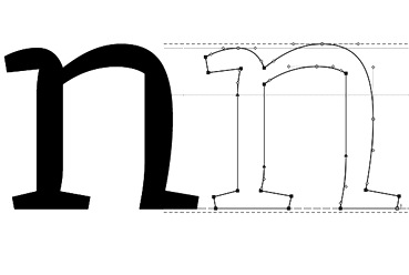 [
[ Nicolas Eigenheer grew up on the shores of Lac Neuchatel. He graduated from the University of Art&Design Lausanne (ECAL) in Visual Communications. He works as a graphic and type designer in Switzerland. He created the absolutely gorgeous wood-inspired slab titling typeface
  London-based graphic designer and art director. He studied at Ecole de Condé (Lyon, France), Ecole Normale Superieure des Beaux-Arts de Lyon, and ECAL (Lausanne), where he obtained a Masters of Arts in Art Direction and Type Design. He has worked as a graphic designer at Google Zurich (2014), Sang Bleu (2015-2017), Laurence King Publishing (2017-2019), TTTISM (2019-2020) and Lymited (from 2020 onwards). Designer of élancé (2008,
  [
[ Swiss designer of the sans family Lausanne (2019).
  Noël Leu is one of the cofounders of Grilli in Bern (while studying at the University of the Arts Bern in Visual Communication and Literature Writing). Leu designed these typefaces:
 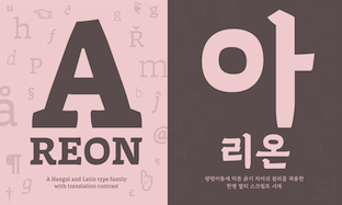 Noheul Lee obtained a bachelor in visual communication design from Sangmyung University, Korea. She pursued a Master in visual communication design from Kookmin University, Korea, and a Bachelor's Degree from Sangmyung University in Seoul. Noheul graduated from the
  Nolan Paparelli is a Swiss graphic and type designer currently based in Munich, Germany. His practice focuses mainly in developing editorial design, visual identity, web and type design solutions for clients across the cultural and commercial fields. After graduating from ECAL/University of Art and Design of Lausanne in 2015 with a Bachelor in Graphic Design, he has worked on various commissions in collaboration with Editions Attinger, Herburg Weiland, Kairos Studio and Swiss Typefaces among others.
 Nootype (Nico Inosanto) is a Swiss type foundry in Neuchatel. Typefaces made in 2013 include
 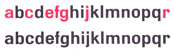 Normal-Grotesk was released around 1943. According to Indra Kupferschmid and Stephen Coles, it was reworked by Haas from Haas's Akzidenz-Grotesk (based on a Wagner & Schmidt design, ca. 1909). It is not the same as the Berthold Akzidenz-Grotesk, but both designs, along with Französische Grotesk, were models for Neue Haas-Grotesk (later Helvetica). [
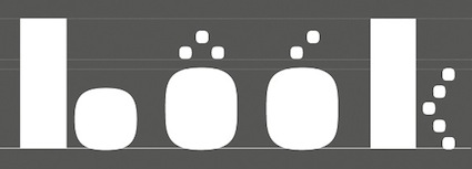 Type and graphic design studio in Zurich, run by Clovis Vallois and Anton Studer.
  Aka OGJ Type, Oliver Jeschke is based in Berlin. In November 2022,
 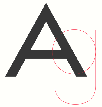 [
[ Czech visual identity designer working mostly for the fashion industry, who has a Masters in type design at ECAL in Lausanne, Switzerland. Creator of the extended sans typeface Exil 71 (2014). In 2018, he designed the sans typeface
  Philipp Herrmann (Zurich, Switzerland) founded Out of the Dark in 2013. The other designers associated with Out of the Dark include Massimiliano Audretsch, Hammer, Tobias Holzmann, Mirco Schiavone, Philipp Herrmann, Fabio Furlani, and Raphaël de la Morinerie.
  Page Studio Graphics is Roger Vershen's Oro Valley, AZ-based company specializing in symbols and symbol fonts, founded by him in 1986. Roger Vershen died in Tucson, AZ, in 2003.
  Paul Klee (b. 1879, Münchenbuchsee, Switzerland, d. 1940, Locarno, Switzerland) was a Swiss-German artist. His style was influenced by movements in art that included expressionism, futurism, cubism, and surrealism. Wikipedia: Klee was a natural draftsman who experimented with and eventually deeply explored color theory, writing about it extensively. His lectures "Writings on Form and Design Theory" (Schriften zur Form und Gestaltungslehre), published in English as the Paul Klee Notebooks, are held to be as important for modern art as Leonardo da Vinci's "A Treatise on Painting for the Renaissance". He and his colleague, Russian painter Wassily Kandinsky, both taught at the Bauhaus School of Art, Design and Architecture. His works reflect his dry humor and his sometimes childlike perspective, his personal moods and beliefs, and his musicality.
  Zurich-based award winner at TDC55 for
  During her studies at ECAL in Lausanne, Switzerland, Thai-born Pensaya Khurewathanakul created the fun typeface
  Zurich-based illustrator. While grocery shopping, a sign about a sale of asparagus led to the inspiration and the
  Creator (b. Münich, Germany) of a great blackletter typeface called
 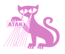 [
[ Zofingen, Switzerland-based designer educated in Basel. Creator of these typefaces:
  French designer of the display typeface
  [
[ Developers of the free slab serif typewriter style font
  [
[ [
[ Mirco Schiavone (Switzerland) set up Razziatype. His fonts at Razziatype include RT Alias (pixelish) and Bowie. He co-designed the Cyrillic version of GT Walsheim (2009-2014) with
  Fictitious Swiss designer and type designer whose fonts, Chalet New York, Chalet Tokyo, Chalet Paris, Chalet London, and Chalet Comprimé (2002) are offered at House Industries. The Chalet persona was invented by the good people at House Industries as a marketing ploy (chalet means house in French).
  Designer at
  Zurich, Switzerland-based designer (b. 1982) who completed Fachklasse Grafik in Luzern in 2006, and obtained a BA in Graphic Design from ECAL/University of Art and Design Lausanne in 2010. In 2012, he founded his graphic design studio in Lausanne. In 2016, he started to teach at ECAL. His typefaces:
  [
[ Kichang Kim has degrees in communication design from Samsung Art and Design Institute in Seoul (2009), HGK FHNW in Basel (BA in 2013, MA in 2015). He set up Kikichi Factory in Basel, Switzerland, where created the high-contrast sans typeface Snello (2014-2018) and the calligraphic text typeface Kontro (2016-2019).
  [
[ Designer in Luzern, Switzerland, who ran Holztypenfabrik Roman Scherer, possibly the only wood type manufacturer in Switzerland. He created
  Born in 1976 in Germany, Roman Wilhelm graduated in 2004 with a diploma related to a German-Chinese book project. He studied visual communication at the Burg Giebichenstein University of Art and Design Halle (Saale) in Germany and type design at the Academy of Visual Arts Leipzig under Fred Smeijers. He briefly taught type design at the Hochschule für Grafik und Buchkunst in Leipzig. Besides working for Berlin-Beijing-based studio INSIDE A Communications, he is a member of the Multilingual Typography Research Group at the Geneva University of Art and Design. A fluent Chinese speaker, his work focuses on cross-cultural mediation, Chinese-Western bilingual typography and typeface design issues. A frequent visitor of Asia, he has taught at various academies such as the Central Academy of Fine Arts in Beijing, the Hong Kong Polytechnic University School of Design, as well as the Seoul National University College of Fine Art. He is working towards a PhD at the Braunschweig University of Art.
  [
[ Swiss graphic and type designer, b. Thayngen, Schaffhausen, 1937. She studied at the Kunstgewerbeschule Zurich. In 1968, Rosmarie Tissi and her mentor, Siegfried Odermatt, set up the studio Odermatt&Tissi in Zurich. Her typefaces were all published at Engler Text-Bild-Integration AG: Mindanao (1975), Sinaloa (1972, Letraset, Linotype),
  Sandra Carrera (b. 1986), originally from Spain and Switzerland, has a Masters in art direction and type design from ECAL, Lausanne, Switzerland, and holds a BA in Visual Communication from HEAD, Geneva. Her degree project was a typeface called Gandarela typeface, a personal interpretation of of Baroque Spanish types.
  Type designer presently based in Berlin (and before that, London). Graduate of the Ecole Nationale Supérieure des Arts Décoratifs (ENSAD) in Strasbourg, France (BA) and the Ecole Supérieure d'Art et Design (ESAD) in Amiens, France (MA), class of 2016. His graduation typeface family Temeraire pays tribute to the English letter ca. 1800, and includes some Clarendon-ish features. Each of its styles addresses a specific part of 19th century British lettering tradition, such as gravestone cutting, fat faces, master penmanship, copperplates, Egyptians, and Italians.
  Images of two Schreibbuechlein, one by
  [
[ Swiss designer
 Swiss art director who has done substantive typographic work for some clients. For Tess model agency in London, he custom-designed
  Speicher, Switzerland-based creator of the commercial vector format fonts Bodoni-X (2014, a modification of Bauer Bodoni Bold) and Spatium-X (2014, squarish and bilined). In 2017, he designed the mechanical octagonal all caps typeface Play.
  Swiss graduate (b. 1965) of Luzern School of Art and Design, who settled in Berlin in 1997. Co-founder with Cornel Windlin in 1993 of Lineto, with Cornel Windlin and Andreas Eigendorf in 2014 of
  Norwegian type designer, b. 1991, who graduated from Westerdals School of Art in Oslo in 2015 and ECAL in 2017. At ECAL in Lausanne, he finished an MA in Art Direction and completed an exhaustive comparative study of the Geometric Sans genre. He joined
  Swiss-born London-based designer at
  Swiss type design studio based in Luzern. In 2019, they published the superfamilies Studio Feixen Sans and Serif, which include variable fonts, a hipster style, Sans Edgy, and a typewriter style, Sans Writer.
  Sébastien Théraulaz from Lausanne lives in Montreal since 1997. There, he started his type foundry Subtitude (as part of Sub Communications Inc). The first fonts: Subix (2005, bitmap font), Subedge (2005),
  Istanbul-born graphic designer and typographic researcher, now located in Geneva, Switzerland. During his studies in the Master of Graphic Design program in Rennes (France), he created
  Swiss Typefaces is a foundry run by Ian Party (Territet, Switzerland, b. 19777, Lausanne) and Emmanuel Rey. It evolved from B+P Swiss Typefaces and BP Type Foundry, where BP stands for Buechi et Party. Maxime Buechi is still loosely affiliated with Swiss Typefaces but is now spending more time in London. Ian Party studied first at ECAL in Lausanne and then at the KABK in The Hague. In 2004, he cofounded
  Designer from Istanbul, who was born in Fribourg, Switzerland, in 1985.
  Born in 1936 in Basel, Switzerland's André managed the design office at Deberny&Peignot in the late fifties and early sixties. He taught production letter design at the Künstgewerberschule in Basel from 1965 onwards. He started Team 77 with Christian Mengelt and Erich Gschwind in order to make a correct grotesk improving over past grotesks, including Helvetica.
  Communication designer in Lausanne, Switzerland. Designer of the rounded sans typeface Circles Regular (2014) and the blackletter typeface Hendricks (2014). [
 Zürich-based graphic designer (b. 1985) associated with
  [
[ Graduate of Biel's School of Design, and now based in Bern, Switzerland. Designer of
  Tobias Sommer ("Shasta") is the Geneva, Switzerland-based designer (b. 1986) at FontStruct in 2008 of Great Depression (influenced by headline fonts from 1929), Brutto (headline slab serif), Lame Dude (dripping paint), Toytype (an interesting Indic simulation typeface based on an earlier block font by him called Block On),
  Advertised as
  Swiss and/or Italian foundry, est. 2013, located in Campione d'Italia, Italy. Their 14-style sans family,
  Typogama is the personal foundry of Swiss designer
  Graphic, multimedia and type designer from Basel, Switzerland, b. 1978. Her first degree was from Burg Giebichenstein HKD Halle (Germany). She was a freelance graphic and multimedia designer in Basel. Graduate of the
  Type meeting at the Schule für Gestaltung in St. Gallen, Switzerland, with most talks in German and some in English. Different years:
  Swiss graduate of the
  Swiss graphic and type designer who studied first at Ecole des Arts Décoratifs de Genève (2000) and then at the University of Reading (Masters in type design, 2007). He lives and works in Geneva. He created
  Valerian Felder cofounded Oizo factory in Geneva, Switzerland. He created the decorative caps alphabet Abecedaire Doodle (2015).
  Swiss graphic designer, b. 1923. iWe quote Answers.com: Well known for his advertising, graphics, and industrial design for the Italian office equipment manufacturer Olivetti, Swiss-born Ballmer studied graphic design at the Kunstgewebeschule in Basel from 1940 to 1944. He worked in publishing before moving to Italy in 1947 to join Studio Boggeri in Milan (established 1933). An established and successful graphic design office, Studio Boggeri executed a number of graphic design commissions for the office equipment manufacturer Olivetti and, from 1956, Ballmer went on to work as a graphic designer in Olivetti's advertising department where he remained until 1981. The visual clarity and deceptive simplicity of his graphic design work revealed something of his Swiss training and informed much of his publicity design for the company. Amongst his work for Olivetti was the coordination of a number of exhibitions shown in Italy and abroad, including Olivetti-Style (1961), Olivetti Innovates (1965), and Olivetti Image (1968). He was made a member of Alliance Graphique Internationale (AGI) in 1970 and, in 1975, received a Gold Medal for Olivetti-Image at the Ljublijana Bio 5.
  Swiss type designer, b. 1933, Zug. He studied at Kunstgewerbeschule Zürich, and from 1957 onwards he ran a design studio in Zug. His typefaces, often published in the Lettera book series (Lettera2, 1961; Lettera3, 1968 and Lettera4, 1972) all printed by Teufen.
  [
[ Alexander Xanti Schawinsky was born in 1904 in Basel, Switzerland, to a Jewish family of Polish descent. He died in 1979 in Locarno, Switzerland. He worked for three years in Theodor Merrill's Köln architecture office before enrolling at the Bauhaus in 1924 where he studied with Walter Gropius, Wassily Kandinsky, Paul Klee, Josef Albers, Oskar Schlemmer and Laszlo Moholy-Nagy. Schawinsky had a significant presence at the Bauhaus in Weimar and Dessau. He was particularly active in the theater department and strongly inspired by Schlemmer, whose position as teacher he took on and developed further. Photos from the early years of the Bauhaus show Schawinsky as a dynamic personality in many of its experimental extra-curricular activities. Among them was the influential Bauhaus Jazz Band where Schawinsky introduced his Step Dance versus Step Machine style of mechanical music and dance to pounding rhythms coupled with dramatic lighting effects and performance elements. At the Bauhaus Schawinsky began developing his ground-breaking concept of Spectodrama. Spectodrama represented an early idea of total theater where all aspects of the stage become independent agents. Schawinsky continued the work on Spectodrama at the Black Mountain College in the United States after his immigration, and he revisited this work in the 1960s and 70s in Europe. The original concepts and scripts are located in the archive of the Estate of Xanti Schawinsky in Zurich, as well as an extended body of work of stage photographs and sketches.
  [
[ Alexandfer Meyer is the Zürich-based
  Yassin Baggar (b. 1985, Switzerland) studied graphic design at School of Applied Arts, La Chaux-de-Fonds and MA in type design from the TypeMedia, KABK, in The Hague. Since 2007, he worked freelance on identities, books and other printed matters for various studios in Switzerland and Berlin. Before joining TypeMedia KABK (where he obtained
  Seryozha Rasskazov is a graphic and type designer, lettering artist, and sign painter from St. Petersburg, Russia, who studied at ECAL's Master in Type Design program in Lausanne, 2020-2022. Under the supervision of Kai Bernau, he designed the optically optimized variable didone stencil typeface Didonist (2021).
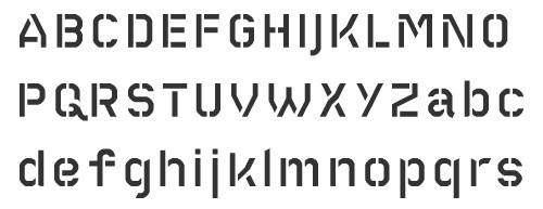
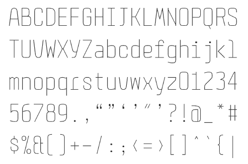
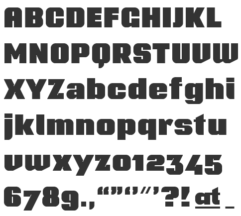
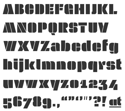
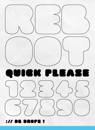
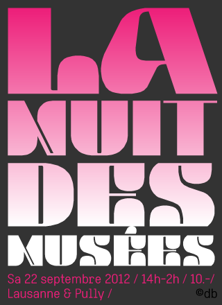
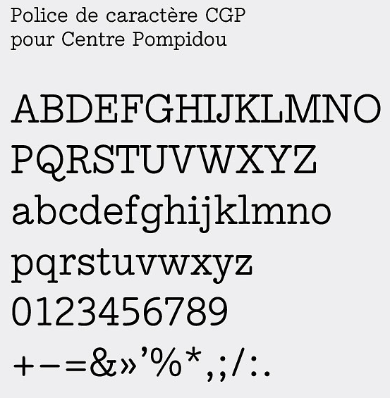
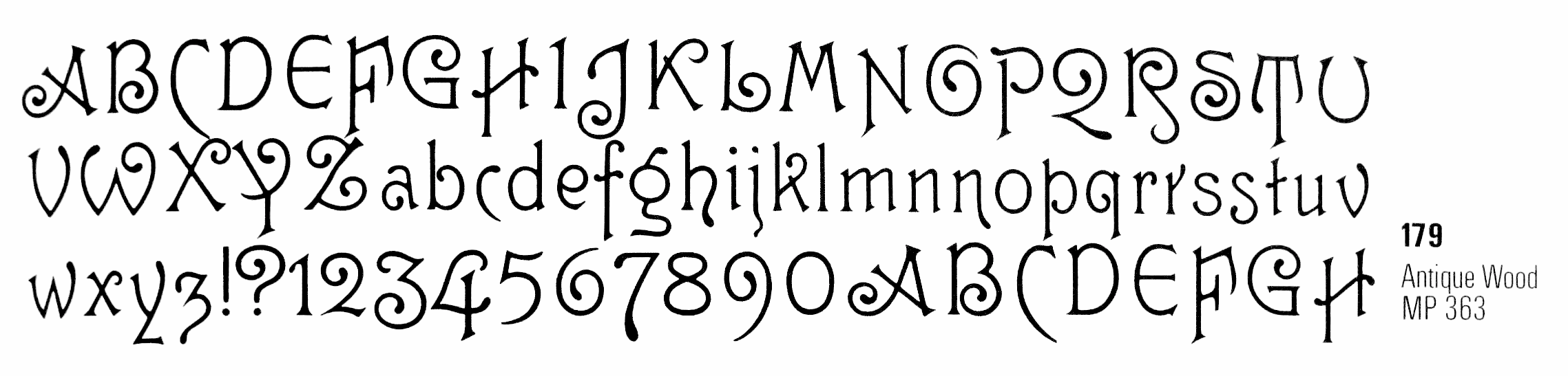
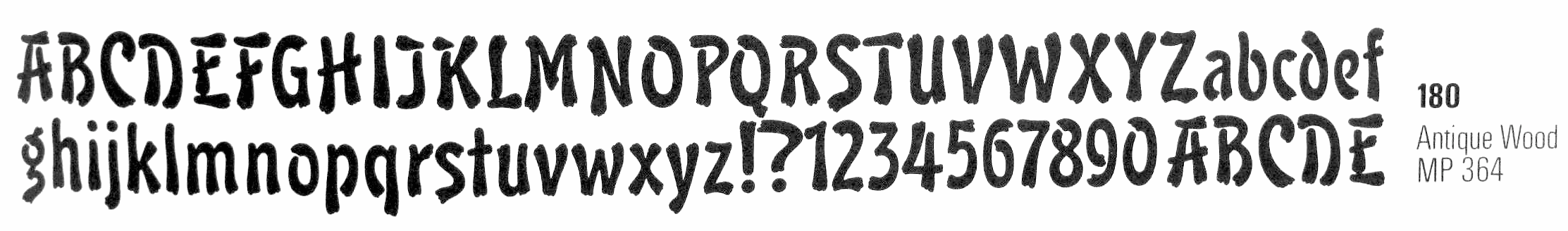
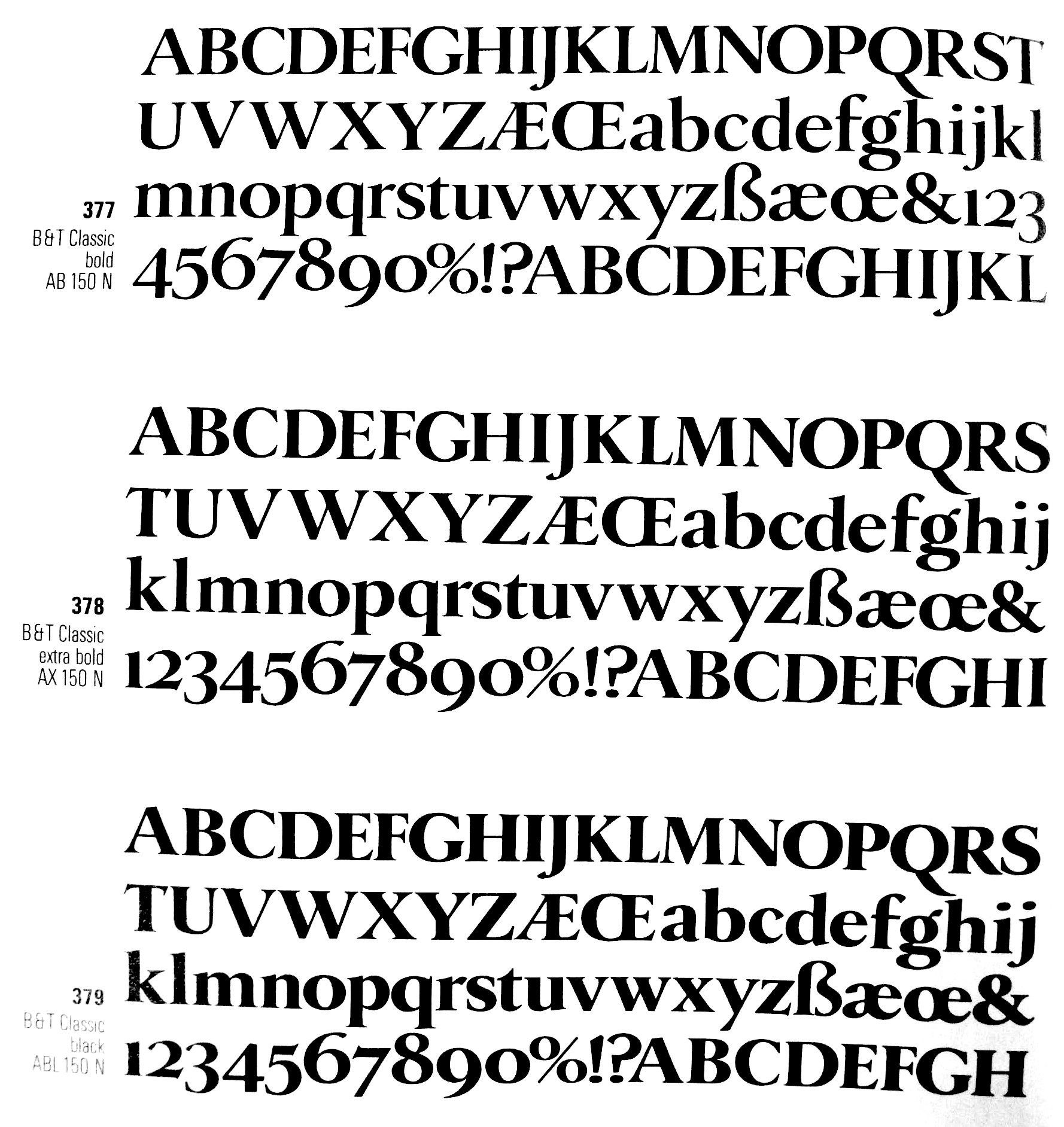
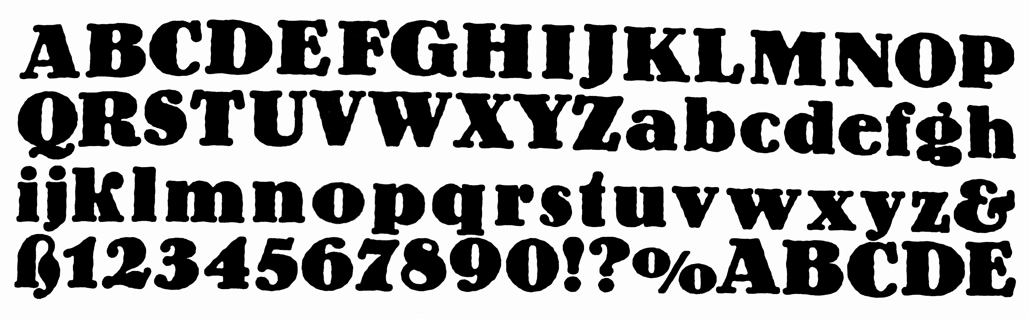
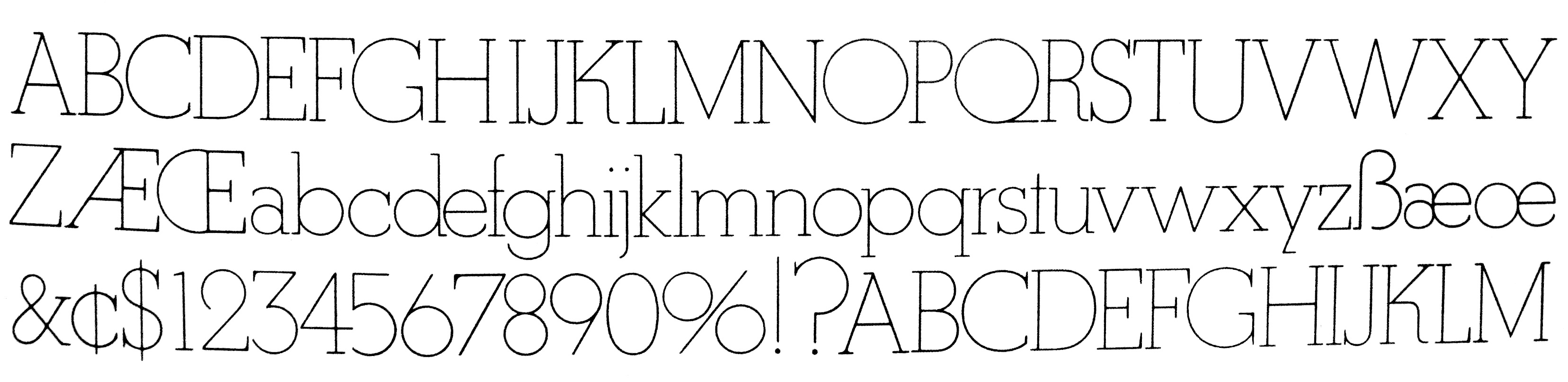
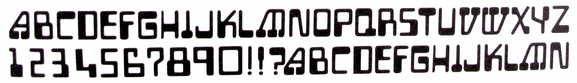
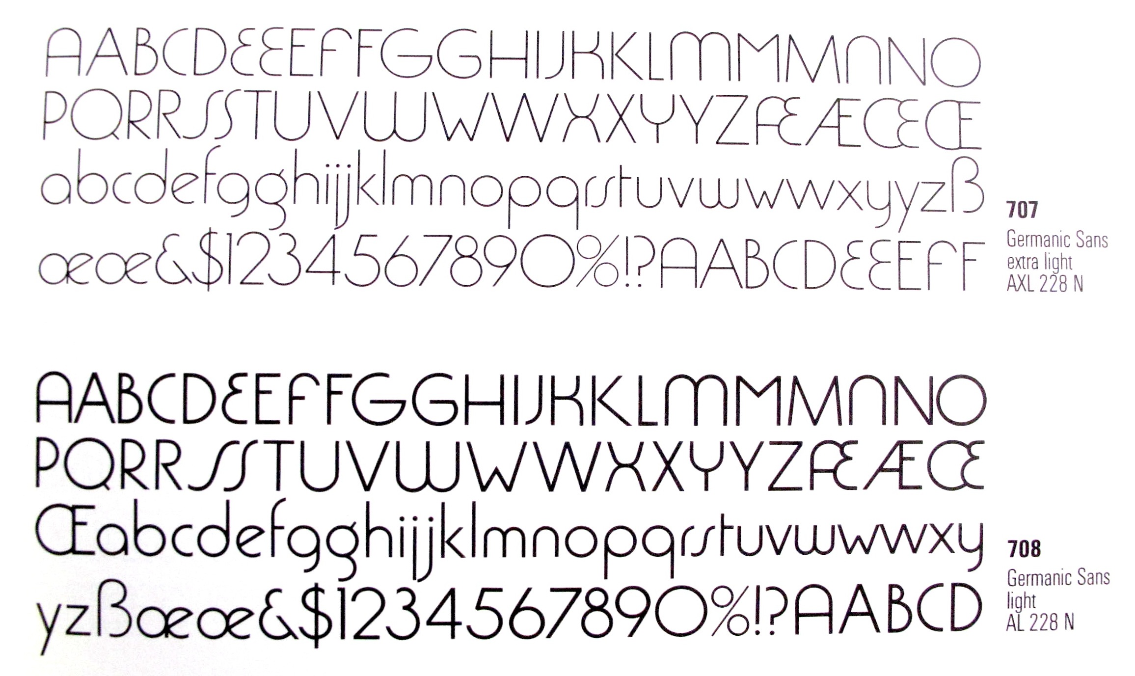
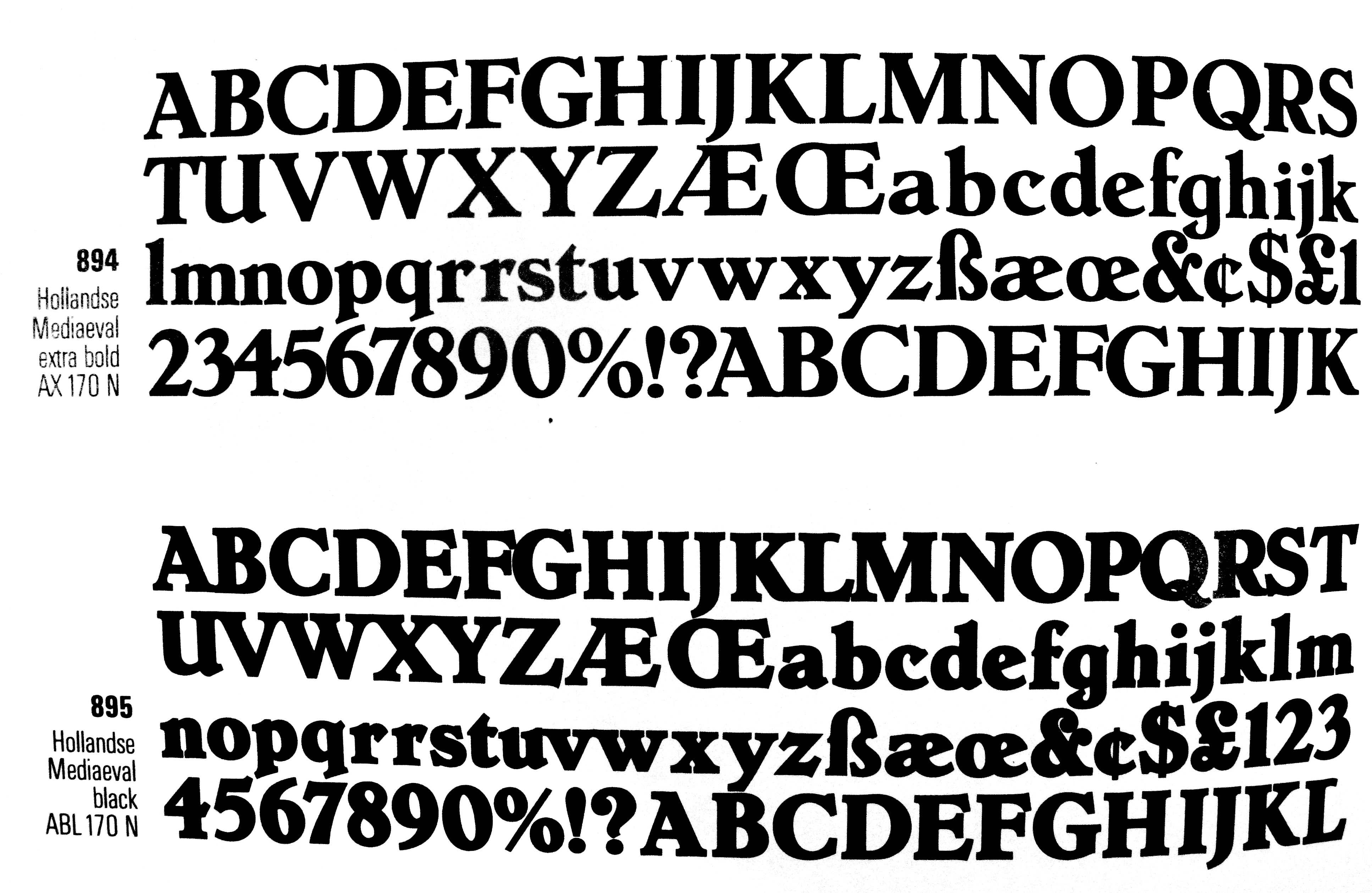
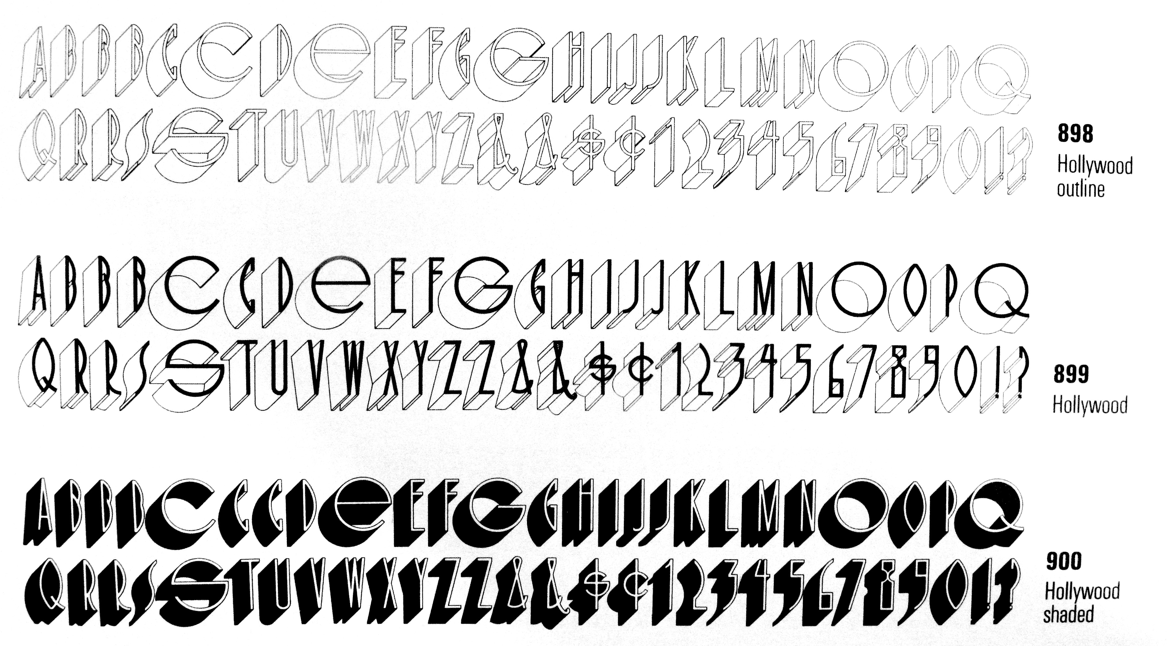
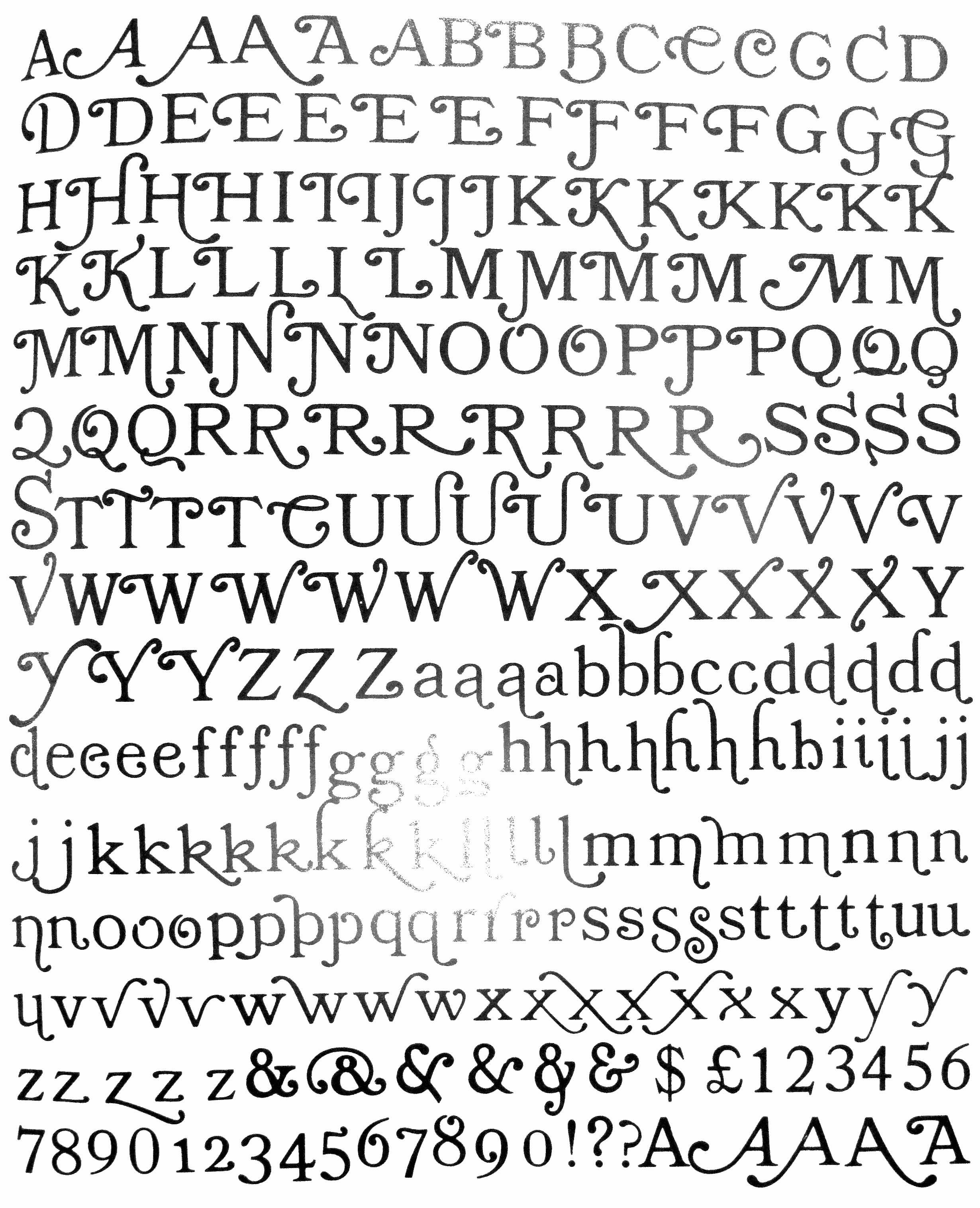
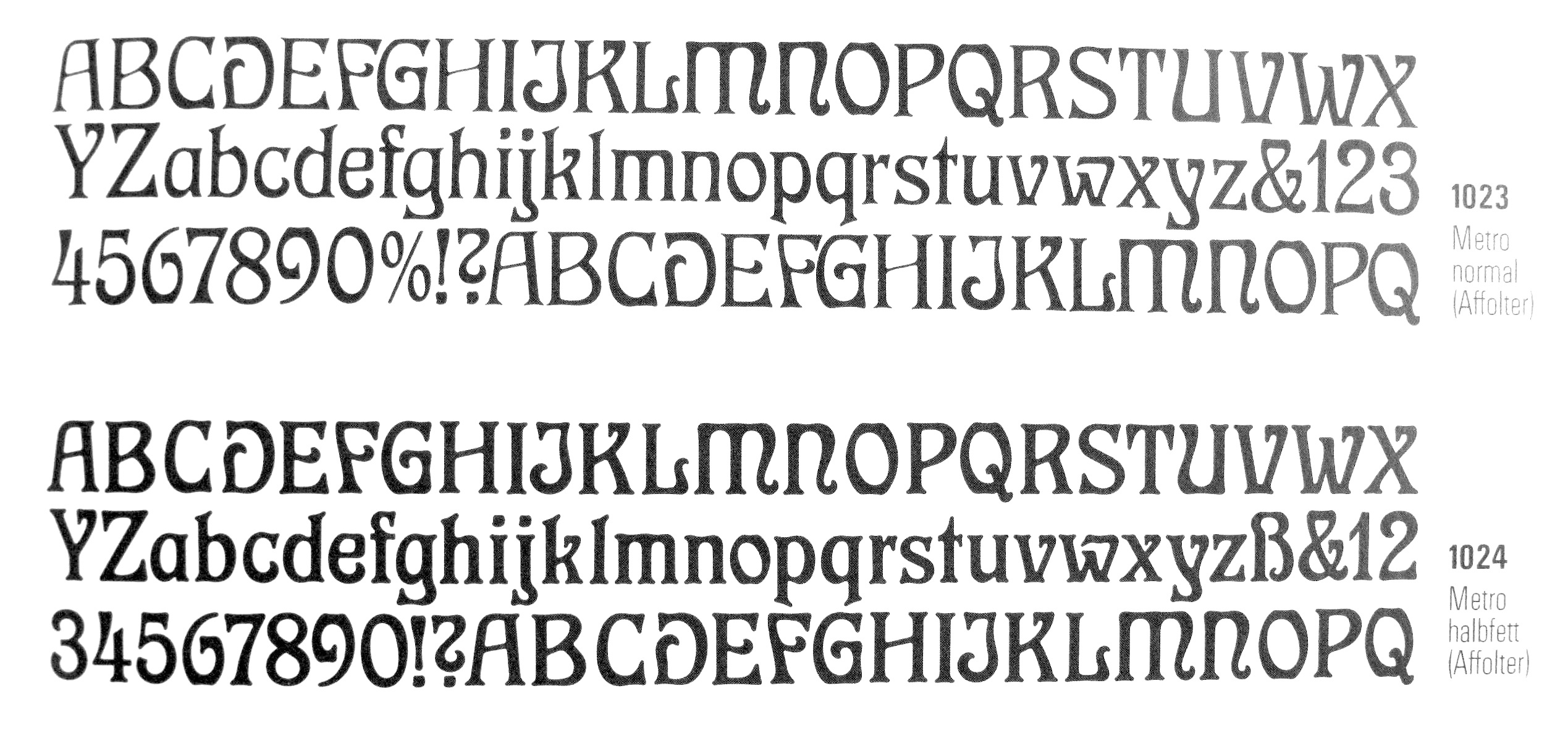
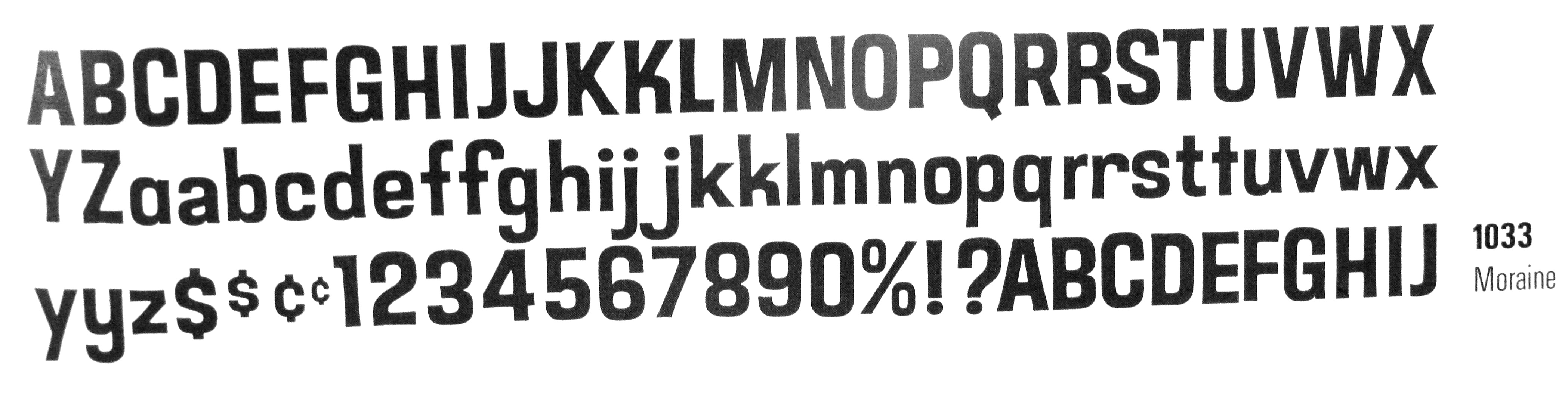
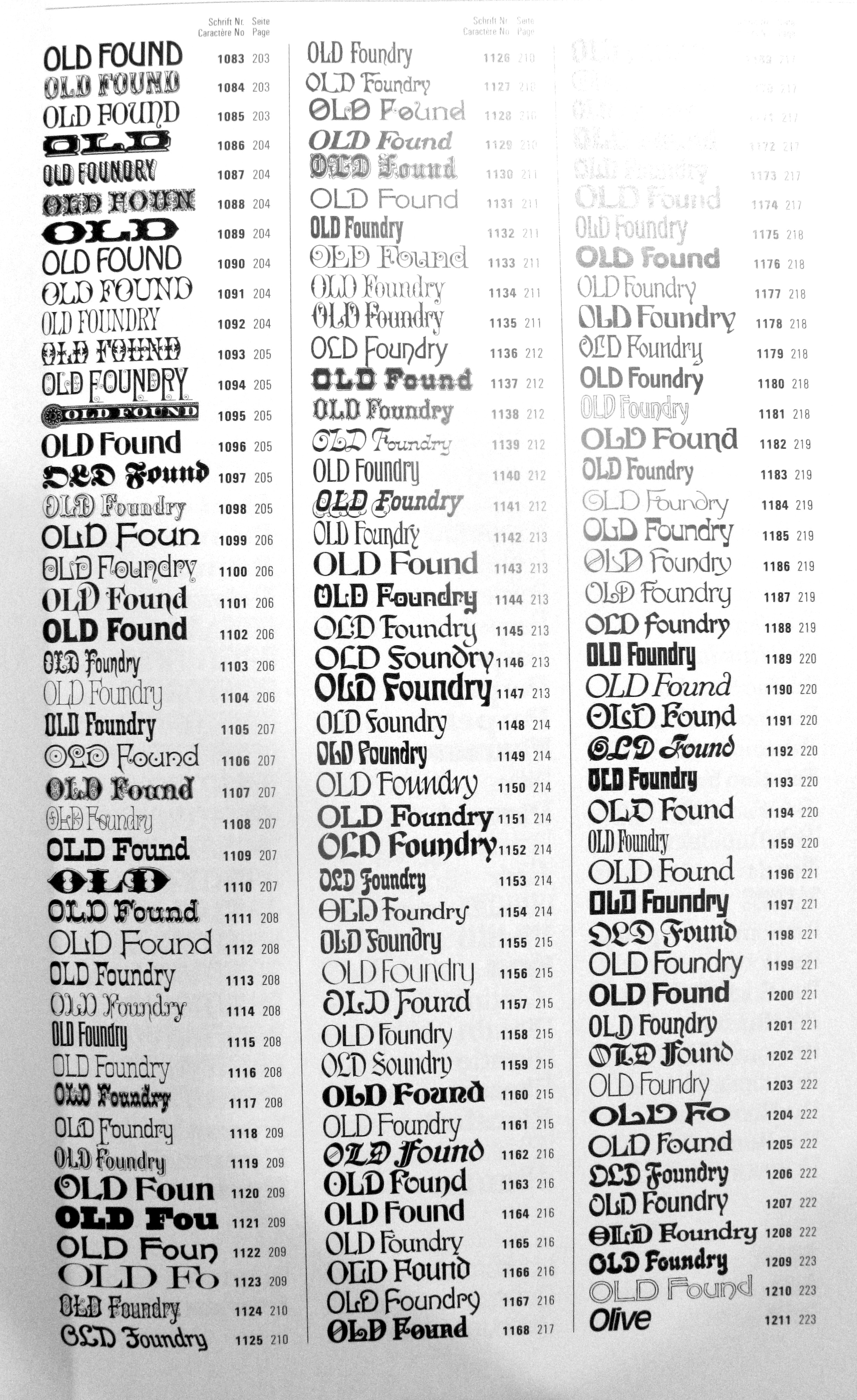
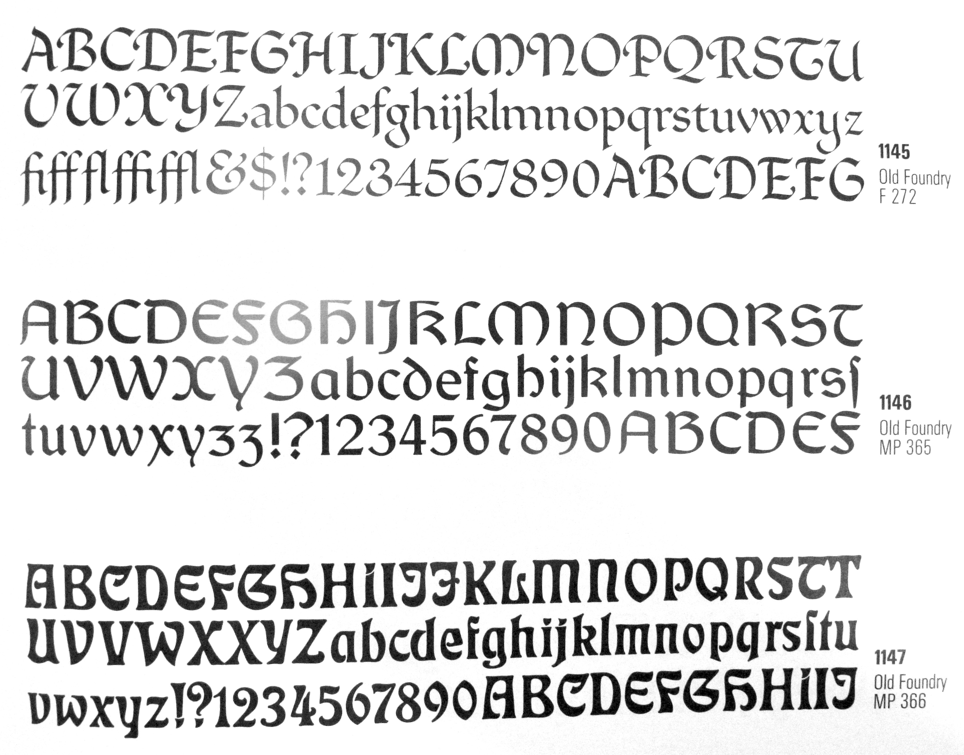
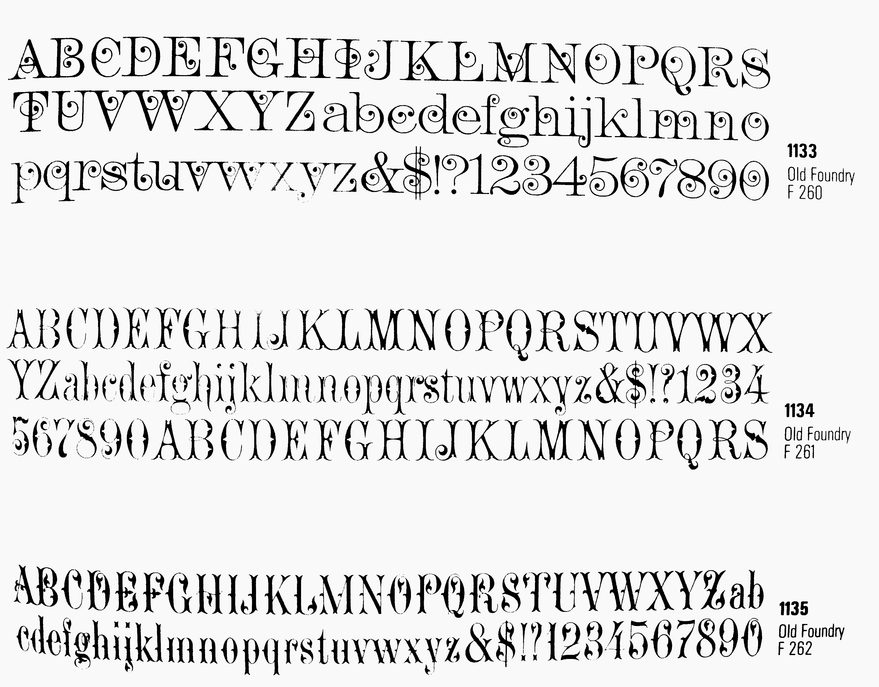
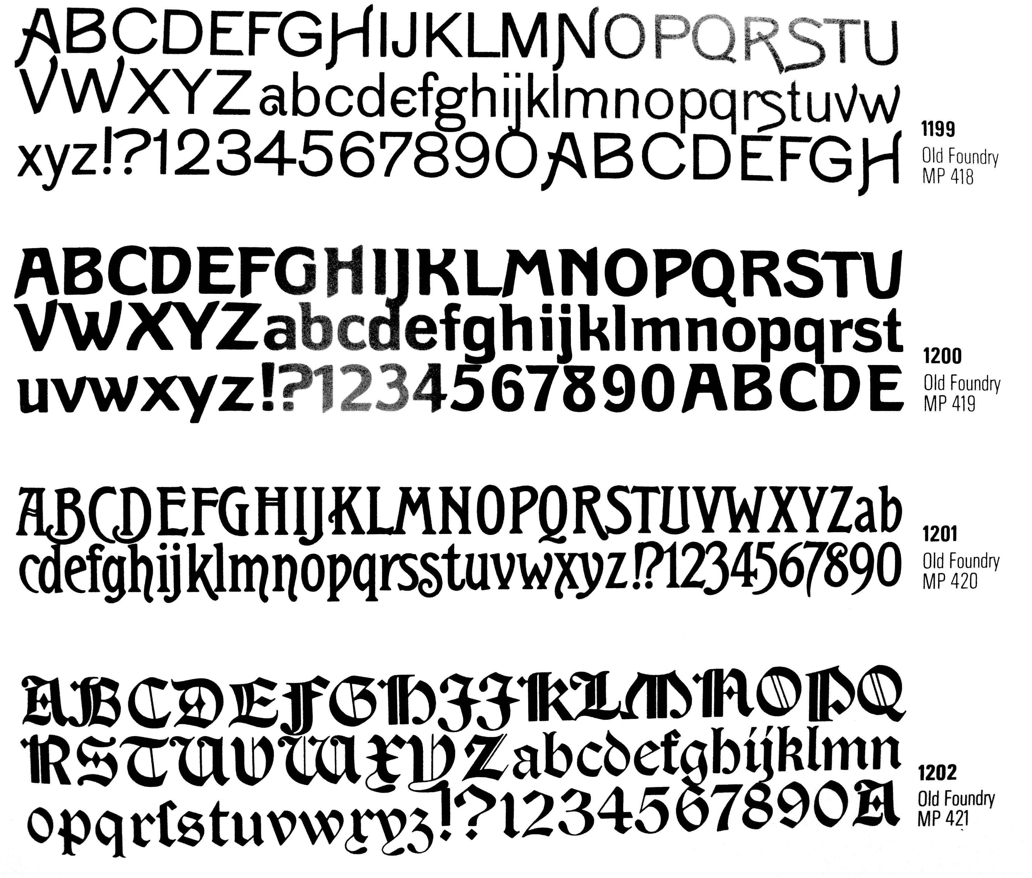
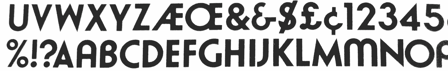
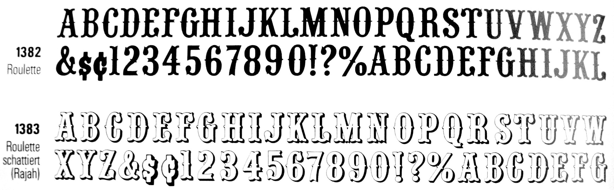
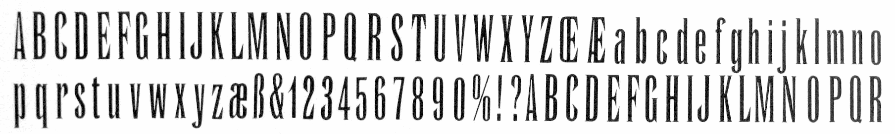
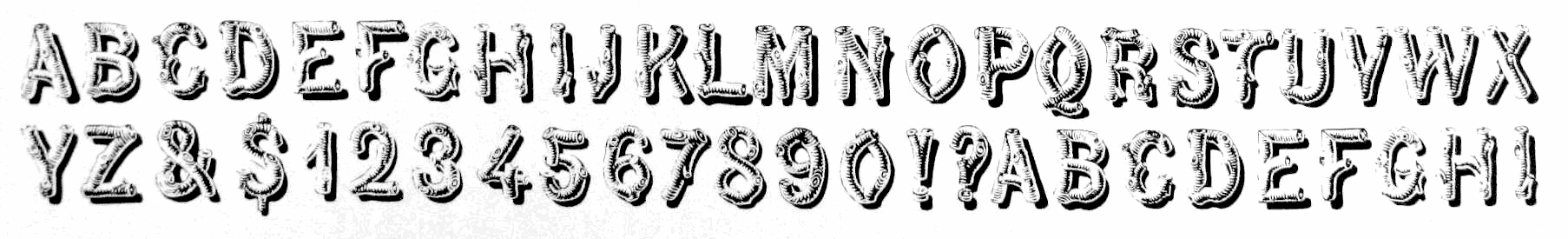
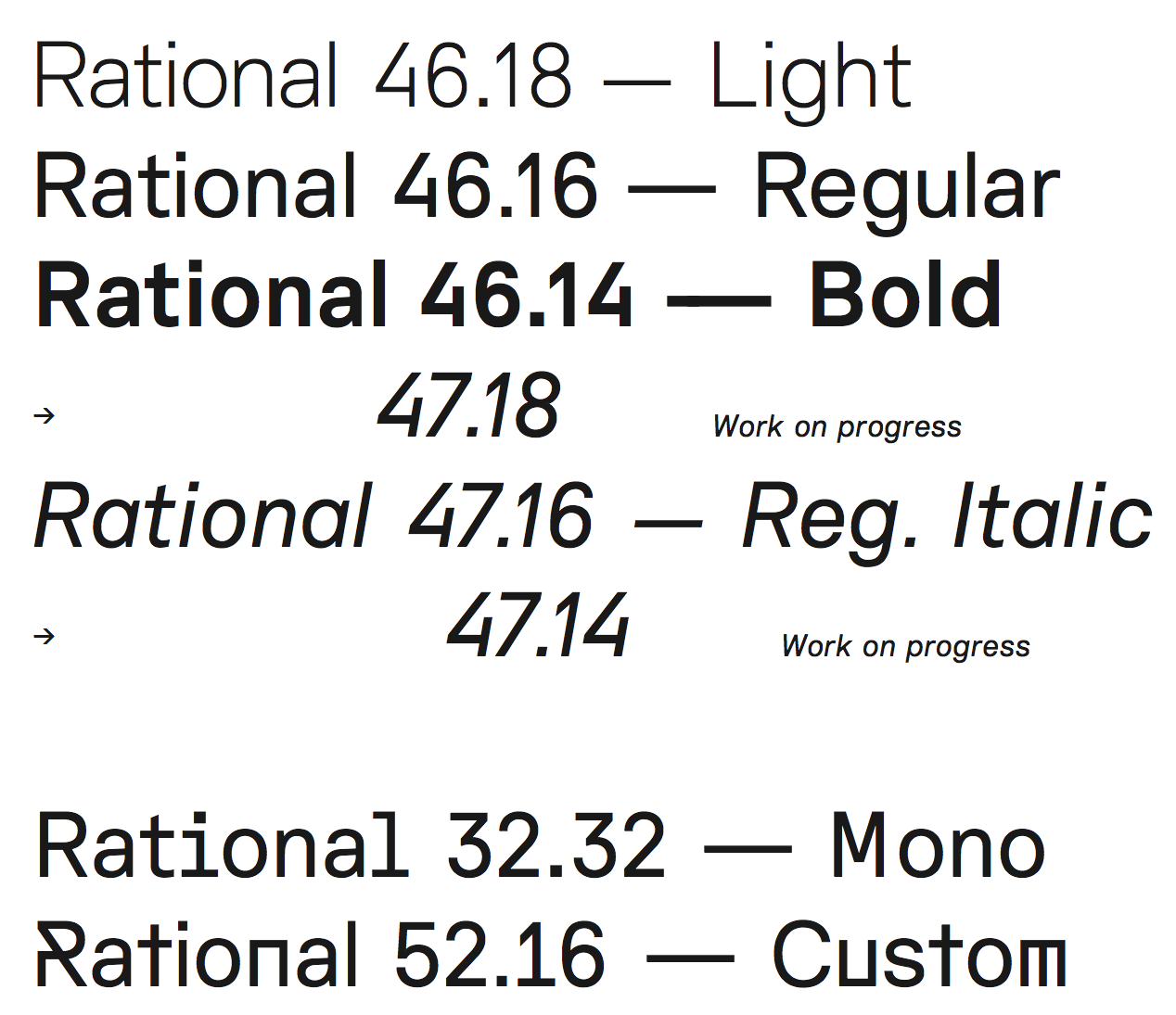
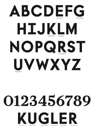
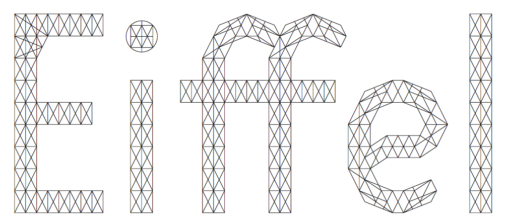
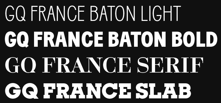
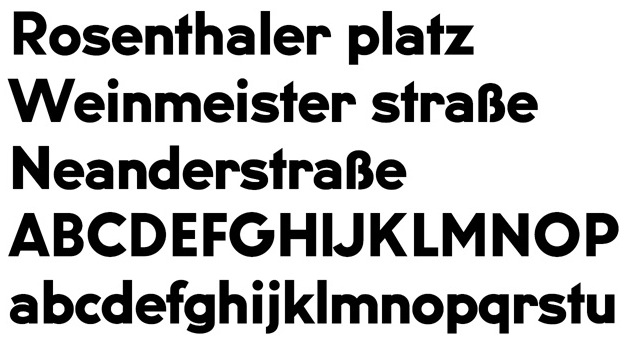
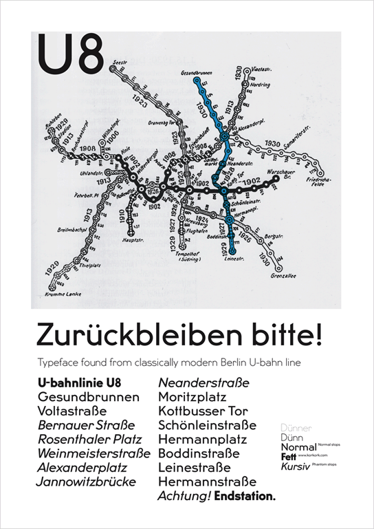
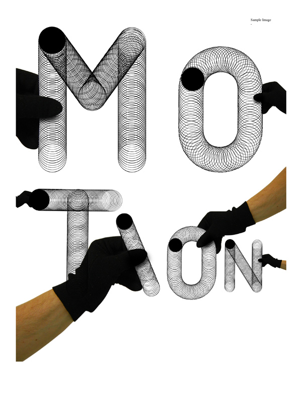
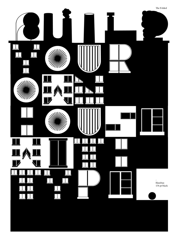
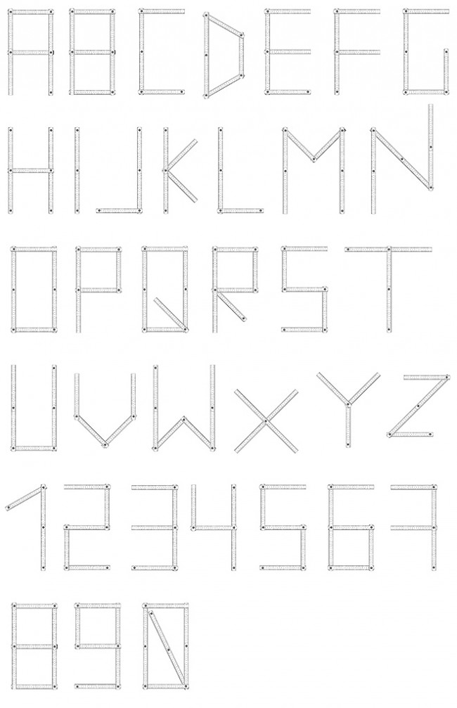
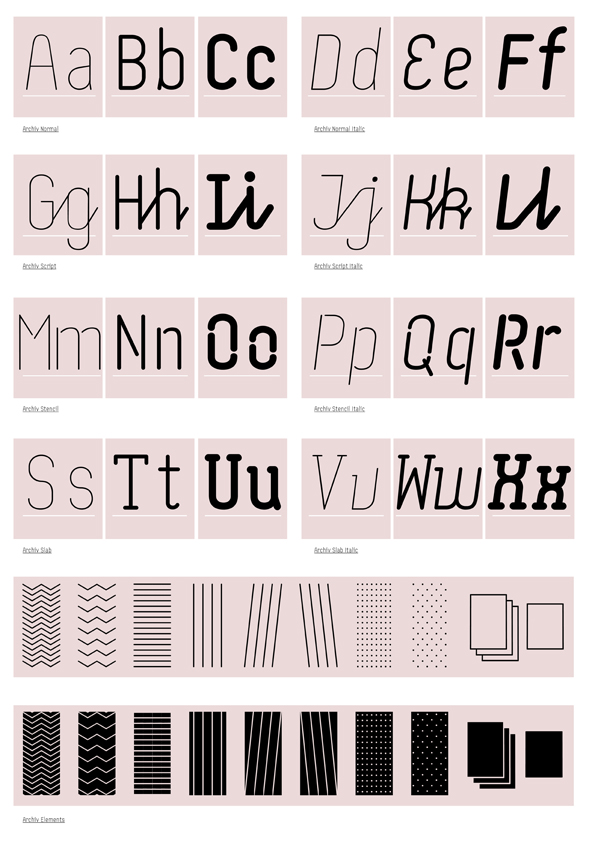
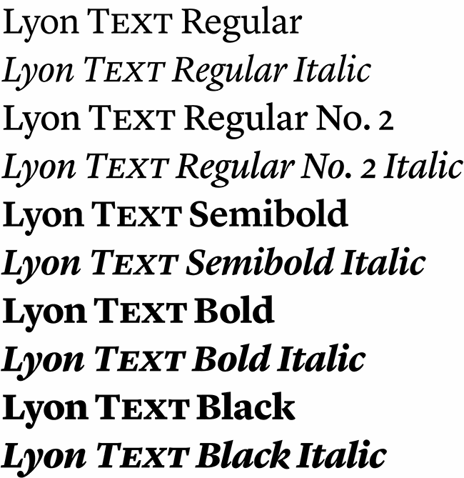
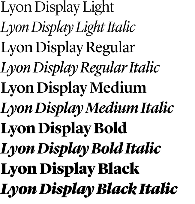
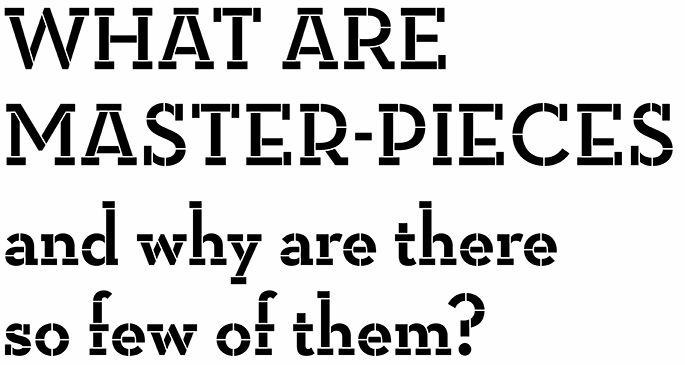
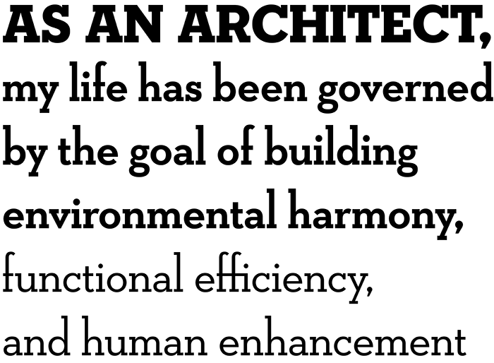
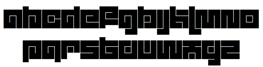
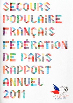
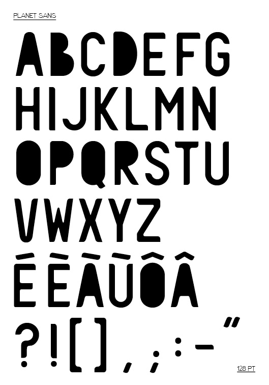
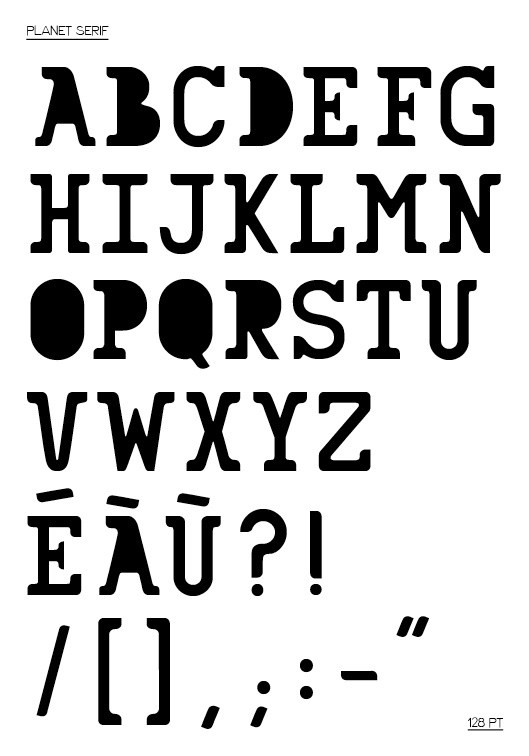
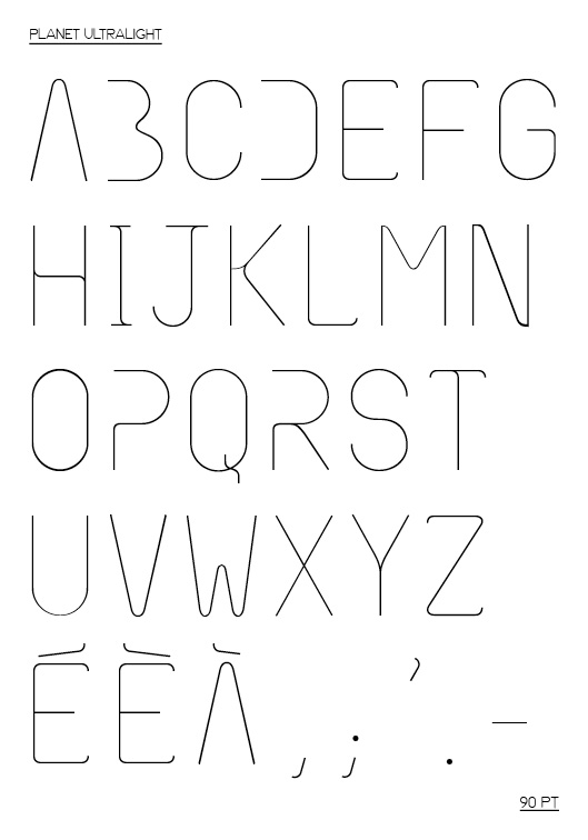
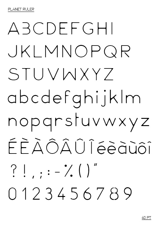
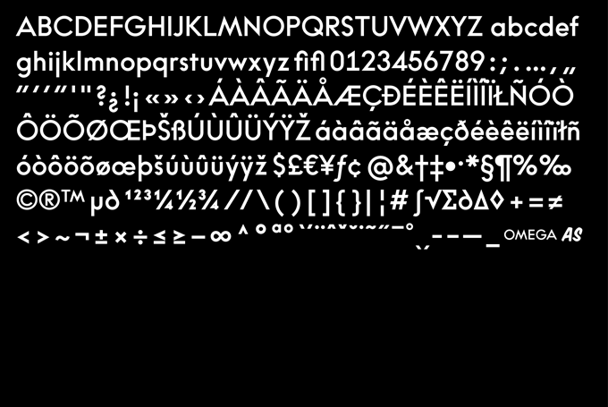
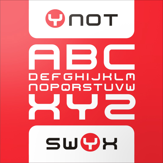
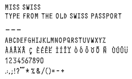
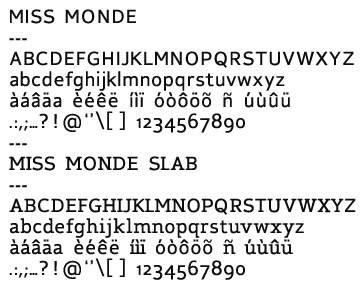
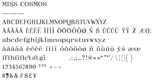
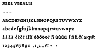
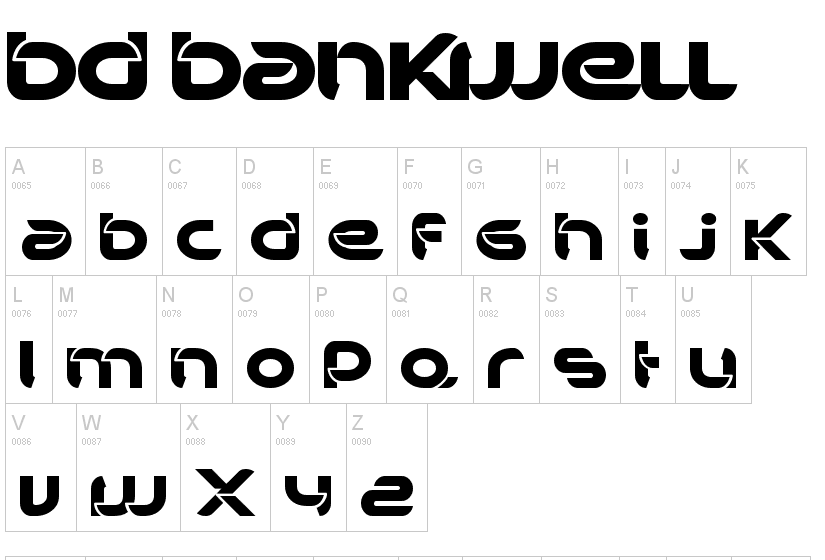
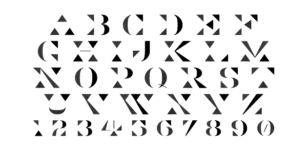
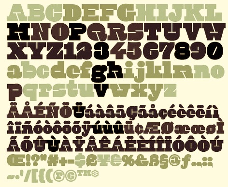
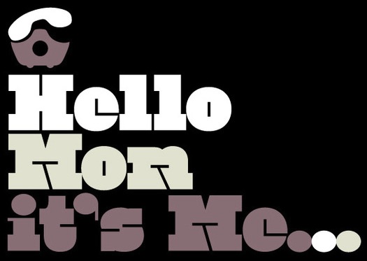
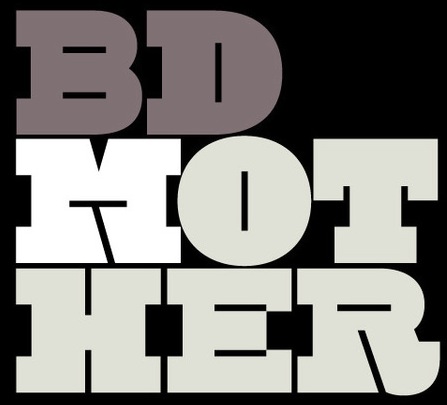
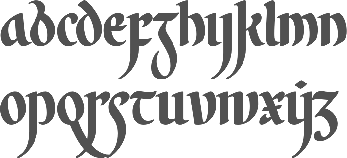
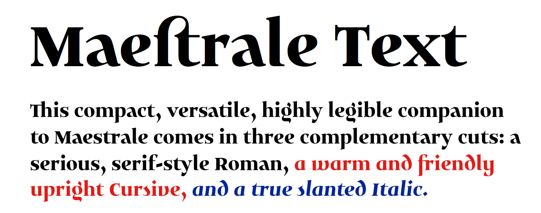
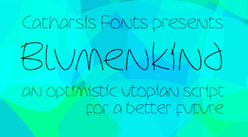
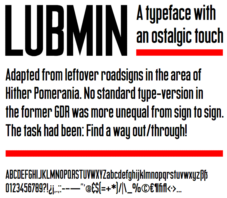
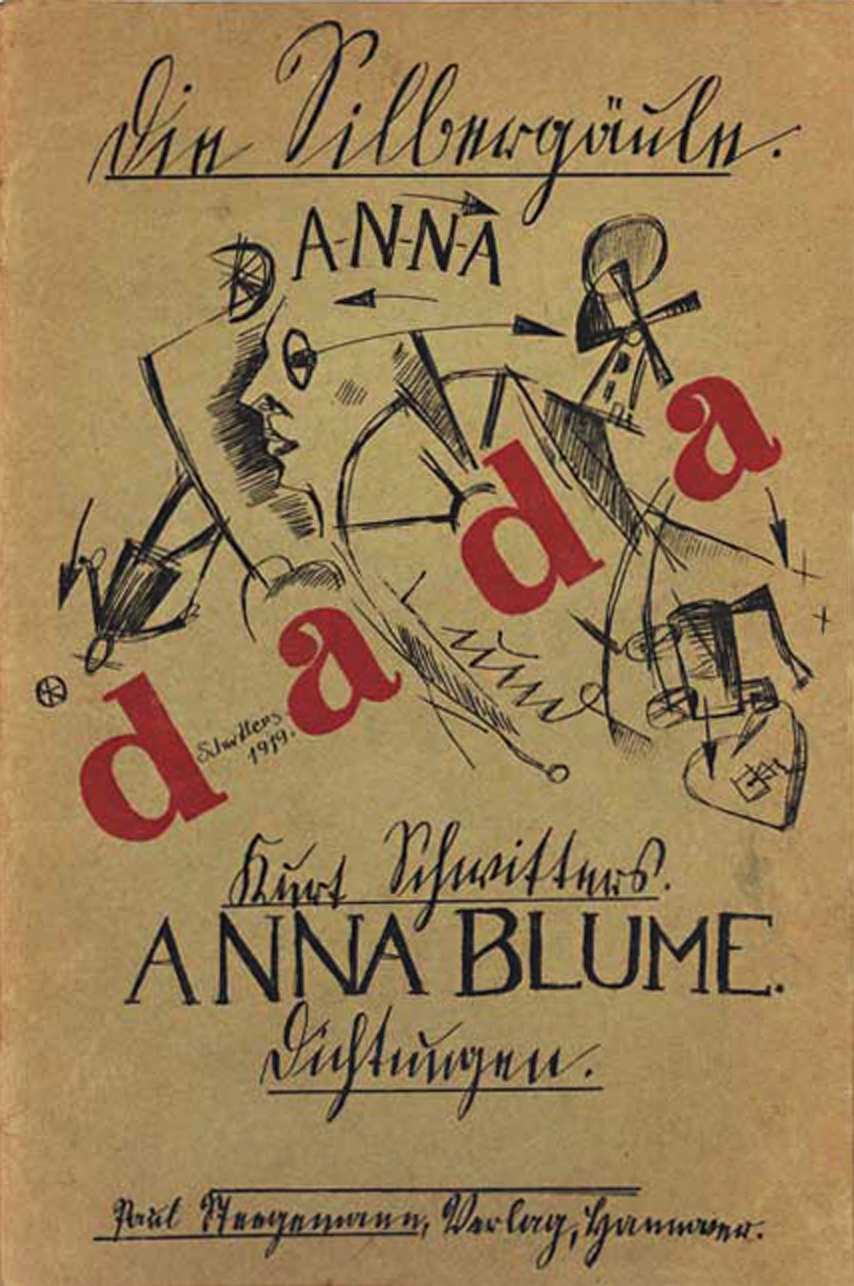
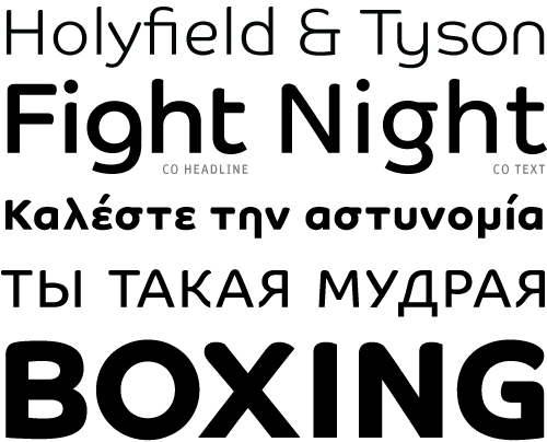
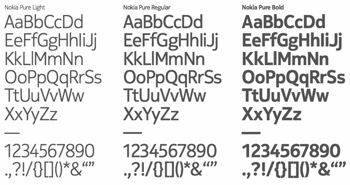
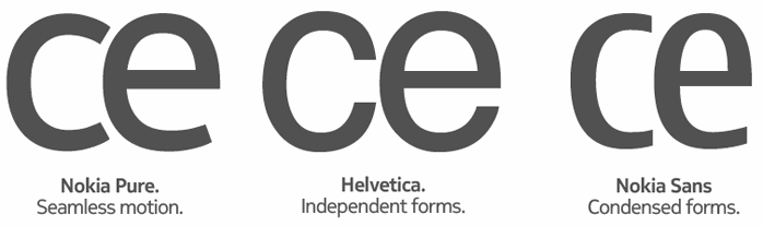
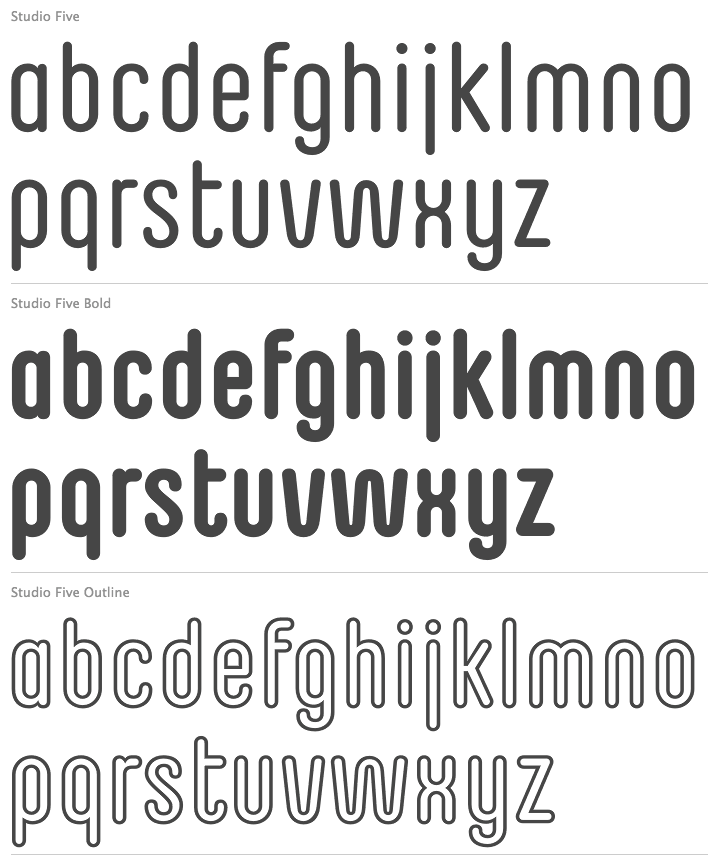
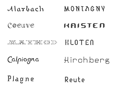
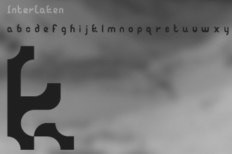
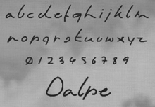
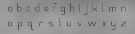
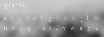
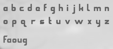
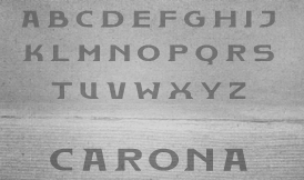
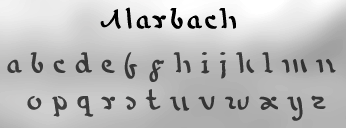
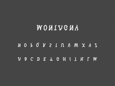
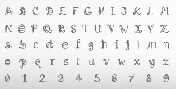
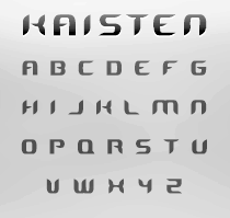
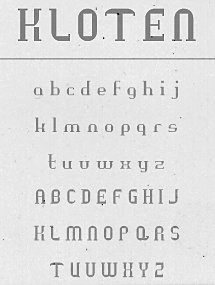
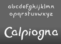
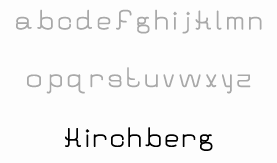
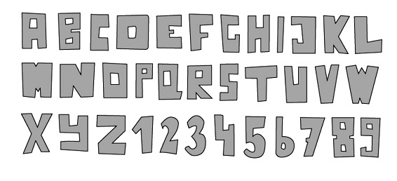
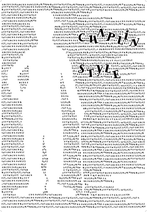
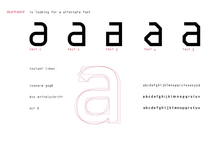
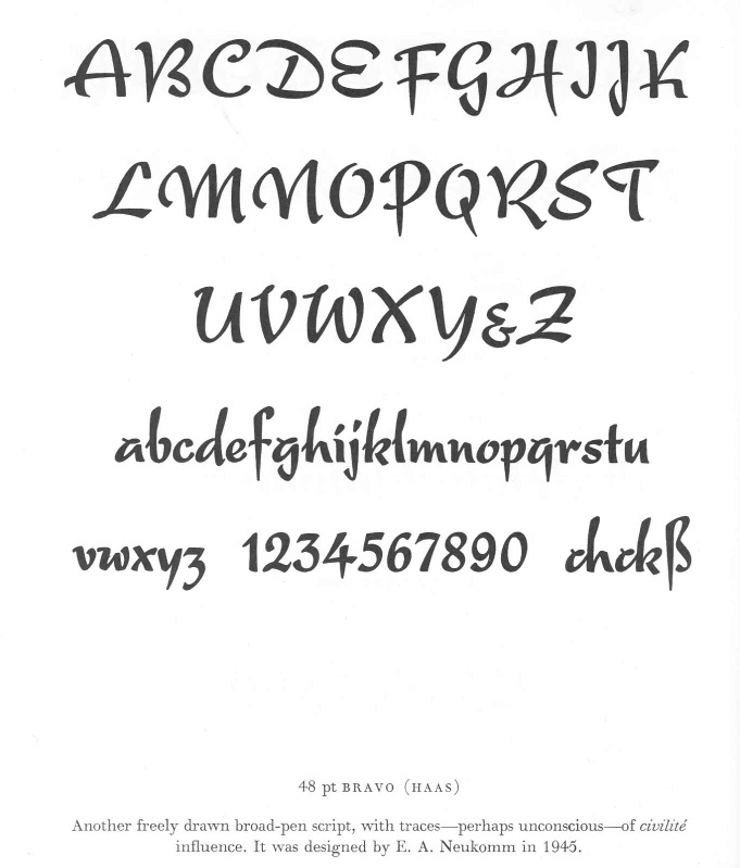
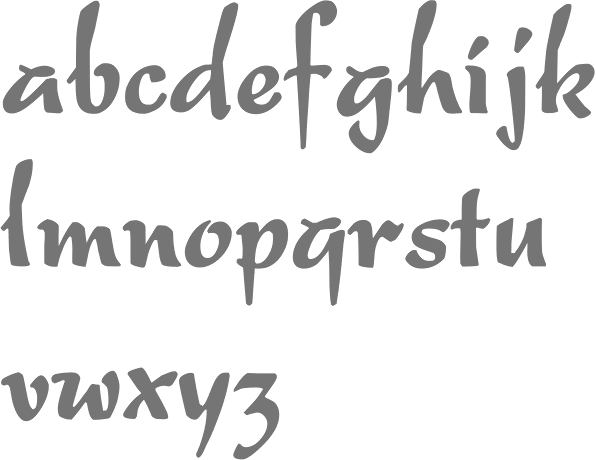
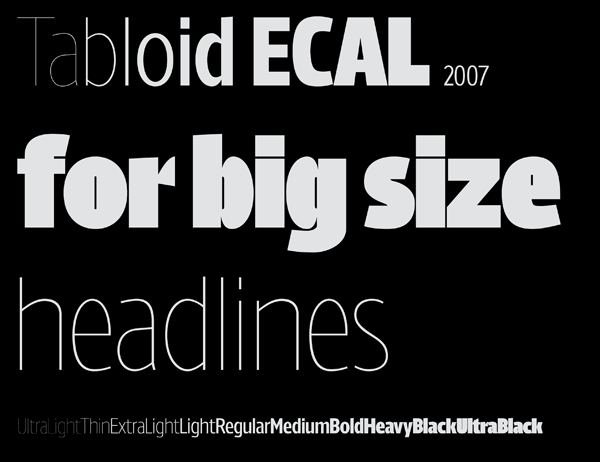
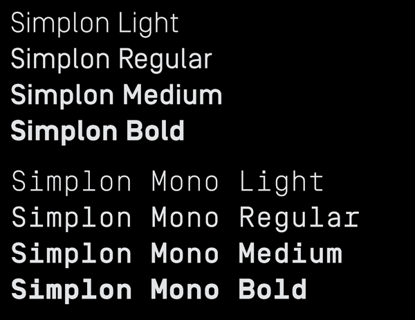
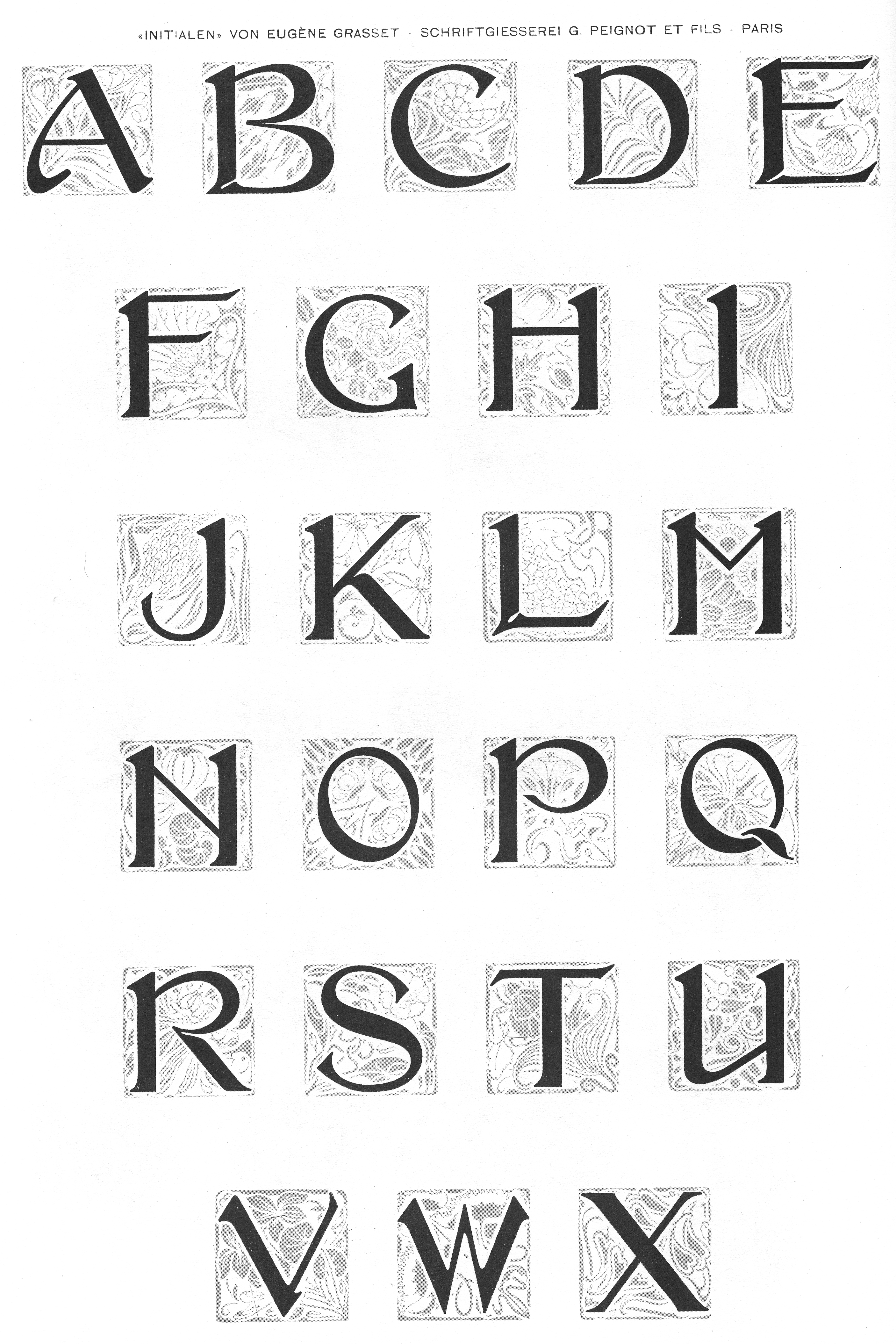
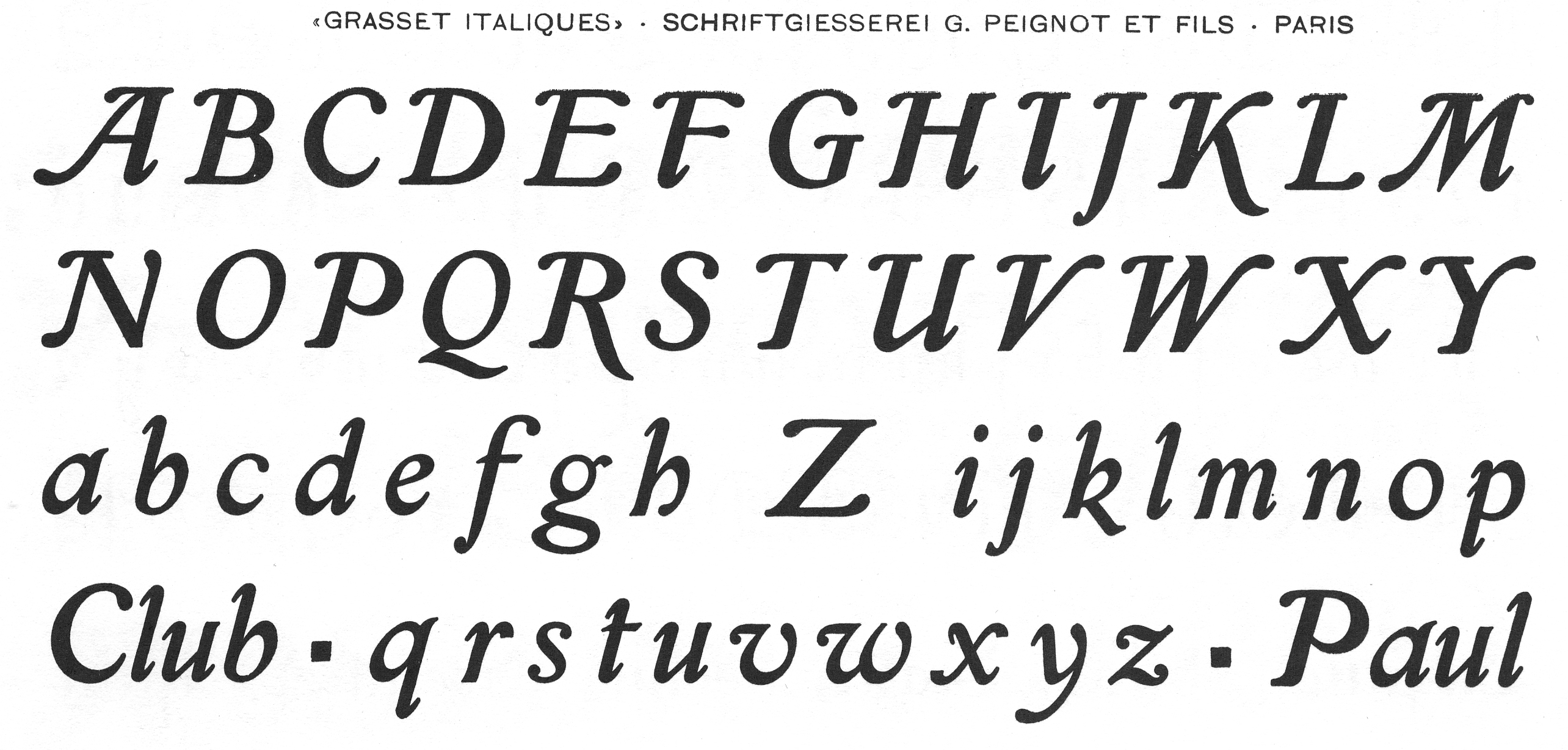
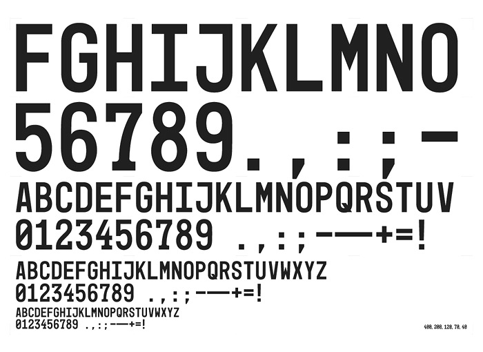
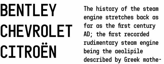
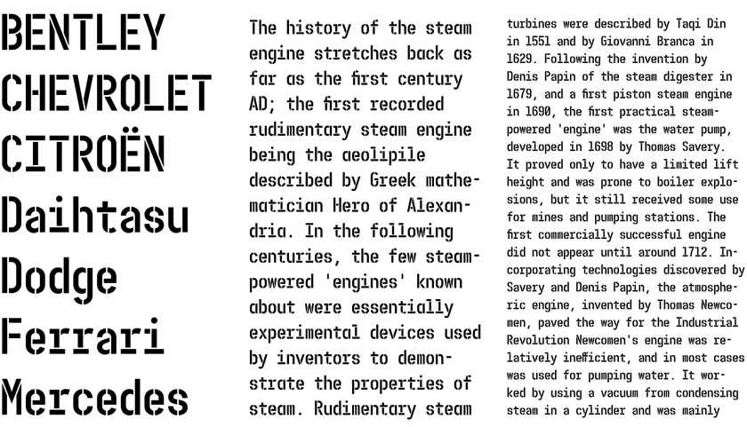
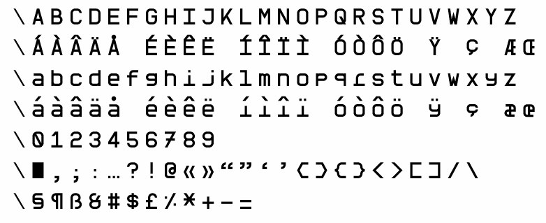
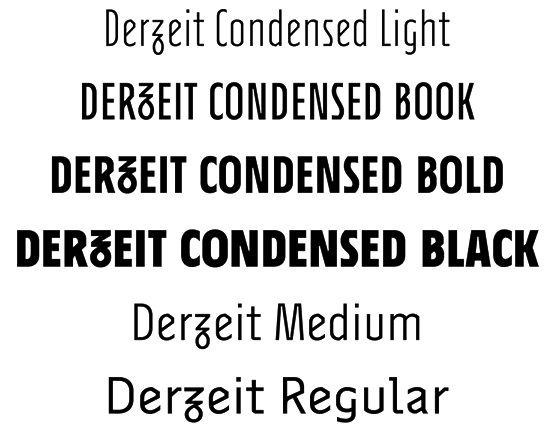
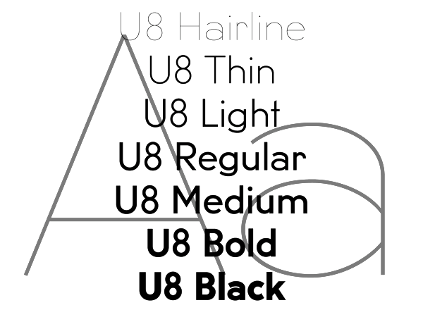
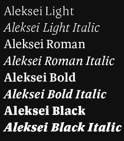
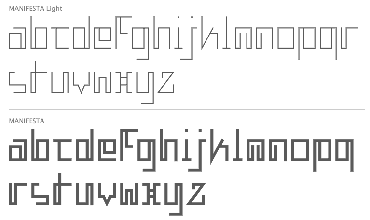
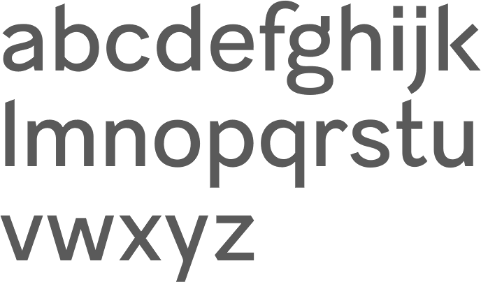
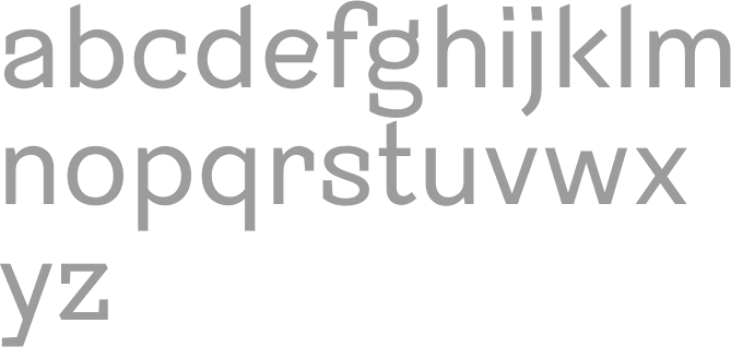
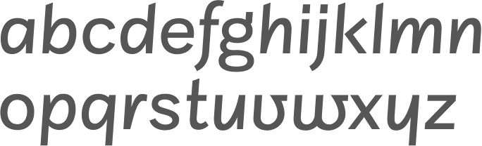
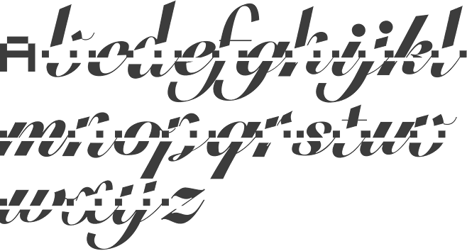
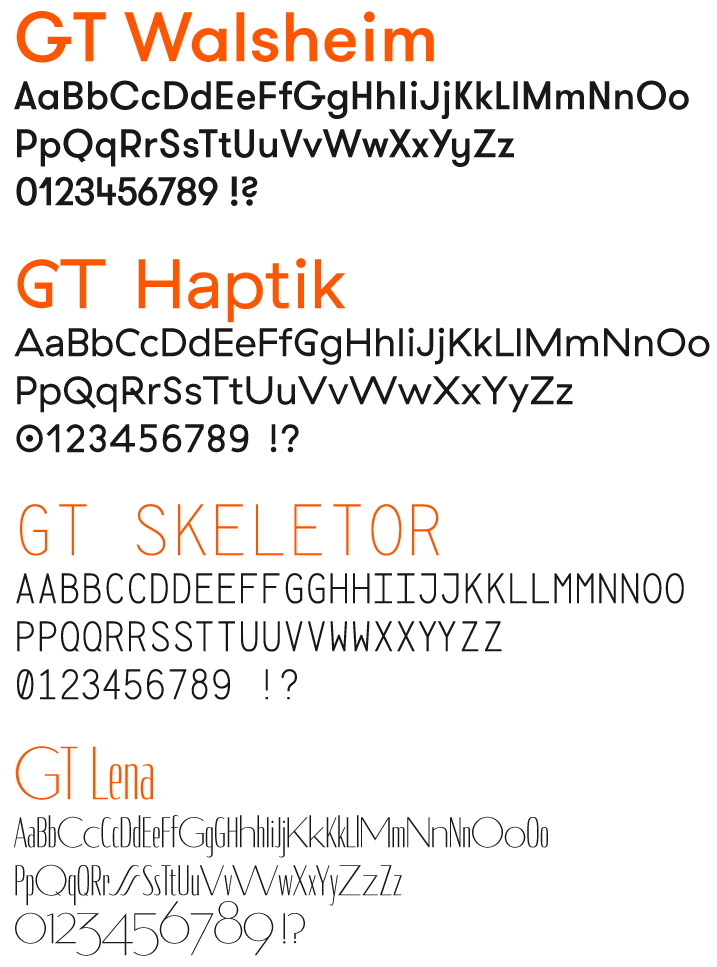
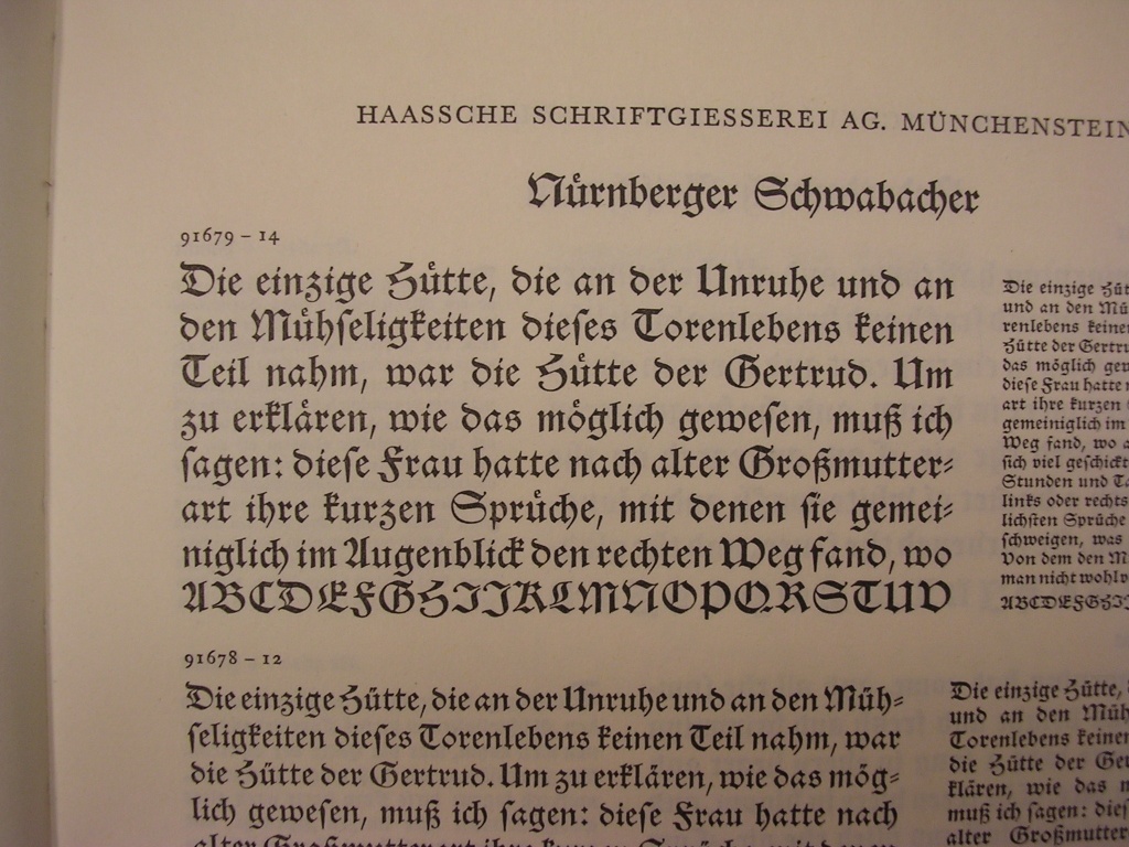
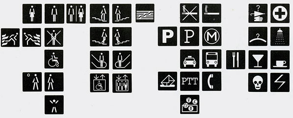
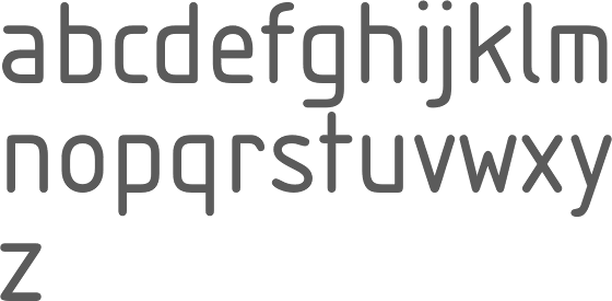
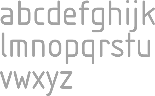
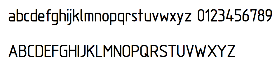
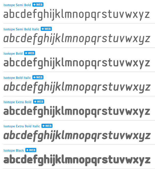
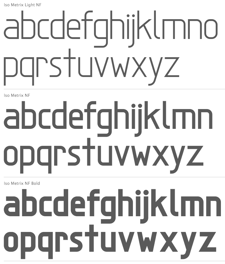
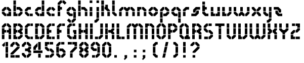
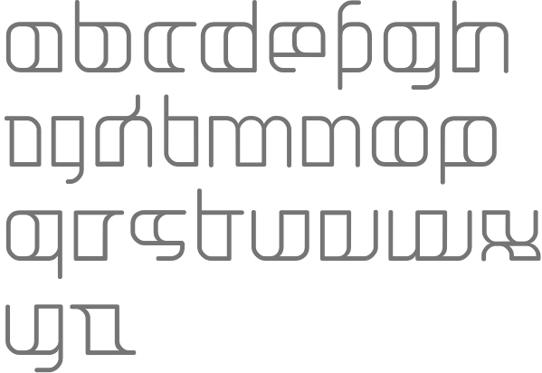
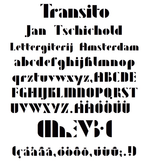
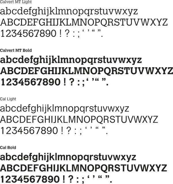
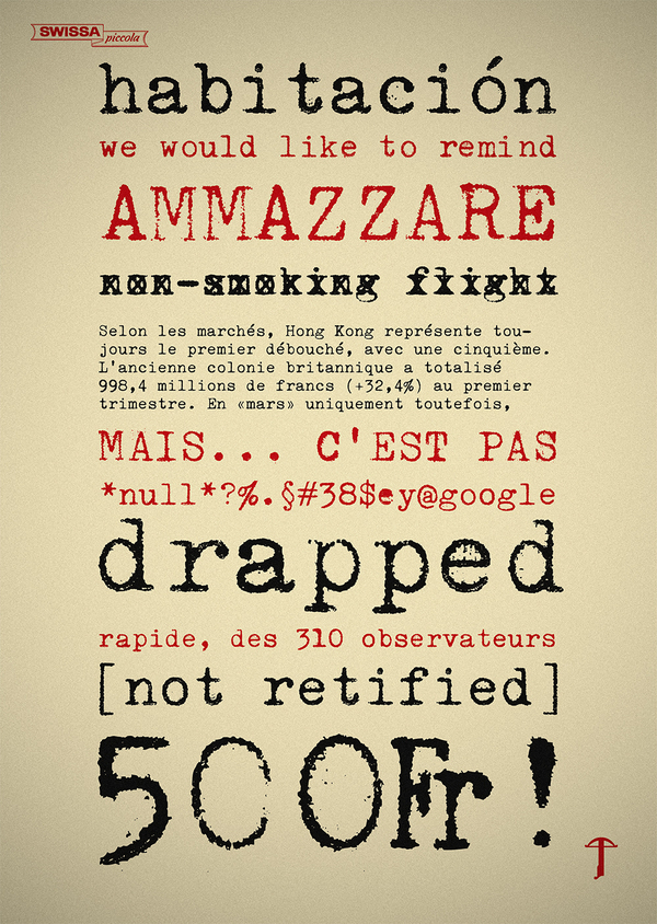
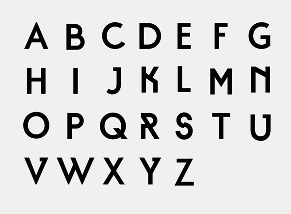
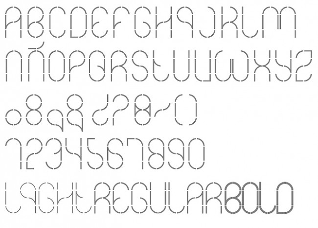
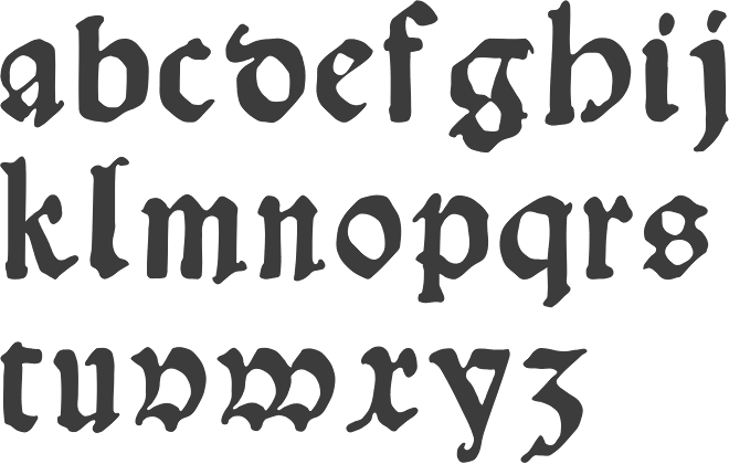
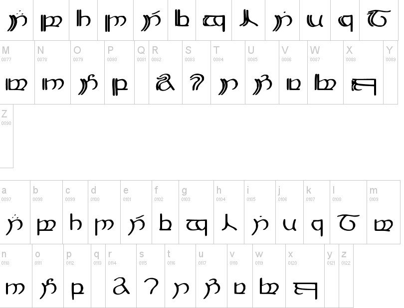
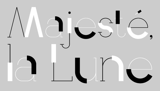
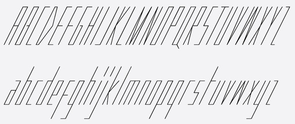
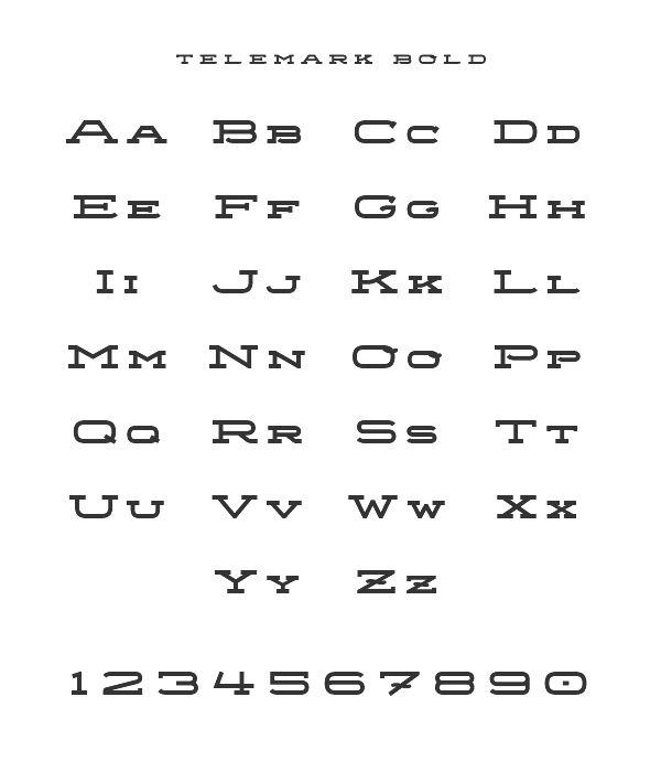
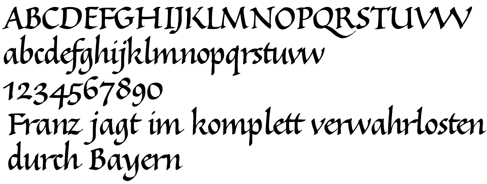
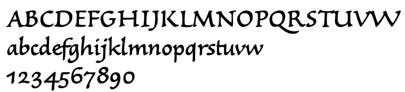
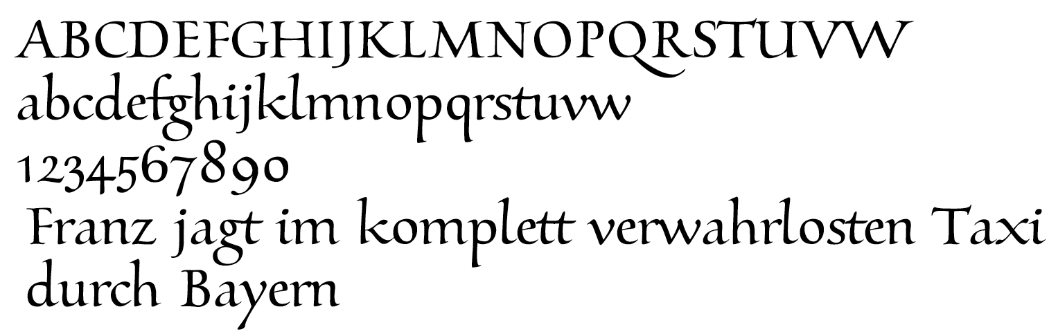
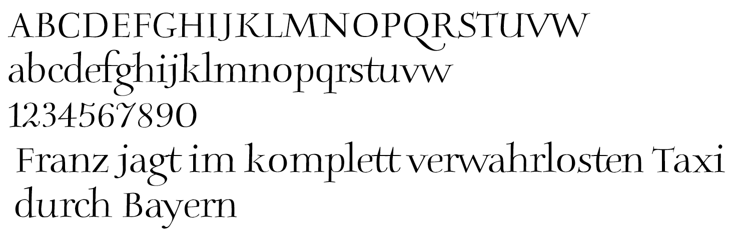
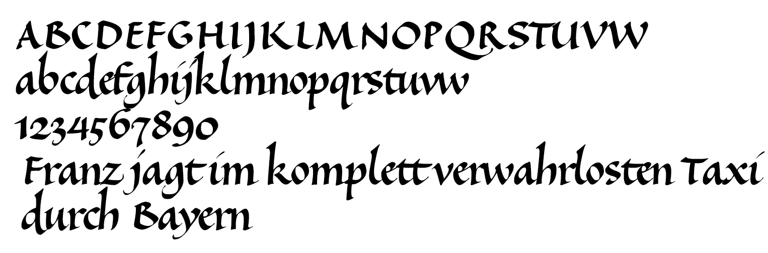
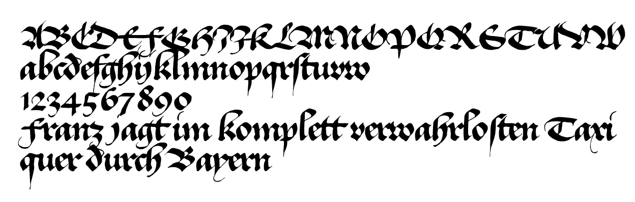
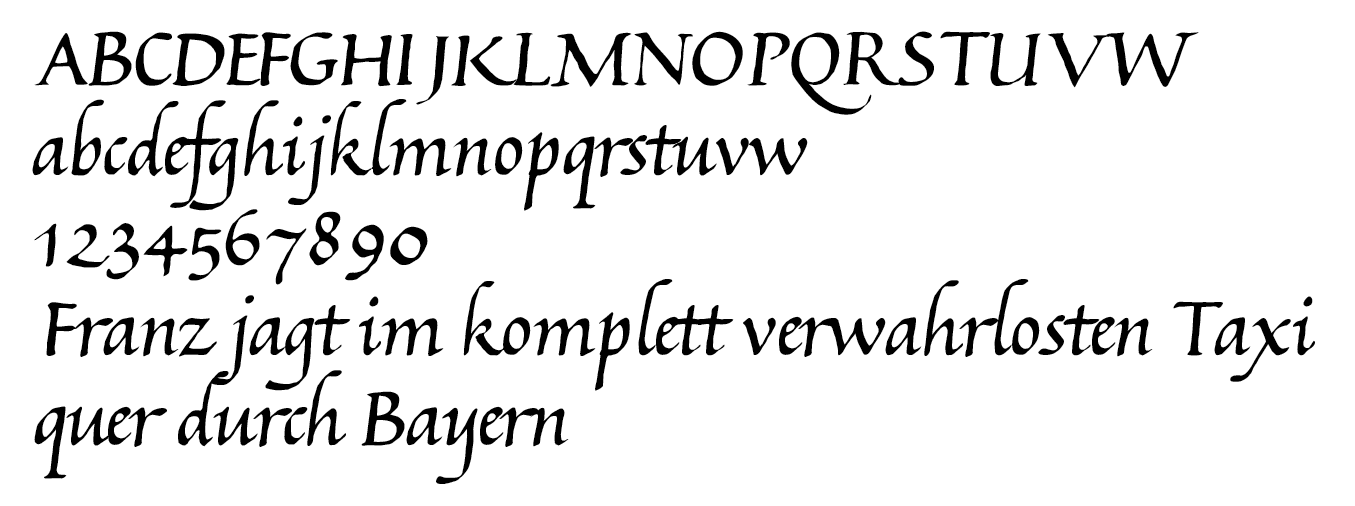
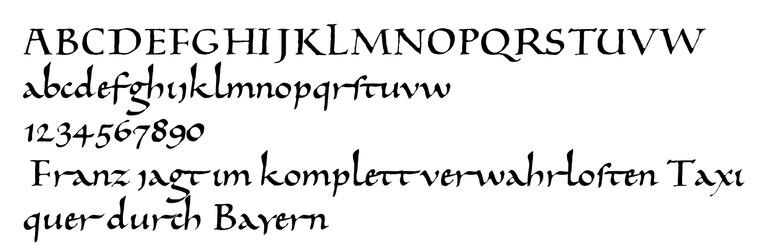
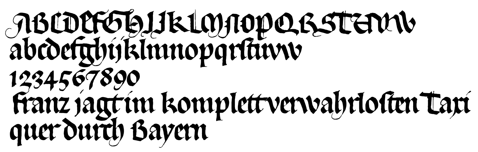
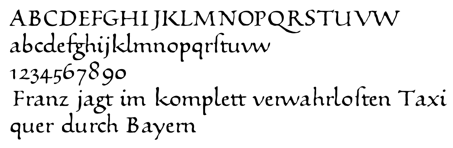
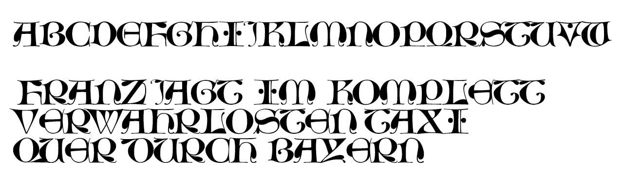
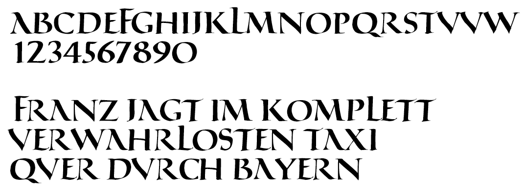
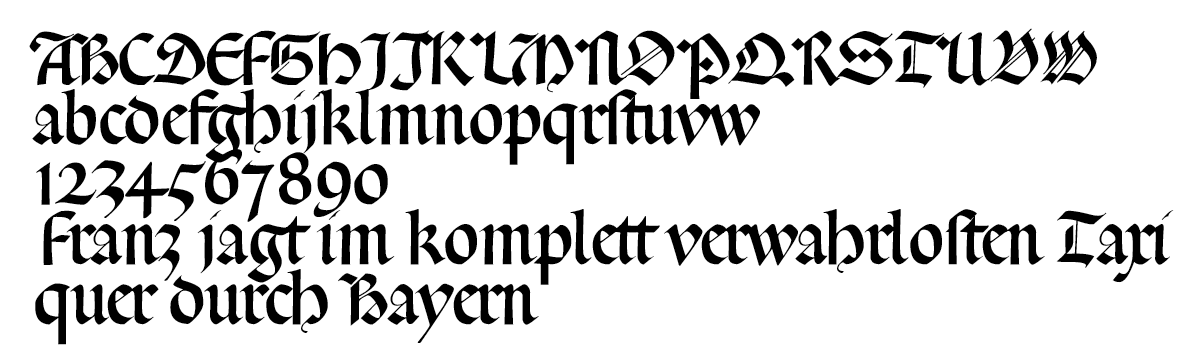
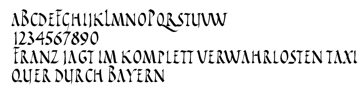
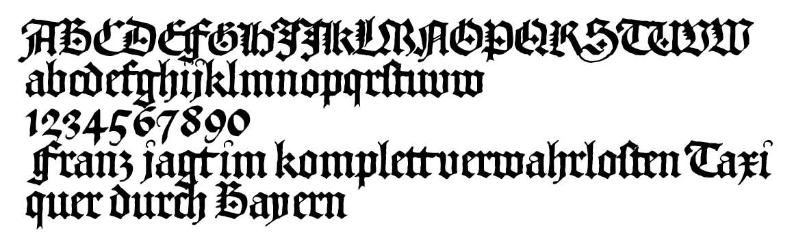
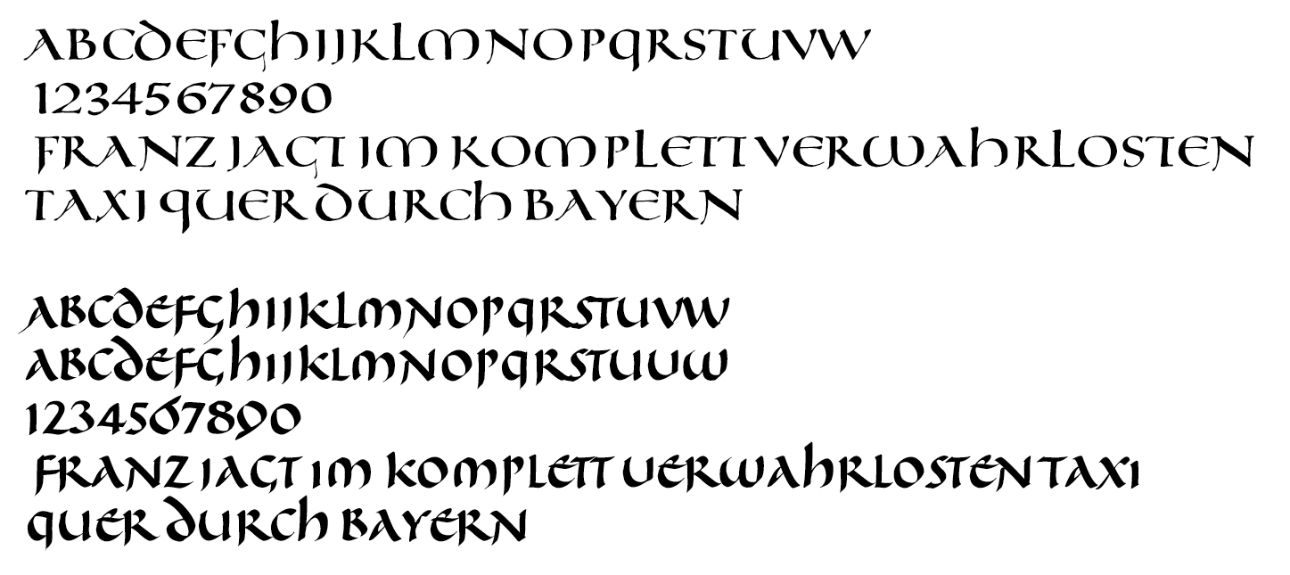
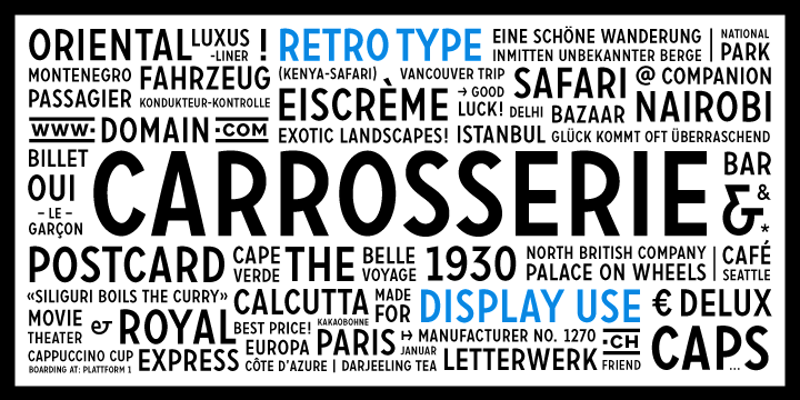
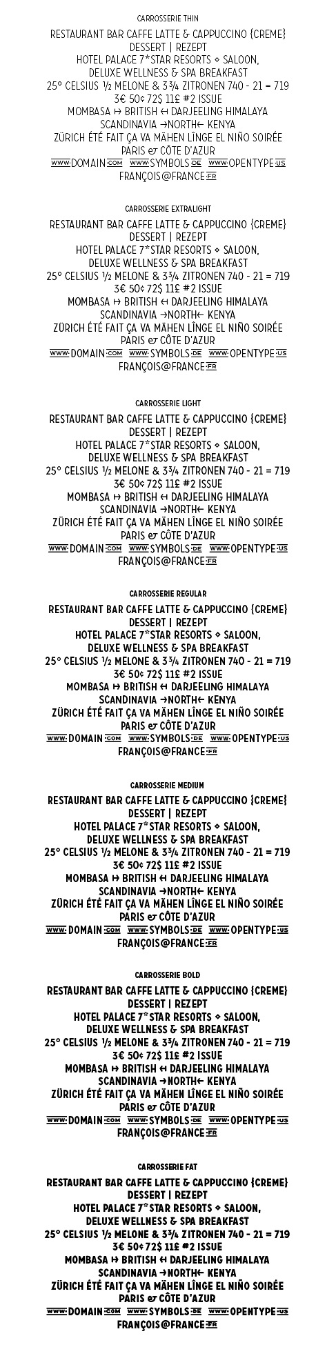
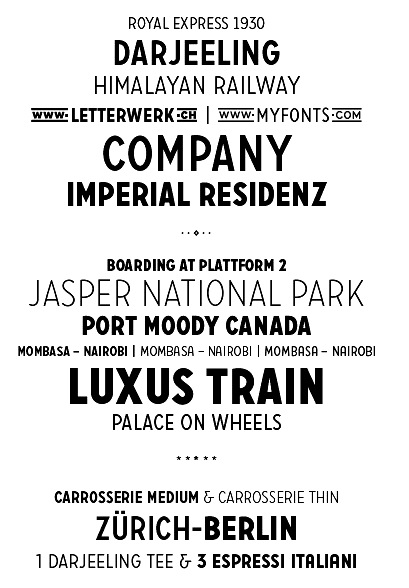
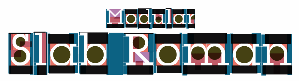
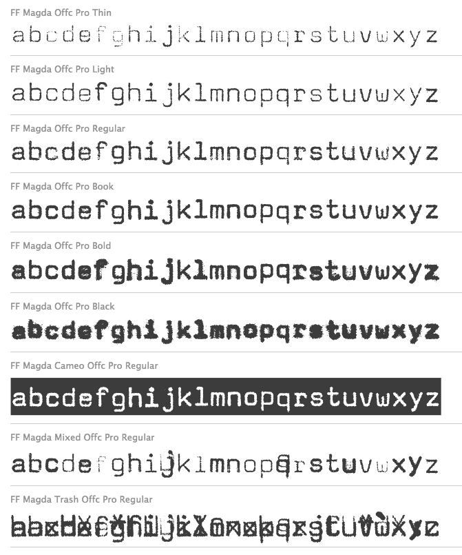
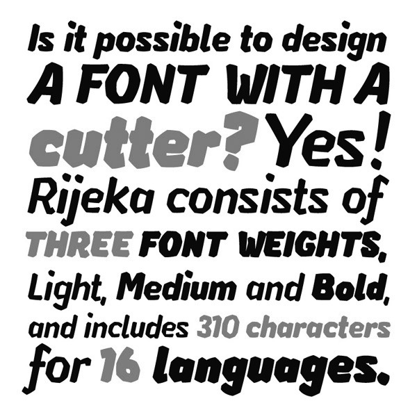
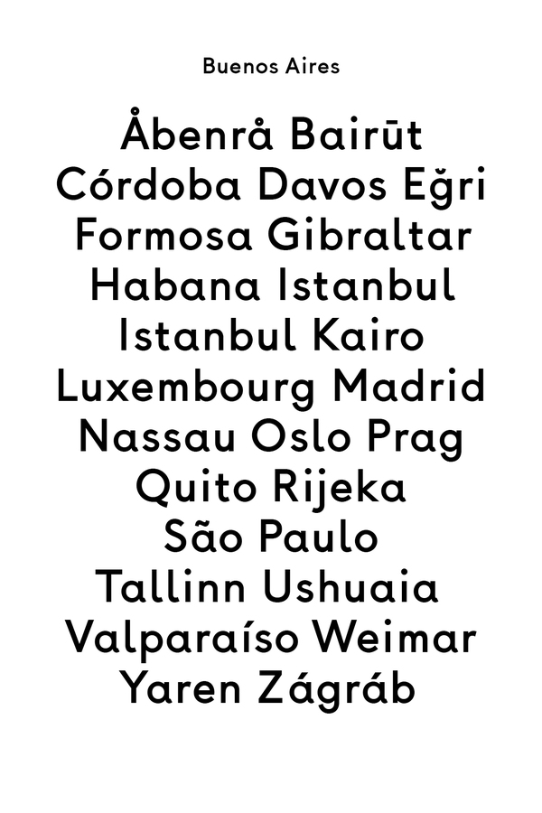
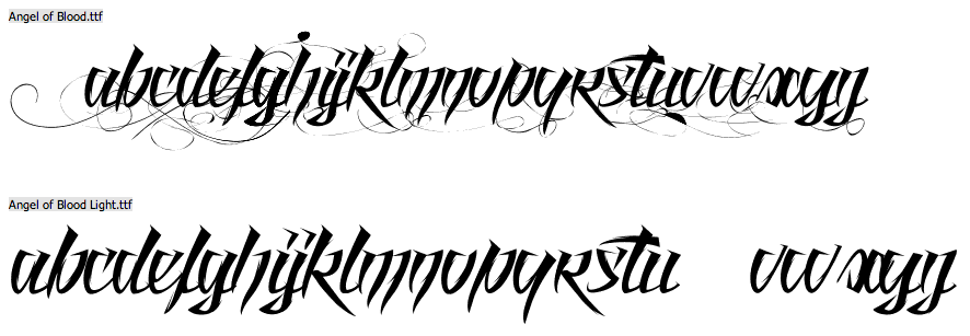
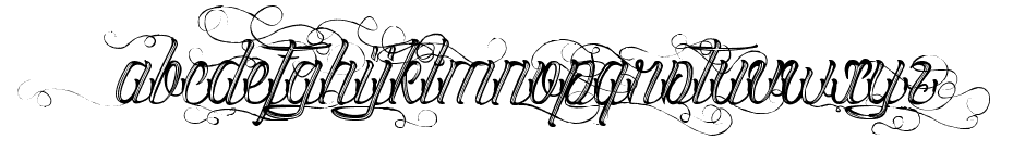
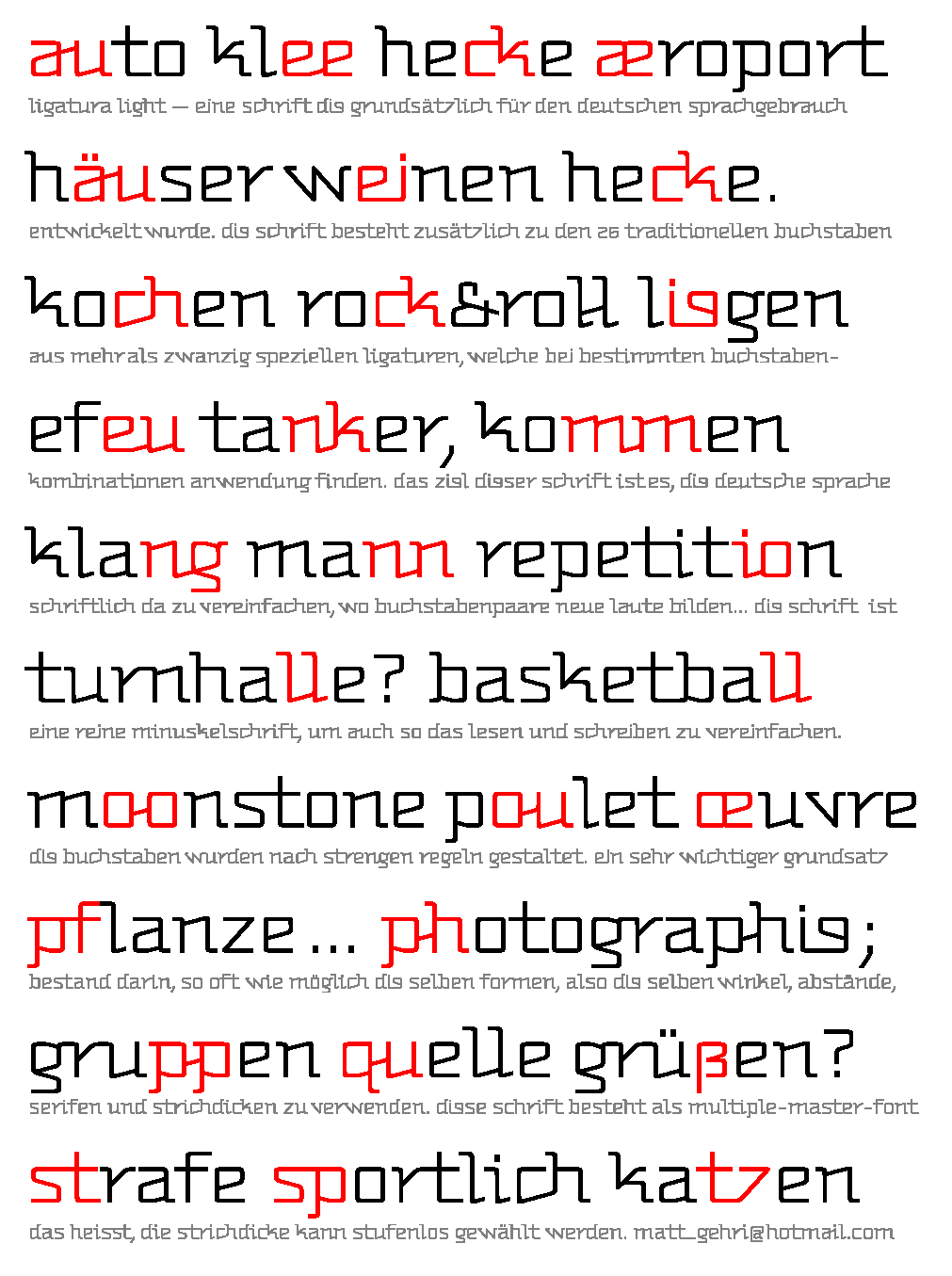
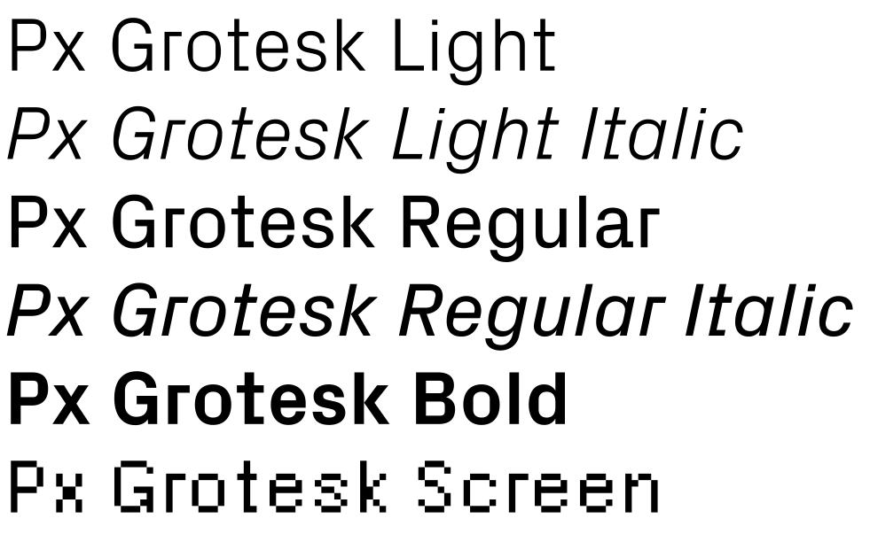
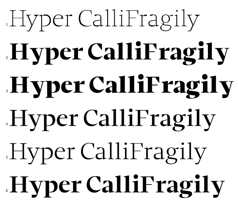
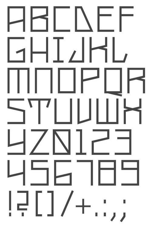
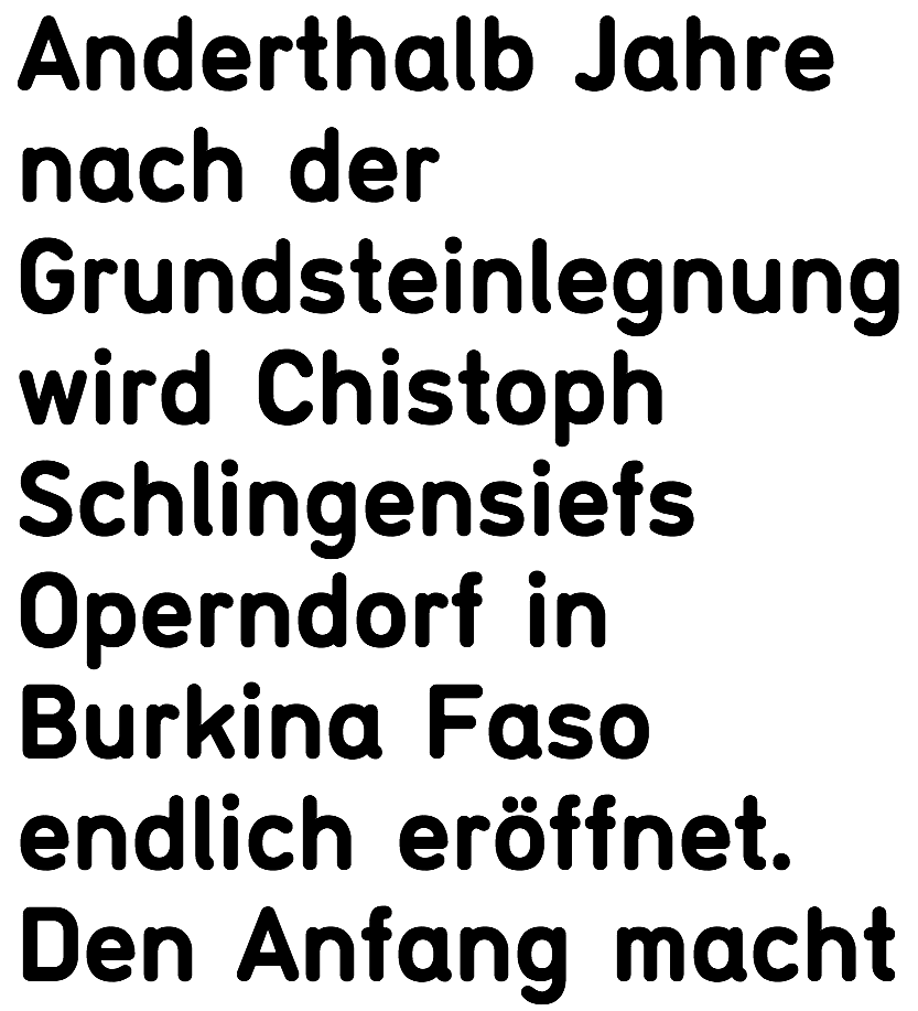
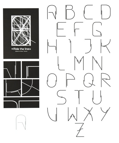
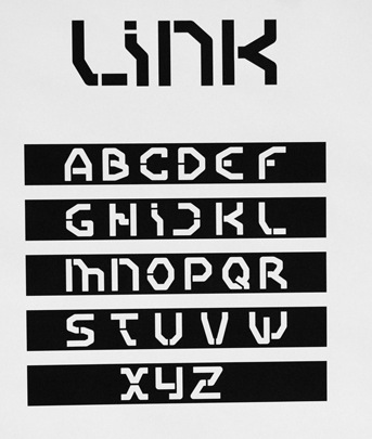
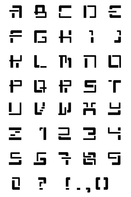
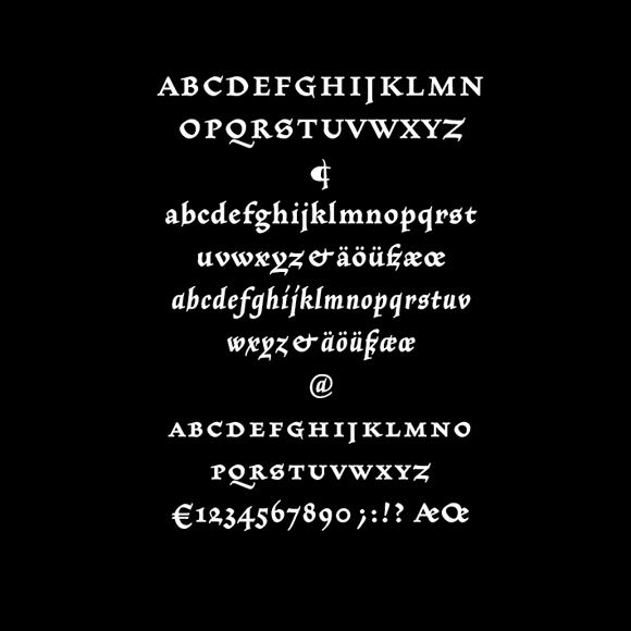
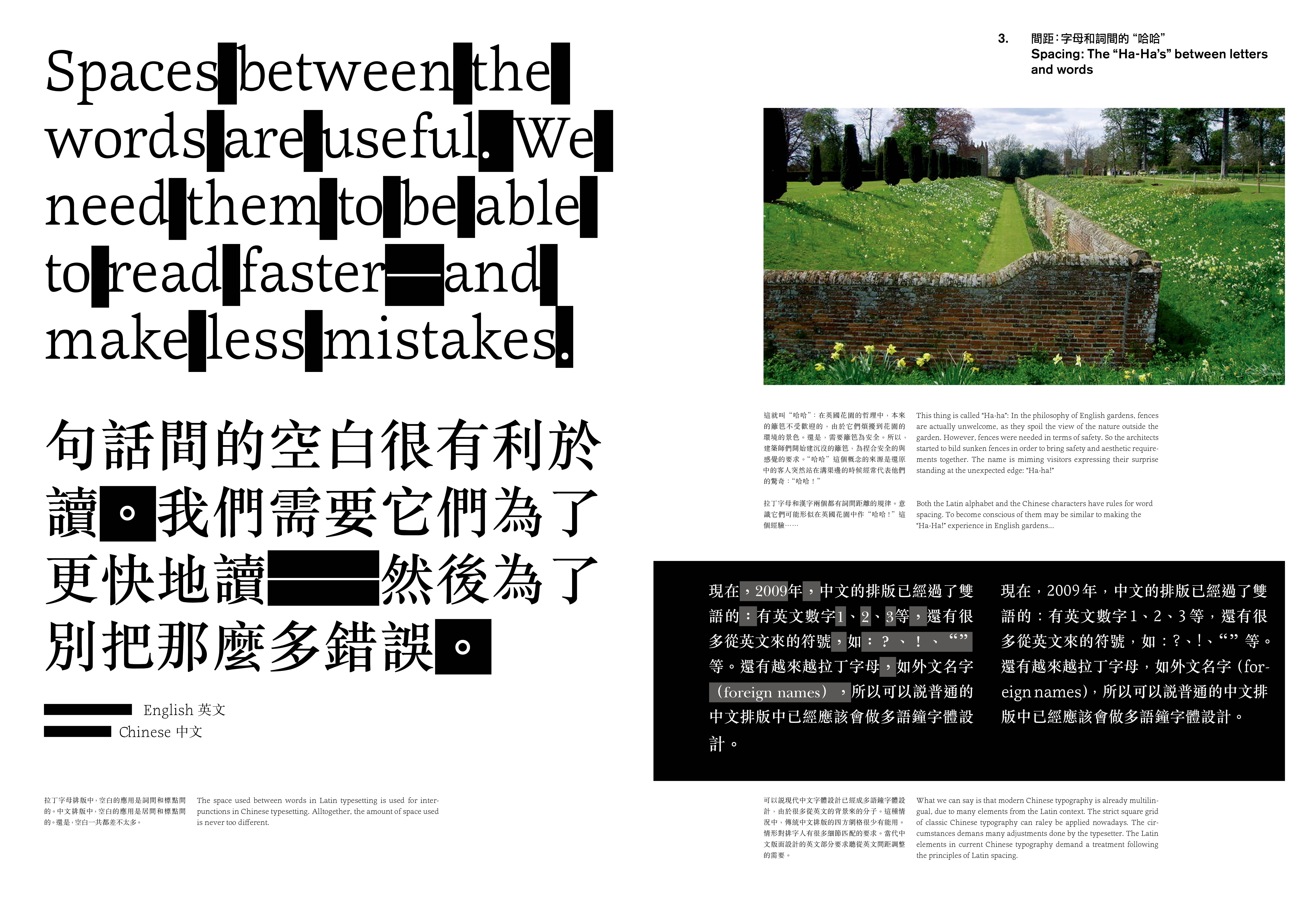
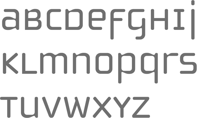
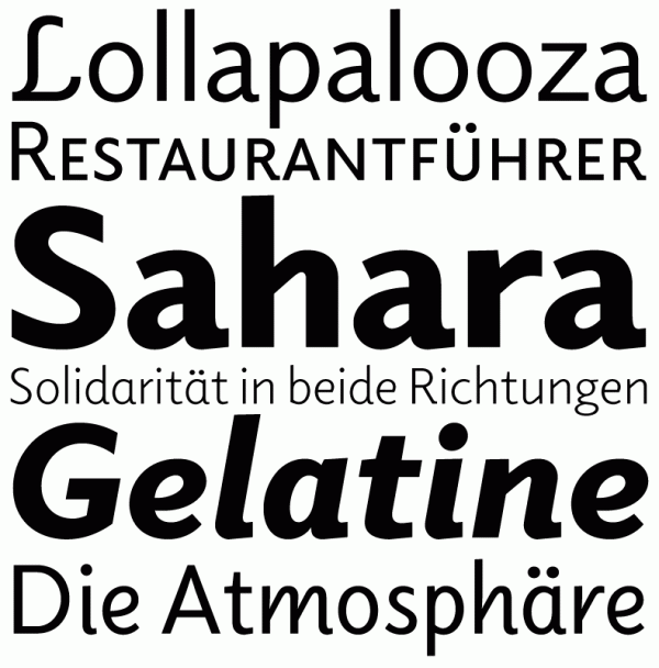
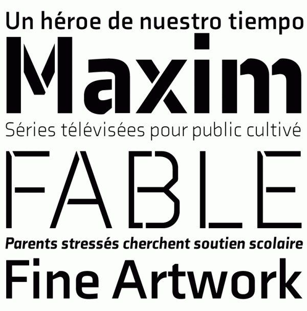
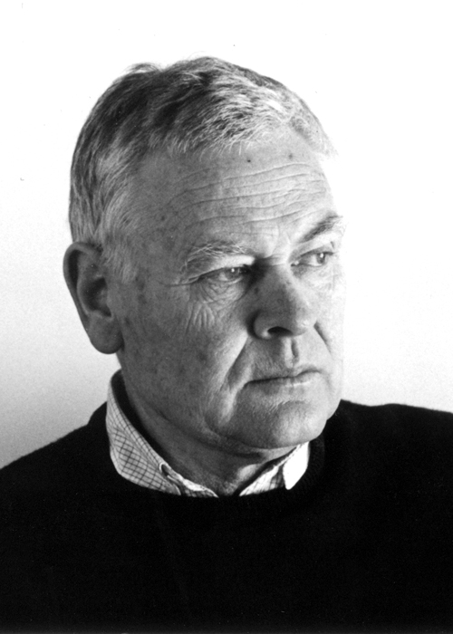
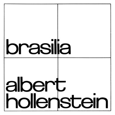
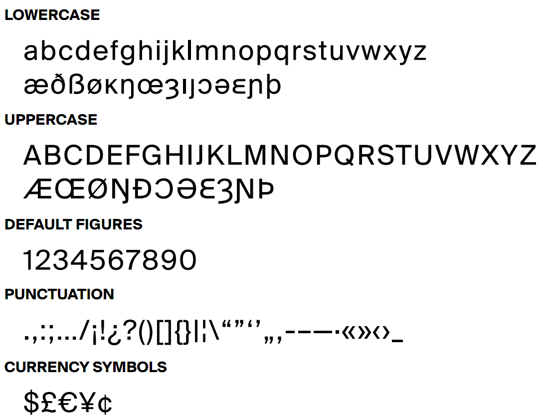
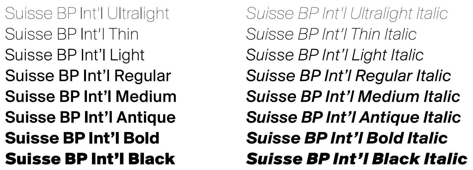
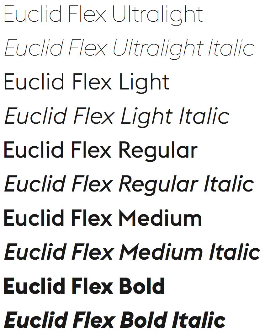
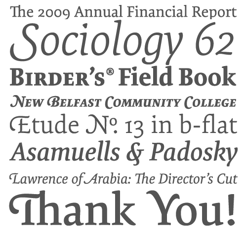
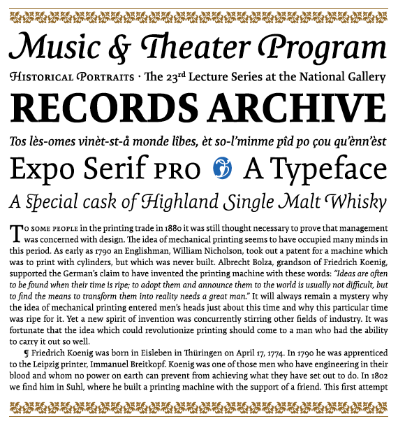
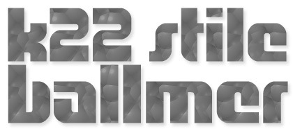
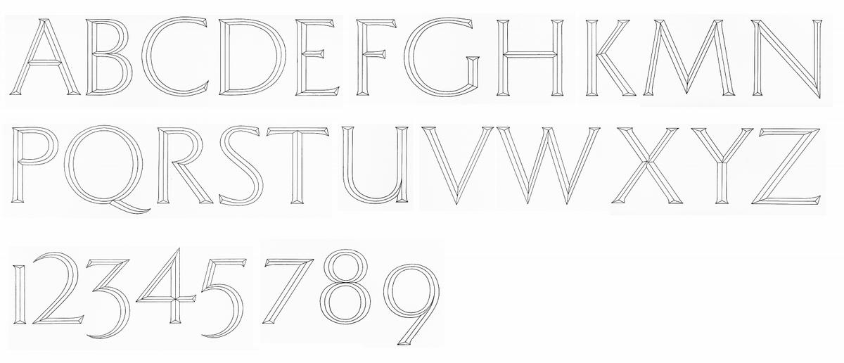
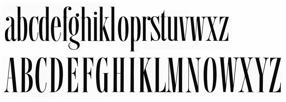
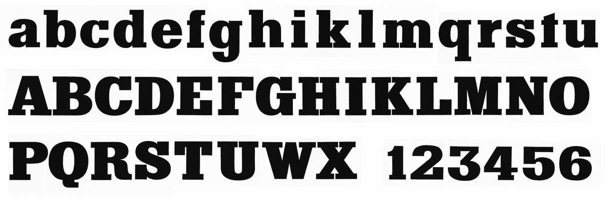
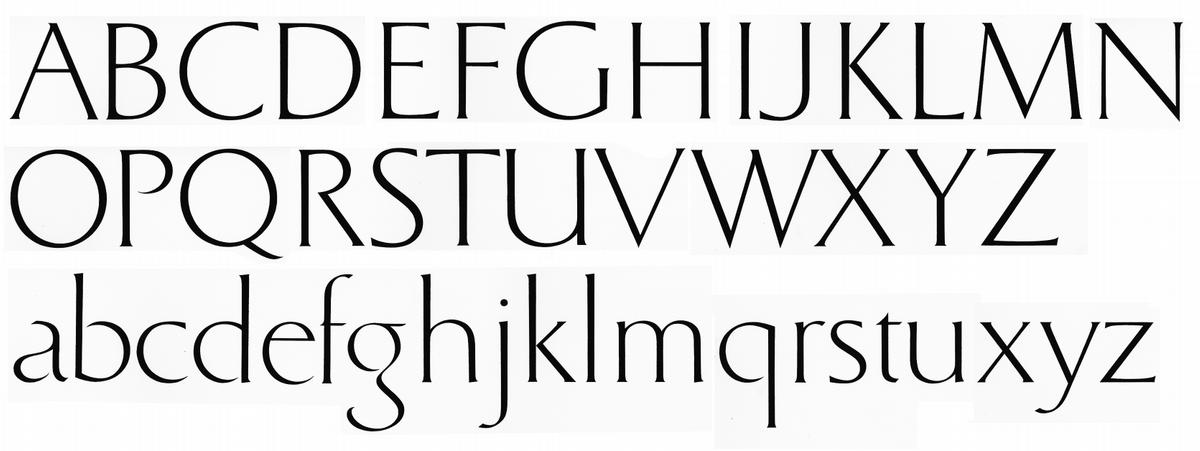
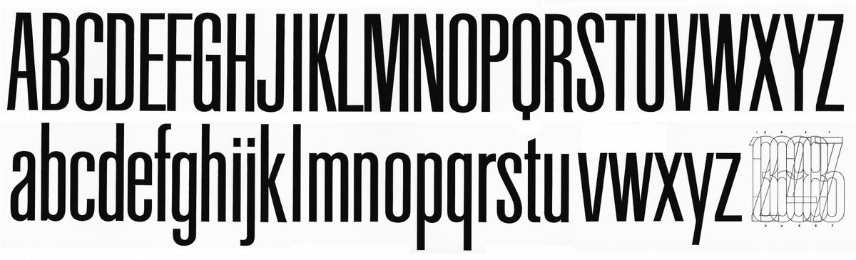
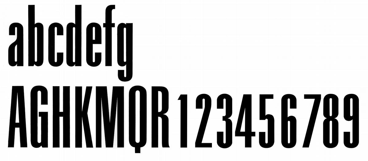
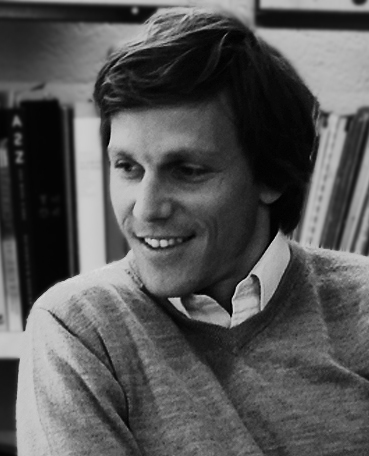
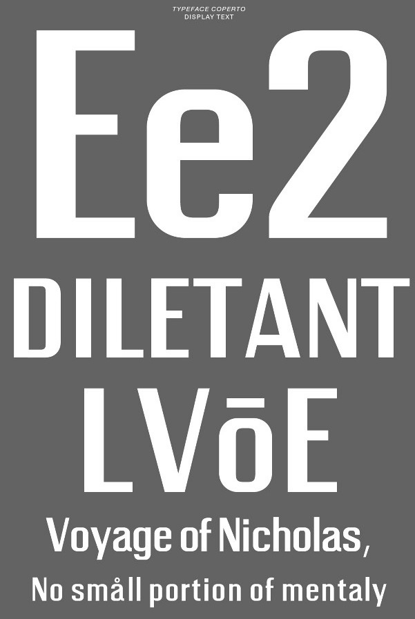
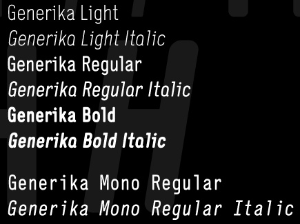
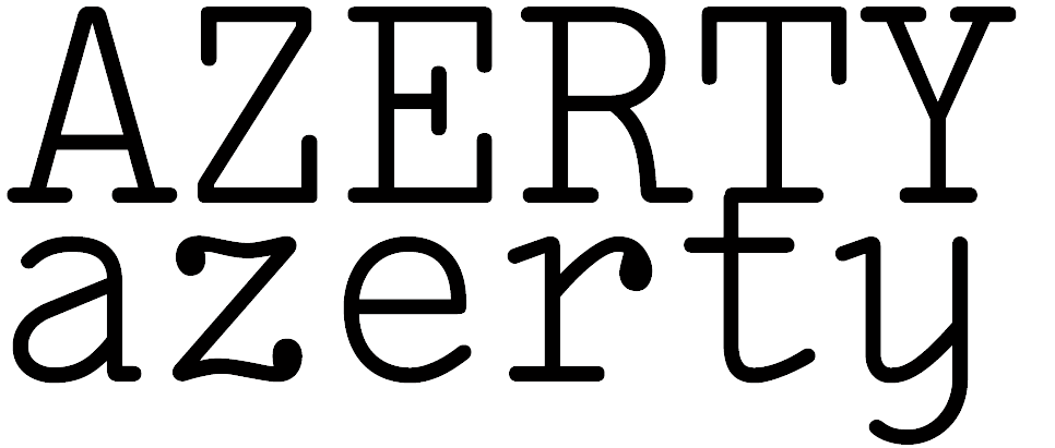
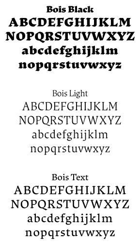
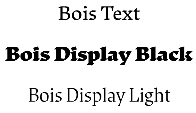
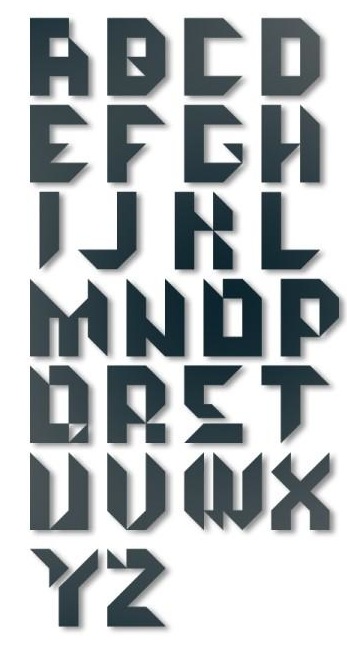
|
|
|
|