| | |
13pt
[Jonathan Corum]

|
 Graphics editor for Science at the New York Times. 13pt is the New York-based design and type studio founded by Jonathan Corum. In the early part f his career, he created typefaces such as FB Agency, Eagle (1994, after initial design by David Berlow in 1989, which in turn was based on M.F. Benton's [or Lucian Bernhard's?] 1933 face, Eagle Bold; a strong font!), Law Italic (1997, for Sam Antupit and Harry N. Abrams---a digitization from a specimen of ATF's Law Italic No. 520), Mesa (1994, a Font Bureau handprinting face), the 5-unit handwriting family Victoria's Secret (1997, from hand-drawn originals provided by Sisman Design), the Bodoni-esque font Winterthur Display (1997, drawn for Harry N. Abrams), Law Italic. Custom typefaces include 2x4 (as part of logos), Columbia University, Liz Claiborne, Miesdings (dingbats for the new student center of the Illinois Institute of Technology), Readers Digest Fleurons (1997), WCS Wildlife (2001, the corporate typeface of the Bronx Zoo and the Wildlife Conservation Society).
 FontShop link. [Google]
[MyFonts]
[More] ⦿
|
A Survey of Free Math Fonts for TeX and LaTeX
[Stephen G. Hartke]
|
Article by Stephen Hartke from Urbana, IL, written in 2006. He surveys free math fonts for TeX and LaTeX, with examples, instructions for using LaTeX packages for changing fonts, and links to sources for the fonts and packages. PDF version of the paper. Hartke is a Professor of Mathematics at the University of Illinois at Urbana-Champaign. He finished a font family called Aurulent Sans and Aurulent Sans Mono (2007), and released the free monospaced font Verily Serif Mono (2006, based on Vera Serif, with same dimensions as Vera Sans Mono). Fontsy link. Alternate URL. Yet another URL. Twentyfour examples of text face/math typeface are showcased. Some are quite disappointing. Here are the better ones (with some text quoted from Hartke's article): - Computer Modern (by Don Knuth), still my favorite. Type 1 versions of Computer Modern from Blue Sky Research and Y&Y, Inc. have been made freely available by the American Mathematical Society (AMS). Basil K. Malyshev has also released a free Type 1 version of Computer Modern, the BaKoMa fonts. Computer Modern has been extended to include more characters, particularly for non-English European languages. These fonts include European Computer Modern by Jörg Knappen and Norbert Schwarz (METAFONT only), Tt2001 by Peter Szabó (converted into Type 1 format from METAFONT sources using textrace), CM-Super by Vladimir Volovich (also converted using textrace); and Latin Modern by Bogusaw Jackowski and Janusz M. Nowacki (extended from the Blue Sky AMS fonts using MetaType1).
- Concrete text with Euler math, or Concrete text with Concrete math. The Concrete font was created by Knuth for his book Concrete Mathematics. Hermann Zapf was commissioned by the AMS to create the math font Euler for use in Concrete Mathematics. Type 1 versions of Concrete in T1 encoding are available in the CM-Super collection, and Type 1 versions of Euler are available in the Blue Sky collection from the AMS and in the BaKoMa collection. The eulervm package by Walter Schmidt implements virtual fonts for Euler that are more efficient to use with LaTeX. Ulrik Vieth created the Concrete Math fonts to match the Concrete text fonts; the only early free versions are implemented in METAFONT. The ccfonts package by Walter Schmidt changes the text font to Concrete and changes the math font to the Concrete Math fonts if eulervm is not loaded. Note that Concrete Text has no bold, but the Computer Modern Bold does just fine for that. However, in 2022, Daniel Flipo developed a free OpenType font based on Vieth's Metafont, also called Concrete Math.
- Antykwa Poltawskiego text and Computer Modern Math. J. M. Nowacki created the font Antykwa Poltawskiego using the MetaType1 system based on a typeface by Polish typographer Adam Poltawski.
- Antykwa Toruńska text and math. Antykwa Toruńska was created by J. M. Nowacki using the MetaType1 system based on a typeface by the Polish typographer Zygfryd Gardzielewski. The package anttor has complete math support in both TeX and LaTeX.
- Kerkis text and math. Kerkis was created by Antonis Tsolomitis by extending URW Bookman L to include Greek and additional Latin characters. The resulting fonts are stand-alone and can be used by applications outside of TeX. A font of math symbols is included, but not used by the LaTeX package. The package kmath uses txfonts for math symbols and uppercase Greek letters.
- New Century Schoolbook with Millennial math. New Century Schoolbook with Fourier math. The Millennial math font by Stephen Hartke contains Greek letters and other letter-like mathematical symbols. A set of virtual fonts is provided that uses New Century Schoolbook for Latin letters in math, Millennial for Greek and other letter-like symbols, and txfonts and Computer Modern for all other symbols, including binary operators, relations, and large symbols. This font is still in development, but will hopefully be released in 2006. The fouriernc package of Michael Zedler uses New Century Schoolbook for text and Latin letters in mathematics, and the Greek and symbol fonts from the Fourier-GUTenberg package for the remaining mathematical symbols.
- Palatino and pxfonts, Pazo, or mathpple for math symbols. Young Ryu created the pxfonts collection, which contains Greek and other letter-like symbols, as well as a complete set of geometric symbols, including the AMS symbols. Diego Puga created the Pazo math fonts, which include the Greek letters and other letter-like symbols in a style that matches Palatino. The LaTeX package mathpazo (now part of PSNFSS) uses Palatino for Latin letters, Pazo for Greek and other letter-like symbols, and Computer Modern for geometric symbols. The LaTeX package mathpple (also part of PSNFSS) uses Palatino for Latin letters and slanted Euler for Greek and other symbols. Since Hermann Zapf designed both Palatino and Euler, the designs mesh well. An alternate use of Euler is using the eulervm package. Ralf Stubner added small caps and old-style figures to URW Palladio L in the FPL package, and Walter Schmidt extended these fonts in the FPL Neu package.
- Utopia and Fourier or Math Design. Utopia was donated by Adobe for use with X Windows. Michel Bovani created Fourier-GUTenberg as an accompaniment to Utopia and is very complete, containing both Greek letters and standard and AMS symbols. The Math Design fonts for Utopia of Paul Pichaureau are also very complete, including Greek letters and AMS symbols.
- Charter and Math Design. Or URW Garamond and Math Design. Charter was donated by Bitstream for use with X Windows. The Math Design fonts for Charter created by Paul Pichaureau are very complete, including Greek letters, symbols from Computer Modern, and the AMS symbols. Charis SIL might be an alternate source for Greek letters that match Charter more closely. Another possibility for a math font is to use the Euler fonts with the charter and eulervm packages. URW Garamond No. 8 is available under the Aladdin Free Public License as part of the GhostPCL project. The Math Design fonts for URW Garamond created by Paul Pichaureau are very complete, including Greek letters, symbols from Computer Modern, and the AMS symbols.
- Times or Omega Serif, and txfonts, Belleek, mathptmx, or mbtimes. Young Ryu created the txfonts collection, which contains Greek and other letter-like symbols, as well as a complete set of geometric symbols, including the AMS symbols. The txfonts package also includes a very nice typewriter font, txtt. Belleek was created by Richard Kinch and is a drop-in replacement for the commercial fonts required by the mathtime package (now part of PSNFSS). The LaTeX package mathptmx (also part of PSNFSS) uses Times for Latin letters and Symbol for Greek and other symbols. Michel Bovani created the mbtimes package by using Omega Serif for text and Latin and Greek letters in mathematics. mbtimes also includes symbol fonts and a set of calligraphic letters. Omega Serif is the primary font for Omega, a 16-bit extension of TeX by John Plaice and Yannis Haralambous. The STIX fonts project is a collaboration of several academic publishers to create a set of Times-compatible fonts containing every possible glyph needed for mathematical and technical publishing. These fonts are still in development, with a scheduled release in the middle of 2006. Note: When Adobe introduced Postscript in 1984, they defined 35 core fonts (in 10 typefaces) that must be present in all Postscript interpreters. In 1996, URW++ released a replacement set for the core fonts under the GNU General Public License. The URW++ fonts were primarily released for use with Ghostscript, a free Postscript interpreter. For example, Times is Nimbus Roman No. 9 L, Palatino is URW Palladio L, New Century Schoolbook is Century Schoolbook L and Symbol is Standard Symbols L.
Klingspor link. Dafont link. Abstract Fonts link. [Google]
[More] ⦿
|
A. Zeese & Co
|
 Chicago-based electrotypers and photo-process engravers. They published Specimens of Electrotypes Comprising Cuts, Borders, Initials, Ornaments, Etc. (1891, Chicago: A. Zeese&Co).
 Very Victorian in style, this 200 plus page publication showcases traditional ornaments and has about fifteen pages worth of ornamental capital alphabets. [Google]
[More] ⦿
|
Abby Wilhelm
|
Creator of Treeline (2013, an alchemic typeface), which was designed during her studies at the University of Georgia in 2013. In 2017, at FontStruct, she published the free techno typeface Pooling duting her studies at Southern Illinois Unversity in Carbondale, IL. FontStruct link. Behance link. [Google]
[More] ⦿
|
Abby Wynne
|
Chicago-based creator of the ornamental typeface Patricia (2013). [Google]
[More] ⦿
|
Advance Type Foundry
|
Short-lived foundry run by Robert Wiebking and Henry Hardinge in Chicago. In 1894 Robert Wiebking and Henry H. Hardinge (also from Chicago) built the first successful machine for engraving type matrices. In 1896, they became partners and set up Wiebking, Hardinge & Co in 1901, manufacturing matrices for type foundries. This led them to set up the Advance Type Foundry in Chicago. Typefaces by them include the ArtCraft Series, Caslon Antique, and Modern Text (blackletter). [Google]
[More] ⦿
|
AIGA Annual Design Competition 2003
|
The typography awards in the AIGA competition [which are mostly but not exclusively for the creative use of type] in 2003 were: Archer (Hoefler), Retina (Frere-Jones at HTF), Interiors 3D type (Northern Illinois University, DeKalb, IL), Bjork Cocoon (Radical Media, NY), Copy magazine (Sagmeister, NY), AIGA "Voice" animation (Chermayeff&Geismar Inc, NY). [Google]
[More] ⦿
|
A.J. Troxell
|
 Designer from Illinois, b. 1985, who made Futura Hand (2010). Home page. [Google]
[More] ⦿
Designer from Illinois, b. 1985, who made Futura Hand (2010). Home page. [Google]
[More] ⦿
|
Akufen
|
Montreal-based designer of the geometric typeface Les Enfants de la Bolduc (2012). Behance link. [Google]
[More] ⦿
|
Alex Diaz
|
Alex Diaz (Chicago, IL) got a Bachelors degree in graphic design from Columbia Collrge Chicago in 2011. He created the candy-stripe typeface Three (2011). Behance link. [Google]
[More] ⦿
|
Alex Sheyn
[Avondale Type Co]
|
 [More] ⦿
|
Alex Southern
|
During his studies at Columbia College Chicago, Alex Southern (Carol Stream, IL) designed the ball terminal-laden typeface Postmodern (2015), which is based on Modern No. 20. [Google]
[More] ⦿
|
Alexa Heinrich
|
Graphic designer in Chicago, IL, who created Modular Alphabet in 2012. Behance link. [Google]
[More] ⦿
|
Alexandria Hall
|
Chicago-based art director, who used just a few design elements in her modular typeface Plug (2012). [Google]
[More] ⦿
|
Alexis Cole
|
During her studies, Alexis Cole (Northfield, IL) designed the textured typeface Bauhaus Bold (2013). [Google]
[More] ⦿
|
Alexis James
|
Springfield, OH-based designer of the colorful Chicago Latino Film Festival Poster in 2016. Behance link. [Google]
[More] ⦿
|
Alexis Stellato
|
Crest Hill, IL-based creator of the student project typeface Branching Out. [Google]
[More] ⦿
|
Alf R. Becker
|
Alf Becker (b. St. Louis, IL, d. 1959, St. Petersburg, FL) was a sign artist in the 1930's and 40's. Beginning in January 1932, at the request of editor E. Thomas Kelly, Becker supplied the Signs of the Times (The National Journal of Display Advertising) magazine's new Art and Design section with an alphabet a month, a project initially predicted to last only two years. Misjudging the popularity of the series, it instead ran for 27 years, ending finally two months before Becker's death in 1959, for a total of 320 alphabets. In late 1941, just ten years after the first alphabet was published, 100 of those alphabets were compiled and published in book form under the title 100 Alphabets, by Alf R. Becker. The American Sign Museum shows the following death notice, taken from the April 1959 issue of Signs of the Times: A chapter of almost 27 years of extensive influence upon the development of sign and outdoor advertising lettering came to a close March 10 in the passing of Alf R. Becker, whose alphabets had been presented consistently in Signs of the Times since January, 1932. Death came in St. Petersburg, FL, where he had been hospitalized since last November. The funeral services were in St. Louis, March 16. Mr. Becker had operated a commercial sign business in East St. Louis, IL., and was widely known for his lettering ability when requested 27 years ago by the late E. Thomas Kelley, then editor of Signs of the Times, to do a series of alphabets for the magazine. They had estimated that 24 alphabets which would be presented in a period of two years would serve the purpose. The series was so enthusiastically received and so many readers urged continuation that it was projected indefinitely to eventually each a total of 320 before failing health of Mr. Becker forced him to give up that creative work. His last alphabet for ST appeared in the January issue this year. Countless are the signmen and women who broadened the horizons of their lettering ability by thorough study of Mr. Becker's alphabet. In 1941, his book, "100 Alphabets" was published by Signs of the Times, and all 3,000 copies that were printed were sold out long ago. Numerous requests have been received for a reprinting, but in view of the changes of time in lettering styles, it has not been considered advisable. Mr. Becker's failing health in 1957 influenced him and Mrs. Becker moving to St. Petersburg, where they bought a home, and where he went into semi-retirement. His love of the sign business was such that he continued his alphabets in spite of the problems of his illness. Many of his typefaces have art deco influences. LHF Monogram at Letterhead is a digital version of one of his fonts. Other digitizations include Whomp (2006) and Buffet Script (2006) by Alejandro Paul (Sudtipos) and Daffadowndilly (2007) and Stony Island NF (after Becker's art deco typeface Chicago Modern), Quaint Notions (2003), and Shaq Attack NF (2011, a wood plank font) by Nick Curtis. The Fontry (James Stirling and/or Adkins) is undertaking a grand digitization project, and releases free and pay fonts with names that start with ARB, followed by the font number, the font name, and the month and year of issue. In The Fontry's ARB series, we find ARB-187 Moderne Caps AUG-47 (2013, didone), ARB-85 Poster Script (2011, after a 1939 typeface by Becker), ARB 70 Modern Poster, ARB 93 Steel Moderne, ARB 44 Chicago Modern, ARB 66 Neon (2010, after a 1937 font, +Block, +Line), ARB 85 Modern Poster JAN-39 (2011, after Modern Poster Script, 1939), and ARB 67 Modern Roman, and ARB08ExtremeRomanAUG-32CASNormal (2009; the original is from 1932). Jeff Levine created a number of typefaces based on Becker's work as well: Show Card Casual JNL (2018: based on a single stroke brush alphabet by Alf Becker), Casual Signage JNL (2018), Modern English JNL (2018), Kanona JNL (2010), Karaoke JNL (2010), Mocombo JNL (2010). John Davis created LHF Pipeline (2012) based on Becker's designs. Kaitlin Sims designed LHF Becker No. 45 (2015). Various of Becker's alphabets were at the basis of some digital fonts by Noah Johnson at Practical Lettering Studio, designed ca. 2026. These have numbered names such as No. 37 Alf Becker, No. 41 Alf Becker, No. 55 Alf Becker, No. 137 Alf Becker and No. 210 Alf Becker. FontShop link. Catalog of some of his digitized typefaces. View the digital typefaces that are based on Becker's work. Showcase of Alf R. Becker's fonts. [Google]
[MyFonts]
[More] ⦿
|
Ali Borowsky
|
Graphic design student at The Illinois Institute of Art Schaumburg, IL. Creator of the slab serif typeface Coris Catholic (2012). [Google]
[More] ⦿
|
Alicia Lullo
|
Chicago, IL-based graphic design student. Creator of a hand-printed typeface in 2012. [Google]
[More] ⦿
|
Alphabets Inc (or: Fontsonline.com)
[Peter Fraterdeus]
|
Alphabets Inc was founded by type designer Peter Fraterdeus, who made AI Marlowe, AI Prospera, AI Wood (1992, interpreted from examples shown in Rob Roy Kelly's American Wood Types) and AI Quanta (1994, a multiple master face). Check here. This foundry has some of the nicest typefaces anywhere, including many gorgeous typefaces by Philip Bouwsma (example: Alexia, Juliana, BouwsmaScript, Weissenau). Other designers include Bonnie Barrett (Arbor), Brian Sooy (multiple master fonts AIVeritas and AIVeritasItalic), Ejaz Syed, Inna Gertsberg, John Pugh, Karen Ackoff (check out the Russell handwriting), Kurt Roscoe, Lester Dore, Manfred Klein, Mike Brooks, Peter Fraterdeus (Oberon, Prospera and Quanta (multiple master) families), Randall Jones (the multiple master font AIKochAntiqua), Robert McCamant, Martha Chiplis, Serge Pichii, and Steve Meek. In 2007, Peter Fraterdeus started Exquisite Letterpress for top quality printing. In 2010, he promised to release Quanta Uncial. Dafont link [where one finds the free experimental typeface AI Fragment]. [Google]
[MyFonts]
[More] ⦿
|
Aly Kelly
|
During her studies at the Illinois Institute of Art-Schaumburg, Aly Kelly (AK Designs, Algonquin, IL) designed Steampunk Speech Typeface (2013) and Vine Lnes (2013, a curly script). [Google]
[More] ⦿
|
Amber Phillips
|
Amber Phillips (b. 1983, Hanoverpark, IL) is a young graphic designer/typographer about to graduate from Columbia College in Chicago. Her foundry, Amber Phillips, is located in Cary, IL. She made the scratchy handwriting font Ambie Skratch (2006). [Google]
[MyFonts]
[More] ⦿
|
American Wood Type Mfg Co.
|
 Wood type manufacturing company located in New York and Chicago in the first half of the 20th century. Images below are from their Catalog No. 36. [Google]
[More] ⦿
Wood type manufacturing company located in New York and Chicago in the first half of the 20th century. Images below are from their Catalog No. 36. [Google]
[More] ⦿
|
Amsterdam Continental Types and Graphic Equipment Co.
|
 Typeface importer and vendor and foundry located on Fourth Avenue and Park Avenue South in New York City, with offices in Burbank, CA, and Chicago, IL. Their typefaces included Annonce Grotesque. Amsterdam Continental ceased operations.
 A Handbook of Types (PDF catalog). [Google]
[More] ⦿
|
Amy Dosen
|
Chicago-based creator of the custom sans all caps typefaces Risograph (2012) and Candy Cheeto Steamboat (2012). Behance link. [Google]
[More] ⦿
|
Anchit Chhabra
|
As an Art Foundations student at UIUC in Champaign, IL, Anchit Chhabra created the octagonal Box Typeface (2014). [Google]
[More] ⦿
|
Anchor Fonts
[Eric Mueller]
|
Eric Mueller (Anchor Fonts, Aurora, IL) designed the free hand-printed typefaces Shabby Ball Point (2011) and Strong Hand Caps (2011) and of Ornamental (2011, Christmas tree ball alphading face). Progress (2011) is a pixel face. Hungry Ghosts (2011) and Anchorless Echo (2012, old typewriter face) are grunge typefaces. Dafont link. [Google]
[More] ⦿
|
Andi A. Mallarangeng
|
Andi A. Mallarangeng from DeKalb, IL, and Jim Henry from Northern Illinois University designed BugisA, a free font for Buginese. [Google]
[More] ⦿
|
Andrea Bruce
|
Graduate of Clarke University, class of 2014. Roselle, IL-based designer who created the triangulated typeface Shattered (2016). Behance link. [Google]
[More] ⦿
|
André Kuzniarek
[Mathematica Fonts]
|
[More] ⦿
|
André Kuzniarek
[Studio Daedalus]
|
[More] ⦿
|
Andrew Byrom
|
 Andrew Byrom was born in Liverpool, England in 1971. After Graduating from the University of East London in 1996 he opened his own design studio and worked for various clients including Penguin Books, The British Academy of Composers and Songwriters, The Industrial Design Centre, Time Out Online and The Guardian Newspaper. Around this time he also began teaching graphic design at The University of Luton and Central Saint. Martins. Byrom moved to the USA in 2000 to teach at Northern Illinois University in DeKalb, IL. He has recently been commissioned to design typefaces and type treatments for Elle Decoration, The New York Times Magazine, McGraw-Hill, and Turner Classic Movies. In 2006 he moved to Long Beach to take up an Associate Professor position at California State University, where he is currently the Area Head of the Graphic Design Department. He created the experimental typeface Interiors (2002), about which AIGA writes: Interiors (3D type) is a collaboration between type designer Andrew Byrom and designer Joel Wolter. It was originally conceived as a digital font (Interiors) and was inspired by an old wooden chair in Byrom's office that, when looked at from a certain angle, resembled the letter h. Using the three-dimensional principles of this simple form, and closely adhering to type design conventions, 26 letters of the alphabet were drawn and generated as a font. The characters were then constructed in three dimensions using tubular steel into full-scale furniture frames. Because the underlying design concept is typographical, the end result becomes almost freestyle furniture design. Letters like m, n, o, b and h can be viewed as simple tables and chairs, but other letters, like e, g, a, s, t, v, x and z, become beautifully abstract pieces of furniture. He also made the distressed font Bloodclot, the stencil family Byro Stencil (free), Byro Sans, 1byrosquare (2000), 2byroround (2000), ByroBlock Stencil (2000, stencil), Concussion (dot matrix with various size dots), Easy Vie, Venetian (2009, like Venetian blinds), Fresh (1995, scratchy type), Ply, Rage, St. Auden, Bandaid (2006), 3D Dot Matrix. He divides his time between teaching, designing for various clients and playing with his sons, Auden and Louis. He has recently been commissioned to design typefaces and type treatments for Elle Decoration, The New York Times Magazine, McGraw-Hill, and Turner Classic Movies. In 2006 he moved to Long Beach to take up an Associate Professor position at California State University, where he is currently the Area Head of the Graphic Design Department. Speaker at ATypI 2009 in Mexico City. [Google]
[More] ⦿
Andrew Byrom was born in Liverpool, England in 1971. After Graduating from the University of East London in 1996 he opened his own design studio and worked for various clients including Penguin Books, The British Academy of Composers and Songwriters, The Industrial Design Centre, Time Out Online and The Guardian Newspaper. Around this time he also began teaching graphic design at The University of Luton and Central Saint. Martins. Byrom moved to the USA in 2000 to teach at Northern Illinois University in DeKalb, IL. He has recently been commissioned to design typefaces and type treatments for Elle Decoration, The New York Times Magazine, McGraw-Hill, and Turner Classic Movies. In 2006 he moved to Long Beach to take up an Associate Professor position at California State University, where he is currently the Area Head of the Graphic Design Department. He created the experimental typeface Interiors (2002), about which AIGA writes: Interiors (3D type) is a collaboration between type designer Andrew Byrom and designer Joel Wolter. It was originally conceived as a digital font (Interiors) and was inspired by an old wooden chair in Byrom's office that, when looked at from a certain angle, resembled the letter h. Using the three-dimensional principles of this simple form, and closely adhering to type design conventions, 26 letters of the alphabet were drawn and generated as a font. The characters were then constructed in three dimensions using tubular steel into full-scale furniture frames. Because the underlying design concept is typographical, the end result becomes almost freestyle furniture design. Letters like m, n, o, b and h can be viewed as simple tables and chairs, but other letters, like e, g, a, s, t, v, x and z, become beautifully abstract pieces of furniture. He also made the distressed font Bloodclot, the stencil family Byro Stencil (free), Byro Sans, 1byrosquare (2000), 2byroround (2000), ByroBlock Stencil (2000, stencil), Concussion (dot matrix with various size dots), Easy Vie, Venetian (2009, like Venetian blinds), Fresh (1995, scratchy type), Ply, Rage, St. Auden, Bandaid (2006), 3D Dot Matrix. He divides his time between teaching, designing for various clients and playing with his sons, Auden and Louis. He has recently been commissioned to design typefaces and type treatments for Elle Decoration, The New York Times Magazine, McGraw-Hill, and Turner Classic Movies. In 2006 he moved to Long Beach to take up an Associate Professor position at California State University, where he is currently the Area Head of the Graphic Design Department. Speaker at ATypI 2009 in Mexico City. [Google]
[More] ⦿
|
Andrew Fortnum
|
Chicago-based type designer who was born in Canada. Andrew studied graphic design at Columbia College in Chicago. He created the typeface Goonatic 72 Plus (2012). [Google]
[MyFonts]
[More] ⦿
|
Andrew Markle
[Andrews&Halsted Typeworks (or: Halsted Typeworks)]
|
[More] ⦿
|
Andrews&Halsted Typeworks (or: Halsted Typeworks)
[Andrew Markle]
|
Indianapolis, IN-based Andrew Markle (Andrews&Halsted Typeworks) designed the sans typeface A&H Hadley (2010). Other commercial typefaces include A&H Bern Sans CT (2010), A&H Hadley Inconsolata MT (2010), A&H Hadley ExtraBold (2010), A&H Hadley Bold (2010), A&H Stella (sans), A&H Kerrigan Light, and A&H Kerrigan Book. Graphicriver link, where we learn that Halsted Typeworks is located in Evanston, IL. There we also find the 2011 typefaces Indianapolis Slab Serif, Madeleine, Payton, Addison, Gabriel Script, A&H Bjorn, A&H Teagan Script, A&H Taidghin Sans, A&H Alexander (+Sans, +Sans Light, +Serif, +SerifBold, +SerifLight), A&H Stella, AH Ansleigh, AH Greyson, A&H Parker (+Light), and &A&H Celeste. [Google]
[More] ⦿
|
Ann Libner
|
"Paralegal" person at Agfa/Monotype who sends threatening emails to website owners. One such owner had posted a font derived from Times Roman, but it was far from the text font we are used to. Still, reason enough to apply the pressure. On another occasion, in February 2000, she threatened Graham Meade with a lawsuit just because his use of the name ArialicHollow was an infringement of Monotype's trademark. [Google]
[More] ⦿
|
Annette Brown
|
Chicago, IL-based designer of the all caps brush font Confused (2016). [Google]
[More] ⦿
|
Annie Godzicki
|
Aurora, IL-based designer of the free font Salty Air (2019) and the free handcrafted typeface Lemonade (2019). [Google]
[More] ⦿
|
Anniliese Ahrens
|
Chicago-based designer of a dingbat font called Hairstyles (2012). In 2019, she published a decorative caps typeface. [Google]
[More] ⦿
|
AnnMarie Weidenbenner
|
Creative director in Carbondale, IL, who created the constellation typeface Stella (2013). [Google]
[More] ⦿
|
Anson Nguyen
|
Aurora, IL-based designer of the stencil typeface Alligator (2014). [Google]
[More] ⦿
|
Anthonie Zapata
|
Creator (aka tiggWorkz) of the graffiti font ChicagoHoodZZ (2010). [Google]
[More] ⦿
|
Anton Novik
|
Anton Novik lives in Chicago, IL. He created the shattered glass grunge typeface X Story (2008). The grunge typeface XStoryDesignersFont (2008) can be bought at Graphic River. [Google]
[MyFonts]
[More] ⦿
|
Ari Rafaeli
[ARTypes]
|
 [MyFonts]
[More] ⦿
[MyFonts]
[More] ⦿
|
Arkka Enterprises
|
Located in Warrenville, IL, this company developed Mup: Mup takes a text file as input and produces PostScript output for printed music. It can handle both regular notation and tablature notation. It can also produce MIDI output. Free trial, but 29$ if you keep it. Windows and UNIX/Linux. [Google]
[More] ⦿
|
Arlo
[Ryan Halvorsen]
|
Ryan Halvorsen (Arlo) created the sans family Halvo (TypeTrust). His graphic design work includes the poster for the Las Vegas Marathon in 2005. Arlo is a graphic design firm based in Chicago. We look for design solutions that are memorable, timeless, and communicate with high-speed efficiency. Maximum heart; minimal fluff we like to say. While small in size, we design for big names; Nike, American Eagle Outfitters,&Effen Vodka just to name a few. The firm was established in 2004 by Ryan Halvorsen and Patrick Filler. Ryan Halvorsen cut his graphic design teeth in Rome, Italy, and returned to Chicago to work at Segura, Inc. Silas Dilworth also works at Arlo. [Google]
[More] ⦿
|
Armin Vit
|
Born and raised in Mexico City, Armin Vit is a graphic designer and writer now living in Austin, Texas. He is co-founder of UnderConsideration and its myriad sites. His last employment position was at Pentagram. He now runs UnderConsideration's Department of Design. With his partner, Bryony, he has co-authored the books Women of Design and Graphic Design Referenced. Designer of the futuristic fonts Modular (2001) and Tirkovet, and of Stress (letters obtained without lifting the pen). He attended the School of Graphic Design at Anahuac University in Mexico City and taught typeface design at the Portfolio Center, marchFIRST, Atlanta, GA. Home page. After Atlanta, he moved on to Chicago, and later to Austin. At TypeCon 2003, he told this dream about Hrant Papazian, I quote: I dreamt that Hrant came to my house, the weird thing is that it was his typophile picture only (since that is as far as I know what Hrant looks like). So he came in, and went "Number Two" in my bathroom without flushing, after that, he headed out to the kitchen to hang out and stuff. So I go into my bathroom and see these unflushed turds in my toilet. I go up to Hrant and say "Excuse me, Hrant, you left your turds in my toilet." His response involved handing me a plunger and adding "This should fix it." And that was it. [Google]
[More] ⦿
|
Art and Fonts by Sean (aka The BlackBox)
[Sean Moldenhauer]
|
Free fonts by Sean Moldenhauer of Michigan City, Indiana, a graduate of the Art institute of Chicago who apprenticed with Donna Karen. Sean has beautiful Japanese calligraphic prints (shodo style) as well as fonts based on carefully researched historical typefaces. Examples: JapaneseZenSampler1 (2001), TheTombwinterandspring1 (1997, "heavily inspired by the incised letters from the tomb of Henry III, Westminster Abbey, about 1272"), Thorns (1997), VampyresGarden (1997, initial caps inspired by a copy of the Romant de la Rose from the beginning of the 16th century), HoursintheRain (1997), SevenWavessighsSalome (1997, caps). Very nice gothic and medieval style creations. He showcases great Arab, Japanese and Chinese calligraphy. [Google]
[More] ⦿
|
Arthur M. Barnhart
|
Type designer who co-founded Barnhart Brothers and Spindler in Chicago. Creator of a squarish typeface in 1887. [Google]
[More] ⦿
|
ARTypes
[Ari Rafaeli]
|
 ARTypes is based in Chicago, and is run by Ari Rafaeli, earlier possibly known as Richard Everds. List of their typefaces categorized by revival type:
 - Hermann Eidenbenz: Graphique (1946) now called Graphique AR, a shadow face.
- Jan van Krimpen (Enschedé) revivals: Romulus Kapitalen (1931), Romulus Open (1936), Curwen Initials (Van Krimpen did these in 1925 for The Curwen Press at Plaistow, London), and Open Kapitalen (1928).
- Jacques-François Rosart: Rosart811, a decorative initial typeface that is a digital version of the 2-line great primer letters cut by J. F. Rosart for Izaak&Johannes Enschedé in 1759 (Enschedé no. 811).
- Stephenson Blake revivals: Borders, Parisian Ronde.
- Rudolf Koch (Klingspor) revivals: Holla, Koch-Antiqua-Kursiv Zierbuchstaben, Maximilian-Antiqua, Neuland 24pt.
- Bernard Naudin (Deberny&Peignot) revival: Le Champlevé.
- W. F. Kemper (Ludwig&Mayer) revival: Colonia. P.H. Raedisch: Lutetia Open (2007) is based on the 48-pt Lutetia capitals engraved by P. H. Raedisch under the direction of Jan van Krimpen for Enschedé in 1928.
- Richard Austin: Fry's Ornamented (2007) is a revival of Ornamented No. 2 which was cut by Richard Austin for Dr. Edmund Fry in 1796. Stephenson, Blake&Co. acquired the type in 1905, and in 1948 they issued fonts in 30-pt (the size of the original design), 36-, 48- and 60-pt.
- Max Caflisch (Bauer) revival: Columna.
- Elisabeth Friedlaender (Bauer) revivals: Elisabeth-Antiqua, Elisabeth-Kursiv (and swash letters). Linotype Friedlaender borders.
- Herbert Thannhaeuser (Typoart) revival: Erler-Versalien.
- O. Menhart (Grafotechna) revivals: Manuscript Grazhdanka (cyrillic), Figural, Figural Italic (and swash letters). Also, Grafotechna ornaments (maybe not by Menhart).
- Hiero Rhode (Johannes Wagner) revival: Hiero-Rhode-Antiqua (2007).
- F. H. E. Schneidler (Bauer) revival: Legende.
- Herbert Post revival: Post-Antiqua swash letters.
- Georg Trump (Weber) revivals: Trump swash letters, Trump-Gravur (called Gravur AR now). The outline caps typeface Forum I-AR is derived from the Forum I type designed by Georg Trump (1948, C. E. Weber). Signum AR-A and Signum AR-B (2011) are based on Trump's Signum (1955, C.E. Weber). Palomba AR (2011) is based on Trump's angular calligraphic typeface Palomba (1954-1955, C.E. Weber). Amati AR (2011) is based on a Georg Trump design from 1953.
- Hermann Zapf revival: Stempel astrological signs.
- F.H. Ernst Schneidler: Zentenar Initialen is based on the initials designed by Prof. F. H. E. Schneidler, ca. 1937, for his Zentenar-Fraktur types.
- Isaac Moore: Old Face Open (Fry's Shaded) is a decorative Baskerville which was probably cut by Isaac Moore for Fry ca. 1788. A revival was issued in eight sizes by Stephenson Blake in 1928.
- Border units and ornaments: Amsterdam Apollo borders, Gracia dashes, Primula ornaments, Bauer Bernhard Curves, Weiß-Schmuck, Curwen Press Flowers, Klingspor Cocktail-Schmuck, Nebiolo fregi di contorno, Attika borders, English (swelled) rules, Künstler-Linien, an-Schmuck, Primavera-Schmuck.
- Freie Initialen are derived from initials made for the Stempel Garamond series. The type was issued in 1928 in three sizes (36, 48, and 60 pt); the AR version follows the 60-pt design.
- Initiales Grecques, based on Firmin Didot's design, ca. 1800.
- Emil A. Neukomm revivals: Bravo AR (2007; originally 1945).
- Ernst Bentele revivals: Bentele-Unziale (2007).
- Joseph Gillé: Initiales ombrées (2007) is based on Gillé's original all caps typeface from 1828.
- Maria-Ballé-Initials (2007), after an original font from Bauersche Giesserei.
- Raffia Initials (1952, Henk Krijger): revived by ARTypes in 2008 as Raffia.
- Ornaments 1 AR (2010): from designs from 18th and 19th century typefounders that were ancestors of the Stephenson Blake foundry.
- Ornaments 2 AR (2010): Ornaments 2 contains designs for the Fanfare Press by Berthold Wolpe (1939) and for the Kynoch Press by Tirzah Garwood (ca. 1927).
- Ornaments 3 AR (2010): based on designs by Bernard Naudin for Deberny et Peignot, c. 1924; and ornaments based on designs by Oldrich Menhart, Karel Svolinsky and Jaroslav Slab for the state printing office of Czechoslovakia and Grafotechna.
- Ornaments 4 AR (2010): based on the Amsterdam Apollo and Gracia ornaments and the Amsterdam Crous-Vidal dashes (designed by Crous-Vidal).
- Ornaments 5 AR (2010): based on the Amsterdam Primula ornaments designed by Imre Reiner, 1949.
- Ornaments 6 AR (2010): based on designs for the Curwen Press by Edward Bawden and Percy Smith.
- Yü Bing-nan revival: Freundschafts-Antiqua AR (2010). Freundschafts-Antiqua (which was also called Chinesische Antiqua) was designed in 1962 by the Chinese calligrapher Yü Bing-nan when he was a student at the Hochschule für Grafik und Buchkunst at Leipzig in 1960.
- Sans Serif Inline (2011). Based on the 36-point design of the Amsterdam Nobel Inline capitals (1931).
- Hildegard Korger revivals: Typoskript AR (2010) is based on a metal type which was produced in 1968 by VEB Typoart, Dresden, from a design of the German calligrapher and lettering artist Hildegard Korger.
- Hans Kühne revival: Kuehne-Antiqua AR (2010) revives a Basque typeface by Hans Kühne.
- The Troyer AR ornaments (2010) are based on the first series of ornaments designed for American Type Founders by Johannes Troyer in 1953.
- The Happy Christmas font (2011) is a snowflake font that is based on designs by Amsterdam and Haas, c. 1950. December Ornaments (2011) contains the 36 Amsterdam designs which were originally issued in 24 and 36 point.
- Walter Diethelm: Diethelm AR (2011) revives Walter Diethelm's Diethelm Antiqua (1948-1951, Haas).
- Walter Brudi revivals: Pan AR (2010, based on a 1957 font by Brudi).
- Hermecito (2013) is a 46-style type system based on an angular serif. It covers Cyrillic, Latin, Greek and several other scripts. Besides being eminently readable, it also has extensive coverage of mathematical and phonetic symbols. Renzo (2013) is along the same lines but with sharpened serifs.
- Spiral (2014) is a revival of a typeface called Spiral designed by Joseph Blumenthal and cut bu Louis Hoell in 1930. In 1936, Monotype reissued that type as Emerson 320.
- Custom typefaces include Fabrizio (2016), a classical serif typeface family for Hebrew, Latin, Cyrillic and Greek, with hints of Garamond and Caslon. Ari writes that Fabrizio made its first appearance in Saggi di Letteratura Italiana: Da Dante per Pirandello a Orazio Costa, by Lucilla Bonavita, printed at Pisa in March 2016 by Fabrizio Serra Editore for whom the type was specially designed.
MyFonts link. View the typefaces made by Ari Rafaeli / ARTypes. [Google]
[MyFonts]
[More] ⦿
|
Ascender Corporation
|
Elk Grove Village, IL-based company established in 2004, which specializes in font development, licensing and IP protection. It rose from the ashes of a major fire at Agfa/Monotype at the end of 2003. Its founders are Steve Matteson (type designer, formerly with Agfa/Monotype), Thomas Rickner (of Microsoft fame, where he hinted many Microsoft families), Ira Mirochnick (founder and President of Monotype Typography Inc in 1989 (where he was until 2000) and a Senior Vice President and director of Agfa Monotype Corporation (2000-2003), a self-proclaimed expert in font licensing issues and IP protection), and Bill Davis (most recently the Vice President of Marketing for Agfa Monotype). Also included in this group are Josh Hadley, Brian Kraimer, Jim Ford (since 2005), and Jeff Finger (as Chief Research Scientist, since 2006). On December 8, 2010, Ascender was acquired by Monotype for 10.2 million dollars. Their typefaces include Endurance (2004, Steve Matteson, an "industrial strength" Grotesk designed to compete with Helvetica and Arial; it supports Greek, Cyrillic and East European languages). In April 2005, Ascender announced that it would start selling the Microsoft font collection, which is possibly their most popular collection to date. They also started selling and licensing IBM's Heisei family of Japanese fonts in April 2005: Heisei Kaku Gothic, Heisei Maru Gothic and Heisei Mincho. Ascender's version of the CJK font Heiti is called ASC Heiti. Also in 2005, they started distributing Y&Y's Lucida family. In October 2005, Ascender announced the development of Convection, a font used for Xbox 360 video games. Their South Asian fonts cover Bengali, Devanagari, Gujarati, Gurmukhi, Kannada, Malayalam, Tamil and Telugu, and include Ascender Uni, Ascender UniDuo and Arial Unicode for general use across all Indic languages, and, in particular, the Microsoft fonts Vrinda (Bengali), Mangal (Devanagari), Shruti (Gujarati), Raavi (Gurmukhi), Tunga (Kannada), Kartika (Malayalam), Latha (Tamil) and Gautami (Telugu). Khmer SBBIC (2011) is a Khmer font at Open Font Library. It does more type trading and licensing than type creation, although Steve Matteson has contributed fairly well to their new typefaces. Their brand value took a hit when they started selling scrapbook, handwriting and wedding fonts under the name FontMarketplace.com. Recent contributions: Crestwood (2006, a house face, possibly by Steve Matteson) is an updated version of an elegant semi-formal script typeface originally released by the Ludlow Type Foundry in 1937. In 2009, they started a subpage called GoudyFonts.Com to sell their Goudy revivals. In 2010, they announced a new collection of OpenType fonts created specifically for use in Microsoft Office 2010: Comic Sans 2010 (including new italic and bold italic fonts), Trebuchet 2010 (including new black&black italic fonts), Impact 2010, Pokerface 2010, Rebekah 2010 and Rebus Script 2010. Ligatures in Comic Sans? New releases. View Ascender's typefaces. [Google]
[MyFonts]
[More] ⦿
|
Ashlee Stevens
|
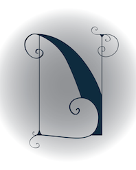 As a student, Joliet, IL-based Ashlee Stevens designed a great ironwork-inspired illuminated letter N in 2017. [Google]
[More] ⦿
As a student, Joliet, IL-based Ashlee Stevens designed a great ironwork-inspired illuminated letter N in 2017. [Google]
[More] ⦿
|
Ashley S. Kim
|
Chicago, IL-based designer of the thin display typeface Dream (2017). [Google]
[More] ⦿
|
Atavistic
[Edward Blake]
|
Edward Blake's foundry located in Chicago. Blake was born in 1978 in Chicago. He created the hand-printed typeface Ten Till (2011). [Google]
[MyFonts]
[More] ⦿
|
ATF 1923 Catalog: Artcraft Series
[Robert Wiebking]
|
 Showcasing the best pages from the Artcraft Series in the ATF 1923 Catalog. Artcraft&Bold&Italic are display typefaces originally designed for Barnhart Bros&Spindler by Robert Wiebking (1911-1913). Jaspert lists Artcraft as a 1930 publication at Ludlow, and Klingspor as Western Type Foundry typefaces from 1911 until 1913. Mac McGrew: Artcraft was designed in 1912 by Robert Wiebking and featured under the name of Craftsman in the first ad for his short-lived Advance Type Foundry, operated by Wiebking, Hardinge&Company, in Chicago. A short time later, the typeface was advertised as Art-Craft, and later as one word---Artcraft. Advance was soon taken over by Western Type Foundry, for whom Wiebking designed Artcraft Italic and Artcraft Bold a year or two later. Western in turn was taken over by Barnhart Brothers&Spindler in 1918. BB&S was already owned by ATF but operated separately until 1929; in the meantime, though, Artcraft and a number of other typefaces were shown in ATF specimens as well as those of BB&S. Artcraft has an unusual roundness in some of its serifs and line endings and a line of it produces a rolling feeling; some characters have curlicues, such as the long curl at the top of the a and and the exaggerated ear on the g. A number of auxiliary characters were made for roman and italic fonts; as these were sold separately, they were overlooked by many printers and typographers. The boldface has fewer eccentricities. Artcraft was a popular typeface for a number of years; the roman was copied by Monotype in 1929 without the fancy characters, and all three typefaces were copied by Ludlow. Adaptation in 1924 of Artcraft Italic to the standard 17-degree slant of Ludlow italic matrices was the second assignment of Robert H. Middleton (after Eusebius, q.v.) at that company. Hansen called it Graphic Arts. One source attributes the Artcraft family to Edmund C. Fischer, otherwise unidentified, but the details stated here are more generally accepted and seem to fit known facts better.
 Digital versions: [Google]
[More] ⦿
|
Austin Andrews
|
Chicago, IL-based designer of Beer Glasses (2015) and Material Design Icons (2015: free). Creative Market link. [Google]
[More] ⦿
|
Austin Kelley
|
Illinois-based designer of the hand-printed typeface Kelley Calligraphy (2013). [Google]
[More] ⦿
|
Avondale Type Co
[Alex Sheyn]
|
 Avondale Type Co is a type foundry established in 2013 and located in the Avondale area of Chicago. It is a type coop that groups several designers. It is a subsidiary of the design studio Bright Bright Great. Its typefaces:
 - By Alex Sheyn of Bright Bright Great: ATC Krueger (2013, an ultra-thin compressed straight-edged sans serif typeface), ATC Rosemary (2013, a didone with heavy contrast and shiny exaggerated ball terminals).
- Finki Pro (2013). A layered and beveled type family by Quinn Keaveney.
- Codex (2014). A spurred wrought iron and black death typeface by Justin Siddons.
- ATC Nasty (2015).
- ATC Overlook (2014) is a great grotesque sans family by Alex Sheyn. Almost monolined and genetically geometric, it is characterized by a lower case "e" that has a very short tail. Samantha Dion Baker made a free patterned version called ATC Overlook Baker in 2014.
- ATC Timberline. A wide open sans in 14 styles.
- The connected script typeface ATC Ripley (2014).
- The grotesque typeface ATC Duel (2015): Bold and bolder, ATC Duel is an extended grotesque sans-serif font family comprised of over 500 glyphs in 5 weights and 10 styles. Duel is an ultra wide display font whose rounded shapes and sharp edges are inspired by the letterforms and lines of 1960s cars, the Golden Age of automotive design.
- ATC Fritz (2015): ATC Fritz is a numerals specific display face comprised of over 60 glyphs in 8 layerable fonts. Fritz's numerals are chunky, bold, and soak up color. Inspired by modern sign painting techniques, Fritz works best where numbers need to stand out.
- ATC Saturn. A rounded octagonal techno typeface.
- ATC Yara (2016).
- ATC Arquette (2017). A geometric sans.
- The free handcrafted typefaces ATC John Doe, ATC Jane Doe and ATC Jay Doe (2017).
- ATC Abernathy (2019). Described as a soft humanist serif by ATC.
- ATC Merrin (2019).
- ATC Hal (2019).
- ATC Oneshot (2019). A sign painter's font inspired by bodega signage.
- ATC Doubletap (2019).
- ATC Vera (2020). A unicase sans.
- ATC Monarch (2021). A rhombic medieval display typeface by Christian Dexter.
Behance link for Alex Sheyn. Alex Sheyn's home page. Behance link. Other people at Avondale or Bright Bright Great include Drew Rios and Jason Schwartz. We also find typefaces by Quinn Keaveney and Justin Siddons. [Google]
[More] ⦿
|
Backwords Design
[Tanner Puzio]
|
Graphic designer in Chicago, IL (was: Oak Ridge, TN). Creator of the free retro compass-and-ruler typeface Soda Fountain (2015). Creative Market link. Behance link. [Google]
[More] ⦿
|
Bar Code Graphics, Inc.
|
Chicago-based barcoding company offering a 10USD online service for EPS-format barcode creation. Contact: Andy Verb. [Google]
[More] ⦿
|
Barco Type
|
Metal type foundry in Northlake, IL and/or Bensenville, IL, still operational in 2007. Also called F&S Type Founders Inc., it was located at 237 S. Evergreen, Bensenville, IL 60106. Some of its types are listed here, but none appear to be original designs. Barco Type Founders [Specimen Book]. Images of some metal typefaces in the Barco collection: AmericanGaramondNo648, AshleyCrawford.png, Binney No. 21, Bon Aire, BulmerRomanNo462, Cameo, CheltenhamWideNo164, CloisterBlackNo95, Comique, ComstockNo202, EleganteNoS106, FigaroNo536, Glamour Medium, Greco Bold, Hauser Script, Hess Neo Bold No. 363, Homewood, Lydian Roman, Matura Scriptorial Caps, Modernistic No. 297, Orplid, Prisma, Punch, Sans Serif Light No. 329, Samson, Scotch Roman No. 36, Spire No. 377, Stymie Medium No. 290, Tangoe, Thello Inline No. 2481, Thello No. 246, TwentiethCenturyUltraboldExtend, Typewriter Type No. 17L. [Google]
[More] ⦿
|
Barnhart Bros. Spindler Type Founders: Book of Type Specimens, 1907
|
 Trying to fit this 1000-page book into one web page, with discussion of many types. It's impossible, but I tried it. Download link for Book of type specimens: Comprising a large variety of superior copper-mixed types, rules, borders, galleys, printing presses, electric-welded chases, paper and card cutters, wood goods, book binding machinery etc., together with valuable information to the craft. Specimen book no.9. Another download link. [Google]
[More] ⦿
Trying to fit this 1000-page book into one web page, with discussion of many types. It's impossible, but I tried it. Download link for Book of type specimens: Comprising a large variety of superior copper-mixed types, rules, borders, galleys, printing presses, electric-welded chases, paper and card cutters, wood goods, book binding machinery etc., together with valuable information to the craft. Specimen book no.9. Another download link. [Google]
[More] ⦿
|
Barnhart Brothers&Spindler (or: BB&S)
|
 Chicago-based foundry, which grew out of The Great Western Type Foundry in 1868 when the Barnhart brothers (newspaper publishers in Iowa who came to Chicago as advertising agents) bought out the Toepfer family in 1868. They retained Herman Spindler as the foreman, since he was the only typefounder in the group. Aggressive in business, BB&S became the largest foundry in Chicago. Book of type specimens. Comprising a large variety of superior copper-mixed types, rules, borders, galleys, printing presses, electric-welded chases, paper and card cutters, wood goods, book binding machinery etc., together with valuable information to the craft. Specimen book no.9 (1907) is a 1048-page monster catalog (see also here and here and here). Some pictures from Type Barnhart Type Foundry Co. New York City: Superior Copper-Mixed Type (1908). In 1913, they published Preferred Type Faces.
 BB&S was purchased by ATF about 1911 and it operated independently until about 1930. Typophile page on them. Text file with a list of the typefaces in their Catalog 25 (1925). Discussion of some of their typefaces and digitizations: - Engravers Upright Script, a ronde style alphabet, was revived in 2006 by Nick Curtis as Bon Mot NF.
- Hazel Script, a primary school didactic connected script, digitized in 2006 by Paul Hunt as P22 Allyson (discussed here).
- They made the (sloppy) old-look garalde typeface Fifteenth Century in 1897, which turned into Caslon Antique (American Type Founders). A digital version can be had at MyFonts, but who made it? MyFonts also offers Caslon Open Face (originally, 1915).
- One of their best known designers was Oswald B. Cooper who made Cooper Black (1921) and Cooper Old Style (1919-1924), with characteristically blurred rounded serifs. He also made Cooper Hilite (shaded), Cooper 570 (fat), Cooper 579 (outline), Cooper Tooled Italic (shaded) and Cooper Black Italic 571.
- Delysian NF (2004, Nick Curtis) revives their Greeting Card typeface from the BBS catalog of 1923.
- Lining Gothic No. 71 (1907) is a grotesque typeface with panache. It was digitized by Nick Curtis as Cerulean NF (2007).
- Mazurka NF (2004, Nick Curtis) is a combination of two typefaces from the same catalog, Swagger Capitals, designed by Carl S. Junge, for the uppercase and Gothic Novelty Title for the lowercase.
- Racine (1903) was revived by Nick Curtis as Kenosha Antique (2004).
- Archer (1905) was revived by Nick Curtis as Grand Rapids (2005).
- Umbra (1907) was revived by Nick Curtis as Shady Lady NF (2005). Monotype's Umbra is based on a later metal version by Ludlow though.
- One of their blackletter typefaces is Waldorf Text (1914).
- Steelplate, a monocase engraved US dollar bill-style face, ca. 1900 at BBS, was revived by Nick Curtis as Smackeroo NF (2005).
- Ernst Lauschke designed the oriental look typeface Dormer in 1888 at the Great Western Foundry. BB&S renamed it Pekin. HiH digitized it in 2005. Pekin also is the name of Dan Solo's revival.
- Freak (1889, The Great Western Type Foundry) was renamed Bamboo by BB&S. A digital version by Tom Wallace is also called Freak (2005).
- Parsons (1918, Will Ransom) was digitized by Jess Latham.
- Wedge Gothic ML (1893). An oriental simulation font. It was not in the 1907 catalog but reappeared in 1925 as Japanette. According to McGrew, Wedge Gothic was originally created for the Chicago Herald newspaper. Digital versions: Japanette (Infinitype), OPTI Japanette 5 (CastCraft), Wedge Gothic (2010, Tom Wallace), Japanette (2012, SoftMaker).
- Clearcut Shaded Capitals (1920s, Will Ransom). Extended to a full font by Nick Curtis in 2005 as Ransom Clearcut NF).
- Dotted Roman (1897, a Victorian typeface) was revived as Miss Dottie NF by Nick Curtis in 2014.
- The decorative wood type typeface French Antique, featured in the 1905 catalog, and originally due to William H. Page. Digital versions by Woodentype (Jordan Davies) and Nick Curtis (whose version of French Antique Extended is called Fran Tique NF (2008)).
- The wedge-serifed typeface Vulcan (1884) was revived by Nick Curtis in 2014 as Vulkan NF.
- Jeff Levine's Millinery JNL (2022) is based on the art nouveau font Sterling showcased in the 1907 Barnhart Brothers & Spindler specimen book.
Wiki page. List of all BB&S typefaces compiled by the American Amateur Press Association in 2009. This includes a PDF file and an Excel spreadsheet. Digital typefaces that descend from Barnhart / BBS. [Google]
[MyFonts]
[More] ⦿
|
Barry Deck
|
Born in Mount Pleasant, IA, in 1962, Barry Deck is a freelance graphic designer in LA, Chicago and NYC. He designed Arbitrary (1990, a sharp-serifed sans) and Template Gothic (1990, grunge; see here for the Cyrillic version by Igor Polovodov and the Greek version by Panos Haratzopoulos) at Emigre in 1992 and 1994 [MyFonts says 1990...]. Rudy van der Lans recalls the Template Gothic story: It was designed by Barry Deck while he was a student at Cal Arts in the early 90s. Under the auspices of Ed Fella and Jeffery Keedy there was a lot of exciting type design experimentation going on at CalArts in those days. I remember that particular graduate class came to visit our studio in '92 or so. That's when we first saw Template Gothic. We liked the font and asked Barry if he would let us release it commercially. Hrant Papazian says that a lot of the credit for Template Gothic should go to Ed Fella. Besides these two Emigre fonts, Barry designed many other typefaces. He sells Barry Sans Serif (1989), Washout, Traitor, Truth, Fontoid, Canicopulus Script (1989, named in honor of Eric Gill's extracurricular activities), Cyberotica (1994), Caustic Biomorph (1992, part of FUSE 4), Cyberfriendly, Moderne Sans Serif, Mutant Industry Roman (1989), and Orgasm Heavy. More recently, Barry Deck designed Eunuverse specifically for RayGun and it was used in a few issues before this mag was bought-out. Fonts at Thirstype: Cyberotica, Eunuverse, Traitor, Truth, FauxCRA (2002), Caustic Biomorph, Repressed, Orgasm, and Canicopulis. [Google]
[MyFonts]
[More] ⦿
|
Beasts of England
[Simon Walker]
|
 Aka SuperFurry. Home page. Simon is a freelance designer and custom-typographer working in Chicago, IL (and before that, Austin, Texas). Born in Bournemouth, UK, his family moved to San Antonio, TX in 1988. Some of his clients, past and present, include Nickelodeon, American Eagle, Ed Helms, Vanity Fair, Pepsi, ESPN, Brené Brown, Nike and Target. In 2016, he designed the rounded slabby display typeface Matchbook (Lost Type).
 In 2017, he created the script typeface Blackbike and the sans typeface Carnaby Street. In 2018, he released Rough Cut (with flared edges) and in 2019 he designed Jack's Maggot (a vintage label typeface), Room 205 (a wrought display typeface released by Typeverything) and Mrs. Carter (a back-slanted cursive). Typefaces from 2020: New Forest (a display type). Typefaces from 2021: Sisteron (a flashy serif with many ball terminals featuring elephant feet; published by Typeverything), Lovechild (a bold decorative serif). Typefaces from 2022: Alder Road (a condensed fashion mag serif). [Google]
[More] ⦿
|
Beiruo He
|
Chicago, IL-based designer of the tape font Bei (2017) and a set of family icons (2017). [Google]
[More] ⦿
|
Benjamin Smith
[IFB Design]
|
[More] ⦿
|
Beomyoung Sohn
|
Located in Chicago, Beomyoung Sohn designed the modular grid-based typeface BEOM Cube (2012) and the geometric textured typeface BEOM Capsule (2012). Behance link. [Google]
[More] ⦿
|
Bert Zhang
|
Lecturer at Siebel Center for Design at University of Illinois Urbana-Champaign. Graduate of Type West in San Francisco, class of 2020. He also holds a Master's degree from the University of Washington, class of 2017, and a BA from the University of Illinois Urbana-Champaign, class of 2016. At TypeWest, he designed the comic book typeface Marbles (2020). [Google]
[More] ⦿
|
Berthold Direct Corp
[Harvey Hunt]
|
 Once called Berthold Types and now Berthold Direct Inc, this companay is located in Chicago, IL, and was/is run by Harvey Hunt (1949-2022) and his wife Melissa Hunt, an attorney. The font collection is aristocratic, unpolluted by grunge and cheap thrills, featuring many well-known text type families. On the other hand, typophiles all over the world are aghast at the marketing strategies of Berthold. The fonts, all having "BE" or "BQ" in the font names, originated from Berthold AG in Germany, a company that went bankrupt. Some people argue that the Chicago-based Berthold has no rights to the old Berthold AG collection---a fact documented by Uli Stiehl. But most importantly, the Hunts became famous because of the numerous lawsuits typically related to the selection of font names too close to names in their collection.
 A few months after Hunt's death, Monotype acquired the Berthold collection. For many years, on and off between about 1970 and his death in 2009, Günter Gerhard Lange was the typographic director [of Berthold Direct Corp, and its German "predecessor" Berthold]. Lange, along with Bernd Möllenstadt and Dieter Hofrichter, formed the core of Berthold's Type Atelier located in München to continue the development of the Berthold Exklusiv typefaces. The classics in the collection include Akzidenz-Grotesk, Block, City, AG Book, Delta, Formata, Imago and Laudatio. Frequent contributors in the 1970s and 1980s were Friedrich Poppl and Gustav Jaeger. There are also many less frequently used older typefaces like Normande (1860), Augustea (1905-1926), and Michelangelo (1950, by Hermann Zapf). MyFonts link. Cover of their sans catalog. Cover of their modern typeface catalog. [Image: Karim Ahmed uses Normande BT in a beautiful poster] The main Berthold typefaces at MyFonts. Large catalog of Berthold's typefaces, given in alphabetical order. See also here. [Google]
[MyFonts]
[More] ⦿
|
Berthold Types Limited
[Harvey Hunt]
|
The link recalls the history of this new company owned by the Hunts in Chicago. They bought the trademarks and some outlines from the bankrupt Berthold Types GmbH, but are not the successors of that famous German company. Since its creation, Berthold Types Limited has been sending (frivolous) legal letters usually related to alleged trademark violations. The typophiles discuss the situation, which turns a lot around the issue of Berthold not paying the original designers, such as Albert Boton. Erik Spiekermann is particularly (and rightfully) upset about the situation. A partial list of the "victims": - Adobe (2001): This page explains: Berthold had given Adobe a non-exclusive right to include many of Berthold's typefaces in the Adobe Type Library, and to use Berthold's trademarks in connection with the Library, from 1990 through 2015. Adobe had proudly included the Berthold Library in its Adobe Type Library since 1991, only to remove them in 1999/2000. Berthold claimed that this violated the contract and sued. The judge dismissed the suit, stating that Adobe was not forced to include the Berthold typefaces.
- On Nick Curtis' site, we found this cryptic message, June 2003: "Berthold Types threatens legal action, claiming trademark infringement and dilution of our ... marks, counterfeiting, and unfair competition with Berthold Types under applicable law" because of the similarity of the names Boulevard and Boogaloo Boulevard [the latter is a font by Curtis], and City and City Slicker [the latter is a font by Curtis]. More news as things develop." Not only is this frivolous and ridiculous, but I can't understand how a reputed typographer like G. G. Lange could keep his name associated with the Berthold syndicate. More details.
- Jamie Nazaroff from Zang-o-fonts has been marketing a typeface called Omicron Delta, created by him in 2001. He was contacted by Melissa Hunt (Vice President&General Counsel, Berthold Types Limited, 47 W. Polk St. #100-340, Chicago, Illinois 60605). She claims that Delta, designed by Gustav Jaeger, has been in the Berthold library since 1983, and asked him to remove the font, which Jamie did. The reaction by various type designers is documented in this page.
- The (now extinct) German foundry PrimaFont. Press release by Berthold: "Chicago, Illinois (January 25, 2000) - As a result of legal action taken by Berthold Types Limited, PrimaFont International of Germany agreed to immediately cease the unauthorized sales of more than 300 Berthold typefaces from the PrimaFont CD-ROM, which also includes typefaces from other type foundries including Adobe, Agfa, Bauer Types, Bitstream, ITC, Letraset, Linotype and Monotype. PrimaFont infringed upon the trademark rights of Berthold Types by employing a "compatibility list" to identify the true names of the typefaces that PrimaFont sold using false names. Berthold Types actively seeks to prevent the use of compatibility lists as such use has gone unchecked in the type industry," stated Melissa Hunt, Vice President&General Counsel for Berthold Types. Adding: "The use of compatibility lists causes as much damage in the type industry as any other form of font piracy." This most recent success in Berthold Types' continued aggressive anti-piracy efforts means that PrimaFont must remove the Berthold typefaces from the PrimaFont CD-ROM. In addition, PrimaFont agreed never to sell or deal in any products that contain Berthold's typefaces and to pay Berthold an undisclosed sum."
- This page discusses the case of Cape Arcona's fonts CA Cosmo-Pluto and CA Cosmo-Saturn, which Berthold did not like (they have a typeface called Cosmos). To avoid legal costs, Cape Arcona renamed its fonts CA-Cosmolab.
Things unraveled in 2008: Berthold fonts were possibly going to be sold by Linotype, which turned out not be the case. The news of Melissa's possible departure from the font scene in 2008 prompted this response from Erik Spiekermann: As quite a few people here could testify, Melissa Hunt was very much a part of this business. I certainly have been at the receiving end of many documents written on behalf of her husband. I certainly hope she has quit the type business for good, as that may put an end to a lot of arbitrary legal actions that have cost a lot of us time, money and sleep. Harvey Hunt was born in 1949 in Lincoln, UK. He died in Jacksonville, FL, in 2022. His wife Melissa, an attorney, is still involved in type. Ironically, Hunt's obituary mentions that Harvey will be remembered in the type industry as a maverick who fought to build a market for independent digital type, despite stiff competition and rampant online piracy. [Google]
[More] ⦿
|
Beth Voigt
|
Chicago, IL-based designer of the stencil typeface Noncompliant (2017). Behance link. [Google]
[More] ⦿
|
Blank is The New Black
[Thomas Johnson Quinn]
|
 Graphic design studio located in Chicago, IL, which was founded in 2011 by graphic designer Thomas Johnson Quinn (b. 1980, Two Rivers, WI), a graduate of the Rhode Island School of Design (2003).
 In 2009, he created the 4-style pixel/dot matrix family Versteeg. Along the same theme, he made Niemi (2010), Toews (2010) and Huet (2010). In 2012, he created the extreme contrast didone typeface Volterra. In 2016, he made Pocketknife (sharp-edged and influenced by constructivism). Klingspor link. Behance link. Newer Behance link. Creative Market link. [Google]
[MyFonts]
[More] ⦿
|
Bob Behounek
|
Designer at SignDNA who made the comic and signpainting typefaces ChicagoStyle, NewCity, SantaFe, KedzieLite, Heading Script, Pravda Casual, Pulaski Script, Archer, Harlem. Behounek's bio states: Bob Behounek is a journeyman sign artist from Chicago, Illinois, plying his trade for 35 years. He has been a contributing editor for SignCraft Magazine since 1982. "I created these alphabets basically as a foundation to intermix, stretch, enlarge or do just about anything a signpainter would use to handletter the most fun-action words with readability as a priority! Do not limit yourself to what you see... but what you can create." Sign DNA link. Klingspor link. [Google]
[More] ⦿
|
Boris Brumnjak
|
Boris Brumnjak (b. Berlin, 1977, d. 2017) was a graphic designer who studied at LetteVerein Berlin until 1999. He designed the monospace retrotech pixel font Facsimile at T-26 in 2001. Since 2000, he ran brumnjak.com / grappa blotto in Berlin, which was involved in corporate design. He practiced design in Berlin, Wuppertal and Chicago. Obituary by Juergen Siebert. [Google]
[MyFonts]
[More] ⦿
|
Brandon Harken
|
Graphic design student at DMACC. FontStructor who made the comndensed typeface Local Butcher (2012). FontStruct link. [Google]
[More] ⦿
|
Brandon Tone
|
Brandon Tone (Chicago, IL) created the decorative typeface Lightcycle in 2013 as a student---it has only three basic components. [Google]
[More] ⦿
|
Briahna Esquivel
|
During her studies, Aurora, IL-based Briahna Esquivel created the geometric typeface Framework (2015). [Google]
[More] ⦿
|
Brian
|
Chicago-based designer of the informal handwriting typeface Rebirth (2004). [Google]
[More] ⦿
|
Brian Davies
|
His beautiful font Kashmir (an arts and crafts style font) was created in 1992 as a tribute to Led Zeppelin. Brian was a software designer at Northwestern's Institute of Learning Sciences. His address is listed in the text file as Box 46 CT, Bowdoin College, Brunswick ME 04011. Download link. [Google]
[More] ⦿
|
Brian Kraimer
|
Kraimer worked at Ascender Corporation since 2004 until it was sold to Monotype. He has worked at the Chicago Tribune, and at Monotype Typography and Agfa Monotype, where until 2004, he was Vice President, responsible for managing the Worldwide Font Development Team. Today, he works at the Accounts Office of Monotype from Elk Grove Village, IL. [Google]
[More] ⦿
|
Brittney Givens
|
Graphic designer in Chicago. She created a corporate typeface family called Forgotten Futurist (2012) for Chicago Lighthouse. [Google]
[More] ⦿
|
Britton Walters
[Nerfect Type Laboratories]
|
[MyFonts]
[More] ⦿
|
Bruce Alcock
|
New Foundland-born type designer of the hand-printed typeface Soupbone (+dingbats), who directed commercials at Tricky Pictures, Chicago. He returned to Canada in 2000 to form Global Mechanic with filmmaker Ann Marie Fleming. Home page. FontShop link. Klingspor link. FontFont link. [Google]
[MyFonts]
[More] ⦿
|
Bryony Gomez-Palacio
|
Bryony Gomez-Palacio is a graphic designer at Bagby and Company, Inc, in Chicago. She is married to Armin Vit, and designed Rama, a kid's building block font (2002). No downloads. Web page. [Google]
[More] ⦿
|
Carl Stephen Junge
|
Illustrator and poster designer in Chicago in the 1920s and 1930s, who lived from 1880 (b. Stockton, CA)-1972 (d. Des Plaines, IA). Many of the ornamental typefaces in the Barnhart Brothers&Spindler catalog of 1931, Typefaces: border designs, typecast ornaments, brass rule: selective specimens of preferred matter, are due to Junge. His typefaces: - Caslon Italic Specials (1924).
- Swagger Capitals, which already appeared in the 1922 catalog of BBS. Swagger Capitals was reworked by Nick Curtis in 2004 as Mazurka NF [the lower case of Mazurka NF is based on Gothic Novelty Title, perhaps not a Junge type]. Swagger Capitals also inspired Pencraft (2010, Intellecta Design).
Mac McGrew: Swagger Capitals or Swagger Initials were designed by Carl S. Junge for BB&S in 1925. They are virtually monotone, with an elongated flourish on each of the letters, most of which are cursive in character. There are only twenty-four letters, without X or Z. The foundry promoted them as being usable as initials with various typefaces. - Many ornaments were collected and digitized by Nick Curtis in Junge Holiday Cuts NF (2004).
[Google]
[More] ⦿
|
Carlos Santiago
|
Interactive designer in Chicago who created a beautiful Didot poster in 2012. He also created a custom icon set for a hotel in midtown Chicago in 2012. Behance link. [Google]
[More] ⦿
|
Carlos Segura
|
Born in 1956 in Santiago, Cuba, Segura founded the design firm Segura Inc in 1991 and the type foundry [T-26] in 1994 in Chicago. He made Square 40 and Square 45 (2006, athletic lettering, octagonal), 26FacesA, Peepod (2000, great ornaments), Boxspring (1995, dadaist), Dingura, FaxfontFine (1997), FaxfontStandard (1997), FaxfontTone, FlacoSolid, FreeBeCaps, FreeDom-Normal, Mattress, Neo-Bold, Pintor (2006, wallpainting face), RPM (decals and logos), Sport IT (dingbats), Time In Hell (deconstructed Times). Interview at typographer.com. Emodigi site. Interview. Another interview. CV. Klingspor link. Catalog of Carlos Segura's typefaces. [Google]
[MyFonts]
[More] ⦿
|
Carlos Segura
[T-26]
|
[MyFonts]
[More] ⦿
|
Caroline Scanlon
|
Student at Loyola University Chicago, who created a lovely display typeface in 2012. [Google]
[More] ⦿
|
Castcraft Software Inc (or: OptiFont)
|
Castcraft [3649 W Chase Ave Skokie, IL 60026], showed off a comprehensive library of fonts, all with extended character sets for multi-language typography. OptiFont is a trademark filed in 1990 by Fredric J. Kreiter of Castcraft. Castcraft sold a CD-ROM Type Library Volume 1 at 200 USD. Its entire font collection was sold for 1000 USD. It also made some custom fonts. Most post-1990 fonts have the prefix OPTI. For example, OPTI-Peking is an oriental simulation font. OPTI-Favrile is a copy of Tom Carnase's Favrile (WTC). A visitor warned me that there is absolutely zero security when you order from this outfit, so you are warned--this is a dangerous site! It seems that Manny Kreiter (d. 2005) was the last President&CEO, and that his family (Abe, Harry and Ned Kreiter) have been at it since the days of metal type (1936) starting as Type Founders of Chicago. I found this on their pages: Castcraft has licensing [sic] the entire 20,000 TypeFaces from "Type Films of Chicago" and the entire "Solotype Alphabets" collection. Mike Yanega claims that most of their fonts are clearly not original any more than most of Bitstream's are original, and like them they re-name many of their fonts to avoid copyright issues. Their fonts all appear to be a "dead collection" of copies of relatively old designs that have already appeared in many other collections from the likes of WSI and SSi. In 2010, John Brandt reports: Castcraft, aka Type Founders of Chicago, moved decades ago from Hubbard St in Chicago to a close-in suburb (Skokie? Niles?) and was still operating within the past few years when I happened to drive by. I failed to find any current incarnation, but they used several names even years ago as a prominent pirate. Besides pirated fonts (Typositor to later, generally poor digital), they were a big metal vendor (I have a partial metal set of Helvetica gifted as they left downtown in the 1970s), and also had a guy (whose name escapes me) who did fabulous high-end signage, from sand-blasted glass to the created-on-building inscribed metal logo for a well-known Michigan Ave mall. Longtime owner Manny Kreiter died in 2005, but whether Boomie or any of the others who may still be around kept it going is unknown. Aside from simply having ANY version of their many offerings, most would consider their collection worthless. Anyone who has a digital "OPTIfont" and a font editor can readily view the problems, including usually several times too many Bezier points within any character. I counted 78 control points on a minimal character, for instance, that should have had less than a dozen. Mark Simonson: Castcraft was notorious in the sixties and seventies for pirating film fonts for headline setting machines, such as the Typositor. They would acquire a film fonts from franchisees of VGC (who also made the Typositor) or Filmotype or Alphabet Innovations, and then make duplicates and sell them to typesetting houses, usually changing the font names. Companies like Alphabet Innovations even put deliberate mistakes into individual fonts sent to franchisees just to try to see where Castcraft was getting them. Florian Hardwig: OPTI is a label used by Castcraft (also/previously known as Typefounders of Chicago and Type Films of Chicago) for digital fonts they produced around the early 1990s. My understanding is that virtually all of them are based on designs by others, made and distributed without authorization and without compensating the original designers or IP holders. Technically, many were likely based on the copies Castcraft previously made for phototype. They typically have names different from the original to avoid trademark issues. The company is long defunct and, ethical issues aside, the fonts are of subpar quality. Listing of Castcraft fonts (compiled by myself). The 802 fonts listed here are all dated between 1990 and 1994. I know there are at least 1,000 digital fonts made by them, so my list is incomplete. This link maintained by alt.binaries.fonts regulars contains most OPTI fonts for free download. It contains in particular some scans of one-line listings (i, ii, iii), and lists of name equivalences (i, ii). Mediafire link. Picture of Ned, Abe, Harry and Manny Kreiter. Defunct Castcraft Software link. Typophile discussion. Font name equivalences (by Philippededa, 2012). List of equivalences of Castcraft names. List of Castcraft typefaces as of July 2014. [Google]
[More] ⦿
|
Central Type (was: Lamesville)
[Mark Butchko]
|
 Mark Butchko (Chicago, IL) is Central Type (and before that, Lamesville). He created a layering typefamily that includes possibilities for inline and bevel designs called Idler (2011), which was extended to Idler Pro in 2017. In 2016, he set up Central Type, and designed a 5-style plump rounded sans typeface family called Rodger, which was published by Type Department in 2020.
 Typefaces from 2017 other than Idler Pro: Halsted (a layered blackboard bold typeface family inspired by art deco and the 1970s), Cadet (a Bauhaus-inspired sans typeface family). Typefaces from 2018: Dirk (Clarendon slab serif). Klingspor link. Behance link. You Work For Them link. Personal home page. Type Department link. [Google]
[MyFonts]
[More] ⦿
|
Centric Studios
[Keith Whetstone]
|
Graphic design studio in Belleville, IL. Dafont link, where one can download the free handprinting outline font Father Nelson (2007) made by Keith Whetstone, as well as the dingbat typeface Textbook Math (2007), based on illustrations found in First Year in Number, a children's math book from 1912, and Wet Plate (2007). Wilderness (2007) and Maudlin Sketch (2008) are grunge typefaces. Anonymous Clippings (2008) is a ransom note font. [Google]
[More] ⦿
|
Chad Savage
[Sinister Visions]
|
[More] ⦿
|
Charles E. Hughes
|
Graphic artist, b. 1930, Chicago, IL, d. 2017, Edina, MN. Hughes moved to Minnesota in 2002, but he spent most of his career as a lettering artist in Chicago and Milwaukee. He worked briefly for ATF in 1948. Hughes designed ads for the yellow pages in Milwaukee and worked for ten years as a letter designer at the Milwaukee Journal. At age 30 he became a freelancer, drawing letters for international ad agencies and design studios such as J. Walter Thompson and Leo Burnett. Hughes gained a reputation for his versatility as a lettering artist. He designed fonts for several food products, including Raisin Bran, DiGiorno Pizza and Quaker Oat Bran, and developed an entire alphabet for Marlboro. He once was given the job of designing the catchphrase for Tony the Tiger, the cartoon mascot for Kellogg's Frosted Flakes. His retail typefaces include Indy Italic (1990, Letraset), an informal script, and Century Nova (American Typefounders, 1966, one of the last metal typefaces), the latter as a variation on Century Expanded. FontShop link. Obituary. [Google]
[MyFonts]
[More] ⦿
|
Charles E. Tiede
|
Codesigner at BBS in 1889 with Henry W. DeWitt of an early art nouveau typeface. [Google]
[More] ⦿
|
Charles Emil Heyer
|
Chicago-based punch-cutter, 1841 (Berlin, b. Carl Emil Heyer)-1897 (Chicago). His typefaces have late Victorian and early art nouveau elements: - At BBS: Armenian (+Extended) (1879), Calumet (1887), Castle (1888, a clean basic sans), Challenge Lightface (1888), Fair (1893), Fair Open (1891), Grant No. 2 (1892), Heyer, Jewel Script (1888), La Salle (1889), Lakeside Script (1883), Lyric (+Lightface Lyric, 1882; in 1925 renamed to Greeting Card (+Light)), Maltese (+Open) (1878), Mayo, Myrtle Script (1885), Occident (+Shaded) (1881), Opaque, Plate Script, Princess Script (1887), Princeton, Solar (1888), Sylvan Text.
- At Boston Type Foundry: Bank Note Italic Ornamented (1874 or 1875), Compressed Black (1875), Copperplate Italic (1875), Harlem (+Open, +Shade) (1875), Karnac (1874 [note: not sure this was done at Boston Type Foundry]), Mayence (1875), Nubian (1876), Rococo (1876), Vienna (1875).
- At Western Type Foundry: Circular Gothic No. 44 (1879). For a revival, see Foundation Sans Number 44 (Henrik Kubel, 2018).
List of patents taken on fonts, by date: 1879: Armenian extended, unnamed art nouveau face, unnamed BBS face. 1880: unnamed BBS face, unnamed BBS face. 1881: blackletter face, unnamed BBS face, unnamed BBS face, unnamed BBS face, unnamed BBS face. 1882: unnamed BBS face, unnamed BBS face, unnamed BBS face, unnamed BBS face. 1883: unnamed BBS face. 1884: unnamed art nouveau face, unnamed art nouveau face, unnamed art nouveau face, unnamed BBS face. 1886: unnamed BBS face, borders. 1887: School Script for BBS, unnamed BBS face, unnamed BBS face. 1888: unnamed BBS face, unnamed BBS face. 1891: ornaments for BBS. [Google]
[More] ⦿
|
Charles J. Strong
|
Charles J. Strong (b. 1866, Hunstville, IL) was very influential in the sign and lettering world following the turn of the century. His text Strong's Book of Design (1910, 1917, 1982) has been reprinted several times. The early editions had wonderful color plates. Strong founded the Detroit School of Lettering along with a mail order supply department. He also wrote Strong's Art of Show Card Writing (1919) and Detroit School of Lettering 1-10 (1905). The latter text consists of ten thin booklets. [Google]
[More] ⦿
|
Charles T. Luthy
|
Author of Luthy's Scientific Handwriting: Being an Analysis of Roman Script Form and Execution (1918, C.T. Luthy). See also here. C.T. Luthy was based in Peoria, IL. [Google]
[More] ⦿
|
Chester Jenkins
|
 With just one name (the other one was lost in an accident!), Chester, the type designer, was born in Montreal in 1971. In 1995 Chester moved to Chicago to work with Rick Valicenti and eventually become a partner in his digital type foundry, Thirstype. In 2004, he started up the type coop Village in New York together with his wife and partner, tracy Jenkins. Chester's published designs have been used for branding programs including AT&T, Starwood Hotels, CBS Television, Nike, the San Francisco Ballet, Columbia University Business School, and the National September 11 Memorial & Museum. He has created bespoke typefaces for Blackberry, Cooper Hewitt Smithsonian Design Museum, and the National Football League.
 His fonts include Syzygy, Schmelvetica (at FontShop), Psyche (unreleased), Orbit (2003, with Rob Irrgang), Rheostat (1996, a grunge dot matrix font family), HateNote, Panderella (2000-2001, ultra geometric), Eclogues (1999, an absolutely stunning romantic high-ascender-descender family), LoveHateCollection, JohnHadANightmareLastNight (2001), Alexey (2003, a stencil family, with Rick Valicenti), Apex Serif (2003, with Rick Valicenti), Exchange (dot matrix), Pizzelle Italic, Phatso (2003), Satchel Paige (2003, a wood type typeface made with Tracy Jenkins), Pixella (2003, pixel font), Nillennium (2000, an octagonal family), Freedumb (2004), Galaxie Polaris (2004, a sans) and Virgil, the last twelve fonts at Thirstype. At Village, he published Mavis (2005), Apex Sans (2004, with Rick Valicenti), and then Apex New (2006), which has a hairline weight, Apex Thin, and Apex Rounded (2010). In 2009, he co-designed the large x-height text family Galaxie Copernicus with Kris Sowersby at Village. In 2010, he and Jeremy Mickel made the poster type family Aero, which took inspiration from Roger Excoffon's Antique Olive. It won an award at TDC2 2011. His custom-made typefaces from 2006-2007 include these: Rewards (with Kris Sowersby), Always Radio (with Markus Rakeng), 2Wice Egyptian, Apex Compact, Apex New Condensed, Baro Heavy, Baro Light, Baro Medium, Baro Super, DPA Gothic, Endzone, Galaxie Ariane, Galaxie Copernicus, LMVDR, Modernismo, Snickers. [Google]
[MyFonts]
[More] ⦿
|
Chicago O'Hare
[Matt Soar]
|
Matt Soar points out a good one: the O'Hare airport sign is set in the typeface Chicago: There's a scene early on in the movie Meet the Fockers where Ben Stiller and his bride-to-be fly off to see her parents. The establishing shot (above) cleverly reminds us exactly which city they're leaving. Which brings us to the big, helpful sign: first, it was clearly comped in during post-production; and, second, it's typeset in, wait for it, Chicago. Now there's inspired design for you. Chicago - the font, not the city - was designed in 1983 as a system font for the Apple Macintosh by Susan Kare. Its design has absolutely nothing to do with the city of the same name. In fact, according to Kare herself, the set of fonts she designed for Apple "were named after Philadelphia suburbs", until management decided otherwise. The moral, as ever, is: don't select type based on its name. [Google]
[More] ⦿
|
Chicago Type
|
An ongoing project documenting interesting typography in Chicago. [Google]
[More] ⦿
|
Chinese Online Reading Assistant
|
Chin-Chuan Cheng's Mac and Windows fonts for Pinyin. Cheng is at the University of Illinois, Urbana-Champaign. Fonts: Chinese-Pinyin, Chinese-Pinyin-Cap (1996). [Google]
[More] ⦿
|
Chris Vile
[Font Monger]
|
[More] ⦿
|
Christian Dexter
|
 Wilmington, DE-based designer in 2019 at Avondale Type Co of ATC Anais (a headline didone) and ATC Nasty (gooey). Other typefaces include ATC Bramford (2019) and AG Mercury Sans (2019).
 In 2021, he released ATC Monarch (a rhombic medieval display typeface0 at Avondale. [Google]
[More] ⦿
|
Christina Zouras
|
Chicago-based graphic designer, photographer and illustrator. Creator of the hipster typeface Born of the Wild (2014). [Google]
[More] ⦿
|
Christine ADM
|
German designer who is now located in Chicago, IL. For a club night in Frankfurt, she created the straight-edged techno typeface Sexpol (2014). For KISD Gala 2012, she designed an experimental geometric solid typeface. Behance link. [Google]
[More] ⦿
|
Christine Auf der Mauer
|
Chicago-based designer of Potato Print Font (2013) and of a geometric typeface done for KISD (Köln International School of Design) Gala 2012. Behance link. [Google]
[More] ⦿
|
Christine Ha
|
Buffalo Grove, IL-based designer of the FontStruct typeface Structured Gradient (2015). [Google]
[More] ⦿
|
Christine Nelson
|
During her studies at The Illinois Institute of Art in Schaumburg, IL, Christine Nelson designed the Ink Blots typeface (2015). [Google]
[More] ⦿
|
Christopher Sperandio
|
New York-based designer of fonts at Garagefonts, including Train Wreck (1997, with Simon Grennan). He designed Rant in 1996 at [T-26]. Homepage. [Google]
[MyFonts]
[More] ⦿
|
Chronology of Typeface Designs
|
A time line for type design, until about 1992. By Chicago's Larry Wiklund. [Google]
[More] ⦿
|
Chuck Lewis
|
Chicago-based designer of the Victorian family Je m'ennuie (2011). He specializes in rint design and motion graphics. [Google]
[More] ⦿
|
C.J. Leonard
|
Chicago-based creator of the pictorial Nun Alphabet (2011). [Google]
[More] ⦿
|
C.J. Zilligen
[Varsity Type Foundry (was: Zilligen Design Studio)]
|
[MyFonts]
[More] ⦿
|
Clare Rosean
|
 Illustrator in Chicago, IL, who created the hand-drawn decorative caps typeface Keeks (2014). Dafont link. Behance link. [Google]
[More] ⦿
Illustrator in Chicago, IL, who created the hand-drawn decorative caps typeface Keeks (2014). Dafont link. Behance link. [Google]
[More] ⦿
|
Clarence C. Marder
|
Typefounder. Designer of Copperplate Gothic (5 styles now exist at Bitstream). He ran the Chicago-based foundry Marder, Luse and Company, which existed from 1863-1892, and which was also called Scofield, Marder, Toepfer&Co., Scofield, Marder&Co., and the Chicago Type Foundry. [Google]
[MyFonts]
[More] ⦿
|
Clayton Duffy
|
During his studies in Chicago, Clayton Duffy designed the display typeface Gravity Slave (2017). [Google]
[More] ⦿
|
Colleen Hancuch
|
During her studies in Chicago, Colleen Hancusch created a Geometrypography (2013), a typeface built up from simple geometric solids. [Google]
[More] ⦿
|
Colleen Kane
|
Graphic designer in Chicago, who created a hipster typeface in 2014. [Google]
[More] ⦿
|
Continental Typefounders Association
[Melbert Cary]
|
Continental Type Founders Association was founded by Melbert Brinckerhoff Cary Jr. (1892-1941) in 1925 to distribute foundry type imported from European foundries. Beginning in 1927 Continental also distributed typefaces cast by Frederic Goudy, and two typefaces for Doug McMurtrie. Doug McMurtie and Frederic Goudy were the vice-presidents in 1925 and 1927, respectively. At first Goudy's type was cast at his own Village Letter Foundry, but after 1929 these were cast by the New England Foundry. Despite imports being virtually cut-off during the war years, Continental was still issuing Goudy's types as late as 1944 and may have continued functioning even later. Located at 216 E. 45th street, New York around 1930. They published Specimen Book of Continental Types in 1929. Cary collected 2300 books about printing. After his death, the Cary Collection was presented to the Rochester Institute of Technology in 1969 by the Mary Flagler Cary Charitable Trust as a memorial to Melbert Cary. Its collection of 20,000 volumes is described as one of America's premier libraries on the history and practice of printing. Their typeface Nova Bold was revived by Nick Curtis as Maple Leaf Rag NF (2005). The European foundries represented by them: - W.H. Caslon, Ltd., England
- Deberny & Peignot, France
- Joh. Enschedé en Zonen, Holland
- Fundiciòn Richard Gans, Spain
- Gloria
- Greco Bold + Italic + Adornado (1925)
- Gebr. Klingspor, Germany
- Ludwig & Mayer, Germany
- Nicolas Cochin + Bold
- La Mercure (an inline version of Cochin)
- Erbar (Jakob Erbar)
- R.H. Stevens & Co., England
- D. Stempel A.G., Germany
- H. Berthold AG, Germany
- Genzsch & Heyse, A.G., Germany
- J.G. Schelter & Giesecke, Germany
- Società Nebiolo, Italy
- Stephenson Blake & Co., England
[Google]
[More] ⦿
|
Corey Toyama
|
Corey Toyama (Chicago, IL) created the typewriter-inspired typeface Barsut in 2013 during his graphic design studies. [Google]
[More] ⦿
|
Corinne Mock
|
Chicago, IL-based designer of the tooth emulation typeface Teefs (2017). Behance link. [Google]
[More] ⦿
|
Cottonwood312
|
Chicago, IL-based designer of the handcrafted typefaces Juno (2017), Forever Love (2017), Jackson Harbor (2017) and Awakening (2017). Creative Market link. Graphicriver link. [Google]
[More] ⦿
|
Coudal partners
|
Type news from this group located in Chicago. [Google]
[More] ⦿
|
Crescent Type Foundry
|
 Typefoundry based at 349-351 dearborn street in Chicago in the late 19th century. Typefaces by shown in the 1895 Inland Printer include Shepard (a script), Crescent Old Style, Iroquois (+Condensed), Crescent Art Borders, Yost Typewriter, Alfereta. [Google]
[More] ⦿
Typefoundry based at 349-351 dearborn street in Chicago in the late 19th century. Typefaces by shown in the 1895 Inland Printer include Shepard (a script), Crescent Old Style, Iroquois (+Condensed), Crescent Art Borders, Yost Typewriter, Alfereta. [Google]
[More] ⦿
|
Cromo Prasios
[Cromo Types]
|
 [More] ⦿
|
Cromo Types
[Cromo Prasios]
|
 Chicago, IL-based designer of the free octagonal logotype Maquina Free (2013), of the fat octagonal slab typeface Mercader (2013), and of the curly display typeface Caifanes (2013, custom made for a Mexican rock band). Behance link. Another Behance link. [Google]
[More] ⦿
Chicago, IL-based designer of the free octagonal logotype Maquina Free (2013), of the fat octagonal slab typeface Mercader (2013), and of the curly display typeface Caifanes (2013, custom made for a Mexican rock band). Behance link. Another Behance link. [Google]
[More] ⦿
|
CrossFont 4.1
|
Commercial 45 USD shareware Windows utility by Acute Systems: CrossFont is a Windows 95/98/NT utility for moving PostScript Type1 and TrueType fonts between Macintosh and PC platforms. Some features: Convert PostScript Type 1 fonts to OpenType fonts for Windows PC and Macintosh - Convert PostScript Type 1 fonts between PC and Mac. - Convert TrueType between PC and Mac. - Character outlines, metrics and hinting are not touched. - Drag and drop interface. - Registered version can batch convert to many file types at once. - Automatic sensing of file type. [Google]
[More] ⦿
|
Custom Headings International
|
Chicago-based film type supplier active in the 1970s. One of its types, the curly art nouveau typeface Fantan, was revived and updated as Fantini in 2006 by Patrick Griffin (Canada Type). [Google]
[More] ⦿
|
Dan Franklin
[Village Typographers Inc]
|
[More] ⦿
|
Dan Herbst
|
Chicago, IL-based designer of the outlined typeface Bergatron (2016). Behance link. [Google]
[More] ⦿
|
Daniel Denk
|
Wauconda, IL-based jack of all graphical trades. He developed a functional typeface that is based on Wim Crouwel's lettering. [Google]
[More] ⦿
|
Daniel Escamilla
|
Elgin, IL-based designer of the display typeface Pinch (2014). [Google]
[More] ⦿
|
Daniel Mellis
|
Daniel Mellis (Chicago) printed a small book in 2010 based on 19th century ornamented metal typefaces from the collection at Wells College. These include Tinted, Tasso, Banquet, Antique Extra Condensed, Aquatint, Dandy, Modoc, Columbus, Art Gothic, Rubens, Yukon Pointed, Tuscan Stellar, Halftone, Obelisk, Alpine, Gothic Shade, Ruskin, Condensed Roman, Ray Shade, Tuscan Floral, Souvenir and Aurora Uncial (Victor Hammer, ATF---never produced, but rediscovered by Theo Rehak). [Google]
[More] ⦿
|
Darren McPherson
|
Designer from Chicago, IL, who is now in New York City. Home page. Creator of the Western typeface in the Italian style, called Umidità 1832 (2009), about which Darren writes: This re-interpretation of an 1832 wood cut by Caslon was created for the Spring 2009 edition of the literary-arts journal Ninth Letter. With Will Miller, he created the structural experimental typeface Skky (2011). Behance link. [Google]
[More] ⦿
|
David Cuesta
|
 Graphic designer in Chicago, who made a nice typographic poster called Moog Glove (2010). [Google]
[More] ⦿
Graphic designer in Chicago, who made a nice typographic poster called Moog Glove (2010). [Google]
[More] ⦿
|
David Stone Martin
|
 David Stone Martin (born David Livingstone Martin in 1913 in Chicago; died 1992 in New London, CT) was an influential American artist known for his illustrations on jazz album covers. Pinterest page.
 Typefaces based on his covers include Granz (2015, Pintassilgo Prints), which is based on Martin's Oscar Peterson's Porgy & Bess beatnik style album cover. [Google]
[More] ⦿
|
David Vernier
|
During his studies in Chicago, David Vernier designed a great poster for the Deaul AIGA (2016). Behance link. [Google]
[More] ⦿
|
David Weik
|
Chicago-based [T-26] designer of the Basix family (1999). Profile. He operates as Vik Design. Klingspor link. [Google]
[MyFonts]
[More] ⦿
|
Davka Corporation
|
Alan Rosenbaum's Chicago-based company offering commercial Hebrew fonts. 25 fonts for 50 USD. Hebrew Font Gallery CD. Catskills (15 USD) is a Latin font that simulates Hebrew. The Hebrew Font Gallery contains Altona, Aram Tsova, Ateret, Bodel (free), Dugi, Frank, Gader, Gefanim, Gil, Golem, Kavim, Kehuna, Livorno, Paz, Peer and Ravid. Other Hebrew fonts sold by them include Ada Light, Aharoni Bold, Aharoni Light, Avital, Chayim Bold, Chayim Narrow, Drogulin, Elisheva Light, Frankruhl Bold, Frankruhl Light, Frankruhl Text, Gonen, Hadassah Light, Hadassah Bold, Kastel, Katamon Bold, Katamon, Miriam Bold, Miriam Light, Miriam Medium, Nachlaaot, Nachlaaot Right, Rachel, Rashi, and Stam. [Google]
[More] ⦿
|
Deepayan Bose
|
Chicago, IL-based designer of Papercut (2015). Behance link. [Google]
[More] ⦿
|
Depression Press
[K. James]
|
K. James is an aficionado of old lettering and type. Based in Chicago, he posts many useful photographs on Flickr. [Google]
[More] ⦿
|
Dian Feng
|
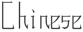 Dian Feng (Chicago, IL, then New York City, and then Hong Kong) designed the delicate oriental simulation typeface Hybrid and the shadow typeface Space in 2013 during his studies at UIUC in Chicago. Before that, he worked as an architectural assistant at the Beijing Institute Of Architecture Design, 1A3 Studio, Beijing, China. [Google]
[More] ⦿
Dian Feng (Chicago, IL, then New York City, and then Hong Kong) designed the delicate oriental simulation typeface Hybrid and the shadow typeface Space in 2013 during his studies at UIUC in Chicago. Before that, he worked as an architectural assistant at the Beijing Institute Of Architecture Design, 1A3 Studio, Beijing, China. [Google]
[More] ⦿
|
Diana Ahn
|
Evanston, IL-based creator of Chicago Type Redesigned (2014). Behance link. [Google]
[More] ⦿
|
Dillon Sinasky
|
Belleville, IL-based designer of Unchained (2014), a display typeface with glyphs that are related to bike chains. [Google]
[More] ⦿
|
Dilworth Typographics Inc
[Silas Dilworth]
|
 Type designer (b. New York, 1975) who used to be on the staff at T-26 in Chicago from 2001-2004. His bio at MyFonts: Silas Dilworth focused his typographic vision as font technician and resident type designer at [T-26] from 2001 through 2004, producing various custom typefaces and overseeing the production of hundreds of new releases. In 2005 he started laying the groundwork for TypeTrust LLC, a font distribution partnership co-founded with fellow type designer, Neil Summerour. Silas has produced custom type for such clients as The Food Network, Converse, Cartoon Network, Caterpillar, Aon Corporation, Time Out Chicago, and Columbia College Chicago. In 2007 he joined VSA Partners in Chicago, producing exclusive type for the acclaimed design firm's private use. One such project, an expansive sans-serif text family, was chosen to anchor IBM's refreshed identity system in the iconic corporation's award-winning 2006 Annual Report. He co-designed Adriane Text with Marconi Lima in 2007.
 He co-designed Iskola (2002, T-26) with Amondó Szegi. In 2005, he set up Dilworth Typographics Inc, where his own creations include Bridge (his version of Bank Gothic), Cooter, Dilworth (a sans family), Everafter, Lump, Midinote (futuristic), Oberon (heavy Bank Gothic-style typeface with great body), Soren, Trauen, Vandermark and Yesterday. His collaborative typefaces are Diego, Fatty (stencil/headline family, designed together with Chris May), Rickety (outline face, done with Chris May), Alphaben (comic book style), Elidel, Majestos Wide, and Sansarah (commissioned handwriting for Columbia College Chicago, based on the hand of Sarah Faust). At The Type Trust, which he helped set up in 2005 with Neil Summerour, we find Diego, Fatty, Cooter, Cooter Deuce (stylish art deco pair of typefaces, Regular and Plugged), Cooter Slim (like the other Cooters, this makes me think of Pacman), Facebuster (2008, fat slab serif, typeTrust), Vandermark, Everafter, Reservation Wide (2006), Lump, and Rickety. In 2007, he added Breuer Text, Condensed and Breuer Headline (corporate geometric sans families) to The Type Trust. This was followed in 2008 by the 16-weight sans family Heroic Condensed. MyFonts catalog. [Google]
[MyFonts]
[More] ⦿
|
Dino Sanchez
|
 Chicago-based industrial designer who cofounded Orange Italic in 2000 with Christian Schwartz. Together, they have collaborated on logos, illustrations, and typefaces. The six-weight Luxury family (2006, House Industries; but as early as 2002 at Orange Italic) contains three serif text weights called Luxury Text, as well as three display typefaces, called Platinum (art deco), Gold, and Diamond (all caps with triangular serifs). They were designed by Christian Schwartz and Dino Sanchez.
 In 2014, Christian Schwartz and Dino Sanchez co-designed the roman inscriptional typeface Gravitas. The name was already in use by Riccardo de Franceschi (since 2011), Laura Eames (since 2013) and Keith Tricker (since earlier in 2014), so there may be some emails flowing between these type designers. They write: The primary inspiration for Gravitas was Augustea Nova, Aldo Novarese's quirky and spiky Latin interpretation of the Roman inscriptional caps for the Nebiolo Type Foundry, released in a single weight in the 1950s. It's fairly common to see Augustea Open these days, but his lowercase apparently didn't survive the transition to phototype. Many designers have tackled the problem of matching a lowercase to the classical Roman capitals, with decidedly mixed results. The Bold Italic was drawn by Jesse Vega. Future web site. Typedia link. [Google]
[More] ⦿
|
Diti Katona
|
Founding partner and creative director of Toronto-based Concrete Design Communications Inc. She has lectured at the Ontario College of Art and Design and the design department of York University. [Google]
[More] ⦿
|
D.M. Campana
|
Author of many art books, based in Chicago, IL, where he ran D.M. Campana Art Co. His books include Book of Monograms and Fancy Letters (1900) and The Artist and Decorator (1924, 1925). The latter is an art nouveau text influenced by Alphonse Mucha. [Google]
[More] ⦿
|
Edgar Eliud
[Edgar Rios]
|
Edgar Eliud (Edgar Rios, Chicago, IL, b. 1994) created the Kafkaesque black-on white poster typeface Pimper (2008) and the handwriting typefaces riosedgxrNo (2009), Edgar Da Cool (2008) and Cursive Edgar (2008). Behance link. [Google]
[More] ⦿
|
Edgar Flores Diaz
|
Art director in Chicago, who created the avant-garde typeface Caracas Sans Serif in 2013. He studied in 2012 at University of the Sacred Heart, San Juan, Puerto Rico, and has a BFA from Florida International University, Miami, FL. [Google]
[More] ⦿
|
Edgar Rios
[Edgar Eliud]
|
[More] ⦿
|
Edward Blake
[Atavistic]
|
[MyFonts]
[More] ⦿
|
Edward Blankenship
|
Chicago, IL-based designer of Vulturous (techno typeface), Vutura Line, TTD 209 (sans), Steadfast (Treefrog-style ink spill script), Dil (hand-drawn poster typeface), and Hellhound (spurred vintage typeface). These typefaces were made in or just before 2014. Behance link. [Google]
[More] ⦿
|
Edward C. Mills
|
Master of business writing and business penmanship, b. 1872, Illinois, d. 1962. He worked mostly in Rochester, NY first for The Williams & Rogers Company and later as an independent penman. Author of Modern Business Penmanship (1903, American book Company). [Google]
[More] ⦿
|
Edy Type
[Ricardo Victor Rousselot Schmitt]
|
 Ricardo Victor Rousselot is a calligrapher and type designer born in Argentina in 1936. He was trained in the sixties in Chicago in the studio Ficho&Corley Inc., which was led by a disciple of Frederic Goudy and Oswald Cooper, Carl Corley. After that, he returned to Buenos Aires, and in 1975, he settled permanently in Barcelona, where he teaches at the University of Barcelona.
 His typefaces include Carlomagno (1997-2000) and Uncial Romana (1996), released by Neufville. He sells his fonts nowadays through his foundry, Edy Type. For example, in 2010, Edy Type launched the lively connected handwriting font Despeinada, which, Ricardo says, tries to find the middle between Mistral and Zapfino. Chevronne (2010, not my favorite) is based on mediaeval / gothic forms but tries to be contemporary. Drumbeat (2011) is a calligraphic script face, and Bambola (2011) is a curly signage script. Klingspor link Behance link. MyFonts link. [Google]
[MyFonts]
[More] ⦿
|
Elaine Fong
|
Elaine Fong (Illinois) made illustrated drop caps for Scott Thomas's book Designing Obama. [Google]
[More] ⦿
|
Elan Max Shohet Zabin
|
Chicago, IL-based designer (b. 2000) of the display typeface Sequential (2018). [Google]
[More] ⦿
|
Elfring Soft Fonts
[Gary Elfring]
|
Gary Elfring's company in Wasco, IL, which was founded in 1979, sold many fonts in the early 1990s, often adaptations of well-known fonts. It is presently based in St. Charle, IL. Some subcategories of fonts: - Art Deco fonts: Baha (1992), Broad Avenue, Hafnium, Haman Bold, Narcosis Oblique, Neaten, Orange Oblique, Ramose Oblique, Totem, Zyme Oblique.
- Bar Code fonts (Code 128, Code 39, UPC, 2/5 Inter, PostNet, EAN 8/13).
- Script fonts: Aristocrat, Blush, ESF Elite Light, Grandam, Hotpress, Jessica, Old English, Saffron, Tech Bold, Zap Charles
- MICR or check printing fonts, including Mic-EarthNormal (1992).
- Display typefaces: AdrianneNormal, ApexCondensed-Oblique, BlackChanceryNormal, CoronetNormal, Dalith, ESFEliteNormal, Emir, Expiry-Oblique, Expiry, GrangeCaps-Oblique, GrangeCaps, Hafnium-Oblique, Hafnium, Harbor-Oblique, Hartebeest, Hasp, Hesitate, Jayhawk, JayhawkExpand-Oblique, JayhawkExpand, Jetty-Oblique, Jetty, Jevons-Oblique, Jevons, Jocund-Oblique, Jocund, Josephine-Oblique, Josephine, Josiah-Oblique, Josiah, Kansas-Oblique, Kansas, Kaufman, Kermis-Oblique, Kilung-Oblique, Lackey-Oblique, Lackey, Lactam-Oblique, Lactam, Langur, Lazar-Oblique, Lazar, Ligand, Liquid-Crystal, Liquid-CrystalOblique, Lunatic-Oblique, Narcosis, Nonage, OldEnglishNormal, Orange-Oblique, Orange, Pavis-Oblique, Pavis, Quintly, Rankle-Oblique, Rankle, Saccule-Oblique, Saccule, Tarunda, Totem, ZapChanceNormal, Zwieback-Oblique, Zwieback, Zyme-Oblique, Zyme. An oriental simulation face, EchoCaps (1995), is here.
- A partial list: 226-CAI978, Aacho, Aapex, Aaron Heavy, Adrianne, Advance, Advertiser, Agency, Alien-Tongue, Alonse, Amber, Antiquarian, Antique, Antique Olive, Aristocrat, Avante, BC93Circle, Baha, Bahase, Bar Code 25, Bar Code 25 Interleaved, Bar Code 39, Bar, Bearer 25i, Big City, Black Chance, Black Chancery, Blippo, Bodoni, Broad Avenue, Broad Street, Brush, Bullet, Cal Zap Chance, Carefree, Cas Open Face, Century, Century School, Chicago, Circled Letters, CircledNumbers, Coach, Codabar, Code 128, Code 93, College, Commercial Script, Computer, Cookies, Cooper Italic, CooperBlack, CopperPlate, Coronet, Cursive Elegant, Dalith, Danley, DateLine, Deloise, Devotion, Dodge, DomCasual, Dot Matrix, EAN, ESF Deco, ESF Dingbats, ESF Elite, ESF Rounded, ESF-Elite, Earth, EchoCaps, Elegant Script, Elfring Elite, Elite, Emir, Engrave, Engraved, Expert Dingbats, Expert Elite, Expert Rounded, Expiry, Fashion, Flourish, Franzquo, Frit Qat, Fritz Quad, Friz Kat, Futena, Futura Black, Future, Garamond, Geometric Medium, Gillies, Gin and Tonic, Goudy Old Style, Grandam, GrangeCaps, Greece, Hafnium, Haman Bold, Hand Brush, Handel, Handsome, Hartebeest, Hasp, Heidelstein, Hellenic, Helv, Hesitate, Hobo, Hotpress, Illusion, Impact, Initial, Jayhawk, Jessica, Jetty, Jevons, Jocund, Josephine, Josiah, Jurassic, Kansas, Kaufman, Keys, Klefmon, LCD, Lackey, Lactam, Laguna, Langur, Lazar, Lenswith, Letter, Ligand, Liquid Crystal, Listium, MICR, Madison, MarriageScript, Micro, Microstile, Montana, Mossman, Mossy, Narcosis, Neaten, Next Trek, Nonage, OCR A, OCR B, Old English, Orange, Park Place, Park Street, Pavis, Pelicent, Penoir, PlanetEarth, Playful Print, Postal, Precidio, Prestige Elite, Query, Quintly, Ramose, Ranch, Rankle, Ransom, Revenue, Revue, Risky, Rockford, Roman, Saccule, Saffron, Salamander, Sans, Sci Fi, Script-Roundhand, Secure, Shaundow, Stensil, Tarunda, Technical, TiffBlack, Titanic, Totem, Toto, Trumpet, UPC, Umbles, Umpa, Un Gard, University, Vantrel, Vingy, Wolton, Yarnell, Zanders, Zap Chancery, Zap Dingbats, Zodiac, Zwieback, Zyme.
Dafont carries some of their free fonts, including the futuristic typeface Earth (1992). [Google]
[More] ⦿
|
Elizabeth B. Oshinowo
|
Chicago-based designer of the connect-the-dots typeface Bionic Tech (2013). [Google]
[More] ⦿
|
Ellie Henderson
|
 Australian designer (b. Perth) based in Chicago.She designed Akimbo, a text typeface with serifs, suitable for use in branding and design layouts. It is part of a self-directed project conceived whilst undertaking the Principles in Typeface design course at Cooper Union in June-July 2020. In 2021, she developed the creamy organic typeface Nutter at Type Cooper. [Google]
[More] ⦿
Australian designer (b. Perth) based in Chicago.She designed Akimbo, a text typeface with serifs, suitable for use in branding and design layouts. It is part of a self-directed project conceived whilst undertaking the Principles in Typeface design course at Cooper Union in June-July 2020. In 2021, she developed the creamy organic typeface Nutter at Type Cooper. [Google]
[More] ⦿
|
Elliott Montes
|
Grayslake, IL-based designer of a display typeface in 2017. [Google]
[More] ⦿
|
Elmer H. Antonsen
|
Professor Elmer H. Antonsen, Head Department of Linguistics at the University of Illinois, has developed a runic font for the Mac called Vimose (this font is not on his site though). [Google]
[More] ⦿
|
EmDash
[Marshall Bohlin]
|
EmDash is Marshall Bohlin's foundry in Northfield, IL. Fonts: ArchiText, Arrow Dynamic, BulletsNStuff, GendarmeHeavy, Perky, Story, Upstart, Briar, Konway, Palomar, Caspian. [Google]
[More] ⦿
|
Emmaleia Kardaras
|
Comunication design student at Judson University in Illinois. Elgin, IL-based creator of the thin geometric typeface Emmafont (2010). Behance link. [Google]
[More] ⦿
|
Emmi Laakso
|
 Emmi Laakso (Chicago, IL) designed Manifesto, which is a friendly, but authoritative open-source stencil typeface intended to be used by non-profit organizations and individuals to propagate sociopolitical messages in public environments. There are Manifesto Rounded and Manifesto Geometric.
 Behance link. [Google]
[More] ⦿
|
Eric Donelan
|
 Eric Donelan is an illustrator and painter based in Wheaton, Illinois. With Bob Aufuldish, Eric is the only designer at Emigre with a sense of humour, as he proves in his funny dingats fonts Zeitguys One and Two (1994) and Big Cheese (1992). At GarageFonts, he designed Mantra (dingbats, 1996) and the Vision Thing dingbats. [Google]
[MyFonts]
[More] ⦿
Eric Donelan is an illustrator and painter based in Wheaton, Illinois. With Bob Aufuldish, Eric is the only designer at Emigre with a sense of humour, as he proves in his funny dingats fonts Zeitguys One and Two (1994) and Big Cheese (1992). At GarageFonts, he designed Mantra (dingbats, 1996) and the Vision Thing dingbats. [Google]
[MyFonts]
[More] ⦿
|
Eric Klinger
|
DeKalb, IL-based designer of Bobank (2016), a hybrid of Bodoni and Bank Gothic. [Google]
[More] ⦿
|
Eric Lee
|
Northbrook, IL-based designer of the handcrafted typeface Sweet Cutie (2015). [Google]
[More] ⦿
|
Eric Mueller
[Anchor Fonts]
|
[More] ⦿
|
Eric Schiller
[Tilburg Laserfonts]
|
[More] ⦿
|
Erik Vorhes
[Typedia: Type News]
|
[More] ⦿
|
Ernst Frederic Detterer
|
 Born in Lake Mills, Wisconsin, 1888, Ernst Frederic Detterer worked as a designer, instructor and calligrapher, and in particulat at the Ludlow Typograph Company in Chicago. He died in Chicago in 1947. The main typeface he designed was Nicolas Jenson (1923). The type was renamed Eusebius in 1941. Nicolas Jenson was based on the original work of fifteenth century designer Nicolas Jenson.
 Jim Spiece's Nicolas Jenson SG is based on Eusebius and on extensions of Eusebius by Detterer's student, Robert Hunter Middleton. McGrew writes about Eusebius: Eusebius is Ludlow's distinctive adaptation of the types of Nicolas Jenson, which were first used about 1470 and have served as inspiration for many of the best roman typefaces ever since. This typeface was designed by Ernst Detterer in 1923, and issued as the Nicolas Jenson series. Robert H. Middleton, who had been an art school student of Detterer's, was first hired by Ludlow for the temporary assignment of seeing this typeface through production. By 1929 he had designed matching bold, italics, and open. Slight modifications were later made to the Nicolas Jenson series by Middleton (who remained at Ludlow for a distinguished career, designing scores of typefaces over forty-seven years), and it was reintroduced in 1941 under the series name of Eusebius. This name comes from the 1470 book in which Jenson's original type was first used. In the specimen of Eusebius, the J and f shown separately at the end are the original Detterer design of the letters most obviously redesigned; other changes were minor. In addition to the characters shown in the specimens here, with the usual ligatures for all fonts, oldstyle figures were available for Eusebius and Italic and Open, while QU and Qu combinations with long tails and f combinations with overhangs were made for regular, Bold, and Open. Compare Centaur, Cloister, Italian Old Style. He created the Newberry Library Bindery Type ca. 1935. [Google]
[MyFonts]
[More] ⦿
|
Ernst Johnston (Edward) Lauschke
|
Nineteenth century engraver (b. Germany, 1872, d. 1944) in Chicago. He designed these typefaces: - Pekin (1888). This is an oriental simulation typeface first published in 1888 at the Great Western Foundry under the name Dormer. It was very novel at the time, and shows the mannerism of art nouveau. The name Pekin was given to it by BB&S after Great Western morphed into BB&S. The name Pekin was probably first given in 1923, but surely before 1925. McGrew says this: Pekin is one of many typefaces renamed by BB&S for their 1925 specimen book. Its original name was Dormer, patented by the Great Western foundry in 1888 and credited to Ernst Lauschke. It is a very novel face, basically a fine-line letter with most characters having a heavier accented portion in an unconventional place. Vertical strokes on some of the capitals extend downward like descenders. It was made only in two sizes, one of which was later plated by Type Founders of Phoenix, after ATF had recast it in 1954. For a digital revival of Pekin, see Pekin by Solotype.
- Handcraft Title and Handcraft Wide Title. Mac McGrew: Handcraft is renamed by BB&S for its 1925 specimen book. Handcraft Title was designed by Ernst Lauschke in 1887 as Spenser; this was followed by Wide Spenser which became Handcraft Wide Title. With lowercase added a few years later, Spenser became Southey, and later Handcraft.
- Brevet Normal (1887). A Victorian typeface revived in digital form by Dan Solo.
- Additional typefaces at BBS: In 1891, Julius Schmohl and Ernst Lauschke designed an art nouveau and a Victorian face for BBS. Unnamed BBS typeface from 1887.
[Google]
[MyFonts]
[More] ⦿
|
Faith
|
Chicago, IL-based designer of the hipster school project font Qhord (2015). [Google]
[More] ⦿
|
Faith Ringor
|
For a school project, Faith Ringor (Streamwood, IL) designed the decorative typeface Chords (2015) and Orbit Type (2015). [Google]
[More] ⦿
|
Fascination Workshop
[Jason Warriner]
|
Jason Warriner's foundry located in Oakland, CA. Their dingbat fonts include Moon Phases (2008) and On The Ground (2008). Jason was born in 1974 in Woodland, CA and has an MFA from the School of the Art Institute of Chicago. [Google]
[MyFonts]
[More] ⦿
|
Feeling C. Foster
[The Union Type Foundry]
|
[More] ⦿
|
Filmotype Sales Company
|
 Filmotype Sales Company was located at 4 West 40th Street in New York City. In 1955, they published a catalog entitled Lettering Styles Display Types, from which some samples are shown in the link. The catalog has no full alphabet specimen and is thus of limited value for type historians and type revival experts. Frank J. Romano writes here: In 1952, Al and Beatrice Friedman [the founders of Filmotype] introduced the Filmotype, a simple manual phototypesetter that was not much bigger than a shoebox and used 2-inch filmstrips with all glyphs in linear order, with marks below them so that the operator could position the letter and expose it to the photo paper. The process was blind in that you could not see the letters as they were exposed. The Friedmans would go on to introduce the Alphatype phototypesetter. The Sybold Report mentions: Filmotype has a 35-year history as a supplier of filmstrip headline setters. Its founders later moved on to start Alphatype Corporation, keeping Filmotype as a subsidiary. In 1987, Harry and Seta Brodjian, who were Alphatype employees, acquired Filmotype with the intention of rejuvenating the company. In 1989, the firm began development of a digital headliner. A year later, it began digitizing its fonts. The company was renamed Filmotype Corporation. The fonts were at one point sold in packages such as a 30 dollar TrueType Font Package of 100 designer typefaces and an EZ Effects Windows program. Typefaces were renamed: Clarendon becomes Clarion, and so forth. At that point, Filmotype had offices in Glenview, IL, and was run by Gary Bunsell. About the renaming practices, the typophiles mention that Filmotype fonts were given letters&numbers by VGC when they pirated a substantial number of them. Their original names were attached by someone going through a dictionary and just picking arbitrary words for Filmotype fonts that were initially just letters and numbers also.
 In 2006, the Filmotype collection was bought by Font Diner. In 2007, Font Diner started publishing digitizations of the collection: Glenlake (condensed Bank Gothic, by Mark Simonson), MacBeth (script), Alice (casual script), Zanzibar (calligraphic), La Salle (brush writing originally by Ray Baker in the 1950s, named after Chicago's LaSalle Street), Quiet, Ginger (Mark Simonson; masculine headline typeface genetically linked to Futura), Austin (paintbrush), Brooklyn (hand-printed), Honey (handlettered script), Jessy (handwriting), Modern (i), Vanity. In 2010, Stuart Sandler published a book entitled Filmotype by the Letter, in which he details the company's history. He also set up Filmotype as a foundry in Eau Claire, WI. Additions to the Filmotype collection in that year include the signage typefaces Filmotype Kentucky, Filmotype Kingston, Filmotype Harmony and Filmotype Hamlet, and the geometric sans Filmotype Fashion (orig. 1953). The signage typefaces were originally made by Ray Baker for Filmotype in the 1950s, and were digitized by Patrick Griffin and Rebecca Alaccari. Activity in 2011. Patrick Griffin and Rebecca Alaccari revived the condensed sans typeface Filmotype Giant (2011) and its italic counterpart, Filmotype Escort (2011), as well as Filmotype Prima (a sho-card face from 1955). Neil Summerour contributed Filmotype Horizon after an original signage typeface from 1954. Mark Simonson created Filmotype Gay, a tall monoline sans originally from 1953. Filmotype Ford (2011) and Filmotype Jamboree (2012, an informal script based on a 1965 original) are due to Stuart Sandler. Filmotype Quartz is an inline face. Activity in 2012. Alejandro Paul contributed two scripts, Filmotype Yukon (based on Palmer style penmanship) and Filmotype Zephyr (formal italic roman). Later in 2012-2014, the production took off, with many contributions by Patrick Griffin and Charles Gibbons (who created Filmotype Zeal in 2013 for example). Typefaces from 2021: Filmotype Kinzie (by Lily Feinberg), Filmotype Andrew (by Patrick Griffin; a bold and wide extension of the retro casual script font Filmotype Athens). [Google]
[MyFonts]
[More] ⦿
|
Firebelly Design
|
 In 2016, Firebelly Design, Will Miller and Ross Burwell, all located in Chicago, co-designed the corporate identity font Flor Mono. Behance link. [Google]
[More] ⦿
In 2016, Firebelly Design, Will Miller and Ross Burwell, all located in Chicago, co-designed the corporate identity font Flor Mono. Behance link. [Google]
[More] ⦿
|
Font Mesa
[Michael Hagemann]
|
 Michael Hagemann's creations have a 1850-1920 style or at evoke the Wild West. Font Mesa was located in Naperville, IL, but is now based in Las Vegas, NV.
 Free fonts include Cactus Sandwich (Mexican simulation face), Timepiece (originally called Tax Cut), Timepiece 3D, Magic School One and Two (2004, two Harry Potter typefaces), Wild Ride, Corleone (2001: see also here), Corleone Due (2001), MightyRapids (2001: discontinued) and the Ferrari logo font FerroRosso (2002). Michael Hagemann's commercial fonts by year of production: - 2001: La Mesa (2001), Maverick's Luck (2001), Desperado (2001), Rio Mesa, Maverick's Luck (based on a bank document from 1876), La Macchina (2001, Lamborghini car lettering)
- 2002: Brewmaster Modern (lettering of Budweiser Racing), Saddlery and Saddlery Post (Western-style caps: a revival of Minaret by Ihlenberg in 1868; Solo calls it Trocadero), FerroRosso (lettering as in the Ferrari logo), Stampede (a family based on lettering used in document from the Chicago, Indiana&Eastern Railway Co. in 1902), Main Event (a Tuscan font, based on Tuscan Ornate, or Bracelet, fonts that date from before 1860; originally called Main Strike in 2003), Red Dog Saloon, Rough Riders (great Western-style caps), Draft Beer.
- 2003: OK Corral (revival of Caslon and Catherwood's Italian from 1821), OK Corral Lined (same as OK Corral with layers; called Italianate Barnum by Dan Solo), Gold Standard (a Tuscan font based on a few letters found on an old Gold Certificate from 1882), Rodeo Clown (based on Carnival), Taqueria, Cove.
- 2004: Bronc Stomper, Open Range, Saloon Girl (a spurred version, Tex Mex, appeared in 2021), Gillé Classic an exquisitily detailed family based on work by Joseph Gillé, 1820's, and implemented elsewhere under the names Circus, Roma and Madame; this was originally called Home Style; some say that the original goes back to Silvestre and not to Gillé; because of this, finally renamed Maison Luxe in 2017; the condensed versions, released in 2021, are Mi Casa and Mariachi), Miss Scarlett (Gone with the Wind poster lettering), Open Range, High Noon, Draft Beer Classic (2002-2005, connected 50s script), High Country, American West, West Wind, AmericanPop (Coca-Cola font).
- 2005: Buckhorn (a Tuscan style Western or circus font; renamed Circus Wagon in 2020), Rodeo Roundup (rope font; Solo called it Rope Initials), Algerian Mesa (32 fonts; extended to the gigantic font family Tavern in 2017, with further development in 2020 in Bay Tavern and Bayside Tavern; the original Algerian goes back to Stephenson and Blake), Conestoga (circus font), Rough Riders (a nice Western font based on the logo of the Beach Creek Railroad Company in the 1860s), Rough Riders Redux, Mesa Pointe (pointing hands, from 19th century sources), Black Pearl (an ornamental blackletter typeface based on an original from ca. 1860; it has two beautiful manicules; some say it is based on an 1860 font called Rimmed Black by West, published by Farmer&Little), Saloonkeeper (inspired by the Leinenkugels brewing label), Wanderer (inspired by the title logo of the TV show The Wild West), Lynchburg (inspired by the Jack Daniels Green Label Whiskey logo).
- 2006: Flatrock (a revival of Inverted Shaded by Julius Herriet, done at Conner in 1886; Solo calls it Big Cat; in 2020, Flat Rock was renamed Big Cat by Hagemann), Livery Stable (revival of GlypticShaded by Ihlenburg at MS&J, 1878. See also Glyptic and Glyptic No.2, 1878), Happy Holly Day, Main Street (a Tuscan typeface that revives Soutache by Julius Herriet and Bruce, 1873).
- 2007: Birdcage (2007, after a lettering sample in Rob Roy Kelly's American Wood Type book), Lonestar, Lonestar Western, Railhead (2007: 4 styles, a revival of an 1870s type style that was originally available from both Bruce's New York and James Conner's&Sons type foundries called English Two-Line Ornamented No.4; an earlier version was English, done in 1853 by Caslon, Austin, Woods and Sharwoods; and before that, the typeface was created by a German designer in 1849), Flying Dutchman (2007, a revival of a MacKellar, Smiths&Jordan Co Kanzlei-style font from 1876), and Western Sky (2007, a revival of a late 1800s Italian font known as Italian Slab Fancy or Dodge City: it is Italic Ornate from Smith, 1874, MS&J). Country Western (2007, 11 styles; plus versions called Country Western Script and Country Western Swing) is a revival of the classic William Page font known as Clarendon Ornamented originally designed in 1859 and again in 1877 by Vanderburgh&Wells. Abbiente (2007) is his first foray into the world of Bodoni and Didot. Buffalo Bill (2007) is a beautiful Western style font that revives a classic from James Conner's foundry from 1888 [Solo also calls it Buffalo Bill].
- 2008: Gold Rush and Gold Spur (2008) are further Wild West style families, based on typos from the Bruce Foundry, 1865. Silverland (2008, 8 styles; a revival of Ornamented No. 1490 by Ihlenberg, 1874, Bruce) and Belgian (2008, 5 styles; a revival of Ornamented No. 1515 by Julius Herriet, 1861, Bruce) are further revivals of typefaces from the Bruce Foundry.
- 2009: Spanish Main (revival of an old MacKellar Smiths&Jordan blackletter font named Sloping Black, 1896; others mention Witham and MS&J and give the date 1869), Spanish Rose, Black Rose (spiky blackletter based on BlackOrnamented No. 532, Ihlenberg, 1873, Bruce), Bella Rose (2009, blackletter), Broadgauge Ornate (revival of an 1869 Western poster typeface by Ihlenberg at MacKellar Smiths&Jordan). Apple Pie (2009) is some sort of Bodoni Ornate---it revives and extends a William Hagar Type Foundry face, ca. 1850 [MS&J added a lowercase in 1869]. This was followed immediately by Bodoni Ornamental. Hickory (2009) is an ornamental Western face, a revival of an old unnamed font dating back to 1852 and was sold through a few different type foundries including Bruce, MacKellar Smiths&Jordan and James Conner's Sons.
- 2010: Gunsmoke is a Far West font, a revival of a James Conner's Sons font that has been around the block under different names such as Extended Clarendon Shaded, Original Ornamented and Galena [Solo called it Galena]. Night Train is another Far West font.
- 2011: Gold is a multi-style slab serif font family based on the classic Gold Rush (1865, Bruce), with the shadows removed. Images: Gold Black, Gold Thin.
- Undated: Cowboy Serenade (based on Phidian by Ihlenberg, 1870, MS&J; Solo's names: Eureka, Shaded Phidian), Gold Fever (based on Caxtonian, 1878, MS&J), Old Thunder (based on a Tuscan typeface from the 1800s).
- 2013: Great Western, Cowboy Western, Cowboy Rodeo.
- 2014: Magnum Sans.
- 2015: Grillmaster (a basic sans family consisting of 128 fonts).
- 2016: Pitmaster.
- 2017: Ribfest (a Tuscan circus font), Texicali, Alta Mesa (Wild West wood type).
- 2019: Marlin Geo, a large sans typeface family---a modern geometric take on Helvetica. Michael writes on Creative Market: You may have noticed a new FontMesa font released on June 17th called Geovetica, Monotype has asked me to rename the font because it's too close to their best selling product. Marlin is the new name choice for our new font with the geometric version [Marlin Geo] being released first. Marlin Geo has many opentype features and comes with italics (at a 12 degree angle) and a slanted version (at a 6 degree angle). See also Marlin Soft (2019).
- Fried Chicken (2020). A 32-style slab serif family intended for supermarket or food product advertizing.
- Philadelphian (2020). A Western or billboard font family based on a MacKellar, Smiths & Jordan font from 1867 by the same name.
- Taco (2020). A multistyle Mexican party font.
- Tortilla (2021). A 24-style Tuscan typeface, a flat-sided version of Fontmesa's Saloon Girl and Tex Mex font families.
- Marzano (2021-2022). A 30-style blend of Futura, Helvetica and his own Marlin.
Klingspor link. Fontspace link. Dafont link. Creative Market link. MyFonts page. View Michael Hagemann's typefaces. Abstract Fonts link, [Google]
[MyFonts]
[More] ⦿
|
Font Monger
[Chris Vile]
|
 Chris Vile (Fontmonger, Austin, TX) is a type and graphic designer and web developer, who was briefly located in Chicago. He specializes in horror, graffiti, grunge and brush fonts.
 Creator of Cannibal (2012, scratchy hand), Die Already (grungy caps), The Dead Saloon (2012, Western caps face), the scratchy scary typeface Dead Bitch (2012), the athletic lettering typeface No Honor Roll (2012), the grungy Redux (2012), Konquer (2012), Sandy Ravage (2012), and Digital Anarchy (2012), the blood drip typefaces Spiked (2012) and XSpiked (2012), and the brushed typeface GwizsK (2012). In 2013, he designed The Five One Two (graffiti font), Skidmarked (graffiti font), There Be Monsters, Digital Disorder (a textured typeface), We Are Depraved, The Dead Are Coming (grunge), Barbaric, Welcome To Texas (graffiti font), Chopper City (a spurred constructivist typeface), Maya Rose (a script face), Chaos and Pain (a tattoo font), Abandon (grungy poster face), Virtual Bliss, and Pale Horse (a dagger font), Malevolentz (grungy caps), Shrapnel (grungy caps). In 2014, he created Turnt Up (graffiti font), Grind Mafia, No Hard Evidence (glass scratch typeface), Techno Wanker, Abduco (grunge), Blackhead, Summon The Executioner (grunge), The Grinder (eerie font), Normal Sometimes (rounded sans), November Mornings, One More Day, Waukegan Hustle, Thoughts of Her, All Cracked Out, Redux, Cook County Jailhouse, Ol Skool (graffiti font), Why So Serious (grunge), Never Speak Of, Taco Truck Militia, Reason to see evil, Reaching for heaven, Digital Firebomb, Gas Mask Warriors, Necrotype, The Deadliest Saloon, The Decompozed, Necro Monger, Self Righteousness (grunge face), Rasterized (brush face), Some Devil Faces, Flowers For You, Dirtgrub Graffiti, M Ponderosa (letterpress typeface), Dr. Toboggan, Midnite Hour. Typefaces from 2015: Thoughts of Her, Any Takers, Men of Nihilist, Rise Inside, Ugly Kids, Mya Papaya, The Unknown, Shun Set, Chops Chops, My Funeral, Blood Lust (dripping blood font), Middle Schooler, Hood Rich, Tequila Sunset, Hire a Cowboy, Tequila Sunrise, Cynical Hills (spurred eroded vintage typeface), Make them suffer (grungy letters), Gristled, Dark Waters, Poison Hope, Code Predators (grungy and squarish), Oak Lawn, Sovereign (grungy blackletter), Crucifixion, Sinner Script, Travis County (graffiti font), No Reverence (grunge), Barter With A Gypsy, Vance Jackson (graffiti script), Vary Sharky (brush face by Chris Vile and Roland Huse), Sons of Noah, Knife Fight Ballet, Dingle Huckleberry (grungy blackletter), The Grim Raiders, Tha Kool Kidz, Genesee St, Quaaludes, Quaalude Hulk, Kings Butcher, Gunfighter Academy (grungy and spurred), Buffalo Grove, Children Among Lions, Dedecus Putro, Dedecus. Typefaces from 2016: El Sancho Rancho, Hells Rider Decay (spurred style), Eternity Tomorrow, The Last Call, Our Retaliation (grungy), Zero Athletics, Filth of Icarus (grungy), Texas Slaughter, Black Dahlia, Real Horror, Means of Malice, Mechanization, Valley of Elah, Hells Rider (Tuscan), Black Jacket Boys, Outerspace Militia, Fort Death, The Lost Canyon, The Defiler, Solace for Sadist, Mind Antiks, Tattle and Tales, In Collection, Skinny Jeans (all caps sans), Born Addict, Born a Sinner, Pistol Grip Pump (spurred Western style), Under Authority (grungy), Thrash It, They Perished, Sinthetic, Epitaph (spiky tattoo font), Eternity Now (hipster style), Sniffin Paint, Poker Kings, Virtual Rot, Apex Flunkee. Typefaces from 2017: Urbane Cuisine (sketched), Boots And Spurs, San Antono Charros (spurred), Faxine Sky (hairline), Hooligan (graffiti face), Pack of Wolves (dry brush), Tweaky, Eatn Cake, Who Asks Satan (brush style), The Devil Net, Hallow Grave, Death To Metal, Brake Fluid (tattoo style), Boiled Denim, El Sancho. Typefaces from 2018: Reposed, A Glimpse, The Waiting Room (scratchy typeface), Philophobia, Medium Rare (a Western font; and its grunge version, Soiled Doves), Chased Through The Woods, Blood Thirst, Voices in my Head, The Quick Marker, Watch People Die, Blue Waffle (erasure font), Under Your Bed (all caps grunge), Eater of Children, Burn The Witch (dripping blood blackletter)Side Effects. Typefaces from 2019: Taken (textured), Krazy Hazy, Jackknife, Cowboy Cadaver (Western, spurred), Commanders, Mortem Throne, Among Dead Priest (brush), Smile and Wave, Impact Brutas, Rustic Man. Typefaces from 2020: Covid Contagion, Family Annihilator, Font to a Chainsaw, Paper Planets (squarish), Sad Szn, Bless The Galling, Marshal The Dead, Golfclub Homicide, Malignant (a Halloween font), Mustafar Reloaded, Pathogens (a rough brush font), Space Mavericks, Milwaukee Cannibal, Fit for Murder (a dripping blood font), Horror Type, Happy Face Killer. Typefaces from 2021: LCt50, Bandero, Nerve Agent, Disembowel, Heretic, The Riven, The Rivened, One more Day, Silly Games, Ode To Murder. Home page. Personal home page for Designs By Chris. Dafont link. Fontspace link. [Google]
[More] ⦿
|
FontBank
[Jerry Saperstein]
|
FontBank was Jerry Saperstein's outfit in Evanston, IL. A sub-project was called Alphabets&Images Inc. At first sight, this company seems to have created a collection by extrapolation and adjustment around 1992-1994, but that appears not to be the case (read on). The collection was posted on abf in January 2001, and used to be be downloadable from the Font Bank Lounge. It seems to have survived as part of Xara. List of FontBank fonts. Jerry Saperstein's reply to my original description: Your conclusion with regard to the original 325 fonts published by FontBank is incorrect. The fonts were not "created a collection by extrapolation and adjustment." For better or worse, all those fonts were hand-rendered in a totally legal manner from photographic enlargements of analog type specimens. In fact, after the Adobe ruling, FontBank received settlements from other "publishers" who had appropriated our code. (Confidentiality agreements prohibit me from naming those parties.) Obviously, if FontBank were unable to establish the original nature of its code, no one would have settled infringement claims with us. (...) The genesis of Alphabets&Images, Inc. also bears some explanation. It was not an "alias" for FontBank, Inc. Rather, it was the name of a joint venture between FontBank, Inc. and Photo-Lettering, Inc. Photo-Lettering, as may you may know, was the king of display film fonts, hosting such luminaries as Ed Benguiat. FontBank was their chosen vendor for digitizing their film fonts. The venture failed when Photo-Lettering went bankrupt. I believe UTC licensed the Photo-Lettering, Inc. collection thereafter. You would, in fact, be quite surprised to learn who FontBank did rendering for, but alas, confidentiality agreements prevent me from disclosing that information as well. Big, big companies seem to insist on clauses like that. Voilà. Homework for my readers: can you recognize Bastion, Borealis, Brandish, Colbert, Coolsville, and Dayton? [Google]
[More] ⦿
|
Forest Techologies
|
Stanley Ng (Cary, IL) offers fonts for beginners, with dashed lines and directions of writing. [Google]
[More] ⦿
|
Fox Valley Type
|
 This foundry is possibly located in Fox Valley, Saskatchewan, or Fox Valley, IL. Designer of the inline display typeface Rhidian (2020). [Google]
[More] ⦿
This foundry is possibly located in Fox Valley, Saskatchewan, or Fox Valley, IL. Designer of the inline display typeface Rhidian (2020). [Google]
[More] ⦿
|
Frances MacLeod
|
 A native of Wichita, Kansas, Frances MacLeod completed a Bachelor of Fine Arts in Advertising Art Direction and Graphic Design at Columbia College Chicago. She also studied at Type@Cooper and has worked with teams in Chicago and New York, most notably the Department of Design at Leo Burnett. She is currently based in Brooklyn.
 She created the free font Abraham Lincoln (2012, Lost Type). [Google]
[More] ⦿
|
Frank H. Atkinson
|
 Sign painter from the art nouveau era, who lived in Chicago and worked mostly for Cadillac. His books Sign Painting (1908) and Artkinson's Sign Painting (1915) influenced hand lettering and signpainting for many years afterwards. The following digital fonts are based on his designs:
 - FHA Sign DeVinne (2015, Michael Gene Adkins, James L Stirling).
- FHA Tuscan Roman (2014, Michael Gene Adkins, James L Stirling).
- FHA Nicholson French (2012). An art nouveau typeface digitized by The Fontry.
- FHA Condensed French (2012, by Michael Gene Adkins and James L. Stirling) is based on Frank H. Atkinson's examples.
- FHA French Eccentric (2009), by Frank Smith and Michael Gene Adkins. FHA Eccentric French Normal (2008) is free at Dafont.
- FHA Modernized Ideal Classic (2011) by Michael Gene Adkins and James L. Stirling.
- Bulletin Stub (The Fontry).
- Book Poster (2010). A series of fonts at The Fontry.
- Beauvoir (1993, David Nalle).
- French Plug (2007, HiH).
- Payzant Pen NF (Nick Curtis) is based on an Atkinson design shown in A Show at Sho-Cards: Comprehensive, Complete, Concise (1918).
- Atkinson Eccenteric, Atkinson Boomtown and Atkinson Egyptian, all made by David Nalle at Scriptorium.
- Still by The Fontry: the Broken Poster family (2010). In 2013, Michael Gene Adkins and James Stirling followed this up with the layered system Broken Gothic, which is based on Book Poster as well.
- Dick Pape created these revival fonts in 2009: ArtNouveauSigns, FHA1908ClassicPlug, FHAAdvertisersThickThinPl, FHAAntiqueBlock, FHAAntiqueRoman, FHAArtNouveau, FHAArtNouveauSigns, FHABradley, FHABulletinPlug, FHABulletinRoman, FHAChicagoTuscan, FHAClassicBlock, FHACondensedFrench, FHAEccentricFrench, FHAEccentricRoman, FHAEngrossingText, FHAExtremeFrenchBold, FHAFrenchRoman, FHAFrenchRomanLight, FHAFullClassicRoman, FHAGunningSingleStroke, FHAHalfClassicRoman, FHAModernizedIdealClassic, FHAModifiedAntiqueTuscanRom, FHAModifiedPlug, FHANewYorkRoman, FHANicholsonFrench, FHAPosterBlock, FHARoundBlockThickThin, FHARoundFullBlock, FHAShowCardFrench, FHASignPaintersPlymouth, FHASingleStrokeBlock, FHASingleStrokeTuscan, FHASpikeSpurFrench, FHAStonehouseEgyptian, FHAWesternLightTuscan, FHAWesternRoman, FHAWesternSingleStroke. Download page. [Google]
[MyFonts]
[More] ⦿
|
Frank H. Riley
|
Advertising artist (b. 1894, Joseph, Missouri) influenced by Oswald Cooper and Frederic Goudy, with whom he collaborated. He worked first as a lettering artist in New York and then as a free-lancer in Chicago. Designer at American Typefounders of the condensed and stocky slab serif typeface Contact (1944: see the TS Colonel family by TypeShop for a digital version) and the calligraphic script font Grayda (1939, ATF; +Initials). Grayda was digitized, expanded and modernized by Rebecca Alaccari as Genesis (2007). McGrew writes: - Contact Bold Condensed and Italic were designed by Frank H. Riley for ATF about 1942, but not released until 1948 because of war-time conditions. They are narrow and vigorous, with a large x-height and short ascenders and descenders, intended for newspaper and general advertising display. Other widths and weights were projected, but there is no evidence that they were completed. Compare John Hancock Condensed, Bold Antique Condensed.
- Grayda is an unusual and striking script designed by Frank H. Riley and introduced in 1939 by ATF. Lowercase letters are weighted at top and bottom. giving a strong horizontal emphasis; they are close fitting but not connected. Two sets of capital letters are available, designated Narrow and Swash. The IS-point size is cast on a 24-point body, the smallest size for which angle-body molds are used.
Klingspor link. [Google]
[MyFonts]
[More] ⦿
|
Frank Lloyd Wright
|
 American architect, artist and designer, b. Richland Center, WI, 1867, d. Phoenix, AZ, 1959. He was associated with the Arts and Crafts movement. His lettering inspired many to create typefaces based on them. The Frank Lloyd Wright museum is near the University of Chicago. He lived in Oak Park, IL, two blocks away from Luc Devroye's daughter. A partial list of fonts related to FLW:
 - David Siegel made Eaglefeather (1994-1999) for the Frank Lloyd Wright Foundation, which owns various manuscripts with his beautiful lettering. P22 made a few typefaces based on his hand.
- Christina Torre (P22) created P22 FLW Exhibition and P22 FLW Terracotta in 2000 (revival in 2018), based on alphabets by Frank Lloyd Wright published in 1931 and in 1896-1897 (in his book The House Beautiful), respectively.
- Paul Hunt made the FLW Midway font family (2006-2018), comprising Midway One, Two and Ornaments. This set is based on the lettering found on the Midway Gardens working drawings of Frank Lloyd Wright---tall-legged and casual.
- There are several free fonts. For example, swiftw5 created the typeface Hendrikus Wijdeveld (2010), based on a Hendrikus Wijdeveld poster entitled Architecture Exhibition / Frank Lloyd Wright from 1931.
- Funky Lloyd Wright (2002) by Kristian Walker (Eurekaville) is an experimental font based on Frank Lloyd Wright's ideas.
FontShop link. View Frank Lloyd Wright fonts. [Google]
[MyFonts]
[More] ⦿
|
Frederic William Goudy
|
 One of the great type designers of the twentieth century, 1865-1947. Born in Bloomington, IL, he made over 125 typefaces. He founded the Village Press with Will H. Ransom at Park Ridge, IL, in 1903. From 1904 until 1906, it was in Hingham, MA, and from 1906-1913 at 225 Fourth Avenue, New York City, where a fire destroyed everything except the matrices on January 10, 1908. From 1913 until 1923, it was located in Forest Hill Gardens, Long Island, and from 1923 until his death in 1947 at Deepdene, in Marlborough-on-Hudson, NY. He was an art consultant for Lanston Monotype from 1920-1940.
 His life's work and his ideas on typography can be found in his great book, Typologia, Studies in Type Design \& Type Making (1940, University of California Press, Berkeley), but his views are already present in Elements of Lettering (1922, The Village Press, Forest Hill Gardens, New York). His own work is summarized, shown and explained in his last book, A Half-Century of Type Design and Typography 1895-1945, Volume One (1946, The Typophiles, New York). See also Frederic Goudy by D.J.R. Bruckner for Harry N. Abrams Publishers, New York. In 1936, Frederic Goudy received a certificate of excellence that was handlettered in blackletter and immediately stated, Anyone who would letterspace blackletter would steal sheep. He also wrote: All the old fellows stole our best ideas, and Someday I'll design a typeface without a K in it, and then let's see the bastards misspell my name. His 116 fonts include - Camelot (1896, Dickinson Type Foundry). He sold another design in 1897 to that foundry, but it was never published. McGrew writes: Camelot or Camelot Oldstyle was the first typeface designed by Frederic W. Goudy. He offered it to Dickinson Type Foundry (part of ATF) in Boston, which accepted it and sent him $10, twice what he had modestly asked for it. This was in 1896; it was apparently cut and released the following year as drawn, without lowercase. In February 1900 a design patent was issued in the names of Goudy and Joseph W. Phinney, and assigned to ATF. Phinney was a well-known designer for Dickinson-ATF, and apparently it was he who added the lowercase alphabet. Its success encouraged Goudy to make a distinguished career of type designing, and this typeface was included in ATF specimen books as late as 1941. Compare Canterbury.
- De Vinne Roman (1898)
- Copperplate (1901): See Copperplate Gothic Hand (2009, Gerd Wiescher), Copperplate URW, or Copperplate EF (Elsner&Flake).
- Pabst Roman (1902)
- Village (1902). Some say 1903. Village was originally designed by Frederic Goudy in 1903 for Kuppenheimer & Company for advertising use, but it was decided it would be too expensive to cast. It was later adopted as the house face for Goudy's and Will Ransom's Village Press. The matrices were cut and the type cast by Wiebking. The design was influenced by William Morris's Golden Type. This Venetian typeface was digitized by David Berlow (1994, FontBureau), by Paul D. Hunt (2005), and by Steve Matteson (2018), who simply called his revival Village. Hunt's version was eventually released in 2016 by P22 as LTC Village. Ivan Louette (Belgium) is working on a fine version of Village as well.
- Bertham (1936), his 100th typeface, named for his wife, Bertha.
- Copperplate Gothic (ATF, 1905): The Bitstream version was done by Clarence Marder.
- Goudy Old Style (ATF, 1914-1915): A 15% heavier weight was made by Morris Fuller Benton in 1919. Bitstream and URW++ sell that as Goudy Catalogue. See also Goudy Catalogue EF (Elsner&Flake), Bitstream's Goudy Old Style, Scangraphic's Goudy Old Style SB (2004), Infinitype's Goudy Old Style, Bitstream's Venetian 522, and Softmaker's G790.
- ATF Cloister Initials (1917-1918). This was revived digitally by several foundries: Alter Littera did Initials ATF Cloister (2012). Group Type created Cloister Initials (2006).
- Goudy Handtooled (1916): A decorative font. Elsner&Flake and Bitstream have a digital version. The Bitstream version used to be called Venetian 523.
- Goudy Modern (Lanston, 1918): Goudy Modern MT is the Agfa-Monotype version. Adobe's version is confusingly called Monotype Goudy Modern.
- Hadriano (1918): Agfa-Monotype has a digital version, as does Adobe.
- Goudy Heavyface (ATF, 1925-1932): Created as a possible competitor of Cooper Black. Bitstream has a digital version.
- Goudy Newstyle (1921): additional letterforms are provided to distinguish different pronunciations. This legible semi-Venetian typeface was cut by Wiebking and recut in 1935. It was sold to Monotype in 1942. Revival by Steve Matteson in 2018 as Newstyle.
- Italian Oldtyle (+Italic) (ca. 1925): made after Dove, Monotype's president, prompted Goudy to make a Venetian typeface to compete with ATF's Cloister Old Style.
- Venezia Italic (1925), to accompany Venezia. George W. Jones of the English Linotype company had it made by Linotype.
- Aries (1925-1926): a kind of blackletter typeface in the style of Subiaco done for Spencer Kellogg for his new private press (he never used it).
- Goudy Dutch: based on handwriting on an envelope from Holland. Goudy lost the drawings.
- Companion Old Style and Italic
- Deepdene (1927). See D690 Roman on the SoftMaker MegaFont XXL CD, 2002. Deepdene became a Berthold font, and at Berthold it was digitized and refreshed by G.G. Lange from 1982-1983. URW also has a Deepdene family. But above all, one could pick up a free two-style revival by Barry Schwartz, Linden Hill (2010, OFL). View various Deepdene implementations.
- Goudy Text (1928). Based on the textura blackletter types of by Johann Gutenberg in the fifteenth century, Goudy Text has a narrow, ordinary lowercase. It can be used in display advertising and on certificates and invitations. Goudy Text is a "blackletter" type first used in 1928 by Goudy in a Christmas card from type cast at his own foundry. Among the digital versions, see LTC Goudy Text (P22 and Lanston; by Paul D. Hunt; this family includes LTC Goudy Text Lombardic Caps) and Goudy Text CT (Jason Castle).
- Kaatskill (1929, Lanston Monotype): a beautiful old style figures font originally done for an edition of Rip van Winkle. Mac McGrew: Kaatskill is a private typeface designed and cut by Frederic W. Goudy for use in an edition of Rip Van Winkle which he made for The Limited Editions Club, in 1929. Goudy says that what he had in mind was merely to design a type "as simple, legible, vigorous, clear, and effective in detail as could, and which would at the same time show no note of strangeness in the mass. ...I feel that Kaatskill owes nothing in its design to any existing face. and the type therefore is as truly an American type as anything so hidebound by tradition as type can be." It is named for the Catskill mountains, which were the locale of Goudy's home and workshop as well as of the story. See Trajan Title.
- Remington Typewriter (1929)
- Kennerley (1930) (see his book A Novel Type Foundery for specimens). The Berthold foundry, where the types can now be bought in digital form, mentions the dates 1911-1924.
- Ornate Titling (1931). See LTC Goudy Ornate (Lanston) and Goudy Ornate (2002, Ascender).
- Kennerley Bold and Bold Italic, and Kennerley Open Caps, to accompany Kennerley Old Style.
- Goudy Heavy Face (+Italic), made to please Harvey Best, the successor of Dove at Lanston Monotype.
- Marlborough (1930s): a typeface whose design was sold in 1942 to Monotype, but nothing came of it.
- Tory Text (1935). A blackletter typeface inspired by the lettre batarde used by Geoffroy Tory in his Champs Fleury.
- University (of California) Old Style (1938). Also called Californian (1938). A commercial version of this is ITC Berkeley Oldstyle by Tony Stan (1983). Font Bureau published FB Californian (1994, Carol Twombly, David Berlow, Jane Patterson).
- Bulmer (1939)
- Goudy Sans: ITC Goudy Sans (1986), LTC Goudy Sans (2006, Colin Kahn), Goudy Elegant (SoftMaker), Moon Cresta (Ray and Chikako Larabie, 2010) and Goudy Sans EF (now gone?) are digital revivals of Goudy's Goudy Sans family from 1929. GoudySorts MT, an Agfa Monotype font consisting of beautiful ornaments.
- Goudy Thirty. Mac McGrew: When Monotype suggested that Goudy design a type that that company might bring out after his death, to be called Goudy Thirty (from the newspaper term for the end of a story), he thought of a design he had started for a western college. That commission had fallen through, so the design was unfinished. Then, as Goudy relates, "This design struck me as particularly adapted to the purpose. As I worked on it I had determined to make it, as far as I was able, my last word in type design, a type in which would give my imagination full rein, and a type by which as a designer would be willing to stand or fall." Completed in 1942, it was kept under cover by Monotype and not released until 1953-long after his death in 1947. But he designed several types after this one, so it was not the last one from his hands. Goudy Thirty is a fine recreation of a fifteenth-century round gothic, excellent for period pieces. For digital versions, see LTC Goudy Thirty (Lanston, now P22 Lanston) and Goudy Thirty (a free font by Dieter Steffmann).
- Nabisco (1921).
- Garamont (1921).
- Goudy Initials. These are floriated caps.
- New Village Text (1938). A hybrid consisting of the capitals of Tory Text and the lower case of Deepdene.
Several foundries specialize in Goudy's types. These include P22/Lanston, which has an almost complete digital collection, Ascender Monotype, and Castle Type, which offers Goudy Trajan (2003), Goudy Text, Goudy Stout and Goudy Lombardy. WTC Goudy was digitized ca. 1986 by WTC. Links: Bio by Nicolas Fabian. Alternate URL. Andrew R. Boone's article on Goudy in Popular Science, 1942. Goudy's typefaces listed by Paulo W. Obituary, May 13, 1947, New York Times, Time Magazine, November 6. 1933, Amy Duncan's thesis at BSU entitled "Howdy Goudy: Frederic W. Goudy and the Private Press in the Midwest", A 2009 lecture on Goudy by Steve Matteson (TypeCon 2009, Atlanta), Melbert B. Cary Jr. collection of Goudyana. Wikipedia: List of typefaces designed by Frederic Goudy. Linotype link. FontShop link. [Google]
[MyFonts]
[More] ⦿
|
Frederick Eschrich
|
 Illinois-based artist who created the stenciled typeface Horatio (2013), the angular geometric typeface Fois (2012) and the hairline fashion mag typeface Maquila (2012). [Google]
[More] ⦿
Illinois-based artist who created the stenciled typeface Horatio (2013), the angular geometric typeface Fois (2012) and the hairline fashion mag typeface Maquila (2012). [Google]
[More] ⦿
|
G.A. Gaskell
|
Author of Gaskell's Compendium of Forms (1883, G.W. Borland&Co, Chicago). Number 1. Number 2. Image from the 1883 book. A drawing of Platt Rogers Spencer, also found in the 1883 book. [Google]
[More] ⦿
|
Gabrielle Holness
|
Bloomington, IL-based designer of the modular typeface Lorde (2017, made with FontStruct). [Google]
[More] ⦿
|
Gary Elfring
[Elfring Soft Fonts]
|
[More] ⦿
|
Gene M. Grubb
|
Designer of the free font DoodleArt (1999) and Doodle. Gene Grubb is from Danville, IL. Fontspace link. [Google]
[More] ⦿
|
George B. Walsh
[GreekKeys]
|
[More] ⦿
|
George Everet Thompson
[No Bodoni Typography]
|
[MyFonts]
[More] ⦿
|
George Gabriel
|
Chicago, IL-based designer of the decorative typeface Blender (2015) and the experimental typefaces Flesh (2015) and Flesh Extreme (2015). [Google]
[More] ⦿
|
Gerald Moscato
[Zipatone]
|
[More] ⦿
|
Gina Sipka
|
During her studies at Carthage College, Chicago, IL-based Gina Sipka designed Sundae Serif (2016). Behance link. [Google]
[More] ⦿
|
Gina Valdez
|
Graphic designer in Chicago. During her studies at Columbia College Chicago, she created a minimalist stencil typeface (2016). [Google]
[More] ⦿
|
Glenn Goluska
|
 Glenn Goluska (b. 1947, Chicago; d. 2011, Montreal) was a Canadian book designer and typographer. He came to Canada as a student at the University of Toronto. After graduating he worked for some time in the United States before returning to Canada to work at Coach House Press. He left Coach House Press to focus on letterpress printing first in Toronto and later in the Saint Henri neighborhood of Montreal under the labels Imprimerie Dromadaire and Nightshade Press. Goluska was awarded the Robert R. Reid Award for lifetime achievement or extraordinary contributions to the book arts in Canada by the Alcuin Society in 2011.
 Goluska had a book typeface designed in his honour by Nova Scotia-based type designer Rod MacDonald. The typeface, simply called Goluska, was published in 2021 at Canada Type, where Patrick Griffin oversaw the production and the addition of some variable fonts. Goluska admired Dwiggins, so Goluska, the typeface, was influenced by the puppeteer's work, especially the Scotch roman typeface Caledonia. Obituary by Brigitte Schuster. [Google]
[More] ⦿
|
Grace Hamilton
|
At Loyola University in the suburbs of Chicago, Grace Hamilton designed the blocky black experimental typeface Hamburger Type (2016). Behance link. [Google]
[More] ⦿
|
Graham Type Foundry
[John Graham]
|
John Graham (b. 1851) worked for MacKellar, Smiths&Jordan on specimen books. At night he studied drawing and letter design, bought engraving tools and taught himself type cutting. In 1882 he joined the Marder Luse Foundry in Chicago where he cut Spinner Script and Spinner Script No. 2, and some sizes of Inclined Program. He cut a minion size map font for the Illinois Type Foundry, and finally founded the Graham Type Foundry, primarily cutting borders and ornaments. Graham Type Foundry was located at 451 Belden Avenue in Chicago. [Google]
[More] ⦿
|
GreekKeys
[George B. Walsh]
|
Greek font information from the American Philological Association. It used to carry the unicode font Athena Roman. GreekKeys for Macintosh is a product providing easy keyboard input and specialized fonts for scholars of ancient (polytonic) Greek. First produced in 1984, GreekKeys has long provided a widely-used custom encoding for polytonic Greek, but now also supports and advocates Unicode as the proper standard for polytonic Greek in the future. GreekKeys is owned and distributed by the American Philological Association, a non-profit professional organization of North American classical scholars. GreekKeys is currently maintained and revised by Donald Mastronarde, Professor of Classics at the University of California, Berkeley. The original GreekKeys for Macintosh dates back to 1984, and was designed and distributed by George Walsh of the Department of Classics of the University of Chicago. He died in 1989, and the next year his wife, Susan M. Kastendiek (the eponym for the original name "SMK") donated the program to the American Philological Association. Since then it has been largely the responsibility of Jeffrey Rusten to update and answer questions about GreekKeys. The site was at Cornell University, but at some point it moved to Berkeley. [Google]
[More] ⦿
|
Greg Berry
[Symmetry Specialty Type Foundry]
|
[More] ⦿
|
Greg Hartl
|
Greg Hartl (Swansea, IL) designed the typeface Stache (2012) starting from fake moustaches. [Google]
[More] ⦿
|
Greg Thompson
[Greg Thompson Type]
|
[MyFonts]
[More] ⦿
|
Greg Thompson Type
[Greg Thompson]
|
Born in Nebraska, 1958, and resident of Mount Dora, FL. He graduated in 1985 from the Art Center College of Design in Los Angeles, California. In 1989 he began using Fontographer to make PostScript versions of existing typefaces for Chicago area design firms. At the invitation of Roger Black and David Berlow he became the first independent designer to contribute to the Font Bureau library. After Font Bureau, he joined Type Network. In 2021, he followed Sam Berlow to The Type Founders. Greg Thompson designed these typefaces: - Bodega Sans and Bodega Serif (1990-1992), originally released at Font Bureau. These are formal families, wearing a tuxedo for an art deco reception. Allan Haley's review of Bodega. Seee also Castcraft's OPTI Jake.
- Agenda (1993-2000, Font Bureau). A 54-style humanist sans family influenced by Edward Johnston's Underground (1916). Bluty (2000) seems to be a copy of Agenda. Agenda was remastered in 2022 as Agenda One at Type Network.
- Broadcare (2020). A 25-style expandsion and exploration of Morris Fuller Benton's art deco classic, Broadway.
- FB Century Bold Condensed (1992). After the 1906 design at ATF by Morris Fuller Benton.
- Clicker (1992-2005, Font Bureau). This soft octagonal typeface was drawn in 1992 for TV Guide and has since been used by CSI, Pepsi One, and Quicksilver. In 2005, Thompson has expanded the design, initially inspired by machine-readable type, to 44 new styles including italics and small caps. Type Network offers 30 styles of this soft techno design.
- Commerce (1991-1992, Font Bureau). With Rick Valicenti.
- Ooga Booga (1994). With Rick Valicenti at Thirst Type.
FontShop link. View Greg Thompson's typefaces. Article about Greg Thompson at Type Network. [Google]
[MyFonts]
[More] ⦿
|
Gregory Bry
|
Graphic design student at Columbia College in Chicago. He created a circle-based experimental typeface in 2011. [Google]
[More] ⦿
|
Günter Gerhard Lange
|
 Known to his peers as GGL. German type designer, born in Frankfurt-an-der-Oder in 1921, d. 2008. He fought in World War II and lost his leg in a battle in France. Starting in 1941, Lange studied as apprentice of Georg Belwe at the Academy of Graphic and Book Arts in Leipzig. After graduation in 1945, until 1949, he was assistant of Professor Walter Tiemann, while also practicing painting and graphic design independently. In 1949, he continued his studies with Professors Hans Ullmann and Paul Strecker at the Hochschule für Bildende Künste in West Berlin. From 1950 onwards, he worked at Berthold AG in Berlin, where he designed his first type, Arena in 1951. In 1955, he became Reader in Typography at the Meisterschule für Graphik, Druck und Werbung in West Berlin. One of his many students was Manfred Klein. He also was Advisor in Visual Communications and Reader at the U5 Academy of Graphic Design and Art Direction Munich, and Instructor at the School of Applied Art in Vienna. H. Berthold AG's artistic director from 1961 to 1990, Lange was responsible for the creation and meticulous production of many of Berthold's typefaces. According to Dieter Hofrichter, his motto was 8 point is the moment of truth (when proofing typefaces). In 1989 he received the Frederic W. Goudy Award from the Rochester Institute of Technology (RIT). Recipient of the year 2000 TDC medal. After ten years of retirement from his position as Berthold AG's artistic director, Lange resumed his design activities in 2000 at Bertholdtypes (now Berthold Direct Inc) in Chicago. Bio at ATypI.
 Lange's own designs include his revivals of many classical typefaces. Here is a list, all Berthold typefaces: - Akzidenz Grotesk AG Book (1969-1972; see Atkins on the SoftMaker MegaFont XXL CD, 2002), AG Book Stencil Pro, AG Old Face (1984), AG Schoolbook.
- Arena (1951-1959): a condensed stocky roman. Now called Arena New.
- Berthold Baskerville (1961). Berthold Baskerville Book appeared in 1980.
- Berthold Bodoni Old Face (1983; see Giambattista on the SoftMaker MegaFont XXL CD, 2002).
- Bodoni Antiqua (1935).
- Boulevard (Berthold, 1955). Imitated by Opticast (Brandenburg), Greenstreet (Koepenick), Lanston (Francis No.982) and in Regency. Boulevard was revived digitally by P22 as LTC Francis in 2018.
- Caslon Buch (1977).
- Champion (1957, a paint brush typeface revived in 2010 by Ray Larabie as Gloss).
- Concorde (1969; see C791 Roman on the SoftMaker MegaFont XXL CD, 2002, CJ by Itek, Chinchilla by Scangraphic, Transport by Varityper, Contus by URW, Dutch 809 by Bitstream, and Concept by SoftMaker), Concorde Nova.
- Deepdene (1982-1983), a revival of Frederick Goudy's Deepdene of 1927-1934.
- Derby (1952-1953). This script typeface was digitally revived by Gerhard Helzel, and in 2019 by Ralph M. Unger as Turnier.
- El Greco (1964).
- Franklin Antiqua (1976; see F820 Roman on the SoftMaker MegaFont XXL CD, 2002).
- Berthold Garamond (1972).
- Imago (1982).
- Publica. This Peignotian sans typeface was the source of inspiration for Ralph M. Unger's Bravura Pro (2013).
- Berthold Script (1977; see B690 Script on the SoftMaker MegaFont XXL CD, 2002).
- Solemnis (1952-1953, refreshed in 2003; a hybrid uncial remade by Harold Lohner in 2000).
- Walbaum Buch (1975) and Walbaum Standard (1976).
- Whittingham (with Dieter Hofrichter, 2000).
Yvonne Schwemer-Scheddin writes a day after his death: Dear type friends, yesterday morning, the 2nd of December 2008, Günter Gerhard Lange died, 87 years old. We lost an upright, steadfast fighter for quality in type design. Not only Berthold's artistic director, but a friend and objective adviser to many who needed personal help or an evaluation in type design. GGL was Berthold. For Berthold GGL "enhanced" many type designs of other well known type designers. His valued critizism was a great help, because it came from a positively tuned man. GGL transferred the lead heritage and its classical type typefaces into photocomposition and into the digital format on a high aesthetic and historically authentic level - as for instance Garamond or Van Dijk. Akzidenz-Grotesk is not thinkable without GGL. Bodoni Old Face one of the best contemporary text typefaces. With his sans serif Imago you can be different and yet classical. And the Americans should be pleased with the revival of Deepdene, which he also turned into a well working textface with a distinct character. But perhaps most important of all, he relentlessly encouraged the young, teaching and talking up to almost the end. Thus opening fences, eyes and hearts to art, architecture, literature and for the values of studies and love for the correct details without which the whole would not function. He was a rare communicator, because he lived his convictions and values. He became an example, a light of orientation. We lost a passionate type lover and expert---an authentic man. An era has come irreversible to its end. Credit for some images below: Danielle West. [Google]
[MyFonts]
[More] ⦿
|
H. Berthold AG
|
 H. Berthold Systeme AG was founded in 1858 in Berlin by Hermann Berthold. Also known as H. Berthold Messinglinienfabrik und Schriftgiesserei, the type foundry was the largest in the world by 1918, with offices in Stuttgart, St. Petersburg, Leipzig, Riga, Budapest and Vienna. It grew by acquisitions of many other foundries, see., e.g., here. A partial list:
 - 1897 Bauer&Co, Stuttgart, 100%, Germany
- 1898-1900 Branch St. Petersburg, 100%, Russia
- 1901 Georg Ross&Co. St. Petersburg + new Branch in Moscow, 100% Russia
- 1905 J. H. Rust&Co. Vienna, 100%, Austria
- 1907 A. Haase, Prague, 100%
- 1908 Ferdinand Theinhardt GmbH Berlin, 100%, Germany
- 1912 St. Petersbrug Branch of Flinsch (later Bauer), 100%, Russia
- 1917 Emil Gursch Berlin, 100%, Germany
- 1918 Gottfried Böttger, Leipzig, 100%, Germany
- 1918 A. Kahle, Weimar, 100%, Germany
- 1920 Julius Klinkhardt, Leipzig, 100%, Germany
- 1922 C. Kloberg, Leipzig, 100%, Germany
- 1926 Poppelbaum, Vienna, 50% - 50% to D. Stempel A.G., Austria
- 1926 First Hungarian Type Foundry, Budapest, 50% - 50% D. Stempel A.G, Hungary
- 1929 Genzsch&Heyse, Hamburg 33% - 33% Bauersische Gießerei (Bauer) - 33% D. Stempel A.G., Germany
Typesetting MPEG4 movie, ca. 1935. To complement its typesetting equipment business activities, Berthold developed the Berthold Exklusiv Collection, a collection of typefaces created solely for Berthold by distinguished designers. Günter Gerhard Lange began his association with Berthold in 1952, and was artistic director from 1961-1990. In March 1991, Adobe Systems and H. Berthold AG announced that Adobe was to produce PostScript versions of numerous Berthold Exklusiv ("BE") typefaces - these typefaces were later to be known as Adobe Berthold BE fonts. Until 1999, Adobe marketed its versions of 365 Berthold Exklusivs under agreements with H. Berthold AG, and later Berthold Types Limited. H. Berthold AG also produced its own digital versions of their entire library using the Ikarus system - some of these fonts are later to be known as Berthold BQ. In 1993 the company reported insolvency. A follow-up company, H. Berthold Systeme GmbH was formed, but it finally was dissolved in 1995. Shortly before dissolution, the Berlin-based H. Berthold company signed license agreements with and transferred certain rights and trademarks to a Chicago-based US company that later took the name Berthold Types Limited, now called Berthold Direct Inc. This company now offers digital versions of the "Exklusiv" Berthold typefaces. Some of its history is explained in this letter. Old blackletter typefaces from the metal era: Ballade (ca. 1927, Paul Renner), Berthold-Fraktur (1909), Bismarck-Fraktur (1860), Breda-Gotisch (1928, house font), Englische Schreibschrift (1972, version One, version Two; for digital versions elsewhere, see English 157 by Bitstream, or Elegant Script by SoftMaker), Deutschland (ca. 1934), Hansa Kursiv (ca. 1895: art nouveau style, the light version of Regina Kursiv), Schraffierte Gotisch (before 1900; aka Stella), Mainzer Fraktur (1901, Carl Albert Fahrenwaldt for Bauer and Berthold), Morris-Gotisch (before 1905, for Bauer and Berthold), Post Fraktur (1935, Herbert Post), Prinzeß Kupferstichschrift (1905, digitized by Ralph M. Unger as Prinzess Gravur in 2010), Regina Cursiv (ca. 1895: revivals include Carlsbad (2018, Ralph M. Unger), Regina Cursiv (2007, HiH), Toffee Script (2010, Tomi Haaparanta)), Sebaldus-Gotisch (1926: revival by Ralph M. Unger in 2019 as Sebaldus; see also the earlier revivals by Ingo Preuss and Dieter Steffmann, both called Sebaldus), Straßburg (1926, a blackletter face; the digital version by Delbanco is called DS Strassburg; see also Strasburg by Gerhard Helzel), Trump-Deutsch (1936, Georg Trump). House typefaces include Isolde (1912, script face), Augustea Kursiv (1906) and Augustea Fett. Hebrew fonts in their collection include Meruba, Stam, Mirjam and Frank Ruehl. Some of the Berthold collection can nowe be bought through Monotype Imaging and Linotype. [Google]
[MyFonts]
[More] ⦿
|
Han Na Jung
|
Designer in Chicago. Behance link. In 2011, she created a beautiful poster entitled Avenir, using Frutiger's 1988 typeface Avenir. [Google]
[More] ⦿
|
Hannah Carnes
|
Normal, IL-based designer of the dessert-themed decorative typeface Scrumdiddlyumptious (2016). [Google]
[More] ⦿
|
Hannah Morency
|
Chicago IL-based designer who graduated in 2016 from the College for Creative Studies in Detroit, Michigan. In 2016, she designed the eyeliner-themed typeface Lithe. Behance link. [Google]
[More] ⦿
|
Hannah Smith
|
Chicago, IL-based designer of Shaggy (2014), a decorative caps typeface based on Futura. Behance link. [Google]
[More] ⦿
|
Hannah White
|
During her studies in Carbondale, IL, Hannah White created the squarish video game typeface Robots In Retrospect (2015). [Google]
[More] ⦿
|
Harish Subu
|
 Harish Subu (Subramanian) is a Mumbai-based graphic designer and illustrator who is currently finishing his BFA degree at the School of the Art Institute of Chicago in Chicago, IL. He created a virtual branding campaign and typeface for the city of Mumbai in 2013. [Google]
[More] ⦿
Harish Subu (Subramanian) is a Mumbai-based graphic designer and illustrator who is currently finishing his BFA degree at the School of the Art Institute of Chicago in Chicago, IL. He created a virtual branding campaign and typeface for the city of Mumbai in 2013. [Google]
[More] ⦿
|
Harvey Hunt
[Berthold Direct Corp]
|
 [MyFonts]
[More] ⦿
[MyFonts]
[More] ⦿
|
Harvey Hunt
[Berthold Types Limited]
|
[More] ⦿
|
Heather Hartmann
|
Brookfield, IL-based designer of the handcrafted typeface Sketchy (2016). Behance link. [Google]
[More] ⦿
|
Heather Shaw
|
Designer and illustrator in Lisle, IL. She created the contrasted sans typeface Corbel Slim (2012, based on Corbel), and the artsy display typeface Artist's Block (2012). [Google]
[More] ⦿
|
Hector Banuelos
|
During his studies in Chicago, Hector Banuelos created the hipster typeface Korse (2015). [Google]
[More] ⦿
|
Henry P. Behrensmeyer
|
Respected American penman, b. 1868, Quincy, IL, d. 1948, Quincy, IL. Author of Lessons in Practical Penmanship (publ. D.L. Musselman, Quincy, IL). He taught penmanship his entire life in Quincy, IL, at the Gem City Business College. He is remembered for his exceptionally graceful flourished birds and swans. [Google]
[More] ⦿
|
Henry W. DeWitt
|
Codesigner at BBS in 1889 with Charles E. Tiede of an early art nouveau typeface. [Google]
[More] ⦿
|
Hobo
[Peter Zelchenko]
|
 Peter Zelchenko, a master trade typographer in Chicago in the 1980s and 1990s, gave me permission to tell his story about the origins of Hobo---both the name and the typeface. He contradicts Mac McGrew, but his explanation is more likely than all others that have been proposed. So here we go (all text below by Peter).
 (Thanks to Boston’s Bill Ricker and Dick Miller for coaxing me to cough this story up finally. I originally mentioned it in comp.fonts about 20 years ago, but the “O” situation, recently discovered, offers incontrovertible proof of the theory.) As a master trade typographer in Chicago in the 1980’s and 1990’s, I was the last of the breed here before desktop publishing finally made our race extinct. I imagine there were only two or three of us in that generation. Among the very few others in Chicago were Adam Kallish and Jason Pickleman, who both were working for the irascible Harvey Hunt, a Berthold guy, when he closed down his Typographic Resource and moved to Mac. (Harvey and his wife inherited ownership of the Berthold font collection. For decades Berthold was a top-quality typesetting platform.) I was working upstairs from them during the storied heyday of InfoComm, a pioneering PostScript service bureau, at 213 W. Institute Pl., site of the early Schwinn bicycle factory. You can still see thousands of bicycle screws embedded in the wood floors of that building. We were young and, with proficiency in computers, were able to bridge old and new technologies easily. We were also font whores. Most kids in those days used to save their money up for model airplanes or blow it all on Twinkies. When we were children, my brother Greg and I used to haunt Chicago art stores, scraping up money for Zipatone dry-transfer, or “rub-down,” lettering. Our favorites were things like Calypso, Mistral, and others by Roger Excoffon, Herb Lubalin, Ed Benguiat, Rosmarie Tissi, and the many other designers of that prolific period. I also did a lot of calligraphy. I still do work with flat and pointed pen as well as flat and pointed brush (a devotee of Father Catich to the end). In later life I was briefly president of the Chicago Calligraphy Collective. Despite my skills and interest, I was never admitted into the higher church: East Coast: Ephram “Ed” Benguiat had me out for a tongue-lashing. The famous Jewish cigar-chomping dean of New York letters walked me around the labyrinth of Photo-Lettering, Inc., his huge Manhattan shop. Stopping at various stations to introduce me to his team, he would pointedly ask each guy how long they’d been working for him. “I’ve been on this very Staromat in this very darkroom for 25 years,” I remember one of them saying. (I was a VGC Typositor guy myself, thanks in part to the support of my beloved mentor, Al Blitz of Photofont.) Then he introduced me to the sub-basement, where I met Marco, an art student almost ten years younger than I. “You still wanna to work here?” Ed challenged me. “Marco’s my new right-hand.” And he stubbed out his cigar in one of the shop’s numerous overflowing ashtrays. Apparently this trip was just for him to show me that if I wanted to move to Manhattan to be his apprentice, I’d have to work in the basement for years, getting behind even young Marco, who after three years was still making $6 an hour touching up the edges of Ed’s drawings. West Coast: David Lemon of Adobe flew me out for a lavish two-day interview session with the type staff. I remember getting to know Linnea Lindquist, Bob Slimbach, Carol Twombly, and this really nice guy who had worked for the inimitable Dan X. Solo. I knew he and I would be best friends when I moved out there, but I never got the call. I think I was too crude for them, not an artist like most of them, just some schmuck without much flair, trained in the many nameless shops. Back home: The market was getting too tight. Dean of Chicago of lettering Charlie Hughes (designer of Indy and, coincidentally, of the Benton variant Century Nova) chose calligrapher Eliza Schulte over me as his apprentice. Holly Dickens, for her part, though I know she loves me dearly, was never the type to take on help. George Lee before he died told me that I already had too much experience to be anyone’s apprentice, but I knew I was also far too unsophisticated and too inept at business to forge out without first getting a leg up. It didn’t help that I was stranded in the Windy City (a bygone typographic center, former home of much that we can be proud of), circumstantially unable to move to one of the coasts, where the action really was. The best we had here by then was Castcraft, widely felt by respectable industry to be the worst font plagiarists in history. Anyone who is friendly with the Kreiter family would still never consider their shady world a place for a skilled young designer to hang one’s hat for a career. It would have been even more pathetic for me to take Boomie Kreiter up on his frequent offers than to wait for young Marco to free up his naugahyde seat in Benguiat’s dusty office. I would never get a job at Adobe or Font Bureau with that on my resume. Despite heading toward that dead end, I did become the guy in Chicago who knew fonts. I probably can’t tell Helvetica from Helios these days; it’s been 30 years since I’ve had to compare them. But wherever I worked, my reputation followed me. Every few days, at one or another type shop, someone would yell out: “Pete. Someone just called, wants you to identify a font.” Soon I’d see coming in on the fax machine a request from some designer, or from another mope at another harried River North type shop, asking me to identify some obscure font sample. For about 10 years, everyone in town apparently knew that if anyone could figure out which foundry and font they were trying to match, I could. There were times when I would do no more than glance at the sample, and then call them back: “It’s Stempel Garamond; you can tell by the cipher.” “Gosh, Pete. We really appreciate it. What do you want for this?” “Just send me a check with lots of Stempel Garamond zeroes. Better yet, buy me a drink at the Redhead Friday night. We’ve got a massive annual report to finish, but we may get off before midnight.” Other times I’d pore over a stack of thick books from VGC, Photo-Lettering Inc., and Castcraft before I finally found the match. But I could not easily be stumped. I could quickly tell a Benguiat brush script from knock-offs, and I knew when I’d have to pull out VGC’s or Castcraft’s massive tomes and start flipping pages for 15 or 20 minutes. And then there was the ponderous TypEncyclopedia, whose sheer weight could kill a grown man. This was the heyday of the proliferation of advertising design and numerous competing typographic platforms, each with a knock-off and variants of a popular font. This was the high-water mark in American typographic activity. There were dozens of foundries and tens of thousands of fonts. And it all came crashing down as quickly, and today I have no memory, and everything is all washed away, and I wonder how I could have wasted so much of my life on so profitless a pursuit. Nobody remembers me, and no one cares. Even in Chicago I was just a fax number to most famous designers, just someone somewhere who could help them make a quicker profit a few minutes sooner. And I always did it gratis. But in that day font substitution was done only as a last resort, so I had to do it. * * * In those days, to pass the time lovers of letters would walk up and down the streets of their cities and simply name fonts they saw in windows, sometimes self-righteously adding the designer’s name and perhaps the approximate year of the design. “You’re wrong, that’s not Helvetica Bold, it’s Vladimir Andrich’s Claro Bold.” In those days as ever, Hobo was everywhere. It is one of the two or three best-known and most-used display fonts in history, and it has long enjoyed a kind of cult following. But while one of the easiest of fonts to identify, no typophile will dispute that the mystery of its name is easily one of the most rampantly speculated typographic questions over the last century. A few years ago, my pal Kibo and I came up with the answer to this century-old mystery, as well as an insight into the design of this odd Art Deco font. Morris Fuller Benton was the contented son of Linn Boyd Benton, the latter one of the most influential figures of all time in the graphic arts, arguably ranking somewhere near the pantheon among Gutenberg and Bi Sheng. Through the 19th century, the Wyeths did painting, the Brontës did writing---and the Bentons did type. Every industry in every age has its salon powerhouses, those titans whose magic could rub off on you if you could only get near enough. But of course unless you actually were family, often nothing was bound to happen. Grandpa Benton, as it happens, owned the Milwaukee Daily News and also became a congressmen, and his father in turn was a prominent East Coast physician. In fact, Grandpa was under consideration as a presidential candidate but lost out to Stephen Douglas. Patricia Cost wrote a wonderful history about the Benton family that tells even more. But, nepotism aside, Morris Fuller became quite a prolific and celebrated type designer in his own right, surpassed by only a few others in the number of iconic font designs to his name.  The two main stories behind the naming of Hobo are both probably apocryphal. The first is that the bow-legged shape of the letters suggested the legs of a hobo. The second is more creative, but it too lacks much support. According to one writer, Emil Klumpp of ATF gave a talk at the APA Wayzgoose conference in 1977 and mentioned the origin of the name. In his 1993 book American Metal Typefaces of the Twentieth Century, historian Mac McGrew apparently summarizes Klumpp’s report: “One story is that it was drawn in the early 1900s [when Art Nouveau was still in fashion] and sent to the foundry without a name…but further work on it was continually pushed aside, until it became known as ‘that old hobo’ because it hung around so long without results.” * * * McGrew died a few years ago, as did Emil Klumpp, but I wish they were still alive so that we could debate these facts. Both were born long after the font. There is absolutely no evidence that the font’s design was begun earlier than 1910; that speculation may well owe itself only to its convenience to the story itself. Something just doesn’t seem to add up. We have, however, harder facts. The quintessential nerd, James “Kibo” Parry worked on the Atari 2600 design team. He became a household name on the early Internet by haunting Usenet newsgroups and contriving numerous online larks to amuse the digital populace, which at the time did not yet number 50,000 or so worldwide. Kibo once had a two-page feature all to himself in Wired magazine. He had a religion called Kibology named after himself, with a bizarrely popular online discussion group of thousands of subscribers. Kibo was even immortalized in the Geek Code, an early Internet fad that one would put in the signature of one’s e-mails and online posts to indicate level of geekiness and hence high-tech social status. There were several indicators, such as how well you knew the C language, or whether you were Unix (good) or MS-DOS (bad). The number of pluses after a letter code indicates the level of accomplishment. C is, predictably, C, and the Unix/Windows letter codes are U and w. There is even a flag for how close one is to Kibo. At the top end, it included: “K++++ I’ve met Kibo,” “K+++++ I’ve had sex with Kibo,” and “K++++++ I am Kibo.” At the bottom are several negative indicators, such as “K–” I dislike Kibo. I have the dubious distinction of being somewhere close to the K+++++ category, because technically I’ve, uh, slept with Kibo---well, at least I’ve shared his bedroom. Here is Kibo’s own e-mail signature which, although over 1,000 lines long, does not include a Geek Code. But it does give you an idea of the strange humor that is Kibo. Apart from all of this, Kibo is also a lover of type, and very knowledgeable about it. He and I were wandering around downtown Boston sometime around 1992, the morning after a rather snooty ATypI wine-tasting event hosted by David Berlow’s Font Bureau, celebrating Matthew Carter. Seeing the well-dressed and well-paid scions chatting and sipping red wine, it was impossible to picture us really fitting in there. And, of course, nobody paid the least attention to us. Another time, in 1994 in San Francisco, ATypI met, and the pushy, competitive nature of the nascent PostScript font industry took a more direct form. The Dutch youth, Erik van Blokland, Luc de Groot, and brothers Just and Guido van Rossum, had crossed the pond. There was a kind of technical mosh pit established as a playground for us 15 or so “youngsters” in which to create the show daily. This playground was billed as a social collaborative activity. But I recall the four Dutchmen muscling over this and other activities with equal, shall we say, zeal. A couple of less pushy participants raised a stink to the elders and yet the rebellion was discreetly put down. As is the case in such societies, most of us budding young craftsmen were hoping for some attention, but we were not nearly as forward about it as these tough Europeans. To be sure, they had talent. But we, at least, were aware that our eyes and minds and skills were as ready as theirs. I recall Luc de Groot simply drawing the nameplate for the publication, without any discussion from anyone else. An arguably enviable post that he had simply arrogated to himself. My recollection is that his skills were not much up to the task that day and I was pretty certain that I could have done better. Again, that year, nobody paid any attention to us.  [The shot of Kibo used for the Wired article – he’s not quite as exciting as all this, no red aura in real life.] Kibo and I were bored out of our skulls that morning after the Font Bureau affair in Boston, and probably a bit hung over and cynical. Presumably, we were already heading toward failure in the type world. Kibo lived right across from the Commons, in a cockroach-infested flat dotted with empty carry-out containers. I had slept on the floor. Walking somberly through the streets of old Boston, Kibo showed me how to pick locks with the metal bristle from a street-cleaning truck’s brushes, which bristles, to my amazement, can be found near the curb of almost any street in the world. We shared work horror stories. We sneered at the cult of personality that was the typographic design world in those high-flying days. Frankly, we were probably a bit jealous. And of course we showed off by pointing at signs and identifying many fonts. We also stopped in at several bookshops. At one particularly cozy little shop, I was flipping through a Russian poster art book, surveying a nice Art Nouveau poster for Duchess Tobacco. Kibo, looking over my shoulder, asked me what the poster said. I said it was for the “new and wonderful” Duchess Tobacco, 1/4 pound for 40 kopecks, from tobacconists Kolobova and Bobrova of St. Petersburg. I think Kibo said something like, “Huh. Why does it say ‘Hobo’ at the top? Those guys don’t look like hobos.” Indeed, the two characters pictured helping themselves to a box of the Eastern-style cigarettes known as papirosi were young Russian gentlemen. But I explained to Kibo that HOBO was the Cyrillic spelling of the word novo (“New!”). It was then that we both noticed that the poster was drawn in something very like the font Hobo. Of course, this was hand-lettered, but it was certainly in that Art Nouveau splayed style. That led to speculation that Benton could have seen this poster or one like it in a Russian neighborhood. Certainly the four-by-five–foot poster in a window of a Russian tobacco shop or grocer would have been amusing to non-Russians seeing the word “HOBO!” at the top, and it could very well have inspired any talented type designer to throw together a font in its honor.   The Russian word “Chudno” (above) means “wondrous.” What’s really wondrous is the unique similarity of Benton’s majuscule O and the one drawn at the poster’s extreme right. The shape of the letters in the word “HOBO!” don’t hurt the argument, and of course the name buttresses it. To me, the striking coincidence of this single “O” letterform crowns the argument and should lay to rest the mystery of Hobo. This evidence shows that Morris Fuller Benton must have seen this poster somewhere. Perhaps he was somehow reluctant to admit that the source of his inspiration came from outside his famously insecure mind? In fact, the “O” in the word “Чудно!” at the far right side of the poster looks as if it could have been traced by Benton as the model for his Hobo majuscule O. In fact, it is so close that it would arguably be more of a coincidence if this were not the case. The characters “HOBO” at the top of the poster, their general design formula, and the identical shape of that O, I feel, lay to rest the hundred-year mystery of the source of both the font’s name and design formula. There was also motive, method, and opportunity. This is far better substantiation than what we have from the two chief theories that have circulated all these decades. Moreover, what this suggests is that the original inspiration for Hobo probably was not Benton’s own mind, but the pen of an unknown graphic artist at the world-renowned Wefers lithographic press in St. Petersburg. It is not some great scandal that Benton failed to mention this, but it is true that Benton was famously insecure. Admitting that the source of the design of this font was something so pedestrian was not, and is still not, a common part of the ethical standard of the creative industry. It’s one thing for Carol Twombly (who once admitted to me that she didn’t know one end of a flat brush from the other) to acknowledge, even revere, the origins of Trajan. This is another thing entirely. In this case, you would think with such a cute origin, Benton would have been sharing the anecdotal pun with his pals at ATF. Perhaps he did and that history has been lost. Finally, if we believe the connection of the Hobo font to this Russian poster, then Benton’s naming of the font was very deliberately tied to Benton’s use of the poster as his exemplar. I bought the book and gave it to my uncle Boris and aunt Tanya in Boston, and they probably still have it. The poster included details on the date, but I recall it was around 1903 or 1905, and that agrees with the design style. As David Berlow has remarked, Morris Benton and his father often lived together and over the years would commute between home and the various locations of the ATF foundry in New York, later in Jersey City, and still later in Elizabeth. In fact, the northeastern New Jersey area where the Bentons lived, worked, and presumably played at the time had over 300,000 Russian Jews. We also know that at that time corner stores literally were at almost every street corner. ![]()
I don’t know for certain whether the Bentons’ travels went through any of the Russian neighborhoods. It seems that for the period in question they were probably living in Plainfield and commuting more than 20 miles, probably by car, to Jersey City. They may well have seen this poster at some point. Possibly they saw it in another place. Or perhaps Morris Fuller might have taken a trip to Russia around that time. That part is speculation. Perhaps Benton historian Patricia Cost could illuminate a bit. In any event, while the type snobs were sipping fine wine, slapping one another on the back, and tooling around Boston in their nice cars, all paid by typography, a couple of bums momentarily came from out of nowhere, and went nowhere in particular. While there, they quietly and unceremoniously found a plausible solution to a celebrated typographic mystery, that of the origin of the Hobo font. * * * I know it’s speculated that Morris Fuller Benton was controlled by his father. No one can actually say if he was truly contented or not, and it seems he may have been one poor sap. But clearly his family had a good deal to do with his success. My own father would have been 100 today, March 21, 2014. I recently turned half that. It would have been nice to have gotten a leg up. My father could do nothing for me; in general, he could do little for himself. Actually, he and I worked together in a small print shop once, one of the many odd jobs he had. He was rather skilled on the offset press. But he couldn’t even manage to get me through high school. My brother and I had to take care of both of our parents in our father’s last few years, and that put a big dent in our own midlife plans; we fought so bitterly over how to do it that we spent over a year in court on it. I am past my prime and am doing other things, having no further time for typography. I don’t even care that much about letterforms anymore. That work is chiefly for the quality children of quality people; over the years I have long been elbowed aside by such creatures. Whether employing ambition, birthright, or actual talent, the competition has been fiercer than one would expect for what was once a very humble craft. I will note that David Berlow’s son Sam, who really had nothing to do with type in his youth, is now in the stable at Font Bureau. Just sayin’. I suppose I may be one of Fred Warde’s typographically shipwrecked mariners. I have to hustle in the meantime on other business. Right now, I’m working 60 hours a week designing a 3D printer for mass production, for two young and impetuous entrepreneurs of some wealth. I really didn’t have time for this story. I do not know if I got much of it right, but in any event each of us should hope to make little contributions to our little worlds, and this is one of mine. [Google]
[More] ⦿
|
Holly Zajac
|
Chicago-based photographer. Creator of the fun display typefaces Oyster Bar (2009) and Candy Buzz (2009). [Google]
[More] ⦿
|
Huma Nizamuddin
|
Glenview, IL-based designer of the bilined typeface Huma Has It (2014) and the minimalist sans typeface Oh Dayum (2014), which is based on Karbon. [Google]
[More] ⦿
|
Ian Sienicki
|
Chicago, IL-based designer of an untitled hairline typeface in 2014. Behance link. [Google]
[More] ⦿
|
Ian Steele
|
I guess, but am not sure, that Timepiece is a font made in 2010 by Ian Steele from Carbondale, IL. The description at Behance is unclear about this. [Google]
[More] ⦿
|
IFB Design
[Benjamin Smith]
|
Rockford, IL-based designer of the retro display typeface Coin Operated (2022), which was inspired by an old 50's jukebox. [Google]
[More] ⦿
|
Imre Reiner
|
 Typographer, architect, designer and type designer, b. Versec, Hungary, 1900, d. Lugano, Switzerland, 1987. He emigrated from Hungary, and studied at the Staatliche Bildhauerschule Zalatua, the Kunstgewerbeschule Frankfurt, and the Kunstgewerbeschule in Stuttgart, where Prof. F. H. Ernst Schneidler was his teacher. After a brief stint (1923-1925) as a graphic designer in London, Paris, New York and Chicago, he returned to study with Schneidler, and from 1931 onwards, he worked in Ruvigliana near Lugano as painter, graphic designer and illustrator. His list of fonts includes:
 - Bazaar or Bazar (1956, D. Stempel; this brush typeface was revived in 2005 by Patrick Griffin, Canada Type, as Boondock).
- The brush script Contact (Deberny&Peignot, 1952; Ludwig&Mayer, 1968 (according to Jaspert), and 1963 according to others).
- Corvinus (Bauersche Giesserei, 1934; Swisstypedesign mentions 1932-1935). See also here. Corvinus Skyline (1934). Digital typefaces derived from this include Corvinus Skyline (1991, Group Type), Skyline (1992, Jane Patterson, Font Bureau).
- Figaro (1940).
- Floride or Florides Initiales (Deberny&Peignot, 1938): 3d horizontally shaded caps.
- The Gotika fraktur font (Bauersche Giesserei, 1933), revived as Gotika by Petra Heidorn (2005, no downloads) and as Leather by Canada Type (2005). Manfred Klein created Gotika Buttons (2005) based on Petra Heidorn's Gotika. Gotika discussion on Typophile. Eric West intends to do a digitization as well, and Neufville is not cooperating.
- London Script (1957). This was digitized twice at Canada Type, once by Phil Rutter in 2004 as Almanac, and once in 2007 by Rebecca Alaccari as Reiner Hand.
- Matura MT (1938, Monotype), Matura Swash (1938).
- Mercurius MT (1957).
- Meridian (1930, Klingspor: a fat display face). Swisstypedesign says 1929.
- Mustang (1956, D. Stempel, a brush script revived in 2005 by Canada Type as Hunter).
- Pepita MT (1959).
- Reiner Black (1955, Berthold, a brush script). For a digital vrsion, see Rough Script (2012, SoftMaker).
- Reiner Script (1951, Amsterdam). Digitizations of this brush script under the same name include those of Dieter Steffmann and Tobias Frere-Jones (Font Bureau, 1993).
- Sassa (1939).
- Stradivarius (1945, identical to his Symphonie; Bauersche Giesserei, 1938), a formal script font with a compressed straightened lower case alphabet. [Note: Neufville copied it in its Sinfonia later, and in 2005, Petra Heidorn made a digitized version called Symphonie.] Martin Z. Schröder discusses its origins here. Also called Neue Symphony (1938). Digitizations include the free font Symphonie (2015, Peter Wiegel) and the commercial typeface by Group Type (1993) called Stradivarius.
- Amsterdam Primula Ornaments. A digital version by Ari Rafaeli is called Ornaments 5 (2010).
In 1992, Manfred Klein made Tokay-MK after one of Reiner's ideas. In 2004, he added VariationsForImre, a playful typeface based on Reiner's lettering, and this was followed in 2005 by Magyarish. Reiner wrote several books, including Modern and Historical Typography An Illustrated Guide (1946, Paul A. Struck, New York, and 1948, Zollikofer and Comp., St. Gallen). Linotype page on him. FontShop link. Klingspor link. View Imre Reiner's typefaces. [Google]
[MyFonts]
[More] ⦿
|
Indestructible Type Co
|
 Small typefounder located at 491-493 Carroll Avenue in Chicago, active in the late 19th century. The Inland Printer of 1895 writes: In the column of business notices last month a description was given of a new type metal. A company to manufacture the new material has now been formed, and a license of incorporation secured. The title of the new concern is the Indestructible Type Company; capital, $100,000. The officers are: President, George N. Hall, president Citizens Bank of South Haven, Michigan; vice-president and general manager, John West; secretary, Charles W. Clingman, of Chicago; treasurer, H. B. Thomson, of Chicago. That same issue of The Inland Printer shows some border types and an upright calligraphic script called Indestructible Script.
 Lenny Knox reports that he only found the Indestructible Type Company in the 1895 and 1896 issues of the Chicago City Directory search for 1894-1897, and thus suspects that the company seems to have existed for only two years or less. [Google]
[More] ⦿
|
Institute of Design, Chicago
|
You can take type design courses here. [Google]
[More] ⦿
|
Irene Yoo
|
Student at the School of the Art Institute of Chicago. On Behance, she published an interesting visual timeline of typeface history. [Google]
[More] ⦿
|
Isaac
|
Illinois-based designer of a revival of Grecian Condensed (2005) from page 272 of Rob Roy Kelly's book American Wood Type: 1828-1900. [Google]
[More] ⦿
|
Isaac Stanfield
|
Chicago-based designer of the octagonal grid/screen font Spongebob Evilpants (2003). [Google]
[More] ⦿
|
Isaac Tobin
|
 Tobin is based in Chicago, and studied graphic design at the Rhode Island School of Design (2002). He is a senior designer at the University of Chicago Press.
 Designer of Ferdinand (Egyptian, a cross between Futura and Clarendon according to Tobin), Verne Jules (copperplate font), Ostia (a sans all caps typeface with Trajan proportions), Faina, Attleboro (sans), Strata (text typeface), Field (octagonal) and Rivadavia (octagonal and mechanical). Klingspor link. Typecache link. [Google]
[More] ⦿
|
Isabella Reinhofer
|
Elmhurst, IL-based creator of the arrowed modular typeface Directional Linkage (2013, FontStruct). [Google]
[More] ⦿
|
Israel Molina
|
Graphic designer in Chicago, IL, who created an experimental modular typeface in 2015. Behance link. [Google]
[More] ⦿
|
Jackie Kutsinski
|
Graphic designer in Chicago, who created Sticks of Gum (2012, squarish typeface) and Kringla (2012, experimental typeface based on the shapes of the Nowegian treat called Kringla). [Google]
[More] ⦿
|
JackNChicken
|
Designer who used FontStruct to make The L (2008, letters in the style of maps of Chicago's elevated subway) and Elemental (2008). [Google]
[More] ⦿
|
Jackson Cavanaugh
[Okay Type]
|
 [MyFonts]
[More] ⦿
[MyFonts]
[More] ⦿
|
Jaime Radar
|
Chicago-based graphic designer. In 2011, he created the grunge typeface Grant. In 2017, he designed Properly Nouned. Creative Market link. Behance link. [Google]
[More] ⦿
|
Jake Domingo
|
Jake Domingo (Palatine, IL) created several display alphabets in 2013. They include Stumped. [Google]
[More] ⦿
|
James Goggin
[Practise]
|
 [More] ⦿
|
James Hultquist-Todd
[James Todd (or: JTD Type)]
|
 [MyFonts]
[More] ⦿
[MyFonts]
[More] ⦿
|
James Todd (or: JTD Type)
[James Hultquist-Todd]
|
 Chicago, IL, and/or Fredonia, NY, and/or Philadelphia, PA-based designer, who runs James Todd Design.
 Creator of the text family Garvis (2012), which was inspired by didones and the Dutch Fleischmann types. In 2013, he designed the wood type revival family HWT Unit Gothic for Hamilton Wood Type Foundry. The Unit Gothic series was released by Hamilton Manufacturing Co. in 1907, and comprises a flexible range of widths from compressed to very wide. In 2015, he published the contemporary didone optically corrected typeface family Essonnes [MyFonts link]. In 2016, James Todd designed the 6-style sans typeface family Cresta and his garalde take on the (normally didone) fat faces, Gastromond. In 2017, he co-designed Biwa and Biwa Display, a grotesk typeface family, with Ian Lynam. Typefaces from 2018: Chapman (a large Scotch roman typeface family with lots of pizzazz), Stack. Typefaces from 2019: Elfreth (an informal blackletter), Glot (a 10-style flared terminal sans family by James Todd and Ian Lynam; see also Glot Round from 2020). In 2021, he was part of a big effort by P22 to revive and extend Johnston's Underground to P22 Underground Pro [13 styles: Richard Kegler (1997), Paul D. Hunt (2007), Dave Farey (2021), James Todd (2021) and Patrick Griffin (2021) contributed at various stages]. In 2021, he released Cambium---a text family based on roman inscriptional lettering in which special attention was paid to trhe lowercase---at Future Fonts. YTypefaces from 2022: Oculi. Behance link. Dribble link. Old Fontspring link. Old URL. Future Fonts link. [Google]
[MyFonts]
[More] ⦿
|
Janice Wong
|
Janice Wong (Run Comrade, Chicago, IL) is studying at the Illinois Institute of Technology (IIT) in Chicago, working towards her Masters of Design and MBA (2013). She created some custom handlettered typefaces called Custom POP Fonts in 2010 for the POP Montreal festival. [Google]
[More] ⦿
|
Jared Koenigshofer
|
Jared Koenigshofer, senior designer in Chicago, created the 3d typeface Marrakesh (2013). [Google]
[More] ⦿
|
Jared Stahl
|
Minooka, IL-based designer of the Victorian display typeface Willow LN (2017). Behance link. [Google]
[More] ⦿
|
Jason Lynch
|
Graphic designer in Lemont, IL, who created the techno typeface Calcu (2015). Behance link. [Google]
[More] ⦿
|
Jason McAloon
|
Chicago-based creator of the pixel typeface Type 180 (2010), MK Ultra (2010). [Google]
[More] ⦿
|
Jason Stemm
|
Herrinn, IL-based designer of Gametime (2019). [Google]
[More] ⦿
|
Jason Warriner
[Fascination Workshop]
|
[MyFonts]
[More] ⦿
|
Jay Vidheecharoen
[RedEyeType]
|
[More] ⦿
|
Jean-Renaud Cuaz
[Typorium]
|
[MyFonts]
[More] ⦿
|
Jeff Shaw
|
Decatur, IL-based photographer who created a typeface in 2014, the year in which he set up Shaw Font Foundry. Behance link. [Google]
[More] ⦿
|
Jeff Stein
|
 Graphic designer in Chicago, IL, who used typography optimally in his World Hunger Poster (2012). [Google]
[More] ⦿
Graphic designer in Chicago, IL, who used typography optimally in his World Hunger Poster (2012). [Google]
[More] ⦿
|
Jenn Moelker
|
 Chicago-based graphic designer who created a beautifully lettered poster featuring Chicago's skyline in 2019. [Google]
[More] ⦿
Chicago-based graphic designer who created a beautifully lettered poster featuring Chicago's skyline in 2019. [Google]
[More] ⦿
|
Jennifer Augustus
|
Jennifer Augustus (Chicago, IL) created the curlified Wedding Cake Font (2012). [Google]
[More] ⦿
|
Jennifer Delaney
|
Illustrator, freelance artist, and graphic designer from Chicago, IL, who studied graphic design at Texas Christian University and at Columbia College Chicago, and who is currently located in Northbrook, IL. Creator of the decorative typeface Wave (2014). Old URL. [Google]
[MyFonts]
[More] ⦿
|
Jennifer Farrell
|
Together with Richard Kegler (P22 Type Foundry), Jennifer Farrell of Starshaped Press (Chicago, IL) created P22 Blox (2015). They write: In 1944, American Type Founders (ATF) introduced Alpha-Blox, an impressive system of both solid and linear shapes that could be combined to create all manner of typefaces, ornament and pattern in 1- or 2-colors. The design possibilities were endless and limited only to the imagination of the printer/designer. [...] P22 Blox is a set of modular letterpress printing blocks made from space age material... plastic!. All work in the Starhaped Press studio is done with metal and wood type, making Starshaped one of the few presses in the United States producing commercial work while preserving antique type and related print materials. [Google]
[More] ⦿
|
Jennifer Prado
|
 Artist in Illinois who made the rounded logotype Aberdeen (2011). [Google]
[More] ⦿
Artist in Illinois who made the rounded logotype Aberdeen (2011). [Google]
[More] ⦿
|
Jennifer Zoleta
|
Graphic design student at the University of Illinois at Chicago, who created the floral typeface Parol (2014). [Google]
[More] ⦿
|
Jerry Saperstein
[FontBank]
|
[More] ⦿
|
Jess Colvin
|
During his studies in Chicago, Jess Colvin created Banana Sans (2013). [Google]
[More] ⦿
|
Jessamyn Patterson
|
Graphic designer and painter in Chicago, IL, who drew a painted alphabet in 2010. [Google]
[More] ⦿
|
Jessica McCarty
[Magpie Paper Works]
|
 [MyFonts]
[More] ⦿
[MyFonts]
[More] ⦿
|
JH3 Software
[John H. Hedges III]
|
John H. Hedges (JH3 Software) created these free fonts: FegmaniaCaps (based on the handwriting of Robyn Hitchcock, musician, performer, author), JH3Bammerscript, JH3Euroblower, JH3Handpainted, JH3Squarebuttle, SandburgerCarved (based on the carved letters found on the concrete landmark at the entrance of Carl Sandburg College in Galesburg, IL). [Google]
[More] ⦿
|
Jillian Fisher
|
 A graduate of Columbia College with a BFA in Graphic Design, Jillian Fisher is a graphic designer who lives and works in Chicago. Creator of the display titling typeface Mountain Man (2010). Behance link. [Google]
[More] ⦿
A graduate of Columbia College with a BFA in Graphic Design, Jillian Fisher is a graphic designer who lives and works in Chicago. Creator of the display titling typeface Mountain Man (2010). Behance link. [Google]
[More] ⦿
|
Jim Ford
[VersaType]
|
 [MyFonts]
[More] ⦿
[MyFonts]
[More] ⦿
|
Joanna Mirowska
|
Chicago-based art director who designed the rhombic experimental typeface Queen of Diamonds in 2013. [Google]
[More] ⦿
|
Joel Wolter
|
Designer in Mundelein, IL. He created a 3d typeface, Interiors, that emulates frames of chairs and tables. [Google]
[More] ⦿
|
Johann Flores
|
Urban explorer and graphic artist located in Chicago who received a BFA from Columbia College Chicago in May 2009. His typeface Nire (2012) is hand-printed and very readable. Behance link. [Google]
[More] ⦿
|
John Bonadies
[Mpress Interactive]
|
 [MyFonts]
[More] ⦿
[MyFonts]
[More] ⦿
|
John G. Hammond
|
Chicago-based creator of the wedge serif alphabet Spurred Egyptian that is featured on page 37 of John G. Ohnimus's Henderson's Sign Painter (1906). [Google]
[More] ⦿
|
John Graham
[Graham Type Foundry]
|
[More] ⦿
|
John H. Hedges III
[JH3 Software]
|
[More] ⦿
|
John M. Bergling
|
 Great American calligrapher and engraver. He wrote several books, including Engraving Designing Etching (1914), Heraldic Designs & Engravings (1913), Heraldic Designs for Artists and Craftspeople, Ornamental Designs and Illustrations">, Art Monograms and Lettering (1912, 1916) and Art Alphabets and Lettering (1914, 1918, 1923). He was Master Engraver with the renowned C.D. Peacock jewelers in Chicago around 1900. Creator of many art alphabets, Bergling is also noted for state seals of the United States and many seal crests of foreign countries. His great-grandchildren set up Bergling Publishing and are selling directly or through Amazon most of his oeuvre.
 Digital fonts based on Bergling's work: - One Good Urn NF (2005, Nick Curtis) is based on his art nouveau lettering from 1914.
- Morocco (1914) provided the caps of Funky Tut NF (2005, Nick Curtis), and Keramic Text (1914) provided the lower cases characters of the latter font.
- Chantilly Lace NF (2005, Nick Curtis) uses uppercase letters by Bergling and lowercase letters by Roland W. Paul.
- His Nibs NF is a digital font by Nick Curtis (2007) based on the calligraphy of Bergling, ca. 1914.
- Carson Monogram (2009, Brian J. Bonislawsky) is based on Bergling's New Antique 53 from the book Art Monogram and Lettering.
- Bergling (2010, Scriptorium) is a floriate script based on Bergling's work. Other (art nouveau style) Scriptorium fonts based on Bergling include Boetia, Belgravia, Bosphoros and Beaumains (2011).
- LHF Bergling Panels (2012, John Davis) is based on Bergling's work.
- Initials Bergling (2012, Alter Littera) is a comprehensive set of initials (usually referred to as Uncials, Lombardic Initials, or Lombards) of the French variety, adapted from Bergling's book Art Alphabets and Lettering (Second Edition) (1918, Chicago: Blakely-Oswald Printing Company).
- In 2011, J.M. Bergling's work inspired John Studden's monogram fonts LHF Monogram Circle, LHF Monogram Diamond, and LHF Monogram Oval.
- MFC Ambeau Monogram (2019, Monogram Fonts Co). Based on the decorative art nouveau alphabet called American Beauty in Art Alphabets and Lettering).
- MFC Decatur Monogram (2020, Monogram Fonts Co). Based on an alphabet seen in J.M. Bergling's book Monograms and Engraving Alphabets (1914).
- Bergling Nouveau Display (2020, Steve Harrison).
- Skaliwag Display (2020, Steve Harrison).
- Allotropic (2022, The Flying Type). An art nouveau font that loosely draws inspiration from an untitled alphabet drawn in 1914 by J.M. Bergling.
[Google]
[MyFonts]
[More] ⦿
|
John Schappler
|
John Schappler (1921-2017) graduated from the University of Iowa (1959), John had been a student of Father Edward Catich at St. Ambrose College, in Iowa, and had also worked with Ray Da Boll and R. Hunter Middleton. He worked from 1959-1965 at IBM on type design for typewriters in the era of IBM's Selectric typewriters. He was the designer of the typefaces IBM Script, Adjutant, and Delegate. From 1967 until 1971 he was director of type design at Ludlow Typograph Co. He was manager of typeface design at the Chicago office of Compugraphic (1971-1973) and director of typography at Sun Chemical (1973-1976) and type and art director at Itek Composition Systems (1979-1984). He retired in Nashua, NH. John carved the tombstone of Victor Hammer, who had been his friend and mentor. He designed these typefaces at Itek: Paul Mark (1977), Rita Script (1978). [Google]
[More] ⦿
|
John West
|
 Charles S. Hazlett of Boone, IA, and John West, of Chicago, co-designed a script typeface for BBS in 1890. When he patented the stencil face in 1885, he was listed as living in Brooklyn, NY. This Stencil-Gothic appeared for the first time in the Eleventh Book of Specimens of printing types and every requisite for typographical use and adornment (1885, MacKellar, Smiths & Jordan). In the following years it was also offered by Shniedewend, Lee & Co. of Chicago as well as Barnhart, Brothers & Spindler of Chicago---in the later under the name Cleft Gothic. For a revival, see Stencil Gothic (2014, Johannes Lang and Stefan Ellmer; MyFonts link).
 In 1885, he patented another typeface. John west became manager of the small Chicago-based typefoundry, Indestructibe Type Co towards the end of the century. [Google]
[MyFonts]
[More] ⦿
|
Jon Allen
|
Illustrator and graphic designer in Chicago, IL. In 2012, he designed Hodgepodge SemiSerif, a modular typeface designerd with compass and ruler. [Google]
[More] ⦿
|
Jonathan Corum
[13pt]
|
 [MyFonts]
[More] ⦿
[MyFonts]
[More] ⦿
|
Jonathan Corum
|
 Graphics editor for Science at the New York Times. Founder of 13 pt, a New York design and type studio. Designer of FB Agency, Eagle (1994, after initial design by David Berlow in 1989, which in turn was based on M.F. Benton's 1933 face, Eagle Bold; a strong font!), Law Italic (1997, for Sam Antupit and Harry N. Abrams---a digitization from a specimen of ATF's Law Italic No. 520), Mesa (1994, a Font Bureau handprinting face), the 5-unit handwriting family Victoria's Secret (1997, from hand-drawn originals provided by Sisman Design), the Bodoni-esque font Winterthur Display (1997, drawn for Harry N. Abrams), Law Italic. Custom typefaces include 2x4 (as part of logos), Columbia University, Liz Claiborne, Miesdings (dingbats for the new student center of the Illinois Institute of Technology), Readers Digest Fleurons (1997), WCS Wildlife (2001, the corporate typeface of the Bronx Zoo and the Wildlife Conservation Society).
 Font Bureau link. Klingspor link. FontShop link. [Google]
[MyFonts]
[More] ⦿
|
Jonathan Merry
|
Batavia, IL-based designer of the octagonal stencil typeface Picket Fence (2018). [Google]
[More] ⦿
|
Jonathan S
|
Chicago-based creator of an untitled spurred display typeface in 2013. [Google]
[More] ⦿
|
Jonathan Sangster
|
Chicago, IL-based designer who started creating type in 2015. Behance link. [Google]
[More] ⦿
|
Jordan Halata
|
Student at the University of St. Francis in Chicago. Creator of the stencilish typeface Somethings Missing (2012). [Google]
[More] ⦿
|
Jorg Jemelka
|
Robotics and education software specialist in Colorado. Designer of the free outlined technical lettering font MCD Solid (2007), where MCD stands for McDonnell-Douglas. [Google]
[More] ⦿
|
Jorge Pomareda
|
Chicago, IL-based art director who created the Filament typeface in 2014. Behance link. [Google]
[More] ⦿
|
Jose Gonzalez
|
Jose Gonzalez (Chicago, IL, b. 1994) designed Soccer Derby Display Font in 2016. [Google]
[More] ⦿
|
Joshua Bridges
|
Winter Park, IL-based designer of the decorative circuit font simply called Technology Typeface (2015). [Google]
[More] ⦿
|
Joy Burke
|
 Designer and typographer in Chicago, who made the fun and delicate display typeface Spooners (2011). [Google]
[More] ⦿
Designer and typographer in Chicago, who made the fun and delicate display typeface Spooners (2011). [Google]
[More] ⦿
|
Jozef Sumichrast
|
In the 1980s, Jozef Sumichrast designed ornamental alphabets from his home in Deerfield, IL. [Google]
[More] ⦿
|
J.P. Ramirez
|
 Graphic designer in Chicago, who used precise mathematical principles in the construction of his rounded typeface Flauret (2012). [Google]
[More] ⦿
Graphic designer in Chicago, who used precise mathematical principles in the construction of his rounded typeface Flauret (2012). [Google]
[More] ⦿
|
Julia Thummel
|
At Washington University in St. Louis, Skokie, IL-based Julia Thummel designed the art deco typeface Jazzy in 2017. Behance link. [Google]
[More] ⦿
|
Julide Belen
|
Professional lettering artist in Chicago, who created the display typeface JJBLN (+Outline) in 2016. Behance link. Creative Market link. [Google]
[More] ⦿
|
Julie Bowers Lineberry
|
 Ex-North Carolinian designer who has a BFA in graphic design from Columbia college Chicago, and lives in Chicago. Behance link. Creator of Aimiee (2011, an avant-garde face). [Google]
[More] ⦿
Ex-North Carolinian designer who has a BFA in graphic design from Columbia college Chicago, and lives in Chicago. Behance link. Creator of Aimiee (2011, an avant-garde face). [Google]
[More] ⦿
|
Julie Fouts
|
Chicago, IL-based designer of The Format (2014, an outlined typeface). [Google]
[More] ⦿
|
Julius Schmohl
|
In 1891, Julius Schmohl and Ernst Lauschke designed an art nouveau and a Victorian face for BBS. Schmohl was born in Germany, but lived in Chicago for most of his life. In 1895, he and Max Rosenow published an upright script with BBS. This ronde typeface was originally known as Oliphant and renamed Advertisers Upright Script in 1925. In 2014, Spiece Graphics created a digital version of it, Milroy Upright SG. [Google]
[MyFonts]
[More] ⦿
|
Justin Siddons
|
 Designer (b. Florida) in the greater Chicago area who graduated from Columbia College Chicago. Creator of the spurred black death and wrought iron fence typeface family Codex (2014, Avondale Type Co). Free download of Codex.
 His homepage is called The Skywatcher. He writes: I work for the jawesome Sprout Social at their headquarters in Chicago. We design and build the most innovative social media engagement platform. I also founded and operate a clothing company called Shycog out of my basement. Fueled by my love for my city and my bicycle, this venture is just getting started. Dribble link. [Google]
[More] ⦿
|
Justin Ward
|
 Chicago-based designer of an ornamental typeface in 2010.
 In 2012, he created a sans face, Pelago, and added a couple of alchemic versions. Typefaces from 2013: Here & There (poster typeface), Reynard (bejeweled typeface), Northerly (angular), Rime (ornamental display face). Behance link. [Google]
[More] ⦿
|
Justine Nagan
[Typeface]
|
[More] ⦿
|
K. James
[Depression Press]
|
[More] ⦿
|
Kantol Khek
[Khek Brothers]
|
[More] ⦿
|
Kara Neely
|
Springfield, IL-based student-designer of the comic book typeface Comikara (2017). [Google]
[More] ⦿
|
Kate Brankin
|
 Type designer from Batavia, IL. She designed Mia Mano (2010, handwriting), and the simplistic monoline avant-garde geometric typeface Tumbly (2011).
 Typefaces from 2012: Mano Danielli (children's hand), Hard Shadow, Hercule (a curly hand-printed typeface that was inspired by the moustache of Hercule Poirot), Something Fishy (dingbats). In 2014, she published the dingbat typeface Tea and Crumpets and the handwriting typeface Altra Mano. Klingspor link. Behance link. [Google]
[MyFonts]
[More] ⦿
|
Katharina London
|
Chicago-based designer of an ornamental alphabet called AIGA Calendar Page (2013). [Google]
[More] ⦿
|
Katherine Brown
|
Chicago-based designer in 2013 of a grotesk caps typeface. [Google]
[More] ⦿
|
Katherine Kuhn
|
During her studies, Katherine Kuhn (Sycamore, IL) designed the display typeface Sloth (2019). [Google]
[More] ⦿
|
Kathryn Sarah Wasserman
|
Chicago-based designer of the free collection of numerals fonts called Influence (2017: Regular, Outline, Medium, Black). She describes the set as follows: Extravagant organic curves. Rigidly mechanical monoline stripes. A modernist interpretation of a 19th-century Fat Face. Behance link. [Google]
[More] ⦿
|
Kathy Warinner
|
Kathy has a BFA in Painting from Illinois Wesleyan University and an MA in Graphic Design from Kent State University, Ohio. Her illustrations have appeared on the cover of over 20 books. She is a managing partner in Aufuldish & Warinner, with type designer Bob Aufuldish. Codesigner with Bob Aufuldish at Fontboy of several fonts, such as Viscosity (1996). Klingspor link. [Google]
[MyFonts]
[More] ⦿
|
Katie Geary
|
As a student in Chicago, IL, Katie Geary designed the typefaces Chiseled (2016) and Paperclip (2016). [Google]
[More] ⦿
|
Katie Hogan
|
Carbondale, IL-based designer of the hand-printed poster typeface Counterpoint (2013), which was done as a school project at Southern Illinois University. [Google]
[More] ⦿
|
Kayden Knauss
|
During his studies in Chicago, Kayden Knauss created a display sans typeface (2014). [Google]
[More] ⦿
|
Keira Bui
|
Chicago-based designer of a minimalist monoline sans typeface in 2013 that is based on a logo by Eric Keezer. Behance link. [Google]
[More] ⦿
|
Keith Whetstone
[Centric Studios]
|
[More] ⦿
|
Kelli Marie
|
Chicago-based designer of the curly script font Macaroons (2012). Behance link. [Google]
[More] ⦿
|
Kevin Beronilla
|
Designer based in Chicago. In 2016, he released the free monolinear geometric sans family Seiden Sans. Github link. [Google]
[More] ⦿
|
Kevin Flatt
|
Chicago, IL-based designer of the custom font family Panera Bread Sans (2017) for Panera Bread. He developed this family while at Cramer-Krasselt with the help of T-26. Home page. [Google]
[More] ⦿
|
Kevin Ports
|
Letterer from Chicago, IL, who made the upright script typeface Cannonball Display (2010). [Google]
[More] ⦿
|
Kevin Synoga
|
During his graphic design studies in Chicago, Kevin Synaoga created the connected retro script Cab Script (2014). [Google]
[More] ⦿
|
Khek Brothers
[Kantol Khek]
|
Kantol Khek is the designer in 1994-1997 of the free Khmer fonts Khek-Anlongvill, Khek-Sambot, Khek-Sangker, Khek-Sattawat, Khek-Wat-Sangker. Located in Skokie, IL, their commercial fonts for Khmer include Anlongvill, Battambang, Huysavy, Mool/Vongmool, Riel, Sambot, Samreth, Sangker, Sattawat, Sovannak, Vannsery, Wat Sangker. Cambodian Information Center (CIC) has the Anlongvill Khek family. [Google]
[More] ⦿
|
Kim Reitzel
|
During her studies at North Park University in Chicago, Kim Reitzel designed a hand-printed typeface simply called Penmanship (2013). [Google]
[More] ⦿
|
Kimberley Tsui
|
Chicago-based creator of the avant-garde typeface Ainsley Deco (2010). Behance link. [Google]
[More] ⦿
|
Kirk Lyman
|
Bloomingdale, IL-based designer of the high tech modular typeface Aareo Blob (2013) and the grunge typeface Faded Glory (2013). Behance link. [Google]
[More] ⦿
|
Kris Sanchez
|
Graphic designer in Chicago. Behance link. Designer of Sanchez Mustache (2011, free at Dafont). He created a number of other unnamed typefaces. [Google]
[More] ⦿
|
Kyle Letendre
|
 BFA Graphic Design student at Columbia College Chicago, class of 2011. She made the Ribbon Candy typeface in 2010. In 2015, still based in Chicago, he created the hand-printed typeface 1 Day At A Time, which is based on the handwriting of designer Adam J. Kurtz, author of 1 Page At A Time.
 In 2020, he released the sans / slab serif hand-painted sign pair of typefaces, Dotties Banilla and Dotties Chocolate, at Lost Type. [Google]
[More] ⦿
|
Lars Harmsen
[Volcano Type (MAGMA)]
|
[MyFonts]
[More] ⦿
|
Laura French
|
Designer in Chicago. Creator of Saul (2011), a typeface that is based on Saul Bass's hand-cut type from movie title sequences such as The Man With The Golden Arm. [Google]
[More] ⦿
|
Laura J. Wilkens
|
Chicago-based designer of the soft-edged sans display typeface Redondo (2013), which tries to evoke the beaches of Southern California. Behance link. [Google]
[More] ⦿
|
Laura Kosmorsky
|
Chicago-based designer of the thin display typeface Roundabout (2015). [Google]
[More] ⦿
|
Laura Zierke
|
Elgin, IL-based design student who created an unnamed thin informal sans typeface in 2013. [Google]
[More] ⦿
|
Lauren Goldberg
|
 Art director in Chicago who graduated from DePaul University in 2007. Creator of INA (2010), an artsy display typeface inspired by Irina and Art Deco typefaces. Behance link. [Google]
[More] ⦿
Art director in Chicago who graduated from DePaul University in 2007. Creator of INA (2010), an artsy display typeface inspired by Irina and Art Deco typefaces. Behance link. [Google]
[More] ⦿
|
Lavender Design
[Maria Lavender]
|
Illinois-based designer of Pine Crest Rustic (2017) and Thick Thin (2017, handcrafted). [Google]
[More] ⦿
|
Leodis Scott
|
Leodis Scott (Carbondale, IL) created the slit typeface Broque in 2013. [Google]
[More] ⦿
|
Leslie Hamer
[Leslie Ray]
|
[More] ⦿
|
Leslie Ray
[Leslie Hamer]
|
Leslie Ray (or: Leslie Hamer) (Swell & Grand, Chicago, IL) designed these typefaces in 2017: Pop Clink (in Classic, Deco and Diamond styles), Circle Monogram, North by Night, Holiday Cookies (a monoline Christmas script), The Holidays (Christmas font), Hazel Deco, Circle Monogram, Diamond Monogram, Obey Sans (squarish). In 2018, she added the balloon font Helium. [Google]
[More] ⦿
|
Lettering Inc.
|
 Chicago-based company founded in 1939 by Edwin W. Krauter, which created lettertypes from the 1930s until the 1970s. In 2010, Stuart Sandler (Font Diner) announced that it intends to digitally revive the collection. He writes:
 Founded in 1939 by Edwin W. Krauter of Chicago, Lettering, Inc. produced its own patented Photo-Ray process of lettering (US Pat 2165861) in which transparent letters made from original alphabets were assembled by hand and then placed in a line (angled or curved if so desired) and then photographed. This "glass setting" process created flawlessly set headlines and, with multiple character forms to choose from the headline looked authentically lettered. An early competitor of Photo Lettering, Inc, they employed such notable lettering artists of the time as Oscar Ogg, Ray DaBoll and Ray Baker, among others. At its height in the late 1960s, Lettering, Inc. had as many as 14 franchises operating in the US and Canada and was continually producing new alphabet designs. As the market changed and computer technology evolved, Lettering, Inc. became less of a supplier of type to the ad agencies and became more involved as a supplier of high-end graphics and type to the big Detroit auto makers. Today, from its Southfield, Michigan office, Lettering, Inc. continues to provide various graphics services to a diverse group of customers. Each Lettering, Inc. alphabet was originally designed with nearly 3-4 alternate glyph forms for every character and ligature pair, many with well over 300 Latin characters alone. Stuart Sandler, President of Font Diner, Inc. intends to release the Lettering, Inc. library in OpenType format so the original designs can be fully realized with a dynamic feature set including every alternate glyph forms and automatic substitutive ligature as it was designed by the original artists. "We're also thrilled to be working from the original ink drawings on board by the original Lettering, Inc. artists that have been in the Lettering, Inc. archives since the 1930s." says Sandler. "We are very happy to work with Font Diner to once again make these beautiful and unique typefaces available to the public." says Karin Krauter of Lettering, Inc. "So much of this wonderful collection has never been seen before and we're pleased to honor and revive the work of these highly-skilled and talented lettering artists from the heyday of lettering to be appreciated and enjoyed by modern designers again", explains Sandler. An illustrated history of Lettering, Inc. is currently being researched and written by Sandler with the assistance of many current and former Lettering, Inc. employees. His work will accurately re-tell the evolution of Lettering, Inc., its founder Ed Krauter and the significant contributions of Lettering, Inc. to the typographic industry. A re-release of the original Lettering, Inc. catalogs is also planned. Sample. Another sample. And another one. In 2012, production started with Feather Script (Patrick Griffin). In 2013, the large advertising headline sans family Directors Gothic (Neil Summerour) followed. [Google]
[MyFonts]
[More] ⦿
|
Libby McGuire
|
Graduate of Loyola University Chicago. Chicago, IL-based designer of the display typeface Waves (2014). Behance link. [Google]
[More] ⦿
|
Lindsay Cooke
|
Bourbonnais, IL-based designer of the Peignotian typeface The Leade (2016). [Google]
[More] ⦿
|
Louis Frank
|
Illinois-based creator, b. 1962, of the grunge typewriter typeface Silent Hunter III (2009). [Google]
[More] ⦿
|
Lucas Bianchi
|
Chicago, IL-based designer of the modular display typeface Fiends (2013). [Google]
[More] ⦿
|
Ludlow
[Robert Hunter Middleton]
|
 Foundry in Chicago run by Robert Hunter Middleton. Myfonts.com writes that its type library was largely derivative, with some original scripts. After Middleton's death, and Ludlow's demise, most of the typefaces from the Ludlow library were licensed exclusively to International TypeFounders, Inc., (ITF) and are part of the Red Rooster collection. Since 2021, its fonts can be licensed via The Type Founders.
 Typefaces by Middleton at Ludlow include Bodoni Campanile, Bodoni (see Bodoni D Black by URW, and Bodoni Campanile Pro (2017) by Steve Jackaman), Coronet, Mandate, Lafayette (now sold by Font Bureau), Tempo (see Tempo by Monotype), and Umbra (now sold by Bitstream and Monotype). Ludlow house typefaces revived by Steve Jackaman include Caslon RR Extra Condensed, Chamfer Gothic (the original being from ca. 1898), and Gothic Medium Condensed. A renewed Ludlow was established in 2001 and is run from the UK. Current (2002) catalog: Admiral Script (Robert H. Middleton's formal script, 1953: see the digital revival by Ralph Unger in 2005), Adrian VGC (2003), Annonce Grotesque (Wagner&Schmidt, 1914), Delphian Open Title (Robert H. Middleton), Flair (connected writing, 40-50s style), Franklin Gothic ExCnd Title, Founders Garamond (based on the Berner type specimen of 1592), Lotther Text (blackletter based on an alphabet of Melchior Lotther, 1535), Ludlow Ornaments (2001), Ludlow Stygian (art deco, which inspired Nick Curtis' 2009 font Kharon Ultra NF), Maxim (Peter Schneidler, hand-printed font from 1955), Orplid (Hans Bohn), Samson (Robert H. Middleton), Speedball Roman, Ludlow Stencil (1937, Robert H. Middleton; a digital revival includes Jeff Levine's Favorite Stencil JNL (2015)), Tempo MedCond (Robert H. Middleton), Theda Bara (great titling type), Vulcan Shaded (based on the design of the Richard Gans Foundry in Madrid), Karnak Black (Egyptian slab serif originally designed by Robert Hunter Middleton in 1930), Oriana (blackletter font based on a design of the Imprimerie Nationale, Paris), Ludlow Square Gothic (revival/modernization of a 1920s font by Robert Wiebking for Ludlow), The Hardy Arcade (like Umbra), Ogre, Vulcan Bold (a display font inspired by a 1925 design of the Richard Gans Foundry, Madrid), Walbaum. Crestwood (2006, Ascender) is an updated version of an elegant semi-formal script typeface originally released by the Ludlow Type Foundry in 1937. References: Ludlow Typefaces A Supplement, November 1933, Ludlow Typefaces Typefaces Recently Produced, April 1936, Ludlow Typefaces [Edition D] (between 1940 and 1956). View a list of digital typefaces derived from the metal typefaces at Ludlow. Ludlow Foundry: List of some digital fonts. [Google]
[MyFonts]
[More] ⦿
|
Ludlow Typefaces
|
A type specimen book of the Ludlow Typograph Company (2032 Clybourn Avenue, Chicago), published between 1940 and 1958. The list of typefaces shown: Artcraft, Bodoni (Bold, Black), Bodoni Campanile, Bodoni Modern, Bookman, Cameo, Caslon, Caslon Old Face Heavy, Caslon Heavy Italic, Century, Chamfer Gothic, Cheltenham Oldstyle, Cheltenham Cursive, Cheltenham Wide, Commerce Gothic, Condensed Gothic, Coronet, Clearface Bold, Cushing Antique, Delphian Open Title, Eden, Eleven, Engravers Bold, Eusebius, Extra Condensed, Franklin Gothic, Fraktur No. 16, Garamond, Gothic Bold Condensed Title, Gothic Extra Condensed, Greenwich, Hauser Script, Headline Gothic, Hebrew Modern, Karnak, Lafayette Extra Condensed, Laureate, Lining Litho, Lining Plate Gothic, Ludlow Black, Mandate, Mayfair Cursive, Medium Condensed Gothic, Number 11, Old English, Plantin, Powell, Radiant, Record Gothic, Samson, Square Gothic, Stellar, Stencil, Stygian Black, Tempo, True-Cut Caslon, Ultra-Modern, Umbra, Underwood Bold, Victoria Italic. [Google]
[More] ⦿
|
Luke G Design
[Luke Gregulak]
|
Aka Forever Rad. Chicago, IL-based designer of an all caps brush typeface in 2017. Behance link. [Google]
[More] ⦿
|
Luke Gregulak
[Luke G Design]
|
[More] ⦿
|
Luke Williams
|
Graphic designer, photographer and letterer in Chicago. Behance link. Hallmark lettering example, poster entitled Mise en scene (2010). [Google]
[More] ⦿
|
M. Elizabeth Colwell
|
 Chicago lettering artist who created Colwell Handletter&Italic in 1917 for ATF, and this roman (possibly in 1923), also for ATF. She was noted for her display work and hand-lettered pages. Some say that Colwell Handletter was designed by someone else based on her work.
 Digital versions: HPLHS Prop Fonts (Andrew Leman) has HPLHS Colwell and HPLHS Colwell italic. Lazy Dog Foundry (or: Franklin Type Founders) has a font called Colwell. Suzanne Fleischauer and Apostrophe created Colwell and Hadley (2000), based on 1916 hand lettering by Ned Hadley. So, maybe this suggests that Ned Hadley was the real designer of these fonts. Finally, Nick Curtis created McKenna Handletter NF Normal, McKenna Handletter NF Bold, McKenna Handletter NF Normal Italic and McKenna Handletter NF Bold Italic in 2002. Klingspor link. [Google]
[MyFonts]
[More] ⦿
|
Madison Apple
|
After studying the illustrations, cartographies, and penmanship of Lord of the Rings author, J.R.R. Tolkien, Chicago-based Madison Apple (b. Whitefish, Montana) created a detailed script font based on his handwriting called Legendiarum (2015). It was developed during his studies at Columbia College Chicago. [Google]
[More] ⦿
|
Maggie Sichter
|
Freelance artist in Chicago. Behance link Creator of Hatch (2012). [Google]
[More] ⦿
|
Magpie Paper Works
[Jessica McCarty]
|
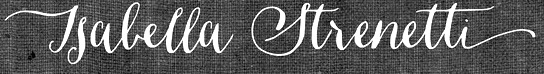 Type foundry in the United Staes, run by lettering artist Jessica McCarty, which specializes in hand-drawn, pen-drawn and hand-printed typefaces. In 2017, she co-founded Rare Bird Font Foundry.
 The following fonts were released in 2012: Vermandois (a great irregular vintage penman's hand, accompanied by Vermandois Splatter), Saltpetre (grungy medieval outline face), Plinth (architectural typeface), Mignonette, Jacob Riley (a vintage 18th century printers' specimen revival, hand-illustrated with calligraphy nibs dipped in walnut ink), Ghouligoo, Cerise (curly hand), Sullivan, Saissant (Treefrog style), Campland. In 2013, she made the upright calligraphic script typeface Ahra and the children's script typeface Mirabelle (not to be confused wit an earlier typeface called Mirabelle by Alessandro Colizzi, or the 1926 Mirabelle typeface by Wagner&Schmidt). Ondise (2013) and Dasha (2013) are other decorative scripts in the mould of Emily Lime's Bombshell Pro. Typefaces from 2014: Woolen (a hand-inked & italicized serif, based upon a 17th century type specimen by Jean Jannon. Many of the capital letters are decorated with subtle sprigs and leaves, while the lowercase letters remain classically styled). Typefaces from 2015: Quimbly, Rivea Twist, Rivea Upright: two calligraphic scripts. Typefaces from 2017: Liesel (a watercolor brush typeface family consisting of Regular, Brush, Pencil, Shadow, Printed, Icons). Typefaces from 2019: RF Marshall. Behance link. Creative Market link. View Jessica McCarty's typefaces. [Google]
[MyFonts]
[More] ⦿
|
Marder, Luse and Company (or: Chicago Type Foundry)
|
 Chicago-based type foundry, 1863-1892, also called Scofield, Marder, Toepfer&Co., Scofield, Marder&Co., and the Chicago Type Foundry. In the great Chicago fire of 1871, they lost all their matrices. They were part of the big number of foundries bought in 1892 to form the American Type Foundry. They are credited with inventing the American point system, in which 12 points are a pica and 72.27 points are an inch.
 A list of types will follow later, but for now, I will just mention display types such as Mandarin (an oriental simulation typeface digitized by Elsner&Flake in 1985 and available here). Images of selected typefaces and ornaments: Anglo Gothic, Antique Extended, Arcadian, Card Ornamented, Carriage and Livery Cuts, Celtic Initials, Centennial Script (1876), Clarendon Ray Black, Commercial Script, Crosier, Ecclesiastics and monastics, Eureka Text, Harlem Shade, Heading Script, Mortised for Calendar, Natural History Cuts, (another image), Norman Condensed, Payson Script, (another image), Poster Roman, Rimmed Black Ornate, Round Hand Scrtipt, Sloping Black Shaded, Text Ornate and Old Style Ornamented. Additional images: example ornament (carriage), example ornament (hippo), example ornament (zebu), Dearborn Theatre ad (1869), Newspaper subheadings. They ran a magazine with type news, called The Chicago Specimen. I leafed through most issues at Chicago's magnificent Newberry Library and took some poor quality photographs of selected passages. The Marder&Luse sale from 1871. A logo ca. 1872. Another logo. A logo from 1871. And another one from 1871. The Marder Luse building in Chicago. The sale in 18690 to Marder Luse. The Scofield Marder Toepfer building. Gossipy news about the Conner foundry. The Chicago Specimen, October 1872. The Chicago Specimen: an ad. The Chicago Specimen, January 1869. [Google]
[More] ⦿
|
Maria Kuznetsova
|
Graphic designer from Chicago, who has made some nice typographical posters like Garamond Botanicals (2009). [Google]
[More] ⦿
|
Maria Lavender
[Lavender Design]
|
[More] ⦿
|
Marie Otsuka
|
 Marie is a type and graphic designer, and programmer. In addition to designing type, she works on tool engineering at Occupant Fonts in Providence, RI. She also collaborates with a range of organizations as a designer and developer. Marie holds an MFA in Graphic Design from RISD and a BA in Interdisciplinary Studies from the University of Chicago.
 In 2021, at Occupant Fonts / Type Network, she released the 42-style Pentameter. Type Network writes: In Pentameter, Marie Otsuka explores the polyrhythmic potential that usually stays dormant inside the limitations of monospaced typefaces. As an upright italic, the letterforms create a lively pattern while their uniform metrics remain steady. The result is an inventive design on a syncopated beat that resonates with the poetics beyond code. Pentameter's lower case i looks like a breaststroke swimmer coming up for air. [Google]
[More] ⦿
|
Marilyn Frank
|
Chicago-based designer. In 1995, Frank Heine and Marilyn Frank co-designed the hand-printed typeface Divine. In 1997, they designed Kaiju, but never released it for distribution. Kaiju's design is based on wood type from the 1800's---it was first used on the CD package design for the Reggae album Holy Mount Zion by CocoTea. [Google]
[More] ⦿
|
Mark Butchko
[Central Type (was: Lamesville)]
|
 [MyFonts]
[More] ⦿
[MyFonts]
[More] ⦿
|
Marlo Elizabeth Owczarzak
|
Chicago-based designer of the modular (FontStruct?) typeface Dash (2015) for a school project at Indiana University. Behance link. [Google]
[More] ⦿
|
Marshall Bohlin
[EmDash]
|
[More] ⦿
|
Martha Chiplis
|
School of the Art Institute of Chicago and the University of Wisconsin-Madison. Designer with Bob McCamant of the AIEgyptian family at Alphabets Inc. in 1994. At Alphabets Inc, she also designed or co-designed Oberon, AI Quanta (1992) and Oz Poster. However, over at MyFonts, these fonts are credited to Peter Fraterdeus. Martha works/worked at Sherwin Beach Press in Chicago with Bob McCamant and Trisha Hammer. Klingspor link. [Google]
[More] ⦿
|
Martin Sitta
|
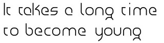 Designer and photographer in Chicago, who created these typefaces in 2012: Von Atelier (Peignotian), Atase, Clodia (a display sans with variable contrast), Mirego (squarish), and Foto Blog (fat and counterless). [Google]
[More] ⦿
Designer and photographer in Chicago, who created these typefaces in 2012: Von Atelier (Peignotian), Atase, Clodia (a display sans with variable contrast), Mirego (squarish), and Foto Blog (fat and counterless). [Google]
[More] ⦿
|
Marty Goldstein
|
 Creator of typefaces at VGC, such as Sol (1973 or 1975, with C.B. Smith) and the neotech font family Harry (1966, with C. B. Smith). Goldstein was born in Chicago in 1939, and co-founded the groundbreaking Creative Black Book. He graduated from the Pratt Institute in 1960. His father was called Harry, hence the name of the font. Harry was revived digitally by Steve Jackaman and Ashley Muir as Harry Pro (2009, Red Rooster). Sol was extended and revived by Patrick Griffin and Kevin Allan King in 2010 at Canada Type as Sol Pro (20 styles). The Quick Brown Fox GmbH copied the original Sol, and that version ended up as Digital Sans in the Elsner & Flake collection in the mid-nineties. In 2015, Elsner & Flake published the 36-style extension Digital Sans Now. [Google]
[MyFonts]
[More] ⦿
Creator of typefaces at VGC, such as Sol (1973 or 1975, with C.B. Smith) and the neotech font family Harry (1966, with C. B. Smith). Goldstein was born in Chicago in 1939, and co-founded the groundbreaking Creative Black Book. He graduated from the Pratt Institute in 1960. His father was called Harry, hence the name of the font. Harry was revived digitally by Steve Jackaman and Ashley Muir as Harry Pro (2009, Red Rooster). Sol was extended and revived by Patrick Griffin and Kevin Allan King in 2010 at Canada Type as Sol Pro (20 styles). The Quick Brown Fox GmbH copied the original Sol, and that version ended up as Digital Sans in the Elsner & Flake collection in the mid-nineties. In 2015, Elsner & Flake published the 36-style extension Digital Sans Now. [Google]
[MyFonts]
[More] ⦿
|
Mason Mulcahy
|
Chicago, IL-based designer of the modular font family Rigor Mortis (2018), the spurred typeface The Alchemist (2018), and the octagonal typeface Three Point (2018). Typefaces from 2019: Discharge, Astron (sci-fi). Typefaces from 2020: Ferocity (a free sports or speed font. [Google]
[More] ⦿
|
Mathematica Fonts
[André Kuzniarek]
|
André Kuzniarek is Electronic Documents Manager, Wolfram Research, 100 Trade Center Drive, Champaign IL 61820A, in charge of fonts for Mathematica. He developed PostScript math fonts between 1996 and 1998 for Mathematica: Math1-Bold, Math1, Math1Mono-Bold, Math1Mono, Math2-Bold, Math2, Math2Mono-Bold, Math2Mono, Math3, Math3Bold, Math3Mono-Bold, Math3Mono, Math4-Bold, Math4, Math4Mono-Bold, Math4Mono, Math5, Math5Bold, Math5Mono, Math5MonoBold. Another set of Wolfram fonts is called Mathematica. It ships with the software. Mathematica is a large typeface family designed by Andre Kuzniarek, with Gregg Snyder and Stephen Wolfram (head of Wolfram) between 1996 and 2001. That family has invaded many font archives, such as this one. In his early life, Kuzniarek designed the comic book font Whiz Bang (1995), and his studio at that time was called Studio Daedalus. [Google]
[More] ⦿
|
Mathias Coutoux
|
Born in France but based in Chicago, IL, Mathias Coutoux studied at Columbia College Chicago. He designed the straight-edged typeface Révolté in 2014. Behance link. [Google]
[More] ⦿
|
Matt Soar
[Chicago O'Hare]
|
[More] ⦿
|
Matthew Congreve
|
Chicago-based designer (b. 1990) of the organic typeface Equinox (2010). [Google]
[More] ⦿
|
Matthew Mackowiak
|
New Lenox, IL-based graphic designer. He created the decorative caps typeface Nature Type (2012). [Google]
[More] ⦿
|
Matthew Pahl
|
Hoffman Estates, IL-based creator of the modular typeface Crooked Block (2013). [Google]
[More] ⦿
|
Max Rosenow
|
Chicago-based designer at BBS of an ornamental face that was patented in 1894. In 1895, he and Julius Schmohl published an upright script with BBS. This ronde typeface was originally known as Oliphant and renamed Advertisers Upright Script in 1925. In 2014, Spiece Graphics created a digital version of it, Milroy Upright SG. [Google]
[MyFonts]
[More] ⦿
|
Mechanics Type Foundry
|
Chicago-based foundry, also called Creswell, Wanner&Co., and Wanner, Weber&Co. It was short-lived (1872-1883). The great Chicago fire of 1871 had wiped out nearly all printing businesses in Chicago. In 1872, Alexander Barnett (b. Ireland, 1820-d. Chicago, 1896), John Creswell, Nathan Lyman and A.F. Wanner started the Mechanics Type Foundry. Only Barnett was a well-known type founder and caster, having worked previously at A.D. Farmer and the Marder, Luse&Co (which was destroyed in the fire). In 1883, the company split into Union Type Foundry (led by Creswell and Wanner) and Barnett, Griffith&Co (led by Alexander Barnett and his son, William A.). The latter business, which used the type designs of the Boston Type Foundry, closed soon afterwards. [Google]
[More] ⦿
|
Meg Vonderhaar
|
During her studies at Notre Dame University, Meg Vonderhaar (Wheaton, IL) created the watercolor typeface Alphawet (2014). [Google]
[More] ⦿
|
Megan Janeski
|
During her studies at Illinois State University in Normal, IL, Megan Janeski created a handcrafted typeface (2015). [Google]
[More] ⦿
|
Megan Kaley
|
During her graphic design studies at Southern Illinois University in Carbondale, IL, Megan Kaley created the curly typeface Twisted Roots (20133) and the beveled typeface Paper Diamond (2013). [Google]
[More] ⦿
|
Megan McNaught
|
During her studies at Illinois State University, Bloomington, IL-based Megan McNaught designed a flowery display typeface (2016) and a counterless handcrafted typeface (2016). [Google]
[More] ⦿
|
Melbert Cary
[Continental Typefounders Association]
|
[More] ⦿
|
Mele Hamasaki
|
During her studies at DePaul University in Chicago, Mele Hamasaki designed a display sans typeface (2015). Behance link. [Google]
[More] ⦿
|
Meredith Kennedy
|
During her studies in Elgin, IL, Meredith Kennedy designed a curly typeface in 2013. [Google]
[More] ⦿
|
Meredith Niles
|
A graduate of Boston University (2010), Meredith Niles started studies at the Chicago Portfolio School. During her studies, she created an untitled hand-drawn decorative caps typeface based on vegetables. Behance link. [Google]
[More] ⦿
|
Michael Cox
|
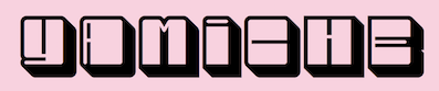 Chicago, IL-based designer (b. 1986) of the squarish typeface family Uniform (2020) and the blocky typeface Bloxy (2020). [Google]
[More] ⦿
Chicago, IL-based designer (b. 1986) of the squarish typeface family Uniform (2020) and the blocky typeface Bloxy (2020). [Google]
[More] ⦿
|
Michael Cullen-Benson
|
 Student at MNSU in Mankato, MN, who lives in Vernon Hills, IL. He made a text-based poster of the Seattle skyline in 2010.
 In 2012, he designed the tall typeface Towering Heights (2012). Behance link. [Google]
[MyFonts]
[More] ⦿
|
Michael Hagemann
[Font Mesa]
|
 [MyFonts]
[More] ⦿
[MyFonts]
[More] ⦿
|
Michael Kostal
|
Graphic design student at Columbia College Chicago. Designer of the handwriting family Kreep (2006). [Google]
[More] ⦿
|
Michael Piwko
|
Huntley, IL-based designer of the techno / sci-fi typeface Spacer (2017). [Google]
[More] ⦿
|
Michael Ryndak
|
Graphic designer in Chicago, who created the modular display typeface Pace Dr. (2015). [Google]
[More] ⦿
|
Michael Scott Murphy
|
Geneseo, IL-based designer of a noteworthy typographic poster called How In The World (2013). Behance link. [Google]
[More] ⦿
|
Michael Zhang
|
Graphic design student at the University of Illinois at Urbana-Champaign, 2012-2014. Creator of Serasin Std (2012, octagonal modular typeface). [Google]
[More] ⦿
|
Michelle Batton
|
Illinois-based "designer" of English Gothic (2007, blackletter), which she is actually selling. She also made Johnny B (2007, handwriting), Think Pink Alphabet (2007) and Damaged Alphabet (2007). Alternate URL. Yet another URL. [Google]
[More] ⦿
|
Michelle Kahl
|
Chicago, IL_based designer of the watercolor brush alphabet Lambitt Regular (2013). Behance link. [Google]
[More] ⦿
|
Michelle Lehmann
|
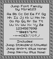 Chicago-based creator (b. 1971) of Pixel Noir (2011), Pixel Western (2011), Pixel Sleigh (2010), Teeny Pix (2010), Tiny Times (2010, pixel face), Emoticomic-Regular (2010), "SpriteComic-Regular (2010), Pixel Stix (2010), Jump (2010, pixel face), Teeny Pix (2010), Pixel Caps (2010), Bit Signage (2010, pixel face), Rasterman (2010), Earth-Momma (2010, pixel font), Celtic Bit (2010, family), Pixel Josh (2009), and (partially) of License to Pixel (2009).
 In 2010, she did the pixel fonts PixelJosh6, Pixelstars, Pixelstars&Stripes, Pixel Love (pixel script), HarryPixel, Emoticomic, Sprite Comic, and Emote Letters (2010). In 2013, she added Pixel Western and Relativity. Alternate URL. Aka Mirz. Dafont link. Fontspace link. Devian tart link. Klingspor link. Another Dafont link. [Google]
[More] ⦿
|
Michelle Maynard
|
As a student at DePaul University in Chicago, Michelle Maynard designed a sans typeface in 2016. [Google]
[More] ⦿
|
Mike Brando
|
Born in 1990, Mike Brando lives in Chicago. He created the condensed art deco typeface Pasta Palazzo (2010). [Google]
[More] ⦿
|
Mike D. Kowalczyk
|
Polish American illustrator in Chicago. Creator at FontStruct in 2009 of Prof. Downer's Iowa Tonic (inspired by Brothers and Council, by Downer), Fleet (alomost octagonal), Bankowy Gotycki (outline typeface patterned after Ban Gothic), Bolt Plate, Garibaldi (+Bold, +Black), Nocturnis, Lastustruct (kitchen tile) and Macrogular. In 1999, he created the very original Aborigine (1999). Additional URL. Home page. Klingspor link. [Google]
[More] ⦿
|
Miko Ramirez
|
Chicago-based designer. Creator of the counterless geometric typefaces Circa (2010) and Acute (2010), and of the scratchy hand Extrafine (2010). [Google]
[More] ⦿
|
Milos Zlatanovic
|
Vranje, Serbia and now Chicago, IL-based designer of the Latin / Cyrillic dry brush font Paris Blue (2015) and the experimental typeface Kanibal (2016). [Google]
[MyFonts]
[More] ⦿
|
Minjoo Kim
|
Chicago, IL-based designer of an untitled experimental bitmap font (2013). [Google]
[More] ⦿
|
Mitch Stomner
|
During his studies at Columbia College Chicago, Mitch Stomner designed the free ultra-fat octagonal typeface Hashtag Basic (2015). Dafont link. Behance link. [Google]
[More] ⦿
|
Molly Bramlet
|
Chicago-based graphic designer who has a BA from DePaul University. She based her Bodoni Poster Script typeface (2012) on Bodoni Poster Italic. Cargocollective link. [Google]
[More] ⦿
|
Molly Studer
|
During her studies in Elgin, IL, Molly Studer created Curly Font (2013). [Google]
[More] ⦿
|
Monotype Typography Inc.
|
 A major type foundry, set up in 1887 by Tolbert Lanston. The Monotype Corporation, based in Redhill, Surrey, was an independent English company that originally shared patents with the Lanston Monotype Company in Philadelphia. In the first half of the twentieth century, F.H. Pierpont and Stanley Morison built up the best type library of its time, and Monotype came to be leaders in European book printing. After the Second World War, Monotype continued to offer printing machines, entering the photocomposition era with the Monophoto in 1955, and pioneering laser technology in printing with the LaserComp in 1976. In 1992 the company was split up. The hardware side was purchased by the IPA Group. The type department, continued as Monotype Typography.
 In July 1998 Agfa acquired Monotype Typography and became Agfa Monotype. In 2000, Agfa acquired ITC. In 2004, TA Associates purchased a majority interest in Agfa Monotype from Agfa Corp and the company was renamed Monotype Imaging Inc, with headquarters in Woburn, MA Monotype history. Monotype Imaging in turn went on a spending spree: it acquired Linotype (in 2006), Ascender Corporation, Berthold (unconfirmed), Bitstream (in 2011) and MyFonts (in 2011). They also own China Type Design Ltd, Fontwise, iType, Planetweb, WhatTheFont, and WorldType. The Monotype specimen book of type typefaces. A complete catalog of matrices made for use with the Monotype composing machine and with type&rule caster (1922, Philadelphia) is freely available on the web. See also here and here. Catalog at the most popular typefaces available via MyFonts. Full catalog of Monotype's typefaces [large web page warning]. [Google]
[MyFonts]
[More] ⦿
|
Montague M. Bear
|
Chicago-based designer at BBS of a Victorian face that was patented in 1890. [Google]
[More] ⦿
|
Morgan Semmelhack
|
Graphic designer in Chicago, IL, who created the sans typeface Helio (2018). [Google]
[More] ⦿
|
Mortal Turtle Foundry (or: Einzig Design)
[Robert Conlon]
|
Graduate of Taylor University (1978), Gordon Conwell Theological Seminary (1987) and Goddard College (2007). He was art director at Paramount Pictures ((1988-1996), and taught art at Edinboro University of Pennsylvania (2001-2007) and Siena Heights University (2007-2018). Based in Tecumseh, MI (was: Lake Zurich, Illinois), Conlon set up Mortal Turtle Foundry where he was selling fonts for about 5USD a shot. Hi typefaces include Dodgenburn, EinzigSans, EinzigSerif, Einzine, Etched, Notchenarow, RogersTypewriter (1999), Rubberstamp, Scraping, Scratchy (1994), SloppyInk (1999), Sponged, Stratenarow. Sloppy Ink and RogersTypewriter are great old typewriter fonts. Web site for his art. Linkedin link. [Google]
[More] ⦿
|
Mota Italic
[Rob Keller]
|
 Foundry, est. 2009 by Rob and Sonja Keller. Originally located in Berlin, Mota Italic is a type design studio specializing in unique, extensive type families. It relocated to Mumbai, India, at the end of 2014, and moved back to Berlin in 2020.
 Rob Keller (b. 1981) is a typeface designer from Illinois. He attended the University of Illinois where he earned Bachelor (BFA) degrees in both Graphic Design and Sculpture. From 2006 until 2007 he attended the University of Reading, England, for the MA in Typeface Design program. Immediately following the dissertation submission, Rob moved to Frankfurt, Germany, to work at Linotype GmbH in the Product Marketing department. He left Linotype to be able to do type design full time, first as a freelancer then forming Mota Italic in 2009. Sonja Keller, now Sonja Stange, left Mota Italic in 2013 to join Type Together. From 2014 until 2020, Rob lived in Mumbai. Mota Italic's fonts: - Vesper, a hookish and sturdy serif typeface with which Rob graduated from Reading in 2007 [Discussion by I Love Typography]. It includes Vesper Devanagari (2006) and Vesper Hebrew. The Vesper Devanagari character set was completed in 2014 through the collaboration with Kimya Gandhi. The free font Vesper Libre (2014) is a special web version that has been optimized for online use. Tiny details have been simplified and the character set is reduced for the perfect balance of beautiful web typography with fast page loading.
- Mota Pixel (free), made in 2009.
- In 2013, Rob created the ultra-fat counterless typeface Pufff with three f's.
- Fip (2015) is a techno family.
- When he was a student at Reading he announced that he was working on these font projects: Azul y Blanco Pin Pan Pun (hand-printed), Compilation Serif, New Orleans Light, Unicase Monospace, Untitled Experiment, Chef, Gemma. The large informal typeface family Gemma was finally published in 2009. It includes wonderful multiple master dingbats.
- Brashy, a crazy large multi-glyph handcrafted typeface that emulates painted letters.
- Sharad 76 (2016: free). A Devanagari only font by Kimya Gandhi (after his father's writing).
- Chikki (2019 / Devenagari variable font.
- Collection (2020). An allm caps font in which each letter has 50 variants, and all letters look like they cam from a different font.
- Show Me The Mono (2020).
Type blog by Rob Keller. At the University of Reading, he published Linotype Devanagari: an abridged history of the typeface with analysis of the 1975 redesign (2007). Alternate URL for his blog. [Google]
[More] ⦿
|
Mpress Interactive
[John Bonadies]
|
 Type foundry set up in 2013 in Champaign, IL, by John Bonadies who has an MFA in graphic design from the University of Illinois. In 2011, he set up an iPad application in which one can move wooden letters around as in a letterpress. He says: LetterMpress will be a virtual letterpress environment---released first on the iPad---, that will allow anyone to create authentic-looking letterpress designs and prints.
 The typefaces are based on letterpress and/or vintage wood type, and have names that are prefixed by MPI. In 2013, Mpress Interactive published MPI Roman Condensed (based on a typeface from Showcard Machine Company), MPI Old Style, MPI Bodoni Ultra, MPI Sardis (after Warren Chappell's Lydian from 1938, ATF), MPI Republic Gothic, MPI No. 510 (based on a design by William H. Page, 1887), MPI No. 508 (based on William H. Page, 1890), MPI No. 507 (based on William H. Page, 1890), MPI Headline Modified (also called Modified Gothic by some type manufacturers, it is based on a typeface by Hamilton Manufacturing Company from 1897), MPI Gothic, MPI Aldine Extended (based on a 1872 wood type by William H. Page), MPI Antique (slab serif), MPI French Clarendon (based on wood type from 1865 by William H. Page), MPI French Antique (a typical far West saloon font based on wood type by William H. Page, 1869), MPI Egyptian Ornamented (a western typeface based on a 1870 wood type by William H. Page), MPI Arcadian (based on a 1870 design by William H. Page), MPI Tuscan Extra Condensed (based on William H. Page wood type from 1872), MPI Norwich Aldine Reversed (from a 1872 original), MPI Nouveau, MPI Delittle (based on a wood type by DeLittle), MPI Deco (art deco caps), MPI Atlas (slightly art nouveau typeface based on a font by Day & Collins), MPI Circle Sans (white on black letters). [Google]
[MyFonts]
[More] ⦿
|
MyFonts: Oswald Cooper
|
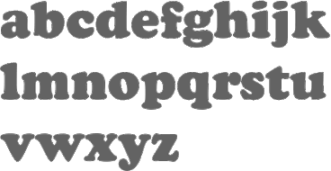 MyFonts selection for Oswald Cooper [Google]
[More] ⦿
MyFonts selection for Oswald Cooper [Google]
[More] ⦿
|
Nakeyisha Aisha Huddleston
|
During her studies at The Art Institute of Pittsburgh, where she is a cohort of the class of 2015, Nakeyisha Aisha Huddleston (Chicago, IL) designed the art deco typeface Gatsby (2014). Behance link. [Google]
[More] ⦿
|
Nathan Hurt
|
Nathan William Hurt (Chicago, IL) designed the circle-based typeface Waffles Modular in 2013. Behance link. [Google]
[More] ⦿
|
Nathan Matteson
|
Designer of Ardbeg (2003, award winner at the TDC2 2004 competition), a Thai bitmap font, Gaijaaethao (2004, a grayscale Thai font), and of Hamfist (2003, a serif font). In 2004, he joined Ultra Pixel Fonts, where he made the pixel typeface Daasaang (Thai). He works at the International Academy of Design and Technology in Chicago, and will soon start Eightyproofpress Inc. His web page opens new windows and makes my browser crash. Der Teufelshaufen won an award at ProtoType in 2016. Klingspor link. [Google]
[More] ⦿
|
Neil Summerour
[Positype]
|
 [MyFonts]
[More] ⦿
[MyFonts]
[More] ⦿
|
Neon Type Foundry
|
Typefounders of Chicago (or: Castcraft) acquired the Neon Type Foundry (Pittsburgh) in 1959. The Neon Type Division of Typefounders of Chicago (Castcraft) published a specimen book in 1962 which can be downloaded from Archive.Org in two 1 GB parts: Part I, Part II. See also here and here. [Google]
[More] ⦿
|
Nerfect Type Laboratories
[Britton Walters]
|
 Nerfect Type Labs in Berwyn, IL, is the foundry of Britton Walters (b. Atlanta, GA, 1973). Free fonts: Desmond (2003), Ausfahrt (dingbats), Bad Weekend (comic book font), Clint (2003), CursedMustache (2003), Clunky, Coffin Nails, Conspiracy (old typewriter font), Crap Magnet family (free at Chank's), Cursed Mustache, Demand (ransom font), Emma 65, G.I. Jerk, Goblin, Heavyweight, Hybrid, Joey, Kirok, Mental Junk Drawer (dingbats), Minibike, Mister Filthy, Mutant, Pixie (pixel font), Roadtrip, Sanford, Sex Shop, Skyland, Space Junk, Speed Demon, Stag Wart, Thug, Tricky Treat (2003). Pay fonts: Crunk, Go-Rilla, Kurtzberg, Monsterkit, Nerfect Cola, Outlaw, Muggler.
 MyFonts.com sells some of their fonts: Stinky School Book, Creeps (2002, funny typefaces!), Ailene, Smuggler (2001), Crunk, Kurtzberg, Nerfect&Cola, Go-rilla, Outlaw, Class of 1964 (dingbats), Dingbatio, Mr. Walters-Casual (comic book face), Tricky-Treat (scratchy handwriting), Fiend (2004) and MonsterKit. View Britton Walters's typefaces. Klingspor link. [Google]
[MyFonts]
[More] ⦿
|
Nermin Moufti
|
Syrian typographer and graphic designer in Chicago, who has also worked in Dubai and Toronto. Nermin holds a BSc in Visual Communications from the American University of Sharjah (UAE), as well as an MFA in Interdisciplinary Arts, Media and Design from OCAD. She created the cooking utensil alphading typeface Shai (2010). [Google]
[More] ⦿
|
Newberry Library
|
Public library in Chicago with a great collection of books related to typography. Located at 60 West Walton Street, Chicago, IL 60610-7324. Paul F. Gehl is the custodian of the John M. Wing Foundation on the History of Printing, which is where most of the type books are. In April 2010, I finally had an opportunity to check it out, spending two full days at the library. The positives: the collection is indeed extensive, laptops are allowed, the staff is very friendly and helpful, and one is allowed to take photographs without a flash. The (minor) negatives: tripods and other camera tools are disallowed, and ballpoint pens are forbidden. Also, browsing in the stacks is impossible (as opposed, to, say, Harvard's Houghton library, where books less than about 70 years old are in public stacks). Still, there are some real treasures at the Newberry. [Google]
[More] ⦿
|
Nic Swaner
|
Graphic designer in Chicago who made the dot matrix typeface TrapZoids (2009). [Google]
[More] ⦿
|
Nicholas Hojnacki
|
Media designer in Chicago who created the display typeface Odyssey in 2013. [Google]
[More] ⦿
|
Nicholas Joseph Werner
|
 Born in Belleville, IL, in 1858. He died in 1940. Typefounder, author, artist, editor and printer, all in one. Involved at some point with the Inland Type foundry and the Central Type Foundry. His typefaces:
 - Antique No. 6 (ca. 1883, Inland Type Foundry).
- Avil (1904, Inland Type Foundry).
- Becker Series (1899, Inland Type Foundry), blackletter face.
- Bizarre Bold (1895, Inland Type Foundry) oe Edwards (the original name) or Inland Series. This typeface adds many Victorian or steampunk elements to a didone skeleton. McGrew says: It was renamed, most appropriately, by BB&S in 1925 after that foundry took over Inland. A companion typeface called Inland, by the same designer, was produced at the same time using some of the same characters but with even more unusual twists to others. Compare Francis. In 2010, Claude Pelletier made two digital versions, called Bizarre and Bizarrerie. Vivien Gorse (Toulouse, France) revived Inland Series in 2014-2015.
- Brandon (1898, Inland Type Foundry): According to McGrew, "a thick-and-thin title face, similar to Engravers Roman, named for a printer in Nashville, Tennessee. Like a number of other such typefaces, it has no lowercase but was cast in several sizes on each of several bodies so numerous cap-and-small-cap combinations could easily be made. This style was popular for stationery and business forms. Hansen called the typeface Plate Roman. On Linotype and Intertype Bold Face No.9 is essentially the same typeface but a little narrower; typesetters not infrequently call it Engravers Roman. There was also a Brandon Gothic, cut only in two small 6-point sizes, which was similar to Combination Gothic, but with a letterspaced effect."
- Bruce Title / Menu Roman / Skinner: McGrew reports that Menu Roman is the BB&S rename, for the 1925 specimen book, of Skinner, which was shown by Inland Type Foundry about 1885, and ascribed to John K. Rogers as well as to Nicholas J. Werner. Menu Title, formerly Lining Menu, was Inland's Bruce Title, by Werner. Menu Shaded was Acme, designed in 1886 or earlier. The latter has only a very general relationship to the other typefaces which are nearly monotone, with long serifs tapering to sharp points. Compare Paragon.
- Caxton Bold (Marder, Luse). Codesigned with William F. Capitain.
- Central Lining Antique (ca. 1892, Central Type Foundry).
- Corbitt (1900, Inland): McGrew states [...] a heavy, thick-and-thin typeface with tiny serifs [...] Although still showing many of the quaint design details of nineteenth-century types, it is somewhat more mature. Condensed Corbitt was advertised by Inland in 1902 as their "latest addition." Both versions were cast by ATF after Inland merged with that foundry in 1911, but only the Condensed seems to have survived until matrices were inventoried in 1930. Digital revival by Chuck Mountain in 2020 as Murden CF.
- Courts (1900, Inland): later renamed DeVinne Recut Italic.
- De Vinne: McGrew writes about this: DeVinne, the display face, is credited with bringing an end to the period of overly ornate and fanciful display typefaces of the nineteenth century, and with restoring the dignity of plain roman types. It is derived from typefaces generally known as Elzevir or French Oldstyle (q.v.). DeVinne says of it, "This typeface is the outcome of correspondence (1888-90) between the senior of the De Vinne Press (meaning himself) and Mr. J. A. St. John of the Central Type Foundry of St. Louis, concerning the need of plainer types of display, to replace the profusely ornamented types in fashion, of which the printers of that time had a surfeit. The DeVinne Press suggested a return to the simplicity of the true old-style character, but with the added features of thicker lines and adjusted proportion in shapes of letters. Mr. St. John approved, but insisted on grotesques to some capital letters in the belief that they would meet a general desire for more quaintness. Mr. Werner of the Central Type Foundry was instructed to draw and cut the proposed typeface in all sizes from 6- to 72-point, which task he executed with great ability. "The name given to this typeface by Mr. St. John is purely complimentary, for no member of the DeVinne Press has any claim on the style as inventor or designer. Its merits are largely due to Mr. Werner; its few faults of uncouth capitals. ..show a desire to please eccentric tastes and to conform to old usage. The new typeface found welcome here and abroad; no advertising typeface of recent production had a greater sale. Thus De Vinne himself credits the typeface to Central Type Foundry and its design to Nicholas J. Werner, but Werner says, "To correct the general impression that Theodore L. De Vinne was the designer of the typeface named after him, I would state that it was the creation of my partner, Mr. (Gustav) Schroeder." The design was patented under Schroeder's name in 1893. Central was part of the merger that formed American Type Founders Company in 1892, but continued to operate somewhat independently for a few more years. Meanwhile, DeVinne was copied by Dickinson, BB&S, Hansen, and Keystone foundries, and perhaps others-in fact, Keystone advertised that it patented the design in 1893, Connecticut Type Foundry copied it as Saunders, and Linotype as Title No.2. Dickinson called it "a companion series to Howland" (q.v.). When Monotype developed an attachment in 1903 to cast display sizes, DeVinne was the first type shown in their first announcement. Later ATF specimens showed this typeface and several derivatives as DeVinne No.2, probably because of adjustments to conform with standard alignment. DeVinne Italic and DeVinne Condensed were drawn by Werner and produced by Central in 1892 and copied by some other sources. Howland, shown by Dickinson in 1892, is essentially the same as DeVinne Condensed No.3, later shown by Keystone. ATF introduced DeVinne Extended in 1896, while BB&S showed DeVinne Compressed, Extra Compressed, and Rold in 1898-99. Keystone's DeVinne Title is another version of bold, not as wide as that of BB&S. In 1898 Frederic W. Goudy was asked to take the famous display type and make a book typeface of it. The resulting DeVinne Roman, Goudy's second type design, was cut the following year by the Central branch of ATF. DeVinne Slope, essentially the same design but sloped rather than a true italic, was cut by the foundry about the same time, perhaps from the same patterns as the roman. DeVinne Open or Outline and Italic also originated with Central. In the roman and smaller sizes of italic only the heavy strokes are outlined; in larger sizes of italic, certain thin strokes are also outlined. Monotype cut the open typefaces in 1913. DeVinne Shaded is another form of the outline, created by Dickinson in 1893; parts of the outline are much thicker than others. DeVinne Recut and Recut Outline, shown by BB&S, are not true members of this family, but are a revival of Woodward and Woodward Outline, designed by William A. Schraubstadter for Inland Type Foundry in 1894; there were also condensed, extra condensed, and extended versions, all "original" by Inland. DeVinneRecutItalic was a rename of Courts, by Werner about 1900, also from Inland. Compare McNally. There are several modern day interpretations, such as C790 (Softamker), Columbus, Roslindale (2018, David Jonathan Ross) and ITC Bernase (1970, Thomas Paul Carnase).
- Edwards (1895, Inland Type Foundry). Revived and interpreted in digital version by Nick Curtis as Inland Edwards NF.
- Era Condensed No. 5 (with Gustav F. Schroeder) (1891, Barnhart Bros & Spindler).
- Flemish Condensed (1905), a typeface bought by Stephenson Blake from the Inland Type Foundry. Flemish Expanded (1890, Stephenson Blake; co-designed with Eleisha Pechev).
- Gothic No. 8 (1890, Inland Type Foundry).
- Hermes (1887, Central Type Foundry). This pure art nouveau typeface was co-designed with Gustav F. Schroeder.
- Inland (1895, Inland Type Foundry).
- Johnston Gothic (1892, Central Type Foundry). A pre-art nouveau typeface codeveloped with Gustav F. Schroeder.
- Mid-Gothic (1892, Central Type Foundry): According to McGrew, Mid Gothic was designed by Nicholas J. Werner for Central Type Foundry, probably just before that St. Louis foundry joined the merger that formed American Type Founder s in 1892. It is an undistinguished gothic of nineteenth-century style, but is an intere sting example of the way many of the earlier types were modified for Monotype. The original copy of this typeface for machine typesetting (6- to 12-point) was necessarily reproport ioned to meet mechanical requirements; the same patterns were then used for display size s and the result is series 176. Later the foundry design was copied much more exactly, w ith little or no modification, as series 276. Both versions have been shown in Monotype literature as Lining Gothic, Mid-Gothic, or Mid-Gothic No.2 at various times. The No.2 designation was applied to many foundry typefaces around the turn of the century when they were adapted to standard alignment or when other slight changes were made. Hansen copied this typeface as Medium Gothic No. 7, and made an inline version as Boston Gothic (q.v.).
- Multiform No. 1 through No. 4, with Gustav F. Schroeder (1892, Central Type Foundry).
- Novelty Script (ca. 1891, Central Type Foundry). An Arabic simulation typeface co-designed with Gustav F. Schroeder.
- Pastel series: according to McGrew, "Pastel began as Era, designed for BB&S about 1892 by Nicholas J. Werner and Gustav Schroeder. Lightface Era and Era Open were added about 1895, and Era Condensed about 1898. Around the turn of the century the name was changed to Pastel, perhaps when Pastel Bold was added in 1903. Era and Pastel are identical, except that Era had only the characters with extended strokes, shown as Auxiliaries with Pastel, where they were replaced with more conventional characters in regular fonts. Pastel is virtually a monotone design, with tiny, pointed serifs. There are several unusual characters, including the splayed M and the N with the curved diagonal. Pastel was quite popular for subtitles in motion pictures, before the advent of sound. It was recast by ATF in 1954. Intertype's cutting of Pastel is essentially the same as the foundry's Pastel Lightface. Intertype also cut a sloped version as Pastel Italic."
- Quentell (1894, Central Type Foundry): Quentell was drawn for ATF's Central Type Foundry branch in St. Louis; it has been ascribed to N. J. Werner, but a design patent was issued in 1895 to William S. Quentell, advertising manager of Armour&Company of Chicago, for whom the typeface was made. Two years later it was redrawn as Taylor Gothic by Joseph W. Phinney for ATF, and later redesigned as Globe Gothic (q.v.). Meanwhile, the original Quentell was slightly modified as Quentell No.2, and in that form continued to be shown in specimens along with its altered forms. See Pontiac. (McGrew)
- Skinner (1896, Inland Type Foundry).
- Victoria Italic (1891, Central Type Foundry). With Gustav F. Schroeder. Mac McGrew: Victoria Italic is a nineteenth-century design that retained its popularity for many years, and has been made under several names by a number of sources. ATF's Central Type Foundry branch showed it as early as 1893, in usual form without lowercase, but with several sizes on each of several bodies in the manner of Copperplate Gothic. In 1898 the Pacific States Type Foundry in San Francisco showed the typeface with lowercase as Pacific Victoria Italic, and about the same time ATF showed Regal Italic with essentially the same lowercase. Victoria Italic without lowercase has also been shown by Keystone and Hansen, as well as Monotype and Ludlow. It is a wide, monotone design with thin, pointed serifs, and was popular for a time for business forms and stationery as well as general printing. Compare Paragon Plate Italic. Keystone also had Keystone Victoria, a similar upright design, without lowercase.
- Woodward Condensed and Extended (1894) and Woodward Extra Condensed (1901), all published by Inland Type Foundry.
Klingspor link. Read about Werner in The Inland Printer in 1898-1899, in an article by William E. Loy entitled Designers and Engravers of Type. No. XIX, Nicholas Joseph Werner. [Google]
[More] ⦿
|
Nichole Reid
|
Chicago, IL-based designer of the connect-the-dots typeface Horoscope (2017) and the free tangram / origami typeface Tan (2017). [Google]
[More] ⦿
|
Nick Curtis
|
Nick Curtis (b. Chicago, 1948) lived in Texas from 1952-1997, and lives since 1997 in Gaithersburg, MD and Alexandria, MD. From ca. 1990 onwards, he has been designing fonts, first for free, and then commercially. He had a great reputation as a "revivalist" type designer, with a particular interest in retro fonts and art deco types. In 2003, his site had become too popular and too expensive to maintain, and thus he went commercial as Nick's Fonts. In 2013, he stopped making fonts, and donated his collection of rare books and type material to the University of Virginia. Interview. Complete list of names and other info, maintained by Sander de Voogt. Interview in which we learn about his fondness for Corel Draw as a type design tool. Near the end of 2012, he posted this comment on his web site: Fifteen years ago, I embarked on a wonderful voyage of discovery, when I created my very first font with Fontographer 3.15. My maiden voyages were, frankly, rather clunky and amateurish, but I have been told that they showed promise. Well, sure enough, thanks to the diligent (and patient) efforts of Ilene Strizver, I polished up my craft enough to sell my humble efforts---first as a sideline business and, since 2006, as my full-time job. In total, I have produced over eleven hundred fonts---almost five hundred of them freeware fonts, which I conservatively estimate have been downloaded and enjoyed by over three million people worldwide. Unfortunately, this past year has brought a series of unanticipated setbacks, culminating in the loss of my wife's beautiful mind and soul to the scourge of alcoholism. In an effort to generate extra income to cover the expenses for her long-term care, I have proposed a number of, I believe, innovative ways to revamp the online font business; unfortunately, those efforts have fallen flat, primarily due to the professional font community's abject fear of crossing the $165 million Elephant in the Room. I even offered a special discount rate of 75% off retail price for full-time students of Typohile Forum. To date, there have been zero takers. Hell: even the webfont kit of one of my own fonts which I purchased from myfonts.com turned out to be an empty folder. Talk about a run of bad luck. Which leaves my with you, dear readers. If you or someone you know has had fun or made a buck from my humble efforts throughout the years, please donate whatever you can---even a lousy dollar would help---to help me out. I would greatly appreciate it. Home page. Dafont link. FontShop link. Klingspor link. Abstract Fonts link. View the typefaces designed by Nick Curtis. [Google]
[MyFonts]
[More] ⦿
|
Nick Curtis
[Nick Curtis: Commercial typefaces]
|
[MyFonts]
[More] ⦿
|
Nick Curtis: Commercial typefaces
[Nick Curtis]
|
Nick Curtis (b. Chicago, 1948) lived in Texas from 1952-1997. Since 1997, he is in Gaithersburg, MD and Alexandria, MD. Since the 1990s, he has been designing fonts, first for free, and then commercially. He had a great reputation as a "revivalist" type designer, with a particular interest in retro fonts and art deco types. In 2003, his site had become too popular and too expensive to maintain, and thus he went commercial as Nick's Fonts. Interview. Free downloads at TypOasis. Complete list of names and other info, maintained by Sander de Voogt. Interview in which we learn about his fondness for Corel Draw as a type design tool. Home page. His free fonts are listed elsewhere. On MyFonts, he says this about himself: Nick's Fonts is a modest little foundry dedicated to the preservation of our rich typographic heritage. Most of the foundry's designs are based on authentic historical sources, gleaned from the massive collections of the Library of Congress. If you are looking for a font that captures the essence of the Wild West, the Gay Nineties or the Jazz Age, look here first: if it is not in the catalog, it will be soon. [Google]
[MyFonts]
[More] ⦿
|
Nicole Otake
|
At Loyola University in the suburbs of Chicago, Nicole take designed the art deco typeface Otake (2016). [Google]
[More] ⦿
|
No Bodoni Typography
[George Everet Thompson]
|
 Glenview / Chicago, IL-based foundry run by George E. Thompson (b. 1945, Chicago). George Thompson teaches at the Art&Design Department of Columbia College Chicago since 1986: He has a deep involvement in letterpress printing and co-founded Columbia's private press, the Calhoun Press, named for John Calhoun, the first printer in Chicago. He also founded his own Spurius Press, devoted to publishing matters of typography and named for Spurius Carvillus, the ancient Roman credited with designing the letter G.
 Expensive but high quality typeface families designed by Thompson include Estiennium (quirky humanist sans), Isbellium (a sans serif version of Dick Isbell's Americana type, the last type cut in metal by American Type Founders), Nirvanium (wedge serif), ITC Oldrichium (2011, angular lettering in the style of Oldrich Menhart), Parmatype, Parisette, Marseillette, Lyonette, and Berlinette (2001). MyFonts is selling these fonts now: Claudium NB (2002), Crowbird Pro Bold (2012), Dog Butter (2004, a curly monolinear upright script with small x-height; followed by Dog Butter Pro in 2021), the eerie didone font Floridium NB (2002, based on wood type from the 1800s), Ms Kitty NB (2002, a fun face), Parma Typewriter NB (based on Bodoni), and Tinman Pro (2011). In 2013, George published the dingbat typeface Ovoid Two Zero, ITC Oldrichium. FontShop link. Klingspor link. Behance link. View the No Bodoni typeface library. [Google]
[MyFonts]
[More] ⦿
|
Noah Rothschild
[Victory Type Foundry]
|
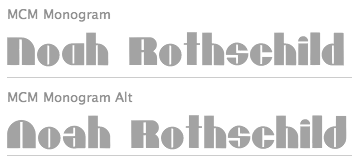 [MyFonts]
[More] ⦿
[MyFonts]
[More] ⦿
|
Noel Weber
|
Designer associated with The Institute of Lettering & Design in Chicago, whose work was published by Letterhead. This includes the typefaces LHF 20 Six Letters and LHF 20 Six Panels (both with John Davis), LHF Noel's Ends and LHF Noels' Thes (both with Dave Parr) and LHF Saddle (with Chuck Davis). [Google]
[More] ⦿
|
Okay Type
[Jackson Cavanaugh]
|
 Jackson Showalter-Cavanaugh (b. Waterloo, IA, 1981) is a freelance graphic designer and independent type designer based in Brooklyn, NY, and/or Chicago. He founded Okay Type in 2009.
 Jackson designed Alright Sans (2009, clean sans) and Alright Display (voguish hairline sans). In 2012, he created The Harriet Series (with Harriet Text and Harriet Display subfamilies), a full Sotch Roman / Baskerville / didone family that won an award at TDC 2012. In 2016, he was asked by Mac Lewis, artistic director at Playboy, to design a new headline typeface for the magazine. Cavanaugh designed a heavy slab serif for the occasion. In 2019, he released the ultra-black typeface family Okay. [Google]
[MyFonts]
[More] ⦿
|
Omegatype Typography
[Ryan Neaveill]
|
At Omegatype in Champaign, IL, Ryan Neaveill designed BTP-Baby-Bl, Baby-Blocks, Bamboo (oriental simulation), Funny-Face (smilies), I-Ching, Musicfun, Ryan's-Rotten-Writing. His fonts are not on these pages though, but they are on various archives. His Playing Cards font can be found at Fontastic, Uncle Bear's, or Fontazm. Dafont link. Aka Creative. Fontspace link. [Google]
[More] ⦿
|
Orbit Enterprises
|
Signature font service from Glen Ellyn, IL. 90USD for one signature truetype font. Free sample font. [Google]
[More] ⦿
|
Orbit Enterprises
|
From, Glen Ellyn, IL, Orbit Enterprises offers personal signature fonts at 95USD a pop. Free sample truetype font. [Google]
[More] ⦿
|
Orson Lowell
|
 American artist in New York, 1871-1956. He studied with the well-known anatomist, J. H. Vanderpoel, at the Art Institute of Chicago, Illinois. He moved from Chicago to New York in 1893. Known for the richness of his work in pen and ink, he drew in 1898 fifty illustrations for The Choir Invisible. By 1907, he was employed at Life magazine, at that time a humor publication competing with Judge and Punch. At Life magazine, he contributed pen and ink cartoons and color covers. He also provided art for American Girl, American Boy, Judge, Century, McClure's, Scribner's, Collier's, Puck and Success. Renowned for his humorous pen and ink work. A set of capitals drawn by him. Picture of the artist. [Google]
[More] ⦿
American artist in New York, 1871-1956. He studied with the well-known anatomist, J. H. Vanderpoel, at the Art Institute of Chicago, Illinois. He moved from Chicago to New York in 1893. Known for the richness of his work in pen and ink, he drew in 1898 fifty illustrations for The Choir Invisible. By 1907, he was employed at Life magazine, at that time a humor publication competing with Judge and Punch. At Life magazine, he contributed pen and ink cartoons and color covers. He also provided art for American Girl, American Boy, Judge, Century, McClure's, Scribner's, Collier's, Puck and Success. Renowned for his humorous pen and ink work. A set of capitals drawn by him. Picture of the artist. [Google]
[More] ⦿
|
Oswald Bruce Cooper
|
 Influential designer and type designer, motivated by beautiful advertising type (b. Mountgilead, Ohio, 1879, d. Chicago, 1940). Picture. He was angry at Goudy for his Goudy Heavyface (1925), which resembles Cooper Black a bit too much (check this 2002 video). MyFonts link. Cooper died of cancer. His typefaces include:
 - The well-known Cooper family done at Barnhart Brothers&Spindler: Cooper (1918-19), Cooper Stencil (1921), Cooper Black (1922; Linotype version, acquired from Barnhart Brothers&Spindler in 1924 by Schriftguß AG in Dresden; Elsner&Flake version; other versions exist by ParaType, Bitstream, Scangraphic, Mecanorma, Adobe, and URW++), Cooper Italic (1924), Cooper Old Style (1919), Cooper Initials (1925), Cooper Hilite (1925), Cooper Black Condensed (1926), Cooper Black Italic (1926), Cooper Fullface (1928). Bitstream offers an 11-style Cooper family. Cooper Black made it to American Typefounders (ATF). One of the original drawings for Cooper Fullface was rejected by ATF but digitally revived by Nick Curtis in 2008 as Ozzi Modo Plump NF and Ozzi Modo Squooshed NF in 2008.
Ian Lynam revived many styles from 2010-2013, under names such as Cooper Old Style, Cooper Initials, Cooper Italic, Cooper Fullface Italic. Lynam writes: Cooper OldStyle is the result of Barnhart Brothers&Spindler type foundry representatives Richard N. McArthur and Charles R. Murray having met with Oswald Cooper and his business partner Fred Bertsch in 1917. Due to other commercial design firms adopting Cooper's style of lettering throughout the Midwest, both companies came to an agreement to create a family of types based on Cooper's advertising lettering. McArthur and Murray saw the biggest potential in the super-bold advertising lettering that would become Cooper Black, but agreed that a roman weight old style should be executed first, the logical progenitor to a family or related types. The foundry requested that the roman have rounded serifs so as to more specifically correlate to the planned bold. This was the first of many tactical strategies in type design between type designer and foundry, most specifically McArthur and Cooper, whose back-and-forth relationship in designing, critiquing, and modifying letterforms was integral in shaping the oeuvre of type designs credited to Cooper. While it was Cooper's sheer talent in shaping appealing and useful alphabets that made his work so popular, McArthur's role as critic and editor has gone largely un-noted in the slim amount of writing of length about Cooper's work. Cooper and McArthur went back and forth over the design of the roman typeface for nearly two years with Cooper, constantly redrawing and revising the typeface to get it to a castable state. The capitals were successively redrawn by Cooper, with particular care paid to the "B" and "R" to make them relate formally. The lowercase was redrawn numerous times, as were experiments in shaping the punctuation. McArthur requested a pair of dingbats to accompany the typeface, along with a decorative four leaf clover ornament "for luck". Cooper included a slightly iconoclastic, cartoonish paragraph mark, as well as decorative end elements, a centered period, and brackets with a hand-drawn feel. The final typeface is a lively, bouncy conglomeration whose rounded forms dazzle and move the eye. Originally called merely "Cooper" in early showings, the name was later revised to "Cooper Oldstyle". The typeface met with a warm reception upon release in 1919, the public favoring its advertising-friendly, tightly-spaced appearance. Sales were moderate, and the typeface was considered a success. Cooper originally drew the figures the same width as the "M" of the font, but revised them to the width of the "N" at the request of McArthur. Early versions of drawings of the slimmer figures are noted as "cruel stuff" in accompanying notes by Cooper, though they were versioned out into far more elegant numerals than the earlier stout figures. Both versions of the numerals are included in the digital release, as are the ornamental elements. In 1925, McArthur and Murray requested a set of ornamental initials. Cooper designed the initials open-faced on a square ground surrounded by organic ornament. The initials were "intended to be nearly even in color value with that of normal text type". The letterforms themselves are a medium-bold variation on the Cooper OldStyle theme, lacking the balance of Cooper's text typefaces, but charming nonetheless. SoftMaker did a complete Cooper Black Pro series in 2012, including Cooper Black Pro Stencil. - Oz Handicraft BT (Bitstream, 1991) was created by George Ryan in 1990 from a showing of Oswald Cooper's hand lettering found in The Book of Oz Cooper (1949, Society of Typographic Arts, Chicago). In that book, you can also find two great essays by Cooper written in 1936-1937, Leaves from an Imaginary Type Specimen Book and As an experiment: 15 serifs applied to stems of similar weight to test serif influence in letter design. Modern Roman Capitals.
- Fritz (Font Bureau, 1997) was created by Christian Schwartz who was inspired by a characteristic handlettered ad from 1909, as well as the single word "Robusto" drawn for Oz Cooper's own amusement. In 1998, Fritz was honored by the NY Type Directors Clubs TDC2 competition.
- Boul Mich. Mac McGrew: Boul Mich. During the period of "modernistic" typography of the 1920s, BB&S, the large Chicago type foundry, brought out Boul Mich in 1927, the name being an advertising man's idea for a tie-in with the fashion advertising of the smart shops on Chicago's Michigan Boulevard [Avenue], according to Richard N. McArthur, then advertising manager of BB&S. An unidentified clipping with a bit of hand-lettering had been sent to the foundry; Oswald Cooper of Cooper Black fame was asked to sketch the missing letters to guide the foundry's pattern makers in cutting a new face, but he disclaimed any credit for the design. Apparently there is no truth in the persistent myth that Boul Mich was named for Boulevard Saint-Michel in Paris. Compare Broadway. Digitally revived in 2010 by Ian Lynam at Wordshape and a few years earlier by Dan Solo as well.
- Dietz Text.
- Packard, first handlettered for use in ads for the Packard Motor Company in 1913, and later converted to metal by BB&S. The bold weight is credited to Morris Fuller Benton (ATF, 1916), but it is highly probable that Benton did the adaptation for both weights. A digital version of this was done by Nick Curtis in 2008 under the name Packard Patrician NF. Steve Jackaman and Ashley Muir created Packard New Style in 2011, and the slightly grungier Packard Old Style also in 2011. Mac McGrew: Packard is ATF's adaptation of a distinctive style of lettering done by Oswald Cooper in advertisements for the Packard Motor Car Company, in 1913. Packard Bold followed in 1916. The latter is credited to Morris Benton, again closely following Cooper's original lettering, and it is quite likely that Benton did the actual adaptation of the first typeface also. These typefaces retain a handlettered appearance partly by the slightly irregular edges of strokes, partly by a number of alternate characters. Both were quite popular for several years.
- Pompeian Cursive (1927): a calligraphic script designed for BBS to compete with Lucian Bernhard's Schoenschrift. Ian Lynam found the original drawings and based his Pompeian Cursive (2010) on it.
- Cooper's handlettering also inspired Matt Desmond, who created the beautiful typeface Cagliostro (2011, free at Google Web Fonts).
- The Bitstream font Oz Handicraft BT (1991) was created by George Ryan in 1990 from a showing of Oswald Cooper's hand lettering found in The Book of Oz Cooper, published in 1949 by the Society of Typographic Arts in Chicago). A refresh was done in 2016.
Klingspor link. FontShop link. Linotype link. [Google]
[MyFonts]
[More] ⦿
|
Outside The Line Fonts
[Rae Kaiser]
|
 Outside The Line Fonts was founded by Rae Kaiser (b. 1951, Marshfield, WI), and is based in Eau Claire, WI, on the shores of Lake Monona. Rae's fonts include
 - Typefaces from 2019: Wilderness and Home Collection(Architectural Lettering, Plz Print Bold Condensed, Best Regardz, Wilderness Doodles, Woodland Doodles, Dickybirds, Lake Vacation Doodles, House Doodles, Farm Doodles, Home Sweet Home Dingbats)
- Typefaces from 2016: Wilderness Doodles, Rae's Monogram Family (hand-lettered styles, and a set of dingbats called Rae's Monogram Doodles).
- Typefaces from 2015: Dear Rae, Love Dad (watercolor script), Dickybird Doodles.
- Typefaces from 2014: Nautical Doodles, Flourishes & Ornaments, Kitchen Doodles, Woodland Doodles.
- Typefaces from 2013: RSVP Brush (a fat brush face), Farm Doodles, Chicago Doodles, Happy Hour Doodles.
- Typefaces from 2012: Flower and Leaf Borders, New Orleans Doodles, Ultra Condensed, Birthday Doodles, Reading and Writing Doodles.
- Waikiki Doodles (2011), Vibrant Women (2011, female figure dingbat typeface done with Nancy Vala), London Doodles (2011), Woof (2011, dog silhouettes done with Nacy Vala), Lake Vacation Doodles (2011), Drop Cap One (2011), Cowboy Doodles (2011), Cordially Yourz (2011, hand-printed).
- Yuletide Doodles (2010), House Doodles (2010), Paisley and Swirl Doodles (2010), Fondly Yourz (2010, hand-drawn serif face), Paris Doodles (2010---a great dingbat face), Leaf Doodles (2010).
- Knitting And Sewing Doodles (2009), Just People (2010, with justine Childs), Just Shoes and Purses (2009), Sincerely Yourz (2009, child's hand), Flower Doodles (2009), Just Flower Pots (2009, dingbats; with Justine Childs), Just Christmas (2009, Xmas dings done with Justine Childs), Just Frames (2009: with Justine Childs), Frames and Borders (2009, followed by Frames and Borders Too, 2010).
- Wedding Doodles (2008, dingbats, followed in 2009 by Wedding Doodles Too), Hearts and Swirls (2008, heart dingbats), Fruit and Veggie Doodles (2008), Crowns (2008, with Justine Childs), Yourz Truly (2008), Font Doodles Too (2008, a 31-glyph food clipart dingbat font), Home Sweet Home Dingbats (2008), Hodgepodge (2008, +Handlettered, 2010), Dearest John (2008, handwriting), Doodles (2008), Diva Doodles (2008), Architectural Lettering (2008), Plz Script (2008, brush), Plz Print (2008, brush), BlobsBrushstrokesAndBalloons (2009), Baby Doodles (2008), Doodles Too (2008), Guy Doodles (2008), Party Doodles (2007), Party Doodles Too (2008).
- Christmas Doodles (2007, dingbats), Christmas Doodles Too (2008), Holiday Party Words (2007, comic book style letters), Fleurons of Paris (2007), Ornaments of Paris (2007), Heart Doodles (2007, followed by Heart Doodles Too in 2008).
- Coffee and Tea Doodles (2006), Diva Doodles Too (2006, fun diva dingbats), Justine (2006, with Justine Childs), Architectural Lettering (1999), Cross Stitch, Doodles, DoodlesTheAlphabet, Food Doodles, Fooddoodles, Hat Doodles (2006), Tall Skinny Condensed.
See also here. Agfa/Monotype sells Architectural Lettering, Cross Stitch, CurlyQ, Doodles, DoodlesTheAlphabet, Food Doodles, Holiday Doodles, Office Doodles, Plz Print, Plz Print Brush, Plz Print Bold Condensed, Plz Script, the hand-printed series (Best Regardz, Dearest John, Yourz Truly and Sincerely Yourz, 2009) and Tall Skinny Condensed (1999). MyFonts link. Font Bros link. MyFonts interview. Klingspor link. Creative Market link. View Rae Kaiser's typefaces. [Google]
[MyFonts]
[More] ⦿
|
Patric King
[XO Type (was: Pretty)]
|
 [MyFonts]
[More] ⦿
[MyFonts]
[More] ⦿
|
Paul F. Gehl
|
Since 1986, he is the custodian of the John M. Wing Foundation on the History of Printing at the Newberry Library in Chicago, one of North America's most important type and calligraphy collections. As a historian of education and printing, he spoke at ATypI in Rome in 2002 on the lack of interest on the part of historians in general for the history of type. [Google]
[More] ⦿
|
Paul K. Martin
|
No, this is not the prime minister of Canada. He designs type at SignDNA, where I found this bio: Ever since picking up a brush some 20 years ago, Paul Martin has been fascinated with the nuances of hand-rendered type. He believes that type sets the mood for a sign and its message. Paul often uses scripts and casuals to add personality to his customer's signs. After living in Sacramento, California for the past decade, Paul recently returned to northern Illinois. His work has been featured in SignCraft magazine several times, and has also been on the cover. His typefaces: Caz Fat, El Sid (holiday script), Journeyman, WarBird (great brush typeface with a bit of an oriental touch), Qwikscribble, RaceCarChisel (3d face), FastEddie, Squirt (upright, calligraphic). Klingspor link. Sign DNA link. [Google]
[More] ⦿
|
Paul Kritzmire
|
Creator of HandBag (2013, hand-printed) and Forte (2013) during his graphic design studies in Lexington, IL. In 2016, he designed the pixel typeface Lunch Break and the art deco typeface Late. Behance link. Dafont link. Creative market link. [Google]
[More] ⦿
|
Paul McAleer
|
User interface specialist in Chicago. At iFontmaker, he created the cleanluy hand-printed typeface Jackson Script (2011). [Google]
[More] ⦿
|
Peter de Guzman
|
Chicago-based designer of Maze (2013), a multilined version of Futura. [Google]
[More] ⦿
|
Peter Fraterdeus
[Alphabets Inc (or: Fontsonline.com)]
|
[MyFonts]
[More] ⦿
|
Peter Zelchenko
[Hobo]
|
[More] ⦿
|
Phil Yeh
|
At Comicraft, Phil Yeh (b. 1954, Chicago) designed the comic book font CC Phil Yeh (2006) together with Comicraft's John Roshell, who exlains: Since 1985 Cartoonists Across America & The World have been promoting literacy, creativity, the arts, and other positive issues using cartoons and humor. Founder Phil Yeh and his band of artists---including Comicraft President and First (Flying) Tiger, Richard Starkings---create books, paint murals, take part in school assemblies, conventions, conferences and other public events for all ages throughout the world! Cartoonists Across America & The World work in partnership with The Center for The Book in The Library of Congress and other organizations all over the world. They have painted more than 1000 murals in 49 of the United States as well as in Canada, Mexico, Italy, England, France, Germany, Hungary, The Netherlands, China, Taiwan, Singapore, and the Cayman Islands. So we made Phil a font because he is a noble soul. [Google]
[MyFonts]
[More] ⦿
|
Philip Brown
|
Chicago, IL-based designer of Epershand Sans (2014) and Cloddish (2016). [Google]
[More] ⦿
|
Phillip Montwill
|
Graphic designer in Naperville, IL, who made Modular Type (2012). [Google]
[More] ⦿
|
Plural
[Renata Graw]
|
Plural is a Chicago-based creative studio founded in 2008 by Renata Graw, Jeremiah Chiu, Christopher Kalis, and Eric Mika. With a focus on strong typography and composition, they explore new ideas within the design process as they collaborate on a wide range of print, web, video and music projects. Creations: Gel Type (2009), and Nova Chicago (2009: a strong sans, advertised as the typeface of the 2016 Chicago olympics). As a student at the University of Illinois at Chicago, Renata Graw developed the typeface Nova Chicago in 2008 (under the supervision of Jörg Becker), as the typeface for the 2016 Olympics in Chicago--despite that nice effort, which earned her a TDC 2009 award, Chicago lost the bid to Rio. [Google]
[More] ⦿
|
Pooja Awasthi
|
Aurora, IL-based designer of the display typeface Flora (2016). [Google]
[More] ⦿
|
Poppy Co
|
Chicago, IL-based designer of the cursive typeface Back To Bed (2017). [Google]
[More] ⦿
|
Positype
[Neil Summerour]
|
 Positype was founded in 2002 by Athens and/or Jefferson, GA-based designer and type designer Neil Summerour (b. 1972, Azores, Portugal). Neil began developing typefaces in 1996 with the 1996 Olympic Brick Paver Project proprietary typeface. He is the co-principal and senior designer of Athens-based interactive, design, and advertising agency Genetic:ICG. In the summer of 2003, he began teaching Advanced Electronic Design in the Graphic Design Department at The University of Georgia.
 Swash & Kern is the bespoke lettering and typeface design alter ego of Neil Summerour. In 2001, Neil published his first two type designs with [T-26] Digital Type Foundry in Chicago, IL. Since then, he has released tens of font families including hiragana and katakana fonts. Positype fonts are sold by Myfonts.com and [T-26]. Klingspor link. Facebook link. Blog. Behance link. Union Fonts link. The list of his fonts: - Aago (2017). A 54-style sans family.
- Aaux, Aaux Office (2002), Aaux Pro (2004), Aaux Next (2009, 72 typefaces), Aaux Alphanumera, Aaux Emoticons.
- Agent Sans (2021). An economical 22-style sans intended to be warm although the name seems to contradict that.
- The Air superfamily (2011), which consists of 81 sans typefaces. Followed by Air Soft (2011), Air Pro (2021), Air Pro Condensed (2022) and Air Pro XCondensed (2022). He writes about Air: Heavily influenced by Summerour's Aaux Next typeface and Akzidenz-Grotesk, the typeface features a very efficient footprint, logical weight options, small caps, expanded numeral sets, extensive language support, and 5 total widths.
- Altar (8-weight Gothic family).
- Akagi (2008): 20 style sans family. Extended and refreshed in 2011 into Akagi Pro.
- AMP (at Union fonts).
- Anago (2012) is a softly rounded sans family, the product of a designer addicted to designing sans families.
- Anarcharsis (2002): a serif family inspired by incomplete rubbing made from a stone wall located in the Bahamas.
- Angel Script (2009, TypeTrust).
- Baka (2005, a fantastic scratchy handwriting face), Baka Too (2006; followed in 2010 by Baka Expert).
- The Bodoniesque family (Umbrella Type).
- Cherry Blossoms (2018). A crayon script.
- Claustrum (2003).
- Clear Sans (2013). Starting from a monoline rather geometric set of thin weights, this typeface family morphs into a more humanist beast, with a, b, d and g having a squeezed look at the intercepts. And maybe because of that, this unclassifiable typeface is quite appealing. Followed by Clear Sans Text and Clear Sans Screen.
- Courage (2019). A high contrast ultra black poster typeface.
- Couture (2015) and Couture Sans (2015). Summerour was charmed by Imre Reiner's Corvinus when he designed this extremely high-contrast pair of fashion mag typeface families together with Mary Catherine Pflug.
- Cynapse (2003; or Cynapse Pro. 2004, 12 weights). A sans family.
- In 2018, Martina Flor and Neil Summerour published the layerable Tuscan typeface family Decorata.
- Delphi (2014). A decorative multiline typeface by Lily Feinberg and Neil Summerour.
- Directors Gothic (2013, Lettering Inc). A large retro sans family.
- Donatora (2004).
- Dream Big (2019). A swashy script typeface with weathered edges.
- Ego (2003, octagonal family).
- Epic (2007-2009, a 12-style contemporary garalde).
- Ether, Ether Connected.
- Eva (2003).
- Filmotype Dancer (2012).
- Filmotype Harvard (2015). Based on a Filmotype brush script from 1955.
- Filmotype Horizon (2011).
- Flirt Script (2014). Flirt Script won an award at TDC 2014.
- Friendly (2012). In part based on Morris Fuller Benton's upright script typeface Announcement.
- Fugu (2009, rough-outlined script family, winner at TDC2 2010).
- Ginza (2008, a squarish techno family), and Ginza Narrow (2011).
- Good Karma (2017). A sumi brush font. See also Good Karma Smooth (2020).
- Grava (2018, twenty fonts) and Grava Display: Quirky and sharp, Grava is Neil Summerour's injection of warmth within the geometric sans font category.
- Halogen (2012). An organic wide techno sans family. In 2014, he added Halogen Slab and Halogen Flare (flared). All have hairlines.
- Headcold (2004).
- Hype (2019). A collection of 432 low contrast gothic sans typefaces consisting of three subfamilies of 144 fonts each: Hype vol 1, Hype vol 2, Hype vol 3.
- Ice Cream (2021). A creamy vernacular non-connected script for food packaging.
- Iru1, Iru2.
- Juicy (T-26, 2004, brushdrawn family).
- Kari and Kari Pro (2005): a connected upright script. Kari Display (2009). Redrawn in 2020 and released as Kari (2020).
- Kryptk Flash (2003).
- Kurosawa Bastard, Kurosawa Hand, Kurosawa Sans, Kurosawa Serif, Kurosawa Hiragana, Kurosawa Katakana.
- Love Script (2014). A high energy high contrast brush pen / marker script. Love Script won an award in the TDC 2015 Type Design competition.
- Luce (2004).
- Lush Script (2011). A connected script inspired by the 1940s.
- Lust (2012), a curvy hight-contrast didone in the Pistilli style. Neil: The result yielded a rather diverse typographic gene pool: a little Scotch Modern, a little Didone and Didot, a dominant dose of Caslon, and a pinch of Baskerville-- all wrapped up in the leggy body of a Brazilian supermodel. A confident, self-reliant typeface that shows just enough to keep everyone staring and leave them wanting more. Followed by Lust Slim (2014). In 2015, these were extended to the large families Lust Pro [dedicated page] and Lust Pro Didone.
- Lust Script (2013). This is a curvier, sexier (Neil's words) version of Lust. For use in fashion magazines and large sizes.
- Macha (2012). A sans family. In 2015, this was followed by Lust Hedonist, which has Didone, Italic and Script sub-styles---the ultimate fashion mag typeface. In 2021, he added Lust Sans (a 12-style high-contrast fashion mag typeface family), Lust Didone (a 6-style contribution to the fat face genre), Lust Stencil (six styles), Lust Text (ten styles).
- The Type Trust: Magneta (2009, The Type Trust). Includes a Condensed subfamily.
- Marshmallow (2017). A super-creamy high-contrast script typeface straight from a parisian bonbonnerie.
- Murecho (2021). Murecho is a low-stroke contrast, flat terminal sans serif Japanese typeface designed for text settings in Japan. It covers Hiragana, Katakana, and Kanji (JOYO+). It also supports Latin, Cyrillic, and Greek.
- Muscle (2009, TypeTrust---a futuristic family).
- Nori (2010): a calligraphic brush typeface obtained by applying the Pilot Japan Kanji Fude brush pen on paper. It has over 1100 glyphs, 250 ligatures, 487 alternate characters, 125+ swash and titling alternates, lining and old style numerals. Awarded at TDC2 2011.
- Organic (2009). A rounded warm sans family. In 2021, he published the 16-style Organic Pro.
- Penumbra.
- Plastek (2004-2009).
- The R.E.M. Athens project involves three fonts published in 2009, REM Orange, REM Accelerate and REM Tourfont. They are based on ideas by Chris Bilheimer for the band R.E.M. (Michael Stipe and Chris Bilheimer). Both attended the fine arts program at the University of Georgia. Michael Stipe, singer and lyricist, formed R.E.M. in 1980. Bilheimer began working with the band in 1994.
- In 2019, Martina Flor and Neil Summerour released the extensive typeface family Ribbons at Positype.
- Romp (2009, condensed hand-printed).
- Reserve (2018). A text typeface family designed to accompany Summerour's Scotch typeface family.
- Rhythm (2011). An italic inline and solid display family based on ATF's Ratio (ca. 1930) and Herbert Thannhaeuser's Adastra (1928).
- Rough Love (2014). A brushy crayon script.
- Scotch (2017). An 31-style scotch roman typeface family consisting of Scotch Text, Scotch Display (more contrast), Scotch Deck (for subheads) and Scotch Dingbats. In 2020, he added Scotch Compressed to the set.
- Shameless (2013). A connected penmanship-style script.
- Sneakers (2003-2004): athletic lettering family. Also, Sneakers Script and Sneakers Max (2019: rounded and ultra fat).
- So Lovely (2019).
- Tactical (2011, octagonal mechanical face; +Stencil).
- In 2012, he won the Second Akashi Prize in the kanji (!!!) category of the Morisawa Type Design Competition for Tegaki. Tegaki also won at TDC 2013.
- Truss Ultra Light (2006): hairline architectural font.
- Vekta Serif (2009), Vekta Neo and Vekta Sans (2009, a sans family at TypeTrust).
- Wasabi Condensed and Wasabi (2010): an organic elliptical family, based on Iru.
- Yumi (2003, techno font, Union Fonts).
His life in hiw own words: Neil Summerour is a type designer, lettering artist, calligrapher and designer based in Georgia, USA with one foot in Takamatsu, Japan. After graduating from The University of Georgia Lamar Dodd School of Art with a BFA in Graphic Design, he soon found himself opening his own studio to deal with the flow of freelance work. [...] Neil opened his personal type foundry, Positype, in 2000 to feed his ever-growing desire for type design. He later co-founded TypeTrust (2002) with Silas Dilworth as his addiction to type and lettering grew. [...] He was an adjunct art professor at The University of Georgia in graphic design and taught graphic design at the Governor's School for the Arts. [...] As a typeface designer, he has published over 60 typeface families and produced numerous custom typefaces for clients worldwide. [...] He has won the Type Directors Club Certificate of Excellence in Type Design in 2010 and 2011 for Fugu and Nori, respectively. Showcase of Neil Summerour's fonts. [Google]
[MyFonts]
[More] ⦿
|
Pothic Blood
|
American web designer from Naperville, IL (b. 1988). Creator of the hand-printed Weilie's Type (2009) and Sawanese (2009). [Google]
[More] ⦿
|
Practise
[James Goggin]
|
 Graduate of London's Royal College of Art in 1999, James Goggin (b. 1975) founded graphic design studio Practise in 1999 in London with his partner Shan James. James was art director of The Wire (2005-2008). In August 2010, Goggin moved to Chicago where he was Design Director at the Museum of Contemporary Art Chicago (2010-2013). Previously he was based in Arnhem, the Netherlands, working as course director and teacher at Werkplaats Typografie (2009-2010) and visiting lecturer at ECAL (Ecole cantonale d'art de Lausanne) (2009-2010). The studio Practise has been based in Providence, RI, since 2016 where James also teaches BFA and MFA Graphic Design at Rhode Island School of Design (RISD). Aka Jacques Gauguin and "Practise", he has worked in London, Auckland and Sri Lanka.
 His typefaces: - In 2001, he made the three-weight LL Courier Sans (+Mono) at Lineto.
- Between 2003 and 2014, James Goggin, Rafael Koch, Mauro Paolozzi, and Arve B%aring;tevik developed LL Prismaset A at Lineto, a redesign and extension of Rudolf Koch's Prisma (1930).
[Google]
[More] ⦿
|
Qori
|
Argentinian creator of Proto Alfabeto (2012). [Google]
[More] ⦿
|
Quan Ika
|
 Chicago, IL-based designer of the monolinear octagonal typeface family ATC Saturn (2015, Avondale Type Company) and the high-contrast fashion mag didone typeface Madison (2015).
 In 2016, he designed the very functional monospaced programming font ATC Harris. Behance link. [Google]
[More] ⦿
|
Quincy Butler
|
During his studies at Illinois Wesleyan University, Bloomington, IL-based Quincy Butler designed the pixelish stitching or zipper typeface Dropdot (2017, FontStruct). [Google]
[More] ⦿
|
Quinn Keaveney
|
 Graduate of SAIC, class of 2013. Quinn now works as a designer in Chicago. In 2013, Quinn created the 21-style layered and beveled typeface family Finkl Pro, which can be bought from Avondale Type Co and Ten Dollar Fonts. This gorgeous type was inspired by the Finkl steel mill on Cortland Street, Bucktown, Chicago. [Google]
[More] ⦿
Graduate of SAIC, class of 2013. Quinn now works as a designer in Chicago. In 2013, Quinn created the 21-style layered and beveled typeface family Finkl Pro, which can be bought from Avondale Type Co and Ten Dollar Fonts. This gorgeous type was inspired by the Finkl steel mill on Cortland Street, Bucktown, Chicago. [Google]
[More] ⦿
|
Rabin Deka
[Ratne Research]
|
[More] ⦿
|
Rachel DesJardins
|
Rachel's school project in Elgin, IL, led to an unnamed paperclip typeface (2013). [Google]
[More] ⦿
|
Rachel White
[Rachel White Art]
|
[MyFonts]
[More] ⦿
|
Rachel White Art
[Rachel White]
|
Chicago, IL-based designer of the brush typeface Curiosity (2016) and the free handcrafted typefaces Malibu Punch (2017), Butterbell (2017), Toast (2017, watercolor brush) and Tango Charlie (2017). She also made Blueshire (2017), Marmalade (2017) and Adorbs (2017). Typefaces from 2018: Brolly Fight, Honey Bumbles (a curly script), Donut Derby, Wonderland, Lemon Shake (inky watercolor brush script), Ruby Hollow (dry brush script). Typefaces from 2019: Backyard Bouquet, Boyish + Weird, Whitbury (a wild calligraphic script), Saturday Brunch, RWA Honeydew, RWA Snowballer, RWA Wakefrost, RWA Friendish, RWA Frontliner, Blueshire, RWA Tango Charlie. Typefaces from 2020: Jules Thicket, Donut Derby, Leyton Hills. Typefaces from 2021: Primrose Gardens (a loopy font). [Google]
[MyFonts]
[More] ⦿
|
Rae Kaiser
[Outside The Line Fonts]
|
 [MyFonts]
[More] ⦿
[MyFonts]
[More] ⦿
|
Raize Software
|
Raize Software offers the Raize fixed pitch pixel font in FON format. Graeme Geldenhuys (graeme@mastermaths.co.za) has created a version of the Raize Font for use in Linux (PCF format). Raize Software, Inc. is headquartered in Naperville, Illinois. The president is Ray Konopka. [Google]
[More] ⦿
|
Ralph Fletcher Seymour
|
American designer, artist and publisher, b. Milan, IL, 1876, d. Batavia, IL, 1966. McGrew writes: Seymour is a private press type, designed by Ralph Fletcher Seymour for his Alderbrink Press in Chicago. In a 1945 book, the designer says, "With Goudy's help and Wiebking's matrice cutting and fitting machines I got my first typeface of type designed, cut, and finally cast and my first book printed from the type." The book he referred to was dated 1902. The type seems never to have been named-it could have been Seymour for the designer or Alderbrink for the press. [Google]
[More] ⦿
|
Ramiz Guseynov
[TipografiaRamis]
|
 [MyFonts]
[More] ⦿
[MyFonts]
[More] ⦿
|
Randolph J. Herber
|
Many links, essays and sample PostScript programs. [Google]
[More] ⦿
|
Randomtask 3000
|
FontStructor in Chicago who made Deimosian Alphabet (2010). [Google]
[More] ⦿
|
Raquel Rodriguez
|
Letterer and designer in Chicago, who created the prismatic op-art typeface Line Letters (2014). Behance link. [Google]
[More] ⦿
|
Ratne Research
[Rabin Deka]
|
Between 1998/99-2004, San Jose, CA-based Rabin Deka (now in Mount Prospect, IL) developed Aadarsha Ratne Internet, an Assamese font that can be found here and here. [Google]
[More] ⦿
|
Raven Mo
|
Raven Mo has a Bachelor of Fine Arts from the School of the Art Institute of Chicago, class of 2021. During her studies in Chicago, Raven Mo designed the wavy emotional typeface Manifesto (2018). At Type Cooper 2020, she designed the intest inal typeface Unaware. [Google]
[More] ⦿
|
Ray F. Morgan
|
Designer from Northfield, IL, who created a flowing script face in 1955, and a brush script face in 1954. [Google]
[More] ⦿
|
Rebekah Flores
|
American designer of the slimy typeface Melt (2016). [Google]
[More] ⦿
|
RedEyeType
[Jay Vidheecharoen]
|
RedEyeType offers these fonts by Jay Vidheecharoen (Chicago, IL): AngelaSans (1999: based on Neville Brody's Industria, so Jay says), Imitari (1999: for Imitari magazine), Atmosphere (1999, octagonal: free at Dafont), Memento Mori (1999: wow!), and Van Hooser (1997: a curly font for Hallmark cards based on the lettering style of Hallmark illustrator Donna Van Hooser). Jay worked in the lettering department at Hallmark in 1997. In earlier days, Jay ran Invisible Studio Fonts, but that link is now dead. He also worked at the University of Kansas and for PC Gamer Magazine. Dafont link. Klingspor link. [Google]
[More] ⦿
|
Renata Graw
[Plural]
|
[More] ⦿
|
Renee Alvarez
|
Student at Columbia College in Chicago, class of 2015. Creator of Nu-Maya (2014), a typeface based on the dots-and-dashes Mayan numerical system. Behance link. [Google]
[More] ⦿
|
Rex Parker
|
American artist, designer and illustrator Rex Parker (b. near Decatur, IL) runs Rex Parker Design in Park Ridge, IL. Known for his uniquely colorful art deco-inspired and retro collectible posters, he is involved in the revival of the Park Ridge Art Colony. Rex Parker's work is available for public viewing in a variety of galleries, museums, universities, and other permanent collections throughout the United States and abroad. Of particular interest to the type community is his exhibit at the McLean County Museum of History in Bloomington, IL, Goudy's hometown, Frederic Goudy: Titan of Type, October 13 through November 24, 2018. NPR interview. Youtube talk at the University of Illinois at Urbana-Champaign entitled Frederic Goudy & H. G. Wells: The Time Traveler's Typeface (2019). [Google]
[More] ⦿
|
Ricardo Victor Rousselot Schmitt
[Edy Type]
|
 [MyFonts]
[More] ⦿
[MyFonts]
[More] ⦿
|
Richard N. McArthur
|
Typographer, designer and printer, who worked mainly at BB&S (1882-1956). For a long time, he was the advertising manager at BB&S in Chicago. In that capacity, he designed Old Dutch (1925, BB&S), about which McGrew writes: It is a font of shaded capitals, decorated with a circle set into each main stroke, and is probably derived from eighteenth-century sources. It was recast by ATF in 1954. Colonial is similar, but with conventional serifs. Also compare Dresden. He is also credited by McGrew with Ratdolt Italic (1948, BB&S), which matches Ratdolt and Goudy Lanston. [Google]
[More] ⦿
|
Richard Winters
|
Crete, IL-based designer of the arch-themed display typeface Arch Rival (2016). [Google]
[More] ⦿
|
Rick Valicenti
|
 Rick Valicenti was born in 1951 in Pittsburgh, PA. After working for The Design partnership in Chicago, he founded R. Valicenti Design in 1981. Later, in 1989, he founded Thirst/3st, an internationally recognized design firm. The type design section of Thirst is Thirstype. Rick Valicenti is based in Barrington, IL. The White House honored Valicenti in 2011 with the Smithsonian Cooper-Hewitt National Design Award for Communication Design. In 2006, he received the AIGA (American Institute of Graphic Arts) Medal, the highest honor of the graphic design profession, for his sustained contribution to design excellence and the development of the profession.
 Rick designed Commerce (1992, with Greg Thompson, Font Bureau), Punch (1999, pixel family done by Valicenti and Gregg Brokaw), Ooga Booga (1993, with Greg Thompson), Bronzo, UltraBronzo, and Love. In FUSE 4, he published Uck 'n Pretty. In 2002, Rick and Chester designed the sans serif family Infinity (20 weight architectural drawing family) and Alexey (2002, free stencil font family, with Chester Jenkins). Handjob (2002, with Brian McMullen) is a gorgeous set of capitals made out of wire-meshed hands. Twiggies (with Dakota Brown) is a free set of EPS-format caps made from twigs. Other creations: Apex Serif (2003, with Chester Jenkins, Constellation / Village), Apex Sans (2004, a 40-style sans family done with Chester Jenkins, Constellation / Village), EZ (2003), a monospaced family, and Veejay (2003, a funny dingbat family done with Chad Johnston). Books abut Valicenti include Art with Function: The Design of Rick Valicenti (Paul Carlson). Klingspor link. FontShop link. [Google]
[MyFonts]
[More] ⦿
|
Rob Keller
[Mota Italic]
|
 [More] ⦿
|
Robert Bacon
|
Chicago-based designer (b. 1983) of the hand-printed typeface Bacon (2011). Dafont link. [Google]
[More] ⦿
|
Robert Conlon
[Mortal Turtle Foundry (or: Einzig Design)]
|
[More] ⦿
|
Robert E. McCamant
|
Designer of the fonts Oz Brush, Oz Poster and Egyptian Condensed at Alphabets Inc (the latter font with Martha Chiplis, 1994). Located in Chicago, he runs Sherwin Beach Press. FontShop link. [Google]
[More] ⦿
|
Robert E. Smith
|
 Artist and art director in New York, b. 1910, Chicago. As a lettering designer, he was associated with ATF from 1933-1942. He was the art director of the New York World's Fair in 1939. Smith created
 - The light script font Park Avenue (ATF, 1933). This typeface is available at Bitstream as Ribbon 251, and at Corel as Paradise, at Infinitype as Park Avenue, and at SoftMaker as Park Avenue. Mac McGrew: Park Avenue is a distinctive script design by Robert E. Smith, cut by ATF about 1933. It is not quite a joining script, although some letter combinations seem to do so. Lowercase is rather small, with long ascenders, some of which have an open loop. This is probably one of the most successful designs in the founder's project of replacing the delicate traditional scripts with more contemporary interpretations. It was adapted to Intertype in 1939, in a version that departs remarkably little from the original, considering that it is duplexed with the totally dissimilar Bernhard Fashion, the only obvious differences being the lining figures, the narrowing of a few capitals, and straightening of the lowercase {and I to fit the straight, non-kerning matri- ces. However, some capitals have excess blank space on the left side. It is popular for stationery and announcements. Baltimore copied the foundry version as Belair, while several other suppliers cast fonts from Intertype matrices. Compare Parkway Script, Piranesi Italic, Raleigh Cursive.
- Brush Script (ATF, then Berthold, 1942). This signage script is available at Bitstream as Brush 451 and as Brush Script. It has been imitated countless times: Brush (Mecanorma), Brush Script (URW++), Brush Script (Linotype), Brush Script (Tilde), Brush Script (Adobe), Brush Script EF (Elsner & Flake), Brush Script SB (Scangraphic), Brush Script Pro (Softmaker), Banty (ClickArt Fonts), Banff (Corel), Brussels (Fontbank), Bankoli (Fontbank), Tropical (Greenstreet), Motif (SSi), Brush Stroke (WSI), ATF Brush (2015, American Type Founders Collection). In a more general sense, extensions and close cousins among digital typefaces include Wisdom Script, Mission Script, Marketing Script, Motion Picture, Thirsty Script, Lobster, Lauren Script, Deftone Stylus and Ritts Cursive. Mac McGrew: Brush was designed in 1942 by Robert E. Smith as one of ATF's group of contemporary scripts, intended to replace designs from the early part of the century. This one has a handlettered, freely-drawn appearance, with the letters joined skillfully so the connections are not obvious. The availability of the typeface on Monotype mats has given it a much greater range of popularity and usefulness. A heavier weight was projected but not completed. Compare Brody, Hauser Script, Kaufmann, Repro Script.
Linotype link. FontShop link. Klingspor link. [Google]
[MyFonts]
[More] ⦿
|
Robert Hunter Middleton
[Ludlow]
|
 [MyFonts]
[More] ⦿
[MyFonts]
[More] ⦿
|
Robert Hunter Middleton
|
 American designer (b. Glasgow, 1898, d. Chicago, 1985), who spent his entire life at Ludlow Typograph Company (retiring in 1971) and built an impressive type library, creating over 100 typefaces. He received a doctorate in Fine Arts from Transylvania University. Ludlow hired him in 1923, where he became type director in 1993. He retired from the Ludlow Typograph Company in 1971. At Ludlow, he had to create solid commercial variations of existing typefaces for the Ludlow machine and come up with practical new designs. Bio by Nicholas Fabian. One can also consult the M.A. dissertation of Stephen Glenn Crook at the University of Chicago, entitled "The contribution of R. Runter Middleton to typeface design and printing in America" (1980), which lists his 98 typefaces of his 24 type familes. His oeuvre:
 - Eusebius (1924). This page explains that Ernst Detterer started work for Ludlow on Nicolas Jenson in 1924. Middleton drew Nicolas Jenson Italic at Ludlow in 1929, followed by Bold, Bold Italic, and Roman Open series in later years. In 1937 the family was renamed Eusebius. Nicolas Jenson SG is a revival at Spiece Graphics in 1995 by Jim Spiece.
- Ludlow Black (1924). Mac McGrew: Ludlow Black was designed by Robert H. Middleton for Ludlow in 1924. It is very similar to Cooper Black, the most apparent differences being the concave serifs and the greater slant of the italic. Also compare Pabst Extra Bold.
- Cameo (1927, a chiselled font). Mac McGrew: Cameo was designed by R. Hunter Middleton for Ludlow in 1926. It is derived from a heavy version of Caslon, with a thin white line within the left side of each heavy stroke, giving a very pleasing appearance. A 1926 Ludlow ad says of it, "Designed and punches produced in our own plant". Apparently it was the first, or one of the first, so produced. Compare Caslon Shaded, Caslon Openface, Caslon Shadow Title, Gravure, Narciss.
- Caslon Extra Condensed. See Caslon RR Extra Condensed by Steve Jackaman.
- Delphian Open Titling (1928).
- Stellar (1929, a serifless roman done 29 years before Zapf's Optima!). Mac McGrew: Stellar and Stellar Bold were designed by R. Hunter Middleton for Ludlow in 1929 as a less severe alternative to the monotone sans-serifs which were coming into great popularity. There is moderate thick-and-thin contrast, and strokes flare slightly toward the ends, while ascenders and descenders are fairly long; all this gives a feeling of warmth and pleasantness. Cap M is widely splayed, and sloping strokes are cut off at an angle. An alternate A, E, and H in both weights have the crossbar extended beyond the left upright, and there is an alternate U without the extended vertical stroke. Compare Optima, Lydian, Radiant.
- Garamond (1929-1930, see the Font Bureau revival FB Garamond, and Steve Jackaman's Garamond RR Light).
- Tempo (1930-42, a sans family) and Tempo Heavy Inline (1935). Mac McGrew: Tempo is Ludlow's answer to the sans serifs which gained popularity in the late 1920s. The entire series was designed by R. Hunter Middleton, director of Ludlow's department of typeface design. The Light, Medium, and Bold weights were introduced in 1930, Heavy and several variations in 1931, and other variations over the next decade or more. They are generally a little different from other sans serifs, and include some innovations not found elsewhere. The most distinctive characteristics are found in the Light Italic and Medium Italic, which have a somewhat more calligraphic feeling and less stiff formality than other such typefaces, and which also offer alternate cursive capitals, rare in sans serifs. But there are more inconsistencies in Tempo than most other families. For instance, the Light, Medium, Bold, and Heavy Italics are designed with a moderate slope of 10 degrees to fit straight matrices without too much gap between letters; this works well enough in the lighter weights, but produces a loose effect in the more rigid heavier weights. But the two largest sizes of Tempo Bold Italic and some of the other italics are designed to fit italic matrices with a slant of 17 degrees, which is rather excessive for sans serifs, especially the condensed versions, although it is handled well. Variant Oblique characters are available for Medium Italic which get away from the calligraphic feeling; only these and none of the cursive characters are made in (Tempo continues) the largest sizes. Tempo Bold Extended and Black Extended show the influ- ence of other European grotesques, with much greater x-height and some characters unlike those in the normal and condensed widths. There are a number of alternate characters for many of the Tempos. especially in the Medium, Bold, and Heavy weights; their use converts Tempo to an approximation of Kabel or other series. But a few alternates are not enough to create the effect of Futura, apparently demanded by some users, so Tempo Alternate was created in several weights, and introduced about 1960. This is close to Futura, except that the italic has Ludlow's 17-degree slant, much greater than Futura's usual 8 degrees. This family-within-a-family also has some alternate characters in some weights, to further convert the typeface into an approximation of other European grotesques. Tempo has been quite popular with newspapers, and to a lesser extent for general commercial printing. Compare Futura, Sans Serif, Erbar, etc. Also see Umbra.
- Karnak (1931-42, a slab serif family). Mac McGrew: Karnak is a family of square-serif types designed by Robert H. Middleton for Ludlow, beginning in 1931, when the light and medium weights were introduced, with other weights and widths announced as late as 1942. Like Stymie, the other extensive American square-serif series, it is derived from Memphis, and all three series are very similar. Most members of the Karnak family are most easily distinguished by the cap G. Karnak italics are also distinguished by a greater slant to fit Ludlow's 17-degree matrices, except 14-point and smaller in Karnak Intermediate Italic and Medium Italic, which are made on straight matrices and slant about 10 degrees. Light and medium weights have several alternate round capitals as shown; the very narrow Karnak Obelisk also has comparable alternate round AEMNW. Compare Cairo, Memphis, Stymie. One magazine article speaks of Karnak Open, but this has not been found in any Ludlow literature.
- Lafayette (1932).
- Mayfair Cursive (1932). Revived as Mayfair (2006, Rebecca Alaccari, Canada Type).
- Umbra (1932). Mac McGrew: Umbra was designed by Robert H. Middleton for Ludlow in 1932. It is essentially a shadow version of Tempo Light, in which the basic letter is "invisible" but there is a strong shadow to the lower right of each stroke. Compare Shadow. Images: URW Umbra.
- Eden (1934, a squarish didone). See digital revivals by Jason Castle called Eden Light and Eden Bold, 1990, and by Steve Jackaman and Ashley Muir at Red Rooster called Eden Pro (2010).
- Mandate (1934).
- Ludlow Bodoni (1936; see Bodoni Black Condensed by Steve Jackaman, and Modern 735 (Bitstream's version of Middleton's Bodoni)). Bodoni Campanile (1930; see Bodoni Campanile Pro (1998 and 2017) by Steve Jackaman). Bodoni Modern (1930). See a digital revival called PL Modern Heavy Condensed.
- Coronet (1937). This is Ribbon 131 in the Bitstream collection and Coronet by Steve Jackaman.
- Flair (1941).
- Admiral Script (1953).
- Condensed Gothic Outline (1953).
- Cloister Open Face (1920).
- Florentine Cursive (1956). See Florentine Cursive by Steve Jackaman.
- Formal Script (1956).
- Radiant (1938, see EF Radiant at Elsner+Flake, and Radiant RR at the Red Rooster foundry). McGrew: Radiant was designed by Robert H. Middleton for Ludlow, and introduced in 1938, with additional members of the family being added over the following two or three years. It is a precise, thick-and-thin, serifless style, express- ing the modem spirit of the forties while breaking away from the ubiquitous monotone sans-serifs. Radiant Medium is actually about as light as possible to maintain thick-and-thin contrast, but bold and heavy weights offer substantial contrast. All upright versions have as alternates the round forms of AKMNRW, as shown with some of the specimens. Italics have the standard 17-degree slant of Ludlow italic mats, which is rather extreme for serifless typefaces, except for small sizes of Medium Italic, which are made on straight mats and are redesigned with about 10-degree slope. Like most Ludlow typefaces, all versions of this typeface have fractions and percent marks available as extras. Thick-and-thin serifless typefaces are rare in this country. Compare the older Globe Gothic; also Empire, Stellar, Lydian, Optima, and Czarin, which aren't really in the same category.
- Record Gothic (1927-61).
- Samson (1940). Mac McGrew: Samson is a very bold, sturdy typeface designed by R. Hunter Middleton in 1940 for Ludlow. It is derived from lettering done with a broad pen, and retains much of that feeling. The name was chosen to denote power and strength. It has been popular for newspaper advertising in particular. Compare Lydian, Valiant. An interpolation between a signage typeface and a poster face, it was revived as Ashkelon NF (2011, Nick Curtis).
- Square Gothic.
- Stencil (1937-1938). A Cyrillic was made by Victor Kharyk.
- Wave (1962), a connected brush script. Digitizations include Coffee Script (2006) and Middleton Brush (2010), both by Patrick Griffin at Canada Type. Mac McGrew: Wave was designed for Ludlow in 1962 by Robert H. Middleton. It is a 1 medium-weight script, not quite joining, with a brush-drawn appearance and thick-and-thin contrast. The apparent angle is quite a bit more than the 17-degree slope of Ludlow matrices, but letters fit together compactly without noticeable looseness, and form smoothly flowing words. Compare Brush. Mandate, Kaufmann Bold.
- Andromaque. Mac McGrew explains Andromaque's genesis: Andromaque is a cursive form of uncial letter, mixing Greek forms of aeklmnstz with Roman forms of the other letters, yet retaining legibility and harmony. The original size was cut by Victor Hammer and cast in France. The 14-point size was begun by Hammer, but left unfinished at his death. The font was completed by his long-time friend, R. Hunter Middleton, in the early 1980s, and cast by Paul H. Duensing. Paul Baker did a digital version of Andromaque in 1995.
Among his books: - "Making Printer's Typefaces" (1938, The Black Cat press, Chicago, IL). In this book, he shows his own creations for Ludlow matrices, and talks about typography in general.
- Chicago Letter Founding (1937, The Black Cat Press, Chicago, IL). Middleton calls Chicago the printing center of the nation, and goes on in this small booklet about the lives and contributions of people like Robert Wiebking, Frederic Goudy, Bruce Rogers, Oswald Cooper, and himself.
Linotype link. Drawing. View the typefaces made by Robert Hunter Middleton. [Google]
[MyFonts]
[More] ⦿
|
Robert Slimbach
|
 After a start at Autologic in Newbury Park in 1983, this prolific American master craftsman (b. Evanston, IL, 1956) helped pioneer digital type design at Adobe (which he joined in 1987) and created
 - ITC Slimbach (1987).
- ITC Giovanni Book (1988).
- Adobe Garamond (1989-1991).
- Adobe Jenson (1996) and Adobe Jenson Pro. Combining Nicolas Jenson's roman designs with Ludovico degli Arrighi's italics.
- Utopia (1989-1991) [Utopia Opticals was released in 2002].
- Minion (1990-1991): Minion was first released in 1990, and became later the first Adobe Opentype font. It has support for Greek and Cyrillic, including polytonic Greek. Minion Cyrillic is from 1992. By 2021, this text typeface featured 32 styles, and was published as Minion3.
- Myriad (1992, with Carol Twombly). Myriad Arabic and Myriad Hebrew were first published in 2011.
- Poetica (1992). In 2010, Paulo Heitlinger compared Poetica, in its smooth perfection, with P22 Operina, which is closer to the original chancery models of the 20th century, and he thinks Poetica lacks the vigor and dynamism of the originals (and P22 Operina does not).
- Sanvito (1993).
- Caflisch Script (1993, not my favorite script).
- Cronos (1996). Image by Jamie Groenestein). modeled after Kuester's Today Sans. Image of Cronos Pro Display.
- Kepler (1996).
- Warnock Pro (2000), which won an award at the Type Directors Club (TDC2) 2001 competition.
- Brioso (2002). A calligraphic/renaissance family comprised of over 40,000 glyphs. Images of Brioso: A poster by Kristina Reinholds, a poster by Nick di Stefano.
- Garamond Premier Pro (2005), based on originals found in the Plantin Museum in Antwerp. Weights include GaramondPremPro-BdItalic, GaramondPremPro-Bold GaramondPremPro-Italic, GaramondPremPro-Medium, GaramondPremPro-MediumIt, GaramondPremPro-Regular, GaramondPremPro-SbIt, GaramondPremPro-Semibold. Greek, Latin and Cyrillic are covered.
- Arno Pro (2007: typophile discussion) is in the style of Adobe Jenson Pro. Review by Typographica Thomas Phinney: Arno is what you might call a modernized Venetian oldstyle. I think of it as having the same relationship to Adobe Jenson that Minion has to Garamond Premier.
- Adobe Clean (2009). David Lemon: After more than 25 years in the type development business, Adobe decided to have its own corporate typeface family. The Creative Suite uses were early versions of a family designed by Robert Slimbach. Now that it has been officially adopted at Adobe, I can tell you about our latest design, called Adobe Clean. There is no plan to make it available for licensing, but you will be seeing more of it in Adobe materials and products as time goes on. Our initial question was "Why not just keep using Myriad Pro and Minion Pro?" These typefaces were designed to be timeless, and they are among our most popular families. But that second part points to the catch in this situation: Myriad, in particular, is used to represent many other companies, including businesses close to Adobe's (such as Apple and Verizon). Adobe wanted a fresh look that could remain unique. While some typeface designers do much of their work for corporate clients, this area was new to us. Robert&I met with the leaders of Adobe's Experience Design and Brand teams to develop a design brief. They wanted a 21st-century feel combined with an earnest readability. As the project grew, Christopher Slye led regular follow-up meetings with the client teams to keep them up to date and tease more input out of them. Robert's accustomed to aiming his work at the more general case, so it was an interesting challenge to have a very specific set of design goals. What he produced is as classic as all his other designs, but with an uncharacteristic blend of contemporary touches for on-screen rendering and a more progressive feel.
- Adobe Text (2010), a transitional family included in the standard font set for Adobe Creative Suite 5. Adobe Text won an award at Modern Cyrillic 2014.
- Adobe Hand (2012). Adobe Hand also won an award at Modern Cyrillic 2014.
- Trajan Pro 3 (2011, with Carol Twombly) and Trajan Sans (1989). The Trajan Sans family comprises six weights, ranging from Extra Light to Black (matching the weight range in Trajan Pro 3), with language coverage for Pan-European Latin, Cyrillic, and Greek. Maxim Zhukov advised on the design of the Cyrillic portion of the family, and Gerry Leonidas advised on the Greek, while Frank Grießhammer provided technical production support. Trajan Sans won an award at Modern Cyrillic 2014.
- Ryoko Nishizuka designed Ten Mincho (2017), a Japanese typeface in the Adobe Originals collection. Ten Mincho also features a full set of Latin glyphs, collectively known as Ten Oldstyle and designed by Robert Slimbach.
- Pelago (2017). A semi-formal sans family that won an award at TDC Typeface Design 2018.
- Acumin. A 90-style neo-grotesque typeface family.
For Warnock Pro, he got an award at the Type Directors Club (TDC2) 2001 competition. In 1991, he received the Prix Charles Peignot for excellence in type design. Minion Pro Greek, Minion Pro Cyrillic&Greek and Brioso Pro won awards at the TDC2 Type Directors Club's Type Design Competition 2002. At TDC2 2006, he won an award for Garamond Premier Pro. Arno Pro won an award at the TDC2 2007 competition. In 2018, he received the Frederic W. Goudy Award for Typographic Excellence at Rochester Institute of Technology. Bio at Linotype. Minion Pro now ships with Acrobat Reader and covers all European languages, including Greek and Cyrillic. View Robert Slimbach's typefaces. FontShop link. [Google]
[MyFonts]
[More] ⦿
|
Robert Wiebking
[ATF 1923 Catalog: Artcraft Series]
|
[More] ⦿
|
Robert Wiebking
|
 Born in Schwelm, Germany, 1870, Robert Wiebking emigrated to the United States in 1881 with his father Hermann Wiebking, and became an apprentice engraver in Chicago. After another apprenticeship in 1884, with C.H. Hanson in Chicago, he became an independent professional matrix engraver in 1892 in that city for several American and English founders and for Ludlow, who cut many of Goudy's types, as well as types for Bruce Rogers and Robert H. Middleton. In 1894 Robert Wiebking and Henry H. Hardinge (also from Chicago) built the first successful machine for engraving type matrices. In 1896, they became partners and set up Wiebking, Hardinge & Co in 1901, manufacturing matrices for type foundries. This led them to set up the Advance Type Foundry in Chicago. He died in 1927 in Chicago.
 Designer of these typefaces: - Advertiser's Gothic (Regular and Condensed, Outline, Condensed Outline) (1917, Western Type foundry). This was interpreted as an art deco typeface by Nick Curtis in his Bellagio NF (2006). It was revived by HiH as Advertisers Gothic (2008). HiH's blurb: Advertisers Gothic is bold and brash, like the city it comes from, Chicago. It was designed by the accomplished German-American matrix engraver, Robert Wiebking, for the Western Type Foundry in 1917. As its name suggests, it was designed for commercial headliner work, much as Publicity Gothic by Sidney Gaunt for BB&S 1916. See our Publicity Headline. In 2010, SoftMaker did its own revival, called Advertisers Gothic. Personally, I find this Wiebking typeface ugly and useless.
- Artcraft&Bold&Italic (display typefaces originally designed for Barnhart Bros&Spindler (1911-1913; Jaspert lists Artcraft as a 1930 publication at Ludlow, and Klingspor as western Type Foundry typefaces from 1911-1913). Mac McGrew: Artcraft was designed in 1912 by Robert Wiebking and featured under the name of Craftsman in the first ad for his short-lived Advance Type Foundry, operated by Wiebking, Hardinge&Company, in Chicago. A short time later, the typeface was advertised as Art-Craft, and later as one word---Artcraft. Advance was soon taken over by Western Type Foundry, for whom Wiebking designed Artcraft Italic and Artcraft Bold a year or two later. Western in turn was taken over by Barnhart Brothers&Spindler in 1918. BB&S was already owned by ATF but operated separately until 1929; in the meantime, though, Artcraft and a number of other typefaces were shown in ATF specimens as well as those of BB&S. Artcraft has an unusual roundness in some of its serifs and line endings and a line of it produces a rolling feeling; some characters have curlicues, such as the long curl at the top of the a and and the exaggerated ear on the g. A number of auxiliary characters were made for roman and italic fonts; as these were sold separately, they were overlooked by many printers and typographers. The boldface has fewer eccentricities. Artcraft was a popular typeface for a number of years; the roman was copied by Monotype in 1929 without the fancy characters, and all three typefaces were copied by Ludlow. Adaptation in 1924 of Artcraft Italic to the standard 17-degree slant of Ludlow italic matrices was the second assignment of Robert H. Middleton (after Eusebius, q.v.) at that company. Hansen called it Graphic Arts. One source attributes the Artcraft family to Edmund C. Fischer, otherwise unidentified, but the details stated here are more generally accepted and seem to fit known facts better. For digital versions, see OPTI Artcraft (by Castcraft), Artcraft Pro (Jim Ford at Ascender), Artcraft URW (2001), Heirloom Artcraft (2013, Nathan Williams) or Federlyn NF (2011, Nick Curtis).
- Bodoni Light&Italic (Ludlow), Bodoni Bold&Italic.
- Caslon Clearface&Italic (1913, BB&S).
- Caslon Catalog (1925, BB&S), Caslon Light Italic.
- Collier Old Style.
- Engraver's Litho Bold&Condensed (1914, BB&S), Engraver's Roman&Bold (available as Engravers EF Roman), Engravers Litho Bold, Engravers Litho Bold-Condensed.
- Invitation Text (1914, Western Type Foundry).
- Laclede Old Style (1920, Laclede Type Foundry). The Laclede Type Foundry was absorbed by BB&S, and the typeface was renamed Munder Venezian.
- Modern Text (1913, Advance Type Foundry).
- Munder Venezian&Italic (1924-1927, BB&S, aka Laclede Oldstyle).
- Square Gothic.
- Steelplate Gothic (1907) and Steelplate Gothic Shaded (1918), both at Western Type Foundry. A Copperplate Gothic style typeface. Digital revival by Steve Jackaman as Steelplate Gothic Pro (2017).
- True-Cut Bodoni&Italic.
- World Gothic&Italic (both also with Condensed).
- Venus Bold Extended (1924). The Venus typeface was at Bauersche Giesserei from 1907 until 1927. Digital descendants (mostly not copies) include Venusian Ultra NF (1924, Nick Curtis), Venus (URW++), Venus SB (Scangraphic Digital Type Collection), Venus (Linotype), Eurydome (2010, by Stephen Boss at Emboss), Akazan (2007, Typodermic), Scout (2008, Cyrus Highsmith for Font Bureau).
Bio at No Bodoni. FontShop link. Linotype link. Klingspor link. [Google]
[MyFonts]
[More] ⦿
|
Rodney Rogers
|
Creator of the free sans font Segan Light (2009), and of Zachery (2010). Aka Feline Fury, he was born in 1982 and lives in Edwardsville, IL. Dafont link. [Google]
[More] ⦿
|
Roger Radtke
|
Graphic designer from Illinois. [Google]
[MyFonts]
[More] ⦿
|
Ronnie Boy
[Ross Shapland]
|
Ronnie Boy is a type foundry in Chicago set up by Ross Shapland (b. 1984, Bethesda, MD). Ross designed the stealth airplane techno font Flyover in 2012. [Google]
[MyFonts]
[More] ⦿
|
Rosemary Hall
[Rosemary Hall Calligraphy]
|
 [MyFonts]
[More] ⦿
[MyFonts]
[More] ⦿
|
Rosemary Hall Calligraphy
[Rosemary Hall]
|
 Rosemary Hall (Oak Park, IL) mae exquisite calligraphic fonts such as Rosemary Modern, Rosemary Copperplate, Rosemary Italic, Rosemary Modified Italic, Rosemary Script, and Rosemary Roman (a stunning font; a free version was done by Dieter Steffmann in 2001 called Rosemary Roman). Check also the fantastic Rosemary Celtic, 50 USD. Mike Yanega claims that the designer is actually Brian Hall (Chicago, IL). [Google]
[MyFonts]
[More] ⦿
Rosemary Hall (Oak Park, IL) mae exquisite calligraphic fonts such as Rosemary Modern, Rosemary Copperplate, Rosemary Italic, Rosemary Modified Italic, Rosemary Script, and Rosemary Roman (a stunning font; a free version was done by Dieter Steffmann in 2001 called Rosemary Roman). Check also the fantastic Rosemary Celtic, 50 USD. Mike Yanega claims that the designer is actually Brian Hall (Chicago, IL). [Google]
[MyFonts]
[More] ⦿
|
Ross Burwell
|
Chiacgo, IL- (was: Fort Wayne, IN)-based brand and graphic designer. Ross created some geometric typefaces, using mostly lines and pieces of circles: Karbon (2009), Aluum (2009), and Titan (2009). Other designs: Gluum (2010), Nove (2010), Orange (2010), This Is In (2010), Untitled (2010). In 2016, Firebelly Design, Will Miller and Ross Burwell, all located in Chicago, co-designed the corporate identity font Flor Mono. Home page. Behance link. [Google]
[More] ⦿
|
Ross Shapland
[Ronnie Boy]
|
[MyFonts]
[More] ⦿
|
Ryan Halvorsen
[Arlo]
|
[More] ⦿
|
Ryan Neaveill
[Omegatype Typography]
|
[More] ⦿
|
Ryan Underwood
|
Chicago-based designer of a free untitled vector format all caps typeface in 2013. This was apparently created during his graphic design students in Chicago. [Google]
[More] ⦿
|
Sabrina Sheck
|
During her studies at the University of Kansas in Lawrence, KS, Chicago-native Sabrina Sheck designed the modular bubblegum font Puffle (2017). Behance link. [Google]
[More] ⦿
|
Samuel Miller
|
Wheaton, IL-based designer of the condensed organic sans typeface Elonganse (2013). [Google]
[More] ⦿
|
Sarah Brown
|
Sarah Brown (Makanda, IL) created the painted typeface Rotten Fruit in 2013. [Google]
[More] ⦿
|
Sarah Cortez
|
As a student, Roscoe, IL-based Sarah Cortez designed the bobby pin font Bobby (2016). [Google]
[More] ⦿
|
Sarah Mellen
|
Designer in Chicago, IL, who created the numbers typeface Sarik in 2014. [Google]
[More] ⦿
|
Schomer Lichtner
|
American artist (b. 1905, Peoria, IL, d. 2006, Milwaukee, WI) in Wisconsin, known for paintings of ballerinas and dairy cows and his regionalist murals. He married fellow-artist Ruth Grotenrath in 1934, and both became involved in the Federal Works Progress Administration's (WPA) art programs, Treasury Relief Art Project (TRAP) and the Public Works Art Project (PWAP). He created the stick figure Ballerina Alphabet as a serigraph in 1990. [Google]
[More] ⦿
|
Schuyler Shipley
[Skyline Type Foundry]
|
 [More] ⦿
|
Scott D. Kolbe
|
 Scott Kolbe (Sikich Graphic Design & Marketing Service, Napierville, IL) created the monogram typeface Sparkle Type in 2015. Behance link. [Google]
[More] ⦿
Scott Kolbe (Sikich Graphic Design & Marketing Service, Napierville, IL) created the monogram typeface Sparkle Type in 2015. Behance link. [Google]
[More] ⦿
|
Scott Helbach
|
Scott Helbach (Chicago, IL) created the experimental geometric typeface Future Shock (2013). [Google]
[More] ⦿
|
Scrappin Cop
|
Illinois-based designer of free fonts such as SC Bracketology (2009, hand-printed curly brackets), CU Ink Blot (2009), CU Paisley (2009), CU Doodle Frame (2009). Painful downloading. [Google]
[More] ⦿
|
Sean Fermoyle
[Simpletype]
|
[MyFonts]
[More] ⦿
|
Sean Moldenhauer
[Art and Fonts by Sean (aka The BlackBox)]
|
[More] ⦿
|
Shannon Sutton
|
Rockford, IL-based creator of a typographic typewriter poster in 2013. [Google]
[More] ⦿
|
Sidney Clyde Gaunt
|
Artist and type designer at Barnhart Brothers&Spindler, 1874-1932, who lived in Chicago. Creator of many typefaces: - Adstyle&Italic (plus Condensed, Extra Condensed&Headletter, Wide, Lightface, Black, Black Outline, Shaded: 1906-1920, BB&S).
- Authors Oldstyle&Italic, Authors Oldstyle Bold, Authors Roman&Italic (plus Condensed, Wide, Bold, Bold Condensed). Mac McGrew writes: Authors Roman Italic, and Authors Roman Wide were designed by Sidney Gaunt for BB&S in 1902, with other versions added in 1909 to 1915. It is a legible but generally undistinguished face, perhaps best in the Wide version. The italic includes a number of quaint swash characters. and was one of the first BB&S italics to be cast on its offset body, described elsewhere (see "The Third Dimension of Type" in the Introduction); the bold typefaces provide restrained complementary display for headlines. Authors Oldstyle, shown by BB&S in 1912, bears little resemblance to Authors Roman.
- Barnhart Oldstyle&Italic (and a No. 2 version). Mac McGrew writes: Barnhart Oldstyle was designed in 1906 by Sidney Gaunt for BB&S, followed by the italic and Barnhart Oldstyle No.2 the next year. The latter appears to have the same caps as the first typeface but larger lowercase with shorter ascenders. There is also Barnhart Lightface, advertised in 1914 but perhaps designed earlier. This series seems undistinguished, but the original roman and italic were popular enough to be shown as much as twenty years later. Ascenders are long, and some characters have a bit of the irregularity that was popular at that time. The italic apparently was one of the first typefaces cast by BB&S on its offset body, which provided mortises to avoid overhanging kerns in italic designs.
- Barnhart Lightface.
- Cardstyle. Mac McGrew writes: Cardstyle is an unusual typeface designed in 1914 by Sidney Gaunt for BB&S. It is a medium weight monotone, rather narrow, with tiny serifs, and was intended for use on announcements. There is no lowercase, but caps are cast in several sizes on each of three bodies, for cap-and-small-cap combinations. Notice the logotypes, which were more common around the turn of the century.
- Chester Text (1914, blackletter). Mac McGrew writes: Chester Text is a fancy shaded letter designed by Sidney Gaunt in 1914 for BB&S. It features caps and small caps, and is intended for stationery and social work, but is hard to read and not suited to anything but a few simple names or words.
- Engravers Old Black, Engravers Roman Shaded (1914, BBS, formerly Chester Title).
- French Plate Script. Mac McGrew writes: French Plate Script (or French Plate) was designed by Sidney Gaunt for BB&S in 1904. It is an upright script, otherwise similar to the same founder's Wedding Plate Script, both derived from types cut by Mayeur of Paris which were based on eighteenth-century engraving. Both are connecting scripts, the former being similar to Typo Upright (q.v.). Inland Type Foundry showed a similar French Script in 1905, patented by William Schraubstadter, and later listed by ATF. Douglas C. McMurtrie, in his book Type Designs, calls this "one of the finest script types ever produced."
- Mission. Mac McGrew writes: Mission was designed for BB&S by Sidney Gaunt in 1905, but patented by George Oswald Ottley. It is a rather novel face, with long ascenders and short ascenders. Serifs are triangular, like some members of the Latin series. Most noticeable is the way some strokes in the capital letters are joined with curves, especially in the B. Compare Viking.
- Old Roman Condensed (plus Bold, Bold Condensed, Black&Italic, Semitone).
- Parsons Swash Initials.
- Pencraft Oldstyle&Italic (1914, plus Bold, Shaded), Pencraft Text (1916, blackletter). Pencraft Oldstyle and its ornamental version (Pencraft Specials), as printed in the 1922 BBS catalog, inspired the lowercase of Pencraft (2010, Chyrllene K, Intellecta Design). Mac McGrew writes: Pencraft Text was designed by Sidney Gaunt for BB&S in 1916. It has somewhat the character of Pencraft Oldstyle, by the same artist at about the same time, but it can hardly be considered a part of that family. It has just a suggestion of the angularity of Text or Old English typefaces, but retains more of the character of simple hand-lettering. Mac McGrew writes: Pencraft Old Style and Pencraft Italic were designed by Sidney Gaunt for BB&S in 1914, with the bold and shaded versions following over the next two years. The Oldstyle is a rather charming interpretation of lettering styles popular at that time, but the other versions are not as impres- sive. Pencraft Oldstyle is notable for the large number of Auxiliary charac- ters, some of which were commonly included with other similar typefaces, and the unique Pencraft Specials, which consisted of a variety of swash strokes to be used to extend the special ascending and descending letters. Pencraft Italic included several swash caps among its Auxiliaries, and Pencraft Bold had Auxiliaries comparable to the roman, but without the flourishes or Specials. Compare the long ascenders and descenders of Parsons and Stymie.
- Publicity Gothic (1916). Free versions called Lemiesz by David Rakowski and Dieter Steffmann. Publicity Gothic was digitally extended to a commercial all-caps face, Publicity Headline, in 2006 by Tom Wallace (HiH). See also the revival in 1995 by Image Club Graphics: Publicity Gothic ICG Out and Solid. Holy Ravioli NF (Nick Curtis) is also based on Publicity Gothic. Library Book Initials JNL (2018, Jeff Levine) was modeled after examples of Sidney Gaunt's Publicity Initials, which was originally sold in metal type by Barnhart Brothers and Spindler as a companion to the Publicity Gothic typeface. Other digital versions: OPTI Publicity Gothic (Castcraft), Publicity Gothic (by SoftMaker). Mac McGrew writes: Publicity Gothic was designed by Sidney Gaunt in 1916 for BB&S. It is basically a bold gothic, but with many deep irregularities designed into the edges of strokes, which are the same in all sizes. There are no descenders. characters which normally have descenders being designed within the x- height. Caps and ascenders are nearly the full body size, making the typeface considerably oversize by usual standards. Lowercase q has a capital form and is made only in combination with u. The colon and semicolon are full cap height, and there are a number of special characters as shown. ATF revived it for a short time about 1933. Compare Advertisers Gothic.
- Stationers Semiscript. McGrew: Stationers Semiscript as offered by BB&S was a renaming of Palmer Series, introduced by Inland Type Foundry in 1899. It has been ascribed to Sidney Gaunt. It is similar to the BB&S Wedding Plate Script in slope, proportions, and general appearance, but characters do not join. This typeface was revived and extended by Canada Type in 2010 as Siren Script.
- Talisman&Italic. Patented in 1903 and 1904 resopectively.
- Wedding Plate Script. Mac McGrew writes: Wedding Plate Script was designed by Sidney Gaunt for BB&S in 1904. It is much like the same founder's French Plate Script, but sloped, and similar to Typo Slope, produced the following year by ATF.
Images of some of his typefaces when they were patented by BBS: 1908, 1908, 1908, 1906. Klingspor link. [Google]
[MyFonts]
[More] ⦿
|
Silas Dilworth
[Dilworth Typographics Inc]
|
 [MyFonts]
[More] ⦿
[MyFonts]
[More] ⦿
|
Simon Walker
[Beasts of England]
|
 [More] ⦿
|
Simpletype
[Sean Fermoyle]
|
Sean Fermoyle at Simpletype in Chicago sells his own screen fonts at 35 USD a shot: Bitter, Dgtl, Dublin, Process, Table, Vibrate. He says he trademarked all these names---did the trademark office go on holiday or what? Soon, there will also be a free pixel font, Retuel (click on work, then 2002, then the second white box from the bottom). Designer at T-26 of the techno typeface Process. Klingspor link. [Google]
[MyFonts]
[More] ⦿
|
Sinister Visions
[Chad Savage]
|
Splendid free gothic and Halloween fonts by Chad Savage (b. 1968) from Chicago, IL: Ghastly Panic (2005), Gypsy Curse (2005), Horrorfind, Haunting Attraction (2003), Nekrokids (2003), Nosferotica, Castle Dracustein, Kreepy Krawly, Gypsy Curse, Hoorormaster, Ripley's Claws, Raven's Claws, Donree's Claws, Zombified, Zombie Holocaust (2005), Sanctuary (2005), Lycanthrope (2009), Spiderfingers (2010), Swamp Witch (2010), Cenobyte, Unquiet Spirits (2011), October Crow (2011), Exquisite Corpse (2011), Mostly Ghostly (2011), Needleteeth (2012). Still Halloween-themed novelties in 2016: Raven Song, Wolf Moon, Phantom Fingers, Gypsy Moon, Werewolf Moon, Fiendish, Foul Fiend, Coraline's Cat (vampire script). Devian tart link. Another URL. Dafont link. [Google]
[More] ⦿
|
Skyline Type Foundry
[Schuyler Shipley]
|
 Metal font foundry in Prescott, AZ (was: Kampsville, IL), est. 2004. Run by Schuyler (Sky) Shipley, b. 1954. Shipley collects, restores and operates antique presses. He has been involved with type and letterpress printing since 1962. Check also T.H. Groves's site.
 As of 2010, Skyline's typefaces include Sans Serif Light w. Alts, Egmont Decorative Initials, Park Avenue, McMurtrie Title, Mercury Borders, Bewick Roman, Bradley, Cazxtonian, Cochin, Cooper Ted, Crayonette, Della Robbia, Extended Black, Fournier le Jeune, Glyptic (after Hermann Ihlenburg's Glyptic from 1878), Hadriano Stone-Cut, Ben Franklin Decorative Initials, John Alden Decorative Initials, Massey Two-Color Initials, Iroquois Condensed, Keynote, Lexington, Narciss, Neon, Neuland, Neuland Inline, Othello, Othello Inline, Paramount, Playbill, Sans Serif Light, Sans Serif Light Italic, Schoeffer Old Style, Trocadero, Worrell Uncial. They also have quite a number of ornamental border fonts. [Google]
[More] ⦿
|
Slip Studios
[Stephen Farrell]
|
Slip Studios is Stephen Farrell's outfit in Chicago. He designed these display typefaces: Bio. [Google]
[MyFonts]
[More] ⦿
|
Sophie Youakim
|
Chicago, IL-based designer of the hairline display typeface Youakim (2014). [Google]
[More] ⦿
|
South Asia Language Resource Center (SALRC)
|
Based at the University of Chicago, links and suggestions for free fonts are given for Tibetan/Dzongkha. [Google]
[More] ⦿
|
South Asia Language Resource Center (SALRC)
|
Based at the University of Chicago, links and suggestions for free fonts are given for these languages: Assamese, Baluchi, Bengali, Brahui, Dzongkha, Gujarati, Hindi, Kannada, Kashmiri, Kodagu, Lahnda, Malayalam, Marathi, Nepali, Oriya, Panjabi (Gurmukhi), Panjabi (Shahmukhi), Pashto, Sanskrit, Sindhi, Sinhala, Tamil, Telugu, Tibetan, Tulu, Urdu. [Google]
[More] ⦿
|
Spanjer Brothers Inc
[William Spanjer]
|
Company located in Chicago, IL and Newark, NJ involved in big physical signs and raised letters, made in metal, wood, marble and other materials. They were very successful through WWII. Their books include Spanjer Brothers Catalog E: Wood Signs of All Descriptions (1909, Chicago, IL), Spanjer Brothers Catalogue S: Wood Carvers Wood Sign Material (1927, Newark, NJ), Spanjer Brothers Catalog 41: Guide to Better Signs (1941, Chicago, IL). [Google]
[More] ⦿
|
STA Events
|
The STA is a professional association for designers in Chicago, originally established in 1927 as the Society of Typographic Arts. Recent past events: April 2, 2002: "New typography requires new typefaces", a presentation by Chester at Chicago's Columbia College, Center for Book and Paper Arts. April 13-14, 2002: A drive up to the Hamilton Wood Type Museum in Two Rivers, WI, and a visit of the Paul Rand retrospective exhibition at the William F. Eisner Museum in Milwaukee. [Google]
[More] ⦿
|
Stephanie Bonica
|
Chicago-based designer of the ornamental typeface Downton (2013). She writes: typeface was inspired by BBC series Downton Abbey. The embellishments combine classic and modern elements. The aesthetic of this font reflects the feel of a 1920s brunch scene in Downton. Her Helvetica Reduced typeface strips down Helvetica to its bare minimum. [Google]
[More] ⦿
|
Stephanie Falaschetti
|
Designer in Chicago, who created the handcrafted sans poster typeface Sorta Maybe (2015). [Google]
[More] ⦿
|
Stephanie Joffe
|
Chicago-based creator of the blackboard bold typeface Bitesized (2013). [Google]
[More] ⦿
|
Stephen Farrell
[Slip Studios]
|
[MyFonts]
[More] ⦿
|
Stephen G. Hartke
[A Survey of Free Math Fonts for TeX and LaTeX]
|
[More] ⦿
|
Stephen MacKley
|
Stephen MacKley (Chicago) created Silverback Sans in 2013. He writes: It won first place at the Punchcutters Exhibition held in late November. Co-sponsored by the Society of Typographic Arts and the Illinois Institute of Art in Chicago, the exhibition pulled in around a dozen submissions. Rick Valicenti and Linda Blackwell judged. Before Chicago, he was located in Washington, DC, where he ran a design blog. Behance link. [Google]
[More] ⦿
|
Stephen Thomas
|
During his graphic design studies in Waukegan, IL, in 2013, Stephen Thomas designed an unnamed textured typeface. [Google]
[More] ⦿
|
Steve Curtis
|
Graphic designer, writer, and photographer. He has lived in Indiana, Colorado, Ohio, North Carolina, Germany, Italy, and now lives with his wife and twin daughters in a bucolic corner of Illinois. Foundry link. [Google]
[MyFonts]
[More] ⦿
|
Steve Matteson
|
 Rochester Institute of Technology's School of Printing graduate who lived in California and in Holland, MI, and now resides in Louisville, Colorado. He was a disciple of Chuck Bigelow and Kris Holmes. MyFonts page on him. In 1990, he started work at Monotype in Palo Alto to create the Windows truetype core fonts Arial, Times New Roman and Courier New. He stayed with Monotype and then Agfa/Monotype until 2003 (when he was probably fired, but that is only an unreliable guess), directing type development from the design office in Palo Alto, CA. Bio at Agfa/Monotype. He has directed branding projects such as Agilent Technology's corporate sans serif and Microsoft's corporate font family 'Segoe'. At the same time, he was involved in producing bitmaps and outline fonts for cell phones and TV set top environments. He has worked extensively designing Greek, Cyrllic, Thai, Hebrew and Arabic alphabets to satisfy the requirements of customers such as IBM, Microsoft, Nokia, Sun and Sybase. In 2004, he co-founded Ascender Corporation in Northbrook, IL, where he remained Type Design Director until Ascender was bought by Monotype, where he now heads the type design team (12 people in all, as of 2013).
 CBC interview in 2012. Fontspace link. FontShop link. At ATypI 2011 in Reykjavik, he spoke on typefaces for Android OS. His typefaces: - Amanda.
- Andale Mono (Monotype), Andale Mono (Ascender). This is a monospace sans-serif typeface designed for terminal emulation and software development environments. It was originally created by Monotype. Andalé Mono was first distributed as an Internet Explorer 4.0 add-on under the name Monotype.com. In version 1.25 of the font, it was renamed to Andale Mono, distributed with Internet Explorer 5. It is often used by programmers, and is bundled with Mac OS X.
- Andy (Monotype), his first face, a design based on a friend's lefty handwriting. Published at Agfa's Creative Alliance.
- Arimo (2010). A free sans family at Google Web Fonts that is metrically compatible with Arial. TeX support and further downloads on CTAN.
- Ascender Sans Mono (2004-2008, Ascender). Metrically compatible with Courier New. Ascender Serif (2005, 4 styles) is metrically compatible with Times New Roman.
- Ascender Uni Duo is a fixed-width comprehensive Unicode-compatible font available with support for the Unicode Standard. Ascender Uni Duo is a 39MB TrueType font with approximately 53,000 glyphs. The Latin and related glyphs (designed by Steve Matteson) are Sans Serif, with Gothic ideographs drawn in Japanese style, and complementary styles for other scripts. There are also versions of Ascender Uni that provide localized support for Korean, Simplified Chinese and Traditional Chinese. OpenType layout support is included for Arabic (initial, medial, final, isolate, and required ligature forms, as well as basic mark positioning), and vertical writing for CJK locales (consisting mostly of Latin, symbol, punctuation, and kana glyph variants). Character Set: Latin-1, WGL Pan-European (Eastern Europe, Cyrillic, Greek and Turkish), Chinese, Japanese, Korean, Thai, Vietnamese, Hebrew, Arabic. Ashley Crawford.
- Ascender Sans (Ascender).
- Ascender Serif (Ascender).
- Ayita (2006, Ascender), a decorative sans family co-designed with Jim Ford.
- Bertham Pro (2009, Ascender). Four styles including Open, after Goudy's Bertham.
- Bierstdat (2021). A sans typeface that could replace Calibri later in 2021 as Microdoft's go-to font in Microsoft 365 apps.
- Blueprint (1993).
- Binner Gothic (Monotype).
- Blueprint (Monotype).
- Cambria (Ascender).
- Carnero (2019, Monotype). Steve describes this sans family as a feisty hybrid of precise geometry and calligraphic flair.
- Chicory (2006, Ascender). A calligraphic script face.
- (2010). A free family at Google Code that is metrically compatible with Courier New. See also OFL.
- Creepy (Ascender Corporation): a Halloween font designed with Carl Crossgrove.
- Curlz (1995, Monotype). Done with Carl Crossgrove, based on wrought iron on chairs.
- Dempster (2016, with Jim Ford at Ascender). The original iangular industrial design, by Jim Ford, goes back to 2010.
- Droid Sans Mono Pro (Ascender), Droid Sans Pro (Ascender), Droid Serif Pro (Ascender). and Droid Sans Mono: a font family designed in 2006-2007 by Steve Matteson at Ascender for Google's Android project, mobile phone software for handsets. Free download at CTAN.
- Dujour (2005, Ascender): an art deco revival of the 1930's typeface Independant by Joan Collette and Jos Dufour for Plantin. Compare with the free Independant by Apostrophic Labs.
- Endurance Pro (2009, Ascender): neo-grotesque sans. Endurance Pro Cond (Ascender).
- Facade (Monotype).
- Fineprint (Monotype). A design loosely based on his own penmanship ("on a good day"). Another Creative Alliance face.
- Friar Pro (2009, Ascender): Friar Pro is a revival of Frederic W. Goudy's "Friar" typeface. Goudy described this typeface design as a 'typographic solecism' as it combines a lowercase of half-uncial forms from the 4th through 7th centuries with an uppercase of square capitals from the 4th century. Friar was originally designed in 1937 and used to print a Christmas keepsake produced by Goudy and printer Howard Coggeshall. The fire that burned Goudy's studio in 1939 destroyed the drawings and matrices before many metal fonts were cast. Of all that was lost in the fire, Goudy once said he missed Friar the most.
- Futura Now (2020: a 107-style family by Steve Matteson, Terrance Weinzierl, Monotype Studio and Juan Villanueva, that includes variable fonts as well as subfamilies called Text, Display, Headline, Inline, Outline, Shadow and Script).
- Georgia Pro (Ascender).
- Gill Floriated Caps.
- Goudy Fleurons (2010, Ascender).
- Goudy Modern MT (Monotype).
- Goudy Ornate (2002). Unsure if Matteson made this or Carl Crossgrove.
- Kennerley. Based on Goudy's Kennerley family.
- Kidprint (Monotype).
- Kootenay (2006, Ascender), a sans family.
- LeBeau (Ascender): a signage font.
- Liberation Mono, Sans and Serif (2007-2009, Ascender). A set of free open source fonts done for Red Hat Inc.
- Lindsey Pro (2006, Ascender): a cursive script based on his niece's hand.
- Louisville Script (2008, Ascender): ordinary handwriting.
- Massif (2006-2011, Monotype). Odd name, since Jean Joveneaux made a font called Massif in 1957. How can Monotype get away with a trademark for this is beyond me.
- Mayberry (2008, Ascender): a 14-font sans family with extremely large x-height and strange proportions. Mayberry semibold is free. Mayberry Pro (Ascender).
- McZee, a Microsoft symbols font.
- Miramonte Pro (2006, Ascender). A geometric-meets-humanist sans after the typeface Marsuv Grotesk by Stanislav Marso at Grafotechna, 1960.
- Open Sans (2010, Ascender). A free family by Steve Matteson. See also at Google Fonts. In 2021, he added the rounded companion, Open Sans Soft (20 styles).
- Overpass and Overpass Mono (2011-2019), designed by Delve Withrington, Dave Bailey, and Thomas Jockin. A free open source sans font. The design of Overpass is an interpretation of the well-known Highway Gothic letterforms from the Standard Alphabets for Traffic Control Devices published by the U.S. Federal Highway Administration in 1948. It was created for Red Hat Inc. Dedicated web page. Link at Delve Fonts.
- Newstyle. Based on Goudy's 1921 typeface, Newstyle. See also Newstyle (2018, Steve Matteson).
- Pericles Pro (2005, Ascender): an Ascender typeface based on the work of Robert Foster who created the original for American Type Founders in 1934), a 433-glyph OpenType font for Greek simulation or stone cut looks.
- Pescadero Pro (2005, Ascender),
- Pescadero Pro: a serif face.
- Rockwell Team (Ascender): an athletic lettering face.
- Rebus Script (2009, Ascender): done with Terry Weinzierl.
- Scooter Script (2009, Ascender): comic book style face.
- Segoe Chess (Ascender), Segoe Mono (Ascender), Segoe TV (1997-2004, Ascender: done for MSNTV).
- Tinos (2010). A free serif family at Google Fonts that is metrically compatible with Times New Roman. Download at CTAN, where one also finds TeX support maintained by Bob Tennent. Nerd Fonts patch.
- Tipperary eText (2012-2013), Monotype.
- Titanium Motors (2012, Monotype), Titanium (2006, Ascender): techno typefaces.
- Truesdell (1994, Monotype): a revival and extension of the "lost" Goudy types cut in 1931. Also at Creative Alliance. Also includes Truesdell Sorts.
- Tucker Script (2009, Ascender): ordinary handwriting face.
- Twentieth Century Poster (2002), an art deco display font straight from the late 1920s.
- VAG Rounded Next (2018, Monotype). Developed under the direction of Steve Matteson, this revival of the 1979 classic corporate font of Volkswagen AG has new weights and adds support for Greek and Cyrillic. The MyFonts site co-lists Tom Grace as designer.
- Verdorgia (2010): an ugly duckling.
Klingspor link. Fontspace link. View Steve Matteson's typefaces. [Google]
[MyFonts]
[More] ⦿
|
Studio Daedalus
[André Kuzniarek]
|
André Kuzniarek's comic book font Whiz Bang (1995)! Based in Champaign, IL. 35 USD. [Google]
[More] ⦿
|
Susanna Dulkinys
|
San Francisco-based creative consultant and designer (b. 1961), and Fonttype designer of Letter Gothic Slang. [Google]
[MyFonts]
[More] ⦿
|
Symmetry Specialty Type Foundry
[Greg Berry]
|
Obscure foundry active in the 1990s. I have come across a font family by them entitled New World WinMac (1995), which has this notice: 1995 Dr C. Buck Religion Millikin University Decatur IL 625222084 (C)1995 Symmetry Specialty Type Foundry. Code: Greg Berry. [Google]
[More] ⦿
|
T-26
[Carlos Segura]
|
T-26 was founded in 1994 by the Cuban designer Carlos Segura, and is located in Chicago. It was one of the world's most prolific font producers, with over 1900 fonts made by about 200 designers, but ran out of steam in the 21st century. List of font names and package numbers. Segura himself made a few fonts, including Chopsticks (2002), Square45 (2000, a 5-weight font family with LCD-like lettering, with Tnop Wangsillapakun), Square 40 (1995, based on lettering found a 1940s propaganda sign). Latest releases. View T-26's typefaces. Another listing of the T-26 fonts. [Google]
[MyFonts]
[More] ⦿
|
Taekyeom Lee
|
During his MFA graphic design graduate studies at University of Illinois at Urbana-Champaign, Taekyeom Lee created the Hangul simulation typeface Hangul (2010), the modular typeface Wire (2012), the pure op-art typeface Dizzy (2011), and the 3d Latin typeface Land (2013). His latest research explores unconventional methods of creating three-dimensional type with materials and techniques unique to type design, such as ceramics and 3D printing. He is currently an Assistant Professor of Graphic Design at Iowa State University in Ames, Iowa. Before that, he was an Assistant professor of Graphic Design at Appalachian State University in Boone, NC. Home page. Speaker at ATypI 2018 in Antwerp. [Google]
[More] ⦿
|
Tanner Puzio
[Backwords Design]
|
[More] ⦿
|
Taylor Iseminger
|
Born in Illinois, Taylor Iseminger moved to Minneapolis, MN, where she designed the computer system emulation typeface System Mode in 2014 during her studies at the Minneapolis College of Art and Design. Behance link. [Google]
[More] ⦿
|
Taylor Kraft
|
Chicago-based designer of the techno typeface Vault (2016). Behance link. [Google]
[More] ⦿
|
Teagan White
|
Chicago-based illustrator and graphic designer (b. 1990) who created the pretty curly upright script typefaces Peach Sundress (2008) and Clementine Sketch (2008). Also check out her 2009 poster entitled The person you love is 72.8% water. It is worthwhile to repeat the modus operandi of the innovative Clementine Sketch: To make this font display correctly -- that is, with the beginnings and ends of each word closed -- you must begin each word with a capital letter and end each word with the symbol ^. [Google]
[More] ⦿
|
The Barcode Software Center
|
Commercial barcode software vendor, located in Evansyton, IL. [Google]
[More] ⦿
|
The Type Trust
|
 Small high quality type design group, est. 2005 by Silas Dilworth and Neil Summerour, and located in Athens, GA and Chicago, IL, It consists of Silas Dilworth (Dilworth Typographics, Inc.), Dino dos Santos (DSType), Lee Fasciani (Lee Fasciani Typographics), Neil Summerour (Positype), Amondó Szegi (Fontana), and Anuthin Wongsunkakon (Behaviour Group).
 Releases include Ventura (dos Santos), Leitura Display, Leitura News, Leitura Sans and Leitura (dos Santos), Esta Pro (dos Santos), Sansarah (Silas Dilworth and Sarah Faust), Organic (Neil Summerour), Malbeck (Alejandro Paul and Angel Koziupa), Argenta (Alejandro Paul and Angel Koziupa), Aaux Pro and Aaux Next (Neil Summerour), Headroom (Lee Fasciani), Ezzo (dos Santos), Jaguarundi (Ryoichi Tsunekawa), Priva Pro (dos Santos), Sneakers Script (Summerour), Do Gothic (Wongsunkakon), Volupia (dos Santos), Reservation Wide (Dilworth), Estilo (dos Santos), Everafter (Dilworth), Musee (dos Santos), Breuer Headline and Breuer Text (Silas Dilworth), Rickety (Dilworth and Chris May), Baka Too (Summerour), Baka (Summerour), Cen Pro (Summerour), Lump (Dilworth), Cynapse Pro (Summerour), Gepetto (Szegi), Fatty (Dilworth and Chris May), Headcold (Summerour), Plastek (Summerour), Kari Pro (Summerour), Sneakers (Summerour), Donatora (summerour), Novacane (Fasciani), System02 (Fasciani), Dispose (Fasciani), NeoGothic (Fasciani), Diego (Dilworth), Vandermark (Dilworth), Cooter (Dilworth), Titan Pro and Titan Text Pro (Dino Dos Santos), Large Pro (dos Santos), Plexes Pro (Dino Dos Santos), Andrade Pro (Dino Dos Santos), Boycott (Ryoichi Tsunekawa), Tokyotrail (Ryoichi Tsunekawa), Ayumi Pro (Neil Summerour), Yumi (Neil Summerour), Altar (Neil Summerour), Estilo Script (Dino Dos Santos), Depot (Chris Dickinson), Penn Station (Anuthin Wongsunkakon&Neil Summerour), Alber (Chris Dickinson), Zimbalo (Amondó Szegi), Eon (Neil Summerour), Angel Script (2009, Neil Summerour), Facebuster (Silas Dilworth, a heavy slab serif). [Google]
[MyFonts]
[More] ⦿
|
The Union Type Foundry
[Feeling C. Foster]
|
In 1888, Chicago, IL-based Felling C. Foster designed two Victorian typefaces for The Union Type Foundry in 1888. [Google]
[More] ⦿
|
Therese Harrah
|
Creator of a great type design timeline poster in 2013, during her studies at the School of Art Institute of Chicago. Behance link. [Google]
[More] ⦿
|
Thirstype
|
Founded in 1993 in Barrington, IL, by Rick Valicenti. The original group of artists selling their typefaces via Thirstype included Rick Valicenti, Patrick King, Chester, Barry Deck, Kevin Dresser, Frank Ford, Rob Irrgang, Paul Sych, Magnus Rakeng, Claudio Piccinini, Hugo d'Alte and Patrick Giasson. Catalog. Emodigi site. In 2005, Thirstype joined the type coop Village. Thirstype is also involved in custom font work for places such as Fireorb, Gary Fisher Mountain Bikes, Gilbert Paper, Holly Hunt, Lucien Lagrange Architects, Lyric Opera, US Robotics, Village Voice. Their collection can be bought from MyFonts since 2004: Apex Sans (2004, a 40-weight sans family by Valicenti and Chester), Infinity, Eclogues, Ultra Bronzo, Pixella, Punch (1999, pixel family done by Valicenti and Gregg Brokaw), Alexey, Nillennium, Orbit, Panderella, Rheostat. [Google]
[MyFonts]
[More] ⦿
|
Thomas Johnson Quinn
[Blank is The New Black]
|
[MyFonts]
[More] ⦿
|
Thomas Papaleo
|
As a student at Illinois State University, Thomas Papaleo created the hand-crafter Highlighter (2016) and the gridded Pizzelle Iron (2016). [Google]
[More] ⦿
|
Tilburg Laserfonts
[Eric Schiller]
|
Tilburg Laserfonts has a commercial set of TT and PostScript fonts designed by Eric Schiller and Bill Cone. Eric Schiller (Chicago, IL) designed the sans face Sapir (1991) and Hilversum (Mac only). Alternate URL. [Google]
[More] ⦿
|
Timmy Wakefield
|
 Designer in Great Lakes, IL, b. 1986, who created the handcrafted roman typeface Greco Roman Lubed Wrestling (2015). [Google]
[More] ⦿
Designer in Great Lakes, IL, b. 1986, who created the handcrafted roman typeface Greco Roman Lubed Wrestling (2015). [Google]
[More] ⦿
|
Tina Parker
|
Illinois-based designer of Parker Sans (2005). [Google]
[More] ⦿
|
TipografiaRamis
[Ramiz Guseynov]
|
 Ramiz Guseynov was born in Russia and educated as an architect and graphic designer. After moving to the USA in 1991, where he worked as a graphic designer, Ramiz Guseynov became a part-time type designer who published his work at T-26. In 2004, he set up his own foundry, TipografiaRamis in Highland Park, IL.
 Klingspor link. Behance link. His typefaces: - Septa (2001).
- Alert (2002). A seven-weight octagonal font at T-26.
- Croog (2009) and Croog Pro (2018). A rounded monoline typeface family.
- Volt (2007). Mechanical, octagonal.
- Egon, a 6-style industrial slab serif family done in 2007-2010, was named after the great German architect, Egon Eiermann. Egon Sans followed in 2011. Egon Sans Condensed followed a few months later in 2011.
- Fermo TRF (2008). Geometric, angular, techno-stylish display typeface. The original Fermo was done in 2002 at T-26.
- Decima (2008). A sans family, followed in 2009 by Decima and Decima Mono, in 2011 by Decima Nova, and in 2014 by Decima Mono X. In 2015, Decima Pro, Decima Mono Round, and Decima Round were published. In 2017, he added Decima Mono Cyr.
- Fox TRF (2008). An upright italic, that was followed in 2008 by Fox Sans TRF and further updated in Fox Sans Pro (2016).
- Octa (2008) is a full 9-style octagonal family that includes two stencil styles.
- Dina (2008) is an impish sans family, accompanied by Dina Stencil (2008).
- Mymra Piano (2009) is a monoline serif Roman face, inspired by Charles Robinson lettering from the art nouveau period. Mymra Forte and Mymra Mono (2009) are related. Mymra (2017) is a rounded slab serif family.
- Neubau (2009) is a condensed geometric display family with sans and slab serif subfamilies, which took inspiration from Joost Schmidt's lowercase letters developed from 1925 until 1928 at Bauhaus Dessau. Neubau Grotesque (2010) is an elementary minimalist sans face. Neubau Serif is a slabby version8. Neubau Pro (2018) is an update.
- The Meez (2009). Experimental, techno.
- Pona (2010). A serifed text family with large x-height.
- Toscana (2010). A decorative floriated display font.
- Umbria (2010). A decorative display family.
- Ultima (2010, a rounded monoline display family). Extended in 2013 to Ultima Pro.
- Arlequin (2010).
- Cargo TRF (2010). A stencil family.
- Compass (2002, T-26). A very innovative 21-st century geometric didone family redone in 2009 as Compass TRF; +Stencil, 2010). This was followed by Compass Next and Compass St (the stencil version) in 2014.
- The simple sans family Bouclé (2010; +Loopy, a version with loops and curls). Followed in 2017 by Boucle2.
- Croog is a rounded geometric monoline typeface, built in three weights with true italics. Inspiration for this typeface was derived from FF Roice (2003, Alex Scholing).
- Silver Twig (2011). A flowing upright semi-connected script.
- Haggard (2011) and Haggard Nova (2017). An angular wedge serif family.
- DeeDee (2011) is a Latin/Cyrillic display family.
- Centima (2011): a geometric sans serif typeface family. Centima Mono (2012, monospaced) is well suited for editorial and information design. Upgraded in 2020 to Centima Pro .
- Fox Grotesque (2012) is a semi-sans family with interesting alternates. Followed in 2014 by Fox Grotesque Pro.
- RAMS (2013) is a retro grotesque.
- Colon and Colon Mono (2013) are slabbed typefaces that emulate typewriter typefaces.
View Ramiz Guseynov's typefaces. [Google]
[MyFonts]
[More] ⦿
|
Tj Vining
|
Art director in Chicago, IL, who created the sans display typeface Giallo in 2017. Behance link. [Google]
[More] ⦿
|
TNOP
[Tnop Wangsillapakun]
|
TNOP is Tnop (Teeranop) Wangsillapakun's outfit, est. 2005. Tnop is the Bangkok-born Chicago-based [T-26] designer of Bpositive (screen font), OneAM (1999, dot matrix font), Fliptura, Dodo (fantastic experimental display font!!), Square 45 (with technical assistance of Carlos Segura, Ben Husmann and Ana Reinert), and ItsOverCaptain (2000, game playing font). CV. Klingspor link. Tnop has worked with a wide range of clients such as Corbis Images, Nike, Coca-Cola, IRENA (International Renewable Energy Agency), fashion designer Maria Pinto, Mitea (a small tea shop in Chicago), and Alongkorn (a high-level bespoke suit shop in Bangkok). He teaches design at Rangsit University in Pratumthani, Thailand. [Google]
[MyFonts]
[More] ⦿
|
Tnop Wangsillapakun
[TNOP]
|
[MyFonts]
[More] ⦿
|
Tom Wroble
|
Chicago based artist, b. 1977, aka tfOoo. Creator of the futuristic typeface Amalgama (2005), which was inspired by the CD Amalgamation by PWEI. [Google]
[More] ⦿
|
Tony Kao
|
Designer in Des Plaines, IL, who made the multiline circular typeface Original (2011) and the monoline circular family Origin (2011). [Google]
[More] ⦿
|
Trevor Gessay
|
 Milwaukee, WI and now Chicago, IL-based creator of these typefaces in 2012-2013: Yeti (squarish), Paris 1889, Abakka (futuristic, octagonal), Neue School (octagonal, athletic lettering), Runaway, Bastard.
 In 2014, he designed Fruit Stand (vernacular signage face), the modular sans typefaces Maceland and Lynial, and the stylish Centurion. Behance link. [Google]
[More] ⦿
|
Type Founders of Chicago (or: Castcraft)
|
Foundry, est. Chicago in 1936. It moved from Hubbard Street in Chicago to a suburb after a few decades---to Skokie and/or Niles. The name changed to Castcraft [3649 W Chase Ave Skokie, IL 60026], and then to Castcraft Software Inc. It owned a comprehensive library of fonts, all with extended character sets for multi-language typography. OptiFont is a trademark filed in 1990 by Fredric J. Kreiter of Castcraft. Castcraft sold a CD-ROM Type Library Volume 1 at 200 USD. Its entire font collection was sold for 1000 USD. It also made some custom fonts. Most post-1990 fonts have the prefix OPTI. For example, OPTI-Peking is an oriental simulation font. OPTI-Favrile is a copy of Tom Carnase's Favrile (WTC). A visitor warned me that there is absolutely zero security when you order from this outfit, so you are warned--this is a dangerous site! It seems that Manny Kreiter (d. 2005) was the last President&CEO, and that his family (Abe, Harry and Ned Kreiter) have been at it since the days of metal type (1936) starting as Type Founders of Chicago. I found this on their pages: Castcraft has licensing [sic] the entire 20,000 TypeFaces from "Type Films of Chicago" and the entire "Solotype Alphabets" collection. Mike Yanega claims that most of their fonts are clearly not original any more than most of Bitstream's are original, and like them they re-name many of their fonts to avoid copyright issues. Their fonts all appear to be a 'dead collection' of copies of relatively old designs that have already appeared in many other collections from the likes of WSI and SSi. In 2010, John Brandt reports: Castcraft, aka Type Founders of Chicago, moved decades ago from Hubbard St in Chicago to a close-in suburb (Skokie? Niles?) and was still operating within the past few years when I happened to drive by. I failed to find any current incarnation, but they used several names even years ago as a prominent pirate. Besides pirated fonts (Typositor to later, generally poor digital), they were a big metal vendor (I have a partial metal set of Helvetica gifted as they left downtown in the 1970s), and also had a guy (whose name escapes me) who did fabulous high-end signage, from sand-blasted glass to the created-on-building inscribed metal logo for a well-known Michigan Ave mall. Longtime owner Manny Kreiter died in 2005, but whether Boomie or any of the others who may still be around kept it going is unknown. Aside from simply having ANY version of their many offerings, most would consider their collection worthless. Anyone who has a digital "OPTIfont" and a font editor can readily view the problems, including usually several times too many Bezier points within any character. I counted 78 control points on a minimal character, for instance, that should have had less than a dozen. Specimen books include Type Specimens by Neon Type Division Typefounders of Chicago (1962) and Catalog Typefounders of Chicago 1100 South Kostner Chicago (late 1940s?). Listing of Castcraft fonts (compiled by myself). The 802 fonts listed here are all dated between 1990 and 1994. I know there are at least 1,000 digital fonts made by them, so my list is incomplete. Typophile discussion of Castcraft. OPTI Castcraft equivalence list by Philippedada [last update May 2012]. Some download links: i, ii. A revival includes Dick Pape's free font Bon Aire (2011), which revives Castcraft's Bon Aire. OPTI Fonts Archive. List of equivalences of Castcraft names. List of Castcraft typefaces as of July 2014. [Google]
[More] ⦿
|
Typedia: Type News
[Erik Vorhes]
|
Erik Vorhes (Chicago, IL) writes the type news at Typedia. Erik Vorhes is a web developer, accessibility advocate, design technologist, and writer. Speaker at TypeCon 2012 in Milwaukee and at TypeCon 2013 in Portland. His work can be viewed at Dribble. [Google]
[More] ⦿
|
Typeface
[Justine Nagan]
|
Documentary made in 2008 by Justine Nagan about the Hamilton Wood Type Museum in Two Rivers in rural Wisconsin. Justine Nagan has produced or helped produce various films at Kartemquin Films. She has a Masters Degree from the University of Chicago, 2004. Another URL. [Google]
[More] ⦿
|
Typefaces available from US foundries
|
List of all (metal) typefaces available for sale from these six US typefounders: - M & H Type (Mackenzie & Harris), 1802 Hays Street, San Francisco, CA 94129
- Swamp Press, 15 Warwick Road, Northfield, MA 01360
- Barco Type (F & S Type Founders Inc.), 237 S. Evergreen, Bensenville, IL 60106
- Quaker City Type Foundry, 2019 Horseshoe Pike, Honey Brook, PA 19344
- Michael and Winifred Bixler, Box 820, Skaneateles, NY 13153
- Harold Berliner, Printer, P.O. Box 6, Nevada City, CA 95959
[Google]
[More] ⦿
|
Typographic Signage Project
|
Type samples from Chicago gathered by students at Loyola University Chicago. [Google]
[More] ⦿
|
Typorium
[Jean-Renaud Cuaz]
|
 Frenchman Jean-Renaud Cuaz (b. 1959) is the principal and type designer at Typorium in Highland Park near Chicago, but has moved back to Paris, where he is a freelance graphic and typeface designer. His fonts are available in many places, such as ITC, where he did ITC Cerigo (1993) and another great text face, ITC Ellipse (1996). At Typorium, he published Agenor (1997), Agenor Sans (1997), Belfegor (1998), Fleur-de-Lis (1995), and Lapidia (1997). Since 1998, he has published Augustal (Elzevirian typeface), Augustal Cursiva, Galena (1996, Bayer; this renaissance / old Italian humanist text family extended in 2020 to Galena Pro, Galena Pro Condensed and Galena Pro SC), Peplum, Stancia, and Stancia Lyrica, first at Creative Alliance / Agfa Monotype. All of these fonts are available through Monotype.
 In 2017, he published Deberny (which was influenced by Italian or Veronese styles of the 18th century). Typefaces from 2019: Pagnol (Cuaz's take on Peignot), French Typewriter. Typefaces from 2020: ITC Ellipse Neo and ITC Ellipse Script (both extensions of his 1996 organic and fluid typeface ITC Ellipse), Brassens (a monoline script based on the handwriting of French poet and musician Georges Brassens (1921-1981); + Brassens Vignettes). L'espace culturel showcases his fonts. Bio chez Porchez. Bio at Agfa. Linotype link. FontShop link. [Google]
[MyFonts]
[More] ⦿
|
Tyrome Merriweather
|
Graduate of Lindenwood University. Harvey, IL-based designer of Alien (2018). [Google]
[More] ⦿
|
University of Illinois at Urbana-Champaign: School of Art and Design
|
The UIUC School of Art and Design is more geared towards graphic design and does not teach basic typography, it seems. [Google]
[More] ⦿
|
Varsity Type Foundry (was: Zilligen Design Studio)
[C.J. Zilligen]
|
DeKalb, IL (was: Chicago, IL)-based designer of (mainly) athletic lettering fonts. Typefaces from 2018: the sports fonts League, Redzone, Fresno (made for the Fresno Bobcats). Typefaces from 2019: VTF Charisma (octagonal), VTF Showcard (octagonal), VTF League (a blocky athletic lettering font family; identical to his 2018 font, League). Typefaces from 2020: VTF Redzone Classic, VTF Gladius (+Stencil). [Google]
[MyFonts]
[More] ⦿
|
VersaType
[Jim Ford]
|
 Versa Type is Jim Ford's foundry. Jim graduated in graphic design from Columbia College in Chicago. He received his BFA in Graphic Design in 2005. Jim lives in Delavan, Wisconsin. He joined Ascender Corp in 2005, and Monotype in 2013.
 At Ascender, he co-designed Ayita (2006), a decorative sans family, with Steve Matteson. Pokerface (2009, Ascender) is an industrious mixed-case display font devised on the theme of playing cards. Captain Quill (2008, Ascender Corp) is calligraphic. Moire (2008, Microsoft) is a sans face. Jimmy Crack Corn (2009, Ascender) is an ordinary handwriting font. Ford's Folly (2010, Ascender) is a felt tip pen face. He also made Artcraft Pro (Ascender). Dempster (2010, Ascender) is a geometric sans with angular terminals; it was reissued in 2016 and Steve Matteson's name was adeed to the list of designers. He also designed the Segoe Chess Font (2006, Ascender, with Steve Matteson). He co-designed Segoe Mono in 2012 with Steve Matteson at Ascender. In 2013, Jim joined Monotype as a type designer. The Halloween font Wolfsblood was designed in 2013. In 2014, he created Quire Sans (a humanist sans) at Monotype. In 2015, he designed Esca (Monotype). Richie (2016, Monotype) is a brush script typeface inspired by the work of Czech type designer Oldrich Menhart, who liked angular calligraphic outlines. Posterama (2016, Monotype) is a 63-font set that pays homage to the 20th century. Its base set is Posterama Text (Latin, Greek, Cyrillic). Additional subfamilies include Posterama 1901 (art nouveau), Posterama 1913 (abstract art, as seen at the Armory Show, or 1913 Exhibition of Modern Art), Posterama 1919 (Bauhaus), Posterama 1927 (related to Metropolis, The Jazz Singer and Paul Renner's Futura), Posterama 1933 (art deco), Posterama 1945 (constructivism and Russian propaganda), Posterama 1984 (sc-fi and video game era, with a bit of George Orwell thrown in), and Posterama 2001 (inspired by Stanley Kubrick's science fiction movie). Still in 2016, he designed Ernie, a funky animated typeface, intended as a complimentary serif design to Freeman Craw's fun retro hit, Ad Lib. Typefaces from 2017: Beefcakes (butcher shop type), Masqualero, a display typeface family with a luxurious look and a sparkly smooth finish: Like the legendary jazz song of the same name, Masqualero is haunting and sophisticated. Drawn as a tribute to Miles Davis, its letterforms are as beautiful as his Masqualero composition. I approached drawing the letters as if they were marble sculptures. Typefaces from 2018: Hideout (a sturdy typeface family inspired by the flared serif lettering of antique tobacco tins), Alfie (a casual script). Typefaces from 2021: Guzzo (an informal, humble and naive sans family with 18 styles that takes its name from American artist Jeremy Pinc, aka the painter Guzzo Pinc; Guzzo channels the quirky, funny and poignant qualities of his paintings). View Jim Ford's typefaces. [Google]
[MyFonts]
[More] ⦿
|
Victor Benoit
|
Chicago-based designer of the children's script fonts Dirtwords (2016), Youthful Hands (2016) and Paint by Finger (2016), and the grunge fonts Dirt Borders (2016), Been Brickd (2016) and In Grains (2016). He operates as Keyboard Killer Studio. [Google]
[More] ⦿
|
Victory Type Foundry
[Noah Rothschild]
|
 Foundry st. 1998 by Noah Rothschild (b. 1983, Buffalo) from Buffalo, NY, but now located in Chicago, IL. Myfonts link. Dafont link.
 Original designs include the free TrueType fonts Acme, Bark, Boxsoo, Markerz, Psychosis, Seventy, Splurge, Refund and Refund-Bold, Freon, Gaseous, Seriesorbit, Transit, Runamuck, Quarky, Mr Wick, Rat Poison, Muddy, Morkman, Series Orbit, Year2000Boogie, Year2000Replicant, and Arena. Not-so-free original designs such as the weathered font Mauvais, the jerky Junkyard, and many other fonts such as Alfalfa (2001, felttip pen), Quattro (medieval letter simulation), Industrial, Sloshed, Saturn, Badhaus, Basuhand, Lysosome, Friction, Balance (2000, a squarish face; +unicase), BayerSans, Beanstalk, Chlorine Sans/Serif, Dungerees, Embargo, Farmhouse, Grizzly, Jaggers, Lysosome, Mechanikschrift (nice!), Metrogothic, Nolkster, Quattro (grunge font), Sign Gothic. In 2009, she published Bayer Modern, which was modeled after Herbert Bayer's universal alphabet designed in 1925 (she based her letters on P22 Bayer Universal). Fonts from 2010: Surfside (2010) is pure Miami South Beach art deco. MCM Hellenic Wide (2010) is a revival of Hellenic Wide. MCM Monogram (2010) is an art deco / Bauhaus face. Cosmo (2010) is a set of two inline fonts inspired by the CNN logo and Toronto Blue Jays uniforms. Production in 2011: Barnum (a good old slabby Western poster face), Asteroid (the inline space age alphabet on the CNN logo, in the Sega Genesis, and on old Toronto Blue Jays uniforms). Dafont linkVictory Type [Google]
[MyFonts]
[More] ⦿
|
Village Typographers Inc
[Dan Franklin]
|
Dan Franklin is the President of Village Typographers Inc in Belleville, IL. He is the designer of a character in the September 11 charity font done for FontAid II. [Google]
[More] ⦿
|
Vince Weiss
|
During his studies, Chicago, IL-based Vince Weiss designed the free blocky oriental emulation font Shadow 60 (2020), which tries to recall the democratic uprising in Japan during WWII. [Google]
[More] ⦿
|
Vladimir Andrich
|
Main type designer (b. 1915) at AlphaType in Niles, IL. Bitstream states: AlphaType Corporation, a family-owned company, was founded by Al and Beatrice Friedman in the mid-1960s to make high quality but inexpensive phototypesetters for advertising typographers. In 1981 Berthold acquired AlphaType. His typefaces: - Allan (1978, Alphatype).
- American Gothic (Alphatype). A copperplate gothic based on Frederic Goudy's Copperplate Gothic from 1904. For a digital version, see URW's American Gothic.
- Andrich Minerva (1965, VGC). This typeface won Second Prize in the 1965 VGC National Type Face Design Competition.
- Beatrice Script (Alphatype).
- Claro (Alphatype). A Helvetica-style typeface.
- Contemp (Alphatype).
- Cremona in 1982 for Alphatype, now available at Berthold. A macho text typeface. Cremona is C820 in the Softmaker library.
- Magna Carta (1974, Alphatype).
- Vladimir Script (1966, Alphatype), a calligraphic script. Digital versions at URW++, Elsner & Flake and Linotype. Vladimir Script is called Violin Script in the Softmaker collection.
MyFonts and Linotype refer to this designer as Vladimir Andrevich. Klingspor link. [Google]
[MyFonts]
[More] ⦿
|
Volcano Type (MAGMA)
[Lars Harmsen]
|
Magma Brand Design in Karlsruhe, Germany evolved in 2004 into Volcano Type. Magma is headed by Lars Harmsen (b. Hannover, 1964) and Ulrich Weiss. Lars Harmsen spent the first four years of his life in Chicago. He then moved to Geneva with his parents for eight years, and then moved to Karlsruhe. He completed his schooling at the French section at the European School. He first studied history and Germanics in Freiburg before beginning to study design at Basel, Boston, Saarbrücken and Pforzheim. He got his degree in graphic design, and in 1996 he founded MAGMA [Büro für Gestaltung] together with Ulrich Weiß. He is the co-founder of STARSHOT GmbH, a design company for sports products, now based in Munich. MAGMA created Type Foundry Volcano-Type.de and the internet forum Slanted.de. In the meantime, Slanted.de has become the most active German typography forum. Volcano Type offers commercial and some free typefaces: DigiBo (Boris Kahl), Objects (free ransom typeface by the house), MonoPoint and DoublePoint (monospace dot matrix families by the house), Amiga Normal and Rounded (pixel typefaces by Boris Kahl), Screeny, Pixel and C64 Style (pixel typefaces by Boris Kahl), Fette Pixel (pixel typeface by Florian Gärtner), Teckbo (digital typeface by Boris Kahl, who writes: Retro-Avant-Garde for Club-Flyer-Honks and Plastic-Pussy-Chicks), Psycho (grunge by Boris Kahl), Wald Ast (tree branch look by Sandra Augstein), Wald Blatt (tree leaf look by Tanja Rastätter), Rollerblind (a pair of dot matrix typefaces by Boris Kahl), Chaucer (uncial by Boris Kahl), Glossy (dot matrix typeface by Sandra Hofacker), Brüll (a funny frog dingbat typeface by Andre Rösler), Pax (a free peace symbol typeface by Heidrun Weißschädel and Alexander Kassel), Mud (free typeface by Boris Kahl). And these display typefaces by Florian Gärtner: Republic, Tacora. And finally the Fone 1 through 3 grunge typefaces by Florian Gärtner. The typefaces of Lars Harmsen (or co-designed by him) at Volcano: - African look typefaces: Masai
- Athletic lettering: Sports (grungy, with Kahl), Sports Skinny.
- Blackletter: Fraktape Duct, Fraktape Sticky, Fraktendon (=Fraktur+Clarendon, co-designed with Kahl), Trigot (2010, modular, semi-blackletter by Michael Hubner), Black Sirkka, Frakturbo, SAR-Lupe
- Diabolo
- Dingbats: Genocide (free). Mr. J. Smith Eye, Mr. J. Smith Head, Mr. J. Smith Mouth, Mr. J. Smith Nose, and Mr. J. Smith Wanted are experimental dingbat typefaces by Nikolaii Renger, based on an idea of Lars Harmsen, and digitized by Ulrich Weiss and Boris Kahl. These won an award at the 2005 FUSE competition.
- Experimental: Sewed (2009, stitched letters), Cross Fourty, Cross Sixty, Cross Ten, Cross Thirty, Cross Twenty, Cross Ultra
- Grunge: Basalt, Magneta, Punta Negra, Mrs. Tape Tape
- Hand-drawn: B-Scratch (2009, Harmsen and Egger's take on sketched letters), Amebo, Diabolo, Keycaps, Kulli (curly), Oboni, Wawe, Tape One Bold, Tapemate Outline, Tapemate Regular, Tape One Bold
- LED style: Digibeck (Boris Kahl, 2000: a DVD player font), Strichcode (a family co-designed with Kahl).
- Kitchen tile typefaces: Bus, Bus PI, both done with Boris Kahl.
- Oriental simulation: Japanese
- Patriot family, done with Boris Kahl: Saddam, Commander Robot, Fidel, Slobbodan, Osama, George.
- Ransom note face: Kriminal
- Sans families: Copy (2009).
Behance link. Klingspor link. Volcano Type link. MAGMA Brand Design link. Their bestsellers at MyFonts. View Volcano's complete typeface library. See also here and here. [Google]
[MyFonts]
[More] ⦿
|
Walter Heberling
|
German handletterer who wrote Basic Lettering, and elements of composition, color harmony, gilding, embossing-processes (1922). Mike Jackson writes: W.A. Heberling was the instructor of Sign, Scene, and Pictorial Painting at the Mooseheart Vocational Institute in Mooseheart, IL. This book was also used as a textbook, taking beginners through the basics right up to painted pictorial billboards. His work from 1925 inspired Nick Curtis to digitize Fortune Cookie (2007) and Eulalie NF (2009). Heberling Casual NF (2002, Nick Curtis) is based on a single-stroke pen font from Heberling's 1922 book. All these fonts are quirky and almost Victorian. [Google]
[MyFonts]
[More] ⦿
|
Warren Barnhart
|
Type designer at Barnhart Brothers and Spindler in Chicago. Creator of a typeface in 1890. [Google]
[More] ⦿
|
Wendell Krieg
|
Author of Heritage of Borders, The Type Collection of Wendell Krieg (Borderland, Evanston, IL, 1976). This 400-page book has thousands of borders, ornaments, corners, embellishments, combination borders, frames, and grounds. [Google]
[More] ⦿
|
Wendy Robles
|
Chicago, IL-based designer of the pixelish typeface Villita (2017), which is inspired by the tiling found in the National Museum of Mexican Art in Chicago. Behance link. [Google]
[More] ⦿
|
Wenjun Wu
|
During her graduate studies at The University of Illinois at urbana-Champaign, Wenjun Wu created the prismatic typeface Meandering Stream (2014). Behance link. [Google]
[More] ⦿
|
Will Miller
|
Chicago, IL-based graphic designer who is design director at Firebelly Design. He is working on a Bulmer/Bell/Caledonia-style typeface, which is discussed here in 2006. With Darren McPherson, he created the structural experimental typeface Skky (2011). Other type projects: Traverse (sans), Loquacia (headline face), Duco (3d origami-like creation), Klink (fat, geometric, and counterless). In 2016, Firebelly Design, Will Miller and Ross Burwell, all located in Chicago, co-designed the corporate identity font Flor Mono. Behance link. [Google]
[More] ⦿
|
Will Ransom
|
American designer, letterer, author and type designer (1878-1955) who was associated with ATF. In Chicago, he and Frederic Goudy started the private Village Press in 1903, which was a popular meeting place for typophiles, including Cooper and Dwiggins. Bio by Eason&Rookledge. - In 1918, he created Parsons for Barnhart Brothers&Spindler, which was named after the artistic director of a Chicago-based department store. This was the basis of the typeface AIParsons (1994) by Inna Gertsberg and Susan Everett at Alphabets Inc. Nick Curtis' Parsnip family (2004) is based on Parsons. Jess Latham also digitized Parsons. Finally, Dieter Steffmann converted the Gertsberg / Everett revival in 1999 to truetype while keeping the name AI Parsons.
- He created Clearcut Shaded Capitals (1920s, Barnhart Brothers&Spindler). This was extended to a full font by Nick Curtis in 2005 as Ransom Clearcut NF).
Klingspor link. [Google]
[MyFonts]
[More] ⦿
|
Will Ryan
[Will Ryan Foundry]
|
[MyFonts]
[More] ⦿
|
Will Ryan Foundry
[Will Ryan]
|
Graphic design major (b. 1991, Palos Hills, IL) at the University of Illinois at Urbana-Champaign. In 2012 he set up the Will Ryan Foundry in Chicago. His typefaces include Slab Happy (2013, a layered slab serif system, +3D, +Crosshatch), Slinkster (2012, free). Behance link. Dafont link. Old URL. [Google]
[MyFonts]
[More] ⦿
|
William Addison Dwiggins
|
 Martinsville, Ohio-born illustrator, calligrapher, typographer, book designer, author, type designer and puppeteer, 1880-1956 (Hingham, MA). Pic (1955). All his typefaces were designed for the Mergenthaler Linotype Company, where he worked for 27 years. He also was Acting Director of the Harvard University Press, 1917-1918. In 1919, he founded the Society of Calligraphers, Boston, and was in fact an accomplished calligrapher, who drew many ornaments and designed many jackets. Dwiggins studied lettering under Goudy in Chicago while a student at Frank Holme's School of Illustration. When Goudy moved to Hingham, Dwiggins followed and was to work there for the rest of his life. As a puppeteer, he often used the pseudonym Dr. Hermann Puterschein. His papers:
 - Some why's and wherefore's of the shapes of roman letters (1919), a short essay full of quotes, some good, but mostly derogatory, regarding the main text types in vogue at the time, such as Century, Caslon, Cheltenham, Pabst, Cadmus and Scotch.
- WAD to RR, a letter about type design, Department of Printing and Graphic Arts, Harvard College Library, Cambridge, MA, 1940. In this letter to a friend, RR, entirely written in a beautiful hand, he explains how to make type.
His typefaces: - Arcadia (1943-1947). Mac McGrew: Arcadia was an experimental typeface designed by William A. Dwiggins for Mergenthaler in 1943-47, used in Some Random Recollections, by Alfred A. Knopf for the Typophiles as Chapbook XXII in 1949.
- Caledonia (1938-1939). Known as Transitional 511 at Bitstream, New Caledonia at Adobe, and New Caledonia at Linotype. See C651 Roman on the SoftMaker MegaFont XXL CD, 2002. Nicola Caleffi complains that New Caledonia and BT 511 are too weak and miss old style figures.
Mac McGrew: Caledonia and Caledonia Italic were designed by William A. Dwiggins for Linotype in 1938, with Caledonia Bold and Bold Italic added two years later. A Bold Condensed version was produced by Lino for newspaper head- line use. Caledonia has been described as a modernization of Scotch Roman (and Caledonia is the ancient name for Scotland), but it is more than that. It also shows the influence of the Bulmer typeface, with a large portion of Dwiggins' individuality. He describes the typeface as having a "liveliness of action. [...] quality is in the curves---the way they get away from the straight stems with a calligraphic flick, and in the nervous angle on the under side of the arches as they descend to the right." Being designed specifically for the Linotype and its mechanical limitations, rather than being adapted from a foundry face, Caledonia Italic is particularly successful, and the whole family has become very popular. In text sizes, short descenders may be cast on nominal body sizes, while the more handsome long descenders (not made for italics) require one point larger body size. Compare Baskerville, Bulmer, Scotch. - Caravan Borders (1938). Four fonts available at Linotype (1976).
- Charter (1946). Mac McGrew: Charter was an experimental, special-purpose typeface designed by William A. Dwiggins for Mergenthaler between 1937 and 1942. An upright script, only the lowercase and the few other characters shown were completed. For tests, these were combined with Electra caps. It was used in a limited edition book, The Song Story of Aucassin and Nicolete, designed and printed in 1946 by S. A. Jacobs at the Golden Eagle Press, Mt. Vernon, New York, with Electra small caps in place of regular caps. Between 2010 and 2018, Cristobal Henestrosa developed the titling typeface Royal Charter, a digital revival of Charter. With the help of Oscar Yanez, this became a retail typeface at Sudtipos called Mon Nicolette.
- Eldorado (1953). Berry, Johnson and Jaspert give an earlier date, 1951. Created after a 16th century early roman lowercase by Jacques de Sanlecque the elder. Revived in 1993 at Font Bureau as Eldorado by David Berlow, Jane Patterson, Tobias Frere-Jones, and Tom Rickner. Mac McGrew: Eldorado is a contemporary roman designed by W. A. Dwiggins for Linotype about 1950, based on early Spanish models. The lowercase is compact, with a small x-height and long ascenders. Several italic letters have cursive or decorative forms; also notice the cap Y, with curved, serifless arms.
- Electra (1934-1935), a text typeface with a distinctive Q but otherwise unobtrusive glyph shapes. Known as Transitional 521 at Bitstream. Mac McGrew: Electra is a contemporary modern typeface designed by W. A. Dwiggins for Linotype. The light weight was drawn in 1935, the bold a few years later. Aside from its readability and distinctive character, Electra is distinguished by a choice of italic forms. Electra Italic is really a sloped roman, while Electra Cursive, released in 1944, is more nearly a conventional italic form; only the lowercase is different. Like a number of the better Linotype typefaces, Electra also has a choice of short descenders, which will cast on the nominal body, or long descenders, which must be cast one point larger. Compare Fairfield. A digital revival was done by Jim Parkinson in 2010: Parkinson Electra. Parkinson did another revival in 2017, Aluminia, exclusively for use in Bruce Kennett's 2017 book on W.A. Dwiggins. In 2018, Laura Garcia attempted a revival while studying at Type West.
- Experimental 267D.
- Falcon (published in 1961) is an experimental font at Mergenthaler Linotype. Mac McGrew: Falcon was designed during World War II for Linotype by William A. Dwiggins and released in 1961. It seemed to him, he said, "to hit the middle ground between mechanical exactitude and the flow and variety of a written hand-suggesting some of that flow and variety but controlling it, so the letter can be repeated."
- Hingham (1937-1943). Mac McGrew: Hingham was an experimental newspaper face, originally called Newsface, designed between 1937 and 1943 by William A. Dwiggins, for improved readability. Only the 7-point size was cut by Mergenthaler, and it was used only for tests.
- Metro (1929-30). This famous sans serif family was published by Linotype in 1936-1937. It is also called Metroblack, and sometimes dated 1928. In digital format, it is known as Geometric 415 at Bitstream, and Metro Office, Metro #2, Metrolite, Metromedium and Metroblack at Linotype. It is DH Sans at FontHaus. It was revived as Examiner NF by Nick Curtis (2009). It lives another life as Grosse Pointe Metro at Group Type. Mac McGrew: Metrolite and Metroblack were designed by William A. Dwiggins and introduced by Linotype in January 1930, as the first American typefaces to join the trend to sans serif started by Futura and Kabel. These typefaces are less mechanical than the European imports, and were promoted as being less monotonous and illegible. The first two weights were soon followed by Metrothin and Metromedium. In 1932 several characters were redesigned; thereafter the series was promoted as Metrothin No.2, Metrolite No.2, Metromedium No.2, and Metroblack No.2, including the redesigned characters, but the original characters were available as extras. Metrolite No.2 Italic was shown in 1935, along with Lining Metrothin and Lining Metromedium, which are like the small caps of the regular typefaces. Italics for Metromedium No.2 and Metroblack No.2 were shown in 1937. Metrolite No.4 Italic and Metrothin No.4 Italic are essentially the same design but narrower, for mechanical purposes. Unique Capitals are made for some sizes of Metrothin and Metromedium. Alternative figures are made as follows: Gothic No. 39, for Metrothin No.2, similar to Spartan Light. Gothic No. 40, for Metrolite No.2, similar to Spartan Medium. Gothic No. 41, for Metroblack No.2, similar to Spartan Black. Gothic No. 42, for M etrothin No.2, similar to Kabel Light. Gothic No. 43, for Metrolite No.2, similar to Kabel Medium. Gothic No. 44, for Metromedium No.2, similar to Kabel Bold. Gothic No. 45, for Metroblack No.2, similar to Sans Serif Extra Bold.
- Stuyvesant (1942-1947). Mac McGrew: Stuyvesant and Stuyvesant Italic were designed in 1942-47 by William A. Dwiggins, inspired by a quaint Dutch type cut by J. F. Rosart about 1750, and used in 1949 in The Shelby Letters, from the California Mines, 1851-1852, published by Alfred Knopf. An entirely different Stuyvesant, a novelty design, was made by Keystone before 1906, perhaps before 1900.
- Tippecanoe (1944-1946). McGrew writes: Tippecanoe was an experimental typeface designed in 1944-46 by William A. Dwiggins for Mergenthaler, on the Bodoni-Didot theme. It was used in a book by Elizabeth Coatsworth, a friend of Dwiggins, The Creaking Stair, published in 1949 by Coward-McCann. Compare Louvaine Bold [by Morris Fuller Benton]..
- Winchester (1944). Revived as ITC New Winchester by Jim Spiece. Mac McGrew: Winchester Roman and Winchester Uncial with their italics were completed in 1944 by William A. Dwiggins, the Uncial being an experiment aimed at making the English language easier to read by eliminating some of the ascenders and descenders typically used in this language. Italic caps and other characters were drawn in 1948 but not cut. Although made on Linotype matrices by Mergenthaler, fonts of hand type were cast and used only by Dwiggins and Dorothy Abbe beginning in 1950 at the Puterschein-Hingham Press, where they were partners until his death in 1956. In the specimen shown here, the uncial f appears in both italic alphabets. A regular italic f was cut but apparently not cast.
- He worked with multiple typewriter manufactures including Underwood, Remington Rand, and IBM, but none of them were finished. He left a number of intriguing drawings which are now kept at the Boston Public Library. In his Dossier, Toshi Omagari combined these materials to make a cohesive monospaced typeface family: the upright was taken from a drawing of monospaced lowercase for an unknown client, and the italic was from the work he did for Underwood which he called Aldine.
Matt Desmond created Dwiggins Deco in 2009 and writes: This typeface was originally designed in 1930 by W.A. Dwiggins as the cover for the book "American Alphabets" by Paul Hollister. Only the 26 letters of the alphabet were included on the cover, so the rest of the numbers, punctuation, symbols, and accented characters have been crafted in a matching [art deco] style. A free version called Dwiggins Initials KK was designed in 2012 by John Wollring. Noteworthy also is Stefan Hattenbach's Dwiggins Script (2018), developed together with Glenn Sjökvist. Books about Dwiggins include Bruce Kennett's W.A. Dwiggins A Life in Design (2017, Letterform Archive). Linotype link. FontShop link. Klingspor link. MyFonts link. Bio by Nicholas Fabian. Flickr picture group for Dwiggins. View digital typefaces based on the work of Dwiggins. View W.A. Dwiggins's typefaces. [Google]
[MyFonts]
[More] ⦿
|
William C. Hollister
|
In 1936, Helen Converse Gatchell and William C. Hollister of Chicago, IL, co-designed a decorative caps typeface. [Google]
[More] ⦿
|
William F. Capitain
|
Punchcutter, b. 1851, Southgate, UK. Picture. In 1865, he went to Flinsch in Frankfurt to study punchcutting with William Kirkwood. Then he left for Chicago, and became American. His later work was done while he lived in Bayonne, New Jersey. His typefaces, often quite ornamental and/or Victorian, were all done at Marder, Luse & Co, except Adtype (+Italic) (1903, ATF), Lithograph Shaded (1914, ATF, with Morris Fuller Benton), an unnamed typeface patented by ATF in 1916, and Alfereta (ca. 1897, Crescent Type Foundry: Alfereta by Dan X. Solo is a digital revival). Google patent link. On Adtype, Mac McGrew writes: Adtype is a square-serif typeface patented in 1903 by W. F. Capitaine and introduced by ATF. An early example of this sort of square-serif letter, it is distinguished by its high-waisted R and unusual g. Compare Adstyle, John Hancock, Bold Antique, Contact Bold Condensed. Figures and some other characters are narrower in the Monotype cutting shown, which was produced about 1912. The italic is inclined an extreme 24 degrees. One of the revivals is Capitaine (2019, Letters from Sweden), which the Swedes descrive as a good-humoured slab serif. The Marder, Luse typefaces by date: - 1877: Parallel Shaded.
- 1881: Ladies Hand Script.
- 1885: Critic, Fancy Grotesque, Octagon, Pencillings.
- 1886: Hiawatha, Parthenian, Roumanian, Spartan.
- 1887: Georgian, Utopian [image].
- 1888: Lithotint, Trinal 1, 2 and 3.
- 1889: Banquet, Caxton Old Style, Caxton Italic.
- 1890: Ebony. This typeface was revived in 2011 by Claude Pelletier as a free font.
- 1891: Diagonal Card Black.
- 1894: Caxton Old Style Bold.
- 1895: Circular Gothic, Circular Italic.
Patents of various typefaces in PDF format: 1885, 1885, 1885, 1886, 1886, 1886, 1887, 1889. [Google]
[MyFonts]
[More] ⦿
|
William Spanjer
[Spanjer Brothers Inc]
|
[More] ⦿
|
XO Type (was: Pretty)
[Patric King]
|
 A graduate of the University of Tennessee at Knoxville, Patric King began his career as a designer with Thirst in 1994, and helped to build Thirstype until 1999. All of Patric's typefaces moved with Thirstype to Village in 2001, then on to XO Type and Pretty in Chicago in 2005 (which he founded together with his husband Su and Milan Zrnic (fashion photographer in Los Angeles). Thirstype disappeared, but XO Type's fonts can be licensed via The Type Founders.
 His typefaces: - Citrine (2018). Based on word processing typefaces from the 1980s.
- Rocinante Titling (2018).
- Havelock (2017). A set of four interchangeable all-caps typefaces for layering, based on the original sketches of Gia (2000). Includes Havelock Stencil. Followed by Havelock Titling (2017). See also Havelock Complete (2017).
- Royal Street (2013). An organic grotesque. He used an early sketch of this for the Lifehacker logotype while at Gawker Media.
- Automaton (2009). Techno. The early internal name was Blechstreet. Patric writes: I originally designed the face for the Backstreet Boys' Millennium tour in 1999. The agency was not at all into the typeface (I think they wanted something more organic), so it was never used. I eventually completed it and re-used it for Fleshbot and Fleshbot Films while designing all the identity systems for Gawker Media.
- Nineteen Eighty Four (2005). A construcivist typeface also related to the German New Wave.
- Commodity (2003). Ten geometric styles at the defunct Thirstype.
- Gia (2000). Five original styles based on the NASA logo font and named after the first woman to die of AIDS, Gia Carangi. Extended to 7 weights in 2016. For a short time, Gia was called Atari Baby, but the name was changed to Gia for trademark reasons.
- Fast Girls (1995). No longer available.
- 1985, 1997, Phoebe, Apocalipstick, Smile. Old Thirstype typefaces that are no longer available.
- Revenant (1995). A redesign of the defunct typeface Bad Excuse (1995).
- Food. A bespoke logo font for Chicago laundromat chain Bubbleland.
- Undergraduate work in 1993: Flex, DAT, Flourish, and Scribner.
- The free Google fonts Big Shoulders Display (2019) and Big Shoulders Text (2019). He writes: Big Shoulders is a family of condensed American Gothic typefaces, created for the City of Chicago's Brand Standards. The family's tall, sans-serif forms are based in Chicago's multiple histories in railway transport, journalism, advertising, and public political action. Github link. In 2020, still at Google Fonts, he added Big Shoulders Inline Display, Big Shoulders Inline Text, and Big Shoulders Stencil Text.
Pretty's catalog. View Patric King's typefaces. Klingspor link. Behance link. Creative Market link. Fontsquirrel link. [Google]
[MyFonts]
[More] ⦿
|
Yushan Jiang
|
Chicago, IL-based designer of the modular school project font GD (2016). [Google]
[More] ⦿
|
Yvonne Hennrich
|
Mundelein, IL-based designer of the neutral monoline sans typeface No Name (2013), which was created during her studies at Trinity International University. [Google]
[More] ⦿
|
Zachary Barr
|
Graphic designer in Chicago, IL, who created the pixel typeface Snake (2015). [Google]
[More] ⦿
|
Zachary Cooper
|
During his studies at The School of the Art Institute of Chicago, Zachary Cooper created the display typeface Everybody Loves The Kool Kat (2014). [Google]
[More] ⦿
|
Zack Anderson
|
Chicago-based graphic designer. He created the organic experimental face Moxie (2009). [Google]
[More] ⦿
|
Zipatone
[Gerald Moscato]
|
Defunct foundry in Hillside, IL, which was a competitor of Letraset. They used dry transfer sheets for lettering. Some fonts were created by them, including. For example, Chic was created by lettering artist and calligrapher Gerald Moscato. [Google]
[More] ⦿
|


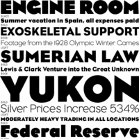
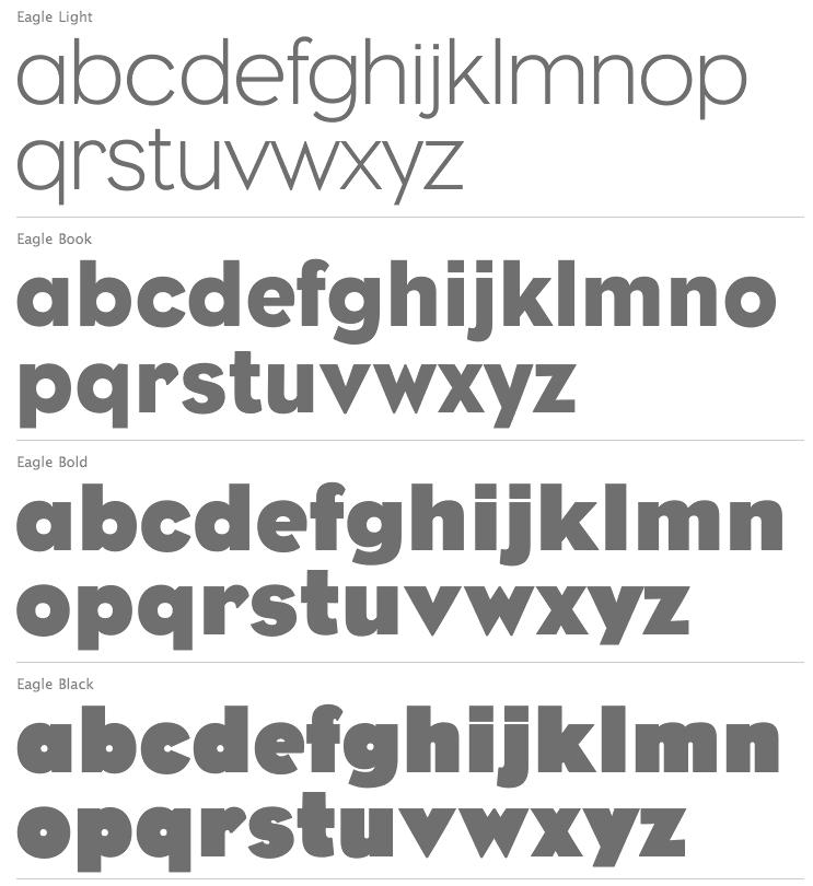
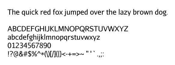
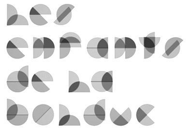
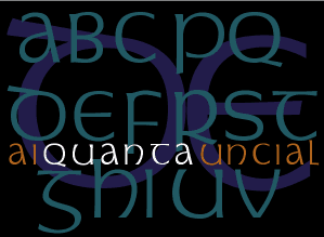
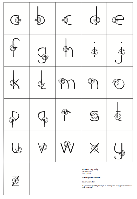
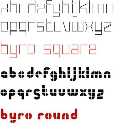
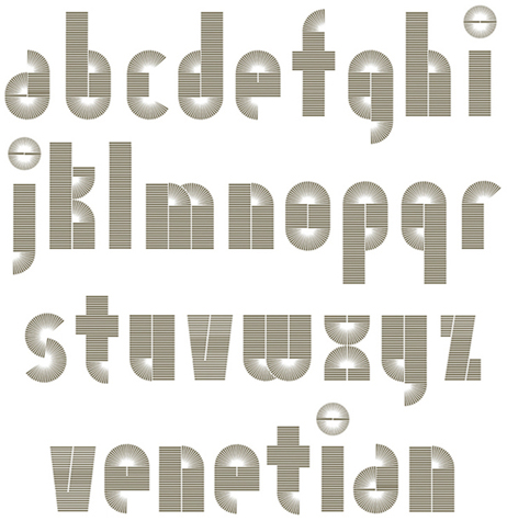
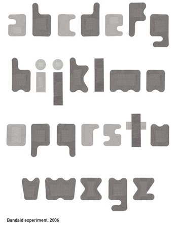
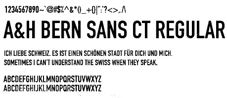
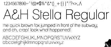
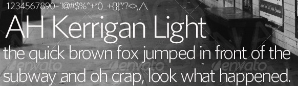
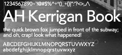
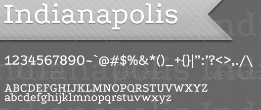
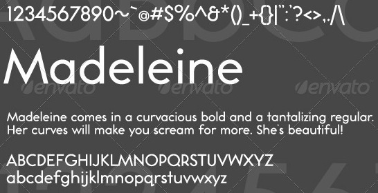
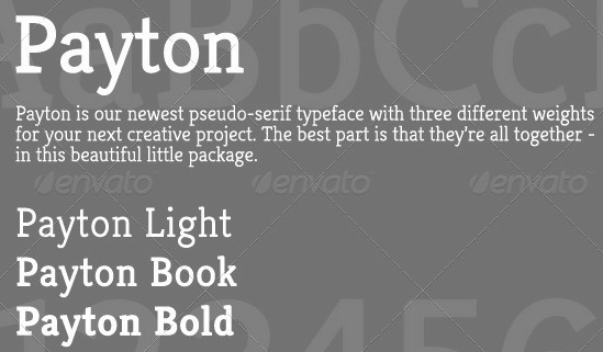
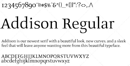
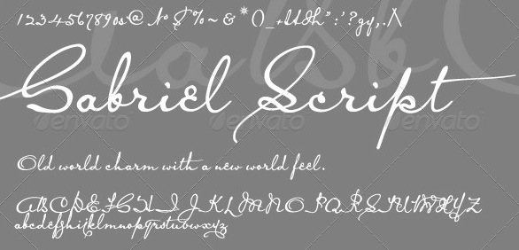
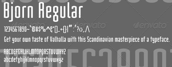
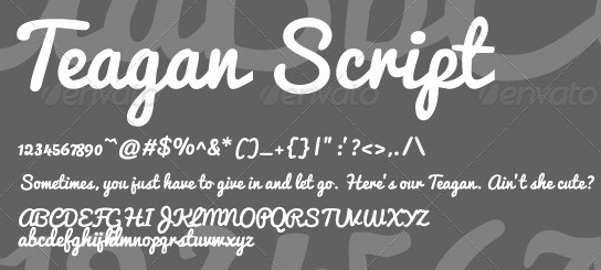
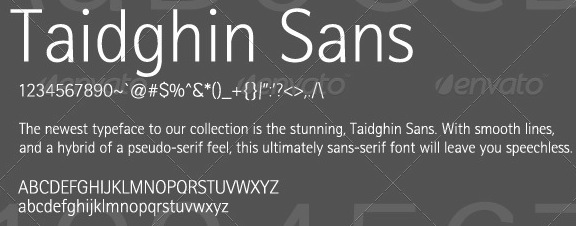
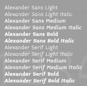
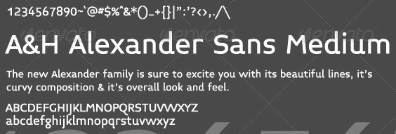
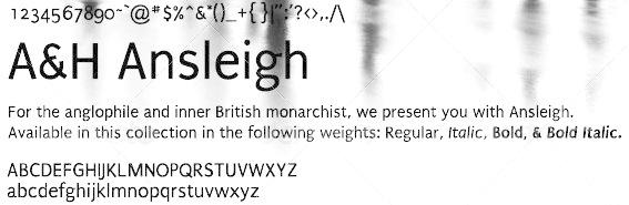
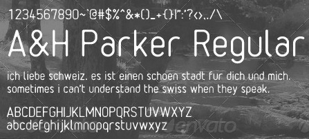
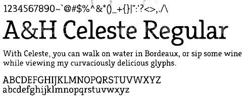
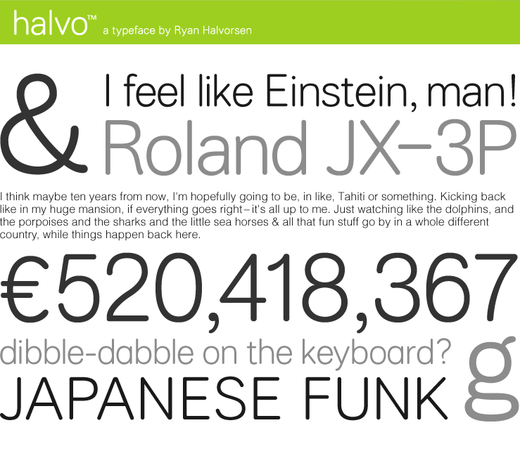
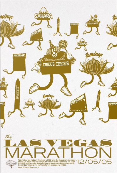
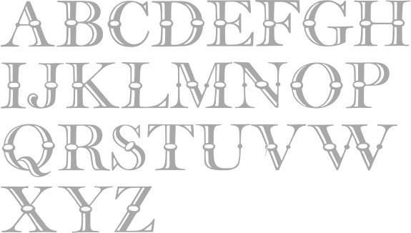
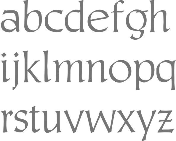
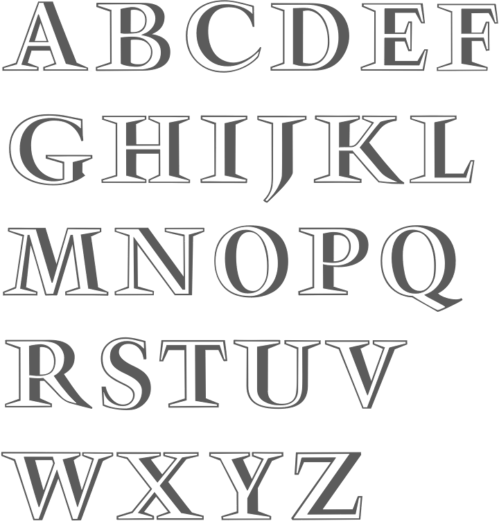
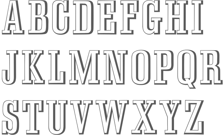
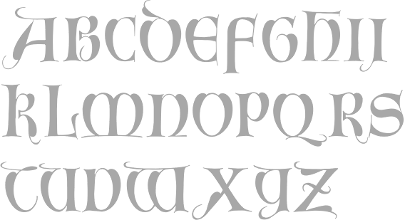
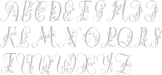
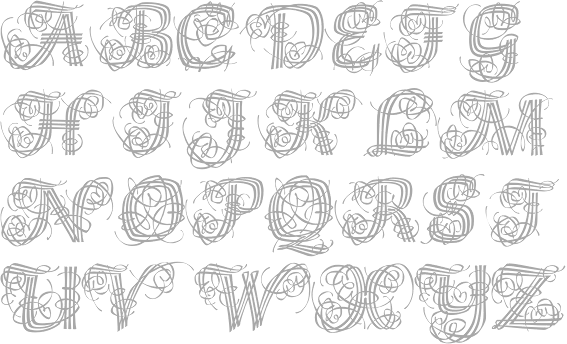
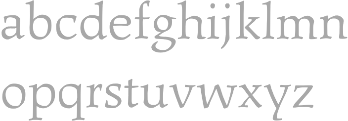
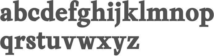
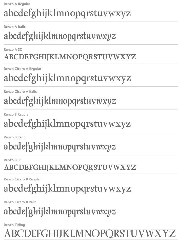
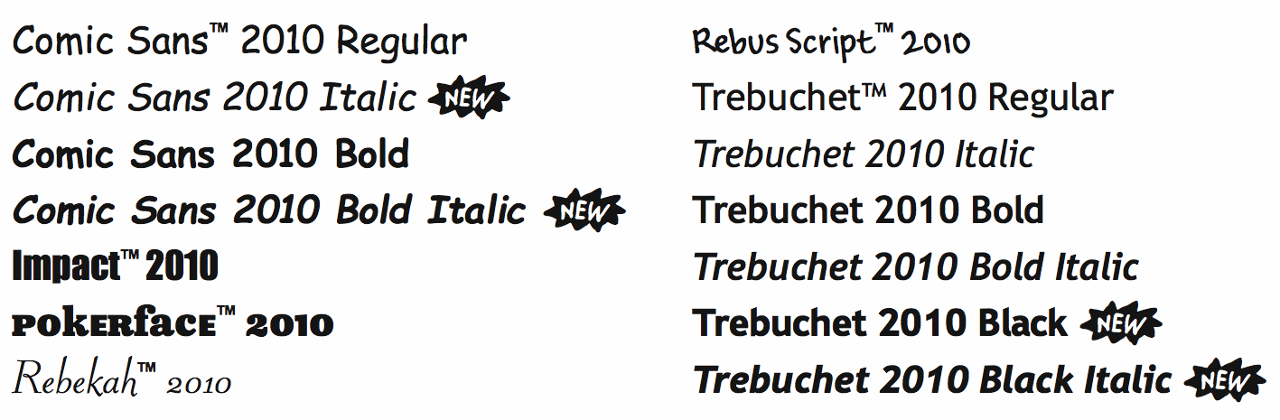
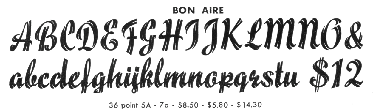
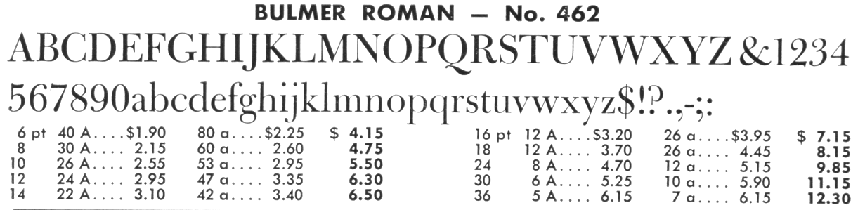
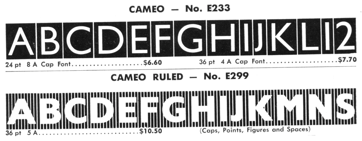
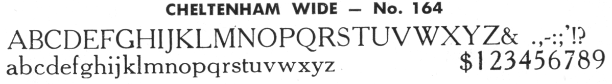
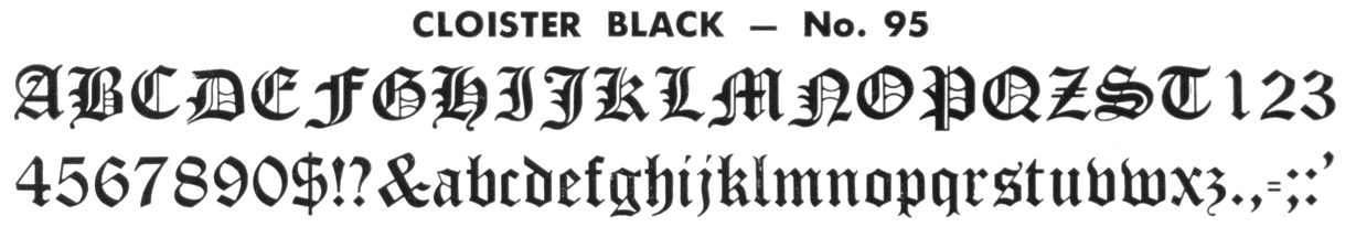
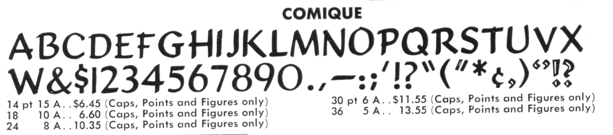
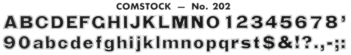
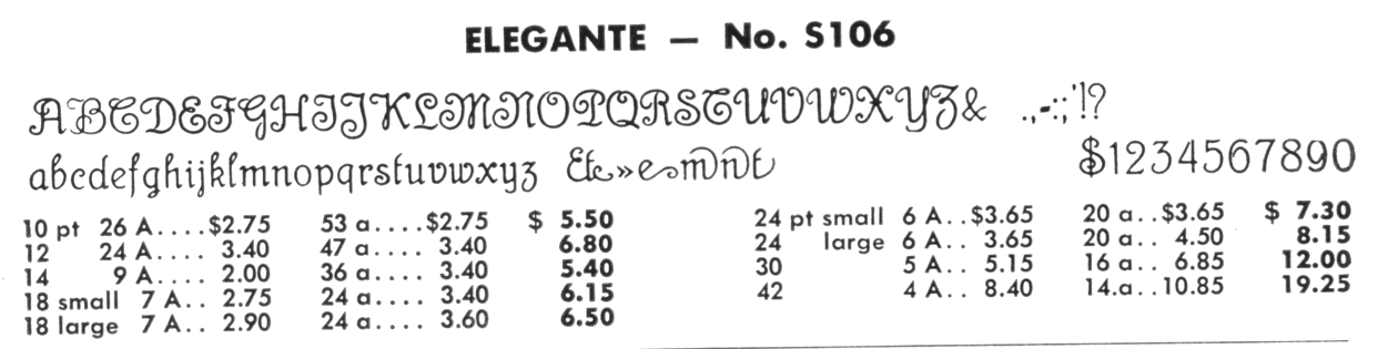
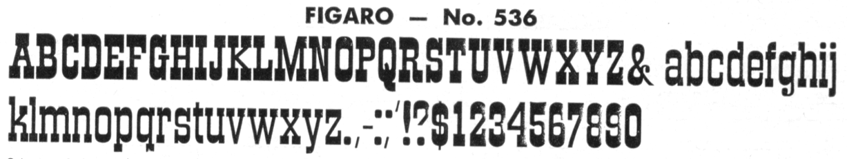
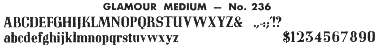
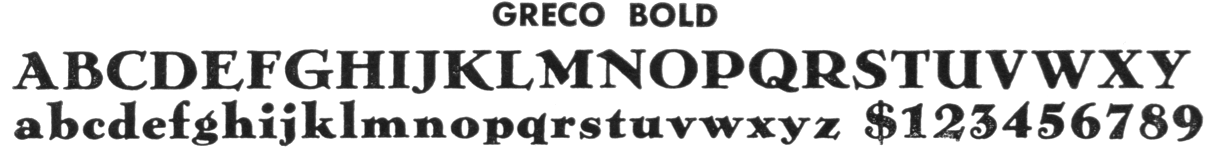
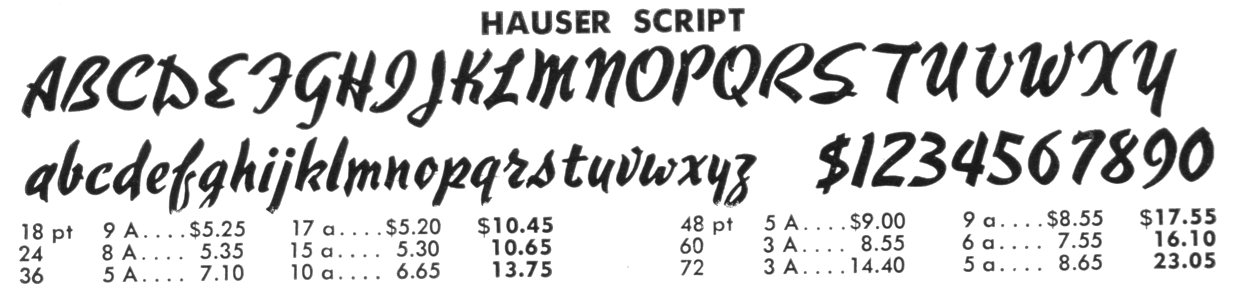
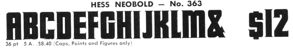
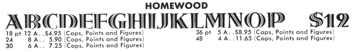
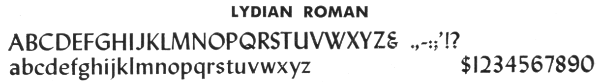
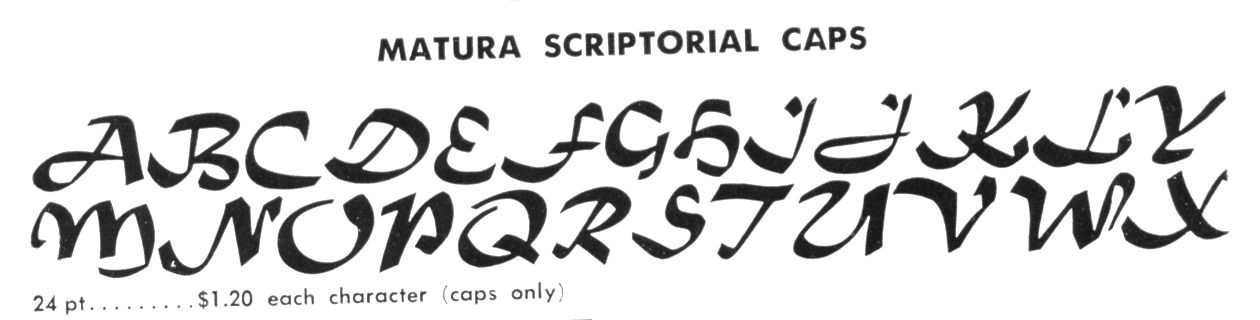
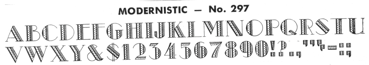
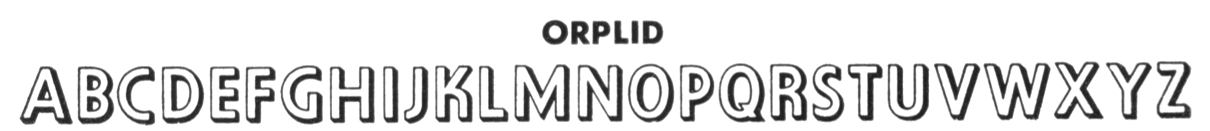
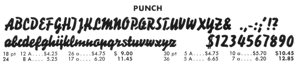
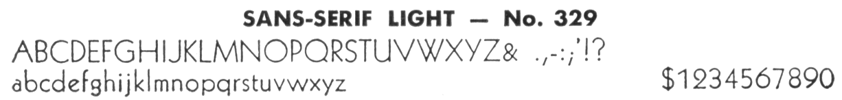
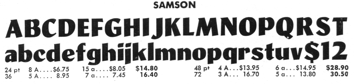
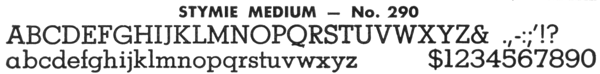
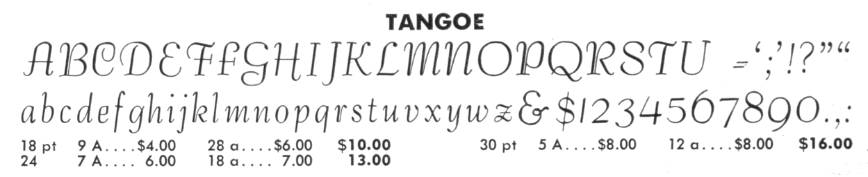
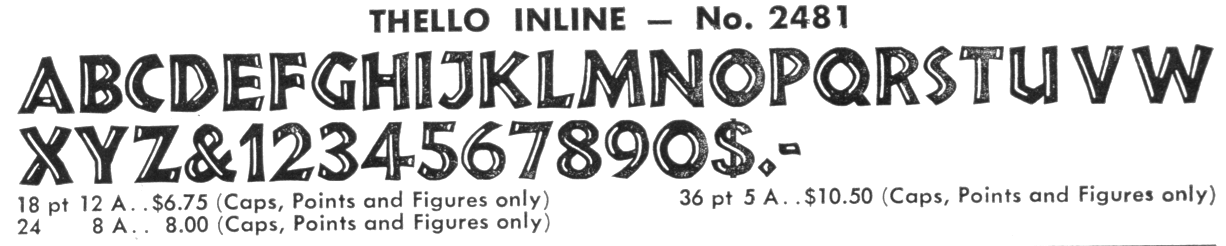
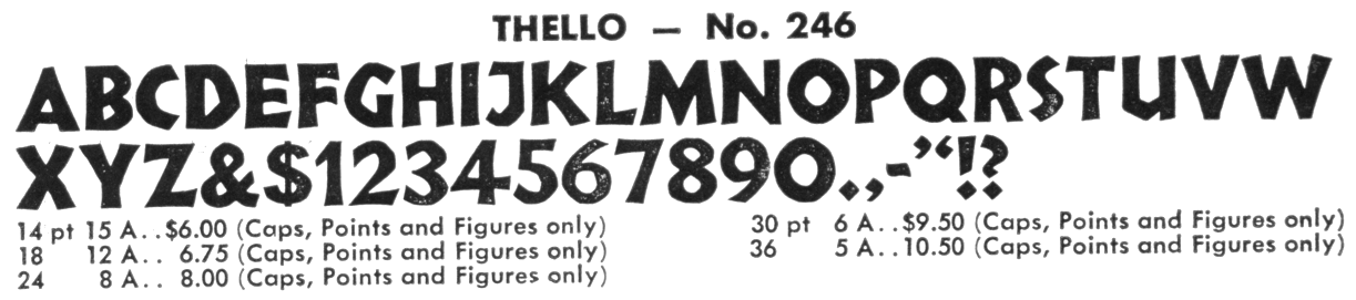
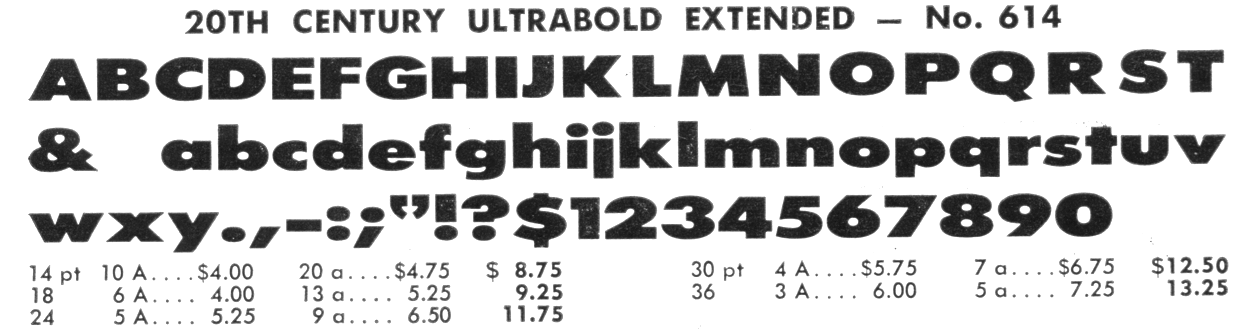
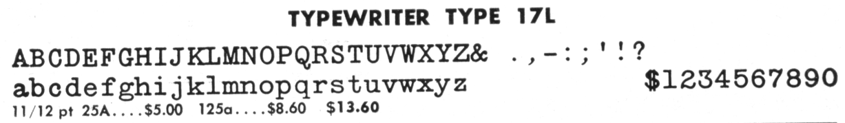
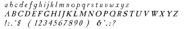
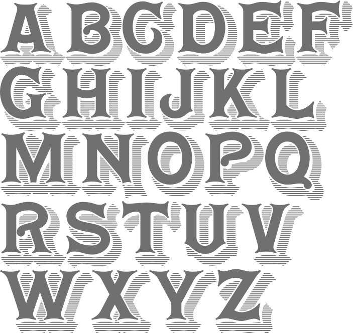
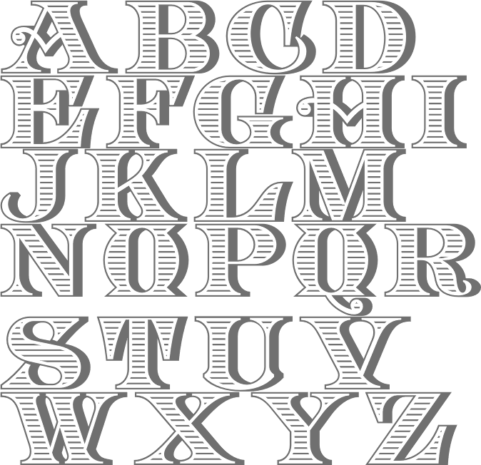
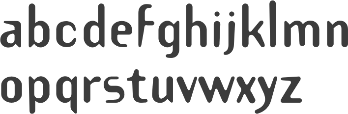
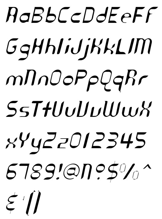
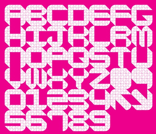
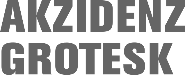
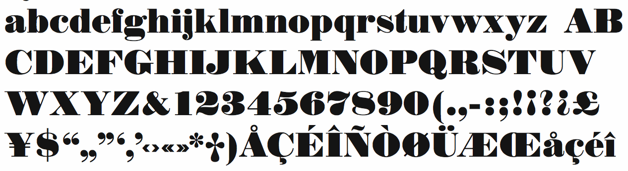
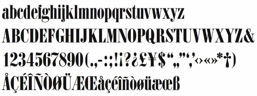
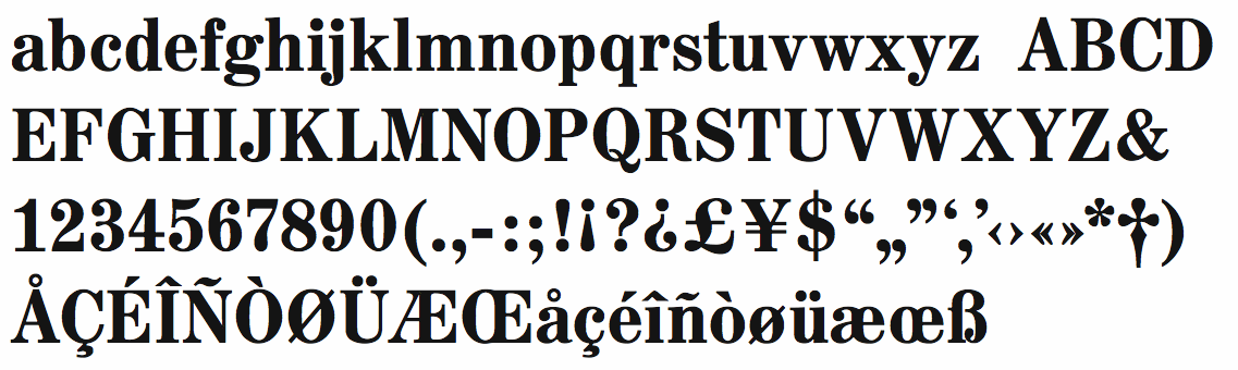
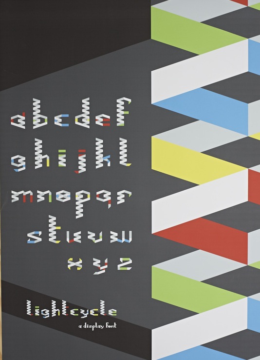
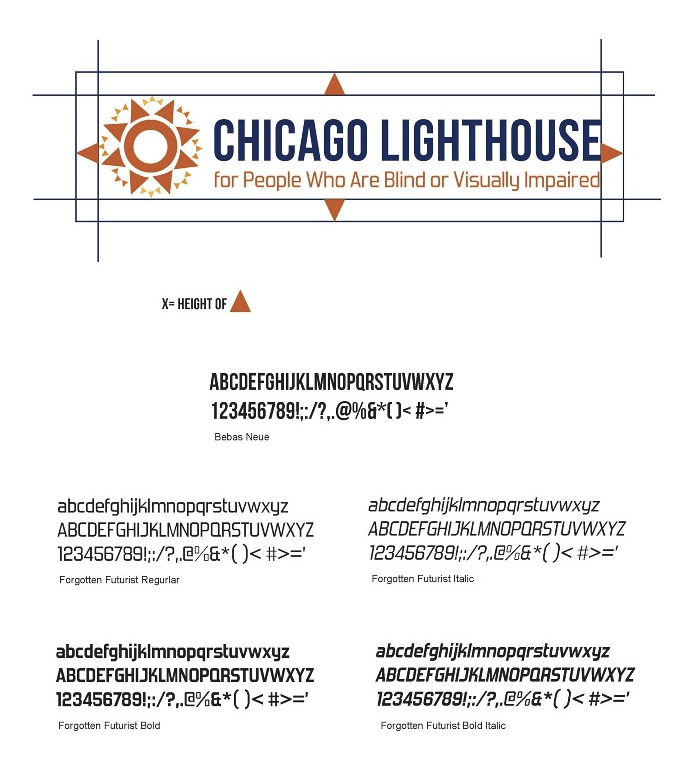
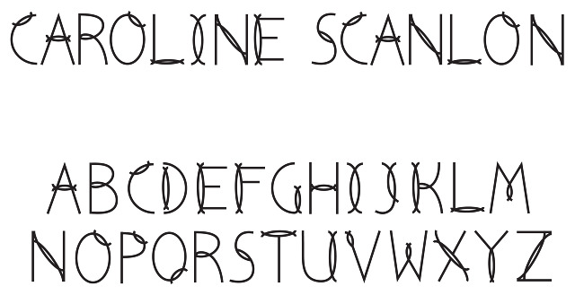
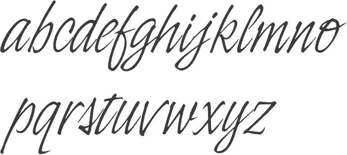
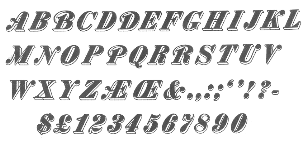
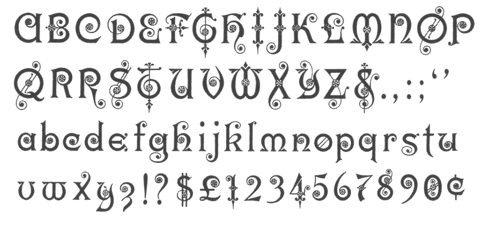
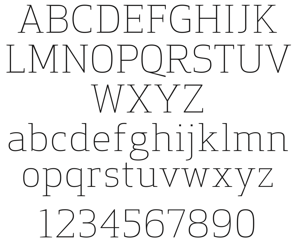
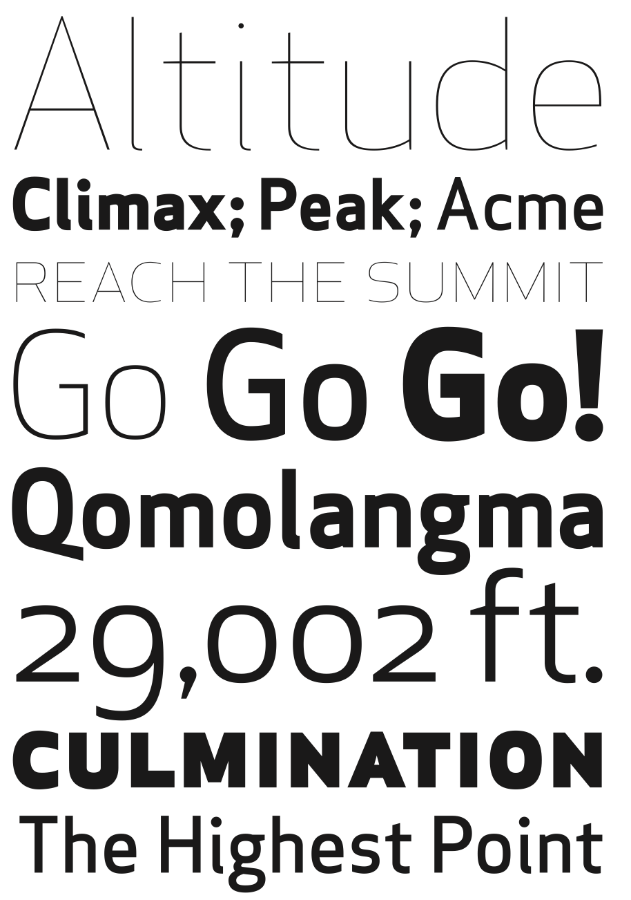
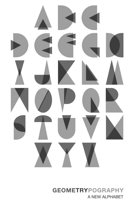
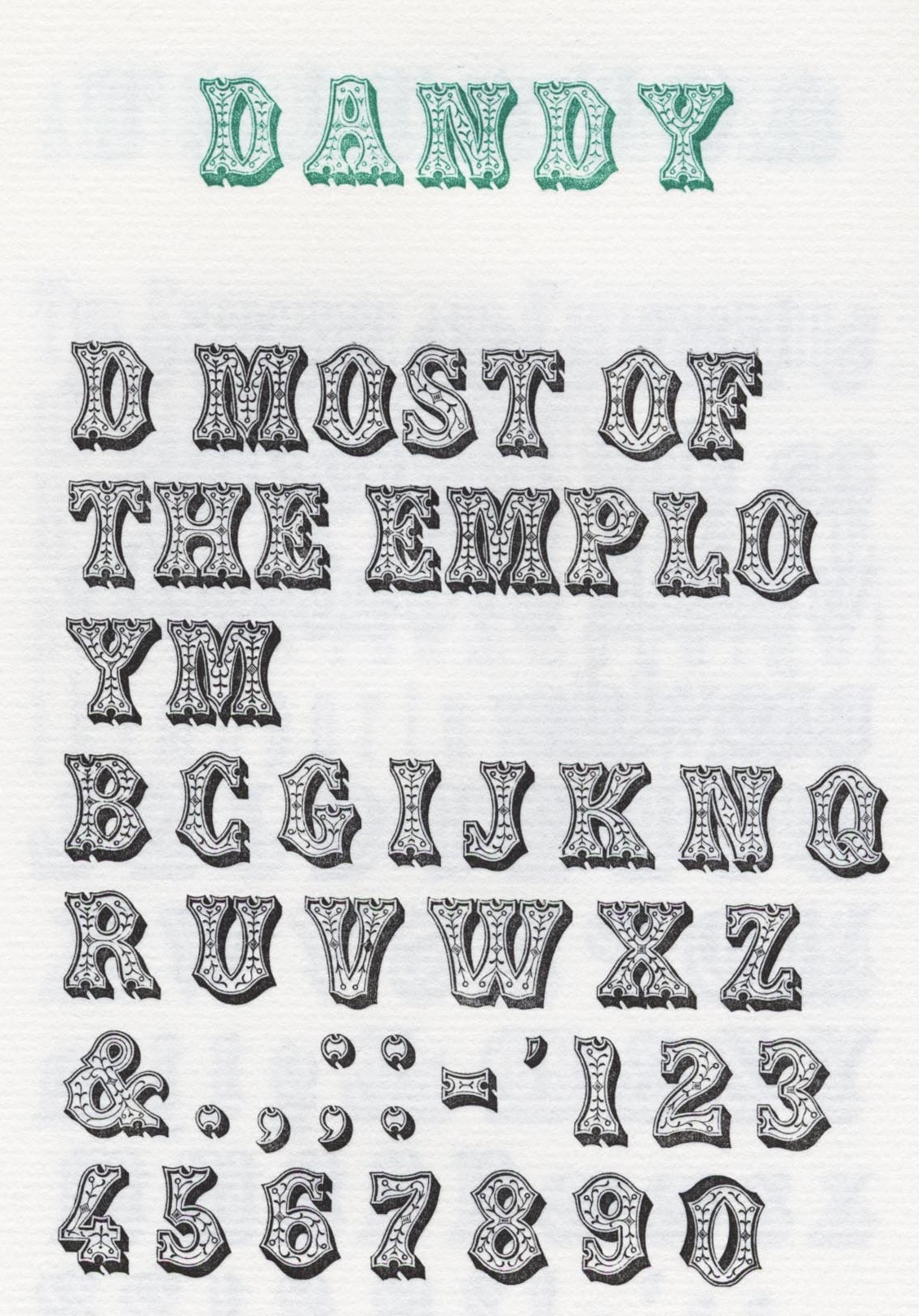
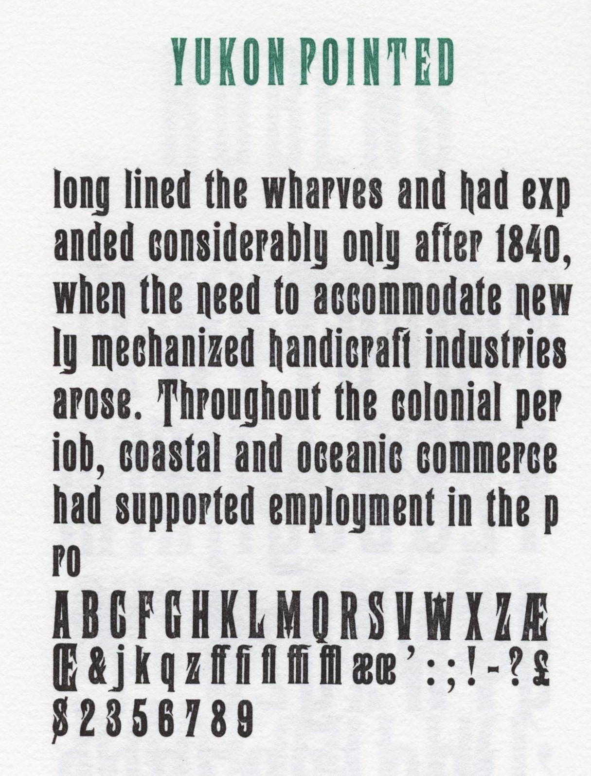
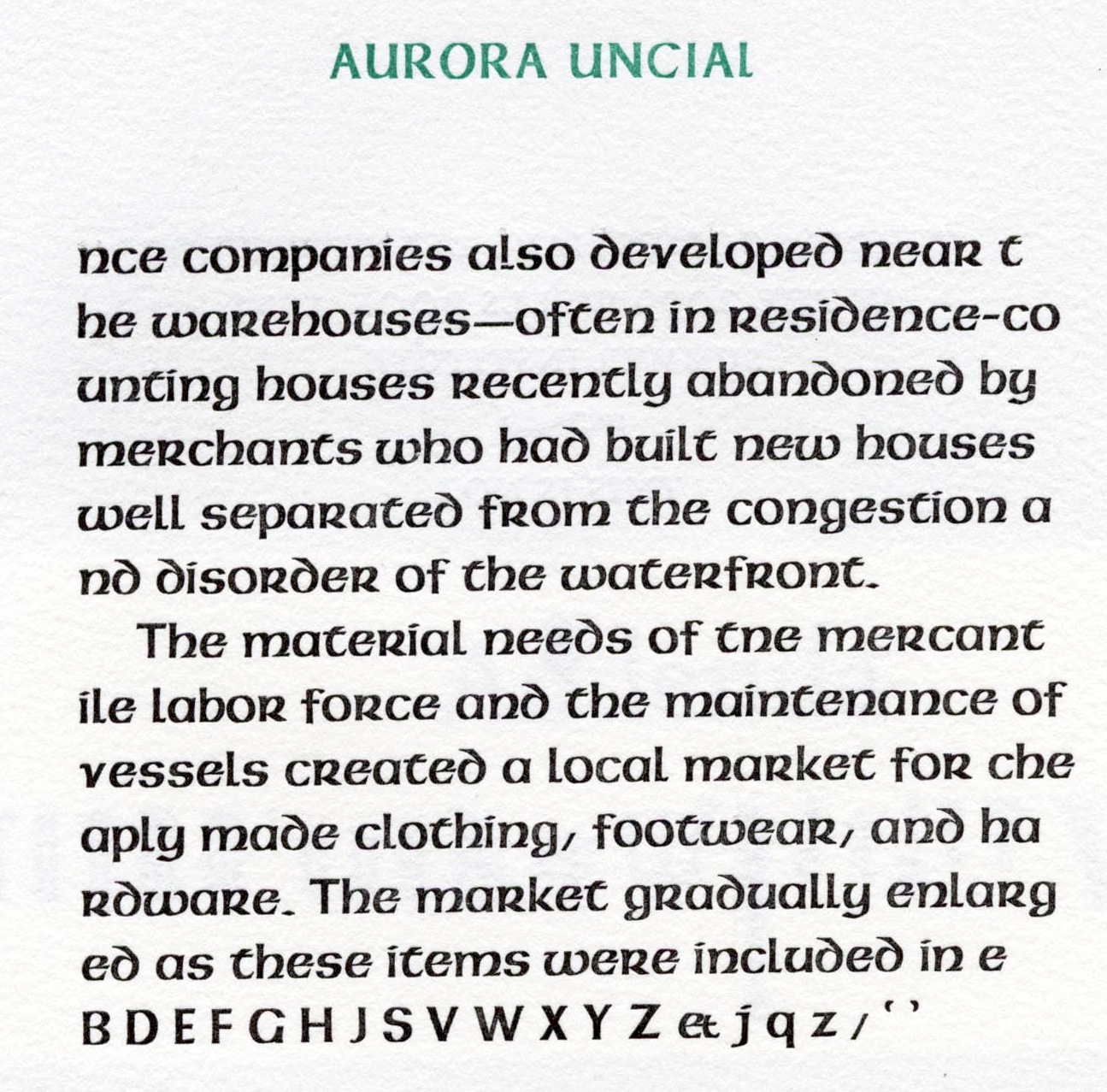
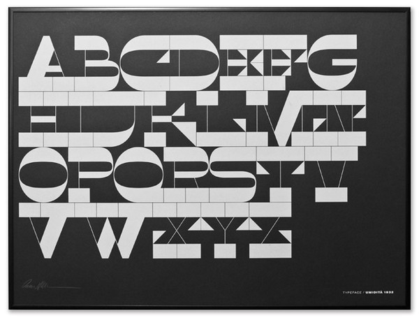
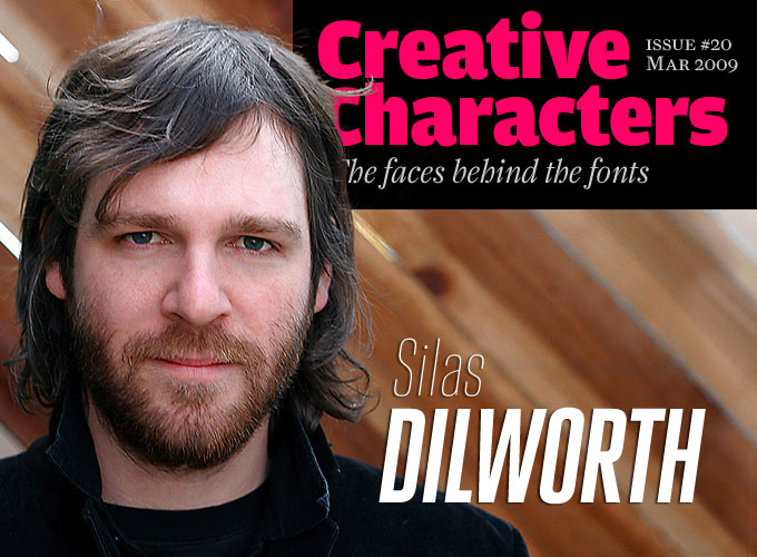
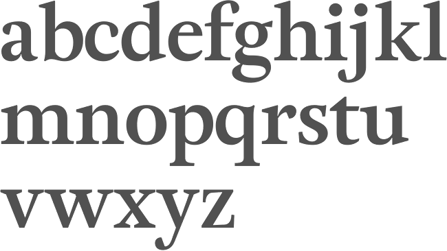
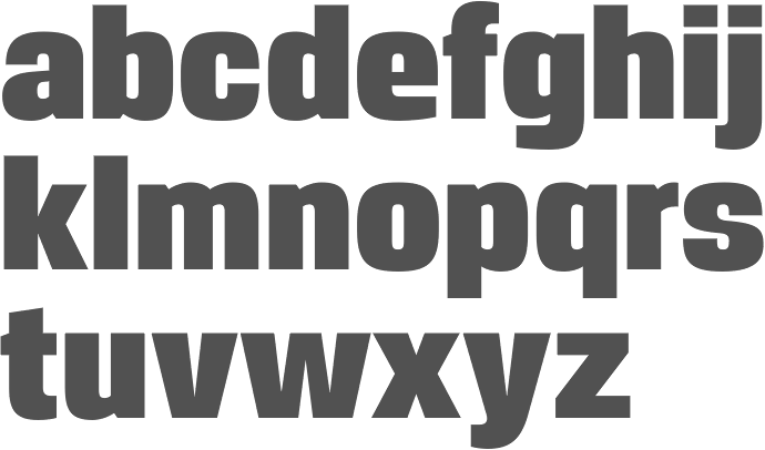
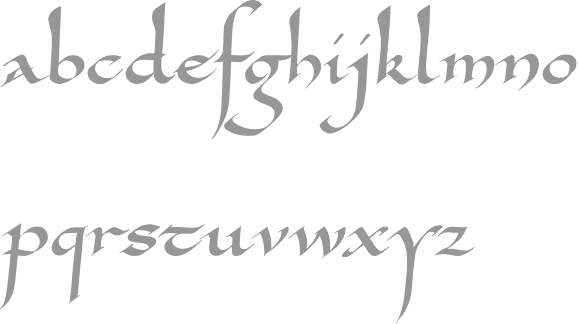
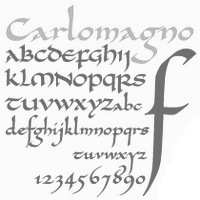
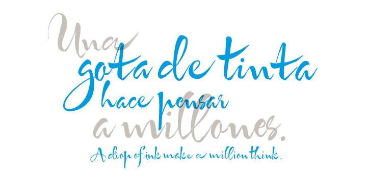
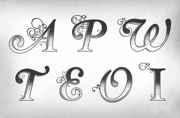
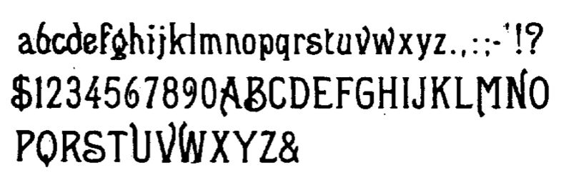
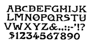
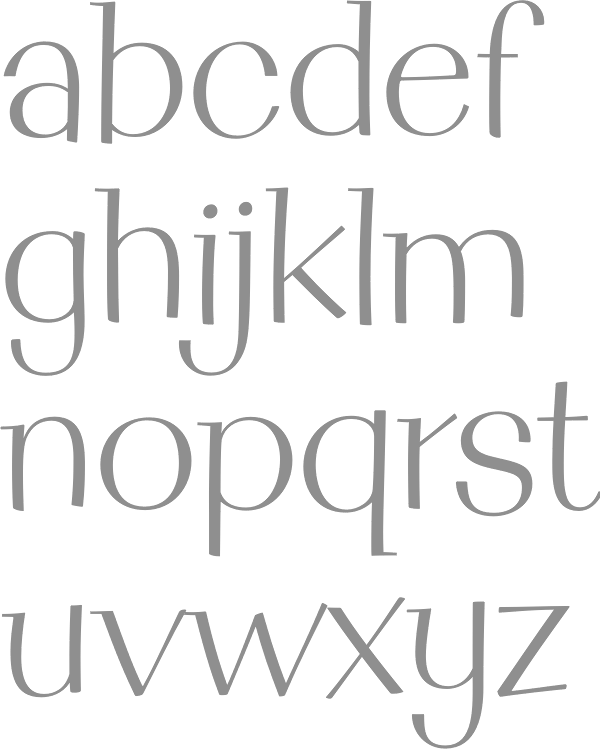
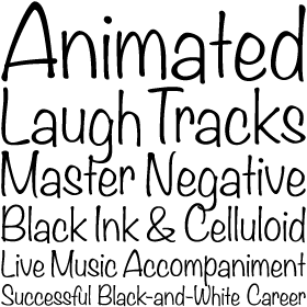
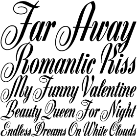
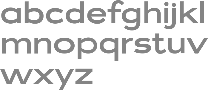
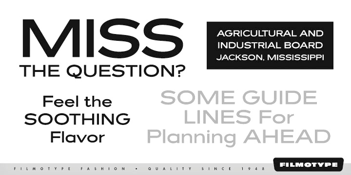
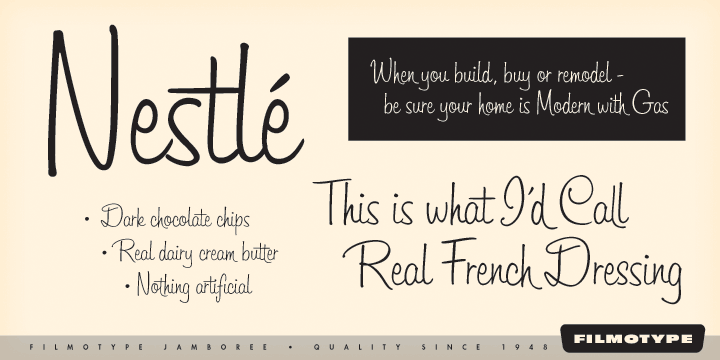
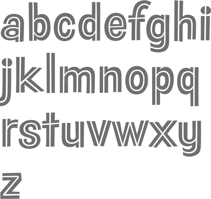
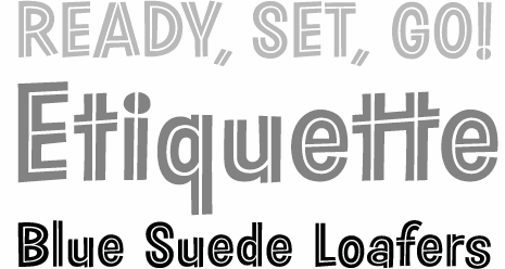
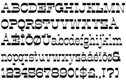
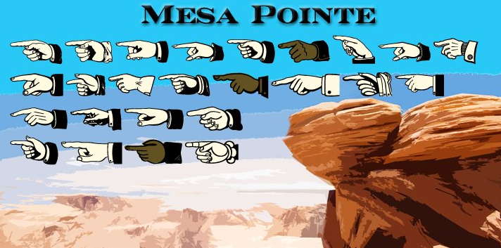
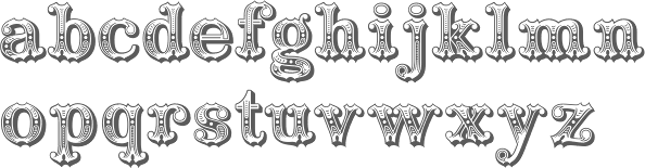
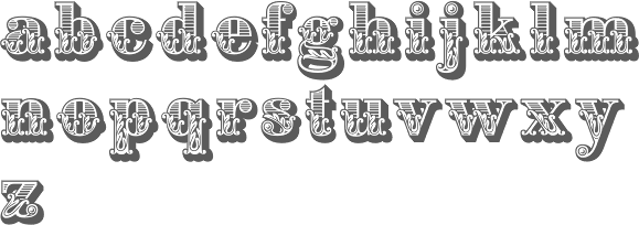
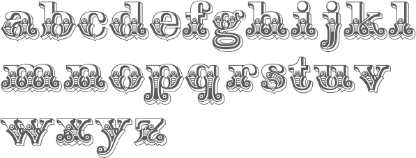
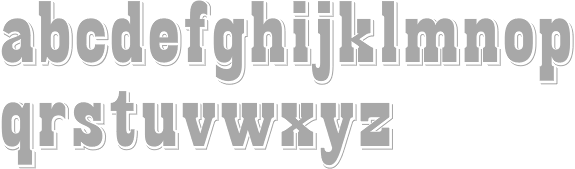
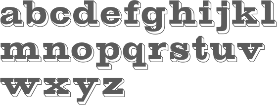
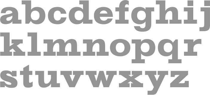
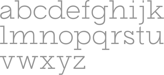
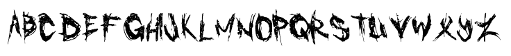
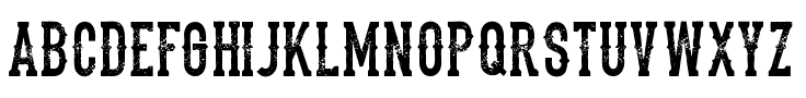
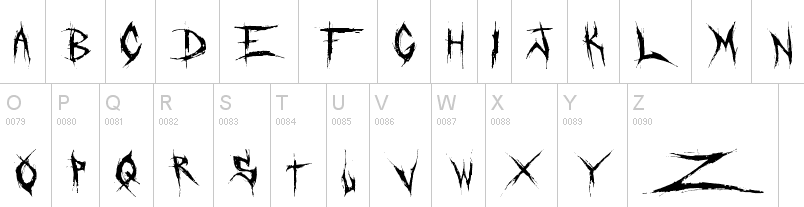
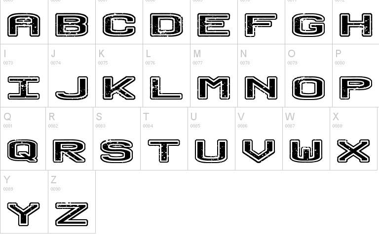
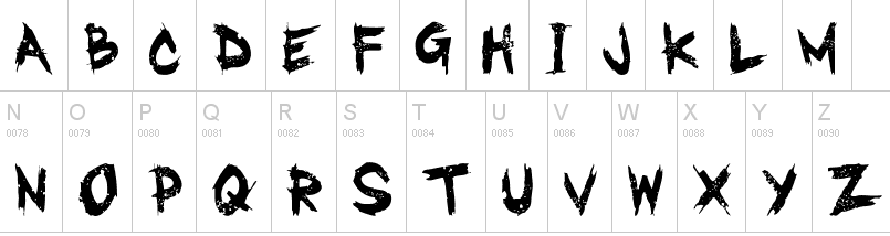
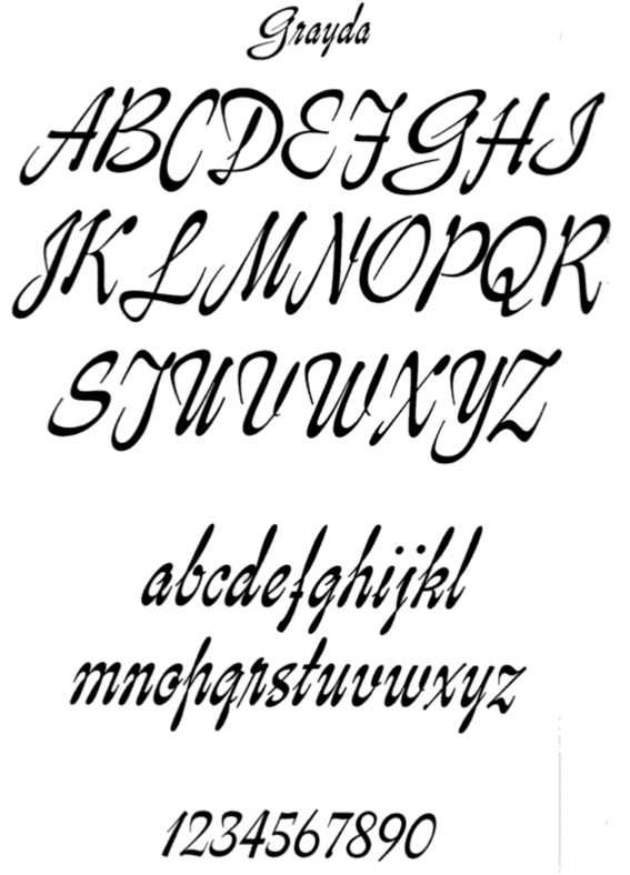
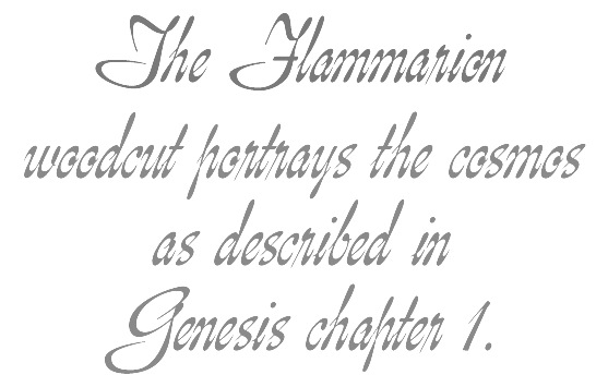
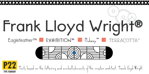
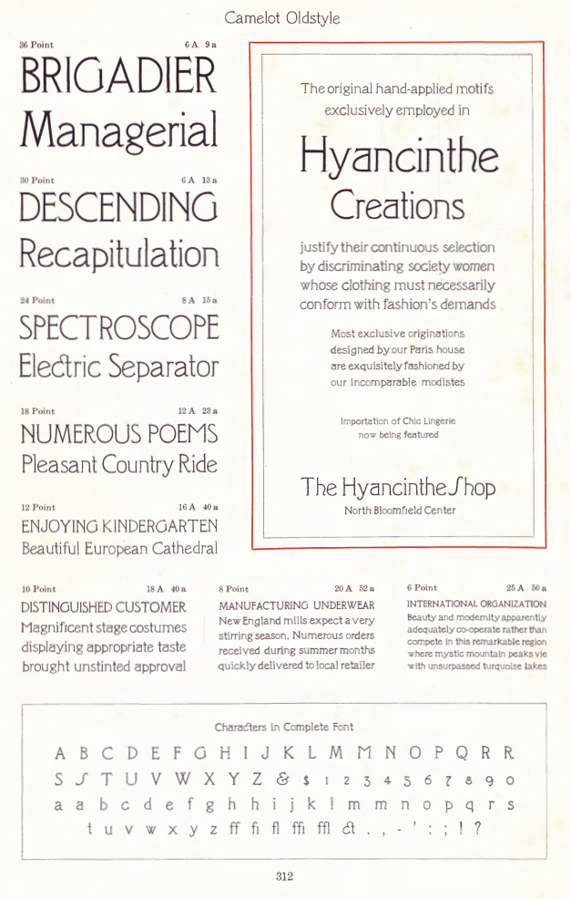
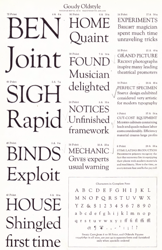
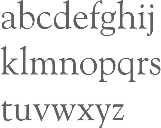
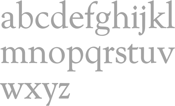
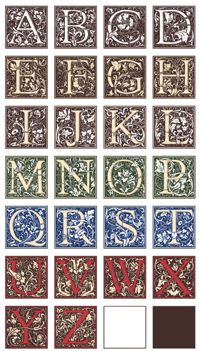
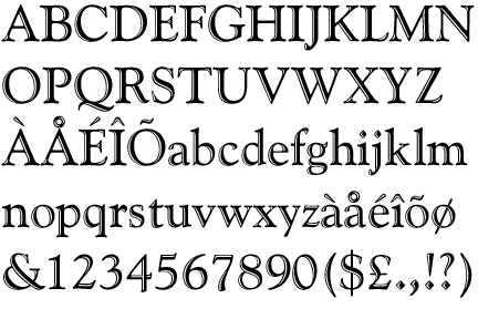
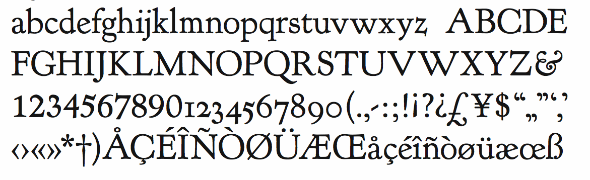
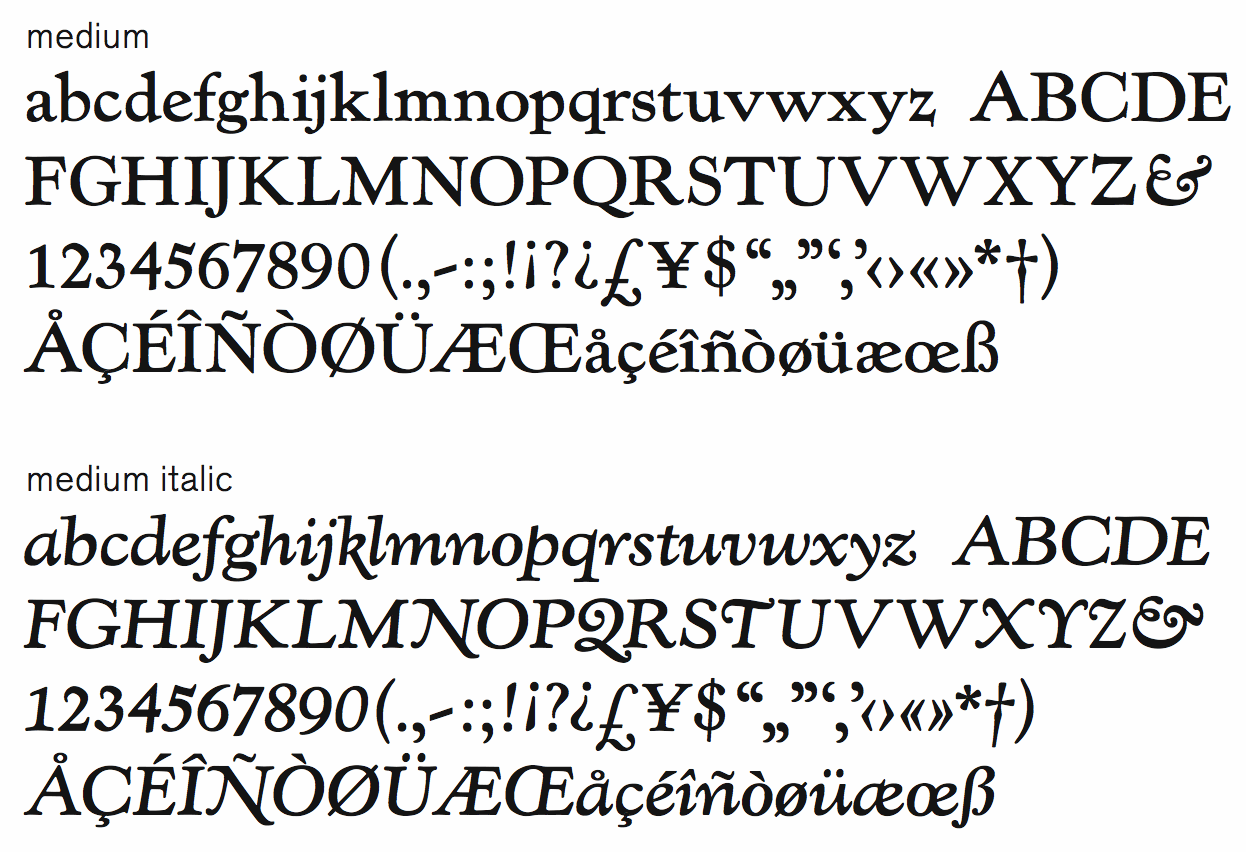
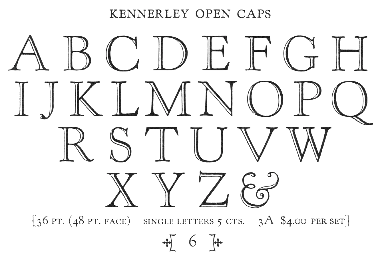
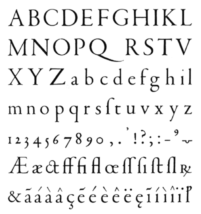
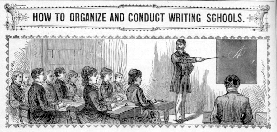
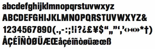
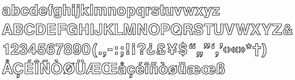
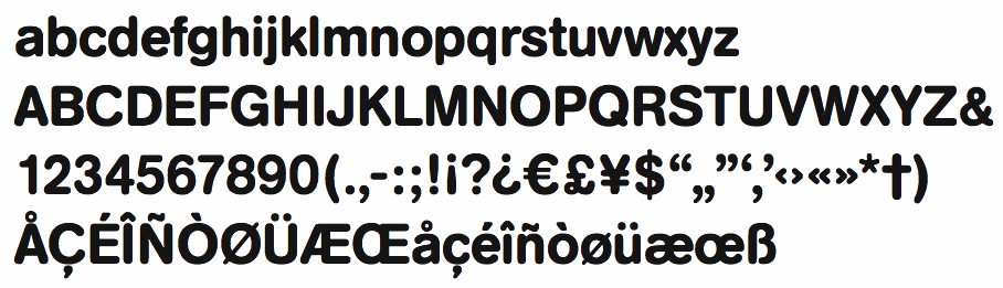
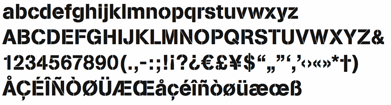
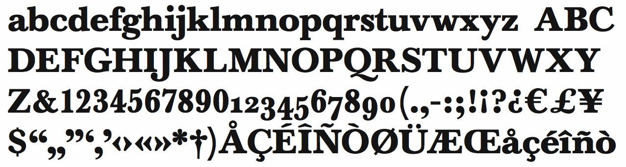
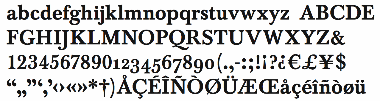
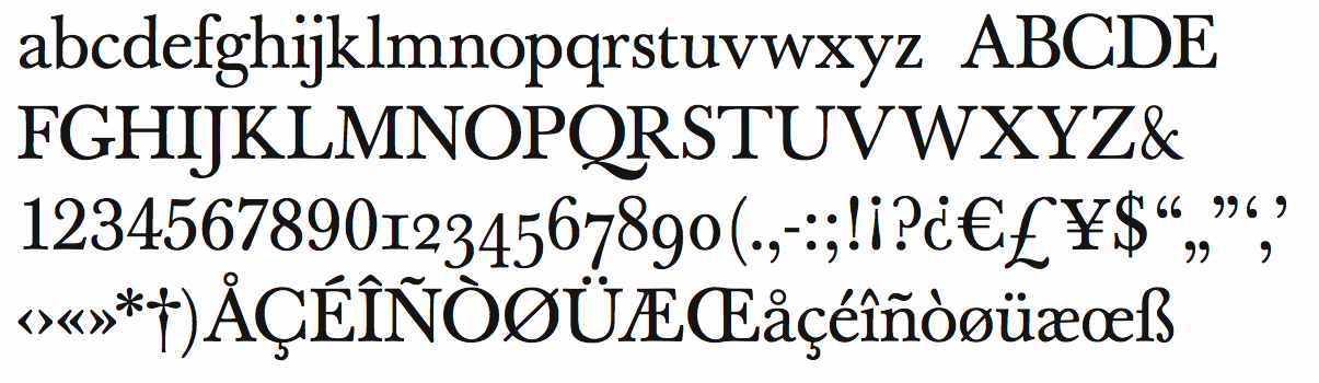
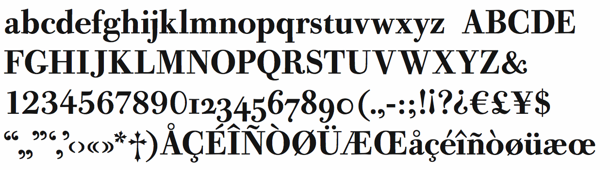
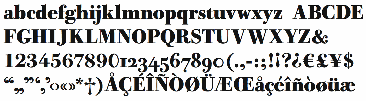
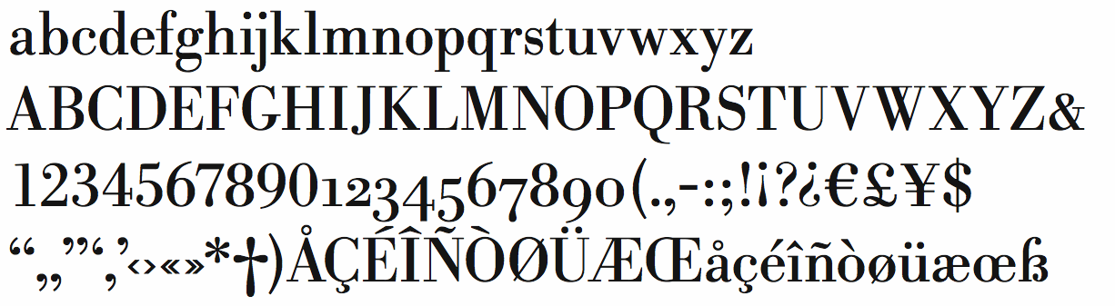
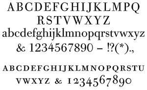
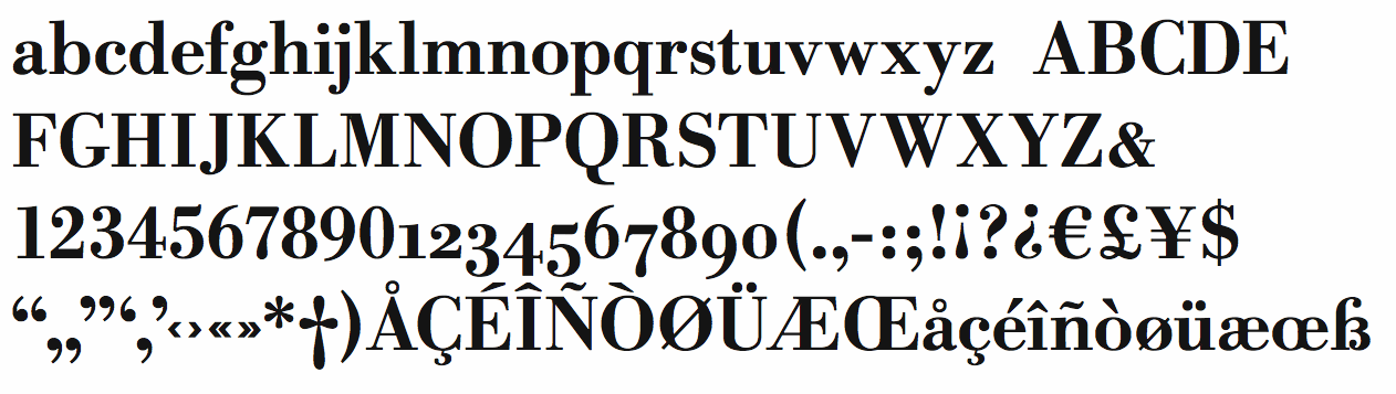
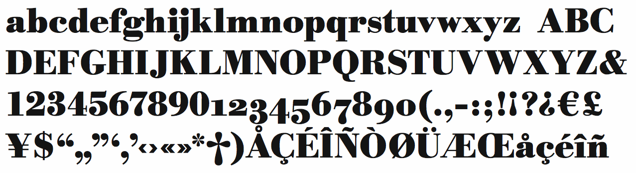
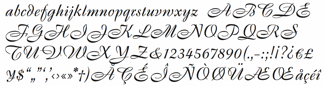
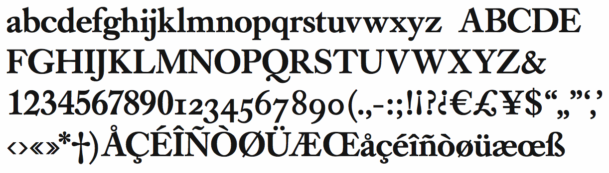
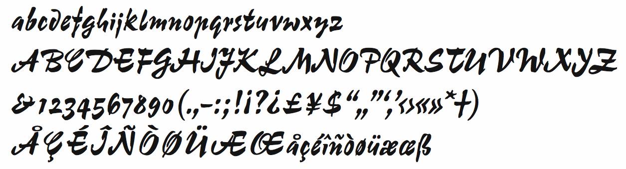
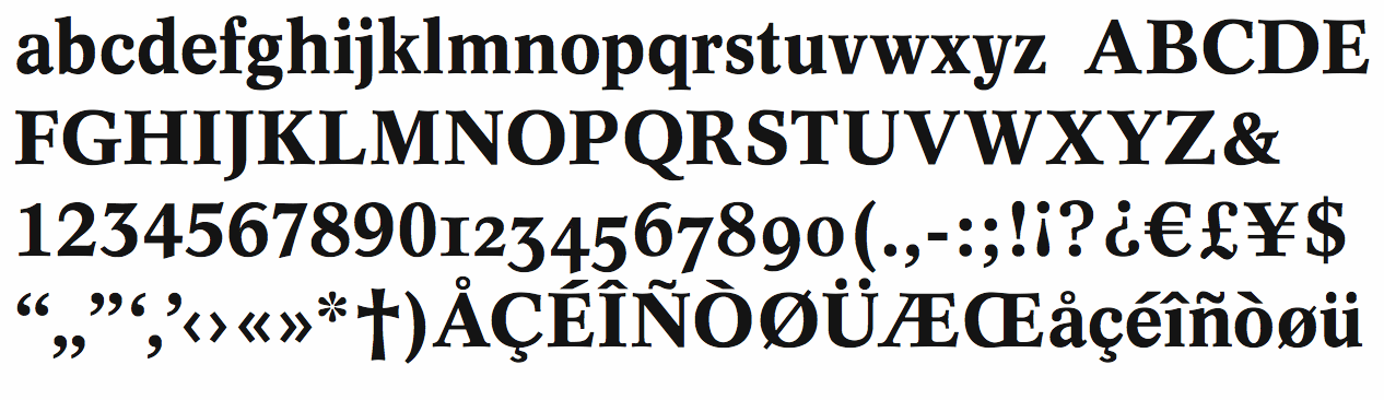
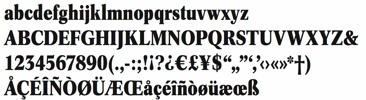
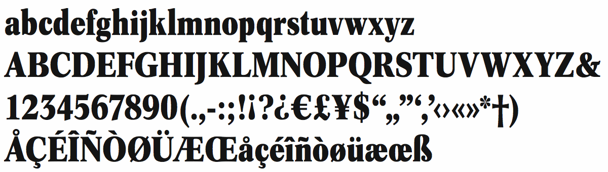
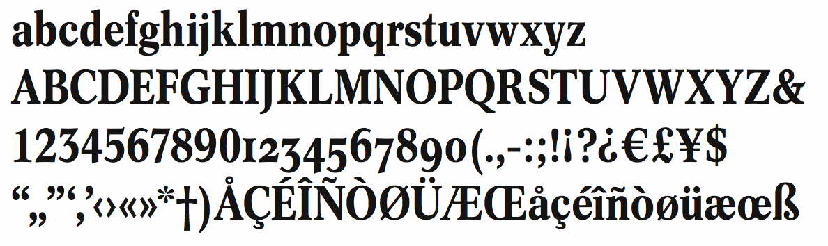
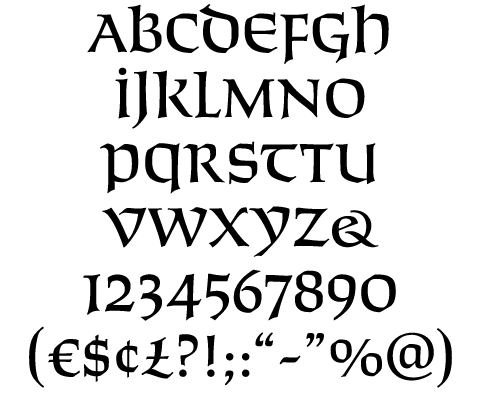
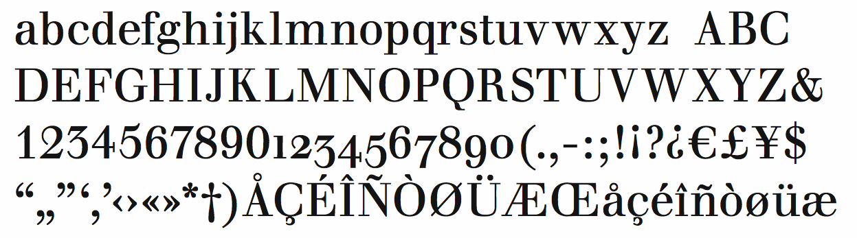
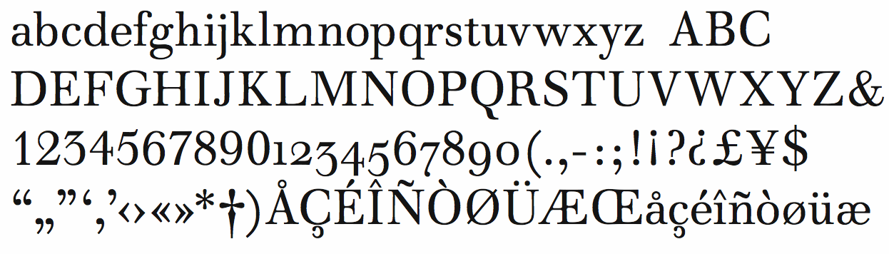
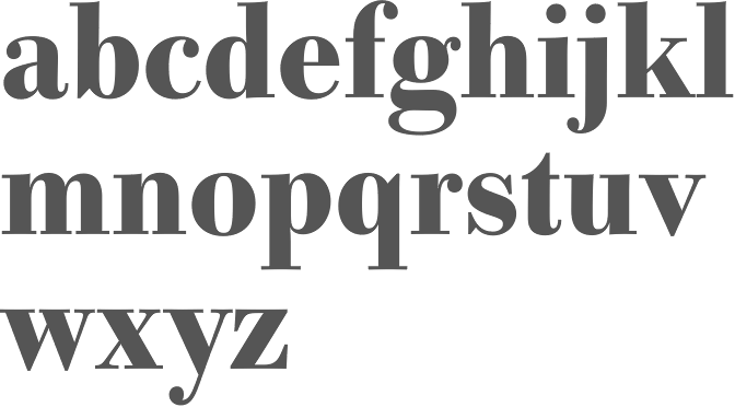
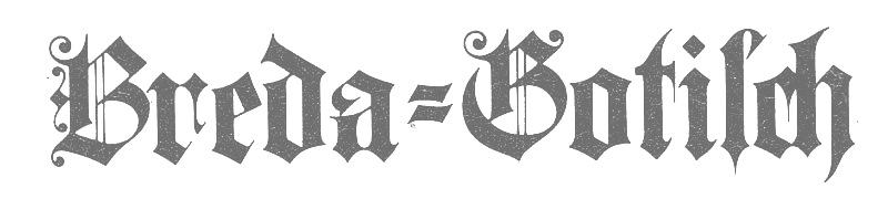
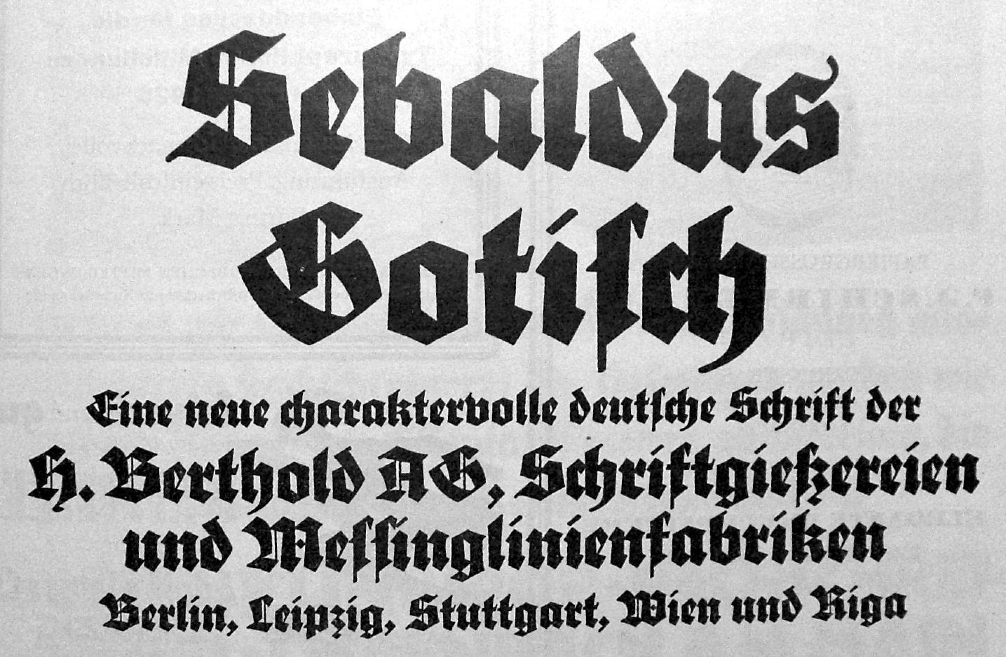
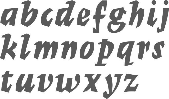
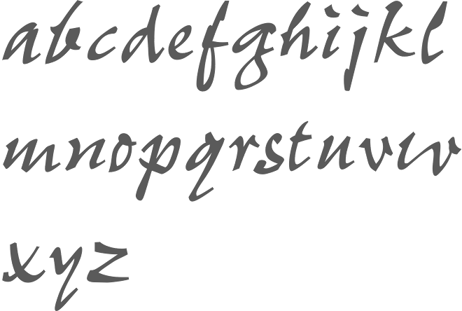
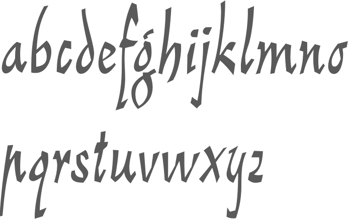
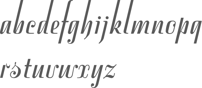
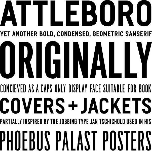
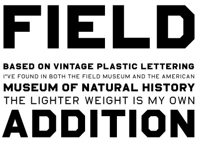
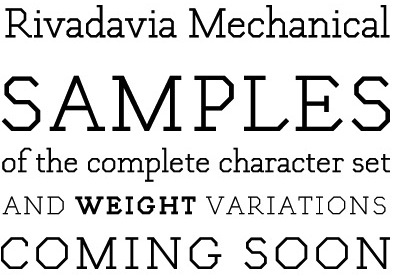
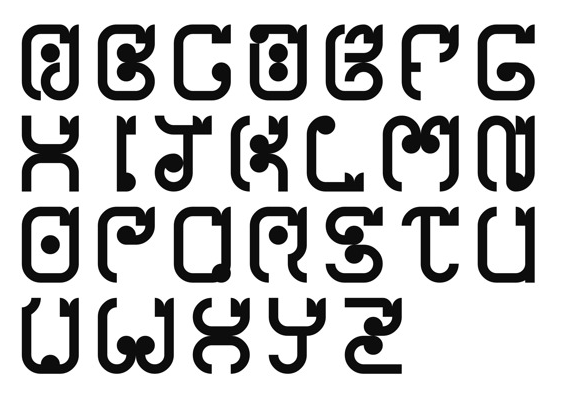
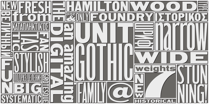
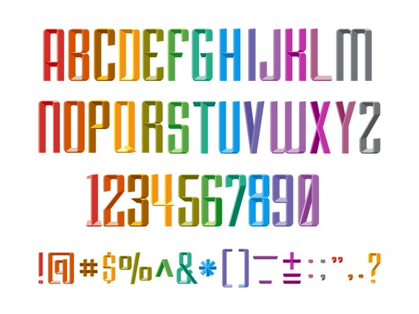
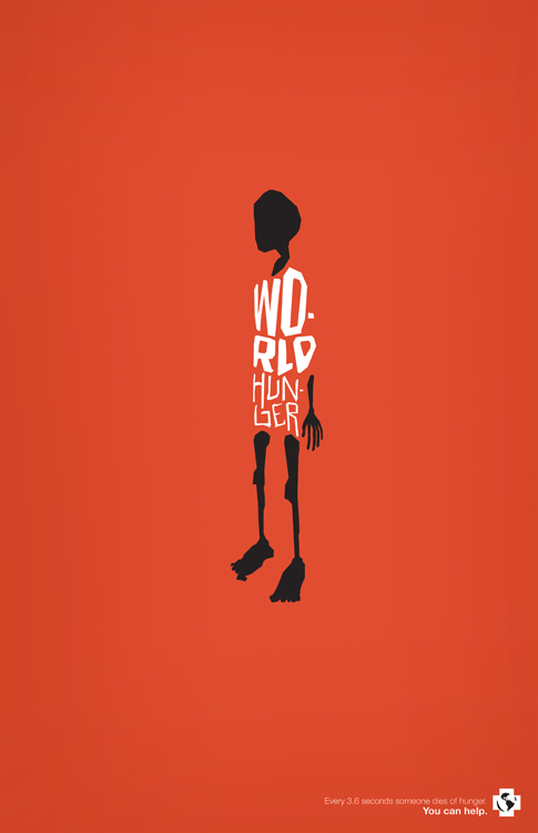
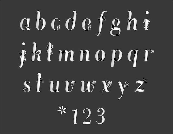
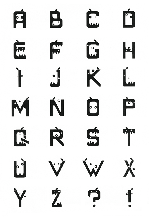
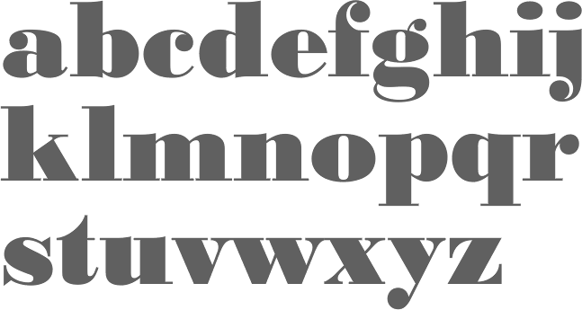
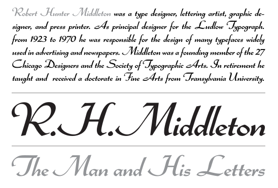
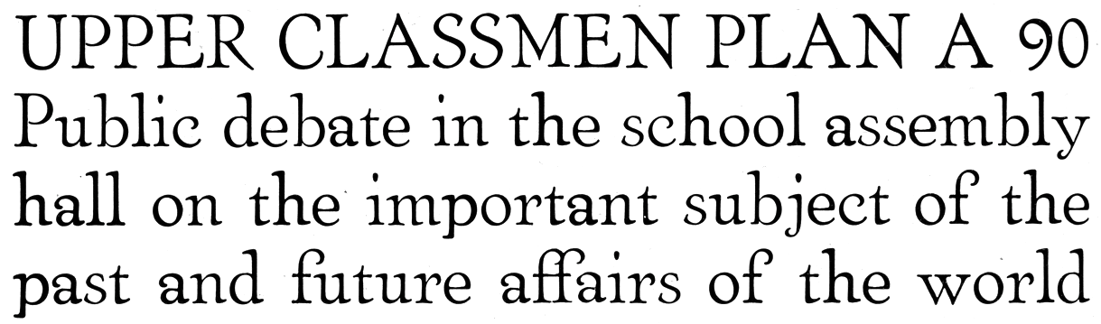
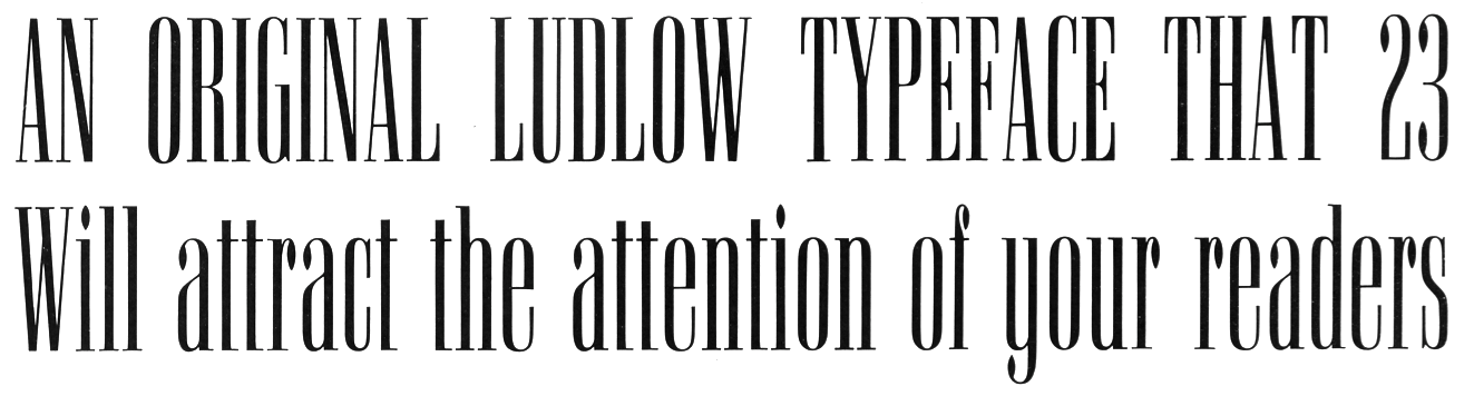
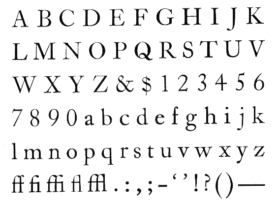
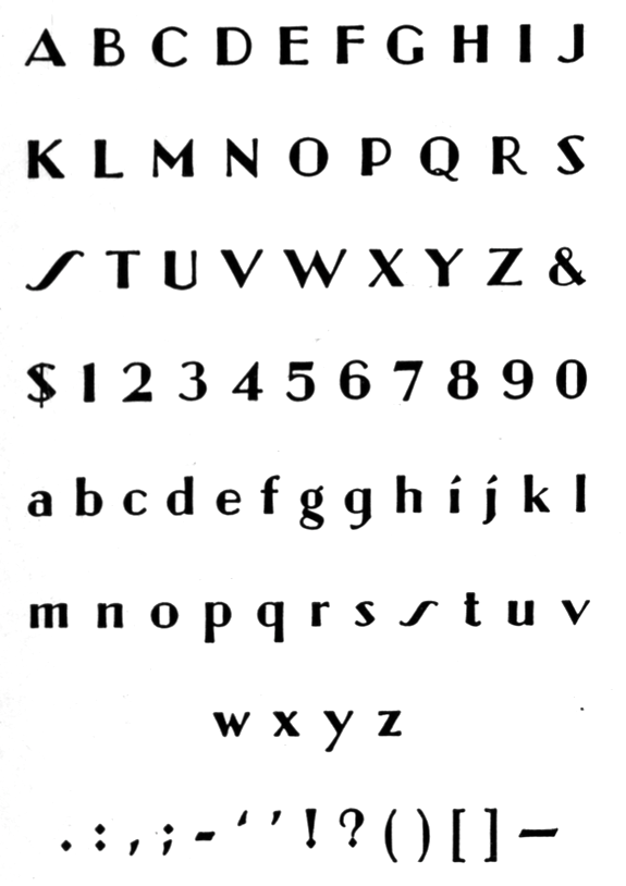
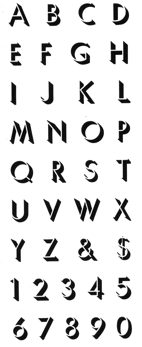
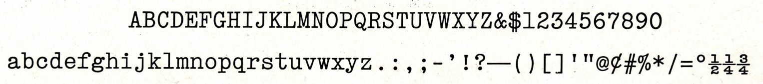
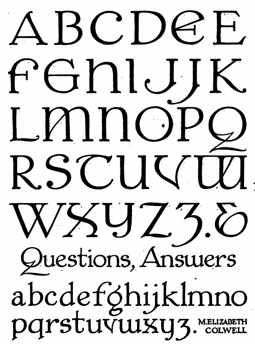
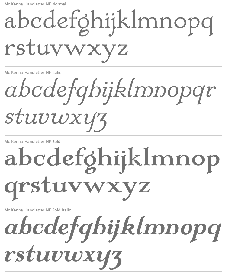
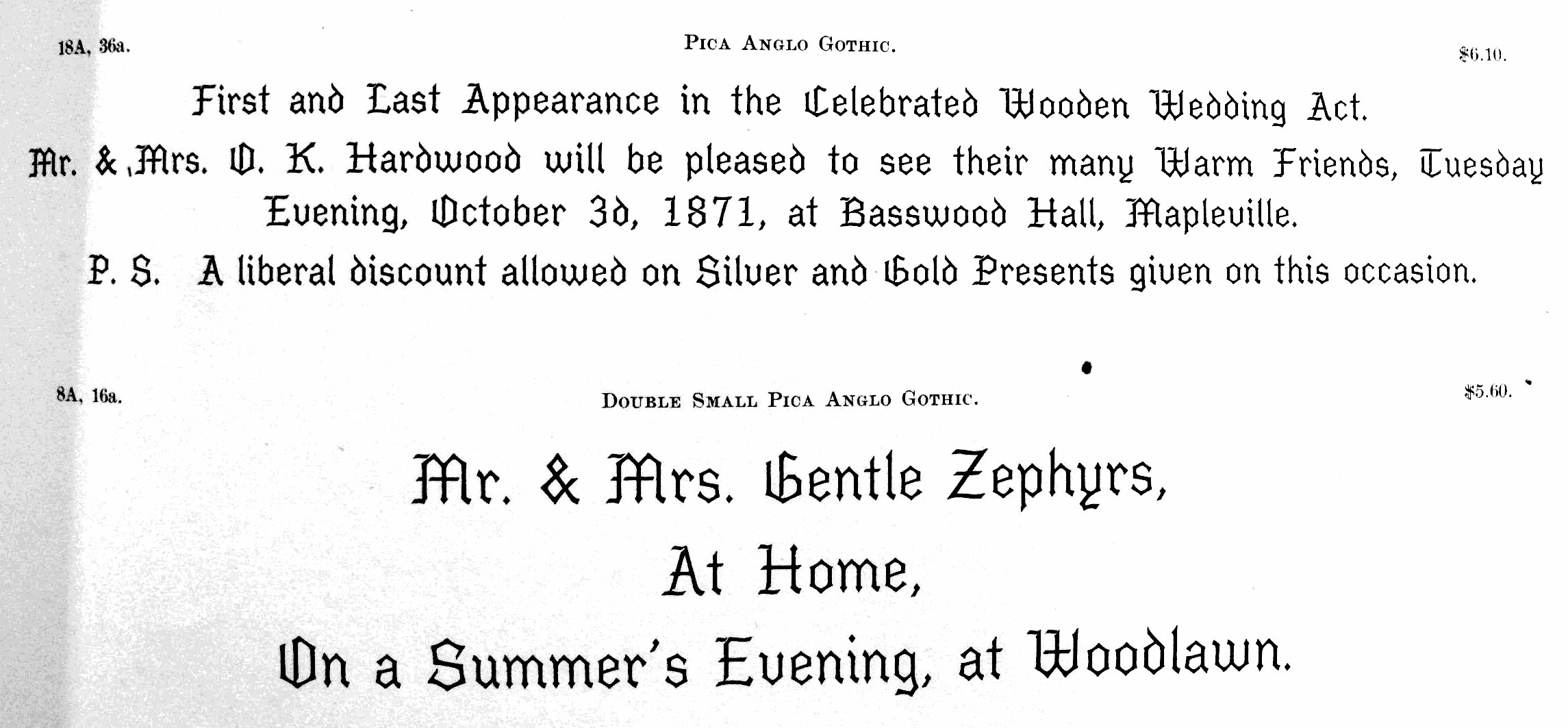
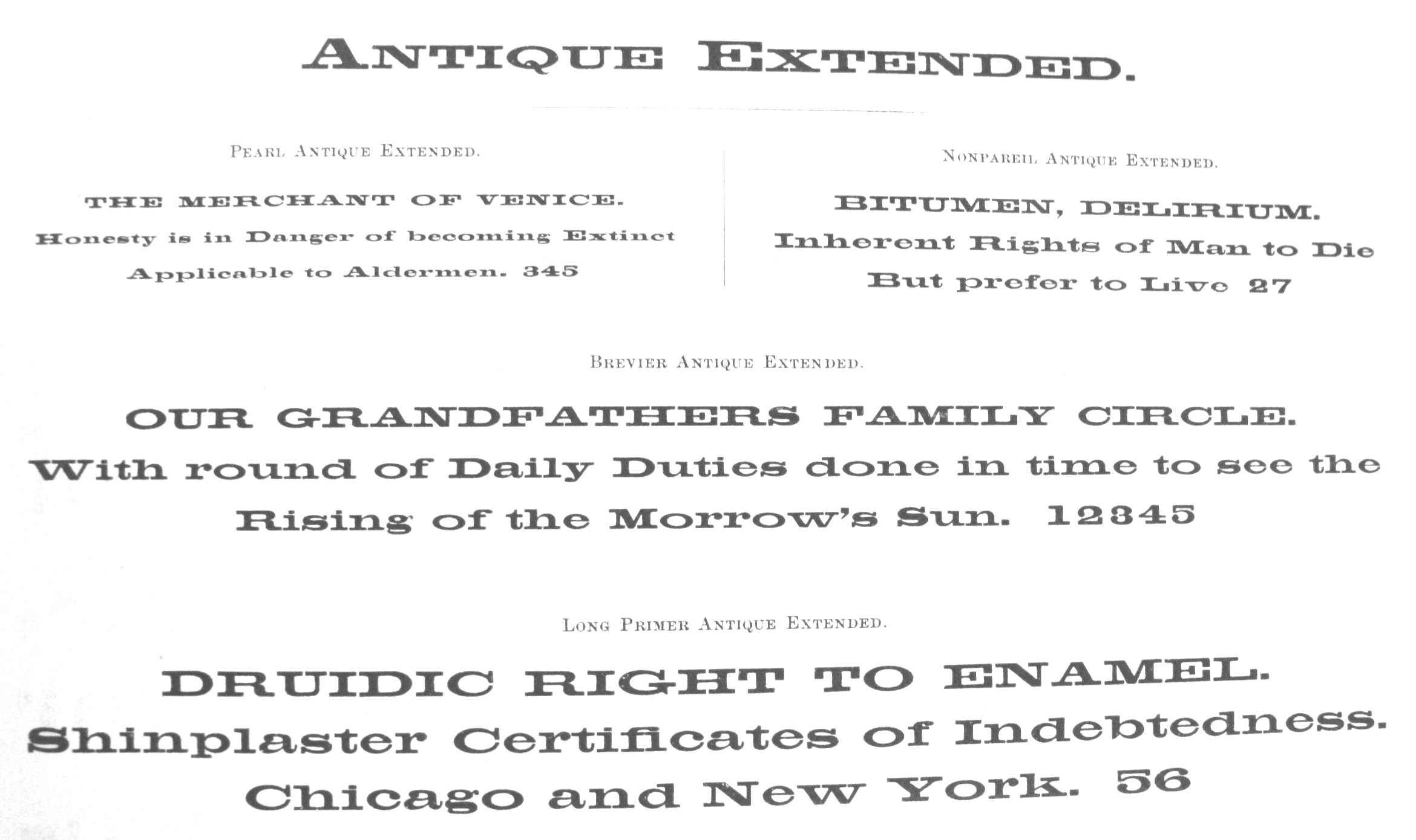
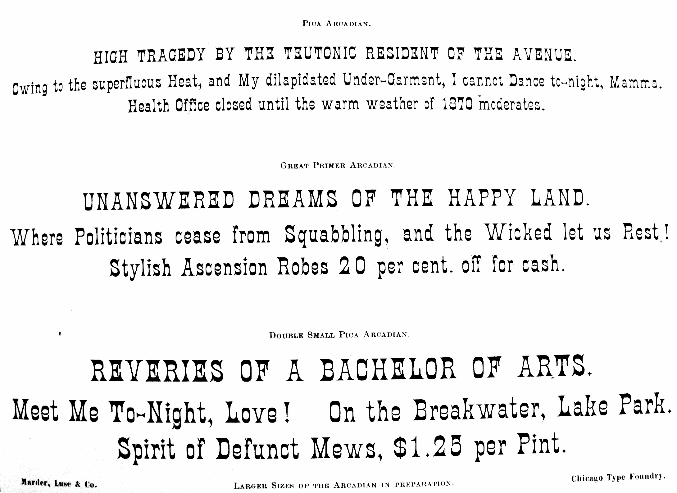
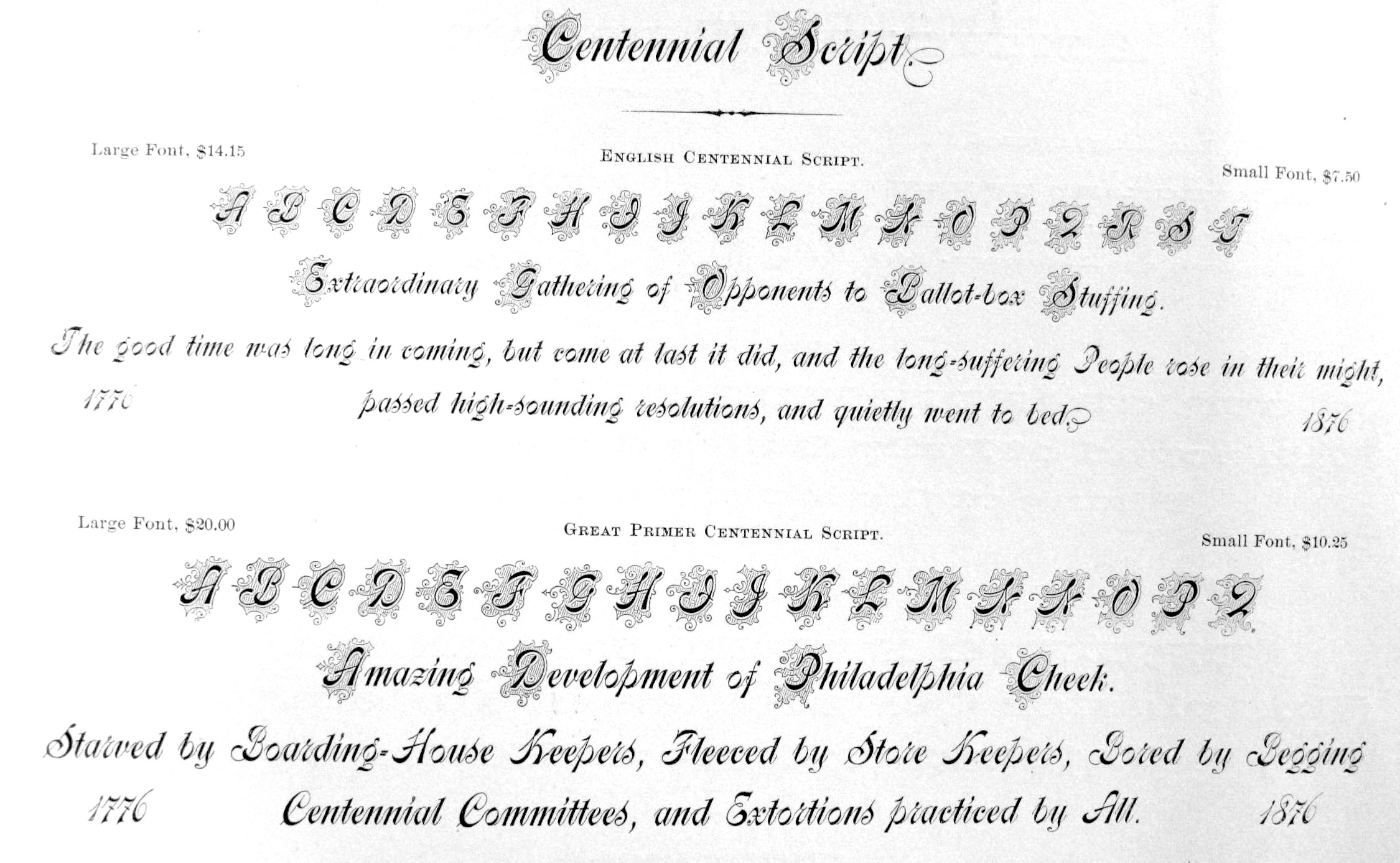
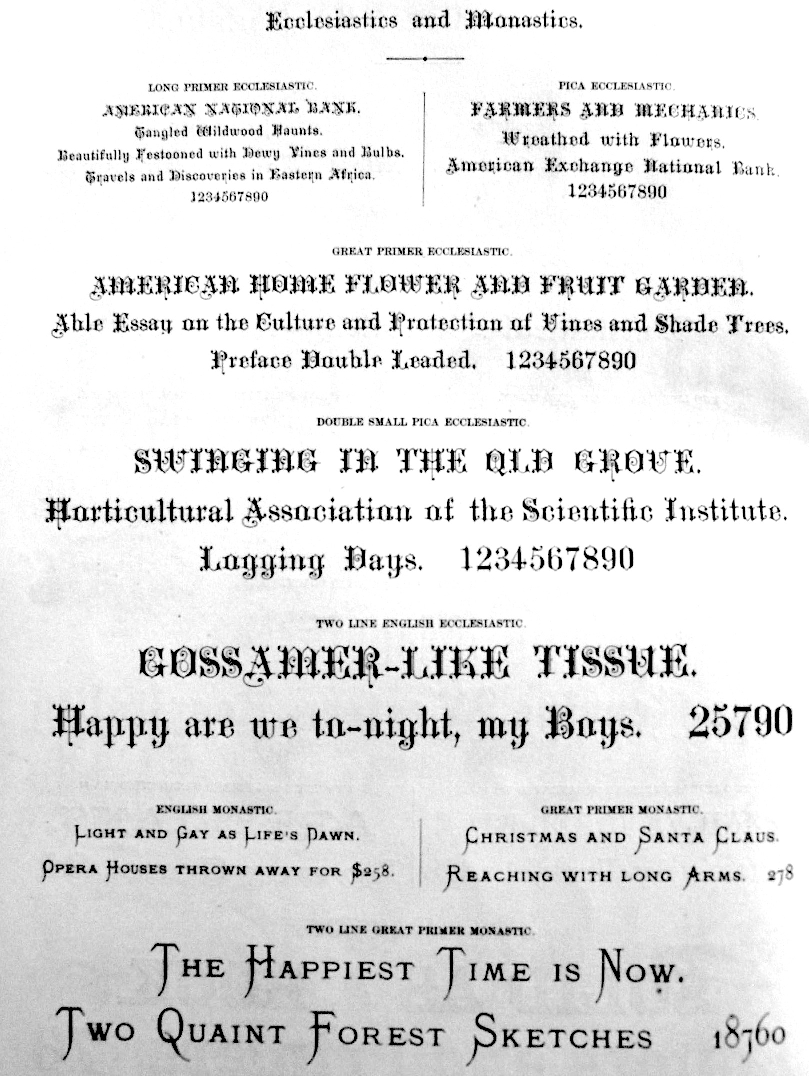
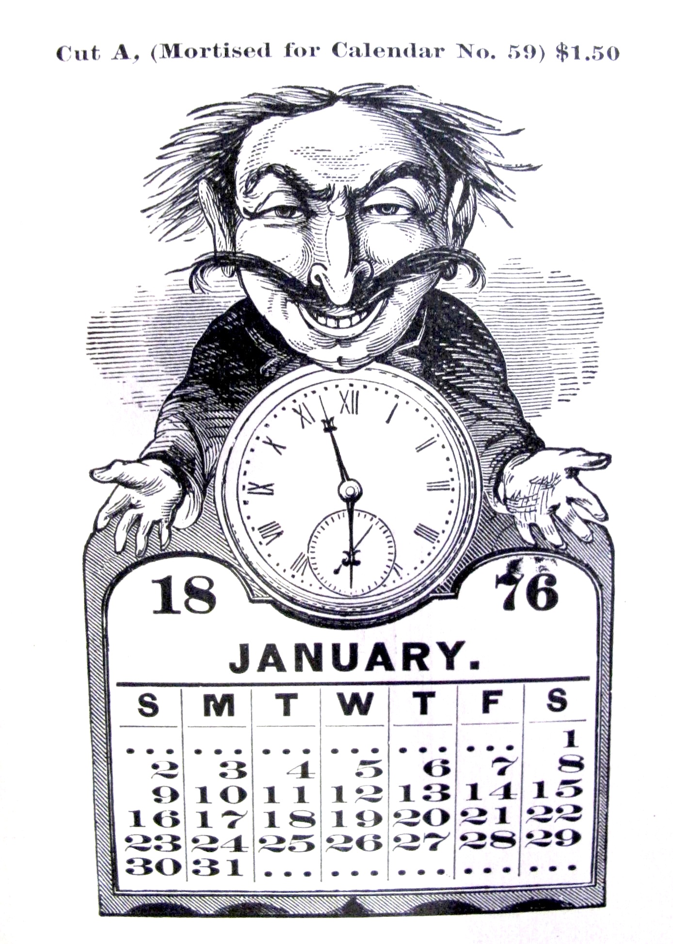
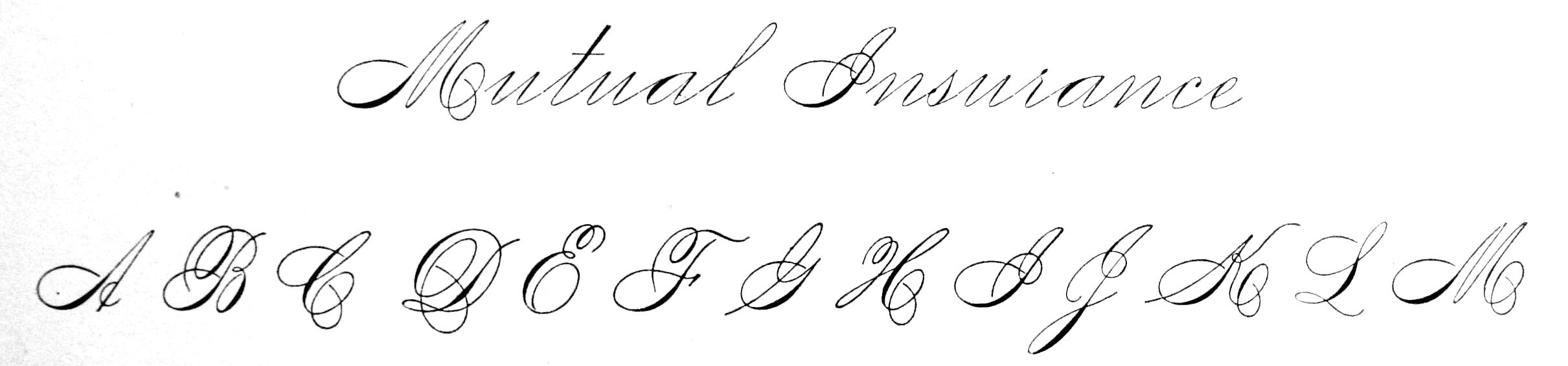
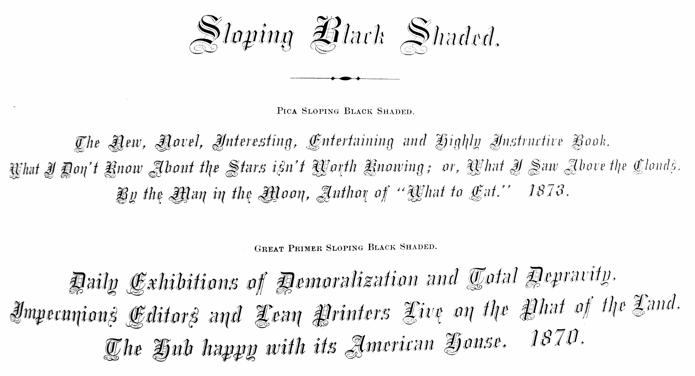
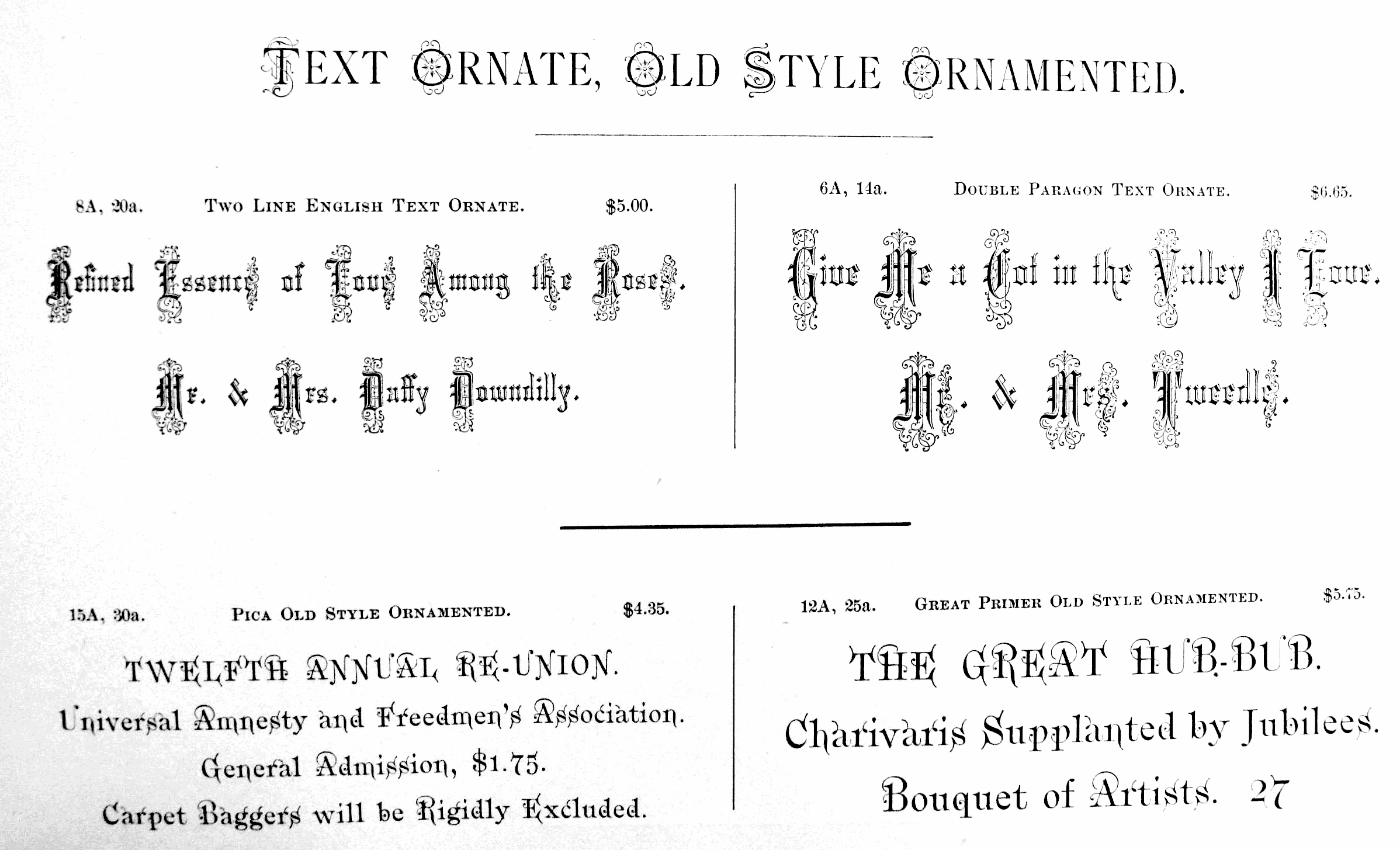
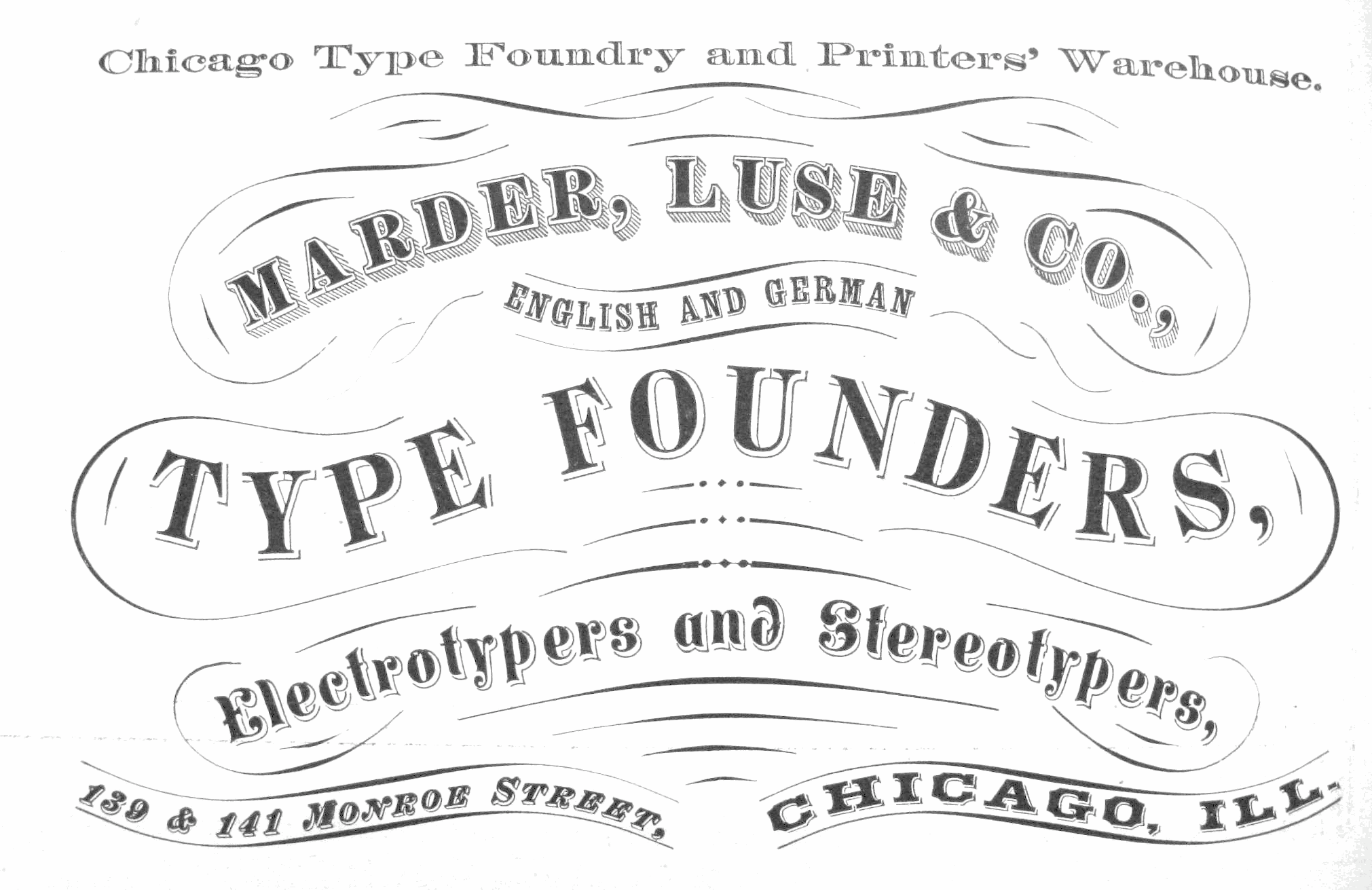
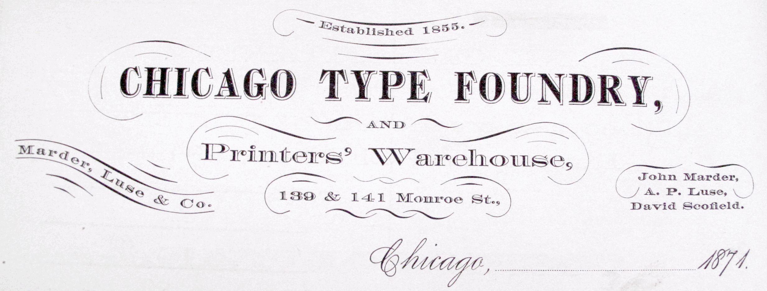
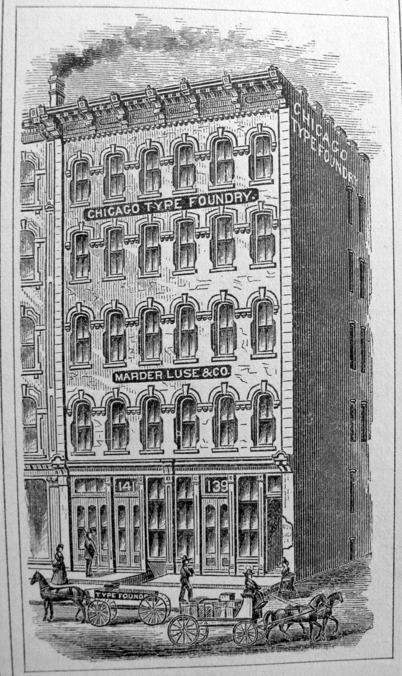
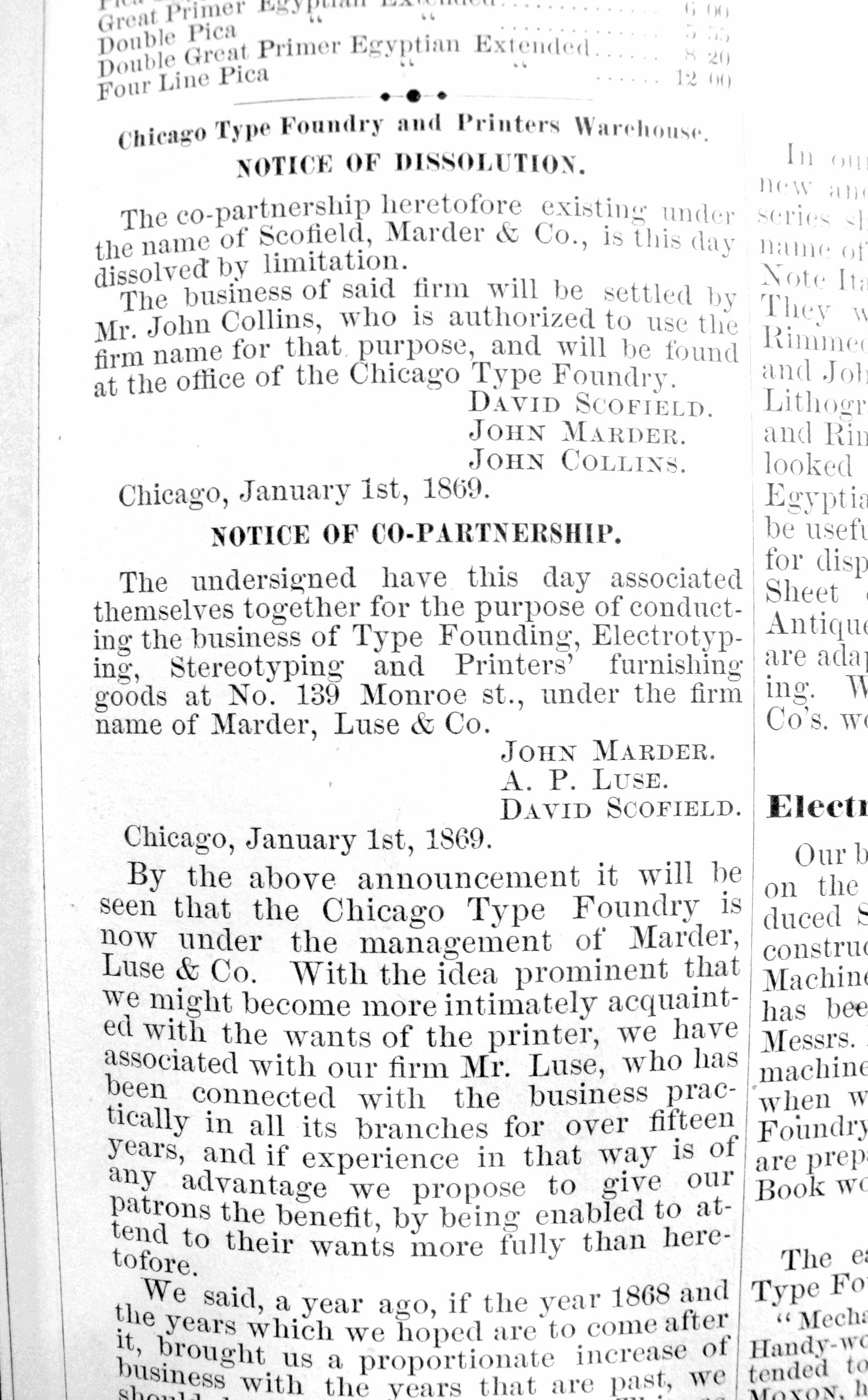
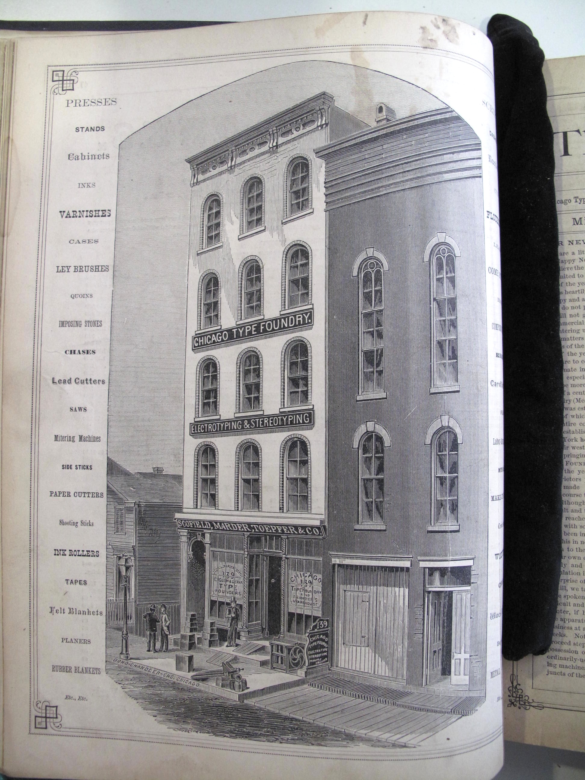
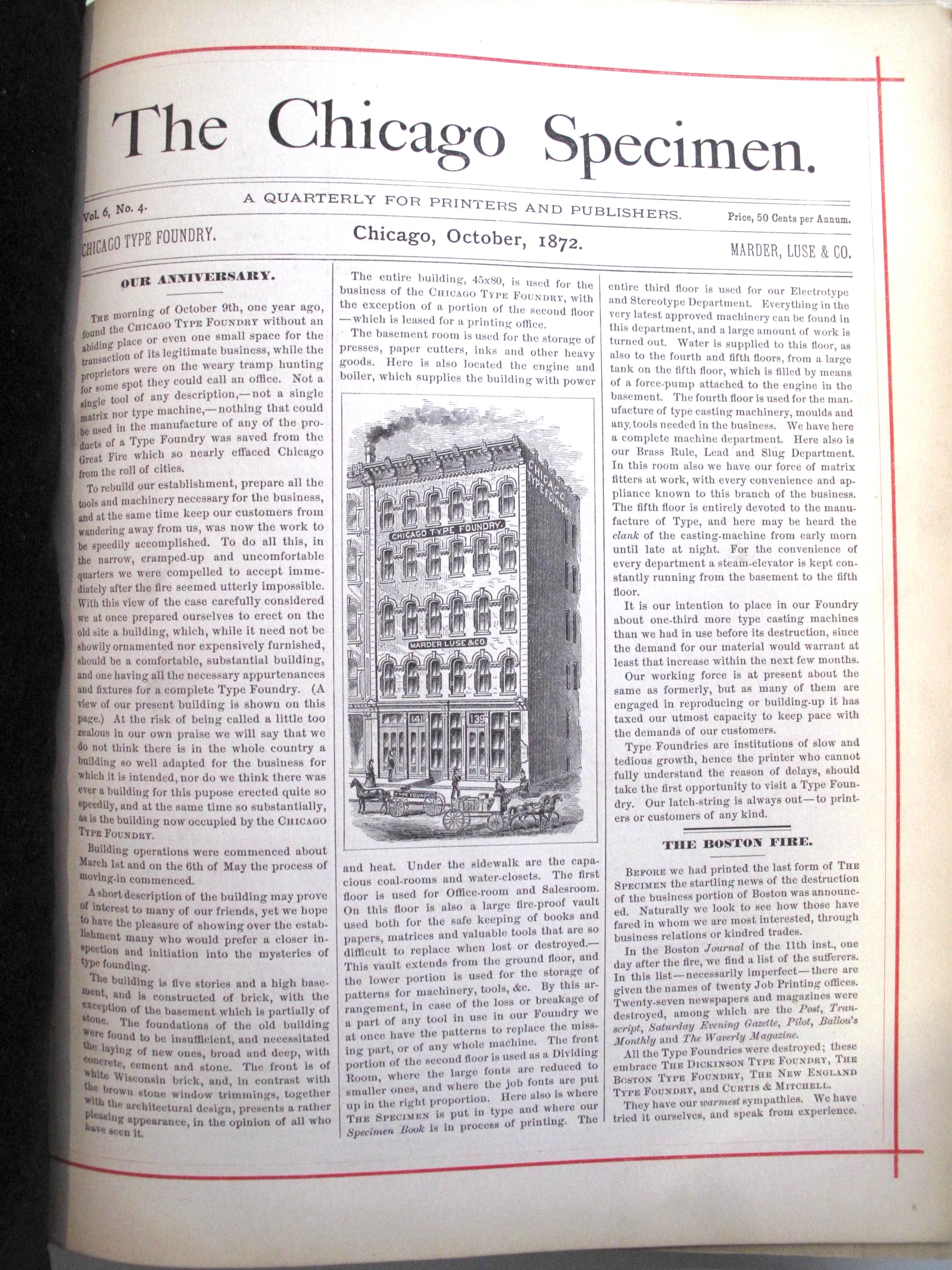
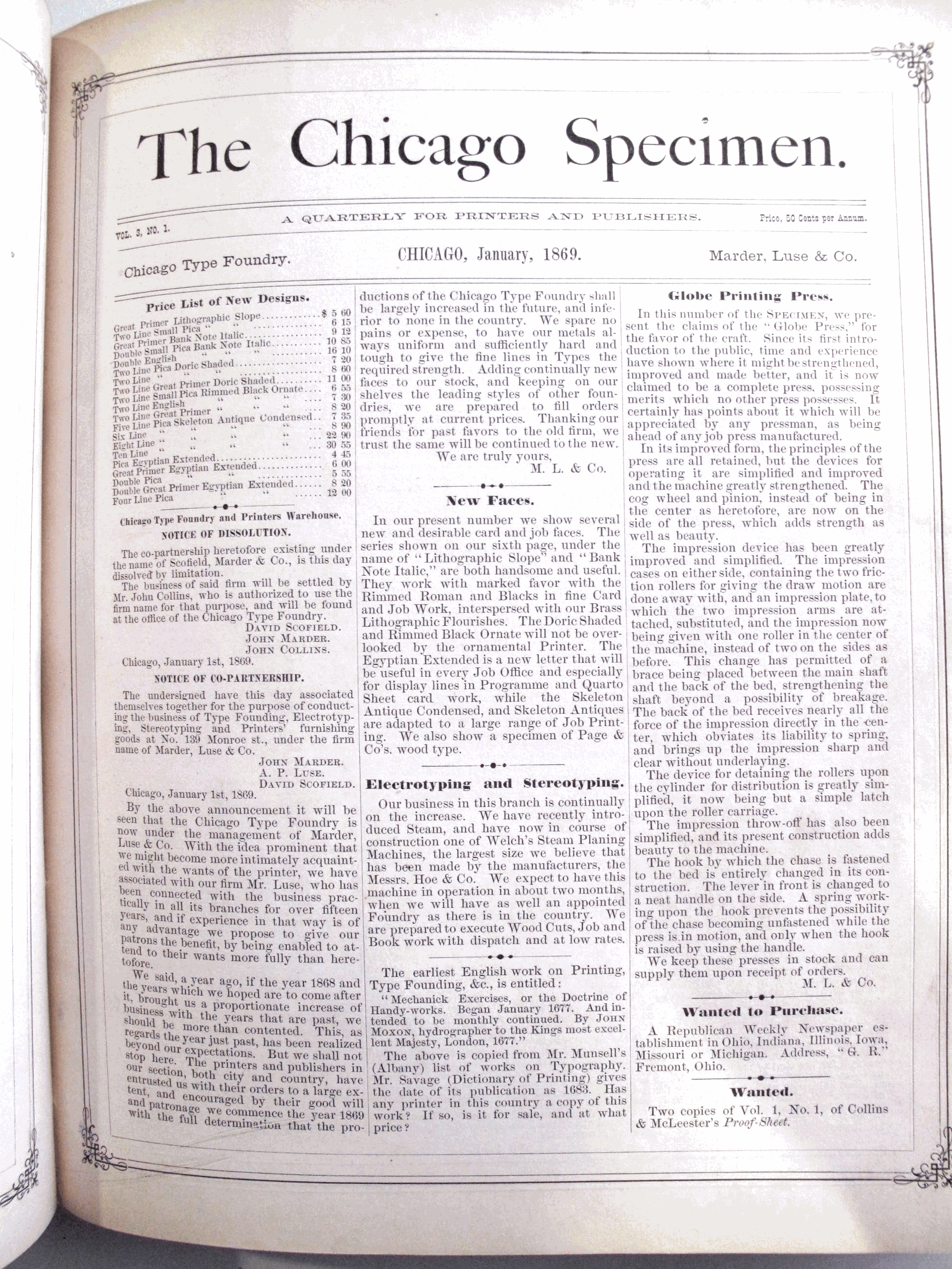
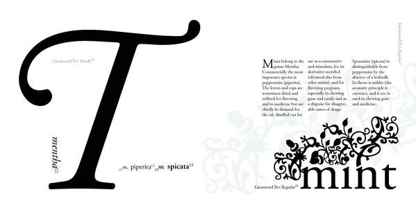
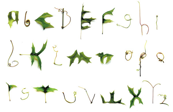
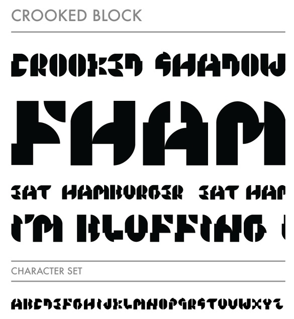
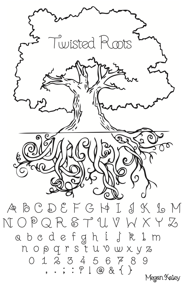
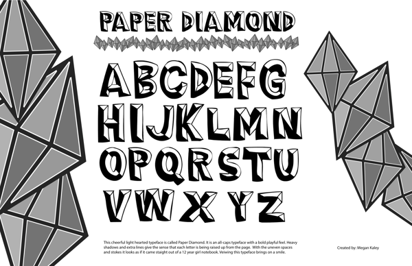
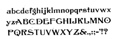
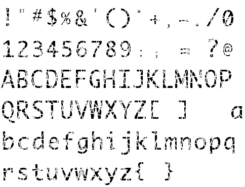
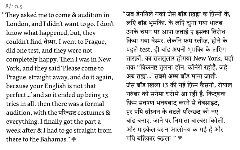
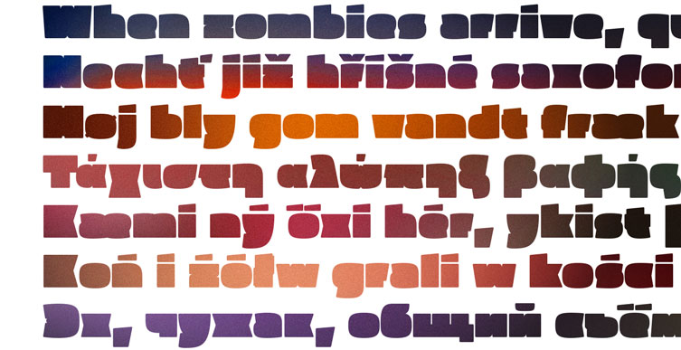
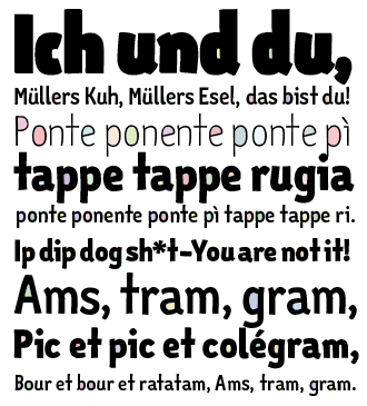
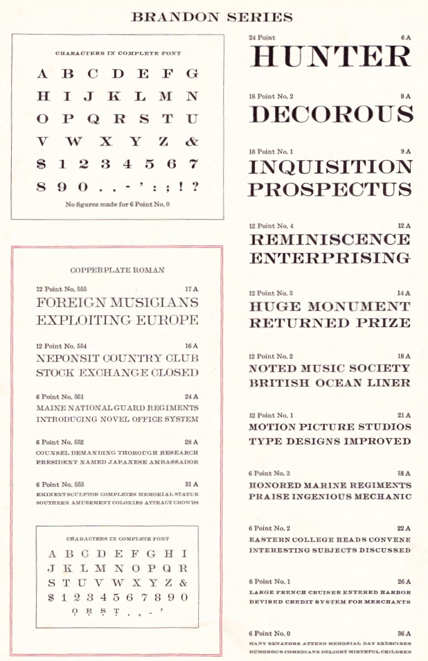
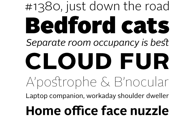
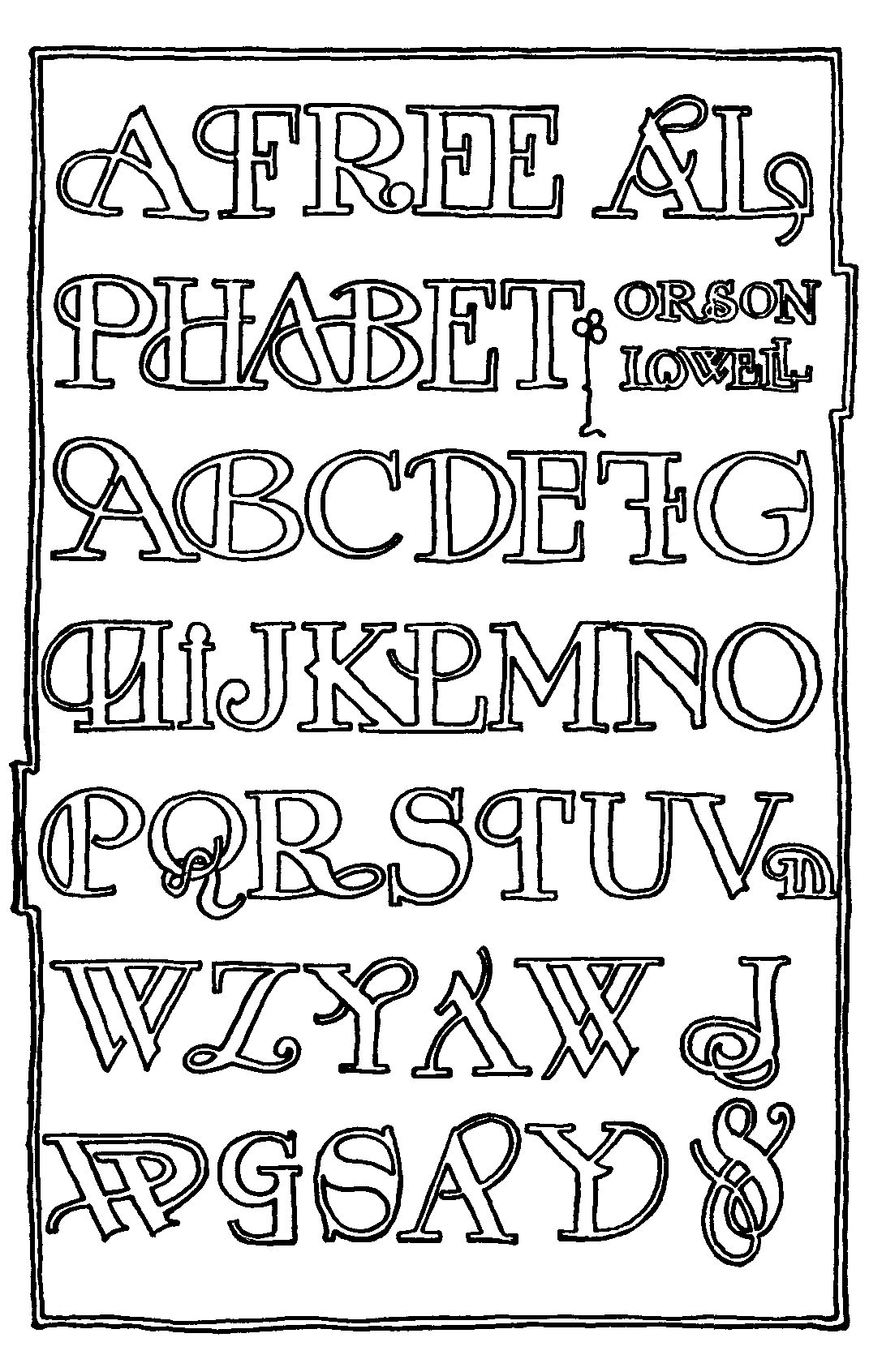
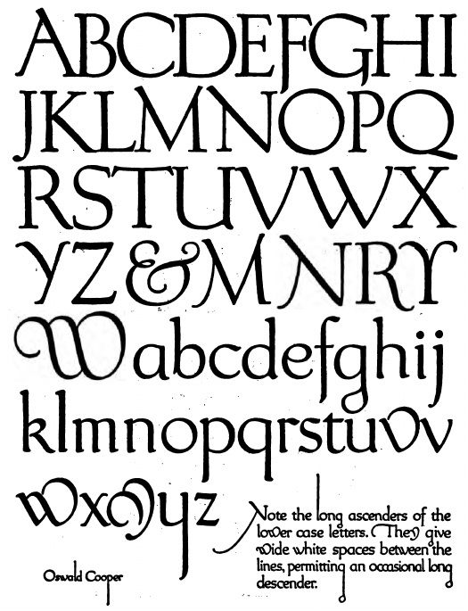
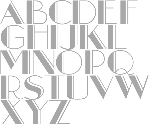
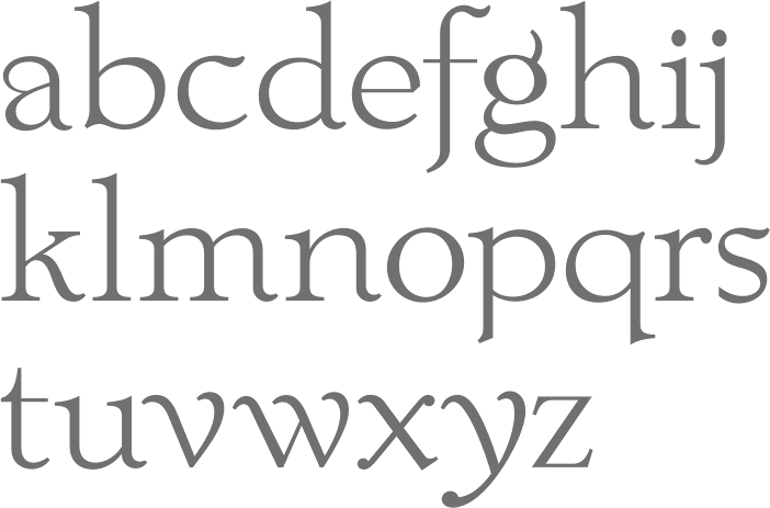
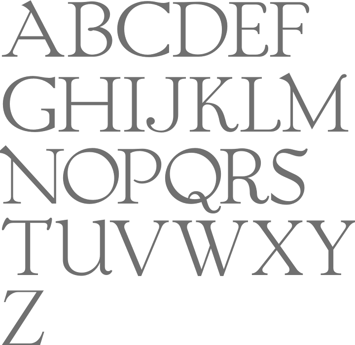
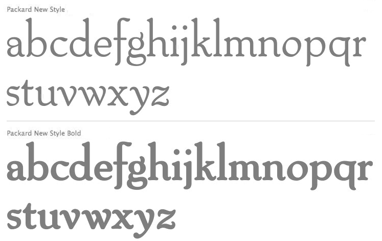
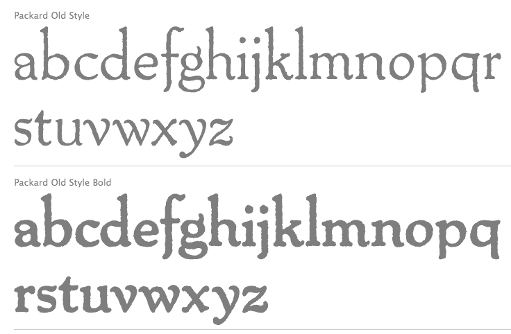
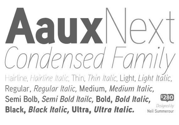
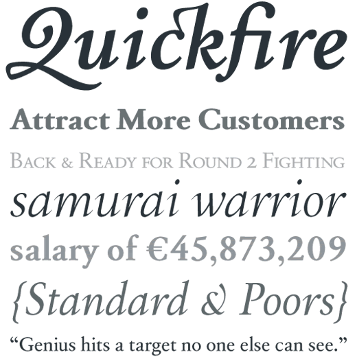
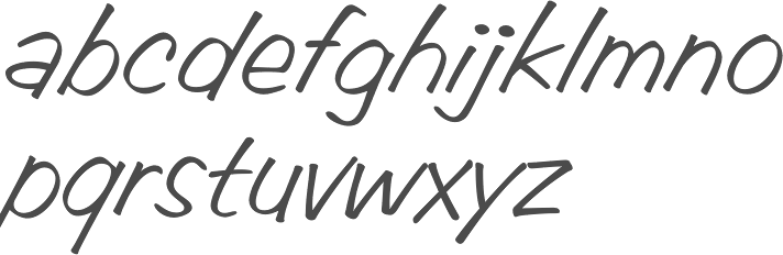
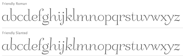
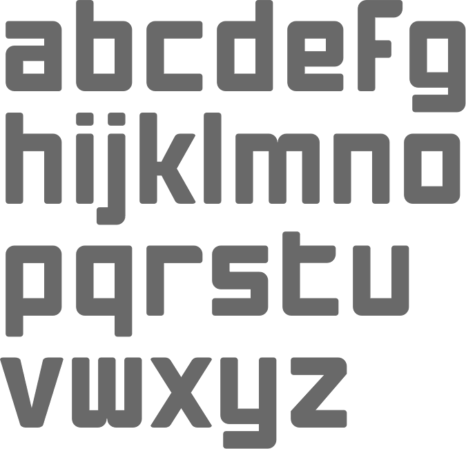
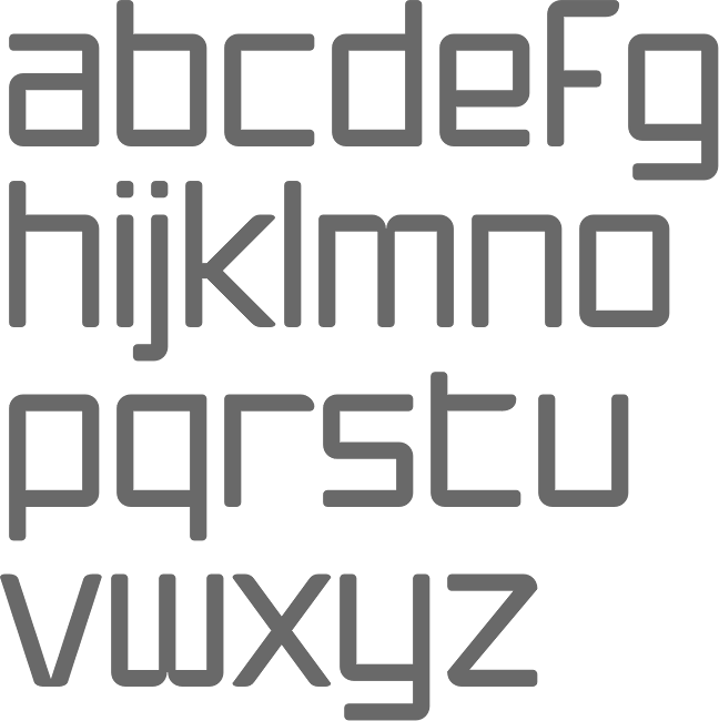
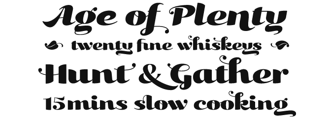
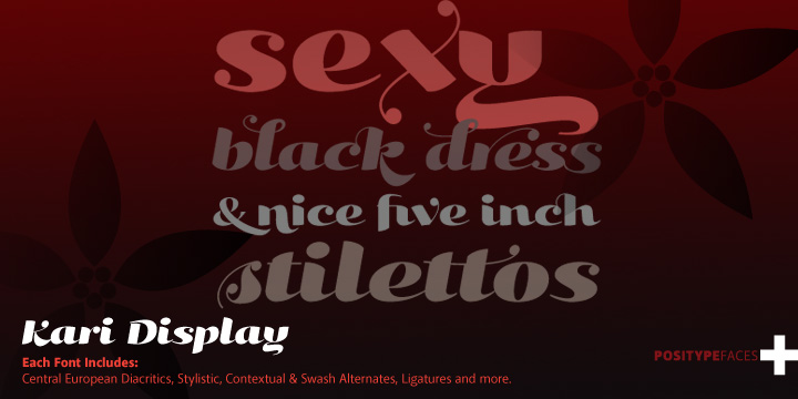
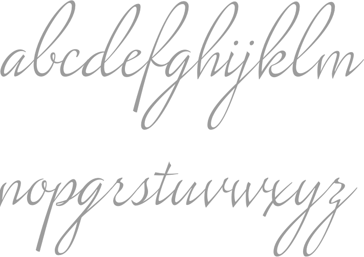
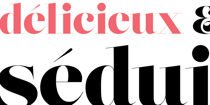
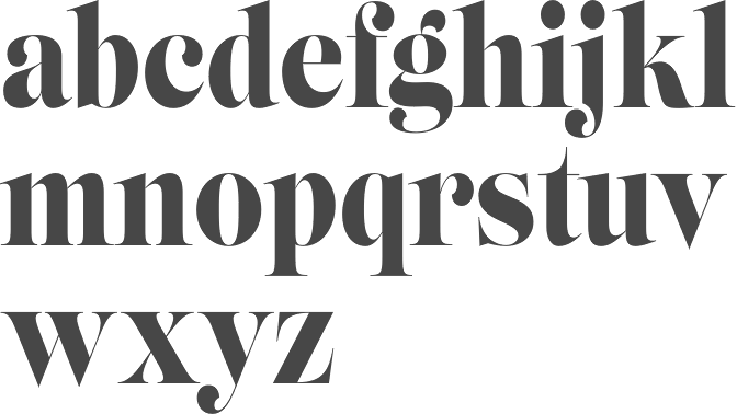
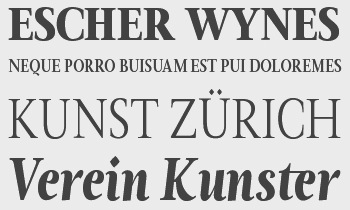
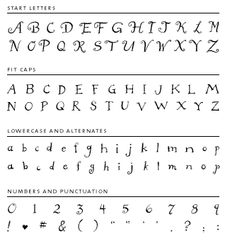
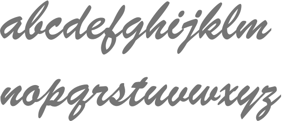
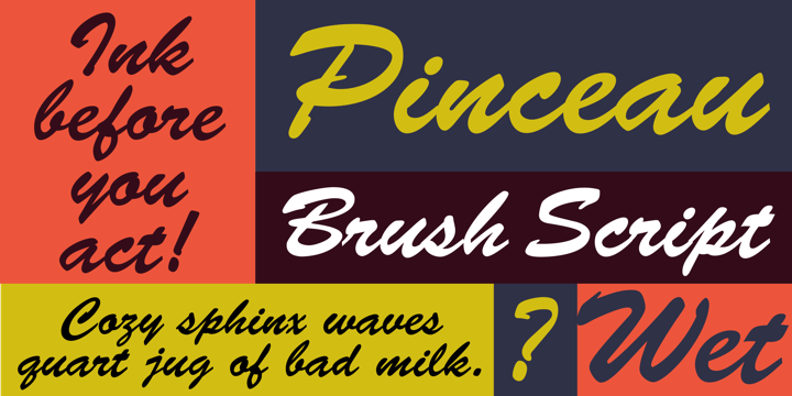
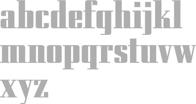
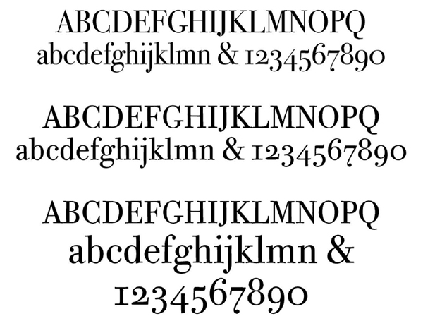
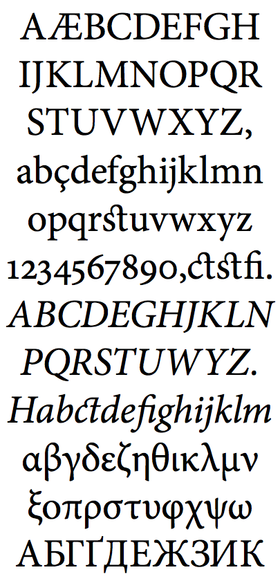
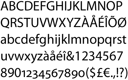
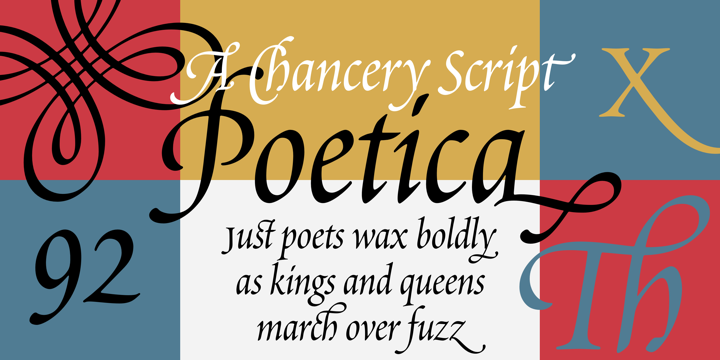
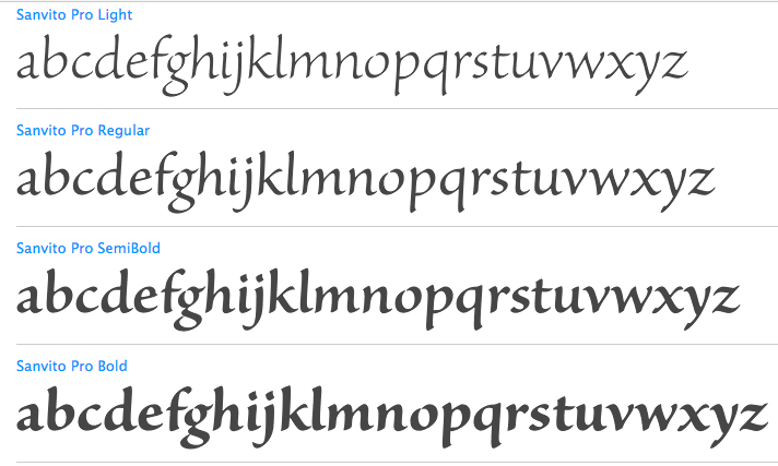
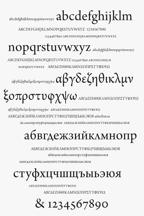
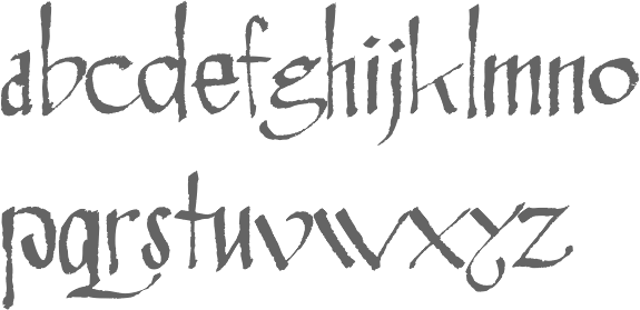
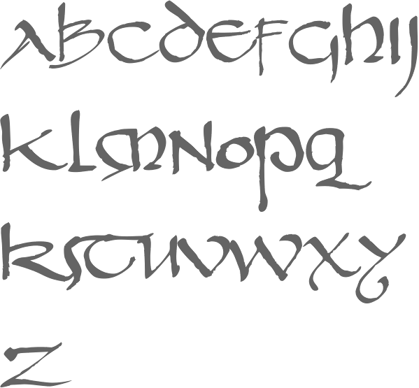
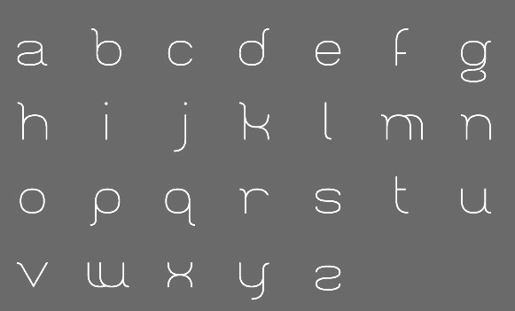
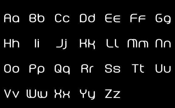
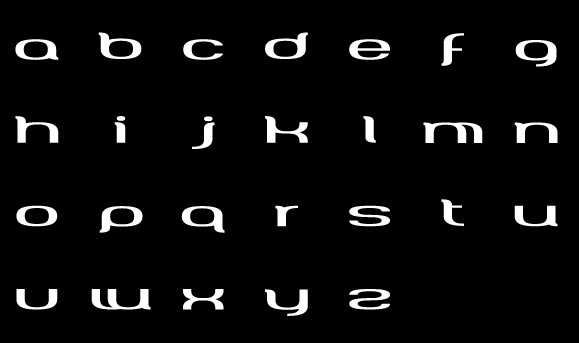
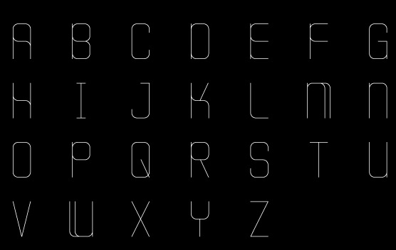
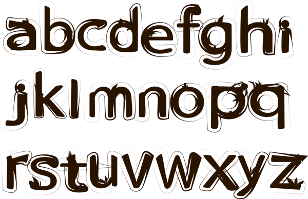
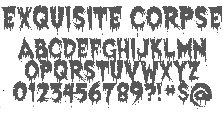
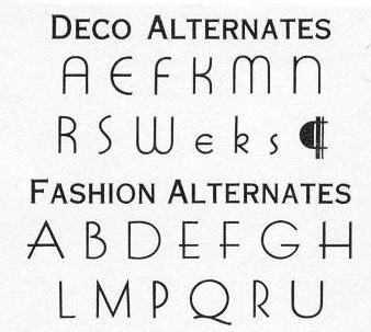
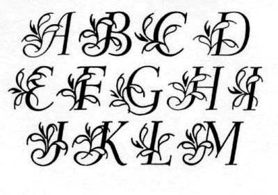
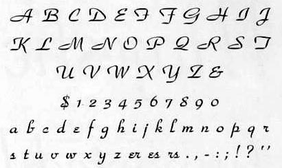
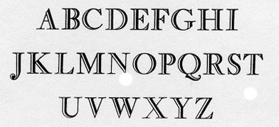
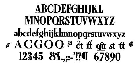
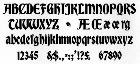
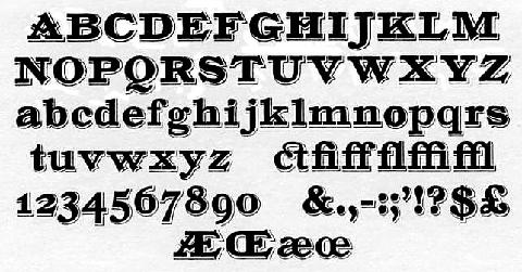
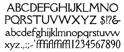
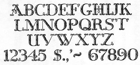
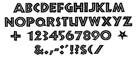
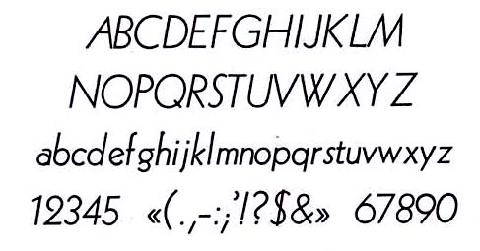
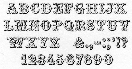
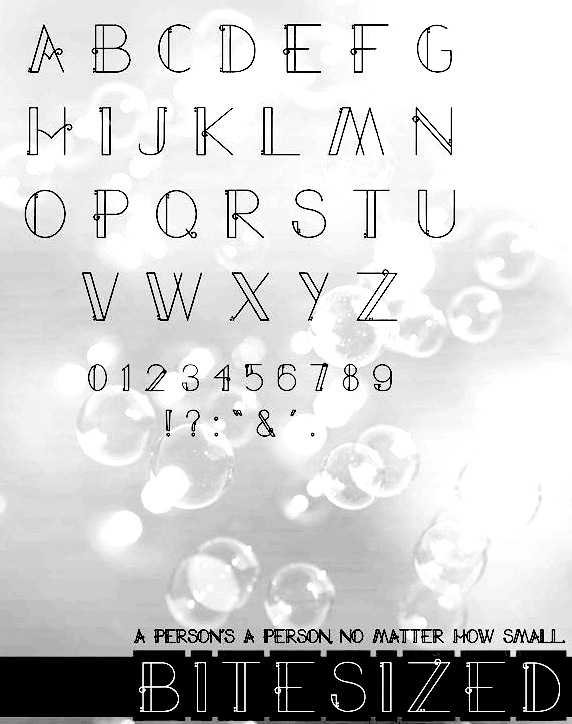
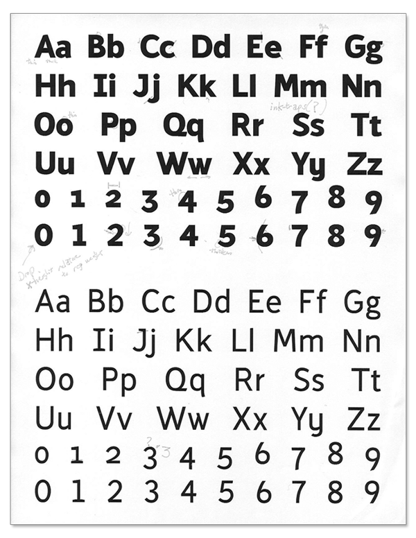
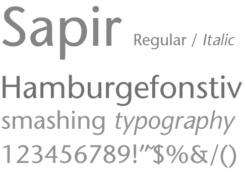
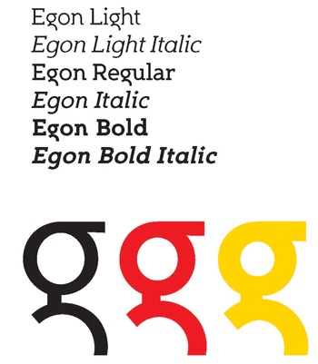
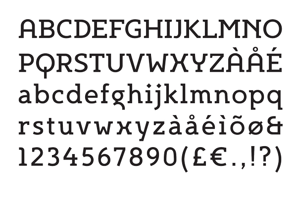
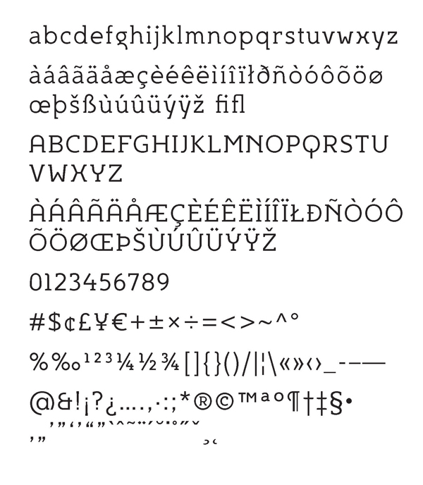
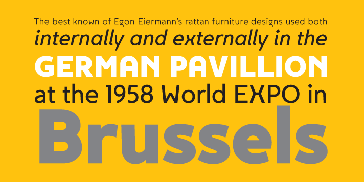
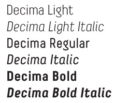
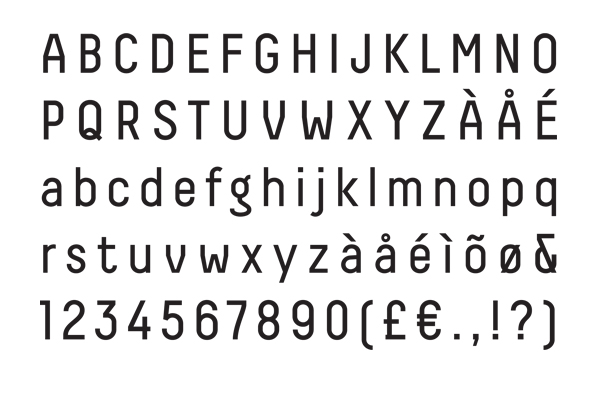
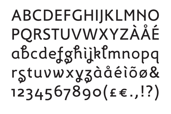
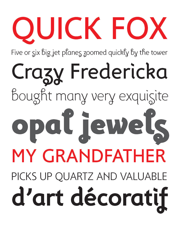
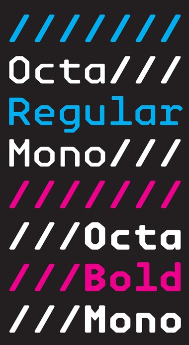
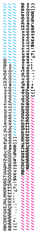
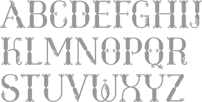
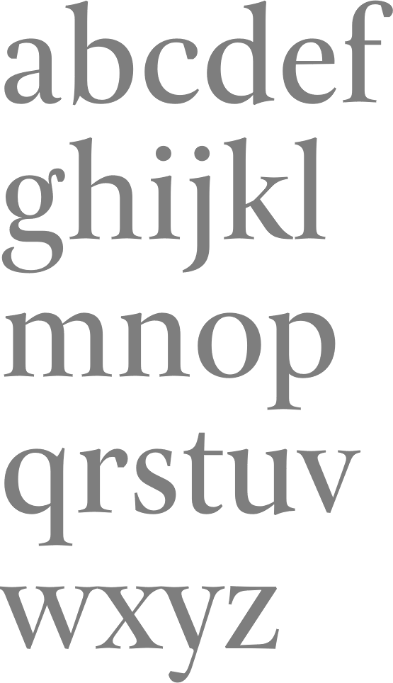
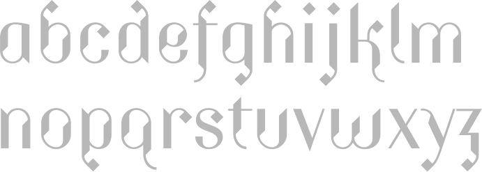
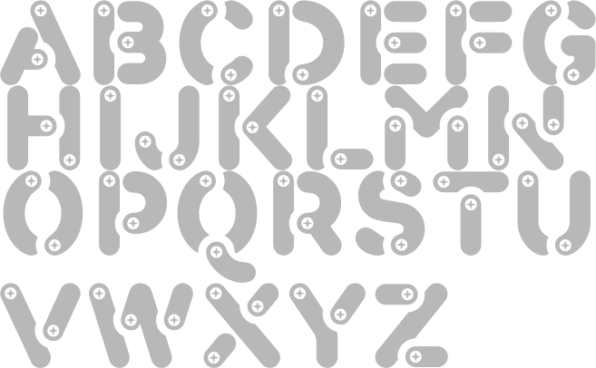
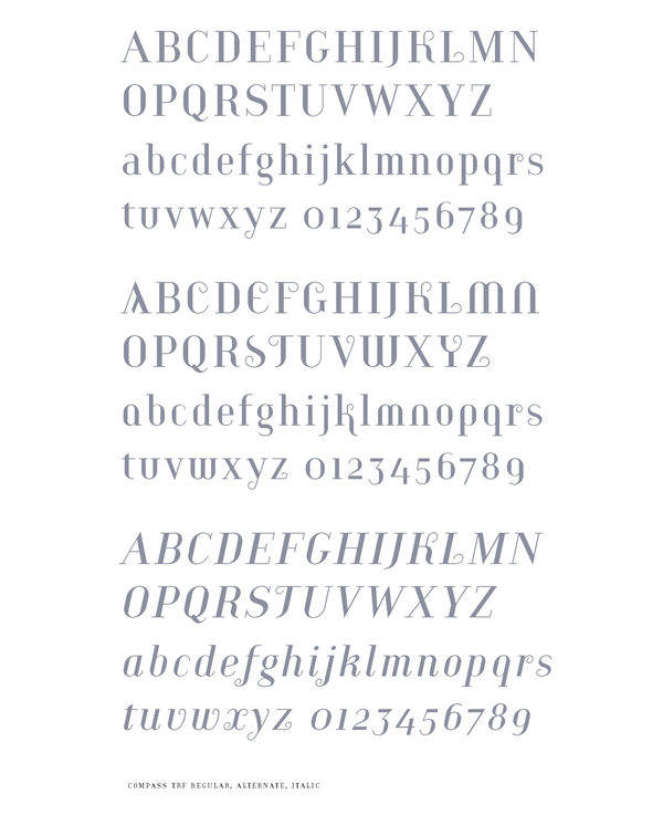
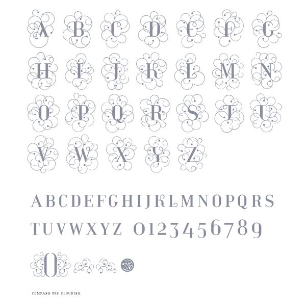
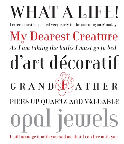
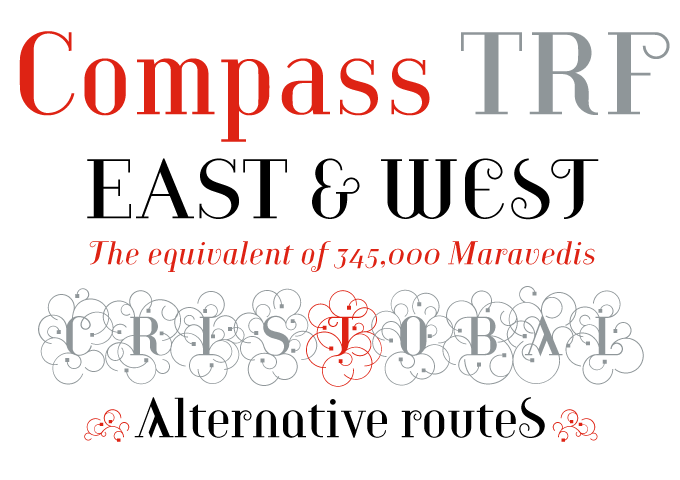
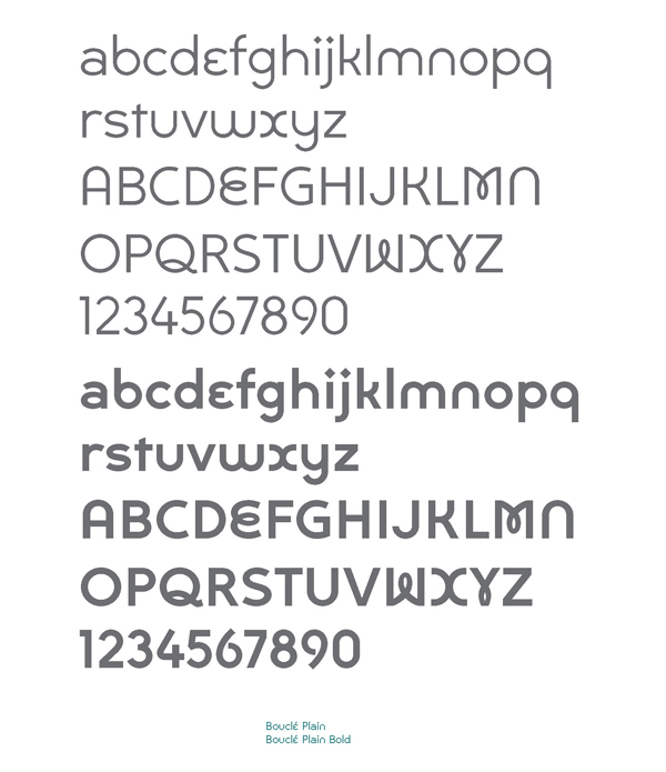
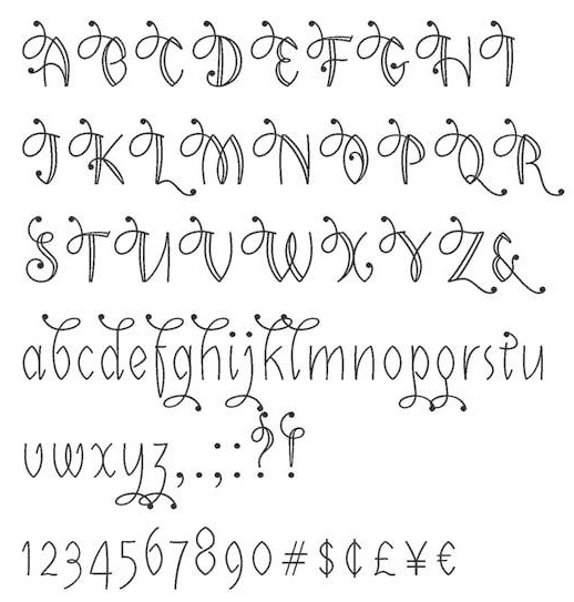
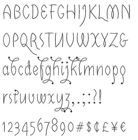
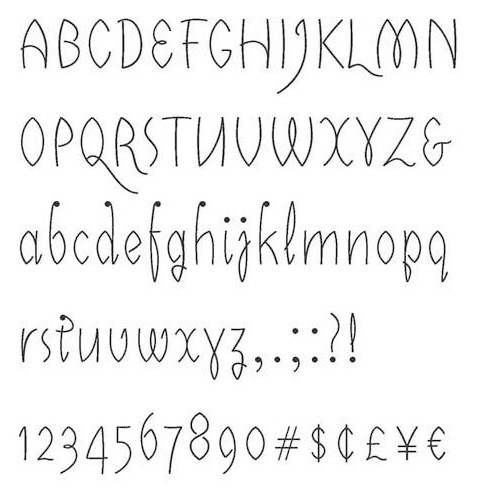
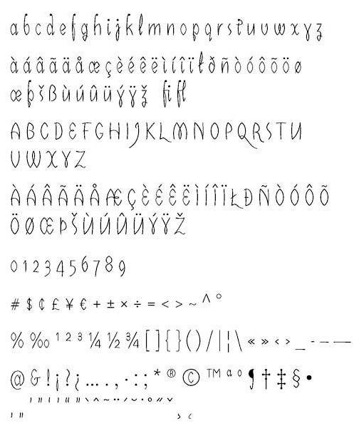
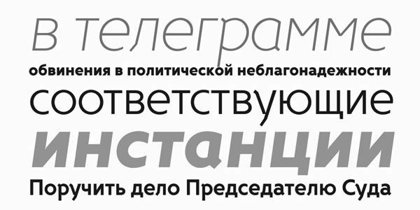
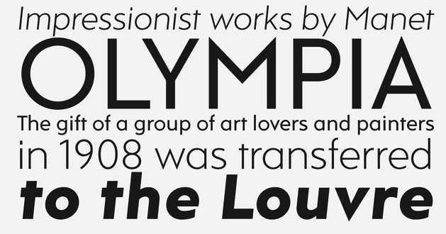
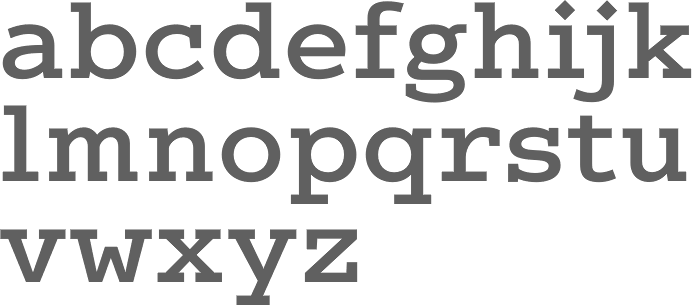
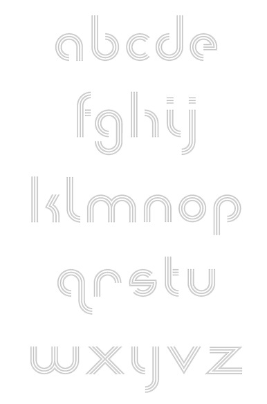
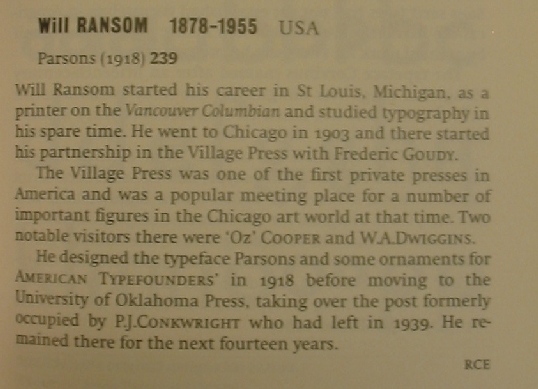
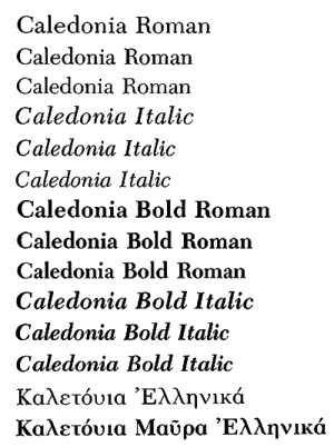
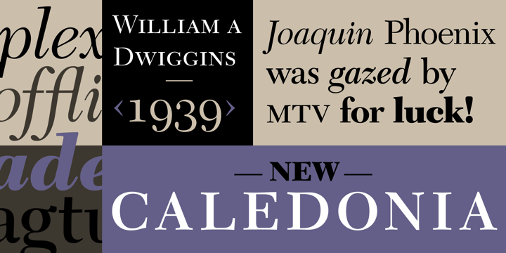