| | |
100 Beste Schriften aller Zeiten
|
 German FontShop-sponsored site listing the hundred best fonts of all times, compiled by a jury in 2007. There is a lot of good information about each of the fonts mentioned. PDF file compiled by the jury: Stephen Coles, Jan Middendorp, Veronika Elsner, Roger Black, Ralf Herrmann, Claudia Guminski (FontShop) and Bernard Schmidt-Friderichs. Visualization of the list. The list:
 - (1) Helvetica
- Garamond
- Frutiger
- Bodoni
- Futura
- Times
- Akzidenz Grotesk
- Officina
- Gill Sans
- Univers
- (11) Optima
- Franklin Gothic
- Bembo
- Interstate (1993, Tobias Frere-Jones)
- Thesis
- Rockwell
- Walbaum
- Meta
- Trinité
- DIN
- (21) Matrix
- OCR A und B
- Avant Garde
- Lucida
- Sabon
- Zapfino
- Letter Gothic
- Stone
- Arnhem
- Minion
| | - (61) Blur
- Base
- Bell Centennial
- News Gothic
- Avenir
- Bernhard Modern
- Amplitude
- Trixie
- Quadraat
- Neutraface
- (71) Nobel
- Industria, Insignia, Arcadia
- Bickham Script
- Bank Gothic
- Corporate ASE
- Fago
- Trajan
- Kabel
- House Gothic 23
- Kosmik
- (81) Caecilia
- Mrs Eaves
- Corpid
- Miller
- Souvenir
- Instant Types
- Clarendon
- Triplex
- Benguiat
- Zapf Renaissance
| - (91) Filosofia
- Chalet
- Quay Sans
- Cézanne
- Reporter
- Legacy
- Agenda
- Bello
- Dalliance
- Mistral
| Follow-up in English. Credit for some images below: Danielle West. [Google]
[More] ⦿
|
100types
[Ben Archer]
|
Educational and reference site run by Ben Archer, a designer, educator and type enthusiast located in England (who was in Auckland, New Zealand, before that). Glossary. Timeline. Type categories. Paul Shaw's list of the 100 most significant typefaces of all times were recategorized by Archer: - Religious/Devotional: Gutenbergs B-42 type, Gebetbuch type, Wolfgang Hoppyl's Textura, Breitkopf Fraktur, Ehrhard Ratdolt's Rotunda, Hammer Uncial, Zapf Chancery, Peter Jessenschrift, Cancellaresca Bastarda, Poetica.
- Book Publishing&General Purpose Text Setting: Nicolas Jenson's roman, Francesco Griffo's italic, Claude Garamond's roman, Firmin Didot's roman, Cheltenham family, Aldus Manutius' roman, William Caslon's roman, Pierre-Simon Fournier's italic, Ludovico Arrighi da Vicenza's italic, Johann Michael Fleischmann's roman, ATF Garamond, Giambattista Bodoni's roman, Nicolas Kis' roman, Minion multiple master, Unger Fraktur, John Baskerville's roman, Lucida, Optima, Bauer Bodoni, Adobe Garamond, Scotch Roman, Romanée, ITC Stone family, Trinité, ITC Garamond, Sabon, ITC Novarese, Charter, Joanna, Marconi, PMN Caecilia, Souvenir, Apollo, Melior, ITC Flora, Digi-Grotesk Series S.
- Business/Corporate: Akzidenz Grotesk, Helvetica, Univers, Syntax, Courier, Meta, Rotis, Thesis, Antique Olive.
- Newspaper Publishing: Times Roman, Bell, Clarendon, Century Old Style, Ionic, Imprint.
- Advertising and Display: Futura, Robert Thorne's fat typeface roman, Vincent Figgins' antique roman (Egyptian), Memphis, Fette Fraktur, Avant-Garde Gothic, Deutschschrift, Peignot, Erbar, Stadia/Insignia, Penumbra, Compacta, Bodoni 26, WTC Our Bodoni.
- Prestige and Private Press: Romain du Roi, Golden Type, Johnston's Railway Sans, Doves Type, Walker.
- Signage: William Caslon IV's sans serif, Trajan.
- Historical Script: Snell Roundhand, Robert Granjon's civilité, Excelsior Script.
- Experimental/expressive: Mistral, Beowolf, Dead History, Behrensschrift, Eckmannschrift, Neuland, Element, Remedy, Template Gothic.
- Onscreen/multimedia: Chicago, Oakland, OCR-A, Base Nine and Base Twelve, Evans and Epps Alphabet.
- Telephone Directory publishing: Bell Gothic.
Link to Archer Design Work. [Google]
[More] ⦿
|
4th February
[Sergiy Tkachenko]

|
 Sergiy Tkachenko (b. 1979, Khrystynivka, Cherkasy region, Ukraine) lives in Kremenchuk, Ukraine, and has been a prolific type designer since 2008. Sergiy graduated from Kremenchuk State Polytechnic University in computer systems and networks in 2007. Various other URLs: Microsoft link, Identifont, 4th February, Behance, Klingspor link, Revision Ru, Russian creators, CPLUV Fontspace, Twitter. Kernest link. Sergey Tkachenko's typefaces:
 - 2008: the techno typefaces Bladi One 4F, Bladi One Slab 4F, Bladi Two 4F, Abia Wide 4F Thin.
- 2009: Wrongo 4F, Zantiqa (an über-serif), Serifiqo (a (free) thin didone fashion mag display face), Codename Coder 4F (monospace programming font), Droporado 4F (using circles only), Tovstun (futuristic, ultra-fat and rounded), Perfocard 4F, Modularico (five modular typefaces based on a logo from Master Kremenchug a company for which Sergiy worked for 4 years), Boldesqo Serif 4F (a splendid informal fat didone, now with Greek support), Tkachenko Sketch, Unicase Slab (a techno slab), Laftatic, Logofontik 4F (techno), PC.DE Stencil (+Italic; custom stencil font), Stenciliqo 4F, Tiap Liap 4F (handwriting), Nut Kit 4F, Rezzzistor 4F, the inline modular face Grand Hotel, and Bijou 4F.
- 2010: Roboo 4F (a bubblegum typeface family), PädIn (a custom typeface for Pädagogische Initiative e.V.: rounded fat informal face), Fat Quad (in the fatty trend), Veselka (a free multiline face), Smeshariki Black (+ Gleams: a bubble gum font made for an animation company), Republica 4F (a fat family), Rodeqa Slab 4F, ComFi (semi-octagonal), Grotesqa 4F, Nowy Geroy 4F, Fabryka 4F (a monospaced typewriter family), Placarto4F-Italic (an ultra fat art deco), Lavina 4F (a hairline sans with lachrymal terminals).
- 2011: Squartica (octagonal), Decomart (free), Model 4F Unicase (a unicase fat didone released in 2013 only), Fontatigo 4F, Kylie 4F (bilined and geometric), Waldemar 4F (a large didone style fat typeface family), Dinesqo (2011, a monoline sans of utter simplicity), Qargotesk (+Cyrillic) [images: i, ii, iii, iv], Neultica 4F (black unicase family), Squartiqa 4F (2011, constructivist), Clarenta 4F Black (after Clarendon---a great family), Designosaur (free sans), Perfopunto (based on perforated circles and squares), OlaScript 4F, Bayadera 4F (a tamed upright monoline script), Febrotesk4FUnicase (squarish unicase family).
- 2012: Targo 4F (rounded typeface with stencil and non-stencil styles), Myra (free font), Myra 4F Caps (free), Cedra (wide monolined sans face), Fontatica 4F (rounded techno grotesk), Akzentica 4F, Ukraintica 4F Wide (a monoline wide-bowled sans family), Laventa 4F, Sports World (free athletic lettering font), Web Serveroff (free computer geek font), Octin Spraypaint Cyrillic (a rough stencil done exclusively for Ninja Theory).
 2013: Condesqa (modular sans), Esqadero (an uncomplicated monoline sans), Vanyla 4F Unicase (monoline), Esqadero FF CY (a free wide sans, Cyrillic), Bond (a confident no-frills sans), Attentica (free sans font for Latin and Cyrillic), Cedra 4F Wide Thin. 2013: Condesqa (modular sans), Esqadero (an uncomplicated monoline sans), Vanyla 4F Unicase (monoline), Esqadero FF CY (a free wide sans, Cyrillic), Bond (a confident no-frills sans), Attentica (free sans font for Latin and Cyrillic), Cedra 4F Wide Thin. - Cyrillizations: several typefaces such as Lavoisier (by Alec Julien), Budmo Jiggler (Ray Larabie) and JoAnne Display (Sandy Cerovich), Gnuolane (of a Ray Larabie font), Paranoid Cyrillic (based on Kevin Lo's Paranoid), Movavi Grotesque Black (+Cyrillic; image; numerals), Azoft Sans (made for Azoft, and free here and here).
- Custom fonts: Blue Pill, Sansus Webissimo (since 2011 free at Open Font Library), Minaeff ECT (2011, a free legible family for Latin and Cyrillic, custom-made for and downloadable from WebhostingRating.com), Webhostinggeeks.Com (2011), Web Serveroff, OnlinePharmacyCheck.Com (2011), 1800Flowers.com (2011), DesignStudio.com (2011, free), ArchyStudio.Com (2011, free download, Movavi Grotesque (2011, free), Azoft Sans, PÄd In, Smeshariki, Fat Cow (2010: free condensed sans), ComFi (2010, free), PC.de (2009: free techno family, including a stencil face), League Gothic (2009-2011, The League of Movable Type) Cyrillic, Paranoid Cyrillic, 28 Days Later Cyrillic, Acid Label Cyrillic, Dead Secretary Cyrillic, Rezland Cyrillic, Sweet Leaf Cyrillic, Droid Cyrillic, Jo Anne Display Cyrillic, Gnuolane Free Cyrillic, Bosox Cyrillic, Budmo Jiggler Cyrillic.
- Typefaces from 2014: Laqonic 4F (unicase sans), Cubynets 4F, Blogger Sans (free rounded organic sans), Boncegro (free Western typeface, briefly called Vaquero before a name change), Motor 4F (based on Russian car license plates), Monitorica (a futuristic typeface made for ipHostMonitor.com, free at OFL), Areqo (condensed titling sans), Architect's Daughter Cyrillic (architectural lettering), GetVoIP Grotesque (a free typeface commissioned by GetVoIP), Meeneralca (unicase sans inspired by the logo of the mineral water Borjomi from Georgia), Glasoor (free oil spill or jelly bean font), Robotesqa.
- Typefaces from 2015: Croogla (a circle-based informal sans), Blackentina 4F (free ultra-black squarish typeface), Dart 4F (neo-grotesque), Kent 4F (a layered family for letterpress emulation).
- Typefaces from 2016: Brent 4F (original design going back to 2013), a custom typeface for the labels used in the Ukrainian Armed Forces, Economica Cyrillic Pro (with Vicente Lamonaca).
- Typefaces from 2018: Indi Kazka 4F (Indic simulation).
Abstract Fonts link. Dafont link. Creative Market link. Behance link. Hellofont link. Open Font Library link. View Sergiy Tkachenko's fonts. [Google]
[MyFonts]
[More] ⦿
|
Acute Studio
[Diana Ovezea]
|
 Born close to the Black Sea coast in Romania, Diana moved to Austria as a child, where she attended the American International School. After graduating from the New Design University in St. Pölten, she worked as a graphic designer, mainly on book and corporate design projects. In 2013, she graduated from the Type & Media program at KABK in Den Haag. Some time later, she set up Acute Studio in Amsterdam under the motto: We like sharp outlines, tight curves, and edgy designs.
 Creator of the hairline face Opium (2010) characterized by teardrop terminals. Creator of Paige (2011), developed at the tipoRenesansa 3rd international type design workshop in Ljubljana, Slovenia. This is an attractive and bouncy papercut display face. Marge (2011) is edgy and highly legible even at very small sizes---it was developed at the tipoRenesansa 2nd international type design workshop. Paige Italic (2012) was done at tipoRenesansa 4 and TypeClinic 5 (2012). Her KABK graduation typeface was Editura (2013), a a type family for serious publications, magazines, as well as non-fiction books. At The 8th International Typeclinic in 2014, she continued work on an untitled text typeface. At Die Gestalten, she published Paiper, an extraordinarily balanced and readable 6-style text family with angular flared glyphs that are genetically related to folded paper strips. In 2014, Diana collaborated on the design of HF Stencil with Bold Monday and Studio Thonik. Made for Holland Festival, HF Stencil is based on Glaser Stencil. In 2016, Diana published Equitan Sans and Equitan Slab at Indian Type Foundry, marrying industrial era rustiness with modern functionality. In 2017, she designed Tiny Sans and Albert Samuels Clock Type. Codesigner in 2017 with Samo Acko and Sabina Chipara of the typefaces Passenger Display (2017) and Passenger Serif (released in 2019: a Clarendon). Passenger Display is a high-contrast didone-style font family. It is intended for use in headlines, signs, or posters. Passenger Display is a high-contrast didone-style font family. It is intended for use in headlines, signs, or posters. In 2019, Diana Ovezea and Samo Acko added Passenger Sans, which is characterized by horizontal and vertical terminal strokes and small apertures, and delivers a relaxing read in long texts. With Sabina Chipara, she co-designed the 8-weight simplified sans family Bega at Indian Type Foundry. Diana Ovezea also published the sharp-edged 14-style Matteo in 2017. At Future Fonts, she published Bizzarrini (together with Sabina Chipara) and Silverspoon, ca. 2018. She writes about the wonderful Bizzarrini: Though the idea originates from a Stefan Schlesinger ad sketch for a Paris couture house, we straightened up this typeface and made it seem engineered and sharp. It gets its name from the Bizzarrini Manta, a wedge-shaped concept car designed in 1968 by Giorgetto Giugiaro. Bizzarrini has extremely long wedge serifs. Following Schlesinger's sketch, it features very tall capitals with an out-of proportion middle-line (very big heads on S, B and R). Silverspoon is a contemporary take on Copperplate Gothic. In 2019, she released the connected monoline sans script Akin (done with Sabina Chipara) and the geometric sans family Matteo at Indian Type Foundry. Typefaces from 2020: Silverknife (a tall and skinny version of Silverspoon), Capra (a headline typeface with a bouncy baseline. This project started as a one-day challenge to recreate a piece of lettering on the Glass Menagerie poster designed by David Klein in 1958). At Fontshare, Diana Ovezea and Sabina Chipara released the free calligraphic script Britney. In 2021, Barbara Bigosinska, Rafa Buchner and Diana Ovezea set up Blast Foundry. At Blast Foundry, she published Granblue, a great experimental typeface family for boxing titles. Typefaces from 2022: Duplet (a 14-style geometric sans with a techno vibe; by Diana Ovezea and Rafal Buchner at Indian type Foundry), Duplet Rounded (also 14 styles), Duplet Open (the 14-style companion of Duplet). Home page. Behance link. Future Fonts link. [Google]
[MyFonts]
[More] ⦿
|
Adrian Frutiger
|
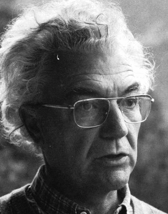 Famous type designer born in 1928 in Unterseen, Switzerland, who died in September 2015. He closely cooperated with Linotype-Hell AG, after having been artistic director at Deberny-Peignot in Paris since 1952. He established his own studio in 1962 with André Gürtler and Bruno Pfaftli. Art director for Editions Hermann, Paris 1957 to 1967. Frutiger lived near Bern, Switzerland, and was very interested in woodcuts. In 2009, Heidrun Osterer and Philipp Stamm coedited Adrian Frutiger Typefaces The Complete Works (Birkhäuser Verlag), a 460-page opus based on conversations with Frutiger himself and on extensive research in France, England, Germany, and Switzerland. Quote: Helvetica is the jeans, and Univers the dinner jacket. Helvetica is here to stay. He designed over 100 fonts. Here is a partial list:
 - Président (Deberny&Peignot, 1954). Digitized by Linotype in 2003.
- Delta.
- Phoebus (Deberny&Peignot, 1953).
- Element-Grotesk.
- Federduktus.
- Ondine (Deberny&Peignot, 1953-1954). The Bitstream version of this font is Formal Script 421. Adobe, Linotype and URW++ each have digital versions called Ondine. Bitstream's Calligraphic 421 is slightly different.
- Méridien (Deberny&Peignot, 1955-1957). Digitized by Adobe/Linotype in 1989.
- Caractères Lumitype.
- Univers (Deberny&Peignot, 1957). About the name, Frutiger wrote I liked the name Monde because of the simplicity of the sequence of letters. The name Europe was also discussed; but Charles Peignot had international sales plans for the typeface and had to consider the effect of the name in other languages. Monde was unsuitable for German, in which der Mond means "the moon". I suggested "Universal", whereupon Peignot decided, in all modesty, that "Univers" was the most all-embracing name!. Univers IBM Composer followed. In 2010, Linotype published Univers Next, which includes 59 Linotype Univers weights and 4 monospaced Linotype Univers Typewriter weights, and can be rented for a mere 2675 Euros. In 2018, Linotype added Univers Next Typewriter. In 2020, Linotype's Akira Kobayashi dusted off Univers Next Cyrillic and Univers Next Paneuropean.
- Egyptienne F (1955, Fonderie Deberny&Peignot; 1960, for the Photon/Lumitype machine).
- Opéra (1959-1961, Sofratype).
- Alphabet Orly (1959, Aéroport d'Orly).
- Apollo (1962-1964, Monotype): the first type designed for the new Monotype photosetting equipment.
- Alphabet Entreprise Francis Bouygues.
- Concorde (1959, Sofratype, with André Gürtler).
- Serifen-Grotesk/Gespannte Grotesk.
- Alphabet Algol.
- Astra Frutiger. A typeface variant of Frutiger licensed under Linotype. It is the font used on the highways in Switzerland.
- Serifa (1967-1968, Bauersche Giesserei). URW++ lists the serif family in its 2008 on-line catalog. Other names include OPTI Silver (Castcraft), Ares Serif 94, and Sierra. Bitstream published the digital typeface Serifa BT. But it is also sold by Adobe, Tilde, Linotype, URW++, Scangraphic, and Elsner & Flake. The slab serif is robust and is based on the letterforms of Univers.
- OCR-B (1966-1968, European Computer Manufacturers Association).
- Alphabet EDF-GDF (1959, Électricité de France, Gaz de France).
- Katalog.
- Devanagari (1967) and Tamil (1970), both done for Monotype Corporation.
- Alpha BP (1965, British Petroleum&Co.).
- Dokumenta (1969, Journal National Zeitung Suisse).
- Alphabet Facom (1971).
- Alphabet Roissy (1970, Aéroport de Roissy Charles de Gaulle).
- Alphabet Brancher (1972, Brancher).
- Iridium (1972, Stempel). A didone with slight flaring.
- Alphabet Métro (1973, RATP): for the subway in Paris.
- Alphabet Centre Georges Pompidou. The CGP typeface (first called Beaubourg) used in the Centre Georges Pompidou from 1976-1994 is by Hans-Jörg Hunziker and Adrian Frutiger, and was developed as part of the visual identity program of Jean Widmer. It is said that André Baldinger digitized it in 1997.
- Frutiger (1975-1976, Stempel, with Hans-Jörg Hunziker). In 1999, Frutiger Next was published by Linotype. In 2009, that was followed by Neue Frutiger (a cooperation between Frutiger and Linotype's Akira Kobayashi). In fact, Frutiger, the typeface was made for the Charles De Gaulle Airport in 1968 for signage---it was originally called Roissy, and had to be similar to Univers. It was released publically as Frutiger in 1976. The modern Bitstream version is called Humanist 777. Frutiger Next Greek (with Eva Masoura) won an award at TDC 2006. Other digital implementations of Frutiger: M690 (SoftMaker), Quebec Serial (SoftMaker), Frutus (URW), Provencale (Autologic), Frontiere (Compugraphic), Freeborn (Scangraphic), Siegfried (Varityper). In 2018, under the aegis of Akira Kobayashi, the Monotype Design studio published the 150-language superfamily Neue Frutiger World (including coverage for Latin, Greek, Cyrillic, Georgian, Armenian, Hebrew, Arabic, Thai and Vietnamese).
- Glypha (1979, Stempel). See Gentleman in the Scangraphic collection).
- Icône (1980-1982, Stempel, Linotype). Digitized by Linotype in 2003.
- Breughel (1982, Stempel; 1988, Linotype).
- Dolmen.
- Tiemann.
- Versailles (1983, Stempel).
- Linotype Centennial (1986). Based on Morris Fuller Benton's Clarendon typeface Century, Linotype Centennial was designed for Linotype's 100th birthday.
- Avenir (1988, Linotype). In 2004, Linotype Avenir Next was published, under the supervision of Akira Kobayashi, and with the help of a few others. In 2021, the Monotype team released Avenir Next Paneuropean (56 styles, by Akira Kobayashi). Avenir Next World, released by Linotype in 2021, is an expansive family of fonts that offers support for more than 150 languages and scripts. The subfamilies include Avenir Next Hebrew, Avenir Next Thai, Avenir Next Cyrillic, Avenir Next Arabic and Avenir Next Georgian. Avenir Next World contains 10 weights, from UltraLight to Heavy.
Contributors besides Adrian Frutiger and Akira Kobayashi: Anuthin Wongsunkakon (Thai), Yanek Iontef (Hebrew), Akaki Razmadze (Georgian), Nadine Chahine (Arabic), Toshi Omagari (Arabic) and Elena Papassissa (Greek, Armenian). Lovely poster by Ines Vital (2011). - Westside.
- Vectora (1991, Linotype).
- Linotype Didot (1991). See also Linotype Didot eText Pro (2013), which was optimized by Linotype for use on screens and small devices.
- Herculanum (1989, Linotype): a stone age font.
- Shiseido (1992).
- Frutiger Capitalis (2006, Linotype): a further exploration in the style of Herculanum, Pompeijana and Rusticana. Linotype trademarked that name even though at least five fonts by the name Capitalis already exist.
- Pompeijana (1993, Linotype).
- Rusticana (1993, Linotype).
- Frutiger Stones (1998, Linotype) and Frutiger Symbols.
- Frutiger Neonscript.
- Courier New, based on Howard Kettler's Courier, was one of Frutiger's projects he was involved in ca. 2000.
- AstraFrutiger (2002): a new signage typeface for the Swiss roads. Erich Alb comments: With a Frutiger condensed Type and illuminated signs during night it is mutch better readable.
- Nami (2008) is a chiseled-stone sans family, made with the help of Linotype's Akira Kobayashi.
- Neue Frutiger (2009, with Akira Kobayashi) has twice as many weights as the original Frutiger family.
- In 2019, the Linotype team released variable fonts for Frutiger's main typeface families, Avenir Next Variable, Neue Frutiger Variable, and Univers Next Variable.
Bio by Nicholas Fabian. Erich Alb wrote a book about his work: Adrian Frutiger Formen und Gegenformen/Forms and Counterforms (Cham, 1998). Winner of the Gutenberg Prize in 1986 and the 006 Typography Award from The Society for Typographic Aficionados (SOTA). Famous quote (from a conversation in 1990 between Frutiger and Maxim Zhukov about Hermann Zapf's URW Grotesk): Hermann ist nicht ein Groteskermann. A quote from his keynote speech at ATypI1990: If you remember the shape of your spoon at lunch, it has to be the wrong shape. The spoon and the letter are tools; one to take food from the bowl, the other to take information off the page... When it is a good design, the reader has to feel comfortable because the letter is both banal and beautiful. Frutiger's books include Type Sign Symbol and Signs and Symbols. Their Design and Meaning (1989, with Andrew Bluhm, published by Studio Editions, London; Amazon link). Linotype link. FontShop link. Adrian Frutiger, sa carrière française (2008) is Adèle Houssin's graduation thesis at Estienne. Klingspor link. Wikipedia link. View Adrian Frutiger's typefaces. View some digital versions of Avenir. Vimeo movie on Frutiger by Christine Kopp and Christoph Frutiger entitled "Der Mann von Schwarz und weiss: Adrian Frutiger". More Vimeo movies. [Google]
[MyFonts]
[More] ⦿
|
AJPT
[Alan Jay Prescott]
|
 Pottstown (Philadelphia)-based designer and PostScript font hacker who ran Prescott Design and now Alan Jay Prescott Typography, but was also involved in other ventures such as the Black Walnut Winery. Originally from Greenfield, MA, he graduated from Saddleback College, and worked for some time as a typesetter in New York. He advertizes himself as a leader in PostScript Open Type Font development specializing in the revival of print-only letterforms into digital typographic materials. He operates as APT and more recently as AJPT. In 2019, he announced that he would stop making typefaces altogether. His work can be partitioned into time periods. For this reason, Prescott's oeuvre is split over several pages:
 - His late period (2017-2019). In these three years, he showcased his work on Facebook, and was mainly involved in reving 19th century typefaces, about half of which were from the Victorian era. The annotations in the list below are quoted from Prescott's pages.
- Absolution Cursive (2017). When I was a typesetter in New York City, I had one of the largest collections of typefaces from CompuGraphic's library available for setting. One of the faces I never used in two decades of work was a rather ungainly decorative font called Abel Cursive. Apparently it was designed by Bernie Abel (perhaps one of CompuGraphic's employees) and I'm not sure it got much use, since I don't recall seeing it anywhere except my type catalog. Before I sold my equipment and closed my business for good, I made a scan of every typeface at 72-point size that I owned for future development, if there ever came a time to work on something crazy like that. Most of those 2,000 scans were lost when I changed computers a long time ago, but Abel Cursive survived and I made a down-and-dirty mow-and-blow font back then. I have recently worked on it extensively to make it usable as a multilingual slightly redesigned font in OTF format. I would classify it is as neo-Victorian medium-contrast decorative italic. It is definitely an oddball and may never see use.
- Algol (2017). Based on a scan from Dan X. Solo, Algol is a vastly expanded character set for Algernon, a typeface that clearly presages Machine and other "octics." I don't have any source material for the original design, but it may have been a Dan Solo original.
- Aloysius and Aloysius Ornamented (2017). This is a digital revival of the original Algonquin, cut by J.F. Cumming in the late 1880s for the Dickinson Type Foundry in Boston. While this was not my most challenging project, it was a doozy.
- Alpenhorn Roman (2017). Another oddball typeface is revived here, renamed from the design called Alpine by Henry Schuenemann for the Cleveland Type Foundry in the 1880s. Buried in the "gingerbread" of this weird face is technically a Latin serif, but otherwise it is an entirely unique letterform for which I had a heart soft enough to revive here in digital form.
- Androgen Roman (2017). I know next to nothing about this ultra-geometric blackletter called Anderson that I found displayed in a Dan X. Solo catalog, but it is another oddball that is attractive and very simple to revive in digital format. It is one of those projects I would recommend to a beginning revivalist who wanted to cut his or her teeth on a moderate challenge after mastering some basic tools in font development software.
- Angolan Text (2017). I found Angular Text in a Solo catalog and revived it as a digital font with diacritics and other characters for expanded typesetting possibilities. It was designed by Herman Ihlenburg in 1884 for MacKellar, Smiths & Jordan, which information I found in a link from Tom Cruz for a fellow named Toto who revived the font as well; he has several glyphs I do not have and I like his showing better. Interesting to see what others have done with the exact same typeface and scan and some research for tantalizing missing glyphs...kudos.
- Antiochia Series (2017). This collection of typefaces represents a revival of several bold slab-serif wood types with the name Antique that are related. Their individual histories will follow at another time, but note that several here are useful derivatives that add to the variety of this letterform's impact.
- Azurine Roman (2017). Azurine is a digital revival of a typeface known as Aztec, drawn by an unknown designer for the Union Type Foundry before 1889.
- Beltane Roman (2017). The very complicated story behind the work on this revival is too long for this space (and perhaps too boring to most), but suffice it to say that this letterform started out in 1886 as drawn by the great Herman Ihlenburg as Artistic and assigned to MacKellar Smiths & Jordan. Dan Solo called this face Belmont but only showed caps and was suspect anyway. I was able to find specimens elsewhere and a motherlode of other interesting things in the Inland Printer. I developed my first full-featured OTF using this typeface and designed Greek and Cyrillic glyphs as well. I also fitted it out with a set of small caps to make a font that now has 4,000 glyphs for nearly every non-Asian language. To top it off, Robert Donona revived the decorative caps for this typeface, an excruciating task that I once considered for myself but was lucky enough to have this other crazy person take up. The number of hours dedicated between Robert and myself in reviving this complete series digitally is probably unprecedented.
- Bernhard Swirl (2019). This is a digital revival of the letterform of the same name. It is equipped only with the upper case, an ampersand, a spacer dingbat and the numerals. The numerals are quirky, not only in design, but the fact that they seem to have been intended as old-style figures with the exception for the 4 and 7. Lucian Bernhard is either the designer of this limited-use typeface or inspired a reworking of his "wobbly" poster typefaces for which he is known as an innovator. I have reworked the scanned samples I had used as templates and drew them with a little more consistency than the originals to improve color on the page.
- Bireme Roman (2017). Below is a digital revival of a typeface called Bijou. As I have come to understand, several people have revived this face already. It is similar to Flirt in many respects. I will update information as I come across it, but I wanted to post my version here for your appreciation.
- Blackguard (2018). This is a digital revival of a typeface known as Black Cap. William E. Loy writes that Black Cap was designed and cut by Charles H. Beeler Jr. for MacKellar, Smiths & Jordan. The earliest-known commercial specimen was advertised in the January 1891 edition of The Inland Printer, so he probably created it in 1890.
- Blackminster (2017). One of the more interesting treatments of blackletter forms in the 19th century is this beauty called Black No. 544 designed by Henry Brehmer in 1889, who assigned the rights to Bruce Type Foundry. Originally I was unable to locate certain key glyphs in this font, but they were graciously supplied by others in our crazy network of type geeks. More information on the people behind these projects will follow in other articles.
- Bleak (2017). Bleak is a series based closely on a typeface called Stark. As with nearly all typeface names, there are several unrelated fonts developed in recent years that bear no resemblance to this gorgeous sans serif.
- Brotherly Roman (2017). Among many "antiqued" letterforms developed in the late 19th century, Ben Franklin was offered by Keystone Type Foundry in Philadelphia. Several glyphs were missing from my best showing of the font, but I was luckily able to find them, as well as logotypes, two ornaments, several alternate characters and some punctuation. There had already been a digital revival of this typeface kicking around as shareware in the 1990s, but it was very poorly drawn and incomplete. I believe it has been rendered nicely and consistently here for posterity.
- Busker Contour (2017). Burlesque was the name given by Solo to a typeface originating through Caslon or Figgins around 1843 and shown in German specimens a couple of years later.
- Cane Gothic (2018). Cane Gothic was designed and cut by Edwin C. Ruthven c.1886; he patented it in March–April 1886 and assigned the rights to David Wolfe Bruce (son of George Bruce, holder of the first design patent in US history). The Bruce catalog number is unknown. The tradename Cane Gothic, an apt description of the caning patterned background, may have been assigned by Dan X. Solo, who had revived the face for his photo-lettering service, but it has previously been considered impossible for digitizing. Although the average character in this font contains something like 3,000 Bézier control points, it turned out to be doable once I figured out the original mathematics that Ruthven must have used to guide his design objectively. It is digitized for posterity and I thank Anna Allen once again for the patent specimen (No. 16,643) indicating, if extremely faintly, five missing glyphs from my otherwise excellent scan. Thus I've generated the border glyphs and a pound Sterling symbol to augment this letterform. As far as I can determine, this character set is complete, and I have generated three fonts in order to accommodate chromatic typesetting with very little effort.
- Cantini Casual (2019). This is a digital revival of the typeface of the same name (or at least that is the name Solo gave it in the type specimen book from which it was scanned). It is a great example of the exuberant fancy characters that came to ascendance during the 1960s and 1970s. It is a medium-weight Latin italic with unusual decorative details in addition to crazy swash choices. I do not have any information on the history of this trippy face, but it is likely it was revived at some time in the recent past. It includes a large number of alternate glyphs as well.
- Capulet (2017). This is a revival of a typeface called Caprice that was patented in 1888 by Arthur M. Barnhart and assigned to Barnhart Bros. & Spindler of Chicago. This letterform is a prime example of the explosion in design ideas occurring before the turn of the century, hundreds of which remain to be translated into digital format.
- Carmenite Roman (2017). This beautiful digital revival covers a letterform drawn by the Bauer Type Foundry of Stuttgart, Germany sometime before 1896. It was originally called Carmen and has been referred to as Carmencita in the Solo books.
- Centrum Text (2017). This is my digital revival of one of the more complex decorated blackletters, among my favorite and most difficult projects to work on and just finished today. It is identified as Celebration Text on p. 18 of Solo's "Gothic and Old English Alphabets." The lowercase for this letterform is also presented for two other typefaces, Testimonial Text and Innsbruck in his larger catalog, presenting some confusion. But I believe all three were drawn by the same designer, although I have no idea how old they are. The lowercase may simply have been used for all three decorated capitals, since they are a very good match. Intentional, who knows? It is a real beauty and I'm going to perhaps revive the other two in this triplet of great examples of decorated capitals.
- Chapterhouse Roman (2017). This is an interesting typeface known as Ecclesiastic from Caslon around 1870. It was also known as Albion and Chapel Text No. 30. Most of those names were applied to completely unrelated designs, adding to the confusion that permeates typographic development and history to this day (and only gets worse over time). There are probably more alternate characters out there, but this is the best showing I could make with the resources I have and it is now available from me as a digital font.
- Chapterhouse Roman (2017). This is an interesting typeface known as Ecclesiastic from Caslon around 1870. It was also known as Albion and Chapel Text No. 30. Most of those names were applied to completely unrelated designs, adding to the confusion that permeates typographic development and history to this day (and only gets worse over time). There are probably more alternate characters out there, but this is the best showing I could make with the resources I have and it is now available from me as a digital font.
- Clarence Roman and Dotted (2017). Clarence Roman is a revival of Clown Alley and Clarence Dotted that of Cooktent (also called No. 515). Wood typeface Cooktent comes from W.H. Page before 1890 and the other looks to be a back-formation from it.
- Commissioner Script (2017). The typeface known as Commercial Script was designed by Morris Fuller Benton in the early twentieth century and enjoyed widespread use for decades. There have been many variations from other foundries, varying mostly in contrast; but as far as I know there was ever only one rather bold weight produced. I have redesigned the letterforms for consistency on the way to producing the ten weights shown here. It is interesting to see the font in lighter weights that accentuate the beauty lurking in this standard, and the heavier weights to see that the design still holds up under even heavier lifting.
- Courtesan Roman (2017). Among the dozens of wood types I have revived digitally is Courier, here called Courtesan. Many of these letterforms have been revived by others, all slightly different in their interpretations. More information on wood types will follow in articles I plan to write in the future on various areas of interest in the field of revival in particular and typography in general.
- Cranston Ornamented (2017). This is one of the most difficult digital revivals I have worked on. It started as Crayon, another masterful design from the prolific Ihlenburg, available at MSJ in 1885. There are sister fonts in an Open and a Solid that differ slightly in design and will be available from me at some point in the future.
- Creekside Playful and Calligrapic (2018). These are two digital casual scripts of my own creation based loosely on hand-drawn types from the 1950's. One is a calligraphic interpretation and the other is a more mono weight design that is a bit more slanted, both available for multi-language setting.
- Criticism (2017). This is a digital revival of Critic, a typeface designed by William F. Capitain in the mid-1880s with rights assigned to Marder, Luse & Co. Several logotypes had been designed for this letterform and many alternate glyphs. I added a few of my own, as well as diacritic marks, for balance to this surprisingly modern face that can be rendered multilingually as well.
- Crosby Roman (2017). This is a digital revival of the typeface known as University Text, designed in 1862 and shown by MacKellar, Smiths & Jordan in 1869 as Crosier. It was also known much later as Morningside. It is a stylized Latin with great charm.
- Crossan Roman (2017). This is digital multilingual OTF revival of a typeface called Cross Gothic, another one of those unique, nearly unusable letterforms I adore. I got a million of 'em.
- Cullane Roman (2017). Cullane is a digital revival of Herman Ihlenburg's Culdee, patented in 1885 and offered through MSJ. Others helped me scour the literature for missing glyphs and no one is sure we've got them all, but this is a wonderful showing of what we think is available until something randomly shows up in the future.
- Currier (2018). J.B. Lieberman, Ph.D. identifies it as Deberny & Peignot Lettres Ombrés Ornés (ornamented shaded letters) and adds that it was originally cut by Gillé in 1820, thus making it one of the oldest typefaces I have revived digitally. It is an exuberantly decorated engraved shadowed heavy-weight Egyptian.
- Danuvius (2017). Danube is the original name for this letterform, again found in a Solo catalog, and its links with medieval letterforms is obvious despite the trends toward modernization at the time it was first produced. I otherwise have no information on this face.
- Devonian Roman (2017). This is a digital revival of a wood typeface known as DeVinne. More information updated later.
- Dorothy Series (2017). The original Doric Chromatic was designed as a wood typeface and made its appearance in the United States in the 1850s, though it probably got its start in France in the 1840s according to Rob Roy Kelly.
- Doughboy Roman (2017). This series of decorative caps is shown as Dodge City in Solo. I am not sure it is very old; it may very well have been a photographically slanted version of an older wood typeface in the Thunderbird category with flourishes added on at the same time. This has been revived before because of its simplicity, but I made my own version a little more consistent and they make attractive drop caps.
- Enclave Roman and Expanded (2017). These two related digital revivals represent Enchorial in two versions. The roman came out of the Caslon Type Foundry in 1884 and was extremely popular (sometimes known as London). Petzendorfer showed the expanded Enchorial around 1903.
- Esteban (2017). Esteban is an original design I developed around 2010, named after the recently deceased Esteban Arriaga, a leading seascape painter in the area of Málaga in Spain. It is a medium-contrast sans serif produced in nine weights plus italics. Currently it is available only for the Macintosh OS, but an OTF cross-platform font is anticipated.
- Euclid, Euclid Initials,Euclastic, Elberon, Astral, and Auroral (2018). Elberon existed by November 1886 from Cleveland Type Foundry in The Inland Printer. Euclid (a lighter version of Elberon with a few different glyphs) is an obvious derivative from Illinois Type Founding Co. in Chicago in August 1890. Euclid appears with several Euclid Initials, a full sample of which appears as "Grant Iniitials" from Minnesota Typographic Co. Auroral (basically a shaded form of Elberon) appears in January 1887 from Central type foundry. Astral, also from Central type foundry, (the almost exact shading concept) whose base form is a condensed, heavier form than Euclid) appears in December 1886. Euclastic is my name for a complete set of weights, from a Hairline at the extreme end of lightness, through Black at the other extreme, using redesigned examples of Euclid and Elberon.
- Farmerboy and Farmergirl (2017). Although these two typefaces have both been called Fargo in the past, they are distinctly not the same letterform despite sharing some characteristics. They are both probably late 1850s, early 1860s and some sources say they are German. In any case, two interesting oddballs with no usage in the last century-and-a-half are revived digitally by AJPT.
- Fastidious Series (2017). The typeface known as Fashion started out in 1876 and was patented by Andrew Little for A.D. Farmer & Son. There are a total of five related typefaces in the same design: the prototype, condensed, ornamented, antique and extra-condensed. It turned out that the samples I had available when I originally revived these two were rather suspect and I have to consider going back to these and try to figure out what the "real" glyphs are. I believe that the Solo ornamental showing was rather a hatchet job on the base font, so I consider these two on hold pending further research, but they are interesting to view how they are so far.
- Flare Serif Striped (2018). This is a digital revival of a face called Ornamented 1,079. This over-the-top candy-cane-with-curls design was created by Henry Brehmer, who patented it in December 1884–January 1885. The application was submitted and approved on the same days as Ornamented No. 1,077 (Hermann Ihlenburg), and the rights to both were assigned to David W. Bruce of the Bruce TF (New York) [USPTO D15748]. It was advertised in The Inland Printer of October 1885. Thanks again to Anna Allen Conroy for the background on Ornamented 1,079 and for the patent samples giving a good idea of the design of glyphs missing from the catalogs. I have produced AE and OE ligatures as well as a decent set of diacritical marks for setting in a few important languages, but it is not at OTF font at the moment and exists only as PostScript for Mac only.
- Flippant Roman (2017). This fun font is a revival of a typeface known as Flirt. Although it has that 1960s feel, like many fonts popular then, I believe it has a much older pedigree. I will supply more information as I come across it. (There is currently an unrelated script font called Flirt on the market now, designed in 2009.)
- Fusion (2017). i developed three weights (including small caps) for the popular typeface Futura, all of them lighter than the Futura Light that is widely available. You can never be too thin.
- Gallantry Roman (2017). The earliest known specimen of the original Gazelle is found in the 1893 catalog of ATF in Cleveland and designed by Henry Schuenemann. This digital revival has multilingual capabilities and is quite unusual, demonstrating again the almost limitless possibilities of type design over the centuries.
- Gamut (2017). The Gamut series of very condensed sans serifs is based on a wide range of typefaces that all began with the letter "G": Galaxy, Gable, Garfield, Giant, Gamma, etc. (Their italics began with the letter "E", perhaps to come at a later time). I produced these typefaces under the same name to keep them all in one place, all ten weights that are floating around somewhere undigitized until now. They are currently available from me as Mac-only fonts, but OTF may be developed over time. They are members of the large "family" of typefaces whose members can be difficult to separate, such as the Helveticas, Trade Gothics, Standard Gothics, etc. I believe this was a well-designed condensed face that has nice nuances.
- Gironde and Gironde Extended (2017). Giraffe is the original name for this digital revival. It has been difficult to find a complete character set for this typeface, as I'm sure whatever existed in the roman also existed for the extended version. I revived what I could find, but it is a rather simple design and other characters can be imagined that are congruent with what is seen here. I'm not sure how much use these two oddball typefaces got in their time, but they were designed by Charles Beeler, Jr. in 1891for MacKellar , Smiths & Jordan.
- Gothic Decorated (2018). This is my temporary name for the digital revival of a typeface once called Ornamented 1,078. In the past couple of weeks, I have revived the "ornamenteds" on either side of this number. I have no information on this other than that it appears in the Inland Printer of October 1885 from George Bruce's Son & Co. TF in New York City.
- Goudy Flare Extra Bold (2019). This is a digital revival of another typeface in the Goudy superfamily, titled originally as simply Goudy Flare. I don't know the provenance of this particular letterform, but it was found in a Solo publication and could very well be one of his own creations, since I have never seen it used in print. It turns out that this is a modification of Goudy Old Style Extra Bold, and so I was able to find a suitable digitized version that matched the base forms very closely and modified the existing characters to accommodate these rather simple swashes. A reader added: "Goudy Flair was created by Mr. Phil Martin of Alphabet Innovations, that is he took Goudy Extra Bold and added swashes to this."
- Goudy Long Fancy (2019). This is a digital revival of the typeface of the same name, again another addition to the large Goudy family. There is a tremendous selection of swashes and alternate characters in this font, especially the upper case. It is an extra bold italic Goudy whose slant is less steep than normal for this family. There are no figures or punctuation provided for this letterform; those provided in the scan from which I worked were incorrect, and possibly back-formations from a different Goudy, so they were not produced for this version.
- Goudy Swash Heavy Italic (2019). This is a digital revival of the typeface of the same name. There are literally hundreds of revivals of letterforms in the Goudy "family" of typefaces. Nearly every foundry has produced its own version of this popular form, with many nuances between them. There are many weights, italics, various alternate characters and swashes galore, but I haven't seen a revival of this particular set of gorgeous swashes and alternates. Thus, I worked on very good printed samples, perhaps from a photolettering catalog half a century ago.
- Goudytype Antique (2019). This is digital revival of a typeface designated as Goudytype in a Solo catalog, with a slight twist. There is no punctuation for this font, but several nice swash alternates, a dollar sign and an ampersand. I decided to draw this as an "antique," because the ink spread in the original lent itself to this sort of treatment. Although a bit tedious, it can be used in the same way as other faces, such as Packard, Benjamin Franklin, Caslon Antique, Papyrus (heaven forbid) and others. Although one would assume this is in the Goudy superfamily, there are some characteristics that set it apart. The stresses and some other features are rather reminiscent of Palatino. And the slant is so slight as to make it unlike both typefaces' italics.
- Gracile (2019). Gracile is based closely on Greyhound Script, but has been expanded and standardized to include weights on either side of the two available in Solo. It is a semi script, since not all characters can be joined, and thus has a more casual feel. It is a strictly monoweight letterform in all six stroke thicknesses, with several alternate glyphs. There are digital versions in two medium strokes available from others, but those I was able to locate are rather poorly realized despite having diacritical marks for foreign languages. They can readily be designed and added to my interpretations, but I have chosen to do this later if anyone requires them.
- Griego Wood Series (2017). Several typefaces classified as Grecian were produced in wood for large sizes. Here I show Full Faced (William Page, 1859); Condensed and X Condensed (Wells & Webb/L. Johnson, 1846); X Condensed Bold (probably handmade, Nebraska, before 1885), and XX Condensed (John Cooley, 1859). I had revived some of these digitally years ago, but I revisited them recently and gave them a real facelift. They have undoubtedly been revived before because of their relative simplicity.
- Grosgrain (2017). This is a revival of a typeface called Grotesque No. 120. The lineage of the most famous typeface in the world, Helvetica (and, sort of, Arial) is evident in the early "grotesques." Although there are distinct differences in many of the characters of this very light typeface designed for mostly display use with alternate flourished glyphs, its resemblance to the later sans serifs of the twentieth century is striking. Marder, Luse & Co. of Chicago shows this face in 1885. Another similar typeface from around the same time called Circular Gothic is even closer to the Helveticas and derivatives of today. The alternate characters are revived from the sister font called Grotesque Fancy.
- Grounded Series (2017). I have revived Abramesque again, this time in congruence with the series from which it originated, thus it is called Grounded Ornamented. The original types started with Gothic Rounded. There was a Roman, an Outline, an Open and an Ornamented. The story behind these beauties is (as usual) too long, but briefly, information from Anna Allen: Old Bowery and Abramesque were originally called Rounded Open and Rounded Ornamented and have led interesting lives. Nicolette Gray identifies them with Caslon c1844. As a teenager, Rounded Open visited the Bruce TF (c1854), where she was called Ornamented No. 1007. After a suspected Bruce facelift as Gothic Round Shaded (≤1869), she was reintroduced by ATF as Old Bowery in 1933. McGrew writes, “Old Bowery is an ATF revival, in 1933 and again in 1949, of Round Shade No. 2, originated by Bruce , one of its predecessor companies, about 1854, as Ornamented No. 1007.“ Only an ornamented version, different from Abramesque and not illustrated by Gray, is shown in Bruce 1856. At a recent Oak Knoll event, Nick Sherman shot a photo of the page in Caslon's 1844 catalog showing Rounded, the solid prototype of these faces (not documented by Gray) and shared it at flickr.com. Albert-Jan Pool (designer of DIN and keen historian of sans-serif faces) observed that the footer is dated “September 1836,” so it was reprinted (probably as a stereotyped page) from an earlier Caslon publication. Until then, the earliest specimen examined by THP is shown in Caslon 1841. All agree that, so far, it is the earliest-known rounded sans-serif face in history—and this pleasingly plump family of three is as appealing today as ever! Of a very similar wood-type face tradenamed Gothic Round, Kelly reports: “First shown by George Nesbitt in his 1838 specimens. … The Nesbitt design was an Outlined or Rimmed Gothic Round. The Caslon Foundry issued several Gothic Round designs, of which an ornamented one (Abramesque), in particular, came into general usage in America around mid-century.” George Nesbittt, a New York printer, distributed wood types produced by Edwin Allen (Windham, CT ). Sherman adds that “Miguel Sousa at Adobe is in the process of making a digital revival of this face (Gothic Round|Old Bowery) for the Hamilton Wood Type Foundry.”
- Heraldry Roman (2017). This is a digital revival of a typeface called Heraldic, patented by John K. Rogers in 1880, an agent of the Boston Type Foundry.
- Hinterland (2017). Attached is a revival of an exuberant, heavy sans serif called Hibernian in Solo's catalogs. I've included alternate glyphs that I know of, but there may be some floating out there somewhere. The origin of this typeface is obscure, but there is some evidence it may have been from Genzsch & Heyse around 1893 according to one knowledgeable source.
- Hopscotch Roman (2017). Hopscotch is a revival of a wood typeface known as Hopkins.
- Jackdaw (+Open) (2017). This is a revival of a wood typeface known as Jackpot in Solo's catalogs, but was originally named Tuscan Shade No. 1. I have also produced a derivative called Jackdaw Open. Otherwise, I have little information on this bizarre beauty.
- Jeffers Contour (2017). Another decorative cap discovered as Jeffrey in a Solo catalog has been digitally revived here.
- Jeremiad (2018). A digital revival of Jenson Old Style, a typeface cut by Hamilton with the permission of American Type Founders in 1906. It has undoubtedly been revived before, as many wood types already have, but this is my interpretation and has been given a measure of consistency without losing its charm. I post this now, but it was produced a couple of years ago and I overlooked posting
- Joshua Contour (2017). I found a rather odd display typeface called Joseph in a Solo catalog, and it seems not to have a history longer than that, so who knows?
- Juvenilia Roman (2018). Juvenilia is a revival of a semiserif medium-weight typeface called Jumbo. Anna Allen's description follows: This slick stylized sans serif was designed and patented by Ernst Lauschke in 1887; he assigned the rights to Arthur M. and Alson E.Barnhart. This letterform is very unusual in having the tops of the characters generally devoid of the expected serif. Overall the design has medium contrast, which would be expected of a serif face. Several characters reflect missal-style influences (e.g. T, M), which was common for the time, but they are sprinkled in with standard types. The ampersand is influenced by wood types of the era. It is a distinctly odd species, another Lauschke innovation and unique.
- Katy Beth (2017). I discovered in the Inland Printer typefaces called Katherine and Elizabeth that were identical to each other and I was able to piece together a complete set of glyphs between the two to make a full digital revival.
- Kodiak (2017). Kodiak is a revival of Komet, an exuberant calligraphic sans serif produced by Roos & Junge Type Foundry around 1902
- Latchkey Roman (2018). This is a digital revival of Lattice, a face designed by Carl/Charles E.Heyer (1841 Berlin–1897 Chicago). He patented it in October–December 1883 and assigned the rights to Arthur M. and Alson E. Barnhart by name (the firm was not yet incorporated). Among other things, his unique hooked C was probably inspired by the hint of a hook in Copley (a sign-painter face dated before or in 1877 and cut by J.F. Cumming in 1881-1884). As Heyer's talent flourished at BBS (Chicago, 1868–1929), he led his new employer from one loathed by traditional TFs for bartering stolen designs for newspaper advertising space to one at the forefront of truly innovative display types. In the history of this TF historically regarded as great, he conceived at least 50% of their designs. Thanks to Anna Allen for the background on Lattice. Thanks to Dan X. Solo for the complete specimen, which although inconsistent and ink-heavy for some characters, was complete as far as I know. I have substantially reworked this typeface to bring a consistency for modern-day typesetting, but it is entirely faithful to the original cutting. Several of the characters are adventurous for their time (the C and ampersand, for example).
- Latin Fancy (2018). The Latin Fancy Engraved Shade version of these three fonts (the two others are derivatives) started life as Ornamented No. 1,077. Thanks again to Anna for the research that follows and for a patent specimen that gave a very rough idea of glyphs that did not appear in the catalog showings. It has ben digitally revived for posterity and is available for now as Mac-only. It appeared in October 1885 in the Inland Printer. Herman Ihlenburg, usually associated with MacKellar, Smiths & Jordan (Philadelphia), designed and cut this sizzling all-caps Latin face for the Bruce TF (New York). The patent application, submitted and approved on the same days as the one for Ornamented No. 1,079 (Brehmer), was likewise assigned to David W. Bruce (New York) [USPTO D15752]. A caveat for purists out there: The "A" has been drawn to compensate for a cutting or design error that appears in all examined versions of the typeface. No alternate has been provided for the misdrawn A.
- Lipo Caps Series (2017). Lipo Caps is a typeface series whose members are related in the sense that they have never existed as digital fonts (as far as I know), they are hand-lettered (probably by the same person), they were unlikely ever to have been developed as typefaces at the time they were drawn, and they were found in the same publication of bizarre letterforms. I have given them consistency without sacrificing the hand-drawn qualities and produced two versions of each one that I found, five fonts altogether (with "undecorated" versions as the lower-case keystrokes in each case). It is interesting to see great drawing technique that nevertheless never resulted into typography until now.
- Livornese Roman (2018). This is a digital revival of Livonia, an art nouveau-inspired typeface for which I have no information. There is a full set of alphanumerics, but no punctuation. It is a monoweight bold condensed sans serif with minimal descenders and an x-height that is at the maximum allowed visual percentage of cap height. This is another example of a face I revived in the 1990s but has been tightened up considerably for consistency and professional typesetting.
- Lubricious (2018). This strictly monoweight rounded sans serif typeface was referred to as Lute Medium in a Dan X. Solo publication, but I otherwise have no information on this letterform. It is influenced by the Art Nouveau movement and I have drawn a plausible Light and Bold as well; it seems that either one or both must have existed if it was referred to as a medium and I have made a rough guess as to the stroke weight. I think this face is quite pretty and has several innovations that are not over the top.
- Luring Series (2017). Luring is a faithful rendition of MacKellar , Smiths & Jordan's Luray and patented by Charles H. Beeler around the mid-1880s. Because the lining work in each was different depending on the point size of the metal type used (in order to achieve the same visual "grayness" when printed), I have developed each of these in such a way that when the same size is selected for each font, the optimal relative size is actually produced. The same technique was used for the equally challenging typeface called Tinted.
- Luscious (2017). This is a revival of a typeface called Lulubelle found in Solo's catalogs. It has been rendered in 7 weights, several of which correspond to known weights of this interesting sans serif condensed Art Deco-influenced letterform.
- Maggie Tried (2018). This is my digital revival (there have been others) of a typeface called Margit. According to sources I believe to be reliable, it was designed in 1969 by Phil Martin. An inquiry from a follower of this page generated a look back at a face I had once revived in the 1990s, but it was not as well-rendered as it could have been. I started from scratch and brought it back to life in a way more congruent with my current skills. It is a lovely example of letterforms developed in the late 1960s and early 1970s.
- Maltic (2018). In the six original sizes advertised and an additional three sizes to fill the gaps: This is a revival of the typeface by the same name, since it may not have been patented or trademarked by anyone until further notice. This typeface may never have been used and certainly is rather odd, but it can be seen that it must be one of the oldest forerunners of typefaces that were built from discrete "pieces" into a dot pattern, presaging the use of pixelation on monitors a hundred years later, as well as many other examples of typefaces built from pixels, dots, rectangles, stars and numerous other doodads and dingbats. In this case, the strict grid is violated for diagonals and many other interesting work-arounds; there are actually three different shapes used to build this geometric sans serif letterform. Information by Anna Allen: "Maltic is an interesting sans-serif face built from geometric motifs, was shown by the Illinois Type Foundry in The Inland Printer edition of December 1886. The specimen is marked patented, but extensive THP research finds no verification of this claim. This typeface is a complete mystery to me, as is the Illinois TF [Chicago, 1872–1892]… Annenberg (who bewails the lack of history details) reports that it was originally a distributor for the BruceTF (New York) and no record exists of any types that were originated by the Illinois Type Foundry. A showing of ornamental borders in the August 1890 edition of The Inland Printer advertises that they were Western Agents for Conner (New York) types as well."
- Margarethe (2017). It is hard to believe, but the original typeface was shown by Eduard Haenel (Berlin) in 1847 and was later adopted by American type houses. Eventually it was called Marble Heart, but most samples show only the upper case. Eventually I was ably to put together a large character set for multilingual setting after a rare, complete lower case specimen was discovered. This digital revival also covers typefaces variously known as Ornamented No. 11, 13 and 33. It is an early forerunner of faces known as grotesques (sans serifs that resemble Helvetica, Standard Gothic, etc.) This is another very difficult drawing exercise, but made all the more enjoyable after valuable sleuthing for missing glyphs by Anna at Type Heritage Project.
- Minster (2018). Minster was yet another style ground-breaker by Herman Ihlenburg, who patented the design in May–June, 1878 with assignment to MacKellar, Smiths & Jordan. This rimmed dual-case ornamented Latin beauty was consistently shown by MSJ and by ATF as late as 1897. It was also distributed by the Franklin TF (Cincinnati) [aka Allison & Smith]. Charles H. Smith, foreman, was the son of Lawrence Johnson's former partner (Johnson & Smith, 1833–1843). It has been digitally revived for posterity and took about two weeks to produce the full set of glyphs. Thanks to J. Choi and Anna Allen for very good specimens of printed materials.
- Molto (Fiorito, Ombreggiato and Nero) (2018). Molto Fiorito is a digital revival of MoléFoliate, whose history below has been researched by Anna Allen. Ombreggiato is a derivative with just the shadow, and Nero is the central characters adapted for separate setting, Bodoni or Didone letterform with high contrast and thin slab serifs. It has been produced in multiple sub-fonts for a wide variety of pin-register multicolor setting. Researching the topic on Fonderie Générale (Paris, 1834–1912) raised some perplexing questions about the history of this famous ornamented Didone. Twentieth-century historians attribute the design to Joseph Moléin c1819. Indeed, the conservative styling is compatible with fonts intended for title pages of scholarly and literary books, mainstay of the publishing industry during this period. The 1835 catalog issued by Tarbé (Molés successor) states that text, titling and display faces are offered therein. Even so, none resembling MoléFoliate is shown by any Molésuccessor in five digital specimen books dated 1835–1896. On the contrary, surface ornamentation is limited almost exclusively to Tuscans and Egyptians. Jaspert et al. (2001) note the then-current letterpress font source as Stephenson Blake & Co. Ltd. (Sheffield). Millington explains that the face was "redrawn by S.L. Hartz from a design by the Parisian typefounder Molé". Sem L. Hartz was associated with the Enschedé TF (Haarlem). SB introduced it in 1958 as "An Exotic Display Type". Did Molétransfer rights to this design before Tarbé's acquisition in 1835? If so: to SB? Enschedé? Another TF in existence at the time? Did Moléhimself design the leafy ornamentation attributed to him today? Or… Did Hartz superimpose his own concept on the surface of a MoléDidone roman? An anonymous developer digitized free revivals of this font and a matching plain one in 1997. They are difficult to find now [and are poorly executed].
- Montrose Roman (2017). Montrose is a display typeface with many interesting features, an example of numerous "banner style" letterforms produced at the time, such as Stephen Ornate and Arboret. It was called Motto (a design claimed by John P. Rogers for the Boston Type Foundry in 1879) and I understand there is still a typesetter who has the original metal matrices. Mine was produced from rather poor scans, so some interpretation was necessary. It came out quite nicely, but not quite exacting enough for some standards. It is definitely of historical interest.
- Moocher Roman and Moocher Open (2018). These digital revivals are based on Moorish and Moorish Open as described below: Moorish was designed, cut and patented by German immigrants Julius Schmohl and Ernst Lauschke, who assigned the rights to Barnhart Brothers & Spindler in April–May 1891. Commercial specimens consistently showed Moorish Open on the same page or in a spread. As advertised, this handsome stylized Latin was meant for multi-color effects.
- Morton Roman (2017). It is plausible for reasons too long to explain here that Ludwig S. Ipsen of Boston designed the typeface known as Mother Hubbard sometime before 1886 when it was offered by Dickinson Type Foundry. There were numerous swashes and alternate characters for this typeface, and I'm certain some will never be discovered. (The unadorned caps of this font bear a close resemblance to Monopol from Petzendorfer in 1903 and I have heard a rumor that a lower case alphabet was designed in modern times. As with many typefaces, the stories behind the letters are sometimes fascinating to those who are interested to know more.)
- Muralla Text (2017). This is a digital revival of Music Hall text. I have no information about it except that it appears in one of Dan X. Solo's publications, but it is quite pretty. Robert Donona added: "This was called Teuton Text, shown in MacKellar, Smiths & Jordan type specimen books, it is also shown in the 1898 book entitled Shriftatlas by Ludwig Pfetzendorfer of German and also shown in some German Printing periodicals entitled Archiv für Buchdruckerkunst by Alexander Waldow, this publication ran from 1864 to the early 20th century."
- Mystica (2019). Mystica was found in a Dan Solo publication on swash alphabets. It consists of the upper and lower case only, but is a very pretty example of a slightly quirky calligraphic letterform that appears to have been hand-drawn. There are several features that I retained when digitizing, and there are others I standardized without sacrificing the overall feel. I'm not sure whether this was ever really a typeface; until now it probably would have been classified as ephemera.
- National Pride (2018). This is a digital revival of a typeface known as National or National Gothic that is surprisingly old, and more surprisingly, not digitized until now despite being a rather obvious project. It was completed a few weeks ago, but it required a little massaging to get a few parameters more in line with afterthoughts I had. Thanks to Anna again for research and some good specimens to go with mine. In his correspondence with William E. Lo , German immigrant Julius Herriet Sr. (then in his 80s, with a life-long career in type design/cutting) recalled producing this face during the few years he worked in Philadelphia. As was customary at the time, his boss, the "hyper-active" Lawrence Johnson, patented it in 1856 [USPTO D760]. Johnson's patent affidavit explains that the design was geared to chromatic separations for printing with blue and red inks with white paper as the third color. What a great idea 150+ years later! Incidentally… It is said that Mr. Johnson [1801-1860] "worked himself to death." In the process, he promoted three of his employees to partners and groomed them to succeed him: Thomas MacKellar, John F. Smith and Richard Smith (sons of his first partner, Johnson & Smith). Together with Peter A. Jordan (the CFO of his time), these men built on Johnson's foundation to become the "largest and most celebrated type foundry in the world."
- New Orange (2017). New Orange is a revival of a typeface called New Orleans but originally called Romantiques No. 3 in catalogs from the 19th century. The Decorated is the original design and the roman is one I created for special interest. Like many of these decorative typefaces from the 19th century, they can be produced as dual fonts for chromatic separations on special request.
- Nile (2017). Nile is an original work based loosely on typefaces called Egyptians, particularly that of VGC. I've greatly expanded the possibilities of this letterform by generating 8 weights with accompanying italics and small caps, suitable for a wide range of languages as well as English, both text and display.
- Nova Sandra Script (2017). Novelty Script has been revived as Nova Sandra. I've produced the typeface as an Extra Light, Light, Roman, Medium, Bold, Extra Bold and Black. (The Bold is a revival of the Novelty Script available from specimens.) The six other weights were added as an extra-special challenge. It is a beautiful connected script that has many unusual quirks unique to this design. There are several alternate characters and I have supplied a full set of “beginning forms” as well. I have also created a reasonable set of punctuation that did not exist in the original. It is a connected script, and therefore, one of the most difficult projects to undertake.
- Octic Latin Drop Shade (2018). This is my digital revival of a typeface that started out life around 1884 at Illinois Type-Founding as Octagon Shaded. Several typefaces over the years have had "Octagon" somewhere in their name, but this is really an octic Latin with distinctive features such as a certain curviness where one would expect linearity, so not a true octagon type, and it in any case has a Latin serif, which was itself applied differently in later Latin designs. It has a wonderful drop shade that gives it great depth. There is no known lowercase for this font and the showing in Inland Printer was nearly complete.
- Octuple (2017). This is a digital revival of a very old wood typeface called Octagon, which seems to have been first shown by George Nesbitt in specimens from 1838, believed to have its origins in France.
- Partisan Ornamented (2017). One of the most challenging projects I've undertaken in the digital preservation of antique letterforms is this remarkable typeface that started off as a reference to "French 1838" and what Figgins showed as Parisian in 1843. Johnson & Smith showed it as Ornamented in 1841, but it was also known elsewhere as Dandy and Ornate No. 6. The principal trouble (beyond the sheer work involved in reviving this monster) lies in assembling anything like a complete character set. Showings in catalogs for nearly all typefaces have been several letters and perhaps a figure or two, but it is often impossible to get enough glyphs from even a dozen showings; Q, X, Z, J are commonly not shown. I revived the letter N to see whether it was even feasible to start the project and estimated it would take two months to complete, even if the missing letters could be found. Beyond my wildest dreams, several people were able to track down every missing letter and even the numerals and the AE and OE ligatures, in varying degrees of resolution from ancient catalogs. I was able to generate this type over many enjoyable, hellish hours.
- Pattycake Condensed (2017). Attached is a digital revival of a lovely monoweight casual serif font called Pastel Condensed. I have seen revivals of this typeface, but I believe mine is a more complete and consistent version, and includes diacritical characters for setting in a wide variety of languages.
- Paymaster Roman (2017). This wood typeface was called Painter's Roman and cut by both Page and Wells, being made available in the 1870s. It was revived a while ago by a major font developer with many glyphs added, but my cut retains some of the quirkiness of the sample I had available from Rob Roy Kelly's masterpiece, American Wood Type 1828–1900. Its numerous specimens are the source of many of my wood type digitizations.
- Pencilings (2018). Pencilings has been digitally revived in three versions known to exist. Pencilings One was originally shown as Paragon Pencilings. Pencilings Two was originally shown as Paragon Pencilings No. 2 and uses the same caps as Pencilings with the lower case characters at 75% the size of No. 1 and with different cuts; both showings have several ligatures and alternates. Pencilings Three is a rendition of Solo's version, which was much heavier and was shown in "Grunge Alphabets" on page 65. The alphabet I scanned for One and Two is shown by Marder, Luse & Co., January 1885 in The Inland Printer. This is a lovely if somewhat inconsistent example of early explorations of typefaces that mimicked handwriting, particularly printing as opposed to calligraphy or penmanship. As such, these irregular examples are sometimes called casuals, a large group that includes brushes and bounces.
- Pisa Semiscript (2017). A seldom-used font available from Bitstream, Piranesi Italic is nevertheless a lovely letterform whose designer I do not know. I have discovered that there was also a bolder version at some time in the past, but have never seen it except in type catalogs existing before digital typography, so quite rare. Despite its being called an italic, there never was a "Piranesi Roman." I have produced nine weights, both lighter and heavier than the original, completely redrawn for consistency and available in OpenType PostScript multilingual cross-platform fonts.
- Precocious (2017). Preciosa was the original name for this little gem and it dates from around 1898 from Bauer & Co. in Stuttgart. It has been fonted before as freeware from Klaus Johansen of Svendborg, Denmark, but did not include lowercase. I'm not quite sure the lowercase I came across is the one designed for that face, as it comes from a Solo catalog, and occasionally he used lowercase alphabets from other faces to accompany his perhaps all-caps blackletter fonts, so who knows? More on that subject later as I revive a couple other drop-cap Gothic beauties whose lowercase characters are the same.
- Protagonist (2018). This series is a digital revival of a face known as Program. Thanks to Anna Allen for the following research as well as a few critical scans from materials I didn't have in my possession: According to William E. Loy, this typewriter-like Egyptian was designed and cut by William F. Capitain [1851–1915]. Carl Müler, an executive of Marder, Luse & Co. (Capitain's employer since November 1874), patented the design in November 1881–April 1882 and assigned the rights to [USPTO D13862]. Contrary to USPTO regulations effective in 1874, he got away with identifying the intended commercial tradename. It was advertised in The Inland Printer of April 1885. In February–May 1885, Capitain himself patented Inclined Program, a dual-case back-slant derivative [USPTO D161054]. Like Program, it was shown in the Marder, Luse catalogs issued in 1889 and 1890. Unlike Müler, he retained the rights.
- Rochelle (2017). This series is intended as an extension of Herb Lubalin's 1970 creation, Ronda. It has always been available in several weights, but I extended the utility of this face to some lighter forms as well as the inclusion of small caps (except in the bold).
- Rose Madder (2017). This is another example of reviving a letterform that may never have been a typeface. It was found unnamed in Carol Belanger Grafton's "Bizarre & Ornamental Alphabets" on pp. 96–97.
- Rosemary Series (2017). Rosemary is a revival of various Roman woods found in "100 Wood Type Alphabets," by Rob Roy Kelly. Ornamented (p. 230) first shown by George F. Nesbitt in 1838 specimens (Shadow and Expanded are derivatives); X Condensed (p. 234) same Nesbitt; Condensed (p. 233) same; Extended (p. 231) same; Roman (p. 232) first shown by Darius Wells 1828.
- Ruinous Titling (2018). This is a digital revival of a face called Parable that appears in one of Dan X. Solo's publications. It would be strange if no one has revived this face, and I do so solely as a demonstration of how it is that people get into doing the sort of work I do, even as an occasional hobby and nothing more. With the right software and a little determination to learn something new, the average person can produce a typeface in a few hours, albeit one this simple and lacking anything more than the capital letters. It whets a lot of folks' appetites for something more challenging, but rarely ending up where I am at a level of astonishing self-inflicted pain! The typeface was less than two hours from turning on the scanner, through drawing and spacing to a usable font.
- Rye Roman (2017). This is a digital revival of a typeface identified as Ryan Jackson on p. 85 of Solo's "Victorian Display Alphabets," but I have found no other reference so far as to its origins before that publication. Technically, it is a moderately decorated low-contrast Latin.
- Saluzzo font (2017)> Giambattista Bodoni, one of the first rockstars of typography and printing, flourished in the latter half of the eighteenth century in Parma, Italy. His fans included Benjamin Franklin, Napoleon and Pope Pius VII. The typeface we know as Bodoni has been developed by numerous foundries, particularly in the late twentieth century, no two of which are identical. It has generally been drawn as a high-contrast serif and was itself based on some of the transitional forms originating in Baskerville's studios at the time Bodoni ran his printing business. I have developed a unique Bodoni myself, slightly lower in contrast to render it more readable at smaller sizes. I have produced the letterform in Open Type PostScript format for cross-platform use in eleven different weights, italics and small caps (in the roman only), for a total of 33 multilingual fonts. Saluzzo is named for Bodoni's birthplace in Italy.
- Santa Claus (2018). This is a self-named digital revival of Santa Claus and Santa Claus Initials, both No. 1 and No. 2. This irresistible pair of fun faces was introduced by Central TF in the December 1885 edition of The Inland Printer. A patent pending notice was displayed in at least one commercial specimen; no such patent exists and none was claimed in the post-ATF catalog issued by the Central /Boston TFs in 1892. According to policies of the US Patent and Trademark Office in effect at the time, Santa Claus was positively new, novel and non-obvious and absolutely worthy of a design patent. No approved applications for design patents were filed by Central executives nor assigned by others after 1886. Apparently this notice was of the "beware of the (non-existent) dog" variety. The designer is unknown. William E. Loy does not account for Santa Claus in his biographies of Gustave F. Schroeder or Nicholas J. Werner, Central's staff type designers/punch-cutters until 1889, when they partnered an independent business. In 1891, Schroeder moved to California; he and Werner continued to contract design commissions from Central and other clients.
- Saprophyte Roman (2018). Saprophyte is a digital revival of a typeface that started out as Ornamented No. 1060. Thanks to Anna Allen for the commentary on its provenance. This Latin gingerbread face was designed and patented by Julius Herriet, Sr. in 1878–1879. He assigned the rights to David Wolfe Bruce , the last family member involved with the Bruce TF. After the USPTO established the trademark division in 1870–1874, the Bruce TF switched from naming its new faces to numbering them. Presumably, this expedient circumvented payment of additional attorney and registration fees. The name Safari may have been dubbed by Dan X. Solo. Those comparing my version with Solo's and the patent specimen will find there to be discrepancies with Solo. The patent specimen was poor but indicated significant changes that occurred by the time Solo had samples. I went as best I could by indications from the patent application of 1878 in regards to overall form and design and had to rely on Solo for only several details. It is my creation based on the information I have available and is nevertheless stunning and unique.
- Shifty Wide (2017). Shifty is a revival of a typeface identified as Shimmer Wide in Solo's "Victorian Display Alphabets," p. 88. I don't otherwise know the origin of this letterform, but because of its regularity I don't believe this was a wood type, or at least the version I'm seeing comes from a metal face that may have been based on a wood design. There is a resemblance to Antique Tuscan No. 1, a wood face from the 1850s.
- Snitch Script (2017). Based squarely on one of the most familiar scripts, Snell Roundhand, my version has several major design changes. Charles Snell developed this letterform many decades ago and it was translated by Matthew Carter into phototype in the mid-1960s with a total of three weights made available. I have developed a total of 12 weights of this very difficult connected script, all the way from a Hairline to an Extra Black, beyond the ranges previously available—keeping in mind that this form has some very different glyphs in place of the originals, and quite a bit of standardizing in ways the original designer would perhaps find offensive. But I love it, so there.
- Solomonic, Cliffhanger and Deerfield (2017). I revived Solar, Climax and Dearborn Initials consecutively, since they had been shown in many catalogs adjacent to one another and were offered by Barnhart Brothers & Spindler in the late 1880s. They are decidedly modern-looking display faces, and as I always say, all of our best ideas were stolen by designers of the past!
- Spiral Swash (2019). This is a digital revival of the typeface of the same name, found in one of Solo's publications. Technically it is a higher-contrast extra-bold, wide, extreme flare-serif with ball swashes. It is reminiscent of the Euclids I revived last year and would work well as drop caps with the entire range of undecorated forms from that revival. It is equipped with a very nice range of alternate characters, but there is no punctuation supplied. I don't know the designer of this face or the time period, but it looks to be something that would have appeared in a photolettering catalog in the late 1960s and early 1970s.
- Springfield Roman (2017). This is a revival of a previously undigitized typeface called Spangle in some catalogs but has been also named Uncle Sam, Carnet de Bal, Ornate No. 3, Ornamented No. 851 and Romantiques No. 1; which demonstrates with one font the tremendous problem in type identification. In any case, it's hard to believe this was designed in the 1830s by Laurent & de Berny of Paris, calling it Ornamented No. 1071.
- Sprinkle Roman (2017). Based on the original typeface called Spring, this is a display letterform that I digitized a few years ago from one of Dan X. Solo's catalogs. It is notable for containing a huge number of alternate characters that make it a lot of fun to work with for a distinctly retro feel. Also called Bonaparte by Photo-Lettering, and Radiant Flair by OptiFont.
- Stakeholder Roman (2017). This wood typeface was called Staccato by Solo, but was originally released as Tuscan Extended by W.H. Page before 1872. I suspect this is another letterform that has been revived by others.
- Stengel Roman (2018). This is a digital revival of Sterling. There have been other unrelated typefaces with the same name, but the history of Sterling follows. Again, thanks to Anna Allen for the sleuthing: A far cry from ATF Sterling (Morris F. Benton, 1917), this suave stylized Latin has just the right slinky curves! The designer, Charles E. Heyer, reprises his trend-setting hooked C and extends the style to the G with a new interpretation for this stunning all-caps alphabet [with two alternates, an E and an L]. His patent application was promptly approved in September–October 1890; rights were assigned to Barnhart Brothers & Spindler, his employer since 1878. It was shown by BBS until at least 1909. A few of my own comments on this letterform follow. For its time, it is certainly a departure from standard interpretations of alphabets. To begin with, we are finding terminals in some of the characters that are unexpected, swashes where we would expect traditional terminals. The A is square with a swash crossbar, echoed in the H, and the H itself is like the M and H in being bandy-legged. The W is practically an inverted M. The J and the U are very wide. All characters are quite a bit wider than usual, in line with Clipper, which it resembles in some respects; but the question mark is super-condensed. The A, B, E, F, H, P and R have compressed upper stories, giving the face a top-heavy look, which became very popular in the Art Nouveau craze. The curves are much thicker than expected, perhaps a bit outside acceptable for good color, so a high contrast in places where you would not expect. The serif is minimal and difficult to discern in my specimens, so I interpolated somewhat. Its modern sort-of-equivalent look is like Newtext, Americana or the modern Copperplates. I worked mostly from the patent specimen, because it was quite different from all the printed materials I examined.
- Stigmata (2018). Only rock-solid project management, determination and a tolerance for tedium will get a typographic revivalist though the gantlet in bringing back to life one of the most complex typefaces ever designed, Stipple. The history of this unique letterform is provided by Anna Allen as follows: The brilliant Herman Ihlenburg completed design of this masterpiece in 1889; in January–February 1890, he patented it and assigned the rights to MacKellar, Smiths & Jordan [USPTO D19660]. Concurrently, he patented a set of related ornaments for line finials and a semi-rectangular frame [USPTO D19659]. The earliest commercial specimen examined was shown in the June 1890 edition of The Inland Printer by Shniedewend & Lee Co., then MSJ's Chicago agent. Widely considered unvectorizable, it was thus a challenge I undertook because the number of good specimens was high enough to consider the challenge. The rest of the story of this revival is too long and technical to relate, so I will describe this is as a maximally decorated modified bold Latin banner typeface. Just one of these characters contains around 2,000 data points, close to the maximum possible to create a font that will not crash. Thanks to all and sundry for a few rare specimens and particularly the US Patent Office for its poor but complete specimen of the 48-point characters; and several others for the serendipitous discovery of a couple important 36-point characters. The bang, question, period, comma and colon were designed by me to make the font more usable. Stipple is now available for the first time in 130 years.
- Sundog (2019). This 9-weight series is a revival of a typeface shown as Sunningdale (in three weights from Dan X. Solo). It is a slab face Egyptian italic with very nice swashes, but there is no punctuation for this letterform. It contains a large range of alternate characters. Although I don't know the origin of this typeface, it is almost certainly the same designer as Whitley Sans, revived most recently by me. The lighter weights in this series are almost strictly monoweight, but there is an increase in contrast from Light through Heavy, as in the original forms.
- Sunnybrook Script (2019). This is a very light monoweight upright semiscript of my own design with a lot of features found in traditional scripts of 150 years ago. The exuberant swash capitals are very loosely based on Flemish Script but have been modified a great deal and standardized across several glyphs. It can be set in a wide variety of languages.
- Superior (2018). This is a digital revival of Superior, whose first showing I have as April 1886 from Great Western Type Foundry in Chicago. It is a slightly decorated extra-light condensed Latin existing only in caps as far as I can tell. There is a full set of numerals and minor punctuation. Superior is a rather simple revival in relative terms and requires only a few hours because of that simplicity and paucity of other glyphs. It has perhaps been revived by other developers, but I am not sure.
- Tanglewood (2017). This revival ranks in the top five of the most difficult projects I've undertaken, not only because of the sheer amount of work involved in drawing the characters but in addition because of the number of glyphs that happened to be available. The name of this face was originally offered as Conner Ornamented No. 43, patented by James M. Conner in 1881. My undying thanks must go to Robert Donona, who supplied an incredibly good specimen from Graphic Compositions, Inc.'s phototype specimen book wherein the typeface is called Tangier. Diacritical marks, superior and inferior characters and basically enough glyphs to complete a large OTF file were evident in the specimen. Specimens of such completeness are rare in the world of typography, but having them available for viewing makes the revival process a time-consuming, if satisfying, venture. It required an absolutely stupid amount of time to finish. Several people have said this is my magnum opus...so far at least!
- Tasty Gothic (2018). This is a digital revival of typefaces variously known as Tasso, Gotham and No. 205). 1890 (Tasso, Gotham), Barnhart Bros. & Spindler; 1895 (No. 205) George Bruce's Son. Some hunting around was necessary to find missing glyphs, but my version appears to contain everything that was originally designed for this very pleasant monoweight gothic.
- Tender Regard (2018). This is a digital revival of a graceful letterform originally known as Tendril. The design for Tendril was patented by Herman Ihlenburg [1843–1905] in 1878. Along with Camelot (Goudy-Phinney/ATF Boston 1900), his application was one of the fastest-approved in 19th-century history. Rights were awarded in less than three weeks during November and assigned to MacKellar, Smiths & Jordan [MSJ ] of Philadelphia.
- Thursday Roman (2017). Attached is my digital revival of Thurston, a letterform appearing in one of Dan Solo's numerous type specimen books. I don't have any information on the source of this form, but like other postings here, this will be updated at some point in the future for the curious. This face is strongly reminiscent of the Peignot types, sans serifs with relatively strong contrast, but in this case with quirky ornamentation.
- Tiberius (2017). Tiberius is a revival of a typeface called Tirolean. This is another strange letterform that has distinct Art Nouveau influences, but I'm not at all sure of the history of this face except that it was found in a Solo catalog.
- Tinting Series (2017). Tinting is a faithful rendition of MacKellar, Smiths & Jordan's Tinted and patented by Charles H. Beeler around 1885. Because the lining work in each was different depending on the point size of the metal type used (in order to achieve the same visual "grayness" when printed), I have developed each of these in such a way that when the same size is selected for each font, the optimal relative size is actually produced. The same technique was used for the equally challenging typeface called Luray.
- Trinitro (2018). This super-sophisticated stylized Latin (known originally as Trinal) was patented by British immigrant William F. Capitain [b1850] of Chicago in September–October 1888. The Marder Luse Type Foundry (a.k.a. Chicago Type Foundry ), his employer since 1874, advertised it in The Inland Printer edition of November 1888. It was shown by ATF until c1900. Trinal has been digitized, containing many of the variously decorated characters that make up a large font. I am not at all sure I found everything, and it took the sleuthing of several other fanatics to find anything like a final set of everything that may have been produced.
- Tunbridge Shadow Ornamented (2017). This is a revival of Tungsten, another oddball ornamented style probably originating in the late 19th century.
- Unitary Roman (2017). Unitary is a revival of a wood type published as Unique. I have no other information as to the provenance of this typeface except that it was taken from a Dan X. Solo publication.
- Valor Shade and Rimmed Shade (2017). These digital revivals started out in 1847 at V & J Figgins and there were several other variants in wood type at the time. Van Horn, Zebra and Tuscan Condensed Shade were other names used over the years, but the latter best describes the letterform. This is a moderately challenging revival that can be made available for chromatic separations, as many of these complicated characters were intended originally.
- Venetian Tulip Wood (2018). The story of this revival is unfolding, but to make it short, this was digitized from a very large point-size specimen of what purports to be wood type from Kelly's collection. But upon further investigation, it is unclear whether this sample was a drawing made from an impression (or printed specimens) or whether it is an actual impression of wood type itself. I suspect the former, but it is indeed a legitimate typeface (and an important early 19th-century face) that existed in several different decorated forms. It is unclear which came first, the metal or the wood letterform. Technically this is an exuberantly decorated drop-shadow concave Tuscan.
- Vicarage Initials (2017). This challenging revival took many hours to complete for digital font use, but well worth it. Vatican Initials was found in a Solo publication and much has been done here to achieve consistency of color and design without sacrificing the nuances of this rare beauty.
- Warpath (2017). Warpath is a revival of a wood typeface called Wampum in Dan Solo's publication; otherwise, I don't know the provenance of this letterform.
- Whitestone Sans (2019). This is a digital revival of a very unusual face called Whitely Sans, found in a Solo publication. It is a medium-weight sans serif italic with very nice swashes and an interesting treatment of shading. There is a wide variety of alternate glyphs, including rare "ending forms," several of which I produced on my own to make it a little more consistent with typefaces supplied with ending forms.
- Wood Types Numbers 154, 500, 506, 508 & 510 (2017). These are five unrelated wood types that were occasionally used in foundries setting metal type because of their availability in large sizes. No. 154 is a modified Tuscan; Nos. 508 and 510 are flared sans serifs; and Nos. 500 and 506 are Latins. Like most wood types, the character availability was usually quite limited.
- The free sans typeface families done in 2003: Clemente, Ultima, Passion Sans (a Peignotian family).
- His 19th century series, all made in 1995 or 1996: APT New Abramesque, APT New Alferata (psychedelic), APT New Armenian, APT New Belmont (Victorian), APT New Brenda, APT New Cabinet, APT New Caprice, APT New Dawson, APT New Euclid, APT New Linden, APT New Madison, APT New Moorish, APT New Mystic, APT New Rollo (Victorian), APT New Slapstick (wooden plank font), APT New Spiral, APT New Stephen Ornate, APT New Teahouse, APT New Viola, APT Novelty Script.
- The wood type collection of Alan Jay Prescott.
- APT Antique Wood Double Outline Shaded 1995, APT Antique Wood Extended 1996
- APT Caslon Wood w: Alts 1996
- APT Clarendon Wood Extended 1996
- APT Columbian Wood w: Alts 1996
- APT Courier Wood 1997
- APT Doric Wood 1995
- APT Gothic Wood (+Alts) 1997
- APT Grecian FullFaced Wood 1996
- APT Jenson Old Style Wood 1996
- APT Kurilian Wood w: Decorated Alts 1997
- APT Modified Gothic Wood Cond 1997
- APT New Venetian Wood 1996
- APT New Woodcut Shaded Initials 1995 (Houtsneeletter)
- APT Roman Wood 1994-1995
- APT Tuscan Antique Wood (+Alts) 1995-1996
- APT Tuscan Concave Wood 1996-1997
- APT Tuscan Contour Wood 1996
- APT Tuscan Gothic 1 Wood 1996, APT Tuscan Gothic 2 Wood Cond w: Alts 1996, APT Tuscan Gothic 3 Wood Cond w: Alts 1997, APT Tuscan Gothic Pointed Wood w: Alts 1997 (Ironwood)
- APT Tuscan Italian Wood 1997
- APT Unique Wood 1995
- APT Wood 1995-1997
- APT Wood No. 501 1996 (orig Wm.H. Page 1887), APT Wood No. 508 1997, APT Wood No. 51 1997, APT Wood No. 510 1997, APT Wood No. 515 1996
- Stencil typefaces designed in 1995 and 1996: APT Crystal Ship (1995), APT New Acapulco Light (1995; after the phototype Acapulco Light VGC), APT New Alpha Midnight (1996; after a typeface from 1969 sold by John Schaedler), APT New Beans w/ Alts (1996, after Beans by Dieter Zembsch, 1973), APT New Checkmate (1995---not a stencil type, really, but rather a modular typeface; after the film type Checkmate), APT New Zephyr (1996).
- Computer fonts designed in 1995 and 1996: APT Bugsy (1995), APT New Quote (1996: bilined).
- Art nouveau typefaces designed in 1995 and 1996: APT New Abbott (1995; after Joseph W. Phinneys' abbott Old Style, 1901), APT New Ambrosia (1995, after Peter Schnorr's 1898 Jugendstil typeface), APT New Baldur (1996; after Baldur by Schelter (1895) and Julius Klinkhardt (1903)), APT New Jagged w/ Alts (1996), APT New Jason (1996), APT New Livonia (1996), APT New Margit w/ Alts (1996), APT New Nightclub (1995), APT New Quaint (1995), APT New Quaint Open (1995).
- Decorative typefaces designed between 1995 and 1997: The Bizarre series (decorative caps), Advertisers Gothic PD (2010: a large family based on Robert Wiebking's ugly original from 1917), APT Antique, Crayon PDS (2013, a decorative Victorian family), APT Caslon 76 (1997, based on a Compugraphics original), APT Feinen Inline (1997, after Henry Mikiewicz, 1983), APT Millais (1995, unknown origin), APT New Abel Cursive (1996, a revival of Bernie Abel's Abel Cursive (Compugraphic, 1974)), APT New Artcraft (1996), APT New LSC Book (1996, after a 1970 original by Lubalin Smith Carnese), APT New Classic Rubber Stamp (1996: based on DeVinne by G.F. Schroeder, 1890; F.W. Goudy 1898), APT New Hearst (1995, based on an original from Inland Type Foundry, 1901, which was famously ripped off from Goudy; the Italic was by Carl Schraubstadter, 1904), APT New Ticonderoga (1995-1996), APT New Woolly West (1995), APT Horizon Initials (1995), APT New Gill Floriated (1995), Old Gothic Initials Plain (1995: Lombardic caps), Pfister Bible Gothic APT Cameo (1997, blackletter caps), APT Saint Nick (1995: snow-themed caps), APT Black Dog (1995), APT Blacksmith Heavy (1995), APT New Airedale (1995, after an original tattoo / poster from the 1930s), APT New Blade Display w/ Alts (1996), APT New Cugat (1995; a wedge serif letterpress emulation typeface), APT New Fieldstone (1995), APT New Static (1995), APT New Trump Gravur (1995; after Georg Trump, 1954), APT New Yagi Bold (1996), APT New Courtier Italic (1996, Vanity Fair), APT New Harlequin (1996), APT New June (1996, after Fournier le Jeune).
- Avant Garde typefaces: APT Avant Garde Alts and Display (1997), APT Lubalin Graph Alts (1997; to be used with BT Lubalin Graph, Ed Benguiat, 1974).
Local download of some of his fonts. [Google]
[More] ⦿
|
Alan Jay Prescott
[AJPT]
|
 [More] ⦿
|
Alexander Lubovenko
|
 Talented Russian graphic and type designer who works for ParaType in Moscow. His typefaces:
 - In 2015, he and Alexandra Korolkova co-designed Circe Rounded, which is an extension of the Circe typeface (2011), both published by Paratype. Circe is named for the circular nature of many of its glyphs.
- In 2015, Alexandra Korolkova and Alexander Lubovenko published Aphrosine at Paratype, a typeface based on pointed pen script and situated somewhere between handwriting and calligraphy. Many alternatives and smart OpenType features help Aphrosine look like real handwriting.
- Carol Gothic (2015, Alexandra Korolkova and Alexander Lubovenko, Paratype) is a traditional blackletter face closest to Linotype's Old English.
- Liberteen (2015) is a playful tongue-in-cheek take on 19th century slab serifs, including Clarendons. For Latin and Cyrillic, from Thin to Black. Dessert Script (2015, Paratype). A smooth-outlined advertising script for Latin and Cyrillic.
- In 2016, Alexander Lubovenko and Manvel Shmavonyan co-designed the 30-style Latin / Cyrillic workhorse sans typeface family Mediator which was followed in 2017 by Mediator Serif. Later in 2016, Alexander Lubovenko designed the heavy slab serif family Bombarda.
- Hypocrite (2017, Paratype).
- He created some additional styles for Zakhar Yaschin's Mojito script font.
- in 2018, he designed Clincher at Paratype, a set of monospaced and duospaced fonts that were specifically developed for program coding and user interface design.
- Wak (2018). By Aleksander Lubovenko and Viktor Fitzner.
- Journal Sans New (2018).
- Six Hands (2018). This is a collection of six handcrafted typefaces: Black, Brush, Chalk, Marker, Condensed and Rough, by Alexandra Korolkova, Alexander Lubovenko, and the Paratype team.
- Stapel (2020, Paratype). A 57-style Latin / Cyrillic sans family with a sci-fi look and thin stroke joints.
- Vast (2021, Paratype). A 56-style sans family, and three variable fonts, by Manvel Shmavonyan and Alexander Lubovenko. Choices are from thin to black and regular to extra wide.
- In 2021, Paratype designers Isabella Chaeva, Vasily Biryukov and Alexander Lubovenko created DIN 2014 Rounded, an extension of the industrial sans serif DIN 2014. The six-style typeface supports all European languages based on Latin, Cyrillic, and Asian Cyrillic (Tatar, Kazakh and Kyrgyz) and has a variable version.
Paratype link. [Google]
[MyFonts]
[More] ⦿
|
Alexey Malkov
|
 Graphic designer from Kiev, Ukraine. He created the geometric typeface Midnight (2010), which was inspired by Herb Lubalin. Switch Connect (2011) is a high contrast art deco face. Lighter (2011) is a techno typeface that cries speed. Times New Fuck (2011) is a Peignotian sans with stiletto terminals on some glyphs. Blamed Neverland (2011) is a connect-the-dots avant-garde display face. Vampire (2011) is a gothic octagonal face. Geometria (2011) is a minimalist straight-edged face.
 Typefaces from 2019: Beast (a sharp-edged and pointy humanist sans), ALS Hauss (a Bauhaus sans family, released by Art Lebedev), Wagon (at art Lebedev: Wagon is a low-contrast closed neogrotesque typeface with static proportions and expressive decorative elements. It is a good rough, technological and industrial typeface, perhaps useful for signage on trains). Typefaces from 2020: Span (at Art Lebedev Studio). He writes: Span is a family of variable typefaces combining the traditional shapes of block antiquas of the 19th century with the geometry of modern digital type. Span is based on the cult typefaces of the era, Clarendon and Century Schoolbook. [Google]
[More] ⦿
|
Andrea Tartarelli
|
 Andrea Tartarelli studied at the Academy of Fine Arts of Carrara and worked as a marble sculptor before turning to graphic and type design. He continued his studies at the Plantin Institute at Antwerp, and now teaches type design at IED Florence. He designed Tarif (selected by Fontspring.com among the Best fonts of 2019), Malik (shortlisted for the Communication Arts Typography awards 2021) and has been co-designer on dozens of typefaces at Zetafonts including the award winning Blacker (selected by Myfonts as one of the best new families of 2019), Monterchi (CA typography award 2020, Myfonts hidden gem 2019) and Stinger (CA typography award 2021). He works and lives in Pietrasanta (Tuscany, Italy). His graphic design outfit is called Surface Studio. Tartarelli's typefaces:
 |
Andy Cruz
[House Industries]
|
 [MyFonts]
[More] ⦿
[MyFonts]
[More] ⦿
|
Antique (McGrew's definition)
|
Mac McGrew writes: Antique in general is a generic nineteenth-century term applied to a variety of old type styles. A few that were given a new lease on life by Monotype and the slug machines are listed here; others were similar to the older Clarendons, Dorics, Ionics, etc. Also see Bold Antique and Bold Condensed Antique, Modern Antique and Modern Antique Condensed, and Old Style Antique, also Cushing Antique, Latin Antique, etc. Antique No.1 is similar to Bookman. Antique No.2 (Lino) is equivalent to Antique No.6 (Mono) and comes from BB&S, where it was later known as Antique Bold. Antique No.3 is equivalent to Modern Antique. Antique No. 525 (ATF) is very similar to Antique [No. 53] (BB&S) and Antique No.1 (Inland); also to Consort Light, the 1950s English revival (see Clarendon). Hansen's Antique No.1 was slightly lighter than the others. Antique Condensed comes from BB&S. Antique Extra Condensed was shown as Skeleton Antique by Marder, Luse in 1886 or earlier and by BB&S somewhat later, with many sources producing the same or very similar designs. Antique Shaded was designed by Morris F. Benton in 1910 but not introduced until 1913, when it was described as "the first of a series of shaded typefaces." It was later promoted as part of "the new gray typography." This typeface was the first one cut on a new shading machine invented by the designer's father, Linn B. Benton. When Monotype copied it, the typeface was named Rockwell Antique Shaded, to tie it in with that company's Rockwell series (q. v.), but since Rockwell is often confused with Stymie, it is perhaps natural that Antique Shaded is sometimes though incorrectly called Stymie Shaded. [Google]
[More] ⦿
|
Artifex
[Henry Stiles]
|
 Artifex offers free versions of 80 fonts from URW. Included are Walter Schmidt's URW Garamond No 8. Henry Stiles made ArtLinePrinter for Artifex in 2003. Also included are Walter Schmidt's URW LetterGothic (made available for free by URW). The type 1 versions of URW Arial are called A030 (2000), and can also be found here. Alternate URL. Yet another URL. The list of fonts (truetype and type 1) is: A028-Ext, A028-Med (slightly flared), A030-Bol, A030-BolIta, A030-Ita, A030-Reg, AntiqueOlive-Bol, AntiqueOlive-Ita, AntiqueOlive-Reg, ArtLinePrinter, CenturySchL-Bold, CenturySchL-BoldItal, CenturySchL-Ital, CenturySchL-Roma, ClarendonURW-BolCon, Coronet, Dingbats, GaramondNo8-Ita, GaramondNo8-Med, GaramondNo8-MedIta, GaramondNo8-Reg, LetterGothic-Bol, LetterGothic-BolIta, LetterGothic-Ita, LetterGothic-Reg, Mauritius-Reg, NimbusMonL-Bold, NimbusMonL-BoldObli, NimbusMonL-Regu, NimbusMonL-ReguObli, NimbusMono-Bol, NimbusMono-BolIta, NimbusMono-Ita, NimbusMono-Reg, NimbusRomNo9L-Medi, NimbusRomNo9L-MediItal, NimbusRomNo9L-Regu, NimbusRomNo9L-ReguItal, NimbusRomanNo4-Bol, NimbusRomanNo4-BolIta, NimbusRomanNo4-Lig, NimbusRomanNo4-LigIta, NimbusRomanNo9-Ita, NimbusRomanNo9-Med, NimbusRomanNo9-MedIta, NimbusRomanNo9-Reg, NimbusSanL-Bold, NimbusSanL-BoldCond, NimbusSanL-BoldCondItal, NimbusSanL-BoldItal, NimbusSanL-Regu, NimbusSanL-ReguCond, NimbusSanL-ReguCondItal, NimbusSanL-ReguItal, StandardSymL, U001-Bol, U001-BolIta, U001-Ita, U001-Reg, U001Con-Bol, U001Con-BolIta, U001Con-Ita, U001Con-Reg, URWBookmanL-DemiBold, URWBookmanL-DemiBoldItal, URWBookmanL-Ligh, URWBookmanL-LighItal, URWChanceryL-MediItal, URWClassico-Bol, URWClassico-BolIta, URWClassico-Ita, URWClassico-Reg, URWGothicL-Book, URWGothicL-BookObli, URWGothicL-Demi, URWGothicL-DemiObli, URWPalladioL-Bold, URWPalladioL-BoldItal, URWPalladioL-Ital, URWPalladioL-Roma. [Google]
[More] ⦿
Artifex offers free versions of 80 fonts from URW. Included are Walter Schmidt's URW Garamond No 8. Henry Stiles made ArtLinePrinter for Artifex in 2003. Also included are Walter Schmidt's URW LetterGothic (made available for free by URW). The type 1 versions of URW Arial are called A030 (2000), and can also be found here. Alternate URL. Yet another URL. The list of fonts (truetype and type 1) is: A028-Ext, A028-Med (slightly flared), A030-Bol, A030-BolIta, A030-Ita, A030-Reg, AntiqueOlive-Bol, AntiqueOlive-Ita, AntiqueOlive-Reg, ArtLinePrinter, CenturySchL-Bold, CenturySchL-BoldItal, CenturySchL-Ital, CenturySchL-Roma, ClarendonURW-BolCon, Coronet, Dingbats, GaramondNo8-Ita, GaramondNo8-Med, GaramondNo8-MedIta, GaramondNo8-Reg, LetterGothic-Bol, LetterGothic-BolIta, LetterGothic-Ita, LetterGothic-Reg, Mauritius-Reg, NimbusMonL-Bold, NimbusMonL-BoldObli, NimbusMonL-Regu, NimbusMonL-ReguObli, NimbusMono-Bol, NimbusMono-BolIta, NimbusMono-Ita, NimbusMono-Reg, NimbusRomNo9L-Medi, NimbusRomNo9L-MediItal, NimbusRomNo9L-Regu, NimbusRomNo9L-ReguItal, NimbusRomanNo4-Bol, NimbusRomanNo4-BolIta, NimbusRomanNo4-Lig, NimbusRomanNo4-LigIta, NimbusRomanNo9-Ita, NimbusRomanNo9-Med, NimbusRomanNo9-MedIta, NimbusRomanNo9-Reg, NimbusSanL-Bold, NimbusSanL-BoldCond, NimbusSanL-BoldCondItal, NimbusSanL-BoldItal, NimbusSanL-Regu, NimbusSanL-ReguCond, NimbusSanL-ReguCondItal, NimbusSanL-ReguItal, StandardSymL, U001-Bol, U001-BolIta, U001-Ita, U001-Reg, U001Con-Bol, U001Con-BolIta, U001Con-Ita, U001Con-Reg, URWBookmanL-DemiBold, URWBookmanL-DemiBoldItal, URWBookmanL-Ligh, URWBookmanL-LighItal, URWChanceryL-MediItal, URWClassico-Bol, URWClassico-BolIta, URWClassico-Ita, URWClassico-Reg, URWGothicL-Book, URWGothicL-BookObli, URWGothicL-Demi, URWGothicL-DemiObli, URWPalladioL-Bold, URWPalladioL-BoldItal, URWPalladioL-Ital, URWPalladioL-Roma. [Google]
[More] ⦿
|
Axelle Billon
|
For a type design class in Nantes, France, Axelle Billon created Roundness (2014), a typeface that is based on Clarendon. [Google]
[More] ⦿
|
Aymie Spitzer
|
Aymie Spitzer created a Western typeface called Dumbo while studying type design at the Cooper Union in 2012: While studying typeface design at Cooper Union, I attempted to revive a French Clarendon. This design has always had a soft spot in my heart so I thought it was a perfect opportunity to make something fun for my first typeface. Taken from ATF's P.T. Barnum, I digitized this revival in about 2 months. [Google]
[More] ⦿
|
Barnhart Bros. Spindler Type Founders: Book of Type Specimens, 1907
|
 Trying to fit this 1000-page book into one web page, with discussion of many types. It's impossible, but I tried it. Download link for Book of type specimens: Comprising a large variety of superior copper-mixed types, rules, borders, galleys, printing presses, electric-welded chases, paper and card cutters, wood goods, book binding machinery etc., together with valuable information to the craft. Specimen book no.9. Another download link. [Google]
[More] ⦿
Trying to fit this 1000-page book into one web page, with discussion of many types. It's impossible, but I tried it. Download link for Book of type specimens: Comprising a large variety of superior copper-mixed types, rules, borders, galleys, printing presses, electric-welded chases, paper and card cutters, wood goods, book binding machinery etc., together with valuable information to the craft. Specimen book no.9. Another download link. [Google]
[More] ⦿
|
Ben Archer
[100types]
|
[More] ⦿
|
Ben Bauermeister
[ElseWare Corporation]
|
[MyFonts]
[More] ⦿
|
Benjamin Fox
|
British punchcutter and type designer who died in 1877. He was the partner in Besley and Co (est. 1849 by Robert Besley---in fact Besley and Co grew out of Thorowgood and Co in which Besley was a partner until Thorowgood retired in 1849, causing the change of name) in London. He helped Robert Besley in the development and cutting of Clarendon in 1845 at Fann Street Foundry/Thorowgood and Co. [Google]
[MyFonts]
[More] ⦿
|
Bethany Heck
[Heckhouse]
|
[More] ⦿
|
Bitstream
|
 Founded in 1981 by Mike Parker, Matthew Carter, Cheri Cone, and Rob Freedman, Bitstream is the first digital font foundry. Not without controversy, though, as many claim that the original digital collection was an illegal copy of Linotype fonts [Note: I disagree with that statement--take out "illegal"]. In 1999, Bitstream created MyFonts.com, a web site for finding, trying, and buying fonts on line. Bitstream was headquartered in Cambridge, Massachusetts, and led dfior some time by CEO Anne Chagnon.
 Bitstream wrote on the origins of the collection: The Bitstream Typeface Library was developed under the supervision of Matthew Carter, the creator of such esteemed typefaces as ITC Galliard; Snell, Bitstream Charter and Swiss Compressed. Carter, who also serves as Bitstream's Senior Vice President of Design, set uncommonly high standards for the company's highly-skilled design staff. Working from the earliest-generation artwork available, each character of every typeface is hand-digitized on advanced workstations specially programmed by Bitstream's engineers. In building the library, Carter has overseen the licensing of typefaces from such respected international sources as the International Typeface Corporation (ITC), Kingsley-ATF Type Corporation, and Fundicion Tipografica Neufville SA, among others. Bitstream also develops new and original designs. Many countries provide for the legal protection of typeface names only, not the designs themselves. This means that the original names of many typefaces can only be used with a license from the owner. The majority of Bitstream typefaces in this catalog have licensed names (on which royalties are paid), or have historical names that reside in the public domain, or have names to which Bitstream owns the rights. In these cases, the name is used. When the original name is not available for use by Bitstream, an alternative name appears. For example, Swiss 721 is the name that Bitstream uses for its version of the typeface popularly known as Helvetica? Because the original name of that typeface is not widely licensed, there are many offerings of the design with completely different names. It is important to note that the use of an alternative name has no bearing on the inherent quality or authenticity of the typeface design. Bitstream sold a nice 500-font CD for 39 USD around 1996, with all the great text families. This was a fantastic buy, as proved by this quote from John Hudson: I have said it before and I will say it again: I think the development of the original Bitstream library was one of the worst instances of piracy in the history of type, and it has set the tone for the disrespect for type shown today. (A bit of background: Bitstream asked Linotype if they could digitize Linotype's library of fonts. Linotype refused, but Bitstream went ahead anyway.) On this issue, read these pages by Ulrich Stiehl and Typophile. Bitstream was offering a 250-font CD. Type Odyssey Font CD (2001). Bitstream has added Greek, Cyrillic, OldStyle versions to many of its families. New releases in July 2001: Artane Elongated, Cavalero, Drescher Grotesk BT, FM Falling Leaves Moon, FM Rustling Branches Moon, Picayune Intelligence (by Nick Curtis), Raven, Richfont, Rina, Sissy Boy, Stingwire, Tannarin. In November 2001, Serious Magic entered into a long-term agreement to license 25 Bitstream outline fonts for its new visual communication products. Bitstream has been an exemplary corporate citizen, occasionally producing license-free fonts for the masses, such as their Vera collection. Bitstream's own overstated blurb about itself: Bitstream Inc. (NASDAQ: BITS) is a software development company that makes communications compelling. Bitstream enables customers worldwide to render high-quality text, browse the Web on wireless devices, select from the largest collection of fonts online, and customize documents over the Internet. Its core competencies include fonts and font technology, browsing technology, and publishing technology. Finally, together with its spin-off, MyFonts, Bitstream was sold to Monotype Imaging in 2011. Catalog of typefaces [large web page warning]. [Google]
[MyFonts]
[More] ⦿
|
Bitstream font analogue
|
 Bitstream font name equivalences. The original file, dated 2007, was at Fontinfo.net, but dispappeared some time ago. Here is that list in text format:
 Aachen == Charlemagne; Ruhr; Vanadium; Westlake Ad Lib == Alibi Adsans == Ad Gothic; Angro; Humanist 970; News Ad Akzidenz Grotesk == Ad Grotesk; Gothic 725; Grigat; Standard; Wayland Albertus == Adelon; Alburt; Flareserif 821 Aldus == Breklum; Luce; Mannucci Roman Alternate Gothic No.2 == Alpin Gothic; Gothic Amazone == Amazonia; Fredrika Amelia == Computer 651; Orbit; Orea American Text == Blackletter 851; National Text Americana == AM; American Classic; Aston; Colonial; Concord; Flairserif 721; Freedom; Independence Antique No. 3 == Egyptian 710 Antique Olive == Alphavanti; AO; Berry Roman; Gibson Antique; Incised 901; Oliva; Olivanti; Olive; Olive Antique; Oliver; Olivette; Olivette Antique; Olivia; Provence Antique Roman Open == Roman Stylus Antique Roman Shaded == Roman Shaded Arnold Bocklin; Auckland == Bock; Expo; Medusa; Nouveau; Youth; Freeform 715 Asta == Albany; AS; Astro; Aztec; Corolla; Dutch 823 Auriol == Freeform 721; Robur; Skylark Aurora Bold Condensed == Anzeigen Grotesk; Aura; Aurora; Grotesque Condensed Aurora == Empira; News 706; News No.12; News No.2; Polaris; Regal Baker Signet == Keene; Signature; Signatur Vario; Signete Balloon == BL; Freehand 041; Lasso Bank Gothic == Bond Gothic; Commerce Gothic; Deluxe Gothic; Magnum Gothic; Square 021; Stationer's Gothic Baskerville == Baskenland; Baskerline; Basque; Beaumont; BK; Transitional 401 Baskerville No.2 == Euro Baskerville; Transitional 404 Bauer Bodoni == Bodoni B; Euro Bodoni; Headline Bodoni; Modern 405 Bell Centennial == Gothic 762 Bell Gothic == Directory Gothic; Furlong; Gothic 761; Paddock Belwe == Belter; Welby Bembo == Aldine 401; Aldine Roman; Ambo; BE; Bem; Bernstein vario; Bingo; Griffo; Latinesque Berling == Carmichel; Revival 565 Bernhard Modern == Beacon; Bernie; BN; Duchess; Engravers Oldstyle Bernhard Tango == Aigrette; Carmine Tango Bingham Script == Freehand 591 Bison == Bison; Blizzard; Brush 738 Bitstream Alisal == Calligraphic 456 Bitstream Amerigo == Flareserif 831 Bitstream Arrus == Lapidary 721 Bitstream Carmina == Calligraphic 811 Bitstream Charter == Transitional 801 Bitstream Cooper == Freeform 741 Bitstream Fournier == Transitional 601 Bitstream Iowan Old Style == Venetian 801 Bitstream Oz Handicraft == Freehand 701 Bitstream Ventana == Humanist 800 Blippo == Geometric 755 Block == Black; Block; Gothic 821; Hobble Bloc == Geometric 885 Bodoni == BO; Bodoni No. 2; Brunswick; Empiriana; Gorvind; Modern 421 Bodoni Campanile == Modern 735; Palisade Bookman == Bookface; Bookman Antique; Bookprint; Revival 710 Bremen == Exotic 011 Britannic == Gallery; Grenoble Broadway == Big City; BW; Deco; Hudson; Moderne; Modernistic; Ritz; Showtime Brody == Brophy Script Bruce Old Style == Bruce; No. 31; Old Style No.3; Old Style No.7; Revival 704 Brush Script == Bombay; BR; Brush; Brilliant Bold Script; Brush 451; Punch Cable == Geometric 231; Kabel; Kabello; Kobel Caledonia == Calderon; Caledo; California; Cornelia; Edinburgh; Gael; Gemini; Highland; Laurel; Transitional 511 Candida == Candide Cascade == Freehand 471; Kascade Script Caslon 540 == Caslon 74; CL; Caslon 2; Caslon 484; Caslon 485 Caslon Bold == Caslon No. 3; New Caslon; Caslon 74 Bold Caslon Old Face == Caslon Old Style; Caslon; Caslon 128; Caslon 471; Caslon 76 Cataneo == Chancery 731 Centaur == Arrighi; Centaurus; Venetian 301 Century Expanded == Century Light/II; Century X; Cambridge Expanded; CE; Century; Century Bold Century Oldstyle == Cambridge Oldstyle Century Schoolbook == Century Text; Century Textbook; CS; Schoolbook; Cambridge Schoolbook; Century Medium; Century Modern Chapel Script == Mahogany Script; Monterey Cheltenham Old Style == Cheltonian; Chesterfield; Gloucester; Kenilworth; Nordhoff; Sorbonne; Winchester Choc == Staccato 555 City == Square Slabserif 711; Town Clarendon == Clarique; Clarion; Cerebral Cloister Black == Abbey; Cloister Black Codex == Calligraphic 421 Concorde == Dutch 809; Chinchilla; Concert Cooper Black == Bitstream Cooper; Burlesque; Coop; CP; Ludlow Black; Pabst; Plymouth; Rugged Black Copperplate Gothic == Atalante; Copperplate; Formal Gothic; Gothic No.29; Gothic No.30; Gothic No.31; Gothic No.32; Gothic No.33; Lining Plate Gothic; Mimosa; Spartan Corona == Aquarius; Cardinal; CR; Crown; Elmora; Ideal; Koronna; News 705 BT; News No.3; News No.5; News No.6; Nimbus; Quincy; Royal; Scotsman Royal; StarNews; Vela Coronet == Pageant; Ribbon 131 Courier == Messenger Davida == DaVinci De Vinne == Congressional; Industrial 731 Della Robbia == Cantoria; Canterbury; Dahila; Firenze; Westminster Old Style Diotima == Calligraphic 810; Diotima Dom Casual == Ad Bold; Brush 431; Brush Roman; Dom Casual; Polka Eckmann == Freeform 710 Egyptian 505 == Egyptios; Egypt 55 Egyptienne == Humanist Slabserif 712; Egyptien Electra == Avanta; Elante; Illumna; Selectra; Transitional 521 Embassy == Boston Script; Florentine Script; Hellana Script; Script No.1; Script No.2 Englische Schreibschrift == English 157; English Script Engravers' Old English == Old English; Old English Text Engravers' Roman == Lining Litho Engravers Roundhand == Roundhand No. 1; Signet Roundhand; Snell; Snell Roundhand Eurostile == Aldostyle; Astron; ES; Eurogothic; Europa; Gamma; Micro; Microstyle; Square 721; Waltham Excelsior == Angeles; Berlin; Camelot; Commerce No.1; Commerce No.2; Digi-Antique; Esquire; EX; Excel; Excella; League Text; News 702; News No.10; News No.14; Opticon; Paragon; Primus; Victoria Fairefax; Fairfield == Fairmont; Savant; Transitional 551 Financial == Letter Gothic Folio == Haverhill Fraktur == German Gothic Franklin Gothic == Gothic No.16; Pittsburgh Frutiger == CG Frontiera; Concorde; Freeborn; Humanist 777; Provencale; Roissy; Siegfried Fry's Baskerville == Baskerville Display; Baskerville F; Baskerville Old Face; Transitional 409 Futura == Alphatura; Atlantis; FU; Future; Photura; Sirius; Utica Gando == Gando Ronde Garamond == Aldine 511; American Garamond; Canberra; Carrera; Garamond No.2; Garamond No.3; Garamond No.49; Garamont; GD; Grenada Gill Sans == Eric; Gillies; Glib; Graphic Gothic; Hammersmith; Humanist 521; Sans Serif 2 Gothic No.13 == Gothic No.4 Goudy Old Style == Grecian; Number 11; Goudy; Goudy Bold; Goudy Extra Bold Granjon == Elegant Garamond; Garamont Premier; Grandeur Grotesque 126 == Gothic 720 Hanseatic == Swiss 924; Geneva 2 Hanoverian; Helvetica Compressed == Helvetica Pressed; Spectra Compressed; Swiss 911; Claro Compressed; Geneva 2 Compressed; Helios Compressed Helvetica Inserat == Swiss 921; Geneva 2 Sera; Geneva Inserat; Helios Inserat Helvetica Monospaced == Monospace 821 Helvetica == Aristocrat; CG Triumvirate; Claro; Corvus; Europa Grotesk; Geneva/2; Hamilton; HE; Helios/II; Helv; Helvette; Holsatia; Megaron/II; Newton; Spectra; Swiss 721; Vega; Video Spectra Hobo == Hobnob; Tramp Imperial == Bedford; Emperor; Gazette; New Bedford; News No.4; Taurus Imprint == Period Old Style; Dutch 766 Impuls == Impuls; Brush 439 Ionic No. 5 == Ionic-326; Ionic/2; News 701; News Text Medium; Rex; Windsor; Zar; Corinth; Doric; Ionic 342; Dow News; Ideal; Regal Italian Script == Lorraine Script; Lucia ITC American Typewriter == Amertype; AT; Newriter; Typewriter 911 ITC Avant Garde Gothic == AG; Avanti; Cadence; Geometric 711; Suave; Vanguard ITC Bauhaus == BH Geometric 752 ITC Benguiat Gothic == BT; Informal 851 ITC Benguiat == Beget; BG; Revival 832 ITC Berkeley Oldstyle == Venetian 519 ITC Bolt Bold == Square 821 ITC Bookman == Revival 711; Bookman; BM ITC Busorama == Geometric 075; Omnibus; Panorama; ITC Century == Centrum ITC Galliard == Seville ITC Garamond == Garamet ITC Kabel == Kabot ITC Korinna == Kordova ITC New Baskerville == Transitional 402 ITC Serif Gothic == Line Gothic ITC Souvenir == Sovran; SV ITC Tiffany == Jewel ITC Zapf Chancery == Chancelor Janson == Jason; Journal; Kis; Kis-Janson; Nikis; Dayton; Jan/Dutch Jefferson == Freehand 575 Kaufmann == Swing Bold; Tropez Liberty == Bernhard Cursive; Bernhard Schonschrift; Lotus; Viant Libra == Libretto; Libby Uncial Life == Fredonia Linotype Modern == Modern 880; Telegraph Modern London Text == Belvedere; Blackletter 686 Lydian Cursive == Granite Cursive; Lisbon Cursive Lydian == Granite; Lisbon Madison == Century 725 Mandate == Command; Freehand 521 Matt Antique == Garth Graphic Melior == Ballardvale/2; CG Melliza; Hanover/II; Lyra; Mallard; Matrix; ME; Medallion; Metrion; Uranus; Ventura; Vermilion; Zapf Elliptical Memphis == Alexandria; Cairo; Geometric Slabserif 703; Nashville; Pyramid Meridien == Zenith; Equator; Latin 725; Latine; Maximal Metro == Chelsea; Geometric 415; Gothic No.2; Gothic No.3; Megamedium; Meteor Mirarae == Calligraphic 808 Mister Earl == Freehand 651 Mistral == Aeolus; Missive; Staccato 222; Zephyr Script Neuland == Othello; Informal 011 Neuzeit Grotesk == Genneken; Geometric 706; Grotesk S News Gothic == Alpha Gothic; CG Trade; Classified News; Gothic Bold-131; Gothic No.17; Gothic No.18; Gothic No.19; Gothic No.20; Gothic-130; Lightline Gothic; Record Gothic; Toledo; Trade Gothic Nuptial Script == Bridal Script; Floridian Olympian == Olympus; Dutch 811 Ondine == Formal Script 421; Mermaid Onyx == Arsis; Onyx; Poster Bodoni Compressed Optima == Athena; CG Omega; Chelmsford/II; Musica; October; OP; Optimis; Optimist; Oracle/II; Orleans; Roma; Ursa; Zapf Humanist; Zenith Oscar == Formal 436 Palatino == Andover/II; CG Palacio; Compano; Elegante; Malibu/2; Paladium; Palatine; Palermo; Parlament; Patina; Pontiac; Zapf Calligraphic Palette == Brush 445; Palette Park Avenue == Parkway; PA Peignot == Exotic 350; Monterey; Penyoe Perpetua == Felicity; Lapidary 333; Percepta; Perpetual Piranesi Italic == Minuet Plantin == Aldine 721; Atlantic; PL; Planet; Plantin Poster Bodoni == Bodoni Extrabold/No. 2; Modern 721 Prestige == Prestige Elite Primer == Rector; Scholasta; Century 751; Premier; Bancroft Profil == Decorated 035 Raleigh == Cartier Rockwell == Slate; Geometric Slabserif 712; Rockland Romana == Romanisch; De Vinne; De Vinne Ornamental; French Old Style; Lorimer; Romaans Sabon == Berner; Classical Garamond; September; Sybil/2; Symposia Serifa == Seriverse; Sierra; Monty; Seraphim Shelley == Operinia Simoncini Garamond == Garamond Simoncini; Garamondus; Italian Garamond; Spartan == Technica; Techno; Times Gothic; Twentieth Century; Geometric 212; Sans; Sparta Star Trek == Square 051 Stempel Garamond == Euro Garamond; Garamond; Garamond Antiqua; Garamond Royale; Original Garamond Stempel Schneidler == Amalthea; Bauen Schrift; Bauer Text; Brewer Text; Kohinoor; Schneidler; Schneidler Old Style Stuyvesant == Wintergreen Stymie == ST Syntax == Synthesis; Cintal; Humanist 531; Symphony; Synchron Textype == Century 731 Times Roman == TmsRmn; TR; Varitimes; Claritas; Dutch 801; English; English 49; English Times; Euro Times; London Roman; Pegasus; Press Roman; Sonoran Serif; Tempora; Tiempo; Timeless; Times New Roman Torino == Contessa; Galileo; Industrial 736; Loren Trump Mediaeval == Activa; Ascot; Continental; Knight; Kuenstler 480; Mediaeval; Olympus; Renaissance; Saul Typo Upright == French Script; Interscript; Kaylin Script; Linoscript; Parisian Ronde Umbra == Durante; Meandme; Plastica Univers == Alphavers; Aries; Boston; Eterna; Galaxy; Kosmos; Swiss 742; UN; Versatile; Zurich University Roman == Ace; Celtic; Collegette; Forum Flair; Opera; Orna; Stunt Roman Wedding Text == Linotext; Marriage Windsor == Winslow [Google]
[More] ⦿
|
Björn Altmann
|
 Creator of the medium-weight slab serif ClarendoNeoPro (2009, URW++). URW++ writes: German designer Björn Altmann studied all existing versions of Clarendon and their sources and found that these Clarendons, originally designed for text sizes, do not satisfy today's typographic needs, such as banner ads, city light posters, blow-ups and etc. Hence, we do need a ClarendoNeo! FontShop link. [Google]
[MyFonts]
[More] ⦿
Creator of the medium-weight slab serif ClarendoNeoPro (2009, URW++). URW++ writes: German designer Björn Altmann studied all existing versions of Clarendon and their sources and found that these Clarendons, originally designed for text sizes, do not satisfy today's typographic needs, such as banner ads, city light posters, blow-ups and etc. Hence, we do need a ClarendoNeo! FontShop link. [Google]
[MyFonts]
[More] ⦿
|
Bob Wertz
[Sketchbook B]
|
 [MyFonts]
[More] ⦿
[MyFonts]
[More] ⦿
|
Boris Kahl
|
Born in 1975 in Schwäbisch Gmünd, Kahl graduated in 2001 from the Hochschule für Gestaltung in Pforzheim. Boris Kahl is Art Director of the German advertising agency MAGMA (Büro für Gestaltung) since 2001. He cofounded the German type and design weblog Slanted. His type designs are published at Volcano Type (Karlsruhe): - Athletic lettering: Sports (grungy, with Lars Harmsen), Sports Skinny.
- Blackletter: Frakturbo, Fraktendon (=Fraktur+Clarendon, co-designed with Harmsen)
- Dingbats: Mr. J. Smith Eye, Mr. J. Smith Head, Mr. J. Smith Mouth, Mr. J. Smith Nose, and Mr. J. Smith Wanted are experimental dingbat typefaces by Nikolaii Renger, based on an idea of Lars Harmsen, and digitized by Ulrich Weiss and Boris Kahl. These won an award at the 2005 FUSE competition. Multigenic are a collection of black and white boxes and rectangles (free).
- Dot matrix typefaces: C64 (original Commodore 64 font), Doublepoint (five styles), Monopoint (three styles), Rollerblind, Rollerblind Grid
- Grungy: Mud (free), Psycho, Poke
- Hand-drawn: Decomic Oblique
- LED style: Digibeck, Strichcode (a family co-designed with Harmsen).
- Kitchen tile typefaces: Bus, Bus PI.
- Patriot family, done with Lars Harmsen: Saddam, Commander Robot, Fidel, Slobbodan, Osama, George.
- Pixel typefaces: Amiga, Screeny, Pixel, C64, Fette Pixel
- Script typefaces: Filou (free, three styles)
- Techno typefaces: DigiBo, Teckbo (2002. Boris Kahl writes: Retro-Avant-Garde for Club-Flyer-Honks and Plastic-Pussy-Chicks)
- Uncial: Chaucer
free fonts at Dafont include Filou Medium (2010, calligraphic). View Boris Kahl's typefaces. Klingspor link. Dafont link. Volcano Type link. [Google]
[MyFonts]
[More] ⦿
|
British Standards for Type Classification
|
Typeface classification according to "British Standards 2961:1967" (or BS 2961), British Standards Institution, London, 1967. - Humanist: Centaur, Jenson, Verona, Kennerley.
- Garalde: Stempel Garamond, Garamond, Caslon Old Face, Granjon, Sabon, Bembo.
- Transitional: New Baskerville, Baskerville, Caslon, Fournier, Perpetua.
- Didone: Bodoni, Bauer Bodoni, Torino, Walbaum.
- Mechanistic: Clarendon, Memphis, Rockwell, Lubalin.
- Lineal
- Lineal Grotesque: Franklin Gothic Demi-Bold, Franklin Gothic, News Gothic, Alternate Gothic.
- Lineal Neo-Grotesque: Helvetica Light, Akzidenz Grotesk, Folio, Helvetica, Univers.
- Lineal Geometric: Avant Garde Medium, Avant Garde, Futura, Eurostile, Erbar.
- Lineal Humanist: Gill Sans, Goudy Sans, Optima.
- Incised: Albertus, Latin, Friz Quadrata.
- Script: Brush Script, Mistral, Park Avenue, Zapf Chancery.
- Manual: Neuland, Broadway, OCR-A, Pritchard.
- Black Letter: Fette Fraktur, Old English, Goudy Text, Wilhelm Klingspor-Schrift.
- Non-Latin.
[Google]
[More] ⦿
|
Bruna Garabito
|
 Sao Paulo-based designer of the Clarendon-style typeface Guanabara (2013, Oficina Tipografica da FAU-USP) and the angular display typeface Garabito (2013). [Google]
[More] ⦿
Sao Paulo-based designer of the Clarendon-style typeface Guanabara (2013, Oficina Tipografica da FAU-USP) and the angular display typeface Garabito (2013). [Google]
[More] ⦿
|
Cameron Roll
[Typefaces no one gets fired for using]
|
[More] ⦿
|
Carl Seal
[Little Red Circles (or: LRC Type Foundry)]
|
[More] ⦿
|
Castcraft Software Inc (or: OptiFont)
|
Castcraft [3649 W Chase Ave Skokie, IL 60026], showed off a comprehensive library of fonts, all with extended character sets for multi-language typography. OptiFont is a trademark filed in 1990 by Fredric J. Kreiter of Castcraft. Castcraft sold a CD-ROM Type Library Volume 1 at 200 USD. Its entire font collection was sold for 1000 USD. It also made some custom fonts. Most post-1990 fonts have the prefix OPTI. For example, OPTI-Peking is an oriental simulation font. OPTI-Favrile is a copy of Tom Carnase's Favrile (WTC). A visitor warned me that there is absolutely zero security when you order from this outfit, so you are warned--this is a dangerous site! It seems that Manny Kreiter (d. 2005) was the last President&CEO, and that his family (Abe, Harry and Ned Kreiter) have been at it since the days of metal type (1936) starting as Type Founders of Chicago. I found this on their pages: Castcraft has licensing [sic] the entire 20,000 TypeFaces from "Type Films of Chicago" and the entire "Solotype Alphabets" collection. Mike Yanega claims that most of their fonts are clearly not original any more than most of Bitstream's are original, and like them they re-name many of their fonts to avoid copyright issues. Their fonts all appear to be a "dead collection" of copies of relatively old designs that have already appeared in many other collections from the likes of WSI and SSi. In 2010, John Brandt reports: Castcraft, aka Type Founders of Chicago, moved decades ago from Hubbard St in Chicago to a close-in suburb (Skokie? Niles?) and was still operating within the past few years when I happened to drive by. I failed to find any current incarnation, but they used several names even years ago as a prominent pirate. Besides pirated fonts (Typositor to later, generally poor digital), they were a big metal vendor (I have a partial metal set of Helvetica gifted as they left downtown in the 1970s), and also had a guy (whose name escapes me) who did fabulous high-end signage, from sand-blasted glass to the created-on-building inscribed metal logo for a well-known Michigan Ave mall. Longtime owner Manny Kreiter died in 2005, but whether Boomie or any of the others who may still be around kept it going is unknown. Aside from simply having ANY version of their many offerings, most would consider their collection worthless. Anyone who has a digital "OPTIfont" and a font editor can readily view the problems, including usually several times too many Bezier points within any character. I counted 78 control points on a minimal character, for instance, that should have had less than a dozen. Mark Simonson: Castcraft was notorious in the sixties and seventies for pirating film fonts for headline setting machines, such as the Typositor. They would acquire a film fonts from franchisees of VGC (who also made the Typositor) or Filmotype or Alphabet Innovations, and then make duplicates and sell them to typesetting houses, usually changing the font names. Companies like Alphabet Innovations even put deliberate mistakes into individual fonts sent to franchisees just to try to see where Castcraft was getting them. Florian Hardwig: OPTI is a label used by Castcraft (also/previously known as Typefounders of Chicago and Type Films of Chicago) for digital fonts they produced around the early 1990s. My understanding is that virtually all of them are based on designs by others, made and distributed without authorization and without compensating the original designers or IP holders. Technically, many were likely based on the copies Castcraft previously made for phototype. They typically have names different from the original to avoid trademark issues. The company is long defunct and, ethical issues aside, the fonts are of subpar quality. Listing of Castcraft fonts (compiled by myself). The 802 fonts listed here are all dated between 1990 and 1994. I know there are at least 1,000 digital fonts made by them, so my list is incomplete. This link maintained by alt.binaries.fonts regulars contains most OPTI fonts for free download. It contains in particular some scans of one-line listings (i, ii, iii), and lists of name equivalences (i, ii). Mediafire link. Picture of Ned, Abe, Harry and Manny Kreiter. Defunct Castcraft Software link. Typophile discussion. Font name equivalences (by Philippededa, 2012). List of equivalences of Castcraft names. List of Castcraft typefaces as of July 2014. [Google]
[More] ⦿
|
Central Type (was: Lamesville)
[Mark Butchko]
|
 Mark Butchko (Chicago, IL) is Central Type (and before that, Lamesville). He created a layering typefamily that includes possibilities for inline and bevel designs called Idler (2011), which was extended to Idler Pro in 2017. In 2016, he set up Central Type, and designed a 5-style plump rounded sans typeface family called Rodger, which was published by Type Department in 2020.
 Typefaces from 2017 other than Idler Pro: Halsted (a layered blackboard bold typeface family inspired by art deco and the 1970s), Cadet (a Bauhaus-inspired sans typeface family). Typefaces from 2018: Dirk (Clarendon slab serif). Klingspor link. Behance link. You Work For Them link. Personal home page. Type Department link. [Google]
[MyFonts]
[More] ⦿
|
Chauncey H. Griffith
|
 Kentucky-based type designer and printer, 1879-1956. He was a Linotype salesman who directed the growth of the Linotype library from 1915 to 1948, and improved the look of the world's newspapers. He worked to establish Linotype as the composing machine of choice in America. He continued as a consultant to Linotype well into his retirement.
 Claus Eggers Sorensen writes: In 1922 Chauncey H. Griffith was promoted to Vice President of Typographic Development at Mergenthaler Linotype. He immediately started the development of new typefaces to replace the prevailing modern style typefaces. The issue troubling the moderns was their high contrast design. Especially the hairline parts of the cast lines could break of while printing, and counters could clog with ink and pulp. Faster printing meant transferring the cast lines with the stereotype process to a letterpress cylinder for high-speed rotary printing on endless rolls of paper stock. C. H. Griffith's new approach was to engineer new typefaces to the printing method. That meant drawing inspiration from the Egyptienne style as seen in the Clarendon typeface, with its very sturdy lower contrast design, and Theodore Low De Vinne and Linn Boyd Benton's Century Roman, which possessed elegance and legibility. The first product of these efforts was Ionic No. 5. It was an instant success, within eighteen months it was used by more than 3000 newspapers all over the world. C. H. Griffith and Mergenthaler Linotype continued to refine the design in subsequent iterations: Excelsior (1931), Paragon (1935), Opticon (1935), Corona (1941). These became known as the Legibility group. Ionic No. 5, Excelsior and Paragon form the Linotype Legibility Group. He designed or co-designed the following fonts, all at Mergenthaler: - Baskerville (1939, Linotype).
- Bell Gothic (1937-1938). Now available at Bitstream. Font Bureau has its own version, Griffith Gothic (1997-2000, by Tobias Frere-Jones): Of all his work, Chauncey Griffith claimed one type, Bell Gothic, as his own design. Griffith Gothic is a revival of the 1937 Mergenthaler original, redrawn as the house sans for Fast Company. Tobias Frere-Jones drew a six weight series from light and bold, removing linecaster adjustments and retaining the pre-emptive thinning of joints as a salient feature. Mac McGrew: Bell Gothic was developed in 1937 by C. H. Griffith of Mergenthaler Linotype, primarily for use in the New York City telephone directory, but quickly became standard for telephone books nationwide. The aim was to eliminate roman types with objectionably thin serifs and hairlines. Furlong and Market Gothic were specialized adaptations of this typeface for newspaper work, the former with special figures and other characters for setting racetrack results, the latter in 1941 with other special characters for stock market details. The basic Bell Gothic was also cut by Intertype in 1939. Compare No. 11 and No. 12, shown under Numbered Faces, previously used for directory work. Imitations include OPTI Benet (Castcraft). Poster by Jaime Schweitzer. View digital versions of Bell Gothic.
- Bookman (1936, after the 1960 original by Alexander Phemister at Kingsley ATF).
- Corona (1941), a narrow newspaper typeface with large x-height. Corona was designed to meet the rigorous requirements of high-speed printing, and is still the chosen type of many American daily newspapers. Mac McGrew: Corona was drawn and cut by Linotype under the direction of C. H. Griffith in 1941. It is a member of the "Legibility Group" of faces designed for easy reading under newspaper conditions of stereotyping and high-speed printing with inks that could be trapped in close quarters. Royal on Intertype is a 1960 copy of Corona. Digital revivals include C795 Roman (Softmaker), News 705 BT (Bitstream).
- Elegant Garamond (Bitstream). This Granjon design was made by Chauncey H. Griffith based on models by George William Jones, and before that, Robert Granjon.
- The didone-style newspaper typeface Excelsior (1931, Linotype). At Bitstream, this is News 702. URW calls it Excius, and SoftMaker's version is Exemplary. Mac McGrew: Excelsior was cut for Linotype in 1931 under the direction of C. H. Griffith. It is a plain type, but designed for the utmost readability, with only slight variation from thick to thin, and careful fitting that makes the characters flow into easily recognizable words. Long or short descenders are available in certain sizes. Like a number of Linotype typeface intended primarily for newspaper work, Excelsior is available in closely graded sizes, including odd and some half-point multiples.
- Granjon (1928-1930, with George William Jones at Linotype). MyFonts: Claude Garamond's late Texte (16 point) roman was the model used by George W. Jones when he designed this typeface for Linotype&Machinery in 1928. To avoid confusion with the Garamond romans based on Jannon's seventeenth century work, L&M called the typeface Granjon, after the designer of the italic used as a model, thus creating confusion with the typefaces based on Granjon's romans, Plantin and Galliard. Granjon is a little less crisp in cut than either Sabon, Stempel Gararmond or Berthold Garamond, but makes a magnificent and most readable text face, as shown in Reader's Digest since its founding. Mac McGrew: Granjon was designed for Linotype in 1928 by George W. Jones, distinguished English printer, to meet his own exacting requirements for fine book and publication work. It is derived from classic Garamond sources, but with refinements made possible by modern methods of punch cutting. In fact, one critic has called it "the purest form of Garamond." It is named for Robert Granjon, mid-sixteenth-century punch cutter noted in particular for his italics, from which the present Granjon Italic was derived. Granjon Bold, by C. H. Griffith, was added in 1931. Lanston Monotype acquired reproduction rights to the typeface from Mergenthaler.
- Ionic No. 5 (Linotype, 1925). Mac McGrew: Ionic is a general name for a style of typeface which is closely related to the Clarendons (q.v.). Plain, sturdy designs with strong serifs and little contrast, the Ionics were popular in the latter part of the nineteenth century. Although many founders offered them, they were generally gone by early in this century. A few received a new lease on life when they were copied by Monotype, Linotype, or Intertype. Two new Ionics appeared in this century. Ionic No.5 was designed by C. H. Griffith in 1926 for Linotype, as a newspaper text face. It features a large lowercase with short ascenders and descenders, with no fine lines or serifs to break down in stereotyping, and no small openings to fill up with ink. This is one of a few typefaces made in many closely graded sizes: 5-, 51/2-, 6-, 61/2-, 63/4-, 7-, 71/2-, 8-, 9-, 10-, and 12-point. Intertype's Windsor, developed in 1959, is comparable. Ionic Condensed was designed by Griffith in 1927, also for Linotype. It is a refinement of traditional designs, intended for newspaper head- ings, and has most of the general characteristics of the text face. Ionic Extra Condensed is essentially the same, a little narrower and without lowercase, also for newspaper headlines.
- Janson (1932). Mac McGrew: Janson is adapted from types often attributed to Anton Janson, seventeenth-century Dutch letter founder, although researchers have shown that the originals were cut by Nicolas Kis, a Hungarian punchcutter and printer. The Linotype version was done in 1932 under the direction of C. H. Griffith, based on the 14-point size of about 1660. The Monotype version was adapted by Sol Hess in 1936, in collaboration with Bruce Rogers. Both versions are sharp and clear cut, and rather compact. They bear some resemblance to the types of William Caslon, which were based on later, similar Dutch types.
- Memphis (1929): the prototypical Egyptian of Rudolf Wolf. Mac McGrew: Memphis is the Linotype copy of the popular German square-serif typeface known as Memphis or Girder, designed by Rudolf Weiss about 1929, which did much to revive interest in this old style. Memphis Light and Bold were introduced by Linotype in 1933, Italics and Unique Caps in 1934, Medium in 1935, and other variations up to 1938. The Extra Bold versions were designed by C. H. Griffith. Alternate characters are available in some versions to more nearly approximate the appearance of Stymie or Beton (q.v.). The Lining versions are comparable to small caps in the regular versions, being propor- tionately wider and heavier than caps, and have no lowercase; there are several sizes each in 6- and 12-point, permitting various cap-and-small-cap combinations, in the manner of Copperplate Gothic. Also see Ward; compare Cairo, Karnak. Digital versions are everywhere. The Bitstream version is Geometric Slabserif 703.
- Linotype Monticello was designed by Griffith in 1946. Its design is based on James Ronaldson's Roman No.1 and Oxford Typefaces from American Type Founders and was revised by Matthew Carter while he was working at Linotype between 1965-1981. Mac McGrew: Monticello is a Linotype recreation of America's first great typeface, Binny&Ronaldson's Roman No.1, cut about 1796 by Archibald Binny in Philadelphia. His was the first permanent American type foundry. After about 30 years, the Binny typeface fell into disuse. The matrices survived, though, and a few fonts were cast about 1892 and the typeface was renamed Oxford (q. v.). In 1943 Princeton University Press announced plans for publishing a 52-volume edition of The Papers of Thomas Jefferson. As President, Jefferson had personally written to friends in France, introducing a Binny&Ronald- son representative who was seeking a source of antimony to replenish the shortage which threatened the young typefounding industry in this country. Jefferson also referred in this letter to the importance of type to civilization and freedom. In addition, the popularity of this typeface coincided with the most prominent years of Jefferson's life. Therefore Linotype suggested that a recutting of the typeface would be most appropriate for the Jefferson books, and the publisher heartily agreed. C. H. Griffith, Linotype typographic consultant, made a detailed study of Binny's type and redrew it in 1946 for the requirements of Linotype composition and modern printing conditions. It is a vigorous transitional face, somewhat similar to Baskerville but slightly heavier and a little crisper.
- Opticon (1935, Linotype). Mac McGrew: Opticon was designed in 1935 by C. H. Griffith for Linotype. It is a member of what that supplier calls its Legibility Group of typefaces designed primarily for newspaper use. It is essentially the same as Excelsior, but with stems and thick lines weighted slightly, for printing on hard-surfaced paper.
- Paragon (1935, Linotype). Mac McGrew: Paragon was designed by C. H. Griffith for Linotype in 1935. It is a member of that company's Legibility Group of typefaces, planned primarily for sharp and clean printing under the difficult inking and printing conditions of newspaper production, but also useful and popular for other periodical work. This typeface is lighter and airier than most such typefaces; otherwise it is much the same style. Compare Excelsior, Ionic, Opticon, Textype.
- Poster Bodoni (1920). Digital versions of Poster Bodoni or a textured ornamental version of it include Poster Bodoni (Bitstream), Modern 721 (Bitstream), OPTI Poster Bodoni Compressed (Castcraft), Bodoni Poster (Softmaker), Bodnoff (Corel), Poster Bodoni (Tilde), Poster Bodoni WGL4 (Bitstream), Saphir (Linotype), Bodoni Poster (Linotype), Bodoni poster (Adobe; same as the Linotype version), and Bodoni Ornamental (FontMesa).
- Ryerson Condensed was designed by C. H. Griffith in 1940 for Linotype, as a modernization of Globe Gothic Condensed.
- Textype (1929, Linotype). Mac McGrew: Textype was designed in 1929 by C. H. Griffith for Linotype. Although intended as a newspaper face, Textype with its smaller x-height and longer ascenders than most newspaper typefaces also became popular for magazines and other publications, as well as for a certain amount of advertising and general printing. There is an 18-point size in roman with italic, also a bold and bold italic. The 18-point size and the bold italic are both rare in newspaper typefaces. Compare Excelsior, Ionic, Rex, etc.
- Non-Latin typefaces: Porson and Metro Greek; thirteen Arabic designs adaptable for use throughout the Moslem world; Hebrews; the Indian scripts devanagari, Gujarati, and Bengali; Sinhalese for use in Ceylon, Tamil, and Syriac.
Klingspor link. Linotype link. FontShop link. Font Bureau link. Pic. [Google]
[MyFonts]
[More] ⦿
|
Christian Schwartz
|
 Christian Schwartz was born in 1977 in East Washington, NH, and grew up in a small town in New Hampshire. He attended Carnegie Mellon University in Pittsburgh, Pennsylvania, where he graduated in 1999 with a degree in Communication Design. After graduation, he spent three months as the in-house type designer at MetaDesign Berlin, under the supervision of Erik Spiekermann. In January 2000, he joined Font Bureau. Near the end of 2000, he founded Orange Italic with Chicago-based designer Dino Sanchez, and left Font Bureau in August 2001 to concentrate full-time on developing this company. Orange Italic published the first issue of their online magazine at the end of 2001 and released their first set of typefaces in the beginning of 2002. Presently, he is an independent type designer in New York City, and has operated foundries like Christian Schwartz Design and Commercial Type (the latter since 2009). He has designed commercial fonts for Emigre, FontShop, House Industries and Font Bureau as well as proprietary designs for corporations and publications. In 2005, Orange Italic joined the type coop Village.
 His presentations. At ATypI 2004 in Prague, he spoke about "The accidental text face". At ATypI 2006 in Lisbon, he and Paul Barnes explained the development of a 200-style font family for the Guardian which includes Guardian Egyptian and Guardian Sans. FontShop's page on his work. Bio at Emigre. At ATypI 2007 in Brighton, he was awarded the Prix Charles Peignot. Jan Middendorp's interview in October 2007. Speaker at ATypI 2009 in Mexico City, where he announced his new type foundry, simply called Commercial. FontShop link. Font selection at MyFonts. A partial list of his creations: - FF Bau (2001-2004): Art direction by Erik Spiekermann. Released by FontShop International. He says: Bau is based on Grotesk, a typeface released by the Schelter&Giesecke type foundry in Leipzig, Germany at the end of the 19th century and used prominently by the designers at the Bauhaus. Each weight was drawn separately, to give the family the irregularity of the original, and the Super is new.
- Neutraface (2002, House Industries) and Neutraface Condensed (2004). Art directed by Ken Barber and Andy Cruz. MyFonts offers Neutraface Slab Text, Neutraface Slab Display, Neutraface Display and Neutraface Text. Schwartz states: Neutraface was an ambitious project to design the most typographically complete geometric sans serif family ever. We didn't have many actual samples of the lettering that the Neutras used on their buildings, so it ended up taking a lot of interpretation. There was no reference for the lowercase, so it's drawn from scratch, looking at Futura, Nobel, and Tempo for reference. Stephen Coles reports: Reminiscent of the recent FB Relay and HTF Gotham, Neutraface is an exaggerated Nobel with nods to Bauhaus and architectural lettering. Yes, and maybe Futura? Maggie Winters, Ioana Dumitrescu, Nico Köckritz, Nico Kockritz and Michelle Regna made great Neutraface posters.
- Neutraface No. 2 (2007), discussed by Stephen Coles: By simply raising Neutrafaces low waist, most of that quaintness is removed in No. 2, moving the whole family (which is completely mixable) toward more versatile, workhorse territory. This release is surely Houses response to seeing so many examples of Neutraface standardized by its users. Also new is an inline version. Who doesn't love inline type? It so vividly recalls WPA posters and other pre-war hand lettering. There are other heavy, inlined sans serifs like Phosphate, but one with a full family of weights and text cuts to back it up is very appealing. A typophile states: Designed by Christian Schwartz for House Industries, Neutraface captures the 1950s stylings of architect Richard Neutra in a beautiful typeface meant for application on the screen, in print, and in metalwork. If you are ever in need of a classy retro face, they don't get any more polished than this.
- At House Industries, Christian Schwartz, Mitja Miklavcic and Ben Kiel co-developed Yorklyn Stencil.
- Farnham (2004, Font Bureau) and Farnham Headline (2006, Schwartzco). Commissioned by Esterson Associates and de Luxe Associates. Winner of an award at TDC2 2004. Based on work by Johannes Fleischman, a German punchcutter who worked for the Enschedé Foundry in Haarlem in the mid-to-late 1700s. Schwartz: Truly part of the transistion from oldstyle (i.e. Garamond) to modern (i.e. Bodoni) Fleischman's romans are remarkable for their energy and "sparkle" on the page, as he took advantage of better tools and harder steel to push the limits of how thin strokes could get. In the 1800s, Fleischman's work fell into obscurity as tastes changed, but interest was renewed in the 1990s as digital revivals were designed by Matthew Carter, the Hoefler Type Foundry, and the Dutch Type Library, each focusing on a different aspect of the source material. I think the DTL version is the most faithful to the source, leaving the bumps and quirks inherent to metal type untouched. I've taken the opposite approach, using the source material as a starting point and trying to design a very contemporary text typeface that uses the basic structure and character of Fleischman without duplicating features that I found outdated, distracting, or unttatractive (i.e., the extra "spikes" on the capital E and F, or the form of the y).
- FF Unit (2003-2004, Fontshop, designed with Erik Spiekermann). A clean and blocky evolution of FF Meta intended as a corporate typeface for the Deutsche Bahn (but subsequently not used).
- Amplitude (2001-2003, Font Bureau), Amplitude Classified and Amplitude Headline. A newspaper-style ink-trapped sans family, unfortunately given the same name as a 2001 font by Aenigma. Winner of an award at TDC2 2004. The typeface selected by the St Louis Post Dispatch in 2005. One of many agates (type for small text) successfully developed by him. This page explains that they've dumped Dutch 811 and Bodoni and Helvetica and Franklin Gothic and News Gothic (whew!) for various weights of Amplitude, Poynter Old Style Display and Poynter Old Style Text. AmplitudeAubi was designed in 2002-2003 by Schwartz and Font Bureau for the German mag AutoBild.
- Simian (2001, House Industries): SimianDisplay-Chimpanzee, SimianDisplay-Gorilla, SimianDisplay-Orangutan, SimianText-Chimpanzee, SimianText-Gorilla, SimianText-Orangutan. Designed at Font Bureau. Art Direction by Ken Barber and Andy Cruz. Schwartz: "Although Simian's roots are in Ed Benguiat's logos for the Planet of the Apes movies, Simian wound up veering off in its own direction. The display styles look very techno, and we really went nuts with the ligatures, since this was one of House's first Opentype releases."
- Publico (2007): A predecessor of Guradian Egyptian. Schwartz writes: During the two year process of designing the typeface that would eventually become Guardian Egyptian, Paul Barnes and I ended up discarding many ideas along the way. Some of them were decent, just not right for the Guardian, including a serif family first called Stockholm, then renamed Hacienda after the legendary club in the Guardian's original home city of Manchester. Everyone involved liked the family well enough, but it didn't fit the paper as the design evolved, and several rounds of reworking left us more and more unsure of what it was supposed to look like. In the summer of 2006, Mark Porter and Esterson Associates were hired to redesign Publico, a major Portuguese daily newspaper, for an early 2007 launch. He asked us to take another look at Hacienda, to see if we might be able to untangle our many rounds of changes, figure out what it was supposed to look like in the first place, and finish it in a very short amount of time. Spending some time away from the typeface did our eyes a world of good. When we looked at it again, it was obvious that it really needed its "sparkle" played up, so we increased the sharpness of the serifs, to play against softer ball terminals, and kept the contrast high as the weight increased, ending up with an elegant and serious family with some humor at its extreme weights. As a Spanish name is not suitable for a typeface for a Portuguese newspaper, Hacienda was renamed once more, finally ending up as Publico. Production and design assistance by Kai Bernau. Commissioned by Mark Porter and Esterson Associates for Publico
- Austin (2003): Designed by Paul Barnes at Schwartzco. Commissioned by Sheila Jack at Harper's&Queen.
- Giorgio (2007): Commissioned by Chris Martinez at T, the New York Times Sunday style magazine. Small size versions produced with Kris Sowersby. Not available for relicensing. A high contrast condensed "modern" display typeface related to Imre Reiner's Corvinus. Ben Kiel raves: Giorgio, like the fashion models that it shares space with in T, the New York Times fashion magazine, is brutal in its demands. It is a shockingly beautiful typeface, one so arresting that I stopped turning the page when I first saw it a Sunday morning about a year ago. [...] Giorgio exudes pure sex and competes with the photographs beside it. The designers at T were clearly unafraid of what it demands from the typographer and, over the past year, kept on finding ways to push Giorgio to its limit. Extremely well drawn in its details, full of tension between contrast and grace, it is a typeface that demands to be given space, to be used with wit and courage, and for the typographer to be unafraid in making it the page.
- Empire State Building (2007): An art deco titling typeface designed with Paul Barnes for Laura Varacchi at Two Twelve Associates. Icons designed by Kevin Dresser at Dresser Johnson. Exclusive to the Empire State Building.
- Guardian (2004-2005): Commissioned by Mark Porter at The Guardian. Designed with Paul Barnes. Not available for relicensing until 2008. Based on an Egyptian, this 200-style family consists of Guardian Egyptian (the main text face), Guardian Sans, Guardian Text Egyptian, Guardian Text Sans and Guardian Agate.
- Houston (2003): Commissioned by Roger Black at Danilo Black, Inc., for the Houston Chronicle. Schwartz: As far as I know, this typeface is the first Venetian Oldstyle ever drawn for newspaper text, and only Roger Black could come up with such a brilliant and bizarre idea. The basic structures are based on British Monotype's Italian Old Style, which was based on William Morris's Golden Type. The italic (particularly the alternate italic used in feature sections) also borrows from Nebiolo Jenson Oldstyle, and there is a hint of ATF Jenson Oldstyle in places as well.
- Popular (2004): Commissioned by Robb Rice at Danilo Black, Inc., for Popular Mechanics. An Egyptian on testosterone.
- Stag (2005): Commissioned by David Curcurito and Darhil Crooks at Esquire. Yet another very masculine slab serif family. Schwartz writes I showed them a range of slab serifs produced by French and German foundries around 1900-1940, and synthesized elements from several of them (notably Beton, Peignot's Egyptienne Noir, Georg Trump's Schadow, and Scarab) into a new typeface with a very large x-height, extremely short ascenders and descenders, and tight spacing. Also, we find Stag Sans (2007, Village) and Stag Dot (2008, Village).
- Plinc Hanover (2009, House Industries). A digitization of a blackletter font by Photo Lettering Inc.
- Fritz (1997, Font Bureau). Schwartz: "Fritz is based on various pieces of handlettering done in the early 20th century by Ozwald Cooper, a type designer and lettering artist best known for the ubiquitous Cooper Black. Galapagos Type foundry's Maiandra and Robusto are based on the same pieces of lettering."
- Latino-Rumba, Latino-Samba (2000, House Industries). Art Direction by Andy Cruz. Designed with Ken Barber. Jazzy letters based on an earlier design of Schwartz, called Atlas (1993).
- Pennsylvania (2000, FontBureau). A monospaed family inspired by Pennsylvanian license plates. Schwartz: "Thai type designer Anuthin Wongsunkakon's Keystone State (1999, T26) is based on the exact same source."
- Plinc Swiss Interlock (by Christian Schwartz and Adam Cruz for House Industries). Based on originals by PhotoLetteringInc.
- Luxury (2002, Orange Italic, co-designed with Dino Sanchez). Gold, Platinum and Diamond are the names of the 1930s headline typefaces made (jokingly) for use with luxury items. The six-weight Luxury family at House Industries in 2006, contains three serif text weights called Luxury Text, as well as three display typefaces, called Platinum (art deco), Gold, and Diamond (all caps with triangular serifs).
- Los Feliz (2002, Emigre). Based on handlettered signs found in LA.
- Unfinished typefaces: Masthead, Reform, Bitmaps, Bilbao, Boyband, Addison, Elektro, Sandbox, Vendôme, Bailey.
- Fonts drawn in high school: Flywheel (1992, FontHaus), Atlas (1993, FontHaus, a "a fairly faithful revival of Potomac Latin, designed in the late 1950s for PhotoLettering, Inc"), Elroy (1993, FontHaus), ElroyExtrasOrnaments, Hairspray (1993, "a revival of Steinweiss Scrawl, designed in the mid-1950s by Alex Steinweiss, best known for his handlettered record covers": HairsprayBlonde, HairsprayBrunette, HairsprayPix, HairsprayRedhead), Twist (1994, Precision Type and Agfa), Zombie (1995, Precision Type and Agfa), Morticia (1995, Agfa/Monotype), Gladys (1996, an unreleased revival of ATF's turn-of-the-century Master Script).
- Ant&Bee&Art Fonts (1994-1995): three dingbat fonts, Baby Boom, C'est la vie, and Raining Cats&Dogs, based on drawings by Christian's aunt, Jill Weber. Released by FontHaus.
- Digitizations done between 1993-1995: Dolmen (Letraset), Latino Elongated (Letraset), Regatta Condensed (Letraset), Fashion Compressed (Letraset), Jack Regular (Jack Tom), Tempto Openface (Tintin Timen).
- Hand-tuned bitmap fonts: Syssy, Zimmer's Egyptian, Elizzzabeth, Newt Gothic, Trags X, Tibia, Fibula, Tino, Digest Cyrillic (based on Tal Leming's Digest). Free downloads of the pixel typefaces Newt Gothic, Tibula and Fibia here.
- At Village and Orange Italic, one can get Local Gothic (2005), now in OpenType, a crazy mix of Helvetica Bold, Futura Extra Bold, Franklin Gothic Condensed and Alternate Gothic No. 2. It is a collection of alternates one can cycle through---thus a for of randomization.
- FF Oxide (2005), a Bank Gothic style stencil family. FF Oxide Light is free!
- Graphik (2008), a sans between geometric and grotesk made for thew Wallpaper mag. Kris sSwersby writes: In a sweltering typographic climate that favours organic look-at-me typefaces bursting with a thousand OpenType tricks, Graphik is a refreshing splash of cool rationality. Its serious, pared-back forms reference classic sans serifs but remain thoroughly modern and never get frigid. Any designer worth their salt needs to turn away from the screen&pick up the latest copy of Wallpaper magazine. There you will find one of the most beautiful, restrained sans serifs designed in a very long time. See also Graphik Wide (2018).
- In 2011, he created a 22-style revival of Helvetica called Neue Haas Grotesk (Linotype), which offers alternates such as a straigt-legged R and a differently-seriffed a. It is based on the original drawings of Miedinger in 1957.
Schwartz also made numerous custom fonts: [Google]
[MyFonts]
[More] ⦿
|
Christian Schwartz
[Commercial Type (Was: Schwartzco)]
|
 [MyFonts]
[More] ⦿
[MyFonts]
[More] ⦿
|
Christie Tandiono
|
 Student from Atlanta, GA, who made a great Clarendon poster to advertise a talk in February 2010 in Atlanta, GA. She wrote in 2010: I was born and raised in Indonesia, and moved to the Atlanta, GA when I was 18. I attended Georgia Perimeter College for an Associate Degree in Fine Arts. Then I transferred to Savannah College of Arts and Design to study Graphic Design. I am currently a senior in SCAD, and will be graduating in May [2010]. [Google]
[More] ⦿
Student from Atlanta, GA, who made a great Clarendon poster to advertise a talk in February 2010 in Atlanta, GA. She wrote in 2010: I was born and raised in Indonesia, and moved to the Atlanta, GA when I was 18. I attended Georgia Perimeter College for an Associate Degree in Fine Arts. Then I transferred to Savannah College of Arts and Design to study Graphic Design. I am currently a senior in SCAD, and will be graduating in May [2010]. [Google]
[More] ⦿
|
Cincinnati Type Foundry
|
Cincinnati-based foundry (est. 1817), also called Oliver&Horace Wells, Horace Wells, Agant, and L.T. Wells, Agent. Among digitizations, we find French Ionic (Dan X. Solo, Solotype: quite ugly--based on an 1870 Clarendon derivative by the Cincinnati Type Foundry). Free specimen books on the web: [Google]
[More] ⦿
|
Clarence Pearson Hornung
[Dick Pape]
|
 Prolific author, b. 1899. His books include the typographically magnificent Handbook of Early Advertising Art, Mainly from American Sources (Dover, 2 volumes). The typeface Lexington is attributed to him, as Mac McGrew writes: Lexington is a font of shaded and decorated letters and figures, drawn for ATF by Wadsworth A. Parker in 1926, from a design by Clarence P. Hornung. It is an ornamental form of roman letter, with curly serifs, and tendrils at the ends of light strokes. It was recast in 1954, and copied in one size by Los Angeles Type.
 The book Early Advertising Alphabets, Initials and Typographic Ornaments (1956), edited by Clarence P. Hornung, led Dick Pape to creates these digital fonts in 2008: AltDeutsch, Amorette1889, ArabesqueDesign, BreiteEgyptienne (2008), BreiteverzierteClarendon, ChiswickPressGothicInitials, EarlyScrollAlphabet, EarlySignboards, EnglandInitials1880, ErhardDatdolt, FlorentineInitials, FlorentineInitialsReverse (2008), GothicChancery1880s, GothicClosedLetter (2009-2010, Lombardic), Hollandisch-Gothic (2010), JudendstilAlphabet (2009), LilyoftheValley, Papillon 1760 [First shown in Paris in 1760, and reprinted by Clarence P Hornung in Dover Pictorial Archive Series: Early Advertising Alphabets, Initials and Typographic Ornaments (1956, Dover Publications). Hornung's images inspired Pape's typeface], Phantasie (2009-2010), Romaine Midolline (2010), RomanPrintShaded (2010, ornamental roman caps), RusticAlphabet, SilhouetteInitials1880, TheTerrorsofNightLife, VerzierteAltGothic, VerzierteGothic, VictoriaGingerbread1890 (2007). Klingspor link. Download here. More direct link to Pape's digitizations. [Google]
[More] ⦿
|
Clarendon
|
A discussion on Typophile regarding the history of Clarendon and good versions. This site provides additional information. A summary: - The original Clarendon is due to Robert Besley (1845). Robert Bringhurst writes: Clarendon is the name of a whole genus of Victorian typefaces, spawned by a font cut by Benjamin Fox for Robert Besley at the Fann Street Foundry, London, in 1845. These typefaces reflect the hearty, stolid, bland, unstoppable aspects of the British Empire. They lack cultivation, but they also lack menace and guile. They squint and stand their ground, but they do not glare. In other words, they consist of thick strokes melding into thick slab serifs, fat ball terminals, vertical axis, large eye, low contrast and tiny aperture. The original had no italic, as the typeface had nothing of the fluent hand or sculpted nib left in its pedigree.
- Robert Bringhurst: Herman Eidenbenz drew a revival Clarendon for Haas Foundry in Münchenstein, Switzerland, in 1951, and in 1962 the foundry finally added the light weight that transformed the series, paring it down from premodern ponderousness to postmodern insubstantiality. Clarendon LT (Linotype) is the digital version of this typeface (Linotype says that the typeface was created in 1953, contradicting Bringhurst).
- Freeman "Jerry" Craw designed the Craw Clarendon (Book and Condensed) at ATF in 1955-1960. It is available, e.g., as Craw Clarendon EF, OPTI Craw Clarendon, and Craw Clarendon (2013, Jordan Davies).
- Contemporary Clarendons include Font Bureau's Giza, Storm's Farao and Hoefler's Proteus.
Poster by Elizabeth West. [Google]
[More] ⦿
|
Clarendon
|
 A discussion on Typophile regarding the best Clarendon turned also into a discussion on Egyptians. The highlights:
 - Forrest L. Norvell asks about Clarendon implementations: "URW has a billion different weights, AGFA/Monotype has both Monotype Clarendon and Monotype New Clarendon, and Elsner+Flake offers their version in OpenType, albeit with no OpenType goodies as far as I can tell." He was considering Fortune, Volta, Consort, Farao, or PMN Caecilia.
- James Montalbano recommends Jim Parkinson's Sutro but Norvell finds it boring.
- Yves Peters likes Stefan Hattenbach's Oxtail and praises the unexpected thinning of serifs.
- Yves Peters thinks that Linotype's Egyptienne F is a disgrace.
- Hrant Papazian's favorite is Egyptian 505, which, just like Humanist Slabserif 712, has concave feet.
- At least two bloggers love Belizio.
- Forrest L. Norvell finally decided to license Farao from Storm, although he was tempted by Oxtail, which he called brilliant.
Poster by Elizabeth West. [Google]
[More] ⦿
|
Clarendon
|
 The original Clarendon is due to Robert Besley (1845). Robert Bringhurst writes: Clarendon is the name of a whole genus of Victorian typefaces, spawned by a font cut by Benjamin Fox for Robert Besley at the Fann Street Foundry, London, in 1845. These typefaces reflect the hearty, stolid, bland, unstoppable aspects of the British Empire. They lack cultivation, but they also lack menace and guile. They squint and stand their ground, but they do not glare. In other words, they consist of thick strokes melding into thick slab serifs, fat ball terminals, vertical axis, large eye, low contrast and tiny aperture. The original had no italic, as the typeface had nothing of the fluent hand or sculpted nib left in its pedigree.
 Mac McGrew adds: Clarendon is a traditional English style of typeface, dating from the 1840s, the name coming from the Clarendon Press at Oxford, or, according to some sources, from Britain's Earl of Clarendon and his interest in that country's Egyptian policies. (Such typefaces were classified as Egyptians, and inspired such later designs as Cairo, Karnak, Memphis, and Stymie.) Early Clarendons were used primarily as titles and display typefaces, for which their strong and sturdy nature was well suited. They have the general structure of romans, but lack the hairlines typical of those typefaces. Being heavier, the traditional Clarendons were often used as boldfaces with romans, before the family idea provided matching boldface designs. McGrew continues his discussion by pointing out various revivals and typefaces with strong similarities: Similar typefaces were known as Doric or Ionic, before more individualized type names became common; in fact, all three names were sometimes used interchangeably. Most foundries had versions of Clarendon, and sometimes Doric and Ionic, in the nineteenth century, but most of these typefaces were obsolescent by the turn of the century. However, a few were copied by Linotype, Intertype and Monotype, and thus given a renewed lease on life. Clarendon Medium of BB&S was formerly known as Caledonian. ATF had a similar typeface known as Ionic No. 522. Keystone showed Clarendon Condensed in 1890. Clarendon [No. 51 of BB&S was called Winchendon by Hansen, and extended to 48-point. Like many pre-point-system typefaces, some foundries adapted them to point-system standards by casting them on oversize bodies, others on undersize bodies with overhanging descenders. In the later 1950s Stephenson Blake in England revived several of these early Clarendons under the new name of Consort, which became a popular import (and the source of some of our specimens). Consort Bold Condensed is said to be the first Clarendon, of 1845. (Some added members of the Consort family are noted under Popular Imports in the Appendix.) In 1953 a new version of Clarendon was developed by Hermann Eidenbenz for the Haas Type foundry in Switzerland and later acquired by Stempel in Germany. The Haas Clarendon was copied by Linotype in 1966, in light and bold weights, and about the same time Ludlow brought out three weights of essentially the same face. This was created primarily to set the newspaper ads of a large department store, but it was a good addition to the resources of Ludlow. ATF commissioned a modernized rendition of Clarendon from Freeman Craw, and this was brought out in 1955 as Craw Clarendon (q.v.). About 1961 Monotype brought out Clarendon Bold Extended, similar to Craw Clarendon but heavier. Also see Ionic, News with Clarendon, Manila. Poster by Elizabeth West. [Google]
[More] ⦿
|
Clarendon for text?
|
 The typophiles discuss the utility of Clarendon for text, given that is reads bolder than other text typefaces. The comments were generally positive. Some suggest Clarendon-like alternatives, including
 - Sentinel (1999, Hoefler Frere Jones). I quietly disagree---I find Sentinel a bit too sanitized and 21st century clean.
- Century Schoolbook in one of its many forms. All based on Morris Fuller Benton's Century Schoolbook from 1915-1923.
- Guardian Text Egyptian (2004-2005, Christian Schwartz).
[Google]
[More] ⦿
|
Clement Charbonnier Bouet
|
French co-designer, with Malou Verlomme of Ionic No 5 (2021), a ten-style Clarendon that revives and refreshes a classic Linotype Clarendon-style serif for Monotype. Noteworthy is that the designers replaced Clarendon's ball terminals by 21st century serifs, even including the hipsterish coathanger f. The ball terminals are relegated to the "alternates". [Google]
[MyFonts]
[More] ⦿
|
Cleveland Type Foundry
|
 Foundry in Cleveland that existed from 1875 until 1892, when it was absorbed by ATF. It was also called H.H. Thorpe Mfg. Co. They published Catalogue and Book of Specimens From the Cleveland Type Foundry. The H.H. Thorp Mfg. Co., 147 St. Clair Street, Cleveland, Ohio (176 pages, 1880), Catalogue and Price List of Type and Material (ATF 1893 Specimen) (1893), and Catalogue and book of specimens of type typefaces and printing material and machinery (1895).
 Its original designs include Koster Initials and Litho (a curly Victorian typeface digitally revived by Nick Curtis in 2007 as Cleveland Litho NF; Curtis says that it comes from an 1898 specimen book but that contradicts the ATF date). Another Curtis revival, Yum Yum NF (2008) is said to be based on Mikado from an 1893 Cleveland specimen book. And in 2008, Nick Curtis continued with a revival of the geometric display typeface Morning Glory (1893), and a revival of Oxford called Really Big Shoe NF (2009). One of Central type foundry's most famous typefaces is the faux-Chinese font Chinese (1883, later called Mandarin). In 2010, Nick Curtis redid Geometric, a typewriter style face, and called it Linndale Square NF. In 2013, the Victorian capitals typeface Oxford No. 2 (from the 1893 catalog) provided the inspiration for the digital typeface MFC Damask (Brian J. Bonislawsky and Jim Lyles, Monogram Fonts Co). MFC Damask Flourish (2013) is a floriated caps typeface from the same source. [Google]
[More] ⦿
|
Commercial Type (Was: Schwartzco)
[Christian Schwartz]
|
 Foundry, est. 2009 or 2010 by Paul Barnes (London and New York) and Christian Schwartz (New York). Their own blurb: Commercial Type is a joint venture between Paul Barnes and Christian Schwartz, who have collaborated since 2004 on various typeface projects, most notably the award winning Guardian Egyptian. The company publishes retail fonts developed by Schwartz and Barnes, their staff, and outside collaborators, and also represents the two when they work together on typedesign projects. Following the redesign of The Guardian, as part of the team headed by Mark Porter, Schwartz and Barnes were awarded the Black Pencil from the D&AD. The team were also nominated for the Design Museum's Designer of the Year prize. In September 2006, Barnes and Schwartz were named two of the 40 most influential designers under 40 in Wallpaper. Klingspor link.
 In house type designers in 2010: Paul Barnes, Christian Schwartz, Berton Haasebe, and Abi Huynh. Typefaces sold by them: - Austin (+Cyrillic): Designed for British style magazine Harper's&Queen, Austin is a loose revival of the typefaces of Richard Austin of the late 18th century for the publisher John Bell. Working as a trade engraver Austin cut the first British modern and later the iconoclastic Scotch Roman. Narrow without being overtly condensed, Austin is a modern with the styling and sheen of New York in the 1970s. Designed by Paul Barnes and Ilya Ruderman from 2007 until 2009. Has a Cyrillic.
- Giorgio (+Sans): Giorgio and its matching sans were designed for Chris Martinez at T, the New York Times Style Magazine, bringing runway proportions to the page in contrasting ways. Designed by Christian Schwartz, 2008-2009.
- Graphik: The dominant trend of the mid twentieth century simple sans serifs still reverberates in visual culture. Graphik proves that it is still possible to create something refreshing inspired by this era. Taking cues from the less-known anonymous grotesques and geometric sans serifs, Graphik is perfectly suited for graphic and publication design. Originally designed for the Schwartz's own corporate identity, it was later finished for Condé Nast Portfolio and then expanded for Wallpaper and later T, the New York Times Style Magazine. Designed by Christian Schwartz in 2009.
- Guardian (Egyptian Headline, Sans Headline, Egyptian Text, Agate Sans): What happens when you try to make a new sans serif by chopping the slabs off of an Egyptian? That was the original inspiration behind this modern classic designed for Mark Porter and the Guardian newspaper. Comprised of several interrelated families: Sans and Egyptian for headlines; a Text Egyptian; and an Agate Sans, every possible typographic need of a daily paper is fulfilled. Serious news headlines, expressive features, readable text, tiny financial listings, info graphics, and everything in between can be capably handled with ease. Designed by Paul Barnes and Christian Schwartz, 2009.
- Lyon Text: Begun as Kai Bernau's degree project on the Type + Media course at the Royal Academy of Art (KABK) in The Hague, Bernau extensively revised the typeface in time for its debut in the New York Times Magazine in 2009. Like many of the great seriffed typefaces it draws intelligently from the work of Robert Granjon, the master of the Renaissance, while having a contemporary feel. Its elegant looks, are matched with an intelligent, anonymous nature, making it excellent for magazines, book and newspapers. Designed by Kai Bernau, 2009.
- Neue Haas Grotesk (2011).
- Stag (+Sans, Dot, Stencil, Sans Round): Stag started as a small family of slab serifs commissioned for headlines by the US edition of Esquire magazine and eventually grew into a sprawling multi-part family including a flexible sans companion and two additional display variants that are probably best described as special effects. Designed by Christian Schwartz, Berton Hasebe and Ross Milne, 2008, 2009.
- Atlas Grotesk (2012, by Kai Bernau, Susan Carvalho and Christian Schwartz, Commercial Type). A revival of Dick Dooijes's Mercator. Extended to Atlas Typewriter in 2012.
- VF Didot (2013) is a custom Didot by Paul Barnes and Christian Schwartz for Vanity Fair, as requested by its design director, Chris Dixon. Based on work of Molé Le Jeune, a punchcutter used by the Didot family in the early part of the 19th century, VFDidot has 7 optical sizes and up to 5 weights in each size, plus small caps and even a stencil style.
- Zizou or Clouseau (2011). A reworking (from memory) of Antique Olive (1960, Roger Excoffon). This was published at the end of 2013 as Duplicate (2013, with Miguel Reyes). In three styles, Slab, Sans and Ionic. Commercial Type writes: Christian Schwartz wanted to see what the result would be if he tried to draw Antique Olive from memory. He was curious whether this could be a route to something that felt contemporary and original, or if the result would be a pale imitation of the original. Most of all, he wanted to see what he would remember correctly and what he would get wrong, and what relationship this would create between the inspiration and the result. Though it shares some structural similarities with Antique Olive and a handful of details, like the shape of the lowercase a, Duplicate Sans is not a revival, but rather a thoroughly contemporary homage to Excoffon. Duplicate Sans was finally finished at the request of Florian Bachleda for his 2011 redesign of Fast Company. Bachleda wanted a slab companion for the sans, so Schwartz decided to take the most direct route: he simply added slabs to the sans in a straightforward manner, doing as little as he could to alter the proportions, contrast, and stylistic details in the process. The bracketed serifs and ball terminals that define the Clarendon genre (also known as Ionic) first emerged in Britain in the middle of the 19th century. While combining these structures with a contemporary interpretation of a mid-20th century French sans serif seems counterintutive, the final result feels suprisingly natural. The romans are a collaboration between Christian Schwartz and Miguel Reyes, but the italic is fully Reyes's creation, departing from the sloped romans seen in Duplicate Sans and Slab with a true cursive. Mark Porter and Simon Esterson were the first to use the family, in their 2013 redesign of the Neue Züricher Zeitung am Sonntag. Beecause the Ionic genre has ll ong been a common choice for text in newspapers, Duplicate Ionic is a natural choice for long texts.
- Kommissar (2014, Schwartzco). A condensed sans family with little contrast that was inspired by 1920s type styles like Vertikal and Paul Renner's Plak.
- Produkt (2014, Christian Schwartz and Berton Hasebe). This is Graphik with slabs added on.
- Sanomat (2013-2017). This custom typeface by Paul Barnes was originally commissioned by Sami Valtere in 2013 for his acclaimed redesign of Helsinging Sanomat in Finland. Sanomat is now available for retail via Commercial Type in two subfamilies, Sanomat (serif) and Sanomat Sans.
- Schnyder (Commercial Type) was designed by Berton Hasebe and Christian Schwartz for the 2013 redesign of T, the New York Times Style Magazine by creative director Patrick Li and his team. Schnyder has the high contrast typical of a fashion typeface and has a large number of alternates. The stem thicknesses in each weight are identical across the widths, an unusual feature that allows the widths to be mixed freely in headlines, even within single words. It features three weights, four widths, and four optical sizes. Production assistance by Hrvoje Zivcic and Miguel Reyes.
- The Commercial Classics series from 2019:
- Brunel (Paul Barnes): Elegant and hardworking, Brunel is the Anglo variant of the high contrast Modern style. Based on designs that were cut first for Elizabeth Caslon at the end of the eighteenth century, we have expanded them to encompass a range of weights and sizes: from a roman to an emphatic black and from a text to a hairline for the largest sizes.
- Caslon Doric (Paul Barnes): The sans was the natural progression of nineteenth-century innovations. From the pioneering faces of Caslon and Figgins in the second and third decades, they quickly became a phenomenon across Europe and the United States, but it was only in the second half of the century that the British foundries would embrace lowercase forms and make faces that could be used in multiple sizes. Caslon Doric is the synthesis of these styles, from narrow to wide and from thin to heavy.
- Caslon Italian (Paul Barnes, Tim Ripper, Christian Schwartz): Perhaps the strangest and ultimate example of experimentation in letterforms during the early nineteenth century was the Italian. Introduced by Caslon in 1821, it reverses the fat face stress---thins becomes thicks and thicks become thins---turning typographic norms on their heads. This new version extends the forms into new territory: a lowercase, an italic, and another one of the more unusual ideas of the time, the reverse italic or Contra.
- Isambard (Paul Barnes and Miguel Reyes): The boldest moderns were given the name fat face and they pushed the serif letterform to its extremes. With exaggerated features of high contrast and inflated ball terminals, the fat face was the most radical example of putting as much ink on a page to make the greatest impact at the time. These over-the-top forms make the style not only emphatic, but also joyful with bulbous swash capitals and a wonderfully characterful italic.
- Caslon Antique (Paul Barnes and Tim Ripper): The slab serif or Egyptian form is one of the best letters for adding a drop shadow to. Its robust nature and heaviness support the additional weight of a prominent shading. First appearing in the 1820s, the style was pioneered and almost exclusively shown by the Caslon foundry, who introduced a wide range of sizes and, eventually, a lowercase.
- Caslon Sans Serif Shaded (Jesse Vega and Paul Barnes): The addition of graphic effects to typefaces was one of the most popular fashions of the nineteenth century, with the most common being the shaded form. Fashionable throughout this period, they largely disappeared from the typographic landscape, but their simple graphic qualities offer much potential today.
- Christian Schwartz collaborated with Richard Turley, the art director behind the famous redesign of Bloomberg Businessweek (for which Druk was initially commissioned), in 2019 on a custom typeface for the windows of Barneys, a near-century-old New York department store, which recently filed for bankruptcy. AIGA link.
- In 2019, Christian Schwartz, Paul Barnes and Mark Porter were asked by the Nature journal to develop a new typeface, Harding.
The crew in 2012 includes Paul Barnes (Principal), Christian Schwartz (Principal), Vincent Chan (type designer), Berton Hasebe (type designer, who worked at Commercial type from 2008 until 2013) and Mark Record (font technician). Miguel Reyes joined in 2013. Greg Gazdowicz joined in 2014. Hrvoje Zivcic helps with font production. View Christian Schwartz's typefaces. [Google]
[MyFonts]
[More] ⦿
|
Constant Audebaud
|
Wood engraver in Bressuire, Deux-Sèvres, France, active in the 1880s. Revivals of his work include Audebaud (2010, Mad Type), which is a French Clarendon. Audebaud's work appeared in the 1880s in the Deux-Sèvres département of France. [Google]
[More] ⦿
|
Constantin Demner
[Studio Elastik]
|
[More] ⦿
|
Contrast Type Foundry (or: CoFo)
[Maria Doreuli]
|
 Contrast Type Foundry (London) was a joint venture of Maria Doreuli, Krista Radoeva and Lisa Rasskazova (Moscow). In 2019, now based in Moscow, the team members are Maria Doreuli, Lisa Rasskazova, Anna Khorash and Nikita Sapozhkov. They do custom and retail type design. Their client list includes Tretyakov Gallery, Strelka Institute, Théâtre de Belleville, The Art Newspaper, Mail.ru, Fader Magazine, Tsaritsino Museum, Weber Grills, Naked Heart Foundation, LaModa, Kaspersky, Rambler&Co, Gosha Rubchinsky, White Russian and Tsentsiper.
 Maria Doreuli (Moscow) earned her Masters degree in graphic design from Moscow State University of Printing. During that time she attended Alexander Tarbeev's type design workshop. During 2009-2012 she worked on RIA Novosti's corporate identity projects. Winner at the Letter 2 competition in 2011 with the serif text family William (2011), which was her graduation project. This contemporary interpretation of Caslon also won First Prize in the Cyrillic typeface category at Granshan 2011. William Headline won at New Cyrillic 2012. Finally, in 2016, William was published by Typotheque. It is available in three optical sizes, a Text version with a large x-height for smaller text from 7 to 12pt, a Subhead version for use at 14 to 30 points, and Display version for text larger than 36 points. In 2011 she was named a designer of the year by the Russian newspaper Akzia. In 2012, Maria started type design studies at the KABK in Den Haag. Her graduation typeface there was the reverse contrast display typeface Chimera (2013). Chimera won an award at TDC 2014. It won the Silver Prize in the Latin category at the Morisawa Type Design Competition 2014. In 2014, Maria Doreuli, Krista Radoeva, and Elizaveta Rasskazova co-designed Sputnik Display for Sputnik News. This organic sans typeface family covers Latin, and various brands of Cyrillic, including the ones used in Uzbekistan, Tajikistan, Abkhazia and Mongolia. It won a Special Mention at the 2015 Granshan competition. Speaker at ATypI 2013 in Amsterdam: The contrast between Russian and Bulgarian Cyrillic. Fit (2017, by David Jonathan Ross and Maria Doreuli) is a tall black display family that runs from ultra-compressed to very wide. It screams Use me for the Oscars! Fit was first developed as a variable font. It won an award at Granshan 2017. CoFo Sans was designed by Maria Doreuli between 2016 and 2018. Lisa Rasskazova designed CoFo Robert between 2012 and 2018. Named after Robert Beasley, it is inspired by Clarendon. In 2019, Maria Doreuli and Anna Khorash released the variable font CoFo Peshka at Future Fonts. Inspired by the industrial and military lettering in the Soviet era, it is named after the Pe-2 aircraft also called the Peshka. CoFo Peshka features weight and width axes. CoFo Plusha (2020) is a creamy super-fat typeface for Latin and Cyrillic. In 2021, she published CoFo Kak, a Latin / Cyrillic sans family with a name that raises eyebrows in Belgium, South Africa and the Netherlands. Future Fonts link. [Google]
[More] ⦿
|
Cosimo Lorenzo Pancini
|
 Born in Firenze in 1969. Cofounder with Francesco Canovaro and Debora Manetti of the Italian design firm in Firenze called Studio Kmzero. He co-designed some typefaces there such as Arsenale White (2009). In 2002, Pancini developed Targa, TargaMS and TargaMSHand (for comic books?), basing his design on the peculiar sans serif monospace typeface with slightly rounded corners and a geometric, condensed skeleton that Italy had been using for its license plates. In 2022, Francesco Canovaro redesigned this font into a versatile multi-weight typeface, Targa Pro, which includes Targa Pro Mono (which keeps the original monospace widths), Targa Pro Roman (with proportional widths), both in five weights plus italics, the handmade version Targa Hand, and Targa Pro Stencil.
 The handwriting of Lord Byron led Pancini to develop the brush script typeface Byron (2013, Zetafonts). MyFonts credits him with the rounded avant garde sans family Antipasto (2007), but elswhere we read that this typeface is made by Matteo di Iorio, so there is some confusion. It was extended in 2017 by Pancini as Antipasto Pro. In 2014, Cosimo Lorenzo Pancini and Francesco Canovaro co-designed Amazing Grotesk (+Ultra). He also designed the calm bold geometric rounded sans typeface Cocogoose (2014; replaced by Cocogoose Pro in 2017) and the stylish deco font Offensive Behaviour. Cocogoose Letterpress is free. Cocogoose is part of the Coco Gothic family, a collection of twelve typefaces each inspired by the fashion mood of every decade of last century, named after fashion icon Coco Chanel. Cocogoose is Coco Gothic for the 1940s. See also Coco Gothic Pro (2021). In 2015, Pancini published the grand family Coco Gothic. This Latin / Greek / Cyrillic typeface family features a small x-height and sligghtly rounded corners to make the avant garde and geometric sans typefaces in vogue in the 1970s come alive again, ready for 21st century fashion magazines. It comes with substyles that recreate many moods, including art nouveau and arts and crafts (Cocotte), Italian propaganda style and Italian deco (Cocosignum), hipster style (CocoBikeR), or Bauhaus (Cocomat). Coco Gothic was initially developed as a corporate font for Lucca Comics & Games Festival 2013. The rounded geometric sans family Cocomat (by Cosimo Lorenzo Pancini, Deborah Manetti and Francesco Canovaro) was inspired by the style of the twenties and the visions of Italian futurists like Fortunato Depero, Giacomo Balla and Antonio Sant'Elia. Updated in 2019 as Cocomat Pro. Still in 2015, Cosimo and Zetafonts published the connected creamy baseball script Bulletto, the grungy handvetica Neue, and the calligraphic wedding typeface Hello Script. In 2015, at Zetafonts, Cosimo Lorenzo Pancini designed CocoBikeR (2015) to celebrate the hipster and bike cultures. CocoBikeR (for Latin, Greek and Cyrillic) is part of the successful Coco Gothic typeface family. In 2017, Pancini designed the 1930s Italian art deco typeface families Cocosignum Maiuscoletto and Cocosignum Corsivo Italico. In 2021, he published the 48-style (+variable) font family Coco Gothic Pro. This is a redrawn and expanded set of fonts: Inspired by a biography of Coco Chanel and trying to capture the quintessential mood of classical fashion elegance, Cosimo Lorenzo Pancini designed Coco Gothic looking for the effect that the first geometric sans typefaces (like Futura, Kabel or the italian eponyms like Semplicita) had when printed on paper. The crisp modernist shapes acquired in printing charme and warmth through a slight rounding of the corners that is translated digitally in the design of Coco Gothic. [...] A distinguishing feature of Coco Gothic Pro is the inclusion of ten alternate historical sets that allow you to use the typeface as a true typographic time machine, selecting period letterforms that range from art deco and nouveau, to modernism and to eighties' minimalism. Equipped with such an array of historical variants, Coco Gothic Pro becomes an encyclopedia of styles from the last century. There is also attention to Darkmode and there is coverage of Cyrillic and Greek. Typefaces from 2016: Adlery (a curly brush script), Kitten (Fat, Swash, Swash Monoline, Slant, Bold: signage script family), Adlibitum (a blackletter typeface by Cosimo Lorenzo Pancini and Francesco Canovaro), Morbodoni (a display didone by Cosimo Lorenzo Pancini and Francesco Canovaro). In 2016, Cosimo Lorenzo Pancini, Andrea Tartarelli, Giulia Ursenna Dorati and Andrea Gaspari co-designed the 1940s vintage brush script typeface Banana Yeti, which is based on an example by Ross George shown in George's Speedball 1947 Textbook Manual. The Zetafonts team extended the original design to six styles and multilingual coverage. The ExtraBold is free. Still in 2016, Pancini designed Calligraphunk, an experimental typeface that mimicks polyrythmic calligraphy, by alternating two sets of lowercase letters to emulate handwriting. In 2016, Cosimo Lorenzo Pancini, Matteo Chiti, Luca Chiti and Andrea Tartarelli co-designed the retro connected brush script font family Advertising Script, which is based on an example from Ross George's Speedball 1947 Textbook Manual. Beatrix Antiqua (2016, by Francesco Canovaro, Cosimo Lorenzo Pancini and Andrea Tartarelli). This humanist sans-serif typeface is part of the Beatrix family (Beatrix Nova, etc.) that takes its inspiration from the classic Roman monumental capital model. Its capitals are directly derived from the stone carvings in Florence's Santa Croce Cathedral. Beatrix keeps a subtle lapidary swelling at the terminals suggesting a glyphic serif, similar to Hermann Zapf's treatment in Optima. Amazing Grotesk (2016) is based on a logo designed by Francesco Canovaro. Studio Gothic (2017, by Francesco Canovaro, Cosimo Lorenzo Pancini and Andrea Tartarelli) is an 8-style geometric sans family based on Alessandro Butti's geometric sans classic, Semplicita. Hello Script and Hello Sans can be used for layering and coloring. The Christmas-themed version is Hello Christmas. Pancini designed the 64-strong typeface family Body Grotesque and Body Text in 2017-2018, together with Andrea Tartarelli. It was conceived as a contemporary alternative to modernist super-families like Univers or Helvetica. In 2017, Cosimo Lorenzo Pancini and Andrea Tartarelli co-designed the sans typeface family Kabrio, which gives users four different corner treatment options. Anaphora (2018). Anaphora is a contemporary serif typeface designed by Francesco Canovaro (roman), Cosimo Lorenzo Pancini (italic) and Andrea Tartarelli. It features a wedge serif design with nine weights from thin to heavy. Its wide counters and low x-height make it pleasant and readable at text sizes while the uncommon shapes make it strong and recognizable when used in display size. Anaphora covers Latin, Greek and Cyrillic. Canovaro's Arista served as a basis for the 29-style monolinear rounded sans typeface family Aristotelica (2018) by Cosimo Lorenzo Pancini and Andrea Tartarelli. See also Aristotelica Pro (2020). In 2018, he designed the italics for Cosimo Lorenzo Pancini's Domotika typeface family. Between 2018 and 2021, Cosimo Lorenzo Pancini and Andrea Tartarelli developed the 8-weight humanist sans typeface Domotika for Latin, Cyrillic and Greek, further into the 18-style Domotika Pro (2021). In 2018, he published Radcliffe, with Andrea Tartarelli, a Clarendon revival with Text and Casual subfamilies. Radcliffe (a Clarendon revival by Cosimo Lorenzo Pancini and Andrea Tartarelli), and added the layerable condensed Cocogoose Narrows to the Cocogoose family. Codec (2018) by Cosimo Lorenzo Pancini, Francesco Canovaro and Andrea Tartarelli is a geometric sans typeface family in which all terminal cuts are horiontal or vertical. See also Codec Pro (2019). His Double Bass (2018) is a jazzy 4-style typeface family that pays tribute to Saul Bass's iconic hand lettering for Otto Preminger's The Man with the Golden Arm film title sequence and other movies, Bass's vibrating, almost brutal cut-out aestethics, and the cartoonish lettering and jazzy graphics of the fifties. In 2018, he published the sharp wedge serif typeface Blacker to pay homage to the 1970s. In 2019, that was followed by Blacker Pro (Cosimo Lorenzo Pancini and Andrea Tartarelli, who write: Blacker Pro is the revised and extended version of the original wedge serif type family designed by Cosimo Lorenzo Pancini and Andrea Tartarelli in 2017. Blacker was developed as a take on the style that Jeremiah Shoaf has defined as the "evil serif" genre: typefaces with high contrast, oldstyle or modern serif proportions and sharp, blade-like triangular serifs). Still in 2018, he designed the swooping polyrhythmic calligraphic typeface Calligraphunk. In 2018, Cosimo Lorenzo Pancini and Andrea Tartarelli designed Holden, a very Latin cursive sans typeface with pointed brush aesthetics and fluid rhythmic lines. In 2019, Cosimo Lorenzo Pancini, Francesco Canovaro and Andrea Tartarelli published the monolinear geometric rounded corner amputated "e" sans typeface family Cocogoose Classic, the sans family Aquawax Pro, and the condensed rounded monoline techno sans typeface family Iconic. In 2019, Cosimo Lorenzo Pancini, Andrea Tartarelli and Maria Chiara Fantini at Zetafonts published a slightly calligraphic Elzevir typeface, Lovelace. In 2019, the lapidary typeface family Beatrix Antiqua (Francesco Canovaro) was reworked by Cosimo Lorenzo Pancini together with Andrea Tartarelli and Maria Chiara Fantini into a 50-style type system called Monterchi that includes Text, Serif and Sans subfamilies. Monterchi is a custom font for an identity project for a famous fresco in Monterchi, developed under the art directorship of Riccardo Falcinelli. Tarif (2019) is a typeface family inspired by the multicultural utopia of convivencia---the peaceful coexistence of Muslims, Christians and Jews in tenth century Andalusia that played an important role in bringing to Europe the classics of Greek philosophy, together with Muslim culture and aesthetics. It is a slab serif typeface with a humanist skeleton and inverted contrast, subtly mixing Latin zest, calligraphic details, extreme inktraps, and postmodern unorthodox reinvention of traditional grotesque letter shapes. The exuberant design, perfect for titling, logo and display use, is complemented by a wide range of seven weights allowing for solid editorial use and great readability in body text. Matching italics have been designed with the help of Maria Chiara Fantini and Cosimo Lorenzo Pancini, while Rania Azmi has collaborated on the design of the arabic version of Tarif, where the humanist shapes and inverted contrast of the Latin letters find a natural connection with modern arabic letterforms. Late in 2019, Cosimo Lorenzo Pancini released the fun typeface family Hagrid at Zetafonts, which writes: Crypto-typography---the passion for unknown, weird and unusual character shapes---is a disease commonly affecting type designers. Cosimo Lorenzo Pancini has celebrated it in this typeface family, aptly named Hagrid after the half-blood giant with a passion for cryptozoology described by R. K. Rowling in her Harry Potter books. Extreme optical corrections, calligraphic counter-spaces, inverted contrast, over-the-top overshoots: all the inventions that abound in vernacular and experimental typography have been lovingly collected in this mongrel sans serif family, carefully balancing quirky solutions and solid grotesque design. In 2020, Pancini released Stinger (2020, a 42-style reverse contrast family by Francesco Canovaro, Cosimo Pancini, Andrea Tartarelli and Maria Chiara Fantini) and Boring Sans (a typeface family designed along two variable axis: weight and weirdness). As part of the free font set Quarantype (2020), Cosimo Lorenzo Pancini designed Quarantype Embrace, Quarantype Hangout, Quarantype Hopscotch, Quarantype Joyride, Quarantype Sackrace, and Quarantype Uplift (with Maria Chiara Fantini). In 2020, Cosimo Lorenzo Pancini and Mario De Libero revived Nebiolo's Carioli (1928) as Cairoli Classic and Cairoli Now at Italian Type / Zetafonts. They extended the original weight and width range and developing both a faithful Classic version and a Now variant. The Cairoli Classic family keeps the original low x-height range, very display-oriented, and normalizes the design while emphasizing the original peculiarities like the hook cuts in curved letters, the high-waisted uppercase R and the squared ovals of the letterforms. Cairoli Now is developed with an higher x-height, more suited for text and digital use, and adds to the original design deeper inktraps and round punctuation, while slightly correcting the curves for a more contemporary look. Cairoli Variable has a weight and width axis. In 2020, Cosimo Lorenzo Pancini and Mariachiara Fantini---with the help of Solenn Bordeau---released Erotique at Zetafonts. Erotique evolved from Lovelace, an earlier Zetafonts typeface. Zetafonts describe this evil serif as follows: it challenges its romantic curves with the glitchy and fluid aestethic of transmodern neo-brutalist typography. Late in 2020, they added Erotique Sans, the sans version of Erotique, also designed by Cosimo Pancini and Maria Chiara Fantini. Late in 2020, he co-designed the 46-style font family Eastman Grotesque together with Francesco Canovaro and Andrea Tartarelli. This monolinear sans with a tall x-height comprises an interesting Eastman Grotesque Alternate subfamily with daring and in-your-face glyphs. The typeface evolved from Zetafonts' earlier Bauhaus-inspired typeface Eastman (2020). Later fonts in this family include Eastman Condensed (2021, by Francesco Canovaro, Cosimo Pancini and Andrea Tartarelli). In 2020, Cosimo Pancini, Andrea Tartarelli and Mario De Libero drew the 60-style Cocogoose Pro Narrows family, which features many compressed typefaces as well as grungy letterpress versions. Sunshine Pro (2020, Zetafonts) was designed by Cosimo Lorenzo Pancini and Solenn Bordeau expanding the original Sunshine design by Francesco Canovaro, part of the Quarantype collection (2020), which in turn was designed as a typeface for good vibes against Covid-19. Sunshine Pro is an experimental Clarendon-style font with variable contrast along the weight axis---contrast is reversed in light weight, minimized in the regular weight and peaks in the bold and heavy weights. Coco Sharp (2021) is a 62-style sans feast, with two variable fonts with variable x-height, by Francesco Canovaro, Cosimo Pancini and Andrea Tartarelli. Co-designer of Heading Now (2021), a 160-strong titling font (+2 variable fonts) by Francesco Canovaro, Cosimo Pancini, Andrea Tartarelli and Mario De Libero that provides an enormous range of widths. Keratine (2021, Cosimo Pancini, Andrea Tartarelli and Mario De Libero). A German expressionist typeface that exists in a space between these two traditions, mixing the proportions of humanistic typefaces with the strong slabs and fractured handwriting of blackletter calligraphy. Pancini, its main designer, writes that it explores the impossible territory between antiqua and blackletter. Geppetto (2021) is a frivolous Tuscan font that started out as a revival of a condensed Tuscan wood type family appearing in the 1903 Tubbs Wood Type catalog and which was probably derived from an 1859 typeface by William Hamilton Page. Pancini built a variable font on top of it and calls it a font for fake news. In 2021, Pancini added Coco Tardis as a variable font with a time travel slider to the Coco Gothic family. Millard Grotesque (2021) is a true "grot" in the Akzidenz Grotesque sense of the word. This typeface family was designed by Cosimo Lorenzo Pancini and Andrea Tartarelli. Pancini's Descript (2021) is a variable script font with two axes, slant and speed of writing. Milligram (2021) is a very tightly set grot by Cosimo Pancini and Andrea Tartarelli. [Google]
[MyFonts]
[More] ⦿
|
Cyrillicsly
[Lisa Rasskazova]
|
 Maria Doreuli (Moscow) and Krista Radoeva (London) combined forces in Cyrillicsly, a site that deals with Cyrillic type and asks basic questions about it. They also organize type workshops.Maria and Krista met while studying type design in The Hague. During their studies, they had many discussions about the peculiar differences between Russian and Bulgarian Cyrillics, which lead to further investigation of this topic.
 Later, Maria Doreuli and Lisa Rasskazova teamed up in Contrast Foundry, which is located in Moscow. Other team members include Anna Khorash and Nikita Sapozhkov. In 2014, Maria Doreuli, Krista Radoeva, and Elizaveta Rasskazova co-designed Sputnik Display for Sputnik News. This organic sans typeface family covers Latin, and various brands of Cyrillic, including the ones used in Uzbekistan, Tajikistan, Abkhazia and Mongolia. In 2015, Sputnik Display received a Special Mention at the Granshan Non-Latin Typeface Design Competition. Liza Rasskazova designed CoFo Robert between 2012 and 2018 at Contrast Type Foundry. Named after Robert Beasley, it is inspired by Clarendon. In 2020, she designed CoFo Cinema1909 (Contrast Foundry) for exclusive use by Moscow's Khudozhestvenny Cinema until Autumn 2022. She was inspired by the Moscow Metro., and in partucular, by the art deco letterforms in the Komsomolskaya station of the Sokolnicheskaya line. [Google]
[More] ⦿
|
Dan X. Solo
[Solotype]
|
 [MyFonts]
[More] ⦿
[MyFonts]
[More] ⦿
|
Dathan Boardman
[Open Window]
|
 [MyFonts]
[More] ⦿
[MyFonts]
[More] ⦿
|
David Berlow
|
 David Berlow (b. Boston, 1955) entered the type industry in 1978 as a letter designer for the Mergenthaler, Linotype, Stempel, and Haas typefoundries. He joined the newly formed digital type supplier, Bitstream, Inc. in 1982. After Berlow left Bitstream in 1989, he founded The Font Bureau, Inc. with Roger Black. Font Bureau has developed more than 300 new and revised type designs for The Chicago Tribune, The Wall Street Journal, Entertainment Weekly, Newsweek, Esquire, Rolling Stone, Hewlett Packard and others, with OEM work for Apple Computer Inc. and Microsoft Corporation. The Font Bureau Retail Library consists mostly of original designs and now includes over 1,000 typefaces. In a video made for Mike Parker's TDC medal in 2011, Mike Parker says that David Berlow is the most talented type designer he ever met. David lives in Martha's Vineyard.
 At ATypI 2004 in Prague, David spoke about Daily types. At ATypI 2009 in Mexico City, he spoke on The heart of my letter, (and the online version). Since that time he has been very active and vocal on the issue of high quality web fonts. Speaker at ATypI 2011 in Reykjavik and at ATypI 2014 in Barcelona. David Berlow Type Specimens (free pdf). Another type specimen booklet. Interview by A List Apart in 2009. Speaker at ATypI 2010 in Dublin. FontShop link. www.typovideo.de/david-berlow. David Berlow on web fonts. Interview by The Boston Globe. His typefaces: - Agency FB (1995). After Morris Fuller Benton's squarish typeface from 1932-1933 for American Typefounders.
- Amstelvar (2017). A variable (or parametric) font at Font Bureau. Contributors include David Berlow, Santiago Orozco, Alexandre Saumier Demers, and David Jonathan Ross. Open Font Library link, where one can download the font. Github link.
- Apres (2008, a sans with 40 styles). David Berlow and staff drew Apres as part of a series designed originally for the Palm Pre smart phone, for use both on the device and in print marketing. Simple, open letterforms and generous proportions provide a clear, comfortable, and inviting experience for navigation and readability.
- Belizio (1987-1988), a beautiful Clarendon-style slab serif modeled after the 1958 original slab serif by Aldo Novarese called Egizio Corsiva Nero. Claudio Piccinini would have liked Font Bureau to acknowledge Aldo Novarese's Egizio as the source of this family.
- Belucian (1990, by David Berlow and Kelly Ehrgott Milligan. Several weights exist, including Demi and Ultra.
- Berlin Sans (1997).
- Bureau Grotesque (1989). This 27-style family is now called Bureau Grot. Font Bureau's blurb: The current family was first developed by David Berlow in 1989 from original specimens of the grotesques released by Stephenson Blake in Sheffield. These met with immediate success at the Tribune Companies and Newsweek, who had commissioned custom versions at the behest of Roger Black. Further weights were designed by Berlow for the launches of Entertainment Weekly and the Madrid daily El Sol, bringing the total to twelve styles by 1993. Jill Pichotta, Christian Schwartz, and Richard Lipton expanded the styles further, at which point the family name was shortened to Bureau Grot.. Note: there is a custom version called M&C Saatchi Grotesque with truetype data created by dtpTypes in 1998.
- CalifornianFB.
- CheltenhamFB.
- Custer RE (2014), a typeface for small on screen use. The Font Bureau blurb: In 2009, a book from 1897 in the library of the University of Wisconsin caught David Berlow’s attention. It was set in a clear text face---a predecessor of Bookman---cast by the Western Type Foundry who called it Custer. Upon noting how well the typeface worked in point sizes of 6 and 7 points, Berlow developed it into a member of the Reading Edge series specifically designed for small text onscreen. Custer RE is a broad and approachable typeface drawn large on the body with a tall x-height to maximize its apparent size when set very small. The minimal stroke contrast and the hefty serifs let it stay exceptionally clear down to a font-size of 9px. Font Bureau.
- Decovar (2017). A variable font. Github link, where one can freely download the font family. See also Open Font Library.
- Desdemona (1992). An art nouveau face.
- Eagle (1889-1994). This art deco typeface Font Bureau Eagle was started in 1989 for Publish. David Berlow designed a lowercase, finished the character set, and in 1990 added Eagle Book for setting text. In 1994, Jonathan Corum added Eagle Light and Eagle Black to form a full series.
- Eldorado.
- Empire.
- Esperanto (1995).
- ITC Franklin Gothic (1991). In 2008, David Berlow added Condensed, Compressed and Extra Compressed widths to Vic Caruso's 1979 ITC Franklin interpretation (which had Light, Medium, Bold and Black), and Font Bureau sells a complete ITC Franklin now. In 2010, Berlow completed his definitive revision of ITC Franklin, a single new series of six weights in four widths for a total of 48 styles. Typeface review at Typographica.
- Giza (an Egyptian family.
- Hitech (1995).
- Juliana Text (2009), a rebirth of Sem Hartz's Juliana (1958, Linotype), a popular narrow legible paperback text face.
- Kis FB (2007): a revival of old style types by Nicholas Kis from ca. 1700.
- Letras Oldtsyle (1998). Letras Oldstyle was commissioned by Letras Libres, the reigning literary magazine published by Enrique Krauze in Mexico City. This garalde series was inspired by the earliest typefaces cut in the Americas in the early 1600s by printer Henrico Martinez. Proofs survive in the Biblioteca Nacional. Letras Oldstyle stands as the first typeface ever cut in the Americas, the root of American type design.
- Meyer Two (1994). Based on a 1926 type by L.B. Meyer.
- Millenium BT Bold Extended (1989, Bitstream). Also known by insiders as Starfleet Bold Extended, this font was used on federation starship hull markings until episode ten. MyFonts link.
- Moderno FB (1995): an exhibitionist didone in 32 styles, for Esquire Gentleman. In 1996 Berlow cut new styles with Richard Lipton for El Norte. In 1997, Roger Black ordered new weights for Tages Anzeiger. It grew further when the Baltimore Sun, with FB Ionic as text, was redesigned. The whole series was then revised for Louise Vincent, Montreal Gazette, with further styles added in 2005 for La Stampa. [It is my favorite type family at Font Bureau.]
- Momentum (2018). An in house variable font family for use on the Type Network web site.
- Nature (1995).
- Numskill (1990).
- Old Modern.
- Online Gothic (1995).
- Ornaments.
- Phaistos (1990-1991). A flared angular design done with Just van Rossum, and inspired by Rudolf Koch's Locarno.
- Poynter Agate.
- Reforma: Based on Giza.
- Rhode (1997).
- Roboto Flex (2017). A large free variable typeface family by David Berlow on commission for Google; based on Christian Robertson's original Roboto. Google Fonts link. Github link. Google redits Font Bureau, David Berlow, Santiago Orozco, Irene Vlachou, Ilya Ruderman, Yury Ostromentsky and Mikhail Strukov.
- Romeo.
- Scotch Roman (1993).
- Skia (1993, Apple). A Greek simulation sans, in the style of Twombly's Lithos, co-designed with Matthew Carter for Apple's QuickDraw GX project.
- Skyline.
- Titling Gothic FB (2005): Berlow spent 10 years developing FB Titling Gothic in seven weights of seven widths each for use as display and headline romans. It was inspired by the popular ATF Railroad Gothic and grew out of Berlow's own Rhode.
- Throhand: a classic family based on metal type found at the Plantin Moretus Museum in Antwerp.
- Truth FB (1995).
- Village.
- Vonness (2007): a newspaper sans family. Font Bureau: Vonness was designed by David Berlow working closely with Neville Brody on corporate redesign for Jim Von Ehre at Macromedia. Core weights are loosely based on Bauersche Giesserei's Venus, 1907-1910. Berlow expanded the ideas behind the series to 56 fonts.
- Yurnacular (1992, part of FUSE 4).
- Zenobia (1995).
View David Berlow's typefaces. Another catalog of David Berlow's fonts. Speaker at ATypI 2018 in Antwerp. [Google]
[MyFonts]
[More] ⦿
|
David Jonathan Ross
[DJR Type]
|
 [MyFonts]
[More] ⦿
[MyFonts]
[More] ⦿
|
David Kerkhoff
[Hanoded]
|
 [MyFonts]
[More] ⦿
[MyFonts]
[More] ⦿
|
Device Fonts
[Rian Hughes]
|
 Rian Hughes studied at the LCP in London before working for an advertising agency, i-D magazine, and a series of record sleeve design companies. Under the name Device he now provides design and illustration for the advertising, entertainment, publishing, and media industries. He works from Richmond, UK, as a comic book artist, letterer and typefounder---his foundry is called Device. He creates mostly display type. List of fonts. Interview. Review by Yves Peters. Monotype Imaging page. Interview by Die Gestalten. Various (overlapping) font listings, still unorganized.
 - Dingbats: Pic_Format, Mastertext Symbols, MacDings, RiansDingbats, Autofont.
- FontFont fonts: Identification (1993), Revolver, Rian's Dingbats, LustaOneSixtySans, Knobcheese, CrashBangWallop, and Outlander.
- [T-26] fonts: English Grotesque (1998), Data90 (2003; a free FontStruct typeface that is virtually identical to Data90 is Bitrate by Kummaeno (2010)), Flak Heavy (2003, stencil), Flak (2003, stencil), Freeman (2003), Klaxon (2003, kitchen tile font), Cordite, Substation (2003), September (2003), West Way (2003), Egret (2003), Paralucent Complete (2003), Paralucent Condensed, Paralucent Stencil (2003), Mercano Empire (2003), Iconics (2003), Cantaloupe (2003), Gravel (2003), Acton (blocky screen font, 2002), Ainsdale, Amorpheus, Anytime Now (alarm dingbats), Bingo, Blackcurrant (Blackcurrant Cameo (1997) is free), Bordello, Elektron, Haulage (U-Haul lettering, 2002), WexfordOakley, Telecast, Terrazzo, Transit, Untitled, Scrotnig, Skylab (2002), Silesia (1993), SlackCasual, Ritafurey, Reasonist-Medium, Regulator, GameOver, Novak, Quagmire, PicFormat, Jakita Wide (2000, techno font), Metropol-Noir, Motorcity, Mastertext, Mystique (2002), MacDings, Lusta, Laydeez, Sinclair, Paralucent (sans serif), Judgement, Bullroller, Zinger (a fifties font), Citrus (2002), Popgod (2003), Range (2000, a futuristic font), Hounslow, Jemima, Griffin, GranTurismo, Gargoyle, Foonky, DoomPlatoon, Darkside ("remixed" by FontStructor Kummaeno in his Ubangi (2011)), Kallisto (2010), Kallisto Lined (2010), Cyberdelic, Contour, and the very original Stadia Outline family (Stadia is a kitchen tile font).
- List of all fonts by Rian Hughes, as of 2004: Acton, Ainsdale, Amorpheus, Anytime Now, Bingo, Blackcurrant, Bordello, Bull Roller, Chascarillo, Contour, Cottingley (1992), FF CrashBangWallop, Cyberdelic, Darkside, Data90, Doom Platoon (1996), Elektron, English Grotesque, Flak, Foonky, Freeman, Game Over, Gargoyle, Gran Turismo, Griffin, Haulage, Hounslow, Iconics, FF Identification, Jakita, Jemima, Judgement, FF Knobcheese, Laydeez Nite, Lusta (big family), Mac Dings, Mastertext, Men Swear, Metropol Noir, Motorcity, Mystique, Novak, FF Outlander, Paralucent, Pic Format, Platinum, Quagmire, Range, Reasonist, Register (A and B), Regulator, FF Revolver, FF Rian's Dingbats, Ritafurey, Scrotnig, September, Silesia, Sinclair, Skylab, Slack Casual, Space Cadet, Stadia, Substation, Telecast, Terrazzo, Transmat, Untitled One, Vertex, Westway, Wexford Oakley, Why Two Kay, Zinger.
- At Veer, in 2005, these Device fonts were published: Gentry, Gridlocker, Valise Montreal, Custard, Box Office (moviemaking letters), Sparrowhawk, Monitor, Moonstone, Miserichordia, Yolanda (a great playful medieval text typeface in three styles: Duchess, Princess, Countess), Gusto, Dauphine, Rogue, Ritafurey, Dynasty, Radiogram, Xenotype, Roadkill (grunge), Payload (stencil family comprising Regular, Outline, Spraycan, Narrow, Narrow Outline, Wide, Wide Outline), Catseye, Electrasonic, Absinthe (psychedelic style), Straker, and Chantal (brush).
- In 2006, Veer added these: Profumo, Ironbridge, Cheapside, Battery Park (grunge), Forge, Shenzhen Industrial, Hawksmoor (grunge), Coldharbour Gothic, Wormwood Gothic (grunge), Chase (grunge), Diecast, Roadkill Heavy, Tinderbox (fuzzy blackletter), Dazzle (multiline face), Nightclubber (art deco), Klickclack (2005, comic book or cartoon caper typeface), Vanilla (art deco), Wear it's at (grunge), Diecast, Drexler, Box Office (movie icon font).
- Fonts from 2007: DF Conselheiro (2007, grunge), DF Glitterati (2007), Indy Italic (script), DF Apocrypha (2006, rough outline), DF Quartertone (2007), DF Lagos (2007, rough stencil), DF Pulp Action, DF Reliquary #17 (2006, grunge didone), DF Dukane (2007, octagonal grunge), DF Strand (2007, striped stencil), DF Rocketship from Infinity (2006, futuristic), DF Appointment with Danger (2006), DF Las Perdidas (2006, grunge stencil), DF Kelly Twenty (2007, grunge stencil), DF Heretic, DF Roadkill, DF Ironbridge, DF Forge, DF Shenzhen Industrial, DF Hawksmoor, DF Cheapside, DF Battery Park, DF Saintbride, DF Profumo, DF Coldharbour Gothic, DF Wormwood Gothic, DF Tinderbox, DF Flickclack, DF Vanilla (multiline art deco face), DF Chase, DF Nighclubber (art deco jazz club face), DF Diecast, DF Dazzla, DF Zond Diktat (grunge), DF Yellow Perforated, DF Mulgrave (grunge), DF Ministry B, DF Ministry A (with a hairline weight), DF Gridlocker, DF Gentry, DF Valise Montréal (grunge), DF Custard, DF Box Office, DF Roadkill, DF Payload Wide, DF Payload Narrow, DF Catseye Narrow, DF Catseye, DF Yolanda, DF Xenotype, DF Telstar, DF Straker, DF Sparrowhawk, DF Rogue Serif, DF Rogue Sans Extended, DF Rogue Sans Condensed, DF Rogue Sans, DF Ritafurey B, DF Ritafurey A, DF Radiogram, DF Pitshanger, DF Payload (stencil), DF Outlander Nova, DF Moonstone, DF Monitor, DF Miserichordia, DF Interceptor, DF Gusto, DF Glitterati, DF Galicia (2004), DF Galaxie, DF Electrasonic, DF Dynasty B, DF Dynasty A, DF Drexler, DF Dauphine, DF Chantal, DF Absinthe, DF Register Wide B, DF Register Wide A, DF Register B, DF Register A, DF Quagmire B, DF Cordoba (2007, grunge), Mellotron (2004, stencil), Seabright Monument (2007), Charger (2007, grunge).
- T-26 releases in 2007: Klickclack, Hawksmoor (grunge), Heretic, Ironbridge (old letter simulation), Battery Park (grunge), Chase (grunge), Cheapside (grunge), Dazzle (multiline art deco), Diecast (grunge), and Forge (grunge).
- T-26 releases in 2008: Automoto (fat multiline deco face), Straker (organic). Also from 2008: Mission Sinister (grunge), Gonzalez (grunge).
- FontBros release in 2009: Filmotype Modern. Other Filmotype series fonts include Filmotype Miner (2012), Filmotype Manchester (2012), Filmotype Meredith (2012), Filmotype Marlette (2012), Filmotype Mansfield (2012), Filmotype Power (2012) and Filmotype Major (2012: this is based on a typeface used as the titling font for the popular children's book by Dr. Seuss entitled One Fish Two Fish Red Fish Blue Fish, 1960). Other 2009 fonts: Degradation (grunge).
- Creations in 2010: Pod (2010, fat round stencil), Korolev (2010, a 20-style monoline sans family based on communist propaganda from 1937), DF Agent of the Uncanny (2010, brush face), DF Destination Unknown (2010, Kafkaesque brush), DF Maraschino Black (a sleek, sophisticated high-contrast swash capital font).
- Creations in 2011: DF Capitol Skyline, DF Capitol Skyline Underline and DF Capitol Skyline Capitals (a multi-weight all-caps pair that epitomizes Streamline Moderne), DF Korolev (a 20-weight sans serif family based on lettering by an anonymous Soviet graphic designer who did the propaganda displays at the Communist Red Square parade in 1937. Named in honor of Sergey Pavlovich Korolyov, or Korolev, considered to be the father of practical astronomics). In 2018, Korolev was expanded to Korolev Rounded and Korolev Rough.
- Typefaces from 2012: Ember (informal script), Kane (based on the Batman logo), Glimmer Glossy, Glimmer Mate, Galleria (avant-garde caps), Clique (flared sans).
- Typefaces from 2013: Wulf Utility (grungy), Charterhouse (an aggressive black sans), Filmotype Melon (after a 1959 original, this is an offbeat Googie era doo-wop typeface), Filmotype Melody (similar to Melon), Filmotype Mellow (also similar to Melon), Raw (worn wood type), Cadogan (a rhythmic connected script), Whiphand (brush face), Steed (heavy codensed masculine sans inspired by the titles of the Avengers TV show), State Stencil (Clean and Rough: in the style of Futura Black), Korolev Military Stencil (named after Sergei Korolev, father of Soviet astronautics, and based on signs from the Red Army parade of 1932), Armstrong (a 1950s automobile font).
- Typefaces from 2015: 112 Hours (numerals font).
- Typefaces from 2016: Typex (an angular yet rounded monospaced typewriter or OCR-style typeface based on the lettering used on Alan Turing's and Tutte's famous code-breaking machine at Bletchley Park, the Bombe, and the subsequent British answer to the German Enigma machine, the Typex), Serenity (a legible sans family).
- Typefaces from 2017: Pitch (a heavy block sans in chrome and solid variants), Shard (originally commissioned for Nickelodeon's 3D reboot of the Teenage Mutant Ninja Turtles franchise), Championship Inline, Mood (a great liquid deco font), Grange, Grange Rough, Dazzle Unicase, Urbane (sans), Urbane Rounded, Albiona (a modern take on Clarendon; includes Albiona Heavy Stencil), Albiona Soft (a rounded version of Albiona), Pact (a modular geometric font).
- Typefaces from 2018: Rutherford, Salvation (a potato cut font), Kano (inspired by the work of Dutch furniture designer and architect Gerrit Rietveld, one of the principal members of the Dutch artistic movement De Stijl), Rogue Sans Nova, Fairtrade (rough-edged font), Goddess (Victoriana), Neuropa (a five-weight semi-extended sans that projects a muscular corporate authority), Worthington Arcade (a caps-only lapidary typeface), Zeno (a piano key stencil typeface), Vektra (an experimental crosshatch-textured typeface), Recon (a quartz display font), Kinesis (Kinesis is inspired by the work of Dutch furniture designer and architect Gerrit Rietveld, one of the principal members of the Dutch artistic movement De Stijl. It is a modular headline font, constructed from white, black and grey overlapping rectangles), Freehouse (Freehouse is a reinterpretation of the well-remembered Watney's logo, a brewery and pub chain infamous for its poor quality beer and brutalist decor.), Zipline (a great multiline typeface), Argent Sans, Craska (a multiline font), Panther Black, Carilliantine (art nouveau with many interlocking letter pairs), Regulator Nova, Broadside, Bubblegum Pop, Heft (a heavy slab serif), Faction (stencil style), Metaluna (techno, engineering), Magnetron (futuristic), Urbane Rough, Urbane Adscript (a monoline semi-linking sans), Revolver (original from 1992), Albiona Inked (a Clarendon).
- Typefaces from 2019: Gerson Rand, Gravesend Sans (an all caps sans family based on the unique typeface used for the iconic grass-green signage for the now-defunct Southern Railway in England).
- Other: Customised Foonky Starred, Altoona, DfAncestorITC, DfAttitudesPlain, HotRod (2002).
- Typefaces from 2020: Breach (a display typeface with partitioned capital letters), Epiphany (stencil), Aurore Grotesque (an elegant geometric art deco sans family with small x-height), Faculty (a geometric sans with large x-height), Fathom (a flared serif typeface), Atomette (a stylized comic book typeface family), Conquera (a stylish extended caps-only font in five weights plus an inline), Dare (a tape font, that borrows a pinch of the hand-drawn swagger of Bauer's Cartoon (designed in 1936 by H. A. Trafton), used as Dan Dare's signature logo in the British boy's comic Eagle, and also the upward-pointing serifs of machine-moderne typefaces such as Dynamo (designed by K. Sommer for Ludwig & Mayer in 1930), Urbane Condensed.
- Typefaces from 2021: Maximum (a blocky techno or sports font), Paralucent Slab (a monolinear slab serif), Guildhall (a 10-style strong-willed mechanical font family), Broadside Text (14 styles), Cynosure (a 14-style elliptical sans), Valvolina (a geometric display typeface inspired by Italian Futurismo), Chassis (a sci-fi or computer game font), Fomalhaut (a space exploration font), Disclosure (a grungy font), Sheffield Fiesta (a squarish font based on the brutalist concrete landmark nightclub in Sheffield, now the Odeon Cinema), Grange Text (a 14-style sans), Wilko (a fat rounded poster typeface), Farthing (a 5-style wedge serif).
- Typefaces from 2022: Bradbury Five (a vernacular / bubblegum / supermarket / cartoon typeface in 18 styles), Tracker (an inline space-age disco font from the 1960s or 1970s, reminiscent of the Mexico City olympics font), Salient (a 12-style didone).
FontShop link. Klingspor link. [Google]
[MyFonts]
[More] ⦿
|
Diana Ovezea
[Acute Studio]
|
 [MyFonts]
[More] ⦿
[MyFonts]
[More] ⦿
|
Dick Pape
[Dick Pape: American Wood Type]
|
 [More] ⦿
|
Dick Pape
[Clarence Pearson Hornung]
|
 [More] ⦿
|
Dick Pape: American Wood Type
[Dick Pape]
|
 In 2013 and 2014, Dick Pape digitized 108 typefaces from the Rob Roy Kelly Collection of American Wood Type. This collection is curated by the Design Division of the Department of Art and Art History at The University of Texas at Austin. The PDF catalog of this collection served as a source for the design and the font names. The typefaces:
 - AWTBill-StarkConcaveTuscanCond.
- AWTConnorTuscanItalian.
- AWTCooleyAntTuscanXXCond, AWTCooleyGrecianXXCondensed.
- AWTDoricRomantic.
- AWTGothicTuscanCondReversed, AWTHWGothicTuscanCondNo3.
- AWTHagarConcaveTuscanShade.
- AWTHamiltonAntTuscanExt, AWTHamiltonAntiqueExt, AWTHamiltonBenFranklin, AWTHamiltonCaslon, AWTHamiltonClarendonExtended, AWTHamiltonClarendonNo2, AWTHamiltonDeVinne, AWTHamiltonGothicExtended, AWTHamiltonGothicLight, AWTHamiltonGothicSpecial, AWTHamiltonJensonOldStyle, AWTHamiltonLatinExtended, AWTHamiltonTrenton, AWTHamiltonTuscanEgyptian, AWTHamiltonUnique.
- AWTHeberWellsTeniersUnique.
- AWTKurilianEureka.
- AWTMorgans-WilcoxDoricCond, AWTMorgansCourier4.
- AWTNebraskaGrecianXCond.
- AWTNesbittGothic, AWTNesbittGothicBold, AWTNesbittGothicRound, AWTNesbittOctagon, AWTNesbittRomanCondensed, AWTNesbittRomanExtended, AWTNesbittRomanExtended, AWTNesbittRomanOrnamented, AWTNesbittRomanXCondensed, AWTNesbittVenetian.
- AWTPage&SetchellNo154, AWTPage-SetchellNo515, AWTPageAldine, AWTPageAldineExpanded, AWTPageAldineOrnamented, AWTPageAntTuscanCond, AWTPageAntTuscanOutlined, AWTPageAntiqueBlack, AWTPageAntiqueCond, AWTPageAntiqueNo7, AWTPageAntiqueTuscan, AWTPageAntiqueTuscanNo1, AWTPageAntiqueTuscanNo8, AWTPageAntiqueXXCond, AWTPageAntiqueXXXCond, AWTPageBelgianCond, AWTPageBeveledNo142, AWTPageCelticOrnamented, AWTPageClarendonExtended, AWTPageClarendonNo1, AWTPageClarendonXXCondensed, AWTPageColumbian, AWTPageConcaveTuscanXCond, AWTPageConcaveTuscanXCondOutline, AWTPageCorinthianNo2, AWTPageEgyptian, AWTPageEgyptianOrnamented, AWTPageFrenchAntique, AWTPageFrenchClarendonCond, AWTPageFrenchClarendonXXX, AWTPageFullFacedGrecian, AWTPageGothicLightFace, AWTPageGothicTuscanNo1, AWTPageGothicTuscanPointed, AWTPageIonic, AWTPageIonicCondensed, AWTPageNo500, AWTPageNo501, AWTPageNo506, AWTPageNo508, AWTPageNo51, AWTPageNo510, AWTPageNo515, AWTPageNorwichAldine, AWTPageOrnamentedAldine, AWTPagePeerlessAntNo129, AWTPagePeerlessCondOldStyl, AWTPagePhanitalianNo132, AWTPageRomanAetna, AWTPageRunic, AWTPageSkeletonAntique, AWTPageTeutonic, AWTPageTuscanCondNo2.
- AWTRITConcTuscanOpenShade.
- AWTTubbsModifiedGothicXXCond.
- AWTVandenburghConcaveTuscan.
- AWTW&WAntiqueTuscan, AWTW&WAntiqueTuscanExpanded, AWTW&WGothicCondOutlined, AWTW&WGothicExtended, AWTW&WGrecianXCondensed, AWTWells&WebbGrecianCondense, AWTWells&WebbTuscanOutlined, AWTWellsAntiqueLight, AWTWellsAntiqueLtExtended, AWTWellsAntiqueXCondensed, AWTWellsGothicTuscanCond, AWTWellsGothicTuscanItalian, AWTWellsPainter'sRoman, AWTWellsRomanExtraBold.
Download here. [Google]
[More] ⦿
|
Dieu et mon droit
[Jas Rewkiewicz]
|
Jas Rewkiewicz ("Dieu et mon droit") was a Swiss graphic design student at ECAL (Lausanne) who made Armstrong (a revival of Letraset Neil Bold), Didot MAT (serifless Didot tailored for Man About Town magazine), Didot Builder, Eugenie (a didone), LOL (a clean sans), Miranda Sans, Miranda Serif and Roma 1560. He lived in Lausanne but is now in London, where he works as a graphic designer. Normandia Bold (2007) is in the spirit of the extra-black high contrast Didot caps typefaces. Fournier RD (2007) is his interpretation of the famous Fournier typeface. Doop (2007) is a basic sans made for a client in London. Ultra (2007) is based on a Clarendon, inspired by Beton and finally its borrowing certain details from more extreme fonts like the Gill Sans Ultra Bold and the Maple from Process Type Foundry. Bonbon (2009) is a stylized headline font designed for the unique typographic style of Bon magazine. Industria (2009, Light Italic, Light, and Medium) is a corporate font family of the Saturday Group. Neo Futura Book (2009, in progress) is a contemporary interpretation of Paul Renner's classic. [Google]
[More] ⦿
|
DJR Type
[David Jonathan Ross]
|
 DJR Type (Conway, MA, and before that, Deerfield, MA, and before that Los Angeles, CA, and before that, Lowell, MA) stands for David Jonathan Ross Type. Originally from Los Angeles, he was a student at Hampshire College in Amherst, MA, where he studied information design and typographic tradition. In 2007, he joined Font Bureau as a junior designer and was assisting with custom projects and expanding Font Bureau's retail library. Soon after that, het set up DJR Type. In 2016, DJR Type joined Type Network and pulled all his typefaces from MyFonts. He also runs Font of the Month Club.
 In 2018, he was the tenth winner of the Charles Peignot Prize. His typefaces: - Manicotti (2010). An ultra reversed-stress Western saloon style typeface that won an award at Modern Cyrillic 2014. DJR Manicotti won an award at TDC2 2007. For a free lookalike, see Plagiacotti (2009, Saberrider).
- Lavinia.
- Climax Text (2006) is a text and display series that was designed for Hampshire's student newspaper.
- Trilby (2009, Font Bureau). Trilby is based on a 19th century French Clarendon of wood type fame.
- Condor (2010, Font Bureau). This is a 60-style art deco family. By 2020, it had a 3-axis (weight, width, italic) variable version.
- Turnip (2012) is an angular and manly text face, also published at Font Bureau.
- In 2013, Ross and Roger Blcak revived Nebiolo's Forma for the redesign of Hong Kong Tatler, a fashion mag, supervised and commissioned by Roger Black, who was then based in Hong Kong. Read about the whole process in this piece by Indra Kupferschmid. Page specially dedicated to DJR Forma. In 2021, Belgian national broadcaster VRT picked DJR Forma for all its entire range of media.
- Bungee (2013, Google Fonts) won an award at TDC 2014. This homeless typeface, which comes in Regular, Hairline, Inline, Outline and Shade versions, is free: Bungee is a font family that celebrates urban signage. It wrangles the Latin alphabet to work vertically as well as horizontally.
- In 2014, David Jonathan Ross created the formidable 168-style programming font family Input (Font Bureau). Input is free for private use. It won an award at Modern Cyrillic 2014 and in the TDC 2015 Type Design competition. See also the proportionally spaced typewriter family Input Sans.
- Gimlet (2016). A 112-style Opentype family loosely based on Georg Trump's 1938 typeface, Schadow, and advertized as funky and functional. Ross writes: Gimlet is half Schadow, half imagination, and nothing else. And like its namesake beverage, Gimlet is a little tart, a little sweet, and can really pack a punch. Gimlet Variable Bold Condensed followed in 2019. Gimlet XRay (2020) is an An experimental colorized version of Gimlet that exposes what goes on under the hood of a variable font, visualizing control points, bounding boxes, kerning, etc. Amazingly, this variable color font has six axes, weight, width, oncurve point size, offcurve point size, glyph utline weight and point outline weight.
- Fern and Fern Micro (2014, Font Bureau). A Venetian typeface designed for screen.
- Output Sans.
- Fit (2017, by David Jonathan Ross and Maria Doreuli). A tall black display family that runs from ultra-compressed to very wide. It screams Use me for the Oscars! Fit was first developed as a variable font. It won an award at Granshan 2017.
- DJR Lab, or Lab Variable (2017), is a free pixelish variable font.
- Under miscellaneous, we find an untitled French Clarendon and an untitled semi-serif.
- Font of the Month Club fonts from 2017: Nickel, Roslindale (Roslindale is a text and display serif that takes its inspiration from De Vinne, a Victorian oldstyle typeface named for the nineteenth century printer and attributed to Gustav Schroeder and Nicholas Werner of the Central Type Foundry), Zenith (blackboard bold), Crayonette (a revival of Henry Brehmer's scriptish Crayonette, 1890), Bild (a compressed headline font based on the American gothic type styles from the 20th century; a variable font followed in 2019), Pappardelle Party (spaghetti Western style), Roslindale Text, Klooster (followed in 2021 by Klooster Thin).
- Font of the Month Club fonts from 2018: Bradley DJR (a revival of the blackletter typeface Bradley, 1895, William H. Bradley), Extraordinaire, Rhody (slab serif), Map Roman (an all caps vintage mapmaker font), Output Sans Hairlines, Rumpus Extended, Roslindale Light, Merit Badge (a variable color font).
- A tech type virtuoso, he charmed me with his art deco variable font Extraordinaire (2018) that was influenced by the diamond-shaped forms found in the center of the city of Sao Paulo, Brazil.
- Typefaces from 2019: Heckendon Hairline, a condensed Clarendon.
- Typefaces from 2020: Dattilo (a variable style revival of Aldo Novarese's slab serif Dattilo (1974)), Pomfret.
- Typefaces from 2021: Rustique (rustic capitals), Megazoid (a chunky geometric sans), Job Clarendon (with Bethany Heck, who wrote: Job Clarendon is an homage to job printing---display-heavy designs made for posters and flyers in the heyday of letterpress printing. This style of Clarendons was wildly popular in this genre of work, and I've always been interested in how adaptable they were. The style was fattened, squished and stretched to accommodate lines of text both short and long and type foundries across the globe each found their own unique features to contribute to the Clarendon stew. Ross pulled the design to both extremes but had his work cut out as he explained: The chasm between Hairline and Black was far too wide to interpolate across effectively, so I incorporated new drawings in the Extra Light, Regular, and Bold weights to act as additional tentposts to support the design).
Speaker at ATypI 2016 in Warsaw and at ATypI 2017 in Montreal. Klingspor link. Home page. Adobe link. [Google]
[MyFonts]
[More] ⦿
|
Edouard Hoffmann
|
Swiss typefounder who made the Haas Type foundry as the center of the Swiss movement in the design of typefaces in the 1950s. He directed Max Miedinger in the development of Helvetica, and Hermann Eidenbenz in Clarendon> (1953). FontShop link. [Google]
[MyFonts]
[More] ⦿
|
Elena Tzaregorodtseva
|
Or Yelena Tzaregorodtseva. Russian type designer who designed - Baskerville (1961, at Polygraphmash). See here for the URW+ version of this family.
- The sans family TextBook (1958, at Polygraphmash). This was digitized at Paratype in 2008 (Isabella Chaeva and Emma Zakharova).
- Paratype Journal Book (first designed at the Polygraphmash type foundry in 1951-53 by Lev Malanov and Elena Tzaregorodceva, based on the typeface Excelsior (1931, Mergenthaler Linotype, Chauncey H. Griffith); digital version at Paratype, 1994).
- Schoolbook (1949-1961, Polygraphmash; based on Shkolnaya (school) typeface (1939, project manager Evgeny Chernevsky), which in turn was a version of Century Schoolbook of American Type Founders (1915-1923, Morris F. Benton). URW writes: The low-contrast text typeface of the Ionic-Legibility group, it is designed expressly for schoolbooks and children books. The digital version by Paratype is from 1996.
URW has Latin, East European and Cyrillic versions of all these typefaces, TextBook excepted. Fontshop link. [Google]
[MyFonts]
[More] ⦿
|
ElseWare Corporation
[Ben Bauermeister]
|
Founded by Ben Bauermeister and Clyde McQueen in 1990, former employees of Aldus. Based in Seattle, it created for Hewlett-Packard FontSmart (a product that gives users 110 fonts and a font-management technology for HP's LaserJet 5L, 5P and 5Si printers in an innovative and compressed format). It also made FontWorks (a truetype font generation engine for Windows), Infinifont (a parametric font generation system), and PANOSE (a fonty classification system). On December 21, 1995, HP bought the company and that was the end of it. The in-house type designer was Karl Leuthold. They produced about 340 "clones" of the major typeface styles, including Albertus, AntiqueOlive, Arial, AugustaEC, BistroEC, BodoniEC, BookAntiqua, BookmanEC, BookmanOldStyle, CGOmega, CGTimes, CafeEC, CenturyGothic, CenturySchoolbook, Clarendon, CourierEC, EtnaEC, GaramondEC, GeneraEC, GillSans, Goudy-Old-Style-EW, GraphosEC, InformaEC, LetterGothic, LetterSansEC, MentorEC, MetrostyleEC, ModalEC, NewTributeEC, OperinaEC, Ozzie, SchoolbookEC, StationEC, StriderEC, StylusEC, TerasEC, TerasMonospaceEC, Univers, VillageOldstyleEC, WilmingtonEC. MyFonts link. [Google]
[MyFonts]
[More] ⦿
|
Emil Karl Bertell
[Fenotype]
|
 [MyFonts]
[More] ⦿
[MyFonts]
[More] ⦿
|
Erica Jung
|
 Brazilian printmaker, graphic artist and illustrator, b. 1975. Her fonts are created together with Ricardo Marcin at Pintassilgo Prints (est. 2009). Pintassilgo relocated to Florianopolis at some point. Her fonts at PintassilgoPrints include Petulante (scratchy caps) (2021), Skaligari (eighties punk) (2021), Slotrip (2021), Soapy (foam-textured caps) (2021), Conversa (2021), Tenacious Brush (2021), Clarks (2021: a modular typeface based on the work of Lygia Clark, one of the giants of Brazilian postwar art), Cachalote (a poster typeface) (2021), Search (an all caps dry brush font) (2020), Grok (2020), Pickles (2020), Pain de Mie (2020), Outside (2020), Altogether (2020: a doodling beauty with eight choices for each glyph), Ars Nova (2019: art nouveau), Pind-O-Rama (2019), Pieches (2019: a linocut font inspired by the powerful political and social posters by Paul Peter Piech), Soundstar (2019), Clafoutis (2019), Pedrita (2018), Transmogrified (2018), Melodia (2018), Minute (2018), Mindset (2018), Salted (2018), Plunct Plact (2017: a children's script), Manihot, Brushtones (2017), Strange Times (2017), Mudstone (2017), Plumcake (2017), Cordelia (2017), Dunkelbunt (2016, inspired by the eccentric artist, architect and designer Friedensreich Hundertwasser), Chronic (2016, influenced by the work of HAP Grieshaber and Willem Sandberg; expanded in 2020 to Anachronic), Unboring (2016), Sunbeat (beatnik style), Hand It (2016, a childish script), Botanique (2016, after Lucian Bernhard's Schmalfette Bernhard Antiqua, 1912), Somehand (2015), Gumdrop, Granz (2015: retro lettering based on a Porgy & Bess album cover by David Stone Martin), Stabile and Stabile Toys (2015, handcrafted), Cluster (2015, a layered letterpress emulation typeface), Stick Around (2014), Marker Aid, Unpack, Felt Noisy (fat brush), Blueshift (2014), Daft Brush (2014, a vernacular brush), Tuesnight (2014, offbeat poster font), Periplus (2013), Marujo (2013: a decorative typeface inspired by paintings of Arthur Bispo do Rosário, a Brazilian artist who lived for 50 years in a psychiatric institution), Brush Up (2013: a rough brush script), Undersong (a stackable script system), Tremendous (2013: a retro poster typeface), Rockinstead (2013), Runcible (2013, +Cleft, its glaz krak version), Mamute (2013: a layered letterpress style type system), Sabotage (2013: squarish poster font inspired by the iconic Vertigo movie poster by Saul Bass), Sheldon (2013, based on posters by the Polish graphic artist Marian Stachurski; +Extras), Dranskof (2013, inspired by a page from a publication for children by Serbian writer, poet and journalist Dusko Radovic), Gentil (2012, an all caps poster font), Sundowners (retro poster face), Kokoschka (2012, based on the lettering on the poster of an expressionist play by Austrian painter, printmaker and writer Oskar Kokoschka in 1909), Monstrinhos (2012, dingbats), YWFT Duncan (2012), Card-o-mat (2012, bird dingbats), Soundtrack (2012), Monstro (2012, fat poster face), Attic (2012).
 Typefaces from 2011: Melkslijter (2011, a stylish art deco typeface based on a brochure by Dutch graphic artist Dirk Hart), Polyspring (2011, a Victorian typeface hand-drawn based on Italia Condensed, Keystone, 1906), Berimbau (2011), Populaire (2011, a hand-drawn poster caps typeface that was inspired by the electrifying posters from May 1968 by Atelier Populaire, and loaded with alternates to give a random effect), Manicuore (2011, a hand-drawn typeface inspired by Italian movie posters by the prolific movie poster artist Symeoni, aka Sandro Simeoni), Smashing (2011, a fat hand-printed poster face), Smashing (2011, a fat hand-printed poster face), Chancellor (2011), the eccentric poster face Polygraph (2011, based on lettering of the Polish poster artist Leszek Zebrowski. Images: i, ii, iii, iv, v, vi, vii, viii, ix, x), the vintage serif typeface Organically (2011), Transitore (2011: Transitore is a lively hand-drawn font with loads of alternates and ligatures which, managed by advanced OpenType features, help create a convincing handcrafted look), the poster display typeface Sforzando (2011; +Alto), the signage typeface Jongleur (2011). Typefaces from 2010: the Cuban poster typeface Transmogrifier (2010, based on lettering by Cuban poster artist Eduardo Muñoz Bachs), the ultra-fat art deco typeface Loudine (), Crocante (2010, comic book face), Love Birds Pattern (2010), Swung Note (2010), Amarelinha (2010, hand-printed), Cuadrifonte (2010, a fat hand-printed family including styles called Pics, Sketch (regular), Fill and Line), Xylo Sans (2010, wooden texture face), Ritornelos (2010, a curly all caps hand-printed face), Roadway (2010, based on wood Clarendons), Bandoliers (2010, an informal hand-printed sketched face, with 3D versions such as Beefy, High and Rocky), Changing (2010), Vitrines (2010, hand-printed), Prokaryotic (2010, a "bacterial attack" face), Football World (2010, soccer silhouettes), Singela (2010), Butterfly Effect (2010), Tonal (2010, ultra-fat with mini-counters), Dynatomic (2010, inspired by the hand-drawn lettering of a 1964 polish movie poster designed by Andrzej Krajewski), Lovebirds (2010, bird silhouettes), Somewhat (2010, hand-drawn), Oyster (2010, hand-drawn dingbats), Grante (2009, a lively poster face), Mondiale (2009), Nanquim (2009, sketched letters), Merceria Antique (2009) and Arca (2009, + Dashed). All have an informal and attractive look, and were co-designed with Ricardo Marcin. The prints of Horst Janssen had a characteristic uneven hand-printed lettering that led Erica Jung and Ricardo Marcin to design the multi-featured opentype typeface Horst (2010). Nova Horst followed in 2012. Creative Market link. Klingspor link. [Google]
[MyFonts]
[More] ⦿
|
Erik Bertell
[Erik Jarl Bertell]
|
 Helsinki, Finland-based Erik Bertell graduated from Lahti Institute of Design. His fonts include Neon, Mama and Mama Round. Born in Helsinki in 1980, Erik was at first a type designer for Fenotype, which was founded by his brother Emil Bertell. He holds an MA in graphic design from aalto University in Helsinki. Around 2012, he set up his own foundry, simply called Erik Bertell.
 Erik's fonts EB Base Mono (2009, monospaced), EB Futuretro (2002, bilined art deco techno face), EB Neon (2002), EB Boogie Monster (2002, multiline prismatic op art family), EB Vintage Future and EB Humboldt (2002, ultra fat). EB Martin (2010) is, in his own words, a post modern take on several traditional blackletter types. EB Bellissimo Display (2010) is a rounded monoline geometric sans typeface family. EB Jessica (2011) is part typewriter, part cemetery. Typefaces from 2013: Steamer (which he calls a grimy grotesque), EB Vintage Future, EB Martin (blackletter), EB Jessica Condensed Book. Moomin (2015) is a custom typeface designed for the Moomin brand. It is based the type used in the early comic strips by Tove Jansson, the author and creator of the Moomins. Cavalier (2016) is an avant-garde sans in the style of the 1970s. Typefaces from 2018: Capital (a sans and serif family by Teo Tuominen, Erik Jarl Bertell and Emil Karl Bertell). Typeface from 2019: Portland (a reverse contrast typeface by Emil Bertell, Erik Bertell and Teo Tuominen), Taurus (an all caps logotype family by Emil Bertell, Erik Bertell and Teo Tuominen), Zeit (a transitional text typeface by Emil Bertell, Erik Bertell and Teo Tuominen), Avion (a sans family by Emil Bertell, Erik Bertell and Teo Tuominen), Fabrica (a decorative frilly didone by Emil Bertell, Erik Bertell and Teo Tuominen), Tapas (by Emil Bertell, Erik Bertell and Teo Tuominen: a Serif, Sans, Deco and Script collection), Galatea (a 48-style sans family by Erik and Emil Bertell), Well (Erik Bertell and Toni Hurme: a wavy custom display typeface for Well Coffee), Morison (a great 32-style wedge serif typeface by Erik and Emil Bertell and Teo Tuominen), Frank Sans (grungy). Typefaces from 2020: Laurel (by Teo Tuominen, Emil Bertell and Erik Bertell: a 4 style sans with amnay wedge elements), Resolve Sans (by Teo Tuominen, Emil Bertell and Erik Bertell: an extensive grotesk super family of 124 fonts: from compressed to extended, thin to black), Rockford Sans (2020: an 8-style geometric sans with large x-height and slightly rounded corners; Emil Bertell, Erik Bertell and Teo Tuominen), Walden (a heavy rustic serif typeface by Emil Bertell, Erik Bertell and Teo Tuominen), Klik (a geometric sans family with Bauhaus influences, by the dynamic trio of Emil Bertell, Erik Bertell and Teo Tuominen). Typefaces from 2021: Imagist (a 12-style sharp-edged serif by Emil Bertell, Erik Bertell and Teo Tuominen), Alonzo (a 24-style Peignotian sans by Emil Bertell, Erik Bertell and Teo Tuominen), Maine (a 12-style modernized book antiqua by Emil Bertell, Erik Bertell and Teo Tuominen), Lagom (a 16-style slab serif with some Clarendon charm; by Emil Bertell, Erik Bertell and Teo Tuominen), Wonder (a 12-style rounded serif in the style of Windsor; by Emil Bertell, Erik Bertell and Teo Tuominen), Grand Cru (a refined serif family with 36 styles; by Emil Bertell, Erik Bertell and Teo Tuominen). Link to Bond Creative Agency. Behance link. [Google]
[MyFonts]
[More] ⦿
|
Erik Jarl Bertell
[Erik Bertell]
|
 [MyFonts]
[More] ⦿
[MyFonts]
[More] ⦿
|
Erik van Blokland
[LettError]
|
 [MyFonts]
[More] ⦿
[MyFonts]
[More] ⦿
|
Ernst Völker
|
 German designer of the titling typeface Vineta (1972 or 1973, VGC), an inline shaded Clarendon. A digital version of this was made by Bitstream called Vineta BT. Other photo-era typefaces by Völker: Voel Beat (a 3d-face, Berthold, 1978), Voel Bianca (a psychedelic typeface related to Motter Ombra; Berthold, 1978) and Voel Kars (a multiline electronic circuit board simulation face; Berthold, 1978).
 Fontshop link. Klingspor link. [Google]
[MyFonts]
[More] ⦿
|
Fabien Guiraud
|
French graphic designer who is Fabulous Design. Behance link. He used Clarendon as an outline to make a floriated experimental typeface in 2010. [Google]
[More] ⦿
|
Fann Street Foundry / Reed&Fox
|
 Fann Street Foundry is a defunct London-based foundry, started by Robert Thorne in 1794. It specialized in display types, often Victorian in nature towards the end of the 19th century. The foundry was bought by William Thorowgood in 1820, by Robert Besley in 1849, became Reed&Fox in 1866 and closed in 1906. Its designs passed to Stephenson Blake.
 Fann Street Foundry Reed&Fox (1873, London) is one of their specimen books. The Reed and Fox typefaces Viennese and Corinthian were combined in 2014 in Nick Curtis's digital typeface Genever NF. Johannes Lang and Stefan Ellmer revived Viennese in 2013 as Brevier Viennese, and Jason Wolfe reinterpreted it in 2021 in his https://www.wolfehall.com/projects/samuelbradleydam">Bradley Dam (2021). [Google]
[MyFonts]
[More] ⦿
|
Fat Slabs
[Stephen Coles]
|
 Stephen Coles takes us on a tour of commercial heavy duty fat typefaces. A subcategory is the fat slabs, as of summer 2007:
 Another category is called The Blackest Here it is: [Google]
[More] ⦿
|
Fat stencil typefaces: Stephen Coles's List
|
 Stephen Coles lists fat stencil typefaces in the FontShop store.
 [Google]
[More] ⦿
|
Feliciano Type Foundry
[Mário Feliciano]
|
 Feliciano Type was established in 2001 by Mario Feliciano. The foundry's main design studio in Lisbon, Portugal, with two additional offices, in Povoa de Varzim, Portugal, and in The Hague, Netherlands. Mário Feliciano (b. 1969, Caldas da Rainha, Portugal). Feliciano studied graphic design at IADE, Lisbon, and began working as a graphic designer at Surf Portugal magazine in 1993, where he stayed as art director until 2000. In 1994 he founded the design studio Secretonix in Lisbon. He has been heavily involved in type design since. In 2005, he joined the type coop Village. John Berry reviews Mario's oeuvre. His gorgeous creations include the following:
 - Escrita ([T-26], a great calligraphic font), Gazz (1997, in Regular, Paint and Stencil styles), MexSans (1997, [T-26]), Aurea Ultra (1997, [T-26]), Bronz (1997, [T-26]), Cepo, Tpac family (1996, [T-26], under the name Mariachi Fontexperience), Strumpf (1994, comic book font family at Adobe), Caligrafia Debula (1997, PsyOps).
- Geronimo (2010, Enschedé; not to be confused with an earlier 2005 font at Canada Type called Geronimo) was started in 1997. He says: Geronimo is a historical revival, a digital interpretation of the types cut by Geronimo Gil in Spain in the eighteenth century. In fact it is not only the first digital version, but as far as I can tell it is also the first typeface family ever designed using Gil's types as a model. Working in Madrid, Geronimo Gil produced an enormous collection of very interesting and idiosyncratic types that can be found in Muestras de los Nuevos Punzones y Matrices para la Letra de Imprenta executados por Orden de S.M. y de su Caudal destinado a la Dotacion de su Real Biblioteca, a specimen from 1787. It shows titling and text typefaces both in italic and roman styles. His typefaces are not only very Spanish but they are also very sophisticated when compared to the ones of contemporaries such as Eudald Pradell and Antonio Espinosa. Geronimo's typefaces have a sense of modernism but they are not modern in a Bodoni or Didot kind of way. Yet they are actually very old style---particularly the lowercase letters--but with reduced contrast and a generous x-height. Even in the bigger cuts, ascenders and descenders are not long but appear to be even shorter than in text sizes. This creates a kind of rolling effect while reading.
- He is working on Espinosa, and Eudaldo (a typeface in the style of and apparently predating the successful Pradell by Andreu Balius Planelles).
- MyFonts sells BsLandscope, BsMonofaked (octagonal), BsKombat (1998), BsLooper (stencil), BsArchae, BsRetchnov (constructivist), BsMandrax (octagonal).
- Stella (2001, a humanist sans family with 26 weights). FTF Stella 2 is a 2005 upgrade of this family.
- The 14-weight Rongel serif family (1998-2004, updated in 2005 as FTF Rongel V2) is his best work. Feliciano states: an interpretation of the types showed in eighteenth century's Spanish catalogue: "Muestras de los Punzones y Matrices de Letra que se funde en el Obrador de la Imprenta Real, Madrid, Ano de 1799", and titled with the name Rongel, whom I suppose, cut them. Another example of these types can be found in "Las Eroticas, y Traduccion de Boecio" by Villegas and printed by António de Sancha in Madrid, 1774.
- Atanasia. Based on a 1771 example by Antinio Espinosa. That same semi-calligraphic example was also used by Carlos Winkow in his famous Elzeviriano Ibarra at Richard Gans's foundry.
- Salustiana. Based on a 1772 type by Antonio Espinosa. Ibarra used that typeface to print Salustio in 1772.
- Monteros (1998-). Based on a 1799 type at Imprenta Real in Madrid.
- In 2003, he won an award for the extensive FTF Morgan family at the TDC2 2003 competition (subfamilies have suffixes Avec, Sans, Sans Condensed, Big, Poster, Poster Avec and Tower). Morgan Sans was originally developed in 2001 with 44 weights. Each version of Morgan has multiple weights as well---for example, Morgan Big (2001) is a 12-weight titling family. Avec denotes Slab Serif.
- FTF Grotzec Headline Condensed (1998, created for Surf Portugal magazine), Grotzec More.
- FTF Merlo (1998-2009): an interpretation of the 18th century Spanish types cut by Ismal Merlo.
- FTF Flama (2002, a neutral sans in 50 styles). Flama is used, along with Greta Text and Sunday Times Modern, by the Sunday Times.
- FTF Garda Titling (1998-2005): an exceptional caps only family with both serifed and sans inscriptional (Trajan) letters.
- Eudald News (1998-2009, Vllg).
- Sueca (2009): a new typeface for the Swedish newspaper Svenska Dagbladet, which writes: Sueca is a family of serif, slab, sans serif, text typeface and typeface for listing. The idea behind Sueca is to be able to talk with the same clear voice but be able to change the tone of voice in different section. During the work with developing Sueca, SvD had help from the design consultants Palmer Watson from Edinburgh, Scotland as the second opinion.
- Villeneuve (2010-2017).
- Marcin Antique and Marcin Typewriter (2017, Vllg). A slightly modulated contrasted, almost Peignotian, pair of typefaces, based on types shown in Gustave Mayeurs's 1894 and 1912 catalogs.
- Mazagan (2019, Vllg). Mazagan gets its inspiration from Marocaines, a novelty type reproduced in the Fonderie Mayeur Type Specimen (Paris, 1912). The face is also featured in other specimen books of the same period, including the FTF (Fonderie Typographique Française) specimens that show a narrower version.
- Crisol (2019). An art deco stencil influenced by Futura Black (1929) and Braggadocio (1930).
- Parnaso (2019), classified as neo-Elzevir.
- Optional (2020-2021). A contemporary elliptical high contrast sans serif available in five weights.
- Hiper Sans (2021). A wide sans in four styles.
- Korrodi (2020). A monolinear version of Otto Weisert's art nouveau typeface Arnold Böcklin (1904), named after Portuguese (Swiss-born) architect Ernesto Korrodi (1870-1944).
- Miletus Grotesk (2021). A contemporary grotesque inspired by Standard Gothic (Keystone Foundry, circa 1906).
- Parafina (2021). An art deco sans remotely inspired by a hand-lettered display-sized alphabet dating back to the mid-20th century by Spanish letterer Miguel Pedraza.
- Penina (2021). A single weight elegant and delicate serifed typeface that is based on some of the work of William Hugh Gordon (1860s-1920). Penina comes in three contrast grades: Small, Medium and High Contrast, plus a variable font.
- Rotep (2020; in Alvor and Bornes versions). A ten-style collection of all-caps typefaces inspired by the lettering used through the ROTEP (Roteiro Turistico e Economico de Portugal) map collection, a mid-century Portuguese map collection of almost 300 maps published for almost two decades.
- Grosa and Grosa Mono (2020-2021). A 12-style modernist sans serif designed originally as the main typeface for Feliciano's website.
- Sebenta (2020-2021). A take on bthe Clarendon genre.
Feliciano designed custom typefaces for the Portuguese weekly newspaper Expresso [a font called Expresso], for the Swedish newspaper Svenska Dagbladet [a font called Sueca], for the Spanish newspaper El Pais [a font called Majrit] and for Banco Espirito Santo [a font called BesSans]. Klingspor link. FontShop link. MyFonts interview. View Mario Feliciano's typefaces. [Google]
[MyFonts]
[More] ⦿
|
Felix Braden
[Floodfonts]
|
 [MyFonts]
[More] ⦿
[MyFonts]
[More] ⦿
|
Fenotype
[Emil Karl Bertell]
|
 Fenotype, a Finnish type foundry, has the original (often techno) designs of Emil Bertell (b. 1983, Helsinki) and his brother Erik Bertell and wife Kea Bertell. Emil has been studying graphic design at University of Art&Industrial Design in Helsinki since 2004. He designed most of his typefaces during 2001-2004, and works as a freelance illustrator. Behance link.
 Typefaces made in 2002: Disco (prismatic), Lakmus, Valimo, FUTU, Test1, Foton Torpedo, Cheaptype, Personal Computer, Copycut, Unicode 0024, HKI Metro, HKI NightLife, Digital Kauno, Fenotravels (dingbats), Tivoli, Kosmonaut, 10124, JouluFonttiFenotype, Testi, 1laitos, 1120, 0629 (2002, a kitchen tile font), 0927, 0210, FTdingsprevi, Fenotypedings#lego3, Genotype, NeoPangaia, NeoPangaia 2, Nipponblocks, Pectopah, Personalcomputer, Pouttu, Samarin (2002, athletic lettering), Unicode0024, URALphat, URALthin, URAL, URAL3d (all Latin/Cyrillic fonts with incomplete punctuation though), Automania (multiline), Copycut, Halo, 222_2003, Tantor, Letters, Rikos, Lastu, ThreeTheHardWay, Bukkake, Halo. Emil's brother Erik designed Neon (paperclip face), Mama and Mama Round (paperclip typefaces). In private email, he calls himself Carl. The foundry evolved from 2theleft. Fonts made in 2003: Military Dingbats, 08 02 03 Fenotype, Projectsfenotype, Rock-it. Fonts made in 2004: Scandinavian Titan white, Scandinavian Titan, Acid Test 2, Acid Test (texture typefaces), 080203, Letters11, Linja, Projects, Rock it, Simpletype. Commercial typefaces: Sapluuna, Shortcut, Transeuro-Express, Omega-Uros, Fenotype Dings, Military Dingbats, Nippon Noodle. Typefaces made in 2004: Kolari, Kolari Light, FTfaces, Twisted Ontogenesis. Alternate URL. In 2005: RoundAbout, Nihilist Philosophy, Boogie Monster, Chunky Hunk (Western), Diy Typeface (kitchen tile style), Futuretro (stencil-like), 3TheHardWayOverrun, Pedant Dilettante, FT Rosecube, FT Blockbuster, 3TheHardWayRMX, Adios Gringo (Western face), Helsingfurt (3d oil glow face), Cream Soda (liquid), Thashed Paper Bag, Big Medium. In 2006: Rock It Deluxe (grunge), Cassette (dingbats), Kings Garden (Japanese trees as dingbats). MyFonts link, opened in 2009, where one can buy 080203, 3 The Hard Way Overrun, 3 The Hard Way RMX, Adios Gringo, Depth Charge, FT Helsingfurt, FT Roundabout, FT Scandinavian Titan, FT Twisted Ontogenesis, Ice Cream Soda, Kings Garden, Kolari, Nihilist Philosophy, Old Note, Rock It, November Script, and Majestic Mishmash (ransom note caps), Digital Kauno (2002, upright script), 10.12, EB Vintage Future, Fenotype Dingbats, FT Forest, FT Funghis, FT Military Dingbats, FT Weapon of Choice, Motel Xenia, URAL, Valima. Additions in 2010: Linguine (connected script), FT Telegraph (slab serif), FT Brush, FT Industry Machine, FT Giorgio, Killer Elephant (signage), FT Supervisor (ultra-condensed), FT Dead Mans Diary (scribbly), FT Grandpa Script (grunge calligraphy), FT Stamper (angular lettering), FT Tantor (fat, rounded), FT Bronson (fat display typeface with mustache dings thrown in), FT Master of Poster (bi-level display typeface with many ligatures and interlocking letters), FT Hidden Forest (tree dingbats), FT Mammoth (grotesque headline face), Rikos (futuristic), Squarendon Extra Bold (2010, a Clarendon), FT Moonshine Script (a Treefrog style face), Billboard (a hand-printed rounded caps family), EB Bellissimo Display (rounded monoline sans), Malamondo (an all caps display typeface with a large number of interlocking ligatures), Linja (2002 and 2010, a rounded ultra condensed family), Punavuori (2002 and 2010: a monoline sans family), Signor (2010, a rounded all caps family), Mrs. Lolita (connected script), Funghi Mania (mushroom dingbats), Funghi Mania Script, Darlington (very open upright connected script family), Archipelago (+Caps: an upright connected script), Tower (pieces that enable one to modularly construct towers when stacked; created as a school assignment at the University of Industrial Art&Design Helsinki in 2006), Monster (just as Tower but for monsters), Verna (informal face with ball terminals), Verner (2010, a connected script version of Verna), Verner (2010, a connected script version of Verna). Typefaces from 2011: Pepita Script (an upright connected script with small lachrymal terminals), Pepito (its nonconnected version), Barber (upright script family), Banzai Bros (a fat caps-only signage face), Mishka (an upright connected script with tear drop terminals). In 2012, he created Salamander Script, Taiga (connected upright script), Mercury Script (a set of upright connected script typefaces), Slim Tony (a bubblegum retro signage face) and Mercury Ornaments. Typefaces from 2013: No. Seven (a successful brushy signage or baseball script), Alek and Alek Ornaments (an upright signage script), Voyage (a vintage script), Barracuda Script (brushy signage face), Bonbon (signage script), Bonbon Ornaments, Scaramouche (a playful connected script). Typefaces from 2014: Larry (sturdy connected script), Silver (upright connected script), Powder Script, Peaches And Cream (creamy signage or baseball script), In and Out (a connected retro signage script), The Carpenter (a script family in the style of Mercury Script). Typefaces from 2015: HMS Gilbert (a collection of 14 hand-crfated vintage types), Lager (a signage script family with adaptable swashes and other opentype goodies), Vanilla Shot, Journey (a smooth and elegant vintage script family of four weights and a matching ornament set, packed with alternate characters, and, in Bertell's style, perfect connections between glyphs), Tea Biscuit (signage script), Skipper, Skipper (connected script), Frost (a signage typeface that is just right, a sure award winner), Monday (sign apinting typeface). Typefaces from 2016: Jazz Script, Fragola (sign painting font), Syrup (sign painting font), Cosmopolitan (monoline connected script), Bluebell (copperplate calligraphic script), Inkston (vernacular brush script together with the standard handcrafted sans and text styles), Beaujolais (brush script), Black Script (a heavy signage script), Beaujolais (an organic brush script), Cold Brew (signage script), Inkheart (tattoo style). Typefaces from 2017: Camper (monoline script, accompanied by Camper Print), Aether Rain (thin script), Thang, Big Fish, Bolton (Bolton Script and Bolton Script, and the degraded Bolton Print pack), Vodka (Slab, Sans, Pen and Brush), Poster Brush, Fresh Press (signage style), Praktika (grotesk), Praktika Rounded, Blossoms, Kitchen (sign painting brush), Letterpress Studio, Takeaway, Aether Rain, Pitcher (baseball script), Karu (a workhorse sans), Bluebell (calligraphic), Roster (signage script), Dog Days, Catsy, Alfons (in Script, Display, Sans, Serif, Tiki, Extras and Ornaments subfamilies), Cosmopolitan (monoline script and sans pair), Snooker (retro signage script), Salty (a creamy brushed signage typeface). Typefaces from 2018: Aster Script, Audrey (a monoline script and sans duo), Galatea (a 48-style sans family by Erik and Emil Bertell), Double Porter (an 18-style font collection with scripts, sans, and grunge faces thrown in the mix), Matchstick, Fruitos, Corner Deli (a layerable set of fonts in script and sans styles), Bayamo (a brush script done for Monotype), Sidecar (a connected monoline neon sign script, and a matching sans), Ginger John, Brush Marker, Shirataki (monoline soft pen script), Ash (a crayon font), Breakfast Script, Dallas Print Shop (a display family by Teo Tuominen and Emil Karl Bertell), Capital (a sans and serif family by Teo Tuominen, Erik Jarl Bertell and Emil Karl Bertell). Elixir, Maestri (a classical connected scrupt by Teo Tuominen and Emil Karl Bertell), Popcorn (brush script), Cherry (signage script), Goodwater, Signature Script, Kingfisher (a beer botle signage script), Sonder (brush script). Typefaces from 2019: Taurus (an all caps logotype family by Emil Bertell, Erik Bertell and Teo Tuominen), Ex Libris (a high contrast flared serif titling font), Riley (a retro sign painting script), Allison Script, Milky (a sign-painting brush script), Portland (a reverse contrast typeface by Emil Bertell, Erik Bertell and Teo Tuominen), Zeit (a transitional text typeface by Emil Bertell, Erik Bertell and Teo Tuominen), Boardwalk Avenue Rough (a monoline script and a weathered all caps sans), Avion (a sans family by Emil Bertell, Erik Bertell and Teo Tuominen), Yes Script, Gainsborough (script), Florian (a roman typeface with crisp edges and some contrast), Vogue Sans (a haute couture all caps contrast sans), Fabrica (a decorative frilly didone by Emil Bertell, Erik Bertell and Teo Tuominen), Chai (an expressive sans / serif hybrid), Rainmaker Script (monoline), Aequitas (a stylish sharp-edged roman typeface family), Tapas (by Emil Bertell, Erik Bertell and Teo Tuominen: a Serif, Sans, Deco and Script collection), Lawrence (a stylish roman typeface), Kallio Brush (a signage brush script), Morison (a great 32-style wedge serif typeface by Erik and Emil Bertell and Teo Tuominen), Felicity Serif (a juicy bold high-contrast serif), Las Palmas (Brush, Pen, Slab, Condensed), Honey Drops, Explorer, Boardwalk Avenue (a sans/script font duo), Skye (a heavy decorative didone), Leftfield (a retro baseball script), Steak And Cheese, Agile Sans (a humanist sans by Emil Karl Bertell, Erik Jarl Bertell, and Teo Tuominen), Punk Rocker, Silverline, Perfume (Pen, Brush and Sans), Hops And Barley, Allison. Typefaces from 2020: Laurel (by Teo Tuominen, Emil Bertell and Erik Bertell: a 4 style sans with amnay wedge elements), Omnipop (Sans, Brush, Script), Paper Tiger (a Victorian Script accompanied by a condensed flared serif in two weights and a chunky sans serif), Resolve Sans (by Teo Tuominen, Emil Bertell and Erik Bertell: an extensive grotesk super family of 124 fonts: from compressed to extended, thin to black), Gambler (a 14-style display type collection), Rockford Sans (2020: an 8-style geometric sans with large x-height and slightly rounded corners; Emil Bertell, Erik Bertell and Teo Tuominen), Slacker (a brush script), Grand Atlantic (a vintage display package), Magnolia (Brush, Serif), Walden (a heavy rustic serif typeface by Emil Bertell, Erik Bertell and Teo Tuominen), Klik (a geometric sans family with Bauhaus influences, by the dynamic trio of Emil Bertell, Erik Bertell and Teo Tuominen), Rose Garden Deluxe (a font duo), Felicity (a heavyweight display sans). Typefaces from 2021: Alonzo (a 24-style Peignotian sans by Emil Bertell, Erik Bertell and Teo Tuominen), Imagist (a 12-style sharp-edged serif by Emil Bertell, Erik Bertell and Teo Tuominen), Maine (a 12-style modernized book antiqua by Emil Bertell, Erik Bertell and Teo Tuominen), Briston (a bold creamy serif in the Windsor genre), Lagom (a 16-style slab serif with some Clarendon charm; by Emil Bertell, Erik Bertell and Teo Tuominen), Skillet (a chubby Cooper Black-genre typeface full of hedonism and joie de vivre), Kings Valley (a decorative serif), Shaker Script (monolinear), Wonder (a 12-style rounded serif in the style of Windsor; by Emil Bertell, Erik Bertell and Teo Tuominen), Ellie Script (a signature script), Dirty Sundae (a casual font), Grand Cru (a refined serif family with 36 styles; by Emil Bertell, Erik Bertell and Teo Tuominen), Kiosk (a 4-style vintage headline typeface family in Script and Sans versions). Typefaces from 2022: Blood Orange (in the Cooper Black / Windsor / Souvenir genre), Tomato Ketchup (supermarket kitsch in the fat rounded Windsor genre). Dafont link. Behance link. Creative Market link. MyFonts interview. View the Fenotype typeface library. View Emil Bertell's typefaces. [Google]
[MyFonts]
[More] ⦿
|
Filmotype Sales Company
|
 Filmotype Sales Company was located at 4 West 40th Street in New York City. In 1955, they published a catalog entitled Lettering Styles Display Types, from which some samples are shown in the link. The catalog has no full alphabet specimen and is thus of limited value for type historians and type revival experts. Frank J. Romano writes here: In 1952, Al and Beatrice Friedman [the founders of Filmotype] introduced the Filmotype, a simple manual phototypesetter that was not much bigger than a shoebox and used 2-inch filmstrips with all glyphs in linear order, with marks below them so that the operator could position the letter and expose it to the photo paper. The process was blind in that you could not see the letters as they were exposed. The Friedmans would go on to introduce the Alphatype phototypesetter. The Sybold Report mentions: Filmotype has a 35-year history as a supplier of filmstrip headline setters. Its founders later moved on to start Alphatype Corporation, keeping Filmotype as a subsidiary. In 1987, Harry and Seta Brodjian, who were Alphatype employees, acquired Filmotype with the intention of rejuvenating the company. In 1989, the firm began development of a digital headliner. A year later, it began digitizing its fonts. The company was renamed Filmotype Corporation. The fonts were at one point sold in packages such as a 30 dollar TrueType Font Package of 100 designer typefaces and an EZ Effects Windows program. Typefaces were renamed: Clarendon becomes Clarion, and so forth. At that point, Filmotype had offices in Glenview, IL, and was run by Gary Bunsell. About the renaming practices, the typophiles mention that Filmotype fonts were given letters&numbers by VGC when they pirated a substantial number of them. Their original names were attached by someone going through a dictionary and just picking arbitrary words for Filmotype fonts that were initially just letters and numbers also.
 In 2006, the Filmotype collection was bought by Font Diner. In 2007, Font Diner started publishing digitizations of the collection: Glenlake (condensed Bank Gothic, by Mark Simonson), MacBeth (script), Alice (casual script), Zanzibar (calligraphic), La Salle (brush writing originally by Ray Baker in the 1950s, named after Chicago's LaSalle Street), Quiet, Ginger (Mark Simonson; masculine headline typeface genetically linked to Futura), Austin (paintbrush), Brooklyn (hand-printed), Honey (handlettered script), Jessy (handwriting), Modern (i), Vanity. In 2010, Stuart Sandler published a book entitled Filmotype by the Letter, in which he details the company's history. He also set up Filmotype as a foundry in Eau Claire, WI. Additions to the Filmotype collection in that year include the signage typefaces Filmotype Kentucky, Filmotype Kingston, Filmotype Harmony and Filmotype Hamlet, and the geometric sans Filmotype Fashion (orig. 1953). The signage typefaces were originally made by Ray Baker for Filmotype in the 1950s, and were digitized by Patrick Griffin and Rebecca Alaccari. Activity in 2011. Patrick Griffin and Rebecca Alaccari revived the condensed sans typeface Filmotype Giant (2011) and its italic counterpart, Filmotype Escort (2011), as well as Filmotype Prima (a sho-card face from 1955). Neil Summerour contributed Filmotype Horizon after an original signage typeface from 1954. Mark Simonson created Filmotype Gay, a tall monoline sans originally from 1953. Filmotype Ford (2011) and Filmotype Jamboree (2012, an informal script based on a 1965 original) are due to Stuart Sandler. Filmotype Quartz is an inline face. Activity in 2012. Alejandro Paul contributed two scripts, Filmotype Yukon (based on Palmer style penmanship) and Filmotype Zephyr (formal italic roman). Later in 2012-2014, the production took off, with many contributions by Patrick Griffin and Charles Gibbons (who created Filmotype Zeal in 2013 for example). Typefaces from 2021: Filmotype Kinzie (by Lily Feinberg), Filmotype Andrew (by Patrick Griffin; a bold and wide extension of the retro casual script font Filmotype Athens). [Google]
[MyFonts]
[More] ⦿
|
Floodfonts
[Felix Braden]
|
 Floodfonts has freeware fonts by Felix Braden (b. Koblenz, Germany, 1974, an ex-student at the Trier College of Design). In 2000 he founded the free-font site Floodfonts with Peter Hoffmann. After working for five years as an art director for Gaga-Design, Koblenz, he decided to set up his own graphic design studio in Cologne. He now lives in Cologne working as a freelance designer and as a art director for MWK Cologne. In 2016, he set up his own Felix Braden type foundry.
 His free fonts at Floodfonts included Polaris (2011), Floodicons (2003), Hydrophilia (2003. He writes: Hydrophilia family was created in 2003 by Felix Braden as a further development of Moby and comes with two fonts: The gothic typeface (liquid) is a revised version of the pixel font (iced). Hydrophilia liquid got a lot of letterforms with a diagonal axis, which reminded me of the technical fonts used on early liquid crystal displays.), Squid (2002, free), SquidCaps (2002), Ninetwist (2002), Catherine (2002), Moby (2002, a Bauhaus style corporate and headline font for the Cologne based design bureau Glashaus), Babelfish (2002), Blendfontsexperiment (2001), Incpot (1997), Hammerhead (2001: an angular constructivist typeface---free), HammerheadBlack (2001), HammerheadBold (2001), HammerheadMedium (2001), Multikultur (1997, Fraktur font), MultikulturExtraBold (2001), Orchidee (2001), Sadness (2001), Wuestling (1997). His commercial typefaces at Floodfonts include Kontiki (2018: a woodprint emulation typeface family; a grungy version of Clarendon), Capri Pro (2011-2015): an expressive constructed sans serif typeface in the tradition of Kabel and Avant Garde, partly constructivist, and partly hipster. Peter Hoffmann designed Alita (2001) and Lacuna (2001). Commercial fonts at Fountain: Grimoire (since 2015 at Floodfonts), Sadness (2001). In 2004, he cofounded Timetwist with Pia Kolle, where you can download Rabbits (2004, Kolle), Pirates Stoertebecker (2004, Braden at Floodfonts, a ransom note face), Pirates Drake (2004, Braden at Floodfonts), PiratesBlackbeard (2004, Braden at Floodfonts), PiratesBonney (2004, Braden at Floodfonts), Bigfish (2009, a Western billboard face). At Ductype, Braden published Timetwisteight (2005, a pixel face). At URW++, he published the Supernormale family (part techno, part pixel) in 2006. At Volcano, he made the rounded display face Bikini (2010). At Fountain, he published the original version of Capri in 2011. After Fountain's demise, it reappeared as Capri Pro at Floodfonts in 2015. The Orchidee project started in 1999 led to a fantastic free font. Felix: Orchidee was created as a part of the business stationary of the restaurant Orchidee located in the luxory hotel Quellenhof in Aachen, Germany. After the founding of the restaurant the hotel manager realized that there earlier was a bordello in the city with the same name, so he wanted to change the name. At the time when our agency had to presentate the logotype the name was not appointed so I created the font. The restaurant was specialized on crosscultural european-asian cuisine. Because of that I wanted to mix up some elements of traditional asian typography with european typography. The letters are designed in freehand by the repetition of just a few basic elements. To create the rough outline I used xerox-copier because I wanted to have some chaotic elements to give the font a handmade touch. Other free fonts: Coraline (2012), Sonar Script (2013), Rollmops (2013). At FontShop, he published FF Scuba (2012), as an offline companion to Verdana. It was one of the winners of the Communication Arts Typography Annual 2013. In 2019, he published Pulpo, a ten-style family inspired by Century Schoolbook and Clarendon. In 2020, he released Turbine (at Fontwerk: a 14-style neo-grotesque family), and Arpona, an 18-style lapidary flared typeface with slight wedge serifs. Typefaces from 2021: Capitana (an 18-style geometric sans with large counters; not as severe as Futura), Arpona Sans (a 20-style humanist sans with rhombic tittles). FontShop link. Klingspor link. Fontspace link. Dafont link. Behance link. Fontsquirrel link. Personal page. Another Behance link. Fountain Type link. Home page of Felix Braden. [Google]
[MyFonts]
[More] ⦿
|
Flora Quiroga
|
During her studies at FADU / UBA in Buenos Aires, Flora Quiroga created the slab serif typeface Hendrix (2015), which is based in part on Clarendon. [Google]
[More] ⦿
|
Fondue Fontes
[Juliano Augusto]
|
 Marcelo Dante (b. 1965) and Juliano Augusto founded the 45Jujubas studio in Belo Horizonte, Brazil. They offer these free fonts: Abrusquita (2010, calligraphic), Joana (2010, a Clarendon; +JoanaO, an outline version), Oferta (2010, a signage face). On their home page, we find illustrations, custom fonts, font posters and general graphic design. [Google]
[More] ⦿
Marcelo Dante (b. 1965) and Juliano Augusto founded the 45Jujubas studio in Belo Horizonte, Brazil. They offer these free fonts: Abrusquita (2010, calligraphic), Joana (2010, a Clarendon; +JoanaO, an outline version), Oferta (2010, a signage face). On their home page, we find illustrations, custom fonts, font posters and general graphic design. [Google]
[More] ⦿
|
Font Mesa
[Michael Hagemann]
|
 Michael Hagemann's creations have a 1850-1920 style or at evoke the Wild West. Font Mesa was located in Naperville, IL, but is now based in Las Vegas, NV.
 Free fonts include Cactus Sandwich (Mexican simulation face), Timepiece (originally called Tax Cut), Timepiece 3D, Magic School One and Two (2004, two Harry Potter typefaces), Wild Ride, Corleone (2001: see also here), Corleone Due (2001), MightyRapids (2001: discontinued) and the Ferrari logo font FerroRosso (2002). Michael Hagemann's commercial fonts by year of production: - 2001: La Mesa (2001), Maverick's Luck (2001), Desperado (2001), Rio Mesa, Maverick's Luck (based on a bank document from 1876), La Macchina (2001, Lamborghini car lettering)
- 2002: Brewmaster Modern (lettering of Budweiser Racing), Saddlery and Saddlery Post (Western-style caps: a revival of Minaret by Ihlenberg in 1868; Solo calls it Trocadero), FerroRosso (lettering as in the Ferrari logo), Stampede (a family based on lettering used in document from the Chicago, Indiana&Eastern Railway Co. in 1902), Main Event (a Tuscan font, based on Tuscan Ornate, or Bracelet, fonts that date from before 1860; originally called Main Strike in 2003), Red Dog Saloon, Rough Riders (great Western-style caps), Draft Beer.
- 2003: OK Corral (revival of Caslon and Catherwood's Italian from 1821), OK Corral Lined (same as OK Corral with layers; called Italianate Barnum by Dan Solo), Gold Standard (a Tuscan font based on a few letters found on an old Gold Certificate from 1882), Rodeo Clown (based on Carnival), Taqueria, Cove.
- 2004: Bronc Stomper, Open Range, Saloon Girl (a spurred version, Tex Mex, appeared in 2021), Gillé Classic an exquisitily detailed family based on work by Joseph Gillé, 1820's, and implemented elsewhere under the names Circus, Roma and Madame; this was originally called Home Style; some say that the original goes back to Silvestre and not to Gillé; because of this, finally renamed Maison Luxe in 2017; the condensed versions, released in 2021, are Mi Casa and Mariachi), Miss Scarlett (Gone with the Wind poster lettering), Open Range, High Noon, Draft Beer Classic (2002-2005, connected 50s script), High Country, American West, West Wind, AmericanPop (Coca-Cola font).
- 2005: Buckhorn (a Tuscan style Western or circus font; renamed Circus Wagon in 2020), Rodeo Roundup (rope font; Solo called it Rope Initials), Algerian Mesa (32 fonts; extended to the gigantic font family Tavern in 2017, with further development in 2020 in Bay Tavern and Bayside Tavern; the original Algerian goes back to Stephenson and Blake), Conestoga (circus font), Rough Riders (a nice Western font based on the logo of the Beach Creek Railroad Company in the 1860s), Rough Riders Redux, Mesa Pointe (pointing hands, from 19th century sources), Black Pearl (an ornamental blackletter typeface based on an original from ca. 1860; it has two beautiful manicules; some say it is based on an 1860 font called Rimmed Black by West, published by Farmer&Little), Saloonkeeper (inspired by the Leinenkugels brewing label), Wanderer (inspired by the title logo of the TV show The Wild West), Lynchburg (inspired by the Jack Daniels Green Label Whiskey logo).
- 2006: Flatrock (a revival of Inverted Shaded by Julius Herriet, done at Conner in 1886; Solo calls it Big Cat; in 2020, Flat Rock was renamed Big Cat by Hagemann), Livery Stable (revival of GlypticShaded by Ihlenburg at MS&J, 1878. See also Glyptic and Glyptic No.2, 1878), Happy Holly Day, Main Street (a Tuscan typeface that revives Soutache by Julius Herriet and Bruce, 1873).
- 2007: Birdcage (2007, after a lettering sample in Rob Roy Kelly's American Wood Type book), Lonestar, Lonestar Western, Railhead (2007: 4 styles, a revival of an 1870s type style that was originally available from both Bruce's New York and James Conner's&Sons type foundries called English Two-Line Ornamented No.4; an earlier version was English, done in 1853 by Caslon, Austin, Woods and Sharwoods; and before that, the typeface was created by a German designer in 1849), Flying Dutchman (2007, a revival of a MacKellar, Smiths&Jordan Co Kanzlei-style font from 1876), and Western Sky (2007, a revival of a late 1800s Italian font known as Italian Slab Fancy or Dodge City: it is Italic Ornate from Smith, 1874, MS&J). Country Western (2007, 11 styles; plus versions called Country Western Script and Country Western Swing) is a revival of the classic William Page font known as Clarendon Ornamented originally designed in 1859 and again in 1877 by Vanderburgh&Wells. Abbiente (2007) is his first foray into the world of Bodoni and Didot. Buffalo Bill (2007) is a beautiful Western style font that revives a classic from James Conner's foundry from 1888 [Solo also calls it Buffalo Bill].
- 2008: Gold Rush and Gold Spur (2008) are further Wild West style families, based on typos from the Bruce Foundry, 1865. Silverland (2008, 8 styles; a revival of Ornamented No. 1490 by Ihlenberg, 1874, Bruce) and Belgian (2008, 5 styles; a revival of Ornamented No. 1515 by Julius Herriet, 1861, Bruce) are further revivals of typefaces from the Bruce Foundry.
- 2009: Spanish Main (revival of an old MacKellar Smiths&Jordan blackletter font named Sloping Black, 1896; others mention Witham and MS&J and give the date 1869), Spanish Rose, Black Rose (spiky blackletter based on BlackOrnamented No. 532, Ihlenberg, 1873, Bruce), Bella Rose (2009, blackletter), Broadgauge Ornate (revival of an 1869 Western poster typeface by Ihlenberg at MacKellar Smiths&Jordan). Apple Pie (2009) is some sort of Bodoni Ornate---it revives and extends a William Hagar Type Foundry face, ca. 1850 [MS&J added a lowercase in 1869]. This was followed immediately by Bodoni Ornamental. Hickory (2009) is an ornamental Western face, a revival of an old unnamed font dating back to 1852 and was sold through a few different type foundries including Bruce, MacKellar Smiths&Jordan and James Conner's Sons.
- 2010: Gunsmoke is a Far West font, a revival of a James Conner's Sons font that has been around the block under different names such as Extended Clarendon Shaded, Original Ornamented and Galena [Solo called it Galena]. Night Train is another Far West font.
- 2011: Gold is a multi-style slab serif font family based on the classic Gold Rush (1865, Bruce), with the shadows removed. Images: Gold Black, Gold Thin.
- Undated: Cowboy Serenade (based on Phidian by Ihlenberg, 1870, MS&J; Solo's names: Eureka, Shaded Phidian), Gold Fever (based on Caxtonian, 1878, MS&J), Old Thunder (based on a Tuscan typeface from the 1800s).
- 2013: Great Western, Cowboy Western, Cowboy Rodeo.
- 2014: Magnum Sans.
- 2015: Grillmaster (a basic sans family consisting of 128 fonts).
- 2016: Pitmaster.
- 2017: Ribfest (a Tuscan circus font), Texicali, Alta Mesa (Wild West wood type).
- 2019: Marlin Geo, a large sans typeface family---a modern geometric take on Helvetica. Michael writes on Creative Market: You may have noticed a new FontMesa font released on June 17th called Geovetica, Monotype has asked me to rename the font because it's too close to their best selling product. Marlin is the new name choice for our new font with the geometric version [Marlin Geo] being released first. Marlin Geo has many opentype features and comes with italics (at a 12 degree angle) and a slanted version (at a 6 degree angle). See also Marlin Soft (2019).
- Fried Chicken (2020). A 32-style slab serif family intended for supermarket or food product advertizing.
- Philadelphian (2020). A Western or billboard font family based on a MacKellar, Smiths & Jordan font from 1867 by the same name.
- Taco (2020). A multistyle Mexican party font.
- Tortilla (2021). A 24-style Tuscan typeface, a flat-sided version of Fontmesa's Saloon Girl and Tex Mex font families.
- Marzano (2021-2022). A 30-style blend of Futura, Helvetica and his own Marlin.
Klingspor link. Fontspace link. Dafont link. Creative Market link. MyFonts page. View Michael Hagemann's typefaces. Abstract Fonts link, [Google]
[MyFonts]
[More] ⦿
|
Fontaste
[Miguel Reyes]
|
 Miguel Reyes (b. 1984) is a graphic and type designer from Puebla, Mexico, who studied at Benemérita Universidad Autónoma de Puebla. He obtained a Masters in Type Design from Centro de Estudios Gestalt Veracruz. Since 2010, he cooperates with Typerepublic in Barcelona. Founder of Fontaste. Graduate of the TypeMedia program at KABK Den Haag in 2012.
 His graduation project consisted of two display typefaces, Naila (a wedge serif) and Rocco (a fattish round sans face). Typefaces at Fontaste, ca. 2013: Plastilina (+Display, +Deco: signpainter family), Sancho, Candela (signpainter script). He joined Commercial Type in New York City in 2013. Miguel's grandest achievement to date is Duplicate (2013, Commercial Type: with Christian Schwartz), a typeface family that comes in three substyles, Slab, Sans and Ionic. Commercial Type writes: Christian Schwartz wanted to see what the result would be if he tried to draw Antique Olive from memory. He was curious whether this could be a route to something that felt contemporary and original, or if the result would be a pale imitation of the original. Most of all, he wanted to see what he would remember correctly and what he would get wrong, and what relationship this would create between the inspiration and the result. Though it shares some structural similarities with Antique Olive and a handful of details, like the shape of the lowercase a, Duplicate Sans is not a revival, but rather a thoroughly contemporary homage to Excoffon. Duplicate Sans was finally finished at the request of Florian Bachleda for his 2011 redesign of Fast Company. Bachleda wanted a slab companion for the sans, so Schwartz decided to take the most direct route: he simply added slabs to the sans in a straightforward manner, doing as little as he could to alter the proportions, contrast, and stylistic details in the process. The bracketed serifs and ball terminals that define the Clarendon genre (also known as Ionic) first emerged in Britain in the middle of the 19th century. While combining these structures with a contemporary interpretation of a mid-20th century French sans serif seems counterintutive, the final result feels suprisingly natural. The romans are a collaboration between Christian Schwartz and Miguel Reyes, but the italic is fully Reyes's creation, departing from the sloped romans seen in Duplicate Sans and Slab with a true cursive. Mark Porter and Simon Esterson were the first to use the family, in their 2013 redesign of the Neue Züricher Zeitung am Sonntag. Because the Ionic genre has long been a common choice for text in newspapers, Duplicate Ionic is a natural choice for long texts. Duplicate Ionic won an award at TDC 2014. Early in 2014, Christian Schwartz, Paul Barnes and Miguel Reyes joined forces to create the manly didone typeface family Caponi, which is based on the early work of Bodoni, who was at that time greatly influenced by the roccoco style of Pierre Simon Fournier. It is named after Amid Capeci, who commissioned it in 2010 for his twentieth anniversary revamp of Entertainment Weekly. Caponi comes in Display, Slab and Text subfamilies. Gabriello (2015) is a soccer shirt font designed by Paul Barnes and Miguel Reyes: Inspired by brush lettering, Gabriello was commissioned by Puma. First used by their sponsored teams at the 2010 Africa Cup of Nations, it was later used at that year's World Cup, held in South Africa. It was used on the kits worn by Algeria, Cameroon, Cote d'Ivoire, and Ghana. Marian Text (2014-2016) is a grand collection of ultra thin typefaces designed at Commercial Type by Miguel Reyes, Sandra Carrera, and Paul Barnes. Marian Text 1554 depicts the old style of Garamond & Granjon; John Baskerville's transitional form becomes Marian Text 1757; the modern of Bodoni, with swash capitals and all, becomes Marian Text 1800, and the early Moderns of the Scottish foundries of Alexander Wilson & Son of Glasgow, and William Miller of Edinburgh, become Marian Text 1812. And like the original, a black letter: Marian Text Black, referencing the forms of Hendrik van den Keere. In 2015, Miguel Reyes designed the high-contrast sharp-edged yet curvy typeface family Canela at Commercial Type. It was followed in 2018 by Canela Condensed and Canela Text. Ayer is an elegant condensed display typeface designed by Miguel Reyes between 2016 and 2019 for the fashion magazine W. Ayer (Commercial Type) was designed to be malleable and to assert a strong personality at a variety of scales. Commercial Type writes: Ayer Poster has the extremely high contrast that is typical of a fashion typeface and features four different italic styles: the workmanlike italic featured in all optical sizes, a chaotically beautiful Cursive with a full complement of swash capitals, a sharply stylish Angular, and Miguel's decidedly non-traditional interpretation of the staid Blackletter genre. In comparison, Ayer also has high contrast, though less so than the Poster. Finally, Ayer Deck is a low-contrast sans serif with gentle flaring. Co-designer in 2019 with Paul Barnes of the fat face Isambard: The boldest moderns were given the name fat face and they pushed the serif letterform to its extremes. With exaggerated features of high contrast and inflated ball terminals, the fat face was the most radical example of putting as much ink on a page to make the greatest impact at the time. These over-the-top forms make the style not only emphatic, but also joyful with bulbous swash capitals and a wonderfully characterful italic. In 2021, he designed the inky script typeface Candy Darling (with Christian Schwartz; commissioned by Richard Turley for Interview magazine) and Canela Blackletter (inspired by the long tradition of blacketter in Mexico) at Commercial Type. In 2022, he designed the italic script typeface Eugenia at Commercial Type. Its four distinct fonts were derived from the 18th century work of Giambattista Bodoni. Eugenia was drawn to accompany Eugenio Serif, the design created for La Repubblica's weekly women's magazine D. [Google]
[More] ⦿
|
FontSite
[Sean Cavanaugh]
|
Online font site run by Sean Cavanaugh (b. Cape May, NJ, 1962) out of Camano Island, WA. This used to be called Title Wave Studios. Since 1996, Sean Cavanaugh is the head of FontSite. In the archives, one can/could find essays on writing style, rules of typography, and a comparison by Thomas Phinney (program manager of Latin Fonts at Adobe) of T1 and TTF. The Fontsite 500 CD (30 USD) offers 500 classical fonts with the original names, plus a few names I have not seen before, such as Bergamo (=Bembo by Francesco Griffo), Chantilly (=Gill Sans), Gareth (=Galliard), Noveo sans (=Neuzeit Grotesk), Palladio (=Palatino), Savoy (=Sabon), URWLatino, Unitus, Toxica, Publicity, Plakette, Pericles, Opus (=Optima), Melville, Function, Flanders, Cori Sans, Binner. Uli Stiehl provides proof that many of the fonts at FontSite are rip-offs (identical to) of fonts in Martin Kotulla's (SoftMaker) collection. This is perhaps best explained that Sean Cavanaugh's last real job was director of typography for SoftMaker, Inc., where he oversaw the development and release of SoftMaker's definiType typeface library and associated products [blurb taken from Digital Type Design Guide: The Page Designer's Guide to Working With Type, published in 1995 by Hayden Books]. Free fonts: Bergamo, CartoGothic (1996-2009), CombiNumerals. At MyFonts, the CombiNumerals Pro and CombiSymbols dingbat families are available since 2010. The site has a number of fonts with the acronym FS in the name, so I guess these are relatively original (but I won't swear on it): Allegro FS, Beton FS, Bodoni Display FS (+ Bold, Demibold), Bodoni No 2 FS (+ Ultra, Bodoni Recut FS (+Bold, Demibold), and so forth. His 500 Font CD has these fonts: - Garalde, Venetian: Bergamo, Bergamo Expert, Bergamo SC&OsF, Caslon, Caslon Expert, Gareth, Garamond, Garamond Expert, Garamond SC&OsF, Garamond Condensed, Garamond Modern, URW Palladio, URW Palladio Expert, Savoy, Savoy Expert, Savoy Small Caps&OsF, Vendôme.
- Slab Serif: Clarendon, Glytus, Typewriter, Typewriter Condensed.
- Script: Commercial Script, Deanna Script, Deanna Swash Caps, Hudson, Legend, Mistral, Park Avenue, Phyllis, Phyllis Swash Caps, Vivaldi.
- Uncial: American Uncial, Rosslaire.
- Blackletter: Fette Fraktur, Fette Gotisch, Olde English.
- Borders and symbols: Celtic Borders, Deanna Borders, Deanna Flowers, Picto, Sean's Symbols.
- Transitional: URW Antiqua, Baskerville, Baskerville Expert, New Baskerville.
- Didone, modern: Bodoni, Bodoni Expert, Bodoni Small Caps&OsF, Modern 216, Walbaum.
- Sans serif: Chantilly, Franklin Gothic, Franklin Gothic Condensed, Franklin Gothic Cnd. SC&OsF, Function, Function Small Caps&OsF, Function Condensed, Goudy Sans, Opus, Opus Small Caps&OsF, Syntax, Letter Gothic.
- Decorative: Ad Lib, Algerian, Arnold Boecklin, Binner, Caslon Antique, Chromatic, Copperplate Gothic, Davida, Delphian Open Titling, Function Display, Glaser Stencil, Goudy Handtooled, Handel Gothic, Hobo, Honeymoon, Horndon, Mercedes, Mona Lisa, OCR-A&OCR-B, Plakette, Reflex, Salut, Stop, Toxica, VAG Rounded.
Some more fonts: Alperton, Anaconda, Arizona, Bamboo, Bellhop, Bellows Book, Bernhard Modern FS (2011), Boehland (a revival of Johannes Boehland's Balzac, 1951), Le Havre. MyFonts link. Fontspace link. His art deco fonts, as always without "source" and confusing Victorian, art nouveau, and psychedelica with art deco, include Rimini, Arnold Boecklin, Eldamar, Erbar Deco, Rangpur, Pinocchio, Azucar Gothic, Boyle, Busorama FS, Winona, Abbott Old Style, Almeria (after Richard Isbell's Americana) and Adria Deco, Bernhard Modern FS (2011). FontSpring link. [Google]
[MyFonts]
[More] ⦿
|
François Rappo
|
 Swiss designer (b. 1955) located at Lake Geneva. Recipient of the 2012 Jan Tschichold prize. He is Head of the Master in Art Direction at ECAL/University of Art & Design Lausanne. His typefaces:
 - The gorgeous revival family Didot Elder (published at Optimo, 2004), which is based on work by Pierre Didot from 1819.
- The stylish typewriter family CEO (2005, Optimo).
- At B&P Foundry, the serif family LaPolice BP (2007-2008).
- The Theinhardt family (2009, Optimo), which was named after the (generally accepted) designer of the first sans. It covers Latin, Greek and Cyrillic. An update was issed in 2018.
- At B&P Swiss Typefaces, he published New Fournier (2011) based on the typography of Pierre-Simon Fournier. It comes in 24 styles.
- Genath (2011, Optimo). Erik Spiekermann twitters: Best Caslon alternative yet. The typeface is based on a baroque type from the Genath foundry in Basel, and is based on a specimen from 1720 that is most likely Johann Wilhelm Haas's first design in Basel.
- Clarendon Graphic (2015, Optimo). Comprehensive, perfect, all-encompassing, a new standard for Clarendon. It has 26 styles including some stencil cuts.
- Plain (2014), Apax (2016) and Rand (2019), a trilogy of grotesque typefaces. Rappo writes: As Plain investigated the rational simplicity of modernism and Apax re-evaluated the visual grammar of constructivism, Rand explores the shapes that brought a certain spirit and warmth to the rigidity of modern design---emerging notably from The New York School. While some glyphs like the a inherit the clarity of Swiss rationalism, other glyphs borrow from design icons such as the from the Westinghouse logo by Paul Rand. Rand also features a nice Rand Mono subfamily.
- Practice (2016). A typeface family for magazines.
- JJannon (2019). A revival of Jean Jannon's type from 1641. This 16-style family is crisp and sharp-edged.
Swiss Type Design link. Pointypo piece on him. [Google]
[More] ⦿
|
Francesco Mistico Canovaro
[Zetafonts (or: Studio Kmzero, or: ZeroFont)]
|
 [MyFonts]
[More] ⦿
[MyFonts]
[More] ⦿
|
Franklin Type&Stereotype Foundry
|
 Cincinnati-based foundry, also called Franklin Type Foundry, and Allison&Smith. Publishers of Convenient book of specimens Franklin Type Foundry (1889, Cincinnati).
 Examples of the thousands of images in this 457-page book: Aesthetic, Armenian, Art Initials, Bank Not Black Extended, Card Gothic, Chancel, Circular Script, Condensed Title No. 3, French Clarendon, French Clarendon Shaded, Hogarth, Japanesque No. 3, Latin Condensed, Moslem, Queen Bess Script, Radiant, Ringlet, St. Louis, Steel Plate, Teutonic, Title Text, Title Text Open, Trojan, Unique. Digital revivals include MFC Brass Rules Petit (2013, Monogram Fonts Co), MFC Brass Rules Grand (2015, Monogram Fonts Co: based on Franklin Type Foundry's brass rules in Convenient Book of Specimens, 1889), MFC Franklin Corners (2009, Monogram Fonts Co: based on Metal Corners from the 1889 Convenient Book of Specimens). [Google]
[More] ⦿
|
Freeman Jerry Craw
|
 Or Freeman Godfrey Craw. Type designer from East Orange, New York, born in 1917, who was associated with ATF. He died in 2017.
 Excerpts of his obituary in the Star Ledger: Graphic artist and designer renowned internationally as innovator in visual identity field, created many recognizable typefaces that bear his name. Freeman Godfrey Craw, 100, of Tinton Falls, N.J., passed away peacefully on Monday, May 1, 2017. Mr. Craw had lived in Tinton Falls since 2001. Prior to that, he had been a long-time resident of Short Hills, N.J. Known to family and friends as Jerry, he forged a highly distinguished and decorated career in graphic art, calligraphy, and topography. Born and raised in East Orange, N.J., Jerry graduated from Cooper Union For The Advancement of Science and Art in 1939. Upon graduation he became a designer with the American Colortype Company in New York City. In 1943, he joined Tri-Arts Press Inc. as its art director, and in 1958, he was named vice president of the company. In that capacity, he had complete graphic control over the most interesting and impressive printing produced in the U.S. during the 1950s and 1960s. During this time, he created unique visual identity programs for numerous prestigious business and institutional clients, including CBS and IBM. In 1968, he left Tri-Arts to establish his own company, Freeman Craw Design as a specialist in design-for-printing. As an independent design consultant and art director, Jerry maintained a full-time office of designers and artists to better serve the complete needs of his clientele. He provided a broad range of graphic and production services, including photography, typography, illustration, composition, platemaking and printing. He also served as manager of production and graphics for Rockefeller University Press at that time. Jerry was considered one of the best graphic artists in the world, and his body of work has been described by colleagues and industry insiders as "legendary." He was best known to fellow topographers for his many type designs commissioned by American Type Founders Company. Among these are Craw Clarendon, Craw Clarendon Book, Craw Clarendon Condensed, Craw Modern, Craw Modern Bold, Craw Modern Italic, Ad Lib, Canterbury, Chancery Cursive, Classic, CBS Sans and CBS Didot. Jerry's calligraphic works were held in such high regard that permanent collections were established at the of the Museum of Modern Art and the Cooper-Hewitt Museum of New York, a division of the Smithsonian Institution, as well as the Whitney Museum of American Art. He also had a number of one-man exhibitions in New York, Chicago, and London, and was an honorary member of the Gutenberg Museum in Mainz, Germany. Additionally, in 1946, he was a founding member of the Type Directors Club, which today is still the leading international organization devoted to excellence in topography. He was also the recipient of numerous national and international awards and citations for excellence in graphic design. Jerry wrote and designed for the following publications: American Artist, Fortune, Graphis, Print Magazine and the Saturday Evening Post, to mention only a few. He even found time as a guest lecturer at institutions including Yale University, Rensselaer Polytechnic Institute, Kean University, The New York School of Visual Arts, as well as the Universities of Alabama, Utah, and Maryland. His obituary contains this paragraph about Jerry's great personality: Jerry was warmhearted, gregarious, and passionate about his art. His intelligence and gentle nature always shined through. He was good humored, loved to be around people, and always seemed to get along with everyone, even strangers. He considered himself a "hopeless Francophile," and was heavily influenced by School of Paris painters like Degas, Braque, Picasso, and particularly Modigliani. Having traveled extensively throughout France, he developed a keen appreciation of French culture, French architecture and, of course, French wine. He even taught himself the language and became fluent in it. Jerry loved a good bottle of Chateauneuf du Pape, but would love sharing it with family and friends even more. His warmth, humor, and creativity will be sorely missed by all who knew and loved him. Designer of - Craw Clarendon (ATF, 1955-1960), based on the Benjamin Fox/Robert Besley Clarendon of 1845. Now available as OPTI Craw Clarendon (Castcraft), Craw Clarendon EF (Elsner & Flake), or Craw Clarendon (2013, Jordan Davies), for example. Mac McGrew writes: In 1955, ATF commissioned Freeman Craw to develop an American version of the Clarendon letter, resulting in Craw Clarendon. The following year Craw Clarendon Book, a lighter weight, was released, and Craw Clarendon Condensed in 1960. Craw has commented that as a designer of type he faced different problems than as a designer with type. Perhaps this and the alleged rush production resulted in unfortunate compromise, as some sizes are small for the body, with excess shoulder. Otherwise they are excellent and deservedly popular typefaces. The normal widths are also made by Monotype. Also see Clarendon.
- Craw Modern (1958). Mac McGrew writes: Craw Modern is a contemporary interpretation of the modern roman style, designed by Freeman Craw for ATF in 1958. It is a very wide face, with large x-height and short ascenders and descenders, otherwise somewhat the character of Bodoni but a little less formal. Craw Modern Bold followed, and in 1964 Craw Modern Italic was introduced. These typefaces have the same general proportions and some of the general design characteristics as the same artist's Craw Clarendon, but the similarity ends there and the typefaces should not be considered part of the same family. Compare Modern Roman, Litho series. Digital versions include Craw Modern (2012, Group Type) and OPTI Craw Modern (Castcraft).
- Ad Lib (ATF, 1961). This was revived as Ad Lib in 2010 by SoftMaker. Nick Curtis remade it as Oo Boodlio Doo NF (2011). Bitstream's version is simply called Ad Lib. Vladimir Pavlikov made a Cyrillic version at Paratype in 1999. Mac McGrew writes: Ad Lib is an irregular, novel gothic letter, designed by Freeman Craw in 1961 for American Type Founders, probably in response to the new-found freedom of photolettering techniques. The effect, suggestive of a woodcut technique, was reportedly achieved by cutting the letters out of a black sheet material with scissors. The complete font as shown features alternate designs for a number of characters; in addition, it is aligned so that several characters can be inverted to form additional alternates, such as u for n and vice versa. It is made only in three sizes. The alternate characters were later discontinued. Samoa, a nineteenth-century typeface, had somewhat similar invertible characters.
- Special commissions: Canterbury, Chancery, Classic, CBS Sans, and CBS Didot (1970s; for private users and manufacturers of film and digital type equipment). CBS Didot (2009, Daylight Fonts) is a revival of Craw's CBS Didot. For other digitizations, see K22 My Didot (2012, by Toto), Opti Didot CBS Special by Castcraft Software and an unattributed free font called CBS Didot.
He received a TDC medal in 1988 for lifetime achievement in typography. Link at TDC. FontShop link. [Google]
[MyFonts]
[More] ⦿
|
Gabriel Figueiredo
[Typeoca]
|
 [MyFonts]
[More] ⦿
[MyFonts]
[More] ⦿
|
Ghostscript fonts
|
Yet another ghostscript font archive, with the following URW++ truetype fonts made in 2000: A028-Ext, A028-Med (lapidary), A030-Bol, A030-BolIta, A030-Ita, A030-Reg, AntiqueOlive-Bol, AntiqueOlive-Ita, AntiqueOlive-Reg, ClarendonURW-BolCon, Coronet, Dingbats, GaramondNo8-Ita, GaramondNo8-Med, GaramondNo8-MedIta, GaramondNo8-Reg, LetterGothic-Bol, LetterGothic-BolIta, LetterGothic-Ita, LetterGothic-Reg, Mauritius-Reg, NimbusMon-Reg, NimbusMon-Reg, NimbusMono-Bol, NimbusMono-BolIta, NimbusMono-Ita, NimbusMono-Reg, NimbusRomanNo4-Bol, NimbusRomanNo4-BolIta, NimbusRomanNo4-Lig, NimbusRomanNo4-LigIta, NimbusRomanNo9-Ita, NimbusRomanNo9-Med, NimbusRomanNo9-MedIta, NimbusRomanNo9-Reg, StandardSymL, U001-Bol, U001-BolIta, U001-Ita, U001-Reg, U001Con-Bol, U001Con-BolIta, U001Con-Ita, U001Con-Reg, URWClassico-Bol, URWClassico-BolIta, URWClassico-Ita, URWClassico-Reg. All these fonts come with complete East-European accent sets, as well as Greek symbols. [Google]
[More] ⦿
|
Ghostscript fonts (URW)
|
The URW GhostScript font collection, version 1.41 (2005), truetype: A028-Ext, A028-Med [A028 is a free version of Albertus], A030-Bol, A030-BolIta, A030-Ita, A030-Reg, AntiqueOlive-Bol, AntiqueOlive-Ita, AntiqueOlive-Reg, ArtLinePrinter, CenturySchL-Bold, CenturySchL-BoldItal, CenturySchL-Ital, CenturySchL-Roma, ClarendonURW-BolCon, Coronet, Dingbats, GaramondNo8-Ita, GaramondNo8-Med (2000), GaramondNo8-MedIta, GaramondNo8-Reg, LetterGothic-Bol, LetterGothic-BolIta, LetterGothic-Ita, LetterGothic-Reg, Mauritius-Reg, NimbusMonL-Bold, NimbusMonL-BoldObli, NimbusMonL-Regu, NimbusMonL-ReguObli, NimbusMono-Bol, NimbusMono-BolIta, NimbusMono-Ita, NimbusMono-Reg, NimbusRomNo9L-Medi, NimbusRomNo9L-MediItal, NimbusRomNo9L-Regu, NimbusRomNo9L-ReguItal, NimbusRomanNo4-Bol, NimbusRomanNo4-BolIta, NimbusRomanNo4-Lig, NimbusRomanNo4-LigIta, NimbusRomanNo9-Ita, NimbusRomanNo9-Med, NimbusRomanNo9-MedIta, NimbusRomanNo9-Reg, NimbusSanL-Bold, NimbusSanL-BoldCond, NimbusSanL-BoldCondItal, NimbusSanL-BoldItal, NimbusSanL-Regu, NimbusSanL-ReguCond, NimbusSanL-ReguCondItal, NimbusSanL-ReguItal, StandardSymL, U001-Bol, U001-BolIta, U001-Ita, U001-Reg, U001Con-Bol, U001Con-BolIta, U001Con-Ita, U001Con-Reg, URWBookmanL-DemiBold, URWBookmanL-DemiBoldItal, URWBookmanL-Ligh, URWBookmanL-LighItal, URWChanceryL-MediItal, URWClassico-Bol, URWClassico-BolIta, URWClassico-Ita, URWClassico-Reg, URWGothicL-Book, URWGothicL-BookObli, URWGothicL-Demi, URWGothicL-DemiObli, URWPalladioL-Bold, URWPalladioL-BoldItal, URWPalladioL-Ital, URWPalladioL-Roma. All fonts were made in 1999-2000. Alternate URL. [Google]
[More] ⦿
|
Gilles Le Corre
[GLC --- Gilles Le Corre]
|
 [MyFonts]
[More] ⦿
[MyFonts]
[More] ⦿
|
GLC --- Gilles Le Corre
[Gilles Le Corre]
|
 French painter born in Nantes in 1950, who lives in Talmont St Hilaire. His fonts include 2010 Cancellaresca Recens (inspired by a chancery type of Francisco Lucas from the late 16th century), 2009 Handymade (comic book style), 2009 Lollipop (chancery style), 2009 GLC Plantin, 2009 Primitive (2009, a rough-edged roman script), 2008 Script 2 (2008), GLC Ornaments One (2008) and 2008 Xmas Fantasy (2008: blackletter). In 2008, he started GLC -- Gilles Le Corre and became commercial. Creative Market link. He is best known for his historic revivals:
 - 161 Vergilius (2010)
- 750 Latin Uncial (2010): inspired by the Latin script used in European monasteries from circa 5th to 8th, before the Carolingian style took over. The uppercases were mainly inspired by a 700's manuscript from Fécamp's abbey in France.
- 799 Insular (2010): inspired by the so-called insular style of Latin script that was used in Celtic monasteries from about 600 until 820.
- 825 Karolus (2009), and 825 Lettrines Karolus (2009).
- 1066 Hastings (2009).
- 1350 Primitive Russian (2012) was inspired by a Russian Cyrillic hand of Russkaja Pravda. It has rough-edged Latin charaters and many old Russian glyphs.
- 1420 Gothic Script (2008).
- 1431 Humane Niccoli (2010), after writings of Florence-based calligrapher Niccolo Niccoli (1364-1437).
- 1456 Gutenberg (2008, based on a scan of an old text). Followed by 1456 Gutenberg B42 Pro, which was based on the so called B42 character set used for the two Gutenberg Latin Bibles (42 and 36 lines).
- 1462 Bamberg (2008).
- 1467 Pannartz Latin (2009): inspired by the edition De Civitate Dei (by Sanctus Augustinus) printed in 1467 in Subiaco by Konrad Sweynheym and Arnold Pannartz, who was the punchcutter.
- 1470 Sorbonne (2010) was inspired by the first French cast font, for the Sorbonne University printing shop. The characters were drawn by Jean Heynlin, rector of the university based on examples by Pannartz. It is likely that the cutter was Adolf Rusch.
- 1470 Jenson-SemiBold (2008).
- 1475 BastardeManual (2008, inspired by the type called Bastarde Flamande, a book entitled Histoire Romaine (by Titus Livius), translated in French by Pierre Bersuire ca. 1475, was the main source for drawing the lower case characters).
- 1479 Caxton Initials (2009): inspired by the two blackletter fonts used by the famous William Caxton in Westminster (UK) in the late 1400s.
- 1483 Rotunda Lyon (2010): inspired by a Venetian rotunda found in a 1483 book called Eneide printed in Lyon by Barthélémy Buatier (from Lyon) and Guillaume Le Roy (from Liège, Belgium).
- 1484 Bastarda Loudeac (2008).
- 1470 Jenson Latin (2009), inspired by the pure Jenson set of fonts used in Venice to print De preparatio evangelica in 1470.
- 1491 Cancellarasca Normal and Formata (2009): inspired by the very well known humanist script called Cancellaresca. This variant, Formata, was used by many calligraphers in the late 1400s, especially by Tagliente, whose work was mainly used for this font.
- 1492 Quadrata (2008).
- 1495 Lombardes (2008): a redrawn set of Lombardic types, which were used in Lyon by printers such as Mathias Huss, Martin Havard or Jean Real, from the end of 14OOs to the middle of 1500s.
- 1495 Bastarde Lyon (2008, based on the font used in the "Conte de Griseldis" by Petrarque).
- 1499 Alde Manuce Pro (2010): inspired by the roman font used by Aldus Manutius in Venice (1499) to print Hypnerotomachia Poliphili, the well-known book attributed to Francesco Colonna. Francesco Griffo was the punchcutter. The Italic style, carved by Francesco Colonna, illustrates the so-called Aldine style.
- 1509 Leyden (2008; a Lombardic typeface inspired by the type used in Leyden by Jan Seversz to print Breviores elegantioresque epistolae).
- 1510 Nancy (2008, decorated initial letters was inspired by those used in 1510 in Nancy (France, Lorraine) for printing of Recueil ou croniques des hystoires des royaulmes d'Austrasie ou France orientale[...] by Symphorien Champion; unknown printer).
- 1512 Initials.
- 1514 Paris Verand (based on initial caps that Barthélémy Verand employed for the printing of Triumphus translatez de langage Tuscan en François.
- 1522 Vicentino (2011). Based on Ludovico Vicentino Arrighi's 1522 typeface published in La Operina.
- GLC 1523 Holbein (2010, after Hans Holbein's Alphabet of Death.
- GLC 1525 Durer Initials (2010). Sample R.
- 1529 Champ Fleury Pro and 1529 Champ Fleury Initials (2010): based on Geofroy Tory's original drawings and text face.
- 1532 Bastarde Lyon (2008, based on work by an anonymous printer in Lyon (France) to print the French popular novel Les Grandes et inestimables Chroniques du grand et enorme geant Gargantua).
- 1533 GLC Augereau Pro: inspired by one of Antoine Augereau's three roman typefaces: the Gros Romain size, used in 1533 to print Le miroir de l'&aciorc;me..., a poetic compilation by Marguerite de Navarre, sister of the French king François I.
- 1534 Fraktur (2009; inspired by the early Fraktur style font used circa 1530 by Jacob Otther, printer in Strasbourg (Alsace-France) for German language printed books).
- 1536 Civilité manual (2011). Based on a handwritten copy of Brief story of the second journey in Canada (1535) by French explorer Jacques Cartier.
- 1538 Schwabacher (2008, based on a font used by Georg Rhan in Wittemberg (Germany) to print Des Babsts Hercules [...], a German pamphlet against roman catholicism written by Johannes Kymeus).
- 1540 Mercator Script was inspired by an alphabet of Gerardus Mercator, who is known for his maps as well as his Literarum Latinarum, quas Italicas cursoriasque vocant, scribendarum ratio (1540).
- 1543 Humane Petreius (2012) was inspired by the typeface used in Nuremberg by Johannes Petreius for De Revolutionibus Orbium Coelestium, the well-known mathematical and astronomical essay by Nicolas Copernicus.
- 1543 German Deluxe (2009): a Schwabacher inspired by the sets of fonts used in 1543 by Michael Isengrin, printer in Basel, to print New Kreüterbuch, which is a book with numerous nice pictures, the masterpiece of Leonhart Fuchs, father of the modern botany.
- 1543 HumaneJenson-Bold (2008, after the typeface used in Vesalius' 1543 book De humani corporis fabrica).
- 1543 HumaneJenson-Normal (2008, same source).
- 1545 Faucheur (2011) is a rough garalde typeface that was inspired by the set of fonts used in Paris by Ponce Rosset, aka Faucheur, to print the story of the second travel to Canada by Jacques Cartier, first edition, printed in 1545.
- 1546 Poliphile (2009), inspired by the French edition of Hypnerotomachie de Poliphile ("The Strife of Love in a Dream") attributed to Francesco Colonna, 1467, and printed in 1546 in Paris by Jacques Kerver.
- 1550 Arabesques (2008, caps).
- 1557 Civilité Granjon (2010).
- 1557 Italique (2008, based on Italic type used by Jean de Tournes in Lyon to print La métamorphose d'Ovide figurée).
- 1565 Renaissance (2010), inspired by French renaissance decorated letters.
- 1565 Venetian Normal (2008, initial decorated letters that are entirely original, but were inspired by Italian renaissance engraver Vespasiano Amphiareo's patterns published in Venice ca. 1568).
- 1584 Rinceau (2008, a set of initial letters is an entirely original creation, inspired by French renaissance patterns used by Bordeaux printers circa 1580-1590).
- 1584 Pragmatica Lima (2011). Based on fonts used in 1584 by Antonio Ricardo to produce the first publication ever printed in Southern America.
- 1585 Flowery (2009): inspired by French renaissance decorated letters.
- 1589 Humane Bordeaux (2008, inspired by the Garamond fonts used by S. Millanges (imprimeur ordinaire du Roy) in Bordeaux ca. 1580-1590. The alphabets were used to reprint L'instruction des curés by Jean Gerson).
- 1590 Humane Warszawa is a rough-edged garalde typeface inspired by a font carved circa 1590 for a Polish editor.
- 1592 GLC Garamond (2008, inspired by the pure Garamond set of fonts used by Egenolff and Berner, German printers in Frankfurt, at the end of sixteen century. Considered the best and most complete set at the time. The italic style is Granjon's).
- 1610 Cancellaresca (2008, inspired by the Cancellaresca moderna type of 1610 by Francesco Periccioli who published it in Sienna).
- 1613 Basilius (2012) was based on the hand-drawn types used by Basilius Besler (Germany) for the carved plates of his botanical manual Hortus eystettensis.
- GLC 1619 Expédiée (2015). A grungy Civilté.
- 1621 GLC Pilgrims (2010).
- 1634 René Descartes (2009), based upon his handwriting in a letter to Mersenne.
- 1638 Civilité Manual (2010). Inspired by a French solicitor's document dated 1638.
- GLC 1648 Chancellerie (2011). Inspired by the hand-written 1648 Munster peace treaty signed by roi Louis XIV and Kaiser Ferdinand II.
- 1651 Alchemy (2010): a compilation created from a Garamond set in use in Paris circa 1651.
- GLC 1669 Elzevir (2011) was inspired by the font typefaces used in Amsterdam by Daniel Elzevir to print Tractatus de corde, the study of earth anatomy by Richard Lower, in 1669. The punchcutter was Kristoffel Van Dijk.
- GLC 1672 Isaac Newton (2012) is based on the hand of Isaac Newton.
- GLC Morden Map (2011). Based on an engraved typeface used on a pack of playing cards published by Sir Robert Morden in 1676.
- 1682 Writhed Hand: very irregular handwriting.
- 1689 GLC Garamond Pro (2010): inspired by Garamond fonts used in an edition of Remarques critiques sur les oeuvres d'Horace by DAEP, published in Paris by Deny Thierry and seprately by Claude Barbin.
- 1689 Almanach (2009): inspired by the eroded and tired fonts used by printers from the sixteenth century to the early years of twentieth for cheap or fleeting works, like almanacs, adverts, gazettes or popular novels.
- 1695 Captain Flynt.
- 16th Arabesques (2008, an exquisite ornamental caps scanfont).
- 1715 Jonathan Swift (2011). An example of the hand of Irish poet and novelist Jonathan Swift (1667-1745). It is a typical exemple of the British quill pen handwriting from about 1650-1720.
- GLC 1726 Real Espanola (2012). Based on the set of typefaces used by Francisco Del Hierro to print the first Spanish language Dictionary from the Spanish Royal Academy (Real Academia Española, Dictionario de Autoridades) in 1726. These transitional styles are said to have been the first set of official typefaces in Spain.
- 1741 Financiere (2009): inspired by the Fournier's font Financière. While it appears handwritten, it was in fact carved in 1741 by Pierre Simon Fournier le jeune and published in his Manuel Typographique in Paris (1764-1766).
- 1742 Frenchcivilite (2008).
- 1751 GLC Copperplate (2009), a 6-style family about which Gilles says: This family was inspired by an engraved plate from Diderot&Dalembert's Encyclopedia (1751), illustrating the chapter devoted to letter engraving techniques. The plate bears two engravers names: "Aubin" (may be one of the four St Aubin brothers?) and "Benard" (whose name is present below all plates of the Encyclopedia printed in Geneva). It seems to be a transitional type, but different from Fournier or Grandjean.
- 1756 Dutch (2011).
- 1776 Independence (inspired mainly from the font used by John Dunlap in the night of 1776 July 4th in Philadelphia to print the first 200 sheets of the Congress' Declaration of Independence establishing the United States of America).
- 1781 La Fayette (2010): a formal bâtarde coulée script with caitals inspired by Fournier (1781).
- 1785 GLC Baskerville (2011). Le Corre explains: The Baskerville's full collection was bought by the French editor and author Pierre-Augustin Caron de Beaumarchais who used it to print---in Switzerland---for the first time the complete work of Voltaire (best known as the Kehl edition, by the "Imprimerie de la société littéraire typographique"). We have used this edition, with exemplaries from 1785, to reconstruct this genuine historical two styles.
- 1786 GLC Fournier (2010), based on several books printed in Paris just before the Didot era set in. The Titling characters are based on hymns printed by Nicolas Chapart.
- 1790 Royal Printing (2009): inspired by various variants of Romain du Roy.
- 1791 Constitution (2011).
- 1792 La Marseillaise (2011). Based on the original manuscript of the French revolutionary song La Marseillaise which later became the French national hymn---it was composed in one night (April 25, 1792) by captain Rouget de Lisle.
- 1805 Austerlitz Script Light: a typical French handwriting style from that period, named after one of the few battles that Napoleon actually won.
- 1805 Jaeck Map (2011). Inspired by the engraved characters of a German map, edited in Berlin at the end of 1700s. The engraver was Carl Jaeck or Jaek (1763-1808).
- 1809 Homer (2011), a grungy typeface named after the "homer" message pigeons.
- 1815 Waterloo (2008): a handwriting typeface originating in Napoleon's government. Why do I feel that GLC is nostalgic for the era of Napoleon? Their own present dwarf-version of Napoleon is not exactly a huge success.
- 1820 Modern (2009) was inspired by a didone font used in Rennes by Cousin-Danelle, printers, for a Brittany travel guide.
- 1822 GLC Caslon (2010): inspired by a Caslon set used by an unknown Flemish printer from Bruges, in the beginning of 1800s, a little before the revival of the Caslon style in the 1840s.
- 1845 Mistress (2009): calligraphic script.
- 1848 Barricades Italic, a quill pen italic.
- 1859 Solferino (2009).
- 1863 Gettysburg (2008; inspired by a lot of autographs, notes and drafts, written by President Abraham Lincoln, mainly the Gettysburg address).
- 1864 GLC Monogram Initials (2011) was inspired by a French portfolio containing about two hundred examples of Chiffres---deux lettres, created for engravers and jewelers in Paris in 1864, and drawn by French engraver C. Demengeot.
- 1871 Victor Hugo (2011). Based on manuscripts from the final part of the life of Victor Hugo (1802-1885).
- 1871 Whitman Script (2008) and 1871 Dreamer Script (2008): inspired by manuscripts by American poet Walt Whitman. See also 1871 Dreamer 2 Pro (2012).
- 1880 Kurrentschrift (2010): German handwriting, based on late medieval cursive. It is also known as "Alte Deutsche schrift" ("Old German script"). This was taught in German schools until 1941.
- 1883 Fraktur (2009): inspired by fonts used by J. H. Geiger, printer in Lahr, Germany.
- 1885 Germinal: based on notes and drafts written by Émile Zola (1840-1902).
- GLC 1886 Romantic Initials (2012).
- 1890 Registers Script (2008): inspired by the French "ronde".
- 1890 Notice (2009): a fat didone family.
- 1902 Loïe Fuller (art nouveau face).
- 1906 Fantasio (2010): inspired by the hatched one used for the inner title and many headlines by the popular French satirical magazine Fantasio (1906-1948).
- 1906 French News: a weathered Clarendon-like family based on the fonts used by Le Petit Journal, a French newspaper that ran from 1863 until 1937.
- 1906 Fantasio Auriol (2010), inspired by the set of well known Auriol fonts used by the French popular satirical magazine Fantasio (1906-1948).
- 1906 Titrage (2009): a didone headline typeface from the same newspaper.
- Underwood 1913 (2007, an old typewriter font, whose commercial version is Typewriter 1913), and 1913 Typewriter Carbon (2008).
- 1920 French Script Pro (2010).
- 1920 My Toy Print Set, 1925 My Toy Print Deluxe Pro (2010): inspired by rubbert stamp toy print boxes called Le petoit imprimeur.
- 1968 GLC Graffiti (2009).
- 1917 Stencil (2009; with rough outlines).
- 2010 Dance of Death (2010): based on Hans Holbein's Alphabet of Death.
- 2009 Primitive (2016).
- 2009 GLC Plantin Pro (2016).
- 2010 Pipo Classic: a grungy typewriter slab serif family.
- 2010 Cancellaresca Recens (2016).
- 2011 Slimtype (2011, +Italic) and 2011 Slimtype Sans (2011): an old typewriter typeface.
Creative Market link. Fontspring link. [Google]
[MyFonts]
[More] ⦿
|
Gregory Shutters
[Typetanic Fonts]
|
 [MyFonts]
[More] ⦿
[MyFonts]
[More] ⦿
|
Gunnar Swanson
|
Graphic designer of a character in the September 11 charity font done for FontAid II. Based in Ventura, CA. He also seems to be the designer of ACMc, a pixel version of Clarendon. [Google]
[More] ⦿
|
Haas'sche Schriftgiesserei
|
 German/Swiss foundry established in 1790 (however, see timeline below) and based in Basel/Münchenstein. Many of its shares were acquired by D. Stempel in 1927. Linotype takes over Haas in 1989. Their collection includes:
 - Kompakte Grotesk (1893)
- Steinschrift (1834). See also here.
- Enge Grotesk (ca. 1870)
- Commercial-Grotesk Halbfett (1940)
- Altgrotesk halbfett (1880)
- Haas gotisch schmal. This typeface was digitally revived by Gerhard Helzel.
- Bodoni-Kursiv, Bodoni-Antiqua (Bodoni, 1780). The 1924 cuts of Bodoni formed the basis of Berthold Bodoni, which can now be had under that name in digital form.
- Ideal-Antiqua (ca. 1880)
- Caslon Antiqua and Caslon Kursiv (William Caslon, London, 1720)
- Alt-Fraktur and Fette Alt-Fraktur (ca. 1840)
- Fette Gotisch (ca. 1860)
- Halbfette Normande (1850) and Normande fett (by Thorne, London, 1810)
- Nürnberger Schwabacher (originally, ca. 1600, published in 1930)
- E.A. Neukomm: Bravo (1945), Chevalier (1946). Digital forms of Chevalier can be found at Agfa and LetterPerfect. Elsner&Flake's Escorial is another digital form of it. And so is PrimaFont's Chauvinist.
- A. Auspurg: Castor (1924), Pollux (1925).
- Hermann Eidenbenz: Graphique (1941), Clarendon (1953). Clarendon became a Linotype face.
- Adrian Frutiger: Ondine (1954), a calligraphic font done at Deberny et Peignot before it was taken over by Haas.
- Walter J. Diethelm: Diethelm Antiqua (1945-1950).
- M. Miedinger: Helvetica (1957), Horizontal (1964), Pro Arte (1954). Helvetica became Linotype's big prize face.
- Eugen+M. Lenz: Profil (1943-1947). In the digital era, Profil became Decorated 035 at Bitstream.
- P. Wezel: Constellation (1970).
- H. Baumgart: Quirinale (1970).
- Richard Gerbig: Riccardo (1941, a script face).
- Edmund Thiele: Superba (1934), Normale Grotesk (1942), Troubadour Lichte (1931, script). Troubadour survives digitally as Rechtman Script (Intecsas). Superba was digitally revived by Red Rooster as Superba Pro (1992 and 2017).
- Anzeigen Grotesk (1943, Haas / Linotype) is a heavy condensed sans in the style of Impact. Modern digital versions include Anzeigen Grotesk (2009) by URW and Anzeigen Grotesk (2006) by Linotype.
- Estienne is a condensed roman with small pointed serifs that revives a nineteenth century design. Not to be confused with the old face Linotype estienne.
In Chronik der Haas'schen Schriftgiesserei (2002), Hans Reichardt describes this timeline: - 1654: Johann Jakob Genath (1582-1654) runs a print shop and foundry in Basel.
- 1708: His son Johann Rudolf Genath (1638-1708) leaves the foundry to his second son Johann Rudolf Genath II.
- 1737: Johann Rudolf Genath II has no children and makes Johann Wilhelm Haas (1698-1764) his official heir. Haas had come from Nürnberg to Basel in 1718 to work with Genath.
- 1745: Haas takes over, and dies in 1764. His son Wilhelm Haas Münch (1741-1800) then takes over.
- 1772: Wilhelm invents a hand press, and in 1776 develops a system for printing maps.
- 1790: Publication of Epreuves des caracteres d'usage ordinaire dans l'imprimerie. Local download.
- 1800: Wilhelm is succeeded by his son, Wilhelm Haas Decker (1766-1838).
- 1830: Wilhelm Haas Decker leaves the business to his son Georg Wilhelm Haas (1792-1853) and to Karl Eduard Haas (1801-1853).
- 1852: Two employees, Jakob Haas and G. Münch take over. But in 1857, they sell the company to Otto Stuckert (1824-1874) who lived in Lörrach.
- 1866-1895: The Basler Handelsbank was the main investor in the business, and sells it in 1895 to Fernand Vicarino.
- 1904: Max Krayer becomes owner.
- 1921: A new plant is built in Münchenstein.
- 1924: Work on a new cut of Bodoni has started. Later, Stempel and Berthold would use this type, and it became well-known as Berthold Bodoni.
- 1927: The company becomes an AG (Aktiengesellschaft) and strikes business cooperation deals with D. Stempel AG and H. Berthold AG.
- 1940-1941: Caslon Antiqua and Kursiv (1940) and Riccardo (1941) are created.
- 1941: Ideal Roman is cast. Berry, Johnson and Jaspert write: This Haas revival is a condensed semi-bold nineteenth-century design, which is almost a Fat Face. There is the usual long spur to the G, curled tail to the R, and long serifs in the E, F and T. Ascenders and descenders in the lower case are very short. Cf. Contact. The present design is cast from 1941 matrices, and the identical type is cast by Stempel, who call it Jeannette. The type is quite different from Amsterdam and Intertype Ideal.
- 1944: Eduard Hoffmann becomes Director when Max Krayer dies.
- 1945-1958: In the Post World War II boom, these typefaces were created: Bravo (1945), Graphique (1945), Chevalier (1946), Profil (1947), Clarendon kräftig and fett (1953), Pro Arte (1954), Neue Haas-Grotesk halbfett (1957), Neue Haas-Grotesk mager (1958).
- 1968: Alfred Hoffmann succeeds Eduard Hoffmann.
- 1972-1982: An expansion period follows. The company takes over Deberny&Peignot (Paris) in 1972, Fonderie Olive (Marseille) in 1978, and Grafisk Compagni (Copenhagen) in 1982.
- 1989: Linotype takes over Haas and dissolves the company. Linotype itself keeps the name and the rights to the typefaces, and gives the foundry to Walter Fruttiger, who continues that part of the business as Fruttiger AG.
- 1990: Società Nebiolo (Turin) is taken over.
View the Haas typeface library. See also here. [Google]
[MyFonts]
[More] ⦿
|
Hamilton Holly Wood Type Co. (or: Hamilton Manufacturing Company)
[James Hamilton]
|
 Founded by Edward J. Hamilton as the J. E. Hamilton Hollywood Type Company after the introduction in 1880 of Hollywood type. Located in Two Rivers, Wisconsin, this company was the successor firm to the William H. Page Wood Type Company, Morgans and Wilcox, and Vanderburgh, Wells&Company, and thus possessed most wood type in the USA in 1906. In 1906, they published a specimen book of all the wood-type designs in their possession, and, incredibly, destroyed all the original paper designs and patterns for the individual letters. This brought a heavy blow to the wood type industry. The lithograph dealt it another blow, and wood type became obsolete soon afterwards. Samples of their specimen books are starting to appear on the web. See here and here for samples of pointing hands from the 1901 catalog, and here for fists from their 1900 catalog. About their start: Just after 1880, Max Katz finances the business, and it becomes Hamilton&Katz for a few years. Katz sells out to William Baker, and the name of the firm becomes The Hamilton Co., or Hamilton&Baker. A bit later, Hamilton buys out Baker, to form the Hamilton Manufacturing Company. And then the takeovers start in earnest: in 1891, they buy the William H. Page Wood Type Company, then in 1898 Heber Wells, in 1899 Morgans and Wilcox Mfg Co., and in 1918 Tubbs Mfg Co. Amazingly, the company lasted until 1985, and enjoyed the lion share of the wood type business in the 20th century.
 Hamilton Wood Type Catalog #14 (1899) can now be viewed on-line. Ross Connard's PDF file of that same catalog. Scans from the 1899 catalog: Fist, Page 27, Page 30, Page 35, Page 36, Page 39, Page 65, Page 66, Page 68, DeVinne Condensed, Devinne Double Extra Condensed, Jenson Old Style, Bradley, The Inland, Page 106. Additional typefaces: Ben Franklin (1895, distressed edge font---other fonts in that style include Plymouth, Pabst and Blanchard), Bradley (1900, based on an ATF typeface by Will Bradley), Old Style (1900, after William Caslon IV's Caslon, ca. 1816), Cheltenham (1891, 1900), Cheltenham Black Expanded (1900), Clarendon Condensed (1899, after the original by Bill Stark & Co., 1853), Cooper Black (ca. 1900). DeVinne Condensed (1895), French Clarendon (1890), Antique No7 (1889), Antique Tuscan (1881, after Wells&Webb, 1854), Etruscan No4 (1895). A note on digitizations of the collection. There are two main sources, one commercial, and one free. The commercial revival project of Richard Kegler / P22 is called HWT, or Hamilton Wood Type. The free font project is by Dick Pape, who digitized many of Hamilton's typefaces in his American Wood Type collection. Download page for Dick Pape's fonts. Jeff Levine addded a few revivals of his own. These include Wood Clarendon JNL (2020: after Hamilton Clarendon Condensed, 1899), Wood Sans Narrow JNL (2017), West Fork JNL (2020: after Hamilton's Latin Extended from 1999) and County Clerk JNL (2020: after Gothic Special). References: Wood Type (Hamilton Manufacturing Co., Two Rivers, WI, 1938). [Google]
[More] ⦿
|
Hamilton Wood Type (HWT)
[Richard Kegler]
|
 Hamilton Wood Type (HWT), established in 2012, is a joint venture between P22 type foundry and the Hamilton Wood Type & Printing Museum. The designs in this collection are based on printed specimens and actual wood type from the historic Hamilton Museum in Two Rivers, WI. HWT is based at P22 headquarters in Buffalo, NY. Typefaces are contributed by its founder, Richard Kegler, but also by Miranda Roth and Terry Wüdenbachs. In 2021, Hamilton Wood Type Collection joined The Type Founders.
 In 2012, they published HWT American Chromatic (Richard Kegler, Terry Wüdenbachs), a multilayered Western or circus font based on 19th Century Chromatic. HWT Antique Tuscan No. 9 (2012) is a very condensed 19th century Tuscan style wood type design with a full character set and ligatures. This font was first shown by Wm H Page Co in 1859. It is the first digital version of this font to include a lowercase and extended European character set. HWT Borders One (2012) contains 80 modular decorative elements that are based on the designs offered by the Hamilton Manufacturing company at the end of the 19th Century. In 2013, Richard Kegler released the refreshing retro typeface HWT Bon Air, which is one of a series of script typefaces cut into wood by the Hamilton Manufacturing Company for the Morgan Sign Machine Co. (makers of the Line-o-Scribe showcard press) ca. 1950). He also digitized HWT Star Ornaments and HWT Republic Gothic (with Miranda Roth). In 2013, James Todd designed the wood type revival family HWT Unit Gothic for Hamilton Wood Type Foundry. The Unit Gothic series was released by Hamilton Manufacturing Co. in 1907, and comprises a flexible range of widths from compressed to very wide. Still in 2013, William Page's Antique No. 4 is revived as HWT Slab (Antique, Columbian), one with unbracketed square serifs, and one with bracketed serifs as in Clarendons. In 2020, they added HWT Showcard Script (Terry Wüdenbachs) [Google]
[MyFonts]
[More] ⦿
|
Hanoded
[David Kerkhoff]
|
 Hanoded is the foundry (est. 2010) of Dutch designer and photographer David Kerkhoff, b. Epe / Vaassen, 1969. In its first year, Hanoded was a free font outfit specializing in handwriting and hand-printed typefaces. Its creations could be seen at Dafont, Abstract Fonts and Fontspace. Fontspring link. Klingspor link.
 In 2011, he went partially commercial via MyFonts. His typefaces became more diversified and are quite stunning at times: - A: Aardvark Dreams (2016), Abeille (2016), Abelia (2015), Abysmal Gaze (2011. scratchy face), Aceituna (2018), Adagietto (2018), Aderyn (2012: a poster family), Adieu Mon Ami (2021: a crayon font), Aeronic (2015, based on a 1937 Japanese poster for Nikke Coat by Japanese print artist Gihachiro Okuyama (1907-1981)), Aficionado (2019), After Nightfall (2018: spooky), Aiguille (2018), Aint Nothing Fancy (2010). All Over Again (2010), All Over Again All Caps (2010), Allez Hop (2011), Ambleside (2018: a fun scratchy curly script), Ambrosine (2017), Americain (2012, constructivist), American Grunge (2015), Amoebica (2014), Andorra Script (2014), Another Monday (2020), Antisocial Behavior (2010), Antidote (2016, 3d and handcrafted), Apex Brush (2019), Appelstroop (2016), Arancello (2018, a connected didone), Artful Dodger (2012, a grungy Clarendon), AshesToAshes (2010), Ashtanga (2013, curly caps), Astromonkey (2016), Atonement (2018: a great irregular inky script), Attaboy (2016, dry brush), Attention Seeker (2017), Au Revoir (2012), Autumn Voyage (2017), Avontuur (2017), Awesome Sauce (2019).
- B: Background Echo (2021), Backyard Hero (2018), Badehaus (2015, an art npuveau typeface modeled after the lettering on the Thermal Badehaus in Bad Neuenahr, Germany), Bad Medicine (2017), BadPaintjob (2010), Bakeapple (2019), Balagan (2010), Bandolina (2014), Band Wagon (2018: Western), Baznat (2010), Beanstalker (2018), Bearskin (2019), BehindDirtyBlinds (2010), DK Bergelmir (2014), Bergie Seltzer (2019), Betula (2018), Bintang (2016), Bitterbrush (2018), Bitumen (2017: a sticky typeface), Blabbermouth (2018), Black Bamboo (2014), Black Cluster (2018), Black Mark (2012, a heavy brush face), Blackminster (2017: blackletter), Bladesmith (2018), Blauhaus (2015, a rounded organic monoline Bauhaus), Bloemgracht (2014, Dutch deco), Bloomer (2019), Blueberry Jam (2016), Boarding House (2017), Bocadillo (2016, brush script), Bodiam (2016, beatnik style), Bombay Blue (2014, handcrafted poster font), Blue Sheep (2016, comic book style), Bogeyman (2019), Boris Brush (2016), Borrowdale (2016, a crayon font), Bottle Brush (2017, dry brush), Bottle Shop Faded (2010), Bratislava (2015), Breadcrumbs (2019), Breakfast Noodles (2020), Brochette (2019), Bronwen (2018: a vampire or bewitched font), Brouwerij (2021), Brushcrazy (2019), Brush Crush (2016), Buckthorn (2017, grungy), Bugbear (2019: a cartoon font), Bunny Daydream (2020), Bupkis (2017), Breakfast Burrito (2015), Brooklyner (2013: an art deco caps typeface based on the typeface used for The Brooklynite, a magazine from the 1920's), Brouillard (2017), Brushzilla (2017), Bullet in your Head (2010), Bumper Sticker (2020), Bungehuis (2015, Dutch deco after the lettering on a building in Amsterdam, 1931), Buntaro, Burobu (a blobby typeface), Business As Usual (2011, scratchy), Buttered Toast (2015), Butterfly Ball (2014), Bygone (2017, brush font).
- C: Cadora Woods (2020), Caerphilly (2018), Caffe Lungo (2019), Camping Holiday (2018: comic book style), Canned Whale (2012, outlined and hand-printed), Canoodle (2016), Capricious (2020: a dry brush font), Carambola (art deco sans), Carbonara (2011, grungy typewriter), Carpe Noctem (2017, a haunted font), Carrot Juice (2017), Carte Blanche (2012, a gorgeous arched / sketched caps face), Castanea (2012, a painter's font), Castle On The Hill (2017), Castlerigg (2020), Catskin, Mon Petit Cahier (a children's handwriting emulation) (2021), Celluloid Bliss (2010), Cerulean Blue (2018), Chalkaholic (2018), Charons Obol (2011, scary brush face), Cheat Sheet (2013, handwritten), Checkout (2015, a basic supermarket script), Cherubina (2016, beatnik style), Chewy Caramel (2020), Chillerz (2020), Chilly Cherry (2018), China Syndrome (2019: a brush-lettered typeface), Chocolatte (2016), Chunky Chicken (2013), Cinnamon Swirl (2016, curly lettering), Cinnabar Brush (2016), DK Clair de Lune (2012, an exquisite curly poster font), Clochard (funky quirky lettering), Closet Skeleton (a scary font based on the cover of the 1946 book De Sprookjeshoorn by Anton Eijkens (1920-2012)), Clootie (2020), Coal Brush (2016), Coconut Punch (2018, dry brush), Codswallop (2011, fat hand-printed), DK Coliseu (2014, art deco), Colporteur (2017), Combustible (2017), Compagnon (2017), Concertina (2018), Cookie Crumble (2019: beatnik style), Cookie Supply (2019), DK Cool Crayon, Cool Daddy (2017, bubblegum font), Coquillage (2017), Corner Shop Chique (2010), Cortese (2016: an interlocking letter poster font based on a 1971 Italian movie poster for La Morte Cammina Con I Tacchi Alti directed by Luciano Ercoli), Cosmo Stitch (2015), Cosmic Turtle (2021: hand-crafted, in beatnik style), Couldnt be bothered (2010), Courant (2011, grungy blackletter), Cover Up (2017), Crayon Crumble (2011, chalk face), Crayon En Folie (2016, a crayon or chalk typeface), DK Crayonista (2012), Crayon Works (2021), Crimson Skyline (2019), Criss Cross (2011), Crocodile Feet (2018: beatnik style), Crowbar (2017), Crowd Pleaser (2021), Crowfeather (2018), Crowd Funded (2018), Crypt (2016), Cry Wolf (2017), Cubissimo (2013, a cubist geometric font inspired by a 1929 poster advertising a museum exhibition), Cul de Sac (2010, 3d outline face, hand-printed and sketched), Cut Along (2017: a paper cutout typeface), Cykelsmed (2018).
- D: Daft Script (2021), Daily Challenge (2021), Daitengu (2020), Dapplegrim (2018), Darker Marker (2016), Darkness Rising (2018), Deco Pimp (2011), Delivery Note (2019), Demagogue (2020), Die Bruecke (2013, a woodblock printing emulation typeface named after the Die Brücke movement), Dinosaur Cake (2018), Dirrrty (2016, a grungy brush font), DK Allez Hop (2011), Discolicious (2017), Display Patrol (2017), Dominant Type (2021), Donkeyman (2021), Don Quixote (2011. nice grunge calligraphic hand), DK Dortmunder Ecke (2015, inspired by cubism), Doubledecker (2019), Double Quick (2014), Douceur (2014, a blackboard bold / tattoo script), Downhill Dive (2019), Down The Wall (2017), Downward Fall (2014, a rough brush), Dragonblood (2015), Dragon Spell (2017, drawn with Chinese ink), Drawing Blood (2010), Dreadnought (2014, brush face), Dreamworld (2022: a comic book brush font), Drop Dead Gorgeous (an all caps brush typeface), Dubbel Zout.
- E: Early Morning Coffee (2012), Earworm (2018), Elbow Grease (2017), Element 120 (2018, a hand-drawn Ultra Bodoni), Endgame (2019), Entourage (2017), Ersatz Quality (2010), Erstwhile (2019), Evil Laughter (2019: a typewriter font with blood drips), Exit Strategy (2020: all caps, dry brush).
- F: Face Your Fears (2011), Face Your Fears II (2015), FairNSquare (2010), Fairy Godmother (2018), Fallout Font (2010), Fantastique (2012, a 3d hand-printed caps face), Fat Little Piggy (2010), Father Frost (2012), Fearsome (2018), Fictional Friend (2019), Fiebiger Eins (2013, an art nouveau / arts & crafts typeface after a 1908 poster by Franz Fiebiger), Fiebiger Zwei (2013), Fingerfood (2018), Flagellum Dei (2016, a rough brush script), Fleabitten (2019), Fledermaus (2012: Fledermaus ("bat") was a cabaret theater from Vienna. The original Jugendstil decor was designed by Josef Hoffman and several posters, advertising performances, were designed by other members of the Vienna Workshop. The Fledermaus font was based on a 1907 poster by Bertold Löffler.; the missing glyphs were created by Kerkhoff), Flying Saucer (2019), Follow The Light (2018), Food Truck (2016, vernacular style), Forgotten Dream (2020: a heavy brush typeface), DK Formosa (2012), Framboisier (2017), Frozen Memory (2017), Fruity Snack (2022), Full Blast (2017: dry brush), Full English (a handcrafted stencil) (2021), Fully Automatic (2022), Funky Flamingo (2018).
- G: Galangal (a phenomenal poster typeface that plays on thick and thin, in the style of Horst Caps), Gallows Hill (2019), Gamboge (2017), Garden Bed (2016, a fat brush font), Garden Gnome (2016), Genki Desu (2019: comic book style), Gerards Gold (2010, script face), Getaway Car (2019). Ghost Reverie (2010, a scratchy family), Gingerline (2018), Glitter Candy (2018), Gobsmacked (2019: dry brush style), Goodie Bag (2019), Grafiker (2013, a brush typeface loosely based on the work of designers Oskar Kokoschka (1886-1980) and Jean Carlu (1900-1997)), Gravitational Pull (2021: a fat finger font), Gravity Well (2021: a rough brush), Greyfriars (2017, a hand-drawn Baskerville), Griezelig (2019: eerie), Grigory (2017), Grindylow (2020), Gritstomper (2020), Grumpy Tiger (2017), Guerilla Handshake (2017), Guilty Pleasure (2019: a fat brush font), Gulag Decay (2010), Gumbo (2019), Gumboots (2020).
- H: Halewyn (2017), Halfway There (a fat finger font) (2021), Hangmans Delight (2016), Hanoded Hand (2010), Hanoded-Heavy (2010), Harajuku Script (2017), Harimau (2012, a rounded children's book font), Harimau Dua (2015), Harrumph (2011, a fat poster lettering family), Hasta Luego (2020), Hasty Tasty (2011), HaraldRunicDEMO (2010), Headlock (2017), Heartsome (2020), Heckel (2013, a German expressionist hand-drawn typeface based on the handwriting of Erich Heckel (1883-1970), a founding member of Die Brücke, a group of German expressionist), Hedgehog Hans (2012, comic book typeface), Henceforth (2017), Hex (2012), Hexenhammer (2017, a font for witches and vampires), Hey Comrade (2016: a messy script font made with a bamboo satay skewer), Hibagon (a rough dry brush font) (2021), Hieratic Numerals (2010), High Tea (2012), Himawari Script (2019), DK Himmelblau (2012, art nouveau font based on a poster from 1902 made by the Künstlerbund Hagen), Hjem (2019), Hobgoblin (2014), Hofstad (2014, after an art deco typeface used by poster designer John Lavies), Hokitika (2014, art deco), Home Education (2021), Homeward Bound (2017, a grungy slab serif), Honey Dew (2016), Honeyguide (2017), Huggin and Muninn (2012, script face), Hungry Zombie (2020), Hummus Chips Salat (2010), Hyggelig (2015), Hyldemoer (2018).
- I: Ice Cream Man (2018), Identity Check (2022: handprinted), Impending Distaster (2022), Inky Fingers (2013, a fat finger font), Innuendo (2015), Interstellar Erosion (2010), DK Insomniac (2015), Instant Harmony (2019), Irena (2016, a cubist/expressionist font inspired by Czech type designer Vojtech Preissig), Ishtar (2012: spooky brush font).
- J: Jalebi (2015), Jambo (2014, bouncy and funky), Joe Schmoe (2011, hand-printed), John Brown (2016), Jubileum (2013), Juicer (2021), Just Before Liposuction (2010).
- K: Kabouter (2019), Kaikoura (2014, art deco), Kandij (2020), Kapsalon (2019, +Pencil, +Brush), Katsudon (2020), Katzenjammer (2015), Kempoka (2014, brush script), Kerberos Fang (2011), Keswick (2013, a lipstick font created using a 6B pencil), Ketimun (2019), Kingsmead Script (2020), Fat Kitty Kat (2013), DK Koerier (2014, a 3d outlined typeface), Knockdown (2016, brush style), Knucklebones (2017), Kodama Forest (2017, Treefrog style), Kokomo (2012, 3d and outlined), Kolkata Hotelroom (2010), Komsomol (2014: was modeled on several Soviet propaganda posters and anmed after the youth division of the Communist Party of the Soviet Union, the Komsomol, or Kommunisticheskii Soyuz Molodyozhi), Konditorei (2018), Koshatnik (2011, all caps brush face), Kubikajiri (2011, an India ink brush face), DK Kundalini (2013, curly), Kunstschau (2012: a beautiful poster font that was modeled on a stamp, designed by Austrian artist Bertold Löffler, for the Kunstschau 1908 exhibition in Vienna), Kurkuma (2013, a wonderful poster caps face), Kuroneko (2019), Kusukusu (2011, hand-printed), Kwark (2013: a 3d poster font).
- L: Lachrymose (2021: a brush font), Lampion (2012, a condensed unicase hand-drawn face), Leakage (2010, ink splash face), Languedoc (2016), Larks Tongues (2017), Laser Vision (2022: a marker font), Lazy Morning (2020), Leftover Crayon (2017), Lemon Yellow Sun (2014), Lenox Avenue (2017, after Studio Handbook Letter And Design For Artists And Advertisers by Samuel Welo), Lille Snemand (2015), DK Limoen (2012, shadow outline face), Liquid Amber (2018), Liquid Embrace (2015, a brush font), Little Boy Blue (2016), Lokomotiv (2012, an art deco caps typeface based on poster for the 1930 Geneva Motor Show), Longreach (2018), DK Louise (2012, art deco, cubist: based on the art of Louise Marie (lou) Loeber, a Dutch painter), Lucky Goldfish, Lunisolar (2017).
- M: Maduki (2013), Majolica (2014, art deco), Magical Brush (2017), DK Mama Bear (2012), Mandarin Whispers (2017, a brush font actually made by a marker pen), Mandolin (2014), Mango Smoothie (2015), Mariken (2017), Market Square (2017, vernacular style; +Market Square Marker), Mary Ate a Little Lamb (2010), Matrijs (grungy, stencil) (2021), Mayblossom (2021: a fat finger font), Mayonaise (2011), Meshuggeneh (2013---crazy fool on Yiddish; a twisted 3d typeface), Midnight Chalker (2016, a chalk or crayon font), Midnight Hour (2011), Midnight Sun (2019), Mikan (a bold rounded handcrafted sans) (2020), Millefeuille (2017), Mind Boggle (2020), Minehead (2020), Modern Fantasy (2020), Moi Non Plus (2011), Minou (2018), Mission Accomplished (a fat finger font) (2021), Momotaro (2015, a fun rough brush script), DK Monsieur Le Chat (2012, curly face---can't wait for Madame La Chatte...), Montello (2018), Moonlight Serenade (2016), Moonlight Shadow (2010, a nice scribbly pair of fonts), More Or Less (2016), Morgenfrisk (2017), Mortal Coil (2020: a dry brush font), Mosca (2013), Mothman (2011, a spooky scratchy face), Motley Crew (2016), Mr Stickman (2015, funny dingbats), Mulhouse (2019), Mundbind NL (2021), Mysterious (2017).
- N: Nakata (2012, a great notebook style script), Nanuk (2013, an outlined 3d typeface), Nefarious (2019: a great Halloween font), Neuer Weltschmerz (2019: a rounded sans), Neues Bauen (2011), New Beginnings (2016), Nightbird (2011, blood drip face), Northumbria (2012: modeled on original 7th and 8th century monastic gospel books from Northern England), Notaris (2015, a bouncy typeface), Nouveau Crayon (2016), Numpty (2019), DK Nutnik (2012, a mural paint font), Nuuk (2018), Nyctophobia (2010, brush face).
- O: Obrigado (2012, rounded art deco face), Odaiba Script (2019), Oei (2010), Office Squeeze (2017, a sketched font made with a Japanese brush pen), Ogenblik (2020), Oomph (2010), Okiku (2014, a scratchy poster typeface), Oranjerie (2013, poster typeface), Orenji (2016), Original Quality (2019), Oslo Stitch (2020), Otago (2014: a classic all caps art deco typeface), Output Volume (2021), Overseas (2020: a dry brush font), DK Oyuki's Ghost (2013, scratchy scary typeface made with a steel pen and Chinese Ink---the name comes from a painting by Maruyama Okyo (1733-1795), which depicts his mistress who died young. Maruyama Okyo claimed she haunted him in his sleep).
- P: Palembang (2015, a Dutch art deco typeface), Pandanus (2014), Panettone (2018: upright script), Paradise Lost (2016, created using a broken bamboo satay skewer and Chinese ink), Pardesi (2013, a fat marker pen font), Party Pocket (2019), DK Pastis (2016, a lovely handcrafted typeface), Paviljoen (2014: Dutch art deco), Pawn Shop Pretty (2010), Peanut Crunch (2019), Peking Duck (2021), Perfect Day (2019), Petit Four (2015), Petit Oiseau (2013), Phantom Peach, Pigeon Post (2020), Pimpernel (2012), Pinda (2011), P.I. (2011), Pineapple Daydream (2018), Pingo (2012, display face), Pinkus (2013, a caps-only poster font), Pisang (2013, an all caps poster font), Plague Master (2016), Plakkaat (2011), Plastic Fantastic (2019: a comic book face designed to fight the overuse of plastic), Poison Ivy (2014, scratchy hand), Pondicherry (2014, a hand-sketched 3d typeface), Popty Ping (2018, beatnik style), Popular Vote (2021), Porcupine Pickle (2011), Power Breakfast (2021), Primordial (2017), Prince Frog (2015, a cartoon / children's book font), Printout (2018: a sketched font), ProjectX (2010), ProjectY (2010), ProjectZ (2010), Promedanenmischung (2010), Psycho Killer (2013), Public Secret (textured, handcrafted) (2021), Pumpkins Brush (2021), Pumpkin Soup (2013: a poster typeface), Pundak (2014, all caps 3d outlined typeface), DK Pusekatt (2013).
- Q: DK Qilin (2014: a great inky font), Quatrain (a hand-drawn didone), Quid Pro Quo (2011, scratchy calligraphic), Quilted Butterfly (2010), Quite Something (2018), QuoVadisQuasimodo (2010).
- R: Rabbit Escape (2016), Rabbit on the Moon (2011, children's typeface), Radical Brush (2019), Rainclouds (2020), Rainforest (2010), Ramkoers (2018), Raspberry Sherbet (2020), Rat Infested Mailbox (2010), Ravenheart (2017, Treefrog or Ralph Steadman style: scary and inky), Ravenstonedale (2018: based on a number of handwritten letters by English author D.H. Lawrence), Reality Check (2019), Rearview Mirror (2018), Redcurrant (2020), Reluctant Aviator (2020), Republica Banana (2019), Retch (2013, frightening scratchy script), Retrouvailles (2018), Return Policy (2018), Roskilde (2018), Rosy Lee (2016), Rotorua (2014, art deco), Roughcast (2020: an all caps brush typeface), Rough Patch (2017), Rough Therapy (2019), Route Du Soleil (2018), Ruby Red (2015, brush style), Rum Doodle (2013), Rumpelstiltskin (2011, comic book family), Runaround Kid (2018), Runic Series [Gunfjaun Runic (2010), Modraniht Runic (2010), Leakage (2010), Hyrrokkin Runic (2010), Harald Runic (2010). Gunnar Runic (2010), Nidhogg Runic (2010), Nippon Note (2016), Skraeling Runic (2010), Sleipnir Runic (2010), Tjelvar Runic (2010), Yggdrasil Runic (2010), Graip Runic (2010), Fenrir Runic (2010), Beowulf Runic (2010)], Running Hipster (2016), Rusty Cage (2011).
- S: Saffron Walden (great fattish inky brush script), Same Same but Different (2010), DK Samhain (2012, dry brush face), Sammy Boy (2011, fat poster face), Sanseki (2016, Chinese ink brush script named after Sanseki, a Japanese term used to describe three famous Heian period calligraphers: Yaseki, Gonseki and Saseki), Satsuma (2013, a poster face), Saturday Sunday Monday (2010), Scapegoat (2018), Scissor Madness (2021: cutout font), Scrawlerz (brush script), Scratch Up (2018), Scrawny Cat (2016, a brush and China ink typeface), Scribble Note (2020), Scribbler (2015), Scurvy Dog (2011, scratchy hand), Secret Diary (2013: hand-printed), Semarang (2015, an art deco sans), Senko Hanabi (2020), Sensory Overload (brushed typeface), Seven Seas (2018: a curly script), Shadowfield (2018), Shaken Not Stirred (2015), Sheepman (2012), Shesek (2011, a fat finger face), Shibby (2019), Shinano (2017, made using a Japanese brush), Shoganai (2019), Sibylle (2018: dry brush), Silent Echo (2018), Sing Along (2021; hand-printed), Single Malta (2010), Sirius B (2013, poster font), Skeletal Wish (2019: an inky brush script), Sketchy Smiley (2010, smilies), Sketchy Smiley II (2012), Skratch (2010, broken glass face), Skulduggery (2019), Sleepy Time (2013, hand-printed), Sleight of Hand (2010), Slipstream Sweetheart (2010), Slivowitz (2017), Smiling Cat (2017), Smooth Brushings (2016), Smurrie (2016), Snemand (2013, a poster titling typeface), Snippity Snap (2015, paper cut typeface), Sobriquet (2012: a wonderful antique poster face), Soerabaja (2017, all caps Dutch art deco), Sound Bubble (2020), Souplesse (2013), Southside Fizz (2017, handcrafted art deco), Southwark (2017: sketched), Spaghetti And Cheese (2017), Spandau (art deco), Spiced Pumpkin (2016), Spiderlegs (2011, Spinnenkop (2018: a curly vampire script), Spinwash (2019), Spiraling Down (2019), Splinterhand (2017), Spoonbread (2020), Spring Chicken (2019), Springwood (2019), Springwood Display (2019), Square Beat (2021), SquareOne (2010), SquareOneGrunge (2010), Squint (2013, squarish), Starboard (2021: a dry brush font), Starlight Lovers (2016), Statendam (2014, caps only Dutch art deco influenced by interbellum ads for the Holland America Line), Steamed (2021), Sticky Toffee (2017), Struffoli (2017), Studio Brush (2019), Subway Circle (2021: an informal typeface, perhaps for comic books), Suco de Laranja (2012), Sugarloaf (2018), Sumida Script (2019), Sunbird (2019), Summer Romance, SundayMonday (2010), Sugary Pancake (2016), Superbrush (2017, a Great Chinese ink brush font), Sushi Bar (2016, dry brush), Sweet Lemon (2018: paper cutout type), Sweet Steeffie (2010), Sibylle (2018: Japanese brush), Sunny Weather (2021), Symbolic Prophecy (2020: a dry brush typeface), Symptomatic (2018: brush script), Syphon Spritz (2010, a great curly script; a Pro version appeared in 2010 at CheapProFonts), System Overload (2020).
- T: Takeshi (2019), Tartufo (sketched font), Teacup (2017), Tequileria (2016), That Little Piggy (2010), Technojunk (2014, 3d squarish hand-drawn typeface), Tenterhooks (2019), The Cats Whiskers (2016), Terpentijn (2017, grungy), Thievery (2012, curly script), Third Time Lucky (2019), This Little Piggy (2010), Toadstool (2017), Tobu (2014), Tombouctou (2019), Tompouce (2017), Tokeh (2019), Tough Cookie (2018), Tournedos (2019), Toverheks (2016, a bewitched typeface), Traiectum (2017, a messy roman caps typeface based on Goudy Old Style), Treacle (2021), Treppenwitz (2018), Trashtype (2011, grungy), Trained Monkey (2017, a cartoon font), Tripping on Acid (2010), Trollslayer (2011, brush face), Troutbeck (2020), Twelve Weeks Pregnant (2010), Twirrewyn (2018), Twisted System (2018), Tzeva Tari (2010, grunge Hebrew).
- U: Udon Soup (2018), Ugh (2010), Utroligt (2021), Umbilical Noose (2014, a rough brush), Umbrella Man (2019: dry brush), Uncle Edward, Uncle Oscar (2016, a crayon font), Under My Umbrella (2018), Understory (2019), Utroligt (2021).
- V: Vegetability (2020), Ventana (2013, created using Chinese ink and a bamboo pen), Vermilion (2013, hand-printed poster face), DK Viareggio (2012, an art deco font Viareggio is based on the handlettering found on a 1931 poster, advertising the carnival of Viareggio), Vienna Workshop (2012, an art nouveau typeface based on some of the artwork produced by Vienna Workshop artists, in particular that of Koloman Moser), Visum (2014), Vlinder (2017), Vox Populi (2012, an ancient parchment look font).
- W: Waiting For My Girl (2019), Wandering Pencil (2020), Warpspeed (2010), Wayang (2013, influenced by Indonesian puppets), Wayland (2018), Weekend Warrior (2010), Weeping Willow (2018), Welt Schmerz (2012, a post-art nouveau typeface based on a 1910 poster from Austria), WetDream (2010), Whalebone (2020), Whale Song (2017), Whatnot (2013), Whynot (2014), Widdershins (2018), Wild Bunch (2015: Western font), WindshieldMassacre, Wintanceastre (2018: an uncial based on a 10th century Latin manuscript), Winterberry (2017: a messy script), With A Twist (2011), Woebegone (2018).
- X: Xanthine (2017, a messy brush type).
- Y: Yasuragi (2021), Yellow Balloon (2013, a fat poster face), Yuge (2020), Yuli (2014).
- Z: Zealand (2017, sketched), Zeebonk (2013, a tattoo font), Zesty Lime (2016, brush font), Zombie Starfish (2017), Zonnig (2011).
[Google]
[MyFonts]
[More] ⦿
|
Hausschriften
|
 A list (in German) of typefaces used by companies (often specially designed). Translated and partially reprodused here. We also took info from this subpage.
 | Company | Type | Alternate type | Yet another type | Still another type | | | | | | | ARD | The Sans | The Serif | | | | AirBerlin | Meta | | | | | Airbus | Helvetica Neue | Times New Roman | Arial | | | Akzo Nobel | Symbol | | | | | Aral | Aral V2 Medium | Baskerville BQ | | | | Audi | Audi Antiqua | Audi Sans | | | | BMW | BMW Helvetica | | | | | Bonnfinanz | Frutiger | Adobe Garamond | Bodoni Book | | | Bosch | Bosch Sans/Serif | | | | | Bundesregierung | Demos | | | | | CDU | FF Kievit | | | | | Credit Suisse | Credit Suisse Type | | | | | DHL | Frutiger | Minion | | | | DRK | Gill Sans | Rockwell | | | | DSK | The Sans5 | | | | | DaimlerChrysler | Corporate ASE | | | | | Deutsche Bahn | Helvetica | | | | | Deutsche Bank | DeuBa Univers | | | | | Deutsche Post | Frutiger | Helvetica | | | | E.ON | Polo | | | | | Ford | Ford Light/Bold | | | | | Heineken | Heineken Sans/Serif | | | | | Henkel | Helvetica Neue | Swift EF | Arial | Times New Roman | | IKEA | Ikea | | | | | Langenscheidt | Trade Gothic | | | | | Linde AG | Linde Dax | | | | | Lufthansa | Helvetica | | | | | Mephisto | Futura Book | | | | | Mercedes | Corporate A/E/S | | | | | Mitsubishi | Alpha Headline | | | | | Nissan | NissanAG | | | | | Nivea | Nivea Sans | | | | | Nokia | Nokia Sans/Serif | | | | | Opel | Opel Sans | | | | | Pioneer | Meta | | | | | Porsche | Franklin Gothic | | | | | Roche | Minion | Imago | | | | School | Chevin | | | | | Shell | Futura LT Bold | | | | | Siemens | Siemens Sans/Serif/Slab Serif | | | | | Sparkass | Sparkasse Lt/Rg | | | | | TUI | Tui | | | | | Tengelmann | Syntax | | | | | UBS | UBS Headline | Frutiger 45 | | | | UPS | Dax | | | | | VW | VW Headline | Utopia | | | | Velux | Futura | | | | | Volvo | Volvo Broard | | | | | WDR | Meta | Minion | | | | Zeche Zollverein | Chevin | | | | | Company | Typeface | Foundry | Designer | Basis | Application | | | | | | | | Škoda | Skoda Sans | Dalton Magg | | | | | 3Sat | Gill Sans | Monotype | Eric Gill | | | | ADAC | Franklin Gothic | Linotype | Morris Fuller Benton | | | | AEG | Rotis | Agfa | Otl Aicher | | | | AMD | Gill Sans | Monotype | Eric Gill | | | | ARD | The Sans | LucasFonts | Lucas de Groot | | | | ARD | The Serif | LucasFonts | Lucas de Groot | | | | AVM | Info | FontFont | Erik Spiekermann, Ole Schäfer | | | | AVM | Meta | FontFont | Erik Spiekermann | | | | AWD | AWD | | | Interstate | | | AXA | Eras | ITC | | | | | Adidas | AdiHaus | | | DIN | | | Adobe | Myriad | Monotype | | | | | Adobe | Minion | Agfa | Robert Slimbach | | | | AirBerlin | Meta | FontFont | Erik Spiekermann | | | | Airbus | Times New Roman | Monotype | | | | | Airbus | Arial | Monotype | Patricia Saunders, Robin Nichols | | | | Airbus | Neue Helvetica | Linotype | | | | | Akzo Nobel | Symbol | | | | | | Aldi | Futura | Elsner+Flake | Paul Renner | | | | Allianz | Formata Condensed | | | | Headlines | | Apple | Apple Myriad | | | | | | Aral | Baskerville BQ | | | | | | Aral | Aral V2 Medium | | | | | | Arcor | Memphis | Linotype | Chauncey H. Griffith | | | | Arvato | Bliss | | | | | | Audi | Audi Antiqua | | | | | | Audi | Audi Sans | | | Univers | | | B.Braun Melsungen AG | Rotis | Agfa | Otl Aicher | | | | BMW | BMW Type | | | Helvetica | | | Beck's | Syntax | Linotype | Hans Eduard Meier | | | | Berliner Zeitung | Walbaum | Linotype | J. E. Walbaum | | Headlines | | Berliner Zeitung | Utopia | Monotype | | | Text | | Bertelsmann | Utopia | Monotype | | | | | Bertelsmann | Univers | Linotype | Adrian Frutiger | | | | Bonnfinanz | Bodoni Book | Bitstream | Giambattista Bodoni | | | | Bonnfinanz | Adobe Garamond | Agfa | Claude Garamond, Robert Slimbach | | | | Bonnfinanz | Frutiger | Linotype | Adrian Frutiger | | | | Bosch | Bosch Serif | | | | | | Bosch | Bosch Sans | | | | | | Bulthaup | Rotis | Agfa | Otl Aicher | | | | Bundesagentur für Arbeit | Corporate S | URW++ | Kurt Weidemann | | | | Bundesregierung | Neue Demos | | | | | | Bundesregierung | Neue Praxis | | | | | | C&A | CA Info Type | | | | | | C&A | CA Corporate Type | | | | | | CDU | CDU Kievit | | | Kievit | | | Canon | DendaNew | | | | | | Commerzbank AG | Commerzbank Headline | | | Stymie Black | | | CosmosDirekt | Geometric Slabserif 703 | Bitstream | | | Logo | | CosmosDirekt | Univers Condensed | Linotype | Adrian Frutiger | | | | Credit Suisse | Credit Suisse Type | | | | | | DA direkt | Frutiger | Linotype | Adrian Frutiger | | Fliesstext | | DA direkt | Linotype Ergo | Linotype | | | Logo | | DAB Bank | DAB Bank Officina | | | Officina | | | DHL | Frutiger | Linotype | Adrian Frutiger | | | | DHL | Minion | Agfa | Robert Slimbach | | | | DRK | Helvetica | Linotype | Max Miedinger | | | | DRK | Arial | Monotype | Patricia Saunders, Robin Nichols | | | | DSK | The Sans | LucasFonts | Lucas de Groot | | | | Delta Airlines | Delta | Dalton Magg | | | | | Der Spiegel | Spiegel Sans (a 32 style American gothic family) | LucasFonts | Lucas de Groot | Franklin Gothic | | | Der Spiegel | Spiegel Serif | LucasFonts | Lucas de Groot | Linotype Rotation | | | Detax | Frutiger | Linotype | Adrian Frutiger | | | | Deutsche Bahn AG | DB Sans Condensed | URW++ | | | | | Deutsche Bahn AG | DB Sans | URW++ | | | | | Deutsche Bahn AG | DB Head | URW++ | | | | | Deutsche Bahn AG | DB News | URW++ | | | | | Deutsche Bahn AG | DB Serif | URW++ | | | | | Deutsche Bank | Deutsche Bank Univers | | | Univers | | | Deutsche Post AG | Frutiger Condensed | Linotype | Adrian Frutiger | | Headlines | | Deutsche Post AG | Minion | Agfa | Robert Slimbach | | Fliesstext | | Deutsche Telekom | TeleAntiqua | URW++ | | | | | Deutsche Telekom | TeleGrotesk | URW++ | | | | | Deutsche Telekom | TeleLogo | URW++ | | | | | Deutsche Welle | Bembo | Agfa | Francesco Griffo, A. Tagliente | | Fliesstext | | Deutsche Welle | DW Interstate | | | Interstate | | | Die Grünen | Corpus Gothic | Fountain | Peter Bruhn | | | | Die Linke/PDS | Meta | FontFont | Erik Spiekermann | | Fliesstext | | Die Welt | Franklin Gothic | Linotype | Morris Fuller Benton | | | | Die Welt | Excelsior | Linotype | Chauncery H. Griffith | | Text | | Die Welt | TimesBQ | | | | Headlines | | Direct Line | Gill Sans | Monotype | Eric Gill | | | | Dr. Oetker | Dr. Oetker Tiffany | | | Tiffany | | | Dänisches Bettenlager | Futura | Elsner+Flake | Paul Renner | | | | E-Plus | Frutiger | Linotype | Adrian Frutiger | | | | E-Plus | OCR Plus | Linotype | Adrian Frutiger | OCR F | | | EnBW AG | DIN | FontFont | | | | | Erco | Univers | Linotype | Adrian Frutiger | | | | Erco | Rotis | Agfa | Otl Aicher | | | | Eurex (Deutsche Börse AG) | Syntax | Linotype | Hans Eduard Meier | | | | Ev. Johanneswerk | Arial | Monotype | Patricia Saunders, Robin Nichols | | | | Ev. Johanneswerk | Helvetica | Linotype | Max Miedinger | | | | FC Bayern München AG | FCB Interstate | | | Interstate | | | FSB | News Gothic | Linotype | Morris Fuller Benton | | | | FSB | Univers | Linotype | Adrian Frutiger | | | | Festo AG | Meta | FontFont | Erik Spiekermann | | | | Financial Times | Utopia | Monotype | | | | | Financial Times | Walbaum | Linotype | J. E. Walbaum | | | | Ford | Ford Extended | | | Helvetica | | | Frankfurter Allgemeine Zeitung | Eighteen | | | | | | Frankfurter Allgemeine Zeitung | Times Ten | | | | | | Frankfurter Allgemeine Zeitung | FAZ Fraktur | URW++ | | Fette Gotisch | | | Fraunhofer-Gesellschaft | Frutiger | Linotype | Adrian Frutiger | | | | Fujitsu Siemens Computer | Rotis | Agfa | Otl Aicher | | | | GE (General Electric Company) | GE Inspira | | | | | | Germanwings | Bliss | | | | | | Gothaer (Versicherung) | Meta | FontFont | Erik Spiekermann | | | | Heidelberg Gruppe | Heidelberg Gothic | | | News Gothic | | | Heidelberg Gruppe | Heidelberg Antiqua | | | Swift | | | Heineken | Heineken Sans | | | | | | Heineken | Heineken Serif | | | | | | Henkel | Swift | | | | | | Henkel | Neue Helvetica | Linotype | | | | | Henkel | Arial | Monotype | Patricia Saunders, Robin Nichols | | | | Henkel | Times New Roman | Monotype | | | | | IGEPA | IGEPA Raldo | URW++ | | | | | ING DiBa | Stone Sans | | | | | | Ikea | Ikea Sans | | | Futura | | | Ikea | Ikea Serif | | | New Century Schoolbook | | | Industrie- und Handelskammer | Rotis Sans | Agfa | Otl Aicher | | | | Industrie- und Handelskammer | Rotis Serif | Agfa | Otl Aicher | | | | J.M. Voith AG | Voith Helvetica | | | Helvetica | | | Jaguar | DIN | FontFont | | | | | Jet (Tankstelle) | JetSans | | | | | | Kabel Deutschland | Kabel Unit | | | FF Unit | | | LBS | LBS The Sans | | | The Sans | | | Langenscheidt | Trade Gothic | Linotype | Jackson Burke | | | | Lekkerland | LL Sari | | | FF Sari | | | Linde AG | Linde Dax | | | FF Dax | | | Linotype Library GmbH | Univers | Linotype | Adrian Frutiger | | | | Lufthansa | Helvetica | Linotype | Max Miedinger | | | | MINI | MINITypeRegular | Dalton Maag | | | Fliesstext | | MINI | MINITypeHeadline | Dalton Magg | | | Headlines | | Mazda | BaseTwelve Sans | | | | Headlines | | Mazda | Frutiger | Linotype | Adrian Frutiger | | Text | | McDonald's | Akzidenz Grotesk | | | | | | Mecklenburg Vorpommern | Myriad Pro | | | | | | Mecklenburg Vorpommern | Lithograph | | | | | | MediaMarkt | Franklin Gothic | Linotype | Morris Fuller Benton | | | | Mephisto | Futura Book | Elsner+Flake | Paul Renner | | | | Mercedes | Corporate E | URW++ | Kurt Weidemann | | | | Mercedes | Corporate A | URW++ | Kurt Weidemann | | | | Mercedes | Corporate S | URW++ | Kurt Weidemann | | | | Mitsubishi | Alpha Headline | | | | | | Mobilcom | Neue Helvetica Extended | Linotype | | | | | Müller (Drogerie) | MuellerSchrift | | | Gill Sans | | | Münchner Rück | Univers | Linotype | Adrian Frutiger | | | | N-TV | Info Office | FontFont | Erik Spiekermann, Ole Schäfer | | Laufbänder | | NDR | NDR Sans | | | | | | Nissan | NissanAG | | | | | | Nissan | Nissan Standard | URW++ | | | | | Nivea | Nivea Sans | | | | | | Nokia | Nokia Sans | | Erik Spiekermann | | | | Nokia | Nokia Serif | | Erik Spiekermann | | | | OBI | Obi Sans | Elsner+Flake | | | | | Opel | Opel Sans | | | Futura | | | PAGE (Magazin) | GST Polo | TypeManufactur | Georg Salden | | | | Paul Hartmann AG | Frutiger Next | Linotype | Adrian Frutiger | | | | Peugeot | Gill Sans | Monotype | Eric Gill | | | | Pioneer | Meta | FontFont | Erik Spiekermann | | | | Plus (Supermarkt) | The Sans | LucasFonts | Lucas de Groot | | | | Porsche | News Gothic | Linotype | Morris Fuller Benton | | | | Porsche | Franklin Gothic | Linotype | Morris Fuller Benton | | | | Postbank AG | Frutiger | Linotype | Adrian Frutiger | | | | Premiere World | Premiere Gothic | | | Franklin Gothic | | | Puma | Puma Pace | Dalton Magg | | | | | Quelle (Versandhaus) | Quelle Interstate | | | Interstate (1993, Tobias Frere-Jones) | | | RBB | Interstate (1993, Tobias Frere-Jones) | Font Bureau | Tobias Frere-Jones | | | | RTL aktuell | Bank Gothic | Bitstream | Morris Fuller Benton | | | | RWE | RWE Corporate | | | | | | Rama | Rama Typo | | | | | | Ravensburger | The Sans | LucasFonts | Lucas de Groot | | | | Roche | Minion | Agfa | Robert Slimbach | | | | Roche | Imago | | | | | | Roche | Minion | Agfa | Robert Slimbach | | | | Roche | Imago | | | | | | SPD | The Sans | LucasFonts | Lucas de Groot | | | | Saab | Gill Sans | Monotype | Eric Gill | | | | Sat.1 | SAT1DigitalSans | | | Digital Sans | | | School | Chevin | | | | | | Schwäbisch Hall AG | Charlotte Sans | | | The Sans | | | Shell | Futura LT Bold | Elsner+Flake | Paul Renner | | | | Siemens | Siemens Serif | URW++ | | | | | Siemens | Siemens Sans | URW++ | | | | | Siemens | Siemens Slab | URW++ | | | | | Smart | Smart Courier | | | Courier | | | Sparda Bank | Clarendon | Linotype | H. Eidenbenz | | Headlines | | Sparda Bank | ITC Officina Sans | Agfa | Erik Spiekermann | | Fliesstext | | Sparkasse | Sparkasse Light | Dalton Magg | | | | | Sparkasse | Sparkasse Regular | Dalton Magg | | | | | Stuttgarter Zeitung | DTL Argo | | | | | | Stuttgarter Zeitung | Gulliver | | | | | | Süddeutsche Zeitung | Excelsior | Linotype | Chauncery H. Griffith | | Text | | Süddeutsche Zeitung | Helvetica | Linotype | Max Miedinger | | Headlines | | TU Dresden | DIN Bold | FontFont | | | | | TU Dresden | Univers 45 | Linotype | Adrian Frutiger | | | | TUI | Tui | Dalton Magg | | | | | Tagesspiegel (Berlin) | Franklin Gothic | Linotype | Morris Fuller Benton | | | | Tagesspiegel (Berlin) | Poynter | Font Bureau | | | Fliesstext | | Tagesspiegel (Berlin) | Californian | Font Bureau | Frederic W. Goudy, David Berlow | | Headlines | | Talkline | Neue Helvetica | Linotype | | | Text | | Talkline | Rockwell | Monotype | F. H. Pierpoint | | Headlines | | Taz (Berlin) | Taz III | LucasFonts | Lucas de Groot | | | | Taz (Berlin) | LF Taz | LucasFonts | Lucas de Groot | | | | Taz (Berlin) | The AntiquaE | LucasFonts | Lucas de Groot | | | | Taz (Berlin) | TazText | LucasFonts | Lucas de Groot | | | | Tchibo | Interstate (1993, Tobias Frere-Jones) | Font Bureau | Tobias Frere-Jones | | | | Tengelmann | Syntax | Linotype | Hans Eduard Meier | | | | UBS | Frutiger 45 | Linotype | Adrian Frutiger | | | | UBS | UBS Headline | | | | | | UPS | UPS Sans | | | | | | VW | Utopia | Monotype | | | | | VW | VW Headline | | | | | | Vattenfall | Interstate | Font Bureau | Tobias Frere-Jones | | | | Velux | Futura | Elsner+Flake | Paul Renner | | | | Vobis | Interstate (1993, Tobias Frere-Jones) | Font Bureau | Tobias Frere-Jones | | | | Vodafone | Vodafone Font Family | Dalton Magg | | InterFace | | | Volvo | Volvo Broard | | | | | | WDR | Minion | Agfa | Robert Slimbach | | | | WDR | Meta | FontFont | Erik Spiekermann | | | | Wilo AG | Wilo Plus | | | FF Plus | | | Xbox 360 | Convection | | | | | | Xerox | Walbaum | Linotype | J. E. Walbaum | | | | Yello Strom | Yello DIN | | | FF DIN | | | ZDF | Handel Gothic | URW++ | | | Logo | | ZDF | Swiss 721 | | | Helvetica | | | ZF Friedrichshafen | ZF Serif | URW++ | | | | | ZF Friedrichshafen | ZF Sans | URW++ | | | | | Zeche Zollverein | Chevin | | | | | | comdirect | Dax | FontFont | Hans Reichel | | | | dm Drogeriemarkt | DM Cochin | | | Cochin | | | dm Drogeriemarkt | DM The Sans | | | The Sans | | | e·on | GST Polo | TypeManufactur | Georg Salden | | | | kabel eins | DIN 1451 | FontFont | | | | | mdr (Mitteldeutscher Rundfunk) | can you (read me?) | | | | | | tegut... | tegut-Sans | | | Officina Sans | | Credit for some images below: Danielle West. [Google]
[More] ⦿
|
Heckhouse
[Bethany Heck]
|
Graduate of Auburn University, AL, class of 2020. Multidisciplinary designer and writer who specializes in wood type, letterpress and 19th century type. She assisted David Jonathan Ross in the design of Job Clarendon (2021), and wrote: Job Clarendon is an homage to job printing---display-heavy designs made for posters and flyers in the heyday of letterpress printing. This style of Clarendons was wildly popular in this genre of work, and I've always been interested in how adaptable they were. The style was fattened, squished and stretched to accommodate lines of text both short and long and type foundries across the globe each found their own unique features to contribute to the Clarendon stew. Ross pulled the design to both extremes but had his work cut out as he explains: The chasm between Hairline and Black was far too wide to interpolate across effectively, so I incorporated new drawings in the Extra Light, Regular, and Bold weights to act as additional tentposts to support the design. [Google]
[More] ⦿
|
Henry Stiles
[Artifex]
|
[More] ⦿
|
Hermann Eidenbenz
|
 Swiss type designer (b. Cannanore, India, 1902, d. Basel, 1993). He was associated with the Haas type foundry, where he made Clarendon Roman (1952-1953, together with Edouard Hoffmann, after the 1845 English classic Clarendon; see also Clarendon BNo. 1 Stencil, 1965, URW), LA 39 Alphabet, and the shaded outline all caps typeface Graphique (1946).
 Eidenbenz designed numerous posters, logos, and Swiss and German bank notes. From 1932 until 1953, he and his brother Reinhold and Willy ran a graphics studio in Basel. From 1955 until 1967, he was art director at the Reemtsma company in Hamburg. Digital revivals: Pic. MyFonts link. FontShop link. Klingspor link. [Google]
[MyFonts]
[More] ⦿
|
Hewlett-Packard printer fonts
|
Download the printer driver from Hewlett-Packard, e.g., HP 6L. When installing, choose "Custom installation" and select only to install the Hewlett-Packard printer fonts. See also here for these fonts licensed from Bayer (1995): AlbertusExtraBold, AlbertusMedium, AntiqueOlive-Bold, AntiqueOlive-Italic, AntiqueOlive, Arial-Bold, Arial-BoldItalic, Arial-Italic, Arial-Roman, CGOmega-Bold, CGOmega-BoldItalic, CGOmega-Italic, CGOmega, CGTimes-Bold, CGTimes-BoldItalic, CGTimes-Italic, CGTimes, ClarendonCondensed, Coronet, Courier-Bold, Courier-BoldItalic, Courier-Italic, Courier, Garamond-Bold, Garamond-BoldItalic, Garamond-Italic, Garamond, LetterGothic-Bold, LetterGothic-Italic, LetterGothic, Marigold, Symbol, Tidbits [a useful dingbat font!], TimesNewRoman-Bold, TimesNewRoman-BoldItalic, TimesNewRoman-Italic, TimesNewRoman, Univers-Bold, Univers-BoldItalic, Univers-Italic, Univers, UniversCondensed-Bold, UniversCondensed-BoldItalic, UniversCondensed-Italic, UniversCondensed. [Google]
[More] ⦿
|
HiH (Hand in Hand)
[Tom Wallace]
|
 Tom Wallace's foundry, HiH (est. 2005), was first located in Woodbridge, CT. Subsequently, Tom Wallace (b. 1944) moved from Woodbridge to Naugatuck to Waterbury and finally in 2009 to New Britain, CT. His type designs are based on historical letterforms:
 - Augsburger Initialen and Augsburger Schrift (2001), an art nouveau pair found in Ludwig Petzendorfer's Treasury of authentic art nouveau alphabets, decorative initials, monograms, frames and ornaments (1984, Dover). Augsburger Schrift is originally due to Peter Schnorr (1901, Berthold). In 2007, Wallace added Augsburger Ornamente.
- Figgins Tuscan (2005) is based on the first metal Tuscan typeface by Figgins in 1817.
- Freak, based on Bamboo (1889, The Great Western Type Foundry). HiH explains: Great Western became Barnhart Brothers & Spindler in 1868. At some point, prior to 1925, Freak was renamed Bamboo by BB&S. It was delisted when BB&S was absorbed by ATF in 1929. Compare with Dan Solo's Bamboo (2004).
- Gradl Initialen (2005): based on caps designed by Max Joseph Gradl ca. 1900 for engraving on his art nouveau jewelry in Germany. Samples are in Petzendorfer.
- Huxley Alt (2005), an alternative to the ultra-condensed Lutherian church font Huxley Vertical (or Aldous Vertical) by Walter Huxley (ATF). Huxley Amore (2006) is a major extension of this, and Huxley Cyrillic (2008) adds Russian characters.
- Künstler Grotesk (2005): a simple blackletter caps typeface based on a design seen in Petzendorfer's book.
- Page No. 508 (2006): Page No. 508 was designed by William H. Page in 1887 as one of a series of designs for die-cut wood types for the firm of Page & Setchell of Norwich, CT. Page & Setchell was the successor to The William H. Page Wood Type Company and was sold to the Hamilton Manufacturing Company of Two Rivers, Wisconsin in 1891.
- Pekin (2005): first designed by Ernst Lauschke in 1888 at the Great Western Foundry under the name Dormer.
- Schnorr Dekorativ, Demi Bold and Initialen (2007), all due to Peter Schnorr (ca. 1900), as well as Schnorr Gestreckt (2006), an art nouveau typeface from 1898.
- Rundgotisch (2005): based on a design by Schelter and Giesecke, ca. 1900.
- Edison (2005) is based on Edison Swirl SG, a Spiece Graphics digitization of a late 18-th century design of the Bauersche Giesserei.
- Bethlehem Star (2005) is based on the typeface Accent with the permission of URW++: HiH only added stars to the glyphs.
- Antique Tuscan No. 9 (2006). One of the earlier wood-type designs by William Hamilton Page. It was first shown among the specimens produced in 1859, shortly after Page entered into a new partnership with Samuel Mowry, owner of the Mowry Axle Company. Antique Tuscan No.9 is an extra-condensed version of the tuscan style that had been released in moveable type by Vincent Figgins of London in 1817.
- Secession (2006): a sans family with art nouveau twists.
- French Plug (2007): A sign painters font based upon work of Frank H. Atkinson, a popular Art Nouveau sign painter in Chicago, who worked for Cadillac, and published Sign Painting in 1908.
- T-Hand Monoline (2007): a printed script family.
- Figgins Antique (2007): an all-caps black slab serif headline typeface based on Figgins, ca. 1815.
- Mulier Moderne (2007): Based on a font designed ca. 1894 by E. Mulier, a French art nouveau era artist.
- Regina Cursiv (2007): an art nouveau design that revives a typeface published by H. Berthold Messinglinienfabrik und Schriftgiesserei around 1895.
- Edelgotisch (2007): a bold Jugendstil design (with caps), based on a design released by Schelter & Giesecke of Leipzig, Germany about 1898 and is very similar to Eckmann-Schrift released by Rudhard'schen Giesserei (later Klingspor) during the same period.
- Teutonia (2007), a revival of Teutonia by Roos & Junge, a squarish art nouveau face. HiH writes: There are many quite similar attempts in the field of topography. In 1883, Baltimore Type Foundry released its Geometric series. In 1910, Geza Farago in Budapest used a similar letter design on a Tungsram light bulb poster. In 1919 Theo van Doesburg, a founder with Mondrian and others of the De Stijl movement, designed an alphabet using rectangles only -- no diagonals. In 1923, Joost Schmidt at Bauhaus in Weimar took the same approach for a Constructivist exhibit poster. The 1996 Agfatype Collection catalog lists a Geometric in light, bold and italic that is very close to the old Baltimore version. And in 2008, HiH itself published Baltimore Geometric.
- Austin Antique, based on Richard Austin's 1827 antique typeface.
- Morris Gothic, Morris Ornaments and Morris Initials One and Two (2007): The gothic that Morris designed was first used by his Kelmscott Press for the publication of the Historyes Of Troye in 1892. It was called Troy Type and was cut at 18 points by Edward Prince. It was also used for The Tale of Beowulf. The typeface was re-cut in at 12 points and called Chaucer Type for use in The Order of Chivalry and The Works of Geoffrey Chaucer. Morris' objective is designing his gothic was to preserve the color and presence of his sources, but to create letters that were more readable to the English eye. ATF copied Troy and called it Satanick. Not only was the ATF version popular in the United States; but, interestingly, sold very well in Germany. There was great interest in that country in finding a middle ground between blackletter and roman styles -- one that was comfortable for a wider readership. The Morris design was considered one of the more successful solutions.
- Larisch (2007): a hand-lettered design by the Austrian calligrapher and teacher, Rudolf von Larisch. The original was used for the title page of the 1903 edition of Beispiele Kunstlerischer Schrift Examples of Artistic Writing).
- Patent Reclame (2007): an art nouveau typeface first cast around 1895 by Schriftgeisserei Flinsch, and then by Stephenson Blake, ca. 1896.
- Jugendstil Initials (2007): an all caps decorative blackletter typeface designed by Heinrich Vogeler around 1905.
- Wedding (2007): a multi-style English blackletter family, based on a Morris Fuller Benton original called Wedding Text.
- Brass (2007): two blackletter typefaces from the early 1500s described by Alexander Nesbitt in his Decorative Alphabets And Initials (Mineola, NY, 1959) as initials and stop ornaments from brasses in Westminster Abbey.
- Auchentaller (2007), a monoline art nouveau typeface inspired by a travel poster by Josef Maria Auchentaller (b. Vienna, 1865, d. Grado, 1949; studied at the Vienna Academy, professor in Munich, member of the secession from 1898, artist) in 1906.
- Phinney Jenson (2007): a Venetian by Nicolas Jenson from the 15th century, about which Wallace writes: In 1890 a leader of the Arts & Crafts movement in England named William Morris founded Kelmscott Press. He was an admirer of Jensons Roman and drew his own somewhat darker version called Golden, which he used for the hand-printing of limited editions on homemade paper, initiating the revival of fine printing in England. Morris' efforts came to the attention of Joseph Warren Phinney, manager of the Dickinson Type Foundry of Boston. Phinney requested permission to issue a commercial version, but Morris was philosophically opposed and flatly refused. So Phinney designed a commercial variation of Golden type and released it in 1893 as Jenson Oldstyle. Phinney Jenson is our version of Phinneys version of Morris' version of Nicolas Jensons Roman.
- Advertisers Gothic (2008): based on Robert Wiebking's tasteless 1917 design for Western Type foundry. HiH writes: Advertisers Gothic is bold and brash, like the city it comes from, Chicago. It was designed by the accomplished German-American matrix engraver, Robert Wiebking, for the Western Type Foundry in 1917. As its name suggests, it was designed for commercial headliner work, much as Publicity Gothic by Sidney Gaunt for BB&S the year before. See our Publicity Headline.
- Publicity Headline (2006): an allcaps version of Sidney Gaunt's advertising typeface, Publicity Gothic (1916, Barnhart Brothers & Spindler). Its heavy weight and robust strength allows it to be used against complex backgrounds or reversed out on dark backgrounds without getting lost.
- Herold (2008): a revival of Berthold Herold Reklameschrift BQ (Hermann Hoffmann, 1901), an art nouveau advertising typeface.
- Yes Dear (2008) is a funny hyper-curly blackletter face.
- Besley Clarendon (2008) is the HiH version of the Clarendon registered by Robert Besley and the Fann Street Foundry in 1845. This condensed typeface was very popular in the 19th century, and was copied by most foundries of that era. It was followed by Gutta Percha (2008), a Clarendon in which the upper case letters are dropcaps.
- Waltari (2008): a revival of Walthari (1899, Heinz König for the Rudhardsche Giesserei), a Jugendstil type.
- Hispania Script (2008): revival of a pirate map script typeface called Sylphide by Schelter & Giesecke (1896) (and not Schelter & Giesecke's Hispania).
- Cloudy Day (2008), an alphading.
- HiH stumbled on a 1902 publication by Bruno Seuchter called Die Fäche, in which he found the art nouveau typeface that HiH revived in 2008 as Seuchter Experimental.
- Petrarka ML (2006). HiH writes: Petrarka may be described as a Condensed, Sans-Serif, Semi-Fatface Roman. Huh? Bear with me on this. The Fatface is a name given to the popular nineteenth-century romans that where characterized by an extremity of contrast between the thick and thin stroke. The earliest example that is generally familiar is Thorowgood, believed to have been designed by Robert Thorne and released by Thorowgood Foundry in 1820 as "Five-line Pica No. 5." Copied by many foundries, it became one of the more popular advertising types of the day. Later, in the period from about 1890 to 1950, you find a number of typeface designs with the thin stroke beefed up a bit, not quite so extreme. What you might call Semi-Fatfaced Romans begin to replace the extreme Fatfaces. Serifed designs like Bauer's Bernard Roman Extra Bold and ATF's Bold Antique appear. In addition, we see the development of semi-fatface lineals or Sans-Serif Semi-Fatfaces. Examples include Britannic (1906, Stephenson Blake), Chambord Bold (Olive), Koloss (Ludwig & Mayer), Matthews (ATF) and Radiant Heavy (Ludlow). Petrarka has much in common with this latter group, but is distinguished by two salient features: it is condensed and it shows a strong blackletter influence, as seen in the H particularly. See also Nick Curtis's Petrushka NF (2012). Footnote: Fonts in Use refer to the metal typeface Petrarka by Schelter & Giesecke (1900) and Milton (by Societa Augusta). The Solotype catalog has a related typeface, Ophelia.
- Haunted House (2008), Halloween-themed fonts.
- Gothic Tuscan One (2008) is an all-caps condensed gothic with round terminals and decorative Tuscan center spurs. It was first shown by William H. Page of Norwich, CT, among his wood type specimen pages of 1859.
- HiH Firmin Didot (2008) is a one-style didone based on an 1801 version of Didot. It led to a combined alphabet/stick people alphading called Gens de Baton (2008) after a lower case alphabet that appeared in the Almanach des Enfants pour 1886 (Paris, 1886) under the title Amusing Grammar Lessons.
- Shout (2008), a Compacta-like fat headline sans about which HiH writes: Its lineage includes the Haas Type Foundrys 19th century advertising font, Kompakte Grotesk, which Jan Tschichold (1902-1974) dryly described as extended sans serif and which graphic designer Roland Holst (1868-1938) would have disapprovingly referred to as a shout, as opposed to the quiet presentation of information that he believed was the proper function of advertising. In 1963 Letraset released what appears to be an updated variation in multiple weights designed by Frederick Lambert called Compacta. Shout draws heavily on Compacta, as well as other similar fonts of the 50s and 60s like Eurostile Bold Condensed and Permanent Headline. In weight, it falls about halfway between Compacta Bold and Compacta Black.
- The heavy art deco typefaces Guthschmidt and Guthschmidt Condensed (2008) are based on a 1924 KLM Royal Dutch Airline poster designed by Anthonius Guthschmidt. The poster draws on the imagery of the legend The Flying Dutchman.
- Cherub and Cherub Caps (2008) are based on Phinney Jenson. Not to be confused with the many fonts that already existed with that name, such as Cherub from House of Lime, Twopeas, Graph Edge Fonts, and Fuelfonts.
- HiH Large (2009) is a poster sans.
- Mira (2009) is an art nouveau / Victorian typeface patterned after a font by the Roos & Junge Foundry in Offenbach, ca. 1902.
- Thorowgood Sans (2009): A three-dimensional all-cap font for title use, Thorowgood Sans Shaded was released by the Fann Street Foundry of W. Thorowgood & Co. in 1839. Interestingly, it more closely resembles Figgins' Four-Line Emerald Sans-Serif Shaded of 1833 than Fann Street's own Grotesque Shaded of 1834 (with light and shadow reversed).
- Fantastic ML (2009): an art nouveau typeface originally released as "Modern Style" by Fonderie G. Peignot & Fils, Paris, France some time before 1903.
- Gundrada ML (2010): a medieval style typeface inspired by the lettering on the tomb of Gundrada de Warenne, who was buried at Southover Church at Lewes, Sussex, in the south of England in 1085.
- Wedge Gothic (2010). HiH writes: Wedge Gothic ML is the original name of this font released by Barnhart Bros. and Spindler of Chicago in 1893. [...] The typeface was dropped for awhile -- it does not appear in the 1907 catalog for example -- but reappeared in 1925 as Japanette. McGrew says that the new name was Japanet. It was recast by ATF in 1954.
- Norwich Aldine ML (2010) is an all caps typeface with enlarged serifs, designed and produced in wood by William H. Page of Norwich, CT in 1872.
- Rodchenko Constructed ML (2010) is constructivist (Latin and Cyrillic).
- Cruickshank ML (2012): a decorative typeface from the late Victorian period. The typeface was designed by William W. Jackson and released by MacKellar, Smiths and Jordan Type Foundry of Samson Street, Philadelphia, Pennsylvania in 1886.
- Habana Deco ML (2013).
- Chicago Ornaments (2015). a collection of decorative cuts cast by the Chicago Type Foundry of Marder, Luse & Co. of Monroe Street in Chicago, Illinois. This collection was shown in their 1890 catalog. Some of them were designed by William F. Capitain. Included in the font are a set of Victorian caps inspired by Ernst Lauschke's Dormer (or Pekin, 1888).
View Tom Wallace's fonts. View the typefaces designed by Tom Wallace. MyFonts link. [Google]
[MyFonts]
[More] ⦿
|
Hoefler (was: Hoefler&Frere-Jones, and Hoefler Type Foundry)
[Jonathan Hoefler]
|
 Born in 1970 in New York, Jonathan Hoefler ran the Hoefler Type Foundry (or: HTF) in New York. It employed Tobias Frere-Jones, Josh Darden, and Jesse Ragan. In 2004, it was renamed Hoefler&Frere-Jones, or HFJ for the cognoscenti. However, a legal problem between Jonathan and Tobias led to a corporate divorce in 2014---the company is renamed again The Hoefler Type Foundry. In September 2021, Monotype acquired Hoefler, and that is the end of that chapter. Their typefaces:
 - Acropolis.
- Archer (2001, by Jonathan Hoefler and Tobias Frere Jones). A humanist slab serif originally designed for Martha Stewart Living. It has a great range of features, including a classy hairline style. However, I see trouble down the road with the name Archer which has been used previously by several other foundries such as SignDNA, Arts&Letters and Silver Graphics. Some say that Archer is just Stymie with some ball terminals. Nevertheless, it became a grand hit, and has been used by Wes Anderson in The Budapest Hotel, and in Wells Fargo's branding. David Earls on Archer: with its judicious yet brave use of ball terminals, and blending geometry with sexy cursive forms, all brought together with the kind of historical and intellectual rigour you fully expect from this particular foundry, Archer succeeds where others falter.
- Champion Gothic.
- Chronicle Text. In 2007, HFJ published the "blended Scotch" newspaper serif text family Chronicle, which led to Chronicle ScreenSmart in 2015. See also Chronicle Display. In 2016, Hoefler published Chronicle Hairline. In Wired Magazine, Margaret Rhodes writes that it is for men who wear dress shoes without socks. Chronicle Hairline is a didone that breaks the didone rules. It is rounder, asymmetric (as in the mouth of the C), and as Hoefler puts it, more musical. As of 2016, the Chronicle typeface family consists of the display styles Chronicle Hairline, Chronicle Display (+Condensed, +Compressed), and Chronicle Deck (+Condensed), and the 60-style Chronicle Text family, which comes in G1, G2, G3 and G4 subfamilies.
- Many custom and branding typefaces, including, e.g., General GG (2005-2007) and typefaces for The New York Times Magazine, Times Mirror, Esquire and McGraw-Hill (1995, free download). Time.com provides previews of fonts made for Esquire, Lever House, eCompany Now, The Guggenheim Museum, The New York Times, and the Whitney Museum.
- Cyclone.
- Decimal (2019). A sans based on early wristwatch typefaces, i.e., the microscopic letters used by Swiss watchmakers in La Chaux-de-Fonds.
- Didot. HTF carefully designed and complete families include HTF-Didot (1991) in 42 weights/variations, originally designed for Harper's Bazaar; based on the grosse sans pareille no. 206 of Molé le jeune.
- Eyes Only (2019). A stencil typeface.
- Forza (2010). A sans typeface. Not to be confused with the 2007 font Forza by Michel Luther at Die Gestalten.
- Geometer Screen Fonts. Free Mac fonts.
- Giant.
- Gotham (2003). The stylish sans typeface made famous by Obama. See also Gotham Rounded.
- Historical Allsorts. This includes Historical-EnglishTextura, Historical-FellType, Historical-GreatPrimerUncials and Historical-StAugustin.
- Hoefler Text (+Ornaments). This antiqua text typeface consists of 27 fonts made in 1991-1992, and is distributed with many Apple products.
- Hoefler Titling.
- Ideal Sans. A slightly flared humanist sans. In the 1996 Morisawa Awards competition, Hoefler received a bronze prize for Ideal Sans. In 2011, HFJ writes it up beautifully: Typefaces are born from the struggle between rules and results. Squeezing a square about 1% helps it look more like a square; to appear the same height as a square, a circle must be measurably taller. The two strokes in an X aren't the same thickness, nor are their parallel edges actually parallel; the vertical stems of a lowercase alphabet are thinner than those of its capitals; the ascender on a d isn't the same length as the descender on a p, and so on. For the rational mind, type design can be a maddening game of drawing things differently in order to make them appear the same. Twenty-one years ago, we began tinkering with a sans serif alphabet to see just how far these optical illusions could be pushed. How asymmetrical could a letter O become, before the imbalance was noticeable? Could a serious sans serif, designed with high-minded intentions, be drawn without including a single straight line? This alphabet slowly marinated for a decade and a half, benefitting from periodic additions and improvements, until in 2006, Pentagram's Abbott Miller proposed a project for the Art Institute of Chicago that resonated with these very ideas. As a part of Miller's new identity for the museum, we revisited the design, and renovated it to help it better serve as the cornerstone of a larger family of fonts. Since then we've developed the project continuously, finding new opportunities to further refine its ideas, and extend its usefulness through new weights, new styles, and new features. Today, H&FJ is delighted to introduce Ideal Sans, this new font family in 48 styles. Ideal Sans is a meditation on the handmade, combining different characteristics of many different writing tools and techniques, in order to achieve a warm, organic, and handcrafted feeling.
- Idlewild (2012). A wide sans typeface family.
- Isotope (2018). A squarish typeface family. Not to be confused with Isotope by Fábio Duarte Martins, designed six years earlier.
- Inkwell (2017). Hoefler writes: Inkwell is provided in a range of styles with which readers already have clear associations: a bookish Serif and a cleanly printed Sans, a conversational Script, a ceremonial Blackletter, a fancy Tuscan for decoration, and a stately Open for titles. Each style is offered in six weights, from a technical pen Thin to a graffiti marker Black. Inkwell is a name used as far back as 1992 by Sam Wang, and additional older fonts called Inkwell exist by Dan Solo, Philip Cronerud and MXB Foundry.
- Knockout. The Knockout collection was designed to celebrate the beauty and diversity of nineteenth century sans serif wood types.
- Knox.
- Landmark (2013). In Regular, Inline, Shadow and Dimensional styles. A collection of architectural caps which started out as a custom typeface for Lever House in New York.
- Leviathan.
- Mercury Text and Mercury Display.
- Nitro & Turbo (2016). Hoefler writes: We designed Nitro for Pentagram's Michael Bierut, as part of a new identity for the New York Jets football team. Originally named Jets Bold, Nitro is rooted in the styles of lettering used by the team throughout its fifty-year history: even as its logotype evolved, it consistently used heavy, slanting forms to imply force and movement. and ends with corporate babble: Nitro embodies this indomitable spirit in the context of a fresh, contemporary design. About the naming: AF Nitro was made by Sylvia Janssen at the very popular Die Gestalten Studio in Germany, in 2001. It will be fun to watch that battle between giants. Not to mention that lesser known players also made commercial fonts called Nitro more than a decade earlier---these include Jack Wills at Sign DNA and Markus Schroeppel (in 2004).
- Numbers. In 2006, HFJ published the Numbers family, 15 fonts with nothing but numbers from various sources: Bayside (based on a set of house numbers produced around 1928 by H. W. Knight & Son of Seneca Falls, New York), Claimcheck (inspired by ticket stubs), Delancey (from tenement doorways), Depot (modeled on vintage railcars), Deuce (based on playing cards), Dividend (from an antique check writer), Greenback (based on U. S. currency), Indicia (inspired by rubber stamps), Premium (after vintage gas pumps), Prospekt (based on Soviet house numbers), Redbird (inspired by New York subways), Revenue (from cash register receipts), Strasse (after European enamel signs), Trafalgar (inspired by British monuments), Valuta (after Hungarian banknotes).
- Obsidian. In 2015, Jonathan Hoefler and Andy Clymer cooperated on the decorative copperplate engraved emulation typeface Obsidian. Various kinds of 3d illumination in Obsidian were obtained by an algorithmic process. Not to be confused with about ten other fonts called Obsidian--for example, we have Obsidian (pre 2003, Silver Graphics), Obsidian (2014, Steffi Strick), Obsidian (2012, Krzysztof Stryjewski), Obsidian Deco (2013, Yautja), Obsidian (2005, Sparklefonts), and Obsidian Chunks (pre 2002, Jeni Pleskow).
- Operator, Operator Mono, Operator Screensmart and Operator Screensmart Mono. The non-typewriter typewriter type..
- Peristyle (2017). A stylish condensed typeface family with piano key elements, and described by Hoefler as dramatic.
- Quarto.
- Requiem (1991-1994).
- In 2003, they published Retina (which was originally designed for the stock listings in the Wall Street Journal), but that font disappeared from their listing.
- Ringside.
- St. Augustin Civilité: St. Augustin Civilité is a digitization of Robert Granjon's extraordinary type of 1562, now in the collection of the Enschedé type foundry, Haarlem. This typeface is reproduced in Civilité Types by Harry Carter and H. D. L. Vervliet (Oxford Bibliographical Society, by the Oxford University Press, 1966.) As figures and punctuation were lacking in the original, these have been borrowed from two other Granjon types, the Courante and Bastarde of 1567. (The remainder of the character set has been invented.)
- Sagittarius (2021). A soft-edged compact semi-futuristic headline sans. In keeping with tradition, Hoefler dismisses or ignores the fact that the name Sagittarius was taken by a handful of other fonts since about 22 years ago.
- Saracen.
- Sentinel. Sentinel (1999) is HFJ's take on a Clarendon. I can't understand why they picked a name already taken by many foundries such as Graphx Edge Fonts, Comicraft, Dieter Steffmann and Sentinel Type. Anyway, in 2020, Sentinel got un upgrade (with smallcaps and ornaments) in 2020 in Sentinel Pro.
- Shades (2003). In Cyclone, Topaz, Giant and Knox weights.
- Surveyor (2014). An exquisite mapmaker and newsprint didone font family with Fine, Display and Text subfamilies.
- The Proteus Project.
- Topaz.
- Tungsten (2009) and Tungsten Rounded. Their sales pitch: That rarest of species, Tungsten is a compact and sporty sans serif that's disarming instead of pushy - not just loud, but persuasive. Douglas Wilson compares Tungsten with Alternate Gothic No. 3 (Morris Fuller Benton). Not to be confused with Tungsten (2005, Sparklefonts).
- Uncategorized early typefaces: Gestalt-HTF, Fetish-HTF (blackletter modernized, 1995), Ehmcke-HTF.
- Verlag (2006). A 30-style art deco-inspired semi-Bauhaus geometric sans family based on six typefaces originally designed for the Guggenheim. HFJ writes: From the rationalist geometric designs of the Bauhaus school, such as Futura (1927) and Erbar (1929), Verlag gets its crispness and its meticulous planning. Verlag's fairminded quality is rooted in the newsier sans serifs designed for linecasting machines, such as Ludlow Tempo and Intertype Vogue (both 1930), both staples of the Midwestern newsroom for much of the century. But unlike any of its forbears, Verlag includes a comprehensive and complete range of styles: five weights, each in three different widths, each including the often-neglected companion italic.
- Vitesse (2010). The typophiles react to the slab family with praise: I think they're chasing Cyrus Highsmith, Dispatch and Christian Schwartz, Popular on this one. Doing a pretty good job of it too! [...] Looks to me like the love-child of Eurostile and City. In 2020, Jonathan Hoefler added the inline Cesium, which forced him to modify the glyphs somewhat.
- Whitney. In 2004, they produced an amazing 58-weight sans serif family, Whitney (by Tobias Frere-Jones), designed for use in infographics. Whitney's sales blurb: While American gothics such as News Gothic (1908) have long been a mainstay of editorial settings, and European humanists such as Frutiger (1975) have excelled in signage applications, Whitney bridges this divide in a single design. Its compact forms and broad x-height use space efficiently, and its ample counters and open shapes make it clear under any circumstances. See also Whitney Condensed and Whitney Narrow.
- Ziggurat.
Hoefler received Bukvaraz 2001 awards for HTF Guggenheim, HTF Knockout, HTF Mercury (1997, no relationship with Goudy's Mercury of 1936) and HTF Requiem. At ATypI in 2002, he received the Charles Peignot award. FontShop link. [Google]
[MyFonts]
[More] ⦿
|
House Industries
[Andy Cruz]
|
 Foundry located in Yorkly, DE. House Industries is run by Rich Roat and Andy Cruz with designer Ken Barber as Typography Director. Originally founded in 1993 by principals Andy Cruz and Rich Roat, House Industries has grown into a studio which sells unique display typography, illustration and design services, and, most recently, clothing and accessories. Fonts sell for 50 USD per face, and about 175 USD for ten. Many of the typefaces are grungy or special effect fonts, and all font names have the word "house" in them, as in the graffiti font Phathouse. Custom font service available. Alternate URL. Free fonts: United Stencil, House Slant, SpaceAgeRound.
 Type designers: Andy Cruz (Warehouse, Roughouse), Allen Mercer, Ken Barber, Jeremy Dean, Kristen Faulkner, Nicole Michels, David Coulson, Tal Leming, Ben Kiel. The early typefaces by House include United Sans (octagonal and stencil), Neutra (2002, a 30-weight stylish architectural sans family named after architect Richard Neutra), Global Font (renamed to Bullet), the Chalet Milan, Cologne, Hong Kong, Los Angeles, Paris, New York, London and Tokyo font families (in versions called 60s, 70s and 80s), Chalet Silhouettes, the Simian font collection (2001: OrangUtan, Chimpanzee, Gorilla, Sacred Scroll). In 2003, they released the Shag Collection, which includes Shagbats, Exotica, Mystery and Lounge. Andy Cruz designed Roughouse (1993) and Printhouse (1994), and co-designed Spookhouse and HauntedHouse in 1996 with David Coulson. House published House (2004, Gestalten Verlag), a 240-page specimen book. Also in 2004, they released five typefaces based on the lettering of Ed Benguiat: Ed Interlock (1400 ligatures), Ed Roman (animated bounce), Ed Script, Ed Gothic andi Bengbats. In 2005, they started digitizing the PhotoLettering collection, which they had acquired in 2003. This was done in partnership with Christian Schwartz and Erik van Blokland. They published Holiday Gothic, Holiday Sans and Holiday Script in the same year. In 2006, the 105-font family United was published. The six-weight Luxury family, also done in 2006, contains three serif text weights called Luxury Text, as well as three display typefaces, called Platinum (art deco), Gold, and Diamond (all caps with triangular serifs). They were designed by Christian Schwartz and Dino Sanchez. In 2007, we welcome Burbank, a large casual and quirky sans family, and Blaktur, a blackletter typeface which an award for display typeface at TDC2 2008. The lively signpainting typefaces Studio Lettering Sable, Studio Lettering Slant and Studio Lettering Swing also won awards in that competition. Show and Tell is their blog. In 2009, the low-to-zero contrast Alexander Girard family was published. It consists of Girard Sky, Girard Script, Girard Display, Girard Sansusie and Girard Slab in many weights and styles. It was created by Laura Meseguer based on the lettering used to announce the textile designs that Alexander Girard did for Herman Miller in 1955. Additions in 2010 include Eames Century Modern (+Poster Numerals, Cover Numerals, Thin, Ornaments, Stencil, +Black Stencil), a 26-style family of medium-to-low contrast modern typefaces in the Clarendon mode that feature nifty tricks on the ligature side---jointly developed by Erik van Blokland and House Industries type designers Andy Cruz and Ken Barber. Blacktur is a blackletter family. In 2012, House Industries was busy digitizing typefaces from the Photo-Lettering collection. Some of the typefaces in that collection have the prefix Plinc or PLINC in the name. This included typefaces such as Worthe Numerals (fat didone numbers) and Norton Tape (by Kimberly Winder; based on the stencil paperfold typeface Norton Tape by S.E. Norton). Among typefaces added in 2013 and 2014, we note Velo Serif designed by House Industries, Christian Schwartz, Mitja Miklavcic and Ben Kiel. At MyFonts: Velo Serif Text and Velo Serif Display. In 2016, they published Municipal Cast. Municipal (a font family inspired by the beefy iron letterforms on manhole covers; by Ken Barber, Quentin Schmerber of Production Type, Teja Smrekar, and Ben Kiel), which was released in 2020. In 2021, House Industries started selling its fonts through MyFonts. [Google]
[MyFonts]
[More] ⦿
|
Hugo C. Moreira
|
 Graphic designer in Lisbon, Portugal, who created Clrendon Stencil in 2014. [Google]
[More] ⦿
Graphic designer in Lisbon, Portugal, who created Clrendon Stencil in 2014. [Google]
[More] ⦿
|
|
During her studies in Sapporo, Japan, Haruki "Harry" Wakamatsu (b. 1999), aka Haley, designed the free whimsical Clarendon font Orelega One (2021) for Latin and Cyrillic [Github link], the pixel typeface Bodge (2019: Bodge's italic is inspired by Operator Mono), the simple monoline sans typeface Quinone (2018), the pixel typeface StaxBlox (2018), the free Latin typefaces Digital Desolation Plus (2017), Millennium (2017, pixel font), Motion Control Neue (2016, techno), Apricity (2016, a sans family), Goodbye Despair (2015, pixel typeface), Monster Friend (2015: video game font family), Reqruit MK2 (2015, stencil), Wagashi Serif (2015), Motion Control (2015, made with FontStruct, followed by Motion Control Neue in 2016), Digital Desolation (2014, octagonal typeface, free), Helvetica Serif (2014, free), Genji Light (2014), Born2BSporty (2014, a pixel font) and Ginkgo (2014, an organic typeface). Aka The Fizzynator, Japanyoshi, Japan Yoshi, and UkiyoMoji Fonts. Behance link. Tumblr link. Dafont link. Creative Market link. [Google]
[More] ⦿
|
Ignacia Ossandon
|
Santiago, Chile-based designer of Nacha Clarendon (2014), a pixelized Clarendon. [Google]
[More] ⦿
|
Igor Nastenko
[SPSL]
|
[More] ⦿
|
Indestructible Type
[Owen Earl]
|
 Owen Earl (Indestructible Type, Seattle, WA) takes a new look at old classics. He reinvents them from scratch, and redesigns each glyph very carefully. Some of his work is completely free, and other typefaces are commercial. His fonts:
 - Besley (2017). A redesign of Robert Besley's Clarendon. For modern times, the x-height has been increased, and a totally new italic has been added. Buy it at FontSpring. A Fatface weight was added in 2020, and the font family is now entirely free.
- The free sans typeface Geo (2013).
- The free sans typeface Quizzical (2015).
- Renner (2017). A revival, from scratch, of Paul Renner's Futura. Totally free! Github link. FontSpring link. Open Font Library link. A major update, Renner 3.0, followed in 2018---it includes a variable font, a blacker Black and the thinnest Hairline ever. And due to a trademark dispute Renner became Jost in August 2018. In 2019, Cyrillic characters were added to Jost. Google Fonts link. See also the derived family Venryn Sans (2020).
- Bodoni (2015). With Bodoni 6 and Bodoni 12 subfamilies. Includes a delicious Bodoni 6 Fatface. Extended in 2020 to amny optical sizes (6, 11, 16, 24, 36, 48, 72, 96), and a variable font. Github link. Google Fonts link for Bodoni Moda (2020; 64 styles). Bodoni Moda has optical choices in the static fonts, and is accompanied by a 2-axis (weight, italic) variable font. Github link.
- Jones (2016).
- Miedinger (2015). A clone of Helvetica. Only two weights were ever finished. Github link.
- Umbra (2017). A variable Opentype font with two sliders---distance of the shadow, and time of the day.
- Gnomon (2017). A free variable font: Gnomon is the first font ever to respond to the user's actual time. The shadow of Gnomon changes location throughout the day in relation to the time.
- Copperplate CC (2020, at the Cowboy Collective).
- Railroad Gothic CC (2020, at the Cowboy Collective).
- Engraving CC (2020, at the Cowboy Collective).
- Tiffany Gothic CC (2020, at the Cowboy Collective).
- Drafting Mono (2021). A typewriter-like font but in which slabs are added not just to the lower case i and l as was the practice in the past. In eight styles.
Aka Ewon Rael. Github link. Another Github link. FontSpring link. Facebook page. Fontsquirrel link. [Google]
[More] ⦿
|
Infinitype
|
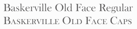 German company that sells 9999 fonts on a CD for 229 USD. In 2017, Infinitype 4 has 7444 fonts for 299 USD. One can download 20 fonts for free, as a teaser. The company is run by Martin Kotulla, owner of Softmaker, who also made the MegaFont CD. Many (most?) fonts are licensed from URW and come with a performance guarantee. Font catalog. Most fonts cover all European languages. Font catalog. Direct download of that catalog. Font name equivalences. The list: Aargau, Abott Old Style, Accent, Accolade, Adelon (lapidary), AdLib, Advertisers Gothic, Aldebaran, Alfredo, Allstar, Alternate Gothic, Alte Schwabacher, American Text, Ancona, Ancona Condensed, Ancona Extended, Ancona Narrow, Antigone, Antigone Compact, Antigone Nord, Antigone Condensed, Antiqua, Artistic, Avignon, Avignon Condensed, Avignon PS, Ballad Script, Ballantines (a broad-nib script), Balloon, Barbedor, Barbedor Osf, Baskerville, Baskerville Nova, Baskerville Old Face, Bay Script, Belfast Serial (a remake of Forsberg's Berling), Belfort, Bellboy, Benjamin [based on ITC Benguiat; identical to Softmaker's B693 Roman], Benjamin Condensed, Benjamin Gothic [free here; this comic book style typeface is based on ITC Benguiat Sans (1979-1980) and is similar to B691 Sans from Softmaker)], Benson, Bergamo, Bergamo Osf, Bernhard Condensed, Bernhard Fashion, Bestseller, Bilbao, Birmingham, Bluff, Boa Script, Bodoni, Bodoni Display, Bodoni No. 2, Bodoni Recut, Bodoni Recut Condensed, Bodoni Standard, Bonita, Book PS, Boston, Boulder, Bravo, Bristol, Broadway, Broadway Engraved, Brush Script, Bryce, Calgary, Calgary Osf, Cambridge, Cambridge Serial, Canossa, Canyon, Carlisle, Casablanca, Casad, Caslon, Caslon Antique, Caslon Osf, Caslon Elegant, Casual, Cathedral Open, Centrum, Century Old Style, Century Expanded, Century PS, Century Schoolbook, Chandler, Chantilly, Chantilly Condensed, Chantilly Extra Condensed, Chantilly Display, Chantilly Serial, Chatelaine, Cheltenham, Cheltenham Condensed, Cheltenham Old Style, Cheltenham Extra Condensed, Cimarron, Clarendon, Clarendon Serial, Clearface, Clearface Serial, Cleargothic, ClearGothic Serial, Colonel, Comix, Commercial Script, Compressed, Computer, Concept, Concept Condensed, Congress, Cooper Black, Copperplate Gothic, Copperplate Condensed, Cornered, Courier PS, Curacao, Curzon, Deco B691, Deco Black, Deco C720, Deco C790, Deco F761, Delano, Delaware, Denver, Derringer, Diamante, Digital, Durango, Disciple, Egyptian Wide, Egyptienne Standard, Elegant Script (revival of the 1972 Berthold formal calligraphic typeface Englische Schreibschrift), Elmore, Ennis, Entebbe, Estelle, Ewok, Expressa, Falcon, Farnham, Fette Engschrift, Fette Mittelschrift, Flagstaff, Flipper, Florence Script, Fraktur, Franklin Gothic, Franklin Gothic Condensed, Franklin Gothic Condensed Osf, Franklin Original, Frascati, Fremont, Front Page, Fuego, Function, Function Condensed, Function Display, Function Script, Gainsborough, Gandalf, SoftMaker Garamond, SoftMaker Garamond Condensed, SoftMaker Garamond No. 7, Garamond Elegant [based on Letraset Garamond], Garamond Nova, Garamond Nova Condensed, Garamond Original, Garamond Standard, German Garamond"> [based on TypoArt Garamond], Giulio, Glasgow Serial [based on Georg Salden's Polo, 1972-1976], Glendale Stencil, Gotisch, Goudita, Goudy Catalogue, Goudy Handtooled, Goudy Old Style, Goudy Heavyface, Granada, Grenoble, Grotesk, Handmade Script, Harlem Nights, Helium, Henderson, Hobo, Hoboken, Hobson, Honeymoon, Horsham, Hudson, Huntington, Iceberg, Illinois, Imperial Standard, Inverserif, Isonorm, Istria, Italian Garamond [based on Simoncini Garamond], Japanette, Jessica, Joseph Brush, Jugendstil, Kaleidoscope, Karin, Kingston, Koblenz, Kremlin Script, Leamington, Letter Gothic, Lingwood, Litera, Livorno, Lyon, Macao, Madeira, Malaga, Marriage, Marseille, Marseille Serial, Maurice, Medoc, Melbourne, Melville, Mercedes, Metaphor, Mexico, Micro, MicroSquare, MicroStencil, Moab, Mobil Graphics, Montreal, Napoli, Neutral Grotesk, Nevada, Newcastle, Nicolas [after Lanstpn's Nicolas Cochin], OCR-A, OCR-B, Oklahoma, Old Blackletter, OnStage, Opus, Organ Grinder, Orkney, Ornitons, Osborne, Otis, Palazzo, Palladio, Palmer, Pamplona, Park Avenue, Pasadena, Pedro, Pelota, Peoria, Persistent, Persistent Condensed, Persistent Osf, Philadelphia, Pizzicato [based on Letraset's Plaza], Plakette, Pollock, Prescott, Prestige, Quadrat, Raleigh, Roman PS, Salmon, Sans, Sans Condensed, Sans Diagonal, Sans Extended, Sans Outline, Sans PS, Sans PS Condensed, Savoy, Savoy Osf, Saxony, Scott, Seagull, Sebastian [based on ITC Serif Gothic], Sigvar [based on ATF's Baker Signet], Soledad, Square Serif, Stafford" [based on Rockwell MT], Stafford Serial, Sterling, Stratford, Stymie, Sunset [a version of ITC Souvenir], Sunset Serial, Sydney Serial, Tabasco, Tampa, Tampico, Tioga Script, Toledo [based on Trooper VGC], Typewriter, Typewriter Osf, Typewriter Condensed, Unic, VAG Rounded, Velo, Veracruz, Verona, Violin Script, Winona, Worcester. [Google]
[More] ⦿
German company that sells 9999 fonts on a CD for 229 USD. In 2017, Infinitype 4 has 7444 fonts for 299 USD. One can download 20 fonts for free, as a teaser. The company is run by Martin Kotulla, owner of Softmaker, who also made the MegaFont CD. Many (most?) fonts are licensed from URW and come with a performance guarantee. Font catalog. Most fonts cover all European languages. Font catalog. Direct download of that catalog. Font name equivalences. The list: Aargau, Abott Old Style, Accent, Accolade, Adelon (lapidary), AdLib, Advertisers Gothic, Aldebaran, Alfredo, Allstar, Alternate Gothic, Alte Schwabacher, American Text, Ancona, Ancona Condensed, Ancona Extended, Ancona Narrow, Antigone, Antigone Compact, Antigone Nord, Antigone Condensed, Antiqua, Artistic, Avignon, Avignon Condensed, Avignon PS, Ballad Script, Ballantines (a broad-nib script), Balloon, Barbedor, Barbedor Osf, Baskerville, Baskerville Nova, Baskerville Old Face, Bay Script, Belfast Serial (a remake of Forsberg's Berling), Belfort, Bellboy, Benjamin [based on ITC Benguiat; identical to Softmaker's B693 Roman], Benjamin Condensed, Benjamin Gothic [free here; this comic book style typeface is based on ITC Benguiat Sans (1979-1980) and is similar to B691 Sans from Softmaker)], Benson, Bergamo, Bergamo Osf, Bernhard Condensed, Bernhard Fashion, Bestseller, Bilbao, Birmingham, Bluff, Boa Script, Bodoni, Bodoni Display, Bodoni No. 2, Bodoni Recut, Bodoni Recut Condensed, Bodoni Standard, Bonita, Book PS, Boston, Boulder, Bravo, Bristol, Broadway, Broadway Engraved, Brush Script, Bryce, Calgary, Calgary Osf, Cambridge, Cambridge Serial, Canossa, Canyon, Carlisle, Casablanca, Casad, Caslon, Caslon Antique, Caslon Osf, Caslon Elegant, Casual, Cathedral Open, Centrum, Century Old Style, Century Expanded, Century PS, Century Schoolbook, Chandler, Chantilly, Chantilly Condensed, Chantilly Extra Condensed, Chantilly Display, Chantilly Serial, Chatelaine, Cheltenham, Cheltenham Condensed, Cheltenham Old Style, Cheltenham Extra Condensed, Cimarron, Clarendon, Clarendon Serial, Clearface, Clearface Serial, Cleargothic, ClearGothic Serial, Colonel, Comix, Commercial Script, Compressed, Computer, Concept, Concept Condensed, Congress, Cooper Black, Copperplate Gothic, Copperplate Condensed, Cornered, Courier PS, Curacao, Curzon, Deco B691, Deco Black, Deco C720, Deco C790, Deco F761, Delano, Delaware, Denver, Derringer, Diamante, Digital, Durango, Disciple, Egyptian Wide, Egyptienne Standard, Elegant Script (revival of the 1972 Berthold formal calligraphic typeface Englische Schreibschrift), Elmore, Ennis, Entebbe, Estelle, Ewok, Expressa, Falcon, Farnham, Fette Engschrift, Fette Mittelschrift, Flagstaff, Flipper, Florence Script, Fraktur, Franklin Gothic, Franklin Gothic Condensed, Franklin Gothic Condensed Osf, Franklin Original, Frascati, Fremont, Front Page, Fuego, Function, Function Condensed, Function Display, Function Script, Gainsborough, Gandalf, SoftMaker Garamond, SoftMaker Garamond Condensed, SoftMaker Garamond No. 7, Garamond Elegant [based on Letraset Garamond], Garamond Nova, Garamond Nova Condensed, Garamond Original, Garamond Standard, German Garamond"> [based on TypoArt Garamond], Giulio, Glasgow Serial [based on Georg Salden's Polo, 1972-1976], Glendale Stencil, Gotisch, Goudita, Goudy Catalogue, Goudy Handtooled, Goudy Old Style, Goudy Heavyface, Granada, Grenoble, Grotesk, Handmade Script, Harlem Nights, Helium, Henderson, Hobo, Hoboken, Hobson, Honeymoon, Horsham, Hudson, Huntington, Iceberg, Illinois, Imperial Standard, Inverserif, Isonorm, Istria, Italian Garamond [based on Simoncini Garamond], Japanette, Jessica, Joseph Brush, Jugendstil, Kaleidoscope, Karin, Kingston, Koblenz, Kremlin Script, Leamington, Letter Gothic, Lingwood, Litera, Livorno, Lyon, Macao, Madeira, Malaga, Marriage, Marseille, Marseille Serial, Maurice, Medoc, Melbourne, Melville, Mercedes, Metaphor, Mexico, Micro, MicroSquare, MicroStencil, Moab, Mobil Graphics, Montreal, Napoli, Neutral Grotesk, Nevada, Newcastle, Nicolas [after Lanstpn's Nicolas Cochin], OCR-A, OCR-B, Oklahoma, Old Blackletter, OnStage, Opus, Organ Grinder, Orkney, Ornitons, Osborne, Otis, Palazzo, Palladio, Palmer, Pamplona, Park Avenue, Pasadena, Pedro, Pelota, Peoria, Persistent, Persistent Condensed, Persistent Osf, Philadelphia, Pizzicato [based on Letraset's Plaza], Plakette, Pollock, Prescott, Prestige, Quadrat, Raleigh, Roman PS, Salmon, Sans, Sans Condensed, Sans Diagonal, Sans Extended, Sans Outline, Sans PS, Sans PS Condensed, Savoy, Savoy Osf, Saxony, Scott, Seagull, Sebastian [based on ITC Serif Gothic], Sigvar [based on ATF's Baker Signet], Soledad, Square Serif, Stafford" [based on Rockwell MT], Stafford Serial, Sterling, Stratford, Stymie, Sunset [a version of ITC Souvenir], Sunset Serial, Sydney Serial, Tabasco, Tampa, Tampico, Tioga Script, Toledo [based on Trooper VGC], Typewriter, Typewriter Osf, Typewriter Condensed, Unic, VAG Rounded, Velo, Veracruz, Verona, Violin Script, Winona, Worcester. [Google]
[More] ⦿
|
Ingo Zimmermann
[Ingofonts]
|
 [MyFonts]
[More] ⦿
[MyFonts]
[More] ⦿
|
Ingofonts
[Ingo Zimmermann]
|
 Ingofonts is a foundry in Augsburg started by Ingo Zimmermann (b. 1967) in 1994. It offers Fraktur fonts, handwriting fonts, sans serif fonts, Antiqua fonts and some pixel fonts. Full fonts go for 50 USD a piece and up. Some fonts are free. Many fonts are adaptations or revivals of historically important fonts. Ingo also practices calligraphy, and in particular, calligraphy for wine labels. The list:
 - Absolut Pro (2008) is a classy sans family that comes in Regular, Licht, Thin and Schmuck.
- Amhara (2009): An experimental font inspired by the Ethiopic writing system.
- Analogue (2010).
- Anatole France (1997-2021). An art deco font in the style of Plakat Schrift by the munich-based printer Georg D. W. Callwey.
- August Sans (2013).
- Auxerre. A wedge-serifed text typeface. Ingo writes: Auxerre is a precursor of Etienne, which later became popular as an advertising script of the 19th century.
- Banknote 1948 (2010).
- Behrens Schrift (2008) is based on Behrens' famous 1902 Jugendstil typeface for Rudhard'sche Giesserei. Behrensschrift iF Plus (+Schmuck) followed in 2021.
- Biró Script is a handwriting font (2007-2012, +Biro Script Plus, 2020) named after the inventor of the ballpoint pen, Laszlo Joszef Biro, 1899-1985.
- Boule Plus (2020). A fat round circle-based bubblegum font family in Gras, Contour and Brilliant styles.
- CharpentierBaroqueIF, CharpentierClassicItaliqueIF, CharpentierClassicistiqueIF, Charpentier Renaissance Pro (1996 and Pro version from 2020; modeled on Roman Capitalis). Charpentier Classicistique Pro (2020; earlier called Classicist) is an absolutely charming didone display typeface family with an award quality Black. In 2014, he added Charpentier Sans Pro for Latin, Greek and Cyrillic with the Pro version following in 2020.
- Chiq Pro. After Apple's Chicago.
- Conté Script (2014). A phenomenal effort towards the creation of a typeface that emulates real handwriting. It even has three-letter ligatures to achieve the desired reality. Based on Ingo's own hand, it also achieves a crayon effect. See also Conte Script Plus (2020).
- Countries of Europe (2008). Outlines of countries. Free download.
- DeBorstel Brush Pro (2009): brush face.
- De Display (2010). A gridded type system.
- De Fonte (1995): a grungy blurred overexposed Helvetica. See also De Fonte Plus (2020).
- Déformé: a grungy Clarendon.
- Deko-Blakk, Deko-Yello (art deco typefaces from 2007).
- DeKunst (1995, deconstructivist). DeKunst Initialen (2007) is Bauhaus-inspired.
- DePixel (1999: based on Apple's Geneva and Chicago; and Illegible DePixel).
- Deutsche Schrift Callwey (1998). A free Sütterlin script that is based on a script sample from around 1920/30 by Karl Schäffer. DeutscheSchriftCallwey (1998): a free handwriting typeface in the style of the 1800s that was later taught in German schools under the generic name of "Sütterlin type".
- Rudolf Diesel Rudolf (2008-2009): Based on the handwriting of the inventor of the Diesel motor, Rudolf Kristian Karl Diesel (1858-1913).
- Die Überschrift (1998): headline sans.
- EconoSans Pro (2020). A 28-style sans that is meant to save space by squishing the letters together.
- Faber Eins, Faber Zwei (1996, legible sans family), Faber Drei, Faber Gotic (2002, +Text, +Gothic, +Gotic Capitals; a Textura based on Gutenberg's blackletter from 1450), Faber Fraktur (1994), Faber Sans Pro (2011). This comes with a great all caps Deko style.
- Façacde Pro (2007). An art nouveau brush typeface found in a 1900 booklet by Karl Otto Maier (a publisher in Ravensburg) entitled Schriften-Sammlung für Techniker Verkleinerte Schriften der wichtigsten Alphabete. Cyrillic version.
- Fixogum (1998, scratchy handwriting).
- Fundstueck (2021). A simplified squarish typeface.
- Graz2006 (1994, a sans family for the 2006 OlumTypographerpic Games in Graz; later renamed by Linotype to Olympia).
- Guhly (2011). An organic family.
- Gutenberg (1995, a textura).
- Handschrift (2007). Expressionist and rough.
- Hedwig Pro (2021). A tall condensed sans; 12 styles.
- Hero (angular handwriting).
- Josef (2000), Josefov (2003, slab serif for Josef), JosefPro (2006, a free sans family), Josefa Rounded Pro (2020: a rounded sans family).
- Klex Plus (1997): a calligraphic or watercolor brush font.
- Koch Schrift (1998-2021). A Schwabacher used by the Deutsche Reichsbahn and first developed by Rudolf Koch in 1909, first known as Neudeutsch and later as Koch Schrift. An earlier version of Zimmermann's Koch Schrift was called Schwabacher Deutsche Reichsbahn.
- Lech Sans (2020). A humanist sans family.
- LeDrôle Lettering Pro (2020).
- LettreCivilitdeGranjon (1997, a reworking of S. Moye's font by that name).
- Maier's No. 8 (2002) and Maier's Neue No. 8 based on forms found in work of Karl O. Maier from before 1914, which already has the geometrical simplicity characteristic of the Weimar period. Maiers No. 21 (2006) and Maiers Nr 21 Pro (2021) are based on a script found in the magazine Schriften-Sammlung für Techniker: Verkleinerte Schriften der wichtigsten Alphabete (Karl O. Maier, Otto Maier Publishing House, Ravensburg, ca. 1910)---a hand-crafted font for technicians. Finally, Maiers Nr. 42 Pro (2020) is a brush-painted art nouveau typeface based a pamphlet of script samples from around 1900 that was issued by Otto Maier's publishing house in Ravensburg, Germany.
- Marleen Script (2011, with over 400 ligatures).
- Menschenalphabet (1997), based on Peter Flötner's alphabet from 1534.
- Novello Pro (2009): The serifed counterpart of his Absolut Pro family.
- OlympiaBuchIF, OlympiaFettIF, OlympiaHalbfettIF, OlympiaLeichtIF, OlympiaSemiSansBuchIF
- Palmona Plus (2008). A German expressionist blackletter after Karl Schaeffer (1939). Palmona Plus was published in 2020.
- Saeculum (1996, cursive connected handwriting).
- Rudolf Diesel (2008-2009): Based on the handwriting of the inventor of the Diesel motor.
- Toby Font (2006(. A 3d doodle font for children.
- Wendelin Pro (1996). A grotesque family. The Pro was released in 2020.
- Whole Europe (2008, outlines of countries), now called Countries Of Europe. Pick it up, togeter with many suppoirt files for TeX by Herbert Voss, at CTAN.
Dafont link. Fontsy link. Klingspor link. Dafont link. Abstract Fonts link. [Google]
[MyFonts]
[More] ⦿
|
Intelligent Design (was: Intelligent Foundry)
[Kostas Bartsokas]
|
 Kostas Barstokas is a designer and illustrator in Thessaloniki, Greece, and in Leeds, UK. He set up Intelligent Foundry and later Intelligent Design in Leeds. He graduated from the MATD program in Type Design at the University of Reading in 2016. He worked as a senior typeface designer at URW in Hamburg and offered consultation in Greek script design for other foundries too. In 2021, Kostas Bartsokas, Mohamad Dakak and Pria Ravichandran set up Foundry 5 Limited.
 In 2011, he used FontStruct to make the counterless typeface UglyKost. In 2012, he created Kafalan Serif, a square-serifed typeface, and the accompanying Kafalan Sans, which are both available from Ten Dollar Fonts. Typefaces from 2013: Zona Black (a Latin-Greek geometric sans-serif black display typeface that was inspired by posters from the late 1920s), Zona Black Slab. In 2014, still in the same style, we find Zona Pro in weights from Hairline to Black. Ridewell (2014) is a wood type inspired 1800-glyph typeface with many opentype features including foremost interlocking pairs of characters. It comes with Ridewell Print, which emulates the degradation of letterpress. In 2015, he designed the geometric sans typeface family Averta and Averta Standard. Averta CY won an award at Granshan 2017 in the Cyrillic category. He writes about his University of Reading graduation typeface, Eqil (2016): Eqil is a multiscript type family for extensive texts. It is conceived as a typographic system wise enough to respond to complex publishing challenges. It consists of a range of styles and its quiet personality transforms and gets louder as the intended sizes increase. Eqil identifies as an elegant contemporary take on transitional types. It does not intend to be a showstopper, instead it aspires to be the lever that silently elevates the content. The combination of straights and curves creates a dynamic yet fluid character and the relatively low contrast gives it a slightly dark and warm texture on the page. The four scripts, Latin, Arabic, Cyrillic, and Greek, were designed to work harmoniously together without compromising each scripts historical and individual characteristics. Eqil won an award at Granshan 2016 in the Latin / Cyrillic category. His super-fat free typeface Oi (2017) is described as a Clarendonesque on steroids. Commercial version of Oi!. Oi won an award at TDC Typeface Design 2018. In 2021, it became a free Google font. Github link. His big project in 2019 is the free 4-axis (weight, slant, flair, volume) variable font Commissioner. Google Fonts link. He writes: Commissioner is a low-contrast humanist sans-serif with almost classical proportions, conceived as a variable family. The family consists of three voices. The default style is a grotesque with straight stems. As the flair axis grows the straight grotesque terminals develop a swelling and become almost glyphic serifs and the joints become more idiosyncratic. The volume axis transforms the glyphic serifs to wedge-like ones. It supports Latin, Greek and Cyrillic. For an extension, see Heraclito (2020). Co-designer of Peridot Latin (2022: a 121-strong sans superfamily by Kostas Bartsokas and Pria Ravichandran) and Peridot PE (2022: a 121-style sans superfamily by Kostas Bartsokas and Pria Ravichandran designed for branding, display, corporate use, editorial and advertising; it covers Latin, Greek and Cyrillic). Buy at Ten Dollar Fonts, Hellofont, Creative Market, or MyFonts. Behance link. The Designers Foundry link. Github link. [Google]
[MyFonts]
[More] ⦿
|
Isaac Tobin
|
 Tobin is based in Chicago, and studied graphic design at the Rhode Island School of Design (2002). He is a senior designer at the University of Chicago Press.
 Designer of Ferdinand (Egyptian, a cross between Futura and Clarendon according to Tobin), Verne Jules (copperplate font), Ostia (a sans all caps typeface with Trajan proportions), Faina, Attleboro (sans), Strata (text typeface), Field (octagonal) and Rivadavia (octagonal and mechanical). Klingspor link. Typecache link. [Google]
[More] ⦿
|
Jake Luedecke
[Luedecke Design Font Co (was: LDF Fonts)]
|
 [More] ⦿
|
James Conner's&Sons United States Type Foundry
|
19th century New York-based foundry, also called the United States Type Foundry, Conner&Cooke, James Conner&Son, James Conner&Sons, and James Conner's&Sons. Only a few of its typefaces have been digitized thus far. Among those, we have AWT Connor Tuscan Italian (2013, Dick Pape), Helena Handbasket NF (2005, Nick Curtis) which was modeled after Antique Light (1888). Buffalo Bill (2007, FontMesa) revives a decorative Western style poster font from 1888. Railhead (2007, FontMesa: 4 styles) is a revival of an 1870s type style that was originally available from both Bruce's New York and James Conner's&Sons type foundries. Warp Three NF (2008, Nick Curtis) is a Bank Gothic-style font that borrows its lowercase from Square Gothic (1888, James Conner). Gunsmoke (2010) is a revival of a James Conner's Sons font that has been around the block under different names such as Extended Clarendon Shaded, Original Ornamented and Galena. Ysleta NF (2010, Nick Curtis) revives Conner's Aetna (1888), also known as Painter's Gothic. Conners Corners NF (2010, Nick Curtis) was gleaned from the 1888 specimen books of James Conner's Sons United States Type Foundry. Fists dating from 1888. [Google]
[More] ⦿
|
James Hamilton
[Hamilton Holly Wood Type Co. (or: Hamilton Manufacturing Company)]
|
 [More] ⦿
|
James Montalbano
[Terminal Design]
|
 [MyFonts]
[More] ⦿
[MyFonts]
[More] ⦿
|
Jas Rewkiewicz
[Dieu et mon droit]
|
[More] ⦿
|
Jason Anthony Walcott
[JAW Fonts (Jukebox Type)]
|
 [MyFonts]
[More] ⦿
[MyFonts]
[More] ⦿
|
Jason Anthony Walcott
[Jukebox Collection]
|
 [MyFonts]
[More] ⦿
[MyFonts]
[More] ⦿
|
JAW Fonts (Jukebox Type)
[Jason Anthony Walcott]
|
 JAW Fonts (and before that, JAW Arts Fonts, and Jukebox Type) was founded by Jason Walcott (b. Trenton, MI, 1971) from Hollywood, CA. Jason grew up in New Jersey, and now resides in Southern California. He graduated from Kean College of New Jersey (now Kean University) in 1997 with a BFA in illustration. JAW Fonts features many elegant calligraphic and comic book style typefaces. JAW Fonts ceased operation in 2003 and Jason reintroduced his collection of fonts in a revised form under the new name of Jukebox Type.
 The original list of typefaces includes Acroterion JF (2002, formal script), Adage Script JF (2002, formal script), Alpengeist, Andantino (2003), AnnabelleJF (2002, a formal script), Baileywick Curly, Baileywick Festive, Baileywick Gothic, Baileywick Happy Grams (star dingbats), Baroque Text JF (2003, a great Fraktur font based on a hand-lettered alphabet drawn by Ross George), Boxer Script, Bronson Gothic, Buena Park (2001, Victorian vintage type influenced by Clarendon), Cathexis (2010, a heavy poster font), Cavetto, CharadeJF (2001, informal script), Debonair, Fairy Tale, Fanfare (2004, a bouncy serif family), Fenway Park, Friki Tiki, Geometric Soul (2004, an art deco all caps face), Gypsy Switch, Holiday Times, Hucklebuck (2003, upright connected signage face), Jeffriana, John Andrew JF, KonTiki (a family published in 2002 containing Aloha, Enchantment, Hula, Kona, Lanai, Lounge and Trader), Lady Fair, Luxury Royale (2003), Manual Script JF (2002), Martini (2004, a brush script), Mary Helen, Opulence JF (2002, formal script font), Peregroy, Periwinkle (2006), Cabernet (2006, frilly didone), Polynesian (2004, Hawaiian-look typeface that could also pass for an oriental simulation face), Primrose JF (2002, formal script), Rambler Script, Randolph, Retro Repro (2002, based on a script by Jerry Mullen from 1953), Saharan, Scriptorama (Hostess, Markdown and Tradeshow), Shirley Script JF (2003), Southland, Spaulding Sans, Stanzie, Stella Ann (2005), Stephanie Marie JF (2003), Tamarillo (2005), TwisterJF (2003), Valentina Joy, Varsity Script, Viceroy, Walcott Gothic (Fountain, Hollywood and Sunset), Groovin (2005, Umbrella Type), Wonderboy. The fonts of this West Hollywood, CA-based foundry can be bought at MyFonts.com. In 2003, he started Jukebox Type and started offering his fonts at Veer. In October 2003, Veer acquired Jukebox Type outright. In 2005, they added Rootin Tootin (Western style), Dulcimer (soft script), Block Party, Dandelion, Marmalade (idyllic script). In 2006, he created Jukebox Bookman, a 6-weight family, and the brush script typeface Stephanie Marie. In 2007, he added Hellenic Wide (after a 19th century ATF font), GiggleScript JF, Savoir Faire (after a handlettered slogan in 1940 for Chesterfield cigarettes), Lollipop. 2008 additions: Hogwash (paintbrush face), Antiquities Technobaby. 2009 additions: Cynthia June (calligraphic). Typefaces from 2010: Eloquent (a didone in the style of Pistilli). Counterpoint Type Studio was established by Walcott in 2013. In 2013, Jason designed the psychedelic typeface Califunkia and the calligraphic script typeface Profiterole. Domani CP (2013, CounterPoint)) is a faithful digital revival of an old photo-typositing typeface called ITC Didi. Originally designed by Herb Lubalin and Tom Carnese, Domani brings to life a font that has been somewhat neglected by the digital era until now. This is the list of fonts sold by MyFonts in 2015. It is just a subset of the fonts made by Walcott: Jukebox Type has these typefaces: Klingspor link. View the Jukebox Type typeface library. View the JAW Fonts typeface library. [Google]
[MyFonts]
[More] ⦿
|
Jay Rutherford
[Typoart GmbH (or: VEB Typoart)]
|
 [MyFonts]
[More] ⦿
[MyFonts]
[More] ⦿
|
Jérémie Dupuis
|
Montreal-based creator (b. 2000) of these free typefaces: - Eligible (2014). A slab serif.
- Frontenac (2014).
- Ghostlight (2016). A slab serif inspired by Clarendon and Egizio. The light weights are very Egyptian and the darker weights are closer to didones.
- Mockup (2014). A geometric sans in four styles.
- Triomphe (2014). A sans typeface family.
- Villeray (2016). This sans workhorse family has 11 weights and rounded and italic variants.
- Zorus Serif (2014).
Dafont link. [Google]
[More] ⦿
|
Jeff Kahn
|
Jeff Kahn is a professional designer with expertise in brand identity, logo and logotype design, and packaging design. Some of his clients include Landor & Associates, Proctor & Gamble, Sierra Club, Revlon, Purina, Hewlett Packard, IBM, TaylorMade, and Hyatt Hotels. Jeff graduated from Art Center College of Design with a BFA, where Doyald Young was his teacher. He is located in Santee, CA. In 2012, he created Touch Tone Extra Condensed Light, and wrote: Touch Tone introduces a condensed lowercase and oblique italics to the uppercase font inspired by the Dr. Strangelove movie titles designed by Pablo Ferro. Touch Tone's naive hand-drawn strokes rely on a quirky variable width-brush. They are looser, more textured, tactile, more informal, with quirky nervous lines. Typefaces from 2013: Sedona. In 2014, Jeff published the rounded organic sans typeface Cushy (2014). In 2017, he published Hot Tamale. In 2018, he added Clarendon Rough. [Google]
[MyFonts]
[More] ⦿
|
Jeff Levine
[Jeff Levine: Western style typefaces]
|
 [MyFonts]
[More] ⦿
[MyFonts]
[More] ⦿
|
Jeff Levine
[Jeff Levine: Wood type]
|
 [MyFonts]
[More] ⦿
[MyFonts]
[More] ⦿
|
Jeff Levine: Western style typefaces
[Jeff Levine]
|
 Western style typefaces made by Jeff Levine:
 - Badlands JNL (2017).
- Boonville JNL (2009, Western, wood type).
- Bootblack JNL (2007).
- Bootspur JNL (2006).
- Canarsie Slab JNL (2001) could pass for a heavily slabbed Western face.
- Cattle Call JNL (2019). A Tuscan typeface.
- Cattle Drive JNL (2011).
- Cattleman JNL (2013, a condensed French Clarendon).
- Cloverdale JNL (2009, Western, wood type).
- Faux Pas JNL (2020).
- Farmland JNL (2009).
- Frontiersman JNL (2011): A Tuscan face. See also Frontiersman JNL Black.
- Gemstone JNL (2016: Victorian, Tuscan).
- Gower Gulch JNL (2010).
- Grande Parade JNL (2009, Western style: a decorative version of Winnetka JNL).
- Grist Mill JNL (2009).
- Homesteader (2008).
- Hoosegow JNL (2009).
- Kalvesta JNL (2012).
- Lost Hills JNL (2008, a Wild West font based on Levine's own Brogado JNL).
- Mud Creek JNL (2020). Tuscan. Town Meeting JNL (2020) is an de-Tuscanized version of Mud Creek JNL.
- Mule Train JNL (2019).
- Oak Ridge JNL (2009).
- Pickfair JNL (2010) is based on the vintage wood type Vandenburgh Tuscan (circa 1867).
- Old Chisholm JNL (2012).
- Ornery Polecat JNL (2014).
- Overland Stage JNL (2011). A Tuscan stencil face.
- Overland Trail JNL (2020). An Italian typeface.
- Pen Nib Western JNL (2018).
- Primitive Tuscan JNL.
- Prospector JNL (2014).
- Rancher JNL (2013).
- Ranch Land JNL (2013). Based on a classical French Clarendon wood type.
- Rustic Setting JNL (2013).
- Saddle Tramp JNL (2013).
- Sagebrush (2014). modeled after French Clarendon wood types.
- Stablehand JNL (2010).
- Tamarac JNL (2006).
- Tent Show JNL (2014). Based on a French Clarendon wood style.
- Texarkana JNL (2011): based on a classic condensed wood type from the 1800s, and embellished with stars.
- Township JNL (2020). Based on the Western font French Antique Condensed.
- Turlock JNL (2007).
- Western Bevel JNL (2010).
- Western Block JNL (2010): Western, and almost octagonal.
- Western Railway JNL (2007).
- Western Sans JNL (2021). Based on classic Western wood types.
- JNL Western Territory (2019).
- Western Trail JNL (2020).
- Western Wood Type JNL (2015). Based on a letterpress font seen in Harry Potter and the Order of the Phoenix.
- Westward JNL (2014).
- Wood Tuscan JNL (2014).
[Google]
[MyFonts]
[More] ⦿
|
Jeff Levine: Wood type
[Jeff Levine]
|
 Digital renderings and simulations of wood type by Jeff Levine include Advertiser JNL (2009), Alderman JNL (2020: a wide slab serif typeface based on the classic wood type Antique Light Face Extended), Antique Unique JNL (2017, a revival of a wood type called Ten Line Antique Compressed No. 7), Blacksmith JNL (2011, based on a brass stencil image), Brenham JNL (2011), Buckdance JNL (2005, Tuscan), Bushwick JNL (2011, caps-only sans), Cattleman JNL (2013, a condensed French Clarendon), Cattle Trail JNL (2019: after Latin Condensed), Chamfer Engraved JNL (2020: a chamfered sans serif wood type design with a right side engraving line from the 1800s was found within the pages of the Thorowgood Foundry), Cherrywood JNL (2020: based on the classic Columbian from the William H. Page Wood Type Company (circa 1870), Cherrywood JNL is a bold slab serif type design), Clarenwood JNL (2014), Clarenwood Stencil (2015), Clarified JNL (2020; based on William H. Page's Clarendon Extended wood typeface), Compressed Wood JNL (2020: extrapolated from J.G. Cooley's Roman Triple Extra Condensed Fifty Line), County Clerk JNL (2020: after the vintage Hamilton wood typeface Gothic Special), Daily Tablet JNL (2014: based on wood type used for newspaper headlines), DuBois Block JNL (2008), Early Edition JNL (2020), Eccentric Wood Type JNL (2020), Elida JNL (2011, a didone all caps wood type family), Elk Grove JNL (2009, based on a wood type called Facade), Emporia JNL (2011), Engine Company JNL (2013), Final Edition JNL (2015), Fort Courage JNL (2014, a French Clarendon), Framingham JNL (2010, a widened version of Nostrand JNL), General Merchandise JNL (2020: after the condensed slab serif Antique X Condensed, ca. 1840, by Wells and Webb), General Merchant JNL (2013), Gristwood JNL (2015), Hayfork JNL (2011), Ingomar (2006), Lenorah JNL (2009), Local Printer JNL (2020: based on William Page's wood typeface Skeleton Antique, ca. 1865), Lockup JNL (2009), Longwood JNL (2014), News Event JNL (2020), Normandy Isle JNL (2011), Northfork JNL (2010, based on a William H. Page wood type alphabet called Parisian, circa 1857-58), Nostrand JNL (2009, condensed wood type), Notification JNL (2011), Nouveau Sans JNL (2014, art nouveau-inspired wood type), Octagonist (2020: a 3d beveled typeface that revives George Nesbitt's Octagon from 1838), Old Wood JNL (2013), Ornery Polecat JNL (2014: Western style), Page Printer JNL (2020: after William H. Page's Skeleton (1948)), Payson (2009), Pleasantwood JNL (2014), Presswood JNL (2020: based on the title font used on the cover of a specimen book issued by the Delittle Wood Type Company of York, England), Primitive Tuscan JNL (2014), Rachelle JNL (2009, Italian), Ranch Hand JNL (2013), Reverse Gothic JNL (2014), Roman Wood Type JNL (2012, in the Clarendon Condensed style), Rounded Sans Wood JNL (2015), Roundwood JNL (2020: spurred), Rustic Setting JNL (2013), Saddle Tramp JNL (2013), Sagebrush JNL (2014: modeled after French Clarendon), Sales Book JNL (2013), Sales Event JNL (2014), Sandalwood JNL (2020: based on a sans wood type seen in Rob Roy Kelly's American Wood Type), Shadowland JNL (2014), Shadowlawn JNL (2014), Sidewinder JNL (2013, an ultra-compressed wood type), Splinters JNL (2009, wood pieces), Slabserif Grotesk JNL (2020: based on a wood type design called Antique Light Face), Slabserif Wood JNL (2020), Stockville JNL (2012), Streamwood JNL (2014), Strongbox JNL (2009), Table Wood JNL (2020: based on the wood type Concave Tuscan Extra Condensed), Tamarac (2006, slab-serif wood type), Tent Show JNL (2014, based on a French Clarendon circus style), Teterboro JNL (2010; although built from scratch, this slab serif has a wood type feel), Texarkana JNL (2011, based on a classic condensed wood type from the 1800s, and embellished with stars), Topanga JNL (2010, ultra-condensed sans serif wood type), Trail Boss JNL (2011), Troubadour JNL (2011, ornamental wood type), Unadorned JNL (2017, an ornate spurred wood type font), Weekend Tabloid JNL (2009, a sans serif wood type), Western Wood Type JNL (2015, a Clarendon), West Fork JNL (2020: after Latin Extended by Hamilton, 1888), Westward JNL (2014: circus lettering typeface), Winnetka JNL (2009, octagonal wood type inspired by Cooley Antique Tuscan Condensed---a printer's wood type manufactured in 1859 by J.G. Cooley), Woodbranch JNL (2016), Wood Clarendon JNL (2020: after Hamilton Clarendon Condensed, 1899), Wood Condensed Grotesk (2014), Woodcraft JNL (2013), Wood Fancy Reverse JNL (2020), Wood Gothic JNL (2020: based on Hamilton Gothic Bold (Hamilton Wood Type Foundry, circa 1889), Woodhaven Initilas JNL (2014), Woodlawn JNL (2013, outlined), Wood Line JNL (2018, based on wood type), Woodline (2019: very different from Wood Line JNL), Woodmark JNL (2014: based on William H. Page's New Process No. 507), Wood Nouveau (2014), Wood Poster Display JNL (2014), Wood Rounded JNL (2020: an interpretation of Caslon Rounded), Wood Sans Narrow JNL (2017, based on examples of an extra condensed Hamilton Wood Type), Wood Serif Poster JNL (2020), Wood Stencil (2019), Wood Tuscan JNL (2014), Wood Type Bodoni JNL (2013), Wood Type Calendar JNL (2016), Wood Type Grotesk JNL (2014), Woodwork JNL (2014). [Google]
[MyFonts]
[More] ⦿
Digital renderings and simulations of wood type by Jeff Levine include Advertiser JNL (2009), Alderman JNL (2020: a wide slab serif typeface based on the classic wood type Antique Light Face Extended), Antique Unique JNL (2017, a revival of a wood type called Ten Line Antique Compressed No. 7), Blacksmith JNL (2011, based on a brass stencil image), Brenham JNL (2011), Buckdance JNL (2005, Tuscan), Bushwick JNL (2011, caps-only sans), Cattleman JNL (2013, a condensed French Clarendon), Cattle Trail JNL (2019: after Latin Condensed), Chamfer Engraved JNL (2020: a chamfered sans serif wood type design with a right side engraving line from the 1800s was found within the pages of the Thorowgood Foundry), Cherrywood JNL (2020: based on the classic Columbian from the William H. Page Wood Type Company (circa 1870), Cherrywood JNL is a bold slab serif type design), Clarenwood JNL (2014), Clarenwood Stencil (2015), Clarified JNL (2020; based on William H. Page's Clarendon Extended wood typeface), Compressed Wood JNL (2020: extrapolated from J.G. Cooley's Roman Triple Extra Condensed Fifty Line), County Clerk JNL (2020: after the vintage Hamilton wood typeface Gothic Special), Daily Tablet JNL (2014: based on wood type used for newspaper headlines), DuBois Block JNL (2008), Early Edition JNL (2020), Eccentric Wood Type JNL (2020), Elida JNL (2011, a didone all caps wood type family), Elk Grove JNL (2009, based on a wood type called Facade), Emporia JNL (2011), Engine Company JNL (2013), Final Edition JNL (2015), Fort Courage JNL (2014, a French Clarendon), Framingham JNL (2010, a widened version of Nostrand JNL), General Merchandise JNL (2020: after the condensed slab serif Antique X Condensed, ca. 1840, by Wells and Webb), General Merchant JNL (2013), Gristwood JNL (2015), Hayfork JNL (2011), Ingomar (2006), Lenorah JNL (2009), Local Printer JNL (2020: based on William Page's wood typeface Skeleton Antique, ca. 1865), Lockup JNL (2009), Longwood JNL (2014), News Event JNL (2020), Normandy Isle JNL (2011), Northfork JNL (2010, based on a William H. Page wood type alphabet called Parisian, circa 1857-58), Nostrand JNL (2009, condensed wood type), Notification JNL (2011), Nouveau Sans JNL (2014, art nouveau-inspired wood type), Octagonist (2020: a 3d beveled typeface that revives George Nesbitt's Octagon from 1838), Old Wood JNL (2013), Ornery Polecat JNL (2014: Western style), Page Printer JNL (2020: after William H. Page's Skeleton (1948)), Payson (2009), Pleasantwood JNL (2014), Presswood JNL (2020: based on the title font used on the cover of a specimen book issued by the Delittle Wood Type Company of York, England), Primitive Tuscan JNL (2014), Rachelle JNL (2009, Italian), Ranch Hand JNL (2013), Reverse Gothic JNL (2014), Roman Wood Type JNL (2012, in the Clarendon Condensed style), Rounded Sans Wood JNL (2015), Roundwood JNL (2020: spurred), Rustic Setting JNL (2013), Saddle Tramp JNL (2013), Sagebrush JNL (2014: modeled after French Clarendon), Sales Book JNL (2013), Sales Event JNL (2014), Sandalwood JNL (2020: based on a sans wood type seen in Rob Roy Kelly's American Wood Type), Shadowland JNL (2014), Shadowlawn JNL (2014), Sidewinder JNL (2013, an ultra-compressed wood type), Splinters JNL (2009, wood pieces), Slabserif Grotesk JNL (2020: based on a wood type design called Antique Light Face), Slabserif Wood JNL (2020), Stockville JNL (2012), Streamwood JNL (2014), Strongbox JNL (2009), Table Wood JNL (2020: based on the wood type Concave Tuscan Extra Condensed), Tamarac (2006, slab-serif wood type), Tent Show JNL (2014, based on a French Clarendon circus style), Teterboro JNL (2010; although built from scratch, this slab serif has a wood type feel), Texarkana JNL (2011, based on a classic condensed wood type from the 1800s, and embellished with stars), Topanga JNL (2010, ultra-condensed sans serif wood type), Trail Boss JNL (2011), Troubadour JNL (2011, ornamental wood type), Unadorned JNL (2017, an ornate spurred wood type font), Weekend Tabloid JNL (2009, a sans serif wood type), Western Wood Type JNL (2015, a Clarendon), West Fork JNL (2020: after Latin Extended by Hamilton, 1888), Westward JNL (2014: circus lettering typeface), Winnetka JNL (2009, octagonal wood type inspired by Cooley Antique Tuscan Condensed---a printer's wood type manufactured in 1859 by J.G. Cooley), Woodbranch JNL (2016), Wood Clarendon JNL (2020: after Hamilton Clarendon Condensed, 1899), Wood Condensed Grotesk (2014), Woodcraft JNL (2013), Wood Fancy Reverse JNL (2020), Wood Gothic JNL (2020: based on Hamilton Gothic Bold (Hamilton Wood Type Foundry, circa 1889), Woodhaven Initilas JNL (2014), Woodlawn JNL (2013, outlined), Wood Line JNL (2018, based on wood type), Woodline (2019: very different from Wood Line JNL), Woodmark JNL (2014: based on William H. Page's New Process No. 507), Wood Nouveau (2014), Wood Poster Display JNL (2014), Wood Rounded JNL (2020: an interpretation of Caslon Rounded), Wood Sans Narrow JNL (2017, based on examples of an extra condensed Hamilton Wood Type), Wood Serif Poster JNL (2020), Wood Stencil (2019), Wood Tuscan JNL (2014), Wood Type Bodoni JNL (2013), Wood Type Calendar JNL (2016), Wood Type Grotesk JNL (2014), Woodwork JNL (2014). [Google]
[MyFonts]
[More] ⦿
|
Jim Lyles
[Stiggy & Sands]
|
 [MyFonts]
[More] ⦿
[MyFonts]
[More] ⦿
|
Joanne Taylor
|
 Aka Jos Joy, as Joanne Ford Taylor, and as joiaco. South African illustrator from Knysna, b. 1953. She also paints as Qabbojo Art, and is presently located in Vancouver, Canada.
 Designer in 2009 of Qarmic Sans, Qirkus Qaps (almost Tuscan), Qranklestein, Qlippitek, Qixstix, QutnTorn Caps, and the hand-printed fonts Qirlycues and Qokijo. In 2011, she created Qokipops, Qik Edges (2011, dingbats and borders), Qut+Torn (papercut face), Qrypton (2011, sci-fi), Qumbazonki (2011, African look face), Qwagga (2011, another African face), Qixbox (2011, hand-printed 3d face), Qongasushi (2011, poster face), Qarkitech, and Qlinickle. Typefaces from 2012 include Qarolina, Qreepy, Qrackerjax, Qubism, Qoncrete, Qrubby, Questoz, Quinky (brush face), Qumberland Slab, Qinkgo, Qrayola, Qudos, Qubism (inspired by Picasso), Qimiko, Qhorah, Qratchee (scratchy typeface). In 2013, she designed Qrankenstein, Qaxton, Quota (a heavy titling face), Qlub Jozi (art deco), Qlarendon (a 7-style Clarendon family), Qarmic Sans Pro, Qanoodle (handwriting), Qorker (art deco, after The New Yorker?), Qlaire (clean sans), Qwinkwell, Quota (fat poster face), Qarross, Qontreaux, Qut+Paste (paper cut font), Qwacko, Qizulu (African-themed font), Qokeynote. Typefaces from 2014: Qlunky Brush, Qarrotface, QikiconsRealEstate, QrackStreet, Quiglet (a very rounded sans), Quota-Bold, Qutntorn, Qwinkwell, Quikhand (chalk / blackboard typeface), Qirlycues. Typefaces from 2015: African Elegance, Embroidery Running Stitch, Embroidery Chainstitch, Embroidery Backstitch, Leaderbord. Typefaces from 2016: Scrabblish (scrabble font). Typefaces from 2017: Qanterberry, Geeky Periodic Table Font. Devian Tart link. Behance link. Graphic River link. Fontspace link. Dafont link. Creative Market link. [Google]
[More] ⦿
|
Joao Mota
|
During his design studies in Oporto, Portugal, Joao Mota (Joao Mota Design, Torres Novas, Portugal) created some typefaces in 2012. In 2013, he designed Clarendon Stencil, Hariemuj, Modern Architecture, and Post-War Heritage. Behance link. Old Behance link. [Google]
[More] ⦿
|
Joel Felix
|
 Freelance designer in Stockton, CA, who graduated from Sacramento State University. Creator of the free font Citizen Slab (2012).
 In 2016, he published the vintage rail car display typeface Pullman, and the equally nostalgic Clarendon-inspired 49ers Faithful display typeface. Joel writes: Faithful is based on the iconic SF monogram introduced in the early 1960s, and a continuation of the 49ers' logo-type introduced in mid-to late 1980s. It was developed in cooperation with Benjamin Mayberry, the creative manager of the San Francisco 49ers. Behance link. Creative Market link. [Google]
[More] ⦿
|
John Bonadies
[Mpress Interactive]
|
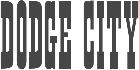 [MyFonts]
[More] ⦿
[MyFonts]
[More] ⦿
|
John Stephenson
[Stephenson Blake]
|
 [MyFonts]
[More] ⦿
[MyFonts]
[More] ⦿
|
Jonathan Hoefler
[Hoefler (was: Hoefler&Frere-Jones, and Hoefler Type Foundry)]
|
 [MyFonts]
[More] ⦿
[MyFonts]
[More] ⦿
|
Jonathan Hoefler's Type Styles 101
|
Hoefler reviews Lapidary, Inscriptional, Venetian, Aldine, Garalde, French Old style, Dutch Old style, English Old Style, Transitional, Modern, English Vernacular, Fat face, Egyptian, and Clarendon, and muses about reviving types. [Google]
[More] ⦿
|
Jonny Pinhorn
|
 Jonathan (Jonny) Pinhorn is a British type designer and India enthusiast who obtained an MA in typeface design from The University of Reading (2009), based on his typeface Venkat. From 2011-2015, he worked for Indian Type Foundry in Ahmedabad, India. Jonathan is currently located in Birmingham, UK. He is working on Venkat Tamil. His typefaces:
 - The free grotesque typeface Karla (2012, Google Fonts). Github link for Karla.
- Saguna (2013, Indian Type Foundry). For Gujarati.
- Teko (2014, jointly with Manushi Parikh). Published at Google Fonts and Indian Type Foundry. Teko is an Open Source typeface that currently supports the Devanagari and Latin scripts. This font family has been created for use in headlines and other display-sized text on screen. Five font styles make up the initial release.
- Kalam (2014, with With Lipi Raval). Published by Google Fonts and Indian Type Foundry). Kalam is a handwriting-style typeface supporting the Devanagari and Latin scripts. The fonts have each been optimised for text on screen. Each font contains 1,025 glyphs, which includes many unique Devanagari conjuncts.
- The sans typeface Karmilla (2015). A ree at Open Font Library and Github.
- The Peignotian typeface Quilon (2015). A free version is available at Fontshare.
- The grotesk typeface family Caravel (2015, Indian Type Foundry).
- The geometric-but-not-quite-monolinear Touche (2015, Indian Type Foundry).
- Tillana =(2015). Done with Lipi Raval, Tillana is a casual angular script typeface for Latin and Devanagari.
- The free Latin / Devanagari geometric sans typeface Poppins (2015). The Devanagari is by Ninad Kale. The Indian Type Foundry first published Poppins in 2014. Github link. This geometric family is nearly monolinear. Anderson University recommends it as a replacement for Zuzanna Licko's Mr Eaves XL Modern. The free font Ulagadi Sans (2014-2017) is derived by Cristiano Sobral and stripped of the devanagari component.
- The creamy typeface Shrikhand (2015, Google Fonts). This typeface covers Latin and Gujarati.
- Atithi. A Gurmukhi companion to Cadson Demak's Athiti Latin and Thai typeface.
- DM Sans (2019). DM Sans is a low-contrast geometric sans serif design, intended for use at text sizes. DM Sans supports a Latin Extended glyph set, enabling typesetting for English and other Western European languages. It was released by Colophon Foundry (UK), starting from the Latin portion of ITF Poppins. Free at Google Fonts.
- Betinya Sans (2019).
Github link. [Google]
[MyFonts]
[More] ⦿
|
Jordan Davies
[Wooden Type Fonts (was: American Wood Type and, Wooden Type)]
|
 [MyFonts]
[More] ⦿
[MyFonts]
[More] ⦿
|
Josiah Stearns Cushing
|
 Born in 1854, died in 1913. Boston-based book printer who is usually credited with the design of Cushing in 1896 at Monotype. McGrew writes: Cushing is a group of typefaces rather than a family, for some members have little in common with each other, and were not intended to work together. Some accounts credit the design of these typefaces to Josiah Stearns Cushing, who in the late nineteenth century was president of the Norwood Press Company in Norwood, Massachusetts. Cushing was one of the most prominent printers of the day, but it seems more likely that he merely spelled out what he wanted in typefaces for his particular purposes, and that they were executed by others.
 Cushing and Cushing Italic were cut about 1897 by ATF. They are conventional roman and italic in basic design, but are almost completely uniform in weight of stroke throughout, with small oldstyle serifs, They were intended to provide a letter particularly adapted for book work, to print clearly and readably, and to reproduce well by electrotyping. A few years later they were shown as Lining Cushing No.2 and Italic, the added words probably indicating that some adjustment had necessarily been made to adapt them to the new standard alignment. BB&S had a copy of this roman under the name of Custer. in 1925 it was reissued as Bookman Lightface, in the same sizes. Compare Cardinal, Hunnewell. Frederic W. Goudy, the eminent type designer, includes Cushing Italic in his list of typefaces. In the book of his type designs, he says, "While in Hingham, Clarence Marder had me draw for him an italic to accompany the Cushing Roman already produced. ...Whether the italic shown in the specimen of today is the one I drew I cannot be sure. ..." It isn't; he went to Hingham in 1904; this Cushing Italic had been shown in 1898 or earlier. Cushing Oldstyle (later known as Lining Cushing Oldstyle No.2) was cut in the mid-1890s by ATF, and copied by Monotype in 1901. It is a sturdy, compact face, with a large x-height. In small sizes it is medium weight; from 18-point up it is a little heavier. The large, bracketed serifs and general style are similar to the early lonics, Dorics, and Clarendons. A copy of this typeface was made by Keystone under the name of Richelieu (named for Cardinal Richelieu), Linotype had it as Title No.1, and BB&S had a very similar face, Custer Bold, which in 1925 was renamed Bookman Bold. Lining Cushing Oldstyle Italic was cut about 1906 by ATF. It was cut for Monotype in 1910; the Monotype roman follows the original, being a little heavier in larger sizes, but the italic is wider than the original and uniform throughout, as patterns for the modified composition sizes were apparently used for display sizes as well. Cushing Monotone was cut about 1899, a refinement of an earlier typeface of the same name. It is generally a lighter version of Cushing Oldstyle, but not as light as Cushing [No. 2]. It is neat but undistinguished for either text or display, somewhat similar to Bookman but lighter. Uniline was a similar typeface shown later by Linotype. Also compare Cardinal. Cushing Antique was designed by Morris Benton for ATF in 1902, but not cut until 1905. An ATF announcement said of it, "Entirely redrawn and cut from new patterns. Conforms to approved outlines for antique typeface but modified to meet present-day requirements. Unquestionably the most complete and accurate series of antique made." It was copied by Ludlow in 1927. An italic was planned by ATF but not completed. Digital interpretations include ITC Cushing by Vincent Pacella (1982), Revival 721 (Bitstream), Calgary (SoftMaker), Bushing by David Bergsland (2010), and File Clerk (2020, Jeff Levine). [Google]
[MyFonts]
[More] ⦿
|
Jukebox Collection
[Jason Anthony Walcott]
|
 This is the new foundry of Hollywood, CA-based Jason Walcott, who formerly ran JAW Fonts, Jukebox Type, and Counterpoint Type Studio. JAW Fonts ceased operation in 2003 and Jason reintroduced his collection of fonts in a revised form under the new name of Jukebox Type. Established in 2015, Jukebox Collection started out with these typefaces, which are mainly remastered and recycled typefaces from JAW Fonts and Jukebox Type with original designs going back to the period 2001-2007, roughly spaeking:
 View the Jukebox Collection typeface library. [Google]
[MyFonts]
[More] ⦿
|
Juliano Augusto
[Fondue Fontes]
|
[More] ⦿
|
Kai Büschl
|
 Born in 1971, Kai Büschl studied graphic design at the University of Applied Science Augsburg, Germany from 1993-1998. One of the three cofounders of Lazydogs Type foundry in Augsburg, Germany. In 2005 Kai was appointed visiting professor at the HBK Saar (University of Fine Arts Saarbrwücken).
 In 2017, he developed the didone typeface family LD Moderne Antiqua (and LD Moderne Antiqua fat) with three optical sizes for each style. LD Moderne Antiqua Fat finds its model in fat modern style typefaces of the seventies. In 2018, it was followed by the Clarendon style LD Moderne Slab. Proof & Co write: LD Moderne Slab is a tidy and classic take on the Clarendon style, with its more square proportions, Its proud and definitive features, and its well heeled serifs. It's clean, it's neat, it's rather nicely put together---in other words, it's a serious study in subtlety. If you set a line of it in open white space, stand back and let the letters breathe, it suddenly takes on a prestigious and stately vibe, and that's a result of the million tiny little things going on in its design that you wouldn't otherwise note but are working hard to express a modern refinement. I like LD Moderne Slab because its an unexpectedly elevated and quiet offering in a field of louder personalities. [Google]
[More] ⦿
|
Khajag Apelian
|
 Freelance graphic designer from Lebanon. Born in Sharjah, UAE, an Armenian with a Lebanese nationality. Graduate of the Type and Media program at KABK, 2009. There, he designed Arek, an Armenian typeface specifically designed to replace the typefaces currently used in school books. It is a fresh interpretation of the ancient Armenian script used in the old manuscripts. My ambitious plan for this project is to include a serif and a sans serif version, containing upright and cursive forms, with multiple weights, display versions and initials. However, currently the project includes only the serif upright, regular and black weights, in addition to the cursive and the initials. This typeface was awarded First Prize in the Granshan 2010 competition for Armenian text types. Arek was finally published by Rosetta Type Foundry in 2012.
 After graduation, he started freelancing as a graphic and type designer in Amsterdam. Partner at The Place. Other typefaces include The Chattam (2009, a Clarendon revival), Boujour (2008, an ultra fat deco face), Moudwi (2007, an experimental Arabic detached typeface inspired by the Unified typeface created by Nasri Khattar). His typefaces: Arek, Hagatir, Boujour (2008, piano key typeface), Mulsaq (2008, Arabic), Moudwi, Nuqat (2010: a dot matrix typeface by René Knip, Khajag Apelian, Jeroen van Erp, and Reza Abedini). Graphic Arabic (Wael Morcos and Khajag Apelian) won an award at Granshan 2017. IBM Plex Sans Arabic (2019, by Mike Abbink, Paul van der Laan, Pieter van Rosmalen, Wael Morcos and Khajak Apelian) is a free typeface family at Google Fonts. Typecache link. Behance link. [Google]
[More] ⦿
|
Kostas Bartsokas
[Intelligent Design (was: Intelligent Foundry)]
|
 [MyFonts]
[More] ⦿
[MyFonts]
[More] ⦿
|
Ladislas Mandel
|
 Born in 1921 in Transylvania, he trained at the Fine Arts Academy of Budapest (Hungary) and then at the Beaux-Arts in Rouen (Normandy, France). Ladislas Mandel was a stonecutter, painter and sculptor. However, he spent his life in France, mostly as a type designer at Deberny&Peignot, where he worked since 1954. In 1955, he headed the type atelier. He was taught by and cooperated with Adrian Frutiger during nine years at Deberny, finally succeeding Frutiger in 1963 as type director. In 1955, he was in charge of the transformation of the Deberny type repertoire from lead to phototype. He created original designs under the label International Photon Corporation, and turned independent designer in 1977. After that, he specialized in typefaces for telephone directories, and made, e.g., Colorado in 1998 with Richard Southall for US West. He cofounded the ANCT in Paris in 1985 and taught there and at Paris VIII. In 1998, he published the book Ecritures, miroir des hommes et des sociétés (éditions Perrousseaux), which was followed in 2004 by Du pouvoir de l'écriture at the same publisher. He died on October 20, 2006.
 - His typefaces for the Lumitype-IPC (International Photon Corporation) catalogue include originals as well as many interpretations of famous typefaces: Arabica Arabic (1975), Aster (1960-1970), Aurélia (1967), Baskerville (1960-1970), Bodoni (1960-1970), Bodoni Cyrillic (1960-1970), Cadmos Greek (1974), Cancellaresca, (1965) Candida (1960-1970), Caslon (1960-1970), Century (1960-1970), Clarendon (1960-1970), Edgware (1974), Formal Gothic (1960-1970), Frank Ruehl Hebreu (1960-1970: this is one of the most popular Hebrew typefaces ever), Gill Sans (1960-1970), Gras Vibert (1960-1970), Hadassah (1960-1970), Haverhill (1960-1970), Imprint (1960-1970), Janson (1960-1970), Mir Cyrillic (1968), Modern (1960-1970), Nasra Arabic (1972), Néo Vibert (1960-1970), Néo-Peignot (1960-1970), Newton (1960-1970), Olympic (1960-1970), Plantin (1960-1970), Rashi Hebreu, Sofia (1967), Sophia Cyrillic (1969), Sphinx (1960-1970), Textype (1960-1970), Thai (1960-1970), Thomson (1960-1970), Times Cyrillic (1960-1970), Univad (1974), Weiss (1960-1970).
- Types done or revived at Deberny&Peignot: Antique Presse (1964, Deberny&Peignot), Times (1964). A note here: many type experts believe that Antique Presse is not by Mandel. According to Production Type, it was established that Adrian Frutiger, then art director of Deberny&Peignot, was more likely the mind behind Antique Presse. As further proof, Antique Presse quite blatantly follows Frutiger's Univers pattern on many levels.
- Types for phone directories: Clottes (1986, Sneat - France Telecom), Colorado (1998, U.S. West, created with the help of Richard Southall), Galfra (1975, Seat, Promodia, Us Seat, English Seat: there are versions called Galfra Italia (1975-1981), Galfra Belgium (1981), Galfra UK (1990), and Galfra US (1979-1990)), Lettar (1975, CCETT- Rennes), Letar Minitel (1982-1983), Linéale (1987, ITT-World Directories), Lusitania (1987, ITT-World Directories), Nordica 1985 (ITT-World Directories: Nineuil says that this is done in 1987-1988), Seatypo Italie (1980).
- Other typefaces: Portugal, Messidor (1983-1985, old style numerals font for the Imprimerie Nationale), Solinus (great!!, 1999), Laura (1999).
Ladislas Mandel, l'homme derrière la lettre is Raphael de Courville's thesis in 2008 at Estienne. In 1999, Olivier Nineuil wrote Ladislas Mandel: Explorateur de la typo français (Etapes graphiques, vol. 10, pp. 44-64). Olivier Nineuil's description of his achievements. [Google]
[MyFonts]
[More] ⦿
|
Lars Harmsen
[Volcano Type (MAGMA)]
|
[MyFonts]
[More] ⦿
|
Layton Filmset
|
London-based film type company. They sold and/or used the main typefaces at the time. I do not believe that they ever made original type. Just for history's sake, a few shots from their catalog: Andrich Minerva, Arnholm Medium Sans, Bodoni, Craw Clarendon Condensed, display typefaces (list), Ehrhardt, Jana, Jana, lightline Gothic, Modern No. 20, Pistilli Roman, text typefaces (list). [Google]
[More] ⦿
|
Letterhead Studio YG
[Yuri Gordon]
|
 Letterhead is Yuri Gordon's (b. Moscow, 1958) Moscow-based foundry which publishes mainly Cyrillic fonts. Its coowners are Valery Golyzhenkov and Olga Vassilkova and it was established in 1998. It evolved from Garbage Type Foundry. Not to be confused with Chuck Davis' Letterhead. The main designer is Yuri (or: Jury) Gordon, the Moscow-based designer of the Type Directors Club 1999 award-winning designs Dve Kruglyh and FaRer Cyrillic, available from Paratype. URL at Yakovlev's Foundry. Picture. Article in the Moscow Times (2006), in which he proclaims: Better to make five fun and tasty new display fonts than one old, boring (and you thought it would look fresh!) text font. He is a graphic designer, illustrator, type designer, engraver and copyrighter. He is Art Director of several magazines.
 - Yuri Gordon created AntiQuasi (2008, a nice lightly slabbed serif family), Babaev [1996; inspired by the Russian Art Nouveau typefaces, initially created as a part of a corporate identity programme for Babayevskoye AO of Moscow], Artemius (custom designed family for Art Lebedev Studio), Barrizmo (2004), Bistro (1997, hand-printed), Chantage (2000, handwriting), Conqueror Text, Conqueror Slab and Conqueror Display (large families), Conqueror Sans (2005-2010), Conqueror Text (2005-2010), Costa Brava (2003, fun script described as beach type), Costa Dorada (2003), Dva Probela (1997-1998), Dve Kruglyh (1997, unicase), Excession (1999), FaRer [1994; art deco typeface inspired by the work of Russian graphic artists Vladimir Favorsky (1886-1964) and Ivan Rerberg (1892-1957), especially by Favorsky's lettering of 1924 and by Rerberg's of 1935. Dedicated to the Moscow Underground (Metro). Obtained an award at the 1997 TDC competition], Forward No. 10 (1995-1996), Forward Grotesque No. 9 (1998-2000), Gordoni (his take on Bodoni), GiardyOla (2008-2019), Handy, HotSause (1997, irregular handwriting), Karkas (2004, a manly sans), Little Shift (1999), Method (2002, a sans family), Minusmanscript (1998, calligraphic), Mr. Mixter (2011), Non System (2000), OptiMyst (1997), ResPublicana (1999), Sivtzev Vrazhek (1999, + mono), Michelle (2004, medieval), Naylorville (2004), Probel (1997-1998).
- Illarion Gordon made the fun fonts Strelochnik (1996, irregular hand), Probbarius (1996), Monte Summa (1997), as well as Rahit (1998, kid's handwriting), Rough (2000, blotchy hand), Simpel (kid's hand), St. Valentin (2001), Accept (1998), Kartofel (2000, irregular handwriting), LangobardR (1999), Ospa (1997, funky handwriting), pLatinum (1999, informal script).
- Valery Golyzhenkov's fonts from before 2000 are typically destructionist. He made 04.07 (1998), Bort#1 (2000), CardHolder (1997), Chellebrity (2004, screen), Cracker (1997), Cubes (2000), Dead Metro (1997, a constructivist family renamed Dead Mementro in 2017), Do Not Touch (1997), Dream Team (2000), Formalist (2001), Gamering (+Sans, 2009: a game font), Garbage (12997), GarbEdge (1997), Garmony (1997), Grammatika (1997), HandsOn (1997), Hole Down (1997), Hot Sauce (2009, Yuri Gordon), Ice Cola (2000), Kabotage (1998, octagonal), Kassa (2002, octagonal), Kren (1998), Laborant (2000), Lavert Noise (1997), Matrrolla (2001, octagonal), Mono (2000), Musor (1997), OneCode (1998), Primitiv (1998), Principal (1998-1999), Recruit (2004, octagonal), Remont (2000), Rounds (basic dingbats), Silver Winer (2000), Sklad (2000), Stampit (2000), Upadok (1997, futuristic), YE Stencil (2009), Zaplyv (1997), Zanoza (2005).
- Custom typefaces for companies or special projects: 19oclock (2004, Yuri Gordon: for Vernost Kachestvu confectionery factory), AlfaBank, Always, Anteus, Artemius, Alexey, Atlas-1904, Bat Sans, Bat Roman, Calendarus, Carlis, Cifirki, CTC Screen, Digrol, Digimag, Esquire, Gulliver UTS, Gurmania_MA (2004, handwriting), Hi Afisha, In CaST, Ka, Kater, Komet, Kostro, Lumene Script, N.B.T., Nochnoi Dozor, Odessa, Progress Custom, Redd's, Robb Report New, Rolling Stone 2003, Rolling Stone 2005, Romb (2010), Rosbank Sans, RMA 2006, Salon Script (2007, calligraphic), Salon Antiqua (2007), Seventeen, N.Side, W.Side, Sivtzev Vrazhek, Snickers, Sovereign, STS Vizion, Svyaznoy RF (2008, sans), ToShi, Trust, Whiskas lettering, Zabava.
- Typefaces and/or lettering from 2007-2009: Barocco Mortale (2005-2007curly script), Barocco Mortale Borders, Alfavita (ornamental caps by Goluzhenkov), Fleurs du Mal (2008, a Baudelarian antiqua, mischievous and decadent), DBL Cheque (by Goluzhenkov), Medved (by Goluzhenkov), YE Stencil (by Goluzhenkov), 21Cent (2009, related to Century; +Cyrillic; +Thin; +Black; advertised as not Century, not Clarendon, this fresh family is sure to win awards), Antiquasi (2008), Around the world, Bazaarban (2009, for Harper's Bazaar), Blacksteel, Citizen M (art deco), EsqGuardi (for Esquire), the curly Naska, with accompanying dingbats Naska Kozliki, the bird dingbats Udo Birdo, and more at Flickr.
- Production in 2012: Digital October, Red Square (constructivist), Red Ring (art deco sans), Baker Street 221B (anglomane grotesque).
- In 2013: Clarendorf (a hand-printed spoof on Clarendon), Bonvalet (large x-height sans), Bazaart (an art deco typeface for Harper's Bazaar), The drop-dead gorgeous condensed American slab and sans serif typefaces Mr Palker and Mr Palkerson.
- Typefaces from 2014: 20 Kopeek (sans family with steampunk influences).
- Typefaces from 2015: Buffon (a spaghetti Western italian typeface), Mr Palker Dad, Mr Palker Dadson.
- Typefaces from 2018: Atomic Alice (a simple stocky sans family).
Author of the acclaimed 384-page book Book of Letters From to ” (2007, Art. Lebedev Studio). Behance link. Art by Yuri. Issuu link. Klingspor link. Behance link for Yuri Gordon. Art Lebedev link. View Letterhead YG's typefaces. [Google]
[MyFonts]
[More] ⦿
|
LetterMaker
[Teo Tuominen]
|
 Teo Tuominen is a fearless Finnish type designer and letterer based in Helsinki. Teo has a background in graphic design and has a masters degree in type design from the TypeMedia program in Den Haag, The Netherlands, class of 2013. Designer of Kaiser (2011, a sans designed for print and screen), developed at the tipoRenesansa 3rd international type design workshop in Ljubljana, Slovenia.
 From 2010 until 2012, Paul D. Hunt (Adobe) and Teo Tuominen developed the monospaced programmimg font family Hasklig. Creator of the round signage / cartoon typeface Winnie the Hoop (2012, inspired by Winnie the Pooh). In 2013, he graduated from the Type & Media program in Den Haag, with a typeface family called Binky that was inspired by wood type. Before that, he graduated from the Pekka Halonen Academy in 2009 and the Lahti Institute of Design in 2012. He also designed Tartufe (2013), and drew the italics of Source Code Pro for Adobe in 2014. In 2015, Emil Karl Bertell and Teo Tuominen joined forces at Fenotype when they designed the retro connected signage script typeface Tea Biscuit. Typefaces from 2016: HK 1917 (originally drawn as custom lettering for the label of a gin called Helsingin. HK 1917 is based on the headline font used in the set of statutes from 1917 that started the prohibition in Finland), Paradise Sans (a custom typeface family designed for Paradise City Beverage Company; it includes a stunning stencil style), Warrior Sans (a custom typeface for specialty coffee company Warrior Coffee). Typefaces from 2017: Wolby (brush-lettered), Trevor (a kind slab serif), Floki (condensed sans), Wolt Display (for the food delivery service Wolt), Walter (Type Together; Teo writes that Walter originally began as a revival of an unidentified typeface used in a Dutch version of the play Tartuffe by Molière), Kaarna, Winnie The Hoop (signage script), Airo (a monospaced slab serif with reversed contrast). Typefaces from 2018: Geria (a hand-drawn sans), Papillon Script (a monoline script; with Emil Karl Bertell, at Fenotype), Calton and Calton Stencil (a utilitarian workhorse sans serif family), Quida (a flared display duo with sans and script, +Quida Rough), Vieno, Banto (wedge serif), Dallas Print Shop (a display family by Teo Tuominen and Emil Karl Bertell), Capital (a sans and serif family by Teo Tuominen, Erik Jarl Bertell and Emil Karl Bertell), Maestri (a classical connected scrupt by Teo Tuominen and Emil Karl Bertell). At Future Fonts, he published the wedge serif typeface Banto (2018) and the experimental typeface Chippo (2018). Typefaces from 2019: Portland (a reverse contrast typeface by Emil Bertell, Erik Bertell and Teo Tuominen), Taurus (an all caps logotype family by Emil Bertell, Erik Bertell and Teo Tuominen), Zeit (a transitional text typeface by Emil Bertell, Erik Bertell and Teo Tuominen), Avion (a sans family by Emil Bertell, Erik Bertell and Teo Tuominen), Fabrica (a decorative frilly didone by Emil Bertell, Erik Bertell and Teo Tuominen), Tapas (2019, by Emil Bertell, Erik Bertell and Teo Tuominen: a Serif, Sans, Deco and Script collection), Morison (a great 32-style wedge serif typeface by Erik and Emil Bertell and Teo Tuominen), Saiga (Future Fonts). In 2019, he released Luna at Future Fonts. Luna features high contrast and dashing details. Typefaces from 2020: Laurel (by Teo Tuominen, Emil Bertell and Erik Bertell: a 4 style sans with amnay wedge elements), Resolve Sans (by Teo Tuominen, Emil Bertell and Erik Bertell: an extensive grotesk super family of 124 fonts: from compressed to extended, thin to black), Rockford Sans (2020: an 8-style geometric sans with large x-height and slightly rounded corners; Emil Bertell, Erik Bertell and Teo Tuominen), Ompu (Future Fonts: a heavy condensed sans serif), Walden (a heavy rustic serif typeface by Emil Bertell, Erik Bertell and Teo Tuominen), Klik (a geometric sans family with Bauhaus influences, by the dynamic trio of Emil Bertell, Erik Bertell and Teo Tuominen). Typefaces from 2021: Imagist (a 12-style sharp-edged serif by Emil Bertell, Erik Bertell and Teo Tuominen), Alonzo (a 24-style Peignotian sans by Emil Bertell, Erik Bertell and Teo Tuominen), Maine (a 12-style modernized book antiqua by Emil Bertell, Erik Bertell and Teo Tuominen), Lagom (a 16-style slab serif with some Clarendon charm; by Emil Bertell, Erik Bertell and Teo Tuominen), Wonder (a 12-style rounded serif in the style of Windsor; by Emil Bertell, Erik Bertell and Teo Tuominen), Grand Cru (a refined serif family with 36 styles; by Emil Bertell, Erik Bertell and Teo Tuominen). Future Fonts link. [Google]
[MyFonts]
[More] ⦿
|
LettError
[Erik van Blokland]
|
 LettError is a foundry in Den Haag, founded by the interesting duo, Just Van Rossum (b. 1966) and Erik van Blokland (b. Gouda, 1967). Many of their fonts can be found in the FontFont library.
 Erik van Blokland is a graduate of the Royal Academy of Art in The Hague (KABK), class of 1989. He develops niche tools for type design and font production and has been involved with Tal Leming in the development of the UFO (for font sources) and WOFF (for font binaries) formats. Since 1999, he is a senior lecturer at the TypeMedia master at the Royal Academy of Arts in Den Haag. Erik developed many type software tools such as the acclaimed type interpolation tools MutatorMath and Superpolator, and the teaching tool TypeCooker. Their typefaces: - At FUSE 11, Erik designed FF Beowolf (1989-1990, a randomized font, sometimes still called Beowulf; with Just van Rossum), FF Erikrighthand, FF Kosmik (1993), FF Trixie (based on an old typewriter: Trixie was taken from a typed sample from a typewriter owned by a friend in Berlin, Beatrix Günther, or Trixie for short.) and FF Zapata. Trixie was at FontShop until it was bought by Monotype. In 2023, it was withdrawn from the Monotype library.
- Erik created LTR ThePrintedWord and LTR TheWrittenWord (2001), both free fonts designed to be unreadable.
- LTR Salmiak (2001).
- Critter (2001) and New Critter.
- Bodoni Bleifrei.
- LTR BitPull.
- Federal: great dollar bill lettering font family, which earned him an award at the TDC2 Type Directors Club's Type Design Competition 2002.
- What You See/What You Get (with Just Van Rossum).
- At FUSE 2, Erik published Niwida.
- FFAdvert.
- Schulschrift.
- FFHands.
- FFBrokenscript.
- LTR Monsta.
- In 2005, Erik and his brother Petr made the Künstlerbrüder-Schriftfamilie of 30 fonts (10 widths, 3 weights) based on 3 width masters for each of two weights. It is a quirky and refreshing family made for banners for the Münchener Haus der Kunst in 2005.
- Jointly with Erik Spiekermann and Ralph du Carrois, Erik developed Axel (2009), a legible system font.
- His masterpiece, in my view, is the 2009 family Eames Century Modern, finished at House Industries, a take on Clarendon. It won an award at TDC2 2011. A special extra award was given at that competition for Eames Poster Numerals. For another complete modern Clarendon family, see Canada Type's Clarendon Text.
- Plinc Hasler Circus (2011, House Industries) is a digitizztion of a photo era font, Circus, done by Hasler for Photo-Lettering, Inc. in the 1950s. This circus font was digitized by Erik van Blokland in 2011 at House Industries, with a helping hand from Ken Barber.
- In 2016, he published Action Condensed at Commercial Type. Action Condensed was designed for the screen. Each of the family's four weights has three grades of the same width, allowing text to change weight on rollover without disrupting the layout. In 2020, he added Action Text in 16 styles, with Bright and Dark options. And variable styles.
Erik speaks often about his work. At ATypI 2004 in Prague, LettEror spoke about education in type design, and the RoboFab toolkit. Speaker at ATypI 2013 in Amsterdam and at ATypI 2014 in Barcelona [on interpolations with Superpolator3]. Klingspor link. FontShop link. Wired interview. Shop. FontFont link. [Google]
[MyFonts]
[More] ⦿
|
Lisa Rasskazova
[Cyrillicsly]
|
[More] ⦿
|
Little Red Circles (or: LRC Type Foundry)
[Carl Seal]
|
 Carl Seal was a designer at Tealeaf Digital Type Foundry in the UK. He founded the free font foundry Little Red Circles, which is based in Manchester, UK. His typefaces are preponderantly of the grunge style, which was in fashion at the time of their creation, ca. 1998-1999:
 - By Carl Seal: BaskerSans4 (1994-1995), Bitbloq, Bitmapbreakfast (1998), Bull (1998), Butter (1998), Calliglession (1998), Carl Hand (2015), Carl Scrib (2004), Carl Seal (1998), Chewy (1997), Crafty (2015), Crushedtalc (1998), DirtyHandBacks (2003), Dry Transfer Clarendon Crunch (2015, a glaz krak typeface), Dry Transfer Clarendon Crusty (2015), Dry Transfer Eurostile Bold Extended (2016), Dry transfer Futura Medium (2018), Dry Transfer Haphazard (2016), DuoGypsy (1998), EasyLino, Forma, GeekNormalish, Geekfat (1994-1995), Grivant, Growbag, Growbaged, Gypsy (1997), Hadnuf (2004), Inbreed, IndexCapsLoose (1997), IndexCapsStraight, IndexCapsTooLoose, IndexCapsTooStraight, Instamatik, Jakes FuzzyFelt, Jakes Stencil (2018), Kyleaged5, Kyleaged5half, Kyle Stencil (2003), LadyBoy (1998, calligraphic script), Leavingglassvegas (1999), Litrecs, Carl Lefty (2016: free), LRC Type Jake Aged Five (2016), MatrixBlow, MatrixNorm, MatrixSuck (1997), Mend (1997), MetisRota (1994-1995), MrFish (1999), Munch, Next, NuChina (1998), NuEngland (1998), NuJapan, Nudgedashak, Passion, PrintisDead (1994-1995), RaygunA, RaygunB, Repo Pocket (1998-1999: Sans, Outline Shadow, Condensed, Serif (2017), Slab Serif, Outline Fat), Repo Hands (2013, a free sign language font), Rupture, Scratch (2003), Scritch (1998), Shakasonikphormal, Shati, SheMale, Skript, Something, StampBold, Stamp CO Serif (2013: free), StampHeavy, StampLight, StampMedium, StampRegular, StampThin, StampUltraThin, Synsis, Theo Aged 6 (2016: free), Timig, Tweak, UnderWorldBlock, UnderWorldLine, Unrulycucumber, UnstukLino, Untitled, Userunknown, Whanted, Word Score Double (2015, scrabble font), Yatta.
- By Mark Bradley and Carl Seal: Phobia.
- By Tony Howell: Yuleo.
- By Jon Ratcliffe: Calligruffy.
Behance link. [Google]
[More] ⦿
|
Lucky Anugerah
|
Jakarta, Indonesia-based designer of Bimaclare (2016), a decorative typeface that combines Clarendon with elements of Wayang Bima. [Google]
[More] ⦿
|
Lucy Haque
|
 Lucy Haque (London) used textures and patterns on a Clarendon shell to create a decorative all caps alphabet in 2013. Behance link. [Google]
[More] ⦿
Lucy Haque (London) used textures and patterns on a Clarendon shell to create a decorative all caps alphabet in 2013. Behance link. [Google]
[More] ⦿
|
Luedecke Design Font Co (was: LDF Fonts)
[Jake Luedecke]
|
 Jake Luedecke (LDF Fonts, or Luedecke Design Font Co) (b. 1999) is the Dallas, TX-based creator of preponderantly hand-printed and pixel typefaces. These include:
 - Typefaces from 2012: Boston Regular, University, Historian (hand-printed), Helveticamazing, TM Tonite (an art deco poster font), Cozumix, Swagger Capitals, Flovio and Dotty (hand-printed).
- Typefaces from 2013: Mild East (sketched typeface), Knew It All, Five Dollar Font, Output (outlined face), Take Two (outline face), DayLight (outline face), Nineteen Oh Five (3d poster face), Licensepl8 (sketched typeface), Always Here (Victorian), Stereoscope, Villa (a 3d outline face), Plateaux (a sketch font), Slab Thing (a sketched font), Electronica (hand-printed), Red Wood, Waking Up, Earthy, Rekles, Figurativative (sic) (sketched font), TeleVision, Dynasty (a beautiful 3d sketched outlined typeface), Mom's Diner (sketched didone font), Flatbread (+Inline), LDF Comic Sans, Splinterwood (Kafkaesque), Best Day Ever, Kibby Sans, Kibby Slab (an extra-condensed FontStruct typeface), Variety (textured caps), Spring Time, Blue Printed, Exposition (fat finger face, +Shadow), Okay (outlined face), Anthro, Vintage One (an outlined and shaded face), (a minimalist sans), Barua, Vibe (a multiline typeface), University Two, Ovrlap (outlined), Swirlvetica (sketch font), Futurr (textured typeface based on Futura Bold Condensed), Maximum, Carrier Hand (a hand-printed Courier), Stroke (a scratchy typeface), Three Dee, Blue Noon (textured typeface), Cordova (pixel font), Komik (comic book face), Eggs, Eggs Extra Yolk, CymoPxl (pixel face), Pxlvetrica (pixel face), Cymo, Promoleus.
- Typefaces from 2014: Apparitions, Peach, Folktale (a sketched font), Influence (a beveled typeface), Reckoning (a shaded typeface based on Clarendon), Apparitions (2014).
- Typefaces from 2015: Moose, Parcel (sketched), Wooden Cabin, Lindy's Diner (a great handcrafted didone), Libro Showtime (sketched).
- Typefaces from 2019: Folktale (sketched).
Fontspace link. Dafont link. Old URL. Behance link. Old URL. Creative Market link. Another Fontspace link. [Google]
[More] ⦿
|
Mário Feliciano
[Feliciano Type Foundry]
|
[MyFonts]
[More] ⦿
|
Malou Verlomme
|
 French type designer who graduated from l'Ecole Duperré in Paris and the University of Reading (2005). He cofounded the type foundry LongType in 2012. Since 2016 he works for Monotype UK. His typeface Ficus (2005) won an award in the Creative Review Type Competition 2005.
 He wrote Technological Shifts in Type Design and Production (2006). His typefaces: Respublika (2013, a humanist sans done with Gregori Vincens, Fontyou), Camille (2010-2011, for Camille Muller), ECAM (2009-2010, for the ECAM theater), Dijon (2011, for the identity of Dijon's Opera house), Arbre (2010, for the identity of the coffee brand L'Arbre de Cafe), Totem, Ficus (2005-2006), Syneas (2009, for Syneas), Digitaline (2007, a Futura-like family done for Agence Digitaline), Vingt-huit (2007), Sabasi (2008), Gem (2007, art nouveau), Oops (2006). Marion Andrews, Malou Verlomme and Laurence Bedoin collaborated on the school fonts Écriture A and Écriture B which are presented in Modèles d'écriture scolaire (2013), a document issued by the French Ministry of Education. These fonts are available from Eduscol. Verlomme set up Long Type in 2012 with Mathieu Chévara, Mathieu Reguer and Thomas L'Excellent. In 2016, for Monotype, on commission for the Transport For London company, he redesigned / tweaked New Johnston, called Johnston100. It will be used in TfL's trains and station signage including for London's new Crossrail Elizabeth line that is scheduled to open in 2018. In 2018, he published the geometric sans typeface family Madera and the revival typeface Placard Next (based on an old Monotype condensed poster typeface) at Monotype. In 2019, he released the 12-style high-contrast Ariata (Text, Display, Stencil) at Monotype. In 2020, he published the superfamily Macklin (Sans, Display, Text, Slab) at Monotype. Influenced by early 19th century designs in Europe, and especially by the work of Vincent Figgins, it is intended for use in headlines and short blocks of text. Variable fonts are also available. Co-designer, with Clement Charbonnier Bouet, of Ionic No 5 (2021), a ten-style Clarendon that revives and refreshes a classic Linotype Clarendon-style serif for Monotype. Noteworthy is that the designers replaced Clarendon's ball terminals by 21st century serifs, even including the hipsterish coathanger f. The ball terminals are relegated to the "alternates". In 2021, he took part in the development of Helvetica Now Variable (Monotype). Helvetica Now Variable was designed by Max Miedinger, Charles Nix, Monotype Studio, Friedrich Althausen, Malou Verlomme, Jan Hendrik Weber and Emilios Theofanous and published by Monotype. Monotype writes: Helvetica Now Variable gives you over a million new Helvetica styles in one state-of-the-art font file (over two-and-a-half million with italics!). Use it as an extension of the Helvetica Now family or make custom-blends from its weights (Hairline to ExtraBlack), optical sizes (four point to infinity), and new Compressed and Condensed widths. It contains 144 static styles. In 2022, he released Boucan (a variable all caps font that can be animated to react to sounds and music). Typecache link. Speaker at ATypI 2017 Montreal. [Google]
[More] ⦿
|
Manual of Traffic Signs
[Richard C. Moeur]
|
Traffic signs in the USA, reviewed and surveyed by Richard C. Moeur. He lists the standard sign typefaces used in the USA: - FHWA Series (A is discontinued, B, C, D, E, E modified and M): In recent years, a practice has developed of referring to these standard typefaces as "Highway Gothic". Series B through F are the standard typefaces used for most signs.
- Clearview, approved for use in 2004.
- Clarendon: used by the National Park Service
[Google]
[More] ⦿
|
Marc Droz
|
 Marc Droz's studio is called dreh GmbH. Designer at Nouvelle Noire in 2014 of NN Colroy, a Clarendon. The creation of Colroy started in 2009 during the CAS Typedesign at the Zurich University of the Arts and was completed as a font family with six cuts by 2014. Colroy received an Ed Award.
 Proof&Co write about NN Colroy: Colroy is a Clarendon's Clarendon, if that makes any sense, There's something about hte unapologetic nature of the letterforms, the way the serifs stem out just far enough, the way the ball terminals aren't mincing any words, and the way the horizontal stress feels both mathematically and optically correct. The additional symbols and signage glyphs seems to hint at a desired use, which I don't mind. And the alternates are where the veil of propriety drops a little bit to be almost coy. Colroy is a well dressed party goer who impresses with charm and a sharp cuff at first impression, then lets the hair down after a little conversation and gives the whole room a little permission to have fun. [Google]
[More] ⦿
|
Marder, Luse and Company (or: Chicago Type Foundry)
|
 Chicago-based type foundry, 1863-1892, also called Scofield, Marder, Toepfer&Co., Scofield, Marder&Co., and the Chicago Type Foundry. In the great Chicago fire of 1871, they lost all their matrices. They were part of the big number of foundries bought in 1892 to form the American Type Foundry. They are credited with inventing the American point system, in which 12 points are a pica and 72.27 points are an inch.
 A list of types will follow later, but for now, I will just mention display types such as Mandarin (an oriental simulation typeface digitized by Elsner&Flake in 1985 and available here). Images of selected typefaces and ornaments: Anglo Gothic, Antique Extended, Arcadian, Card Ornamented, Carriage and Livery Cuts, Celtic Initials, Centennial Script (1876), Clarendon Ray Black, Commercial Script, Crosier, Ecclesiastics and monastics, Eureka Text, Harlem Shade, Heading Script, Mortised for Calendar, Natural History Cuts, (another image), Norman Condensed, Payson Script, (another image), Poster Roman, Rimmed Black Ornate, Round Hand Scrtipt, Sloping Black Shaded, Text Ornate and Old Style Ornamented. Additional images: example ornament (carriage), example ornament (hippo), example ornament (zebu), Dearborn Theatre ad (1869), Newspaper subheadings. They ran a magazine with type news, called The Chicago Specimen. I leafed through most issues at Chicago's magnificent Newberry Library and took some poor quality photographs of selected passages. The Marder&Luse sale from 1871. A logo ca. 1872. Another logo. A logo from 1871. And another one from 1871. The Marder Luse building in Chicago. The sale in 18690 to Marder Luse. The Scofield Marder Toepfer building. Gossipy news about the Conner foundry. The Chicago Specimen, October 1872. The Chicago Specimen: an ad. The Chicago Specimen, January 1869. [Google]
[More] ⦿
|
Maria Doreuli
[Contrast Type Foundry (or: CoFo)]
|
 [More] ⦿
|
Maria Leon
|
Maria Leion (Bogota, Colombia) created a grunge version of Clarendon vcalled Future City (2013). [Google]
[More] ⦿
|
Marina Gredina
|
Moscow-based designer of the Clarendon style typeface Nerso (2019) for Latin and Cyrillic. [Google]
[More] ⦿
|
Marius Valdes
[Zoo Valdes]
|
[More] ⦿
|
Mark Butchko
[Central Type (was: Lamesville)]
|
 [MyFonts]
[More] ⦿
[MyFonts]
[More] ⦿
|
Matt Braun
[Wood Type Revival]
|
 [More] ⦿
|
Matthew Aaron Desmond
[Matthew Desmond]
|
 MADtype (est. 1996) is Matt Desmond's place in the type world. He has had a prolific career that started out with shareware fonts while Matt was at the Minneapolis Technical and Community College. His page back then said A haven for quality shareware type for the Mac. Later, Matt started mattdesmond.com, and co-founded the Test Pilot Collective (est. 1998 with Joseph Kral and Mike Cina). Many of his early typefaces were experimental and/or futuristic. In late 2003, mattdesmond.com disappeared, and MADtype, commercial now, resurfaced at the MyFonts site. Currently, Matt is based in Minnetnka, MN. He has also lived in Atlanta, GA, Fayetteville, GA, Rochester, NY, Redwood City, CA, and San Francisco, CA. His fonts can also be purchased via You Work For Them. He also does commissioned type design. Some fonts are freely available at the Google Font Directory.
 Retail types as of 2011: - Abel (2011, Google Font Directory). Abel Pro was published in 2013.
- Aldrich (2011). A Bank Gothic style face, free at OFL.
- Amber (2000): kitchen tile face.
- American Gothic (1998): squarish.
- Audebaud (2010): a 19-th century style French Clarendon (wood type look). The design was inspired by the work of Constant Audebaud, an engraver of wooden type that was used for posters. Audebaud's work appeared in the 1880s in the Deux-Sèvres département of France.
- Beat (1998): rounded OCR face.
- Brauhaus (2004): Textura face.
- Cagliostro (2011). A free font at Google Web Fonts that is based on the handlettering of Ozwald Cooper.
- Curbdog (1998).
- Desmond Text (1998): a roman that has features of University Roman.
- Distill (2009): a De Stijl font that shouts 1920s.
- Dunelm (1996): emulation of 17th century printing styles.
- Dwiggins Deco (2009): This typeface was originally designed in 1930 by W.A. Dwiggins as the cover for the book "American Alphabets" by Paul Hollister. Only the 26 letters of the alphabet were included on the cover, so the rest of the numbers, punctuation, symbols, and accented characters have been crafted in a matching [art deco] style.
- Findon (2007): stencil.
- Futuristic category: ER9 (1999), KAH (2005, LCD style), Lunarmod (1997), Retron (1997; can be considered as a retro upright connected script as well), Shifty (1998).
- Grunge category: Bulletin (1997), Gothico Antiqua (1999), Rubba (1997), Stomper (1997--a rubber stamp font), Zapatista (1998-2007).
- Handwriting, handprinting category: Casino Hand (2005), Ghouliez (1996), Handegypt (2002---hand-drawn slab serif), Handy Sans (1997, hand-drawn sans), Joppa (1997), Pufficlaude BT (1998).
- Hessian (2009): Tuscan style wood type.
- Hydrochlorica (2004): organic.
- Invoice (1997).
- Ironside Crosses (2004): dingbat face.
- Marble Roman (2004-2009): angular roman all caps type.
- Matterhorn (2013). A 9-style sans family created with Michael Cina for Disney. Not to be confused with the many retail typefaces that are also called Matterhorn, such as Paratype's PT Matterhorn (1993) and Treacyfaces' TF Matterhorn (1990s).
- Pacioli or Luca Pacioli Caps (2007: emulating a mathematically constructed caps font by Pacioli (1509) published in his treatise De divina proportione.
- Pixel category: Basis (1999), Mang (1997).
- Plenti (2004): ultra plump.
- Quantico (2007): octagonal.
- Stencil category: Bandoleer (2009, +Tracer: a couple of stencil fonts with art deco and army influences), Madison (2007, slab serif stencil), Mercado (2005; has a non-stencil Mercado Sans).
- Urbandale (2018). A basic sans family.
- Variable (2004-2010): a sans-serif monoline typeface that includes ultra thin weights.
- Vexed (2005): sketched face.
- Wolfsburg (2007): blackletter stencil.
- Wooddale (1999): wood type emulation.
Free types as of 2010: Marble Roman, Environ regular, Dorkbutt, Europa, Exsect, Inthacity, Liquidy Bulbous, Lustria (2012, Google Web Fonts), Stomper. Commissioned types: 77kids (2007, for the children's brand; the sketched typefaces were done with Justin Thomas Kay), AE Aerie (2005-206, American Eagle Outfitters), AE Newburgh (2005-206, American Eagle Outfitters), AE Summer Fonts (2007, all for American Eagle Outfitters), EEL Futura (2006, for Enjoying Everyday Life), Nike World Cup (2006), Virgin America (2006). Typefaces from 2019: Starfire (2019, a retro geometric sans). Orphaned types that disappeared or were planned but never executed: BrotherMan, Caprice, Convolve, HipstersDelight, Lugubrious, ModestaSmallCaps, Serifity, Skitzoid, Sliver, ThrowupSolid, Auresh (1998, futuristic; Test Pilot Collective), Kcap6 (1998, with Cina; Test Pilot Collective), Epiphany (1997; Test Pilot Collective), Testacon (with Kral and Cina; Test Pilot Collective), Civicstylecom (1999; Test Pilot Collective), Lutix (1998; Test Pilot Collective), Xerian (1997; Test Pilot Collective), Swoon, Furtive (2004, a sans), the display typeface Flathead (2004), the blackletter typeface Bahn (2004), Mesotone BT (2006, Bitstream, a monoline sans), Practical (a monoline connec script, planned in 2007 but not published), Poliphili (planned in 2007, as a revival of an Aldus/Griffo font), Wutupdo (1996, Garage Fonts), GFDesmond (Garage Fonts), Drone, Golden Times (2014, a corporate small caps typeface for the University of Minnesota), Vapiano (2014: hand-printed typeface for Vapiano International). Behance link. View Matt Desmond's typefaces. Fontspring link. Fontsquirrel link. [Google]
[MyFonts]
[More] ⦿
|
Matthew Desmond
[Matthew Aaron Desmond]
|
 [MyFonts]
[More] ⦿
[MyFonts]
[More] ⦿
|
Mattias Adolfsson
|
 The initial caps alphabet created in 2010 by Mattias Adolfsson is quite stunning--it has an old carved stone look that is quite effective when forced onto a Clarendon. He drew another animal-themed 3d alphabet in 2010 as well. Not surprisingly, Mattias is an illustrator---Dachshund (2010) and Glasses (2010). He lives in Sigtuna, Sweden. Home page. [Google]
[More] ⦿
The initial caps alphabet created in 2010 by Mattias Adolfsson is quite stunning--it has an old carved stone look that is quite effective when forced onto a Clarendon. He drew another animal-themed 3d alphabet in 2010 as well. Not surprisingly, Mattias is an illustrator---Dachshund (2010) and Glasses (2010). He lives in Sigtuna, Sweden. Home page. [Google]
[More] ⦿
|
Megami Studios (or: Incstone design by Megami)
[Rob Barba]
|
 Rob Barba (b. 1971, Los Angeles) (Megami Studios, est. 2004) is the Washington, DC-based designer of these free fonts in 2008: Gauche Display (script), Orthotopes (fat, slightly rounded, and gorgeous), Vocaloid (geometric sans), Vocaloid Oblique, Voynich. In 2009, he made Reaver.
 At MyFonts, one can buy Voynich, Reaver, Orthotopes, Semiautonomous Subunit Clade (2009, sci-fi), Gauche Display (2010), American Sensation (2010, a techno family), Onigiri (2012), and Shibuya Dancefloor (2009, a techno family), Une Nuit Parisienne (2010, a techno family), Xero (2010, a sans family with irregular stroke widths). Some time in 2009, their fonts went commercial and their address changed to Ashburn, VA. In 2013, Megami Studios published the cartoonish family Pennywhistle, and in 2018 The Happiest Cruise In Anaheim (inspired by signage at Disney World) and Doki Doki Tokimeki (for mangas). Typefaces from 2019: Ferrocarbon (an industrial octagonal design), Shenandoah Clarendon. Benjor (a bold unicase headline font), Odaiba Soul (a minimalist monolinear rounded sans in their Cool Japan series). [Google]
[MyFonts]
[More] ⦿
|
Michael Cina
[You Work For Them (or YWFT; formerly Cinahaus or TrueIsTrue)]
|
 [MyFonts]
[More] ⦿
[MyFonts]
[More] ⦿
|
Michael Hagemann
[Font Mesa]
|
 [MyFonts]
[More] ⦿
[MyFonts]
[More] ⦿
|
Miguel Reyes
[Fontaste]
|
 [More] ⦿
|
Mitja Miklavčič
[Three chapters in the development of Clarendon---Ionic typefaces]
|
[More] ⦿
|
Mitja Miklavčič
|
 Slovenian designer who lives in Postojna. His typefaces:
 - He created Gf H2O Sans in 2005 font at Gigofonts. This is a humanist sans done with Matevz Medja.
- Tisa is a slab-serif inspired text family that won an award at TDC2 2007. It has useful features such as ink traps and uiformized math symbol and number widths across all styles in the family. In fact, the Latin/Cyrillic type family Tisa was his project at the University of Reading, where he graduated in 2006. He wrote a nice essay on the history of Clarendon (2006). In 2008, he published Tisa as FF Tisa at FontFont. Tisa won a TDC award. In 2012, he added the superfamily FF Tisa Sans (FontFont).
- Mitja worked full-time at Fontsmith and now continues to collaborate with the team on some type design projects. His Fontsmith cooperation led to these typefaces:
- FS Rufus (2009). A slab serif by Mitja Miklavcic, Jason Smith and Emanuela Conidi. Described by them as benevolent, quirky, peculiar, offbeat, jelly beans and ice cream, a retro eco warrior.
- FS Me (2009). A sans family designed for readers with a learning disability. It was co-designed by Mitja Miklavcic, Jason Smith, Emanuela Conidi, Fernando Mello and Phil Garnham. FS Me was researched and developed in conjunction with---and endorsed by---Mencap, the UK's leading charity and voice for those with learning disability. Mencap receives a donation for each font licence purchased.
- FS Albert (2002). A soft-edged sans family by Jason Smith, Mitja Miklavcic and Phil Garnham. FS Albert supports 60 languages, including Greek, Cyrillic and Latin.
- FS Rome (Mitja Miklavcic and Emanuela Conidi). An all caps Trajan typeface.
- At House Industries, Jess Collins and Mitja Miklavic revived Ed Benguiat's great fat face didone typeface (Benguiat) Montage in 2018. In 2014, House Industries, Christian Schwartz, Mitja Miklavcic and Ben Kiel co-designed Velo Serif Text and Velo Serif Display. In 2017, he revived Dave west's 1960s classic at PhotoLettering Inc, Banjo, as Plinc Banjo. Still at House Industries, Christian Schwartz, Mitja Miklavcic and Ben Kiel co-developed Yorklyn Stencil.
- In 2020, he published the experimental modular typeface Trico Script at Fleha Type.
- Davison Spencerian (at House Industries, by Mitja Miklavcic, Ben Barber and Ken Kiel). A digital revival of Dave Davison's 1946 Spenerian script Davison Spencerian.
[Google]
[MyFonts]
[More] ⦿
|
Modern Typography
[Paul Barnes]
|
 Modern Typography is a dot com web presence organized by the London-based type designer and graphic designer, Paul Barnes (b. 1970), typophile extraordinaire. It is promised to have plenty of material for the typophile. In the 1990s, Paul Barnes worked for Roger Black in New York where he was involved in redesigns of Newsweek, US and British Esquire and Foreign Affairs. During this time he art-directed Esquire Gentleman and U&lc. He later returned to America to be art director of the music magazine Spin. Since 1995 he has lived and worked in London. He has formed a long term collaboration with Peter Saville, which has resulted in such diverse work as identities for Givenchy and numerous music based projects, such as Gay Dad, New Order, Joy Division and Electronic. Barnes has also been an advisor and consultant on numerous publications, notably The Sunday Times Magazine, The Guardian and The Observer Newspapers, GQ, Wallpaper, Harper's Bazaar and Frieze. Following the redesign of The Guardian, as part of the team headed by Mark Porter, Barnes was awarded the Black Pencil from the D&AD. They were also nominated for the Design Museum Designer of the Year. In September 2006, with Schwartz he was named one of the 40 most influential designers under 40 in Wallpaper. He cofounded Commercial Type with Christian Schwartz. Author of Swiss Typography: The typography of Karl Gerstner and Rudolf Hostettler (Modern Typography, 2000).
 His typefaces: - The (free) font Pagan Poetry (2001), done for one of the sleeves on Björk's albums. The font was made for Show Studio (see also here and here).
- Codesigner with Christian Schwartz in 2005 of the 200-font family Guardian Egyptian for The Guardian, about which he spoke at ATypI 2006 in Lisbon.
- In 2007, he worked with Peter Saville on the Kate Moss brand. As a font, he suggested a variation on Brodovitch Albro, a typeface by Alexey Brodovitch, the famous art director of Harper's Bazaar from 1934-58. The Creative Review reactions to this typeface are a bit negative though.
- In 2003, he created Austin, a high-contrast modern typeface. Now available at Schwartzco and at Commercial Type, Christian Schwartz writes: When hired to design a new headline typeface for Harper's&Queen, Britain's version of Harper's Bazaar, Paul thought to flick back through the pages of its 60's precursor, the über cool Queen. The high contrast serif headlines were lovely, but a little too expected in a contemporary fashion magazine. Some time poring through specimens in St Bride's Printing Library inspired the perfect twist: rather than taking our cues from Didot or Bodoni, we would start with [Richard] Austin's first creation, turn up the contrast, tighten the spacing and make a fresh new look that would look bold and beautiful in the constantly changing world of fashion. The end result is Richard Austin meets Tony Stan, British Modern as seen through the lens of late 1970s New York. iThe Cyrillic version was designed in 2009 and 2016 by Ilya Ruderman (CTSM Fonts).
- Dala Floda (1997-now) is based on gravestone inscriptions, and was turned in 2010 into a logotype stencil family at Commercial Type. As a stencil family, it is praised by the typophile community. Realted is the semi-stencil typeface family Dala Moa.
- Publico was designed from 2003-2006 with Christian Schwartz, Ross Milne and Kai Bernau. Originally called Stockholm and then Hacienda, and finally Publico for a Portuguese newspaper by that name. Publico Text Mono (Christian schwartz and Paul Barnes) was commissioned in 2012 for Bloomberg Businessweek. Greg Gadzowicz added the italics, which are optically corrected obliques, in keeping with the un-designed aesthetic, in 2014.
- Brunel (1995-now): an English modern, this is an anthology of the late eighteenth and nineteenth century English foundries. It was drawn from original source material, most notably the Caslon foundry and the work of John Isaac Drury).
- Marian (2012) is a type experiment based on Garamond, consisting of 19 hairline styles with names referring to dates between 1554 and 1812. Commercial Type writes: Marian is a series of faithful revivals of some of the classics from the typographic canon: Austin, Baskerville, Bodoni, Fournier, Fleischman, Garamont, Granjon, Kis and van den Keere. The twist is that they have all been rendered as a hairline of near uniform weight, revealing the basic structure at the heart of the letterforms. Together they represent a concept: to recreate the past both for and in the present. [...] Faithful to the originals, Marian comes with small capitals in all nine roman styles, with lining and non-lining figures, with swash capitals (1554, 1740, 1800&1820), alternate and terminal characters (1554&1571). And like the hidden track so beloved of the concept album, Marian is completed by a Blackletter based on the work of Henrik van den Keere.
- His classics series, mostly influenced by old Britsh type foundries, includes Figgins Sans (original 1832), Besley Grotesque, Caslon Antique, Fann Street Clarendon, Caslon Italian, Blanchard, Thorowgood Sans, Antique No. 6, Antique No. 3, and Ornamented (original c. 1850 at Caslon, Barnes use a Steven Shanks interpretation).
- VF Didot (2013) is a custom Didot by Paul Barnes and Christian Schwartz for Vanity Fair, as requested by its design director, Chris Dixon. Based on work of Molé Le Jeune, a punchcutter used by the Didot family in the early part of the 19th century, VFDidot has 7 optical sizes and up to 5 weights in each size, plus small caps and even a stencil style.
Early in 2014, Christian Schwartz, Paul Barnes and Miguel Reyes joined forces to create the manly didone typeface family Caponi, which is based on the early work of Bodoni, who was at that time greatly influenced by the roccoco style of Pierre Simon Fournier. It is named after Amid Capeci, who commissioned it in 2010 for his twentieth anniversary revamp of Entertainment Weekly. Caponi comes in Display, Slab and Text subfamilies. In 2014, Dave Foster and Paul Barnes (Commercial Type) designed Marr Sans. They write: The influence of Scotland in typefounding belies the nation's small size. Marr Sans, a characterful grotesque design, was inspired by a typeface from the 1870s found in the work of James Marr & Co. in Edinburgh, successors to Alexander Wilson & Sons. From a few lines in three sizes, and only one weight, Paul Barnes and Dave Foster have expanded the family from Thin to Bold, plus an Ultra Black weight, a wider companion to the six lighter weights. While Graphik and Atlas represent the greater homogenity of twentieth century sans serifs, Marr, like Druk, revels in the individuality of the nineteenth century, and is like an eccentric British uncle to Morris Fuller Benton's Franklin and News Gothics. - Le Jeune (2016, Greg Gazdowicz, Christian Schwartz and Paul Barnes): a crisp high-contrast fashion mag didone typeface family in Poster, Deck, Text and Hairline sub-styles, with stencils drawn by Gazdowicz. This large typeface family comes in four optical sizes, and was originally developed for Chris Dixon's refresh of Vanity Fair.
- Marian Text (2014-2016) is a grand collection of ultra thin typefaces designed at Commercial Type by Miguel Reyes, Sandra Carrera, and Paul Barnes. Marian Text 1554 depicts the old style of Garamond & Granjon; John Baskerville's transitional form becomes Marian Text 1757; the modern of Bodoni, with swash capitals and all, becomes Marian Text 1800, and the early Moderns of the Scottish foundries of Alexander Wilson & Son of Glasgow, and William Miller of Edinburgh, become Marian Text 1812. And like the original, a black letter: Marian Text Black, referencing the forms of Hendrik van den Keere.
- Gabriello (2015) is a soccer shirt font designed by Paul Barnes and Miguel Reyes: Inspired by brush lettering, Gabriello was commissioned by Puma. First used by their sponsored teams at the 2010 Africa Cup of Nations, it was later used at that year's World Cup, held in South Africa. It was used on the kits worn by Algeria, Cameroon, Cote d'Ivoire, and Ghana.
- Sanomat (2013-2017). This custom typeface by Paul Barnes was originally commissioned by Sami Valtere in 2013 for his acclaimed redesign of Helsinging Sanomat in Finland. Sanomat is now available for retail via Commercial Type in two subfamilies, Sanomat (serif) and Sanomat Sans.
- Chiswick (2017), a series of three typefaces families based on vernacular forms found in the British Isles from the eighteenth century.
- Darby Sans, Darby Sans Poster, Darby Serif, done together with Dan Milne, and published in 2014 and 2019 at Commercial Type, respectively.
- The Commercial Classics series from 2019:
- Brunel (Paul Barnes): Elegant and hardworking, Brunel is the Anglo variant of the high contrast Modern style. Based on designs that were cut first for Elizabeth Caslon at the end of the eighteenth century, we have expanded them to encompass a range of weights and sizes: from a roman to an emphatic black and from a text to a hairline for the largest sizes.
- Caslon Doric (Paul Barnes): The sans was the natural progression of nineteenth-century innovations. From the pioneering faces of Caslon and Figgins in the second and third decades, they quickly became a phenomenon across Europe and the United States, but it was only in the second half of the century that the British foundries would embrace lowercase forms and make faces that could be used in multiple sizes. Caslon Doric is the synthesis of these styles, from narrow to wide and from thin to heavy.
- Caslon Italian (Paul Barnes, Tim Ripper, Christian Schwartz): Perhaps the strangest and ultimate example of experimentation in letterforms during the early nineteenth century was the Italian. Introduced by Caslon in 1821, it reverses the fat face stress---thins becomes thicks and thicks become thins---turning typographic norms on their heads. This new version extends the forms into new territory: a lowercase, an italic, and another one of the more unusual ideas of the time, the reverse italic or Contra.
- Isambard (Paul Barnes and Miguel Reyes): The boldest moderns were given the name fat face and they pushed the serif letterform to its extremes. With exaggerated features of high contrast and inflated ball terminals, the fat face was the most radical example of putting as much ink on a page to make the greatest impact at the time. These over-the-top forms make the style not only emphatic, but also joyful with bulbous swash capitals and a wonderfully characterful italic.
- Caslon Antique (Paul Barnes and Tim Ripper): The slab serif or Egyptian form is one of the best letters for adding a drop shadow to. Its robust nature and heaviness support the additional weight of a prominent shading. First appearing in the 1820s, the style was pioneered and almost exclusively shown by the Caslon foundry, who introduced a wide range of sizes and, eventually, a lowercase.
- Caslon Sans Serif Shaded (Jesse Vega and Paul Barnes): The addition of graphic effects to typefaces was one of the most popular fashions of the nineteenth century, with the most common being the shaded form. Fashionable throughout this period, they largely disappeared from the typographic landscape, but their simple graphic qualities offer much potential today.
- Rapha (2018, Serif, Sans). A bespoke typeface at Commercial Type for the cycling clothing company.
- In 2019, Commercial Type released Caslon Ionic by Paul Barnes and Greg Gazdowicz. They write: Bolder and more robust than the modern, yet lighter and more refined than the Egyptian, the Ionic with its bracketed serif was another innovation of the nineteenth century. Lesser known than Thorowgood's Clarendon, Caslon's Ionic No. 2 is a superb example of the form and greatly influenced the newspaper fonts of the next century. With additional weights and a matching Egyptian companion, Antique No. 6, it is a masterpiece of type designed to be robust and legible. Antique No. 6 was designed by Paul Barnes in 2019.
- In 2019, Commercial Type released the Thorowgood Grotesque collection by Paul Barnes and Greg Gazdowicz. It is accompanied by the subfamilies Thorowgood Grotesque Dimensional (beveled) and Thorowgood Grotesque Open (based on Thorowgood's Seven-Line Grotesque Open), and the related condensed headline typeface Thorowgood Egyptian.
The crew in 2012 includes Paul Barnes (Principal), Christian Schwartz (Principal), Vincent Chan (type designer), Berton Hasebe (type designer, who worked at Commercial type from 2008 until 2013) and Mark Record (font technician). Miguel Reyes joined in 2013. Hrvoje Zivcic helps with font production. View Christian Schwartz's typefaces. His St Bride Type Foundry. Dafont link. Klingspor link. [Google]
[MyFonts]
[More] ⦿
|
Monotype ESQ Fonts
|
Monotype's ESQ fonts (enhanced screen quality) are designed for TVs and monitors. A list of their fonts: Albertus, Albany, Andalé LineDraw, Andalé M Sans, Andalé Mono, Andalé Mono bold, Andalé Mono CP437, Andalé Mono CP737, Andalé Mono CP850, Andalé Mono CP852, Andalé Mono CP855, Andalé Mono WGL, Andalé Sans, Andalé Sans bold, Andy, Andy bold, Apollo, Apollo italic, Apollo semi bold, Arial, Arial black, Arial black italic, Arial black Latin 1/2/5, Arial black WGL, Arial bold, Arial bold italic, Arial bold italic Latin 1/2/5, Arial bold italic WGL, Arial bold Latin 1/2/5, Arial bold WGL, Arial CE, Arial CE bold, Arial CE bold italic, Arial CE italic, Arial italic, Arial italic Latin 1/2/5, Arial italic WGL, Arial Latin 1/2/5, Arial Monospaced, Arial Monospaced bold, Arial Monospaced bold oblique, Arial Monospaced oblique, Arial Narrow bold italic Latin 1/2/5, Arial Narrow bold Latin 1/2/5, Arial Narrow italic Latin 1/2/5, Arial Narrow Latin 1/2/5, Arial Rounded, Arial Rounded bold, Arial Tur, Arial Tur bold, Arial Tur bold italic, Arial Tur italic, Arial WGL, Monotype Baskerville, Monotype Baskerville bold, Monotype Baskerville bold italic, Monotype Baskerville bold italic Latin 1/2/5, Monotype Baskerville bold Latin 1/2/5, Monotype Baskerville italic, Monotype Baskerville italic Latin 1/2/5, Monotype Baskerville Latin 1/2/5, Bell, Bell bold, Bell bold italic, Bell italic, Bembo, Bembo bold, Bembo bold italic, Bembo italic, Monotype Bernard condensed, Binner Gothic, Blueprint Web, Blueprint Web bold, Monotype Bodoni book, Monotype Bodoni book italic, Book Antiqua bold italic Latin 1/2/5, Book Antiqua bold Latin 1/2/5, Book Antiqua CE, Book Antiqua CE bold, Book Antiqua CE bold italic, Book Antiqua CE italic, Book Antiqua italic Latin 1/2/5, Book Antiqua Latin 1/2/5, Bookman Old Style, Bookman Old Style bold, Bookman Old Style bold italic, Bookman Old Style bold italic Latin 1/2/5, Bookman Old Style bold Latin 1/2/5, Bookman Old Style italic, Bookman Old Style italic Latin 1/2/5, Bookman Old Style Latin 1/2/5, Buffalo Gal, Century Gothic bold italic Latin 1/2/5, Century Gothic bold Latin 1/2/5, Century Gothic italic Latin 1/2/5, Century Gothic Latin 1/2/5, Century Schoolbook, Century Schoolbook bold, Century Schoolbook bold italic, Century Schoolbook bold italic Latin 1/2/5, Century Schoolbook bold italic WGL, Century Schoolbook bold Latin 1/2/5, Century Schoolbook bold WGL, Century Schoolbook CE, Century Schoolbook CE bold, Century Schoolbook CE bold italic, Century Schoolbook CE italic, Century Schoolbook italic, Century Schoolbook italic Latin 1/2/5, Century Schoolbook italic WGL, Century Schoolbook Latin 1/2/5, Century Schoolbook WGL, Monotype Clarendon, Monotype Corsiva Latin 1/2/5, Courier CE, Courier CE bold, Courier CE bold italic, Courier CE italic, Courier LD, Courier LD bold, Courier LD bold italic, Courier LD italic, Courier New bold italic Latin 1/2/5, Courier New bold italic WGL, Courier New bold Latin 1/2/5, Courier New bold WGL, Courier New CP437, Courier New CP437 Bold, Courier New CP737, Courier New CP737 Bold, Courier New CP850, Courier New CP850 Bold, Courier New CP852, Courier New CP852 Bold, Courier New CP855, Courier New CP855 Bold, Courier New italic Latin 1/2/5, Courier New italic WGL, Courier New Latin 1/2/5, Courier New WGL, Courier Tur, Courier Tur bold, Courier Tur bold italic, Courier Tur italic, Creepy, Creepy Latin 1/2/5, Cumberland, Curlz, Cyrillic: Arial, Cyrillic: Arial bold, Cyrillic: Arial bold inclined, Cyrillic: Arial inclined, Cyrillic: Courier, Cyrillic: Courier bold, Cyrillic: Courier bold inclined, Cyrillic: Courier inclined, Cyrillic: Times Bold A, Cyrillic: Times Bold inclined A, Cyrillic: Times New Roman A, Cyrillic: Times New Roman inclined A, EraserDust, EraserDust Latin 1/2/5, Facade Condensed, Felix Titling, Footlight, Footlight light, Monotype Franklin Gothic extra condensed, Monotype French Script, Forte, Monotype Garamond, Monotype Garamond bold, Monotype Garamond bold italic, Monotype Garamond bold italic Latin 1/2/5, Monotype Garamond bold Latin 1/2/5, Monotype Garamond bold WGL, Monotype Garamond italic 156, Monotype Garamond italic 156 WGL, Monotype Garamond italic Latin 1/2/5, Monotype Garamond Latin 1/2/5, Monotype Garamond WGL, Gill Alt One bold italic Latin 1/2/5, Gill Alt One bold italic WGL, Gill Alt One bold Latin 1/2/5, Gill Alt One bold WGL, Gill Alt One italic Latin 1/2/5, Gill Alt One italic WGL, Gill Alt One Latin 1/2/5, Gill Alt One WGL, Gill Sans, Gill Sans ALT1, Gill Sans bold, Gill Sans bold ALT1, Gill Sans bold condensed, Gill Sans bold extra condensed, Gill Sans bold italic, Gill Sans bold italic ALT1, Gill Sans bold italic Latin 1/2/5, Gill Sans bold italic WGL, Gill Sans bold Latin 1/2/5, Gill Sans bold WGL, Gill Sans condensed, Gill Sans condensed bold Latin 1/2/5, Gill Sans condensed Latin 1/2/5, Gill Sans extra bold, Gill Sans extra bold Latin 1/2/5, Gill Sans extra condensed bold Latin 1/2/5, Gill Sans italic, Gill Sans italic ALT1, Gill Sans italic Latin 1/2/5, Gill Sans italic WGL, Gill Sans Latin 1/2/5, Gill Sans light, Gill Sans light ALT1, Gill Sans light italic, Gill Sans light italic ALT1, Gill Sans shadow, Gill Sans Shadow Latin 1/2/5, Gill Sans ultra bold, Gill Sans ultra bold condensed, Gill Sans ultra bold condensed Latin 1/2/5, Gill Sans ultra bold Latin 1/2/5, Gill Sans WGL, Ginko, Ginko Latin 1/2/5, Gloucester bold, Gloucester bold condensed, Gloucester bold extended, Gloucester Old Style, Glowworm, Glowworm Latin 1/2/5, Haettenschweiler, Haettenschweiler Latin 1/2/5, Haettenschweiler WGL, Impact, Impact Latin 1/2/5, Impact WGL, Imprint Shadow, Kidprint, Kidprint Latin 1/2/5, Monotype Letter Gothic, Monotype Letter Gothic bold, Monotype Letter Gothic bold oblique, Monotype Letter Gothic Latin 1/2/5, Monotype Letter Gothic LineDraw, Monotype Letter Gothic LineDraw bold, Monotype Letter Gothic oblique, Monotype Letter Gothic WGL, Letter Gothic CP437, Letter Gothic CP437 Bold, Letter Gothic CP737, Letter Gothic CP737 Bold, Letter Gothic CP850, Letter Gothic CP850 Bold, Letter Gothic CP852, Letter Gothic CP852 Bold, Letter Gothic CP855, Letter Gothic CP855 Bold, Monotype Lydian, MICR, Monotype News Gothic, Monotype News Gothic bold, Monotype News Gothic bold condensed, Monotype News Gothic bold italic, Monotype News Gothic bold italic Latin 1/2/5, Monotype News Gothic bold italic WGL, Monotype News Gothic bold Latin 1/2/5, Monotype News Gothic bold WGL, Monotype News Gothic CE, Monotype News Gothic CE bold, Monotype News Gothic CE bold italic, Monotype News Gothic CE italic, Monotype News Gothic condensed, Monotype News Gothic Cyr, Monotype News Gothic Cyr bold, Monotype News Gothic Cyr bold inclined, Monotype News Gothic Cyr inclined, Monotype News Gothic Gre, Monotype News Gothic Gre bold, Monotype News Gothic Gre bold inclined, Monotype News Gothic Gre inclined, Monotype News Gothic italic, Monotype News Gothic italic Latin 1/2/5, Monotype News Gothic italic WGL, Monotype News Gothic Latin 1/2/5, Monotype News Gothic WGL, Nimrod, Nimrod bold, Nimrod bold italic, Nimrod italic, Monotype Old English Text, Monotype Onyx, Ocean Sans bold, Ocean Sans book, OCR-A, OCR-B, Pepita, Perpetua, Perpetua bold, Perpetua bold italic, Perpetua italic, Plantin, Plantin bold, Plantin bold EXPERT, Plantin bold italic, Plantin bold italic EXPERT, Plantin EXPERT, Plantin italic, Plantin italic EXPERT, Rockwell, Rockwell bold, Rockwell bold condensed, Rockwell bold italic, Rockwell condensed, Rockwell italic, Rockwell light, Rockwell light italic, Sabon, Sabon italic, Sabon semi bold, Sabon semi bold italic, Sassoon Infant Pro, Sassoon Infant Bold, Sassoon Sans, Sassoon Sans Bold, Monotype Script bold, Monotype Sorts, Swing bold, Theatre Antoine, Theatre Antoine Latin 1/2/5, Thorndale, Times New Roman bold F, Times New Roman bold italic F, Times New Roman bold italic Latin 1/2/5, Times New Roman bold italic WGL, Times New Roman bold Latin 1/2/5, Times New Roman bold WGL, Times New Roman CE, Times New Roman CE bold, Times New Roman CE bold italic, Times New Roman CE italic, Times New Roman F, Times New Roman italic F, Times New Roman italic Latin 1/2/5, Times New Roman italic WGL, Times New Roman Latin 1/2/5, Times New Roman Tur, Times New Roman Tur bold, Times New Roman Tur bold italic, Times New Roman Tur italic, Times New Roman WGL, Twentieth Century bold, Twentieth Century bold condensed, Twentieth Century bold italic, Twentieth Century bold italic Latin 1/2/5, Twentieth Century bold Latin 1/2/5, Twentieth Century condensed bold Latin 1/2/5, Twentieth Century condensed medium Latin 1/2/5, Twentieth Century medium, Twentieth Century medium condensed, Twentieth Century medium italic, Twentieth Century medium italic Latin 1/2/5, Twentieth Century medium Latin 1/2/5, Twentieth Century ultra bold, Twentieth Century ultra bold Latin 1/2/5. [Google]
[More] ⦿
|
Morgans&Wilcox Mfg Co.
[William T. Morgans]
|
 American wood type manufacturer from the 19th century, set up in 1880 by William T. Morgans and H.K. Wilcox. The latter had taken over Young's shares at Young and Morgans Mfg Co., prompting a company name change. It was located in Middletown, NY. Morgans and Wilcox was absorbed by Hamilton Manufacturing.
 On-line 1890 catalog by Robert Lee. On page 22, that 1890 catalog even shows a typeface called Belgian. Digitizations: - HWT Geometric (2013, James Grieshaber, Hamilton Wood Type Foundry). This is a squarish wood type family based on a design by Gustave F. Schroeder from 1881, as explained by HWT: Geometric began its life as a metal typeface from the Central Type Foundry, circa 1884. Soon after, this design was officially licensed to Morgans & Wilcox and was shown in their 1890 catalog in Regular, Light and Condensed Light variations. After acquiring Morgans & Wilcox, Hamilton Manufacturing offered Geometric Light Face Condensed as their own No 3020 and the Geometric Light Face as No 3021. HWT Geometric has been expanded digitally to include a Regular Condensed version.
- Dick Pape designed AWT Morgans Wilcox Doric Cond in 2013.
- Matt Braun (Wood Type Revival) designed French Octagon (2016) based on a Morgans&Wilcox model.
- Cosmopolitan (1890s) was revived by Matt Braun in 2016.
- HWT Tangent (2021, Patrick Griffin at P22) revives a Morgans & Wilcox wood typeface known as Tangent in the Hamilton Manufacturing collection (after Hamilton took over Morgans & Wilcox).
[Google]
[MyFonts]
[More] ⦿
|
Mpress Interactive
[John Bonadies]
|
 Type foundry set up in 2013 in Champaign, IL, by John Bonadies who has an MFA in graphic design from the University of Illinois. In 2011, he set up an iPad application in which one can move wooden letters around as in a letterpress. He says: LetterMpress will be a virtual letterpress environment---released first on the iPad---, that will allow anyone to create authentic-looking letterpress designs and prints.
 The typefaces are based on letterpress and/or vintage wood type, and have names that are prefixed by MPI. In 2013, Mpress Interactive published MPI Roman Condensed (based on a typeface from Showcard Machine Company), MPI Old Style, MPI Bodoni Ultra, MPI Sardis (after Warren Chappell's Lydian from 1938, ATF), MPI Republic Gothic, MPI No. 510 (based on a design by William H. Page, 1887), MPI No. 508 (based on William H. Page, 1890), MPI No. 507 (based on William H. Page, 1890), MPI Headline Modified (also called Modified Gothic by some type manufacturers, it is based on a typeface by Hamilton Manufacturing Company from 1897), MPI Gothic, MPI Aldine Extended (based on a 1872 wood type by William H. Page), MPI Antique (slab serif), MPI French Clarendon (based on wood type from 1865 by William H. Page), MPI French Antique (a typical far West saloon font based on wood type by William H. Page, 1869), MPI Egyptian Ornamented (a western typeface based on a 1870 wood type by William H. Page), MPI Arcadian (based on a 1870 design by William H. Page), MPI Tuscan Extra Condensed (based on William H. Page wood type from 1872), MPI Norwich Aldine Reversed (from a 1872 original), MPI Nouveau, MPI Delittle (based on a wood type by DeLittle), MPI Deco (art deco caps), MPI Atlas (slightly art nouveau typeface based on a font by Day & Collins), MPI Circle Sans (white on black letters). [Google]
[MyFonts]
[More] ⦿
|
MyFonts: Clarendon
|
MyFonts hit list for Clarendon style typefaces, popular in the wood type era. A longer list of implementations of Clarendon. [Google]
[More] ⦿
|
MyFonts: French Clarendon
|
A list of French Clarendon (almost exclusively wood) typefaces that are available via MyFonts. [Google]
[More] ⦿
|
National Printers Materials Co.
|
 American wood type manufacturer that existed from 1876 until 1895, and was set up by John Stevens and William Wood in New York City. They In 1874, they had patented a process for laminating celluloid to wood to produce celluloid wood type. Example of that: No. 20 Eureka (1888), Clarendon X Condensed (1890). [Google]
[More] ⦿
American wood type manufacturer that existed from 1876 until 1895, and was set up by John Stevens and William Wood in New York City. They In 1874, they had patented a process for laminating celluloid to wood to produce celluloid wood type. Example of that: No. 20 Eureka (1888), Clarendon X Condensed (1890). [Google]
[More] ⦿
|
Nick Curtis
[Nick Curtis: Wood types]
|
 [MyFonts]
[More] ⦿
[MyFonts]
[More] ⦿
|
Nick Curtis
[Nick Curtis: Western typefaces]
|
[MyFonts]
[More] ⦿
|
Nick Curtis
[Nick Curtis: Typefaces from 2014]
|
 [MyFonts]
[More] ⦿
[MyFonts]
[More] ⦿
|
Nick Curtis: Typefaces from 2014
[Nick Curtis]
|
 Typefaces made by Nick Curtis in 2014:
 - Alto Rey NF. A revival of a Victorian typeface issued by the Palmer and Rey Type Foundry of San Francisco in 1884.
- Angler NF. A revival of Anglo, a Victorian typeface by Barnhart Brothers and Spindler, 1895.
- Argentina Cursive NF. Based on a typeface by Morris Fuller Benton, 1919.
- Bandiera Del Legno NF. A Tuscan wood type that revives Gothic Tuscan Condensed Reversed by William H. Page.
- Belgique NF. A revival of the (Western) wood type French Clarendon XXX Condensed No. 117 by William H. Page.
- Benton Gothic Thin NF. A revival of Lightline Gothic (1908, Morris Fuller Benton, ATF).
- Big D NF. Based on a Speedball pen font by Ross F. George.
- Bricoleur NF. A connected script from a French magazine in 1927.
- Bully Pulpit Plain NF. After Bullion Shadow (1970, Face Photosetting).
- Call Me Ishmael NF. After Moby Dick (Affolter and Gschwind).
- Chapeaux Noirs NF. After a MacKellars, Smiths & Jordan typeface.
- Chieftain NF. Revival of Pontiac (1893, ATF).
- Coronation Street NF. Based on a typeface created in 1936 by Stephenson Blake.
- De Roos Mediaeval NF. After Sjoerd de Roos.
- Dimanche NF. An art nouveau typeface revival. The original is known as Domingo or Brillante.
- Fluid Drive NF. A take on an art deco typeface by Samuel Welo.
- Gloriosus NF. Revival of the Victorian typeface Apollo (1888, Gustave F. Schroeder, Central Type Foundry).
- Grieshaber Monos NF. After a Schelter & Giesecke typeface designed in 1911 by Moritz Grieshaber.
- Harley Quinn NF.
- Hi Ho Steverino NF. In the Beat style of the 1960s and 1970s.
- Koralle Rounded NF. A rounded revival of Koralle (1913, Schelter & Giesecke).
- Leabhar Ceilteach NF. Inspired by lettering in the Book of Kells.
- Legnano (2014, Italian art deco wood type).
- LevellerNF (2014, Nick Curtis). A revival of Roundhead (Charles Beeler, Mackellar Smiths & Jordan, 1883).
- Lodewijk Gothic NF (2014). Adter Elzevir Gothic (1897, ATF).
- Loopy Loo NF. Upright script based on an original by the Hunt Brothers.
- Marmorherz NF. After an 1866 font, Marble Heart, by Farmer, Little, and Co.
- Maxed Out NF (+Inline, +Starstruck). This series of fonts is based on a 1970s art deco series at PhotoLettering Inc called Riverside Drive by Peter Max.
- Meriwether Circular NF. After a 1905 Victorian typeface by William Martin Johnson for ATF called Meriontype.
- Millrich Olivian NF. A revival of Olivian by Richard & Miller.
- Miss Dottie NF. After Dotted Roman (1897, Barnhart Brothers and Spindler).
- Morticia NF. Based on an ATF original.
- National Oldstyle NF. After a 1916 font by Frederic W. Goudy.
- Nickel Box NF.
- Olden Daze NF. From Alphabets A to Z.
- Page Ephesian NF. A wood type after William H. Page, 1890.
- Page Etruscan No 5 NF. A wood type after William H. Page.
- Painters Roman NF. A wood type based on Painters Roman by Vanderburg and Wells (1878).
- Pique-Nique NF. Based on the art nouveau typeface Outing (1888, John F. Cumming, and 1895, ATF).
- Receding Hairline NF. After L&C Hairline (1966, VGC, Herb Lubalin and Tom Carnase).
- Renaissant NF. After the Victorian typeface Renaissant (1880, by John F. Cumming, Dickinson Type foundry).
- Rythme NF. After a Mexican simulation typeface from 1935 by Maximilien Vox called Éclair.
- Scalar Biform NF.
- Schweimann Moderne NF. An art nouveau typeface.
- Skelett Antiken NF. After William H.Page's wood typeface Clarendon XX (1859).
- Ski Alpin NF. An art deco typeface based on a Swiss travel poster from 1927.
- Sodbuster NF. After William H. Page's wood type Gothic Dotted.
- Southie Signboard NF.
- Strassenmeister NF. After an art deco typeface called Buick Schmalfett by Herbert Thannhaeuser.
- Sweet Afton NF. After a silent movie font by Samuel Welo.
- Talsmann NF. A faithful reproduction of the Advocate font used by the IBM Selectric typewriter.
- Trading Hoss NF. After Ross F. George's Speedball alphabet D-nib Display.
- Tuscalooza NF. After William H. Page's font Tuscan Extended.
- Twinkletoes NF. After a comic book typeface by Ross F. George.
- Unjustified NF. Inspired by the opening credits for the television series Justified.
- Vauxhall NF. Based on Angelica, a 1970s typeface by Robert Trogman (FotoStar).
- Venusian Ultra NF. A heavy sans based on the extra bold extended version of Bauersche's classic sans typeface family Venus (1907-1927).
- Vulkan NF. A wedge-serifed typeface based on a Barnhart Brothers and Spindler original called Vulcan (1884).
- Well Said Black NF. Modeled after Welling Black, a 1970s typeface by Robert Trogman (FotoStar).
[Google]
[MyFonts]
[More] ⦿
|
Nick Curtis: Western typefaces
[Nick Curtis]
|
Nick Curtis's contributions to Western style typefaces. - Belgique NF (2014). A revival of the (Western) wood type French Clarendon XXX Condensed No. 117 by William H. Page.
- City Slicker.
- Daliwood NF (2006). Based on the Western saloon style typeface called Les Catalanes, designed in 1952 by Enric Crous-Vidal for Fonderie Typographique Française.
- Earmark NF (2008). A Western style heavy slab serif based on Vincent Pacella's Pacella Colossus and Pacella Barrel.
- The Reed and Fox typefaces Viennese and Corinthian, both Tuscan in concept, were combined in 2014 in Nick Curtis's digital typeface Genever NF.
- Hornswoggled.
- Mexia WBW (2004).
- Ponsonby3DNF, Ponsonby NF (2003). Based on this lettering by Rick Griffin (1967).
- Rio Grande.
- Round Rock WBW (2006). A Western style font called No. 154 by Rob Roy Kelly.
- San Marcos WBW (2005). A Western saloon font called Marquette in Dan X. Solo's Victorian Display Alphabets.
- Spaghetti Western.
- Spindle Top.
- Trailblazer NF (2010). Vincent Pacella's Western poster font Pioneer was revived by Nick Curtis.
- TucsonTwoStepNF. Based on this poster.
- Wooden Nickel NF.
[Google]
[MyFonts]
[More] ⦿
|
Nick Curtis: Wood types
[Nick Curtis]
|
 Nick Curtis's typefaces that took inspiration from wood types. Many of these have WBW in the name, which stands for Whiz-Bang Woodtype.
 - Bandiera Del Legno NF (2014). A Tuscan wood type that revives Gothic Tuscan Condensed Reversed by William H. Page.
- Belgique NF (2014). A revival of the (Western) wood type French Clarendon XXX Condensed No. 117 by William H. Page. Skelett Antiken NF (2014) revives Wiliam Page's Clarendon XX (1859).
- Blandford Woodland NF (2005). A light version with lower case of Neuland as seen in Pen&Brush Lettering and Practical Alphabets (Blandford Press, Ltd., London, 1929).
- CopperCanyonInlineWBW, CopperCanyonWBW, CopperCanyonWBWDemiBold.
- Falfurrias WBW (2004). Based on authentic xylographic designs from the late nineteenth century.
- Fran Tique NF (2008). The decorative wood type typeface French Antique Extended, featured in the 1905 BB&S catalog, and originally due to William H. Page, was revived as Fran Tique NF.
- Fredericksburg WBW (2006). Based on a wood type by Rob Roy Kelly, which is the same source Jordan Davies used for his Teutonic.
- Grand Prairie WBW (2004). Based on an ornamental wood type called Medallic.
- Hunky Dory NF (2014, a circus font after William H. Page's wood type Doric, ca. 1850).
- Indubitably NF (2011): based on Stephenson Blake's 1880s wedge serif typeface Latin Antique.
- Matamoros NF (2010): wood type simulation.
- Page Ephesian NF (2014). A wood type after Ephesian (1890, William H. Page).
- Page Etruscan No 5 NF (2014). A wood type after William H. Page.
- Pgae Five Fifteen NF (2015). After William H. Page.
- Page Wood Borders NF (2011).
- Painters Roman NF (2014). A revival of Painters Roman (1878, Vanderburg & Wells).
- Rockwall and Rockwall Expanded NF (2015). After William H. Page's Aldine (1870) and Aldine Expanded (1872).
- Round Rock WBW (2006). A Western style font called No. 154 by Rob Roy Kelly.
- San Angelo NF. Based on a 1890 William H. Page Foundry woodtype grotesque specimen.
- Sodbuster NF (2014). After William Page's Gothic Dotted.
- Terlingua WBW (2005). A wood type called Phanitalian in Rob Roy Kelly's collection.
- TradingPostNF (2003). Based on this poster.
- Tuscalooza NF (2014). After William H. Page's Tuscan Extended (1872).
- Woodtype Borders NF (2010), Woodtype Borders 2 NF (2011).
- Woody Goodies 1 and 2 WBW (2004): ornaments, including fists.
- Ye Olde Block NF (2004). Lewis F. Day, in his book Alphabets Old and New, offered this typeface as an example from sixteenth-century England of lettering incised in wood.
- NF (2010). Based on James Conner's wood style typeface Aetna (1888), aka Painter's Gothic.
[Google]
[MyFonts]
[More] ⦿
|
Oleg Macujev
[Omtype]
|
 [MyFonts]
[More] ⦿
[MyFonts]
[More] ⦿
|
|
Birmingham, UK-based design and typography student. Creator of Italic Antique Clarendon (2007), a typeface based on old wood types. [Google]
[More] ⦿
|
Omtype
[Oleg Macujev]
|
 Omtype is Oleg Macujev's Russian foundry and studio (est. 2008) located in Novokuznetsk in the Kemerovskaja region of Siberia, or more lately in Telbes, Russia. Graphic and type designer, calligrapher and typographer Oleg Macujev was born in Novokuznetsk in 1984. He graduated from Lomonosov Moscow State University (design of mass media specialization). In 2004-2007 he studied at the Alexander Tarbeev Type Design Workshop of Moscow State University of Printing. From 2004 to 2009 Oleg worked as a graphic designer in different Moscow design studios and publishing houses. In 2007-2008 he also lectured on type and calligraphy at the National Institute of Modern Design. He received the second prize for excellence in type and graphic design in a student competition organized by ParaType for his Epiphany typeface (2008). He has obtained the Certificate of Excellence in Type Design at the Modern Cyrillic 2009 competition for the Epiphany and Fry typefaces. Since 2009 he has been living in Novokuznetsk and working as a freelance graphic designer. Samples of his calligraphy. Alternate URL. Behance link. His name is also written Oleg Matsuev. Klingspor link. His great collection of typefaces:
 - Default (2010). A condensed monospaced sans for Latin and Cyrillic.
- Epiphany (2008). A monoline script based on Old Russian skoropis (cursive writing) of the 15th, 16th and 17th centuries. Award winner at Paratype K2009).
- Fry (2008). A comic book style typeface that won an award at Paratype K2009 under the name Fray, and a Certificate of Excellence in Type Design at the Fry ProModern Cyrillic 2009 competition. Fry also received Second Prize in the display typeface category at Granshan 2011. Fry Pro (Latin, Greek, Cyrillic) was released in 2013. Oleg writes about this round sans: Fry was developed in 2008 specially for the Sky-Fish company (fish and seafood dealer). This type is designed for small texts and has a friendly and a fairytale historic flavor. Fry takes the openness and dynamism of humanist sans serif, the simple and softness of lubok's letters (primitive style) and the fluidity of shallow marine fry.
- Lansere. An art-deco typeface inspired by lettering of Russian graphic artist, painter and sculptor Evgeniy Lansere (1875-1946), whose name is also spelled Eugene Lanseray.
- Mamontov (2007-2008). A wood type with large incisions for ink traps. It has 25 weights and is based on Clarendon, except that the serifs are asymmetric (missing on one side). Mamontov won an award at Modern Cyrillic 2014.
- Pich (2014). Hand-drawn, almost a comic book typeface.
- Ryba Kit (Fish-whale). Designed for large headlines and display typography, and based on halfustav handwriting.
- Siberian (2013). A geometric unicase sans serif inspired by Russian avant-garde typography and old Siberian runic scripts (Orkhon-Yenisey script): The idea was to create a typeface so simple, cold and beautiful as the snow in Siberia. This typeface with its numerous stylistic sets could be used for Cyrillic simulation. Siberian won an award at Modern Cyrillic 2014.
- Slovolitnaya (2008). A pixel typeface based on the old forms of Cyrillic and works of the Russian style artists like Mihail Vrubel and Ivan Bilibin, who revived these forms in their design in the beginning of the 20th century.
Typeface catalog. Behance link. [Google]
[MyFonts]
[More] ⦿
|
Open Window
[Dathan Boardman]
|
 Dathan Boardman (Open Window) is an American type designer who lives in Eau Claire, WI, and was born in 1979. He went to UW Stout to get his BFA in Graphic Design.
 Fontspace link. Klingspor link. Fontsquirrel link. Google Plus link. His typefaces: - Afternoon Tea (2010), an art deco typeface that is inspired by a lettering specimen featured in Letters and Lettering by Paul Carlyle and Guy Oring published in 1938.
- Art Club (2013) and Art Club Roman (2014).
- Backlash (2015, Molly Jacques Erickson and Dathan Boardman). The next step in gonzo splatter lettering scripts.
- Baseline Script (2013). A thin-lined upright script.
- Caesar Dressing Pro (2011). A Greek simulation / stone chisel face.
- Calla Script (2017). By Molly Jacques and Dathan Boardman.
- Calligraffitti (2010). Free at Google Fonts.
- Clarendon Paint (2010).
- College Dropout (2010): a sketch typeface based on athletic lettering glyphs.
- Coming Soon and Calligraffiti (2010): free fonts at the Google Font Directory. The Pro versions are commercial.
- Cowboy Stories (2013).
- Deco and Deco Hatched (2010): art deco headline typefaces.
- Distinction (2020). A script released by Great Lakes Lettering.
- Doriss Girls (2013). A marquee typeface family.
- Farm Girl (2011). A hand-printed face.
- Gold Diggin (2011) hearkens back to posters from the Gold Rush Era.
- Grannys Greenhouse (2019). A beatnik font by David Cohen and Dathan Boardman).
- Hand of Joy (2011) is a thin connected script face.
- Headbanger (2012). A heavy metal album cover font.
- Jacky Hand. Based on the handwriting of a 6-year old child.
- Liquor Store (2019).
- Metal Mania (2012). A spurred heavy metal band font, free at Google Web Fonts.
- Miniver Pro (2011) and Miniver Air Raid Pro (2012) are based on the titling for the 1942 movie Mrs. Miniver.
- Pen Swan (2016).
- Raindrop (2017). A flirty handcrafted typeface family for editorial illustration.
- Rifleman (2012) is a painted wide-slabbed typeface.
- Shag Script (2011). Was this renamed Shrag Script?
- Sketchura (2011) is a sketch face.
- Skyline Hotel (2014).
- Some Assembly (2012). A rounded organic sans family.
- Spur Rust (2011) is a disheveled take on the spicy classic Hellenic Wide.
- Undercoat (2011). A painted version of Helvetica.
- Velvet Hammer (2014). A calligraphic script co-designed with Jen Maton.
- Wide Noise (2010) is grungy.
Great Lakes Lettering in Eau Claire, WI, showcases the type designs of Dathan Boardman and Molly Jacques Erickson. They jointly designed the illustrative handwriting font Frosted in 2012. In 2013, they co-designed the hand-drawn typefaces Saint Agnes and Icing, and the script typeface Kailey (2013). View Dathan Boardman's typefaces. Dafont link. Creative Market link. [Google]
[MyFonts]
[More] ⦿
|
Out of the Dark (was: Fontseek)
[Philipp Herrmann]
|
 Philipp Herrmann (Zurich, Switzerland) founded Out of the Dark in 2013. The other designers associated with Out of the Dark include Massimiliano Audretsch, Hammer, Tobias Holzmann, Mirco Schiavone, Philipp Herrmann, Fabio Furlani, and Raphaël de la Morinerie.
 Philipp Herrmann designed these commercial typefaces: - Blitz (2016: by Philipp Herrmann and Massimiliano Audretsch).
- Copy (2012-2017: a sans family with uniform tracking across all weights).
- Cosplay (2022). Cosplay combinesg organic shapes with a grid-based structure. It was drawn from scratch with loose references to Lazybones (Letraset Studio, 1972) and Cooper Nouveau (Dave West / Dave Foster), and typography spawned by the rave culture.
- Crack (2013).
- Fleurie (2009, by "Flag").
- Gza (2013: wedge serif).
- Hammer (2010: this font family seems to have been designed by Hammer, Rothenberger & Schatz, so its presence on Herrmann's web site is puzzling).
- Layer (2012).
- Plakat (2013).
- Protokoll (2017).
- Quick Marker and Quick Brush (2013, brush script).
- Raw (2006-2017).
- Rauschen (2021). Resonanz A and B (2022) are the slab serif companions to Rauschen A / B.
- Rza (2020). A rounded Cooper Blackish typeface family.
- SoLow (2019). A pixel typeface.
- The commissioned copperplate serif typeface Campari Bold (2019) and the macho sans titling typeface Ausano Bold for Ramazzotti (2019).
- For a custom job, he designed Toy (2019), which is based on the title lettering of Le vie d'Italia, the magazine of Touring Club Italiano between 1917 and 1968.
- Syncro (2020) and Syncro Bold (2021). A new experimental serif by Fabio Furlani and Philipp Herrmann, based on Ronaldson Clarendon (1885: Alexander Kay for L. Johnson & Co).
Herrmann's home page. [Google]
[More] ⦿
|
Owen Earl
[Indestructible Type]
|
 [More] ⦿
|
Pablo Impallari
|
 Very prolific Argentinian type designer (b. 1976) located in Rosario. His extensive repertoire:
 - In 2010, he embarked upon an open source font project about a connected retro / signage script Lobster, which features carefully crafted opentype ligatures. In 2011, he added the upright script family Lobster Two. Alexei Vanyashin and Gayaneh Bagdasaryan added support for Russian, Ukrainian, Belarusian, Macedonian, Moldovan, and Serbian languages. Open Font Library link for Lobster.
- At the end of 2010, together with Edgar Tolentino (Mexico), he started a commercial font project about Terminal Dosis [or simply Dosis], a monoline basic and simple sans, now available at Google Web Fonts.
- Cabin (2010) is a free humanist sans face in the style of Gill. It was followed by Cabin Sketch (+Bold) in 2011. Open Font Library link for Cabin. For TeX support, see here.
- Dancing Script (2011) is an informal script in the spirit of Murray Hill or Mistral.
- Quattrocento (2011) is a classic roman titling face. Quattrocento Sans (2011) is a monoline sans. Quattrocento has been suggested by some as a free replacement of Friz Quadrata. CTAN link. Open Font Library link.
- Miltonian and Miltonian Tattoo (2011) are fun hand-printed typefaces.
- Creations from 2012: Poetsen One (signage face), Domine (Google Web Fonts; he says that It's is friendly in appearance because it combines the classic elements of familiar typefaces that have been in use from more than 100 years like Clarendon, Century, Cheltenham and Clearface), New Rocker (Google Web Fonts: blackletter tattoo font), Monda (Google Web Fonts and GitHub, a free sans family), Milonga (Google Web Fonts: a Victorian font inspired by the art of the tangueros), Ranchers (retro poster typeface at Google Web Fonts and Open Font Library, co-designed with Brenda Gallo), Petit Formal Script (Google Web Fonts), Cantora (Google Web Fonts: a friendly semi formal, semi condensed, semi sans serif; see also the Open Font Library), Kaushan Script (a readable brush script that is free at Google Web Fonts), Racing Sans (a techno typeface that conjures up speed; co-designed with Rodrigo Fuenzalida, it is free at Google Web Fonts and Open Font Library), Life Savers (Google Web Fonts).
- Libre Baskerville (2012, Google Web Fonts and CTAN) was developed together with Rodrigo Fuenzalida. It is based on 1941 ATF specimens, but it has a taller x height, wider counters and minor contrast that allows it to work on small sizes in any screen.
- Pablo Impallari and Rodrigo Fuenzalida extended McInerney's Raleway. Download here and at Open Font Library.
- Libre Caslon (2012) in four styles. See also the TeX support files for this free typeface. Co-developed by Rodrigo Fuenzalida and Pablo Impallari.
- Clement Numbers (2013). A commercial didone set of numbers from a 1838 specimen book by Fonderie Clément.
- The 45-font typeface family Encode Sans (2014, with Andres Torresi), its 5x9 matrix ranging from Compressed to Wide, and Thin to Black. Extended in 2019 to Plata Sans.
- Libre Bodoni (2014) was developed by Pablo Impallari and Rodrigo Fuenzalida based on Morris Fuller Benton's Bodoni types---they optimized the glyphs for use on the web. Github link. Google Fonts link.
- Caveat (2015, free handcrafted Google Font), Caveat Brush.
- Libre Clarendon is being planned.
- Amiko (2015). A Latin / Devanagari sans / screen typeface by Pablo Impallari, Rodrigo Fuenzalida and Andres Torresi. Github link.
- In 2016, Google Fonts published the free Latin / Bengali signage font Galada (2015). It is based on Pablo Impallari's Lobster (for Latin). The Bengali was developed as a studio collaboration by Jeremie Hornus, Yoann Minet, and Juan Bruce at Black Foundry in France. Github link.
- Libre Franklin (2016, Google Fonts). A large free typeface family that revives Morris Fuller Benton's Franklin Gothic (1912). Github link.
Dafont link. Fontspace link. Google font directory link. Klingspor link. Abstract Fonts link. Fontsquirrel link. Google Plus link. On Snot and Fonts link. Another Google Plus link. Creative Market link Behance link. Blog. Home page. [Google]
[More] ⦿
|
Patrick Griffin
|
 Type designer at Canada Type. Wikipedia tells us that Patrick Griffin had been locked away in a mental institution by Carter and Barbara, after he walked in on his mother performing oral sex on Jackie Gleason. He had a nervous breakdown and was sent to a mental hospital, where he came to the conclusion that Gleason was evil because he was fat, leading him to hate fat people. However, that is a different Patrick Griffin. The real Patrick Griffin, a graduate of York University, lives and works in Toronto, where he founded Canada Type and made it the most successful Canadian type foundry. His work is summarized in this 2009 interview by MyFonts. It includes lots of custom work for banks, TV stations, and companies/groups like New York Times, Pixar, Jacquin's, University of Toronto, and the Montreal Airport. His retail fonts include the following.
 - Ambassador Script (2007): a digital version of Juliet, Aldo Novarese's 1955 almost upright calligraphic (copperplate style) connected script, with hundreds of alternates, swashes, ends, and so forth. Done with Rebecca Alaccari.
- Autobats (2005).
- Ballantines Twelve (2014). A custom typeface for Allied Domecq Spirits & Wine Limited, the brand owner of Ballantine's Scotch Whisky.
- Bananas (2020). An 18-style informal sans.
- P22 Barabajagal (2018): P22 Barabajagal is a unique take on the display fat face by way of doodling fun. Somewhat informed by the shapes of an uncredited 1960s film type called Kap Antiqua Bold, this font's aesthetic is the stuff of boundless energy and light humour. This is the kind of font that makes you wonder whether it was drawn with rulers, protractors and compasses, or just by a mad doodler's crazy-good free hand.
- Bigfoot (2008), the fattest font ever made (sic).
- Blackhaus (2005), an extension of Kursachsen Auszeichnung, a blackletter typeface designed in 1937 by Peterpaul Weiß for the Schriftguss foundry in Dresden.
- Blanchard (2009): a revival and elaborate extension of Muriel, a 1950 metal script typeface made by Joan Trochut-Blanchard for the Fonderie Typographique Française, that was published simultaneously by the Spanish Gans foundry under the name Juventud.
- Bluebeard (2004), a blackletter face.
- Book Jacket (2010): this is a digital extension of the film type font Book Jacket by Ursula Suess, published in 1972.
- Boondock (2005): a revival of Imre Reiner's brush script typeface Bazaar from 1956.
- Borax (2011-2021). An ode to the typography scene of New York City and Chicago in the late 1970s.
- Broken (2006): grunge.
- Bunyan Pro (2016, Patrick Griffin and Bill Troop). Bunyan Pro is the synthesis of Bunyan, the last face Eric Gill designed for hand setting in 1934 and Pilgrim, the machine face based on it, issued by British Linotype in the early 1950s---the most popular Gill text face in Britain from its release until well into the 1980s.
- Chalice (2006). Religious and Cyrillic influences.
- Chapter 11 (2009): an old typewriter face.
- Chikita (2008): an upright ronde script done with Rebecca Alaccari, and rooted in the work of 1930s Dutch lettering artist Martin Meijer.
- Clarendon Text (2007). A 20-style slab serif that uses inspiration from 1953 typefaces by Hoffmann and Eidenbenz and the 1995 font Egizio by Novarese.
- Classic Comic (2010).
- Coconut and Coconut Shadow (2006). Great techno pop typefaces.
- Coffee Script (2004): the digital version of R. Middleton's Wave design for the Ludlow foundry, circa 1962. Designed with Phil Rutter.
- Colville (2017). A set of sans headline typefaces based on letters used by Canadian painter Alex Colville.
- Comic book typefaces: Caper or Caper Comic (2008), Captain Comic (2007), Classic Comic (2010), Collector Comic (2006, a comic balloon lettering family), Common Comic (2013).
- Counter (2008): A futuristic beauty with a double-lined cursive thrown in. Available exclusively from P22. This typeface was based on the idea for an uncredited film typeface called Whitley, published by a little known English typesetting house in the early 1970s.
- Cryptozoo (2009): Late director of design for VANOC, the Vancouver 2010 Olympic Committee, Leo Ostbaum, commissioned Canada Type to make a typeface for the Vancouver Winter Olympics. Patrick Griffin came up with a rounded signage font called Cryptozoo, whose Notice reads Concept and design by Leo Obstbaum, VANOC Brand & Creative Services. Additional character data and technical production by Canada Type. Copyright 2007 VANOC Brand&Creative Services.
- Dads Handwriting (2014, custom typeface).
- Dancebats (2004).
- Davis (2016, a slab serif) and Davis Sans (2016). Typeface families designed for precision-engineered corporate use. All proceeds will go towards higher education expenses of design graduates.
- Dokument Pro (2014). This is a reworking of a typeface made in 2005 by the late Jim Rimmer: Jim Rimmer aptly described his Dokument family as a sans serif in the vein of New Gothic that takes nothing from News Gothic. Dokument Pro is thoroughly reworked and expanded, with different widths still in the pipeline.
- Dominion (2006). Based on an early 1970s film type called Lampoon. Dominions severely geometric shapes are a strange cross between early Bauhaus minimalism and later sharp square typefaces used for instance in Soviet propaganda posters.
- Doobie (2006). 60s psychedelic style.
- Driver Gothic (2008): based on the typeface used for Ontario license plates. Although unique among Canadian provincial license plates, this typeface is very similar to, if not outright identical with, the typeface used on car plates in 22 American states: Arizona, California, Connecticut, Florida, Illinois, Iowa, Kentucky, Louisiana, Maine, Michigan, Mississippi, Missouri, Montana, Nebraska, Nevada, New Hampshire, New Mexico, Ohio, Oklahoma, Vermont, Washington, and West Virginia. Ideal for license plate forgers.
- Expo (2004): an octagonal family.
- Fab (2007). A tube-design family reminiscent of the 1980s. Ricardo Cordoba writes: Fab reminds me of leafing through my first Letraset catalog in the mid-1980s all those decorative typefaces with rounded ends and tubular shapes, trying to imitate the look of neon signage. But Fab, with its contemporary twist on that aesthetic, and its unicase characters, manages to look like a cross between Cholla Bold and Frankfurter Highlight. Its handtooled, narrow shapes are perfectly suited to pop subject matter and bright colors. Fab Trio can be used to create layered chromatic effects, but its components can stand alone, too. The Seventies sure aint drab in Patrick Griffin's hands.
- Fantini (2006). An update of the curly art nouveau typeface Fantan, a film type from 1970 by Custom Headings International.
- Feather Script (2012). A revival of an old Lettering Inc font from the 1940s, known then as Flamenco.
- Fido (2009) is the official font of dog owners everywhere. Has Saul Bass influences.
- Filmotype fonts: Filmotype Ace (2015; based on a Filmotype script from 1953), Alice (2008, a casual hand-printed design based on a 1958 alphabet by Filmotype), Filmotype Arthur (2015; based on a Filmotype script from 1953), Athens (2014), Filmotype Brooklyn (2009, a casual script based on a 1958 Filmotype font), Filmotype Candy (2012), Filmotype Carmen (2012), Filmotype Hemlock (2013, a retro signage script), Hickory (2014), Filmotype Homer (2014, a brush signage script), Filmotype Hudson (1955, based on a 1955 original), Filmotype Jessy (2009, a flowing upright connected script based on a 1958 design by Filmotype), Filmotype Jupiter (2015; based on a Filmotype brush script from 1958), Filmotype Kellog (2013), Filmotype Lakeside (2013, a retro signage typeface), Filmotype Leader (2013), Filmotype Liberty (2015; based on a Filmotype brush script from 1955), Filmotype Giant (2011, a condensed sans done with Rebecca Alaccari) and its italic counterpart, Filmotype Escort (2011, done with Rebecca Alaccari), Filmotype Keynote (2013, a connected bold advertising script), Filmotype Lacrosse (2013, a retro script from the 1950s sometimes used in department store catalogs of that era), Filmotype LaSalle (2008, based on a 1952 retro script by Ray Baker for Filmotype), Filmotype Harmony (2011, original from 1950 by Ray Baker), Filmotype Kentucky (a 1955 original by Ray Baker), Filmotype Kingston (a 1953 original by Ray Baker), Filmotype Lucky (2012, based on a font by Ray Baker), Filmotype Hamlet (a 1955 original by Ray Baker), Filmotype Panama (2012, a flared casual serif typeface based on a 1958 original), Filmotype Prima (2011, with Rebecca Alaccari), Filmotype Quiet (2010, based on a 1954 military stencil typeface by Filmotype), Filmotype Yale (2012, a wedding invitation script based on a 1964 original by Filmotype), Filmotype York (2014).
- Flirt (2005). Based on an art deco typeface found in a Dover specimen book.
- P22 Folkwang Pro (2017, at P22). A revival of Hermann Schardt's Folkwang (1949-1955, Klingspor).
- Fuckbats (2007).
- Fury (2008): an angry techno family.
- Gala (2005, expanded in 2017). By Griffin and Alaccari. Gala is the digitization of the one of the most important Italian typefaces of the twentieth century: G. da Milanos 1935 Neon design for the Nebiolo foundry. This designs importance is in being the predecessor - and perhaps direct ancestor - of Aldo Novareses Microgramma (and later Eurostile), which paved the worlds way to the gentle transitional, futuristic look we now know and see everywhere. It is also one of the very first designs made under the direction of Alessandro Butti, a very important figure in Italian design.
- Gallery (2004): art deco.
- Gamer (2004-2006), by Griffin and Alaccari: modeled after a few 1972 magazine advertisement letters, the origin of which was later identified as a common film type called Checkmate.
- Gaslon (2005): a modification of A. Bihari's Corvina Black from 1973.
- Gator (2007). A digital version of Friedrich Poppl's Poppl Heavy (1972), which in turn was one of the many responses by type designers to Cooper Black.
- Genie (2006): a psychedelic typeface based on a 1970s film type called Jefferson Aeroplane.
- Gibson (2011, with Kevin King and Rod McDonald). This 8-style humanist sans family is a revival of McDonald's own Monotype face, Slate. It was named to honour John Gibson FGDC (1928-2011), Rod's long-time friend and one of the original founders of the Society of Graphic Designers of Canada. All the revenues from its sale will be donated by Canada Type to the GDC, where they will be allocated to a variety of programs aiming to improve the creative arts and elevate design education in Canada.
- Go (2005): a techno face.
- Goudy Two Shoes (2006): a digitization and expansion of a 1970s type called Goudy Fancy, which originated with Lettergraphics as a film type.
- Gumball (2005). A bubblegum font modeled after Richard Weber's 1958 font, Papageno.
- Hamlet (2006): medieval. Based on an old type called Kitterland.
- Happy (2005). Happy is the digital version of one the most whimsical takes on typewriters ever made, an early 1970s Tony Stan film type called Ap-Ap. Some of the original characters were replaced with more fitting ones, but the original ones are still accessible as alternates within the font. We also made italics and bolds to make you Happy-er.
- Heathen (2005). A grunge calligraphic script: The original Heathen was made by redrawing Phil Martin's Polonaise majuscules and superposing them over the majuscules of Scroll, another Canada Type font. The lowercase is a superposition of Scrolls lowercase atop a pre-release version of Sterling Script, yet another Canada Type font.
- Hortensia (2009): a semi-script Victorian typeface modeled after Emil Gursch's Hortensia (1900). Codesigned with Rebecca Alaccari.
- Hunter (2005). A revival of a brush script by Imre Reiner called Mustang (1956).
- Hydrogen (2007, a rounded geometric unicase family.
- Informa (2009): a comprehensive 36-style sans serif text family based on traditional lettering. He says: While some typefaces classified as such exhibit too much calligraphy (like Gill Sans, Syntax and Optima), and others tend to favor geometric principles in rhythm and proportion (like Agenda, Frutiger and Myriad), Informa stays true to the humanist ideology by maintaining the proper equilibrium between the two influences that drive the genre, and keeping the humanist traits where they make better visual sense.
- Jackpot (2005): The idea for Jackpot came from a photo type called Cooper Playbill, which as the name implies was simply a westernized version of Cooper Black. The recipe was simple: Follow Mr. Coopers big fat hippy idea, cowboy it with heavy slabs, give it true italics, then swash away at both for beautiful mixture. And there you have the bridge between groovy and all-American. There you have the country lover shaking hands with the rock and roll enthusiast. There you have your perfect substitute for the very overused Cooper Black.
- Jazz Gothic (2005): an expansion of an early 1970s film type from Franklin Photolettering called Pinto Flare. Image.
- Jezebel (2007).
- The psychedelic typeface Jingo (2014, with Kevin Allan King): This is the digital makeover and major expansion of a one-of-a-kind melting pot experiment done by VGC and released under the name Mardi Gras in the early 1960s. It is an unexpected jambalaya of Art Nouveau, Tuscan, wedge serifs, curlycues, ball endings, wood type spurs and swashes, geometry and ornamental elements that on the surface seem to be completely unrelated.
- Johnny (2006): with Rebecca Alaccari; based on Phil Martin's Harem or Margit fonts from 1969.
- Jupiter (2007): based on Roman lettering.
- P22 Klauss Kursiv (2018). A revival, at P22, of Karl Klauss's crisp fifties script typeface Klauss Kuriv (1956-1958, Genzsch & Heyse).
- Latex (2015). A layered all caps decal typeface.
- Leather (2005): an expansion of Imre Reiner's blackletter typeface Gotika (1933).
- Libertine (2011). Libertine (done with Kevin Allan King) is an angular calligraphic script inspired by the work of Dutchman Martin Meijer (1930s): This is the rebel yell, the adrenaline of scripts.
- Lionheart (2006). A digitization and extension of Friedrich Poppl's neo-gothic typeface Saladin.
- Lipstick (2006): handwriting. Plus Lipstick Extras.
- Louis (2012). A faithful digital rendition and expansion of a design called Fanfare, originally drawn by Louis Oppenheim in 1927, and redrawn in 1993 by Rod McDonald as Stylu.
- Maestro (2009) is a 40 style chancery family, in 2 weights each, with 3350 characters per font, co-designed with calligrapher Philip Bouwsma. This has to be the largest chancery/calligraphy family on earth.
- Magellan (2014). A custom stencil typeface.
- Martie (2006). Done with Rebecca Alaccari. Based on the handwriting of Martie S. Byrd.
- Marvin (2010): a fat cartoon typeface that recalls older Looney Tunes and Merrie Melodies lettering.
- In 2013, Kevin Allan King and Patrick Griffin revived Georg Trump's transitional typeface Mauritius (1967, Weber).
- Memoriam (2009): An extreme-contrast vogue display script which was commissioned by art director Nancy Harris for the cover of the 2008 commemorative issue of the New York Times magazine. He also did the typography and fonts for the 2010 issue. This became an unbelievably successful family, and was extended in 2011 with headline, Outline and Iline variants.
- Merc (2007). Based on an all-cap rough-brush metal typeface called Agitator, designed by Wolfgang Eickhoff and published by Typoart in 1960.
- Messenger (2010), a calligraphic script. Patrick Griffin writes about Messenger (2010, Canada Type): Messenger is a redux of two mid-1970s Markus Low designs: Markus Roman, an upright calligraphic face, and Ingrid, a popular typositor-era script. Through the original film typefaces were a couple of years apart and carried different names, they essentially had the same kind of Roman/Italic relationship two members of the same typeface family would have. The forms of both typefaces were reworked and updated to fit in the Ingrid mold, which is the truer-to-calligraphy one.
- Middleton Brush (2010): a redigitization of R.H. Middleton's connected brush typeface Wave, ca. 1962; see also an early Canada Type face, Coffee Script.
- Miedinger (2007). Created after Max Miedinger's 1964 face, Horizontal. Canada Type writes: The original film typeface was a simple set of bold, panoramically wide caps and figures that give off a first impression of being an ultra wide Gothic incarnation of Microgramma. Upon a second look, they are clearly more than that. This typeface is a quirky, very non-Akzidental take on the vernacular, mostly an exercise in geometric modularity, but also includes some unconventional solutions to typical problems (like thinning the midline strokes across the board to minimize clogging in three-storey forms). This digital version introduces a new lighter weight alongside the bold original..
- Militia (2007). An octagonal and threatening stencil.
- Militia Sans (2007).
- Monte Cristo (2012, with Kevin Allan King) is a grand type family with five styles and 1630 characters with many swashes and ways of connecting the calligraphic glyphs---it is the ultimate wedding font.
- Neil Bold (2010): an extension of the fat typeface Neil Bold (1966, Wayne J. Stettler).
- Nightlife (2005): inspired by a pre-desktop publishing grid design by L. Meuffels.
- Nuke (2005): a fat stencil grunge weith pizzazz.
- In 2011, he and Kevin Allan King published the refined Orpheus Pro family, which was based on the elegant Orpheus by Walter Tiemann (1926-1928, Klingspor), and its Italic which was called Euphorion (Walter Tiemann, 1936). Their enthusiastic description: The Orpheus Pro fonts started out as a straightforward revival of Tiemann's Orpheus and Euphorion. It was as simple as a work brief can be. But did we ever get carried away, and what should have been finished in a few weeks ended up consuming the best part of a year, countless jugs of coffee, and the merciless scrutiny of too many pairs of eyeballs. The great roman caps just screamed for plenty of extensions, alternates, swashes, ligatures, fusions from different times, and of course small caps. The roman lowercase wanted additional alternates and even a few ligatures. The italic needed to get the same treatment for its lowercase that Tiemann envisioned for the uppercase. So the lowercase went overboard plenty alternates and swashes and ligatures. Even the italic uppercase was augmented by maybe too many extra letters. Orpheus Pro has been a real ride. Images of Orpheus: i, ii, iii, iv, v.
- Outcast (2010): a grunge family.
- Oxygen (2006): a great grid-based design.
- Paganini (2011,(with Kevin Allan King) is another jewel in Canada Type's drawers: Designed in 1928 by Alessandro Butti under the direction of Raffaello Bertieri for the Nebiolo foundry, Paganini defies standard categorization. While it definitely is a classic foundry text typeface with obvious roots in the oldstyle of the Italian renaissance, its contrast reveals a clear underlying modern influence.
- The last joint project of King and Griffin in 2012 was Pipa, a pseudo-psychedelic groovy bellydancing font: Originally made for a health food store chain we cannot name, Pipa is the embodiment of organic display typography.
- Player (2007). An 11-style athletic lettering family.
- Plywood (2007): a retro typeface based on Franklin Typefounders's Barker Flare from the early 1970s.
- Press Gothic (2007). A revival of Aldo Novarese's Metropol typeface, released by Nebiolo in 1967 as a competitor to Stephenson Blakes Impact.
- Quanta (2005, stencil). Two weights, East and West.
- In 2011, Kevin Allan King and Patrick Griffin completed work on an exceptionally beautiful revival, Ratio Modern (the original by F.W. Kleukens is from 1923). This is a didone family with a refined humanist trait.
- Rawhide (2006): a bouncy Western saloon font based on cover page lettering of the Belgian comic book series Lucky Luke.
- Recta (2011, with Kevin King). This is eighteen-stye sans family that extends Novarese's Recta.
- Rhino (2005): a revival of the informal typeface Mobil (1960, Helmut Matheis, Ludwig&Mayer).
- Normandia (2021, by Patrick Griffin and Hans van Maanen). A digital revival of the fatface typeface Normandia by Alessandro Butti at Nebiolo (1946-1949).
- Noteworthy (2009). A font commissioned for the Apple iPad. It is based on Griffin's earlier revival typeface Filmotype Brooklyn.
- Ronaldson Regular (2008, with Rebecca Alaccari), a 17-style oldstyle family based on the 1884 classic by Alexander Kay, Ronaldson Old style (MacKellar, Smith&Jordan). Griffin reconstructed this family from the metal typeface and from many scans from rare documents provided by Stephen O. Saxe, Philippe Chaurize and Rebecca Davis.
- Roos (2009): A 10-style revival of Sjoerd Hendrik de Roos's De Roos Romein (1948), created in cooperation with Hans van Maanen.
- Robur (2010): Done with Kevin King, this set of two fonts revives Georges Auriol's Robur Noir from 1909.
- Runway (2004): racetrack lettering.
- Rush (2005): futuristic.
- Sailor (2005): digital rendition of West Futura Casual (late 1970s film type).
- Salden (2019, by Hans van Maanen and Patrick Griffin). A grand effort to collect the lettering of Dutch book and book cover designer Helmut Salden in a series of typefaces.
- Salome (2008). Done with Rebecca Alaccari, this is a revival and expansion of a photolettering era typeface called Cantini (1972, Letter Graphics).
- Santini (2004): Bauhaus-inspired architectural lettering.
- One of Heinz Schumann's unpublished typefaces from the early 1960s was revived in 2017 by Patrick Griffin and Richard Kegler at P22 as P22 Schumann Pro.
- Screener (2006): an extensive octagonal family, including Screener Symbols.
- Sears Social (2014). A custom typeface family that includes Sears Social Monocase.
- Secret Scrypt (2004): four shaky script styles done for a New York restaurant. With Alaccari.
- Semplicita Pro (2011). A grand revival of Alessandro Butti's Futura-like Semplicità, executed between 2009 and 2011 by Patrick Griffin and Bill Troop. Image of the Medium weight.
- Shred (2010): an octagonal heavy metal face.
- Siren Script (2009-2010): Done with Rebecca Alaccari, this six-style script family is based on the metal typeface Stationers Semiscript (BBS, 1899).
- Skullbats (2005).
- Serial Killer (2005): bloody.
- Slang (2004): a blood scratch face.
- Slinger (2010): a flared art nouveau face.
- Social Gothic (2007). After Tom Hollingsworth's Informal Gothic, a squarish unicase grotesk done in 1965. Followed by Social Stencil (2011-2012) and Social Gothic 2 (2014).
- Soft Press (2012). A rounded version of Canada Type's Press Gothic.
- Sol Pro (2010): a 20-style revival and extension of the monoline sans typeface Sol by Marty Goldstein and C.B. Smith (1973, VGC), done with Kevin Allan King. Griffin writes: This is not your grandfather's Eurostile. This is your offspring's global hope, optimism, and total awareness.
- Spade (2012). A super-heavy slab face, done with Kevin King.
- Spadina (2010): a psychedelic / art nouveau revival with Kevin Allan King of Karlo Wagner's Fortunata (1971, Berthold).
- Sterling Script (2005): done with Rebecca Alaccari. Sterling Script was initially meant to a be digitization/reinterpretation of a copperplate script widely used during what effectively became the last decade of metal type: Stephenson Blake's Youthline, from 1952. Many alternates were added, so this is a virtually new type family.
- Sultan: a Celtic-Arabic simulation typeface after "Mosaik" (1954) by Martin Kausche.
- Stretto (2008) is a revival and expansion of the reverse stress font Sintex 1 (Aldo Novarese, Nebiolo and VGC, 1973), a funky nightclub face. It was used as the basis of Cowboy Hippie (2010, CheapProFonts). Similar typefaces include ITC Zipper (1970) and Berthold Beat Star (1972).
- Symposium Pro (2011). This Carolingian family was drawn by Philip Bouwsma. Patrick helped with the production.
- Tabarnak (2012) and its shaded version, Tabarnouche (2012). Lovingly named to attract business from Quebec, this is a packaging or signage pair of fonts.
- Taboo (2009) is a geometric display typeface that was inspired by lettering by Armenian artist Fred Africkian in 1984.
- Testament (2010): a calligraphic uncial family done with Philip Bouwsma.
- Tomato (2005): done with Rebecca Alaccari, this is the digitization and quite elaborate expansion of an early 1970s Franklin Photolettering film type called Viola Flare.
- Treasury (2006): a huge type family based on a calligraphic script by Hermann Ihlenburg from the late 19th century. Canada Type writes: The Treasury script waited over 130 years to be digitized, and the Canada Type crew is very proud to have done the honors. And then some. After seven months of meticulous work on some of the most fascinating letter forms ever made, we can easily say that Treasury is the most ambitious, educational and enjoyable type journey we've embarked upon, and we're certain you will be quite happy with the results. Treasury goes beyond being a mere revival of a typeface. Though the original Treasury script is quite breathtaking in its own right, we decided to bring it into the computer age with much more style and functionality than just another lost script becoming digital. The Treasury System is an intuitive set of fonts that takes advantage of the most commonly used feature of todays design software: Layering.
- Trump Gothic (2005): a revival and expansion of two different takes on Signum (1955, Weber), Georg Trumps popular mid-twentieth-century condensed gothic: Less than one year after Signum, the Czech foundry Grafotechna released Stanislav Marso's Kamene, a reinterpretation of Signum. The differences between the two were quite subtle in most forms, but functionally proved to offer different levels of visual flexibility. Marso changed a few letters, most notably the wonderful a and g he added, and also made a bold weight. Trump Gothic West is a revival of Trump's original Signum, but in three weights and italics for each. Trump Gothic East is a revival of Marso's Kamene, but also in three weights and corresponding italics.. In 2013, Patrick Griffin redrew and optimized these condensed and ultra-economical typefaces in his Trump Gothic Pro and the rounded version, Trump Soft Pro.
- Trump Script (2010) revives the African look script by Georg Trump called Jaguar (1962). An improvement on an earlier Canada type family called Tiger Script.
- Tuba (2010).
- Valet (2006): inspired by an uncredited early 1970s all-cap film type called Expression.
- Veronica Polly (2005).
- Vintage Deco (2017).
- Vox (2007): a 24-style monoline sans family done with Rebecca Alaccari. This was followed in 2013 by a softer version, Vox Round.
- Wagner Grotesk (2010): a sturdy grotesk, after a typeface from the Johannes Wagner foundry. Kevin King is also credited.
- Wagner Script Pro (2011). Done together with Kevin King, this is a revival of Troubadour (1926, Wagner&Schmidt).
- King and Patrick Griffin published Wonder Brush in 2012. This is partly based on a signage brush script called Poppl Stretto (1969) by Friedrich Poppl.
- Opentype programming help for several fonts by Michael Doret, such as Deliscript (2009), Dynascript (2011) and Steinweiss Script (2010). Deliscript (a winner at TDC2 2010) is an upright connected script with accompanying slanted version. Steinweiss Script is a 2200-glyph curly script typeface called Steinweiss Script (2010), which captures a lot of the spirit of Steinweiss's album covers from the late 1930s and 1940s.
- HWT Tangent (2021, at P22). This revives a Morgans & Wilcox wood typeface known as Tangent in the Hamilton Manufacturing collection (after Hamilton took over Morgans & Wilcox).
- Patrick Griffin did the final mastering in 2021 for P22 Underground Pro, which was developed over the years by Richard Kegler (1997), Paul D. Hunt (2007) and finally, Dave Farey (2021) and James Todd (2021). This comes close to being thee ultimate implementation of Johnston's Underground.
- Filmotype Andrew (2021). A bold and wide extension of the retro casual script font Filmotype Athens.
- Ronaldson Pro (2021). A revision and extension of Griffin's 2006 font, Ronaldson Old Style. It now has four weights and two variable fonts.
Klingspor link. [Google]
[MyFonts]
[More] ⦿
|
Paul Barnes
[Modern Typography]
|
 [MyFonts]
[More] ⦿
[MyFonts]
[More] ⦿
|
Paul Hickson
|
 British designer who was first associated with Red Rooster, and who co-founded London Type in 2017. Designer of these typefaces, mainly done at Red Rooster:
 Byron (1992, by Paul and Pat Hickson): a calligraphic font originally cut in the 1980s for QBF based on a design in Printing Types of the World (1931, Pitmans). Later redone in digial form as LDN Piccadilly (2019) at London Type. - LDN Merton Sans (2019, London Type) started out as a design by Paul Hickson's wife Pat, a typeface from the 1970's called Modern Lightline. This was based on an old ATF design called Lightline Gothic published by Face Photosetting.
- Wade Sans Light (1990, Latraset/ITC). A slightly flared sans with tall ascenders and small eyes.
- At Red Rooster Type foundry, he co-designed Argus (1992) and Beckenham (1993) with Les Usherwood.
- He revived a 1919 Keystone Type foundry design, Poor Richard, at Red Rooster. See this poster by Alessandra Magrini.
- Pat and Paul Hickson redesigned the Granby family, exclusively at Atomic Type.
- Eric Gill's Jubilee, created specially for the Silver Jubilee Wedding Anniversary announcement of George VI and Queen Mary, was revived at Red Rooster by Hickson as Jubilee.
- Keyboard revives a 1951 design. It is a condensed modern face.
- Basuto (2000) revives an original Stephenson Blake design, circa 1927.
- In 1994, he revived Rivoli Initials at Red Rooster, an original typeface by William T. Sniffin (1928, ATF).
- In 1997, he created Messe Grotesk. This is a fat poster typeface based on the Albert Auspurg design, circa 1921-1927.
- Leighton. Based on Lectura, a design by Dick Dooijes, Amsterdam Foundry, circa 1966.
- Venezuela RR (a Mexican-look face). Based on the typeface Vesta by Albert Auspurg, circa 1926.
- Honduras (a Mexican-look family). Based on the typeface called either Albert or Select by Albert Auspurg, circa 1936, Amsterdam Foundry. Paul also designed the alternates not available on the original design.
- Inverness. Based on posters from the 1930s.
- Equestrienne, originally designed by Les Usherwood, and digitally engineered by Paul Hickson. Les never released this completed typeface before his untimely death in 1983.
- Claremont, also originally designed by Les Usherwood, and digitally engineered by Paul Hickson. Les never released this typeface before his death in 1983.
- Lesmore, also originally designed by Les Usherwood, and digitally engineered by Paul Hickson. Les never released this typeface before his death in 1983.
- Stanhope, also originally designed by Les Usherwood, and digitally engineered by Paul Hickson. Based on a turn-of-the-century typeface of the same name. The foundry is believed to be Soldans&Payvers, circa 1904. London Belgravia (2019, by Paul and Pat Hickson). An art deco sans.
- London Clarendon Poster (2019).
- London Whitechapel (2019). An industrial strength bold headline sans.
- London Bloomsbury Old Style (2019). Called post-impressionist.
- LDN Garamond (2020). A faithful one-style (roman only) revival of Claude Garamond's typeface. Floriated initial caps (LDN Garamond Initials) by Paul and Pat Hickson.
FontShop link. Klingspor link. View Paul Hickson's typefaces. [Google]
[MyFonts]
[More] ⦿
|
Paul James Miller
[PJM Homebrew Fonts]
|
[More] ⦿
|
Paul Shaw
|
Paul Shaw's choice of 100 best typefaces of all times: - 1-10: Gutenberg's B-42 type, Nicolas Jenson's roman, Francesco Griffo's italic, Claude Garamond's roman, Firmin Didot's roman, Akzidenz Grotesk, Gebetbuch type, Cheltenham family, Helvetica, Aldus Manutius' roman.
- 11-20: William Caslon IV's sans serif, William Caslon's roman, Pierre-Simon Fournier's italic, Futura, Times Roman, Chicago, Bell, Ludovico Arrighi da Vicenza's italic, Univers, Romain du Roi.
- 21-30: Johann Michael Fleischmann's roman, Clarendon, ATF Garamond, Giambattista Bodoni's roman, Century Roman, Nicolas Kis' roman, Minion multiple master, Unger Fraktur, John Baskerville's roman, Lucida.
- 31-40: Ionic, Golden Type, Robert Thorne's fat typeface roman, Wolfgang Hopyl's textura, Vincent Figgins' antique roman (Egyptian), Johnston's Railway Sans, Optima, Bauer Bodoni, Adobe Garamond, Breitkopf Fraktur.
- 41-50: Bell Gothic, Courier, Trajan, Mistral, Doves Type, Scotch Roman, Syntax, Snell Roundhand, Memphis, Robert Granjon's civilité.
- 51-60: Fette Fraktur, Ehrhard Ratdolt's rotunda, Romanee, ITC Stone family, Trinité, ITC Garamond, Avant-Garde Gothic, Oakland, Deutschschrift, Hammer Uncial.
- 61-70: Beowolf, Meta, OCR-A, Sabon, ITC Novarese, Zapf Chancery, Rotis, Base Nine and Base Twelve, Peter Jessenschrift, Excelsior Script.
- 71-80: Bitstream Charter, Peignot, Erbar, Cancellaresca Bastarda, Joanna, Dead History, Behrensschrift, Eckmannschrift, Poetica, Marconi.
- 81-90: PMN Caecilia, Stadia, Imprint, Souvenir, Thesis, Apollo, Penumbra, Melior, Neuland, Flora.
- 91-100: Element, Walker, Remedy, Template Gothic, Digi-Grotesk Series S, Compacta, Antique Olive, Bodoni 26, Evans and Epps Alphabet, WTC Our Bodoni.
[Google]
[More] ⦿
|
Paula Nazal Selaive
|
 Santiago de Chile-based creator of Selaive (2011, Latinotype), a geometric monoline sans with an extreme hairline weight, a bold, and several curly alternates. She also made the curly swashy script typeface Dulce (2011; Dulce Pro appeared in 2013 at Latinotype). Dulce has slight teardrop terminals.
 In 2012, she and Daniel Hernandez created the Bosque family at Latinotype, which comes with six variants, Normal, Wood, Shadow, Wood Shadow, Dingbats and Shadow One. Julieta is a curly swashy thin monoline typeface family. Romeo (Latinotype) is a swashy curly condensed unicase typeface. In 2013, with Daniel Hernandez, she designed the layered type system Trend, also at Latinotype. See also Trend Rough (2014). In 2014, together with Daniel Hernandez, she created the upright good-spirited coffee shop script Showcase. It is morally supported by a set of Ornaments and a few Sans and Slab styles. Revista (2015, Paula Nazal Selaive, Marcelo Quiroz and Daniel Hernandez, at Latinotype) is a typographic system that brings together all the features to undertake any fashion magazine-oriented project. It has Revista Script (connected style), Revista Stencil, Revista Dingbats, Revista Inline and the didone Revista all caps set of typefaces. Revista won an award at Tipos Latinos 2016. In 2016, she designed the delicate display didone typeface family Camila (Latinotype), for which she was influenced by Coco Chanel. In 2017, Paula Nazal and Daniel Hernandez co-designed Trenda, a geometric sans family based on the uppercase of Trend. The rounded edge version of Trenda is Boston [corrections and review by Alfonso Garcia and Rodrigo Fuenzalida]. In 2018, Paula Nazal and Daniel Hernandez co-designed the monoline connected script font Save The Date. Facundo (2020, Paula Nazal Selaive and Daniel Hernandez, at Latinotype) is a 14-style geometric sans family. [Google]
[MyFonts]
[More] ⦿
|
Phantom Power (was: Phantomphonts)
[Stefan Claudius]
|
 German type designer Stefan Claudius (b. 1971, Essen) studied in Wuppertal and Essen (industrial design) and became an independent graphic designer in 2000. He runs Phantom Power and co-founded Cape Arcona (in 2002, with Thomas Schostok).
 In 2021, he designed CA Edwald (a 10-style serif in the Cooper Black and Windsor genre; with Thomas Schostok), CA Slalom Compressed, CA Slalom Condensed, and CA Slalom (an all-purpose 12-style grotesk for Latin and Cyrillic). In 2020, he released CA Mechano (an octagonal mechanical typeface family). Typefaces from 2019: CA Saygon Text (a grotesque family) and CA Saygon (with Thomas Schostok: a formidable experimental sans that evokes an internal clash between 90-degree angles and smooth arcs). Earlier typefaces: CA Rough Rider (2015, weathered typeface), CA Rusty Nail (2015, handcrafted vintage style), CA Segundo (2014), Yalta Sans (2013: Yalta Sans Pro was published by Linotype), Buenos Aires, Strong Man, Phantom, Play (Real, Roman, Wild, Script, Gothique Superfat (2009) and Dynamic, all at Cape Arcona), Cape Rock (a fat Clarendon, Umbrella Type; with Schostok), Cosmo-Pluto and Cosmo Saturn (2002, at Cape Arcona), CA Normal (2010, grotesque), CA Normal Serif (2011), CA Plushy (2007, a nice brush script at Cape Arcona), Styroscript (at fontomas.com), Caseprintitalic, Caseconected, Malermeister, CA Oskar (2012, originally a custom typeface for the international Traumzeit music festiva), CA Postal (2013), PhantomItalic, Product (stencil font), Untitled1, Pizzeria Hamburg, Dekoria (2006, a saloon font), CA Subbacultcha and CA Zaracusa (2006, a sans family at Cape Arcona), Minimal Punctuation, Futile extraoutitalic, Kalish-Normal, Malermeister (2001, white oblack stencil), PhantomItalic (2001, techno), Product (2001, a rough handpainted stencil), Melancholie4, Low (2001), CA Texteron (2010, an award-winning text font family), Koenigsbrueck (2002, handwriting). Stefan was at one point part of the Chank Army, where you can buy his ultra-thin font Sensuell Thin (2002, a gorgeous fashion mag hairline face, also at Cape Arcona). Designer of Dekoria (2004, Fountain). Designer of Melancholie at Fontomas. Designer at Volcano Type of Hermaphrodite (a sans with serif genes). Interview. FontShop link. Dafont link. Klingspor link. Fountain Type link. Linotype link. Linotype interview. [Google]
[MyFonts]
[More] ⦿
|
Philipp Herrmann
[Out of the Dark (was: Fontseek)]
|
 [More] ⦿
|
PintassilgoPrints
[Ricardo Marcin]
|
 Brazilian printmaker, graphic artist and illustrator in Vitoria, b. 1973, Rio de Janeiro. His fonts are created together with Erica Jung at PintassilgoPrints (est. 2009). Pintassilgo relocated to Florianopolis at some point. In 2021, Pintassilgo Prints joined The Type Founders.
 Their typefaces include Petulante (scratchy caps) (2021), Skaligari (eighties punk) (2021), Slotrip (2021), Soapy (foam-textured caps) (2021), Conversa (2021), Tenacious Brush (2021), Clarks (2021: a modular typeface based on the work of Lygia Clark, one of the giants of Brazilian postwar art), Cachalote (a poster typeface) (2021), Search (an all caps dry brush font) (2020), Grok (2020), Pickles (2020), Pain de Mie (2020), Outside (2020), The King (2020), The Spoilers (2020), Altogether (2020: a doodling beauty with eight choices for each glyph), Ars Nova (2019: art nouveau), Pind-O-Rama (2019), Pieches (2019: a linocut font inspired by the powerful political and social posters by Paul Peter Piech), Soundstar, Clafoutis (2019), Pedrita (2018), Transmogrified (2018), Melodia (2018), Minute (2018), Mindset (2018), Salted (2018), Plunct Plact (2017: a children's script), Manihot (2017), Brushtones (2017), Strange Times (2017), Mudstone (2017), Plumcake (2017), Cordelia (2017), Dunkelbunt (2016, inspired by the eccentric artist, architect and designer Friedensreich Hundertwasser), Chronic (2016, influenced by the work of HAP Grieshaber and Willem Sandberg; expanded in 2020 to Anachronic), Unboring (2016), Sunbeat (beatnik style), Hand It (2016, a childish script), Botanique (2016, after Lucian Bernhard's Schmalfette Bernhard Antiqua, 1912), Somehand (2015), Gumdrop, Granz (2015: retro lettering based on a Porgy & Bess album cover by David Stone Martin), Stabile and Stabile Toys (2015, handcrafted), Cluster (2015, a layered letterpress emulation typeface), Stick Around (2014), Marker Aid, Unpack, Felt Noisy (fat brush), Blueshift (2014), Daft Brush (2014, a vernacular brush), Tuesnight (2014, offbeat poster font), Periplus (2013), Marujo (2013: a decorative typeface inspired by paintings of Arthur Bispo do Rosário, a Brazilian artist who lived for 50 years in a psychiatric institution), Brush Up (2013: a rough brush script), Undersong (a stackable script system), Tremendous (2013: a retro poster typeface), Rockinstead (2013), Runcible (2013, +Cleft, its glaz krak version), Mamute (2013: a layered letterpress style type system), Sabotage (2013: squarish poster font inspired by the iconic Vertigo movie poster by Saul Bass), Gentil (2012, an all caps poster font), Card-o-mat (2012, bird dingbats), Kokoschka (2012, based on the lettering on the poster of an expressionist play by Austrian painter, printmaker and writer Oskar Kokoschka in 1909), Sundowners (2012), YWFT Duncan (2012), Rather Jazzy (2012), Rather Loud (2012), Soundtrack (2012), Monstrinhos (2012, dingbats), Monstro (2012, fat poster face), Attic (2012), Melkslijter (2011, a stylish art deco typeface based on a brochure by Dutch graphic artist Dirk Hart), Polyspring (2011, a Victorian typeface hand-drawn based on Italia Condensed, Keystone, 1906), Berimbau (2011), Populaire (2011, a hand-drawn poster caps typeface that was inspired by the electrifying posters from May 1968 by Atelier Populaire, and loaded with alternates to give a random effect), Manicuore (2011, a hand-drawn typeface inspired by Italian movie posters by the prolific movie poster artist Symeoni, aka Sandro Simeoni), Ziclets (2011, a bubblegum typeface), Smashing (2011, a fat hand-printed poster face), Chancellor (2011, a plakatstil style caps face), the eccentric poster face Polygraph (2011, based on lettering of the Polish poster artist Leszek Zebrowski. Images: i, ii, iii, iv, v, vi, vii, viii, ix, x.), the vintage serif typeface Organically (2011), Transitore (2011: Transitore is a lively hand-drawn font with loads of alternates and ligatures which, managed by advanced OpenType features, help create a convincing handcrafted look), the poster display typeface Sforzando (2011; +Alto), the signage typeface Jongleur (2011), the Cuban poster typeface Transmogrifier (2010, based on lettering by Cuban poster artist Eduardo Muñoz Bachs), the ultra-fat art deco typeface Loudine (), Crocante (2010, comic book face), Love Birds Pattern (2010), Swung Note (2010), Amarelinha (2010, hand-printed), Cuadrifonte (2010, a fat hand-printed family including styles called Pics, Sketch (regular), Fill and Line), Xylo Sans (2010, wooden texture face), Ritornelos (2010, a curly all caps hand-printed face), Roadway (2010, based on wood Clarendons), Changing (2010), Vitrines (2010, hand-printed), Prokaryotic (2010, a "bacterial attack" face), Football World (2010, soccer silhouettes), Singela (2010), Bandoliers (2010, an informal hand-printed sketched face, with 3D versions such as Beefy, High and Rocky), Butterfly Effect (2010), Tonal (2010, ultra-fat with mini-counters), Dynatomic (2010, inspired by the hand-drawn lettering of a 1964 polish movie poster designed by Andrzej Krajewski: caps only), Grante (2009, a lively poster face), Somewhat (2010, hand-drawn), Mondiale (2009), Merceria Antique (2009), Nanquim (2009, sketched letters), Lovebirds (2010, bird silhouettes), Oyster (2010, hand-drawn dingbats), and Arca (2009, +Dashed). All have an informal and attractive look, and were co-designed with Erica Jung. Dafont link. He created the grunge typeface Talvezassim (2009) and the fat geometric typefaces Parafuse Ultrablack (2009, +Outline, Shadow) and DeLarge (2009). Monster Boxes (2009) is a dingbat face. Oyster (2010) is hand-printed. The prints of Horst Janssen had a characteristic uneven hand-printed lettering that led Erica Jung and Ricardo Marcin to design the multi-featured opentype typeface Horst (2010). Nova Horst was published in 2012. Alternate URL. Open Font Library link. Fontspace link. YWFT link. Creative Fabrica link. Fontsy link. Klingspor link. Creative Market link. Catalog of typefaces. View all of Pintassilgo's typefaces. [Google]
[MyFonts]
[More] ⦿
|
PJM Homebrew Fonts
[Paul James Miller]
|
 Sheffield, UK-based electronics engineer who works on CAD systems both mechanical and electrobic. An ardent supporter of the open source paradigm, he works for the NHS. Designer of these free fonts:
 - Balgruf (2020). A decorative typeface, inspired by the Skyrim game.
- Daniel Jaques (2019). He writes: This is a free decorative display font for signage and advertising.
- Cadman (2017-2018). An informal sans typeface designed for people with dyslexia that started out from SIL's Andika but was altered to include all the tips for legibility from the book Reading Letters by Sofie Beier. An outgrowth of Cadman is Bainsley.
- Kelvinch (2013-2016). Miller's first font. A free modified version of Gentium Book Basic. The Greek alphabet was ripped from Gentium Plus and then heavily modified. See also Kelvinch Italic.
- Munson (2017). A semi-Clarendon in four styles. He writes: There was a typeface by a company called Stephenson Blake Co. in Sheffield. This typeface was made around 1815 and was called Consort. It was a bracketed slab serif face with ball terminals where appropriate. I have obtained scanned documents and typeface samples from that era which depict the Consort typeface and I have attempted to re-create the look and style of that typeface in a modern font. I have photographs of an incomplete set of the Consort typeface, I have filled in the gaps and some of the characters in the Consort typeface were not to my liking so I have designed Munson according to my own aesthetic preferences and with a great deal of artistic license. There is also much of Clarendon in Munson. The Clarendon typeface was first made by Robert Besley in London in 1845 and is particularly well known. Munson is an amalgamation of all these influences, a sort of hybrid between the Consort and Clarendon with some of my own influence thrown in for good measure.
- Typey McTypeface (2015). An adaptation of Dieter Steffmann's Chelsea (1995). He writes: A good font for Arctic sailors.
- Bainsley (2020-2021). A sans leaning towards a serif, with supoort for Greek, Cyrillic and Armenian. It is free but the download button at Localfonts does not work.
- Wigner's Friend (2021). A single style slab serif.
Fontsquirrel link. Devian Tart link. Localfonts link. Wordpress link. Fontsquirrel link. [Google]
[More] ⦿
|
Quentin Schmerber
[Schmerber Type (was: JazzMaType)]
|
 [MyFonts]
[More] ⦿
[MyFonts]
[More] ⦿
|
Ralph Michael Unger
[RMU (Ralph Michael Unger Typedesign)]
|
 [MyFonts]
[More] ⦿
[MyFonts]
[More] ⦿
|
René Bieder
|
 Berliner (b. 1982) who made the ultrafat counterless typeface RB Titrage Number One (2010). RB No3.1 (2012) is an elliptical sans family that has 18 styles. RB No2 (2011) is a free geometric, gothic display font inspired by the German industry in the late 19th century. RBNo2.1 (2012) is a condensed sans serif typeface with a technical and geometric appearance. In 2012, he started his own commercial foundry.
 Quadon (2013) is a slab serif that seems ideally suited for information design. Gentona (2013) is a neutral neo-grotesque sans that has 18 styles/weights. His last typeface family of 2013 is Canaro, a spurless simple information design sans with very large counters---some weights are free. Still in the early 20-th century tradition of neutral sans typefaces, but with influences from breakaway designs such as Futura and Avant Garde, René Bieder created Campton in 2014. The excellent slab serif version of Campton is Choplin (2014). Just before the end of 2014, he surprised with yet another powerful sans typeface family, Galano Grotesque, the punchier Galano Grotesque Alt, which shows geometric roots that go back to Futura, Avant Garde and Avenir, and the display version Galano Classic, which has smaller x-height. Typefaces from 2015: Mirador (a high contrast wedge serif typeface family with many angular details). Typefaces from 2016: Sagona (a Clarendon style slab serif family), Rational (a Swiss style sans family), Rational TW (the typewriter version of Rational). Typefaces from 2017: Quarion (neo-humanist sans), Milliard (part geometric, part humanist sans family consisting of 22 weights. Typefaces from 2018: Faktum (an exploration of the geometric genre with modulated joints), Mackay (a transitional serif inspired by Alexander Kay's Ronaldson from 1884), Franca (a neo-grotesk with large x-height named after the typefaces it inherits shapes from Franklin and Helvetica). Typefaces from 2019: Total Sans (monolinear and widely spaced), Magnat (a high contrast fashion mag sans family in Poster, Head and Text subfamilies). Typefaces from 2020: Freigeist (a typeface family based on the early British grotesks from the 19th century), Novera (a 40-style geometric sans divided into Novera Modern and Novera Classic subfamilies, characterized by vertical terminals, circular shapes and angular apexes). Behance link. Klingspor link. Interview in 2014 by MyFonts. [Google]
[MyFonts]
[More] ⦿
|
R.H. Stevens
[Stevens Shanks & Sons Ltd]
|
[MyFonts]
[More] ⦿
|
Rian Hughes
[Device Fonts]
|
 [MyFonts]
[More] ⦿
[MyFonts]
[More] ⦿
|
Ricardo Bento
|
Santarem, Portugal-based designer of Clarendon Stencil (2014). [Google]
[More] ⦿
|
Ricardo Marcin
[PintassilgoPrints]
|
 [MyFonts]
[More] ⦿
[MyFonts]
[More] ⦿
|
Riccardo Sartori
|
 Designer at FontStruct, aka Riccard0. Creator in 2009 of Noptical (+Short, +Narrow, +Compact, +Elder, +Round, +Wide, +Tall), Rough Vut (outline face), Semiserio Linea, Snake's Tongue (Tuscan), Angul (runic), Elegance (+Serif), Black Agate, Black Diamond, Maccheroni.
 In 2010, he added Linea Chiara (white on black), Amanuensis (blackletter) and Claredont (like Clarendon) and Claredont Stencil (2011). In 2011, he did the Yin Yang typeface Taiji, Noptical (+2x2), Genjimon, Festive, and the stencil typeface Vertical Basic. FontStructions from 2012: Belltower (a narrow didone), Stark (inspired by the Iron Man movie logo). Typefaces from 2019: Calzoleria. [Google]
[More] ⦿
|
Richard C. Moeur
[Manual of Traffic Signs]
|
[More] ⦿
|
Richard Kegler
[Hamilton Wood Type (HWT)]
|
 [MyFonts]
[More] ⦿
[MyFonts]
[More] ⦿
|
RMU (Ralph Michael Unger Typedesign)
[Ralph Michael Unger]
|
 Ralph M. Unger (b. 1953, Thuringia, East Germany) says this about himself at MyFonts: Typesetter from the composing stick via Linotype setting machines to the Mac. Jobs in various Thuringian printeries. Barred further education by Communist authorities due to political reasons. Imprisoned in East Germany. Since 1988 in the state of Baden-Wuerttemberg, former West Germany. Jobs in several newspaper printing houses as advertisement compositor. Own office since 1995, in Aalen, Baden-Wuerttemberg. He lives in Schwaebisch Gmuend, and was a freelance type designer for Profonts and URW++, where he contributed frequently to their libraries between 2002 and 2009. In 2009, he founded RMU. MyFonts link. I split his contributions into two groups, the URW / Profonts group, and the RMU group. The prefix FontForum refers to a subseries of URW++ fonts. Unless specifically mentioned, all the following fonts are at URW++ and/or Profonts:
 - FontForum Admiral Script (2005): revival of Middleton's Admiral script from 1953.
- Amitié (2009): a garalde family.
- Arabella Pro (2006): after the script by Arnold Drescher from 1936, published at Joh. Wagner.
- Fontforum Atrament (2006): architectural lettering. Do not confuse with a Suitcase Type Foundry font from 2003 by the same name.
- Atze (2010): a comic book family.
- Behrensschrift D (2007): after the jugendstil typeface Behrens Schrift, 1902, by Peter Behrens.
- FontForum Bernhard Script (2005): after Bernhard Script from the 1920s.
- Bradley (2005): blackletter, after the original by William H. Bradley.
- Breite Kanzlei (2007).
- Breitkopf Fraktur (2003): after the original by Johann Gottlob Immanuel Breitkopf, done in 1793.
- Brocken (2011) is a signage typeface inspired by a design of Volker Küster (1960s).
- Profonts Bureau (2010, Profonts): a minimalist rounded sans family.
- FontForum Calypso (2005): a revival of Roger Excoffon's Calypso (1958).
- Card Pro (2006): a decorative display based on Ella Cursief (1916, Sjoerd Hendrik de Roos, Lettergieterij Amsterdam).
- Chaweng (2006, Profonts): an oriental all caps simulation face.
- Civilite URW (2005).
- Compliment (2004, casual script). Based on a 1965 script by Helmu Matheis for Ludwig & Mayer.
- Cranach (2007): a blackletter typeface modeled after Kuenstler Gotisch from the Krebs Foundry.
- Dominante (2007): a serif family based on Johannes Schweitzer's font by that name, 1959.
- Dominique (2010, profonts): an informal typeface.
- FontForum URW Ecsetiras (2005): revival of Ecsetirás (Zoltan Nagy, 1967, a brush face).
- Edda Pro (2008). An art nouveau typeface that revives a Heinrich Heinz Keune typeface from 1900.
- Energia Pro (2008, Profonts): connected monowidth script, based on Arno Drescher's Energos from 1932.
- Estro (2003, Western lettering). Seems close to Nebiolo's Estro from the 60s.
- Eurobrush Pro (2007, Profonts): handwriting.
- EuroSans (2008).
- Euroscript Pro (2006, Profonts): school script typeface based on his own handwriting.
- Flashes (2007): a revival of Crous-Vidal's Flash, 1953.
- Fox (2007): a brush script based on W. Rebhuhn's original from the 1950s.
- Gamundia (2010): a calligraphic copperplate script inspired by Excoffon's Diane.
- Ganz Grobe Gotisch (2006): a fat blackletter modeled after the original by F.H.E. Schneidler.
- Gmuender Elan Pro (2011) is a 1950s style script face.
- Gradl Nr 1 (2008): based on hand-drawn art nouveau upper case characters by M. J. Gradl, ca. 1900.
- Graphique Pro (2008): shaded caps face, based on Graphique, which was originally created by Swiss designer Hermann Eidenbenz in 1945, and issued as hot metal font by Haas'sche Schriftgießerei. See also New Graphique Pro (2011).
- Handel Slab (2009): a 6-style extension of Trogram's 1980 typeface Handel Gothic.
- Hanseat (2010): a grotesque family done at Profonts. It was heavily inspired by Germany's official DIN 1451 Engschrift.
- Iova Nova (2007): based on Jowa Script, designed by J. Wagner in 1967.
- Profonts>Impression (2008): art deco.
- Jessen Schrift (2004): after the Rudolf Koch blackletter typeface by that name.
- FontForum URW Konzept Pro (2005): revival of Konzept (1968, Martin Wilke's handprinting face).
- Legende (2002): a script typeface based on the original typeface of Friedrich Hermann Ernst Schneidler (1937).
- Leipziger Antiqua. The original Leipziger Antiqua by Alfred Kapr at Typoart dates from 1971 until 1973. The digital version of Leipziger Antiqua was developed by Ralph M. Unger in 2005.
- Manuskript Antiqua (2005): after Oldrich Meinhart's Manuskript Antiqua.
- The Maszynysta family of heavy industrial sans typefaces (2010) have a textured style (Struktura), a Shadow, and a plain Roman.
- Maxim (2003, Profonts): The heavy brush typeface Maxim was originally designed by Peter Schneidler in 1956 for the Bauer foundry.
- New Bayreuth (2008): after Friedrich Hermann Ernst Schneidler's Bayreuth from 1932.
- Old Borders and Lines (2010). A free font.
- Ornella (2008): Jugendstil.
- Peter Schlemihl (2008, Profonts): a revival of a blackletter by Walter Tiemann.
- Pedell (2009): a casual script.
- Polo (2002): a brush face modeled after Carl Rudolph Pohl's Polo (1960).
- In 2012, Ivana Koudelkova co-designed the grungy headline typeface Retroactive Pro with Ralph M. Unger at Profonts.
- Fontforum Rhapsody (2006): a revival of Ilse Schüle's rotunda face.
- Roberta (2003): art nouveau typeface after obert Trogman's typeface for FotoStar.
- FontForum Signs and Symbols (2006).
- Splendor (2009): a revival of a brush script typeface by Wilhelm Berg, Schriftguss, 1930. See also Splendor Pro (2014).
- Sportowy (2009): an outline face.
- Stanford (2011). A sports lettering face.
- Stiletto (2006): a medieval script.
- Fontforum Stripes (2007): a multistripe op art display typeface based on a Letraset font from 1973 by the same name.
- Fontforum Thalia (2006): retro font.
- Tintoretto (2006): shadow display face based on an origonal by Schelter & Giesecke.
- Tip Top Pro (2008): a Julius Klinkhardt art nouveau typeface revival.
- FontForum Unciala (2005): a revival of Oldrich Menhart's typeface Unciala (1953, Grafotechna).
- Unger Chancery (2005).
- Unger Script (2003): based on H. Matheis' Slogan typeface designed for Ludwig&Mayer in 1957.
- Veltro (2007): after a 1931 original by G. da Milano at Nebiolo.
- Profonts Woodpecker (2008).
The list of RMU fonts: - Affiche (2017). A revival of Helios Reklameschrift of the Klinkhardt foundry.
- Aldo Manuzio (2017). After a house typeface from 1897 by Schelter&Giesecke.
- Amati Pro (2010): after Georg Trump's condensed didone face, Amati, 1951.
- Antiqua Florenz (2021). A revival and extension of Paul Zimmermann's Antiqua Florenz (1960, Ludwig & Mayer), which is based on Venetian romans.
- Avus Pro (2012). A sans family that extends Gert Wunderlich's Maxima (1970).
- Baroque Pearl (2016). A pearly typeface that revives Peter A. Demeter's Fournier Geperlt (1922, Schriftguss).
- Behrens Kursiv (2013). After a 1906 original by Peter Behrens.
- RMU Belvedere (2020). A revival of Heinrich Wieynck's art nouveau / fin-de-siècle typeface Belvedere (1906, Bauer).
- RMU Bison (2020). A revival of Julius Kirn's brush script Bison (1935-1938, C.E. Weber).
- Bernhard Blackletter (2016). After Lucian Bernhard's extrafette Bernhard Fraktur (1921).
- Bernhard Cursive Extra Bold (2010).
- Borghese (2015). An art nouveau font after a Schelter & Giesecke original from 1904.
- Borgis Pro (2012). A Clarendon-style text family.
- Boulette (2015, a fat creamy script).
- RMU Bowery (2019) A revival of Old Bowery (1933, ATF)).
- Bravura Pro (2013). After G.G. Lange's Publica.
- Bricklayers (2012). An original fat slab display face.
- Brillant (2009): art nouveau and ultra heavy.
- Butti (2011). A script family paterned after Fluidum (1951, Alessandro Butti, Nebiolo).
- Cable Condensed (2014). Based on Koch's Kabel.
- Caesar Pro (2011). A flared sans typeface after Caesar Schrift (1913, Georg Schiller, C.F. Rühl).
- Capitol Pro (2012). An art deco typeface based on Capitol (Karl Hermann Schaefer for Schriftguss, 1931).
- Carina Pro (2017). A calligraphic script typeface based on Rautendelein (1929, Schriftguss).
- Carla Pro (2013). A broad-nibbed script modeled after Ballantines Script (Elsner & Flake, 1974; see also Ballantines Serial by SoftMaker).
- Carlsbad (2018). A couple of art nouveau typefaces based on originals from 1895 by H. Berhold called Regina Cursiv and Hansa Cursiv.
- Caslon Gotisch (2009): after the original by William Caslon from 1763.
- Celebration (2009): blackletter.
- Circensis (2016). A Western circus font based on a concept of Fritz Richter.
- Claudius (2010): after a 1937 blackletter font at Klingspor.
- Constanze Pro (2012). A light cursive typeface based on Constanze (1954, Joachim Romann, Klingspor).
- Contact Pro (2010): after Contact, a 1963 font by Helmut Matheis.
- Dante Alighieri (2018). Based on a Schelter & Giesecke original.
- Daphnis (2016). A revival of Daphnis (1929, Walter Tiemann).
- Deutschmeister (2017). A textura blackletter typeface after Deutschmeister by Berthold Wolpe for Ludwig Wagner in 1934. (Some dispute that Wolpe made this font.)
- Diamant Pro (2012). A transitional serif face.
- Emilia (2016). Based on Weiss Antiqua (1928) by Emil Rudolf Weiss.
- Neue Echo (2016). Based on Echo for Schriftguss.
- Elbflorenz (2020). A revival of Albert Auspurg's display typeface Miami (1934, Schriftguss).
- Emilia Gotisch (2016). After Weiss Gotisch (1936) by Emil Rudolf Weiss.
- Emilia Fraktur (2021). A revival of Emil Rudolf Weiss's Weiss Fraktur (1913).
- Erler Titling (2015). After Erler Versalien (1953, Herbert Thannhaeuser for Typoart).
- Eurotech Pro (2011): a slabby techno family.
- Faulkner Pro (2011): a connected heavy signage script based on Alan Meeks's Kestrel.
- Fette Kanzlei (2019).
- Fette Unger Fraktur (2010).
- Fichte Fraktur (2020). After Walter Tiemann's Fichte Fraktur (1934).
- Fontanesi RMU. An ornamental caps typeface that revives Aldo Novarese's Fontanesi (2018).
- Forelle Pro (2010): after the original Forelle script typeface by Erich Mollowitz, 1936.
- Frankenberg Pro (2012). An antique script face.
- Gabor Pro (2014). A connected copperplate script.
- Gaby Pro (2017). A revival of Hans Möhring's script typeface Gabriele (1938 or 1947, C.E. Weber).
- Garamond Antiqua Pro (2015).
- RMU Gilgengart (2020). A revival of Hermann Zapf's Fraktur font Gilgengart (1938).
- Gillray Pro (2015). A copperplate script after Hogarth Script (by Harald Bröder for Typoart).
- RMU Gloria (2019). After Gloria (1898, Emil Gursch).
- RMU Gong (2020). Based on Arno Drescher's Super Grotesk Schmalfett first released in 1933 at Schriftguss.
- Gmuender Gravur (2011). A 3d shadow face. Gmuender Antiqua Pro (2015) is influenced by the metal font Imprimatur (1952-1955, Konrad F. Bauer and Walter Baum). Gmuender Kanzlei (2018) is a blackletter typeface.
- Goethe Fraktur (2022). A revival of a blackletter typeface by Wilhelm Woellmer (1905).
- Gravira (2021). A revival of Herbert Thannhaeuser's Gravira, released by Schelter & Giesecke in 1935 .
- Haenel Antiqua (2020, based on a 19th century antiqua by Eduard Haenel) and Haenel Fraktur (2011, after Haenel Fraktur, ca. 1840).
- Hanse Textura (2020). A revival of a textura by Hermann Zapf.
- RMU Helion (2020). A revival of the 3d titling typeface Helion (1935, Arno Drescher for Schriftguss Dresden).
- RMU Herkules (2019). After a late 19th century font by Bauer and Berthold called Reklameschrift Herkules.
- Hoelderlin (2018). After Eugen Weiss's Hoelderlin blackletter font (1937).
- Hoyer Script (2017). After Hanns Thaddeus Hoyer's Hoyer Schoenschrift (1939, Stempel).
- Hupp Fraktur (2016). After Otto Hupp, 1911.
- Impuls (2010): a brushy typeface based on Paul Zimmermann's Impuls (1945).
- Initials RMU One (2012) consists of revivals of Rudhardsche Initialen (Otto Eckmann, ca. 1900) and Walthari Initials (ca. 1900, Rudhardsche Giesserei). Initials RMU Two (2012) consists of revivals of Jubilaeumsinitialen (by Bauersche) and Augsburger Initialen (by Peter Schnorr, 1901).
- Jean Paul Fraktur (2021). A revival of Breitkopf's Fraktur font Jean-Paul-Schrift (1798).
- Jobs Gravure (2011). It had to happen---a few days after Steve Jobs' death, Unger released the beveled engraved typeface Jobs Gravure, which is an extension of Trump Gravur (1954, Weber).
- Jolly Polly (2012): a curly non-connected script face.
- Kis Antiqua Pro (2018). A revival of Hildegard Korger's Kis Antiqua at Typoart.
- Kleist Fraktur (2010): after Walter Tiemann's original.
- Kompress Pro (2013). Two compressed sans typefaces.
- RMU Kontrast (2021). An art deco typeface that revives Kontrast (1930, F.H.E. Schneidler at Weber).
- Koralle RMU (2018). A revival of Schelter and Giesecke's Koralle (1915).
- Korpus Pro (2014). A text typeface family. Followed later in 2014 by Korpus Sans Pro.
- Korpus Serif Pro (2021). A revival and extension of Timeless (Typoart) that covers Greek, Latin and Cyrillic.
- Leibniz Fraktur (2012) is modeled after the famous Genzsch & Heyse blackletter font.
- Lenbach (2021). Inspired by a German font from the Victorian era.
- Liliom Pro (2012). A beautiful fat didone typeface based on an original from the Fonderie Française.
- Lipsia Pro (2011). An angular serif family.
- Literatura Pro Book (2012).
- Litfass (2021). A revival of an art nouveau font by Flisch.
- Lutetia Nova (2014). A fresh two-style take on Jan van Krimpen's Lutetia (1924).
- RMU Luchs (2021). A redesign of Jakob Erbar's inline all caps art deco font Lux (Ludwig & Mayer, 1929).
- Luxor Pro (2010): a Victorian/Western display face.
- Lyrica (2014). A revival of the informal blackletter typeface Lyrisch (1907, Georg Schiller).
- RMU Magnet (2021). A redesign and revival of Magnet (1951, Arthur Murawski at Ludwig & Mayer).
- RMU Manolo (2019). Based on the art nouveau typeface Manolo (Ludwig & Mayer).
- Manutius Pro (2012).
- Meister Antiqua (2011, +Bold, +Book). A Typoart original from 1951 in the tall flared ascender serif genre, revived and extended.
- Mitropaschrift (2016). An octagonal original.
- Mobil Pro (2011). A semi-script typeface in the fifties style of Matheis.
- Monument (2010): a 3d shadow roman caps face created after Oldrich Menhart's Monument.
- Narziss (2018). A revival of Walter Tiemann's Narziss from 1921.
- RMU Neptun (2021). A revival and extension of the art nouveau typeface Neptun by Aktiengesellschaft fuer Schriftgiesserei und Maschinenbau, Offenbach.
- Neue Kurier (2011). Typoart's popular signage script font in a new, completely remastered version.
- Neue Muenchner Fraktur (2010).
- Neue Schwabacher (2021). After Albert Anklam's Neue Schwabacher (Genzsch & Heyse, 1876).
- Neue Thannhaeuser (2011).
- Old Towne Pro (2010): a Western font.
- RMU Omega (2020). After Omega, an art deco typeface by Friedrich Kleukens at Stempel in 1926.
- Orbis Pro (2016). A revival of Walter Brudi's shadow typeface Orbis (1953, Stempel).
- Orplid Pro (2019). a layerable typeface that revives and extends Hans Bohn's all caps Bauhaus era typeface Orplid (1929).
- Parcival Antiqua (2016). A revival of Parcival Antiqua (1926, Herbert Thannhaeuser).
- Parfum (2013). A low x-height script that was inspired by Howard Allen Trafton's Quick (1933, bauer).
- Parler Fraktur (2018). A revival of Friedrich Poppl's Poppl Fraktur.
- Parler Gotisch (2011). A blackletter face.
- RMU Pittoreske (2019). A decorative Victorian typeface.
- Plastica Pro (2015, a chiseled typeface inspired by a J. Lehmann design).
- RMU Pergola (2021). A vintage shadow typeface inspired by a late-19th century font of Georg Giesecke.
- Post Fraktur (2014) and Postillon (2014). After Herbert Post, 1933-1937.
- Primana Pro (2012). A seductive geometric grotesk family.
- Prinzess Gravur (2010): a blackletter typeface modeled after Prinzeß Kupferstichschrift (1905, Berthold).
- Prisma Pro (2011). Revival and extension of Rudolf Koch's multiline typeface Prisma (1931).
- Reklame Fraktur (2016). After Reklame Fraktur by Albert Christoph Auspurg, 1914.
- Reflex Pro (2018). All caps, with an inline style.
- Reznicek Pro (2011) is a post-Victorian pre-art nouveau typeface named after Ferdinand von Reznicek (1868-1909), one of the leading artists and illustrators of those times.
- Rekord Antiqua (2020). A revival of the art nouveau era text typeface Rekord Antiqua (1911, Wagner & Schmidt).
- Rhythmus Pro (2016). After a Schriftguss AG and Schelter&Giesecke original grotesk, and extended to cover Cyrillic.
- Ridinger Std (2012). Based on Riedingerschrift (Franz Riedinger, 1906, for Benjamin Krebs Succ.).
- Ronde Pro (2011): roundhand script.
- Royal Grotesque (2021). A revival of Wotan by Wagner & Schmidt, 1914. Did this typeface become RMU Royal Sans (2022)?
- Salzmann Fraktur (2019). A revival of Max Salzmann's blackletter font released by Schelter & Giesecke in 1912.
- Saskia Pro (2016). Revival of Jan Tschichold's Saskia (1931, Schelter & Giesecke).
- Schmale Anzeigenfraktur (2009): based on Koch's Schmale Deutsche Anzeigenschrift, 1923, Klingspor.
- Schmale Mediaeval (2020). Based on Schelter & Giesecke's Schmale Mediäval (1840).
- Schmuckinitialen (2009): an ornamental caps typeface in the art nouveau style based on Walthari Initials [Walthari (1899, Heinz König for the Rudhard'sche Giesserei) in the upper case and Eckmann Initials (ca. 1900, by Otto Eckmann, Germany's chief art nouveau type designer) in the lower case].
- Schreibmeister (2021). Ralph's interpretation of Arno Drescher's formal cursive typeface for Ludwig Wagner (1958, Leipzig).
- Schwabacher Book (2013).
- Sebaldus (2019). A heavy blackletter typeface, after Sebaldus Gotisch (1926, H. Berthold).
- Senatsfraktur (2020). After Friedrich Bauer's Senats Fraktur done in 1907 for Genzsch & Heyse.
- Concordia (2020). A revival of Sensation Schmalfett (1914, Heinrich Hoffmeister).
- Siegfried Pro (2017). A revival of the art nouveau typeface Siegfried (1900, Wilhelm Woellmer).
- RMU Skizze (2021). This revives Walter Höhnisch's script typeface Skizze (1935, Ludwig&Mayer).
- Staxx Pro (2013). A prismatic typeface.
- Staufer Gotisch (2015). An engraved blackletter typeface modeled after Herbert Thannhaeuser's Hermann Gotisch (Schriftguss, 1934).
- Steinschrift Pro (2015). A single style condensed sans serif.
- Sylphe Pro (2019). A vintage script font that revives Schelter & Giesecke's Isabel (not Sylphide, as claimed by him).
- Tablica (2017). After Karl-Heinz Lange's DDR telephone directory font Minima (1984).
- Thannhaeuser Fraktur (2013) is a redesign of Typoart's Thannhaeuser Fraktur.
- Thomasschrift (2014). A rustic typeface that revives and extends Thomas-Schrift by Friedel Thomas (1957-1958, Typoart).
- Titanschrift (2011). A yummy soft and fat display face.
- Tombola (2018). After an alphabet from the 1920s by Otto Heim.
- RMU Trianon, renamed RMU Trifels (2020). After Heinrich Wieynck's Trianon (1905, Bauersche Giesserei).
- Trocadero Pro (2010): an extension and revival of Trocadero Kursiv, 1927, Albert Auspurg, Trennert.
- Troubadour Pro (2010): In Medium and Engraved styles.
- Trump Deutsch (2011): a blackletter face, after the 1935 original by Georg Trump.
- Trybuna (2013). Based on Herbert Thannhaeuser's Liberta Antiqua (1958), but completely redrawn.
- Turnier (2019). A revival of G.G. Lange's derby (1952-1953).
- Tyton Pro (2013). A brush script after Heinz Schumann's famous 1964 Stentor.
- Typoskript Pro (2010): a revival of Hildegard Korger's Typoskript, first done at TypoArt in 1968.
- Unger Fraktur (2010): after a 1793 design by Johann Friedrich Unger; includes fett and mager.
- Walbaum Antiqua Pro (2013). A revival of Justs Erich Walbaum's didone classic.
- RMU Wallau (2019). After Rudolf Koch's rotunda typeface Wallau (1926-1934).
- Werbedeutsch (2021). A revival of the blackletter typeface Buchdeutsch (Ernst Schneidler, 1926).
- Wieynck Fraktur (2019). after Heinrich Wieynck's Wieynck Fraktur (1912).
- Wieynck Gotisch (2018). After Wieynck Gotisch (1926, Heinrich Wieynck).
- Zentenar Fraktur (2010): mager and halbfett; after the 1937 workhorse by Ernst Schneidler at Bauer.
- Zierfraktur (2010): after Deutsche Zierschrift, an engraved blackletter font that was cut by Rudolf Koch between 1919 and 1921 for Klingspor.
Ralph made some typefaces outside URW/Profonts and RMU, such as Stripes (2014, a prismatic typeface puvlished by Thinkdust). Klingspor link. View Ralph M. Unger's typefaces. [Google]
[MyFonts]
[More] ⦿
|
Rob Barba
[Megami Studios (or: Incstone design by Megami)]
|
[MyFonts]
[More] ⦿
|
Robert Besley
|
 British typefounder and punchcutter, active from about 1840-1860. He succeeded William Thorowgood at the Fann Street Foundry in 1849. Credited with cutting the first Clarendon (1845), a fat typeface with thick slabs. This was also the first registered typeface, ever. See also here. Stephenson Blake acquired Clarendon when it bought the Sir Charles Reed type foundry, and issued the typeface as Consort. Typophile discussion on Besley's Clarendon from which I quote a few passages.
 - About the first instance of piracy, James Mosley explains: The Clarendon type of the Besley foundry is the first type actually designed as a related bold that is, made to harmonize in design and align with the roman types it was set with. It was registered in Britain in 1845 under the new Ornamental Designs Act of 1842. But when protection ran out after only three years, the other founders also thought a related bold was a good idea. This is how Besley reacted.
- About Consort, another tpyeface of Fann Street from the same era, Mosley writes: The light weight of Consort, an excellent type I think, was another Fann Street type of the 1840s or 1850s, and was presumably cut by Benjamin Fox. It doesn't match the Clarendons closely, though, having unbracketed serifs. The story of the bold and the italic is a rather sad one. They were made by H. Karl Görner, who was born in Germany in 1883, was taken on in 1907 as assistant punchcutter with Stephenson, Blake&Co., Sheffield and stayed with them for the rest of his life. He died in 1964. Görner was probably trained to cut steel punches, but the work I know about was cut in typemetal, and electrotypes were grown to make matrices for casting. This was quite a usual practice, in the UK and the US at least, from the later 19th century onwards. I was told that, years before, Görner had made the type that was thought up by Robert Harling and marketed by Stephenson Blake under the name of Chisel. He cast type from matrices for Bold Latin Condensed and incised lines into the face. When SB wanted a bold and an italic to complete the Consort series, Görner cast a bold slab-serif from some quite early matrices and pared it down to make Consort Bold. I dont know if he had a model for the italic. Probably not. I think they are awful types travesties of the original cuttings of Clarendon.
[Google]
[MyFonts]
[More] ⦿
|
Romain Roger
|
Creative director in Paris, whose Galaxy Type Posters showcase various classic fonts in a fresh way, using chords between points on the outlines. Behance link. [Google]
[More] ⦿
|
Samo Ačko
|
 Ljubljana, Slovenia-based creator of CE Star (2006, a highway font for Eastern Europe), and Grill Serif Extra Bold Wide Latin Lover Case during the design workshop TipoBrda in 2008. In 2011, he designed Morgana, a daring wedge-serif medieval fortress face, while participating at the tipoRenesansa 3rd international type design workshop in Ljubljana. In 2014, he created the great headline and poster font Bad News Sans Extreme.
 Codesigner, with Diana Ovezea, of the typefaces Passenger Display and Passenger (2017, Indian Type Foundry). Passenger Display is a high-contrast didone-style font family. It is intended for use in headlines, signs, or posters. Passenger Serif (released in 2019) on the other hand is a Clarendon. In 2019, Diana Ovezea and Samo Acko added Passenger Sans, which is characterized by horizontal and vertical terminal strokes and small apertures, and delivers a relaxing read in long texts. Facebook link. [Google]
[MyFonts]
[More] ⦿
|
Schmerber Type (was: JazzMaType)
[Quentin Schmerber]
|
 Type designer presently based in Berlin (and before that, London). Graduate of the Ecole Nationale Supérieure des Arts Décoratifs (ENSAD) in Strasbourg, France (BA) and the Ecole Supérieure d'Art et Design (ESAD) in Amiens, France (MA), class of 2016. His graduation typeface family Temeraire pays tribute to the English letter ca. 1800, and includes some Clarendon-ish features. Each of its styles addresses a specific part of 19th century British lettering tradition, such as gravestone cutting, fat faces, master penmanship, copperplates, Egyptians, and Italians. Temeraire was published in 2018 by Typetogether.
 Between 2016 and 2019, he was a type designer at Production Type, working on the retail catalog and custom projects. In 2018, he cooperated there with Jean-Baptiste Levée and Yoann Minet on Cardinal Classic and Cardinal Fruit, a large transitional typeface family. The tightly set and high impact photojournalism typeface family Cardinal Photo was added in 2020. At Future Fonts, he published Leonardo Fascia (an outgrowth of Temeraire) and the angular chiseled type Framboisier (with Dorine Sauzet; inspired by Jacno's work) in 2018. Leonardo Fascia was redrawn and expanded, and a variable font was added, in 2021. Fontstructor (aka styk) who made Greedo Unicase (2012, octagonal). He collaborated briefly with Feliciano Type and did some bespoke type design projects that are still to be revealed. Since July 2019, he has been working exclusively with Swiss Typefaces as a type designer. Home page. Future Fonts link. Future Fonts link for Schmerber Type. [Google]
[MyFonts]
[More] ⦿
|
Schriftklassifikation nach DIN 16 518
|
 Type classification (in German) according to the DIN 16 518 system invented in 1964. Pages by Bernhard Schnelle. I will use his German nomenclature, and quote his examples of each style.
 - I. Venezianische Renaissance-Antiqua: Amalthea, Ascot, Berkeley Old Style, Centaur, Concorde, Deepdene, Eusebius, Goudy Italian, Guardi, Horley Old Style, Jersey, Lutetia, Menhart-Antiqua, Normandy, Seneca, Schneidler-Mediaeval, Trajanus, Verona, Weidemann, Worcester Round.
- II. Französische Renaissance-Antiqua [garalde types]: Aeterna, Aldus-Buchschrift, Bembo, Berling, Charter, Comenius-Antiqua, Garamond, Granjon, Leipziger Antiqua, Meridien, Michelangelo, Octavian, Palatino, Perpetua, Plantin, Sabon-Antiqua, Trump-Mediaeval, Van Dijck, Vendome, Weiß-Antiqua.
- III. Barock-Antiqua [transitional types]: Baskerville, Bernhard Modern, Bookman, Caledonia, Caslon, Century, Century Schoolbook, Cheltenham, Cochin, Diotima, Ehrhardt, Imprimatur, Janson, Life, Nicolas Cochin, Poppl-Antiqua, Raleigh, Schoolbook, Scotch, Tiffany, Times.
- IV. Klassizistische Antiqua [modern or didone types]: Bauer Bodoni, Bodoni-Antiqua, Linotype Centennial, Corvinus, De Vinne, Linotype Didot, Ellington, Falstaff, Fat Face, Fenice, Madison-Antiqua (Amts-Antiqua), Normande, Tiemann-Antiqua, Torino, Walbaum-Antiqua.
- V. Serifenbetonte Linear-Antiqua [slab serif]: Aachen, Clarendon, Memphis, Old Towne, Pro Arte Schadow-Antiqua, Serifa, Volta.
- VI. Serifenlose Linear-Antiqua [sans]: Akzidenz-Grotesk, Antique Olive, Avant Garde Gothic, Cosmos, Delta, Erbar-Grotesk, Eurostile, Folio, Franklin Gothic, Frutiger, Futura, Gill, Helvetica, Univers.
- VII. Antiqua-Varianten: Abbot Old Style, Amelia, Americana, Arnold Böcklin, Banco, Calypso, Churchward, Cooper Black, Dynamo, Eckmann, Glaser Stencil, Hobo, Lasso, Mexico Olympic, Plastica, Profil, Souvenir, Stop, Superstar, Tintoretto, Traffic, Washington, Windsor, Zipper.
- VIII. Schreibschriften [scripts]: Arkona, Amazone, Bison, Boulevard, Brush Script, Caprice, Charme, Choc, Diskus, Englische Schreibschrift, Künstler-Schreibschrift, Lithographia, Mistral, Reiner Script, Rondo, Signal, Swing, Vivaldi.
- IX. Handschriftliche Antiqua: American Uncial, Antikva Margaret, Arcade, Codex, Delphin Dom Casual, Hadfield, Klang, Koch-Antiqua, Libra, Lydian, Ondine, Poetica, Post-Antiqua, Prima, Ritmo, Solemnis, Studio, Time Script.
- X. Gebrochene [Fraktur, blackletter], subdivided into Xa Gotisch, Xb Rundgotisch, Xc Schwabacher, Xd Fraktur, Xe Fraktur-Varianten.
- XI. Fremde Schriften [foreign types]: all non-Latin typefaces.
[Google]
[More] ⦿
|
Schrift-Klassifikationen
|
Type classification at typografie.info. By Ralf Hermann. Interesting to get used to the German terminology, so here we go: - Venezianische Renaissance-Antiqua (ca. 1470): Venetians such as Berkeley Old Style, Centaur, Deepdene, Horley Old Style, Kennerley Old Style, Trajanus, Schneidler-Mediaeval, Seneca.
- Französische Renaissance-Antiqua (ca. 1540, humanist): Garamond, Aldus-Buchschrift, Bembo, Berling, Diethelm-Antiqua, Goudy, Palatino, Sabon-Antiqua, Trump-Mediäval, Weiss-Antiqua.
- Barock-Antiqua (1750, transitional): Baskerville, Caslon, Imprimatur, Janson-Antiqua, Poppl-Antiqua, Tiffany, Times-Antiqua.
- Klassizistische Antiqua (1800, didone, modern): Bodoni-Antiqua, Didot, Madison-Antiqua, Torino, Walbaum-Antiqua.
- Serifenbetonte Linear-Antiqua (1850, slab serif) Egyptienne: American Typewriter, Beton, City, Lubalin Graph, Memphis, Rockwell, Serifa, Stymie.
- Serifenbetonte Linear-Antiqua Clarendon: Clarendon, Impressum, Melior, Volta.
- Serifenbetonte Linear-Antiqua Italienne: Figaro, Hidalgo, Memory, Old Towne, Pro Arte.
- Serifenlose Linear-Antiqua (1850, sans): Akzidenz-Grotesk, Avant Garde Gothic, Avenir, Berthold Imago, Franklin Gothic, Frutiger, Futura, Folio, Gill Sans, Helvetica, Kabel, Meta, Neuzeit-Grotesk, Rotis Sans, Stone Sans, Syntax, Univers.
- Antiqua-Varianten: Arnold Böcklin, Blur, Eckmann, Exocet, Mambo Bold, Moonbase Alpha, Revue.
- Schreibschriften: Ariston, Ballantines, Berthold-Script, Commercial Script, Diskus, Englische Schreibschrift, Künstlerschreibschrift, Lithographia, Mistral, Slogan.
- Handschriftliche Antiqua: Arkona, Delphin, Dom Casual, Express, Impuls, Justlefthand, Poppl-College, Post-Antiqua, Vivaldi.
- Gebrochene Schriften (blackletter): Gotisch (Fette Gotisch, Wilhelm-Klingspor-Gotisch), Rundgotisch (Tannenberg, Wallau, Weiss-Rundgotisch), Schwabacher (Alte Schwabacher, Renata), Fraktur (Fette Fraktur, Neue Fraktur, Unger-Fraktur, Walbaum-Fraktur, Zentenar-Fraktur), Fraktur-Varianten (Breda-Gotisch, Breite Kanzlei, Rhapsodie).
[Google]
[More] ⦿
|
Sean Cavanaugh
[FontSite]
|
[MyFonts]
[More] ⦿
|
Sergio Martins
|
Portuguese designer of the display typeface Cabra (2014), which is named after its source of inspiration, the Coimbra University Tower. In 2015, he made the circle-based avant-garde typeface Undique. In 2016, he designed Clarendon Stencil and Sudoeste. Behance link. Another Behance link. [Google]
[More] ⦿
|
Sergiy Tkachenko
[4th February]
|
 [MyFonts]
[More] ⦿
[MyFonts]
[More] ⦿
|
Serif bracketed modern display: FontShop selection 2010
|
 FontShop compiled its list of bracketed modern (didone) display typefaces, all related to Clarendon or ionic in spirit. These include URW Craw Clarendon, ITC Modern No. 216, Benton Modern Display, Moderno, Escrow Display Normal, Modern Extended (URW), DeVinne OT (Bitstream), Scotch Modern, Century 25 OT (Bitstream), and Modern No. 20 OT (Bitstream). Not surprisingly, Bitstream and Font Bureau dominate this list, and I am glad to see Nick Shinn's Scotch Modern in there as well. [Google]
[More] ⦿
FontShop compiled its list of bracketed modern (didone) display typefaces, all related to Clarendon or ionic in spirit. These include URW Craw Clarendon, ITC Modern No. 216, Benton Modern Display, Moderno, Escrow Display Normal, Modern Extended (URW), DeVinne OT (Bitstream), Scotch Modern, Century 25 OT (Bitstream), and Modern No. 20 OT (Bitstream). Not surprisingly, Bitstream and Font Bureau dominate this list, and I am glad to see Nick Shinn's Scotch Modern in there as well. [Google]
[More] ⦿
|
Simone Massoni
|
 Great Italian illustrator in Firenze. Behance link. On January 1, 2012, he created a wonderful Chicks&Types 2012 Calendar using twelve different typefaces.
 A set of illustrations called Chicks&Wheels: i, ii, iii, iv, v, vi, vii. The calendar: i, ii, iii, iv, v, vi, vii, viii, ix, x, xi, xii. In 2013, he published a sequel, Chicks and Types Volume 2. Chicks and Types link. [Google]
[More] ⦿
|
Sketchbook B
[Bob Wertz]
|
 Free font outfit by Bob Wertz that started production in 2009, mostly based on FontStruct: Micro 205 (dot matrix typeface), Scoreboard (athletic lettering), Valdes Poster Sans (2009, a casual hand-printed bold sans done in cooperation with Zoo Valdes), Aiken (art deco done at FontStruct), CerealBox (+Fill), Technobabble, Transmission (+Bold; FontStruct), Psuedoscript (2010, upright connected angular script), Powergrid (constructivist, FontStruct), Substation (constructivist, FontStruct), Dradis (FontStruct, kitchen tile face), Woodrow (FontStruct, octagonal; +Light), Infield (FontStruct), Grande (fat piano key font, FontStruct), Big Thursday (Wild West face, FontStruct), Dingbots and Monsters (pixel dingbat face, FontStruct), Foxtrot Sierra (maritime flags).
 Powerlane (2012), his first commercial typeface, is an octagonal constructivist typeface family. He writes about himself: Bob Wertz is a graphic designer and art director living in Columbia, SC. In addition to working as designer, Bob has been an adjunct professor at the University of South Carolina. He was a founding member of the AIGA South Carolina board, serving as vice president for two years and then as president for two years. He also made some fonts with iFontMaker in 2010: SketchPad, LilyPad. Fonstructions in 2011 include Dingbots and Monsters XL. In 2013, he co-designed the grungy typeface Valdes Clarendon with Marius Valdes. Typefaces from 2014 include Callsign Narrow (octagonal stencil font), Power Grid 2.0 and Saluda (rounded sans). Typefaces from 2020: SbB Powertrain (101 techno fonts). [Google]
[MyFonts]
[More] ⦿
|
Slab Serif Fonts
|
 Linotype piece on slab serif typefaces, with its own classification into Clarendons, Contemporary Text Faces, Classic Text Faces, Standard-Bearers, and Massive Display Examples. Slab serifs started in industrial England in the 19th century and are also called Egyptians.
 - Clarendons: The first Clarendon was introduced in 1845 by R. Besley&Co, The Fann Street Foundry. It is one of the more refined slab serif typefaces. Monotype, Adobe and Linotype each have their own Clarendon families.
- Contemporary Text Faces: PMN Caecilia (by Dutch typeface designer Peter Matthias Noordzij) starts off this list, followed by Diverda Serif, Aptifer Slab, Generis Slab, Amasis, Calvert, Chaparral, Compatil Letter, HoTom, ITC Officina Serif, Siseriff and Soho.
- Classic Text Faces: Newspaper types like Excelsior, Impressum and Ionic, or solid slab serifs like Memphis, Egyptian 505 (by Gürtler) and Egyptienne F (by Frutiger).
- Others: Apollo, Breughel (1982, Adrian Frutiger), ITC Century, New Century Schoolbook, Joanna, Linoletter, Nimrod, Linotype Really (1999, Gary Munch), Perrywood and Scotch (surely, the latter is a mistake).
- Standard-Bearers: Started by Memphis (1929, Rudolf Wolf) and Beton (Heinrich Jost), and followed by the sixties typeface Glypha (Frutiger). Others: Candida, Courier, Epokha, ITC Magnifico, Rockwell, Venus Egyptienne.
- Massive Display Examples: Dark and heavy, this group includes Aachen, Linotype Authentic, Figaro, Jeunesse Slab, ITC Lubalin Graph, Neo Contact, Old Town No 536, Playbill, Princetoiwn, Retro Bold, Wanted, Waterloo Bold, Westside. Many of these are so-called Western saloon or wanted poster fonts.
[Google]
[More] ⦿
|
Slab serifs
|
 The typophiles discuss their favorite slab serifs (Egyptians). I summarize their suggestions:
 - The grandmother category: Clarendon. People also mention Rockwell (Monotype) [and Memphis], but with zero enthusiasm.
- The overall favorite: Archer (Hoefler and Frere Jones).
- Serious contenders: Neutra Slab (Kris Sowersby), Enclave (Terminal Design), Silica (Stone Type Foundry), Giza (Font Bureau), Stymie (Morris Fuller Benton; URW++), Chaparral (Carol Twombly, 1997-2000), PMN Caecilia (Peter Mathhias Noordzij), Brioni (Typotheque), Stag (Christian Schwartz), Facebuster (Silas Dilworth).
- Also rans: Soho, Amasis (Ascender), Apex Serif (Chester Jenkins), Vista Slab (Emigre), Rayuela Chocolate (Pampa Type), Cholla Slab (Emigre), Dispatch (Cyrus Highsmith, Font Bureau), Joanna (Eric Gill), Black Sabbath (YouWorkForThem), FF Zine, Unit Slab (Kris Sowersby), United Serif, Hellenic Wide (Jukebox Type), Glypha, Serifa (Adrian Frutiger), Officina Serif (Erik Spiekermann), TheSerif (Lucas de Groot), Schadow (George Trump), FF Tisa, Welt Antiqua (Nebiolo; on which Archer was based), Lexia (Dalton Maag), Farao (Fountain), Quadra57 (Berthold), Prelo Slab, Guardian Egyptian, Popular (Christian Schwartz), Ziggurat (Hoefler), Lubalin Graph, Aptifer Slab (Fontcaster), Morgan Avec.
[Google]
[More] ⦿
|
Solenn Bordeau
|
 Graduate of Ecole Estienne in Paris, class of 2019. She quickly turned into one of the world's top designers. Her typefaces:
 - During her studies at Ecole Estienne in Paris, Solenn Bordeau designed the display typeface Jules Verne (2019).
- At Zetafonts, she helped with the design and production of Eastman (2020, by Francesco Canovaro and Andrea Tartarelli). Eastman is a 178-font geometric sans workhorse family with Bauhaus genes developed for maximum versatility both in display and text use, with a wide weight range and a solid monolinear design featuring a tall x-height. It comes with a two axis variable font (weight, italic angle).
- In 2020, Cosimo Lorenzo Pancini and Mariachiara Fantini---with the help of Solenn Bordeau---released Erotique at Zetafonts. Erotique evolved from Lovelace, an earlier Zetafonts typeface. Zetafonts describe this evil serif as follows: it challenges its romantic curves with the glitchy and fluid aestethic of transmodern neo-brutalist typography.
- co-designer with Jérémie Hornus of Egitto (2020, Black Foundry), a huge Egyptian (slab serif) family that is accompanied by a handy variable font.
- In 2020, Francesco Canovaro and Solenn Bordeau released their hip exaggerated-inktrap font family Sunshine at Zetafonts.
- Sunshine Pro (2020, Zetafonts) was designed by Cosimo Lorenzo Pancini and Solenn Bordeau expanding the original Sunshine design by Francesco Canovaro, part of the Quarantype collection (2020), which in turn was designed as a typeface for good vibes against Covid-19. Sunshine Pro is an experimental Clarendon-style font with variable contrast along the weight axis---contrast is reversed in light weight, minimized in the regular weight and peaks in the bold and heavy weights.
[Google]
[More] ⦿
|
Solotype
[Dan X. Solo]
|
 Dover Press sold Oakland's Dan X. Solo's digitizations. Dan Solo (b. 1928, d. 2012) has collected over 13,000 sets of metal fonts, starting when he was 9 years old and growing up in Oakland, CA. Finally, in 2002, he stopped doing that and began converting all of his fonts to computer type. Solotype, his company, was established in Alameda, CA. He printed 30 books on fonts (with Dover), including The Solotype catalog of 4,147 display typefaces, and created hundreds of fonts. In 2007, Dan Solo retired from the font business. He died in 2012.
 Robert Trogman writes: I know Dan X. Solo personally. He ran a typographic studio in Berkeley for over 30 years. He had a large collection of film fonts, including some of my own. He created thousands of fonts and is now retired and is an avocational prestigitator. Copyrights have run out on most of his fonts. He also protected himself by creating pseudonyms on the questionable font names. Stuart Sandler confirms that many of the fonts in Solo's Dover books are in fact from the Filmotype collection, which Stuart is digitizing right now. Gene Gable writes: Dan Solo of Solotype in Berkeley was experimenting with photo type as early as 1945 and started doing optical special effects in the early '60s. And a number of the larger display-type shops developed their own techniques. But in terms of opening up new markets for display type (and giving designers more control over type setting), Visual Graphics and Letraset lead the way. These companies were proud of, and promoted, the fact that that their products could be used by non-typesetters with little training. Bio. He wrote about himself: Dan X. Solo The Solotype Archive was begun in 1942 when I was 14. I was a kid printer for several years before that. At 16, after a quick three months of training, I dropped out of school and went to work full time as a radio actor and announcer in San Francisco. (Easy to get jobs in those days, due to the war-induced manpower shortage.) In 1949 and 1950, I created a magic show which played West Coast theatres with some success. After that, back to broadcasting. By 1962, I was completely burned out on radio, so I decided to see if I could make a living with my collection of antique types, which numbered about a thousand fonts at that time. In 1962, I sent out 4,000 catalogs showing the type to ad agencies all over the U.S. The timing was perfect (no thanks to me) because there was developing at that time a renewed interest in the old types. Business took off immediately. The Solotype collection was one of four commercial collections at the time, but I seemed to have been more aggressive in marketing than the other chaps. (Well, Morgan Press certainly knew how to market.) Two years into the business, I began to collect alphabets on paper for conversion to photo lettering, which was just becoming mainstream in the type business. We closed the shop for a month every year and went on a type hunt, mostly in Europe where there didn't seem to be much competition among collectors. Other typographers couldn't understand how we could do this, but I believe it made people appreciate the resource we offered even more. Over the years, the collection became quite large. When I closed Solotype a couple of years ago, I got rid of about half the archive (because the fonts were dull, or already digitized, or for a variety of other reasons) leaving me with about 6,000 fonts on paper or film. In 1974, I began to supply Dover Publications with mechanicals for books of 100 alphabets on a particular theme. I did 30 of these books over the years, and 30 more of printers' ornaments, borders, and so forth. Sometime in the 1990s, Dover asked me to digitize books of 24 fonts each, to be sold with a disk in the back. I did 12 of these. The Dover relationship came to an end when Hayward Cirker, the owner and my special friend, died and the company was sold to another publisher. Dover felt that they had covered the type field thoroughly. Now in my old age, my wife and I have a mindreading act that is great fun and good for the ego. Even so, when not traveling, I digitize type for relaxation and enjoyment, but have made no effort to sell it. Until now. Solo's wood type/Western/ headline/ Victorian collection includes Acantha, Bindweed, Dime Museum (2004, a French Clarendon revived by ATF in 1933 under the name P.T. Barnum), Egyptian Oldstyle, Excelsis, Extravaganza, Rigney, Assay, Baraboo Banner, Beijing, Brevet (after a Victorian typeface from 1887 by Ernst Lauschke), Brussels, Cathedral, Cleopatra, Cognac, Crossroads, Dainty Lady, Dangerfield, Diablo, Dutch Treat, Grecian, Lord Mayor, Malibu, Minnesota, Moulin Rouge, Penny Arcade (1992, a Victorian face after an 1890 original called Mural by Boston Type Foundry), Trixie, Valerie, Valjean, and Zorro. Alaska is based on an 1890 design of Marder, Luse and co. Arcade imitates an 1888 design of Barnhart Brothers&Spindler. Bamboo (oriental simulation face) is based on a 1889 creation of Barnhart Brothers&Spindler. Behrens Antiqua and Behrens schrift are revival of early 20th century typefaces by Peter Behrens. Eccentric is a digitization of a 1898 arts and crafts typeface by Kingsley/ATF. Hansard is a revival of a display type published in 1887 by MacKellar, Smiths,&Jordan. Pekin is a digitization of a face, first designed by Ernst Lauschke in 1888 and issued by Barnhart Bros.&Spindler foundry in Chicago under the name Dormer, and revived by them in 1923 under the name Pekin. Charles Henry Beeler made a condensed sans serif issued by Mackellar, Smiths&Jordan foundry in 1887: it was digitally revived as Roundhead. Monument is a revival of a 1893 typeface by the Boston Type Foundry, but was also cast at the Central Type Foundry. Vienna Light is a delicate early 1900s type originally created by the German foundry of Schelter&Gieseke. Other designs: Bareback, Campaign (ca. 1970), Cigar Label (1997), Estienne, Farringdon (a western face), Goodfellow (digitization of wood type from 1895 found at Hamilton and probably due to W.H. Page), Harlem Text (blackletter), Houdini (ca. 1992), Memorial, Quadrille 2 (a simplified Tuscan face), Sparticus, Vanities (a Victorian type), Whirligig. In 2005, MyFonts added Seminary (after a Victorian font from 1885 by Bruce Type Foundry), Margie (formal script based on Marggraff Bold Script by the Dresden foundry vormalig Brüder Butter, 1920s), Fancy Dan, Bamberg (2005, after a condensed wood type from ca. 1850), Fat Face No. 20, French Ionic (quite ugly--based on an 1870 Clarendon derivative by the Cincinnati Type Foundry), Hearst Italic (based on a 1904 typeface by Carl Schraubstadter of the Inland Type Foundry), Hearst Roman (based on a typeface from the Inland Type Foundry allegedly stolen from a hand lettering job done by Goudy, acccording to Goudy himself), Tally Text (early photolettering type of the comic book style), Welcome 1 (based on Van Loey-Nouri's art nouveau typeface from 1900). A list of some digitized fonts: - Art Deco: Advertisers Gothic Light, Alex, Beverly Hills, Boul Mich, Capone Light, Chic (after Morris Fuller Benton's Chic, 1927), Clyde, Eagle Bold, Eagle Narrow, Eden Bold, Eden Light, French Flash, Gallia, Graybar Book, Grock, Matra, Modernique (art deco), Parasol, Parisian, Phoenix American, Plaza Suite, Publicity Gothic, Salut, Stymie Obelisk, Zeppelin.
- Victorian: Anglo, Arboret, Campanile, Chorus Girl, Fancy Celtic, Ferdinand, Floral Latin, Glorietta, Grant Antique, Gutenberg, Hogarth, Jagged, Katherine Bold, Lafayette, Meisteringer, Olympian, Phidian, Ringlet (1998, a Victorian typeface after an 1882 original by Hermann Ihlenburg), Romanesque, Rubens, Stereopticon, Templar, Wedlock, Zinco.
- Script/Cursive: Amapola, Artists Script, Carpenters Script, Certificate Script, Commercial Script, Conway (an architectural script), Elegance, Engrossing Script, Figaro, Flare, Gloria Script, Hanover, Helvetica Cursive, Holly, Kunsteler Bold, Liberty, Manuscript, Orion Script, Pantagraph Script (+No2, +No3), Park Avenue, Romany Script, Trafton Script, Typo Upright, University Script, Virginia Antique.
- Art Nouveau: Ambrosia, Argus, Artistik, Auriol, Baldur, Bocklin, Cabaret (2003, as in Murder She Wrote), Carmen, Childs, Edda Black, Excelsior, Francomia, Giraldon, Harrington, Isadora, Metropolitan, Murillo, Oceana, Odessa, Orbit Antique, Palmetto (2005; an art nouveau typeface based on a 1887 typeface called Palm from the A.D. Farmer Foundry), Siegfried, Skjald, Spartana, Titania.
- Gothic/Medieval: Academy Text, American Uncial, Antique Black, Becker Bold, Bradley, Castlemar, Celebration Text Fancy, Church Text, Engravers Old English, Frederick Text, Freehand, Hingham Text, Initials-Bradley and Caxton, Kanzlei Light, Lautenbach, Lautenbach Fancy Caps, Libra, Morris Black, Nicholini Broadpen, Rhapsodie Swash Caps, Scottford Uncial, Solemnis, Washington Text, Wedding Text.
- Celtic: Anglo Text, Camden Text, Chappel Text, Cimbrian, Colchester Black, Durer Gothic, Durwent, Fenwick, Genzsch Initials, Gloucester Initials, Gutenberg Gothic, Hansa Gothic, Harrowgate, Kaiser Gothic, Kings Cross, Konisburg, Malvern, Medici Text, Middlesex, Progressive Text, Tudor Text, Warwick, Westminster Gothic, Yonkers.
- Special-Effects Display Fonts: Azteca Condensed, Buddha (oriental simulation face, after a Schelter&Giesecke type), Burst, Campaign (1970), Chinatown (oriental simulation), Cigar Label (1997-2002), Colonial Dame, Contract Banner (2004, a take on Mezzotint from 1880), Direction, Fillet, Filmstar (1999), Firebug, Headhunter, Hollywood Lights, Igloo Solid, Import, Lariat, Needlepoint, Old Glory, Protest, Rustic, Scimitar (Arabic simulation face), Scoreboard, Skyline, Starburst, Sundown Shadow, Tableau, Tonight, Xerxes.
- Other: Acantha, Assay, Baraboo Banner, Beijing, Bindweed, Brevet (after a Victorian original by Ernst Laushke, 1887), Brussels (positioned inbetween Stephenson Blake's Flemish Expanded and Flemish Condensed), Cathedral, Cleopatra, Cognac, Crossroads, Dainty Lady, Dangerfield, Diablo, Dime Museum, Dutch Treat, Egyptian Oldstyle, Excelsis, Extravaganza, Grecian, Lord Mayor, Malibu, Minnesota, Moulin Rouge, Penny Arcade, Rigney, Trixie, Valerie, Zorro.
Images of selected typefaces: Agency Gothic, Alpha Midnight, Alpha Twilight, Anita Lightface (1977), Art Deco Display Alphabets, Ashley Crawford, Ashley Inline, Astur, Bamberg, Banco, Beans, Blackline, Bobo Bold, Braggadocio, Broadway Engraved, Busorama Bold, Busorama Light, Bust, Charger, Checkmate, Colonel Hoople, Corral, Dudley P Narrow, Dynamo, Earth (a futuristic / prismatic typeface revived by nick Curtis in 2015 as Terranova NF), Eclipse, Empire, Ewie, Fat Cat, Fatso, Festival, Futura Black, Futura Inline, Gillies Gothic Bold, Greeting Monotone, Grooviest Gothic, Hess Neobold, Hotline, Huxley Vertical, Inkwell Black, Joanna Solotype, Joyce Black, Koloss, Lampoon, Mania, Mania Contour A, Mania Contour B, Margit, Mindy Highlight, Modernistic, Monograms Stencil, Mossman, Neon, Neuland (+Inline), Phosphor, Piccadilly, Pickfair, Polly, Prismania P, Quote, Rhythm Bold, Shady Deal, Sheet Steel, Sinaloa. The Solotype Catalog is a file with information on Dan Solo's typefaces, annotated with remarks about name equivalences and digitizations. The original file was due to Thibaudeau, but typophiles on alt.binaries.fonts have added to it in 2010. PDF version. Excel version. Text version. See also here. View Dan Solo's typefaces. Another page on Solotype. Dan Solo's typefaces listed in decreasing order of popularity. View Dan Solo's typefaces. View Dan Solo's typefaces. [Google]
[MyFonts]
[More] ⦿
|
SPSL
[Igor Nastenko]
|
 SPSL is a Russian foundry, offering mostly fonts made by Igor Nastenko. These include Brush (1990, based E. Shaar and S. Hess's Flash No. 373), Chess (1989, Paratype), Circles, Clarendon (1990, based on H. Eidenbenz's Clarendon of 1953), Elegant (1996, based on Middleton's Coronet), Garland (1996, based on F. Scott Garland's font Enviro done at Letraset in 1982), GeomSlabSerif (1996, a Cyrillic extension of Frutiger's face), Hair-V, Hill, Keys, Old King (1995; based on B. Wolpe's Albertus, 1936, Profont, Ribbon, Russia (1993), Russia-Church, Russian Ornament1, Russian Ornament2, Russian Souvenir (1996), New Serif Condensed (1996, based on Gerry Powell's Arsis from 1938, now an Elsner&Flake font), New Skoryna (1993, now at Paratype), SOS (Morse coding), SQ2, Swordsman (1990, based on Clarendon Condensed), Ustav II (1996). FontShop link. Klingspor link. [Google]
[More] ⦿
SPSL is a Russian foundry, offering mostly fonts made by Igor Nastenko. These include Brush (1990, based E. Shaar and S. Hess's Flash No. 373), Chess (1989, Paratype), Circles, Clarendon (1990, based on H. Eidenbenz's Clarendon of 1953), Elegant (1996, based on Middleton's Coronet), Garland (1996, based on F. Scott Garland's font Enviro done at Letraset in 1982), GeomSlabSerif (1996, a Cyrillic extension of Frutiger's face), Hair-V, Hill, Keys, Old King (1995; based on B. Wolpe's Albertus, 1936, Profont, Ribbon, Russia (1993), Russia-Church, Russian Ornament1, Russian Ornament2, Russian Souvenir (1996), New Serif Condensed (1996, based on Gerry Powell's Arsis from 1938, now an Elsner&Flake font), New Skoryna (1993, now at Paratype), SOS (Morse coding), SQ2, Swordsman (1990, based on Clarendon Condensed), Ustav II (1996). FontShop link. Klingspor link. [Google]
[More] ⦿
|
Start a design career
|
 The typophiles were asked in 2003 to list the 20 essential typefaces to start a design career. Here we go, unedited:
 - Sean Glenn: MetaPlus (FontShop), Helvetica Neue (Adobe), Mrs. Eaves (Emigre), Gotham (Hoefler Type Foundry), 20th Century (Monotype), Base (Emigre), Agency (Font Bureau), Simian (House Industries), Agenda (Font Bureau), OCR-B (Adobe), Formata (Adobe), Caxton (Adobe), Scala Sans (FontShop)
- Letter Tiep: Akzidenz Grotesk BQ, Univers, Frutiger Next (or Avenir?), Today Sans (or Syntax / Gill Sans?), The Sans, Trade Gothic (or News Gothic/Vectora?), Futura, Minion, Palatino, Berthold Baskerville (or Storm's John Baskerville / Monotype Bulmer), Filosofia, Lexicon nr2 ($$$), Officina Sans&Serif (or the FF Info series), Adobe Caslon, Bembo (or HTF Requiem), Stempel Garamond, Joanna (or Scala?), Clarendon (or Giza?)
- Jay Wilkinson: Akzidenz Grotesk BQ, Helvetica neue, Avenir (or Futura), Frutiger, Trade Gothic, Franklin Gothic, Optima, Bodoni (or Didot but not filosofia), Adobe Garamond, Adobe Caslon, Minion, Hoefler, Dante, Sabon, Perpetua, Requiem (or Bembo), Centaur, Clarendon, Shelly (or Snell Roundhand), Fette Fraktur (or Goudy Text)
- John Gordon: Blackletter, Centaur, Janson, HTF Requiem, Bembo, Caslon, Garamond, Baskerville, Palantino, HTF Didot, Perpetua, Electra, Clarendon, Akzidenz Grotesque, Helvetica Neue, Futura, Franklin Gothic, Trade Gothic, Poetica, Shelly
- Keith Chi'hnag tam: Minion Pro, Myriad Pro, Sabon Next, Monotype Baskerville (or Berthold), HTF Didot, Perpetua, Monotype Gill Sans, Berthold Akizidentz Grotesk, Thesis Sans, Swift, ITC Charter, FF Meta, PMN Caecilia, Adobe Caslon Pro, FB Miller, Adobe Syntax, ITC Franklin Gothic, Bitstream Futura, Monotype Bembo, Snell Roundhand
- H.D. Schnellnack: Neue Helvetica, FF DIN, Clarendon, Thesis Sans, Garamond Pro OTF or Neue Sabon, Myriad Pro OTF, Mrs Eaves OTF, FF OCR or FF Letter Gothic, Rotis Sans and SemiSans, Futura, Scala, TAZ III OTF, Univers, Bauer Bodoni, Franklin Gothic or Bureau Grotesque, Bell Gothic or Interstate (1993, Tobias Frere-Jones), Jenson Pro OTF or Warnock Pro or Kepler, Thesis Serif or Thesis Mono, Zapfino
[Google]
[More] ⦿
|
Stefan Claudius
[Phantom Power (was: Phantomphonts)]
|
 [MyFonts]
[More] ⦿
[MyFonts]
[More] ⦿
|
Stephen Coles
[Fat Slabs]
|
[More] ⦿
|
Stephenson Blake
[John Stephenson]
|
 Founded in 1819 in Sheffield by toolmaker John Stephenson (died in 1864), silversmith William Garnett and financier James Blake, initially largely based on the purchase of the foundry of William Caslon III and IV in 1819. In 1829 Garnett left to become a farmer. The company was renamed Blake&Stephenson in 1830, but Blake died soon after. It became Stephenson, Blake&Co. in 1841. John Stephenson died in 1864, the year after he handed control to his son Henry. The company grew by acquiring most British typefoundries: Fann Street Foundry (1906); Fry's Type Street Letter Foundry; H.W. Caslon&Sons (1937); Miller&Richard (1952). The matrices and other old typographic equipment to Monotype and can be seen in the Type Museum of London. MyFonts provides this update: Members of both the Stephenson and Blake families still sit on the board of the present company. In 2001, according to managing director Tom Blake, the foundry was still producing some type in zinc, but by 2005 the company was wound up. There are plans to turn the former premises into an apartment complex.
 In 1996, all remaining materials (punches, matrices, specimen books) were sold to Justin Howes' Type Museum. The information in The Ancestry of British Typefounding and the complete list of the Stephenson-Blake typefaces comes from Roy Millington's Stephenson Blake The Last of the Old English Typefounders, The British Library, London, 2002. Today, Stephenson Blake continues in manufacturing only. Partial typeface list: Algerian (URW), Brittanic (Linotype), Baskerville Old Face (URW), Blackfriars (1920; a reversed-contrast Victorian typeface; digitally revied as a variable font by Roberto de Vicq de Cumptich at Delve Fonts as Tuppence), Carlton (1910s, digitized by Letraset in 1983; some say the original is F.H. Ehmcke's Ehmcke Antiqua, 1909), Chisel (an engravers typeface done in 1939 by Robert Harling; digital version at URW), Consort [the Stephenson Blake version of Clarendon], Doric Bold (Adobe), Elongated Roman (1937: a revival of the Victorian condensed and elongated fat faces, in the genre of Slimback), Fry's Ornamented No. 2 (many digitizations exist, e.g., Beffle (1991, David Rakowski)), Grotesque No 9 (URW), Impact (Linotype, Adobe), Kingston (with almost square counters and eyes), Klang (by Will Carter), Latin (URW), Latin Wide (1940), Latin Antique (1880s; a woodish typeface revived by Nick Curtis in 2011 as Indubitably NF; Monotype also had a metal version of this), Old Town No 536 (Western face, see Linotype), Playbill (a 1939 western saloon typeface by Robert Harling; digital versions at Bitstream, Linotype, and URW), Sans Serif Shaded (revived by Dieter Steffmann in 2002), Tea Chest (1939, an all-caps stencil typeface revived in 2011 by Nick Curtis as East India Company NF; Sigrid Claessens and Günther Flake revived Tea Chest Stencil in 1999 for Apply Interactive), Thorowgood, Verona (1923), Vivaldi (now at Linotype), Windsor (Bitstream, URW, Linotype, after a 1903 original by Sir William Kirkwood at Stephenson Blake), Wood Indexes (fists), Marina Script (1936, a copperplate script), Parisian Ronde (acquired from the Inland Type Foundry in 1905), Imperial Script (late 1800s formal script not unlike Firmin Didot's Anglaise, 1809), Bologna (script face, 1946), Glenmoy (script face, 1932, digitized and expanded in 2005 by Alejandro Paul as Mousse Script (Sudtipos) and in 2007 by Nick Curtis as Glengary NF, and in 2012 by Vernon Adams as Norican at Google Web Fonts), Francesca Ronde (1948), Granby (1930, a humanist sans family based on Edward Johston's types; revivals include one by Steve Jackaman and Ashley Muir called Granby Elephant (2011), and the main digital revival, from 2011, by Elsner and Flake called Granby EF), Recherché (revived by Nick Curtis as Plus de Vagues NF (2006)), Youthline Script (1952, a copperplate script for the banking and insurance industry, digitized and extended into a 7-weight family in 2005 by Rebecca Alaccari and Patrick Griffin as Sterling Script (2005)). Some type specimen, and a discussion of some typefaces, by yours truly. Scans of some old typefaces: Britannic Italic (1906), Flemish (for a digital semi-revival, see Dan Solo's Brussels), Freehand Script, Olympian. A few scans from Henry Taylor Wyse's book of 1911, showing types owned jointly by Stephenson Blake and Sir Charles Reed of Sheffield: AntiqueRoman, Athenian, Baskerville, Black No. 3, DeVinne, DeVinne Italic, Hallamshire Old Italic, Italian Old Style, Italian Old Style, Italian Old Style Italic, Lining Modern No. 20, Lining Old Style No. 5, Lining Westminster Old Style, Winchester Bold, Winchester Old Style, Winchester Old Style Italic. View digital typefaces that descend from the Stephenson Blake collection. [Google]
[MyFonts]
[More] ⦿
|
Stevens Shanks & Sons Ltd
[R.H. Stevens]
|
Stevens, Shanks & Sons Ltd. was an English type foundry formed in 1933 by the merger of the Figgins Foundry with P. M. Shanks (Patent Type Foundry) to form Stevens, Shanks. Sometime after 1971 the foundry ceased operations and all materials (including Figgins's punches and matrices) went to St. Bride's Printing Library. British Letterpress writes: Stevens, Shanks & Sons Ltd was based in Southwark, London SE1. During the 1950s they used Monotype equipment, with a modified heating unit and harder alloy to make their type more hard-wearing. In 1971 they moved from 89 Southwark Street to 22 Coleman Fields where they continued to cast type until the mid-1980s. They revived some very old typefaces, and held some ancient founders matrices. They did not use Monotype Thompson Casters for this work, so must have modified the matrix holders on standard Monotype machines. David McMillan notes: Millington notes that in 1928 P. M. Shanks and Sons Limited [Patent Type Foundry] discussed the sale of their company to Stephenson, Blake. No sale occurred, after four years of discussion. Millington notes that at the end of that discussion P.M.Shanks and Sons Ltd. "amalgamated" with R. H. Stevens Limited [the Figgins foundry]. The new firm was "Stevens, Shanks and Company". Moseley, Howes & Roche (p. 30) identify the date of the merger of R. H. Stevens and P. M. Shanks as 1933. They give the name of the resulting company as "Stevens Shanks & Sons Ltd". They also note that R. H. Stevens (the person) was the grandson of Vincent Figgins I, thus identifying R. H. Stevens Ltd. with the Figgins foundry. Moseley et. al. note that the firm moved in 1971, so it must have been in operation at least until then. Finally, Moseley, Howes & Roche also note that the Stevens Shanks & Sons. Ltd. materials (including Figgins' punches and matrices) went to the St. Bride's Printing Library on the dissolution of the foundry (but give no date for that). According to Jaspert, W. Pincus, W. Turner Berry and A.F. Johnson's The Encyclopedia of Type Faces (Blandford Press Lts.: 1953, 1983), these types were made by Stevens Shanks: - Bessemer (1936, Dennis Morgan)
- Bristol (1925, Gans Type Foundry). For a digital revival, see Bristol (1994, Group Type).
- Clarence Condensed (c. 1910, R.H. Stevens)
- Expanded Antique (c. 1880) originally cast by the Figgins Foundry.
- Extra Onamented 2
- Extended 3. a wide modern typeface with short ascenders and descenders. Close to Card Mercantile by American typefounders.
- iggins Condensed No. 2 (c. 1870) originally cast by the Figgins Foundry.
- Figgins Shaded (1815) originally cast by the Figgins Foundry.
- Gresham (1925) originally cast by the Figgins Foundry (c. 1796).
- Rosart (1925, Gans Type Foundry)
To this list, one can add Memorial (1865), Royal Gothic (1930s), Robur, Antique No. 3 (ca. 1860, taken over from the Figgins Foundry), Antique No. 6 (ca. 1860, taken over from the Figgins Foundry) and Antique Old Style (ca. 1860). [Google]
[MyFonts]
[More] ⦿
|
Stiggy & Sands
[Jim Lyles]
|
 Stiggy & Sands is the Arvada, CO-based type foundry of Brian "Stiggy" Bonislawsky and Jim "Sands" Lyles, est. 2013. Their first commercial typefaces, all jointly designed, are Sante Pro (2013, a tall upright connected script), Rum Raisin (2013, inspired by the lettering from a vintage Kellogg's Raisin Bran cereal box), Maiden Orange (2013), Luckiest Softie Pro (2013, a rounded comic book typeface that was inspired by hand-lettered vintage 1950s advertisement), Smokum Pro (2013, a Western typeface), Carioca Script Pro (2013, inspired by the lettering on the RCA Records Stereo Action Series in the 1960s), Uncial Antiqua Pro (2013), Spicy Rice Pro (2013: psychedelic or disco), Ultra Pro (2013: a Clarendon or wood style slab serif), Quintessential Pro (2013: calligraphic), Bruno Ace Pro (a techno/automoive font, followed in 2018 by Bruno Ace Pro Rounded), Aclonica Pro (2013), Special Elite Pro (grungy typewriter), Audiowide Pro (2013: organic techno face), Peralta Pro (2013: a bouncy cartoon font), Englebert (2013: inspired by the title screen of the 1930s film Der Blaue Engel starring Marlene Dietrich), McLaren Pro (2013: comic book style), Galindo (2013: a comic book typeface with square counters), Margarine Pro (2013), Righteous Pro (2013), Mouse Memoirs Pro (2013, cartoonish), Risque Pro (2013, funky style), Luckiest Guy Pro (a fat comic book font based on vintage 1950s ads), Original Surfer Pro (2013, an an offbeat sans serif font bursting at the seams with lively personality. Inspired by a vintage advertisement for the California Cliffs Caravan Park, this font exudes all of the fun of a summer vacation anytime of the year), and Marcellus Pro (a flared roman inscriptional typeface with both upper and lower case, originally published in 2012 by Astigmatic; CTAN page).
 Typefaces from 2014: Purple Purse Pro (an offbeat didone based on a vintage Ivory Soap ad from the fifties). Typefaces from 2015: Shojumaru (an oriental simulation font inspired by a movie poster for the 1957 film titled Sayonara, starring Marlon Brando), Sacramento (connected script), Bazaruto (a decorative set of typefaces inspired by wrought iron, Letters and Lettering by Carlyle and Oring, and didones), Maiden Orange Inline Pro. Typefaces from 2016: Syncopate Pro (unicase), Kapture (a great romantic script), Stint Pro (slab serif spanning condensed to expanded widths), Grand Hotel Pro (upright connected script), Ribeye Pro, Shojumaru Pro (oriental style), Freckle Face Pro. Typefaces from 2017: Dear Sans (rounded sans family), Glorious Song (a display serif typestyle that was inspired by the poster lettering for the 1948 movie Words and Music), Montez Pro. Typefaces from 2018: Croft (a revival of Lewis Buddy III's ATF classic, Roycroft, 1912), Navarone (a Greek simulation font inspired by the titling sequence of the 1962 movie "The Guns of Navarone"), Distressed Telegraph (based on the typewriter font Large Elite Type No. 44), Gimbel Script (a tall monolinear upright vintage script), Bigelow Rules Pro (a beatnik font), Eagle Lake Pro, Husk (a digitization and extension of a film typeface called Maile by LetterGraphics), Boilermaker (a digitization and extension of a film typeface from LetterGraphics dubbed Flair G100), Eagle Lake (calligraphic), Bruno Ace. Typefaces from 2019: Fascinate Pro (a soft-shelled art deco typeface), Artisinal (an art deco typeface that revives John W. Zimmerman's Cubist Bold from 1928). Modulate (a blocky modular typeface), Lorette (based on the film font Laurel from LetterGraphics), Quandor (based on the Lettergraphics film font Impacta), Magnate (a digitization of the film typeface Wilshire from LetterGraphics), Toastie (based on the film font Flair 312 by Lettergraphics), Latitude Sans (a heavy sans based on Lettergraphics' Free). Typefaces from 2020: Bugleboy (this font family revives and expands the film font Wood Grotesk by LetterGraphics), Berkshire Pro (a plump display typeface), Mervale Script Pro (a brush script originally done in 2012 at astigmatic One Eye). Typefaces from 2021: Huerto (a geometric angular sans), Pennyroyal Pro (an elephant feet font with irregular outlines), Pennyroyal (an elephant foot almost cutout font). Typefaces from 2022: Pardner (a hand-painted spaghetti Western font). MyFonts link. [Google]
[MyFonts]
[More] ⦿
|
Studio Elastik
[Constantin Demner]
|
Studio in Vienna run by Constantin Demner. Constantin holds an MA from former LCP London College of Printing (now LCC London College of Communication) in MA Typo/graphic studies. Creator of some free fonts: LSTK Bembo (2012, a hand-drawn version of Bembo), LSTK Clarendon (2012, hand-drawn Clarendon), LSTK Gara Pen Tiny (2012, hand-drawn Garamond), LSTK Dayfly (2016, condensed headline grotesque). Dropbox page for downloads. Cargo Collective link. [Google]
[More] ⦿
|
Tassos Hatzipanagos
|
Graphic designer in Athens, Greece. Creator of the Bodoni / Clarendon-inspired Phadom's Old Groove (2016), a Latin / Greek typeface that can be bought at Revolge. Behance link. [Google]
[More] ⦿
|
Teddy Derkert
|
 Swedish designer based in Stockholm. His typefaces:
 - Egosans (2012).
- The slightly curved display sans serif Aprikos (2016).
- Nando (2016). Slab serif.
- At TypeParis 2017, he designed the angular text typeface Kiosque. It is in the garalde family but features ballerina shoe terminals.
- Rise Sans (2017). Fat, bloated, rounded and gorgeous.
- Seger No. 12 (2017). All caps sans. Inspired by painted stall signs in Östermalms Saluhall in Stockholm dating back to 1888.
- Derk Grotesk (2017).
- Doughy (2018). Doughy (2018) is a soft and friendly display typeface with deep inktraps, tight spacing, round corners and descenders boldly forced above the baseline. Buy it here.
- Firelli (2020). A 14-style (+ variable) Clarendon-inspired slab serif text typeface published by Typejockeys.
CargoCollective link. [Google]
[MyFonts]
[More] ⦿
|
Teo Tuominen
[LetterMaker]
|
 [MyFonts]
[More] ⦿
[MyFonts]
[More] ⦿
|
Terminal Design
[James Montalbano]
|
 Terminal Design is the company of James Montalbano in Brooklyn, New York, est. 1990. He was the President of the Type Directors Club, 2002-2003. He teaches type design at the School of Visual Arts in New York City. Feature on him by John Berry. In 2019, he declared at Typedrawers: I'm so tired of type design, so we must assume that threw in the towel. James designed these fonts:
 - In an earlier life as part of Fonthaus, ca. 1994-1995, I believe that Montalbano designed fonts like DidotDisplayAntiqueTdi, DidotDisplayRegularTdi, ProgressivePsychoOneTdi (through Six) and SenzaTDI (many weights).
- 718 (2010). A clean 24-style sans family influenced by as many typefaces as there are immigrants in Brooklyn. Named after the non-Manhattan area code.
- Alfon (2003). Montalbano calls it a muscular text typeface. It has chamfered corners and cupped serifs.
- Badinage. A connected retro script.
- Cappella (2013). It is a direct result of the work done on the Fordham Chapel custom font commission. A one weight, all caps design based on wood carved lettering from a Fordham University chapel honoring fallen alumni.
- Choice Sans, Choice Sans Compressed, Choice Sans Condensed (2014).
- ClearviewADA, ClearviewADA Condensed, ClearviewHwy, ClearviewText, ClearviewText Compressed, ClearviewText Condensed. The legible sans serif family ClearviewOne, designed for highway signs, and used for US highway signs starting in 2002. The highway sign font family is called ClearviewHwy), and is further explored here. ClearviewHwy is used for highways in the USA starting in 2004 (see the discussion here). The OpenType version of ClearviewOne is called ClearviewText (2007). ClearviewADA (2007) is a family of Clearview fonts that conform to the letterform specifications for signage outlined in the Americans with Disabilities Act legislation. Free download. Clearview was discontinued in 2016 by the US Federal Highway Administration, in favor of the older Highway Gothic from the 1940s: Report by Citylab.
- Consul Caption, Consul Deck, Consul Display, Consul Text (2009). A 48-style text family. Optically sized, it emerged from a Gustave Mayeur design done by Montalbano for Mens Vogue. Consul has a hint of didone, but the brackets are rounded and the stems gently flared. In Montalbano's palette, this is one of the beauties.
- Enclave (2007): A sixteen font slab serif family.
- Fervent (2013). A sans version of Badinage.
- Giacomo 2.0. a well-balanced and interesting sans-serif family. Includes Cyrillics.
- Insouciant (2011). An upright connected script family..
- At ITC: ITC Orbon 2020, ITC Orbon (1995-1996: a strange experimental typeface), ITC Nora (1997), ITC Freddo (1996, a fat poster typeface).
- Kaboodle (2018). A wood type with extended Latin, Greek and Cyrillic.
- Kinney (2011). A type family for tables and information design. James's self-proclaimed attempt at creating a neutral serif.
- Latin 512, Latin 512 Compressed, Latin 512 Condensed, Latin 512 Expanded. An 80-style didone family with triangular or wedge serifs typical of the Latin style.
- Moraine (2009). A serif family with a wide generous feel. Stems are flexed and tapered and serifs are cupped.
- Notary (2017).
- Now Playing (2007): A digital revival of the naïve plastic lettering that was used on the marquee of the Apollo Theater in Harlem.
- Quotient (2015). An elegant sans typeface family without italics. Montalbano describes it as trajan Sans because of its classical roman proportions. many details such as the rhombic dots on the i's are inscriptional in nature.
- Rawlinson 2.0, Rawlinson 2.0 Condensed, Rawlinson Roadway (2003). A serif family, which includes a Condensed sub-family). NPS Rawlinson Roadway is an old style serif typeface currently used for the United States National Park Service's road signs. It was created to replace Clarendon and uses James Montalbano's wife's last name.
- Shenandoah. A display type based on the wood letters at Shenandoah National park.
- Social (2012). A rounded sans family for on-line use.
- Tangent (2007): A geometric sans in sixteen styles.
- Trilon, Trilon Compressed, Trilon Condensed, Trilon Expanded (2009): A sans typeface family. Montalbano calls it a 21st century gothic.
- VF Sans, VF Sans Condensed (2011). An avant-garde family with 32 styles. James explains its release: Back in the late 90s I designed a family of sans serif fonts for Vanity Fair magazine. I based them on various sans serif designs from the 1930s with nothing particular in mind. They have been compared to Intertype's Vogue, and I do see the connection, but it wasn't my intention of doing a Vogue revival. They have been kept out of circulation these last many years at Vanity Fair's request, but it appears that during the last few years Vanity Fair has lost interest in them. They no longer grace the front cover of the magazine, and they appear with less and less frequency inside the publication. I've also noticed several pirated uses of them as they have popped up on some book jacket designs. So with Vanity Fair's permission I felt it time to set them free.
- Yo Andy, Yo Frankie, Yo Lucy, Yo Sophie, Yo Zelda. The Yo series (2010) consists of 200 didone styles. It is subdivided into Yo Andy, Yo Frankie, Yo Lucy, Yo Sophie and Yo Zelda. This didone family has two axes (weight, extension) with 100 regular members finished in 2010 and 100 italics added in 2014. They reach in alphabetical order from condensed (Andy) to extended (Zelda).
Montalbano designed custom corporate fonts for Condé Nast Publications, Warner Music, The American Medical Association, the U.S. National Park Service, Vanity Fair, Brides, Gourmet, Mademoiselle, Sassy, Details, Glamour, Jane, Self and Book. The list of font names, with links: - Collins Geometric.
- DM Marquee. A dot matrix all caps design created for Mother NY for their client, Daily Motion.
- Early Learning Sans. A family of 12 fonts designed for MeadWestvaco's Early Learning Products division for use in educational products teaching young students the basics of letter construction.
- Fordham Chapel. Based on wood carved lettering from a Fordham University chapel honoring fallen alumni.
- Fortune Titling. Based on the Fortune logo.
- Glamour Display, Glamour Script. The latter is a roundhand script. Both were done for Glamour magazine.
- JCP News Gothics. Created for DDB Chicago, for use in the It's all in there campaign for JC Penney. Should work with existing Monotype News Gothic fonts.
- Johan Gothic. A condensed sans serif designed for Conde Nast Sports for Women, which changed its name to Women's Sports, which then changed its name to Women's Sports and Fitness. The type was named for the art director who commissioned it.
- Lucky Gothic.
- Mens Vogue-Mayeur. Mayeur Display, an original design created in 2005 for Men's Vogue. Based on 19th Century French text types from the Parisian foundry of Gustave Mayeur.
- Now Playing. As part of the renovation of The Apollo Theatre, Now Playing was designed to reflect the plastic marquee lettering of the 1940s.
- NPS Roadway. Montalbano writes: Designed to replace the Clarendon road guide sign typeface that the U.S National Park Service used as part of their identity. NPS Roadway was tested by Pennsylvania Transportation Institute and was found to decrease legend length by 10-15% while increasing readability by 11%. Part of a total redesign of the Park Service identity (that included the Rawlinson series of fonts) the font has been approved by FHWA (Federal Highway Administration) for use on all Federal roads.
- Skinny Eric. A painfully thin version of Gill Sans, designed for Self Magazine.
- Social. Two weights of a rounded sans serif design to compliment the Living Social logo design.
- VF Didot, VF Sans, VF Sans Condensed, VF Script. All done for Vanity Fair. VF Didot is a slightly condensed design based on the many New York didot alphabets drawn during the 1940s and 50s. VF Sans is Vanity Fair's workhorse. VF Script is an original script created for Vanity Fair Magazine in 1999, loosely based on lettering found on a French Automobile Poster from the mid-1920s.
- Vogue AG, Vogue Didot Extended. Vogue AG is a nine-weight sans serif design mixing elements of Futura and Avant Garde Gothic. The Extra Light weight was designed for Vogue magazine in 2004 while the remaining weights were added in 2007 and updated in 2011.
Klingspor link. FontShop link. Linotype link. Behance link. View James Montalbano's typefaces done at ITC. [Google]
[MyFonts]
[More] ⦿
|
The New Clarendons in 2020/2021
|
A curated list published by "Proof&Co" in March 2021. They preface the list by writing that Clarendons are the cicadas of the type world---emerging every 20 years or so to have their day in the sun, then fade back into memory and myth. The types listed here are the stewards of the Clarendon legacy, incubating the genre for the time when they're called up to swarm and take over again. - NN Colroy (Marc Droz for Nouvelle Noire, 2014). Colroy is a Clarendon's Clarendon, if that makes any sense, There's something about hte unapologetic nature of the letterforms, the way the serifs stem out just far enough, the way the ball terminals aren't mincing any words, and the way the horizontal stress feels both mathematically and optically correct. The additional symbols and signage glyphs seems to hint at a desired use, which I don't mind. And the alternates are where the veil of propriety drops a little bit to be almost coy. Colroy is a well dressed party goer who impresses with charm and a sharp cuff at first impression, then lets the hair down after a little conversation and gives the whole room a little permission to have fun.
- Caslon Ionic (2019, Paul Barnes & Greg Gazdowicz for Commerical Classics). I cite Proof & Co: Caslon Ionic is perhaps the most true-to-form Clarendon in this list. [...] In case you were looking for some additional slabbiness, Commercial has packaged Antique No. 6 alongside the family---a proto-Clarendon, if you will. Personally, I love how straight ahead Caslon Ionic is. It is the Clarendon I would design if I were into it all.
- Temeraire (2018, Quentin Schmerber for Type Together). Proof & Co: It's a slab that got into the Clarendon club with a fake ID. [...] Temeraire's weight contrast makes it feel like something from a past decade. Its deep valleys where stems split and arms spin off give it an interesting quirk. Its horizontally chamfered terminals and squared off proportions again make it feel like it is older than it is. But, the regular weight has such swashy swagger, the curved sides to letters like l, I, and H give it a younger, more groovy appearance.
- LD Moderne Slab (2018, Kai Buschl for Lazy Dog Foundry). Proof & Co write: LD Moderne Slab is a tidy and classic take on the Clarendon style, with its more square proportions, Its proud and definitive features, and its well heeled serifs. It's clean, it's neat, it's rather nicely put together---in other words, it's a serious study in subtlety. If you set a line of it in open white space, stand back and let the letters breathe, it suddenly takes on a prestigious and stately vibe, and that's a result of the million tiny little things going on in its design that you wouldn't otherwise note but are working hard to express a modern refinement. I like LD Moderne Slab because its an unexpectedly elevated and quiet offering in a field of louder personalities.
- Firelli (2020, Teddy Derkert for Typejockeys). Proof & Co: Firelli seems like it has got the kind of personality I'd take out for a Negroni in the park and then head back to their place and listen to cool records for a while. [...] I am not sure what in the design is speaking into that impression, but perhaps it has something to do with the un-geometric joins, un-anxious descenders and ball terminals, and un-complicated simplicity of form.
- Pulpo (Felix Braden for Flood Fonts).
- Belizio (1987-1988, David Berlow for Font Bureau). This is based on Aldo Novarese's Egizio, designed in 1955 for Nebiolo.
- Eames Century Modern (2009-2010, Erik van Blokland for House Industries), Proof & Co writes: Eames Century Modern is an evocative, expressive, and endearing expression of the Clarendon spirit. Its fun flippy terminals in the a and R, the way it carries its weight with brazen high-contrast gusto, and the way the corners energetically pierce outwards give Eames a charm and life unlike any other. It has got big counters and strong opinions. It can be beautiful and elegant, or wacky and performative. [...] If it's historical whimsy you're looking for, look no further. If it's a little something extra for a buttoned-down client, Eames is your choice. If it's straight-ahead, no nonsense corporate communications you're looking for, keep scrolling because Eames is here to have a good time.
- CoFo Robert (2012-2018, Liza Rasskazova for Contrast Type Foundry).
- Sentinel (1999, Jonathan Hoefler for Hoefler&Co).
[Google]
[More] ⦿
|
Thorowgood Foundry
[William Thorowgood]
|
 English punchcutter and typefounder who died in 1877. He worked at the Fann Street foundry in London and was active ca. 1820-1849. He is best known for one of the early sans serifs, Grotesque (1832) [note: that name is still in use today to refer to sans serif typefaces based on 19th century models], with a square M and equal width caps. Stephenson Blake and Monotype published a number of grotesques and numbered them as in Grotesque No. 33. It is generally accepted that Thorowgood released the first sanserif lowercase in 1834. He did several other types, including a Clarendon (1848).
 Quoting from the wiki: In 1794 Robert Thorne had purchased the foundry of Thomas Cottrell, a former employee of William Caslon, which had been founded in 1757 when Cottrell and Joseph Jackson were fired in a wage dispute. Upon Thorne's death in 1820 the foundry was purchased at auction by William Thorowgood using money he had won in a lottery. Though he was never involved in the type founding business before this Thorowgood made the foundry initially successful by publicizing Thorne's typefaces. Many of the types identified as Thorowgood's are actually the designs of Robert Thorne. Thorowgood went on to issue new specimens and added more typefaces including Frakturs, Greeks, and Russian types which he obtained from the Breitkopf and Härtel foundry of Leipzig, Germany. In 1828 he also purchased the Edmund Fry foundry which had a large collection of foreign language types as well. Robert Besley became a partner in the firm in 1828, and on Thorowgood's retirement in 1849, Besley took over the foundry. FontShop link. Linotype link. Modern digital revivals: - A super-black, super-contrasted didone typeface simply called Thorowgood (Elsner&Flake, Scangraphic, and Linotype).
- In 2019, Commercial Type released the Thorowgood Grotesque collection by Paul Barnes and Greg Gazdowicz. It is accompanied by the subfamilies Thorowgood Grotesque Dimensional (beveled) and Thorowgood Grotesque Open, and the related Thorowgood Egyptian.
- Chamfer Engraved JNL (2020, Jeff Levine). A chamfered sans serif wood type design with a right side engraving line.
[Google]
[MyFonts]
[More] ⦿
|
Three chapters in the development of Clarendon---Ionic typefaces
[Mitja Miklavčič]
|
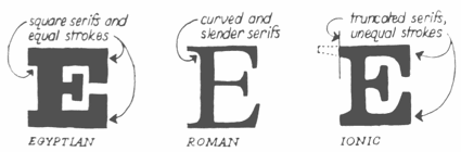 Essay by Mitja Miklavčič on the history of Clarendon and Ionic, written at the University of Reading in 2006. Figures/scans by him: Construction of Egizio Italic by Nebiolo, a comparison between Egyptian, roman and ionic. [Google]
[More] ⦿
Essay by Mitja Miklavčič on the history of Clarendon and Ionic, written at the University of Reading in 2006. Figures/scans by him: Construction of Egizio Italic by Nebiolo, a comparison between Egyptian, roman and ionic. [Google]
[More] ⦿
|
Tom Wallace
[HiH (Hand in Hand)]
|
 [MyFonts]
[More] ⦿
[MyFonts]
[More] ⦿
|
Typedia: Typeface classification
|
The classification from the Typedia community: - Blackletter
- Fraktur: A German form of Blackletter with broken strokes. Classic example: Fraktur.
- Old English: The English blackletter style. Classic example: Cloister Black.
- Rotunda: A Blackletter style featuring wider lowercase with more rounded strokes.
- Schwabacher: A German form of Blackletter with simplified, rounded strokes.
- Textura: A Blackletter style featuring tall, narrow lowercase made mostly of straight strokes.
- Calligraphic
- Chancery: A script style of calligraphy made with a broad-point pen with slightly sloping, narrow letters that are the basis for italics in serif typefaces. Capitals may or may not have flourishes. Originated during the Renaissance. Classic example: Zapf Chancery.
- Etruscan: An early Roman form of calligraphy drawn with a flat brush held at a steep angle. Caps only, as lowercase had not been invented yet. Classic example: Adobe Pompeii.
- Uncial: A Celtic style of calligraphic script with forms created by a broad-nibbed pen at an almost horizontal angle, but sometimes more tilted in later variants. Roman lowercase is derived from Uncial forms. There is only one case in pure Uncial designs. Used during the middle ages. Classic example: American Uncial.
- Inscriptional---Roman Inscriptional: Stone-cut serif style from the late Roman Empire. The basis of modern roman capitals. Classic example: Trajan.
- Non-alphanumeric
- Dingbats
- Ornaments
- Pictorial
- Ornamented, Novelty
- Art Deco: A geometric display typeface style popular in the 1920s and 1930s. Classic example: Broadway.
- Art Nouveau: Display typefaces with a flowing, organic style popular in the early 20th Century. Classic example: Arnold Bocklin.
- Comic Strip Lettering: A style meant to look like the hand-drawn letters associated with comics or cartoons. This style is usually san serif, often having a loose, informal structure and is sometimes based on brush lettering. Classic example: Balloon.
- Dot Matrix: A style whose characters are composed of a pattern of dots used mainly for low-resolution impact printers, or to simulate the look of the output of such printers. Classic example: FF Dot Matrix.
- Futuristic: A style meant to suggest a futuristic theme. Often cold, brutal and geometric with a machine aesthetic and simplified construction. Classic example: Stop.
- Machine Readable: A style designed to be read by machine. These fonts are usually san serif and often feature unusual character shapes to make them more distinguishable from one another. Classic example: OCR-B.
- Pixel: A style whose characters are composed of pixels (usually represented as squares) used mainly for low-resolution computer display. Outline fonts are sometimes made to look like Pixel Fonts. Classic example: Silkscreen.
- Pseudo Foreign Script: A style intended to mimic non-Western letters. For example, a font that looks like Chinese, but is actually composed of Latin characters. Faux Chinese/Arabic/Hebrew. Classic example: Bruce Makita.
- Victorian: A whimsical, eclectic display style popular in the late 19th Century. Classic example: Skjald.
- Sans Serif
- Gothic: A sans serif style with moderate stroke contrast and modern proportions particular to the U.S. Usually features a two-story lowercase g, angled strokes on C and S, and a sloped, non-cursive italic. Classic example: Franklin Gothic.
- Grotesque: A sans serif style with moderate stroke contrast and modern proportions particular to the U.K. Usually features a two-story lowercase g, closed strokes (usually curving in slightly) on C and S, and a sloped, non-cursive italic. Classic example: Bureau Grot.
- Geometric Sans: A sans serif style made with rigidly geometric forms and little to no stroke contrast. Classic example: Futura.
- Grotesk: A sans serif style with low stroke contrast and modern proportions. Usually features a one-story lowercase g, closed or angled strokes on C and S, and a sloped, non-cursive italic. Classic examples: Akzidenz Grotesk, Helvetica.
- Humanist Sans: A sans serif style with proportions modeled on old-style typefaces. Characterized by open strokes on characters like C and S. Italics of this style often are more cursive in appearance, rather than a simple slanted version of the roman. Often has more slightly stroke contrast than other sans serifs. Classic examples: Gill Sans, Frutiger.
- Square Gothic: A sans serif style composed mainly of straight or nearly straight lines and (often) curved corners. Stroke contrast is usually low. Classic example: Bank Gothic.
- Swiss Gothic: A sans serif style with noticeable stroke contrast, straight sides on round characters, modern proportions, and large x-height. Usually features a one-story lowercase g and closed strokes on C and S. Classic example: Jay Gothic.
- Script
- Brush Script: Typefaces modeled after lettering made with a brush. Strongly associated with advertising in the mid-20th Century on. Classic example: Brush Script.
- Casual Script: Typefaces based on a style of lettering characterized by informal appearance, somewhat like handwriting, but more refined. Similar to Brush Script or Sans Serif. Classic example: Murray Hill.
- English Roundhand: A connecting-script style of calligraphy made with a flexible tipped pen. The characters are usually steeply sloped and capitals are often very elaborate. Popular in the 18th and 19th Century. Sometimes called Copperplate Script. Classic example: Bickham Script.
- French Roundhand: A connected-script style of calligraphy, sometimes with upright characters, a high stroke contrast and decorative capitals. Used in France in the 17th through 19th Century. Also called Civilité. Classic example: Typo Upright.
- Handwriting: A script style based on ordinary handwriting. Characters may or may not be connected. Classic example: Felt Tip Roman.
- Rationalized Script: A script style with sans serif qualities, low stroke contrast, and a formal appearance. Characters may or may not connect. Associated with 20th Century commercial design. Classic example: Gillies Gothic.
- Serif
- Grecian: A typically heavy display typeface with octagonal shapes where curves are normally used. Also known as Chamfered or Beveled. Popular in the 19th Century for wood types. Classic example: Acropolis.
- Latin: A serif style with large triangular or wedge-shaped serifs. Stroke contrast is medium to low. Popular in the 19th Century for wood types. Classic example: Latin.
- Modern: A serif style with high stroke contrast and vertical stress. Classic example: Modern No. 20.
- Didone: A serif style with high stroke contrast and vertical stress. Serifs are usually unbracketed. Classic examples: Bodoni (Italian), Didot (French).
- Scotch Modern: A serif style with medium to high stroke contrast and vertical stress, known for large serifs and tiny aperture. Serifs are usually bracketed. Classic examples: Modern No. 20, Scotch Modern.
- Old Style: A serif typeface with relatively low stroke contrast, angled stress, angled serifs. Classic example: Bembo.
- Antique: A serif style with moderate stroke contrast, bracketed serifs and usually vertical stress. Serifs are angled as in Old Style. Popular in the 19th Century. Classic example: Bookman.
- Dutch Old Style: A serif style with somewhat angled stress, bracketed serifs, and medium to high stroke contrast. Characteristic of Dutch and English types of the 18th Century. Classic examples: Caslon, Plantin, Times Roman.
- French Old Style: A serif style with angled stress on rounds; usually features a small eye on the lowercase e; soft, bracketed serifs and moderate stroke contrast. Classic example: Garamond.
- Spanish Old Style: A serif style with soft, bracketed serifs, medium to high stroke contrast, and often highly angled stress. Classic example: Rongel.
- Venetian Old Style: A serif style with angled stress on rounds; usually a tilted crossbar on the lowercase e; usually has somewhat low stroke contrast. Serifs are sometimes unbracketed. This style is associated with very early printing (Incunabula) in the West. Classic example: Jenson.
- Slab Serif: A serif style with serifs equal to or nearly the same thickness of the main strokes. Main strokes usually have low contrast. Classic example: Rockwell.
- Clarendon: A slab serif style with heavy, bracketed serifs, modern proportions and construction, low stroke contrast. Classic example: Clarendon.
- Egyptian: A serif style with heavy, unbracketed serifs, modern proportions, low stroke contrast. Basic construction is similar to Modern, but with low stroke contrast. Sometimes called Antique. Classic example: Egiziano.
- French Clarendon: A serif style with reverse stress (horizontal strokes thicker than vertical strokes) and slab serifs, sometimes bracketed, usually condensed. Popular in the 19th Century. Classic example: Playbill.
- Geometric Serif: A serif style made with rigidly geometric forms. Usually features slab serifs. Classic example: Stymie.
- Spur Serif: A serif style with very small serifs. Usually similar in design to san serif typefaces, except for the serifs. Usually very little stroke contrast. Classic example: Copperplate.
- Transitional: A serif style which, historically, bridges the gap between Old Style and Modern. Stroke contrast is stronger than old style, but less than modern. Bracketed serifs. Stress is mainly vertical. Characteristic mainly of English types around 1800. Classic example: Baskerville.
- Scotch Roman: A serif style with medium contrast and vertical stress, medium-sized bracketed serifs. Classic examples: Miller, Caledonia.
- Tuscan: A serif style with splayed or ornate serifs. Classic example: Thunderbird.
[Google]
[More] ⦿
|
Typefaces no one gets fired for using
[Cameron Roll]
|
 Cameron Roll is a freelance new media designer, author, and speaker. He has a blog in which the most trustworthy typefaces are listed. Taking votes from 61 typophiles gave these results:
 - 13 Helvetica Neue.
- 9 Frutiger, Warnock Pro, Futura.
- 7 Avenir, Myriad.
- 6 FF DIN, Bodoni.
- 5 (Adobe or other) Garamond.
- 4 Jenson Pro, Sabon, Trade Gothic, Trajan Pro.
- 3 Gotham, Caslon Pro, Akzidenz Grotesk, Rosewood, Franklin Gothic, Meta, Mrs Eaves, Thesis / The Sans, Gill Sans.
- 2 Bembo, Univers, Humanist 521, Minion, Officina (Sans), Trebuchet, Verlag, Imago, News Gothic, Clarendon, Versa (Sans).
- 1 Balance, Chopin Script, Sprint, Stone Print, Georgia, Zapfino, Bureau Grotesque, Courier New, Agenda, Bell Gothic, Filosofia, Arriere Garde, Marcelle Script, Porcelain, Lido STF, Uni 05 53, Modern 20, ITC Stone Sans, Book Antiqua, Avant Garde, Klavika, ITC Legacy, ITC Berkeley Old Style, Parkinson, Verdana, Cooper, Bello, Huxley, Maiandra GD, Interdimensional, Garth Graphic, Neutraface, Interstate, Vendetta, Proxima Nova, Newscastle, Zurich, Swiss, Eurostile, Fago, Downcome, American Typewriter ITC, Handel Gothic, Scala, Fonce Sans Pro, Penumbra, Electra, Optima, Serlio, Spring Light, Conduit, Lexicon, Delicious, Trinité, Productus, Documenta, Bitstream Vera, Bickham Script Pro, Voluta Script, Apex Sans, Chaparral Pro, Meridien.
[Google]
[More] ⦿
|
Typeoca
[Gabriel Figueiredo]
|
 Brazilian graphic designer and illustrator who worked in Torino, Italy. Fontstructor who made these pixel typefaces in 2011: the Chip SS series (based on 8/16 bit video-games), Chip SBI, Cosmonaut, Pixel Reto (+Shadow) [a pixel font based on 'pixo reto', one of Brazil's most representative form of graffiti], Cleardom (+Bold) [an adaptation of Clarendon], Bit Script, 4 Square, Mononucleose, PXLTD.
 In 2014, he set up his own commercial type foundry, Typeoca, in Belo Horizonte, Brazil. His first typeface at Typeoca is Pixel Reto (2014). It was followed by the fist-only typeface The Dada (2015). In 2018, he designed Grauna, a revival with smoother outlines of Block Heavy (by Hermann Hoffmann, 1908). Typefaces from 2021: Ferpa (an angular industrial strength typeface consisting of straight lines). Fontown link. [Google]
[MyFonts]
[More] ⦿
|
Typetanic Fonts
[Gregory Shutters]
|
 Typetanic is the personal foundry of graphic and type designer Greg Shutters (New York City). Founded in 2013, Typetanic aims to create original designs as well as adapt historic lettering and type styles for the needs of an ever-changing design market. In addition to being the principal of Typetanic Fonts, Shutters also currently works as Communications Associate for the SS United States Conservancy, a non-profit organization interested in the preservation and redevelopment of the historic ocean liner SS United States. In 2022, Typetanic joined Type Network, and after that, The Type Founders. His typefaces:
 - In 2013, he designed Columbia Titling, a titling-caps display family based on wide Clarendon-style wood type and industrial signage design from the late-19th and early-20th Century. It won an award at TDC 2014.
- Transat (2013) is an art deco sans family based on signage found in the Gare Maritime ocean liner terminals in Le Havre and Cherbourg, France, in the early 1930s. Transat Text (2013) is a more subdued, but still geometric, sibling of Transat.
- Gibbs (2014) is a tough, sophisticated sans, named for prolific maritime architect William Francis Gibbs and inspired by his greatest design, the record-breaking mid-century luxury liner SS United States. Gibbs won an award in the TDC 2015 Type Design competition.
- Conglomerate (2016): a blend of many styles in one to immunize the beast.
- LaFarge (2021). He writes: LaFarge is a typeface primarily inspired by the historic mosaic titling capitals found in the New York City Subway, designed by architect Squire J. Vickers and his staff between 1915-1927. These elegant but industrial signs are characteristic of early-20th century American architectural lettering, and show an evolution of the classical Roman capitals to lower contrast, bolder serifs, and more regular character widths. The majority of this lettering still remains in subway stations today, and though elements of the style vary from sign to sign, many carry the unique features that are reflected in LaFarge: high-waisted crossbars with angled serifs, elegantly curved leg on the R, and distinctive trapezoidal serifs. LaFarge expands this style into a lower case, taking cues from contemporary typefaces like Bookman, Cheltenham, and Della Robbia.
Type Network link. [Google]
[MyFonts]
[More] ⦿
|
Typoart GmbH (or: VEB Typoart)
[Jay Rutherford]
|
 Dresden (East Germany)-based font studio that evolved from the former East German centralized press, VEB Typoart. VEB Typoart operated from 1948 until 1989, when it was renamed Typoart GmbH. Typoart GmbH dissolved mysteriously in 1995, perhaps due to bankrupcy.
 MyFonts catalog of digitizations. Timeline as provided by Typoart-Freunde, a project of Jay Rutherford at the Bauhaus University in Weimar (and published in 2007 in a book by the same title, Heinz Wohlers Verlag, Harrlach): - 1945: Schriftguß KG (before that, Gebr. Butter) produces type again.
- 1946: Schelter&Giesecke in Leipzig becomes VEB Druckmaschinenwerk Leipzig.
- 1948: Schriftguß KG becomes VEB Schriftguß Dresden. This is the true start of Typoart.
- 1951: the foundry section of VEB Druckmaschinenwerk Leipzig is absorbed by the VEB Schriftguß Dresden. Herbert Thannhaeuser becomes art director. We see the name Typoart.
- 1952: Herbert Thannhaeuser publishes Papier und Druck, and creates Meister-Antiqua and Technotype.
- 1957: Typoart is in full production now. An eyecatcher is Albert Kapr's Leipziger Antiqua.
- 1958: Thannhaeuser publishes his Liberta Antiqua and Garamond Antiqua. The Party decides that all private industrial property now belongs to the state.
- 1961: Typoart absorbs Ludwig Wagner KG in Leipzig and Norddeutsche Schriftgießerei Berlin. The Berlin wall is built.
- 1962: There is some negative press about Typoart's domination by Thannhaeuser's designs. VEB Typoart is absorbed by Vereinigung Volkseigener Betrieb (VVB) Polygrafische Industrie.
- 1963: Thannhaeuser dies. Albert Kapr becomes art director.
- 1965: The annual production reaches 4,5 million matrices. Purchase of the Digiset machine, built by Firma hell in Kiel, which is the first machine for electronic typesetting.
- 1967: Sabon Antiqua appears.
- 1970: Typoart is now owned by SED. In the DDR, all phototype printing is now done in Berlin, Leipzig and Dresden.
- 1971: Typoart is now producing its own phototype for the Linotron 505. Their prime productions include Maxima (by Karl-Heinz Lange; based on Gert Wunderlich's Linear-Antiqua) and Prillwitz-Antiqua (Albert Kapr).
- 1973: Albert Kapr publishes Typoart-Typenkunst, in which 19 typefaces are showcased.
- 1976: Phototype fonts are developed for Diatype, Diacomp (such as Maxima, Liberta, Garamond-Antiqua, Tschörtner-Antiqua, Leipziger-Antiqua), and 2NFA (Russian). Detlef Schäfer becomes head of research and development.
- 1977: To help with the digital transition, Norbert du Vinage joins Typoart.
- 1980: New types include Kleopatra, Biga, Zyklop, Quadro and Molli.
- 1987: Albert Kapr hands the art directorship to Norbert du Vinage. Publication of the first phototype catalog by Typoart.
- 1989: Publication of Fotosatzschriften, Typoart's typeface program. Typoart folds.
- 1990: VEB Typoart is changed into a GmbH with 230 employees.
- 1991: Eckehart Schumacher Gebler acquires all of Typoart's matrices. This collection is kept in the Werkstätten und Museum für Druckkunst Leipzig GmbH. Typoart GmbH and HL Computer (Karl Holzer's company) are joined.
- 1995: Typoart GmbH still has 100 employees. It offers typefaces in truetype and postscript formats. Albert Kapr dies in Leipzig. The demise of Typoart is mysterious, and not much is known about who owes what to whom. The copyright status of its typefaces remained uncertain. This page mentions the present situation. Andreas Seidel explains that Typoart has digitized lots of its type typefaces using Ikarus, and that the rights are held by Mr. Holzer, who may be in some financial trouble. He says that no living Typoart designers have received any royalties or public recognition.
Typoart Freunde and Typowiki have partial lists of typefaces. Here is my own: - Agitator (1960). By Wolfgang Eickhoff. This rough-brush typeface was digitally revived in 2007 by Patrick Griffin at Canada Type as Merc.
- Alte Schwabacher: blackletter by Herbert Lemme.
- Antiqua (fett, kursiv fett and schmalfett) by Barbara Cain. A didone family.
- Baskerville (1982) by Volker Küster and Peter Greinke.
- Bembo: Typoart's version is by Erhard Kaiser.
- Biga: a shaded headline typeface made by Fritz Richter in 1985.
- Caslon-Gotisch: a blackletter typeface originally created by William Caslon in 1760, it was brought to Leipzig from England in 1904 by Carl Ernst Pöschel.
- Eckmann: a soft blackletter, dating from 1900.
- Egyptienne. By Hans-Peter Greinke.
- Erler Versalien (1953, Herbert Thannhaeuser). Digital versions: Erler Titling (2015, Ralph M. Unger), Missale Incana (2004, Andreas Seidel).
- Garamond (1955): the metal Typoart version is by Herbert Thannhaeuser. The digital version is Garamond No.5 at Elsner&Flake. See also here. URW published a different digital version, Garamond No. 4. And Infinitype / SoftMaker says that its German Garamond is based on TypoArt's.
- Fleischmann: a serif based on Fleischmann's historical face. An original cursive by Harald Brödel was added.
- Halbfette Baskerville: an interpretation of Baskerville by Volker Küster.
- Hogarth Script: an elegant script based on 18th century copperplate originals by William Hogarth. Font by Harald Brödel. Digital versions at URW, Softmaker (as Hobson), Alexandra Gophmann (Cyrillic version, 2005), Ralph M. Unger (as Gillray Pro, 2015), Castcraft (as OPTI Historic Script), Linotype and Elsner&Flake. Incredibly, Linotype owns the Hogarth Script trademark.
- Kis Antiqua: Hildegard Korger's interpretation of this classic Dutch Antiqua by Nikolaus Kis. For a digital revival, see Ralph Unger's Kis Antiqua Pro (2018).
- Kleopatra: a double-line decorative typeface by Erhard Kaiser (1985), digitized in 1989.
- Leipziger Antiqua: a very legible Antiqua designed by Albert Kapr in 1959, developed for phototypesetting by Hans-Peter Greinke, and further developed in digital form by Tim Ahrens in 2002 as Lapture.
- Liberta Antiqua and Kursiv: a robust house typeface from 1958 made by Herbert Thannhaeuser. Klingspor gives the date 1956.
- Lotto (1955). By Herbert Thannhaeuser.
- Luthersche Fraktur: a blackletter by Volker Küster and Herbert Lemme, digitized in 1989.
- Magna: a DDR magazine text typeface from 1968, by Herbert Thannhaeuser. In 1975, Albert Kapr added Cyrillic letters. Karl-Heinz Lange developed the phototype. URW, Linotype and Elsner&Flake (who owns the trademark) have a digital version.
- Maxima: a sans family by Gert Wunderlich (1970). Elsner&Flake (who owns the trademark), Linotype and URW have a digital version.
- Minima: Karl-Heinz Lange's narrow sans designed for the DDR's telephone directory in 1984. Revived by Ralph M. Unger in 2017 as Tablica.
- Molli: a comic book typeface by Harald Brödel.
- Neutra (1968): A variant of Clarendon, rendered more legible by Albert Kapr. Used in the DDR for advertising.
- Nidor: a slab serif by Harald Brödel.
- Norma-Steinschrift: a house sans.
- Prillwitz (1971-1987): a didone by Albert Kapr and Werner Schulze based on the original from 1790 by Johann Carl Ludwig Prillwitz. Elsner&Flake have a digital version. See also the 2015 revival by Ingo Preuss called Prillwitz Pro.
- Polo by Carl Pohl. URW++ has a digital version.
- Primus: a 1962 workhorse family (with Magna and Timeless) for the magazines in the DDR. Conceived in 1962, it was later adapted in Phototype by Karl-Heinz Lange. However, the Berthold Phototypes book of 1982 and Klingspor Museum put the date of creation at 1950.
- Publika: a sans typeface developed between 1981 and 1983 by Karl-Heinz Lange. Sometimes spelled Publica.
- Quadro: a four-line showstopper typeface by Erhard Kaiser.
- Roesner Versalien (1960). By Wolfgang Roesner.
- Schwabacher T09, T20 and T48. By Herbert Lemme.
- Sinkwitz Gotisch and Versalien (1950). By Paul Sinkwitz.
- Stentor: a brush script by Heinz Schumann (1964). Digital versions by Scangraphic, Ralph M. Unger (2013, as Tyton Pro), Elsner&Flake and URW. Rosalia (2004, Ingo Preuss) is based on Stentor.
- Super Grotesk: a legible sans by Arno Drescher (1930, Schriftguss). Super Grotesk Buchtype (kursiv and halbfett) are placed in 1951. For a digital version, see FF Super Grotesk (1999, Svend Smital).
- Technotyp (1951). By Herbert Thannhaeuser.
- Thomas Schrift (1956). By F. Thomas.
- Timeless (1982). See also Elsner&Flake and URW. In 2021, Ralph Unger revived and extended Timeless, calling it Korpus Serif Pro.
- Tschörtner Antiqua and Kursiv (1955). By Helmut Tschörtner.
- Typo Skript (1968). By Hildegrad Korger.
- Typoart Didot (antiqua, kursiv and halbfett). Added in 1958 by Herbert Thannhaeuser.
- Typoart Garamond (1955). By Herbert Thannhaeuser.
- Walbaum (1984): a didone by Hans-Peter Greinke based on Walbaum's originals.
- Zyklop: an art nouveau/Jugendstil face by Fritz Kossack.
References on Typoart: - Walter Begner: 25 Jahre Typoart Dresden In: Papier und Druck, Leipzig 6/1973.
- Walter Begner: Entwurf und Herstellung von Schrifttypen in Ostdeutschland. In: Leipziger Jahrbuch zur Buchgeschichte. Jahrgang 6 (1996), pages 405-436.
- Albert Kapr and Hans Fischer: Typoart Typenkunst. Leipzig, 1973.
- Albert Kapr and Detlef Schäfer: Fotosatzschriften, Itzehoe, 1989.
- Detlef Schäfer: Fotosatzschriften Type-Design+Schrifthersteller, VEB Fachbuchverlag Leipzig, 1989.
- Norbert du Vinage (as artistic director of Typoart): 40 Jahre Typoart---vier Jahrzehnte intensives Bemühen um niveauvolle Schriften. In: Papier und Druck, Leipzig 11/1988.
Personal home page of Jay Rutherford. MyFonts link. View Typoart's typefaces. [Google]
[MyFonts]
[More] ⦿
|
Typographie et Civilisation
|
Typography site maintained by Jean-Christophe Loubet Del Bayle. Has sub-pages on Bertham, Bookman, Chelthenham, Clarendon, Copperplate Gothic, Garamond, Garamond ITC, Garamond No3, Goudy Mediaeval, Goudy Old Style, Goudy Sans, Granjon, Optima, Sabon, Stempel, Collection Claude Garamond, Collection Frederic Goudy. [Google]
[More] ⦿
|
Ultra Black Slab Serifs: Stephen Coles's List
|
 Stephen Coles points out the jewels in the FontShop store.
 [Google]
[More] ⦿
|
URW Type Foundrty (was: urw++)
|
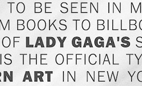 URW++ Design&Development GmbH is a Hamburg-based foundry established in 1995 by Svend Bang, Hans-Jochen Lau, Peter Rosenfeld, and Jürgen Willrodt. URW stands for Unternehmensberatung Rubow Weber, named after Gerhard Rubow and Rudolf Weber, cofounders of the original URW company from which urw++ evolved. It offers a whole range of font services and has an extensive (7000+) font library. At the basis of the early development of many classy PostScript fonts. For example, in 1999, URW++ donated the 35 core PostScript fonts (renamed) under the GNU GPL license to the Ghostscript project. The great 3000-font CD costs about 2000DM. Other CDs are more expensive: on the ITF CD, each font is about 100DM! URW sells fonts and font families with complete rights (you can change, resell, embed, anything, except use the original name), with examples ranging from 2k for a complete family of 12 to 5k for a collection of 250 fonts. This practice continues until today: URW++ thus provides a great service to software developers who want to include high-quality typefaces in their software applications. URW has offices in many countries. In the first decade of the 21st century, freelance type designer Ralph M. Unger contributed most frequently to the URW library. OpenType collection guide (in PDF).
 Selected releases: URW Egyptienne, URW Grotesk (1985, Hermann Zapf), Anzeigen Grotesk (2009), Clarendon No 1 URW, Saa Series (an industrial sans: the official typeface for Australian road signage), Nimbus Sans (1987, a Helvetica clone), Nimbus Sans Novus, Nimbus Sans Europa (covering Latin, Greek, Baltic, Cyrillic, Central European, Turkish, Romanian, and so forth), Nimbus Roman No 9 (2001), Nimbus Sans Global and Nimbus Roman Global, each at about 2000 Euros, and each containing 35,000 glyphs, from kanji/Chinese/Korean to all European languages. House typefaces done for corporations: DaimlerChrysler Corporate ASE (after the Corporate ASE series for Daimler-Benz by Kurt Weidemann), Gardena Sans (2015, for Gardena), Siemens Schriftfamilie, Deutsche Telekom Schriftfamilie, ZF Friedrichshafen, Körber Argo, URW++ SelecType Raldo (2001, for Igepa). MyFonts lists their bestsellers. Catalog of their typefaces [large web page warning]. Another catalog of URW's typefaces. Eight-minute corporate movie produced in the summer of 2014. Adobe link. [Google]
[MyFonts]
[More] ⦿
|
Vanessa Poh
|
Graduate of the School of Art, Design & Media in NTU, Singapore. Creator of a Clare (2013), a revival of Clarendon Light. [Google]
[More] ⦿
|
Visual Graphics Corporation (or: VGC)
|
Foundry from the phototypesetting era, located on 138 NE 125th Street in North Miami, FL, and also at 5701 NW 94th Avenue in Tamarac, FL, with designers such as Ron Arnholm, Arthur Baker, Ray Baker, Stan Biggenden, Stan Davis, Ernst Friz, Louis Minott, John Russell, L. Scolnik, Dave Trooper and Ernst Volker. The company changed its name to VGC Corp. and became a subsidiary of VRG Group N.V. Inventors of the Photo Typositor. List of typefaces and designers as compiled by Tim Ryan. This list has errors, as pointed out in this discussion on typophile. My own list of typefaces. Typefaces in our list whose creators still need to be identified include Bubble (1982: Bubble Light, Bubble, and Double Bubble) and Rodin (ca. 1974). The 450-page book Visual Graphics Alphabet Library (1985) shows all of its typefaces. PDF version of their 1972 catalog. There are two components to the VGC collection, one is the standard collection of typefaces everyone must have (knockoffs, really), and the other one is the collection of originals. Freddy Nader explains: The reason for the VGC/Typositor catalog showing so many standards is this: in photo type days, every type house had to have a basic set of what was known as the "foundry types". These were your basic Garamonds, Baskervilles, Clarendons, etc. They simply did that in order to compete. Back then, the type house worked closely with the person designing the artwork (who usually worked for the publisher or the ad agency), and they were charging per word for display, and per page for text. So the type houses wanted to maintain a kind of continuity with their clients, and tried their hardest to be the exclusive supplier for a number of agencies. The very first photo type house, Photo-Lettering Inc, survived for the longest time on one client (J. Walter Thompson in NYC). As a side note, book publishers tried their best to stay away from photo type because of its very expensive prices. It was a hell of a lot cheaper to stick to metal type than pay the type house per page of layout. So if you look back at the mass paperback industry, it was still using metal type until late into the 1970s. They only switched to film type when competition between type houses became so fierce that the type prices dropped considerably. But film type was used in book for only a short time, then desktop publishing as we know it made it all obsolete. View some digital typefaces that are derived from the VGC library. Another digital catalog. [Google]
[MyFonts]
[More] ⦿
|
Volcano Type (MAGMA)
[Lars Harmsen]
|
Magma Brand Design in Karlsruhe, Germany evolved in 2004 into Volcano Type. Magma is headed by Lars Harmsen (b. Hannover, 1964) and Ulrich Weiss. Lars Harmsen spent the first four years of his life in Chicago. He then moved to Geneva with his parents for eight years, and then moved to Karlsruhe. He completed his schooling at the French section at the European School. He first studied history and Germanics in Freiburg before beginning to study design at Basel, Boston, Saarbrücken and Pforzheim. He got his degree in graphic design, and in 1996 he founded MAGMA [Büro für Gestaltung] together with Ulrich Weiß. He is the co-founder of STARSHOT GmbH, a design company for sports products, now based in Munich. MAGMA created Type Foundry Volcano-Type.de and the internet forum Slanted.de. In the meantime, Slanted.de has become the most active German typography forum. Volcano Type offers commercial and some free typefaces: DigiBo (Boris Kahl), Objects (free ransom typeface by the house), MonoPoint and DoublePoint (monospace dot matrix families by the house), Amiga Normal and Rounded (pixel typefaces by Boris Kahl), Screeny, Pixel and C64 Style (pixel typefaces by Boris Kahl), Fette Pixel (pixel typeface by Florian Gärtner), Teckbo (digital typeface by Boris Kahl, who writes: Retro-Avant-Garde for Club-Flyer-Honks and Plastic-Pussy-Chicks), Psycho (grunge by Boris Kahl), Wald Ast (tree branch look by Sandra Augstein), Wald Blatt (tree leaf look by Tanja Rastätter), Rollerblind (a pair of dot matrix typefaces by Boris Kahl), Chaucer (uncial by Boris Kahl), Glossy (dot matrix typeface by Sandra Hofacker), Brüll (a funny frog dingbat typeface by Andre Rösler), Pax (a free peace symbol typeface by Heidrun Weißschädel and Alexander Kassel), Mud (free typeface by Boris Kahl). And these display typefaces by Florian Gärtner: Republic, Tacora. And finally the Fone 1 through 3 grunge typefaces by Florian Gärtner. The typefaces of Lars Harmsen (or co-designed by him) at Volcano: - African look typefaces: Masai
- Athletic lettering: Sports (grungy, with Kahl), Sports Skinny.
- Blackletter: Fraktape Duct, Fraktape Sticky, Fraktendon (=Fraktur+Clarendon, co-designed with Kahl), Trigot (2010, modular, semi-blackletter by Michael Hubner), Black Sirkka, Frakturbo, SAR-Lupe
- Diabolo
- Dingbats: Genocide (free). Mr. J. Smith Eye, Mr. J. Smith Head, Mr. J. Smith Mouth, Mr. J. Smith Nose, and Mr. J. Smith Wanted are experimental dingbat typefaces by Nikolaii Renger, based on an idea of Lars Harmsen, and digitized by Ulrich Weiss and Boris Kahl. These won an award at the 2005 FUSE competition.
- Experimental: Sewed (2009, stitched letters), Cross Fourty, Cross Sixty, Cross Ten, Cross Thirty, Cross Twenty, Cross Ultra
- Grunge: Basalt, Magneta, Punta Negra, Mrs. Tape Tape
- Hand-drawn: B-Scratch (2009, Harmsen and Egger's take on sketched letters), Amebo, Diabolo, Keycaps, Kulli (curly), Oboni, Wawe, Tape One Bold, Tapemate Outline, Tapemate Regular, Tape One Bold
- LED style: Digibeck (Boris Kahl, 2000: a DVD player font), Strichcode (a family co-designed with Kahl).
- Kitchen tile typefaces: Bus, Bus PI, both done with Boris Kahl.
- Oriental simulation: Japanese
- Patriot family, done with Boris Kahl: Saddam, Commander Robot, Fidel, Slobbodan, Osama, George.
- Ransom note face: Kriminal
- Sans families: Copy (2009).
Behance link. Klingspor link. Volcano Type link. MAGMA Brand Design link. Their bestsellers at MyFonts. View Volcano's complete typeface library. See also here and here. [Google]
[MyFonts]
[More] ⦿
|
William H. Page Wood Type Company
[William Hamilton Page]
|
 Norwich, CT-based company involved in wood type production. In 1856, William Page (b. Tilton, NH, 1829, d. Mystic, CT, 1906) bought out Horatio and Jeremiah Bill and founded Page and Bassett in South Windham, CT, with his partner James Bassett. In 1857, they moved to Greenville, CT. Some time later Samuel Mowry replaced Bassett as partner, and the company is Page and Co of Greenville, CT. Another name change occurs, to William H. Page&Co. In 1869, Page buys the operation of Colley&Dauchy. Mowry retires a bit later, the company moves to Norwich, CT, and becomes the William H. Page Wood Type Company. A year later, a defection of sorts---Charles Tubbs (an employee since 1860), John Martin and George Keyes leave to set up the American Wood Type Co. In 1881, George Setchell joins the business, and Page and setchell patent the die-cut production method. In 1889, Setchell sells all interests to S.T. Dauchy, who becomes president, only to sell the entire company to Hamilton in 1891. During the Civil War, Page perfected his equipment and became the leading manufacturer of wood type. In 1874, the company published a specimen book of so-called chromatic (wood) type. Henry Lewis Bullen described it this way: This is the most notable of wood type specimens. Page outshone all competitors in imparting a degree of artistry in designing wood type and borders, most of which could be printed in several colors . . . . [It is] a work of unusual excellence, well worth preserving. In 1891, Page's firm was absorbed by the Hamilton Manufacturing Company of Two Rivers, WI.
 Many of his wood types were digitized by Jordan Davies of Wooden Type. Page's fonts include Aetna, Antique No. 4 (revived as HWT Slab in 2013 by Hamilton Wood Type Foundry), Antique Tuscan No 9 (revived by Tom Wallace in 2006), Bindweed (revived by Solotype), Clarendon Condensed, Clarendon Condensed Bold, Clarendon Extended, Clarendon Heavy, Columbian (ca. 1870; revived in 23020 by Jeff N. Levine as Cherrywood JNL, by Dick Pape in 2013 as AWTPageColumbian), Concave Tuscan X, EgyptianTwo (2005), French Antique, French Clarendon (XXX Condensed No. 117), French Semi, Gilbey, Gothic Tuscan Round, Hamilton, Minnesota, Norwich Aldine ML (1872, digitized by Tom Wallace in 2010 under the same name), Number 154, Page No. 508, Peerless 131 Bold, Rigney, Skeleton Antique, Teutonic, Tuscan Italian Round, Unique Wood, William Page 500, William Page 506. In 2013, John Bonadies (MPress Interactive) started making digital typefaces based on Page's models. They published MPI Aldine Extended (based on a 1872 wood type by William H. Page), MPI Antique (slab serif), MPI French Clarendon (based on wood type from 1865 by William H. Page), MPI French Antique (a typical far West saloon font based on wood type by William H. Page, 1869), MPI Egyptian Ornamented (a western typeface based on a 1870 wood type by William H. Page), MPI Arcadian (based on a 1870 design by William H. Page), MPI Tuscan Extra Condensed (based on William H. Page wood type from 1872), MPI Norwich Aldine Reversed (from a 1872 original). Also in 2013, Dick Pape embarked on a large process of digitization of wood types at the Rob Roy Collection of the University of Texas. His digital fonts are free and are bundled under the label American Wood Type, or AWT. Revivals by Dick Pape of fonts due to William Page include AWTPage&SetchellNo154, AWTPage-SetchellNo515, AWTPageAldine, AWTPageAldineExpanded, AWTPageAldineOrnamented, AWTPageAntTuscanCond, AWTPageAntTuscanOutlined, AWTPageAntiqueBlack, AWTPageAntiqueCond, AWTPageAntiqueNo7, AWTPageAntiqueTuscan, AWTPageAntiqueTuscanNo1, AWTPageAntiqueTuscanNo8, AWTPageAntiqueXXCond, AWTPageAntiqueXXXCond, AWTPageBelgianCond, AWTPageBeveledNo142, AWTPageCelticOrnamented, AWTPageClarendonExtended, AWTPageClarendonNo1, AWTPageClarendonXXCondensed, AWTPageColumbian, AWTPageConcaveTuscanXCond, AWTPageConcaveTuscanXCondOutline, AWTPageCorinthianNo2, AWTPageEgyptian, AWTPageEgyptianOrnamented, AWTPageFrenchAntique, AWTPageFrenchClarendonCond, AWTPageFrenchClarendonXXX, AWTPageFullFacedGrecian, AWTPageGothicLightFace, AWTPageGothicTuscanNo1, AWTPageGothicTuscanPointed, AWTPageIonic, AWTPageIonicCondensed, AWTPageNo500, AWTPageNo501, AWTPageNo506, AWTPageNo508, AWTPageNo51, AWTPageNo510, AWTPageNo515, AWTPageNorwichAldine, AWTPageOrnamentedAldine, AWTPagePeerlessAntNo129, AWTPagePeerlessCondOldStyl, AWTPagePhanitalianNo132, AWTPageRomanAetna, AWTPageRunic, AWTPageSkeletonAntique, AWTPageTeutonic, AWTPageTuscanCondNo2. Revivals by Nick Curtis: Page Five Fifteen NF (2015), Rockwall NF (2015, after Aldine and Aldine Extended), Hunky Dory NF (2014, a circus font after William H. Page's wood type Doric, ca. 1850), Sodbuster NF (2014, after Gothic Dotted), Tuscalooza NF (2014, after the 1872 typeface Tuscan Extended), Bandiera Del Legno NF (2014: this Tuscan wood type revives Gothic Tuscan Condensed Reversed), Belgique NF (2014: a revival of the (Western) wood type French Clarendon XXX Condensed No. 117), Skelett Antiken NF (2014, after Clarendon XX, 1959). In 2020, Mark Simonson reworked, extended and modernized Aetna in his 30-style text and display typeface family Etna. FontShop link. Digital typefaces based on W.H. Page's work. View revivals of William Hamilton Page's typefaces. [Google]
[MyFonts]
[More] ⦿
|
William Hamilton Page
[William H. Page Wood Type Company]
|
[MyFonts]
[More] ⦿
|
William T. Morgans
[Morgans&Wilcox Mfg Co.]
|
 [MyFonts]
[More] ⦿
[MyFonts]
[More] ⦿
|
William Thorowgood
[Thorowgood Foundry]
|
 [MyFonts]
[More] ⦿
[MyFonts]
[More] ⦿
|
Wood Type Revival
[Matt Braun]
|
 Foundry specializing in digital versions of old wood type. Set up in 2011 by Matt Griffin, all font licenses refer to Bearded, which has offices in Pittsburgh, Pennsylvania and Montpelier, Vermont. Matt Griffin is a designer and co-founder of Bearded, and teaches in the School of Design at Carnegie Mellon University. He also has a great love for letterpress printing, which he acquired while attending Indiana University in Bloomington, Indiana, where he received a BFA in Graphic Design. Bearded writes: Matt Braun and Matt Griffin wanted to collect lost and forgotten old wood type from the 1800s and revive those typefaces as digital fonts for modern designers. Matt Braun is a senior designer at Bearded and letterpress printer. They first operated Rare Letterpress Wood Type as a kickstarter. After some time, they started the foundry Wood Type Revival.
 Their typefaces include - Concave Tuscan (2015). Concave Tuscan was first shown as wood type under the name Gothic Tuscan by William H. Page in James Conner's Sons Typographic Messenger (1866). Almost all the major manufacturers of the 19th century offered a version of Gothic Tuscan.
- Cosmopolitan (2016).
- Delittle Chromatic (2016). DeLittle Chromatic was issued by DeLittle of York around the turn of the century under the name No. 56/54.
- WTR Fat Boy (2011). Fatboy is derived from a widespread (no pun intended) typeface of the 19th century, commonly known as Antique Extended. It was first seen in print as wood type in 1838 in George Nesbitt's First Premium Wood Types Cut by Machinery.
- WTR French Clarendon Ornamented (2011). The original design for French Clarendon Ornamented first appeared in print in the catalogs of the type manufacturer Young&Morgans (who was later purchased by Morgans&Wilcox Mfg Co) between 1876-1880. M&W was later purchased by Hamilton Mfg Co in 1897. Hamilton then offered this typeface under the name No 3026.
- French Octagon (2011). French Octagon was first shown by Morgans & Wilcox Manufacturing Co. in their 1884 Condensed Specimen Book of Wood Type.
- Grecian Light Face (2016). This revives Light Face Grecian by David Knox & Co. in 1858.
- WTR Gothic Open Shaded (2011). Gothic Open Shaded was first seen in George Nesbitt's First Premium Wood Types, Cut by Machinery (1838). This cut of Gothic Open Shaded most closely matches a design first cut by Young&Morgans between 1876-1880. Once Morgans&Wilcox was acquired by Hamilton Manufacturing Co. (1897), they listed the typeface as No. 3238.
- WTR Gothic Outline (2016).
- WTR Roycroft (2011). The arts and crafts typeface Roycroft was originally created by Miller & Richard under the name Teutonic and is shown in their 1909 catalog. It is a hand-carved typeface.
- Planned is Grecian Light Face.
Creative Market link. [Google]
[More] ⦿
|
Wooden Type Fonts (was: American Wood Type and, Wooden Type)
[Jordan Davies]
|
 Wooden Type Fonts (was: American Wood Type) is founded and run by Jordan Davies from South Hero, VT: Historically accurate reproductions of wood type produced in the 19th century in a variety of styles. This is a work of passion and dedication by Jordan Davies. Jordan's other passion is painting. His (digital) wood typefaces include these original designs: Bevan Condensed, Bevan Medium (based on Melior), Inline Regular, London Light, London Heavy, Neo Geo Block, Quirk, Slab Four Rounded (+Ext), Slab Four Rounded Italic, Slab Four Rounded Revised, Slab Four Rounded Super. MyFonts link. Digital revivals:
 - 20th Century ExtraBold Extended (2017). A very wide version of Futura.
- Aetna Bold.
- Alpine Mtn (2021). a display sans with some stencil glyphs.
- Antique 6 (based on Stevens, Shanks), Antique Condensed Bold, Antique Light, AntiqueRegular (saloon font), Antique Five, Antique Sans, Antique Shadow, Antique Six, Antique Three, Antique Tuscan 1, Antique 7 (2011), Antique Tuscan 8 (2008), Antique Tuscan Condensed, Antique Tuscan Heavy, Antique Wells Medium (2005), Antique Wells Expanded (2011, based on Wells&Webb), Antique Two (2008), Antique XX (2008).
- Bernhard Gothic Medium (2017, after Lucian Bernhard).
- Blobbing (2013, a fat finger typeface), Bodoni Ultra (2015, based on a Bauer Types original).
- Cassjor (2011): an angular face.
- Cheltenham (2019), (2019).
- Churchward Ultra Bold (2018).
- Clarendon Condensed, Clarendon Condensed Bold (2007, based on a 1859 design by William Hamilton Page), Clarendon Extended (2005, after W.H. Page), Clarendon Heavy, Clarendon Extra Condensed (2007), Clarendon 618 (2010), Clarendon 617 (2010), Clarendon Semi (2011), Clarendon Jordan (2015).
- Columbian (2015) and Columbian Slab (2015). Heavy classical Egyptians.
- Concave Tuscan X Condensed.
- Craw Clarendon (2013), Craw Clarendon Extended (2015), and Craw Clarendon Bold (2014).
- Davies Serif (2014): a great wide wood-inspired wedge-serifed display didone.
- Devendra (2021). A counterless stencil typeface.
- DeVinne Wood, DeVinne Wood Italic.
- Doric Condensed, Doric Expanded.
- Egyptian Bold, Egyptian Ornamented (+Bold), Egyptian Regular, Egyptian Slab (2007), Egyptian Two, Egyptian Wide (2006, based on a Miller&Richard original, ca. 1850), Egyptian Bold Expanded (2011), Egyptian Extra Bold Condensed (2011), Egyptienne75 Black (2020).
- French Antique Condensed.
- French Calrendon (2015) and French Clarendon Expanded (2015).
- Gallatin Light (2021), Gallatin Bold (2019) and Gallatin Medium (2020). A slab serif.
- Girder Heavy (2008, based on a design of W.H. Page, ca. 1900), Girder Super (2014, a slab serif based on William Hamilton Page).
- Gothic Bold, Gothic Bold Extended, Gothic Extra Extended, Gothic Extended (2009), Gothic Medium, Gothic Nesbitt (2011), Gothic Leavenworth (2015), Gothic Number Sixteen (2019), Gothic Special Condensed Bold (2005), Gothic Special Condensed Medium (+Italic, 2013), Gothic Special Normal (+Italic, 2013), Gothic Special Thin, Gothic Tuscan, Gothic Tuscan 9 (+Narrow), Gothic Tuscan 8 (+Pointed), Gothic Tuscan Condensed, Gothic Tuscan Round, Gothic Tuscan Concave, Gothic Tuscan Pointed Narrow, Gothic Unique (2007).
- Grecian Bold Condensed, Grecian XX Condensed, Grecian Bold Expanded (2014).
- Grotesque (2010), Grotesque Bold Italic (2013).
- Jensen Old Style.
- Jordan Calligraphy (2015).
- Kurilian (2015). After a 1879 spurred wod type design by Heber Wells.
- Lettres Angulaires (2010): based on Textura.
- London Heavy and London Medium (2017). A revival of Johnson Underground.
- Mansard. This revives a wood type from 1878 by Heber Wells.
- Martin Bold (2018), Martin Medium Regular (2018).
- Masterman (2017). After a typeface by Boston's Hansen foundry.
- Mementor Bold (2018) and Mementor Medium Regular (2018).
- News Gothic Bold (2017) and News Gothic Light (2017). After Morris Fuller Benton's original at ATF.
- Number5 Reg (2010). A variation of the William Page 500 font.
- Number 154 (2006, based on a 1887 design by William Hamilton Page), Number 515 Black, Number 514 (2011).
- Octagon.
- Peerless (2008). Peerless 131 Bold (2012) is a wedge serif design based on William Hamilton Page.
- Penny (2007, a gorgeous didone headline font based on a 1838 wood type font by George Nesbitt).
- Roman X Condensed (a great didone font), Roman X Expanded, Roman Wells Bold.
- Rubens Regular (2005) and Rubens Expanded Regular (2018).
- Sainted Medium, Sainted Extra Bold (2018). Two slab serif typefaces.
- Skeleton Antique (2005-2012). Based on a William Page original from 1865.
- Slab Four Rounded (2010, +Bold, +Super).
- Stymie Extra Bold (2018).
- Teniers Regular.
- Teutonic.
- Thorowgood (2010): a relatively low-contrast Clarendon based on a wood specimen sheet. Thorowgood Wide was done in 2013.
- Times Gothic (2009).
- Trenton, Trenton Condensed (2005, based on an 1889 typeface by James Edward Hamilton), Trenton Ornamented.
- Trooper Roman Black (2020).
- Tuscan Egyptian, Tuscan Italian.
- Video Black (2020).
- Venusian Bold Extended (2018). The name refers perhaps to the classic Bauersche sans typeface Venus.
- William Page 500, William Page 506.
- Wood Regular (2005).
Showcase of his most popular fonts at MyFonts. Klingspor link. [Google]
[MyFonts]
[More] ⦿
|
You Work For Them (or YWFT; formerly Cinahaus or TrueIsTrue)
[Michael Cina]
|
 Michael Cina (Minneapolis) is the cofounder of WeWorkForThem and YouWorkForThem (in 2002), also known as YWFT. Before that, he ran TrueIsTrue, and before that was partner in Test Pilot Collective (which he left in 2001), and before that he ran Cinahaus. YWFT is located in Knoxville, TN and/or Baltimore, MD. The creative director is Michael Paul Young.
 Cina's fonts include the pixel fonts YWFT Caliper (1998), YWFT Bit (1998), 6x7oct (1998) and BlackGold; the handwriting font Cinahand; Blessed (1999, techno), YWFT Cam (1998, a slab serif based on industrial lettering), CommunityService, Crossover (1998, dot matrix with stars instead of dots), Composite (1998, octagonal), Formation (1999, a big octagonal family), Jute (2004, a masculine, military, sans-serif), YWFT Maetl (1999, octagonal, angular family), YWFT Moteur (a technical, retro, machine-like design; it briefly went under the name Alloy---in the early 2000s it was heavily used in the video gaming magazine Playstation), YWFT Novum (2002: a heavy block font that draws inspiration from a typeface originally used by the Swiss graphic designer Siegfried Odermatt), Pakt, Reversion (1997, squarish), Selector, Selek (1998, pixelish), YWFT Blackgold (2000, pixelish), Service (2001-2002, an octagonal family), YWFT Signature (1998), Trisect (1999, three-lined family), Unisect (1999, organic monoline sans), YWFT Ultramagnetic (1996, a popular rounded gothic typeface family), Ultramagnetic2 (1999), YWFT Ultramagnetic Expanded (2011), YWFT Ultramagnetic Rough (1996-2017), Unfinished. Bastard (1998), Kcap6 (with Matt Desmond), Cheese (1998), Novum (2002), Overcross (2002, unfocused letters), Stem (1998), Testacon (with Kral and Desmond, 1999), Praun (2002, pixel typefaces), OneCross (2002, pixelish stitching family), Estenceler (2004, a great stencil family a bit related to Milton Glaser's Glaser Stencil), Graphium (2004, octagonal Western style family), Expos (2004, graffiti or poster face), YWFT Pixacao (2007, after the Brazilian graffiti style), Vox (2007, monoline sans), Militia Sans (2007, like a Russian constructivist stencil), Jupiter (roman), Militia (2007, heavier stencil), Merc (2007, grunge), Guild (2007), Clarendon Text (2007, a complete revival), Jezebel (2007, script), Ambassador Script (2007, a digital revival of Novarese's typeface by that name), Enam (2002, influenced by Crouwel), Enigmatic Hand (2007), Dusty (2007, a Tuscan-eared Western font), YWFT Poplock (2007, experimental), YWFT Pakt (2004, geometric sans), Sudsy (2007), Black Sabbath (2008, ultra black slab serif, by Stefan Kjartansson), YWFT Belle (2008), YWFT Agostina (2008), YWFT Bitwood (2007-2017, pixelish Western typeface), YWFT Mullino (2009, letterpress emulation), Trithart (2008, grunge by Emma Trithart), YWFT Tapscott (2008-2017, informal and nostalgic all caps family, in the style of Rennie Mackintosh), Habano (2008, script), Amorinda (signage script), Retron (2008, connected script), MD01 (medical-themed dingbats), Adelaide (script), Centennial Script (calligraphic), Alexia (calligraphic), Ultramagnetic (experimental), Nash (1997, grunge), Amber (kitchen tile), Fab (3d), 6x7 Oct (1998, pixels and dots), Wool (2009, stencil), YWFT Matter (2009, a wide bold grotesque), YWFT Merriam (2009, a Clarendon-styled slab serif), Agostina Alternate (2011, with Michael Paul Young and Taechit Jiropaskosol), Ramsey (2012), YWFT Dessau (2013, schizograms and capitals like Bauhaus on drugs), YWFT League (2014, inspired by college football jerseys), YWFT Yoke (poster typeface done with Pintassilgo), YWFT Illuminati (2015, abstract capitals). Blog. His lovely g poster (2010). House fonts at YWFT by unknown designers: YWFT Knit (2010: knitting patterns), YWFT Motif (2015), Ramsey Condensed (2015), YWFT Roamer (2016), YWFT Whisky (alchemic), YWFT Psychosis, YWFT Processing (2001-2010: YWFT Processing was developed in 2001 for Casey Reas, the co-creator of the Processing programming language. We created this display face to be sharp, tall, unique and interesting...much like Mr. Reas himself. The font was derived from an original logo that already existed, and we continued the idea into a fully working six-weight font family. YWFT Processing was converted to Opentype format in 2010), YWFT Filbert (2012), YWFT Nim (2012, combining the hipster style with overlays for bevel and shadow effects), Dogma (2012, alchemic), Attic (spooky poster face, in EPS format), YWFT Yoke (textured all-caps), Riblah (2003, dot matrix), YWFT Fraktur (tattoo face), YWFT Burls (2013, fat poster typeface), YWFT Coltrane (2011, handdrawn poster typeface), YWFT Symplify (2013: haute couture snowflakes), YWFT Smoothie, YWFT Chance (2016), YWFT Skipper (2016), YWFT Wheatgrass (2016), YWFT Estee (2002-2017), YWFT Watermelon (2017), YWFT Ink (2017, originally designed in 2008), YWFT QUE, YWFT Burtonian (2017, named after Tim Burton), YWFT Crew (handcrafted), YWFT Maudlin (2017), YWFT Liana (2017; perhaps plumbing dingbats, who knows?), YWFT Victoria (2010: a bonbonnerie type), YWFT Valley (2017: a Memphis movement type), YWFT Wellsworth (2017), YWFT Harmony (2008-2017, a curly calligraphic script), YWFT Edger (2017), YWFT Chateau, YWFT Gummy (2002-2018), YWFT Blender (2018), YWFT Fluctuant (2018: a variable font), YWFT Gavin (a ransom note font) (2021), Ramsey (2021: a 54-style rounded squarish typeface), YWFT Hugo (2021: a child's hand). View Michael Cina's typefaces. Alternate URL. Behance link. Interview. [Google]
[MyFonts]
[More] ⦿
|
Yuri Gordon
[Letterhead Studio YG]
|
 [MyFonts]
[More] ⦿
[MyFonts]
[More] ⦿
|
Zetafonts (or: Studio Kmzero, or: ZeroFont)
[Francesco Mistico Canovaro]
|
 Italian design firm in Firenze consisting of three graphic designers, Francesco Canovaro, Debora Manetti, and Cosimo Lorenzo Pancini. It has evolved into Italy's premier and most prolific type foundry. Canovaro's Behance link. Also called ZeroFont and Zetafonts, this type foundry exhales joy---in every design and presentation, the passion of the designers bubbles to the surface. Blending a delicious sense of humour and a great aesthetic taste, Zetafonts is a typographic delight. Their typefaces:
 - Adlibitum (2018). A textura blackletter typeface family.
- Anaphora (2018). Anaphora is a contemporary serif typeface designed by Francesco Canovaro (roman), Cosimo Lorenzo Pancini (italic) and Andrea Tartarelli. It features a wedge serif design with nine weights from thin to heavy. Its wide counters and low x-height make it pleasant and readable at text sizes while the uncommon shapes make it strong and recognizable when used in display size. Anaphora covers Latin, Greek and Cyrillic.
- Aliens and Cows (2016). An ultra-condensed all aps sans family by Canovaro.
- Arturo (2018), by Francesco Canovaro.
- Atlantica (2017). A signage script family.
- Lightstrike (2016). A thin (and free) brush font by Canovaro.
- Byom (2016). A tweetware organic sans typeface family by Francesco Canovaro.
- Adlery (2016, +Cyrillic). A brush script by Cosimo Lorenzo Pancini.
- Adlibitum (2016). A blackletter typeface by Cosimo Lorenzo Pancini and Francesco Canovaro.
- Morbodoni (2016). A display didone by Cosimo Lorenzo Pancini and Francesco Canovaro.
- Altair (2016). A display sans by by Francesco Canovaro based on Digitalino.
- Aquawax (2015). A sans family by Canovaro and the Zetafonts team. Extended in 2019 to Aquawax Pro by Francesco Canovaro, Cosimo Lorenzo Pancini and Andrea Tartarelli.
- Armonioso (2014). A creamy connected signage script.
- A Day Without Sun (2014, by Cosimo Lorenzo Pancini).
- Another Shabby (2014, a primitive script by Francesco Canovaro).
- Antipasto (2007, by Matteo Di Iorio). A clean elegant sans by Canovaro.
- Arista (2007) and Arista 2.0 (2010). A simple rounded bold sans typeface designed by Francesco Canovaro and Adolfo Monti. In 2017, Francesco Canovaro updated these to Arista Pro.
- Arsenale White and Arsenale Blue (2009). Children's hands, done by Cosimo Lorenzo Pancini, Francesco Canovaro, Andrea Mi, Debora Manetti, Katiuscia Mari, and Jonathan Calugi.
- Beatrix Antiqua (2016, by Francesco Canovaro, Cosimo Lorenzo Pancini and Andrea Tartarelli). This humanist sans-serif typeface is part of the Beatrix family (Beatrix Nova, etc.) that takes its inspiration from the classic Roman monumental capital model. Its capitals are directly derived from the stone carvings in Florence's Santa Croce Cathedral. Beatrix keeps a subtle lapidary swelling at the terminals suggesting a glyphic serif, similar to Hermann Zapf's treatment in Optima. Some weights are free.
- Bimbo >(2018). A child emulation handwriting font developed as an extension and redesign of the original Arsenale White typeface created with italian illustrator Jonathan Calugi.
- Bistecca (2005). A bellissima extra-condensed serif font created for ego[n] 5 and for the cover of ego[n] 4.
- Braciola (2006). Monospaced and octagonal, with stencil styles added.
- Brushstrike (2015). By Canovaro.
- Byron (2006). Handwriting.
- In 2010, Canovaro designed the plumpish bubblegum typefaces Bubblebody Fat and Bubbleboddy Extra Light. These fonts were discontinued in 2016 and replaced by Bubbleboddy Neue.
- Bulletto (2015). A retro baseball script.
- Cibreo. A basic sans typeface by Canovaro and Monti.
- Cinematografica (2017). An ultra condensed small caps movie typeface used in the advertising campaign for Lucca Comics 2017 Festival. This film noir family features eight weights from thin to heavy with open type alternate glyphs and some full word ligatures.
- The rounded geometric sans family Cocomat (2015, Zetafonts, by Cosimo Lorenzo Pancini, Debora Manetti and Francesco Canovaro) was inspired by the style of the twenties and the visions of Italian futurists like Fortunato Depero, Giacomo Balla and Antonio Sant'Elia. Updated in 2019 as Cocomat Pro.
- Cocosignum (2017). Cocosignum Corsivo Italico and Cocosignum Maiuscoletto are both based on Italian art deco styles.
- Codec (2018) by Cosimo Lorenzo Pancini, Francesco Canovaro and Andrea Tartarelli is a geometric sans typeface family in which all terminal cuts are horiontal or vertical. See also Codec Pro (2019).
- Delizioso (2008). Art deco.
- Digitalino (2013).
- Docporn (comic book style).
- Duepuntozero Pro (2006-2008). A condensed rounded sans famly by Adolfo Monti and Francesco Canovaro. The Pro version was released in 2019.
- Filetto (2009). A sans modeled after DIN 1451 done by Canovaro, Debora Manetti and Katiuscia Mari.
- Florentia (2017). An 18-style lapidary typeface family influenced by the renaissance and luxury.
- In 2018, Debora Manetti and Francesco Canovaro designed the brush handwriting font Freehand Brush.
- Handvetica (2005). Arched.
- Happy Frush Zero (2014). A random note font.
- Happy Funghetto (2015). Fifties style lettering.
- Heading Pro (2017). A condensed sans typeface by Francesco Canovaro. Followed in 2018 by Heading Pro Ultra Compressed, Heading Pro Extended, and Heading Pro Text.
- Hello Script (2015). Curly and calligraphic.
- Modulo3 (2008). An artsy beauty.
- New Romantic (curly grunge).
- Panforte (2013) and Panforte Serif (2013): hand-drawn typefaces. Panforte Pro followed in 2017.
- Prozak. Consists of zProzak-Bold, zProzak and zProzakLight (2006). A basic sans typeface by Canovaro and Monti.
- Sala de Fiestas (2005-2006). Free download at OFL.
- Square80 (2009).
- Studio Gothic (2017, by Francesco Canovaro, Cosimo Lorenzo Pancini and Andrea Tartarelli) is an 8-style geometric sans family based on Alessandro Butti's geometric sans classic, Semplicita.
- Sugo (2007). By Canovaro and Monti.
- Taller (2009, ultra-condensed), Taller Evolution (2009), Tallest (2009, ultra-condensed).
- Targa Monospace. Inspired by license plate lettering.
- Targa (2002), TargaMS (2002), TargaMSHand (2002). Cosimo Lorenzo Pancini, who developed Targa in 2002, based his design on the peculiar sans serif monospace typeface with slightly rounded corners and a geometric, condensed skeleton that Italy had been using for its license plates. In 2022, Francesco Canovaro redesigned this font into a versatile multi-weight typeface, Targa Pro, which includes Targa Pro Mono (which keeps the original monospace widths), Targa Pro Roman (with proportional widths), both in five weights plus italics, the handmade version Targa Hand, and Targa Pro Stencil.
- Tutor (2006). Rectangular, pixelish---what I call a piano key font.
- Zerocalcare is a typeface family created for the branding of Lucca Comics & Games Festival 2016. It is based on the digitised handwriting of italian comic artist Zerocalcare, and it uses open type substitutions to mimick the flow of real handwriting. Free at Dafont.
- Double Bass (2018): A jazzy 4-style typeface family that pays tribute to Saul Bass's iconic hand lettering for Otto Preminger's The Man with the Golden Arm film title sequence and other movies, Bass's vibrating, almost brutal cut-out aestethics, and the cartoonish lettering and jazzy graphics of the fifties.
- Another Shabby (2018) is a brush script typeface family designed by Francesco Canovaro for Zetafonts with Cyrillic letters designed by Alina Golovan.
- Sugo Pro (2018, Francesco Canovaro, Andrea Tartarelli). It was designed in 2006 by Francesco Canovaro in two weights (regular and extralight) and later used by Cosimo Lorenzo Pancini as base inspiration for the design of the successful Zetafonts' Cocogoose Pro typeface. In 2018 the family was completely redesigned by Andrea Tartarelli, expanding the original glyph set to include Cyrillic and Greek and adding three extra weights and italics. The restored and revamped version is named Sugo Pro Classic. In 2020, Cosimo Pancini, Andrea Tartarelli and Mario De Libero drew the 60-style Cocogoose Pro Narrows family, which features many compressed typefaces as well as grungy letterpress versions.
- Extenda (2018) is a thin-to-wide grotesque advertising or movie credit family with some of the DNA of Impact or Compacta. By Francesco Canovaro and Andrea Tartarelli.
- In 2019, Blacker Sans (Francesco Canovaro, Andrea Tartarelli) and Blacker Pro (Cosimo Lorenzo Pancini and Andrea Tartarelli) were released. The 63-strong fashion mag powerhouse Blacker Sans Pro (Francesco Canovaro, Andrea Tartarelli) followed in 2020. Zetafonts writes: Blacker Pro is the revised and extended version of the original wedge serif type family designed by Cosimo Lorenzo Pancini and Andrea Tartarelli in 2017. Blacker was developed as a take on the style that Jeremiah Shoaf has defined as the "evil serif" genre: typefaces with high contrast, oldstyle or modern serif proportions and sharp, blade-like triangular serifs.
- The extreme wedge serif and reverse stress typeface family Blackest (2018, Andrea Tartarelli and Francesco Canovaro).
- In 2019, Cosimo Lorenzo Pancini, Francesco Canovaro and Andrea Tartarelli published the monolinear geometric rounded corner amputated "e" sans typeface family Cocogoose Classic and the condensed rounded monoline techno sans typeface family Iconic.
- Klein (2019) is (in their words) Zetafonts' love letter to the grandmother of all geometric sans typefaces, Futura. Starting from a dialogue with Paul Renner's iconic letterforms and proportions, Francesco Canovaro and Andrea Tartarelli decided to depart from its distinctive modernist shapes with slight humanist touches and grotesque solutions---with some design choices evoking the softness of humanist sans serifs like Gill Sans. The end result is a workhorse superfamily of 54 fonts with full coverage of Latin, Cyrillic and Greek. The original display-oriented family, developed in nine weights with matching italics (from the hairline thin to the sturdy black), has been paired with a text version (with slightly higher x-height, better readability and maximum legibility at small point size) and with a condensed version, to be used for space-saving display solutions in editorial and advertising formats. With a name that is both a nod to its humble functionality and an homage to French nouveau realiste artist Yves Klein, this typeface aims to become your next trusted companion in all your adventures in print, digital and motion design.
- Kitsch (2019, Francesco Canovaro, Andrea Tartarelli and Maria Chiara Fantini) mixes angular medieval elements and old style letterforms. Thicker (2020, by Francesco Canovaro and Andrea Tartarelli). They write: A geometric sans typeface on steroids, it was first designed in the muscular extrablack weight with the aesthetics of high-power dynamic typefaces used in sports communication, and then developed in the lighter weights where the shapes show some vintage-inspired proportions and the slightly squared look that nods to Novarese famous Eurostile, eponymous with retro-futurism..
- Stinger (2020, a 42-style reverse contrast family by Francesco Canovaro, Cosimo Pancini, Andrea Tartarelli and Maria Chiara Fantini).
- As part of the free font set Quarantype (2020), Francesco Canovaro designed Quarantype Chillout and Quarantype Sunshine. Sunshine Pro (2020, Zetafonts) was designed by Cosimo Lorenzo Pancini and Solenn Bordeau expanding the original Quarantype Sunshine design by Francesco Canovaro, which in turn was designed as a typeface for good vibes against Covid-19. Sunshine Pro is an experimental Clarendon-style font with variable contrast along the weight axis---contrast is reversed in light weight, minimized in the regular weight and peaks in the bold and heavy weights.
- Eastman (2020, by Francesco Canovaro and Andrea Tartarelli with help from Solenn Bordeau) is a 178-font geometric sans workhorse family with Bauhaus genes developed for maximum versatility both in display and text use, with a wide weight range and a solid monolinear design featuring a tall x-height. It comes with a two axis variable font (weight, italic angle). It was followed by the 46-style font Eastman Grotesque (2020, by Francesco Canovaro, Cosimo Pancini and Andrea Tartarelli), which comprises an interesting Eastman Grotesque Alternate subfamily with daring and in-your-face glyphs, and the 88-style Eastman Condensed (2021, by Francesco Canovaro, Cosimo Pancini and Andrea Tartarelli).
- Garbata (2020). A round typeface loosely based on Windsor and Cooper Black, having a variable type option that offers many weights. Between sans and serif.
- Bogart (2020, Francesco Canovaro and Andrea Tartarelli). An homage to the low-contrast oldstyle fat faces, like Cooper Black (Oswald Bruce Cooper, 1922), Windsor and Goudy Heavy Face (Frederic W. Goudy and Sol Hess, 1925-1932), and more recently, Bookman.
- Stadio Now (2020). A revival by the Zetafonts team of Aldo Novarese's Stadio (1974), a reverse contrast sans that was published only as a rub-on transfer typeface. It comes with a multi-axis variable font that greatly enlarges the design space.
- Amazing Slab (2021). A 20-style typeface family designed by Francesco Canovaro, Mario de Libero (who did the inline versions), Sofia Bandini and Andrea Tartarelli, developed from the Amazing Grotesk family designed by Cosimo Lorenzo Pancini. Characterized by outward-pointing top serifs, this typeface is designed for use in athletic lettering, logos and titling. Zetafonts writes: Mixing an Egyptian serif, low contrast approach with the curved endings and open shapes of humanist sans grotesques, it was developed to embody the energetic and friendly nature of the startup scene---a feeling of innovation, information and energy, with a desire for simplicity and straightforward communication. The basic design shapes for the font come from the strong personality of the extrabold letterforms drawn by Francesco Canovaro for his StartupItalia logo, that informed the display design of the four darkest weights (from medium to black).
- Coco Sharp (2021). A 62-style sans feast, and two variable fonts with variable x-height, by Francesco Canovaro, Cosimo Pancini and Andrea Tartarelli.
- Arsenica (2021). A 43-style decorative serif by Francesco Canovaro for Zetafonts, and developed by a design team that included Mario De Libero, Andrea Tartarelli and Cosimo Lorenzo Pancini. It comprises two variable fonts and subfamilies Display, Text, Alternate and Antiqua.
- Asgard (2021). A 72-strong experimental display sans superfamily with a 3-axis (weight, width, slant) variable font, designed by Francesco Canovaro, Andrea Tartarelli ans Mario De Libero.
- Heading Now (2021). A 160-strong titling font (+2 variable fonts) by Francesco Canovaro, Cosimo Pancini, Andrea Tartarelli and Mario De Libero that provides an enormous range of widths.
- Salad and Salad Interlock (2021-2022). These typefacea are based on vernacular signpainting, extending Debora Manetti's Sala de Fiestas.
- Bakemono (2021). Canovaro writes: the design space of fixed vs. proportional width, mixing the lessons of mechanical typewriter technology with the intuitions of eastern brush calligraphy. The name of the typeface comes from the Japanese shape-shifter monsters that could change their form freely between human and animal, and aptly describes the metamorphic nature of this wide superfamily coming in proportional, monospace and intermediate subfamilies. bakemono supports Latin, Cyrillic, Aarabic and kana, and comes with a variable font option.
Corporate typefaces were designed for Lucca Comics and Games, Digitalic Magazine, Kair, Unicoop, and Istituto Europeo di Design. Behance link. Zetafonts home page. View the Zetafonts library. Abstract Fonts link. I Love Typography link. MyFonts link. Type Department link. [Google]
[MyFonts]
[More] ⦿
|
Zoo Valdes
[Marius Valdes]
|
Marius Valdes is an illustrator, designer, and artist currently based in Columbia, South Carolina. He is an Associate Professor in studio art concentrating on design and illustration. He cooperated with Sketchbook B (Bob Wertz) to make the free inky hand-printed typeface Poster Sans (2009) and the grungified Valdes Clarendon (2013). [Google]
[More] ⦿
|

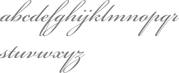
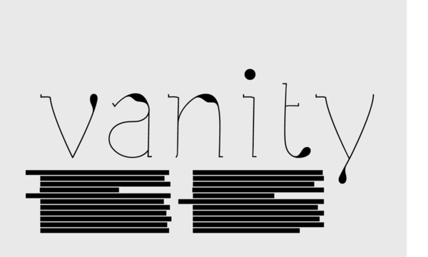
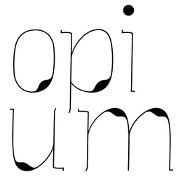
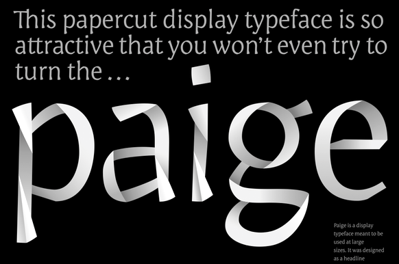
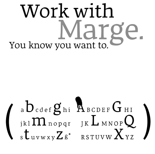
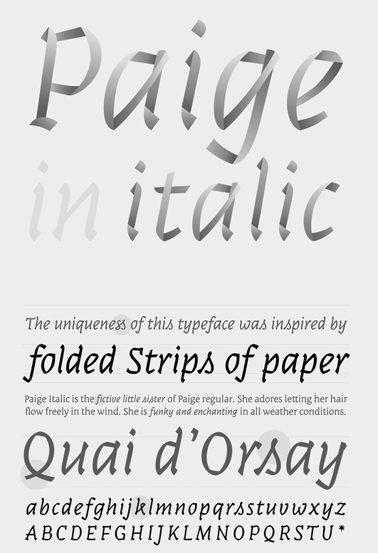
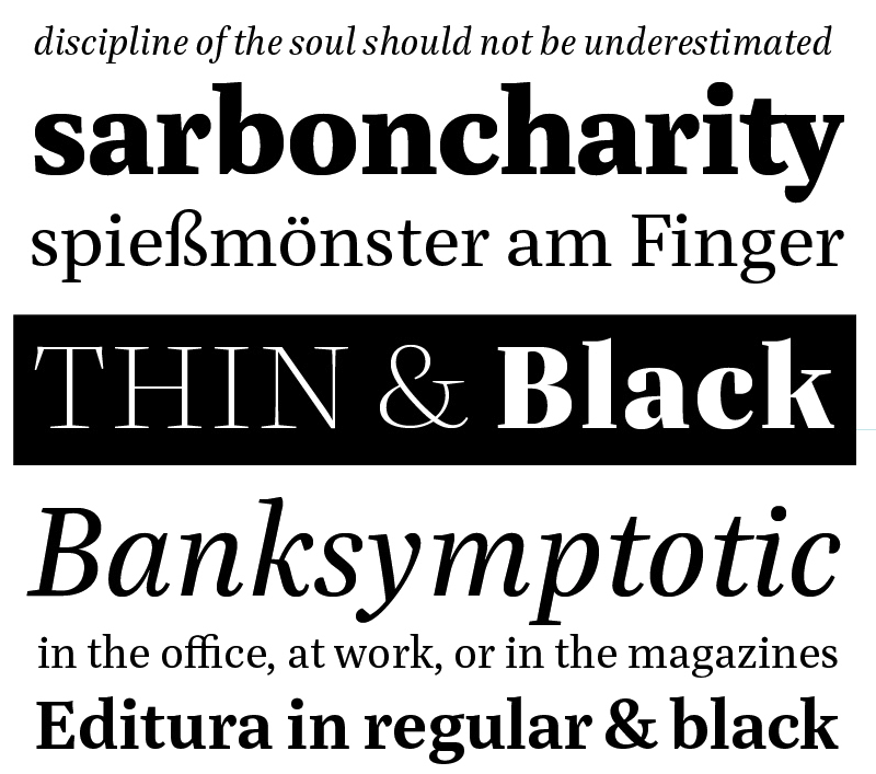
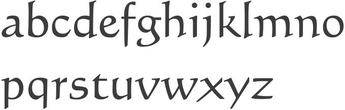
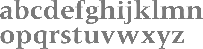
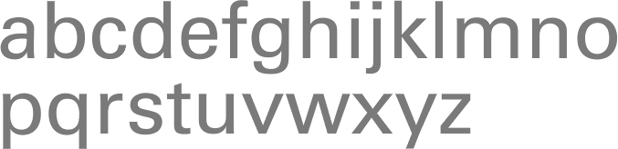
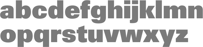
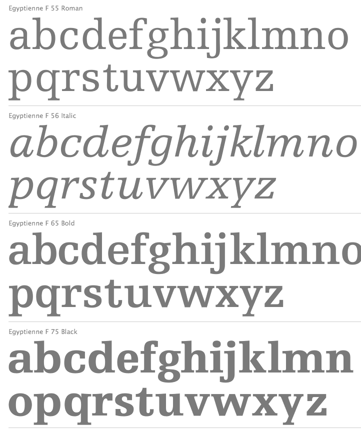
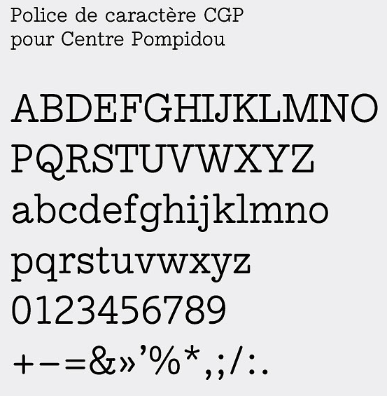
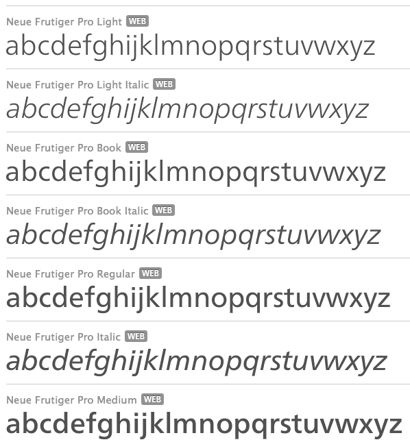
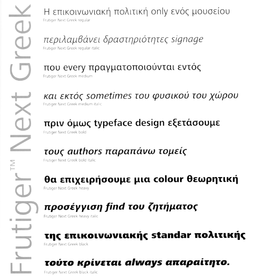
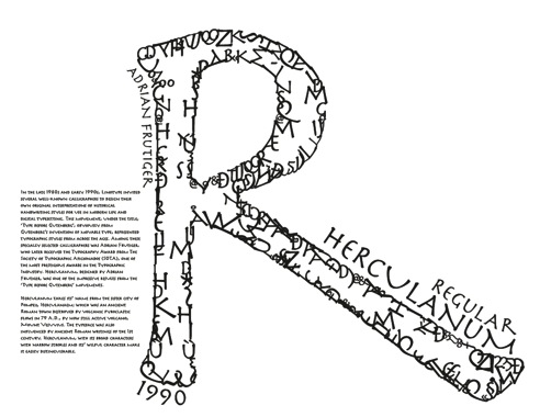
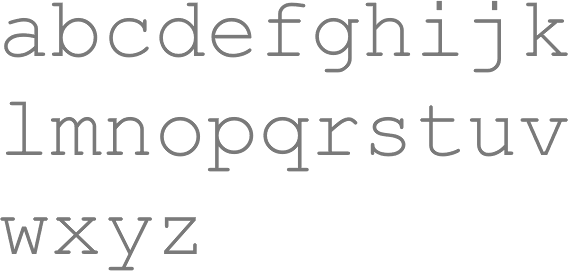
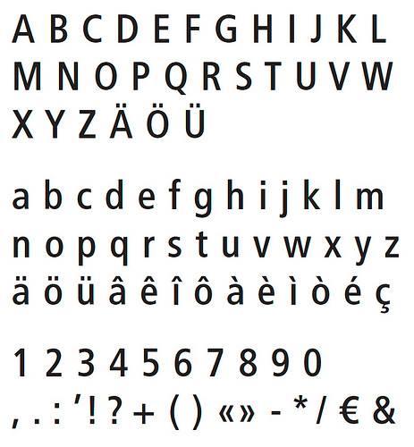
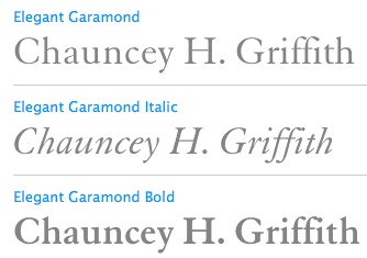
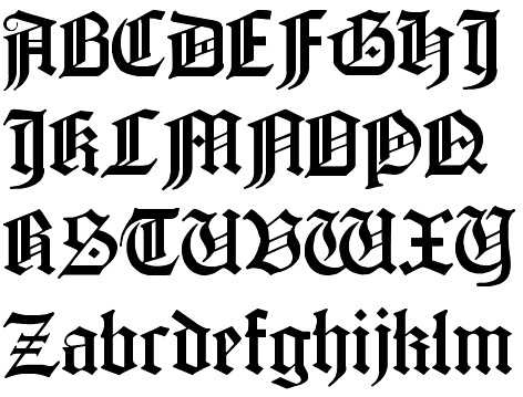
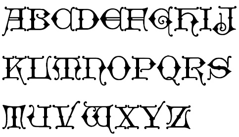
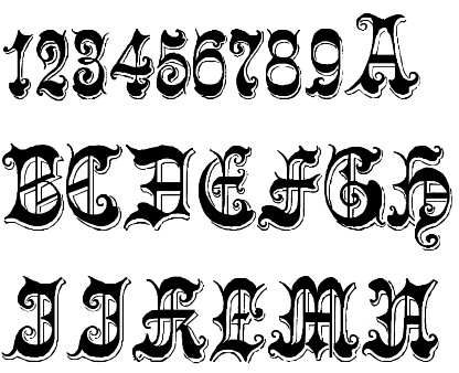
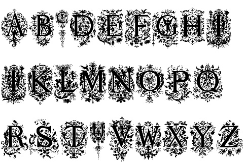
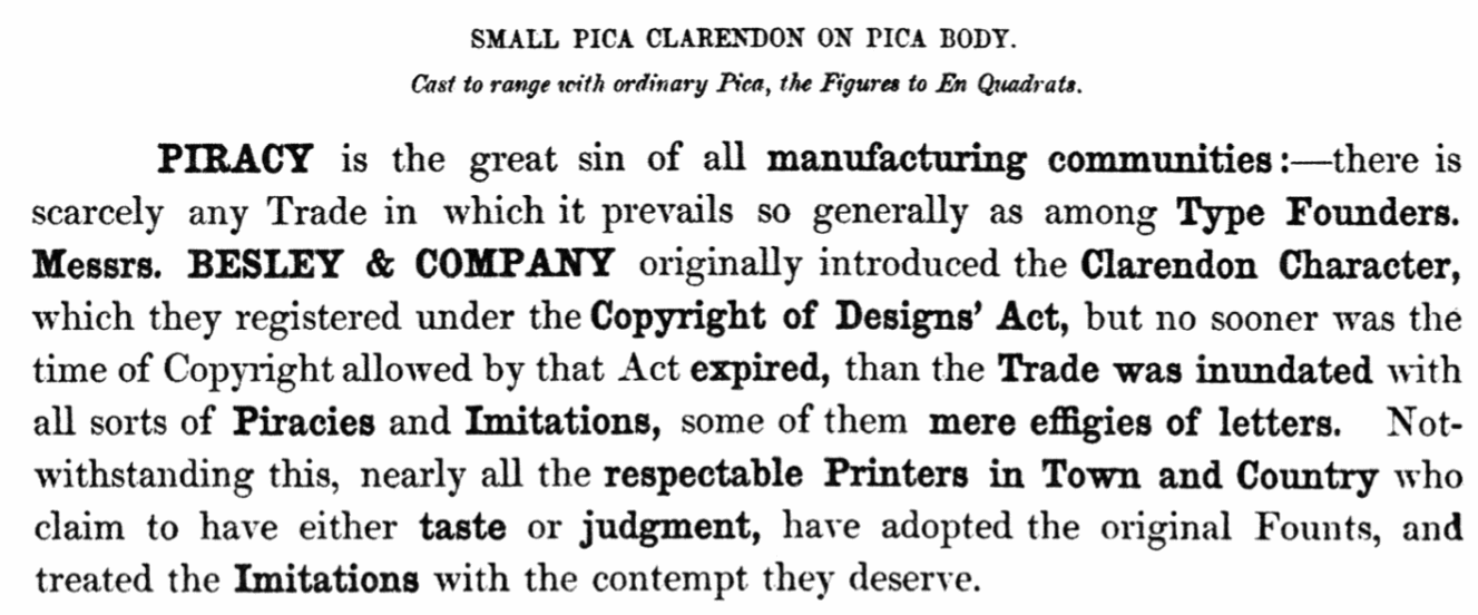
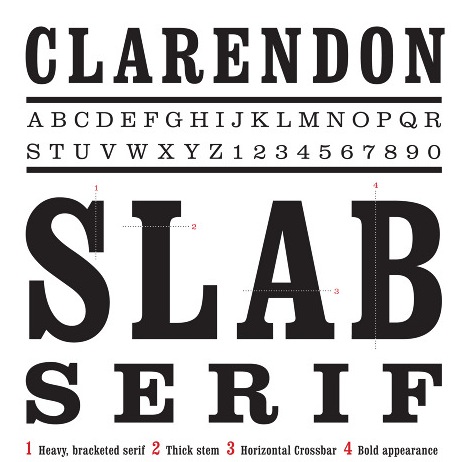
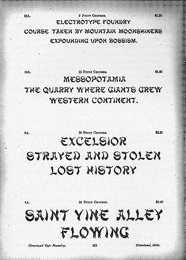
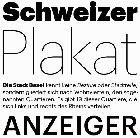
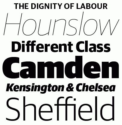
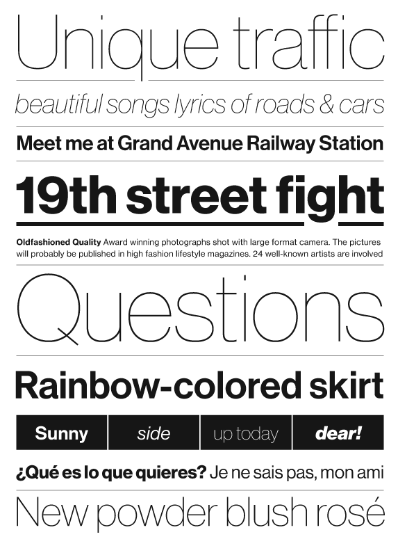
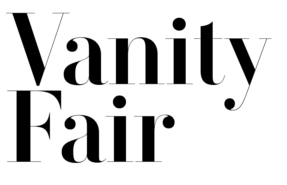
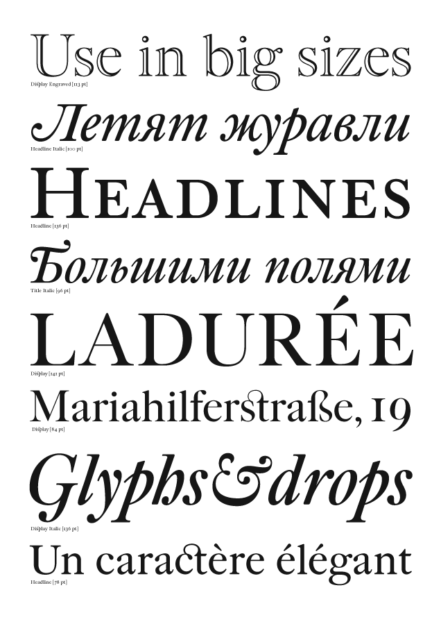
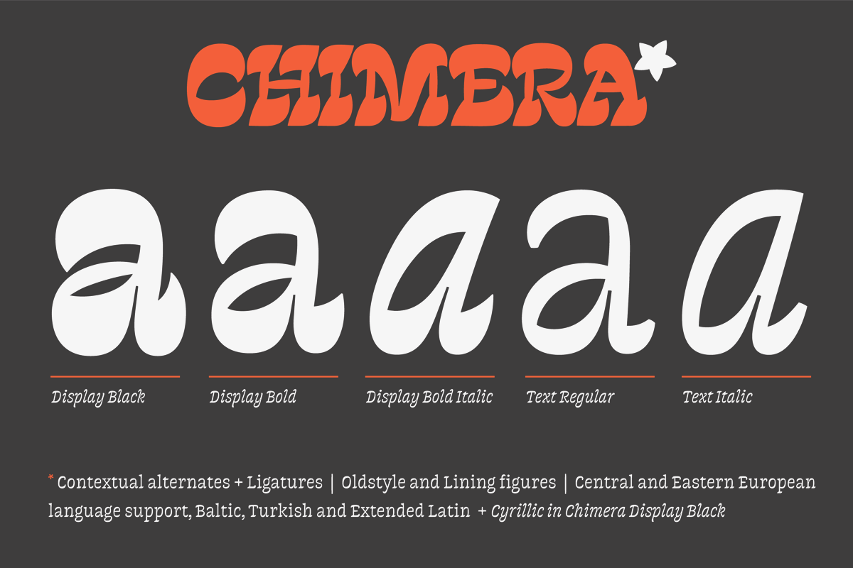
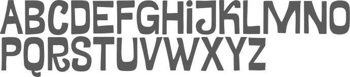
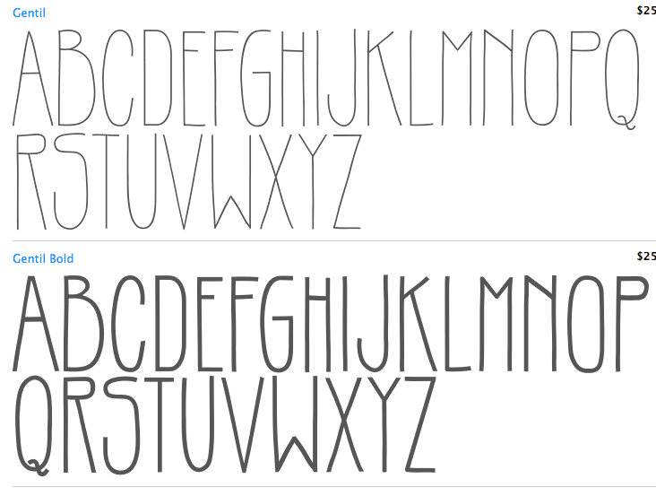
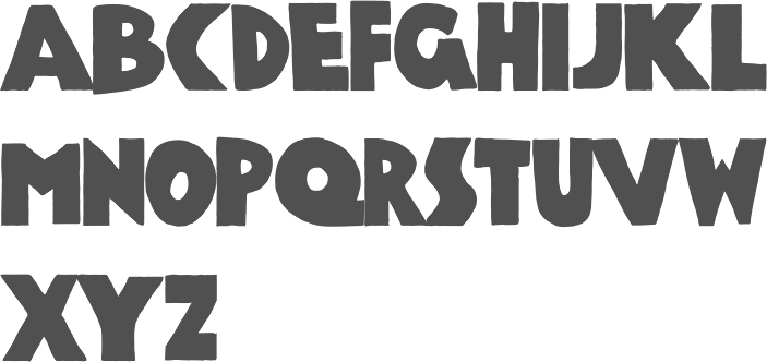
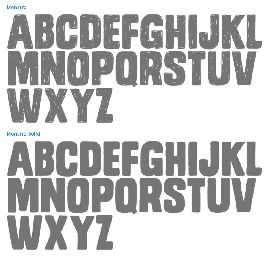
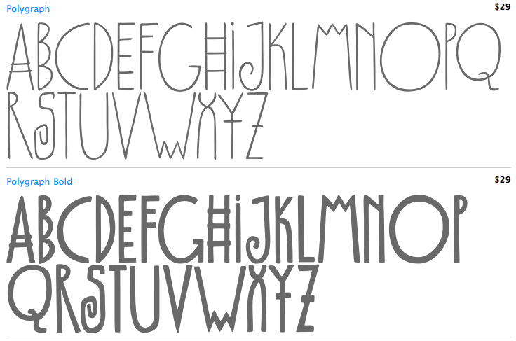
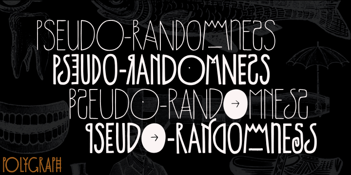
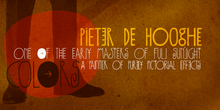
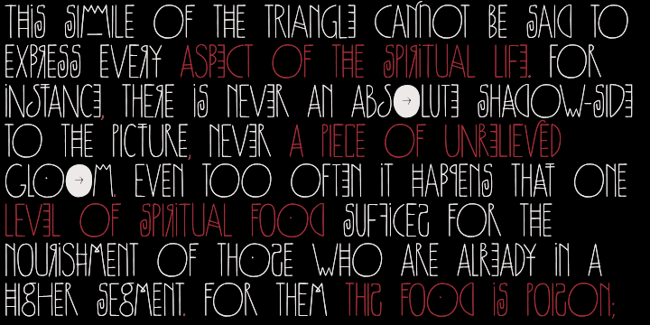
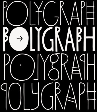
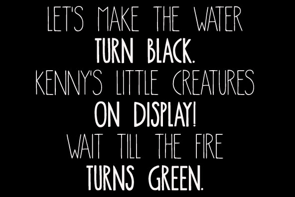
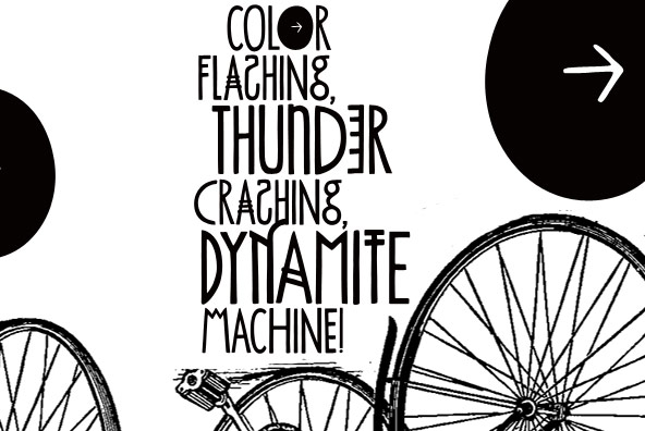
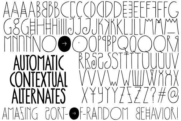
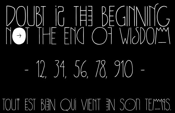
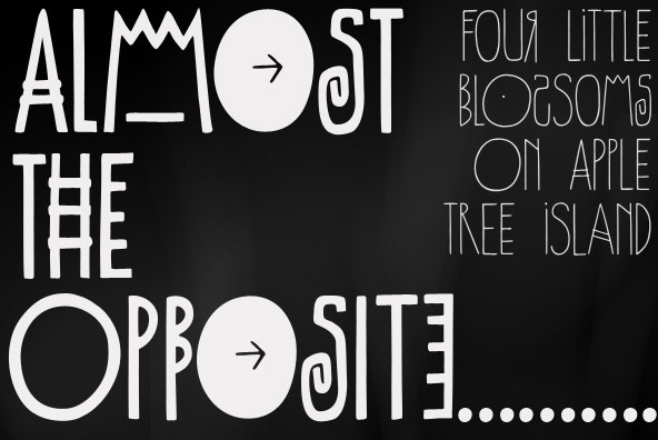
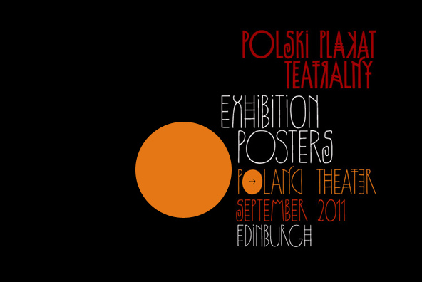
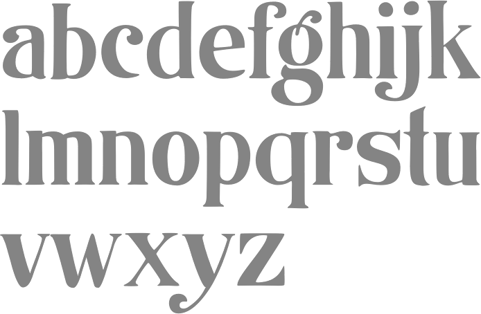
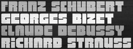
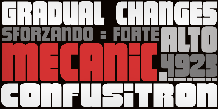
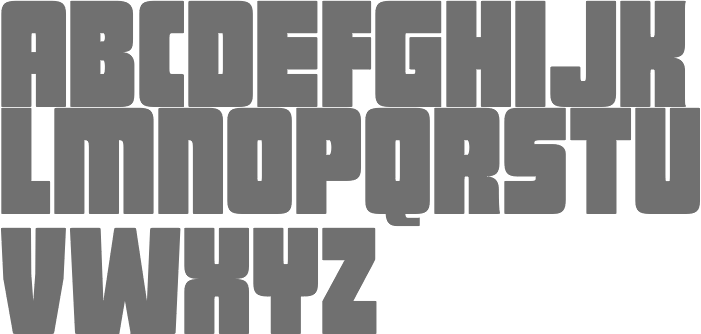
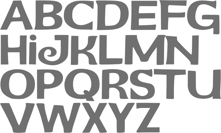
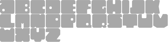
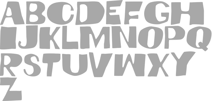
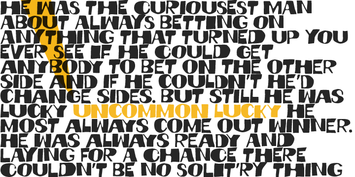
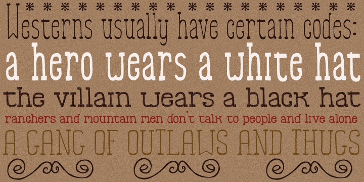
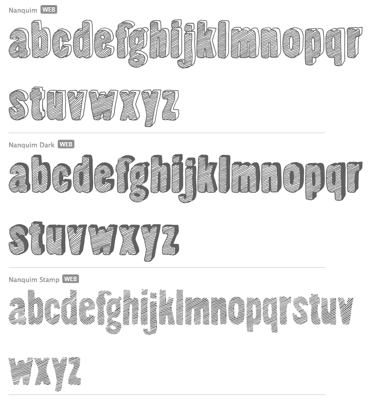
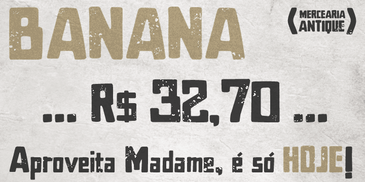
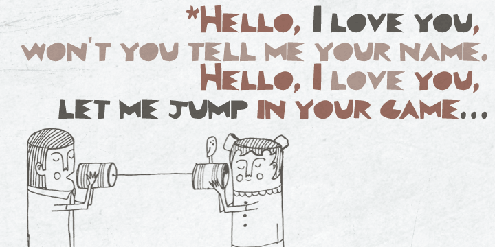
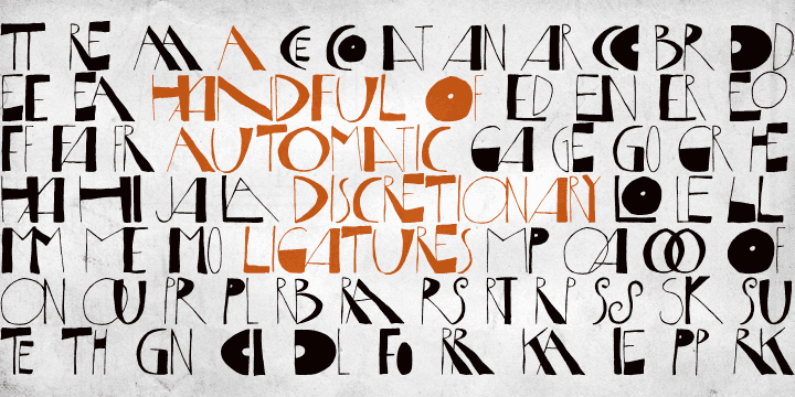
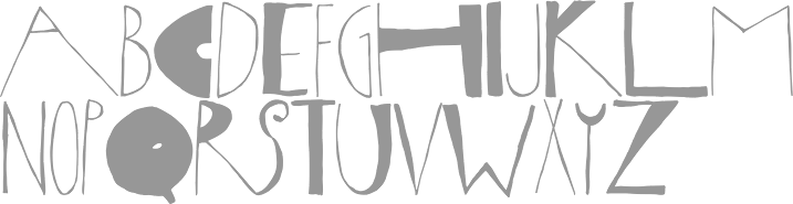
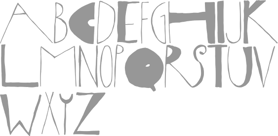
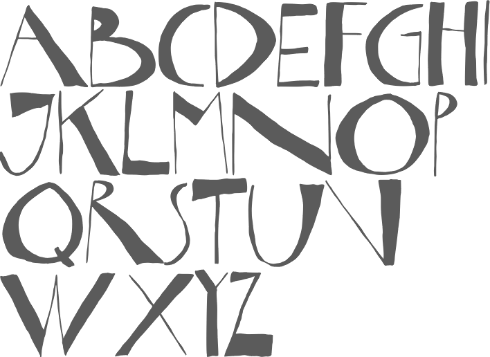
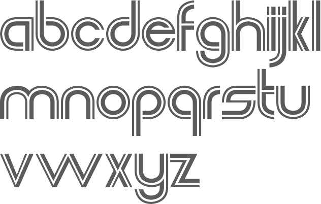
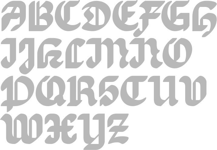
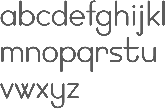
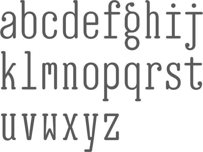
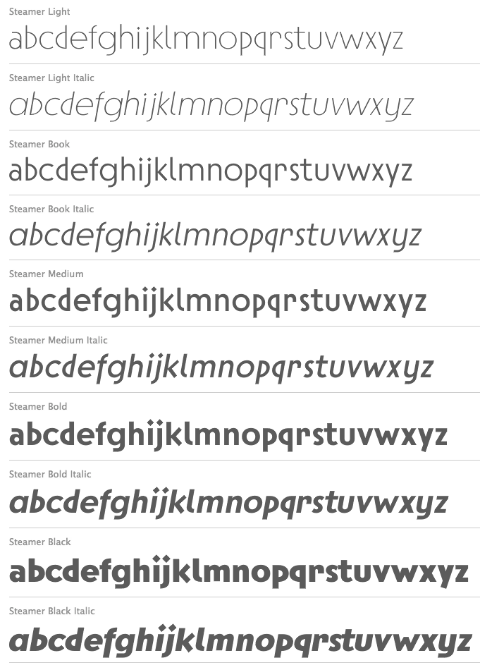
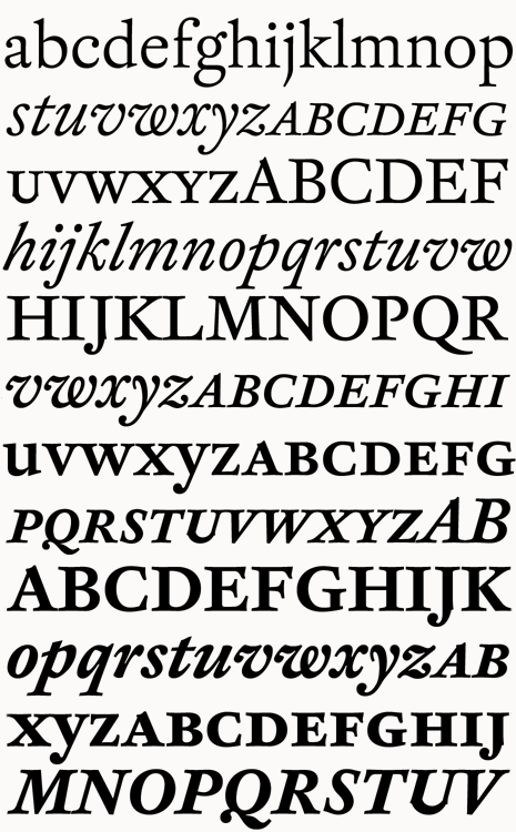
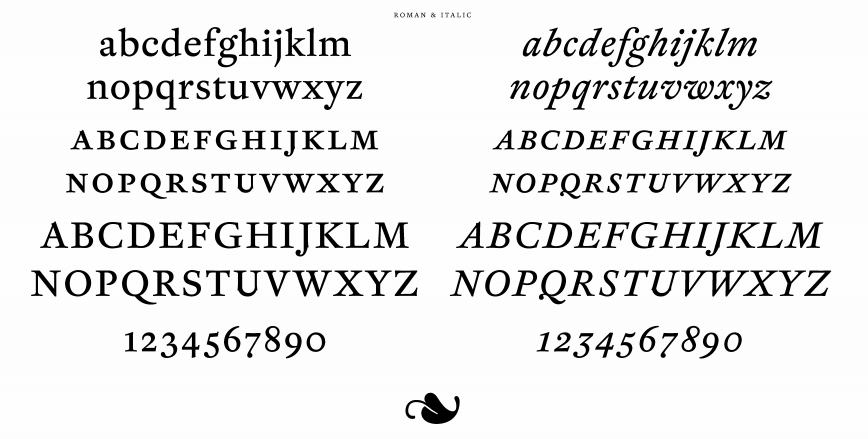
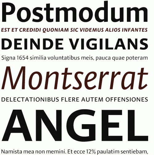
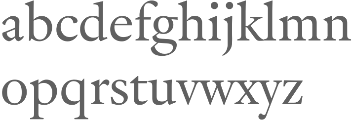
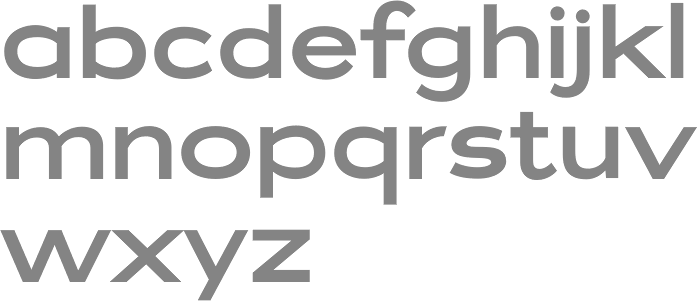
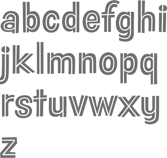
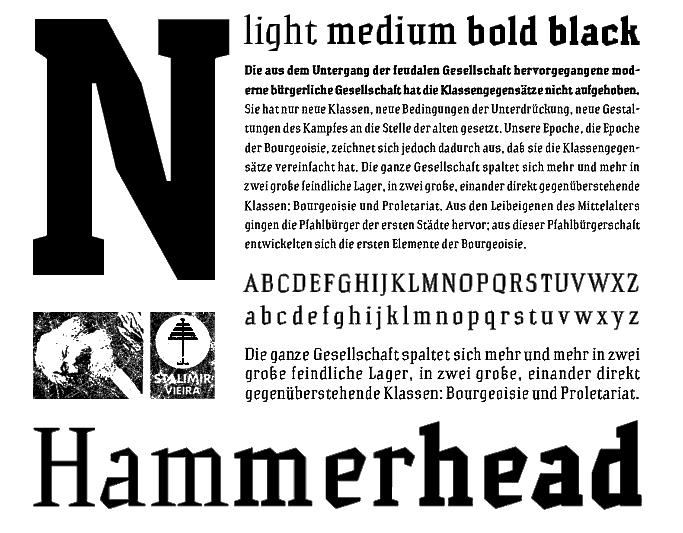
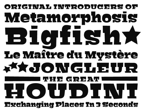
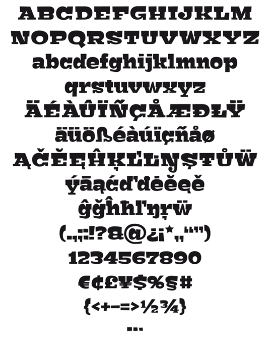
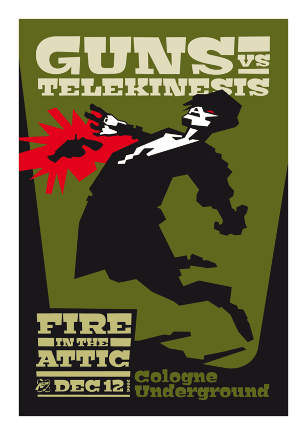
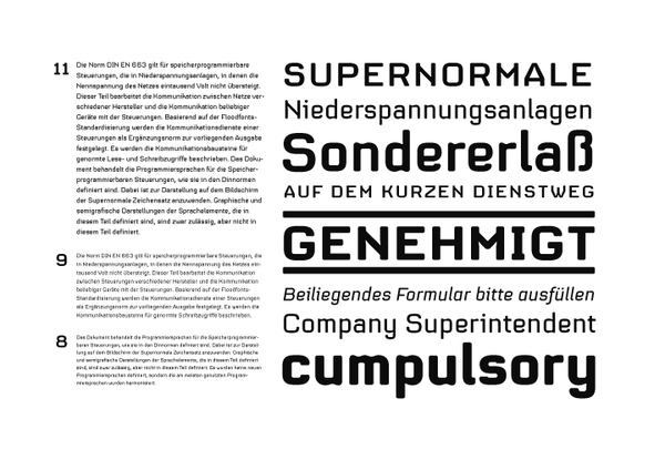
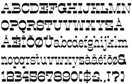
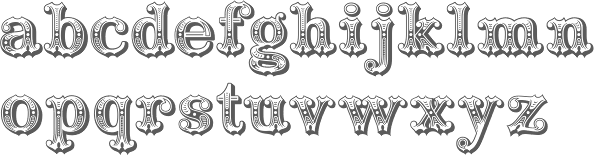
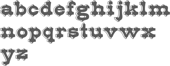
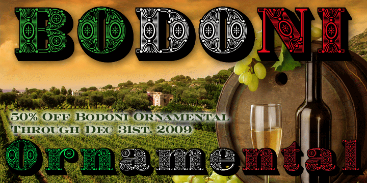
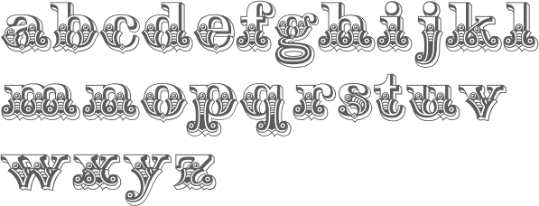
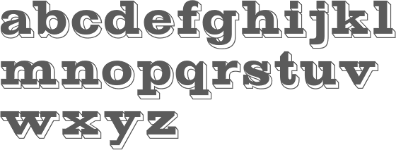
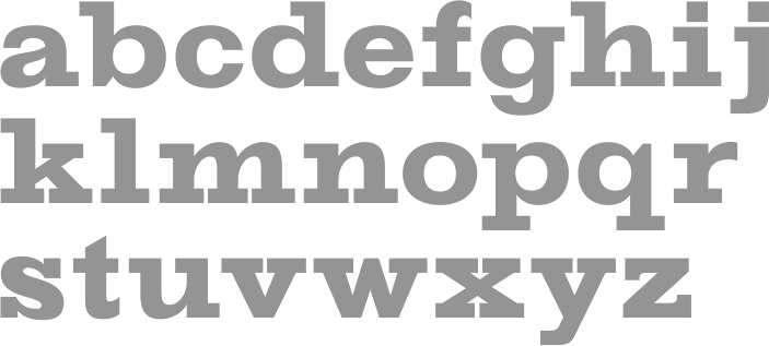
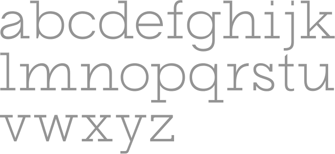
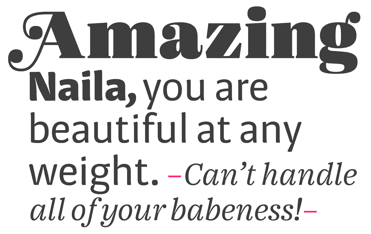
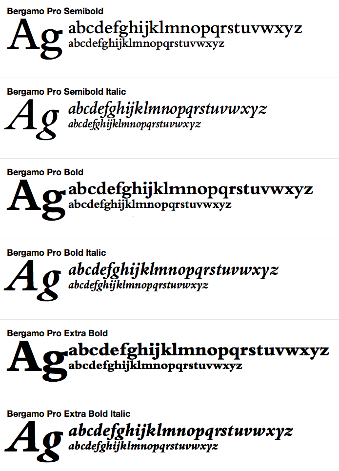
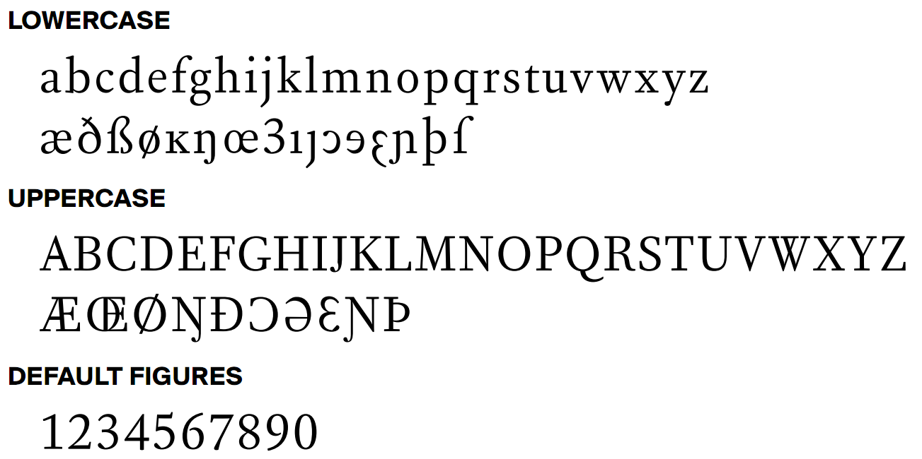
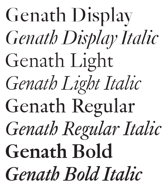
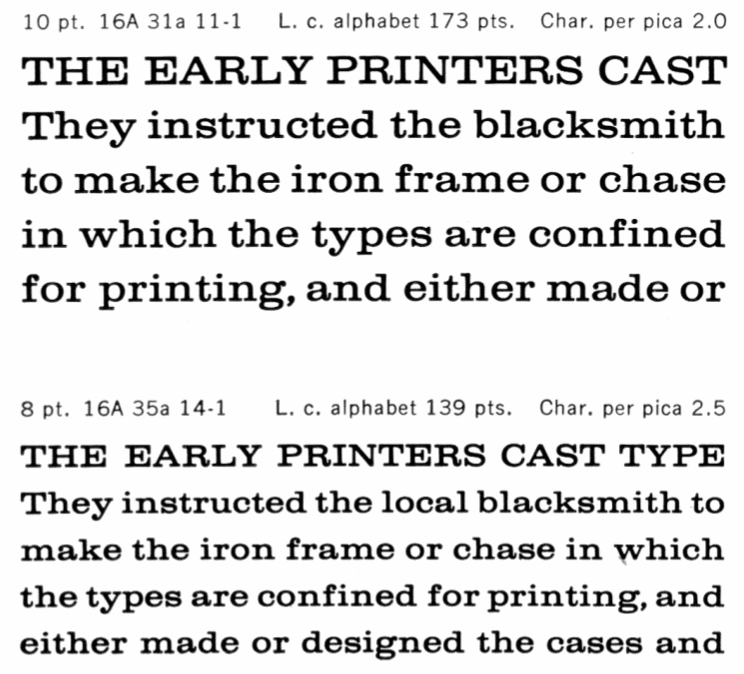
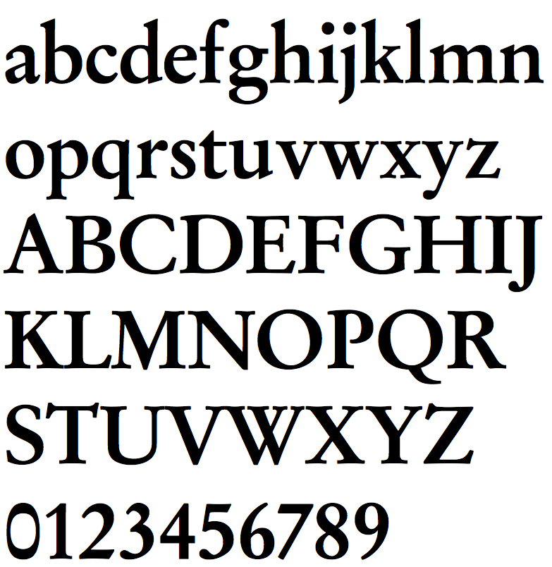
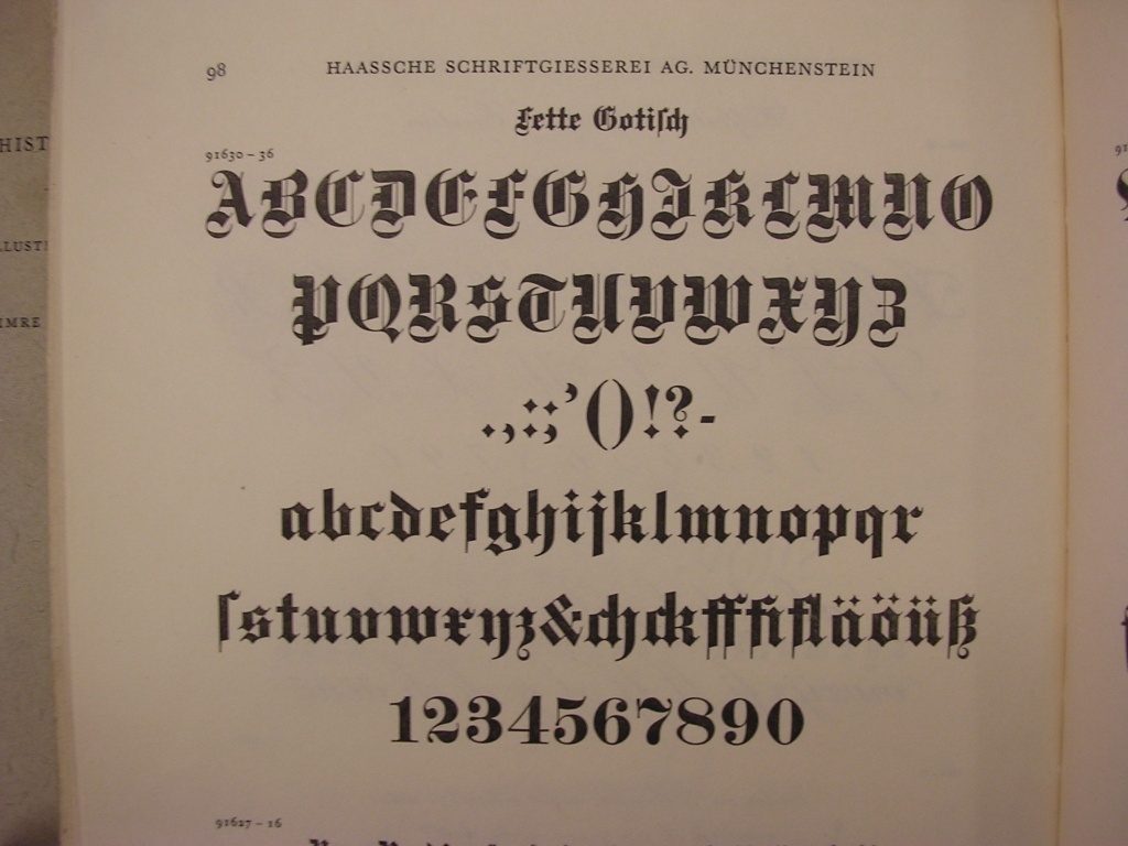
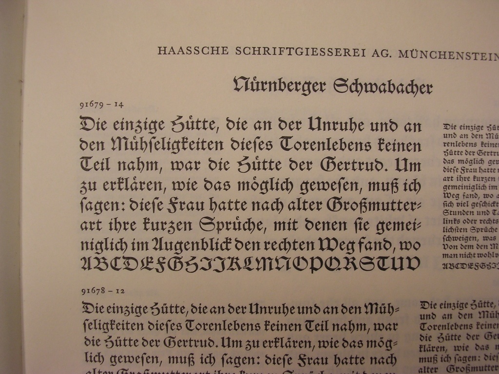
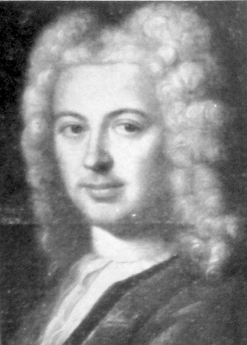
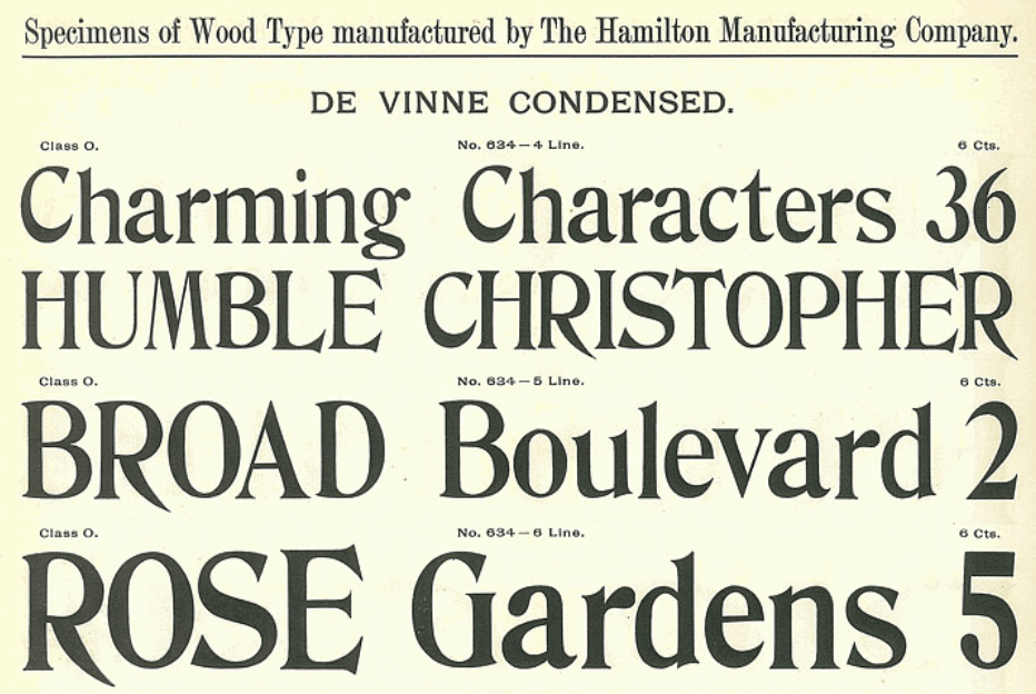
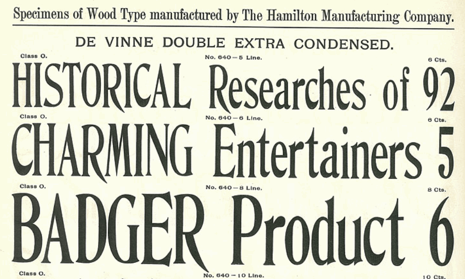
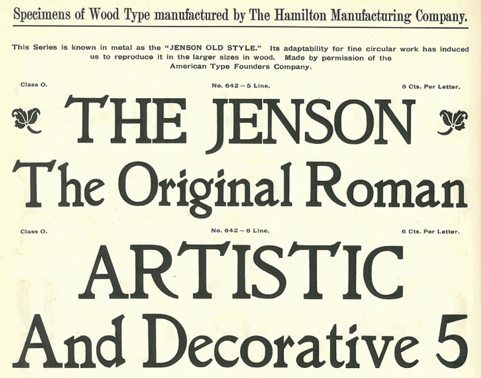
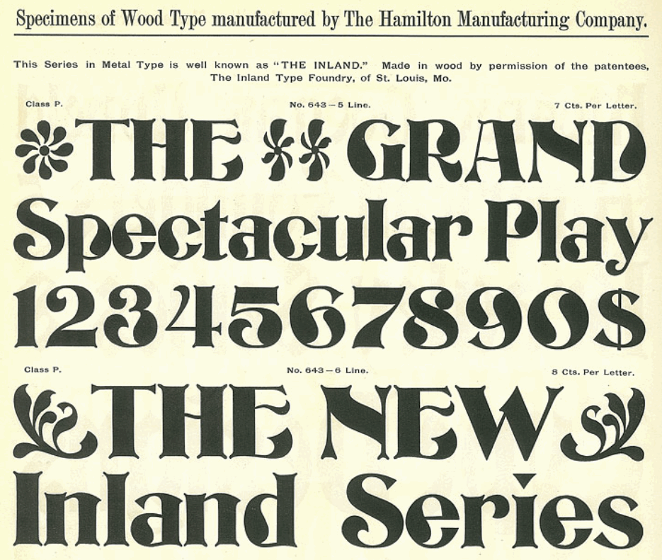
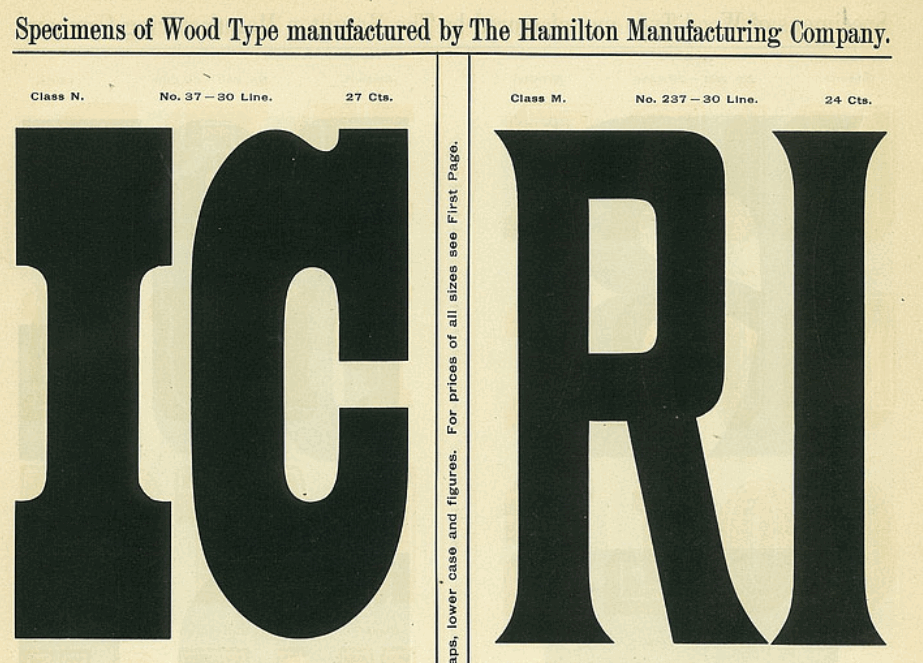
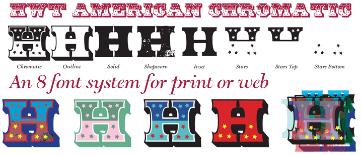
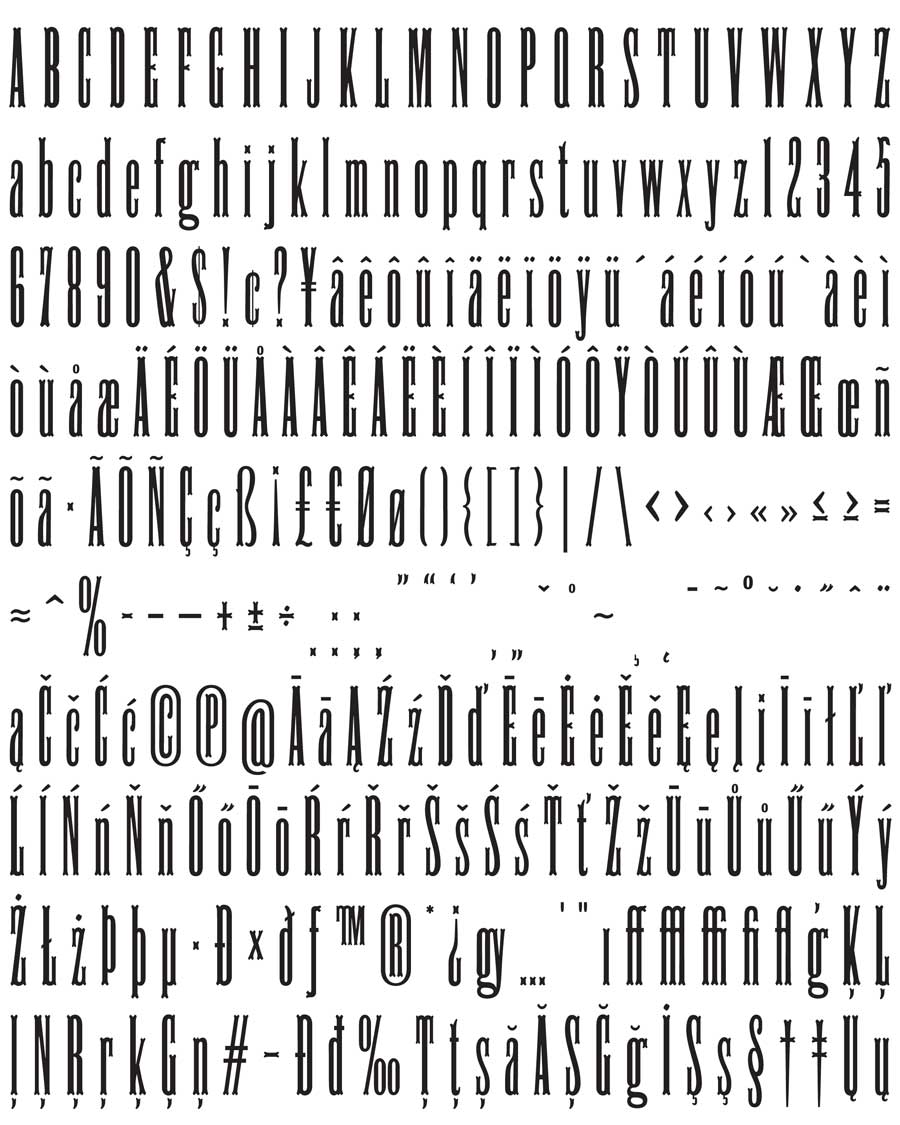
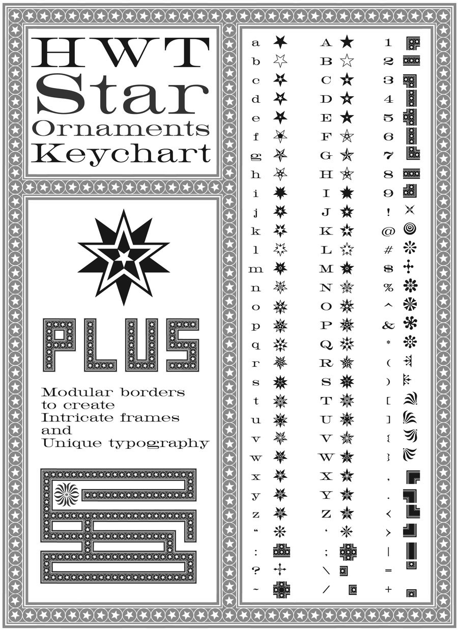
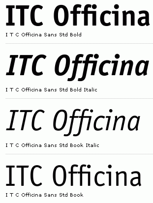
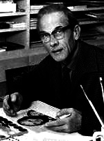
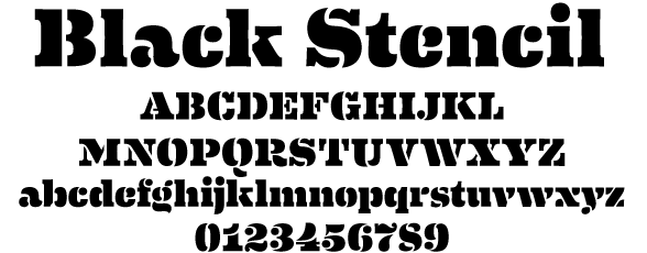
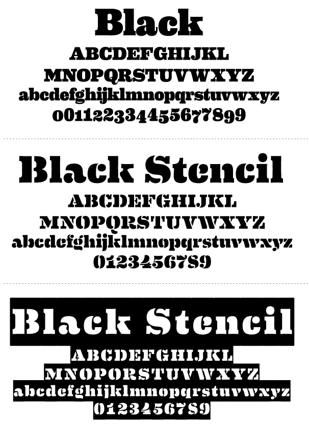
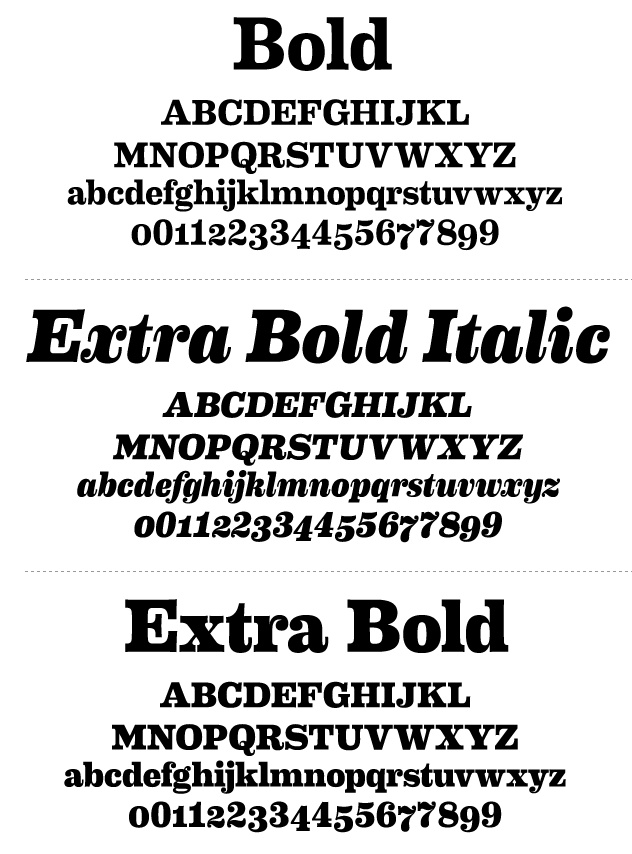
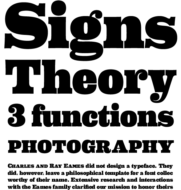
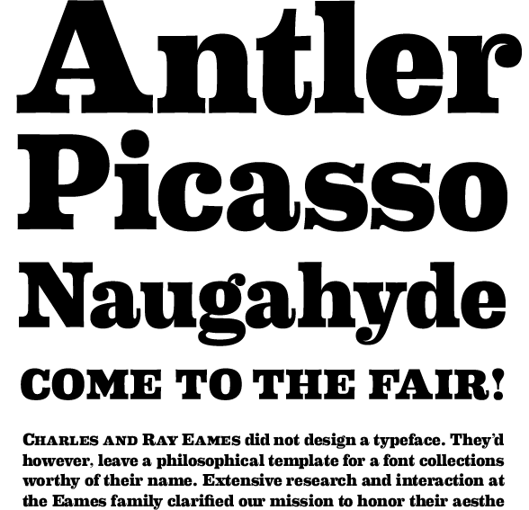
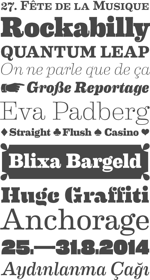
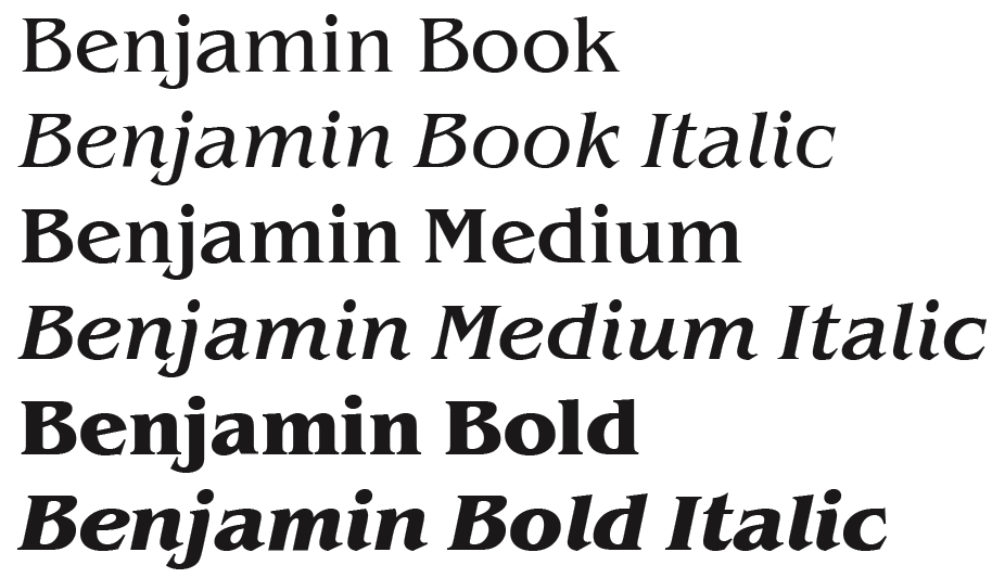
![German Garamond"> [based on TypoArt Garamond], Giulio,](Infinitype--GermanGaramond--basedonTypoartGaramond.png)
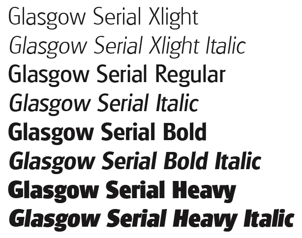
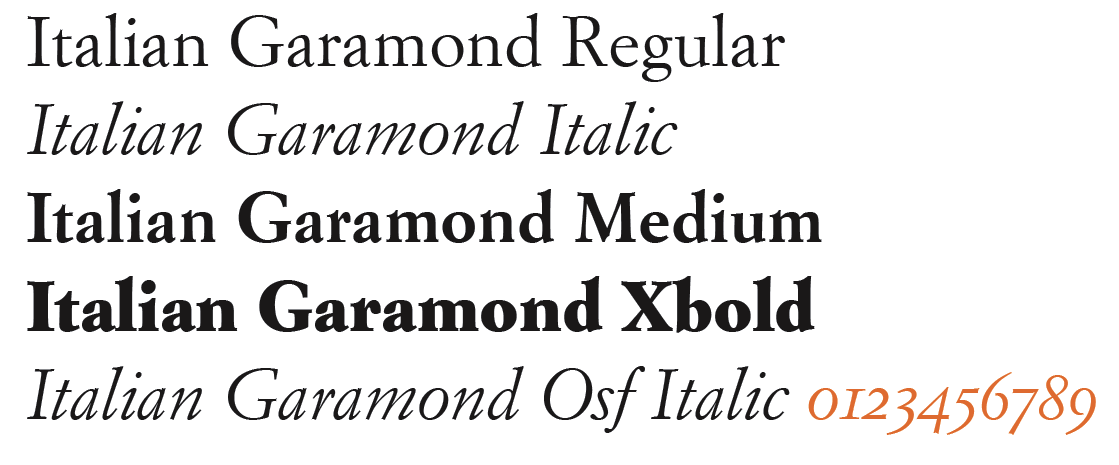
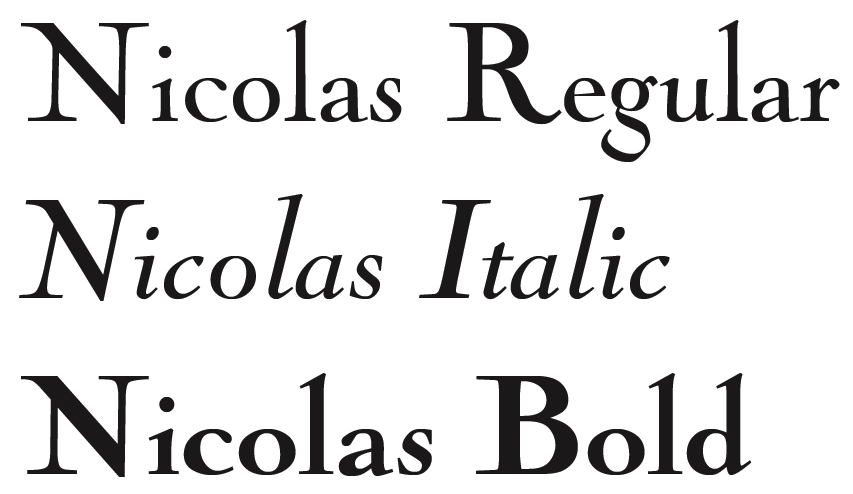
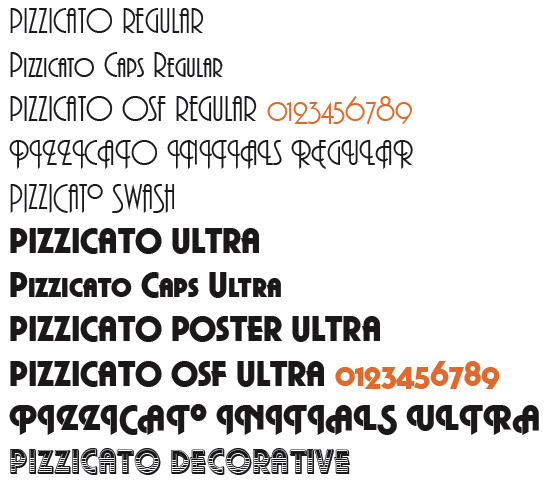
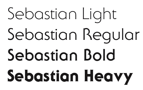
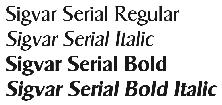
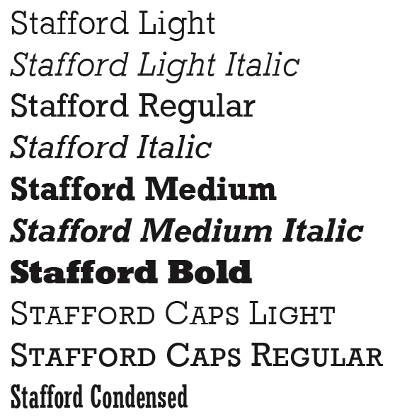
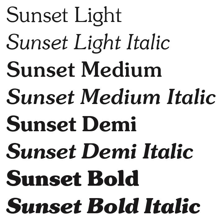
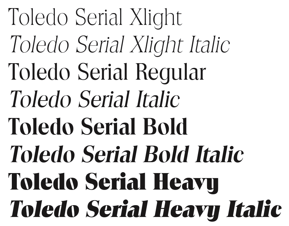
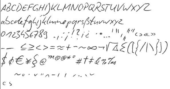
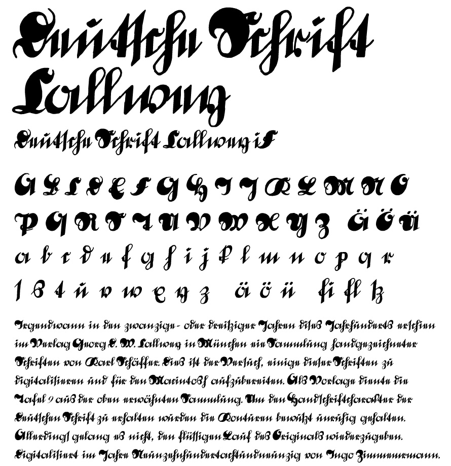
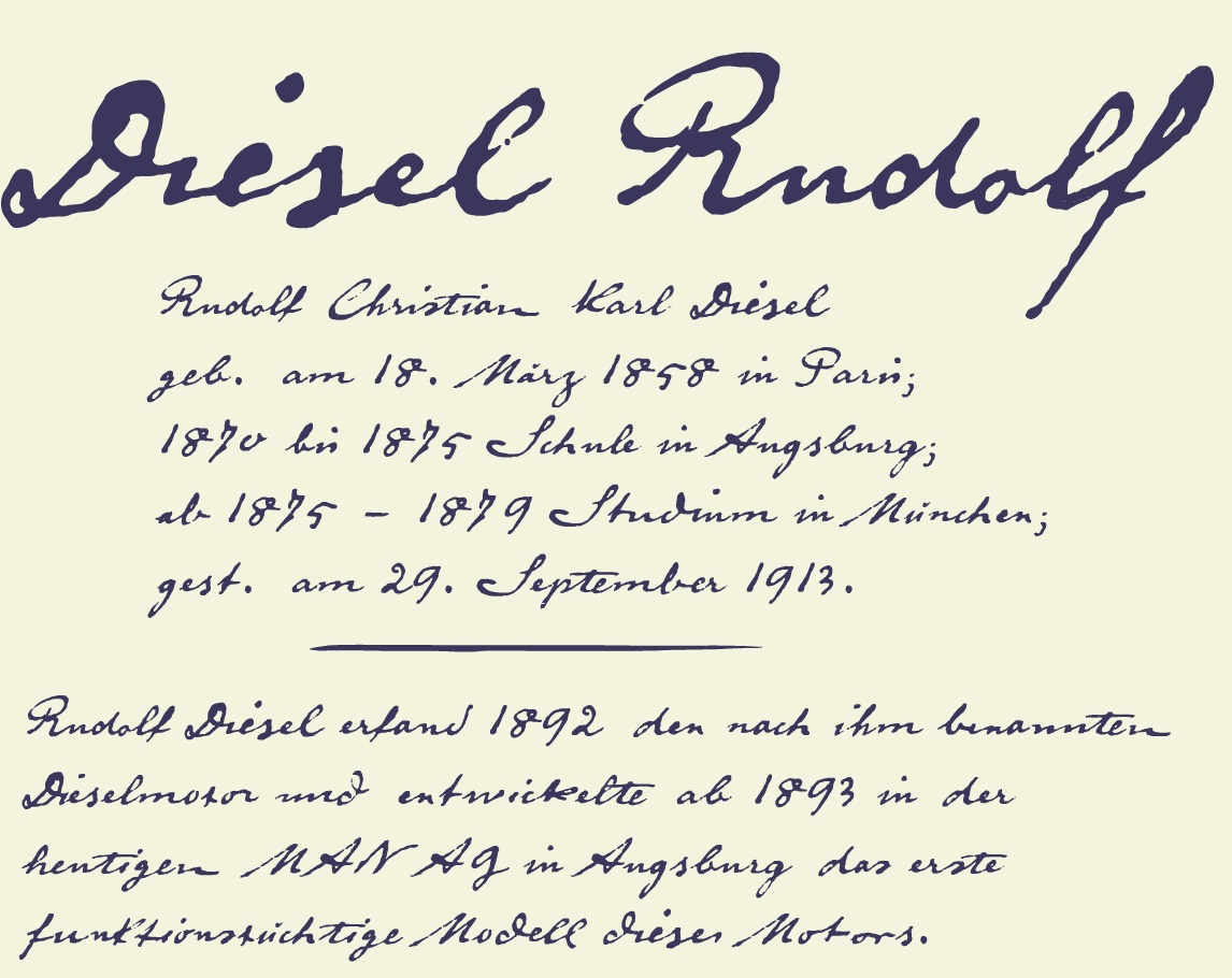
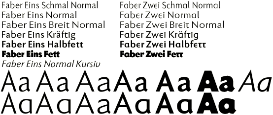
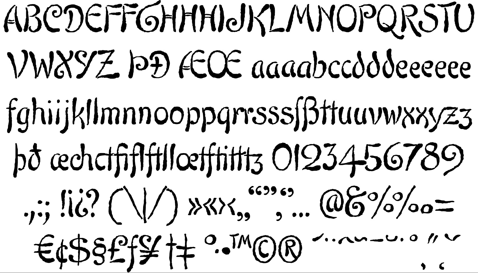
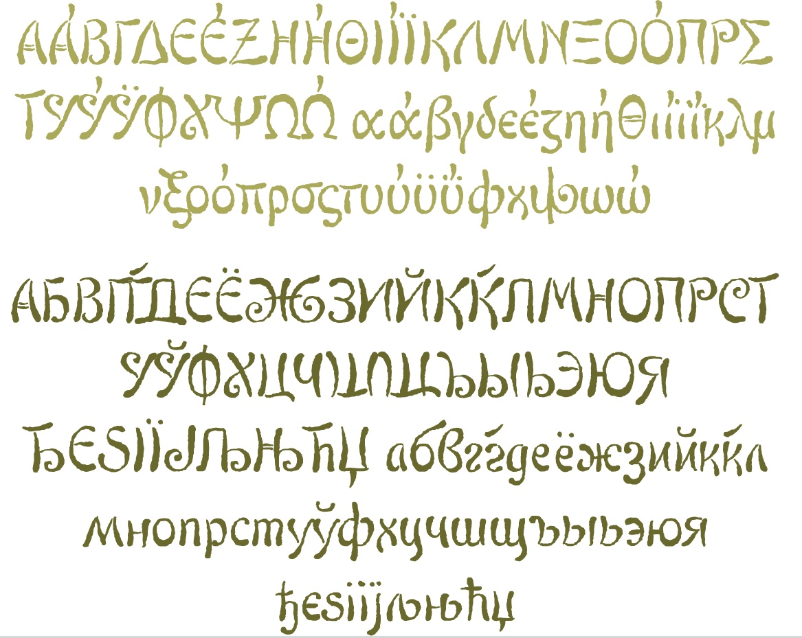
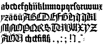
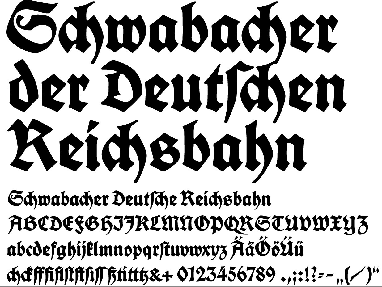
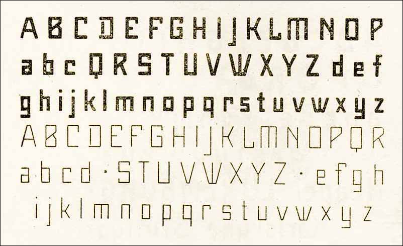
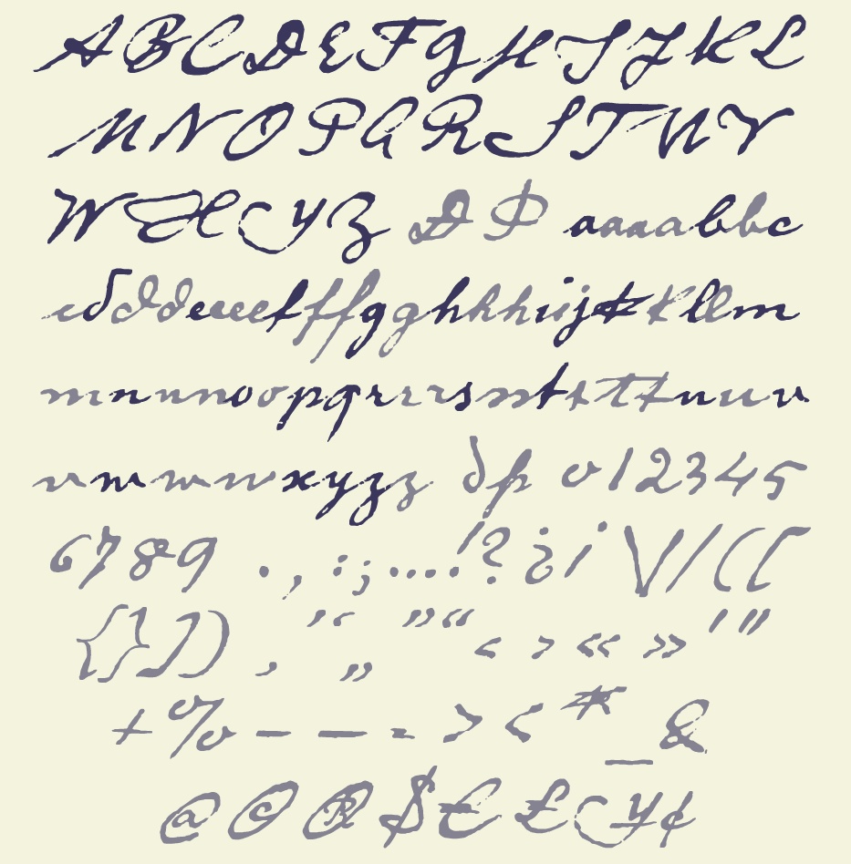
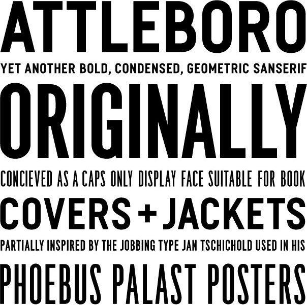
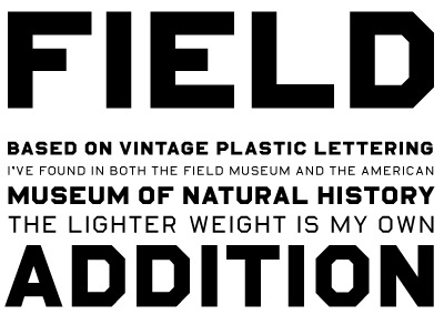
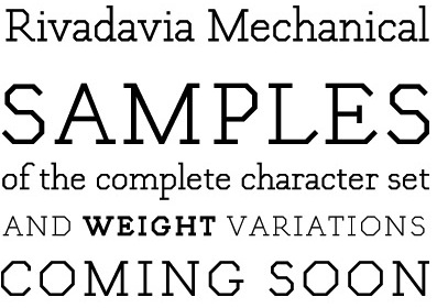
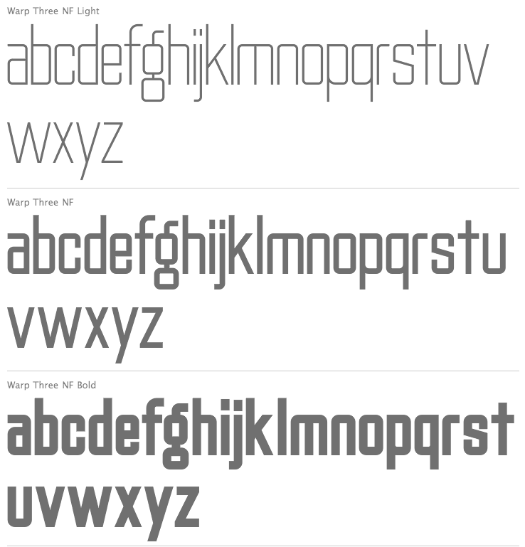
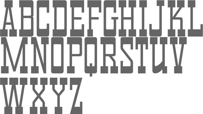
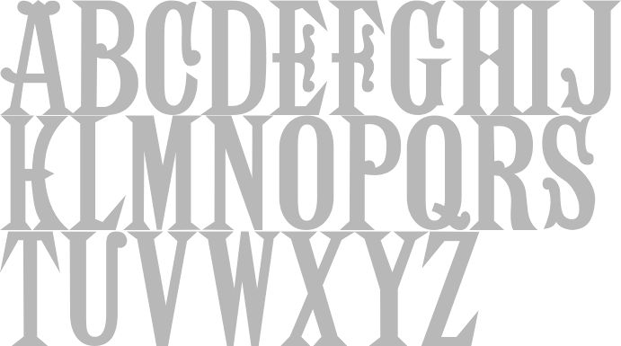
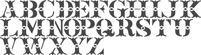
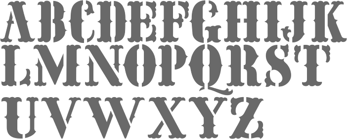
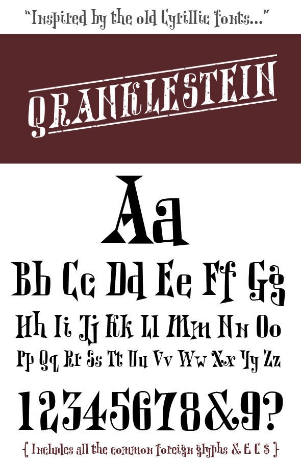
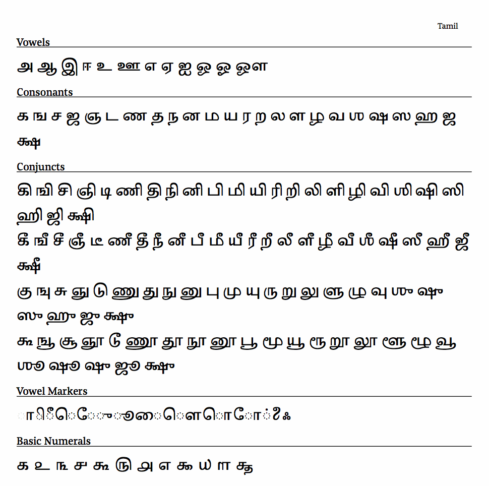
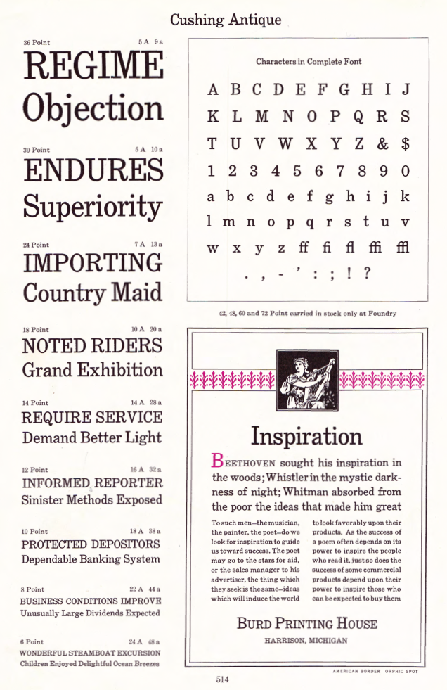
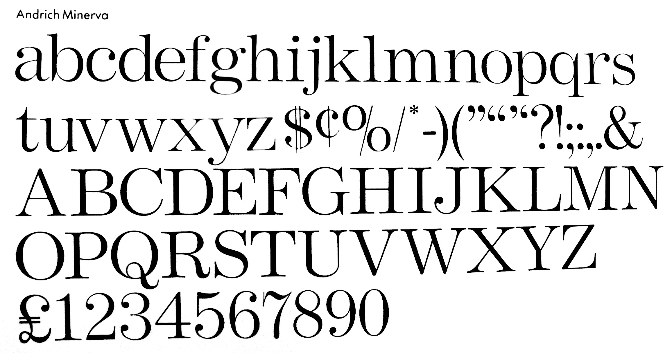
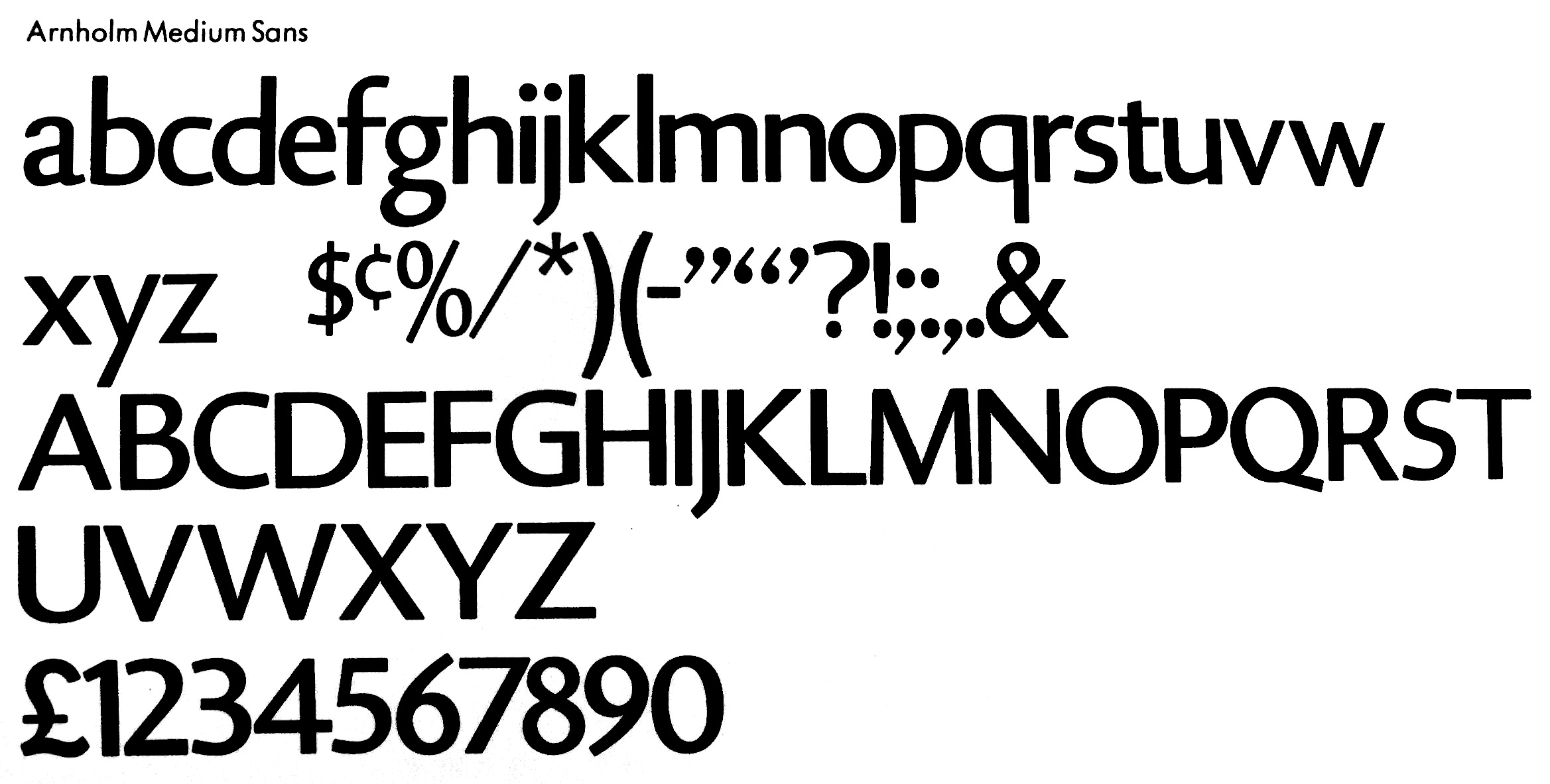
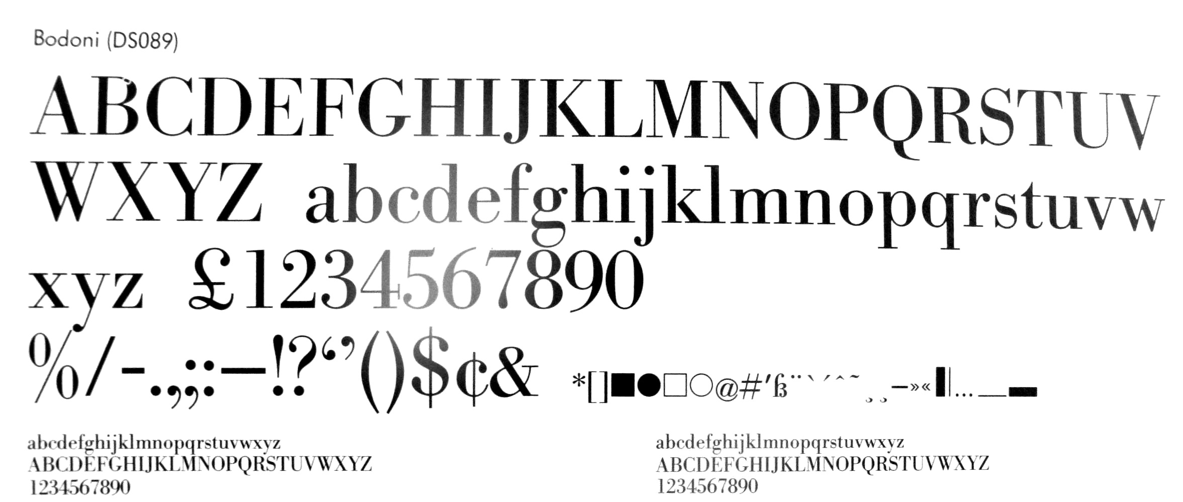
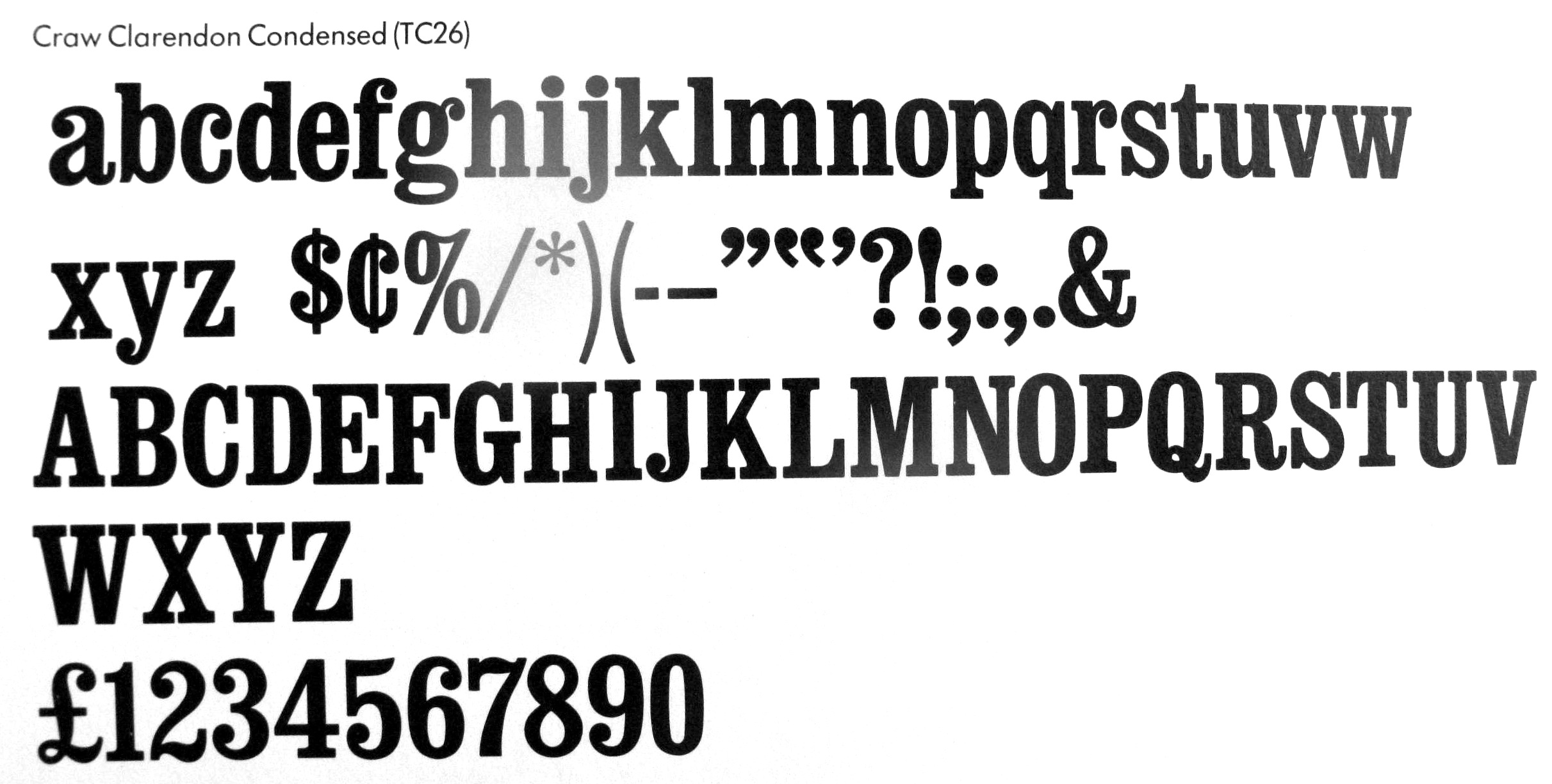
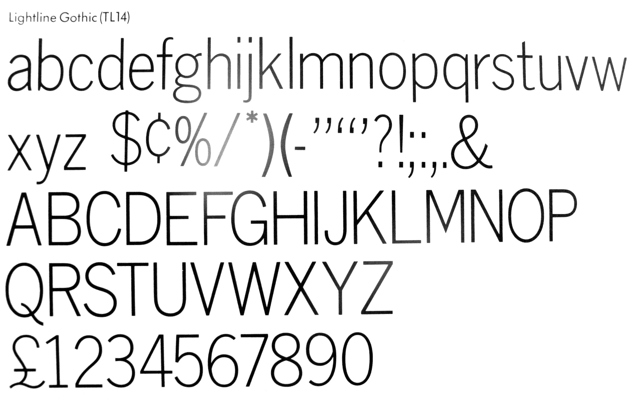
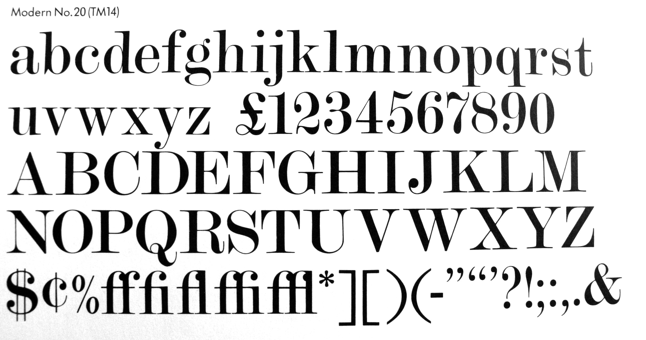
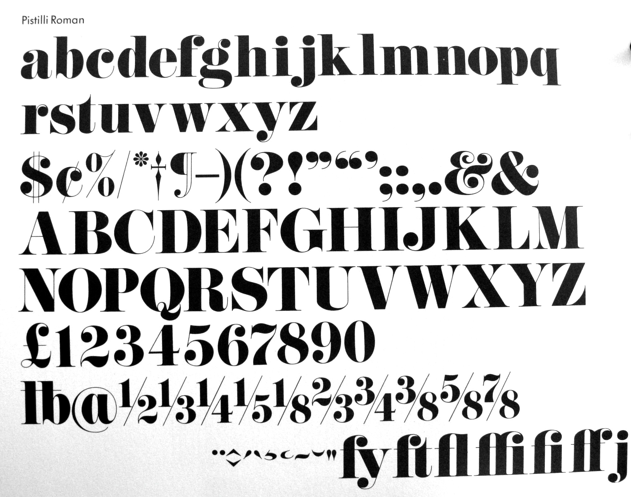
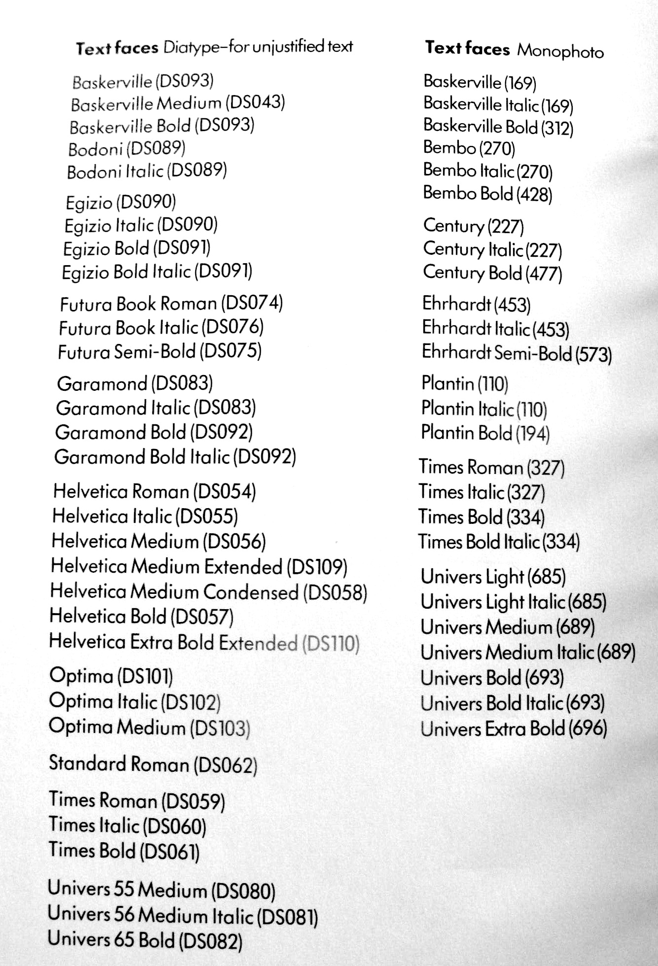
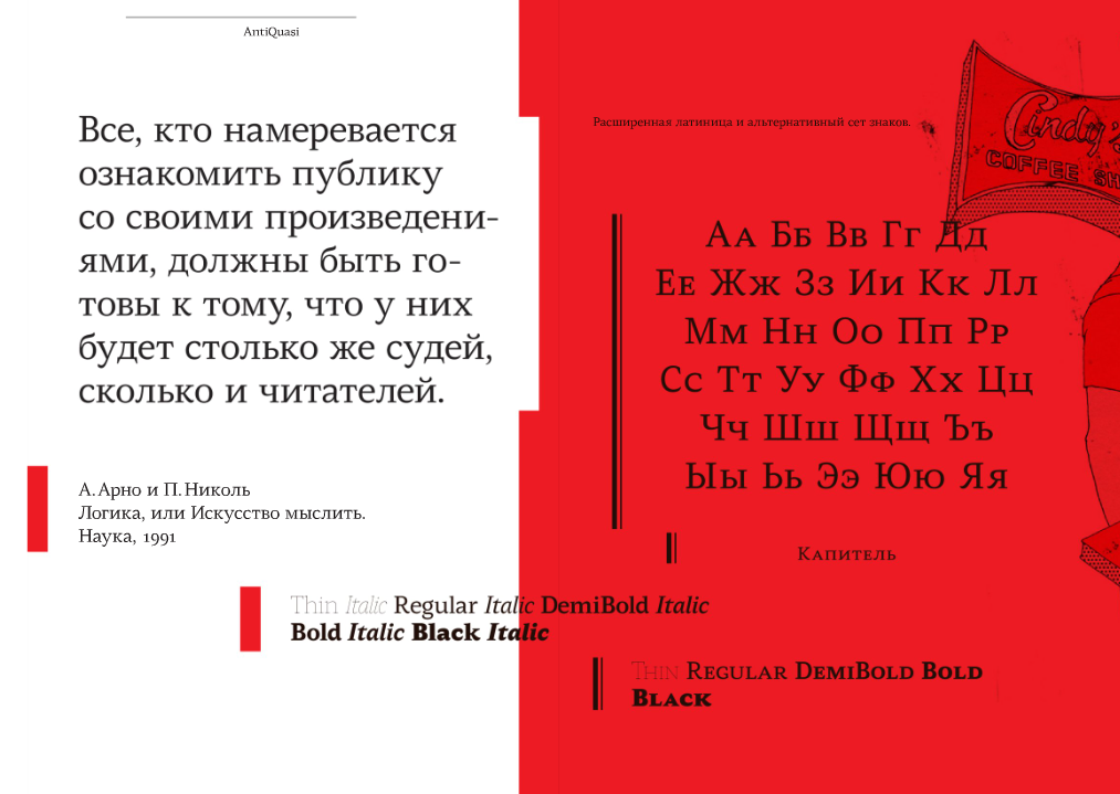
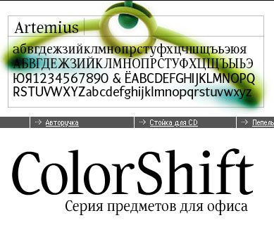
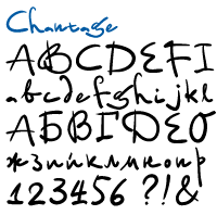
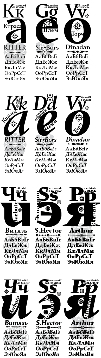
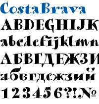
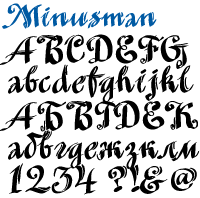
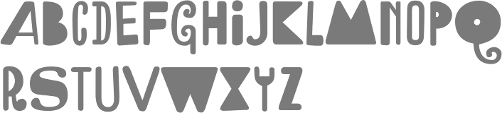
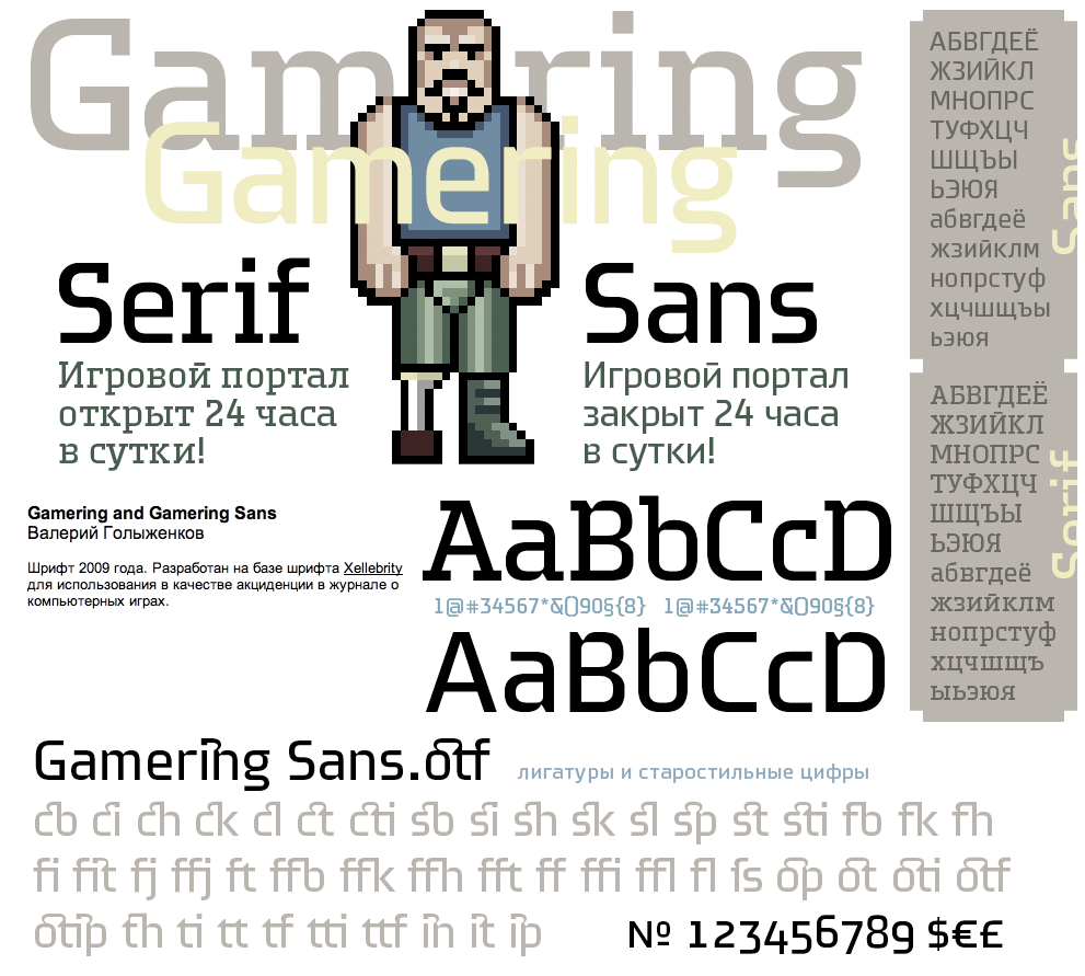
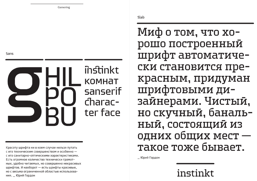
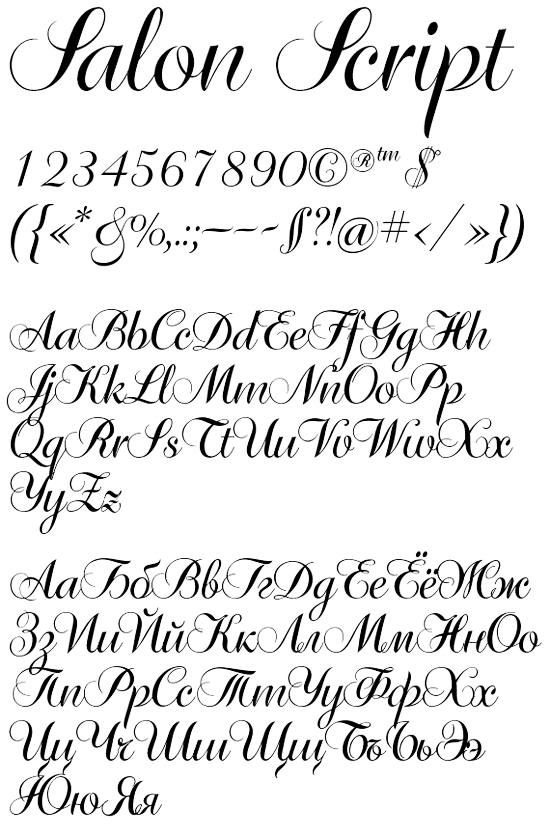
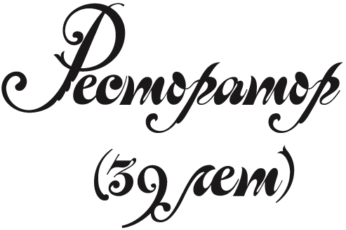
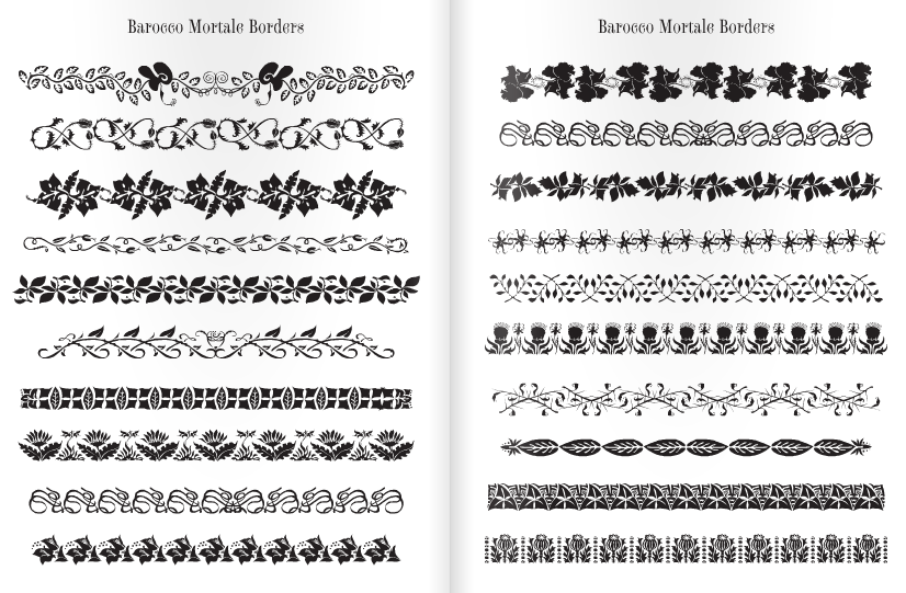
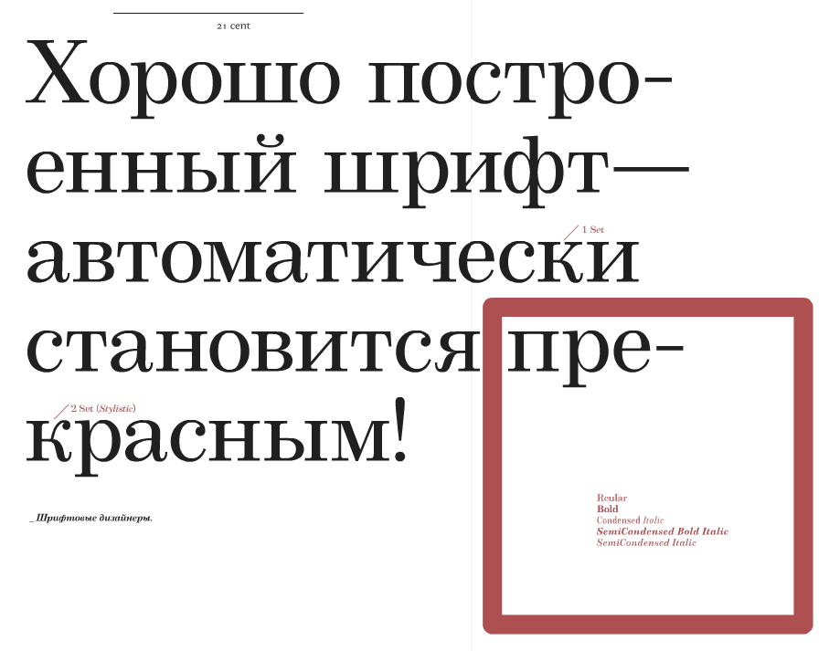
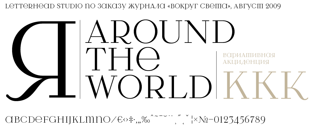
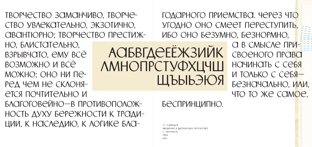
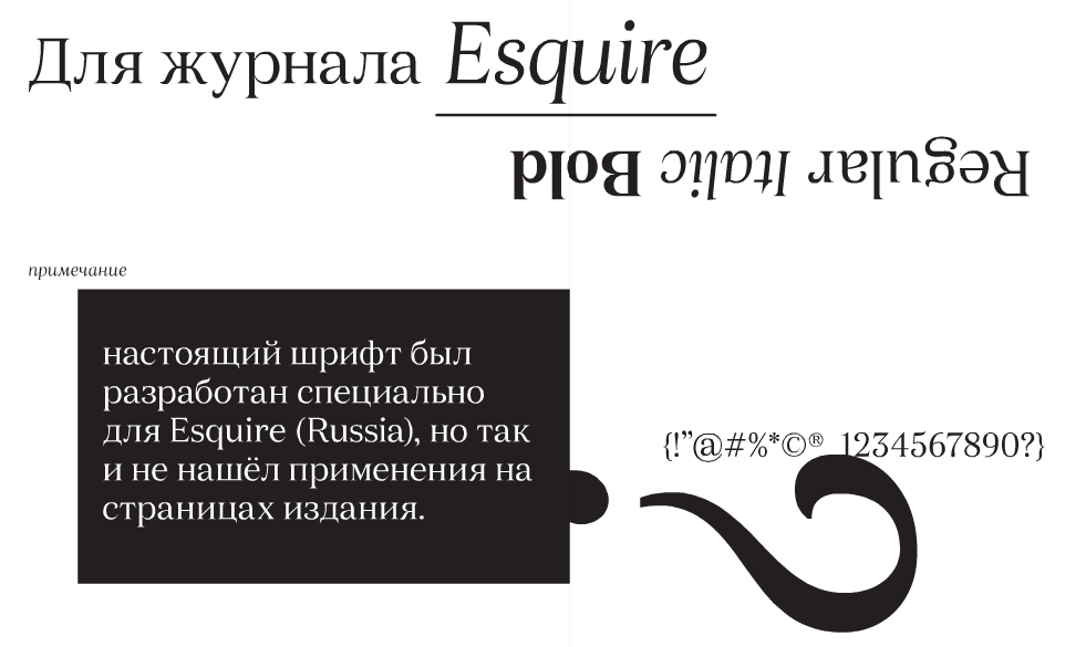
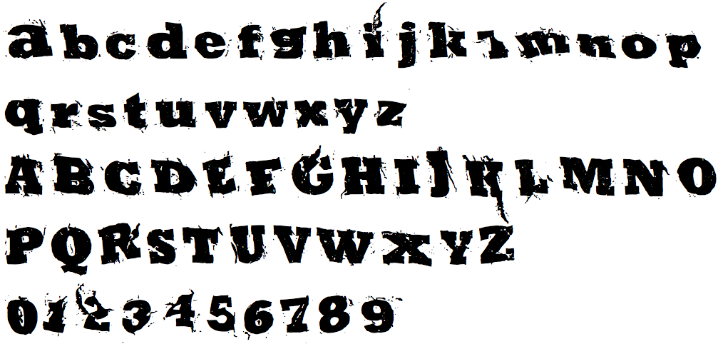
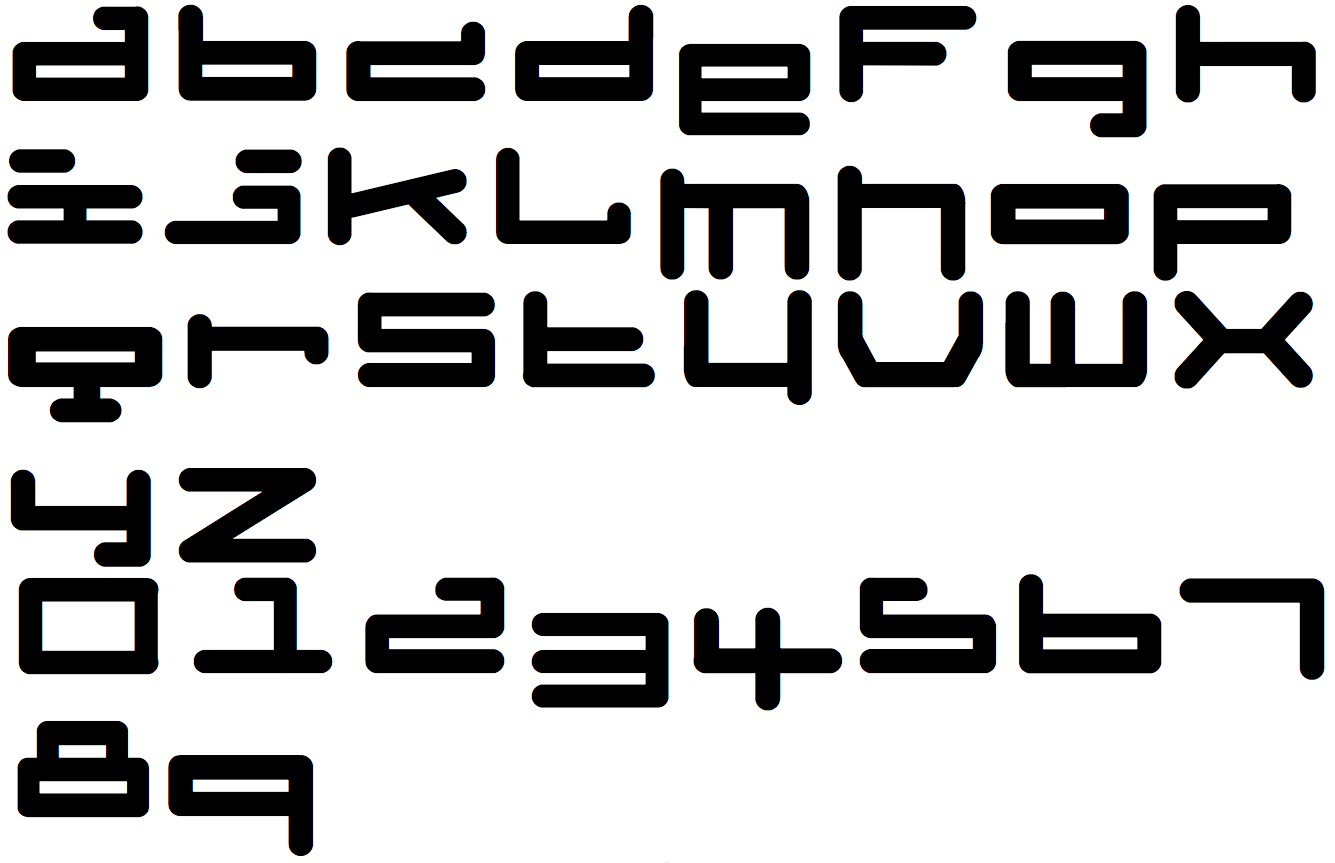
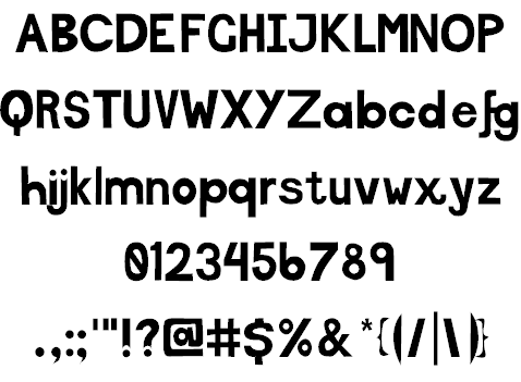
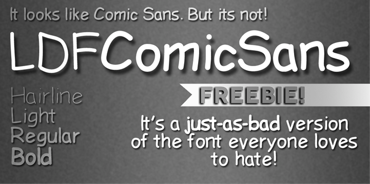
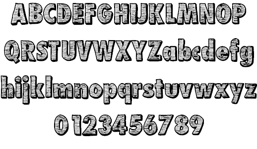
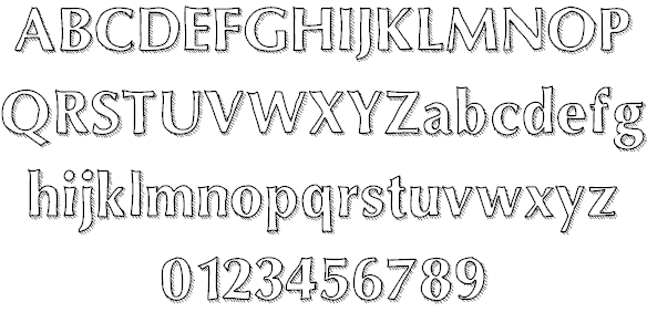
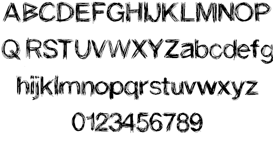
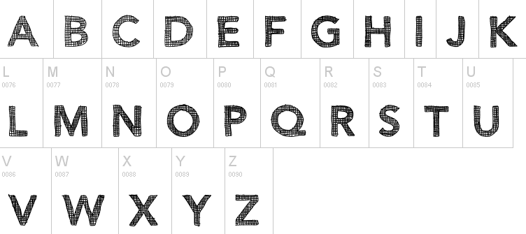
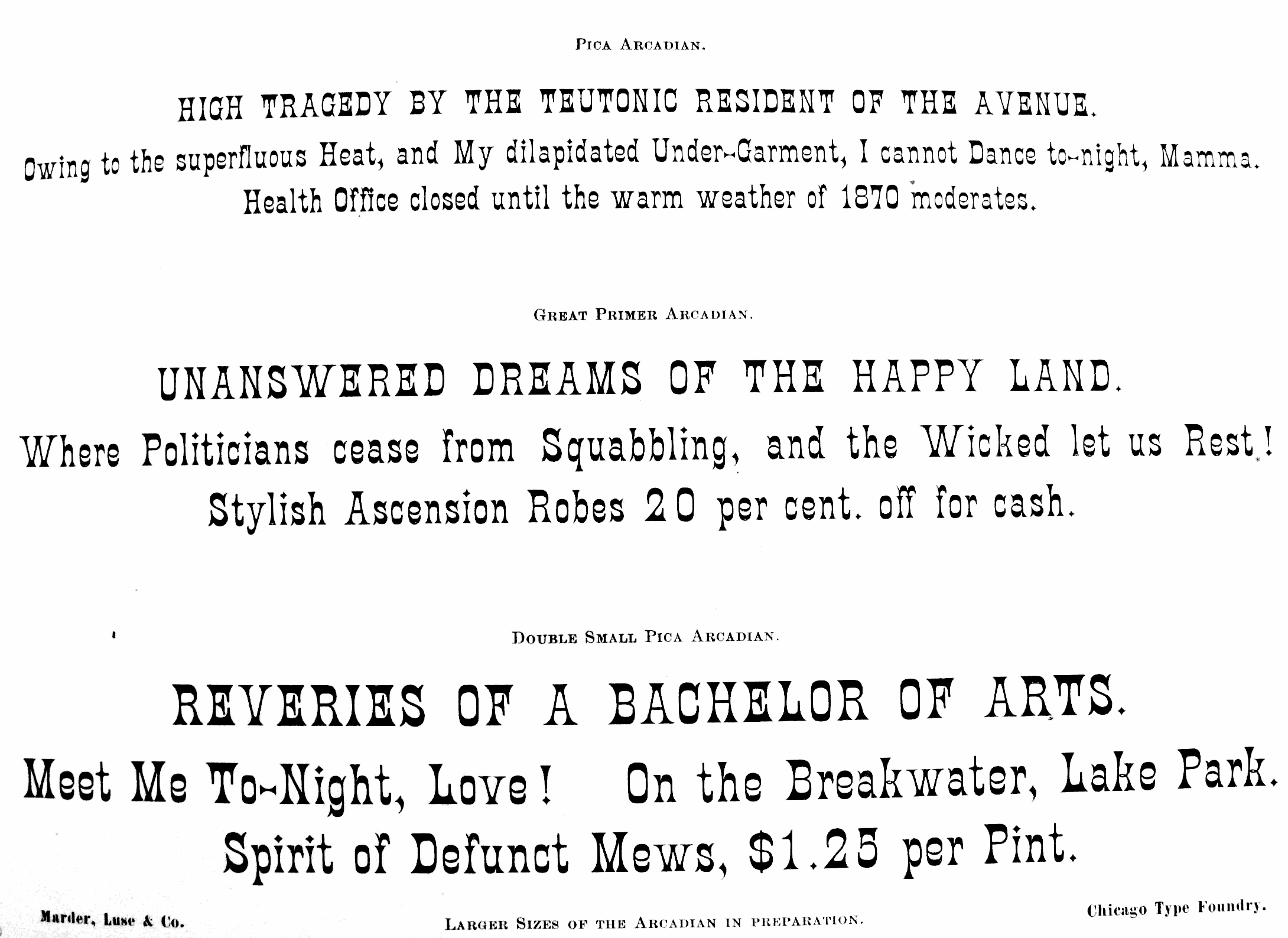
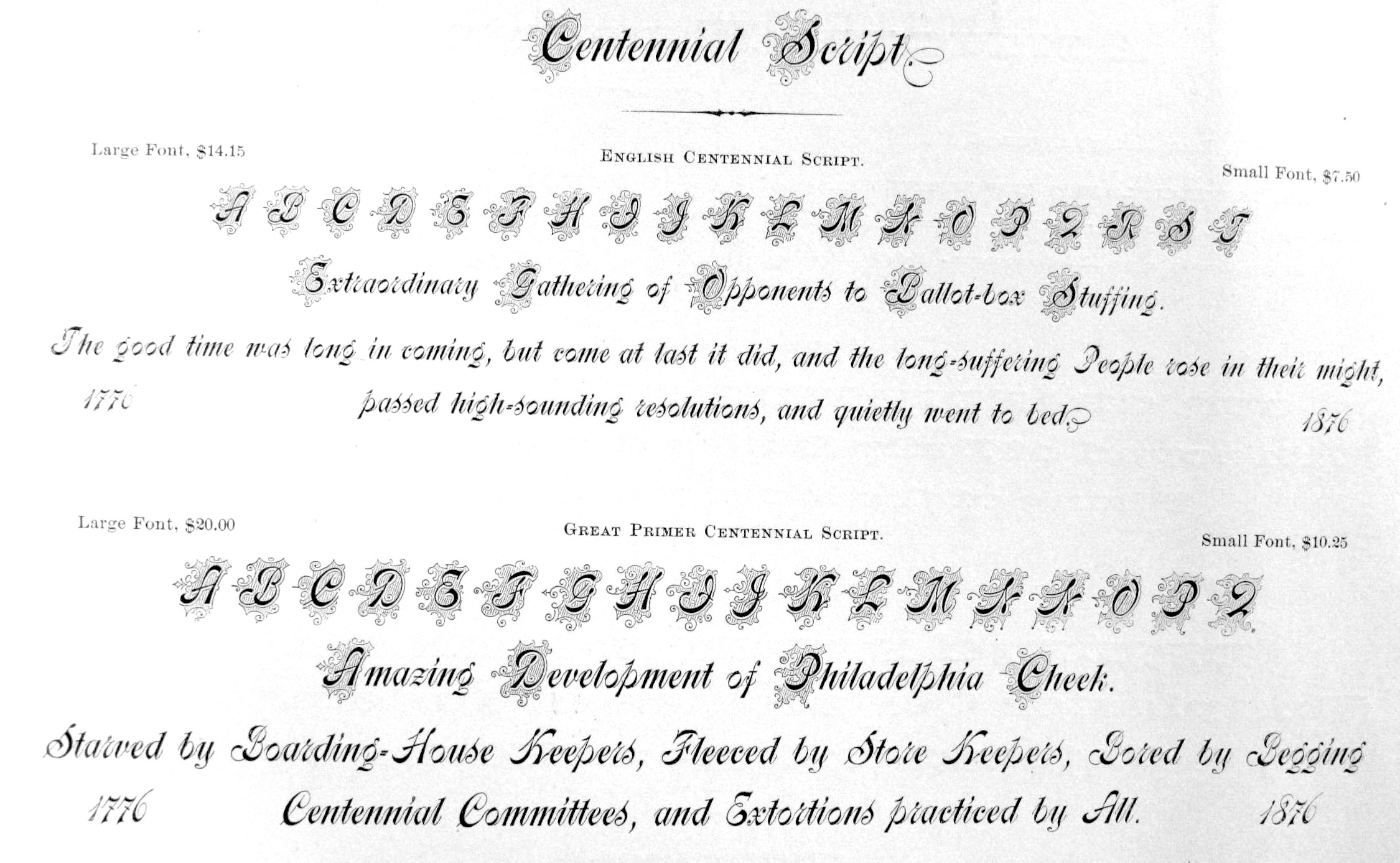
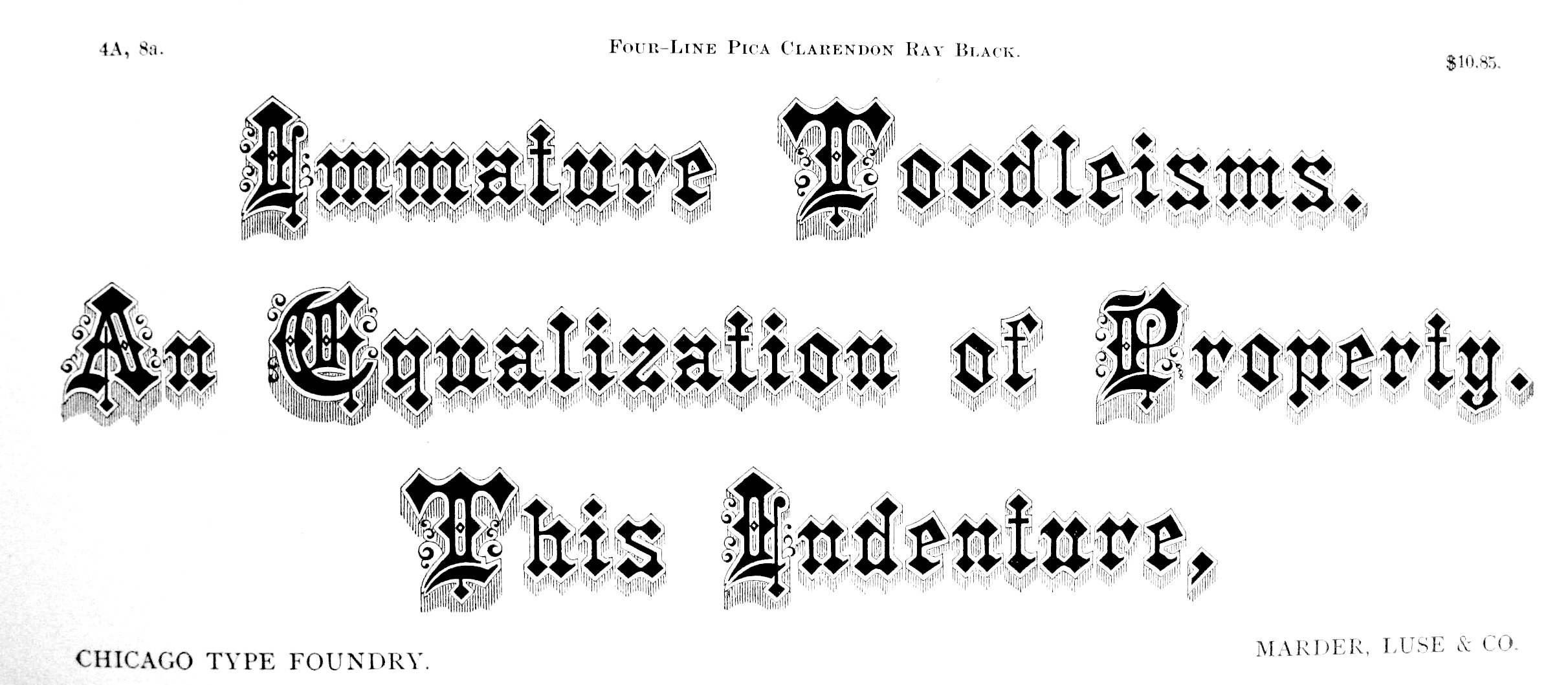
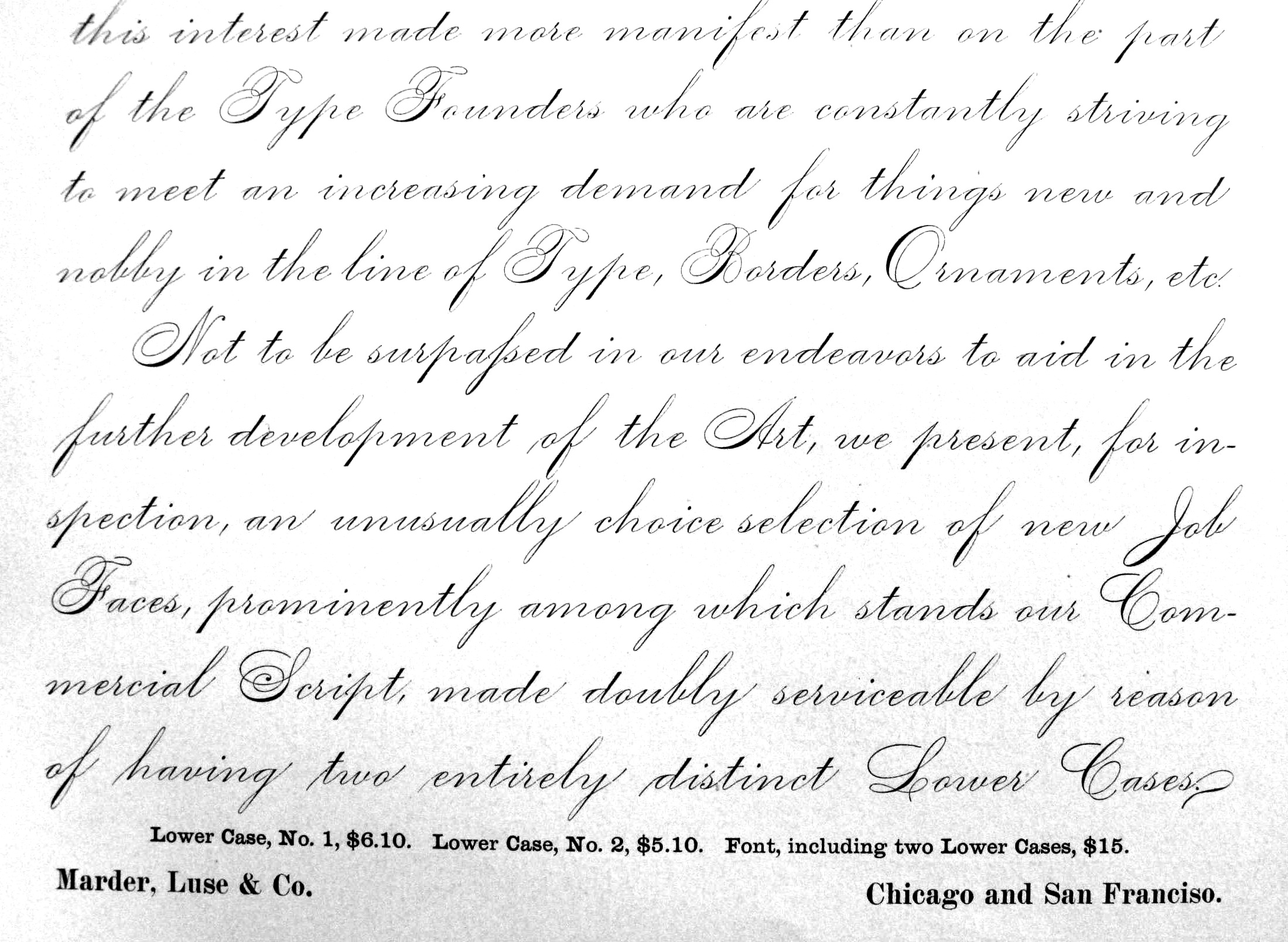
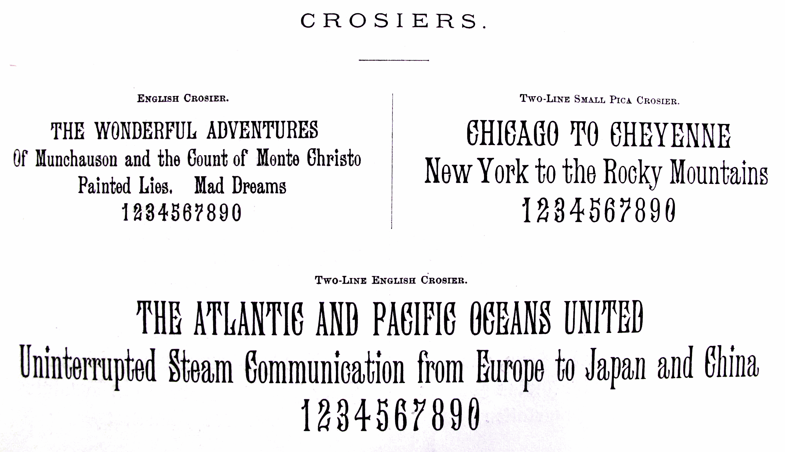
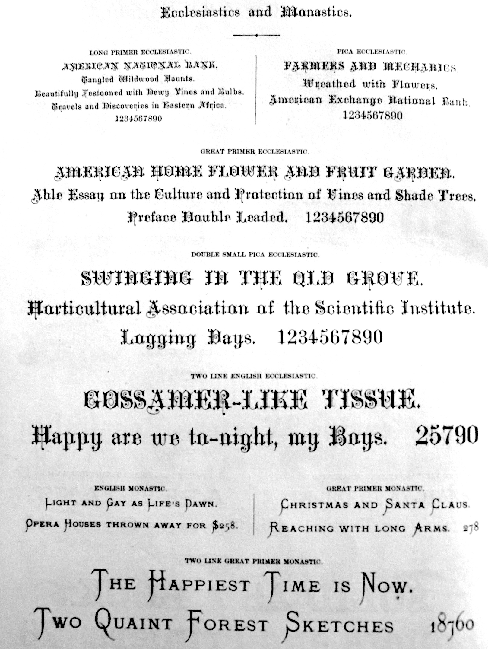
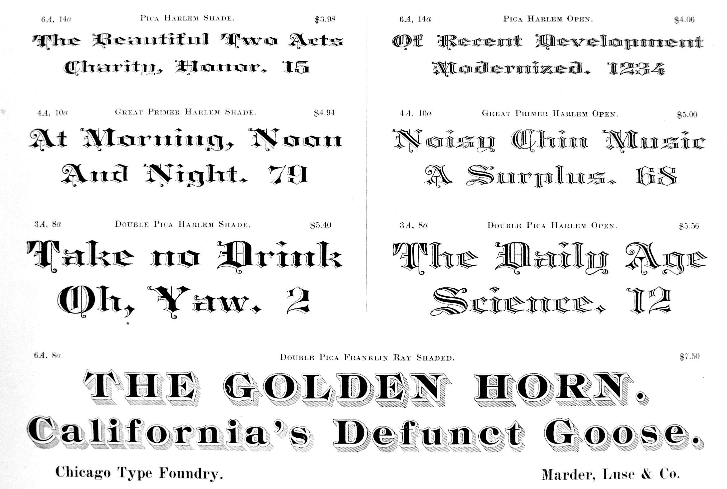
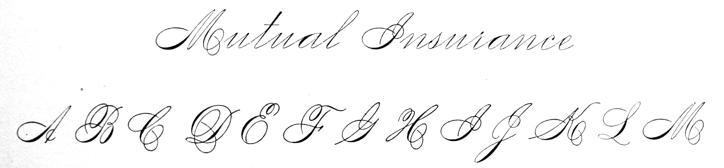
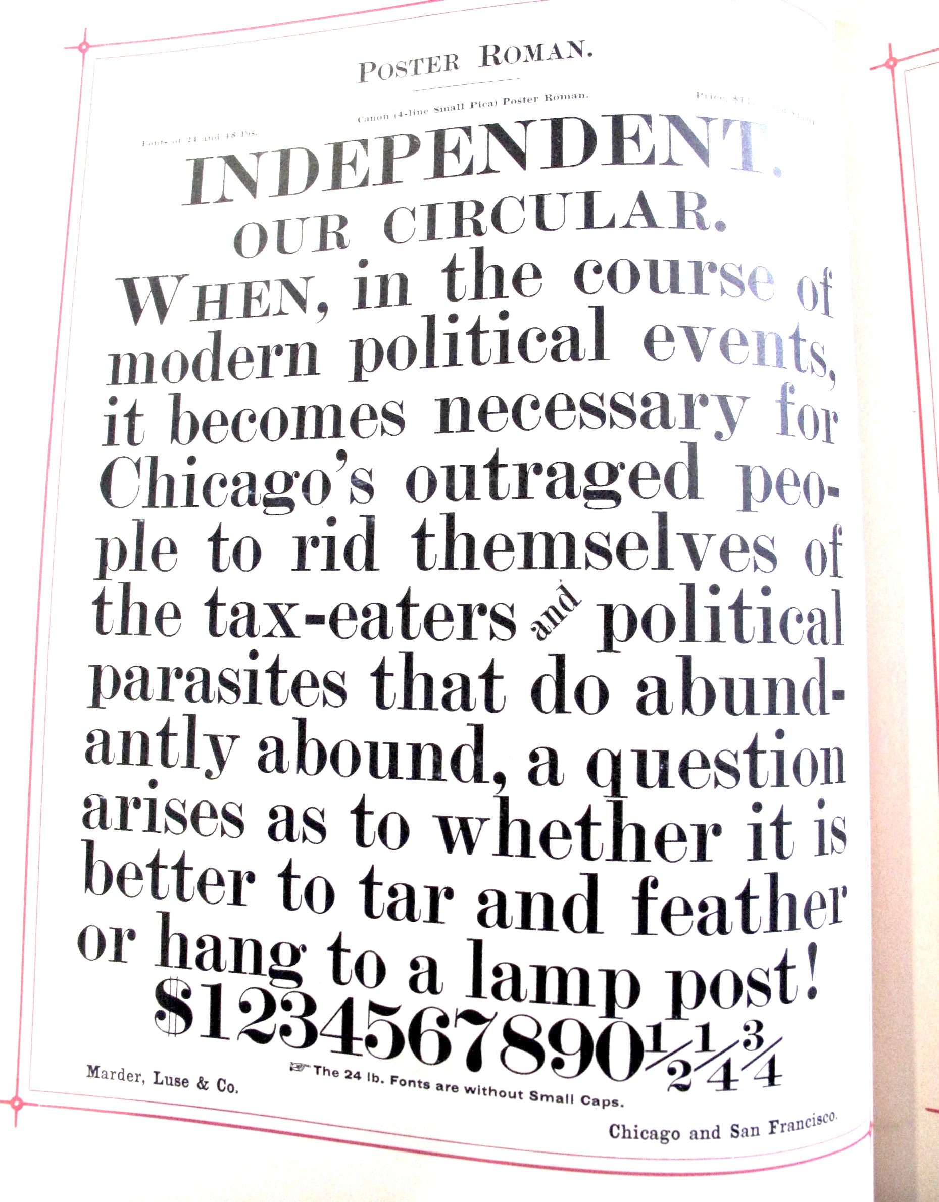
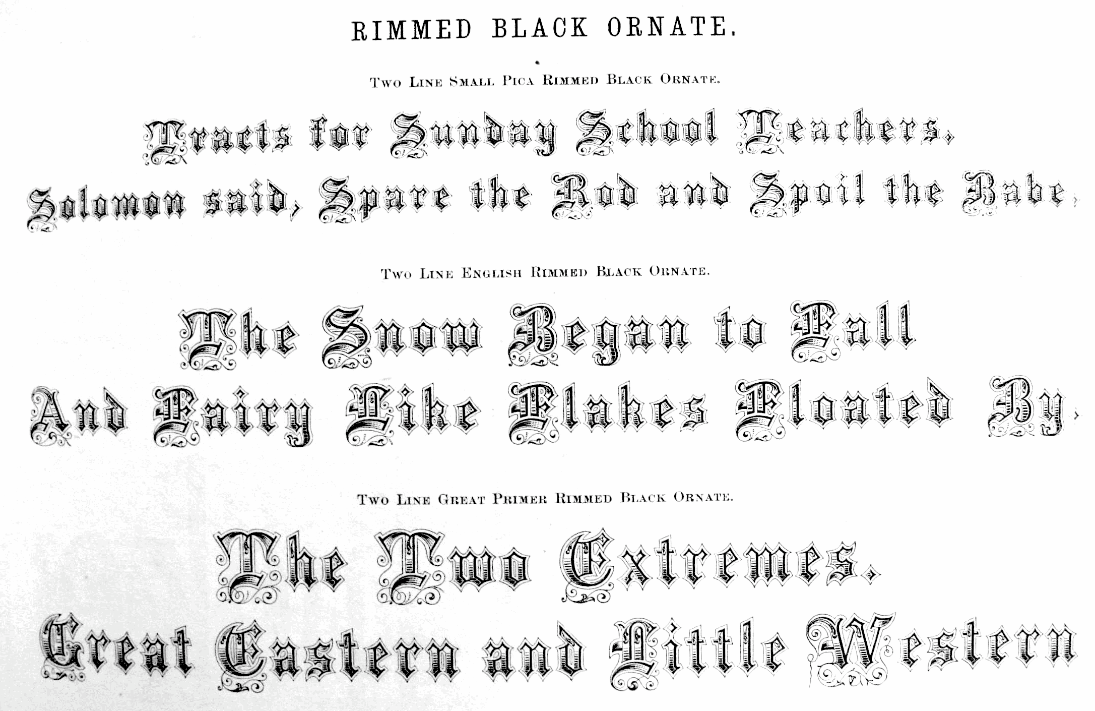
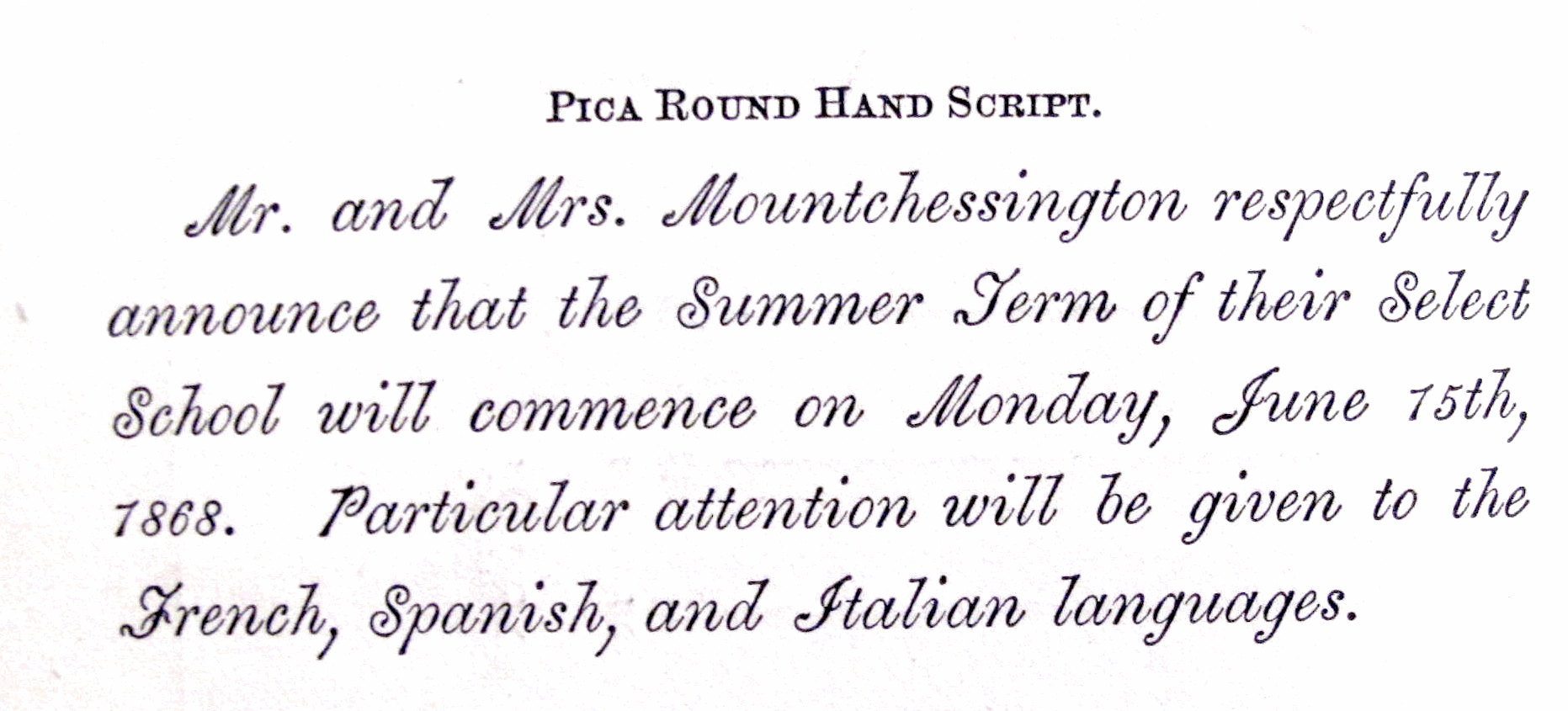
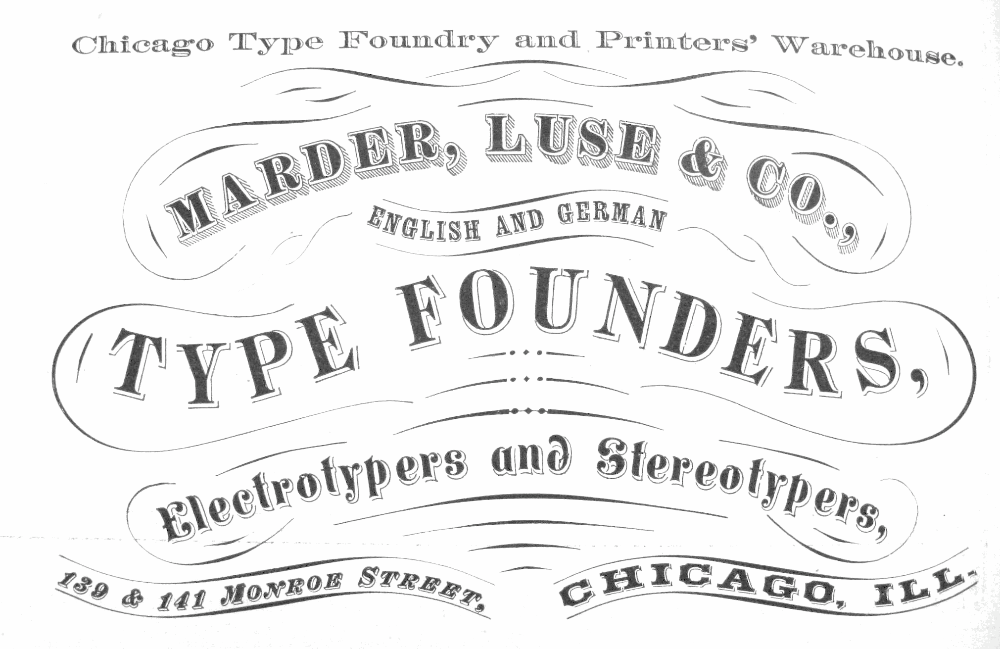
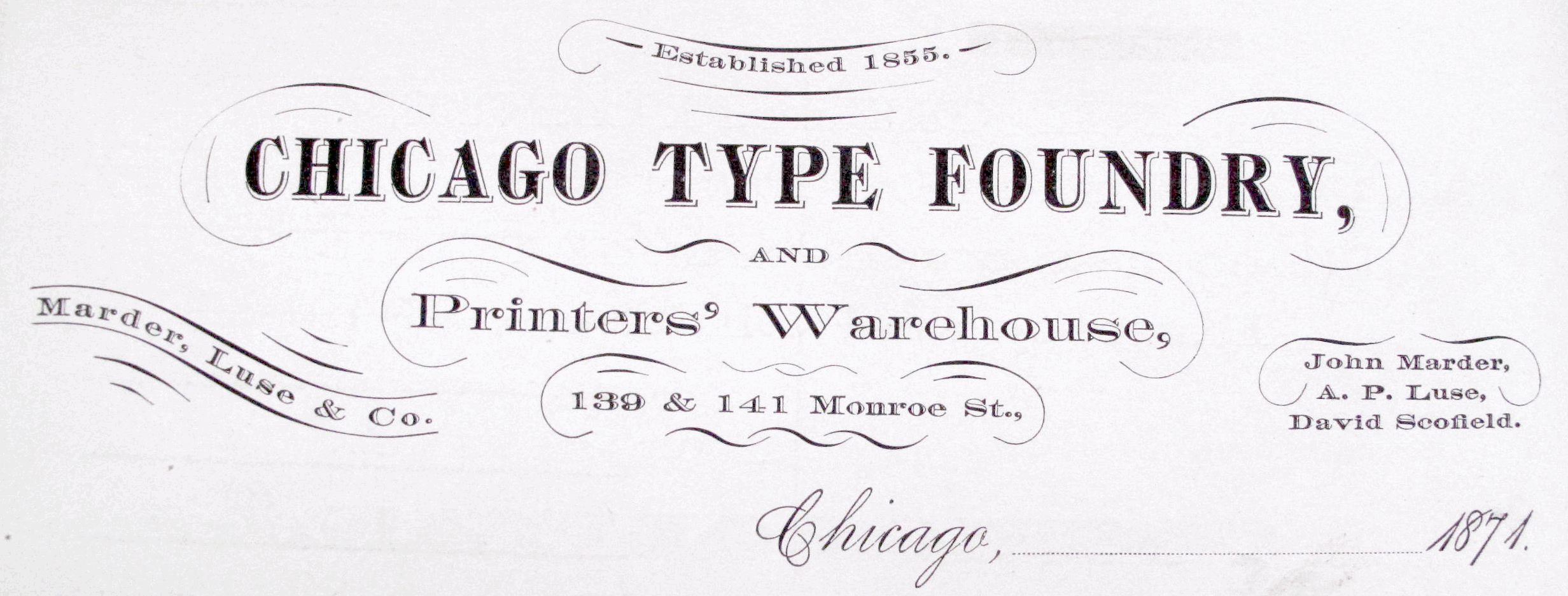
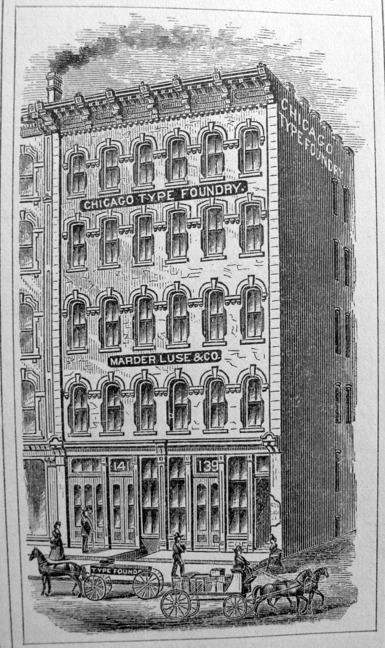
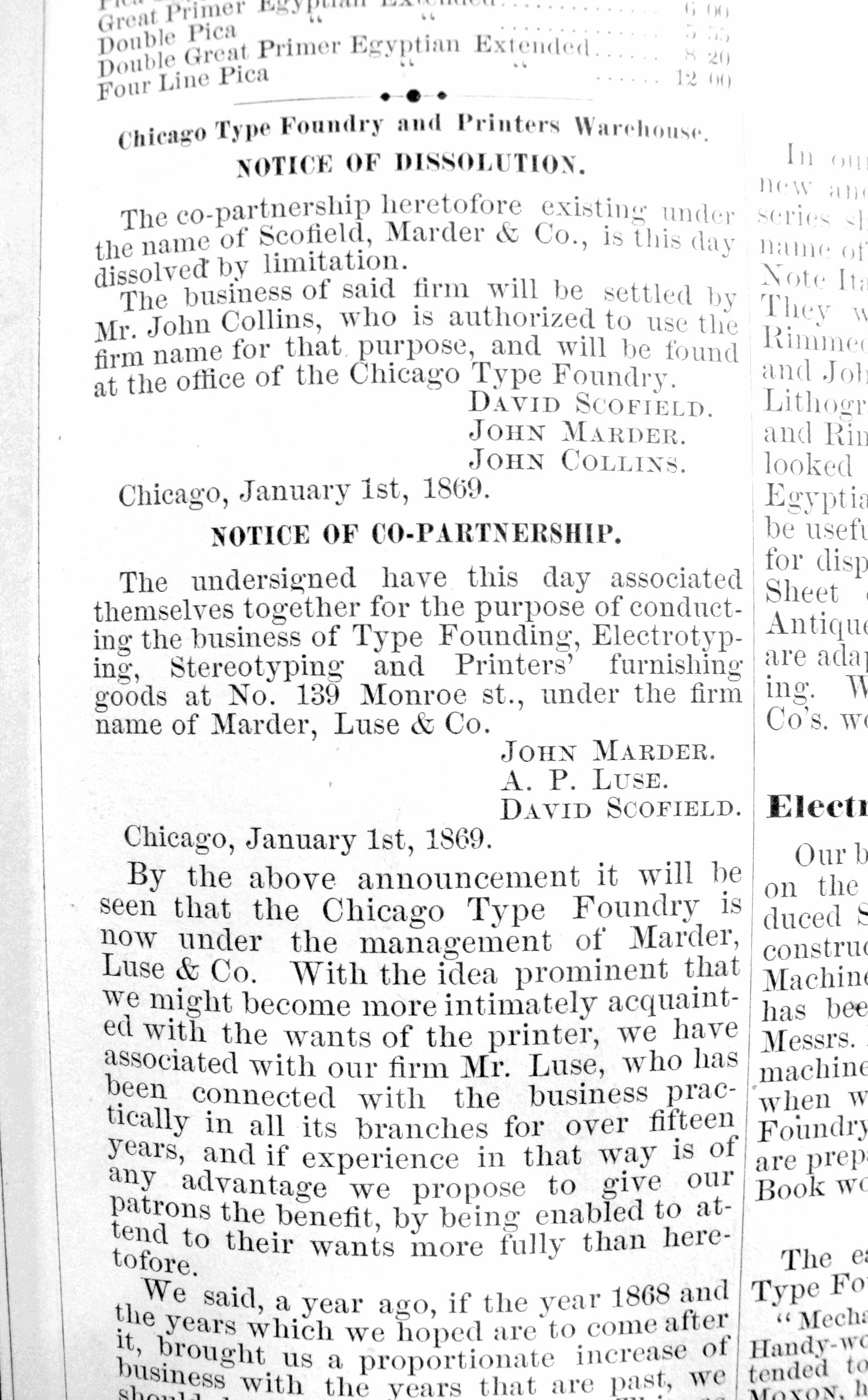
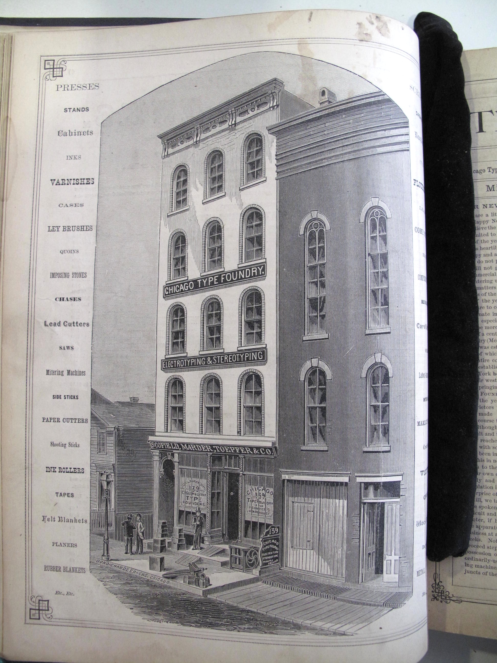
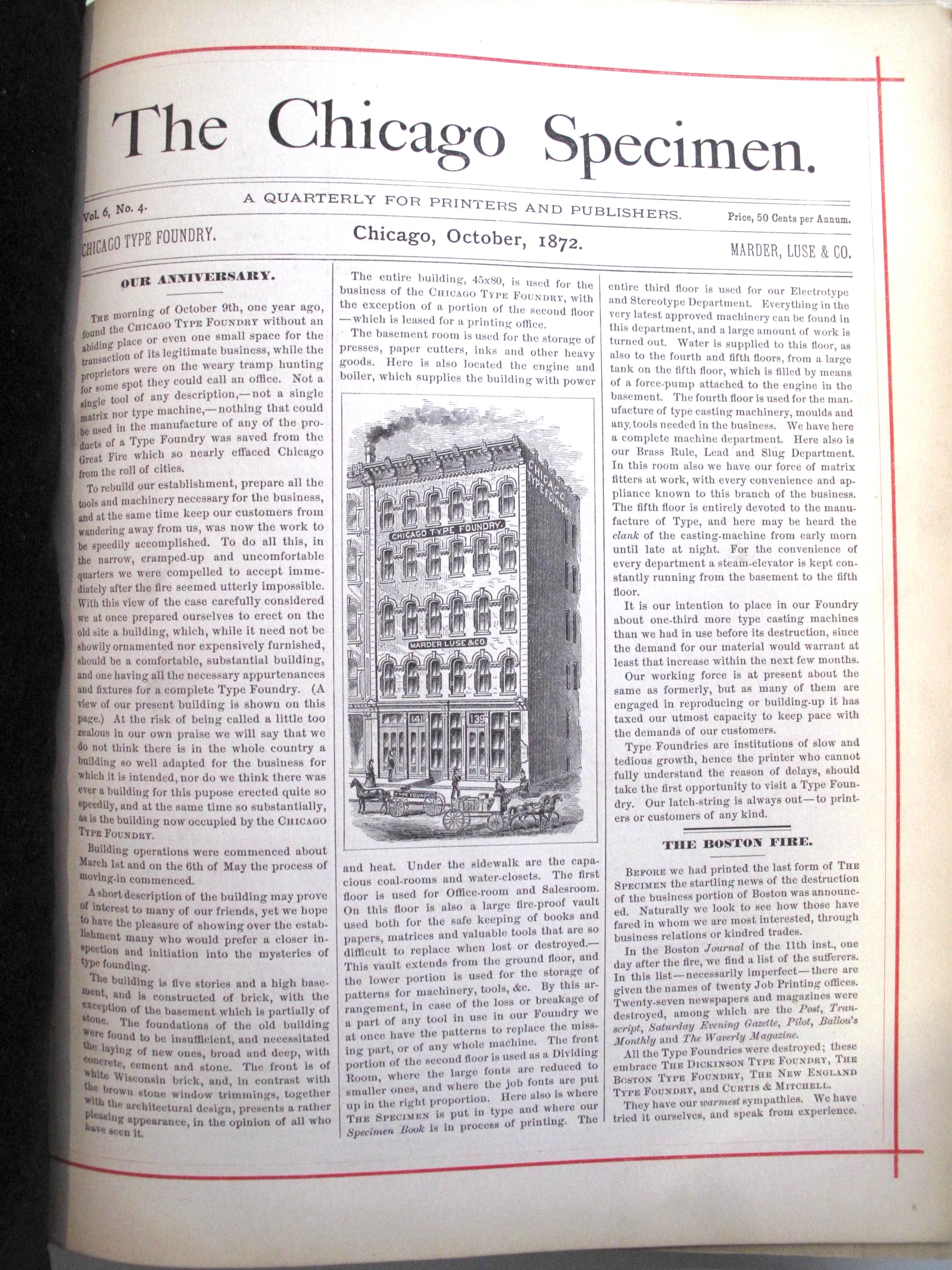
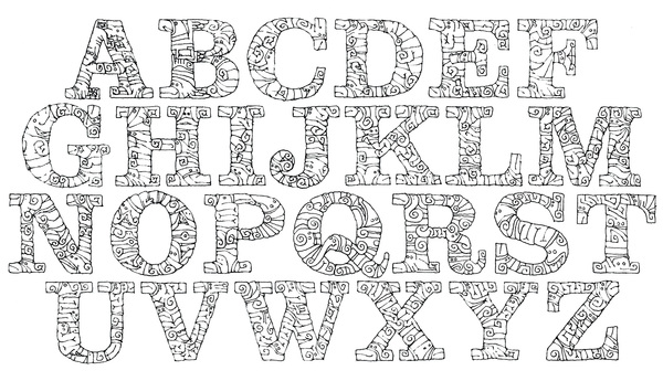
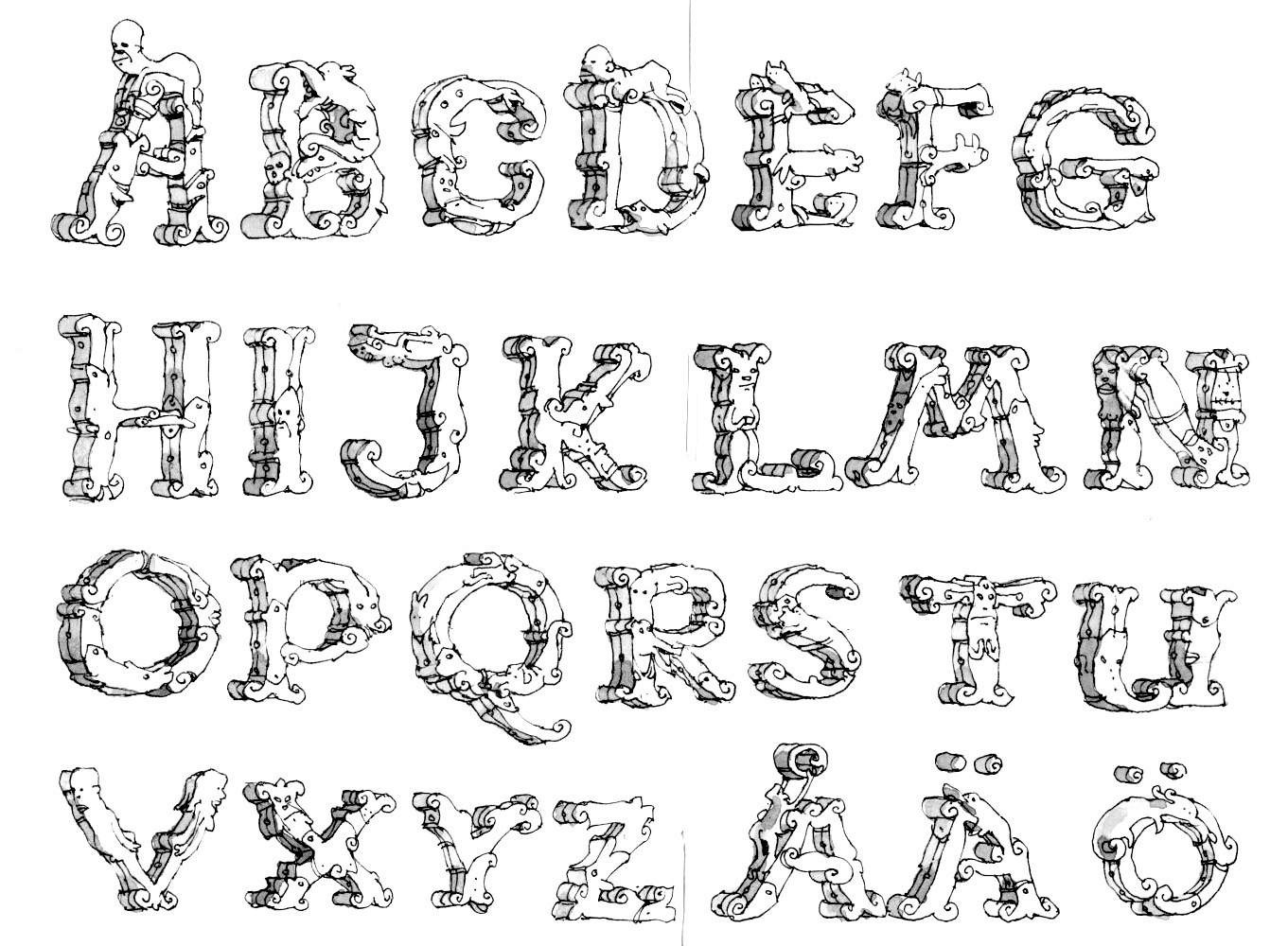
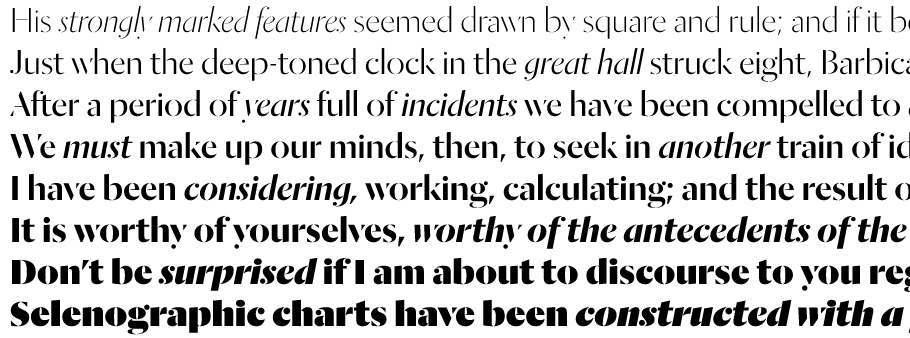
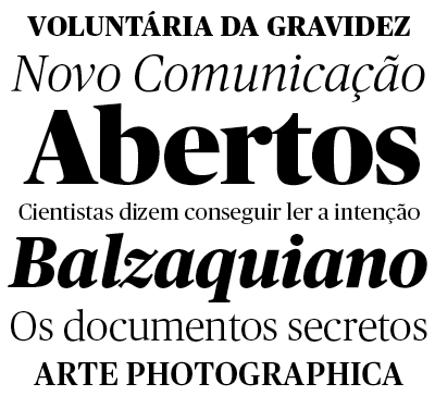
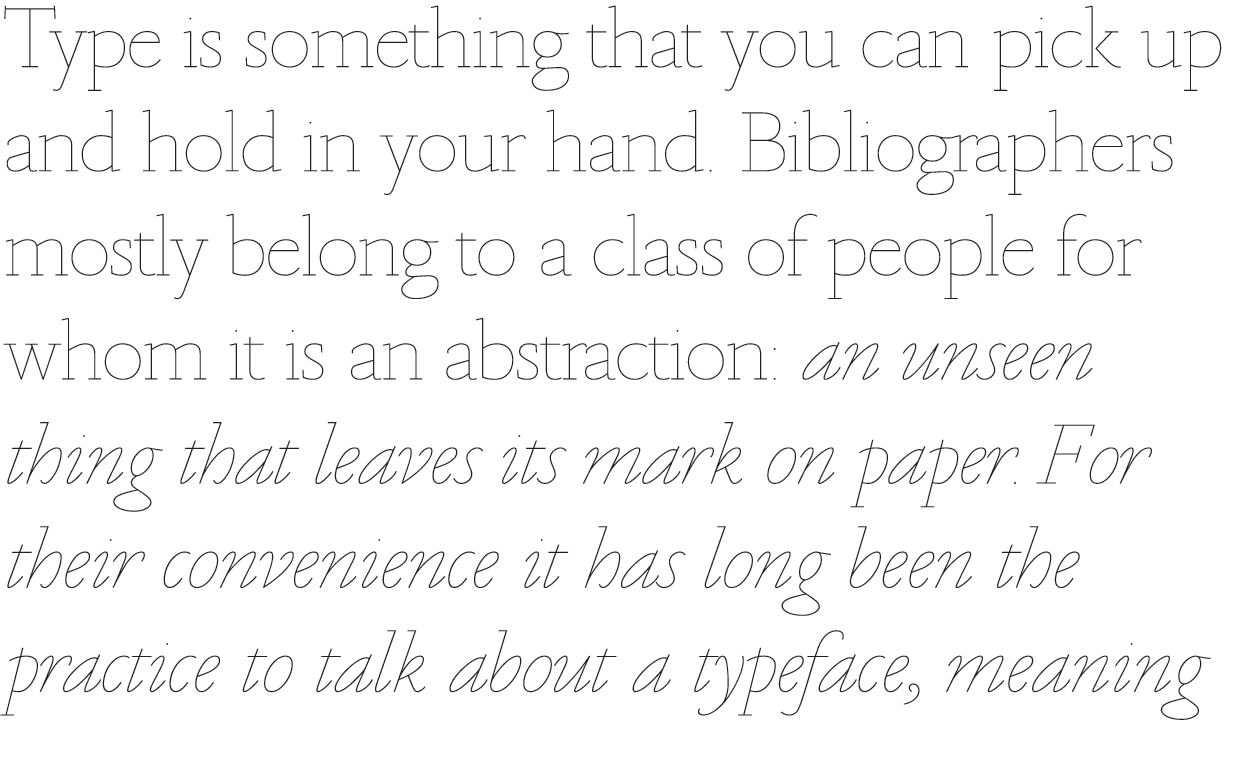
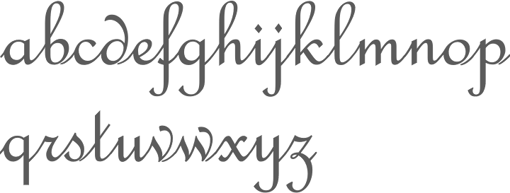
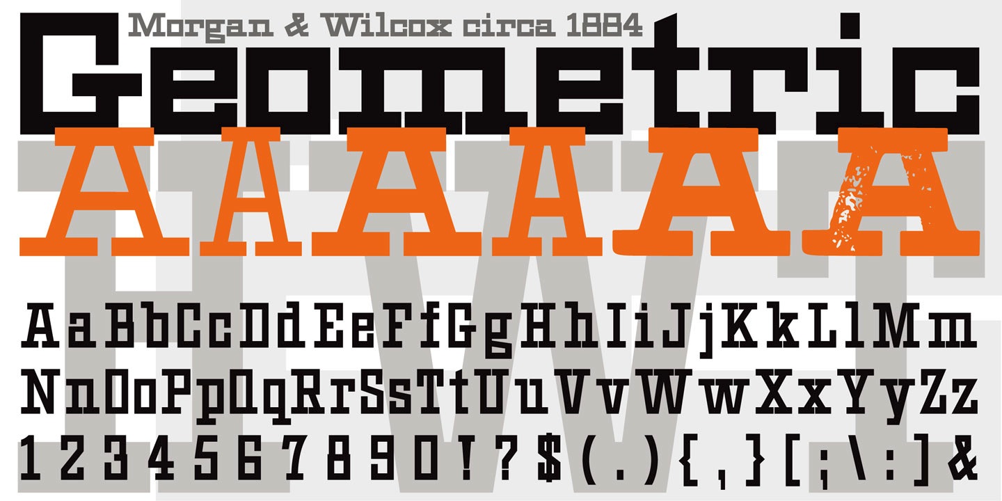
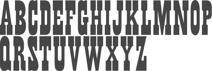
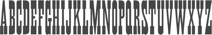
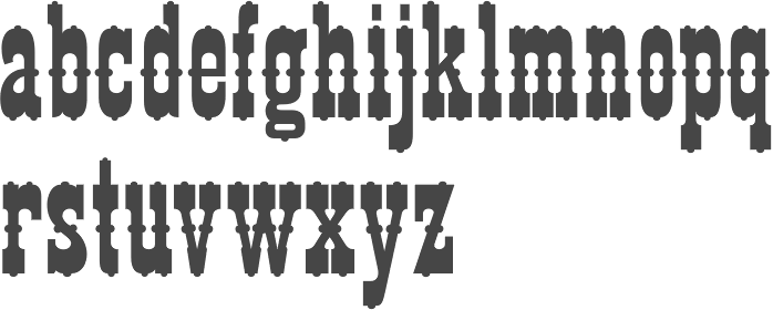
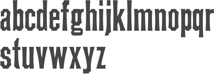
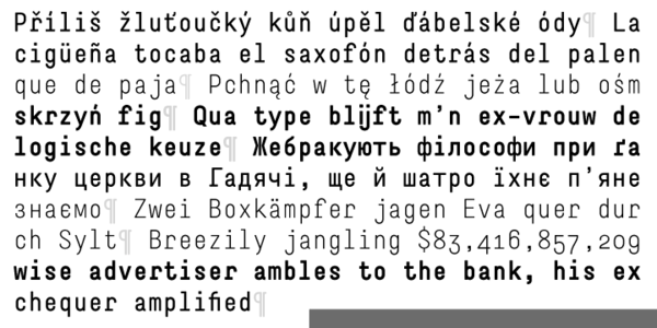
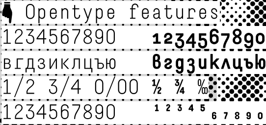
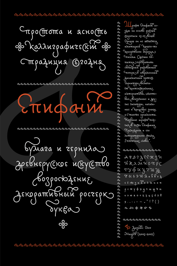
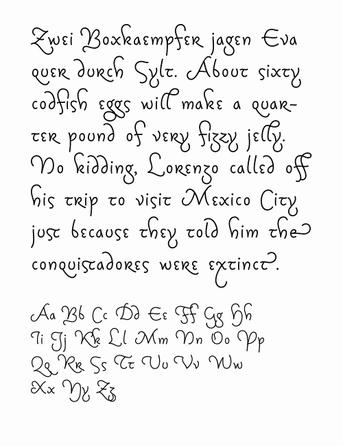
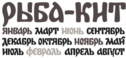
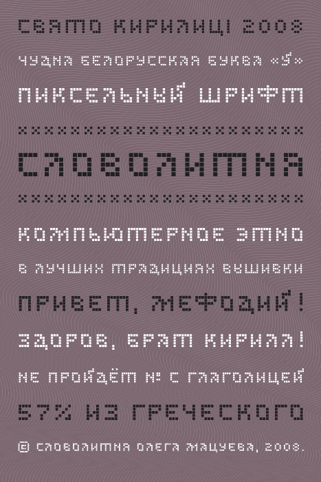
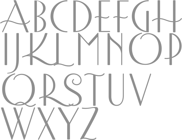
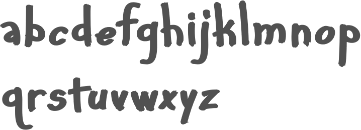
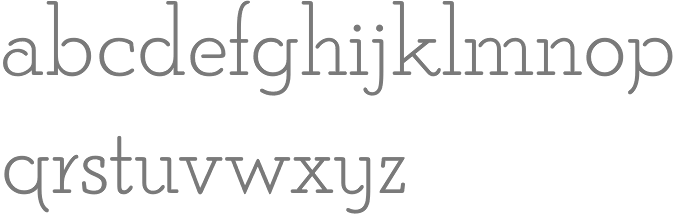
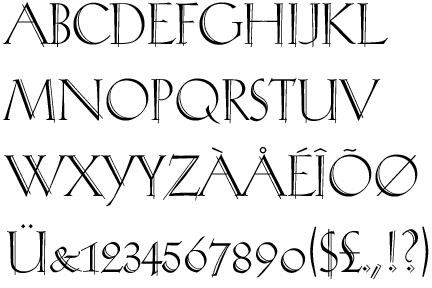
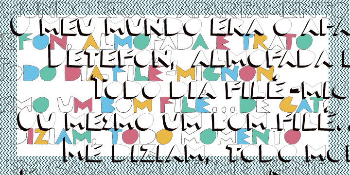
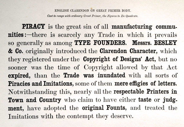
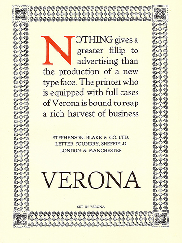
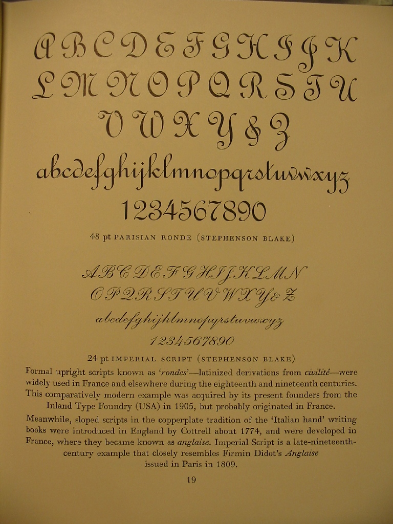
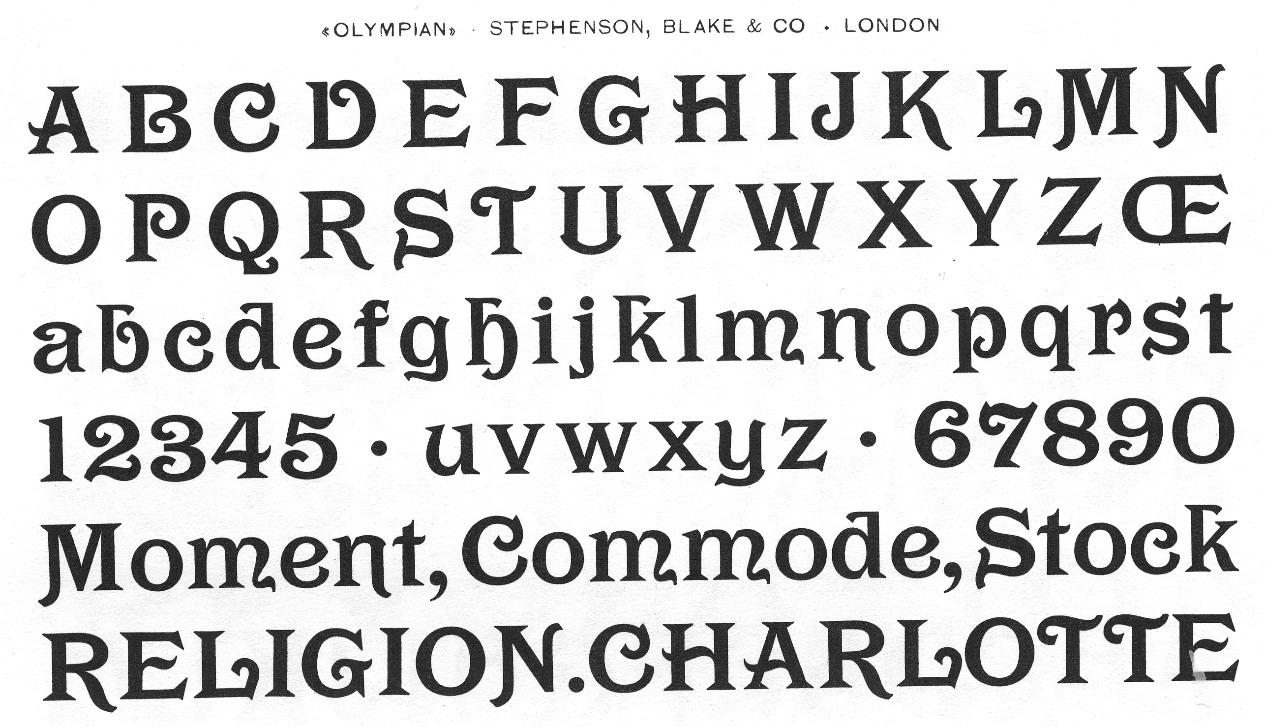
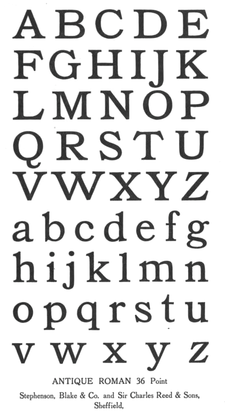
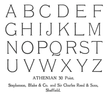
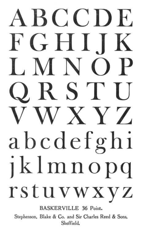
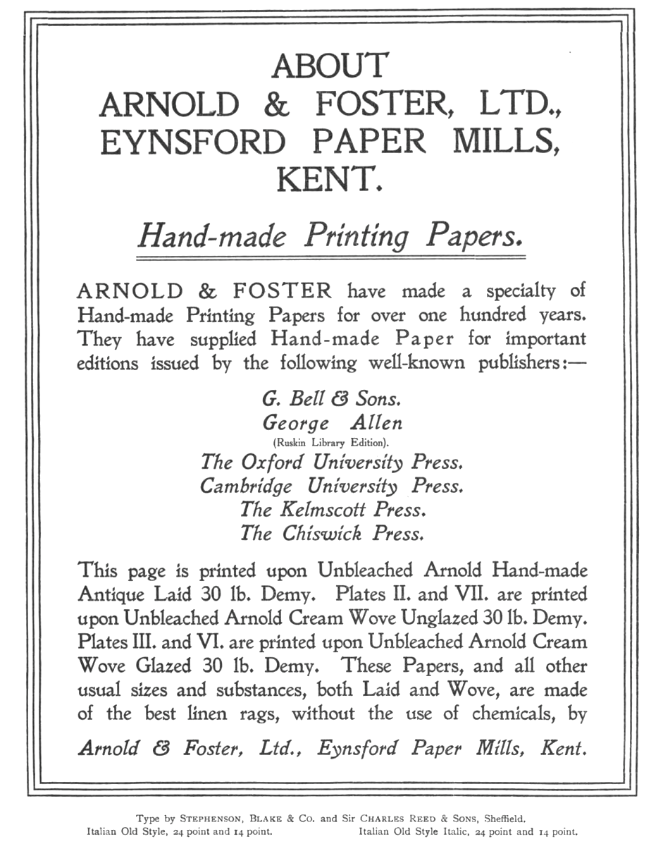
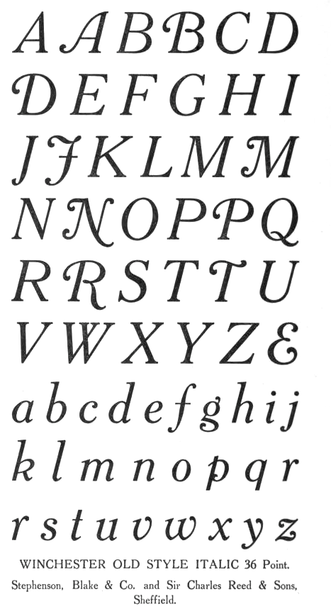
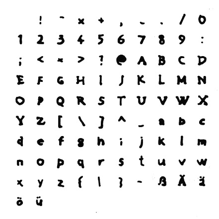
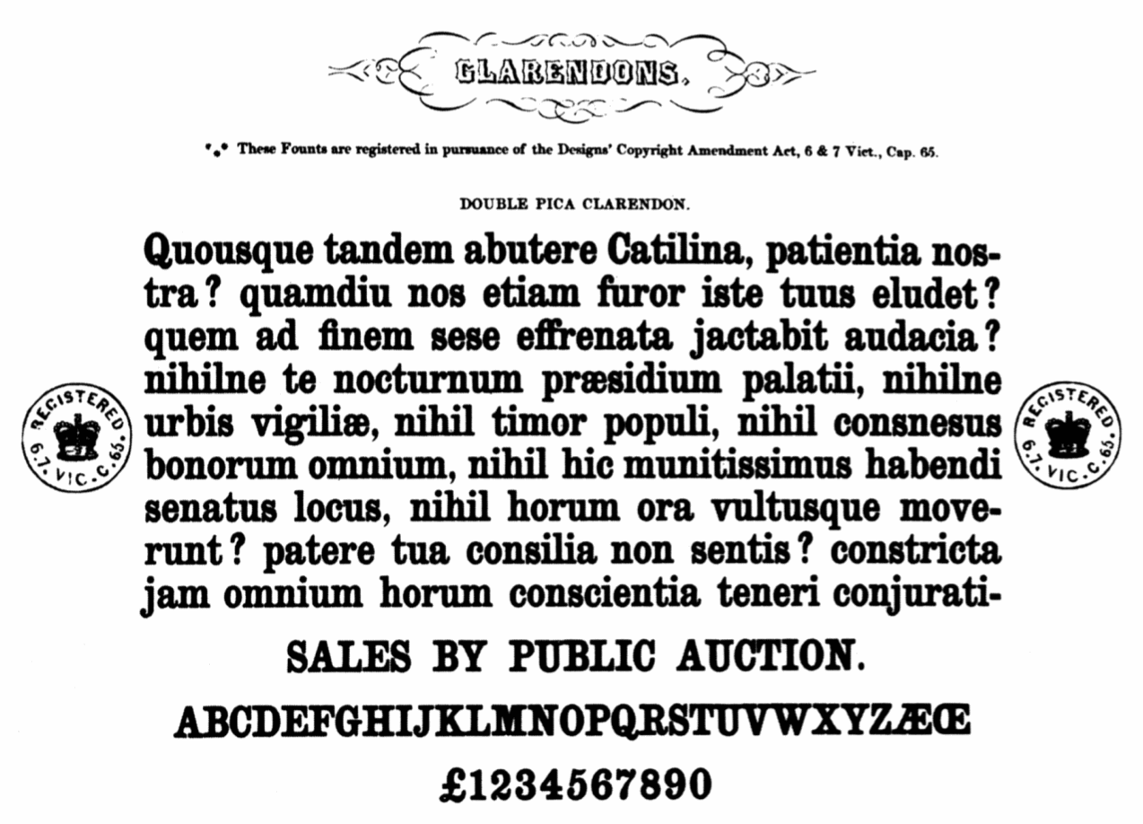
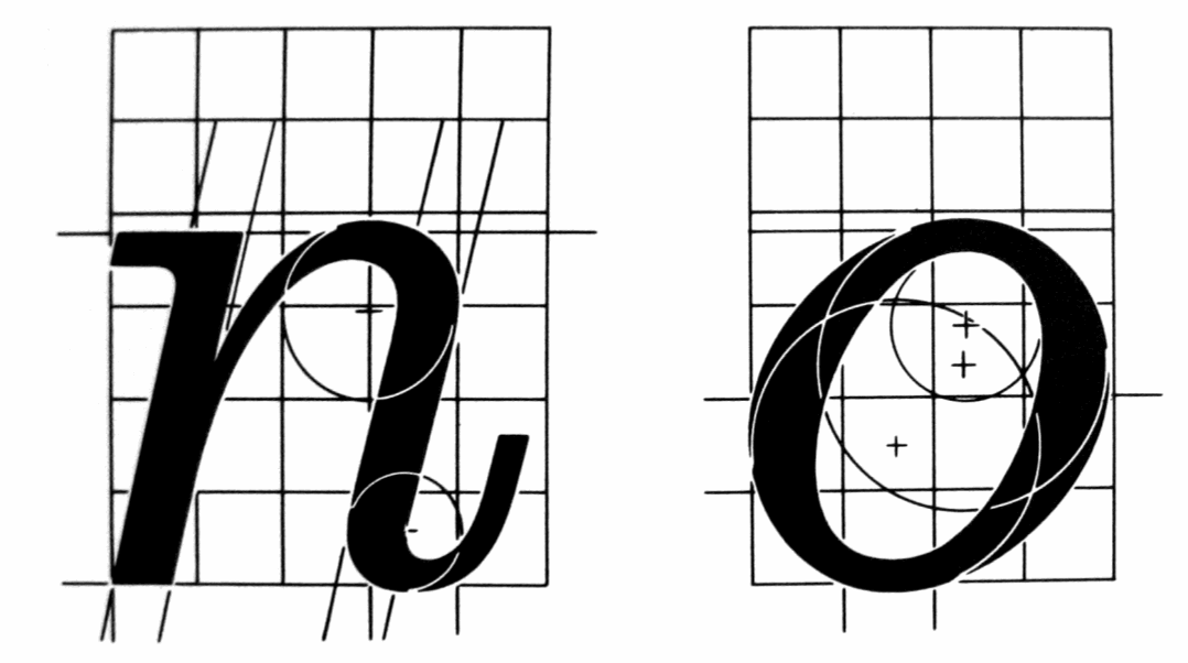